Portfolio '17

Page 1

CHRISTABEL CHEN

CONTENTS curriculum vitae 02 current work 01 design studio - foyer 04 02 specialisation - activated frontage 16

design studio (current)

The studio explores the notion of the foyer as an in between space and questions if it is really a space if it has no definitive boundary. Reflecting and curating the body of work produced thus far, I have developed my own understanding of the in between:

The in between is the passage through perceptual thresholds, made evident by framing the material and immaterial. It is how one perceives space through a frame, frame within frames and the ephemeral, light and shadow creating boundaries on surfaces that shift over time, a visual passage through time and space. The encounter/perceptual experience of conditions such as depth, passage, surface and presence creates the in between.

01 FOYER
04

observation drawings of openings & thresholds

05
1 objects as viewing devices 2 collage 01: flatness of the frame 1 2

Using objects as viewing devices to frame a view, I observed how proximity a ects depth, by eliminating what is outside the frame, leaving the flatness of the frame and view. Visual perception changes when looking through.

inhabiting the in between 01 flatness of the frame

07

“The frame thus becomes a window that carefully selects the causes of life in order to produce ever more singular e ects.” 024

“The wall delimits dark rooms; the window lets the sun shine in; what is still needed is a surface that stretches its screen to the variable play of shadows formed by the light” 025

Bernard Cache, Earth Moves: The Furnishing of Territories (1995)

3 4 5 3
4
5
window, surface & light
collage 02: contrasting thresholds
diagram of framing creating depth & perspective

The contrast of positive (light) and negative (shadow) results in the presence of thresholds to be moved through. Walking through a series of openings, shadows frame what is beyond, the intensity of the dark blurs the depth of space; there is an ambiguity to where the passage ends.

inhabiting the in between 02 contrasting thresholds

09

“We know time only indirectly by what happens in it, by observing change and permanence, by marking the succession of events among stable settings, and by noting the constrast of varying rates of change.”

029

George Kubler, The Shape of Time (1962) from Whitechapel Documents in Contemporary Art: Time

6 7 8 6
7
8
photograph of ephemeral threshold on floor collage 03: light & shadow creating boundaries photograph of ephemeral threshold to be moved through

Light and shadow create boundaries on surfaces that appear and disappear over time; these are intangible thresholds, non-static and act as frames which give perspective, distance and a new dimension.

inhabiting the in between 03 ephemeral thresholds

11
9 10 9 collage 04: extension of space 10 diagram of layered thresholds & openings

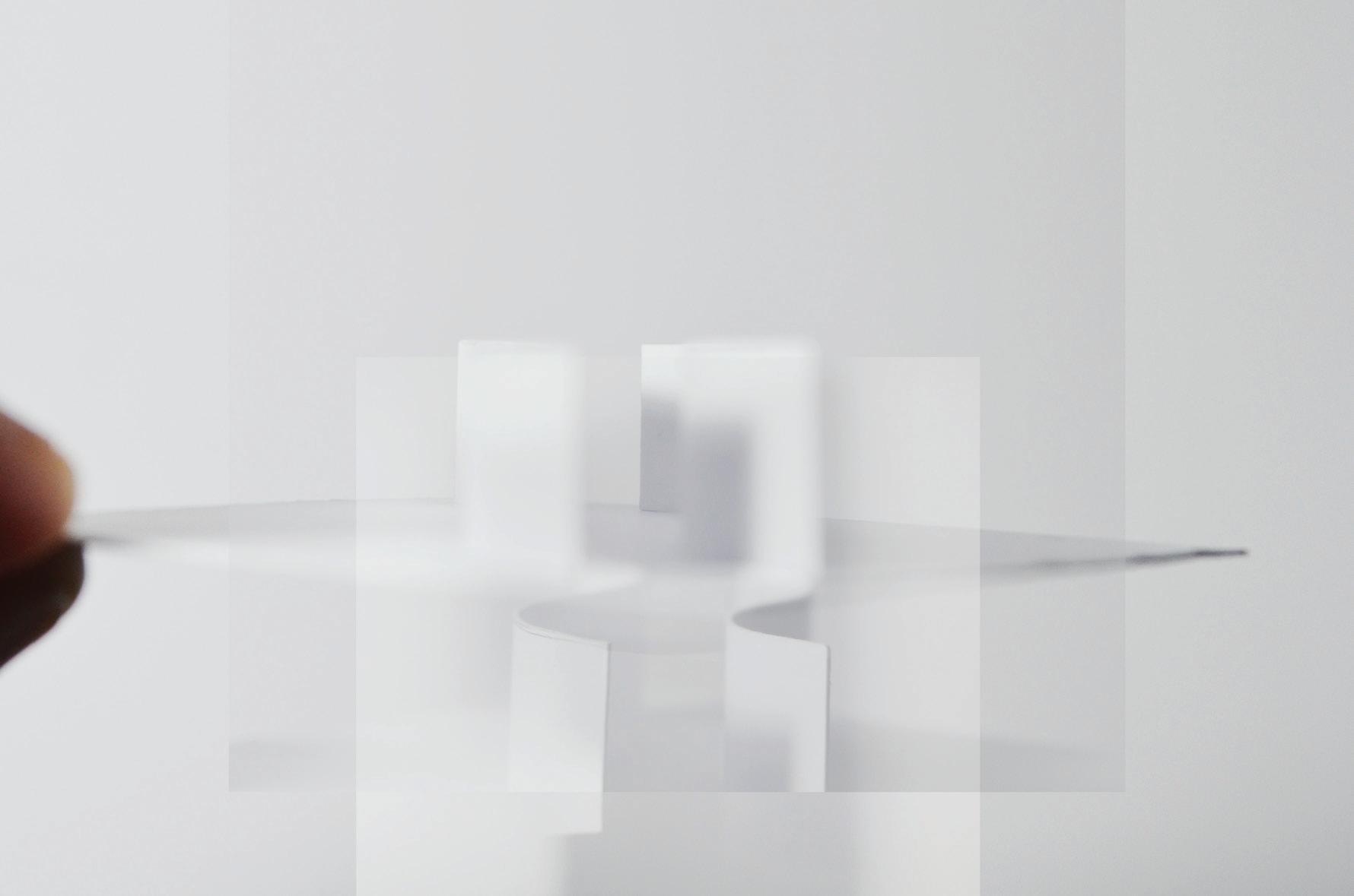
The passageway is like a skeleton and the rhythmic layering of openings allow an extension of space and generate movement. Depth is revealed through the perception of layered thresholds.

inhabiting the in between 04 extension of space

13

“In perceptual experience, this stimulus pattern creates a structural skeleton, a skeleton that helps determine the role of each pictorial element within the balance system of the whole; it serves as a frame of reference, just as a musical scale defines the pitch value of each tone in a composition.”
015

Rudolph Arnheim, Art and Visual Perception: A Psychology of the Creative Eye (2011)

11 11 collage 05: perceiving the passage

inhabiting the in between 05 perceiving the passage

The perceptual experience through a meandering passage would vary at di erent points. Depth of the meandering passage could be obstructed or revealed through the thresholds. There is also the notion of duration in this encounter.

15

02 ACTIVATED FRONTAGE

specialisation (current)

Investigating the city as an urban interior, the specialisation considers the role of the facade in relation to the social activity on the ground plane; how we engage with high rise buildings on a street level.

Through Jan Gehl’s ideas of necessary, optional and social activity and my own observations and studies of existing facades, I developed a preliminary design for generating activity across the ground plane through the building’s facade. The design centers around 3 core ideas: articulating the entrance as its own object, vertical planes as a connection between the interior and exterior and horizontal planes relating to the human scale and transition across spaces.

16

I imagined that the potential for generating activity across the ground plane through the building’s facade could be increased if the building was supported by pilotis above the ground level, creating a thoroughfare.

residential commercial (cafes/shops) pilotis observations of existing facades
17

how does the facade engage with people and their stu ?

collage 1

I documented the types of necessary activities around the site and noticed on an occasion that a man and his co-worker were having lunch in the back of their van and deduced that activity is influenced by the built environment, that they did so as a last resort. On hindsight, they could have everything they needed in the van and the van was a “room on wheels”, borrowed space on the street.

stop

20

I focussed on optional and social activities and how the built environment provides opportunities for optimal activities and invites people to spend more time in a space. Optional activities depend greatly on the quality of the environment and weather conditions

“if there is life and activity in city space, there are also many social exchanges”

(2010)

collage 2
Jan Gehl, Cities for People
go
022

precedent study 01

Storefront for Art & Architecture

97 Kenmare Street, New York

intersecting the facade

physical & visual access

shifting vertical & horizontal planes open & close

exterior interior
22

Designed by Steven Holl and Vito Acconci in New York, the gallery space has a distinctive facade made up of wall panels which pivot vertically and horizontally to open and close the entire length of the facade onto the street.

multi-functional surface, could be used as display or possibly a way of inhabiting the facade

23

precedent study 02

Republic Tower

299 Queen Street, Melbourne

curved space pushes out onto the street, a ecting perception of space from the footpath

24

Designed by Katsalidis Architects, the tower is in a brutalist style of concrete, stainless steel and glass with the form of an armour-clad samurai warrior. A large, curved billboard contains an art space on the ground street corner.

entrance perceived as a separate object due to contrast in form, colour and materiality

25

process sketches

Using observations from precedent studies, the overall concept was to create a clearly articulated entrance, with horizontal planes to compress and layer space and vertical planes as a visibility device.

26
development of horizontal planes- plan
27
development of articulated entrance

preliminary design

Located on an unspecified corner site and designed as a public space for opportunities for necessary, optional and social activities. I imagined the entrance as a transitional space to a commercial (retail/hospitality) space within.

entrance perceived as separate object from building

“filtered” entrance operable vertical planes to be moved through varying porosity of the interior & visual continuity

28

horizontal planes to transition between spaces

main entrance angle of wall for directional purpose

29
12 vertical planes as visiblity device 13 phemeral activation of space 14 outside looking in 12 13 14

collage

31
& drawing of proposed design

Turn static files into dynamic content formats.

Create a flipbook
Issuu converts static files into: digital portfolios, online yearbooks, online catalogs, digital photo albums and more. Sign up and create your flipbook.