1 minute read
Style guides
To arrive at style guides, I took a survey to get a direction of desired conceptual associations and emotional reactions towards the selected solution. This question was asked with the polarity mapping form.
If there is an assistant to help you in making meaningful spending decisions: Assisting you to spend more on things that really matter to you and less on the things that don’t. Helping you to be aware of your past spending mistakes so you won’t repeat them. and empower you with a few other smart tools. According to you, what this assistant should feel like?
Advertisement
Sample size: 54
Following were the most preferred attributes derived from the reactions of the survey.
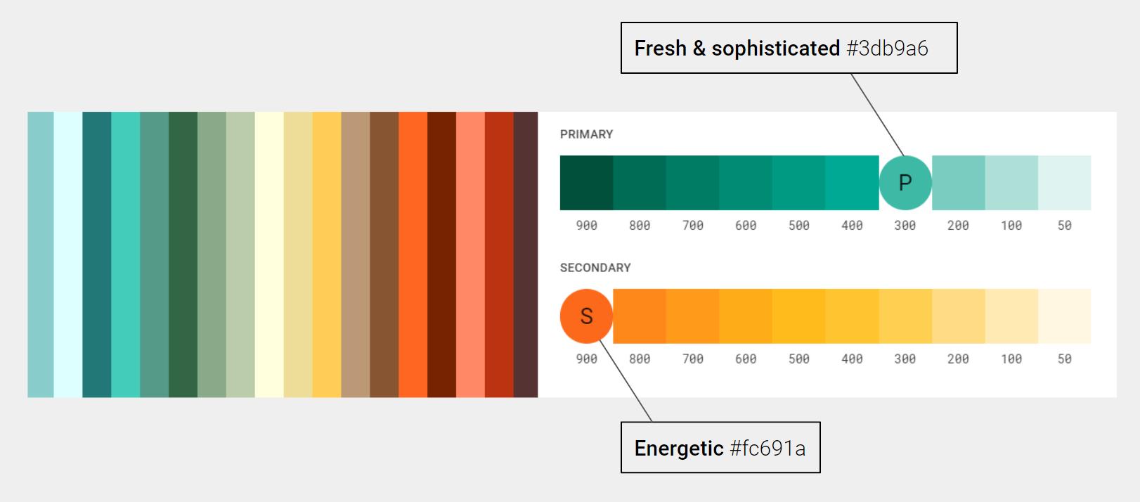
Sensory experience should be energetic (showing a great amount of activity) and sophisticated (involving a great deal of worldly experience). The service methods should be reliable (consistently good in quality and able to be trusted)and innovative (featuring new methods and experiences). Tips and target setting should have rational decision making.
Color pallete
Figure 18: Selection of colors for the first prototype on the basis of high rated attributes derived from the survey.
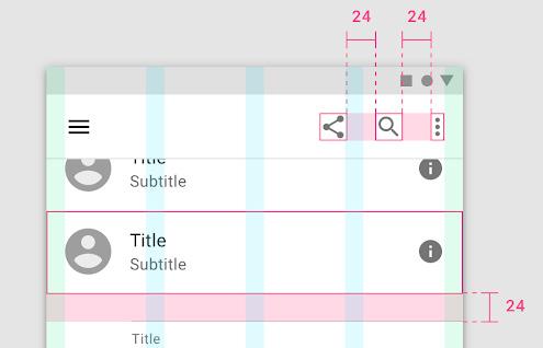
Gridsystem

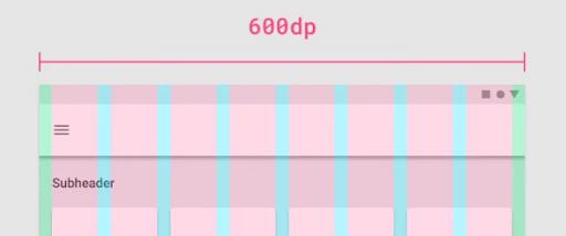
Figure 19: The style guide for grid systems were referred from the material design guides. The intention being quick prototype development and feedback analysis than spending unintended time on sensory surface development.
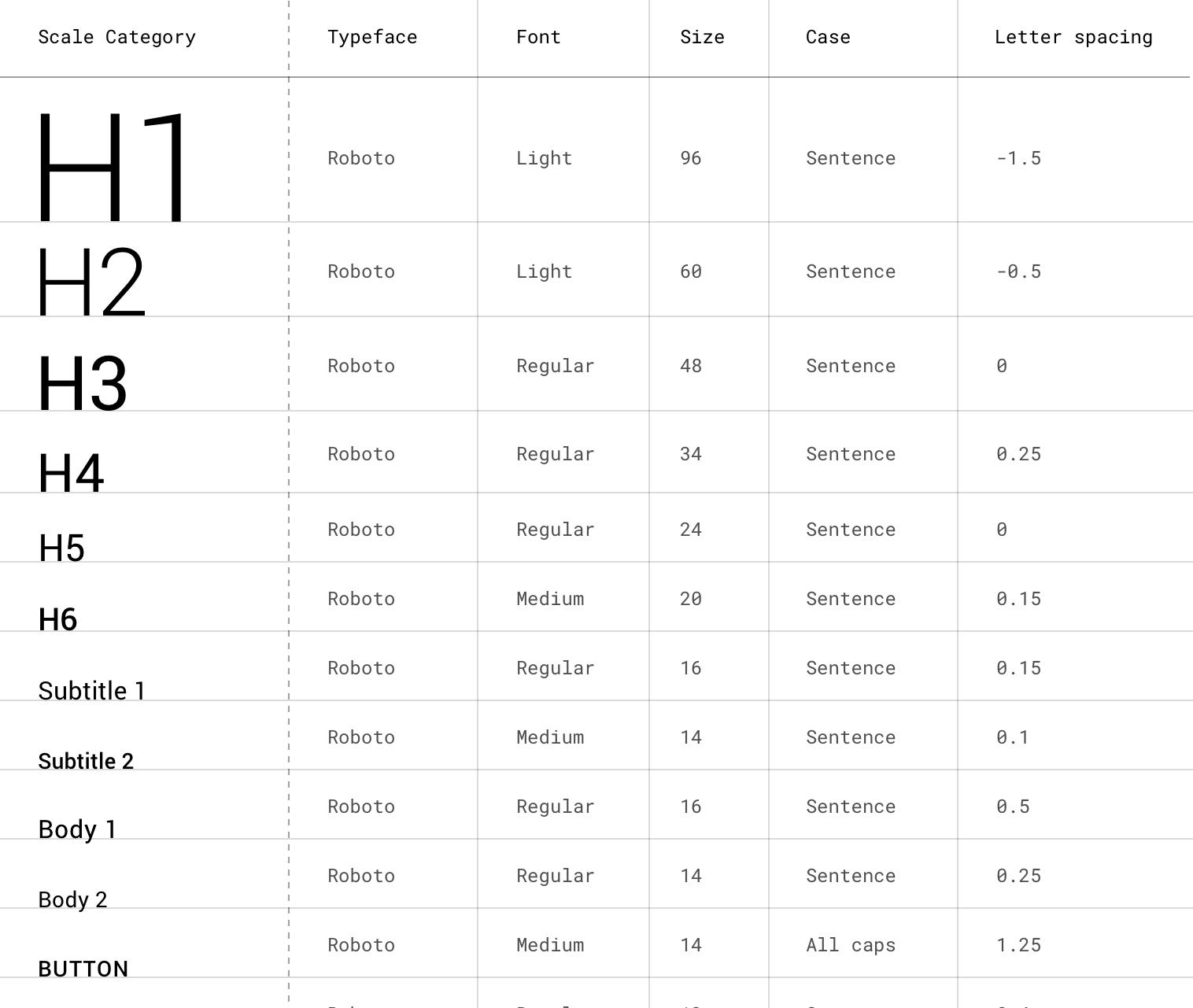
Typography standards
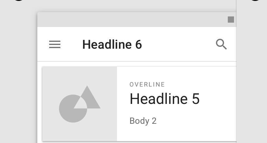
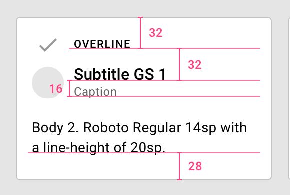
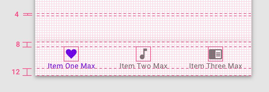
Figure 20: Typography standards were referred from the material design guides. Considering similar intentions of grid system guides.
App tile design
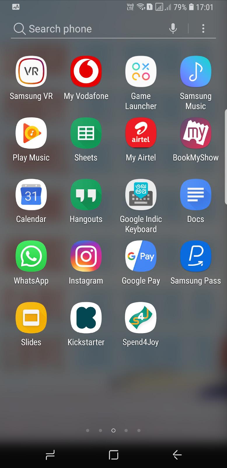
App tile creates the first impression. A quick iteration was made to communicate the core theme of an app taking inspiration a currency note and initials of the idea i.e. Spend 4 Joy. Adjacent images depict the evelopment of tile graphic and its representation on phone screen.
