CITY OF LAUNCESTON CORPORATE BRAND GUIDELINES
VERSION 1.1
25-HLPRX-005
Corporate Brand Guidelines Introduction
All marketing and communication materials (both externally and internally produced) for the City of Launceston and its secondary brands, must be approved by the Communications Team before reaching the public to meet the requirements of Council’s Media and Communications Policy (05-Pl-022).
It is important that the Corporate Brand Guidelines are consistently applied to all marketing and communication materials to ensure the City of Launceston presents a strong and consistent image to our community, in an accessible and easy to identify approach.
This document is designed to act as an overarching guide to provide guidance on the following;
• Design Guidelines
• Written Guidelines
• Signage Guidelines
For more information regarding the Corporate Brand Guidelines, please contact the Communications Team on (03) 6323 3180.
Please note that the City of Launceston follows the Australian Government Written Style Manual which can be found online via www.stylemanual.gov.au
More online
To download all branding assets featured within the Corporate Brand Guidelines, and the latest version of this document, visit www.launceston.tas. gov.au/brand
3 www.launceston.tas.gov.au/brand Download files City of Launceston Brand Guidelines Contents Our accessibility commitment 4 Corporate Brand Guidelines 6 Design Guidelines 7 General corporate design direction 9 Colour 9 Directional icon suite 10 Infographics 11 Tables 12 Corporate document footers 13 General report page footers 14 Corporate reports: page layout guide 15 Content layout 15 Emblem 16 Page design 17 Introduction messages 18 Index page 18 Multiple profile fields 19 General advertising 20 Print advertising (newspaper) 20 Other print advertising (promotional) 20 Logo requirements 21 Primary logo 21 Primary logo variations 21 Secondary logo variation 21 Using the logo alongside government logos 22 Co-branding with other logos 23 Community and corporate grant use 24 Facility logos 25 Clear space 26 Minimum size 26 Typography kit 27 Primary fonts 27 Alternate/secondary fonts 28 Font use 28 Font colour use 29 Font hierarchy 30 Individual brand identities 31 Digital asset design guide 37 Facebook 37 Instagram 37 Primary website banners 38 Secondary website banners 39 Photography 40 Accessibility standards 41 Accessibility quick guide 42 Copyright guidelines 44 Written Style Guide 46 Signage Guidelines 52
Our accessibility commitment
provider to remain compliant with the required WCAG 2.1 standards.
We encourage you to remain up to date with the WCAG 2.1 guidelines while collaborating with the City of Launceston.
Universal design principles
• Minimum font size of 10 point;
• Use simple colours and avoid using bright contrasting colours;
• Make all hyperlinks easy to understand (i.e. bolding, underlining and/or ensuring a colour variation has been applied to where the link is placed);
• Avoid the use of generic terms such as ‘click here’ as hyperlinked text in copy, instead opt to hyperlink relevant descriptive text;
The City of Launceston aims to provide accessible communications for everyone living within, working within and exploring Launceston.
To achieve the best experience for locals and visitors alike, we are committed to working with service providers to create designs that are inclusive and accessible - designs that provide equal access and support the needs of everyone who interacts with City of Launceston.
We strive to achieve compliance with the WCAG 2.1 accessibility guidelines, and work closely with all of our providers to work towards this outcome.
We share a collective responsibility to make every design, on every platform, accessible to everyone.
While collaborating with the City of Launceston, it is a priority to ensure all design deliverables are being checked for appropriate accessibility standards, and where needed, edits are made to remain compliant. This will be a responsibility of the contracted service
• Left justify text;
• PDF tags are used;
• Provide image descriptions on all occasions, unless images are purely for decorative purposes in which case descriptions and ALT tags/text are not required (i.e. your design will not lose context if a screen reader skips past the image);
• Take care with symbols as screen readers may have trouble distinguishing these;
• Take care with abbreviations. Spelling out the full word is always best;
• Allow room for plenty of white space;
• Leave space between paragraphs;
• Use high contrast between background colours and text;
• Avoid printing text over heavily textured backgrounds;
• Use clear and relevant headers when creating tables, and tag heading rows and columns accordingly;
• Logically apply heading tags (H1, H2, H3, etc) to all primary headings and sub-headings;
• Identify logical use of ordered and/or unordered lists; and
• Avoid breaking words at the end of a line.
4 www.launceston.tas.gov.au/brand Download files City of Launceston Brand Guidelines
We believe human-centred design starts with accessibility.
Our accessibility commitment
Universal content development principles
• Avoid unnecessary jargon;
• Keep sentences short and easy to understand;
• Where appropriate, content should be developed using Easy English;
• Break large chunks of text into smaller, easier to read paragraph clusters;
Accessibility support tools
• Adobe PDF accessibility checker - this tool will generate a report on your PDF file and provide feedback on what requires editing to meet accessibility standards. This tool is available via Adobe Acrobat DC.
• Word accessibility checker - this tool is an inbuilt feature to Microsoft Word and allows a report to be generated on your document formatting. This report will assist in guiding you towards what edits need to be made to make the file accessible.
• Hemingway - this website will support the creation of accessible content for all designs by offering readability suggestions. It is crucial to always review the messaging of your project to reduce the use of jargon, and tailor your messaging to your desired target audience.
• ColourContrast.cc - this online tool will easily allow for the checking of colour contrasts in relation to bestpractice accessibility guidance.
• ColourOracle.org - this tool can be download to your device to view your work through a colour-blindness simulator, helping you to make any adjustments as needed to ensure your work is accessible.
• Vision Australia Document Accessibility Toolbar - the Vision Australia toolbar for Microsoft Word is a free tool that can be download and installed onto your desktop. This toolbar will then populate as an added menu in Microsoft Word allowing you to use a range of built-in accessibility features to format your document.
5 www.launceston.tas.gov.au/brand Download files City of Launceston Brand Guidelines
Corporate Brand Guidelines
Understanding the Brand Guidelines
Why does Council need Brand Guidelines?
The City of Launceston and its internal departments have a large volume of design work for projects yearon-year. Whether this is for new brand development, signage, general promotional designs, corporate designs, or digital asset development – the Council requires a consistent representation of its brand at all times.
We’re committed to creating a consistent brand for our community to help identify Council involvement across the city, while best representing our projects in a modern, yet creative way.
With a panel of designers working with the Council on a wide range of projects, it’s key that we offer a central point of reference for all designs to be anchored back to.
The City of Launceston Corporate Brand Guidelines will support designers in creating work that is best reflective of the Council, while still allowing for individual creative direction to be applied to each concept.
The guidelines are designed to offer an understanding of corporate branding needs, and individual brand creation scope.
What are the benefits?
The primary benefit of the City of Launceston Brand Guidelines is to ensure that we, as Council, are collaborating with creative individuals and businesses in a streamlined approach to produce great designs. From designs that have set standards to follow, through to full brand creations, we are confident this guide will assist in streamlining the process of implementing the Council identity across all projects.
Who can use the guidelines?
Whether you work within the Council or are someone who collaborates with us on various projects, this guide is for everyone who may be seeking guidance on how to best deliver a project in line with the City of Launceston needs.
6 City of Launceston Brand Guidelines Download files www.launceston.tas.gov.au/brand
CITY OF LAUNCESTON DESIGN STYLE GUIDELINES
Contents General corporate design direction 9 Colour 9 Directional icon suite 10 Infographics 11 Tables 12 Corporate document footers 13 General report page footers 14 Corporate reports: page layout guide 15 Content layout 15 Emblem 16 Page design 17 Introduction messages 18 Index page 18 Multiple profile fields 19 General advertising 20 Print advertising (newspaper) 20 Other print advertising (promotional) 20 Logo requirements 21 Primary logo 21 Primary logo variations 21 Secondary logo variation 21 Using the logo alongside government logos 22 Co-branding with other logos 23 Community and corporate grant use 24 Facility logos 25 Clear space 26 Minimum size 26 Typography kit 27 Primary fonts 27 Alternate/secondary fonts 28 Font use 28 Font colour use 29 Font hierarchy 30 Individual brand identities 31 Digital asset design guide 37 Facebook 37 Instagram 37 Primary website banners 38 Secondary website banners 39 Photography 40 Accessibility standards 41 Accessibility quick guide 42 Copyright guidelines 44 Written Style Guide 46
General corporate design direction
Colour
When choosing colours to be used throughout any design, it is key to assess the general colour tones within the Council brand. Please ensure colours used are complementary of the overarching Council brand. For example – no fluoro colours should be used throughout designs, unless a specific project brand has been created where a more creative direction can be applied.
The Web Content Accessibility Guidelines (WCAG 2.1) recommend a text colour and background ratio of at least 4.5:1 (or 3:1 for text larger than 18 point or at least 14 point bolded).
Several tools can help check colour contrast ratios, such as WebAIM colour contrast checker.
TIP:
Example complementary colour palette guide alongside the City of Launceston primary brand colour.
9 www.launceston.tas.gov.au/brand Download files City of Launceston Brand Guidelines
PMS Black CMYK K 100 RGB R0 G0 B0
Black
PMS 199 CMYK C7 M100 Y85 K0 RGB R221 G0 B49
Red
3.5. PICTOGRAMS
Directional icon suite
The following regulatory and advisory symbols are included on signage to identify destinations and facilities.
Pictograms communicate to the widest possible audience, and eliminate language barriers by conveying a meaning through their pictorial resemblance to a physical object. They help to reduce unnecessary clutter and create consistency throughout all aspects of the signage system.
For all icons used within City of Launceston designs, the following icon style must be followed to ensure accessibility standards are met, along with ensuring all designs mirror the same iconography at all times.
These designs are based on the following
International Standards:
—ISO standards 7001: 2007
These designs are based on the following International Standards:
—AIGA the professional association for design icon set National Park Service Icons 1982, USA
• ISO standards 7001: 2007
These icons will also be provided in reverse for use on dark backgrounds.
• AIGA the professional association for design icon set National Park Service Icons 1982, USA
TIP:
All icons can be download in Adobe Illustrator format via the online brand hub.
APPROVED SIGNAGE GUIDELINES ICONOGRAPHY
10 www.launceston.tas.gov.au/brand Download files City of Launceston Brand Guidelines Download files
Regulatory Directional Warning Warning Limbs May Fall Slippery Surface WombatsSnakes Wallabies Trees May Fall Restaurant Toilets Information Facilities for people with limited mobility Lookout Car park Shared Path Bike Path Shared Path Give Way Shared Path Ride Slowly Cafe Drinking Fountain Fires Prohibited Do Not Drink No Camping No Firearms No Horses No Motorbikes No Vehicles No Parking No Entry No Bike Riding No Bird Feeding No Feeding Animals No Rock climbing No Smoking No Dogs No Swimming No Fishing No Dogs Swimming No SkatingNo Alcohol No Food Boat Ramp Swimming Pool FishingSkateboardingBasketball Horses CampingCampervans Heritage Site No diving No Glass Exercise equipment No campervans Alarm Security Recycling Dogs on Lead Litter Disposal Off leash Dog area Cliff FaceRocks Falling Weather Conditions Exposure Risk Slippery Rocks Deep WaterSubmerged Objects Strong Currents River edgeUnstable banks Public BBQ Railway StationBus Station Taxi ATM Playground Fireplace Ticket Purchase Aboriginal SiteWalking Self-guided WalkRock Climbing Hiking Trail Picnic Tables Shelter Telephone Post Office WIFI Hospital Arrow Left Arrow Straight Arrow 45 Left Arrow Right Arrow 45 Right North Arrow Ambulant MaleAmbulant Female Map Advisory No Collecting Firewood Police Pedestrian Access Prohibited Tiger Bus Stop Monument SynagogueChurch Pharmacy Car Share Designated Smoking Zone Parenting facilities DESIGN STANDARDS 3
STAGE 02 24.02.2017 ISSUE P5 DRAFT 18 P CITY OF LAUNCESTON CORPORATE SIGNAGE DESIGN GUIDELINES
Infographics
Infographics are frequently used to best display data to various stakeholder groups. When designing infographics, various factors need to be considered including;
• Print and digital display requirements – where and how will this information be displayed, are different variations of this information required to meet accessibility standards in print and digital?
• Specific graphic style use – when selecting graphics for use, it is important to keep in mind that there is a set preferred style to be used to ensure that the modern look and feel of the City of Launceston brand is met. The examples featured to the right embody the desired look and feel. This style is a line vector graphic and can be customised by colouring to complement the end design.
• Accessibility – please be aware of tagging requirements for infographics and tables to support ease of integration with assistive technologies.
Creative direction is encouraged when designing infographics for various projects, while always attempting to embody a modern design approach in all mock-ups.
• To provide a unified vision and consistent policy framework to support prosperity and sustainable development for existing and future communities in the greater Launceston area.
• To provide an overarching metropolitan regional framework to coordinate planning and development in the municipalities that together make up the greater Launceston area.
• To provide a regional view of development priorities within the greater Launceston area.
• To identify key city projects to be undertaken by the participating councils which will act as a focus for new investment and sustainable development opportunities in the greater Launceston area.
• To facilitate a consistent approach to the implementation of planning and development policy and initiatives within the greater Launceston area.
This End of Term Report is the City of Launceston’s early contribution towards understanding where we are now in terms of achieving the ambitious regional outcomes that are framed by the GLP. This is done by assessing our performance against our Strategic Plan 2014–2024, which is the City of Launceston’s response to the overarching community vision set out in the GLP.
Strategic Plan 2014–2024
Our Strategic Plan 2014–2024 is prepared in compliance with the Local Government Act 1993 (Tas), which requires us to develop a 10-year strategic plan and review it at least every four years. Visit www.launceston.tas.gov.au to download a copy of our Strategic Plan 2014–2024.
Greater Launceston Plan goals and Strategic Plan 2014–2024 links
Greater Launceston Plan overarching goalStrategic Plan section
Creativity and innovation 1. A creative and innovative city
Liveability and amenity 2. A city where people choose to live
Connected and networked region 3. A city in touch with its region
Building diversity 4. A diverse and welcoming city
Social inclusion and equity
Environmental sustainability
5. A city that values its environment
Land use, transport and infrastructure 6. A city building its future
Economic development 7. A city that stimulates economic activity and vibrancy
Governance
8. A secure, accountable and responsive council
Why an End of Term Report?
The purpose of the End of Term Report is to acknowledge and objectively comment on our progress against the strategic goals that we set in 2014.
Figure 1 – GLP goals and Strategic Plan 2014-2024 links lists the strategic themes from the GLP and shows how those themes are carried through to the Strategic Plan 2014–2024.
Together with the GLP, our Strategic Plan 2014–2024 is a principal document in our corporate planning framework.
The End of Term Report summarises the achievements of our organisation and our outgoing Aldermen, and sets the strategic scene that our incoming Aldermen will influence during their 2018–2022 term.
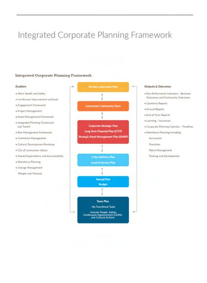
Figure 2 – Integrated planning at City of Launceston shows the formalised framework for our integrated strategic planning, linking through to service delivery activities and operations. The framework demonstrates the clear alignment towards achievement of our corporate objectives from the community vision through to the strategic plan, and down to service delivery plans at a directorate, department and individual level.
Our strategic goals are articulated in our Strategic Plan 2014–2024, adopted by our then newly-elected Council on 24 November 2014, following the former Council’s endorsement of the Greater Launceston Plan (GLP) on 10 June 2014.
The Greater Launceston Plan (GLP)
TIP:
The GLP articulates the Greater Launceston community’s vision and aspirations for the greater Launceston area as we move toward 2035. Visit www.launceston.tas.gov.au to download a copy of the GLP.
The GLPs vision is: Sustainable prosperity for greater Launceston will be achieved by consolidating and building nationally and internationally recognised strategic advantages through a focus on creativity and innovation, maintaining exceptional environmental and liveability qualities and ensuring a diverse, connected and inclusive community.
• What will Launceston look and feel like in 20 years?
• Where will new housing be located and how will people live?
• How will we get around the city and greater Launceston area, within a state and national context?
• What infrastructure and projects should the government invest in?
The GLP was developed following substantial research on the future of northern Tasmania, our relative competitive advantages and challenges, data analysis and consultation with the community.
This End of Term Report will provide valuable context, understanding and continuity for the incoming Council to enable it to continue delivering on the GLP.
The development of the GLP was initiated and led by the City of Launceston in collaboration with the George Town, Meander Valley, Northern Midlands and West Tamar councils to guide how the city and surrounding communities will develop over the coming decades. It answers questions such as:
Our regional community said that the GLP should focus on increasing economic prosperity, liveability and creativity in Launceston and the surrounding region.
In pursuing these objectives, the GLP seeks to satisfy five principal outcomes for the participating councils and broader communities that they represent:
11 www.launceston.tas.gov.au/brand Download files City of Launceston Brand Guidelines
GREATER LAUNCESTON PLAN Four Year Strategic Planning Cycle Annual Planning Cycle Greater Launceston Plan Key Success Indicators Quarterly Progress Reports ANNUAL REPORT STRATEGIC PLAN STRATEGIC FINANCIAL PLAN STRATEGIC ASSET MANAGEMENT PLAN ANNUAL PLAN DIRECTORATE PLANS Operational Planning SERVICE UNIT PLANS INDIVIDUAL PERFORMANCE OBJECTIVES/PROJECTS City of Launceston End of Term Report 5
Figure 2
– Integrated planning at City of Launceston
Figure 1 – GLP goals and Strategic Plan 2014–2024 links
City of Launceston End of Term Report 4
At times tagging complex infographics as an image and supplying context in the form of an ALT tag will produce the best result for users accessing content through a range of technology platforms.
Tables
For all tables, whether this be within formal reporting or general Council reporting, the following example must be followed.
An interchangeable element of this table design can be the colour used in the top row of the table where the headings of each field is located. Shading of each row in the table should be shown as demonstrated in the example provided.
When creating a table, please ensure all content is left-aligned, with the body text within the table remaining a charcoal grey colouring, as displayed, and all headings format in white against the coloured background.
To achieve the shading rotation of the rows, use the colour black and set the tint to 5% and 10% alternating row, as shown.
TIP:
To make sure your table meets bestpractice accessibility advice, create clear and concise headings. For any nested sub-cells in your table, be sure to tag accordingly.
To provide for the health, safety and welfare of the community.
To fairly and equitably discharge our statutory and governance obligations.
Commence implementation of the Workplace Strategy.
Complete negotiation of the City of Launceston Enterprise Agreement.
Continue review of Governance/ Ownership Model - UTAS Stadium.
Commence review of Governance / Ownership Model - QVMAG.
Infrastructure & Assets
Organisational Services
Chief Executive Officer
To ensure decisions are made on the basis of accurate and relevant information.
Chief Executive Officer
To continually improve our service delivery via a continuous improvement mindset, pursuing efficiency gains, and adopting technological and other process innovations.
Level of Service Planning Stage 1
Develop a project plan to document service levels, review appropriateness of services, and engage with the community around expectations.
Organisational Cultural Development Roadmap; and
Continue to implement an organisational development program.
Review organisational Information and Communications Technology (ICT) Strategy.
Organisational Services
Organisational Services
Organisational Services
12 www.launceston.tas.gov.au/brand Download files City of Launceston Brand Guidelines
Focus
2020/21 Annual Plan Action/s Network
Area
Corporate footer guidelines
The purpose of the corporate footer is to provide a graphic element which houses the City of Launceston logos and contact details in a consistent and recognisable manner.

The footer ensures a clear display of brand hierarchy, as well as allowing for a uniform arrangement of logos and/or type.
It also creates a clear delineation between the mandatory information within the footer, and the variable content above the footer.
The footer will appear on internal and external documents where specified. It must also appear on all advertising material, all flyers and posters, the first page of all documents and on electronic communications such as letters and newsletters.
Colour
• The line graphic, separating the footer from the rest of the page must always be BLACK in colour
• The red rectangle on the far right must always be PMS 199 (or CMYK equivalent).
• The City of Launceston logos must appear in the correct PMS colours (or CMYK equivalent).


• Any text must appear in black.
Positioning
• The line will create a white footer area at the base of the communication piece which is 10% of the overall height (e.g. on an A4 page, the line should be positioned 2.97cm up from the bottom edge).
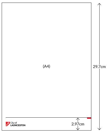
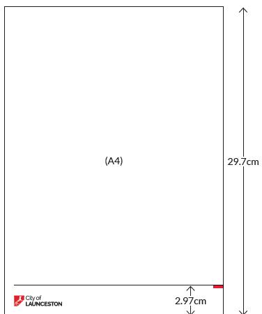
• If this is NOT possible, the minimum space below the line should be 2cm (this allows for 0.5cm below and 0.5cm above the 1cm high logo).
• On communication pieces A4 or smaller, the black line should always be 0.5pt in weight. On pieces sized A3 or larger, the line can increase to be 1pt in weight.
* PLEASE NOTE: On communication pieces that use a background image or colour ABOVE the footer, the black line can be omitted, and the lower edge of the image or background colour used in its place to separate the logo area within the footer.
13
www.launceston.tas.gov.au/brand Download files City of Launceston Brand Guidelines
General report page footers
Throughout formal reporting, where able, the following footer should be applied to all pagessitting next to page numbers. This should include the City of Launceston logo either on both sides, or alternating the secondary logo as displayed below.


Where a footer is placed over colour, ensure a reversed colouring approach (white) is used to assist with visibility on the desired background.

14 www.launceston.tas.gov.au/brand Download files City of Launceston Brand Guidelines
LEFT RIGHT
Corporate reports: page layout guide
Content layout
For all report designs where large scale content is to be formatted, please refer to the report design style InDesign file, located in the branding hub.
15 www.launceston.tas.gov.au/brand Download files City of Launceston Brand Guidelines
Emblem
The Council emblem is a key design element in all formal Council report designs. This should be used on the two internal pages of any report, across the index field and the introductory title pages (as featured). This emblem can be removed where a specific brand identity has been developed for a project. The emblem must sit on a primary block colour, in a transparency level that allows for it to be format as displayed.
The emblem is available for your use on Council collateral via the branding hub.

TIP:
We encourage the use of the emblem in designs where appropriate to represent the corporate City of Launceston branding.

16 www.launceston.tas.gov.au/brand Download files City of Launceston Brand Guidelines
Page design
While designing the layout for pages in large or smallscale corporate reports, please factor in the below checklist to ensure the desired look at feel is achieved. This includes:
Front page
Report heading is to sit at 36pt ‘City of Launceston’ is to sit as the first title in Lato Thin
The report title then follows directly underneath in Lato Black
When formatting the report title, please break large headings onto two lines to avoid the title running too far into the page
Dates are to sit under the report title as displayed below in Rockwell Black font or Lato Regular
City of Launceston logo to be placed in the bottom right corner of the page
There should be a thin white line down the left side of the page about 10mm out
White border to be placed at the top, right and bottom sections of the page
Heading to remain in capital letters
17 www.launceston.tas.gov.au/brand Download files City of Launceston Brand Guidelines
CITY OF LAUNCESTON END OF TERM REPORT 2013—2018
Introduction messages
For all reports that require an introduction message field, please refer to this example of an approved layout. This example showcases how this field should be created, with headings, profile, body content and signature fields.
Index page
For every report, an inside page index page is required.
The following design must be followed, mirroring the template file located in the branding hub.

For all primary headings in this section, please have this format in Lato Black, for subheadings in the index section, please have this in Lato Regular.
All sections within a document index must be linked to the corresponding sections throughout the report for ease of navigation.
18 www.launceston.tas.gov.au/brand Download files City of Launceston Brand Guidelines
INTRODUCTION MESSAGE INDEX PAGE
Multiple profile fields
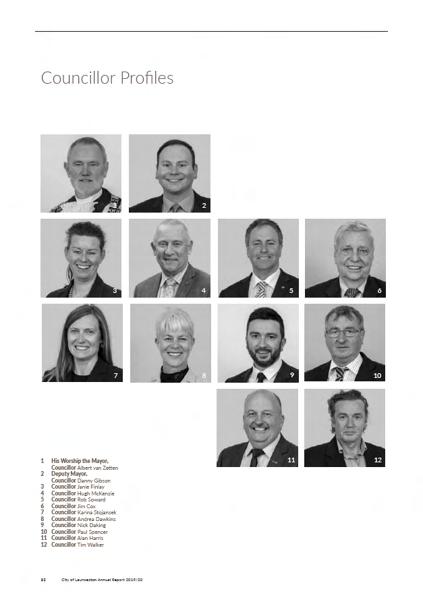
Where formatting pages with multiple images of staff, board members, Councillors - please refer to the featured approach for the layout of this content. To the right is an example showcasing the preferred image layout direction, followed by profile descriptions and an image key.
19 www.launceston.tas.gov.au/brand Download files City of Launceston Brand Guidelines
General advertising
Print advertising (newspaper)
The City of Launceston has a range of routine print media advertising requirements, across both early general news and classifieds. For all legislative advertising requirements there is a set standard for ad layouts, and a template is supplied in the branding hub for use. Please ensure all margins are kept to 5mm, and all fonts/layouts remain as supplied.
Other print advertising (promotional)

For all other Council advertising needs, we encourage full creative control to designers to create advertising that fits the desired target audience for each project.

20 www.launceston.tas.gov.au/brand Download files City of Launceston Brand Guidelines
0362 20190118 Development Applications In accordance with Section 57(3) of the Land Use Planning and Approvals Act 1993 public notice is given for the following applications: Site: 21 Denman Road, Trevallyn Applicant: B P Nitschke Architect, MT French, BL French Proposal: DA0001/2019 Residential – Construction of a carport and alterations to an existing dwelling Site: 1 Chungon Crescent, South Launceston Applicant: Design To Live Pty Ltd Proposal: DA0704/2018 Residential – Construction of two dwellings Site: 43–45 Invermay Road, Invermay Applicant: Commercial Project Delivery Proposal: DA0713/2018 Hotel Industry – Construction of alterations and additions to the existing building (retrospective) Site: 5 Cadorna Street, Mowbray Applicant: Douglas Design & Drafting Proposal: DA0716/2018 Residential – Construction of two multiple dwellings on future lot 2 and widen access Site: 37 Frederick Street and 111 Wellington Street, Launceston Applicant: S Group Proposal: DA0735/2018 Business and Professional Services – Construction of alterations to existing heritage building including works to doorways, facade and the installation of a tenancy sign. Plans and documents can be inspected at our Customer Service Centre, Monday to Friday from 8.30am to 5pm or on our website at onlineservice.launceston.tas.gov.au until Monday 4 February 2019. Written representations to the General Manager may be made during this time to PO Box 396, Launceston TAS 7250 or by email to contactus@ launceston.tas.gov.au. The full content of your submission may be included in the report (available for public access) if the application is presented at a Council meeting for consideration. It is therefore the responsibility of the author of the submission to ensure that what is written is factual, fair and reasonable and not defamatory against any person. Please provide date, time, phone and contact details with representations. For further information please call 03 6323 3000. More online. WORKS // TENDERS // JOBS // COUNCIL NEWS Michael Stretton General Manager Phone 03 6323 3000 www.launceston.tas.gov.au
Logo requirements
Primary logo
The primary logo for the City of Launceston should be placed on all design work. Traditionally this will sit in the bottom right corner of a design, however, this is again open to creative direction to ensure the best look for the design in question.
Primary logo variations
For various designs, the City of Launceston will need to have its logo represented in variations to best achieve a positive design outcome. Located in the branding hub, you will find variations on the website for use, this includes a reverse black, and white logo option.
Secondary logo variation
For The option to use solely the Council thylacine graphic is also available for set designs, however, this would be used for aesthetic purposes only. Where possible, the full logo is the primary choice. Use of this logo on designs must have final approval provided by the City of Launceston Communications Team.
Full colour
The preferred version of the logo.
Black/Mono Use on single colour print material.
Adjacent logos should also be presented in a single colour. Acceptable to switch the colour in limited colour publications where black has been replaced with a different colour. Use when the logo is extremely small.
(See Minimum Size)
White/Mono Use on black or dark backgrounds.
Use when the logo appears over an image. Adjacent logos should appear in the same way.
Icon
Used in special circumstances or as a feature design element
21 www.launceston.tas.gov.au/brand Download files City of Launceston Brand Guidelines
Using the logo alongside government logos
In situations where the logo appears as a sponsor or partner with other government organisations:
Arrange according to government hierarchy; and Use mono versions if possible.
TIP:
Please refer to the QVMAG Style Guide for information on how to stack logos when creating designs for this facility.
22 www.launceston.tas.gov.au/brand Download files City of Launceston Brand Guidelines
Co-branding with other logos
The City of Launceston logo is often used in conjunction with other organisations or partners.
Secondary logos should appear alongside or adjacent to the primary logo.
Where possible, include a clarification line.
TIP:
Don’t assume the viewer necessarily understands the relationship between the two brands.
Primary logo and partner with attribution line (preferred option) SUPPORTED
Primary logo and partner with no attribution line
Attribution line:
Font Lato Regular, all caps
Font size 30% of measure
Colour Single colour
www.launceston.tas.gov.au/brand
City of Launceston Brand Guidelines 23
Download files
BY
Community and corporate grant use
Grant recipients are required to display Council’s logo on their grant material.
Make sure there is ample space between the logos.
If Council is the primary or major supporter, sponsor or stakeholder, our logo should appear first in the list.
The logo should only be displayed on a white background. Otherwise, use the solid black or solid white version.
Do not skew or distort the logo.
City of Launceston Brand Guidelines 24
Download files
www.launceston.tas.gov.au/brand
GRANT SUPPORT BY Minimum height 10mm
GRANT SUPPORT BY
Sponsor logo
Logo requirements
Facility logos
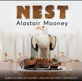
The following facilities have set logos for use:
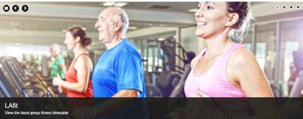
• Launceston Leisure & Aquatic Centre
• University of Tasmania Stadium
• Queen Victoria Museum Inveresk
• Queen Victoria Art Gallery Royal Park
• Carr Villa Memorial Park
Please note: for QVMAG specific designs, the Tasmanian Government logo must be included on all designs alongside QVMAG.

All facility logos can be located in the branding hub, and can again be utilised in black and white format where required to achieve the best design outcome.
*This application of the QVMAG brand is to be used solely across digital platforms and on-site signage. Please refer to the QVMAG style guide for further guidance on use.
TIP:
When spelling out Launceston Leisure & Aquatic Centre, always use an ampersand versus the full spelling of ‘and’ to meet our brand standards.
25 www.launceston.tas.gov.au/brand Download files City of Launceston Brand Guidelines
Clear space
When using the City of Launceston logo or facility logos, it is key to ensure the correct use of white space is being used around the logo on your design.
Minimum size
The sizing of all logos will vary depending on the need - as a guide, please follow the below suggestions for minimum size when using the full colour and single colour variations of the logo.
26 www.launceston.tas.gov.au/brand Download files City of Launceston Brand Guidelines
10mm 5mm
Typography kit
font use
Primary fonts
The City of Launceston corporate font family is Lato - this must be used in all primary designs, unless a specific brand identity has been developed for a project.
For queries regarding additional fonts on corporate designs, please ensure this has prior approval with the project manager, who will seek approval from the Council Communications Team.
For individual brand identities, following the corporate font guide is not required.
Lato is an approved font that meets the required accessibility standards. This can be used on all design styles required for Council, including signage.
If you are yet to have this font family installed, you can download this font family online through Adobe Fonts or via Google Fonts.
27 www.launceston.tas.gov.au/brand Download files City of Launceston Brand Guidelines
LATO abcdefghijklmnopqrstuvwxyz ABCDEFGHIJKLMNOPQRSTUVWXYZ 0123456789 Launceston Aa Aa Launceston Aa Aa Launceston Aa Aa Launceston Aa Aa Launceston Aa Aa Launceston Aa Aa
Alternate/secondary fonts
For secondary fonts in corporate designs, the following font families can be used:
• Rockwell font family
• Arial font family
Font use
The Lato font family must be used in all infographics unless a specific brand has been developed for a set project to be identifiable in the public eye.
You are able to again access font downloads for all alternate/secondary fonts via Adobe Fonts or via Google Fonts.
TIP:
The Rockwell and Arial font families meet accessibility requirements.
28 www.launceston.tas.gov.au/brand Download files City of Launceston Brand Guidelines
ROCKWELL abcdefghijklmnopqrstuvwxyz ABCDEFGHIJKLMNOPQRSTUVWXYZ 0123456789 ARIAL abcdefghijklmnopqrstuvwxyz ABCDEFGHIJKLMNOPQRSTUVWXYZ
Font colour use
For font colouring throughout designs and reports, please opt for the following general guidelines:
• General report text: Pantone Warm Gray 11 or black;
• Where required, reverse colouring of white text should be used on heavy coloured backgrounds; and
• Designer discretion should be applied to determine which colour will offer the best design outcome for the project on hand, while meeting best contrast for accessibility.
This is a general guide for core Council designs only, for projects that are developing an individual brand, creative discretion is asked to be applied.
Please note: when choosing a font for use, if creating a brand for a project, please ensure you align the font to the overall vision of the project while also keeping a tie to the Council brand. For example the use of cursive fonts and the like would not be a fit for Council, as it may not meet accessibility standards nor match our Council brand.
29 www.launceston.tas.gov.au/brand Download files City of Launceston Brand Guidelines
PMS Black CMYK K 100
RGB R0 G0 B0
PMS Warm Gray 11
CMYK C52 M53 Y58 K23
RGB R111 G98 B89
Font hierarchy
This general adoption can be made with all font families that have been approved for use. Example of font hierarchy use within a design:
30 www.launceston.tas.gov.au/brand Download files City of Launceston Brand Guidelines
HEADING HIERARCHY VISUAL DEPICTION H1 36 pt Primary Heading Text (black) Secondary Heading Text (regular) H2 24 pt Primary Heading Text (black) Secondary Heading Text (regular) H3 18 pt Primary Heading Text (black) Secondary Heading Text regular) H4 12.5 pt Primary Heading Text (black) Secondary Heading Text (regular) H5 11 pt Primary Heading Text (black) Secondary Heading Text (regular) BODY 10 pt Body text example (regular) An important element of our strategic process is accountability in reporting to stakeholders on achievements against targets. Prior to the start of each financial year, Council adopts an annual plan that sets out how our Strategic Plan 2014–2024 will be operationalised by the organisation. Each annual plan includes robust performance measures that form part of the annual plan reporting process to Council on a quarterly basis. Summarised reporting on performance against annual plan targets also occurs in our annual report. This provides the community with an opportunity to measure the City of Launceston’s success in meeting its strategic goals and objectives. Our Strategic Plan 2014–2024 details strategic goals and objectives around eight strategic themes. Each strategic theme includes indicators to help us articulate the outcomes our success in achieving strategic goals and objectives will deliver to our community. Progress has been measured utilising available data sources such as Economic ID and census data. In some cases the time-frames for the analysis do not accord with the electoral term, however, they represent the best available measure for the purposes of this report. Progressing towards community outcome Stable Moving away from community outcome How do we measure progress? The following sections of this End of Term Report provide an overview of Council’s performance against the above indicators for the 2014–2018 Council term, expressed under the eight strategic themes that give our Strategic Plan 2014–2024 its structure. 9 City of Launceston End of Term Report
Individual project brand identities
For various projects you will be required to go further down the path of creating an individual brand identity for a project/initiative.
This will help distinguish the project in the eyes of the community, while still underpinning the top tier Council branding.


As the designer, you are able to take creative direction with the overall branding development for any project that falls within this category.
TIP:

When creating a sub-brand identity for projects under the City of Launceston banner, it is a requirement to seek the Communications Team approval on the initial concept and again prior to a final proof approval.

This approval process does not apply for QVMAG or the Launceston Leisure & Aquatic Centre brands as individual style guides for each facility will apply.

31 Download files City of Launceston Brand Guidelines www.launceston.tas.gov.au/brand
Report design examples


32 City of Launceston Brand Guidelines Download files www.launceston.tas.gov.au/brand
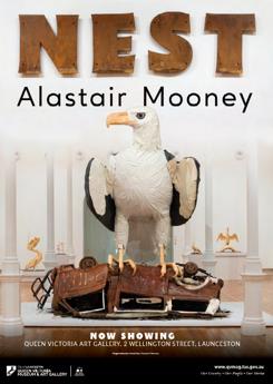
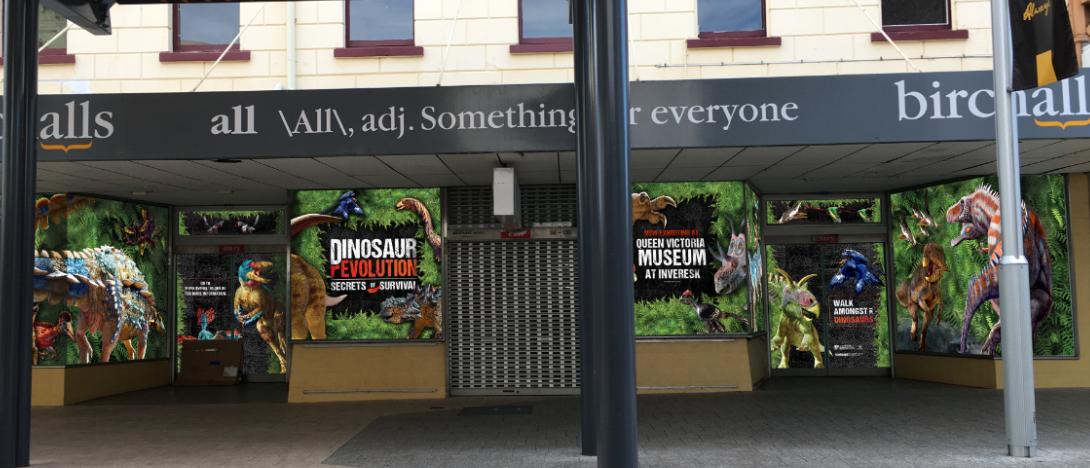
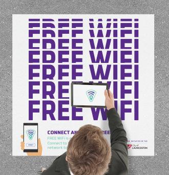
Poster design


33 City of Launceston Brand Guidelines Download files www.launceston.tas.gov.au/brand Our stories are here to start a conversation. Listen. Ask. Explore. launcestonhumanlibrary.com.au 60760_lcc_human library poster.indd

www.launceston.tas.gov.au/brand 34 City of Launceston Brand Guidelines Download files
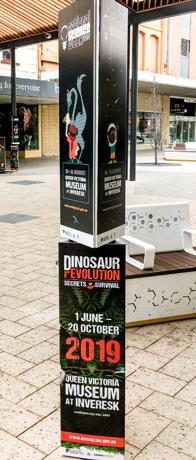
CBD WINDOW DISPLAY EVENT DIRECTIONAL SIGNAGE PAVEMENT DECALS CAR WRAP DESIGN
Campaign activations


35 City of Launceston Brand Guidelines Download files www.launceston.tas.gov.au/brand
PRIMARY LOGO ACCEPTABLE LOGO FORMATS MONO LOGO LOGO USE BRANDING Never stretch or distort the logo it must appear like the far right example. WINNER The logo should never appear smaller than 2cm x 2cm
Logo brand development
36 City of Launceston Brand Guidelines Download files www.launceston.tas.gov.au/brand A fresh look for 2017. We’ve refreshed our website to make it easier for you, our community to find out exactly what’s happening, where to access information and how to make payments online. www.launceston.tas.gov.au Community awareness promotion
Digital asset design guide
Facebook
• Recommended sizing for Facebook tile graphics is 1200 x 628 px
• Recommended sizing for Facebook banners is 820 x 312 px
Breakpoints to consider for Facebook include:
• Desktop: 820px x 310px
• Mobile/iPad: 820 px x 460px
• Event Image: 1920px x 1080


Instagram
• Recommended sizing for Instagram graphics is 1080 x 1080 px
TIP:

When designing digital banners, design mobile-first at all times.

37 Download files City of Launceston Brand Guidelines www.launceston.tas.gov.au/brand
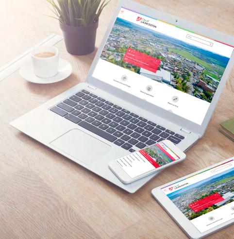
Primary website

Website banners where required should be designed to factor in the current website banner text overlay requirements. There is a permanent area of text overlay located on the website banner for www.launceston.tas.gov.au, which is crucial in ensuring a successful design. The examples shown demonstrate designs that utilise the space around the overlay box.

Recommended sizing for a primary website header is 1920 x 650px
When in mobile optimised view, the banner will feature only core-centre justified imagery and the overlay assets.
Please factor this into all designs.
38 Download files City of Launceston Brand Guidelines www.launceston.tas.gov.au/brand
Secondary sub-sites
QVMAG and Aquatic Centre

Please note: There is an overlay box at the bottom of this banner section that should be factored in when designing.


Recommended sizing for website header is 1140 x 440px

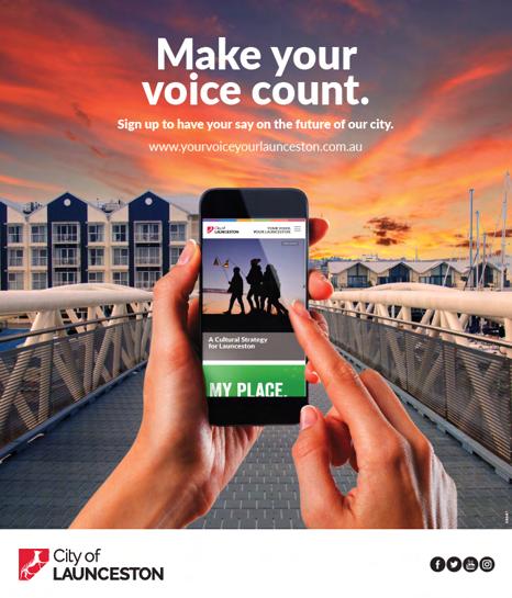
Your Voice Your Launceston
The banner for the Communications Engagement platform, www.yourvoiceyourlaunceston.com.au should always be representing the platform needs - either the focus of the 18-month campaign Tomorrow Together, or, a generalised approach to reflect community consultation in Launceston/the Your Voice Your Launceston brand.
Recommended sizing for website header is 6000 x 1042px
39 Download files City of Launceston Brand Guidelines www.launceston.tas.gov.au/brand
ORIGINAL WEB BANNER
DESKTOP WEB BANNER
MOBILE WEB BANNER
LIVE WEB BANNER
YOUR VOICE YOUR LAUNCESTON
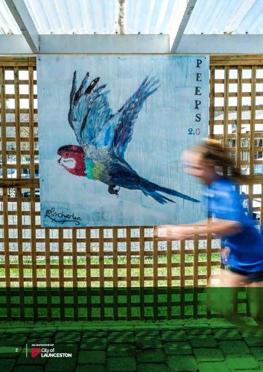
Photography direction and style
Capturing authentic Launceston.
We’re focused on capturing the essence of our community and city through all photography taken for the City of Launceston and our facilities.


Imagery that shows authentic situations with authentic reactions.
Our goal is to always ensure that our imagery is people-first, showcasing not only the beauty of our City but also the people who make Launceston what it is today.

TIP:
It’s critical to always seek the correct photography permissions from every person featured within an image if their identity is recognisable. Please ensure photography release forms are used on all occasions and where needed. The corporate City of Launceston Photography release form can be found via ECM.
40 Download files City of Launceston Brand Guidelines www.launceston.tas.gov.au/brand
Accessibility
Word and PDF
When supplying final design files to Council, please ensure you are meeting best practice accessibility requirements.
We focus on a digital-first mentality for all designs to support the integration of assistive technologies across all Council communications.
By following the below suggestions for both Word and PDF format, your document will support the ease of integration with a broad range of technologies.
Word files
A great resource to utilise is the Microsoft Office Accessibility Checker - this will assist in sweeping your file and offering improvement suggestions regarding accessibility. This will flag errors, warnings and tips to help you get the most out of your file.

Learn more about the Microsoft Word accessibility check.
Vision Australia Toolbar
The Vision Australia toolbar for Microsoft Word is a free tool that can be download and installed onto your desktop. This toolbar will then populate as an added menu in Microsoft Word, allowing you to use a range of built-in accessibility features to format your document.
Learn more about the Vision Australia Word Accessibility Toolbar
PDF files
Make use of the inbuilt Accessibility Checker to review any common accessibility errors. This will assist in ranking you based on Pass, Needs a Manual Check or Failed - assisting you in identifying where improvements can be made.
Learn more about how to install this feature in Acrobat Pro DC.

City of Launceston Brand Guidelines 41
Download files
www.launceston.tas.gov.au/brand
Accessibility
Word Files
Word has a range of built-in features to support your document accessibility goals. The following tips will support your goal of achieving best-practice formatting for all documents.
If you need support or guidance when it comes to making your document accessible, please contact a member of KAST or the Communications Team for further advice.
There are a range of baseline steps to follow when creating an accessible Word document, this includes;
• Using the correct heading tags (H1, H2, H3, etc.);
• Using lists and tagging this content accordingly;
• Create relevant and meaningful hyperlinks (i.e. avoid the use of generic hyperlinks such as ‘Click here for more information’);
• Add ALT tags to all images throughout your document to support assistive technology in identifying what each object is;
• Use tables wisely throughout your file with appropriate heading tags; and
• Understand how to export your file to other formats while keeping all your accessibility tagging in format.
Using correct headings
When adding heading tags into your document, it’s important to think about the logical hierarchy of text placement. Your heading tags will allow assistive technology (such as a text-to-speech reader) to identify content sections and new topics throughout your file. By using the correct heading tags throughout your file you’ll also be creating a better user experience for those accessing your file by adding further context and clarity to the structure of your document.
Hyperlinks
Hyperlinking a URL to content such as ‘Click here’, or ‘Download here’ can cause a user to miss the link action when being accessed by assistive technology.
Embedded hyperlinking should include embedding the URL over a relevant snippet of text. For example, in the sentence ‘The City of Launceston Brand Guidelines...’ we would choose to hyperlink the ‘City of Launceston Brand Guidelines’.
Alternative text (ALT) tags
ALT tags (alternative text tags) on your images are a must - not only do they allow assistive technology to read aloud or provide a text description of an image, it also helps to build further context to the document in question for all users.
To add alt tags to images throughout your file, rightclick on each image and select ‘Picture’. From here, navigate to the tab ‘Alt Text’ in the pop-up field, enter your image description and click ‘Ok’ to save.
Tables
When using tables throughout your document, it’s best to keep it simple. Tables are great for displaying data sets where needed, but if you find you need to display complex and large quantities of data in tables, be sure to tag your heading rows and columns accordingly.
To do so, right-click on your table and navigate to ‘Table Properties’. Select the tab ‘Row’ and tick the option to repeat the header row across each new page.
Additionally, you’re able to add an ALT tag to your table to offer a brief overview of the findings presented within your table. To do so, follow the same steps as above and select the tab ‘Alt Text’ to input and save your description.
Keep your column headers clean and clear and avoid making this content too complicated.
If you have a range of nested cells within your table, it’s key to clearly identify the headings of each section to support assistive technology when reading this content aloud to a user.
City of Launceston Brand Guidelines 42 www.launceston.tas.gov.au/brand Download files
Word and PDF
Making the most of lists
It’s important to make the most of ordered lists where practicable throughout your document. By doing so, this will allow assistive technology to identify where a list of content within the document is nested. To tag this accordingly in Word, simply apply the bullet point or number point setting to your list in Word.
Exporting from Word to PDF
By selecting Export>Save As> PDF this will automatically save your accessibility settings and translate this across to your PDF export.
When saving, select ‘Options’ and check that ‘Document structure tags for accessibility’ is ticked. This is typically ticked by default but can become untagged in certain circumstances.
PDF files
At times you may need to check the accessibility of an existing PDF file, and are unable to access the original Word document.
Adobe Acrobat Pro DC (paid version) supports an accessibility audit of PDF files, and takes users through a step-by-step audit to tag the document with;
• Heading tags;
• Alt tags;
• Adding bookmarks;
• Document title settings;
• Identifying interactive forms;
Free tool alternatives
There are a range of tools that have been made available to support the accessibility review of documents.
Alternate platforms include;
• www.pave-pdf.org
This platform is a free online tool that allows users to upload a file and have this reviewed against accessibility standards. The platform will first attempt to rectify all changes required for you, and will provide you with a list of remaining edits needed. The system will provide how-to guides for all changes flagged, and will allow for you to make all changes within the PAVE platform.
• www.CommonLook.com
TIP:
Forward planning when it comes to creating accessible documents and communication is key. Formatting as you go, versus completing a full accessibility sweep when proofing a document will save a considerable amount of time and resources.
• Tables; and
• Lists.
Adobe Acrobat Pro DC can also scan your PDF file and produce an Accessibility report that will outline current errors and suggested changes to make your file more compliant.
To access this feature, you must be signed up to a paid version of Adobe Acrobat Pro DC.
CommonLook provides a free software integration that links directly with Adobe Acrobat. This software enables users who don’t have access to Adobe Acrobat Pro DC to undertake accessibility compliance checks and receive a report of any errors that are present within the file.
43 www.launceston.tas.gov.au/brand Download files City of Launceston Brand Guidelines
Copyright guidelines
Copyright refers to the legal right of the owner of intellectual property.
In simpler terms, copyright is the right to copy. This means that the original creators of products and anyone they give authorisation to are the only ones with the exclusive right to reproduce the work.
For the City of Launceston, this means that we are restricted in what we can legally reproduce in terms of imagery, artwork, written content and music.
Without the express permission of the author of these mediums, we cannot reproduce any of these for our use.
Images
Unless you took an image yourself, or you have the permission of the person who did take a photo or image, you cannot reproduce that image for external use under ANY circumstances.
For example, you cannot simply save an image from the internet (ie a Google search) and use it in a report or study without asking permission to do so from its owner.
The copyright owner of that photo or image must be contacted, preferably in writing, and permission sought.
If that process is followed, it is also strongly advisable that some form of attribution is given when publishing that image.
For example: Launceston’s Cataract Gorge in Flood: Reprinted by permission of John Smith.
It is also strongly advised that you do not digitally manipulate any image or photo under any circumstances.
There are websites that do provide a large number of royalty free images that can be used, such as Pixabay.
As with any issues of copyright, it is strongly advised that you contact the Communications Team for guidance and advice if you are unsure.
Artwork
The same restrictions for images apply for the use of artwork produced by a third party.
Unless prior authorisation is given, you cannot use a piece of artwork, nor can you pass it on to another artist to replicate or revise unless there are provisions for such in a contract.
It is advised that consideration is given to this when engaging specific artists through contractual or tender negotiations, that is, the Council would retain all ownership of any material or artwork produced.
Written content/text
Also known as plagiarism, directly using written content from another person is not permitted.
Plagiarism can take many forms, from deliberate cheating to accidentally copying from a source without acknowledgement. Consequently, whenever you use the words or ideas of another person in your work, you must acknowledge where they came from.
For example, you are producing a pamphlet on water quality in the kanamaluka/Tamar Estuary and you find a report written by an environmental scientist and you wish to republish a key piece of information contained in that report.
You can republish those quotes as long as you attribute them back to the author.
More information on how to correctly attribute this type of information can be found here: https://www. masterclass.com/articles/how-to-attribute-a-quote
44 www.launceston.tas.gov.au/brand Download files City of Launceston Brand Guidelines
Music
Unless you have paid for the rights to republish music, or part thereof, the simple rule is “Don’t”.
There are a number of websites that do provide royalty free music to download, and they can be found using a simple Google search. As a general rule of thumb, always read the ‘fine print’ on those sites as usually they do contain rules around the use of their materials, which usually include some form of attribution.
Wikipedia
People often use Wikipedia as a source of general information.
However, caution must be urged if using any information from a Wikipedia search as the content is user-generated and there are no guarantees around its authenticity or accuracy.
Playing licenced music/radio in a public building or business
Many people may be unaware, but it is illegal to play music in a public building without the required permissions.
For example, a hair-dressing salon or clothing store is not allowed to have a radio playing in the background, or to play a CD for their clients as background music. The same goes for streaming music over platforms such as Spotify or Apple Music.
There are strict rules around this and businesses and individuals have been fined for doing so.
However, if for some reason you do wish to do this, there are ways to do it legally. For information on obtaining these permissions, you can visit these websites:
• https://ablis.business.gov.au/service/ag/ background-music-licence/338
• https://onemusic.com.au/
45 www.launceston.tas.gov.au/brand Download files City of Launceston Brand Guidelines
CITY OF LAUNCESTON WRITTEN STYLE GUIDELINES
Download files City of Launceston Brand Standards Contents General guidance 49 Referring to the City of Launceston 49 Capitalisation of titles 49 Italics 49 Email signatures 49 Professional responses/correspondence 50 Abbreviations 50 State and Territory Governments 50 Policies, legislation, acts and other publications 50 Local Government terminology 50 Commonly used words at Council 51
Please note that the City of Launceston follows the Australian Government Written Style Manual, which can be found online via www.stylemanual.gov.au
Referring to the Council/City of Launceston
• The/the City of Launceston
• The/the Council
• Capitalise Council in all circumstances when referring to the City of Launceston, lower-case ‘c’ when referring to multiple councils or other councils
• CoL is acceptable in internal/informal correspondence only
Example:
• “The City of Launceston’s City Heart Project …”
• “The Council will move a motion that the City of Launceston reviews its signage strategy.”
• “Northern councils will discuss the issue next week.”
Capitalisation of titles
• Capitalise Council job titles and departments/ directorates
• Capitalise other organisations’ job titles
• Capitalise Councillors: Mayor, Councillor
Example:
• City of Launceston Chief Executive Officer [name here] said [quote here]
• Recycling Officer [name here]
• The City of Launceston’s General Manager, [name here] said…
• The City of Launceston’s Mayor and Councillors ...
• The Mayor will move the motion for a vote by Councillors …”
• When referring to a specific Council team, use a capital ‘T’ in the first instance (the Finance Team …) then a lower case ‘t’ thereafter (the team will …)
• Use a capital ‘S’ when referring to the State of Tasmania, for other states use a lower case ‘s’
• Use capitals when referring to Northern Tasmania
• Launceston is the first city in the State to introduce recycling.
• Northern Tasmanians are invited to the event.
• It is a first in the State for Northern Tasmania.
Italics
Refer to legislation, reports, policies, official documents, plans and guidelines in italics where appropriate:
Example:
• The Council’s Dog Registration Policy …
• The City of Launceston’s Annual Report 2017-18 …
• Mr Smith’s Development Application 6578 …
Email signatures
All staff across the organisation must use the below format (Arial 10). Network and facilities staff will also include their network’s name.
To change your signature to comply with the below, open a new email in Outlook, click on the Signatures tab and cut and paste or type in the details as listed below then hit save. For assistance, contact Communications on 3201.
Example:

48 Download files City of Launceston Brand Guidelines
www.launceston.tas.gov.au/brand
Professional responses/correspondence
Before posting, hitting send or signing off on your written word, apply this rule: always write in such a professional/appropriate manner that would not cause you or the Council embarrassment if it were to be published online or in your local newspaperpotentially inappropriate responses should never be fired off without first considering your words could be on the front page of the paper tomorrow.
Obviously, many Council reports are confidential and the above is not relevant to documenting necessary confidential information, neither would the vast majority of inappropriate emails ever be likely to be published online or in the paper - but if you imagine it could be, you will never make the mistake of sending rude or angry emails or letters, and you will avoid writing anything that could in any way be taken as discriminatory on the basis of age, gender, sexuality, disability, appearance, marital status, parenthood and so on. We all know what is inappropriate in this day and age and as a government organisation we are held to the highest possible standards.
Remember, as a government organisation, all of our emails - including colleague to colleague and friend to friend - are accessible under Right to Information laws and therefore potentially publishable by the media and private/public applicants to use as they see fit.
Abbreviations
Abbreviate the City of Launceston to CoL only in informal/internal correspondence. Use “the City of Launceston” or “the Council” in all other written content.
• State and territory governments - capitalise the formal state or territory government title only.
Example:
• Tasmanian Government
• Tasmanian government agencies
• “Including all Tasmanian local government stakeholders…”
• “The Federal Government…”
• “The City Heart Project received State and Federal government funding.”
• “Launceston is the largest local government municipal area in Tasmania.”
Policies, legislation, acts and other publications
Use title case for titles of publications, policies, programs, books, films, photographs, TV programs, paintings, songs and albums. Italics are optional and appropriate in more formal writing, such as reports and guidelines, versus emails and website/digital media platform content. Capitalise the principal words only. Exceptions are when the title begins with a, for, on, to and so on.
Example:
• “The Government Information (Public Access) Act 2009”, then “the Act”.
Local government terminology
• The Budget, budget provisions, the budgetary process, successive budgets
• Town Hall
• The Council Chambers
• The Town Hall Reception Room
• Our Customer Service Centre Commonly used words at Council
49 Download files City of Launceston Brand Guidelines
www.launceston.tas.gov.au/brand
Commonly used words at Council
• Acts - Acts are preferably italicised
Example:
• Land Use Planning and Approvals Act 1993
• ageing - retain ‘e’ in ageing
• airshed - not air shed
• blackout - one word, not hyphenated
• brownfield (site) - one word, not hyphenated
• built-up (adjective) - hyphenated
• car park - two words
• central Launceston
• co-locate - hyphenated
• coordinate(d)/coordination - one word, not hyphenated
• cooperate -one word, not hyphenated
• cost-effective - hyphenated
• council/s - lower case c where used as a generic term
Example:
• All Tasmanian councils, in local council areas…
• Council - capitalised C when referring to the City of Launceston
Example
• ...the Council will, the Council’s policies are, in the Council area…
• Councillor/s - lower case when used generically. Use a capital when referring to City of Launceston Councillor or in a person’s title.
• cul-de-sac - two hyphens
• disability/people with a disability - not “the disabled” or “disabled people”. Use “people with disabilities”.
• email - one word, not hyphenated
• first-class - hyphenated
• focused/focusing - use single ‘s’
• full-time - hyphenated
• greenfield - one word, not hyphenated
• governments
• The Federal Government is preferable to the Commonwealth Government or the Australian Government
• The State Government when referring to the Tasmanian Government.
• Lower case s and g when referring to interstate or multiple governments
• hand-held - hyphenated
• high school - two words
• in-house - hyphenated
• installation - double ‘l’ but single ‘l’ in instalment
• -ise - not –ize (eg minimise)
• kerbside - one word, not hyphenated
• kick-start -hyphenated
• labour-intensive - hyphenated
• landowner - one word (not land owner)
• master plan - two words
50 Download files City of Launceston Brand Guidelines www.launceston.tas.gov.au/brand
• Northern Tasmania and the Northern Tasmania region - Capitals for first letters of an established name of the region but the ‘region’ in Northern Tasmania region uses lower case as it’s more generic.
• North-West Coast/the North-East -capitalised and hyphenated as the established name of the region, but north-west direction, south-east to Fingal, etc are lower case.
• off-road - hyphenated
• online - one word, no hyphen
• onsite - one word
• on-street - hyphenated
• Parliament/parliament - capitalised if referring to a particular parliament; lower case if general reference.
• part-time - hyphenated
• proactive - one word, not hyphenated
• ratepayer - one word, not hyphenated
• redevelop - one word, not hyphenated
• relocate - one word, not hyphenated
• reopen - one word, not hyphenated
• reuse - one word, not hyphenated
• rezone - one word, not hyphenated
• Rivers/rivers - lower case plural rivers when referring to specific rivers.
• roadworthy - one word, not hyphenated
• run-off - hyphenated
• Seaport - (Launceston) Seaport
• semidetached - one word, not hyphenated
• sewerage/sewage - Sewerage refers to the system (eg the pipes). Sewage refers to the waste matter which passes through the sewers.
• short-term - hyphenated (not short term)
• Statewide - when referring to Tasmania
• state-of-the-art - three hyphens
• stormwater - one word, not hyphenated
• streets - lower case streets when referring to multiple streets ie St John and Cameron streets.
• subdivision - one word, not hyphenated
• tailor-made - hyphenated
• takeover - one word, not hyphenated
• Tamar Estuary - both words capitalised
• kanamaluka/Tamar River - The City of Launceston uses dual naming for the Tamar River to include the Aboriginal name for the river, kanamaluka. The k is
lower-case
• thank you - two words
• trade-in - hyphenated
• U-turn - hyphenated
• wastewater - one word, not hyphenated
• weekend - one word
• Wi-Fi - not wifi or WI-FI
• woodheater - one word, not hyphenated
• world-class - hyphenated
• zone - capital letter for zone classifications but not the word ‘zone’
Examples:
• The Rural zone
• In an Industrial zone
• In an area zoned Rural Residential.
51 Download files City of Launceston Brand Guidelines
www.launceston.tas.gov.au/brand
CITY OF LAUNCESTON SIGNAGE GUIDELINES
PLEASE NOTE
The following Signage Guidelines document is a direct PDF merge of the adopted styling, as supplied by ASPECT Studios.
City of Launceston
Corporate Signage Design Guidelines
STATUS DRAFT / STAGE 2
ISSUE P6
DATE 02.03.2017
PREPARED BY AA
APPROVED BY IR
This Stamp is for issue control during Draft Phase, and will be removed for Final Issue.
ACKNOWLEDGMENTS
City of Launceston
Urban&Public
CONTENTS 1 INTRODUCTION 4 2 SIGNAGE SYSTEM 6 2.1. Signage suite overview 7 2.2. Audience Viewing Heights & Distances 11 2.2.1. Pedestrians 11 2.2.2. Cyclists 11 2.2.3. Motorist 11 3 DESIGN STANDARDS 12 3.1. Colours and materials 13 3.1.1. Base Colour Palette 13 3.1.3. Materiality Palette 13 3.1.2. Highlight Colour 13 3.2. Brandmark application 15 3.3. Visual Accessibility 16 3.4. Typography 17 3.5. Pictograms 18 3.6. Arrows 19 3.7. Time vs distance 19 4 SIGNAGE DIMENSIONS 20 4.14. Bollard 34 4.15. Regulation Bollard 35 4.16. Regulation Adhesive Wrap 36 4.17. Regulation Panel 37 4.18. Vehicle Directional Flag 38 4.19. Vehicular site identification and directional - large 39 4.20. Vehicular site identification and directional - small 40 4.21. Vehicular directional 41 4.22. Vehicle flag 42 4.23. Car park fingerboard 43 4.24. Car park entry information sign 44 4.25. car park entry information sign 45 5 INSTALLATION & MAINTENANCE 46 5.1. Installation 47 5.2. Maintenance 47 4.1. Facility identification - primary 21 4.2. Facility identification - primary for speciality site - Option 1 22 4.3. Facility identification - primary for speciality site - Option 2 23 4.4. Facility identification - secondary 24 4.5. Facility identification - plinth 25 4.6. Facility identification 26 4.7. Facility identification panel - Large 27 4.8. Facility identification panel - Small 28 4.9. Information panel 29 4.10. Mapped plinth 30 4.11. Mapped post - trail bollard 31 4.12. Wall Mounted Directional 32 4.13. Fingerboard 33 STAGE 02 02.03.2017 ISSUE P5 DRAFT 3 P CITY OF LAUNCESTON CORPORATE SIGNAGE DESIGN GUIDELINES
What is Wayfinding Signage Principles
1 INTRODUCTION STAGE 02 02.03.2017 ISSUE P5 DRAFT 4 P CITY OF LAUNCESTON CORPORATE SIGNAGE DESIGN GUIDELINES
Welcome to the City of Launceston Corporate Signage Design Guidelines.
These Guidelines aim to improve Council signage, the navigability between open spaces and the local experience for visitors.
WHY IS CORPORATE SIGNAGE NEEDED?
Council have identified the need to improve the identification of their Parks and Facilities so as to provide a more legible and consistent system of identification and navigation for users.
Municipal signage systems are an important ‘face’ to the broader community and communicate the corporation brand and identity to the world. Creating a clear and consistent approach provides Council with the opportunity to build a stronger and more coherent identity for the City as a whole.
OBJECTIVES Statutory and Standards
Signs shall be designed to ensure that the graphics, colour palette and other design elements meet the relevant Australian Standards.
Signage shall comply with the Disabilities Discrimination Act 1992 and include integrated braille formats.
Signs shall be designed to meet statutory and regulatory design requirements.
Construction and Maintenance
Signage design should incorporate Environmentally Sustainable Design (ESD) principles.
Robust and durable materials should be selected to reduce ongoing maintenance.
Maintenance, cleaning and anti-graffiti coatings should be considered.
Life-cycle cost and durability of materials should be key consideration in the design of signage elements. Signage should be designed with consideration for an efficient assembly and replaceable information where possible (kit-of-parts approach).
Legibility and Location
Appropriate scale of signage elements should be provided for users (vehicular, pedestrian, cyclist).
Signage design should demonstrate a clear hierarchy of information.
Utilise a consistent visual language. Ensure signage provides the user with concise information for user orientation and navigation.
Consider placement of signage elements, to ensure they are accessible, legible and sited with minimal visual obstructions (i.e. vegetation).
Identity, Form and Materials
Ensure the signage suite palettes throughout the municipality are recognisable as a ‘family’ of elements and represents a coherent municipal identity.
Enhance precincts or connective areas with the selection of consistent primary materials (e.g. metal, timber) alongside minor highlight colours. Highlight colours should be limited to ensure they do not conflict with the legibility of signed information. Colour selection is guided by the colour palette.
Council brand application on signage within the municipality should be consistent across the signage suite. Some exemptions will apply for major facilities and sponsorship arrangements. Any exemptions to these Style Design Guidelines must be approved by the Communications Manager.
INTRODUCTION 1
STAGE 02 02.03.2017 ISSUE P5 DRAFT 5 P CITY OF LAUNCESTON CORPORATE SIGNAGE DESIGN GUIDELINES
Signage Suite Overview
Audience Viewing Heights & Distance
Placement Guidelines & Planning
Signage Consistency
2 SIGNAGE SYSTEM STAGE 02 02.03.2017 ISSUE P5 DRAFT 6 P CITY OF LAUNCESTON CORPORATE SIGNAGE DESIGN GUIDELINES
Example Location
Facility Name and Second Line
SUBHEADING IF REQUIRED
Facility Name and Second Line
SUBHEADING IF REQUIRED
To provide facilities with on street identification for vehicular legibility. Scale of sign should be selected to suit site location.
Major road intersections, with large open areas available for signage. Sign location not required to be near any entry point.
To provide facilities with on street identification for vehicular legibility. Scale of sign should be selected to suit site location.
May also be located at secondary entry points.
Near an entrance to facilities car park, or corner locations for smaller facilities.
SIGNAGE SYSTEM 2 2.1.
Sign Number
FI.01 Facility Identification FI.02 Facility Identification Sign Type Primary Facility Identification Secondary Facility
SIGNAGE SUITE OVERVIEW
& Name
Identification Purpose
FI.01 FI.02 STAGE 02 02.03.2017 ISSUE P5 DRAFT 7 P CITY OF LAUNCESTON CORPORATE SIGNAGE DESIGN GUIDELINES
SIGNAGE SUITE OVERVIEW
Purpose To provide pedestrians with information at arrival points to facilities.
Example Location At arrival/entrance to facility where vehicular signs are not located.
To provide pedestrians with information at arrival points to facilities.
To provide users with sitespecific information
To provide pedestrians with site arrival at Key Sites and local navigational information.
To provide users with a precinct-area map or local directional information. These signs should be used in locations where space does not permit a plinth, or where traffic levels do not warrant the expense of a free-standing plinth.
To provide users with key directional information at secondary/tertiary nodes, providing pedestrians with reassurance when traveling through spaces. Pole can be used in areas where existing infrastructure (i.e. walls) do not exist.
At arrival/entrance to facility
At Site Arrival locations of interest e.g. City Park, Tamar River, QVMAG


Laneways, Arcades and Link-throughs within the City Heart.
Along pedestrian pathways which do not require mapped information or and when identifying a facility in walkable distances e.g. Library.

SUBHEADING IF REQUIRED Facility Name and Second Line SUBHEADING IF REQUIRED Facility Name and Second Line Injuries are common and expected part of the activity. We strongly suggest that helmets, protective clothing and activity specific bikes are used within the park. Please familiarise yourself with the terrain prior to riding. Facility Name First Line and Second Line Destination Name of Walk Street Name Facility Name Launceston, better by foot! Street Name min Bikeway Name min Name min Walk min Park Name Place Name Destination two 2 min Destination 3 3 min Toilets 2 min Room No 6 Toilet Place Name Park Name min Destination Name min Destination Name min Destination Name Destination Name Destination Name min Brisbane PATERSONSTREET CAMERON CIMITIERE VINCENT GEORGE STREET CHARLES BRISBANE STREET BRISBANE PATERSON CIMITIERE STREET STREET CHARLES KINGSWAY WELLINGTON WELLINGTO CIMITIERE WILLIAM ELIZABETH STREET GARRISON Place Name SUBHEADING IF REQUIRED Facility Name and Second Line SUBHEADING IF REQUIRED Facility Name and Second Line HISTORICAL DISPLAYS Basin Cottage 9AM – 5PM 9AM – 10PM Welcome Basin Historical Swimming Suspension Inclinator 1 min Zig Zag Track 20 min Toilets Swimming Pool 5 min Suspension Bridge 10 min Open everyday Injuries are common and expected part of the activity. We strongly suggest that helmets, protective clothing and activity specific bikes are used within the park. Please familiarise yourself with the terrain prior to riding. Facility Name First Line and Second Line Destination Name Walk Street Name Facility Name Launceston, better by foot! Street Name min Bikeway Name min Name min Walk min Park Name Place Name Destination two min Destination 3 min Toilets min Room No 6 Toilet Place Name Park Name min Destination Name min Destination Name min Destination Name Destination Name Destination Name min Brisbane PATERSON CAMERON CIMITIERESTREET BRISBANE BRISBANE PATERSON CIMITIERE STREET STREET WELLINGTON STREET WELLINGTON WILLIAM YORK ELIZABETH CAMERON STREET LAUNCESTON WOOLGROWERS TEVELEIN Place Name SUBHEADING IF REQUIRED Facility Name and Second Line SUBHEADING IF REQUIRED Facility Name and Second Line 9AM – 10PM Welcome to Basin Cottage min Historical Displays Swimming Pool Suspension Bridge 10 min No Bike Riding PI.04 Injuries are a common and expected part of the activity. We strongly suggest that helmets, protective clothing and activity specific bikes are used within the park. Please familiarise yourself with the terrain prior to riding. Facility Name First Line and Second Line Destination Name of Walk Street Name Facility Name Launceston, better by foot! Street Name min Bikeway Name min Name min Walk min Park Name Place Name Destination two min Destination 3 min Toilets min Room No 6 Toilet Place Name Park Name min Destination Name min Destination Name min Destination Name Destination Name Destination Name min PATERSONSTREET CAMERON CIMITIERE VINCENT STREET CHARLES BRISBANE STREET PATERSON TAMAR KINGSWAY WELLINGTON WELLINGTON CIMITIERE STREET WILLIAM STREET ELIZABETH CAMERON STREET LAUNCESTON KINROSS CLEMENTS Place Name SUBHEADING IF REQUIRED Facility Name and Second Line SUBHEADING IF REQUIRED Facility Name and Second Line HISTORICAL DISPLAYS Basin Cottage 9AM – 5PM 9AM – 10PM REQUIRED Name Line Inclinator min Zig Zag Track 20 min Toilets Swimming Pool min Suspension Bridge 10 min Open everyday SIGNAGE SYSTEM 2 2.1.
Sign Number
Name FI.03 Facility Identification - Plinth FI.04 Facility Identification Sign FI.05 Facility Identification Panel - Large FI.06 Facility Identification Panel - Small IP.01 Information Panel SI.01 Mapped Plinth SI.02 Mapped Post - Trail Bollard PI.04 Wall Mounted Directional PD.04 Fingerboard PD.05 Bollard
Destination Arrival Wall Mounted Destination Arrival Wall Mounted Site Identification and Navigational Node Navigational or directional Local Directional
&
Sign Type
IP.01 PD.04 FI.05 FI.06 FI.03 FI.04 PD.05 SI.01 SI.02 STAGE 02 02.03.2017 ISSUE P5 DRAFT 8 P CITY OF LAUNCESTON CORPORATE SIGNAGE DESIGN GUIDELINES
Purpose To provide users with important regulatory information about the area, such as No Smoking, Dog On Leash areas, etc.
To provide users with important regulatory information about the area, such as No Skating, No Cycling, No Smoking etc.
To provide users with important regulatory information about the site at a larger scale for a longer distance visibility
To provide vehicular directions to Facilities/ Sites that have limited visibility from street. Signage offers reassurance/ tertiary directional information for vehicle users.
To provide facilities with on street identification and directional information for vehicular legibility. Scale of sign should be selected to suit site location.
May also be located at secondary entry points.
Example Location Where specific regulations change within a site e.g. No Smoking near playgrounds.
At tertiary entrances to areas where direction signage is not required or the directional signage does not have provisional space for regulatory information e.g. Fingerboards.
To larger street lighting poles, near street intersections and major pedestrian areas.
Where specific regulations change within a site e.g. No Vehicles or bikes.
At entrances to areas where direction signage is not required or the directional signage does not have provisional space for regulatory information.
Reassurance signage to car park and facility areas located within Royal Park.
Near an entrance to facilities car park, or corner locations for smaller facilities.
Name of Car Park SUBHEADING IF NEEDED Vehicles Displaying Current Parking Authority Permits Exempted 8AM – 8PM MON– SUN INC. PUBLIC HOLIDAYS 12P SHARED ZONE Give way to pedestrians TICKET MUST BE DISPLAYED Car Park Car Park One SUBHEADING IF REQUIRED Facility Name and Second Line SUBHEADING IF REQUIRED Facility Name and Second Line Launceston Leisure and Aquatic Centre 6323 3636 www.launcestonaquatic.com.au Destination Name Walk Street Name Facility Name Place Name Destination two min Destination 3 min Toilets min Welcome to Basin Cottage min Historical Displays Swimming Pool Suspension Bridge min No Bike Riding Name of Place Main Entry & Car Park Overflow Parking 9AM – 10PM TICKET MUST BE DISPLAYED Main Entry & Car Park Overflow Parking SUBHEADING IF REQUIRED Facility Name Max. charge $5 for 8 hours Open everyday $2.5 PER 4HR It an offence to park vehicle in this area unless a valid ticket is displayed on the dashboard so the attendant can check time and date on the ticket. Hide It Lock It Tickets valid on day of issue only. Carp park is locked at 10pm. machine out of order please phone 0409 974 399 INCLUDING PUBLIC HOLIDAYS Pay & Display 9AM–5 PM Cataract Walk Cliff Grounds 15min Zig Zag Track via bridge Cable Hang Gliding 6km SUBHEADING IF REQUIRED Welcome to Facility Name Launceston Leisure and Aquatic Centre 6323 3636 www.launcestonaquatic.com.au Destination Name of Walk Street Name Facility Name Place Name Welcome to Basin Cottage min Historical Displays Swimming Pool Suspension Bridge 10 min No Bike Riding SIGNAGE SYSTEM 2 Sign Number & Name REG.01 Regulation Bollard REG.02 Regulation Adhesive Wrap REG.03 Regulation Panel VD.01 Vehicle Directional Flag VD.02 Vehicular Site Identification and Directional - Large VD.03 Vehicular Site Identification and Directional - Small VD.04 Vehicular Directional Sign Type Regulation Information Regulation Information Regulation Information Local Directional Destination Arrival and directional
REG.01 REG.02 REG.03 VD.01 VD.03 VD.02 VD.04 STAGE 02 02.03.2017 ISSUE P5 DRAFT 9 P CITY OF LAUNCESTON CORPORATE SIGNAGE DESIGN GUIDELINES
SIGNAGE SUITE OVERVIEW
Purpose To provide on street identification for public car parking facilities.
To provide users with car park directional information at intersection nodes.
Pole can be used in areas where existing infrastructure (i.e. walls) do not exist.


To provide users with car park specific information i.e. Speed limits, permitted hours of parking, opening times, etc.
To provide users a visual cue and identification of payment stations

Example Location To the kerb edge at all public car parking facilities.
Along internal roads. At entrance to car parks. At payment stations.
Name of Car Park SUBHEADING IF NEEDED Vehicles Displaying Current Parking Authority Permits Exempted 8AM – 8PM MON– SUN INC. PUBLIC HOLIDAYS 12P SHARED ZONE Give way to pedestrians TICKET MUST BE DISPLAYED Car Park Car Park One Max. charge $5 for 8 hours Open everyday 2.5 PER 4HR is an offence to park vehicle in this area unless valid ticket is displayed on the dashboard so the attendant can check time and date on the ticket. Hide It Lock It machine out of order please phone 0409 974 399 INCLUDING PUBLIC HOLIDAYS Pay & Display –5 PM Name of Car Park SUBHEADING IF NEEDED Vehicles Displaying Current Parking Authority Permits Exempted 8AM – 8PM MON– SUN INC. PUBLIC HOLIDAYS 12P SHARED ZONE Give way to pedestrians TICKET MUST BE DISPLAYED Car Park Car Park One Max. charge $5 for 8 hours Open everyday $2.5 PER 4HR It an offence to park vehicle in this area unless valid ticket displayed on the dashboard so the attendant can check time and date on the ticket. Hide It Lock It Tickets valid on day of issue only. Carp park is locked at 10pm. If machine is out of order please phone 0409 974 399 INCLUDING PUBLIC HOLIDAYS Pay & Display 9AM–5 PM Name of Car Park SUBHEADING IF NEEDED Vehicles Displaying Current Parking Authority Permits Exempted 8AM – 8PM MON– SUN INC. PUBLIC HOLIDAYS 12P SHARED ZONE Give pedestrians TICKET MUST BE DISPLAYED Car Park Car Park One Max. charge $5 for 8 hours Open everyday $2.5 PER 4HR is an offence to park vehicle in this area unless valid ticket is displayed on dashboard so the attendant can check time and date on the ticket. Hide It Lock It Tickets valid on day of issue only. Carp park is locked at 10pm. machine out of order please phone 0409 974 399 INCLUDING PUBLIC HOLIDAYS Pay & Display 9AM–5 PM SIGNAGE SYSTEM 2 2.1.
CP.03 CP.04 Sign Number & Name CP.01 Vehicle Flag (Car Park Locator) CP.02 Car Park Fingerboard CP.03 Car Park Entry Information Sign CP.04 Payment Station Sign Sign Type Facility Identification Local Directional Site Identification and Regulation Payment Stations Identification
CP.01 CP.02 STAGE 02 02.03.2017 ISSUE P5 DRAFT 10 P CITY OF LAUNCESTON CORPORATE SIGNAGE DESIGN GUIDELINES
2.2. AUDIENCE VIEWING HEIGHTS & DISTANCES
The overall legibility of a sign is essentially determined by the height, color, and font characteristics of the letters making up its message component. All signs have been designed to maximise the optimum viewing height zones and required viewing distances according to the user.
2.2.1. Pedestrians
Refer to the diagram and table below for a guide to the optimum viewing zones for different audiences and the appropriate text size according to the required viewing distance.
2.2.2. Cyclists
Current text height for major cycle directional signage varies nationally between 40–80 mm.
However more recent standards (AS1744.2015) recommend lettering height of 60 mm for destination names and 45 mm for subsidiary information.
Large cycle networks that connect across neighbouring municipalities should align with the current Austroads Bicycle Wayfinding Guidelines for consistent and legible cycle wayfinding. Text heights should be no smaller than 30 mm.
2.2.3. Motorist
The legibility of a sign will influence the viewer’s reaction time, the time necessary for a motorist to detect, read, and react to a message displayed to their approach.
Austroads Guide to Traffic Management Part 10: Traffic Control and Communication Devices (2009) (Section 4.3.7) provides the following guideline for the required letter size based on the user’s approaching speed and number of words on the sign:
The minimum size of capital letters is determined by using the following equation:
H = 0.14 NV + 11.4S
Where:
H = capital letter height in millimetres, including height of initial capitals used with lower-case letters
N = number of words on the sign
V = approach speed in kilometres per hour
S = lateral offset of sign in metres, measured from the center of the sign to the center of the traffic lane
SIGNAGE SYSTEM 2
Required Viewing Distance (metres) Minimum *X-Height of Letters (millimetres) 2 m 6 mm 4 m 12 mm 6 m 20 mm 8 m 25 mm 12 m 40 mm 15 m 50 mm 25 m 80 mm 35 m 100 mm 40 m 130 mm 50 m 150 mm *X-Height is the distance between the baseline of a line of type and tops of the main body of lower case letters (i.e. excluding ascenders or descenders). The x-height is a factor in typeface identification and readability. Typically, this is the height of the letter x.
1800mm Optimal placement for information
1500mm
1000mm
Optimum viewing zones
1200 -
900 -
700 -
1000mm
STAGE 02 02.03.2017 ISSUE P5 DRAFT 11 P CITY OF LAUNCESTON CORPORATE SIGNAGE DESIGN GUIDELINES
3 DESIGN STANDARDS
Colours and Materials
Brandmark Application
Visual Accessibility
STAGE 02 02.03.2017 ISSUE P5 DRAFT 12 P CITY OF LAUNCESTON CORPORATE SIGNAGE DESIGN GUIDELINES
3.1. COLOURS AND MATERIALS
3.1.1. Base Colour Palette
Please note: When reproducing any artwork it is imperative that the colours are matched using the Pantone Colour Matching Guide. This will ensure consistency throughout all signage.
Neutral base to compliment and contrast highlight colours to aid legibility. It is a recessive tone and will not dominate in the surrounding landscape.


3.1.2. Highlight Colour
Base colours are complemented with a highlight colour from the following palette. Orange is used for all coorporate signage and Blue for carparking signage.
3.1.3. Materiality Palette
Durable material suited for outdoor use. Its hardiness enables it to withstand weathering, it is fireproof, heat resistant and retains colour stability.


Used for the majority of text to provide high contract for readability.
Used for mounting parks and open spaces signs. It provides visual softness to the environment.

Protective coating.
For speciality facilities i.e. Launceston Leisure and Aquatic Centre.
Only used for carparking signage.
Film POLISHED CONCRETE WHITE CYPRESS VITREOUS ENAMEL Charcoal WHITE CHARCOAL PMS 419 C CMYK 71/65/65/72 ORANGE PMS 151 C CMYK 0/55/100/0 BLUE Carparking Signage PMS 300 C CMYK 0/55/100/0 DESIGN STANDARDS 3
3M™ Scotchcal™ Graphic
SHEET Painted in a two pack polyurethane charcoal colour
VINYL Alternative to Vitreous Enamel that can be locally sourced and more cost effective when required. STAGE 02 02.03.2017 ISSUE P5 DRAFT 13 P CITY OF LAUNCESTON CORPORATE SIGNAGE DESIGN GUIDELINES
ALUMINIUM
PRINTED
3.1. COLOURS AND MATERIALS
All signage within the LCH and LCAD should use “Orange” as the highlight colour with the exception of Cyclist Wayfinding signage, which should be “Blue”.

3 DESIGN STANDARDS
STAGE 02 02.03.2017 ISSUE P3 DRAFT 14 P CITY OF LAUNCESTON WAYFINDING SIGNAGE DESIGN GUIDELINES
3.2. BRANDMARK APPLICATION
When implementing the City of Launceston brandmark to the signage system, it is essential to ensure that it is consistently reproduced across all signs.
The logo configuration is based on the City of Launceston Design Style Guide, August 2015. Under no circumstance is the logo to be altered or recreated in format, proportion, layout and accepted colour usage.
As solid colours have been selected for the signage suite, the mono or reverse format of the brandmark will be used - whichever provides the most contrast to aid legibility.
Examples
White brandmark on PMS 419 C
Charcoal brandmark on PMS 151 C
Charcoal brandmark on PMS 360 C
DESIGN STANDARDS 3
STAGE 02 02.03.2017 ISSUE P5 DRAFT 15 P CITY OF LAUNCESTON CORPORATE SIGNAGE DESIGN GUIDELINES
3.3. VISUAL ACCESSIBILITY
Light Reflective Value
A key factor in choosing colours for outdoor signage is to ensure sufficient contrast between the foreground and background colours. Each colour has a Light Reflective Value (LRV ) and contrast levels are measured by comparing the foreground and background LRV ratings. 70% is deemed to be an acceptable standard of contrast, making signage more legible for persons with vision impairment.
Generally this means that highlight colours need to be lighter in tone to achieve sufficient contrast with the background.
All colours combinations selected for the signage achieve a contrast level of 70% and over.
In order to maintain both consistency and legibility throughout the system, it is important to ensure that these colour combinations remain consistent.
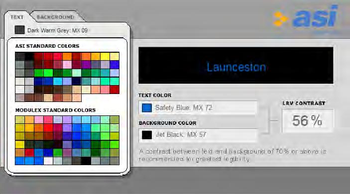
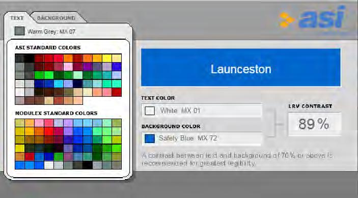
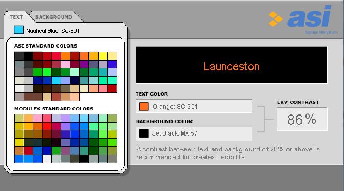
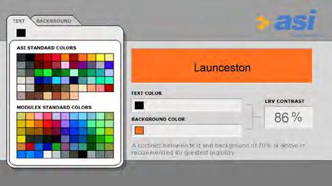
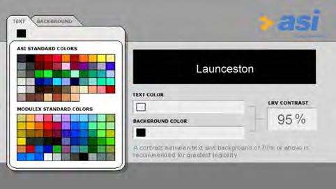
Note:
Where posible use white text on charcoal background for key information and orange text on charcoal background for titles/highlighted information. Restrict to a minimum the use of charcoal text on orange background.
SOURCE http://asisignage.com/resources/lrv-calculator
PMS 300C PMS 151 C WHITE WHITE PMS 419 C PMS 419 C PMS 419 C PMS 419 C PMS 151 C PMS 300 C 95% 86% 88% 89% 56%
DESIGN STANDARDS 3
STAGE 02 02.03.2017 ISSUE P5 DRAFT 16 P CITY OF LAUNCESTON CORPORATE SIGNAGE DESIGN GUIDELINES
Lato
Semi-rounded details of the letters give Lato a feeling of warmth, while the strong structure provides stability and seriousness.
Available weights within the Lato font family are:
Medium / Medium Italic
Semibold / Semibold Italic
Bold / Bold Italic
Heavy / Heavy Italic
Black / Black Italic
1234567890
Lato Medium
abcdefghijklmnopqrstuvwxyz
abcdefghijklmnopqrstuvwxyz
Lato Semi Bold
abcdefghijklmnopqrstuvwxyz
abcdefghijklmnopqrstuvwxyz
Lato Heavy
abcdefghijklmnopqrstuvwxyz
abcdefghijklmnopqrstuvwxyz
abcdefghijklmnopqrstuvwxyz
DESIGN STANDARDS 3
abcdefghijklmnopqrstuvwxyz Lato Bold abcdefghijklmn opqrstuvwxyz ABCDEFGHIJKLMN OPQRSTUVWXYZ
.,:;-_’‘()|&?!/@
Lato Black
3.4. TYPOGRAPHY STAGE 02 02.03.2017 ISSUE P5 DRAFT 17 P CITY OF LAUNCESTON CORPORATE SIGNAGE DESIGN GUIDELINES
3.5. PICTOGRAMS
The following regulatory and advisory symbols are included on signage to identify destinations and facilities.
Pictograms communicate to the widest possible audience, and eliminate language barriers by conveying a meaning through their pictorial resemblance to a physical object. They help to reduce unnecessary clutter and create consistency throughout all aspects of the signage system.
These designs are based on the following International Standards:
ISO standards 7001: 2007
AIGA the professional association for design icon set National Park Service Icons 1982, USA
These icons will also be provided in reverse for use on dark backgrounds.
Reg ula tory Directional Wa rning Warning Limbs May Fall Slippery Surface WombatsSnakes Wallabies Trees May Fall Restaurant Toilets Information Facilities for people with limited mobility Lookout Car park Shared Path Bike Path Shared Path Give Way Shared Path Ride Slowly Cafe Drinking Fountain Fires Prohibited Do Not Drink No Camping No Firearms No Horses No Motorbikes No Vehicles No Parking No Entry No Bike Riding No Bird Feeding No Feeding Animals No Rock climbing No Smoking No Dogs No Swimming No Fishing No Dogs Swimming No Skating No Alcohol No Food Boat Ramp Swimming Pool FishingSkateboardingBasketball Horses CampingCampervans No diving No Glass Exercise equipment No campervans Alarm Security Recycling Dogs on Lead Litter Disposal O leash Dog area Cli FaceRocks Falling Weather Conditions Exposure Risk Slippery Rocks Deep WaterSubmerged Objects Strong Currents River edgeUnstable banks Public BBQ Railway StationBus Station Taxi ATM Playground Fireplace Ticket Purchase Aboriginal SiteWalking Self-guided WalkRock Climbing Hiking Trail Picnic Tables Shelter Telephone WIFI Arrow Left Arrow Straight Arrow 45o Left Arrow Right Arrow 45o Right North Arrow Ambulant MaleAmbulant Female Map Ad vi so ry No Collecting Firewood Police Pedestrian Access Prohibited Tiger Bus Stop Monument SynagogueChurch Pharmacy Car Share Designated Smoking Zone Parenting facilities Post O ce Hospital Heritage Site DESIGN STANDARDS 3
STAGE 02 02.03.2017 ISSUE P5 DRAFT 18 P CITY OF LAUNCESTON CORPORATE SIGNAGE DESIGN GUIDELINES
3.6. ARROWS
Directions
Users should never be directed to facilities which are behind them. Only forwards, left, right and 45º angled arrows are to be used. Backward facing arrows are open to misinterpretation and may become confusing for users.
Arrow bounding box
A bounding box provides guidance for the alignment of arrows on template panels. The arrow head may extend beyond the guide when used in particular rotations. The box is provided for the templates and must be deleted for finished artwork files and printing.
3.7. TIME VS DISTANCE
There are a number of signs that require the calculation of time and distance to destinations. Use the following formulas as follows:
Pedestrians
Walking time information must be used as an appropriate means of journey-planning. This is designed to make walking to destinations more achievable, as long distances are often misunderstood. This approach ties in with sustainable transport principles. Walking speed will vary between people so a basic walking time may be based on the following equation:
80 metres distance = 1 minute walking time
The Google Maps Distance API web service could also be used to collect data for all walking distances.
DESIGN STANDARDS 3
STAGE 02 02.03.2017 ISSUE P5 DRAFT 19 P CITY OF LAUNCESTON CORPORATE SIGNAGE DESIGN GUIDELINES
4 SIGNAGE DIMENSIONS STAGE 02 02.03.2017 ISSUE P5 DRAFT 20 P CITY OF LAUNCESTON CORPORATE SIGNAGE DESIGN GUIDELINES
2500 mm 500 mm 1000 mm 1500 mm 2000 mm 3000 mm 3500 mm 4000 mm www.relevantwebsite.com.au Facility Name First Line and Second Line 6323 3636 SUBHEADING IF REQUIRED FI.01 www.relevantwebsite.com.au Facility Name First Line and Second Line 6323 3636 SUBHEADING IF REQUIRED 153mm (view from 50m) 72mm (view from 15m) 120mm (view from 35m) 3500mm 200 3100 200 100 255 400 445 195 195 120 1200 1700mm 50 500 FI.01 FI.01 SIGNAGE DIMENSIONS 4 4.1. FACILITY IDENTIFICATION - PRIMARY STAGE 02 02.03.2017 ISSUE P5 DRAFT 21 P CITY OF LAUNCESTON CORPORATE SIGNAGE DESIGN GUIDELINES


2500 mm 500 mm 1000 mm 1500 mm 2000 mm 3000 mm 3500 mm 4000 mm www.launcestonaquatic.com.au Launceston Leisure and Aquatic Centre 6323 3636 SI.03 www.launcestonaquatic.com.au Launceston Leisure and Aquatic Centre 6323 3636 SI.03 SIGNAGE DIMENSIONS 4 4.2. FACILITY IDENTIFICATION - PRIMARY FOR SPECIALITY SITE - OPTION 1 STAGE 02 02.03.2017 ISSUE P5 DRAFT 22 P CITY OF LAUNCESTON CORPORATE SIGNAGE DESIGN GUIDELINES
2500 mm 500 mm 1000 mm 1500 mm 2000 mm 3000 mm 3500 mm 4000 mm www.launcestonaquatic.com.au Launceston Leisure and Aquatic Centre 6323 3636 SI.03B www.launcestonaquatic.com.au Launceston Leisure and Aquatic Centre 6323 3636 SI.03B 4.3. FACILITY IDENTIFICATION - PRIMARY FOR SPECIALITY SITE - OPTION 2 SIGNAGE DIMENSIONS 4 STAGE 02 02.03.2017 ISSUE P5 DRAFT 23 P CITY OF LAUNCESTON CORPORATE SIGNAGE DESIGN GUIDELINES
2500 mm 500 mm 1000 mm 1500 mm 2000 mm 3000 mm 3500 mm 4000 mm 6323 3636 Facility Name and Second Line www.relevantwebsite.com.au SUBHEADING IF REQUIRED FI.02 6323 3636 Facility Name and Second Line www.relevantwebsite.com.au SUBHEADING IF REQUIRED 130mm (view from up to 50m) 40mm (view from up to 12m) 100mm (view from up to 35m) 2000mm 1600 200 200 100 300 120 210 300 1200 1700mm 45 500 FI.02 FI.02 4.4. FACILITY IDENTIFICATION - SECONDARY SIGNAGE DIMENSIONS 4 STAGE 02 02.03.2017 ISSUE P5 DRAFT 24 P CITY OF LAUNCESTON CORPORATE SIGNAGE DESIGN GUIDELINES
2500 mm 500 mm 1000 mm 1500 mm 2000 mm 3000 mm 3500 mm 4000 mm 9AM – 5PM Inclinator 1 min Zig Zag Track 20 min Toilets Swimming Pool 5 min Suspension Bridge 10 min Open everyday Use bins provided No alcohol No Dogs Facility Name Second Line SUBHEADING IF NEEDED 250 CL 550mm 165 500 80160 2100mm 50 50 450 9AM – 5PM Inclinator 1 min Zig Zag Track 20 min Toilets Swimming Pool 5 min Suspension Bridge 10 min Open everyday Use bins provided No alcohol No Dogs Facility Name Second Line SUBHEADING IF NEEDED 60mm 25mm 160mm Panel 990mm Panel 450mm Panel 9 – 5 Zig Zag Track Swimming Pool Suspension Bridge Open everyday Facility Name Second Line SUBHEADING IF NEEDED FI.03 SIGNAGE DIMENSIONS 4 4.5. FACILITY IDENTIFICATION - PLINTH STAGE 02 02.03.2017 ISSUE P5 DRAFT 25 P CITY OF LAUNCESTON CORPORATE SIGNAGE DESIGN GUIDELINES
2500 mm 500 mm 1000 mm 1500 mm 2000 mm 3000 mm 3500 mm 4000 mm 9AM – 10PM Facility Name Second Line SUBHEADING IF NEEDED 250 CL 500 80 160 900 1200mm 1030 80 80 95 270 1400mm 9AM – 10PM Facility Name Second Line SUBHEADING IF NEEDED 60mm 25mm 9AM – 10PM Facility Name Second Line SUBHEADING NEEDED FI.04 SIGNAGE DIMENSIONS 4 4.6. FACILITY IDENTIFICATION STAGE 02 02.03.2017 ISSUE P5 DRAFT 26 P CITY OF LAUNCESTON CORPORATE SIGNAGE DESIGN GUIDELINES
2500 mm 500 mm 1000 mm 1500 mm 2000 mm 3000 mm 3500 mm 4000 mm Facility Name First Line and Second Line 900mm 40 820 40 25256595 60 30 80220 1500mm 300mm Facility Name First Line and Second Line 40mm (view from up to 12m) 30mm (view from up to 8m) Facility Name First Line and Second Line FI.05 FI.05 SIGNAGE DIMENSIONS 4 4.7. FACILITY
STAGE 02 02.03.2017 ISSUE P5 DRAFT 27 P CITY OF LAUNCESTON CORPORATE SIGNAGE DESIGN GUIDELINES
IDENTIFICATION PANEL - LARGE
2500 mm 500 mm 1000 mm 1500 mm 2000 mm 3000 mm 3500 mm 4000 mm Room No 6 Toilet 200mm 95 259535 30 220mm Room No 6 Toilet 30mm 6 Toilet FI.06 FI.06 SIGNAGE DIMENSIONS 4 4.8. FACILITY IDENTIFICATION PANEL - SMALL STAGE 02 02.03.2017 ISSUE P5 DRAFT 28 P CITY OF LAUNCESTON CORPORATE SIGNAGE DESIGN GUIDELINES
Injuries are a common and expected part of the activity. We strongly suggest that helmets, protective clothing and activity specific bikes are used within the park.
Injuries are a common and expected part of the activity. We strongly suggest that helmets, protective clothing and activity specific bikes are used within the park. Please familiarise yourself with the terrain prior to riding.
Please familiarise yourself with the terrain prior to riding.
Injuries are a common and expected part of the activity.
We strongly suggest that helmets, protective clothing and activity specific bikes are used within the park.
Injuries are a common and expected part of the activity.
We strongly suggest that helmets, protective clothing and activity specific bikes are used within the park.
Please familiarise yourself with the terrain prior to riding.
Please familiarise yourself with the terrain prior to riding.
2500 mm 500 mm 1000 mm 1500 mm 2000 mm 3000 mm 3500 mm 4000 mm
Facility Name and Second Line SUBHEADING IF NEEDED 50 mm 25mm
Facility Name and Second Line SUBHEADING IF NEEDED 250 CL 80 160 1200mm 80 80 80 850mm 1160mm Injuries are common and expected part of the activity. We strongly suggest that helmets, protective clothing and activity specific bikes are used within the park. Please familiarise yourself with the terrain prior riding. Injuries are common and expected part the activity. We strongly suggest that helmets, protective clothing and activity specific bikes are used within the park. Please familiarise yourself with the terrain prior to riding. Facility Name and Second Line IP.01 SIGNAGE DIMENSIONS 4 4.9. INFORMATION PANEL STAGE 02 02.03.2017 ISSUE P5 DRAFT 29 P CITY OF LAUNCESTON CORPORATE SIGNAGE DESIGN GUIDELINES


2500 mm 500 mm 1000 mm 1500 mm 2000 mm 3000 mm 3500 mm 4000 mm Launceston, better by foot! Name of Park Destination 5 2 min Destination 6 3 min Destination 1 7 min Destination 2 10 min Destination 3 1 min Destination 4 9 min min BrisbaneStreetMall GEORGE STREET KINGS PATERSONSTREET CAMERONSTREET CANALSTREE CIMITIERESTREET HIELDS REET A UNDERPASS VINCENT STREET GEORGE STREET JOHN STREET CHARLES STREET BRISBANE STREET BRISBANE STREET PATERSON STREET CIMITIERE STREET TAMAR STREET JOHN STREET JOHN STREET CHARLES STREET KINGSWAY WELLINGTON STREET WELLINGTON STREET CIMITIERE STREET WILLIAM STREET ESPLANADE YORK STREET ELIZABETH STREET CAMERON STREET EARL STREET Lane LAUNCESTON COURT Centreway Arcade CRITERION PROVIDENT GENDERS LANE LANE CAMERON CONNECTOR WOOLGROWERS Brisbane KINROSS EINFIELD MORTYS LANE CUISINE TRINITY CLEMENTS MARSHALLLANE RUSTE TATLERPARADE PATERSON GARRISON SMITHSLANE BARROWSTREET HAMILTON TEVELEINPLACE Park Name �ameron Paterson�treet �ris�ane �treet �a�rence Fre�eric� �annin��treet �at��rst �treet �splana�e River Hospital Post Office Baby Change Playground 350mm 20 20 310 40 Min. 50 20 120 43 450 8560 16 760 9060 30 40 150 30 2300mm 15 20 65 100 mm 17 17 280 mm Variable 35mm 620 mm 540 mm 195 mm Launceston, better by foot! Name of Park Destination Park Name SI.01 Launceston, better by foot! Name of Park Destination 5 2 min Destination 6 3 min Destination 1 7 min Destination 2 10 min Destination 3 1 min Destination 4 9 min 117 min BrisbaneStreetMall GEORGE STREET KINGSLANE PATERSONSTREET CAMERONSTREET CANALSTREE CIMITIERESTREET HIELDS REET A UNDERPASS VINCENT STREET GEORGE STREET JOHN STREET CHARLES STREET BRISBANE STREET BRISBANE STREET PATERSON STREET CIMITIERE STREET TAMAR STREET STREET JOHN STREET CHARLES STREET KINGSWAY WELLINGTON STREET WELLINGTON STREET CIMITIERE STREET WILLIAM STREET ESPLANADE YORK STREET ELIZABETH STREET CAMERON STREET EARL STREET Lane LAUNCESTON COURT Centreway Arcade CRITERION PROVIDENT GENDERS GEORGES CAMERON CONNECTOR WOOLGROWERS Brisbane KINROSS Bookmak EINFIELD MORTYS LANE CUISINE TRINITY CLEMENTS MARSHALLLANE Shaws RUSTE TATLERPARADE PATERSON GARRISON SMITHS BARROWSTREET HAMILTON COURT TEVELEINPLACE Park Name �imitiere �treet �ris�ane �eor�e �a�rence �ellin�ton Fre�eric� �annin� �at��rst �splana�e River Hospital Post Office Baby Change Playground 30 mm 10 mm 15mm Panel 1: 350 x 250mm Panel 2: 350x 400mm Panel 3: 350 x 800mm Panel 4: 350 x 850mm 6mm 5mm 40mm 20mm SI.01 SIGNAGE DIMENSIONS 4 4.10. MAPPED PLINTH STAGE 02 02.03.2017 ISSUE P5 DRAFT 30 P CITY OF LAUNCESTON CORPORATE SIGNAGE DESIGN GUIDELINES
2500 mm 500 mm 1000 mm 1500 mm 2000 mm 3000 mm 3500 mm 4000 mm 111 PARK STREET H CA ACTGORGE YOU ARE AT Park Name Trail Name Second Line 7 min Park Name Second Line 2 min Bikeway Trail Name 2 min Street Name 2 min 100mm 980mm 865 100 1030mm 490mm 2500mm 10 35352520 10 80 45 30 Variable 25 310 75 200 40 15 40 15 Park PARK STREET ACTGOR YOU ARE AT Park Name Trail Name Second Line 7 min Park Name Second Line 2 min Bikeway Trail Name 2 min Street Name 2 min 10mm (view from 3m) 15mm (view from 4m) 18mm (view from 4m) 15mm (view from 4m) 15mm (view from 4m) 8mm (view from 2m) SI.02 SIGNAGE DIMENSIONS 4 4.11. MAPPED
STAGE 02 02.03.2017 ISSUE P5 DRAFT 31 P CITY OF LAUNCESTON CORPORATE SIGNAGE DESIGN GUIDELINES
POST - TRAIL BOLLARD

2500 mm 500 mm 1000 mm 1500 mm 2000 mm 3000 mm 3500 mm 4000 mm FACILITY NAME Welcome to Basin Cottage 1 min Historical Displays 1 min Swimming Pool 5 min Suspension Bridge 10 min Dogs 350mm 310 28 310 25 25 800mm 20 20 28 62 FACILITY NAME Welcome to Basin Cottage 1 min Historical Displays 1 min Swimming Pool 5 min Suspension Bridge 10 min Dogs 12mm 17mm 25mm Destination 1 1 min Destination 2 2 min Destination 3 5 min Destination 4 3 min Destination 5 9 min Destination 6 10 min Destination 7 4 min Destination 8 7 min Destination 9 10 min STREET NAME IF APPLICABLE Place Name PI.04 SIGNAGE DIMENSIONS 4 4.12. WALL
DIRECTIONAL STAGE 02 02.03.2017 ISSUE P5 DRAFT 32 P CITY OF LAUNCESTON CORPORATE SIGNAGE DESIGN GUIDELINES
MOUNTED
2500 mm 500 mm 1000 mm 1500 mm 2000 mm 3000 mm 3500 mm 4000 mm PD.04 Destination two Brisbane Street 2 min Destination 3 3 min Toilets 3 min 470mm 60mm Ø 155mm 90 320 60 5545 20 120mm 2100mm Destination two Brisbane Street min Destination Toilets min Destination two Brisbane Street 2 min Destination 3 3 min Toilets 3 min 30mm (view from 10m) 18mm (view from 5m) 35mm (view from 10m) 90 mm SIGNAGE DIMENSIONS 4 4.13. FINGERBOARD STAGE 02 02.03.2017 ISSUE P5 DRAFT 33 P CITY OF LAUNCESTON CORPORATE SIGNAGE DESIGN GUIDELINES
2500 mm 500 mm 1000 mm 1500 mm 2000 mm 3000 mm 3500 mm 4000 mm PD.05 Park Name min Trail Path Name 2 min Facility Name min You are at Park Name 750mm 450mm 1200mm 100mm 1010 35302560 10 45 35 365 40 20 2015 15 15 15 15 80 Park Name min Trail Path Name min Facility Name min You are at Park Name 15mm (view from 4m) 15mm (view from 4m) 15mm (view from 4m) 10mm (view from 3m) 8mm (view from 2m) SIGNAGE DIMENSIONS 4 4.14. BOLLARD PD.05 STAGE 02 02.03.2017 ISSUE P5 DRAFT 34 P CITY OF LAUNCESTON CORPORATE SIGNAGE DESIGN GUIDELINES
2500 mm 500 mm 1000 mm 1500 mm 2000 mm 3000 mm 3500 mm 4000 mm Park Name min Street Name min Bikeway Trail Name min You are at Facility Name You are at Facility Name 100mm 80 1010 750mm 450mm 1200mm 35 252525 25 30 5050 50505050 40220 25 Name REG.01 Park Name min Street Name 2 min Bikeway Trail Name min You are at Facility Name You are at Facility Name 50mm (view from 15m) 15mm (view from 4m) 15mm (view from 4m) 8mm (view from 2m) REG.01 SIGNAGE DIMENSIONS 4 4.15. REGULATION BOLLARD STAGE 02 02.03.2017 ISSUE P5 DRAFT 35 P CITY OF LAUNCESTON CORPORATE SIGNAGE DESIGN GUIDELINES
2500 mm 500 mm 1000 mm 1500 mm 2000 mm 3000 mm 3500 mm 4000 mm REG.02 SIGNAGE DIMENSIONS 4 4.16. REGULATION ADHESIVE WRAP 60mm Ø 45 2525 100 202020 9045454545 20 450mm 900mm REG.02 45mm (view from 12m) 10mm (view from 2m) STAGE 02 02.03.2017 ISSUE P5 DRAFT 36 P CITY OF LAUNCESTON CORPORATE SIGNAGE DESIGN GUIDELINES
2500 mm 500 mm 1000 mm 1500 mm 2000 mm 3000 mm 3500 mm 4000 mm REG.03 SIGNAGE DIMENSIONS 4 No Vehicles No Bike Riding CL 150mm 400mm No Vehicles No Bike Riding 17mm 100mm 12mm 4.17. REGULATION PANEL STAGE 02 02.03.2017 ISSUE P5 DRAFT 37 P CITY OF LAUNCESTON CORPORATE SIGNAGE DESIGN GUIDELINES
2500 mm 500 mm 1000 mm 1500 mm 2000 mm 3000 mm 3500 mm 4000 mm Park Name 160mm 87mm VD.01 Park Name 600mm 440 165 125 340 280 900 2200 3100mm 90 70 VD.01 Park Name VD.01 VD.01 INTRODUCTION 1 SIGNAGE DIMENSIONS 4.18. VEHICLE DIRECTIONAL FLAG STAGE 02 02.03.2017 ISSUE P3 DRAFT 38 P CITY OF LAUNCESTON WAYFINDING SIGNAGE DESIGN GUIDELINES
2500 mm 500 mm 1000 mm 1500 mm 2000 mm 3000 mm 3500 mm 4000 mm VD.02 Cataract Walk Cliff Grounds 15min Zig Zag Track via bridge Cable Hang Gliding 6km Welcome to Facility Name SUBHEADING IF REQUIRED 2500 1500mm 100 100 2000 160 500 190115 95 100 55 250 CL 50 95 150 70 Cataract Walk Cliff Grounds 15min Zig Zag Track via bridge Cable Hang Gliding 6km Welcome to Facility Name SUBHEADING IF REQUIRED SIGNAGE DIMENSIONS 4 4.19. VEHICULAR SITE IDENTIFICATION AND DIRECTIONAL - LARGE STAGE 02 02.03.2017 ISSUE P5 DRAFT 39 P CITY OF LAUNCESTON CORPORATE SIGNAGE DESIGN GUIDELINES
2500 mm 500 mm 1000 mm 1500 mm 2000 mm 3000 mm 3500 mm 4000 mm VD.03 Main Entry & Car Park Overflow Parking Facility Name SUBHEADING IF REQUIRED 2100 1200mm 100 100 1600 160 500 220 90 95 80 45 250 CL 95 100 40 110 50 Main Entry & Car Park Overflow Parking Facility Name SUBHEADING IF REQUIRED SIGNAGE DIMENSIONS 4 4.20. VEHICULAR SITE IDENTIFICATION AND DIRECTIONAL - SMALL STAGE 02 02.03.2017 ISSUE P5 DRAFT 40 P CITY OF LAUNCESTON CORPORATE SIGNAGE DESIGN GUIDELINES
2500 mm 500 mm 1000 mm 1500 mm 2000 mm 3000 mm 3500 mm 4000 mm VD.04 Main Entry & Car Park Overflow Parking 9AM – 5PM 1400 80 80 900 160 500 80 250 CL 100 110 40 40 1200mm Main Entry & Car Park Overflow Parking 9AM – 5PM SIGNAGE DIMENSIONS 4 4.21. VEHICULAR DIRECTIONAL STAGE 02 02.03.2017 ISSUE P5 DRAFT 41 P CITY OF LAUNCESTON CORPORATE SIGNAGE DESIGN GUIDELINES
2500 mm 500 mm 1000 mm 1500 mm 2000 mm 3000 mm 3500 mm 4000 mm Car Park CP.01 Car Park 60mm 350mm CP.01 Car Park 450mm 350 350 75 760 155 180 2240 3000mm 50 50 CP.01 INTRODUCTION 1 SIGNAGE DIMENSIONS 4.22. VEHICLE FLAG CP.01 STAGE 02 02.03.2017 ISSUE P3 DRAFT 42 P CITY OF LAUNCESTON WAYFINDING SIGNAGE DESIGN GUIDELINES
2500 mm 500 mm 1000 mm 1500 mm 2000 mm 3000 mm 3500 mm 4000 mm Car Park One 60mm 250mm 350mm CP.02 Car Park One 760mm 350100 450 95 2550 3000mm 90 50 65 CP.02 Car Park One CP.02 INTRODUCTION 1 SIGNAGE DIMENSIONS CP.02 4.23. CAR PARK FINGERBOARD STAGE 02 02.03.2017 ISSUE P3 DRAFT 43 P CITY OF LAUNCESTON WAYFINDING SIGNAGE DESIGN GUIDELINES
2500 mm 500 mm 1000 mm 1500 mm 2000 mm 3000 mm 3500 mm 4000 mm 8AM – 8PM INC. PUBLIC HOLIDAYS 12P SHARED ZONE Give way pedestrians TICKET MUST BE DISPLAYED Name of Car Park SUBHEADING IF NEEDED Vehicles Displaying Current Parking Authority Permits Exempted 8AM – 8PM MO N– SUN INC. PUBLIC HOLIDAYS 12P SHARED ZONE Give way to pedestrians TICKET MUST BE DISPLAYED Name of Car Park SUBHEADING IF NEEDED 1450 160 500 95 250 CL 70 120 220 65 160 100 100 1300mm 950 325 485 210 INTRODUCTION 1 SIGNAGE DIMENSIONS 4.24. CAR PARK ENTRY INFORMATION SIGN CP.03 STAGE 02 02.03.2017 ISSUE P3 DRAFT 44 P CITY OF LAUNCESTON WAYFINDING SIGNAGE DESIGN GUIDELINES


2500 mm 500 mm 1000 mm 1500 mm 2000 mm 3000 mm 3500 mm 4000 mm Max. charge $5 for hours Open everyday 2.5 PER 4HR Hide issue only. Carp park locked 10pm. INCLUDING PUBLIC HOLIDAYS Pay & Display 9AM–5PM Max. charge $5 for 8 hours Open everyday $2.5 PER 4HR It is an offence to park a vehicle in this area unless a valid ticket is displayed on the dashboard so the attendant can check time and date on the ticket. Hide It Lock It Tickets valid on day of issue only. Carp park is locked at 10pm. If machine is out of order please phone 0409 974 399 INCLUDING PUBLIC HOLIDAYS Pay & Display 9AM–5 PM Variable Variable 1300mm 100150 250 180 Min. 300 Max. 500 50 120 Minn. 120 85 Min. 100 100 75 250 CL INTRODUCTION 1 SIGNAGE DIMENSIONS 4.25. CAR PARK ENTRY INFORMATION SIGN CP.04 STAGE 02 02.03.2017 ISSUE P3 DRAFT 45 P CITY OF LAUNCESTON WAYFINDING SIGNAGE DESIGN GUIDELINES
5 INSTALLATION & MAINTENANCE STAGE 02 02.03.2017 ISSUE P5 DRAFT 46 P CITY OF LAUNCESTON CORPORATE SIGNAGE DESIGN GUIDELINES
5.1. INSTALLATION
Installation should be undertaken by an appropriately qualified contractor. Site conditions will have an impact on the installation and fabrication of signage and it is therefore necessary to identify these issues during the planning phase.
Prior to installation please ensure
Footing and construction details have been reviewed.
All potential services have been identified. If applicable, a ‘Dial Before you Dig’ has been undertaken to identify any potential underground services.
Installation method and approach is appropriate for the site conditions.
Sign locations do not negatively impact on the heritage or cultural environment.
The sign is located within the site boundary.
The sign locations are accurately identified and correspond to an approved sign plan.
Occupational Health and Safety measures are adhered to.
During installation please ensure
The site is cleaned and free of excess materials. The site is restored and remediated if necessary.
The signage has not been damaged during installation.
Transportation
Ensure delivery of new signage from fabricators is undertaken with the utmost care to avoid damage.
New signage should be bubble wrapped or similarly protected to avoid dents and scratches. Check all new signs on delivery to ensure no damage was incurred in transit.
Storage
Signage should be stored in a safe place prior to installation and not layed flat where panels can be damaged.
Ensure all protective coatings have been applied as per the manufacturers specifications.
Site safety
When constructing and installing signs the appropriate health and safety measures need to be taken. Consider the following when constructing or installing signs:
Slip and trip hazards to installers and the general public from; hoses, cables, leads running on the ground.
Working on or near sources of electricity, including hidden cables behind walls; using electrical equipment.
Falling objects or falling from a height. Hazardous noise levels.
Environmental conditions e.g. wind, dust, rain.
Hazardous chemicals e.g. solvents, adhesives.
Manual handling: types of postures and force required to install the sign.
Ensure all relevant traffic and pedestrian safety requirements are in place during installation to avoid falls and injuries.
Remember that a sign itself may be a hazard. Place signs so that they do not obscure hazards or distract the viewer during hazardous situations.
Personal Protective Equipment (PPE) e.g. gloves, dust mask, high-visibility vest, helmet, safety glasses, steel cap boots, ear plugs etc.
Staff are suitably trained or supervised when using machinery e.g. auger, bench saw etc.
5.2. MAINTENANCE
Signage should always be well maintained to project a positive image for the City of Launceston and the community.
General
If signage requires maintenance, please ring the relevant department within the City of Launceston for maintenance requests.
If signs are required to be replaced, the design of the new signs must follow this guide.
Checking sign conditions
To achieve this, signs require regular inspections and upkeep.
A regular inspection program should look for:
The sign has not been removed, tampered with or vandalised
The relevance of the information
The condition of the finishes and materials
The presence of any obstructions
All fixings are tight and present
Make sure the information on signage is relevant and the sign is functioning as it was originally intended. Things change, so signage should reflect the changes that happen and be up-to-date and relevant.
INSTALLATION & MAINTENANCE 5
STAGE 02 02.03.2017 ISSUE P5 DRAFT 47 P CITY OF LAUNCESTON CORPORATE SIGNAGE DESIGN GUIDELINES
