

CARLOS CRUZ-DIEZ
IN
CONVERSATION WITH / EN CONVERSACIÓN
CON ARIEL JIMÉNEZ


CARLOS CRUZ-DIEZ
IN CONVERSATION WITH ARIEL JIMÉNEZ
At the m A rgins of history escaping the Void of things forgotten
ariel jiménezAs faith in God began to wane in the nineteenth and twentieth centuries, a great many people came to view history as the only source of transcendence. As there is no great beyond, there will be no final judgment. Recognition received for one’s work, marking one as an individual worthy of entering the annals of history, came to replace that feeling of belonging that made each and every believer a member of a privileged community, independent of social status. To feel the opposite, to feel outside the realm of authority that defines history, could and certainly did provoke an anguished sense of exclusion or condemnation. It is for this very reason that entire generations of Latin American artists have searched for a way to enter the continuum of history, and from which they believe themselves excluded.
Without a doubt that was how it was for me. In my case, this period of anguish began in 1943 and lasted for several years. My reflections and anxieties at the time revolved around that very urgent need we felt to enter history so that we might be saved from oblivion. Not to save myself as an individual, nor to achieve the kind of notoriety or fame that young artists often desire, but to save all of us from the context in which we were living. To make ourselves part of time, and to say to the world: here we are . . . we exist . . . things happen here, too. As an individual, I wanted to grow, and I wanted our country to join the modern age and to solve those very essential problems that we were unable to resolve in the nineteenth century.
In many ways the Venezuela in which I was born had very little in common with the country we know today. Venezuela was then a country at the margins of history; important things occurred elsewhere, far away. This feeling of isolation was probably heightened by World War II. European publications weren’t available, while what few books and magazines did make it to Venezuela came from Chile and Argentina (Mexico was not yet the editorial powerhouse that it ultimately became). Nor did we receive much news about art, and the little that we did receive came months or years after the fact. The few art books that were available were mainly in black and white. I could joke about how I studied art history in black and white. I can still remember the shock of visiting the Museo Nacional del Prado in Madrid and seeing Las Meninas [The Family of Felipe IV ]
10
carlos cruz-diez
for the first time in 1955 I had never paid much attention to Velázquez as a student because his paintings in black-and-white reproduction just seemed like the work of yet another academic artist.
The first things I learned about art were limited to Tovar y Tovar,1 Arturo Michelena,2 Cristóbal Rojas,3 and Tito Salas,4 the Venezuelan academic masters whose work I actually had access to in my immediate surroundings. When I was a little boy, probably between the ages of six and seven, I would go for walks in the afternoon with my grandmother. She would take me by the hand as we strolled down the streets near where we lived, in La Pastora,5 and we always went past Arturo Michelena’s house. We lived on a street that was rather picturesquely called “the path of the dogs,” not far from the corner of Torrero, very close to Michelena’s home and studio. Every afternoon around 5 pm, Doña Lastenia de Michelena, his widow, would stand in the doorway of her house, and my grandmother, who was her close friend, would always stop to chat with her. Doña Lastenia had noticed my interest in the paintings that hung in the house and would invite me in. “Come in, son, come in,” she would say. And so, while the two of them talked, I would go inside to look at Michelena’s work. And every time, I would end up looking at the same painting: La vara rota [The Broken Spear].
This painting was fascinating to me because of the quality of the drawing, but also because of the truth its details seemed to convey. I was enthralled by the movement of the picador, and of the horse he rode in particular, for it seemed like such a difficult thing to draw. Not far from there, at the La Pastora church, was another work, El purgatorio [Purgatory], by Cristóbal Rojas [Fig. 1]. Every Sunday my parents would take me with them to Mass, and while they sat through the service, I would run off to enjoy myself looking at that painting. My father would tell me all kinds of stories about it, and the things people said about Rojas. They said he had contracted tuberculosis from
1. Martín Tovar y Tovar (1827–1902) was a Venezuelan academic painter who studied in England and France. He is the artist responsible for some of Venezuela’s most respected historical paintings, including La batalla de Carabobo [The Battle of Carabobo], 1886, on the ceiling, or plafond, of the elliptical chamber of the Federal Palace in Caracas.
2. Arturo Michelena (1863–1898) was a Venezuelan academic painter who studied under Jean-Paul Laurens in Paris. He is the creator of a number of images that were essential to Venezuelan independence, such as Miranda en la Carraca [Miranda in La Carraca], 1896, and Carlota Corday, 1889. Both pieces are in the permanent collection of the Galería de Arte Nacional in Caracas.
3. Cristóbal Rojas (1857–1890) was one of Venezuela’s most important academic artists. In addition to addressing historical themes, he is also the author of a variety of miserabilist works such as El plazo vencido [Past Due], 1887, and Primera y última communion [First and Last Communion], 1888.
4. Tito Salas (1887–1974) was the last of the Venezuelan academic painters, and his oeuvre was essentially dedicated to the iconography of the independence heroes, specifically the life and work of Simón Bolívar. His bestknown body of work resides at the birthplace of Simón Bolívar and at the National Pantheon, both in Caracas.
5. La Pastora is one of Caracas’s oldest neighborhoods, very close to the city’s historic center.
11

spending months on end locked up in a room with burning sulfur so that he could paint it. The real story was something else entirely. It wasn’t the sulfur that caused the tuberculosis, it was hunger. And then there was this ritual of sorts I had with my parents: during our independence holiday, they would take me to admire Tovar y Tovar’s work on the ceiling of the Salón Elíptico, or elliptical chamber, of the Federal Palace building. It is an extraordinary painting that leaves almost everyone with their mouths agape— mainly, of course, because when you turn your head to look up toward the plafond, your mouth tends to automatically pop open. Then we would go to Bolívar’s home and the National Pantheon to admire the works by Tito Salas.
Ever since I was a child, nothing captivated me more than drawing and painting. When I entered the Escuela de Artes Plásticas y Artes Aplicadas (School of Visual and Graphic Arts), I discovered the vast world of art and the pleasure of working with materials I had never used before, such as oil, canvas, and pastel. As I learned and progressed, I was plagued by many doubts, concerns, and anxieties, as well as a deep feeling of exclusion when I saw that not a single Venezuelan was featured in the art history books that fell into my hands. And so I asked myself, weren’t Arturo Michelena, Cristóbal Rojas, and Tovar y Tovar artists? If not, what were they? Did art and artists simply not exist in Venezuela?
Anyone with even the slightest historical consciousness, who is able to gauge the immense inequalities in our country, cannot help but be pained by them. Dissatisfaction with the present inevitably awakens a desire for change and, among some of us, a desire to contribute through our work to help make that change possible. It makes perfect sense, then, that at the close of one of the longest and most backward dictatorships in Venezuelan history, that of Juan Vicente Gómez,6 young Venezuelans would feel a need to transform the reality they had known, most especially if they had a dim view of our country’s cultural legacy.
12
aj
6. Juan Vicente Gómez (1857–1935) was a Venezuelan strongman from the region of Los Andes who governed the country from 1908 to 1935.
fig. 1. Cristóbal rojas, El purgatorio [Purgatory], 1890.
Sometimes it is a healthy response to caricature grave things because it helps make them less painful. I learned this from my mother, who was able to make a joke out of the most difficult situations. This is why I say, with great pride, that I come from a country that is “pre-Columbianly underdeveloped,” in which great historic traditions do not exist, and where the most educated Indians, who inhabited the regions at the mouth of the Orinoco River, had to flee upon the arrival of the savage Caribes. Our legacy, though significant, did not reach the level of development that it did in Peru, Mexico, Central America, and even Colombia. As we know, Spain invested very little in these lands because the wealth was hidden mostly beneath the earth, invisible to the naked eye. When Venezuela was a Capitanía General territory under Spanish rule, neither buildings nor temples of stone were built, with the exception of castles for protecting the salt mines, which were the only visible source of wealth. King Charles V used the territory to pay off the debts generated by the wars in Flanders, by handing over these lands to a group of German bankers who found nothing but death there.7 Since wealth was not generated here, Spain made no cultural investment in Venezuela, nor were individuals of importance sent as administrators. In addition, our sad nineteenth century (with the exception of Guzmán Blanco,8 who founded the Academia de Historia [Academy of History] and the Academia de Bellas Artes [Academy of Fine Arts]) was dominated by strongmen, some of them ambitious, uneducated thieves who dressed themselves up as military officers when they reached office, and for whom art and culture meant nothing at all. These origins do not depress me—they make me feel proud, because everything that I am and everything that we can be is the result of the individual efforts of each and every one of the Venezuelan people. We do not inherit our culture, we have to invent it.
And yet for those of us who today face the task of assembling at least part of the history that seemed nonexistent when we were younger, it becomes clear that the great Venezuelan artists did not come from nowhere. On the contrary, there are traditions that begin to emerge, that inform and lend meaning to what each of you has done. You have to acknowledge, at least, what you owe to the landscape practices of your teachers at the Escuela de Artes Plásticas in Caracas.
7. In 1528 the Wesler family, bankers and businessmen from Augsburg, Austria, signed an agreement with the Spanish crown to exploit, populate, and govern the province of Venezuela. The pact remained in force until 1546, at which point the concession was withdrawn because of the dissatisfaction that had spread among Castilian settlers and accusations that the agreement had been violated.
8. Antonio Guzmán Blanco (1829–1899) was a Venezuelan strongman who controlled the country from 1870 to 1888. He championed the secularization of the state and issued a decree establishing that education was to be universal and free of cost to all. He was among the presidents who offered the greatest support to visual artists, through scholarships and large-scale projects for the government.
13
ccd aj
Of course, but back then we had very little understanding of that past. Alfredo Boulton’s Historia de la pintura en Venezuela [History of Painting in Venezuela] didn’t even exist.9 The Escuela de Artes Plásticas was located on the corner of El Cuño, in the Altagracia parish, in the building that had been the headquarters of “Los Chácharos,” the Andean policemen that Juan Vicente Gómez had brought to Caracas to terrorize city residents. The school survived on a meager budget, but it did have its virtues, among them the truly solid education it offered, due in great part to the intellectual and moral fiber of its professors. In art history, for example, we had professors like Luis Alfredo López Méndez, who would take us to see and study the best collections in Venezuela, such as those of the Pietri, Boulton, and Röhl families. These included works by classic European artists and even Flemish painters as well as, of course, the works of Venezuelan academic painters. We would continually meet with the teachers, which included Antonio Edmundo Monsanto, Luis Alfredo López Méndez, Marcos Castillo, Juan Vicente Fabbiani, César Prieto, and Francisco Narváez, and they would show us the art books from the library, making all sorts of comments. López Méndez was particularly engaging.
The fact that you were studying art just a few years after the end of the Gómez dictatorship must have been symbolic of the tremendous change that was such an inspiration to that generation. The most infl uential intellectuals at the time spoke of a rebirth, almost a renaissance; perhaps many of you felt that the moment had come to create truly important works of art.10
We felt the need to act, to change the country and become part of history. We were anxious to move forward and not continue to be submissive to ideas from abroad. Weren’t we capable of creating a form of art that represented us? This was how it occurred to me that perhaps by studying our folklore, I might identify the source of a discourse that could be ours, something that had never been said before, and that would free us from cultural dependence. This idea was what prompted me to take a number of trips through the interior of the country, taking photographs and making movies, drawing and gathering
9. Alfredo Boulton (1908–1995) was a photographer as well as one of the most influential art historians and critics in Venezuela. He authored the first history of painting in Venezuela, Historia de la pintura en Venezuela [History of Painting in Venezuela], a work that encompasses art from the Colonial period through the 1970s.
10. Intellectuals like Mariano Picón Salas (1901–1965) often said that the Venezuelan twentieth century began in 1936, after the death of dictator Juan Vicente Gómez. Alfredo Boulton, for his part, wrote an article in 1939 comparing Giotto’s historic circumstance to that of Venezuela, coming to the conclusion that the time had indeed arrived for Venezuelans to produce authentic work. A few years later, Alejandro Otero started working on his series entitled Las cafeteras [The Coffeepots], with the conviction that for the first time in Venezuela, he had received a calling to create a truly important painting.
14
ccd aj ccd
information that I would later sprinkle in works that told the story of a number of popular traditions. I was convinced that this was how we would find a powerful, authentic universe of meaning that would be every bit as significant to us as those of other countries were to them. From there I thought we could create works to represent our history like those that the Americans had made out of the stories of their wars, indigenous people, cowboys, and gangsters, and that the Europeans had done with their own immense historical patrimony.
This is still a valid aim. These are authentic social and cultural phenomena, part of the cultural reality of the world. And as with all the best cultural forms, they are most effective when they have universal underpinnings. Perhaps what had been missing was a painter of broad, expansive talent like Diego Rivera in Mexico, someone capable of envisioning and creating a powerful work of art from those depths of meaning?
Underlying that desire was the hope that a Venezuelan might be able to see eye-to-eye with anyone in the world. We wanted to have a voice, to be heard. To affirm our existence. As I have said a number of times, I believe this wasn’t a personal motivation, it was the need of an entire generation.
You wanted to emerge from the sort of history-free limbo that Venezuela then inhabited, or that you perceived. I think this sentiment is shared by a great many Latin Americans even today.
Not long ago, a young woman told me what it had been like for her to visit the Tate Gallery in London. “You can’t imagine the joy,” she said, “the deep feeling that is awakened when you go to such an important museum and you find works by Venezuelan artists. It fills me with pride.”
I too have felt that same pride for those Venezuelans who have made significant works and who have reached a worldwide audience. Is it a feeling of vindication that tells us “Yes, we can!”? Perhaps, but patriotic sentiments are not enough to make a work of art meaningful. On the contrary, they can actually inspire misguided and even dangerous, regrettable passions. The ideas that find an audience and generate interest among people in different parts of the world are those that have never been heard before, those key works that guide the human spirit toward new horizons.
However, this is a feeling that goes far beyond national pride. For Venezuelans, and Latin Americans in general, this can bear a tremendously legitimizing
15
aj ccd aj ccd aj
weight, as if it can gain us access to that history we admire so much, through which we may be redeemed, saved. In reality, it is a colonial sentiment. It is the reaction of people who always needed and continue to need the approval of the metropolis, because they do not believe their own criteria to be legitimate enough. And that is what all of you sought, to enter that history you believed to be universal.
Of course, I have always said that. But that isolation, that feeling of adolescent marginality and cultural dependence that aroused my desire to enter into the universal context of ideas has abated in the past few decades. We have redeemed ourselves as Latin Americans, we have entered the history of the West without killing or crushing anyone, and we have achieved this through the universal dimension of our work. Latin American thinkers, writers, musicians, and artists across the disciplines have demonstrated that art and intelligence have neither owners nor borders. Speaking of which, there is one topic that has yet to be explored by the specialists: a considerable amount of the avant-garde work, the “art of rupture” that was produced in Latin America during the second half of the twentieth century, evolved on the Atlantic side of the country, not the Pacific side, which would be more logical since [the Pacific] is the heart of the great pre-Hispanic cultures. This movement, in fact, emerged from the countries of immigrants: Argentina, Uruguay, Brazil, and Venezuela. Starting in the 1940s, cultural movements began forming in those countries, producing totally new proposals in the visual arts that, today, have come to represent us internationally. The first significant visual arts movement in Latin America to achieve international fame was Mexican muralism, but I would hesitate to call it a movement of rupture; I think it would be more apt to characterize it as a conceptual spin on the traditional forms of painting.
We are actually talking about two different problems that are connected by their relationship to Europe. On one hand there is the sensation of historical condemnation, originating in our troubled relationship with the old European metropolises. That need to feel equally valued, like anyone else, has a metaphysical dimension that partly explains the very profound experience of which the young woman spoke to you. It has to do with a kind of transcendence, the possibility that a part of us might deserve to be rescued from the death that is represented by being forgotten. And for this reason, when you spoke of El purgatorio by Cristóbal Rojas, I couldn’t help but feel that there was an evident relationship there. That sense of historical exclusion occurs among those people who, in Latin America, feel that they belong to European history, or the history
16
ccd aj
of the European presence in Latin America. And that is why it is logical that the avant-garde movements, in particular those connected to geometric abstraction, occurred on the east coast of Latin America, where contact with Europe was more fl uid and where the age-old resistance of the great pre-Columbian cultures either didn’t exist or existed to a much lesser degree. This is because they are movements that seek to inscribe themselves within European history. In those other areas, however, where strong indigenous cultures reside, what predominates is the need to connect with the pre-Columbian past. That is why we must stop thinking about Latin Americans as one people from one end of the continent to the other, oriented in only one historical direction. It is essential to establish our differences, different ways of being Latin Americans, and as such, different ways of relating to the past.
Sometimes we judge historical facts with the ethical and moral parameters of our own age. The discovery of the Americas and the way in which the Europeans took possession of these lands may seem intolerable to us, but we have to remember that the economy and survival of the old world found a solution in the conquest and colonization of other territories. This is the dynamic that led to the discovery of America, an event that quite clearly changed the course of Western history. Without going into the horrors of the conquest, we might say that Europe learned of the existence of other sentient beings on the planet, to whom they became “latched,” giving rise to an unprecedented, unexpected mixture of races. With this fact, the West became rich and vast. A good number of the human beings who inhabit this continent are direct descendants of that historical fact. Had I been Inca, Aztec, or Arahuaco, perhaps I would never have felt the need to be part of Western history, because I would have a history of my own. What I am trying to say is that I am not and feel neither Indian, nor African, nor European: I am the product of that unexpected event that gave birth to a new culture that is quite clearly a part of the West. During my adolescence, in my formative years, there was this feeling floating inside of me of being part of that European culture, of being a true member of something whole. If I were the same as everyone else, why had they forgotten about me? Why didn’t they listen to what I had to say? I think that this was the kind of reasoning in our subconscious when we demanded historical representation.
Now, to respond to your concern about Cristóbal Rojas’s El purgatorio, I don’t see a direct connection between that sense of historical exclusion and the religious theme of condemnation and redemption that purgatory implies. Just as my parents were very respectful of Christian ritual, I have never been so. For me, gazing at that work of art did not go beyond a pictorial interest. While
17
ccd
they listened to Mass, I would go over to the altar where El purgatorio hung and I would spend the entire time looking at and analyzing that painting. I was fascinated by the space, that gloomy space you could feel beyond the figures, a space that it seemed possible to traverse, where things were happening that I couldn’t see. But, most definitely, it was the pictorial solution and not the religious theme that drew me to it.
Perhaps this is just a personal interpretation, but you might say that beyond the formalisms and mindsets inherited by your Christian upbringing, you (like Jesús Soto, I believe) respond to a kind of atheistic mystery, a need for transcendence that refuses to accept the answers offered by religion, but that shares with religion the need for a space of meaning that gives value to what we are and what we do, in the here and now. Between the mysticism of a Baroque artist or even that of a Romantic painter, who sees the sensory manifestation of God in light, and Soto’s concerns about light as energy, there is nonetheless a point in common even if it is far from any kind of religious connotation. Both feel the need to find a kind of transcendental, fundamental value, a primordial reason for everything that exists. And whether you like it or not, light does take on an almost metaphysical rather than religious dimension.
I had a Christian upbringing, but I am not religious. Let’s say that I am a Venezuelan-style atheist, eighty percent. God makes his triumphant arrival when we reach the limit of our understanding. To be or not to be an atheist is quite an ambiguous matter, because in the human realm—in what we do and in what surrounds us—there is almost always the trace of something religious. Either that or man makes it religious. But I imposed the discipline on myself of never talking about anything but the strictly pictorial dimension in my work. I spent many years influenced by literature, talking about poetic content, about sensitivity, about human myths and ghosts, and all those crutches that sometimes only serve to justify or hide the absence of creativity. When pictorial discourse is effective and authentic, the most profound depths of the spirit are communicated. The painter cannot control the reaction or the extra-pictorial feelings that his work might produce. I have proven this to myself time and again. The more effective my pictorial discourse, the better able I am to communicate what I am trying to say. The work of art is a transmitter of information and serves as a springboard for mythification in each viewer. A mythification that, as creator of the work of art, I can neither envision nor foretell. Cristóbal Rojas did not affect my religious sentiment with
18
aj ccd
his purgatory, but he did allow me to enjoy something that he himself surely had not imagined.
But you don’t have to talk about God to discern a metaphysical need for transcendence in many individuals. All of you, for example, believed that abstract painting offered the possibility of achieving historical synchrony with the rest of the West, and saw a kind of salvation in that synchrony. It was a very strong, very deep feeling among your generation. There was nothing specifically pictorial there.
All abstract thought is of the same tenor, because God is an abstract entity. Painting, when it is abstract, becomes creation, and the idea of God is always associated with the idea of creation. All the preoccupations we have been talking about may seem naïve, pretentious, or even ridiculous today, but that was how it was. There was a profound feeling of hopelessness. If I managed to get myself heard, I thought, not only would I save myself, but my country and painting would also be saved—all of us would be saved. We would have a voice and the world would turn to look at us. It is very hard for younger generations to understand the anguish we felt in those days, when communication was far slower than they can possibly imagine. Moreover, the international political circumstances and interests of those days were different. As a nation, as a people, we participated in neither small nor large decisions. Nobody was interested in us, because we couldn’t make anyone rich; the wealth was hidden. In primary school we would recite the virtues of our national economy: Venezuela produces coffee, cocoa, sugar cane, cowhide, asphalt, heron feathers, and indigo. The heron feathers were exported to make outfits for the Belle Epoque and for the Moulin Rouge in Paris. The indigo served for whitening clothes, nothing more.
The idea that your work might contribute to the well-being of others, of the entire country, is very much connected to what would evolve into a desire to intervene in spaces on an urban scale, in the hope that your work would reach the spectator in the street and not just sit there hanging from a nail, as it were.
I was an only child, and from a young age I felt the need for others. I was never alone. My mother tells the story of how I would come home from school like the Pied Piper of Hamelin, followed by a parade of friends who would come to play at my house. I would show them how to make toys, kites, miniature
19
aj ccd aj ccd
newspapers. For me, sharing was an important part of my education both as a person and as an artist. I never thought of my work as a selfish act. I always felt the need to share it.
We are talking about an adolescent who wanted to become a painter and for whom entering the Escuela de Artes Plásticas in Caracas was like entering a new community, where there were other young people who shared that anguish about history as well as the desire to create one’s own works and to learn of the pleasure of painting.
t he Ple A sure of PA inting learning to see
For me, entering the Escuela de Artes Plásticas was euphoria. I felt such tremendous pleasure that during my first few months there I would arrive at seven in the morning to wait for them to open the door, and I would leave at ten-thirty at night, when they closed. I would be the first to arrive and the last to leave. I can still recall many stories from those days: for example, on the first day in landscape class, I asked the professor, Rafael Monasterios,
“Professor, what am I supposed to do? How do I start painting?”
“Listen, kid . . . . You see that tree over there, that house? . . . Well, paint them.”
I painted my first landscape in what was called La Sabana del Blanco, in La Pastora. I did my second landscape there, too, along with Jesús Soto and Alejandro Otero. By this time there were shantytowns in Caracas, and when they took us to paint the Ávila we had to pass through a neighborhood filled with shacks made of wood planks with zinc roofs and walls, right next to our school.11 If we didn’t paint the shanties, we would paint the Cementerio de los hijos de Dios, a Spanish cemetery in ruins that doesn’t exist anymore. I think that it was seeing and painting all those shanties that motivated me to paint human misery and social drama.
Another important anecdote came out of the class taught by Rafael Ramón González, who took us to paint in El Calvario.12 I had chosen the perspective ccd
11. The Ávila is a mountain that hugs the valley around the north side of Caracas, separating it from the Caribbean. It was a preferred theme for the so-called Caracas School of landscape painters who taught art to Carlos Cruz-Diez, Jesús Soto, and Alejandro Otero.
12. El Calvario is a park located in the historic district of Caracas. Work began on this park in the second half of the nineteenth century during the dictatorship of Antonio Guzmán Blanco.
20
from a curve where I could see the road and a series of trees off in the distance. I had placed my cardboard against a tree since I hadn’t yet earned the right to an easel. I had already sketched the perspective and had begun painting the road with black and white, to make a gray. Right then González came over to me and said, “How can you do that, kid? Don’t you see those incredible nuances, those lilacs, those greens, blues, and reds that are embedded in that gray and in those shadows?”
This stunned me, because it made me feel totally blind. The next day I returned to the same landscape and became determined to discover those colors my professor had pointed out. That feeling of blindness left me disoriented for several days until my vision came back in what felt like a kind of revelation. I was seeing, and most of all understanding, that it wasn’t just about seeing but about imagining. I had to imagine the colors. From that moment onward I began to imagine, to invent, and that initial black and white became an efflorescence of nuances. It was the beginning of something, the moment he helped me discover the indulgent world of color; no longer did I see trees in the kind of green that came out of the tube of paint, I saw them in many greens. From that moment on, I trained myself to paint the greatest possible number of colors on my piece of cardboard [Fig. 2]. I would try to do it by starting with three or four colors, especially the primary colors. I would challenge myself to create fifteen different greens, and more reds and blues, with those few colors we had. The school gave us very limited materials to work with, and if one day they gave us white, we painted with white, or with black. If we wanted more, we had to buy it. I would buy the primary colors, four or five, and with those I would create the rest of my palette. I even remember managing to create the range of golds, those golds that our art history professor, Edoardo Crema, talked so much about. He was always talking about Rembrandt’s golds, and that lovely golden light that the Flemish and the Italian primitives, especially Giotto, had achieved. When I got to Europe and went to see Giotto’s frescos at Assisi, they had just been restored, but they had left a tiny corner, far down on the right, of what those frescos had looked like before their restoration. That was where I saw Crema’s golds, in that little corner; they were the golds of dirt, the gold of centuries and the smoke of the candles in the Christian rite.
Naturally, but that dirt was also what we call the patina of time, that thing that gives an old object or painting a characteristic, beautiful, even mysterious appearance. It’s time, history, and also the distinction of history. In any event, for now, the interesting thing about this story is the impact you felt: the contrast between one vision that was conventional and characterized by custom and
21
aj

what we believe we know about the world, and another vision that was less preconceived or perhaps more attuned to the ephemeral life of color, which in essence is the Impressionist vision.
I have wondered if that experience didn’t influence the formulation of my pictorial goals. One of the pillars of my work is precisely the idea of producing colors that don’t exist on the medium chemically. And in fact it was after that initial shock that I began to experiment. Once, while painting a landscape of the Ávila with Soto, I put on a pair of sunglasses with yellow lenses to see if I could recreate that golden color that occasionally washes over the face of the mountain in the afternoons.
That desire to get closer to the golden light that cloaks the Ávila in the afternoons is a telling detail. As I see it, your interest in golds was an expression of your desire to bathe that Caracas landscape, to somehow shelter it with the monumentality of those historic paintings, with the beauty of that golden light that your professor taught you to see in Giotto, in Rembrandt, and in the Flemish painters. It was an early visual response to your historical angst. Did you ever copy works by the Old Masters? Did you always work directly with the landscape as your source?
22
ccd aj
Fig. 2. Paisaje de San Bernardino [San Bernardino Landscape], 1943.
No, what we did that first year was copy the plaster replicas we had of Greek and Roman sculptures that lined the corridors of the school. The second year we painted still lifes and some nudes from models. Almost all our professors were landscape painters: Antonio Edmundo Monsanto, Marcos Castillo, Juan Vicente Fabbiani, Rafael Ramón González, César Prieto. They all spoke of the Impressionists as a true avant-garde, and they saw Cézanne as a great artist who forged a path to be followed. In the afternoons we would go to the library to look at reproductions of his work, now in color. There, Antonio Edmundo Monsanto and the other professors explained their tremendous significance and the lessons to be learned from their work. Luis Alfredo López Méndez, who had been an art history professor before Edoardo Crema arrived, was a thrilling person, terribly well educated and well traveled, a collector with a marvelous sense of humor, always full of stories. He always said to us: “I make bad paintings, and sell them for a lot of money so that I can buy good paintings.” It was with him that we looked at books on Monet, Pissarro, Seurat, Rousseau, Kisling, Léger, Picasso. . . . On one occasion Rafael Monasterios introduced us to the work of Pierre Bonnard. What I am getting at is that we talked a lot about painting and, most importantly, the atmosphere of these discussions was always totally congenial. There was a camaraderie and comfort between the professors and the students. Thanks to Antonio Edmundo Monsanto, the school was also a meeting point of sorts for the intellectuals of that era. In addition to renowned painters like Armando Reverón and Manuel Cabré, writers and critics like Eduardo Planchart, José Nucete Sardi, Julián Padrón, Juan Röhl, Arturo Uslar Pietri,13 and Alfredo Boulton would come by. Sometimes we would join their conversations, other times we would just listen to what they said.
By 1940–1941, I thought that my goal was to learn to paint like Arturo Michelena or Cristóbal Rojas. But the professors and more advanced students at the school did not share my enthusiasm for the artists I admired. They considered these artists to be latter-day academic painters who had missed their chance to enter the annals of art history because they had failed to understand Impressionism, the art of their era. Perhaps this was what made me realize, much later on, that the artist must invent his own discourse and be an individual of his time.
I suppose that in the course of those conversations you discussed the matter of abstraction?
13. Arturo Uslar Pietri (1906–2001), Venezuelan writer and politician, is the author of important novels such as Las lanzas coloradas [The Red Lances], published in 1931. His historical and political essays were very influential in Venezuela for much of the twentieth century.
23
ccd aj
Yes, of course, we talked about Kandinsky, Mondrian, Constructivism, and even the Bauhaus, but the ideas of Impressionism and Cézanne provided the standards that dominated. Even when we stood looking at a work of art that we found interesting, we would do this very typical thing of saying, “How wonderful, it has a bit of the Cézanne brushwork,” and as we said it we would rub thumb and forefinger together to evoke the delicious texture of that brushstroke. I think it was in 1942 when the Aquavella gallery in New York brought a massive exhibition of classic works, from Botticelli to Cézanne, to Caracas. We all absorbed a great deal of information from that exhibition, and I believe that was when the seed was planted among my generation to get to Europe to study and learn.
Every time Carlos Cruz-Diez speaks about the pleasure his generation derived from the sensuality of painting, he does so as if talking about something that limited them to traditional forms of painting. It was precisely because they were so attached to that sensuality, that pleasure, that their work remained tied to the traditions that had given them access to that sensuality: Cézanne and, in this case, Impressionist painting. That pleasure they felt for painting in its already executed forms impeded them from being inventive and therefore not entering the annals of history, not being saved. The example that Cruz-Diez uses when he characterizes that attachment to historical forms of painting is of those artists who love painting so much that they never learn to break free of its historic expressions. This, he says, is why they cannot create their own discourse and their work itself is nothing more than a series of variations—lovely variations in some cases—inspired by their most cherished works of art. His rejection of the sensuality of traditional painting, that sensuality he experienced with a passion that would later be frustrated by his early experiences in school, recalls other similar rejections, such as that of Marcel Duchamp, who spoke with certain scorn of the olfactory pleasure derived by the painter as he walks into his studio, while focusing his work on a no less symptomatic disdain for manual work. He “painted” with another “color”— with gray matter. The fact is that the period of doubts that awaited him after he learned his craft is clearly marked by a conflict between the pleasure that kept him connected to the past, and the inventive spirit that would allow him to break into the annals of history and be saved. Listening to him, it is impossible not to feel the echo of a voice crying out from far away, from the very depths of a long tradition of significantly similar rejections.
24
ccd
f irst Doubts
Pleasure and obligation
I remember how during the first few months of the course in studio art, at the end of the day on Friday we would show the paintings we had been working on that week. The professors, along with the older students, would examine our pictures and make comments. César Enríquez, who was already in his last year, would pass by our landscapes, nudes, or still lifes and walk away saying out loud, “They don’t understand anything . . . these people don’t understand anything.” I felt very frustrated because I didn’t understand the comments, I didn’t even know what I was supposed to be understanding. Nor did I comprehend what they meant to say when they declared, “This painting is not finished,” and I was certain that it was finished.
For me, the studio art courses were a time of constant discovery. Painting gave me great pleasure, but I had begun to notice that the older students talked of nothing but their suffering and the drama that painting was for them. They would walk around with books on Gauguin and Van Gogh under their arms. Students like Pascual Navarro, César Enríquez, and sometimes Alejandro Otero himself, the most talented of them all, were always walking around proclaiming their anguish, which they ultimately passed on to me, causing me some very serious doubts. If I felt a tremendous pleasure painting and they did nothing but suffer, something strange was happening with me, I reasoned. I had probably chosen the wrong profession. Later on I came to understand that the anguish my classmates felt was related to the difficult search for a discourse to call their own.
By 1941, I had been at school for a year and was concerned about the efforts my parents were making to finance my education. It occurred to me that I might be able to help out by selling the comic strips I had been drawing ever since I was a child. By then, with all I had learned in school, my drawings were of much better quality, and so I asked my father, who was a contributor to the newspaper La Esfera, as well as a friend of its editor, to arrange an interview so that I might pitch him one of my comics. La Esfera was one of the most important newspapers in those days and its editor, Ramón David León, was a well-known and controversial journalist. He was quite open to my pitch, and hired me to write a daily comic strip on the life of Bolívar. For over a year I got up at the crack of dawn to go to the newspaper, where I would write the text and draw the cartoon of the day. Then I would head to the Escuela de Artes Plásticas to take my studio art classes.
25
ccd
For an eighteen-year-old like me, working for a newspaper at something that had been a pastime since childhood produced the same fascination that I felt when I first entered the Escuela de Artes Plásticas. At the end of the afternoon, when I finished my classes for the day, I would go back to the newspaper where I would stay until very late at night, when the rotary press got going. I would wander through the workshops scrutinizing everything and learning all that I could, asking the typographers everything I could think of to ask. It was there that I became good friends with Paco Fernández de Alaña, a Spanish republican who was in charge of the photoengraving workshop and who taught me all about photomechanics. The time I spent there had a tremendous influence upon the evolution of my work later on and gave me plenty of information that I subsequently incorporated into my discourse.
By 1943 I felt educated as a painter: I had learned to see—that is, to draw, because knowing how to draw is knowing how to see. Having learned how to manipulate and use colors, a new world had opened up for me in graphic arts, journalism, illustration, and advertising. Despite this, I felt disappointed and wracked with anguish. That is why, just after the start of my third year, and in the midst of a crisis, I dropped out of my studio art courses (which included painting, drawing, and sculpture) and registered for the education courses that were taught from five in the afternoon to ten at night, so that I might earn the degree of Professor of Artistic Education and Manual Arts, which is what it was called in those days. After all, I could already earn a living drawing and illustrating, working in graphic arts and advertising.14 My poet and writer friends would ask me for illustrations and I also did my comic strips and designed magazines, newspapers, and print advertisements. I never disassociated myself completely from the school, and continued painting at home, where I always had several canvases in the works. From that moment on I began to think about the discourse I needed to develop, and that was when those anecdotal neighborhood paintings came about.
Realizing that it would be impossible to attain transcendence through that thing called Fine Art, Cruz-Diez devoted himself to social protest and nationalist painting. Many other artists have responded in this way at different points in their lives, as did the abstract artists of the 1950s. When some of these artists realized that their work did not elicit the interest they had hoped for in Europe, they abandoned abstraction—which at the time they condemned as an art form
14. Between 1944 and 1945, Cruz-Diez worked as a designer for the publications of the Creole Petroleum Corporation.
26
without roots in national traditions—and threw themselves into a more nationalistic form of painting. In a sense, this was a way of seeking transcendence by cultivating difference, which is not a reprehensible position in and of itself. What is unfortunate, however, is that many of them have done so—as Cruz-Diez did at the time—as an act of rebellion, as a way of escaping the impossibility of achieving the “universal” transcendence they had hoped for. This was the cause of the crisis that made him abandon his fine art courses and symptomatically reject that pleasure he felt for painting which he condemned and which he felt condemned him.
At that time painting was a source of pleasure for me, and my challenge was to achieve the perfection of the artists I had admired in my childhood such as Tovar y Tovar, Cristóbal Rojas, and Arturo Michelena. To hear people bemoan the fact that these painters preferred the academy to the Impressionist movement was very upsetting for me. They found it deplorable that these painters had clung to classic painting, following in the footsteps of academic painters like Jean-Paul Laurens instead of moving toward Impressionism, the pictorial revolution of the era. I had to ask myself, was this a sin? If painting well and adhering to tradition, as the artists who had been utter paradigms for me had done, was an historical mistake, then I was obliged to restructure all that I thought to be right.
I think that this vision of adherence to tradition, as an historic error and even a sin, is key.
What remained etched in my memory was the historic error of having misunderstood one’s time. For me this was a great revelation. At a certain point I became a renegade, a rebel without a cause, I criticized and negated everything. How long were we going to go on about Cézanne, Picasso? We have to forge a new path, I kept telling myself. At the same time, I continued studying art history and the great masters of past eras with passion. This massive combination of circumstances, discoveries, and doubts intensified my crisis but it also gave me the tools that I would later need to overcome it. For example, as my understanding of visual matters grew more nuanced, I became interested in Flemish art, which is one of the golden ages of universal art. I bought books on the works of Pieter Bruegel, Hieronymus Bosch, Hans Memling, Jan van Eyck, Rogier van der Weyden, and I even experimented with some of their techniques, which I later applied to the paintings and landscapes I did between
27
ccd aj ccd
approximately 1947 and 1950.15 They are done with tempera on a gesso base, in the Flemish style. In the middle of my rather naïve rebellious phase, I told myself that I had to paint in some other way. If everyone else was painting with oils, I painted with other techniques.
Can you recall a specific work that left a particular impression on you?
What most interested me were scenes of popular life: dances, meals in villages, and most especially the parables. I was so taken by Matthias Grünewald’s Crucifixion that I painted my own version of it [Fig. 3].
What was it about that Christ on the cross that fascinated you?
Its dramatism was what interested me most of all—perhaps because I had always heard my father talking about Venezuelan drama. How was it possible, he always wondered, that there was so much poverty in a country like Venezuela that had so many resources? That was something I also found very troubling, and I felt the push to respond in some way. But the idea of becoming active in a political party, the demands of political activism, did not appeal to me. I had heard that if you become active in a party like the Communist party you have to be obedient, whereas I had always defended the autonomy of the artist and the artist’s inherent inability to be obedient, to follow paths already mapped out by others.
In addition, it seems clear, given the themes you deal with and the pictorial models you use for your work, that your painting was not always appreciated in the eyes of the Marxist orthodoxy. I am thinking, for example, of the piece Adán el chichero [Adam the Chicha Vendor] dated 1950 [Fig. 4] 16 Not only is it a clear Biblical reference, it also makes direct visual reference to the great religious artist Lucas Cranach. In reality, even if you did this piece from a place of rebellion, you were still working within the criteria of Venezuelan nationalism. Your intention continued to be that of lending a universal dimension to Venezuelan reality, in particular its most humble manifestations, which you did by placing
15. His first “anecdotal” paintings, socially oriented and politically committed, date back to 1946, at least according to the records office at the Fundación Cruz-Diez. This is, without a doubt, linked to the legalization of the Venezuelan Communist Party in 1945 and the fact that his friend, the poet Aquiles Nazoa, joined the party in 1946.
16. The chichero is a popular character in Venezuelan folklore, the traveling vendor of chicha, a sweet beverage that, in Caracas, is made from cooked rice and milk. Andean chicha, in contrast, is of pre-Columbian origins and is prepared by using ground corn that is then fermented in pineapple juice.
28
aj ccd aj ccd aj


Latin American matters on the same level as the great themes of religious painting in the West.
Yes, that is true even when my scenes lack the religious dimension of their pictorial models and their characters are caricatures; but the work is very well composed and the intention is also quite clear. The composition of Adán el chichero, amid all its naïveté, is exactly the same as that of Cranach’s Adam and Eve. The central space is occupied by the usual tree, but the serpent from the Biblical scene became a lizard, a very common and even feared reptile in Venezuela. Instead of European animals, Adam and Eve are surrounded by tropical animals, a paraulata (tropical mockingbird), a parakeet. I wouldn’t make a painting like that today, of course, but it is not easy to detach oneself from established traditions. The most important thing, however, was the constant analysis that I put myself through.
I read a lot about the Flemish and Baroque artists, which couldn’t have been completely useless. I think maybe that influenced how I later organized my studio. Artists in those days practiced their craft as a total form of creation: they made their own pigments; prepared their own supports, their wood panels; and they did so as a team with their students and family. And quite often they had a little storefront for selling works right from their homes. In my case, I think,
29
ccd
fig. 4. Adán el chichero [Adam the Chicha Vendor], 1950.
fig. 3. Cristo [Christ], 1944.
a similar situation came about. Despite the fact that my life was one of intense work and the kind of absolute deadlines that exist in advertising, illustrating for newspapers and magazines, and teaching, in addition to my need to make my own works of art, I loved parties, and serenades most of all. I have always been a music lover and had a lot of musician friends, among them Alfredo Sadel (who worked with me at McCann-Erickson), Juan Vicente Torrealba,17 René Rojas, and of course Jesús Soto, with whom I often went out on serenades. It was in that world of intense work, music, and pretty girls that I met Mirtha. She came from a traditional family in the San José parish, where everyone sang and made music. In the middle of my serenades, I managed to seduce her with a project in which life and art were one and the same thing. The way I saw it, if the artists in the seventeenth century lived within that kind of scheme, perhaps we could make it work in the twentieth century, too, with a bit of updating where necessary. From that point on, Mirtha, our children, and now our grandchildren have become part of that world, aiding in the production of works of art and helping manage the workshops. I remember how, when we were just starting out with this endeavor, many of my friends predicted it would be a complete failure. In those days people lashed out against the notion of family, calling it reactionary, profoundly bourgeois, and full of religious implications. But over time, after seeing how society and ideologies have evolved, I have to ask myself: How can such abstract notions as homeland or respect for one’s peers be formulated and cultivated if love, the collaborative spirit, and mutual dependence among human beings are not encouraged at the very foundations of the structure that gives rise to society? For my family as well as for my work, I followed an organizational model that is quite similar to that of the Flemish artists, and I believe it has worked.
In these artists, Cruz-Diez clearly saw an example of what he had to do in order to achieve the independence he wanted from European art. The Flemish painters, who managed to create an art form all their own based on and in spite of the suffocating model of the Italian Renaissance, served as a model for him, an example of what could or should be done in Venezuela. Apart from that, his attitude was perfectly consistent with that first attempt of sheltering the Venezuelan landscape in the golden light of the Flemish painters, when he put on those yellow-tinted sunglasses in order to best bring out the golds of the Ávila. He continues, in essence, to pursue this same goal, but he employs other methods to do so. It was as if he
30
17. Juan Vicente Torrealba (1917–), is a popular Venezuelan musician and composer of some very wellknown pieces for the harp, such as Concierto en la llanura, Rosario, La potranca zaina, Madrugada llanera, and Sabaneando
was trying to place modest scenes from the Caracas slums on the same level as the scenes in Flemish paintings, which were also scenes from everyday life, though more monumental historically.
I was fascinated by the autonomy that the Flemish studios represented: freedom, independence, not having to depend on anyone to create a total work of art. Plus, I was impressed by their originality; their work was nothing like the other paintings coming out of Europe at the time. They were artists who reflected their time and who were deeply connected to their history and their land. And I had to wonder if perhaps that wasn’t the path that I needed to take in order to be authentic, to express the age in which I was living. Denouncing the problems that I was seeing and experiencing on a daily basis, problems that nobody was resolving, was an historically valid obligation and, I hoped, one for which I could provide an historically valid pictorial solution.
You were not the only one who saw things that way. The Mexican muralists who had such a great impact on Latin America felt the same way.
It was the need to formulate an original discourse that belonged to us, that had some kind of social, human meaning, and that reflected the injustice that was right in front of me. For me, it was urgent to find an original visual discourse, just as it was urgent to reflect reality, the injustice that was right in front of me. I wanted to achieve the technical perfection of the Flemish painters, I wanted to paint the golds and violets of the Ávila. All of these things interested me at the same time. It is very difficult to explain so that people might understand the depth of all these motivations. They were painful processes of moving forward and then backward, in a completely nonlinear kind of evolution.
It is also worth recalling that the exhibitions of Héctor Poleo in the Museo de Bellas Artes in 1941,18 and then Alejandro Otero’s exhibition of his series Las cafeteras [The Coffeepots], in 1949, were extremely pivotal to the Venezuelan art of that period. Those two exhibitions presented approaches entirely different from what we had known. Poleo had come back from Mexico with information about the Mexican muralists and their style, which shook up our exclusively Cézannian world. Paisaje de los Andes [Andes Landscape] revealed to all of us at the Escuela de Artes Plásticas that it was possible to paint landscapes in a manner quite different from that of Cézanne: with precise sketches, full forms,
18. Héctor Poleo (1918–1989) was one of the progenitors of the socially oriented painting influenced by Mexican muralism in the early 1940s. After World War II, he began creating paintings of a more Surrealist nature, ultimately concluding his artistic oeuvre with more abstract, decorative works.
31
ccd aj ccd
and very fine brushstrokes and glazing. A painting like Los tres comisarios [The Three Police Captains] is a landmark in Venezuelan painting. Alejandro Otero’s exhibition, on the other hand, led us into the debate of contemporaneity. We lost our reticence and came to understand that it was possible to paint freely even when the theme was something other than landscape. That exhibition, along with the newspaper El Nacional, which was the first to have an arts page, marked the advent of a new era of culture in Venezuela and helped popularize non-academic information on the visual arts. Before El Nacional, the newspapers didn’t have criticism or arts pages. They had sections entitled “People and Society,” which featured social events with massive photo spreads and news items. In a tiny little corner at the bottom of the page they would mention, in a few short lines, that Manuel Cabré had hung some lovely landscape paintings on the walls of the Club Venezuela.
Now, if the Poleo exhibition forced you to confront the work of someone who had been a mentor for all of you, the Alejandro Otero show put you face-to-face with a colleague who was barely older than the rest of you.
Of course, Poleo was by then already an established painter. Otero’s work gave us solutions for breaking away from the influence of Cézanne, plus it had the virtue of motivating us to leave the country and seek out new horizons so that we could enter the contemporary realm. We all agreed that going to Europe was absolutely necessary, and those who were able to did so. I myself didn’t go because at that time I was making a lot of mistakes, one after the other, in my quest for a socially engaged painting.
Pedro León Castro was also a great admirer of the Flemish painters. Did he have any influence on all of you?
Pedro León Castro, like Gabriel Bracho and César Rengifo, made “socially committed painting,” and they were all active in the Communist party. I tried to create paintings with commitment, without being committed to anyone. As I’ve said, I could never be active in any party—despite the fact that most of my friends were Communists and adecos. In order to be active, one has to be obedient, to tow the party line, to take orders, and my attitude tended more toward that of an empresario. I have never liked taking orders.
Like many Venezuelans, I had always talked about and debated politics without being an activist in any way. My closest friends were writers, poets, and journalists like Alfredo Armas Alfonso, Aquiles Nazoa, and Pedro Francisco
32
aj ccd aj ccd
Lizardo, plus the members of the Contrapunto [literary] group like José Ramón Medina, Benito Raúl Lozada, and Andrés Mariño Palacios. I would spend hours with Aquiles Nazoa combing neighborhoods like La Charneca or Observatorio Cajigal, taking photographs and sketching the things I saw, searching for something that might serve as the subject for a painting [Fig. 5]. That was where I found all the same problems that still exist today: social inequality, injustice, dismal conditions, and poverty. With that material I conceived and structured the paintings El papagayo verde [The Green Kite] [Fig. 6], La loca [The Madwoman], El velorio [The Wake], Las aguadoras [The Water Carriers], and several others. I still have a lot of the photographic negatives from those sojourns, as well as from earlier periods, because I have been a photographer ever since I was a child. When I was fifteen years old I made my own camera, the classic type found at fairs and in town squares in which the negatives were on paper and the developing and printing were done on the spot, while the customer waited.
But my doubts continued and worsened with each new piece of information I digested. I remember a time in the late 1940s and early 1950s when I began to paint quite enthusiastically, but as the painting progressed I would get sadder and sadder until, often, I would abandon it and leave it unfinished [Fig. 7] Everything always ended with me feeling terribly disappointed. It was a very thankless situation, because I felt that I was a painter, that painting was what I was capable of doing, but I sensed that what I was painting was not what I

33
Fig. 5. Aquiles Nazoa in the barrio Observatorio Cajigal. Photo by Carlos Cruz-Diez, 1945.

needed to be doing. It was a subconscious dynamic, an interior force that said to me: You’re doing it wrong; and yet I couldn’t stop.
The terrible thing is the contrast between that historic consciousness that made you feel the need to create paintings that, in essence, annoyed you, that were a caricature of what you would have liked to do, and your denial of the immense pleasure that you derived from the act of painting. This is what gave rise to the force with which you would later oppose the sensuality of painting. It was like torturing the body to control its appetites.
I enjoyed making those paintings, I created them with passion and sincerity. But I felt profoundly troubled inside.
Being so close to the world of writers, it would be logical to suppose that you were considerably influenced by certain texts.
There were many motivations because there were so many factors involved: politics, Latin American literature, French existentialism. Aldous Huxley, the English writer who influenced so much at that time with his Point Counter
34
aj ccd aj ccd
fig. 6. El papagayo verde [The Green Kite], 1947.

Point, which prompted the creation of the literary group of the same name, for which I designed and illustrated the publications. André Gide, Franz Kafka, Martin Heidegger, Jean-Paul Sartre. Then, the Argentine novelist Eduardo Mallea, with his work Todo verdor perecerá [All That Is Green Will Perish], awakened a great amount of interest in writers like Alfredo Armas Alfonso, Andrés Mariño Palacios, and Adriano González León. There were also the motivations sparked by Aquiles Nazoa and his group of Communist friends, who were fighting for political changes in terms of social demands, equality, and justice for the country.
t he f uture of PA inting
Abstract Art
The often-exaggerated importance ascribed to chronology in the continuum of art history frequently attempts to assert that abstraction in Latin America first emerged in Argentina, then Brazil, and after that Venezuela. From there,
35
aj
fig. 7. La loca del barrio [The Neighborhood Madwoman], 1947.
automatically, a chain of influences is deduced defining the geometric abstraction of other countries in the region as outgrowths of the Argentine example. In the Venezuelan case, for example, it is possible to cite the exhibition of the Argentine group Arte Concreto-Invención at the Taller Libre de Arte, in 1948, as the first exhibition of abstract art in the country. The exhibition was held a year before the exhibition in which Alejandro Otero showed his Las cafeteras series, a fact frequently cited as the start of abstraction in Venezuela. Nevertheless, neither the testimony of Venezuelan abstract artists nor our historiography of art recalls this exhibition at the Taller Libre de Arte as a critical historical moment. Did this exhibition leave an impression on you?
Not really, because my reflections at that time were very much linked to social issues. And I don’t think it affected the others much, either, because the Impressionist vision continued to dominate painting at the time. I think Alejandro Otero’s Cafeteras exhibition the following year, in 1949, was what really opened the field. That said, the Taller Libre de Arte organization was extremely important to our development. It was a breath of fresh air for the cultural climate in which we were living. Their exhibitions and the enthusiasm they generated encouraged us to investigate and invent to such a degree that for the subsequent exhibitions we felt we had to offer a different quest.
That was, in part, what I was getting at. That though it came before the Alejandro Otero exhibition, the exhibition of Argentine abstract artists did not generate a radical change among your generation, with the exception of a very few artists. What really made a difference among your contemporaries, and led a great many young artists down the path of abstraction, occurred with the Alejandro Otero exhibition, work made by a Venezuelan coming from Europe. However, this infl uence had nothing to do with nationalism. It was not because there was an attempt to ignore the influence of a neighboring country, but because the processes of historical legitimation that were at play oriented your contemporaries, like the Argentines, toward Europe; only what came out of Europe had legitimizing value.
Maybe, but my case was very special because at that time I was not interested in abstraction. I continued painting, experimenting, searching for something that could be my form of expression and that could be of some interest. Soto had gone to Paris, and César Enríquez had gone into film because he had not found a discourse through painting. The two friends with whom I could talk seriously about art were no longer around. Little by little, my dissatisfaction
36
ccd aj ccd
with what I was doing grew. In the late 1950s, Jesús Soto wrote to me, talking about Mondrian and about what a revelation his work was. He told me about his significance for the future evolution of art. That, he told me, was the future of art, that was where it was going. Those observations only added to my doubts, my crisis. Until then, I had never understood art to be the invention of language—I had always believed art to be a testimony of my perception of the world, and a problem of technical perfection. Painting well was important to me. Mondrian seemed like a cold form of expression, far removed from what the poets would call “social reality.” If this was the future of art, I asked myself, what was to become of the human being? I always made myself see painting from its most traditional, literary conception. In my library, I had books on Mondrian and I flipped through them, but in the mental scheme I had fashioned for myself, it was very hard for me to accept him. One of the paintings that most reveals the depth of my confusion is called Tambor redondo [Round Drum], from 1952. It is a combination of Mondrian-style structures and a group of drummers in Barlovento. In this completely naïve work of art, I attempted an impossible compromise, which shows that I understood nothing. The positive thing about it, though, is the questioning, the dissatisfaction, that helped me understand the most essential things, little by little.
After that, the most important things I learned about were the work of Carlos Raúl Villanueva and his experiences at the Universidad Central de Venezuela, and the exhibition of abstract painting held at the Cuatro Muros gallery in 1952. At that exhibition I got the chance to see works by artists I had never heard of, among them some European artists, as well as Soto’s first abstract pieces. It was then, between 1953 and 1954, that I started working on a series of abstract projects, excited by all this new information that was coming from Europe.
In some of these early and still very tentative experiences, it is very easy to discern the artists and works that influenced you the most. Some of your pieces recall the orthogonal collages of Alejandro Otero, while others evoke the compositions with dots and lines that many of you produced during that time [Figs. 8 & 9]
Those compositions with dots and lines, in particular, come from Georges Koscas, a French painter of Tunisian extraction who had a tremendous influence upon Los Disidentes, and even upon Soto. His works were made up of dots or circles connected by straight lines, like little webs. But my pieces with circles, especially the ones I did in relief, also came out of Sophie Taeuber-Arp, who worked with similar structures. However, in my case, and especially in
37
aj ccd


38
fig. 9. Collage con líneas [Collage with Lines], 1954.
fig. 8. Collage No. 106, 1954.
relation to the 1954 mural projects like Proyecto para un mural exterior manipulable [Project for a Manipulable Exterior Wall ], they were no longer simple compositions of dots. They were structures that had begun to develop around what would become my main interest: projecting color into space through reflective light.
When you did those manipulable mural projects, were you familiar with the manipulable works of Yaacov Agam?
No, not at all, nor had I heard of Jean Tinguely or Pol Bury. The only one we knew of was Victor Vasarely. We hadn’t even seen Soto’s most recent pieces. In the Cuatro Muros exhibition there was a Soto, but it was a painting of black curved lines.19 I didn’t see his kinetic work until I went to Paris for the first time in 1955. When I made Muro de cilindros excéntricos manipulables [Wall of Manipulable Eccentric Cylinders] in 1954, I had no intention of creating a kinetic work, because I had no idea the movement even existed. I created it with a social objective, in the hope that the dispossessed might participate. And so, instead of continuing to make my paintings, showing them how miserable they were, I decided to give them the chance to expand their spirits by participating in art.
The Colección Patricia Phelps de Cisneros has one of these pieces. It is comprised of a series of cylinders in green, blue, red, and yellow, but they do not offer any possibility of any sort of intervention [Fig. 11].
My intention with that piece was to animate the surface, so that the colors would reflect against the background and achieve a radiation of color around the cylinders. This is a problem that came out of the research I began in 1954, which was in fact expressed in my first wall, for which I took wood strips and painted each side a different color. The idea was to somehow trap the color reflected in the white background. That piece is now part of the collection of the Centre Georges Pompidou: Primer proyecto para un muro exterior [First Project for an Exterior Wall], from 1954 [Fig. 10]. There are crisscrossing planes in relief: one has a green side, the other has a red side, the other yellow, and so on. When I made this piece, what I wanted was to create an event in which people would see a change of color when they walked past it, either to the right or the left. It is a piece that predates, by five years, the basic proposition of the Physichromies, which is the transformation of color in time and space. They are
19. The work in question is Composiciones dinámicas [Dynamic Compositions], from 1950–1951.
39
aj ccd aj ccd

40
fig. 10. Primer proyecto para un muro exterior
[First Project for an Exterior Wall ], 1954.

mock-ups of pieces with a clear social objective, conceived of on an urban scale so that people might participate. But in those days nobody would have dared commission a mural. The only place I managed to show them was the yearly salon at the Museo de Bellas Artes.
And yet your crisis did not abate.
My doubts persisted, because I was unable to reconcile the humanistic part with the art invention. One day, though, the horizon began to clear up and I began to understand . . . what human beings save and treasure as references in time are those things that contribute something unprecedented, that enrich the spirit and enlighten the mind. With that criterion in mind, I once again began flipping through the art history books and came to a stop at the work of Diego Velázquez and the artists of his generation. I wanted to discover how it was possible to innovate in a context in which the notion of rupture was not at stake. All of those artists were excellent painters, and they all painted in the same way, but in Velázquez there was clearly another reflection. With the same resources that were available to other painters in his era, he had invented a new way of expressing pictorial space. There was something essentially visual in his discourse that modified and opened new solutions for the art of painting.
41
aj ccd
fig. 11. Proyecto para un muro exterior [Maquette for an Exterior Wall ], 1954–1965.
One by one, I began to search for the mechanisms of rupture in the artists who had never interested me: Piet Mondrian, Wassily Kandinsky, Kasimir Malevich. Sometimes the very simplest things require the greatest effort. I am talking about experiences I was having in 1953, and which preceded the mural projects we have been talking about.
From that point on I felt committed to the invention of my own discourse. It was an effort that required discipline and reasoning so that I might take control of the traditional painting habits I had acquired without abandoning the realm of emotion. What I wanted was to create work that dealt with something unprecedented, something that other artists had not attempted and that wasn’t found in the art books—even if it was just a small contribution, even if it survived in just one piece. I remember when my wife Mirtha and I went to visit the Alte Pinakothek in Munich in 1955, we saw a very small painting, by an unknown painter known only for one landscape with the Virgin Mary and a little bird. And yet, I said to Mirtha, without that one painting, the revolutionary landscapes of Joachim Patinir might never have existed.
I had undertaken a rational, intellectual adventure, stripped of all sentimentalism and literary influence. I had no idea where it would lead me or if I would be able to bring it to fruition, but I did discover something fundamental that would focus my reflection: that the world of color is the world of emotion. Why do you love a particular shade of red? Why does this or that harmony of colors, or sunset, elicit a feeling of happiness or euphoria? These opinions and attitudes are emotional, not rational. And so I said to myself that if I could achieve a deeper understanding of color, perhaps then I might be able to create something unprecedented. To reveal the emotionality triggered by the chromatic world would mean that everything I could create within the parameters of these concepts would contain the dose of humanism that I sought. In other words, the thematic, social, and literary web that had me tangled up for so long had suddenly become clear. The important thing was to do what I had to do and do it right, to do what the historical moment was requiring of me.
This notion of an obligation that supersedes one’s will, what one might have liked to do, is a recurring one. And what, exactly, is the meaning of “do what I had to do and do it right?”
I had spent so much time making mistakes, going down the wrong paths, that I felt a very urgent need to establish solid criteria as I confronted the utopian idea of making some form of contribution. It was a kind of generational, historic obligation, of searching and searching until I found something that had
42
aj ccd
never before been done, that wasn’t in the art books. I had to go down other paths, do what other artists had done, work with concepts and materials that did not belong to the realm of art or reflect the habits, tastes, and methods of my pictorial past. Laszlo Moholy-Nagy, for example, had created a new plastic discourse using industrial materials and techniques that did not belong to the world of art. Jean Arp revolutionized drawing and form with an irrational design that drew on the subconscious.
This realization must seem anachronistic for a European artist in today’s world. The idea of invention, of not repeating what others have done in the past, is obvious. I remember how Soto, not long after returning from Europe, would tell me about the conversations he had had with Tinguely about the work of Mondrian and the discovery it had been for him. “Well . . . and so what?” Tinguely had replied, because for him these were works that he had studied and that belonged to the past. Such are the aftereffects of cultural dependence. My time at the Escuela de Artes Plásticas taught me to be an honest and good painter; I never heard anyone say that the goal was to invent art.
t he l iber Ation of Color liberation through Color
As a result of your period of introspection as well as your analysis of art, you ultimately identified color not only as a source of true pleasure, but also as one that offered you the possibility of completing an as-yet-unfinished historical process. Color was still waiting for a visual solution that might grant it the independence that had been announced by the works of the artists that came before you.
That has been and continues to be my mission. What I have achieved to date is the result of a long and complex process of historical analysis, of coming to know myself and my limitations and my possibilities, without lying to myself or posturing. It was a process that involved all of my personal experiences, stretching as far back as my most distant childhood memories, in which over and over again I was reminded of the pleasure I always derived from the phenomena of color. I recalled the advice that I had received during my years as a student at the Escuela de Artes Plásticas: in art it is impossible to lie, because all that is false is detected instantly.
43
aj ccd
Of my earliest experiences with color, I remember some that I had in the town of Guarenas, between 1934 and 1935. My father was a pharmacist and chemist, and had opened a small factory for syrups and carbonated drinks. The factory and house were located in one of those sprawling colonial homes with several courtyards. In the last courtyard my father set up a storage area on a series of shelves with windows behind them. There, he placed all those bottles filled with red, yellow, and green substances. When the sun filtered in through the window, the bottles served as lenses, or prisms that projected those colors onto the floor. I can still remember the pleasure I felt as I gazed at those reflections on the floor and on my own body.
Another incident that I can recall giving me that same kind of pleasure took place some time later. I must have been around thirteen. We were living between Soledad and Acevedo in La Pastora, and my father had taught me how to make kites, which in Spanish are also called comets. Some were square, others were triangles, others trapezoids, but what most fascinated me was how, when the kite would rise up into the air, you would see the colors become transparent. Those airborne pinks, yellows, and oranges were different from the colors of the tissue paper that we used to make them. One of my favorites was a harmonic combination of orange and blue, or perhaps bluish-green.
It isn’t difficult to discern the strong presence of that harmony in both your figurative and abstract work. Clearly those early experiences stay with you forever, and come to form part of what Roland Barthes calls the biological history of the individual, which manifests itself in the form of personal style—the way in which a person opts to use certain chromatic groups or idiosyncratic formal combinations.
They become personality traits that you have to fight against, and that is what I consistently try to do: I search for the efficacy of color as a fact that has nothing to do with personal taste. But my period of introspection was not in order to identify those qualities of style so that I might apply them to my work. My objective was to determine how authentic my experience could be with chromatic phenomena. Because of this, I realized that the delight I had felt when I entered the Escuela de Artes Plásticas had been very much connected to the use of color. I got great pleasure from reproducing the colors of things and then combining colors to approximate what I saw.
But I did not limit my analysis to those early memories. I also wondered if I might be able to make painting in some other way. I drew and I liked drawing, but it was very clear to me that I would never achieve the perfection and beauty
44
aj ccd
of the Mannerist or Baroque artists. Plus, I felt that everything in drawing had already been done, and if the goal is to be revolutionary, then the chapter on drawing had been completed by Picasso and Arp. But when I contemplated color, I felt it was something I could control. That was how I came to understand that in order to do something profoundly authentic, I would necessarily have to engage color somehow. It was a totally rational process of reflection.
When I worked with color, I felt that I was making something original and authentic, and I knew that by working with something nobody else had worked with, I might be able to construct a discourse that was deep and genuine, but also significant from an historical perspective. So I decided to read and study as much as possible about color theories. By 1951 I had already read Goethe. Then I read the theories of Thomas Young, Maxwell, and Chevreul, the theories that Josef Albers and Johannes Itten developed for the Bauhaus, Paul Klee, I also read a number of color theories from the world of physics, such as those of Newton and, in a later phase, the industrial theories of people like Edwin Land. Because of my friendships with printing technicians, I was familiar with photomechanics and photoengraving techniques. I knew how a color selection was made and understood all the trichromal, associative, additive, and other theories that were implemented at the printing press. I knew them theoretically and had also mastered them in practice to such a degree that I did my illustrations for the newspaper El Nacional with plastic screens that adhered to the paper with wax. They were layouts of little black dots called benday dots that were measured in percentages of the overall screen. For example, to make a lemon-green, you would use a black screen at fifty percent that, when printed, would be blue, and another one at fifty percent that would print yellow. I did all these illustrations without even looking at the color; I did everything in black and white because I knew exactly what kind of result I would get when it was printed.
It seems that once you began to sense the possibility of doing something in the field of abstraction, you began to feel the pull of Europe, especially Paris, where your art school companions, particularly Jesús Soto, were living at the time. Yet for your first trip to Europe in 1955 you went to Spain, to the little Catalán village of Masnou. That was where you began the Parénquimas [Parenchymas] series, abstract yet strongly organic works that struck a noticeable contrast with your first efforts in 1953–1954.
Yes, Masnou was a small village 12 kilometers (7.5 miles) outside of Barcelona, that the city has absorbed by now. We lived there for a year and a half, and then returned to Caracas. I decided to settle in Masnou because I felt that I needed
45
aj ccd

to prepare myself a bit, to learn French, etc., before moving on to Paris. Also, I had brought Mirtha and our two children with me. The boat arrived at Barcelona, but instead of traveling on to Paris, we stayed put. Masnou was a peaceful little town and seemed right. I needed time to think, because I had just come out of Caracas where I was involved in so many things that I never had the time to do what really interested me, which was to read and to experiment. Masnou gave me the peace I needed at that time.
The Parénquimas are works composed of organic forms. They look like the X-ray of a bone or plant structure [Fig. 12]. The first of these came to me in a dream. I had just bought a number of books on the problem of color and was thoroughly saturated with information. One night I dreamt of those organic tissues that are not unlike the tissues of the eye, and I remember seeing them in a number of different colors. The next day, when I woke up, I decided to paint similar situations. I was still very attached to the traditional practice of painting, to impasto and frottage, but I had already become interested in the matter of color and of superimposing colored screens. Slowly but surely I identified the problem, which I express the best in El muro rojo [The Red Wall], of 1956. Though it is still quite an organic work, the colors are already flat and you can even pick up a slight vibration in the blue. When I did these pieces, of course, I did not call them Parénquimas. It was a doctor friend who, when he saw them, told me that they looked like parenchymas.20 Then he sent me X-rays of bones and the truth is, they really did look like bone tissues.
This was also the moment of the metal and wood manipulable sculptures.
All that production happened concurrently. I didn’t call them sculptures—for me they were something else, I called them Objetos rítmicos móviles o manipulables [Mobile or Manipulable Rhythmic Objects; Fig. 13]. They were like signs in space without any natural reference, like in the Parénquimas. It is clear they were also
20. The parenchyma is the soft tissue in an organic form made up of thin-walled cells.
46
aj ccd
fig. 12. Sin título (de la serie Parénquimas), [Untitled (from the Parenchymas series)], 1955.
very organic signs. At that moment in Spain it was difficult to experiment, there were no modern materials for artists. No plastics, no aluminums, just canvas and oil for painting; iron, stone, and wood for sculpture.
Some of these pieces are reminiscent of Miró.
True, Miró was in Barcelona and he was an important point of reference. They also have something in common with Calder and the work of the English artist Barbara Hepworth, a contemporary of Henry Moore who did sculptures with perforations. In some of these pieces I was able to experiment with the industrial techniques being used at the time. First I would carve them in wood and then I would “metalize” them with a technique used in the automotive industry for reconditioning worn-out gears and axles. To work this way you had to protect yourself with a full-body suit, because you used a kind of gun for painting cars. It had one opening for acetylene, another for high-pressure air, and another for metal threads. You could melt iron, bronze, or aluminum wires with it. The acetylene melted the metal thread and the highpressure air pulverized it into paint. By using this technique, I was able to coat the surface of the wood and give it a metal finish. It reminds me of how, when I was a child, street vendors would knock on our door offering to metalize the grandchildren’s shoes. They would make picture frames and would metalize all sorts of materials. A cloth, a handkerchief, a shoe, they turned them all into bronze sculptures.

I traveled to Paris several times from Masnou. On my first visit, I went to see Soto, who told me to go to the Galerie Denise René to see Le mouvement, an exhibition that included some of his work. It had already come down, but Denise was kind enough to show me the works that had been removed from the walls. I was able to take a close look at works by Soto, Agam, Vasarely, Tinguely, Bury, and Jacobsen, who did not seem to me to fit within the spirit of the show. I was hugely surprised and overjoyed to see that although 5,000 kilometers away, without having had any contact or shared information, my concerns about breaking free of the past were not groundless. This exhibition
47
aj ccd
fig. 13. Objeto manipulable No. 2 [Manipulable Object No. 2], 1956.
was tremendously encouraging, and finally did away with my doubts. When I returned to Masnou, I began working even faster in my research and reflection on the role of art and the artist in society. I envisioned a series of utilitarian, participatory objects that might alter people’s notions about the purpose of art, so that its exclusive ambition might be something other than that of hanging from a nail or on the walls of a museum. Halfway through 1956, with all these ideas bubbling about in my mind, I decided to return to Caracas, thinking that was where I might turn these ideas into reality. But it was just an illusion, because the country was not ready to understand those objectives, and there was no audience for my work. In 1957, I again needed to earn my living as a graphic designer, and I also established the Estudio de Artes Visuales. My aim, once again, was to integrate art into architecture and life, as the Bauhaus had proposed. But I think the only project I was able to execute was in the bar of my friend, the poet Luis Pastori.
During all this time I continued to experiment: first within the world of the Parénquimas that I had been working on in Masnou, and then, toward the end of the year, I focused more intensely on perception and the instability of the surface.
I had already read a number of books on color and the problems of optical perception, and I was searching for ways to send color into space by taking advantage of all the optical phenomena of which I knew. I was especially interested in the spatial instability that is produced when the eye confronts extreme vision situations, as in the case of reading acute angles, which become distorted by “reader’s fatigue.” This is what I tried to do in Modulación óptica de la superficie [Optical Modulation of the Surface] and Construcción en cadena [Linked Construction], both from 1957 [Fig. 14]. As the eye grows tired when confronting these kinds of critical situations, it generates a spatial ambiguity, and that is precisely what interested me. So I created these structures that give you the impression that shape and color come into the space in front of the painting. If you look closely at these pieces, you realize that first you discern flat shapes, and then you begin to notice some shapes emerging into the space in front of the picture, while other shapes seem to sink behind. If you continue looking, the surface comes to life, and the spatial relations are inverted. This is what I am looking for in these 1957 pieces. A chain, a continuous process of coming and going: a shape is discerned and then becomes inverted.
It is a bit like the problem posed by Gestalt of the inversion of the figure and the background.
48
aj

Of course, there is a bit of the figure-background law, a problem of the succession of shape that inverts because of the fatigue the eye experiences. It is a physiological problem. In a piece like Vibración en el espacio. Persistencia retiniana [Vibration in Space: Retinal Persistence], this is particularly evident [Fig. 15]. First you see shapes with horizontal bands that seem to be in relief. After a bit, the situation inverts, and then it is the spaces with vertical lines that seem to be jumping out into space. Here, also, I worked with the phenomenon of retinal persistence. That was why I left those huge fields on either side of the central structure, because when you closely observe this central figure and then look toward either of the two sides, the figure inverts, like a negative, and appears as a vibration in space, like a flash.
The work in which I really began to focus on the problem that would lead me to the Physichromies was Doble animación del plano [Dual Animation of the Plane], in 1959 [Fig. 16]. I did two versions, a first one that involved a kind of degradation toward the edges, and a second one in which I focused on what was
49
ccd
fig. 14. Construcción en cadena [Linked Construction], 1957.

going on with respect to the color lines. I named it as I did because I was trying to unite two different methods of bringing the surface to life in order to project it into space. The first was based on the optical reading of angles, which is what optometrists use to detect astigmatism. At a certain point, the eye cannot correctly read the situation that lies before it, and the surface curves. The second method of making the surface come alive has to do with the radiation of parallel lines of color. At a certain distance, with the proper lighting, the color of the lines invades the white background space. This was especially interesting to me because my aim was to project the color from the lines into space. With these works, the basic problem of the early Physichromies had been established, though I still needed to find a more efficient way of achieving this effect.
This notion of working at the fringes of normal vision brings to mind one of Goethe’s central theories, when he said that it was precisely the sick eye that was best able to elucidate the real mechanism of vision. In other words, precisely when the eye, because of some ailment, is unable to detect color correctly one may understand the true way in which vision functions, by comparing it
50
aj
fig. 15. Vibración en el espacio. Persistencia retiniana [Vibration in Space: Retinal Persistence], 1958.

to normal or healthy vision. Your method for confronting this color issue uses a similar mechanism. You teach people to look beyond normal or conventional vision, to scrutinize the limits of vision.
The information I gathered on the phenomenon of perception made me realize that by forcing the eye to confront critical situations it was possible to destabilize the surface, which would be necessary to send color outside the work itself. Those lines that are straight but appear curved are the first step toward the transformation of what was actually on the support. And I refer to Velázquez once again, because the most important thing I got from his work had to do with the achievement represented by that sensation of space in Las Meninas, which is so overwhelming that it makes you actually step forward and insert yourself into the space of the painting. For me, that is the work of art that gave rise to the modern notion of space in painting.
We should not underestimate the fact that Carlos Cruz-Diez recalls Velázquez and his marvelous capacity to suggest space beyond even the visual strategies or tricks
51
ccd
fig. 16. Doble animación del plano [Dual Animation of the Plane], 1959.
of perspective, and does so precisely when he is describing his own passage into space. This is characteristic of many artists who attempted to work in real space throughout the twentieth century: the desire to work as painters, but in something beyond painting. The desire to act in the real world with the tools of painting. Many people attempted it, even on the exact terms with which Carlos Cruz-Diez proposed doing so with respect to color.
Moholy-Nagy spoke, precisely, of his desire to materialize bodies of color in space.
Yes, he and other artists, like Fernand Léger and Del Marle, had attempted to do this for architecture and the city, but they were unable to solve the problem. This is connected to another reflection from that period: if what I was trying to do was send color into space, I had to find the way to break the eternal shapecolor dichotomy, which is precisely what had eluded those artists who were attempting this or who had raised this issue theoretically, as Moholy-Nagy had. This is the reason behind my insistence upon the destruction of shape. Now, how to destroy the shape if all fields of color necessarily generate a shape? This got me thinking about fragmenting the surface into multiple segments, into lines or groupings of parallel lines. In the Physichromies, the squares that appear are not conventional shapes. They are the result of the accumulation of a series of lines 3 millimeters (⅛ inch) wide, but they are not shapes in the traditional sense of the term. It is a “module” that generates a virtual square shape through the process of layering.
That is what already was happening, to a certain degree, with Doble animación del plano, from 1959.
Partly, yes. I had been planning to do another piece, similar to that one, but just with colored lines against a white background, without the black angles. The idea was to add color to the surface through the radiation of those colored lines. This is when I had an experience of which I have spoken previously, when I was designing a catalogue for the New York Philharmonic. One day, while reviewing the design, which featured a red page facing a white page, I discovered something quite basic, which is that the white page turned pink because of the color that reflected off the red page. I also observed that the intensity of the reflected color increased or decreased in relation to the distance between the two pages and the intensity of the light source. At that moment I realized that a piece like Doble animación del plano could only be executed in space, and only
52
aj ccd aj ccd
by working with reflected light. At that time I called this an “indirect reading” because the color is radiated rather than produced on the support. If that color radiation was handled properly, the color would only be perceived in space and not on the painted surface. This was hardly an extraordinary observation, but it did give me the solution I was looking for so that I could completely saturate the space with color, just as the valley of Caracas is saturated when the sky is bathed in the colors of the sunset. This is what I achieved directly afterward, with my Physichromies
Whenever you talk about the Physichromies, you talk about what happens in the valley of Caracas at sunset, and you do so, moreover, using the same terms that an easel painter would use to describe his landscapes. It almost seems as if, in a certain way, the Physichromies came about as a kind of reduced model of what occurs in a landscape. If we observe what happens in the valley of Caracas, in the relatively narrow stretches that separate the Ávila on the north from the smaller mountains to the south, we realize that this situation is rather similar to what goes on between the cardboard strips or the colored acrylic in your Physichromies
I have always talked about realities, not to imitate them but to provoke them. The Physichromies are something I invented so that I might express myself with the joy of a painter in action, of painting in the process of being created, stripped of traditional concepts and techniques. In traditional painting, the artist’s work instantly becomes part of the past, and what the viewer contemplates and deciphers is an action that exists in the past. The color that reaches the viewer’s gaze “was painted,” is frozen in time. The Physichromies, on the other hand, force us to deal with an event of color in the process of occurring in the moment, without past or future. But I am definitely a painter. You could say that a Physichromie contains painting in its purest form. All the effects and pleasures of painting are there: the harmonies, the glazing, the transparencies, even though it has nothing to do with the painting of the past.
And yet, according to the conventional wisdom of the 1960s, a new kind of art was moving past painting, either pushing it aside or into the past. “Painting is finished,” wrote Jean Clay in the magazine Robho in June 1967. The enthusiasm of that age, the hopes people had of overcoming all kinds of social, political, moral, aesthetic, and scientific barriers established a focus on the novelty of processes, not on the persistence of past values or concerns. During this time, all that was new had a positive value associated with it—everything else
53
aj ccd aj
was just the detritus of the past, leftovers that were soon to disappear, like the already dry skin on the gleaming body of the reptile shedding that top layer. On the other hand, seminal artists like Picasso had, in fact, remained loyal to those shapes, symbols, ideas, and fears that proved quite adept at traveling across centuries and reappearing periodically here and there in new forms. Today, as well, I believe we are sensitive to those things that suddenly reappear from the depths, to everything that may unwittingly connect our present and our past with the remotest of human needs. This is why I feel it so important to emphasize the observation that with new materials and techniques, what persists is the pleasure of painting, that age-old symbolic tool of humanity. In fact, if we look closely at the process undertaken by the artists of the twentieth century who have sought to challenge the traditional limitations of painting and work in real space, what immediately comes to the surface is precisely a painting that moves from the world.
Let us look at the first examples that come to mind: the example, say, of Picasso’s marvelous guitars of metal and wood that he made in 1912, or Tatlin’s Counter Reliefs, or Malevich’s Architectones. Anyone who examines this phenomenon closely will realize that what happened here is not that artists abandoned painting to embrace other artistic practices, on the contrary, it soon becomes clear that painting has become a kind of body for entering space. The same thing occurred with many other artists who attempted to break through the barriers of painting in the 1960s. How would one of Soto’s Penetrables have come about if not as a painting that opened up to the point of becoming penetrable? What is one of Hélio Oiticica’s penetrable installations if not a pictorial stage that materialized outside the canvas? Anyone who studies the processes undertaken by these artists will witness the careful, progressive evolution through which painting opened up to the world. This was not a case of painters simply abandoning certain pictorial strategies in order to attempt others, it was a tremendously significant development.
What has happened is that an age-old tool has found a way to reach us here, in our own space. If not, why reflect upon Las Meninas by Velázquez, as you and so many other artists have done, precisely before taking on the question of space? For me, the matter of launching color into space, as you attempt in your Physichromies, is in response to the age in which we live, an urgent need of those who are confronting their mass-culture-oriented society for the first time, and a different and revolutionary path that artists have found for working in the modern city or metropolis. Conceptually, however, the purpose of art remains the same: to build, to produce, to exude that atmosphere of meaning in which we are immersed, like fish in water.
54

By 1959, with Fisicromía No. 1 and the first Color aditivo [Additive Color], Carlos Cruz-Diez availed himself of a new and effective method for sending color into space, which he identified by carefully studying what happened during the processes of optical mixing of the colors he applied to his supports [Figs. 18 & 17]. This is the problem of additive color, the central theme of the first Physichromies
The idea was to create or facilitate the emergence of colors that did not exist chemically on the support. In his theory, Newton describes the phenomenon of additive colors, of the after-image, and many others. Understanding the reason behind the phenomenon, I was able to transform it into a discourse, and reveal the ephemeral nature of the perception of color.
So your first Color aditivo and your first Fisicromía came directly out of an analysis of experiences suggested by Newton?
Absolutely. If I wanted to do something unprecedented, I had to understand the chromatic phenomenon inside and out. That was what led me to learn all I could about the scientific theories and experiences, as well as the industrial procedures for image reproduction on a mass scale. I also read all the theories and arguments between Newton and Goethe, and the formulation of their respective color wheels; Maxwell’s definition of light and his additive synthesis, which is the basis for color photography; and the experiences of Louis Ducos du Hauron, who obtained the same results through subtractive synthesis. I read Thomas Young and his research into the diffraction of light and the physiology
55
ccd aj ccd
fig. 17. Color aditivo [Additive Color], 1959.

of vision. In 1959, an article in the magazine Scientific American was pivotal for me. In it, the American scientist Edwin Land, inventor of the Polaroid camera, published his “Experiments in Color Vision.” Land did a series of experiments with two transparencies in black and white, one that he projected through a red filter and another without a filter (in other words, with white light), recreating in the red a range of colors that was very similar to those of the original scene. The image projected through the red filter was taken with a red filter and the one projected in white light with a green filter. According to his logic, the projected image would come out red, white, and with some pink nuances. To his surprise, the result of the experiment was dramatically closer to reality. I was not really interested in the experience in and of itself, but I was intrigued that such a simple method could produce such a complex result. From that point on, I began to imagine the possibility of working exclusively with red and green, in the hope of generating a broad range of colors.
Right away I began to experiment, and among the first solutions I came up with was a kind of stroboscopic cube. It was approximately 30 centimeters (11¾ inches) per side, with a circular perforation through which you could see the light generated by a hundred-watt lamp. Inside the cube, a fan engine spun
56
fig. 18. Fisicromía No. 1, 1959.
a wheel with red and green filters, generating a yellow circle. Then I added blue, which produced a white additive. These were the fits and starts of color being created in space, not painted on a surface. I stopped these experiments soon afterward, however, because they were not convincing from a pictorial perspective, and also because they gave me a serious headache. Right away I began testing out red and green lines against a black background, which resulted in my first Color aditivo, and I began practicing methods that would open the door to Fisicromía No. 1.
So, to recapitulate, by 1959 you already had a clear idea of what you were looking for: a way to send color into space. In addition, your experience with the New York Philharmonic catalogue helped you identify the basic principle that might help you achieve your objective, and in the experiments of Edwin Land you discovered a concrete and, most importantly, very simple example of what you were searching for. Let’s try to describe, in as much detail as possible, those experiences that led you to Fisicromía No. 1.
Exactly, with Edwin Land I discovered a simple procedure for producing a broad array of colors by using red and green.
And were you able to produce the entire range of the solar spectrum?
Not all of it. It was a range that was somewhat close to ochre. To achieve a greater variety I would have had to add black and white as modulators of light, because the colors produced by Land’s experiment were physical. My support was opaque, with chemical colors; nevertheless, with chemical colors I was able to develop a very extensive range that changed whenever the light source was altered. To achieve this, I used the material I had at my disposal, which is what we used to call “one-kilo gray cardboard,” because the sheets that measured 1 square meter (31⁄5 square feet) weighed 1 kilo (2.2 pounds). I cut strips of varying widths, all within the limits that were imposed by the material, because one cannot do what one wants, but rather what the materials allow. It was a piece of cardboard 2 millimeters (1⁄16 inch) thick, and the thinnest strips I was able to cut were 10 millimeters (⅜ inches). I cut them to a maximum width of 25 millimeters (1 inch). (Later on, in France, I discovered a much more resistant kind of cardboard called Celloderme.) This cardboard had another limitation, which was that anything over 60 centimeters (23⅝ inches) would begin to change shape, and I needed strips that were perfectly parallel. For this reason, the pieces from that period made from cardboard are never longer than
57
aj ccd aj ccd
60 centimeters. I made bigger ones, of course, but always by assembling individual 60 centimeter units. In any event, I was also unable to make them higher than 1.8 meters (5 feet 10 inches), most especially when I moved to Paris in 1960, because that was the maximum I could manufacture in my workshop, take out through the front door, and carry down the stairs.
The point is, it was with those cardboard strips that I started these experiences. I painted some of the strips red on one side and green on the other side, and did the same with their edges, which came together in a series of lines with green, red, white, or black. Once I had prepared all this material, I began to modulate the intensity of the color radiating out by increasing or reducing the distance between the strips—in other words, increasing or reducing the number of white and black lines. If I wanted shadows, I would add more black lines, and when I wanted the sequence to be more luminous, I would add more white lines. In other words, more bands with edges painted white.
So there was no pre-established plan. You worked like a traditional painter, constantly looking and evaluating the result of every decision.
Exactly, because I had mastered neither the procedure nor the results. To start off, I would make a little sketch, and from there I would invent as the work progressed, like any traditional painter. Then I found that if I separated the strips, I could vary the intensity of the red or the green, just as if I were painting, reacting to what I liked, didn’t like, thought looked good, etc.
Fisicromía No. 1, which came out of these efforts, was an experience of light. There was no plan, just an accumulation of lines (cardboard strips with their edges painted) combined to see what would happen with the optical mix. The distance allowed me to discern whether new colors emerged, and if they were more intense or more subdued. Each painting was an experimentation in and of itself, as well as another step beyond what I had discovered in the previous painting. The objective was to create new ranges of color, modulating the optical light of the red and green through the use of black and white. I would achieve a lot of light or no light at all: the white was one hundred percent light, and the black zero percent light. These early experiences gave me, little by little, the information I needed and a repertoire of possibilities to make other works. The general scheme was already defined: I had invented a system, my own particular way of modulating light.
The cardboard strips in Fisicromía No. 1 are all different heights.
58
aj ccd aj

That’s right, because from that first work I discovered that I could also modulate the luminosity and optical mixture of the color by using diagonal sheets. In other words, trapezoids, which have one side taller than the other. Therefore when they were lit from a certain angle, they could cast a shadow over the lower lines, which altered their intensity. At the same time, from the higher side, the viewer might perceive a broader field of color thanks to the interaction of the neighboring sheets. But these variations in height were very limited in the first Fisicromía, where the experimentation was reduced almost entirely to the selection of the number of lines that I could contrast, and the varying intensity of the optical mixture that I obtained through this process. Nevertheless, the few sheets that emerged from the surface allowed me to determine that there was a way of taking advantage of reflective color just as I had observed in the brochure I designed for the New York Philharmonic. This is something I developed after the second piece, exploring all the possibilities of this initial plan.
In a certain sense, the Physichromies are a field of experimentation in which you describe phenomena or possibilities for development that you later isolate and explore further.
Each Physichromie was a kind of program that gave me possibilities for other pieces. In No. 3, I created sunken planes, separations of forms, and a composition with geometric shapes, which was something of a vestige from my formal art education [Fig. 19]. In No. 6, those modules are not shapes but rather layers of an element that produce shapes. I was trying to find, through an ongoing process of investigation, a way to manifest the phenomena that I was discovering step-by-step. This was a systematic experimentation that had nothing to do with taste or the search for a personal style.
And yet in Fisicromía No. 5, as in many other pieces, it is easy to see how the shapes that emerge from that process of experimentation are not completely ordinary, circumstantial, or innocent; they either evoke or are related to the
59
ccd aj ccd aj
fig. 19. Fisicromía No. 3, 1959.

shapes that you used in previous works, like the relief objects from 1956 and even some figurative works, which would suggest the persistence of a factor of personal style [Figs. 20 & 21]. I find this interesting because it shows that in the process of building a personal field of expression, the artist is constantly struggling against what Roland Barthes called “the blind forces of language:”21 the history of art, on one hand, and the individual’s biological legacy and problems of personal style, on the other. This is why, even though you may try to avoid it, a certain similarity in form emerges between one work and another, because it reflects a personal way of building shapes. Everyone walks and talks in his or her own way. The same thing occurs with the chromatic ranges and shapes an artist works with. So if something new should emerge in a work of art, it would only be the result of a constant effort against style and against the history of art—in other words, against those blind forces of which Barthes spoke.22
I suppose it is possible that one should identify shapes reminiscent of earlier works, but I was not concerned about matters of style. If correspondences come about, it is entirely subconscious. I was always experimenting, trying to ccd
21. Roland Barthes, Le degré zero de l’écriture (Paris: Ed. Du Seuil, 1972), p. 18.
22. Though Cruz-Diez always professes to work according to the plastic efficacy of his discourse, subordinating the use of shape to that demand, his work manifests the clear continuation of a style. For this reason, the shapes of his figurative period reappear later on at different points in his abstract work.
60
fig. 20. Interior de un rancho [Interior of a Shanty], 1955.

construct a discourse. The common thread that runs through my pieces is the matter of achieving my objective, of doing something that has never before been done: bringing color into space. At that moment I was spending a lot of time searching for the best solutions, because I worked using trial and error. I did that, more or less, until Fisicromía No. 10. No. 13 is more structured, because by then I more or less knew what I wanted and how I could achieve it. This is, in fact, the last piece I created in Caracas. No. 14 was done in Paris.
A selection of these pieces was featured in an exhibition at the Museo de Bellas Artes in 1960. The lukewarm reception you received from the audience as well as your fellow artists led you to consider leaving Venezuela definitively.
I had been working on my Physichromies for about a year at that point and had gotten an idea of both the tremendous possibilities they offered me as well as the tremendous work that would be required to carry them out. That was why I decided to put them on display at the Museo de Bellas Artes in February 1960. But the reception was almost nonexistent: nobody understood anything, nobody was interested in the issues that I raised. That was when I decided that there was nothing further for me to do in Venezuela; the ceiling was too low and I had already reached it. My only choice was to go to Paris, and I went on October 12, 1960. Among the dates the moving company was proposing, I chose October 12. I decided that I would go to Europe just as Christopher
61
aj ccd
fig. 21. Fisicromía No. 5, 1960.
Columbus had made his trip, but in the opposite direction. People always ask me the same question: why did I go to Paris and not New York? In the 1950s and 1960s, France was a place where it was possible to debate about ideas within a global context of thought, without borders, without racial or nationalist prejudices. New York in those days was not what it is today. And on the other hand, the tradition of traveling to Paris dated back to the 1800s, and by the mid-1950s a great number of my university classmates were there.
I was also concerned because I knew that there were many other artists who were working on the challenge of sending color into space, and that if I achieved my goals here, in a part of the world where the coordinates of history do not pass by, I would have been seen as the follower of someone else. I arrived in Paris at precisely the moment in history when an entire generation, from all over Europe and Latin America, also came to Paris seeking to exchange ideas. As often occurs, our ideas had one very critical thing in common: all of us thought that painting had run its course. Romanians, Swiss, Jews, Poles, and a whole group of Latin Americans thought the same thing. We all agreed that there was a need for new discourses, new solutions.
Once I had settled in Paris, I continued experimenting, trying to create atmospheres of color without geometric shapes. I made test after test, searching all the time for other ways of liberating color so that I might project it into space. I also searched for materials that might help me overcome the limitations of cardboard.
During my first few months, I had a very difficult time finding the materials I needed. I didn’t have a command of the language, didn’t know the city well, and had no idea where to shop. I remember that same year I tried working with wood and I explored several possibilities. One day I discovered a series of wooden strips that were sold as tongue depressors for the medical industry. But because the wood was coated with a thin layer of wax, there was no way to make color adhere to the surface. I found out who made these tongue depressors and went to his workshop—he was one of those traditional French craftsmen, very attached to his methods—but I was unable to convince him to accept the idea of wooden strips that were not coated in wax, even if I paid the same price or more for them, I could not make it happen. That same year I discovered the wooden strips that were used to cover the edges of compressed wood planks. That was the material I used starting with Physichromie No. 14, the first one I made in Paris, and continued to work with through Physichromie No. 17. Then I found a gray cardboard that was very similar to the kilo carton I had been using in Caracas, and I made a few pieces with that. But it was a very rough, thick cardboard, so I continued to search for other possibilities while still
62

working with cardboard and wood. Some months later, in early 1961, I came across a more resistant material. It was a kind of cardboard called Celloderme, which was used in the manufacture of glove compartments and trunks of cars.23 It was a more compact, dark gray cardboard that was approximately 2 millimeters (1⁄16 inch) thick and gave me better results. I continued to work with Celloderme, always restricted to red, green, black, and white, and in 1961 when I thought I had exhausted all the possibilities of red and green, I did three Physichromies in blue, green, white, and black. Our friend Louis Kremp has one, the Museo de Arte Moderno Jesús Soto in Ciudad Bolívar has another,24 and Rosario Orellana in Caracas has the third one. I didn’t do any more. Then I began working on a series of different color ranges. Nonetheless, as I sought to enrich the initial vocabulary of my Physichromies, I moved closer and closer to informalism. My pieces were atmospheres of color without identifiable shapes [Fig. 22]. Naturally, shapes would be created through the layering of elements, but they were stains, like brushstrokes to enliven the space [Fig. 23].
That is what I was getting at. Your work began coming together, on one hand, against that blind force of style that led you to use specific shapes and colors, and on the other hand, against the history of art—in this case against the informalist solutions that were invading your work. Also against the traditional notions of composition and balance and, equally, against the resistance of your materials. I even remember some Physichromies in which you introduced screws
23. It is important to remember that though a new material appeared during this period, the materials previously used by the artist did not necessarily disappear. So, for example, when Cruz-Diez discovered Celloderme, he began using it immediately but also continued to use wood and cardboard until finally exhausting his stock. In some cases he even used both materials, as in certain very rare pieces in which Celloderme was used in one corner of the work and wood in another.
24. This is the museum that Jesús Soto created in Ciudad Bolívar, in the south of Venezuela. It was designed by the Venezuelan architect Carlos Raúl Villanueva, and opened in 1974. The museum possesses a considerable number of works by Soto, as well as a very respectable collection of works by his artist friends, most especially the French Neorealists.
63
aj
fig. 22. Sin título [Untitled ], 1961.

64
fig. 23. Physichromie No. 47, 1961.
and other found elements, a bit like the Neorealists in Paris, who were at the height of their reputation at that time [Fig. 24].
I was fixated on building a personal language, a discourse of my own, which is something one achieves through a series of processes that are anything but linear. They cannot be resolved overnight, because they have to do with deep personal conviction. That whole marvelous world of color playing in space was present, I could see it, yet the public did not pick up on it at all—the traditional gaze and the attachment to form was what held the public in thrall. I would say to people: look at that chromatic atmosphere, look at what is happening in this little detail. The color you see is not what is painted, it is the result of an optical mixture and, most importantly, it is in space. But people didn’t see it, they only perceived the shape and the formal composition of the picture. That was what led me to create a more didactic work. I had to identify a more effective method for presenting the chromatic phenomena that I had discovered, one that abandoned all pictorial or academic vestiges. I thought that the best way to achieve this was by contrasting a traditional—static—place against a space that was active, in which the color transformation might become more obvious.25 This is what led to the compound Physichromies.

fig. 24. Physichromie, 1962.
When you talk about compound Physichromies, are you talking about the fact that you began to compose active spaces within inert areas—in other words, that you organize them in a harmonic manner, always according to the compositional conventions they taught you in school?
Exactly. It was then that I eliminated the informal aspect, so that I could focus on the juxtaposition of static and active fields, to give the public a better idea
25. This is precisely what Jesús Soto was doing in the work of his Baroque period between 1957 and 1962, in which he contrasted spaces of inert and generally opaque matter with other vibrational spaces.
65
ccd aj ccd
of what was going on. I worked with geometric shapes, using circles, squares, and rectangles to eliminate every last circumstantial element from my informal Physichromies [Fig. 25]. Physichromie No. 51, from 1961, is the first of these compound pieces. The purpose was to produce a succession over time, as if those geometric forms had traveled from one chromatic climate to another. They are shapes that change—some seem to move forward, as if floating in space, while others disappear, and so on. In this sense, those shapes had several different objectives. However, after a time I found myself forced to alter that discourse, because it confused my work with Constructivism. People marveled over the composition, the elegance, the beauty, the spatial relations, without having the slightest idea of what was going on. My experience with and the reaction of the public made it quite clear to me that the more elements I added to the work, the harder it would be to read what I was trying to say. I understood, definitively, that the active spaces had to occupy the entire area of the work.
The years 1961 and 1962 were clearly a pivotal time for your work. On one hand, you abandoned the informal quality of your Physichromies so that you might concentrate on geometric shapes, though with the academic traces of pictorial composition that you mentioned. Then, you put aside the experiences focused on red and green so that you could take on an entire range of colors. This was when you established a first controlled palette that became the basis for envisioning all your other combinations. This was also a period in which you introduced a new phenomenon to your Physichromies, the question of chromatic subtraction.
Until 1961, I worked almost exclusively with red, green, white, and black, with the exception of three blue pieces I did that same year. Then, I began to work with a broader range. The following year I also returned to the rigors of geometry. I had integrated additive color and reflective color to the Physichromies. I had yet to introduce subtractive color, which I did in Physichromie No. 101, in 1963, when I discovered a plastic with transparent colors made of a cellulose acetate base called Rhodoïd. This material allowed me to replace the opaque sheets of Celloderme cardboard, which served as reflectors for coloring space. The background lines were still made of cardboard, since I had not found a more efficient material.
Beyond the composition to which you subjected those active segments within the inert planes, how did you conceive of those active segments?
66
aj ccd aj

For example, I began to create a piece with a rectangle that went from red to gray as the viewer walked past it. I did this with a programming system, but without a computer, since they didn’t exist at that time. Through a very complex, slow process, I created a gray that became blue, or a green that slowly transformed into red. I had to calculate how many cardboard sheets would be necessary so that, when I alternated them, I would achieve the spectacle of mutation that I wanted to set in motion. To obtain four oval areas, in four different colors, I first had to calculate the anamorphosis necessary, and then paint the same oval four times. Then I interspersed them so that when walking past, the viewer would perceive an oval-shaped area that would shift in space and change color.
How did you select the colors you used?
I picked colors that generated a conflict that produced a kind of vibration. Red and green together produced yellow. . . .
But beyond red and green, when you broadened your palette in 1961, I imagine you had to have a series of preselected contrasts, a kind of a palette, in a way.
I selected a range of twenty-seven colors, not so much because they were my favorites but because of their vibrational efficacy.26 A green, for example, was
26. Something similar to what is seen on the formal level occurs with his palette. Cruz-Diez says he selects his colors based on their optical effectiveness rather than personal taste. Yet anyone who closely studies his painting will see quite clearly that the palette he builds according to the optical effectiveness of contrasts is curiously similar to the palette of his figurative works. The quest for effectiveness does not make him immune
67
ccd aj ccd aj ccd
fig. 25. Physichromie No. 57, 1962.
selected because when combined with a specific blue it created a conflict. If I picked colors that were close in hue, I wouldn’t achieve the necessary vibrations. That palette of course changed over time, until 1973 when I was obliged to codify it so that both my studios in Caracas and in Paris would have the same instructions [Fig. 26]. The cardboards I used at first were opaque, with one color on either side. When I used Rhodoïd, I began to work with the problem of chromatic subtraction. If the vertical sheets that separated one module from another were red, the entire space of those modules would turn red. The phenomenon intensified if you viewed them from the side or lit them from the side with a lamp. That light color had a subtractive effect upon the background lines, intensifying or neutralizing their action. In addition to the Rhodoïd, I discovered Lumaline, an acrylic coated with mercury vapor that worked like a mirror. That discovery was interesting because it allowed me to virtually double the space between the vertical sheets, intensifying the color of the lines, sort of like what happens at Versailles in the Hall of Mirrors, where the space is doubled.
The transition from the “informal” Physichromies and the ones you call “compound” occurred in 1962, with Physichromie No. 51. When did you experience the conflict that led you to abandon the “compound” Physichromies and move toward those that we might call “synthetic,” those pieces in which the active spaces occupy the entire surface of the work?
The conflict occurred quite quickly, because the public was more interested in the composition, as if it were a conventional abstract work, than in what was happening in each of those active spaces. In 1963,27 I definitively gave up the idea of composition, as one of my last academic vestiges, and focused on the treatment of active spaces.
And yet, this is something that doesn’t seem to have occurred overnight, because even after 1963 you were still making some pieces that combined active and inert spaces.
Yes, but they were no longer compound—in other words, I was no longer trying
to the manifestations of that blind force of style. Furthermore, when he describes his childhood experiences of color, the color ranges he recalls are similar to the ranges that are so typical of his visual work.
27. We have made the best possible effort to identify not only the dates of each and every one of these moments, but also the precise work—if applicable—in which a given change materialized. Despite this, the archive of the artist’s work, as it exists today, frequently precludes us from reaching definitive conclusions. It is for this reason that we have chosen to indicate the year in which changes occurred, and have not attempted to identify the particular work in which that change might be detected.
68
aj ccd aj ccd


to establish a harmonic relationship between the active and inert spaces, which distracted the viewer’s attention. In those works that we might call “transitional,” the inert spaces occupied only one-fourth or one-eighth of the surface. We are talking about a controlled, calculated area, not one that was determined according to taste. Physichromie No. 114, from 1964, at The Museum of Modern Art in New York, is one of the first pieces in which I eliminated composition entirely [Fig. 27].
It is important for us to review this moment, so that we can identify as accurately as possible the transitions between the different phases of the Physichromies. In 1962, the informal Physichromies evolved toward the compound Physichromies. It was around the middle of the following year, 1963, when we begin to see the first Physichromies that we have come to call synthetic, which coexisted until around 1966 with Physichromies in which the active space is challenged by an inert space, though by now without any composition. These mark the transitional period between the compound and the synthetic Physichromies [Fig. 28].
Now, I feel there is an evolution in the synthetic Physichromies as well. In other words, if at first active spaces occupy the totality or at least a large part of the available surface with the same geometric shapes and the same hope that those geometric shapes might reveal the transformation of color over time, by 1966 your Physichromies seem to limit the presence of shapes, prioritizing instead the fields of color. It is even possible to detect a clear preference for the square, almost as Josef Albers expressed in his Homage to the Square series.
69
aj
fig. 26. Color palettes systematized for use by Caracas and Paris studios, 1973.
Yes, because I was constantly searching for the way to make my visual discourse more effective. That was why I began focusing more and more on the fields of color and on some more controllable geometric shapes, like the square and the circle. The same thing happened with materials, I was always researching new materials and new techniques. Acrylics, for example, offered me a new range of technical possibilities.
One of the most important of these possibilities, in addition to the tinted transparent acrylics, was extruded PVC, which I discovered in 1968 and used from that point on for the background lines in the Physichromies. This is not to say that I immediately stopped producing works in cardboard, because I continued to use cardboard until I used up the last of my supply. But that year I began to work with extruded PVC, which offered a variety of advantages that considerably expanded my possibilities. It freed me from the 60 centimeter length that I had been limited to with the cardboard. Also, it was an opaque, white material produced by extrusion (a process similar to that used for manufacturing spaghetti), which could take acrylic paint. I continued to work with the PVC strips until 1973, when I started using aluminum. Because of the oil crisis of the seventies, production was halted on PVC, which is a derivative of oil.28 PVC disappeared from the market, nobody knew if it would return to production, and if so, at what prices. Since I had no desire to return to cardboard, and was now working on such a large scale, I had to find other alternatives. Aluminum was the answer I found.

70
* * * ccd
fig. 27. Physichromie No. 114, 1964.

Before going into your transition to aluminum in the 1970s, and all that it allowed you to do, I think it is important to delve a bit deeper into your activity during this key decade. The 1960s were, without a doubt, a very special period for Latin America and the world, and I never fail to marvel at the remarkable number of Latin American artists whose work received such a positive response during those years. I am thinking, for example, of Hélio Oiticica, Lygia Clark, Jesús Soto, Julio Le Parc, and so many others who appeared on the pages of avant-garde magazines such as Signals in London and Robho in Paris. To what do you attribute this overwhelmingly positive reception of Latin American artists in the 1960s?
It is historic happenstance, like so many others. Why Russian Constructivism? Maybe because a revolution took place in Russia, and because a great many artists saw that revolution as an exceptional constellation of historic events that demanded a radically new form of art. A fact so transcendent that it was able to induce a coherent thought process. That is why all the Constructivists were either Russian or Central European. The same thing happened with Latin America. It was an explosion, and Latin America was exceptionally validated with the triumph of the Cuban Revolution. This marked a critical juncture in time in which the planet took notice of the continent. Everyone looked toward Latin America. It was a moment of hope for the world at large. But why did it happen here? Well, society was in crisis, a humanistic solution had not been found, and then, seemingly all of a sudden, on a tiny island in the Caribbean, a revolution broke out right under the nose of a giant like the United States. It was the myth of David and Goliath in the Caribbean, which had the entire planet captivated. May 1968, in France, produced the same kind of worldwide impact. All of us who lived through that thought that the world was about to
28. During the 1973 Arab-Israeli war, the Arab states that were members of OPEC decided on a number of different measures to pressure those Western countries that supported Israel, most especially the United States. As a result, oil prices rose constantly, creating what was known as the first oil shock, the aftereffects of which reverberated until 1978.
71
aj ccd
fig. 28. Physichromie No. 196, 1965.
change, that great victories were on the verge of occurring. We shared this intensity of the hope that humanism was here to stay. Then everything else happened, we all know the rest of the story. But at that moment, we believed in the possibility of a radical, transcendental change for all of humanity.
An entire generation, and many others that followed, believed that the Cuban Revolution had established a government of human dignity and respect. Now, of course, we all know what kind of regime the Cuban government became, but myths have a tough skin and survive the most grueling tests. Today, many intellectuals (and not minor ones at that) would still prefer to say nothing about the reality of Cuba than admit that a mockery was made of their aspirations. At that time, however, a great many saw the revolution as reason for hope. And the boom in Latin American literature seems to attest to this.
That boom was foreseeable, as there has always been good literature in Latin America. The Cuban Revolution was a circumstance that helped disseminate the work beyond the borders of Latin America. The same thing happened in the field of visual art—we didn’t wait for the revolution to create our work, we aren’t products of the Cuban Revolution, but the coincidence of all those factors created a favorable environment for our work. When it happened, we were there, with new ideas—the Argentines, the Brazilians, the Venezuelans. We all arrived in Europe with fresh, new work. What predominated in Europe at that time was informalism, Tachism, and then we turned up with something different.
Nevertheless, we could say that your works were also accepted because they could be read as a continuation of a European visual tradition.
Of course, because we were working within a line of thinking that had come out of the West, and structurally we are the children of Europe. But our discourse was no longer that of traditional painting, we had a different hypothesis. What we introduced was really a breath of fresh air for European painting. When I arrived in Europe in 1955, I felt suffocated by abstract painting; the way it was being practiced at the time was dead. It had become a new kind of Academy. The Salon de Mai seemed like the work of just one artist. The same thing happened with informal painting—everywhere you looked you saw the same painting, the same discourse repeated over and over again. It was in the middle of that paralysis that we Argentine, Brazilian, and Venezuelan artists arrived with all our new ideas. Before then, the only Latin American artists who were
72
aj ccd aj ccd
known in Europe were Roberto Matta, Wifredo Lam, and Rufino Tamayo, all three of them Surrealists. Outside the Mexican Revolution and those three artists, nobody knew anything about Latin American art.
It is interesting to compare this European vision of what is Latin American with that from places like the United States, for example, where nobody exists if not as a member of some kind of community or ethnic minority.
Your origins or background were irrelevant in Europe then. What people cared about, above and beyond all else, were ideas and contributions. In Kinetic art and the Nouvelle Tendance, for example, there were Yugoslavs, Jews, Swiss, Italians, English, Latin Americans, and we all showed our work together without regard for our nationalities. We were a generation united in Paris, Milan, London, and Scandinavia. Our work was not perceived as the manifestation of Latin American or European art, but as a movement in which artists of Latin American origins played a significant role. It was a very different position, in which one’s visual proposal was more important than one’s nationality.
And how did you view the other Latin American artists?
As great artists—I didn’t care if they were Argentine, Uruguayan, Brazilian, or Venezuelan. When Waldo Rasmussen did that exhibition of Latin American art at the Pompidou, I was invited to give a talk, at which I expressed my disagreement with this kind of event. That exhibition institutionalized a form of marginalization equal to any other. It was a kind of discrimination in that your existence was recognized not as a peer, but as the member of a minority. My talk had something of an impact, because I was then invited to speak on a television show presented by Frédéric Mitterand who, in the middle of our discussion, asked me: “We know your work, Mr. Cruz-Diez, but tell us, where are the Latin American roots of your oeuvre?” This question was precisely what I had been waiting for, and so I smiled and responded, in part, with another question: “I’d be glad to answer your question,” I replied, “if you can explain to me, first, where are Picasso’s Iberian roots, where are Matisse’s Gallic roots. .” Naturally, he couldn’t answer my question, everyone in the audience laughed, and we moved on to another topic.
Robho (1967–1971) was a dynamic Parisian magazine, one that published a great deal of the boldest statements of that era. How did you come to be the layout designer?
73
aj ccd aj ccd aj
Jean Clay was a journalist with the magazine Realités, for whom he wrote a series of pieces on the boom of Latin American artists in Paris. That was how we met and he started relating to us. He was the one who came up with the idea of starting the magazine Robho, along with the writer Alain Shifres, the poet Julien Blaine, and the journalist Christiane Duparc. The idea came up during a meeting at my house, and since all those avant-garde experiences happened with very little money, each of us contributed what we could: I contributed by designing the magazine. Each issue of Robho sparked controversy because it was so radical. In addition, its format and open design gave way to a whole spate of magazines based on those same principles [Figs. 29 & 30].
It is clear that the phenomenon of acceptance of art by Latin Americans such as this one has never occurred in the United States. Relationships with Latin American artists are quite different there.
It may have to do with the immaturity and cultural dependence of the times. If you look at American art books from before the 1950s, you find the same panorama of painting that was found in Mexico and the rest of Latin America in those days.29 It was the belated expression of what originated in Paris. There were some painters of extraordinary quality, and others who were less important, but ultimately the conception of art was the same. It was with Jackson Pollock and the arrival of the Surrealists and Duchamp in New York that American artists understood that they too were creators and could invent art, which is what was happening in Latin America, though the North Americans had no idea of what was going on in the southern part of the continent.
It is hard to believe that a huge country like the U.S. had a period that was dominated by colonial mechanisms like those that still function in Latin America. But it also seems quite clear that between the 1950s and the 1970s, artists and the American artistic milieu were responding at least in part to needs that were similar to those of Latin Americans. What did North American artists
29. Regarding this topic, it is interesting to see what John Elderfield has to say about The Museum of Modern Art’s collection: “Within a very few years of the Museum’s opening in 1929, it became clear that Mexico and the United States were being valued for their contemporary art, while Europe was revered for its fifty-year history of classic modernism. Mexico’s favored-nation status should not be thought surprising, given its thenlongstanding relationship with the United States; the wide admiration in New York of the Mexican muralists; and the great popularity, shared by the Museum, of U.S. Social Realism, ‘American Scene’ painting, and a Neoromanticism of the everyday. In the 1930s, the Museum was far more enamored of such painting than of U.S. abstract art, which meant that its U.S. acquisitions were consonant with the contemporary Mexican and then other Latin American art—also figurative, of course—that it began to acquire. Indeed, both were viewed as art of the Americas, and as such largely detached from European art, with its strong abstractionist tradition.” John Elderfield, “The Geometry of Change,” in A Constructive Vision: Latin American Abstract Art from the Colección Patricia Phelps de Cisneros (New York: Fundación Cisneros, 2010), p. 26.
74
ccd aj ccd aj


want? To measure up against Europe, to show the world that they too were capable of creating original works and moreover that they were the ones who were contributing seminal artistic movements in the West. And what did the Venezuelans want? They didn’t want to be measured against the Argentines or the Colombians—just like the Americans, they wanted to be measured against Europe. Although the desire by both North and South Americans to be determined successful in relation to Europe was disappointing, the motivation clearly came from a shared, common origin.
I didn’t want to go to Brazil or Argentina, I went to Paris to challenge myself and to gauge myself against the European artists in their own territory. This is exactly what we were talking about at the beginning of this interview, we wanted to have a passport, a voice, to speak with them as equals. Today, it is taken for granted that United States artists are equivalent to any other artists from anywhere on the planet, and that many seminal movements are pioneered in the United States. American artists no longer fear being judged immature in relation to their European counterparts. In the 1950s, European attitudes toward Latin America were as colonialist as those from the United States. They reasoned that if we were politically dependent on Washington, then we also had to be dependent spiritually and culturally. This is why, when the Cuban
75
ccd
fig. 30. Page 16 of Robho no. 5/6, 1971.
fig. 29. Cover of Robho no. 5/6, 1971.
Revolution prevailed and there was that massive influx of artists from Latin America pouring into Paris, they were surprised to discover that we were not culturally dependent, as they had believed, and moreover we actually had a reason to oppose the United States. Our work proved to the Europeans that art is one and the same in Europe, in the United States, or in Latin America. Art is invention, period.
Throughout this period, Carlos Cruz-Diez continued searching for the most effective way to liberate color by projecting it into space. This required, as one might expect, a constant battle with technique and available materials, with all their limitations and possibilities. At the dawn of the 1970s, the world experienced the first great oil shock of the twentieth century. All materials and products derived from oil became unattainable. Many even disappeared from the market entirely. This is what happened with the extruded PVC that he had been using for his Physichromies. He had to find a solution to continue developing his work and, if possible, make it even more effective. It was in the aluminum industry that he found his solution. By 1973, Cruz-Diez had begun to experiment with aluminum modules that had something special about them: instead of juxtaposed strips he was now using 1 centimeter (⅜ inch)-wide sheets upon which he could print between two and five lines of color.
I thought that to make lines, instead of painting the edges of the strips of cardboard or plastic one by one, I could transform the spaces of those modules into a flat surface which would allow me not only to create parallels but also diagonals, as I discovered a year later in 1974. I found my solution in aluminum, a light, readily available material. I used the parts available on the market, but they had one serious drawback: I couldn’t find sizes that worked for my needs. Nevertheless, I made a few Physichromies with industrial parts 1 centimeter (⅜ inch) wide, like the piece that is at the entrance to the Banco Central de Venezuela [Fig. 31].
To have to depend on what the industry chose to introduce in the market meant losing my freedom of invention. Therefore, I had to find a way to produce my own parts in order to achieve the same freedom that PVC gave me. I had never worked with aluminum, however, so first I had to learn the techniques for cutting, folding, perforating, and painting it. To get there, I had to take a detour through mechanics in order to manufacture my own machines and tools. I discovered that U-shaped channels are manufactured using thin
76
*
* *
ccd

bands of aluminum that pass through a series of rollers with different angles of inclination until reaching ninety degrees. I needed a special machine in order to manufacture channels of all different widths, which is a massive, expensive piece of equipment that would have taken up all the space in my studio. Claiming that I was in the market for materials, I would go to industrial sites myself to look at the machines, I would make little sketches of how they operated, and then I would search for examples in books on industrial machinery. Those machines, moreover, made it possible to make channels of different widths, giving me the chance to create works of all different sizes. There are some, for example, in which I use 12, 18, or 24 millimeter channels (½, ¾, 1 inch), depending on the size of the work that I want to create [Fig. 32].
As soon as I understood how those machines worked, I started to design one that would suit my particular needs. I had—and still have—a lot of fun designing and building these machines. I can spend ten or even fifteen days working on them, but I always make up that lost time because the machines make the manufacturing process so much faster.
One of those machines in particular was very amusing in its conception and design. The Physichromies require tensors to keep the exterior sheets attached to the U-shaped frames, the Us have to be perforated on either side so that the
77
fig. 31. Fisicromía Banco Central, 1973.
tensors could pass through one frame and then another, so that they could be arranged alongside the aluminum structure that supports them. The problem was that I needed to create holes simultaneously and precisely on either side of the frame. I needed four holes, two on each side, and I hadn’t found any machines that could do that. I finally hit upon the solution, of all things, at a dinner while eating a crab. It occurred to me that a machine in the shape of a crab’s claws could easily perforate the metal on both sides. So I designed it and manufactured it. My machines never break down, unlike computers that are always getting viruses. I have been using some of my machines for thirty years and they still work.
I thought all of your machines were adaptations of machines that already existed in the industry?
Most of them, but in the process of looking for solutions to my needs, there were some machines I invented myself. The fabrication of the channels did not fully resolve the manufacturing process of the Physichromies. I needed to paint the aluminum, which involves a special technique and, therefore, implied another process of learning about and designing machines and tools. I had to make lines that were perfectly parallel; with screenprints this was not possible, but the industrial machines that allowed me to do this—like the kind of machines used for printing electrical circuits—I could not adapt to my needs, so I had to design and manufacture my own printers to achieve the precision I sought.
My work responds to a systematic kind of programming. A single element repeated ad infinitum that generates, through accumulation, results that are different from the initial element. If for whatever reason you get a millimeter of variation or produce even the most minimal defect, it is instantly obvious. Therefore, everything has to be perfect, and that perfection is achieved with the proper tools. I couldn’t make those perfectly parallel lines with a paintbrush or a drawing pen, I had to manufacture a tool that could deliver the perfection I required. But it also has to be easy enough to run so that my team of collaborators that has always worked with me can execute the pieces. I could never have made all those works on my own, I need a team in which each member performs a very specific task that contributes something to the final assembly.
This is the point at which the work plan you give your studio assistants is put into action. Each member of your team receives a manual that allows him or
78
aj ccd aj


her to work in coordination with the others so that they know, for example, how many lines of one color—and in what size, in how many modules—are going to be printed [Figs. 33 & 34]. This is an assembly-line activity that requires an absolutely perfect finish at each phase.
That is because this is a work that requires perfect finishes, and aluminum presented me with a whole host of special requirements. At first, when I worked with cardboard, I would paint the strips with rollers, using a casein-based paint called Plaka. Then came the polymers. But when I moved on to aluminum, I had to learn how to paint it, which is a rather complicated process, especially if you want the paint to be resistant and not chip away over time. To start with, I have to degrease the aluminum, which is a very greasy metal, and then open pores in it. The treatment that is generally employed in the industry involves submerging the aluminum in a bath of two percent nitric acid. I tried this in my studio: first I built a vat into which I poured the two percent nitric acid, but the minute I placed the first aluminum rod in the solution, a very dense smoke started billowing out, making us cough so much that we had to run outside. We opened the doors and the smoke kept on coming. By the time we were able to go back inside, the aluminum rod had disappeared entirely: the acid had eaten it all away. This doesn’t happen in industrial settings because they have massive smoke extractors and they immediately place the aluminum in water to neutralize the acid. So I had to look into other possibilities.
After a number of experiments aimed at creating the pores the aluminum needed, the simplest solution I could come up with was sanding the surface. Once it was sanded and then degreased with detergent, I used a roller to apply a coating of zinc chromate. Then I sanded the surface one more time to eliminate any rough patches, and finally I applied a coat of white acrylic paint. After that long process, the modules were ready for line-by-line screenprinting.
79
ccd
fig. 32. machine created by Carlos Cruz-Diez to fold aluminum into u-shaped channels.

, 1973.
Aluminum offered you different solutions and opened the door to new possibilities. It all but eliminated the size limitations imposed by both cardboard and extruded PVC. This, of course, required working in larger spaces, which you had already done in Caracas in 1973.30 Moreover, with aluminum the structures are considerably lighter in weight, which resolved the weight-related problems encountered in working in large-scale formats, such as in your architectural interventions.
On top of that, aluminum also afforded me a very useful element to add to the development of my discourse on the Módulos de acontecimiento cromático [Models of Chromatic Occurrences], and that is that I was no longer limited to the juxtaposition of parallel lines. Now, with the channels, I have a surface that allows me to print diagonals that are superimposed upon the parallel lines in the background. In this way I am able to regulate the amount of color involved in the optical mixture. If you look closely, you can see how the diagonal starts
30. The establishment of the studio in Caracas created a new set of demands. Before faxes or computers existed, it was essential that they establish a standard palette of colors, with identifying numbers, that could be referenced by assistants to ensure consistency across both studios.
80
aj ccd
fig. 33. Physichromie No. 662


fig. 34. instructional sketches for printing of Physichromie No. 662, 1973. the first sketch indicates overall structure, the second sketch indicates color, positions, and dimensions of lines within each module.
off concealing the left-hand line entirely and as it travels through the module it reveals larger and larger portions of that line, while covering the lines that follow. In this way I am able to regulate the amount of color that interacts with a given segment of the piece. Aluminum also allowed me to solve a number of the problems I had previously encountered involving weight and size. But I kept on simplifying the work visually. No longer were there any of the amorphous forms or informal atmospheres of the early days, or the compositions of active spaces against inert backgrounds. Here there are rectangles, circles, or squares, sometimes alone and sometimes superimposed on one another, or simply atmospheres that occupy the entire surface of the piece, with no shape whatsoever. Little by little, I began to concentrate especially on the use of the square, which is the simplest shape of all.
Whenever I look at these works that are focused on the square, I get the feeling that I am contemplating a phenomenon of historical importance. Clearly when we talk about the square, particularly in the case of a piece devoted to
81
aj
color, there is no way around the figure of Josef Albers and his Homage to the Square. It is a way of saying that the Physichromies went beyond the solutions that he offered.
Not exactly. It was to avoid the connotations that more complex and detailed shapes might present. It was about finding the most effective solution for making the color mutation evident, and I felt that the square was the most appropriate shape for this purpose. Moreover, it is important to reiterate this, those things that seem to be shapes are really not. They are accumulations of a linear module that generate the area of a square, a triangle, or an oval. Albers used it because it was a shape that had no pre-established proprietor or meaning, and he did so to manifest the behavior of color upon a surface. That’s all. It is the same criterion of anonymity for manifesting color in space, stripped of everything incidental. Not on the surface, as Albers did it.
It is interesting, and even moving, to witness the ceaseless struggle that pits the artist against the resistance of the world around him. In the case of Cruz-Diez, it is quite easy to recognize this constant battle—sometimes conscious, sometimes unacknowledged—waged against personal taste and the impositions of style on one hand, and against art history and the work of artists who have attempted similar endeavors on the other hand. It is also, no less importantly, a battle against the limitations imposed by materials and time. Liberating color from its formal restraints and launching it into space as the ethereal presence of light required a tremendous amount of material and technical work. In his work, the atmosphere exuded by the space usually occupied by the pictorial surface is exceedingly delicate and elusive, striking a sharp contrast with the heft and opacity of the object itself. That was how it was when he worked with cardboard glued on wood, and then with extruded PVC, also on wood. Once he began working with aluminum, Cruz-Diez clearly triumphed over the limitations he’d found with cardboard and PVC, most specifically with regard to weight and the restrictions of scale, but he was only able to do so by overcoming a series of technical challenges that few people are capable of understanding. It is nonetheless surprising, and it is an intensely meaningful fact to witness the overwhelming material work that is necessary for presenting color as something subtle that floats in space, with no material constrictions.
I was constantly experimenting, searching for new materials and new ways to liberate color and launch it into space. Little by little different possibilities emerged, such as the Inducciones cromáticas [Chromatic Inductions], the Cromointerferencias [Chromointerferences], and finally the Cromosaturaciones [Chromosaturations] and
82
ccd ccd

Transchromies [Fig. 35]. These new solutions came out of this process of constant experimentation, but chance also had a hand in all this. One day in 1963, I had planned out a screenprint piece, a Cromointerferencia of various colors. I had already printed out the blue weft and had begun to print the black when I lifted the frame to see what had happened and found myself gazing at an optical apparition of a very intense yellow. This was how, quite coincidentally, the first Inducción cromática came about [Fig. 36].
It was a discovery.
It was a relative discovery, because I knew what I was looking at, I knew why that color had appeared as it had. It was the complement to the blue that
83
aj ccd
fig. 35. Transchromie, 1965.
appeared simultaneously in the originating color. This is a perceptive phenomenon known as “complementary color,” “simultaneous contrast,” or “induction,” which is produced in two phases. The eye has to become saturated with blue for around twenty or thirty seconds and then, when you look away, the same shape appears in yellow. What happened in that particular instance is that one step was eliminated, the eye did not need to be saturated in order to perceive the yellow, because it was happening simultaneously. What I did was isolate and master the phenomenon that had just occurred, so that I might then turn it into a discourse rather than a mere demonstration of a known optical phenomenon. After that, I experimented with the other primary colors, each time witnessing exactly what I predicted would occur. In the middle of all this experimentation, I had some other surprises, such as the production of red with green and black. But I have to reiterate that for me the important thing was not the phenomenon itself but the possibility of having discovered it to add depth to my discourse.
What was the first Inducción you carried out on the basis of this experience?
The first Inducción was for the magazine K, which was published in Paris by the Portuguese artist René Bartholo, who was married to Lourdes Castro. He edited it with Christo and the Neorealist group. It was a very original magazine: for each edition the artists designed a postcard. That same year they published my first Inducción cromática, the yellow one. I don’t consider it mere graphic work, it is the genesis of the entire series of works that I call Inducciones
Something similar occurred in the creation of the first Cromointerferencia [Fig. 37]. In 1964, I was performing experiments with screenprints using a series of printed wefts, and I decided to superimpose it with a transparent sheet of plastic that featured the same pattern of lines, which produced an interference of colors that changed as I shifted the printed weft across the transparent plastic. I discovered that the difficulty I had reading the different wefts caused color ranges to emerge, ones that did not exist on the support chemically. And as I moved the weft, the movements were the opposite of what it was really doing. I call them “false prisms” because they generate the entire spectrum of light on an opaque support.
The kind of aggressive challenge that the eye is subjected to in your works, being forced to look beyond what it normally looks at, is particularly interesting to me, as is the complex technical work needed to achieve those effects without any mistakes, or blotches—in other words, to achieve clean chromatic effects.
84
aj ccd aj

85
fig. 36. Induction chromatique. Bleu + noire = jaune [Chromatic Induction: Blue + Black = Yellow], 1963.

fig. 37. Physichromie No. 118 (Cromointerferencia [Boîte à manipuler]) [Chromointerference (Manipulable Box)], 1964.
As a matter of fact, I have always felt that your best pieces are those that are the least composed, the least formal, those that show nothing more than a field of color that transforms over time. They most clearly reveal the very best of your contributions to the history of color in Western painting. If we were to compare one of those Physichromies to one of Monet’s most abstract Water Lilies, such as the one in the Tate Gallery in London, this becomes clear [Figs. 38 & 39]. The Water Lilies on view at the Tate measures more than 2 meters in height by over 430 centimeters wide (81⅛ by 170 inches)—the same format as many Physichromies. It is an almost abstract work of art, a field of color upon a canvas, with the additional element of that color field that is or pretends to be an equivalent of the reflection of light on the water’s surface. This is what your Physichromies are in space, Monet Water Lilies in real time. There truly is a continuity of purpose between you and Monet. ccd
That is thanks to a long, persistent process of investigation. Had I lacked the discipline needed to view my work from a perspective of critical reflection, I would never have resolved the inconsistencies of my first Physichromies, which involved two overlapping discourses, thus making it hard for people to understand what I was trying to say.
86
aj
To think of the hours I have spent looking at them! . . . The Water Lilies are spellbinding, almost ecstasy inducing, taking you beyond the physical limitations of the piece. It is no overstatement to say that Monet and the Impressionists reinvented painting just as Velázquez did in his day, a reflection completely opposed to that of Duchamp, the Dadaists, Yves Klein, and some others, including us, since we also declared the death of painting, believing it to be a form of expression that was completely finished. Painting, conceptually, has been resuscitated as many times as it has died. I am not speaking of painting as the age-old expression of paint upon a canvas—that is something that goes beyond the fact of the image itself or of the support. I am talking about the collection of sensations, emotions, and mechanisms of sublimation that this medium elicits, independent of its support. It is “art” in one of its most essential platforms of expression. It is the congenital condition of a way of speaking that gives rise to some very particular sensations and emotions. What is being questioned is the way of speaking, not the “expressive genre of painting” that is innate to man. One of a child’s first mechanisms for expression is painting, which makes it a most essential condition of the human experience.
I have gone to great lengths to give my work a solid historical foundation in “painting,” which is what has allowed me to move forward in my concepts. What I want to make clear is that with my work I am trying to make a contribution, a step forward between the historic intention of coloring and the intention of bringing color, as it is forming, into space, instantly, just like reality itself. The Water Lilies can be seen from any angle, at any hour of the day, and they never change; nor will they ever change, because they express the concept of memory, what Monet was able to freeze in a moment, something fleeting. It is the transposition of a reality that Monet saw and captured for posterity. The Physichromies, and any of my works for that matter, express the exact opposite. They are realities in which neither memory nor recollection are involved. They generate an event as light passes by and in the eyes of their beholders.
There is a step forward here, no doubt, but there is also a continuity of purpose between what you do and what Monet sought in the creation of an atmosphere of color. That was why he painted the reflection of the water. You don’t paint the effects of reflected light, you work with reflected light in space, but in conceptual terms we are looking at the same objective.
It is the result of the fascination we feel for nature’s chromatic phenomena. In 1947, when I visited the [Venezuelan] plains for the first time, close to Acarigua, I had the most extraordinary experience that the people there call el sol de los
87
ccd aj ccd

venados (“the sun of the deer”). It is a phenomenon of atmospheric condensation that occurs when the sun is very low and close to the horizon. You can’t see the sun, and the moisture in the atmosphere illuminates everything in a red/orange light. Everything is bathed in color, almost like a Cromosaturación. Another time, in Barquisimeto, I saw a similar phenomenon take place. This was why, when I had the chance to create a piece of urban artwork for Barquisimeto, I called it Cromoestructura radial en homenaje al sol [Radial Chromostructure in Homage to the Sun], in remembrance of the extraordinary twilights you see there, twilights that are genuine chromosaturations. Years later I read an Edgar Allan Poe story about a party in which the guests had to walk through rooms of all different colors until arriving at a red room.
That is precisely what a Cromosaturación does. It isolates, it reproduces within the rules of art that natural phenomenon of chromatic condensation.
The Cromosaturaciones are not an outgrowth of that naturalist experience. They came about in 1965 as the result of a meticulous examination and reflection of what was happening with the Physichromies. To make them, I used a series of stretchers with grooves into which I placed the vertical sheets, among which I interspersed cardboard lines, which I then glued onto a wooden board. I used a lamp to observe how the piece functioned, particularly what happened when the color of the vertical sheets was projected onto the colored lines in the background. When the lamp illuminated the transparent sheet, everything in the module became infused with color. That tiny space suddenly turned into an
88
aj ccd
fig. 38. Claude monet, Water Lilies, after 1916.

atmosphere of color where extremely subtle and terribly beautiful phenomena occurred. Using that observation as a starting point, I imagined what might occur if I elevated what happened inside those modules to human scale. That was how the possibility of the Cromosaturaciones came about.
To my understanding the Cromosaturaciones (especially the most recent ones I have seen) represent the most accomplished effort to work with color in a way that is truly detached from any kind of formal obligation. Because of this I think it important to identify not just how and when the first works of this type came about, but also the way in which they evolved over time.
We’ve already talked about how the first idea emerged from a detailed analysis of my Physichromies, particularly those in which I used transparent PVC for the vertical sheets for the first time. That is when I began to wonder what would happen if I were able to penetrate those atmospheres that were completely saturated by color. In 1965 I assembled my first mock-up, which was basically a series of cubicles divided into three sections: one red, one blue, and one green [Fig. 40]. I thought that these cubicles, or passages, could be placed in a garden or on a street, so that they might then transfigure the external vision and saturate the retina with color, effectively changing the color of our skin and everything around us. The walls were done in transparent colored PVC, the same kind that I used in my Physichromies, and I planned to install color lamps in the ceiling to bathe the viewer in colored light. At that time I was unable to create this piece on a human scale.
89
aj ccd
fig. 39. Fisicromía No. 2422, 2002.
In a way it reproduced a space that was happening in the Physichromies. It was a way of taking what you had done in painting and turning it into a tangible experience for the viewer.
That’s exactly right—I aimed to provide the viewer the opportunity to penetrate those colored environments where the most beautiful phenomena took place. This also came from my reflections on the origins of the world’s cultures and the possibility of evolving toward a phase of greater individual freedom. I always thought, and continue to think, that cultures have a kind of “primordial fact” that serves as a point of departure, a simple situation that awakens the sensibility of individuals and leads to the creation of complex thought systems and myths. It was my hope that by subjecting contemporary viewers to those kinds of primordial situations, like the situation of the pure perception of color, I might contribute to the awakening of their sensibilities. This is why one of the first things I did after working up this early mock-up was create what I called the Laberinto de descondicionamiento [Labyrinth of Deconditioning] [Fig. 41]. The idea was to create a multiple environment that would stimulate the viewer’s different senses with the objective of helping him to break the ties that keep him alienated from and within contemporary society. First you would walk through a corridor of temperatures (hot, cold, No. 1), after which you would reach a tactile space (Nos. 2 to 8) where you had to confront a variety of different textures—some of which involved the entire body, others that you were only supposed to touch with your hands, etc. Finally, you could pass through an area of acoustic experiences (the echo room, the percussion room, etc., Nos. 10

90
aj ccd
fig. 40. Première maquette de Chromosaturation pour un lieu public [first model of a Chromosaturation for a public space], 1965.
to 15), and then through an area of chromatic environments (Nos. 16 and 17), such as a space with a Chromointerferente and then a Cromosaturación. I was able to exhibit this as a partial piece in 1994 at the Museo de Arte Moderno in Santo Domingo, in the Dominican Republic. It was there that I put together some of these experiences.

fig. 41. esquema para el Laberinto de descondicionamiento [sketch for the Labyrinth of Deconditioning], 1965.
The modern painting of the nineteenth and twentieth centuries evolved, to a large degree, out of a fundamental assertion: that the world we perceive through our five senses is only one part of what is real, and that a whole world of possibility and experience opens up beyond the testimony of the senses. This is the impetus behind all these experiences that attempt to make us face situations of deconditioning, experiences that can awaken a broader, more complete perception of all that is real. To seek the testimony of all the senses, not just vision, as painting has done since time immemorial, can be explained within the context of a desire to overcome the sensorial limits of the human being and, as such, to overcome a medium (painting) that traditionally has been limited to the testimony of vision. In the late 1950s and throughout the 1960s, countless artists in Europe, the United States, Japan, and Latin America were working with environmental situations that attempted to activate all the senses. I am not surprised that this was the moment you found your opportunity to do the same.
My generation was very interested in that issue. One of the first, clearly, was Lucio Fontana with his penetrable space in 1949, then Yves Klein with his blue space and empty space.31 And then there was the Groupe de Recherche d’Art Visuel, Lygia Clark, Gianni Colombo, and many others. They made works of art that sought total participation from the viewer.
31. On January 14, 1961, Yves Klein organized the exhibition Monochrome und Feuer, at the Museum Haus Lang in Krefeld, where he presented an “empty room” dedicated to “sensibilité pictural immaterielle” (intangible pictorial sensibility). The space measured 4.4 by 1.6 by 2.9 meters (14.4 by 5.2 by 9.5 feet), was painted entirely in white, and was illuminated by two neon tubes. The idea was to bathe the space with that pure sensibility, just as his sponges were bathed in blue. Even when not working with the chromatic saturation of a space, Cruz-Diez clearly operates as Yves Klein did, imbuing his space with an intangible “quality” or “value,” which in his case is color.
91
aj ccd

fig. 42. esquema para la Cromosaturación de Grenoble [sketched instructions for the Grenoble Chromosaturation], maison de la Culture, grenoble, france, 1968.
aj
After those first two initial proposals—which were never fully executed—it was the Grenoble exhibit in 1968 that gave you your first opportunity to put your participatory ideas into practice.
ccd
Yes, that was the first time I was able to produce a Cromosaturación. It was at the exhibition entitled Cinétisme Spectacle Environnement, organized by the Maison de la Culture de Grenoble in 1968. At the time, I called the piece Cabines de déconditionnement de la couleur [Cubicles for Deconditioning Color] [Fig. 42]. In this first Cromosaturación, the viewer entered through a dark hallway that led to three cubicles saturated with color: one blue, one red, and one green. The ceilings of the cubicles were like boxes, and featured white neon lamps hidden by transparent blue, green, and red Plexiglas covers. At the exhibition, the public walked down the hallway without entering any of the color-saturated cubicles. They just went right by, never realizing what was going on inside. Yet even what was happening in the hallway, where the light from one cubicle met the light from another, was truly beautiful. However, the public didn’t see it, they just kept going without stopping.
When I got the chance to do a second Cromosaturación, at the exhibition Environnement, Bonalumi, Honneguer, Cruz-Diez at the Museum am Ostwall in Germany, I employed a labyrinthine form so that the public would be forced
92

fig. 43. esquema para el Laberinto de cromosaturación [sketch for the Labyrinth of Chromosaturation], museum am ostwall, Dortmund, germany, 1968.
to walk through and linger in the spaces saturated with color [Fig. 43]. This second time around, I introduced a 20-meter (65 feet 7½ inch) hallway that was perceptively clean, with the idea of cleaning the vision that the viewer brought in from the outside world and preparing it for the experience it would soon undergo. Exhibition-goers had to enter through a passageway with transparent gray curtains that grew lighter and lighter as they walked past, until they finally reached a space that was entirely, dazzlingly white. After that, the viewer would be ready to enter the first chromosaturated space, which was blue, followed by red, then green, and then at the end another space with white light. Between each of the chromosaturated spaces was a cubicle painted black so that the post-image would disappear before the viewer entered the next cubicle. The labyrinthine format forced the viewer to move from one color space to another. Unfortunately, that labyrinthine format did not produce the hallway experience of the Grenoble Cromosaturación, when the color from one cubicle met the color of the cubicle next door.
At that exhibition in Dortmund I also did a variation on the Cromosaturaciones, the Duchas de cromosaturación e Inducción cromática [Chromosaturation Showers and Chromatic Induction]. In this piece, I explored the question of the chromatic saturation of a given space as well as the induction of its complementary color. For the careful observer, the intervals between the sheets of transparent color
93
would become saturated with the complementary color. If the sheets were red, the interstices would be green; if the sheets were blue, the interstices would be yellow, etc. However, it is exceedingly difficult to make people understand a completely new discourse. For the viewer who is experiencing a monochrome space for the very first time, it is no small task to decipher what his eyes are telling him. For this reason, in every solution I come up with my goal is to simplify and clearly communicate what is happening, which the typical viewer doesn’t notice. If the viewer is curious enough to remain in that empty, formless space for a few moments, he will slowly be surprised, and discover that things are indeed happening that he previously hadn’t observed. That is where the viewer begins to search for references and create myths.
The next experience was the one you created on the Boulevard St. Germain, outside the Odéon metro station in Paris, in 1969 [Fig. 44].
Yes, the Centre National d’Art Contemporain (CNAC) organized a contest of street art and I was one of the winners. Nicolas Schöffer, Piotr Kowalsky, Lily Greenham, and I participated, each with a different piece of art in different locations around the city. My project aimed to saturate the viewer’s skin and surrounding objects with 1,500 watts of dichroic light shining from the ceiling of each cubicle. These lamps produced colors that were more intense than those of the previous Cromosaturaciones, but with the undesirable side effect of generating far too much heat. Some time later, in 1972, when I recreated this project for the exhibition Doce años de arte contemporáneo en Francia [Twelve Years of Contemporary Art in France], at the Grand Palais, I used neon, since it is a cold light. But what I did this time was cover the neon bulbs with color filters, the kind used for movies and television, which allowed me to achieve the exact color I was looking for. This Cromosaturación, moreover, was made up of a series of cubicles, some with transparent walls, which let the viewer compare his monochrome situation to what was going on outside.
When did you arrive at your, let’s call it “classic” solution for the Cromosaturaciones?
There is no classic format. On the contrary—the interesting thing is precisely that each Cromosaturación is different. Some elements, such as the succession of basic colors, the primary colors of light, stay the same. Red always plays a primordial role, flanked by blue and green. Each Cromosaturación differs in the way it is adapted to both the space available and the circumstances of the exhibition
94
aj ccd aj ccd

or event where it is being shown. For example, the Cromosaturación that I did in the Sala Cadafe, the eastern extension of the Museo de Arte Contemporáneo de Caracas, in 1974, was a unique space that I saturated with color every thirty seconds by using electronic programming, which was quite complicated in those days. Today, with computers, I can do these things very easily.
When did you start to introduce the geometric shapes that are in your latest Cromosaturaciones?
The geometric volumes help demonstrate the progressive transformation of color in space. I started doing this with the retrospective of my work at the Städtische Museum in Gelsenkirchen, Germany, in 1998 [Fig. 45]. It began unexpectedly. I had been given the attic of the Museum, which had exposed wooden beams that cut through the space. They were part of the roof structure, and I couldn’t get rid of them. So, stuck in between the different color spaces were these beams, but the surprising thing was that the beams themselves turned out to be an unexpected feature. The beams would become impregnated with such an intense color that people looked for projectors from where they imagined the light was emanating, when in reality the color was nothing
95
aj ccd
fig. 44. Chromosaturation: Labyrinthe pour un lieu public [Chromosaturation: Labyrinth for a Public Place], Place d’odéon, boulevard st. germain, Paris, france, 1969.

fig. 45. Cromosaturación [Chromosaturation], 1998 (detail), Cruz-Diez Retrospective: 1954–1998, städtische museum, gelsenkirchen, germany, 1998.
more than the result of a post-image phenomenon. The violet or yellow that emerged were the complements of the colors that we were using to bathe those spaces. If you changed your position and the atmospheric color changed, that beam would transform in a truly astonishing manner. It was from that experience that I came up with the idea of adding volumes in the middle of the Cromosaturaciones to make those transformations evident and to heighten the viewer’s experience. The first piece I did with volumes was the Cromosaturación in my retrospective at the Museo de Arte Moderno Jesús Soto, in Ciudad Bolívar, that same year [cover image]. The colors that blended as one moved from one space into another were already present in the Cromosaturación from Grenoble in 1968.
96
ccd
Art A n D r e A lity the reality of Art
It is fascinating to witness how the work moves into the world and the world moves into the work. In a way, the Physichromies emerge as a reduced version of what is observed in the landscape, most especially that Caracas valley where Cruz-Diez’s landscape teachers taught him how to see color. In this context, painting becomes an activity that isolates and reproduces in order to purposefully depict those things that may be observed in the world. But then, on the basis of that pictorial experience, another body of work emerges that attempts to achieve a human scale, and which becomes a whole world for the observer-participant. Its goal is to help us see, in a deeper and more complete way than we have before, what is going on outside, what is happening in reality at every instant. What Cruz-Diez is describing may be nothing less than the oldest definition of art, the one that Van Gogh picks up from the theorists of antiquity who define it as “man added to nature; nature, reality, truth, but with a meaning, a conception, a character that the artist brings to light and gives expression, that ‘redeems,’ that disentangles, liberates, illuminates.”32
I maintain that kinetic artists can be considered realist painters. One distills what is real, takes the essence and creates another reality that is just as real as any other reality. The goal is to achieve purity in the visual language; to say what you need to say in such a way that anyone, in any part of the world, can understand it. I had imagined that to achieve this goal, art might have a certain advantage over spoken language, given the differences from one language to another, and even from one accent to another. A Colombian speaks differently than someone from Puerto Rico, Venezuela, France. But, if it were possible to find a language that the entire world might understand—as was the goal with Esperanto, which people had hoped would become a universal language— we could reach every last individual, independent of cultural barriers. When I painted the situations I saw in the slums, I knew that nobody in France or the United States would understand them, because people from those countries hadn’t experienced anything similar and lacked the reference points necessary for understanding such work. This was one of the reflections that motivated me to seek a discourse of such great simplicity that anyone and everyone could understand it, because art is communication.
32. Vincent van Gogh, Cartas a Theo (Barcelona: Barral Editores, 1971), p. 35.
97
An illusion, a utopia. . . . The hope that a Physichromie might be understood and appreciated by any human being, in any circumstance or place, is exactly what the great Renaissance artists like Leonardo da Vinci expected and hoped painting could do. When Da Vinci33 compares painting with poetry, he is stating that painting can be understood immediately by any viewer because a person need not know how to read in order to understand a work of art. His argument is quite similar to your own, because for Leonardo the viewer was simply confronting spectacles that were identical to those of nature. Painting offered trees, landscapes, houses and buildings, characters, etc.—all those things that the viewer knew about the world through his own visual experience. In other words, painting has always been seen, has always been believed to be a means of communication that is more direct than literature or philosophy.
That is because painting is simultaneously perception and content. Literature is also perceptive, but a previous phase of transcription is always necessary; there is always a code to be deciphered before you can reach the content, before you can envision the world being described. It is somewhat akin to what occurs between literature and film. I never like watching movies based on novels. As a child I read novels like Treasure Island by Robert Louis Stevenson and David Copperfield by Charles Dickens and I remember how terribly disappointing it was to see the movies based on those books, because they destroyed the myth that I had built around them while reading. The charming descriptions of the settings, the personalities of the characters, and the emotion of the actions and events all but vanished in the films. What I am trying to say is that reading evokes realities that are very different from those in the presence of the image. They are different realities. I remember how important the advent of radio was for my generation. To listen to the radio was like listening to a book, one could imagine the situations and characters with a tremendous level of realism.
Maybe, but I still believe that it is an illusion to think that painting, abstract or otherwise, presents us with a situation of immediate comprehension as Da Vinci believed. On the contrary—all works need and even require the viewer to understand an infinite number of codes, so to speak. To understand a work
33. “Painting makes an immediate presentation to you of the view which the artist has created, giving as much pleasure to the greatest of senses as anything created by nature. The poet who reports the same occurrences through hearing, a lesser sense, gives the ear no more pleasure than if one heard a common report. . . . Many times readers do not read more than a small part of these works, for lack of time. But the work of the painter is immediately understood by those who look at it.” Leonardo da Vinci, Treatise on Painting, trans. by A. Philip McMahon (Princeton, N.J.: Princeton University Press, 1956), vol. 2, p. 25, sec. 37.
98
aj ccd aj
by Da Vinci is something that requires knowledge, because each work is or responds to a universe of shared meaning.
Don’t forget that the paintings of the past are not innocent depictions of reality—they are laden with codes and interpretations on all different levels. To decipher them and enjoy them you have to be informed.
And yet Da Vinci believed that painting was a direct experience for the public, because it offered spectacles similar to those people saw in the real world.
Representative painting is the result of a transpositive code of reality. To contemplate such work requires an inverse process of decodification.
The same thing occurs with abstract art. You believe, as did Da Vinci, that abstract painting in general and kinetic painting in particular allows the public to have direct contact with a phenomenological situation, but it turns out that its appreciation also involves a series of codes that take years to acquire. Years of studying, of seeing, of wishing to understand, of breaking free from restraints and customs.
Abstract art gave way to another kind of code, one that was imaginative rather than comparative, and that caused the demise of the immediate form of communication in representative painting of which Da Vinci spoke. The kinetic artists reestablished the concept of immediate communication through the discovery of an immediate reality rather than a comparative code.
The first level of interpretation may be direct, but that is all. From that point onward there is a universe of personal experiences that determines the viewer’s reading of a work, whether we are talking about abstract art or a painting by someone like Da Vinci, and that universe is quite removed from the direct communication painters hope for.
It is through that first contact that one arrives at the content. My goal is for the viewer contemplating a Physichromie to feel the same pleasure I felt as I created it. Inside the modules the processes of change in color ranges bring us pleasure that we feel just as we do when the color of the sky changes almost imperceptibly through the day. People often don’t see the events that occur inside the modules; they are inured to this pleasure because we live in an age of brutality and violence. There is no place for subtlety today. I increasingly
99
ccd aj ccd aj ccd aj ccd
aim to simplify my discourse so that it is more and more effective and evident. But I always reach the same conclusion, that few people are prepared for these levels of perception.
Precisely, because for that you have to reach the end of a long journey that not everybody embarks on. This is what happens with a piece as purportedly elemental as Kasimir Malevich’s Black Square, from 1918. This is an astounding work, capable of eliciting the deepest of emotions, and yet we know from experience that there is no work more arduous, more opaque, for the majority of the viewing public. Because the first feeling is one of absolute rejection. A black square upon a white background, that’s all. What can you find there? I believe there is no work that is harder to penetrate than that one.
It is another level of understanding, another level of interpretation. The square is not even entirely a square, it is a philosophical metaphor for nothingness, an exhortation to reflect that is not accessible to anyone who is not in the habit of thinking.
It contains a number of formal, material details, layers of meaning that few people are able to see. All the tiny anomalies that are crucial to reading this meaning go completely unnoticed by the majority of the public, and if people do perceive them they don’t glean anything from that perception.
That’s because we live in a society in which everything is aggression. Music replaced silence with noise. The void no longer exists, it is full of objects and shapes. My time is no longer my own, it is invaded by others. Yet all artistic expressions imply the desire to communicate. If one looks at them closely, the Physichromies are composed of microcosms. The ones from 1960 to 1962 are much more complex than they seem. A vast number of things happen in the “modules of chromatic occurrences”: vibrations; additions; glazing effects similar to those found in painting, even though these are not the paintings of the past. I try to teach people to not waste time on the form, to enjoy, to “read” color in space and not linger on form.
That requires a grueling process of personal inquiry. I recall, for example, my first experience with your work. Never did someone approach your work with a more naïve, less cultivated perspective than mine, yet I considered your work with respect because I knew I was visiting the studio of an artist that I had been told was important. But the truth is that, for me, the work was nothing
100
aj ccd aj ccd aj
more than a multitude of lines, and I had trouble seeing those lines. I wanted to see the shape of what was being painted, so it was very difficult, optically difficult, for me to contemplate your work. Then, little by little, I learned to see the effects, the atmospheres. Much later on, after years of study and personal reflection, these works took on real meaning for me. But the truth is, upon first viewing they said very little to me. In any event, it is clear that the perception of our environment is not a direct phenomenon. A person only sees what he or she is prepared to see, and in general does not go beyond the most elemental needs, those things that are absolutely necessary for survival.
The discourse of art is the path that leads us to the sublime. There are people who embark on that path, and people who do not. There are people who are incapable of attaining the sublime in any endeavor.
Of course. And any work of art worth considering extends an invitation to personal growth. But you have to accept that invitation. In each artwork lies the possibility of embarking on a path that may lead us to the sublime, but few people do this, and even fewer pursue this quest beyond the boundaries of generational conventions.
That is why art is an eternal discourse. Not circumstantial.
Maybe that is why, in part, your generation has envisioned yourselves as some kind of American primitives, artists of the origins, like the Italian primitives in the fourteenth century.
What we proposed was quite far from being understood by most people. It was a base from which to launch a visual inquiry down the paths of the unstable, the ambiguous, the perception of the ephemeral. What I have done up until this point is only a beginning. I wish I had the technical wherewithal to produce a mass of color in space without any support at all. When science opens those new paths, the Physichromies will be seen as naïve structures when compared to the things that we will be able to do with more advanced techniques. The value might lie in being a primordial concept.
A similar phenomenon is at play in the L’Oréal building in New York, an irregular tower of glass that lights up at night and changes color like one of those chromatic towers you made in the 1970s. Next to the L’Oréal building, your towers look like primitive structures.
101
ccd aj ccd aj ccd aj


You refer to the Cromoprisma aleatorio [Random Chromoprism] [Figs. 46 & 47]. I created it in 1975 with the same concept of color evolving, as something that could be applied to a public situation. As the viewer moves around it, each side of the prism generates a color that grows increasingly more intense as the viewer approaches the work. When there is a person on each side, white is produced. I was limited to the technology and materials that were available to me at that time, with the most basic motion sensors, but in the end I was able to express what I wanted.
102
ccd
figs. 46 & 47. Cromoprisma aleatorio [Random Chromoprism], 1975 (two views).
Art in the City the social responsibility of the Artist
One of the most remarkable aspects of geometric and kinetic abstraction in Venezuela is the way it has been able to intervene in urban spaces to a degree that has rarely been achieved in other countries. Carlos Cruz-Diez, as well as Jesús Soto, Alejandro Otero, and Gego, had truly exceptional opportunities to execute their ideas about integration, and to realize their desire to produce work that could break free from the limitations of the museum. The great public works constructed in Venezuela during the 1970s and 1980s—a time when the oil business was reaping exceptionally vast profits—gave them some of their most important opportunities, as in the case of the Central Hidroeléctrica José Antonio Páez in Santo Domingo, where Cruz-Diez created his first major public work in 1973 [Fig. 48].34
This project came about thanks to the initiative of some friends who ran an organization for former scholarship students from Venezuela who had studied in France. One day they invited me to one of their meetings to talk about my work. A few days later, I received a phone call from the engineer Héctor Alio, who had been at the meeting. He introduced himself and told me that he was working on a project with a group of people, and that they had thought of possibly inviting me to work with them. That was how the conversation began that ultimately resulted in this first project. I was interested because I would be creating something at a dam to be located in a truly extraordinary place, in the middle of the mountains, 300 meters (984 feet) below the earth’s surface. It’s what they call a backup dam, used during critical periods of consumption. The screen that retains the water is 14 kilometers (8.7 miles) upriver, and its purpose is to generate enough speed for the water to power the turbines. To reach the control room where I created my work, you have to travel through 700 meters (2,297 feet) of tunnel that descends to a depth of 300 meters, where there is no connection at all to the outside world.
What an intriguing challenge: inviting someone who works with light to create something 300 meters underground, where there is no light at all.
Where there is neither light nor any connection to the outside world. This made me think about an intervention that might reconstitute, at least in its effect,
34. The public work in question is the dam at Santo Domingo, a town in the state of Mérida in the Venezuelan Andes.
103
ccd aj ccd

what was missing. When we learn to read space we eventually realize that space does not always manifest itself in the same color. Space changes color in the course of a day: sometimes it feels bathed in the yellow range of colors, sometimes it is grayish, or greenish, or blue-tinted. This was precisely what I tried to recreate, that changing chromatic quality of space. Today such an achievement would be relatively easy, but in those days we had to develop an electronic program that altered the levels of incandescence of the red, blue, and green lights so as to create the range of the solar spectrum within total darkness. This resulted in a piece that is very difficult to photograph, because in general it manifests itself through extremely subtle atmospheres of color that change almost imperceptibly over time. We generally take photographs at what we call the “program end,” which is when the lamps reach their maximum saturation point and it is easiest to detect the colors that serve as the point of departure for the project: green, magenta, and blue, which are the primary colors of light.
And naturally you placed lamps with the three primary colors in each of these windows.
104
aj
fig. 48. Ambientación cromática [Chromatic Environment], Central hidroeléctrica José Antonio Páez, santo Domingo, Venezuela, 1973.
The lamps are hidden away behind false windows, seventy-two lamps per window: some red, some blue, some green. To achieve the color blends we needed, I created a twelve-hour program that controls the start and the progressive intensification of each color. Each lamp gets turned on and off in such a way that its different levels of intensity produce different mixtures. The basic program lasts fifteen minutes and is on an endless loop, so that the eye cannot perceive the changes as too abrupt, but also not so slow that you wouldn’t realize what was going on. Fifteen minutes was more or less the average time that a worker spends in that space. The worker is able to witness all the chromatic transformations during his shift in the control room. In that period of time, the atmosphere goes from a kind of lunar white light all the way to total saturation by one of the primary colors. All the windows become saturated toward the end of each program, rotating through red, green, and blue.
In other words, a person who enters the control room without knowing what is happening and remains for the whole fifteen minutes might theoretically end up with the impression of looking at real windows with translucent panes. It is almost as if you wanted to approach the landscape so the distinction between the piece and reality would no longer exist.
The person in the control room wouldn’t realize even what was happening. Technicians and builders worked there. The idea was precisely to offer the maximum comfort possible in their workplace. It was an attempt to improve their working conditions.
Independent of our opinion regarding the real effectiveness of this kind of intervention, your work at that moment emerged as a kind of antidote to the conditions that you had denounced in earlier works. The project is more realistic—in visual terms—than traditional landscape pieces, since it edges closer to the truth of nature (although on a very specific point), but it also aspires to be more efficient in its social function than the protest paintings that you created during the 1940s and for much of the 1950s, at least for the handful of people working there. Not only are we in the presence of a piece that is site-specific, as the North Americans would say, it is also designed for a very specific audience. It is as specific with regard to its audience as was the art in the churches and palaces of yesteryear.
Yes, except that in this case we are talking about workers, technicians, and engineers, not kings or princes.
105
ccd aj ccd aj ccd

And yet that control room becomes a kind of secularized chapel that also has the function of changing the life of a very select group of people. To my mind, works like these reveal a quality of modern art that is more common than it might seem at first: its redemptive quality, its desire to improve life in the here and now, to save, to heal. And I don’t think it coincidental, given the social conditions of Latin America, that this aspect of modern art is especially prominent in the work of many artists from the region. All you have to do is look at Hélio Oiticica’s Núcleos or Lygia Clark’s late period to see this. Your work, in specific cases such as this one, involving a very small group of people, as well as in those pieces envisioned for truly public spaces also has a redemptive dimension that should not be underestimated. I am thinking, for example, of your second large-scale public project, the intervention you carried out in 1974 at the Aeropuerto Internacional Simón Bolívar in Maiquetía [Fig. 49].35
I have always conceived of my architectural interventions within the context of social function. They are neither simple decorations nor mere occasions for creating monumental works. They are acts of social engagement, and for that
106
aj ccd
35. This is Venezuela’s principal airport, located right on the Caribbean Sea on the country’s north coast, one hour from Caracas.
fig. 49. Ambientación cromática [Chromatic Environment], Aeropuerto internacional simón bolívar, maiquetía, Venezuela, 1974.
reason I always try to participate in these kinds of projects from the moment of their conception, so that my work can be a true act of integration. That is the only way I can be sure that the work will fulfill more than just an aesthetic function. The airport was already under construction but in the early stages, and the architects Felipe Montemayor and Luis Sully called me to work with them. They hired two artists, Héctor Poleo and me. I spent a long time thinking about what kind of work I could do for an airport like that. I was traveling a lot at the time and, after thinking about my own experience, I decided that if I was going to create a piece I would have to think hard about what people most often do in an airport: they wander around carrying suitcases, bored, looking at the same watch, the same necktie in the stores, because there’s nothing else. And so I thought about a work for the floor, a kind of event that could happen and be observed as you walked past it.
For the floor and the side walls.
Yes, but that wall had a very specific function. The airport was designed with a horizontal expansion in mind, so the walls had to suggest its evolution into the future. But it had to be removable because the walls would disappear when the airport reached its maximum size. Plus, from the perspective of my work, those walls at either end of the path allowed me to give the public various readings of the work. There is one you see as you walk, another one you see in perspective, and the last one you see from the walls at either end, where you came face to face with a perfectly frontal vision. In each case the color behaves in a different way.
But then the airport grew vertically, not horizontally as was originally planned.
Yes, but I was happy with the solution they offered because it gave the public a supplementary visual experience: you can see the piece from the second floor. The initial idea was to start with three opaque colors like red, green, and blue to generate the range of the solar spectrum. To start with the chemical pigment to generate a color-light. The other obstacle that I had to overcome had to do with the fact that the airport is a space that millions of people are constantly walking through. I had to use a material that could resist the abrasion produced by such a massive flow of traffic. And so I traveled to Italy, Portugal, and Spain in search of the right material, but it was finally in France where I found the right product. It is a material called Sialex which is produced by the company
107
aj ccd aj ccd

Briare, on the banks of the Loire. The material is impregnated with color rather than just having a coat of paint on top that would quickly get rubbed out by pedestrian traffic. The entire mosaic tile is made of the same color so it is not damaged by use. Moreover it is indestructible, because it is a compound made of feldspar, silica, and pigments that are compressed at a pressure of 2,000 kilograms (4,409 pounds) per square centimeter and fired at 1,500 degrees Farenheit, which makes it extremely resistant to abrasion.
You have had the opportunity to work on many and very varied projects of integration, and I would like us to focus on some of the more significant ones. In particular I would like to talk about what it meant to achieve an undertaking that places you literally light-years from that romantic image of the tortured artist condemned by society that exists in our collective imagination. I cannot help but point out, for example, that it is a precious few artists who succeed in altering the urban fabric of Paris even to the modest degree to which you altered the Place du Venezuela between 1976 and 1978 [Fig. 50].
When I received the call to do this piece, I felt I had attained something like utopia: to modify a tiny space in the urban fabric of Paris. That is a privilege, something that doesn’t happen every day. At one time in Venezuela this was easier, and in general it is easier in Latin America than it is in Europe. Yet the opportunity presented itself in Paris. One day I received a call from Dr. Salcedo Bastardo,
108
aj ccd
fig. 50. Physichromie double face [Double-Sided Physichromie], Place du Venezuela, Paris, france, 1976.
who was the Venezuelan ambassador in Paris, and he told me that thanks to his efforts, the Mayor’s Office of Paris had written to him announcing that they had located a spot close to the Venezuelan embassy where we could create the Place du Venezuela. As soon as he called me we met to go look at the space.
It was a small esplanade, with a diameter of 35 meters (115 feet) from end to end. Until then, local residents had been using the space as a kind of guerrilla parking lot, parking however they could. Despite its modest dimensions, I could imagine the space as a pedestrian island. The city council studied my proposals and accepted them. Venezuela underwrote the construction of the work, and the urban transformation fell to the Parisian mayor’s office. They readjusted the level of the streets to accommodate the water delivery system as well as the sewers, the signage, the lighting, the pavement, everything. In other words, it was a major urban transformation. Everything, of course, had to be discussed with the local residents, who asked endless questions about lighting, traffic, and safety until we were finally able to convince them that our intervention would improve the use of that space.
All these discussions transpired without any considerations with respect to the work itself. They were about functionality, the meaning that the space needed to have within the community. Only after that did we enter the phase of actually designing the work and, most particularly, the range of colors to be used. I decided to work with a very subtle range, something appropriate for the chromatic environment of the area. I didn’t want people to regard my work with the typical folkloric, tropical stereotypes, so I stayed away from very strong colors and contrasts that would remind people of parrots and macaws. I don’t look down on folklore—after all, I was very influenced by folklore—but it was important to avoid misunderstandings.
You used an almost wintry chromatic ambience.
Very Parisian. That was my decision. We even thought a great deal about the inscription we would place on the site. We wanted to avoid tributes that would seem silly after a period of time. So we just called it De Venezuela a Paris (From Venezuela to Paris). Everything was a conscious decision, down to the tiniest construction detail, so that the pieces could be taken apart and easily replaced. Nothing reflects the typical European stereotype of Venezuela as a classic underdeveloped tropical country.
109
aj ccd
* * *
Chronologically, the next important architectural intervention, and doubtless one of the most surprising ones that Carlos Cruz-Diez has ever undertaken, was created for the Central Hidroeléctrica Raúl Leoni in Guri from 1977 to 1986 [Fig. 51]. It is also one of the most significant, or one of the ones that most clearly reflects the relationship between his work and Venezuela’s great modernization efforts. Alejandro Otero and Cruz-Diez, both of whom created pieces for this project, sought to draw connections between Venezuelan kinetic abstraction and their belief in the positive impact of technology and industry on the country’s future, as expressed through the relationship between kinetic abstraction and the Latin American landscape. Otero’s Torre solar [ Solar Tower] seems to emerge from a field of massive boulders that have been inserted into the terrain, as a way of expressing confidence in the technology and in the future built by it. His Torre solar is born out of those age-old boulders as a gesture of hope and, at the same time, it is in dialogue with the light, the wind, and the landscape. Carlos Cruz-Diez’s project, while also being in conversation with the landscape and the immensity of the hydroelectric plant, attempts to put color into action as a primary and, I would venture to say, primitive reality.
On this occasion we should offer a tribute to the Venezuelan engineers in charge of the project. When they began designing the dam, everyone said that a project of this magnitude would only happen once in the lifetime of a country, and that artists ought to be called in to leave their mark on the project and the era in which it was built, to leave an historically meaningful testimony of what we had been able to achieve at that moment in time. One of them, with great humor, remarked that, “In two hundred years people will say: what cultivated people they were. . . .” That was why they called us, me and Alejandro, despite the hesitation voiced by the American technical advisers, who didn’t understand why they wanted to involve artists. “Nobody will go there,” they said.
And so you ended up in a situation similar to that of Santo Domingo. What was it that most interested you when they called you about participating in the project?
The challenge of the scale, the massive dimensions. That relation of scale is exceedingly interesting, even exceptional, and I tried to take advantage of it as best I could. Your perception of that mammoth space changes entirely depending on where you contemplate it from: the mezzanine, at a certain distance, from below, at ground level. These perceptions elicit completely different
110
ccd aj ccd

51. Ambientación cromática para la sala de máquinas número uno [Chromatic Environment for Machine Room Number One], Central hidroeléctrica raúl leoni, guri, Venezuela, 1986.
emotions. When you enter, what you feel is a strange sensation of being overwhelmed, of admiration, and beauty, something very different from what you experience in everyday life.
It is the very definition of the sublime. . . .
It is sublime, exactly. Because when you find yourself looking out at a space of such extraordinary dimensions, you can only feel awed by the fact that man has been able to achieve such a thing. At the same time, when you are looking straight at that massive concrete screen, from that tiny balcony from which you can watch the floodgates open from up close, what you feel is a cross between terror and admiration. We are nothing compared to that overwhelming plume of water that creates its own rainbow, and in truth what we feel is terror and beauty at the same time. The kind of experience that stays with you forever.
Clearly, then, one of the greatest challenges was figuring out how to approach something on such a monumental scale.
111
aj ccd aj
fig.
And to have it turn out just as I planned, to have it work!
What did you think was going to happen?
I wanted the piece to function with the same level of effectiveness as a Physichromie or a small-format Inducción cromática. The challenge was the scale. I had to take a surface area of 11,000 square meters (118,403 square feet) and bring it to life. The perception of empty space was vast . . . like a zeppelin hangar, as the Chicago engineers called it. But when the piece was finished, that same inhospitable space seemed so much nicer, so much more humanely welcoming.
The piece had to function as a kind of pictorial tool of domination or translation, so to speak. It had to take that terrifying reality, just as the engineers took the force of the water, and make it possible for human experience to assimilate it. In the end, this is how all works of art function. They create meaningful ties between us and the world, they give things meaning. Your remarks remind me of something Guillaume Apollinaire said in 1913 about the Cubist painters:
Great poets and great artists have the social function of constantly changing those appearances that conceal nature in the eyes of man. . . . The order that appears in nature and that is only an effect of art would disappear immediately. Everything would dissolve into chaos. We would no longer have seasons, civilization, thought, humanity, or even life, and impotent darkness would reign forever more.36
This has to do with the possibility of a double vision of the space. When you see it from the mezzanine, the piece works like a normal induction, and the space feels domesticated, accessible. But as soon as you go down to the control room you lose that sense of the size of things, and the space suddenly becomes unfathomable. It turns into a reality that is simply impossible to absorb, disorienting. . . . It’s fascinating! At that moment you can only perceive one or two lines at a time. In order to achieve this we had to carry out a series of calculations. We had to determine the thickness required for each line so that the piece could work at this scale. The massive concrete wall has an almost grid-like casing that cut through the lines designed for the work. It was Francisco Ramírez, my assistant and studio director in Caracas, who performed all the calculations to ensure that the lines would coincide precisely with the marks of the casing. The lines had to be 32 centimeters (12⅝ inches) and 3 millimeters (⅛ inch), so
36. Guillaume Apollinaire, Les peintres cubistes (Paris: Ed. Hermann, 1980), p. 63.
112
ccd aj ccd aj ccd
that the casing would seem to disappear (or at least the vertical lines of the casing, which were the most problematic).
It was a first gesture, a first effort to link the work and the structure. How incredible that at that scale, 3 millimeters (⅛ inch) can be decisive.
Yes, that’s how it was. In addition, we selected a restricted range of seven colors, so that it would be easy to restore. With those seven colors you could generate a vast range of color.
The very idea of generating a huge range of colors on the basis of seven is a reflection of the kinds of processes carried out at a dam, where a huge amount of energy is generated by a limited number of turbines. I believe, as Luis PérezOramas has stated, that there is a clear relationship between the two realities, the one that is produced in that immense structure and the other that is generated by your work. For that same reason, I find it very interesting that you did not just use the available wall space, that you involved the turbines as well. There is a parallel, and not a totally innocent one, between the pictorial energy and the energy generated by the dam that drives a country forward.
There is another urban intervention that seems to suggest a similar link between the work and the place in which it was carried out. I am talking about Cromoestructura radial en homenaje al sol [Radial Chromostructure in Homage to the Sun], from 1983, built in an open space in Barquisimeto [Fig. 52].
The first thing I consider in my interventions is where I am going to carry them out, so the work is coherent with the location. In this case, I received a call from President Luis Herrera Campins, who told me that he wanted to give Barquisimeto a gift, an important urban gift. “All Barquisimeto has is the obelisk, which is a throwback to the dictatorship,” he said, “and I want democracy to leave a significant urban work there.” I went to Barquisimeto, walked through the city with the mayor, and picked out one of the many urban crossroads. At that time construction was underway on a number of highways in Barquisimeto and there were several traffic circles, hubs for entering and exiting. I picked the Las Trinitarias traffic circle, which seemed the ideal spot to leave a mark on the city. It was the entrance point for those coming from Caracas and the exit for those heading to Maracaibo.
When I began to think about what I could do there, I thought of the blazing red sunsets the city is famous for, and my own experiences of visiting Acarigua with my father in 1947. That was where I had seen the fascinating chromatic
113
aj ccd aj ccd

phenomena of the plains, such as the “sun of the deer,” when atmospheric condensation makes the entire space seem bathed in light. That was why I told myself my piece had to be an homage to the sun that would dazzle passersby. The problem was figuring how to make the thirty-two radial prisms I wanted to use as thin as possible. The structural studies were extremely complicated; I wanted those elements to be exceptionally thin and yet resistant to the wind and other elements. When you work in urban spaces you have to be very careful. I sought the advice of a number of engineers, but the first tests were disappointing, because the prisms were too thick. The engineers claimed that they had to be that thick in order to keep them from getting knocked over, but I needed them thinner because inspiring awe was part of the spectacle I wanted
114
fig. 52. Cromoestructura radial en homenaje al sol [Radial Chromostructure in Homage to the Sun], barquisimeto, Venezuela, 1983.

to achieve. I wanted people to wonder how on earth those structures were supported. Just as I sought to produce colors that would appear and disappear, I also wanted to elicit awe from the viewer. But there was no way to satisfy my demands; all the engineer’s solutions either warped or were very crude. One day, annoyed with all the failures, I said to the engineers: “There has to be some kind of structure that won’t warp!” to which they replied, “The only thing that does not warp under those conditions is a tube.” “So why the hell don’t we make a tube?” I said.
We got to work designing a tube that was as thin as possible, one that would serve the needs of my piece. After various calculations, we arrived at a structure of thirty-two sheets of painted steel. Each one was 15 meters (49 feet 2½ inches)
115
long by 3 meters (9 feet 10 inches) wide and with a minimum thickness of 14 centimeters (5½ inches). Less than that was impossible. These sheets were set within a circle with a diameter of 80 meters (262 feet 5½ inches), with heavy concrete foundations buried underground, completely invisible to the public. We calculated it so that the structures would be able to withstand winds of 120 kilometers per hour (74.6 miles per hour), double what we assumed was a normal speed for the winds in that area, because of course there were no official measurements of wind velocity in the region.
In the middle of all these complications, something quite beautiful occurred. A young engineer who had studied in the United States, quite well prepared to do his job, had done the calculations. We had entrusted the construction of the piece to a group of Czech engineers who had their workshop in Barquisimeto. They were perfectionists. One day, one of them, an old engineer, came to Caracas to tell me, “Mr. Cruz-Diez, I don’t doubt that the calculations were done properly, but experience tells me that something is missing, that the way things are now, those sheets are going to break.” “What we can do,” I told him, “is put you in touch with the engineer who did the calculations, so that you can look them over and find the right solution.”
So that’s what happened: the two of them sat down together to review the calculations. As it turned out, the young engineer had left out a piece of data that, in fact, made the structure of the steel radii much more fragile. In the end, they decided to reinforce the structure in a way that the young engineer hadn’t thought of, thus making fabrication of the piece possible. This eloquent episode speaks of the crucial role of knowledge and experience.
The process of manufacturing the pieces was also a spectacle of know-how. One would have thought it necessary to make the sheets flat, exactly as they would be when assembled, but they were done on top of a convex table that was 15 meters (49 feet 2½ inches) long and 3 meters (9 feet 10 inches) wide. The structures were soldered in curves, and as they cooled off, they straightened out and remained perfectly straight. The old Czech engineer calculated that curvature without a computer, merely using a traditional slide rule.
Now I’d like to talk about the references that contributed to the creation of this piece. This mock-up was among the last projects I worked on in your studio, and I remember seeing it pass through a number of different phases. In the early phases there was one in the shape of a spiral. The radii emanated from a center and slowly rose up until reaching a diagonal that was more or less close to the one achieved in the final project. But then you gave up on the spiral option and focused on the radial, which came after you consulted a book that featured
116
aj
the project of the sculpture park of the Centro Cultural de la Universidad de México (Cultural Center at the University of Mexico).
That is a monument in Mexico created by a team that included Helen Escobedo, Manuel Felguérez, and Mathias Goeritz, among others. I went to see it with Helen Escobedo: immense cubes of concrete placed radially upon a series of volcanic rocks that look like a crater. It is a stunning, dramatic work, like an oracle, a work of religious connotations and of very different solutions and connotations.
Without a doubt, but that was where you got your radial shape and the inclination of those elements that came out of the earth. The work of the Mexicans was about massive blocks of concrete that emerged from the bowels of the earth (it is very significant that it is near an area with volcanic matter), while in your case it is about rays that attempt to offer a sense of immateriality, given that their form and function are associated with the sun.
I preferred the radial as opposed to the spiral distribution because it allowed me to generate a virtual balancing movement when the viewer moves around the perimeter of the piece.
Mathias Goeritz was an eminently religious artist, and it does not surprise me that he would have been thinking about a kind of temple or tool for symbolic connection to the earth, most of all working in a place like Mexico, which is so marked by pre-Columbian traditions.
Speaking of the fact that you can actually visit that piece, I remember thinking of that urban space in Barquisimeto not only as a symbol, an emblem for the city, but also as a space for civic gathering. I proposed a path around the perimeter to allow cars to park, and a tunnel to provide access to the center of the plaza, where I had thought of building a concert hall and organizing other cultural activities. The project was rejected on the grounds of being too dangerous, because it was believed to be too close to roadways with high traffic volume.
So it remained a distant spectacle, like the sun.
117
ccd aj ccd aj ccd aj
the eternal youth of Painting
Starting in the year 2000, your work has been increasingly characterized by the use of new techniques of conception and printing. As at other periods in your career, the incorporation of new techniques and materials has involved a period of research focused on the same goal as always: inching ever closer to the purity of color and, with it, the purity of concept.
It was thanks to my son Carlos that in 1995 I truly began my initiation into the digital world. He progressively introduced me to that world and, little by little, I became interested in the possibilities it offered. It took me some four or five years to learn how to use the basic computer programs I needed to express myself. The change really happened when Carlos made what, for me, was a fundamental observation: “To work with these tools,” he said, “you have to learn how to think differently.” That was key, because I am a survivor of the mechanical generation and I was used to working with visible instruments, whereas in the digital world you have to get used to working with the invisible and, more importantly, you have to believe in the invisible.
It was then that I realized the tremendous opportunity for growth that lay before me. In the beginning, I painted with what I knew, with gouache or tempera, which were indelible. The gouache didn’t have the casein emulsion that came out in the 1950s, with Pelikan’s Plaka paint. As soon as I discovered Plaka, I started using it, even in the pieces that had PVC background lines. After a while that paint also changed, and by the 1960s or 1970s I was working with acrylic. Acrylic paint gave me the same possibilities, except that the pigments did not offer the same capacity for coverage, and they didn’t saturate with the same beauty that oil or Plaka did, especially the blues and greens, which never gave me the same result.
So what did you do when you wanted to work with those colors?
I’ve learned to work with the limitations, taking into account the weaker saturation of the blues and the greens. I try to achieve maximum vibration by associating the blues and greens with other colors to lend them, by contrast, the brilliance they lack. In the end, every material offers me something new. Recently, I have discovered the tremendous possibilities in the digital world, things that I could never achieve with gouache or Plaka, and that were also
118 t ime
aj ccd aj ccd
impossible with screenprints. Now I can obtain degradation lines, a melting of colors that I could never have achieved before. At first I managed to regulate the optical combination of the colors by varying the heights of the first cardboard sheets, and later with diagonals on the aluminum modules, but I had never been able to degrade one single line of color. For example, to create a line that starts in black and fades into white through an imperceptible process of fusion, as I do now, was impossible with the older techniques. Each material demands specific and extremely precise techniques.
I remember that to achieve the necessary precision while printing screenprints we had to learn how to exert uniform pressure upon the silk throughout the line, and obviously the longer the line, the harder that was. And we had to maintain that same tension throughout the printing process. If we didn’t, the differences showed as blotches on the surfaces of the Physichromies
Because my work is systematic, it consists of a single element that, through accumulation, generates a result that is different from what it was at the outset. But if one of the accumulated elements differs, it stands out immediately as a mistake. When I switched over to the new system of digital plotter printing, I was forced, just as I had been in the past, to do new research and design new tools and new processes of assembly and manufacture. If you think about how all these technologies are continually evolving, you see how complicated everything becomes. It took me a long time to actually use these new materials in my work; I waited until they could guarantee the durability of the system in time with acceptable margins. Now I am confident that my pigments and materials have a durability of at least one hundred years, in the worst possible conditions. That means that these pieces will be able to endure the very worst environmental conditions. We also began to use polycarbonate, a self-adhesive plastic that is all but indestructible. It is reinforced with a stiffener, which means that the color lines remain encapsulated in a plastic that protects them from ultraviolet rays and moisture. For this new technology, I had to devise and manufacture machines of maximum precision to make sure the pieces were perfectly pasted.
But you don’t print line by line anymore as you did with screenprints, now you print module by module.
The aluminum module is the same one I always used, but now it gets treated with a self-adhesive polycarbonate with the lines already printed. I also figured
119
aj ccd aj ccd
out how to improve or enhance the vertical PVC sheets. Nowadays they make transparent vinyl three microns thick which I can paste on to transparent PVC. That way I achieve the same effect as the PVC colored all the way through, but with the advantage of having a much broader range of colors. The interesting thing about all this is that the work has become deeper and richer in its the finishes and atmospheres of color, which are so much more subtle and saturated with color.
So what you are saying is that not only did you speed up the production process, but you produced pieces that were far more precise and that opened up more possibilities.
There are more possibilities here for me, yes, but it’s not that the process is faster. The process is slower, because it requires more preparation time, more care, more skill.
So, if I understand correctly—and this is very interesting to me—each time you reach a greater level of depth, and achieve more subtle, more precise atmospheres, the technical difficulties increase as well.
At first I used the simplest techniques and the most accessible materials, gouache and cardboard. That was the easiest thing to do. As time passed, my work became more complex. Today my work is much more complex than it was in the early days. This always strikes me as funny, because in general art collectors want those more handcrafted early works, but the truth is my work continues to be handcrafted, more and more all the time. The handcrafted element of my work is even greater today than when I worked with cardboard— they should like it better!
In other words, perfecting your technical methods has resulted in greater precision and greater purity in your color fields. At the same time, however, your work has become more complex technically and more difficult to execute. The preparation requires more teams and better-trained assistants than before. This kind of directly proportional relationship between the purity of the atmospheres you create and the technical difficulty of your pieces is interesting to me for two reasons. Firstly, because it represents a kind of cultural sign, a quality that inscribes it within the intellectual history of the West. That concept of a purity that is only attainable through an exhaustive effort responds to a broad religious tradition in the West. Now, I reiterate, this does not mean that your
120
aj ccd aj ccd aj
work should be viewed as a contemporary manifestation of religious art, I am simply trying to detect a sign of cultural, historical inscription. On the other hand, this can also be seen as a sign of human nature. We are such a strange combination of body and mind, of matter and consciousness, and it seems clear that all attempts to overcome material, animal, corporeal limitations require an effort that is directly proportional to the degree of purity that is desired.
Achieving purity comes about as the result of an enormous effort. The concept of color in space, free of all material ties, is present from Fisicromía No. 1 onward, but its materialization is plagued with parasites, so to speak. There were a lot of interferences that precluded a clean reading of the work. We didn’t have the pure and direct reading we have today. Because of this, my process has consisted of purifying the discourse and perfecting it over time so as to remove all those initial pollutants.
Time is, in general, the central problem of kinetic art, in different ways and at different levels. All these Physichromies are phenomena that occur over time, but the notion of time expressed in those works clearly does not quite jibe with the image of the perpetually flowing river that Heraclitus envisioned. It is not the river that flows by and that we never step into a second time around. In the Physichromies, in Soto’s Vibraciones, and in Agam’s transformable structures, it is always possible to go back. As different as the environmental light conditions may be, there exists a structure that is there, waiting for us, to offer us its game of chromatic metamorphosis. It is more a kind of cyclical time.
Life is cyclical and mankind is in a state of eternal return. Things come back, but they come back in different ways, with very subtle changes. The Physichromies are a static support for certain occurrences that I use in order to bring color into space, which is achieved perceptively. What I imagine with that mass of color constantly transforming in time and space is a Cromosaturación without any support at all, like a cloud, like colored air. Today that doesn’t seem possible, at least not with today’s techniques. The works that an artist creates are generational solutions, limited by the historical moment and its material and technical possibilities. What are most important are the concepts, the intention, not the circumstantial limitations. Without a doubt, the Physichromies produce a cycle, but this does not diminish the proposal. Rather it reaffirms the notion of the ephemeral, of color as a phenomenon in constant mutation, which is what I want to manifest. It is a phenomenon that occurs over time, and as such it has a period of duration.
121
ccd aj ccd
It is very interesting because the cyclical quality of time in the Physichromies exists alongside other temporal considerations that are in fact rather paradoxical. You said that the Physichromies are a kind of “temporal chunk,” something like a piece of time, but with neither a past nor a projection into the future.
I said it because in traditional painting color is a statement, something that happened in the past. The perception of it is subject to time, but the structure that presents it is like the record of an action that has come to an end. It was placed there and that’s where it stayed. It did not evolve, and it does not evolve as we observe it.
Not only that. Color is full of all kinds of symbolic content, depending of course on the culture from which it is being observed. In the world of Christian iconography, for example, red is associated with the passion of Christ, and also with the passion of the flesh.
And in the Medieval period, yellow symbolized betrayal. There are as many symbolic and esoteric theories about color as there are industrial theories.
The Physichromies ask us to confront a chromatic situation that is stripped of all pre-established symbolic baggage. Their intention is to make us face a fact, a pure phenomenon, and it is in that sense that you imagine them as being stripped of all past.
Yes, detached from all traditional connotations, but their execution should also not distract from the occurrences that they produce. Because there is a red painted there, but the red that you really see is in the process of becoming, of building, from the very moment of perception. It has neither past nor future. In the case of traditional painting the color is there, just as when it was painted. In a Physichromie something different occurs. What you are seeing is the instant in which you are producing the color. That doesn’t happen in the past, it happens in the present, and it will stop being produced as soon as you stop looking at it.
Yet there are arguments against what you say. Firstly, because that color that is produced in the here and now is, as such, the result of the interaction between pigments that were placed upon the surface at a moment in the past, which is an important consideration (colors, for example, age). However, it is true that the objective of those pigments is to produce a color that does not manifest itself until the moment of observation. As we know, the gaze is not an
122
aj ccd aj ccd aj ccd aj
absolutely mechanical phenomenon, as it is with a photographic camera, it is an extremely subtle mental, psychological process. Therefore, without a doubt, an individual’s past experiences and education or lack thereof play a more than considerable role. I remember, for example, something Monet once said, that he wished he had been born blind so that he might get back his vision and begin to paint before having learned how to see. From Impressionism, and from Turner onward, there exists that desire for a pure vision of the world, free of all pre-established concepts. Unfortunately, this is not possible; all we can do is fight to recover some of that primary purity, if in fact it ever really existed.
You are talking about reality. When you see a person you have previously met, unless that person has changed a whole lot, you know who he or she is. That information stays in your memory. Without a doubt, a change in conditions— in the amount of light or in the angle from which you view—will produce a change in the work, though these are subtle variations. As we have discussed, I am not detached from history—on the contrary: I believe that my work is the result of a constellation of conquests over time. I just make the effort to take a tiny step forward in that history. The desire to move, to break out of the picture is something that the Baroque artists already felt, especially the Mannerists, Tiépolo, Jusepe de Ribera, Andrea Pozzo, all of them. They painted figures that seem to emerge from the picture and project into space. So my attempt to send color into space is part of a long history of attempts.
There are many points of contact between you and the Baroque painters, and one of them is precisely that desire to break out into space and paint with light.
Many. We are Baroque. I have been saying this for a long time. We live in a hyper-Baroque society. Once again, there is this fear of the void, as in the Baroque age; there isn’t a single bit of space that isn’t occupied. Right now is so full that you don’t even have time to think. The younger generations are walking around talking into their cell phones, listening to music through headphones, and then they go home to rooms filled with images and objects and immediately turn on the radio, the television, or the computer. They do not own their time, just their external motivations. In short, we are all consistent with the age in which we live.
There is another aspect of your relationship to time that I think would be interesting to explore. It is that desire, which is common among many artists of the
123
ccd aj ccd aj
1960s, to transcend the physical limitations of the work, in particular the impact brought about by the aging process materials endure. It is as if you seek eternal youth for your work and think of it as a structure that might be rebuilt over and over again, even with different materials from those initially used.
All of my pieces are planned, each one has a structure through which its characteristics are established, so that in the future they may be restored or recreated. Other materials can be used in place of the ones originally used, as long as they produce exactly what I planned. Tatlin’s Tower was destroyed and has been rebuilt several times. The works of Naum Gabo, created in Plexiglas, were damaged and had to be completely remade. Some conservators do not approve of this approach, which is very different to the conservation of works from the past wherein the artist’s hand was irreplaceable.
Actually conservators argue against rebuilding along another line of reasoning, as do historians. They see materials as precise evidence of the moment in which a work of art was created. The materials and the techniques used express a certain kind of physical mastery over society, a very specific level of evolution that is an integral part of the meaning of a work of art. The Eiffel Tower would not have been possible had it not been for the iron industry, and the use of iron in that case marked a very specific historical moment.
The concepts of the artist are what should last. Traditional painting has an extremely loaded set of meanings. We cannot take The Arnolfini Portrait by Jan van Eyck and repaint it, because it would involve erasing the mark of the artist’s hand. But this is irrelevant in my case, since my works are printed out as supports for certain concepts.
This is a conflict that some artists have not managed to resolve and that many, it seems, do not care to resolve. I am thinking, for example, of the many young artists who work with ephemeral or almost ephemeral materials. They know this, moreover, and are perfectly aware that these pieces will disappear in twenty years, perhaps less, which doesn’t seem to bother them.
I suppose that that is part of their discourse, since they were born into such a perishable, throwaway culture. No object is recovered, everything is tossed out and bought anew. I, on the other hand, do want the discourse to last. To remake the work if necessary and change the materials, as long as the exact parameters I established in the conception of the programs are followed.
124
ccd aj ccd aj ccd
The problem resides in determining, most especially in the absence of the artist, the point at which differences introduced by materials are acceptable and when they begin to alter the original discourse. There is a degree of indetermination there that is very difficult to predict in time.
They have to be similar materials. If matte paint is used, it can’t be replaced by glossy. The important thing is that whatever happened in the original piece also happens in the remade piece. In order for us to apply these criteria, all the manufacturing plans and processes for my works are archived in my studio. For instance, I don’t work with screenprints anymore, now I use computers that allow me to do the same thing, but with an even greater degree of perfection without the limitations afforded by previous materials or techniques. If I get the same or even better effects, why should I keep working with materials and techniques that are less effective? Computers have given me a much greater freedom for creation. I have a kind of liberty today that I never had before. The important thing is for the concept to be expressed effectively and the work, in the purity of its concept, to outlast all of us.
I don’t know if the kind of totally transparent communication that you dream of is at all possible, nor do I think it is so easy to ensure the eternal youth of a work of art, which can always be reincarnated with new materials and techniques, but it is certainly an intriguing idea. To imagine, in five hundred years or more, that a viewer who has absolutely nothing to do with what we were might perceive precisely the same situation that we contemplated. To communicate with another intelligent being, when our bodies are no longer anything but dust. . . .
125
aj ccd aj


introducción
Uno de los placeres más gratos para cualquier persona interesada en arte es conversar con un artista, aunque uno de los mitos modernistas más comunes acerca del proceso de creación del arte, es que la opinión e intenciones de sus creadores son irrelevantes, como si la obra debiera contener, tout court, todo su significado en un paquete herméticamente sellado. Si aceptamos que el arte es, sobre todo, una forma de comunicación y un vehículo a través del cual se construye el significado y se negocia la interpretación, entonces las motivaciones, las dudas, las certezas y ambiciones del artista no pueden sino ampliar nuestra comprensión y apreciación por el objeto. Desde Sócrates, la conversación ha sido el formato privilegiado para el intercambio, la construcción y la difusión de ideas en la sociedad. El encuentro de dos mentes en medio de un ir y venir de preguntas, respuestas, hipótesis y argumentos, es un mecanismo fundamental para la creación y entendimiento de nuevos conocimientos.
La Fundación Cisneros, en apego a su misión de fomentar el conocimiento y entendimiento del arte latinoamericano, ha encargado una serie de diálogos entre prominentes artistas y autores. La doble intención es grabar y preservar un importante patrimonio cultural, así como transmitir la profundidad y amplitud de las ideas de estos artistas a una audiencia mayor. La primera edición en este formato se intituló Conversaciones con Jesús Soto de Ariel Jiménez, que fue publicada en 2001 y ampliada en el 2005.
El presente volumen de conversaciones con Carlos Cruz-Diez continúa el legado e inaugura un ambicioso programa de varios años para realizar y grabar conversaciones entre algunos de los artistas y críticos más importantes de nuestro continente. La serie se ha convertido en el proyecto editorial primario de la Fundación Cisneros. El formato de estos libros supera la tradicional entrevista periodística, para ahondar en el compromiso entre el artista y el autor, a lo largo de múltiples encuentros (abarcando varias décadas, en el caso de Cruz-Diez), con una edición que proporciona una visión extensa del desarrollo intelectual y artístico del artista. Esperamos que estas publicaciones aporten a estudiantes y al público en general, acceso –en muchos casos por primera vez– a la visión única de los artistas a través de su experiencia directa.
En este volumen, Ariel Jiménez nos presenta una visión profunda y comprometida de la vida y obra de Carlos Cruz-Diez. Siendo un conocido cercano del
128
artista desde 1977, e incluso habiendo trabajado como asistente en su estudio en París por varios años, Jiménez es un testigo directo de muchos de los hechos descritos en el texto. Esta especial relación ha dado a Jiménez tanto una íntima familiaridad como una posición crítica de la materialización de ideas a lo largo de la carrera prolífica de Cruz-Diez. Muchos de los temas debatidos en estas conversaciones representan la primera instancia de su discusión impresa, como por ejemplo, en su extenso intercambio acerca de los roles de los materiales en las obras, un factor central en la producción de Cruz-Diez que ha sido malinterpretado o simplificado en muchas ocasiones.
Sinceramente, espero que este libro lleve a nuevas audiencias la vida y obra de este gran artista y deseo expresar mi agradecimiento a Carlos Cruz-Diez y a Ariel Jiménez por su tiempo y dedicación; a Donna Wingate y a Ileen Kohn Sosa, por su dirección efectiva del proyecto editorial; y muy especialmente a Patricia Phelps de Cisneros y a Adriana Cisneros de Griffin, por su siempre presente compromiso de fomentar el conocimiento y entendimiento del arte latinoamericano.
Gabriel Pérez-Barreiro
Director, Colección Patricia Phelps de Cisneros
129
CARLOS CRUZ-DIEZ EN CONVERSACIÓN CON ARIEL JIMÉNEZ
Al
m A rgen de l A histori A salvarse del olvido
Durante los siglos XIX y XX, a medida que decae la fe en Dios, la historia se convierte para muchos en la única fuente de trascendencia humana. No hay más allá, no habrá otro juicio. Ser reconocido por su obra como un individuo digno de ingresar en los anales de la historia, vino a reemplazar el íntimo sentimiento que convertía a cada creyente en miembro de una comunidad privilegiada, y ello independientemente de su posición social. Sentirse, por el contrario, fuera de ese ámbito de autoridad que definía la historia, podía producir y sin duda produjo en quienes lo creyeron angustiosos sentimientos de exclusión, de oscura condena humana. De allí que generaciones enteras de artistas latinoamericanos hayan buscado la manera de ingresar en esa corriente de historia que juzgaron universal y de donde se sentían excluidos.
Fue así, sin duda, y en mi caso específico yo diría que esa angustia caracterizó una etapa que comenzó en 1943 y duró unos cuantos años. Mis reflexiones y angustias giraban entonces en torno a la necesidad imperiosa de entrar en la historia para salvarnos del olvido. No para salvarme yo como individuo, ni para obtener esa notoriedad o fama que buscan a veces los jóvenes artistas, sino para salvarnos todos del contexto en que vivíamos. Integrarnos al tiempo, al tiempo de nuestro tiempo y decirle al mundo: aquí estamos . . . existimos . . . aquí también suceden cosas. Como individuo, yo deseaba crecer, que nuestro país se integrara a la modernidad y solucionara los problemas elementales que no supimos resolver en el siglo XIX. Pero la Venezuela en la que nací tenía, en ciertos aspectos, muy poco que ver con la que hoy conocemos. Venezuela era un pueblo al margen de la historia, las cosas importantes sucedían lejos, en otro lugar. Las noticias sobre arte tomaban meses o años en llegarnos, y es probable que esa sensación de aislamiento se acentuara con la Segunda Guerra Mundial. Las publicaciones europeas no llegaban, los pocos libros y revistas que recibíamos provenían de Chile y Argentina. México no era todavía la potencia editorial que luego llegó a ser. Tampoco llegaban muchas noticias sobre arte y los pocos libros que podíamos encontrar sobre el tema eran en su mayoría en blanco y negro. Yo podría bromear diciendo que estudié la historia del arte en blanco y negro. Todavía recuerdo el impacto que recibí, en 1955, cuando visité por primera vez el Museo del Prado y pude ver Las Meninas [La familia de Felipe IV].
132
ariel jiménez
carlos cruz-diez
Cuando era estudiante no le daba importancia a Velázquez, porque su obra, en blanco y negro, me parecía la de un académico más.
Mi información inicial sobre el arte se limitaba a Tovar y Tovar,1 Arturo Michelena,2 Cristóbal Rojas 3 y Tito Salas,4 los maestros académicos de Venezuela cuya obra pude ver en mi entorno inmediato. De niño, probablemente entre los 6 y 7 años de edad, cuando vivía en La Pastora,5 solía pasear por las tardes con mi abuela paterna. Ella me llevaba de la mano por las calles cercanas y siempre pasábamos frente a la casa de Arturo Michelena. Nosotros vivíamos en una calle con el nombre pintoresco de “La bajada de los perros”, no lejos de la esquina de Torrero, muy cerca de su casa-taller. Todas las tardes, alrededor de las 5, Doña Lastenia de Michelena, su viuda, se paraba en la puerta de su casa, y como mi abuela era muy amiga suya, se detenía a conversar con ella. Doña Lastenia había observado mi interés por las pinturas de la casa y me dejaba entrar . “Pasa hijo, pasa”, me decía. Entonces, mientras ellas conversaban, yo entraba a ver las obras de Michelena. Cada vez iba a ver el mismo cuadro: La vara rota.
Ese cuadro me fascinaba por la calidad de su dibujo y por la verdad que percibía en sus detalles. Me maravillaba el movimiento del picador y el del caballo en particular, que me parecía tan difícil de dibujar. No muy lejos de allí, en la iglesia de La Pastora, estaba otra obra: El purgatorio, de Cristóbal Rojas [Fig. 1]. Mis padres iban a misa todos los domingos y siempre me llevaban con ellos. Mientras ellos asistían a la ceremonia, yo me escapaba para deleitarme viendo la obra. Mi padre me contaba anécdotas sobre el cuadro y lo que decían de Cristóbal Rojas. Decían que se había tuberculizado por haber pasado meses enteros encerrado en un cuarto con azufre encendido para pintarlo . . . La realidad fue otra. No fue el azufre, sino el hambre, lo que lo tuberculizó . . . Los días de fiesta patria, además, como si se tratara de un ritual, mis padres me llevaban a admirar la obra de Tovar y Tovar en el techo del Salón Elíptico. Es una pintura
1. Martín Tovar y Tovar (1827–1902) fue un pintor académico venezolano formado en España y Francia. Es autor de algunas de las más respetadas pinturas de tema histórico, como La Batalla de Carabobo, de 1886, en el techo o plafond (Salón Elíptico) del Congreso Nacional.
2. Arturo Michelena (1863–1898) fue un pintor académico venezolano, alumno de Jean-Paul Laurens en París. Es autor de imágenes fundamentales para la historia de la independencia venezolana como su Miranda en la Carraca, de 1896 y Carlota Corday, de 1889. Ambas piezas pertenecen a la colección de la Galería de Arte Nacional, Caracas.
3. Cristóbal Rojas (1857–1890) fue uno de los más importantes artistas académicos venezolanos. Además de abordar los temas de tipo histórico, es autor de diversas obras miserabilistas, como El plazo vencido, de 1887, y Primera y última comunión, de 1888.
4. Tito Salas (1887–1974) fue el último de los pintores académicos venezolanos con una obra esencialmente dedicada a la iconografía de los héroes independentistas, principalmente la vida y obra de Simón Bolívar. Sus conjuntos más conocidos se encuentran en la Casa Natal de Simón Bolívar y en el Panteón Nacional, en Caracas.
5. La Pastora, uno de los barrios tradicionales de Caracas, muy cerca del corazón histórico de la ciudad.
133
extraordinaria que deja a todo el mundo con la boca abierta, sobre todo, claro, porque al mirar tan alto hacia el plafond, automáticamente el gesto te hace abrir la boca . . . Luego íbamos a la casa de Bolívar y al Panteón Nacional a admirar las obras de Tito Salas.
Desde niño, nada me interesaba más que dibujar y pintar. Cuando entré a la Escuela de Artes Plásticas y Artes Aplicadas descubrí el mundo inmenso del arte y el placer de trabajar con materiales que nunca había usado, como el óleo, la tela y el pastel. Mientras aprendía y progresaba en el oficio surgieron muchas inquietudes, angustias, dudas y un profundo sentimiento de exclusión al ver que ningún venezolano figuraba en los libros de historia del arte que caían en mis manos
¿Y entonces –me preguntaba– Arturo Michelena, Cristóbal Rojas, Tovar y Tovar, no fueron artistas? ¿Qué fueron entonces? ¿Es que en Venezuela no se hace arte ni hay artistas?
Todo el que tenga un mínimo de conciencia histórica y mida los inmensos desequilibrios del país, no puede vivirlos sino con dolor. La insatisfacción ante el presente despierta inevitablemente un deseo de cambio y en algunos la voluntad de contribuir con su obra para que ese cambio se haga posible. Es perfectamente imaginable que entonces, apenas concluida una de las más largas y retrógradas dictaduras de nuestra historia, la de Juan Vicente Gómez,6 los jóvenes sintieran la necesidad de transformar la realidad que habían conocido, sobre todo si tenían una imagen tan pobre de nuestro pasado cultural.
A veces es sano caricaturizar las cosas más graves para hacerlas menos dolorosas. Es una actitud heredada de mi madre, que transformaba toda situación conflictiva en un chiste. Por eso digo, con mucho orgullo, que vengo de un país “precolombinamente subdesarrollado”, donde no existen grandes tradiciones históricas y donde los indios más cultos, los que poblaban las bocas del Orinoco, tuvieron que huir ante la llegada de los salvajes Caribes. Nuestro legado histórico, aunque importante, no adquirió el nivel de desarrollo que tuvo en Perú, México, América Central e inclusive en Colombia. Como sabemos,
134
aj ccd
Fig. 1. cristóbal rojas, El purgatorio, 1890.
6. Juan Vicente Gómez (1857–1935). Caudillo venezolano originario de Los Andes que controló al país entre 1908 y 1935.
España invirtió muy poco en estas tierras, porque la riqueza, aparte de las perlas y la sal, no se veía, estaba escondida bajo la tierra. En la Capitanía General de Venezuela no se construyeron edificios ni templos en piedra, salvo los castillos para proteger las salinas, que era la única riqueza visible. El rey Carlos V pagó las deudas producidas por las guerras de Flandes, entregándoles estas tierras a unos banqueros alemanes7 que no encontraron otra cosa sino muerte. Al no generar riqueza, España no hizo inversión cultural en Venezuela, ni se enviaron grandes personajes a administrar estas colonias. Además, nuestro triste siglo XIX (a excepción de Guzmán Blanco8 que creó las Academias de Historia y de Bellas Artes) fue dominado por caudillos, algunos de ellos ladrones, ambiciosos e incultos, que se disfrazaban de militar al llegar al poder, y para quienes el arte y la cultura no tenían significación alguna. Ese origen no me deprime, me hace sentir orgulloso, porque todo lo que soy y lo que podemos ser, es el resultado del esfuerzo individual de cada uno de los venezolanos. No heredamos cultura, tenemos que inventarla.
Y sin embargo, para quienes tenemos hoy la tarea de construir parte al menos de esa historia que en su juventud parecía inexistente, se hace claro que ninguno de los grandes artistas venezolanos nace de la nada. Al contrario, hay tradiciones que comienzan a dibujarse y que alimentan y le dan sentido a lo que ha hecho cada uno de ustedes. Habría que reconocer al menos la deuda que tienen ante las prácticas paisajísticas de sus maestros en la Escuela de Artes Plásticas de Caracas.
Por supuesto, pero en la época teníamos muy poco conocimiento de ese pasado. Ni siquiera existía la Historia de la pintura en Venezuela de Alfredo Boulton.9 La Escuela de Artes Plásticas funcionaba en la esquina de El Cuño, en la parroquia de Altagracia, en lo que había sido el cuartel de “Los Chácharos”, los policías andinos que Juan Vicente Gómez había traído a Caracas para aterrorizar a sus habitantes. Era una escuela con modesto presupuesto, pero que tuvo la virtud de darnos una formación muy sólida, especialmente por el nivel intelectual y
7. En 1528 la familia de los Welser, banqueros y comerciantes de Augsburgo, Alemania, celebran un convenio con la corona española para la explotación, poblamiento y gobierno de la provincia de Venezuela. El convenio estuvo activo hasta 1546, cuando por el descontento de los pobladores castellanos y acusaciones de incumplimiento del contrato, les fue retirada la concesión.
8. Antonio Guzmán Blanco (1829–1899) fue un caudillo venezolano que controló al país entre 1870 y 1888. Promovió la laicización del estado y decretó la educación gratuita y universal. Fue uno de los mandatarios que más apoyó a los artistas plásticos con becas y grandes encargos oficiales.
9. Alfredo Boulton (1908–1995), además de fotógrafo, fue uno de los más influyentes historiadores y críticos de arte venezolanos, autor de la primera Historia de la pintura en Venezuela, obra que abarca desde los tiempos coloniales hasta los años setenta del siglo XX.
135
aj ccd
moral del profesorado. En Historia del Arte, por ejemplo, tuvimos profesores como Luis Alfredo López Méndez, quien nos llevaba a ver y analizar las mejores colecciones venezolanas, como las de la familia Pietri, la de los Boulton y los Röhl. Allí había obras de los clásicos europeos e incluso de pintores flamencos y, por supuesto, de los pintores académicos venezolanos. Nos reuníamos continuamente con los profesores, entre los que estaban Antonio Edmundo Monsanto, Luis Alfredo López Méndez, Marcos Castillo, Juan Vicente Fabbiani, César Prieto y Francisco Narváez, y ellos nos mostraban los libros de arte que había en la biblioteca haciendo todo tipo de comentarios. López Méndez, en particular, era muy ameno.
Y claro, comenzar sus estudios de arte pocos años después de terminada la dictadura de Gómez, debe haberle comunicado a su generación un entusiasmo inmenso. Los intelectuales más influyentes de entonces hablaban de un renacer, un renacimiento casi, y muchos de ustedes sintieron quizás que había llegado el momento de hacer una obra verdaderamente importante.10
Sentíamos la necesidad de actuar y modificar el país para integrarnos a la historia. Teníamos el deseo de avanzar y no continuar sumisos a las ideas que venían de afuera. ¿No podíamos crear un arte que nos identificara? Por eso pensé que, tal vez, estudiando nuestro folklore, podría encontrar la fuente de un discurso propio e inédito que nos liberara de la dependencia cultural. Esa idea me llevó a emprender numerosos viajes al interior del país, haciendo fotografías y películas, dibujando y acumulando información para verterla luego en obras que relataban las tradiciones populares. Yo estaba convencido de que allí había un universo de sentido fuerte y auténtico que podía tener el mismo valor que las manifestaciones populares de otros países, y que a partir de allí se podía hacer una obra como la que habían hecho los americanos con sus historias de guerras, indígenas, vaqueros o gángsters, y los europeos con su inmenso legado histórico.
Y sigue siendo cierto. Son fenómenos sociales y culturales auténticos. Son parte de la realidad cultural del mundo y como tal deben tener, tienen, en sus mejores ejemplos, un fondo universal. Faltó quizás un pintor de amplio talento, como
10. Intelectuales como Mariano Picón Salas (1901–1965) afirmaban que el siglo XX venezolano había comenzado en 1936, tras la muerte del dictador Juan Vicente Gómez. Alfredo Boulton, por su parte, escribe en 1939 un artículo sobre el Giotto, donde de alguna manera comparaba su situación histórica con la nuestra, concluyendo que entre nosotros había llegado el momento de hacer una obra auténtica. Pocos años más tarde, Alejandro Otero emprendía su serie Las cafeteras con la convicción de que él estaba llamado a hacer, por primera vez en Venezuela, una pintura verdaderamente importante.
136
aj ccd aj
lo fue Diego Rivera en México, capaz de extraer de ese fondo de sentido una obra fuerte.
El trasfondo de ese anhelo era que el venezolano pudiera hablar de quien a quien, y de tú a tú, con el resto de los hombres. Queríamos tener una voz, que se nos oyera. Tener la certeza de que existíamos. Lo he dicho muchas veces y creo que no fue una motivación personal sino la necesidad de toda una generación.
Querían salir de esa especie de limbo sin historia que era el país, o que ustedes percibían como tal. Creo que es un sentimiento compartido, incluso hoy, por gran parte de los latinoamericanos.
En estos días, una joven me hablaba de su experiencia en la Tate Gallery de Londres: “No sabes qué alegría da” –me decía–, “qué sentimiento tan hondo se despierta cuando vas a un museo tan importante y te encuentras allí con la obra de artistas venezolanos. Eso me llena de orgullo”.
Yo también he sentido ese mismo orgullo con los venezolanos que han hecho obra trascendente y que han logrado una audiencia en el mundo. ¿Será un sentimiento reivindicativo, que nos dice que sí podemos? Tal vez, pero un sentimiento patriótico no es suficiente para hacer una obra trascendente. Por el contrario, puede generar pasiones equívocas extremadamente peligrosas y lamentables. Lo único que crea audiencia e interés en las personas de cualquier parte del mundo, son las propuestas inéditas, las obras clave, que abren nuevos horizontes al espíritu humano.
Pero es un sentimiento que va mucho más allá del orgullo nacional. Para los venezolanos, y para los latinoamericanos en general, hechos como ese pueden llegar a tener un peso legitimante enorme, como si de esa manera pudiéramos sentirnos parte de esa historia que admiramos; redimidos, salvados. En el fondo, es un sentimiento colonial. Es la reacción de quien siempre necesitó y necesita todavía la aprobación de la metrópolis, porque no cree que su propio criterio tenga validez suficiente. Y eso es lo que ustedes buscaron, ingresar en la corriente de una historia que creían universal.
Por supuesto, siempre lo he dicho. Pero ese aislamiento, ese sentimiento de marginalidad y dependencia cultural de la adolescencia, que exaltaba mi deseo de ingresar en el contexto universal de las ideas, ha sido superado en las últimas décadas. Los latinoamericanos nos hemos redimido y hemos entrado en la
137
ccd aj ccd aj ccd
historia de Occidente sin matar o aplastar a nadie, y lo hemos logrado por la dimensión universal de nuestras obras. Los pensadores, escritores, músicos y artistas latinoamericanos, en todas las disciplinas, hemos demostrado que el arte y la inteligencia no tienen ni dueños ni fronteras. Por cierto, hay un tema que está todavía por desarrollar por los especialistas. Gran parte de la vanguardia, del arte de ruptura que se produce en América Latina durante la segunda mitad del siglo XX, se desarrolla del lado Atlántico y no del lado Pacífico, como debería ser lo lógico, pues es allí donde están las grandes culturas prehispánicas. Surge de los países de inmigrantes, sin gran historia: Argentina, Uruguay, Brasil y Venezuela. A partir de los años cuarenta, aparece en esos países un movimiento cultural que da como resultado propuestas plásticas inéditas, y que hoy en día nos proyectan internacionalmente. El primer movimiento plástico importante que adquiere notoriedad internacional en Latino América es el muralismo mexicano, pero yo no lo catalogaría como un movimiento de ruptura, sino como una vuelta conceptual a las formas tradicionales de la pintura.
Estamos hablando de dos problemas diferentes que se conectan en su relación con Europa. Está, por una parte, esa sensación de condena histórica, que se origina en nuestra relación conflictiva con las antiguas metrópolis europeas. Esa necesidad de sentirse un ser humano como cualquier otro, tiene una dimensión metafísica que explica en parte ese sentimiento profundo del que le hablaba la joven. Tiene que ver con una cierta trascendencia de nuestras vidas, con la posibilidad de que algo de nosotros merezca salvarse de esa muerte que representa el olvido. Y por eso, cuando lo escuchaba hablar de El purgatorio, de Cristóbal Rojas, no podía dejar de pensar que había allí una relación evidente. Ahora, ese sentimiento de exclusión histórica se da en aquellos que, en América Latina, se sienten parte integrante de la historia europea, o de la historia de la presencia europea en América. Y por eso es lógico que los movimientos de vanguardia y en particular los que se vinculan con la abstracción geométrica se dieran en la costa este de la América Latina, allí donde el contacto con Europa es más fluido y donde no existe –o existe en una medida mucho menor– la resistencia milenaria de las grandes culturas precolombinas. Porque son movimientos que buscan inscribirse en la historia europea. Allí, por el contrario, donde existieron fuertes culturas autóctonas, lo que predomina es la necesidad de vincularse con el pasado precolombino. Por eso, sin duda, debemos dejar de pensar al latinoamericano como un ser uniforme de un lado a otro del continente, orientado en una sola dirección histórica. Es indispensable establecer diferencias entre
138
aj
unos y otros, entre diversas formas de ser latinoamericanos, y por lo tanto entre diversas maneras de vincularse con el pasado.
A veces juzgamos los hechos históricos con los parámetros éticos y morales de nuestra contemporaneidad. El descubrimiento de América, y la manera como los europeos tomaron posesión de estas tierras nos parece monstruoso, pero hay que recordar que la economía y sobrevivencia de los pueblos antiguos encontró una solución en la conquista y colonización de otros territorios. Es ésta la dinámica que conduce al descubrimiento de América, suceso que, sin duda, cambió la historia de Occidente. Sin adentrarnos a analizar el horror de la Conquista, podríamos decir que Europa descubrió la existencia de nuevos seres pensantes en el planeta, con los cuales se “empernaron”, provocando una mezcla imprevista e inédita de razas. Con este hecho, Occidente se agiganta y enriquece. Una buena parte de los seres humanos que habitamos este continente somos descendientes directos de ese hecho histórico. Si yo fuera Inca, Azteca o Arahuaco, tal vez nunca hubiera sentido la necesidad de formar parte de la historia de Occidente, porque hubiera tenido mi propia historia. En lo que a mí se refiere, no soy ni me siento indio, ni africano, ni europeo; soy producto de ese imprevisto acontecimiento que originó una nueva cultura, pero que a todas luces forma parte de Occidente. En mi adolescencia, y en mi período de formación, flotaba en mí el sentimiento de formar parte de esa cultura europea, de ser parte integrante de un todo. Si yo era igual que los otros, ¿Por qué me habían olvidado? ¿Por qué no escuchaban lo que tenía que decir? Creo que este razonamiento estaba en nuestro inconsciente cuando demandábamos representación histórica.
Ahora, para responder a tu inquietud sobre El purgatorio de Cristóbal Rojas, yo no veo una conexión directa entre ese sentimiento de exclusión histórica y el tema religioso de condena y redención que implica el purgatorio. Así como mis padres fueron muy respetuosos del ritual cristiano, yo nunca lo he sido. Para mí, contemplar esa obra no iba más allá del interés pictórico. Mientras ellos se quedaban oyendo la misa, yo iba al altar donde estaba El purgatorio y pasaba todo el tiempo viendo y analizando el cuadro. Era una fascinación por el espacio, ese espacio sombrío que se sentía más allá de las figuras. Un espacio donde parecía posible transitar, donde estaban pasando cosas que yo no podía ver. Pero, en definitiva, era la solución pictórica y no el tema religioso, lo que me atraía.
Y por tanto –pero quizá sólo se trate de una lectura personal– más allá de los formalismos y de los esquemas heredados de su formación cristiana, usted,
139
ccd aj
como Jesús Soto, me parece responder a una especie de misterio ateo, una necesidad de trascendencia que no admite las respuestas de la religión, pero que comparte con ella la necesidad de un espacio de sentido que cargue de valor lo que somos y lo que hacemos, aquí y ahora. Entre el misticismo de un artista barroco, e incluso de un pintor romántico, que ve en la luz la manifestación sensible de Dios, y las preocupaciones de Soto por la luz como energía, lejos de toda connotación religiosa, hay por tanto un punto en común. Ambos sienten la necesidad de encontrar una especie de valor trascendente, fundamental, una razón primera para todo lo que existe. Y, lo quieran o no, la luz cobra entonces una dimensión casi metafísica, no necesariamente religiosa.
Yo tuve una formación cristiana, pero no soy religioso. Digamos que soy un ateo a la venezolana, en un ochenta por ciento . . . Dios hace su triunfal aparición cuando llegamos al límite de nuestros conocimientos. Ser o no ser ateo es un asunto bien ambiguo, porque en lo humano, en lo que hacemos y en lo que nos rodea, hay casi siempre una huella religiosa, o el hombre lo vuelve religioso. Pero yo me hice la disciplina de no hablar sino de lo estrictamente pictórico en mi trabajo. Pasé muchos años influenciado por la literatura, hablando del contenido poético, de la sensibilidad, de los mitos y fantasmas humanos, y toda esa serie de comodines que a veces no hacen sino justificar o disimular ausencias de la creatividad. Cuando el discurso pictórico es eficaz y auténtico, comunica hasta lo más profundo del espíritu. El pintor no puede controlar la reacción o los sentimientos extra pictóricos que su obra pueda generar. He podido constatarlo una y otra vez, mientras más eficaz es mi discurso pictórico, más logro comunicar lo que quiero decir. La obra de arte es un trasmisor de informaciones y sirve de trampolín para la mitificación en cada espectador. Mitificación que, como autor de la obra, no puedo imaginar ni prever. Cristóbal Rojas, con su purgatorio, no conmovió mi sentimiento religioso, pero me hizo disfrutar de algo en lo que él, seguramente, no pensó.
Pero no hace falta hablar de Dios para constatar en muchos individuos una necesidad metafísica de trascendencia. Ustedes, por ejemplo, creyeron ver en la pintura abstracta la posibilidad de alcanzar la sincronía histórica con el resto de Occidente, y vieron en esa sincronía una especie de salvación. Fue un sentimiento muy fuerte y profundo en su generación. No había allí nada específicamente pictórico.
Todo pensamiento abstracto es del mismo tenor, porque Dios es un ente abstracto. La pintura, al ser abstracta, se convertiría en creación, y la idea de
140
ccd aj ccd
Dios está siempre asociada a la idea de creación. Todas esas inquietudes de las que estamos hablando pueden parecer hoy ingenuas, pretenciosas o tal vez ridículas. Pero era así. Era un sentimiento profundo de desesperanza. Si yo lograra hacerme oír, pensaba, no sólo me salvaría yo, también se salvarían el país y la pintura, nos salvaríamos todos. Tendríamos una voz y el mundo voltearía la mirada hacia nosotros. Es muy difícil que las nuevas generaciones entiendan las angustias de nuestra época, cuando la comunicación era de una lentitud para ellos inimaginable. Además, las circunstancias e intereses políticos internacionales de la época eran otros. Como nación, como pueblo, no participábamos ni en grandes ni en pequeñas decisiones. No le interesábamos a nadie, porque no podíamos hacer rico a nadie, la riqueza estaba escondida. En la escuela primaria recitábamos al caletre la economía del país: Venezuela produce café, cacao, caña de azúcar, cuero de ganado, asfalto, plumas de garza y añil . . . Las plumas de garza se exportaban para hacer los trajes de la Belle Epoque y los del Moulin Rouge en París. El añil servía para blanquear la ropa, nada más.
Y esa idea de que su obra pudiera contribuir al bienestar de los otros, y del país entero, es algo que tiene mucho que ver con lo que sería luego su deseo de intervenir espacios a escala urbana, con la voluntad de que su obra no se quedara “guindada en un clavo”, como solía decir, sino que abarcara al espectador en la calle.
Fui hijo único y de niño sentí la necesidad de los demás. Nunca fui solitario. Mi madre decía que yo regresaba de la escuela como el flautista de Hamelín, seguido por una fila de amiguitos que venían a jugar a la casa. Yo los enseñaba a hacer juguetes, papagayos y periodiquitos. Compartir fue parte importante de mi formación como individuo y como artista. Nunca pensé mi obra como un acto egoísta. Sentía la necesidad de compartirla.
Estamos hablando de un adolescente que quiere hacerse pintor y que ingresa en la Escuela de Artes Plásticas de Caracas como quien entra en una comunidad nueva, donde encontraba otros jóvenes que compartían no sólo esa angustia ante la historia, también el deseo de hacer una obra propia y el placer de la pintura.
141
aj ccd
e l pl A cer de l A pintur A
Aprender a ver
Entrar en la Escuela de Artes Plásticas fue para mí la euforia. Sentía un inmenso placer por estar en ese lugar. Durante los primeros meses llegaba a las siete de la mañana esperando que abrieran la puerta, y salía a las diez y media de la noche, cuando la cerraban. Llegaba de primero y salía de último. Recuerdo muchas anécdotas de esa época, como la del primer día en la clase de paisaje, cuando le pregunté al profesor Rafael Monasterios:
—¿Profesor, cómo hago, cómo empiezo a pintar?
—Bueno, muchacho ¿No ve ese árbol ahí, esa casita allí? . . . Pues bien, píntelos . . .
El primer paisaje lo hice en lo que llamaban la Sabana del Blanco, en La Pastora. El segundo lo hice en el mismo lugar junto con Jesús Soto y Alejandro Otero. Ya había ranchos en Caracas, y cuando nos llevaban a pintar El Ávila,11 teníamos que pasar por un barrio de muchos ranchos de tabla y planchas de zinc al lado de la escuela. Si no pintábamos los ranchos, pintábamos El cementerio de los hijos de Dios, un cementerio español en ruinas que ya desapareció. Creo que de tanto ver y pintar ranchos, me motivé a pintar la miseria y el drama social . . .
Otra anécdota importante se dio en la clase de Rafael Ramón González, que nos había llevado a pintar en el parque El Calvario.12 Yo había escogido la perspectiva de una curva donde veía la calzada y los árboles al fondo. Había apoyado el cartón a un árbol porque todavía no tenía derecho a tener un caballete. Ya había dibujado la perspectiva y comenzaba a pintar la calzada con negro y blanco, para hacer un gris. En ese momento se acerca Rafael Ramón y me dice:
—¿Cómo vas a hacer eso, chico? ¿No estás viendo esos matices maravillosos, esos lilas, esos verdes, azules y rosas que se encuentran en ese gris y en las sombras?
Para mí fue un impacto, porque me sentí totalmente ciego. Al día siguiente volví al paisaje e insistí en descubrir los colores que me había señalado el profesor. El sentirme ciego me mantuvo desconcertado durante varios días hasta que, como una revelación, me volvió la mirada. Estaba viendo y sobre todo entendiendo que no sólo se trataba de ver, sino que debía imaginar. Imaginar
11. Montaña que cierra el valle de Caracas por el norte, separándolo del Mar Caribe. Fue tema predilecto de los paisajistas de la llamada Escuela de Caracas, profesores de Carlos Cruz-Diez, Jesús Soto y Alejandro Otero.
12. Parque ubicado en el centro histórico de Caracas. Los trabajos iniciales se hicieron en la segunda mitad del siglo XIX durante la dictadura de Antonio Guzmán Blanco.
142
ccd

colores. Desde ese momento empecé a imaginar, a inventar, y ese blanco y negro del inicio se convirtieron en una multitud de matices. Fue un punto de partida y el momento que me hizo descubrir el lujurioso mundo del color . . . Ya no veía los árboles con el verde del tubo de pintura, sino con muchos verdes. A partir de ese momento, incluso, me impuse la disciplina de pintar en un pedazo de cartón la mayor cantidad posible de colores [Fig. 2]. Intentaba hacerlo a partir de tres o cuatro colores, especialmente los primarios. Me proponía sacar quince verdes, otro tanto de rojos y azules, con los pocos colores que teníamos. En la escuela nos daban muy pocos materiales para trabajar y si algún día nos daban blanco, pintábamos con blanco, o con negro. Si queríamos tener más, debíamos comprarlos. Yo compraba los colores primarios, cuatro o cinco, y con ellos fabricaba el resto de mi paleta. Recuerdo, incluso, que lograba hacer la gama de los dorados, de los que nos hablaba mucho el profesor de Historia del Arte, Edoardo Crema. Él nos hablaba siempre de los dorados de Rembrandt, de esa bella luz dorada que alcanzaban los flamencos y los primitivos italianos, particularmente el Giotto. Cuando llegué a Europa y fui a ver los frescos del Giotto en Asís, los acababan de restaurar, pero habían dejado, en la parte baja a la derecha, un fragmento de lo que habían sido antes de la restauración. Allí estaban los dorados de Edoardo Crema, en ese fragmento, pero eran los dorados de la mugre. Dorado por los siglos y el humo de las velas en el ritual cristiano . . .
143
Fig. 2. Paisaje de San Bernardino, 1943.
Por supuesto, pero esa mugre era también lo que llamamos la pátina del tiempo, lo que le acuerda a una pintura o a un objeto antiguo una apariencia característica y bella, incluso misteriosa. Es el tiempo, la historia, y también el prestigio de la historia. En todo caso, en lo inmediato, lo interesante de esta anécdota es el choque que recibe; el contraste entre una visión convencional, marcada por la costumbre y por lo que creemos saber sobre el mundo, y otra menos condicionada o más atenta a la vida efímera del color, que es en el fondo la visión impresionista.
Y me pregunto, incluso, si esa anécdota no quedó guardada en mi memoria y participó en la estructuración de mi propuesta plástica. Uno de los fundamentos de mis obras es justamente la idea de producir colores que no existen químicamente sobre el soporte. Lo cierto es que luego de ese primer impacto me dediqué a experimentar. Una vez, pintando un paisaje de El Ávila con Soto, me puse unos anteojos amarillos, a ver si lograba reconstituir ese color dorado que, a veces, por las tardes, cubre la montaña entera.
No deja de ser significativo ese deseo de acercarse a la luz dorada que cubre El Ávila por las tardes. A mi entender, su interés por los dorados manifestaba la voluntad de bañar ese paisaje caraqueño, de cobijarlo en cierta forma, con el prestigio de esas pinturas históricas, con la belleza de esa luz dorada que su maestro les enseñó a ver en Giotto, en Rembrandt y en los flamencos. Fue una primera respuesta plástica a su angustia histórica.
¿Y nunca copiaron obras de los maestros? ¿Siempre trabajaron directo del paisaje?
No, lo que hacíamos, el primer año, era copiar las réplicas en yeso de las esculturas griegas y romanas que estaban en los corredores de la escuela. El segundo año pintábamos del natural naturalezas muertas y algunos desnudos. Casi todos nuestros profesores eran paisajistas, como Antonio Edmundo Monsanto, Marcos Castillo, Juan Vicente Fabbiani, Rafael Ramón González, César Prieto. Todos hablaban de los impresionistas como de una verdadera vanguardia y veían en Cézanne al gran artista que abría un camino a seguir. Por las tardes íbamos a la biblioteca a ver las reproducciones de sus obras, esta vez en color. Allí Antonio Edmundo Monsanto y los profesores nos explicaban su trascendencia y la enseñanza que de allí se desprendía. Luis Alfredo López Méndez, que fue también profesor de Historia del Arte antes de la llegada de Edoardo Crema, era una persona deliciosa, muy culta, gran viajero, coleccionista y gran humorista, rico en anécdotas. Siempre nos decía: “Yo hago cuadros malos, y los
144
aj ccd aj ccd
vendo caro, para comprar buena pintura”. Con él veíamos los libros de Monet, Pissarro, Seurat, Rousseau, Kisling, Léger, Picasso . . . En una ocasión, Rafael Monasterios nos hizo descubrir la obra de Pierre Bonnard. En fin, se hablaba y se discutía mucho de pintura y, eso era lo más importante, todo se hacía en cordialidad. Había una camaradería y una buena distancia entre el profesorado y el alumno. Gracias a Antonio Edmundo Monsanto, la escuela era además un lugar de encuentro para los intelectuales de la época. Allí no sólo llegaban los pintores consagrados como Armando Reverón y Manuel Cabré, sino escritores y críticos como Eduardo Planchart, José Nucete Sardi, Julián Padrón, Juan Röhl, Arturo Úslar Pietri13 y Alfredo Boulton. Nosotros, a veces, participábamos en sus conversaciones o, simplemente, nos dedicábamos a escuchar. Para 1940–1941 pensaba que mi meta era aprender a pintar como Arturo Michelena o Cristóbal Rojas. Pero esos artistas que admiraba tanto no gozaban del mismo aprecio entre los profesores y alumnos más avanzados de la escuela. Ellos los consideraban académicos tardíos, artistas que habían perdido la ocasión de ingresar en la historia, por no haber comprendido el impresionismo, el arte de su tiempo. Tal vez haya sido ésta la información que me llevó a entender, mucho más tarde, que el artista tenía que inventar su propio discurso y ser un individuo de su tiempo.
Y supongo que en esas conversaciones llegó a tocarse el problema de la abstracción.
Sí, por supuesto, se hablaba de Kandinsky, de Mondrian, del constructivismo y también de la Bauhaus, pero las ideas del impresionismo y de Cézanne eran el criterio reinante. Incluso, cuando estábamos ante una obra que nos parecía interesante, hacíamos un gesto muy característico: qué bien −decíamos− tiene algo de la pincelada cezaniana, y lo decíamos frotándonos los dedos pulgar e índice para describir la textura gustosa de su pincelada. Creo que fue en 1942 cuando la galería Aquavella de Nueva York trajo a Caracas una gran exposición de clásicos, desde Botticelli hasta Cézanne. Esa exposición nos dio a todos nosotros una información mayor y creo que allí comenzó a germinar en mi generación el proyecto de ir a Europa para informarse y a estudiar.
Cada vez que Carlos Cruz-Diez habla de ese placer por la sensualidad de la pintura, lo hace como refiriéndose a algo que los mantenía limitados a formas tradicionales
13. Arturo Úslar Pietri (1906–2001), escritor y político venezolano, autor de novelas fundamentales como Las lanzas coloradas, de 1931. Sus ensayos de corte histórico y político tuvieron gran influencia en el país durante gran parte del siglo XX.
145
aj ccd
de la pintura. Era precisamente porque vivían atados a esa sensualidad, a ese placer de pintar, que sus obras seguían apegadas a las formas donde la habían aprendido: a Cézanne, en este caso, y a la pintura impresionista. Ese placer ante la pintura en sus formas ya realizadas les impedía inventar, y con ello, ingresar en la historia, salvarse. El ejemplo, incluso, al que recurre cada vez que quiere caracterizar ese apego a las formas históricas de la pintura, es el de aquellos artistas que aman tanto la pintura que nunca logran desprenderse de sus formas históricas. Por eso, dice, no pueden crear un discurso propio y su pintura no es más que una serie de variaciones −hermosas en algunos casos– hechas a partir de las obras que amaron. Su rechazo de la sensualidad de la pintura tradicional, esa por la que sintió una pasión que luego fue frustrada por sus primeras experiencias en la escuela, no deja de recordar otros rechazos similares. El de Marcel Duchamp, que hablaba con cierto desprecio de ese placer olfativo del pintor al entrar en su taller, mientras centra su obra en un no menos sintomático desdén del trabajo artesanal. El pintaba con otro color, con la materia gris . . . El hecho es que el período de dudas que lo espera tras el aprendizaje del oficio está claramente marcado por un conflicto entre el placer que lo mantiene atado al pasado, y esa invención que le permitiría ingresar en la historia para salvarse. Al escucharlo, es imposible no sentir el eco de una voz que grita desde lejos, desde el fondo mismo de una larga tradición de rechazos significativamente similares.
p rimer A s dud A s
placer y deber
Recuerdo mis primeros meses en el curso de Arte Puro cuando, los viernes, al final de la tarde, mostrábamos las obras que habíamos hecho durante la semana. Los profesores, además de los alumnos de años superiores, examinaban nuestros cuadros y hacían comentarios. César Enríquez, que ya cursaba cuarto año, se paseaba varias veces ante nuestros paisajes, desnudos o naturalezas muertas, y se retiraba diciendo en voz alta: “No entienden nada . . . Esta gente no entiende nada” . . . Me sentía muy frustrado, porque no entendía los comentarios, ni sabía lo que había que entender. Tampoco comprendía lo que querían decir cuando afirmaban: “Ese cuadro no está terminado” . . . y yo lo veía terminado . . .
Mis estudios en los cursos de Arte Puro fueron una etapa de descubrimiento permanente. Disfrutaba mucho pintando, pero observaba que los alumnos más
146
ccd
avanzados no hablaban sino de sus angustias y del drama que era para ellos la pintura. Se paseaban con libros de Gauguin y Van Gogh bajo el brazo. Alumnos como Pascual Navarro, César Enríquez y a veces el mismo Alejandro Otero, que era el más dotado de todos, estaban continuamente pregonando la angustia. Esa angustia terminó por contagiarme y provocar además grandes dudas. Si yo sentía un inmenso placer pintando y ellos no hacían más que sufrir, algo raro sucedía en mí, me decía. Era probable que me estuviese equivocando de profesión. Más tarde entendí que la angustia de mis compañeros era la difícil búsqueda de un discurso propio.
En 1941 ya tenía un año en la escuela y me preocupaba el esfuerzo que mis padres hacían para financiar mis estudios. Por eso pensé que podría ayudarlos vendiendo las tiras cómicas que dibujaba desde niño. Ahora, con los conocimientos adquiridos en la escuela, mis dibujos tenían una mejor calidad. Entonces le dije a mi padre, que era colaborador del diario La Esfera y amigo del director, que me buscara una entrevista para ofrecerle una de mis historietas. La Esfera fue uno de los diarios más importantes de la época y su director, Ramón David León, un famoso y polémico periodista. Él escuchó, muy receptivo, mi propuesta, y me contrató una historieta diaria sobre la vida de Bolívar. Durante más de un año me levantaba muy temprano e iba al periódico a escribir el texto y dibujar la historieta del día. Luego me iba a la Escuela de Artes Plásticas a seguir mis cursos de Arte Puro.
En ese momento tenía 18 años y verme trabajando en un periódico, haciendo profesionalmente lo que desde niño fue parte de mis juegos, me produjo la misma fascinación que cuando me inscribí en la Escuela de Artes Plásticas. Al final de la tarde, al terminar los cursos de la escuela, me iba de nuevo al periódico y permanecía hasta tarde en la noche, cuando se ponía en marcha la rotativa. Recorría los talleres escudriñando y aprendiendo, preguntándole todo lo que podía a los tipógrafos. Me hice muy amigo de Paco Fernández de Alaña, un republicano español, jefe del taller de fotograbado, que me trasmitió sus conocimientos sobre fotomecánica. Este período influyó mucho en el desarrollo de mi trabajo futuro y me dio una información mayor que luego pude utilizar en la estructuración de mi discurso.
Para 1943 ya me sentía formado como pintor, había aprendido a ver, es decir, a dibujar. Porque saber dibujar es saber ver. Había aprendido el manejo y uso de los colores y comenzaba a abrírseme un nuevo mundo en las artes gráficas, el periodismo, la ilustración y la publicidad. Pero me sentía desilusionado y lleno de angustia. Por eso, apenas comenzado el tercer año y en plena crisis, me retiré de las clases de Arte Puro, que incluían dibujo, pintura, escultura, y me inscribí en los cursos de Profesorado –que se dictaban entre las 5 de la tarde y las 10 de
147
ccd
la noche– para obtener el título de Profesor de Educación Artística y Artes Manuales, como se llamaba en la época. Además, ya podía ganarme la vida dibujando e ilustrando, dedicado a las artes gráficas y a la publicidad.14 Los amigos escritores y poetas me pedían ilustraciones y yo hacía tiras cómicas, diseñaba revistas, periódicos y anuncios de prensa. No me desligué totalmente de la escuela y seguí pintando en mi casa, donde siempre tenía varias telas en proceso. A partir de ese momento comencé a reflexionar cuál discurso debía desarrollar y es entonces cuando surgen esas pinturas anecdóticas de los barrios.
Ante la imposibilidad de conseguir la trascendencia en eso que llamaba el Arte Puro, el gran arte, Cruz-Diez se dedica a una pintura de denuncia social y de corte nacionalista. Muchos artistas han reaccionado de esa manera, en diferentes momentos de su vida, como lo hicieron los abstractos de los años cincuenta. Cuando algunos de estos artistas se dan cuenta que su obra no tenía en Europa el eco que esperaban, abandonan la abstracción –que entonces condenan como un arte que no tiene raíces en las tradiciones nacionales– y se dedican a una pintura de carácter nacionalista. Es, en cierta forma, buscar la trascendencia cultivando la diferencia, lo que no es un movimiento en sí condenable. Lo lamentable es que muchos de ellos lo hayan hecho, como lo hizo Cruz-Diez en ese momento, como reacción a contrapelo, como una manera de escapar a la imposibilidad de alcanzar la trascendencia universal que esperaban. De allí la crisis que le lleva a abandonar los cursos de Arte Puro y el rechazo sintomático de ese placer de la pintura que él condenaba y lo condenaba.
En esos momentos la pintura era para mí una fuente de placer, y la perfección de los artistas que había conocido en mi infancia, como Tovar y Tovar, Cristóbal Rojas y Arturo Michelena, era mi reto. Cuando escuché decir lo lamentable que había sido la adhesión de estos pintores a la academia, en vez de sumarse al movimiento impresionista, fue para mí un desconcierto. A ellos les parecía lamentable que estos artistas se hubieran aferrado a la pintura clásica, siguiendo a un pintor académico como Jean-Paul Laurens, en vez de interesarse por el impresionismo, la revolución plástica de su tiempo. ¿Era eso, entonces, un pecado?, me preguntaba. Si pintar bien y atenerse a la tradición, como lo habían hecho artistas que eran para mí verdaderos paradigmas, era un error histórico, entonces yo estaba obligado a reestructurar todas las reflexiones que había creído correctas.
14. Entre 1944 y 1945, Cruz-Diez trabaja como diseñador para las publicaciones de la Creole Petroleum Corporation.
148
Me parece clave esa visión del apego a la tradición como error histórico y más aún, como pecado.
En mi memoria quedó grabado el error histórico de no haber entendido su tiempo. Para mí fue una gran revelación. Llegó un momento en que me volví renegado, un rebelde sin causa. Todo lo criticaba y lo negaba. ¿Hasta cuándo Cézanne, hasta cuándo Picasso? . . . Hay que emprender otro camino, me decía. Al mismo tiempo, seguía estudiando con pasión la historia del arte y los grandes maestros del pasado. Toda esta mezcla de circunstancias, de descubrimientos y de dudas, fue agudizando mi crisis pero también fue dándome las herramientas que más tarde me permitirían superarla. Por ejemplo, cuando comencé a tener una mayor cultura plástica, me interesó el arte flamenco, que es uno de los grandes momentos del arte universal. Compré libros sobre la obra de Pieter Bruegel, Hieronymus Bosch, Hans Memling, Jan van Eyck, Rogier van der Weyden, y hasta experimenté algunas de sus técnicas de trabajo, que luego utilicé en los cuadros y paisajes que hice entre 1947 y 1950 aproximadamente. 15 Son hechos a la témpera sobre una base de estuco, a la manera flamenca. En medio de mi ingenua rebeldía, me decía que debía pintar de otra manera. Si todo el mundo pintaba con óleo, yo pintaba con otras técnicas.
¿Y recuerda alguna de esas obras que lo haya marcado de forma particular?
Me interesaban sobre todo las escenas populares; los bailes, las comidas en los pueblos y sobre todo las parábolas. Me impactó tanto el Cristo crucificado de Matthias Grünewald que hice una versión de su crucifixión [Fig. 3].
¿Y qué le interesaba en ese Cristo crucificado?
Me interesaba sobre todo su dramatismo, quizás porque siempre escuchaba a mi padre hablar del drama venezolano. ¿Cómo era posible, se preguntaba, que un país con tantas posibilidades tuviera tanta miseria? Eso era para mí una inquietud muy grande y me sentía comprometido con esa realidad. Pero no me motivaba militar en un partido político. Nunca acepté las exigencias de la militancia. Si militas en algún partido, como el comunista, debes ser obediente, me decían, pero yo siempre defendí la independencia del artista y su
15. Sus primeras pinturas “anecdóticas”, de corte social y políticamente comprometidas, son de 1946, al menos en los actuales registros de la Fundación Cruz-Diez. Esto está sin duda unido a la legalización del Partido Comunista Venezolano en 1945 y a la inscripción en éste de su amigo, el poeta Aquiles Nazoa, en 1946.
149
aj ccd aj ccd aj ccd

característica incapacidad para la obediencia, para seguir caminos ya trazados por otros.
Además, es evidente, por los temas que trataba y por los modelos plásticos que fueron los suyos, que su pintura no siempre debía ser agradable a los ojos de la ortodoxia marxista. Pienso, por ejemplo, en su Adán el chichero, 16 de 1950 [Fig. 4]. No sólo era una referencia clara a la biblia, también una referencia plástica directa a un gran artista religioso como Lucas Cranach. En el fondo, e incluso si lo hace desde la rebeldía, usted sigue funcionando dentro de los criterios del nativismo venezolano. Su intención sigue siendo la de darle una dimensión universal a lo venezolano, en particular a sus más humildes manifestaciones, lo que hace precisamente equiparando los temas criollos a los grandes temas de la pintura religiosa occidental.
Sí, aún cuando mis escenas carecían de la dimensión religiosa de sus modelos plásticos y los personajes eran caricaturescos; pero la obra estaba muy bien
16. El chichero es un personaje popular venezolano, vendedor ambulante de chicha, una bebida que, en Caracas, es dulce y está hecha de arroz cocido y leche. La chicha andina, por el contrario, es de origen precolombino y se prepara a partir del maíz molido y fermentado con jugo de piña.
150
aj ccd
Fig. 4. Adán el chichero, 1950.
Fig. 3. Cristo, 1944.
compuesta y la intención era también muy clara. En medio de su ingenuidad, este Adán el chichero estaba compuesto como el Adán y Eva de Cranach. El espacio central lo ocupa el árbol de siempre, pero la serpiente de la escena bíblica se ha transformado en un lagarto, un reptil muy común en Venezuela y en cierta forma temido. En vez de animales europeos, ese Adán y esa Eva están rodeados de animales tropicales, una paraulata, un perico . . . Hoy no lo hubiera hecho, está claro, pero no es fácil desprenderse de las tradiciones establecidas. Lo más importante, sin embargo, fue el estudio constante al que me sometí.
Leí mucho sobre los artistas flamencos y sobre los barrocos, y eso no puede haber sido completamente inútil. Quizás venga de allí la manera como en el tiempo organicé mi taller. Los artistas de esa época practicaban el oficio como una creación total. Fabricaban sus pigmentos, preparaban los soportes, sus tablas, y lo hacían en equipo con sus discípulos, su familia e, incluso, tenían un local para la venta de las obras en su misma casa. En mi caso, creo, se dio una situación similar. A pesar de llevar una vida de intenso trabajo y compromisos inaplazables, como son los de la publicidad, las ilustraciones para diarios y revistas, la actividad de profesor y la necesidad de hacer mi propia pintura, yo era parrandero y, sobre todo, serenatero . . . Siempre fui melómano y tenía muchos amigos músicos, entre ellos Alfredo Sadel −que trabajó conmigo en McCann-Erickson−, Juan Vicente Torrealba,17 René Rojas y, por supuesto, Jesús Soto, con quien salía a dar serenatas. En ese mundo de trabajo intenso, de música y muchachas bonitas, conocí a Mirtha. Pertenecía a una familia tradicional de la parroquia San José, donde todos cantaban y hacían música. En medio de las serenatas, logré seducirla con un proyecto donde la vida y el arte eran una misma cosa. Pensé que si la vida de los artistas del siglo XVII transcurrió dentro de ese esquema, tal vez pudiera funcionar en el siglo XX actualizando los parámetros. Desde entonces, Mirtha, nuestros hijos y ahora los nietos, han formado parte de ese mundo, colaborando en la producción de obras y en la gerencia de los talleres. Recuerdo que al inicio de este proyecto de vida muchos amigos vaticinaban un rotundo fracaso. Entonces se despotricaba del concepto de familia por ser reaccionario, profundamente burgués y tener implicaciones religiosas. Pasado el tiempo y vista la evolución de la sociedad y las ideologías, me pregunto: ¿Cómo se pueden crear y desarrollarse nociones tan abstractas como la patria o el respeto al semejante, si en la base de la estructura que da origen a la sociedad no se estimula el amor, el espíritu de colaboración y la
17. Juan Vicente Torrealba (1917–). Compositor y músico popular venezolano, autor de muy conocidas piezas para arpa como Concierto en la llanura, Rosario, La potranca zaina, Madrugada llanera y Sabaneando
151
dependencia entre los seres humanos? Yo seguí, para mi familia y mi trabajo, un modelo de organización que se acerca al de los artistas flamencos y creo que ha funcionado.
Cruz-Diez, sin duda, ve en estos artistas un ejemplo de lo que debía hacerse para alcanzar esa independencia soñada ante el arte europeo . . . Los flamencos, que fueron capaces de crear un arte propio a partir y a pesar del modelo aplastante del Renacimiento italiano, funcionaron para él como un ejemplo de lo que debía o podía hacerse en Venezuela. Por lo demás, su actitud es perfectamente coherente con ese primer intento de cobijar el paisaje venezolano con la luz dorada de los flamencos, cuando se colocaba los lentes amarillos para obtener mejor los dorados de El Ávila. Ahora, en el fondo, persigue lo mismo, pero lo hace por otros procedimientos. Era como si buscara poner al mismo nivel de importancia las modestas escenas extraídas de las barriadas caraqueñas y las escenas de la pintura flamenca, que eran también escenas de la vida cotidiana, pero históricamente prestigiosas.
Me fascinaba la autonomía que eso representaba: la libertad, la independencia, no depender de nadie para hacer una obra total. Además, me impresionaba su originalidad, pues no se parecía a la pintura que se hacía en ese tiempo en Europa. Artistas que reflejaron su tiempo y que estuvieron profundamente ligados a su historia y a su tierra. Me preguntaba si no sería ese el camino que yo debía seguir para ser auténtico y expresar mi tiempo. Denunciar los problemas que estaba viendo y viviendo a diario y que nadie solucionaba, era un deber históricamente correcto y, eso esperaba, una solución plástica históricamente válida.
Y no fue el único en pensarlo. Lo mismo pensaron los muralistas mexicanos que tanto impacto tuvieron en América Latina.
Era la necesidad de encontrar un discurso original que nos perteneciera y que tuviera una significación social y humana, reflejando la injusticia que estaba ante mis ojos. Para mí, era urgente encontrar un discurso plástico que fuera original, como era urgente reflejar la realidad, la injusticia que estaba ante mis ojos. Deseaba llegar a la perfección técnica de los flamencos, quería pintar los dorados y violetas de El Ávila. Todo eso me interesaba al mismo tiempo. Es muy difícil explicar y hacer entender la profundidad de todas estas motivaciones. Son dolorosos procesos de avance y retroceso que no evolucionan de manera lineal. ccd
152
aj
ccd
También es conveniente recordar que, para el arte venezolano de entonces, fueron muy importantes las exposiciones de Héctor Poleo18 en el Museo de Bellas Artes, en 1941, y la de Alejandro Otero, con sus Cafeteras, en 1949. Esas dos exposiciones nos aportaron una información diferente a la que poseíamos hasta entonces. Poleo regresaba de México trayendo información de los muralistas mexicanos, lo que fue un gran acontecimiento en nuestro mundo exclusivamente cezaniano. Paisaje de Los Andes nos reveló, a todos los alumnos de la Escuela de Artes Plásticas, que se podía pintar paisajes de manera diferente a la de Cézanne. Con un dibujo preciso, de formas llenas, con glacis y frotados muy finos. Un cuadro como Los tres comisarios, es un hito en la pintura venezolana que nadie puede negar. La exposición de Alejandro Otero, por su parte, nos hizo entrar en el debate de la contemporaneidad. Perdimos la timidez y entendimos que se podía pintar con libertad otra temática que no fuera el paisaje. Esa exposición, junto con el diario El Nacional, que fue el primero en tener una página de arte, marcó para Venezuela la entrada en otra era de la cultura y contribuyó a popularizar la información plástica no académica. Antes de El Nacional, los periódicos no tenían ni crítica, ni páginas de arte. Tenían una sección llamada “Sociales y Personales”, en la cual se publicaban los eventos sociales con gran despliegue de fotos y gacetillas. En un pequeño rincón, y al pie de página, unas cuantas líneas decían, por ejemplo, que Manuel Cabré había colgado unos paisajes muy bonitos en las paredes del Club Venezuela.
Ahora, si la exposición de Poleo los enfrenta a la obra de quien era para ustedes un maestro, la de Alejandro Otero los enfrentaba a la obra de un colega apenas mayor.
Claro, Héctor Poleo era ya un maestro consagrado. Las obras de Alejandro Otero nos daban soluciones para salir de la influencia cezaniana. Además, tuvo la virtud de estimularnos a salir del país en busca de otros horizontes y a entrar en la contemporaneidad. Todos estuvimos de acuerdo en que había que irse a Europa, y los que pudieron se fueron. Yo no me fui, porque en ese momento estaba dando traspiés, uno tras otro, en la búsqueda de una pintura social.
Pedro León Castro fue también un amante de los flamencos . . . ¿Tuvo él alguna influencia en ustedes?
18. Héctor Poleo (1918–1989) fue uno de los iniciadores de la pintura de corte social influenciada por el muralismo mexicano a inicios de los años cuarenta. Tras la Segunda Guerra Mundial pasó a una pintura de corte surrealista, para terminar su producción con obras más abstractas y decorativas.
153
aj ccd aj
Pedro León Castro, como Gabriel Bracho y César Rengifo, hacían una “pintura comprometida”, y eran militantes del Partido Comunista. Yo pretendía hacer una pintura comprometida, sin estar comprometido con nadie . . . Nunca pude ser militante de ningún partido, a pesar de que la mayoría de mis amigos eran comunistas y adecos. Para serlo había que ser obediente, obedecer la disciplina del partido, acatar órdenes, y mi espíritu era más bien el de empresario. Nunca me gustó ser empleado ni recibir órdenes. Como venezolano, siempre hablaba y discutía de política sin militar en nada. Mis amigos más cercanos eran escritores, poetas y periodistas, entre ellos Alfredo Armas Alfonso, Aquiles Nazoa, Pedro Francisco Lizardo. También los del grupo Contrapunto, del que formaban parte José Ramón Medina, Benito Raúl Lozada y Andrés Mariño Palacios. Pasaba horas con Aquiles Nazoa recorriendo los barrios de La Charneca o el Observatorio Cajigal, haciendo fotos y croquis de lo que observaba, buscando algo que pudiera ser tema para un cuadro [Fig. 5]. Allí estaban los mismos problemas de hoy: desigualdad social, injusticia, insalubridad y miseria. Con ese material concebí y estructuré los cuadros de El papagayo verde [Fig. 6], La loca, El velorio, Las aguadoras y unos cuantos más. Guardo muchos negativos fotográficos de esa época y de fechas anteriores, porque desde niño he sido fotógrafo. A los 15 años fabriqué mi propia cámara para hacer fotos al minuto. La clásica cámara de los fotógrafos de la época, esos que encontrabas en las ferias y las plazas. Los negativos eran en papel y el revelado y las copias se hacían en el sitio, mientras el cliente esperaba.
Fig. 5. Aquiles nazoa en el barrio observatorio cajigal. Foto de carlos cruz-diez,1945.
154
ccd
Pero mis dudas persistían e incluso aumentaban con cada nueva información recibida. Recuerdo que a finales de los años cuarenta e inicios de los cincuenta comenzaba a pintar con mucho entusiasmo, pero a medida que el cuadro avanzaba me iba entristeciendo y muchas veces lo abandonaba, dejándolo sin terminar [Fig. 7] . Todo finalizaba en una gran desilusión. Era una situación muy ingrata, porque yo me sentía pintor, era para lo que me sentía capaz, pero intuía que lo que estaba pintando no era exactamente lo que debía hacer. Era una dinámica inconsciente, una fuerza interior que me decía: lo estás haciendo mal . . . y sin embargo, no podía detenerme.
Lo terrible es el contraste entre esa conciencia histórica que le imponía la necesidad de hacer una pintura que en el fondo lo contrariaba, que era una caricatura de lo que hubiera deseado hacer, negándose además, oponiéndose vehemente al inmenso placer que le procuraba su ejecución. De allí la fuerza con la que se opondría luego a esa sensualidad de la pintura. Era como martirizar el cuerpo para controlar sus apetitos.
Yo disfrutaba haciendo esos cuadros, los hacía con pasión y sinceridad. Pero sentía un profundo malestar interior . . .
155
aj ccd
Fig. 6. El papagayo verde, 1947.

Estando cerca del mundo de los escritores, es factible suponer que algunos textos lo influenciaron considerablemente.
Eran numerosas las motivaciones, porque había muchos factores: la política, la literatura latinoamericana, el existencialismo francés. Aldous Huxley, el escritor inglés que influenció mucho en ese momento con su obra Contrapunto, y que motivó la constitución del grupo literario del mismo nombre, al que yo le diseñaba e ilustraba las publicaciones. André Gide, Franz Kafka, Martin Heidegger, Jean-Paul Sartre. Luego, el novelista argentino Eduardo Mallea, con su obra Todo verdor perecerá, despertó gran interés en escritores como Alfredo Armas Alfonso, Andrés Mariño Palacios y Adriano González León. Estaban también las motivaciones estimuladas por Aquiles Nazoa y su grupo de amigos comunistas, que luchaban por un cambio político de reivindicaciones sociales, de igualdad y justicia para el país.
156
aj ccd
Fig. 7. La loca del barrio, 1947.
e l porvenir de l A pintur A el arte
abstracto
La importancia a menudo exagerada que se le otorga a la cronología en la historia del arte, pretende que la abstracción en América Latina, aparece primero en la Argentina, luego en Brasil y finalmente en Venezuela. De allí se deduce y de manera automática, una cadena de influencias que llevarían al nacimiento de la abstracción geométrica en otros países de la región a partir del ejemplo argentino. En el caso venezolano, por ejemplo, es posible citar la exposición de la agrupación argentina Arte Concreto-Invención en el Taller Libre de Arte, en 1948, como la primera exposición de arte abstracto en el país. La muestra se hizo un año antes de la exposición donde Alejandro Otero muestra sus Cafeteras, hecho generalmente citado como inicio de la abstracción entre nosotros. Sin embargo, ni en el testimonio de los artistas abstractos venezolanos, ni en nuestra historiografía del arte se recoge esta exposición del Taller Libre de Arte como un hito histórico determinante. ¿Tuvo esta exposición un impacto en usted?
No mucho, porque mis reflexiones en ese momento estaban muy ligadas al problema social. Y creo que al resto tampoco, porque la visión impresionista dominaba la pintura. Pienso que fue la exposición de Las cafeteras de Alejandro Otero, el año 1949, lo que abrió el panorama. El Taller Libre de Arte fue sumamente importante para nuestro desarrollo. Fue una oxigenación en el clima cultural que estábamos viviendo. Sus exposiciones, y el entusiasmo que generó nos impulsaron a investigar, a inventar. Tan es así, que para las sucesivas exposiciones nos sentíamos obligados a presentar una búsqueda diferente.
Es eso, en parte, lo que quería señalar. Y es que siendo incluso anterior a la exposición de Alejandro Otero, no es la exposición de los abstractos argentinos la que genera un cambio radical en su generación, salvo quizás para algunos pocos artistas. Lo que realmente marca a sus contemporáneos y decide el giro de muchos jóvenes hacia la abstracción es la exposición de Alejandro Otero. Es esa obra hecha por un venezolano proveniente de Europa. Y eso no tiene nada que ver con el nacionalismo. No es porque se pretenda ignorar la influencia de un país vecino, sino porque los procesos de legitimación histórica entonces activos los orientaban, como a los argentinos, hacia Europa, y sólo lo que provenía de allá tenía valor legitimante.
157
aj ccd aj
Quizás, pero mi caso fue muy particular, porque para ese momento no estaba interesado en la abstracción. Yo seguía pintando, experimentando, buscando algo que pudiera ser mi expresión y tuviese algún interés. Soto se había ido a París y César Enríquez se había dedicado al cine, porque no había encontrado discurso en la pintura. Los dos amigos con los cuales podía hablar seriamente de arte no estaban. Poco a poco, la inconformidad con lo que hacía se iba agudizando. A finales de 1950 Jesús Soto me envió desde París una carta donde me hablaba de Mondrian y del descubrimiento que su obra había significado para él. Me hablaba de su importancia en el futuro desarrollo del arte. Me decía que ese era el porvenir de la pintura, que por allí era el camino. Esos análisis aumentaron mi crisis y mis dudas. Hasta ese momento, yo no entendía el arte como invención de lenguaje, sino como un testimonio de mi percepción sobre el mundo, y como un problema de perfección técnica. Pintar bien era para mí importante. Mondrian me parecía una expresión fría y alejada de la realidad social, como me decían los poetas. ¿Si eso es el arte del futuro, dónde queda el hombre?, me preguntaba . . . Siempre se me imponía la concepción tradicional y literaria de la pintura. En mi biblioteca tenía libros sobre Mondrian y los hojeaba, pero desde el esquema que me había forjado resultaba difícil aceptarlo. Una de las pinturas donde puede verse el nivel de confusión en que estaba se llama Tambor redondo, de 1952. Fue una mezcla entre las estructuras de Mondrian y unos tocadores de tambor en Barlovento. Es una obra completamente ingenua donde intentaba un compromiso imposible. Es claro que no entendía nada, pero lo positivo era el cuestionamiento y la inconformidad, lo que poco a poco me ayudó a comprender lo fundamental.
Después, la información más importante que recibí fue la obra de Carlos Raúl Villanueva con sus experiencias en la Universidad Central de Venezuela, y la exposición de pintura abstracta en la galería Cuatro Muros, en 1952. En esa exposición tuve la ocasión de ver obras de artistas que no conocía, entre ellos algunos artistas europeos y las primeras obras abstractas de Soto. A partir de entonces comencé una serie de proyectos abstractos, entre 1953 y 1954, estimulado por esa nueva información que venía de Europa.
En algunas de esas primeras experiencias, todavía muy tímidas, pueden percibirse claramente las obras y los artistas que lo impactaron. Algunas piezas recuerdan los collages ortogonales de Alejandro Otero, otras las composiciones con puntos y líneas que muchos de ustedes hicieron en ese momento [Figs. 8 y 9].
Esas composiciones con puntos y líneas, en particular, provienen de Georges Koscas, un pintor francés de origen tunecino que tuvo mucha influencia en
158
ccd aj ccd
159
Fig. 9. Collage con líneas, 1954.
Fig. 8. Collage No. 106, 1954.
Los Disidentes e incluso en Soto. Sus obras eran composiciones con puntos o círculos conectados entre sí por líneas rectas, como redes de puntos. Pero estas obras con círculos, y en particular las que hice en relieve, provienen también de Sophie Taeuber-Arp, que tiene estructuras similares. Sólo que, en mi caso, y en lo que respecta a los proyectos murales de 1954, como Proyecto para un mural exterior manipulable, ya no eran simples composiciones de puntos. Se trataba de estructuras que comenzaban a orientarse hacia lo que sería mi preocupación esencial, lanzar el color al espacio por medio de la luz refleja.
¿Cuando hace esos proyectos murales manipulables, ya conocía las obras manipulables de Yaacov Agam?
No, no las conocía, ni tampoco había oído hablar de Jean Tinguely, ni de Pol Bury. El único que conocíamos era Victor Vasarely. De Soto, incluso, no conocía la obra más reciente. En la exposición de los Cuatro Muros había un Soto, pero era una pintura de líneas curvas negras.19 Sólo conocí su obra cinética en mi primer viaje a París, en 1955. En el Muro de cilindros excéntricos manipulables, que realicé en 1954, no tenía la intención de hacer una obra cinética, puesto que ignoraba la existencia de un tal movimiento, lo hice con el fin social de que el desposeído pudiera participar. Así, en lugar de seguir con mis cuadros, mostrándoles su miseria, les daría una oportunidad de enriquecer su espíritu, participando en al arte.
La Colección Patricia Phelps de Cisneros tiene una de estas obras. Son unos cilindros de color verde, azul, rojo, amarillo, sin posibilidad alguna de manipulación por parte del público [Fig. 11].
Lo hacía con la intención de animar el plano. Así los colores se reflejaban sobre el fondo, logrando la radiación del color alrededor de los cilindros. Es un problema que proviene de la investigación comenzada en 1954 y expresada ya en mi primer muro, donde tomé bandas de madera y pinté cada uno de sus lados de un color diferente. La finalidad era atrapar de alguna manera el color que se reflejaba en el fondo blanco. Es una obra que ahora forma parte de las colecciones del Centre Georges Pompidou: Primer proyecto para un muro exterior de 1954 [Fig. 10]. Son unos planos en relieve que se cruzan: uno tiene un lado verde, otro lo tiene rojo, otro amarillo, etc. Lo hice con la intención de crear un acontecimiento donde la gente, al pasar hacia la derecha, o hacia la izquierda, viera
19. Se refiere a sus Composiciones dinámicas de 1950–1951.
160
aj ccd aj ccd
161
Fig. 10. Primer proyecto para un muro exterior, 1954.
11. Proyecto para un muro exterior, 1954–1965.
un cambio en el color. Es una obra que precede, en cinco años, la proposición básica de las fisicromías, el color transformándose en el tiempo y en el espacio. Son maquetas de obras con una clara intención social, pensadas a escala urbana, para que la gente pudiera participar. Pero en ese momento nadie hubiera osado encargarme una obra mural. Solamente logré exponerlas en el Salón Anual en el Museo de Bellas Artes.
Y sin embargo, la crisis no terminaba.
Las dudas seguían, porque no lograba conciliar la parte humanista con la invención arte. Pero un día el panorama comenzó a despejarse y empecé a entender . . . Solamente lo que aporta algo inédito, destinado a enriquecer el espíritu y a ampliar el conocimiento, es lo que el hombre conserva y guarda como referencia en el tiempo. Con ese criterio, me dediqué a hojear de nuevo los libros de historia del arte y me detuve en la obra de Diego Velázquez y los artistas de su época. Me interesaba descubrir cómo se podía innovar en un contexto donde la noción de ruptura no estaba en juego. Todos esos artistas eran excelentes pintores, y pintaban de la misma manera, sólo en Velázquez se notaba que había otra reflexión. Con los mismos recursos de la pintura de su tiempo, había inventado otra manera de expresar el espacio pictórico. En su discurso había
162
aj ccd
Fig.
algo esencialmente plástico que modificaba y abría nuevas soluciones al arte de pintar. Sucesivamente, seguí buscando dónde estaban los mecanismos de ruptura en artistas que antes no me habían interesado: Piet Mondrian, Wassily Kandinsky, Kasimir Malevitch . . . Las cosas más sencillas, a veces, cuestan un gran esfuerzo. Estoy hablando de experiencias vividas en 1953 y que preceden a los proyectos murales de los que hemos venido hablando.
Desde entonces, me sentí comprometido con la invención de mi propio discurso. Fue un esfuerzo de disciplina y de razonamiento destinado a dominar los hábitos tradicionales que había adquirido en la pintura sin que el mundo afectivo estuviese ausente. Mi preocupación era hacer una obra que tratara algo inédito, algo que otros artistas no hubieran abordado y que no figurara todavía en los libros de arte, aunque fuese un pequeño aporte y lo que sobreviviera fuese un solo cuadro. Recuerdo que cuando visité la Pinacoteca de Munich, en 1955, con mi esposa Mirtha, vimos una obra muy pequeña, de un pintor anónimo. Era un artista del que sólo se conoce un paisaje con la virgen y un pajarito. Y sin embargo, le decía yo a Mirtha, sin esa obra posiblemente no hubieran existido los revolucionarios paisajes de Joachim Patinir.
Yo había emprendido una aventura racional e intelectual, desprovista de sentimentalismos e influencias literarias. No sabía a dónde iba a llegar y si tendría la capacidad de llevarla a buen término, pero descubrí algo fundamental que iba a orientar mi reflexión: que el mundo del color es el mundo de la afectividad. ¿Por qué amas un rojo en particular? ¿Por qué me producen alegría o euforia ésta o aquella armonía de colores, o un atardecer? Todas esas opiniones y actitudes no son racionales, son afectivas. Entonces me dije que si profundizaba los conocimientos sobre el color, tal vez podría hacer una obra inédita. Hacer evidente la afectividad que desata el mundo cromático, significaría que todo lo que pudiese realizar dentro de esos conceptos, implicaría la dosis de humanismo que buscaba. Es decir, que la maraña temática, social y literaria, en la que estuve enredado durante tanto tiempo, se despejaba. Lo importante era hacer correctamente lo que debía, lo que me exigía el momento histórico.
Siempre aparece esa idea de un deber que se sobrepone a su voluntad, a eso que hubiera deseado hacer . . . ¿Y en qué consistía ese “hacer correctamente lo que debía”?
Había pasado tanto tiempo dando traspiés, transitando un camino equivocado, que sentía la urgente necesidad de establecer criterios sólidos, enfrentando la utopía de aportar algo. Era como un deber generacional e histórico, de investigar hasta encontrar algo inédito que no estuviese en los libros de arte. Debía
163
aj ccd
transitar otros caminos, hacer lo que habían hecho otros artistas, trabajar con conceptos y materiales que no formaran parte del dominio del arte, ni reflejaran los hábitos, gustos y maneras de mi pasado pictórico. Laszlo Moholy-Nagy, por ejemplo, había creado un nuevo discurso plástico usando materiales y técnicas industriales que no pertenecían al ámbito del arte. Jean Arp revolucionó el dibujo y la forma con un diseño irracional que provenía del inconsciente.
Esta toma de conciencia histórica debe resultar anacrónica para un artista europeo de hoy. La invención y el no repetir lo que otros hicieron en el pasado, es obvio. Recuerdo que Soto me contaba las conversaciones que había tenido con Tinguely, recién llegado a Europa, sobre la obra de Mondrian y el descubrimiento que había significado para él. “Bueno . . . ¿Y qué . . . ?”, le respondía Tinguely, porque para él se trataba de obras que había estudiado y pertenecían a la historia. Son las secuelas de la dependencia cultural. Mi paso por la Escuela de Artes Plásticas me enseñó a ser un honesto y buen pintor, nunca le oí decir a nadie que la meta era inventar el arte.
l iber A r el color
liberarse por el color
Su análisis del arte y el resultado de su introspección personal lo llevan a identificar el color no sólo como ese elemento ante el cual sentía un placer auténtico, sino también uno cuyo desarrollo parecía ofrecerle la posibilidad de completar un proceso histórico inconcluso. El color esperaba aún por una solución plástica capaz de acordarle la independencia que se anunciaba en las obras de los artistas que le habían precedido . . .
Esa ha sido y sigue siendo mi plataforma. Y lo que hasta ahora he podido realizar, es el resultado de un largo y complejo proceso de análisis histórico, y de conocerme a mí mismo, mis limitaciones y posibilidades, sin mentirme y sin poses. Fue un proceso que abarcó toda mi experiencia personal, incluso desde mis más lejanos recuerdos infantiles, y donde siempre constaté el mismo placer ante los fenómenos del color. Recordaba los consejos que durante mi adolescencia recibí en la Escuela de Artes Plásticas: en el arte no se puede mentir, porque lo falso se detecta de inmediato.
Entre mis más tempranas experiencias con el color, recuerdo las que tuve en el pueblo de Guarenas entre 1934–1935. Mi papá era boticario y químico, y
164
aj ccd
había creado una pequeña fábrica de jarabes y bebidas gaseosas. La fábrica y la vivienda estaban en una de esas grandes casas coloniales de varios patios. En el último patio mi papá hizo un depósito con una serie de estanterías que tenía unas ventanas por detrás. Ahí colocaba todas aquellas botellas llenas con esencias rojas, amarillas y verdes. Entonces, cuando el sol entraba por la ventana, las botellas funcionaban como lentes, o como prismas que proyectaban esos colores sobre el piso. Todavía recuerdo el placer que me procuraba observar sus reflejos sobre el suelo y sobre mi propio cuerpo.
Otra experiencia que recuerdo con el mismo placer, sucedió más tarde. Yo debía tener unos trece años. Vivíamos entonces de Soledad a Acevedo, en La Pastora, y mi papá me había enseñado a hacer papagayos, que también los llaman cometas. Unos eran cuadrados, otros triangulares o trapezoidales, pero lo que me fascinaba era cuando el papagayo se elevaba en el aire y veías a distancia como los colores se hacían transparentes. Esos rosados, amarillos y naranjas eran diferentes a los verdaderos colores del papel de china o papel de seda que utilizábamos para fabricarlos. Recuerdo que entre mis preferencias había una armonía de naranja con azul o quizás un verde azulado . . .
No es difícil, por lo demás, detectar la fuerte presencia de esa armonía tanto en su obra figurativa como en la abstracta. Es evidente que esas experiencias primeras marcan para siempre y pasan a formar parte de eso que Roland Barthes llamó la historia biológica del individuo, algo que se manifiesta luego bajo la forma de un estilo personal, por la tendencia de una persona a privilegiar determinadas gamas cromáticas o el uso de combinaciones formales que le son característicos.
Se convierten en constantes de la personalidad contra la cual luego debes luchar, y eso es lo que intento en gran parte, buscar la eficacia del color como un hecho independiente del gusto personal. Pero la introspección que inicié entonces no buscaba identificar esos rasgos de estilo para luego aplicarlos en mi obra. El objetivo era determinar cuán auténtica podía ser mi experiencia ante el fenómeno cromático. En ese proceso constaté que el regocijo que sentí al ingresar en la Escuela de Artes Plásticas, estuvo en gran medida unido al uso del color. Me daba mucho placer reproducir el color de las cosas y el esfuerzo que hacía combinándolos para acercarme a lo que estaba viendo. Sin embargo, mi análisis no se detuvo en esos recuerdos iniciales. Me pregunté también sobre mis posibilidades para hacer la pintura de otra manera. Dibujaba y me gustaba dibujar, pero sabía perfectamente que no lograría la gracia y la perfección de los manieristas o barrocos. Además, pensaba que en el
165
aj ccd
dibujo ya todo estaba hecho, y si de revolucionar se trataba, entre Picasso y Arp, daba la impresión de haberse cerrado el capítulo. Sin embargo, ante el color, me sentía capaz de dominarlo. Así entendí que de encontrar un mundo donde yo pudiera ser profundamente auténtico, tendría necesariamente que pasar por el color. Fue un proceso reflexivo totalmente racional.
Trabajando el color yo era auténtico, porque lo sentía así, de manera que si lograba encontrar algo que nadie hubiese experimentado, podría construir un discurso no sólo profundo y sincero, sino también significativo desde el punto de vista histórico. Me dediqué a leer y estudiar todo lo que pude conseguir sobre las teorías del color. En 1951 ya había leído a Goethe. Luego leí las teorías de Thomas Young, Maxwell, Chevreul, las de Josef Albers y Johannes Itten para la Bauhaus, Paul Klee . . . Leí además muchas de las teorías físicas sobre el color, como la de Newton y, ya en una última etapa, las teorías industriales como la de Edwin Land. Yo era amigo, además, de los técnicos de las imprentas, conocía las técnicas de la fotomecánica y el fotograbado. Sabía cómo se hacía una selección de color y conocía todas las teorías tricrómicas, asociativas, aditivas, etc., que eran las que se usaban en la imprenta. Las conocía teóricamente y las dominaba técnicamente. Tanto es así que hacía las ilustraciones para el diario El Nacional con unas pantallas plásticas que se pegaban con cera, sobre el papel. Eran unas tramas de puntos negros llamadas benday que se medían en porcentajes de tramado. Por ejemplo, para lograr un verde limón, utilizaba una trama negra al 50 por ciento que, al imprimirla, iría en azul, y otra al 50 por ciento que iría en amarillo. Todas esas ilustraciones las hacía sin siquiera ver el color. Lo hacía todo en blanco y negro, porque conocía exactamente el resultado que iba a obtener al imprimirlas.
Es evidente que cuando comienza a entrever la posibilidad de hacer una obra en el campo de la abstracción, también se despierta la necesidad de ir a Europa y sobre todo a París, donde estaban residenciados sus compañeros de estudio, y en particular Jesús Soto. Su primer viaje a Europa lo hace sin embargo a España, en 1955, cuando se residencia en el pequeño poblado catalán de El Masnou. Es allí donde inicia la serie de las Parénquimas, una obra abstracta, pero fuertemente orgánica, que contrasta considerablemente con sus primeros ensayos de 1953–1954.
Sí, Masnou es un pequeño pueblo a 12 kilómetros de Barcelona que hoy forma parte de la ciudad. Allí permanecimos año y medio hasta mi regreso a Caracas. Me instalé en Masnou porque me pareció que tenía que prepararme un poco, aprender el francés, etc. Yo llegaba además con Mirtha y nuestros dos hijos. El
166
aj ccd
barco arribó a Barcelona y la idea era ir luego hasta París, pero no fue el caso. Masnou era un pueblo tranquilo y el sitio me pareció conveniente. Yo necesitaba tiempo para pensar, pues venía de Caracas donde hacía tantas cosas que no me quedaba tiempo para lo que más me interesaba, que era leer y experimentar. Masnou me dio la calma que necesitaba en ese momento.
Las Parénquimas20 son obras de formas orgánicas [Fig. 12]. Es como la radiografía de un hueso o como una estructura vegetal. La primera de ellas surge de un sueño. Acababa de comprarme una serie de libros sobre la problemática del color y estaba realmente saturado de información. Una noche soñé con esas especies de tejidos orgánicos, que son similares a las del ojo, y recuerdo que las veía de muchos colores. Al día siguiente, al levantarme, me propuse pintar situaciones similares. Todavía estaba apegado a la práctica tradicional de la pintura, a los empastados y frotados tradicionales, pero ya me interesaba por el problema del color y la superposición de tramas coloreadas. Poco a poco fui precisando el problema. Donde mejor lo expreso es en El muro rojo, de 1956. Aunque es todavía una obra muy orgánica, los colores ya son planos e incluso se produce una ligera vibración en el azul. Cuando las hice, por supuesto, no las llamaba parénquimas. Fue un amigo médico que, al verlas, me dijo que se parecían a unas parénquimas. Luego me envió unas radiografías de huesos y, en verdad, eran como tejidos óseos.

Fig. 12. Sin título (de la serie Parénquimas),1955.
Es también el momento de las esculturas manipulables en metal y madera.
Toda esa producción es paralela. Yo no las llamaba esculturas, para mí eran otra cosa, las llamaba Objetos rítmicos móviles o manipulables [Fig. 13] . . . Eran como signos en el espacio sin ninguna referencia natural, como sucedía en las parénquimas. Aunque es evidente que eran también signos muy orgánicos. En
20. La parénquima es un tejido blando característico de los organismos vivos (animales o vegetales).
167
aj ccd
ese momento, en España, resultaba difícil experimentar, no había ningún tipo de material moderno para los artistas. Ni plásticos, ni aluminio, sólo tela y óleo para la pintura; hierro, piedra y madera para la escultura.
Algunas de estas piezas recuerdan a Miró.
Es cierto, Miró estaba en Barcelona y era una referencia importante. También se acercan a Calder y a las obras de la artista inglesa Bárbara Hepworth, una artista contemporánea de Henry Moore que hacía esculturas con perforaciones. En algunas de estas piezas pude experimentar con técnicas industriales de ese momento. Primero las tallaba en madera y luego las “metalizaba” con una técnica que empleaban en la industria automotriz para recuperar los engranajes o ejes desgastados. Para trabajar uno tenía que protegerse con una escafandra, pues era como una pistola de pintar automóviles, con una salida de acetileno, una de aire de alta presión y un hilo de metal. Podías derretir alambres de hierro, bronce o aluminio. El acetileno derretía el hilo de metal y el aire lo pulverizaba como una pintura. Con esa técnica podía cubrir las superficies de madera y darles un acabado metálico. Recuerdo que de niño venían a las casas unos vendedores que ofrecían metalizar los zapatos de los nietos. Hacían portarretratos y metalizaban todo tipo de materiales. Una tela, un pañuelo, un zapato, los convertían en una escultura de bronce . . .

Desde Masnou viajé varias veces a París. En la primera visita fui a buscar a Soto, quien me dijo que fuera a ver la exposición Le mouvement en la Galerie Denise René, donde él participaba. La exposición había terminado, pero Denise tuvo la gentileza de mostrarme las obras ya descolgadas. Allí pude ver detenidamente los trabajos de Soto, Agam, Vasarely, Tinguely, Bury y Jacobsen, quien no me pareció estar dentro del espíritu de la exposición. La sorpresa y la alegría fueron grandes al ver que a cinco mil kilómetros de distancia, sin tener ningún contacto o información, mis preocupaciones de ruptura no eran infundadas. Esta exposición fue un gran estímulo y el fin de las dudas. De regreso a Masnou aceleré la investigación y la reflexión sobre el papel del arte y el artista en la sociedad. Imaginé una serie de objetos participativos y utilitarios, que pudieran modificar nociones sobre el objetivo del arte, de manera que su
168
aj ccd
Fig. 13. Objeto manipulable No. 2, 1956.

único destino no fuera estar colgado en un clavo o en las paredes de un museo. A mediados de 1956, con todas esas ideas en ebullición, decidí regresar a Caracas pensando que allí era el lugar donde podría hacerlas realidad. Pero fue una simple ilusión, el país no estaba preparado para entender esos propósitos y no encontré ninguna audiencia. En 1957 tuve que ganarme de nuevo la vida como diseñador gráfico y fundé el Estudio de Arte Visuales. Me propuse intentar, una vez más, llevar a la práctica las ideas de integración del arte a la arquitectura y a la vida, como lo había propuesto la Bauhaus. Creo que el único proyecto que pude realizar fue en el bar de mi amigo poeta, Luis Pastori . . . Paralelamente, seguía en la experimentación, primero dentro del mundo de las parénquimas que había venido haciendo en Masnou y luego, a finales de año, trabajé ya más intensamente sobre la percepción y la inestabilidad del plano.
Ya había leído muchos libros sobre el color y sobre el problema de la percepción óptica, y estaba buscando las vías para lanzar el color al espacio por el empleo de todos los fenómenos ópticos que conocía. Me interesaba particularmente la inestabilidad espacial que se producía cuando enfrentaba el ojo a situaciones límites de visión, como en el caso de leer ángulos agudos, que se distorsionan por “fatiga de lectura”. Es lo que intento en Modulación óptica de la superficie y Construcción en cadena, ambas de 1957 [Fig. 14]. Como el ojo se fatiga ante estas situaciones críticas, se produce una ambigüedad espacial que era
169
Fig. 14. Construcción en cadena, 1957.
justamente lo que me interesaba. Por eso hice estas estructuras donde tienes la impresión de que la forma y el color se vienen al espacio. Si se observan con detenimiento, uno puede darse cuenta de que primero percibes unas formas planas, luego comienzas a observar unas formas saliendo hacia el espacio, mientras otras parecen hundirse. Si sigues observando, la superficie se anima y se invierten las relaciones espaciales. Eso es lo que busco con estas obras de 1957. Una cadena, un proceso continuo de ida y vuelta: se percibe una forma y luego se invierte en una cadena continua.
Es un poco el problema de la inversión de la figura y el fondo planteado por la Gestalt.
Por supuesto, un poco la ley de figura-fondo, un problema de sucesión de formas que se invierten, a causa de la fatiga del ojo. Es un problema fisiológico. En una obra como Vibración en el espacio. Persistencia retiniana, puede verse de manera evidente [Fig. 15]. Primero se ven formas con bandas horizontales y parece que estuviesen en relieve. Al poco tiempo la situación se invierte y entonces
170
aj ccd
Fig. 15. Vibración en el espacio. Persistencia retiniana, 1958.
son las zonas con líneas verticales las que parecen salir al espacio. Aquí, además, trabajé con el fenómeno de la persistencia retiniana. Por eso dejé esos grandes campos a cada lado de la estructura central, porque cuando alguien observa detenidamente esta figura del centro y luego mira hacia uno de los lados, la figura se invierte, como un negativo, y aparece como una vibración en el espacio, como un flash Ahora, la obra donde realmente comencé a centrarme en el problema que me llevaría a las fisicromías se llama Doble animación del plano, de 1959 [Fig. 16]. Hice dos versiones, una primera que incluía una especie de degradación hacia los bordes, y una segunda donde me concentré en lo que pasaba en torno a las líneas de color. La llamé así porque traté de unir dos maneras diferentes de animar el plano para salir al espacio. La primera se basaba en la lectura óptica de los ángulos, la que utilizan los optometristas para detectar el astigmatismo. En cierto momento, el ojo no puede leer correctamente la situación que tiene ante sí y la superficie se curva. La segunda manera de animar el plano tenía que ver con la irradiación de las líneas paralelas de color. A cierta distancia, y con una iluminación adecuada, el color de las líneas invadía el espacio blanco del
171
Fig. 16. Doble animación del plano, 1959.
fondo. Y eso me interesaba particularmente, porque la idea era sacar el color de las líneas para llevarlo al espacio. El problema básico de las primeras fisicromías estaba planteado, aunque no tenía la evidencia suficiente. Necesitaba encontrar una manera más eficaz de lanzar el color al espacio.
Esta idea de trabajar al borde de la visión normal recuerda una de las teorías centrales de Goethe cuando decía que era precisamente en el ojo enfermo donde mejor se podía descubrir el mecanismo real de la visión. Es decir, que era justamente cuando el ojo, por alguna afección, no podía percibir correctamente los colores, que uno podía percibir, en el contraste con la visión normal o sana, el funcionamiento real de la visión. Hay, en su manera de abordar el problema del color, una mecánica similar. Enseñar a ver más allá de la visión normal o convencional, escudriñar en los límites de la visión.
La información adquirida sobre el fenómeno de la percepción me había hecho entender que enfrentando el ojo a situaciones críticas podía desestabilizarse el plano y generar la inestabilidad necesaria para lanzar el color fuera de la obra. Esas líneas que son rectas y se ven curvas, te daban una primera transformación de lo que estaba presente en el soporte. Y vuelvo otra vez a mencionar a Velázquez, porque el mayor aporte que recibo de su obra tuvo que ver con el logro que representa esa sensación de espacio en Las meninas, algo tan impresionante que te provoca dar un paso adelante y meterte dentro del cuadro. A mi manera de ver, esa obra es la que genera la noción moderna del espacio en la pintura.
Que Carlos Cruz-Diez recuerde a Velázquez y su maravillosa capacidad para sugerir el espacio más allá incluso de las estrategias o trucos visuales de la perspectiva, y que lo haga justo cuando está describiendo su pasaje al espacio, no deja de ser significativo. Es un rasgo característico en muchos de los artistas que intentaron trabajar en el espacio real a todo lo largo del siglo XX. Es la voluntad de trabajar como pintores más allá de la pintura. La voluntad de actuar en el mundo real con las herramientas de la pintura. Muchos lo intentaron, y lo intentaron incluso en los términos exactos en los que lo plantea Carlos Cruz-Diez a propósito del color.
Moholy-Nagy hablaba precisamente de su deseo de materializar masas de color en el espacio.
Sí, él y otros artistas como Fernand Léger y Del Marle lo habían planteado para la arquitectura y la ciudad, pero no lo habían resuelto. A eso se une otra de las
172
aj ccd aj ccd
reflexiones que hacía en ese momento. Si se trataba de lanzar el color al espacio, tenía que encontrar la manera de romper el eterno binomio forma-color, precisamente lo que no había logrado ninguno de los artistas que lo habían intentado o que habían planteado el problema teóricamente, como MoholyNagy. De allí mi insistencia en la destrucción de la forma. ¿Ahora, cómo destruir la forma si todo campo de color genera necesariamente una forma? Entonces pensé en la desmultiplicación, en fragmentar el plano en múltiples segmentos, en líneas o en tramados de líneas paralelas. En las fisicromías, los cuadrados que aparecen no son formas convencionales, son el resultado de la acumulación de una serie de líneas de 3 milímetros de ancho, pero no son formas en el sentido tradicional del término. Es un “módulo” que, por su acumulación, genera una forma virtual de cuadrado.
Y es lo que sucede ya, en cierta forma, en Doble animación del plano, de 1959.
En parte sí. Tenía planificado hacer otra similar, pero solamente con líneas de colores sobre el fondo blanco, sin los ángulos negros. La intención era colorear la superficie por la irradiación de esas líneas de color. Es aquí cuando aparece la experiencia que he contado muchas veces, mientras diseñaba un catálogo para la Filarmónica de Nueva York. Un día, revisando el folleto que estaba diseñando, donde una página roja se oponía a otra blanca, descubrí un hecho elemental, cuando la página blanca se teñía de rosado por el color que reflejaba la página roja. Observé también que ese color reflejo se intensificaba o se reducía en función de la distancia entre ambas páginas y por la mayor o menor intensidad de la luz. En ese momento comprendí que una obra como Doble animación del plano no podía hacerse sino en el espacio, y que sólo sería posible trabajando con la luz reflejada. En ese momento lo llamé “lectura indirecta”, porque el color no se produce en el soporte, sino que es irradiado. Si la radiación se hacía de manera adecuada, sólo percibirías el color en el espacio y no en la superficie pintada. Era una observación que nada tenía de extraordinario, pero que me dio la solución que estaba buscando para lanzar el color al espacio, para saturar el espacio completamente, como sucede en el valle de Caracas cuando todo el cielo se baña de los colores del atardecer. Eso es lo que logro inmediatamente después con mis fisicromías
Cada vez que habla de las fisicromías se refiere a lo que sucede en el valle de Caracas al atardecer, y lo hace incluso en los términos mismos que emplearía un pintor de caballete para referirse a sus paisajes. Es como si, en cierta forma, las fisicromías nacieran como el modelo reducido de lo que sucede en el paisaje.
173
aj ccd aj
Si vemos lo que pasa en el valle de Caracas, en los límites relativamente estrechos que separan El Ávila por el norte, de las montañas más pequeñas del sur, nos damos cuenta de que se trata de una situación similar a lo que sucede entre las láminas de cartón o de acrílico coloreado de sus fisicromías
Siempre he hablado de realidades, no para imitarlas, sino para provocarlas. Las fisicromías son un invento para expresarme con el deleite de un pintor en acción, de la pintura haciéndose, despojada de los conceptos y técnicas tradicionales. En la pintura tradicional, el trabajo del artista se convierte al instante en pasado, y lo que el espectador contempla y descifra es el pasado de una acción. El color que llega a su mirada “fue pintado”, está detenido en el tiempo. Las fisicromías, por el contrario, nos enfrentan a un acontecer. El color haciéndose al instante, sin pasado ni futuro. Es el disfrute de un acontecimiento. Pero yo soy definitivamente un pintor. Podría decir que en una fisicromía está la pintura en toda su pureza. Todos los efectos y el placer de la pintura están allí: las armonías, los glacis, las transparencias . . . Todo eso está presente, sin tener nada que ver con la pintura del pasado, evolucionando continuamente en el tiempo y el espacio.
Y sin embargo, la lectura que prevalece durante los años sesenta, es que la pintura estaba siendo superada, dejada de lado o en el pasado, por un arte nuevo. “La pintura está acabada”, escribía Jean Clay en Robho, para junio de 1967. El entusiasmo de la época, la esperanza puesta en la superación de todo tipo de barreras sociales, políticas, morales, estéticas o científicas, hace que el acento se coloque en la novedad de los procedimientos, no precisamente en la persistencia de valores o preocupaciones pasadas. Lo nuevo era entonces un valor positivo, lo demás no era sino escorias del pasado, restos de lo que estaba por desaparecer, como la piel ya seca sobre el cuerpo reluciente del reptil que muda. No obstante, artistas mayores como Picasso permanecían por el contrario fieles a esas formas, símbolos, ideas y temores que se revelaban capaces de atravesar los siglos, que resurgían periódicamente acá o allá bajo formas nuevas. Hoy también, creo, somos sensibles a lo que surge de repente de lo más profundo; a todo lo que, sin imaginarlo siquiera, conecta nuestro presente con el pasado, con las más remotas necesidades humanas. Por eso me parece tan significativa esa observación de que, con materiales y técnicas nuevas, lo que sigue allí vivo es el placer de la pintura, de esa milenaria herramienta simbólica de la humanidad. Y en efecto, si observamos con cuidado el proceso seguido a todo lo largo del siglo XX por los artistas que han querido trascender los límites tradicionales
174
ccd aj
de la pintura para trabajar en el espacio real, lo que se manifiesta de inmediato es justamente un proceso que va de la pintura al mundo.
Tomemos el ejemplo que se nos ocurra, pensemos por ejemplo en el Picasso de 1912, cuando construye aquellas maravillosas guitarras en madera y metal, los Contrarrelieves de Tatlin, o los Arquitectones de Malevich. Para aquel que los observe con cuidado, se hará evidente que lo que allí ha sucedido no es que la pintura ha sido dejada por el artista para practicar una actividad diferente. Por el contrario, lo que sucede claramente es que la pintura ha tomado cuerpo para salir al espacio. Igual ocurre con muchos de los artistas que intentan romper las barreras de la pintura durante los años sesenta. ¿Cómo nace un penetrable de Soto si no es justamente como una pintura que se ha abierto hasta el punto de hacerse penetrable? ¿Qué es una de las instalaciones penetrables de Hélio Oiticica, si no un escenario pictórico que se ha materializado fuera de la tela?
Cualquiera que estudie los procesos seguidos por estos artistas podrá constatar la cuidadosa y progresiva apertura de la pintura al mundo, nunca el abandono puro y simple de las estrategias pictóricas para abordar otras. Y eso tiene un significado enorme.
Lo que ha sucedido es que una herramienta milenaria de la humanidad ha buscado la manera de alcanzarnos aquí, en nuestro propio espacio. ¿Si no, por qué la reflexión sobre Las meninas de Velázquez, en su caso, como en tantos otros artistas, justo antes de abordar el espacio? Por eso, para mí, lanzar el color al espacio, como intenta hacerlo en sus fisicromías, es a la vez una exigencia de la época, una urgencia de quienes se enfrentan por primera vez a una sociedad masificada, y una manera diferente –revolucionaria sin duda– hallada por los artistas para trabajar en la ciudad, en la metrópolis contemporánea, con las herramientas conceptuales de siempre. Porque la función del arte sigue siendo la misma: construir, producir, secretar esa atmósfera de sentido en la que vivimos inmersos como un pez en el agua.
Para 1959, con Fisicromía No. 1 y el primer Color aditivo, Carlos Cruz-Diez se ha dotado de una herramienta nueva, una vía eficaz para lanzar el color al espacio, y lo hace estudiando cuidadosamente lo que sucede durante los procesos de mezcla óptica de los colores aplicados sobre el soporte [Figs. 18 y 17]. Es el problema del color aditivo, el tema central de las primeras fisicromías.
La idea era crear o propiciar la aparición de colores que no existían químicamente sobre el soporte. En su teoría, Newton describe el fenómeno de los colores aditivos, de la post-imagen y muchos otros más. Conociendo el por qué
175
ccd
del fenómeno pude convertirlo en discurso y hacer evidente lo efímero de la percepción del color.
¿Entonces, su primer Color aditivo y su primera Fisicromía surgen directamente de un estudio de las experiencias ideadas por Newton?

Por supuesto. Si quería hacer algo inédito, tenía que conocer a fondo el fenómeno cromático. Por eso me dediqué a informarme sobre las teorías y experiencias científicas, así como sobre los procedimientos industriales para la reproducción masiva de la imagen. Leí las teorías y polémicas entre Newton y Goethe, y la elaboración de sus respectivos discos cromáticos. Maxwell con la definición de la luz y su síntesis aditiva, base de la fotografía en color, y las experiencias de Louis Ducos du Hauron, que obtiene los mismos resultados por síntesis sustractiva. Leí también a Thomas Young y sus experiencias sobre la difracción de la luz y la fisiología de la visión. En 1959, por último, y esto fue decisivo, leí un artículo en la revista Scientific American donde el científico americano Edwin Land, inventor de la cámara Polaroid, publicaba sus “Experimentos en la visión del color”. Land realizó una serie de experiencias con dos transparencias en blanco y negro, una proyectada a través de un filtro rojo y la otra sin filtro (es decir, con la luz blanca) recreándose en el rojo una gama de colores muy similar a los de la escena original. La imagen proyectada a través del filtro rojo fue tomada con un filtro rojo y la proyectada en luz blanca, con un filtro verde. La lógica era que la imagen proyectada fuera roja, blanca y con algunos matices rosados. La sorpresa del experimento fue un resultado cromático muy semejante a la realidad. La experiencia en sí no me interesaba, pero sí la simplicidad del hecho para obtener un resultado tan complejo. A partir de allí imaginé la posibilidad de trabajar únicamente con el rojo y el verde, con los cuales esperaba generar una extensa gama cromática. Inmediatamente comencé a experimentar y entre las primeras soluciones imaginé una especie de cubo estroboscópico. Era un cubo de aproximadamente 30 centímetros de lado con una perforación circular por donde podía verse la luz generada por una lámpara de
176
aj ccd
Fig. 17. Color aditivo, 1959.
18. Fisicromía No. 1, 1959.
cien vatios. En el interior, con la ayuda de un motor de ventilador, giraba una rueda con filtros rojos y verdes, lo que producía un círculo amarillo. Luego le agregué el azul y se producía el blanco aditivo. Eran los balbuceos del color haciéndose en el espacio, no pintado. Abandoné pronto estas experiencias porque el resultado no me convencía desde el punto de vista plástico y también porque me producían un fuerte dolor de cabeza. Enseguida pasé a realizar pruebas con líneas rojas y verdes sobre fondo negro, lo que produjo mi primer Color aditivo, y a los ensayos que abrirían la puerta para la Fisicromía No. 1.
Entonces resumamos, en 1959 tiene ya una idea clara de lo que estaba buscando: lanzar el color al espacio. Además, con la experiencia del catálogo para la Filarmónica de Nueva York, había encontrado el principio básico a partir del cual esperaba lograrlo, y en las experiencias de Edwin Land un ejemplo concreto y sobre todo muy sencillo. Tratemos entonces de describir, lo más detalladamente posible, las experiencias que lo llevan a la Fisicromía No. 1
Exactamente, con Edwin Land descubrí un procedimiento sencillo para producir una amplia gama de colores a partir del rojo y del verde.
177
aj ccd
Fig.
¿Y lograba producir toda la gama del espectro solar?
No toda. Era una gama que se acercaba más bien hacia el ocre. Para conseguir una variedad mayor debía agregar el blanco y el negro como moduladores de la luz. Porque los colores producidos en la experiencia de Land eran colores luz, colores físicos. Mi soporte era opaco, con colores químicos; y sin embargo, con los colores químicos, logré desarrollar una gama bastante extensa que se modificaba con los cambios de iluminación. Para lograrlo, tomé el material que tenía a mano, que era lo que llamábamos cartón gris de un kilo, porque las láminas de un metro cuadrado pesaban un kilo. Corté bandas de anchos diferentes, todo dentro de los límites que me imponía el material, porque uno no puede hacer lo que quiere, sino lo que el material le permite. Era un cartón de 2 milímetros de espesor y las bandas más estrechas que podía cortar tenían 10 milímetros. Las cortaba hasta un máximo de 25 milímetros de ancho (luego, en Francia, descubrí un cartón que llamaban Celloderme, mucho más resistente). Otra de las limitaciones que me imponía el cartón era que no podía cortar las bandas mayores de 60 centímetros de largo, pues, más allá, las láminas comenzaban a deformarse, y yo necesitaba bandas perfectamente paralelas. Por eso, las obras de esa época, las que están hechas en cartón, no sobrepasan los 60 centímetros. Las hice mayores, por supuesto, pero ensamblando los módulos de 60 centímetros. En todo caso, tampoco podía hacerlas mayores de 1,8 metros, sobre todo cuando me mudé a París, en 1960, porque era el máximo que podía fabricar en mi taller y lo que podía sacar por la puerta y bajar por las escaleras del edificio.
En fin, con esas bandas de cartón comencé mis experiencias. A algunas bandas las pinté de rojo por un lado y de verde por el otro, al igual que sus cantos, que formaban líneas con verde, rojo, blanco o negro. Con ese material preparado comencé a modular la intensidad del color irradiado. Esto lo conseguía aumentando o reduciendo la distancia entre las bandas; es decir, aumentando o reduciendo el número de líneas blancas y negras. Si quería sombras, agregaba más líneas de negro, y cuando quería que la secuencia fuera más luminosa, agregaba más líneas blancas; es decir, más bandas con sus cantos pintados de blanco.
O sea que allí no había ninguna programación preestablecida, sino que iba trabajando como un pintor tradicional, viendo y evaluando constantemente el resultado de cada decisión.
Tal cual, porque no dominaba el procedimiento ni los resultados. Para comenzar, hacía un pequeño croquis y sobre él iba inventando a medida que avanzaba la obra, como cualquier pintor tradicional. Luego observé que si distanciaba
178
aj ccd aj ccd
las bandas, conseguía variar la densidad del rojo o del verde, como si estuviera pintando . . . Esto me gusta, esto no, esto no queda bien, etc. . . .
La Fisicromía No. 1, que surge de estos intentos, fue una experiencia de luz. No hubo un programa, sino una acumulación de líneas (bandas de cartón pintadas por sus cantos) para ver qué sucedía en su mezcla óptica. La distancia me permitía detectar si se producían nuevos colores, si eran más intensos o más tenues. Cada cuadro era una experimentación y al mismo tiempo el desarrollo de lo que había descubierto en la obra anterior. El objetivo era crear nuevas gamas de color, modulando la mezcla óptica del rojo y del verde por medio del negro y el blanco. Lograba mucha luz o cero luz: el blanco era cien por ciento luz y el negro cero por ciento luz. Esas primeras experiencias me fueron dando la información necesaria y el repertorio de posibilidades para hacer otras obras. El esquema general ya estaba definido. Había inventado un sistema, mi manera particular de modular la luz.
Las bandas de cartón en la Fisicromía No. 1 no son todas de la misma altura.
No, porque desde esa primera obra descubrí que también podía modular la luminosidad y la mezcla óptica del color por medio de láminas diagonales. Es decir, trapecios, más altos de un lado que del otro; de manera que, por una parte, cuando eran iluminados desde un ángulo, podían lanzar una sombra sobre las líneas más bajas, lo que cambiaba su intensidad. A la vez, del lado más alto, el espectador podía percibir un campo mayor de color, modificando la interacción de las láminas vecinas. Pero estas diferencias de altura eran muy limitadas en la primera Fisicromía, donde la experimentación se redujo casi exclusivamente a la dosificación del número de líneas que podía oponer y la mayor o menor intensidad de la mezcla óptica que obtenía con ello. No obstante, esas pocas láminas que salían del plano me permitieron determinar que había una manera de aprovechar el color reflejo tal y como lo había observado en el folleto diseñado para la Filarmónica de Nueva York. Esto lo desarrollé a partir de la segunda obra, explorando todas las posibilidades de este esquema inicial.
179
aj ccd
Fig. 19. Fisicromía No. 3, 1959.
De alguna manera, las fisicromías son un campo experimental donde va descubriendo fenómenos o posibilidades de desarrollo que luego aísla y trabaja en obras separadas.
Cada fisicromía era como una especie de programa que me abría posibilidades para realizar otras obras. En la No. 3, hice planos hundidos, separaciones de formas, y una composición con formas geométricas, que es algo que todavía me quedaba de mi formación académica [Fig. 19]. En la No. 6 esos módulos no son formas, son acumulaciones de un elemento que producen formas. Trataba de encontrar, experimentando constantemente, la manera de hacer evidente los fenómenos que iba descubriendo paso a paso. Se trataba de una experimentación sistemática que no tenía nada que ver con el gusto ni con la búsqueda de un estilo personal.
Y sin embargo, en la Fisicromía No. 5, como en muchas otras, se puede constatar fácilmente que las formas que surgen en ese proceso de experimentación no son completamente anodinas, casuales o inocentes, sino que recuerdan o están emparentadas con las formas que empleaba en obras anteriores, como los objetos en relieve de 1956 e incluso algunas obras figurativas, lo que indicaría la persistencia de un factor de estilo personal [Figs. 20 y 21]. Esto me interesa porque demuestra que en ese proceso de construir un ámbito expresivo propio, el artista está constantemente luchando contra eso que Roland Barthes llamó
180
aj ccd aj
Fig. 20. Interior de un rancho, 1955.
“las fuerzas ciegas del lenguaje”:21 la historia del arte, por una parte, y la herencia biológica del individuo, los problemas de estilo personal, por otra parte. Por eso aparece, aunque intente evitarlo, esa cercanía de las formas entre una obra y otra, porque responde a una manera personal de construir las formas. Cada quien camina y habla de una manera característica. Lo mismo pasa con las formas y las gamas cromáticas que emplea un artista. De manera que si algo nuevo debe surgir en una obra, será solamente como producto de un trabajo constante contra el estilo y contra la historia del arte, es decir, contra esas fuerzas ciegas de las que hablaba Barthes.22
Quizás, pero yo estaba constantemente experimentando, tratando de estructurar un discurso. No me preocupaba por problemas de estilo. Si eso surge, es algo completamente inconsciente. Hay un hilo conductor entre una y otra pieza para lograr mi objetivo y hacer algo que no había sido hecho: llevar el color al espacio. En ese momento pasaba mucho tiempo buscando las mejores soluciones, porque trabajaba por ensayo y error. Lo hice aproximadamente hasta la Fisicromía No. 10. La No. 13 está más estructurada, porque ya sabía más o ccd
21. Roland Barthes, Le degré zéro de l’écriture (París: Ed. Du Seuil, 1972), p. 18.
22. A pesar de que Cruz-Diez asegura trabajar siempre en función de la eficacia plástica de su discurso, supeditando el uso de la forma a esa exigencia de eficacia, es evidente que en su obra se manifiesta una clara continuidad de estilo. Por eso, las formas de su período figurativo se encuentran luego en diversos momentos de su producción abstracta.
181
Fig. 21. Fisicromía No. 5, 1960.
menos lo qué quería y cómo podía conseguirlo. Esta es precisamente la última obra que hago en Caracas. La No. 14 fue realizada en París.
Una selección de estas primeras piezas es lo que expone en el Museo de Bellas Artes, en 1960. Es precisamente la poca receptividad del público y de los artistas lo que lo lleva a pensar de manera definitiva en su salida del país.
Llevaba ya casi un año trabajando en mis fisicromías, y había constatado las enormes posibilidades que me ofrecían, pero también el inmenso trabajo que se hacía necesario para desarrollarlas. Por eso decidí exponerlas en el Museo de Bellas Artes, en febrero de 1960. Pero la recepción fue casi nula; nadie entendía nada, nadie se interesaba por los problemas que planteaba. Entonces me dije que ya no tenía nada que hacer en Venezuela, donde el techo era demasiado bajo y ya lo había alcanzado. La única opción era irme a París, y allá me fui un 12 de octubre de 1960. Entre las fechas que me proponían en la compañía de transporte escogí la del 12 de octubre. Me voy a Europa, me dije, como Cristóbal Colón, pero al revés. Siempre me hacen la misma pregunta: ¿Por qué me fui a París y no a Nueva York? En los años cincuenta y sesenta Francia era un lugar donde era posible debatir las ideas dentro de un contexto global de pensamiento, sin fronteras, ni prejuicios raciales o nacionalistas. Entonces Nueva York no era lo que es hoy. Por otro lado, desde el siglo XIX existía la tradición de irse a París, y para mediados de los cincuenta, buena parte de mis compañeros de la escuela estaba allí.
También estaba preocupado porque sabía que muchos artistas habían planteado ya la necesidad de lanzar el color al espacio, y que si yo lo había logrado aquí, en esta parte del planeta donde no pasan las coordenadas de la historia, otros podían hacerlo. Si no me iba en ese momento, otro lo habría hecho y yo hubiera quedado como el epígono de otro, porque nadie me hubiera creído. Llegué además justo cuando una generación de todas partes de Europa y de América Latina estaba llegando a París para exponer sus ideas. Como sucede a menudo, las ideas de esa generación coincidían en un punto crucial: todos pensábamos que la pintura se había agotado. Lo que yo había pensado en Caracas, lo compartía también el rumano, el suizo, el judío, el polaco y un grupo de artistas latinoamericanos. Todos coincidíamos en la necesidad de nuevos discursos, de nuevas soluciones.
Ya instalado en París, seguí experimentando, tratando de crear climas de color sin formas geométricas. Hice infinidad de pruebas, a la par que buscaba otras maneras de liberar el color para lanzarlo al espacio y otros materiales que me ayudaran a superar las limitaciones del cartón. En los primeros
182
aj ccd
meses encontré muchas dificultades para conseguir los materiales necesarios. No dominaba el idioma, no conocía la ciudad, ni los lugares donde comprar lo que necesitaba. Recuerdo que ese mismo año intenté utilizar la madera y exploré varias posibilidades. Un día descubrí unas bandas de madera que vendían como bajalenguas para los médicos. Pero la madera estaba recubierta con una cera que impedía la adherencia del color. Averigüé quién las hacía y me fui hasta su taller. Era uno de esos obreros tradicionales franceses, muy apegados a sus procedimientos, y no hubo manera de que aceptara hacerme las láminas de madera sin que estuvieran bañadas en cera, incluso pagándoselas al mismo precio o más caras. No pude conseguirlo. Ese mismo año descubrí las bandas de madera que utilizaban para cubrir los cantos de los aglomerados. Con ese material trabajé desde la Physichromie No. 14, que es la primera que hago en París, hasta la Physichromie No. 17. Luego encontré un cartón gris equivalente al cartón de kilo que utilizaba en Caracas e hice algunas obras con ese material. Pero era un cartón muy burdo y grueso, por lo que no dejé de investigar otras posibilidades mientras seguía trabajando con el cartón y la madera. Algunos meses más tarde, a principios de 1961, conseguí un material más resistente. Era un cartón llamado Celloderme, con el que fabricaban maletas y las guanteras de los automóviles.23 Era un cartón más compacto, de un gris oscuro, que tenía más o menos 2 milímetros de espesor y me dio mejores resultados. Continué trabajando con ese cartón, siempre restringido al rojo, verde, blanco y negro; y cuando creí haber agotado todas las posibilidades del rojo y el verde, en 1961, hice tres fisicromías en azul, verde, blanco y negro. Una la tiene nuestro amigo Louis Kremp, otra el Museo de Arte Moderno Jesús Soto en Ciudad
23. Es importante recordar que estas fechas indican la aparición de un nuevo material, lo que no significa necesariamente que justo en ese momento desaparezcan los materiales empleados anteriormente. Así, por ejemplo, cuando Cruz-Diez descubre el Celloderme, comienza a utilizarlo de inmediato, pero sigue empleando la madera y el cartón. En algunos casos, incluso, emplea ambos materiales, como en determinadas y muy raras piezas donde el Celloderme se encuentra utilizado en una zona de la obra y la madera en otras.
183
Fig. 22. Sin título, 1961.
Bolívar,24 y la tercera Rosario Orellana en Caracas. No hice más. Después pasé a trabajar con una serie de gamas diferentes. Sin embargo, mientras buscaba enriquecer el vocabulario inicial de mis fisicromías, me había ido acercando mucho al informalismo. Mis obras eran climas de color sin forma determinada [Fig. 22]. Siempre, por supuesto, se creaban formas por acumulación de los elementos, pero eran manchas, como pinceladas para animar el espacio [Fig. 23].
24. Se trata del museo creado por Jesús Soto en Ciudad Bolívar, al sur de Venezuela. Fue diseñado por el arquitecto venezolano Carlos Raúl Villanueva e inaugurado en 1974. Allí se conserva un conjunto considerable de la obra producida por Jesús Soto, así como una formidable colección de sus amigos artistas, particularmente del Nuevo realismo francés.
184
Fig. 23. Physichromie No. 47, 1961.
Es lo que intentaba decir. Su obra se va construyendo por una parte contra esa fuerza ciega del estilo que lo lleva a emplear determinadas formas y colores, y luego contra la historia del arte, en este caso contra la intromisión en su trabajo de las soluciones informalistas. También contra las nociones tradicionales de composición y equilibrio e igualmente contra la resistencia de los materiales. Recuerdo incluso algunas fisicromías donde integraba tornillos y otros elementos encontrados, un poco como lo hacían los nuevos realistas en París, que estaban entonces en pleno apogeo [Fig. 24].
Yo estaba empeñado en la construcción de un lenguaje personal, de un discurso propio, y eso se logra por medio de procesos que no tienen nada de lineal. Son procesos que no se resuelven de la noche a la mañana, porque es algo de honda convicción personal. Todo ese mundo maravilloso del color jugando en el espacio estaba allí presente, yo lo veía. Sin embargo, el público no lo detectaba, la mirada tradicional y el apego a la forma atrapaban la atención del público. Debía conseguir una forma más eficaz de presentar los fenómenos cromáticos que había descubierto, desechando todo residuo pictórico o académico. Yo le decía a las personas: observa ese clima cromático, mira lo que sucede en este detalle. El color que ves no está allí pintado, es producto de una mezcla óptica y, además, está en el espacio. Pero la gente no lo veía, sólo percibía la forma y la composición formal del cuadro. Por eso intenté hacer una obra más didáctica, y pensé que la mejor manera de lograrlo era oponiendo un plano tradicional –estático– a otro espacio activo, en el que se hiciera evidente la transformación del color.25 Eso es lo que da lugar a las fisicromías compuestas.

25. Es justamente lo que hacía Soto en las obras de su período barroco, entre 1957 y 1962, donde oponía zonas de materia inerte y generalmente opaca a otras zonas vibratorias.
185
Fig. 24. Physichromie, 1962.
aj ccd
¿Cuando habla de fisicromías compuestas se refiere al hecho de que usted comienza a componer espacios activos dentro de campos inertes; esto es, a ordenarlos de manera armónica, de acuerdo, en todo caso, a convenciones compositivas que le enseñaron en la academia?
Exactamente. En ese momento eliminé todo el aspecto informal, para concentrarme en la contraposición de los campos estáticos con los activos, para que el público pudiera ver mejor lo que pasaba en ellos. La Physichromie No. 51, de 1961, es la primera de estas obras compuestas. Trabajé con formas geométricas empleando círculos, cuadrados y rectángulos para eliminar todo el elemento azaroso de mis fisicromías informales [Fig. 25]. El propósito era producir una sucesión en el tiempo, como si esas formas geométricas pasaran de un clima cromático a otro. Son formas que cambian, unas parecen venir hacia delante, como si flotaran en el espacio, otras desaparecen, etc. De manera que esas formas tenían varios objetivos. Pero al poco tiempo me vi obligado a modificar de nuevo el discurso, pues creaba un equívoco al confundir mi obra con el constructivismo. La gente opinaba sobre la maravilla de la composición, de la elegancia, de la belleza, de las relaciones de espacio, y ni cuenta se daba de lo que allí estaba sucediendo. La experiencia y la reacción con el público me estaban diciendo claramente que mientras más elementos empleaba en la obra, más difícil se hacía leer lo que quería decir. Comprendí, definitivamente, que los espacios activos debían ocupar toda el área de la obra.
Entre 1961–1962 se da a todas luces un momento de pasaje en su trabajo. Por una parte, abandona el aspecto informal de sus fisicromías para concentrarse de nuevo en las formas geométricas, aunque con los residuos académicos de composición pictórica que señala. Por otra parte, deja de lado las experiencias centradas en el rojo y el verde para abordar toda una gama de colores. Es entonces cuando establece una primera paleta controlada a partir de la cual piensa todas sus combinaciones. Es también un período en el que introduce un fenómeno nuevo en sus fisicromías, el problema de la sustracción cromática.
Hasta 1961 trabajé exclusivamente con rojo, verde, blanco y negro, exceptuando las tres obras azules que hice ese año. Luego comencé a trabajar con una gama más amplia. Al año siguiente, también, volví al rigor de la geometría. En las fisicromías había integrado el color aditivo y el color reflejo, me faltaba agregar el color sustractivo, lo que resuelvo en la Physichromie No. 101, ya en 1963, al descubrir un plástico de colores transparentes a base de acetato de celulosa llamado Rhodoïd. Ese material me permitió sustituir las láminas opacas de cartón Celloderme,
186
aj ccd aj ccd
que servían de reflectores para colorear el espacio. Las líneas del fondo continuaron siendo de cartón, por no haber conseguido un material más eficaz.
¿Ahora, más allá de la composición a la que sometía esos segmentos activos dentro de los planos inertes, cómo pensaba los segmentos activos?
Por ejemplo, comenzaba a hacer una obra donde un rectángulo pasara del rojo al gris, mientras nos desplazáramos ante ella. Lo hice con un sistema de programación, sin computadora, porque en la época no existían. Con un procedimiento bastante complejo y lento, lograba que un gris fuera fundiéndose en azul, o que un verde se convirtiera paulatinamente en rojo. Debía calcular cuántas bandas de cartón eran necesarias para que, al intercalarlas, lograra el espectáculo de mutación que quería poner en juego. Para obtener cuatro áreas ovaladas, de cuatro colores diferentes, primero debía calcular la anamorfosis necesaria y luego pintar cuatro veces el mismo óvalo. Luego los intercalaba para que, al desplazarse, el espectador percibiera un área ovalada que se iba desplazando en el espacio y transformándose cromáticamente.
¿Y cómo seleccionaba los colores que empleaba?
Seleccionaba los que creaban conflicto entre ellos, produciendo una cierta vibración. El rojo y el verde juntos, generaban la aparición del amarillo . . .
Pero más allá del rojo y el verde, cuando amplía su paleta, en 1961, imagino que debía tener una serie de contrastes preseleccionados, una especie de paleta en cierta forma.
187
aj ccd aj ccd aj
Fig. 25. Physichromie No. 57, 1962.
Fig. 26. paletas de color sistematizadas para uso en los talleres de caracas y parís, 1973.
ccd
Seleccioné una gama de 27 colores, no tanto porque esos colores me gustaran más, sino por su eficacia vibratoria.26 Un verde, por ejemplo, era seleccionado porque combinado con un cierto azul, producía un conflicto. Si seleccionaba colores de matices muy cercanos, no lograría las vibraciones necesarias. Esa paleta fue por supuesto modificándose, hasta que en 1973 me vi obligado a codificarla para que el taller de Caracas y el de París tuvieran el mismo patrón [Fig. 26]. Los cartones que usaba al principio eran opacos, con un color a cada lado. Cuando utilicé al Rhodoïd, empecé a trabajar el problema de la sustracción cromática. Si las láminas verticales que separaban un módulo de otro eran rojas, todo el espacio de esos módulos se teñía de rojo. El fenómeno era mayor, según las vieras de lado o iluminadas de costado con una lámpara. Ese color luz ejercía el efecto sustractivo sobre las líneas del fondo, intensificando o anulando su acción. Junto al Rhodoïd, encontré el Lumaline, un acrílico bañado con vapores de mercurio que funcionaba como espejo. Ese descubrimiento fue interesante porque me permitía duplicar virtualmente el espacio existente entre las láminas verticales, intensificando el color de las líneas, un poco como sucede en Versailles, en el Salón de los espejos, donde se duplica el espacio.
26. Con su paleta sucede algo similar a lo que se observa a nivel formal. Él dice seleccionar los colores por su eficacia óptica, no por afectividad. Sin embargo, para todo el que observe con cuidado su pintura se hará evidente que esa paleta que confecciona según la eficacia óptica de los contrastes, es curiosamente cercana a la paleta de sus obras figurativas. La búsqueda de eficacia no lo sustrae a las manifestaciones de esa fuerza ciega del estilo. Por lo demás, cuando describe sus experiencias infantiles ante el color, las gamas que dice recordar son similares también a las gamas más características de su obra plástica.
188
El pasaje entre las fisicromías informales y las que usted llama compuestas ocurre en 1962, con la Physichromie No. 51. ¿Cuándo se produce el conflicto que lo lleva a abandonar las fisicromías compuestas para pasar a las que podríamos calificar de “sintéticas”, esas donde los espacios activos ocupan toda la superficie de la obra?
Se produce muy pronto, porque inmediatamente me doy cuenta de que el público se interesaba más en la composición que yo establecía, como si se tratara de una obra abstracta convencional, que en lo que pasa en cada uno de esos espacios activos. En 196327 abandono definitivamente la idea de composición, como uno de los últimos residuos académicos, y me concentro en el tratamiento de los espacios activos.
Y sin embargo, es algo que no parece ocurrir de inmediato, porque después de 1963 todavía es posible ver obras que combinan espacios activos y espacios inertes.
Sí, pero ya no están compuestos, es decir, ya no trato de establecer esa relación de armonía entre los espacios activos y los inertes que distraían la atención del espectador. En esas obras que podríamos llamar de transición, los espacios inertes ocupan ahora un cuarto o un octavo de la superficie. Se trata de un área controlada, calculada, y no decidida en función del gusto. La Physichromie No. 114, 1964, del Museo de Arte Moderno de Nueva York, es una de las primeras obras donde elimino la composición [Fig. 27].
Es importante recapitular este momento para precisar al máximo los pasajes entre las diversas etapas de las fisicromías. En 1962, se produce el pasaje de las fisicromías informales a las compuestas. Al año siguiente, a mediados de 1963, aparecen ya las primeras fisicromías que hemos llamado sintéticas [Fig. 28], que coexisten, hasta 1966 aproximadamente, con fisicromías donde el espacio activo se opone a un segmento inerte, aunque ya sin composición. Son las fisicromías de transición entre las compuestas y las sintéticas. Ahora, me parece detectar también una evolución en estas fisicromías sintéticas. Es decir que si al principio (1963), los espacios activos ocupan la totalidad o al menos gran parte de
27. Hemos hecho el mayor esfuerzo por precisar no sólo las fechas para cada uno de estos momentos, sino también la obra exacta –si la hubo– en la que se dio un determinado cambio. No obstante, el registro de sus obras, tal y como existe en la actualidad, no permite en muchos casos llegar a una decisión convincente. Es por ello que nos hemos limitado a indicar el año en el que se producen los cambios, sin intentar precisar la obra en la que hubiera podido detectarse.
189
aj ccd aj ccd aj
la superficie disponible, y lo hacen con las mismas formas geométricas y con la misma intención de que esas formas geométricas hicieran evidente la transformación del color en el tiempo, hacia 1966 sus fisicromías parecen reducir la presencia de las formas, dándole prioridad a los campos de color. Es incluso visible una clara preferencia por el cuadrado, casi como lo hizo Josef Albers en su Homenaje al cuadrado
Sí, porque yo estaba buscando constantemente la manera de hacer más eficaz mi discurso plástico. Por eso fui concentrándome más y más en los campos de color y en algunas pocas formas geométricas más controlables, como el cuadrado y el círculo. Lo mismo sucedía con los materiales, siempre estaba investigando nuevos materiales y nuevas técnicas. Los acrílicos, por ejemplo, me ofrecieron nuevas posibilidades técnicas.
Una de las más importantes, además de los acrílicos transparentes coloreados, fue el PVC por extrusión, que descubrí en 1968 y utilicé desde entonces para las líneas del fondo en las fisicromías. Eso no significa que la producción de obras en cartón se haya detenido inmediatamente, pues seguí utilizando el cartón hasta que agoté las reservas. Pero ese año comencé a trabajar con el PVC por extrusión, que me ofrecía una serie de ventajas ampliando de manera considerable mis posibilidades. Me liberaba del límite de 60 centímetros de largo, impuesto por el cartón. Era un material blanco y opaco producido por extrusión –un procedimiento similar al que se emplea para hacer los espaguetis–y que aceptaba pintura acrílica. Con la tiras de PVC trabajé hasta 1973, cuando introduje el aluminio. La crisis petrolera de ese momento detuvo la producción del PVC, que es un derivado del petróleo.28 Ya no se encontraba en el mercado
190
ccd
Fig. 27. Physichromie No. 114, 1964.
y no sabían si seguirían produciéndolo, ni a qué precios. Como no quería volver al cartón y además estaba trabajando en grandes dimensiones, tuve que buscar otras alternativas. La respuesta la encuentro en el aluminio.
Antes de abordar el pasaje al aluminio durante los años setenta y todo lo que eso le permite, me parece importante ahondar un poco más en su actividad durante esta década clave. La década del 1960 fue sin duda un momento especial para la América Latina y para el mundo, y no deja de sorprender el número de artistas latinoamericanos que encontraron un eco favorable para su obra en esos años. Pienso por ejemplo en el lugar que ocuparon artistas plásticos como Hélio Oiticica, Lygia Clark, Jesús Soto, Julio Le Parc y tantos otros en revistas de vanguardia como Signals en Londres y Robho en París. ¿A qué se debió, a su entender, esa acogida tan positiva de los artistas latinoamericanos en los años sesenta?
Es una coincidencia histórica, como ha habido otras. ¿Por qué el constructivismo ruso? Quizás porque en Rusia tuvo lugar una revolución, y porque muchos artistas vieron en ella una coyuntura histórica excepcional que exigía un arte radicalmente nuevo. Un hecho tan importante que inducía un pensamiento coherente, y por eso todos los constructivistas fueron rusos y centroeuropeos. Así sucedió con la América Latina. Fue una explosión, y la América Latina tuvo una vigencia excepcional a partir del triunfo de la Revolución cubana. Eso marcó un momento e hizo que el planeta entero volteara la cabeza hacia el continente. Todo el mundo dirigió la mirada hacia América Latina, fue
28. Durante la guerra árabe-israelí de 1973 los países árabes miembros de la OPEP deciden diversas medidas de presión contra los países occidentales que apoyan a Israel, particularmente contra Estados Unidos. Como consecuencia, los precios del petróleo aumentan constantemente creando lo que se conoce como el primer choque petrolero. Sus secuelas se hicieron sentir hasta 1978.
191
* * *
aj ccd
Fig. 28. Physichromie No. 196, 1965.
una ilusión planetaria. ¿Y por qué se dio allí? Bueno, la sociedad estaba en crisis, no se había encontrado una solución humanista y, de repente, en una pequeña isla del Caribe, surge una revolución ante las narices de un gigante como los Estados Unidos. Era el mito de David contra Goliat en el Caribe, hecho que fascinó al planeta entero. Mayo de 1968, en Francia, produjo también un impacto social planetario. Yo viví ese momento y todos pensamos que el mundo se iba a modificar, que iban a conseguirse grandes conquistas. Todos vivimos intensamente la ilusión de que el humanismo se había instaurado. Luego pasó lo que sabemos, pero en ese momento todos creímos, y el mundo creyó en la posibilidad de un cambio radical y trascendental para la humanidad.
Toda una generación, y muchas otras después, creyeron que la Revolución cubana instauraba un régimen de respeto y dignidad humana. Hoy sabemos en qué tipo de régimen se transformó, pero los mitos tienen la piel dura y sobreviven a las más crudas pruebas. Todavía hoy muchos intelectuales, y no de los menores, prefieren callar frente a la realidad cubana antes que reconocer que sus esperanzas fueron burladas. Lo cierto es que para ese momento gran parte de los intelectuales y de los artistas ven en ella una esperanza. Y por supuesto, el boom de la literatura latinoamericana parecía corroborarlo.
Ese boom era previsible, siempre hubo buena literatura en América Latina La Revolución cubana fue una circunstancia que ayudó a su divulgación. Lo mismo sucedía en las artes plásticas, nosotros no esperamos la revolución para hacer nuestra obra, no somos producto de la Revolución cubana, pero la coincidencia de todos esos factores creó un escenario favorable para nuestras obras. Cuando eso sucede nosotros estábamos allí, con propuestas nuevas: los argentinos, los venezolanos, los brasileños. Todos llegábamos a Europa con una obra fresca y nueva. Lo que dominaba el medio plástico en Europa era el informalismo, el tachismo, y nosotros llegábamos con algo diferente.
Sin embargo, podríamos decir que esa aceptación se da también porque sus obras podían ser leídas como continuidad de una tradición plástica europea.
Por supuesto, porque estamos en una línea de pensamiento que se genera en Occidente, y estructuralmente somos hijos de Europa. Pero nuestro discurso ya no era la pintura tradicional, había un postulado diferente. Fue una especie de oxigenación para la pintura europea. Cuando llegué a Europa, en 1955, me sentí asfixiado por la pintura abstracta. Para mí esa pintura, al menos tal y como se practicaba entonces, había muerto, se había convertido en una nueva academia.
192
aj ccd aj ccd
El Salón de Mayo parecía la obra de un solo artista. Lo mismo sucedía con la pintura informal, por todas partes veías el mismo cuadro, el mismo discurso repetido hasta el infinito. En medio de ese marasmo, los artistas argentinos, brasileños y venezolanos llegamos con propuestas nuevas. Hasta ese momento, los únicos artistas de América Latina conocidos en Europa eran Roberto Matta, Wifredo Lam y Rufino Tamayo, los tres surrealistas. Fuera de la Revolución mexicana y de esos tres artistas, no se conocía más nada de la América Latina.
Es interesante comparar esta visión europea de lo latinoamericano con la que se hace posible en escenarios como los Estados Unidos, por ejemplo, donde nadie existe si no como miembro de una comunidad, de una minoría “étnica”.
Tu origen o proveniencia no contaba en ese momento en Europa. Lo que interesaba, ante todo, eran las ideas, los aportes. Por ejemplo, en el movimiento cinético y la Nouvelle Tendance había yugoslavos, judíos, suizos, ingleses, italianos, latinoamericanos y todos exponíamos juntos, sin mencionar nuestras nacionalidades. Ese movimiento generacional nos unió a todos en París, en Milano, en Londres y en Escandinavia. Nunca se vio nuestro trabajo como la manifestación de un arte latinoamericano, o europeo, sino como un movimiento donde los artistas de origen latinoamericano tenían una participación considerable. Era una posición muy distinta, donde la propuesta plástica estaba por encima de la nacionalidad.
¿Y cómo veía usted a los otros artistas latinoamericanos?
Como a grandes artistas, a mí no me interesaba si eran argentinos, uruguayos, brasileros o venezolanos. Cuando Waldo Rasmussen hizo aquella exposición de arte latinoamericano en el Pompidou, fui invitado a hacer una disertación. Allí expresé mi desacuerdo con ese tipo de manifestaciones. Esa exposición institucionalizaba una forma de marginalización como cualquier otra. Era una discriminación en la que se aceptaba tu existencia no como un par, sino como parte de una minoría. Mi intervención tuvo cierto impacto, porque luego me invitaron a una emisión de televisión. La emisión estaba dirigida por Frédéric Mitterrand y en medio de la discusión él me dice:
—Nosotros conocemos su trabajo, señor Cruz-Diez, pero díganos, ¿Dónde están las raíces latinoamericanas de su obra?
Su pregunta me brindó la ocasión que estaba esperando, de manera que sonreí y le respondí en parte con otra pregunta.
193
aj ccd aj ccd
—Con gusto respondería a su pregunta –le dije– si usted me explica, primero, dónde están las raíces ibéricas de Picasso, dónde las raíces galas de Matisse . . .
No pudo, por supuesto, responderme, todos los invitados se echaron a reír y pasamos a otro tema.
Robho (1967–1971) fue una revista dinámica en París, una revista que recogió gran parte de las manifestaciones más audaces de entonces, ¿Cómo llega usted a diagramarla?
Jean Clay era periodista y trabajaba para la revista Realités, donde comenzó a escribir una serie de reportajes sobre el boom de los artistas latinoamericanos en París. Así fue como nos conocimos y él fue relacionándose con nosotros. Fue él quien tuvo la idea de crear la revista Robho, junto con el escritor Alain Shifres, el poeta Julien Blaine y la periodista Christiane Duparc. La idea surgió durante una reunión en mi casa, y como todas esas experiencias de vanguardia se hacían con muy poco dinero, cada uno contribuía con lo que podía. Yo lo hice diseñando la revista. Cada número de Robho causaba polémicas por su radicalismo. Además, el formato mismo de la revista y su diagramación libre provocaron la aparición de varias revistas basadas en esos mismos principios [Figs. 29 y 30].
Es evidente que en los Estados Unidos no se ha dado nunca un fenómeno de aceptación como éste ante el arte hecho por artistas de origen latinoamericano. Las relaciones con los artistas latinoamericanos han sido allí muy diferentes.
Quizás tenga que ver con una etapa de inmadurez y de dependencia cultural. Si buscas los libros de arte norteamericanos anteriores a los años cincuenta, encuentras el mismo panorama de la pintura que se hacía entonces en México y en el resto de América Latina.29 Era la expresión tardía de lo que sucedía en París y en Europa. Algunos pintores eran de gran calidad y otros de menos
29. A este respecto es interesante escuchar la voz de John Elderfield hablando de la colección del MoMA: “Muy pocos años después de la apertura del museo, en 1929, quedó claro que valoraba el arte contemporáneo de México y los Estados Unidos, mientras veneraba los cincuenta años de historia de modernismo clásico de Europa. La condición de nación favorecida de México no debe sorprendernos, dada la relación que tenía desde hacía tiempo con los Estados Unidos, la gran admiración que existía en Nueva York por los muralistas mexicanos y la gran popularidad, que el museo compartía, de que gozaban el realismo social estadounidense, el regionalismo de la ‘Escena Americana’ y un neo-romanticismo de la cotidianidad. En los años treinta, el museo estaba mucho más prendado de esos estilos que del arte abstracto estadounidense, lo cual significaba que las adquisiciones estadounidenses armonizaban con las obras contemporáneas mexicanas y luego latinoamericanas en general –también figurativas, por supuesto– que comenzó a adquirir. En realidad, ambos eran vistos como un arte de Las Américas, y en tanto muy distinto del arte europeo con su fuerte tradición abstracta”. John Elderfield, “La geometría del cambio” en A Constructive Vision: Latin American Abstract Art from the Colección Patricia Phelps de Cisneros (New York: Fundación Cisneros, 2010), p. 318.
194
aj ccd aj ccd
importancia, pero la concepción del arte era en el fondo la misma. Es a partir de Jackson Pollock y la llegada de los surrealistas y Duchamp a Nueva York, que los artistas americanos comprenden que ellos también eran creadores y podían inventar arte, como también sucedió en América Latina, sólo que ellos ignoraban lo que sucedía al sur del continente.
Lo que pasa es que cuesta creer que un gran país como ese haya podido responder también a mecanismos de claro origen colonial como los que todavía están activos en América Latina. Pero parece bastante claro que para las décadas del cincuenta al setenta, los artistas, y en general el medio artístico norteamericano, respondía en parte a necesidades similares a las de los artistas latinoamericanos. ¿Qué quería un artista norteamericano? Pues medirse ante Europa, demostrarle al mundo que ellos también eran capaces de crear y, más aún, que ahora eran ellos los que estaban aportando los movimientos rectores del arte en Occidente. ¿Y qué quería un venezolano? No quería medirse ante los argentinos o los colombianos; no, igual que los estadounidenses, quería medirse con Europa. Y lo interesante es que esos procesos van a la par con un marcado rechazo a la experiencia de los países vecinos, excolonias como ellos. Las diferencias entre escenarios eran y son abismales, sin duda, pero los comportamientos fueron similares porque tenían un origen común.
195
aj
Fig. 30. página 16 de Robho no. 5/6, 1971.
Fig. 29. portada de Robho no. 5/6, 1971.
Por supuesto, yo tampoco quería ir a Brasil o a Argentina, yo vine a París a enfrentarme y a medirme con los artistas europeos en su propio escenario. Es lo que discutíamos al principio de esta entrevista, queríamos tener un pasaporte, una voz, hablarles de tú a tú. Hoy, por el contrario, cuando es universalmente aceptado que los artistas estadounidenses están al nivel de cualquier otro en el planeta, y a menudo son el origen de movimientos rectores, ya no responden a esos temores propios de la inmadurez. Existe también un fenómeno importante, y es que los europeos tenían ante América Latina una actitud tan colonialista como la de los Estados Unidos, y se decían que si nosotros éramos políticamente dependientes de Washington, también debíamos serlo cultural y espiritualmente. Por eso, cuando triunfa la Revolución cubana y llega a París toda esa enorme generación de artistas, descubren que no, que no éramos culturalmente dependientes como lo creían y que, por el contrario, teníamos algo que oponerle a los Estados Unidos. Nuestra obra les demostraba que el arte es uno solo, en Europa, en los Estados Unidos o en América Latina. El arte es invención y punto.
En medio de este clima de esperanzas y de intenso trabajo, Carlos Cruz-Diez sigue buscando la manera más eficaz de lanzar el color al espacio, de liberarlo. Todo ello se da, como habría de esperarse, en una lucha constante con la técnica y los materiales disponibles, sus límites y posibilidades. Apenas comenzada la década del setenta, se produce el primer gran choque petrolero del siglo XX. Todos los materiales y productos derivados del petróleo se hacen inalcanzables. Muchos, incluso, desaparecen del mercado. Eso es lo que sucede con el PVC por extrusión que venía utilizando en sus fisicromías. Había que encontrar una solución para continuar la obra y si posible hacerla aun más eficaz. La solución la encuentra en la industria del aluminio. Para 1973, Cruz-Diez comienza a experimentar con módulos de aluminio que tienen ahora una particularidad, ya no son bandas que se yuxtaponen, sino planos de 1 centímetro aproximadamente donde puede imprimir entre 2 y 5 líneas de color.
Pensé que para hacer las líneas, en lugar de seguir pintando uno a uno los cantos de las bandas de plástico o de cartón, podría transformar esos espacios de los módulos en una superficie plana, que me permitirían no solamente hacer paralelas, sino también diagonales, como lo descubrí un año después, en 1974. La solución la encontré en el aluminio, un material abundante y liviano. Utilicé los perfiles de venta en el mercado, pero la gran dificultad era que no podía
196
*
* *
ccd ccd
encontrar las medidas convenientes para mis propósitos. Sin embargo, fabriqué unas pocas fisicromías con perfiles industriales de un centímetro de ancho, como la obra que está a la entrada del Banco Central de Venezuela [Fig. 31].
Depender de lo que a la industria le conviniera sacar al mercado, era perder mi libertad de invención. Debía buscar la manera de producir mis propios perfiles, para alcanzar la misma libertad que tuve con las tiras de PVC. Pero yo nunca había trabajado el aluminio, de manera que tuve que aprender las técnicas empleadas para cortarlo, plegarlo, perforarlo y pintarlo. Para llegar a eso, tuve que incursionar un poco en mecánica para fabricar mis propias máquinas y útiles. Descubrí que los perfiles en forma de “U”, se fabrican a partir de bandas delgadas de aluminio que pasan por unos rodillos con diferentes ángulos de inclinación hasta llegar a los 90 grados. Se necesitaba una plegadora de rodillos, costosas e inmensas máquinas que hubieran ocupado todo el espacio del taller. Con la excusa de comprar materiales iba a las industrias a ver los equipos, hacía croquis de su funcionamiento y buscaba ejemplos en los libros de maquinarias industriales. Esas máquinas, además, permitían hacer perfiles de diferentes anchos, dándome la posibilidad de hacer obras de diversos tamaños. Hay algunas, por ejemplo, en la que empleo perfiles de 12, 18 o 24 milímetros, dependiendo del tamaño de la obra que quiera realizar [Fig. 32].
197
Fig. 31. Fisicromía Banco Central, 1973.
Tan pronto como comprendí el funcionamiento de esas plegadoras, me dediqué a diseñar una adaptada a mis necesidades. Me divertía y me divierto mucho diseñando y construyendo esas máquinas. A veces paso diez o quince días haciéndolas, pero luego recupero ese tiempo porque logro acelerar los procesos de fabricación.
Hay una de esas máquinas cuya concepción y diseño fueron muy divertidos. Las fisicromías necesitan unos tensores para mantener las láminas exteriores unidas a los perfiles en “U”, y para eso había que perforar las úes por ambos lados, de manera que los tensores pudieran pasar de un perfil a otro y ensamblarlos todos juntos al bastidor de aluminio que los soporta. El problema residía en abrir huecos de manera simultánea y precisa a cada lado del perfil. Necesitaba cuatro huecos, dos de cada lado, y no conocía ninguna máquina que lo hiciera.
Curiosamente, encontré la solución en una cena, comiéndome un cangrejo. Se me ocurrió que una máquina en forma de macana de cangrejo, perforaría fácilmente el metal por ambos lados. La diseñé y la fabriqué . . . Mis máquinas no se echan a perder nunca, como las computadoras, que siempre están enfermas. Tengo treinta años usando algunas de mis máquinas y todavía funcionan . . .
Yo pensé que todas sus máquinas eran adaptaciones de las que existían ya en la industria.
Casi siempre fue así, pero algunas las inventé buscando solución a mis necesidades. Con la fabricación de los perfiles, no había resuelto totalmente la fabricación de las fisicromías. Había que pintar el aluminio, que tiene su técnica especial, lo que representó otro proceso de aprendizaje y de diseño de máquinas y útiles. Necesitaba hacer líneas perfectamente paralelas y con la serigrafía no era posible; pero las máquinas industriales que permitían hacerlo, como las que se usaban para imprimir los circuitos eléctricos, no se adaptaban a mis necesidades, así que tuve que diseñar y fabricar mis propias impresoras para conseguir la precisión necesaria.
Mi obra responde a una programación sistemática. Un solo elemento repetido al infinito que genera, por acumulación, otros resultados diferentes al elemento de inicio. Si por alguna razón hay una variación milimétrica, un defecto mínimo, se nota enseguida. Todo tiene que ser perfecto, y esa perfección se logra con útiles adecuados. Yo no podía hacer esas líneas perfectamente paralelas con un pincel o con un tiralíneas. Tenía que fabricar una utilería adecuada para lograr la perfección requerida. Además, tienen que ser de fácil manejo para que el equipo de colaboradores que siempre me ha acompañado pueda realizar las obras. Yo solo jamás hubiera podido fabricar todas las que he
198
aj ccd
hecho. Requiero de un equipo donde cada quien cumpla con una tarea específica, en función de un ensamblaje final.
Allí entra en juego el esquema de trabajo que le entrega a los asistentes en el taller. Cada quien recibe una especie de programa que le permite trabajar coordinadamente. Saber, por ejemplo, cuántas líneas de un color van a ser impresas, de qué tamaño, en cuántos módulos. Es una acción en cadena que requiere un acabado impecable en cada una de sus etapas [Figs. 33 y 34].
Porque es una obra que necesita acabados perfectos y el aluminio me imponía una serie de condiciones. Al principio, cuando trabajaba en cartón, los pintaba con rodillos y una pintura a base de caseína con el nombre de Plaka. Después vinieron los polímeros. Pero cuando pasé al aluminio tuve que aprender a pintarlo, lo que es un proceso bastante complicado, sobre todo para que la pintura fuera resistente y no se cayera con el tiempo. Para comenzar, tenía que desgrasarlo –porque el aluminio es un metal muy grasoso– y luego abrirle poros. El tratamiento empleado en la industria es someterlo a un baño con una solución de ácido nítrico al 2 por ciento. Fue lo que intenté hacer en mi taller.
Fabriqué una cubeta donde vertí la solución de ácido nitrito al 2 por ciento, pero al meter la primera varilla de aluminio, comenzó a salir un humo tan denso que tuvimos que salirnos corriendo del taller, porque todos empezamos a toser. Abrimos las puertas y seguía saliendo humo. Cuando regresamos, la varilla de aluminio había desaparecido. El ácido se lo había comido todo. Eso no sucede en la industria, porque tienen grandes extractores para el humo e inmediatamente sumergen las piezas en agua para neutralizar el ácido. Tuve que investigar otras posibilidades.
Hice varias experiencias para crearle los poros necesarios al aluminio y la solución más sencilla que encontré fue lijar la superficie. Una vez lijado y luego
199
Fig. 32. máquina creada por carlos cruz-diez para plegar el aluminio en perfiles con forma de “u”.
aj ccd
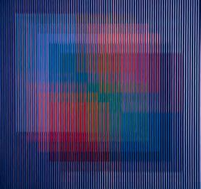
Fig. 33. Physichromie No. 662, 1973.
desgrasado con detergente, le aplicaba con rodillos un fondo de cromato de zinc. Luego lo lijaba de nuevo para quitarle las asperezas y finalmente aplicaba una capa de pintura acrílica blanca. Tras ese largo proceso los módulos estaban preparados para imprimir en serigrafía línea por línea.
El aluminio le aportó diferentes soluciones y le abrió posibilidades nuevas. Primero, eliminó casi por completo las limitaciones de tamaño que le imponían tanto el cartón como el PVC por extrusión. Esto, claro está, a condición de trabajar en espacios más grandes, lo que en 197330 ya había conseguido en Caracas. Además, con el aluminio redujo considerablemente el peso de las estructuras, otra limitante a la hora de trabajar en grandes formatos como los que requerían las intervenciones en la arquitectura. aj
30. El taller de Caracas supone además otras necesidades, entre ellas las de controlar la gama de colores empleada por ambos talleres. En una época en la que no existían ni el fax ni las computadoras, se vió en la necesidad de establecer una paleta perfectamente controlada que pudiera servir de referencia para los asistentes de ambos talleres. De esta manera, con sólo indicar el número que lo identificaba, todos sabían exactamente qué color emplear.
200
ccd
Fig. 34. esquemas para la impresión de la Physichromie No. 662, 1973. el primer esquema muestra la organización general de la obra. el segundo indica el color de las líneas, su posición y medidas dentro de cada módulo.
Y además me aportó un factor bastante útil para enriquecer mi discurso de los Módulos de acontecimiento cromático, y es que ya no estaba limitado a la yuxtaposición de líneas paralelas. Ahora, con los perfiles, tenía un plano que me permitía imprimir diagonales superpuestas a las líneas paralelas del fondo. De esta manera conseguí modular la cantidad de color que participa en la mezcla óptica. Si se observa con cuidado, se verá que la diagonal comienza cubriendo la línea de la izquierda en su totalidad y a medida que atraviesa el módulo va descubriendo porciones siempre mayores de esa línea, a la vez que va cubriendo las líneas que le siguen. Es así que se logra modular la cantidad de color que entra en interacción en un segmento dado de la obra. Con el aluminio solucioné además muchos problemas anteriores, de peso y de tamaño. Pero seguí simplificando cada vez más el trabajo a nivel plástico. Ya no eran las manchas o los climas informales del principio, ni las composiciones de espacios activos sobre fondos inertes, sino rectángulos, círculos o cuadrados, a veces solos, otras veces en superposiciones, o simplemente climas que ocupaban toda la superficie de la obra, sin forma alguna. Pero poco a poco fui concentrándome sobre todo en el empleo del cuadrado, que es la forma más simple.
201
Siempre me ha parecido, ante estas obras que se concentran en el cuadrado, que nos encontramos ante un fenómeno de referencia histórica. Es evidente que al referirnos al cuadrado, en el caso de una obra dedicada al color, no podemos eludir la figura de Josef Albers y su Homenaje al cuadrado. Es como una manera de decir que las fisicromías iban más allá de las soluciones aportadas por él.
No precisamente. Era para evadir las connotaciones que pudieran tener las formas más dibujadas o complejas. Se trataba de encontrar la solución más eficaz, para hacer evidente la mutación del color, y el cuadrado me pareció lo más adecuado para lograrlo. Además, y es importante repetirlo, eso que aparenta ser formas, realmente no lo son. Son acumulaciones de un módulo lineal que generan un área cuadrada, triangular u oval. Joseph Albers lo emplea por ser una forma que no tiene dueño ni significaciones preestablecidas, y lo hace para manifestar el comportamiento del color sobre el plano y nada más. Es el mismo criterio de anonimato para manifestar el color en el espacio, desprovisto de anécdotas, pero no en el plano, como lo hizo Albers.
Es interesante, por no decir conmovedor, observar esa batalla constante que opone el artista a las resistencias del mundo. En el caso de Carlos Cruz-Diez se percibe claramente esa lucha incesante –a veces consciente, otras ignorada– contra el gusto personal y las imposiciones del estilo, por una parte, contra la historia del arte y la obra de los artistas que han intentado proyectos similares, por otro lado. También, y no menos significativamente, contra las limitaciones de la materia y del tiempo. Liberar el color de sus ataduras formales, lanzarlo al espacio como presencia etérea de la luz, implicó para él un enorme trabajo material y técnico. Tan delicada y furtiva es en su obra la atmósfera que se nos ofrece del lado tradicionalmente ocupado por la superficie pictórica, como pesado y opaco el cuerpo que las produce. Fue así cuando trabajó con el cartón encolado sobre madera, y luego con el PVC por extrusión, también sobre madera. Con la aparición del aluminio Cruz-Diez vence sin duda diversas limitaciones del cartón y del PVC, específicamente el peso y sus restricciones de escala, pero sólo lo logra enfrentando retos técnicos que pocas personas son capaces de encarar. Es sorprendente, sin duda, y es un hecho denso de sentido, constatar ese enorme trabajo material que se hace necesario para presentar el color como algo sutil, flotando en el espacio, sin ataduras materiales.
Yo estaba experimentando constantemente, buscando nuevos materiales y nuevas formas de liberar el color para lanzarlo al espacio. Poco a poco fueron surgiendo diferentes propuestas, como las inducciones cromáticas, las cromointerferencias y luego las cromosaturaciones y transcromías [Fig. 35]. Las nuevas
202
aj ccd ccd
soluciones surgen de la constante experimentación y también del azar. Un día, en 1963, había programado una obra en serigrafía, una cromointerferencia de varios colores. Ya había impreso la trama azul y comenzaba a imprimir la negra cuando, al levantar el bastidor para ver lo que había sucedido, descubrí la aparición óptica de un amarillo bastante intenso. Así nace, por casualidad, la primera Inducción cromática [Fig. 36].
Es un descubrimiento.
Es un descubrimiento relativo, porque yo sabía lo que estaba viendo, conocía el por qué de la aparición de ese color. Era el complementario del azul que aparecía simultáneamente con el color que lo originaba. Es un fenómeno
203
aj ccd
Fig. 35. Transchromie, 1965.
perceptivo llamado “color complementario”, “contraste simultáneo” o “inducción”, que se produce en dos tiempos. El ojo tiene que saturarse de azul por unos veinte o treinta segundos y entonces, al desviar la mirada, aparece la misma forma en amarillo. Lo que allí estaba ocurriendo es que se eliminaba un paso, no se necesitaba saturar el ojo para luego ver el amarillo, porque se estaba dando paralelamente. Lo que hice fue aislar y dominar el fenómeno que acababa de producirse para convertirlo en discurso, y no en simple demostración de un fenómeno óptico conocido. Después experimenté con los otros colores primarios, y salió exactamente lo que había previsto. En medio de esta experimentación tuve otras sorpresas, como la producción del rojo con el verde y el negro. Pero, lo repito, lo importante para mí no es el fenómeno, sino la posibilidad de haberlo encontrado para enriquecer mi discurso.
¿Cuál es la primera inducción que hace a partir de esa experiencia?
La primera inducción la hice para la revista K, que editaba en París el marido de Lourdes Castro, el artista portugués René Bertholo. La editaba en compañía de Christo y del grupo de neorrealistas. Era una revista muy original. Para cada número, los artistas diseñaban una tarjeta postal. Ese año me publicaron mi primera Inducción cromática, la inducción del amarillo. Yo no la considero una simple gráfica, es la génesis de toda la serie de obras que he llamado Inducciones Algo parecido sucedió en la invención de la primera Cromointerferencia [Fig. 37]. En 1964 estaba haciendo experimentos en serigrafía con una serie de tramas impresas y decidí superponerle un plástico transparente con el mismo patrón de líneas, lo que produjo una interferencia de colores que se modificaba al desplazar la trama impresa sobre el plástico transparente. Descubrí que la dificultad de lectura de las diferentes tramas se traducía en la aparición de gamas de color que no existían químicamente sobre el soporte. Y, al desplazar la trama, los movimientos eran contrarios al movimiento real de la trama. Las llamé “falsos prismas”, porque generaban el espectro completo de la luz en un soporte opaco.
Esa especie de violencia que se le hace al ojo al obligarlo a ver más allá de lo habitual me interesa particularmente en su pintura, también el inmenso trabajo técnico que es necesario para lograr que esos efectos se produzcan sin errores, sin manchas, es decir, para conseguir efectos cromáticos limpios.
Eso obedece a una larga e insistente investigación. Si no hubiese tenido la disciplina de la reflexión crítica sobre mi propio trabajo, no hubiera solucionado la
204
aj ccd aj ccd
205
Fig. 36. Induction chromatique. Bleu + noire = jaune [Inducción cromática. Azul + negro = amarillo], 1963.
incoherencia de las primeras fisicromías, donde había dos discursos superpuestos, por lo cual la gente no entendía lo que quería decir.
Efectivamente, siempre he pensado que sus mejores obras son las menos compuestas, las menos formales, aquellas donde sólo se ve un campo de color que se transforma en el tiempo. Es en ese tipo de piezas donde se hace evidente lo mejor de su aporte a la historia del color en la pintura occidental. Si comparamos una de estas fisicromías con las Ninfeas de Monet, una de las más abstractas, como la que se encuentra en la Tate Gallery de Londres, por ejemplo, se hace patente la relación [Figs. 38 y 39]. Esa Ninfea es una pintura que mide más de 2 metros de alto por casi 4,30 metros de largo –el formato de muchas fisicromías–y es una obra casi abstracta. Es, prácticamente, un campo de color sobre la tela, con el agregado de que ese campo de color es o pretende ser un equivalente de los reflejos de la luz sobre la superficie del agua. Pues bien, sus fisicromías son eso mismo en el espacio, una Ninfea de Monet en el tiempo real. Hay en verdad una continuidad de propósito entre usted y Monet.
¡Cuántas horas he pasado frente a ellas! . . . Las Ninfeas generan una fascinación, entras en éxtasis. Una sensación que te lleva más allá del soporte físico de la obra. Podríamos decir que Monet y los impresionistas, como Velázquez en su época, reinventaron la pintura, una reflexión totalmente opuesta a la de Duchamp, los dadaístas, Yves Klein y algunos más; incluyéndonos a nosotros que también decretamos la muerte de la pintura, por considerarla una plataforma de expresión agotada por completo. La pintura, conceptualmente, ha muerto muchas veces y resucitado otras tantas. No hablo de la pintura, como la expresión milenaria de pintar sobre una tela, eso es algo que va más allá del hecho mismo de la imagen o del soporte. Hablo del conjunto de sensaciones, emociones y mecanismos de sublimación que genera ese medio, sea cual sea su soporte. Es “el arte” en una de sus plataformas fundamentales de expresión. Es condición congénita de una manera de decir que provoca sentimientos y emociones muy específicas. Lo que se cuestiona es la manera de decir, no el “género expresivo pintura”, que es innato en el hombre. Uno de los primeros mecanismos de expresión del niño es pintar, por lo tanto, es una condición esencial del ser.
He hecho un gran esfuerzo para que mi trabajo tenga una sólida base histórica en “la pintura”, que es lo que me ha permitido avanzar en los conceptos. Lo que quiero hacer entender, es que mi trabajo intenta dar un aporte, un paso adelante entre la intención histórica de colorear y la intención de llevar el color haciéndose en el espacio, al instante, como la realidad misma. Las
206
aj ccd

Fig. 37. Physichromie No. 118 (Chromointerference [Boîte à manipuler]) [Cromointerferencia (Caja manipulable)], 1964.
Ninfeas pueden ser vistas desde cualquier ángulo, y a cualquier hora del día, y ellas no se modifican, ni se modificarán nunca, porque expresan el concepto de la memoria, lo que Monet pudo detener de un instante, de lo efímero. Es la transposición de una realidad que Monet vio y atrapó para el recuerdo. Las fisicromías, o cualquiera de mis obras, expresan todo lo contrario, son realidades. No hay memoria ni recuerdos. Ellas generan un acontecimiento al paso de la luz y del que las mira.
Hay un paso adelante, sin duda, pero hay continuidad de propósitos entre lo que buscaba Monet, esa especie de atmósfera de color y lo que usted hace. Y por eso pintaba el reflejo en el agua, ni siquiera pintaba los cuerpos en sí. Usted no pinta los efectos de esa luz refleja, trabaja con la luz refleja en el espacio, pero conceptualmente estamos ante el mismo objetivo.
Es el resultado de la fascinación que sentimos ante los fenómenos cromáticos de la naturaleza. En 1947, cuando fui por primera vez al llano, cerca de Acarigua, viví una experiencia extraordinaria que el pueblo llama “el sol de los venados”. Es un fenómeno de condensación atmosférica que se produce cuando el sol está muy bajo, cerca del horizonte. No se ve el sol, y la humedad de la atmósfera
207
aj
ccd
hace que todo se vuelva rojo, naranja encendido . . . Todo se baña de color, como si se tratara de una cromosaturación. Otra vez, en Barquisimeto, pude observar un fenómeno parecido. Por eso, cuando tuve la ocasión de realizar la obra urbana para Barquisimeto, la llamé Cromoestructura radial en homenaje al sol, en recuerdo de los extraordinarios crepúsculos que allí se producen, crepúsculos que son verdaderas cromosaturaciones. Años más tarde leí un cuento de Edgar Allan Poe que habla de una fiesta donde los invitados pasan por cámaras de color, hasta llegar a un cuarto rojo.
Y eso es lo que hace una cromosaturación. Aísla, reproduce dentro de las reglas del arte, ese fenómeno natural de condensación cromática.
Las cromosaturaciones no surgen de esa experiencia naturalista. Surgen en 1965 de una reflexión y una observación minuciosa de lo que sucedía en las fisicromías Para fabricarlas, usaba unos bastidores con ranuras donde colocaba las láminas verticales, entre las que intercalaba las líneas de cartón para encolarlas sobre un fondo de madera. Tenía una lámpara que utilizaba para observar el funcionamiento de la obra, en particular lo que sucedía al proyectar el color de las láminas verticales sobre las líneas coloreadas del fondo. Cuando el proyector iluminaba la lámina transparente, todo se coloreaba dentro del módulo. Ese espacio minúsculo se convertía en una atmósfera de color donde sucedían fenómenos extremadamente sutiles y de una gran belleza. A partir de esa observación
208
aj
ccd
Fig. 38. claude monet, Water Lilies [Ninfeas], después de 1916.
39. Fisicromía No. 2422, 2002.
imaginé lo que sucedería si llevaba a escala humana lo que acontecía allí, al interior de esos módulos. Y así nace la posibilidad de las cromosaturaciones
Las cromosaturaciones (en particular las últimas que he visto) representan a mi entender el intento más acabado por trabajar el color realmente desligado de cualquier atadura formal. Por eso me parece importante precisar no sólo cómo y cuándo nacen las primeras obras de este tipo, sino también cuál fue su desarrollo en el tiempo.
La primera idea, ya lo hemos discutido, nace de un análisis detallado de mis fisicromías, en particular de aquellas donde empleo por primera vez el PVC transparente para las láminas verticales. Es entonces cuando comienzo a preguntarme lo que sucedería si me fuera posible penetrar en esos ámbitos completamente saturados por el color. La primera maqueta la hago en 1965, y era sencillamente una serie de cubículos en tres secciones: una roja, una verde y una azul [Fig. 40]. Pensé que esos cubículos o pasajes podrían colocarse en un jardín o en la calle, para transfigurar la visión exterior y saturar de color la retina, cambiando así el color de nuestra piel y de las cosas que nos rodean. Las paredes estaban hechas en PVC de color transparente, como el que empleaba en mis fisicromías, y estaba prevista la instalación de lámparas de color en el techo destinadas a bañar al espectador. Pero en ese momento me fue imposible hacerla en tamaño real.
209
Fig.
aj ccd
Era, en cierta forma, recrear a escala humana un espacio que reprodujera lo que pasaba en las fisicromías. Era hacer realidad palpable, experimentable por el espectador, lo que había producido en la pintura.
Era exactamente eso, brindarle al espectador la posibilidad de penetrar en esos ambientes coloreados donde se producían fenómenos hermosísimos. Nace también de una reflexión personal sobre el origen de las culturas y la posibilidad de hacer evolucionar la nuestra hacia estadios de mayor libertad individual. Yo me decía, y sigo pensándolo, que las culturas tienen como punto de partida un “acontecimiento primario”, una situación simple que despertó la sensibilidad de los individuos, condujo a la creación de sistemas complejos de pensamiento y a la creación de mitos. Sometiendo al espectador contemporáneo a situaciones primarias, como ésta de la percepción pura del color, podía –esa era mi esperanza– contribuir a despertar su sensibilidad. Por eso es que una de mis primeras proposiciones, luego de esta maqueta inicial, fue la creación de lo que llamé un Laberinto de descondicionamiento [Fig. 41]. La idea era crear un ambiente múltiple que estimulara los diversos sentidos del espectador con la intención de ayudarlo a romper las ataduras que lo mantienen alienado en las sociedades contemporáneas. Primero pasabas por un corredor de temperaturas (frío, caliente, No. 1), luego llegabas a un espacio táctil (Nos. 2 a 8), donde el público se enfrentaba a diversas texturas, unas que involucraban todo el cuerpo, otras que sólo debías tocar con las manos, etc. Por último, podías pasar por un área de experiencias acústicas (la sala de los ecos, la sala de percusiones, etc., Nos. 10 a 15) y luego por un área de ambientes cromáticos (Nos. 16
Fig. 40. première maquette de Chromosaturation pour un lieu public [primera maqueta de una Cromosaturación para un espacio público], 1965.
210
aj ccd
y 17), como un espacio cromointerferente y, por último, una cromosaturación. Este conjunto pude mostrarlo, en parte, en una exposición que realicé en 1994 en el Museo de Arte Moderno de Santo Domingo, en la República Dominicana. Allí monté algunas de estas experiencias.
La pintura moderna de los siglos XIX y XX se desarrolló en gran medida a partir de una constatación esencial; que el mundo que nos es perceptible a través de los sentidos es sólo una parte de lo real, y que más allá de su testimonio se extiende el mundo de lo posible, de lo experimentable. De allí todas estas experiencias que pretendían enfrentarnos a situaciones de descondicionamiento, experiencias capaces de despertar una percepción más amplia, más completa de lo real. Buscar el testimonio de todos los sentidos y no sólo el de la visión, como lo había hecho la pintura de todos los tiempos, se explica dentro de un contexto de superación de los límites sensoriales del ser humano y por lo tanto de superación de un medio –la pintura– tradicionalmente restringido al testimonio de la visión. A finales de los años cincuenta y durante la década del sesenta, una infinidad de artistas en toda Europa, Estados Unidos, Japón y América Latina, estaba trabajando en situaciones ambientales que pretendían activar todos los sentidos. No me extraña entonces que en ese momento se le presente la oportunidad para hacerlo.

Fig. 41. esquema para el Laberinto de descondicionamiento, 1965.
Ese tema interesó a mi generación. Entre los primeros está sin duda Lucio Fontana con su espacio penetrable de 1949, luego Yves Klein con su espacio azul y el espacio vacío.31 Y también el Grupo de Recherche d’Art Visuel, Lygia Clark, Gianni Colombo y muchos otros. Eran obras que buscaban la participación total del espectador.
31. El 14 de enero de 1961 Yves Klein organiza la exposición Monochrome und Feuer, en el Museum Haus Lang de Krefeld. Allí presenta “una sala vacía” dedicada a la “Sensibilité picturale immaterielle” (Sensibilidad pictórica inmaterial). Se trata de un espacio de 4,40 por 1,60 por 2,90 metros, totalmente pintado en blanco e iluminado con dos tubos de neón. La idea era impregnar el espacio con esa sensibilidad pura, así como sus esponjas se impregnan de azul. Aun cuando no se trata de una saturación cromática del espacio, es claro que Cruz-Diez funciona como Yves Klein, impregnando el espacio con una “calidad” o un “valor” inmaterial, en su caso el color.
211
aj ccd
aj

Fig. 42. esquema para la Cromosaturación de Grenoble, maison de la culture, grenoble, Francia, 1968.
Después de esas dos propuestas iniciales –nunca realizadas completamente– la primera oportunidad que tuvo para poner en práctica sus ideas participativas fue la exposición de Grenoble, en 1968.
ccd
Sí, esa fue la primera vez que tuve la oportunidad de producir una cromosaturación. Fue en la exposición titulada Cinétisme Spectacle Environnement, organizada por la Maison de la Culture de Grenoble, en 1968. En ese momento la llamé Cabines de déconditionnement de la couleur (Cabinas de descondicionamiento del color) [Fig. 42]. En esta primera cromosaturación el espectador entraba por un pasillo oscuro que daba acceso a tres cuartos saturados de color: uno azul, uno rojo y uno verde. El techo de cada cubículo era como una caja donde se escondían lámparas de neón blanco con una tapa de plexiglás transparente azul, rojo y verde. El público circulaba por el pasillo sin entrar en ninguno de los cubículos saturados de color. Sencillamente, pasaba de largo sin percatarse de lo que allí sucedía. Sin embargo, lo que sucedía en el pasillo, allí donde la luz de un cubículo se unía con la luz que provenía del otro, era francamente hermoso. El público no lo veía porque pasaba de largo, sin detenerse.
Cuando tuve la oportunidad de hacer una segunda cromosaturación, en la exposición Environnement, Bonalumi, Honneguer Cruz-Diez en el Museum am Ostwall, en Alemania, recurrí a una forma laberíntica, de manera que el público
212
Fig. 43. esquema para el Laberinto de cromosaturación, museum am ostwall, dortmund, Alemania, 1968.
se viera obligado a pasar y detenerse en los espacios saturados de color [Fig. 43].
En esta segunda ocasión introduje un pasillo de 20 metros de largo de limpieza perceptiva, con la idea de limpiar la visión que el espectador traía del exterior y prepararlo para la experiencia que iba a tener. Entraba por un pasillo de cortinas grises transparentes que iban haciéndose cada vez más claras, hasta que llegaba a un espacio completamente blanco, encandilante. Ya estaba preparado para entrar al primer espacio cromosaturado azul, luego al rojo, el verde, y por último un espacio de luz blanca. Cada uno de esos espacios cromosaturados estaba separado por un cubículo oscuro y pintado de negro, con el propósito de que la post-imagen desapareciera antes de entrar al próximo color. La forma laberíntica lo obligaba a pasar de un espacio de color a otro. Lamentablemente, con esa forma laberíntica no se producía la experiencia del pasillo en la Cromosaturación de Grenoble, donde se cruzaba el color de una cabina con el color de la siguiente.
En esa exposición de Dortmund hice también una variable de las cromosaturaciones, las Duchas de cromosaturación e inducción cromática. En esta obra exploré tanto la saturación cromática de un espacio, como la inducción de su color complementario. Para un observador cuidadoso, los intervalos entre las bandas de color transparente se saturaban del color complementario. Si las láminas eran rojas, los intersticios eran verdes. Si las láminas eran azules, los
213
intersticios se volvían amarillos, etc. Es muy difícil hacer entender un discurso inédito. Para un espectador que por primera vez experimenta un espacio monocromo, no le es fácil descifrar lo que su mirada le está trasmitiendo. Por eso, en cada solución busco simplificar y hacer evidente lo que allí sucede y que el espectador común no advierte. Si tiene la curiosidad de quedarse unos instantes en ese espacio vacío y sin formas, comienza a sorprenderse, y descubre que sí están pasando cosas que antes no había observado. Allí comienza a buscar referencias y a mitificar.
La próxima experiencia es la que hace en 1969, en el Boulevard St. Germain, en las afueras del Metro Odéon, en París [Fig. 44].
Sí, el Centro Nacional de Arte Contemporáneo (CNAC) organizó un concurso de arte en la calle y yo fui uno de los ganadores. Ahí participamos Nicolas Schöffer, Piotr Kowalsky, Lily Greenham y yo, cada uno con una obra en lugares diferentes de la ciudad. En esta ocasión busqué saturar la piel del espectador y los objetos con la ayuda de mil quinientos vatios de luz dicroica en el techo de cada cabina. Eran unas lámparas que producían colores más intensos que las cromosaturaciones anteriores, pero con el inconveniente de que generaban demasiado calor. Más tarde, en 1972, cuando la monté en la exposición Doce años de arte contemporáneo en Francia, en el Grand Palais, volví a utilizar el neón, que es una luz fría. Pero entonces cubrí los bombillos de neón con los filtros de color que se utilizaban para el cine y la televisión, lo que me permitía encontrar exactamente el color que necesitaba. Era una cromosaturación que incluía además una serie de cubículos con algunas paredes transparentes, lo que ofrecía al espectador la posibilidad de comparar su situación de monocromía con lo que pasaba afuera.
¿Ahora, cuándo llega a la solución, por así decir “clásica”, de las cromosaturaciones?
No existe una forma clásica. Al contrario, lo interesante es que cada cromosaturación es diferente. Algunos elementos se mantienen, como la sucesión de los colores básicos, los colores primarios de la luz. En todas, el rojo ocupa siempre el lugar central, flanqueado por el azul y el verde. Pero luego cada cromosaturación se adapta tanto al espacio disponible como a las circunstancias de la exposición o el evento donde se instale. Por ejemplo, la cromosaturación que hice en la Sala Cadafe, la Extensión este del Museo de Arte Contemporáneo de Caracas, en 1974, era un espacio único que se saturaba de un color
214
aj ccd aj ccd

diferente cada 30 segundos, por medio de una programación electrónica, bastante complicada en la época. Hoy, con las computadoras, puedo lograrlo con gran facilidad.
¿Y cuándo introduce por primera vez las formas geométricas de sus últimas cromosaturaciones?
Son volúmenes que ayudan a poner en evidencia la transformación progresiva del color en el espacio. Eso lo hago a partir de mi exposición retrospectiva en el Städtische Museum, Gelsenkirchen, de Alemania, en el 1998 [Fig. 45]. Fue algo casual. Me habían asignado el ático del Museo que tenía unas vigas en madera que atravesaban el espacio. Eran parte de la estructura del techo y no podía eliminarlas. Lo sorprendente fue que entre uno y otro ámbito de color estaban interpuestas las vigas de la estructura que se convirtieron en un espectáculo inesperado. Esas vigas se coloreaban de un color intenso, tanto así que la gente buscaba los proyectores de donde suponía venía esa luz, cuando lo que sucedía era que ese color surgía como consecuencia de los fenómenos de
215
aj ccd
Fig. 44. Chromosaturation: Labyrinthe pour un lieu public [Cromosaturación: Laberinto para un espacio público], place d’odéon, boulevard st. germain, parís, Francia, 1969.
post-imagen. Ese violeta o ese amarillo, eran el complementario de los colores que bañaban el espacio. Si cambiabas tu posición y cambiaba el color del ambiente, esa viga se iba transformando de manera realmente sorprendente. A partir de ahí surge la idea de agregar unos volúmenes en medio de las cromosaturaciones para hacer evidentes esas transformaciones y estimular la experiencia del espectador. La primera que hago con esos volúmenes es la cromosaturación de mi exposición retrospectiva en el Museo de Arte Moderno Jesús Soto, en Ciudad Bolívar, ese mismo año [portada]. Los colores que se mezclan en el tránsito de un espacio a otro ya estaban presentes en la cromosaturación de Grenoble en 1968.
216
Fig. 45. Cromosaturación, 1998 (detalle), Retrospectiva de Cruz-Diez: 1954–1998, städtische museum, gelsenkirchen, Alemania, 1998.
ccd
Arte y re A lid A d
la realidad del arte
Es definitivamente interesante este ir y venir de la obra al mundo y del mundo a la obra. Las fisicromías nacen en cierta forma como modelo reducido de lo que observa en el paisaje, particularmente en ese valle de Caracas donde sus maestros paisajistas le enseñaron a ver el color. La pintura se presenta entonces como una actividad que aísla, reproduce y luego re-presenta, cargado de sentido, eso que se observa en el mundo. Pero luego, a partir de esa experiencia pictórica, surge una obra que pretende alcanzar una escala humana, que se hace mundo para el observador-participante, que pretende ayudarnos a ver más y mejor lo que pasa afuera, lo que sucede a cada instante en la realidad. Ni más ni menos, lo que Carlos Cruz-Diez está describiendo es quizás la más antigua definición del arte, esa que Van Gogh retoma de los teóricos de la antigüedad y que lo definen como “el hombre agregado a la naturaleza; la naturaleza, la realidad, la verdad, pero con un significado, con una concepción, con un carácter, que el artista hace resaltar, y a los cuales da expresión, ‘que redime’, que desenreda, libera, ilumina”.32
Yo mantengo que los cinéticos podríamos considerarnos como pintores realistas. Uno destila lo real, toma la esencia y crea otra realidad que tiene el mismo nivel que cualquier otra realidad. Se trata de lograr la pureza del lenguaje plástico, decirlo de manera tal que pueda ser comprendido por cualquier persona en cualquier parte del mundo. Yo imaginaba que el arte podía tener una cierta ventaja para lograrlo, comparándolo con el lenguaje hablado y con las diferencias de un idioma a otro, e incluso de un acento a otro. Un colombiano habla distinto de un puertorriqueño, de un venezolano, de un francés. En cambio, si se pudiera encontrar un lenguaje que todo el mundo pudiera entender, como fue la ilusión del esperanto, del que se esperaba fuera el idioma universal, podríamos llegarle a todo individuo más allá de las barreras culturales. Cuando pintaba las situaciones de los barrios, yo estaba consciente de que en Francia o en Estados Unidos nadie podría entender aquello, porque no habían vivido situaciones comparables y no tenían los puntos de referencia necesarios para comprenderlo. Esta fue una de las reflexiones que me incitaron a buscar un discurso de tal simplicidad que todo el mundo pudiera entender, porque el arte también es comunicación.
32. Vincent van Gogh, Cartas a Theo (Barcelona: Barral Editores, 1971), p. 35.
217
Una verdadera ilusión, una utopía . . . Ahora, esa esperanza de que una fisicromía pueda ser comprendida y apreciada por cualquier ser humano, en cualquier circunstancia y lugar, es exactamente lo que grandes artistas del Renacimiento, como Leonardo da Vinci, por ejemplo, esperaban de la pintura. Cuando Leonardo33 compara la pintura con la poesía, es para decir que la pintura puede ser comprendida inmediatamente por cualquier espectador, porque no necesita saber leer para entenderla. Su argumento era muy cercano al suyo, puesto que para Leonardo el espectador sólo se enfrentaba a espectáculos idénticos a los de la naturaleza. La pintura le presentaba árboles, paisajes, casas y edificios, personajes, etc., todo aquello que él conocía por su propia experiencia visual ante el mundo. Es decir que siempre se ha visto, o se ha creído ver en la pintura un medio de comunicación más directo que la literatura o que la filosofía.
Porque la pintura es simultáneamente percepción y contenido. La literatura también es perceptiva, pero es indispensable una etapa previa de trascripción, hay que descifrar un código antes de llegar al contenido, antes de imaginar el mundo que describe. Es algo similar a lo que sucede entre la literatura y el cine. No me agrada ver una película hecha a partir de una novela. Cuando niño, leí las novelas de Robert Louis Stevenson, La isla del tesoro y David Copperfield de Charles Dickens, y cuando fui a ver las películas que hicieron a partir de ellas, me produjeron una desilusión muy grande, porque destruyeron el mito que yo me había construido durante su lectura. El encanto de las descripciones del entorno, el carácter de los personajes y la emoción de las acciones desaparecieron por completo. Quiere decir que lo leído evoca realidades muy diferentes a la presencia de la imagen. Son realidades distintas. Recuerdo que la aparición de la radio fue muy importante para mi generación. Oírla era como leer un libro, uno podía imaginar con gran realismo las situaciones y los personajes.
Quizás, pero sigo creyendo que es una ilusión pensar que la pintura, abstracta o no, nos enfrente a una situación de comprensión inmediata, como lo pensaba Leonardo. Por el contrario, toda obra necesita, exige incluso, el conocimiento de una infinidad de códigos, por decirlo de alguna manera. Comprender una obra de Leonardo es algo que exige un conocimiento, porque cada obra es o responde a un universo de sentido compartido.
33. “La pintura se presenta sin demora tal cual por su autor fue engendrada, y tanto placer concede al más noble sentido, cuanto pueda concederlo alguna cosa creada por la naturaleza. Pero el poeta, que ofrece las mismas cosas al sentido común por vía del oído, sentido inferior, no proporciona al ojo un placer mayor que si oyéramos cantar alguna cosa [. . .] Por lo que toca a los lectores, ocurre con frecuencia que no leen, por falta de tiempo, sino una pequeña parte de sus obras [las del poeta], en tanto que las obras del pintor son comprendidas de inmediato por sus contempladores.” Leonardo da Vinci, Tratado de pintura (Madrid: Editora Nacional, 1980), pp. 56–57.
218
aj ccd aj
No olvides que las pinturas del pasado no eran una ingenua representación de la realidad, estaban saturadas de códigos y de lecturas a diferentes niveles. Para descifrarlas y disfrutarlas, hay que estar informado.
Y sin embargo Da Vinci pensaba que la pintura era de una lectura directa para el público, porque le ofrecía espectáculos como los que podía ver en el mundo.
La pintura transpositiva o representativa es el resultado de un código transpositivo de la realidad. Contemplarlo exige un proceso inverso de descodificación.
Y sucede lo mismo con el arte abstracto. Ustedes creen, como lo creyó Leonardo, que la pintura abstracta y en particular la cinética le permite al público un contacto directo con una situación fenomenológica, pero resulta que su apreciación exige también de una serie de códigos cuya adquisición requiere años. Años de estudio, de ver y querer comprender, de romper ataduras y costumbres.
Con la aparición del arte abstracto surgió otro código no comparativo, sino imaginativo, lo que provocó el fin de la comunicación inmediata que tenía la pintura representativa de la que hablaba Leonardo. Con el concepto puesto en juego por los artistas cinéticos, se restablece una comunicación inmediata, no por un código comparativo como el precedente, sino por el descubrimiento de una realidad inmediata.
Ese primer grado, ese primer nivel de lectura, quizás, es directo. Pero punto. De allí en adelante hay un universo de experiencias propias que cada quien debe cultivar, tanto en el arte abstracto como en la pintura de un Leonardo da Vinci, que se aleja muchísimo de esa comunicación directa que esperan los pintores.
Es un primer acercamiento por el cual, si se quiere, se llega al contenido Mi propósito es que el espectador pueda sentir ante una fisicromía el mismo placer que yo experimento haciéndola. En el interior de los módulos se producen cambios en las gamas de color, tal y como sucede en la naturaleza cuando el color del cielo se va transformando de manera insensible y nos produce placer. En esos módulos hay muchos acontecimientos que la gente no ve, porque vivimos en una época de brutalidad y violencia. Las sutilezas hoy no tienen lugar. De más en más, trato de simplificar el discurso para hacerlo cada vez más eficaz y evidente. Pero siempre llego a la conclusión de que hay poca gente preparada para esos niveles de percepción.
219
ccd aj ccd aj ccd aj ccd
Justamente, porque para llegar a ello hay que recorrer un camino largo que no todo el mundo emprende. Es lo que sucede ante una obra tan aparentemente elemental como el Cuadrado negro, 1918, de Malevich. Es una obra fenomenal, capaz de producir una emoción profunda, y sin embargo, sabemos por experiencia que no existe obra más ardua, más opaca para la mayoría del público.
Porque el primer sentimiento es de rechazo absoluto. Un cuadro negro sobre un fondo blanco, y punto . . . ¿Qué puede haber allí? Creo que no existe una obra de más compleja penetración que esa.
Es otro nivel de aproximación, otros niveles de lectura. El cuadrado ni siquiera es totalmente cuadrado . . . Es una metáfora filosófica de la nada, una inducción a la reflexión que no es accesible a quien no tiene el hábito de pensar . . .
Hay allí una cantidad de detalles formales, materiales, de sentido en fin, que pocos pueden ver. Todas esas pequeñas anomalías que la cargan de sentido pasan desapercibidas para la mayoría del público, y si las percibe, no le dicen nada.
Por vivir en una sociedad donde todo es agresión. La música sustituyó el silencio por el ruido. El vacío ya no existe, está repleto de objetos y formas. Mi tiempo ya no me pertenece, está intervenido por los otros. Sin embargo, todas las expresiones del arte implican el deseo de comunicar . . . Si se observan con detenimiento, las fisicromías están compuestas de microcosmos. Las de los años 1960–1962 son mucho más complejas de lo que parecen, múltiples cosas suceden en los “módulos de acontecimiento cromático”: vibraciones, adiciones, efectos de glacis como los que puedes encontrar en la pintura, pero sin ser la pintura del pasado. Trato de enseñar a la gente a ver más allá de la forma, a disfrutar, a “leer” el color en el espacio y no detenerse en la forma.
Y eso requiere un arduo camino de investigación personal. Yo recuerdo, por ejemplo, mi primer contacto con sus obras. Mirada más ingenua que esa, menos cultivada que esa, no ha existido nunca, y eso que yo venía con respeto, porque sabía que estaba llegando al taller de un artista que, eso me decían, era importante. Pero la verdad es que allí no había para mí más que una multitud de rayas . . . y una enorme dificultad para verlas porque, justamente, yo quería ver la forma, lo que estaba pintado, y se me hacía muy difícil, ópticamente difícil. Luego, poco a poco, aprendí a ver los efectos, las atmósferas. Mucho más tarde, tras años de estudio y reflexión personal, esas obras se fueron cargando para mí
220
aj ccd aj ccd aj
de sentido; pero lo cierto es que, en un primer contacto, era poco, muy poco, lo que me decían. Por lo demás, es evidente que la percepción de nuestro entorno no es tampoco un fenómeno directo. Uno sólo ve lo que está preparado para ver y generalmente no va más allá de nuestras necesidades más elementales, de aquello que nos es estrictamente necesario para sobrevivir.
El discurso del arte es el camino que nos lleva a lo sublime. Hay quien lo emprende y quien no. Hay personas incapaces de llegar a lo sublime, en ninguna actividad.
Por supuesto, y cada una de esas obras, cualquier obra considerable, es una invitación al crecimiento personal. Pero hay que aceptar esa invitación que se nos hace desde la obra. Allí, en cada una de ellas, reside la posibilidad de emprender un camino que puede llevarnos a lo sublime. Pero son pocos los que lo emprenden y muchos menos los que lo siguen hasta pasar los límites de las convenciones generacionales.
Y por eso el arte es un discurso eterno. No circunstancial.
Quizás por eso, en parte, ustedes se han imaginado a menudo como una especie de primitivo americano, un artista de los inicios, como los primitivos italianos del siglo XIV.
Lo que habíamos propuesto estaba muy lejos de ser comprendido por el común de la gente. Era una base para lanzar la investigación plástica por los caminos de lo inestable, lo ambiguo, la percepción de lo efímero . . . Lo que hasta ahora he hecho, es un comienzo. Ojalá tuviera los medios técnicos para producir una masa de color en el espacio, sin ningún soporte. Cuando la ciencia abra nuevos caminos, las fisicromías serán vistas como estructuras ingenuas ante las que podrán hacerse con técnicas más avanzadas. El valor podría estar en ser un concepto primigenio.
Algo similar sucede hoy con el edificio de la L’Oréal en Nueva York, una torre irregular, de cristal, que por las noches se ilumina y cambia de color como una de esas torres cromáticas que usted hizo en los años setenta. Ante el edificio de la L’Oréal, sus torres parecen estructuras primitivas.
Es el Cromoprisma aleatorio [Figs. 46 y 47]. Yo lo realicé en 1975 con el mismo concepto del color haciéndose, que podía aplicarse a una fuente pública. Al
221
ccd aj ccd aj ccd aj ccd
desplazarse alrededor, cada lado del prisma generaba un color que se acentuaba en la medida que nos acercáramos. Al haber en cada lado una persona, se creaba el blanco. Lo construí con las técnicas y los materiales a mi alcance en ese momento, con censores de movimiento muy elementales, pero finalmente logré expresar lo que quería.
222
Figs. 46 y 47. Cromoprisma aleatorio, 1975 (dos vistas).
ccd
e l A rte en l A ciud A d responsabilidad social del artista
Una de las características resaltantes de la abstracción geométrica y cinética venezolana fue su capacidad para intervenir el espacio urbano en dimensiones pocas veces alcanzadas en otros países. Carlos Cruz-Diez, como Jesús Soto, Alejandro Otero o Gego, tuvieron ocasiones realmente excepcionales para poner en práctica sus ideas de integración y su deseo de producir una obra que escapara a los límites del museo hasta formar parte activa de la ciudad. Las grandes obras de infraestructura construidas en Venezuela durante las décadas del setenta y el ochenta –cuando la industria petrolera alcanzó niveles excepcionales de rentabilidad– le dieron algunas de sus más importantes oportunidades. Tal fue el caso de la Central Hidroeléctrica José Antonio Páez en Santo Domingo, donde Cruz-Diez puede hacer su primera obra pública de envergadura [Fig. 48] en 1973.34
El proyecto nace de la iniciativa de unos amigos que tenían una asociación de ex becarios de Venezuela en Francia. Una vez me invitaron a una de sus reuniones a hablar de mi trabajo. Algunos días después me llamó por teléfono el ingeniero Héctor Alio, uno de los asistentes. Se presentó y me dijo que estaban trabajando en un proyecto y habían pensado en la posibilidad de invitarme a trabajar con ellos en una obra de integración. Así comenzaron las conversaciones que dieron como resultado este primer proyecto. La invitación me pareció interesante porque se trataba de intervenir en una represa ubicada en un sitio extraordinario, en medio de las montañas, a 300 metros bajo tierra. Es lo que llaman una represa de apoyo, que se utiliza en los momentos críticos de consumo. La pantalla que retiene el agua está 14 kilómetros río arriba, con el propósito de generar la velocidad suficiente para que el agua pueda mover las turbinas. Para llegar a la sala de máquinas donde yo intervine, hay que recorrer un túnel de 700 metros que desciende a 300 metros de profundidad. Allí no hay ninguna relación con el mundo exterior.
El reto no dejaba de ser atractivo; invitar, a quien trabaja con la luz, a intervenir a 300 metros de la superficie, allí donde lo que falta es precisamente la luz.
Donde no había luz ni relación alguna con la realidad exterior. Entonces pensé en una intervención que reconstituyera, al menos en sus efectos, eso que le
34. Se trata de la represa de Santo Domingo, poblado del Estado Mérida en Los Andes venezolanos.
223
ccd aj
faltaba. Cuando aprendemos a leer el espacio nos damos cuenta de que en realidad no siempre nos aparece del mismo color. El espacio va cambiando de color durante el día: a veces está como bañado por la gama de los amarillos, a veces es grisoso, otras verdoso o azulado. Y eso fue justamente lo que intenté reconstruir, esa calidad cromática cambiante del espacio. Hoy sería relativamente fácil lograrlo, pero en la época tuvimos que desarrollar un programa electrónico que cambiara los niveles de incandescencia de lámparas rojas, verdes y azules para crear la gama del espectro solar en plena oscuridad. Eso produjo una obra que es muy difícil de fotografiar, porque generalmente se presenta como atmósferas muy sutiles de color que van cambiando casi imperceptiblemente en el tiempo. Por eso, las fotografías se toman generalmente en lo que llamaríamos los fines de programa, cuando las lámparas llegan a su máxima saturación y entonces se perciben claramente los colores que sirven de punto de partida: el verde, el magenta y el azul, que son los colores primarios de la luz.
Y por supuesto en cada una de las ventanas están colocadas lámparas de los tres colores primarios.
224
aj
Fig. 48. Ambientación cromática, central hidroeléctrica José Antonio páez, santo domingo, venezuela, 1973.
Son falsas ventanas donde están escamoteadas las lámparas. Hay 72 lámparas por cada ventana: unas rojas, otras verdes y otras azules. Pero para lograr las mezclas de color necesarias, hice un programa de 12 horas que controlaba el encendido y la progresiva intensificación de cada color. Cada lámpara se va encendiendo y luego apagando de manera que sus diferentes intensidades produzcan mezclas distintas. El programa básico duraba 15 minutos, y se repetía constantemente, de manera que el ojo no percibiera los cambios como algo brusco, pero que tampoco fuera tan lento como para que no te dieras cuenta de lo que pasaba. Quince minutos era más o menos el tiempo medio que un obrero pasaba en ese espacio, de manera que escogí un tiempo que le permitiera ver todas las transformaciones cromáticas durante su estadía en la sala de máquinas. Durante ese período, el ambiente pasaba de un blanco, una especie de luz lunar, hasta la saturación total de uno de los colores primarios. Todas las ventanas saturaban juntas al final de cada programa, una vez en el rojo, una en el verde, otra en el azul.
O sea que una persona que entre a esa sala de máquinas sin saber lo que está sucediendo, y dure allí menos de 15 minutos, podría eventualmente tener la impresión de estar ante unas ventanas reales con vidrios traslúcidos. Es como si hubiera querido acercarse de tal manera al paisaje que no existiera ya diferencia entre la obra y la realidad . . .
Ni cuenta se hubiera dado de lo que estaba pasando . . . Además, allí trabajan técnicos y obreros. La idea era justamente ofrecerles el máximo de confort en su lugar de trabajo. Fue un intento por mejorar sus condiciones laborales.
Independientemente de lo que podamos pensar en cuanto a la eficacia real de una intervención como ésta, su obra de ese momento se presenta como una especie de antídoto contra las condiciones que denunciaba en su obra anterior. O sea que no sólo podríamos decir que es una obra más realista –en términos plásticos– que la paisajística tradicional, puesto que se acerca más a la verdad de la naturaleza (aunque en un punto muy específico), sino que además quiere ser más eficaz en su función social que la pintura de denuncia que practicó durante los cuarenta y buena parte de los cincuenta, al menos para el puñado de personas que trabajan allí. Es decir, que no sólo estamos en presencia de una obra site specific, como dicen los americanos, sino que es también una obra para un público muy específico. Es más, fue tan específica en su público como pudo serlo el arte en las iglesias o los palacios de antaño.
225
ccd aj ccd aj

ccd
Sí, sólo que en este caso se trata de obreros, técnicos o ingenieros, no de reyes o príncipes . . .
aj
Y sin embargo, esa sala de máquinas se convierte en una especie de capilla secularizada, que tiene también como función cambiar la vida de un grupo muy selecto de personas. A mi entender, en obras como ésta se manifiesta una característica del arte moderno más común de lo que parece a primera vista: su carácter redentor, su deseo de mejorar la vida aquí y ahora, de salvar, de sanar. Y no me parece por lo demás un azar, vistas las condiciones sociales de la América Latina, que esa característica del arte moderno se acentúe en la obra de muchos artistas de la región. Basta con pensar en los Núcleos de Hélio Oiticica o en la fase final de Lygia Clark, para constatarlo. Su obra también, en casos raros como éste donde se trata de un grupo muy pequeño de personas, como en aquellas pensadas para espacios verdaderamente públicos, tiene esa dimensión redentora que no podemos pasar por alto. Pienso por ejemplo en su segundo gran proyecto público, su intervención en el Aeropuerto Internacional Simón Bolívar de Maiquetía,35 de 1974 [Fig. 49].
35. Se trata del principal aeropuerto de Venezuela, situado frente al Mar Caribe, en la costa norte del país, a una hora de Caracas.
226
Fig. 49. Ambientación cromática, Aeropuerto internacional simón bolívar, maiquetía, venezuela, 1974.
Mis obras de participación en la arquitectura las he concebido siempre dentro de una función social. No son sencillas decoraciones o simples ocasiones para hacer una obra monumental, son un acto de compromiso social. Y por eso trato de participar en los proyectos desde el momento mismo de la concepción, de manera que mi obra termine siendo un verdadero acto de integración. Sólo así se garantiza que la obra cumpla una función más allá de la estética. El aeropuerto estaba ya en construcción, pero en sus primeras fases, y los arquitectos Felipe Montemayor y Luis Sully me llamaron para trabajar con ellos. Contrataron a dos artistas, a Héctor Poleo y a mí. Estuve largo tiempo pensando qué tipo de obra podría hacer para un aeropuerto como ése. En la época yo viajaba mucho y analizando mi propia experiencia me dije que de realizar una obra, habría que hacerla pensando en lo que uno hace con mayor regularidad en un aeropuerto: deambular con un maletín en la mano, aburrido, viendo en las tiendas el mismo reloj, la misma corbata, porque no hay nada más. Pensé en una obra para el piso, cuyo acontecimiento pudiera producirse y contemplarse, mientras nos desplazáramos.
Para el piso y para las paredes laterales.
Sí, pero ese muro tenía una función muy específica. El aeropuerto se diseñó pensando que su ampliación sería horizontal, de manera que el muro debía sugerir su progresión futura. Pero tenía que ser removible, porque luego, cuando el aeropuerto llegara a su extensión máxima, esos muros desaparecerían. Además, desde el punto de vista de mi obra, esos muros en los extremos del recorrido me permitían ofrecerle al público diferentes lecturas. Una era la que podía verse mientras caminabas, otra la que podías ver en perspectiva, y la última, la que podía verse en esos muros de los extremos, donde se enfrentaba a una visión perfectamente frontal. En cada caso el comportamiento del color era diferente.
Sólo que ahora el aeropuerto se agrandó hacia arriba y no a la horizontal como había sido previsto.
Sí, pero la solución que le dieron me gusta mucho, porque le ofrece al público una visual suplementaria: verla desde el segundo piso. La idea inicial fue partir de tres colores opacos como el rojo, el verde y el azul, para generar la gama del espectro solar. Partir del pigmento químico para generar un color-luz. La otra dificultad que debía resolver tenía que ver con el hecho de que el aeropuerto es un espacio donde caminan constantemente millones de personas. Había que
227
ccd aj ccd aj ccd

usar un material que resistiera la abrasión producida por ese enorme tráfico. Para encontrarlo tuve que viajar a Italia, Portugal y España, pero finalmente fue en Francia donde encontré el material adecuado. Es un revestimiento producido por la empresa Briare, a orillas del río Loira, que ellos llaman Sialex. Tiene la particularidad de estar coloreado en la masa, o sea que no tiene una capa de pintura que pueda borrarse rápidamente con el paso de los peatones. Hasta el último segmento del mosaico tiene el mismo color, de manera que su desgaste no lo daña. Es además un material indestructible, porque es un compuesto de sílice y feldespato y pigmentos compactados a razón de 2000 kilógramos por centímetro cuadrado y cocido a 1.500 grados de temperatura, lo que lo hace extremadamente resistente a la abrasión.
Son muchos y muy variados los proyectos de integración en los que ha tenido la oportunidad de trabajar, por lo que me gustaría que nos centráramos en algunos de los más importantes, sobre todo por lo que significó el hecho mismo de lograr una empresa que lo coloca a años luz de esa imagen romántica del artista maldito, condenado por la sociedad, que prevalece a veces en el imaginario popular. Hay que decir, por ejemplo, que son muy pocos los artistas que logran
228
aj
Fig. 50. Physichromie double face [Fisicromía de doble fachada], place du venezuela, parís, Francia, 1976.
modificar el tejido urbano de París, incluso en las modestas dimensiones de la Plaza Venezuela entre 1976 y 1978 [Fig. 50].
Cuando me llamaron para hacer esta obra en París se cumplió para mí lo que parecía una utopía: modificar un pequeño espacio en el tejido urbano de París.
Eso es un privilegio, algo que no se da todos los días. En Venezuela fue más fácil en cierto momento, y en general es más fácil en América Latina que en Europa. Y sin embargo, eso se dio en París. Un día me llamó el doctor Salcedo Bastardo, el embajador de Venezuela en París, y me dijo que, gracias a sus gestiones, la Alcaldía de París le había escrito para decirle que tenían un lugar cerca de la embajada, donde podíamos hacer la Plaza Venezuela. Tan pronto como me llamó fuimos a ver el espacio.
Era una pequeña explanada, con 35 metros de diámetro de calzada a calzada. Hasta ese momento, era utilizada por los vecinos como estacionamiento salvaje, donde todo el mundo se estacionaba desordenadamente. A pesar de las dimensiones modestas del lugar, imaginé que podía transformarse en un espacio peatonal. El Consejo de París estudió mis proposiciones y las aceptó. La fabricación de la obra fue financiada por Venezuela, y la transformación urbana estuvo a cargo de la Alcaldía de París. Cambiaron los declives del agua y de los alcantarillados, modificaron los semáforos y el señalamiento urbano, la pavimentación, etc. O sea que se procedió a una transformación urbana considerable. Todo, por supuesto, debió ser discutido con los vecinos, que hicieron infinitas preguntas sobre la iluminación, la circulación y la seguridad, hasta que logramos convencerlos de que nuestra intervención mejoraría el uso que se le daba a ese espacio.
Todas estas discusiones se dieron sin siquiera considerar la obra. Se trataba de la función y del sentido que debía tener ese espacio dentro de la comunidad. Luego vino la etapa de diseño en sí de la obra y particularmente la gama de colores a utilizar. Decidí trabajar con una gama de colores muy sutiles y adecuada al entorno cromático de la zona. No quería que fueran a considerar mi obra a partir de esos estereotipos folklóricos, típicos del trópico, por lo que eludí los colores fuertes y los contrastes que pudieran recordar los pericos y las guacamayas. No es que desprecie el folklore, si tanto me motivó, sino que cada cosa debe estar en su sitio para evitar equívocos.
Es un clima cromático casi invernal.
Muy parisino. Esa fue mi decisión. Consideramos incluso la leyenda que
229
ccd aj ccd
colocaríamos en el sitio; una vez más, eludimos los homenajes que con el tiempo se hacen ridículos. Por eso se llamó, simplemente, De Venezuela a París Todo fue pensado. Hasta el más mínimo detalle constructivo, de manera que las piezas fueran desmontables y fáciles de substituir. Nada, en esa obra, encaja en los estereotipos de país tropical subdesarrollado que se tiene de nosotros en Europa.
Cronológicamente, la próxima intervención arquitectónica de envergadura, y sin duda una de las más sorprendentes que haya hecho Carlos Cruz-Diez, es la que realiza para la Central Hidroeléctrica Raúl Leoni en Guri entre 1977 y 1986 [Fig. 51]. Es además una de las más significativas o de las que más claramente indican las relaciones de su obra con el proyecto modernizador del país. Los dos artistas que trabajaron allí, Alejandro Otero y Cruz-Diez, lo hacen desde una perspectiva que permite pensar, por una parte, las relaciones de la abstracción cinética venezolana con la técnica y la industria –y por lo tanto con una cierta concepción del futuro nacional–, y por otra parte con el paisaje, o con un determinado imaginario del paisaje americano. La Torre solar de Otero, por ejemplo, surge del terreno –en el que se han colocado grandes rocas de la región– como un gesto de confianza en la técnica y en el futuro construido con ella. Su Torre solar nace de esas rocas milenarias como un gesto de esperanza y, a la vez, se piensa como una estructura que dialoga con el paisaje, que juega con la luz y con el viento. En el caso de Carlos Cruz-Diez, también hablamos de una obra que pretende poner en juego el color como una realidad primaria y, yo diría incluso, primitiva. Es también un diálogo con el paisaje y con esa inmensa estructura que se convertiría en la principal fuente energética del país.
En esta ocasión habría que rendirle homenaje a los ingenieros venezolanos que dirigieron el proyecto. Cuando comenzaron los diseños de la represa se dijeron que una obra de esa envergadura no se hacía sino una sola vez en la historia de un país y que, por lo tanto, había que llamar a los artistas para marcar la obra y con ella su época, para dejar un testimonio históricamente significativo de lo que en ese momento fuimos capaces de hacer. Uno de ellos, con mucho humor, comentaba: “Así, dentro de doscientos años la gente dirá: ¡Qué gente tal culta era esa . . . !!”. Por eso nos llamaron, a Alejandro y a mí, a pesar de la reticencia de los consejeros técnicos americanos que no entendían para qué involucraban a los artistas. “Ahí no irá nadie”, decían.
230
* * *
ccd
Con lo que se repite una situación similar a la de Santo Domingo. ¿Y qué fue lo que más le interesó cuando lo llamaron a participar en el proyecto?
El reto de la escala, de la gran dimensión. Hay una relación de escala sumamente interesante, incluso excepcional, que traté de aprovechar dentro de mis posibilidades. La percepción de ese enorme espacio es completamente diferente cuando lo ves desde la mezzanina, a cierta distancia, que cuando lo ves desde abajo, a nivel del suelo. Son percepciones que generan emociones completamente distintas. Cuando entras allí, lo que sientes es una extraña sensación de sobrecogimiento, de admiración y de belleza, muy distante de lo que experimentas en la vida cotidiana.
Es la definición misma de lo sublime . . .
Es sublime, exactamente, porque cuando te ves ante un espacio de esas dimensiones, no puedes más que sorprenderte de que el ser humano haya sido capaz de hacer algo semejante. Al igual, cuando estás ante la gran pantalla de concreto,
231
aj ccd aj ccd
Fig. 51. Ambientación cromática para la sala de máquinas número uno, central hidroeléctrica raúl leoni, guri, venezuela, 1986.
ccd
en ese pequeño balcón desde donde puedes ver de cerca la apertura de las compuertas, lo que sientes es una mezcla de terror y admiración. No somos nada ante aquella descomunal pluma de agua que genera un arcoíris, y en verdad lo que sientes es terror y belleza al mismo tiempo. Es una experiencia que no se olvida nunca.
Es evidente, entonces, que uno de los grandes retos fue enfrentarse a esa escala monumental.
¡Y que al final sucedió lo que yo esperaba: que la obra funcionara!!
¿Y qué esperaba, exactamente, que sucediera?
Quería que la obra, a esa escala, funcionara con la misma eficacia de una fisicromía o una inducción cromática de pequeño formato. El reto era la escala. Yo tenía que animar una superficie de once mil metros cuadrados . . . La percepción del espacio vacío era enorme . . . Un garaje de zepelín, como decían los ingenieros de Chicago. Cuando la obra estuvo terminada, ese mismo espacio inhóspito parecía más amable, más humanamente acogedor.
La obra, entonces, debía funcionar como una especie de dispositivo plástico de dominio o de traducción, por decirlo de alguna manera. Ella debía domar aquella realidad aterradora, como los ingenieros lo hicieron con la potencia del agua, para hacerlo digerible por la experiencia humana. Toda obra de arte, en el fondo, funciona de la misma manera. Crea lazos de sentido entre nosotros y el mundo, lo dota de sentido. Sus palabras me recuerdan un párrafo de Guillaume Apollinaire cuando hablaba, en 1913, de los pintores cubistas:
Los grandes poetas y los grandes artistas tienen como función social renovar constantemente la apariencia que reviste la naturaleza ante los ojos del hombre [. .] El orden que aparece en la naturaleza y que sólo es efecto del arte se desvanecería de inmediato. Todo se desharía en caos. Ya no habría estaciones, ni civilización, ni pensamiento, ni humanidad, ni vida siquiera y la impotente oscuridad reinaría por siempre.36
Es algo que tiene que ver con la posibilidad de una doble visión del espacio. Cuando la ves desde la mezzanina, la obra funciona como una inducción normal,
36. Guillaume Apollinaire, Les peintres cubistes (París: Ed. Hermann, 1980), p. 63.
232
aj ccd aj ccd aj
y aquel espacio parece domesticado, accesible. Pero tan pronto como bajas a la sala de máquinas, la sensación del tamaño de las cosas se pierde y aquello se hace inaprensible, se convierte en una realidad imposible de leer, que desorienta . . . ¡Es fascinante! En ese momento no puedes percibir sino una o dos líneas a la vez. Para lograr eso tuvimos que hacer una serie de cálculos. Debimos calcular el grosor que debía tener cada línea para que aquello funcionara en esas dimensiones. Ese inmenso muro de concreto está hecho con un encofrado, casi una cuadrícula, que interrumpía las líneas diseñadas para la obra. Fue Francisco Ramírez, mi asistente y director del taller en Caracas, quien se encargó de los cálculos para que las líneas coincidieran exactamente con las marcas del encofrado. Las líneas debían ser de 32 centímetros y 3 milímetros. De esa manera el encofrado desaparecía, al menos las marcas del encofrado en el sentido vertical, que era lo que más molestaba.
Era un primer gesto, una primera operación de enlace entre la obra y la estructura. Sorprende constatar que, a esa escala, 3 milímetros pudieran ser determinantes.
Y así fue, y además seleccionamos una gama restringida a 7 colores, de manera que fuera fácil de restaurar. Con esos siete colores se generaba una vasta gama de colores.
La idea misma de generar una gran cantidad de gamas a partir de 7 colores básicos recuerda los procesos que se llevan a cabo en una represa de ese tipo. Allí también se genera una gran cantidad de energía a partir de un número reducido de turbinas. Siento que, como dice Luis Pérez-Oramas, hay una relación clara entre ambas realidades, la que se produce en esa inmensa estructura y la que se genera a partir de su obra. Por eso mismo es muy interesante que no se limitara a los muros disponibles, sino que abordara también las turbinas. Hay allí un paralelo, que no es del todo inocente, entre la energía plástica y la energía que mueve a un país.
Ahora, hay otra intervención urbana donde se hace posible detectar lazos similares entre su obra y el lugar donde se realiza, me refiero a la Cromoestructura radial en homenaje al sol, 1983, construida en un espacio abierto de Barquisimeto [Fig. 52].
La primera reflexión que hago en mis intervenciones es en función del lugar donde las voy a realizar, para ser coherente con el lugar. En este caso quien me llamó fue el presidente Luis Herrera Campins y me dijo que quería hacerle un
233
aj ccd aj ccd
regalo a Barquisimeto, un regalo urbano importante. “Barquisimeto sólo tiene el Obelisco, que es un recuerdo de la dictadura”, me dijo, “y yo quiero que la democracia le deje una obra urbana de envergadura”. Fui a Barquisimeto, recorrí la ciudad con el alcalde y seleccioné una de las muchas encrucijadas viales que había en torno a la ciudad. En ese momento se estaban construyendo diversas autopistas en Barquisimeto y había varias redomas, distribuidores de entrada y salida. En ese recorrido seleccioné la redoma de Las Trinitarias, porque me parecía el lugar ideal para marcar la ciudad. Era la entrada para los que venían de Caracas y la salida para los que iban hacia Maracaibo. Cuando comencé a preguntarme qué podía hacer allí, inmediatamente recordé la fama que tenían los arreboles en la ciudad y por supuesto las
234
Fig. 52. Cromoestructura radial en homenaje al sol, barquisimeto, venezuela, 1983.
experiencias que yo mismo había tenido, en 1947, cuando fui con mi padre a Acarigua. Ahí pude ver los fenómenos cromáticos más fascinantes del llano, como “el sol de los venados”, ese fenómeno de condensación atmosférica que hace ver todo el espacio bañado de luz. Por eso me dije que mi obra tenía que ser una especie de homenaje al sol. Que creara el asombro del paseante. El problema era cómo hacer para que los 32 prismas radiales que quería hacer, fueran lo más delgados posible. Los estudios estructurales fueron muy complicados porque yo quería que esos elementos fueran muy delgados y que resistieran a la acción de los vientos y a otras contingencias que pudieran presentarse. Cuando se trabaja en espacios urbanos hay que ser muy cuidadoso. Me asesoré con varios ingenieros, pero las primeras pruebas fueron decepcionantes, porque
235
eran demasiado gruesos. Los ingenieros sostenían que debían ser así, para evitar el volcamiento, pero yo los necesitaba más delgados porque el asombro formaba parte del espectáculo que quería lograr. Me interesaba que la gente se preguntara cómo podían sostenerse esas estructuras. Así como buscaba producir colores que aparecieran y desaparecieran, también quería conseguir el asombro de la gente ante la estructura. Pero no se encontraba la manera de satisfacer mis exigencias, ya me habían hecho varios proyectos y todos se deformaban o eran muy burdos. Un día, ya molesto por tantos fracasos, les dije:
—Debe existir una estructura que no se deforme . . . !!!
—Lo único que no se deforma en esas condiciones es un tubo –me respondieron.
—Y entonces, ¿Por qué diablos no hacemos un tubo? –les repliqué.
Nos avocamos a diseñar un tubo que fuera lo más delgado posible y que se adaptara a las necesidades de mi obra. Después de diferentes cálculos llegamos a una estructura de 32 láminas de acero pintado. Cada una de 15 metros de largo por 3 metros de ancho y con un espesor mínimo de 14 centímetros. Menos de allí no se podía. Esas láminas estaban incrustadas en un círculo de 80 metros de diámetro, con unas pesadas bases de concreto enterradas y completamente invisibles para el público. Se calcularon de manera tal que pudieran soportar vientos de 120 kilómetros por hora, el doble de lo que se suponía soplaban los vientos de por allí, porque por supuesto no existía ningún dato oficial sobre la velocidad de los vientos en la región.
En medio de tantos problemas, sucedió algo muy bello. Los cálculos habían sido hechos por un joven ingeniero que había estudiado en Estados Unidos, muy bien preparado. La construcción de la obra se la habíamos encargado a unos ingenieros checos que tenían el taller en Barquisimeto, unos perfeccionistas. Un día, uno de ellos, un viejo ingeniero, vino a Caracas a decirme:
—Señor Cruz-Diez, no dudo que los cálculos estén muy bien hechos, pero mi experiencia me dice que falta algo, que de esa manera las láminas se van a quebrar . . .
—Lo que podemos hacer –le respondí–, es ponerlo en contacto con el ingeniero que hizo los cálculos, para que los revisen y encuentren la solución adecuada.
Así fue, los dos se pusieron a revisar los cálculos hasta que dieron con el error. El joven había olvidado un dato que efectivamente fragilizaba la estructura de los radios de acero. Al final decidieron reforzar la estructura en un punto que el joven no había previsto y se pudieron hacer las piezas. Un bello episodio entre el conocimiento y la experiencia. La fabricación de esas piezas fue también un espectáculo y derroche de conocimientos, porque uno hubiera pensado
236
que había que hacerlas planas, tal y como debían quedar al montarlas, pero se hicieron sobre una mesa convexa de 15 metros de largo por 3 de ancho. Las estructuras se soldaban curvas y, al enfriarse, se enderezaban y quedaban perfectamente rectas. Esa curvatura la calculó el viejo ingeniero checo, sin computadora, con la tradicional regla de cálculo.
Ahora, me gustaría que habláramos también de las referencias que lo nutren para hacer esta obra. Entre los últimos trabajos que hice en el taller estuvo justamente esa maqueta, y recuerdo que pasó por varias etapas. Entre las primeras hubo una en forma de espiral. Los radios partían de un centro e iban levantándose paulatinamente hasta llegar a una diagonal más o menos cercana a la que tienen en el proyecto final. Pero luego abandonó la opción de la espiral y se centró en la radial. Ahora, eso lo hizo tras consultar un libro con el proyecto del Espacio escultórico del Centro Cultural de la Universidad de México . . .
Es un monumento en México, que hizo un equipo en el que participaron los artistas Helen Escobedo, Manuel Felguérez y Mathias Goeritz, entre otros. Lo visité en compañía de Helen Escobedo. Son unos inmensos cubos de concreto dispuestos radialmente sobre unas rocas volcánicas que semejan un cráter. Es una obra sobrecogedora y dramática. Es como un oráculo, una obra de connotaciones religiosas y de soluciones y connotaciones plásticas muy diferentes.
Sin duda, pero usted tomó de allí la forma radial y la inclinación de esos elementos que salían de la tierra. En la obra de los mexicanos se trataba de grandes bloques de concreto que surgían de las entrañas de la tierra (es muy significativo que esté rodeando un sector de materia volcánica), mientras en su caso se trata de rayos que pretenden por el contrario dar la idea de inmaterialidad, puesto que su forma y su función están asociadas al sol.
Preferí la distribución radial a la espiral porque ella me permitía generar un movimiento virtual de balancín cuando el espectador se desplazara por la vía perimetral alrededor de la obra.
Mathias Goeritz fue un artista eminentemente religioso, y no me extraña que hubiera pensado en una especie de templo o dispositivo de conexión simbólica con la tierra, sobre todo trabajando en un medio como el mexicano, tan marcado por las tradiciones precolombinas.
Ahora que mencionamos el hecho de que esa obra podía ser visitada, recuerdo
237
aj ccd aj ccd aj ccd
que pensé ese espacio urbano de Barquisimeto no sólo como un logotipo, una marca para la ciudad, sino también como un espacio de encuentro ciudadano.
Una vía perimetral permitiría el estacionamiento de vehículos. Un túnel permitiría el acceso al centro de la plaza donde había pensado en la posibilidad de construir una sala de concierto y desarrollar otras actividades culturales. El proyecto fue rechazado por considerarlo peligroso debido a la cercanía a vías de alta densidad de tráfico.
Quedó como un espectáculo lejano, como el sol.
e l tiempo
eterna juventud de la pintura
La década del 2000 está marcada en su caso por el empleo de nuevas técnicas de concepción e impresión para sus obras. Como en otros momentos, la adopción de técnicas y materiales nuevos se caracteriza por un período de investigación. El objetivo, siempre, es acercarse cada vez más a la pureza del color y, con él, a la pureza del concepto.
Gracias a mi hijo Carlos, en 1995 comencé mi verdadera iniciación al mundo numérico. Él fue introduciéndome paulatinamente en ese mundo y poco a poco empecé a interesarme en las posibilidades que me ofrecía. Me costó unos cuatro o cinco años aprender a manejar los programas de computación fundamentales para expresarme. El cambio comenzó realmente cuando Carlos me hizo una observación elemental: “Para trabajar con estas herramientas –me dijo– tienes que aprender a pensar de otra manera”. Y eso fue clave, porque yo soy sobreviviente de la generación mecánica y estaba acostumbrado a trabajar con instrumentos visibles, mientras que en el mundo de lo numérico debes acostumbrarte a trabajar con lo invisible y sobre todo, a creer en lo invisible. A partir de ese momento me di cuenta de que tenía inmensas oportunidades de desarrollo. Al comienzo pintaba con lo que conocía, el gouache o la tempera, que era una pintura indeleble. El gouache no tenía el fijador de la caseína que surgió en los años cincuenta, con la Plaka de Pelikan. Cuando descubrí ese pigmento lo comencé a usar en mis obras, incluso en las que tenían un fondo de líneas en PVC. Esa pintura se modificó más tarde y se transformó en acrílico, ya hacia los años sesenta o setenta. El acrílico me daba las mismas posibilidades,
238
aj aj ccd
con la diferencia de que los pigmentos no tenían la misma capacidad de cubrimiento, y no saturaban con la misma belleza que el óleo o la Plaka, en particular los azules y los verdes, que nunca me dieron el mismo resultado.
¿Y entonces cómo hacía para trabajar con estos colores?
He tenido que trabajar con esa dificultad, tomando en cuenta la poca saturación de los verdes y los azules. Trato de conseguir su máximo de vibración asociándolos con otros colores para darles, por contraste, el brillo que les falta. En fin, cada material me ofrece nuevas posibilidades. Recientemente, con el mundo de la informática, descubrí que hay posibilidades muy grandes, cosas que no podía conseguir ni con el gouache, ni con la Plaka, y que eran imposibles de lograr con la serigrafía. Ahora puedo obtener líneas en degradación, un fundido de colores que antes no podía alcanzar. Al principio lograba modular la mezcla óptica de los colores variando la altura de las primeras láminas en cartón, luego con las diagonales sobre los módulos de aluminio, pero no podía degradar una misma línea de color. Lograr, por ejemplo, como lo hago ahora, que una línea comience en negro y termine en blanco por medio de un fundido imperceptible, era imposible con las técnicas tradicionales. Cada material exigía además técnicas específicas para su empleo, siempre con el máximo de precisión.
Recuerdo incluso que para alcanzar la precisión necesaria mientras se imprimía en serigrafía debíamos aprender a ejercer una presión regular sobre la seda a todo lo largo de la línea, lo que evidentemente se hacía más difícil mientras más larga era la línea. Y esa tensión había que mantenerla estable a todo lo largo del proceso de impresión. De lo contrario, las diferencias se hacían perceptibles como manchas sobre la superficie de las fisicromías
Porque mi obra es sistemática, consta de un mismo elemento que por acumulación genera un resultado diferente al punto de partida. Pero si uno de esos elementos es diferente se destaca inmediatamente como un error. Cuando pasé a los nuevos sistemas de impresión numérica por plotter tuve que hacer, como en el pasado, una nueva investigación, diseñar útiles y nuevos procesos de ensamblaje y fabricación. Todo se hace más complejo, si piensas que se trata también de tecnologías en pleno proceso de desarrollo. Tomé un tiempo considerable para emplear estos nuevos materiales en mis obras, hasta que pudieran garantizarme la durabilidad del sistema en el tiempo con márgenes aceptables. Ahora me garantizan pigmentos y materiales con una durabilidad de al menos cien años en las peores condiciones. Eso quiere decir que esas obras podrán soportar
239
aj ccd aj ccd
incluso las condiciones extremas de la intemperie. Conseguimos un material autoadhesivo, casi indestructible, que es el policarbonato. Ese plástico está además protegido con un apresto, de manera que las líneas de color quedan encapsuladas en un plástico que las protege de los rayos ultravioletas y de la humedad. Para esta nueva tecnología tuve que inventar y fabricar máquinas de gran precisión, de manera que el encolado fuera perfecto.
Pero ahora no imprime línea por línea, como en la serigrafía, ahora imprime módulo por módulo.
El módulo de aluminio sigue siendo el mismo de siempre, sólo que ahora se le encola un policarbonato autoadhesivo con las líneas ya impresas. También conseguí la forma de mejorar o enriquecer las láminas verticales de PVC. Ahora existen unos vinilos transparentes de tres micrones de espesor que puedo pegar sobre el PVC transparente. Así logro el mismo efecto del PVC coloreado en masa, con la ventaja de que tengo una gama de colores muchísimo más amplia. Lo interesante es que la obra se ha ido enriqueciendo cada vez más: los acabados, las atmósferas de color son mucho más sutiles y más saturadas de color.
O sea que en este caso no solamente logra una mayor rapidez de ejecución, sino que sus obras son más precisas y además tiene mayores posibilidades.
Tengo posibilidades nuevas, pero no es que sea más rápido. El proceso es más lento, porque exige más tiempo de elaboración, más destreza y cuidado.
Entonces, si comprendo bien –lo que me parece muy interesante– cada vez que la obra se enriquece y se logran atmósferas más sutiles y perfectas, también aumenta la dificultad técnica.
Al principio utilicé la técnica más sencilla y el material más accesible, el gouache y el cartón. Era lo más simple. A medida que fue pasando el tiempo, mi obra fue complicándose. Hoy en día es muchísimo más compleja que al principio. Eso me causa mucha gracia, porque en general los coleccionistas buscan mis obras artesanales del inicio, pero en verdad mi trabajo sigue siendo muy artesanal, y lo es cada vez más. ¡La intervención artesanal es hoy mayor que cuando trabajaba con cartón, debería gustarles aún más!!!
Es decir, a medida que va perfeccionando los métodos técnicos, va alcanzando una mayor precisión y sus campos de color alcanzan una mayor pureza. Al
240
aj ccd aj ccd aj ccd aj
mismo tiempo, sin embargo, la obra se va haciendo técnicamente más compleja y más difícil de hacer; su elaboración requiere más equipos y asistentes mejor formados. Esta especie de relación directamente proporcional entre la pureza de las atmósferas conseguidas y la dificultad técnica de las obras me interesa por dos razones. Primero, porque representa una especie de huella cultural, un rasgo que lo inscribe en la historia intelectual de Occidente. Es evidente que ese concepto de una pureza sólo accesible tras un enorme esfuerzo responde a una amplia tradición religiosa en Occidente. Ahora, repito, esto no significa que deba verse su obra como una manifestación contemporánea del arte religioso. Se trata simplemente de detectar un rasgo de inscripción cultural, histórica. Por otra parte, podríamos decir que se trata de un rasgo de la naturaleza humana. Somos la extraña mezcla de cuerpo y de mente, de materia y conciencia, y está claro que todo intento por sobreponerse a las limitaciones materiales, animales, corporales, exige un esfuerzo directamente proporcional al grado de pureza que se quiera alcanzar.
Alcanzar la pureza es el resultado de un enorme esfuerzo. El concepto del color en el espacio, libre de toda atadura material, está presente desde la Fisicromía No. 1, pero digamos que su materialización estaba llena de parásitos, por decirlo de alguna manera, tenía muchas interferencias que impedían la lectura límpida. No existía esa lectura pura y directa de hoy. Entonces el proceso ha consistido en purificar el discurso y en perfeccionarlo a través del tiempo para quitarle las impurezas iniciales.
El tiempo es el problema central del cinetismo en general, y esto de diversas maneras o a diversos niveles. Todas estas fisicromías son fenómenos que se dan en el tiempo, no hay duda alguna, pero también es evidente que la noción del tiempo que se expresa en ellas no es precisamente la imagen de ese río en perpetuo movimiento que imaginó Heráclito. No es el río que pasa y al que no bajamos nunca por segunda vez. En las fisicromías, como en las vibraciones de Soto, o en las estructuras transformables de Agam, siempre es posible volver atrás. Por muy diferentes que sean las condiciones lumínicas del ambiente, existe una estructura que está allí, esperándonos, para ofrecernos su juego de metamorfosis cromática. Se trata más bien de un tiempo cíclico.
La vida es cíclica y el hombre es un eterno retorno. Las cosas vuelven, pero vuelven de otra manera, con cambios muy sutiles. Las fisicromías son un soporte estático, donde se producen acontecimientos con los cuales llevo el color al espacio, lo que se logra perceptivamente. Lo que imagino con esa masa de color
241
ccd aj ccd
transformándose constantemente en el tiempo y el espacio, es una cromosaturación sin soporte alguno, como una nube, como el aire que se colorea. Hoy no parece posible, al menos con las técnicas actuales. Las obras que el artista realiza son soluciones generacionales, limitadas por la época y sus posibilidades técnicas y materiales. Lo más importante son los conceptos, la intención, y no las limitaciones circunstanciales. Ciertamente, las fisicromías producen un ciclo, pero no es una disminución de la propuesta, sino una reafirmación de la noción de lo efímero, del color como un fenómeno en constante mutación, que es lo que quiero hacer evidente. Es un fenómeno que se da en el tiempo y, por lo tanto, hay una duración.
Es muy interesante, en todo caso, porque a ese carácter cíclico del tiempo en sus fisicromías se unen otras consideraciones temporales que no dejan de ser paradójicas. Usted decía que las fisicromías son una especie de “pedazo temporal”, algo así como un trozo de tiempo, pero sin pasado y sin proyección hacia el futuro.
Lo decía porque en la pintura tradicional el color es un testimonio, algo que se dio en el pasado. Su percepción está sometida al tiempo, pero la estructura que lo presenta es como el registro de una acción concluida. Fue puesto allí y allí se quedó. No evolucionó y no evoluciona mientras lo observamos.
Y no sólo eso, sino que el color está cargado de determinados contenidos simbólicos, dependiendo, por supuesto, de la cultura desde la cual se le observe. En el mundo de la iconografía cristiana, por ejemplo, el rojo está asociado a la pasión de Cristo, también a la pasión carnal.
Y en el Medioevo, el amarillo simbolizaba la traición. Hay muchas teorías esotéricas y simbólicas del color, así como las hay para el uso industrial.
Las fisicromías pretenden enfrentarnos a una situación cromática desprovista de toda carga simbólica preestablecida. Su intención es enfrentarnos a un hecho, a un fenómeno puro, y es en ese sentido que lo imagina desprovisto de todo pasado.
Sí, desligado de toda connotación tradicional, pero también que su ejecución no distraiga el acontecimiento que ellas producen. Porque hay un rojo pintado, pero el que realmente ves, se está haciendo, se está construyendo, dándose en el instante mismo de la percepción. No tiene pasado ni futuro. En el caso de
242
aj ccd aj ccd aj
ccd
la pintura tradicional el color está allí, igual que cuando fue pintado. En una fisicromía sucede algo diferente, lo que estás viendo es el instante en que tú estás produciendo el color. Eso no sucede en el pasado, sino en el presente, y dejará de producirse tan pronto como dejes de verlo.
Y sin embargo, podríamos oponerle otros argumentos. Primero porque ese color que se produce aquí y ahora, es por tanto el resultado de la interacción entre pigmentos que fueron colocados sobre la superficie en un tiempo pasado y eso tiene su importancia (los colores, por ejemplo, envejecen). Ahora, es cierto, el objetivo de esos pigmentos es la producción de un color que no se da sino en el instante de la observación. Por tanto, si algo sabemos hoy es que la mirada no es un fenómeno absolutamente mecánico, como sucede por ejemplo en una cámara fotográfica, sino un proceso mental, psicológico, extremadamente sutil; y allí sin duda el pasado personal de un individuo, su cultura o su incultura cuentan de manera más que considerable. Recuerdo, por ejemplo, una afirmación de Monet, cuando decía que hubiera deseado nacer ciego para luego, tras recuperar la visión, comenzar a pintar antes de haber aprendido a ver. Desde el impresionismo, y desde Turner, existe ese deseo de una visión pura del mundo, liberada de los conceptos preestablecidos. Lamentablemente, eso no es posible, y lo único que puede hacerse es luchar por recuperar algo de esa pureza primera, si alguna vez la hubo.
Eso concierne a la realidad. Cuando ves una persona, salvo que haya cambiado mucho, tú sabes de quién se trata. Esas informaciones quedan en la memoria. Seguramente un cambio en las condiciones, la cantidad de luz o en el ángulo en que miras, produce un cambio en la obra. Hay sutiles variaciones. Ahora, yo no estoy desligado de la historia, al contrario, y lo hemos discutido mucho, considero que mi obra es el resultado de una concatenación de conquistas a través del tiempo. Yo sólo hago el intento por dar un pequeño paso adelante en esa historia. El deseo de moverse, el deseo de salir del cuadro ya lo tuvieron los barrocos, en particular los manieristas. Tiépolo, Jusepe de Ribera, Andrea Pozzo, todos ellos. Las figuras que parecen salirse del cuadro hacia el espacio. De manera que mi intento por lanzar el color al espacio se inscribe en una larga historia de intentos.
Hay muchos puntos de contacto entre ustedes y el barroco y una de ellos es precisamente ese deseo de salir al espacio y pintar con la luz . . .
Muchos. Nosotros somos barrocos. Lo vengo diciendo hace tiempo. Vivimos en
243
aj ccd aj ccd
una sociedad híper-barroca. De nuevo hay el miedo al vacío, como en el período barroco, no hay un solo espacio que no esté ocupado. En este momento todo es tan lleno que no tienes tiempo ni de pensar. Las nuevas generaciones van por la calle con un teléfono, oyendo música, llegan a la casa en un cuarto repleto de imágenes y objetos e inmediatamente prenden la radio, la televisión o la computadora. No son dueños de su tiempo, sino de las motivaciones externas. En resumen somos coherentes con nuestro tiempo.
Hay otro aspecto de su relación con el tiempo que me parece interesante discutir. Es esa voluntad, común a muchos artistas de los sesenta, de trascender las limitaciones físicas de la obra, en particular el impacto que surge por el envejecimiento de los materiales. Es como si quisieran asegurarle a la obra una eterna juventud, pensándola como una estructura que puede ser rehecha constantemente, incluso con materiales diferentes a los que emplearon en su momento.
Todas mis obras son programadas, cada una tiene un esquema donde se establecen sus características, para que en el futuro puedan restaurarse o rehacerse. Los materiales pueden ser sustituidos por otros, mientras produzcan exactamente lo que yo he programado. La Torre de Tatlin se destruyó y se ha rehecho muchas veces. Las obras de Naum Gabo, hechas en plexiglás, se dañaron y hubo que rehacerlas totalmente. Algunos conservadores no asimilan este criterio, que es muy diferente al de la conservación de las obras del pasado donde la mano del artista era insustituible.
Pero los conservadores razonan desde otro punto de vista, y los historiadores también. Ellos ven en los materiales una marca precisa del momento histórico en el que se concibió una obra. En ellos y en las técnicas empleadas se expresa un determinado dominio material de la sociedad, un nivel de desarrollo muy específico que forma parte integrante del sentido de una obra. La Torre Eiffel no hubiera sido posible sin la industria del hierro y su utilización marca un momento histórico preciso.
Los conceptos del artista deben perdurar. La pintura tradicional tiene una carga significante que no puede ser tocada. No podemos tomar el Matrimonio de Giovanni Arnolfini de Jan van Eyck, para repintarlo de nuevo. Estarías borrando la huella de la mano del artista, lo que no cuenta en mi caso, donde las obras son impresas como soportes de conceptos.
244
aj ccd aj ccd
Hay allí un conflicto que algunos artistas no han podido resolver y que muchos, incluso, no parecen querer resolver. Pienso por ejemplo en una multitud de jóvenes artistas que trabajan con materiales efímeros, o casi. Ellos, además, lo saben, y están perfectamente conscientes de que esas obras desaparecerán en veinte años, quizás menos, y no parece preocuparles.
Imagino que es parte de su discurso, porque han nacido en una cultura de lo deleznable y el desecho. Ningún objeto se recupera, se bota y se compra uno nuevo. A mí sí me interesa que el discurso permanezca. Que la obra pueda rehacerse si hace falta y cambiar los materiales, siempre y cuando se sigan las normas exactas que yo establecí en la concepción de los programas.
El problema reside en determinar, sobre todo en ausencia del artista, hasta dónde es aceptable la diferencia que introducen los materiales y cuándo comienzan a modificar ese discurso. Hay allí un grado de indeterminación muy difícil de predecir en el tiempo.
Tienen que ser materiales similares. Si una pintura es mate, no puede ser reemplazada por una brillante. Lo importante es que en la obra rehecha suceda lo mismo que sucedía en la original. Para que este criterio pueda aplicarse, en mi taller están archivados todos los esquemas y programas de fabricación de mis obras. Ya no trabajo con la serigrafía, hoy uso las computadoras que me permiten hacer lo mismo, e incluso con mayor perfección, sin las limitaciones de los materiales y técnicas anteriores. ¿Si consigo los mismos efectos, e incluso mejores, por qué debería seguir trabajando con materiales y técnicas menos eficaces? Las computadoras me han dado una mayor libertad de realización. Hoy tengo un grado de libertad que no tuve nunca. Lo importante es que el concepto pueda expresarse con eficacia y que la obra, en la pureza de su concepto, perdure más allá de nosotros mismos.
No sé si una comunicación absolutamente transparente como la que sueña será posible, y tampoco creo que sea tan fácil asegurar esa eterna juventud de la obra, siempre susceptible de encarnar con técnicas y materiales nuevos, pero es sin duda una idea cautivadora. Imaginar que en quinientos años, o más, un espectador que no tenga ya nada que ver con lo que fuimos, perciba exactamente la misma situación que nosotros . . . comunicar con un ser humano inteligente, cuando ya nuestro cuerpo no sea más que un amasijo de polvo . . .
245
aj ccd aj ccd aj
im A ge c A ptions / F ich A s técnic A s
Editor’s note: Please note that some works are titled in Spanish and others in French because we have respected the works’ original titles. Those Physichromies made in Caracas were titled in Spanish and those made in Paris are titled in French. When, on the other hand, the Physicromies are referred to more generically, then the term in Spanish ( fisicromía) or English (Physicromies) is used depending on the version in which it appears, irrespective of the country in which the works were produced.
Nota del editor: Si algunas obras se titulan en español y otras en francés, es porque hemos respetado su título original. Las fisicromías fabricadas en Caracas fueron tituladas en español, mientras las que fueron ejecutadas en París llevan su título en francés. Cuando, por el contrario, se habla en términos genéricos de las fisicromías, entonces se utiliza el término en español ( fisicromías) o en inglés ( physichromies) según la versión, independientemente de su lugar de ejecución.
Cover [Portada]: Cromosaturación [Chromosaturation], 1998 (detail/ detalle), Retrospectiva Cruz-Diez: 1954–1998, Fundación Museo de Arte Moderno Jesús Soto, Ciudad Bolívar, Venezuela, 1998.
© Carlos Cruz-Diez
Title Page [Portadilla]: Ambientación cromática [Chromatic Environment], Aeropuerto Internacional Simón Bolívar, Maiquetía, Venezuela, 1974.
© Carlos Cruz-Diez
Contents page [Índice]: Carlos Cruz-Diez en París [Carlos Cruz-Diez in Paris]. Photo by Ariel Jiménez [Foto de Ariel Jiménez], 2009. © Ariel Jiménez
Fig. 1: Cristóbal Rojas, El purgatorio [Purgatory], 1890 Oil on canvas [Óleo sobre tela]
339 × 256 cm
(133½ × 100¹³∕₁₆ inches)
Colección Iglesia de la Divina Pastora, Caracas © Archivo CINAP
Fig. 2: Paisaje de San Bernardino [San Bernardino Landscape], 1943. Oil on canvas [Óleo sobre tela]
60 × 52.5 cm (23⅝ × 20¹¹∕₁₆ inches)
Private Collection © Carlos Cruz-Diez
Fig. 3: Cristo [Christ], 1944
Oil on canvas on board [Óleo sobre tela pegada sobre cartón]
41 × 33 cm (16⅛ × 13 inches)
Private Collection © Carlos Cruz-Diez
Fig. 4: Adán el chichero [Adam the Chicha Vendor], 1950 Casein on board [Caseína sobre cartón]
66 × 48 cm (26 × 18⅞ inches)
Private Collection © Carlos Cruz-Diez
Fig. 5: Aquiles Nazoa in the Barrio Observatorio Cajigal [Aquiles Nazoa en el barrio Observatorio Cajigal]. Photo by Carlos Cruz-Diez [Foto de Carlos Cruz-Diez], 1945. Cruz-Diez Foundation © Carlos Cruz-Diez
Fig. 6: El papagayo verde [The Green Kite], 1947
Casein on stucco and wood [Caseína sobre estuco y madera]
Private Collection © Carlos Cruz-Diez
Fig. 7: La loca del barrio [The Neighborhood Madwoman], 1947 Plaka on board [Pintura Plaka sobre cartón]
80 × 60 cm (31½ × 23⅝ inches)
Private Collection © Carlos Cruz-Diez
Fig. 8: Collage No. 106, 1954
Board [Cartón]
22.5 × 29.5 cm (8⅞ × 11⅝ inches)
Private Collection © Carlos Cruz-Diez
Fig. 9: Collage con líneas [Collage with Lines], 1954
Board [Cartón]
17 × 14 cm (6¹¹∕₁₆ × 5½ inches)
Private Collection © Carlos Cruz-Diez
Fig. 10: Primer proyecto para un muro exterior [First Project for an Exterior Wall], 1954 Painted wood on plywood [Madera pintada adherida a contraenchapado]
70.5 × 55.5 × 10.3 cm
(27³∕₁₆ × 21⅞ × 4⅛ inches)
Collection Centre Georges Pompidou, Paris © Carlos Cruz-Diez
Fig. 11: Proyecto para un muro exterior [Maquette for an Exterior Wall], 1954–1965
Acrylic on plywood [Acrílico sobre contraenchapado]
40 × 55.2 × 6.4 cm
(15¹¹∕₁₆ × 21¹¹∕₁₆ × 2⅜ inches)
Colección Patricia Phelps de Cisneros © Carlos Cruz-Diez
246
Fig. 12: Sin título (de la serie
Parénquimas) [Untitled (from the Parenchymas series)], 1955
Oil on board [Óleo sobre madera aglomerada]
66 × 46 cm (26 × 18⅛ inches)
Colección Patricia Phelps de Cisneros © Carlos Cruz-Diez
Fig. 13: Objeto manipulable No. 2
[Manipulable Object No. 2], 1956
Lacquered wood [Madera laqueada]
51 × 24 cm (20⅛ × 9⅜ inches)
Private Collection © Carlos Cruz-Diez
Fig. 14: Construcción en cadena [Linked Construction], 1957
Casein concentrate on wood [Concentrado de caseína sobre madera]
66.5 × 76 cm (26³∕₁₆ × 29⅞ inches)
Private Collection © Carlos Cruz-Diez
Fig. 15: Vibración en el espacio. Persistencia retiniana [Vibration in Space: Retinal Persistence], 1958
Wood, casein, and vinyl [Madera, caseína y vinilo]
66 × 76 cm (26 × 29⅞ inches)
Private Collection © Carlos Cruz-Diez
Fig. 16: Doble animación del plano
[Dual Animation of the Plane], 1959
Acrylic on wood [Acrílico sobre madera]
122 × 85 cm (48 × 33½ inches)
Private Collection © Carlos Cruz-Diez
Fig. 17: Color aditivo [Additive Color], 1959
Acrylic on paper [Acrílico sobre papel]
41.9 × 48.3 cm (16½ × 19 inches)
Colección Patricia Phelps de Cisneros © Carlos Cruz-Diez
Fig. 18: Fisicromía No. 1, 1959
Casein on cardboard and wood [Caseína sobre cartón y madera]
51.5 × 51.5 cm (20⁵∕₁₆ × 20⁵∕₁₆ inches)
Cruz-Diez Foundation © Carlos Cruz-Diez
Fig. 19: Fisicromía No. 3, 1959
Casein on cardboard and wood [Caseína sobre cartón y madera]
51 × 51 cm (20⅛ × 20⅛ inches)
Private Collection © Carlos Cruz-Diez
Fig. 20: Interior de un rancho [Interior of a Shanty], 1955
Casein on cardboard [Caseína sobre cartón]
45 × 60 cm (17¹¹∕₁₆ × 23⅝ inches)
Private Collection © Carlos Cruz-Diez
Fig. 21: Fisicromía No. 5, 1960
Casein on cardboard and wood [Caseína sobre cartón y madera]
50 × 50 cm (19¹¹∕₁₆ × 19¹¹∕₁₆ inches)
Private Collection © Carlos Cruz-Diez
Fig. 22: Sin título [Untitled], 1961
Casein and wood on board [Caseína y madera sobre madera aglomerada]
31.1 × 31.1 × 5.1 cm (12¼ × 12¼ × 2 inches)
Colección Mercantil © Carlos Cruz-Diez
Image courtesy of Americas Society Gallery
Fig. 23: Physichromie No. 47, 1961
Acrylic on Celloderme [Acrílico sobre cartón Celloderme]
62 × 62 cm (24½ × 24½ inches)
Cruz-Diez Foundation © Carlos
Cruz-Diez
Fig. 24: Physichromie, 1962
Casein on cardboard, metal, plaster, and wood [Caseína sobre cartón, metal, yeso y madera]
30 × 30 cm (11¹³∕₁₆ × 11¹³∕₁₆ inches)
Colección Oscar Ascanio © Carlos Cruz-Diez
Fig. 25: Physichromie No. 57, 1962
Casein on PVC and board (originally on Rhodoïd, but replaced with PVC in conservation)
[Caseína sobre PVC y madera aglomerada (originalmente se utilizó Rhodoïd pero se remplazó con PVC al restaurar la obra)]
88 × 36 cm (34⅝ × 14³∕₁₆ inches)
Private Collection © Carlos Cruz-Diez
Fig. 26: Color palettes systematized for use by Caracas and Paris studios [Paletas de color sistematizadas para uso en los talleres de Caracas y París], 1973 © Carlos Cruz-Diez
Fig. 27: Physichromie No. 114, 1964
Synthetic polymer on wood and on cardboard strips interleaved with plastic blades [Pintura sintética de polímero sobre panel de madera y trozos de cartón interpoladas con laminas de plástico]
71 × 143 cm (28 × 56⅜ inches)
The Museum of Modern Art, New York © Carlos Cruz-Diez
Fig. 28: Physichromie No. 196, 1965
Casein on cardboard and wood [Caseína sobre cartón y madera]
60 × 292 cm (14³∕₁₆ × 115 inches)
Cruz-Diez Foundation © Carlos Cruz-Diez
Fig. 29: Cover of [Portada de] Robho No. 5/6, 1971
Fig. 30: Page 16 of [Página 16 de] Robho No. 5/6, 1971
Fig. 31: Fisicromía Banco Central, 1973
Aluminum and acrylic strips [Aluminio y láminas de acrílico]
300 × 600 cm (118⅛ × 236¼ inches)
Banco Central de Venezuela © Carlos Cruz-Diez
Fig. 32: Machine created by Carlos Cruz-Diez to fold aluminum into U-shaped channels [Máquina creada por Carlos CruzDiez para plegar el aluminio en perfiles con forma de “U”]
Cruz-Diez Foundation © Carlos Cruz-Diez
Fig. 33: Physichromie No. 662, 1973
PVC and acrylic on aluminum [PVC y acrílico sobre aluminio]
100 × 100 cm (39⅝ × 39⅝ inches)
Private Collection © Carlos Cruz-Diez
247
Fig. 34: Instructional sketches for printing of Physichromie No. 662 [Esquemas para la impresión de la Physichromie No. 662], 1973
Cruz-Diez Foundation © Carlos Cruz-Diez
Fig. 35: Transchromie, 1965 Plexiglas and aluminum [Plexiglás y aluminio]
Variable dimensions (Medidas variables)
Cruz-Diez Foundation © Carlos Cruz-Diez
Fig. 36: Induction chromatique. Bleu + noire = jaune [Chromatic Induction: Blue + Black = Yellow ; Inducción cromática. Azul + negro = amarillo], 1963
Screenprint on paper [Serigrafía sobre papel]
20 × 20 cm (7¹⁵∕₁₆ × 7¹⁵∕₁₆ inches)
Cruz-Diez Foundation © Carlos Cruz-Diez
Fig. 37: Physichromie No. 118 (Chromointerference [Boîte à manipuler]) [Chromointerference (Manipulable Box); Cromointerferencia (Caja manipulable)], 1964
Screenprint on acrylic and wood [Serigrafía sobre acrílico y madera]
51 × 51 cm (20⅛ × 20⅛ inches)
Cruz-Diez Foundation © Carlos Cruz-Diez
Fig. 38: Claude Monet, Water Lilies [Ninfeas], after [después de] 1916 Oil on canvas [Óleo sobre tela]
200.7 × 426.7 cm (79 × 168 inches) © National Gallery, London/ Art Resource, NY
Fig. 39: Fisicromía No. 2422, 2002
Screenprint on aluminum [Serigrafía sobre aluminio]
80 × 160 cm (31½ × 63 inches)
Private Collection © Carlos Cruz-Diez
Fig. 40: Première maquette de Chromosaturation pour un lieu public [First model of a Chromosaturation for a public space; Primera maqueta de una Cromosaturación para un espacio público], 1965
PVC and wood [PVC y madera]
49 × 63.4 × 22.8 cm
(19⁵∕₁₆ × 25 × 9 inches]
Private Collection © Carlos Cruz-Diez
Fig. 41: Esquema para el Laberinto de descondicionamiento [Sketch for the Labyrinth of Deconditioning], 1965
Cruz-Diez Foundation © Carlos Cruz-Diez
Fig. 42: Esquema para la Cromosaturación de Grenoble [Sketched instructions for the Grenoble
Chromosaturation], Maison de la Culture, Grenoble, France, 1968
Cruz-Diez Foundation © Carlos Cruz-Diez
Fig. 43: Esquema para el Laberinto de cromosaturación [Sketch for the Labyrinth of Chromosaturation], Museum am Ostwall, Dortmund, Germany, 1968
Cruz-Diez Foundation © Carlos Cruz-Diez
Fig. 44: Chromosaturation: Labyrinthe pour un lieu public [Chromosaturation: Labyrinth for a Public Place; Cromosaturación: Laberinto para un espacio público], Place d’Odéon, Boulevard St. Germain, Paris, France, 1969
Cruz-Diez Foundation © Carlos Cruz-Diez
Fig. 45: Cromosaturación [Chromosaturation], 1998 (detail/detalle), Cruz-Diez Retrospective: 1954–1998 [Retrospectiva Cruz-Diez: 1954–1998]
Städtische Museum, Gelsenkirchen, Germany, 1998
Cruz-Diez Foundation © Carlos Cruz-Diez
Figs. 46 & 47: Cromoprisma aleatorio [Random Chromoprism], 1975 (two views/dos vistas)
Acrylic sheets and colored lamps with electronic controls [Láminas de acrílico y lámparas de color con controles electrónicos]
300 × 60 cm (118⅛ × 23⅝ inches)
Private Collection © Carlos Cruz-Diez
Fig. 48: Ambientación cromática [Chromatic Environment], Central Hidroeléctrica José Antonio Páez, Santo Domingo, Venezuela, 1973
© Carlos Cruz-Diez
Fig. 49: Ambientación cromática [Chromatic Environment], Aeropuerto Internacional
Simón Bolívar, Maiquetía, Venezuela, 1974
© Carlos Cruz-Diez
Fig. 50: Physichromie double face [Double-Sided Physichromie; Fisicromía de doble fachada], Place du Venezuela, Paris, France, 1976
© Carlos Cruz-Diez
Fig. 51: Ambientación cromática para la sala de máquinas número uno [Chromatic Environment for Machine Room Number One], Central Hidroeléctrica Raúl Leoni, Guri, Venezuela, 1986
© Carlos Cruz-Diez
Fig. 52: Cromoestructura radial en homenaje al sol [Radial Chromostructure in Homage to the Sun], Barquisimeto, Venezuela, 1983
© Carlos Cruz-Diez
Photo credits/Créditos fotográficos: Americas Society Gallery, Archivo CINAP, Atelier Cruz-Diez, Luis Brito, Ariel Jiménez, Mark Morosse, National Gallery of London, Luz Pérez Ojeda, Arturo Sánchez, Taller Cruz-Diez
248
