

JAC LEIRNER
IN CONVERSATION WITH / EN CONVERSACIÓN CON
ADELE NELSON
Essay by / Ensayo de Robert Storr

JAC LEIRNER
IN CONVERSATION WITH / EN CONVERSACIÓN CON


 Fundación Cisneros/Colección Patricia Phelps de Cisneros
New York Caracas
Fundación Cisneros/Colección Patricia Phelps de Cisneros
New York Caracas
NELSON
ADELE
Essay by / Ensayo de Robert Storr
Copyright © 2011 Fundación Cisneros. All artworks © Jac Leirner, unless otherwise credited. All rights reserved. No portion of this publication may be reproduced without the written permission of the publisher.
We have made every e ort to contact copyright holders for images. Please address any inquiries to the publisher.
Fundación Cisneros
2 East 78th Street
New York, NY 10075 www.coleccioncisneros.org
Distribution in North America: D.A.P./Distributed Art Publishers
T 212.627.1999, F 212.627.9484 www.artbook.com
Distribution in Latin America and Spain:
Editorial RM info@editorialrm.com www.editorialrm.com
ISBN: 978-0-9823544-4-5
A catalog record is available from the Library of Congress
Cover: Jac Leirner’s collection of stolen bar ashtrays in her kitchen in São Paulo [colección personal de ceniceros robados, mostrados en la cocina de Jac Leirner en São Paulo], 2010
© Romulo Fialdini
Title page: Os cem (roda) [The One-Hundreds (Wheel) / Los cien (rueda)], 1986
Susana and Ricardo Steinbruch Collection, São Paulo
Contents page: Portrait of the artist [retrato de la artista], 2008
© Romulo Fialdini
Series editor: Gabriel Pérez-Barreiro
Selection of artworks: Adele Nelson, Jac Leirner
Managing editors: Ileen Kohn Sosa, Donna Wingate
Translators: Izabel Murat Burbridge, Kristina Cordero, Carmen Ferrerya, Oscar José Viña Rivero
Editors: Evelyn Rosenthal [English], María Esther Pino [Spanish]
Designed by Zach Hooker
Color management by iocolor, Seattle
Produced by Marquand Books, Inc., Seattle www.marquand.com
Printed and bound in China by C&C O set Printing Co., Ltd.
Introduction
Frequent Flyer
Bonuses by Robert Storr
Jac Leirner in conversation with Adele Nelson
About the Authors
Acknowledgments
Image Captions
Introducción
Bonos de viajero frecuente por Robert Storr
Jac Leirner en conversación con Adele Nelson
Sobre los autores
Agradecimientos
Fichas técnicas
98 100 109 194 195 196 Contents 6 8 15 194 195 196 Índice
INTRODUCTION
The history of modern art can be understood as the story of a complex and fraught relationship with the real, with the things that surround us every day. The pendulum of history and taste swings between a fascination with the speci c, at one end, and abstraction and transcendence, at the other. Jac Leirner stands at the fulcrum of this pendulum, obsessively collecting and categorizing the detritus of contemporary life, then organizing and resignifying it, turning thing into comment, object into content, matter into idea. As much as we might want to resist putting too much emphasis on the anecdotal or biographical—for example, her upbringing in an artistic and creative family, surrounded by a great collection of abstract art—the fact remains that we are all conditioned by our surroundings, and Leirner was able to channel her anarchic and punk sensibility into a very particular and nuanced relationship with the real, and with the act of collecting and organizing.
Although we are now fully used to the idea that a contemporary artist from Latin America can be cosmopolitan, global, and sophisticated, it is worth remembering that when Leirner rose to international visibility in the late 1980s, she was absolutely against the grain. Her rst international exhibitions and projects took place against the backdrop of a fascination with exoticism, an image of Latin America mediated by old stereotypes of the exotic savage or its more contemporary postcolonial equivalents, both positions that denied the possibility that an artist from Brazil could live in the same world of late capitalism as the rest of the art world. Her use of airplane ashtrays, museum bags, or business cards had the political e ect of a slap in the face, a cheeky reminder that she took the same planes, stayed in the same hotels, and ate at the same restaurants as the critics and curators who made a living out of promoting di erence and alterity. Hers was a courageous and vital position that cleared the way for many artists after her who could develop their careers without conforming to other people’s expectations of what Latin America was or wasn’t. As such, Leirner was a key gure in the bridge between two generations: the heroic avant-garde of Hélio Oiticica, Lygia Clark, and others, and our current model of the delocalized artist, ying from residency program to international biennial with barely a sidelong glance at his or her cultural identity.
6
This is not to say that Leirner’s work is not political or charged with critical comment. Her currency pieces remain among the most e ective and biting critiques of our world economy and its simultaneous fetishism and disregard for stable values. Likewise, Foi um prazer [Nice to Meet You] presents a portrait of an art-world network that would grow to astounding power and size over subsequent years. Although very much of their time, these works have only grown in relevance and foresight over the years, something that can rarely be said of works that are contingent on a unique series of external factors, as these undoubtedly are.
This conversation between Leirner and art historian Adele Nelson traces the remarkable career of this pioneering artist. One thing that emerges time and again is Leirner’s sensitivity to those things that become invisible or redundant through their ubiquity. As she says to Nelson at one point in the conversation, what she does is “create a place for things that don’t have one.” This statement contains all the elements of her work: her gaze toward the forgotten or undervalued, her sense of the world as a stage for objects, and a political (with a small p) sensibility that favors the underdog.
This book is the third in the Conversaciones/Conversations series, an ongoing research and publication project that brings in-depth critical conversations with leading Latin American artists to a broader audience. This series embodies the original mission of Gustavo and Patricia Cisneros to raise awareness of the great quality and importance of Latin American art and ideas to an international audience. The Colección Patricia Phelps de Cisneros has, for over three decades, been at the forefront of scholarship and presentation of Latin American art, through exhibitions, institutional alliances, philanthropy, and research programs, and this publication series seeks to build on and expand that legacy by commissioning and presenting bilingual books aimed at both specialists and the general public.
I would like to thank Jac Leirner and Adele Nelson for their deep commitment to this project, and Donna Wingate and Ileen Kohn Sosa for their careful and dedicated oversight of the editorial team. One important clari cation: the interview was conducted in a mix of English and Portuguese, slipping constantly between the two languages. Therefore, unlike other titles in this series, there is not necessarily an “original” language for the conversation, but rather an ongoing negotiation between the nuances and possibilities of both.
Gabriel Pérez-Barreiro Director, Colección Patricia Phelps de Cisneros7
FREQUENT FLYER BONUSES
Robert StorrIt’s called love at rst sight. It’s also called learning on the job. It may be smuggling as well, but I trust no one with a prosecutorial turn of mind will seize on this confession now that the statute of limitations must surely have run out.
Almost twenty years ago, thanks to the intervention of a friend and patron of the arts, Jorge Helft, and the support of the now inactive Antorchas Foundation, which helped curators and critics do research in Latin America, I made my rst trip to Brazil. Like all too many North Americans at that time, I had the scantest knowledge of the history and diversity of modern art traditions beyond our southern borders. And like the majority of my compatriots, my vision of what was going on and had gone on across the equator was obscured by a focus on what had happened and was happening closest to that border—in Mexico, Central America, and the Caribbean, though Venezuela, just above the equatorial line and rich in vanguard art, inexplicably fell below it in the mental geography of most norteños. I had worked brie y in the early 1970s as a studio and mural assistant to David Alfaro Siqueiros, so my acquaintance with revolutionary guration of the period between the two world wars was greater than that of most people my age in the United States. However, outside of Mexican and Chicano enclaves, this preoccupation was largely anachronistic in the art world of the period, although those were days in which rhetorical political art had a renewed resonance, and in that respect I was responding to the zeitgeist. Except for an attraction to Joaquín Torres-García—discovered through his connections to the De Stijl movement in Holland, where I’d also lived—my awareness of abstract art from South America was sketchy at best, and my ignorance of conceptual art on the continent was nearly total. These are not the confessions for which I fear punishment, but I make them with genuine embarrassment. I make them to a purpose as well. For in o ering my limitations as an example, I wish to stress how recently many artistically cosmopolitan, progressive, and—so they thought—well-informed people were still in the dark about the wealth of work issuing from roughly one-half of the Western Hemisphere. Such myopia is not news for those who live in that occluded half—though intra–Latin American self-awareness was slow to develop until after the creation of the São Paulo Bienal in 1951—but a fact too easily forgotten by those outside the region who have suddenly acquired an
8
appetite for and gained belated albeit still limited insight into nearly a century of art from this vast, aesthetically fertile portion of the globe. How quickly those who were once oblivious to the creative reality of others have become “experts” in it. And how soon after rst encountering the unfamiliar particulars of a foreign culture such experts manage to smother them in homogenizing critical generalizations.
I was lucky in my initial encounters to have the reliable guidance of those who really knew this art. During our travels together Helft introduced me to one notable curator or critic after another, and none was more intimately involved in this world or more generous to me than Paulo Herkenho . Helft also put me in touch with collectors and artists, in one instance both in a single stroke. A trip to see Adolpho Leirner’s unrivaled holdings of geometric abstract, Concrete, and Neoconcrete art of the 1940s through 1960s in São Paulo promptly led to my meeting his daughter Jac, and that in turn brought me to her studio and to the basis of this brief but I hope incidentally informative and usefully polemical text.
By and large the children of great collectors do not become artists. Perhaps it is a precocious understanding of the sometimes cruel ways of the art world that puts them o . More likely, though, as with the children of great and less than great artists, it is an acute awareness of the odds against even the most formidable talent, increased in such cases by the sti competition represented by the extraordinary works they grow up looking at on a daily basis. What is pleasure for the proud possessor can be taunting, even overwhelming, to a tender, budding sensibility. Privilege by birthright is unasked for yet comes at a cost, no matter how enlightened the source or how enlightening the bene ts. Jac Leirner’s ability to ourish amidst an encyclopedic array of the best work of the immediately preceding generations is not so much an exception to this rule as it is a testament both to her capacity to absorb and fundamentally transform the inherited past and to an anarchic independence that, for the good of her work and of art in her generation, takes certain things for granted in order to freely imagine alternatives to them. Not the least of her ingenious detournements of family custom was to base her work in collecting incidentals of a throwaway consumer culture. Without wishing to suggest any direct in uence
9
on the artist by theoretician Guy Debord (though Greil Marcus has adumbrated the connection between Debord and punk, the insurrectional music movement of Leirner’s youth),1 I have borrowed his term for creatively or destructively altering the original purpose of things, and would add his concept of derive or psycho-poetic drift to qualify the nomadic travel during which Leirner acquires the items whose function she reassigns as a self-made Situationist.
A related oedipal alchemy gures in the U-turn away from rigid Concrete aesthetics made by Hélio Oiticica, son of a noted photographer and designer, and himself a prodigy of the vanguard style he pulled inside out, as if the layers of his Neoconcrete fabric Parangolés were the softened laminates of his early constructed wooden sculptures. Leirner’s sleight of hand is of a di erent, innocently larcenous neo-Dada order. For her the world of consumer goods, packaging, and mundane amenities is an ever-accessible inventory of recombinant shapes and textures, of ready-mades just waiting to be manipulated and repositioned. Her link to the legacy of Concretism can be found in her pitch-perfect receptivity to the geometric and chromatic syntax of these found or purloined objects. One can almost conceive of her eye as being like the mechanical sensor of a spy satellite or science ction lm robot that scans its environment until it latches onto an intriguing anomaly, at which point gears whir, calibrators pop up, the sensor zeros in and pulls back, and the object’s measure is taken and slotted into a programmed search device that identi es what it is and speculates on how it might morph into another form or be tted like a jigsaw puzzle piece into a pattern involving other such fragments.
But it doesn’t do justice to Leirner’s seemingly whimsical scavenging and rigorous, even obsessive, compositional methods to suggest that her work is the result of arti cially reproducible intelligence, or of any system that could be mapped and repeated. Rather, the initial impulse for her pieces seems to emerge from an ironic obsession with some minor banality, something routinely used that has become estranged, and what follows is an exaggeration of that banality or that use to the point that its inherent absurdity or beauty becomes visible and its inherent meaning becomes apparent. In a society where commodities of generally indi erent quality are automatically manufactured in all but unlimited quantity, the opportunities for such appropriation and alienated repurposing are virtually in nite. Nevertheless, Leirner chooses her targets with care. Thus Brazil’s in ationary paper currency became the module for snaking accumulations that wind aimlessly and worthlessly through empty
10
1. Greil Marcus, Lipstick Traces: A Secret History of the Twentieth Century (Cambridge, MA: Harvard University Press, 1989).
modernist spaces and up and down stairs, mocking the seismic trajectory of economic forecasting [Figs. 15, 26, 33]. And the business cards of art professionals ended up on public display in thin friezes where anyone eager to ll out their address book or contact otherwise hard to reach power players could nd them [Figs. 38–39]. Half-ironic, half-boastful name-dropping from a young artist who has broken into the magic circle on her own? Or subtle revenge on the art world from someone who has known its hide-and-seek games from childhood? Perhaps one, perhaps the other. Probably both.
Pushing the envelope further and more literally, Leirner has fashioned patchwork carpets and wall hangings of stu ed plastic bags emblazoned with the names and logos of high-end shops, in particular clusters from museum stores, as well as quasi-Constructivist relief collages made of recycled museological object labels or oppy, low-lying quasi-Minimalist sculptures in the Carl Andre mode, consisting of mail to and from art centers and foundations [Figs. 22, 31–32]. By “simple” aggregation, she portrays the input/output functions of the culture industry with a sharp focus and a deft critical touch reminiscent of Louise Lawler’s pointedly oblique glimpses of artworks in situ. Like Lawler, she makes us look past or away from the “precious” things that museums and galleries celebrate as their primary concern, the better to take stock of the myriad products and by-products that actually preoccupy those who work in or shop in them. As with Lawler’s pictures, Leirner’s lightweight object lessons are a welcome relief from the ponderousness of so much written critique because they not only clear the mind of verbiage but do so in order to intensify its concentration on the agreed-upon target of skeptical scrutiny. Gathering, hoarding, and beautifully but teasingly re-presenting these things transmutes their normal value or valuelessness into group institutional portraits as well as into indexical records of the transactions in which those institutions specialize. In the process, she forges a bond between herself and the viewer in the paired roles of consumer, checking out the merchandise, and curiosity seeker, getting a peek behind the scenes in a habitually secretive domain. Along with the artist, we become spies in the house of art.
Wittingly or unwittingly, those institutions put their resources at the disposal of Leirner’s enterprise, softening the jab of her probe but not blunting its point. Other series involve the unlicensed mining of materials. Among them are pieces made with things taken from airplanes, some gratis and disposable and some intended only for temporary on-site use: earphones, cutlery, napkins, luggage tags, and—surreptitiously removed from the seats but generally overlooked in the age of nonsmoking ight—ashtrays [Figs. 22, 34–37]. In addition to suspenseful opportunism, there is an element of sly malice—or more
11
accurately, of vengefulness—in Leirner’s pilfering, since she has been a relentless smoker and her acts direct attention to the present redundancy of airline ashtrays, but also to a formerly extended individual privilege revoked in the name of collective health.
Not that the cumulative e ects of cigarettes were lost on Leirner even before antismoking rules became strict and ads became gruesomely explicit. The very fact that she has titled an entire body of work after the bodily organ most a ected by smoking—lungs—makes this clear [Figs. 8–9, 11, 23]. It is said that in Chicago—“hog butcher for the world,” in Carl Sandburg’s indelible phrase—every part of an animal that enters its stockyards gets used, including the squeak. In much the same manner, every part of a pack of cigarettes that falls into Leirner’s hands gets consumed in one form or another, with the transformation of tobacco into pleasure and ash being the routine predicate for other, sometimes nearly magical metamorphoses. Be it said at this juncture that Leirner is strictly brand-loyal. On the one hand, the snappy Marlboro red graphics a ord her many eye-catching possibilities for satirizing modernist design; on the other, her brand choice lends itself to pointed afterthoughts about the recolonization of the planet by commercial empires in the North. Again, cultural critique constitutes an implicit but never haranguing component of Leirner’s project.
Following meticulous dissection of an empty pack—the corpse that intoxication leaves behind—every cellophane wrapper, every foil casing and tear string, every tax stamp, and every box is recycled into art. All told some 1,200 packs were transubstantiated in this manner, e ectively calibrating the artist’s creative e ort by the intake and expulsion of oxygen mixed with noxious gases, as vivid a measure of the existential price of the aesthetic as any expressionist’s gesture. The most dramatic, though thoroughly deadpan, gesture in Leirner’s case involved collapsing all 1,200 Marlboro boxes and stringing them on two lengths of polyurethane surgical tubing [Fig. 8]. Hung on the wall, this “necklace” of red and white facets assumes the elegance and equilibrium of a Concrete relief or an arcing sculpture by Ellsworth Kelly. Viewed semiotically, it is loaded with social and cultural signs and as replete with intimations of mortality as anything by Felix Gonzalez-Torres.
But all of this registers slowly, as is true with the best of conceptually driven but perceptually ne-tuned art. When I rst saw Pulmão [Lung] in Leirner’s São Paulo studio, I got it without fully getting it, which is to say I responded to its intuited but not yet articulated signi cance, felt its many resonances, and ercely coveted it. Being new at my job as a curator at the Museum of Modern Art (MoMA), New York, and unfamiliar with all the steps normally taken in
12
such circumstances, I asked her on the spot if I might acquire it for the museum, and she replied as readily that I could, suggesting that I simply put it in my bags and take it back to New York on the plane the next day. Which is exactly what I did, without any paperwork whatsoever, but with a perverse delight in knowing that if I was asked at customs if I was bringing in any cigarettes I could say “no” in good faith, and if challenged and searched, I could prove it, in the process becoming fully complicit with the misdemeanors the artist has committed in order to realize other pieces, an accomplice after the fact.
When I presented it to the acquisitions committee at MoMA, the same love at rst sight I had experienced repeated itself, and Pulmão became one of the rst works to initiate a new generation of Latin American art at MoMA, where collecting had concentrated on the heroic gurative painting of Cândido Portinari, Diego Rivera, David Alfaro Siqueiros, and José Clemente Orozco.2 Or, inasmuch as major works by Oiticica, Gego, Mira Schendel, Lygia Clark, Waltercio Caldas, Cildo Meireles, Liliana Porter, Eugenio Dittborn, Doris Salcedo, and a host of others have become part of MoMA’s collection since the early 1990s—thanks in large measure to the exemplary aesthetic discernment, conviction, and generosity of Patty and Gustavo Cisneros—thereby once again making it one of the premier museums of Latin American art in the Americas, it could be said that Jac Leirner opened a new chapter in MoMA’s history, and in so doing became one of the breakthrough gures in what one hopes will someday be a world without cultural barriers. Certainly she has proven that there are numerous ways to slip back and forth through the barriers that currently exist and to nd her way into the imagination of people on either side of them. Art is her visa.
2. Nelson Rockefeller anonymously established the Inter-American Fund in 1942 to acquire works from Latin America for the collection of the Museum of Modern Art, New York. Leirner’s work was acquired using funds from the David Rockefeller Latin American Fund established in the late 1960s, which continued the objectives of the Inter-American Fund. On the history of the museum’s collecting of Latin American art, see Miriam Basilio, “Re ecting on a History of Collecting and Exhibiting Work by Artists from Latin America,” in Latin American & Caribbean Art: MoMA at El Museo, ed. Basilio et al. (New York: El Museo del Barrio; The Museum of Modern Art, 2004), 52–68.
13
JAC
LEIRNER
IN CONVERSATION WITH ADELE NELSON
COLLECTING QUANTITIES, DISCOVERING
TRANSGRESSION
Jac Leirner was born in São Paulo in 1961 to a family that was deeply involved in the art world. Her parents, Adolpho and Fúlvia Leirner, as well as her great uncle Isai Leirner, are collectors; her great aunt Felicia Leirner, aunts Giselda Leirner and Jeanette Musatti, uncle Nelson Leirner, and sister Betty Leirner are artists; her cousin Sheila Leirner is an art critic; and her uncle Bruno Musatti is an art dealer.
Did your family and your parents’ art collection have an impact on your formation and interest in the visual arts?
Certainly. To grow up surrounded by art is special; you experience it even before you understand it. My sister, my brother, and I would go with our parents to out-of-the-way places hunting for very sophisticated goods, from postcards to carpets. They loved style and beauty in all different materials and forms—Art Deco, Art Nouveau, and later Brazilian Constructivist paintings, sculpture, and design. Our home was packed with beautiful things—books, carpets, furniture. Every item belonged to a specific collection. These were all bargains that they bought on weekends. They knew they were acquiring precious, priceless things for almost nothing. Collecting stuff was like a game and they were passionate about it. But I don’t do that. I feel differently; I don’t buy. I just search for language. Music, poetry, my small collection of artworks by my friends and partners, letters—I rarely buy stuff I don’t need. I’m not a material girl, but I have been given so many wonderful gifts.
Do you see a difference between buying art objects and gathering and accumulating things from daily life, such as cigarette packs or business cards?
These are different kinds of collections. I deal with quantities of things, whether cigarette packs, business cards, or even knots, and I organize them. Sometimes I think it’s all about numbers. The artworks take off from specific numbers and are determined by them until the work is completed. But I especially like collecting small things, such as price tags and small pieces of cord, things that are very unimportant to the world. I made my first purchase when I was seven years old; we were in Argentina, and I bought a box of the kind of matches you can light on your shoe, like you see in the movies. Just matches.
16
adele nelson
an jl
jac leirner
We have spoken in the past about music, particularly classical music, being important for you, and that at a certain moment you decided that you would rather listen to music than play it. When did you start listening to music, and what kind?
Music has always led me to the most powerful aesthetic experiences. I was lucky to have parents who also loved it. I grew up surrounded by music all the time— classical and pop, at home and in concert halls, by masters like Beethoven, Bach, and Schubert, as well as Brahms, Satie, and Ravel. Then I discovered Mahler, Wagner, Richard Strauss, Villa-Lobos, and Luciano Berio. I’m crazy about music, listening to it. When I had to choose a profession, I decided that what I wanted most was to be able to listen to music while I worked. I had to be free for music, so I became an artist. Music is pure magic and it’s where my best memories reside.
Were you in high school when you had to decide which direction your studies were going to take?
Yes, I was sixteen or seventeen and I would draw portraits of my colleagues at school, go home, listen to Mahler, look through my book about Paul Klee, and draw again.1 It would take me forever to finish one drawing. They were very full of details and I loved the feeling of dedicating myself to them. I couldn’t help myself.
You studied at the Fundação Armando Álvares Penteado [FAAP], a private university in São Paulo, from 1979 until 1984, earning a Licenciatura Plena, the equivalent of a bachelor’s degree. You were there during a fertile moment— democracy was returning to Brazil after the two-decade military dictatorship, your professors were prominent artists, educators, and thinkers, and you and your classmates would go on to be among the most visible and best-regarded artists of your generation. I understand the professors during your time at FAAP included Nelson Leirner, Julio Plaza, and Regina Silveira.
As well as Tomoshige Kusuno, Walter Zanini, Evandro Carlos Jardim, Donato Chiarella, and Ubirajara Ribeiro. Each professor or artist imposed his own style,
1. Marcel Marant, Klee (Paris: F. Hazan, 1974). Leirner soon acquired other books about and by Klee, including Paul Klee, Pedagogical Sketchbook (New York: F.A. Praeger, 1953), and Paul Klee, Théorie de l’art moderne (Geneva: Gonthier, 1964).
17
an jl an jl an JL
but technique was emphasized above all. And the equipment at school was quite good. I dedicated myself full time, learning in the evening and working as an assistant to two or three teachers in the morning, which led to a scholarship. I was enchanted by color theory, and color was, for me, like heaven. I was fascinated by the science behind it, in the writings of Goethe, Johannes Itten, and Josef Albers. I was doing watercolors and gouaches, mixing colors until I found just the right tonal value, just the right color. I adapted quickly to the school and loved it.
In the 1970s and early 1980s, Nelson Leirner, Plaza, Silveira, and Zanini reformed FAAP’s curriculum, increasing the rigor of both the technical and theoretical training.2 The first-year foundational courses, which Leirner took with Chiarella and Plaza, were modeled on the Bauhaus preliminary course. This cornerstone of Bauhaus pedagogy proposes that an experiential and abstract study of color, form, texture, and materials is the foundation of visual expression.3 The emphasis on experimentation and in-depth knowledge of one’s chosen materials would shape Leirner’s conceptual and technical approach in her work.
Early on at FAAP, you concentrated on creating small- to medium-format, jewellike abstract watercolors inspired by your study of color theory.
Water, pigment, precision, and patience are the requirements for exploring the technical aspects of watercolor. I loved placing one layer over another until I got the right color. Although it may look simple, watercolor takes real time. Here you can also see my penchant for quantities [Fig. 1]. A yellow, another yellow, another yellow, and another yellow, and then another yellow. A green, another green, another green—each a distinct tonal value. Look at all the reds—two, three, four, five, all these reds. See how many squares—one, two, three, four, five—and then the dots. Quantity and organization were already appearing in my work.
When you were creating watercolors during your early years at FAAP, did you
2. On FAAP’s pedagogy during this period, see Tadeu Chiarelli, “Problematizing the Nature of Painting,” in Leda Catunda, ed. Tadeu Chiarelli (São Paulo: Cosac Naify, 1998), 9–10; Daniela Name and Fernanda Lopes, “Interview with Nelson Leirner,” in Onde está você Geração 80? (Rio de Janeiro: Centro Cultural Banco do Brasil, 2004), 132–33.
3. On Bauhaus pedagogy and the preliminary course, see Leah Dickerman, “Bauhaus Fundaments,” in Bauhaus, 1919–1933: Workshops for Modernity, ed. Barry Bergdoll and Leah Dickerman (New York: The Museum of Modern Art, 2009), 15–18.
18
an jl an

feel like you were exploring issues similar to those of the students who were painting?
Yes, in the end we were all painting, drawing, etc. We would bring in the watercolors we did at home and exchange experiences. Our individual styles were already there. I stuck to watercolor while most of my colleagues were painting. The groups of my generation in São Paulo had already formed. One was called Casa Sete [House Seven],4 and the other was part of a larger circle that included
19
Fig. 1. Sem título [Untitled], 1982.
jl
4. Casa Sete was a group of young Neoexpressionist painters who shared a studio space and exhibited together in the early 1980s in São Paulo.
Rio and was called Geração 80 [Generation 80].5 I didn’t belong to either of them. I was also drawing, but from 1981 on I was discovering other languages, like Conceptual art, Minimalism, and Arte Povera. I was kind of on my own.
In 1981, when you were twenty years old, you took an extended trip to the United States and Europe, spending a month in New York and a month in Europe. Was the trip significant for you? What art did you see?
I went to hear Wagner’s Die Walküre, Luciano Berio, and Black Flag, and, of course, saw as much art as I could, especially in museums and public spaces. In
Amsterdam I saw works by Philip Guston and Piet Mondrian. The old Stedelijk Museum with its modern scale was so enchanting. In New York I got in touch with the art scene and discovered new proportions and propositions devoted to art in the SoHo galleries and my friends’ studios. Everything was so moving. I came back with the conviction that things had changed: there was a new approach to the world—an intellectual one, but still so visual.
Did this trip play a role in your discovering Conceptual art, Minimalism, and Arte Povera?
Yes, among many other rich discoveries. It was when I found out that the kilometer was broken, that there was wax on the chair, and that someone like Eva Hesse had existed.6 On Kawara was alive, as was Merz.7 So I said, “So long my beloved watercolors!”
You had your first solo exhibition at the Galeria Tenda in São Paulo in 1982 when you were still a student, and your works were quite different from the paintings of your classmates and your own watercolors.8 The show comprised small, square-format collages whose color palette was by and large restricted to black, white, and brown. You called these works Imagens objetuais [Objectual Images] [1982] [Fig. 2]. What does the title mean?
5. This group of young artists creating Neoexpressionist paintings was brought together, and acquired its name, in the exhibition Como vai você, Geração 80? (Rio de Janeiro: Escola de Artes Visuais do Parque Lage, 1984).
6. Walter De Maria, The Broken Kilometer, 1979, Dia Art Foundation, New York; Joseph Beuys, Chair with Fat, 1963, Hessisches Landesmuseum Darmstadt.
7. On Kawara, I AM STILL ALIVE, 1970–present, various collections; Merz was the neologism that artist Kurt Schwitters invented in 1919 to describe his avant-garde movement.
8. Acao Barros, Jac Leirner (São Paulo: Galeria Tenda, 1982). The show was a two-person exhibition.
20
an jl an jl an

It states a paradox. The works are images in that they attempt to represent something, but at the same time they present things. They use cord, wire, and several kinds of paper. They are cut. They have depth, color, and shape. But there is also the twist that turns the object into an image. They are all ambiguous, or at least they try to present ambiguity. I was investigating materials and I was thinking about presences and absences, contrasts. These pieces remind me of Waltercio Caldas, whose work I didn’t know at the time. I was probably on the verge of discovering it.
It takes very active looking at these works to discern whether a given component is ink, paint, or collage, whether something is in front of or behind another element. And as soon as you glance away from and then back to the work, ambiguity returns and the eye is induced yet again to try to make sense of the
21
jl an
Fig. 2. Imagem objetual [Objectual Image], 1982.
object. Julio Plaza wrote a brief essay on the Imagens objetuais in a brochure for the show where he interprets them in a Marxist vein. He argues that they make tangible the noncommodified interaction that is possible between people and objects through the senses—in this case, sight.9 He quotes a passage from Karl Marx’s early writings to underscore the societal implications at stake in structuring active seeing: “The eye has become a human eye, just as its object has become a social, human object, made by man for man.”10 Were Marx or other thinkers important to you as you defined your objectives for your art? Do you see your art as having social or political goals?
I have a friend who says that my art is communist. But no. Plaza also refers to Marx’s suggestion that the action of beauty consists of striking us dumb.11 My goal has always been an art that refers to other art. Any other consequences I don’t control. I can’t help it if the work evokes the economy, mathematics, or the circulation of commodities. It leads you to directions that are, in fact, big issues, such as crime. And before the work becomes a commentary on a big issue, I prefer it to viscerally embody the issue—to be the issue itself. Good art leads, in the first place, to more good art.
In addition to the collages, in the early 1980s you were experimenting with a wide range of three-dimensional materials and working in real space rather than the virtual space of the picture plane. What kinds of works were you making?
Before I became fascinated by the infinity of materials, I was caught up in the idea of space and its materiality—how high walls are, how wide; measurements. I did a series of paintings made to represent big drawings, with expressive black lines on a white, irregularly shaped surface [Fig. 3]. These pieces don’t look like paintings, and they aren’t sculpture or drawings. They could be close to graffiti, but they have depth and other details. Like Imagens objetuais, they are ambiguous. They are also funny and dislocated. There are also rubber and steel pieces whose lengths were formative in their making: one was twelve centimeters, another thirty-seven centimeters, and a third sixty centimeters. I was thinking sizes, and these sizes became the pieces.
9. Julio Plaza, “ArteLetra para as ‘Imagens objetuais’ de Jacqueline Leirner,” Galeria Tenda brochure, 1982.
10. Karl Marx, “Economic and Philosophical Manuscripts” (1844) in Marx, Early Writings, trans. Gregor Benton (London: Penguin Books, 1975), 352.
11. Plaza, “ArteLetra para as ‘Imagens objetuais’ de Jacqueline Leirner.”
22
jl an jl

Inacabável (roda sobre roda) [Endless (Wheel on Wheel)] [1982] [Fig. 4] presents numerous materials of different sizes. Layers and layers of them, from the largest to the smallest, forming a shape that recalls a half sphere. It has weight and textures with opposing feels. My choice of materials—felt, glass, aluminum, leather, rubber, plastic, paper, and foam—was almost endless, as they were easily found in stores. But the bubble wrap was different; it found me. It wasn’t just about material anymore because bubble wrap implied encapsulated air. The idea of air pedestals or air bases recurs in other pieces. Occupying spaces with blocks of air—sounds poetic, doesn’t it?
23
Fig. 3. Espião [Spy], 1982.

Your progression over the course of the late 1970s to the early 1980s can be described as a move from two-dimensional works on paper composed of traditional fine-art media to three-dimensional collages and sculptures that used increasingly untraditional materials. But your generation of artists, as it came to be defined in exhibitions such as Como vai você, Geração 80? [How Are You, Generation 80?] at the Escola de Artes Visuais do Parque Lage in 1984, consisted mainly of painters and, more specifically, Neoexpressionist painters working on a large scale. Why did painting not seem like a viable path to you?
Painting meant full-time dedication. It took me a long time to finish a watercolor, and at the same time I was into other languages: I loved poetry, writing, and music, and I was discovering new paths in art. It was clear I couldn’t be attached to any specific technique. I had to be free to roll my rubber, manipulate space, deal with physical layers—to use scissors.
In an interview in 1986, you described your transition from two to three dimensions as “extrapolating from the paper,” inferring an unknown—real space and physical volume—from something that is known—pictorial space. You also said that you began to develop your ideas less with pencil and paper and more
24
an jl an
Fig. 4. Inacabável (roda sobre roda) [Endless (Wheel on Wheel )], 1982.
in your head.12 What prompted your turn to three dimensions and a more conceptual working process? Why did working in three dimensions seem more fertile or interesting to you than painting?
Painting was very much attached to history. Once I got in touch with the works of those who were turning things upside down—including painting—in the 1970s, there was no way back. New procedures and new scales were now fully part of the game. I had the mind of a painter, but I had a passion for sculpture and a desire to find some language that might embrace a larger range of ideas and techniques.
In the late 1970s and early 1980s you also participated in two vibrant creative fields outside the visual arts—experimental film and punk music. In the first case, you took part in the production of four films, including two early films directed by Sergio Bianchi, Maldita coincidência [Damn Coincidence] from 1979 and Divina providência [Divine Providence] from 1983, as well as Adilson Ruiz’s 1985 experimental documentary on the Tropicália movement, Infinita tropicália [Infinite Tropicália].
I was seventeen or eighteen years old, and I often used to visit the film school at the Universidade de São Paulo, where my boyfriend and my sister were studying. I was around and wanted to work; I was learning and experimenting all the time. Sergio Bianchi included me in two of his productions and I acted in two other movies. I was the worst actress, although once I played the lead, in a movie called Muerdeme morenito [Bite Me Little Moreno] [1980]. I was a vampire with a strange predilection: eating slices of the victim’s flesh. It was a very trashy, anthropophagic production, but a lot of fun.
In those days, the world was mine and everything came to me. Not today. I know now that nothing is mine; if I want something I’ll have to go for it and take the risk of getting only a small piece, despite all the energy spent.
At the same time, the punk scene in São Paulo was exploding and you began frequenting shows and became the bassist for the punk band UKCT [Fig. 5].
Eduardo Braga, a good friend from school who had introduced me to the best art of the previous decades, also introduced me to the idea of punk, to its aes-
25
jl an jl an jl
12. Tadeu Chiarelli, “Entrevista com a artista plástica Jac Leirner” (1986) in Chiarelli, No calor da hora: Jovens artistas paulistas (Belo Horizonte: C/Arte; São Paulo: Centro Cultural São Paulo, forthcoming, 2011).

thetic and its music. Right away I was struck by its roughness, its speed, and its experimental side. I was overwhelmed. Here was a new paradox: it was, but wasn’t, music. It was anti: antimusic and antiestablishment. The English, American, and Nordic bands were amazing. By then I already knew and loved Lou Reed and Bowie. I had their records, so I was prepared for punk. I was also prepared because I was familiar with what came before. Besides my classical records, I had collected most of Miles Davis, lots of blues, jazz, and some pop; in this area I was a passionate small collector. The punks conquered my heart and their music conquered my gut. We used to meet here and there and in clubs that were very, very underground. I felt I belonged to their group and was welcome.
I joined UKCT when their bass player left. Before that I was their absolute groupie whenever possible. We mixed punk, rockabilly, and hardcore. We had a lot of style. Being part of UKCT was like a dream. Day and night we listened to those amazing performers and musicians, who very much aimed at the gut. For this reason I don’t think of punk as music. It may constitute a massa-sonora,
26
Fig. 5. UKCT, 1983.
a wall of sound with visceral roots. Each new band was a tremendous achievement, and they all fed my taste.
How does the punk aesthetic or attitude relate to your work?
Being transgressive is a quality that can refer to both art and punk, in different ways, of course. Take Chris Burden shooting at an airplane.13 That artwork has to do with a punk poetics. Although it is not necessarily punk—it is pure art—they also can mix. And I think my work brings these extremes together.
How do your works bring together the extremes of pure art, or formalism, and punk transgression?
Dada, early in the last century, was very radical and extreme. In this sense, punk is a little Dada. Roughness has always been a quality of the materials I use for my work, and in this sense it’s radical. Punching holes in current banknotes, stealing from airplanes, smoking the material, and exhibiting other people’s private information—these are all transgressive attitudes.
The punk scene in São Paulo largely occurred in the economically depressed and marginalized outskirts of the city, and the bands were often politically radical. Leirner, a politically inactive art student from an affluent community, felt welcome there, while paradoxically feeling like an outsider in the art scene.
I had my life outside the punk world, and art was my reality. Most of my artist friends didn’t live in São Paulo. Fernanda Gomes, Tunga, and Cildo Meireles lived in Rio. Saint Clair Cemin and Alberto Simon lived in New York. When I was twenty-seven I became close to José Resende, and we shared art and life, and, many years later, our son Marcelo. I grew as an artist by sharing experiences with these friends and learning from them. They were older than me but very young in spirit, full of energy, and absolutely brilliant. In São Paulo I kept up my research in music, poetry, and art in a more solitary way. I would go to openings, but I didn’t feel I belonged to any of the groups that were working in São Paulo. Later on, as a joke, I started calling these groups the Escola Paulista [São Paulo school].
13. Chris Burden, 747, January 5, 1973. “At about 8 a.m. at a beach near the Los Angeles International Airport, I fired several shots with a pistol at a Boeing 747.” Chris Burden: A Twenty-Year Survey (Newport Beach, CA: Newport Harbor Art Museum, 1988), 59.
27
an jl an jl jl

When you met Meireles and Tunga, what about their work interested you or felt like it related to what you were trying to do in your work?
Both were transgressive, which was exactly what I aimed for in my work and my life. Cildo dealt with quantities in a few pieces and used materials that were not just part of my thinking, but part of my life: matchboxes, money, and text [Fig. 6]. Tunga’s work is like a flow. It flows and flows and arrives at places, but it keeps flowing. It never stops. Although Cildo’s work reaches different levels of circulation and quantities, it is pure statement, very clear and straightforward. Not Tunga’s. His pieces don’t stay in one place; they sprout legs and run. Anyway, they were in their thirties and had had important experiences in life and art, while I was in my early twenties and loved modern poetry and music.
Were Hélio Oiticica and Lygia Clark important for you? Did you see their works early on in your parents’ collection or elsewhere?
It took me some time until I discovered both of them. Although their works were hanging in my home and so were part of my visual education, I didn’t hear their names and wasn’t explicitly taught about their art. There was no bibliography on their works, no exhibitions, and their works weren’t part of museum or public collections. I can say my parents were pioneers in collecting
28
an jl an jl
Fig. 6. Cildo Meireles, O sermão da montanha: Fiat lux [The Sermon on the Mount: Fiat Lux], 1973–79. Performance at Centro Cultural Cândido Mendes, Rio de Janeiro, 1979; materials include thousands of matchboxes.

their work, but not until later did they do so in a more systematic way. My formative experiences didn’t come with explanations or names. It was all about presences: a sharp one, a round one, or a very textured and colorful one [Fig. 7]. I continued to add to my knowledge of Oiticica and Clark over time. It was only in the last twenty years that their works became clues to understanding contemporary art. I keep discovering new works, texts, and experiments, which were wide open. They let their work lead them to their next steps as their art and ideas progressed. They were conceptually so open. I still believe that what they did was magic, making something appear from nothing, like pulling a rabbit out of a hat.
While there was a lack of readily available information on the postwar history of Brazilian art until the 1990s, prominent thinkers such as Ronaldo Brito and Aracy A. Amaral produced important texts and exhibitions on this history beginning in the mid-1970s.14 Your parents’ collection gave you uncommon access to works not only by Clark and Oiticica, but also by Willys de Castro,
14. Ronaldo Brito, “Vértice e ruptura,” Malasartes, no. 3 (April–June 1976); Aracy A. Amaral, Projeto construtivo brasileiro na arte (1950–1962) (Rio de Janeiro: Museu de Arte Moderna do Rio de Janeiro; São Paulo: Pinacoteca do Estado de São Paulo, 1977). An expanded version of the Brito text was subsequently published as a book: Ronaldo Brito, Neoconcretismo: Vértice e ruptura do projeto construtivo brasileiro (Rio de Janeiro: Funarte/Instituto Nacional de Artes Plásticas, 1985).
29
an
Fig. 7. Lygia Clark, Trepante [Creeper], 1965.
Mira Schendel, Alfredo Volpi, and many others. As a young artist, were you engaged by Concrete and Neoconcrete art? Were your classmates at FAAP?
Unfortunately, the team that taught at FAAP wasn’t close to Aracy or to Ronaldo Brito. They didn’t introduce us to their books or to the work of the artists you mentioned. Unlike the others, Volpi has always been popular. His output was huge and he was studied much earlier on. Mira also did a vast quantity of work, but like most of them, she was discovered late. It’s such a shame they weren’t here to know how successful their works would become.
MAKING CHOICES, CREATING PLACES
After her first solo exhibition in 1982, Leirner participated in several group shows in the early and mid-1980s, including the 1983 São Paulo Bienal and shows such as Arte na rua [Art of the Street] in 1983 and A nova dimensão do objeto [The New Dimension of the Object] in 1986 at the Museu de Arte Contemporânea da Universidade de São Paulo.15 She did not have another solo exhibition until 1987, when she staged two in close succession, showing the group of works titled Os cem [The One-Hundreds] of 1986–87 in May and June at the Petite Galerie in Rio de Janeiro, and the series Pulmão [Lung] of 1987 in October and November at Galeria Millan in São Paulo.
In contrast to your sculptural work of the early 1980s composed of industrial refuse, in the mid-1980s you incorporated material from day-to-day consumer life, such as banknotes and cigarette packs. How did you decide on cigarette packs as your material for Pulmão [Fig. 8]?
Around 1985 a few unexpected objects began to call out to me for special treatment and a lot of thought: business cards, banknotes, stickers, ashtrays stolen from airplanes, the packages of my cigarettes, and plastic bags. They all shared
15. The group shows in which Leirner participated in the early and mid-1980s include Aracy A. Amaral, Arte na rua (São Paulo: Museu de Arte Contemporânea da Universidade de São Paulo [hereafter, MAC-USP], 1983); Julio Plaza, Arte e videotexto, in 17 a Bienal Internacional de São Paulo: Catálogo geral (São Paulo: Fundação Bienal de São Paulo, 1983), 103–20; Maria Cecília França Lourenço, Proposta para os anos 80 (São Paulo: Pinacoteca do Estado, 1984); V Bienal Americana de Artes Gráficas (Cali, Colombia: Cartón de Colombia; Museo de Arte Moderno La Tertulia, 1986); Aracy A. Amaral, A nova dimensão do objeto (São Paulo: MAC-USP, 1986); Maria Cecília França Lourenço, Dezenovevinte: Uma virada no século (São Paulo: Pinacoteca do Estado, 1986).
30
jl an jl

the fate of becoming art. It took some time for each material to find the right way to embody itself in an entity called “sculpture.”
In the case of Pulmão, I became aware of the diversity of materials that constitute a cigarette pack, as well as my gestures in handling those materials as I smoked. I decided I would apply this observation toward my thinking and my desire to experiment with and understand materials. I sought to imbue them with some kind of value that deserved thought and manipulation, without rushing to turn them into art right away. Time was mine, and I would take it to think. What do I do with these unimportant pieces of paper? How do I solve the presence of the folded cellophane? I still follow this kind of approach with my materials. Each one has to have its own size and specific weight, and follow its own course. In the series Pulmão one piece became knots, another was sewn, and a third is a simple pile of folded laminated paper. Another piece was glued. It was clear to me that each artwork had its own peculiarities and conditions. One might be huge and the other very small. Pulmão was not simple. It was organically connected to my life. It determined my gestures. Keeping cigarette pack pull strips and doing art were the same thing; as I did one, I thought of the other in the search for solutions, so that the material in its fullest expression became art Pulmão also brought about my decision to quit smoking once the works were done, which I did. But a few months later I was back to cigarettes
31
Fig. 8. Pulmão [Lung], 1987.
and their packs. I smoked for thirtythree years, starting when I was eleven until a few years ago.
As you accumulated these materials, what was your working process, in addition to thinking in your head? Did you sketch?
Yes, I have a few drawings of Pulmão, drawings that had no particular ambitions. Sometimes I would take the materials, move them around, and play with the pencil.
Did you plan from the beginning to spend three years collecting material for Pulmão, or after three years did you just decide you now had enough material to do the work?
At some point I had to stop. There were 1,200 packs emptied through my breath over three whole years. These numbers seemed to represent an opportunity to stop, give an end to the process, and turn the work into something that has its own existence.

When you started Pulmão did you conceive of it as a series?
Yes, since the very beginning Pulmão was the name, and each of the six parts that constitute one pack was destined to have its specific form. The works are a group, maybe more than a series, full of difference and antagonism.
To talk about some of those different forms, how did you come to the form for the work composed of the pull strips [Fig. 9]?
32
an jl an jl an jl an
Fig. 9. Pulmão [Lung], 1987.
What could be done with a tiny cellophane pull strip? It is so reduced. How could I make it become something, out of nothing? In this case, only knots were possible.
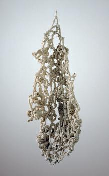
When you were making this, did you know about Mira Schendel’s knotting Japanese paper in her Droguinhas [Little Nothings] [c. 1964–66] [Fig. 10]?
I was already making it when I saw in the newspaper a reproduction of a beautiful, fat Droguinha. All I could say was, fuck! It was too late.
As you were making these works, were there art historical references that you were thinking of?
Definitely. Historical and contemporary references. Masters were . . . how can I say . . .
Shouting in your ears?
Yes. Sérgio Camargo said, “An artist with no father is a son of a bitch.”16
Some have understood the works of Pulmão as metaphorical representations of the human body, interpreting, for example, the acrylic boxes containing cellophane wrappers as a lung [Fig. 11].17 How would you describe them?
16. Leirner’s former husband, artist José Resende, was close friends with artist Sérgio Camargo and used to quote him, including this statement.
17. Jacob Klintowitz, “E eis que do inútil surge a arte,” Jornal da Tarde, November 14, 1987, A-5; Guy Brett, “A Bill of Wrongs” (1989) in Jac Leirner: Ad infinitum, ed. Ligia Canongia (Rio de Janeiro: Centro Cultural Banco do Brasil, 2002), 211; Amada Cruz, Directions: Jac Leirner (Washington, D.C.: Hirshhorn Museum and Sculpture Garden, Smithsonian Institution, 1992), n.p.
33
jl an jl an jl an jl an
Fig. 10. Mira Schendel, Droguinha [Little Nothing], 1966.

This piece, the only one that became a multiple, reminds me of Donald Judd. As a matter of fact I believe it is a Judd—his vertical stacks—except for its small scale. It is so minimal, so reduced. How could I think of it as a human lung? We are blood and color. This piece is absolutely clean and transparent and straight. In this sense, if it tried to reproduce a lung, we would instead have a story.
Was thinking about Minimalism, then, paramount in Pulmão?
The work—its apparent simplicity, and its economy of gestures—points clearly to Minimalism, but Arte Povera is there, as are Pop and Conceptual art. Dada and collage are there, too.
As curator Lynn Zelevansky was the first to recognize, Leirner was part of a transnational generation of artists, including Mona Hatoum, Rachel Whiteread, and Andrea Zittel, who emerged in the early nineties and looked to art of the sixties and seventies, Minimalism in particular, as points of departure.18 In Leirner’s case, she drew deeply not only from European and U.S. Conceptual and Minimalist
34
Fig. 11. Pulmão [Lung], 1987.
jl an jl
18. Lynn Zelevansky, Sense and Sensibility: Women Artists and Minimalism in the Nineties (New York: The Museum of Modern Art, 1994).
art, but also from Brazilian Neoconcrete and Conceptual art. The Minimalist and Brazilian Concrete serial geometry—as well as that geometry’s distortion by Postminimalist and Neoconcrete artists—provided fertile templates for her organization of materials culled from the refuse and unvalued stuff of our contemporary consumer society.
Sequences, series, and repetition were solutions I couldn’t avoid. My nature is to organize; I tend to place things one after the other and side by side.
The elusive heaviness of many works in Pulmão, particularly the wall-mounted sculptures, brings to mind Eva Hesse.
I once had the opportunity to see a show with a generous number of her works, with their apparently fragile presences—the strange molded rubber works, her amazingly beautiful watercolors, and drawings with endless rounds, repetitions, and sequences. The ephemerality of her work, the delicacy of her drawings, her respect for the nature of the materials—to me, Eva Hesse was the queen. I was very, very enchanted.
The physical qualities of the works in Pulmão range from shiny and matte sagging forms composed of pull strips, price tags, and cigarette packs to the transparent and seemingly weightless acrylic boxes containing cellophane wrappers and collages made of bits of paper and cellophane. In a recent talk at the Blanton Museum of Art in Austin, you discussed the importance of respecting the distinct nature of your materials.19 How does this notion of deferring to each material’s unique characteristics relate to the forms you ultimately gave to each work in the series?
Each material in Pulmão has a different nature. There is cellophane, paper, and foil. The price tag is tiny and two-dimensional. The foil is folded. The translucent cellophane around the paper package is glued in the shape of a small container, which loses its lid once the strip is pulled. Each material from the pack has its own very specific nature, and together they filled my daydreams until each part took on its own unexpected, singular reality. So when I say nature, I mean specificity as well as a given situation leading you and giving you the clue to your next steps, your movements between the mathematically infinite
35
jl an jl an jl
19. Jac Leirner, “Artistic License: Jac Leirner,” Blanton Museum of Art, The University of Texas at Austin, February 19, 2009.
solutions. The small piece of paper imposed strict directions to follow: “You take me, you put me beside my twin, and you repeat that a hundred times, then a hundred times more, and then use a sewing machine to bind us all together, forever and ever.” Each material offers its own physical conditions of color, weight, and size, information that multiplies the range of solutions and allows new possibilities to surface. You can make knots, you can sew, you can glue. You can use the text printed on the various surfaces. It was among all these possibilities that I was making choices.
Had you used these processes in earlier works or were you discovering them at this moment? Sewing, for example, becomes a recurring technique that continues in Os cem and your later series.
Sewing usually results in a cleaner, ultraefficient technique.
So your choice of technique was pragmatic, finding the right process for the materials?
The best for each, according to what it eventually offers for a final, definitive solution, and one that keeps the material as close to its original condition as possible.
Your respect for a given material’s individual nature and your sustained effort to find its appropriate technique relates, for me, to the deliberate experimentation called for in the Bauhaus preliminary course. Do you think your process relates to the approaches you learned in your foundational courses at FAAP?
I believe so. It has to do with an inner logic of things, solving equations between materials. Engineering also plays an important role. FAAP offered a wide range of well-structured workshops for most established techniques and materials. I’ve always loved dealing with techniques, and especially inventing new ones. It takes a lot of thinking followed by experimentation.
At the same time as you began Pulmão, you also initiated the group of works entitled Os cem. How did you come to the banknotes?
In the years around 1985, the quantity of money in circulation was unbelievable. Brazil’s economy was inflationary then, in a vertiginous and violent way. Money was devalued in a flash. It was a shocking situation where the notion of
36
an jl an jl an jl an jl

value was stolen from us, the people. Currency names and values were changed from time to time, and prices of goods and services went up daily according to the numbers established by the machinery of that unstable economy.
At one point my desk drawer contained a stack of banknotes, especially onehundred cruzeiro bills with the figure of the nineteenth-century military leader Luís Alves de Lima e Silva, Duque de Caxias [Duke of Caxias], printed on it. It was the lowest value circulating and I decided to keep them at home, since the volume of bills I would have had to carry around wouldn’t buy anything. This volume, potentialized through time and accumulation, made me realize that this material was full of qualities: pink in color, infused with an old, used feeling, often in damaged condition. I now had an inherently rich material that, after a huge amount of manual and mental work, could become a successful artwork. It would take a few years. Once again, the material imposed itself on my thoughts and my time, leaving me with no other choice. Soon the series was called Os cem. I collected as many as I could of the pinkish one-hundred cruzeiro bills in order to make the two or three floor pieces I had in mind: two wheels, one with eight thousand and one with ten thousand banknotes [see title page], and the other piece with its pair of long strips, each with around forty thousand banknotes or more [Fig. 12]. It was a painstaking process. I had to punch holes in the banknotes in order to thread them through steel structures for the wheels and polyurethane cord—later, steel cables—for the strips.
37
Fig. 12. Os cem [The One-Hundreds], 1986.
Once I started punching the holes I discovered the banknotes held a special treasure: thousands of instances of anonymous graffiti. Around 10 percent of the bills had some kind of message or inscription, on every possible subject. I was punching holes and finding the graffiti almost as a voyeur—reading love messages, religious words, and rebellious political statements, and finally, messages about the economy itself and the number 100. These were written or drawn either with an s or with a c. It’s not by chance that I called the work Os cem. In Portuguese, this sound has two different meanings: with the s sem it means “the destitute” (literally, “the ones without”) and with a c cem—it means “one hundred.” So Os cem conjures up both the number 100 and the “have-nots.” It’s a small paradox, reduced to a word, that gives the title a double meaning.
The pieces composed of the banknotes with graffiti are by and large wallmounted. The subjects appear as subtitles and include kids’ drawings, signatures, defacements, pornography, and politics [Fig. 13]. How did you arrive at the forms of these works?
Solving their formal side was a challenge. I had to turn a certain amount of graffitied money into something visually interesting. The puzzle sometimes was difficult. The numbers didn’t match up with my desire for specific shapes. By the end of the process I had twelve pieces, each unique in its subject and formal solution.
Why did you keep the holes after you punched them out? Why were they important to include in the group of works?

38
Fig. 13. Os cem (infantis) [The One-Hundreds (Kids) ], 1987.
an jl an

Once I was open to dealing with any kind of material, why would I discard the holes? The holes represented the void of those bodies. They were also evidence of my crime, but formally they were meaningless, almost absurd. They coincide with the printed nose of the Duque de Caxias.
All the statements written on the banknotes were also incorporated into O livro (dos cem) [The Book (of the One-Hundreds)] [Fig. 14], an offset poster you printed a thousand copies of and included in your show of Os cem at the Petite Galerie in Rio in 1987.
Yes, I typed these words four times in different drafts, until I got to the final version that starts with “estava escrito” [it was written] and finishes with “tudo caba” [everything ends]. They were, with a few exceptions, anonymous writings, with very little interference from me. I named the piece O livro (dos cem). Why call it a book even though it’s a poster? How to follow the endless written
39
jl an jl
Fig. 14. O livro (dos cem) [The Book (of the One-Hundreds)], 1987. Detail, p. 40.

lines without losing your place within an enormous mass of unrelated statements? Should it be seen from afar? Should it be read randomly, rather than taking the rules for reading into account? Do we become voyeurs?
The poster is a vertical, almost square rectangle. You see a field of gray with a line and a dot. The image is made up of thousands of letters that in fact are words and punctuation. In the middle of the gray field a different-looking line calls your attention. You realize it is made up entirely of numbers. The work is a body of words to be read not necessarily in order, but it had to have some sequence in order to be printed. It’s hard to follow the long lines unless you use your finger. You look and read—you don’t need to organize. You will do both things anyway, and will come upon scattered moments from scattered lives: funny jokes, unbelievable ensembles of words.
The obsessive quality of your inclusion of all the words in this work parallels your systematic, exhaustive processing of all the banknotes and your insistence on including every element of them in the final works, down to the holes.
The process is, and was, a whole, from beginning to end, and it took a lot of time. Banknotes were an uncommon material; a number of years would have to pass until they found their final destiny. In the eighties and nineties I did three series using the various one-hundred banknotes that appeared in our economy. They were called Os cem, Fase azul [Blue Phase] [1991–98], and Todos os cem [All the One-Hundreds] [1992–98]. They started in 1985 with cruzeiros bills, which, over the course of inflation, were renamed cruzado, cruzado novo, and finally back to cruzeiro. I spent hundreds of hours organizing the graffiti, but I gave up punching holes myself with Fase azul and Todos os cem. I set aside the graffitied ones before the rest were taken away to be punched.
As curator Paulo Herkenhoff noted, Leirner was the first Brazilian artist to rise to international prominence simultaneously in Brazil and abroad.20 The series Os cem, in particular, caught the attention of international and local critics and curators, in part because the works deftly demanded both international and local knowledge to be appreciated at a moment when, as Leirner said at the time, the dominant artistic centers were “wanting new blood.”21 The works simultaneously
20. Paulo Herkenhoff, “The Contemporary Art of Brazil: Theoretical Constructs,” in Ultramodern: The Art of Contemporary Brazil, eds. Aracy A. Amaral and Paulo Herkenhoff (Washington, D.C.: The National Museum of Women in the Arts, 1993), 97, 99.
21. As quoted in Ana Francisca Ponzio, “Arte larápia de Jac Leirner é a prova de seu delito,” O Estado de São Paulo, January 25, 1992, Caderno 2, 10.
41
an jl
evoked canonical and newly recognized art histories and artists from Minimalism and Carl Andre to Brazilian Conceptual art of the 1970s and Cildo Meireles. They also required non-Brazilian viewers to become aware of specific local economic events, namely hyperinflation, but could be readily understood by citizens and consumers in any society with a paper currency.
How did the international recognition of your work beginning in the late 1980s occur? Were particular local or international figures instrumental in your visibility, such as British critic Guy Brett, for example, who has worked since the 1960s to bring international attention to Clark, Oiticica, and other Brazilian artists?
Brett was the first foreign writer or curator to think about the work I was doing then.22 He brought it to Birmingham as part of a group show called Transcontinental 23 A graffitied banknotes piece is reproduced on the cover of the exhibition’s catalogue. It was my debut in a public institution in Europe, and also the beginning of a long-term friendship. In São Paulo at the 1989 Bienal, I presented Nomes [Names] [1989], a large-scale piece made of stuffed plastic bags [see Fig. 20 for a related work]. This piece opened several doors in Europe and in the United States. Luckily these were the doors of institutions that significantly contributed to the work.
At the time of your 1987 show of Os cem several Brazilian critics contrasted the ambition of your conceptual project to the short-lived popularity of the Neoexpressionist painting embraced by many in your generation.24 Did your success create rifts with your former classmates from FAAP or other local artists?
I can say my success came after theirs. They had galleries, were in previous biennials, and were showing in our museums. I was quiet before the whole thing exploded.
22. Brett’s first writings on Leirner appeared in 1989, in the catalogue of her show at Galeria Millan and as an excerpt in the São Paulo Bienal catalogue. See Guy Brett, “A Bill of Wrongs,” Jac Leirner (São Paulo: Galeria Millan, 1989), n.p.; Brett, “Jac Leirner,” in Artistas brasileiros na 20a Bienal internacional de São Paulo (São Paulo: Marca D’Água, 1989), 60–61. The former is reprinted in Canongia, Jac Leirner: Ad infinitum, 211–12.
23. Guy Brett, Transcontinental: An Investigation of Reality, Nine Latin American Artists (London and New York: Verso; Birmingham, UK: Ikon Gallery; Manchester, UK: Cornerhouse, 1990).
24. See, for example, Wilson Coutinho, “Jac, a musa do desvio,” Jornal do Brasil, May 25, 1987, Caderno B, 1; Marcos Augusto Gonçalves, “No Rio, Jac mostra o valor de seu dinheiro,” Folha de São Paulo, May 31, 1987, Caderno 5, A-61.
42
an jl an jl
Because of hyperinflation, by 1985 the cruzeiro had reached the denomination of 100,000 and in 1986 was replaced by the one-hundred cruzado bill. In Fase azul [1991–98] you used these banknotes, which were blue instead of pink and represented a different historical figure, Juscelino Kubitschek, president of Brazil from 1956 to 1961, instead of Alves de Lima e Silva. The title of this new group of works is also of a different type than Os cem. While the title Os cem is wordplay that points to then-current local economic events, Fase azul is an international art historical reference. How did you arrive at this title?
It’s an unfortunate title. As the bills were blue—the pink ones were no longer around—I thought of Picasso and his different periods, which made me decide on the name. The worst part is that instead of translating it to “blue period,” I used “blue phase,” which is in fact very wrong, but that’s how it remained. I believe the work is stronger than its name.
The forms of some of the floor sculptures and wall-mounted works changed from Os cem to Fase azul. While the works in Os cem bring to mind the rough wood and brick sculptures of artists like Alexander Rodchenko and Carl Andre, those in Fase azul appear delicately light-handed.
In Fase azul, I dealt with much more material than with Os cem. There were several floor pieces. Overleaves [1991], for example, was brand new in technique and form [Fig. 15]. The new bills had pure colors at their edges. Light blue and yellow were sewn together into a roll, to be unrolled in a long strip and reveal pure color out of real money. You can play with it, make waves, and pass underneath it. It’s a haptic piece. Although it’s so visual, moving it makes a difference. It breathes and has humor.
I had many more cruzados than cruzeiros. As a consequence I had much more graffiti as well. I had hundreds of defacements, many more than in Os cem. With Fase azul, the graffiti pieces most often became squares [Fig. 16]. Fase azul also has a piece where all the defacements are devils. It was called All the Devils from Blue Phase [1995]. It’s such a crazy name.
The overall title Fase azul and the English-language titles of individual works, such as Overleaves and All the Devils from Blue Phase, along with English titles for other works from the early 1990s, reflect Leirner’s awareness of and interest in engaging the newly established international audience for her work.
43
an jl an jl


44
Fig. 16. Fase azul [Blue Phase], 1992.
Fig. 15. Overleaves (fase azul ) [Overleaves (Blue Phase)], 1991.

The series Todos os cem [1992–98] integrates the various currencies that circulated from the mid-1980s to the early 1990s, including cruzados, cruzados novos, and cruzeiros. The floor sculptures are comparable to the original two strips in Os cem, and the wall works extend along the walls to form long friezes [Fig. 17].
I had to continue with the graffiti until the end of the series, so there was a lot of material to be placed and organized. I try to be generous with the material, to give to it as much visibility as I can. The long friezes are groups of hundreds and hundreds of bills, each with a specific defacement on the faces of Kubitschek and writer Cecilia Meireles: hats, mustaches, horns, lipstick, hair, glasses, beards.
The amount of effort—collecting, sorting, and assembling—behind each piece is perceptible when one sees the works. Do you think the labor itself has significance in the works?
Yes, these procedures reverberate in a subtle way. They also imprint time onto the work. Time is an abstraction, but these works seem to give a body to it. Giving a body to time is one of my goals.
Your valorization of human labor takes place in the midst of the quicksand of hyperinflation, where the currency has lost any reliable, stable value. Your careful, laborious organization of the banknotes in Os cem, Fase azul, and Todos os cem makes this destabilization of value even more overt. At the same time, you valorize these anonymous statements and demonstrate how money circulates as a social forum.
45
an jl an jl an
Fig. 17. Todos os cem [All the One-Hundreds], 1998, detail.
Yes, I give value to what previously didn’t have it. But the king of values is art, isn’t it? All that process is there in the name of art. Without it, the materials are left with no value—nothing; they are merely words and old bills. In fact, the value of the paper was higher than the value of the money, which is a wonderful inversion. The idea of value is upside down, inside out. There is no ground. What is of value there? Nothing but the art, which may grow and grow.
In a talk a few years ago at the Guggenheim Museum Bilbao, you stated that your aim is to present, not to represent.25 How does this distinction between representing and presenting relate to a series like Os cem, which directly engages economic and political events in Brazil in the 1980s and 1990s?
Well, it may engage, but technically economics is not my field. Before dealing with money, I am dealing with dirty paper, weight, color, size, surface, time, and organization. The works’ origins are in references to other art, never in the economy. As a subject the economy deserves to be treated with respect. And I even believe that the work made of banknotes is not about the economy, it simply is a pure economy. The work is not there to represent. It already is, and it carries this condition within its raw state. You can look at the word money. But the piece has a smell, it’s alive. Do you see the difference?
I do. Would you say, then, that metaphor is something that you are not doing?
Little Light [2005] [Fig. 44] is a metaphor. It means that it’s a long way until we see the light. But not the early works, Pulmão, Os cem, or Nomes [1989–93]. There my subject is Minimalism.
You seek the literalism of Minimalism? A brick is a brick, period.
Exactly. And we can go further—with Cézanne, where an apple is not the fruit, it is red.
With Cézanne, however, there is representation.
Yes, but representation is preceded by color. This is what I want to emphasize, because my work is subject to easily being transformed into a big idea or issue.
25. Jac Leirner, “La experiencia de la obra,” Guggenheim Museum Bilbao, June 25, 2009.
46
jl an jl an jl an jl an jl
Nevertheless, integral to the transgressive nature of Os cem is your removal of money from the normal circuits of the economy in order to transform it into the raw material for works of art.
And hanging the banknotes on a wall, like paintings. I treated them as pictures. One of them even has the name Quadro e moldura [Picture and Frame] [1987]. The use of money is not a novelty. Cildo Meireles was an immediate reference. From Cildo to Andy Warhol, Yves Klein, and Joseph Beuys. There was an exhibition at the Musée de la Poste, in Paris, called Les couleurs de l’argent [The Color of Money], with works whose theme or material is money, value, or gold, as with Klein or even Tintoretto, whose painting with quantities of golden coins coming out of a trunk in the foreground was there.26 Money belongs to us all. I’m glad I was the one to do those works, giving the banknotes back to the world.
You have talked about punk as a model of transgression for you. Does the punk aesthetic or attitude relate to Os cem, Fase azul, and Todos os cem?
It’s easy to relate punk to the money pieces. Banknotes were stolen from circulation, from their owner, the Banco Central do Brasil. They were also defaced, which traditionally is a punk gesture, like burning a flag. It was not my plan to mix punk with the work, but I have to accept that this was a punk gesture toward the nation or the policies applied to a bankrupted economy.
You exhibited Nomes, a series of works composed of stuffed and sewn plastic bags, in a solo exhibition in 1989 at Galeria Millan in São Paulo, a few years after you showed Os cem and Pulmão 27 As you mentioned earlier, you began to collect the plastic bags for Nomes around 1985 at the same time as you were collecting banknotes and cigarette packs. How did you select this seemingly quite banal material?
Like the cigarette packs and cruzeiro bills, the first bag just jumped out at me before I could make a choice. There was nothing special about it—a flowery print in uninteresting colors, without a logo, name, or words, thrown in a corner at home. But there it was, and I stared at it and thought, Wow, a bag!, as if it were the belle of the ball. And so I found myself at a new beginning. Again, it
47
an jl an jl an jl
26. Les couleurs de l’argent (Paris: Musée de la Poste, 1991).
27. Jac Leirner (São Paulo: Galeria Millan, 1989).

was another long, slow process, bag after bag after bag, meanwhile searching for technical solutions. A sewing machine, its operator—my dear Lucinha, Maria Lucia de Souza Suganuma—and polyester foam and buckram were perfect. I had sewn banknotes and laminated paper, and once again plastic bags were being sewn, in order to avoid glue or tape. I gave each bag a little body—some volume—using thick polyester. That was when I started to put them together. As I had articulated the banknotes with graffiti, I began to sort the bags based on color, name, design, logo; this included museum bags, which were doubly valuable. I was doing art, and the museum plus art meant two times art—art squared. I guarded these bags as if they were treasures.
In addition to plastic bags from museum shops, you also used a large number of shopping bags of other types.
Bags for rice, pillows, and even coffee. Bags from the post office. Any plastic package—even Bom Bril, which is the Brazilian equivalent of the Brillo pad, down to the most absurd of the absurd.
And the title, Nomes?
48
an jl an
Fig. 18. Nomes [Names], 1989.

It refers to the quantity of commercial brands that are reduced to names. I’m not fond of it.
You created many different forms with the plastic bags. There are sculptures placed on the floor, mounted to the wall, and suspended from the ceiling, as well as room-size installations where the walls and floor are completely covered.
They are articulations. I deal with multiple factors at once—the material, its size, and what it offers for development. Each piece was the result of a different problem, and each material or each group of bags defined its own development. So, for example, I had many duty-free bags from the São Paulo airport. It took technically complex exercises to figure out how to sew many of these works. In some cases the resulting forms were like machines, mechanisms, or wheels, and they were complicated to create. In other cases, no. One piece simply presented an explicit color arrangement—just two bags, placed together because of their similar tonality, one sewn over the other [Fig. 18].
Do the works composed of a limited palette of bags, such as Azuis [Blue Ones] [1990] [Fig. 19], as well as those made up of red and pink bags and a white bag, have to do with the history of the monochrome and abstract painting?
49
jl an jl an
Fig. 19. Azuis [Blue Ones], 1990.

Certainly. They are the consequence of painting and of artists’ procedures, and they reflect thinking about color: Kazimir Malevich’s Suprematist Composition: White on White [1918, The Museum of Modern Art, New York]—a square within another square. The blue curve reminds me of Ellsworth Kelly’s shapes.
In your earliest watercolors you juxtaposed precisely rendered colors, but in Nomes this juxtaposition occurs on a much larger scale, as in the room-size installations [Fig. 20], and the color is inherent in the materials, rather than being mixed by hand.
Hip-Hop [1998] [Fig. 40] proves that all colors are perfect, and so does Nomes. No colors could be better. Their intensities are unique. Here I should stop and clarify my argument for colors. This is my thesis, if I have one: all colors are perfect and correct, and each has its specificities. Those two groups of works express this idea very clearly with their massive arrangements of multiple colors in one place. Just as I believe O livro (dos cem) is a piece to be both read and
50
jl an jl
Fig. 20. Nomes [Names], 1989.
seen, Nomes is also extremely pictorial, but at the same time packed with text. It contains both conditions. Each bag carries provenance and references, including intimations of its former contents.
You have installed the sculpture Idênticos [Identicals] [1989] in various configurations and orientations [Fig. 21]. In one case, you placed the two components one on top of the other, and at the 1990 Venice Biennale you placed the elements in such a way that they look like insects or animals confronting one another.
They do have an animalistic, organic feeling. It’s fun placing them as if they were relating to one another—maybe even dating. It’s the first piece where I deliberately repeated the same element twice, making both parts identically, using identical bags. It led me to more work shown as pairs of identicals, as in the four works in Corpus delicti [1992] [Fig. 22]. Although, I guess prior to this Os cem already had two identical parts [Fig. 12].
Why do you create these identical works?
I try to investigate the originality of things and ask, what is original? What is repetition? Although the work comments on originality, it also consists of a presence. Which comes first? One part derives its identity through the other, in a closed circuit.

51
an jl an jl
Fig. 21. Idênticos [Identicals], 1989.

Aside from referencing your own field, visual art, what are the specific stakes of the works composed of plastic bags from museums, Nomes (arte) [Names (Art)] and Nomes (museus) [Names (Museums)] [Fig. 22]?
The idea that bags leave museums on the verge of becoming trash moves me. They are reduced to their function as containers and then turned into museum detritus. Their lives are brief—but not the lives of the ones I rescued;
52
Fig. 22. Installation view of Directions: Jac Leirner, Hirshhorn Museum and Sculpture Garden, Smithsonian Institution, 1992. On wall: Nomes (museus) [Names (Museums)], 1992. On floor: Corpus delicti, 1992.
an jl

those return to museums as parts of sculptural pieces. The bag’s tortuous path, between leaving the museum as trash and returning transformed into art, imprints time on the work and is the result of circulation, the basis of the circuit. The bag’s previous life before turning into material for sculpture remains part of its little story: “I was born here, I left, I was stuffed with polyester foam and sewn, and now I’m back, placed on the wall specifically to be looked at.” In silent ways materials tell their stories. They reverberate processes in different
53
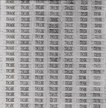
stages. They belong to networks and systems where they assume new positions, including, finally, that of an artwork placed in a museum.
In the end, what I do in all the works is to create a place for things that don’t have one. Take cigarette pack price tags [Fig. 23]. What is the place for one of these? There is none—only the trash. To make a piece using price tags is to create an unexpected situation that imposes value and thinking where there was nothing.
54
Fig. 23. Pulmão [Lung], 1987.
EMBODYING ERRORS
In her working process Leirner makes choices in order to find the best solution for her materials and to create a place for quotidian materials that have no secure identity or location other than as trash. In several less well-known, finite bodies of works, though, she inverted this process. These works result not from making the best choices, but instead from committing mistakes and creating ambiguous, amorphous objects with no certain hold on a given place or identity.
What was the context for your Erros [Errors], the small group of sculptures composed of masses of knotted polyurethane cord from 1987 and 1988 [Fig. 24]?
Erros have to do with a simple action. By then I was punching holes in banknotes, sewing plastic bags, folding cigarette packs, and making these works over a long period. My process from day to day corresponded to the entrance of these materials in my life, and I would arrange and analyze them. This situation of repeating the same process again and again began to disturb me and I started feeling uncomfortable. I wanted something else to interfere with and traumatize the work. I began imagining ways to embody an error. How could I give a body to this idea—to an error itself, independent of other materials? It had to be amorphous. It couldn’t have form, it couldn’t have color, and it had to be fundamentally displaced, or placeless. I began to use a material I was enchanted with—polyurethane cord, which is a hard, almost translucent plastic that comes in various shades of white to yellowish. I thought this plastic cord was eternal and would be hard forever, but that was an illusion. I’m still losing works because the cord breaks when it gets too dry.

55
an jl
Fig. 24. Erro [Error], 1987.
What is the role of photography in these works? One Erro, for example, is photographed on a stairway, while others are shown overflowing the passenger’s seat of a car and spilling out of a metal airplane ashtray.
These are examples of displaced places. In Erros everything had to be wrong. They had to appear not in usual sites for sculpture but in places not meant to absorb artworks: in a tree, on a stairway, in a car, beneath a table. The many photographs indicate possible settings for these pieces. It’s also illusory to try to make something that’s amorphous; once it’s made, it has substance and form. The work is a bit illustrative, perhaps, of a desire to change, transform, and move forward, toward the new.
The photographs recall Clark’s photographs [1964, Associação Cultural “O Mundo de Lygia Clark,” Rio de Janeiro] of one of her Obra mole [Soft Work] pieces draped across the branches of trees or rocks.
Clark and Schendel were both very much present here. They were the key references. Every time a new work of theirs came to my attention, I celebrated it.
Did the process of making Erros open a new path for you, as you were hoping?
It didn’t open new paths, nor did it disappoint me. Unlike other works that have the infinite as a quality, Erros and its photographs began, were developed, and ended. But it turned out to be an illusion that they differed from the other works. I was once again making an artwork that repeated a gesture, making innumerable, apparently infinite knots. In other words, each Erro was already a long-term project that took a lot of hard work and precise elaboration, and was imprinted with the presence of time. It was a confirmation of a characteristic of my work, a fate that I cannot escape. To this day materials move me and drive my actions.
On May 27, 1989, a blank page punctured with many small holes appeared in the pages of the São Paulo daily newspaper Jornal da Tarde, accompanied by your name and the title Furos [Holes
For a certain period of time, once a week the newspaper published three pages dedicated to an artist. We were free to decide what to do on two of them, front and back. The third page was dedicated to a text about the artist. All the previous artists had approached the project using the medium of printing. I couldn’t
56
].
an jl an jl an jl an jl

decide on an image to be printed, and I was determined to challenge the newspaper in some way. As I had punched holes in the money and stolen the ashtrays, I wanted to dismantle the printed language of the newspaper. How could I do it? By physically transgressing it, by puncturing holes. We solved the technical problem of how to make the holes by attaching nails to one of the cylinders of the rotary printing press [Fig. 25]. Although the result didn’t match my expectations, it was a very rich experience.
Are the holes of the newspaper related to the holes in Os cem and Fase azul?
No, they are different holes. They are the furos of news reporting. Here again, we find different meanings for the same word. As with cem and sem, in Furos the meaning slips from the idiom for “breaking news”—furos de reportagem—to physically breaking stuff.
You initially developed Fantasma [Ghost] [1990–2000], a group of sculptural
57
an jl an
Fig. 25. Photograph of Jac Leirner affixing nails to printing press rollers, Jornal da Tarde, May 27, 1989.

works composed of sheets of white paper, in relationship to your works with banknotes.
jl an
The first Fantasma appeared in 1990 in Birmingham [Fig. 26].28 It was dedicated to Os cem, which belonged to the late André L’Huillier, a good friend and collector from Switzerland. I decided to do the ghost of his piece. I bought blank paper, had holes punched in it, and there it was: the identical size as Os cem. I called it Fantasma. It was like a shadow of the other one, despite its whiteness— shadow in the sense that although it was real, it had no printed value. In a sense, in fact, it wasn’t the real one. I decided both pieces should cost the same, but that didn’t happen. Fantasma was naked. The value of the money wasn’t there, just its value as sculpture. André acquired it as well.
After the first one, you created several large, site-specific Fantasmas where the snakelike form of banknote-sized white paper would undulate in and out of the galleries of art institutions.
28. Brett, Transcontinental.
58
Fig. 26. Installation view of Transcontinental: An Investigation of Reality, Nine Latin American Artists, Ikon Gallery, Birmingham, UK, 1990. At left: Os cem [The One-Hundreds], 1986. At right: Fantasma [Ghost], 1990.

Fantasma, meaning the “ghost” copy of another piece, kept gaining space and becoming freer. When we talk about ghosts, they bring to mind movement, don’t they? Because of its name, the idea kept growing and unfolding. It began to represent the idea of movement and passage. There were exhibitions scheduled: a solo one at the Walker Art Center and a group show called TransMission at the Rooseum Center for Contemporary Art. 29 Fantasma was moving around with no specific size; it might be tiny or huge, depending on the location. In Malmö, it climbed the stairs leading to the gallery displaying money pieces. At the Walker Art Center, it slid by works from the permanent collection like a snake and climbed the stairs to introduce my show on another floor [Fig. 33]. It was a huge, heavy presence composed of tons of blank paper. The size kept changing from then on, and sometimes it was divided into several parts. I have several drawings for Fantasma in my archives that show the work adjusting to the locations it passes through.
59
jl
29. Kathy Halbreich and Joan Rothfuss, Viewpoints: Jac Leirner (Minneapolis: Walker Art Center, 1991); Lars Nittve, TransMission: Konst i interkulturell limbo/Art in Intercultural Limbo (Malmö, Sweden: Rooseum Center for Contemporary Art, 1991).
Fig. 27. Tapes, 1990–2002.
Like Erros, Furos, and Fantasma, another group of works, Tapes [c. 1990–present] [Figs. 27–29], also consists of the repetition of an absurd, nonproductive, or “wrong” gesture in order to create fundamentally transient works.
Although some of the tape is translucent, it has this yellowish color—a dark, sticky yellow that makes it look old from the start. There is also an explicit presence of glue under the film. To create these works, tape is wrapped around another roll of tape, covering it entirely through the repetition of a gesture. I lost track of when I started doing them—ten years ago? Twenty years ago? They are so reduced in their material: taping tape, and making use of the worst possible material to attach to an artwork. Tape is forbidden in the world of works on paper because of the destructive quality of its glue and its acidic pH. So these works are kind of absurdities, going against all the rules and techniques usually applied to the arts. Some pieces have tape printed with names from museums and other businesses that deal with art, such as private galleries or transportation companies. These pieces have bright colors and, again, are composed of a simple, everyday material. It’s the same old story: power is given to something unimportant, and something loses its function to become an art object, a small sculpture piece.


60
an jl
Fig. 28. Tapes, 1995.
Fig. 29. Tapes, 2000.
By employing the kinds of tape that art transporters use on the crates that protect works of art, you make overt the protective role tape can play. You’re preserving a protection system by covering tape with itself, but of course the “protection” in this case is caustic and hastens the destruction of the tape.
I have lost a few of the works. The tape shifted and melted.
You have spoken about losing works or needing to replace elements of works over time, like the polyurethane cords in various pieces degrading and discoloring, the plastic bags becoming dry and losing their color, and the tape used in a collage in Pulmão destroying the work. But here you choose to continue to use these materials. Are you okay with the work degrading, then?
Yes. I’m not taking posterity or the market into account. It’s pure experimentation, the search for solutions and gestures, and the activity of simply doing the work. I’m curious.
In your work Sedinha [Little Silk] of 2008 [Fig. 30], you create an astutely absurd editioned print series consisting of self-referential label copy printed on cigarette rolling papers, which the term sedinha is used for in Brazil.

61
an jl an jl an
Fig. 30. Sedinha [Little Silk], 2008.
I was at a snack bar with this cigarette rolling paper in my pocket. I simply took it, wet its glue, stuck it on the counter, and left it there, floating. It looked like a little skin coming off the counter, a flying little paper stuck to the surface. I kept it in mind.
Last year Jens Hoffmann invited me to take part in his show called This Is Not a Void [2008] at Galeria Luisa Strina in São Paulo. He wouldn’t accept any of the works I offered. I finally gave up the exhibition. A few days later I remembered the rolling paper and stamped it with caption information—title, date, material, and size. It had lost its virginal quality to become a label for an artwork called Sedinha: “Sedinha, 2008, papel, cola, 4,7 × 7,4 cm” [Little Silk, 2008, paper, glue, 4.7 × 7.4 cm].
I did a few editions of Sedinhas with various stamps and different colors, as well as a few handwritten ones. If I’m not mistaken, I did ten editions with ten Sedinhas each. The editions have artist’s proofs and so on, as well as little boxes for the tiny rolling papers. They are reduced and delicate presences that also refer to a hand-crafted item—the hand-rolled cigarette. In the end Jens chose two for his show and they were glued to a black wall.
Sedinha is insistently unstable as a work of art, not only because of the unorthodox “support” of rolling paper, but more so because Leirner created multiples in order to facilitate the disposability, rather than the preservation, of the work: the number of papers and the small container that conforms to their size like commercial packaging tempts the viewer to consider using the papers for their original purpose—smoking. In provoking its own destruction, Sedinha takes to the extreme a quality present in all of Leirner’s precarious objects that dwell on the margins of art, from Erros on. Unlike in the rest of her work, where she fights against her materials’ inherent ephemerality and seeks to rectify their disposability, here her repeated gestures facilitate the corrosion of her own works.
62
jl
USING ART INSTITUTIONS
In 1990, Leirner was first invited to participate in what soon became a spate of international exhibitions, including the Venice Biennale.30 In the following years, in addition to showing her work in important exhibitions around the world, such as Documenta IX, she had several solo shows at prominent contemporary art institutions in the U.S. and Britain and her works were acquired by key international collections, including the Museum of Modern Art, New York.31 By 1993, Leirner and her work appeared on the cover of ARTnews as something of a “poster child” for the rising fortunes of contemporary art from Latin America, and she would soon be represented by leading São Paulo and New York galleries.32
As your international visibility grew, the art institution itself came to provide a generative context for your new works. For example, you produced To and From [1991–99] [Fig. 31] and Etiquetas [Labels] [1991–94] [Fig. 32] initially during your three-month residency in 1990 at the Museum of Modern Art in Oxford and your resulting solo exhibition there in the summer and fall of 1991,33 and during your monthlong residency and solo exhibition at the Walker Art Center in the winter of 1991–92.34
In Oxford I was practically living in the Museum of Modern Art. I had its key in order to reach my studio, which was located in the tower of the building. I
30. The group shows in 1990 included Brett, Transcontinental; Aperto 90, XLIV Biennale di Venezia (Venice: Biennale di Venezia, 1990); and Bruce W. Ferguson and Gary Dufour, Past Future Tense (Winnipeg: Winnipeg Art Gallery; Vancouver: Vancouver Art Gallery, 1990).
31. The group shows in the early 1990s included Currents (Boston: The Institute of Contemporary Art, 1991); Nittve, TransMission; Jan Hoet, Documenta IX (Kassel: Kunsthalle Fridericianum; Stuttgart: Cantz; New York: Abrams, 1992); Amaral and Herkenhoff, Ultramodern; Waldo Rasmussen, ed., Latin American Artists of the Twentieth Century (New York: The Museum of Modern Art, 1993); Zelevansky, Sense and Sensibility; and Madeleine Grynsztejn, About Place: Recent Art of the Americas (Chicago: The Art Institute of Chicago, 1995). Her individual shows in 1991–92 included David Elliott, Jac Leirner (Oxford: Museum of Modern Art; Glasgow: Third Eye Centre, 1991); Halbreich and Rothfuss, Viewpoints: Jac Leirner; and Cruz, Directions: Jac Leirner.
International collections that acquired her works in the early 1990s included the Colección Patricia Phelps de Cisneros, the De la Cruz Collection, the Museum of Modern Art, New York, and the Walker Art Center.
32. ARTnews 92, no. 6 (Summer 1993): cover. Leirner began showing with Galeria Camargo Vilaça in São Paulo in 1992 and Galerie Lelong in New York in 1994.
33. Leirner’s residency, from September to December 1990 and funded by the British Council, was with the Ruskin School of Drawing, Oxford University, at the Tower Studio of the Museum of Modern Art, Oxford, now Modern Art Oxford. The show was Elliott, Jac Leirner.
34. She was in residency at the Walker Art Center in October–November 1991 in advance of her exhibition there. Halbreich and Rothfuss, Viewpoints: Jac Leirner.
63
an jl

had to pass through its offices to go to work and I would go to the office to use the fax or the typewriter. That’s where I realized the wastebaskets were full of emptied envelopes that were discarded once their contents were removed. Their quantity, qualities, and sizes caught my attention.
After my residency I went back to Brazil and then returned to England, where my Oxford show took place six months later. I had been working with, researching, and gathering printed matter, but I wanted the envelopes too and asked the secretary if she could keep them for me. During my stay at the museum I started organizing the envelopes by color and shape. I also asked the staff at the Walker to keep their envelopes, and they kept them for a whole year. When I developed these pieces, I tirelessly organized the materials and, once again, punched holes so that I could give structure to the ensembles.
Wall labels, as well as other materials, entered my work process for the first time at Oxford. I started noticing labels and how they appear within the entire context of the museum, next to each artwork, and they began to gain importance as a medium for me. That’s when I created my early pieces with labels: three rectangular frames made of labels and hung on the wall. Just as with banknotes and graffiti, where I took a certain number of bills with messages or inscriptions about love to create a piece on love, for instance, so it was with Etiquetas: a given number of labels designating the same artist or the same exhibition ultimately would lead me to create a work. I showed my second series of Etiquetas at a gallery in Friedberg.35 My aim was to produce an interest-
64
35. Jac Leirner: Papierskulpturen und Installationen (Friedberg, Germany: Edition & Galerie Hoffmann, 1992).
Fig. 31. To and From (MOMA, Oxford ), 1991.

ing result with these new quantities; as with both the labels and the graffitied banknotes, the number of pieces is what would determine the form, one that meant something to me. So instead of making all the works square, each one had a different shape.
For your show at the Walker and later for a group exhibition at the Museum of Modern Art, New York, in 1994 [Fig. 32],36 Etiquetas took the form of long friezes that ran the length of the walls. In addition to these new forms, you also played an increasingly active role in selecting the labels: rather than using the available, spare labels, you asked the museums to produce specific labels.
At the Walker, one of my label works presented the collections of drawings,
65
an jl
Fig. 32. Installation view of Sense and Sensibility: Women Artists and Minimalism in the Nineties, The Museum of Modern Art, New York, 1994. In foreground: Nomes (arte) [Names (Art)], 1993. In background: Etiquetas (MoMA, NY ) [Labels (MoMA, NY )], 1994.
36. Zelevansky, Sense and Sensibility.
paintings, and sculptures, and the other gathered the names of exhibitions held at the museum over the past thirty years—from 1961, the year I was born, to the year of my exhibition. MoMA, in New York, was the only venue where I chose the labels; there I practically curated a show based on the museum collection. I decided what labels would be produced and then I organized them according to the number of lines on each one. At the top were the labels with fewer lines, the visually lighter ones. At the bottom were the denser ones, with more lines. So the label’s placement was determined by its visual weight. When you see a picture of this piece, you can perceive that the top labels have fewer lines than the bottom ones and it’s visually heavier at the bottom.
By placing the densest labels at the bottom, you give physicality to an object that is generally considered flat, insubstantial, and dematerialized.
Exactly. These trivial items are overlooked as art material, and they have size and weight. For example, the letters in the text somehow weigh something.
Curator Lorenzo Mammi has written that your work with materials from art institutions is focused on the “lowly protocols” of the art world.37
I think what he means is that my gaze focuses not necessarily on places of art, but just about anywhere. In museum archives, a secretary’s wastebasket, or museum administration offices I can find materials that potentially could be formed into artistic presences. The idea is that any element can be molded into and can assert itself as a presence. And so the labels come alive, asserting themselves as a possible presence. The museum disposes of them, but I don’t.
How do you think of your relationship to the art institution? Although you are using materials the museum discards, your works cannot comfortably be described as institutional critique.
I’m not challenging the institution, I’m using it. It serves as a medium—an expressive medium that is capable of being transformed. Like a rock or a piece of wood that you can sculpt, the institution is something you can use in its concrete essence, in its material presence.
66
an jl an jl an jl
37. Lorenzo Mammi, “Jac Leirner,” in Jac Leirner, Waltercio Caldas: Representação brasileira, XLVII Bienal de Veneza, ed. Paulo Herkenhoff (São Paulo: Fundação Bienal de São Paulo, 1997), 25.

Another aspect of your heightened contact with art institutions in the early 1990s is the thoughtful installation of your works that you undertook in your exhibitions. Perhaps the most noteworthy is your show at the Walker Art Center, with its compelling variety of floor- and wall-bound serial forms [Fig. 33].
The exhibition at the Walker was carefully prepared; I went to Minneapolis several times. Ultimately, Fantasma took on this large size, traversing the permanent collection galleries and spilling into the gallery with my exhibition. Everything in the show was in relation to this work. On the floor, beside its omnipresence, there were works created with banknotes, envelopes, and finally the holes from all three works. One of the walls was arrayed with graffitied
67
an jl
Fig. 33. Installation view of Viewpoints: Jac Leirner, Walker Art Center, Minneapolis, 1991–92. In immediate foreground: Fase azul [Blue Phase], 1991. In middle ground: Fantasma [Ghost], 1992.

banknotes, a work titled Fase azul [1992] now in the Guggenheim Museum, in New York. The other walls held the labels. All of it revolved around Fantasma, which slithered through the room.
It was at the Walker that I had the opportunity to work with U.S. dollars. I used thirty thousand one-dollar bills, all of them worn. The museum borrowed the money from their bank and then lent it to me. Two acrylic boxes were built to hold the dollars, which obviously were neither punctured nor torn and contained no graffiti. This was a new and very different situation. It was a different kind of money; it was cleaner, it had value. There was no room for an objective transgression. But placing thirty thousand dollars on a museum floor to be seen as if they were a sculpture of some sort somehow transgresses the art system.
an
The variety of wall-, floor-, and ceiling-mounted works is even more extensive in your exhibitions dedicated to the group of works entitled Corpus delicti [1992–
68
Fig. 34. Installation view of Jac Leirner: Corpus Delicti, Centre d’Art Contemporain, Geneva, 1993. In background: Corpus delicti (vol), 1993.
2001] in 1993 and 1994 in São Paulo, Geneva, and New York [Fig. 34].38 How and when did you begin to collect the material for Corpus delicti?
Back in 1984 or 1985, I was watching the rehearsal of Ratos de Porão [Basement Rats], a São Paulo hardcore band that I really like, and I saw an ashtray whose origin I couldn’t place. It might have belonged in an airplane seat, or in a car, but the fact is that I spotted the ashtray and it caught my attention. Once again, like so many times before, a possible material was presenting itself as the motivation for a new project. That was the origin of Corpus delicti. The Latin expression corpus delicti means “the body of a crime,” or material evidence, and this was evidently a crime: the ashtray belonged elsewhere, not there.
From that moment on, my trips became laden with ashtrays, my object of desire. Right away I connected the boarding passes and ashtrays. The boarding passes contained information about the airplane seat to which an ashtray belonged, as well as the flight that experienced the theft. They showed it all: the name of the airline, my name, the travel date, and the seat number. Obviously other materials came into play. I was working full time on airplanes, gathering as much material as I could. But the acquisition of this material was different, as we are talking about illegal—or nearly illegal—material. “Subtracting” things from places is not customary. One should not steal.
The work took on form. I had already collected several ashtrays and boarding passes, and had thought of several possible arrangements for pieces, and that was when I began to talk to flight attendants about my pursuit of materials. I slowly acquired this material between 1985 and 1992. I would bring along catalogues of my work and after takeoff, as soon as the flight attendants got together to prepare dinner, off I’d go to show them the catalogues. I would talk about the materials and my new material of choice—the many things that belong on airplanes. Blankets, silverware, napkins, glasses, dishes, headphones inside their plastic wrappers, pillows—everything was of interest to me, especially ashtrays. Most of the time I received generous contributions.
They gave me suitcases and suitcases full of things. I would board the plane with empty bags and when I got off they would be filled with the things I mentioned. But not the ashtrays. Those I really did have to “subtract,” even though the flight attendants knew I was doing it. They were aware of my preference for ashtrays and didn’t make problems for me. I wouldn’t have been the first person
69
38. Jac Leirner (São Paulo: Galeria Camargo Vilaça, 1993); Jac Leirner: Corpus delicti (Geneva: Centre d’Art Contemporain, 1993); Jac Leirner (New York: Galerie Lelong, 1994).
jl
to have taken them. After all, that was the subject of my work: a petty misdeed institutionalized by the museum. The crime turned into art, “thingified.”
For you, does the crime in the work go beyond stealing things from airplanes?
It does. In Corpus delicti, crime refers to Chris Burden, Cildo Meireles, and Tunga; to its “institutionalization”: the offense of placing a crime side by side with a museum’s collections. Once again, it’s like placing labels on the walls as art.
Is your distinction between representing and presenting relevant to Corpus delicti as well?
The work is not meant to represent the idea of crime or discuss crime in any way; it is the crime, in and of itself; it embodies the crime. I believe that the work of art is simply the thing in itself. Works made with money do not represent economy, they are the economy itself. The ashtrays do not represent or discuss crime, they are in fact objects of the crime; they convey a history, with the idea of transgression imprinted on them. But what is it that we see, after all?
We see the sculpture, the presence of materials that have been articulated with one another, whether they be ashtrays, glass, bubble wrap, or chains.
The first two works in Corpus delicti are identical pairs of floor sculptures you included in Documenta IX in 1992 [Fig. 35].
Yes, they are very similar. I had, and still have, enough ashtrays for several pieces and I wanted to place the material in multiple pieces. These ashtrays are incredibly beautiful. With their shiny surface, size, and design, they could easily have been readymades.
The bubble wrap and the glass are not from the airplane. How did you decide to include these materials?
The ashtrays and boarding passes gave me a hard time. I had hundreds of units to attach to one another and, as usual, I kept discarding all the solutions that came to mind. I couldn’t solve it. Finally, after endless hours of discarding solutions and investigating over the years, bubble wrap, glass, and chain presented themselves as the perfect solution for my purpose: the ashtrays and board-
70
an jl an jl an jl an jl

ing passes were protected and well displayed and the ensemble of materials appeared very beautiful and light.
It’s quite a change to shift from stealing the materials from airplanes to then safeguarding them against theft in the museum, to go from committing a crime to preventing one.
71
an
Fig. 35. Corpus delicti, 1992.
I had to keep the piece together and protect it from the large crowds expected at Documenta—from stealing, and from crime, but this time a big crime.
In the subsequent year you created sculptures from all the other airplane materials you accumulated.
Yes, the materials deserved their own, proper articulation and new materials to interact with. For the glasses I used felt for protection, and polyurethane cord. For the silverware I found two solutions [Figs. 36–37]. In the first one I used felt and glass. It has the look of a commercial display. The solution for the second version came to me in the middle of the night. Once again I would use my dear old polyurethane cord, but this time as the structure of the work, very much present as material. After a lot of difficult, technical labor I came to the result. There were a few months between these two pieces, and the work gained a huge amount over those extra months. To do work across the years makes a big difference: the more I think, the more I discard possibilities, the better the work gets.

72
jl an jl
Fig. 36. Corpus delicti, 1993.
Fig. 37. Corpus delicti, 1993.

A few of the works in Corpus delicti have subtitles. For example, the work composed of napkins is subtitled Vol [Fig. 34]. What does vol mean?
In French, it has to do with stealing and flying—thief [voleur] and flight [vol]. V-o-l are also the first three letters in the name of Volpi, an artist who painted hundreds of thousands of triangles, often representing flags. I squeezed the most meaning possible out of the word vol, like in poetry, where you deal with the most radical functions of a word.
This poetic chain of association—voleur, vol, Volpi—is very beautiful.
Well, you know that it belongs to a group of works called Corpus delicti. And you know about Volpi. You and I can create this poetic ensemble, but someone else will only see a clothesline hung with napkins and ask, is it sculpture? Is it installation? Is it drawing? Is it painting? In this photograph it looks like a painting, doesn’t it? Two dimensions crossing space. This piece also reminds me of Trenzinho [Little Train] [1965, The Museum of Modern Art, New York], by Mira Schendel.
Me too. Were you thinking of Schendel’s works?
Not in the case of Trenzinho. In 1992 there were no books on Mira. I had the honor of meeting her and I knew a good part of her oeuvre, but the first time I saw a Trenzinho was later at Antônio Dias’s house in Rio.
We have spoken about how the amount of labor and time required to create a series like Os cem is evident to the viewer. Time doesn’t seem to function in the same way in Corpus delicti.
Maybe not, but these works can’t be experienced through reproductions. Each spoon, each glass, and each slipper bears the logo of an airline—Iberia, American Airlines, Lufthansa, Swissair, Varig, etc. These specific items can’t be found in a store. I can’t buy a Swissair pillow at a shop. So the pieces make clear that their materials weren’t bought, they were collected. The works themselves are also collections. The floor money pieces consist of quantities, not of collections. All the banknotes are identical. But here the goods differ, and so do their logos. You can see how things are treated by the various companies. In some cases you can find great up-to-date design applied to their goods. Other companies simply don’t care about that and continue to repeat their original designs.
74
an jl an jl an jl an jl

In 1997 you were selected along with Waltercio Caldas to represent Brazil at the Venice Biennale and you exhibited a series of works entitled Foi um prazer [Nice to Meet You] [1997] composed of business cards drawn from your art world encounters [Fig. 38]. When did you first identify business cards as the material for a new group of works?
Oh, that material comes from the caves, it’s prehistoric! It existed before I did. The universe of stickers, the universe of business cards, the universe of plastic bags—what I do is give these universes a body, a place to perform. Isn’t there a universe of emptied cigarette packs? Yes, it does exist; you just have to imagine it. My job is to embody these universes of things. The same is true with the business cards’ universe. I appropriated it; the problem is to make it become true, to make it happen. Its idea was born around 1987 or 1988, when I started meeting people from museums, galleries, public institutions, and so on. That’s when the series became official. It’s such a formal group of works—all these cards from curators, artists, and museum directors. It’s so full of pedigree.
75
an jl
Fig. 38. Installation view of Jac Leirner’s exhibition Foi um prazer [Nice to Meet You], Brazilian Pavilion, XLVII Biennale di Venezia, 1997.
And it’s so reduced as a material: small pieces of paper, approximately five by nine centimeters. I was determined to turn the cards into sculpture. How to make sculpture out of a little piece of paper with printed information on it? Once again I rejected all the solutions I could think of, until I got to the straight line. So much work, so much thought, to get to a line of cards. Well, fine, a line—but how to work out the technical solution for this line? The cards differed in size by millimeters and were made of a variety of materials. I had to create a system to protect their fragility, so a pair of Plexiglas plates were cut to contain each individual card. These small plates were attached with pins to wood that sat in an aluminum form. I had it all crafted by a wonderful technician—Mizaer Esperidião Lins, called Miro—who is used to my experiments after all these years.
How did you organize the materials into the individual pieces?
I first divided the materials in groups according to specific features [Fig. 39]. Vertical cards, translucent cards, cards with round logos, cards with horizontal lines—each made up a group. Their sizes and colors also gave me directions. I paid attention to small differences of color: a bluish white and a yellowish white didn’t match. Tiny details established the right placements for the cards. The works went through several stages.
Did you know from the beginning that you wanted to maintain the legibility of the business cards?
Yes, of course, because these cards were related to our subject, which is art. They came from professionals who are part of the art network. There was the works’ subject: the art circuit, the making of that scene.

76
an jl an jl
Fig. 39. Foi um prazer [Nice To Meet You], 1997.
On one level the work humorously, but very sharply, points to how the art world is a business. With Nomes (arte) and Nomes (museus), there is a caring element to returning the bags to the museums, in addition to perhaps a criticism of the consumption rampant in modern-day art institutions. Is there an element of affection for the art community here too? Or is your attitude toward the commercial art world a wholly critical one?
To hang names on walls and names related to the places where these walls are is aggressive. In Venice, people were seeing their own cards hanging on the walls, after the cards had been organized and received special treatment. It is an act of aggression despite the work’s reduced presence.
Radically reduced. The installation of the series at Venice is forcefully nonpresent. From a distance the works appear to be lines on the walls, not threedimensional assemblages.
When you are selected for Venice, you are expected to present a spectacle, an amazing and highly attractive work that will make a vivid impression. My decision to show apparently simple horizontal lines held the spectacle in check. Regardless of the exhibitions and works on display at the Biennale, other events occur in connection with it: other exhibitions, acquisitions, sales, and promotion. To a certain extent, I wanted to transform all that into a reality—the networking, circulation, and parties, where cards also circulated. Art as a mirror.
The title Foi um prazer, which translates as Nice to Meet You (literally “it was a pleasure”), is ironic: most of the encounters are devoid of pleasure, yet there is pleasure in realizing a work of art. Foi um prazer reflects reality by repeating a ubiquitous phrase and by using business cards, which everyone has.

77
an jl an jl
Despite Leirner’s inclusion in exhibitions dedicated to the museum as subject,39 her work has not been widely discussed as an example of institutional critique or the renewed interest in critically examining the art institution in the 1980s and 1990s. She shares with contemporaries like Andrea Fraser an interest in the rituals of the art world, from guided tours to the handing out of business cards, and attention to the aspects of museums usually disregarded as neutral, such as coatrooms and labels. In contrast to Fraser’s analysis of how museums operate ideologically, Leirner’s critique of business-as-usual in the art world coexists with her attention to formal considerations.
There is also an autobiographical element to your materials. Just as the cigarette packs originate from your smoking, the business cards, the materials stolen from airplanes, and the envelopes, labels, and bags from museums come from your travels in the art world.
That’s something that bothers me.
Why do you consider the autobiographical element a problem?
When I choose mundane materials, which are commonplace and ready-made, I try to achieve a sort of anonymity through them: the anonymity of materials that are totally independent of me. They belong in the world. They lack a personal identity; they are decharacterized. On the other hand, I have acted upon these materials. One pack of Marlboros is identical to all the other packs sold in the world, but I was the one who smoked all the cigarettes for Pulmão. In other words, I cannot avoid the first person.
Why do you want to avoid the first person?
When I was young, I learned that in poetry the first-person narrator should stay in the background, to avoid the risk of producing bad poetry. I learned how not to place myself as the focus of attention, and that one should keep a low profile and focus on language. I try to avoid the first-person narrative so that my work will reflect the world, rather than me. And I deal with whatever comes up in front of me, whatever is being carried by everyone, all over the world.
39. See, for example, Kynaston McShine, The Museum as Muse: Artists Reflect (New York: The Museum of Modern Art, 1999).
78
an jl an jl an jl

The fact is that I have met every person who gave me a card. My initial intent to produce the work as pure language went down the drain. After all, I am part of all these works, despite their mundane characteristics. I must admit that they are 100 percent autobiographical—they reflect my experience in this world of human beings and of the totally unimportant things that I adopt with the objective of investing them with power: of empowering them.
DESIRING COLOR, THINKING ART
The works Foi um prazer and Hip-Hop inaugurated a shift from Leirner’s previous mixture of two- and three-dimensional works to predominantly low-relief wall-mounted works. Furthermore, Hip-Hop began a shift from sculpture as the predominant defining paradigm of her practice since the mid-1980s to a renewed interest in painting, understood as wall-bound and color-focused.
How did you conceive of Hip-Hop [1998] [Fig. 40]? Was the process of collecting the material, colorful adhesive tape, comparable to your prior work?
79
an
Fig. 40. Installation view of Jac Leirner, Sala Mendoza, Caracas, 1998. In foreground: Corpus delicti (Blankets), 1993. In background: Hip-Hop, 1998.
Hip-Hop didn’t occur to me until it became the solution for an exhibition that suffered the loss of several pieces that were too big for the space. This was for a show of works from private Venezuelan collections curated by Ariel Jiménez at the Sala Mendoza.40 When I got there all my pieces had arrived but the ceiling of the main room was too low for the work. I had a complicated spatial problem to solve and had no work to place there. So Hip-Hop was first installed as the solution for an exhibition space. For two or three days I went shopping, going to places such as the Caracas headquarters of the brand 3M and several stationery shops. Caracas had a lot of material to offer. Hip-Hop saved the show.
From then on I kept adding new kinds of tape. Hip-Hop was installed for the second time at the Bohen Foundation’s space when it was still in SoHo, and they acquired it.41 I kept buying more tape in New York and wherever I went. My exhibition at the Centro Cultural Banco do Brasil had a smaller version of the work, and another version was shown at the Centro Universitário Maria Antônia.42 These are the four venues where Hip-Hop has been installed, each time with new materials and new configurations of the tape. I also did a pair of books that reproduced at half scale the installation conceived for New York.
Is the title a reference to hip-hop music?
The title refers to Mondrian’s painting Broadway Boogie Woogie [1942–43, The Museum of Modern Art, New York]. Both words, hip-hop and boogie-woogie, play with repeated sounds and are musical. Boogie-woogie relates to the rhythm of colors in the painting. The rhythm of hip-hop, like the rhythm of my piece, has a horizontal feeling, carries repetition, and questions melody. I wanted to give the installation a name that sounded musical and made sense with the work’s visual appearance and its explicit reference to Mondrian and his Broadway Boogie Woogie. The word hip-hop seemed to fulfill my needs. Along the way, I have given wrong names to pieces, but here the title is just right.
In comparison to Foi um prazer, Hip-Hop is an explosion of ready-made color. Color has always been part of your work, with the pink and blue banknotes and
40. Ariel Jiménez, Jac Leirner (Caracas: Sala Mendoza, 1998).
41. Jac Leirner (New York: The Bohen Foundation, 1998). The Bohen Foundation gave ten works by the artist, including Hip-Hop (1998) and Hip-Hop Book (2000–2001) to the Solomon R. Guggenheim Museum, New York, in 2001 and 2007.
42. Canongia, Jac Leirner: Ad infinitum (2002); Jac Leirner (São Paulo: Centro Universitário Maria Antônia, 2001).
80
jl an jl an

multicolored plastic bags, but here you seem to have turned the volume way up with these highly charged colors that are devoid of any textual information.
This work proves that all colors are perfect and demand to be surrounded by other colors. The choices are made among all possibilities, and always seem to be right. It doesn’t matter if it’s silver tape or deep red lithographic tape. All colors can be powerful, they can all fit.
How do you see yourself in relationship to a painter, such as Mondrian, in this series of works? Do you see selecting and juxtaposing ready-made colors as analogous to or different from Mondrian’s working process in Broadway Boogie Woogie?
I see myself as the result of Mondrian. Both works are full of rhythm and orthogonality, but they are profoundly different in scale, choice of colors, and materialities. Although both titles refer to music, their musicalities are opposites.
Adesivos [Adhesives], a group of works you did between 1999 and 2004, is also composed of an adhesive material, in this case stickers and labels of seemingly endless variety [Fig. 41]. What attracted you to this material?
Stickers, as a material, are one step above the other adhesive materials. Here there’s no place for repetition. Their shapes are different, as are the colors, patterns, and words, and the style, material, and purpose. They may be plastic
81
jl an jl an jl
Fig. 41. Adesivo 22 (pares de quadrados) [Adhesive 22 (Pairs of Squares)], 2001.
or paper, shiny or transparent, relief or flat. Some have pictures; others have words. They are very appealing as perfect examples of good and bad design. Banknotes are all the same, and so are the business cards. With stickers there was an opportunity for a real collection, or many small collections representing certain parts of society or the business world. All kids of my generation collected them.
When did you begin to collect this material?
Around 1985 the stickers began to seem like potential art material. Around 1987 new possibilities for them were flourishing, but I had an insoluble problem: I couldn’t experiment with the material or I would lose it, which of course I did. A few works remain from this time. I kept collecting stickers and keeping the best ones for future projects, when I could devote all my attention to them, as I still had Foi um prazer and Hip-Hop to complete. For the first pieces, I glued the stickers to colored paper, aluminum, and unfolded colorful folders. The works that came later were conceived as series. The stickers were applied to glass molded in different shapes and sizes—some curved, and all with round corners and the hint of light green that most glass has. The glass was made for the front, back, and side windows of buses. In order to stand the glass upright, each pair of windows was supported by a specially designed steel structure painted light green.
But I kept searching for new materials, lighter surfaces, until I arrived at Plexiglas plates that would be structured using carpenter’s levels. Both materials were available in different sizes and colors, which meant a feast for the stickers. The levels also brought new meanings to the works. Although they supported the works from behind, they were also visible through the transparency of the Plexi plates.
Did you organize the Adesivos into distinct works as before by identifying different groups among the materials?
I organized them on the basis of their visual attributes and meaning. In one work I only used the leftover edges once the stickers were removed. In another I used 120 round stickers. In yet another one, I used stickers associated with the art scene, and in another, rock band stickers. There was one work I did with stickers that either were vulgar or showed bodies, naked or otherwise, and one small work was done with stickers designed by artists.
82
an jl an jl
I understand you numbered the works in chronological order. Why did you include the number and a subtitle in the titles?
To not lose track of them and to identify them by their subjects.
Most of the Adesivos composed of stickers on colorful acrylic sheets secured to a level take the form of a long, horizontal low-relief rectangle mounted to the wall.
The works belonging to this second series are mostly horizontal, like Hip-Hop And like Hip-Hop, they are sequences of colors.
You emphasize the hanging device of the level by mounting the stickers to a translucent ground of Plexiglas. This is different from Foi um prazer, for example, where you only see how it’s affixed to the wall if you look on the side.
You can hang it and see if it is level at the same time. The level determines the size of the work, as well as its colors. It kind of catalyzes the work. I like the idea of having the structure exposed. It brings depth and nothing is hidden. The structure constitutes the work as much as the stickers, although sometimes it recedes into the background, like a secret.
The final and largest work in this series is Adesivo 44 [Adhesive 44] of 2004 [Fig. 42], which you first showed at the Miami Art Museum.43
This work has to do with the windows I see in the streets of São Paulo, Rio de Janeiro, and other parts of Brazil. I imagine that all over the world children, teenagers, rockers, skateboarders, and countless other “tribes” adopt stickers as a way to communicate. The way I see them, these windows are beautiful and perfect, whether they have two, three, or five stickers positioned askew, or thirty or forty that have been perfectly and orthogonally affixed. They are all beautiful, whether the stickers are seen from the front or from the back, with the glue showing or not. They are champions! Having said this, I consider Adesivo 44 to be representative of all the windows decorated with stickers in the whole world. I feel as if I have put my signature on all of them. I wanted to create windows, and I wanted to do work on which time would be imprinted once again. Taking
83
an jl an jl an jl an jl
43. Cheryl Hartup, Jac Leirner: Adhesive 44 (Miami: Miami Art Museum, 2004).

the number of stickers, the number of windows, and the space for the construction, it was possible to build a hallway of time composed of the collection, the quantity of stickers, the repetition, and the impregnation of the glass surface.
The twenty windows have been arranged in two parallel blocks in a corridor built with aluminum frames. From inside the corridor, the viewer sees the backs of the stickers, with the glue showing. On the outside of this structure, the stickers create multicolor surfaces. Like other works of mine, this piece may be both seen and read. All in all there are hundreds of thousands of stickers of
84
Fig. 42. Adesivo 44 [Adhesive 44], 2004.

all sizes imprinted with words and drawings. There are many messages suffused with different languages, colors, and materials. Paper, plastic, vinyl, and all sorts of other materials coexist in this work. There is no way to focus the gaze for any extended time; the eyes may rest on an image for a few seconds but then they keep moving around, wandering from one point to another.
In evoking the windows of teenagers with different skateboarding and music stickers, youth culture seems to be at play here. What is your relationship to
85
an
that culture? Do you continue to listen to the music of the bands represented in Adesivos, for example?
Several of my friends are musicians. In the small punk scene of São Paulo in the early eighties, skateboarders were also around. I like punk and hardcore; I also like hip-hop. I still go to punk concerts sometimes, but most of the time I feel like a voyeur. Theirs is a very rough language. Despite my tendency to embrace whatever sounds transgressive, I have always adored a range of aesthetic experiences—from punk to opera.
Within the idea of tribes and the self-identification that is part of what you indicate is intrinsic to stickers, it seems fitting that in Adesivos you often include stickers that read “JAC.”
Yes. I am everywhere there. A huge coincidence is the existence of a multinational sticker company called JAC, J-A-C. Of course their promotional material consisted of JAC stickers. Sure I went for it. Twice. There are also a few “Jackie” stickers that remained from my childhood.
How does your recurrent “signature” coexist with the desire for anonymity you have expressed? Has your approach to the role of autobiography or selfexpression changed or loosened?
Please, don’t remind me of such a disaster . . .
Leirner’s insistence that her materials select her rather than the other way around parallels her career-long discomfort with the autobiographical component of her work. In both cases her position is informed by her desire to defy representation while using richly referential materials.
In the mid-2000s, you created several works that can be described as large fields of color on the wall, namely Quilômetro amarrado [Knotted Kilometer], of 2004, the Little Light series, of 2005, and 144 Museum Bags, of 2006. Had you been collecting the ribbons that compose Quilômetro amarrado for a long time [Fig. 43]?
Yes, for a very long time. It uses all kinds of cords and ropes, made of all materials, colors, and textures, such as velvet, silk, and cotton. It’s my old thesis, that all colors are perfectly ready for use in several situations. It doesn’t matter whether the material is cheap or expensive, all the elements are equally
86
jl an jl an jl an jl

43. Quilômetro amarrado [Knotted Kilometer], 2004, detail.
important. This piece is quite pictorial. Its small parts together create a very diversified ensemble of color and materials.
What is the meaning of the title?
The title Quilômetro amarrado obviously refers to Walter De Maria’s Broken Kilometer [1979, Dia Art Foundation, New York]. The shared qualities of the two works are the expanse of component parts and the systematic presence
87
Fig.
an jl

of intervals. Both deal with quantities and extend themselves virtually along a single line. But the difference between them is what inspired me to pick the title, namely the fragility of my work in view of the state-of-the-art technology found in De Maria’s. Difference versus equality, malleability versus hardness.
The knots in this work resonate differently than your prior uses of knots. In Pulmão and Erros, the accumulation of knots creates sculptural masses. Here the knots are isolated and each connection they form is emphasized.
88
an
Fig. 44. Little Light, 2005.

The knots have an expressive presence. They punctuate and give continuity to the work—one knot tying together two different cords, over and over.
For Little Light [Fig. 44], your process of gathering the primary material, copper wire, differs from your customary working process in that you purchased the material, rather than collecting it over many years.
Amassing such an enormous quantity of material did involve collection. For various reasons I was determined to make use of light, meaning real bulbs. But whatever I thought of had already been done. Several artists worked with light; I thought of Cildo Meireles and his Obscura luz [Dark Light] [1982, Susana and
89
jl an jl

Ricardo Steinbruch Collection, São Paulo], Dan Flavin, Jasper Johns, and Felix Gonzalez-Torres, as well as Bruce Nauman, Mario Merz, and James Turrell. I couldn’t get away from these amazing artworks. And finally, after days, months, years of thought, I arrived at copper wire, and having light depended on it. Wire became the star of the work.
I started thinking about what to do with the wire and I came up with this field of copper that led the light to the bulb. It uses very simple materials, again: a wall socket, wire, brads, and a bulb. That’s it. But it is a huge field of this metallic color, that starts at the socket and leads to a little light at the end. Between these two elements at the beginning and the end is the whole presence of the work—or 99 percent of it. You put the plug in the socket, and although there are four thousand meters of wire, instantaneously the light turns on. It’s almost as if the electricity doesn’t have to travel through the wire; it’s already there.
You have mentioned that this work operates metaphorically. Could you talk about the metaphor here and its meaning?
I don’t remember doing other pieces with a metaphoric resonance. Little Light relates to life and has to do with enlightenment in life. We travel a long, long way until we get to important places. We go through long, hard times until we
90
an jl
Fig. 45. 144 Museum Bags, 2006.
see some light at the end of the tunnel. It is in this sense that I see the piece as metaphoric. On the other hand, it points toward Minimalism: the field of color and the reduction of representation. Like Fantasma, this piece can also be adapted to different spaces; it doesn’t have a specific size.
You first showed 144 Museum Bags at an exhibition at Sikkema Jenkins & Co. in 2006 [Fig. 45].44 Does it relate to Nomes, your earlier series with plastic bags, or your next series with this material, Osso [Bone], of 2007–8?
The material is the same but the quantity, technique, and look differ. The bags are just filled with polyester foam and hung on steel cables. In case one or two bags are lost because they become dried out or lose their colors, they can be replaced. The fields of color will be different each time. In the installation you mentioned, I decided to keep the yellows together, as well as the reds and oranges and the blues and greens. This decision had to do with the exhibition, which was presented in a room together with very brightly colored pieces by Saint Clair Cemin.
You created the works in the Osso series out of plastic bags with a large void cut into the center [Fig. 46]. Each work is titled Osso, followed by a subtitle that

91
an jl an
Fig. 46. Osso (void 19) [Bone (Void 19)], 2008.
44. Saint Clair Cemin, James Hyde, Jac Leirner (New York: Sikkema Jenkins & Co., 2006).
includes some variation on the word void, as well as a number. What do the title and subtitles mean in relation to this series?
Osso, or bone, is what remains after a body decomposes. It’s the part of the body that’s in the center of it all; bodies are built around bones. These works are very much the remains of a bag—just the remains themselves. Sometimes just the handle survives, although there is foam, too. I also titled them in different languages—English, Portuguese, French, Spanish. Voids, Void Bags, Vagas, Vazio, Vide. The numbers help me to keep track of them. As I did in Corpus delicti (vol), here I’m trying to use the words in their fullest intensity. In poetry, words are taken to their last meanings; their entire potential is used.
That’s an excellent way of talking about your work: words used to their ultimate possibilities, materials used to their ultimate possibilities.
Exactly.
Did you keep collecting bags from when you started collecting them in the eighties?
Yes, in most cases. I still don’t throw away museum bags. For Osso I needed bags without words printed around their edges, which is one of the qualities of these pieces—they are frames of color that are stuffed with polyester foam. And, once again, I am relating colors, shapes, and graphic design. All these qualities of the bags are taken into consideration to complete the pieces.
For many years I was tired of “my” materials, including the bags. I didn’t even want to see plastic bags or think about them. But suddenly, while experimenting in the studio, I removed the entire center of one of them, which left a very interesting result that, to my thinking, referred to artists like Lucio Fontana and Josef Albers. I kept experimenting, placing one beside the other. Many of these pieces are double and present two cut bags side by side. In my imagination, once you have two, unity is gone. A pair of bags stands in for all bags, which suggests a continuity beyond the work itself.
The bags are set into Plexiglas boxes, which form part of the works. This emphatic integration of a framing system is similar to your inclusion of a hanging device in Adesivos. What are the specific conditions of the Plexiglas boxes in Osso?
92
jl an jl an jl an
Plastic is not the best material to maintain as art for the coming decades. This time I wanted to protect the bags. I have lost several pieces made with bags and I didn’t want to lose more works in a few years, so I had to do something about it.
Are the Plexiglas boxes an effective system of protection against the bags degrading and losing their color? What is your attitude toward the deterioration of your materials over time and to the potential loss of your works?
Some pieces are very fragile. I don’t expect them to remain intact for even a whole year, like Sedinha. There’s nothing to do about it unless you frame it and change its natural condition as a work. I’m trying to maintain the bags as much as I can by using the Plexiglas, which has a UV filter that reduces the color shifts and keeps the material from drying out too quickly. But if a work changes, loses brightness and color, that’s just fate; there’s nothing to be done. It’s still the same work, aged and decayed.
The doubling here has a different character than the pairs in Os cem or Corpus delicti because the bags in a given work, though similar, are not identical. At the same time, there is a largely uniform overall formal solution across this series— each bag or bag grouping is contained within a Plexiglas box—which differs from the plurality of wall-, floor-, and ceiling-bound works in your earlier series. Has your approach to the concepts of identity and difference changed?
They have remained the same. Nomes is a unity made of thousands while in Osso the double presences refer to infinity.
In some of the works, the forms of the bags are distorted [Fig. 47]. They sag and crinkle from their own weight, but they must be so light, no? This elusive heaviness is a quality that your works often have, as we have discussed, and here, with the individual or pairs of bags suspended in Plexiglas boxes, this quality seems even more paradoxical. The bag, for all its ephemerality, is not a two-dimensional thing; it is three-dimensional, and it sags.
Yes. It has depth and weight. It embraces technique. When you see one of these pieces, you are seeing something that has been processed. There is more material than is expected. It’s not just a cut bag, and it’s not just plastic. It’s plastic, plus polyurethane, plus sewing, plus cutting. It holds a lot of work and
93
jl an jl an jl an jl

94
Fig. 47. Osso (void 26 ) [Bone (Void 26 )], 2008.
technique. Technique is so important. Although most of my works are not drawings on paper or paintings, colors are side by side. Stickers may be glued to glass, to Plexiglas, to paper, and so on. These are all techniques, and each work has its own. The presence of labor also refers to its duration.
By removing the center of the bags you are removing their textual, commercial content. Why did you decide to take the names off the bags?
To transform the material. Once again, it was a way to use the same material that I was so tired of, but in an absolutely new way. Although I worked with plastic bags almost twenty years before, in the Nomes series and the museum bags series, I could deal with this material again but in a new way. I’m transgressing my own work. If in the first moment the piece is called Nomes, in the second moment all names are removed. I took the names away, but I left the handles. You can carry them, mentally. Although the bags are an old material that I’ve already used and established, it’s through that material that I can still keep thinking art. When I say these works lead me to Albers and Klee, Fontana and Nauman, I am thinking art. It’s my only goal.
95
an jl


INTRODUCCIÓN
La historia del arte moderno puede ser entendida como el relato de una tensa y compleja relación con lo real, con las cosas que nos rodean cada día. El péndulo de la historia y el gusto se balancea entre una fascinación con lo específico, por un lado, y con la abstracción y trascendencia, por el otro. Jac Leirner se ubica en el fulcro de este péndulo, obsesivamente coleccionando y categorizando los desechos de la vida contemporánea, para luego organizarlos y resignificarlos, transformando las cosas en comentario, los objetos en contenido, la materia en idea. Por más que queramos resistirnos a poner demasiado énfasis en lo anecdótico o biográfico –como por ejemplo, su crianza en una familia artística y creativa, rodeada por una gran colección de arte abstracto–, no es menos cierto que todos estamos condicionados por nuestro entorno, y Leirner fue capaz de canalizar su sensibilidad anárquica y punk en una muy particular y armoniosa relación con lo real y con el acto de coleccionar y organizar.
Aunque actualmente estamos totalmente acostumbrados a la idea de que un artista latinoamericano contemporáneo puede ser cosmopolita, global y sofisticado, es importante recordar que cuando Leirner alcanzó visibilidad internacional a finales de los años ochenta, iba contracorriente. Sus primeras exhibiciones y proyectos internacionales tuvieron lugar en medio de una fascinación con el exotismo, una imagen de Latinoamérica mediada por viejos estereotipos del salvaje exótico o sus equivalentes postcoloniales más contemporáneos, posiciones que negaban la posibilidad que un artista de Brasil pudiese vivir en el mismo mundo de capitalismo tardío como el resto del mundo del arte. Su uso de ceniceros de aviones, bolsas de museos, o tarjetas de presentación tenían el efecto político de una cachetada, un recordatorio impertinente de que la artista tomó los mismos aviones, se quedó en los mismos hoteles y comió en los mismos restaurantes que los críticos y curadores que se ganaron la vida a través de la promoción de la diferencia y la alteridad. La suya fue una posición valiente y vital que abrió paso para que muchos artistas después de ella pudiesen desarrollar sus carreras sin conformar a las expectativas de la gente acerca de qué es o qué no es América Latina. Como tal, Leirner fue una figura clave en el puente entre dos generaciones: la vanguardia heroica de Hélio Oiticica, Lygia Clark y otros, y nuestro modelo actual del artista deslocalizado, volando de un programa de residencia a una bienal internacional, con apenas una mirada de reojo a su identidad cultural.
98
Esto no quiere decir que el trabajo de Leirner no sea político o cargado de un comentario crítico. Sus piezas hechas de dinero siguen siendo las críticas más efectivas y mordaces a nuestra economía mundial y su simultáneo fetichismo y desprecio hacia valores estables. De la misma manera, Foi um prazer [Gusto en conocerte] presenta el retrato de una red del mundo del arte que crecería a un poder y tamaño asombroso durante los años subsecuentes. Aunque muy de su época, estas obras sólo han crecido en relevancia y previsión a lo largo de los años, algo que muy pocas veces puede ser dicho de trabajos contingentes a una serie única de factores externos, y estos lo son indudablemente.
La conversación entre Leirner y la historiadora de arte Adele Nelson examina la excepcional carrera de esta artista pionera. Algo que reaparece una y otra vez es la sensibilidad de Leirner por aquellas cosas que se vuelven invisibles o redundantes por su ubicuidad. Como Leirner le indicó a Nelson en un momento durante la conversación: lo que ella hace es “crear un lugar para las cosas que no lo tienen”. Esta declaración contiene todos los elementos de su trabajo: su mirada hacia lo olvidado o subestimado, su impresión del mundo como un escenario para objetos, y una sensibilidad política (con p minúscula) que favorece al desamparado.
Este libro es el tercero en la serie Conversaciones/Conversations, una investigación y proyecto de publicación en curso que lleva conversaciones críticas en profundidad con destacados artistas latinoamericanos a una amplia audiencia. Esta serie es testimonio de la misión original de Gustavo y Patricia Cisneros para concientizar sobre la gran calidad e importancia del arte y las ideas latinoamericanas a una audiencia internacional. La Colección Patricia Phelps de Cisneros ha estado, durante más de tres décadas, al frente de la investigación y presentación del arte latinoamericano, a través de exhibiciones, alianzas institucionales, filantropía y programas de investigación, y esta serie de publicaciones busca construir y expandir ese legajo comisionando y presentando libros bilingües dirigidos tanto a especialistas como al público en general.
Quisiera agradecer a Jac Leirner y Adele Nelson por su profundo compromiso en este proyecto, y a Donna Wingate e Ileen Kohn Sosa por su cuidadosa y dedicada supervisión del equipo editorial. Una clarificación importante: la entrevista fue realizada en una mezcla de inglés y portugués, deslizándose constantemente entre los dos idiomas. Por lo tanto, a diferencia de otros títulos en esta serie, no hay necesariamente un idioma “original” para la conversación, sino una negociación continua entre los matices y posibilidades de ambos.
Gabriel Pérez-Barreiro Director, Colección Patricia Phelps de Cisneros99
BONOS DE VIAJERO FRECUENTE
Robert Storr
Algunos lo llamarían amor a primera vista. Otros dirían que es una manera de ‘aprender trabajando’. También podría ser visto como una práctica de contrabandista, pero confío en que nadie con una mentalidad legalista vaya a querer hacer algo con esta confesión ya que la ley de prescripción no puede seguir vigente en este caso.
Hace casi veinte años, gracias a la intervención de un amigo y mecenas artístico, Jorge Helft, y el apoyo de la ahora desaparecida Fundación Antorchas, que ofrecía apoyo a curadores y críticos que deseaban realizar investigaciones en América Latina, hice mi primer viaje a Brasil. Igual que tantos norteamericanos en aquella época, mi conocimiento de la historia y la diversidad de las tradiciones del arte contemporáneo al otro lado de nuestra frontera, al sur, era escaso. Como la mayoría de mis compatriotas, mi impresión de lo que pasaba y había pasado al otro lado del ecuador estaba marcada por un enfoque en lo que pasaba y había pasado en los lugares más cercanos a aquella frontera –México, Centroamérica, el Caribe. Venezuela, un país ubicado un poco arriba de esa línea ecuatorial y con una riqueza de arte vanguardista, inexplicablemente caía por debajo en la geografía mental de la mayoría de los norteños. Por mi parte, yo había trabajado para David Alfaro Siqueiros a comienzos de los setenta como asistente de taller, y también le ayudaba con sus murales, así que yo conocía algo más sobre la figuración revolucionaria del período entre las dos guerras que la mayoría de la gente de mi generación en Estados Unidos. Sin embargo, fuera de los enclaves mexicanos y chicanos, esta preocupación era ciertamente anacrónica en el entorno artístico de la época, aunque fue un momento de renovado interés en el arte retórico político, así que en ese sentido yo estaba respondiendo al espíritu de los tiempos. Aparte de mi atracción por Joaquín TorresGarcía –a quien descubrí gracias a sus conexiones al movimiento De Stijl en Holanda, donde también había vivido– mi conciencia de lo que era el arte abstracto de Sudamérica sólo podría ser descrita como limitada y mi ignorancia del arte conceptual del continente era casi total.
Estas no son las confesiones para las que temo recibir algún castigo; pero sí las hago con genuina vergüenza. Las hago con un objetivo, también. Porque al exponer mis propias limitaciones como ejemplo, quisiera subrayar el hecho de que mucha gente progresista, supuestamente bien informada y cosmopolita
100
en términos de conocimientos artísticos, hasta hace poco no sabía absolutamente nada de la abundancia artística proveniente de esta mitad del hemisferio occidental. Este tipo de miopía no es ninguna revelación para los que viven en esa mitad ocluida –aunque los conocimientos intralatinoamericanos también tardaron en desarrollarse hasta la creación de la Bienal de São Paulo en 1951–, pero sí es un hecho olvidado demasiado frecuentemente por los que viven fuera de la región y de repente han desarrollado un gusto por y algún conocimiento (aunque limitado y tardíamente) de casi un siglo de arte de esta región del globo tan vasta y estéticamente fértil. Me llama la atención la rapidez con que algunas personas, antes ignorantes de la realidad creativa de otros, repentinamente se han convertido en “expertos” en el tema. También me sorprende la rapidez con que, al descubrir algunos detalles antes desconocidos de una cultura extranjera, estos expertos logran aplastarlas con generalizaciones críticas que las acaban homogeneizando.
En mis primeros encuentros con este mundo tuve la suerte de contar con la tutela de personas que realmente conocían este arte. En el transcurso de nuestros viajes juntos, Helft me presentó a muchos curadores y críticos, uno después de otro, pero no había ninguno más involucrado en este mundo o más generoso conmigo que Paulo Herkenhoff. Helft también me puso en contacto con coleccionistas y artistas, en una ocasión las dos cosas a la vez. Una visita, en São Paulo, a la incomparable colección de Adolpho Leirner de arte geométrico, concreto y neoconcreto realizado entre los años cuarenta y los sesenta, me llevó muy rápidamente a conocer a su hija Jac. Y ese encuentro me llevó a su taller y a la esencia de este breve texto con el cual espero aportar alguna información y algo de polémica útil.
En general los hijos de los grandes coleccionistas no se convierten en artistas. Tal vez sea su conocimiento precoz de la realidad, a veces cruel, del mundo del arte lo que les desanima. Más probablemente, sin embargo, como ocurre con los hijos de artistas consagrados y no tan consagrados, es que saben demasiado bien que en general las probabilidades están en contra, incluso del más formidable talento. Y esa reticencia probablemente sólo aumenta cuando el joven se da cuenta de la dura competencia que ya tiene en las extraordinarias obras con las que ha sido criado y que ha contemplado diariamente desde la infancia. Lo
101
que representa un placer para el orgulloso coleccionista puede ser un desafío burlón, incluso abrumador, para una sensibilidad artística que todavía se está formando. El privilegio de nacer en una determinada familia o situación no es algo que una persona elige, pero igualmente tiene un costo muy alto, incluso cuando la fuente de ese privilegio es ilustrada, y los beneficios enriquecedores.
El hecho de que Jac Leirner supiera desarrollar su talento entre el despliegue épico de las mejores obras de la generación anterior no es tanto una excepción a esta regla como testamento a su capacidad para absorber y esencialmente transformar el pasado heredado con una independencia anárquica que, para el bien de su obra y del arte de su generación, da por sentado ciertas cosas para poder imaginar libremente alternativas a ellas. Uno de sus ingeniosos détournements de costumbres familiares es su decisión de basar su trabajo en la colección de objetos olvidados de una cultura de consumo en la que todo es desechable. Sin querer insinuar que Guy Debord tuviera una influencia directa sobre la artista (aunque Greil Marcus ha planteado una conexión entre Debord y punk, el movimiento musical insurreccional de la juventud de Leirner),1 me he apropiado del término que usa para la alteración creativa o destructiva del propósito original de las cosas, y agregaría su concepto de deriva o desplazamiento psicopoético para matizar los viajes nomádicos durante los que Leirner adquiere los elementos cuyas funciones ella reasigna como la situacionista autodenominada que es.
Se puede detectar una alquimia edípica parecida en el notorio giro tomado por Hélio Oiticica en su intento de distanciarse de la estética concreta más rígida. Hijo de un renombrado fotógrafo y diseñador, Oiticica fue un niño prodigio del estilo vanguardista que él transformó, como si las capas de la tela neoconcreta de sus Parangolés fueron las láminas suavizadas de sus primeras esculturas construidas de madera. La prestidigitación lograda por Leirner es de otro nivel, un hurto neoDadaísta inocente. Para ella, el mundo de los bienes de consumo, los envoltorios y las comodidades cotidianas representan un inventario siempre disponible de formas y texturas recombinantes, de readymades esperando ser manipulados y reposicionados. Su vínculo a la herencia del concretismo puede percibirse en su acertadísima receptividad a la sintaxis geométrica y cromática de estos objetos robados o encontrados. Casi podemos imaginar a su ojo como el sensor mecánico de un satélite de espías o un robot de película de ciencia ficción que rastrea su entorno hasta dar con una anomalía interesante, y en ese momento los engranajes empiezan a activarse: los
102
1. Greil Marcus, Lipstick Traces: A Secret History of the Twentieth Century (Cambridge, MA: Harvard University Press, 1989).
calibradores se asoman, el sensor ubica su objetivo y se retracta, y la medición del objeto se toma y se archiva en un dispositivo de rastreo programado que identifica lo que es y especula sobre cómo podría transformarse en otra cosa, otra forma, o encajarse como una pieza de rompecabezas en un patrón en el que otros fragmentos parecidos encajan también.
Pero no sería digno del aparentemente caprichoso trabajo de escarbar o de los rigurosos y hasta obsesivos métodos composicionales de Leirner sugerir que su trabajo es el resultado de una inteligencia artificialmente reproducible, o de cualquier sistema que puede ser esquematizado y repetido. El impulso inicial para sus obras, en cambio, siempre parece surgir de una obsesión irónica con alguna banalidad menor, algún objeto de uso diario que de repente le parece extraño, y de ahí lo que hace es exagerar esa banalidad o ese uso hasta que su particular ridiculez o belleza y también su significado se vuelven visibles. En una sociedad en que productos de calidad generalmente indiferente son fabricados de manera automática en cantidades casi ilimitadas, las oportunidades para este tipo de apropiación y replanteamiento alienador son casi infinitas. Sin embargo Leirner elige sus objetivos con cuidado. Es en esta clave que la divisa brasileña, tan susceptible a la inflación, se convierte en el módulo para unas acumulaciones ondulantes que pasean, sin sentido ni valor, por espacios modernistas vacíos, subiendo y bajando escaleras en una burla a la trayectoria sísmica de los pronósticos económicos [Figs. 15, 26, 33]. En este mismo espíritu la artista expuso públicamente las tarjetas de visita de algunos profesionales del arte, a través de delgados frisos que podían ser alcanzados por cualquiera que quisiera llenar su libreta de direcciones o contactar a algún poderoso inalcanzable del mundo del arte [Figs. 38 y 39]. ¿Sería este derroche de nombres y apellidos el gesto irónico pero orgulloso de una joven artista que ha irrumpido en el círculo mágico por sus propios esfuerzos? ¿O sería más bien una sutil venganza contra el mundo del arte, lanzada por alguien que conoce sus juegos de escondite desde la infancia? Tal vez la primera, tal vez la segunda. Tal vez las dos cosas a la vez.
Yendo más lejos aún, y más literalmente, Leirner ha creado alfombras patchwork y tapices elaborados con bolsas de plástico llenas, etiquetadas con los nombres y logotipos de tiendas de lujo, particularmente tiendas de museo; collages cuasiconstructivistas en relieve, hechos con etiquetas de objetos museológicos reciclados; o esculturas cuasiminimalistas, bajas y flexibles al estilo de Carl Andre, conformadas por correos enviados hacia y de centros y fundaciones de arte [Figs. 22, 31 y 32]. A través de un ‘simple’ ejercicio de agregar, representa las funciones input/output de la industria cultural con un enfoque penetrante y un hábil toque crítico que recuerda las miradas intencionadamente oblicuas
103
de Louise Lawler de obras de arte in situ. Igual que Lawler, Leirner nos obliga a mirar más allá o lejos de las cosas ‘preciosas’ que los museos y las galerías celebran como su preocupación principal, para mejor evaluar los múltiples productos y subproductos que realmente preocupan a los que trabajan o compran en los museos. Igual que los cuadros de Lawler, las ilustraciones prácticas de Leirner son un grato descanso de la pesadez de mucha de la crítica escrita porque no sólo despejan la mente de palabrería excesiva sino que lo hacen para intensificar su concentración sobre el objeto de escrutinio escéptico. El proceso de recopilar, hurgar y luego representar estas cosas –de manera bella y burlona a la vez– transmuta su valor normal, o falta de ello, en retratos colectivos institucionales y también en registros indiciales de las transacciones en las que aquellas instituciones se especializan. En el proceso, la artista establece un vínculo entre ella y el espectador, en los roles emparejados del consumidor que estudia la mercancía y el buscador de curiosidades, logrando una miradita a escondidas en un territorio habitualmente elusivo. Junto con la artista, nos convertimos en espías en la casa del arte.
Intencionadamente o no, estas instituciones ponen sus recursos a la disposición del proyecto de Leirner, suavizando el pinchazo de su sonda sin desafilar la punta. Otras series de Leirner abordan la exploración no autorizada de materiales, por ejemplo de obras hechas con objetos sacados de aviones, algunos gratis y desechables y otros destinados para el uso en el avión mismo: auriculares, cubiertos, etiquetas para las maletas y ceniceros, que la artista ha retirado de los asientos de manera clandestina a pesar de que son generalmente ignorados en esta era del vuelo no fumador [Figs. 22, 34–37]. Además de un oportunismo intrigante, hay un elemento de astucia subrepticia –o tal vez de espíritu vengativo– en los hurtos de Leirner, ya que ha sido una fumadora empedernida y sus actos dirigen la atención a la redundancia de tener ceniceros en los aviones hoy en día, pero también alude a un privilegio individual que una vez existió pero que fue revocado en nombre de la salud pública.
No es que Leirner no se diera cuenta de los efectos acumulativos de los cigarros, incluso antes de que los reglamentos antitabaco se volviesen tan estrictos y el mensaje de los anuncios tan crudo y explícito. El hecho mismo de que usara el órgano más perjudicado por el tabaco –el pulmón– para titular todo un cuerpo de trabajo deja esto clarísimo [Figs. 8, 9, 11, 23]. Se dice que en Chicago –‘charcutero para el mundo’, para recordar la frase inolvidable de Carl Sandburg– se usa hasta el último centímetro de cada animal que pasa por sus corrales, hasta su chillido. De modo muy parecido, cada elemento de una cajetilla de cigarros en las manos de Leirner es consumido de algún modo u otro, siendo la transformación del tabaco en placer y cenizas la premisa habitual
104
para otras metamorfosis, que a veces resultan casi mágicas. Hay que decir, a estas alturas, que Leirner es muy fiel a su marca. Por un lado, la llamativa gráfica roja de Marlboro le da muchas posibilidades atractivas para satirizar el diseño modernista; por otro lado su elección de marca también se presta a reflexiones precisas sobre la recolonización del planeta por los imperios comerciales del norte. De nuevo, la crítica cultural constituye un componente implícito del proyecto de Leirner, aunque nunca llega a ser insistentemente recriminatorio. Después de una disección minuciosa de una cajetilla vacía –el cadáver que la intoxicación deja atrás–, cada envoltorio y cinta de celofán, cada forro de aluminio, cada sello fiscal, cada caja, es reconvertido en arte. En total, unas 1.200 cajetillas fueron transubstanciadas de esta manera, calibrando efectivamente el esfuerzo creativo de la artista por la inhalación y la expulsión de oxígeno mezclado con gases nocivos, una ilustración del precio existencial de esta estética tan evocadora como cualquier gesto expresionista. El gesto más dramático, y también el más irónico, en el caso de Leirner fue el de aplastar todas las 1.200 cajetillas Marlboro y enhebrarlas con dos extensiones de tuberías quirúrgicas de poliuretano [Fig. 8]. Colgado en la pared, este ‘collar’ de facetas rojas y blancas adquiere la elegancia y el equilibrio de un relieve concreto o una escultura en arco de Ellsworth Kelly. Vista semióticamente, la obra está cargada de signos sociales y culturales y tan repleto de alusiones a la mortalidad como cualquier pieza de Félix GonzálezTorres.
Sin embargo, todo esto se digiere lentamente, como ocurre con lo mejor del arte motivado conceptualmente pero milimétricamente, afinado perceptualmente. La primera vez que vi la obra Pulmão [Pulmón] en el taller de Leirner en São Paulo, la entendí sin entenderla del todo –en otras palabras, respondí a su significado intuido pero todavía no articulado, sentí sus múltiples resonancias, y la codicié intensamente. Recién llegado al Museum of Modern Art (MoMA), Nueva York, como curador y sin ningún conocimiento de los protocolos normales para este tipo de situación, le pregunté en el acto si podía adquirir la obra para el museo. Ella me contestó con el mismo entusiasmo que sí, y sugirió que simplemente la metiera entre mis maletas y la llevara conmigo en el avión al día siguiente. Eso fue exactamente lo que hice, sin papeleo alguno, pero con el placer perverso de saber que si me preguntaran en aduanas si traía cigarros entre mis maletas, podría decir que no, sin ninguna culpa; y si no me creyeran y me registraran, podría demostrar mi posición y, a la vez, ser cien por cien cómplice con las fechorías cometidas por la misma artista para realizar otras piezas, un cómplice posterior al hecho.
Luego, cuando presenté la obra al comité de adquisiciones del museo, se produjo el mismo amor a primera vista que yo había experimentado, y Pulmão
105
se convirtió en una de las primeras obras que dió inicio a una nueva generación de arte latinoamericano en MoMA, donde el coleccionismo se había concentrado hasta entonces en la pintura figurativa heroica de Cândido Portinari, Diego Rivera, David Alfaro Siqueiros y José Clemente Orozco.2 Y dado que la colección del MoMA se ha ido ampliando, desde comienzos de los años noventa, con la adquisición de obras importantes de Oiticica, Gego, Mira Schendel, Lygia Clark, Waltercio Caldas, Cildo Meireles, Liliana Porter, Eugenio Dittborn, Doris Salcedo y varios otros artistas (gracias en gran medida al incomparable discernimiento estético, convicción y generosidad de Patty y Gustavo Cisneros), y que una vez más se reivindicó como uno de los museos más importantes de arte latinoamericano en las Américas, se podría decir que Jac Leirner abrió un nuevo capítulo en la historia del MoMA, mientras al mismo tiempo se convirtió en una de las figuras transformadoras de un mundo artístico que, se espera, será en el futuro un mundo sin barreras culturales. Sin duda, ha demostrado que hay muchas maneras de deslizarse por las barreras que todavía existen, y de encontrar un camino hacia el imaginario de la gente a los dos lados de esa línea divisoria. El arte es su visa.
2. Nelson Rockefeller estableció, de manera anónima, el InterAmerican Fund en 1942 con el fin de adquirir obras de arte provenientes de América Latina para la colección del Museum of Modern Art (MoMA), New York. A finales de los sesenta se creó el David Rockefeller Latin American Fund, con el objetivo de continuar la labor del InterAmerican Fund. Esta obra de Leirner fue adquirida con dichos fondos. Sobre la historia de la colección de arte de Latinoamérica en el museo, ver Miriam Basilio, “Reflecting on a History of Collecting and Exhibiting Work by Artists from Latin America,” en Basilio et al. (eds.), Latin American & Caribbean Art: MoMA at El Museo (New York: El Museo del Barrio; The Museum of Modern Art, 2004), 52–68.
106
107
JAC LEIRNER EN CONVERSACIÓN CON ADELE NELSON
COLECCIONANDO CANTIDADES,
DESCUBRIENDO LA TRANSGRESIÓN
Jac Leirner nació en São Paulo en 1961, en una familia comprometida con el mundo del arte. Sus padres, Adolpho y Fúlvia Leirner, al igual que su tío abuelo Isai Leirner, son coleccionistas; su tía abuela Felicia Leirner, sus tías Giselda Leirner y Jeanette Musatti, su tío Nelson Leirner y su hermana Betty Leirner son artistas; su prima Sheila Leirner es crítico de arte; y su tío Bruno Musatti es un marchante.
¿Tu familia y la colección de arte de tus padres tuvo un impacto en tu formación e interés en las artes visuales?
Ciertamente. Crecer rodeada de arte es algo especial; es algo que experimentas incluso antes de entenderlo. Mi hermana, mi hermano y yo solíamos ir con nuestros padres a lugares apartados a buscar artículos muy refinados, desde tarjetas postales hasta alfombras. Ellos amaban el estilo y la belleza de los distintos materiales y formas –Art Deco, Art Nouveau, y luego en las pinturas, esculturas y el diseño del constructivismo brasilero. Nuestra casa estaba repleta con objetos bellos –libros, alfombras, muebles. Cada artículo pertenecía a una colección específica. Todos provenían de compras de oportunidad a las que asistían los fines de semana. Sabían que estaban adquiriendo cosas preciosas e invaluables por un precio irrisorio. Coleccionar era como un juego por el cual estaban apasionados. Pero yo no hago eso. Yo siento de manera distinta. No compro. Yo sólo busco un lenguaje. Música, poesía, mi pequeña colección de obras de mis amigos y compañeros, cartas –casi nunca compro cosas que no necesito. No soy materialista, pero he recibido regalos maravillosos.
¿Encuentras alguna diferencia entre comprar objetos de arte y reunir o acumular cosas de la vida cotidiana, tales como cajetillas de cigarrillos o tarjetas de presentación?
Hay distintos tipos de colecciones. Yo me intereso por las cantidades de las cosas, ya sean cajetillas de cigarrillos, tarjetas de presentación o incluso nudos, y las organizo. A veces pienso que todo se rige por los números. Las obras de arte parten de números específicos y están determinadas por éstos hasta que el trabajo se completa. Pero a mí me gusta coleccionar especialmente cosas pequeñas, como etiquetas de precios y pequeños pedazos de cable, cosas que
110
adele nelson
an jl
jac leirner
son realmente insignificantes para el mundo. Hice mi primera compra cuando tenía siete años; estábamos en Argentina y compré una caja de fósforos de los que se pueden encender en la suela de los zapatos, como se ve en las películas. Eran tan sólo fósforos.
Hemos conversado en el pasado acerca de la importancia que tiene para ti la música, particularmente la música clásica, y de cómo en cierto momento decidiste que preferías escucharla que tocarla. ¿Cuándo y qué tipo de música empezaste a escuchar?
La música siempre me ha llevado a las más poderosas experiencias estéticas. Tuve la suerte de tener padres que también la amaban y crecí rodeada continuamente de música –clásica y popular–, en casa y en salas de concierto, de maestros como Beethoven, Bach y Schubert, así como de Brahms, Satie y Ravel. Luego descubrí a Mahler, Wagner, Richard Strauss, Villa-Lobos y Luciano Berio. Adoro la música, escucharla. Cuando tuve que elegir una profesión, decidí que lo que más quería era poder escuchar música mientras trabajara. Tenía que tener libertad para escuchar música, por lo cual me convertí en artista. La música es magia pura y en ella se encuentran mis mejores recuerdos.
¿Estabas en bachillerato cuando tuviste que decidir en qué dirección debían ir tus estudios?
Sí, tenía dieciséis o diecisiete años y hacía retratos de mis compañeros de estudio, iba a casa, escuchaba a Mahler, leía sobre Paul Klee, y luego seguía dibujando.1 Me tomaba mucho tiempo terminar un dibujo. Eran muy detallados y me encantaba la sensación de estar dedicada a ellos. No podía evitarlo.
Estudiaste en la Fundación Armando Álvares Penteado [FAAP], una universidad privada de São Paulo, de 1979 a 1984, y obtuviste una Licenciatura Plena, que es el equivalente a un pregrado en Bellas Artes (BFA) en Estados Unidos. Estudiaste allí durante una época fértil –la democracia estaba de vuelta en Brasil después de dos décadas de dictadura militar, tus profesores eran prominentes artistas, educadores y pensadores, y tú y sus compañeros de clase llegaron a ser de los más notables y considerados artistas de su generación. Entiendo
1. Marcel Marant, Klee (París: F. Hazan, 1974). Leirner adquirió pronto otros libros del artista y acerca de él, incluyendo Pedagogical Sketchbook (Nueva York: F.A. Praeger, 1953), y Théorie de l’art moderne (Ginebra: Gonthier, 1964), ambos con autoría de Paul Klee.
111
an jl an jl an
que Nelson Leirner, Julio Plaza y Regina Silveira eran profesores en la FAAP durante el período que estuviste en esa institución.
Así como Tomoshige Kusuno, Walter Zanini, Evandro Carlos Jardim, Donato Chiarella y Ubirajara Ribeiro. Cada profesor o artista imponía su estilo propio, pero se hacía énfasis en la técnica por sobre todas las cosas. Y el equipamiento de la escuela era muy bueno. Yo me dedicaba a tiempo completo, aprendía en las noches y trabajaba como asistente de dos o tres profesores en la mañana, lo cual me llevó a obtener una beca. Me hechizaba la teoría del color y el color era para mí como el paraíso. Me fascinaba la teoría científica sobre el color planteada en los escritos de Goethe, Johannes Itten y Josef Albers. Yo hacía acuarelas y gouaches y mezclaba colores hasta encontrar el valor tonal exacto, justo el color ideal. Me adapté rápidamente a la escuela y me fascinó.
En los años setenta y principios de los ochenta, Nelson Leirner, Plaza, Silveira y Zanini reformaron el curriculum de la FAAP, incrementando el rigor tanto de la formación técnica como de la formación teórica.2 Los cursos fundacionales del primer año, los cuales Jac Leirner realizó con Chiarella y Plaza, estaban inspirados en el curso preliminar de Bauhaus. La piedra angular de la pedagogía de Bauhaus propone que el fundamento de la expresión visual está constituido por un estudio experiencial y abstracto del color, de la forma, de la textura y de los materiales.3 El énfasis en la experimentación y en el conocimiento profundo de los materiales elegidos daría forma al enfoque técnico y conceptual de Leirner en su obra.
Comenzando tus estudios en la FAAP, te concentraste en crear acuarelas abstractas, brillantes, en pequeño y mediano formato, inspiradas en la aplicación de la teoría del color.
El agua, los pigmentos, la precisión y la paciencia son los requisitos para explorar los aspectos técnicos de la acuarela. Me encantaba poner una capa sobre otra hasta que lograba el color ideal. Aunque pueda parecer sencillo, la acuarela requiere mucho tiempo. Aquí puede también apreciarse mi preferencia por las
2. Para la pedagogía en la FAAP durante este período, véase Tadeu Chiarelli, “Problematizing the Nature of Painting”, en Tadeu Chiarelli (ed.), Leda Catunda (São Paulo: Cosac Naify, 1998), 9–10; Daniela Name y Fernanda Lopes, “Interview with Nelson Leirner”, en Onde está você Geração 80? (Río de Janeiro: Centro Cultural Banco do Brasil, 2004), 132–33.
3. Para la pedagogía de Bauhaus y el curso preliminar, véase Leah Dickerman, “Bauhaus Fundaments”, en Barry Bergdoll y Leah Dickerman (eds.), Bauhaus, 1919–1933: Workshops for Modernity (Nueva York: The Museum of Modern Art, 2009), 15–18.
112
jl an jl
cantidades [Fig. 1]. Un amarillo, otro amarillo, otro amarillo, otro amarillo y luego otro amarillo. Un verde, otro verde, otro verde –cada uno con un distinto valor tonal. Mira todos los rojos –dos, tres, cuatro, cinco, todos estos rojos. Mira cuántos cuadrados –uno, dos, tres, cuatro, cinco– y luego puntos. La cantidad y la organización ya estaban presentes en mi obra.
Cuando creabas acuarelas durante tus primeros años en FAAP, ¿sentiste que explorabas temas similares a los que trabajaban los otros estudiantes que estaban pintando?
Sí, al final todos pintábamos, dibujábamos, etc. Traíamos las acuarelas que hacíamos en casa e intercambiábamos experiencias. Nuestros estilos individuales estaban ahí. Yo seguía explorando la acuarela mientras la mayoría de mis colegas estaban pintando. Los grupos de mi generación en São Paulo ya
113
Fig. 1. Sem título [Sin título], 1982.
an jl
an jl an jl
estaban formados. Uno se llamaba Casa Sete [Casa Siete],4 y el otro era parte de un círculo más grande que incluía Río y que se llamaba Geração 80 [Generación 80].5 Yo no pertenecía a ninguno. Yo estaba dibujando también, pero a partir de 1981 me dediqué a descubrir otros lenguajes, como el del arte conceptual, el del minimalismo y el arte povera. Yo estaba como aislada.
En 1981, cuando tenías veinte años de edad, hiciste un viaje extenso por Estados Unidos y Europa, pasando un mes en Nueva York y un mes en Europa. ¿Fue significativo ese viaje para ti? ¿Qué tipo de arte viste?
Fui a Die Walküre de Wagner, conciertos de Luciano Berio y Black Flag y, por supuesto, vi tanto arte como pude, especialmente en museos y espacios públicos. En Ámsterdam vi las obras de Philip Guston y de Piet Mondrian. El viejo Stedelijk Museum con su escala moderna era encantador. En Nueva York, me puse en contacto con el mundo artístico y descubrí nuevas dimensiones y propuestas dedicadas al arte en las galerías de SoHo y en los estudios de mis amigos. Todo era muy emocionante. Regresé con la convicción de que las cosas habían cambiado: había un nuevo enfoque hacia el mundo –uno intelectual, pero aún así muy visual.
¿Este viaje desempeñó un papel en tu descubrimiento del arte conceptual, del minimalismo y del arte povera?
Sí, entre otros enriquecedores descubrimientos. Fue cuando descubrí que el kilómetro estaba roto, que había cera en la silla y que alguien como Eva Hesse había existido.6 On Kawara estaba vivo, así como Merz.7 Entonces dije: “¡Hasta luego mis apreciadas acuarelas!”
an
Tuviste tu primera exposición individual en la Galeria Tenda en São Paulo, en 1982, cuando todavía eras una estudiante y tus obras eran muy distintas de las
4. Casa Sete era un grupo de jóvenes pintores neoexpresionistas que compartían un estudio y exhibían juntos a principios de los años ochenta en São Paulo.
5. Este grupo de jóvenes artistas creó pinturas neoexpresionistas y obtuvo su nombre de la exposición Como vai você, Geração 80? (Río de Janeiro: Escola de Artes Visuais do Parque Lage, 1984).
6. Walter De Maria, The Broken Kilometer [El kilómetro partido], 1979, Dia Art Foundation, Nueva York; Joseph Beuys, Chair with Fat [Silla con grasa], 1963, Hessisches Landesmuseum Darmstadt.
7. On Kawara, I AM STILL ALIVE, 1970–presente, varias colecciones; Merz era el neologismo que el artista Kurt Schwitters inventó en 1919, para describir su movimiento avant-garde.
114
pinturas de tus compañeros de clase y de tus primeras acuarelas.8 La exposición estaba compuesta de collages, de formato pequeño y cuadrado, cuya paleta de color, en términos generales, estaba restringida al negro, el blanco y el marrón.
Tú titulaste esos trabajos Imagens objetuais [Imágenes objetuales] [1982] [Fig. 2].
¿Qué significa ese título?
Expresa una paradoja. Las obras son imágenes ya que intentan representar algo, pero al mismo tiempo plantean cosas. Ellas emplean cuerda, alambre y muchos tipos de papel. Están cortadas. Tienen profundidad, color y forma. Pero hay también un giro que convierte la obra en una imagen. Todas son ambiguas o
115
jl
Fig. 2. Imagem objetual [Imagen objetual ], 1982.
8. Acao Barros, Jac Leirner (São Paulo: Galeria Tenda, 1982). La exposición fue una muestra dual individual.
jl an
al menos tratan de presentar ambigüedad. Yo estaba investigando materiales y pensaba en presencias y ausencias, y en los contrastes. Estas piezas me recuerdan a Waltercio Caldas, cuyo trabajo yo no conocía en el momento. Probablemente estaba a punto de descubrirlo.
Se requiere una mirada muy activa de estos trabajos para discernir si un componente es tinta, pintura o un collage, si un elemento va en frente o detrás de otro. Y tan pronto como se aleja la mirada y luego se vuelve al trabajo, la ambigüedad regresa y el ojo es inducido una vez más para intentar darle sentido al objeto.
Julio Plaza escribió un breve ensayo acerca de las Imagens objetuais en el folleto para la exposición donde él interpreta estos collages desde una óptica marxista. Argumenta que esas obras hacen tangible la interacción, no comercializada, que es posible entre la gente y los objetos a través de los sentidos –en este caso, la vista.9 Él cita un pasaje de los primeros textos de Karl Marx para subrayar las implicaciones sociales que están en juego en el proceso de ver activamente: “El ojo se ha convertido en un ojo humano, tal como su objeto se ha convertido en un objeto social, humano, hecho por el hombre y para el hombre”.10 ¿Marx u otros pensadores fueron importantes para definir los objetivos de tu arte? ¿Ves en tu arte un contenido social o político?
Tengo un amigo que afirma que mi arte es comunista. Pero no lo es. Plaza también refiere la idea de Marx de que la acción de la belleza consiste en dejarnos sin habla.11 Mi meta siempre ha sido un arte que refiera a otro arte. Cualquier otra consecuencia escapa de mi control. No puedo evitar que la obra evoque la economía, las matemáticas o la circulación de mercancías. Te lleva en direcciones que son, de hecho, grandes temas, como el crimen. Y antes de que la obra se convierta en un comentario hacia un gran tema, prefiero representar visceralmente el mismo –que sea el tema en sí mismo. El buen arte conlleva, en primer lugar, a más buen arte.
Además de los collages, a principios de los ochenta, estuviste experimentando con una amplia gama de materiales tridimensionales y trabajando en espacios reales en lugar de hacerlo en el espacio virtual del plano de la pintura. ¿Qué tipo de obras hacías entonces?
9. Julio Plaza, “ArteLetra para as ‘Imagens objetuais’ de Jacqueline Leirner”, Galeria Tenda, 1982.
10. Karl Marx, “Economic and Philosophical Manuscripts” (1844), en Marx, Early Writings, Gregor Benton (trad.) (Londres: Penguin Books, 1975), 352.
11. Plaza, “ArteLetra para as ‘Imagens objetuais’ de Jacqueline Leirner”.
116
an

Antes de quedar fascinada por la infinidad de materiales, estuve atrapada en la idea del espacio y su materialidad –cuán altas son las paredes, cuán anchas, las medidas. Hice una serie de pinturas para representar grandes dibujos, con expresivas líneas negras sobre superficie blanca, de forma irregular [Fig. 3].
Estas piezas no parecen pinturas y no son esculturas ni dibujos. Bien podrían ser grafiti, pero tienen profundidad y otros detalles. Como Imagens objetuais, son ambiguas. También son divertidas y dislocadas.
También hay piezas de caucho y acero cuyas longitudes determinaron su elaboración: una era de doce centímetros, otra de treinta y siete y una tercera de sesenta centímetros. Yo estaba pensando en tamaños y estos tamaños se convirtieron en las obras.
117
jl
Fig. 3. Espião [Espía], 1982.

Inacabável (roda sobre roda) [Inacabable (rueda sobre rueda)] [1982] [Fig. 4] presenta numerosos materiales y distintos tamaños. Capas y capas de materiales, desde el más grande hasta el más pequeño, constituyendo una forma que recuerda una media esfera. Tiene peso y texturas con sensaciones opuestas. Mi elección de materiales –fieltro, vidrio, aluminio, cuero, caucho, plástico, papel y espuma– era casi interminable ya que se encontraban fácilmente en tiendas. Pero el envoltorio de plástico con burbujas era diferente; ese me encontró a mí. Ya no se trataba solo del material, el envoltorio de plástico con burbujas también implicaba aire encapsulado. La idea de pedestales de aire o de bases de aire es recurrente en otras piezas. Ocupar espacios con bloques de aire suena poético, ¿no?
Tu progresión durante el transcurso de finales de los años setenta y principios de los ochenta puede describirse como un traslado de las obras bidimensionales en papel, realizadas con medios artísticos tradicionales, a los collages tridimensionales y esculturas que usaban cada vez más materiales no tradicionales. Pero tu generación de artistas, como quedó definida en exposiciones como Como vai você, Geração 80? [Cómo estás, Generación de los 80?], en la Escola de Artes Visuais do Parque Lage en 1984, estaba constituida principalmente por pintores y, más específicamente, por pintores neoexpresionistas que trabajaban con grandes escalas. ¿Por qué la pintura no era una senda viable a ser transitada por ti?
Pintar requería de una dedicación de tiempo completo. Demoré mucho en terminar cada acuarela y al mismo tiempo me gustaban otros lenguajes: amaba la poesía, la escritura, la música y estaba descubriendo nuevos senderos en el
118
an
jl
Fig. 4. Inacabável (roda sobre roda) [Inacabable (rueda sobre rueda)], 1982.
arte. Estaba claro que no podía aferrarme a ninguna técnica específica. Debía estar libre para “rodar mi caucho”, manipular el espacio, lidiar con las capas físicas, usar tijeras.
En una entrevista en 1986, describiste tu transición de dos a tres dimensiones como una “extrapolación del papel”, infiriendo algo desconocido –un espacio real y un volumen físico–, desde algo conocido –un espacio pictórico. También declaraste que comenzaste a desarrollar tus ideas menos con lápiz y papel y más con la cabeza.12 ¿Qué te impulsó a trabajar en tres dimensiones y con un proceso de trabajo más conceptual? ¿Por qué trabajar en tres dimensiones parecía más fértil o interesante para ti que la pintura?
La pintura estaba muy apegada a la historia. Una vez que estuve en contacto con las obras de los que estaban causando revuelo –incluso en el ámbito de la pintura–, en los años setenta, no había vuelta atrás. Nuevos procedimientos y nuevas escalas eran parte integral del juego. Yo tenía la mente de un pintor, pero sentía pasión por la escultura y el deseo de encontrar un lenguaje que pudiera abarcar una gama más amplia de ideas y de técnicas.
Hacia finales de la década de los setenta y a principios de los ochenta, también participaste en dos campos creativos vibrantes distintos de las artes visuales –el de las películas experimentales y el de la música punk. En el primer caso, formaste parte de la producción de cuatro películas, incluyendo dos películas iniciales dirigidas por Sergio Bianchi: Maldita coincidência de 1979 y Divina providência de 1983, así como el documental experimental de Adilson Ruiz acerca del movimiento Tropicália, Infinita tropicália
Tenía diecisiete o dieciocho años de edad y solía visitar a menudo la escuela de cine en la Universidad de São Paulo, donde mi novio y mi hermana estudiaban. Como estaba ahí, quería trabajar; yo estaba aprendiendo y experimentando todo el tiempo. Sergio Bianchi me incluyó en dos de sus producciones y actué en otras dos películas. Era la peor de las actrices, a pesar de haber protagonizado en una oportunidad en una película llamada Muérdeme morenito [1980]. Hice el papel de un vampiro con una extraña predilección: comer trozos de
12. Tadeu Chiarelli, “Entrevista com a artista plástica Jac Leirner” (1986) en Chiarelli, No calor da hora: Jovens artistas paulistas (Belo Horizonte: C/Arte; São Paulo: Centro Cultural São Paulo, de próxima aparición).
119
an jl an jl
carne del cuerpo de la víctima. Fue una producción antropófaga de muy mala calidad, pero muy divertida.
En aquellos días el mundo era mío y todo me llegaba fácilmente. Hoy no es así. Ahora sé que nada es mío; si quiero algo tengo que buscarlo y arriesgarme a obtener solamente un pequeño pedazo a pesar de toda la energía puesta para su consecución.
Al mismo tiempo, la escena punk en São Paulo estaba en efervescencia, y tú comenzaste a frecuentar espectáculos y te convertiste en bajista de la banda punk UKCT [Fig. 5].
Eduardo Braga, un buen amigo de la escuela, quien me había iniciado en el mejor arte de las décadas previas, también me introdujo a la idea del punk, a su estética y su música. En seguida, quedé impactada por su aspereza, su velocidad y su lado experimental. Yo me sentía abrumada. Había una nueva paradoja, pues el punk era y no era música. Era anti: antimúsica y antisistema. Las bandas
120
an jl
Fig. 5. UKCT, 1983.
inglesas, americanas y nórdicas eran increíbles. Para entonces ya yo conocía y amaba a Lou Reed y a David Bowie. Tenía sus discos, así que estaba lista para el punk. También estaba lista porque estaba familiarizada con lo que había acontecido previamente. Además de mis discos de música clásica, yo había coleccionado la mayoría de los discos de Miles Davis, mucho blues, jazz y algo de pop. Yo era una pequeña coleccionista apasionada en este campo. Los cantantes punk conquistaron mi corazón y su música conquistó mis entrañas. Solíamos reunirnos en varios lugares y en clubs muy, muy clandestinos. Yo sentía que pertenecía a su grupo y era bienvenida.
Me uní a la banda UKCT cuando se quedaron sin bajista. Antes de eso, cada vez que se presentaba la oportunidad, yo era una fan consecuente del grupo. Mezclábamos música punk, rockabilly y hardcore o punk duro. Teníamos mucho estilo. Ser parte de UKCT era como un sueño. Escuchábamos a todas horas a esos grandes intérpretes y músicos asombrosos que buscaban llegar al interior, y por ello no veo el punk como música; puede que constituya una massa-sonora, un muro de sonidos con raíces viscerales. Cada nueva banda que oíamos significaba un maravilloso logro y todos nutrieron mi sentido de la estética.
¿Cómo se relaciona tu obra con la estética o la actitud punk?
La transgresión es una cualidad que puede describir tanto el arte como lo punk, de distintas maneras, por supuesto. Por ejemplo, Chris Burden disparándole a un avión.13 Esa obra tiene que ver con la poética punk. Aunque no es necesariamente punk –sino arte puro– ambas expresiones pueden mezclarse. Yo considero que mi trabajo ha logrado juntar esos extremos.
¿Cómo logra tu trabajo unir los extremos de arte puro, o del formalismo, y la transgresión punk?
En el último siglo, el movimiento Dada era radical y extremo. En este sentido, el punk es un poco Dada. La aspereza siempre ha sido una cualidad de los materiales que utilizo en mis obras y en ese sentido mi arte es radical. Abrir huecos en billetes, robar objetos en los aviones, fumar los materiales y mostrar la información privada de otras personas, son actitudes transgresoras.
13. Chris Burden, 747, 5 de enero de 1973. “A las 8:00 a.m. aproximadamente, disparé varias veces hacia un Boeing 747, en una playa cerca del Aeropuerto Internacional de Los Ángeles.” En Chris Burden: A Twenty-Year Survey (Newport Beach, California: Newport Harbor Art Museum, 1988), 59.
121
an jl an jl
jl
La escena punk en São Paulo tenía cabida principalmente en las zonas marginales y económicamente oprimidas de la ciudad y las bandas eran a menudo políticamente radicales. Leirner, quien era una estudiante de arte sin actividad política y que provenía de una comunidad adinerada, se sentía bienvenida en ese ambiente, mientras que paradójicamente se sentía como una persona extraña en el mundo del arte.
Yo tenía una vida fuera del mundo punk: el arte era mi realidad. La mayoría de mis amigos artistas no vivían en São Paulo. Fernanda Gomes, Tunga y Cildo Meireles vivían en Río. Saint Clair Cemin y Alberto Simon vivían en Nueva York. A los veintisiete años me acerqué a José Resende, y compartimos el arte y la vida, y muchos años después, a nuestro hijo Marcelo. Crecí como artista compartiendo experiencias con estos amigos y aprendiendo de ellos, quienes eran mayores que yo, pero con un espíritu muy juvenil, lleno de energía y absolutamente brillantes. Yo realizaba mis investigaciones en música, poesía y arte en São Paulo de un modo solitario. Asistía a las inauguraciones de exposiciones, pero no sentía que pertenecía a ninguno de los grupos que trabajaban en São Paulo. Más tarde, hechando broma, empecé a referirme a estos grupos como la Escola Paulista [Escuela de São Paulo].
122
Fig. 6. Cildo Meireles, O sermão da montanha: Fiat lux [El sermón en la montaña: Fiat lux], 1973–79, elaborada con miles de cajas de fósforos. Presentación en el Centro Cultural Cândido Mendes, Río de Janeiro, 1979.
Al conocer a Meireles y a Tunga, ¿qué te pareció interesante de su trabajo o qué aspecto se relacionaba con lo que intentabas hacer en tu obra?
La obra de ambos era transgresora, que era exactamente lo que yo buscaba reflejar en mis obras y en mi vida. Cildo se interesaba por las cantidades en algunas piezas y empleaba materiales que no sólo eran parte integral de mi modo de pensar, sino también de mi vida, como cajas de fósforos, dinero y texto [Fig. 6]. La obra de Tunga es como una corriente, fluye y fluye para llegar a lugares; pero sigue fluyendo sin detenerse nunca. Aunque la obra de Cildo llega a distintos niveles de circulación y cantidad, constituye una declaración pura, muy clara y directa; a diferencia de la de Tunga, cuyas obras no se detienen en un lugar: de ella brotan piernas y corren. De todas formas, ambos artistas estaban en sus treinta y habían tenido experiencias trascendentales en sus vidas y en el arte, mientras que yo comenzaba mis veinte y amaba la poesía y la música moderna.
¿Consideras que Hélio Oiticica y Lygia Clark fueron importantes para ti? ¿Llegaste a percatarte tempranamente de la obra de ellos en la colección de tus padres o en algún otro lugar?
Los descubrí a ambos luego de algún tiempo. Aunque sus obras estaban colgadas en las paredes de mi casa y, por lo tanto, formaban parte de mi educación visual, no escuché sus nombres ni se me enseñó explícitamente su arte. No existía bibliografía acerca de sus obras, no había exposiciones de las mismas ni estaban incluidas en colecciones públicas o de museos. Puedo afirmar que mis padres fueron de los primeros en coleccionar sus obras, lo cual no hicieron de una manera sistemática al principio de sus adquisiciones. Mi experiencia formativa no estaba acompañada de explicaciones o de nombres, sino de las representaciones que tenía a la vista: una aguda, otra redondeada o una con mucha textura y colorida [Fig. 7].
Con el tiempo, profundicé mis conocimientos sobre Oiticica y Clark. Fue sólo en los últimos veinte años cuando sus obras se convirtieron en claves para entender el arte contemporáneo. Aún sigo descubriendo nuevas obras, textos y experimentos plenamente abiertos. Permitieron que su trabajo los guiara a sus próximos pasos y su arte e ideas progresaron porque ellos eran conceptualmente muy abiertos. Todavía creo que lo que lograron fue mágico: crear algo de la nada, como sacar un conejo de un sombrero.
123
an jl an
jl

Aunque no se obtenía con facilidad información acerca del arte brasileño de la postguerra hasta los años noventa, prominentes pensadores, como Ronaldo Brito y Aracy A. Amaral, produjeron textos y exposiciones con esta historia como tema hacia mediados de los años setenta.14 La colección de arte de tus padres te permitió un acceso poco común no solamente a obras de Clark y Oiticica, sino también de Willys de Castro, Mira Schendel, Alfredo Volpi y de muchos otros. Como artista joven, ¿estabas comprometida con el arte concreto y neoconcreto? ¿Lo estaban tus compañeros de clase de la FAAP?
Desafortunadamente, el equipo que enseñaba en la FAAP no era cercano a Aracy o a Ronaldo Brito. No nos introdujeron a sus libros o a las obras de los artistas que mencionaste. A diferencia de otros, Volpi siempre ha sido popular. Su producción era amplísima y ya él había sido estudiado con anterioridad. Mira también contaba con un vasto número de obras, pero como con la mayoría de los otros artistas, su descubrimiento fue posterior. Es una pena que ya no estuvieran para conocer cuán exitosos fueron sus trabajos.
14. Ronaldo Brito, “Vértice e ruptura”, Malasartes, no. 3 (abril–junio 1976); Aracy A. Amaral, Projeto construtivo brasileiro na arte (1950–1962). (Río de Janeiro: Museu de Arte Moderna do Rio de Janeiro; São Paulo: Pinacoteca do Estado de São Paulo, 1977). Una versión ampliada del texto de Brito fue luego publicada en Ronaldo Brito, Neoconcretismo: Vértice e ruptura do projeto construtivo brasileiro (Río de Janeiro: Funarte/Instituto Nacional de Artes Plásticas, 1985).
124
an jl
Fig. 7. Lygia Clark, Trepante, 1965.
an

HACIENDO ELECCIONES, CREANDO LUGARES
Después de su primera exposición individual en 1982, Leirner participó en varias exposiciones colectivas a comienzos y mediados de los ochenta, incluyendo la Bienal de São Paulo en 1983, y exposiciones tales como Arte na rua [Arte en la calle] en 1983 y A nova dimensão do objeto [La nueva dimensión del objeto] en 1986, en el Museu de Arte Contemporânea da Universidade de São Paulo.15 No realizó ninguna otra exposición individual hasta 1987, cuando presentó dos seguidas, mostrando el grupo de obras tituladas Os cem [Los cien], de 1986–87, en mayo y junio en la Petite Galerie en Río de Janeiro, y la serie Pulmão [Pulmón] de 1987, en octubre y noviembre en la Galeria Millan en São Paulo.
En contraste con tu trabajo escultórico de comienzos de los años ochenta, elaborado con desechos industriales, a mediado de los ochenta incorporaste materiales de la vida cotidiana, como por ejemplo billetes de banco y paquetes de cigarrillos. ¿Cómo decidiste usar paquetes de cigarrillos como tu material para Pulmão [Fig. 8]?
15. Las exposiciones colectivas en las cuales participó Leirner a comienzos y mediados de los ochenta incluyeron: Aracy A. Amaral, Arte na rua (São Paulo: Museu de Arte Contemporânea da Universidade de São Paulo [en lo sucesivo MAC-USP], 1983); Julio Plaza, Arte e videotexto, en la 17 a Bienal Internacional de São Paulo: Catálogo geral (São Paulo: Fundação Bienal de São Paulo, 1983); Maria Cecília França Lourenço, Proposta para os anos 80 (São Paulo: Pinacoteca do Estado, 1984); V Bienal Americana de Artes Gráficas (Cali, Colombia: Cartón de Colombia; Museo de Arte Moderno La Tertulia, 1986); Aracy A. Amaral, A nova dimensão do objeto (São Paulo: MAC-USP, 1986); Maria Cecília França Lourenço, Desenovevinte: Uma virada no século (São Paulo: Pinacoteca do Estado, 1986).
125
Fig. 8. Pulmão [Pulmón], 1987.
an
Alrededor de 1985, algunos objetos inesperados comenzaron a ponerme a pensar y a pedirme un tratamiento especial, tales como tarjetas de presentación, billetes de banco, etiquetas, ceniceros robados de aviones, los paquetes de mis cigarrillos y bolsas plásticas. Todos esos elementos compartían el hecho de estar predestinados a convertirse en arte. Cada uno de esos materiales tardó tiempo en encontrar la manera correcta de incorporarse en una entidad llamada “escultura”.
En el caso de Pulmão, me di cuenta de la diversidad de materiales que conforman un empaque de cigarrillos, así como mis gestos cuando manipulaba esos materiales al fumar. Decidí utilizar esta observación en mi proceso de análisis y mi deseo de experimentar y entender esos materiales. Traté de infundirles un tipo de valor que mereciera atención y manipulación, sin precipitarme a convertirlos en arte de inmediato. Tenía el tiempo que quisiera y lo utilizaría para analizar. ¿Qué hago con estos trozos de papel sin importancia alguna? ¿Cómo resuelvo la presencia del celofán doblado? Todavía utilizo este tipo de aproximación con mis materiales. Cada uno debe tener su propio tamaño y un peso específico y seguir su propio camino. En la serie Pulmão, una pieza se convirtió en nudos, otra fue cosida y una tercera es una simple pila de papel laminado doblado. Otra pieza fue unida con pegamento. Estaba claro para mí que cada obra tenía sus particularidades y condiciones propias. Una podría ser enorme y la otra muy pequeña. Pulmão no era sencilla. Estaba orgánicamente conectada a mi vida. Determinó mis gestos. Guardar las tiras de paquetes de cigarrillos y hacer arte era lo mismo; mientras realizaba una, pensaba en la otra, buscando maneras para que ese material en su máxima expresión se convirtiera en arte. Pulmão también provocó mi decisión de parar de fumar una vez que las obras estuvieran culminadas y así lo hice. Pero en pocos meses había retomado el cigarrillo y sus empaques. Fumé por treinta y tres años, desde los once hasta hace algunos años.
¿Cuál fue el proceso de trabajo mientras acumulabas estos materiales, más allá de tu pensar? ¿Hacías bosquejos?
jl an
Sí, tengo algunos dibujos de Pulmão, dibujos sin ambiciones específicas. A veces tomaba los materiales, los movía de lugar en lugar y jugaba con el lápiz.
¿Planificaste desde el principio recolectar materiales durante tres años para Pulmão, o después de tres años sencillamente te diste cuenta de que tenías suficiente material para hacer las obras?
126
jl
Tenía que parar en algún momento. Había 1.200 paquetes vaciados a través de mi aliento durante tres años completos. Estas cantidades parecían representar una oportunidad para parar, dar por terminado un proceso y transformar el trabajo en algo que tuviera su propia existencia.
¿Concebiste Pulmão como una serie desde el principio?
Sí, Pulmão fue el nombre desde el inicio, y cada una de las seis partes que constituyen un paquete de cigarrillos estaba destinada a tener su propia forma. Los trabajos son un grupo, quizás más que una serie, lleno de diferencia y antagonismo.
Para hablar de algunas de esas formas distintas, ¿cómo llegaste a la forma para la obra compuesta de tiras de celofán [Fig. 9]?
¿Qué se podía hacer con una tira de celofán mínima? Es tan reducida. ¿Cómo podía hacer que se convirtiera en algo de la nada? En este caso, la única posibilidad eran los nudos.
Cuando estabas haciendo esto, ¿ya sabías de los nudos en papel japonés de Mira Schendel en sus Droguinhas [Naderías] [c. 1964–66] [Fig. 10]?
Ya las estaba haciendo cuando vi en los periódicos una reproducción de una bella y gruesa Droguinha. Sólo pude decir: “¡Carajo!” Ya era tarde.
Mientras hacías estas obras, ¿pensabas en alguna referencia histórica de arte?
Definitivamente sí. Referencias históricas y contemporáneas. Los Maestros estaban . . . ¿cómo puedo decirlo . . . ?
¿Gritando en tus oídos?
Sí. Sérgio Camargo decía “un artista sin padre es un hijo de puta”.16
16. El anterior esposo de Leirner, el artista José Resende, era un amigo cercano del artista Sérgio Camargo y solía citarlo, incluyendo esta afirmación.
127
jl an jl an jl an jl an jl an jl
Algunos han entendido las obras de Pulmão como representaciones metafóricas del cuerpo humano, interpretando, por ejemplo, las cajas de acrílico que tienen los envoltorios de celofán como un pulmón [Fig. 11].17 ¿Cómo las describirías tú?
Esta pieza, la única que se convirtió en un múltiple, me recuerda a Donald Judd. De hecho, creo que es un Judd –por sus pilas verticales, pero no por su pequeña escala. Es tan mínimo, tan reducido. ¿Cómo podría creer que es un pulmón humano? Somos sangre y color. Esta pieza es absolutamente limpia, transparente y recta. En este sentido, si yo tratara de representar un pulmón, tendríamos, al contrario, una historia.
¿Entonces fue crucial pensar en el minimalismo en Pulmão?
9. Pulmão [Pulmón], 1987.
La obra –su aparente simplicidad y su economía de gestos– apunta claramente hacia el minimalismo, pero el arte povera está ahí, como lo están el arte pop y el conceptual y Dada y el collage también.
Como la curadora Lynn Zelevansky reconoció por primera vez, Leirner era parte de una generación transnacional de artistas, incluyendo a Mona Hatoum, Rachel Whiteread y Andrea Zittel, que emergieron a principios de los noventa y acudieron al arte de los sesenta y setenta, al minimalismo particularmente, como punto
17. Jacob Klintowitz, “E eis que do inútil surge a arte”, Jornal da Tarde, 14 de noviembre de 1987, A-5; Guy Brett “A Bill of Wrongs” (1989), en Ligia Canongia (ed.), Jac Leirner: Ad infinitum (Río de Janeiro: Centro Cultural Banco do Brasil, 2002), 211; Amada Cruz, Directions: Jac Leirner (Washington, D.C.: Hirshhorn Museum and Sculpture Garden, Smithsonian Institution, 1992), s.p.
128
an
jl an jl
Fig.
de partida.18 En el caso de Leirner, ella se inspiró profundamente, tanto por el arte conceptual europeo y estadounidense como por el arte neoconcreto y conceptual brasileño. La geometría del arte minimalista y del concreto brasileño –así como la distorsión de la geometría propuesta por los artistas postminimalistas y neoconcretos–le proporcionó patrones fértiles para organizar los materiales seleccionados de desechos y cosas sin valor de nuestra sociedad consumista contemporánea.
Secuencias, series y repeticiones fueron soluciones que no pude evitar. Mi naturaleza es dada a la organización; tiendo a colocar las cosas una después de la otra y lado a lado.
La escurridiza pesadez de muchas obras en Pulmão, particularmente las esculturas para colgar en la pared, evocan a Eva Hesse.

Una vez tuve la oportunidad de ver una exposición con un gran número de sus obras, con sus presencias aparentemente frágiles –las extrañas obras de caucho, sus increíblemente bellas acuarelas y sus dibujos con infinitos redondos, repeticiones y secuencias. Lo efímero de su trabajo, la delicadeza de sus dibujos, su respeto por la naturaleza de los materiales– para mí, Eva Hesse fue la reina. Yo estaba muy, muy encantada.
Las cualidades físicas de las obras, en Pulmão, van desde formas caídas, brillantes y mate, compuestas de cinticas de celofán, etiquetas de precio y paquetes de cigarrillos, hasta las cajas de acrílico transparentes y aparentemente sin peso
129
jl an jl an
18. Lynn Zelevansky, Sense and Sensibility: Women Artists and Minimalism in the Nineties (Nueva York: The Museum of Modern Art, 1994).
Fig. 10. Mira Schendel, Droguinha [Nadería], 1966.
alguno, que contienen envoltorios de celofán y collages hechos de trocitos de papel y celofán. En una presentación reciente en el Blanton Museum of Art en Austin, hablaste acerca de la importancia de respetar la naturaleza distinta de los materiales.19 ¿Cómo esta noción de respetar las características únicas de cada material se relaciona con las formas que le diste finalmente a cada una de las piezas que conforman la serie?
Cada material en Pulmão tiene una naturaleza diferente. Hay celofán, papel y láminas de metal. La etiqueta de precios es pequeña y bidimensional. El papel de plata está doblado. El papel celofán traslúcido que envuelve el paquete de papel está pegado en forma de pequeño contenedor; el cual pierde su tapa, una vez que se jala la cinta. Cada material del empaque tiene su naturaleza propia y específica y todos en conjunto me hicieron soñar despierta hasta que cada parte tomó su propia, inesperada y singular realidad. Por lo que cuando digo naturaleza, me refiero a especificidad como también a una situación dada que te guía y te da la clave para tus próximos pasos, tus movimientos entre infinitas soluciones matemáticas. El pequeño trozo de papel imponía estrictas instrucciones a seguir: “Me tomas, me pones al lado de mi gemelo y repites lo mismo cien veces, luego cien veces más y luego utilizas una máquina de coser para unirnos para siempre”. Cada material ofrece sus propias condiciones de color, peso y tamaño, información que multiplica la gama de soluciones posibles y permite que surjan nuevas posibilidades. Puedes hacer nudos, puedes coser, puedes usar pegamento, puedes usar el texto impreso sobre varias superficies, . . . Yo hacía mis selecciones dentro de esa amplia variedad de posibilidades.
¿Ya habías usado estos procesos en trabajos anteriores o los estabas descubriendo en ese momento? Coser, por ejemplo, se convierte en una técnica recurrente que continúa en Os cem y en tus series posteriores.
Coser usualmente resulta ser una técnica más limpia y ultra eficiente.
¿Entonces tu elección de la técnica era algo práctico, se trataba de encontrar el proceso ideal para los materiales?
Lo mejor para cada uno, de acuerdo a lo que eventualmente promete ser una
130
jl an jl an jl
19. Jac Leirner, “Artistic License: Jac Leirner”, Blanton Museum of Art, Universidad de Texas en Austin, 19 de febrero de 2009.
solución final, definitiva, y que además permita que el material permanezca tan cerca de su condición original como se pueda.
Ese respeto por la naturaleza individual de un material dado y tu esfuerzo sostenido por encontrar la técnica adecuada se relaciona, desde mi parecer, con la experimentación deliberada requerida en los cursos iniciales de Bauhaus. ¿Crees que esos procesos se relacionan a las aproximaciones que aprendiste en los cursos iniciales de la FAAP?
Creo que sí. Tiene que ver con la lógica interna de las cosas, resolver las ecuaciones entre los materiales. La ingeniería también tiene un rol importante. La FAAP ofrecía una amplia gama de talleres bien estructurados para el estudio de técnicas y de materiales. Siempre me ha encantado ocuparme en el tema de las técnicas y, especialmente, inventar nuevas. Requiere mucho trabajo intelectual seguido de experimentación.
Al mismo tiempo que comenzaste Pulmão, también comenzaste la realización de un grupo de obras llamado Os cem. ¿Cómo llegaste a la idea de los billetes de banco?
131
an jl an
Fig. 11. Pulmão [Pulmón], 1987.
En los años cercanos a 1985, la cantidad de dinero que circulaba era impresionante. Para entonces, la economía brasilera era inflacionaria, de manera vertiginosa y violenta. El dinero era devaluado en un tris. Era una situación impactante en la cual se nos robaba a nosotros, la gente, la noción del valor. Los nombres de la moneda y sus valores cambiaban frecuentemente y los precios de los bienes y servicios se incrementaban diariamente de acuerdo a los números determinados por la maquinaria de esa economía inestable. Hubo un momento en el que tenía un montón de billetes en la gaveta de mi escritorio, especialmente de cien cruzeiros, con la impresión de la imagen del líder militar brasileño del siglo XIX, Luís Alves de Lima e Silva, Duque de Caxias. En ese entonces, era el billete con menor valor que circulaba, por lo que decidí dejarlos en casa, ya que incluso cargando un volumen grande de billetes por la calle no llegaría a comprar nada. Ese volumen, potencializado a través del tiempo y la acumulación, me hizo ver que ese material estaba lleno de cualidades: el color rosado, la sensación de viejo y usado, el desgaste, a menudo las malas condiciones. Estaba ante un material intrínsecamente rico que, luego de un gran proceso intelectual y manual, podría convertirse en una exitosa obra de arte. Me tomaría algunos años. Una vez más, se imponía el material en mis pensamientos y consumía mi tiempo, dejándome sin elección alguna. Pronto la serie se llamó Os cem. Reuní tantos billetes como pude de los de cien cruzeiros rosaditos para hacer las dos o tres piezas para piso que tenía en mente: dos ruedas, una con ocho mil y otra con diez mil billetes de banco [ver portadilla], y la otra pieza, un par de largas tiras, cada una con alrededor de cuarenta mil billetes o más [Fig. 12]. Era un proceso de apilado muy tedioso. Tenía que abrir huecos en los billetes para poder unirlos a través de estructuras de metal, en el caso de las ruedas, y cuerda de poliuretano, y luego cables de acero, en el caso de las tiras.
Una vez que comencé a perforar los billetes, descubrí que estos contenían un tesoro especial: miles de grafitis y mensajes anónimos. Cerca de diez por ciento de los billetes tenía un tipo de mensaje o inscripción, con variedad de temas. Agujereaba los billetes y encontraba el grafiti como un voyeur –leyendo mensajes de amor, palabras religiosas y de rebelión, declaraciones políticas y, finalmente, mensajes acerca de la propia economía y con relación al número cien [100]. Estaba escrito o con una s o con una c. No es casualidad que haya titulado la serie Os cem. En portugués, este sonido tiene dos significados diferentes: con la s –sem– significa “los desposeídos” [literalmente “los que no tienen”] y con una c –cem– significa “cien”. Así que “Os cem” conjura a ambos: tanto al número cien como la idea de “los que no tienen”. Es una pequeña paradoja, reducida a una palabra que da la idea de doble significado.
132
jl
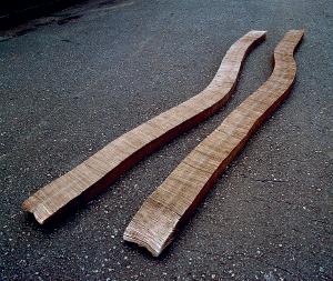
Las piezas compuestas de billetes con grafiti son generalmente para colgar en la pared. Los temas aparecen como subtítulos e incluyen dibujos de niños, firmas, desfiguraciones, pornografía y política [Fig. 13]. ¿Cómo definiste las formas de estas obras?
Solucionar la apariencia formal de las mismas fue un reto. Tenía que transformar un cierto número de billetes con grafiti o mensajes en algo que resultara visualmente atractivo. El rompecabezas era difícil a veces. Las cantidades no concordaban con mi deseo de darle ciertas formas. Al final del proceso tenía doce piezas: cada una de ellas tenía un tipo de contenido y una solución formal única.
¿Por qué conservaste los circulos de papel que se generaban luego de perforar los billetes? ¿Por qué era importante incluirlos en el grupo de obras?
Si yo estaba dispuesta a trabajar con cualquier tipo de material, ¿por qué habría de descartar los huecos? Ellos representaban la nulidad de esos cuerpos. También eran la evidencia de mi delito, aunque formalmente carecían de
133
an jl an jl
Fig. 12. Os cem [Los cien], 1986.
significado, eran casi absurdos. Coincidían con la nariz impresa del Duque de Caxias.
Todas las declaraciones escritas en los billetes fueron incorporadas en O livro (dos cem) [El libro (de los cien)] [Fig. 14], un afiche en offset del cual imprimiste mil copias e incluiste en la exposición Os cem en la Petite Galerie en Río en 1987.
Sí, yo escribí estas palabras a máquina cuatro veces, en distintos bosquejos, hasta que logré la versión final que comienza con “estava escrito” [estaba escrito] y termina con “tudo caba” [todo termina]. Salvo raras excepciones, se trataba de escritos anónimos, con muy poca interferencia de mi parte. Titulé esa pieza O livro (dos cem). ¿Por qué llamarla un libro cuando es un afiche? ¿Cómo seguir las infinitas líneas escritas sin perderte en la enorme masa de mensajes no relacionados entre sí? ¿Debería verse desde cierta distancia? ¿Debería leerse aleatoriamente sin considerar las reglas de lectura? ¿Nos convertimos en voyeurs? El afiche es vertical, casi un rectángulo cuadrado. Se aprecia un campo gris con una línea y un punto. La imagen está compuesta de miles de letras que, de hecho, son palabras y signos de puntuación. En medio del campo gris, llama la atención una línea que tiene una apariencia distinta. Luego te percatas que está compuesta totalmente de números. La obra es un cuerpo de palabras que se lee, no necesariamente en orden, pero que debía tener cierta secuencia para poder imprimirse. Es difícil mantenerse en la misma línea larga a menos que se use el dedo como guía. Miras y lees –no necesitas organizar. Sin embargo, harás ambas cosas de todas maneras y te encontrarás con momentos dispersos de vidas dispersas: chistes graciosos, increíbles ensamblajes de palabras.

134
an jl
Fig. 13. Os cem (infantis) [Los cien (infantes)], 1987.
Fig. 14. O livro (dos cem) [El libro (de los cien) ], 1987. Detalle, p. 136.
El proceso es, y fue, integral, desde el inicio hasta el final y me llevó mucho tiempo. Los billetes estaban constituidos por un material poco común; habría de transcurrir varios años antes de que encontraran su destino final. En los ochenta y noventa, realicé tres series usando los distintos billetes de cien que circularon en nuestra economía. Se titulaban Os cem, Fase azul [1991–98], y Todos os cem [Todos los cien] [1992–98]. Comencé las series en 1985 con billetes de cruzeiros, los cuales con el devenir de la inflación, fueron renombrados cruzado, cruzado novo y, finalmente, denominados de nuevo cruzeiro. Pasé cientos de horas organizando los grafitis, pero desistí de hacer yo misma las perforaciones en las series Fase azul y Todos os cem. Separé los que contenían grafiti antes de que se llevaran el resto para ser perforados. an
La manera obsesiva de incorporar todas las palabras en esta obra se compara con el procesamiento exhaustivo y sistemático de todos los billetes y tu insistencia en incluir cada elemento de los mismos en las obras definitivas, incluyendo los bocados sobrantes de las perforaciones.
135
jl
Según la observación del curador Paulo Herkenhoff, Leirner fue la primera artista brasilera que logró una relevancia nacional e internacional de manera simultánea.20 Las series Os cem, particularmente, logró la atención de críticos y curadores nacionales e internacionales, en parte porque las obras muy hábilmente exigían conocimiento internacional y nacional para ser apreciadas en ese momento, cuando, según lo expresó Leirner, los centros artísticos dominantes estaban “sedientos de nueva sangre”.21 Las obras simultáneamente evocaban artistas e historias de arte canónicos y recientemente reconocidos, desde el minimalismo y a Carl Andre, hasta el arte conceptual brasilero de los setenta y a Cildo Meireles. Tambien requerían que aquellos espectadores que no fueran brasileros se hicieran conscientes de acontecimientos económicos locales específicos, como la hiperinflación; pero, de igual forma, los ciudadanos y consumidores de cualquier sociedad que emplea papel moneda podían entenderlas fácilmente.
¿Cómo ocurrió el reconocimiento internacional de tu trabajo a finales de los ochenta? ¿Hubo personas clave, nacionales o internacionales, para lograr que te notaran, tales como, por ejemplo, el crítico británico Guy Brett, quien ha trabajado desde los sesenta para atraer la atención internacional hacia Clark, Oiticica y otros artistas brasileros?
Brett fue el primer escritor o curador extranjero que pensó en el trabajo que yo realizaba entonces.22 Llevó mis obras a Birmingham como parte de una exposición colectiva que se llamaba Transcontinental 23 Una obra compuesta de billetes con grafiti se reproduce en la cubierta del catálogo de la muestra. Fue mi primera vez en una institución pública en Europa y también el comienzo de una larga amistad. En São Paulo, en la Bienal de 1989, presenté Nomes [Nombres] de 1989, una pieza a gran escala realizada con bolsas plásticas con relleno [ver una obra relacionada, Fig. 20]. Esta obra me abrió varias puertas en Europa y en los Estados Unidos. Afortunadamente, fueron las puertas de instituciones que contribuyeron con las obras de manera significativa.
20. Paulo Herkenhoff, “The Contemporary Art of Brazil: Theoretical Constructs”, en Aracy A. Amaral y Paulo Herkenhoff (eds.), Ultramodern: The Art of Contemporary Brazil (Washington, D.C.: The National Museum of Women in the Arts, 1993), 97, 99.
21. Citada en Ana Francisca Ponzio, “Arte larápia de Jac Leirner é a prova de seu delito”, O Estado de São Paulo, 25 de enero de 1992, Caderno 2, 10.
22. Los primeros escritos de Brett acerca de Leirner aparecieron en 1989, en el catálogo de su exposición en la Galeria Millan y como un extracto en el catálogo de la Bienal de São Paulo. Ver Guy Brett, “A Bill of Wrongs”, en Jac Leirner (São Paulo: Galeria Millan, 1989); Brett, “Jac Leirner”, en Artistas brasileiros na 20ª Bienal Internacional de São Paulo (São Paulo: Marca D’Água, 1989), 60–61. El anterior se reimprimió en Canongia, Jac Leirner: Ad infinitum, 211–12. (ver nota 17).
23. Guy Brett, Transcontinental: An Investigation of Reality, Nine Latin American Artists (Londres y Nueva York: Verso; Birmingham: Ikon Gallery; Manchester: Cornerhouse; 1990).
137
an jl
138
Fig. 16. Fase azul, 1992.
Fig. 15. Overleaves (fase azul ) [Dorsos (fase azul ) ], 1991.
Para el momento en que se presenta la exposición Os cem en 1987, varios críticos de arte brasilero contrastaron la ambición de tu proyecto conceptual con la corta popularidad que había tenido la pintura neoexpresionista de muchos artistas de tu generación.24 ¿Fue tu éxito motivo de desavenencias con tus antiguos compañeros de clase en la FAAP o con otros artistas locales?
Puedo decir que el éxito de ellos antecedió al mío. Tenían galerías, habían participado en bienales anteriores y exponían en nuestros museos. Yo estaba callada antes de esa explosión.
Debido a la hiperinflación, para 1985 el cruzeiro había alcanzado la denominación de 100.000 y en 1986 se remplazó por el billete de cien cruzados. En Fase azul [1991–98] utilizaste billetes que eran azules en vez de rosados, llevaban impresa una figura histórica distinta, Juscelino Kubitschek, el presidente de Brasil para el período de 1956 a 1961, en vez de Alves de Lima e Silva. El título de este nuevo grupo de obras tiene también un carácter diferente al de Os cem Mientras que Os cem es un juego de palabras que hace referencia a eventos económicos nacionales de entonces, Fase azul es una referencia de la historia del arte internacional. ¿Cómo concebiste este título?
Es un título desafortunado. Como los billetes eran azules –los rosados habían sido retirados– pensé en Picasso y sus distintos períodos, lo que me hizo decidirme por ese nombre. La peor parte es que en vez de traducirlo por “período azul”, usé la expresión “fase azul”, que es incorrecto de hecho, pero así ha permanecido. Creo que las obras tienen mayor intensidad que el título que las identifica.
La forma de algunas de las esculturas para exponer en el piso o de las obras para colocar en las paredes también cambió de la serie Os cem a la serie Fase azul Mientras que las obras de Os cem hacen recordar las esculturas de Alexander Rodchenko y Carl Andre, elaboradas con maderas rústicas y ladrillo, las de Fase azul lucen delicadamente modeladas.
En Fase azul trabajé con mucho más material que en Os cem. Había varias piezas grandes para piso. En Overleaves [Dorsos] [1991], por ejemplo, utilicé una forma y técnica nueva [Fig. 15]. Los nuevos billetes tenían colores puros en sus bordes. El azul claro y el amarillo estaban cosidos para formar un rollo que al
24. Ver, por ejemplo, Wilson Coutinho, “Jac, a musa do desvio”, Jornal do Brasil, 25 de mayo de 1987, Caderno B, 1; Marcos Augusto Gonçalves, “No Rio, Jac mostra o valor de seu dinheiro”, Folha de São Paulo, 31 de mayo de 1987, Caderno 5, A-61.
139
an jl an jl an jl
jl
ser desenrollado revelaba una larga tira de color puro compuesta de verdadero dinero. Se puede jugar con ella, hacer olas y pasar por debajo. Es una pieza táctil. Aunque la obra es tan visual, moverla influye en el resultado. Se siente que respira y que tiene sentido del humor.
Conté con muchos más cruzados que cruzeiros y, en consecuencia, tenía mucho más grafiti también. Encontré cientos de alteraciones en los billetes, muchos más que en Os cem. Con Fase azul, las piezas con grafiti se convierten generalmente en cuadrados [Fig. 16]. Hay también en Fase azul una pieza en la cual todos los grafitis son demonios. Se llamó All the Devils from Blue Phase [Todos los demonios de fase azul ] [1995]. Es un nombre muy alocado.
En conjunto, los títulos Fase azul y los títulos de obras individuales en idioma inglés, tales como Overleaves [Dorsos] y All the Devils from Blue Phase [Todos los demonios de fase azul], al igual que para otras obras de comienzo de los noventa, reflejan la percepción y el interés de Leirner con respecto a la audiencia internacional recién ganada a su arte y con la que quería conectarse.
La serie Todos os cem [1992–98] integra las distintas monedas que circularon desde mediados de los ochenta hasta comienzos de los noventa, incluyendo cruzados, cruzados novos y cruzeiros. Pueden compararse las esculturas de piso con las dos tiras de la original Os cem y con las obras que se despliegan a través de las paredes para formar largos frisos [Fig. 17].
Tenía que continuar con el tema de grafiti hasta terminar la serie, por lo que había mucho material que ubicar y organizar. Tiendo a ser generosa con los materiales para darles tanta visibilidad como se pueda. Los largos frisos son grupos de cientos y cientos de billetes, cada uno con un tipo de desfiguración específica, como por ejemplo en las caras del presidente Kubitschek y de la escritora Cecília Meireles: dibujan sombreros, bigotes, cachos, lápiz labial, cabello, anteojos y barbas.
El gran esfuerzo –coleccionar, organizar y ensamblar– detrás de cada pieza se percibe cuando se aprecia la obra. ¿Consideras que la labor en sí misma tiene un significado en las obras?
jl
Sí, estos procedimientos repercuten de una manera sutil. También le imprimen tiempo a la obra. El tiempo es una abstracción, pero estas obras parecen darle cuerpo a la misma. Darle “cuerpo” al tiempo es una de mis metas.
140
an
an
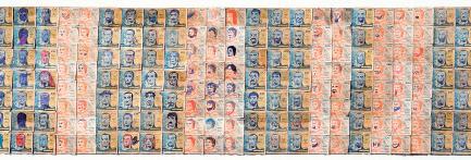
Tu valorización de la labor humana se presenta en medio de las arenas movedizas de la hiperinflación, en un momento en el cual la moneda ha perdido todo valor estable y la confianza por completo. Tu laborioso y cuidadoso trabajo de organización de los billetes en Os cem, Fase azul y Todos os cem resalta aún más la desestabilización del valor de la moneda. Al mismo tiempo, valoras esas declaraciones anónimas y demuestras cómo el dinero circula como una especie de foro social.
Sí, le doy valor a algo que anteriormente no tenía. Pero el rey de los valores es el arte, ¿no? Todo ese proceso está ahí en nombre del arte. Sin él, los materiales quedan sin valor alguno –nada: son sólo palabras y billetes viejos. De hecho, el valor del papel fue superior al valor del dinero, lo cual lo hace una inversión maravillosa. La idea del valor está invertida, de adentro hacia afuera. No hay una base. ¿Qué hay de valor en las obras? Nada, sino el arte, que puede crecer y crecer.
Hace algunos años en el Guggenheim Museum Bilbao, afirmaste que tu aspiración es presentar y no representar.25 ¿Cómo se relaciona esta distinción entre representar y presentar con series, como Os cem, la cual refleja los sucesos políticos y económicos en Brasil en los ochenta y noventa?
Bueno, puede tratar esos temas, pero técnicamente la economía no es mi campo. En vez de manejar dinero, yo estaba trabajando con papel sucio, peso,
25. Jac Leirner, “La experiencia de la obra”, Guggenheim Museum Bilbao, 25 de junio de 2009.
141
an jl an jl
Fig. 17. Todos os cem [Todos los cien], 1998, detalle.
color, tamaño, superficie, tiempo y organización. Los orígenes de las obras tienen sus referentes en otras obras, nunca en la economía. Como materia, la economía merece ser tratada con respeto. Yo incluso creo que el trabajo logrado con los billetes no tiene que ver con economía, es economía pura. La obra no está ahí para representar, ya es y tiene esta condición dentro de su estado bruto. Se puede observar la palabra dinero, pero la obra tiene un olor, está viva. ¿Ve la diferencia?
Sí. ¿Podría decir, entonces, que la metáfora es algo que no estás haciendo?
Little Light [Lucecita] [2005] [Fig. 44] es una metáfora. Tiene significado. Nos dice que es un largo camino hasta que se ve la luz. Distinto ocurre con las obras de mis inicios, Pulmão, Os cem o Nomes [1989–93], en las que mi sujeto es el minimalismo.
Tú buscas la exactitud literal del minimalismo. Un bloque es un bloque, y punto.
Exactamente. Y podemos ir más allá –con Cézanne, cuando una manzana no es la fruta, sino el color rojo.
Con Cézanne, sin embargo, hay representación.
Sí, pero la representación es precedida por el color. Esto es lo que quiero enfatizar, porque mi trabajo está sujeto a ser fácilmente transformado en una gran idea o tema.
Sin embargo, la remoción del dinero del circuito regular de la economía para convertirlo en materia prima de las obras de arte es parte integral de la naturaleza transgresora de Os cem.
Y colgar billetes en una pared, como pinturas, también. Los manejé como si fueran pinturas/cuadros. Uno de ellos incluso se titula Quadro e moldura [Cuadro y marco] [1987]. El uso del dinero no es una novedad. Cildo Meireles era una referencia inmediata. Desde Cildo hasta Andy Warhol, Yves Klein y Joseph Beuys. Hubo una exposición en el Musée de la Poste, en París, llamada Les couleurs de l´argent [El color del dinero], con obras cuyo tema o material era el dinero, el valor o el oro, como en la obra de Klein y hasta con Tintoretto, de quien había en primer plano una pintura con grandes cantidades de monedas doradas saliendo
142
an
an
an
jl
jl
jl an jl
de un baúl.26 El dinero nos pertenece a todos nosotros. Me contenta ser quien creara esas obras, devolviéndole al mundo los billetes.
Tú has mencionado el punk como un modelo de transgresión para ti. ¿Se relaciona la estética o actitud punk a las series Os cem, Fase azul o Todos os cem?
Es fácil relacionar el punk con las piezas hechas con dinero. Los billetes fueron arrancados de circulación, de su propietario, el Banco Central do Brasil. De igual forma, las imágenes en ellos impresas estaban desfiguradas, lo que suele ser una expresión punk, como quemar una bandera. No era mi intención mezclar el punk con el arte, pero debo reconocer que sí, era una actitud punk dirigida a la nación o a las políticas aplicadas a una economía quebrada.
Tú exhibiste Nomes, una serie de obras compuestas por bolsas plásticas con relleno y cosidas, en una exhibición individual en 1989 en la Galeria Millan en São Paulo, a pocos años de haber presentado Os cem y Pulmão 27 Según ya mencionaste, comenzaste a coleccionar bolsas plásticas para Nomes alrededor de 1985, que era la misma época en la cual comenzaste a coleccionar billetes y empaques de cigarrillos. ¿Cómo seleccionaste este material tan aparentemente banal?
Al igual que los empaques de cigarrillos y los billetes de cruzeiros, la primera bolsa se me presentó de repente sin que yo tuviera oportunidad alguna de elegir. No tenía nada especial: contenía una impresión floral con colores poco interesantes, sin logo, nombre ni palabras y estaba tirada en un rincón de la casa. Pero ahí estaba y me le quedé mirando fijamente y pensé: ¡Ah, una bolsa!, como si se tratara de la reina de la fiesta. Y así me encontré otra vez delante de un nuevo comienzo. De nuevo, se trataba de un proceso largo y lento, bolsa tras bolsa tras bolsa, mientras trataba de encontrar la solución técnica. Una máquina de coser, quien la acciona –mi querida Lucinha, María Lucia de Souza Suganuma–y la espuma de poliéster y el bucarán, eran perfectos. Ya había cosido billetes y laminado papel, así que cosería de nuevo, pero esta vez bolsas plásticas, para evitar el pegamento o la cinta adhesiva. Utilicé un poliéster grueso para darle algo de cuerpo a cada bolsa –algo de volumen. Y ahí fue cuando comencé a organizarlas. De la misma manera como había estructurado los billetes usando
26. Les couleurs de l argent (París: Musée de la Poste, 1991).
27. Jac Leirner (São Paulo: Galeria Millan, 1989).
143
an jl an jl
el grafiti, también comencé a unir las bolsas tomando como guía el color, el nombre, el diseño, su logo. La recopilación de bolsas incluía bolsas de museos, que tenían el doble del valor de las normales, pues yo estaba creando arte y la idea de provenir de un museo sumada a la obra creada, representada arte dos veces –arte al cuadrado. Cuidaba esas bolsas como si fueran tesoros.
Aparte de las bolsas plásticas de las tiendas de museos, también usaste un gran número de bolsas plásticas de otro tipo.
Usé bolsas de arroz, de almohadas e incluso de café. Bolsas de la oficina postal. Cualquier tipo de empaque plástico –incluyendo Bom Bril, que es el equivalente a una esponja de fregar, y cualquier material que pareciera el absurdo de lo absurdo.
¿Y el título, Nomes?
Se refiere a la cantidad de marcas comerciales que se reducen a nombres. No me gusta mucho.
144
jl
an jl an
Fig. 18. Nomes [Nombres], 1989.
Creaste muchas y variadas formas con las bolsas plásticas. Hay esculturas colocadas en el piso, montadas en las paredes y suspendidas en los techos, así como instalaciones del tamaño de una habitación en la que las paredes y el piso quedan totalmente cubiertas.
Lo que hacen es articularse. Yo manejo múltiples factores al mismo tiempo –el material, su tamaño y lo que ofrece para crear. Cada pieza era el resultado de un problema diferente y cada material o cada grupo de bolsas decidía su propia creación. Así, por ejemplo, tenía muchas bolsas que provenían de las tiendas libres de impuestos del aeropuerto de São Paulo. Fueron necesarios complejos ejercicios para decidir cómo coser muchas de estas obras. En algunos casos las formas resultantes eran como máquinas, mecanismos o ruedas y eran complicadas de crear. En otras ocasiones, no. Una pieza presentaba sencillamente un arreglo explícito del color –sólo dos bolsas juntas debido a una tonalidad similar, cosida una sobre la otra [Fig. 18].
¿Existe alguna relación entre los trabajos compuestos de bolsas de una cierta tonalidad, como Azuis [Azules] [1990] [Fig. 19], y aquellos realizados con bolsas rojas, rosadas y blancas, con la historia de la pintura abstracta y monocromática?
145
an jl an
Fig. 19. Azuis [Azules], 1990.
Ciertamente. Son la consecuencia de la pintura y de los procedimientos de los artistas y reflejan el pensamiento acerca del color como la Suprematist Composition: White on White [Composición suprematista: Blanco sobre blanco] de Kazimir Malevich [1918, The Museum of Modern Art, Nueva York] –un cuadrado dentro de otro cuadrado. La curva azul me recuerda las formas de Ellsworth Kelly.
En las primeras acuarelas, yuxtapones colores realizados de manera precisa, pero en Nomes esta yuxtaposición ocurre a una escala mucho mayor, como en las instalaciones del tamaño de una habitación [Fig. 20], y el color es inherente a los materiales, en vez de pintado a mano.
La obra Hip-Hop [1998] [Fig. 40], al igual que lo hace Nomes, demuestra que todos los colores son perfectos. Ningún color podría ser mejor. Sus intensidades son únicas. Aquí debería hacer una pausa y exponer mis argumentos en cuanto al color. Esta es mi tesis, si es que tengo una: todos los colores son perfectos y correctos y cada uno tiene sus especificidades. Esas dos grupos de obras
146
an jl
jl
Fig. 20. Nomes [Nombres], 1989.
expresan esta idea de manera muy clara a través de los arreglos masivos de colores múltiples reunidos en un solo espacio. Así como creo que O livro (dos cem) es una pieza para ser vista y leída, también creo que Nomes es extremadamente pictórica, pero al mismo tiempo repleta de texto. En ella se dan ambas condiciones. Cada bolsa está impregnada de su procedencia y tiene una referencia, incluyendo indicaciones de lo que contuvieron en algún momento.
Has instalado la escultura Idênticos [Idénticos] [1989] en variadas configuraciones y disposiciones [Fig. 21]. En un caso, colocaste dos componentes uno encima del otro y en la Biennale di Venezia de 1990, los colocaste de tal manera que parecían insectos o animales enfrentados.
Sí, transmiten una sensación orgánica, de animal. Es divertido colocarlas como si tuvieran relación la una con la otra –quizás hasta de cita amorosa. Fue la primera pieza en la que deliberadamente repetí los mismos elementos en dos oportunidades, haciéndolas idénticas, usando bolsas idénticas. Esto me condujo a presentar más obras en pares idénticos, como las cuatro obras en Corpus delicti [1992] [Fig. 22]. Aunque supongo que ya Os cem tenía dos partes idénticas [Fig. 12].
¿Por qué creas estas obras idénticas?
21. Idênticos [Idénticos], 1989.
147
Fig.
an jl an
Trato de investigar la originalidad de las cosas y me preguntó, qué es original, qué es una repetición. Aunque la obra trata sobre la originalidad, también tiene una presencia. ¿Cuál viene primero? Una parte deriva su identidad de la otra, es un circuito cerrado.
Aparte de hacer referencia a tu propio campo, el arte visual, cuáles son las pretensiones específicas de las obras compuestas de bolsas plásticas de museos, Nomes (arte) [Nombres (arte)] y Nomes (museos) [Nombres (museos)] [Fig. 22]?
148
Fig. 22. Vista de montaje de Directions [Direcciones]: Jac Leirner, Hirshhorn Museum and Sculpture Garden, Smithsonian Institution, 1992. En la pared: Nomes (museus) [Nombres (museos)], 1992. En el piso: Corpus delicti, 1992.
jl an
Me conmueve la idea de que las bolsas se vayan de los museos en el momento que están por convertirse en basura. Su función se reduce a servir como contenedores y luego son convertidas en desechos de museo. Sus vidas son breves, con excepción de la vida de aquellas bolsas que yo rescato: esas regresan a los museos como partes de piezas escultóricas. El tortuoso camino que transitan las bolsas desde que dejan el museo como basura hasta que regresan transformadas en arte, le imprime “tiempo” a la obra y es el resultado de la circulación, el fundamento del circuito. La vida anterior de la bolsa, antes de convertirse
149
jl
en material para la creación de una escultura, permanece como parte de su pequeña historia: “Nací aquí, partí, me llenaron con espuma de poliéster y fui cosida. Ahora estoy de vuelta, colgada en la pared para ser admirada”. Los materiales cuentan sus historias de una manera silenciosa. Ellos reflejan procesos en distintas etapas. Pertenecen a redes y sistemas en los que asumen nuevas posiciones, incluyendo, finalmente, la de una obra de arte en un museo. Al final, lo que hago en todas las obras es crear un lugar para las cosas que no lo tienen. Piensa en la etiqueta del precio de un empaque de cigarrillos [Fig. 23]. ¿Cuál es el lugar de una de éstas? No existe, excepto la basura. Hacer que una obra de arte haga uso de una etiqueta de precio es crear una situación sorprendente que impone valor y pensamiento donde antes no había nada.
150
Fig. 23. Pulmão [Pulmón], 1987.
DANDO CUERPO A LOS ERRORES
En el proceso de su trabajo, Leirner hace elecciones con la finalidad de encontrar la mejor solución para sus materiales y para crear un lugar para los materiales cotidianos que no tienen una identidad asegurada o un destino distinto al cesto de la basura. Sin embargo, en varios conjuntos de trabajo de cantidad limitada y menos conocidos, ella invierte este proceso. Esas obras no son el resultado de hacer las mejores elecciones, sino, por el contrario, de cometer errores y crear objetos amorfos y ambiguos que carecen de un cierto arraigo en un lugar o identidad.
¿Cuál fue el contexto para Erros [Errores], el reducido grupo de esculturas compuestas con cuerda de poliuretano anudada en masa, que van desde 1987 hasta 1988 [Fig. 24]?
Erros tienen que ver con una acción simple. Para entonces, yo me encontraba perforando los billetes, cosiendo bolsas plásticas, doblando empaques de cigarrillos y haciendo esas obras por un largo período. Mi proceso diario se correspondía con la entrada de estos materiales en mi vida, y yo los organizaba y analizaba. La repetición de este proceso, una y otra vez, comenzó a perturbarme y empecé a sentirme incómoda. Quería algo más que interfiriera y creara cierto caos en el trabajo. Comencé a imaginar maneras para darle cuerpo a un error. ¿Cómo podría darle cuerpo a esta idea –a un error per se, independiente de los materiales? Tenía que ser amorfo. No podía tener forma, no podía tener color y tenía que estar fundamentalmente desplazado o sin lugar. Empecé a usar un material que me encantaba –la cuerda de poliuretano, que es dura, un plástico casi translúcido que se encuentra en varios tonos que van desde el blanco hasta el amarillento. Pensé que esta
151
an jl
Fig. 24. Erro [Error], 1987.
cuerda plástica era eterna y que estaría dura para siempre, pero eso fue una ilusión. Todavía sigo perdiendo obras porque la cuerda se rompe cuando se seca demasiado.
¿Qué función cumple la fotografía en esas obras? Un Erro, por ejemplo, está fotografiado en una escalera, mientras que otros son mostrados inundando el asiento de pasajero de un vehículo o derramándose de un cenicero de avión.
Esos son ejemplos de lugares desplazados. En Erros todo tenía que ser equivocado. Tenía que aparecer no en sitios usuales para esculturas, sino en lugares que no estaban destinados para albergar obras de arte: en un árbol, en una escalera, en un carro, debajo de una mesa. Todas las fotografías indican las posibles ambientaciones de estas piezas. Es ilusorio tratar de hacer algo que es amorfo: una vez que está hecho, tiene sustancia y forma. La obra es, quizás, un poco ilustrativa del deseo de cambiar, de transformar y de seguir adelante hacia lo nuevo.
Las fotografías traen a la mente las fotografías de Clark [1964, Associação Cultural “O Mundo de Lygia Clark”] que muestran una de sus piezas tituladas Obra mole [Obra blanda)] colgada sobre las ramas de árboles o rocas.
Clark y Schendel estaban muy presentes en esas fotografías. Eran las referencias clave. Me alegraba mucho cada vez que sabía de un nuevo trabajo de ellas, lo celebraba.
¿El proceso de realización de Erros te abrió un nuevo camino, tal como esperabas?
No abrió nuevos caminos ni me decepcionó. A diferencia de otras obras que tienen la cualidad de ser infinitas, Erros y sus fotografías comenzaron, se desarrollaron y terminaron. Pero resultó ser una ilusión que difería de las otras obras. Yo estaba de nuevo creando una obra que repetía una acción: hacer innumerables nudos aparentemente infinitos. En otras palabras, cada Erro era ya un proyecto a largo plazo que requirió de trabajo duro y precisión para su elaboración y estaba impregnado de la presencia del tiempo. Era una confirmación de una característica de mi trabajo, un destino del cual no puedo escapar. Hasta hoy, los materiales me conmueven y dirigen mis acciones.
152
an jl an
an jl
jl
El 27 de mayo de 1989, apareció en el diario de São Paulo Jornal da Tarde, una página en blanco muy agujereada, acompañada con tu nombre y el título Furos [Agujeros].
Durante cierto período, el periódico publicaba una vez a la semana tres páginas dedicadas a un artista. Teníamos la libertad de decidir qué hacer con dos de ellas, página frontal y la trasera. La tercera página estaba dedicada a un texto acerca del artista. Todos los artistas anteriores habían abordado el proyecto usando un medio de impresión. Yo no logré decidir qué imagen imprimir y tenía la determinación de presentar al periódico algo que significara un reto para éste de alguna manera. Como ya había perforado dinero y robado ceniceros, quería desmantelar el lenguaje impreso del periódico. ¿Cómo podría hacerlo? Pues transgrediéndolo físicamente: perforando la página. Solucionamos el problema técnico de cómo hacer los huecos asegurando clavos en uno de los cilindros rotativos de la máquina de imprimir [Fig. 25]. Aunque el resultado no llenó mis expectativas, fue una experiencia muy enriquecedora.
153
an jl
Fig. 25. Fotografía de Jac Leirner fijando clavos a los rodillos de una imprenta, Jornal da Tarde, 27 de mayo de 1989.
Fig. 26. Vista de montaje de Transcontinental: An Investigation of Reality, Nine Latin American Artists [Transcontinental: Una investigación sobre la realidad, nueve artistas latinoamericanos], Ikon Gallery, Birmingham, 1990. A la izquierda: Os cem [Los cien], 1986. A la derecha: Fantasma, 1990.
an
jl
¿Tienen alguna relación los huecos en el periódico con los huecos en Os cem y en Fase azul?
No, son huecos diferentes. Son los furos [primicias] de las noticias. Aquí, otra vez, encontramos distintos significados para la misma palabra. Como con cem y sem, en Furos, el significado se cuela de la expresión idiomática furos de reportagem [noticias de última hora] unido al hecho de romper cosas físicamente.
Al principio, desarrollaste Fantasma [1990–2000], un grupo de esculturas compuestas de hojas de papel blanco, en relación con tu trabajo en los billetes.
El primer Fantasma apareció en 1990 en Birmingham [Fig. 26].28 Estaba dedicado a la pieza Os cem, la cual pertenecía al fallecido André L’Huillier, un buen amigo y coleccionista de Suiza. Decidí hacer un fantasma de su pieza. Compré papel blanco, se perforó y listo: tenía el tamaño exacto de Os cem. Lo llamé Fantasma Era como una sombra de la otra, a pesar de su blancura –una sombra en el sentido de que aunque era real, no tenía valor alguno impreso. En cierto modo, an jl
28. Brett, Transcontinental.
154
de hecho, no era la original. Decidí que ambas piezas debían tener el mismo precio, pero no fue así. Fantasma estaba desnuda. El valor del dinero no estaba ahí, sólo su valor como escultura. André también la adquirió.
Después del primero, creaste varios fantasmas, grandes y para lugares específicos, en los cuales la forma serpentina del papel del tamaño de un billete ondulaba hacia adentro y hacia afuera en las salas de las instituciones de arte.
Fantasma, entendiéndola como la copia “fantasma” de otra pieza, seguía ganando terreno y volviendose más libre. Cuando hablamos de fantasmas, nos viene a la mente la idea de movimiento, ¿cierto? Debido a su nombre, la idea seguía creciendo y desarrollándose. Comenzó a representar la idea de movimiento y de pasaje. Se habían programado varias exhibiciones: una individual en el Walker Art Center y una grupal, con el título de TransMission, en el Rooseum Center for Contemporary Art.29 Fantasma se movía sin un tamaño
Kathy
y Joan
155
an jl
Fig. 27. Tapes [Cintas], 1990–2002.
29.
Halbreich
Rothfuss, Viewpoints: Jac Leirner (Minneapolis: Walker Art Center, 1991); Lars Nittve, TransMission: Konst i interkulturell limbo/Art in Intercultural Limbo (Malmö, Suecia: Rooseum Center for Contemporary Art, 1991).
específico; podía ser pequeñísima o gigante, dependiendo de la ubicación. En Malmö, subió las escaleras que iban a la sala donde mostraba piezas de dinero. En el Walker Art Center, se deslizó a través de las obras que conformaban la colección permanente, como una culebra y subió las escaleras para presentar mi exposición en otro piso [Fig. 33]. Era una presencia inmensa y pesada, compuesta por toneladas de papel blanco. El tamaño cambió y en ocasiones, la pieza fue dividida en varias partes. En mis archivos yo tengo varios dibujos que hice para Fantasma que muestran la adaptación de la obra a los lugares por los cuales pasaba.
Como Erros, Furos y Fantasma, otro grupo de obras, Tapes [Cintas] [c. 1990 al presente] [Figs. 27–29], también se configura con la repetición de un gesto absurdo, no productivo o “equivocado”, con el fin de crear obras fundamentalmente transitorias. an


156
Fig. 28. Tapes [Cintas], 1995.
Fig. 29. Tapes [Cintas], 2000.
Aunque muchas de las cintas son translúcidas, con frecuencia presentan un color amarillento –un amarillo oscuro y como pegajoso que le da una apariencia envejecida desde el principio. También hay una presencia explícita de pegamento bajo la cinta. Para crear estas obras, la cinta se envuelve alrededor de otro rollo de cinta, cubriéndola por completo a través de la repetición de un gesto. Ya he olvidado cuándo comencé a realizarlas – ¿hace diez años?, ¿veinte años? Son muy simples con relación al material que las compone: cinta adhesiva y, con ello, la utilización del peor material imaginable para colocar a una obra de arte. La cinta adhesiva está prohibida en el mundo de las obras de papel, debido a la cualidad destructiva del pegamento que contienen y a su pH ácido. Por lo tanto, estas obras son un tipo de absurdo porque van en contra de todas las reglas y técnicas usualmente aplicadas a las artes. Algunas piezas tienen cinta impresa con nombres de museos y otros negocios que tienen relación con el arte, tales como galerías privadas o compañías de transporte. Esas piezas tienen colores brillantes y, de nuevo, están compuestas de un material sencillo y cotidiano. Es la misma historia de siempre: el poder es otorgado a algo sin importancia y algo pierde su función para convertirse en un objeto de arte, en una pequeña pieza escultural.
Al emplear el tipo de cinta que usan las compañías de transporte de piezas de arte en los embalajes para proteger las obras, resaltas el rol de protección que puede tener esa cinta. Al cubrir la cinta adhesiva con ella misma, estás preservando un sistema de protección, pero, por supuesto, la “protección” en este caso es cáustica y apresura la destrucción de la cinta.
He perdido algunas de las obras. La cinta se ha alterado y fusionado.
Tú has hablado acerca de perder obras y de la necesidad de reemplazar algunos elementos de las mismas con el transcurrir del tiempo, como la cuerda de poliuretano usada en varias piezas que se va degradando y decolorando, las bolsas plásticas que se van resecando y perdiendo su color y la cinta usada en un collage en Pulmão que está destruyendo la obra. Pero en este grupo de obras, elegiste seguir usando esos materiales. Entonces, ¿te parece bien la degradación de las obras?
Sí. No estoy considerando la posteridad o el mercado. Es pura experimentación, la búsqueda por soluciones y acciones, y la actividad sencilla de hacer las obras. Soy curiosa.
157
jl an jl an jl

Fig. 30. Sedinha [Sedita], 2008.
an jl
En la obra Sedinha [Sedita] de 2008 [Fig. 30], creaste una serie de impresos astutamente absurdos, que consiste en copias de etiquetas auto referenciales impresas en papel de cigarrillos, un sentido de la palabra sedinha en Brasil.
Me encontraba en una cafetería y tenía papel de cigarrillo en los bolsillos. Lo tomé, mojé la pega que tienen, lo pegué en el mostrador y lo dejé ahí, flotando. Lucía como un pedacito de piel que se le caía al mostrador, un pequeño trozo de papel al viento que se adhería a la superficie. Conservé esa idea.
El año pasado, Jens Hoffmann me invitó a formar parte de su exhibición de nombre This Is Not a Void [Esto no es un vacío] [2008], en la Galeria Luisa Strina en São Paulo. No aceptó ninguna de la obras que ofrecí presentar. Me di por vencida. Unos días después, me acordé del papel de cigarrillo y lo estampé con anotaciones –título, fecha, material y tamaño. Había perdido su cualidad virginal para convertirse en la etiqueta para una obra de arte llamada Sedinha: “Sedinha, 2008, papel, cola, 4,7 × 7,4 cm”.
Hice algunas ediciones de Sedinhas con varios estampados y colores distintos, y algunas escritas a mano. Si no me equivoco, hice diez ediciones con diez Sedinhas cada una. Las ediciones cuentan con una prueba de artista, etcétera, así como con cajitas para los papelitos de cigarrillo. Son presencias mínimas y delicadas las cuales también se refieren a “cosas” elaboradas a mano –el cigarillo
158
enrollado a mano. Al final, Jens escogió dos piezas de esta serie para incluirlas en su muestra y las pegaron con cola a un muro negro.
Sedinha es insistentemente inestable como obra de arte, no tanto por el “soporte” poco ortodoxo que es el papel de cigarrillo, sino en mayor medida por el hecho de que Leirner creó múltiples con la finalidad de facilitar la eliminación de la obra, en vez de procurar su preservación: el número de papeles y el pequeño contenedor que se adapta al tamaño comercial del empaque, son una tentación para que el observador considere usar los papeles para su función original –fumar. Al provocar su propia destrucción, Sedinha lleva al extremo la cualidad presente en todos los objetos precarios de Leirner, la cual habita en los límites del arte, de Erros en adelante. A diferencia del resto de sus obras, en las cuales ella lucha contra lo efímero inherente de los materiales que emplea y busca rectificar su eliminación, en éstas, sus acciones repetitivas facilitan la corrosión de sus propias obras.
USANDO LAS INSTITUCIONES DE ARTE
En 1990, Leirner fue invitada por primera vez a lo que pronto se convertiría en un sinfín de exhibiciones, incluyendo la Biennale di Venezia.30 Durante los años siguientes, además de presentar su trabajo en importantes exposiciones alrededor del mundo, tales como Documenta IX, tuvo varias exhibiciones individuales en reconocidas instituciones de arte contemporáneo en Estados Unidos y Gran Bretaña, y sus obras fueron adquiridas para formar parte de importantes colecciones, incluyendo la del Museum of Modern Art de Nueva York.31 Para 1993, Leirner y sus obras aparecieron en la portada de ARTnews, a manera de anuncio para las
30. Las exposiciones colectivas en 1990 incluyeron: Brett, Transcontinental; Aperto 90, XLIV Biennale di Venezia (Venecia: Biennale di Venezia, 1990) y Bruce W. Ferguson y Gary Dufour, Past Future Tense (Winnipeg: Winnipeg Art Gallery; Vancouver: Vancouver Art Gallery, 1990)
31. Las exhibiciones colectivas a principio de los noventa incluyeron: Currents (Boston: The Institute of Contemporary Art, 1991); Nittve, TransMission; Jan Hoet, Documenta IX (Kassel: Kunsthalle Fridericianum; Stuttgart: Cantz; Nueva York: Abrams, 1992); Amaral y Herkenhoff, Ultramodern; Waldo Rasmussen (ed.), Latin American Artists of the Twentieth Century (Nueva York: The Museum of Modern Art, 1993); Zelevansky, Sense and Sensibility; y Madeleine Grynsztejn, About Place: Recent Art of the Americas (Chicago: The Art Institute of Chicago, 1995). Entre sus exposiciones individuales en 1991 y 1992, se incluyen: David Elliott, Jac Leirner (Oxford: Museum of Modern Art; Glasgow: Third Eye Centre, 1991); Halbreich y Rothfuss, Viewpoints: Jac Leirner; y Cruz, Directions: Jac Leirner. Entre las colecciones internacionales para las cuales se adquirió su obra a principios de los noventa, se incluyen: la Colección Patricia Phelps de Cisneros, De la Cruz Collection, The Museum of Modern Art de Nueva York y el Walker Art Center de Minneapolis.
159
fortunas por el ascenso del arte contemporáneo de América Latina y pronto sería representada por influyentes galerías en São Paulo y Nueva York. 32
A medida que creció tu despliegue internacional, la misma institución de arte proporcionó un contexto procreador para tus nuevas obras. Por ejemplo, produjiste To and From [Desde y hacia] [1991–99] [Fig. 31] y Etiquetas [1991–94] [Fig. 32], inicialmente durante el período de tres meses que estuviste en el Museum of Modern Art en Oxford, en 1990, promoviendo tus obras, así como en la exposición individual ahí realizada que derivó de la visita en el verano y otoño de 1991,33 y durante tu estadía de un mes en el Walker Art Center, en el invierno de 1991–92, donde también realizaste una exposición individual.34
Yo vivía prácticamente en el Museum of Modern Art mientras estuve en Oxford. Tenía las llaves del museo para poder llegar a mi estudio, el cual estaba ubicado en la torre del edificio. Tenía que atravesar las oficinas para ir a trabajar e iba a la oficina a usar el fax o la máquina de escribir. Fue ahí cuando me di cuenta de que los cestos de basura estaban llenos de sobres vacíos que eran desechados
32. ARTnews 92, no. 6 (Summer 1993): portada. Leirner comenzó sus exposiciones con la Galeria Camargo Vilaça en São Paulo en 1992 y la Galerie Lelong en Nueva York, en 1994.
33. La permanencia de Leirner en la Ruskin School of Drawing, en la Universidad de Oxford, en el Tower Studio del Museum of Modern Art, en Oxford, (ahora Modern Art Oxford), desde septiembre hasta diciembre de 1990, fue costeada por el British Council. La exhibición, titulada Jac Leirner, contó con texto de Elliott.
34. Fue artista residente en el Walker Art Center en octubre y noviembre de 1991, con anterioridad a la exposición que realizó en ese lugar. Ver Halbreich y Rothfuss, Viewpoints: Jac Leirner
160
an jl
Fig. 31. To and From (MOMA, Oxford ) [Desde y hacia (MOMA, Oxford )], 1991.
cuando extraían lo que contenían. Me llamó la atención la cantidad, calidad y tamaño de los mismos.
Después de mi estadía en Oxford, regresé a Brasil y luego volví a Inglaterra, en donde mi exhibición en el museo tendría lugar seis meses más tarde. Había estado trabajando, investigando y recolectando material impreso, pero también quería los sobres y le pregunté a la secretaria si ella podría guardarlos para mí. Durante mi estadía en el museo, comencé a organizar los sobres por color y forma. También le pedí al personal del Walker que guardara sus sobres y así lo hicieron por un año. Cuando desarrollé estas piezas, organicé incansablemente los materiales y, una vez más, abrí huecos con la finalidad de darle estructura a los ensamblajes.
Tanto los rótulos de las obras como otros materiales entraron en mi proceso de trabajo por primera vez en Oxford. Comencé observando las etiquetas y cómo aparecen dentro del contexto del museo, al lado de cada obra de arte y comenzaron a ganar importancia como un medio para mí. Luego creé mis primeras piezas con etiquetas: tres marcos rectangulares hechos de etiquetas y colgados en la pared. Tal como hice con los billetes y los grafitis tomé un cierto número de billetes con mensajes o inscripciones de amor para crear una pieza sobre el amor, por ejemplo; igual hice con Etiquetas: un cierto número de etiquetas que incluyen el mismo artista o la misma exhibición, me llevarían a crear una obra. Presenté mi segunda serie de Etiquetas en una galería en Friedberg.35 Mi propósito era producir un resultado interesante con estas nuevas cantidades, tal como sucedió con las etiquetas y los billetes con grafiti, el número de las piezas es lo que determinaría la forma, una que tuviera significación para mí. Así que, en vez de hacer todas las piezas cuadradas, cada una tenía una forma distinta.
Para tu exhibición en el Walker y luego para una muestra colectiva en The Museum of Modern Art [MoMA] de Nueva York, en 1994, [Fig. 32],36 Etiquetas adquirió la forma de largos frisos que recorrían las paredes. Además de estas nuevas formas, también tuviste un rol cada vez más activo en la selección de las etiquetas: en vez de usar las que tenías a disposición, etiquetas de repuesto, solicitaste al museo que produjera etiquetas específicas.
En el Walker, una de mis obras con etiquetas presentaba las colecciones de
35. Jac Leirner: Papierskulpturen und Installationen (Friedberg, Alemania: Edition & Galerie Hoffmann, 1992).
36. Zelevansky, Sense and Sensibility
161
an jl

Fig. 32. Vista de montaje de Sense and Sensibility: Women Artists and Minimalism in the Nineties [Sentido y Sensibilidad: Mujeres artistas y el Minimalismo en los 90], The Museum of Modern Art, Nueva York, 1994. Primer plano: Nomes (arte) [Nombres (arte)], 1993. Segundo plano: Etiquetas (MoMA, NY ), 1994.
dibujos, pinturas y esculturas del museo y la otra reunía los nombres de exposiciones que habían tenido lugar en el museo durante los últimos treinta años –desde 1961, el año en que yo nací, hasta el año de esa exposición. El MoMA, en Nueva York, fue el único lugar donde elegí las etiquetas; prácticamente fui la curadora ahí de una exposición acerca de la colección del museo. Decidí qué etiquetas debían elaborarse y luego las organicé de acuerdo al número de líneas en cada una. Las etiquetas con menos renglones estaban ubicadas arriba, visualmente las más ligeras. Las más densas estaban abajo, con más líneas. La ubicación de las etiquetas se determinó por el peso visual de las mismas. Cuando se ve una foto de esta pieza, se puede percibir que las etiquetas de arriba tienen menos líneas que las de abajo, y visualmente resulta más pesado abajo.
37. Lorenzo Mammi, “Jac Leirner”, en Paulo Herkenhoff (ed.), Jac Leirner, Waltercio Caldas: Representação brasileira, XLVII Bienal di Veneza (São Paulo: Fundação Bienal de São Paulo, 1997), 25.
162
Al colocar las etiquetas más densas abajo, le das atributos físicos a un objeto que generalmente se considera plano, insubstancial y desmaterializado.
Exacto. Estos objetos triviales son obviados como material artístico, pero tienen un tamaño y un peso. Por ejemplo, las letras en el texto de alguna manera pesan algo.
El curador Lorenzo Mammi ha escrito que tu trabajo con los materiales que provienen de instituciones de arte está centrado en los “despreciables protocolos” del mundo del arte.37
Creo que lo que él quiere decir es que mi mirada no se centra necesariamente en los lugares donde hay arte, sino en casi cualquier otro lado. En los archivos de los museos, en los cestos de basura de las secretarias o en las oficinas de administración del museo puedo encontrar materiales que potencialmente podrían convertirse en formas de presencia artística. Y así las etiquetas cobraron vida, afirmándose como posibles presencias. El museo las deshecha, pero yo no.
¿Cómo calificarías tu relación con la institución del arte? Aunque utilizas materiales que el museo bota, tus obras no pueden ser descritas cómodamente como una crítica institucional.
No estoy retando a la institución, la estoy usando. Sirve como un medio –un medio expresivo que es capaz de ser transformado. Como una roca o pieza de madera que se puede esculpir, la institución es algo que se puede usar en su esencia concreta, en su presencia material.
Otro aspecto de tu profundo contacto con las instituciones de arte a principios de los noventa es la instalación cuidadosa de las obras que realizaste in situ en tus exposiciones. Quizás la más significativa de resaltar es la muestra en el Walker Art Center, por la contundente variedad de formas en serie diseñadas para pisos y paredes [Fig. 33].
La exposición en el Walker se preparó muy cuidadosamente. Fui a Minneapolis varias veces. Fantasma se centró en piezas de gran formato, recorriendo las galerías de la colección permanente y colándose en la galería de mi muestra. Todo en la exposición estaba relacionado con esta obra. En el piso, junto con su omnipresencia, había obras creadas con billetes, sobres y, finalmente los restos de las perforaciones de los tres trabajos. Una de las paredes estaba vestida con
163
an jl an jl an jl an jl
billetes que tenían grafiti, una obra titulada Fase azul [1992] que ahora está en el Guggenheim Museum, en Nueva York. Las otras paredes tenían etiquetas. Todo esto giraba en torno a Fantasma, que estaba esparcida por toda la sala. En el Walker fue cuando tuve la oportunidad de trabajar con dólares americanos. Usé treinta mil billetes de un dólar, todos usados. El museo tomó el dinero prestado de su banco y luego me lo prestó a mí. Se construyeron dos cajas de acrílico que contuvieran los dólares, que obviamente no estaban ni perforados ni rotos ni tenían grafiti. Esto era una situación nueva y muy distinta. Era un dinero de otro tipo; era más limpio, tenía valor. No cabía una transgresión objetiva. Pero colocar treinta mil dólares en el piso de un museo para ser vistos, como si se tratara de alguna escultura, transgredía de alguna manera el sistema del arte.
La variedad de obras para paredes, pisos y techos es incluso mucho más extensa en tus exposiciones dedicadas al grupo de obras que llevan por título Corpus delicti [1992–2001] en 1993 y 1994 en São Paulo, Ginebra y Nueva York [Fig. 34]38 ¿Cómo y cuándo comenzaste a coleccionar el material para Corpus delicti?
Hacia 1984 o 1985, me encontraba viendo el ensayo de Ratos de Porão [Ratas de sótano], una banda de música hardcore de São Paulo que me gusta mucho y vi un cenicero cuyo origen no podía determinar. Pudo haber pertenecido al asiento de un avión o a un carro, pero el hecho es que vi el cenicero y me llamó la atención. De nuevo, como muchas otras veces, un posible material se estaba presentando como la motivación para un nuevo proyecto. Ese fue el origen de Corpus delicti. La expresión latina corpus delicti significa “el cuerpo del delito”, o la prueba de la evidencia y esto era evidentemente un crimen: el cenicero pertenecía a otro lugar, no era de ahí.
A partir de ese momento, mis viajes estaban repletos de ceniceros, mi objeto del deseo. Yo establecía una conexión directa entre pases de abordaje y ceniceros. Los pases de abordaje tenían la información del asiento al cual pertenecía el cenicero, así como los vuelos que experimentaban el hurto. Lo tenían todo: el nombre de la aerolínea, mi nombre, la fecha del viaje, el número de asiento. Obviamente, entraban en juego otros materiales. Yo trabajaba en aviones a tiempo completo, recolectando tanto material como me era posible. Pero la adquisición de este material era distinta, ya que estamos hablando de
164
an jl
38. Jac Leirner (São Paulo: Galeria Camargo Vilaça, 1993); Jac Leirner: Corpus delicti (Ginebra: Centre d’Art Contemporain, 1993); Jac Leirner (Nueva York: Galerie Lelong, 1994).

material ilegal o casi ilegal. “Sustraer” cosas de los lugares no es una costumbre. Uno no debe robar.
El trabajo tomó su forma. Ya había reunido varios ceniceros y pases de abordaje y había pensado en varios arreglos posibles para las piezas, y es entonces cuando comencé a comentarles a los ayudantes de cabina de mi búsqueda de materiales. Poco a poco adquirí ese material entre 1985 y 1992. Traía catálogos de mi trabajo y después del despegue del avión, tan pronto como los auxiliares de cabina se alistaban para preparar la cena, yo me acercaba para enseñarles los catálogos. Hablaba de los materiales y del nuevo que había seleccionado –las tantas cosas que pertenecen a los aviones. Mantas, cubiertos, servilletas, vasos, platos, audífonos dentro de sus envolturas plásticas, almohadas–, todo era de
165
Fig. 33. Vista de montaje de Viewpoints: Jac Leirner [Puntos de vista: Jac Leirner], Walker Art Center, Minneapolis, 1991–92. Primer plano: Fase azul, 1991. Plano intermedio: Fantasma, 1992.
mi interés, especialmente los ceniceros. La mayoría de las veces recibía contribuciones generosas.
Me daban maletas y maletas llenas de cosas. Me subía a los aviones con bolsos vacíos y cuando me bajaba estaban llenos con las cosas que he mencionado. Pero no ceniceros. Esos sí tuve que “sustraerlos” aunque los auxiliares de cabina sabían lo que yo estaba haciendo. Estaban conscientes de mi preferencia por los ceniceros y nunca tuve problemas con ellos. Yo no puedo haber sido la primera persona que se llevaba los ceniceros. Después de todo, ese era el sujeto de mi obra: un delito menor que era institucionalizado por el museo. El crimen hecho arte, “cosificado”/“hecho cosa”.
Para ti, ¿el crimen en las obras va más allá de robar objetos de los aviones?
jl
Sí. En Corpus delicti, el crimen se refiere a Chris Burden, Cildo Meireles y a Tunga; a su “institucionalización”: la ofensa de colocar un crimen lado a lado an
166
Fig. 34. Vista de montaje de Jac Leirner: Corpus Delicti, Centre d’Art Contemporain, Ginebra, 1993. Al fondo: Corpus delicti (vol), 1993.
con las colecciones de un museo. Una vez más, es como colocar etiquetas en las paredes como obra de arte.
¿Es relevante también en Corpus delicti la distinción que realizas entre representar y presentar?
Las obras no tienen la intención de representar la idea de crimen o discutir el crimen en modo alguno: son un crimen en sí y de sí mismo, le dan cuerpo al delito. Creo que la obra artística es simplemente la cosa en sí misma. Las obras hechas con dinero no representan la economía, ellas son la economía en sí misma. Los ceniceros no representan ni discuten el crimen, ellos son de hecho los objetos del delito; transmiten una historia que lleva impresa la idea de la transgresión. ¿Pero qué es lo que vemos, después de todo? Vemos la escultura, la presencia de los materiales que han sido ensamblados unos con otros, ya sean ceniceros, vidrio, plástico de burbujas para empacar o cadenas.
Las dos primeras obras en Corpus delicti son dos esculturas de piso exactamente iguales que incluiste en Documenta IX, en 1992 [Fig. 35].
Sí, son muy similares. Yo tenía, y todavía tengo, suficientes ceniceros para realizar varias obras y quería colocar el material en múltiples piezas. Estos ceniceros son increíblemente bellos; con su superficie brillante, el tamaño y el diseño, fácilmente podrían haber sido ready-mades
El plástico de burbujas para embalar y el vidrio no provienen de aviones. ¿Cómo decidiste incluir esos materiales?
Los ceniceros y los pases de abordar me hicieron pasar malos ratos. Tenía cientos de unidades para unir unos con otros y, como de costumbre, seguía descartando todas las soluciones que se me ocurrían. No podía resolver cómo mostrarlos. Finalmente, después de pasar interminables horas descartando soluciones y de investigar durante años, el plástico de embalaje con burbujas, el vidrio y las cadenas se presentaron como la solución perfecta considerando mi propósito: los ceniceros y los pases de abordar estaban protegidos y bien exhibidos y el ensamblaje de los materiales se veía bellísimo y ligero.
Pasar de robar los materiales de los aviones para luego resguardarlos de robos en el museo constituye un gran cambio: ir de cometer un crimen a prevenir uno.
167
an jl an jl an jl an
Tenía que mantener las piezas juntas y protegerlas de las multitudes que se esperaba visitarían Documenta –de robos y de un delito, que esta vez sí sería un gran crimen.
Al año siguiente, creaste esculturas con todos los demás materiales de aviones que acumulaste.
Sí, los materiales merecían su propio ensamblaje y nuevos materiales con los cuales interactuar. Usé fieltro para proteger los vidrios, y cuerda de poliuretano. Para la cubertería encontré dos soluciones [Figs. 36 y 37]. En la primera, usé fieltro y vidrio. Tenía la apariencia de un mostrador comercial. La solución para la segunda versión se me ocurrió a mitad de la noche. Una vez más usé mí querida cuerda de poliuretano, pero esta vez como estructura de la obra, mucho más presente como material. Después de una ardua y técnica labor, llegué a un resultado. Había unos pocos meses entre estas dos piezas y la obra se vio enormemente beneficiada por esos meses extra. Hacer obras a través de los años hace una gran diferencia: mientras más analizo, más posibilidades descarto y mejores obras se obtienen.
Algunas obras en Corpus delicti tienen subtítulos. Por ejemplo, la obra compuesta de servilletas tiene el subtítulo Vol [Fig. 34]. ¿Qué significa vol?
En francés, tiene que ver con robar y volar –ladrón [voleur] y vuelo [vol]. V-o-l son también las primeras tres letras en el nombre Volpi, un artista que pintó cientos de miles de triángulos, muy a menudo representando banderas. Traté de exprimir el mayor significado posible de la palabra vol, como en poesía, campo en el cual se manejan las funciones más radicales de una palabra.
Esta cadena poética de asociación –voleur, vol, Volpi– es bellísima.
Bueno, tú sabes que pertenece a un grupo de obras llamadas Corpus delicti. Y conoces a Volpi. Tú y yo podemos crear este conjunto poético; pero alguien más, solamente verá una cuerda para tender ropa en la cual hay servilletas colgadas y se preguntará, ¿eso es una escultura?, ¿es una instalación?, ¿es un dibujo?, ¿es una pintura? En esta fotografía luce como una pintura, ¿cierto?
Dos dimensiones atravesando el espacio. Esta pieza también me hace recordar Trenzinho [Trencito] [1965, The Museum of Modern Art, Nueva York], de Mira Schendel.
168
jl
jl
an
an jl an jl
A mí también. ¿Estabas pensando en las obras de Schendel?
No en el caso de Trenzinho. No había libros acerca de Mira en 1992. Tuve el honor de conocerla, de ver gran parte de su oeuvre; pero fue después cuando vi Trenzinho por primera vez, en la casa del artista Antônio Dias en Río.
169
an jl
Fig. 35. Corpus delicti, 1992.
Habíamos conversado acerca de lo evidente que resulta para el espectador el gran trabajo y tiempo que se requiere para crear una serie como Os cem. El tiempo no parece tener la misma función en Corpus delicti
Quizás no, pero estas obras no pueden experimentarse a través de reproducciones. Cada cucharilla, cada vaso y cada pantufla tiene el logo de la aerolínea –Iberia, American Airlines, Lufthansa, Swissair, Varig, etc. No pueden encontrarse estos objetos específicos en una tienda. No puedo comprar una almohada Swissair en un comercio. Por lo que las piezas dejan claro que sus materiales no fueron comprados, sino que fueron recogidos. Las mismas obras son colecciones. Las piezas de dinero en el piso tienen que ver con las cantidades, no con las colecciones. Todos los billetes son idénticos. Pero en estas piezas los objetos difieren, así como sus logos. Puede verse cómo las compañías procesan estos materiales. En algunos casos puedes encontrar objetos con un gran diseño actualizado. A otras compañías simplemente no les importa eso y siguen repitiendo su diseño original.
170
an jl
Fig. 36. Corpus delicti, 1993.
Fig. 37. Corpus delicti, 1993.
Fuiste seleccionada para representar a Brasil junto con Waltercio Caldas en la Biennale di Venezia de 1997, y presentaste una serie de obras tituladas Foi um prazer [Gusto en conocerte] [1997], compuestas por tarjetas de presentación que provenían de tus reuniones en el mundo artístico [Fig. 38]. ¿Cuándo identificaste por vez primera las tarjetas de presentación como el material para un nuevo grupo de obras?
¡Oh, ese material viene de las cavernas, es prehistórico! Existía antes que yo. El universo de las calcomanías, el universo de las tarjetas de presentación, el universo de las bolsas plásticas –lo que yo hago es darle cuerpo a esos universos, un lugar donde se luzcan. ¿No existe un universo de paquetes de cigarrillos vacíos? Sí, existe; sólo tienes que imaginarlo. Mi trabajo es darle cuerpo a esos universos de cosas. Lo mismo aplica para el universo de las tarjetas de presentación. Yo me apropié de él. El problema es hacerlo realidad, hacer que se materialice. La idea nació alrededor de 1987 o 1988, cuando comencé a conocer gente de museos, galerías, instituciones públicas, etc. Fue ahí cuando la serie se hizo oficial. Es un conjunto de obras tan formal –todas esas tarjetas de curadores, artistas y directores de museos. Tiene tanto pedigrí. Y es tan reducido como material: pequeñas piezas de papel, de aproximadamente cinco por nueve centímetros. Yo tenía la determinación de convertirlas en esculturas. ¿Cómo hacer una escultura con un pequeño trozo de papel que contiene información impresa? Una vez más, rechacé todas las soluciones que se me ocurrían, hasta que llegué a la línea recta. Tanto trabajo, tanto análisis para llegar a una línea de tarjetas. Bueno, está bien, una línea – ¿pero cómo lograr la solución técnica para esa línea? Las tarjetas diferían en tamaño por milímetros y estaban hechas con una variedad de materiales. Tenía que crear un sistema para proteger su fragilidad, por lo que se cortó un par de láminas de Plexiglás para que contuviera individualmente cada tarjeta. Estas pequeñas láminas estaban unidas con puntillas a una madera que reposaba sobre una estructura de aluminio. Un magnífico técnico había realizado todo eso –Mizaer Esperidião Lins, apodado Miro–, quien se ha acostumbrado a todos mis experimentos durante todos estos años.
¿Cómo organizaste los materiales en piezas individuales?
Primero los agrupé de acuerdo a características específicas [Fig. 39]. Tarjetas verticales, tarjetas traslúcidas, tarjetas con logos redondeados, tarjetas con líneas horizontales –cada tipo formó un grupo. Sus tamaños y colores también me dieron directrices. Presté atención a las pequeñas diferencias en color: un
172
an jl an
jl
blanco azulado y un blanco amarillento no combinaban. Los mínimos detalles establecieron la ubicación correcta de las tarjetas. Las obras atravesaron varias etapas.
¿Supiste desde el principio que querías mantener legibles las tarjetas?
Sí, por supuesto, porque las tarjetas estaban relacionadas con nuestro sujeto, que es el arte. Provenían de profesionales que eran parte de la red artística. Ahí estaba el sujeto de las obras: el circuito del arte, la conformación de la escena.
De una manera jocosa y muy aguda, la obra en un momento señala cómo el mundo del arte es un negocio. Con Nomes (arte) y Nomes (museus), hay un elemento de afecto en el regreso de las bolsas a los museos; además de, quizás, hacer una crítica al consumismo descontrolado en las actuales instituciones de arte. ¿Hay en estas obras también algún elemento de afecto hacia la comunidad
173
an jl an
Fig. 38. Vista de montaje de la muestra de Jac Leirner, Foi um prazer [Gusto en conocerte], Pabellón de Brasil, XLVII Biennale di Venezia, 1997.
artística? ¿O es exclusivamente crítica tu actitud hacia el mundo comercial del arte?
Colgar nombres en las paredes y al ser esos nombres de personas que están relacionadas con los lugares donde se encuentran esas paredes es un acto agresivo. En Venecia, la gente veía su propia tarjeta colgada en la pared, después de que la misma había sido organizada y sometida a un tratamiento especial. Es un acto de agresión, a pesar de la reducida presencia de la obra.
¡Extremadamente reducida! El dispositivo de instalación de la serie en Venecia está ausente de manera convincente. Si se observa desde lejos, las obras parecen líneas en las paredes, no ensamblajes tridimensionales.
Cuando te seleccionan para exponer en Venecia, se espera que presentes un espectáculo, un trabajo asombroso y altamente atractivo que cause una gran impresión. Mi decisión de mostrar líneas horizontales aparentemente simples mantuvo el espectáculo. Sin importar las exposiciones y los trabajos que se exhiben en la Biennale, también se dan cita otros eventos relacionados con éstos: hay otras exposiciones, adquisiciones, ventas y promociones. Hasta cierto punto, yo quería convertir todo eso en una realidad –la red de contactos, la circulación y las fiestas, en las cuales las tarjetas también circulaban. El arte como espejo.
El título Foi um prazer, el cual se traduce como Gusto en conocerte (literalmente “fue un placer”), es irónico: la mayoría de los encuentros carecen de placer, pero sí existe placer en hacer una obra de arte. Foi um prazer refleja una realidad mediante la repetición de una frase omnipresente y las tarjetas de presentación que todo el mundo tiene.

174
jl an jl
Fig. 39. Foi um prazer [Gusto en conocerte], 1997.
A pesar de la inclusión de Leirner en exposiciones dedicadas al museo como sujeto,39 su trabajo no ha sido analizado ampliamente como un ejemplo de crítica institucional o un renovado interés en examinar de manera crítica la institución del arte en los ochenta y noventa. Ella comparte con contemporáneos como Andrea Fraser, el interés por los rituales del mundo del arte, desde las visitas guiadas hasta la entrega de las tarjetas de presentación, y la atención a aspectos del museo que normalmente son ignorados por insignificantes, tales como el guardarropa y las etiquetas de obras. En contraste con el análisis de Fraser acerca de cómo los museos operan ideológicamente, la crítica de Leirner de igualar el mundo del arte con el resto del mundo de los negocios coexiste con la atención que ella presta a las operaciones formales de las obras.
También hay un elemento autobiográfico en tus materiales. Tal como los empaques de cigarrillos provienen de tu hábito de fumar; las tarjetas de presentación, los materiales hurtados de los aviones y los sobres, las etiquetas y bolsas de los museos, proceden de tus viajes por el mundo del arte.
Eso es algo que me molesta.
¿Por qué consideras el elemento autobiográfico como un problema?
Cuando elijo elementos comunes, cotidianos y prefabricados, trato de alcanzar un cierto carácter anónimo a través de ellos: el anonimato de materiales que son totalmente independientes de mí. Pertenecen al mundo. Carecen de una identidad personal; están des-caracterizados. Por otro lado, yo he influido en estos materiales. Un empaque de cigarrillos Marlboro es idéntico a todos los

175
an jl an jl
39. Ver, por ejemplo, Kynaston McShine, The Museum as Muse: Artists Reflect (Nueva York: The Museum of Modern Art, 1999).
otros empaques vendidos en el mundo, pero yo soy quien fumó todos los cigarrillos para Pulmão. En otras palabras, no puedo evitar la primera persona.
¿Y por qué quieres evitar la primera persona?
Yo aprendí cuando era joven que un narrador en primera persona, en poesía, debería permanecer en un segundo plano con el fin de evitar producir poesía de mala calidad. Aprendí cómo evitar a ser yo el centro de atención y cómo uno debe mantener un perfil bajo y concentrarse en el lenguaje. Trato de sortear la narrativa en primera persona, para que mi obra refleje el mundo y no a mí. Y trabajo con cualquier cosa que se me cruza, cualquier cosa que sea transportada por todo el mundo, en todas partes del mundo.
El hecho es que yo he conocido a cada una de las personas que me ha dado su tarjeta. Mi intención inicial de producir una obra de puro lenguaje no fue posible. Después de todo, yo formo parte de todas estas obras, a pesar de sus características mundanas. Tengo que admitir que son cien por ciento autobiográficas, pues reflejan mi experiencia en este mundo de seres humanos y de todas las cosas sin importancia que adopto con el objetivo de investirlas de poder, de potenciarlas.
DESEO POR EL COLOR, PENSANDO EN ARTE
Las obras Foi um prazer y Hip-Hop inauguraron un cambio en el trabajo de Leirner, que pasó de su anterior combinación de obras de dos y tres dimensiones a obras predominantemente de bajorrelieve para paredes. Además, Hip-Hop comenzó un cambio de la escultura como paradigma predominante que había definido su trabajo desde mediados de los ochenta, a un interés renovado en la pintura centrada en el color y destinada a colgar en las paredes.
¿Cómo concebiste Hip-Hip [1998] [Fig. 40]? ¿Fue comparable el proceso de colección del material, la colorida cinta adhesiva, con tus trabajos previos?
No se me ocurrió hacer Hip-Hop hasta que se convirtió en la solución para una
176
an jl an jl

exposición para la cual se tuvieron que descartar varias obras que eran muy grandes para el espacio. Se trataba de una exposición de obras de colecciones privadas venezolanas curada por Ariel Jiménez, en la Sala Mendoza.40 Cuando llegué al lugar, todas mis obras ya estaban ahí, pero el techo de la sala era muy bajo para exhibirlas. Se me presentó un complicado problema de espacio que debía resolver y no tenía otra obra que colocar ahí. Así que la primera instalación de Hip-Hop fue como una solución para el espacio de una exposición. Fui de compras durante dos o tres días, visité lugares como las oficinas principales de la marca 3M en Caracas y varias tiendas de papelería. Caracas ofrecía muchas opciones de materiales. Hip-Hop salvó la exposición.
A partir de ese momento seguí incluyendo todo tipo de adhesivos. Hip-Hop se instaló por segunda vez en el espacio de la Bohen Foundation, cuando estaba en SoHo y ellos la adquirieron.41 Seguí comprando cintas adhesivas en Nueva York y en cualquier lugar que visitaba. Mi exposición en el Centro Cultural Banco do Brasil contenía una versión más pequeña de la obra y otra versión se
40.
41. Jac
177
Ariel Jiménez, Jac Leirner (Caracas: Sala Mendoza, 1998)
Leirner (Nueva York: The Bohen Foundation, 1998). La Bohen Foundation donó diez obras, incluyendo Hip-Hop (1998) y Hip-Hop Book (2000–2001), al Solomon R. Guggenheim Museum, Nueva York, en 2001 y 2007.
Fig. 40. Vista de montaje de la muestra Jac Leirner, Sala Mendoza, Caracas, 1998. Primer plano: Corpus delicti (Blankets) [Corpus delicti (cobijas)], 1993. Segundo plano: Hip-Hop, 1998.
exhibió en el Centro Universitário Maria Antônia.42 Esos son los tres lugares en los que se instaló Hip-Hop, cada vez con materiales y nuevas configuraciones de cinta. También hice un par de libros que reproducían a media escala la instalación que concebí para Nueva York.
¿Se refiere el título a la música hip-hop?
El título se refiere a la pintura de Mondrian Broadway Boogie Woogie [1942–43, The Museum of Modern Art, Nueva York]. Ambas palabras, hip-hop, y boogiewoogie, juegan con sonidos repetidos y son musicales. Boogie-woogie se relaciona con el ritmo de los colores en la pintura. El ritmo del hip-hop, como el ritmo de mi pieza, tiene una sensación horizontal, contiene repetición y cuestiona la melodía. Quería darle a la instalación un nombre que sonara musical y tuviera sentido con la apariencia visual de la obra, así como a su explícita referencia a Mondrian y a su pintura Broadway Boogie Woogie. La palabra hip-hop parecía satisfacer estas necesidades. En varias ocasiones había dado nombres equivocados a las piezas, pero en esta oportunidad el título era el indicado.
En comparación con Foi um prazer, Hip-Hop es una explosión de color instantáneo. El color siempre ha sido parte de tu trabajo, con los billetes rosados y azules y las bolsas plásticas multicolores, pero con esta obra parecieras haber subido el volumen muy alto con colores tan intensos y totalmente carentes de textos.
Esta obra demuestra que todos los colores son perfectos y que exigen estar rodeados de otros colores. Se elige dentro de todas las posibilidades y siempre parece ser acertado. No importa si es una cinta adhesiva plateada o si es la cinta roja intensa que se usa para litografías. Todos los colores son poderosos y todos encajan.
¿Cómo te ves en relación con un pintor, como por ejemplo Mondrian, en esta serie de trabajos? ¿Te ves seleccionando o yuxtaponiendo colores ya prefabricados en un proceso análogo o distinto del utilizado por Mondrian en Broadway Boogie Woogie?
Me veo como el resultado de Mondrian. Ambos trabajos están llenos de ritmo
42. Canongia, Jac Leirner: Ad infinitum (2002); Jac Leirner (São Paulo: Centro Universitário Maria Antônia, 2001).
178
an jl an jl an jl

Fig. 41. Adesivo 22 (pares de quadrados) [Adhesivo 22 (pares de cuadrados)], 2001.
y de ortogonalidad, pero son profundamente diferentes en escala, selección de colores y materiales. Aunque ambos títulos hacen referencia a música, sus musicalidades son opuestas.
Adesivos [Adhesivos], un grupo de obras que realizaste entre 1999 y 2004, está también constituido por materiales adhesivos, en este caso calcomanías y etiquetas de una variedad infinita. [Fig. 41] ¿Qué te atrajo de este material?
Las calcomanías, como material, son un paso arriba de los otros materiales adhesivos. No hay cabida para la repetición. Sus formas son diferentes, así como lo son los colores, los modelos, las palabras y el estilo, el material y el propósito. Pueden ser plásticas o de papel, brillantes o transparentes, con relieve o lisas. Algunas tienen figuras, otras palabras. Son muy buenas para ejemplos de diseños buenos y malos. Los billetes son todos iguales, así como las tarjetas de presentación. Con las calcomanías tenía la oportunidad de hacer una verdadera colección o muchas colecciones pequeñas que representaran partes de la sociedad o del mundo de los negocios. Todos los niños de mi generacíon las coleccionamos.
¿Cuándo comenzaste a coleccionar este material?
Me pareció que las calcomanías eran un material artístico en potencia alrededor de 1985. Para 1987 aproximadamente, proliferaban nuevas posibilidades para las calcomanías, pero tenía un problema insoluble: No podía experimentar con el
179
an jl an jl
material sin perderlo y fue lo que pasó. Algunas obras quedan de ese período. Continué coleccionando calcomanías y conservando las mejores para proyectos futuros, cuando pudiera dedicarles toda mi atención, ya que todavía tenía que completar Foi um prazer y Hip-Hop. Para las primeras piezas, pegué las etiquetas en papel de color, aluminio y carpetas abiertas de colores. Las obras que realicé luego fueron concebidas como serie. Aplicaba las calcomanías a vidrios con diferentes formas y tamaños –algunos curvos, pero todos con puntas redondeadas y el toque de luz verde que tienen casi todos los vidrios. Eran vidrios diseñados para las ventanas frontales, traseras y laterales de los autobuses. Para mantener el vidrio en pie, cada par de ventanas reposaba en una estructura de acero diseñada especialmente y pintada de un verde claro.
Pero seguí buscando nuevos materiales, superficies más ligeras, hasta que elegí láminas de Plexiglás, las cuales monté sobre niveles. Ambos materiales estaban disponibles en distintos tamaños y colores, lo que se traducía en un festín para las calcomanías. Los niveles también aportaron un nuevo significado a las piezas. Aunque eran los soportes traseros, eran visibles debido a la transparencia de las láminas de Plexiglás.
¿Organizaste Adesivos en distintas obras como lo habías hecho anteriormente identificando diversos grupos entre los materiales?
Las organicé en virtud de sus atributos visuales y significado. En una obra sólo usé los bordes que sobran una vez que se retira la calcomanía. En otra, usé alrededor de 120 calcomanías redondas. Incluso en otra, usé calcomanías relacionadas con el campo del arte, y en otra, sólo calcomanías de bandas de rock.
También hice una obra con calcomanías que eran vulgares o que mostraban cuerpos desnudos o algo por el estilo, y una pequeña con calcomanías diseñadas por artistas.
Entiendo que enumeraste las obras en orden cronológico. ¿Por qué incluiste el número y un subtítulo en los títulos?
Para no perder la cuenta de las mismas y poder identificarlas por su tema.
La mayoría de Adesivos realizadas con calcomanías sobre láminas acrílicas de color, sujetas a un nivel, tienen forma de un rectángulo largo y horizontal con poco relieve y van colgadas a la pared.
180
an
an jl an
jl
Las obras que pertenecen a esta segunda serie son horizontales en su mayoría, como Hip-Hop. Y como Hip-Hop, son secuencias de colores.
Al colocar calcomanías en la base de la lámina traslúcida de Plexiglás, enfatizas el uso de un nivel como mecanismo para colgar la obra. Esto es distinto de, por ejemplo, Foi um prazer, en la que sólo se ve cómo la obra se fija a la pared si se observa el lateral.
Se puede colgar y mirar si está nivelada al mismo momento. El nivel determina el tamaño de la obra, así como sus colores. Es como un catalizador de la obra.
Me gusta la idea de tener expuesta la estructura. Le da profundidad y nada queda oculto. La estructura es parte de la obra, tanto como las calcomanías, aunque a veces se aleja al fondo, como un secreto.
La última obra de esta serie, y la más grande, es Adesivo 44 [Adhesivo 44], de 2004 [Fig. 42], la cual mostraste por vez primera en el Miami Art Museum.43
Esta obra tiene que ver con las ventanas que observo en las calles de São Paulo, en Río de Janeiro y en otras partes de Brasil. Supongo que en todo el mundo, los niños, los adolescentes, los rockeros, los que usan patinetas e innumerables “tribus” utilizan distintas calcomanías como un medio de expresión. Como yo las veo, estas ventanas son bellas y perfectas, sin importar si tienen dos, tres o cinco calcomanías ubicadas de manera asimétrica, o treinta o cuarenta que han sido colocadas de manera perfecta y ortogonal. Son bellas, ya sea que observes las calcomanías desde el frente o desde atrás, que se les vea o no el pegamento.
¡Son unas campeonas! Dicho esto, considero que Adesivo 44 es una representación de todas las ventanas decoradas con calcomanías en el mundo entero. Siento como si hubiese puesto mi firma en todas ellas. Yo quería crear ventanas y quería hacer un trabajo en el cual el tiempo estuviera presente una vez más.
Si consideras el número de calcomanías, el número de ventanas y el espacio de construcción, es posible construir un pasillo del tiempo compuesto por la colección, la cantidad de calcomanías, la repetición y la superficie de vidrio impregnada.
Son veinte ventanas dispuestas en dos bloques paralelos en un pasillo construido con marcos de aluminio. Desde el pasillo, el espectador ve las partes
181
jl an jl an jl
43. Cheryl Hartup, Jac Leirner: Adhesive 44 (Miami Art Museum, 2004)
traseras de las calcomanías mostrando el pegamento. Desde fuera de la estructura, las calcomanías crean superficies multicolores. Como en otros de mis trabajos, esta pieza puede ser vista y leída. En total, hay cientos de miles de calcomanías de todos los tamaños que contienen dibujos y mensajes en diversos idiomas, colores y materiales. El papel, el plástico, el vinilo y todo tipo de materiales coexisten en esta obra. No hay manera de enfocar la mirada por un período largo, los ojos se posan en una imagen por algunos segundos; pero siguen moviéndose alrededor, deambulando de un punto a otro.
182
Fig. 42. Adesivo 44 [Adhesivo 44 ], 2004.
Al evocar las ventanas en las cuales adolescentes pegan calcomanías de skaters y de música, en estas obras pareciera estar en juego la cultura juvenil. ¿Cuál es tu relación con esa cultura? ¿Todavía escuchas la música de las bandas representadas en Adesivos, por ejemplo?
Varios de mis amigos son músicos. En la pequeña escena punk de São Paulo a principios de los ochenta, los skaters estaban presentes también. Me gusta la música punk y hardcore; también me gusta el hip-hop. Todavía voy a conciertos punk de vez en cuando, pero casi siempre me siento como voyeur. El lenguaje
183
an jl
que emplean es muy duro. A pesar de mi predilección por todo lo transgresivo, siempre me ha fascinado una gran variedad de experiencias –desde el punk a la opera.
Dentro de la idea de “tribus” y la autoidentificación que es parte de lo que señalas como intrínseco en las calcomanías, parece encajar perfectamente el hecho de incluir, a menudo, calcomanías en las que se lee “JAC” en las obras Adesivos.
Sí. Estoy en todos lados en esas obras. La existencia de una compañía multinacional de calcomanías que se llama JAC, J-A-C, es una tremenda coincidencia. Por supuesto, su material promocional estaba compuesto por calcomanías de JAC, y evidentemente, las incluí. Lo hice en dos oportunidades. Hay también algunas calcomanías de “Jackie” que quedaron de mi niñez.
¿Cómo coexiste el uso recurrente de tu “firma” con el deseo de anonimato que has expresado? ¿Has cambiado o relajado tu enfoque acerca del rol de la autoría o de la autoexpresión?
Por favor, no me recuerdes ese desastre. . .
La insistencia de Leirner en que los materiales la eligen a ella y no de manera contraria, se compara con la incomodidad a lo largo de su carrera con el componente autobiográfico de su trabajo. En ambos casos, esa postura es alimentada por su deseo de desafiar la representación mientras usa materiales de gran riqueza referencial.
A mediados de los años dos mil, creaste varias obras que pueden describirse como largos campos de color sobre las paredes, principalmente Quilômetro amarrado [Kilómetro amarrado], de 2004, la serie Little Light [Lucecita], de 2005, y 144 Museum Bags [144 bolsas de museos], de 2006. ¿Has estado coleccionando las cintas que componen Quilômetro amarrado [Fig. 43] por mucho tiempo?
Sí, por un largo tiempo. En ella empleo todo tipo de cuerdas y mecates, hechos de todo tipo de materiales posibles, colores y texturas, tales como terciopelo, seda y algodón. Se trata de mi vieja tesis de que todos los colores están listos de manera perfecta para ser usados en varias situaciones. No importa si el material es barato o caro, todos los elementos son igualmente importantes. La pieza es muy colorida. Sus cortos trozos de cintas anudadas crean un ensamblaje muy diversificado de color y de materiales.
184
an
an
jl
jl an jl

¿Qué significa el título?
El título Quilômetro amarrado se refiere obviamente a The Broken Kilometer [El kilómetro partido] de Walter De Maria [1979, Dia Art Foundation, Nueva York]. Las cualidades que ambas obras comparten son la extensión de las partes que la componen y la presencia sistemática de intervalos. Ambas versan sobre cantidades y se extienden virtualmente a sí mismas a través de una línea sencilla. Pero la diferencia entre ellas es lo que me inspiró a elegir el título y que es principalmente la fragilidad de mi obra cuando se compara con la avanzada
185
an jl
Fig. 43. Quilômetro amarrado [Kilómetro amarrado], 2004, detalle.
tecnología que se encuentra en la obra de De Maria. Diferencia contra igualdad, maleabilidad contra rigidez.
Los nudos de esta obra resuenan de manera distinta a los usados en obras anteriores. En Pulmão y Erros, la acumulación de nudos crea masas esculturales. En este caso, los nudos se encuentran aislados y resaltan cada conexión que forman.
Los nudos tienen una presencia expresiva; enfatizan y dan continuidad a la obra –un nudo que ata dos cuerdas distintas una y otra vez.
En el caso de Little Light [Lucecita] [Fig. 44], el proceso que realizaste para an jl an
186
Fig. 44. Little Light [Lucecita], 2005.
recolectar la materia prima, el cable de cobre, difiere de tu método regular de trabajo, ya que compraste el material en vez de recolectarlo a través de los años.
Aglomerar una cantidad tan grande de material sí involucró una recolección. Por varias razones, yo estaba determinada a usar luz; es decir, bombillos de verdad. Pero todo lo que se me ocurría ya había sido hecho. Varios artistas trabajaban con luz. Pensé en Cildo Meireles y su Obscura luz [Oscura luz] [1982, Susana y Ricardo Steinbruch Collection, São Paulo], Dan Flavin, Jasper Johns y Félix González-Torres; así como Bruce Nauman, Mario Merz y James Turrell. No podía evadir esas obras de arte. Y, finalmente, después de días, meses, años de análisis, llegué al alambre de cobre, obtener la luz dependía del mismo. El alambre se convirtió en la estrella de la obra.
187
jl
Comencé a pensar qué hacer con el alambre y decidí hacer un campo de cobre que conduciría la luz al bombillo. Empleé materiales muy sencillos: un enchufe, alambre, puntillas y un bombillo. Eso es todo. La obra es un vasto campo de color metálico que comienza en el enchufe y se dirige a una lucecita al final. Entre estos dos elementos, al comienzo y al final, se encuentra toda la presencia de la obra –o 99 por ciento de ella. Tan pronto como se introduce el enchufe, y aunque hay cuatro metros de alambre, la luz se enciende de manera instantánea. Es casi como si la electricidad no tuviera que viajar a través del alambre: ya está ahí.
Has mencionado que esta obra opera de una manera metafórica. ¿Podrías comentarnos acerca de la metáfora y de su significado?
No recuerdo haber hecho otras piezas con una resonancia metafórica. Little Light se relaciona con la vida y tiene que ver con la iluminación en la vida. Recorremos caminos muy, muy largos, hasta que llegamos a lugares importantes. Atravesamos duros y extensos períodos hasta que vemos la luz al final
188
an jl
Fig. 45. 144 Museum Bags [144 bolsas de museos] , 2006.
44. Saint Clair Cemin, James Hyde, Jac Leirner (Nueva York: Sikkema Jenkins & Co., 2006).
del túnel. Es en este sentido como veo la metáfora de esta obra. Por otro lado, la obra señala el Minimalismo: el campo de color y la reducida representación.
Como Fantasma, esta pieza también puede adaptarse a distint0s espacios, no tiene que ser de un tamaño específico.
Mostraste 144 Museum Bags [144 bolsas de museos] por primera vez en una exposición en Sikkema Jenkins & Co., en 2006 [Fig. 45].44 ¿Tiene alguna relación con Nomes, con tus primeras obras con bolsas plásticas o con la siguiente serie con este material, Osso [Hueso], de 2007–2008?
El material es el mismo, pero la cantidad, la técnica y la apariencia son distintas. Las bolsas están llenas solamente de espuma de poliéster y cuelgan de cables de acero. En caso de que se pierda una o dos bolsas porque se secaran o perdieran su color, las mismas pueden ser reemplazadas. Los campos de color serán distintos cada vez. En la instalación que mencionas, decidí conservar juntos los amarillos, así como los rojos, los anaranjados, los azules y los verdes. Esta decisión tuvo que ver con la exposición, la cual se presentó en una sala que estaba al lado de piezas con colores muy brillantes de Saint Clair Cemin.
Creaste las obras para la serie Osso con bolsas plásticas con un gran orificio recortado en el centro [Fig. 46]. Cada obra tiene el título de Osso, seguida de un subtítulo que incluye alguna variación de la palabra “vacío”, así como de un
46. Osso (void 19) [Hueso (vacío 19)], 2008.
189
an jl an
Fig.
jl
número. ¿En qué se relacionan y qué significan los títulos y subtítulos con la serie?
Osso, o hueso, es lo que queda después de que los cuerpos se descomponen. Es la parte del cuerpo que está en el centro de todo; los cuerpos están construidos alrededor de los huesos. Estas obras son los restos de las bolsas –sólo los restos per se. A veces sólo sobrevive el asa, aunque también haya espuma. De igual forma, les coloqué los títulos en distintos idiomas –inglés, portugués, francés, español. Voids, Void Bags, Vagas, Vazio, Vide. Los números me ayudan a llevar la cuenta de las obras. Tal como hice en Corpus delicti (vol), con estas obras estoy tratando de emplear las palabras en su significado más intenso. En poesía, se usan las palabras con sus mejores significaciones; se usa el potencial absoluto de la palabra.
an jl
Esa es una excelente manera de hablar de tu trabajo: usar las palabras al máximo de sus posibilidades y los materiales al máximo de las de ellos.
¡Exactamente!
an jl
¿Continuaste coleccionando bolsas desde que comenzaste a guardarlas en los ochenta?
Sí, en la mayoría de los casos. Todavía guardo las bolsas de los museos. Para Osso, necesitaba bolsas que no tuvieran palabras impresas alrededor de sus bordes, que es una de las cualidades de estas piezas –son marcos de color llenos de espuma de poliéster. Y, una vez más, relaciono colores, formas y diseño gráfico. Tomo en consideración todas estas cualidades de las bolsas para completar las obras.
Me hastié de “mis” materiales por muchos años, incluyendo las bolsas. No quería ni ver una bolsa plástica, ni pensar en ellas. Pero, de repente, mientras experimentaba en el estudio, quité todo el centro de una de ellas, y se produjo un resultado bastante interesante que, para mí, se refería a artistas como Lucio Fontana y Josef Albers. Seguí experimentando, colocando una al lado de la otra. Muchas de estas piezas son dobles, con dos bolsas cortadas lado a lado. En mi imaginación, una vez que tienes dos, la unidad desaparece. Un par de bolsas representa todas las bolsas, lo que sugiere una continuidad que va más allá de la obra misma.
190
Las bolsas están en cajas de Plexiglás, que forman parte de la obra. Esta integración enfática de un sistema de enmarcado es similar a la inclusión del sistema para colgar en Adesivos. ¿Cuáles son las condiciones específicas del Plexiglás en las cajas de Osso?
El plástico no es el mejor material para mantener como arte durante las próximas décadas. En esta oportunidad, yo quería proteger las bolsas. Ya he perdido varias piezas hechas con bolsas y no quería perder más en pocos años, así que tenía que hacer algo al respecto.
¿Las cajas de Plexiglás son un sistema efectivo para evitar que las bolsas se degraden y pierdan su color? ¿Cuál es tu posición frente al deterioro de los materiales con el transcurrir del tiempo y ante la pérdida potencial de tus obras?
Algunas piezas son muy frágiles. No espero que permanezcan intactas ni siquiera por un año, como es el caso de Sedinha. No hay nada que se pueda hacer al respecto a menos que se enmarque y cambie así su condición natural como obra. Trato de mantener las bolsas tanto como puedo a través del uso del Plexiglás, que tiene un filtro ultravioleta que reduce los cambios de color y evita que el material se seque muy rápidamente. Pero si, aun así, una obra cambia, pierde brillo y color, es el destino; no hay nada que se pueda hacer. Envejecida y descompuesta sigue siendo la misma obra.
La creación de obras dobles en este caso tiene un carácter distinto al que tenían los pares en Os cem o en Corpus delicti, porque las bolsas en una obra determinada, aunque similares, no son idénticas. Al mismo tiempo, hay una gran solución general formal en toda la serie –cada bolsa o grupo de bolsas está contenida en una caja de Plexiglás– lo que difiere de la pluralidad de las obras para pared, piso y techo que realizaste en las series anteriores. ¿Has cambiado tu enfoque hacia los conceptos de identidad y diferencia?
Siguen iguales. Nomes es una unidad hecha de miles, mientras que en Osso la presencia de obras dobles hace referencia a lo infinito.
En algunas obras, las formas de las bolsas están distorsionadas [Fig. 47]. Están caídas y arrugadas como resultado de su propio peso, pero deben ser muy livianas, ¿cierto? Esta elusiva pesadez es una cualidad que muy a menudo tienen tus obras, como hemos conversado, y en este caso, teniendo una o un par de bolsas
191
an jl an jl an jl an
192
Fig. 47. Osso (void 26 ) [Hueso (vacío 26 ) ], 2008.
suspendidas en cajas de Plexiglás, esta cualidad parece aún más paradójica. La bolsa, por su carácter efímero, no es una cosa bidimensional, sino tridimensional y que se distorsiona.
Sí, tiene profundidad y peso y revela una técnica. Cuando se ve una de estas piezas, se ve algo que ha sido procesado. Hay más material del esperado. No es sencillamente una bolsa con un orificio, no es solamente un plástico. Es un plástico más poliuretano, más costura, más corte. Contiene mucho trabajo y técnica. La técnica es muy importante. Aunque la mayoría de mis obras no son dibujos sobre papel o pinturas, los colores están uno al lado del otro. Las calcomanías están pegadas en vidrios, en Plexiglás, en papel, etcétera. Todo esto evidencia técnicas y cada trabajo tiene la suya propia. La presencia del trabajo también se refiere a su duración.
Al remover el centro de las bolsas, estás removiendo su contenido textual y comercial. ¿Por qué decidiste quitar los nombres de las bolsas?
Para transformar el material. Otra vez, era una manera de usar el mismo material del cual ya estaba tan cansada, pero de una manera totalmente nueva. Aunque había trabajado con bolsas plásticas ya hace casi veinte años, pude emplear este material otra vez; pero en una forma totalmente distinta a la utilizada en la serie de Nomes y en la serie de bolsas de museos. Estoy transgrediendo mi propia obra. Si en un primer acto la pieza se llama Nomes, en un segundo acto éstos son removidos. Elimino los nombres, pero dejo las asas. Las bolsas se pueden transportar mentalmente. Aunque las bolsas son un material viejo que ya he usado y construido, a través de ese material puedo seguir pensando en arte. Cuando digo que estas obras me transportan a Albers y Klee, Fontana y Nauman, estoy pensando en arte. Esa es mi única meta.
193
jl an jl
ABOUT THE AUTHORS / SOBRE LOS AUTORES
Adele Nelson
Adele Nelson is a doctoral candidate in art history specializing in modern and contemporary art of Brazil at the Institute of Fine Arts, New York University, from which she received an MA. From 2006 to 2009 she was a curatorial assistant in the Department of Painting and Sculpture at the Museum of Modern Art, New York. She has taught at the City College of New York and New York University.
Adele Nelson está finalizando un doctorado en Historia del Arte con especialidad en arte moderno y contemporáneo de Brasil en el Institute of Fine Arts de la New York University, donde también cursó su maestría. De 2006 a 2009 fue curadora asistente en el Departamento de Pintura y Escultura del Museum of Modern Art, Nueva York. Ha enseñado en el City College of New York y en New York University.
Robert Storr
Robert Storr is an artist, critic, curator, and, since 2006, Dean of the Yale University School of Art. In 1990 he was appointed curator of painting and sculpture at the Museum of Modern Art, New York, and in 2002 he stepped down as senior curator. From 2002 to 2006 he was the Rosalie Solow Professor of Modern Art at the Institute of Fine Arts, New York. From 2004 to 2007 he served as the Director of Visual Arts for the Venice Biennale. He has taught at CUNY, the Bard Center for Curatorial Studies, Rhode Island School of Design, Tyler School of Art, New York Studio School, and Harvard University.
Robert Storr es un artista, crítico de arte, curador y, desde el 2006, Decano de Yale University School of Art. En 1990 fue nombrado curador de pintura y escultura en el Museum of Modern Art de Nueva York, institución en la que permaneció hasta el 2002, año en que se retiró de su cargo como curador sénior. De 2002 a 2006 ocupó el Rosalie Solow Professor of Modern Art en el Institute of Fine Arts de Nueva York. De 2004 a 2007 fue Director de Artes Plásticas de la Bienal de Venecia. Ha enseñado en CUNY, el Bard Center for Curatorial Studies, Rhode Island School of Design, Tyler School of Art, New York Studio School y Harvard University.
194
ACKNOWLEDGMENTS / AGRADECIMIENTOS
My first debts of gratitude are to [En primer lugar debo dar gracias a] Jac Leirner and [y] Robert Storr, as well as to [como también a] Gabriel PérezBarreiro, Ileen Kohn Sosa, Donna Wingate, Evelyn Rosenthal, María Esther Pino, and the [y la] Fundación Cisneros/Colección Patricia Phelps de Cisneros.
I also wish to thank the many individuals who assisted me with this project [También agradezco a todos aquellos que me ayudaron con este proyecto]:
Carlos Ascurra, Olivier Belot, Carla Bianchi, Scott Briscoe, Tadeu Chiarelli, Alessandra Clark, Rhys Conlon, Sophie Costes, Eric Crosby, Aglaíze Damasceno, Ursula Davila-Villa, Rosa de la Cruz, Michelle Elligott, Natalie Espinosa, Romulo Fialdini, Megan Fontanella, Alexandre Gabriel, Pamela Graham, Bridget Hanson, Marguerite Harrison, Michelle Harvey, Paulo Herkenhoff, Mattias Herold, Kathryn Hillier, Michele Hiltzik, Anna Indych-López, Geneva
Jann-Lewis, Peter Johnson, David Kammerman, Jennifer Kane, Ana Magalhães, Lori Mahaney, Fabiane Moraes, Christian Patterson, Dirk Pauwels, Klaus-D. Pohl, Caitlin Rubin, Alexandra Schwartz, Susana Steinbruch, Edward J. Sullivan, Caitlin Tebbit, Jennifer Tobias, Lilian Tone, Natacha del Valle, Thibaut Verhoeven, Julie Vuchetich, Rebecca Withers, Ibett Yanez.
Adele Nelson
195
IMAGE CAPTIONS / FICHAS TÉCNICAS
Cover [Portada]: Jac Leirner’s collection of stolen bar ashtrays in her kitchen in São Paulo [colección personal de ceniceros robados, fotografiados en la cocina de Jac Leirner en São Paulo], 2010
© Romulo Fialdini
Title page [Portadilla]: Os cem (roda) [The One-Hundreds (Wheel) / Los cien (rueda)], 1986 100-cruzeiro banknotes and stainless steel [Billetes de 100 cruzeiros y acero inoxidable]
7.5 × 75 cm (215⁄₁₆ × 29½ inches)
Susana and Ricardo Steinbruch Collection, São Paulo
Contents page [Índice]: Portrait of the artist [retrato de la artista], 2008
© Romulo Fialdini
Pages 96–97 [Páginas 96–97]: Adesivo 22 (pares de quadrados) [Adhesive 22 (Pairs of Squares) / Adhesivo 22 (pares de cuadrados)], 2001, Fig. 41, detail [detalle]
Fig. 1: Sem título [Untitled / Sin título], 1982
Watercolor on paper [Acuarela sobre papel]
22 × 16 cm (811⁄₁₆ × 6⁵⁄₁₆ inches)
Collection of the artist
Fig. 2: Imagem objetual [Objectual Image / Imagen objetual], 1982
37 × 34 cm (14 9⁄₁₆ × 13⅜ inches)
Collection of the artist
Fig. 3: Espião [Spy / Espía], 1982 Oil on plywood [Óleo sobre contraenchapado]
87 × 77.5 cm (34¼ × 30½ inches)
Collection of the artist
Fig. 4: Inacabável (roda sobre roda)
[Endless (Wheel on Wheel) / Inacabable (rueda sobre rueda)], 1982
Mixed media [Técnica mixta]
50 × 120 cm (1911⁄₁₆ × 47¼ inches)
Courtesy of the artist and Yvon Lambert Paris, New York
Fig. 5: UKCT, 1983
Gouache on cardboard [Gouache sobre cartón]
41.5 × 44.5 cm (16⁵⁄₁₆ × 17½ inches)
Collection of the artist
Fig. 6: Cildo Meireles, O sermão da montanha: Fiat lux [The Sermon on the Mount: Fiat Lux / El sermón en la montaña: Fiat lux], 1973–79
Performance at [presentación en el] Centro Cultural Cândido Mendes, Rio de Janeiro, 1979
Courtesy Galeria Luisa Strina, São Paulo
© Luiz Alphonsus
Fig. 7: Lygia Clark, Trepante [Creeper], 1965
Stainless steel and wood [Acero inoxidable y madera]
38 × 49 × 38 cm (1415⁄₁₆ × 19 5⁄₁₆ × 1415⁄₁₆ inches)
The Museum of Fine Arts, Houston; The Adolpho Leirner Collection of Brazilian Constructive Art, museum purchase
© Associação Cultural “O Mundo de Lygia Clark”
Fig. 8: Pulmão [Lung / Pulmón], 1987
Marlboro cigarette packages strung on polyurethane cord [Paquetes de Marlboro enhebrados en cuerda de poliuretano]
Variable dimensions [Dimensiones variables], 440 cm (173¼ inches) to 480 cm (189 inches) wide (de ancho)
The Museum of Modern Art, New York. David Rockefeller Fund for Latin American Art and Brazil Fund
Fig. 9: Pulmão [Lung / Pulmón], 1987
Cellophane pull strips [Tiras de celofán]
Variable dimensions [Dimensiones variables]
Carlos and Rosa de la Cruz Collection, Key Biscayne, FL
Fig. 10: Mira Schendel, Droguinha [Little Nothing / Nadería], 1966 Rice paper [Papel de arroz]
Variable dimensions [Dimensiones variables], approx. 66.6 × 26 × 15.7 cm (26¼ × 10¼ × 6 ³⁄₁₆ inches) Colección Patricia Phelps de Cisneros
© Estate of Mira Schendel
Fig. 11: Pulmão [Lung / Pulmón], 1987
Two editions of sixty works [Dos ediciones de sesenta obras]
Ten cellophane cigarette pack wrappers in a Plexiglas box [Diez envolturas de celofán en una caja de Plexiglás]
22 × 9 × 6 cm (811⁄₁₆ × 39⁄₁₆ × 2⅜ inches)
Collection of the artist
196
Fig. 12: Os cem [The One-Hundreds / Los cien], 1986
100-cruzeiro banknotes and polyurethane cord [Billetes de 100 cruzeiros y cuerda de poliuretano]
Each element [Cada elemento]
7 × 15 × 300 cm (2¾ × 515⁄₁₆ × 118⅛ inches)
L’Huillier Collection, Geneva
Fig. 13: Os cem (infantis) [The One-Hundreds (Kids) / Los cien (infantes)], 1987
100-cruzeiro banknotes on buckram [Billetes de 100 cruzeiros sobre bucarán]
52 × 116 cm (20½ × 45 11⁄₁₆ inches)
Adolpho Leirner Collection, São Paulo
Fig. 14: O livro (dos cem) [The Book (of the One-Hundreds) / El libro (de los cien)], 1987
Edition of one thousand [Edición de mil]
Offset printed text [Texto impreso offset]
64.5 × 55 cm (25⅜ × 21⅝ inches)
Colección Patricia Phelps de Cisneros
Fig. 15: Overleaves (fase azul)
[Overleaves (Blue Phase) / Dorsos (fase azul)], 1991
Sewn 100-cruzeiro banknotes [Billetes de 100 cruzeiros cosidos]
15.5 × 400 cm (6⅛ × 157½ inches)
Ricard Akagawa Collection, São Paulo
Fig. 16: Fase azul [Blue Phase], 1992 100-cruzado banknotes and ink on buckram on cardboard [Billetes de 100 cruzados y tinta sobre bucarán sobre cartón]
72 × 72 cm (28⅜ × 28⅜ inches) Colección Patricia Phelps de Cisneros
Fig. 17: Todos os cem [All the One-Hundreds / Todos los cien], 1998, detail [detalle] 100-cruzado, 100-cruzado novo, and 100,000-cruzeiro banknotes on buckram [Billetes de 100 cruzados, de 100 cruzados novos y de 100,000 cruzeiros sobre bucarán]
51 × 589 cm (201⁄₁₆ × 231⅞ inches)
Frances Reynolds Marinho Collection, Río de Janeiro
Fig. 18: Nomes [Names / Nombres], 1989
Plastic bags and polyester foam [Bolsas de plástico y espuma de poliéster]
44 × 50 cm (17 5⁄₁₆ × 1911⁄₁₆ inches) Augusto Lívio Malzoni Collection, São Paulo
Fig. 19: Azuis [Blue Ones / Azules], 1990
Plastic bags and polyester foam [Bolsas de plástico y espuma de poliéster]
150 × 420 cm (591⁄₁₆ × 165⅜ inches) Colección Patricia Phelps de Cisneros
Fig. 20: Nomes [Names / Nombres], 1989
Plastic bags and polyester foam on buckram [Bolsas de plástico y espuma de poliéster sobre bucarán]
Variable dimensions [Dimensiones variables]
Collection of the artist
Fig. 21: Idênticos [Identicals / Idénticos], 1989
Plastic bags and polyester foam [Bolsas de plástico y espuma de poliéster]
Each element [Cada elemento]
18 × 52 × 136 cm (7⅛ × 20½ × 539⁄₁₆ inches)
Ricard Akagawa Collection, São Paulo
Fig. 22: Installation view of Directions: Jac Leirner [vista de montaje de Direcciones: Jac Leirner], Hirshhorn Museum and Sculpture Garden, Smithsonian Institution, 1992.
On wall, at left [en la pared, a la izquierda]: Nomes (museus) [Names (Museums) / Nombres (museos)], 1992. Plastic bags and polyester foam on buckram [bolsas de plástico y espuma de poliéster sobre bucarán], 302.3 × 302.3 cm (119 × 119 inches). Solomon R. Guggenheim Museum, New York. Gift, The Bohen Foundation, 2001. On floor [en el piso]: Two versions of [dos versiones de] Corpus delicti, 1992. Ashtrays, boarding passes, airline tickets, chain, glass, and bubble wrap [ceniceros,
197
tarjetas de embarque, cadena, vidrio y envoltorio de burbujas], each element of each pair [cada elemento de cada par]: approx. 21.6 × 70.3 × 300 cm (8½ × 2711⁄₁₆ × 118⅛ inches). Solomon R. Guggenheim Museum, New York, Gift, The Bohen Foundation, 2001; 16 × 70 × 300 cm (6 5⁄₁₆ × 279⁄₁₆ × 118⅛ inches), S.M.A.K., Ghent, Belgium.
Fig. 23: Pulmão [Lung / Pulmón], 1987
Control tags and cardboard [Etiquetas de precio y cartón] 32 × 32 cm (12⅝ × 12⅝ inches) Private collection, São Paulo
Fig. 24: Erro [Error], 1987 Polyurethane cord [Cuerda de poliuretano]
Diameter [Diámetro]: 28 cm (11 inches)
Fúlvia Leirner Collection, São Paulo
Fig. 25: Photograph of Jac Leirner affixing nails to printing press rollers [fotografía de Jac Leirner pegándole clavos a los rodillos de una imprenta], Jornal da Tarde, 27 de mayo de 1989.
Fig. 26: Installation view of Transcontinental: An Investigation of Reality, Nine Latin American Artists [vista de montaje de Transcontinental: Una investigación sobre la realidad, nueve artistas latinoamericanos], Ikon Gallery, Birmingham, UK, 1990. At left [a la izquierda]: Os cem [The One-Hundreds / Los cien], 1986. 100-cruzeiro banknotes and polyurethane cord [billetes de 100 cruzeiros y cuerda de poliuretano], each element [cada elemento] 7 × 15 × 300 cm (2¾ × 515⁄₁₆ × 118⅛ inches). L’Huillier Collection, Geneva.
At right [a la derecha]: Fantasma [Ghost], 1990. Blank paper and polyurethane cord [papel en blanco y cuerda de poliuretano], each element [cada elemento]
7 × 15 × 300 cm (2¾ × 515⁄₁₆ × 118⅛ inches). L’Huillier Collection, Geneva.
Fig. 27: Tapes [Cintas], 1990–2002
Translucent adhesive tape [Cinta adhesiva translúcida]
Variable dimensions [Dimensiones variables]
Collection of the artist
Fig. 28: Tapes [Cintas], 1995
Translucent adhesive tape [Cinta adhesiva translúcida]
14 × 12 cm (5½ × 4¾ inches)
Collection of the artist
Fig. 29: Tapes [Cintas], 2000
Translucent adhesive tape [Cinta adhesiva translúcida]
22 × 22 × 3.5 cm (811⁄₁₆ × 811⁄₁₆ × 1⅜ inches)
Collection of the artist
Fig. 30: Sedinha [Little Silk / Sedita], 2008
Paper, ink, pencil, and glue [Papel, tinta, grafito y pega]
4.7 × 7.4 cm (1⅞ × 215⁄₁₆ inches)
Collection of the artist
Fig. 31: To and From (MOMA, Oxford) [Desde y hacia (MOMA, Oxford)], 1991
Paper envelopes, acrylic, and polyurethane cord [Sobres de papel, acrílico y cuerda de poliuretano]
43.5 × 281.9 × 32.4 cm (17⅛ × 111 × 12¾ inches)
Colección Patricia Phelps de Cisneros
Fig. 32: Installation view of Sense and Sensibility: Women Artists and Minimalism in the Nineties [vista de montaje de Sentido y sensibilidad: Mujeres artistas y el minimalismo en los 90], The Museum of Modern Art, New York, 1994.
In foreground [primer plano]: Nomes (arte) [Names (Art) / Nombres (arte)], 1993. Plastic bags and polyester foam [bolsas de plástico y espuma de poliéster], each element [cada elemento] 12 × 50 × 500 cm (4¾ × 1911⁄₁₆ × 96⅞ inches). Collection of the artist.
In background [segundo plano]: Etiquetas (MoMA, NY) [Labels (MoMA, NY)], 1994. Plastic labels, Plexiglas, and brads [etiquetas de plástico, Plexiglás y puntillas], variable dimensions [dimensiones variables]. Collection of the artist.
Fig. 33: Installation view of Viewpoints: Jac Leirner [vista de montaje de Puntos de vista: Jac Leirner], Walker Art Center, Minneapolis, 1991–92.
In immediate foreground [primer plano]: Fase azul [Blue Phase], 1991. Dollar bills and Plexiglas [dólares y Plexiglás], 9 × 493 × 18 cm (39⁄₁₆ × 194⅛ × 7⅛ inches). Collection of the artist.
In middle ground [plano intermedio]: Fantasma [Ghost], 1992. Blank paper and polyurethane cord [papel en blanco y cuerda de poliuretano], variable dimensions [dimensiones variables]. Collection of the artist.
Fig. 34: Installation view of Jac Leirner: Corpus Delicti [vista de montaje de Jac Leirner: Corpus Delicti], Centre d’Art Contemporain, Geneva, 1993.
In background [al fondo]: Corpus delicti (vol), 1993. Napkins and steel cable [servilletas y cable de acero], variable dimensions [dimensiones variables]. Collection of the artist.
Fig. 35: Corpus delicti, 1992 Ashtrays, boarding passes, airline tickets, chain, glass, and bubble wrap [Ceniceros, tarjetas de embarque, cadena, vidrio y envoltorio de burbujas]
198
Each element [Cada elemento]
16 × 70 × 300 cm (6 5⁄16 × 27 9⁄₁₆ × 118⅛ inches)
S.M.A.K., Ghent, Belgium
Fig. 36: Corpus delicti, 1993 Cutlery, felt, and glass [Cubiertos, fieltro y vidrio]
15 × 120 × 120 cm (515⁄₁₆ × 47¼ × 47¼ inches)
Private collection
Fig. 37: Corpus delicti, 1993 Cutlery and polyurethane cord [Cubiertos y cuerda de poliuretano]
18.1 × 317.8 × 40.6 cm (7⅛ × 125⅛ × 16 inches)
Solomon R. Guggenheim Museum, New York. Gift, The Bohen Foundation, 2001
Fig. 38: Installation view of Jac Leirner’s exhibition [vista de montaje de la muestra de Jac Leirner] Foi um prazer [Nice to Meet You / Gusto en conocerte], Brazilian Pavilion [Pabellón de Brasil], XLVII Biennale di Venezia, 1997, © Galerie Lelong, New York.
Fig. 39: Foi um prazer [Nice To Meet You / Gusto en conocerte], 1997
Business cards and acrylic on wood and aluminum [Tarjetas de presentación y acrílico sobre madera y aluminio]
5.5 × 162.5 cm (2³⁄₁₆ × 64 inches)
Colección Patricia Phelps de Cisneros
Fig. 40: Installation view of Jac Leirner [vista de montaje de Jac Leirner], Sala Mendoza, Caracas, 1998.
In foreground [primer plano]: Corpus delicti (Blankets) [Corpus delicti (cobijas)], 1993. Blankets, chain, and felt [cobijas, cadena y fieltro], variable dimensions [dimensiones variables]. Valentina and Ignacio Oberto Collection, Venezuela.
In background [segundo plano]: Hip-Hop, 1998. Adhesive tape [cinta adhesiva], variable dimensions [dimensiones variables]. Solomon R. Guggenheim Museum, New York. Gift, The Bohen Foundation, 2001.
Fig. 41: Adesivo 22 (pares de quadrados) [Adhesive 22 (Pairs of Squares) / Adhesivo 22 (pares de cuadrados)], 2001
Paper and stickers on six Plexiglas panels and carpenter’s level [Papel y calcomanías sobre seis láminas de Plexiglás y un nivel]
43.5 × 185 × 3.5 cm (171 ⁄₈ × 7213⁄₁₆ × 13⁄₈ inches)
Blanton Museum of Art, The University of Texas at Austin, Purchased with funds provided by Fundación Arte BA, Buenos Aires, and contributions from the Blanton Latin American Circle, 2006
Fig. 42: Adesivo 44 [Adhesive 44 / Adhesivo 44], 2004
Stickers, windows, and metal support structures [Calcomanías, ventanas y soporte de metal] Each element [Cada elemento] 1036.3 cm (408 inches) long [de largo]
Collection of the artist
Fig. 43: Quilômetro amarrado [Knotted Kilometer / Kilómetro amarrado], 2004, detail [detalle] Ribbons and cords [Listones y cuerdas]
Variable dimensions [Dimensiones variables]
Collection of the artist
Fig. 44: Little Light [Lucecita], 2005 Copper, light bulb, socket, and brads [Cobre, bombillo, portalamparas, y puntillas]
Variable dimensions [Dimensiones variables]
Collection of the artist
Fig. 45: 144 Museum Bags [144 bolsas de museos], 2006
Plastic bags, polyester foam, and steel cable [Bolsas de plástico, espuma de poliéster y cable de acero]. Variable dimensions [Dimensiones variables]
Collection of the artist
Fig. 46: Osso (void 19) [Bone (Void 19) / Hueso (vacío 19)], 2008 Plastic bags, polyurethane foam, and Plexiglas [Bolsas de plástico, espuma de poliuretano y Plexiglás]
59 × 106 × 5 cm (23¼ × 41¾ × 2 inches)
Courtesy of the artist and Yvon Lambert Paris, New York
Fig. 47: Osso (void 26) [Bone (Void 26) / Hueso (vacío 26)], 2008 Plastic bags, polyurethane foam, and Plexiglas [Bolsas de plástico, espuma de poliuretano y Plexiglás]
66 × 45 × 4 cm (26 × 17¾ × 19⁄₁₆ inches)
Courtesy of the artist and Yvon Lambert Paris, New York
Photography credits /Créditos de fotografía
Luiz Alphonsus, Rómulo Benavides, Claudio Elizabetsky, Erma Estwick, Luiz Carlos Felizardo, Romulo Fialdini, Rick Hall, Glenn Halvorson, Kathryn Hillier, Jac Leirner, Mark Morosse, Eduardo Ortega, Dirk Pauwels, Georg Rehsteiner, Sikkema Jenkins & Co., Lee Stalsworth, Michael Walters
199
Titles in /Títulos en Conversaciones
/ Conversations
Carlos Cruz-Diez in conversation with/en conversación con Ariel Jiménez ISBN 978-0-9823544-2-1
Tomás Maldonado in conversation with/en conversación con María Amalia García ISBN 978-0-9823544-3-8
Jac Leirner in conversation with/en conversación con Adele Nelson ISBN-978-0-9823544-4-5
Forthcoming titles/ Próximos títulos
Waltercio Caldas in conversation with/en conversación con Ariel Jiménez
Luis Camnitzer in conversation with/en conversación con Cuauhtémoc Medina
Ferreira Gullar in conversation with/en conversación con Ariel Jiménez
Alfredo Jaar in conversation with/en conversación con Luis Pérez-Oramas
Gyula Kosice in conversation with/en conversación con Gabriel Pérez-Barreiro
Liliana Porter in conversation with/en conversación con Inés Katzenstein
