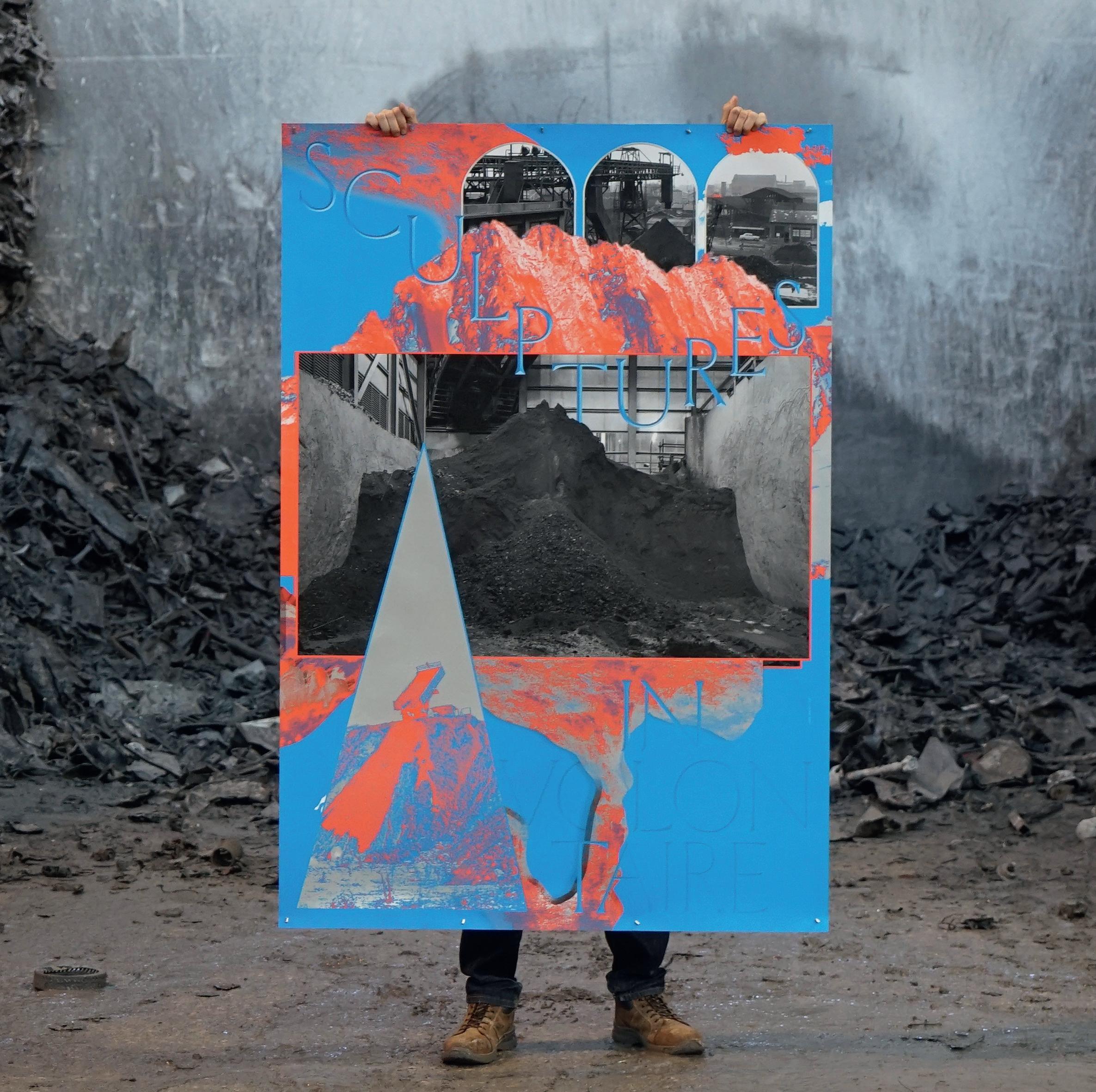
SUPER TERRAIN


(Cover)
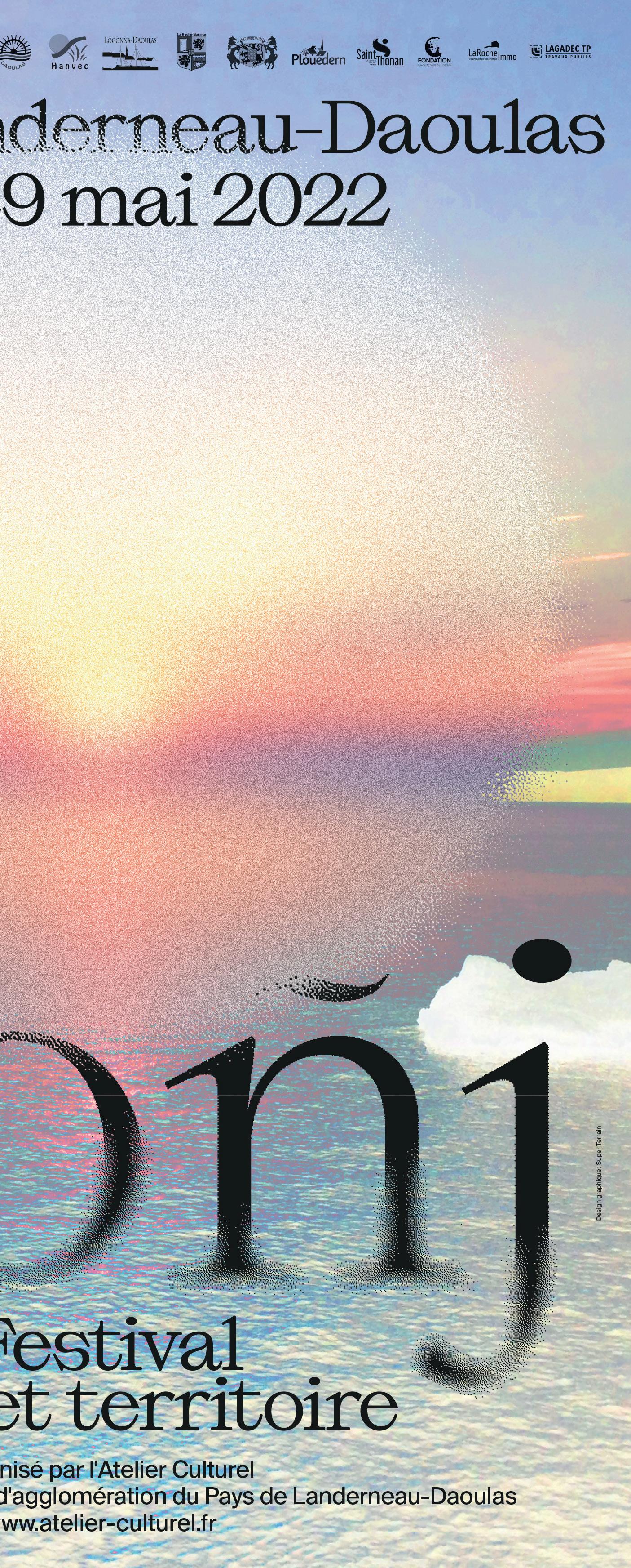
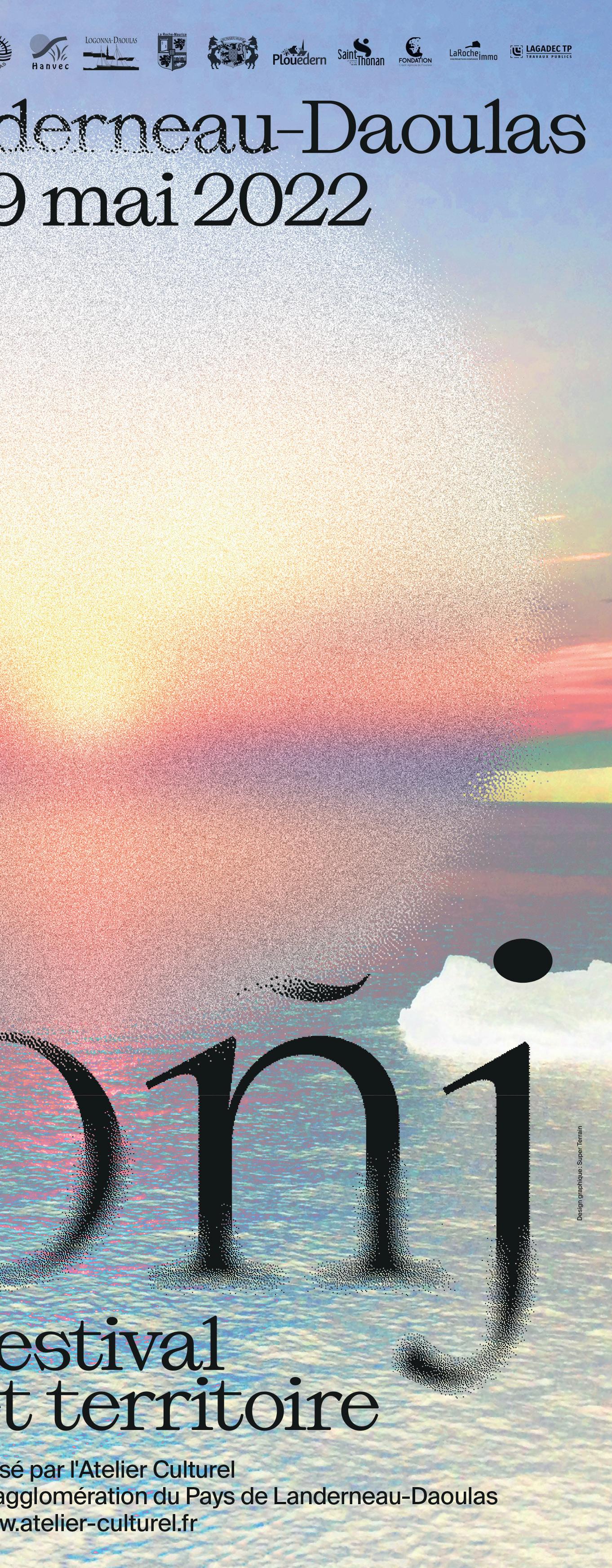
Lever de rideau, Festival Soñj, 2022
(Left page)
MMM — Musée du Monde en Mutation, 2021
(Back cover)
MMM — Musée du Monde en Mutation, 2021
Top left Lucas, Luc & Quentin Right MMM — Musée du
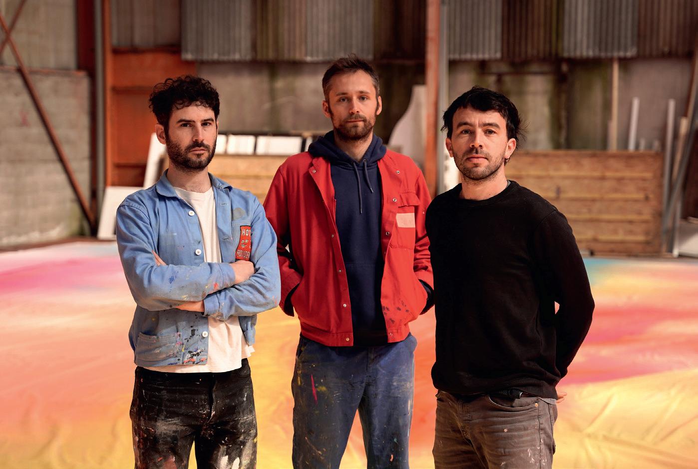
Getting the lay of the land with Luc de Fouquet. One third of this colourful design collective
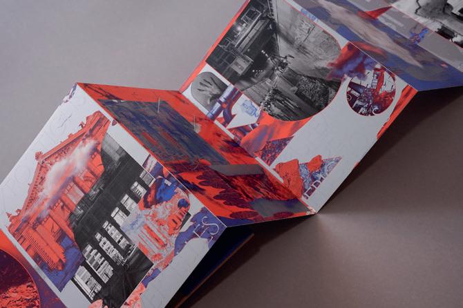
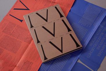
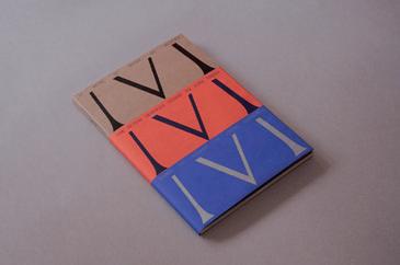 Monde en Mutation, 2021
Super Terrain is three guys, based in two cities, right?
That’s right, Luc (that’s me) and Lucas in Nantes, and Quentin has been based in Marseilles since 2017.
Do you work in those cities primarily?
We started in 2014 with only a few clients in Nantes; tiny organi sations in cultural fields like dance, performance, and theatre. Even one library, but mostly it was the TU theatre. But now it’s starting to change, we have more and more projects close to home. Where did the three of you meet and start working together?
Actually, we all studied at the Fine Art School in Rennes. We met in the basement there. That was where they had the silk screen atelier. This place, it was quite important, quite formative for our way of working.
It’s where we started to work as a team, designing and printing images together. And now, years later, we can see the influence of our time in the silk screen studio on our approach to designing posters. We have this common interest in layers. And I think this can be traced back to our screen printing practice.
Were you all studying graphic design?
Quentin and Lucas were studying graphic design. And I started in fine art. But there were times when we could just do our own thing, go into different areas and explore. So we spent a lot of time in the silkscreen atelier.
Eventually, I joined Quentin and Lucas on the graphic design programme when we took the Masters degree. The reason I changed was that, in the graphic design programme, there was a lot of stuff organised around working as a group. That made a lot of sense to us.
I wasn’t really into this idea of being the lonely artist in the atelier, just working on his own stuff. All alone. It was really nice to be part of a group and to create projects together.
In fact, the real starting point of our collaboration was this large project which involved a group of 10 different students. Each of us brought their own skills and we worked in a really incremental, iterative style. This interest in exploring materials and possibilities is clear in your work. I think this is something that’s really natural for us. We try to learn from the real world and then we take some of that to the computer. But then we like to come back to the real world, trying to go back and forth between digital and real. When you’re doing things by hand, accidents can happen. You can make discoveries like that, can’t you? Exactly. I think that accidents, all of those tiny artifacts that you introduce when working with real-world materials are really important. They are very hard, if not impossible, to reproduce on purpose.
They are marks of humanity, they show that humans have been directly involved. That’s something we value - the idea of handling forms, this naturally relates them to human things.
Actually, Quentin graduated two years before Lucas and me and started to work under his own name at the beginning. But, in a way, he was waiting for us to start Super Terrain.
Meanwhile we started to have commissioned work while we were still doing our Masters. So we were ‘half and half’, school and business. That was a really good way to start Super Terrain, because this time just after you graduate, it can be really like, “Whoa!” Very intimidating.
So, the fact that we already had some projects ongoing meant we knew it could be good for us to work together full time. So we just thought, you know, ‘let’s try it!’
Do you still do a lot of screen printing?
Well, since we finished school we don’t have access to a printing studio anymore, so we can’t print every day. But I think you can still see some of the same moves in our work. Our posters are clearly related to this technique.
And of course, we love to design posters that will actually be printed. We don’t really like when it’s just on the computer, just on the screen. And if we do print posters, we usually try to silk screen them.
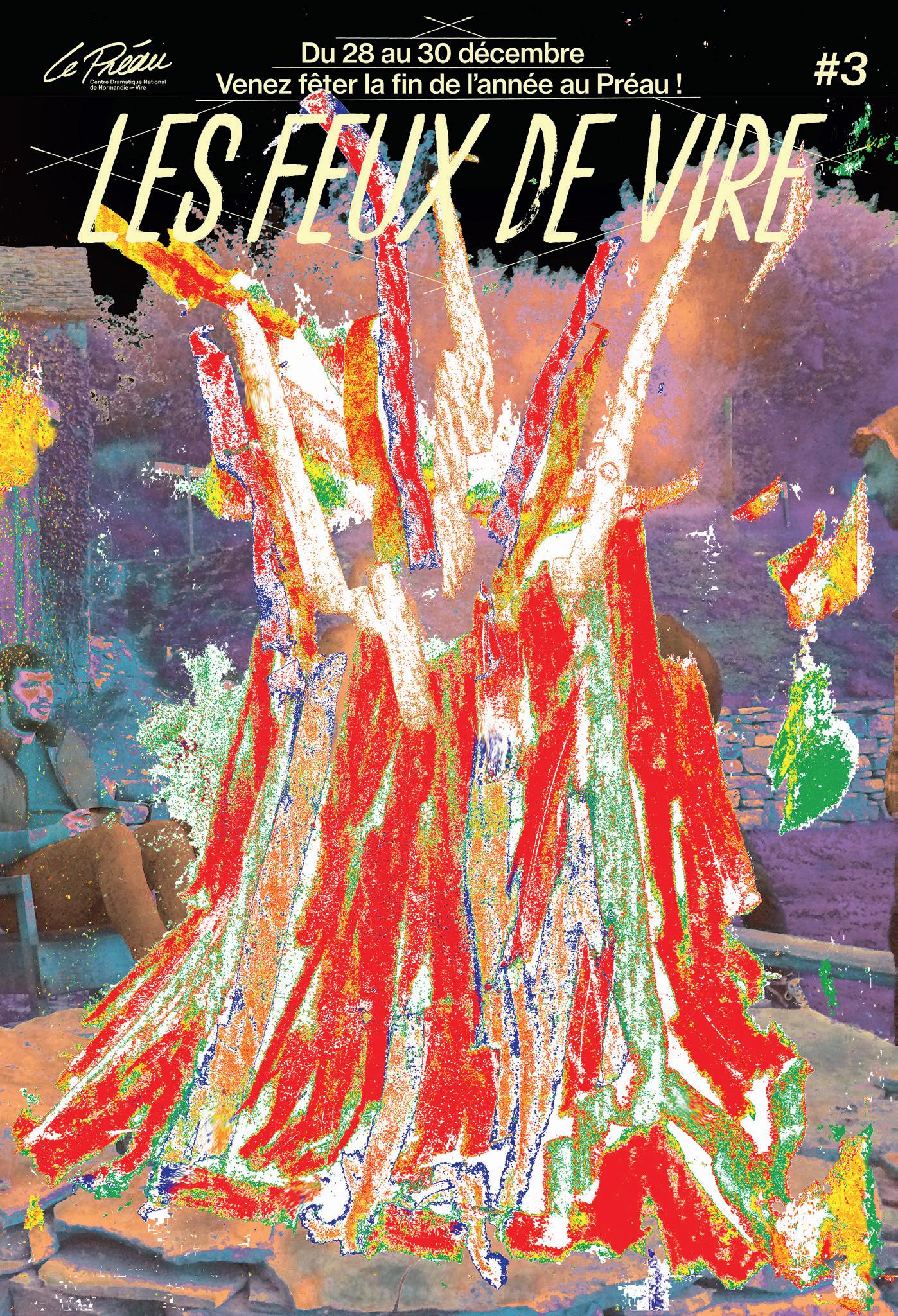

It produces way stronger colours. We have this appetite for colours, full, solid colours.
We have a great collaboration with Lézard graphique – one of the most famous silkscreen print ing ateliers in France. We also have the chance to continue and experiment with screen printing during residencies, like our exhibition project Noir Néon where we made a series of silkscreened paintings.
Colours and typography are two important elements of your work… Colours are quite a personal thing, but one of the main reasons why I do this all day long is that I like the idea of putting some colour into the world, into the city in particular.
We want to create something catchy and contrasting with the city environment. Something that engages with the people who live there. Colour is one of the best tools to achieve that.
Colours can send a strong message.
What about typography?
We like to do posters with minimal elements. Just colours, typography and maybe some kind of strong graphic gesture. That’s enough for us to do a good poster. We like to work with letters because sometimes, you know, type is better at conveying information than 100 pictures.
What kind of typography are you into?
Mostly contemporary typography and type designers. We don’t design our own typography
because there are so many guys out there that do this way better than us, it’s amazing.
It’s happening everywhere too. When we were at school, type design looked to me like a really long term job. You know, when you were developing a character it was rough.
But I think the tools have changed and now, it’s not exactly easy, but it can be done much faster. That means there’s a ton of nice fonts popping up every where. It’s really international too.
Where do you look for interesting type?
We look out for the latest from French foundries and more widely in Europe, for instance you can find something really exciting further afield, like Philip Hermann (Ouf of the dark) from Germany or Goodtype in Oslo. You have to stay aware about what is going on in this world, that’s why we try to use type designed by living designers.
Do you think there’s a French style to your posters? Do you work consciously with this?
Maybe I don’t have enough distance to answer that! But actually, there is a tradition or a common culture around posters in France.
And I think there’s been some interaction with our neighbours in Switzerland too, where there’s a huge design tradition and with The Netherlands.
But in France, graphic design is still kind of new. Back in the
day, before graphic design, it was the painters who did some graphic design. So, in France, we have two sides to our design heritage. Contemporary graphic designers are looking to and influenced by the Swiss or the Dutch. But also we can get some inspiration from Grapus for instance, or some other old school painters
What were a couple of the first jobs that convinced you that, okay, Super Terrain is going to take off?
I think the first one was the TU Nantes. That was the first theatre that really trusted us, and we still work together now. That was a cool collaboration. In fact, I think that trust and long term projects are the key, you know?
You can do so much more when you collaborate for three or four years. You can bring your partner to another level because you have this understanding. They know how you work and you see clearly what they need. So this trust is the first thing you need to work on with a client.
Did TU Nantes ask for a full make-over or was it just a one-off, initially?
Both. They came to see us for one poster for an event. And during the meeting the Theatre director said, “OK, let’s do the whole thing. It’s now or never.”
They were kind of in trouble at the time. They didn’t know if the theatre project would continue for a long while. So she just told us, “let’s do something different.”
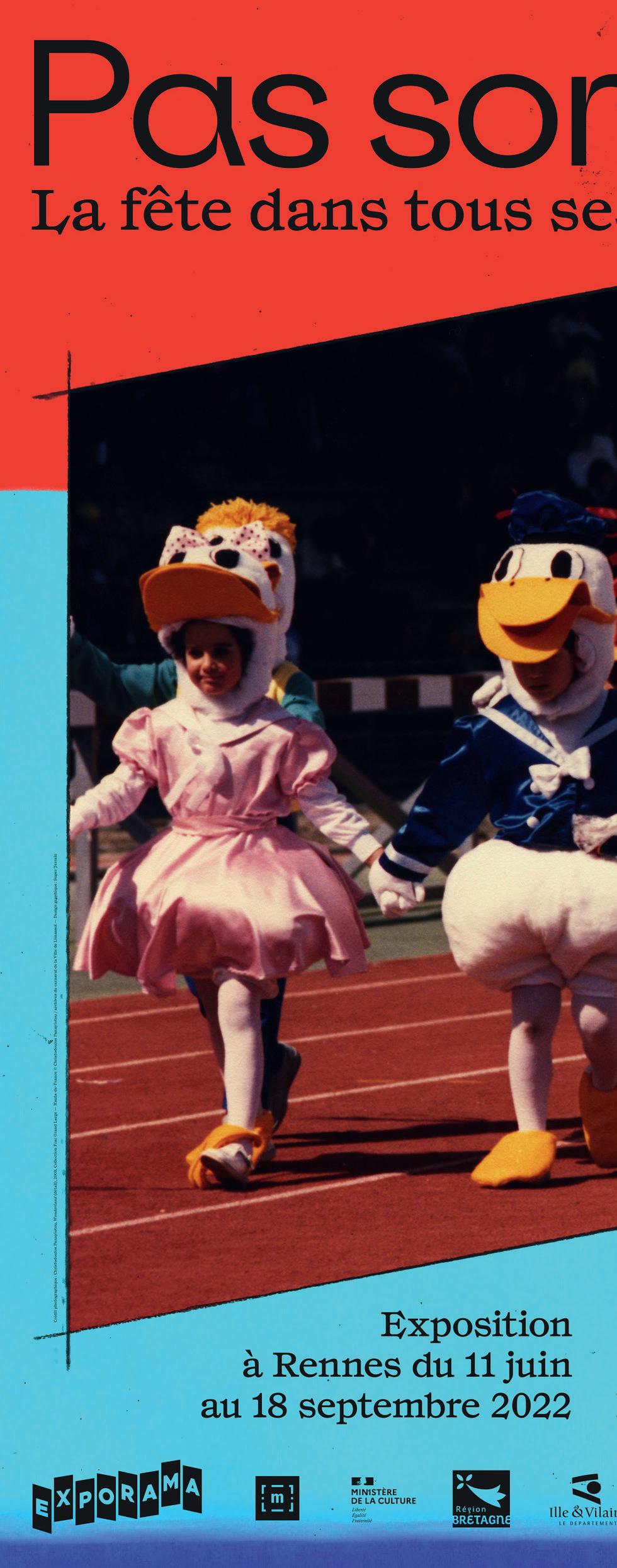
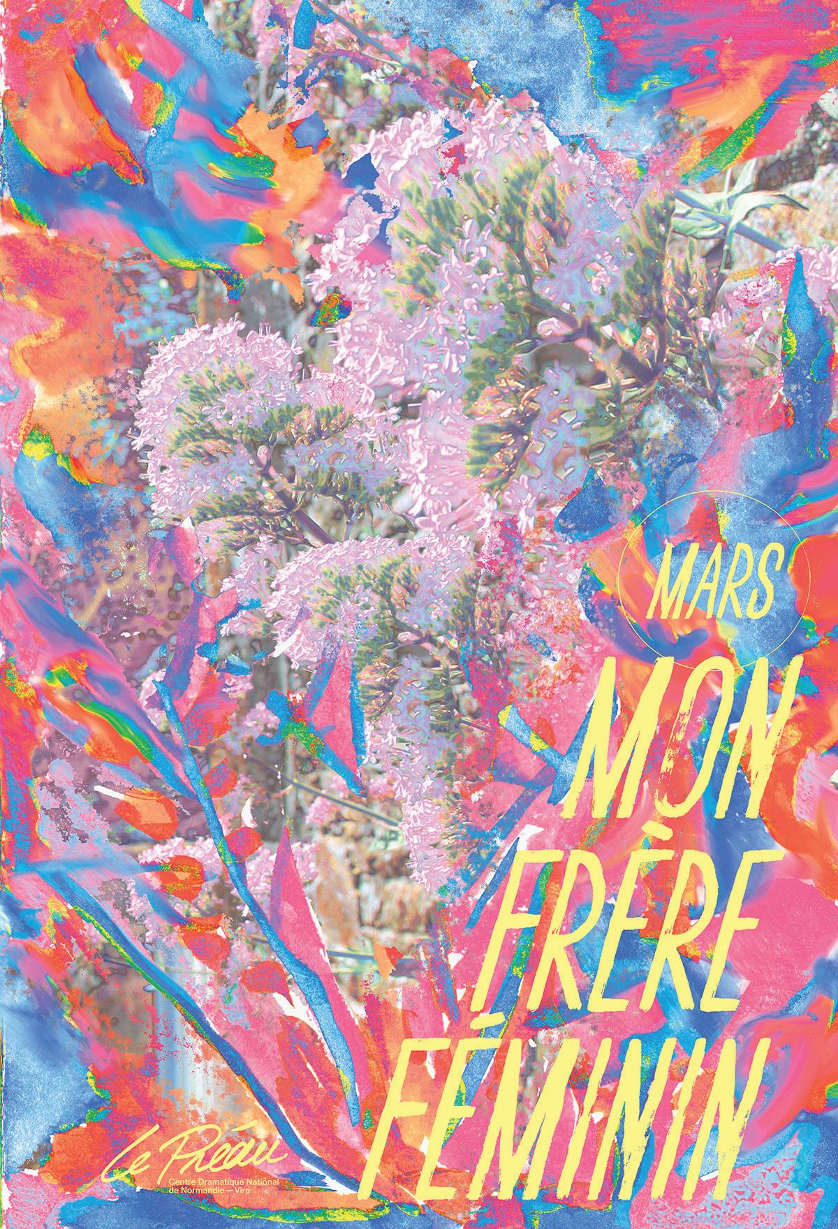

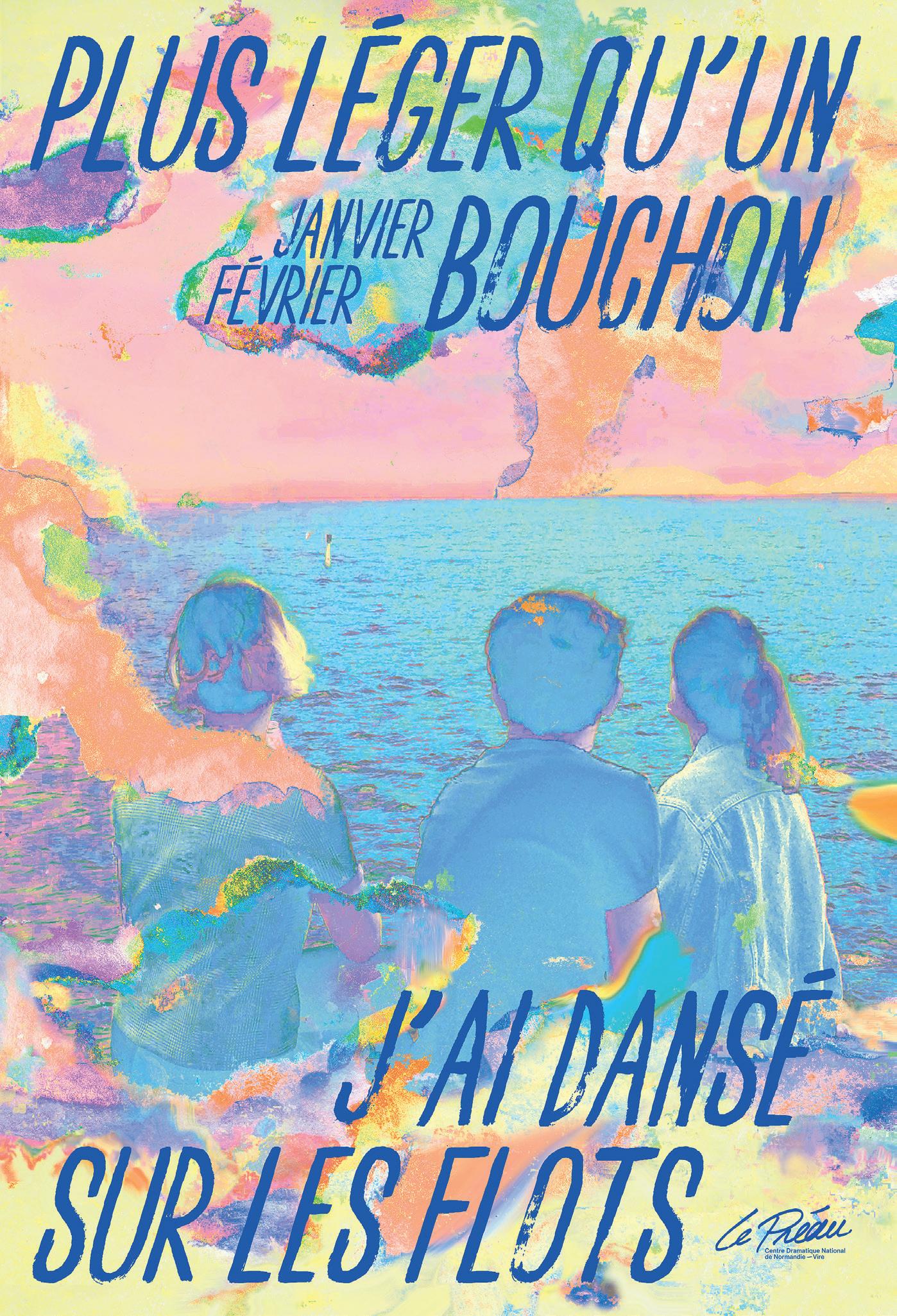
(Previous spread)
Left
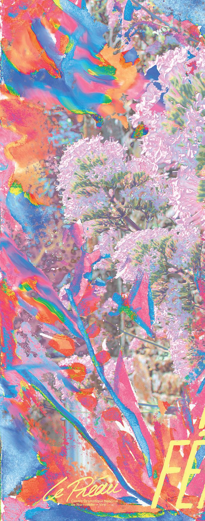
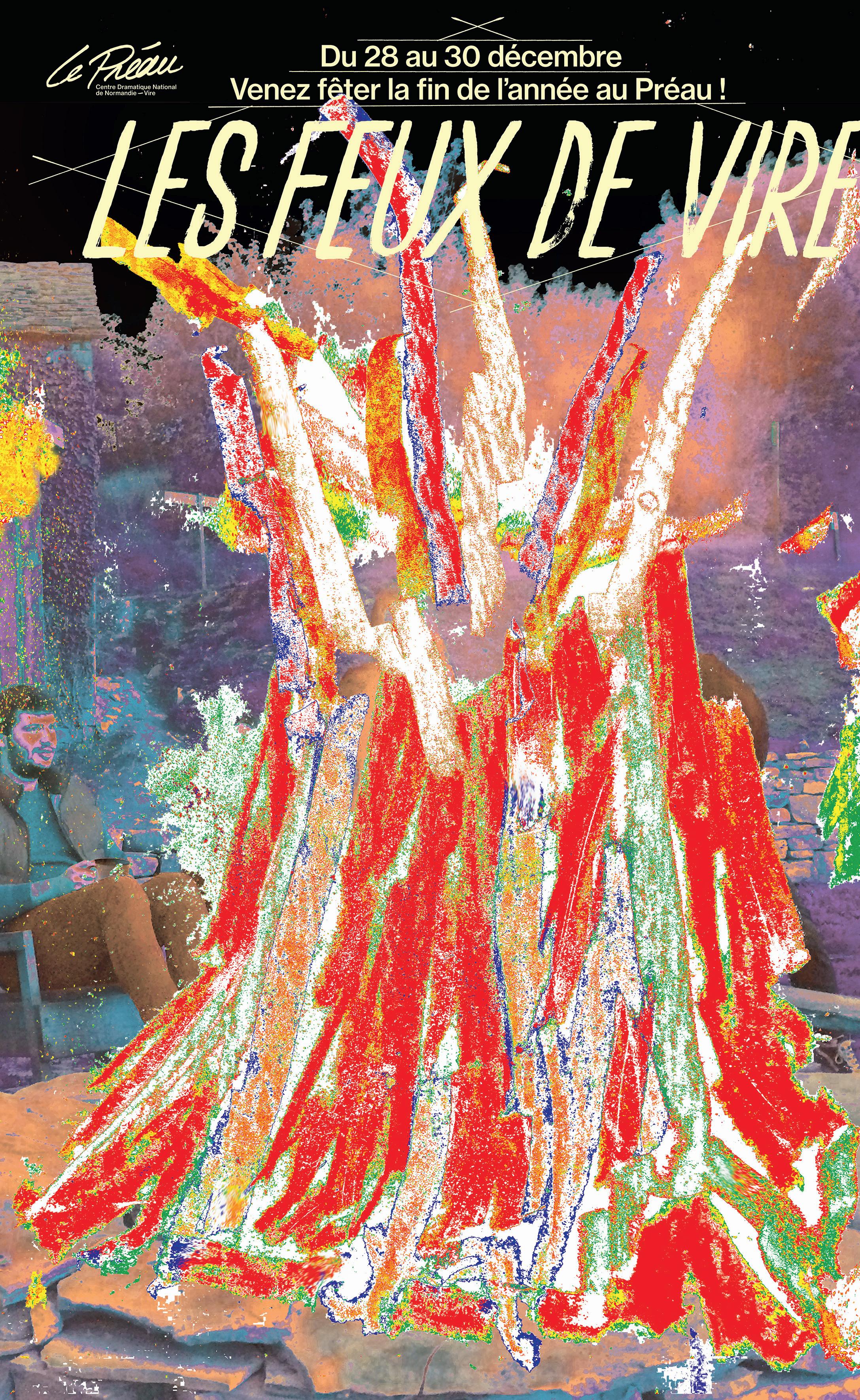
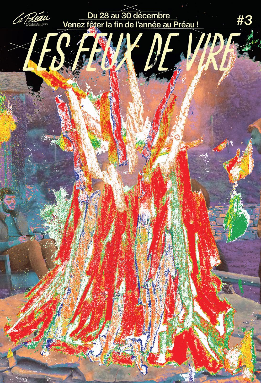
Le Préau, 2020-21
Center
Le Préau, Saison 2021-22
Right
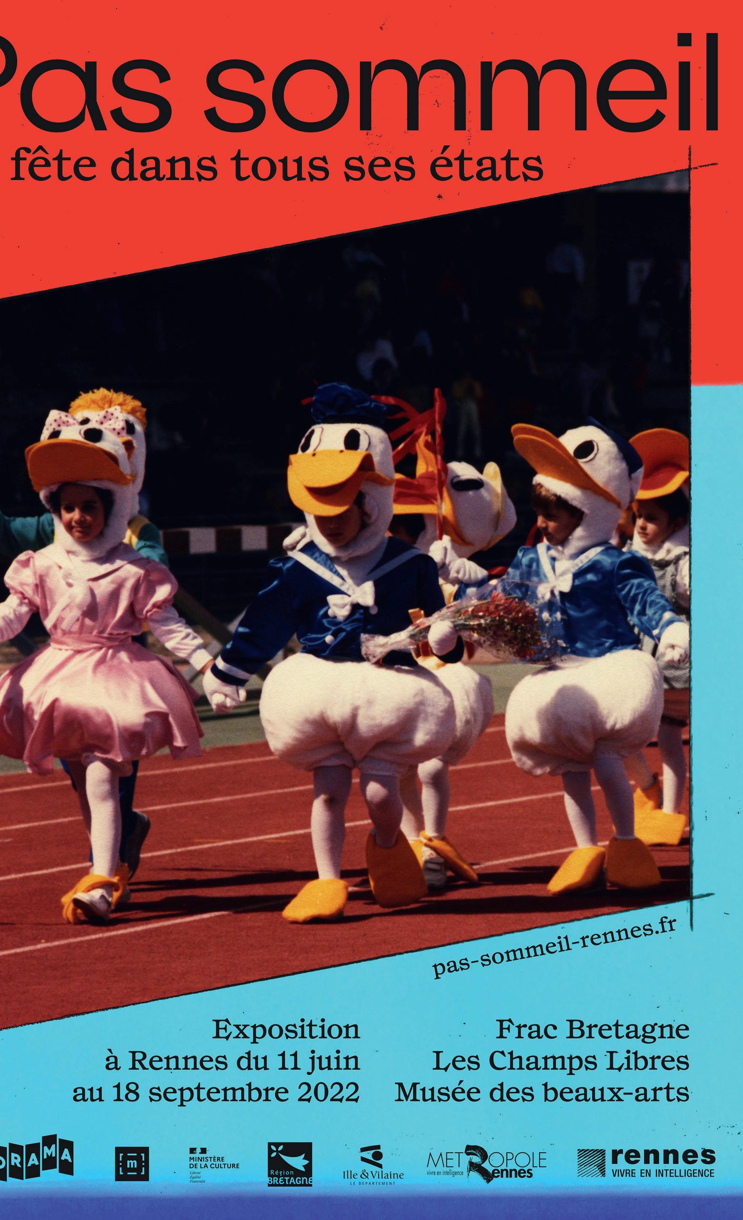
Pas sommeil, Exporama, 2022
(This page)
Lever de rideau, Festival Soñj, 2022
That first season was really, really nice. It was a huge, huge step for us. It was very important for our method too, because the Theatre director asked us to do some posters without photo graphy. So, avoiding the usual pictures of famous people from the production.
We proposed a series of posters which used dynamic, expressive graphic gestures to represent the idea of movement and life. No bodies, no photo graphy. She liked this approach and it was well received by the public too.
That’s magic, when you have a cool idea that hits the mark. Have you branched out from posters?
From the beginning we didn’t love this idea of being an expert of just one field, we didn’t want to be ‘the poster guys’. We want to try a lot of things.
So we have done some books, we print and do workshops. But perhaps, that was not a good strategy to start out with. In France, people really like you to have a clear label. So, we were the graphic designers who do colour posters. It’s very difficult to break out of that, but we really wanted to take on a variety of work.
In a way, I think that made it hard for people - for clients - to see what we were really into.
Is the love of labels changing in France?
I don’t think so! But now we know how it works so it’s not so bad.
At the beginning, we did a lot
of participatory projects, workshops and ateliers. Stuff like that. But then we decided we wanted to be the guys who do graphic design for cultural institutions. And still, we get people saying “Oh, you do art you are the workshop guys!” All you can do is try to explain...
So what are some of the formats you’ve really enjoyed working with?
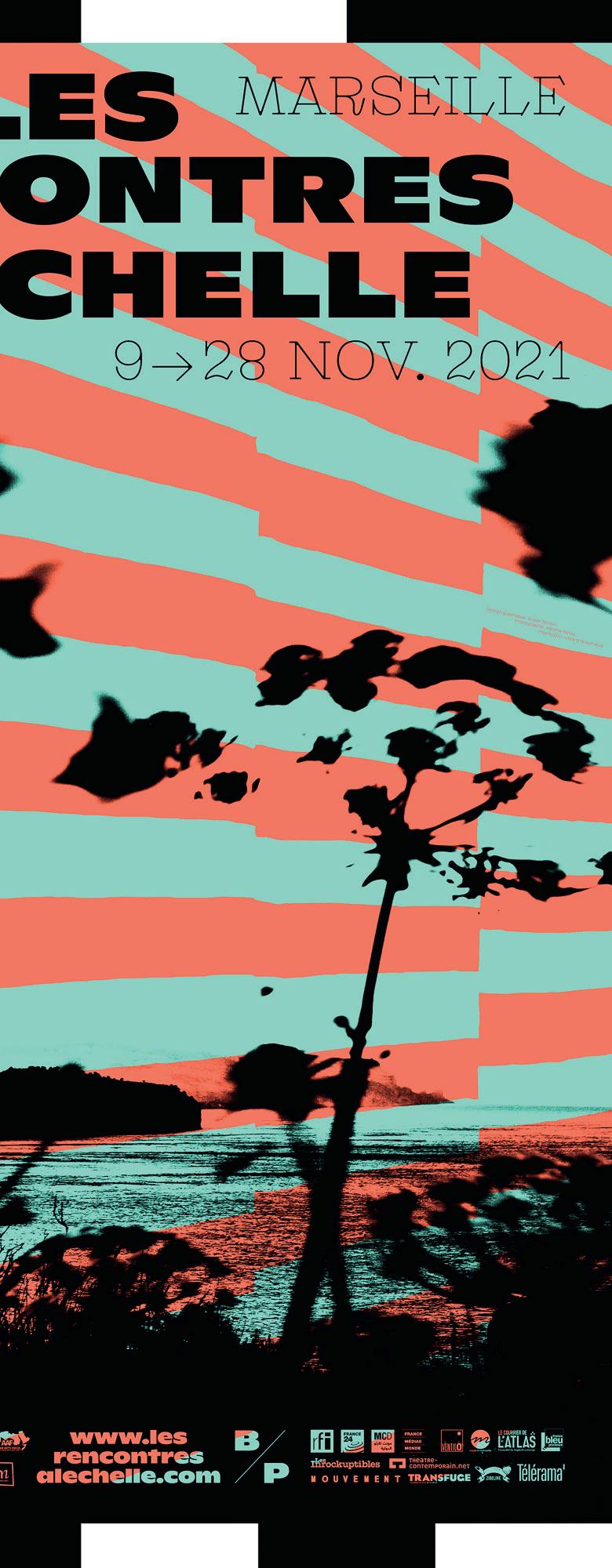
First of all, we love the posters, because they are a synthesis of what graphic design is, for us. We really want to do more books though. And right now we are mixing graphic design with art, doing more large scale paintings. We just enjoy trying different materials. Maybe one day we could even try fashion design, that would be fun. Or maybe to do some music videos.
You’ve done some motion graphics already, have you not?
Yeah, we’ve already done some of that. We have some basic tools, we can do some of the work ourselves. But we also enjoy working with people who are really into motion graphics.
It’s much easier to do the artistic direction if you know how things work. In general though, we try to keep up to date with new tools and just be open and aware of what’s going on.
So you’re learning all the time?
Yeah. All the time. You need to if you want to remain current. You can’t just reproduce what you already know, you will be bored.


You have to improve yourself, to learn by doing. How do the three of you work together, since you’re split across more than one location?
We see each other in real life regularly. Quentin comes back to Nantes really often, but we do Skype a lot too. This is fine though, because for the first three years of Super Terrain, we were together all the time. So we have this common ground, everything is in place, we know how everyone works.
We still have different points of view, of course, but this has become a part of our practice. Every Monday we have this huge meeting where we talk through all the projects that we have under way and maybe review the ones we’ve finished.
And we try to take the big decisions together on every project. So, once everyone is happy with the artistic direction, we all agree: Okay, let’s do that. Then one of us will take the lead and develop the project. Then the smaller decisions on the project are handled by the lead designer?
When one of us has started to put together some of the graphics, with quick sketches for example, the rest of us will react to them. “Okay, I think this is the direction” or “I think we could try something with more freedom”. We always talk a lot about what we’re trying to do. That’s an
important part of the process. If we disagree in the end, the guy who leads the relationship with our client gets the final word. That feedback must be really useful when working on big projects?
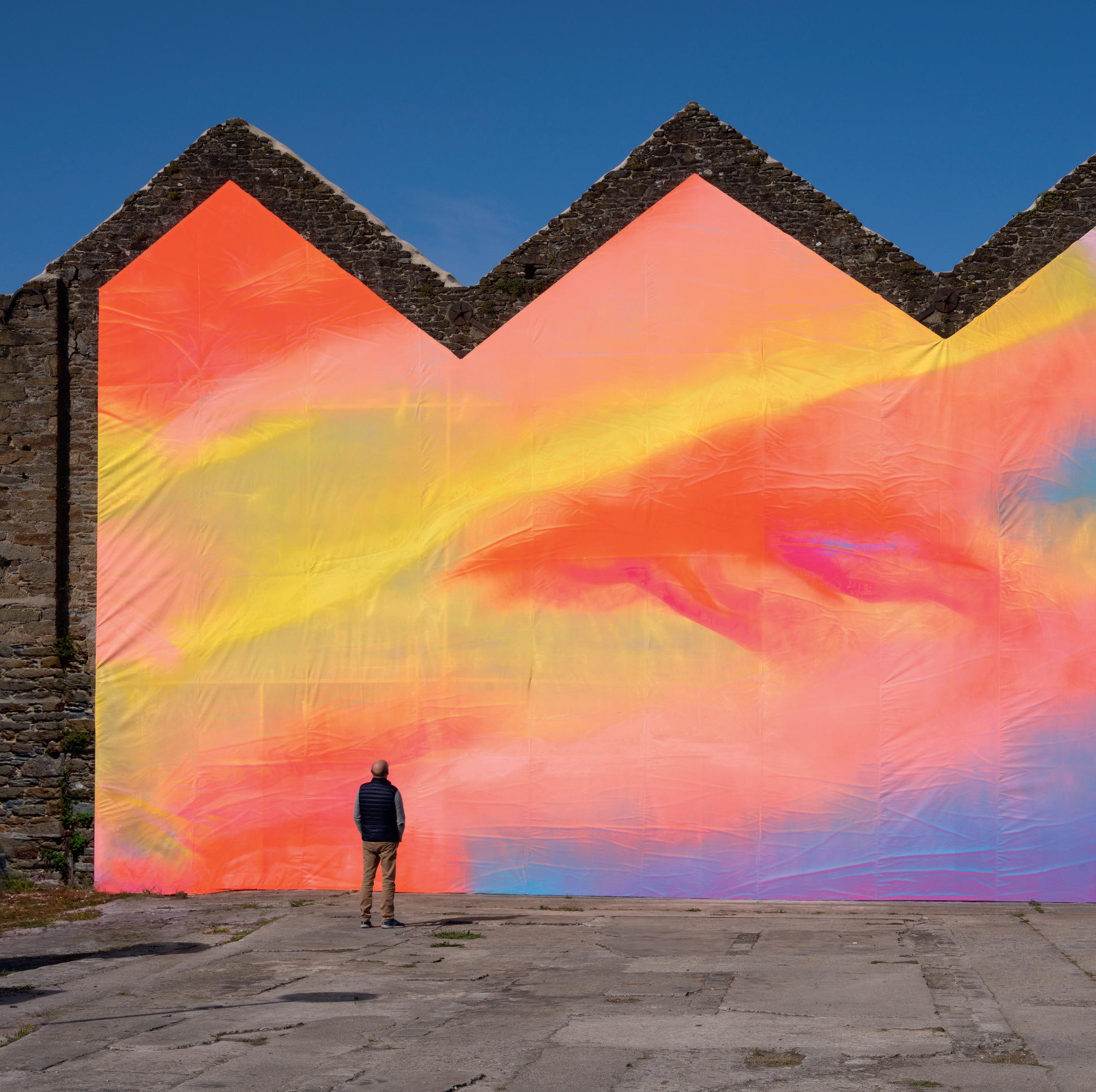
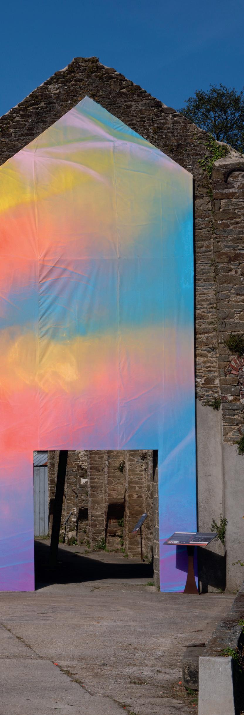
We did a huge project for Festival Soñj, in Landerneau-Daoulas earlier this year. This is a great mix of our work as graphic designers but also as artists. It was great fun to try something on a huge scale too.
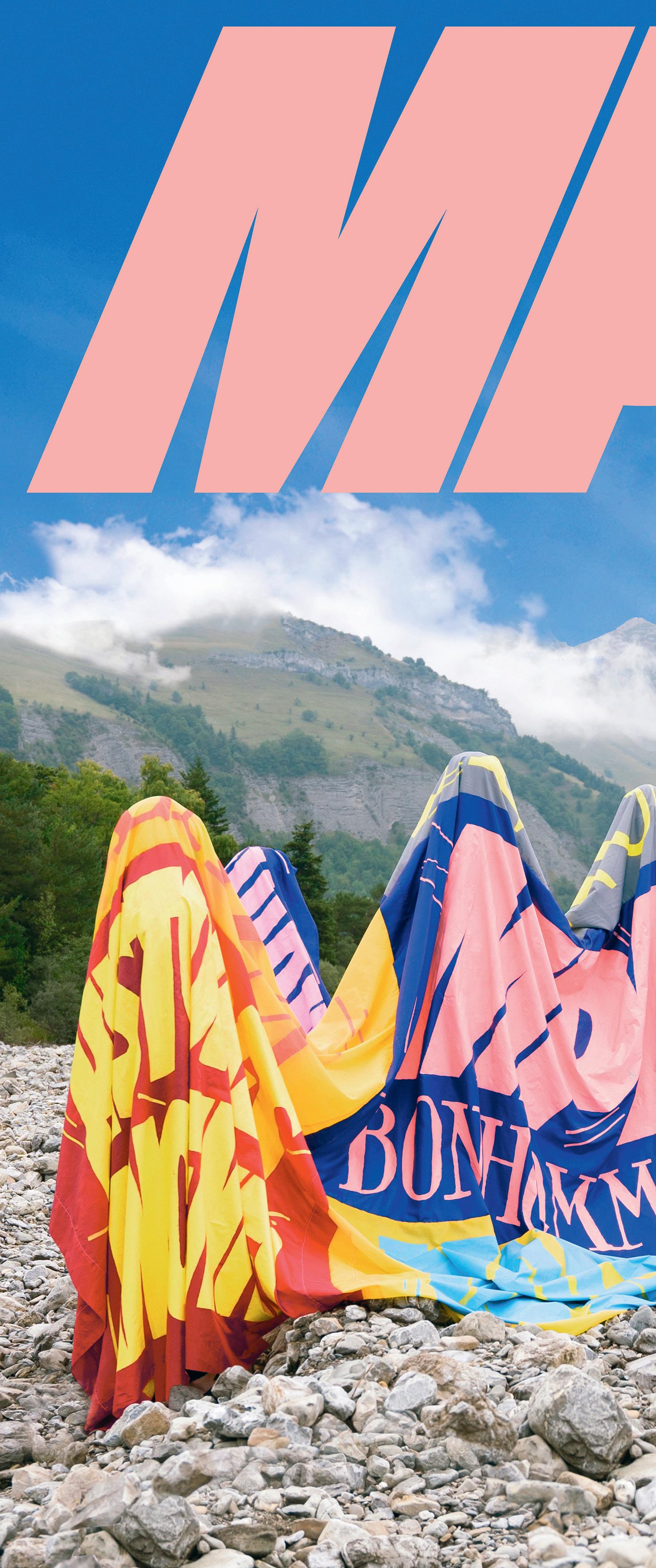
The mural looks amazing, what was the original brief?
Soñj asked us to do the graphic design and art direction for the Biennial. But they also proposed this installation at one of the main venues for the event.
It was incredible, they gave us carte-blanche, to produce something relevant to the place. So we decided to do this vast mural with spray paint.
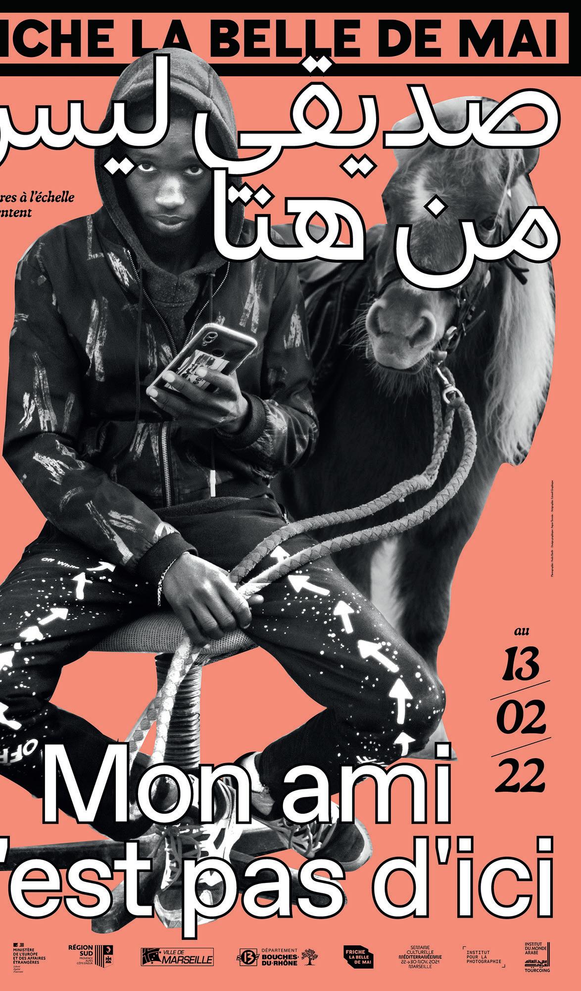
The challenge was to find a way to connect the installation with the graphic design we had already done for the event. But we didn’t want to just repeat the posters we had done but bigger, on the side of a building.
In the end, we found a solu tion by producing an image for the building which echoed the ones we used in the posters but was completely original. And because we painted it using air brushes, you have some drips or tiny accidents. So there’s a kind of affiliation between the two projects.
We loved this project, you can see the videos on our Instagram page. It was a lot of fun, so I think we want to do some more stuff like that, at this huge scale.
It was a little bit intimidating. But Quentin is a big fan of Ultra Style, the football club supporters organization. Those guys have developed some crazy techniques for doing huge panels at the football stadium. Some of them are like 300 meters wide, with beautiful paintings.
So we learned from them. And when we started the work, it wasn’t on the building, but on fabric, laid out on the floor. All three of us working at the same time. That was a really cool experience, because you can share this very creative moment where everything comes together.
I think it would be very tough to do something like this alone, one of these large scale projects. You know, sometimes I might have some doubts but Lucas or Quentin just told me, “Hey don’t worry, it will be perfect!” And they were right.
Plus, because it’s an abstrac tion, so you don’t have to be really exactly. You can improvise in the moment. Once you have the first layers, you can see how it’s evolving and make changes as you go.
How did you go about creating an image that would work with the environment?
(Previous spread)
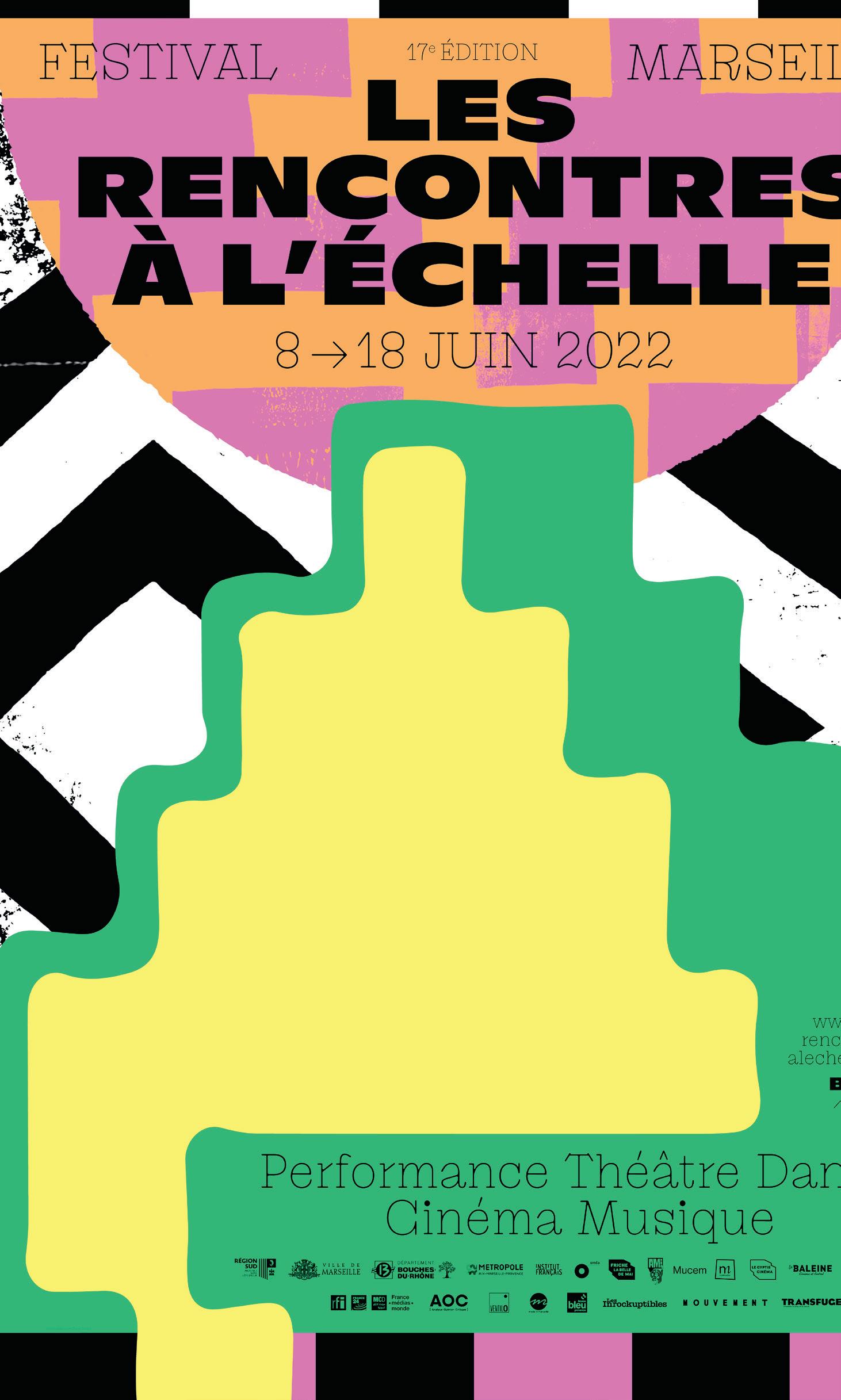
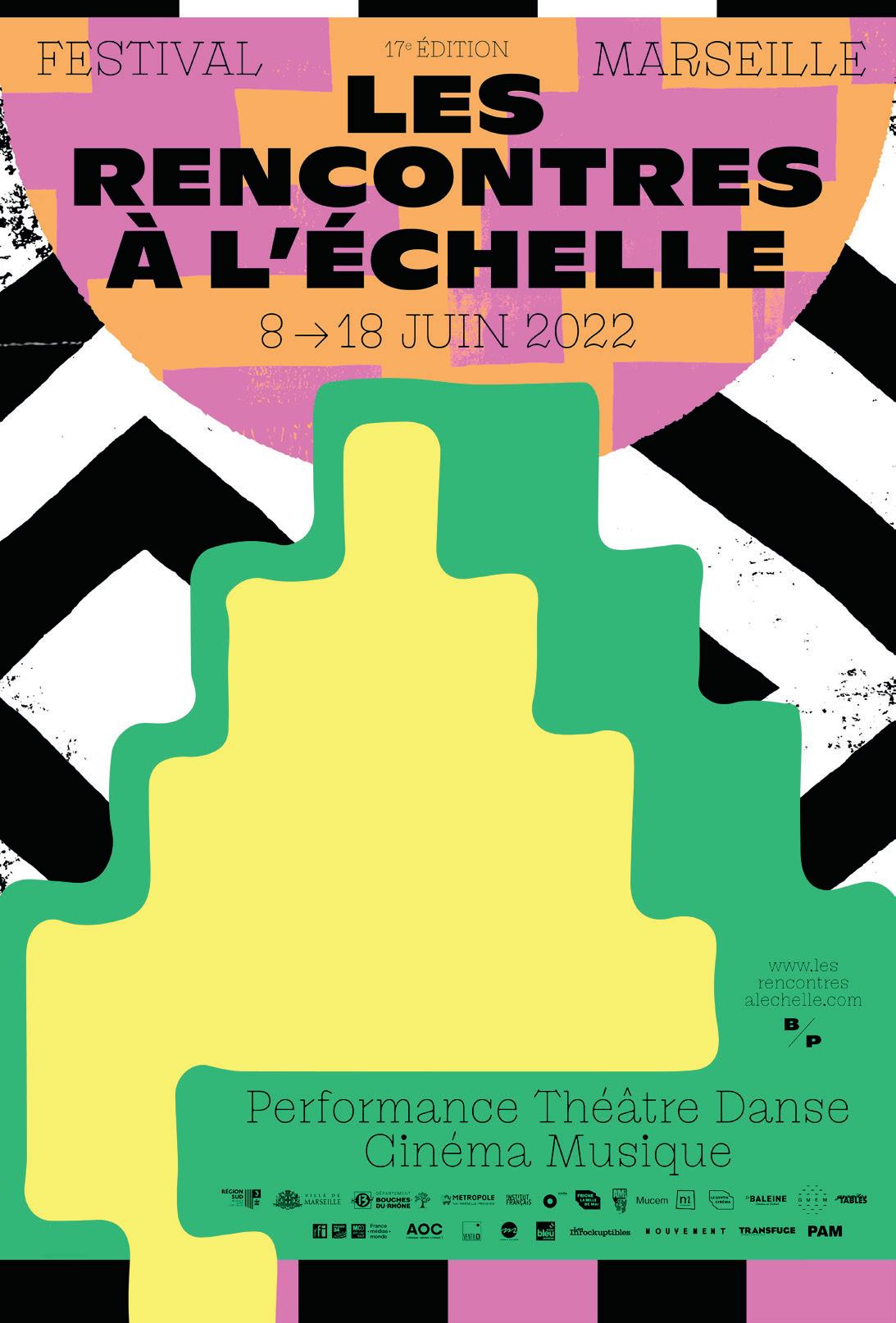
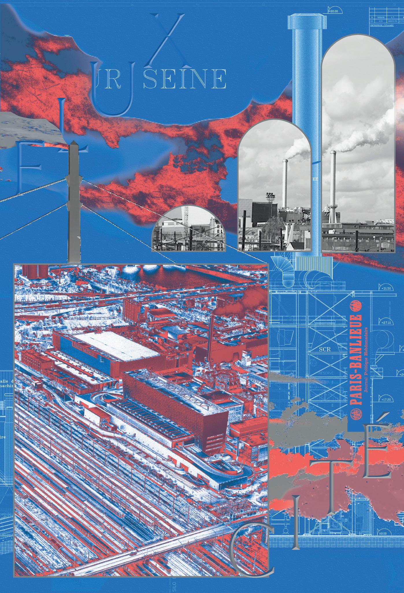
Left MMM — Musée du Monde en Mutation, 2021 Center Festival Les rencontres à l’échelle, 2022
Right
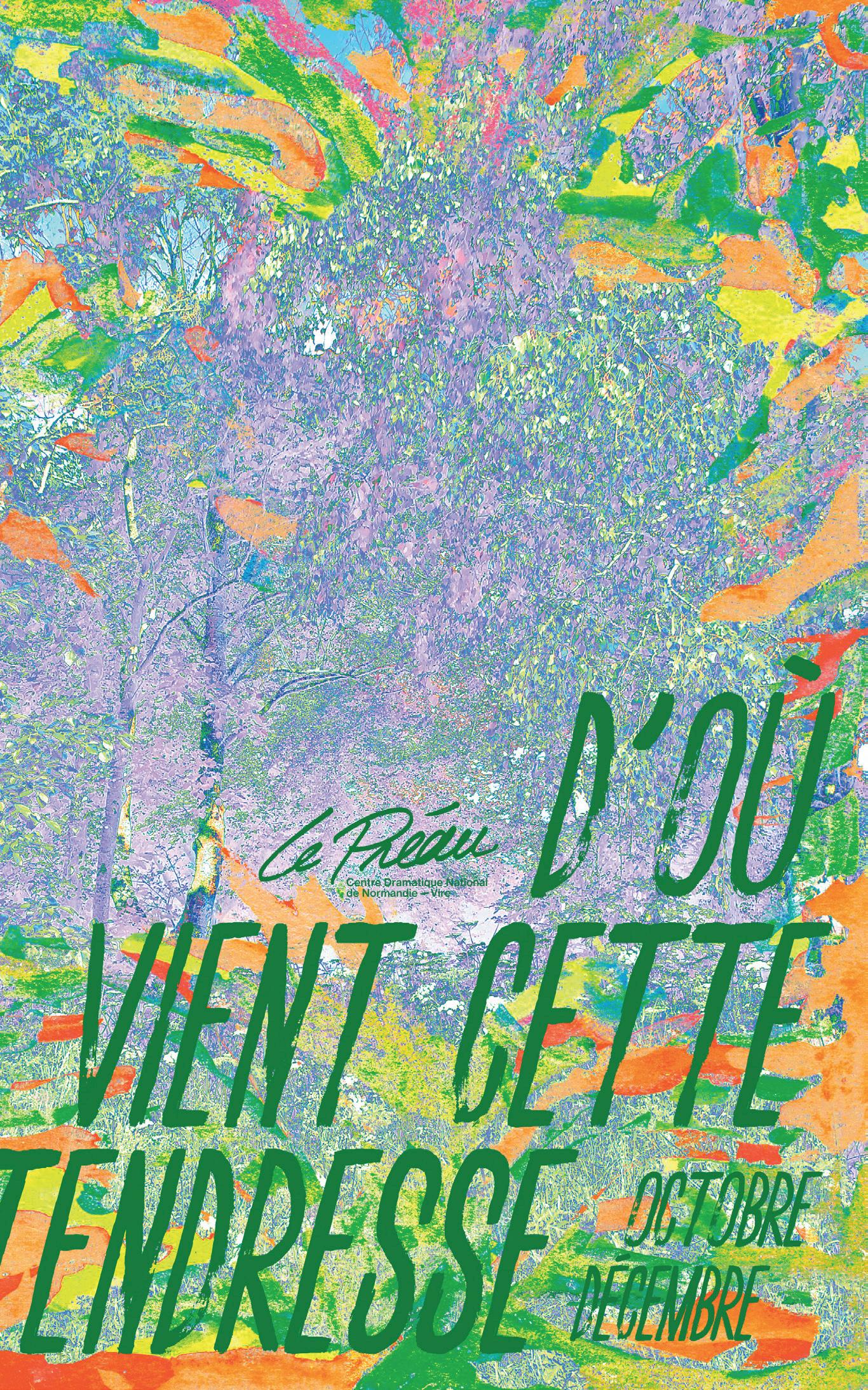
Le Préau, Saison 2021-22
(This page)
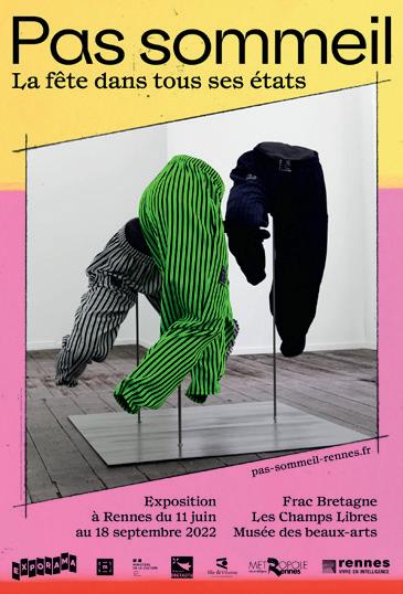
Top left Pas Sommeil, Exporama, 2022
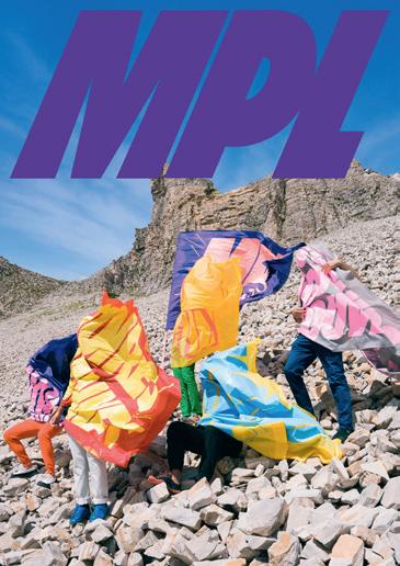
Center left
MPL, poster de tournée, L’amiral Productions, 2022
Right
Le Préau, Saison 2021-22

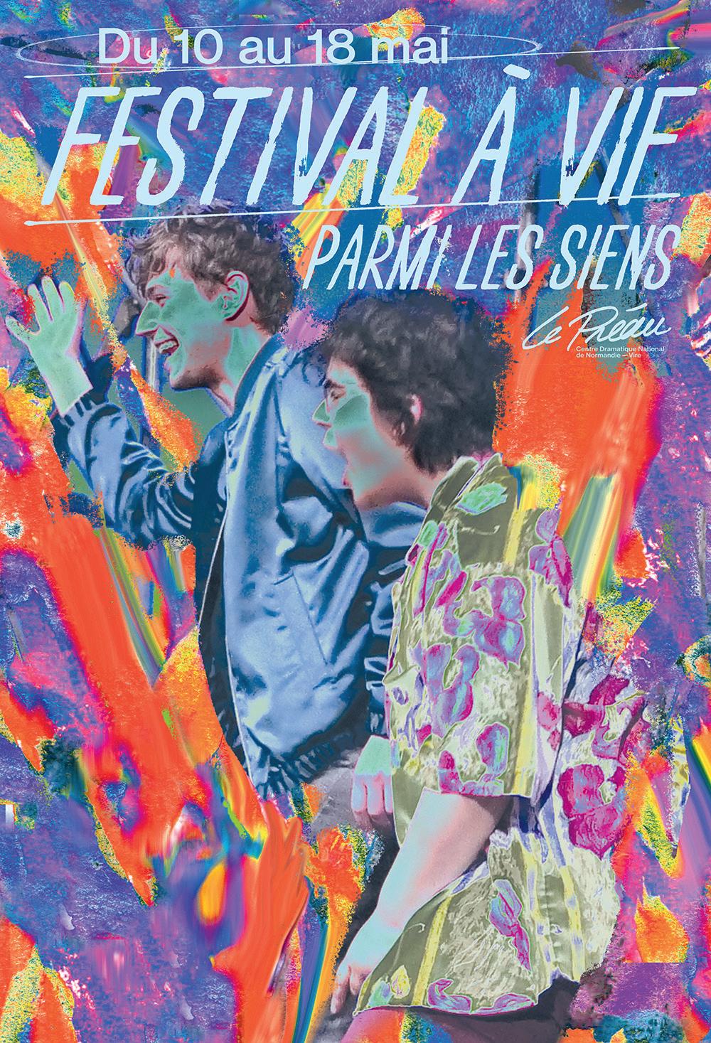

I think that’s a huge part of graphic design. You can do the most magnificent designs, but if they aren’t well suited to the context the end result will be just ‘okay.’
So you have to be careful about the environments your work will appear in, the place and time. For, instance, we love books, but sometimes you don’t know how it will finally reach its audience. Will it be just in the library? On the web? Or handed out at an event? Everything is meaningful.
So for this project, the idea was to create a piece which was ‘about’ the landscape. The building where the mural appeared is an old brick making plant in the centre of town. Nobody spends their time just chilling out there, people just pass by because there’s nothing to do, nothing to look at.
But this place is a really important part of city’s history, because Landerneau was built with these bricks, and before that, linen was another material that helped make the city what it is today. But no one is seeing any of this history, they just pass it by.
So the idea was to create this strong gesture, one that would catch people’s eyes. Draw their attention to this old brick factory. Working for cultural clients allows you to have that depth of focus, do you enjoy that?
I think we have tried to work in this area because we are into the depth of it, we wanted to be part of that.
But in France, I think things are changing a little bit in the business world too. The big businesses are watching what can be done with design. They’re starting to realize that you can use cool posters, cool design, to sell shoes, for example. So, you never know...
The commercial world would benefit from the deeper look that you take.
We like to have the full experi ence, you know? Super Terrain is about being graphic designers, but also keeping the space free for us to live strong experiences, human experiences.
Do you do produce art outside of your design practice?
Yeah, but we try to do it all as one thing. Sometimes we do self initiated projects but we try to re-engage these with our work at Super Terrain.
We have already done some exhibitions, gallery shows and so on. But we don’t want to separate what we do as a design studio from what we do as a group of artists. We don’t see them as separate things.
It’s just like the old school French situation where you had the sign painters who did graphic design just because it was a part of the job. Hopefully we can get back to something similar!
(Previous spread)
Left Le Préau, Saison 2021-22
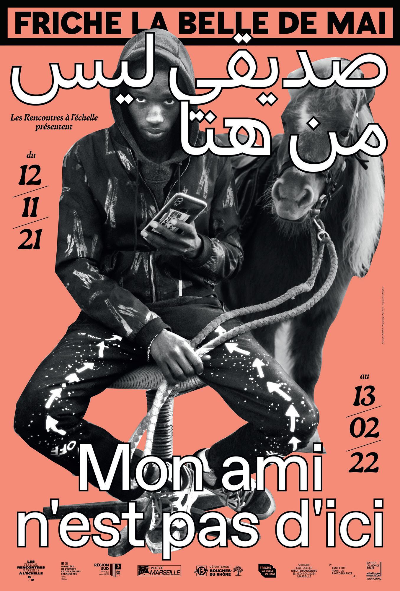
Center MPL, poster de tournée, L’amiral Productions, 2022
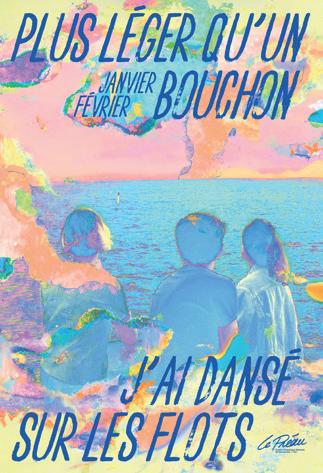
Right Mon Ami n’est pas d’ici, Friche Belle de Mai, 2021
(This page)
Top left Le Préau, Saison 2021-22
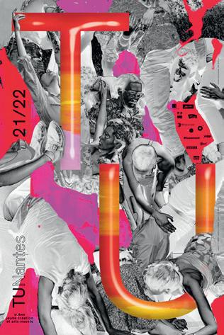
Center left TU-Nantes, 2021
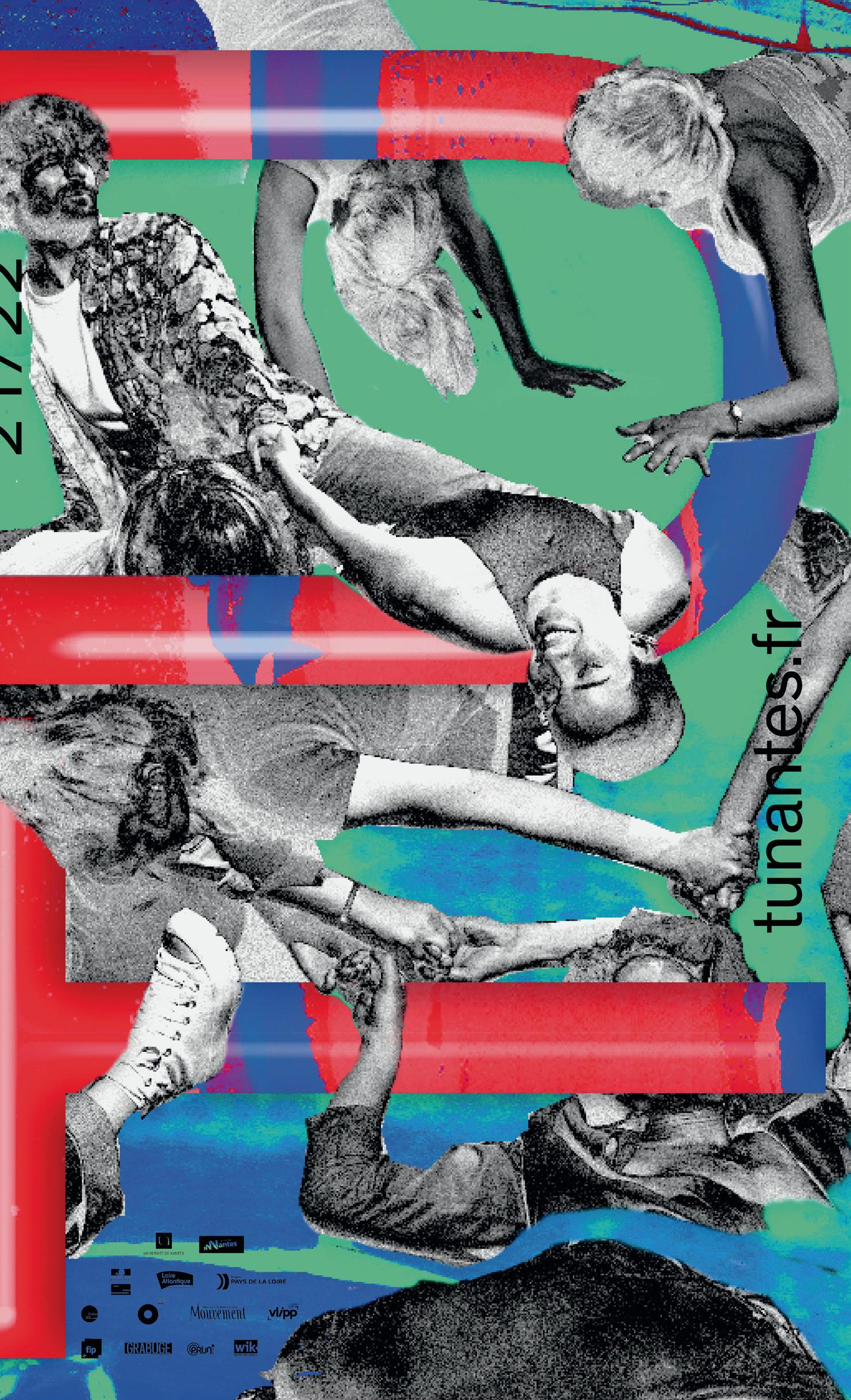
Right TU-Nantes, 2021
01 CHRISTOPH NIEMANN Illustration Design 2009 02 MICHEL MALLARD Creative Direction 2009 03 FUN FACTORY Product Design 2009 04 ANDREAS UEBELE Signage Design 2010 05 HARRI PECCINOTTI Photography 2010 06 KUSTAA SAKSI Illustration Design 2010 07 5.5 DESIGNERS Product Design 2011 08 NIKLAUS TROXLER Graphic Design 2011 09 JOACHIM SAUTER Media Design 2011 10 MICHAEL JOHNSON Graphic Design 2011 11 ELVIS POMPILIO Fashion Design 2011 12 STEFAN DIEZ Industrial Design 2012 13 CHRISTIAN SCHNEIDER Sound Design 2012 14 MARIO LOMBARDO Editorial Design 2012 15 SAM HECHT Industrial Design 2012 16 SONJA STUMMERER & MARTIN HABLESREITER Food Design 2012 17 LERNERT & SANDER Art & Design 2013 18 MURAT GÜNAK Automotive Design 2013 19 NICOLAS BOURQUIN Editorial Design 2013 20 SISSEL TOLAAS Scent Design 2013 21 CHRISTOPHE PILLET Product Design 2013 22 MIRKO BORSCHE Editorial Design 2014 23 PAUL PRIESTMAN Transportation Design 2014 24 BRUCE DUCKWORTH Packaging Design 2014 25 ERIK SPIEKERMANN Graphic Design 2014 26 KLAUS-PETER SIEMSSEN Light Design 2014 27 EDUARDO AIRES Corporate Design 2015 28 PHILIPPE APELOIG Graphic Design 2015 29 ALEXANDRA MURRAY-LESLIE High Techne Fashion Design 2015
PLEIX Video & Installation Design 2016
31 LA FILLE D’O Fashion Design 2016 32 RUEDI BAUR Graphic Design 2016 33 ROMAIN URHAUSEN Product Design 2016 34 MR BINGO Illustration Design 2016 35 KIKI VAN EIJK Product Design 2016 36 JEAN-PAUL LESPAGNARD Fashion Design 2017 37 PE’L SCHLECHTER Graphic Design 2017 38 TIM JOHN & MARTIN SCHMITZ Scenography Design 2017 39 BROSMIND Illustration Design 2017 40 ARMANDO MILANI Graphic Design 2017 41 LAURA STRAßER Product Design 2017 42 PHOENIX DESIGN Industrial Design 2018 43 UWE R. BRÜCKNER Scenography Design 2018 44 BROUSSE & RUDDIGKEIT Design Code 2018 45 ISABELLE CHAPUIS Photography Design 2018 46 PATRICIA URQUIOLA Product Design 2018
SARAH-GRACE MANKARIOUS Art Direction 2018
STUDIO FEIXEN Visual Concepts 2019
FRANK RAUSCH Interface Design 2019
DENNIS LÜCK Designing Creativity 2019
IAN ANDERSON Graphic Design 2019
FOLCH STUDIO Strategic Narrative Design 2019
MARC TAMSCHICK Spatial Media Design 2020
TYPEJOCKEYS Type Design 2020
MOTH Animation Design 2021
JONAS LINDSTRÖM Photography 2021
VERONICA FUERTE Graphic Design 2021 58 CHRISTOPHE DE LA FONTAINE Product Design 2021
59 DAVID KAMP Sound Design 2021 60 THOMAS KURPPA Brand Design 2021 61 NEW TENDENCY Product Design 2022 62 MARTHA VON MAYDELL Illustration Design 2022 63 STUDIO KLARENBEEK & DROS Design Research 2022 64 JOUPIN GHAMSARI Photography Design 2022 65 LOTTERMANN AND FUENTES Photography Design 2022
