JOAN AND PETER CLEMENGER, MELBOURNE
Joan and Peter Clemenger’s passion for art and generous philanthropy to the arts over many decades is all the more remarkable given that neither came from families with an interest in visiting galleries and collecting. This is something they developed together as a couple, and it has been one of the hallmarks of their extraordinary lifelong partnership. However, rather than focus exclusively on developing their own collection, the Clemengers made the visionary – and at the time, ground-breaking – decision to share their love of art and the enrichment it gave them, through philanthropy, and particularly through their support of the National Gallery of Victoria, a relationship that now extends over 40 years.
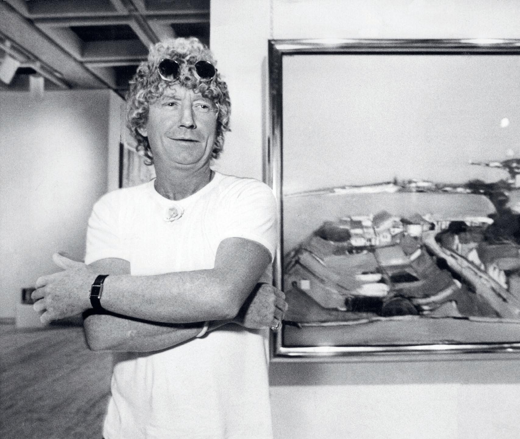
Joan and Peter met when Joan was working in the Collins Street studio of acclaimed Melbourne fashion and advertising photographer Athol Shmith, and the pair married in 1956. Peter had started working in advertising at the age of 16 and joined his father in establishing Clemenger Advertising just two years later. Today, Clemenger BBDO is the largest agency group in Australia. Not long after their marriage, Joan attended a Christie’s art appreciation course, which she loved. Visits to Melbourne’s small clutch of commercial galleries ensued, with Joan coming to know gallerists such as Joseph Brown, Max Hutchinson, Georges Mora, Anne Purves and Sweeney Reed.1 As Peter’s advertising business grew and he was increasingly required to travel overseas for work, their knowledge of art correspondingly expanded to include international modern and contemporary artists and dealers. In a story that has since become family lore, Joan once arrived at the reception of New York’s Chase Manhattan Bank and requested to see the Bank’s art collection. Such was Joan’s courage, determination, and bravura, that no further questions were asked, and she was subsequently taken on a private tour by David Rockefeller (1915 – 2017), the Bank’s chairman and chief executive at the time. As Jason Smith has so aptly described Joan: ‘She had a twinkle in her eye, a ready smile, and a fabulous laugh. But when she spoke, she meant business.’ 2
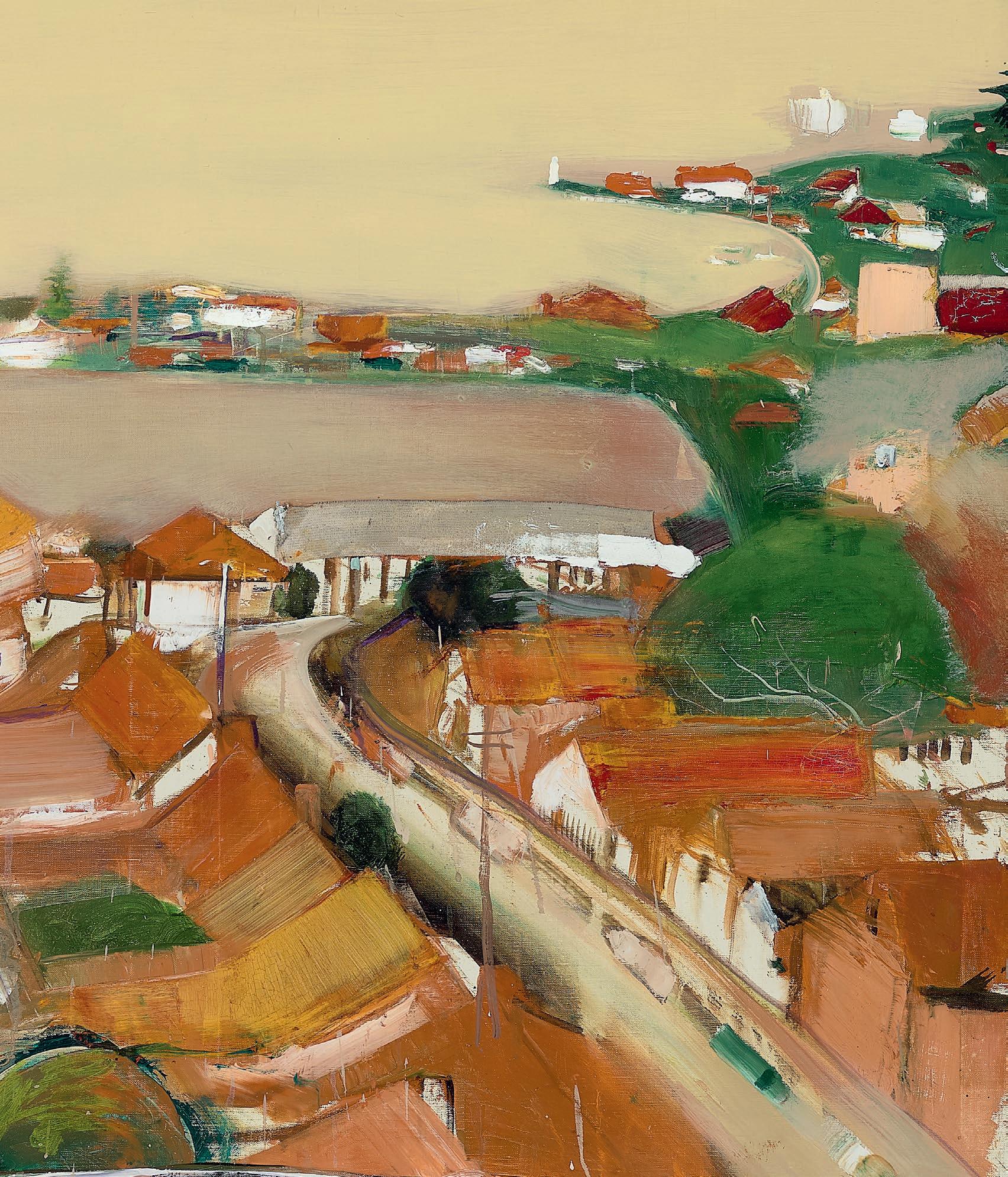
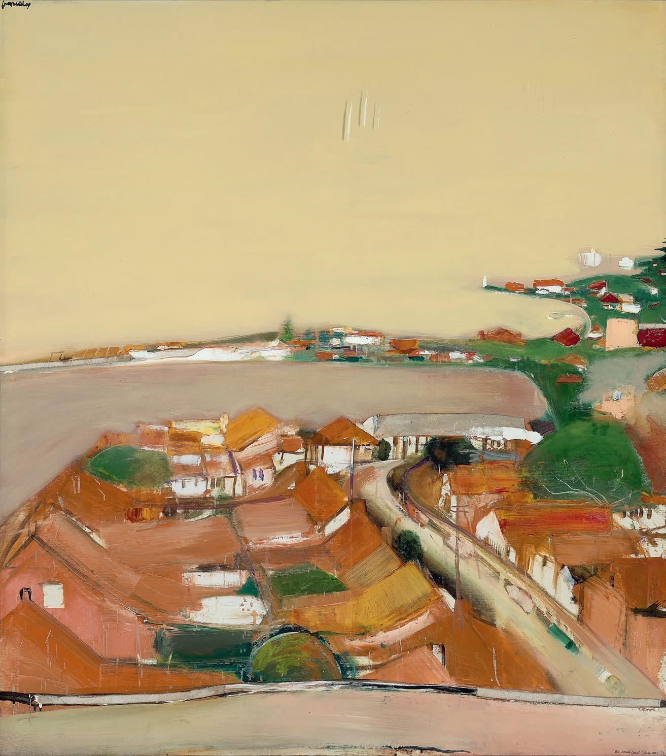
The Clemengers’ art collection started modestly, with an eight by six-inch Ray Crooke painting that was bought from gallerist Barry Stern for £25. This was followed by a group of small paintings by Thomas Gleghorn; a Lawrence Daws for $5; a Fred Williams work on paper, bought from Rudy Komon Gallery for $190, and then a small John Olsen purchased when Peter had ‘had about three sherries… and was feeling fairly relaxed’. Driven by personal response rather than by fashion or art world ‘favourites’, the couple lived with their growing collection and rarely sold works: ‘We’ve not had a plan’, admits Peter, ‘we are just happy with what we’ve got’. 3 Their first significant acquisition was an Arthur Boyd ‘Wimmera’ painting from Melbourne’s Australian Galleries, which was $1,600 – quite a jump from the price of earlier purchases, and quite a stretch for the young couple at the time. As this sale attests, several important works followed including Brett Whiteley’s magnificent South Coast after the Rain, 1984,
13
awarded the prestigious Wynne Prize for landscape painting by the Art Gallery of New South Wales; and Fred Williams’ sublime Landscape with Creek Bed, 1976 – 77, completed the same year as Williams became the first – and only – Australian artist to be honoured with a solo exhibition at the Museum of Modern Art, New York.
A major donation by the Clemengers to the NGV in 1991 was the impetus for the establishment of what was to become known as the Clemenger Contemporary Art Prize, a series of six triennial exhibitions (running from 1993 to 2009) which celebrated the contribution of Indigenous and non-Indigenous mid-career and senior contemporary Australian artists. Having had the pleasure of working on two iterations of this Prize in 2006 and 2009 as Curator of Contemporary Art, I came to understand and appreciate the Clemengers’ deep commitment to Australian art and artists, their generosity of spirit, and their extensive knowledge. This unique and important series was a collaboration between the Gallery’s curators and Joan and Peter, with the development of each exhibition unfolding over several years. Peter’s keen eye was largely tuned to management of the budget and to the exhibition collateral, signage, and promotion; with Joan acting, in each iteration, as one of Prize’s three judges.
It did not stop there. In 1999, Joan made a commitment to build upon the important legacy of the Gallery’s G H Michell (1976 – 1987) and Margaret Stewart Endowments (1987 – 1997), which supported the acquisition of emerging Australian artists working in all media. Thus, the Joan Clemenger Endowment was born. Over the course of the Endowment’s four-year term, Joan was closely involved in the acquisition process, visiting galleries with the curators, and attending Acquisitions Meetings. The price for works was capped at $5,000 to ensure that the fund was truly benefiting artists at the beginning of their professional careers, and to enable the purchase of a greater number of works. It is telling that many of the artists whose work was acquired through this fund – including David Rosetzky, Ricky Swallow and Louise Weaver, to name but a few, are now some of our most celebrated contemporary artists.
Given the benefits they derived from travel, and from seeing the world’s best museums, Joan and Peter also established the Clemenger Travel Grant – an application-based program that enabled the professional development of the Gallery’s curators, conservators, and other professional staff. I was fortunate to be a recipient of this grant and can vouch for the life- and career-boosting benefits of the five-week trip I was able to undertake, visiting museums and colleagues across the UK and North America. The grant has now been running for close to 20 years.
14
COLLECTION OF JOAN AND PETER CLEMENGER
After the end of the Clemenger Contemporary Art Award, Joan and Peter’s support of acquisitions at the NGV broadened to include international contemporary art, but equally, they have also been quietly involved in the purchase of works across other collecting areas for decades. After Joan’s death in early 2022, Peter has continued the couple’s commitment to the NGV, ensuring that Joan’s legacy as a benefactor, art lover, and friend to artists continues through his involvement.
Yet the Clemengers’ benefaction is by no means exclusive, and alongside their incredible support of the NGV they fostered long term relationships with a range of arts organisations. Peter was a patron of the Melbourne International Arts Festival, the pair are Lifetime Patrons of the Melbourne Theatre Company, and through the Joan and Peter Clemenger Trust (established in 2001) they support the Australian Ballet to bring international artists and companies to Australia to tour. Searching for a major tourism and reinvigoration project for Melbourne in the early 1990s, Peter established (and funded) the Melbourne Food and Wine Festival and ran the organisation for nine years. It has since become one of the world’s top food and wine events and celebrates its 30th anniversary this year. Joan is a Fellow of Heide Museum of Modern Art and was central to the fundraising efforts that enabled the Museum to develop the 2012 exhibition Louise Bourgeois: Late Works and was also a supporter of a host of organisations ranging from Orchestra Victoria to Big Brother Big Sister and Royal Botanic Gardens Victoria. The Clemenger Trust has also funded medical research through its support of, amongst other organisations, the Mental Health Research Institute of Victoria, the Centre for Eye Research Australia, the Peter McCallum Cancer Foundation and the Murdoch Children’s Research Institute, and has helped address the needs of vulnerable children, young people and families through its substantial support of Anglicare. 4
In 2015 Joan and Peter Clemenger scored a rare ‘double’ in the Australia Day Honours, each becoming Officers of the Order (AO) for their support of the visual and performing arts and for their philanthropic work. Peter’s response to this very public recognition was characteristically low-key: ‘I got a letter telling me about the award and thought that’s nice…Then I opened another letter and found Joan had the same. That was wonderful.’ 5
The author is grateful to Veronica Angelatos for the notes she took during her interview with Peter Clemenger at his Melbourne home on 26 May 2022, which have informed this piece.
1.
Shmith’s studio, in 1967. Max Hutchinson (1925 – 1999) was the founding director of Gallery A; Georges Mora (1913 – 1992) was the director of Tolarno Galleries; Anne Purves was the director, with husband Tam, of Australian Galleries, and Sweeney Reed (1945 – 1979) was the Director of Strines Gallery, and later, Sweeney Reed Gallery.
2. Smith J., speech notes for Joan Clemenger AO, Memorial Service, 5 April 2022. Jason Smith, also a Curator of Contemporary Art at the NGV from 1997 to 2007, worked on the 1999, 2003 and 2006 iterations of the Clemenger Contemporary Art Award.
3. Childs, K., ‘Portrait of a Patron’, Flight Deck , May 1993, p. 21 in ‘EXHIBITION: JOAN AND PETER CLEMENGER TRIENNIAL EXHIBITION OF CONTEMPORARY AUSTRALIAN ART 1996 PART 1: APR 1993 – DEC 1994’, NGV RMU File G1111, accessed 29 June 2022
4. ‘Advertising Legend Peter Clemenger and Wife Joan Both Awarded AO in Australia Day Honours’, 26 January 2015, https://campaignbrief.com/ad-legendpeter-clemenger-and/?utm_source=pocket_mylist , accessed 23 July 2022
5. Money L., ‘Australia Day Honours: Ad Legend Clemenger and Wife Score The “Double”’, The Sydney Morning Herald , 23 January 2015, https://www.smh. com.au/national/australia-day-honours-ad-legend-clemenger-and-wife-score-the-double-20150123-12wu6a.htm l, accessed 23 July 2022
KELLY GELLATLY
15
Joseph Brown (1918 – 2009) opened Joseph Brown Gallery at 5 Collins Street, close to Athol
1 BRETT WHITELEY (1939 – 1992)
SOUTH COAST AFTER THE RAIN, 1984 oil and collage on canvas (with white oil on Perspex surface)
137.0 x 122.0 cm
signed upper left: brett whiteley dated and inscribed with title lower right: ‘the south coast’ June 1984 signed, dated and inscribed with title on artist's handwritten label verso: "THE SOUTH COAST AFTER RAIN" 1984 / 54" x 48"
/ oil + collage on canvas / BRETT WHITELEY / 8 REIBY PLACE / CIRCULAR QUAY
ESTIMATE: $1,500,000 – 2,000,000
PROVENANCE
Robin Gibson Gallery, Sydney
Joan Clemenger AO and Peter Clemenger AO, Melbourne, acquired from the above in March 1985
EXHIBITED
Wynne Prize , Art Gallery of New South Wales, Sydney, 15 December 1984 – 25 January 1985, cat. 84 [awarded Wynne Prize in 1984]
Brett Whiteley: Art & Life , Art Gallery of New South Wales, Sydney, 16 September – 19 November 1995, touring exhibition to Darwin, Perth, Adelaide, Melbourne and Hobart, until 17 November 1996, cat. 100 (label attached verso)
LITERATURE
Pearce, B., Brett Whiteley: Art and Life , Art Gallery of New South Wales, Sydney, 1995, pl. 104 (illus.), p. 232
Hilton, M., and Blundell, G., Whiteley: an unauthorised life , Pan Macmillan, Sydney, 1996, p. 188
Hawley, J., ‘Brett Whiteley: The Art of the Warrior ’, Sydney Morning Herald Magazine , Sydney and
The Age, Good Weekend , Melbourne, 17 February 1990, p. 26
Sutherland, K., Brett Whiteley: Catalogue Raisonné , Schwartz Publishing, Melbourne, 2020, cat. 160.84, vol. 4, p. 272 (illus.), vol. 7, p. 640
RELATED WORKS
Study for ‘The Great Australian Landscape’ , 1989 – 90, oil on canvas, 76.0 x 76.0 cm, private collection, Perth Byron Bay at Sunset , retitled South Coast Geographical, 1990 – 91, oil on canvas, 96.0 x 86.0 cm, private collection
16
COLLECTION OF JOAN AND PETER CLEMENGER
17
From his auspicious start as the youngest non-British artist ever to have a work acquired by London’s prestigious Tate Gallery1, Brett Whiteley’s artistic trajectory was nothing short of astounding. Hosting his first solo exhibition at Matthiesen Gallery, London in 1962 at the age of 22, the fiery, tousle-haired wunderkind quickly made a name for himself internationally as an urgent, flamboyantly talented artist. After launching himself on New York for a brief period of turbulence, Whiteley subsequently returned, upon the expiration of his American dream, to Sydney in late 1969 where, seduced by the enchanting siren of the city’s harbour, he would embark upon the sumptuous Lavender Bay tableaux universally considered to be the crowning achievement of his career. Significantly, within the decade he had won all three of Australia’s most coveted art awards – both the Archibald Prize for portraiture and Sulman Prize for genre painting in 1976; the Wynne Prize for landscape in 1977; and all three prizes again in 1978 (the only artist ever to be so honoured in the same year).
By the early eighties when the magnificent South Coast after the Rain, 1984 was unveiled at the Art Gallery of New South Wales and awarded the artist’s third Wynne Prize, Whiteley’s fame was at its peak. Yet lurking below such myriad accolades and the ostensible serenity of his art during this period was an increasingly torturous struggle with addiction – a self-destructive legacy borne from a visceral need to ‘test his gift’ that had now become inextricably intertwined with his prodigious creative efforts. Their marriage also flailing, in mid-1984 Brett and Wendy thus departed for England, determined to liberate themselves from the thrall of substance abuse. As the world now knows, after further attempts, Wendy would eventually survive, totally cleansed. For Brett however, it was too late and despite his best efforts over the intervening years, addiction would ultimately consume him, leading to his lonely death in a motel room at Thirroul on the south coast of New South Wales in 1992. 2
Which makes all the more remarkable the lyrical calm of this exquisite painting of a seaside village and shoreline beneath a velvety grey sky, created following Brett’s return to Australia from England in 1984. Bereft of angst or any trace of the psychologically grueling challenges plaguing his life at the time, indeed the work exudes a quietude that perhaps reflects the brief success of his treatment abroad. More
importantly, in a departure from the preceding complex panoramas that focused upon America, Australia and his own richly narcissistic ego, or his more recent suite of images inspired by Van Gogh in 1983 whose crudity raised the ire of critics, in South Coast after the Rain Whiteley showed that he was, underneath all the noise, a superb master of nuance and poise when he so chose.
We may sense, moreover, in this subtle masterpiece Whiteley’s love of Charles Baudelaire, the great French poet and critic, staring at a flat, boundless space of ocean beyond the ruck of humanity and its little, red-roofed houses below. Baudelaire had once recalled a childhood when his parents, hoping to rein in his wildness, sent him on an illconceived sea voyage, instigating the bitter-sweet phrase:
Quand partons-nous pour le bonheur? When shall we set sail for happiness? 3
Indeed, it was as if Whiteley channeled Baudelaire to address his own passionate, angry longing, impelled to seek balm beyond the tangled inlets of Longueville after his mother deserted the family to migrate to England in 1956. This he did, three years later, tracking her across oceans and striking gold abroad with the acclaim of a pop star.
When Brett and Wendy returned to Sydney in 1969 after a decade of phenomenal success, he immersed himself in a state of ecstasy at the sublime expanses of Lavender Bay, where they settled, with paintings of exquisite, Matisse-like scale and mood, that were precursors to South Coast after the Rain . These chimed with the end of Arthur Rimbaud’s poem Le Bateau Ivre, a poignant reminder – notwithstanding the poet’s theory of dérèglement and Baudelaire’s exhortation of drunkenness
– that innocence might have been the ultimate resistance to selfimmolation if only it was possible to bottle it:
If there is one water in Europe I want, it is the Black cold pool where into the scented twilight
A child squatting full of sadness launches
A boat as fragile as a butterfly in May 4
18
COLLECTION OF JOAN AND PETER CLEMENGER
19
Brett Whiteley poses in front of his painting titled ‘The South Coast After the Rain’ which won the 1984 Wynne Prize at the Art Gallery of New South Wales (AGNSW) in Sydney, New South Wales, 14 December 1984 photographer: Bob Finlayson / Newspix
To be sure however, those wonderfully eloquent Lavender Bay images also became mirrors of danger masked by sheer visual poetry, aided and abetted by a state of addiction, albeit cleverly bolstered by sections of shoreline, high horizons, window frames and balconies marshalling astute deployments of arabesque. And they counterpointed perfectly the sea and beach motifs Brett happily found along the coasts of New South Wales.
Whiteley’s geographical reach was astonishing, well beyond Sydney. Which raises the question of exactly where South Coast after the Rain was inspired and how it fitted within the artist’s ultimate intention to accumulate a vast collective image of Australia across the entire continent. It has been suggested that this particular composition was probably seen by the artist from the balcony of an apartment block on Kennedy’s Hill near Austinmer, looking across Thirroul towards Sandon Point headland with Wollongong lighthouse in the distance – the region
where for many years he had escaped from city angsts, relaxed, swam, and detoxed in solitude. Very close, in other words, to where his life was to end. 5
In her definitive catalogue raisonné, Kathie Sutherland avoids the problematic challenge of identifying exact locations with Whiteley’s landscapes, placing this painting within a broader context whereby topography was often turned on its head by the artist’s imaginative interventions. In other words, the motifs were nearly always departure points, like music being separated from the libretto:
‘…Suburbia is another important component in the development of the theme on The Great Australian Landscape. The Suburbs, a large oil and a key work included in the 1970 exhibition [Bonython Art Gallery, Sydney, thence Australian Galleries, Melbourne], was repainted in 1982… It depicts an ordinary suburban house – a red tiled roof set behind a real
20
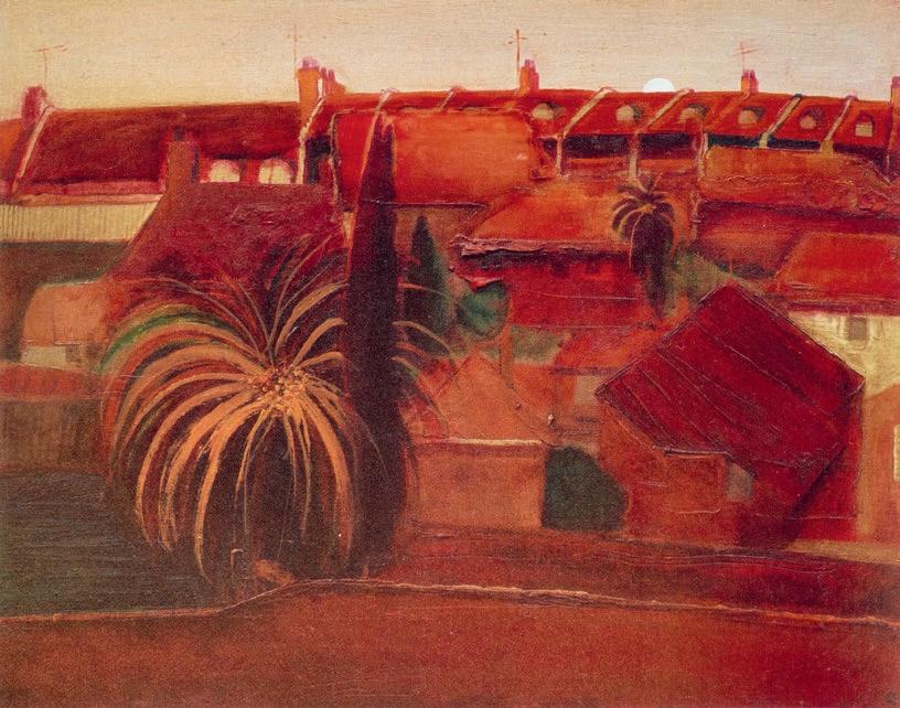
Brett Whiteley Red Roofs with Palm Trees , 1983 oil on canvas on hardboard 40.0 x 54.0 cm
COLLECTION OF JOAN AND PETER CLEMENGER
Whiteley Estate © Wendy Whiteley / Copyright Agency
paling fence – looking out to a landscape dotted with more red-roofed bungalows and suburban vegetation. This idea continues to evolve over several decades, with variations on a theme that include Red roofs with Palm Trees (1983)… South Coast after the Rain (1984)… and Study for The Great Australian Landscape (c.1989)… Common to each painting is a palette dominated by reds, oranges and greens that describes the profile of the typical sprawling Australian urban landscape.’ 6
Whiteley himself spoke succinctly of his Great Australian Landscape project during the last two years of his life, expanding the concept way beyond the original idea of ten panels, as he declared in an interview with Andrew Olle in 1991: ‘…50 panels from Bondi to Uluru… through the blue suburbs, the red roofs, the city, the Blue Mountains, the bush, the outback and right through the red heart… 50 panels… to refer to the full political, historical and cultural levels of Australia.’ 7 Furthermore, Ashleigh Wilson’s biography of 2016 records a comment by Whiteley
about the overwhelming energy required to bring this project to fruition, and a fatalistic statement that if he was given only four years left to live, he would have to drop everything to get it done. 8
There had been a creative high in 1989, travelling to Paris with his girlfriend Janice Spencer, but when they returned to Sydney Brett was faced with the trauma of settling divorce with Wendy. Soon after, his relationship with Spencer began to disintegrate too and he felt his life ebbing towards a loneliness underscored by inability to stop using heroin. The end was nigh: ‘…the self-destructive side of me that wants to die… I have arrived at a point in my life where unless I revise, unless I mature, unless I shape up, unless I look at my character defects, unless I get a sobriety, I will spin out…’ 9
With its characteristic verve, sensuous colour and irreverent wit, South Coast after the Rain offers a consummate example of the singular vision
21
Brett Whiteley Study for ‘The Great Australian Landscape’ , 1984 oil and collage on canvas 105.5 x 91.0 cm Whiteley Estate © Wendy Whiteley / Copyright Agency
for which Whiteley remains so highly acclaimed. In the centre of the sky, floating on perspex above the canvas, are three small farewell streaks left by the retreating rain – a witty gesture by the artist signifying subtle denial of a binding rule of bonne peinture. He breaks the rule, but with Maurice Denis standing at his shoulder, he challenges us to realise that beneath those floating marks there is not an illusion of deep space but a painting with the full integrity of flatness.
The real music of this painting, however, remains the swathe of red and orange rooftops at the base of the composition, reflected in small flecks on the distant headlands. It is not easy to know how extensive such roofs were in the 1980s since Thirroul, once a thriving mining town with a local brick kiln, was soon to undergo dramatic change with demolition of miners’ cottages and tiled roofs as developers moved in to accommodate a new era of tourists and holiday apartments.10
What we do know for sure though is that Whiteley had already fallen in love with red roofs a decade earlier when he and Garry Shead absorbed themselves to obsession with D. H. Lawrence who had stayed several
weeks in Thirroul, where he wrote his iconic novel Kangaroo in 1922. In that book, Lawrence refers to the red roofs of Sydney Harbour appearing like a ‘burgeoning infection’.11 Notably, several of Whiteley’s paintings over his final decades bear witness to this obsession, including two predecessors to South Coast after the Rain : Sketch for the Red and Green of the Suburbs, 1979 which resembles a construct by Nicolas de Stael, and the highly minimalist Bondi , 1978 with its flat patches of red architectural shapes juxtaposed against an unmodulated field of celadon grey.
In the end however, aesthetics inevitably took precedence over topographical truth in his art, and as such, specifics about exactly where, when or how Whiteley’s genius found its expression no longer greatly matter. For with every brushed and ragging gesture he made, painting was never merely an act of description. Rather, it was the evocation of a dream, sometimes to travel elsewhere, through this, one of his most gently poetic elisions of land, sea and sky – a quiet masterpiece for the ages.
22
COLLECTION OF JOAN AND PETER CLEMENGER
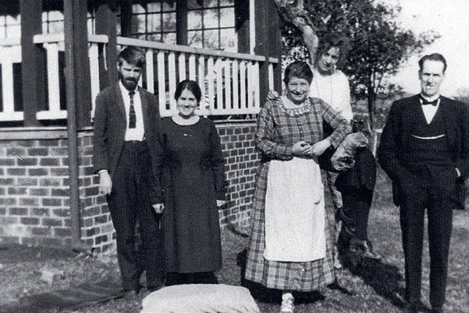
D.H. Lawrence (left) and Frieda Lawrence (third from left) with three British migrants they had met on the voyage out , (from left) Laura Forrester, Mrs Marchbanks and Mr Marchbanks, at “Wyewurk” in Thirroul, New South Wales , 1922 photographer: A.D. Forrester
Brett Whiteley in his studio, 1985 photographer unknown
Courtesy Mosman Daily, Sydney
1. Whiteley’s Untitled Red Painting , 1960 was purchased by the Tate Gallery from the groundbreaking exhibition, ‘Recent Australian Painting’, held at Whitechapel Gallery, London from June – July 1961. Whiteley was only twenty-one years old at the time of painting the work and significantly, the Tate record still stands today.
2. Details related to Whiteley’s entire life and career are comprehensively covered in Ashleigh Wilson’s biography, Brett Whiteley: Art Life and the Other Thing , Text Publishing, Melbourne, 2016. For this particular context see pp. 351 – 416
3. Baudelaire, C., Intimate Journals , Methuen, London, 1949, translated from the French by Christopher Isherwood, with an introduction by W. H. Auden. Statement in Squibs XI, p. 8
4. Baudelaire, C., Le Bateau Ivre (The Drunken Boat), translated from the French by Oliver Bernard in Collected Poems of Arthur Rimbaud , Anvil Press, London, 1962, p. 218
5. Organ, M., Brett Whiteley and Thirroul…Life and Death , 5 September 2019 , http:// thirroulbrettwhiteley.blogspot.com/, accessed June 2023. This useful blog contains exhaustive detail about Whiteley’s relationship to Thirroul from the early 1970s, including circumstances leading to the artist’s death on 11 June 1992.
6. Sutherland, K., Brett Whiteley: Catalogue Raisonné , Schwartz City, Melbourne, 2020, volume 7, pp. 41, 265
7. Whiteley in conversation with Andrew Olle in 1991, cited ibid., pp. 39, 43
8. Wilson, op. cit., p. 385
9. Whiteley cited ibid., p. 361
10. Organ, op. cit.
11. ibid.
BARRY PEARCE FUni SA
EMERITUS CURATOR OF AUSTRALIAN ART ART GALLERY OF NEW SOUTH WALES
23
2 FRED WILLIAMS
(1927 – 1982)
LANDSCAPE WITH CREEK BED, 1976 – 77 oil on canvas 153.0 x 137.5 cm
signed upper right: Fred Williams. bears inscription on label attached to stretcher bar verso: TWO PARTS / 1. / FRED WILLIAMS / "LANDSCAPE WITH CREEK BED"
ESTIMATE: $800,000 – 1,200,000
PROVENANCE
Rudy Komon Art Gallery, Sydney
Joan Clemenger AO and Peter Clemenger AO, Melbourne, acquired from the above in April 1978
EXHIBITED
Fred Williams , Undercroft Gallery, University of Western Australia, Perth, 25 February – 12 March 1978; Contemporary Art Society Gallery, Adelaide, 15 March – 8 April 1978 and Rudy Komon Art Gallery, Sydney, 29 April – 7 May 1978, cat. 10
RELATED WORK
Landscape with Creek Bed , 1976, oil on canvas, 153.0 x 137.5 cm, in the Janet Holmes à Court Collection, illus. in Hart, D., Fred Williams: Infinite Horizons , National Gallery of Australia, Canberra, 2011, p. 146
We are grateful to Lyn Williams for her assistance with this catalogue entry.
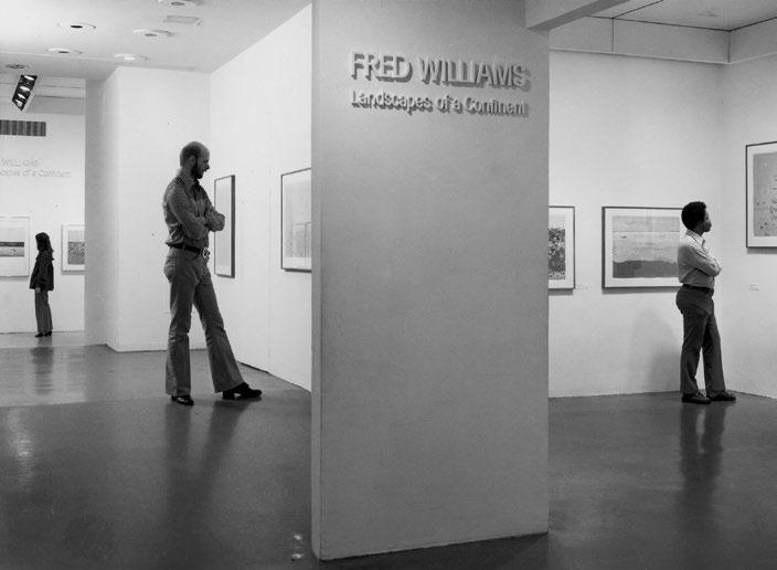
Visitors at the exhibition, “ Fred Williams: Landscapes of a Continent ”, 10 March – 8 May, 1977, Museum of Modern Art, New York
photographer: Kate Keller The Museum of Modern Art Archives, New York
24
COLLECTION OF JOAN AND PETER CLEMENGER
25
An invitation in 1975 to mount a solo exhibition of gouaches at the Museum of Modern Art in New York marked the beginning of an intensely productive period in Fred Williams’ career. He was the first Australian artist to be honoured in this way and the exhibition, which opened in March 1977, acknowledged the significance of his art and its unique vision of the landscape within a national context – both to audiences who were familiar with the country his paintings described, and beyond. Introducing the exhibition, the Director of MoMA’s Department of Drawings, William S. Lieberman, wrote: ‘Fred Williams knows Australia. He is not an artist who would disdain a gum tree. He is not a foreigner seeking to impose a natural paradise on some strange, exotic land. He is, however, a romantic artist and his approach to landscape is narrative. His images may at first seem abstract, but they in fact describe actual times and places… Fred Williams’s colours are those of the continent itself… Fred Williams’s vision is authentic.’1
In addition to international travel and an extensive program of exhibitions at home – including six solo shows presented across five states between 1975 – 78 – the second half of the 1970s saw the development of four major painting series. Continuing his well-honed practice of working directly from the landscape, Williams focussed in on particular geographical forms: pools of water (Kew Billabong); mountains (Kosciusko and Guthega); gorges (Werribee) and waterfalls. 2 Many of the sites he painted were in close proximity to his home, and the destinations of day trips made in the company of friends and fellow artists were frequently found in Williams’ copy of the newly-published edition of the Physiography of Victoria 3
The series of gorge paintings began in late 1975 following two sketching excursions to Werribee, a short distance south-west of Melbourne. The drama and varied features of the landscape obviously appealed to Williams, who returned early the following year, making a further eight visits to the area in just over two months, painting oil sketches as well as taking photographs, which he used as aide-mémoires . He worked in a different location each time – from Picnic Point, which offered a broad view over the cliffs to the dry creek bed and surrounding bush below, to Kelly’s Creek, where the perspective was closer and more intimate, noting in his diary, ‘These last three or four months have been the driest in fifty three years? so it has been a great opportunity to be doing the “Gorge” – visually it could not be seen under better conditions.’4 Williams also wrote, ‘It is quite fascinating to think of the You Yangs looking like a saw-tooth – & just a few miles away the “Gorge” doing the same thing in reverse.’ 5 This recognition of the connection between the geography of Werribee Gorge and the You Yangs – the subject of an important series of paintings produced the previous decade – provides an insight into the depth of Williams’ understanding and careful observation of the landscapes in which he worked.
In making these paintings, Williams solidified the practice of beginning studio paintings soon after a sketching trip, while the visual and physical memory of the experience was still strong, and there was now little difference between what he termed the ‘outside’ paintings and the ‘inside’ works. Recording his excitement about this new aspect of the creative process, he wrote, ‘this is something of a milestone for me – to paint the sketch on the spot and then paint the picture!’ 6 Landscape with Creek Bed , 1976 – 77 is based on a painting Williams
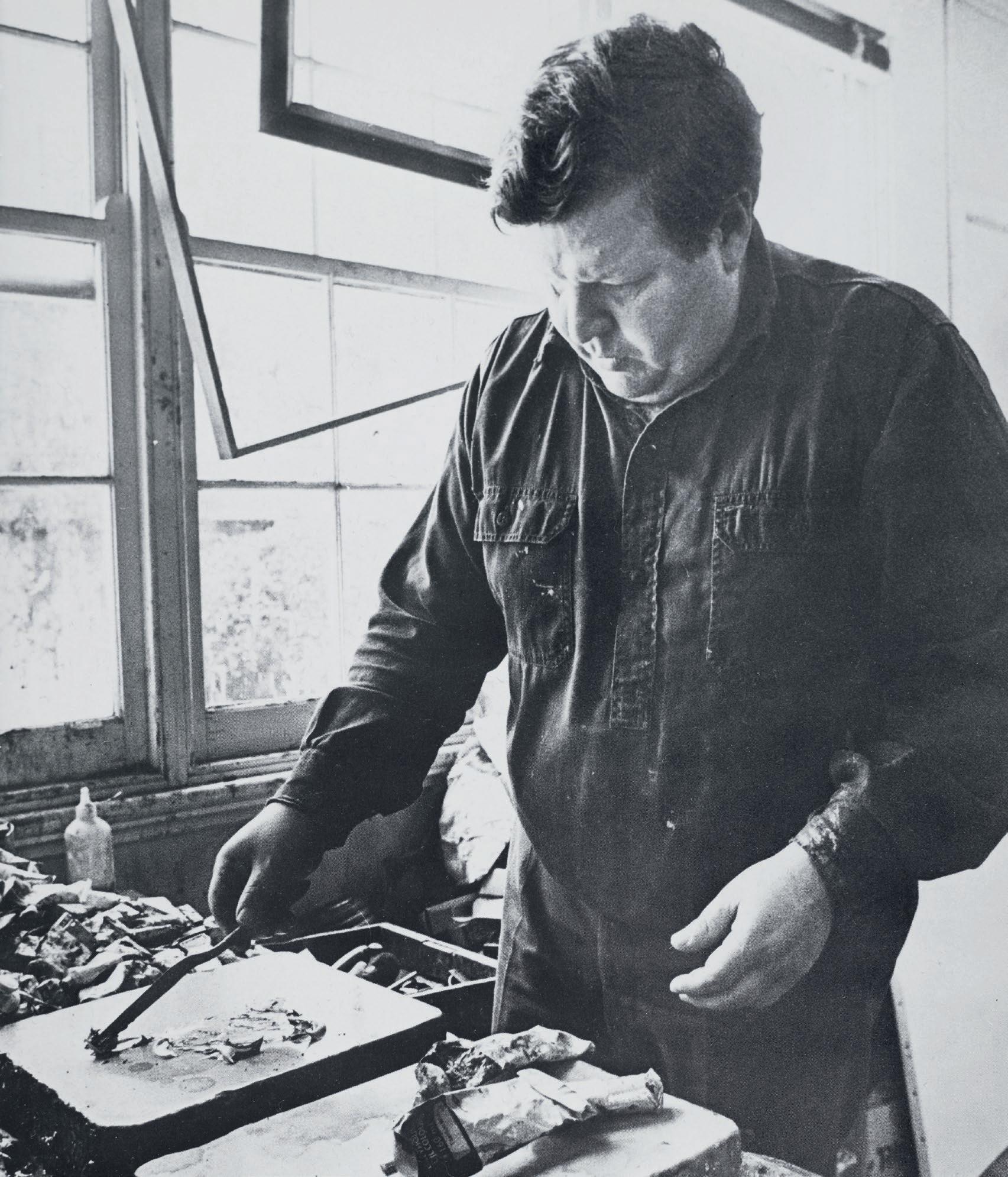
Opposite: Fred Williams photographer: Ernie McLintock © Ernie McLintock
26
COLLECTION OF JOAN AND PETER CLEMENGER
182.3 x 152.2 cm
Tate, London
© Estate of Fred Williams / Copyright Agency
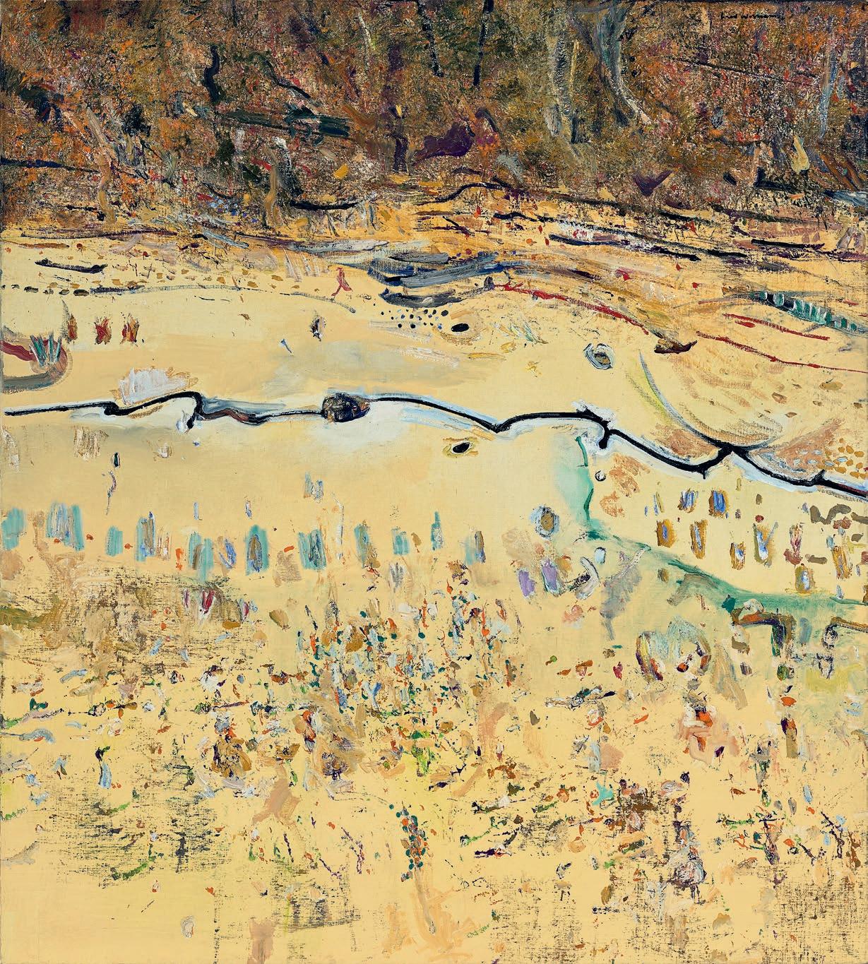
made at Kelly’s Creek in April 1976. He began working on it in the studio just three months later, and it was finished by June 1977. One of the consequences of this way of working is an immediacy in the application of paint which echoes marks made directly in front of the motif, as the hand directs the brush to record an impression of what the eye is seeing, capturing both the appearance and the feeling of the landscape. From all-over compositions like The River, Werribee Gorge , 1977 (Art Gallery of New South Wales) in which the river, seen from above, meanders through a densely treed area, to more sparse images like Dry Creek Bed, Werribee Gorge I , 1977 (Tate Gallery, London), it is the diversity of brushstrokes and a certain lightness of touch that prevails. When Landscape with Creek Bed was exhibited in a solo show at the Rudy Komon Gallery, Sydney, in April – May 1978, it was listed and displayed as a two-part work, although each canvas was sold separately. The other, closely related painting is in the Janet Holmes à Court Collection.7
Landscape with Creek Bed presents a veritable catalogue of painterly forms which are applied on top of a pale sandy ground. A black line defines the irregular path of the creek, dancing across the canvas and establishing a syncopated pictorial rhythm that reverberates throughout the painting. Thick vegetation across the top is described by a dense, richly textured band of loose, gestural brushstrokes interspersed with areas of paint that have been dabbed onto the canvas by splayed and flattened bristles of the brush. The composition opens up on either side of the creek with sparsely painted lines and characteristic dots, dashes and daubs defining the changing terrain and other observed features of the view. The bottom section of the painting is classic Williams –a series of delicate and yet energetic marks which, in their varied technique and colour, convincingly depict an open, sparsely vegetated landscape. His delight in the subject is palpable, as is the confidence of his gesture and mastery of his medium. Williams was a consummate colourist and while the first impression of this painting is one of muted
28
Fred Williams
Dry Creek Bed, Werribee Gorge I , 1977 oil on canvas
COLLECTION OF JOAN AND PETER CLEMENGER
Fred Williams
The River, Werribee Gorge , 1977 oil on canvas
182.4 x 152.0 cm
Art Gallery of New South Wales, Sydney
© Estate of Fred Williams / Copyright Agency
landscape tones, closer prolonged inspection reveals glimpses of brilliant colour – green, mauve and rich reds – that are such a distinctive feature of his work, and indeed, so typical of the experience of being in the Australian bush.
The Werribee Gorge paintings reveal the hand and imagination of a mature artist who is confident in his abilities and yet not content to rest on the successes of the past. Exploring new territory, both physically and artistically, Williams skilfully describes a specific location while at the time presenting a symbolic representation of the landscape which is imbued with a profound depth and emotional resonance. As Patrick McCaughey explained, ‘Each image forms a metaphor to focus the landscape and give it a new expressive power and purpose. Together, the series forms a new consciousness in Williams’s art… [reflecting] how much Williams wanted to combine inner compulsion and structural design and let them flow and be seen to flow from each other.’ 8
1. Lieberman, W. S., Fred Williams – Landscapes of a Continent , Museum of Modern Art, New York, 1977, unpaginated.
2. See McCaughey, P., Fred Williams 1927 – 1982 , Murdoch Books, Sydney, revised edition, 1996, chapter 8
3. ibid., p. 290
4. Fred Williams Diary, 21 April 1976 cited in Mollison, J., A Singular Vision: The Art of Fred Williams , Australian National Gallery & Oxford University Press, Canberra, 1989, p. 205
5. Fred Williams Diary, 30 March 1976, ibid.
6. Fred Williams Diary, 30 April 1976 cited in Hart, D., Fred Williams: Infinite Horizons , National Gallery of Australia, Canberra, 2011, p. 148
7. See Hart, ibid., pp. 145 – 6
8. McCaughey, op. cit., p. 284
KIRSTY GRANT
29
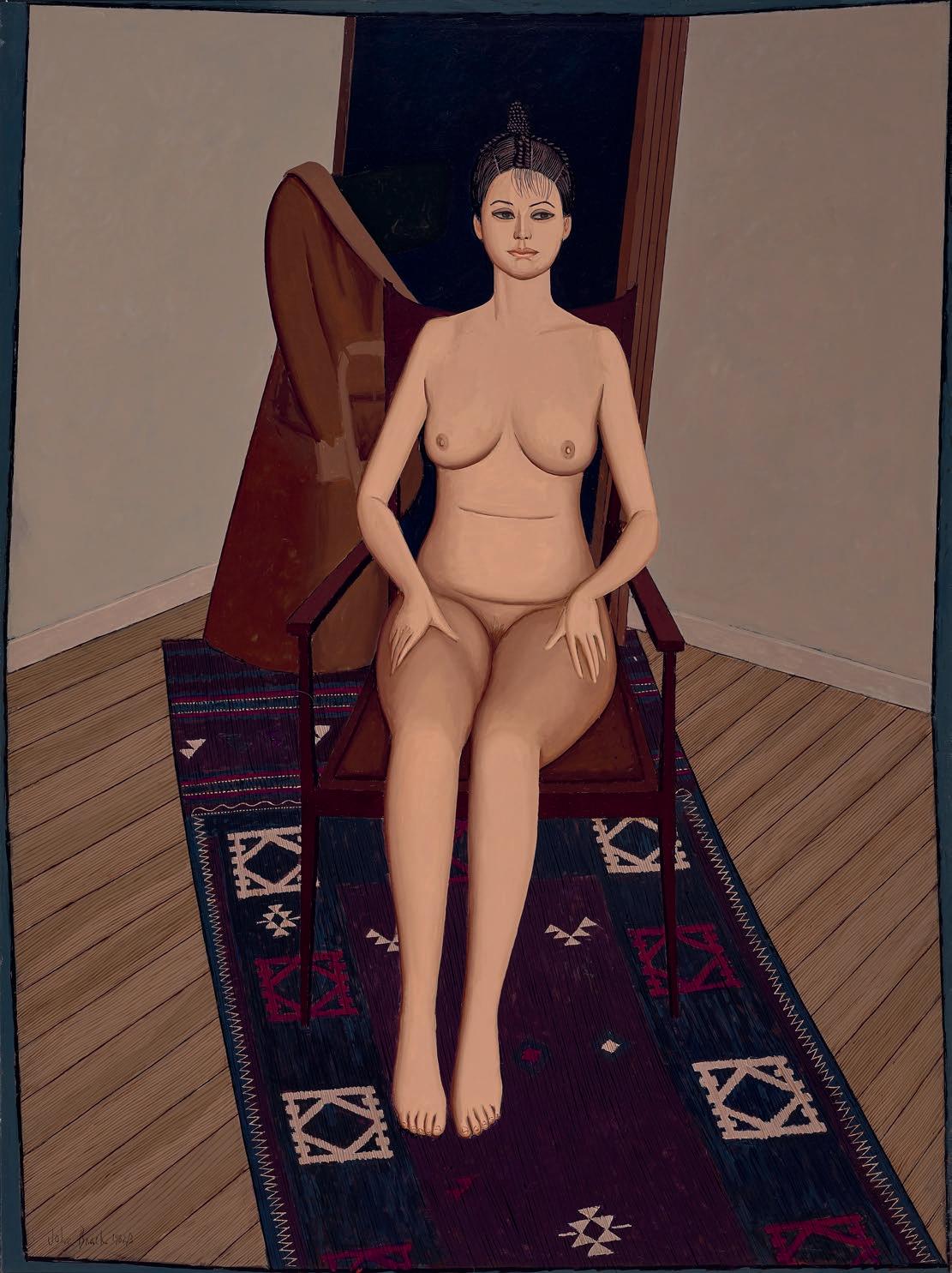
SEATED NUDE WITH SCREEN, 1982 – 83 oil on canvas
130.0 x 97.0 cm
signed and dated lower left: John Brack 1982/3
inscribed with title on artist's label attached verso: 'SEATED NUDE WITH SCREEN'
ESTIMATE: $500,000 – 700,000
PROVENANCE
Tolarno Galleries, Melbourne
Joan Clemenger AO and Peter Clemenger AO, Melbourne, acquired from the above in 1983
EXHIBITED
John Brack , Tolarno Galleries, Melbourne, 21 May – 11 June 1983, cat. 9
John Brack: A Retrospective Exhibition , National Gallery of Victoria, Melbourne, 10 December 1987 – 31 January 1988, cat. 105
The Nude in the Art of John Brack, McClelland Gallery + Sculpture Park, Victoria, 17 December 2006 – 25 March 2007, cat. 15
John Brack Retrospective , The Ian Potter Centre: NGV Australia, Melbourne, 24 April – 9 August 2009 and touring to Art Gallery of South Australia, Adelaide, 2 October 2009 – 31 January 2010 (label attached verso)
LITERATURE
Lindsay, R., John Brack: A Retrospective Exhibition , National Gallery of Victoria, Melbourne, 1987, pp. 73 (illus.), 134, 141 Grishin, S., The Art of John Brack , Oxford University Press, Melbourne, 1990, vol. 1, p. 160, vol. 2, cat. o275, pp. 36, 171 (illus.)
Klepac, L., Australian Painters of the Twentieth Century, Beagle Press, Sydney, 2000, p. 168 (illus.)
Lindsay, R., The Nude in the Art of John Brack , McClelland Gallery + Sculpture Park, Victoria, 2006 (illus., np)
Grant, K., John Brack , National Gallery of Victoria, Melbourne, 2009, pp. 187 (illus.), 225
30
3 JOHN BRACK (1920 – 1999)
COLLECTION OF JOAN AND PETER CLEMENGER
31
Like all artists of his generation, John Brack was well-versed in the history of Western art and it remained an essential touchstone throughout his career. A survey of his painting reveals references to significant historical works by artists as diverse as Boucher, Seurat and Buffet, which provided inspiration as he borrowed from earlier masters and challenge as he pitted himself against them. His iconic painting, The bar, 1954 (National Gallery of Victoria), for example, appropriates both the subject and composition of Édouard Manet’s famous depiction of A bar at the Folies-Berg è re , 1882 (Courtauld Institute of Art Gallery, London). In Brack’s characteristic way however, the PostImpressionist’s clever visual trick of depicting the scene in front of the barmaid reflected in a mirror is used to describe the subject as he witnessed it in 1950s Melbourne – a drab image of dour-faced workers who are urgently drinking their fill before the imminent early closing of the pub rather than the gay opulence of 1880s Paris.
Working within the traditional genres of painting, Brack explored the still-life, portraiture and the nude in his art. Landscape as a theme however, is largely absent from his oeuvre, and indeed, when his friend and fellow artist, Fred Williams, announced that he intended to make the Australian landscape the focus of his art, Brack was sceptical, doubting its relevance as a subject for contemporary painting. Always underlying Brack’s approach – and explaining his avoidance of landscape as a subject – was an enduring interest in the human condition. As he said,
‘What I paint most is what interests me most, that is, people; the Human Condition, in particular the effect on appearance of environment and behaviour… A large part of the motive… is the desire to understand, and if possible, to illuminate… My material is what lies nearest to hand, the people and the things I know best.’1
In the context of the nude, Brack described this focus on human nature in the following way: ‘When I paint a woman… I am not interested in how she looks sitting in the studio, but in how she looks at all times, in all lights, what she looked like before and what she is going to look like, what she thinks, hopes, believes, and dreams. The way the light falls and casts its shadows is merely… a hindrance unless it helps me to show these things.’ 2 Embarking on his first sustained series of paintings of the nude during the mid-1950s, Brack sought to test the development of his work through a return to the rigour and discipline of life drawing and placed an advertisement for a model in the newspaper. Questions about how he might make a new and meaningful contribution to the genre were answered by the single response he received, from a thin middle-aged woman whose appearance demanded a radically different approach that was far removed from the sensual nudes of earlier artists such as Rubens and Gauguin. Brack quickly realised that ‘there is absolutely nothing whatsoever erotic in an artist’s model unclothed in a suburban empty room’ 3, and produced a series of striking paintings including Nude in an armchair, 1957 (National Gallery
Opposite:
32
COLLECTION OF JOAN AND PETER CLEMENGER
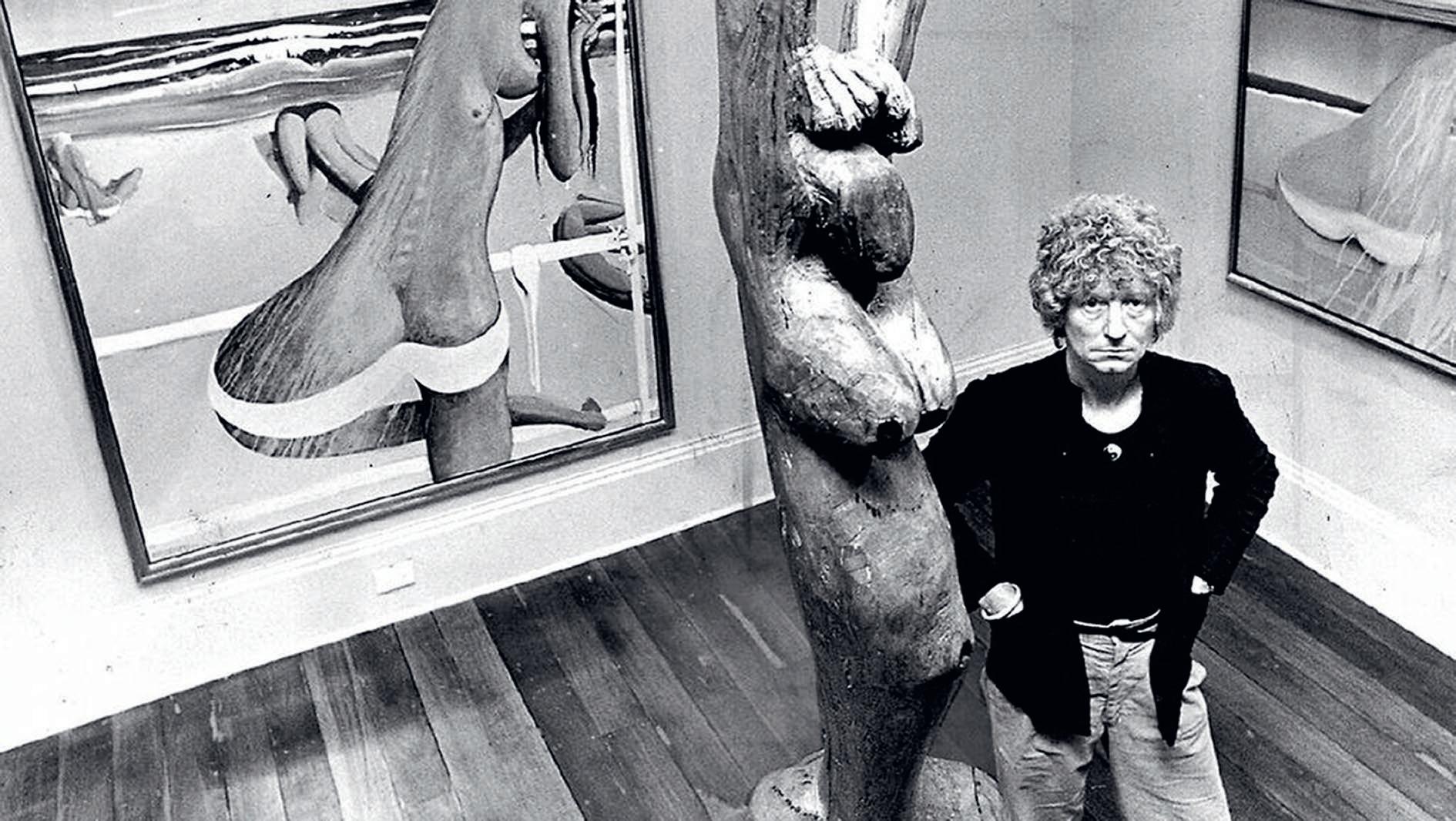
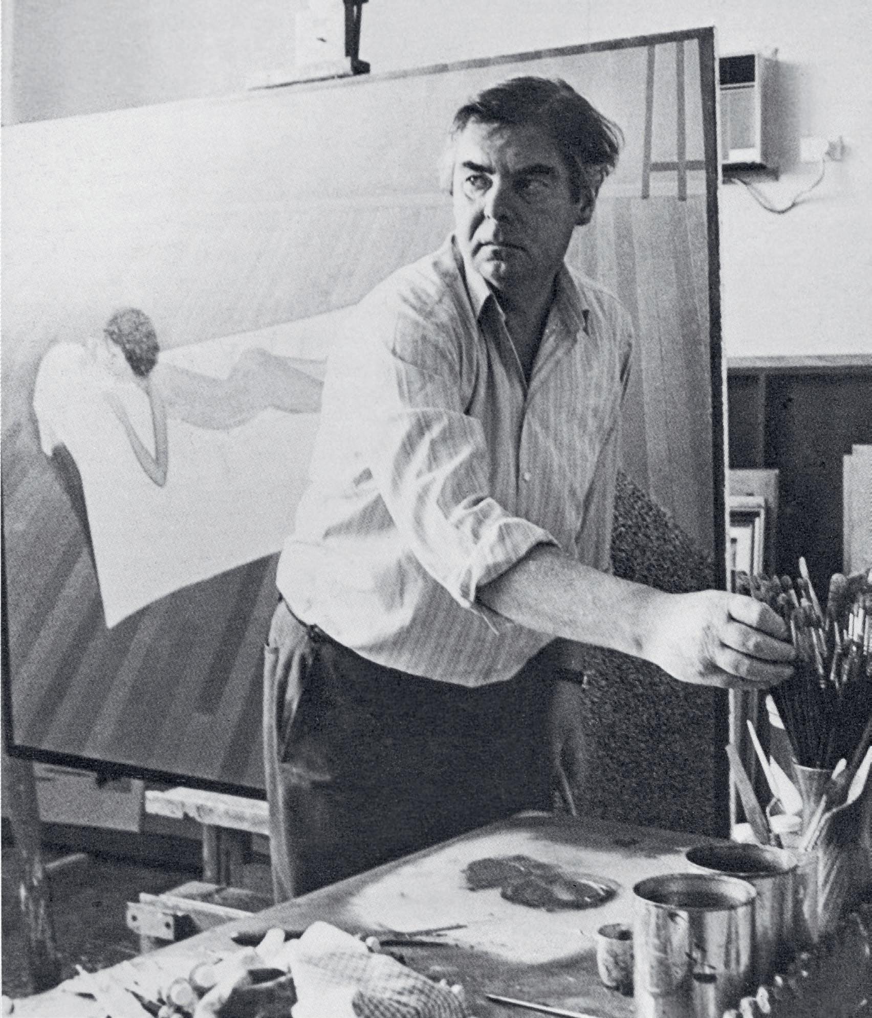
John Brack in his studio with easel and paint completing ‘Nude on shag rug 1976 – 77’, February 1977 photographer unknown
of Victoria) and The bathroom , 1957 (National Gallery of Australia), that boldly challenged expectations of the subject. While some lamented the skinny, sexless appearance of the model, art critic Alan McCulloch wrote that in pitting himself against tradition Brack had successfully demonstrated that ‘he [was] on all occasions master of the medium.’4
The nude returned as a major subject within Brack’s oeuvre during the 1970s and 80s and in these works a restrained sensuality and pleasure in depicting the female form is apparent. The contrast between the uncomfortable tension of the 1950s nudes and paintings like Seated nude with screen , 1982 – 83, where the subject looks out at the viewer completely at ease with her nakedness, seems to reflect the changes in social mores that had taken place in the intervening years and the increased informality of the late twentieth century. These differences might also point to the development of Brack’s own confidence and artistic maturity. In the mid-1950s he was at the beginning of his career
with a handful of solo exhibitions to his name, still defining his visual language and establishing his artistic persona. In 1968, with the help of a monthly stipend from his Sydney dealer Rudy Komon, Brack had resigned from his position as Head of the National Gallery School in Melbourne and for the first time in his life was able to paint fulltime. The ensuing decades witnessed regular solo exhibitions, private commissions, as well as other public affirmations of his art.
Like all of the nudes from this time, Seated nude with screen was painted in Brack’s studio and features its distinctive timber floorboards and unadorned walls, as well as a Persian carpet, which is rendered in characteristically intricate detail. Helen Brack interprets these carpets as symbolising the world of men and in the context of images where the subject is always female, this has a particular relevance. 5 In addition to highlighting what the artist perceived as the differences between the sexes, this pictorial device also illustrates the counterbalance they
34
COLLECTION OF JOAN AND PETER CLEMENGER
Installation photograph from the retrospective John Brack , held at The Ian Potter Centre: NGV Australia, Melbourne, 2009
John Brack
Nude in an armchair, 1957 oil on canvas
127.6 x 107.4 cm
National Gallery of Victoria, Melbourne
© Helen Brack
provide each other.6 In this painting, the centrally-placed figure is prominent within the composition, and the all-over pale tone of her bare skin contrasts with the dark colours and decorative detail of the carpet. Brack has also paid particular attention to the model’s hair, carefully describing its elaborate braiding and the bun that is neatly coiled on top of her head. The model’s clothing often features in these paintings, discarded and casually draped nearby. Here, the figure’s overcoat –presumably hanging on a hook which is attached to the folded screen in the background – assumes a strangely anthropomorphic character and suggests the presence of another figure in the room. What ultimately prevails in this painting however, is what Patrick McCaughey astutely described as Brack’s ‘paramount… sense of observed reality.’ 7
Joan and Peter Clemenger purchased this painting from Brack’s 1983 exhibition at Tolarno Galleries in Melbourne and, apart from being displayed in several subsequent museum exhibitions – including both
John Brack
The bathroom , 1957 oil on canvas
129.4 x 81.2 cm
National Gallery of Australia, Canberra
© Helen Brack
the 1987 and 2009 retrospectives at the National Gallery of Victoria – it has graced the walls of their home ever since. 8
1. Brack cited in Reed, J., New Painting 1952 – 62 , Longman, Melbourne, 1963, p. 19
2. Brack, H., ‘This Oeuvre – The Work Itself’, in Grant, K., John Brack , National Gallery of Victoria, Melbourne, 2009, p. 16
3. Brack, J., Interview, Australian Contemporary Art Archive, no. 1, Deakin University Media Production, 1980, transcript, p. 6
4. McCulloch, A., ‘Classical themes’, Herald , 13 November 1957, p. 29
5. See Lindsay, R., The Nude in the Art of John Brack , McClelland Gallery + Sculpture Park, 2007, unpaginated
6. See Helen Brack cited in Gott, T., A Question of Balance: John Brack 1974 – 1994 , Heide Museum of Modern Art, Bulleen, 2000, p. 23
7. McCaughey, P., ‘The Complexity of John Brack’ in Lindsay, R., John Brack , National Gallery of Victoria, Melbourne, 1987, p. 9
8. See exhibition history noted above in the caption for this lot.
KIRSTY GRANT
35
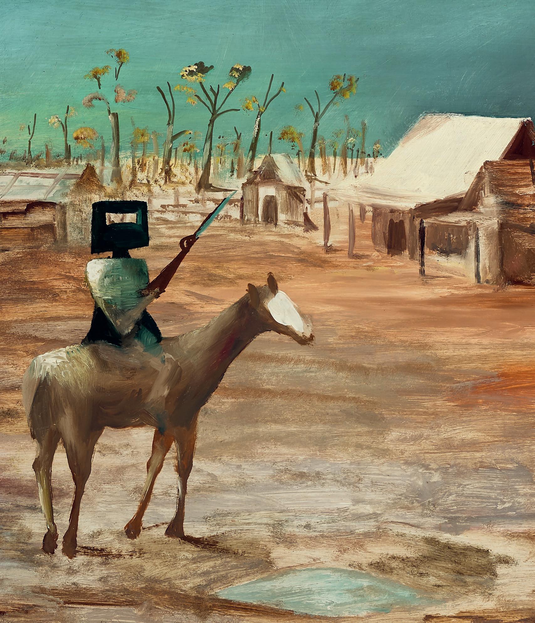
4 SIDNEY NOLAN (1917 – 1992) ESCAPED CONVICT, 1948 enamel paint on composition board 122.0 x 91.5 cm signed and dated lower right: 1-6-48 / Nolan
ESTIMATE: $650,000 – 850,000
PROVENANCE
Simon Sainsbury, London, by 1961
Terry Clune Galleries, Sydney
Victor Macallister, New South Wales, acquired from the above in 1964
Thence by descent
Private collection, Victoria
Gould Galleries, Melbourne
Joan Clemenger AO and Peter Clemenger AO, Melbourne, acquired from the above in May 2010
EXHIBITED
Sidney Nolan: Queensland Outback Paintings, David Jones Art Gallery, Sydney, 8 – 22 March 1949, cat. 7 Sidney Nolan , Whitechapel Art Gallery, London, June – July 1957, cat. 18 (illus. in exhibition catalogue pl. VI)
Sidney Nolan: retrospective exhibition, Paintings from 1937 to 1967, Art Gallery of New South Wales, Sydney, 13 September – 29 October 1967; National Gallery of Victoria, Melbourne, 22 November – 17 December 1967; Western Australian Art Gallery, Perth, 9 January – 4 February 1968, cat. 38 (label attached verso, as 'Convict')
Sidney Nolan: 102 works from the first fifteen years (1939 – 53), Joseph Brown Gallery, Melbourne, 25 July – 7 August 1979, cat. 58 (illus. in exhibition catalogue)
Collectable + Exceptional, The Director’s Choice 2010 , Gould Galleries, Melbourne, 6 May – 5 June 2010, cat. 2 (illus. in exhibition catalogue)
LITERATURE
MacInnes, C., and Robertson, B., Sidney Nolan , Thames and Hudson, London, 1961, reprinted 1967, pl. 31 (illus.)
Artists of Australia, Adelaide, 1965
Osbourne, C., Masterpieces of Nolan , Thames and Hudson, London, 1975, cat. 3 (illus.)
Clark, J., Sidney Nolan: Landscapes and Legends , International Cultural Corporation of Australia, Sydney, 1987, p. 99
36
COLLECTION OF JOAN AND PETER CLEMENGER
37
In 1947, Sidney Nolan made his escape from the cloying, claustrophobic world of Heide, and from the toxic symbiosis of his relationship with John and Sunday Reed.
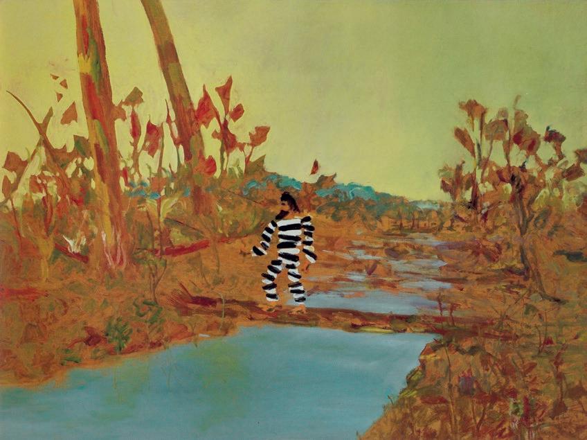
The Templestowe cultural Camelot was falling apart. Max Harris had resigned from Reed and Harris and returned to Adelaide in September 1946. Albert Tucker went to Japan as an Allied Forces war artist in February 1947, and following the collapse of his marriage to Joy Hester, would leave again – for Europe – in September. Danila Vassilieff became a little detached following his marriage to Elizabeth Hamill in March. Hester eloped to Sydney with Gray Smith in April.
And in July, perhaps (ironically) inspired by the Reed’s enthusiastic accounts of their Sunshine State holiday in late 1946, Nolan flew off to Brisbane, famously leaving behind with Sunday the first series of his celebrated Ned Kelly paintings. There he was welcomed by the young Queensland poet Barrett Reid, a visitor to Heide during the previous summer, with whom he travelled even further north: to Bundaberg, Tamborine, Maryborough, and Fraser Island. Reid also introduced the painter to the city’s literary and artistic pocket avant-garde , and to the resources of the John Oxley Library, the local heritage collection of the State Library.
91.1 x 121.4 cm
As he had with the Kelly story, Nolan discovered and delighted in the artistic potential of archival research. Initially interested in Lieutenant James Cook’s travels up the east coast of Australia in 1770, he eventually latched onto accounts of the wreck of the brig Stirling Castle on the Swain Reefs, north of K’gari/Fraser Island, in 1836. This pathetic and controversial colonial tale has been retold many times, but in 1947 the two key historical publications available to Nolan were John Curtis’s sensational version of 1838, ostensibly from Eliza Fraser’s own account, and a later and more empirically oriented history by Robert Gibbings, John Graham: convict (1937).1
The Eliza Fraser story absorbed by Nolan can be briefly summarised as follows: the Stirling Castle , en route to Singapore under the command of James Fraser, was wrecked in a storm off the coast from present-day Rockhampton, with the survivors travelling south in the ship’s boats and landing on what was then called Great Sandy Island. There a number perished, some (including Captain Fraser) at the hands of local Butchulla people, but with the captain’s wife surviving. After two months of ‘captivity’, she was eventually ‘rescued’ from the natives and guided to ‘civilisation’ at Moreton Bay by an escaped convict, David Bracefell, on whose behalf she promised to speak to the authorities. However, once within sight of settlemen t she reneged on her promise, and Bracefell returned to the bush.
38
Sidney Nolan Escaped Convict , 1948 enamel paint on composition board
Private collection
COLLECTION OF JOAN AND PETER CLEMENGER
© The Trustees of the Sidney Nolan Trust / DACS / Copyright Agency
Sidney Nolan
Death of Captain Fraser, 1948
enamel paint on board
91.2 x 122.4 cm
Canberra Museum + Gallery, Canberra
© The Trustees of the Sidney Nolan Trust / DACS / Copyright Agency
The following year, while now married to Cynthia Reed and comfortably settled in Sydney, Nolan evidently still felt keenly that he had suffered a comparable betrayal at the hands of Sunday Reed, and he completed a new series of paintings that had begun with Mrs Fraser, 1947 (Queensland Art Gallery I Gallery of Modern Art) and the Death of Captain Fraser, 1948 (Canberra Museum and Art Gallery), and included others such as the present work depicting the abandoned Bracefell alone in the bush.
However, as so often since his army days in the Wimmera, Nolan’s narrative figuration is preceded by and fundamentally embedded in the dumb, haptic experience of landscape. From further travels, in northern Queensland, Nolan began in May with a sequence of pictures of the Gulf Country around Normanton, including (inter alia ) Windy Plain , 1948 (University of Western Australia); Carron Plains , 1948 (Art Gallery of New South Wales), and Blackboys , 1948 (private collection). The North Queensland dry sclerophyll landscape that occupies the bottom half of the present picture is as raw as it is rich; a desert plane of iron oxide red, ochre yellow, olive green and raw Masonite. Above the conventional-compositional-rule-breaking central horizon line is a flat, uninflected, cloudless, tropical dry season pale blue firmament, and where the sky meets the earth, Nolan describes the distant bush not by building up pigment over a flat ground, but by ‘cutting in’ around
suggestive tonal variations. This gives the foliage a tattered, fluttering, flag-like indeterminacy, suggestive of the shimmering, uncertain perception of a mirage, or of things seen at the edges of vision
Then there is the prominent xanthorrhoea or grass tree, formerly commonly known to settler Australians as the ‘black boy’, a plant which produces black, spear-like ‘scapes’, rising from the crown of a green needle or pompom skirt at the top of its trunk. The foreground landscape in Escaped Convict is enlivened by detonations or compact cascades of these grass tree needles. The scapes which here pierce the empty sky flower in spring, or after fire, with white blossoms distributed spirally up the spike. Before the whole spike becomes sheathed in white, the emerging blooms can create a spotty, banded effect. For Nolan, this was honey; his precedent oeuvre is clotted with stripey incidents. There are heraldic bars in the early 1940 abstract monotypes, in the flags of Rimbaud Royalty, 1942 (Heide Museum of Modern Art); in the towel in Bathers , 1943 (Heide Museum of Modern Art); in the tiger stripes of the brand on the sack in Flour Lumper, 1943 (National Gallery of Victoria); in the football jumper of Footballer, 1946 (National Gallery of Victoria), and they recur in the drapery folds and columnar flutings of his designs for Sam Hughes’ Sydney University Dramatic Society production of Jean Cocteau’s Orph é e and Shakespeare’s Pericles later in the year. 2
39
And that is where the picture rested, until the addition of the inevitable mythic figure, Nolan’s ‘recurrent trope – the outsider set against an environment which resists occupation.’ 3 Building on the invented portraiture of his ‘colonial heads,’ a series painted towards the end of the Ned Kelly campaign of 1946-47, Nolan here drops an anonymous 19th century bearded head on top of a roughly-sketched zebra-striped convict figure. What Colin MacInnes calls the ‘skeletonic bars’4 of the prison uniform do not give us a body fully-modelled in space, but rather an abstract, a cypher, an almost-invisible man; as MacInnes puts it, ‘the figure is … insubstantial, almost like a vibration in the air, however palpable.’ 5 The background landscape can be perceived between the black and white bars, while the scape of the right-hand grass tree gives Bracefell both a spine and a hangman’s rope. Close examination even suggests some sort of continuity between the bands of Captain Fraser’s epaulettes in Death of Captain Fraser, and the striations of the convict uniform, and between the xanthorrhoea scapes and the Aboriginal spears that pierce Fraser’s body.
In Nolan’s desk diary for 24 March 1952 there is a rare, candid selfexploration, ‘one of [his] longest philosophical self-discussions.’ 6 Responding to Eric Bentley’s book The Cult of the Superman , and considering Ned Kelly, Burke and Wills and David Bracefell, the artist
admits that ‘the question is still open but apparently I am trying to formulate some conception of a colonial hero.’ 7 This key question would remain open for the rest of Nolan’s career.
Another, more subliminal aspect of this work also bears mention: its relationship to First Nations culture.
As Jane Clark observed in discussing Blackboys , ‘the trunks of the … grass trees are marked … like dreamtime Aboriginal warriors painted for a corroboree,’ 8 and it is interesting to note that the year after this work was painted, Nolan was quoted in the Telegraph as saying: ‘I am of the opinion that the Australian aboriginal is probably the best artist in the world. Recently we toured Central Australia, and the aboriginal art amazed me. The aborigine has a wonderful, dreaming philosophy which all Australian artists should have.’ 9 Carron Plains was illustrated 30 years later in Elwyn Lynn’s Sidney Nolan’s Australia , and his quotation from the artist about this work runs: ‘I wanted to grasp the idea of dry winds blowing through the trees, with the blackboys being trees or perhaps native boys; it’s a lyrical fantasy.’10 Moreover, while it may be anachronistic, it is nevertheless stimulating to consider the stripes of the xanthorrhoea and of Bracefell’s convict uniform as somehow coincident with those of Central Desert painting of the 1990s
40
Sidney Nolan Flour lumper, Dimboola , 1943 enamel paint on cardboard
75.5 × 63.5 cm
National Gallery of Victoria, Melbourne
COLLECTION OF JOAN AND PETER CLEMENGER
© The Trustees of the Sidney Nolan Trust / DACS / Copyright Agency
and 2000s: Turkey Tolson Tjupurulla’s eye-candy Straightening Spears works, or the awelye body paint designs of Emily Kame Kngwarreye and Minnie Pwerle.
Nolan’s Mrs Fraser series would be reiterated in sequences from 1957 and 1962, but its powerful ‘fusion of symbolism and reality’11 was first exhibited at David Jones’ Art Gallery, Sydney in March 1949.12 The exhibition Queensland Outback Paintings included both Mrs Fraser pictures and individual rural historical fantasies such as Dog and Duck Hotel (1948, private collection), Huggard’s Store , 1948, (University of Western Australia), and Little Dog Mine , 1948, (Holmes à Court collection, Perth). In many ways this was the show that marked the beginning of Nolan’s national success, recognition which would be cemented in the following year’s Exhibition of Central Australian Landscapes.13 Hal Missingham purchased two pictures for the Art Gallery of New South Wales, while the Sun ’s reviewer, Harry Tatlock Miller, declared that the work ‘makes an amazing impact and leaves an indelible impression … I can remember no exhibition by a contemporary Australian artist which with such seemingly disarming innocence of eye and hand, reveals so much individuality of vision. He gives us the sensation of seeing and knowing our own country, both its landscape and its legend, for the first time.’14
faithful narration of the dreadful sufferings of the crew, and the cruel murder of Captain Fraser by the savages… George Vertue, London, 1838; Gibbings, R.,, John Graham: convict , J. M. Dent & Sons, London, 1937. There was also an extensive retelling in Russell, H., Genesis of Queensland , Sydney, 1888. Later in the 20th century, Nolan’s friend the novelist Patrick White would publish a fictionalised account – White, P., A fringe of leaves, Jonathan Cape, London, 1976 – its original dust jacket reproducing Nolan’s Mrs Fraser and convict, 1962 – 64. The tale continues to fascinate; a postcolonial, trans-media reading can be found in Schaffer, K., In the wake of first contact: the Eliza Fraser stories, Cambridge University Press, Cambridge, 1995, while more recently, Larissa Behrendt provides a developed First Nations perspective in Behrendt, L., Finding Eliza: power and colonial storytelling , Queensland University Press, St Lucia, 2016.
2. There may be another source for the striped spear: the St Andrew’s cross spider. As is already known (from his celebrated borrowing of an aerial view of Longreach for the Ned Kelly series’ The watch tower, 1947 (National Gallery of Australia), Nolan was a consumer of the Australian Geographical Society’s popular post-war pictorial magazine Walkabout. A close-up image of this eastern Australian arachnid, its web decorated with a zig-zag ‘X’ known as the ‘stablimentum’, appeared in the 1 April 1948 edition of Walkabout , p. 27 (photograph: Norman Laird)): see https://nla.gov.au/nla.obj-739044803/view?partId=nla.obj739070666#page/n28/mode/1up accessed June 2023. In this image, the creature’s striped tapered legs resonate strongly with Nolan’s grass tree scapes.
3. Seear, L., ‘A wave to memory: Sydney Nolan Mrs Fraser ’, in Ewington, J., and Seear, L., (eds.), Brought to light: Australian art, 1850 – 1965: from the Queensland Art Gallery collection , Queensland Art Gallery, Brisbane, 1998, p. 202
4. MacInnes, C., Sidney Nolan , Thames and Hudson, London, 1961, p. 22
5. ibid., p. 88
6. Nolan cited in Underhill, N. (ed.), Nolan on Nolan: Sidney Nolan in his own words, Viking, Melbourne, 2007, p. 22
7. Nolan, cited ibid. See also Bentley, E., The Cult of the Superman: a study of the idea of heroism in Carlyle and Nietzsche, with notes on other hero-worshippers of modern times , Robert Hale Ltd., London, 1947.
8. Clark, J., Sidney Nolan: Landscapes and Legends, International Cultural Corporation of Australia, Sydney, 1987, p. 99
9. ‘Aborigines “best artists”’, Daily Telegraph , 17 December 1949, p. 5
10. Lynn, E. (ed.), Sidney Nolan’s Australia , Bay Books, Sydney, 1979, p. 82
11. Haefliger, P., ‘Masterpieces of modern Australian art’, Sydney Morning Herald ,
2 November 1949, p. 2
12. An earlier exhibition of twelve Fraser Island pictures was shown at the Moreton Galleries, Brisbane, in February 1948, but this show largely comprised landscapes. It was not well received by local critics, who described the work as ‘meanderings in pictorial experiment’ and ‘blatant extremism’ (‘“Shock tactics” shock’, Courier-Mail , 18 February 1948, p. 2)
13. Central Australian Landscapes , David Jones’ Art Gallery, Sydney, March – April 1950
14. Tatlock Miller, H., ‘Amazing impact by Australian artist’, The Sun , Sydney,
8 March 1949, p. 8
41
1. Curtis, J., Shipwreck of the Stirling Castle, containing a
DR DAVID HANSEN
enamel
on composition
121.9
91.4 cm National
of Victoria, Melbourne
/ DACS / Copyright Agency
Sidney Nolan Footballer, 1946
paint
board
×
Gallery
© The Trustees of the Sidney Nolan Trust
Important works from the KRONGOLD
Melbourne Lots 5 – 22
43 (detail ) SIDNEY NOLAN (1917 - 1992) EARLY MORNING TOWNSHIP, 1955
COLLECTION
44 COLLECTION OF HENRY KRONGOLD
HENRY KRONGOLD CBE AM (1909 – 2003)
Born in Lodz Poland in 1909, Henry spent the first 3 decades of his life in Poland, across three cities within 120 kilometres of each other: Lodz, Warsaw, and Radom. By his thirtieth year, he was a bureaucrat working in an insurance office, but for a short period in 1927 had also studied painting at the Warsaw School of Fine Arts which nurtured in him the beginnings of what was to become a lifelong appreciation for art.
When Germany invaded Poland on 1 September 1939, Henry was plunged into the ordeal of war, soon worsened by the Nazi persecution of Jews. As the Germans swiftly swept aside the Polish front-line armies (in which Henry was fighting), he had no choice but to abandon all that was dear to him and frantically flee his homeland to avoid being captured as a prisoner of war. Thus, the next 18 months were spent escaping from the ravages of war – an epic, death-defying journey across Europe which saw him travel to Vladivostok and then Japan, before arriving in Melbourne on 27 June 1941.
In his early life in Australia, Henry worked as a manual labourer in the textile industry, learning English from fellow factory workers and through reading the poetry of Lord Byron. Shortly after settling in Australia, he met his future wife-to-be, Dinah, at the Café Lopata in Barkly Street, St Kilda; Dinah was born in Lomza, Poland, and had arrived in Australia with her parents some years earlier. The following year, the couple married on 12 December 1942 and would go on to share three sons together, Ronald, Dennis, and Paul. Throughout their life together, Henry and Dinah remained a loving devoted couple, with Dinah not only fully supporting Henry in all his business ventures and community duties, but also playing an active role in their many varied philanthropic pursuits which greatly enriched education, the arts, and numerous charitable causes.
Naturalised as an Australian citizen in 1947, Henry saw little prospect continuing as a manual labourer and thus, equipped with a vision, keen determination, and a sense of enterprise, he embarked upon the path to launching himself as one of the country’s most successful businessmen and entrepreneurs. From his first venture in 1946 when he and his brother Elek established an Iron Foundry, he subsequently became involved with larger businesses that ranged from importing textile machinery and retail lingerie to textile weaving, fabric wholesaling, and obtaining the Australian and New Zealand franchise to manufacture Schiaparelli hosiery at his Melbourne Charmaine Hosiery factory.
Significantly, in 1959 – 60 Henry joined a syndicate to establish Australian Wool Industries Ltd which involved constructing a plant for processing Australian greasy wool at Ashdod on Israel’s Mediterranean coast as a deliberate attempt to assist both Australia and Israel through exports and employment. During this period, Henry was also very involved in community affairs in his various roles on the Board of Governors of Mt Scopus College from 1958 to 1968 and the Victorian United Israel Appeal (as President from 1963 – 69, and Federal President from 1969 – 73). In later years, propelled by thoughts of lost business opportunities, life’s frailties and an awareness of his growing family and grandchildren now appearing, Henry turned his attention from
45
primarily Jewish fun draising activities to much larger commercial enterprises, including land development at Keilor (on the outskirts of Melbourne) and the Gold Coast, Queensland, together with the acquisition of major properties within the Melbourne CBD , and the acquisition of the iconic Mitchell House on the corner of Elizabeth and Lonsdale streets. In 1976, Henry also took full ownership and control of Capital Carpet Industries Pty Ltd, a large carpet manufacturer producing a significant share of Australia’s total carpet output.
Similarly, during these years, Henry’s charitable energy expanded from a primary focus within the Jewish community to a much broader, state-wide reach, as he and Dinah came to be recognised among the country’s most major philanthropists, particularly in the arts and education sectors. In 1972, Henry and Dinah made a very generous donation to Monash University for the construction of a new learning centre, built over four years, which was then known as The Dinah and Henry Krongold Centre for Exceptional Children. Subsequently, the building has transformed to become Monash Krongold Clinic, Krongold Services for Children and Krongold Research Programs. Henry and Dinah were also major sponsors to many charities, including the Epworth Medical Foundation; Cabrini Hospital; Scotch College Foundation; Mount Scopus College; The Victorian State Opera; United Israel Appeal, and Tel Aviv University.
As his businesses flourished, Henry found more time to travel overseas where he and Dinah enjoyed many wonderful memories visiting art galleries and museums. The experience reignited Henry’s lifelong (but largely dormant) passion for art and thus, in 1976 the couple embarked upon creating their own collection of both European and Australian art. Initial acquisitions included a sensuous odalisque, Day Dreams by Tudor St George Tucker; Danila Vassilieff’s Street Scene, 1936; a pretty little McCubbin and the luminous Figures Beside the Creek, Stanwell Park , c.1914, by Australian impressionist painter, Emanuel Phillips Fox. Although very knowledgeable about European artists, in the early years Henry felt less conversant with Australian art and thus, enlisted the services of astute Melbourne art dealer, Dr Joseph Brown, to provide guidance and bid at auction on his behalf. Although Henry was not prepared to give Dr Brown carte blanche. There were a handful of occasions where he advised Dr Brown to ‘Go for your life!’ One such work was Sidney Nolan’s masterpiece from the Kelly series, Early Morning Township , 1955, which Henry felt he absolutely should have represented in his collection and accordingly he instructed Dr Brown to ‘Bid and be the last bidder!’
The same year as Henry began building his personal collection of art, he was also invited by Sir Rupert Hamer to join the board of the Art Foundation of Victoria Endowment Trust, established to assist the National Gallery of Victoria which was struggling at the time to compete in an art market of steeply rising prices exacerbated by inflation. During his tenure as Chairman from 1979 – 80, Henry negotiated and financed, with Dinah, the acquisition of Rupert Bunny’s magnificent portrait of Dame Nellie Melba by the Trust for the National Gallery of Victoria, together with two works by Rococo artist François Boucher, and a collection of over seventy works on paper by the greats of American art during the sixties and seventies.
46
COLLECTION OF HENRY KRONGOLD
During his lifetime Henry, was the recipient of many awards and honours in recognition of both his active community life and generous philanthropy. In 1978, he was appointed a Commander of the Most Excellent Order of the British Empire (CBE) ‘for outstanding service to the community and in particular to the Arts, young people and industry’, and in 1991, he received an honorary Doctor of Laws from Monash University and became a Doctor of Humanities in Peace from the Albert Einstein International Academy Foundation for his peace-keeping work in Israel. While in 2002, he received a Doctor Philosophy Honoris Causa from the Hebrew University of Jerusalem, and the same year was appointed a Member of the Order of Australia (AM).
He is greatly honoured and respected by all who knew him.
SIDNEY HACK
47
Henry Krongold, Sir Gustav Nossal and the Prime Minister, Malcolm Fraser, on 27 October 1980 photographer: Terry Forrester
5 EUGENE VON GUÉRARD
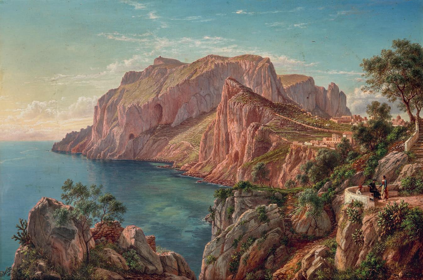
(1811 – 1901)
VIEW OF CAPRI NEAR NAPLES, 1883 oil on canvas
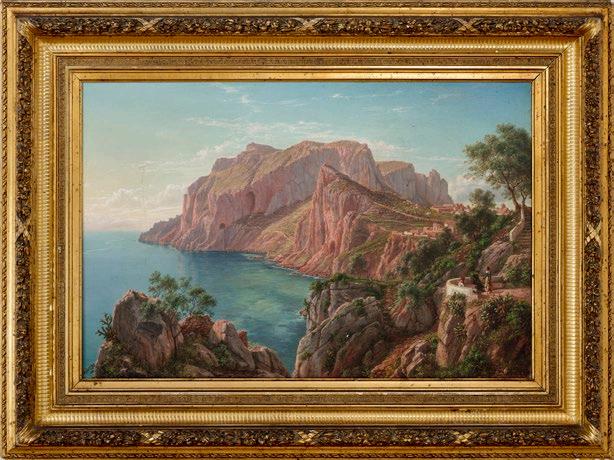
48.0 x 72.0 cm
signed lower right: E. v. Guérard
inscribed on stretcher bar verso: View of Capri taken from the Punta di Tragara
ESTIMATE: $120,000 – 180,000
PROVENANCE
Fletcher’s Art Gallery, Melbourne
Thomas Shaw, Wooriwyrite, Victoria, acquired from the above in 1884
Thence by descent
Private collection
Sotheby’s, Melbourne, 17 April 1989, lot 382
Henry Krongold, Melbourne
The Estate of Paul Krongold, Melbourne
EXHIBITED
Victoria Jubilee Exhibition, Royal Exhibition Building, Melbourne, November 1884 – January 1885, cat. 185, lent by Thomas Shaw
Eugen von Guérard, Art Gallery of New South Wales, Sydney, 7 June – 13 July 1980 and touring; Queensland Art Gallery, Brisbane, August 1980; Ballarat Fine Art Gallery, Victoria, September – October 1980; Art Gallery of South Australia, Adelaide, November 1980 and National Gallery of Victoria, Melbourne, December 1980 – January 1981
LITERATURE
Letter von Guerard to James Smith, 28 May 1883, James Smith
Papers, Mitchell Library, State Library of New South Wales, Sydney
Letter von Guerard to James Smith, 24 May 1884, James Smith
Papers, Mitchell Library, State Library of New South Wales, Sydney
Bruce, C., Eugen von Guérard , Australian National Gallery & Director’s Council, Canberra, 1980, p. 118 (illus.)
Bruce, C., Comstock, E., and McDonald, F., Eugene von Guérard: A German Romantic in the Antipodes , Alister
Taylor, Sydney, 1982, pl. 47, p. 162
RELATED WORKS
Capri 12 März 82 , pen and ink over pencil, Sketchbook XXXX, 1882, 1891, in the collection of State Library of New South Wales, Sydney, DGB16 v. 17: 10
Sketchbook VI, 1835 & 1836, Capri, in the collection of State Library of New South Wales, Sydney DGB14, vol. 8.
Capri , pencil, 1 May 1838
Capri , pencil, 2 May 1838
Abendlandschaft von der Insel Capri , 1846, oil on canvas, 75.0 x 103.5 cm, private collection
View from the ruins of the Villa di Tiberio looking across to Punto di Campanella and Monte Solaro / View from the western part of the island of Capri from the temple of Tiberius , 1885, oil on canvas
Capri: A view of Marina Piccola with Point Faraglione in the distance , 1884/1885, oil on canvas
48
COLLECTION
OF HENRY KRONGOLD
49
Eugene von Guérard
Capri 12 March 1882.
Page 10 in Volume 17: Sketchbook XXXX, 1882, 1891 State Library of New South Wales, Sydney
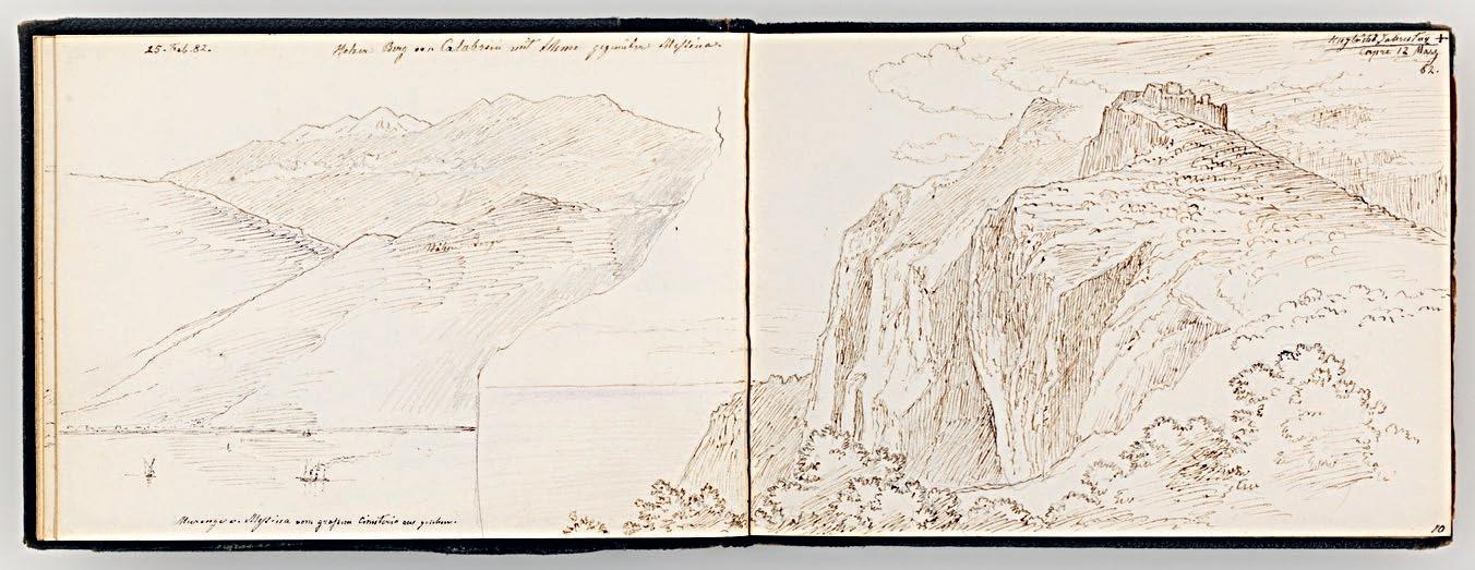
Eugene von Guérard, one of Australia’s greatest landscape painters, was captivated by the light and rugged beauty of the fabled island of Capri. He longed to share the magic of the place he had known so well in his youth with his wife Louise and their daughter Victoria and, on 26 February 1882, the von Guérard family sailed into the Bay of Naples in the ‘most magnificent sunshine’ and on a sea ‘as flat as spilt oil.’1 They stayed at the ‘new Hotel du Vesuve’ (the now legendary Grand Hotel Vesuvio) which, ‘although dearer is in a very beautiful position at Castel del Ovo.’ 2 It was not far from the Strada Piliero where von Guérard and his artist-father Bernard had lived in the mid-1830s. Von Guérard, Louise and Victoria spent almost a month in Naples visiting the ‘sights of the city and surroundings most worth seeing’ – including the mesmerisingly beautiful island of Capri, a place steeped in history and richly interwoven with literary and artistic associations. 3 On 12 March 1882, as they explored the island, von Guérard sketched the view from close to the vantage point of the present work. View of Capri near Naples , 1883 was painted the following year in his studio in Düsseldorf.
Von Guérard had first visited the island with his father in the summer of 1835. The ever-growing stream of northern painters and writers drawn to the island in the early nineteenth century included von Guérard’s associate, the influential Arnhem-born School of Posillipo painter, Anton
Sminck Pitloo. The young artist would also have been well aware of August Kopisch’s famed discovery of the Blue Grotto in 1826, and of the visits made by German and Scandinavian artists such as Ernst Fries, Leo von Klenze, Johann Christian Dahl, Franz Catel and Carl Morgenstern – all of whom were captivated by the light, intense colour and natural beauty of Capri. In May 1838, just before he left Naples for Düsseldorf to study at its famous Academy, von Guérard made a farewell visit to Capri. The luminous Abendlandschaft von der Insel Capri (Evening Landscape on the island of Capri) of 1846 – a work that attracted strong interest when it was presented by Deutscher and Hackett on 15 July 2020 – was based on two finely detailed, light and spacious drawings that date from the 1838 visit.
View of Capri near Naples portrays the same stretch of coastline as that in the 1846 painting – the view looking towards Monte Solaro and Anacapri from Capri. For the present composition, however, von Guérard positioned himself closer to the coast and further around and along the Marina Piccola. From this vantage point, on the Punta di Tragara, he could look directly across the water to the dramatic cliff formations that are the subject of the painting. Here the abstract forms of the island’s complex topography and the irregular surfaces of the spectacularly
50
COLLECTION OF HENRY KRONGOLD
Eugene von Guérard
Abendlandschaft von der Insel Capri , 1846 oil on canvas
75.0 x 103.5 cm
Private collection
eroded dolomite and limestone cliffs are emphasised by the contrasts between light and the shadow cast by the low rays of the setting sun.
Von Guérard’s lifetime fascination with – and knowledge of – geology is evident in his depiction of the worn limestone with its surface layers of volcanic ash and tufa, the exposed outcrops of rock along the ridgelines and the caverns eroded by rain and the action of the sea.
This stretch of the Capri coastline was already one of the most famous views on the island: here we share the experience of being there with a small party of tourists relaxing on the belvedere in the foreground on the right. Further along, the fourteenth century Carthusian Monastery, Certosa, sits at the top of a steep coastal cliff, and beyond it, famous landmarks of the township of Capri can be identified, notably the domed seventeenth-century church of San Stefano. Von Guérard knew the architecture and layout of the township of Capri well, having recorded it with minute precision in 1838: we are invited to take a virtual stroll into the town, or to share the awe of the tiny figures on the grassy ledge below the monastery as they take in the magnitude of the soaring rock walls bathed in the pink, almost crepuscular, light of a sunset slipping into evening. These minute and lively observations are integrated into a work of uplifting breadth, one based on strong compositional geometry and unified by light.
View of Capri near Naples was one of nine works that, in 1884, von Guérard sent to Melbourne to be sold by the successful Collins Street art dealer Alexander Fletcher. It quickly found a buyer in Thomas Shaw, whose Western District pastoral property, ‘Wooriwyrite’ near Camperdown, von Guérard had first visited and sketched in 1857. View of Capri near Naples was shown at the 1884 Victorian Jubilee Exhibition, on loan from Shaw.
Von Guérard remained captivated by the subject of Capri: he painted Capri: A view of Marina Piccola with Point Faraglione in the distance in late in 1884 or early 1885, and the beautiful, light-infused View from the ruins of the Villa di Tiberio looking across to Punto di Campanella and Monte Solaro in 1885.
3.
51
1. Von Guérard to Julius von Haast 14 April 1884. Haast Family Papers, Alexander Turnbull Library, Wellington, New Zealand, in Darragh, T., & Pullin, R., Lieber Freund! Letters from Eugen von Guérard to Julius von Haast , Art Gallery of Ballarat, Ballarat, 2018, p. 56.
2. ibid.
ibid.
DR RUTH PULLIN
6 ARTHUR STREETON
(1867 – 1943)
ROUEN, FROM BON SECOURS, 1912
oil on canvas
51.0 x 77.0 cm
signed lower right: A. Streeton bears inscription on plaque attached to frame: Sir Arthur Streeton / “ROUEN, FROM BON SECOURS” / (c.1912)
ESTIMATE: $120,000 – 180,000
PROVENANCE
Sir Edward Hayward, Adelaide, by 1968
Private collection, Melbourne
Sotheby’s, Melbourne, 19 August 1996, lot 147
Henry Krongold, Melbourne
The Estate of Paul Krongold, Melbourne
EXHIBITED
Arthur Streeton Exhibition , John Martin & Co. Ltd, Adelaide Festival of Arts, Adelaide, 6 – 23 March 1968, cat. 79 (label attached verso)
LITERATURE
Streeton, A., The Arthur Streeton Catalogue , Melbourne, 1935, cat. 482 or 483
RELATED WORKS
Rouen , 1912, watercolour on paper, 23.5 x 34.5 cm, private collection
Rouen , 1912, illus. in Ure Smith, S., The Art of Arthur Streeton , Special Number of Art in Australia, Angus & Robertson, Melbourne, 1919, pl. XXXIX
52
COLLECTION OF HENRY KRONGOLD
53
Boulogne , 1918
oil on canvas
91.8 x 153.0 cm
Art Gallery of New South Wales, Sydney
Arthur Streeton left Australia in January 1897, bound for London and eager to see the works of the great masters of European art, as well as those of his contemporary international peers. Writing to his friend Tom Roberts the following year, he declared, ‘[John Singer] Sargent is a perfect wonder … & 2 or 3 … are quite as fine as the great Rembrandt.’1 In a postscript to the letter, he wrote:
I feel convinced that my work hereafter will contain a larger idea & quality than before – After seeing Constable Turner Titian Watts & all the masters – I wish you & the Prof [Frederick McCubbin] could have a trip here – I think it’s necessary for ones work – I’m evolving & should I return I’d never paint Australia in exactly the same way – by Gad I’ll do one or two great things if I get out there again – I know more now - & would touch it more poetically 2
Apart from two extended visits to Australia, Streeton remained in England for more than twenty years, returning to the country of his birth in 1920 an established and successful artist. With his home base in London, Streeton had relatively easy access to Europe and his first visit to France, a week in Paris, took place in the summer of 1901. ‘I was over there for a week a little time back. The 1st impression never to be
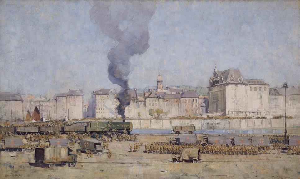
forgotten – & best of all the Louvre – the Giorgione, Titians, Poussins, Claudes, Tintoretto’s – ‘My Golly – how they sank down into me – how inspiring’. 3 He visited France again, as well as Belgium, in May the following year, travelling with fellow artist Emanuel Phillips Fox.
This painting of Rouen, in Normandy in the north of France, emerged from more extensive travels through France in 1912 in the company of the English artist, collector and philanthropist, Sigismund Goetze. Writing to his friend Walter Pring, Streeton described the itinerary:
‘We’ve had pretty good weather for Amiens, Rouen (marvellous), Caen … Bayeux, Rennes, Vannes Mt St Michel, Quimper, & a dozen other places seen by motor, train etc – & still we go on, … We look forward to many places yet & later in Tours, & Chartres with its indescribable glass’.4 He also noted, ‘I met your friend Homo near where we stayed at Rouen, Hotel de la Poste, he was most kind and charming & helped direct me to the view of Rouen’. 5
It is tempting to speculate that this perspective of Rouen, seen from the Gothic Revival Basilica Notre-Dame de Bon Secours outside the city, is ‘the view’ that Streeton refers to in his letter. Looking down a gently sloping, grassy hill, past rows of small houses towards the centre of
54
Arthur Streeton
COLLECTION OF HENRY KRONGOLD
Arthur Streeton
The Somme Valley near Corbie , 1919
oil on canvas
153.0 x 245.5 cm
Australian War Memorial, Canberra
Rouen, the painting adopts a broad view of its subject, taking in the pale blue river that meanders through the landscape, flanked by towering industrial chimney stacks and other buildings, all brought together under a vast open sky. Streeton was a skilled painter and his love of his medium and facility with the brush is on full display in this work. Broad, lively brushstrokes impart a sense of dynamism and movement within the depiction of the overcast sky, while quick daubs of paint describe yachts and other vessels on the river, as well as the smoke that emanates from the chimney stacks.
While the subject matter and colour palette are very different from Streeton’s iconic ‘blue and gold’ depictions of the Australian landscape, the composition shares many of the characteristics of well-known paintings such as ‘Still glides the stream, and shall for ever glide’ , 1890 (Art Gallery of New South Wales) and Australia Felix , 1907 (Art Gallery of South Australia). This predilection for a panoramic view is perhaps the reason that he chose not to focus on a more obvious landmark, the Rouen Cathedral, that was made famous by Claude Monet in his early 1890s series of more than thirty paintings of its façade which captured the changing colour and light at different times of day and year.
Streeton’s best-known paintings of France were made some years later when he was appointed an Australian official war artist and attached to the 2nd Division of the Australian Imperial Force, undertaking two tours in 1918. Producing many more works than his commission required –watercolours and drawings made in the field, and paintings produced in the studio – Streeton was inspired by both his subject and his fellowsoldiers: ‘Australians, I thought I understood … but its necessary to see & know them here to properly appreciate the manhood of Australia – Absolutely – The fights against fire & flood & thirst in the Bush, all tells in the field here – & brings out the finest in them … I’m glad I’ve not missed it.’6
1. Streeton to Tom Roberts, 28 June 1898 quoted in Galbally, A. and Gray, A. (eds.), Letters from Smike: The Letters of Arthur Streeton 1890-1943 , Oxford University Press, Melbourne, 1989, p. 77. Streeton’s spelling and punctuation was idiosyncratic and is quoted here exactly as it has been transcribed and published.
2. ibid., p. 78
3. Streeton to Tom Roberts, 1 October 1901, ibid., p. 88
4. Streeton to Walter Pring, 15 September 1912, ibid., p. 123
5. ibid.
6. Streeton to Tom Roberts, 6 July 1918, ibid., p. 148. For more information about Streeton’s work as an official war artist, see Yip, A., ‘Painting the Somme’ in Tunnicliffe, W., Streeton , Art Gallery of New South Wales, Sydney, 2020, pp. 234-242.
KIRSTY GRANT
55
7 EMANUEL PHILLIPS FOX (1865
– 1915)
FIGURES BESIDE THE CREEK, STANWELL PARK, c .1914 oil on canvas on board on composition board
37.0 x 44.0 cm signed lower left: E. Phillips Fox
ESTIMATE: $40,000 – 60,000
PROVENANCE
Private collection
Joseph Brown Gallery, Melbourne Sir Leon and Lady Trout, Brisbane, acquired from the above in July 1971
The Collection of Sir Leon and Lady Trout, Christie’s, Brisbane, 6 June 1989, lot 175 (as ‘Picnic on the Hawkesbury River’) Henry Krongold, Melbourne
The Estate of Paul Krongold, Melbourne
EXHIBITED
Spring Exhibition 1970, Joseph Brown Gallery, Melbourne, 14 September – 5 October 1970, cat. 10 (illus. in exhibition catalogue, as ‘Picnic by the River’) Masterworks from the Collection of Sir Leon and Lady Trout , Queensland Art Gallery, Brisbane, 21 September – 14 December 1977, cat. 12 (label attached verso, as ‘Hawkesbury River’)
LITERATURE
Zubans, R., E. Phillips Fox: His Life and Art, The Miegunyah Press, Melbourne University Press, Melbourne, 1995, cat. 454, p. 230 (erroneously catalogued as ‘Picnic on the Hawkesbury River’)
RELATED WORK
The Creek, Stanwell Park , c.1914, oil on canvas, 37.0 x 44.5 cm, Private collection, illus. in Zubans, R., E. Phillips Fox: His Life and Art , The Miegunyah Press, Melbourne University Press, Melbourne, 1995, p. 166
In a letter to his close friend Hans Heysen in 1911, Emanuel Phillips Fox wrote that in his determination ‘to get some settled sunlight’, he, his wife (the artist Ethel Carrick) and one of Fox’s students went from London ‘to Algiers, from there South into the interior to a place called Bou Saada – where we stayed six weeks – then back to Algiers – then to Tangiers & on to Cadiz – and return’d home through Seville, Cordova, Granada, Toledo and Madrid.’1 On their way back to Paris, they painted in the south of France, further inspired by the sea and coastal towns. Fox’s palette, already enriched by his intimate study of post-impressionist art in Europe, now became even more sun-drenched and high-key in colour. On re-arrival in Australia in 1913, his recent work caused a sensation and he subsequently painted a number of canvases in late January 1914 at popular tourist sites near Sydney, including majestic Stanwell Tops
at the southern edge of the Royal National Park, and Stanwell Park below. It is plausible that Fox stayed with his Australian Art Association colleague Edward Officer, who lived nearby.
Figures beside the creek, Stanwell Park , c.1914, is one of seven known paintings that Fox did in the area, all of which appear to have been plein air studies, individually done in single sittings, of the cliffs and the meandering creeks that run through the park. The likely setting is the lower reaches of Stanwell Creek, with the picturesque Kelly’s Falls a short distance away. The painting blazes with light and textured impasto, animated by the figures – likely members of Fox’s and Officer’s families – clambering amongst the rocks. Whilst the artist’s mastery of colour is on full display, particularly in the right-hand section featuring the palm trees, it is also interesting to note other aspects of his technique, particularly in his treatment of the ground. As his colleague Norman Carter described, Figures beside the creek, Stanwell Park was not painted ‘on white prepared canvas, but on duck or sailcloth with a coating of glue size the colour of which would be light fawn or offwhite; patches of this were often left unpainted. … In some paintings, particularly if linseed oil had been used to restore the painting, this unpainted sailcloth had darkened – but it had never been white.’2 This particular aspect is detectable amongst the rocks and lower cliff.
In the years prior to 1913, Fox had already established himself as one of this country’s leading artists, having studied at the National Gallery School in Melbourne, then in Paris in the company of Tudor St George Tucker. On their return in 1893, the two men opened the Melbourne Art School, famed for being the most progressive in its day. In subsequent years, Fox was the first Australian to be elected into membership of the Société Nationale des Beaux-Arts, Paris, and the International Society of Painters, Sculptors and Gravers in London, but what is less known is his impact on this country’s earliest modernists. Roland Wakelin would later recall of Fox’s exhibition in Sydney in 1913: ‘We’d never seen colour like that before… this was expression through colour.’ 3 With a provenance that includes Joseph Brown, Sir Leon and Lady Trout, and the Krongold family, Figures beside the creek, Stanwell Park is a superb example of Fox’s mature painterly technique.
ANDREW GAYNOR
56
1. E. P. Fox. Letter to Hans Heysen 13.09.1911. Cited in: Zubans, R., E. Phillips Fox: his life and art , Miegunyah Press, Melbourne, 1995, p. 159
2. Roland Wakelin, recounting Norman Carter. Quoted in: Fox, L., E. Phillips Fox: notes and recollections , (self published), Sydney, NSW, 1969, pp. 29 – 30
3. Roland Wakelin, 1968, ibid., p. 29
COLLECTION OF HENRY KRONGOLD
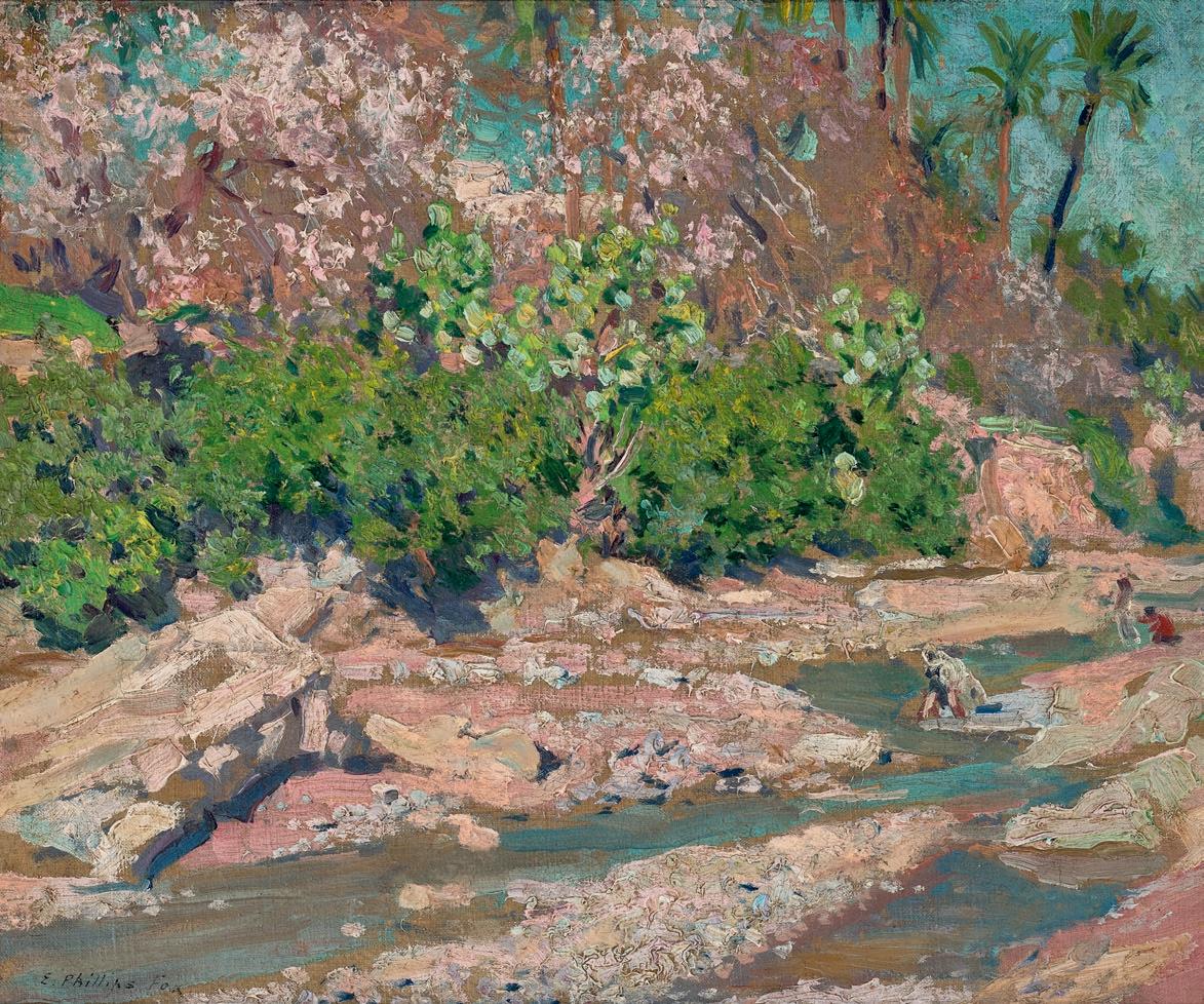
57
FREDERICK M c CUBBIN
(1855 – 1917)
SUMMER HAZE, 1916 oil on canvas
46.0 x 58.5 cm signed and dated lower right: F McCubbin / 1916 bears inscription on gallery label verso: Late Fred McCubbin / ‘Summer Haze’
ESTIMATE: $70,000 – 90,000
PROVENANCE
The Sedon Galleries, Melbourne (label attached verso)
Private collection, Melbourne
Joseph Brown Gallery, Melbourne
Henry Krongold, Melbourne, acquired from the above in June 1989
The Estate of Paul Krongold, Melbourne
Frederick McCubbin’s Summer haze , 1916, is one of the last paintings finished by the artist, alongside his striking self-portrait from the same year, now in the collection of the Art Gallery of Western Australia (AGWA). McCubbin was becoming increasingly unwell and his health was aggravated by severe asthma which also curtailed his mobility, so the wonderfully wild acreage of his South Yarra home became the focus for his paintings. McCubbin was already famed for his evocative depictions of Australian life such as A bush burial , 1890 (Geelong Art Gallery); The Pioneers , 1904, (National Gallery of Victoria), and Violet and gold , 1911 (National Gallery of Australia); and the latter work, like Summer haze , displays the lighter palette he employed after visiting Europe for his first and only time in 1907, where the luminous artworks of J.M.W. Turner made a profound impression.
McCubbin and his wife Annie purchased a house in Mt Macedon in 1901 which they re-named ‘Fontainebleau’ and it was here that many of his larger works were painted. However, in 1905 he also rented a home in South Yarra before leaving for Europe; and on his return, McCubbin moved to nearby ‘Carlesberg’, a larger property in Kensington Road, which he retitled ‘The studio’ at outbreak of WWI due to its original Germanic name. This was a ‘charming old colonial house of stone, cool on the hottest days, perched right over the Yarra.’ 1 Family friend Bessie Colquhoun recalled that ‘Kensington Road had a rather wild
old garden…(not) actually a garden, it was wild country, but it was very lovely … full of wild things, natural things, gums and all the things that grow out in the bush.’ 2 McCubbin was entranced by the property, painting many of its aspects throughout the remaining decade of his life. In Summer haze , he focuses on the lower trunks of two of the garden’s elder trees, whose edges dissolve in the crisp morning light, also seen to great effect in the larger Golden Sunlight , c.1914 (Castlemaine Art Museum and Gallery). The radiance of these paintings was achieved through a laborious process, as described by the artist’s son Louis, whereby ‘the pigment was mixed on the palette and applied with a knife... [On completion] the canvas was put in the window or out in the sun until the pigment became bone dry; it was then rubbed down with pumice-stone until the surface was smooth as glass. By this method the underneath colours would show through the over-paintings, and the effect of transparency and broken colour was accentuated.’ 3
Unfortunately, the stress of the disastrous war – which killed his brother and maimed one of his sons – exacerbated McCubbin’s ill health forcing him to take extended leave from his teaching position at the National Gallery Art School; but he continued creating as his youngest daughter Kathleen recalled: ‘(After taking) the short cut across to our place, across the paddocks… I would see my father on the verandah in his dressing-gown and black velvet beret, which he always put on when he went outside at that stage of his life… He was really in very poor health at this time, but he persisted and he kept on painting.’ 4 McCubbin’s debilitating asthma and a bout of pneumonia further weakened him and on 20 December 1917, he died from a heart attack aged sixty-two.
1. Frederick McCubbin. Letter to Tom Roberts, December 1907. Cited in: McKenzie, A., Frederick McCubbin 1855-1917: ‘The Proff’ and his art, Mannagum Press, Melbourne, 1990, p. 269
2. Bessie Colquhoun. Quoted in: ibid., p. 341
3. Louis McCubbin, Bulletin of the Art Gallery of South Australia , 1943. Cited in: Whitelaw, B., The art of Frederick McCubbin , National Gallery of Victoria, 1991, p.18
ANDREW GAYNOR
58
8
4. Kathleen Mangan. Quoted in: McKenzie, A., Frederick McCubbin , ibid. p. 208
COLLECTION OF HENRY KRONGOLD
59
9 SIDNEY NOLAN (1917 – 1992)
EARLY MORNING TOWNSHIP, 1955
Ripolin enamel and oil on composition board
85.5 x 64.0 cm
signed lower right: Nolan signed, dated and inscribed verso: ADELAIDE / M. BONYTHON / KELLY SERIES / EARLY MORNING TOWNSHIP / 16/2/55 / nOLAN
ESTIMATE: $1,500,000 – 2,000,000
PROVENANCE
Redfern Gallery, London
Private collection
Sotheby’s, Melbourne, 17 April 1989, lot 514
Private collection
Gould Galleries, Melbourne
Sotheby’s, Melbourne, 22 April 1996, lot 21
Henry Krongold, Melbourne
The Estate of Paul Krongold, Melbourne
EXHIBITED
Sidney Nolan: Paintings, Drawings , Redfern Gallery, London, 3 – 28 May 1955, cat. 11
Treasures Revealed: Modern Australian Art , Gould Galleries, Melbourne, 1 – 24 September 1995, cat. 10 (illus. in exhibition catalogue)
60
COLLECTION OF HENRY KRONGOLD
Front cover of exhibition catalogue ‘Sidney Nolan: Paintings, Drawings' , Redfern Gallery, London, 3 – 28 May 1955

61
Sidney Nolan is well-known for his iconic depictions of the 19 th century outlaw Ned Kelly. The most famous of these paintings are the works in the first Kelly series painted in Melbourne at Heide, the home of John and Sunday Reed, between 1946 and 1947. At the conclusion of his time there, the series was given by Nolan to the Reeds and subsequently gifted by Sunday to the National Gallery of Australia in 1977. The suite of 26 works remains possibly the best-known series of paintings in Australian art. Given the personal connections, Nolan’s separation from that seminal group of paintings was not without regret. In subsequent years, the artist would return to the Kelly saga.
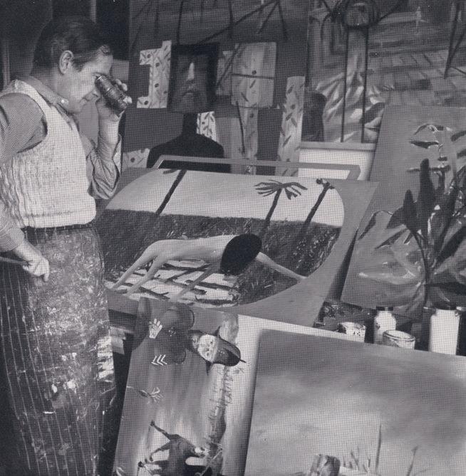
Growing up in an extended Irish clan, Sidney Nolan was enthralled by the tales of his grandfather, William (Bill) Nolan, a policeman in rural northeastern Victoria who had been involved in the pursuit of the Kelly Gang and its most famous member, Edward (Ned) Kelly. The complex story of the notorious band of bushrangers begins when Constable Fitzpatrick visits the Kelly home at Eleven Mile Creek, near the town of Greta, in April 1878. According to the Kelly family, Fitzpatrick indecently manhandled Ned’s sister Kate, leading to an altercation with Dan Kelly. Fitzpatrick’s version of events is unsurprisingly contrary, reports of which led to arrest warrants being issued for Ned and Dan. Thus begins the saga of banditry to follow. After many travails and encounters the Gang meets its end in a gun battle with police at the Glenrowan Hotel. Ned Kelly is captured and
later executed by hanging at the Old Melbourne Gaol on 11 November 1880. In his brief yet highly publicised career, Ned Kelly had become something of a local hero, especially so amongst the working-class Irish of Victoria who recognised the unfairness of the police in their dealings with the less privileged members of society. Such expressions as ‘Game as Ned Kelly’ were common household sayings.
Kelly was distinguished not only by his actions, but equally by his homemade s uit of armour, replete with iron helmet. The square outline of this iconic helmet allowed Nolan to make a mental association between Kelly’s mask and the 1915 painting Black Square , created by Russian Constructivist artist Kazimir Malevich. Nolan repurposed the abstract form as a figurative motif, thus creating a symbol that became synonymous with the artist and Kelly alike. By the time that Nolan turned his attention to Kelly, the saga was viewed in elite circles as a shameful colonial episode, certainly not one that could elevate the standing of Australia in any meaningful way. For Nolan however, Kelly’s preparedness to stand against the world marked him out as one who could transform and transcend his cultural and historical moment. When he embarked on the creation of the Kelly paintings, Nolan was himself ‘on the run’, absent without leave from his army post, informing his personal relationship with the cult outlaw.
Nolan was completely familiar with the part of Victoria that is sometimes called ‘Kelly Country’, having spent many childhood summers there with relatives. The artist also immersed himself in the available literature on Kelly. This included contemporary newspaper reports, J. J. Kenneally’s ‘The Complete History of the Kelly Gang and their Pursuers’, and the voluminous ‘Royal Commission on the Police Force of Victoria’, 1881, which occurred in the wake of the ‘Kelly outrages’. 1 According to Nolan’s biographer, Brian Adams, Nolan along with the poet, critic and publisher Max Harris, also travelled by train to the town of Glenrowan, seeking first-hand knowledge of the Kelly saga. From the outset, Nolan and Harris received a frosty reception; the locals were ill-disposed to discussing the Kelly story. This was repeated also when the pair located Ned Kelly’s younger brother Jim. The now aging rustic would not even shake hands with the probing artist. Such experiences did not deter Nolan from bringing the elements of historical research, myth and landscape to bear on his Ned Kelly paintings. When the paintings were first exhibited in Melbourne in 1948, Nolan presented them with quotes taken from historical sources, thus cementing the play of text and image in the reading of the work.
62
COLLECTION OF HENRY KRONGOLD
The Artist in his London Studio, c.1957 photographer: Douglas Glass
The Glenrowan siege , 1955 synthetic polymer paint on hardboard
91.5 x 71.0 cm
Kerry Stokes Collection, Perth
© The Sidney Nolan Trust. All rights reserved, DACS / Copyright Agency 2023
On 17 August 1950, Sidney Nolan and his wife Cynthia (née Reed) sailed for Europe, basing themselves in Cambridge and travelling to Portugal, Spain, France and Italy. Following subsequent trips to Australia, the couple again set sail on 22 October 1953 and settled permanently in London. 2 The shift was to prove decisive in Nolan’s artistic life with a new maturity entering his paintings. Between 1954 and 1956 Nolan produced a group of oil and enamel on board paintings, some as a direct reworking of the first Kelly series. In the new compositions, greater focus was given to the fateful Glenrowan Siege, a confrontation that ended the Gang’s reign of terror in a spectacular fashion. Such paintings included preliminary renderings of the town of Glenrowan, solitary images of the iron-helmeted outlaw, the wounding of Ned Kelly outside of the Glenrowan Hotel, and the aftermath of the siege wherein police set fire to the hotel. In later works, Kelly was presented less as a historical person than a figure of mythic proportions, at times acquiring universal appeal.
Within this spectrum, Early Morning Township , 1955 is an augury of the skirmish to come. Ned Kelly is seen studying the township in the cool light of morning. The town sleeps while Kelly, set to one side of
After Glenrowan Siege (Second Ned Kelly series) , 1955 enamel on board
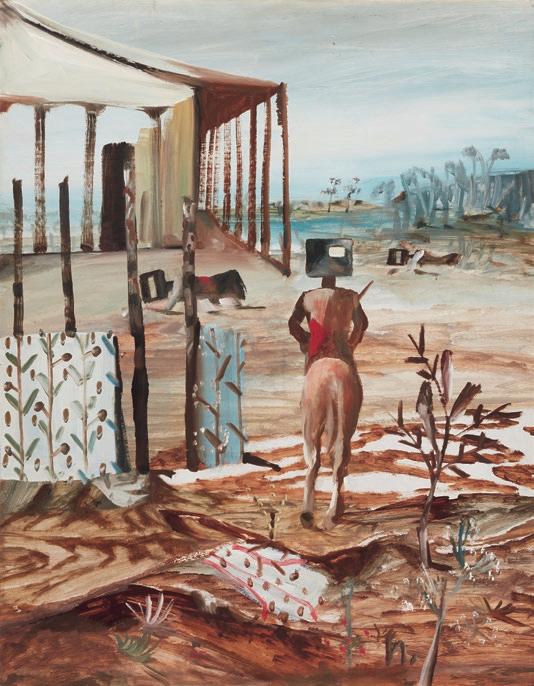
121.9 x 91.5 cm
The Museum of Modern Art, New York
© The Sidney Nolan Trust. All rights reserved, DACS / Copyright Agency 2023
the composition, sits astride his steed, rifle in hand. The outlaw is still but his dappled mount sniffs the air, perhaps sensing the danger to come. The composition can be read as the prelude to the violence of the Glenrowan Siege; a poignant moment as Kelly contemplates the polite society to which he will never belong. It is also a counterpoint to an important painting purchased in 1955 by the Museum of Modern Art, New York. Titled Glenrowan Siege , 1955, this work shows the ruined aftermath of the battle in which many of the Kelly Gang members were killed.
These two paintings were featured in Nolan’s first solo exhibition in London, Sidney Nolan: Paintings and Drawings , at the Redfern Gallery, running from 3 May to 28 May 1955 organised by the influential gallery director, Harry Tatlock Miller. From Geelong, Miller worked as journalist and art critic, and along with his partner, the artist and set designer Loudon Sainthill, he collaborated on several books related to tours of Australian theatre. In Melbourne in 1939, Nolan had been commissioned to design the sets for Serge Lifar’s production of Icare, a project that had originally been earmarked for Sainthill. Nolan’s lucky break did not deter
63
Sidney Nolan
Sidney Nolan
Miller from giving Nolan a favourable review. In 1949, in the Sydney Sun, Miller writes, “[Nolan] gives us [Australians] the sensation of seeing and knowing our own country, both its landscape and its legend, for the first time.’ 3 In London the pair met via Nolan’s wife Cynthia, who knew Miller from Australia. The exhibition featured nineteen Kelly paintings including catalogue entries nos. 1-17 and nos. 37-38. Early Morning Township is listed as no. 11 in the catalogue, with Glenrowan Siege as no. 5. For Patrick McCaughey, the new Kelly paintings were ‘monumental and grave…had a tragic grandeur, and were quite different from the lively, more anecdotal, series of 1946 – 47.’ 4
In similar fashion, the journalist Colin McInnes wrote:
In the new Kelly series of 1954 – 55, the ‘naïve’ style has gone, and the invented shapes are intellectually more coherent and plastically more ingenious: the colours, unlike those of the earlier landscapes, are luminous, rich, and varied; while the presentation of the Kelly myth has gained a new magic and imaginative power. Nolan has given the hero his metallic face and body as he rides and strides through the enormous Bush, striking terror and constantly facing it. The mood of these pictures is sardonic, brutal, sad and tender. The story unfolds itself painfully and
poetically in the successive episodes, and all the loss and sorrow of a rare young life thrown on to the scrap-heap are dignified, ennobled, and redeemed. 5
McInnes’s reference to tenderness and ‘a story that unfolds poetically in successive episodes’ is vividly apparent in Early Morning Township It is also worth considering that by the time Nolan was producing these works, not only had he painted numerous important bodies of paintings, but he had now established himself as Australia’s foremost modern artist at an international level. He had been appointed, in 1954, Australian commissioner at the Venice Biennale.
Early Morning Township distils many of Nolan’s key artistic aspirations to create narratives that were quintessentially Australian, lyrical in nature and universal. The Central Australian landscapes and Burke and Wills series of 1950, the 1953 Drought series of paintings featuring the desiccated carcases of animals, the religious paintings of 1951 - 52 depicting saints in the Australian outback – all had been completed in the leadup to the mid 50s Kellys. Notably, the iron-helmeted figure in Early Morning Township is presented centaur-like, at one with his equestrian mount, and similar to the creature of ancient Greek legends.
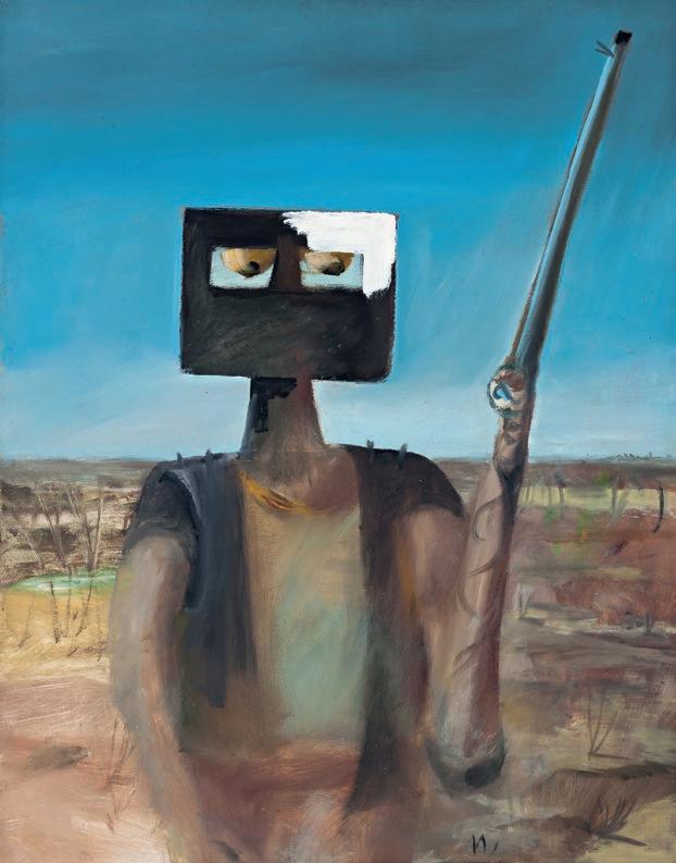
64
COLLECTION OF HENRY KRONGOLD
Outlaw
and enamel
on composition
91.0 x 71.0 cm Private collection
(inc. BP) Deutscher and Hackett,
March
©
DACS / Copyright Agency
SidneyNolan Ned Kelly –
, 1955 oil
paint
board
Sold for $2,562,000
Sydney 15
2017
The Trustees of the Sidney Nolan Trust /
30.5
Art Gallery of New South Wales, Sydney
Increasingly, Nolan would introduce mythic elements into the Kelly paintings encouraging the emergence of deeper implications of the outlaw’s travails. In a letter dated 1 April 1951, written to his close friend the artist Albert Tucker, Nolan reflected on his encounters with early European art, suggesting ‘the painters who moved me most (El Greco & Giotto) seemed men primarily of faith….The painting is wonderful in the sense that it is a painting of wonderment. ’6 Comments such as this highlight Nolan’s search for a deeper pictorial language, one that transcended a mere recollection of narrative. Elements such as the blue sky and reductive umber landscape used by Giotto in the Scrovegni Chapel frescoes (1304 - 1306), which Nolan visited, along with Giotto’s rendering of Christ entering Jerusalem astride a donkey, prior to his crucifixion, suggest references for Early Morning Township
Institutional purchases from this period reflect the importance of the Kelly paintings from the mid 1950s. Additional to the painting purchased by MOMA New York, Kelly, Spring , 1956 was acquired by The British Council. In 1959, the Contemporary Art Society gifted Death of a Poet , 1954 to the Walker Art Gallery, Liverpool. The Tate Gallery also acquired Glenrowan , 1956 - 57 from Nolan’s large solo exhibition at the Whitechapel Gallery, London. Turning to Australian art collections, The Art Gallery of New South Wales has a smaller Ned Kelly painting
completed just six days prior to Early Morning Township , and the Art Gallery of Western Australia is home to The Disguise , 1955 also from the Kelly Series. The National Gallery of Australia in Canberra has Kelly Crossing Bridge , 1955, while the National Gallery of Victoria is home to Kelly and Horse , 1955. The unquestionable importance of these works in 20 th century Australian art cannot be understated. Of the remaining ten or so Ned Kelly paintings from the Redfern exhibition outside of public collections, Early Morning Township stands as a rare and significant work. In the 21st century, Nolan continues to be regarded as Australia’s most important 20 th century artist, with ongoing exhibitions, biographies, feature-length documentaries, centenary celebrations and research initiatives that continue to plumb the seemingly limitless depths of Nolan’s creative outpourings. Nolan’s depictions of Ned Kelly however remain his singular crowning achievement.
1. Royal Commission on the Police Force of Victoria, 1881, National Library of Australia, Canberra, Registry Number Aus 68-1548
2. Underhill, N., Sidney Nolan: A Life , NewSouth Publishing, Sydney, 2015, p. 62
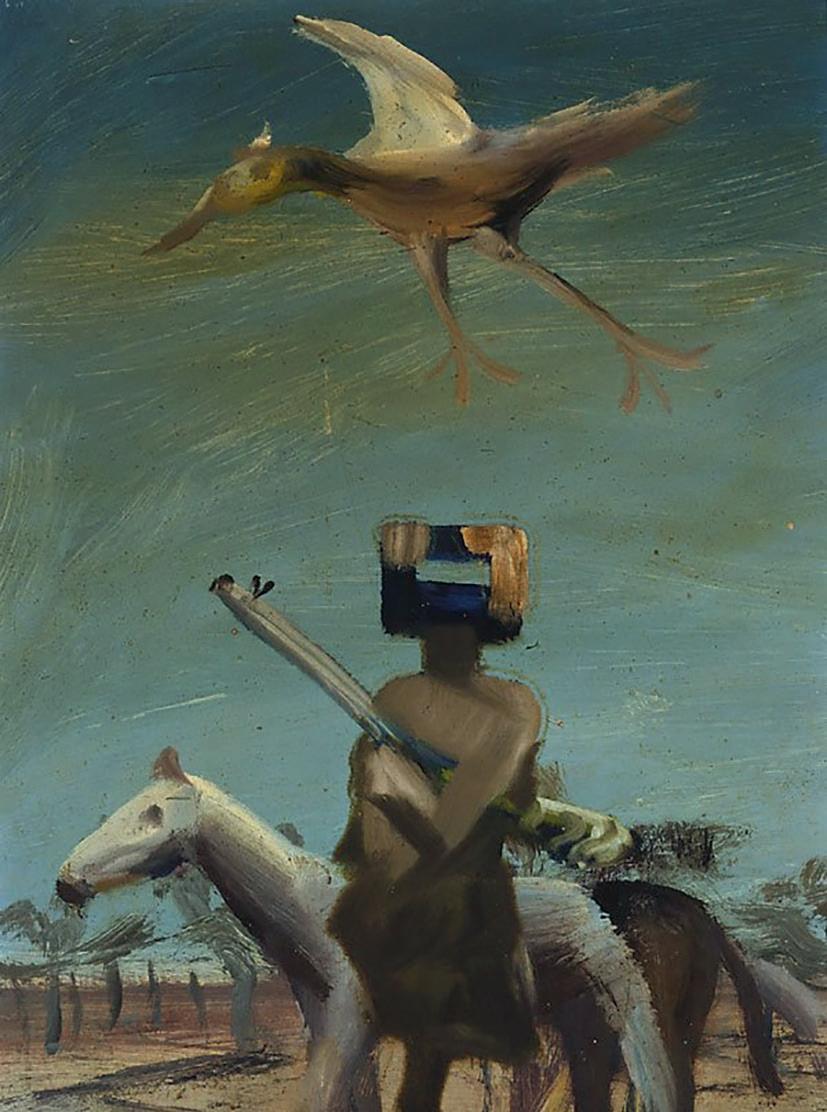
3. Tatlock Miller, H., ‘Amazing Impact by Australian Artist’, The Sun, Sydney, 8 March 1949, p. 8
4. McCaughey, P. (ed.), Bert & Ned: The Correspondence of Albert Tucker and Sidney Nolan , The Miegunyah Press, Melbourne, 2006, p. 179
5. McInnes, C., Sidney Nolan , Thames & Hudson, London, 1961, p. 31
6. Sidney Nolan to Albert Tucker, 1 April 1950, in McCaughey, P. (ed.), ibid., p. 122
DR DAMIAN SMITH
65
Sidney Nolan
Ned Kelly, 1955 oil on hardboard
x 21.0 cm
© The Trustees of the Sidney Nolan Trust / DACS / Copyright Agency
JOHN OLSEN
(1928 - 2023)
JOURNEY THROUGH THE SEA PORT, 1961 oil on composition board
97.0 x 127.0 cm
bears inscription lower right: John Olsen 61 signed and inscribed verso: John Olsen 482 Glenmore Rd, Edgecliff / SYDNEY. AUSTRALIA
ESTIMATE: $80,000 - 120,000
10
PROVENANCE
Thelma Clune, Sydney
Christie's, Melbourne, 6 March 1970, lot 69 (as ‘Landscape with Animals’)
Private collection
Christie's, Sydney, 26 October 1987, lot 718 (as ‘The Sea’) Gallery 460, New South Wales
Sotheby’s, Sydney, 29 November 1993, lot 85
Henry Krongold, Melbourne
The Estate of Paul Krongold, Melbourne
EXHIBITED
Great Australian Artists of the Twentieth Century, Lake Macquarie Gallery, New South Wales, 22 July – 16 August 1992
dynamism and vitality of the harbour, Sydney’s crown jewel, thus Olsen embarked upon his ‘littoral’ series of works which, featuring the chaotic flux of tides, city and people, are resplendent in their vivacious palette and energy. Witness for example, Entrance to the seaport of desire, 1964 or the celebrated Five Bells, 1963 (both in the collection of the Art Gallery of New South Wales) – the latter inspired by the tragic 1939 poem of the same name by Kenneth Slessor that would also provide the impetus for the artist’s monumental mural commission for the northern foyer of the Sydney Opera House, Salute to Five Bells, 1972 – 73.
‘…I brushed a line around the core theme, the seed-burst, the life-burst, the sea-harbour, the source of life… I wanted to show the Harbour as a movement, a sea suck, and the sound of the water as though I am part of the sea... I am in the sea-harbour and the sea-harbour is in me.’1
With his distinctive meandering line, exuberant mark-marking and mastery of colour, John Olsen is universally revered as one of the most important artists in a generation that defined the way Australia perceived its natural environment. Throughout his vast career spanning more than seven decades, he revealed an unerring fascination with the natural world in all its myriad forms, creating evocative depictions of the landscape that arguably capture the spirit and character of this country more eloquently than any other non-indigenous artist before him. Significantly, despite his extensive travels throughout the Australian interior and further abroad in England, Spain and Portugal, it was the beauty of the Sydney Harbour and its surrounds that remained his most enduring source – inviting endless physical and intellectual wonderment both at the colour and play of light on the water, and the various life forms inhabiting the sea and its edges.
No doubt borne from an idyllic childhood spent living on the shores near Bondi, Olsen’s love of the harbour was reignited in the early 1960s when, having recently returned from abroad, he moved with his young family into a small fisherman’s cottage in the picturesque Watsons Bay at the tip of the South Head. Drawing inspiration anew from the colour,
An important prelude to these masterpieces, Journey Through the Sea Port , 1961 not only attests to Olsen’s ‘lifelong love affair with Sydney Harbour’ 2 , but reflects the artist’s increasingly fluid approach to the boundaries between abstraction and figuration in the wake of the infamous Antipodean Manifesto polemic that had divided Sydney and Melbourne art worlds in 1959. Notably, where his grid-like seaport paintings of the mid-1950s had demonstrated a predominantly figurative emphasis, in the early sixties Olsen now expressed his affection for the harbour in a much more organic and empathetic way3 , with the undulating tides that connect the city and its inhabitants tangibly captured in both the fantastic abstract forms and the sensuous physicality of the paint surface itself. Betraying the artist’s keen interest in the interchangeable, metamorphic imagery of Pacific and Melanesian art at the time, thus disparate hybrid images of human, animal and vegetal forms here merge and flow into one another, all organically uniting within the seascape – everything happening at once in joyful homage to the circus of living. Raw colour applied straight from the tube, together with pulsating calligraphic brushstrokes set against a ground of sonorous blues further enhance this celebratory spirit, creating a bold, dynamic composition that resonates with a Vitalist energy.
Seducing the eye through its transmutable forms, sinuous line and colour and hedonistic exuberance, indeed Journey Through the Sea Port , 1961 exemplifies well Olsen’s art of the early sixties when his star was in brilliant ascendency, and he was embarking upon what would become some of the most iconic images of his career.
66
1. The artist, referring to his celebrated Five Bells , 1963 in the collection of the Art Gallery of New South Wales, see: https://www.artgallery.nsw.gov.au/collection/artists/olsen-john/
2. Bungey, D., John Olsen: An Artist’s Life , Harper Collins, Sydney, 2014, p. 110
3. Hart, D., John Olsen, Craftsman House, Sydney, 2nd edition, 1991, p. 62
COLLECTION OF HENRY KRONGOLD
VERONICA ANGELATOS
67
FRED WILLIAMS
(1927 – 1982)
COOTAMUNDRA WATTLES – BOTANIST’S GARDEN, 1975 oil on canvas
96.0 x 106.5 cm
signed lower right: Fred Williams. bears inscription on stretcher bar verso: COOTAMUNDRA WATTLES, BOTANIST’S GARDEN 1975
ESTIMATE: $380,000 – 480,000
11
PROVENANCE
Estate of the artist
Lyn Williams, Melbourne
Henry Krongold, Melbourne, acquired from the above in September 1989
The Estate of Paul Krongold, Melbourne
RELATED WORK
St. Andrews (The Botanist’s Garden) , 1975, oil on canvas, 102.0 x 101.5 cm, private collection, Melbourne
We are grateful to Lyn Williams for her assistance with this catalogue entry.
68
COLLECTION OF HENRY KRONGOLD
Fred Williams, Upwey, Victoria, 1963 photographer: David Moore National Portrait Gallery, Canberra © Lisa, Michael, Matthew and Joshua Moore
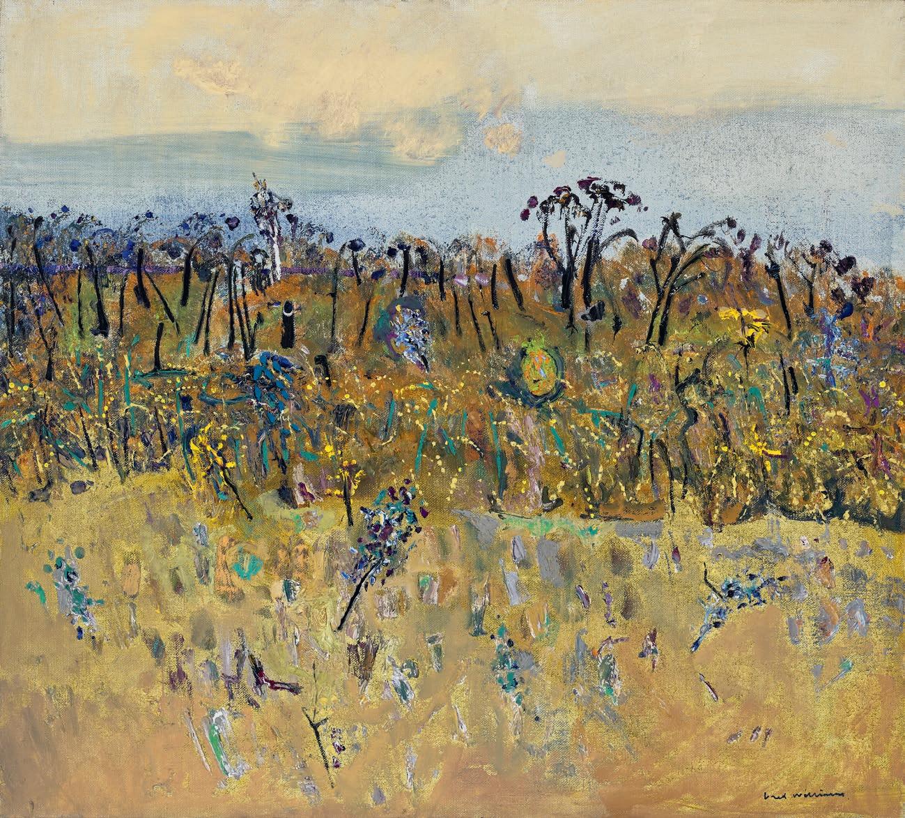
69
In mid-1975, Fred Williams held two major solo exhibitions, his first in both Sydney and Melbourne since the late 1960s, displaying his full painterly might in a vast array of turbulent new paintings, and conveying old and new motifs in a vibrant unmixed chromatic palette hitherto unseen in his work. Reflecting on the impact of these rich and varied exhibitions, Margaret Plant wrote ‘Williams has, I believe, made a conscious effort to expand his own sense of his work: to stop the edges going soft. I see this rebellion as a rare and important example of an Australian artist, able to undo the safety net of his art: to paint dangerously’.1 Although absent from these exhibitions, having remained in the artist’s own collection and purchased directly from the artist’s widow in 1989, Cootamundra Wattles – Botanist’s Garden belongs to this radical and riotous group of works in which Williams allowed himself to express his delight in the landscape.
Around this time Williams took pains to qualify his pragmatic and impersonal distance from the Australian landscape, explaining “I don’t like the bush the way Clif [Clifton Pugh] does […] I couldn’t say I loved the bush… I simply want to paint pictures from it” 2 . The common flowering acacia tree nevertheless held the artist in a certain enduring thrall, resulting in masterpieces spanning a period of ten
Fred Williams
St. Andrews (The Botanist’s Garden) , 1975 oil on canvas
102.0 x 101.5 cm
Private collection
© Estate of Fred Williams / Copyright Agency
years (1969 – 1979), including Cootamundra Wattles . Painted en plein air with a high-key palette dominated by contrasting deep violets and rich yellows, this painting is an elegy to a fragile ecosystem, in turn neglected and destroyed by human intervention. Boldly blooming in the face of adversity, the titular Cootamundra wattle trees dance through the landscape in an accented dotted frieze, embodying the z potential for regeneration.
A joyous harbinger of spring across Australia’s east coast, the wattle tree first features in Williams’ extensive diaries in the winter of 1969, during the course of a painting trip to Dunmoochin, Cottles Bridge, alongside Clifton Pugh and John Olsen. Although fascinated and clearly excited about the prospect of ‘work[ing] from them as they mature’3 , the artist did not return to this subject again until 1974. Having travelled widely throughout Australia in search of motifs in the intervening years, from the rainforests of Queensland to the Bass Strait and the Murray River in South Australia, Fred Williams, from early 1974, contented himself with shorter, local painting excursions with his artist friend Fraser Fair, both packed into a Ford Galaxy station wagon. Cootamundra Wattles, painted on a canvas of almost a metre squared, was the largest format able to fit in the back of Fair’s car4 , and presents an ambitious panoramic view of a specific location within their travels.
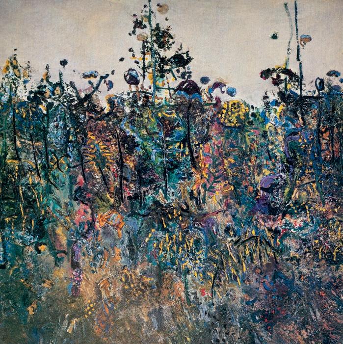
70
COLLECTION OF HENRY KRONGOLD
183.0 x 154.4 cm
Private collection
© Estate of Fred Williams / Copyright Agency
Errant in the area of Cottles Bridge, Fair and Williams stumbled upon an overgrown botanist’s garden in St Andrews, almost a century old, with a ‘remarkable coll[ection] of wattles and shrubs’. Its impending demolition prompted the artist to wonder, aghast, ‘it will only take an hr for a bull-dozer to get rid of it?’5 . Stimulated to commemorate in paint this dense native garden, dominated by Cootamundra wattles (acacia baileyana), Williams recorded this landscape with a small suite of paintings. This series included Botanist’s Garden , 1975 and St Andrews (The Botanist’s Garden), 1975, two close and densely tangled views of expressive gesture. In contrast, Cootamundra Wattles bears Williams’ semi-abstract compositional structure of three horizontal bands, whose contrasting colours creating an airy and dry vista with the illusion of spatial depth. Derived from, or at least influenced by, the artist’s strip gouaches of the early 70s, this tripartite composition narrows the focal point into a central band of painterly texture - here a dense and gestural wall of vegetation, crowned by a row of black-trunked wattles and a single white-trunked gum, jutting beyond the thick violet horizon line. A sparse and scrubby expanse of bush in the foreground is created by leaving visible both the ochre yellow ground and coarse weave of the canvas. The uppermost section of Cootamundra Wattles features an animated blue sky, complete with puffy white clouds and diagonal sweeping brush strokes signalling an impending storm.
Celebrating the exuberant richness of burgeoning springtime, Cootamundra Wattles is a joyful and decorative view of the Victorian landscape. Painted outdoors with painterly gesture and a heightened palette of pure colour, these paintings have invited comparisons with the works of the French impressionists, particularly Cézanne and Monet. 6 Painted at a time of great stylistic innovation in Williams’ work, in particular a release from his previous formal and chromatic restraint, the wattle’s symbolism of regeneration is applied not only to the landscape but also to the artist.
1. Plant, M., ‘Quattrocento Melbourne: Aspects of Finish 1973 - 77’, in Galbally, A., and Plant, M. (eds.), Studies in Australian Art, Department of Fine Arts, University of Melbourne, 1978, p. 101
2. The artist, 1974, published in ‘Artist’s Camp. Erith Island March 1974’, Overland , Melbourne, issue 60, Autumn 1975, pp. 41 – 55
3. Fred Williams, 24 July 1969, quoted in Mollison, J., A Singular Vision: The Art of Fred Williams, Australian National Gallery, Canberra, 1989, p. 174
4. Mollison, J., ibid., p. 173
5. Fred Williams, 14 August 1975, quoted in Mollison, J., ibid., p. 178
6. ‘Surely comes direct from original impressionist sources rather than from watered down Australian ones’, Borlase, N., ‘A painter at his peak pushes further on’, The Bulletin, Sydney, vol. 097, no. 4954, 26 April 1975, p. 51
LUCIE REEVES-SMITH
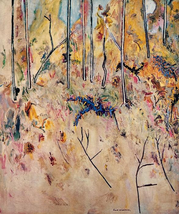
71
Fred Williams
Landscape with Acacias II , 1974 oil on canvas
(1923 – 2000)
LANDSCAPE WITH SHEEP, 1958 oil on composition board
60.0 x 75.5 cm
signed and dated lower left: Perceval ‘58
ESTIMATE: $90,000 – 120,000
PROVENANCE
Artlovers Gallery, Sydney (label attached verso)
Private collection
Sotheby’s, Sydney, 17 November 1988, lot 426
Henry Krongold, Melbourne
The Estate of Paul Krongold, Melbourne
EXHIBITED
John Perceval: A Retrospective Exhibition , National Gallery of Victoria, Melbourne, 30 April – 12 July 1992, Art Gallery of New South Wales, Sydney, 6 August – 20 September 1992 (label attached verso)
LITERATURE
Allen, T., John Perceval , Melbourne University Press, Melbourne, 1992, p. 159
Landscape with sheep, 1958, is one of a group of paintings by John Perceval which have their genesis in his exploration of the abandoned gold mines around Gaffneys Creek near Eildon, 200 kilometres northeast of Melbourne. He travelled there in the company of Arthur Boyd, Hal Hattam and Clive Brown in 1956, with all four probably crammed into Perceval’s brand-new lime green Volkswagen Beetle. Until this moment, Perceval was predominantly a studio painter but having a reliable car (prior to this, he had been driving Boyd’s ancient Dodge truck) opened up new possibilities, and ‘the thick wooded country of Gaffneys Creek [triggered] an important shift into denser forms and knitted textures in Perceval’s work.’.1
Perceval first exhibited his Gaffneys Creek paintings alongside those of the Williamstown docks at the Australian Galleries for their inaugural show in November 1956. Full of boisterous colour and activity, the show caused a sensation with Charles Blackman, for one, championing the artist’s ‘wonderfully ecstatic…very free and very beautiful’ technique.’ 2
On close examination, it is evident that the creek’s environs were not the only source for these images; rather, the wildness of the region formed an aesthetic, even emotional, core for the paintings. Concurrently, Perceval was also spending much of his time in the forested regions of Eltham, particularly with his colleague Neil Douglas whose property was surrounded by virgin bushland. Additionally, the back garden of Perceval’s house in Canterbury was a joyously tangled affair right next to the artist’s studio. Between 1957 and 1960, he spent three weeks each winter with Jon Molvig in Brisbane, and would soon buy land near Clifton Pugh’s property at Cottles Bridge; who at the time was creating undergrowth paintings marked by a pronounced spikiness. All these divergent experiences were inevitably incorporated into Perceval’s paintings and as his colleague Barret Reid noted, ‘(his) landscape receives its cue from the bush but it becomes an experience of surface, a landscape of touch as well as sight.’3 In Landscape with sheep , this description rings true from the obvious decay of the timber-and-rope bridge to the wonderfully realised wooliness of the sheep, who huddle en masse to the right before undertaking the precarious walk above the swirling waters of the creek. Perceval deliberately uses a darkened palette, suggestive of a somewhat melancholy, even treacherous, undercurrent to the Australian bush.
Landscape with sheep bears striking similarities to other notable works from the period including Goat in the cabbages , 1956, and Wild Goats, Gaffneys Creek, 1956, both of which were included in the landmark exhibition at Australian Galleries. In subsequent years, Perceval’s landscapes were awarded the John McCaughey Memorial Art Prize (National Gallery of Victoria) in 1958; the Maude Vizard-Wholohan Prize (Art Gallery of South Australia) the following year; and the Wynne Prize at the Art Gallery of New South Wales in 1960.
ANDREW GAYNOR
72
12
JOHN PERCEVAL
1. Plant, M., John Perceval, Lansdowne Australian Art Library, Melbourne, 1971, p. 60
2. Shapcott, T., The Art of Charles Blackman, Andre Deutsch, London, 1989, p. 23
3. Reid, B., Of Light and Dark: the art of John Perceval, National Gallery of Victoria, Melbourne, 1992, p. 83
COLLECTION OF HENRY KRONGOLD
73
ARTHUR BOYD
(1920 – 1999)
RETURN OF THE PRODIGAL SON, c .1968
oil on canvas
76.5 x 102.0 cm
signed lower right: Arthur Boyd bears inscription verso: “RETURN OF THE PRODIGAL SON”
ESTIMATE: $50,000 – 70,000
13
PROVENANCE
Private collection
Sir Leon and Lady Trout, Brisbane
The collection of Sir Leon and Lady Trout , Christie’s, Brisbane, 6 June 1989, lot 164 (as ‘Nebuchadnezzar’)
Henry Krongold, Melbourne
The Estate of Paul Krongold, Melbourne
returns to his father seeking forgiveness, which is readily granted by the magnanimous patriarch. Featuring this joyful reunion of father and son, the present painting nevertheless encapsulates a marked departure from Boyd’s earlier, Old Master-inspired treatment of the episode – both in its iconography and stylistic approach. Offering a highly expressive, gestural interpretation that employs several signature motifs all fused within a rolling bush landscape, the composition would seem, rather, more reminiscent of the artist’s iconic Nebuchadnezzar series which he commenced in 1966 and exhibited in Australia and the United Kingdom in 1968 and 1969 respectively.
As a cautionary tale of extravagance, destitution, reconciliation and final redemption, the parable of the Prodigal Son clearly held great appeal for Arthur Boyd who revisited the theme at multiple points throughout his vast and varied oeuvre. Embedded in his imagination from an early age through the ritual reading of biblical stories to him by his grandmother, Emma Minnie Boyd (1858 – 1963)1, significantly such preoccupation was augmented during the mid to late forties by the artist’s study of Old Master reproductions, and in particular, the extensive Rembrandt print collection housed in the National Gallery of Victoria. 2 Culminating most famously in his seminal mural cycle at the Harkaway family property, The Grange, commissioned in 1948 by his uncle Martin Boyd (who himself had returned to the family fold after an absence of 27 years), indeed these early iterations of the theme eloquently attest to the fusion of the sacred with the deeply personal in Boyd’s art, with such ancient biblical stories invariably transformed into ciphers of modern life.
Recounted in the Gospel of Luke, the parable of the Prodigal Son narrates the tale of a son who beseeched his father to bequeath him his share of the family estate early so he could travel and make his fortune. Seduced by worldly vices in foreign lands, thus he subsequently squandered his wealth on wild living, falling into poverty and forced to become a swineherd. Starving and repentant, the son eventually
Of particular relevance are Boyd’s depictions of Nebuchadnezzar which vividly evoke the descent of the King of Babylon’s descent into madness – witness for example, Nebuchadnezzar Running in a Forest with Lion and Black Birds which bears affinities with the present work in its overall composition of dense shrubland, the abstract fusion of figurative elements with natural surrounds, and inclusion of motifs such as the curly-horned ram, ominous black birds and the figure in red. 3 Moreover, as in the Nebuchadnezzar series, here the bush similarly becomes a site of intense psychological anxiety, a space of moral degeneration and fall from grace. With its litany of personal symbols, interconnection of elements and energetic handling, thus Return of the Prodigal Son , c.1968 exemplifies superbly Boyd’s singular talent for capturing man, beast and nature caught up in the same expressive maelstrom of strange and malevolent energies. Like the most successful of his biblical narratives, the composition abandons logic to invoke a mythic, spiritual dimension and enigmatic resonance that far transcends pure representation.
74
1. Hoff, U., The Art of Arthur Boyd , Andre Deutsch, London, 1986, p. 83
2. Philipp, F., Arthur Boyd , Thames and Hudson, London, 1967, pp. 47 – 48
3. For an illustration of the work, see Boase, T.S.R., Nebuchadnezzar, 34 paintings and 18 drawings by Arthur Boyd , Thames and Hudson, London, 1972, pl. 28
COLLECTION OF HENRY KRONGOLD
VERONICA ANGELATOS
75
PROVENANCE
CHARLES BLACKMAN
(1928 – 2018)
HIDE AND SEEK, 1985 oil and pastel on paper 130.0 x 112.0 cm (sight) signed and dated upper left: BLACKMAN 85 bears inscription on gallery label verso: CHARLES BLACKMAN / HIDE AND SEEK
ESTIMATE: $60,000 – 80,000
Wagner Gallery, Sydney (label attached verso)
Private collection
Christies, Melbourne, 27 August 1997, lot 8
Henry Krongold, Melbourne
The Estate of Paul Krongold, Melbourne
In the early 1950s, Charles Blackman formed a distinctive expressionist style using poetic figurative imagery exploring the innocence and interior worlds of children. The environmental circumstances fuelling the development of this motif are well documented: proximity to schools in the artist’s local suburb, his first wife Barbara’s professional interest in childhood psychology, and a honing of the artist’s skills in observation and recollection to support Barbara in her failing eyesight.1 While Blackman’s resulting ‘Schoolgirl’ series became a distinct suite of works, the themes of play and childhood interaction remained a constant wellspring of inspiration for the artist throughout the rest of his extensive artistic career. Painted in 1985, stark and gestural Hide and Seek , 1985 presents an amalgam of the artist’s most cherished iconographic motifs, imbued with a tropical palette inspired by the lush hinterlands of Buderim, Queensland where the artist was living with his second wife, Genevieve de Couvreur.
In the foreground of Hide and Seek an illuminated pale figure dressed in a uniform shields their eyes, her pensive expression betraying the concentration required for counting. Behind her is hiding a shadowy companion, with an anonymous face, emerging and retreating from the warm umber gloom and foliage in the centre of the painting. The double image is a recurrent device in Blackman’s art, evoked here with a central figure clear and spot lit, while the other is reduced to a nebulous dark silhouette. Painted with a restrained colour palette, Blackman plays with the notion of illumination and discovery, building
up an encroaching gestural lightness in the background which threatens to reveal the hidden figure. Felicity St John Moore suggests that the dreamlike contrasts in Blackman’s works were inspired by the works of French symbolist painter Odilon Redon, ‘a duality of dark and light, fantasy and fact, inside and outside, nightmare and drama, harshness and beauty, mysterious expression and pure plastic substance. This duality is internal as well as thematic… the imagery is enigmatic and multilayered.’2
While these figures are intertwined in the group act of play, they do not share any eye contact, they are retreated into interior and solitary worlds of imagination, a metaphor for Blackman’s own artistic pursuits. ‘Here is a man who has dared to paint the unpaintable, the world of dreams, emotions and ideas… he can take our hauntings, the invisible world of hopes and fears, and give them a form and a substance’, wrote friend of the artist, Nadine Amadio in 1993. 3
Blackman’s art explores emotion rather than a representation of physical reality. Seeking the poetic in hazy twilight zones, his dreamlike compositions are unfettered by rational space and the laws of the natural world. In Hide and Seek, Blackman indulges in a sensuous interplay of painted textures, toying with notions of opacity and translucency, between velvety richness of shadowed silhouettes and surprising translucent fireworks of scarlet poinsettias. Caught in their own collective world of play, and further fractured into separate, unknowable, interior worlds, these children are vulnerable and exposed to the outside world. We are voyeurs into their private game and like the central figure, our seeking is yet to provide answers.
76
14
1. Morgan, K., Charles Blackman Schoolgirls, Heide Museum of Modern Art, Melbourne, 2017, p. 13
2. St John Moore, F., Charles Blackman, Schoolgirls and Angels , National Gallery of Victoria, Melbourne, 1993, pp. 2 – 3
3. Amadio, N., ‘Charles Blackman. A Retrospective Portrait’, Ita Magazine, Sydney, June 1993, p. 39
COLLECTION OF HENRY KRONGOLD
LUCIE REEVES-SMITH
77
TUDOR ST GEORGE TUCKER
(1862 – 1906)
DAY DREAMS, c .1892
oil on canvas
45.0 x 54.5 cm
signed lower left: T. S. G. Tucker
ESTIMATE: $40,000 – 60,000
PROVENANCE
Private collection
Sotheby’s, Melbourne, 17 April 1989, lot 374 (as ‘Sleeping Nymph’)
Henry Krongold, Melbourne
The Estate of Paul Krongold, Melbourne
EXHIBITED
Victorian Artists’ Society Exhibition of paintings, sculpture & drawings , Victorian Artists’ Society, Melbourne, April 1893, cat. 40
Victorian Artists’ Society Exhibition of Australian Art past and present , National Gallery of Victoria, Melbourne, August 1893, cat. 118
LITERATURE
‘Art and artists: Mr. Tudor St. G. Tucker’, Table Talk, Melbourne, 26 August 1892, p. 6
‘Victorian Artist’s Society’, The Argus , Melbourne, 20 April 1893, p. 7
In August 1892, just months after his return from Paris, a reporter from Table Talk conducted an interview with Tudor St. George Tucker in his new Melbourne studio in Flinders Street. The reporter describes in detail much of what he saw there as he conversed with the artist, particularly the powerful Picardy Shrimpfisher, 1891 (Warrnambool Art Gallery), on display in prime position following its successful debut the previous year at the Salon de la Société des Artistes Français where it was hung ‘on the line.’ The reporter was also attracted to an unfinished oil sketch on another easel of a woman waking from sleep that he predicted would be ranked as a chef d’ouvre (masterpiece) when completed.1 Tucker subsequently titled this work Day dreams, c.1892 and entered it into two exhibitions at the Victorian Artists’ Society in 1892 where its evocative mood drew critical praise from the reviewer.
Tucker was English by birth but came to Australia for his health in 1881, aged 19. Between 1883 and 1887 he trained at the National Gallery School under George Folingsby where co-students included Rupert Bunny, Emanuel Phillips Fox, John Longstaff and Arthur Streeton. In
1887, Tucker and Fox left for Paris, with both studying at the Académie Julian under William-Adolphe Bouguereau, the acclaimed painter of classical nudes, and then with Jean-Léon Gérôme at the Ecole des Beaux-Arts. In 1890, Charles Conder wrote that ‘the American [art] students here tell me that Tucker is the strongest man from Australia in Paris and Fox is also thought a great deal of.’ 2 Day dreams displays the rigour of successful French academic training. As the Table Talk reviewer went on to describe, it features ‘a young peasant girl, just awakening from a sleep in a grassy glade in an autumn tinted wood. The landscape is unfinished, though sketched in with firm, bold touches, reproducing the glow and warmth of the fading summer. The figure of the sleeper is admirably posed, the outline correct, and the colouring very pleasing by its complete harmony and the brilliant effect of the light.’ 3 Next to her lies a platter of grapes, a fruit which comes into season in autumn. Grapes are also symbolic of Dionysus (also known as Bacchus), god of fertility and wine, whose festivals featured copious amounts of drinking and sensual revels. The implied suggestion is that the girl has partaken of many pleasures during the evening and now wakes in a secluded den of leaves, through which the sun is slowly streaming. When exhibited at the Victorian Artist’s Society, the reviewer for The Argus noted the similarity to Raphael Collins’ Floréal , then hanging in the Louvre,4 and there is a marked similarity indeed. However, where Collins’ figure was obviously painted in the studio and superimposed on a brightly coloured, flower-strewn riverbank, Tucker’s model is more believably enveloped by her surroundings.
In 1894, Tucker and Fox established the Melbourne Art School at ‘Chartersville’, an old stone house in Ivanhoe. It quickly became the city’s leading academy, nurturing a new generation of significant artists including Hugh Ramsay, Christine Asquith Baker, Ina Gregory and Violet Teague. Unfortunately, Tucker’s health began to fail and he returned to London, settling in Chelsea, where he died of tuberculosis at age 44, a tragically early death for such a talented painter.
1. ‘Art and artists: Mr. Tudor St. G. Tucker’, Table Talk , Melbourne, 26 August 1892, p. 6
2. ‘Mr. Charles Conder’, Table Talk , Melbourne, 1 August 1890, pp. 14 – 15
3. ‘Art and artists: Mr. Tudor St. G. Tucker’, ibid.
4. The painting is now housed in the Musee D’Orsay, Paris ANDREW GAYNOR
78
15
COLLECTION OF HENRY KRONGOLD
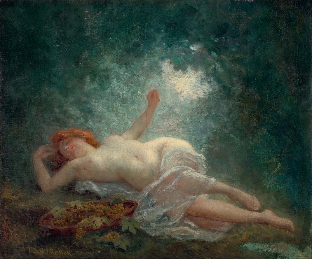
79
FREDERICK M c CUBBIN (1855 – 1917)
EDGE OF THE CLEARING
oil on canvas on cardboard
25.5 x 35.0 cm signed lower right: F. McCubbin bears inscription on frame verso: Edge of the Clearing F McCubbin
ESTIMATE: $50,000 – 70,000
PROVENANCE
Private collection
Artarmon Gallery, Sydney, September 1965 (label attached verso)
Sir Leon and Lady Trout, Brisbane
The Collection of Sir Leon and Lady Trout, Christies, Brisbane, 6 June 1989, lot 170
Henry Krongold, Melbourne
The Estate of Paul Krongold, Melbourne
EXHIBITED
Master Works from the Collection of Sir Leon and Lady Trout , Queensland Art Gallery, Brisbane, 21 September – 14 December 1977, cat. 24 (label attached verso)
It is highly plausible that Edge of the Clearing is one of the studies done by Frederick McCubbin in preparation for his masterpiece The Pioneer, 1904 (National Gallery of Victoria). This monumental triptych has mesmerised audiences since its first display, a poignant tale of a pioneering family and the property they establish in the bush. At the rear of the central panel is the settlers’ cottage which bears a marked similarity to the one seen here, framed by large trees and partially obscured by saplings. The technique and setting also identifies Edge of the Clearing as being painted before 1907, when McCubbin went to Europe,radically changing his style on return. It further bears a marked similarity to the bush around the artist’s family home ‘Fontainebleau’ at Mt Macedon, north of Melbourne.
McCubbin and his wife Annie purchased this property in 1901 and, as his youngest daughter Kathleen recalled, her father’s ‘greatest love was the bushland at Mt Macedon. The mystique of the Australian bushland intrigued him: the sunlight glinting through the tall timbers, the secret colours in the abundant undergrowth, the call of the birds, and the whispering breeze… He loved them all.’1 It was a bush landscape populated by stringybarks, bracken, wattle and manna gums, and Edge of the Clearing accurately coveys the scrubbiness and dappled light
which so intrigued the artist. However, the cottage itself was more likely to be one from the adjoining property, ‘Ard Choille’ (meaning ‘height of the woods’ in Scots Gaelic), owned by William McGregor who built a number of little cottages there, with the one shown in The Pioneer having been used by the keeper of his bull farm. 2 McCubbin painted a great number of important and wonderfully atmospheric paintings around Fontainebleau, indicative of his belief that ‘(n)ature under our Australian sky seems to me like a shy, reserved person, ready to repel you; but you only have to wait and watch her varying moods, and you will find all the beauty you want.’ 3 Unfortunately the scene is now radically changed. Sold during the Depression, the property was subsequently logged for milling before bushfires cleared the rest until it became a grassed paddock for horses.4 Ironically, recent years of neglect have seen much of Fontainebleau’s bushland return.
When The Pioneer was exhibited, the critic for The Age noted that ‘one condition of success, apart from the question of the necessary technique, is that the artist remains true to the spirit of our landscape, and to the spirit in which we live our lives amid it, as Mr McCubbin has done.’ 5 Though far more modest in scale, this observation rings true for Edge of the Clearing as well, and apart from its quality, as implied through its subsequent ownership by the Trout and Krongold families, the painting bears a further distinctive feature, its original frame. This is almost certainly made by master frame-maker John Thallon, and ‘uses composition ornaments on a wooden chassis. The torus ornament is conventional imbricated laurel leaves and berries, cross-banded at the corners. The flat is sanded.’6 A very similar example can be found on John Ford Paterson’s Fernshaw, 1896 (Castlemaine Art Museum).
1. Mangan, K., Daisy Chains, War, the Jazz , Hutchison, Melbourne, 1984, p. 70
2. ibid., p. 126
3. Frederick McCubbin. Quoted in: ‘Amongst the country studios’, The Age , Melbourne, 10 February 1894, p. 14
4 See: McKenzie, A., Frederick McCubbin 1855-1917: ‘The Proff’ and his art, Mannagum Press, Melbourne, 1990, p. 129
5. The Age , Melbourne, 16 August 1905, p. 6
6. Payne, J., Framing the Nineteenth Century: Picture Frames 1837- 1935 , Peleus Press/National Gallery of Victoria, 2007, p. 174
ANDREW GAYNOR
80
16
COLLECTION OF HENRY KRONGOLD
81
SNOW
signed
watercolour on paper
35.0 x 51.0 cm (sight)
ESTIMATE:
PROVENANCE
Private collection
Christie’s, Sydney, October 1971, lot 54
Sir Leon and Lady Trout, Brisbane
The Collection of Sir Leon and Lady Trout, Christie’s, Brisbane, 6 June 1989, lot 191
Henry Krongold, Melbourne
The Estate of Paul Krongold, Melbourne
EXHIBITED
Master Works from the Collection of Sir Leon and Lady Trout, Queensland Art Gallery, Brisbane, 21 September – 14 December 1977, cat. 38 (label attached verso)
Watercolours in the Collection of Sir Leon and Lady Trout , Queensland Art Gallery, Brisbane, 4 May – 6 June 1978 (label attached verso)
82
JOHN PETER RUSSELL (1858 – 1930)
IN THE ALPS (SWITZERLAND), c .1912 – 15
lower left edge: JOHN. RUSSELL –
COLLECTION OF HENRY KRONGOLD
$10,000 – 15,000
17
ARTHUR BOYD (1920 – 1999)
SHADING
29.5
ESTIMATE: $15,000 – 20,000
PROVENANCE
Private collection
Sotheby’s, Sydney, 17 November 1988, lot 456
Henry Krongold, Melbourne
The Estate of Paul Krongold, Melbourne
83
TREE, 1939 oil on canvas on cardboard
x 39.0 cm signed and dated lower right: Arthur Boyd / 39
18
STREET
ESTIMATE: $20,000 – 30,000
EXHIBITED
Spring Exhibition 1975 Recent Acquisitions , Joseph Brown Gallery, Melbourne, 14 – 30 October 1975, cat. 37 (as ‘Sydney Street’)
LITERATURE
St John Moore, F., Vassilieff and His Art, Macmillan, Melbourne, 2012, cat. 60, p. 197
PROVENANCE
Elizabeth Vassilieff Wolf, Melbourne
Joseph Brown Gallery, Melbourne (as 'Sydney Street')
Private collection, Melbourne
Christie’s, Melbourne, 24 November 1993, lot 207 (as ‘Street Scene’)
Henry Krongold, Melbourne
The Estate of Paul Krongold, Melbourne
84
DANILA VASSILIEFF (1897 – 1958)
SCENE, CENTENNIAL PARK, 1936 oil on canvas
39.5 x 41.5 cm
19 COLLECTION OF HENRY KRONGOLD
ROLAND WAKELIN
(1887 – 1971)
AT THE MARKET, c .1957 oil on canvas on composition board
49.5 x 61.0 cm
signed lower left: R Wakelin bears inscription verso: UNIVERSITY FETE (SETTLEMENT)
ESTIMATE: $10,000 – 15,000
PROVENANCE
Private collection
Sotheby’s, Sydney, 17 November 1988, lot 373 (as ‘University Fete’)
Henry Krongold, Melbourne
The Estate of Paul Krongold, Melbourne
LITERATURE
Walton, L., The Art of Roland Wakelin, Craftsman House, Sydney, 1987, pl. 100, p. 108 (illus.)
LLOYD REES
(1895 – 1988)
NORTHWOOD POINT, 1943 oil on canvas on board
29.5 x 38.5 cm
signed and dated lower left: L REES / 43
ESTIMATE: $20,000 – 30,000
PROVENANCE
Private collection, Sydney
Mrs Jan Taylor, Sydney
Sotheby’s, Melbourne, 14 August 1989, lot 425
Henry Krongold, Melbourne
The Estate of Paul Krongold, Melbourne
85
21 20
ALBERT NAMATJIRA
(1902 – 1959)
PALM VALLEY, 1940 s watercolour on paper 40.5 x 29.5 cm (sheet)
signed lower right: ALBERT NAMATJIRA
bears inscription verso: Palm Valley / Albert Namatjira
ESTIMATE: $45,000 – 55,000
PROVENANCE
Private collection
Henry Krongold, Melbourne
The Estate of Paul Krongold, Melbourne
RELATED WORKS
Palm Valley, James Range , 1945, watercolour over pencil on paper, 57.0 x 40.0 cm, Private collection, Adelaide, illus. in French, A., Seeing the Centre: The Art of Albert Namatjira
1902 – 1959 , National Gallery of Australia, Canberra, 2002, p. 111 Palm Valley, c.1936, watercolour over pencil on paper, 18.5 x 26.0 cm, in the collection of the Araluen Art Collection, Araluen Centre, Alice Springs. Gift of the late J. F. W. Schulz's grandchildren: Mrs M. Mertin, Miss E. Schulz, Mrs J. Chambers and Mrs A. Juttner. This painting was presented to Mr Schulz by Pastor Albrecht at the Hermannsburg Lutheran Mission.
some compositions focus on a single palm, the majority explore their relationship as a group in the intimacy of a closed environment… observed in specific light conditions.’2 In this work two central australian cabbage palms (Livistona Mariae ) emerge from dense vegetation and are silhouetted against the cloudless blue sky, towering above a rocky outcrop to the left and the still rockpool below.
Known as Arrangkeye in Western Arrente language, the cabbage palm is an extremely rare plant, a remnant of a time when central Australia was much wetter and covered by such vegetation. Unique to this region, it is restricted to a small area of 60 square kilometres around the Finke River and its tributaries. During painting trips, Namatjira would return to the same site at the same hour every day in an attempt to recapture the same effect in an ever-changing environment. This work, painted in the heat of the afternoon, depicts the palm trees bathed in the strong light of mid-afternoon sun with little shade offered by the overhanging rock. The only visible relief from the heat is the cool water of the Finke tributary, shimmering at the bottom of the work.
From the creation of his earliest watercolours in the 1930s, Albert Namatjira provided the foundation for the later emergence of Indigenous art at Papunya forty years later and the flourishing that would follow. A household name by the 1950s, Namatjira’s evocative landscapes of inland Australia were fundamental to how Australians viewed their island home. ‘Namatjira’s dramatic entry into the Australian art world was both inspired and inspiring. He inspired his own and subsequent generations of Aboriginal people and artists across Australia. In skilfully adopting the methods and materials of Western landscape painting he challenged the relegation of Aboriginal art to the realm of archaeology and ethnography. Namatjira became the most prominent Aboriginal Australian of his era and, in 1957, was the first Aboriginal person to be granted full citizenship.’1
Palm Valley, part of Namatjira’s mother’s country, is located in what is now known as the Finke Gorge National Park in the Northern Territory. ‘One of Namatjira’s most popular subjects particularly in the 1940s….
The art of Albert Namatjira is now understood to have inspired his own and subsequent generations of Aboriginal people and artists across Australia. Namatjira’s watercolours of Palm Valley encouraged successive generations to paint there, especially Walter Ebatarinja and his wife Cordula whose idiosyncratic depictions of Palm Valley record the site from their personal perspectives. Brenda Croft argues that the artist’s gift to indigenous and non-indigenous people is ‘more than the sum parts of watercolour paints on paper. It is an essence that resides in the strength of Namatjira’s work – his courage, his sorrow, his spirituality… where the enduring influence of this one man upon the entire indigenous arts and culture industry continues to be felt.’3
CRISPIN GUTTERIDGE
86
22
1. Watson, K., ‘Poetic Justice: an overview of Indigenous Art’, in Perkins, H., One Sun, One Moon: Aboriginal Art in Australia , Art Gallery of New South Wales, Sydney, 2007, p. 20
2. French, A., Seeing the Centre: The Art of Albert Namatjira 1902-1959 , National Gallery of Australia, Canberra, 2002, p.107
3. Croft, B., ‘Albert’s Gift’ in French, A., Seeing the Centre: The Art of Albert Namatjira, 19021959 , National Gallery of Australia, Canberra, 2002, p. 148
COLLECTION OF HENRY KRONGOLD
87
Important Australian and International Fine Art
The property of various vendors
Lots 23 – 67
(detail )
JOHN PETER RUSSELL
(1858 – 1930) SOUVENIR DE BELLE–ÎLE, 1897
(MARIANNA RUSSELL WITH GOATS, GOULPHAR, BELLE–ÎLE)
89
JOHN PETER RUSSELL
(1858 – 1930)
SOUVENIR DE BELLE–ÎLE, 1897
(MARIANNA RUSSELL WITH GOATS, GOULPHAR, BELLE– ÎLE) oil on canvas
65.0 x 81.5 cm signed, dated and inscribed with title lower centre: TO. FRIEND. WILL. MALONEY. J. P. RUSSELL. 1897. – SOUVENIR. DE. BELLE. iLE. signed, dated and inscribed verso: J. P. RUSSELL. / BELLE ILE / 1897. artists’ colourmen stamp verso: Rey & Perrot, Paris framer’s label attached verso: R J Stannard, London
ESTIMATE: $1,500,000 – 2,500,000
PROVENANCE
Dr William Maloney, Melbourne, a gift from the artist in 1897
Thence by descent
Private collection, Melbourne, daughter of the above
Thence by descent
Private collection, Melbourne
EXHIBITED
On loan to the National Gallery of Victoria, Melbourne, 1942 – 1943
John Peter Russell: Australian Impressionist , University Art Museum, University of Queensland, Brisbane, 25 February –19 March 1978; National Gallery of Victoria, Melbourne, 30 March – 6 May 1978; Art Gallery of New South Wales, Sydney, 21 May – 26 June 1978, cat. 35 (partial label attached verso)
LITERATURE
Galbally, A., The Art of John Peter Russell , Sun Books, Melbourne, 1977, cat. 154, pp. 11, 106
RELATED WORK
Bergère en blanc avec des chèvres , c.1897, oil on canvas, 110.0 x 178.0 cm, in the collection of the Musée d’Orsay, France, on loan to the Musée des Jacobins, Morlaix, illus. in Jourdan, P. et al., John-Peter Russell, un Impressionniste Australien , Musee des Jacobins, Morlaix, 1997, p. 31
We are grateful to Peter Perry OAM for his assistance with this catalogue entry
90
23
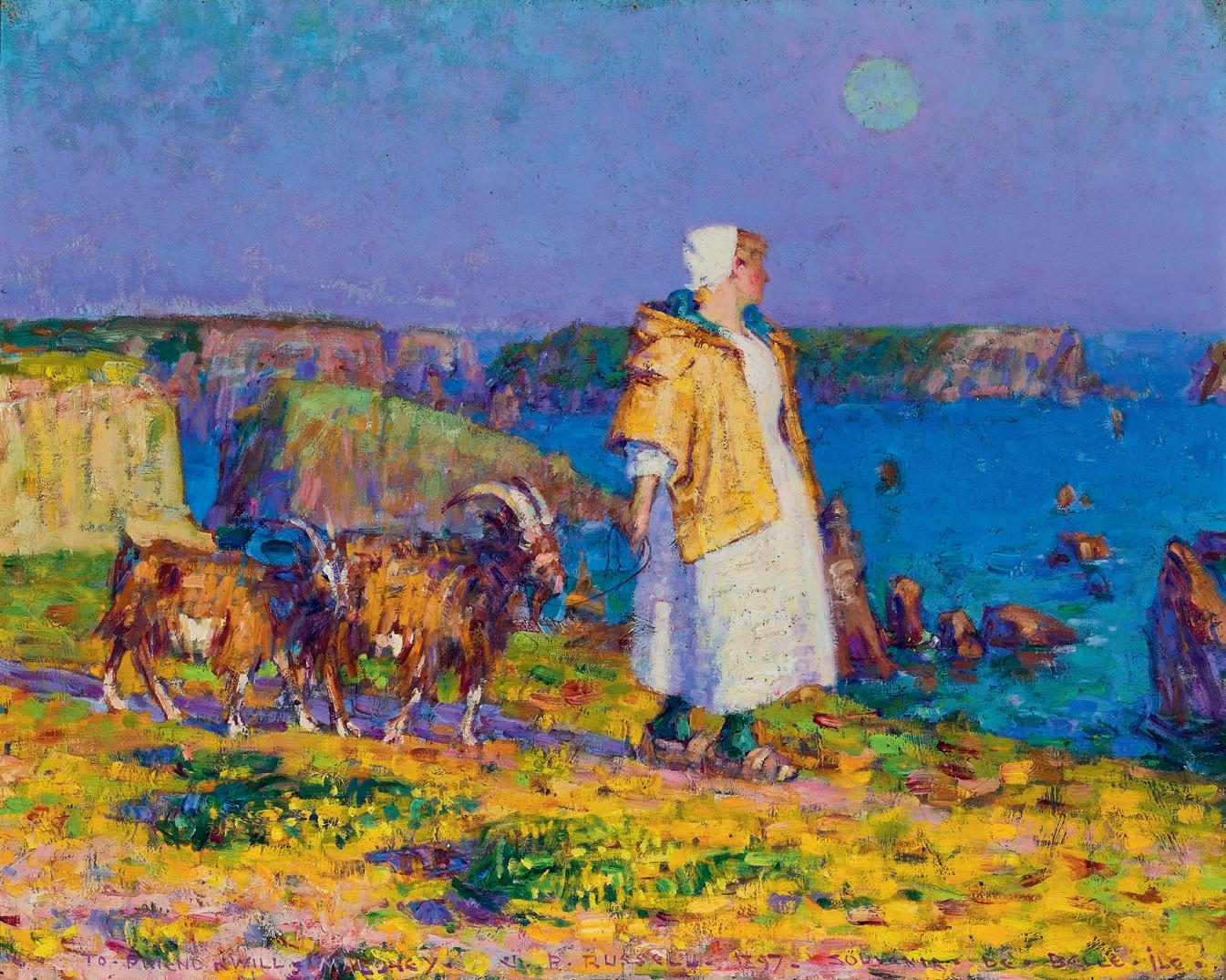
91
John Peter Russell holds a unique place in Australian art history as a result of hi s close association with avant-garde circles in 1880s Paris and his firsthand acquaintance with masters of European Impressionism and Post-Impressionism. As a student at Fernand Cormon’s atelier in Paris in the mid-1880s, Russell worked alongside Émile Bernard, Henri de Toulouse-Lautrec and later, Vincent van Gogh, with whom he established an enduring friendship.1 On a summer break from Paris in 1886, Russell spent several months on Belle-Île, one of a group of small islands off the coast of Brittany. It was here that he met and befriended Claude Monet who he saw working en plein air, famously introducing himself by asking if Monet was indeed ‘the Prince of the Impressionists’. Inevitably flattered, Monet, who was eighteen years Russell’s senior, took a liking to the young Australian and dined with him and his beautiful wife-to-be, enjoying their hospitality and company during his stay on the island. Uncharacteristically, Monet also allowed Russell to watch him work and on occasion, to paint alongside him, experiences that provided
Art Gallery of New South Wales Archive
Private collection
an extraordinary insight into the techniques and working method of one of the fo unders of the Impressionist movement. The influence on Russell was significant and the paintings he made in Italy and Sicily only a few months later show him working in a new style, creating compositions that are made up of strokes of pure high-keyed colour. 2 ‘… But when we get to color. The gorse & heather. Yellow & purple, orange boat sails, blue sea. Red rocks, Green sea. All a matter of feeling. Tis in the man with brush & paint pot or it is not.’3
Captivated by the rugged beauty of Belle-Île and attuned to the possibilities that both the environment and the simple, rural way of life presented for his art, Russell – whose inherited wealth meant he didn’t have to find paid employment – bought land overlooking the inlet of Goulphar in 1887. Writing to Tom Roberts, he said, ‘I am about to build a house in France. Settle down for some five years. Get some work done. It will be in some out of the way c orner as much as a desert as
92
John Russell , c.1883 photographer: Barcroft Capel Boake National Art Archive
Photograph of Marianna Mattiocco overdrawn by John Russell, Paris , 1885
Image courtesy: Art Gallery of New South Wales, Sydney
possible.’4 Around 1884 Russell had met Marianna Mattiocco, probably in the studio of his friend, the British artist Harry Bates (1850 - 99). An Italian beauty, she was the model for Bates’ bas-relief sculpture, Dido, Queen of Carthage , 1885 (National Museum of Wales, Cardiff) and had also possibly modelled for Rodin. 5 Following the birth of the first two of their twelve children (many of whom did not survive infancy), they formalised the relationship, marrying in 1888. Russell commissioned Rodin to sculpt a portrait bust of Marianna early that year – cast in 1889, it was the first of several works which the master modelled on her classical features – and this initiated a longstanding and intimate friendship between the artists. 6
The family moved to Belle-Île in the summer of 1888 and lived there permanently until 1909 - 10 when the house was sold following Marianna’s premature death. Russell developed an intimate knowledge of the island’s geography, both fro m the land and the sea, and this
Auguste Rodin (1840 – 1917, French)
Cast by Georges Rudier (active 1954–1969, French)
Mrs. Russell (Mariana Mattioco della Torre), 1888
silvered bronze
35.2 cm (height)
The Metropolitan Museum of Art, New York
informed many of his best-known paintings such as Port-Goulphar, Belle-Île , 1887 (A rt Galler y of New South Wales) and Rough Sea , BelleÎle , 1900 (National Gallery of Victoria), which capture the distinctive light, changing colours and atmospheric conditions of the area. The island attracted many visitors. Even Sarah Bernhardt bought property and spent her summer holidays on Belle-Île from 1894 - 1922, saying, ‘I like to come every year to this picturesque island, to taste all the charm of its wild and grandiose beauty. I draw new artistic forces from its invigorating and restful sky.’ 7 The young Henri Matisse spent three months on Belle-Île in 1896, fortuitously meeting Russell who introduced him to Monet’s techniques and the work of van Gogh, gifting him one of the pen and ink drawings the Dutchman had sent him from Arles some years earlier. This encounter contributed to a dramatic transformation in Matisse’s approach to colour which his biographer, Hilary Spurling, described as ‘a way of seeing: the first inklings of the pursuit of colour for its own sake that would draw in the end on his deepest emotional and imagin ative res ources.’ 8
93
John Peter Russell
Bergère en blanc avec des chèvres , c.1897
oil on canvas
110.0 x 178.0 cm
Musée d’Orsay, France, on loan to the Musée des Jacobins, Morlaix
Marianna Russell poses for the painting Bergère en blanc avec des chèvres , c.1897
photographer unknown
94
Belle-Île-en-Mer, Le Port de Goulphar with Russell’s house house ‘Le Château de l'Anglais’ prominent above the cliff, c.1909
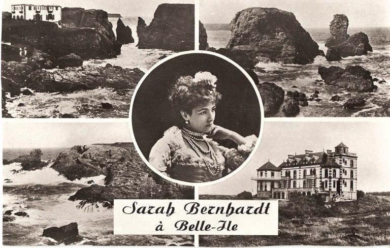
Russell continued to be inspired by Belle-Île, writing to Rodin in 1890, ‘the colou rs completely bowl me over. On some days here it’s ravishing but impossible for my poor palette.’ 9 His mastery and expressive use of colour is on full display in Souvenir de Belle-Île , 1897. In the foreground a figure wearing traditional Breton dress leads a pair of goats along the cliff top, brilliantly illuminated by a full moon that sits high in the sky. The dramatic, predominantly purple sky appears to glow and the sensation of the strange ‘in-between’ light of dusk, which teases the eye and makes it hard to focus clearly, is skilfully rendered. The crisp white of the figure’s dress and cap provides a central focal point, highlighting the vivid colours of the surrounding scene: the yellow and greens of the grassy ground, the purple shadows cast by the figure and her goats, and the deep blue tones of the ocean – described by Monet as ‘an improbable sea of colours’ 10 – with its distinctive rocky outcrops. While Russell is renowned as a bold and inventive colourist, this is surely one of the most dazzling examples of his work.
A contemporary photograph shows Marianna dressed in local costume, posing on the cliff top as Russell, seated at an easel in the foreground, works on the larger, close ly related painting, Bergère en blanc avec
95
Sarah Bernhardt à Belle-Île Image courtesy: Ann Galbally
des chèvres , c.1897 (Musée d’Orsay, France). While the goats do not appear in the photograph, they were family pets and a familiar element of the Russell’s cliff-top home, which consisted of a large stone house and expansive garden, as well as various outbuildings including a studio that opened directly out to the ocean. In addition to highlighting the importance for Russell of working directly from the subject, the photograph and a comparison of the two paintings reveals aspects of his working method; changes in perspective and scale, varied use of colour and compositional choices that in the larger painting, result in a stronger empha sis on the figure who is depicted as an almost heroic representation of traditional rural life. Such subject matter reflects the prevailing influence of Barbizon School painter Jean-François Millet, whose paintings celebrated the nobility of peasant workers and their labour, and a growing awareness at the end of the nineteenth century that this way of life was disappearing. According to Ann Galbally, ‘It was against a background of romanticization of the primitive that [Russell] moved his wife and family to Belle-Île … and to ultimately forswear subject-painting, decorative art, even portrait painting in favour of a painterly identification with his rural surroundings.’11
As the inscription which runs along the bottom of the painting indicates, Souveni r de Belle-Île was a gift from the artist to his friend Will Maloney, an Australian doctor and later in life, long-serving Labor politician. In the summer of 1883 Maloney, Russell, his brother Sydney and Tom Roberts travelled through France and Spain and Maloney, who subsequently worked at hospitals in London, visited Russell in Paris on several occasions. It was on his final visit in 1887, prior to his return to Australia, that Maloney sat for Russell who painted a small portrait of his friend which is now in the collection of the National Gallery of Victoria. An informal study of the young Maloney, the portrait holds particular significance as the first painting made using the Impressionist technique to arrive in Australia.12 Maloney and Russell maintained a correspondence and in 1897, Russell sent this painting to his friend in Melbourne, which has remained in the possession of the Maloney family ever since.
96
Henri Matisse (1869 – 1954, French) Rochers Á Belle Ile , 1896 location unknown
Claude Monet (1840 – 1926, French)
Rocks at Port-Goulphar, Belle-Île, 1886 oil on canvas
66.0 × 81.8 cm
Art Institute of Chicago, Chicago
Rochers de Belle-Ile (Rocks at Belle-Ile) , c.1900 oil on canvas
65.0 x 81.3 cm
Queensland Art Gallery | Gallery of Modern Art, Brisbane
1. Although Russell did not see van Gogh again after he departed for Arles in the south of France in early 1888, their friendship continued via an extensive correspondence. See Galbally, A., A Remarkable Friendship: Vincent van Gogh and John Peter Russell , The Miegunyah Press, Melbourne, 2008
2. Taylor, E., ‘John Russell and friends: Roberts, Monet, van Gogh, Matisse, Rodin’, Australian Impressionists in France , National Gallery of Victoria, Melbourne, 2013, p. 60
3. Russell to Tom Roberts, 5 October 1887 quoted in Tunnicliffe, W., (ed.), John Russell: Australia’s French Impressionist , Art Gallery of New South Wales, Sydney, 2018, p. 53
4. ibid., p. 193
5. See Onfray, G., translated by Lucie Reeves-Smith, “The most Breton of foreign painters of the era”, John-Peter Russell, Un impressionniste australien , Musée des Jacobins, Morlaix, 1997, pp. 8-9. Galbally, A., The Art of John Peter Russell , Sun Books, Melbourne, 1977, p. 28 and Tunnicliffe, ibid., p. 26
6. See Taylor, op. cit., p. 68
7. Sarah Bernhardt quoted in The summers of Sarah Bernhardt at Les Poulains | Belle- Île-enMer Tourist Office – Official Website (belleileenmer.co.uk), accessed 14 July 2023
8. Spurling, H., The Unknown Matisse: A Life of Henri Matisse, Volume One: 1869-1908 , Hamish Hamilton, London, 1998, p. 144 quoted in Taylor, op. cit., p. 65
9. Russell to Auguste Rodin, April-May 1890 quoted in quoted in Prunster, U., ‘Painting BelleÎle’, Prunster, U., et al., Belle-Île: Monet, Russell and Matisse , Art Gallery of New South Wales, Sydney, 2001, p. 46
10. Claude Monet to Gustave Caillebotte, 11 October 1886, ibid., p. 19
11. Galbally, A., The Art of John Peter Russell , Sun Books, Melbourne, 1977, p. 47
12 Taylor, op. cit., p. 53
KIRSTY GRANT
John
Dr Will Maloney, 1887 oil on canvas
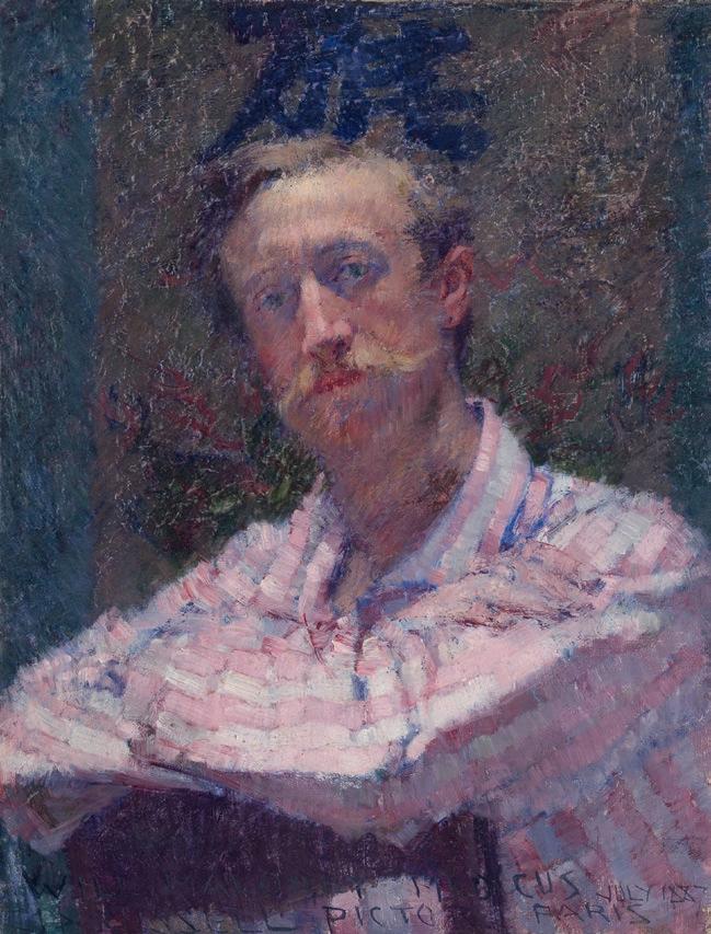
48.5 x 37.0 cm
National Gallery of Victoria, Melbourne
97
John Peter Russell
Peter Russell
LUDWIG HIRSCHFELD-MACK (1893 – 1965, German/Australian)
PORTRAIT OF ELENOR, 1921
oil and tempera on cardboard 65.5 x 44.0 cm
signed and dated lower right: L. H. MACK 1921 inscribed lower left: ELENOR accompanied by the original woollen jumper shown in the painting
ESTIMATE: $40,000 – 60,000 (2)
PROVENANCE
The estate of the artist
Private collection, Italy
LITERATURE
Schwarzbauer, R., and Bell, C., Ludwig Hirschfeld–Mack: More than a Bauhaus Artist, HistorySmiths, 2021, pl. 13, p. 186 (illus.)
Elenor Hirschfeld (knitter)
Jumper, c.1921 wool; handknit 58.5 cm (centre back) 46.5 cm (sleeve length)
98
24
99
The arrival of Ludwig Hirschfeld-Mack in Australia in 1940 established a direct link between avant-gar de European modernism and twentieth century Australian art. Interned in England, where he had sought refuge from the rise of Nazism in Germany, Hirschfeld-Mack was one of more than two and a half thousand men transported to Australia on board the HMT Dunera . Many of the ship’s passengers were highly educated, skilled professionals who went on to make significant contributions to the cultural, economic and social life of their new country. In the creative fields of a rt and design alone, the ‘Dunera Boys’, in addition to Hirschfeld-Mack, included the photographer Henry Talbot, the sculptor Erwin Fabian, and Fred Lowen and Ernst Rodeck, founders of FLER furniture.
Hirschfeld-Mack was one of the most well-trained artists on the Dunera His studie s began in 1913 when, with the support of a monthly allowance from his father, he enrolled at the Debschitz School in Munich, while undertaking compulsory military training.1 Progressive in its approach, the school welcomed female staff and students (including HirschfeldMack’s sister, Emmy, who established a career in costume design), and encouraged the application of the visual and applied arts to everyday life. 2 This approach aligned with the philosophy of the Bauhaus, where Hirschfeld-Mack continued his studies between 1919-25. Founded by architect Walter Gropius in Weimar in 1919, the Bauhaus counted among its teachers some of the most innovative and influential artists of the time, including Paul Klee, Josef Albers, Wassily Kandinsky and Oskar Schlemmer. Reflecting the idealism and desire for a better world which was shared by so many following the devastating experience of the First World War, the school’s manifesto proposed a radical and enlightened challenge: ‘Let us create a new guild of craftsmen, without the class distinctions which raise an arrogant barrier between craftsman and artist. Together let us conceive and create the new building of the future, which can embrace architecture and sculpture and painting in one unity’. 3
Striking in its crisp modernity, this portrait of Hirschfeld-Mack’s wife, Elenor, was painted in 1921, four years after their marriage. Born in 1895, she was the eldest of three daughters of a successful patent lawyer and grew up in Frankfurt in an environment characterised by the privileges of wealth, including a country house built in the Art Nouveau style, replete with a large collection of art. At the age of seventeen, she attended school in England, developing her language skills and during the First World War, worked in Frankfurt’s main hospital, later receiving nursing qualifications and supporting the war effort in various medical facilities.4
The young couple met at a dance class and their marriage – which took place while Hirschfeld-Mack was on temporary leave from the army –was quickly followed by the birth of a daughter, Marga, in mid-1918. The family grew, with two more daughters, Ursel and Ellinor, being born in
100
Elenor, early 1920s photographer unknown
1921 and 1928 respectively. Elenor was a devoted mother and while Hirschfeld-Mack described her as an ‘erstklassige Haushaltskönigin’ or ‘first-class queen of the household’, she also had an active life outside her domestic responsibilities. The Bauhaus years, with Oskar and Tut Schlemmer and Josef and Anni Albers among their closest friends , were particularly significant in this regard. The collegiate and creative atmosphere of the school inspired her to study art history and design, as well as to experiment with her own work in the weaving workshop.
Painted in oil on cardboard, the portrait describes Elenor’s appearance, as well as capturing something of her attitude and personality. Looking straight ahead and with arms folded in front of her body, she appears confident and purposeful, a modern twentieth-century woman. Her boldly patterned jumper, which was knitted by Elenor herself – has been retained by the family and accompanies the painting in this sale – is prominent within the picture and although Hirschfeld-Mack has paid attention to describing its texture, it is surely the graphic potential of the knitted bands of colour which most appealed to his artistic eye. While Elenor occupies a strangely compressed interior space, the focus is firmly on her image. The theme of geometric abstraction that Elenor’s jumper introduces to the composition continues however, in the background of the painting where delicately painted grids of pale, almost translucent colour adorn both side walls. It has been
suggested that these patterns represent weaving designs which Elenor made in the Bauhaus workshops, but whatever their source, their presence here reminds us of Hirschfeld-Mack’s parallel interest in realism and abstraction and his ability to create images in both modes which combine strong visual design with a characteristically humanist motivation and intent.
The later years of Elenor’s life were hard. Multiple Sclerosis brought physical pain and movement became increasingly difficult. While she had fully supported Hirschfeld-Mack going to England when his Jewish heritage made it impossible for him to find full-time employment in Germany, the prospect of him ending up on the other side of the world was unimaginable. By the time travel between Europe and Australia was possible after the Second World War, her health was such that she was unable to make the journey to join her husband. They were reunited for a short time in late 1949 when Hirschfeld-Mack finally obtained permission to visit Elenor in the French zone of Germany. She died four years later.
1. For a detailed biographical account of Hirschfeld-Mack’s life, see Schwarzbauer, R. with Bell, C., Ludwig Hirschfeld-Mack: More Than a Bauhaus Artist , HistorySmiths, Melbourne, 2021
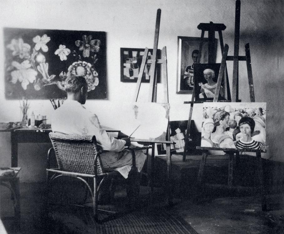
2. ibid., p. 23
3. Quoted in Schwarzbauer, ibid., pp. 36-37
4. All biographical information about Elenor Hirschfeld-Mack in this text is drawn from Schwarzbauer, ibid.
101
KIRSTY GRANT
Ludwig in his studio in Geißlerpfad, ‘Portrait of Elenor’ pictured upper right, 1934 photographer unknown
PROVENANCE
COLIN M c CAHON
(1919 – 1987, New Zealand)
FLOODGATE I, 1964 – 65 oil on composition board 91.0 x 76.5 cm
signed and dated lower left: McCahon ‘64 ‘65 signed, dated and inscribed verso: Colin McCahon. / FLOODGATE I / 1964 1965
ESTIMATE: $180,000 – 240,000
Peter McLeavey, Wellington, New Zealand
Rosalie Gascoigne, Canberra, acquired from the above in 1983
Thence by descent
Private collection, Canberra
LITERATURE
Gascoigne, M., Rosalie Gascoigne. A Catalogue Raisonné, ANU Press, Canberra, 2019, pp. 74, 327
Colin McCahon Online Catalogue , https://www.mccahon.co.nz/ cm001466 [accessed 16/5/23]
EXHIBITED
From the Studio of Rosalie Gascoigne , Australian National University, Drill Hall Gallery, Canberra, 5 September - 12 November 2000, cat. 39
RELATED WORK
Floodgate 2 , 1965, enamel on hardboard, 102.0 x 68.9 cm, private collection
Art in the University of Auckland – a position he held for seven years before retiring to paint full-time in 1971. The change immediately led to new developments in his work. In particular, he began a vast series of waterfall paintings, ranging in size from very small to very large; around 100 of them are shown on the McCahon Online Catalogue1. The exhibition Small Landscapes and Waterfalls at Auckland’s Ikon Gallery in September 1984 was virtually a sell-out and marked a sudden increase in popularity for the artist.
In late 1983, survey shows by New Zealander Colin McCahon and New Zealand-born Australian sculptor Rosalie Gascoigne were shown simultaneously at the National Art Gallery in Wellington. Rosalie Gascoigne Sculpture 1975 – 1982 (11 works) was her first exhibition in the land of her birth; Colin McCahon: The Mystical Landscape was a survey featuring 36 works, mostly from the extensive holdings of his work at the National Art Gallery.
Gascoigne went to New Zealand for the occasion and, evidently impressed by McCahon’s work, purchased from the stockroom of Peter McLeavey, his Wellington dealer, the present work painted 20 years earlier: Floodgate 1 , 1964 – 65. It was one of a pair – the other being Floodgate 2 , 1965 – which, McCahon informed McLeavey, belonged to his wife, Anne. Neither work seems ever to have been publicly exhibited in his lifetime.
The year 1964 was one of significant change for McCahon. After twelve busy years as keeper and deputy director at Auckland City Art Gallery (1953 – 64) he resigned to take up a teaching position at the School of
The Floodgate paintings can be seen as a development of the waterfall motif in that they also depict flowing water, but not as a curving arc in profile as seen in most of the Waterfall series, but from above – as in a bird’s eye view or architectural plan. A second element in the Floodgates is the large rectangular black shapes whose hard edges and right angles suggest things man-made, rather than natural hill shapes as in most of the Waterfalls ; these, presumably, are the ‘floodgates’. As the titles suggest, these black shapes relate closely to the abstract Gate paintings of earlier in the decade (1961 – 62) – and – in juxtaposing natural and man-made elements – more distantly to On building bridges: triptych , 1952. In the Gate series, dark quasi-rectangular shapes are both barriers (political, social, artistic, spiritual, formal) and openings or ways through. In Floodgates , by fusing the imagery of these contrasted series – gates, waterfalls – McCahon translates the imagery of barriers and openings to a landscape-related context, thereby melding abstraction and realism in a new way.
Here the squarish Floodgate 1 is dominated by the large black rectangular form thrusting diagonally upwards from bottom left towards upper right, the shape being dramatically cropped by the frame. A second black form, narrow and tapering, extends from the top down the right side of the painting. The small gap between them, through which (in a landscape reading) creamy white water is turbulently gushing, is the focal point of the painting. Agitated water also enters horizontally into the picture from the right. Turbulence is suggested by dark wavy lines running through the billowing foam, debouching into a calmer less agitated region in the bottom right segment of the work.
Everything about the painting is angular, asymmetrical, dynamic – conveying a sense of vast and barely controllable forces. It is an authoritative and forceful painting, unique (with its sibling) in its imagery, but at the same time integral through its connection to earlier series to McCahon’s evolving direction. Indeed, Rosalie Gascoigne showed bold and refined taste in choosing it for her collection.
1. https://www.mccahon.co.nz/ PETER SIMPSON
102
25
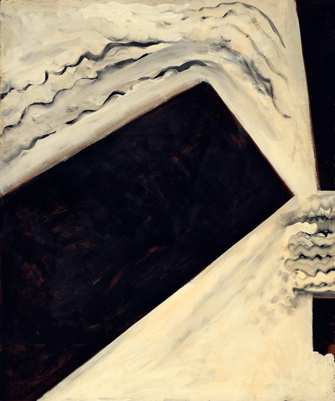
103
ROSALIE GASCOIGNE
(1917 – 1999)
WHITE AND GREY A, 1980
painted wood from soft drink boxes on composition board 101.0 × 73.0 cm
ESTIMATE: $60,000 – 90,000
PROVENANCE
The artist
Thence by descent
Private collection, Canberra
EXHIBITED
From the studio of Rosalie Gascoigne, Australian National University, Drill Hall Gallery, Canberra, 5 September – 12 November 2000, cat. 7 (as ‘Untitled’, c.1981)
LITERATURE
Gascoigne, M., Rosalie Gascoigne. A Catalogue Raisonné , ANU Press, Canberra, 2019, cat. 191, pp. 196 (illus.), 348
at the age of 57; after which she rapidly established a reputation as one of Australia’s foremost contemporary artists. Indeed, following her first exhibition at Canberra’s Macquarie Galleries in June 1974, Gascoigne subsequently developed an impressive exhibition history that included her being honoured, in 1982, as the first female artist to represent Australia at the Venice Biennale. 2 While entirely self-taught, Gascoigne was to later acknowledge that her background in Sogetsu Ikebana 3 , and the introduction it provided to a sense of order and strong sculptural properties, had played a part in the development of her practice.4 Tellingly, Sogetsu also emphasises the importance of line and form over colour.
The notion and practice of collecting were of vital importance to Rosalie Gascoigne and over the course of her relatively brief career she amassed vast material stockpiles of feathers, shells, dried grasses and wood, enamel kitchenware and linoleum, beer cans and dolls, and soft-drink crates and retro-reflective road-signs, which were to both become something of a signature material. Gascoigne’s avid fossicking was underpinned by extended periods of driving and exploring in the natural world surrounding Canberra and the unique and spare beauty of the region – and importantly, the experience of it – was to serve as a source of inspiration for much of her art. As she explained:
Most of the things I use have been exposed to the weather and, in this sense, mine is an art of the outdoors. I like to use very ordinary material making do with whatever comes to hand within about a thirty mile radius of Canberra. I collect anything I like the look of, without having any particular plan for it at the time. I collect grey wood and faded colours and if there is a lot of anything I take it – a lot of it.1
The story of Rosalie Gascoigne is now almost the stuff of legend. Gascoigne had no formal art training, and first exhibited her wor k
As White and Grey A , 1980 demonstrates, this sense of structure was to elegantly combine in Gascoigne’s work with the modern art historical notion of “the grid”, which became an important organising principle of many of her works made from soft-drink crates. In White and Grey A , Gascoigne aligns the components vertically so that the white paint on each board creates a strong (if slightly wonky) horizontal band; establishing a sense of continuum and endlessness, as if it could effectively extend forever. Unlike many of Gascoigne’s more ‘allusive and illusive’ 5 titles, that served to conjure images and associations when looking at her work, she allowed White and Grey A – through the simplicity of its title – to remain an abstraction. Part of the joy of this work, however, is the way in which her rudimentary materials fight back, proudly bearing their uneven edges and the scars and blemishes of their previous lives. Despite Gascoigne’s “will to order”, White and Grey A remains decidedly, and rewardingly, handmade.
1. Artist statement in Survey 2: Rosalie Gascoigne , National Gallery of Victoria, Melbourne, 1978, n.p.
2. Technically, Thea Proctor was the first Australian woman to have her work exhibited at the Venice Biennale, in 1912, but her work was shown as part of the British representation.
3. Founded by Sofu Teshigahara in 1927, Sogetsu embraces a philosophy that combines the naturalistic (and more traditional) approach to ikebana – that is, one that reflects the natural growth of the materials employed – with the expressionistic, as imbued in the subjective response of the arranger or “artist”.
4. Hawley, J., “A late developer”, Sydney Morning Herald (Good Weekend ), Sydney, 15 November 1997, p. 42
5. Artist statement in Survey 2: Rosalie Gascoigne
KELLY GELLATLY
104
26
105
GUY GREY–SMITH (1916 – 1981)
SUNLIT PLAIN, 1965
oil and beeswax emulsion on gauze on composition board
61.5 x 91.0 cm
signed and dated lower right: G. Grey Smith / 65 inscribed verso: 8 / GUY GREY–SMITH in original artist’s frame
ESTIMATE: $30,000 – 40,000
PROVENANCE
Private collection, Melbourne, a gift from the artist in 1966
EXHIBITED
Guy Grey–Smith , Adult Education Board Studio, Perth, 7 – 18 December 1964, cat. 8
Guy Grey–Smith: Paintings, Drawings and Prints , Macquarie Galleries, Sydney, 10 – 19 August 1966, cat. 8
Guy Grey–Smith: Paintings , Argus Gallery, Melbourne, 17 – 28 October 1966, cat. 8
Guy Grey–Smith: A Survey, McClelland Gallery + Sculpture Park, Victoria, 30 April – 2 July 2006, cat. 24 (label attached verso)
LITERATURE
Hutchings, P., ‘Guy and Helen Grey–Smith’, The Critic , Perth, vol. 6, no. 11, 28 January 1966, pp. 91 – 92
Gaynor, A., Guy Grey–Smith: Life Force , University of Western Australia Publishing, Perth, 2012, pp. 73, 222 (illus.), 257, 258
Guy Grey-Smith’s luminous Sunlit plain , 1965, has been a treasured piece within a private collection since 1966 when the artist gifted it to his colleague, a highly respected Australian art academic in Perth. Since relocated to Melbourne, the painting has presided for many years above the wondrous clutter of this academic’s desk as a tangible and deeply personal connection to the period when Grey-Smith was truly a national artist of importance – his richly textured, vibrantly coloured paintings bringing the natural wonders of Western Australia to the east coast. Although the exact location of the plain is unknown, in the years 1964 to 1965, Grey-Smith travelled with his family to such diverse places as the Murchison, Roebourne and the De Grey River in the state’s north; Nullagine to the west; and Bunker Bay plus the Stirling Ranges to the south, and it is most likely that the composition was inspired by one of these trips.
Originally trained in post-war England under artists such as Henry Moore and Ceri Richards, Grey-Smith returned to Australia in late 1947, determined to apply all he had learnt into reinterpreting the Australian
landscape. By the late fifties, as a result of his allied projects as a potter, printmaker and fresco artist, his style began to simplify with a greater emphasis on the texture of the paint to impart information. His exposure to the paintings of Nicolas de Staël in the early sixties provided the ultimate answer and from then on, his paintings became increasingly powerful and evocative. Thickening the paint with a homemade wax medium, Grey-Smith utilised the trowels he had formerly used for frescoes to apply his pigment in thick slabs, almost tectonic in their forcefulness. At the puckered edges of these – ‘not a delicate fusing of two elements but a collision’1 – Grey-Smith often retained vestiges of underpaint which allowed for chromatic ruptures to contrast new forms. In Sunlit plain , for example, the splash of blue at the middle left and the sage greens on the horizon line allude to the tenacious flora that survives in such parched areas – oases of trees and flowers that have sustained Aboriginal custodians for millennia.
When first exhibited, an extended review described the painting as being ‘perhaps the most interesting picture’ in the show, ‘in uncharacteristic shades of strawberry ice-cream and grey, which sums up the formal pre-conceptions of this artist, and the vibrant feeling which his surfaces so often have… This picture forces two judgements on us at once: it had to come out like that; and it couldn’t come out like that, ever again. The exquisite punctuations of space here suggest a musical pattern, with movements and moments of stillness and of recapitulation. The eye plays the tune to itself.’ 2 Of further interest is the frame, handcrafted by the artist, which consists ‘of a single square-edged outer frame 2cm square, and a lower inner slip approximately 5cm wide sawn out of masonite which then had hessian glued to its top surface (the inner edge remained untreated).’ 3 Housed in its present home for nearly six decades, Sunlit plain (and its frame) remains not surprisingly in wonderful condition, with its colours as vibrant today as when first applied by the artist.
GAYNOR
ANDREW
106
27
1. Harpley, M., Guy Grey-Smith: art as life , Art Gallery of Western Australia, Perth, 2014, p. 12
2. Hutchings, P., ‘Guy and Helen Grey-Smith’, The Critic , Perth, vol. 6, no. 11, 28 January 1966, pp. 91–2
3. Gaynor, A., Guy Grey-Smith: life force , University of Western Australia Publishing, Perth, 2012, p. 251
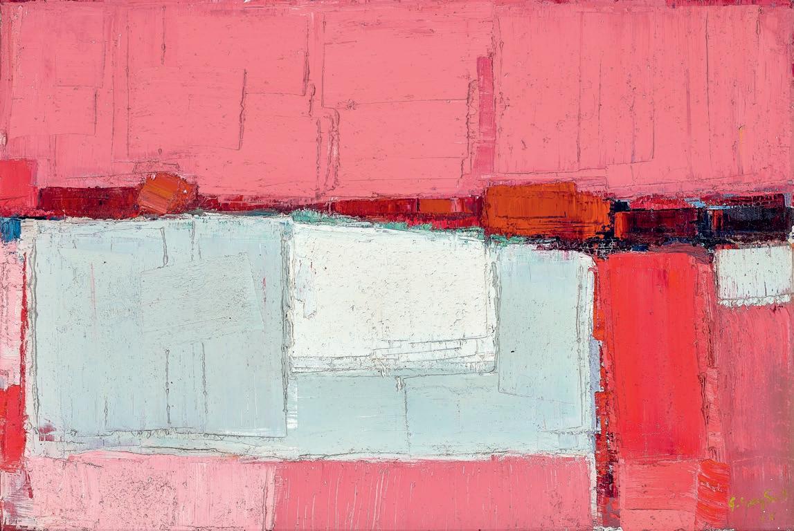
107
GUY GREY–SMITH (1916 – 1981)
SEASCAPE, 1972
oil and beeswax emulsion on muslin on composition board
99.0 x 122.0 cm signed and dated lower right: G. Grey-Smith / 72 inscribed verso: 3 GUY GREY-SMITH 'SEASCAPE'
ESTIMATE: $30,000 – 40,000
PROVENANCE
Old Fire Station Gallery, Perth
Private collection, Western Australia, acquired in the mid 1970s
EXHIBITED
Guy Grey-Smith , Macquarie Galleries, Sydney, 12 – 24 July 1972, cat. 2
Guy Grey-Smith , Old Fire Station Gallery, Perth, 21 October – 7 November 1973, cat. 3
Five Festival Artists of the Adelaide Festival of Arts , Greenhill Galleries, Adelaide, 9 March – April 1974 (label attached verso)
LITERATURE
Gaynor, A., Guy Grey–Smith: Life Force , University of Western Australia Publishing, Perth, 2012, pp. 262, 263
By the early 1970s, Guy Grey-Smith was one of Western Australia’s most travelled artists, having journeyed through much of Europe –including Belgium, Poland and Germany as a POW – and had become in many ways a pioneer of the interaction between Australian and Asian artists through focussed visits in the 1960s to Sri Lanka (then Ceylon), Bali and Cambodia. Already renowned for his arresting, high-colour images utilising paint thickened by a home-made beeswax emulsion and applied with scrapers, the Asian encounters led Grey-Smith to seek ways to go beyond his known style and explore other possibilities. Balinese art in particular had a great impact on the artist and upon his return to Australia, he re-introduced the brush to his paintings, as well as curlicues and arcs inspired by the ornate Hindu temple carvings for which the island is famed. Above the sea , 1968 (Curtin University, Perth) was his first major breakthrough, a shimmering view of the ocean from the air. Thus primed, Grey-Smith and his artist-wife Helen, set off to take up the post of Professor of Fine Art at Phnom Penh University in the second half of 1969.
During the first six months of their stay, Guy taught western painting techniques (whilst a Soviet instructor taught Social Realist painting in the next room) and Helen taught textiles. In their free time, they explored many ancient sites including the Bayon (Prasat Bayoăn) and Angkor Wat attending numerous dances and celebrations in the process. A powerful suite of paintings from this period emerged, following on from direction signalled by Above the sea , but now with greater chromatic intensity and fluency in the brush marks. These include: Neak Pean Angkor 1969; Angkor Wat , 1970; and Cambodian monkey dance , 1970, all now in significant private collections. However, in March 1970, disaster struck. A CIA-backed coup erupted and hostilities began against the North Vietnamese. The Grey-Smiths watched in horror as their students left to take up arms – ‘like lambs to the slaughter’1 – and all of Guy’s World War Two trauma returned, leading to a major nervous breakdown. It took a harrowing number of weeks before they could be repatriated and Grey-Smith returned a broken man. Understandably, art was to be his major salvation and he spent the next eighteen months experimenting with acrylic paint with mixed results; but by 1972, he was once again in control and the resultant works became stronger, more optimistic and vital, with Seascape , 1972, being a perfect example.
The exact location for Seascape is unknown, but Grey-Smith spent recuperative time during 1971 at the family’s self-built beach house at Quinns Rocks, north of Perth, and travelled up further through the Murchison and Ashburton districts. There is a brooding sensuality in Seascape , with the rich indigo and ultramarine countered by the lighter tones of the shore-break. The smooth lines of the rounded hills are picked out in yellow and orange, and the tension of the design is accentuated by the contrast of the major areas applied with paint scraper set against the curved delineations done with the brush. Although shown in an exhibition during the Adelaide Festival of Arts in 1974, it appears that Seascape then returned to Perth where it was subsequently purchased from Rie Heyman’s Old Fire Station Gallery in Subiaco.
108
28
1. Interview with Guy Grey-Smith, Western Australian Stories on the Arts , ABC program number PWN5179. Date of transmission: 1970.
ANDREW GAYNOR
109
YVONNE AUDETTE born 1930
TUSCAN LANDSCAPE, 1959 oil on plywood (diptych) 122.0 x 182.0 cm (overall) signed with initials lower right: YA signed, dated and inscribed with title on right panel verso: 1959 – 62 / audette / Tuscan Landscape / 1959 / audette signed, dated and inscribed with title on left panel verso: audette / Tuscan Landscape / 1959 inscribed verso: A260
ESTIMATE: $100,000 – 150,000
PROVENANCE
Private collection, Melbourne
As Mary Gabriel’s monumental book Ninth Street Women has demonstrated, women artists were an important and constant presence in the emergence of Abstract Expressionism in New York, contributing to dialogue, advocacy and exhibitions, and charting their own ways as strong, independent artists.1 While this may have been forgotten (or at least downplayed) by subsequent art history, it is into this exciting creative melange that Australia’s Yvonne Audette landed as a young practitioner in 1952, ready to learn and absorb, and determine her own course as a full-time artist. While Audette’s reminiscences of this period focus on her encounters with the art of male titans such as Willem de Kooning, Franz Kline and Bradley Walker Tomlin, to name but a few, the vibrancy and possibilities of the New York art world – studio visits, exhibitions, and experiences like her attendance at lectures at The Club2 – along with the vital presence of women artists of her generation 3 , no doubt reinforced her lifelong determination to live and succeed as an abstract artist.
Despite the riches of New York, Audette decided to leave for Europe in 1955, where she was immediately immersed in the wealth of its history and culture. After a period of travel in Spain, France and Germany, she settled in Florence and later, Milan, commuting and working between the two cities. Here she experienced the new forms of abstraction being created on the Continent, developing a circle of artist friends and colleagues that included Renato Birolli, Lucia Fontana, Giuseppe Santomaso and Emilio Vedova. In Italy, Audette developed her own unique language, as the confident works she
created drew upon both her first-hand experience of American Abstract Expressionism and the ‘loose painterly qualities’ of the European nonfigurative works that now surrounded her.4 As curator Julie Ewington has noted, Audette ‘channelled strong responses to Tuscan art, to the city of Florence, and to Italy as a rich repository of Western cultural life, directly into her painting … [not as] an archaising but an entirely contemporary project.’5
Audette establishes a sense of slow, meditative movement in Tuscan Landscape by layering emphatic, carefully considered brushstrokes across the composition to create strong vertical forms animated by the intersection of horizontal and diagonal marks. This combination of structure and the unexpected, and the work’s flashes of greens and earthy tones from beneath a palette of blues and white, create a sense of musicality in the work, as if the different elements each move to a score that plays only for them. As poet Chris Wallace-Crabbe has observed: ‘In her love of colour, her erasures and inscriptions, her visual music of bands and zigzags, there lies the vocabulary of these dynamic canvases … It could be said that she orchestrates colour, as richly as any Ravel: blushing, pavonine or cupreous, barred, brindled or jagged, it keeps revealing the inwardness of our being. She sings our silences.’6
1. Gabriel, M., Ninth Street Women: Lee Krasner, Elaine de Kooning, Grace Hartigan, Joan Mitchell, and Helen Frankenthaler: Five Painters and the Movement that Changed Modern Art , Back Bay Books & Little, Brown and Company, New York, 2018
2. Heathcote, C. et al., Yvonne Audette: Paintings & Drawings 1949-2014 , Macmillan Art Publishing, South Yarra, 2014. p. 42. Located on Eighth Street, The Club was a salon-style members-only club whose ranks included many of New York’s most important mid-century artists and thinkers.
3. To use the artists of Ninth Street Women as an example, Elaine de Kooning was 12 years older than Audette; Grace Hartigan, eight; Joan Mitchell, five and Helen Frankenthaler, two. Only Lee Krasner, at 22 years older, could be considered of an earlier generation.
4. Heathcote, op. cit., p. 52
5. Ewington, J., Yvonne Audette: Abstract Paintings 1950s & 1960s , Queensland Art Gallery, Brisbane, 1999, p. 22
6. Wallace-Crabbe, C., ‘Preface’ in Heathcote, op. cit., 23
KELLY GELLATLY
110
29
111
TONY TUCKSON
(1921 – 1973)
UNTITLED NO. 100 (TP209B), 1973 synthetic polymer paint on composition board 213.5 x 122.0 cm
ESTIMATE: $180,000 – 240,000
PROVENANCE
Estate of the artist, Sydney Watters Gallery, Sydney Private collection, Sydney
EXHIBITED
Tony Tuckson 1921 – 1973: a memorial exhibition , Pinacotheca, Melbourne, 13 – 30 October 1982, cat. 100 (illus. in exhibition catalogue, p. 53)
37 Artists 37 Works , Watters Gallery, Sydney, 1 – 11 October 1986
TUCKSON/TOMESCU, Liverpool Street Gallery, Sydney, 28 November 2009 – 14 January 2010
(illus. in exhibition catalogue as ‘1982 No. 100’)
Great Australian Painting, Liverpool Street Gallery, Sydney, 20 August – 1 October 2022
LITERATURE
Thomas, D., Free, R. and Legge, G., Tony Tuckson , Craftsman House, Sydney, 1989, pl. 160, pp. 137 (illus.), 186
Australian art history often holds to a somewhat unreliable habit –identifying the moment an artist secured critical acclaim, then seeing the work that preceded it as a preamble and what followed as, usually, a worthy maturing postscript. This does not work with Tony Tuckson; rather we tend to view his career in reverse. Untitled No. 100 , 1973 is a perfect example of this.
When Tuckson first exhibited in 1970, the art world was astonished. We looked backwards, discovering how this extraordinary talent came to produce work which placed him immediately at the forefront of Australian abstraction. Tuckson worked privately and was never pressed to exhibit. At the time he had no idea what anyone thought of his art. He was a prolific weekend painter keeping a professional distance from his role as deputy director of the Art Gallery of New South Wales, where his major interest in Aboriginal and Melanesian art was not shared by trustees.1
There are important characteristics which mark Untitled No. 100 as holding a significant place amongst Tuckson’s final works. He had two exhibitions at Watters Gallery, Sydney, the last in 1973 – the year of his premature death – and the very few late works of such scale are now in public collections. 2 These are invariably double-panelled works of layered paint and brushed sgraffito effects where bold, painterly
calligraphic sweeps complete an irrepressible expressive wholeness. Hardboard, especially commercial Masonite, was a common support, a surface plane with no resistance, something able to accommodate the physical immediacy in creating each work. The artifice of making art – its façade – was Tuckson’s anathema.
Tuckson’s work from his final decade never suggests any sort of narrative, direct metaphor or muted symbolism. Amongst the impulsiveness we still find a particular measure, gestures of considered determination. Characteristics in the late master work White on Black 1970 – 73 (Art Gallery of Ballarat) also appear in Untitled No. 100 ; the large vertical format, exposed unprimed Masonite surface and edge-to-edge painterly gestures are a shared feature, yet in our work the differences enter another realm.
Untitled No. 100 abandons restraint. Tuckson seldom spoke openly about his art, and he enjoyed the ambiguity that might be assumed from what he said. It can be an unsafe prospect to read unspoken personal circumstances into an artist’s work, however, in this work the sense of unfettered liberation – a release from all measure and constraint –seems inescapable. Nonetheless it is not reckless nor unwieldy. The overall effect is quite unlike anything in Australian art from the early seventies, but there are discreet yet pointed elements that tie the painterly exuberance to the scale and surface personality of the work. Gestures reach to the edge of the picture plane and give cohesion to the whole; on some occasions single strokes begin at the edge and hold the single-colour orchestrated energy in its precarious urgent poise.
Tuckson was an intuitive expressionist, and it is not a contradiction to say that he painted with a deep understanding of ideas and their potential for his work, borne from experiences with various cultures and a knowledge of the history of art. One might try to discern influences, connections with other artists or cultural associations, but these don’t last the more one becomes absorbed in his work.
Tuckson’s work is an essential part of modern Australian art history and he seemingly never slips from view as the recent exhibition, SYNERGY: Tony Tuckson – drawing into painting , eloquently reveals. 3
1. See Mendelssohn, J., 'Passion and Beauty: the paintings of Tony Tuckson' ; The Conversation https://theconversation.com/passion-and-beauty-the-paintings-of-tony-tuckson-107591/, accessed June 2023 which includes an account of Tuckson’s role at AGNSW.
2. White lines (vertical) on ultramarine , 1970 – 73 (Art Gallery New South Wales, Sydney); Pink with charcoal lines , 1973 (Art Gallery of South Australia, Adelaide); Pink lines (vertical) on red and purple 1970 – 73 (Queensland Art Gallery I Gallery of Modern Art, Brisbane); Yellow, 1970 – 73 (National Gallery of Victoria, Melbourne) and Pink with Charcoal Lines , 1973 (Art Gallery of South Australia, Adelaide).
3. SYNERGY: Tony Tuckson – drawing into painting , Drill Hall Gallery, The Australian National University, Canberra 21 April – 18 June 2023.
DOUG HALL AM
112
30
113
MIRDIDINGKINGATHI JUWARNDA SALLY GABORI
(c.1924 – 2015)
AMANDA GABORI
born 1966
ELSIE GABORI
born 1947
PAT AND SALLY’S COUNTRY, 2011 synthetic polymer paint on linen 197.0 x 303.0 cm bears inscription verso: artists’ names, title, date, medium and Mornington Island Art cat no. 7099–L–SG, EG, AG – 0611
ESTIMATE: $100,000 – 150,000
PROVENANCE
MIArt – Mornington Island Art – Mirndiyarn Gununa Aboriginal Corporation, Queensland Alcaston Gallery, Melbourne Private collection, Melbourne
EXHIBITED
Cairns Indigenous Art Fair 2011 , Cruise Line Terminal, Cairns, 19 – 21 August 2011
Artists from Mornington Island , Alcaston Gallery, Melbourne, 13 – 30 September 2011
Mirdidingkingathi Juwarnda Sally Gabori, Fondation Cartier pour l’art contemporain, Paris, 3 July 3 – 6 November 2022
Mirdidingkingathi Juwarnda Sally Gabori, Triennale Milano and Fondation Cartier pour l’art contemporain, Milan, 16 February – 14 May 2023
LITERATURE
Ryan, J., & Evans, N., Mirdidingkingathi Juwarnda Sally Gabori, Fondation Cartier pour l’art contemporain, Paris, 2022, pp. 228 – 229 (illus.)
This work is accompanied by a certificate of authenticity from Mornington Island Art
This collaborative painting by Mirdidingkingathi Juwarnda Sally Gabori and two of her daughters Elsie Gabori and Amanda Jane Gabori is a celebration of the country on Bentinck Island where Sally and her husband, Kabarrarjingathi Bulthuku Pat Gabori spent their early life. In the traditions of the Kaiadilt, they lived off the natural abundance of the surrounding ocean and estuaries on Bentinck Island . A small sparsely vegetated landmass in the southern Gulf of Carpentaria , the island was abandoned by the local people in 1948 following a series of natural disasters.
Almost sixty years later, in 2005, Sally Gabori, then in her early eighties, was invited to participate with other Kaiadilt in an art workshop at the Mornington Island Art Centre. After a few visits, it became clear that her early paintings – often crude abstract depictions of the myriad of fish found in the surrounding estuaries and sea – offered a unique and colourful expression of her personal and family stories , spawned from
the memories of her earlier life. Gabori’s artistic repertory consisted of six main subjects, all of them places on Bentinck Island included Mirdidingki (the place of her birth); Makarrki (her brother King Alfred’s country); Thundi (her father’s country); and Dibirdibi (her husband’s country). By painting each place over and over, she relived memories of the people and places she loved. ‘Gabori’s works are a celebration of her homeland and illustrate a deep connection to country that has not diminished through separation. From her very earliest works, she has depicted aspects of her own beloved country as well as that of her brother, father and husband – including both geographical aspects of the landscape as well as the wildlife, specifically sea-life which is central to the landscape.’1
Toward the end of her career, Sally Gabori embarked on a series of major collaborative works with her daughters Amanda and Elsi e, including this painting . She also encouraged her other daughters into the art centre , creating a space for a new generation of Kaiadilt artists and ensuring a renewal and generational shift for Kaiadilt visual culture. 2 Pat and Sally’s Country, 2011 is a monumental example of this shift, a recollection by mother and daughters of both Sally’s homeland Mirdidingki, on the southern edge of Bentinck Island, Pat’s country at Kabararrji which sits next to Sally’s and Dibirdibi, the land of the Rock Cod ancestor Known also as Dibirdibi , this was Pat Gabori’s totemic country with inherited responsibility for the stories and associated places
For Sally and her daughters, these ancestor stories and personal history overlap. Paintings of Dibirdibi depict inland estuarine saltpans, mangrove swamps, rivers, reefs, rock-walled fish traps and hunting grounds that provided Sally and her daughters with a wealth of creative inspiration. Whilst much of this major painting contains the varied colours and strong gestural mark-making of Sally Gabori, both Amanda and Elsie , who also had inherited the Dibirdibi totem after Pat’s death, have depicted their personal interpretation of their father’s country. Bands of white, red, purple black and grey, painted by Elsie Gabori, sweep down from the central top edge and mimic the variations of the land Amanda , meanwhile, in the top right hand corner of the canvas, records the delicate scales of the ancient Rock Cod. For both mother and daughters, this canvas is an expression of the love and memory for a husband, father and the landscape of their country, sung in unison.
CRISPIN GUTTERIDGE
114
31
1. Pinchbeck, C., ‘Mirdidingkingathi Juwarnda Sally Gabori’ in unDisclosed, 2nd National Indigenous Art Triennial , National Gallery of Australia, Canberra, 2012, p. 64
2. McLean, B., ‘Dulka Warngiid; The Whole World’ in Mirdidingkingathi Juwarnda Sally Gabori , Fondation Cartier pour L’art contemporain, Paris, 2022, p. 183
115
BRONWYN OLIVER (1959 – 2006) POD, 2003
copper
36.0 x 57.0 x 37.0 cm
ESTIMATE: $80,000 – 120,000
PROVENANCE
Roslyn Oxley Gallery, Sydney, commissioned by Gary Sands, Queensland
Christie’s, Sydney, 24 May 2005, lot 45 Private collection, Sydney
Today recognised as one of Australia’s foremost contemporary artists, the late sculptor Bronwyn Oliver produced an extraordinary body of copper works of poised elegance, evoking the timeless organic forms of the natural world and animated with repeating geometric patterns and taut physical tension. In 1999, Oliver had received her first major sculptural commission from the City of Sydney, for which she created a pair of oversized seed forms made of welded copper, Palm and Magnolia (Royal Botanic Gardens, Sydney). Following the public success of these sculptures, in the early 2000s she experienced a flurry of private commissions for similar works in closed spherical and ovoidal volumes, realised in monumental dimensions to be installed in gardens while others remained in an intimate and domestic scale.1 Pod , 2003, is one such work, a delicately tapered ovoid vessel, its latticed filigree copper surface is fluted with symmetrical spiral ribbing - these pronounced ridges animating the static sculpture with an implied rotational potential. This effect characterised many of Oliver’s most successful closed-form works of the period, including Magnolia (1999), Twill , (2001), Entwine (2001) and Tracery (2003), most following a vertical droplet shape. The perforated transparency of Oliver’s fretwork provides a contrasting tension between the appearance of rigid carapace and the void enclosed within, through which the sculpture breathes. For the artist, the seed form was employed as a sign of new beginnings, conveying the possibility of metamorphosis, the potential of an unseen life force to break free from its cocoon.
Oliver’s sculptures, although often bearing mimetic titles such as bud, pod, chrysalis and shell, are not about nature, instead their appearances are shaped by the conceptual power of natural forms and the effects of their shape and volume in physical space that surrounds them - breathing and moving in three dimensions. In describing her most successful works, Bronwyn Oliver remarked that with a perfect combination of concept, medium and execution, the sculpture would ‘sing’, and using a ‘poetry of association’, would transcend conventional markers of time and space. 2 The instinct to grapple with poetic associations is human, and a carefully laid trap that Bronwyn Oliver, as Arachne, has woven for her audience. Self-contained, Pod twists and concertinas, its shining woven copper threads and tendrils glowing with internal and reflected warmth and inviting tactility. Presenting a sense of wholeness, its enigmatic existence remains unquestioned and immutable, as though Pod had appeared in this world fully formed. This elegance and masterful resolution, however, belies the punishing, labour-intensive process to which Oliver was so rapturously committed - the painstakingly manipulated twisting and welds of pliant copper wire here creating an intricate ‘weave’: the microstructure of her organic sculptural form, open and geometric, allowing light to permeate and magnify its decorative surface patterns.
Created in 2003, Pod is an immaculate artefact from the abundantly productive apogee of Oliver’s career. Having relinquished her teaching job the year before, the artist threw herself into producing work for private commissions, including the monumental Tracery , 2003 and commencing her most ambitious sculpture, the 16.5m suspended Vine in the atrium of the Sydney Hilton Hotel.
LUCIE REEVES-SMITH
116
32
1. Fink, H., Bronwyn Oliver – Strange Things , Paper Press, Sydney, 2017, p. 136
2. Sturgeon, G., Contemporary Australian Sculpture , Craftsman House, Sydney, 1991, pp. 73 – 74
117
PROVENANCE
DEL KATHRYN BARTON
born 1972 OF PINK PLANETS, 2014
synthetic polymer paint on linen 263.0 x 203.0 cm
signed, dated and inscribed with title lower right: – of pink planets – / del kathryn barton 2014
signed, dated and inscribed with title verso: of pink planets / del kathryn barton / 2014
ESTIMATE: $300,000 – 400,000
Roslyn Oxley9 Gallery, Sydney (label attached verso) Private collection, Sydney, acquired from the above in 2014
EXHIBITED
Del Kathryn Barton: electro orchid, Roslyn Oxley9 Gallery, Sydney, 13 November – 13 December 2014, cat. 1
Del Kathryn Barton: The Highway is a Disco , National Gallery of Victoria, Melbourne, 17 November 2017 – 12 March 2018
LITERATURE
Mandryk, C., ‘Del Kathryn Barton: The Highway is a Disco’, Art Almanac , 30 January 2018
McDonald, J., ‘Kathryn Del Barton: The Highway is a Disco’, The Sydney Morning Herald, Sydney, 20 January 2018
McInerney, A., ‘the ngv to host largest ever del kathryn barton exhibition’, i–D Magazine, 14 September 2017 (illus.)
Wallis, P & Frew, P., Del Kathryn Barton: The Highway is a Disco , National Gallery of Victoria, Melbourne, 2017, pp. 2 (illus.), 3, 119
33
118
119
A towering altarpiece to a mysterious chimeric goddess, Del Kathryn Barton’s Of Pink Planets , 2014 seduces with dazzling colours and a lavish cornucopia of minute decorative details which densely cover the painting’s surface. Painted in the centre of a symmetrical radiating mandala, she is depicted amongst whimsical boughs and garlands like a holy icon of organic origins. Although she is flanked by flora and fauna identifiably Antipodean, Barton’s female deity inhabits a different universe. Kneeling atop the eponymous pink planet, she travels through a starry psychedelic void, her wallaby-faced companion clinging to her feathered thigh. Yet, for all of these eye-catching details, the subject of this painting appears resolute and unemotional, gazing imperiously through us towards an unknowable future.
One of Australia’s foremost contemporary artists, Del Kathryn Barton’s signature aesthetic of sensual abundance is instantly recognisable and Of Pink Planets presents a condensed, all-encompassing window into her imaginative world. By the time it was painted, the artist was already a two-time Archibald prize winner, and was poised to diversify her artistic practice with her first cinematic work, an animated adaptation of Oscar Wilde’s The Nightingale and the Rose . Barton’s now multidisciplinary practice still revolves around figurative painting and is anchored by a pra ctice of theme-and-variation which creates strong aesthetic links between each of her works.
Featured prominently in Barton’s largest solo survey show to date, The Highway is a Disco , held in 2017 at the National Gallery of Victoria, Of Pink Planets is a key work within her oeuvre. Alongside associated large-scale paintings like We Will Ride , 2014 and The Highway is a Disco , 2015, Of Pink Planets displays an idealised and strong female warrior figure, confidently navigating an endless universe of her own making and ‘creating new worlds in her wake.’1 Although she bears the same luminescent pale skin and inky wandering shadows as other humans within Barton’s universe, this goddess presents a terrifying and awe inspiring form, her erect and abundant chest reminiscent of the ancient fertility goddess, Artemis of Ephesus. Poised on bended knee with her arms suspended, she trembles with anticipation. Even her hair stands on end, towering upwards in a voluminous quiff. Her power and presence is abundantly and fiercely feminine, reinforced by the symbolic attributes of two waratah flowers in full bloom, their globulous forms bursting open on either side of her. Although faithful in their real-world mimetism, they too have sprung forth from this planet, jutting out from its striated barnacles.
Much of Barton’s work displays interlocking organic systems and metamorphic beings. She bedecks her surfaces with carefully drawn details inspired from her childhood in the Australian bush, from the feathered armbands of the goddess and bristled fur of her companion
120
Del Kathryn Barton the highway is a disco , 2015 synthetic polymer paint and fibre-tipped pen on canvas Private collection, Austria © Del Kathryn Barton
to the purely abstract radiating concentric circles and chevrons that frame the scene and coalesce around her body like an aura. A celestial and cosmological being, this goddess towers over her translucent globe. Evoking the whimsical tiny asteroid home of the Little Prince, this orb is more than just a pedestal. Veins of bright blue and scarlet snake out from its core to pierce her body and entwine her torso, nourishing her and creating a symbiotic relationship between her body and the broader environment. In this scene, the wallaby, with a glassy eye and head turned towards the goddess’ chest as if to suckle, appears to transform into a striped and spotted snake wound around her opposite arm.
Barton’s layered painted surface is slick and polished. The disparate elements of this astonishing being and her attributes are tied together through repeated decorative details covering the canvas support. Large leaves flutter behind and in front of her figure, their green and blue kaleidoscopic surfaces salient against a palette dominated by contrasting pink and orange. While the willowy forms of her protagonist quotes the figurative work of Egon Schiele, symbolist myths and High
Renaissance portraiture, the dense, all-over patterning echoes the delicate dotted nets of contemporary female artists Yayoi Kusama, Emily Kngwarreye and Angelina Pwerle.
The maternal figure has maintained a crucial presence in Barton’s works, and while other worldly, the central anthropomorphic figure in Of Pink Planets is clearly a fertility goddess, providing nourishing abundance in symbiotic tandem with the natural systems of her universe. Omnipotent and omniscient, she is at one with her surroundings, deriving her power from its natural elements and emanating radiating fields of shimmering electricity. Although adorned with quaint candy-coloured bows, there is nothing innocent about this goddess. Reinforcing the impenetrable aesthetic profusion of Barton’s surface, her aloof presence holds the viewer at arms’ length, a sorceress who requires unquestioning devotion and obedience.
https://www.vogue. com.au/vogue-living/arts/del-kathryn-barton-explains-her-favourite-works-from-her-newnational-gallery-of-victoria-exhibition/news-story/06c716f38297f5f59b531f9264102d90/, accessed June 2023
121
Installation view of ‘Del Kathryn Barton: electro orchid’, Roslyn Oxley9 Gallery, Sydney, 13 November – 13 December 2014
Of Pink Planets , 2014, centre
1. Barton cited in ‘Del Kathryn Barton explains her favourite works from her new National Gallery of Victoria exhibition’, Vogue Living, Sydney, 18 November 2017 at
LUCIE REEVES-SMITH
DAVID HOCKNEY
born 1937, British LITHOGRAPH OF WATER MADE OF LINES WITH TWO LIGHT BLUE WASHES, 1978 – 80 lithograph in five colours on TGL handmade paper, with full margins edition: 28/35
66.0 x 87.5 cm
signed and dated lower right: David Hockney 1978 – 80 numbered lower left: 28/35 Tyler Graphics chop mark lower right workshop number inscribed lower left verso: DH78-474
ESTIMATE: $100,000 – 150,000
PROVENANCE
Tyler Graphics, Ltd., Bedford, New York
Rex Irwin Art Dealer, Sydney Private collection, Bangkok, acquired from the above
LITERATURE
Tyler, K., Tyler Graphics Catalogue Raisonné , Walker Art Center, Minneapolis, USA, 1987, (first edition), cat. 249:DH36, p. 167 (illus.)
several following a format of theme-and-variation, completed in full two years later in 1980. Hockney found a pleasing reciprocity in the depiction of aquatic subjects with such a water-heavy mechanical process. 3 Eleven of these lithographs show the same view of a corner of Ken’s pool, each with a slight variation in the subtle hues of shimmering light on the water’s surface. These variations were recorded by Hockney with different combinations of coloured washes and gestural marks applied free-hand, and clearly detailed in the titles of each print.
The name David Hockney is today synonymous with vibrant, sundrenched Matissean images of Californian swimming pools and Beverly Hills architecture. Establishing his early reputation with seminal Pop Art paintings such as The Splash , 1966 (private collection), Peter Getting out of Nick’s Pool, 1966 (Walker Art Gallery, Liverpool), A Bigger Splash, 1967 (Tate Britain, UK) and Portrait of an Artist (Pool with Two Figures), 1972, the suburban backyard pool of Los Angeles became a recurring motif in Hockney’s oeuvre, its water suiting the artist’s predilection for arrested movement and the illusion of surface transparency. A natural draughtsman, Hockney’s love of line and career-defining quest to represent moving water led him to the medium of lithography and a three-month long collaboration in New York State between August - October 1978 at the home of Kenneth E. Tyler, the master printer with whom Hockney had already worked at Gemini GEL.1 Hockney later recalled: ‘Ken had a swimming pool in the garden and every day we would have lunch by the swimming pool, every lunch-time I would have a swim. I kept looking at the swimming pool; and it’s a wonderful subject, water, the light on the water [...] here, this pool, every time that you look at the surface, you look through it, you look under it.’ 2
This extended residency produced a suite of experimental painted paper-pulp unique works collectively known as Paper Pools, and an accompanying suite of editioned lithographs of the same subjects,
Lithograph of Water Made of Lines with Two Light Blue Washes, is one such impression from this suite of works, radiant with an inviting pale azure body of water, surrounded by saturated greenery around the water’s edge.
Abandoning himself entirely to these new experimental methods of art making and inventive mark-making, Hockney’s Paper Pools works radiate with enthusiasm and immediate spontaneity. Printmaking provided a welcome release for the artist’s imagination, and his stay at Tyler’s studio would be the longest made by any of the artists of his stable.4 Lithograph of Wate r, with its static architectural structure juxtaposed against a plane of the water’s moving surface, presented the perfect arrangement through which the artist could play with his favourite notions of surface and transparency. Here he uses colour washes and different densities of lines and cross-hatched shadows to illustrate the architectural framework, the shadows produced by strong sunlight and rippling effects on the surface of the water. Hockney then superimposes and concertinas these separate planes into one flat image, revelling in the tensions produced between “looking at”, “looking on” and “looking through” the backyard pool.
LUCIE REEVES-SMITH
122
34
1. The National Gallery of Australia remarkably conserves in its permanent collection the largest holdings of works produced from Tyler Graphics in their Kenneth E. Tyler Collection
2. Hockney, D., ‘Making Paper Pools’, in Stangos, N., Paper Pools, Thames and Hudson, London, 1980, p. 21
3. Stangos, N., ibid., p. 7
4. Armstrong, E., ‘ Pop, Post-Pop and Beyond’ in Tyler Graphics: The Extended Image , Walker Art Centre, Minneapolis, 1987 p. 150
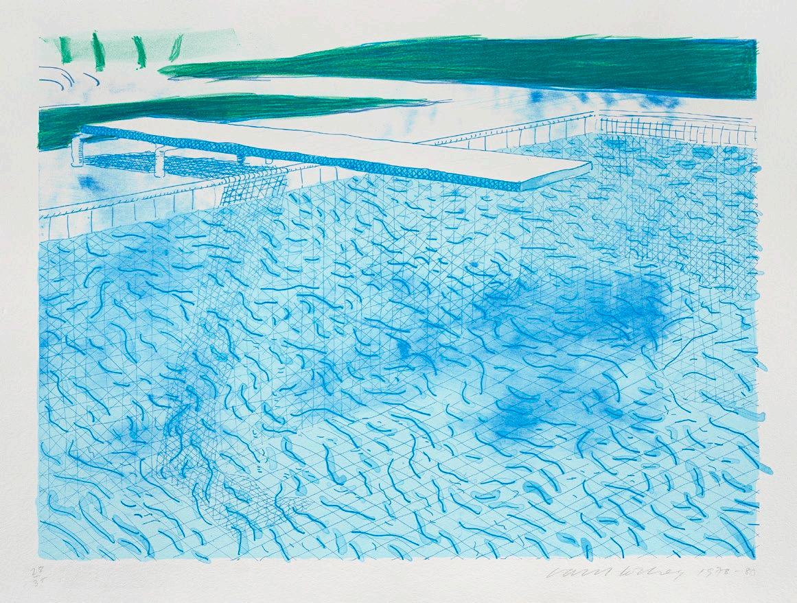
123
LUCIAN FREUD
(1922 – 2011, British)
WOMAN SLEEPING, 1995
etching on Somerset Textured white paper
edition: 6/36
72.0 x 59.0 cm
signed with initials and numbered below image
printed by Marc Balakjian, Studio Prints, London
ESTIMATE: $35,000 – 45,000
PROVENANCE
Matthew Marks Gallery, New York
Rex Irwin Art Dealer, Sydney Private collection, Sydney, acquired from the above in 1996
EXHIBITED
Lucian Freud ‘Etchings 1946 – 2004 ’, Scottish National Gallery, Edinburgh, 2 April –13 June 2004, then touring (another example)
The Compulsive Line: Etching 1900 to Now, 25 January - 17 April 2006, Museum of Modern Art, New York (another example)
Lucian Freud, The Painter’s Etchings , Museum of Modern Art, New York, 16 December 2007 – 10 March 2008, cat. 52 (another example)
LITERATURE
Hartley, C., The Etchings of Lucian Freud: A Catalogue
Raisonné, 1946 - 1995 , Marlborough Graphics and Ceribelli, London, 1995, cat. 52 (illus., another example)
Bernard, B. and Birdsall, D. (eds.), Lucian Freud , Jonathan Cape, Random House, London, 1996, pp. 336, 358, cat. 286 (illus., another example)
Hartley, C., ‘Beyond Description: Freud as an Etcher’, Lucian Freud. Naked Portraits: Works from the 1940s - 1990s, Hatje Cantz, Frankfurt, 2000, pl. 43, pp. 219 - 220, 271 (illus., another example)
Figura, S., Lucian Freud, The Painter’s Etchings , Museum of Modern Art, New York, 2007, cat. 39, pp. 25, 71 (illus., another example), 137
RELATED WORK
Sleeping by the Lion Carpet , 1996, oil on canvas, 228.0 x 121.0 cm, The Lewis Collection, United Kingdom
By the early 1990s, Lucian Freud’s position at the apex of contemporary painting redefining portraiture was firmly cemented, with major international exhibitions placing his works alongside those of the Old Masters. Although Freud had only returned to the medium of etching in the 1980s, full scale retrospective solo exhibitions of his graphic works in this medium also appeared in galleries and museums by the early 2000s, acknowledging the central role of etching within the evolution and development of his oeuvre. A tour de force of this medium, Woman Sleeping, 1995 is a large full-length portrait of Sue Tilley, recumbent and asleep, starkly denuded in bare space. Displaying Freud’s confident mastery of this medium, its reductive and selective focus offers a refreshingly raw approach to the esteemed genre of the classical Nude.
Woman Sleeping belongs to a small suite of intimate works made at the late heigh t of Freud’s career, between 1993 - 1996. This series counted four large format oil paintings (today all in private hands) and two etchings, all exploring with visceral immediacy the generous forms of ‘Big Sue' in her unguarded physical presence. A friend of the artist and of fellow Freud muse, Australian performance artist, Leigh Bowery, Tilley is also known as the ‘Benefits Supervisor’ (she was working at a government service centre in Charing Cross at the time). Closely related to a painted work completed the following year, Sleeping by the Lion Carpet, the odalisque here is removed from her spatial context, from the studio accoutrements that had conferred a regal grandeur on her physical monumentality. Without the modulated colour and physical materiality of paint, Freud instead subjects Tilley to the process of reductive formal distillation that he had been employing in his intaglio Naked Portraits since the early 1980s. In this etching Freud makes little attempt to portray volume and texture with densely shaded tones and cross-hatched lines. Floating the negative space of delicate platetone, her luminous flesh is contained only by bulging emphatic contours and rare judicious patches of shadow. Her weight supported by (now invisible) furniture, her awkward supine form is suspended, directly contradicting the weight-bearing contours of her body and the flat nature of the paper.
Working from life in the studio with his copper plate propped on an easel1, Freud’s Woman Sleeping, although very similar in pose to Sleeping by the Lion Carpet, is the product of a separate live study of Sue Tilley, with her limbs outstretched and foreshortened, turned towards the viewer. The composite perspective and subtle distortions in her position are incised and underscored on the copper plate with no possibility for revision. The extended period of time sitting for this portrait, both painted and etched, allowed the artist to construct a deep rapport with the sitter. Freud was yet to complete Sleeping on the Lion Carpet , his last painting of the series - this etching and the one that followed, Woman with an Arm Tattoo, 1996, were created in tandem with the suite of painted works. Through this process, his portraits of Tilley are suffused with hard-won candour, her dignified unclothed bravado challenging the idealised canons of the female nude. Freud, thus manipulating conventional codes of decorum to attract and distance the viewer in equal measure, has here created an extraordinarily powerful and visually disarming portrait.
124
35
1. Figura, S.,The Painter’s Etchings, Museum of Modern Art, New York, 2008, pp. 14 - 15 LUCIE REEVES-SMITH
125
TOMMY M c RAE (c.1836 – 1901)
(I) CEREMONY, c .1880
(II) SPEARING FISH AND BLACK SWAN, c .1880 pen and ink on paper 22.0 x 28.0 cm (each)
ii. inscribed with title lower centre: Spearing fish and Black Swan
ESTIMATE: $50,000 – 70,000 (2)
PROVENANCE
Private collection, acquired directly from the artist
Thence by descent
Private collection, Canberra
Mr Justice T. C. Davis, High Commissioner for Canada, Canberra, a gift from the above in May 1946
Thence by descent
Private collection, Canada
Frank Hall Estate Sales, Calgary, Canada, 16 April 2023, lot 313 (as ‘Artist Unknown’)
Private collection, Canada
RELATED WORKS
(I) Ceremony, c.1891, pen and blue ink on paper, 24.5 x 31.0 cm, in the collection of the National Gallery of Victoria, Melbourne, illus. in Ryan, J., Indigenous Australian Art in The National Gallery of Victoria , National Gallery of Victoria, Melbourne, 2002, p. 11
(II) Spearing fish and swans from canoes , c.1895, pen and ink on paper, 24.8 x 31.5 cm, in the collection of the Latrobe Library, State Library of Victoria, Melbourne, illus. in Sayers, A., Aboriginal Artists of the Nineteenth Century, Oxford University Press, Melbourne, 1994, p. 37 pl. M13
Offering a rare insight into the Indigenous culture of the late 1800s and before, Tommy McRae’s drawings are of great consequence as they are a valuable record of a local response to an increasing change of pace. McRae was a keen observer of the conduct of new settlers who surrounded him, and a man of deep reflection on the daily life and cultural activities of his own people. As Andrew Sayers observes, McRae had a ‘keen sense of observation and a characteristic storytelling quality, often showing a wry amusement, [which] combine in his drawings to produce an evocative art, full of vitality’.1
A member of the southernmost part of the Wiradjuri nation, McRae (c.1836 - 1901) has been known variously as Yakanduna, Warrauea , Tommy Barnes, and Tommy McRae. He was born in the Albury region and lived most of his life in the Upper Murray River area at Lake Moodemere, close to Wagunyah and Corowa on what is now the Victoria – New South Wales border. McRae worked as a stockman on surrounding local pastoral properties, and in his later life, began recording the daily events in his community and the newly settled towns.
His depictions of traditional scenes of hunting, fishing and ceremony toget he r with portrayal of European, and Chinese miners and historical events were, perhaps surprisingly, widely admired and supported by the local community. McRae’s visual record was a rarity at this time of great change for the local Aboriginal population, with European settlers progressively colonising the land and appropriating its resources.
These two drawings were presented as a gift to Mr Justice T. C. Davis, the retiring High Commissioner for Canada at the completion of his term in May 1946, by a member of the Canberra press gallery who had inherited the works by descent through his family. Both drawings record traditional aboriginal life. The subject of the first work, Ceremony, is one of McRae’s most frequent subjects and is perhaps a recollection of earlier experiences. Typical of McRae’s illustrations of these events, the ceremonial dancers are drawn in a row across the page from edge to edge in a frieze-like pattern. The dancers stand, legs wide apart, bent at the knees each interlocking with the next. All bear decorative body designs and hold a man’s hunting kit of spear, club and spearthrower. The integrated forms of the figures and the movement of the spears overhead create an effect of dancers moving in complete unison.
The second drawing records another of McRae’s preferred subjects, food gathering and hunting. Spearing Fish and Black Swan shows a hunter spearfishing from a bark canoe. Fish and birds were a stable part of the diet of the Indigenous people along the Murray River, consisting not only of Murray Cod (Maccullochella poeli ) but also black swans and other waterbirds which were also hunted in this manner. These works tell a story, a pair of narratives of the hunt, one above the other, ‘his favourite motif is a scene where the prey is about to be captured – a moment pregnant with promise’ 2 and in both scenes, we observe the instant just before the hunter releases his spear.
The drawings of Tommy McRae as noted by Andrew Sayers are ‘distinct in their delicate use of the silhouette….. It is an art of extreme economy but for all its reductiveness, is highly expressive.’ 3 His figures are reduced to delicate outlines in the mostly blank space of the page with little surrounding detail, but with his simple use of gesture and movement, McRae’s drawings express all that is necessary to convey the story.
126
36
1. Sayers, A., Aboriginal Artists of the Nineteenth Century, Oxford University Press, Melbourne, 1994, p. 49
2. ibid., p. 36
3. ibid., p. 29
CRISPIN GUTTERIDGE
127
JOHN HEAVISIDE CLARK
(c.1771 – 1863, British) FIELD SPORTS OF THE NATIVE INHABITANTS OF NEW SOUTH WALES, c .1813
the complete series of ten images watercolour over underdrawing in pencil
(I) SMOKING OUT THE OPOSSUM
18.7 x 13.5 cm (image)
inscribed upper right on margin: No 3
(II) HUNTING THE KANGAROO
13.4 x 18.6 cm (image)
inscribed upper left on margin: No 4
inscribed upper right on margin: 58
(III) THROWING THE SPEAR
13.3 x 18.7 cm (image)
inscribed upper left on margin: No 1
inscribed upper right on margin: 59
(IV) CLIMBING TREES
18.7 x 13.3 cm (image)
inscribed top right on margin: No 2
(V) FISHING NO. 1
13.3 x 18.7 cm (image)
inscribed upper right on margin: 61
(VI) FISHING NO. 2
13.4 x 18.2 cm (image)
inscribed upper right on margin: No 6 and 62
(VII) THE DANCE
18.8 x 13.2 cm (image)
inscribed upper right on margin: No 7
Watermarked: J WHATMAN1/ [possibly 1808? Partially legible]
(VIII) WARRIORS OF NEW SOUTH WALES
13.3 x 18.6 cm (image)
inscribed upper left on margin: No 8
(IX) TRIAL
13.3 x 18.5 cm (image)
inscribed upper left on margin: No 9
(X) THE REPOSE
13.4 x 18.6 cm (image)
inscribed upper left on margin: No 10
ESTIMATE: $500,000 – 700,000 (10)
EXHIBITED (the aquatints)
Australian Images: prints, drawings and watercolours from the collection , Art Gallery of New South Wales, Sydney, 22 December 1979 – 28 January 1980
Paradise Possessed: the Rex Nan Kivell Collection , National Library of Australia, Canberra, 6 August 1998 – 7 February 1999
Eora: mapping Aboriginal Sydney, State Library of New South Wales, Sydney, 5 June – 13 August 2006, cat. 16 (illus. in exhibition catalogue, p. 16, ‘Trial’)
LITERATURE (the aquatints)
John Heaviside Clark, Field Sports &c. &c. of the Native Inhabitants of New South Wales , Edward Orne, 1813 (illus.)
John Heaviside Clark, Foreign Field Sports, Fisheries, Sporting Anecdotes &c. &c. , Edward Orme, 1814, [re–issue of 1813 [?]] edition as Supplement, pp. 157 – 170 (illus.)
Tableaux des chasses le plus intéressantes: représentées en gravures colonées, pouvant server d’études de lavis et d’aquarelle , chez A. Nepveu, Librarie, Paris, 1819 (illus. ‘Hunting the Kangaroo’, ‘Throwing the Spear’ and ‘Climbing Trees’)
Rienits, R. & T., Early Artists of Australia , Angus & Robertson, Sydney, 1963, pp. 196 – 97
de Teliga, J., Australian images: prints, drawings and watercolours from the collection , Art Gallery of New South Wales, Sydney, 1979
Bonyhady, T., Images in Opposition , Oxford University Press, Melbourne, 1985, p. 26
Wantrup, J., Australian Rare Books , Horden House, Sydney, 1987, pp. 280 – 283
Hoorn, J., The Lycett Album: drawings of Aborigines and Australian scenery, National Library of Australia, Canberra, 1990, pp. 3, 17, 25 (illus. ‘Throwing the Spear’ and ‘Trial’) Shortbridge, S., (ed.), Paradise Possessed: the Rex Nan Kivell Collection , National Library of Australia, Canberra, 1998, p. 75 de Bussy, D., The Alan Bond Collection of Art , Dallhold Investments Ply Limited, 1990, pp. 22 – 29 (illus.)
PROVENANCE
Private collection
Sotheby’s, London, 4 November 1987, lots 97 – 106
Dallhold Investments Collection, Perth
Sotheby’s, Melbourne, 19 April 1993, lot 347
The Denis Joachim Collection, Melbourne
Thence by descent
Private collection, Melbourne
Lawson, E., Birds! A National Library of Australia Exhibition, National Library of Australia, Canberra, 1999, pp. 4 (illus. ‘Throwing the Spear’), 9 Thompson, J. R., Collections in the National Library of Australia , National Library of Australia, Canberra, 2003, pp. 20 (illus. ‘Smoking Out of the Opossum’), 75 Renard, J., Aboriginal Life in Old Australia , Edition Renard, Melbourne, 2003 (illus.)
Grant, K., On Paper: Australian prints and drawings in the National Gallery of Victoria , National Gallery of Victoria, Melbourne, 2003, pp. 22 – 23 (illus. ‘The Dance’ and ‘Climbing Trees’) Attenbrow, V., Sydney’s Aboriginal Past: investigating the archaeological and historical records , University of New South Wales Press, Sydney, 2010 (illus. on front cover, ‘Smoking out the Opossum’)
128
37

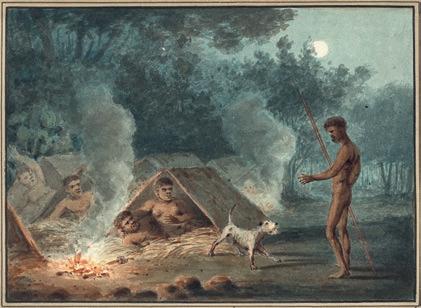
129
(I)
(II)
(III)
(IV)
(V)
(VI)
(VII)
(VIII)
(IX)
(X)
Title page for Field Sports &c. &c. of the Native Inhabitants of New South Wales, Edward Orne, 1813
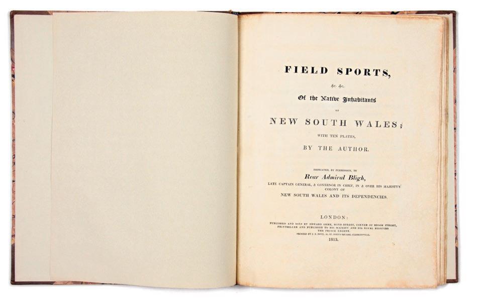
Courtesy of Hordern House Rare Books, Sydney
In 1813 a remarkable book of hand-coloured aquatints with accompanying text was produced in London. Titled Field Sports &c. &c. of the Native Inhabitants of New South Wales , it comprised ten scenes of Aboriginal Australians participating in a range of daily activities including hunting various animals, fishing and resting, as well as ceremonial scenes of dancing, ritual trial and preparation for battle. Published twenty-five years after the foundation of Sydney, it was the first book dedicated to this subject. These ten watercolours, in beautifully fresh condition, are integral to the production and promotion of this important volume, and thus to the European/settler visual representation of Australia’s First People.
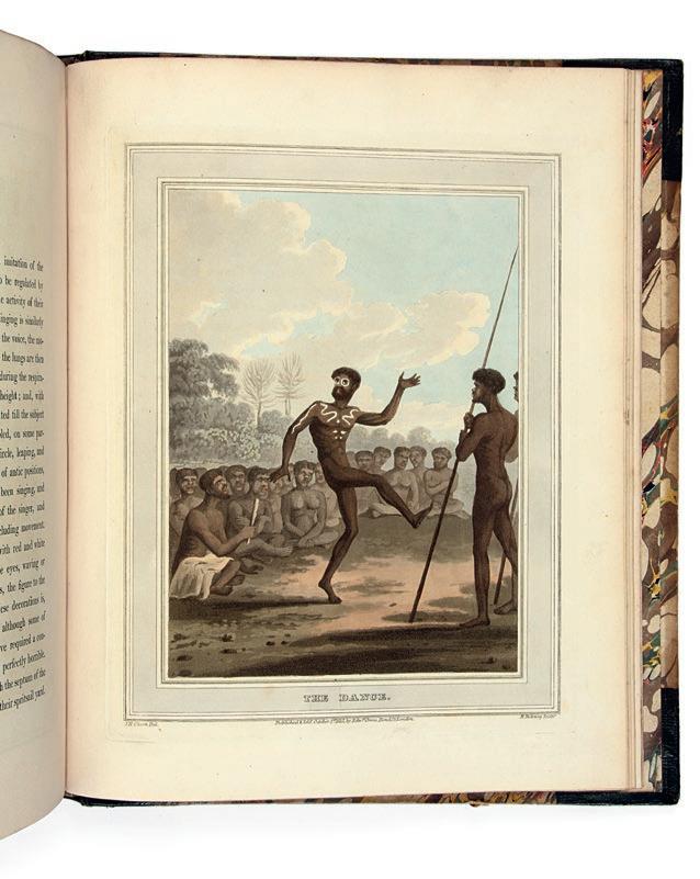
While unsigned, these paintings are undoubtedly by John Heaviside Clark (c.1771 – 1863), a prolific artist and printmaker active in London’s rapidly developing print trade, who produced numerous aquatint prints and illustrations for plate books, often collaborating, as in this case, with printmaker Matthew Dubourg and publisher Edward Orme. His subjects ranged widely – fox hunting, naval battles, Scottish landscapes, travel scenes, receiving the nickname ‘Waterloo Clark’ for his journalistic views following the Battle of Waterloo. He is almost certainly the J. Clark who aquatinted two panoramas of Warrane, Sydney Cove, based upon watercolours by the convict artist John Eyre. Published in 1810, these prints were then included in D.D. Mann’s A Present Picture of New South Wales (London, 1811) 1
Field Sports of the Native Inhabitants was effusively dedicated to the most recently departed governor of New South Wales, William Bligh, who had been arrested and removed from office in the so-called Rum Rebellion:
130
‘The Dance’, illus. in Field Sports &c. &c. of the Native Inhabitants of New South Wales , Edward Orne, 1813 Courtesy of Hordern House Rare Books, Sydney
'To Rear Admiral Bligh, late Captain-General and Governor-inChief, in and over His Majesty’s Colony of New South Wales, and its Dependencies. Sir, It is presumed this slight Sketch of the Manners of the Natives of New South Wales may assist in keeping alive the recollection of a distant spot, where your exertions for your country, and for the benefit of mankind, have been so eminently displayed. It also affords an opportunity for me to express my very sincere respect. I am, Sir, your much obliged humble Servant, John Heaviside Clark.'
Dedications of this kind were common in books and on prints: a view of Sydney dedicated to John Hunter, printed following the end of his own earlier and also problematic governorship was similarly, albeit more subtly, worded 2 No connection between Bligh and Clark, or Orme, is yet known nor why such verbosity was warranted: Bligh was most unlikely to forget his unsuccessful term. However, given his reputation – Bligh had sailed with Cook on his last voyage, undergone mutinies both on sea and on land, and was a noted navigator – the dedication may have been chosen as a marketing ploy by Orme, selecting an individual most firmly connected in British minds with New South Wales at that time.
At the same time that Clark and Dubourg were creating the aquatints for the Field Sports of the Native Inhabitants , a substantial publication was also in production by Orme, which helps explain the unusual title. Foreign Field Sports, Fisheries, Sporting Anecdotes &c from Drawings by Messrs Howitt, Atkinson, Clark, Manskirch includes one hundred action-packed aquatints with descriptive text, which depict (with varying degrees of accuracy) sporting and hunting activities from around the world. These range from Indian tiger and elephant hunting; Spanish bull-fighting; German bear- and wolf-trapping; Arabian
‘Climbing Trees’, illus. in Field Sports &c. &c. of the Native Inhabitants of New South Wales , Edward Orne, 1813
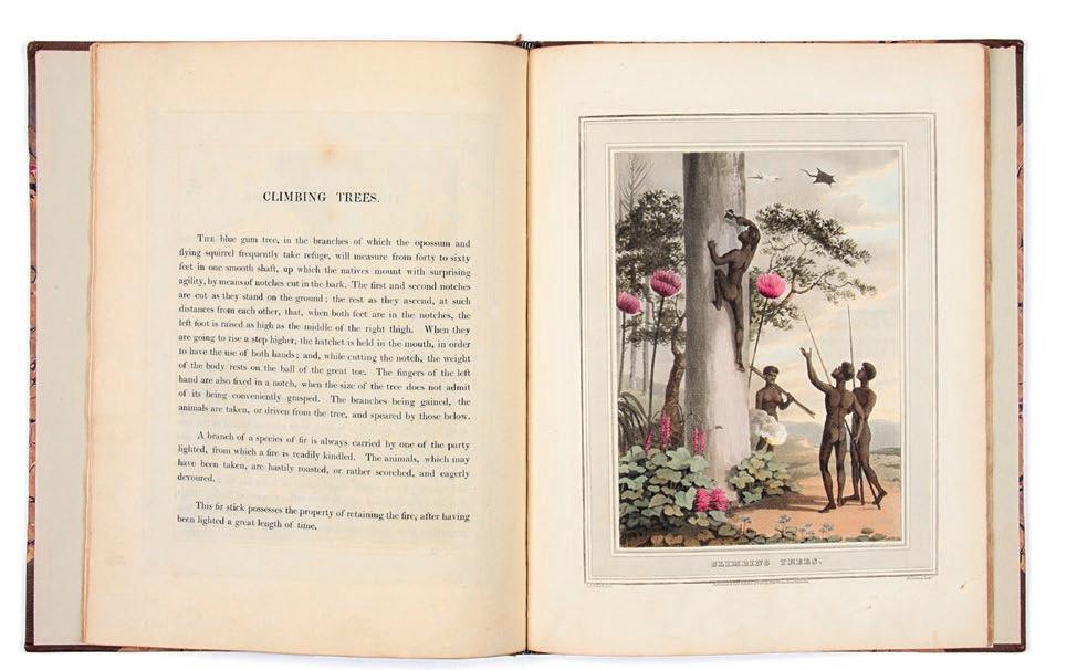
Courtesy of Hordern House Rare Books, Sydney
hawking; Greenland sealing, and diverse techniques of killing and trapping from many other cultures. In this, Orme was cleverly appealing to the contemporary popularity of the British sporting print and the fascination with the unusual and unknown. Produced to the same scale and design, the ten Aboriginal scenes were included as a supplement (unnumbered plates 101 to 110) when the book was published in 1814.
The aquatints, and these watercolours, presented to a European audience the traditional owners of the distant British colony in striking compositions. However – unlike his visits to Belgium and Scotland – Clark never voyaged to New South Wales, nor are preparatory watercolours or drawings by others known. The mysterious source of such imagery has understandably been the subject of debate for many years, given the small British population in New South Wales in those years. Professional and amateur artists in the colony such as John Lewin, John Hunter and Philip Gidley King have been suggested. Watercolours attributed to King depicting Aboriginal people in a range of scenarios are suggestive 3 Yet in his known examples, the physical proportions and King’s observation of Aboriginal postures do not correspond with those we see here. Instead – and intriguingly – evidence indicates that these images derive from a combination of sources, united by Clark and drawn principally from previous publications about New South Wales 4
British accounts of the establishment of Sydney, the new environment and its inhabitants was a source of fascination for Europeans, with books, articles and images reprinted, translated, plagiarised and invented to meet demands for information and entertainment. Descriptions of interactions with and observations of Aboriginal people were frequent, most particularly in the substantial appendix
131
(pp. 543-616) in Lieutenant-Colonel David Collins’ 1798 An Account of the English Colony in New South Wales , which was widely quoted and copied. Many of his descriptions of Aboriginal activities correlate closely with the scenes painted by Clark, as in The dance and Repose :
'[Men] ornament themselves with red and white clay … with a large white circle drawn round each eye. In general waved lines were marked down each arm, thigh, and leg; and in some the cheeks were daubed; and lines drawn over each rib, presented to the beholder a truly spectre-like figure.
The hut of the woodman is made of the bark of a single tree, bent in the middle, and placed on its two ends on the ground … Being themselves sensible of the danger they ran in the night, they eagerly besought us to give them puppies of our spaniel and terrier breeds; which we did; and not a family was without one or more of these little watch-dogs, which they considered as invaluable guardians during the night.'
In his previously mentioned publication of 1811, Mann writes in praise of hunting skills:
'They are amazingly expert at throwing the spear, and will launch it with unerring aim to a distance of thirty to sixty yards. I myself have seen a lad hurl his spear at a hawk-eagle (a bird which, with wings expanded, measures from seven to ten feet), flying in the air, with such velocity and correctness as to pierce his object, and bring the feathered victim to the earth.'
This description is perfectly captured in Throwing the spear, yet the birds bear no similarity to Australian birds. Similarly the vegetation throughout the series is unrecognisable as native, yet that seen in Hunting the kangaroo tallies with Mann’s odd description of pines being scarce, but melons ‘large and plentiful’. A noticeable absence in these views is the distinctive grass tree (xanthorrhoea), which was regularly included in early art as a symbol of the Australian landscape.
If these images were creatively compiled by Clark from textual sources, many anomalous details are explained, such as the round shields of the warriors who are painted identically ‘like so many moving skeletons’, and kangaroos like greyhounds on their hind legs (despite being on display in London menageries since the 1790s) 5 At the same time, each of the scenes is clearly recognisable, showing Indigenous methods of climbing trees or smoking out prey, and details such as the use of the woomera, to further propel the spear, are accurately depicted, just as described 6
We do, however, know of one body of images accessible in London, being a series of etchings of stages of the male initiation ceremony that Collins, and his convict artist Thomas Watling, were permitted to witness. These were included in Collins’s appendix and bear a similarity of facial profile that may have been a source of physique for Clark 7 It is likely that other scenes in Foreign Field Sports were similarly composed from a combination of descriptions of activities, such as trapping
crocodiles on the Nile or swimming for turtles, as well as observed and illustrated events, such as the more accessible bullfighting in Spain. It is worth noting that Orme’s title emphasised the role of the London draughtsmen involved in the publication, rather than the involvement of first-hand witnesses abroad.
This series then provides a fascinating insight into the way that Europeans were interpreting and visualising information being received from the distant colony of New South Wales. How do you envisage a G ymea lily if told of a giant pink flower on a single stem towering overhead? How do Aboriginal people dance? Furthermore it presented British and other readers with a view of communities, their food sources and their Country untouched by invasion, with no sign of their drastically changed world: 1813 was the year that British first crossed the Blue Mountains. Women’s primary role in fishing and food gathering is also overlooked in the images, although their skill was praised in the accompanying text. The exotic appeal of the series is confirmed by a reissuing of the Foreign Field Sports in 1819 and again in the mid 1820s, with a number of plates copied for a children’s book published in Paris in 1830, thus having a continuing influence on European perceptions of Australia in the nineteenth century 8
Most importantly these watercolours are captivating images, painted by a skilled artist who exhibited regularly at the Royal Academy throughout his long and productive career. Clark was also a teacher, author of A Practical Essay on the Art of Colouring and Painting Landscapes in Water Colours (1807) and A Practical Illustration of Gilpin’s Day Representing the Various Effects on Landscape Scenery from Morning till Night, In Thirty Designs from Nature (1811), in which he demonstrated how to depict temporal and atmospheric effects. These glowing watercolours show Clark’s accomplished use of the medium, as in the energetic scratching back to capture the splashes of the speared fish in Fishing (No. 2). Slight differences, such as distant figures in Climbing trees or the spears in Warriors raise questions as to whether these were the source from which Dubourg etched the plates, or created as a unique set painted either for an individual or to promote the prints – either way, they are intrinsically connected with one of the earliest illustrated publications about Australia. That this set has remained in such superb condition and complete since 1813 is remarkable.
1. My thanks to Roger Butler for our discussions on this series. See Alexander, D., A Biographical Dictionary of British and Irish Engravers 1714–1820 , Paul Mellon Centre, London, 2022, pp. 209 – 11
2. William Stadden Blake, after Thomas Watling, A view of the town of Sydney, 1802, etching and aquatint
3. See Hansen, D., ‘“Another man’s understanding”: Settler images of Aboriginal people’, in Leahy, C. and Ryan, J., (eds.), Colony: Australia 1770–1861/Frontier Wars , National Gallery of Victoria, Melbourne, 2018, p. 115 and n. 25.
4. As suggested by Renard, J., ‘Bibliographical and publishing notes’, in Aboriginal Life in Old Australia (Field Sports facsimile), Edition Renard, Melbourne, 2003, n.p.
5. Hunter, J., An Historical Journal of the Transactions at Port Jackson and Norfolk Island , John Stockdale, London, 1793, p. 57
6. See Urry, J., ’Savage sportsmen’ for discussion of early British perceptions of Aboriginal hunters, in Donaldson, I. and T., (eds), Seeing the First Australians, George Allen and Unwin, Sydney, 1985, pp. 51 - 67
7. However, this doesn’t explain Clark’s inaccurate depiction of round, rather than lozengeshaped, shields. There would also have been access to A family of New South Wales, after Phillip Gidley King in Hunter, which depicts various cultural material.
8. Legrand, A., Album de la Jeunesse , Gide Fils, Paris, 1830
ALISA BUNBURY
132
133
(I)
(II)
134 (III) (IV)
135 (V) (VI)
136
(VII) (VIII)
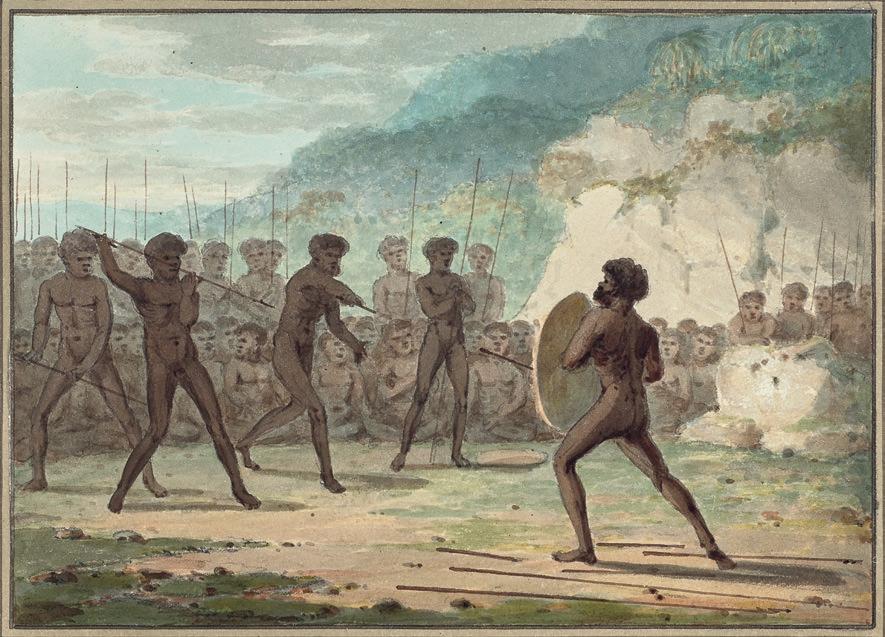
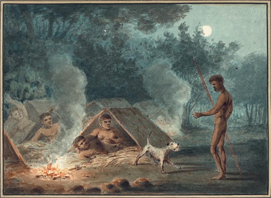
137 (IX) (X)
FRED WILLIAMS
(1927 – 1982)
LANDSCAPE, 1967
gouache on paper on composition board
54.0 x 76.0 cm (sheet)
signed and dated lower left: Fred Williams 67
ESTIMATE: $35,000 – 45,000
PROVENANCE
Private collection
Leonard Joel, Melbourne, 22 November 1994, lot 94
Private collection, Melbourne
We are grateful to Lyn Williams for her assistance with this catalogue entry.
Williams’ distinctive interpretations of the Australian landscape can be read as authoritative exercises in form and gesture, with the barest of markings summarily depicting its unique contours. His rejection of sentimental evocations that were so popular with the Heidelberg school allowed a development of an alternative, semi-abstract vision of the landscape which raises invention and subtlety of vision to a level of singularity that has led us to see the Australian landscape with different eyes. Williams reached his maturity as a painter during the mid-1960s, with his Upwey Series and the preceding You Yangs works attracting unprecedented levels of critical acclaim and positive public reception. Articulating their significance both within Williams’ oeuvre and the broader context of Australian landscape painting, Patrick McCaughey wrote, ‘They were clearly paintings of substance, well made and fully fashioned and yet they still allowed [his] touch to operate. They made of the drab and featureless bush, a landscape of enduring, even monumental proportions and dignity. They revalued Australian landscape painting… and renewed hope in the genre.’1
Thus consolidating and refining his stylistic devices to a rapid shorthand, from 1967 onwards Williams increased the frequency of his outdoor sketching trips, particularly around Lysterfield where he was living at the
time, and beyond to Cottles Bridge. The gouache sketches completed en plein air during these expeditions provided important source material, and a passage between a literal impression of the landscape dotted with eucalypts and its further translation into the iconic Williams reductive script, usually in oil paint on canvas.
From this crucible of formal innovation comes Landscape , 1967. Like many other gouaches and paintings from this period, it has a tripartite division, concentrating much of his gestural information in a central band across the paper – the rolling crest of a hill with a crown of trees protruding from the horizon, and pale blue sky beyond. Williams worked in various media throughout his career – the technical possibilities and creative innovations of one invariably influencing his work in another. A quick-drying medium composed of watercolour mixed with white pigment (which renders it opaque), gouache was his preferred medium for painting outdoors during this time. Yet as this example demonstrates brilliantly, in addition to its convenience and ease of use, in Williams’ hands, gouache also offered something of the richness of oil paint in terms of the pictorial possibilities and textural manipulation it allowed.
Significantly, in 1971, Williams devoted an entire exhibition to ‘watercolours’ which, held at the Newcastle Art Gallery before touring, featured fifty works selected by the artist from his own collection from the years 1957 to 1971. Indeed, Williams often exhibited gouaches alongside his oil paintings, and their importance in his oeuvre has continued to be recognised in later major shows including the retrospective Fred Williams: Infinite Horizons , organised by the National Gallery of Australia in 2011.
138
38
1. McCaughey, P., Fred Williams 1927 – 1982 , Murdoch Books, Sydney, 1996, p. 170
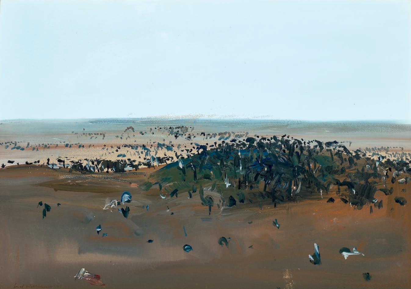
139
39 JOHN OLSEN (1928 – 2023)
LIFE UPON THE GOLDEN RIVER, 1990 oil on canvas
136.5 x 182.5 cm
signed and dated lower right: John Olsen / 90
ESTIMATE: $250,000 – 350,000
PROVENANCE
Private collection
Sotheby’s, Melbourne, 19 August 1991, lot 213
Private collection, Melbourne
In an extraordinarily long and fruitful career totalling over seven decades, John Olsen profoundly changed the face of Australian landscape painting. The turn of 1990s marked a period of reinvigoration of the artist’s practice, adding focussed introspection and poetic narrative content to his familiar lyrical landscapes. Life Upon the Golden River, while ostensibly a landscape painting, is also a semi-autobiographical work, relating the meandering journey of Olsen’s own life to his exuberant painted records of the natural world. It was painted during a transitional period of physical and emotional upheaval, with the artist moving (with perceived finality) to the small rural community of Rydal in the Megalong Valley of New South Wales in March 1990 with his new wife, Katharine Howard.1
With an expansive horizontal composition, Life Upon the Golden River is cropped to focus on a bend in its trajectory. An earthy golden arc sweeps across the white ground, moving horizontally with an intractable force and pace, while the minutiae of Olsen’s life teems along its banks, radiating outwards in a freeform cacophony of gestural marks. Amongst the natural forms of frogs, fish and birds, also growing from the banks of the eponymous river is a grinning head in profile, itself glowing in golden hues. The caricatural protruding nose and jutting chin of this figure are characteristic of Olsen’s own image within major ruminating self-portraits-in-landscape paintings of the same period, including Donde Voy? Self-Portraits in Moments of Doubt, 1989 (private collection), Self Portrait. Travelling West , 1990 - 1992 (private
collection, sold Deutscher and Hackett, 4 May 2016, lot 2) and even later, in his Archibald prize winning Self-Portrait Janus-Faced from 2005 (Art Gallery of New South Wales).
In the 1970s, disillusioned with Sydney’s relentless pace and cutthroat ambitions, Olsen sought solace in rural Victoria at his friend Clifton Pugh’s property, Dunmoochin , and since then followed a peripatetic existence, immersing himself in the physical landscape, reconnecting with painting en plein air and following a practice of intimate observation of the natural world. While many of Olsen’s landscape paintings are tied to precise geographical locations across the continent, it is likely that the “Golden River” of this painting is metaphorical, a device use to interrogate his chosen path during this crossroads, perhaps referring to the illusionary river of gold in John Ruskin’s 1842 cautionary fable The King of the Golden River
John McDonald, reviewing Olsen’s April 1990 solo exhibition at Sydney’s Australian Galleries, the artist’s first in nine years, remarked ‘autobiographical overtones have never been so prominent, while the landscapes work as convincing metaphors for personal feeling’. 2 In contrast to the darker introspective self-portraits of this period, Life Upon the Golden River is humorous, lively and engaging, infused with the joyous yellows of Olsen’s previous Clarendon works. The artist wrote of a pleasant surprise in his diary upon moving to Rydal, discovering the landscape was ‘not unlike my beloved Clarendon’. 3 Indeed, here Olsen presents himself as indivisible from the landscape, finally settling into its strange and bountiful bosom. He elucidated this feeling in an interview in 2006 ‘I am in the landscape and the landscape is in me, that’s the experience that drives the line’.4
140
1. Olsen and Howard lived there for ten years, from 1989 - 1999. Hart, D.,The Art of John Olsen, Doctor of Philosophy thesis, University of Wollongong, 1997, p. 205
2. McDonald, J., ‘Beard Growing’, Sydney Morning Herald , Sydney, 7 April 1990, p. 82
3. John Olsen cited in Hart, D., ibid.
4. John Olsen cited in Hawley, J., ‘The Masterly Mr Squiggle’, Good Weekend , Sydney Morning Herald, Sydney, 2 September 2006
LUCIE REEVES-SMITH
141
CHARLES BLACKMAN
(1928 – 2018)
SELF PORTRAIT WITH CAT ON ROOFTOPS, c .1952 enamel on cardboard
76.0 x 51.0 cm
signed lower right: BLACKMAN bears inscription on backing verso: CHARLES BLACKMAN
ESTIMATE: $65,000 – 85,000
PROVENANCE
Private collection, Melbourne, a gift from the artist, early 1950s Walter Granek Fine Art, Melbourne Private collection, Melbourne, acquired from the above in 2001
EXHIBITED
Possibly: private exhibition at the artist’s Hawthorn studio, February 1952
‘Hand in hand, young and brash, eager and confident, Charles Blackman and I – two bits of string tied in a knot – came to Melbourne in January 1951.’1 So begins a key chapter in Barbara Blackman’s memoir Glass After Glass: Autobiographical Reflections , and follows the newlyweds as they navigate the city, advertising at one stage for a ‘coach house, loft, garage, sleepout or shed for use as an artist’s studio.’2 They eventually found the perfect place, behind a mansion in Hawthorn. Around the corner was the framing business run by the Smith family, including son Gray, who was married to Joy Hester. Shaded by a huge Moreton Bay fig, with the top half of the stable door of the coach house latched open as a window, Blackman began to paint furiously in enamel on cardboard and unprimed sheets of Masonite, often on both sides, and soon mounted an exhibition there in which Self Portrait with Cat on Rooftops , c.1952 was a likely inclusion.
There is a wonderful photo of Blackman surrounded by these early cat paintings, which peer over his shoulder as he reclines whilst playing with a kitten. Identifiable works include the large Cat On the Roof , a smaller self-portrait, and at the back, one of a number of portraits of Barbara, Girl and Cat ; all are close relatives of Self Portrait with Cat on Rooftops . The cat was the artist’s ‘first emergent, identified
Blackman-type image,’3 preceding the famed ‘Schoolgirls’ series from the following year; indeed, some works from late 1952 combine both motifs. Blackman’s peripatetic childhood included stints in Sydney’s Redfern, Manly, and Kings Cross, where he fondly remembered feeding stray alley cats. Blackman had worked as a copy artist from the age of fifteen at the Sydney Sun before travelling to Brisbane where he met the poet Barbara Patterson, the future Mrs Blackman, and her friend, the artist Laurence Hope. Travelling then to Melbourne, he was introduced by the poet Barrie Reed to John and Sunday Reed who quickly recognised his talent. Sunday, whose own menagerie of cats was extensive, delighted Blackman by giving him a copy of Collette’s Creatures Great and Small 4 The couple bought at least four paintings from the coach-house exhibition and would eventually own twenty-nine works across a range of media.
Through the Reeds, Blackman encountered Nolan’s ‘Kelly’, ‘Wimmera’ and ‘St Kilda’ series which both inspired and challenged him, and he would also soon be taken under the wing of the flamboyant Danila Vassilieff. All of these stimuli can be detected in Self Portrait with Cat on Rooftops , where the artist and his feline doppelgänger dance upon the buildings under the gaze of the moon and the clocktower of nearby Hawthorn Town Hall. The image is immediate and whimsical, but also displays the artist’s nascent talent, particularly with the confidence of the brush work and in small accents such as the blaze of yellow contrasting the blue at bottom right. Whilst the cat casts an inquisitive glance at the viewer, Blackman averts his own eyes, hinting at a restless inner world.
1. Blackman, B., Glass After Glass: Autobiographical Reflections , Penguin, Melbourne, 1997, p. 139
2. ibid., p.141
3. Charles Blackman, 1979. Interview with James Gleeson, quoted in: Morgan, K (ed.), Charles Blackman: schoolgirls , Heide Museum of Modern Art, Melbourne, 2017, p. 30
4. See: St John Moore, F., Charles Blackman: Schoolgirls and Angels , National Gallery of Victoria, Melbourne, 1993, p. 33
ANDREW GAYNOR
142
40
143
JON MOLVIG (1923 – 1970)
SLEEPING ABORIGINAL WOMAN AND CHILD, 1958
enamel and oil on composition board
107.0 x 137.0 cm
signed, dated and inscribed lower left: Molvig 58 / EO
ESTIMATE: $100,000 – 150,000
PROVENANCE
David Jones Art Gallery, Sydney (label attached verso)
Judy Cuppaidge, Brisbane, until 1979
Westpac Art Collection, Sydney
Sotheby’s, Melbourne, 17 April 1989, lot 458 (as ‘Woman and Child’) Private collection, Melbourne
EXHIBITED
The Australian Women’s Weekly Art Prize Exhibition, Art Gallery of New South Wales, Sydney, 17 September – 19 October 1958, then touring all state galleries, cat. 20 (as ‘Untitled portrait’)
The Sound of Sky: the Northern Territory in Australian Art, Museum and Art Gallery of the Northern Territory, Darwin, 8 April – 16 July 2006, cat. 89
LITERATURE
Churcher, B., Molvig: the lost Antipodean , Allen Lane, Melbourne, 1984, cat. 206 (as ‘Untitled Portrait: Sleeping Aboriginal Woman and Child’), pp. 69, 74 – 75, 77 (illus.), 83, 185 Murray, D., The Sound of Sky: the Northern Territory in Australian Art , Museum and Art Gallery of the Northern Territory, Darwin, 2006, p. 116 (illus.)
Mol vig was born in Newcastle to a Norwegian sailor who had travelled to Australia on board a windjammer. During World War Two, he served with the Army in New Guinea and the Philippines, enrolling as a student at East Sydney Technical College after he had been discharged He went overseas in 1949 and studied painting in Europe until 1953. Described as ‘a man who enjoyed pubs, played darts, strummed the guitar, sang bawdy ditties and was an expert with the longbow,’ 3 Molvig held his first exhibition at Sydney’s Macquarie Galleries in 1955, and the following year, painted a powerful seated self-portrait, depicting himself as if carved from the cliffs bordering the Aswan Dam in Egypt. He was a restless artist and in these years was moving from a dynamic expressionist phase into a more considered approach rich in angularity and vibrant colours, influenced by his close study of artists such as Pierre Bonnard and Ernst Ludwig Kirschner.
Sleeping Aboriginal Woman and Child attracts an extended analysis in Betty Churcher’s authoritative monograph Molvig: the lost Antipodean , from 1984: ‘The anthropomorphic curves and furrows (in this painting) … have been given specific human form, and like the legendary women of the Aboriginal Dreaming, they seem on the very point of metamorphosis, when their bodies will be converted forever into features of the landscape. They could also be a metaphor for the desert: the arid land that stretched out like a baited trap, set with opalescent colour to seduce the eye.4 Churcher also recorded that the letters ‘EO’ which appear next to the signature are the artist’s shorthand for his use of enamel and oil paints in this work.
The late 1950s were a period when, for a number of non-Indigenous Australian artists, ‘(m)orality … assumed a prominence’ and through their imagery ‘endeavoured to use art to probe contemporary ethical issues.’1 Of these, Arthur Boyd’s ‘Bride’ series and Russell Drysdale’s memorable outback portraits of Aboriginal people are well known, but others who pursued a similar course include James Cant, David Boyd, Ray Crooke and Sam Fullbrook. Another was the Brisbane artist Jon Molvig and Sleeping Aboriginal Woman and Child, 1958, is a powerful and evocative statement where the figures and the parched land almost merge. It was painted in Molvig’s studio in Lambert Street, Kangaroo Point, after the artist had returned from an epic car journey with his former student (and then partner) Maryke Dageus, travelling via Melbourne, Adelaide, Port Augusta and the desert, up to Alice Springs, where they camped for nearly six weeks next to Uluru. 2 They then drove back across Queensland to Brisbane.
Molvig’s star began to rise following Sleeping Aboriginal Woman and Child ’s inclusion in the 1958 The Australian Women’s Weekly Art Prize Exhibition at the Art Gallery of New South Wales, leading to an invitation to join the stable of artists established by influential Sydney dealer Rudy Komon; though Molvig ‘adamantly refused’ a similar invitation to join the Antipodeans in early 1959. 5 Before entering the Westpac Collection, Sleeping Aboriginal Woman and Child was owned by the Cuppaidge family whose patriarch Russell had his portrait painted by Molvig, subsequently entered into the Archibald Prize in 1959. Molvig would go on to win the Archibald Prize 1966 with his portrait of close friend Charles Blackman (Art Gallery of South Australia).
1. Heathcote, C., A quiet revolution: the rise of Australian art 1946-1968 , Text Publishing, Melbourne,1995, p. 95
2. See: John Molvig: maverick , exhibition catalogue, Queensland Art Gallery|GOMA, Brisbane, 2019, pp.15, 32
3. McGrath, S., ‘The Viking is on the wall’, The Weekend Australian Magazine , 4-5 November 1978, p. 6
4. Churcher, B., Molvig: the lost Antipodean , Allen Lane, Melbourne, 1984, p. 74
5. Heathcote, C, ibid., p. 114
ANDREW GAYNOR
144
41
145
BRETT WHITELEY (1939 – 1992)
THE OLGAS, 8AM also known as OLGAS III, 1985 pen, brush and ink on paper 54.0 x 74.0 cm (sheet) signed, dated and inscribed lower right: the olgas 8 AM.. / 7/april 85 / 55 / (The arab taxi driver swooning at breast mother) / brett whiteley 85
ESTIMATE: $45,000 – 65,000
PROVENANCE
Australian Galleries, Sydney (label attached verso) Private collection, Sydney, acquired from the above in October 1994
EXHIBITED
162 Drawings: Brett Whiteley: 1960 – 85, Robin Gibson Gallery, Sydney, 1985, cat. 54 (illus. in exhibition catalogue, p. 36 as ‘Olgas III’)
Brett Whiteley: Drawings, Australian Galleries, Sydney, 19 September – 15 October 1994, cat. 76 (label attached verso, as ‘The Olga’s [sic.], 8 am’)
LITERATURE
Driscoll, M. and Whiteley, B., Native Rose, Richard Griffin, New South Wales, 1986, illus., n.p. Gray, R., ‘A Few Takes on Brett Whiteley’, Art and Australia, vol. 24, no. 2, Summer 1986, p. 222 (illus., as ‘Olgas III’) Sutherland, K., Brett Whiteley: Catalogue Raisonné , Schwartz Publishing, Melbourne, 2020, cat. 162.85, vol. 7, pp. 666 – 667
RELATED WORK
At Dawn, Olgas III, 1985, pen, brush and black ink and ink wash on brown paper, 73.6 x 53.3 cm, private collection, New South Wales
of making were deeply entwined: ‘Don’t just interpret nature, become its rival. Try and operatively work in the manner that rivals nature so that you do challenge God … There is sometimes that supernatural, superhuman sort of feeling when you’re creating that you are causing a world … From something that didn’t exist – here, this thing does exist.’1
Whiteley first travelled to Central Australia in the summer of 1983 with poet Michael Driscoll to create imagery for Driscoll’s forthcoming volume, Native Rose , which contained poetry and narrations inspired by Kata Tju t a (the Olgas) and the journals of 19th century explorer Ernest Giles. 2 While several of the artist’s works demonstrate Whiteley’s broad interest in Aboriginal art and culture, 3 this interest correlated with the sense of mysticism he similarly associated with Eastern cultures, rather than a deep understanding. While it is fair to assume that the significance of the site to the Anangu traditional owners may have escaped him at the time, Whiteley nevertheless acknowledges the traditional custodians’ presence and connection through the elegant sweep of dots that seemingly wrap Kata Tju t a’s “many heads”,4 and the liveliness of his brushwork, which conveys the “electricity” of the place and its impact upon him.
Across Brett Whiteley’s stellar career, the landscape served as both a conceptual and very real escape from the realities of daily existence, the expectations of the art world and ever-growing success, and the largely self-created pressures he came to experience in a life fuelled by creativity and addiction. From bases in London, and later, in New York and Australia, travel throughout Europe and Africa, and extended periods in Fiji and Bali, relaxed the artist’s body and mind and charged the imagination, providing material that would populate his oeuvre for years to come. While places like Sydney’s Lavender Bay – which became the subject of some of artist’s most well-known and highly celebrated works after the Whiteleys moved there in 1970 – are clearly recognisable, more often than not the landscape is an abstracted, generalised place; an amalgam of the artist’s diverse experiences in and connection to nature. For Whiteley, the natural world and the act
Like the female form, landscape was a site of sensuality and visual and creative pleasure for Whiteley and given his numerous depictions of the breasts, hips and curves of his wife and muse Wendy, one cannot help but see her form echoed in the sumptuous shapes of The Olgas, 8am , 1985. As Whiteley explained: ‘I know that in my work there is a certain sensuality, sexuality; there is an addiction to the curve, and to the carnal; to the rounded, I mean even to lust almost … I see sexuality, or sensuality, everywhere. I see it in clouds, and in mountains, and in fruit. And seemingly, most human motivation is caused by it – it’s a very, very deep force. And I accept it inside myself and in fact, I try as overtly as possible to allow that force to key my painting.’5
1. Brett Whiteley quoted in Featherstone, D. (dir.), Difficult pleasure: a film about Brett Whiteley, 50 mins 43 secs, Film Finance Corporation Australia Limited, 1989
2. Ernest Giles (1835 – 1897) “discovered” the soaring rock formation the Olgas in 1872 and named them after Queen Olga of Württemberg
3. These include the undated Aboriginal drawing , and the painting To Yirrawalla , 1972 (both Collection Art Gallery of New South Wales). Whiteley created To Yirrawalla as a tribute to the artist after meeting Yirawala (1903 – 1976) in Sydney in 1971 and seeing his bark paintings. https://www.artgallery.nsw.gov.au/artboards/brett-whiteley/landscape/item/a1srsw/, accessed 26 June 2023
4. Kata Tjuta is Pitjantjatjara for “many heads”
5. Featherstone, op. cit.
146
42
KELLY GELLATLY
147
SAM FULLBROOK
(1922 – 2004)
THE MESSENGER, 1961 oil on canvas
92.0 x 109.5 cm signed indistinctly lower left: Fullbrook
ESTIMATE: $60,000 – 80,000
PROVENANCE
South Yarra Gallery, Melbourne (label attached verso)
CARBA, Melbourne
Air Liquide Australia, Melbourne
Private collection, Melbourne, acquired from the above in 2007
EXHIBITED
Painting from the Pacific: Japan, America, Australia, New Zealand, Auckland City Art Gallery, Auckland, 25 July – 20 August 1961, cat. 64 (label attached verso)
We are grateful to John Cruthers for his assistance with this catalogue essay.
The 1950s saw the emergence of a number of artists who were lauded for their rugged individuality as much as their art. The list includes former pugilist Robert Dickerson; the self-sufficient Jon Molvig, handy with a longbow; and former underground miner Pro Hart. Sam Fullbrook was often included in this group but it was not how he saw himself: ‘A lot of people have described [me as] ‘that old bushman Sam Fullbrook’, but I’m no bushman. I was brought up in the heart of Sydney … Probably, I get that bushman bit because I’ve spent half of my life in the bush and I like living in the bush. … No, I’m not a bushman, I’m a painter. I’m a good painter.’1 After studying at the National Gallery School in Melbourne alongside John Brack and Fred Williams, Fullbrook began a decade of work and extensive travels that led him to Pilgangoora on the traditional lands of the Kariyarra people near Port Hedland in Western Australia’s Pilbara region. Here, he built a studio of stone, saplings and spinifex grass at the McLeod Native Co-operative, whilst he was employed by the McLeod Mining Company.
In spite of living within a disenfranchised community burdened by racial discrimination, Fullbrook found the Aboriginal way of life ‘very aristocratic compared to our own system…. Spiritually, they all ha d
top hats.’ 2 He also began to paint them, but with empathetic dignity. These quietly moving images soon found success in Perth and beyond, with the actress Vivian Leigh purchasing ‘a picture of an Aboriginal girl cleaning a fish’ in 1959. 3 Fullbrook’s respect for his subject is apparent in The Messenger, 1961, where the man on the left has been given the sad task of delivering bad news. With one hand gently comforting a child, the man silently gazes at the surrounding women who grieve in attitudes similar to those found in paintings of the lamentation of Jesus by Renaissance and Baroque artists such as Giotto, Mantegna and Rubens. The simplicity of the painting is deceiving as it is anchored by a precise design and illuminated by a sophisticated interplay of colour. Of similar works by Fullbrook, one reviewer noted that whilst the figures and their background were ‘partly described, partly dissolving’, it was their ‘effective relationship with their surroundings (which) gives them pictorial existence.’4 Examples of these include: Northwest landscape with Aborigines , 1955 (Queensland Art Gallery); Girl with kangaroo , c.1954 – 1959 (National Gallery of Victoria), and The head stockman , 1957 – 60 (National Gallery of Australia).
The messenger was painted the year after Fullbrook’s return to Sydney, in a studio he had established next to the Grace Brothers department store on Broadway. That year also saw him mount exhibitions in Brisbane and Sydney, and he was included in a group exhibition of Australian artists at Raymond Burr Galleries in California. In 1963, Fullbrook was awarded the prestigious Wynne Prize at the Art Gallery of New South Wales (he won a second place the following year); and in 1974, he added the coveted Archibald Prize to his list.
2
ANDREW GAYNOR
148
43
1 Sam Fullbrook, interviewed by John Cruthers, December 1985, for the film The painters, the sculptors: Sam Fullbrook , Australia Council, 1986. Transcript provided to the author, courtesy John Cruthers.
ibid.
3 Sam Fullbrook. Quoted in: Beeby, R., ‘You don’t sell, you don’t eat’, The Age , Melbourne, 12 August 1985, p. 11
4. Henshaw, J., ‘Improbable assemblage’, The Bulletin , Sydney, 20 October 1962, p. 34
149
JOHN OLSEN
(1928 – 2023)
HAY, HELL AND BOOLIGAL, 1981 oil on canvas
182.0 x 166.0 cm
signed and dated lower right: John Olsen ‘81
ESTIMATE: $180,000 – 240,000
PROVENANCE
Rudy Komon Gallery, Sydney (label attached verso)
Private collection, Sydney, acquired in 1982
From the pulsating energy of his You Beaut Country series, to the quieter, more metaphysical paintings inspired by his expeditions to Lake Eyre, or the exquisitely lyrical works immortalising his halcyon days in Clarendon, Olsen’s unique interpretations of the natural environment in its manifold moods have become indelibly etched on the national psyche. Embracing both figuration and abstraction, his signature technique fusing painting and drawing as one reveals the hand and eye of the artist with every stroke – the act of creation thus imbuing the painted surface with a powerful sense of the artist’s own exuberant energy and palpable joie de vivre . As Deborah Hart, curator and author of several authoritative publications on the artist, asserts, ‘Olsen has confronted and helped redefine our basic conception of landscape… providing a psychological encounter with place, not only as seen but as experienced, resulting in a fresh, exhilarating vision.’1
Painted in the first half of 1981 when Olsen was still working in a studio at the Riverina College of Advanced Education, Wagga Wagga, Hay and Hell and Booligal , 1981 demonstrates well his remarkable ability to capture both the immensity and intricacy of the Australian landscape. Depicting the drought-ravaged Riverina area of south-western New South Wales, the work notably derives its title from the figurative Australian vernacular expression to denote ‘a place of the greatest imaginable heat and discomfort’ – a phrase subsequently popularised by Banjo Paterson in his controversial poem, ‘Hay and Hell and Booligal’, first published in The Bulletin on 25 April 1896. Comparing Booligal unfavourably with the nearby town of Hay, and even Hell itself, the bush poet recounts a litany of problems with the township – from heat, sand, dust and flies to rabbits, mosquitoes, snakes and drought – all with characteristic irreverence and humorous intent which no doubt would have appealed to Olsen, himself an irrepressible larrikin. As the poem concludes:
“We’d have to stop! ” With bated breath
We prayed that both in life and death
Our fate in other lines might fall: “Oh, send us to our just reward
In Hay or Hell, but, gracious Lord, Deliver us from Booligal!”
Significantly, Olsen first encountered the landscape of the Riverina as a teenager during pre-war family expeditions to Yass, Camden and Tingha. 2 Later in 1958, writing in the introduction to the Macquarie Galleries exhibition of works produced during his Spanish sojourn, he would again ponder the region and how to best immortalise it in paint: ‘…Questions come to mind: What is it like to get a totality of the Riverina, the Dead Heart and other parts of our wonderful landscape – to travel through, to feel the rise and the fall of hill and plain, to circumvent and come back to where I have been before? I cannot help thinking of Klee’s lead when he said: ‘The line goes for a holiday…’’ 3
Employing his signature ‘all-at-once’, multi-perspective approach –‘I’m down on the canvas one moment and flying up the next or looking sideways or underneath’4 – Hay, Hell and Booligal illustrates how tangibly Olsen would eventually capture the sight as well as the feel of this sparse, arid terrain. Map-like, the aerial view details the solid but sinuous form of the river meandering through the open plains, yet as the eye ascends upwards through the picture plane it is brought back to reality by the illusion of depth suggested in the conventional horizon line and pale sky beyond. Even within this expansive scene however, importantly Olsen still incorporates delightful details of the local birdlife, thus encouraging the viewer to appreciate the relationship between the tiny and the vast, the microcosm and macrocosm. Betraying striking affinities with the artist’s iconic depictions of Lake Eyre from the previous decade, indeed the composition is Olsen at his best – eloquently encapsulating his aspirations to express a total landscape experience in his art. As Olsen mused, ‘[only] then you begin to somehow see the wholeness… It’s more than the present, it’s the past and projects itself into the future.’5
1. Hart, D., John Olsen , Craftsman House, Sydney, 2000, p. 207
2. Bungey, D., John Olsen: An Artist’s Life , ABC Books, Sydney, 2014, pp. 31 – 36
3. See John Olsen , Macquarie Galleries, Sydney, 1958, n.p.
4. Olsen quoted in Hawley, J., ‘John Olsen’, Encounters with Australian Artists , University of Queensland Press, Queensland, 1993, p. 129
5. Hurlston, D. & Edwards, D. (eds.), John Olsen – The You Beaut Country, National Gallery of Victoria, Melbourne, 2016, p. 10
VERONICA ANGELATOS
150
44
151
PROVENANCE
JOHN PERCEVAL
(1923 – 2000)
THE BURNING OF THE ARK, c .1994 oil on canvas
91.5 x 122.0 cm signed lower left: Perceval signed and inscribed with title verso: Perceval / THE / BURNING / OF THE / ARK
ESTIMATE: $45,000 – 65,000
Gould Galleries, Melbourne (label attached verso) Private collection, Melbourne, acquired from the above in 1994
We are grateful to Ken McGregor for his assistance with this catalogue essay.
The final sequence of paintings created by John Perceval in the fifteen years before his death brim with an optimism and vitality at odds with the darkness of his previous decade as an institutionalised patient battling alcoholism and inner demons. With the support of friends and an artistic community genuinely excited to have him back in their midst, Perceval further benefited from the assistance of two carers, Ken McGregor and Matt Foster, who drove him to familiar locations to sketch before returning to the studio to turn these images into paintings. One particular favourite were the rotting wharves of Williamstown with their equally dishevelled ships and smoky air, a place that Perceval had first encountered in the 1950s with Charles Blackman. He subsequently painted two renowned sequences of the run-down dock in 1956-57 and again in 1959 before returning in the late sixties; and it is in these later works that the painterly strategies seen in The burning of the ark , c.1994, can first be detected.
In Arrival of the Lively Lady and The Floating Dock, Williamstown , 1967, for example, Perceval emphasises the turbulence of the waters with boldly individual brushstrokes which mark the shape of the swells as they rise and fall between battered, rusting vessels. Harbour Trust, Williamstown , 1967-1968, reveals a different strategy, one of whorls and curlicues which veil the sky and the sea with an agitation perfectly
suggestive of a blustery day. The myriad of surrounding boats are painted in the jauntiest of colours indicating Perceval’s absolute delight at the encounter. The painter-critic James Gleeson accurately detected that the artist ‘loves the warmth or crispness of the air and evokes its quality with the exactness of an Impressionist and the feeling of an Expressionist.’1 In the later series, his assistant McGregor described how Perceval ‘likes the paint to swirl around the canvas and mix in with the other colours he has used. He uses, as well as his brushes, the end of the brush and sometimes his fingers.’2 In The Burning of the Ark , the yellow stripes on the hull recall those of the 1960s paintings, whilst the squiggles of paint where the ship meets the water almost ooze with the presences of the oil and diesel leaks that they no doubt represent. It is here and in the towering flames that aspects described by McGregor may also be detected, such as fingertips smudging through the original brush marks.
One final point is often overlooked, namely Perceval’s humour. Earlier Williamstown paintings had, for example, irreverent sailors urinating into the waters; but in The Burning of the Ark , the humour lies in Perceval’s interpretation of the actual events witnessed, described again by McGregor: ‘We were down at Williamstown looking at the boats and saw smoke coming from one of them; and John said ‘I hope there are no animals on board.’ I said ‘It’s not the Ark’, and the next day he painted the work. The funny bit about this story was that the smoke from the boat was someone actually having a barbeque.’ 3 Honoured with a retrospective at the Heide Museum of Modern Art in 1984, Perceval subsequently received the award of Officer of the Order of Australia in 1990 which officially acknowledged the dynamic contribution he had made to the art and culture of Australia.
152
45
1. Gleeson, J., Modern painters: 1931 - 1970 , Lansdowne Press, Sydney, 1971, p. 95
2. Ken McGregor. Quoted in: Reid, B., Of Light and Dark: the art of John Perceval , National Gallery of Victoria, Melbourne, 1992, p. 32
3. Ken McGregor. E-mail correspondence with this author 12 July 2023. Perceval subsequently painted a different ship with the title The Ark (Noah’s Ark), 1994, exhibited at Gould Galleries, Melbourne, in 1996
ANDREW GAYNOR
153
RAY CROOKE
(1922 – 2015)
FAMILY GROUP, THURSDAY ISLAND, 1962 – 63 oil on composition board 60.5 x 91.5 cm
signed lower right: R. Crooke signed and inscribed verso: THE ISLANDERS / R.CROOKE / YORKEYS KNOB / further signed and inscribed verso: Island / Family / THURSDAY Is. / 1962.3 / Ray Crooke / Nov 00
ESTIMATE: $40,000 – 60,000
PROVENANCE
Private collection, Perth
Leonard Joel, Melbourne, 4 April 2000, lot 252 (as ‘The Islanders’) Savill Galleries, Sydney (label attached verso)
Private collection, Sydney
EXHIBITED
Ray Crooke, Savill Galleries, Sydney, 18 May – 10 June 2006, cat. 3 (illus. in exhibition catalogue)
LITERATURE
Crooke, R., & Denham, P., Island Journal , Bede Publishing, Brisbane, 2000, p. 2 (illus.)
‘…Crooke’s paintings reveal a humility of attitude which does not seek the unusual but achieves it. If his paintings of Australia’s tropical North and the native people going about their simple daily tasks or sitting as monuments in the deep shadow of their huts, spell such an enchantment, it is because poetical truth is deeper than ordinary vision.’1
Drawing inspiration from a lifetime of experience living in Northern Queensland and the adjacent Melanesian islands, Ray Crooke is celebrated for his quiet but intensely evocative landscapes which emphasise the monumental simplicity and laconic grace of people shaped by their environment. Whether engrossed in daily rituals, glimpsed in the cool of shaded rooms or ensnared within webs of light and shade beneath jungle vegetation, his compositions bear a strong sense of locality, describing with unprecedented accuracy this remote region and the unique light that so distinguishes it. Significantly, the serene Family Group, Thursday Island , 1962 – 63 offered here belongs to the first dedicated body of work which the artist undertook following his return to Far North Queensland after successful exhibitions in 1957 and 1959 enabled him to leave Melbourne and settle in Yorkeys Knob where he could paint full-time. While appearing as ‘snapshots’ or portraits of a specific place, these compositions are nevertheless ‘the remembrance of things past’, emerging from the artist’s mind’s eye
following the disciplined distillation of observed fact previously explored through studies and sketches. Encapsulating Crooke’s desire to create ‘a romantic form of expression based upon imagination and emotion’2, indeed such works give precedence to mood over action or narrative to examine, rather, the fundamental relationship between man and nature.
Fundamental to such conscious ordering of forms towards an aesthetic ideal is Crooke’s enduring preoccupation with tonal relationships, contours and silhouettes, and the dramatic juxtaposition of dark against light. Indeed, despite his richly decorative and highly developed sense of colour, one only need compare such tropical landscapes with those of his artistic predecessor, Paul Gauguin, to discern ‘the differences between an artist working through tone and one who worked through colour.’ 3 Underpinning the strength and authenticity of his vision, thus the image here is built up from a dark ground organised around tonal relationships to reveal a carefully constructed scene, with the three protagonists silhouetted against the soft dappled sunshine that streams through the window from the sparkling sea beyond. Imbuing the work with a powerful sense of mystery and curious timelessness, it is this sensation of clear defining light which gives stature to islander life and reveals Crooke’s abiding interest in the dignity of man.
Betraying strong affinities with the art of Florentine Renaissance masters Giotto and Piero della Francesca in their quest to locate the eternal in the present moment – that point of intersection between time past and time to come – Crooke’s meditations accordingly invite his audience to experience the art of stillness, to appreciate the flow of time in its purest, most metaphysical sense. For, as James Gleeson astutely asserts, that ‘special kind of magic’ in Crooke’s paintings ‘only begins to work when one has discovered the stillness and the silence that lies at the heart of everything he paints... This stillness is not the mere stillness of arrested motion, but the projection of a mind preoccupied with deep and permanent things.’ 4
154
46
1. Langer, G., The Courier-Mail , Brisbane, 8 November 1967
2. Smith, S., North of Capricorn: The Art of Ray Crooke , Perc Tucker Regional Gallery, Townsville, 1997, p. 7
3. Gleeson, J., ‘Introduction’, Ray Crooke , Collins, Sydney, 1972, unpaginated 4 ibid.
VERONICA ANGELATOS
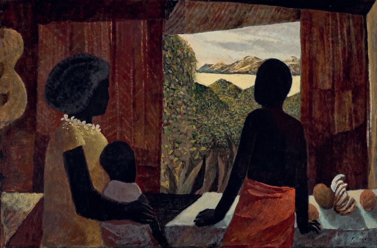
155
CLEMENT MEADMORE (1929 – 2005)
CROSSING, 1997 bronze
18.0 × 28.0 × 20.0 cm edition: 2/8
signed, dated and numbered at base: Meadmore 97 2/8
ESTIMATE: $18,000 – 24,000
PROVENANCE
Im Obersteg Collection, Basel, Switzerland
Stuker Auctions, Zurich, Switzerland
Private collection, Sydney
Deutscher and Hackett, Sydney, 13 September 2016, lot 64
Private collection, Melbourne
156
47
GWYN HANSSEN PIGOTT (1935 – 2013)
STILL LIFE WITH GOLD BOTTLE, 1996 woodfired porcelain ten pieces (five bottles, two bowls, three jugs) 25.5 x 60.0 cm (overall) each stamped at base with the artist’s roundel
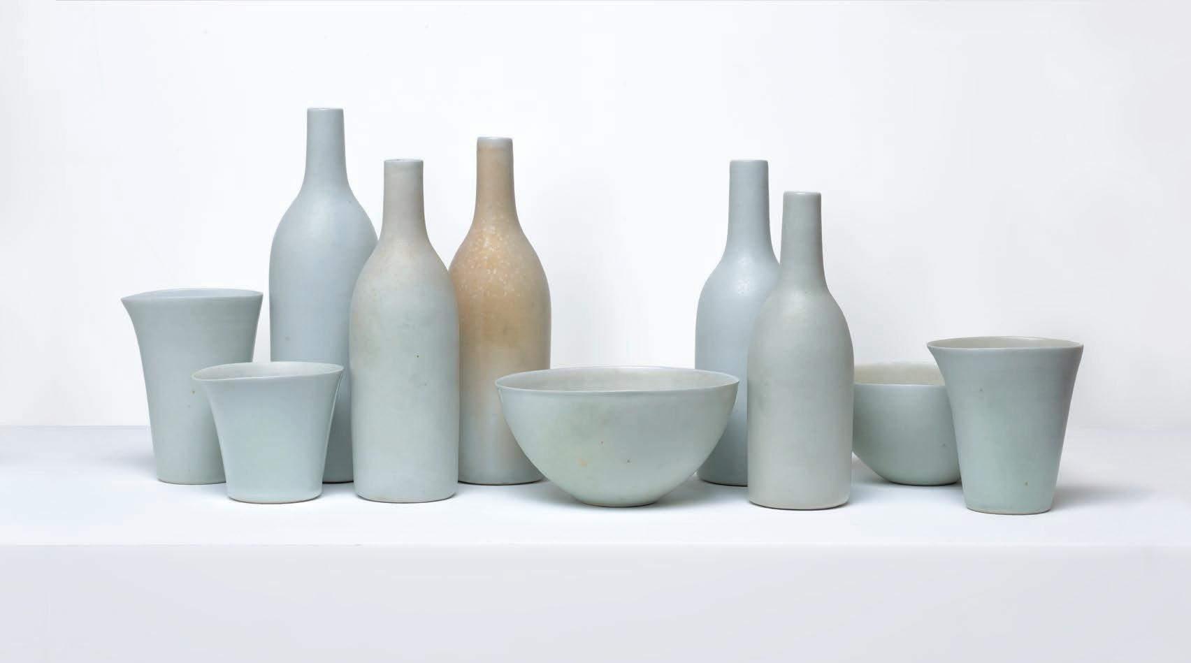
ESTIMATE: $18,000 – 24,000 (10)
PROVENANCE
Rex Irwin Art Dealer, Sydney
Private collection, Sydney, acquired from the above in 1996
EXHIBITED
Still Life (Cressida Campbell, Gwyn Hanssen
Pigott and Thornton Walker) , Rex Irwin Art Dealer, Sydney, 5 – 30 November, 1996, cat. 18
157
48
49 BRUCE ARMSTRONG born 1957
GUARDIANS [PAIR OF MAQUETTES FOR THE GRAND HYATT HOTEL, MELBOURNE], 2009 – 2021 cast and painted bronze on timber bases
205.0 cm (height, each, including base)
i. edition: 6/10
i. signed with initials and numbered at base: BA / 6/10 422
ii. edition: 7/10
ii. signed with initials and numbered at base: BA / 7/10 / IRO
ESTIMATE: $140,000 – 180,000 (2)
PROVENANCE & Gallery, Victoria Private collection, Victoria, acquired from the above in 2021

158
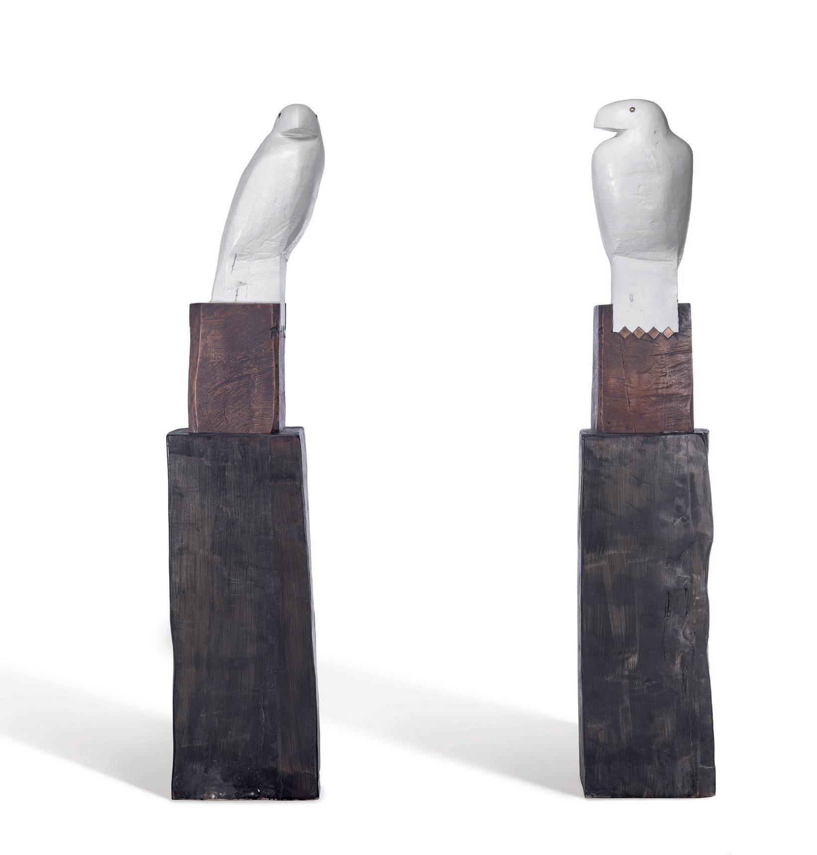
159
The massive hewn beasts that form Bruce Armstrong’s mystical menagerie have safeguarded Melbourne’s urban environment for decades. Sculpting from fallen trunks, often hundreds of years old, Armstrong has steadfastly persisted with a style of art making reliant on brawn and a high degree of technical craftsmanship. Beginning with illustrious commissions in the late 1980s, most notably Guardians , 1987, the pair of crouching beasts standing at the entrance of the National Gallery of Victoria, Armstrong has made a career of creating monumental totemic figures built to exist in the open public space. For Melburnians, the public installation of his three landmark eagles – the 23m tall Bunjil , 2002 surveying the Docklands and the pair of
aquiline Guardians , 2009 installed at the entrance of the Hyatt Hotel – have changed the aesthetic fabric of the city and provided the urban environment with a deeper, more spiritual connection to the land.
Placed upon robust plinths replicating rustic wooden beams, and gleaming with a simple tonal contrast and subtle polished metal details, these Guardians , 2009 – 2021 are editioned bronzes, recreating in a domestic scale the imposing and memorable format of Armstrong’s Guardians at the Russell Street entrance of Melbourne’s Hyatt Hotel. They are turned with heads cocked in static and silent dialogue, omniscient and ever watchful. Painted a uniform white with pigments mixed with marine acrylic (a defensive weather patina), the Guardians stand proud with a striking silhouette. Their smoothed simplified shapes embody the Wedge-Tailed Eagle, Australia’s largest bird of prey and a significant figure in local Indigenous mythology.
An ancestral being, one of two moiety forebears, Bunjil, the WedgeTailed Eagle holds a central role in the creation stories of the Boon Wurrung and Woi Wurrung language groups of the greater Kulin Nation of south-eastern Australia. In addition to creating the land and its features, Bunjil was said to have made people by breathing life into clay figures and exerted control over rising seas threatening the habitability of their lands.1
Armstrong’s sculptural (and two dimensional) work embraces the folkloric and animistic potential of animals, drawing inspiration from long standing traditions in American, Egyptian, Hawaiian and indigenous Australian cultures. His figures have a physical and psychological presence without referring back to a specific mythology, purely utilising emotional effects of the muscular formal qualities of his sculptures. In an interview conducted during his 2018 survey exhibition at the National Gallery of Victoria, Armstrong acknowledged that while his Docklands Bunjil was not created with the Indigenous significance in mind, he appreciated the organic links that were later formed with First Nations Australians and the exposure it gave to the creation stories around Bunjil for local groups. 2
Bruce Armstrong, a self-confessed twitcher and having idealised himself as a falconer within a 2005 self-portrait 3 , writes: ‘Bird’s are everyone’s allegory, a totem for all personalities. Every culture has bird stories… one can sift through the history of art and find images of birds
160
Bruce Armstrong Bunjil , 2002
Wurundjeri Way Docklands, Melbourne
in the earliest of humanity’s imagery.’4 His oeuvre is peppered with avian forms, most devoid of detail and adopting a symbolic shape of varying simplification. Some resting, others using their outspread wings as protective, encircling shields. Based on an early maquette from 1996, the docklands Bunjil had prominent, defined legs and talons gripping the plinth behind which fell his folded wings and tail. This present pair of Guardians , based on a later design, features a simpler form which smooths the eagle’s turned head, body and legs into one even and uniform plane. Unlike the public monumental versions, their talons are symbolically chiselled into the base in a chevron pattern, inlaid with gleaming bronze diamonds.
Although cast in bronze, an effect of carved muscularity is retained through the preserved chisel marks, rustic clefts and ridges left unpolished on the surface of the sculpture. Armstrong sustainably sources his wood from trunks destined for mulching and honours the long survival they have endured throughout history by keeping a tactile materiality and authentic roughness to his finished sculptures. Armstrong creates a curious tension between the dense mass of his sculptures, and the aerial verticality of his avian forms perched atop totem poles.
From this high vantage point, the Guardians survey the area, one looking straight out and the other turned to the side, eyeing the periphery. They do not simply mirror each other, instead displaying an organic duality, more closely linked to the environment in which they are placed. Endowed with a commanding presence, these watchful sentinels are intended to be placed on either side of an entrance to a place of cultural significance. With an endearing untidiness, Armstrong’s Guardians are raw and vernacular, their simplicity providing a blank canvas for interpretation and engagement with each environment and viewer.
1. Bunjilaka Aboriginal Cultural Centre, Museums Victoria, see: https://museumsvictoria.com. au/bunjilaka/about-us/, accessed June 2023.
2. Armstrong in conversation with David Hurlston in Bruce Armstrong. An Anthology of Strange Creatures , National Gallery of Victoria, Melbourne, 2018, p. 4
3. Self Portrait , 2005, acrylic on board, 157 x 127 cm, entered in the 2005 Archibald Prize: https://www.artgallery.nsw.gov.au/prizes/archibald/2005/28082/, accessed June 2023.
4. Armstrong, B., ‘Why Birds?’ in Webb, V., MCA Unpacked II: Six Artists Select from the MCA Collection , Museum of Contemporary Art, Sydney, 2003, p. 8
LUCIE REEVES-SMITH
161
Bruce Armstrong Guardians, 2009 Grand Hyatt, Melbourne
PROVENANCE
DEL KATHRYN BARTON born 1972
SHINY, 2014
synthetic polymer paint on linen
81.0 x 66.0 cm signed, dated and inscribed with title lower right: –shiny–2014 / –del kathryn barton–signed, dated and inscribed with title verso: del kathryn barton 2014 / title – shiny
ESTIMATE: $30,000 – 40,000
Roslyn Oxley9 Gallery, Sydney (label attached verso) Private collection, Sydney, acquired from the above
EXHIBITED
Del Kathryn Barton: electro orchid , Roslyn Oxley9 Gallery, Sydney, 13 November – 13 December 2014, cat.7 (illus. in exhibition catalogue)
Del Kathryn Barton: The Highway is a Disco , National Gallery of Victoria, Melbourne, 17 November 2017 – 12 March 2018
LITERATURE
Wallis, P. and Frew, P., Del Kathryn Barton: The Highway is a Disco , National Gallery of Victoria, Melbourne, 2017, pp. 3, 31 (illus.), 119
Leading Australian contemporary artist, Del Kathryn Barton has risen to critical and public acclaim on the strength of her portraiture, depicting for the Archibald Prize popular celebrities such as Hugo Weaving and Cate Blanchett, but also herself, flanked by her children. In parallel to these memorable prize-winning portraits, Barton has interspersed smaller scale portraiture within her studio practice, creating an ongoing series of portraits of anonymous and androgynous figures, alike in treatment and appearance and progressively incorporating new aesthetic decisions as Barton’s career advances. Placed in front of a patterned screen, the pale figure of Shiny is luminescent, and like her many siblings each in their own frames, is statically transfixed in a contemplative state. As the title of this painting suggests, Barton’s carefully crafted universe is ultimately one of sensation, of surface effects of colour and texture - creating finished products of overwhelming exuberance.
Protected behind a veil of multicoloured dots and bearing an indecipherable expression, the subject of Shiny, although human-like in appearance, does not invite empathy or interaction with the viewer. While she is not endowed with wings or multiple limbs, her otherworldly power is hidden within swirling galactic eyes and elfin features. These sharp contours are almost identical to those of her companions, chiselled nose and pouting red lips echoing those of her neighbours in
the suite. In reprising for the background a graduated red, purple and white web pattern from another accompanying painting of the same year, Mother Web, Barton alludes to a menacing, occult power wielded by her inconspicuous subject.
Tightly cropped to display only the head and shoulders, positioned in an upright three-quarter profile, Barton’s mature and regal portraits draw their inspiration from the format of High Renaissance portraiture of the elite classes. A mainstay of Barton’s practice since 2009, these portraits have supplanted her earlier vulnerable paintings of girls – the ethereal females of this phantasmagorical universe ageing alongside their artist creator. The uniformity of their composition allows Barton to explore surface and decorative variations, indulging in her distinctive sumptuous and obsessive patterning.
Although now working across many varied media, the intricate and meditative act of drawing still underpins all of Barton’s work. Raw and instinctual, her wandering inky lines trace spindly fingers and angular features and the outer edges of delicately modulated liquid shadows in pink and blue. Arranged in contrasting vertical and horizontal stripes, however, the minute dotting of this woman’s clothing bristles with imposed and contained order. And, although glowing with multicoloured hues and painstakingly drawn, her flowing locks of hair are also flattened, swept up in a neat bun. Even the structure of her turtleneck outfit projects an appearance of contained rigidity from which the profusion of patterning and colour threatens to break free, the pearlescent paint dripping neatly down the centre of the canvas.
As Julie Ewington has noted, the figures in Barton’s paintings ‘are always gazing either out of the canvas at the viewer or scanning their world’, there is ‘an insistence on watchfulness.’1 Staring blankly into the distance, her oversized coloured eyes look both inward and outward, voyaging beyond the mundane towards a cosmic realm. She is transfixed, awestruck by an unknowable plane of consciousness, one unblinking eye swirling with enchantment while the other stares directly out to the viewer.
162
50
1. Ewington, J., Del Kathryn Barton, Piper Press, Sydney, 2014, pp. 37, 47
LUCIE REEVES-SMITH
163
DEL KATHRYN BARTON born 1972 MORE THE HER, 2022
American black walnut with Cambia ash and rock maple wood, abalone green and white freshwater mother of pearl inlay, hard wax oil, blackened steel 157.0 x 100.0 x 100.0 cm unique (conceived as an edition of three, only one produced) signed left edge: del kathryn barton inscribed with title and numbered right edge: more the her 1/3
ESTIMATE: $80,000 – 120,000
PROVENANCE
Roslyn Oxley9 Gallery, Sydney Boris and Naomi Tosic, Sydney
EXHIBITED
Del Kathryn Barton, the woman who fell to earth , Roslyn Oxley9 Gallery, Sydney, 6 – 28 May 2022, cat. 7 (illus. in exhibition catalogue, as ‘more than her’)
In 2017, Del Kathryn Barton, grappling with her mother’s terminal cancer diagnosis, imagined a large shell vessel for her to ‘sail away on’, carried through the universe to an afterlife.1 At the Foot of Your Love , 2017, a massive fabricated wooden conch, was the ambitious sculpture that realised Barton’s artistic gesture derived from filial devotion. Combined with a patchwork textile sail, this work occupied a central space in the artist’s survey show at the National Gallery of Victoria the same year, The Highway is a Disco
Following the success of this first collaboration with specialist building company, Élan, the multidisciplinary artist revisited the project several years later to create a sumptuous suite of three smaller solid timber shells: the queen conch, the nautilus shell and the spider conch. More The Her, 2022 copies the 3D-mapped form of a queen conch from the artist’s personal collection (a gift from her late mother), finely crafted with horizontal slices of American Black Walnut, with an inlaid stylised eye, made from contrasting tranches of ash, maple and two different tones of mother of pearl.
With exquisite marquetry and tactile sinuous surfaces, the organic form of the queen conch shell is endowed with an evocatively female quality. Appearing deceptively soft by virtue of its sanded and varnished surfaces, the shell is in fact a hard and durable exoskeleton, providing
shelter and safe passage to its inhabitants. The title of More The Her appears to be an anagram of the words Mother Here, and when combined with symbolic undertones of the shell as a womb, it links this sculptural work to the rest of Barton’s oeuvre of painted portraits, of mothers, female warriors and shape-shifting androgynous gods.
The technical prowess and master craftsmanship provided by Élan allowed Del Kathryn Barton’s richly imaginative world to expand beyond the two dimensional surface of the canvas, mimicking the minutiae of her vision in a tangible, volumetric form. Beyond the butcher’s block chequerboard surface, the motif of a single eye, rendered here with vibrant green abalone pearl inlay demonstrates the translation of the artist’s signature meticulousness and sumptuous surfaces into manufactured large-scale sculpture. Even the inscriptions are lettered with inlays of mother of pearl. Tragically, the charismatic master joiner Boris Tosic, the fabricator and first owner of this sculpture, died prematurely shortly after the three sculptures were exhibited at Barton’s exhibition The Women Who Fell to Earth , at Roslyn Oxley9 Gallery mid-2022. The ambitious, multiple editions of each of these shells were never to be completed.
The figures of Barton’s paintings all gaze out with large inky, galactic eyes, seeing in a metaphysical rather than physical sense. Staring out from the enchanted world of Barton’s imagination, these eyes look back at the viewer to echo our own perception of the artwork, and solicit a glistening path of understanding. In More The Her, this theme is addressed with the artist’s motif of a single wide-open eye, referencing the all-seeing eye of christian iconography. 2 Perhaps too, like a middle-eastern Nazar or Wedjat eye-shaped amulet, it provides a watchful, protective presence to the soul, as it travels on the shell down the primordial river to the underworld.
164
51
1. Barton cited in The Highway is a Disco, National Gallery of Victoria, Melbourne https://www. ngv.vic.gov.au/exhibition/del-kathryn-barton/, accessed June 2023
2. Ewington, J., Del Kathryn Barton, Piper Press, Sydney, 2014, p. 37
LUCIE REEVES-SMITH
165
JOHN OLSEN (1928 – 2023)
KINGFISHER AND FROG, 1979
watercolour and pastel on paper 90.5 x 64.0 cm
signed and dated lower right: John Olsen / 79
inscribed with title lower left: Kingfisher / & Frog
ESTIMATE: $18,000 – 25,000
52
PROVENANCE
Private collection, Sydney
Deutscher and Hackett, Melbourne, 29 August 2012, lot 56
Art Index, Sydney
Private collection, Sydney, acquired from the above
LITERATURE
Copyright Agency / Viscopy Annual Review for Artists 2013 , CAL, Sydney, p. 12 (illus.)
166
ESTIMATE: $25,000 – 35,000
PROVENANCE
Australian Galleries, Melbourne (label attached verso) Private collection, Melbourne, acquired from the above in 1978
EXHIBITED
John Coburn Paintings, Drawings, Prints and a Tapestry, Australian Galleries, Melbourne, June 1978, cat. 12
LITERATURE
Amadio, N., John Coburn Paintings , Craftsman House, Sydney, 1988, p. 200
167
JOHN COBURN (1925 – 2006)
SOUTH COUNTRY, 1978 synthetic polymer paint on canvasboard 60.5 x 76.0 cm
signed lower right: Coburn signed, dated and inscribed with title verso: SOUTH COUNTRY / JOHN COBURN / SYDNEY 1978
53
KEN WHISSON (1927 – 2022)
EARTH AND SKY OR HEAVEN AND EARTH, c .1965 oil on composition board 60.5 x 89.0 cm
signed, dated and inscribed with title verso: ABOUT 1965 / EARTH / AND SKY / KEN WHISSON / OR HEAVEN AND EARTH
ESTIMATE: $20,000 – 30,000
54
PROVENANCE
Watters Gallery, Sydney (label attached verso)
Private collection, Sydney, acquired from the above in 2012 Estate of the above
EXHIBITED
Art Month Sydney: A Special Exhibition , Watters Gallery, Sydney, 3 – 20 March 2010, cat. 13
LITERATURE
Sprague, Q., Ken Whisson: Painting & Drawing , Drill Hall Gallery Publishing, Canberra & The Miegunyah Press, Melbourne, 2023, p. 133 (illus.)
168
ESTIMATE: $20,000 – 30,000
PROVENANCE
Estate of the artist, Sydney
Watters Gallery, Sydney
Private collection, Sydney, acquired from the above in 1986
EXHIBITED
Tony Tuckson: Twenty Paintings on Canvas 1947? –1957?, Watters Gallery, Sydney, 1 – 18 October 1986, cat. 7
LITERATURE
Thomas, D., Free, R. and Legge, G., Tony Tuckson , Craftsman House, Sydney, 1989, pl. 13, pp. 48 (illus.), 179
169
TONY TUCKSON (1921 – 1973)
COCKTAILS FOR TWO NO. 1 (TP 160), 1947 – 49 oil on hessian 60.5 x 71.0 cm
55
WEAVER HAWKINS (1893 – 1977)
CONSTRUCTION OF A HANGAR, 1949 oil on plywood 40.0 x 50.0 cm
signed and dated lower right: Raokin / 49
inscribed with title verso: Construction of a Hangar
ESTIMATE: $15,000 – 20,000
PROVENANCE
Private collection, Sydney
Private collection, Sydney, acquired from the above in the 1970s
170
56
ROY DE MAISTRE
(1894 – 1968)
WHITE LILAC, c .1930 oil on canvas
76.0 x 56.5 cm
signed lower left: R De Maistre
ESTIMATE: $20,000 – 30,000
PROVENANCE
Phil Lapthorn, United Kingdom, acquired directly from the artist c.1930
Dora Thomas (née Lapthorn), United Kingdom, a gift from the above c.1960
Charles Hattersley, London, a gift from the above 1973
Sworders Fine Art Auctioneers, United Kingdom, 4 October 2022, lot 61 (as ‘Lilacs in a vase’)
Private collection, Melbourne
EXHIBITED
Flower Paintings by Roy de Maistre, The Calman Gallery, London, 30 June – 23 July 1938, cat. 7
171
57
PROVENANCE
JOY HESTER
(1920 - 1960)
STREET SCENE II, c .1941 pen, ink and pencil on paper 20.0 x 24.5 cm (sheet)
signed with estate stamp upper left: Joy Hester
ESTIMATE: $15,000 - 20,000
The Estate of Sweeney Reed, Melbourne
Peter Nahum, London
Sotheby’s, Melbourne, 27 September 1992, lot 212
Private collection, Melbourne
LITERATURE
Burke, J., Joy Hester, Greenhouse, Melbourne, 1983, p. 53
RELATED WORK
Two Girls in the Street , c.1941, ink and pen and watercolour, 28.4 x 38.8 cm, in the collection of the National Gallery of Australia, Canberra
‘Hester did a series of street scenes in the early Forties that have striking compositional similarities: usually of two women standing together in the street. She shared this interest in urban subjects with a number of her contemporaries - Albert Tucker, Sidney Nolan, Noel Counihan and Harry de Hartog. These artists had been influenced, in turn, by the Russian painter Danila Vassilieff and the Viennese-born Jewish artist Yosl Bergner. Both had arrived in Melbourne in 1937.’
Excerpt from Burke, J., Joy Hester, National Gallery of Victoria, Melbourne, 1981, p. 22
172
58
PROVENANCE
LINA BRYANS (1909 – 2000)
GERTRUDE STREET, 1948 oil on plywood 55.5 x 64.5 cm
signed and dated lower left: Lina 48 signed, dated and inscribed verso: 1948 ‘COLLINGWOOD’ / Lina Bryans
ESTIMATE: $15,000 – 20,000
Private collection, Melbourne, acquired directly from the artist, late 1970s
Private collection, Melbourne
Deutscher and Hackett, Melbourne, 6 May 2015, lot 59
Private collection, Melbourne
EXHIBITED
Paintings by Lina Bryans , Georges Gallery, Melbourne, 21 – 30 September 1948, cat. 9
Lina Bryans: A Retrospective Exhibition , National Gallery of Victoria, Melbourne, 21 September 1982 – 31 March 1983, and touring Banyule Gallery, Melbourne, Ballarat Art Gallery, Victoria and Geelong Art Gallery, Victoria, cat. 28
LITERATURE
Bell, G., The Sun , Sydney, 21 September 1948
Foorwood, G., Lina Bryans: Rare Modern 1909 - 2000 , The Miegunyah Press, Melbourne, 2003, p. 111
173
59
ALBERT NAMATJIRA (1902 – 1959)
GHOST GUM, CENTRAL AUSTRALIA, 1951 watercolour and pencil on card 26.0 x 37.0 cm signed lower right: ALBERT NAMATJIRA bears inscription verso: 17/4/51
ESTIMATE: $38,000 – 45,000
PROVENANCE
Dennis Connors (Newcastle Waters Station, NT), acquired in the early 1950s
Thence by descent
Private collection, Melbourne, acquired c.1960
Thence by descent
Private collection, Melbourne, acquired in 2001
Albert Namatjira’s painting of the central Australian landscape was both innovative and personal. However, contained beneath the cover of the western artform, the artist also made claim to his country, plural meanings can be seen to have existed within his paintings. His landscapes can also be read as memories of an ancestral site and through the reiteration of the subject, a claim of ownership is subtly asserted . Gum trees and mountains feature prominently in Namatjira’s work and Ghost Gum, Central Australia , 1951 is a prominent example of both a familiar subject to the viewer and a statement of belonging by the artist.
Like much of Namatjira’s finest works, this watercolour evokes the artist’s distinctive compositional device with his much-loved, luminous white Ghost Gum typically dominating the foreground, and silhouetted
against a dramatic rocky foreground of red and purple tones and the distant mountain ranges in blu e . The Ghost Gum (Eucalyptus papuana), both the painting ’s focus and a pointer to the distant landscape, is an incredibly hardy species. Known as ilwempe to the Western Arrernte, it grows in extraordinary inhospitable conditions and features in Aboriginal creation stories , in which individual trees can be considered to represent ancestral beings.1 Balanced on the left side of the composition and reaching beyond the picture, the majestic gum plays a pivotal role not only as a framing device and point of entry into the picture plane. More fundamentally perhaps, the signature cropped tree motif creates a tangible sense of being present in the landscape, of participating alongside the artist in seeing and identifying with the land – thus imbuing the work with an unmistakable intimacy.
Through a combination of deep ancestral connection to Arrente country and his extraordinary compositional skills in representing country and the changing effects of the light, Albert Namatjira inspired a school of painting, having a major impact across Australia and cr eating some of the earliest bridges between Aboriginal and western cultures, which were to be reinforced by later forms of desert art.
174 60
1. French, A., Seeing the Centre: The Art of Albert Namatjira, 1902 – 1959 , National Gallery of Australia, Canberra, 2002, p. 121
CRISPIN GUTTERIDGE
175
ALBERT NAMATJIRA (1902 – 1959)
WEST FROM GLEN HELEN, 1951
watercolour and pencil on card 26.0 x 37.5 cm signed lower right: ALBERT NAMATJIRA bears inscription verso: West from Glen Helen, 1951
ESTIMATE: $30,000 – 40,000
PROVENANCE
Dennis Connors (Newcastle Waters Station, NT), acquired in the early 1950s
Thence by descent
Private collection, Melbourne, acquired c.1960
Thence by descent
Private collection, Melbourne, acquired in 2001
RELATED WORK
Glen Helen Country, watercolour on paperboard, 25.0 x 34.0 cm, in the collection of Ngurratjuta Pmara Corporation Collection, Araluen Galleries, Alice Springs
Albert Namatjira was a naturalist and a tonalist, whose patrilineal totemic connection to the country bordering and north of Glen Helen (Yalpalpe ) and the Finke River (Lherre pirntea ) formed the bedrock of his art and provided plural meanings for those viewers who could read them. Landforms as discrete entities held a certain fascination for the artist. Whether they are large mountains or monoliths on a smaller scale, they also hold spiritual meaning for the traditional owners and, as with many locations in central Australian, can be read as both ‘sights’ and ‘sites’.1
Painted in 1951, West from Glen Helen observes the distant ranges far to the west of Glen Helen Gorge and appears atypical in that the viewpoint is not framed by a gum tree or rocky outcrop located in the foreground. Presenting a more open horizontal and expansive experience of the
landscape, the viewpoint is nevertheless carefully controlled by the artist who directs the viewer to the distant peaks through the placement of intervening mountain slopes in the middle distance. Namatjira’s familiarity with his country is evident in these long distant views ‘where peaks and monoliths provide a rich range of possibilities and responses that arise from constantly re-engaging with the same subject.’2 They also resonate with important personal symbolism for the artist as statements of belonging – as coded expressions embodying the memory and knowledge of traditional ancestral sites, of his totemic places. Landscape artist Lloyd Rees acknowledged this duality when he observed ‘I find in his [Namatjira’s] work a marvelous sense of distance and of space. His eye can look so far away and seem to know what’s there’. 3
Wenten Rubuntja, artist and Chairman of the Aboriginal Areas Protection Authority in Mparntwe, where Namatjira lived, explained the sensitivity to plural meanings required in the appreciation of Namatjira’s artworks: ‘we’re not photographers, taking pictures. The country has got sacred sites, that stone, that mountain has got Dreaming and himself is sacred country. Not just free mountain. We sing that one – we got that song. Well, the song is the history of the country. […] Albert Namatjira used whitefella’s side of the story – he painted landscape. He painted the Twerrenge (Dreaming) side there as well. Namatjira used two Laws’.4
2.
3.
4.
CRISPIN GUTTERIDGE
176
61
1. French, A., Seeing the Centre: The Art of Albert Namatjira 1902 – 1959 , National Gallery of Australia, Canberra, 2002, p. 93
ibid., p. 96
ibid., p. 97
Rubuntja, W., cited in French, A., ‘We’ve Got to Follow that Old Man’s Tracks: Engaging with the Art of Albert Namatjira’, in Perkins, H., and West, M., One Sun One Moon: Aboriginal Art in Australia , Art Gallery of New South Wales, Sydney, 2007, p. 159
177
JAMES ALFRED TURNER (1850 – 1908)
THE DROVER, 1896 oil on canvas
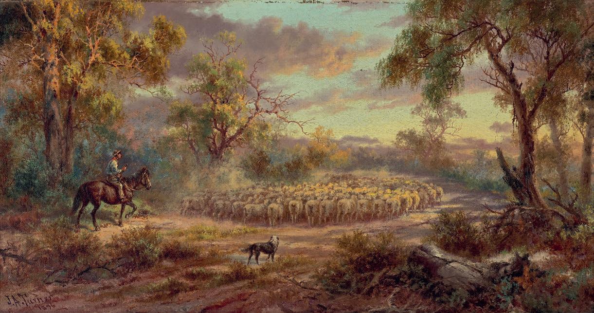
22.5 x 43.5 cm
signed and dated lower left: J. A. Turner / 1896
ESTIMATE: $8,000 – 12,000
PROVENANCE
Estate of Louisa Millicent Florence Maskrey
Sotheby’s, Sydney, 17 November 1988, lot 226
Henry Krongold, Melbourne
The Estate of Paul Krongold, Melbourne
178
62
ERNEST BUCKMASTER
(1897 – 1968)
ALONG THE CREEK, 1963 oil on canvas
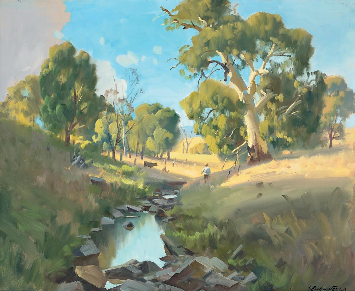
71.5 x 86.5 cm
signed and dated lower right: E Buckmaster 1963 signed and inscribed with title on stretcher bar verso: “ALONG THE CREEK” E Buckmaster
ESTIMATE: $4,000 – 6,000
PROVENANCE
Private collection
Sotheby’s, Melbourne, 19 April 1994, lot 174
Henry Krongold, Melbourne
The Estate of Paul Krongold, Melbourne
179
63
ARTIST UNKNOWN
MAIN CAMP AT “YARDIANA”, SOUTH AUSTRALIA, 1877 pencil and chalk on paper 11.0 x 18.0 cm signed with initials and dated lower right: WR… / 1877 bears inscription below image:
MAIN CAMP AT “YARDIANA”. S. AUSTRALIA
ESTIMATE: $5,000 – 8,000
the Kokatha, Wirangu and Barngarla peoples prior to 1865, and featured a freshwater spring. This was the first property taken up in the Gawler Ranges.
PROVENANCE
Private collection
Sotheby’s, Melbourne, 6 April 1987, lot 15
Private collection, Melbourne
The subject appears to depict the site for the construction of the East – West Telegraph Line extension between Adelaide and Western Australia at Yardea, 143 miles west of Port Augusta.
Deriving from the aboriginal word “Yardianna” as used in the title, meaning ‘place of rushes’, Yardea Station was established on the traditional lands of
Equipment and materials for the telegraph line were brought in by ‘Afghan’ contractors and by mid 1876 the construction had past Yardea and was approaching Eucla on the Western Australia coast border. Eucla Telegraph Station, the largest station on the East-West Telegraph line, opened December 1877 with the first telegraphic message crossing the Nullarbor at 4pm on the 8 December.
‘Elder & Co. brought the first ‘Afghans’ to South Australia to work at Beltana station, north of Port Augusta in the Far North. Thirty-one Afghans arrived on the Blackwell at Port Augusta, and on New Year’s Eve 1865 a crowd gathered to witness the extraordinary sight of 124 camels being lifted onto new soil. Although known as Afghans, the cameleers were in fact Pathans from the border of present-day Afghanistan and Pakistan. Generally from poor backgrounds, they came as single men on three-year contracts. There were some 800 Afghan males in Australia by the 1890s.’1
180
1. Edwards, J., ‘Afghans’, SA History Hub , History Trust of South Australia, Adelaide, https://sahistoryhub.history.sa.gov.au/subjects/afghans accessed 7 July 2023
64
ARTIST UNKNOWN
(Late Eighteenth Century, British)
HIPPA OR PLACE OF RETREAT ON AN ARCH’D ROCK IN NEW ZEALAND WITH A WAR CANOE: & A NONDESCRIPT
ANIMAL OF NEW HOLLAND, c .1773 pen, ink and wash on paper 17.5 x 20.5 cm (sheet)
inscribed with title below image inscribed verso: Robert Wightman / Mill Vale / March 30th 1801. accompanied by the publication The London Magazine , 1773
ESTIMATE: $10,000 – 15,000 (2)
LITERATURE
Anderson, J., ‘Elegant Engravings of the Pacific: Illustrations of James Cook’s Expeditions in British Eighteenth-Century Magazines’, British Art Studies , Paul Mellon Centre for Studies in British Art, London, Issue 7, November 2017, p. 6
RELATED WORK
Hippa or Place of Retreat on an Arch’d Rock in New Zealand with a War Canoe: & a Non Descript Animal of New Holland, c.1773, engraving illus. in The London Magazine , August 1773, p. 367
PROVENANCE
Private collection, United Kingdom
Private collection, Sydney
This work appears to be the preparatory drawing for the related engraving published in 1773, printed in reverse, largely based on images from Sydney Parkinson’s A Journal of a Voyage to the South Seas in his Majesty’s Ship, the ‘Endeavour’ . Individual images of the arched rock, war canoe and kangaroo have been combined to create a ‘spectacular glimpse of the Pacific’. In the years following Cook’s first [1768 – 71] and subsequent expeditions to the Pacific, extraordinary images of the region were presented to the public, largely through magazine illustrations.
181
65
ESTIMATE: $10,000 – 15,000
PROVENANCE
Private collection, Victoria
RELATED WORKS
View of Warrnambool (Tower Hill), 1867, oil on cardboard, 47.1 × 60.6 cm, in the collection of the National Gallery of Victoria, Melbourne Tower Hill, Warrnambool , 1867, oil on academy board, 44.5 x 60.7 cm, in the collection of the National Library of Australia, Canberra
182
DANIEL CLARKE (1827 – 1918, Irish)
TOWER HILL, WARRNAMBOOL, 1867 oil on canvas 46.0 x 79.0 cm signed and dated lower right: D Clarke / 1867
66
signed
ALBERT NAMATJIRA
(1902 – 1959)
26.5
ESTIMATE: $30,000 – 40,000
PROVENANCE
Private collection, Sydney
Lawsons, Sydney, 21 November 2000, lot
134 (as ‘View of the MacDonnells’)
Private collection, Melbourne
Lauraine Diggins Fine Art, Melbourne (label attached verso)
Private collection, New South Wales, acquired from the above in 2001
EXHIBITED
Annual Collectors’ Exhibition , Lauraine Diggins
Fine Art, Melbourne, 31 May – 14 July 2001
The Art of Buying Wisely, Lauraine Diggins
Fine Art, Melbourne, 2001
183
GHOST GUMS, MACDONNELL RANGES, c .1950 s watercolour on paper
x 37.5 cm
lower right: ALBERT NAMATJIRA
67

 Yalumba The Caley Cabernet & Shiraz 2018 available now.