The Way He Sees It: KAWS’s Collection and Expanding the Definition of a Great Work of Art
Describing Brian Donnelly’s astonishing collection of thousands of works of twentieth- and twenty-first-century art, the art historian Thomas Crow asserts that it is an argument for “an alternative fine art tradition,” not merely an accumulation of objects.1 Indeed, the ambitious challenge to broaden the definition of great drawing to include graffiti sketches, comics, and illustrations—as well as the work of artists who are self-taught, neurodivergent, or have been otherwise overlooked or dismissed by the fine art establishment—is surprisingly met in The Way I See It, an exhibition of more than 350 works on paper chosen by Donnelly himself from his vast collection compiled over nearly twenty-five years of eager, inspired looking.
Donnelly is an artist who works under the pseudonym KAWS, and there is little doubt that his profession has had a profound impact on what he has chosen to collect. The inverse is also true: what Donnelly loves and has chosen to collect has had a significant impact on the kind of art KAWS has made over the course of a wildly successful career. After studying illustration at the School of Visual Arts in New York, an experience that he loved because it was a “trade school,”2 KAWS made a name for himself first as a graffiti artist whose tags morphed into intentional interventions on publicly-situated advertising on billboards and bus shelters. These performative acts of public drawing introduced KAWS’s signature vocabulary that starred a cohort of adorable but existentially burdened figures with Xs over their eyes, making them look like they were sleeping—or dead. These figures, which now appear in paintings
1 Thomas Crow, “Family Ties: The Characters of KAWS,” in Thomas Crow, Dan Nadel, Clare Lilley, KAWS (New York: Phaidon Press, 2023), 66.
2 Dan Nadel, “Dan Nadel in Conversation with KAWS,” in Crow et al., KAWS (New York: Phaidon Press, 2023), 12.
and as monumental sculpture, collectibles, and motifs on products continue to be popular internationally, making KAWS among the best-known visual artists on the planet—a position earned by working outside the conventional art world establishment and without the benefit of blue chip galleries, museums, or high-profile experts celebrating his artistic bona fides.
The connection between KAWS’s production as an artist and his collection is not straightforward, but both his artistic practice and his collecting one seem bent on changing the aesthetic rules for the creation and reception of contemporary art. “I feel like we grew up on a model of what a visual artist can be,” he confided to Dan Nadel in an interview published in 2023, “I don’t think it needs to end there. I feel that there could be more.”3 That “more” resides in KAWS’s collection, a veritable garden of masterpieces by well-known and unknown artists. The collection features areas of depth: holdings of works by Peter Saul, H.C. Westermann, Helen Rae, and Susan Te Kahurangi King run in the high double digits. The collection also includes entire archives: “black books” of sketches by some of the best-known American graffiti writers and the artistic estate of Rae are two examples. He has amassed equally comprehensive and impressive groups of drawings by historically significant selftaught maestros like Martín Ramírez, Adolf Wölfli, Eugene Von Bruenchenhein, and Henry Darger, a group that is counterbalanced by holdings in drawings by canonical artists like Pablo Picasso, Willem de Kooning, and contemporary artists like Dana Schutz. When asked about the variety represented in his trove he gnomically commented, “I do like playing with systems.”4
KAWS’s career has successfully bridged the gap between sotermed commercial art and fine art, a stubborn gulf in contemporary American culture that still upholds a hierarchy created by museums and academics in the business of constructing stories of innovation, influence, and progress in visual art that function like mathematics problems always producing a logical, better result. A traditional art museum display is built on “hierarchies of value” presented as “natural truths.”5 In reality though, hierarchies that prize, for example, art by educated Europeans over self-taught ones or objects created to be looked at rather than utilized are social constructions
3 Nadel, 20.
4 Ibid., 40.
5 Susan M. Pearce, On Collecting: An Investigation into Collecting in the European Tradition (New York: Routledge, 1995), 141.
Laura Hoptman
created by a ruling culture to shore up its values.6
KAWS’s career has challenged and to some extent bested the hegemonic lens of the institutional art world in part because of the international popularity of everything he makes, whether it is a painting or a collectible doll. The content of his collection likewise implicitly questions the gate-keeping power of the art institution. Going a step further—after obliterating barriers to the inclusion of socalled “commercial art” as well as artists working outside of cultural centers who have not trained as artists—the collection radically expands our understanding of what constitutes a work of art in the largest sense. It should come as no surprise that by broadening the fine art lens to include genius in a whole host of creative genres, a flood of artists who are women, people of color, neurodivergent, disabled, and elderly become part of this new artistic pantheon.
While the most obvious thread that ties a collection together is the collector’s personal taste, there are commonalities of form and strategy that visually connect artists in a collection that includes work by both Abstract Expressionist hero de Kooning and self-taught, deaf, non-verbal artist Helen Rae. Crow succinctly summarizes the connection between the diverse works in KAWS’s collection as “figurative work friendly to vernacular forms,”7 a helpful description though it subtly privileges the generic fine art phrase “figurative work” by designating it as the generative form that describes a supposedly fine art “unfriendly” cohort of underground comix, graffiti writing, and the like. Carlo McCormick, the impresario and critic of record of the wildly eclectic East Village art scene in New York in the 1980s, has a more nuanced take. Noting that KAWS himself cannot be altogether accurately labeled “an artist who does commercial art,” he emphasizes that he is not “a commercial artist who does fine art” either.8 In McCormick’s eyes, KAWS’s oeuvre is decidedly hybrid, functioning in both accessible commercial markets including fashion, skate culture, popular music, toys and collectibles, and in fine art precincts in major cities around the globe. The same can be said for the art that he has amassed.
KAWS has neatly identified the divide between these two areas as a matter of “distribution,”9 but there is also an issue of reception.
6 Pearce, 141.
7 Crow, 66.
8 Carlo McCormick, “KAWS’ World,” Paper Magazine 30, no. 3: November 2013.
9 Ibid. KAWS remarked to McCormick that “distribution” explained the difference between fine art and commercial art.
However accessible digital media has made images of objects, the audience for KAWS’s figurines and T-shirts still very likely differs from those who covet the paintings and sculptures he exhibits in galleries. It is in this divide that KAWS’s collection does its radical work. Many drawings featured in The Way I See It have standing in both the world of popular arts and in the art museum. In fact, KAWS’s first purchase of a work of art from an art gallery was a drawing by the Los Angeles-bred, New York-based artist Raymond Pettibon.10 Beginning in the 1970s, Pettibon has deployed a blackand-white pen-and-ink drawing style directly inspired by comic strips. Gleefully stealing characters from comic books and animation from 1950s and ’60s America like Gumby and Vavoom, the screaming character from the Felix the Cat comics, Pettibon chooses to draw individual scenes—as opposed to narrative comic-strip sequences— which he initially self-published in zines or gave to his musician brother to use as cover art on his bands’ albums. Each drawing is captioned, but the statements cribbed by Pettibon come from entirely different kinds of sources than typically found in comics, including European philosophical essays, novels, and historical epigrams. Within each Pettibon is a clash of sources that makes his work neither comics nor so-called “fine art” drawing. They are hybrids or, more interestingly, bridges between two cultural worlds that might flirt with one another while keeping their distance. More daring than the comic appropriations of Roy Lichtenstein’s paintings or the riffs on commerce that are Andy Warhol’s Brillo boxes—both of which created their frissons by dragging bits of mass culture into high art domains—Pettibon’s drawings refuse both contexts of high and low, a radical position to take in a field based on taxonomies. KAWS is resistant to the idea of defining his own practice within specific categories. As he commented in a recent interview about his own work, “People tend to make categories for everything. I don’t consciously stay within a category. Works have their presence and speak to you in different ways, and I don’t need to fully understand it to take time to appreciate it.” This is also true for his collection. “There isn’t one type of work that I am drawn to,” he emphasized recently in a discussion about the art he buys, “it’s dozens!”11 The most obvious connection is that all of the works in the show are more or less figurative. With the exception of the sublime quasi abstract
10 Too intimidated to walk into a major art gallery, Donnelly actually purchased the work from an online viewing room.
11 KAWS, unpublished interview with the author, June 12, 2024.
floral pen drawings by Eugene Von Bruenchenhein (1910–1983), a self-taught Milwaukeean who called himself a “Freelance Artist— Poet and Sculptor—Innovator—Arrow maker and Plant man—Bone artifacts constructor—Photographer and Architect—Philosopher,” figuration reigns. As does a preference for the graphic—sharp lines, bright colors, eye-catching compositions. Realism, Photorealism, and even trompe l’oeil are everywhere in the collection, a testament to a compiler’s taste for skillful draftsmanship. This ability to draw with hyper-accurate, eye-fooling realism is what Crow calls the kind of “defiant skills” that qualify “for inclusion in KAWS’ pantheon.”12
“Defiant” is a telling adjective for an art historian like Crow, whose expertise ranges from nineteenth-century Impressionism to the work of Andy Warhol, because it speaks to a clear agitation against the status quo, which in this case is the European modernist tradition. As the admittedly bracing teleology of Euro-American art history tells us, once a credible facsimile of three dimensions was achieved on a twodimensional surface—first through the use of perspective and oil paint and subsequently with the invention of the photograph in the early nineteenth century, art “advanced” through innovations in form, building towards total non-objectivity. To certain idealists, art was on a trajectory to unleash itself from what we know in order to pursue the broader mystery of existence, not through imitation, but through the imagination. At mid twentieth century, the European continent lay in actual ruins, but it was also ideologically bifurcated by two of the victorious countries at odds with one another: the United States and the U.S.S.R. In culture, the United States flooded Western Europe with money, movies, and material aid, but the American government, partnering with major museums, also organized art exhibitions of abstract painting—artworks that were larger and more unruly than the domestic-scaled geometries of the remnants of the ateliers of the School of Paris and that, most importantly, told no stories beyond those implied through color and gesture. Whether or not governmentsponsored exhibitions like the retrospective of the paintings of Jackson Pollock, which swept through major European capitals in 1957, two years after the artist’s death, had a government-sponsored political impetus at the time has been excavated only in retrospect,13
12 Crow, 52.
13 See Serge Guilbaut, How New York Stole the Idea of Modern Art (Chicago: University of Chicago Press, 1983); Eva Cockcroft, “Abstract Expressionism, Weapon of the Cold War,” Artforum, Summer 1974; and other scholarship on the intervention into visual culture by the government in midcentury America.
but by the end of World War II artistic styles in Europe and the United States were deeply politicized. Social (or Socialist) Realism had been adopted as the state style of the Soviet Union in 1934, while in Nazi Germany, Hitler and his henchmen began a campaign against abstraction, labeling it a “degenerate” product of Judaism, Communism, or both. Fascism was defeated, but for some the taint of totalitarian politics stuck to the language of realism in Europe. The new American abstraction then, aided by enthusiastic US propaganda, seemed to present an antidote to the hectoring readability of Social Realist murals and monuments. Paintings by Pollock or Mark Rothko or Franz Kline were full of emotion and formal incident, but they existed on a plane reserved for art, divorced from daily life and the realpolitik of the burgeoning Cold War.
It seems simplistic to argue that by the mid-1950s in the United States and in Europe, a great deal of figuration was categorized as either an indication of Communist sympathies or reactionary ones. But the assertion is no less true for being obvious. This tension between high and low, elite taste and the popular kind played out in the United States as well. The most popular artist in America at midcentury was the hyperrealist painter of rural America, Andrew Wyeth, but high art institutions and critics mostly ignored him. Though purchased by major museums for astonishing sums for the time, Wyeth’s paintings were hung in museum hallways or not at all, as their existence contradicted the triumphant story of modernist abstraction being concocted by American cultural institutions like The Museum of Modern Art. In art magazines, Wyeth’s work was gleefully pitted against Pollock’s paintings as a fight between the reactionary and the avant-garde, the full-throated defense of Wyeth by Abstract Expressionist painter and Artnews critic Elaine de Kooning notwithstanding.14
Skipping seventy years to the first two decades of the new millennium, we find ourselves surrounded by contemporary artists working in myriad styles and diverse materials. Stylistic ideology seems to have been drowned in joyful eclecticism, as staunchly modernist institutions cede wall space not necessarily to Wyeth (perhaps a bridge too far?), but to Alice Neel, T.C. Cannon, Kerry James Marshall, Henry Taylor, and Salman Toor. In the contemporary
14 See “Andrew Wyeth Paints a Picture,” Artnews 49, no. 1 (March 1950): 38–41, 54–56. Wyeth did turn out to be an artist of the political right wing, a position that he signaled publicly by declining an invitation to the White House by John F. Kennedy and later accepting one from Richard Nixon.
discourse in Europe and America in the 2020s, figuration has shed its reactionary/radical political connotations, but unspoken taboos barring “popular” art forms like comics, illustrations, and graffiti writing from art museums and galleries showing contemporary art by trained artists still remain. Some of the greatest drawings of the twentieth century were produced by self-taught artists like Martín Ramírez (1895–1963), comic book creators like R. Crumb (b. 1943), and graffiti writers like Lee Quiñones (b. 1960), and it is this kind of work that KAWS delights in, celebrates, and collects with scholarly diligence. The proof ultimately lies with what we see with our own eyes. Most of us know a great drawing when we see it, and in The Way I See It, we encounter hundreds of them, from Hilma af Klint’s (1862–1944) vision of an aurora to Anton van Dalen’s (1938–2024) shadowy East Village street scenes.
In a comprehensive study of the social history of collecting, the British academic Susan Pearce defines a collection as “a group of objects, brought together with intention and sharing a common identity of some kind, which is regarded by its owner as, in some sense, special or set apart.”15 Sets of objects organized obsessively, collections are “an act of the imagination…”16 and a “metaphor intended to create meanings which help to make individual identity and each individual’s view of the world.”17 Pearce makes the argument that the idea of collecting is at base an act of preservation and ordering; in other words, a modern way of figuring things out, born of the belief that making sense of vast data sets is a hedge against the chaos and mystery of the world around us. “The establishment of a patterned system into which all the diversity of nature could be fitted chimed in at once with the deist theory of the Enlightenment, and the corresponding modernist belief that the physical process of material observation and measurement by a rational man could result in objective knowledge and truth,” she writes.18 For Pearce, collecting is a perfect example of a kind of vertical mapping of history that privileges a single storyline of innovation and progress, discoverable through quasi-scientific acts of taxonomy. If one buys that the act of collecting itself is an expression of a modern view of human progress, then KAWS’s accumulation of thousands of artworks is one of the many views of culture we can
15 Pearce, 159.
16 Ibid., 21.
17 Ibid., 72.
18 Ibid., 124.
enjoy now that modernism has gotten out of the way. In Pearce’s view, it might not be a collection at all as in sum it creates not a roadmap to the stars, but a horizontal landscape without visible borders of vastly different kinds of creativity on paper.
“Collections can be used to construct a world which is closer to things as we would like them to be, and the colloquial use of ‘things’ in a phrase such as this is revealing. We can use them as a material dialogue between ‘I’ and ‘me,’ and so create a way of working out an intentional inscription on the world,” Pearce writes.19 KAWS reveals that for him, collecting is much more than a pleasurable hobby. “It’s like food,” he told Dan Nadel. “It’s like energy. It’s what keeps me thinking.” He continues, “I guess that collecting is like having skin in the game.”20 This admission is as close as KAWS gets to revealing that there is a purpose to all of this acquisition. Taken as a whole, the artists in KAWS’s collection create “an alternative fine-art tradition to which [KAWS] could imagine belonging.”21 While the KAWS collection proposes a broader, more inclusive history of draftsmanship, at the same time it creates a rich context for the artwork by artists whose work has rarely been featured on museum or gallery walls. “The objects I collect are what I’ve gravitated towards my whole life, and how I felt my whole life,” he commented to Nadel, concluding however that, “I still feel outside.”22
Crow argues that KAWS’s all-encompassing art project plus his collecting “add up to a persuasively alternative history of recent art that supplants the faltering textbook versions still holding sway over young artists,”23 even as the collection does “not demonstrate knowledge.”24 It is knowledge. This is borne out in KAWS’s carefully assembled groups of things, some of which we have never seen before; many, we never considered under the rubric of art. The Way I See It offers an entirely new body of information that has the potential to alter the landscape of the known world of contemporary visual culture. It is neither a roadmap nor a lens but rather a welcoming entrance to a broader, more scintillating, more nuanced, more diverse universe of human creativity whose only boundary is the human vision that has discovered it.
19 Ibid., 176.
20 Nadel, 43.
21 Crow, 66.
22 Nadel, 41.
23 Crow, 52.
24 Pearce, 111.
Brooklyn native Joyce Pensato (1941–2019) gained recognition relatively late in her career, participating in group exhibitions starting around 1993 and receiving her first solo exhibition in 2007 at sixty-six years old. As a young woman, Pensato studied at the Art Students League in New York and then the New York Studio School, where she enrolled in 1973 and remained as a resident for several years after she graduated. She started making still-life drawings of pop culture detritus found on the street and in thrift shops while at the Studio School, the first being a charcoal drawing of a life-size Batman cardboard cutout. However, she considered her Abstract Expressionist landscape paintings the primary part of her artistic production at the time. In the 1990s, Pensato decided to abandon colorful oil painting and began to translate her charcoal figures into black, white, and silver enamel paintings. Her subjects include icons of American popular culture, from Muppets to Disney characters, The Simpsons, and superheroes, as well as her own character, The Juicer, rendered so they vibrate with menace and emotion. —IK
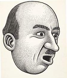
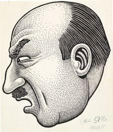
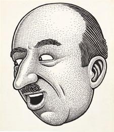
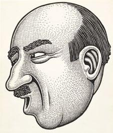
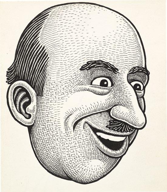
American cartoonist and illustrator Basil Wolverton (1909–1978) is best known for his grotesques and monsters, which have graced Mad magazine, Timely Comics (the proto-Marvel Comics), Stan Lee’s Atlas Comics, and cards and posters for the Topps Company. Wolverton was born in Oregon, where he lived and worked his entire life, choosing to mail his work to publishers rather than relocating to a publishing center like New York. He sold his first cartoon in 1926 and his first comic strip in 1929 to America's Humor Magazine and the Independent Syndicate of New York respectively, but remained unpublished until 1938, when he published a science fiction comic story called Spacehawks in Circus, The Comic Riot. In 1946, Wolverton submitted the winning entry to a contest run by the Li’l Abner comic—to design the character Lena Hyena, the ugliest woman in the world—surpassing about 500,000 other submissions
and gaining a larger audience for his work. He subsequently contributed grotesque faces to Mad magazine, including the famous cover of issue 11 parodying Life Magazine ’s “Beautiful Girl of the Month” feature. In 1966, Wolverton collaborated with Norman Saunders and Wally Wood on the Make Your Own Name Stickers series, and in 1968 he created the Ugly HangUps series of posters, both for the Topps Company. While his career primarily comprised humor and horror comics and cartoons, after becoming a born-again Christian and follower of radio cult Radio Church of God in 1943, Wolverton undertook a project to illustrate every chapter of the Old Testament, which was published from 1958 to 1969. Wolverton’s warped faces and distinctive hatching style influenced future generations of comic artists including R. Crumb and Art Spiegelman, and he was given an honorary Eisner Award in 2000. —IK


Illustrator Norman Saunders (1907–1989) is best known as a painter of midcentury pulp magazine and novel covers, and for his work with the Topps Company, which produced, most notably, Bazooka Joe and Garbage Pail Kids. Saunders spent his early life in Minnesota, eventually taking art courses at the Federal Schools Inc. of Minneapolis. He began working as an artist for local publisher Fawcett Publication in 1927, primarily creating pulp magazine covers. In 1934, Saunders relocated to New York City, attending classes at the Grand Central School of Art where he studied under well-known American painter and former WWI artist-correspondent Harvey Dunn. Throughout the 1930s and ’40s Saunders created pulp illustrations for magazines that ranged in genre from detective stories to romance, fantasy, horror, Westerns, and more. When pulp magazines began to fall out of fashion, Saunders switched to illustrating pulp book covers, and in 1958 he began to draw for the Topps Company. He contributed to a number of products at Topps including the Mars Attacks cards, Batman cards, Wacky Packages cards, and the Make Your Own Name Stickers for which he collaborated with Basil Wolverton and Wally Wood. —IK
Wally Wood (1927–1981) was an artist immersed in the midcentury comic industry. He is best known for his work on the early issues of Marvel’s Daredevil, for his designs for Mars Attacks, for T.H.U.N.D.E.R. Agents published by Tower Comics, and for being one of the early contributors to Mad. Wood joined the U.S. Marine Corps in 1944, serving for three years during and immediately after World War II before moving to New York, where, with the help of the G.I. Bill, he attended classes in lettering, anatomy, and drawing at Hogarth School for Cartoonists & Illustrators, now the School of Visual Arts (SVA). Entering the New York comic industry in the late 1940s, Wood worked with comic and pulp magazine publishers in a range of genres, including humor, science fiction, and horror, eventually also contributing drawings to men’s magazines like Playboy. Wood began working with the Topps Company in 1962, contributing designs to card series including Mars Attacks, Ugly Stickers, Crazy Little Comics, Nasty Notes, and the Make Your Own Name Stickers alongside fellow artists. —IK PLS. 12–23
Saunders, Basil Wolverton, and Wally Wood


Hilma af Klint (1862–1944) was a pioneering Swedish artist, considered by some as Europe’s first abstract painter, predating Kandinsky, Malevich, and Mondrian. Born in Stockholm, she graduated from the Royal Academy of Arts in 1887, initially painting landscapes, portraits, and botanical subjects. Her secretive exploration of abstract art began in 1906, influenced by spiritualism and the occult, particularly through her weekly seances with “The Five,” a group of female artists. Af Klint’s work took a dramatic turn after receiving a commission from an entity named Amaliel in 1904, which led to her creation of The Paintings for the Temple series, a collection of 193 works completed between 1906 and 1915. These vibrant, largescale paintings feature a complex lexicon of symbols that include spirals (representing evolution), “U” (denoting the spiritual world), “W” (for matter), and concentric circles (for unity). Despite her groundbreaking work, af Klint remained largely unknown during her lifetime. She stipulated in her will that her work should not be exhibited until twenty years after her death. It was not until the 1986 exhibition The Spiritual in Art in Los Angeles that her contributions began to receive wider recognition.
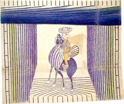
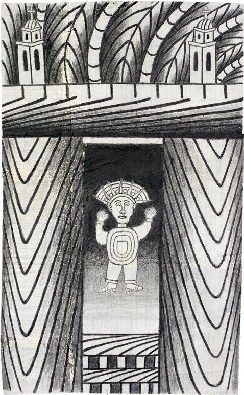
Martín Ramírez (1895–1963) left Mexico for the United States in 1925, hoping to find work to support his wife and four children. Settling in California, Ramírez worked on railroads. The letters he sent home to his family, who remained in Mexico, included drawings in the margins, but the bulk of his extant artistic production is dated later, picking up in 1948. Three years into the Great Depression, Ramírez, along with many of his peers, lost his job and was forced into homelessness. This situation, exacerbated by a breakdown in communication between Ramírez and California authorities, led to his incarceration in 1931, followed by diagnoses of manic depression and, later, catatonic schizophrenia. Ramírez was transferred between several hospitals in Northern California, finally landing in DeWitt State Hospital in Auburn, California, in 1948. During this time, Ramírez began to create art with hospital supplies, including sheets of operating paper, masticated newspaper, paper bags, and mashed potatoes used to paste multiple sheets of paper together. At DeWitt State Hospital, psychologist Tarmo Pasto began saving and archiving Ramírez’s work. The artist created about 300 drawings between 1948 and his death in 1963, usually pulling from his past experiences as subject matter. His caballeros and churches take their appearances from those in Ramírez’s home state of Jalisco, Mexico, while trains and mountains reference his time as a railroad worker. —IK
PL. 25
Untitled (Caballero), c. 1950
Crayon, graphite, and collage on paper
49 x 44 1/2 inches (124.5 x 113 cm)
PL. 26
Untitled (Horse and Rider), 1954
Pencil, color pencil, collage, and crayon on paper
26 1/8 x 30 1/8 inches (66.3 x 76.5 cm)
PL. 27
Untitled (Trains and Tunnels), 1954
Pencil, color pencil, crayon, and watercolor on paper
36 x 41 1/4 inches (91.4 x 104.8 cm)
PL. 28
Untitled (Horse and Rider), 1954
Gouache, color pencil, and graphite on paper
33 1/8 x 23 15/16 inches (84 x 60.8 cm)
PL. 29
Untitled (Aztec), c. 1960–63
Gouache and graphite on pieced paper
24 1/2 x 15 inches (62.2 x 38.1 cm)
PL. 30
Untitled (Horse and Rider), c. 1950
Color pencil, crayon, and collage on paper
37 x 17 1/2 inches (94 x 44.4 cm)


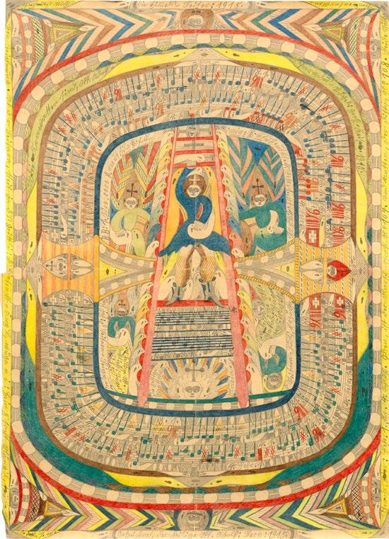
Adolf Wölfli (1864–1930) was a Swiss artist who began drawing in 1904 during his incarceration at the Waldau Clinic, a psychiatric facility in Bern. While at Waldau (1895 until his death in 1930), Wölfli created a series of over 25,000 autobiographical drawings and collages in addition to a collection of smaller works that he called “bread art” because he sold them in order to purchase art supplies. In the artist’s forty-five volumes of work, he utilized decorative borders, saturated color, poetry, and musical composition to recount a fanciful version of his life. Wölfli was orphaned at ten, after which he entered the Swiss foster system. Indentured as a farm laborer while still a child, he continued to work on farms while in the foster system, finally able to leave when he was eighteen. He became a handyman upon moving to Bern, where he was incarcerated twice for child abuse before being institutionalized at Waldau for a similar crime at age thirty-five. At Waldau, Wölfli exhibited violent behavior that subsided somewhat when he drew. Interested in the effect that artmaking had on Wölfli, psychiatrist Walter Morgenthaler, who worked at the facility, wrote a study based on Wölfli, entitled “Ein Geisteskranker als Künstler” (A mentally ill person as artist), which had the added effect of documenting and sharing the artist’s work. —IK
PL. 31
Genanttes Heimwesen, Probsten=Loch Blatt aus Heft N° 13, 1915
Graphite and color pencil on newsprint 28
PL. 32
Blatt aus Heft no. 13, c. 1916
Graphite and color pencil on paper
39 x 28 inches (99 x 71.1 cm)
PL. 33
Die Himmels Leiter, 1915
Graphite and color pencil on paper
39 1/4 x 28 1/4 inches (99.7 x 71.7 cm)

Yuichiro Ukai (1995–) creates dense compositions layering yōkai, animals and insects, characters from anime and manga, characters from Western cartoons, skeletons, dinosaurs, and imagery from Japanese epics into dense tapestries of color and pattern on the page. Often made on large sheets of brown paper, these drawings frequently repeat the same forms over and over, even across multiple panels, alluding to a narrative that travels right to left across several drawings. After graduating high school in 2014, Ukai joined Atelier Yamanami in Shiga Prefecture, an art workshop and living facility founded in 1986 to provide space, resources, and training to artists with mental and physical disabilities. The artist splits his time between Atelier Yamanami and his work as a custodian. Ukai’s drawings were first exhibited in 2018 at Harvard University Asia Center in Massachusetts, and in 2020 one of his works was acquired by the American Folk Art Museum. —IK
PL. 34
Untitled, 2022
Marker, ink, and color pencil on cardboard
28 3/4 x 32 1/2 inches (73 x 82.5 cm)
PL. 35
Untitled (No. 61), 2023
Color pencil, marker, oil pastel, and ink on cardboard
29 x 32 1/2 inches (73.6 x 82.5 cm)
PL. 36
Untitled (No. 62), 2023
Color pencil, marker, oil pastel, and ink on cardboard
29 x 32 1/2 inches (73.6 x 82.5 cm)
PL. 37
Untitled (No. 60), 2023
Color pencil, marker, oil pastel, and ink on cardboard
29 x 32 1/2 inches (73.6 x 82.5 cm)
Though she had been creating them since 1990, Helen Rae’s (1938–2021) vibrant, stylish color pencil and graphite reimaginings of fashion spreads from the pages of magazines like Vogue were not exhibited until 2015. Rae began drawing in 1990, when her mother enrolled her in First Street Gallery and Art Center, a Californiabased art establishment for adults with developmental disabilities. Drawing continuously for the rest of her life, Rae created a body of work that reinterprets the quiet, sleek images of the fashion world with warped, emotive forms, flattened spaces, and patches of bold pattern. Following her first solo exhibition at The Good Luck Gallery in 2015, which sold out the night it opened, interest in Rae’s work greatly increased. Her drawings have since appeared in exhibitions in New York, Los Angeles, and Paris as well as in Scotland, Belgium, and Japan. —IK
PL. 38
Untitled (June 7, 2019), 2019
Color pencil and graphite on paper
24 x 18 inches (61 x 45.7 cm)
PL. 39
Untitled (January 2, 2015), 2015
Color pencil and graphite on paper
23 1/2 x 17 1/2 inches (59.7 x 44.4 cm)
PL. 40
Untitled (December 13, 2018), 2018
Color pencil and graphite on paper
24 1/4 x 18 1/4 inches (61.6 x 46.3 cm)
PL. 41
Untitled (July 9, 2010), 2010
Color pencil and graphite on paper
24 x 18 inches (61 x 45.7 cm)
PL. 42
Untitled (March 6, 2019), 2019
Color pencil and graphite on paper
24 x 18 inches (61 x 45.7 cm)
PL. 43
Untitled (June 25, 2019), 2019
Color pencil and graphite on paper
24 x 18 inches (61 x 45.7 cm)
PL. 44
Untitled (February 2, 2010), 2010
Color pencil and graphite on paper
24 x 18 inches (61 x 45.7 cm)
PL. 45
Untitled (July 6, 2015), 2015 Color pencil and graphite on paper
24 x 18 inches (61 x 45.7 cm)
PL. 46
Untitled (January 18, 2008), 2008 Color pencil and graphite on paper
24 x 18 inches (61 x 45.7 cm)
PL. 47
Untitled (March 4, 2013), 2013 Color pencil and graphite on paper
24 x 18 inches (61 x 45.7 cm)
PL. 48
Untitled (June 29, 2009), 2009
Oil pastel, color pencil, and graphite on paper
23 5/8 x 17 3/4 inches (60 x 45 cm)
PL. 49
Untitled (June 25, 2012), 2012
Color pencil and graphite on paper
23 1/2 x 17 1/2 inches (59.7 x 44.4 cm)
PL. 50
Untitled (March 4, 2020), 2020
Color pencil and graphite on paper
24 1/4 x 18 inches (61.6 x 45.7 cm)
PL. 51
Untitled (December 19, 2013), 2013 Color pencil and graphite on paper
23 1/2 x 17 1/2 inches (59.7 x 44.4 cm)
PL. 52
Untitled (March 6, 2017), 2017
Color pencil and graphite on paper
24 x 18 inches (61 x 45.7 cm)
PL. 53
Untitled (June 28, 2017), 2017
Color pencil and graphite on paper
24 x 18 inches (61 x 45.7 cm)
PL. 54
Untitled (December 6, 2018), 2018
Color pencil and graphite on paper
24 x 18 inches (61 x 45.7 cm)
PL. 55
Untitled (January 23, 2018), 2018
Color pencil and graphite on paper
24 x 18 inches (61 x 45.7 cm)
PL. 56
Untitled (May 16, 2017), 2017
Color pencil and graphite on paper
24 x 18 inches (61 x 45.7 cm)
PL. 57
Untitled (July 12, 2018), 2018
Color pencil and graphite on paper
24 x 18 inches (61 x 45.7 cm)
PL. 58
Untitled (October 25, 2018), 2018
Color pencil and graphite on paper
24 x 18 inches (61 x 45.7 cm)
PL. 59
Untitled (June 19, 2018), 2018
Color pencil and graphite on paper
24 x 18 inches (61 x 45.7 cm)
PL. 60
Untitled (August 22, 2018), 2018
Color pencil and graphite on paper
24 x 18 inches (61 x 45.7 cm)
PL. 61
Untitled (October 11, 2017), 2017
Color pencil and graphite on paper
24 x 18 inches (61 x 45.7 cm)
PL. 62
Untitled (March 10, 2010), 2010
Color pencil and graphite on paper
24 1/4 x 18 inches (61.6 x 45.7 cm)
PL. 63
Untitled (April 28, 2017), 2017
Color pencil and graphite on paper
24 x 18 inches (61 x 45.7 cm)
PL. 64
Untitled (July 13, 2007), 2007
Mixed media on paper
24 x 18 inches (61 x 45.7 cm)
PL. 65
Untitled (January 19, 2017), 2017
Color pencil and graphite on paper
24 x 18 inches (61 x 45.7 cm)
PL. 66
Untitled (October 22, 2014), 2014
Color pencil and graphite on paper
23 1/2 x 17 1/2 inches (59.7 x 44.4 cm)
PL. 67
Untitled (December 22, 2017), 2017
Color pencil and graphite on paper
24 x 18 inches (61 x 45.7 cm)
PL. 68
Untitled (July 22, 2009), 2009
Color pencil and graphite on paper
24 x 18 inches (61 x 45.7 cm)
PL. 69
Untitled (March 1, 2018), 2018
Color pencil and graphite on paper
24 x 18 inches (61 x 45.7 cm)
PL. 70
Untitled (May 24, 2018), 2018
Color pencil and graphite on paper
24 x 18 inches (61 x 45.7 cm)
PL. 71
Untitled (July 29, 2014), 2014 Color pencil and graphite on paper
24 x 18 inches (61 x 45.7 cm)
PL. 72
Untitled (December 15, 2014), 2014
Color pencil and graphite on paper
23 1/2 x 17 1/2 inches (59.7 x 44.4 cm)
PL. 73
Untitled (January 24, 2020), 2020 Color pencil and graphite on paper
24 1/4 x 18 1/4 inches (61.6 x 46.3 cm)
PL. 74
Untitled (December 21, 2016), 2016 Color pencil and graphite on paper 24 x 18 inches (61 x 45.7 cm)
PL. 75
Untitled (January 30, 2014), 2014 Color pencil and graphite on paper 24 x 18 inches (61 x 45.7 cm)
PL. 76
Untitled (November 18, 2014), 2014 Color pencil on paper
24 x 18 inches (61 x 45.7 cm)
PL. 77
Untitled (April 2, 2010), 2010 Color pencil and graphite on paper 24 x 18 inches (61 x 45.7 cm)
PL. 78
Untitled (July 21, 2008), 2008 Color pencil on paper 24 x 18 inches (61 x 45.7 cm)
PL. 79
Untitled (August 8, 2019), 2019 Color pencil and graphite on paper 24 x 18 inches (61 x 45.7 cm)
PL. 80
Untitled (August 8, 2017), 2017 Color pencil and graphite on paper 24 x 18 inches (61 x 45.7 cm)
PL. 81
Untitled (April 11, 2019), 2019 Color pencil and graphite on paper 24 x 18 inches (61 x 45.7 cm)
PL. 82
Untitled (January 11, 2013), 2013 Color pencil and graphite on paper 24 x 18 inches (61 x 45.7 cm)
PL. 83
Untitled (March 27, 2015), 2015 Oil pastels, color pencil, and graphite on paper
23 5/8 x 17 3/4 inches (60 x 45 cm)
PL. 84
Untitled (February 13, 2020), 2020 Color pencil and graphite on paper
24 x 18 inches (61 x 45.7 cm)
PL. 85
Untitled (December 3, 2014), 2014 Color pencil and graphite on paper
23 1/2 x 17 1/2 inches (59.7 x 44.4 cm)
Top (from left): PLS. 41, 42
Bottom (from left): PLS. 43, 44
Top (from left): PLS. 54, 55, 56
Middle (from left): PLS. 57, 58, 59
Bottom (from left): PLS. 60, 61, 62
Top (from left): PLS. 45, 46, 47
Middle (from left): PLS. 48, 49, 50
Bottom (from left): PLS. 51, 52, 53
Top (from left): PLS. 64, 65, 66
Middle (from left): PLS. 67, 68, 69
Bottom (from left): PLS. 70, 71, 72
Top (from left): PLS. 82, 83
Bottom (from left): PLS. 84, 85
Top (from left): PLS. 73, 74, 75
Middle (from left): PLS. 76, 77, 78
Bottom (from left): PLS. 79, 80, 81
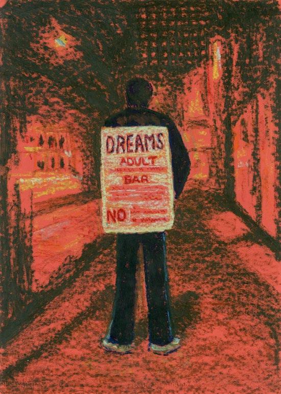
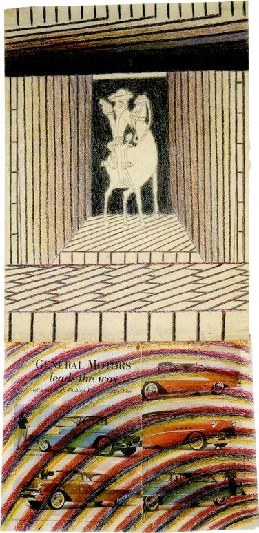
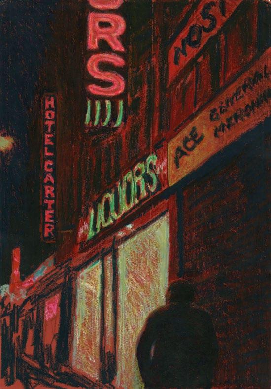
The Chicago-born artist Jane Dickson (1952–) is known for her evocative paintings, drawings, and prints that delve into the psychogeography of American culture. Dickson's artistic journey was shaped by late-1970s punk and alternative counterculture in New York, where she was active in artist collectives like Fashion Moda and Collaborative Projects Inc. (Colab), which staged the landmark Real Estate Show and The Times Square Show in 1980. In 1978, Dickson responded to a wanted ad in The New York Times for an “artist…willing to learn computers,” which led to her employment as the nighttime programmer of Spectacolor, the first electronic billboard at One Times Square. She used the opportunity to pioneer some of the first widely-seen digital art and animations of the time as well as to curate projects by her friends and colleagues, including Jenny Holzer, Keith Haring, and David Hammons. Dickson’s cinematic and fluorescent depictions of Times Square—where she lived in a loft on 43rd Street for nearly three decades—feature motels, strip clubs, sex shops, and late-night diners irradiated by the surrounding neon signs and colossal marquees, offering a powerful and penetrating commentary on American values and social strata.

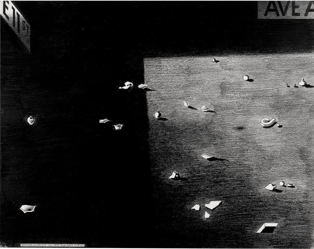
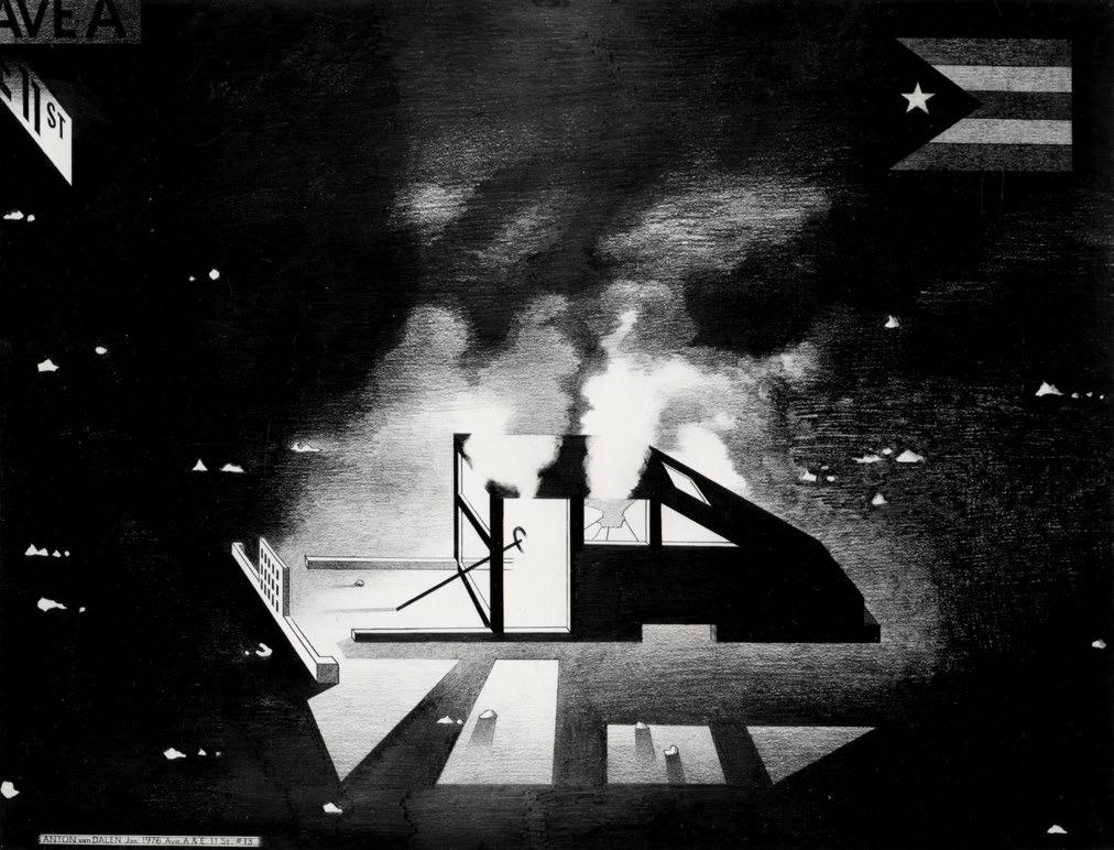
Anton van Dalen’s (1945–2024) career spanned decades and continents and was marked by a deep engagement with urban culture and activism. Born in the Netherlands, van Dalen studied at the Rijksakademie van Beeldende Kunsten, where he was influenced by the political upheavals of the late 1960s and developed a keen interest in social issues and artistic expression as means of protest. In 1969, van Dalen moved to New York City and became immersed in the Lower East Side’s vibrant avant-garde art movement. His early works often incorporated themes of urban decay, identity, and community, reflecting the gritty reality of the city amidst social and political turmoil. His distinctive style merges bold contrasts, intricate patterns, and symbolic imagery drawn from mythology, folklore, and urban life. Central to his work is a fascination with the human psyche and the intersections of culture, history, and personal identity. Throughout the 1970s and ’80s, van Dalen’s art evolved alongside his activism. He cofounded Collaborative Projects Inc. (Colab), a pioneering artist collective that challenged traditional art practices and advocated for social change. Van Dalen’s contributions to Colab's groundbreaking exhibitions, such as The Times Square Show, held in a shuttered massage parlor in 1980, cemented his reputation as a boundary-pushing artist unafraid to confront societal norms. —RD
PL. 89
Alpha y Omega with Dog, 1977
Graphite on paper
29 x 23 inches (73.66 x 58.42 cm)
PL. 90
Abandoned Car with Dog and TV, 1977
Graphite on paper
23 x 29 inches (58.4 x 73.7 cm)
PL. 91
Night Synagogue and Stripped Car, 1976
Graphite on paper
30 x 40 inches (76.2 x 101.6 cm)
PL. 92
Car, Jesus Saves and P.R. Flag, 1982
Graphite on paper
23 x 29 inches (58.4 x 73.7 cm)
PL. 93
Street Debris on Sidewalk, 1975
Graphite on paper
23 x 29 inches (58.42 x 73.66 cm)
PL. 94
Street Debris, In and Out of Shadow, 1975
Graphite on paper
23 x 29 inches (58.42 x 73.66 cm)
PL. 95
Ave. A & E. 11 St #13, 1976
Graphite on paper
30 x 40 inches (76.2 x 101.6 cm)
Above (from top): PLS. 90, 91
Above (from top): PLS. 92, 93
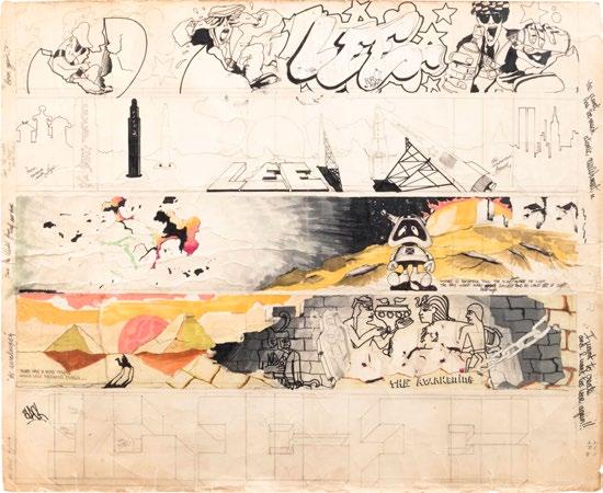
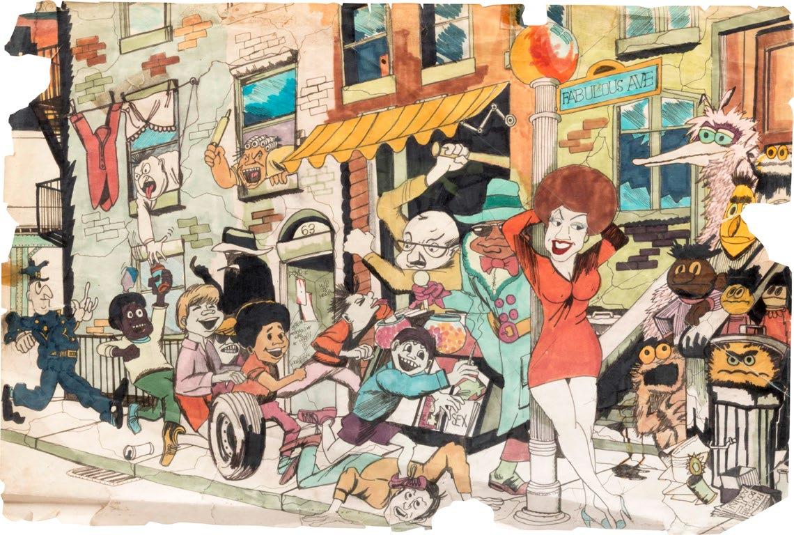
Born in Ponce, Puerto Rico, Lee Quiñones (1960–) grew up on New York’s Lower East Side at the dawn of the New York graffiti movement and began painting subway cars at thirteen years old. By the end of the 1970s, he had painted over a hundred subway cars, including covering an entire ten-car train with his crew the Fabulous 5ive, and had gained a reputation as one of the pioneers of New York graffiti writing. Quiñones was also one of the first artists to bring subway writing out of the subway: he created a handball court mural, Howard the Duck, in 1978 and began making work with spray paint on canvas around the same time. By 1980, Quiñones had shown his spray-painted canvases at home and abroad, most notably in the pivotal Times Square Show. This collaborative, communitybased stepping stone in the early careers of over a hundred artists also included the work of JeanMichel Basquiat, Keith Haring, David Hammons, and Kiki Smith, among many others. Quiñones was interested in introducing narrative and characters into his paintings, adding to the artist’s name that typically made up the bulk of a subway writer’s compositions.
“Lee,” the artist’s middle name and moniker of choice, is short and easy to write quickly, which allowed Quiñones to both cover subway cars quickly and devote more time to the other elements in his pieces. —IK
PL. 96
Heart Break, 1978
Alcohol marker and ink on Strathmore drawing pad paper
12 x 18 inches (30.5 x 45.7 cm)
PL. 97
Hot Rod from Hell (The Fabulous 5), 1977
Alcohol marker and ink on Strathmore drawing pad paper
12 x 18 inches (30.5 x 45.7 cm)
PL. 98
Hagar the Horrible, 1978
Alcohol marker and spray paint on Strathmore drawing pad paper
12 x 18 inches (30.5 x 45.7 cm)
PL. 99
War of the Worlds, 1976
Alcohol marker and Buffalo water marker on pad paper
13 3/4 x 43 3/4 inches (34.9 x 111.1 cm)
PL. 100
Silent Thunder (Whole Car), 1984
Alcohol marker and pencil on paper
4 1/4 x 28 1/2 inches (10.8 x 72.4 cm)
PL. 101
Lee Has Quit, 1977
Alcohol marker and Buffalo water marker on card stock
9 x 22 inches (55.9 x 22.9 cm)
PL. 102
One Million B.C., 1977
Alcohol marker on folder card stock
8 3/4 x 29 1/2 inches (22.2 x 74.9 cm)
PL. 103
Subway Car Montage, 1981
Alcohol marker and pencil on paper
26 5/16 x 32 1/4 x 1 1/2 inches (66.8 x 81.9 x 3.8 cm)
PL. 104
Subway Car Montage, Study #2, 1980–1983
Alcohol marker, pencil, ink on illustration board
22 1/2 x 28 1/2 inches (57.2 x 72.4 cm)
PL. 105
Battlestar Galactica, 1979
Alcohol marker on Strathmore drawing pad paper
21 1/4 x 28 inches (54 x 71.1 cm)
PL. 106
Fabulous Ave, 1977
Alcohol marker and ink on Bristol paper
11 3/4 x 18 inches (45.7 x 29.8 cm)
Above (from top): PLS. 97, 98
Above (from top): PLS. 99, 100, 101, 102


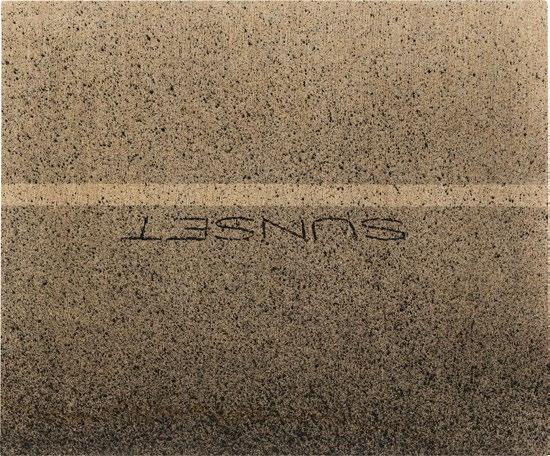
The career of artist Ed Ruscha (1937–) spans six decades and is characterized by work that deftly presents the mundane, from places to phrases, for deeper consideration. As a student at Chouinard Art Institute, Ruscha soaked in the influence of earlier movements like Dadaism and Surrealism, letting them inform his own recontextualization of the everyday. After graduating in 1960, he worked for advertising agencies, where communication, graphics, text, typography, and meaning were all part of his daily consideration. Much of Ruscha’s work is text-based, rendering phrases and even his own name with a directness that forces the viewer to understand the artwork as an object as well as the meaning, or lack thereof, built into common vernacular. Ruscha’s career has encompassed drawing, painting, photography, art books, prints, film, and installation. In these works he has reflected on logos, the gasoline stations of Route 66, mountains, tires, and the American flag. The artist lives and works in Los Angeles. —IK

Born Leonard Hilton McGurr (1955–) in New York City, FUTURA 2000 (also known as FUTURA) is a trailblazer in graffiti art, emerging as a prominent figure in the late 1970s. His early work was marked by a fascination with abstraction and futurism, enduring elements that would become central to his artistic identity. A pivotal moment in his career came in 1980 when he, along with graffiti artist DONDI, visited a Bronx train yard to bomb the side of an entire train car in a piece that he titled Break. This iconic mural, characterized by its dynamic and non-representational forms, set a new standard in graffiti art by focusing on fluid shapes and abstract compositions, unlike conventional text-based graffiti. In the early 1980s, FUTURA began exhibiting in galleries such as Patti Astor’s Fun Gallery and Tony Shafrazi Gallery, alongside contemporaries that included Keith Haring, RAMMELLZEE, DONDI, and Jean-Michel Basquiat. He also expanded into music, designing the iconic cover for The Clash’s single “This is Radio Clash” and performing live art during the band’s Combat Rock tour. As street culture evolved in the 1990s, FUTURA embraced commercial collaborations with brands like Supreme and Louis Vuitton, and he continues today as a dynamic force in both the art and fashion worlds. —RD

Born and raised in New York City, Eric Haze (1961–) has worked across the mediums of graffiti, street art, and graphic design for over forty years, playing a crucial role in defining the visual language of hip-hop during its formative years. Haze first exhibited his work in 1974 as part of the pioneering graffiti collective The Soul Artists, of which he was a founding member. He went on to show alongside Keith Haring and Jean-Michel Basquiat in the early 1980s. Transitioning from fine art to commercial art in the mid-1980s, Haze became a leading graphic designer for the burgeoning hip-hop movement, crafting nowcelebrated logos—including the iconic emblems for Public Enemy and the Beastie Boys—and album covers that defined the aesthetic of an era. —RD
RAMMELLZEE (1960–2010) started train writing on the New York subways at just nine years old, going by the name Stimulation Assassination: Tagmaster Killer. By nineteen, he had decided to legally change his name to RAMM:ELL:ZEE. Letters and language were central to how RAMMELLZEE approached his career as an artist, musician, fashion designer, performer, and philosopher. He viewed subway writing, hip-hop, rap, and the related art forms emerging at the time as part of a cultural whole that waged war on the white supremacy built into the fabric of the United States. RAMMELLZEE created his own vocabulary to define the “works of war” he created with his peers. He described much of his work as “Gothic Futurism,” alluding to the ability of both medieval illuminated manuscripts and graffiti writing to abstract, expand, and
recontextualize letters previously thought to have a static and narrow meaning. The term also referenced RAMMELLZEE’s desire to create work that enacted a new kind of future while being made in a time that he believed had regressed in many ways to something archaic (“gothic”) when it came to inequity and control exerted by those in power. As a musician and lyricist in addition to a graffiti writer, RAMMELLZEE—in collaboration with K-Rob, Al Diaz, and Jean-Michel Basquiat—created the foundational ten-minute rap track “Beat Bop” in 1983. He also appeared in Wild Style and Style Wars, two early and influential films about the burgeoning culture of hip-hop and graffiti writing, and he became known for creating rich ensembles from discarded materials found on the street and in the subways. —IK

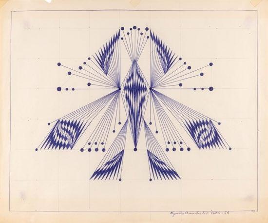
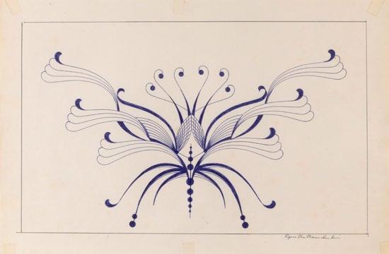
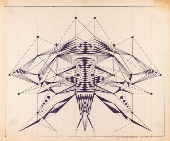
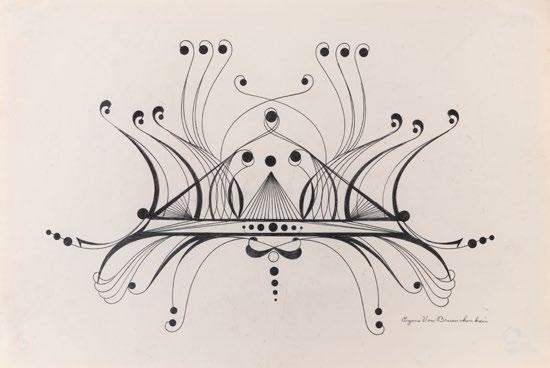
Eugene Von Bruenchenhein (1910–1983) described himself as a “Freelance Artist—Poet and Sculptor—Innovator—Arrow maker and Plant man—Bone artifacts constructor—Photographer and Architect—Philosopher.” Born in Wisconsin, the artist spent most of his life working in a bakery and making art during his free hours. Like many self-taught artists, Von Bruenchenhein made use of the materials that were readily available to him. He is known for his twisting towers of poultry bones; unfurling vessels made of pinched clay leaves baked in his coal oven; vibrant paintings on the corrugated cardboard or Masonite he brought home from the bakery, on which pigment is layered and scratched into with combs, bits of paper, brushes made from his wife’s hair, and other tools; and floral pinup photographs of his wife Marie. From 1954 to 1964, Von Bruenchenhein averaged one painting a day, blending his horticultural knowledge with the anxiety brought on by the nuclear age into scenes both apocalyptic and alien. In the 1960s, following his retirement, Von Bruenchenhein began to create ballpoint-pen drawings—crisp monochromatic translations of the same organic scrolling and architectural forms that grace his other works. By the time of his death, Von Bruenchenhein had filled his home with several thousand artworks, which finally gained recognition in the late 1980s after the artist’s friend Daniel Nycz brought them to the attention of the Milwaukee Art Museum. —IK
PL. 114
Untitled, 1965
Ballpoint pen on paper
14 3/4 x 17 3/4 inches (37.46 x 45 cm)
PL. 115
Untitled, c. 1965
Ballpoint pen on paper
11 3/4 x 17 3/4 inches (29.84 x 45 cm)
PL. 116
Untitled, c. 1965
Ballpoint pen on paper
15 x 18 inches (38 x 45.7 cm)
PL. 117
Untitled, c. 1965
Ballpoint pen on paper
12 x 17 3/4 inches (30.48 x 45 cm)


Artist, rapper, and dancer PHASE 2 (1955–2015) was a pioneer of style writing and hip-hop culture in 1970s New York. Born in Manhattan, Michael Lawrence Marrow grew up primarily in the South Bronx, entering the world of “style writing”—painting train cars with an energetic marriage of text and image—in October of 1971 and taking on the name PHASE 2. He is credited with introducing many of the styles that would become staples for fellow writers, complete with his own names for each form: “softies” (bubble letters), “phasemagorical phantasmic” (bubble letters with stars), “squish luscious” (energetic streaked and squished bubble letters), and “bubble cloud” (bubble letters surrounded by clouds) as well as interconnected loops and arrows. By 1975, PHASE 2 transitioned from writing on subway cars to paper and canvas, beginning to create party fliers in a style he dubbed “funky nous deco” that referenced Jack Kirby comics, the work of Romare Bearden, and Art Deco marquees. Engaging in multiple forms of creative expression, he was also a founding member of the b-boy crew New York City Breakers, a rapper, a DJ, and an art director and writer for the magazine IGTimes. —IK
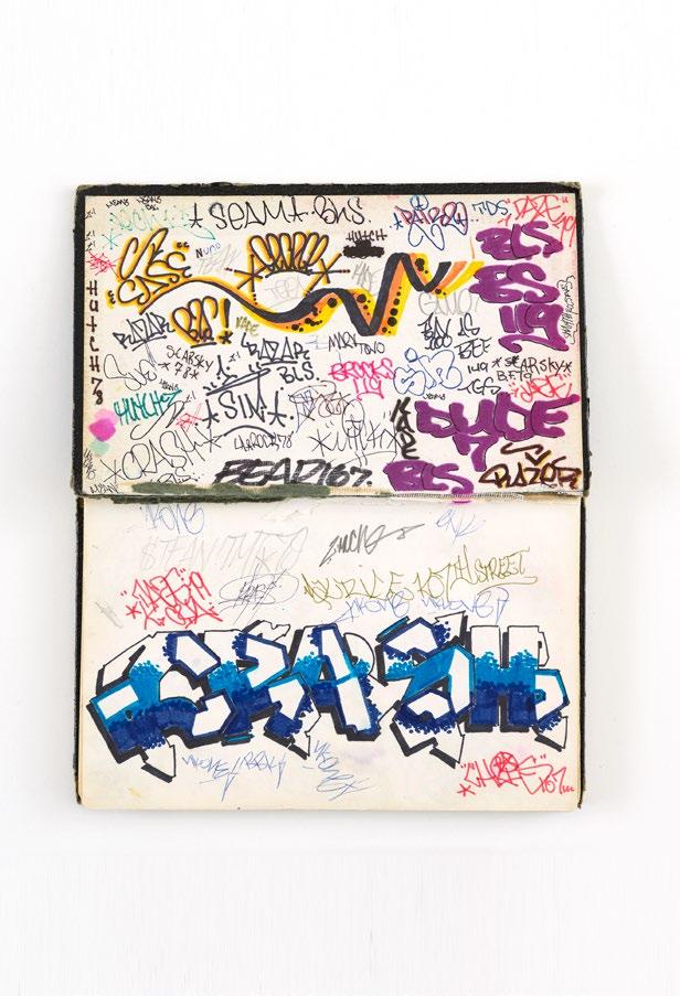
120
DONDI, born Donald Joseph White (1961–1998), was a seminal figure in the graffiti art movement of the 1970s and ’80s long before “street art” entered the mainstream lexicon. Nicknamed “DONDI” in childhood, he grew up in East New York, Brooklyn, where his early fascination with drawing led him to explore graffiti as both an art form and a means of navigating neighborhood boundaries. By the mid-1970s, DONDI had joined the graffiti crew TOP (The Odd Partners), quickly gaining renown for his meticulous technique and distinctive style. His ability to blend soft colors with precise lettering set him apart, making his work instantly recognizable across the boroughs and beyond. DONDI’s artistic evolution mirrored New York’s changing landscape; as downtown galleries began to embrace graffiti in the early 1980s, he emerged as one of the movement's pioneers, showcasing his work in prestigious venues both locally and internationally. Despite graffiti's ephemeral nature, with many pieces lost to time or city cleanup efforts, DONDI's legacy— following his death at the age of thirty-seven from complications related to AIDS—endures through iconic photographs and sketches that captured the essence of his art. —RD
PL. 120
Untitled (Black book), c. 1981
Mixed media
6 x 7 7/8 inches (15.2 x 20 cm)
PL. 121
Untitled (for Duck Rock), c. 1983
Ink on paper
12 1/4 x 17 inches (31.1 x 43.1 cm)
PL. 122
Untitled, 1983
Graphite and ink on paper
7 1/4 x 12 inches (18.4 x 30.5 cm)
PL. 123
Untitled (D-5), 1994
Ink, color pencil, graphite, and collage on paper
19 x 15 inches (48.3 x 38.1 cm)
PL. 124
Untitled (Sketchbook), 1984–86
Mixed media
5 1/2 x 8 1/2 inches (14 x 21.6 cm)
PL. 125
Untitled (Sketchbook), 1978
Mixed media
9 x 11 inches (22.8 x 27.9 cm)
PL. 126
Untitled (Black book), 1980–81
Mixed media
11 x 16 1/2 inches (27.9 x 16.5 cm)
PL. 127
Untitled (Black book), 1982
Mixed media
11 x 8 3/8 inches (27.9 x 21.2 cm)
PL. 128
Untitled, 1978
Graphite on paper
8 1/2 x 11 inches (21.6 x 27.9 cm)
PL. 129
Untitled, n.d.
Mixed media on paper
7 7/8 x 10 3/8 inches (20 x 26.3 cm)
PL. 130
Untitled, n.d. Ink on paper
7 7/8 x 10 1/2 inches (20 x 26.7 cm)
PL. 131
Untitled, n.d.
Graphite and ink on paper
8 1/8 x 10 3/4 inches (20.6 x 27.3 cm)
PL. 132
Untitled, 1981
Mixed media on paper
8 1/2 x 7 1/2 inches (21.6 x 19 cm)
PL. 133
Untitled, 1981
Mixed media on paper
9 1/2 x 6 1/2 inches (24.1 x 16.5 cm)
PL. 134
Children of the Grave!, 1985
Watercolor and ink on paper
20 7/8 x 29 5/16 inches (53 x 74.5 cm)
Above (from top): PLS. 126, 127
Above (from top): PLS. 130, 131


BLADE , a Bronx native born in 1957 as Steven Ogburn, first began graffiti writing on buses and mail trucks in 1971. In 1972, fellow artist Hondo 1 brought BLADE to the Baychester lay-up (an above-ground site where trains are parked) in the Bronx, and he painted his first subway car. Over the next decade or so, BLADE painted over 5,000 train cars, collaborating on his final car with SEEN in 1984. BLADE has been called the King of Trains and the King of Graffiti for his prolific work and his place as a pioneer of New York graffiti culture. His innovative bubble-letter style, continuous reinvention of his own name, bright color palettes, and abstract designs became a source of inspiration for the writers who came after him. Following his final train car piece in the early 1980s, BLADE transitioned into working on paper and canvas. He had his first solo exhibition in Europe in 1981, was included in almost all the early exhibitions on graffiti in the early to mid-1980s, and has since exhibited extensively throughout the United States and Europe. —IK
PL. 135
Untitled, n.d.
Graphite on paper
9 11/16 x 7 5/16 inches (24.6 x 18.6 cm)
PL. 136
In and Out (Train Study), 1980
Graphite on paper
5 15/16 x 8 3/4 inches (15 x 22.2 cm)
PL. 137
Untitled, n.d.
Graphite on paper
4 1/2 x 4 inches (11.4 x 10.2 cm)
PL. 138
Untitled, n.d.
Graphite on paper
8 13/16 x 5 7/8 inches (22.4 x 14.9 cm)
PL. 139
Untitled, 1978
Graphite on paper
5 3/4 x 9 1/2 inches (14.6 x 24.1 cm)
PL. 140
Untitled, 1978
Mixed media on paper
5 3/4 x 9 1/2 inches (14.6 x 24.1 cm)
PL. 141
Untitled, 1978
Graphite and marker on paper
5 13/16 x 9 1/2 inches (14.8 x 24.1 cm)
PL. 142
Untitled, n.d.
Graphite on paper
6 x 10 1/16 inches (15.2 x 25.5 cm)
PL. 143
Untitled, n.d.
Graphite on paper
4 7/8 x 7 3/4 inches (12.4 x 19.7 cm)
PL. 144
Untitled, 1978
Graphite on paper
5 3/4 x 9 1/2 inches (14.6 x 24.1 cm)
PL. 145
Untitled (Black book), 1978
Mixed media
6 x 10 inches (15.2 x 24.5 cm)
PL. 146
Untitled, n.d.
Graphite on paper
6 3/16 x 9 11/16 inches (17.3 x 24.6 cm)
PL. 147
Untitled, n.d.
Graphite and ink on paper, in 2 parts
5 7/8 x 17 3/8 inches (14.9 x 44.1 cm)
Above (from top): PLS. 139, 140, 141
Above (from top): PLS. 142, 143, 144
Above (top): PL. 147
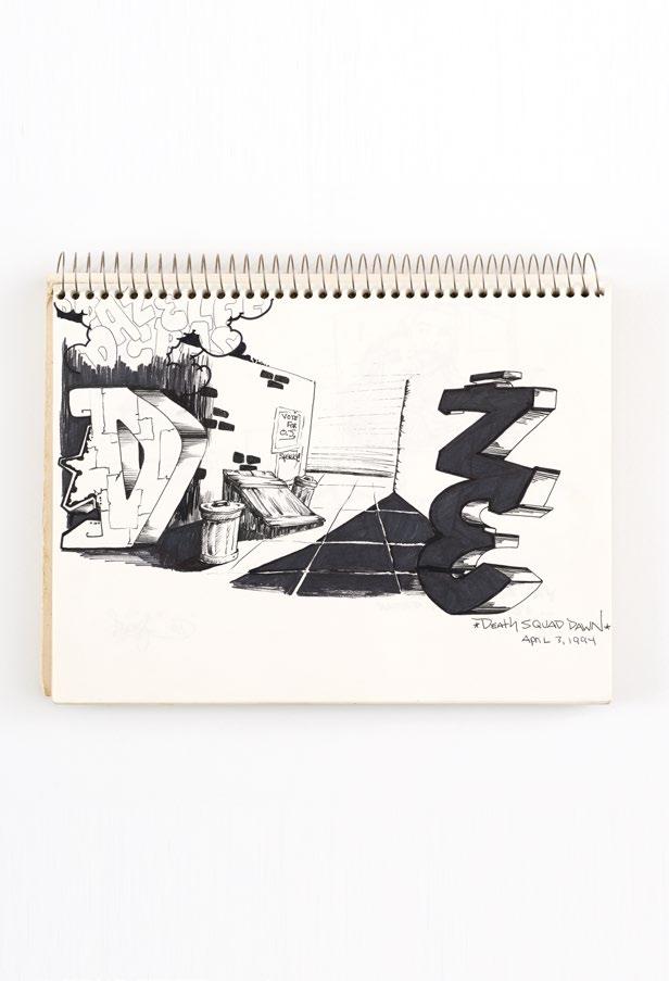
A Bronx native, CRASH (1961–) began making his mark in the world of graffiti at the age of thirteen, following older teens to train yards and “bombing” subway cars with tags. Adopting the name “CRASH” after a school computer mishap, his tag—characterized by its vivid colors, intricate designs, and a distinctive blend of cartoon-like imagery and abstract forms—quickly became recognizable across New York City. In 1980, CRASH transitioned from the train yards to the art galleries, curating the pivotal Graffiti Art Success for America at the Bronx gallery Fashion Moda (1980), an exhibition that featured artists such as FUTURA 2000, Fab 5 Freddy, and Lee Quiñones. This landmark show propelled graffiti into the mainstream art world and cemented the then nineteen-yearold CRASH’s pioneering role in the movement. His work quickly gained popularity across Europe, America, and Asia, leading to numerous exhibitions in museums and galleries worldwide. —RD
Above (from top): PL. 152, 153
Lifelong New Yorker Christopher Ellis (1962–) began tagging subway trains as DAZE starting in 1976 while still a student at the High School of Art and Design in Manhattan. In the early 1980s, he began a gradual shift from graffiti writing to studio work, creating innovative aerosol paintings on canvas that merged figurative elements with expressive abstract forms. A painting on newsprint, tagged in collaboration with Jean-Michel Basquiat, was among his earliest studio works and was first exhibited in the legendary Mudd Club exhibition Beyond Words (1981) curated by FUTURA 2000 and Fab 5 Freddy. This was closely followed by his first solo exhibition at Fashion Moda, an alternative art space located in a South Bronx storefront. DAZE’s early inspirations range from Marvel comics and graphic illustrations by underground comix artist R. Crumb, to work by urban visionary artist Martin Wong and first-generation graffiti pioneers that include BLADE and PHASE 2. DAZE has also created public art projects alongside artists Lee Quiñones and CRASH, including a 1995 design for a train station in Hannover, Germany. DAZE continues to live and work in New York City. —RD

PL. 156 Untitled (Black book), 1994
PL. 157 Untitled (Black book), 1982
Mike Kelley was a visionary contemporary artist whose work explored a wide range of mediums, including performance, installation, drawing, assemblage, painting, video, photography, sound works, text, and sculpture. Born in 1954 in Detroit, Michigan, Kelley grew up as the youngest of four children in a working-class Catholic family. He studied at the University of Michigan and later at the California Institute of the Arts, where he was mentored by the conceptual artist John Baldessari and the experimental filmmaker Tony Oursler. He first gained prominence in the 1980s with provocative and often sardonic pieces that combined high art with elements of punk rock and underground culture. In his series Garbage Drawings, Kelley engaged with themes of societal waste and the overlooked aspects of everyday life by isolating fragments of garbage piles from the American WWII comic series Sad Sack. In 1992, he began teaching at Pasadena’s Art Center College of Design. Kelley lived and worked in Los Angeles for almost forty years until his death in 2012. —RD
Joe Coleman (1955–) is a New York-based painter, writer, and performer whose career spans four decades. He gained early acclaim as a member of the punk band Steel Tips during the 1970s and with his transgressive performance art in the 1980s as well as his work in underground comix, including the graphic novel The Mystery of Woolverine Woo-Bait (1982). His primary focus eventually shifted to his meticulously crafted paintings, created with jeweler’s lenses and a single-hair brush, and often requiring years to complete. Incorporating numerous smaller scenes and symbolic elements within a single work, these macabre portraits explore the grim aspects of human nature and society, delving into themes of violence, mortality, and the grotesque. An avid collector, Coleman has amassed an eclectic collection in his private museum, the Odditorium, which houses sideshow objects, wax figures, crime artifacts, and religious works that explore the darker side of the American psyche. —RD
PL. 159
Henry Darger, 1998
Acrylic on panel 24 1/4 x 30 1/2 inches (61.6 x
PL. 160
The Holy Saint Adolf II [Adolf Wölfli], 1995 Acrylic on panel 34 x 28 inches (86.4 x 71.1 cm)
PL. 161
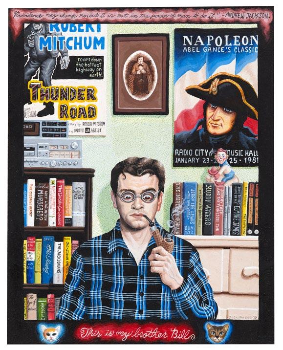
This is My Brother Bill, 1986
Acrylic on panel
10 x 8 inches (25.4 x 20.3 cm)

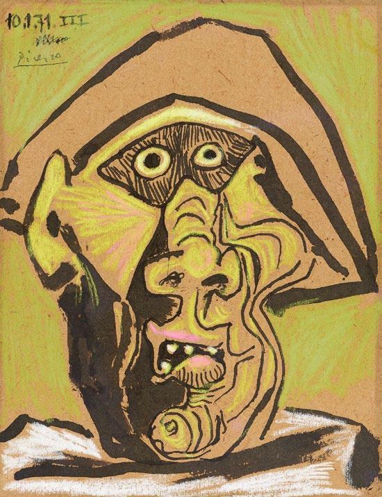
Spanish artist Pablo Picasso (1881–1973) is best known as a Cubist innovator, though his work spans several of the major art movements of the late-nineteenth and earlytwentieth centuries. Picasso produced over 20,000 artworks that trace both the political and artistic trajectory of the time, from his early blue period, defined by sullen expressionistic images of poverty and despair; to his Cubist explorations in the early 1910s, fragmenting and reconstituting subjects to compress multiple times and views into one two-dimensional image; to his neoclassical works of the 1920s; to a foray into Surrealism later in the decade; and to visual commentaries as the Spanish Civil War gave way to World War II. Among the themes that appeared throughout Picasso’s career were friends and lovers, musicians, mythological subjects, bulls, fauns, war, and Harlequins like the one included in this presentation. Finding success within the art world during his lifetime, Picasso used the money he earned as an artist in part to amass his own collection of works by other artists. —IK
PL. 162
Tête d'Arlequin Masqué (Head of a Harlequin in a Mask), 1971 Ink and pastel on cardboard 11 1/8 x 8 1/2 inches (28.2 x 21.6 cm)
Jim Nutt (1938–) began his career with a series of exhibitions between 1966 and 1969, alongside the five other members of the midcentury Chicago-based exhibition group the Hairy Who: Jim Falconer, Art Green, Suellen Rocca, Karl Wirsum, and Gladys Nilsson, who married Nutt in 1961. Initially, however, Nutt had studied architecture at Washington University of St. Louis, where a figure drawing class sparked his interest in drawing and painting. Moving to the School of the Art Institute of Chicago, Nutt graduated in 1965, joining a small group of like-minded artists known for their colorful, graphic figurative works inspired by comics as much as by fine art. Nutt’s paintings, drawings, and prints are linear, geometric images of figures in rude, slapstick, or surreal situations, while others are portraits of flattened, stylized faces gazing out at the viewer. In some of his works he reverse paints on Plexiglas or builds custom frames to contextualize the work; in others he allows fine pencil lines and delicate shading on paper to define his singular characters. Nutt still lives and works in Chicago. —IK
PL. 163
Boop, c. 1968–69
Acrylic on acrylic in artist’s frame
18 1/2 x 14 1/2 x 1 1/8 inches (47 x 36.8 x 2.9 cm)
PL. 164
Drawing for Pug, 1990
Pencil on gray laid paper
12 3/4 x 12 3/4 inches (32.4 x 32.4 cm)
PL. 165
Twixt, 1996
Graphite on paper
17 x 11 1/4 inches (43.2 x 28.6 cm)
PL. 166
Is this the right way?, 1979
Graphite and color pencil on paper
11 x 13 inches (27.9 x 33 cm)
PL. 167
Really!? (thump thump), 1986
Color pencil on paper
14 x 16 inches (35.6 x 40.6 cm)
PL. 168 an absolute, 1983
Color pencil on paper
9 15/16 x 17 1/4 inches (25.2 x 43.8 cm)
PL. 169
Quick Twittle Twittle, 1978
Color pencil on paper
10 3/4 x 9 1/8 inches (27.3 x 23.2 cm)
Above (from top): PLS. 166, 167
Above (from top): PLS. 168, 169
Julie Curtiss (1982–) is a mixedmedia artist whose paintings, sculptures, and works on paper explore the interplay between nature and culture through reimagined female archetypes. Using Surrealist stratagems of picture-making, including close-cropped compositions and exaggerated, cartoon-like forms, Curtiss mines her subjects from everyday life to create drawings that are at once fantastical, precise, and cinematic. Central to her work is the fragmented female body, depicted through symbols of stereotyped femininity—such as long nails or high heels—deployed in an exploration of identity, perception, and the hidden complexities of human experience. Influenced by eighteenth- and nineteenth-century French painting, the Chicago Imagists, pop imagery, and Japanese comics and manga, Curtiss’s work is marked by a vivid color palette and a grotesque sense of the uncanny. Born and raised in Paris, France, she studied at the École des BeauxArts. After graduating, Curtiss moved to Japan for a year, then relocated to Brooklyn, where she worked in the studios of Jeff Koons and KAWS. —RD

PL. 170
Gator, 2022
Gouache, watercolor, and acrylic on paper
9 x 12 1/4 inches (22.8 x 31 cm)
Like her fellow Chicago Imagists, Gladys Nilsson (1940–) creates distorted, graphic figurative artwork defined by confident lines and liberal use of color, and rooted in both modernism and comics. Nilsson, along with husband Jim Nutt, was part of the group known as the Hairy Who, formed in 1965 as a means for all its members, newly graduated from the School of the Art Institute of Chicago, to draw more attention to their work. Nilsson, who grew up in Chicago, visited the Art Institute of Chicago as a child, before attending the school in the early 1960s and eventually returning as a professor for over twenty-five years. While Nilsson has traditionally rendered scenes in pencil and watercolor—or on Plexiglas, also popular with other members of the Hairy Who— she has also increasingly introduced collage into her body of work, yeilding more opportunity to play with scale and distortions of her characters and their surroundings. —IK
One of six artists who made up the Chicago-based exhibition group the Hairy Who, Karl Wirsum (1939–2021) created vibrant figurative work in a bold graphic style. Initially interested in becoming a cartoonist, Wirsum attended the School of the Art Institute of Chicago (SAIC), graduating in 1961 as a fine artist. Wirsum and fellow SAIC students formed the Hairy Who in order to collectively increase the impact of their work, recognizing commonalities among their colorful compositions populated by exaggerated bodies and assertive line work. Wirsum’s art maintained some of his earlier comic influences but also made reference to Surrealism, Dadaism, Japanese woodblock prints, ancient Mesoamerican art, Paul Klee, Matisse, and SAIC instructor Ray Yoshida. In colors ranging from neon to primary, sometimes blocked or inscribed on a black background, Wirsum created frontfacing figures vibrating with energy. Among his subjects are musicians like those he encountered growing up on the South Side of Chicago, robotic and alien humanoids, demons, and creatures with segmented and contorted bodies. Wirsum first exhibited in 1966 with the Hairy Who and held his first solo exhibition a year later at Marjorie Dell Gallery, also in Chicago. —IK

PL. 172
Untitled (Study for Show Girl series), 1969 Ink on paper
30 x 22 inches (76.2 x 55.9 cm)
PL. 173
Untitled (Study for the painting Screamin’ J. Hawkins), 1968
India ink, ballpoint pen, and color pencil on paper
Growing up in Guaynabo, Puerto Rico, Larissa De Jesús Negrón (1994–) watched her aunt draw from an early age. Inspired by this and by the prints of Salvador Dalí works that her father kept around the home, De Jesús Negrón began art classes at nine years old. Now living and working in Queens, New York, she creates works that express a nostalgia for home, an interest in Surrealism, and the play of interiority and exteriority that defines her life in the city. De Jesús Negrón’s work has been described as Neo-Surrealism, taking cues from René Margritte, David Salle, Louise Bourgeois, Frida Kahlo, and Salvador Dalí in creating introspective images using a blend of airbrush and oil painting. Objects of mundanity are common in her work: bathroom furniture, frames, and windows serve as portals into different realities. Water, including tears, is also a constant, acting as a surface for literal and figurative reflection. —IK
Born in Atlantic City in 1978, Julia Chiang studied studio art and art history at New York University, graduating in 2000. Originally drawn to the tactile nature of ceramics, Chiang began painting around 2011, first experimenting with watercolor and gouache on paper. Even as the artist moved from three to two dimensions, her interest in the material nature of her work remained. Her large, vibrant canvases are consumed by repeated forms, each with minute variation that reveals the nature of the paint and makes the composition breathe like an organism. In some works, Chiang includes enigmatic phrases— fragments of letter sign-offs and platitudes made up of the same leaf and teardrop shapes or spelled with slowly melting Ring Pops nailed directly to the wall. Chiang lives and works in Brooklyn. —IK
PL. 175 Not Feeling So Good, 2011
Gouache on paper
20 x 15 inches (50.8 x 38.1 cm)
Ana Benaroya (1986–) is a New York City-born, Jersey City-based artist known for her dynamic and provocative works that challenge conventional notions of femininity and desire. Her robust, muscular female figures defy traditional gender expectations and highlight a unique female gaze, portraying women in powerful, assertive roles. These figures, adorned with exaggerated musculature and striking, offbeat colors, explore themes of female desire and queer sensibility. Benaroya draws inspiration from various sources, including the graphic styles of superhero comics and artists like Peter Saul. As Benaroya has articulated, her aim is to create passionate depictions of female nudes from her own perspective, contributing to a richer, more inclusive visual language in contemporary art. Benaroya holds a BFA from the Maryland Institute College of Art (2008) and an MFA in Painting from Yale University (2019). —RD
PL. 176
Til Dawn, 2020
Marker and ink on Arches paper in artist’s frame
15 x 11 inches (38.1 x 27.9 cm)
PL. 177
In A Whirlpool, I’m Loving You, 2021 India ink and marker on two sheets of cut paper
14 x 22 inches (35.56 x 55.88 cm)
PL. 178
From Dusk, 2020
Marker and ink on Arches paper in artist’s frame
15 x 11 inches (38.1 x 27.9 cm)

David Wojnarowicz (1954–1992) used his wide-ranging artistic tool kit—drawing, music, painting, film, collage, photography, spray paint and stencils, and writing—to express affection, rage, desire, and sharp observations about the injustices of the world. During the first decade of his life, spent with his abusive father in suburban Michigan, Wojnarowicz retreated to the woods to play with the critters—snakes, bugs, and frogs—that would later recur in his work. In the mid-1960s, when the artist and his siblings moved to their mother’s home in New York, where they were largely unsupervised, he wandered through downtown Manhattan, engaging in sex work while attending the High School of Music and Art in Manhattan. Soon after he turned seventeen, he was living on the street and in a halfway house. Wojnarowicz met photographer Peter Hujar in 1980, forming a bond with his fellow artist that would result in a brief affair and a much longer companionship, collaboration, and mentorship. With encouragement from Hujar, Wojnarowicz began
to place more emphasis on his visual art, embracing the drawings and paintings he had begun making alongside his writing. Common motifs in Wojnarowicz’s work include ants swarming like warmongering bands of people; solitary and vulnerable frogs; the number twenty-three, a reference to the average number of chromosomal pairs found in humans; downtown New York and its denizens; cruel quotes from politicians who refused to recognize the crisis of AIDS and the humanity of the queer community; cowboys and buffalo; fires and explosions; maps; and sexual imagery. As the 1980s continued Wojnarowicz became a regular at East Village galleries, and in 1985 his work was included in the Whitney Biennial. Following Peter Hujar’s death from AIDS related complications in 1987 and his own diagnosis not long after, Wojnarowicz—already accustomed to laying bare the hatred and cruelty towards difference structured into society and law—began to create somber works that meditated on death. —IK

George Condo’s (1957–) works are populated by figures who range from grotesque, often built from fragmented and repeated body parts, to cartoonish. These imaginary portraits channel the artist’s longstanding interest in art history into what he calls “artificial realism,” a kind of reconstruction of abstraction into realism. Condo began drawing at an early age, progressing from YMCA art classes as a child in New Hampshire to music theory and art history studies at the University of Massachusetts. After graduating from college in the late 1970s, Condo briefly moved to Boston, where he played in a punk band, and in December of 1979 he moved to New York City, encouraged by fellow artist JeanMichel Basquiat and the flourishing downtown art scene. While in New York, Condo painted for Andy Warhol in the Factory and made his own work as well. His first solo exhibition was held in 1983 at Ulrike Kantor Gallery in Los Angeles, and Condo has shown his work extensively in the United States and abroad since—including at the 58th Venice Biennale in 2019 and in retrospectives at The Phillips Collection in Washington D.C.; Louisiana Museum in Humlebæk, Denmark; the New Museum in New York; and the Museum of Modern Art in Salzburg, Austria. Condo moved to Paris in 1985 and remained there for a decade before returning to New York, where he lives and works today. —RD
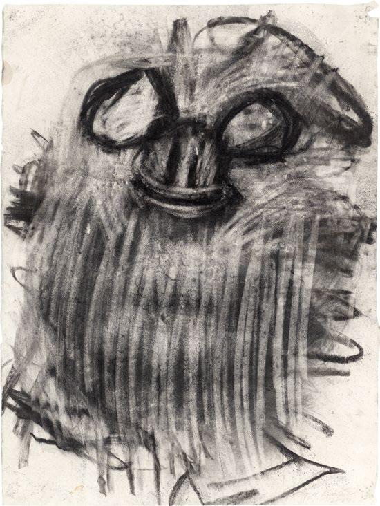
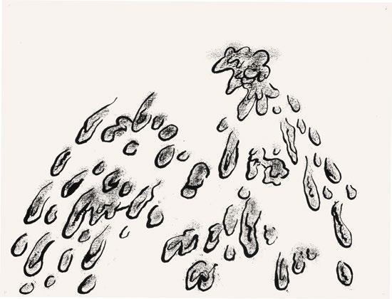
A groundbreaking figure in Abstract Expressionism, Willem de Kooning was born in 1904 in Rotterdam, the Netherlands, into a workingclass family. His early talent for art led him to an apprenticeship with a design firm and night school at the Rotterdam Academy of Fine Arts and Techniques. In 1926, de Kooning immigrated to the United States. Settling in New York City in 1927, he quickly became involved in the art world, befriending notable artists like Stuart Davis and Arshile Gorky. During the Great Depression, de Kooning worked for the Works Progress Administration, which solidified his commitment to painting. By the late 1940s, he and contemporaries such as Jackson Pollock and Mark Rothko became central figures in the Abstract Expressionist movement. His 1948 solo exhibition at the Charles Egan Gallery marked his rise to prominence. De Kooning constantly explored new styles, refusing to adhere to a single artistic approach. In the 1970s, he began to experiment with sculpture, creating Clamdigger—for which this charcoal drawing serves as a preparatory sketch—in 1972. Inspired by shellfish diggers in Montauk, Long Island, this drawing brims with rapid, energetic marks and expressionistic whorls, highlighting de Kooning’s unique commitment to both abstraction and figuration. De Kooning completed his final painting in 1991 and passed away in 1997. —RD

PL. 181
Untitled (Clamdigger), c. 1970
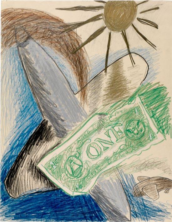
Born Lenore Knaster in Newark, New Jersey, Lee Lozano (1930–1999) was an influential yet elusive figure whose legacy is marked by radical individualism and acts of refusal. She attended the School of the Art Institute of Chicago before moving to New York in the early 1960s. There she embarked on a decadelong career, producing drawings, paintings, and conceptual pieces. Her early work, characterized by a robust and often provocative cartoon style, tackled themes of sexual and artistic decorum with exaggerated images of tools and distorted body close-ups. Despite being recognized by critic Lucy Lippard in 1995 as a leading female conceptual artist of the time, Lozano departed entirely from the New York art scene by the early 1970s. Her conceptual works often intersected with her life—most notably in her 1969 General Strike Piece, in which she documented her gradual withdrawal from the art world. She also initiated a controversial boycott of women, which, although intended as a temporary project, lasted the rest of her life. After leaving New York, Lozano moved to Dallas, Texas, continuing her art in self-imposed isolation until her death in 1999.
—RD
PL. 182 No title, 1962
Crayon and graphite on paper
22 1/2 x 17 1/2 inches (57.2 x 43.2 cm)
PL. 183 No title, 1962
Crayon on paper
13 3/4 x 16 3/4 inches (35 x 42.5 cm)
PL. 184 No title, 1959
Charcoal on paper mounted on board
25 x 18 7/8 inches (63.5 x 48.6 cm)
PL. 185 No title, 1959
Charcoal on paper
24 3/4 x 18 7/8 inches (62.9 x 47.9 cm)
PL. 186
No title, n.d.
Graphite and crayon on paper
9 x 9 1/2 inches (23 x 24 cm)
Opposite (from top): PLS. 184, 185 Above: PL. 186
Born in 1931 in New York City, Martha Edelheit studied at NYU, Columbia University, and the University of Chicago, eventually joining the avant-garde artists of 1950s and ’60s New York. Traveling in the circles that frequented Reuben Gallery and Judson Gallery, Edelheit engaged with Happenings, experimental object making, and painting that challenged the confines of more traditional form and subject matter. Breaking the frame in some paintings, Edelheit also painted and drew nude men and women with a scale, boldness, and frankness that secured her place among feminist artists of the era. Edelheit’s nudes served as a counterpoint to a history of nude painting dominated by male visions of women’s bodies. Edelheit began to explore the imagery of tattoos in 1962 as an extra layer of expression atop her nude bodies. In 1993, Edelheit moved to Svartsjö, outside of Stockholm, where she lived and worked for thirty years before returning part-time to New York. —IK
PL. 187
Tattooed Circus Mistress with Tree, 1961
Ink and watercolor on rice paper
17 3/4 x 12 inches (45 x 30.5 cm)
PL. 188
Quintuplets, 1964
Ink and watercolor on rice paper
9 1/4 x 12 1/2 inches (23.5 x 31.75 cm)
Above: PL. 187 Following: PL. 188
Aurel Schmidt (1982–) grew up in Kamloops, British Columbia, moving to New York City in 2005, where she has lived and worked since. Schmidt first showed her work in the tinyvices.com exhibition at Spencer Brownstone Gallery in March of 2006. Following the successful sale of three of her works in that presentation, Schmidt decided to pursue art full-time. In 2010, her work Master of the Universe: FlexMaster 3000 —featuring a minotaur intricately drawn as an amalgamation of cigarettes, fur, stars, roses, bananas, and a six pack of beer for a six pack—was included in the Whitney Biennial. Schmidt’s drawings can take 100 hours or more to complete. Much of Schmidt’s work features discarded and decaying matter, which she draws with incredible detail to create figures that combine the exterior world of nature and litter with the physical and emotional interior of the body to reflect on life, decay, and death. —IK
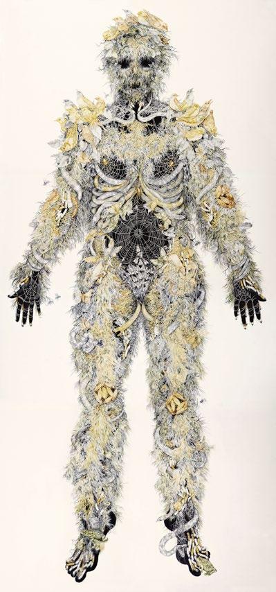

As a child in Los Angeles, H.C. Westermann (1922–1981) learned how to craft his own wooden toys. When the United States entered World War II, Westermann, then in his early twenties, joined the U.S. Marine Corps, serving as a marine gunner in the Pacific. The wrecked ships and deadly conflicts that Westermann experienced during the war would become recurring images in his work. After the war—and a brief stint as an acrobat touring military bases— Westermann enrolled at the School of the Art Institute of Chicago, initially studying applied arts. In 1951, he reenlisted in the Marines and witnessed the carnage of the Korean War. When he returned to Chicago he enrolled in SAIC as a fine arts student with the help of the G.I. Bill, graduating in 1954. Westermann’s drawings are populated by “death ships,” skeletal figures, solemn and solitary buildings, characters at the brink of death, expanses of foreboding desert and ocean, and carrion creatures lurking in the corners. His sculptures are wooden vessels— among them robotic humanoids and buildings—supplemented by sheet metal, carpet, glass, and bronze. Westermann’s first solo exhibition was held in 1958 at Allan Frumkin Gallery, and his work has since been the subject of five retrospectives: at LACMA, the Whitney Museum of American Art, the Museum of Contemporary Art Chicago, Fondazione Prada, and Museo Nacional Centro de Arte Reina Sofia. —IK
PL. 190 The Sea of Cortez: High Swan Dive, 1973 Ink and watercolor on paper 30 x 22 1/4
PL.
PL. 192 The Black Ship, 1970 Ink and watercolor on paper
x 22 1/2 inches (50.8 x 57.2 cm)
PL. 193
Untitled (Hunchback), 1973 Ink and watercolor on paper 11 1/4 x 14 inches (28.6 x 35.6 cm)
PL. 194 An Affair in the Islands, 1972 Ink and watercolor on paper 22 1/4 x 29 3/4 inches (56.5 x 75.6 cm)
PL. 195 Desert Scene, 1964 Ink and wash on paper 10 3/4 x 13 3/4 inches (27.3 x 34.9 cm)
PL. 196
Central America, 1973 Ink and watercolor on paper 10 1/2 x 13 1/2 inches (26.7 x 34.3 cm)
PL. 197 In the Desert, 1977 Ink and watercolor on paper 18 x 24 inches (45.7 x 61 cm)
PL. 198 A Lady in Paradise, 1977 Ink and watercolor on paper 22 x 30 inches (55.9 x 76.2 cm)
PL. 199
Drawing of a Man Underwater, Sea of Cortez, 1974 Ink and watercolor on paper
11 x 15 inches (27.9 x 38.1 cm)
PL. 200
Untitled (Rose), 1963 Ink and watercolor on paper
12 x 9 inches (30.5 x 22.9 cm)
Above (from top): PLS. 197, 198
Top (from left): PLS. 191, 192
Middle (from left): PLS. 193, 194
Bottom (from left): PLS. 195, 196
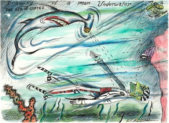
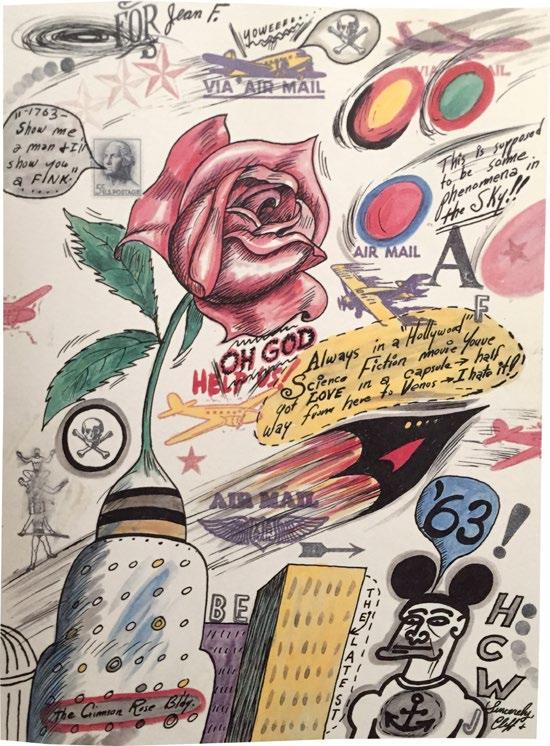
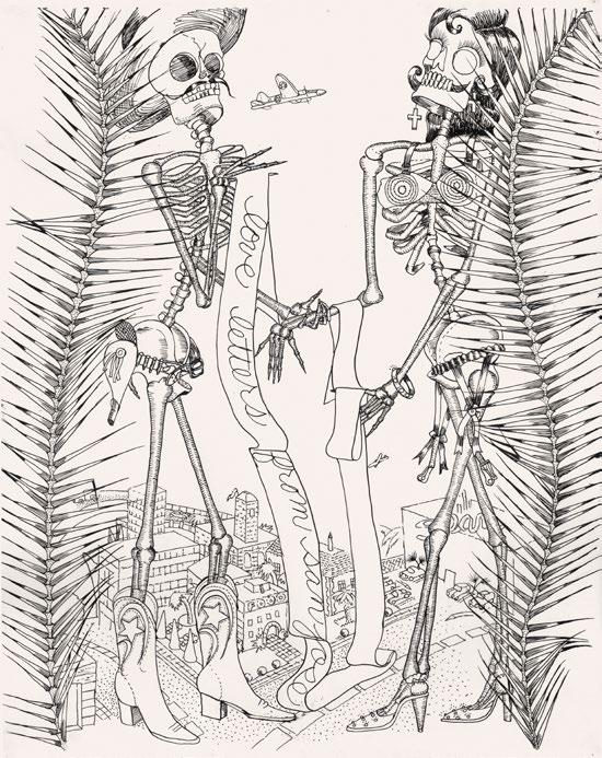
A prominent figure in Bay Area figuration, Judith Linhares (1940–) emerged amongst a panoply of artistic traditions in the 1960s and ’70s that included California assemblage and outsider art, the Chicago-based Hairy Who group, and Mexican ritual objects. Born in Pasadena and trained at the California College of Arts and Crafts, where she earned both her BFA and MFA, Linhares cultivated a unique artistic voice intertwined with feminist principles. Initially exploring abstraction, Linhares transitioned to figurative painting, gaining prominence with her participation in the influential Bad Painting show curated by Marcia Tucker at the New Museum in 1978. Influenced by the turbulent sociopolitical climate of the ’70s, her pieces from the Love Letters from San Jose series, inspired by the Mexican political printmaker José Guadelupe Posada, depict skeletal figures engaged in hauntingly surreal yet mundane activities. In 1980, Linhares relocated to New York, where she continues to explore themes of female resilience, human nature, and the subconscious. —RD
PL. 201
Love Letters from San Jose, 1972 Ink on paper
29 x 23 inches (73.6 x 58.4 cm)
PL. 202
At Home in San Jose II, 1972 Ink on paper 29 x 23 inches (73.7 x 58.4 cm)
PL. 203
At Home in San Jose, 1972 Ink on paper
23 x 29 inches (58.4 x 73.6 cm)
PL. 204
Love Letters from San Jose, 1971 Ink on paper
23 x 29 inches (58.4 x 73.3 cm)
PL. 205 Lovers, 1972 Ink on paper
29 x 23 inches (73.3 x 58.4 cm)
Opposite (from top): PLS. 203, 204 Above: PL. 205
Brooklyn-based artist Nicole Eisenman (1965–) is renowned for her innovative approach across multiple artistic mediums, including painting, printmaking, collage, and sculpture. Born in France to a German-Jewish family, Eisenman’s early exposure to diverse cultures and artistic influences set the stage for her unconventional artistic journey. Emerging during the resurgence of figurative painting in the 1990s, Eisenman quickly distinguished herself amidst a backdrop of irony and eclecticism. Influenced by the irreverent spirit of late-period Francis Picabia, she embraced a style that blends classical techniques with incisive social commentary. Central to Eisenman's artistic vision is subversion—challenging established norms and taboos with dark humor. Her early works often parodied Old Masters, magazine advertisements, and cartoons, injecting them with her own brand of wit and critique. Eisenman is a MacArthur Foundation Fellow and was inducted into the American Academy of Arts and Letters in 2018. Her work was included in the 2019 Venice Biennale, 2019 Whitney Biennial, and 2017 Skulptur Projekte Münster in Germany. —RD
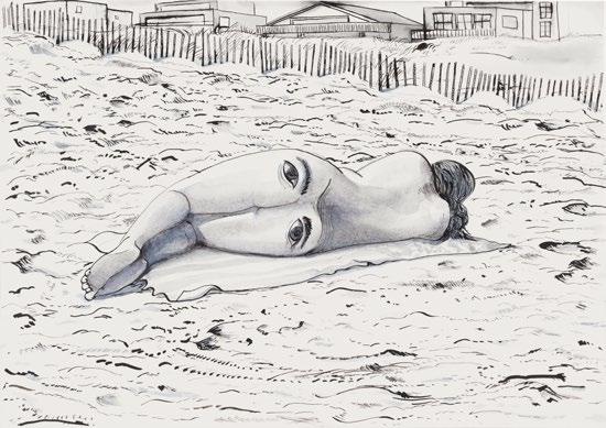
Born in Philadelphia in 1943, R. Crumb is a pioneering American cartoonist and social satirist who emerged as a leading figure in the underground comix movement of the 1960s. Characterized by a raw, sardonic edge, his comics often explore themes of American culture, sexuality, and social issues with an unflinching honesty. Crumb’s early work gained prominence with the 1968 publication of Zap Comix, which featured iconic characters such as the lascivious Fritz the Cat and philosophical Mr. Natural. Marked by their subversive humor and candid exploration of taboo subjects, these creations challenged mainstream sensibilities and established Crumb as a countercultural icon. In addition to his comix, Crumb’s distinctive artistic style—featuring meticulous cross-hatching and exaggerated, grotesque figures—has graced album covers, including the famous image for Janis Joplin’s Cheap Thrills. His autobiographical series, Weirdo, further cemented his reputation as a keen observer of human nature. In 1991, Crumb relocated from San Francisco to the south of France, where he continues to live and work. —RD
Aline Kominsky-Crumb (1948–2022) was the first woman in the underground comix movement to create autobiographical stories. Her ink alter ego, The Bunch, confronts the darkly humorous realities of life, death, work, sex, and aging, reflecting Kominsky-Crumb’s own experiences. Born in New York, Kominsky-Crumb grew up on Long Island. Her interest in art eventually found her university hopping from SUNY New Paltz to Cooper Union and then the University of Arizona, where she earned her BFA in painting. Dissatisfied with the narrow formality of her painting education, Kominsky-Crumb moved to San Francisco in 1970, spurred by an interest in Zap Comix and the irreverent work of contemporaries like Justin Green. Her influential autobiographical comic Goldie: A Neurotic Woman was published in 1972 in Wimmen’s Comix, followed in subsequent decades by group and solo publications including Love That Bunch, Twisted Sisters, Dirty Laundry, and Need More Love: A Graphic Memoir. Kominsky-Crumb also collaborated with and brought attention to fellow artists, especially women in comics, and served as editor for R. Crumb’s anthology series Weirdo for seven years. —IK
PL. 207
Promethean Enterprises #3, 1971 Ink and graphite on paper
10 3/4 x 8 inches (27.3 x 20.3 cm)
PL. 208
The Moonlight March (Sketchbook), 1964 Ink on paper
7 7/8 x 5 1/8 inches (20 x 13 cm)
PL. 209
Mr. Natural....Don’t Fuck With Him, 2002 Ink and correction fluid on paper 14 x 11 inches (35.6 x 27.9 cm)
PL. 210 Untitled, 2015 Ink and correction fluid on paper
12 5/8 x 9 5/8 inches (32.1 x 24.4 cm)
PL. 211 Dragster, 1966 Ink on paper
14 3/4 x 17 3/4 inches (36.5 x 45.1 cm)
PL. 212 Untitled, c. 1964 Ink on paper
5 1/4 x 8 1/4 inches (13.3 x 21 cm)
PL. 213
Weirdo #23, 1988
Ink and correction fluid on Bristol board 15 1/4 x 12 inches (38.7 x 30.5 cm)
PL. 214
I Can’t..Seem...To…, 1964–65 Ink on paper
11 x 7 1/2 inches (27.9 x 19.1 cm)
PL. 215 ID #1, 1990 Ink and correction fluid on Bristol board 13 1/2 x 9 1/2 inches (34.3 x 24.1 cm)
PL. 216
Verre d'Eau (Cover of Weirdo #28), 1993 Ink and correction fluid on paper
17 x 13 3/4 inches (43.2 x 34.9 cm)
PL. 217
Mr. Natural Takes a Vacation, c. 1960s–70s Ink on paper
Four parts, each measuring 13 x 9 inches (33 x 22.9 cm)
PL. 218
Aline Kominsky-Crumb and R. Crumb Aline & Bob in The Aline Documentary, 2017 Ink on paper
Two parts, each measuring 16 x 11 5/8 inches (40.6 x 29.5 cm)
PL. 219
Sketchbook, 1979–81 Ink, correction fluid, graphite, collage, and tape on paper
12 3/8 x 10 1/4 x 3/4 inches (31.4 x 26 x 1.9 cm)
PL. 220
American Splendor Assaults the Media, 1983 Ink, correction fluid, and collage on paper
Four parts, each measuring 16 7/8 x 13 7/8 inches (42.9 x 35.2 cm)
Top (from left): PLS. 213, 214
Bottom (from left): PLS. 215, 216

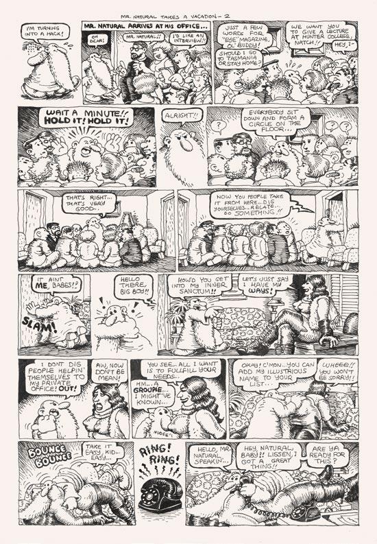


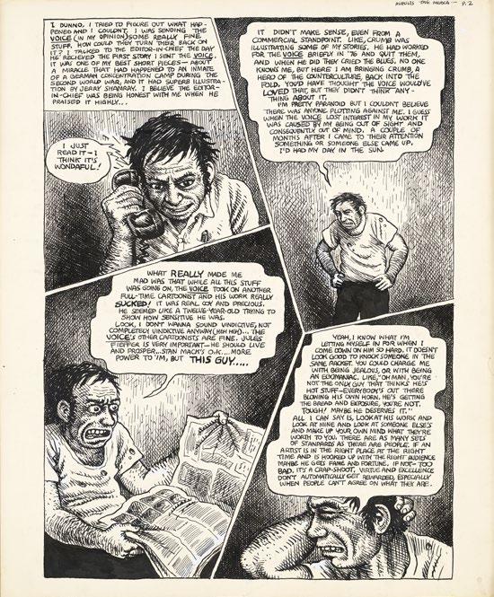
Raymond Pettibon (1957–) developed his artistic language while part of the West Coast punk scene during the 1980s. Within a community of likeminded artists and musicians who became the audience for—and sometimes collaborators on—zines, advertisements, and LP covers for bands like Sonic Youth and Black Flag, Pettibon began to create pensive yet irreverent compositions that combined politics, cartoons, literature, and popular culture. Pettibon’s drawings, which favor a cross-hatched ink style reminiscent of golden age comics and incorporate text pulled from a variety of sources, provide a satiric take on current events, expanding on the tradition of political cartooning and drawing inspiration from Francisco Goya, Thomas Rowlandson, and Honoré Daumier. In the mid-1980s, Pettibon gained the attention of fellow artists including Ed Ruscha and Mike Kelley, and subsequently Los Angeles-based art galleries. Since, he has shown his work at institutions around the world, including a major survey that was presented at The Drawing Center in 1998 and another at The New Museum in 2017. —IK
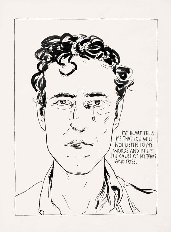
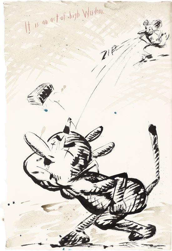
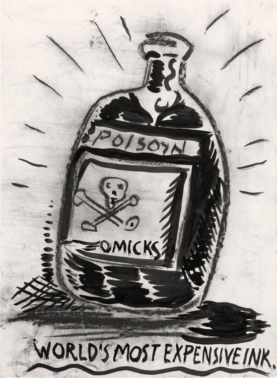
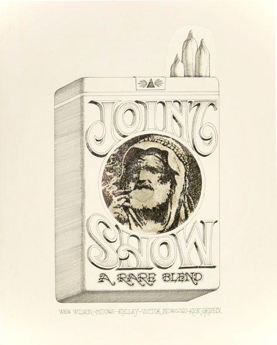
Born in Los Angeles, Rick Griffin (1944–1991) was inspired as a teenager by cartoons, Disney animations, and rebellious and unconventional comics like Mad and Tales from the Crypt. Moving to the Palos Verdes peninsula in 1958, he immersed himself in surf culture, doodling cartoon surfers and earning recognition for a blonde-haired character named Murphy, who became a staple in Surfer magazine. In 1963, Griffin moved to San Francisco and became a prominent figure in the psychedelic art movement. His iconic poster designs, including the famous “flying eyeball” poster for Jimi Hendrix, and album covers for bands like the Grateful Dead showcased his innovative use of color and unique lettering style, which combined elements of Wild West typography with psychedelic flourishes. The origin of the eyeball motif can be traced back to a nearfatal car accident in 1963, when Griffin severely injured his eye. As a result of this traumatic event, the eye became a lifelong emblem for Griffin’s artistic identity, appearing in various forms as a symbol for awareness, perception, and altered states of consciousness. Griffin’s untimely death in a motorcycle accident in 1991 marked the end of a prolific career. —RD
PL. 224 Artwork for the 1967 Joint Show exhibition at Moore Gallery, San Francisco, 1967
Martin Wong (1946–1999) was raised in San Francisco, where he later began his career as a ceramicist, studying the medium in 1968 at Humboldt University and first showing his work in 1970 at the de Young Museum. Wong quickly pivoted to painting, spending the early years of his career, which he called the “Eureka years” in California, including the city of Eureka, where he depicted the everyday shops and buildings slowly being consumed by gentrification. After almost eight years as a painter in California, making posters and sets for the Cockettes and the Angels of Light—San Francisco-based queer guerrilla theater troops—Wong moved to New York in 1978. He became a part of the downtown art scene, befriending and collecting the work of artists in the burgeoning
graffiti scene. Wong’s paintings include tightly shaded renderings of the bricks and tenements of the Lower East Side as well as the graffiti writers he befriended, chain link fences, and city prisons. Wong immersed himself in the Nuyorican poet and artist community on the LES, falling in love with poet, actor, and cofounder of the Nuyorican Poets Café Miguel Piñero. As the 1990s approached, Wong’s work took on a greater sense of loss, the shops that he translated from his neighborhood to the page now shown shuttered in the face of increased gentrification. By the mid-1990s Wong moved back to San Francisco, where he spent the last few years of his life, passing away from medical complications due to AIDS in 1999. —IK
PL. 225
Untitled (Original cover artwork for “Footprints
Poems + Leaves”), 1968
Graphite on paper
8 1/2 x 5 1/2 inches (21.59 x 13.97 cm)
PL. 226
Cockettes, c. 1971
Ink on paper
14 x 11 inches (35.6 x 27.9 cm)
PL. 227
Randy Starr - Professional Daredevil + Death
Rider, c. 1970
Ink on paper
17 5/8 x 12 inches (44.8 x 30.5 cm)
William A. Hall is a self-taught artist whose life and work reflect resilience and creativity in the face of adversity. Born in Los Angeles in 1943, Hall took basic art classes during elementary school and harbored a lifelong ambition to be an artist (his grandfather was a commercial artist based in New York). He lived with his mother until her passing in 1997, after which he experienced a period of homelessness that lasted nearly two decades. During this time, Hall transformed the old cars in which he lived into mobile studios, spending up to twelve hours a day drawing with his steering wheel as an easel. Using color pencils and crayons, Hall created a substantial suite of drawings depicting themes of safety, optimism, and survival. His artworks are notable for their intricate fusion of phantasmagorical environments, retro-futuristic vehicles, inventive typography, and imaginative architectural forms.
—RD
California Cities Rediscover Their Own Natural Resources, c. 2010–12
Pencil and crayon on paper
11 x 14 inches (27.9 x 35.5 cm)
Franchised Prototype Communities
Functionalize a Healthier World, 2012
Pencil and crayon on paper
11 x 14 inches (27.9 x 35.5 cm)
America’s California Aptitude of Survival, c. 2010–12
14 x 11 inches (35.5 x 27.9 cm)
Mom and Pop Shops Logo, n.d.
Pencil and crayon on paper
14 x 11 inches (35.5 x 27.9 cm)
PL. 228
PL. 229
PL. 230
Pencil and crayon on paper
PL. 231

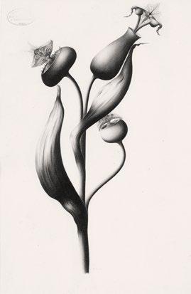
Born in 1889 in Přívoz, Czech Republic, into a Czech Roman Catholic family, Josef Kotzian (Kocián) was an Ostravian designer and machinist who became pivotal in the Silesian spiritualist movement of the early twentieth century. Initially trained as a mining official, Kotzian’s life took a transformative turn following personal tragedy. After marrying and subsequently losing his wife early in life, Kotzian immersed himself in the organized spiritualist community of Radvanice, Silesia, where he found solace and purpose. Adept in media drawing, Kotzian’s artworks, signed under the pseudonym Solferino, became renowned for their intricate detail and symbolic richness. His drawings, characterized by astral plants and ornamental motifs, served not only as expressions of spiritual insight but also as therapeutic tools as he battled lung disease. Throughout his life, Kotzian played a pivotal role in the Spiritist Association of the Brotherhood, serving as vice chairman and contributing significantly to the movement's intellectual and cultural activities. Despite the Communist ban on spiritualism in Czechoslovakia from 1951 onwards, Kotzian clandestinely continued his artistic practice, distributing his drawings among close friends within the spiritualist circle until his death in 1964. —RD
Since emerging in the early 2000s after receiving her MFA from Columbia University, American painter and sculptor Dana Schutz (1976–) has become known for her thickly painted, vivid characters and enigmatic visual narratives. In 2001, Schutz began a series of paintings of figures violently sneezing. Her work, which incorporates distorted subjects with stretching, streaking, ballooning, and swirling faces, quickly gained a following. Schutz had her first solo exhibition, Frank from Observation, in 2002, and in 2003 her work was exhibited at the Venice Biennale. Since, Schutz has painted figures in imagined, allegorical scenes or engaged in impossible tasks, including people cannibalizing themselves, mountains of figures balanced precariously above oceans or reaching for the sky, and wide-eyed characters staring out of the canvas. —IK
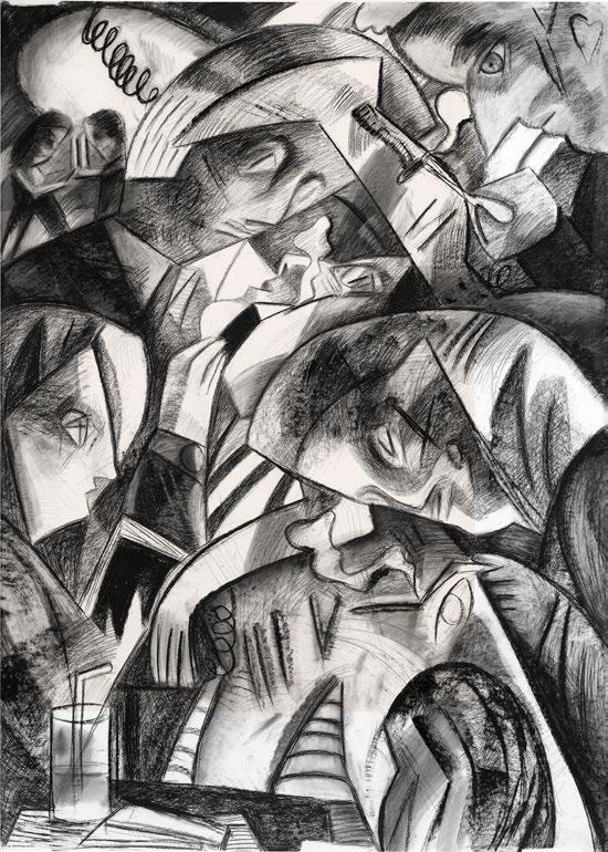
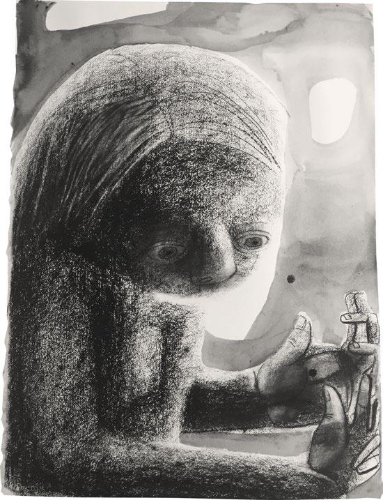

Born in Tokyo in 1969, Tomoo Gokita began his career as a graphic designer and illustrator before shifting to fine art in his late twenties, tired of painting and drawing the subjects that clients dictated to him. In the 1990s he gained attention for his black-and-white charcoal and ink drawings, first as a cult figure in the Japanese art world and then internationally. His works take inspiration from vintage photographs, pictures of Western celebrities who have fallen out of the public eye, comics, wrestling, and Playboy magazine. In his drawings Gokita renders his figures with the strong lighting and smooth shading of the photographs he references, while he also distorts his subjects by pushing their features into eerily blank or grotesque and then further to abstraction. In this way, Gokita creates psychologically charged, uncanny visions of culture. —IK
PL. 237
Untitled, 2010
Graphite on paper
11 x 8 1/4 inches (28.1 x 21 cm)
PL. 238
Untitled, 2011
Ink on paper
11 x 8 inches (27.9 x 20.3 cm)
PL. 239
Untitled, 2011
Graphite on paper
5 7/8 x 3 7/8 inches (14.8 x 10 cm)
PL. 240
Untitled, 2011
Graphite on paper
7 7/16 x 4 5/8 inches (18.9 x 11.7 cm)
PL. 241
Untitled, 2010
Graphite on paper
11 x 8 1/4 inches (27.9 x 21 cm)
PL. 242
Untitled, 2011
Graphite on paper
5 15/16 x 3 1/2 inches (15.1 x 8.9 cm)
PL. 243
Untitled, 2010
Graphite on paper
11 x 8 1/4 inches (27.9 x 21 cm)
PL. 244
Untitled, 2012
Graphite on paper
4 5/8 x 3 9/16 inches (11.7 x 9 cm)
PL. 245
Untitled, 2010
Graphite on paper
11 1/16 x 8 1/4 inches (28.1 x 21 cm)
PL. 246
Untitled, 2012
Graphite on paper
6 1/4 x 4 15/16 inches (15.9 x 12.5 cm)
PL. 247
Untitled, 2010
Graphite on paper
11 x 8 1/4 inches (27.9 x 21 cm)
PL. 248
Untitled, 2011
Graphite on paper
5 x 3 1/2 inches (12.7 x 8.9 cm)
PL. 249
Untitled, 2011
Graphite and ink on paper
6 7/8 x 5 inches (17.5 x 12.7 cm)
PL. 250
Summer Holiday, 2010
Graphite on paper
8 1/2 x 6 5/16 inches (21.5 x 16 cm)
PL. 251
Untitled, 2010
Graphite on paper 11 x 8 1/4 inches (27.9 x 21 cm)
PL. 252
Untitled, 2011
Graphite on paper
4 3/4 x 3 9/16 inches (12.1 x 9 cm)
PL. 253
Untitled, 2011
Ink on paper
6 3/16 x 5 inches (15.7 x 12.7 cm)
PL. 254
Untitled, 2011
Graphite on paper
4 15/16 x 3 1/2 inches (12.5 x 8.9 cm)
PL. 255
Untitled, 2010
Graphite on paper
11 x 8 1/4 inches (27.9 x 21 cm)
PL. 256
Untitled, 2011
Graphite on paper
2 3/4 x 3 3/8 inches (7 x 8.6 cm)
PL. 257
Untitled, 2011
Graphite on paper
5 x 6 inches (12.7 x 15.2 cm)
PL. 258
Untitled, 2011 Ink on paper
9 7/8 x 7 7/8 inches (25.2 x 20 cm)
PL. 259
Untitled, 2011
Graphite on paper
4 3/4 x 3 1/2 inches (12.1 x 8.9 cm)
PL. 260
Untitled, 2010
Graphite on paper
11 1/16 x 8 1/4 inches (28.1 x 21 cm)
PL. 261
Untitled, 2011
Graphite on paper
5 x 4 1/4 inches (12.7 x 10.8 cm)
PL. 262
Untitled, 2012
Graphite on paper
2 3/4 x 2 1/8 inches (7 x 5.4 cm)
PL. 263
Untitled, 2011
Graphite on paper
6 1/8 x 5 inches (15.7 x 12.7 cm)
PL. 264
Untitled, 2011
Graphite on paper
7 3/4 x 5 7/8 inches (19.7 x 14.8 cm)
PL. 265
Untitled, 2010
Graphite on paper
11 x 8 1/8 inches (27.9 x 20.8 cm)
PL. 266
Candle, 2010
Graphite on paper
8 1/8 x 8 1/8 inches (20.7 x 20.7 cm)
PL. 267
Untitled, 2011
Ink on paper
6 1/4 x 5 inches (15.9 x 12.7 cm)
PL. 268
Untitled, 2011
Graphite on paper
5 x 4 1/4 inches (12.7 x 10.8 cm)
PL. 269
Untitled, 2011 Graphite on paper
9 3/8 x 7 1/4 inches (23.8 x 18.4 cm)
PL. 270
Untitled, 2011 Graphite on paper
4 15/16 x 3 1/2 inches (12.5 x 8.9 cm)
PL. 271
Bearded Man, 2010 Graphite on paper
8 x 6 1/8 inches (20.3 x 15.7 cm)
PL. 272
Untitled, 2012 Graphite on paper
4 5/8 x 3 1/2 inches (11.7 x 8.9 cm)
PL. 273
Untitled, 2010 Graphite on paper
11 1/16 x 8 1/4 inches (28.1 x 21 cm)
PL. 274
Untitled, 2011 Graphite on paper
7 9/16 x 5 3/4 inches (19.2 x 14.6 cm)
PL. 275
Untitled, 2011 Graphite on paper
6 1/4 x 5 inches (15.9 x 12.7 cm)
PL. 276
Untitled, 2010 Ink on paper
11 1/16 x 8 1/4 inches (28.1 x 21 cm)
PL. 277
Untitled, 2011 Graphite on paper
3 15/16 x 3 1/2 inches (10 x 8.9 cm)
PL. 278
Untitled, 2010 Graphite on paper
11 x 8 1/4 inches (28 x 29.5 cm)
PL. 279
Untitled, 2010 Graphite on paper
11 x 8 1/4 inches (27.9 x 21 cm)
PL. 280
Untitled, 2011 Graphite on paper
6 1/4 x 4 3/8 inches (15.9 x 11.1 cm)
PL. 281
Untitled, 2012 Graphite on paper
7 5/8 x 6 7/8 inches (19.5 x 17.3 cm)
Top (from left): PLS. 238, 239, 240
Middle (from left): PLS. 241, 242, 243
Bottom (from left): PLS. 244, 245, 246
Top (from left): PL. 247, 248, 249
Middle (from left): PLS. 250, 251, 252
Bottom (from left): PLS. 253, 254, 255
Top (from left): PLS. 259, 260, 261
Middle (from left): PLS. 262, 263, 264
Bottom (from left): PLS. 265, 266, 267
Top (from left): PLS. 268, 269 Bottom (from left): PLS. 270, 271
281
Top (from left): PLS. 272, 273, 274
Middle (from left): PLS. 275, 276, 277
Bottom (from left): PLS. 278, 279, 280
Simone Johnson (1971–) is known for her vibrant Prismacolor pencil drawings in which she captures whimsical, thematic scenes of New York City’s bodega cats amongst shelves stacked with brilliantly colored boxes, canned goods, and deli products. A part-time gallery assistant and working artist at Pure Vision Arts (PVA)—a New York City-based nonprofit that provides creative resources to people with autism and neurodivergent disabilities—Johnson’s inspiration for this ongoing series began after observing a bodega cat lounging on a freezer above a sign that read: “Please do not touch the cat.” Johnson is also a writer and dancer who has been featured in the New York Daily News. She has exhibited widely, including at the Outsider Art Fair, New York Transit Museum, and the American Folk Art Museum. Johnson was born in Manhattan and currently resides in Staten Island.
—RD

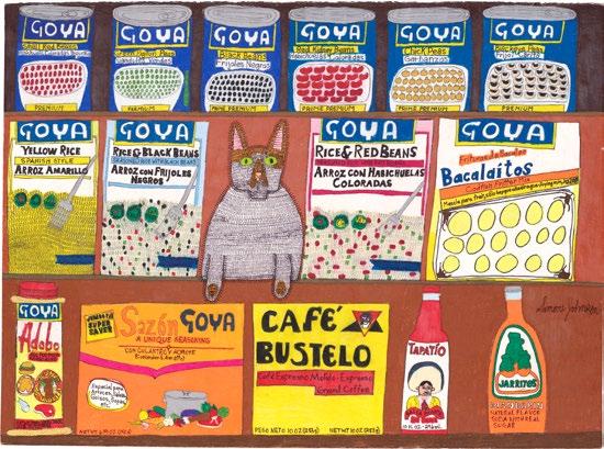

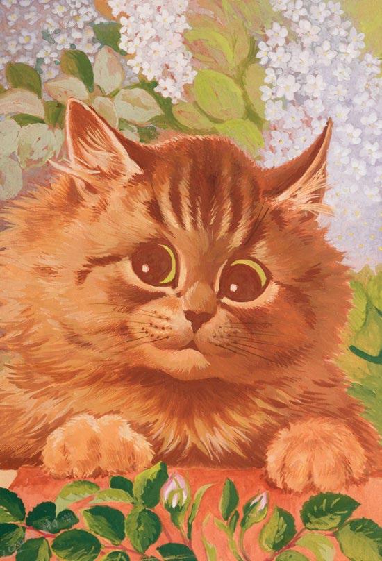
Born in Clerkenwell, London, in 1860, Louis Wain is best known for his drawings of cats performing scenes from Victorian and Edwardian life. While Wain initially began his illustration career in journalism, he had a particular skill for rendering animals and the natural world and began contributing to popular science journals in addition to news outlets. This skill for drawing animals led to Wain’s collaboration with writer Caroline Hughes, known by the pen name Kari, on the children’s book Madame Tabby’s Establishment in 1886. The same year he contributed eleven drawings featuring over 150 festive cats to the Christmas issue of Illustrated London News. Wain’s drawings of cats became incredibly popular during his lifetime, finding their way onto greeting cards, prints, books, and magazines, though he never found significant financial success due to poor business sense. The money he did make went to supporting his mother and five younger sisters. Wain married his sisters’ governess, Emily Richardson, in 1883, and the couple adopted a cat named Peter, who featured in some of his drawings. Richardson died of breast cancer in 1887, and in the following years Wain displayed violent and erratic behavior that eventually led to his admission to Springfield Hospital in 1924. A testament to the popularity of his work was that in 1925 Wain was transferred to Bethlem Hospital at the request of British Prime Minister Ramsey Macdonald. Wain died in 1939 at Napsbury Hospital, where he had resided for nine years, drawing until the end of his life. —IK
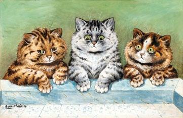
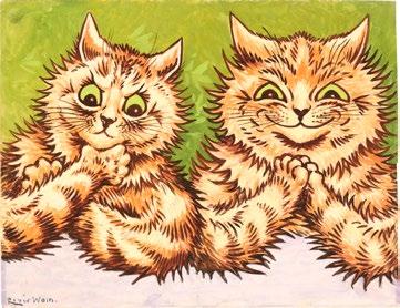


Opposite (from top): PLS. 286, 287, 288 Above: PL. 289
Nicole Appel (1990–) is a self-taught artist whose detailed color pencil drawings act as non-traditional forms of portraiture that reflect her deep connection to the world and those around her. In 2016, Appel joined LAND Studio and Gallery, a Brooklyn-based nonprofit habilitation program for neurodivergent adult artists. Diagnosed with autism at age two, her artistic talent blossomed at an early age, fueled by her savant-like memory. Appel’s highly saturated, dynamic compositions—each drawn from memory—pay homage to important individuals in her life.
—RD
PL. 292
Parrots and Pysanky (Homage to Roz Chast), 2020
Color pencil on paper
19 x 24 inches (48.3 x 61 cm)
PL. 293
Painting and Poker, 2022
Color pencil on paper
19 x 24 inches (48.3 x 61 cm)
PL. 294
Harry Potter and Medieval Magic, 2019
Color pencil on paper
19 x 24 inches (48.3 x 61 cm)
PL. 295
Dancers and Dogs, 2019
Color pencil on paper
19 x 24 inches (48.3 x 61 cm)
PL. 296
Japanese Matchbook Covers and Craft Beers, 2021
Color pencil on paper
19 x 24 inches (48.3 x 61 cm)
PL. 297
Pakistani Truck Art (Homage to Jerry Saltz), 2020
Color pencil on paper
19 x 24 inches (48.3 x 61 cm)
PL. 298
Cats and Kids, 2022
Color pencil on paper
19 x 24 inches (48.3 x 61 cm)
PL. 299
Cuba, 2018
Color pencil on paper
19 x 24 inches (48.3 x 61 cm)
PL. 300
Not All Those Who Wander Are Lost, 2021
Color pencil on paper
19 x 24 inches (48.3 x 61 cm)
PL. 301
Tattoos, Burlesque, and Roller Derby Girls (Homage to Danny D from American Pickers, aka
Danny Diesel/Danielle Colby), 2020
Color pencil on paper
19 x 24 inches (48.3 x 61 cm)
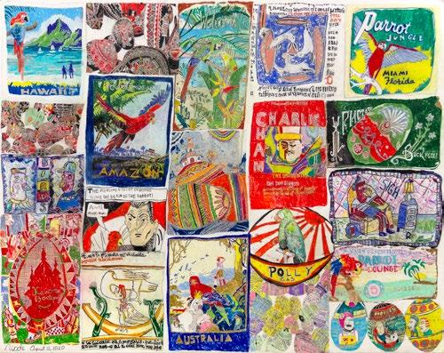
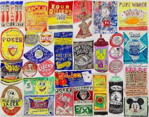


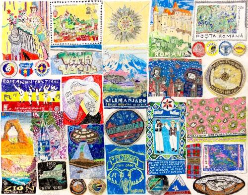

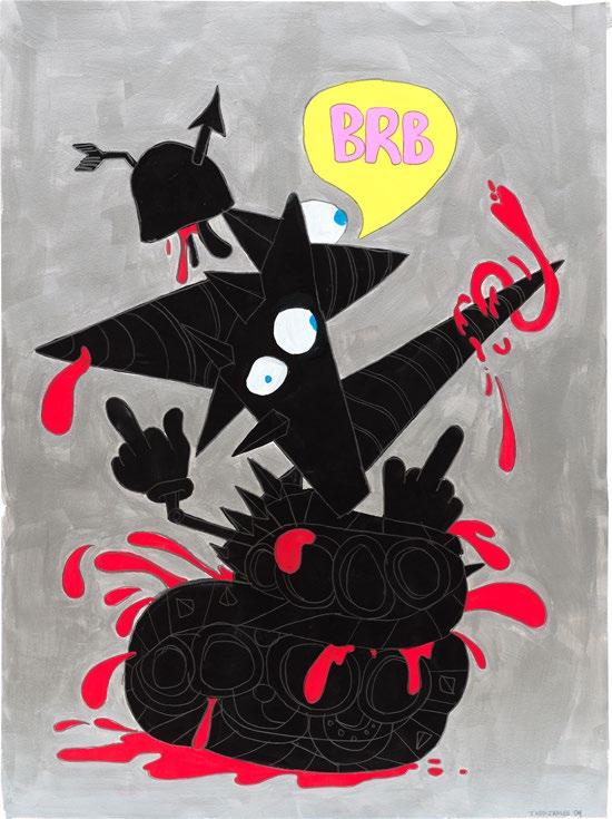

Born in 1969 to artist parents, Todd James —also known by his moniker REAS—is an artist who got his start as a graffiti writer, earning recognition as a seventeen-year-old tagging the streets and trains of New York City. Inspired by cartoons such as Ralph Bakshi's Spiderman, Japanese-style cinema like Godzilla and Gamera, as well as midcentury abstraction, James’s early street works blend a unique approach to typography with comical imagery and fantastical storytelling. After years as a self-taught street artist, James expanded his visual output into the gallery and commercial sphere, collaborating with prominent figures in the entertainment industry like Eminem, the Beastie Boys, and Kid Rock to create iconic album covers and emblems; illustrating for Cartoon Network; and designing puppets for the TV show Crank Yankers on Comedy Central. Often infused with profane humor and satire, James’s mature paintings and drawings explore themes of consumerism, celebrity, and the absurdities of modern life. James continues to live and work in New York City. —RD
Over the course of a six-decadelong career Peter Saul (1934–) has created paintings and drawings that present American culture, violence, and grotesque visions of humanity with vibrant color. Developing his signature style in the 1960s, Saul rejected the rise of Abstract Expressionism and was lumped somewhat awkwardly with Pop Art. His compositions of distorted bodies, icons like Superman and Mickey Mouse, everyday objects, and graffiti-like layering could not be so easily categorized. His remixed realities draw inspiration from artists (Paul Cadmus, George Tooker, and Francis Bacon) and popular culture, including the gruesome 1940s true crime comic Crime Does Not Pay and Mad magazine comics. Saul’s early interest in modern art combined
with an adolescence spent in a violently strict boarding school fed into his dual desires to be an artist and to question authority. This took him from California School of Fine Arts and Washington University School of Fine Arts to an eight year period living in London, Paris, the Netherlands, and Rome in the late 1950s and early ’60s. During this era, Saul regularly exhibited internationally as well as in New York, Chicago, and Los Angeles. Returning to the United States, where he eventually settled near San Francisco, Saul began to tackle the subject of the Vietnam War. As the decades progressed, he turned his attention to other political and social subjects, painting works that address World War II, US Presidents, state violence, and civil rights. —IK
Opposite: PL. 304 Above: PL. 305
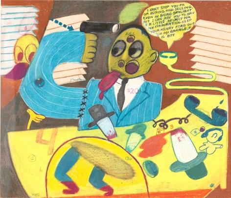
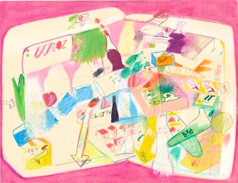
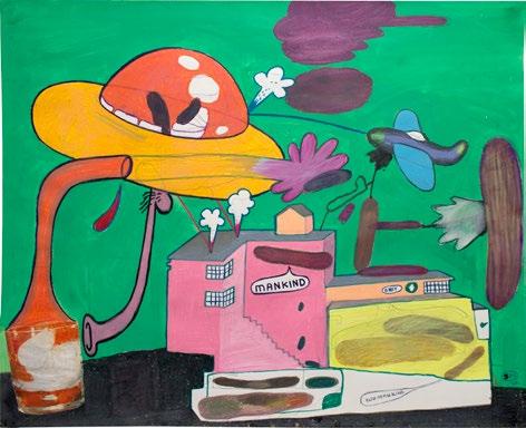
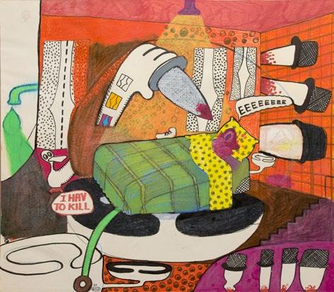
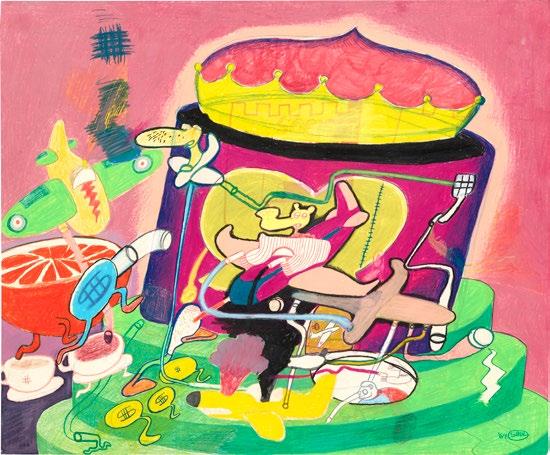
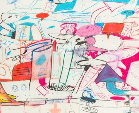

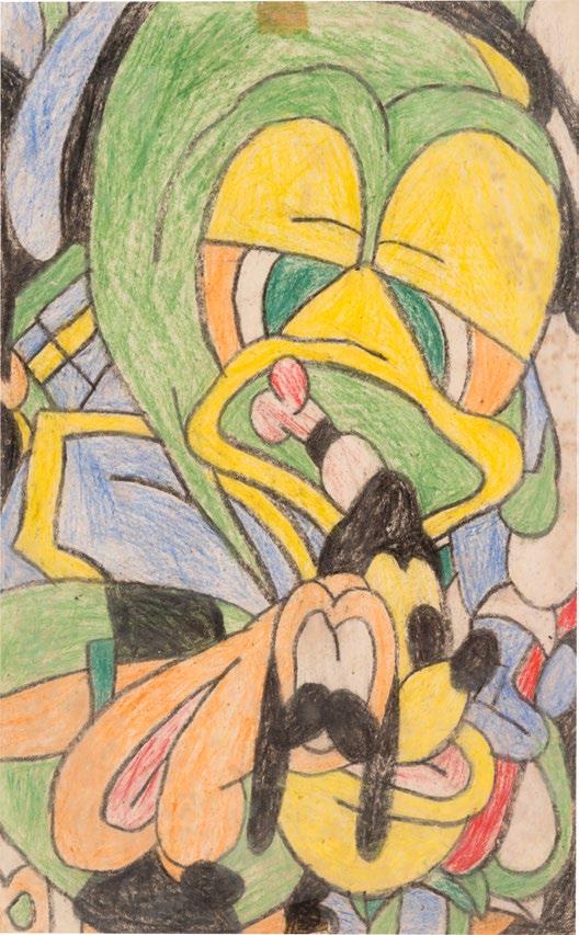
Born in Aotearoa (New Zealand) in 1951, Susan Te Kahurangi King spent the first three decades of her life constantly drawing. During this early period, the artist, who stopped talking around age five, created well over 7,000 drawings that record and interpret her experiences and observations. While she stopped drawing abruptly at age thirty, King recommenced making work almost twenty years later. In King’s works, recognizable characters coexist with figures of the artist’s own invention: fractured, silhouetted, or whole, but always animated through expression and repetition. Her repertoire of figures includes the likes of Donald Duck, Woody Woodpecker, and Mickey Mouse (committed to memory from the Disney comics King and her eleven siblings read as children), animals she encountered on the farms and forests around her family’s home, and others from the places she visited. Buildings and objects are pulled from the outings King regularly went on with her grandmother, hospital visits for what would decades later be recognized as autism, and the IHC School in Auckland, which King entered at age nine. Her work, which has been saved and extensively cataloged by her mother and siblings, came to greater public attention in 2009, beginning with an exhibition at Callan Park Gallery, University of Sydney. —IK
PL. 313
Untitled, c. 1959–61
Crayon on paper
13 1/4 x 8 1/4 inches (33.7 x 21 cm)
PL. 314
Untitled, c. 1967
Graphite and color pencil on found paper
12 3/8 x 9 13/16 inches (31.5 x 25 cm)
PL. 315
Untitled, c. 1958–59
Crayon and graphite on paper
5 3/4 x 7 1/2 inches (15 x 19 cm)
PL. 316
Untitled, c. 1967
Graphite, color pencil, crayon and oil pastel on paper 18 x 23 inches (45.7 x 58.4 cm)
PL. 317
Untitled, c. 1958–59
Crayon on found card
7 1/2 x 5 3/4 inches (19 x 15 cm)
PL. 318
Untitled, c. 1967
Graphite, color, pencil, and ebony on found paper
11 x 8 1/2 inches (31 1/2 x 25 cm)
PL. 319
Untitled, c. 1967
Graphite on paper
6 x 7.5 inches (15.2 x 19.1 cm)
PL. 320
Untitled, c. 1965
Graphite on paper
12 3/4 x 5 1/4 inches (32.4 x 13.3 cm)
PL. 321
Untitled, c. 1959–61
Crayon and color pencil on paper
13 1/2 x 8 1/4 inches (34 x 21 cm)
PL. 322
Untitled, 1969
Graphite and color pencil on paper
13 1/4 x 9 1/4 inches (34 x 23.5 cm)
PL. 323
Untitled, c. 1967–69
Graphite on found paper
12 3/8 x 9 13/16 inches (31.5 x 25 cm)
PL. 324
Untitled, c. 1965
Graphite and color pencil on paper
11 x 9 inches (27.9 x 22.9 cm)
PL. 325
Untitled, c. 1964–65
Graphite and color pencil on paper
9 1/2 x 8 1/4 inches (24.1 x 21 cm)
PL. 326
Untitled, c. 1975–79
Graphite and color pencil on paper
14 3/4 x 10 3/4 inches (37.5 x 27.3 cm)
PL. 327
Untitled, c. 1959–61
Graphite, color pencil, and crayon on paper
13 1/8 x 8 1/4 inches (34 x 21 cm)
PL. 328
Untitled, c. 1963–67
Graphite and color pencil on paper
8 x 6 inches (20 x 15 cm)
Above (from left): PLS. 318, 319
Bottom (from left): PLS. 320, 321
Above (from left): PLS. 323, 324 Middle (from left): PLS. 325, 326 Bottom (from left): PLS. 327, 328
Erik Parker was born in Stuttgart, Germany, in 1968 and raised in San Antonio, Texas, where he developed an interest in skateboarding, hiphop, and punk. The traces of these early interests can be seen in his work, which references graffiti, comics, cartoons, and psychedelia, and sometimes even incorporates fragments of 1970s magazines and Topps cards. Securing an assistant job at Luhring Augustine gallery, Parker moved to New York City with the goal of becoming an artist after graduating in 1996 from the University of Texas Austin (where he studied under fellow artist Peter Saul). He received an MFA in 1998 from SUNY Purchase and has lived and worked in New York City since. Beginning in the 1990s, Parker has developed paintings and drawings that teem with color and pattern, borrowing familiar images—stock photos and cartoon characters, for instance—and using a combination of fragmentation, enigmatic phrases, and searing pigment to make them unfamiliar once more.
—IK
Joey “SERVE” Vega became known in the New York graffiti world for his dense, colorful compositions during the 1980s. Later, he began to design album covers, in particular for the record label Tuff City Squad. SERVE has created over forty album covers for artists including Bad Boy Orchestra, Tuff City Squad, The 45 King, Cold Crush Brothers, Ultramagnetic MCs, Marley Marl, Kenny Dope, Osunlade, and Brooklyn Friends. As is common for graffiti writers, SERVE also created black books that included designs for future paintings, sometimes complete with a drawing of the subway car onto which the piece would be painted. Black books like these could be traded with other writers, providing both inspiration and a source of competition. —IK
Above (from top): PLS. 336, 337
Born in New York City’s Hell’s Kitchen and raised in Spanish Harlem, Enrique Torres, known as PART or Part One (1959–), began tagging walls when he was around ten, before moving on to painting train cars with his peers in the emerging subway writing scene of 1970s New York. Initially painting his work on the Pelham Line—the 6 train—PART was approached in 1976 to join The Death Squad, a crew of style writers who hailed from a variety of boroughs and neighborhoods. Alongside the crew, PART painted trains with intricacy and vibrant color, raising the bar for New York style writers. While his writing can no longer be seen on the sides of trains, he still produces work and has traveled internationally to produce murals. —IK
PL. 338
Untitled, n.d.
Marker on paper
8 1/2 x 12 inches (21.6 x 30.5 cm)
PL. 339
Untitled, n.d.
Mixed media on paper
8 7/16 x 10 15/16 inches (21.4 x 27.8 cm)
PL. 340
Untitled (Black book), 1980s
Mixed media
12 x 9 inches (30.5 x 22.9 cm)
PL. 341
Untitled (Black book), 1985
Mixed media
11 1/4 x 8 3/4 inches (28.6 x 22.2 cm)
PL. 342
Untitled (Black book), 1985
Mixed media
8 x 5 inches (20.3 x 12.7 cm)
PL. 343
Untitled (Black book), 1985
Mixed media
8 1/2 x 5 3/4 inches (21.6 x 14.6 cm)
PL. 344
Untitled (Black book), 2001
Mixed media
8 x 11 inches (20.3 x 27.9 cm)
PL. 345
Untitled (Black book), 2002–2007
Mixed media
8 x 11 inches (20.3 x 27.9 cm)
Above (from top): PLS. 344, 345
Painter Chaz Bojórquez (1949–) began his career as a graffiti writer in Los Angeles in 1969. While his New York contemporaries were painting trains and developing multicolor styles that utilized spray paint, Bojórquez was adapting the Cholo gang writing he saw on the walls of his neighborhood, Highland Park, using chisel-shaped brushes, markers, and paints to expand upon a tradition that stretched back to the Chicano zoot-suiters of the 1940s or even earlier, when writers would use tar on sticks or paint and brush on the walls of their communities. As a student at Chouinard Art School (now Cal Arts) in 1967 and Universidad de Artes Plásticas in Guadalajara, Bojórquez studied ceramics. Without the resources to make ceramics once he left school, he began to paint instead. He incorporated the strong, fluid motions of Chinese calligraphy, picked up during a class he took at age nineteen, into the already calligraphic nature of LA wall writing, which itself co-opted the formal Old English type seen on official documents and the masthead of the Los Angeles Times. Among Bojórquez’s most recognizable motifs is Señor Suerte, a skull with crossed fingers raised, wearing a hat and fur-lined coat, which he began stenciling in his neighborhood in 1969 and which was later adopted by the Avenues gang as a symbolic tattoo that would protect the wearer from death. In the 1980s, Bojórquez began to create paintings on canvas, which have been shown in galleries and major museums like LACMA, MOCA, and the Smithsonian. —IK
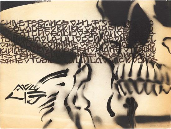
PL. 346
Roll Call, 1977
Acrylic paint, marker, and spray paint on newsprint 18 x 24 inches (45.7 x 61 cm)
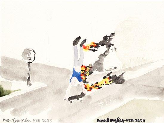
Widely known as “The Gonz” and the “Godfather” of modern street skateboarding, Mark Gonzales (1968–) is an American artist and professional skateboarder. Born in South Gate, California, Gonzales gained recognition in the mid-1980s for his innovative style and fearless approach to skateboarding, utilizing urban architecture like handrails, stairs, and ledges to redefine the sport’s exploitation of public spaces. In 1984, at the age of sixteen, he graced the cover of Thrasher magazine; by 1989, he had founded Blind Skateboards. Gonzales’s visual output began in the 1990s with zine illustrations filled with surreal and humorous characters. Gonzales creates across various mediums, including drawing, painting, and mixed media, with a distinctive aesthetic that blends elements of graffiti, Abstract Expressionism, and pop culture. He has collaborated with notable figures like Harmony Korine and Spike Jonze, and has created graphics for commercial brands that include Supreme, Adidas, and Krooked Skateboards. Gonzales is also a prolific writer and poet, and is known for his playful public antics that blur the lines between skateboarding and performance art. —RD
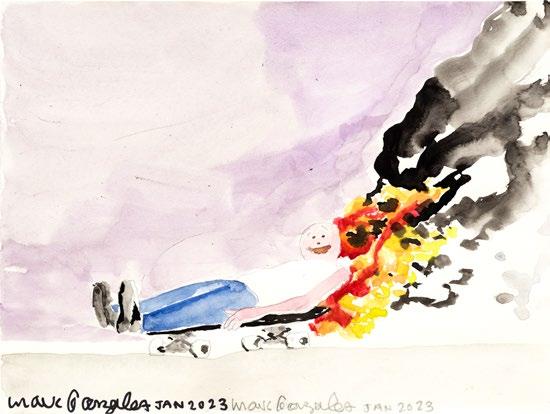
Matt Leines is a Brooklyn-based contemporary artist known for his intricate and vibrant works that blend elements of folk art, mythology, and popular culture. Born in 1980 in New Jersey, Leines studied at the Rhode Island School of Design, where he honed a meticulous graphic style characterized by bold lines, geometric patterns, and a vivid color palette. Leines’s artwork often features fantastical creatures, tribal motifs, and surreal landscapes, drawing inspiration from a variety of sources including ancient civilizations, Indigenous art, and his own imagined narratives. His retrospective monograph, titled You Are Forgiven, was published by Free News Projects in 2008. Leines’s work has been exhibited at Deitch Projects and The Hole, NY, as well as internationally in Sweden, Italy, Spain, Greece, and Japan. —RD
PL.
Acrylic, collaged acrylic on paper, graphite,
PL.
Note on Henry Darger Image Credits
Henry Darger (1892–1973) was a reclusive, self-taught artist who lived in near anonymity—his prolific visual output and work as an epic novelist known only posthumously. Born in Chicago, Darger’s early life was marked by turbulence and tragedy. His mother died when Darger was four, leading his father, a disabled tailor, to place him in an orphanage at the age of eight. He was eventually moved to the Asylum for Feeble-Minded Children, where Darger endured significant physical and emotional abuse. Upon his father’s death in 1908, Darger managed to escape the asylum and returned to Chicago, where he would remain for the rest of his life. He worked various menial jobs—primarily as a hospital janitor and dishwasher. Darger's creative output remained hidden from the world until shortly before his death. In 1972, his landlord, photographer Nathan Lerner, discovered a treasure trove of artwork and manuscripts in Darger’s cluttered apartment. Among these was his magnum opus, The Story of the Vivian Girls, in What Is Known as the Realms of the Unreal, of the Glandeco-Angelinian War Storm, Caused by the Child Slave Rebellion. Accompanied by hundreds of intricate watercolors and collages, this 15,000-page fantasy novel delves into the adventures of seven young girls in a vivid—often brutal—imaginary world. Darger’s remarkable oeuvre also included over 350 watercolor, pencil, collage, and carbon-traced drawings, most of them stitched into three enormous “albums,” as well as seven typewritten hand-bound books, thousands of bundled sheets of typewritten text, and numerous journals, ledgers, and scrapbooks. —RD
At the time of publication, The Drawing Center was unable to secure permission to reproduce the following Henry Darger works that are included in the exhibition. —Ed.
Spangled Blengin, All Nations of Christian Nat Ure, Child Headed. All Islands of Every Sea, c. 1940–60
Watercolor, carbon tracing, and graphite on paper
13 7/8 x 17 inches (35.2 x 43.2 cm)
Grimecian Gazoonian, n.d.
Watercolor and pencil on paper
19 x 24 inches (48.3 x 61 cm)
At Jennie Richee—Hard Pressed During Storm Persueing Enemy They Become Lost in Cavern of Volcanic Mt, c. 1940–60
Double-sided watercolor, graphite and carbon tracing on three joined sheets of paper
19 x 72 1/8 inches (48.3 x 183.2 cm)
COVER, FIG. 10, PLS. 3–23, 39–40, 45–46, 49, 51–52, 56, 65–66, 71–72, 78, 82, 85, 97, 108–118, 120–122, 124–145, 147, 148–157, 161, 170, 175, 179, 191–193, 195–198, 207, 209, 211, 214, 216–217, 222, 226, 228–233, 236–284, 287–289, 302–303, 307, 310, 329–349, 351, 356 Photograph by Farzad Owrang; FIG. 1, PLS. 221–223 © Raymond Pettibon, Courtesy the artist and David Zwirner; FIG. 4 Photograph by Joshua White; FIG. 6 Courtesy of Andrew Edlin Gallery and the Susan Te Kahurangi King Trust; FIG. 8 Photograph by Brad Bridgers; FIG. 9 Courtesy of Venus Over Manhattan; FIG. 11 Courtesy of Sotheby’s; FIG. 12 © Estate of Roy Lichtenstein; PLS. 1–2 © 2024 The Joyce Pensato Foundation; PLS. 3–11 © Basil Wolverton Estate, Courtesy of the Basil Wolverton Estate; PLS. 12–23 Topps® trading stickers used courtesy of The Topps Company, Inc.; PL. 24 Courtesy of The Hilma af Klint Foundation; PLS. 25–30 © Estate of Martín Ramírez, Courtesy Ricco/Maresca Gallery; PLS. 86–88 © Jane Dickson, Courtesy of the artist and Karma; COVER, PLS. 89–95 Courtesy of the artist and P·P·O·W, New York; PLS. 107–108 © Ed Ruscha, Courtesy of the artist and Gagosian; PLS. 156–157 Courtesy of Christopher “DAZE” Ellis and P·P·O·W, New York; PL. 158 © 2024 Mike Kelley Foundation for the Arts, All Rights Reserved / Licensed by VAGA at Artists Rights Society (ARS), NY; PL. 162 © 2024 Estate of Pablo Picasso / Artists Rights Society (ARS), New York; PLS. 163–169 © Jim Nutt, Courtesy of the artist and David Nolan Gallery; PL. 171 Courtesy of the artist and Garth Greenan Gallery, New York; PLS. 172–173 Photograph by Adam Reich, Courtesy of the estate of Karl Wirsum and Derek Eller Gallery; PL. 179 © Estate of David Wojnarowicz, Courtesy of the Estate of David Wojnarowicz and P·P·O·W, New York; PL. 181 © 2024 The
Willem de Kooning Foundation / Artists Rights Society (ARS), New York; PLS. 182–186 © The Estate of Lee Lozano, Courtesy Hauser & Wirth; PLS. 187–188 © 2024 Martha Edelheit / Artists Rights Society (ARS), New York; PLS. 190–200 © 2024 Dumbarton Arts, LLC / Licensed by VAGA at Artists Rights Society (ARS), NY; PLS. 201–205 Courtesy of Judith Linhares and P.P.O.W., New York; PLS. 201–203, 205 Photograph by Paul Salveson; PL. 206 © Nicole Eisenman, Courtesy of the artist and Hauser & Wirth; PLS. 207–220 © Robert Crumb, Courtesy of the artist, Paul Morris, and David Zwirner; PLS. 225–227 © Martin Wong Foundation, Courtesy of the Martin Wong Foundation and P·P·O·W, New York; PL. 227 Photograph by JSP Art Photography; PLS. 232–233 Courtesy of The Gallery of Everything, London; PLS. 234–236 © Dana Schutz, Courtesy of the artist, David Zwirner, CFA Berlin, and Thomas Dane Gallery; PLS. 237–281 © Tomoo Gokita; PLS. 282–284 Courtesy of Simone Johnson, Pure Vision Art; PLS. 313–338 Courtesy of the artist and the Susan Te Kahurangi King Trust
Contributors
Rebecca DiGiovanna is Assistant Curator at The Drawing Center.
Laura Hoptman is the Executive Director of The Drawing Center.
Isabella Kapur is Assistant Curator of Research at The Drawing Center.
KAWS engages audiences beyond the museums and galleries in which he regularly exhibits. His prolific body of work straddles the worlds of art and design to include paintings, murals, graphic and product design, and largescale sculptures. Over the last two and a half decades KAWS has built a successful career with work that consistently shows his formal agility as an artist, as well as his underlying wit, irreverence, and affection for our times. His refined graphic language revitalizes figuration with both big, bold gestures and playful intricacies.
Valérie Rousseau, PhD, is Curatorial Chair for Exhibitions & Senior Curator at the American Folk Art Museum, New York. She overviewed critically acclaimed exhibitions, notably When the Curtain Never Comes Down (2015), Art Brut in America: The Incursion of Jean Dubuffet (2015), Photo|Brut (2021), Morris Hirshfield Rediscovered (2022), as well as projects on the concomitance of psychiatric and artistic avantgardes (Francesc Tosquelles, 2024), neurodiversity (IMLS, 2023–2025), the intersections of folk art and art brut (Cahiers du Mnam 166, 2023–2024), and artists William Edmondson, Auguste Forestier, Eugen Gabritschevsky, Madalena Santos Reinbolt, and Bill Traylor (FILAF award, 2018).
Nicole Rudick is the author of What Is Now Known Was Once Only Imagined: An (Auto)biography of Niki de Saint Phalle (Siglio) and the editor, most recently, of Joanna Russ: Novels and Storie s (Library of America) and Spiral and Other Stories by Aidan Koch (New York Review Comics). Her writings have appeared in The New York Review of Books, Apollo, The New Yorker, The Paris Review, and Artforum, and in exhibition catalogs for the New Museum; the Museum of Art, Rhode Island School of Design; and Derek Eller and Matthew Marks galleries.
Board of Directors Staff
Co-Chairs
Andrea Crane
Amy Gold
Treasurer
Stacey Goergen
Secretary
Dita Amory
Frances Beatty Adler
David R. Baum
Valentina Castellani
Brad Cloepfil
Hilary Hatch
Harry Tappan Heher
Priscila Hudgins
Rhiannon Kubicka
Iris Z. Marden
Adam Pendleton
David M. Pohl
Nancy Poses
Almine Ruiz-Picasso
Jane Dresner Sadaka
David Salle
Curtis Talwst Santiago
Joyce Siegel
Galia Meiri Stawski
Rirkrit Tiravanija
Barbara Toll
Jean-Edouard van Praet d’Amerloo
Waqas Wajahat
Linda Yablonsky
Emeritus
Eric Rudin
Laura Hoptman
Executive Director
Olga Valle Tetkowski
Deputy Director
Rebecca Brickman
Director of Development
Rebecca DiGiovanna
Assistant Curator
Sarah Fogel
Registrar
Aimee Good
Director of Education and Community Programs
Isabella Kapur
Assistant Curator of Research
Valerie Newton
Director of Retail and Visitor Services
Anna Oliver
Bookstore Manager
Nona Poydras Visitor Services Associate
Isa Riquezes
Communications and Marketing Associate
Olivia Shao
Burger Collection & TOY Meets Art Curator
Tiffany Shi
Development Manager
Allison Underwood Director of Communications
Aaron Zimmerman
Operations Manager & Head Preparator
Published on the occasion of the exhibitions The Way I See It: Selections from the KAWS Collection
The Drawing Center
October 10, 2024– January 19, 2025
Major support for The Way I See It: Selections from the KAWS Collection is provided by Neuberger Berman Private Wealth; the Outsider Art Fair; Skarstedt, New York; Christie’s Art Finance; and UNIQLO. Special thanks to 2x4 and Human Made.
This is number 157 of the Drawing Papers, a series of publications documenting The Drawing Center’s exhibitions and programs and providing a forum for the study of drawing.
Editor Joanna Ahlberg
Design
Dandelion
Printing & Binding
Shapco Printing, Minneapolis, MN
About the Type
KAWS would like to thank:
Julia, Sunny, and Lee
All of the exhibiting artists
2x4; Michael Baptist; Henry Boxer; Anna Maria González Cuevas; John Corbett; Jim Dempsey; Rebecca DiGiovanna; Dan Doyle; Andrew Edlin; Derek Eller; Laura Hoptman; Human Made; John Jay; Isabella Kapur; Frank Maresca; Scott Nussbaum; NIGO; John Ollman; Wendy Olsoff; Farzad Owrang; Penny Pilkington; Michael Rock; Valérie Rousseau; Nicole Rudick; Per Skarstedt; Scott Stangenes; Koji Yanai; Tadashi Yanai
KAWS Studio:
David Arkin
Mark Barrow
Morgan Blair
Michelle Bonomo
Atticus Kaplan
Matt Leines
Eric Smith
Gen Watanabe
This book is set in Publico Text (Roman, Italic, and Bold) It is part of the Publico Collection, designed by Ross Milne, Christian Schwartz, Paul Barnes, Kai Bernau, and Greg Gazdowicz, and released incrementally by Commercial Type in 2009, 2013, and 2014. This book also uses Plain (Regular and Italic), which was designed by François Rappo and released by Optimo Type Foundry in 2014.
ISBN 979-8-9876009-9-3
© 2024 The Drawing Center
All rights reserved. No part of this publication may be reproduced in any form without written permission from The Drawing Center.
Cover
Anton van Dalen
Street Debris on Sidewalk (detail), 1975
Graphite on paper
23 x 29 inches (58.42 x 73.66 cm)


