5 minute read
Main body
from How does the use of linguistics and semiotics influence the creation of logos within a brand?
by ekta.designs
Chapter 1
Symbols or Letterform
Advertisement
A brand aims to gain loyal customers; therefore, the brand identity is a powerful visual language tool used to encourage a company’s communication with its consumers and influence their perception of the brand. The first thing a consumer sees is the logo to identify the brand (Biricik, 2006) but as a result, 78.6% say the way a brand looks influences their judgement about a service or a product (see appendix 3) hence the logo is one of the more significant visual parts of the brand.
The layout of logos is either symbolic (see figure 1) or letterform (see figure 2). The Apple logo is one of the most recognisable logos ever to exist. The logo is everywhere, whether it is on the back or the front of a store. There is no title within the logo as the symbol itself addresses the company’s name. Its simplicity is what makes it stand out as it makes the brand look professional and sophisticated. On the other hand, the Disney logo has no imagery, but the letterform is very appealing to its target market. It’s also cursive and handwritten, which piques the viewer’s interest but also gives the brand a unique identity. For instance, if the letter face ‘D’ is seen on its own, people will recognise it as Disney’s brand, and that is because the font is custom made for the company. With both logos being utterly different from one another, they both attract the attention of their consumers, and both stand out in the competitive market.
Fig.1. Apple Logo (2018)
Fig. 2. Disney Logo (2020)

In terms of which logo stands out more depends on the consumer’s perception, however understanding symbols on an unconscious level leads to people grasping the meaning immediately; however, logos based on letterforms have no image. Therefore, it is difficult for people to make a connection between the logo and an idea which means logos with symbols are faster and more effective when communicating to the target audience. The use of symbols can be applied universally, whereas words need to apply to a specific audience who speak the language and understands the meaning of the words. To conclude, symbolic logos can appeal to a broader audience (Magicdust, 2019)
68.4% of people believed that a logo on products is very important; however, 61.4% of people believed a logo for service is unimportant (see appendix 3). A service is intangible, and people rely on quality rather than the looks of a service brand (Lumen Learning, 2019). Whereas a product is physical and the way a brand looks ideally represents how the product and its quality will look like because it is tangible (Reilly, 2020).
Having said this, it is a minority’s opinion; particular service brands rely on the brand identity to attract their target audience, and products are merely available to those who benefit from its use rather than what the brand identity looks like (Kimbarovsky, 2020) this suggests that consumer perception is extensive. Paul Cobley had stated that brand strategist and advertisers could never predict what effects their communications have (see appendix 5) as it is difficult to comprehend what each consumer thinks.

Fig. 3. No Smoking (2010)
The main focus of a logo is to be informative and communicate to the audience, whether it is with linguistic symbols or image symbols. Both have the potential of having a similar impact. For example, Daniel Etock has collected a variety of No Smoking symbols, each containing images or words and even the combination of the two (see figure 3). All signs indicate the same message signifying the audience not to smoke (Crow, 2010). However, each sign is for different publics. Signs 1, 2, 5, 8 use well-known imagery and symbols to showcase the message and which is understood by the general public, but signs 4 and 9 would attract a younger and culture-specific audience as the context is different, but the meaning is the same as the rest of the messages. On the other hand, signs 3,6 and 7 would attract a more contemporary audience as they understand the deeper meaning behind the message and understand the links to cultural art. Overall, these examples testify that the contents of a sign are dependent on the cultural group as the sign is for them.

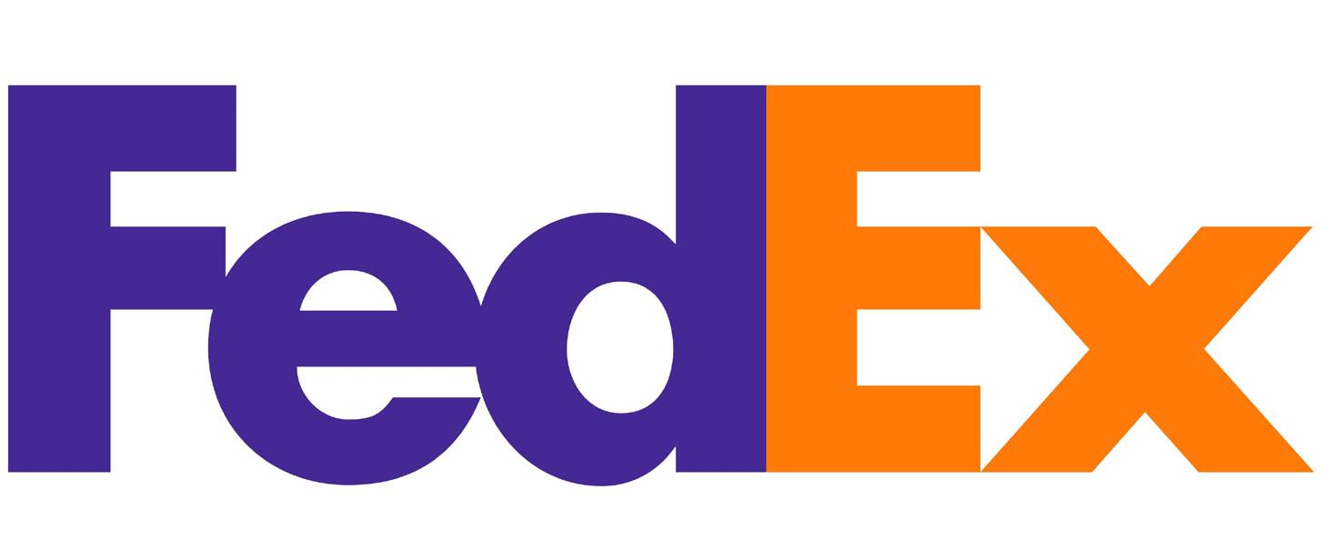
Fig. 4. FedEx Logo (2014)
A logo can also include symbols and text, and an example of this is the FedEx logo (see figure 4) With the use of the two colours we can distinguish the two words, and the bold font choice allows the logo to be seen from afar however the central aspect of the logo is in the negative space between the letters’ E’ and ‘X’ where we can see an arrow. This arrow represents the brand’s traits which are speed, accuracy and striving for perfection (Rogozo, 2020). In fact, within the survey, many people had claimed they noticed the arrow and suggested the arrow portrays “quick” and “efficient” delivery however some also claimed that the word Express has “connotations” of a fast shipping/delivery service (see appendix 3) which means language and signs have an equal effect on the consumer when suggesting the purpose of a brand.
Moreover, with the logo on display on vehicles, packages and ads, it is widely recognised all across the globe. This minimalistic approach has allowed the logo to be more versatile when creating logos for their sub-brands. Professor Josiah Kahane had claimed that in order to recognise a logo a consumer needs a clue as there are so many similar logos that confuse the consumers which mean there needs to be a sense of familiarity within a logo (see appendix 6).
16

Fig. 5. House of Brands: Fed Ex (2016)
The FedEx Corporation has a range of logos within their brand family (see Figure 5) which have been the same as the primary logo; however, there is a difference within the sub-brands. What makes each of the logos different is the different colours used on the word ‘Ex’. Each colour represents a different service which is a brilliant way to distinguish the departments, which means audiences can understand the brand and the many services they offer because of the flexibility of the logo. Despite being versatile, the logo is simple, which means the audience can recognise it and connect the dots of the meaning behind it.


