9 minute read
Chapter 4: Visual Images from a linguistic perspective
from How does the use of linguistics and semiotics influence the creation of logos within a brand?
by ekta.designs
Chapter 4
Visual Images from a Linguistic Perspective
Advertisement
Language experts and philosophers have battled with defining symbols since Greek antiquity (Magicdust, 2019). Ultimately, without language, we would never be able to understand the symbols and what they represent. Graphic design is about communicating messages with the use of visual contents. (The Interaction Design Foundation, 2019). As it involves visualising information and language, it may be possible to apply theories of linguistics within graphics to create effective communication. (Crow, 2003). Nevertheless, ignoring linguistics within the design is a norm because the concept is the primary focus of design thinking (Lupton and Miller, 1996) as designers are not at their best dealing with text and meaning (see appendix 6). Josiah Kahane believes designers can benefit from a better understanding of linguistics (see appendix 6) He claims visual language with vision describes the insight, understanding and establishment of visible signs just as people can articulate their thinking, they can envision it (Kahane, 2015)
Linguistics is the scientific study of language (Noble and Bestley, 2005) and has a significant role in visual design. Language and text are present on anything from websites, editorial pieces to print media as well as merging visual design and linguistic productions, through the means of the layout design and the use of typography. By combing writing and design leads to a new style of semiotics and a different approach to analysing design elements. When designers try to communicate the language, they usually rely on the use of typography or calligraphy to compose a form of speech to read besides the linguistic message (Crow, 2006). Typography is the creation of typefaces and the skill of positioning the letters and text so that the intended message is visually clear and appealing to the reader (Baines and Haslam, 2005).
Fig. 13. Same word different typefaces (2020)
Saussure said that linguistics is forming one part of semiology; however, Roland Barthes, a follower of Saussure, had come up with the conflicting theory which claimed that semiology was a part of linguistics. Barthes had suggested that the reader played a vital role in the methodology of reading the meaning. He developed linguistic concepts to a variety of visual media, which all carry meaning and he also recognised and manipulated structural relationships, via components of a sign. His ideology pictures around two unique levels of signification, which are connotation and denotation (Crow, 2003). Denotation refers to what is pictured (the object). The connotation is the portrayal of the object and how the audience is visualising it. Figure 13 presents an example, where the denotation is the word ‘child’ in the font Helvetica which does not give off any other meaning. However, we can also see that the same word is written beautiful cursive handwriting indicating positivity and suggesting happiness and then it is written again with a bold, sharp typeface indicating negativity and evoking fear. Even though the word is the same, its appearance gives it an entirely different meaning which means that without the connotations, it is just the word with no other meaning past its definition. Combining linguistics skills and design elements allows the viewer to understand the message being put across and better understand the whole image.
Language has an exciting part in branding as consumers get to know and understand the brand through language whether it is what has been told in advertising or on the packaging of a product, social media or word of mouth. Language has a powerful influence on the consumers, their perception, memory, attitude and behaviours as sometimes the brand name itself is informative on what the brand has to offer (Carnevae, Luna and Lerman, 2017). Due to our upbringing, we are aware of the meanings and words and so without knowledge or awareness of words and meanings; we would not be able to have fixed thoughts and judgements on certain things, especially people and brands. Therefore, there is nothing that navigates our perception as much as language does. (Devleminck, Gobert and Looveren, 2010). The power the brand name has on the consumers is evident and how it is showcased and presented to the consumers is also a significant influence. Together the name and its portrayal suggest the practical qualities of a product or service and stage the positivity and morals the company wants to depict. The laid-out components of the logo and name allow the consumers to identify the product. It has the potential to increase sales and customer loyalty (Subkowski, 2019). Nevertheless, the brand name is essentially the first acquaintance the consumers has towards the brand and products, whether if it’s the first thing, they see on ad campaigns, the entrance to a store or even when someone asks them the contents of the product they have bought.

Fig.14. Heartbrand Logos (2019)
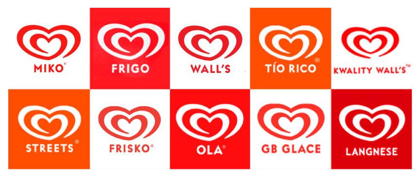
Linguists overall is a tool within branding and marketing strategies especially for brands who reach out to customers on a global scale as international companies reach out to consumers who have culturally different lifestyle and languages (Nacchia and Massaro, 2017). Brands strategically design their identity in order to attract their consumers who are from different cultural backgrounds in order for their whole brand to be memorable. An example of this is the Unilever’s Heartbrand, who specialise in ice-cream. The famous brand is known globally, and this is because the logo of the brand is the same; however, the name of the trademark is known by different names in different countries (see figure 14). The brand acquired companies already established in the country and did not change the name of the previous company. By giving a different name to the brand in different countries allows local consumers to trust the brand as the inspiration comes from the country and therefore, consumers ethically keep purchasing their products. It recognises the relevance of language in branding and the impact that language has on consumer response to the brand as they better remember the brand name; this proves that strategic branding must consider language from multiple perspectives and disciplines. Only then marketers can precisely communicate what is intended to the target audience even if it is at a global scale.
Many brands are international, and they focus on how they represent themselves in different countries. Trying to appeal to an audience with many cultures and languages is challenging, but it is not impossible. However, some brands rename their brands in different countries just because of the meaning of the word being different in multiple languages, or maybe it could be because of franchising (Ro, 2016). The text within the logo can have an impact on consumers across the globe. Brands have taken both linguistics and semiotic approaches when it comes down to showcasing their brand in different countries.
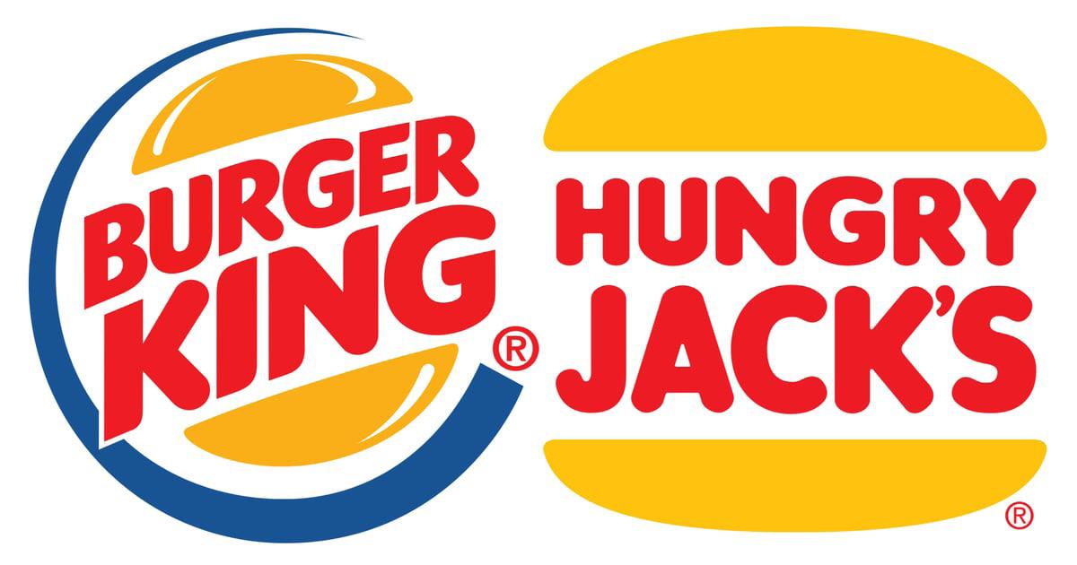
While Burger King is known worldwide, in Australia it is known as Hungry Jacks; this was because when Burger King entered to set up in Australia, there was already a restaurant existing called Burger King; therefore, the name Hungry Jacks was chosen (The Street Food Guy, 2020). However, although the name is entirely different, the entire logo is different as well (see figure 15). The current burger King logo showcases burger buns with the name of the brand in the middle to represent two patties in a burger and give artistic effects to make it look modernised and pleasurable. The blue circle signifies the brand is available worldwide as well as symbolising a quick service. However Hungry Jacks logo was never changed but in fact, remained the same as Burger Kings old logo (see figure 16) which is a simpler logo with the icons of the buns and the text inside with the only difference being that the colour saturation on the logo is low portraying a lighter orange and red; this provides a sense of imbalance with the two trademarks despite hailing from the same brand.

Fig. 15. Burger King and Hungry Jack’s logo (2020)

Fig. 16. Old Burger King logo (2020)
Nevertheless, the similarity to the old logo consists of a sense of familiarity to those consumers who do not live in Australia. Also, the logo changes again in the country of Japan (see figure 17) with the title being changed in Japanese so that it is readable to consumers in Japan as it addresses the brand in their language (Inkbot Design, 2020). Conclusively, this shows that Burger King as a brand is universal and appeals to their target market all across the globe.

Fig. 17. Japanese Burger King logo (2020)
Chapter 5
Case Study - Success of the Virgin logo

Fig. 18. Virgin Logo (2020)
Graphic information is interdependent on linguistic information and essential to create the corporate memory of products (Segers and Leclercq, 2007). Typically, the brand name is within the logo, and although the logo itself is not the overall brand, it is, in fact, the face of the brand which helps to identify the brand (Biricik, 2006). This case study will look at the Virgin logos, which are based solely on linguistic aspects such as typography and analyse the influence it has on the consumer and their interpretation.
The Virgin Logo (see figure 18) has a typographical approach and does not use imagery. The word Virgin itself was a choice made by Richard Branson, where he had considered himself and his partner “virgins” within the business industry (Carter, 2020). However, the choice of having the logo look handwritten provides the brand with a cuttingedge look (Brownlee, 2014) but to consumers, it is now one of the most recognised logos in the world especially with it being famously red (Logo Design Love, 2009). However, a visual element that we almost miss is within the ‘V’. It is an expressive tick symbol, which represents the Virgin seal of approval.
48

Fig. 19. Virgin (2020)
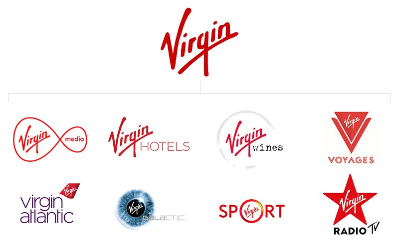
On the other hand, a selection of the sub-brands of Virgin (see figure 19) use more than a typography to distinguish themselves from one another. They use shapes, imagery and typefaces as additional components in order to create a new logo. We can see that they have similar features; however, each represents the title of another service Virgin offers. With these logos based on typography as a form of communication, they invite the consumers to identify the brand immediately and view the quality of the service within an instant look. Furthermore, with the logo being language-based, we can see a level of sophistication which aims at the target market of the brand and then allows consumers to think that it is a highquality brand. Also, the original logo embedded in the rest of the logos informs consumers that they are a part of Virgin, which controls existing consumers to trust the other brands Virgin owns, as the reputation the brand upholds will immediately be seen and that way, customers are retained. This depicts that logos without imagery can also be iconic and have a similar impact that symbols. Its shows that we should not underestimate words as they are also a powerful tool. One should not examine a word because it has a fixed meaning (Devleminck, Gobert and Looveren, 2010). Nevertheless, the representation of the word can create emotions within the reader and applying this to logos allows the brand to communicate the values and meanings to the customer directly.


