
CONTENTS


01. 02.
09.
INTO THE NEST
Academic project completed JanuaryApril 2018 in collaboration with NEST, a not-for profit developer in the Northside neighborhood of Cincinnati,OH
Research proposal and multiple iterations of single-family affordable homes
Model and laser cut from basswood and museum board, drawings created in CAD and given shade and depth in Illustrator. All diagrams completed in Illustrator.

SITE CONDITIONS C D COMPONENTS

MASSING
B 01 02 03 04 05 06 07 08 09 10 11 12 13 14 15 16 Matrix
OCCUPANT TYPE A
Iteration 01.
Matrix iteration 02. A B C D
01.


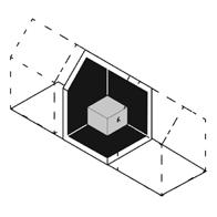
Through demographic research combined with multiple design iterations, 17 architecture students at the University of Cincinnati in collaboration with NEST (Northsiders Engaged in Sustainable Trasnsformation) explored the definition of affordable housing, visitability, and sustainability as it specifically related to the community of Northside in Cincinnati, OH. The fourteen week semester was divided into three phases which included three weeks of research, eight weeks of design, and three weeks of in depth development for a future design build studio. Each student designed two houses in the eight week span. The constraints for each house were assigned by a matrix system created by the studio, which allowed us to explore a wide variety of solutions for new homes in Northside. At the completion of the design period, the studio assessed the 34 houses created and their ability to meet the needs of the community residents. Three houses were chosen to be further developed and detailed in pairs. The housing solutions, research, and conclusions of the studio were presented to NEST and a panel of Northside residents. A cohesive book was created for NEST to present and document the work.


Phases One and Two:
The prompt for this house included the following constraints derived from the second iteration of the matrix (see previous page): The site would be an infill lot oriented to the North, and the home would be a one bedroom, ranging from 600 - 750 sqft, The home should incorporate ventilation strategies and maximize the footprint of the site. It should have a focus on privacy and include the components of vegetation and an “age in place” or “accessible” stair.


The North/South orientation and the house’s extruded roof form work in conjunction to pull Cincinnati’s prevailing winds throughout the length of the house. This passive strategy helps reduce active ventilation costs, creating a very efficient, one bedroom 600 sqft home. The massing of the house responds directly to the context of existing structures on the street. A semi covered back deck provides privacy for the infill lot.

01.1

Phase Three:
The initial design of this house included one bedroom with a lofted living room and a detached massing scheme separated by a courtyard. This house was chosen to be adapted in the last phase of the studio. Two additional bedrooms were added to reach the target square footage of 1200sqft suggested by NEST and the home buyers in the neighborhood. The original courtyard space was transformed into the new circulation core, attaching the previously separated masses while still retaining a level of privacy between an in law suite (bedroom one) and master bedroom (bedroom two). The shed roof slopes away from neighboring houses towards the street corner and disperses water onto the site.

01.2
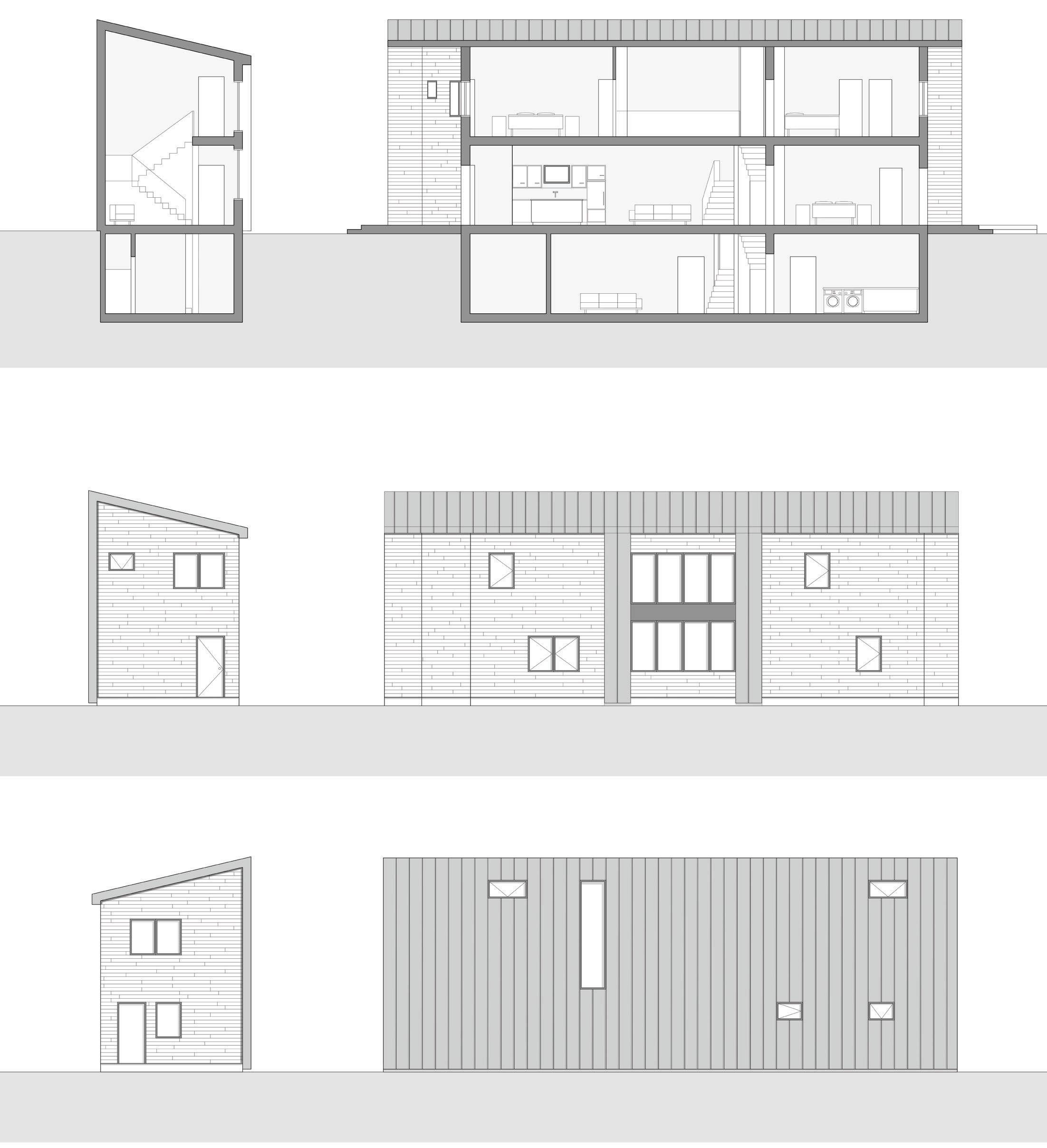
The envelope material of cedar siding was selected due to it’s sustainable properties, water resistance, affordable nature, and contextual application in the neighborhood. A bedroom with a full bath is located on the first floor, making the home accessible to all and gives the owner the ability to age in place.

New design development and construction document drawing sets detailing interior wall structure through section and plan details were created. Accompanying the drawings is a model at 3/8”=1’ scale with removal roof and side walls. Models show wood stud framing construction at 16” on center, basement build out, stair details, and a spacial understanding of the interior.

01.3
CEDAR SIDING WALL SECTION, TYP.
STANDING SEAM METAL WALL SECTION, TYP.


After conducting surveys amongst the studio, the NEST board, our reviewers, and Northside residents, we generated an analysis that lead to the creation of three new matrices to hypothesize future design iterations for NEST. The reorganized matrices solved the limitations of the first two iterations. Unsuccessful constraints were eliminated and replaced with successful constraints tested in the second matrix. This final matrix will explore new relationships between successful prompts and will push design solutions more intently towards affordability, visitibality, and sustainability.
A book was created by the studio to display all of the research and design iterations conducted in the fourteen week period. The book has been published by the University of Cincinnati and is available in print.

01.4
HOLZ UND STEIN
Academic project completed OctoberNovember 2017 as the cumulation of 12 week faculty lead study abroad tour. The travel studio was crafted around the notion of examining wood and stone as the two most ubiquitous construction materials in the history of architecture.
Upon returning from the trip, students curated a gallery exhibition displaying sketches, collages, and photographs from the trip, as well as a series of artifacts detailing the ethos and construction methods of the four most prominent regions visited.
For additional information, this book details the collective process of the studio: https:// issuu.com/evanszoe/docs/holz_und_ stein_final_pages


Plaster casting explorations and techniques representing the Bohemia region (Modern day Czech Republic and surrounding area) include a fresco painted replica of Joseph Klimt’s painting “Judith”, a wreath created from additive stenciling in the style of Otto Wagner, a medieval envelope brick cast, a metal inlay of Art Nouveau styled leaf patterning, a play on juxtaposing textures within a single cast, and plaster represented purely as plaster in the style of Adolf Loos.
Shadow boxes were developed for the tiles, each box serving as both structure and an exterior surface as a reference to exposing the underlying structural framing of typical bohemian construction. The frames were hand selected at a Cincinnati frame warehouse to accentuate the varying features represented by the casts. Rustic graining, Art Nouveau motifs, texture, gilded patterning, and frames true to the simplicity of material represent their housed casts. I had a hand in designing, creating, detailing, and finishing all casts.


07.


A tactile representation of our travel destinations, the map is a tectonic manifestation of regional materials and construction sensibility. Its main supports are reclaimed lumber which anchor nine red oak frames into a 3 by 3 grid. On the grid’s surface lies a sprinkling of materials, each representative of the region it covers along with collaged images retrieved from brochures that were collected from the trip. The layered composition emphasizes detail at the intersections of these differing materials, including pocketed brackets at corners and anchor plates which hold the frames.
A small team of students worked together to envision and fabricate the map. My personal contributions lay most heavily in the ideation phase and in deciding the surface treatment. I tested and iterated adhesive mediums and surface application techniques for a mixed medium collage surface, then facilitated the execution.

07.2
JUPITER HOTEL
Project completed while working at Works Partnership Architecture in March, 2016
Proposal for Jupiter Hotel: A 42,000sqft addition to a boutique hotel in Portland, Oregon
The project included work in Sketchup, Maxwell, AutoCAD, Photoshop, InDesign, and Illustrator. Massing models were created from meticulous paper folds and wire-cut foam.
 View of Jupiter Hotel Main Entrance
Proposed Building Perspectives
View of Jupiter Hotel Main Entrance
Proposed Building Perspectives


Building Sections B Approach - Stable NW Streetside Facade SW Courtyard Facade Approach Distorted
Proposed Building Section Perspectives Approach - Southwest Corner Distortion
Section of Retail Storefront - E Burnside Street
02.
The Jupiter Hotel expansion designed by Works Progress is located in Portland, Oregon. The new 6 story building will add 67 rooms on a site directly to the east of the existing hotel. The building proposal includes a restaurant, retail spaces, lobby and reception area, an upper level lounge, banquet hall, exterior garden, and guest rooms.
I assisted the Works Partnership team on this project by creating the presentation for the City of Portland Design Review hearing. This included creating and altering renderings, sections, floor plans, elevations, and diagrams of the building. I also completed a series of sketch models proposing variations for a new building skin.
Application of expandable automat at SE Sandy & Washington site.
 Approach - Southwest Corner Distortion
DOHENY CONDOMINIUMS
Project completed while working at Marmol Radziner in Fall of 2016
Luxury condominiums located on the West Hollywood strip in Los Angeles, CA.

Details and floor plans are executed in Revit. Series of renderings completed by hand and altered in Photoshop.
AMENITY GREAT ROOM PERSPECTIVE SKETCH KITCHEN 17'11" EDGE OF COUNTER FINISH FINISH TYP 2" FINISH 12' - 10" FINISH 2'
3" FINISH FINISH 12' - 6" 4' - 2" 3'4" 3'6" 4'6" 2' - 3" ALIGN 2" FINISH EDGE OF COUNTER EDGE OF COUNTER EDGE OF COUNTER
-

SKETCH


AMENITY GREAT ROOM PERSPECTIVE SKETCH GREEN ACCENT COLOR SCULPTURAL, SOFT FURNITURE DECORATIVE KITCHEN EDGE OF COUNTER GENERAL NOTE: CONFIRM ALL DIMENSIONS WITH ADA CONSULTANT PROJECT NORTH DIMENSIONED PLAN - BAR, KITCHEN, AND DINING GREEN ACCENT COLOR SCULPTURAL, SOFT FURNITURE DECORATIVE LIGHTING 2' - 2" A5.05 DIMENSIONED PLAN - BAR, KITCHEN, AND DINING MARMOL PLATED POLISHED FINISH FLOOR STAINLESS STEEL TRIM REVIEW DETAIL WITH LIGHTING DESIGNER PRIOR TO CONSTRUCTION STONE SLAB COUNTERTOP AND FASCIA DOHENY AMENITY SPACE OCTOBER 26, 2016 6" = 1'-0" 10 BRASS CASEWORK DETAIL - TOE KICK STAINLESS STEEL CASEWORK DETAIL - TOE KICK AMENITY GREAT ROOM PERSPECTIVE SKETCH SCULPTURAL, SOFT FURNITURE BRASS ACCENTS DECORATIVE LIGHTING GENERAL NOTE: CONFIRM ALL DIMENSIONS WITH ADA CONSULTANT A5.05 PROJECT NORTH MARMOL RADZINER BRASS ACCENTS DECORATIVE LIGHTING MARMOL RADZINER MARMOL RADZINER STONE SLAB COUNTER TOP
The Doheny Condominiums designed by Marmol Radziner are located in Los Angeles, California. The new multi story building will add luxury condominiums to a site adjacent to the West Hollywood strip. The building proposal includes a high end amenity space for tenants, including a spa, bowling alley, media room, full kitchen, dining space, multiple lounges and a lobby/reception area. I assisted the Marmol Radziner team on this project by creating the design development package for the amenity space submittal. This included creating and altering renderings, creating interior elevations, finding materials, contacting vendors, and altering floor plans for the entirety of the space. I also completed and detailed a series of bar studies proposing variations for an ADA accessible design.
05. A6.15 8 6 7 9 A6.16 7 A6.16 14 A6.15 1 3 MEDIA ROOM ELEVATOR VESTIBULE AMENITY LOBBY WC-1 PL-2 CB-1 PL-2 FL-7 PL-2 PL-1 FL-2 WD-4 PL-2 FL-11 FL-2 WC-1 CB-1 FL-8 WC-1 PL-2 TV PL-1 VERTICAL SLATS, TYP PL-2/ TL-1 PL-2/ TL-1 PL-2/ TL-1 PL-2/ TL-1 PL-2/ TL-1 PL-2/ TL-1 PL-2/ TL-1 SS-1 SS-1 FL-7 FL-7 A6.15 12 10 11 4 2 3 A9.01 4 10 5 11 15 12 CB-2 PL-2/ TL-1 A6.15 5 3 A9.01 1 A9.01 1 A9.01 3 A9.01 3 A9.01 A6.16 6 A6.16 8 9 A6.16 13 A6.16 3 2 1 TP-1 TP-2 GB-1 GB-1 T-1 T-1 T-1 T-1 TP-3 MR-2 MR-2 SK-1 SK-1 SK-1 SK-1 T-2 T-2 FC-1 FC-1 FC-1 FC-1 SD-1 SD-1 SD-1 PL-2 TYP TYP TYP LM-1 LM-1 LM-1 LM-1 TYP TRA-1 TRA-1 111 112 112.A AMENITY SPACE WOMEN'S RESTROOM AMENITY SPACE MEN'S RESTROOM 113 113.A 111.A 114 114.A 114.B 5 A9.01 TYP D-1 TYP UP-1 UP-1 B-1 B-1 13 CC-1 PT-12 ADD ALTERNATE: UP A6.15 14 ALIGN 11 A9.10 ID-R01 DOHENY AMENITY SPACE OCTOBER 26, 2016 ENLARGED FINISH PLAN - AMENITY LOBBY/MEDIA 1/8" = 1'-0" 1 ENLARGED FINISH PLAN - LOBBY + TV ROOM PROJECT NORTH ID-R01 OCTOBER 26, 2016 DOHENY CONDOMINIUMS CC-1 FL-2 FL-8 FL-7 MT-1.A CB-1/WD-1 CB-2 WC-1 ALTERNATE


A9.14 A6.01 RH-2 FC-1 SK-1 MASTER BATHROOM MASTER SHOWER 6" ALIGN EQ. A EQ. A EQ. B EQ. B CL TILE SEAM AND TUB FILLER CENTERLINE FINISH AND EDGE OF COUNTERTOP FINISH SH-2 DOHENY CONDOMINIUMS NOVEMBER 2, 2016 UNIT A1 PLANS A5.02 ID-RU01 ID-RU01 NOVEMBER 2, 2016 DOHENY CONDOMINIUMSPERSPECTIVE SKETCH CONCEPT FURNITURE PLAN PERSPECTIVE SKETCH LIVING ROOM DESIGN NOVEMBER 2, 2016 DOHENY CONDOMINIUMS
In addition to the amenity space, Marmol Radziner also proposed a series of unit types. I assisted this aspect of the project by again organizing and creating the design development package for the model unit submittal. This included creating all of the renderings for submittal to the client, creating interior elevations, beginning material cost and feasibility studies, creating the furniture layout, specifying hardware throughout the unit, and detailing casework designs.

05.1
SEMI PERMEABLE INFILL

Design Competition proposal submitted February 2018 with Paige Michutka and Alyssa Pack.
New build facade proposal analyzing and responding to Cincinnati’s proposed Historic Over the Rhine (OTR) infill guidelines
As a digital submission, the project included work in Rhino, AutoCAD, Photoshop, Indesign, and Illustrator

MASSING SETBACKS COMPOSITION


COMPOSITION VERTICAL EMPHASIS RHYTHM OPENINGS ROOF MATERIALS MISCELLANEOUS
Specifications of Brick and MortarMortar to be flush with the brick; mortar shall not overlap onto the brick. Mortar should be colored tan to approximate the color of existing buildings in the block.


Specifications of Brick and MortarMortar to be flush with the brick; mortar shall not overlap onto the brick. Mortar should approximate the color of existing buildings in the block.
Brick should be colored Pastel Rose to speak to the warm hues of existing historic brickwork in the district while providing a modern, light alternative. See color pallate pictured left.
Brick should be colored Pastel Rose to speak to the warm hues of existing historic brickwork providing a modern, light alternative. See color pallate pictured left.


The perforated brick screen helps to emphasize the connection of the building to its surroundings, allowing it to blend in with the more traditional brick buildings around it. It creates a textured facade with a level of depth beyond the traditional use of the material.
The perforated brick screen helps to emphasize the connection of the building to its surroundings, allowing it to blend in with the more traditional brick buildings around it. It creates a textured facade with a level of depth beyond the traditional use of the material.

The metal cladding directly behind the perforated screen provides important structural support and reliable protection from the elements. It contrasts solidity with openness while integrating a modern context of design to a very traditional form and material.
The metal cladding directly behind the perforated screen provides important structural support and reliable protection from the elements. It contrasts solidity with openness while integrating a modern context of design to a very traditional form and material.
The perforated brick screen backed with a glass pane begins to play with light and shadow to transform the exterior and interior surfaces. During the day, light will reflect and shine through the brick reveals, by night, the light will shine out from within.
The perforated brick screen begins to play with light exterior and interior surfaces. reflect and shine through light will shine out from

These apertures allow natural light and introduce a subtle variety while keeping the rhythm and pattern of the building facade.
These apertures allow variety while keeping the building facade.
Existing buildings used as precedents located in historic districts and utilizing various forms of perforated brick construction Existing buildings used as precedents located in historic districts and utilizing various forms of perforated brick construction03.
The intent of this building competition proposal was to create a unique facade design that embodies the newly proposed Historic Over the Rhine (OTR) infill guidelines, while incorporating a modern context to the neighborhood. Our team provided a visual analysis of the proposed zoning requirements in addition to a potential facade application of these guidelines.

Our team used a traditional brick material for construction, but used a faceted application of the material to create depth that became the detailing and ornamentation of the building. The design attempts to reduce the historic desire for additional adornment and create a realm of innovative opportunities for the neighborhood. Our aperture locations were informed by following the rhythmic grid of the adjacent buildings, then the grid was broken to set up a new, modern context within the framework of very traditional historic vernacular.

OPERATION VITAMIN D
Project completed with a small team while working at Fraser and Fogle Architects in September, 2019.
Proposal for Operation Vitamin D: An urban intervention applied throughout selected sites in Seattle, WA. This project was the winner of the 2019 Gray Awards “Wild Card” category.
The project included work in Photoshop, AutoCAD, InDesign, and Illustrator.

 Beacon Hill LightRail Station
OVD | SEATTLE | | TRANSIT NODES


WESTLAKE PARK
Operation Vitamin D targets existing post-modern monoliths found throughout Westlake Park and repurposes them as luminous interventions. The monoliths are both programmed and unprogrammed to provide variety of activities in one of Seattle’s most densely populated public spaces.


PIONEER SQUARE
Operation Vitamin D takes the historic glass prisms embedded in the sidewalks in Pioneer Square and conceptually inverts them.
Luminous glass blocks replace opaque bricks throughout utilitarian alleyways, transforming the spaces into vibrant pedestrian corridors and activating them as public art.
BEACON HILL STATION
Beacon Hill was considered one of the darkest underground transit stations in the Seattle until Operation Vitamin D intervened with a system of luminous panels. The panels supply several minutes of vitamin D exposure during peak commute times and provide a necessary atmospheric differentiation from the city’s gloom.
Westlake, Transit Center/Urban ParkOperation Vitamin D is a concept generated in response to the Pacific Northwest’s notoriously gray rainy season. The gloom has an oppressive impact on its population, which is characterized by a constellation of seasonal affective disorder symptoms (or, SADs). With climate scientists forecasting more extreme weather conditions and the probability of an increasingly dismal atmosphere, the Fraser + Fogle team intervened with a series of strategic design initiatives.
Operation Vitamin D targets three urban conditions —transit stations, pedestrian corridors, and urban parks— where the city’s population wait, walk, and gather. At each of these conditions, vitamin D illuminating interventions replace existing architectural elements to counter the effects of seasonal affective disorder. These illuminations, interconnected by a network of sensors, activate upon movement, proximity, and touch to emit vitamin D and provide moments of joy in an otherwise gloomy city.

02.
Pioneer Square, Pedestrian Corridor
IDIOMATIC HOUSE
Project completed with Ryan Hendryx February 2021 at Fraser and Fogle Architects.

Single-family residence located on a conceptual site on San Juan Island, WA.

Floor plans are executed in AutoCAD. Building is modeled in Sketchup. Series of collage renderings completed in Photoshop with Enscape processing.


04.
The house is designed on a sloped site in the Pacific Northwest for a concept artist and his weimaraner dog. The project includes separate live/ work modules, and is connected by a multipurpose indoor and outdoor space. The house was designed to prioritize sweeping views at the back of the home, while maintaining privacy at the street facing elevation.
The clients minimalist, dark modernist aesthetic is accentuated through very simple, high quality materials. Operable sliding doors allow the home spaces to flex depending on the needs of the client or weather conditions.

THE PAVILION
Seattle Design Festival pavilion competition finalist, submitted Spring 2022 with Danielle Baehm.
Proposal for xxx
As a digital submission, the project included work in Sketchup, AutoCAD, Photoshop, and Illustrator


The 2022 Seattle Design Festival (SDF) Pavilion unravels the idea of a traditional welcome booth and host staging area. Instead, it invites visitors to come in, explore, and be introduced to SDF’s unique atmosphere. The foundational principle for the pavilion is to create a welcoming and interactive space that is accessible to festival participants of all backgrounds and abilities.
The open and light design of the pavilion welcomes visitors into the festival, while the pathway through the interior acts as a guide to usher visitors into the interior to receive information that sends them on their way to participate in the eccentric installations of the festival. The pavilion offers multiple surfaces for SDF signage, photo moments, and banners that can act as both a visual anchor as well as an interactive, informative surface, while remaining approachable from all sides.
To encourage visitor interaction and prioritize inclusive and equitable access, the pavilion was designed with a variety of seating and makers space work surfaces that anyone can occupy. The variety of surfaces offer a chance for visitors to pause and interact with festival team members in a more natural and indirect way. Open to all sides, the they double as an opportunity for interactions with festival attendees, as well as offering visitors a place to rest and recharge under the pavilion’s cover.

08.
101 CERAMIC DALMATIANS
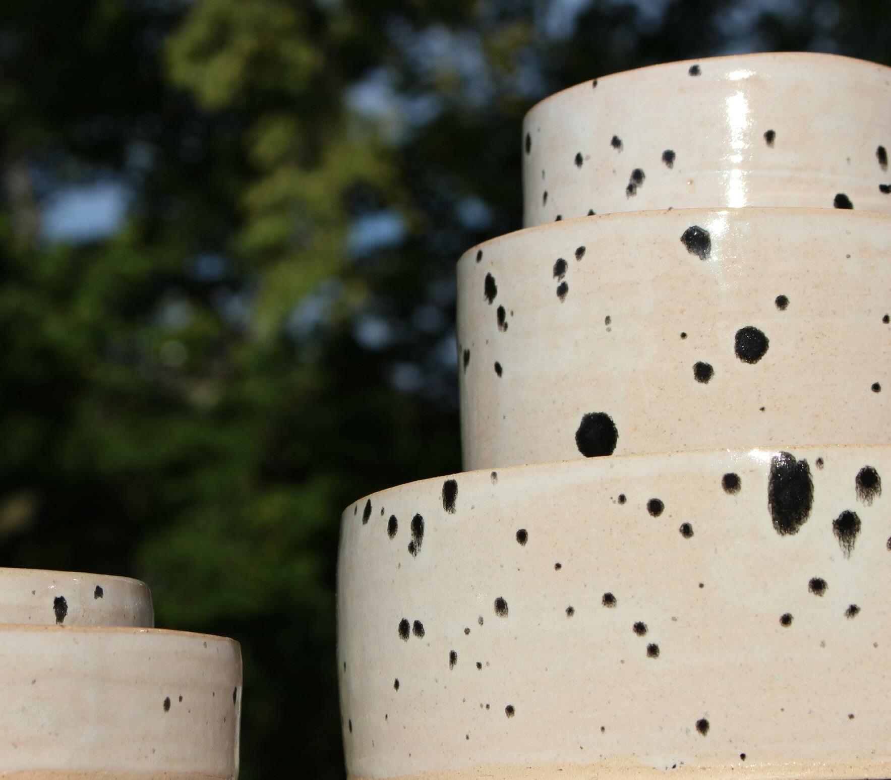
Personal project completed July 2016 for hand throwing ceramic studio at the University of Cincinnati
Simple vessels created at varying scale displaying technique and mastery of craft
Clay medium was mixed in class. All products were hand thrown and trimmed on the potters wheel. Glazes used throughout the studio were made in the glaze lab by the class.


06.
This project was the result of a 12 week elective ceramics course with a strict focus on form created on the potters wheel. This series was an exploration of architecture through ceramic form, studying structure of a simple vessel at varying scales. Through the photographs, I further explored the engagement of pieces, how they could nest within each other, and how the differing combination of simple, stand alone pieces could come together to create a dynamic system of hierarchy. This was a true test of craft and my learned skill of patience and control on the potters wheel.
Throughout the course, I also tested, iterated, and then developed my own series of ceramic glazes in The School of Art ceramics glaze lab.
