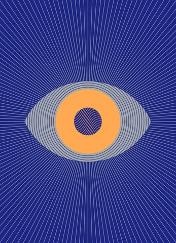
Eye on Design magazine - Issue #02 "Psych"

Page 1


EYEONDESIGN.A IGA.ORG


L I K E W H AT YO U ? S U B S C R I B E A N D S AV E U P T O 2 0 % O N T H E C OV E R P R I C E + S H I P P I N G O N 3 I S S U E S A Y E A R , D E L I V E R E D T O YO U R M A I L B OX A I G A E O D.C O / S U B S C R I B E

SIGN WAS FO ON DE U ND ED IN E S D T L A O N 20 D LA , THE 14 N R GE IG S BY S M I P E T A H C T DE T OF DE EN PE R P E D ES SI FO DE I G D G J O I N N AT T N N AN IO HE AC E L U R EA IN E AS AL DE S. GA Z A W R M R E EL SIGN PRO L E DE GN DU I H T S CT S ON PPORTING T U S HE E IL ATING FOR OC Y V D

IS H

NA

BL

SIO

PU

THE PROFES

OU R

00

M

EM

, RS BE

GN

, ORE THAN 70 CHAP GA HM TE AI R W IT SA E FU T U R E . BY ND C TI V LLE ED 20 CO ,0 R OU E R S E O URC D N L IN ES DO N , AN IO FOR S IC E O PR L TIO N UL IZ A A ROU ND ERS

AN

RG

A NOT-FOR-PROFIT V ARE E NT WE UR ION I M. N T E H E ANIZ AT U NI PU UM O RG TE B DR D L H IP ST IS NES O N B US INES S IN RS H A IPLI ,S T BE RR O IS C E CIE V E A FR E S. LD EM E RECEI T S Y M UB AL ND ,A S LA EM B C E M SS R N S R - ON VE O S TO IP LY ES T LE C V RENTLY P ID AC CUR A Y E IN RE AS G U’ EAD L I N S G F ’ OR YO LD G OR FOR D ES I

A ND

.O

IN

U

GA

O

O

AI

/J

W

ER LA K R S O T W O A E SS NH A A IG OC NC E WE LOV IA TH EO T E UR V TO E M EM YE ON B E E S D P DI S C DE PLU OU NT —AL LW S H ORLD. EW A H T

EYE

A L L PA P E R S U P P L I E D B Y M O H AW K , A N I N N OVAT I V E A N D E C O - F R I E N D LY SU PPLIER TO PR IN TER S, GR A PHIC DESIGN ER S, A N D SM A LL BUSIN ESSES. M O H AW KC O N N E C T S .C O M P R I N T E D, B O U N D, A N D M A D E W I T H C A R E B Y H E M L O C K , A C A R B O N N E U T R A L FAC I L I T Y A N D S E C O N D - G E N E R AT I O N FA M I LY B U S I N E S S H E A D Q UA R T E R E D I N VA N C O U V E R , C A N A DA . H E M L O C K .C O M


EYE ON DESIGN #02 P S YC H

FA C E B O O K :

GET THE NE WS LE ESIGN TT D N EY O E EO EY ESN’T S A LE DO N E

D

N

G

@ A I

R AG

E , F O L L OW

G

ES I

G

A

VE

N

D

CO

IG

R

Y

M

FO

IL

D . C O/ E O D S A EO IG N AIG UP @A I G A E Y EO N R: DE TE S IT I A E Y EO N AIG D ES :@

NE V ER MISS A ST O G A .ORG I RY . A . N R G . I E S E TW D N S I T A N GR A . P

AT S U

AIG A

PU BL ISHE D BY THE P R O F E S S I O N A L A S S O C I AT I O N FOR DE SIGN 2 33 B R OA DWAY, S U I T E #174 0 N E W YO R K , N Y, 10 2 7 9

:

.ORG


I S S U E

2

P S YC H

Perrin Drumm Founder and director

Green mind, Cancer

T + I @perrindrumm

Like Dorothy stepping out of her humdrum, black-and-white world and into the gleaming land of Oz, Eye on Design is leaving behind the gridded comforts of home and diving headfirst over the rainbow and under our brainwaves for issue #02, the Psych issue. Give your mind a good yogi stretch and join us. Psychedelia has a unique etymology; its rather noble, high-minded dictionary definition is the result of what linguists call an “irregular formation,” the rocky marriage, so to speak, of its two main roots: psyche, the human soul/mind/spirit + the Greek “delos,” meaning clear, manifest. Pulling back the curtain and shining a DayGlo-bright light on our deep, dark inner worlds seems like a chewy enough brief for a designer as well as for us editors. While the word itself didn’t come into mainstream parlance until the 1950s, we want to look well beyond its obvious trippyhippie connotations and more broadly at the intersection of design and mind-altering experiences of all kinds.

Madeleine Morley Associate editor

Purple mind, Capricorn

T @mdimorli

When the term “psychedelic” did come into prevalence in the middle of the 20th-century, it was coined by psychologist Humphry Osmond in a letter to author Aldous Huxley, 4

in reference to popular hallucinogenic drugs. Its meaning grew from there, becoming a way to describe a new kind of sound, style, and sensibility. It would be impossible for us to create a Psych issue without touching on the history of the designers of that period, with their fluorescent inks, oozing typography, and pattern-heavy optical illusions. But to us, embracing irregularity means uncovering some of the lesser-known design stories from that time. For instance, the “Summer of Love” wasn't so bright for everyone, so we tracked down some women designers to hear their versions of this moment in history. And, of course, the American version of psychedelic posters isn’t the only version, so we trotted around the globe to see how different countries interpreted the visual movement. There's never just one side to a story. In the spirit of expanded consciousness and shifting perspectives, the issue in your hands also represents a plurality of experiences.

Emily Gosling

Senior editor

Yellow mind, Sagittarius

T + I @nalascarlett

And not just a plurality of experiences, but a plurality of mindsets, too. We’ve long championed design stories that explore the mind: how design shapes and is shaped by the multitudinous ways in which we see the world, through the lenses of mental health, substance abuse, and so on. The Psych issue offers ample room to experiment with new takes on how certain external agents— everything from drugs to gong baths to perceptual psychology—can expand or contract the creative mind. Moving beyond the lysergic stereotypes and the tired “tuning in and dropping out” doctrines, we see how designers today are really tinkering with their brains; touching on the wider spiritual, legal, and sociological conditions around these trends.


EDITORS E Y E

Liz StinSon Managing editor

Green mind, Taurus

T + I @lizstins

Uncovering the tensions between reality and perception has long been at the crux of what designers do. Visual tricks—or, intentionally messing around with other people’s brains— is an oft-wielded tool that we’re eager to explore. In our Sike! package we uncover the optical illusions and clever turns of shape that impact the way we perceive the world around us. From ’90s fads, to perceptual tests, to the calculated influencing of consumer behavior, exploring the theme of Sike feels appropriate and timely, well beyond its homonymous ties to its psychedelic past.

MEG MILLER

Senior editor

Green mind, Aries

T @megilllah

With our new, expanded definition of what psych was, is, and could be, we began to wonder about the psychedelic design of the present moment. If the hallucinatory experiences of the ’60s were made visible through vivid, kaleidoscopic posters, and the trademark excess of the ’80s carried over into the next decade with maddening patterns and a healthy dose of optical illusion, we wanted to know: What is our equivalent now? We immediately thought of the deliriously ironic social graphics and spinning, glittering gifs that fuel our feeds— and of the group of designers who’ve honed

O N

D E S I G N

this aesthetic and brought it to the fore while working at, of all places, a major business magazine. Hallucinatory graphics today play out online and any place with a hashtag, but they still respond to a sense of social and political turbulence with an irreverent sense of humor and savvy critique. With a little help from some psychics, we also try to peer into the future and see how our current climate might affect the design world of tomorrow. And we discover that bringing together the past, present, and future of design, all at once, is its own kind of trip.

Tala Safie Designer

Purple mind, Gemini

T + I @talasafie

As we do with all of our issues, we brought on a guest designer to wrangle our visions and revelations—as well as the work of our incredible contributors—into a cohesive, thoughtfully designed magazine. We chose Shira Inbar, a New York-based graphic designer, for the fluid and surreal quality of her work, her bold and striking use of color and typography, and the smart ways in which her design reveals layers of meaning. We knew she’d give us something erratic yet thoughtful, bold but clean, prismatic but still completely coherent.

5


I S S U E

2

P S YC H

SH I R A I N BA R Guest designer

Red mind, Cancer-Leo cusp

E YP FA

S CE

As described by its editors, the Psych issue presents an array of works and ideas from designers in different eras, countries, and cultures—each, in their own way, exploring the explosion or aftermath of the ’60s psychedelic movement. In the midst of studying the multitude of perspectives featured in this issue, I noticed a visual element that seemed to re-appear, especially in posters: the frame. A kind of portal through which the viewer is invited to gaze at, or even enter a scene. The frames in those pieces always invite, but also divide.

T

I @shira_no_filter @loops4ambiance

Cooper Light A graceful variation of the infamous ultra-bold typeface Cooper Black Italic, originally designed by Oswald Bruce Cooper in 1922, in the United States (became very popular in the 70s).

DRUK CONDENSED

An intense display face designed by Berton Hasebe of Commercial Type in 2014, in the United States (the Druk familty is described by the foundry as “a study in extremes”).

Stemple Schneidler A classic, Art Nouveau-esque typeface based on Schneidler Old Style, originally released by The Bauer Type Foundry in Germany, 1936 (between the two world wars).

D E S I G N

Favorit

L E T T E R

A straightforward, sans-serif typeface designed by Johannes Breyer and Fabian Harb of Dinamo Typefoundry in 2013, in Switzerland (has subtle oddities and a humorous touch). 6


OTHER SIDE E Y E

These frames fascinate me because they’re the opposite of what I’d expect to find in a psychedelic poster. Yes, the saturated colors are there, so is the flowing typography, the excessive detail, and the melting grids— but almost always within set borders. Why is this the case? Why do designers go to such great lengths to craft immersive worlds, only to remind us that they aren’t limitless after all? And why are we, the viewers, left to experience these worlds from behind a window? And how does the fantastic, seductive world beyond it reflect upon the world in which I live now? How do I cross over, and navigate between the two? It occurred to me that while getting lost within the hallucinatory graphics, I was simultaneously becoming more conscious of where I stood.

O N

D E S I G N

To keep this dialogue between “over there” and “right here,” between diffusion and awareness, each story opens with a spread that frames the essence of what the reader is about to experience, offering an opportunity to consciously enter or exit, transition to the next phase, dive in, or leave it behind. The voyage through the issue is illuminated by orange DayGlo, originally introduced to psychedelic posters via traffic and road signs. So tune in, join the ride, break on through.

D E S I G N

Paper: Mohawk Superfine 70T, in Ultra White, Mohawk Curious Collection, Metallics 70T, in Nude

L E T T E R


I S S U E

2

P S YC H

TA BL E OF “ T H E D O O R” 10 A Comic By Alexis Beauclair

A NEW DIM E NSION IN P OS TER DESIG N 6 0

Designer Homa Delvaray talks about her trippy take on time, place, and tradition By Shira Inbar

THE FUTURE OF D E S I G N 12

According to two psychics and an app By Meg Miller

W H E N U G LY WAS AM A ZING 16 How a band of design misfits brought anti-aesthetics to Bloomberg Businessweek By Cliff Kuang

W H AT C OL O R I S YO U R M I N D ? QUIZ 2 7 By The Rodina

WO M E N OF PSYCHEDELIC DESIG N 3 2

The cost of free love and the designers who bore it By Madeleine Morley

A LT E R E D S TATES 49

What happens when five creatives design under the influence, sans the drugs

WHEN AN OP T IC A L ILLUS I O N BRIEFLY TOOK OVER THE WORLD 6 4

Cross your eyes. Position the page just right. Pull it close, then pull it away. Now can you see how Magic Eye launched the whole ’90s straight into 3-D? By Liz Stinson

A V I S UA L G U I D E TO TRICKING YOUR TAS TE BUDS 7 8

Think you choose what you eat? Our experts prove how your food cravings are the result of a careful concoction of branding, packaging, and pop psychology. Introduction by Mark Wilson

OP TICS 88

By Shira Inbar and Tala Safié


E Y E

CON T E N TS SPILLING THE T E A ON YOUR PROFES SIONAL FUTURE 9 6

When it comes to fortunetelling, tea bags are the new tea leaves. What’s at the bottom of your mug?

H OW T O B U I L D A FOLLOWING 9 7 A Visual Satire By Tala Safié

YAY, I WAS SAD TODAY 10 0

As creator of the internet’s beloved Animated Text, designer Cat Frazier got millions to come for the memes, and stay for the mental wellbeing By Perrin Drumm

THE R ISE OF T H E CHIEF HAPPINES S OFFICER 117

And what it has taught us about workplace wellbeing by Kati Krause

TUNING IN AND NEVER DROPPING OUT 12 4 The designers shifting drugs from recreational to vocational By Emily Gosling

O N

D E S I G N

A L PH A BE T CITIES 136

Now you read it; now you don’t. An interview with the designer Scott Paul Joseph

BR E A K ING FR EE OF THE FEED 13 8 Illustrator and art director Marina Esmeraldo on kicking her Instagram addiction

LOOK IN TO OUR E YE 145

Hit a creative roadblock? Let our all-seeing Eye of Design Destiny guide your way.

TA DA N O R I YO KO O’ S G R APHIC SELFDES TRUCTION 147 The death-obsessed graphic designer moved to the forefront of a Japanese counterculture scene by celebrating new life rising from the postwar ashes By Chase Booker

L OV E LE T TER 15 6 A rhyming ode to Pamela Coleman Smith, illustrator of the highly influential RiderWaite tarot deck By James Cartwright Handlettering by Bryony Quinn

E DI T OR’S L E T T E R DE SIG N E R’S L E T T E R C ON T R I B U T OR S

4 6 16 0


I S S U E

2

P S YC H

THE DOOR

Alexis Beauclair pays homage to Paul Kirchner’s surrealistic ’70s comic The Bus. A balding man in trench coat and tie rides the bus, casually reading a newspaper. Outside his window, rocky canyons fly by, followed by a jungle, several fantastical palaces, and a gurgling underwater scene. When the man puts down his newspaper to look outside, it returns to normal: a simple city street. Undisturbed, he goes back to his paper, just as mountain peaks crowned with clouds crop up behind him. Between the years 1979 and 1985, the American illustrator Paul Kirchner created countless strips for the comic journal Heavy Metal that depicted the same homely man and his dream-like adventures in catching a bus. The monthly comic played with the reader’s notion of a stable reality, continually tipping an utterly banal situation into the surreal. In only six panels, Kirchner masterfully delivers his punchlines through clever visual distortions, turning the expected on its head just as the final panel pulls back to reveal a bigger picture. That tunnel we thought the bus was hurtling through is actually a mouse hole; a bus in motion is actually just a poster. Strip after strip, our frazzled protagonist remains stuck in a never-ending loop of mundane absurdity. We invited Alexis Beauclair to design a contemporary homage to The Bus, which he entitled “The Door.” Based in France, Beauclair is an experimental comics artist preoccupied with geometry, dynamism, and plasticity; his strips emphasize abstraction over narrative, exploring the mechanisms that underlie the format. Beauclair’s version of Kirchner’s surrealist anti-story takes up the original’s concern with how panels frame and contain composition, but with his own clever tricks added to the mix. Kirchner’s late 20th-century everyman was a bespectacled office worker tirelessly navigating city transport; Beauclair’s early 21st-century protagonist is a fluid, indistinct being stuck in a graying, blank world. Let each strip, peppered throughout the issue, guide you with its manifold illusions and disillusions, opening your own doors of perception as you make your way through our winding, wordy corridors.

10


THE FUTURE OF DESIGN 2

S RD

B Y

O

P S YC H

Me

g

W

I S S U E

er Mill

ACCOR DI NG TO T WO P SYC H IC S A N D A N A PP

L I L

U

S

T R

AT I O N S B

Y

Pe

A journey into the unknown, guided by a phone psychic, a tarot reader, and the I Ching te S h a r

p

It’s fair to say that the design world of today is obsessed with the design of the future. Predictions about the next generation of designers are headline fodder; meanwhile, entire conferences are dedicated to making sense of the industry’s evolving role. Will graphic design be out, and AR, VR, machine-learning, and synthetic biology be in? “Move over, Jony Ive—Biologists Are the Next Rock Star Designers,” Wired forewarns. “IDEO Says the Future of Design Is Circular,” offers Fast Company. There appears to be a lot in store. 13

T H E F U T U R E O F D E S I G N


I S S U E

2

P S YC H

Will the current trajectory of design lead to a better, more equal world, or will it merely exacerbate theworld’s world’sproblems? problem? the “Hmm,” Kassandre demurs. demurs. I can “From “From what I what can sense, sense, I would I would saysay number two.”two.” number

T H E F U T U R E O F D E S I G N

Before jumping ahead to the big question of design’s future, I suggest we consider a series of smaller ones: are graphic designers and industry experts really the best people to be answering this? Or is their insight, perhaps, a little too insular? A tad myopic? Would we not benefit from consulting those with a gift for “seeing” a bit further afield? In order to journey into design’s great unknown, I’ll first need a guide, or something of an oracle. At a time in which everyone is a “creative,” it seems like a good omen that in the I Ching, that big book of ancient Chinese wisdom, the higher power is referred to as The Creative. What could this all-seeing sage teach us about the best ways in which to move forward? Consulting the I Ching requires flipping three coins six times—giving heads a numerical value of three and tails a two— and adding up the number each time. The resulting numbers produce a broken or unbroken line, and together the lines create a hexagram, two of which yield a guide-like “reading.” 14

Or you can download the I Ching app, which skips the math and gets straight to the wisdom. When asked about the future of design, the digital coins produce the hexagrams 19 and 36. The former signals progress, success, and the approach of beneficial influences, so long as designers can manage a humble and positive attitude. “Allowing one’s ego to take over a moment of success is a sure means of ending the progress that has begun.” Ego? Designers? Surely not. The reading for 36 tells of a dark energy moving in, and again recommends maintaining modesty. “Progress may be slow, but there will be progress indeed.” To get a better idea of what that hardearned progress might look like, I call Kassandre, a PhD student who moonlights


I S S U E

as a phone-in psychic. I get straight to the point: Will the current trajectory of design lead to a better, more equal world, or will it merely exacerbate the world’s problems? “Hmm,” Kassandre demurs. “From what I can sense, I would say number two.” She sees a future that is fully automated, and doesn’t leave much space for human intervention or individual creativity. “The creators of software, who can make design a laborless, automatic process, are going to rich themselves on the creation of their software,” she continues. “I don’t see how such design will benefit others.” So far, the future feels bleak, but the I Ching app did suggest that designers

2

P S YC H

held a light within and that design itself would persevere. I pay a visit to Fahrusha, an “intuitive reader” with a masters degree in fine arts, who’s working on her own deck of oracle cards. For me, she pulls out the Rider-Waite deck, and draws three cards from the top. The first is the Ace of Pentacles, upside down; the second is an upside down Ace of Wands. “What we see here is that there will be a lot less creativity in the general population,” she says, not unsympathetically. Is there anything positive in store? I ask. Are there any ways that design might break from the past to bring about progress and generate success in the future? She draws a Page of Swords, right side up.

Is there anything positive in store? I ask. Are there any ways that design might break from the past to bring about progress and generate success in the future? Her tone brightens. “This is saying that youth, and in particular, artistic youth, will have very different, dare we say exceptional, ideas,” she says. Then, cryptically, “These ideas will contain a lot of three dimensionality that was heretofore unknown.” The youth will save us, with a little depth and dimensionality. Progress indeed—the current landscape of minimalist design was looking a little flat.

15

T H E F U T U R E O F D E S I G N


R

DS

B Y

Cli ff ang Ku

W

O

How a band of design misfits brought anti-aesthetics to Bloomberg Businessweek


January 13 — January 19, 2014 | businessweek.com

Bitcoin Dreams

Courtesy of Bloomberg Businessweek

Why are investors so crazy for an alternative currency invented by a phantom? p46


E Y E

There was a time,

around 2013–2016, when the most experimental magazine in the world wasn’t some Berlin fashion zine that doused its models in crude oil, but Bloomberg Businessweek, a once-dowdy battleship of American journalism. This was a time when you’d see a new BBW cover about an airline merger that showed one airplane humping another, or one that looked like it had been assembled from PowerPoint clip art by some sales manager on a cocaine bender and think, “How the hell are they getting away with that?” And the answer happened to be some strange wrinkle in the universe that aligned certain people with one another, at just the right time, under rare circum-

O N

D E S I G N

He poached Turley from the Guardian in 2010, which at the time was adored in design circles. At first, Turley hired mostly publishing veterans who did the yeoman’s work of rebuilding the magazine’s dilapidated art department. But by 2012, as both Tyrangiel and Turley started to gain their footing, the mix started to shift. “Josh and I had never designed a magazine before,” says Turley. “What I learned was that the ideal team is half people who know what they’re doing, and half people with no idea, but who have skills. And then you eventually give the power to the people who had no idea.” To find those people, Turley reached beyond the cloistered network of New York publishing and found an

Turley wasn’t hiring for an aesthetic so much as a willingness, in Keegin’s words, to “fuck shit up.” stances. “Richard Turley, BBW ’s creative director at the time, and I had done conventional work. We had our shot and we didn’t want to waste it,” says Josh Tyrangiel, who was hired as BBW ’s editor-in-chief at just 37 years old. Part of the reason BBW was free to take so many risks was that so little seemed to be at stake. After losing $800,000 a week on the magazine, McGraw-Hill sold it to Bloomberg in 2009 for a paltry $5 million. Bloomberg’s corporate rationale was simple: Instead of buying up ads to sell more Bloomberg terminals to stock brokers, it could just buy a magazine and use that to market the entire Bloomberg brand. The objective was simply to make Businessweek matter again. “The company was actively saying, ‘Take more chances and be risky,’” Tyrangiel recalls.

assortment of wildly talented designers on the cool-kid fringe, most of whom happened to be women. They included Emily Keegin, a photo editor, and Tracy Ma, a graphic designer, both fresh from art school; also Bráulio Amado, mostly known for making poster art before he came into the fold. Ma eventually lured Steph Davidson, an ad-agency refugee and net artist who was the mind behind the Tumblr account Rising Tensions, which was already an art world bible, thanks to its brilliantly strange collection of found imagery. Jennifer Daniel was the only one who’d had previous experience in New York publishing—and yet one of the first people to argue that no one had to be beholden to received wisdom about what was “good.” Turley wasn’t hiring for 19

W H E N U G L Y W A S A M A Z I N G


I S S U E

2

P S YC H

an aesthetic so much as a willingness, in Keegin’s words, to “fuck shit up.” That hodgepodge of young talent shared a surreal sense of displacement. “It had to do with money,” says Ma. “I didn’t come from any great means, and I’d come to work at a place where everyone had graduated from some Ivy League school, and was reporting on and talking about money and the rich.”

stock houses contain, such as women crying while making salads or middle managers linking arms in an empty field. Those images are also a reflection of the internet: literal mash-ups of search terms, meant to be easily discovered if you are looking for something hyperspecific. Keegin wanted to lean into that strangeness, to mine a world of often overlooked visual arcana.

Sheltered by a pirate ethos instilled by Tyrangiel and Turley, they achieved a rare level of organizational flow—the delirious, porous state of collaboration that you read about in origin stories of the Macintosh or the atomic bomb.

W H E N U G L Y W A S A M A Z I N G

This wasn’t a well of resentment so much as creative tension, which sprang from the vast disconnect between the young design team—Brooklynites, art nerds, turbo hipsters, Canadians—and where they’d suddenly landed: atop the beating heart of a multibillion-dollar corporation. Sheltered by a pirate ethos instilled by Tyrangiel and Turley, they achieved a rare level of organizational flow—the delirious, porous state of collaboration that you read about in origin stories of the Macintosh or the atomic bomb. “I remember getting there and Josh and Richard saying they didn’t want it to look like a business magazine,” Keegin says. “When you create this structure of being the thing that’s the exact opposite of what you are, you create interesting problems to solve.” To take one example: Anyone who’s worked at a magazine knows the struggle of making stock photos look not stock-y— and the welter of bizarre imagery the 20

The staff too shared her sensibility. Thanks to outlets such as Rising Tensions, low-brow visual vernacular was beginning to infiltrate high-brow art culture—a movement once perfectly labeled as the “dirt web.” Artists such as Cory Arcangel and Petra Cortright were resuscitating the look and feel of dated technology like GeoCities, gifs, and LiveJournal. They were finding something sweet in a moment that no one had ever thought to be nostalgic for. In that milieu, the BBW staff figured that “tasteful” design was the most cowardly move of all, a denial of the real world’s beautiful messiness. To do something truly subversive, they had to crib aesthetics that were hidden in plain sight—simply because they had never been labeled aesthetics in the first place. It’s perhaps the most psychedelic idea of all: that the world is deliriously strange, if you take time to look. And so they looked to strange places for inspiration. One turning point was


E Y E

● The generic drug crisis 15

● A big bet on sports betting 62

O N

D E S I G N

● More Deutsche, less bank 27

No Filter

Sell-Off

Low-Key Regret

Facepalm

Apologia

Apologia Pro XT

Instagram Has a Facebook Problem

50

Courtesy of Bloomberg Businessweek

April 16, 2018

The BBW staff figured that “tasteful” design was the most cowardly move of all, a denial of the real world’s beautiful messiness. the magazine’s first how-to issue, whose design was inspired by a Uline catalogue of bulk industrial products that Keegin had found. Keegin, whom Ma describes as the group’s visionary, was also inspired by science photography from the 1980s and by DIS Magazine, the pioneering net art collective (which, incidentally, once launched its own trove of bizarro stock imagery). “I was trying to rip them off as much as possible,” she laughs. Eventually, that early crew started to drift away, starting with Turley in

2014, who left for a plum gig reimagining MTV’s brand. Afterward, under the creative lead of Rob Vargas, the team kept mining the vein they had struck. But soon enough, most everyone else started to leave as well, exhausted by the pace of producing a weekly magazine and knowing that their talents were in demand. Keegin became photo editor at The Fader. Daniel went on to become the creative director for emoji design at Google. Ma took a big job at the Times. But not everyone left. Steph Davidson remains, designing 21

W H E N U G L Y W A S A M A Z I N G


How To

It’s difficult to explain

photograph by ElizabEth rEnstrom for bloombErg businEsswEEk

Courtesy of Bloomberg Businessweek

80

Hilary Mason When I give a talk about something technical, I explain the same concept three different times. The first time is the technical explanation, with all the code and math, for the people in the audience who

operate on a higher level of expertise and can understand it. I’ll tell them about this program that looks at clustered data online to see what generated the most sustained attention across a certain period of time. Then I’ll explain it a second time, walking people through what that means. Of all the cat pictures viewed online last year, this program can


Courtesy of Bloomberg Businessweek

How To

Melissa Perfit

So you’re just going to give me a crow? I’d probably slit its throat, hang it by its feet to get the blood out. Then chop off the head and feet, they’re probably really poky and talony. I suppose you’d pluck it. You don’t want to eat its feathers. ¶ The meaty part of a crow is its breast meat. Butcher that, set it aside. We’re going to use the other part of the bird for crow stock. Gotta use the whole animal. Put the crow bones and the wings on a sheet tray and roast them at 400 degrees until they get nice and brown and crispy. Put them in a pot, cover them with water. Add yellow onions with skins, celery, carrots, and thyme. You let that simmer for probably eight hours. Crow stock: done. ¶ Season the crow breasts with salt and pepper, and sear them in a hot pan with canola oil. Just until they’re browned, not cooked through. And by the way, crow breasts are tiny, so this would be quite a few crows that we’re using, or else we’d have to make the smallest batch of gumbo ever. You’ll 66 need a whole murder of crows. ¶ Separately, we’re going to make a base for the gumbo. Heat canola oil and flour in a pan. Let’s not overtake the taste of the crow with an over-dark roux, you want it to stir it until you get the color of peanut

Save me a booby

butter. Add in onions, peppers, and celery. A medium dice. This is the Cajun holy trinity, and we’re cooking Cajun crow. I add jalapeños to mine, and a spice mix with cayenne, paprika, chili powder, and some other things I can’t tell you. ¶ Once the vegetables are nice and soft, we’re going to add that delicious crow stock, let that kind of simmer, the flavors will come together. I add filé too, it’s a sassafras-based thickener. ¶ Then you add your crow boobies. Simmer that for an hour or so. As the gumbo cooks they’re going to braise and fall apart, so they’ll be shreddy and delicious. In my knowledge of crow breasts, that’s what I envision. Best to let it sit overnight after cooking. And I think starting the day ahead would be the best bet for eating crow, anyway, since you need your stock. ¶ Ladle it in a wide bowl on top of some rice. Top it with some parsley and hot sauce. I prefer Crystal to Tabasco, it’s milder, more vinegary. Maybe some Worcestershire sauce. ¶ The person you’re apologizing to, you’d serve them some crow, too. You made a huge pot of it, why not share it? Might as well have everyone enjoy crow. There’s no way you can serve it without a glass of Old Crow bourbon. And a toast; toast it with, “I’m sorry. I’m sorry you all are eating crow.” ● Perfit is chef de cuisine at Hard Water, a restaurant on the San Francisco waterfront.

Hang Out With Uncontacted Tribes Napoleon Chagnon The first time I met the Yanomamö, one of the last undisturbed tribes in the Amazon, it was 1964 and I had just made a three-day boat trip up the Orinoco River. We walked apprehensively up to the village to find a half-dozen sweaty, burly men staring at us down the shafts of six-foot-long arrows. I wanted to get out of that village so fast. We slept that night on the other side of the river, but I came back the next day and ended up living with

them, off and on, for the next five years. After a few months, the Yanomamö and I got used to each other. Once people start ignoring you and going on with their lives, you know you fit in. We had misunderstandings, as do any people who come from different cultures: They assumed that since I couldn’t understand what they were saying that I was hard of hearing; they’d shout louder and louder until they were screaming at me. I had to learn their language. ¶ There are things you’ll find disagreeable about a culture, and that’s OK. You don’t have to like everything. There were these insect grubs that looked like fly maggots but were two inches long and as big around as your thumb. The Yanomamö harvested them for food, but I never could get used to them. The disgust went both ways. When I’d shoot a tapir—a 500-pound ungulate whose meat tastes remarkably like a highquality cut of beef—I’d cut off a steak and fry it up rare. Yanomamö slowroast their meat over many days until it’s so dry and crispy you could hammer nails into it. I’d eat mine all bloody and juicy—and they called me a cannibal. They thought I was repulsive. ● Chagnon is an anthropologist and author of Noble Savages: My Life Among Two Dangerous Tribes. As told to Claire Suddath

crow: photograph by ElizabEth rEnstrom for bloombErg businEsswEEk; junglE: ocEan/corbis; pickEns: photograph by matt rainwatErs for bloombErg businEsswEEk

Eat Crow

Do you have a Wi-Fi password?

I think what I’m missin is Benzedrine


The Year Ahead: 2015

Courtesy of Bloomberg Businessweek

Bloomberg Businessweek ➡

November 10, 2014 — January 6, 2015 | businessweek.com


E Y E

O N

D E S I G N

Let’s Get It On

Continental and United have undeniable corporate chemistry, but is it a love built to last? An inside look at the complexity and absurdity of making the world’s largest airline p58

Courtesy of Bloomberg Businessweek

S K’ 10 O O : S Sp EB O D IT C IP EN EF I N FA FR BE H IT W

February 6 — 12, 2012 | businessweek.com

“We thought the world of 21st-century capitalism was pretty funny. Now we’re like, ‘Oh shit, it’s not so funny.’” web features such as the famed “What Is Code?” piece by writer Paul Ford; so does Chris Nosenzo, who came of age at BBW and is now its creative director. Today, you don't much hear about the covers of BBW. The weirdo sensibility that used to set Twitter ablaze seems to be gone. Except it’s not. The magazine’s hard-working, Swiss grid system is intact, though updated around the edges. There are still slyly clever covers and conceits, and the design team still makes some nutty spreads. But as Nosenzo explains,

it’s not the design that’s changed so much as the moment itself. He sees the BBW aesthetic as drawing from two buckets: One, the banal world of hyper-rational modern design; the other, a sensibility drawn from punk zines, net art, and Rei Kawakubo—a post-modern embrace of ugliness. “When we launched, we were in the middle of a financial crisis, covering things like credit default swaps. That abstraction needed to be matched with irreverence,” Nosenzo says. “Now the world has changed. 25

W H E N U G L Y W A S A M A Z I N G


I S S U E

2

P S YC H

There’s a populist rise. The irony needs to be recalibrated.” Keegin agrees that the BBW she has worked at reflected a prelapsarian world, unaware of just how ugly life was about to get, or how faith in democratic values could evaporate completely almost overnight.

“My last few years at Businessweek were a time when everything was cool, when irony was allowed because things really weren’t so bad,” Keegin says. “We thought the world of 21st-century capitalism was pretty funny. Now we’re like, ‘Oh shit, it’s not so funny.’” Reinve A Bran nt d

April 15 — April 21, 2013 | businessweek.com

Live on ks c Sna

Li Act

Kn

Live Like an ow

Wh

a lk re T in a t Yo u’

gA

bo

t

u

Talk to TOR A DICTA

Beat orse ad H A De

Think Big

ke You

te otia Neg h a Wit crat o Dem

eople Get PL isten To

on T e m pt a t i

Get on a Boa

Re si s t

rd

S le

As $$ k for $$ $

Sa ve P

Be

tte

r

Secureine Your Onl Identit y

ts

Read a Financial Statement

W H E N

Take a Pictu re

W A S A M A Z I N G

26

Eat w Cro

U G L Y

lt icu iff ons D i k t As ues Q

Exercise in Four Minutes

Courtesy of Bloomberg Businessweek

iva ot

wY o Insur tinc

M

Foll o

t e Yo u

rself

riv ac y

ep


Y

Y

IN

E

E

O

F

DE DE SIGN

S

T

WHAT IS YOUR MIND? YELLOW?

GREY?

RED?

BLUE?

GREEN?

PURPLE?

A QU I Z BY T H E RODI NA


What color is your mind? Red? Yellow? Grey? Blue? Purple? Or green? And what does it mean? START HERE •3

•3 When you’re not designing, you’re:

•3 How do you begin the design process? Sketch ideas on paper •3 Click on InDesign •3 Open Illustrator or Photoshop •3 Write down a concept •3

Having a business lunch •3 Updating a spreadsheet •3 Scrolling on Instagram •3 •3 When meeting clients, you: Drink a beer •3 Compromise far too much •3 Scheme. There’s always something to get out of them •3

•3 If you were at a party right now, you’d be at: An outdoor rave •3 A swanky party •3 Game night. Obviously •3 Your mom’s birthday •3

•3 What kind of friend are you? Supportive. You know when to push •3 Chatty. Always up for gossip •3 Easygoing and ready for fun •3 A good listener & advice giver •3 Inspiring to be around •3

•3 When you shop for underwear, you look for: Sex appeal •3 Comfort •3 Fun patterns •3

•3 What do you hate to admit about yourself? You...

•3 The holidays make you feel:

Get bored easily •3 Stand out a lot •3 Are kind of a loner •3

Excited •3 Calm •3 •3 If you had to guess, your intelligence is primarily:

•3 What color sweater would you rather wear? Emerald green •3 Chocolate brown •3 White •3

You are social, fun loving, and informal. You can let go and relax easily. You are enthusiastic and optimistic. You are adventurous and brave. You want attention, but you don’t like it when people criticize your dreams or ideas. In life, you would rather play than work. You find it impossible to do anything unpleasant. Embrace your yellow mind, you will be a lot less likely to burn out or feel depressed.

Intuitive & emotional •3 Verbal •3 Pragmatic •3 •3 How would you describe your state of mind right now? Balanced •3 Hyper •3 Uninspired •3

As a natural leader and a fast thinker, you enjoy being in charge and taking risks. You get annoyed by emotional appeals and irrelevant questions. You’re energetic, passionate, and determined, but you’re easily provoked and can become angry. You have a great zest for life, and you tend to take on impossible goals—and succeed. Embrace your red mind and feel more enthusiasm for life.

Anything worth doing is worth doing right, because you’re a perfectionist. You are calm, intelligent, loyal, and confident. You are detail-oriented and focused. You enjoy keeping your life in order. You are a good listener, but you also expect to be taken seriously. You think more about what could happen than what is happening. Possibilities are what interest you most. Embrace your blue mind, you will be less stressed.


•3 You’re happiest when... Illustrator isn’t crashing •3 Clients aren’t disturbing you with calls •3 Your inbox is full of interesting job proposals •3 The intern knows what to do without you explaining •3

•3 What sort of view would you most like outside your window? Foggy hills •3 Open pasture •3 A bustling city, full of life •3

•3 Right now, you’d rather be…

•3 Being in nature makes you feel... Strong •3 Dreamy •3 Free •3

Flirting with someone cute •3 Writing or drawing •3 Chatting with friends •3 Getting a promotion & raise •3 Napping in the sun •3

•3 If you were a writer, what would you write? Detective stories •3 Sci-fi •3 Nonfiction •3

•3 When do you eat candy? Never. You don’t eat candy anymore •3 When sharing it with friends •3 When taking a break •3

•3 Right now you would like to be: In control •3 Relaxed & happy •3 Inspired & creative •3 Wise •3

•3 How are you feeling right now? Impassioned •3 Dreamy •3 Bored •3

Projects and ambitions are keeping you busy all the time! You have a lot of interests and friends. You’ve got a big vision, but it’s changing every week. You are charming and popular. You are not just a little weird—you’re proud of being different! You couldn’t imagine being like everyone else. You are active and independent. Embrace your purple mind and find balance in the most chaotic parts of your life.

•3 At the end of the day, you feel happiest if: A little thing made you smile •3 You accomplished a lot •3 Nothing too dramatic happened •3

•3 What feeds your brain?

•3 You tend to think with your...

People •3 Art •3 Facts •3

Heart •3 Head •3

•3You are more likely to be: Angry at someone •3 Disappointed with someone •3

As a dominant person, you enjoy being powerful, in control, and not bound to what other people think. You are very professional. You love intellectual debate. You are personally conservative, so you prefer to do things the conventional way. You are concerned about your own image, and you like to be as polished as possible. Sometimes you turn into a rebel. Embrace your grey mind, you’ll be better prepared for life’s unknown path.

You are a down to earth, stable person. You can be relied on. While you are responsible, you aren’t boring. You have a lot of flair and style. You are creative and a big picture thinker. You are natural and intuitive. You are very spatially oriented. You enjoy the outdoors. There’s something about being in nature that makes you feel blissful. Embrace your green mind, it will make you feel alive, renewed, and balanced.


An advertisement excerpted from The New Woman’s Survival Catalog

Edited by Kirsten Grimstad and Susan Rennie, The New Woman’s Survival Catalog was published in 1973 with the aim of strengthening feminist networks in the U.S. The publication consisted of several chapters, including art, communications, work and money, self-help, self-defence, childcare, getting justice, and building the movement. Similar in format to The Whole Earth Catalog, it provided the information and contact details for bookstores and law firms, women-run presses and organizations, as well as non-sexist playgroups for children and feminist schools. After releasing the catalog, Grimstad and Rennie went on to edit the feminist journal Chrysalis Magazine at the Woman’s The full pdf can be read at: Watch them talk about it: Building in downtown Los Angeles. aigaeod.co/femvideo

aigaeod.co/newwoman


I S S U E

2

P S YC H

WOMEN OF W O M E N O F P S Y C H


E Y E

O N

D E S I G N

PSYCHEDELIC DESIGN Mad el

W

“If I hear

the phrase ‘Summer of Love’ one more time, I will scream,” says Louise Sandhaus from her design studio in the mountains of Ojai, California. I’m looking for the women involved in what has become known as “psychedelic graphic design.” While I can easily name-check at least five famous male designers associated with the era, when I try to count the famous women, I come up short. Sandhaus, with her encyclopedic knowledge of 20th-century Californian design history, seems like the right person to ask. 33

Morley ne

The cost of free love and the designers who bore it

O

R

BY

ei

D

S

Accordin San Francisco Art Ex

W O M E N O F P S Y C H


I S S U E

2

P S YC H

“It was a period responsible for radical cultural change, and graphic design is of course part of that,” she says. “But there were things about it that weren’t so pretty.” When author Joan Didion visited San Francisco’s Haight-Ashbury in 1967, she cooly observed the “desperate attempt of a handful of pathetically unequipped children to create a community in a social vacuum.” She saw five-year-olds on acid and spoke with women who, after being shunted from “entering the men’s talk,” found their “trip” in “keeping house and baking.” Does the same hold true for the women involved in the period’s design? I want to know where they are and how that Summer of Love might have filtered into their graphic work.

Some women, like Joan Didion, were far more dubious of the role consent played in all the loving.

W O M E N O F P S Y C H

Victor Moscoso, Alton Kelley, Rick Griffin, Stanley Mouse, and Wes Wilson make up the aforementioned five men, known today as the “Big Five,” said to be “responsible for designing the majority of the best San Francisco psychedelic posters in the 1960s.” 1 But Sandhaus is skeptical of this particular grouping. “We have to keep in mind that many people become known through press,” she says. “Not to diminish their work at all—they were producing things that were prominent and recognizable. But to the degree that they then became known as the Big Five... I wonder about that. The history of design can often be the history of publicity, promotion, 34

journalism—whatever you want to call it—the design literature machine.” In the prevailing history of psychedelic graphic design, the Big Five are the figures whose work and stories dominate the era. Their posters hang in galleries and are collected by major museums. Finding the names of the women involved in the period’s graphics, on the other hand, requires some significant digging; there are no eager publicists waiting for your phone call, no email addresses on websites or directories referring you to estates. The women I’ve spoken to for this article are the ones I’ve been able to surface, and only after following a veritable trail of breadcrumbs—many leads went cold, though, and countless stories remain deeply buried.

A

t one point, each of the Big Five was working on promotional material for rock concert promoter Bill Graham and his legendary Fillmore West venue in San Francisco. As word spread of the sudden cultural explosion taking place in Haight-Ashbury at the beginning of 1967, an estimated 100,000 young people descended upon the small neighborhood of just 25 blocks. Some would dub the months that followed the “Summer of Love.” Some, like Didion, were far more dubious of the role consent played in all the loving. For the churning wheels of the design literature machine, it was the climate that generated the classic swirling poster known as the psychedelic print. By the time school was out for the year, promoters predicted that three million kids would show up to dance in


Aspen, no. 9. 1970. Designed by Hetty MacLise. Edited by Angus and Hetty MacLise. The Letterform Archive, New York.


Bonnie MacLean.

The Yardbirds, The Doors. 1967. Offset lithograph, 21 1/4 x 14� (54 x 35.5 cm). Published by Bill Graham Presents, San Francisco. The Museum of Modern Art, New York.


E Y E

the area’s venues. In response, Graham’s Fillmore West hurriedly prepared to stay open six nights a week, and it distributed alluring rainbow-colored posters across the country to entice America’s youth to head out West and join the party. “Bill Graham tapped into the alternative lifestyle and values of the hippie movement centered on San Francisco,” says MoMA’s curator of modern design, Juliet Kinchin. “Posters were an important dimension of the psychedelic phenomenon, as were the light shows accompanying many musical acts promoted by Graham. Those reached their most ambitious and innovative form in 1967–1969, turning the concert hall into an immersive environment.” The liquid light undulating across the venue’s walls and dancing bodies was one of many inevitable influences of the “melting” typography that we now refer to as psychedelic. In 1965, the University of California, Berkeley also hosted exhibitions highlighting expressionist and art nouveau styles, which were attended by the type of artist we now associate with psychedelia. The best-known female designer of the era was Bonnie MacLean. She married Graham in 1967 and started out painting the venue’s noticeboards. When Wes Wilson and Graham fell out over money, MacLean stepped in to become the main poster designer for the Fillmore West, creating distinctive and flamboyant designs that played with letterforms and used striking, illusional patterns to trick the eye. “She was in the right place at the right time, and clearly soaked up the scene happening around her,” says Kinchin. “In a sense, she and many other successful poster designers at the time didn’t need formal training; they learned on the job.”

O N

D E S I G N

The underground newspapers in San Francisco became another alternative space for would-be artists—they took advantage of cheap printing technologies to spread progressive ideas, and experimented with mimeograph machines to make them explode with color ink.2 Coupled with a rush of anti-establishment resistance and youthful energy, the new availability of the birth control pill, and a growing feminist movement, there were new possibilities for women to get involved with forms of creative production that were previously less accessible. “Like the advertising and printing industries at the time, the graphic design profession was male-dominated, and women were often required to give up their jobs if they married or had children,” says Kinchin. “But poster-making in the countercultural scene was less

2 “Among the first to experiment with the artistic possibilities of [the mimeograph and Gestetner] was the Communication Company (Com/Co, or CC), founded in San Francisco's Haight-Ashbury district by Chester Anderson and Claude Hayward in January 1967... Com/Co cranked out an endless stream of flyers and handbills for community groups such as the San Francisco Mime Troupe and the Diggers, as well as scores of events. As their promotional flyer stated, they planned to ‘provide quick and inexpensive printing services for the hip community.’” For more information about how Com/Co hacked machinery to create vibrant printed material, see: aiga.org/cranking-itout-old-school-style-art-ofthe-gestetner

The liquid light undulating across the venue’s walls and dancing bodies was one of many inevitable influences of the “melting” typography that we now refer to as psychedelic. structured and formalized than in the leading commercial agencies. Women like MacLean found it relatively easy to slip into this kind of graphic design. But the whole phenomenon was relatively short-lived, and progressing to one of the established agencies or professions was altogether more difficult.” I wanted to hear from those women who were contributing their artwork during that momentous year and a half; to see another picture of that time and its design, and see what might have been. 37

W O M E N O F P S Y C H


I S S U E

3 The split-fountain technique stems in part from a technique often used in Japanese woodblock printmaking called “Bokashi,” where a variation in lightness and darkness of a single color is achieved by hand-applying a gradation of ink to a moistened wooden printing block. In Louise Sandhaus’ book, Earthquakes, Mudslides, Fires & Riots: California & Graphic Design, 1936–1986, the first page features a 1908 poster by Henry Taylor made using the rainbow roll: “It later became hugely popular in counterculture California, thanks to the underground tabloid The Oracle of the City of San Francisco in the mid-1960s . . . ”

2

P S YC H

I

n 1966, a few blocks from the Fillmore West, the steps of the neighborhood’s brightly painted Victorian houses were filled with hordes of young people wearing beads and bells, frock coats and velvet fringe—and holding The Oracle of the City of San Francisco in their hands.

a The Oracle, no 6. 1967. Back cover: Ida Grif fin. Female A q u

r i a n Age. The Letterform Archive, New York.

W O M E N O F P S Y C H

The Oracle published 12 issues between ’66 and ’68, with rainbowprint covers under the art direction of Michael Bowen. Editor Allen Cohen published beat poets Allen Ginsberg and Gary Snyder, as well as the work of Haight-Ashbury’s burgeoning artists. It was a local tabloid for what was happening, what was thought, and what was discovered, as minds under 38

the influence bent in impossible directions. For the “The Aquarian Age” issue, medium and astrologer Rosalind Sharpe Wall devised a tarot deck, and writers predicted what was in store for the year. The cover was printed with The Oracle’s favored split-fountain (or rainbow roll) technique, which blended a spectrum of colors so they appeared to fade into one another in a way that’s often likened to a Californian sunset. 3 Beneath the masthead was a personification of the Aquarius zodiac sign drawn by the meticulous hand of underground comic artist (and Big Five member) Rick Griffin; the back cover depicted the counterpart, an angelic-looking female Aquarius drawn by his wife, Ida Griffin. The pair met in 1964 while studying at the Chouinard Art Institute (now the California Institute of the Arts). Ida continued to illustrate for underground newspapers until Rick’s career began to take off. Today, she manages her late husband’s estate. When I ask the galleries that have shown Rick’s work in recent years where to find her, I hit a dead end; the last anyone’s heard, she’s living in Hawaii. Ami Magill was a staff artist at The Oracle, though lack of attribution makes it difficult to pinpoint her exact contributions. Magill worked closely with the paper’s longest-standing female designer, the late Hetty McGee, who has been described by friends as “a wild woman who danced with ribbons and lace” and brewed tea the prim English way, in a porcelain pot (she was from Liverpool). More often than not, McGee didn’t sign her Oracle illustrations. Many of the women contributing to the newspaper didn’t either, deciding to omit any authorship from compositions and to dedicate their designs to a muse that had supposedly worked through them instead.


E Y E

T

he very first hippie clothing store appeared on Haight Street in 1966. It was called In Gear and was founded by a man

D E S I G N

named Harry Tsvi Strauch (or just “Tsvi”). In Gear was where you went to find the beads, feathers, and paisley print that were The Oracle readers’ preferred accessories. Tsvi helped form the Haight Independent Proprietors, which published notices scolding police for harassing the Haight’s new influx of residents; 7 he was also among the organizers behind the infamous Human Be-In. His wife, Hyla Deer, was credited in the San Francisco Chronicle with inventing “love beads.”

4 Timothy Leary married the pair in Golden Gate Park.

5 There are also images and texts derived from a North American take on Eastern philosophies and religions. It’s been noted that the following issue of Aspen was a reaction to this ill-informed “Dreamweapon” release, as it presented a studied historical survey of Asian art in a “corrective to the unfixed hippie sentiments of the previous issue.” See Gwen Allen, “The Magazine as a Medium: Aspen 1965–1971” in Artists' Magazines: An Alternative Space for Art (MIT Press, 2011).

a n Man. The Letterform Archive, New York.

6

ri

Hetty McGee was said to have lived with the Grateful Dead in their château recording studio in France. She also lived in New York for some time; a personal photograph taken by Andy Warhol shows her walking down the streets of Soho barefoot in purple taffeta and sunglasses, heavily pregnant, smiling with her husband, Angus MacLise—the drummer who quit the Velvet Underground when the band began to play for money. 4 Together, MacLise and McGee (who took his name when they married) edited the “Dreamweapon” issue of avantgarde multimedia artist magazine Aspen. Presented in a box, each issue focused on a different genre or different scene— including conceptual, minimal, and pop— and invited a guest editor to curate and design the material. Steeped as they were in The Oracle and its surrounding culture, McGee and her husband were the natural choice for the psychedelia issue of Aspen. McGee’s cover oozes an orange and pink landscape, and inside there’s photo-poetry and a sheet of stamps illustrated with brightly colored nudes. 5 After time spent in Haight-Ashbury, the wifeand-husband duo traveled from Haiti to the Middle East and India, eventually moving to Kathmandu, Nepal. MacLise died young of hypoglycemia and tuberculosis, and McGee raised their newly born son, Ossian, in South Asia, returning to the UK later in her life, where she earned a living doing phone readings for the Psychic Network. 6

O N

a The Oracle, no 6. 1967. Front cover: Rick Grif fin. A q u

I get a tip that Tsvi is the person to talk to if you’re looking for connections, and my conversation with him is brief and to the point. “Everyone always thinks the ’60s were a guy thing—not so. There were some important women drug dealers, too.” Tsvi gives me the number of the graphic artist Mari Tepper, who worked at In Gear for a short period and contributed art to The Oracle. Before moving to 39

As a three-year-old toddler in Nepal, young Ossian was chosen by Buddhist priests to be an incarnation of a deceased high Tibetan lama, Sangye Nyenpa Rinpoche. A 1991 PBS documentary told the story of the young American boy who grew up in the Tibetan Buddhist monastery.

7 According to Tsvi, these complaints spurred police to coin the term “the love generation.” He says: “When we made our complaint to the police, they turned to us and said, ‘you’re not beatniks, they live in the West, so what are you then?’ The cops thought about it for a moment and then one of them turned to us and said: ‘I know . . . you’re the love generation.’” The next day, the term was in all the newspapers. Journalists recording the spiraling atmosphere of the Haight always had their ears pressed closely to all the neighborhood’s doors.


i s e . Edited by Angus and Hetty MacLise. The Letterform Archive, New York.

L

Aspen, no. 9 1970. Box interior. Designed by Hetty M a c

“Everyone always thinks the ’60s were a guy thing—not so. There were some important women drug dealers, too.” 8

W O M E N O F P S Y C H

“My father always said, ‘If it works in all four directions then you have a good design.’ If you notice in my work, you can turn it around in all four directions and it generally works,” Tepper recounts.

the Haight in ’66, Tepper grew up nearby with her mother and three brothers. She began designing gig advertisements for Bill Graham as a teenager. Her style is unique: detailed compositions feature elongated and expressive bodies informed by Egon Schiele’s twisted figures, as well as the intricacies of Friedensreich Hundertwasser and Gustav Klimt. Tepper’s father, Gene Tepper—a well-regarded industrial designer immersed in ’50s functionalism—taught his daughter certain principles that she combined with 40

the youthful dynamism brewing around her. 8 Tepper’s mother was one of the first women to study painting at Yale’s School of Art; she put her young daughter in contact with political organizations in the mid-1960s, such as the performance group the San Francisco Mime Troupe. It was Tepper’s poster for the improvisational comedy collective The Committee that first caught Graham’s eye and landed her the gig designing promotional material for Janis Joplin’s Big Brother and the Grateful Dead. At the time, though, these names were unknown—just local kids in the Haight with a new kind of sound. “Graham liked my work, so he became my first boss,” Tepper tells me. “I had a great experience with him. Around that time in 1966, I also had my earliest shows—one at the Psychedelic Shop and the other at the


E Y E

Print Mint.” Tepper received a scholarship to the Academy of Arts in the summer of ’65, during which she honed her craft. It was while she was working with Graham that the Big Five’s Wes Wilson taught her how to put together a poster for printing. 9 Tepper has always identified as a feminist, and from an early age she stood with her mother at the front of picket lines in solidarity with the civil rights movement. She’s fixated on depicting groups of people in her posters: expressive figures hold hands, dance, or stand together in a united line. Living in the Haight as a young woman, she felt more like a “beatnik than a hippie” compelled by a sense of social responsibility and committed to social and structural change.10 It was the giving, anti-money ideology of the Diggers community-action group that especially caught her imagination from the moment that they appeared in ’66, dishing out free food in the Golden Gate Park. Although it’s typically attributed to the Grateful Dead, it was at the Free Store that the Diggers women first introduced tie-dye to the American youth. One day, when the shop was overstocked with uptight white button-down Oxford shirts that no one wanted to wear, the women gave them new life by knotting the fabric together and dipping them into dye. Not long afterward, the new look was everywhere. In the Free Store’s garden, among the buckets of suds, white shirts, and rainbow water, Tepper painted the legendary oversized door frame for the Diggers, which became known as “the free frame of reference.” This door shows up in nearly every historical account made of Haight-Ashbury, though Tepper’s name almost never accompanies it. If you wanted a plate of free food at one of the group’s events, you’d have to step through the frame,

O N

D E S I G N

Somehow the whole deck of cards had been thrown up in the air and was coming down in a new order. which Tepper adorned with the words “A Magic Theatre for Madmen Only. One Who Enters, Forever Lonely” 11 in her characteristic free-flowing script. “There was a lot of very magical stuff going on,” says Tepper. “But I wasn’t happy with a lot of things taking place, like when the Hells Angels came into the Haight in late ’67 and brought in speed and all kinds of other freaky stuff. At the time, being a woman was not as fun as being a man. The ‘make love not war’ thing was taken very literally.”

I

t’s within this energetic and tumultuous period that young Tepper began making posters for the American Newsrepeat Company. “I was asked to do a poster about birth control pills, which had only been out for maybe six years at that point, and I was taking them,” she recalls. The pills appear in the poster’s center, in their typical round container, and “tantric figures” stem from them to form a star. “I was using luma dyes, which had these brilliant colors, and I hand painted the whole thing with brushes.” Tepper designed it on the floor of her first apartment in the Haight, which she shared with her roommate, an emancipated minor who was 16. One day, her roommate’s boyfriend, a guy by the name 41

9 In ’66, young Tepper won the Haight-Ashbury Street Fair Contest, and designed a poster that was given out to all the residents of the area. She designed it to be a calendar, and half a century after its first release, it was reissued to celebrate the fair’s 50th anniversary—the dates falling on the same days of the week as the original print.

10 As Louise Sandhaus says: “When we talk about this kind of moment in time—the ’60s—we have the hippies who are associated with a kind of utopian ideal, and then we have the political activists, who had a somewhat different utopian ideal, a political one. The latter wanted to change the system instead of dropping out of the system.”

11 A riff on Hermann Hesse’s Steppenwolf.

W O M E N O F P S Y C H


Bonnie MacLean.

Chambers Brothers, Sunshine Company, The Siegel Schwall Band. 1967. Lithograph, 7 x 4 1/2� (17.8 x 11.4 cm). Published by Bill Graham Presents, San Francisco. Architecture & Design Study Center. The Museum of Modern Art, New York.


Bonnie MacLean.

Eric Burdon and the Animals, Mother Earth, Hour Glass. 1967. Lithograph, 21 x 14 1/16� (53.4 x 35.7 cm). Gift of the designer. The Museum of Modern Art, New York.


Mari Tepper.

Hallelujah the Pill. 1967. 22 x 22” (55.9 x 55.9 cm) Published by American Newsrepeat Co. © Mari Tepper. Courtesy of the artist.


E Y E

of Bobby Beausoleil, was over while she was painting. “It turned out he was one of the Manson guys,” she says. “It was my roommate’s first boyfriend and he started talking to me about how he wanted to bring her back to his family.” Luckily, she didn’t go. Tepper found Beausoleil as mesmerizing as he was disconcerting, standing over her while she worked. “I was sitting on the floor doing this poster, which was very erotic, so it made me feel quite vulnerable,” she says. “I was so naïve, I didn’t know about these things, but he tried to seduce me.” Tepper wasn’t interested, and she turned him away. Her triumphant design, one of her most successful, celebrates women’s liberation and newfound sexual freedoms with glorious exuberance, but it’s significant that it was produced during a moment of vulnerability. While the snakes could represent Eve, they could also denote the shadows of a dark side of the Summer of Love and all its new, uncertain forms of negotiation. They signify a sense of precaution in the midst of colorful discovery, especially during a moment when the exploitation of the young was rampant, as the world opened to uncharted and alternative ways of being. “Now with the #MeToo movement, I think things are really going to change, you know?” says Tepper. Both Tepper’s “Hallelujah the Pill,” and another for American Newsrepeat, “God Grows His Own,” likely sold over 60,000 copies in the ’60s, but Tepper never got paid for them. The systematic exploitation of her work has been unrelenting ever since, with continual copyright infringements and numerous instances where she has either been underpaid or not paid at all. Tepper realizes that those who reaped the historical and financial benefits from the period’s

O N

D E S I G N

infamous graphic art were mostly the “straight, white men” who were around. She tells me she is not embittered; rather, she is politicized.

“I was asked to do a poster about birth control pills, which had only been out for maybe six years at that point.” In ’68, Tepper fell for a young man in her building who “looked just like George Harrison.” He had an LSD vision that beckoned him to “move to the country and stop doing drugs,” so Tepper packed up and went with him to New Mexico. Before they left, though, he told her that if she wanted to be with him she needed to get rid of her artwork, so Tepper threw away her prints. It’s a similar story to the one Joan Didion tells; her Haight women were also dissuaded from their creative pursuits by men. “Poster design just felt like something that I was doing. You don't realize that it’s going to have value later in life,” says Tepper.

I

n 1967, more than 5,000 miles away from the Haight, something similar yet altogether different was occurring— connected in spirit and appearance, but with a life of its own. In a basement flat in Notting Hill Gate, West London, not as swish an area as now, three Australians— editors Richard Neville and Jim Anderson, along with the graphic designer Martin Sharp—began publishing the UK edition of the infamous underground 45

W O M E N O F P S Y C H


2

P S YC H

tc

h for Oz logo, 1960s.

I S S U E

Virginia Clive-Smith, notebook wit h s k

12 “I would sit upstairs in the maisonette to put the magazine together,” says Clive-Smith. “I remember Richard Neville would often sit downstairs, and writers and bands would come in and he’d interview them. There was one time when he was interviewing The Incredible String Band while I was working. Practically every adjective they used was ‘incredible.’” Clive-Smith stifled her giggles then, but not now. “‘Wasn’t that incredible. . . ? When we did that it was just incredible. You know, that’s soooo incredible.’ It was their one adjective!”

Virginia Clive-Smith at the Rolling Stone offices in San Francisco, 1969.

e

magazine Oz, which by 1971 would be the subject of the longest obscenity trial in British history. Alongside energized writing by Germaine Greer and misogynistic comics by Robert Crumb were dazzling wraparound and pull-out posters, unexpected use of color, and trippy compositions, making Oz stand out like a firework against a gray, industrial postwar Britain. Its libertarian tinge and blunt, obliviously sexist content rightly deterred and riled up London’s growing feminist movement, but it also became a celebrated space for pioneering writing on gay liberation, the politics of sex and drugs, music, and anti–Vietnam War sentiment. The only woman listed under the title “design” on the staff was Virginia Clive-Smith. Oz was Britain’s most celebrated graphic response to the spiraling psychedelic influences, and Clive-Smith sat in the heart of it with her scalpel and metal ruler, putting all the elusive pieces together. She often went uncredited on the issues she designed, though. “I mean, I was a girl,” she says. Clive-Smith also went on to work for Sir Terence Conran on the graphics for the interior design store Habitat, and for Rolling Stone in London and in San Fran46

cisco, as well as Island Records. She lived for some time in Notting Hill in a small studio apartment with a yellow canary that would sing along to the record player. “Life rolled so quickly then,” she tells me. She’s lively in conversation, with a bright and undiminished rebellious attitude. During the ’60s, Clive-Smith was at art school with designer John Goodchild, who would later bring her to Oz. He was a few years ahead of her at school and became “a sort of mentor.” They shared a flat on London’s Old Brompton Road, and the pair first began experimenting with layout for an underground newspaper called Image. It was while working on Image that Clive-Smith, a gifted typographer, first became aware of Allen Ginsberg, and the rhythm of his poems began to influence the rhythm of her design work. “That playfulness of Image then went on into Oz,” she says. “But of course we also had the inspiration of brilliant Martin Sharp.” Clad in a uniform of mismatched ski pants and a backward V-neck men’s sweater, Clive-Smith poured what she saw and what she felt into editorial layout, and especially into type treatments. “Everything was changing terribly rapidly, and all these young people from around the world were arriving in London. Somehow the whole deck of cards had been thrown up in the air and was coming down in a new order. “I had been trained in a way that was Bauhaus-inspired. Grids and all that. When all the playfulness came in, it sort of got overlaid on top of the grids. I started to realize I could use lettering to illustrate a feeling, and that was... well, it was very, very thrilling.” One of her credited designs for Oz, a cover made with Goodchild in editor Neville’s maisonette flat 12 , combined


Oz, no. 8. 1968. Cover designed by Virginia Clive-Smith and John Goodchild. The Letterform Archive, New York.


I S S U E

13 Alongside a young man named Colin Fulcher, who would later become an acclaimed graphic artist better known as Barney Bubbles.

14 “There was a piece of graffiti that I always loved, which said ‘Angels can fly because they take themselves lightly.’ One evening, I did a graphic of an angel and wrote the same thing underneath on an A4 paper. I then Xeroxed a copy for everyone in the office and put it on their desks at night. Jann Wenner came in in the morning to find it on his desk, and he called everybody into the central office space. He said, ‘I want to know who did this.’ I said, ‘You’re not getting it, Jann. Have a look at what it says.’ He was livid.”

2

P S YC H

pop graphics from Marvel comics with exuberant DayGlo ink that would become the magazine’s staple, a material bought at industrial stores where it was intended for road signs. For her 1968 cover, CliveSmith drew from the light shows at London nightclubs to create a melting, vivid typography spelling out the magazine’s name. The team was aware of what was going on in the Haight, too, as tubes filled with San Francisco’s music posters found their way to London. Around the same time, Clive-Smith began working at The Conran Design Group13 and as a fiery young freelancer, she didn’t stand for disrespectful, patriarchal behavior from her superiors. While she admits being in awe of the “inspirational and fantastic” Conran, she recalls how one day he came into the office and sweepingly marked a giant red X over a design that Clive-Smith had labored over for weeks. She didn’t hide her anger, and instead ran to the bathroom to violently kick at its door.

Exuberant DayGlo ink would become the magazine’s staple, a material bought at industrial stores where it was intended for road signs. W O M E N O F P S Y C H

“He never treated me like that again,” she says. “He knew that when I was kicking the door, I was actually kicking him.” In 1970, Clive-Smith joined Goodchild at Rolling Stone in San Francisco for 18 months; they’d been working for the magazine in London, adding British plates to the American content for the UK edition. “It was completely different in San Francisco; it was a much bigger 48

setup and was ruled with a rod of iron. Cofounder and publisher Jann Wenner was more like Conran than Neville, in that he was building an empire. There wasn’t any mucking about. I did nearly get sacked from Rolling Stone because it was pretty serious.”14 That seriousness felt stifling to free-spirited Clive-Smith. By that time, the frenzy of Haight-Ashbury had begun to fade, or rather, the culture around it had rapidly commercialized. Clive-Smith became close with Cindy Ehrlich, another female graphic designer at the magazine, and was in awe of “brilliant” Annie Leibovitz whenever she came into the office. After returning to London, she remained freelance, which gave her a liberating sense of both “freedom and control.”

I

f thousands of young women flocked to the Haight in ’67, and even more opened their minds in countless cities and towns across the world—with bright ink and new printing mechanics at their fingertips—who knows how many posters and prints got tossed into dumpsters without a second thought. The year 1967 sometimes felt turbulent and dangerous, the edge of something edgy, but for a brief and wonderfully strange moment, for women who happened to be in the right room in front of the right printing press at the right time, there was also a sense of exciting possibilities.


E Y E

O N

D E S I G N

What happens when five creatives design under the influence, sans the drugs t out some mindalterin g ac tiv iti es — fro m beats to sound baths—w ith th e go al of ut what happens wh en you go in sear ch lly induced inspira tion.

The desire to lose one’s mind— at least for a moment—is familiar to those who create for a living. For some, the path to enlightenment is paved with pills and smoke, But not every mind-expanding experience requires biochemical alterations. Johannes Itten and Oskar Schlemmer of the Bauhaus famously incorporated meditation and restricted diets into the school’s early teachings. Filmmaker and artist David Lynch attributes his darkly whimsical visions to the power of transcendental meditation. In his book 50 Secrets of Magic Craftsmanship, Salvador Dalí describes how he would nap with a key in his hand and a plate beside his bed. As soon as he drifted off to sleep, the key would slip from his fingers and clang onto the plate, rousing him from a half-drowsy slumberland where he found his surrealist inspiration.

In that spirit, we asked a handful of designers to test out some mind-altering activities—from binaural beats to sound baths—with the goal of finding out what happens when you go in search of artificially induced inspiration.

A L T E R E D S T A T E S

49


Experienced: Sensory Deprivation Tank. Ingrid Nelson.

at least for create for a ment is pav mind-expa alterations of the Bau and restri ings. Film y


Experienced: Gong Bath. Bruce Usher.

s mind— to lose one’ T he desire ose who th m iliar to fa is t— n e enlightena mom the path to e, m so r er y o F a liv ing. , But not ev and smoke s ill ical p m h e it ch w ved ires bio ience requ er er m p m ex le g ch in S d an d Oskar n a n te n It io s e at medit s. Johann corporated in y sl h u o ac m te early uhaus fa the school’s s to te in u ts ib tr ie d at icted id Lynch av D st ti n ar a d er of tr mmaker an to the pow s n io is of v l k 50 Secrets y whimsica

m tiv ities—fro -altering ac d in of l m a e o g m ut so ith the ers to test o d baths—w n ch u ar so se to in s at u go binaural be ens when yo what happ t u o . g n in io d n at fi ir induced insp of artificially


I S S U E

2

P S YC H

INGRID NELSON Freelance graphic designer

Experienced: Sensory Deprivation Tank DESCRIBE YOUR MIND-ALTERING EXPERIENCE.

Basically, you go completely naked into a dark tank filled with about 10 inches of sodium magnesium water and float for a set amount of time—in my case, one hour. The water temperature is set to around 95 °F, the normal temperature inside your body. I tried three different types: a flotation room, a futuristic-looking pod, and a Samadhi Tank, which I liked most. It was total darkness, which is enlightening, especially to someone who’s constantly visually stimulated. It reminded me of waking up in the middle of the night back home in Haiti during a blackout when the moon wasn’t out. I haven’t felt that sense of quietude since being introduced to social media, smartphones, and fast Internet. The tank also reminded me of my childhood habit of bathing in a “doom,” a blue cylindrical tank probably about three feet tall that we used to collect rainwater. Rainwater also has a softness pretty similar to the special salt water in the tank.

It reminded me of waking up in the middle of the night back home in Haiti during a blackout when the moon wasn’t out.

HOW DID YOU TRANSLATE THAT EXPERIENCE INTO All that mattered was YOUR IMAGE? that I existed, I was alive, The first thing I did was try to think of all the sensations that I experienced. I tried to remember all of the physical his I was a star living among from it, attributes of the space and my body’s interactions would slip with m y ke e th , p ee him fro a off to Isldecided usingphotograas well as myhemental to , rowith driftedstate. latego p e th billions of others. to n o his surreang and clMelody phy, taken bynmy Bilbo.here he found gersfriend

fi

d slumberlan

w

wsy out what the photograph inspired, dro Then I tried figure half-to of desig n iration. ndful felt sp hI areally in t a lis experience. d e sk in relation toamy In the tank, like a e from ir it, w activ ities— In thattospthe lteringof -a d in I was able to connect divine nature my being. m a l of e o g m ith the test out so ers to baths—wreally d n u is arch My appearance, skin color, and insecurities didn’t so se t— to in en The s mom aural beat hen you go bin ns w at least for a matter eAll — p d e, ap in m h m at that particular moment. that mattered was so s at A r h e’ o n w F ing. to lose o finding out iration. inspliving Ldesire eate for a liv and duce I was alive, was a dstar among billions pillsI existed, ose who cr llyIin iththat ia w fic d ti e ar Tfamiliar to th av f p o ience I wanted to visually capture that isolation with tenment is h er p lig of others. n ex e E g to in and the path n y mind-exp R hannes Itte But not ever rations. Jo my thoughts and moment of existentialism. E smoke,

lte mously chemical a Bauhaus fa e th requires bio f o r e into DO YOU THINK THE SENSORY DEPRIVATION TANK lemm diets HOW d Osk ar Sch itation and restricted st S an ar ker and ti AFFECTED YOUR DESIGN PROCESS, IF AT ALL? ted med T incorpora gs. Filmma in s h n ac io is te v l ly ca ear A whimIsidon’t necessarily think of this experience as one that is the school’s is s his darkly h te u In . ib T n tr io at at l meditmind-altering. id Lynch ta n e d However, it allowed me to connect with my n r E Dav e o sc ip, Salvad er of tran S to the pow ftsmanshmind ra C c gi in in a way that I had forgotten. I spend a lot of time a y M ke rets of ith a book 50 Sec ould nap walone, w s e a h n but I am never really alone. I am always distracted o w o so h be s be d. A s Dalí descri beside his te la p a d n 52 his hand a

D


E Y E

O N

D E S I G N

by social media, I do most of my work on my Mac, and, in a sense, I’m often disconnected with the physical world. A few hours of true isolation inspired me to integrate it regularly into my routine—being alone with my thoughts without feeling the urge to record, to share, to write it out. Just some free thinking and drifting away, to see where it could lead me. WOULD YOU TRY IT AGAIN?

Yes! I can see myself going multiple times a year to the Samadhi Tank. I felt so physically relaxed, and I sleep like a baby. I want to try a two-hour session; to prove to myself that I can be still for longer than fifty minutes, since that’s as far as I got in all three tanks.

BRUCE USHER Graphic designer and art director

Experienced: Gong Bath DESCRIBE YOUR MIND-ALTERING EXPERIENCE.

The gong bath mixes your senses in a way that’s very different from what’s familiar—feeling movement whilst being still, experiencing sound as vision, and losing track of the passage of time. It felt like I was experiencing something internal whilst simultaneously feeling detached from it. Memories and thoughts were really hard to focus on.

The experience was ethereal and imprecise, which comes across in the ambiguity of the image.

HOW DID YOU TRANSLATE THAT EXPERIENCE INTO YOUR IMAGE?

The image aims to illustrate how I experienced time, the blend of senses, and some of the more specific things I thought about during the bath.

HOW DO YOU THINK The image aims to THE GONG BATH AFFECTED YOUR illustrate how I experienced DESIGN PROCESS, IF AT ALL? The experience was ethereal and imprecise, which time, the blend of senses.

comes across in the ambiguity of the image and my process in making it. WOULD YOU TRY IT AGAIN?

For sure. 53

A L T E R E D S T A T E S


I S S U E

2

P S YC H

ANN RICHTER AND PIA CHRISTMANN Founders of Studio Pandan

Experienced: Staring Into Each Other’s Eyes for 10 Minutes

DESCRIBE YOUR MIND-ALTERING EXPERIENCE.

Thoughts came and went in circles, going round and round, and I saw everything in warm lights. RICHTER: While trying not to blink, the space around me became blurry, and the eyes of the person opposite seemed to enlarge. I felt like I was wrapped in cotton wool after some time had passed. CHRISTMANN:

We had blurry thoughts, HOW DID YOU TRANSLATE saw crazy colors, and the THAT EXPERIENCE INTO YOUR IMAGE? space around us oozed RICHTER + CHRISTMANN: We overlapped our impressions to like a lava lamp. make the composition. We had blurry thoughts, saw crazy colors, and the space around us oozed like a lava lamp. Ink drops felt like a good starting point for depicting the words and thoughts taking shape.

Ink drops felt like HOW DO YOU THINK STARING INTO EACH OTHER’S EYES AFFECTED a good starting point YOUR DESIGN PROCESS, IF AT ALL? for depicting the words CHRISTMANN: I think that it has pushed at the intuitive part of the design process. It’s good to free your mind of other and thoughts taking things and to focus on the problem that you have, and find a solution for it in this intuitive way. shape. RICHTER: It was interesting as a little pause, for freeing ourselves in order to break our own habits. WOULD YOU TRY IT AGAIN? RICHTER + CHRISTMANN: A L T E R E D S T A T E S

54

No.


Ann Richter and Pia Christmann.

Experienced: Staring into Each Other’s Eyes for 10 Minutes.


some to te st out s mind— ering to lose one’ mind-alt o h T he desire fro m to those w ac ti v it ie s— is fam iliar n to s at a moment— h to enlighte binaural be at least for me, the pat y s— liv ing. For so But not ever , u n d b a th so create for a s and smoke mical a l of ed w ith pill ires bioche w ith the go ment is pav ience requ er ding exper ar Schlemm ing out what d n fi mind-expan ten and Osk n io en you go h iration. Johannes It ted meditat happens w alterations. induced insp y incorpora achf artificially aus famousl ol’s early te in search o of the Bauh s to the scho ed diets in ch attribute and restrict st Dav id Lyn ti anaker and ar power of tr ings. Filmm ions to the ts of himsical v is ok 50 Secre his dark ly w . In his bo how meditation lí describes scendental alvador Da te smanship, S d and a pla Magic Craft y in his han eep, ap w ith a ke fted off to sl he would n n as he dri nto bed. A s soo and clang o beside his his fingers sy slumberuld slip from a half-drow the key wo m o using him fr inspiration. the plate, ro is surrealist f designers he found h a handful o land where it, we asked In that spir I S S U E

2

P S YC H

LETA SOBIERAJSKI AND WADE JEFFREE Design partners

Experienced: Crystal Bowl Sound Bath Meditation

DESCRIBE YOUR MIND-ALTERING EXPERIENCE.

Overall, the experience we had was rather serene, despite one attendee who began snoring less than five minutes into the meditation. Our experience took place on a Sunday evening after we spent the day working in our studio, so it was quite a reward to sit in a dark and silent room for two hours. Leta was lulled into a soft sleep (she isn’t sure of how long she actually napped for) that sent her body buzzing from the vibrations of the bowls. Wade remained awake and alert, despite keeping his eyes closed throughout the meditation, and spent his uninterrupted time observing the rhythmic patterns that occurred.

We took inspiration from the juxtaposition of the snoring man and the beautiful, soft sounds of the bowls.

HOW DID YOU TRANSLATE THAT EXPERIENCE INTO YOUR IMAGE?

We’re curious about We took inspiration from the juxtaposition of the snoring and the beautiful, soft sounds of the bowls. Optically, symbolism in design, man we wanted to represent that through a harsh contrast of shade and shape. and feel like we can take DO YOU THINK elements from what we THE CRYSTAL BOWLHOW SOUND BATH MEDITATION AFFECTED YOUR DESIGN PROCESS, IF AT ALL? experienced and one point in the experience, we definitely moved into translate them into anAt another state of mind. Wade began to see abstract red unexpected result. shapes. It was almost as if the vibrations from the bowls were tricking our eyes to see what was not actually in front of us. We’re curious about symbolism in design, and feel like we can take elements from what we experienced and translate them into an unexpected result, like a costume or a series of patterned still lifes.

A L T E R E D

WOULD YOU TRY IT AGAIN?

100%. But we would love to experience more aggressive sounds, like gongs and chimes.

S T A T E S

56


Leta Sobrierajski and Wade Jeffree.

Experienced: Crystal Bowl Sound Bath Meditation.


I S S U E

2

P S YC H

JESSE REED Partner at Order

Experienced: Astral Projection Binaural Beats

DESCRIBE YOUR MIND-ALTERING EXPERIENCE.

I wouldn’t say it was mind-altering, but I did tap into memories that hadn’t surfaced in over a decade. For some reason I began remembering specific people and events during my freshman year of college. Beyond those specific memories, the induced visuals were that of extreme brightness—as if I were seeing a light brighter than staring at the sun.

I was skeptical about the entire prompt. There wasn’t a problem being HOW DID YOU TRANSLATE THAT EXPERIENCE INTO solved, there were loose YOUR IMAGE? parameters. Creating a visual reflection of this experience felt forced.

I couldn’t draw a specific diagram or translation—the only way to communicate my experience was through light. As a way to do this, I very simply thought of photographing a light, an actual light bulb, and capturing what I thought would be pure white. What manifested were photographs of the bulb and all of the details—the printing on the glass, dust, shadows, the metal shade. Instead of the image being a solid “color,” it was a crisp image of an object.

To communicate my experience, I very simply thought of photographing HOW DO YOU THINK a light, an actual light bulb, BINAURAL BEATS AFFECTED YOUR and artist Filmmaker s. g in h ac DESIGN PROCESS, IF AT ALL? and capturing what I thoughtthe school’s early te his darkly whimsical visioniss ibutes ion. In h attrentire meditatwasn’t id Lynch was skeptical this prompt. a Davabout dental There n e sc would be pure white. Iproblem n a tr alvador f o e power smanship, S and being solved, there were loose to th Craftparameters, agic Secrets of M

A L T E R E D S T A T E S

in w it h a key

n ap ok 50of body experience” bo“out the idea of an n as oby w he would as promised bed. A s so escribes ho d is h lí a e d D si e b his the audio compositionasounded unlikely. The latter didn’t te m la o p fr nd a y would slip unexhis hand but it led e akecompletely th a , m p e o happen, as expected, me to e fr sl im to ed off te, rousing h he driftMy ethe pla rr to n su o is pected expression. typical design process would be g h d an n cl ere he fou fingers and nd whand researching a topic, forming anlaidea, very quickly slumber half-drowsy . of desig nn io understandingalis what the visual outcome should ful based at dbe ir sp t in sked a han a e w , s—from it ir on preexisting combinations components. activ itieThis In that sp of visual ind-altering m e go a l o f m e so t th u o w ith (light), testattempt exercise resulted to re-create reality toan hs— s in at er b d n u is so in search The oment— in a notional l beat s to en you go t for a m resulting binauraabstraction. e, appens wh ind—at leas

one’s m ing. For som desire to lose ate for a liv e cr and o h w ose d w ith pills familiar to th ent is pave m nce n ie te h er p lig n ex e andingNo. the path to ten y mind-exp It er s e ev n t n o a n h t tions. Jo ra smoke, Bu e lt a sly l a u o ic chem haus fam requires bio of the Bau r to e in m ts m ie le Sch cted d and Osk ar n and restri io at it d e m d 58 incorporate

what h n. finding out d inspiratio ceAGAIN? duIT in WOULD YOU TRY lly ia fic ti of ar


MEXICO XTRA LIFE WHITE

AMERICA REED ORDER APRIL

Jesse Reed.

Experienced: Astral Projecttion Binaural Beats.


Homa Delvaray.

Silver Cypress, poster for the Third Biennial of the Iranian Graphic Designers Society, 2013.


A NEW DIMENSION E Y E

O N

D E S I G N

My first encounter with the work of Tehranbased graphic designer Homa Delvaray was in the library of the university I attended then in Jerusalem. I turned the page of a design magazine to discover a captivating poster, rich with textures, patterns, and 3-D Arabic typography. I was struck by the way the letters jumped off the page, pulling me into a maze-like space that felt traditional and ornate, yet also very modern and new. Delvaray’s work lives at an intersection of current global visual cultural codes and tradi-tional Iranian visual culture. She designs posters, exhibitions, books, records, logos, and typefaces, and she exhibits internationally, bringing her fresh voice in graphic design to places well beyond Iran.

Shira Inbar:

I’m curious about your title for a 2007 exhibition you organized with 20 young Iranian designers. “Rokhsat” references the permission that a young wrestler traditionally asks for before entering a ring—why did you choose it?

The group of young Iranian graphic designers who participated in the exhibition represents the new generation seeking new experiences and ways of claiming and exploring their Iranian identity while participating in current technological advances.

W

O

ra

In bar

Designer Homa Delvaray talks about her trippy take on time, place, and tradition

R

D S

B Y

Sh

i

I N P OS T E R DE SIGN

The title of the show is not literally meant to ask for approval. It’s a reflection of our choice to acknowledge the past, while declaring our right to seek new opportunities and experiences in design today. As young graphic designers in Iran, we’re often confronted by traditional Iranian culture, since previous generations regard design as a field with strict predetermined principles. Our generation of designers is often accused of violating these fundamental frameworks because of the formalistic and more extreme approaches we explore. According to my opinion, one shouldn’t fear judgment. If we seek only approval from others, we will end up restraining our creativity and depriving ourselves of our own experience. To achieve a unique visual language and find new ways to communicate, one must test the boundaries. SI

Homa Delvaray:

Your work is visually intricate and layered with meaning; each poster almost functions as a microcosmos, telling a packed and complex story. How do you balance clarity and order with this approach?

Traditionally, one might expect graphic design to strive for clarity or information. This is true especially in poster design. But in a time of nonstop new technologies and the HD

61


I S S U E

2

P S YC H

I’m against simplifying design and clarifying everything to the viewer. I think such a mindset assumes the viewer can’t solve a simple riddle or comprehend complicated relationships. constant stimulation of social media, the role of the poster has changed. Our reality has led us to a more personalized, subjective, complex, and multidimensional interpretation of meaning and form. A designer today who wishes to play a role in the shaping of visual culture and aesthetic perceptions should work to embrace the complex information patterns, the unusual combinations, and the formalist aesthetic approaches around us. I openly embrace unusual and irreverent things, and work to interpret them in new ways. I combine formative and semantic layers, and address different aspects of a given topic. I turn simple, transient, and one-to-one communication into sophisticated and multidimesional communication. I'm against simplifying design and clarifying everything to the viewer. I think that a graphic designer with such a mindset insults the intelligence of the viewer by assuming they’re unable to solve a simple riddle or comprehend complicated relationships. SI

You often use 3-D typography and representations of traditional architecture and ornament in your work. What is it that keeps you returning to these things? 62

The experience of space through the way typography is arranged is extremely important to me. In my work I invert, suspend, break, hang, and bend letters and words. I try to form an interesting dialogue between the 3-D nature of the letters and the 2-D function of their surfaces. My motivation to create and explore 3-D typography originates in traditional Persian painting. As part of my thesis work I began to study visual traditions in Iranian-Islamic art, and noticed a dramatic presence of architectural elements. Their representation hugely affected me; I was swept by the detail and ornament of the architectural surfaces, and also by the perspectives that widen and extend a point of view. This led me to interpret these potentials in a new way in my own work. The richness of the past provides me, to this day, with unlimited possibilities for new compositions. HD

SI

You often render themes that are rooted in current and traditional craft and technology. What motivates you to represent and explore these media—old and new?

My work is a reflection of the place I live. Tehran is a historic city with a rich legacy, and many interesting paradoxes. I regard my Iranian-Islamic background and culture as an inexhaustible source of inspiration, visually and conceptually. I work to rejuvenate it in a variety of contemporary contexts, shifting it beyond its borders to form new perspectives. Though my work is historically situated, it is also in constant dialogue with the present. I strive to find new ways to reconcile tradition with the contemporary arena. I work to balance contradictions and polarities: West and East, past and present, local and international. HD


I S S U E

2

P S YC H

WHEN AN OP T IC A L IL LUSION

Cross your eyes. Position the page just right. Pull it close, then away. Do you see it? An optical illusion is a secret hiding in plain sight.

For a flash

S BY RD

Liz S

in the 1990s, Magic Eye, the world’s most famous and infamously frustrating—optical illusion, was everywhere. Posters bearing the brightly colored op-art hung from the walls of Midwestern mall kiosks. Postcards filled gift store racks. Books with taglines like “A new way of looking at the world,” lined and then disappeared from store shelves as people snatched up more than 20 million copies of the series. 64

son tin

W

O


Courtesy of Ron Labbe/Studio

3-D.


I S S U E

2

P S YC H

Magic Eye was something of a paradox: a deliberate graphic mess that relied on grids and precision to achieve its intended effect. The fact that it was so difficult to see the 3-D shape hiding behind the hypercolored patterns was a major part of its appeal. To find the secret image, people adopted a signature Magic Eye stance: bent forward, handson-hips, staring—dumbfounded—at the visual static in front of them. The others who crowded around (there were always others) passed along tips like an unsuccessful game of telephone— Cross your eyes.

But in the more than 25 years since Magic Eye first hit bookstore shelves, the 74-year-old, self-styled retired hippie has come to learn a lot about what happens when you follow the unexpected bends in the road when they come your way. “Life is a real pinball machine,” he continued. “The most successful people understand that and they don’t try to force the game. They follow the bounces and try to keep ahead of them as much as they can.”

No, squint. Try relaxing.

To find the secret image, people adopted a signature Magic Eye stance: bent forward, hands-on-hips, staring—dumbfounded—at the visual static in front of them.

M A G I C E Y E

Click. Suddenly the image would appear. Every illusion is solvable, as long as you know how to look at it. For a time, people were obsessed with the visual trickery of not being able to see what was directly in front of them. And then, just as quickly, they weren’t. “Fads have a predictable life,” says Tom Baccei, who would know better than anyone. As one of the creators of Magic Eye, Baccei and his small team of designers orchestrated one of pop culture’s most bewildering whims, turning an obscure perceptual experiment into a publishing empire. To be honest, he finds the whole thing just as curious as you do. “It was the right place at the right time,” he said recently, speaking from his home in Vermont. 66

The story of Magic Eye begins at a technology company in a quiet office park outside of Boston. At the start of the ’90s, Baccei was working as the U.S. manager of Pentica Systems, a British company that sold in-circuit emulators, small devices that were used to debug early computers. At the time, Pentica was looking to boost sales in the United States for a product called the MIME in-circuit emulator, and it was up to Baccei to create an advertisement to run in a national trade magazine. Baccei came up with a concept in which a mime would stand at the end of a conference table, his arm digitally altered to appear as if it were plugged into a series of wires that connected to a computer. “It was a play on the phrase ‘chairman of the board,’” he recalled, chuckling at his old idea. Baccei wrote the copy and hired a photographer and a pantomimist who


E Y E

O N

D E S I G N

M A G I C E Y E Courtesy of Ron Labbe/Studio

3-D.

67


SE

4

2 3

E

C U T

C U T

Turn the Magic Eye image on the opposite page horizontally and hold the center close to your nose. Don’t worry! It should look blurry. Diverge your eyes; pretend that you’re looking through the image into the distance. Slowly pull the image back from your face.

HO

W TO

1

E

A

M AG I C ? E Y +

+

K E E P

On the opposite page:

5 Don’t cross your eyes! 6 Don’t blink! Relax—it helps. 7 8 Can you see it? 9 Now? 10 Ask a friend.

© 2018 Magic Eye Inc.

It’s not just you. Magic Eye is notoriously hard to see. To help the autostereogram-impaired, we asked the makers of Magic Eye how to see past the visual clutter (hint: It takes some practice). Below is a step-bystep guide to bringing hidden images into view. Headaches not included.

K E E P


I S S U E

M A G I C E Y E

2

P S YC H

would star in the shoot. As fate would have it, this mime, whose real name is Ron Labbe, was also a 3-D photography enthusiast and had brought along one of his stereo cameras. Baccei found himself intrigued by the idea of 3-D photographs. “I asked him where I could buy one of the cameras, and he pointed me to a magazine called Stereo World.” Baccei picked up the next issue, and that’s where he came across a story about autostereograms, a little-known perceptual concept invented in the 1970s by visual neuroscientist Christopher Tyler. Tyler had studied under Béla Julesz, a famed neuroscientist known for his research of the human brain’s visual system. In the 1960s, Julesz pioneered the concept of the random dot stereogram, a visual trick that shows how humans can achieve the sensation of stereopsis, or 3-D vision, by looking at a pair of 2-D images filled with randomized, black-and-white dots. In his experiments, Julesz placed these two images side by side, and then horizontally shifted a section of dots on one of the images. At a glance, the pair of images looked flat. But when viewed together with a stereoscope or by diverging the eyes, the section of shifted dots appeared to be floating in the foreground or background of the static dots. Julesz explained that this “cyclopean vision” was the result of the brain registering slight disparities in the images hitting each retina. Instead of viewing these images as separate, the brain fuses them together to create a single image and avoid the sensation of double vision. By intentionally shifting where an image is placed relative to its background, Julesz was able to trick the brain into seeing depth and create the illusion of 3-D geometry. 70

At the time, Julesz’s research was heralded as a massive advancement in the understanding of 3-D vision. But it wasn’t until the 1970s when Tyler figured out how to achieve the same 3-D effect with a single image that the roots of modern-day Magic Eye were formed. Baccei was mesmerized by the autostereograms as well as by the image that ran next to the story in Stereo World — a black-and-white rectangle filled with what looked like TV static, but revealed a series of random circles and dots when you diverged your eyes. “I thought it was the most compelling optical illusion I’d ever seen,” Baccei said. He was so compelled that he decided to create his own for Pentica’s next advertisement in Embedded Systems Engineering magazine. On his old PC, Baccei designed an autostereogram with the phrase “M700” (the name of a Pentica product) obscured by an array of black-and-white dots. At the bottom of the ad, he urged readers to solve the puzzle, adding a disclaimer that to see the hidden message you had to diverge your eyes, as if you were looking at a faraway object. The ad was a hit— and not just with the engineering crowd. “I remember the fax machine going into overdrive,” recalls Bob Salitsky, who worked with Baccei at Pentica and later developed the software that helped Baccei make Magic Eye images at scale. “We started getting requests for all kinds of custom orders.” Emboldened, Baccei started spending his hours outside of Pentica designing more of what he called “gaze toys,” or autostereograms with simple hidden images in the background. It was around this time, in 1991, when Baccei met Cheri Smith, a freelance artist who was working at ImageAbility, a computer graphics company outside of Boston, training


Courtesy of Ron Labbe/Studio

3-D.


I S S U E

2

P S YC H

clients to use its sophisticated 3-D, animation, and computer graphics workstations. As Smith remembers it, Baccei had seen her artwork in the office’s hallways while he was there on business, and asked who had made it.

house, and with the help of Smith started Magic Eye as a sub-company under one of his existing businesses, N.E. Thing Enterprises.

“When you see it in 3-D, it puts you in an altered state,” says Smith. “It increases your alpha waves and makes you feel happy.”

M A G I C E Y E

Baccei had been using clip art in the backgrounds of his autostereograms and was interested in improving the aesthetics of his gaze toys, but he had no artistic background. He showed Smith an example of his autostereogram, and she was struck by its potential. “I told him, ‘This could be really beautiful artwork,’” she recalled recently. “He said, ‘You really think so?’ We then enthusiastically started to discuss how we could combine our skills to create more complex and beautiful 3-D images.” Not long after meeting, Baccei and Smith designed another autostereogram advertisement—this time with a hidden airplane—which ran in American Airlines’ inflight magazine, American Way. Baccei started getting calls mid-flight from flight attendants asking for the answer. “They were giving away bottles of champagne to the first person who could identify what was in the picture,” he said. Soon after placing the ad in American Way, Baccei says he was jolted awake in the middle of the night with an epiphany. “I realized I was selling the wrong thing. People wanted more autostereograms, and they’d buy it.” Baccei mortgaged his 72

In 1991 N.E. Thing Enterprises began working with Tenyo Co., Ltd, a Japanese company known for selling an array of magic products. This relationship led to the christening of Magic Eye. “We called it Magic Eye because it translated well to Japanese—and because it had ‘magic’ in the name,” Smith recalled. At the time, Tenyo was selling Magic Eye autostereogram posters, postcards, and other retail products. When the company released the first three Magic Eye books later that year, Magic Eye became an overnight sensation. Soon distributors and publishers from around the world were contacting Magic Eye to license the work. One of those people was Mark Gregorek, a licensing agent from New Jersey who had first seen Baccei’s autostereograms when a friend sent him a fax of the American Way ad. “I spent days staring at this stupid picture, and I couldn’t see anything,” Gregorek recalled. “It was driving me nuts.” Then one day he was working in his home office and had the piece of paper in one hand while he glanced out the window at his daughter in the backyard at the same time. “I wasn’t looking at the piece of paper in


Courtesy of Ron Labbe/Studio

3-D.


I S S U E

2

P S YC H

front of me; I was looking past it to the yard,” he said. “And that’s when I saw the airplane appear. It was the coolest thing I had ever seen in my life.” The next day, Gregorek called Baccei and told him he wanted to make him rich. By 1993, Baccei and Smith had set up a small business with a handful of employees in Massachusetts, and Gregorek (who is no longer affiliated with Magic Eye) had secured Magic Eye a deal with the publisher Andrews McMeel to publish its first book in the U.S. A few of those employees were designers who helped Baccei and Smith translate Tyler’s esoteric optical illusion into the kind of colorful, attention-grabbing images that would sell lots of books.

edges like cars, sailboats, and certain animals, worked best. They’d then build a greyscale version of the shape, which allowed the program to assign depth values to its outline. Lighter areas signified pixels that were closer; darker areas were for pixels farther away. This depth map is what pops out when you look at Magic Eye just right. Next, the designers would create something called a starter strip, a vertical column filled with a colorful pattern that repeats over the hidden 3-D image like camouflage. Salitsky’s software combined the 2-D pattern with the grayscale depth map by shifting each patterned strip horizontally depending on the depth information in the 3-D image. To make

Magic Eye’s gift shop roots make it easy to overlook its place in the lineage of perceptual psychology tricks that help researchers make sense of the brain’s most confounding habits.

M A G I C E Y E

A year prior, Baccei had enlisted Bob Salitsky, a programmer from his time at Pentica, to assist him in creating a more advanced software program that could automate part of the painstaking process of making autostereograms. Instead of using random black-and-white dots in their autostereograms like Julesz and Tyler, Salitsky’s enhancements to the software allowed Magic Eye designers to make images with something called “Salitsky Dots”—colorful, asymmetrical blobs whose position was calculated to render the hidden image slightly sharper than it would otherwise be. To make a Magic Eye autostereogram, the designers would first decide what shape to hide in the background of the image. Simple objects with defined 74

a 3-D shape appear closer, the software would repeat the starter pattern in nearer intervals; to make part of the shape seem farther away, they’d repeat it in greater distances. “When you do this properly, the repeating pattern overlaps, giving each eye different depth cues that we have embedded into the image, tricking your brain into seeing the intended 3-D illusion,” Smith explains. Most people don’t think of Magic Eye as an exercise in considered graphic design, but that’s exactly what it is. Its gift shop roots make it easy to overlook its place in the long lineage of perceptual psychology tricks that have helped researchers make sense of the brain’s most confounding habits. “When you stare at something and it’s just pattern, and then


Courtesy of Ron Labbe/Studio

3-D.


I S S U E

M A G I C E Y E

2

P S YC H

suddenly you’re seeing something that’s not there, but it is there—that’s magical,” said Labbe, the mime who went on to work at Magic Eye as an artist in the mid ’90s and now owns a company called Studio 3D. To Smith, the magic of Magic Eye goes well beyond the initial “ah-ha” moment. For some people, she adds, it’s almost like an addiction. “When you see it in 3-D, it puts you in an altered state,” she says. “It increases your alpha waves and makes you feel happy.” Its “drug-like” draw might explain why the first Magic Eye book sold out immediately. Baccei received a call from his publisher soon after the 1993 launch, telling him the original 30,000-book run was gone. “Within 24 hours they’d ordered a print run of 500,000 copies,” he said. The fad caught fire, and Magic Eye had a head start. For more than a year, he and Smith worked 15-hour days, 7 days a week, cranking out images for licensees like Disney, Looney Tunes, and even eye doctors, who wanted to latch on to the trend. There was a sense of urgency, if only because Baccei believed this was a once-in-a-lifetime opportunity. “Tom and I both knew this wasn’t going to last forever,” Gregorek said. They were only partially right. By 1995, Magic Eye’s retail sales started to slow. What had once been a booming industry with posters selling for $25 apiece was turning into an overrun market where optical illusion posters could be bought for less than $5 at department stores. Using a mathematical analysis called an accumulative S-curve, Baccei calculated that Magic Eye had, indeed, reached its peak, and it was now on the downward slope. “It showed that the returns were diminishing at such a rate that the end was in 76

sight,” he said. People were moving on to Beanie Babies, Furbies, and Tamagotchi. Or maybe they were getting headaches from too much Magic Eye. Either way, Baccei decided to sell his majority portion of the company to Smith and his other employee Andy Paraskevas, who officially renamed the company to Magic Eye Inc. in 1996. Today, Smith still runs the shop out of a little office in Provincetown, Massachusetts. For Smith, Magic Eye is still very much alive, even if the initial fervor has died down. She and her small team have turned Magic Eye into a creative agency of sorts, where they make custom work for companies who want advertisements, posters, and products emblazoned with Magic Eye’s distinct brand of visual chaos. They’re currently working on a 25th anniversary edition of a Magic Eye book, and recently made a poster for Steven Spielberg’s Ready Player One. Smith attributes Magic Eye’s continued existence to the quality of the company’s autostereogram artwork, though even she acknowledges the importance of nostalgia in keeping the company alive. Appropriately, Magic Eye’s website is like taking a visual trip back to the 1990s—all low-res visuals and animated clip art. At the bottom of the page, a disclaimer reads: “WELCOME TO the Home Page for Magic Eye Inc., producers of the patented Magic Eye 3D images that ignited the world-wide 3D craze of the ’90s.” Now, 25 years later, the 3-D craze has turned into something quieter and smaller, but there’s still something entrancing about staring at the hypercolored static, searching for something you can’t see but know is there. As satisfying as it is to best a trick, there’s a perverse pleasure in trying, and failing, to bring something hidden into view.


Courtesy of Ron Labbe/Studio

3-D.


, p o p u o y e c “Onfun don’t the stop.” I S S U E

2

P S YC H

With that rhythmic slogan, Pringles isn’t just selling us crisps—a somewhat-complicated-to-explain potato chip alternative that consists of a slurry of rice, corn, and potato starches that’s been molded under four tons of pressure. Pringles is selling us the promise of an experience: a lid that “pops”—an onomatopoeia inside a can—and will serve as the soundtrack to a perpetuity of bliss. Thanks to its popular packaging and a clever turn of phrase, the Pringles brand never needs to promise that it is delicious or snackworthy or even, in any way, actual food. Pringles has fooled us all into weighing its merits of delectability based on its performance as an earwormy Billboard hit rather than as a half-crushed side dish spilling off a paper plate at a picnic. Pringles’ parent company, Kellogg’s, made nearly $13 billion last year using countless similar tricks of design and copywriting. It even recycles its own pop for another product— ever heard of Pop-Tarts? In a world in which just a few mega conglomerates like Nestlé and General Mills have snatched up the majority of labels you see on store shelves, brands reuse their hooks as shamelessly as songs of the summer. Turns out the science behind food packaging is a deep, complicated psychology that vastly transcends tossing a backward hat onto a cartoon frog to convince seven-year-olds that puffed rice is rad. It’s like those long-standing cereal mascots are the magicians distracting our attention, while the real trick is subtly unfolding on the cardboard stage all around them. Packaging and plating has been proven to create a cascade of physical responses to how we experience food. For instance, University of Oxford professor Charles Spence—who joins industrial designer Mark Prommel and designer and branding expert Debbie Millman in the study to follow—has found that red packaging can make its contents taste sweeter, no sucrose required.

When Coca-Cola released a limited-edition white can in 2011 to raise funds for polar bears, consumers accused them of reformulating the recipe. But Spence recognizes this mishap as a standard human response to color. In his lab, he’s watched people eat salty popcorn out of a red bowl and call it “sweet.” Packaging is a flavor unto itself. That’s why, in the grocery aisle, a General Mills box for strawberry Fruit by the Foot beckons me like a rich, sticky red carpet being unrolled off the shelf and right toward my salivary glands. Only when I look closer do I realize how this gelatinous palm-oil ribbon evokes parity with ripe fruit. That it’s contrasted against a green backdrop—red’s complementary color—is sure to make that pseudo-strawberry goo, in lowbrow graphic design terms, “pop.” We've asked three experts in the fields of branding, packaging design, and perceptual psychology to deconstruct the visual elements that go into making four popular foods so irresistible.

Therts Expe DEBB

Desig

DR . C

IE M I

LL

MAN riter, an d p Desig o dc a ster, n Mat ters

ner, w

HARL

E

S SPE rimen NCE t al p s ycho Unive logist rsity , of Ox ford

E xp e

MAR

Partn

K PR

OMM

EL d de s ign d ir e ctor, Pens a

e r an


A VISUAL G U I D E TO TRICKING YOUR TASTE BUDS E Y E

O N

D E S I G N

O

S TO

B Y

Ta

T R I C K I N G

M ark W i

n

WO RD

S

l so

B

Y

Safié la

P

H

Think you choose what you eat? T Your food craving hink again. of a careful conco s are the result c packaging, and p tion of branding, op psychology. 79

Y O U R T A S T E

B U D S


I S S U E

2

P S YC H

DR. CHARLES SPENCE

DEBBIE MILLMAN I worked on the design, so I can tell you that we literally s on created the hundreds of droplet way the ctly exa that juicy orange to look al vidu indi h eac ed plac they do, and then on e plac t righ the ctly exa drop in that yummy fruit. If I do say so myself, that is one iconic straw on one iconic icon.

T R I C K I N G Y O U R T A S T E B U D S

MARK PROMMEL The package’s fo rm alludes to a cl assic, glass juice carafe . It holds a meani ng in the consumer’s min d: freshly squeez ed juice, on the table, read y to pour. Everyt hing else in the design of the clear, gloss, transparent bottle is about ce lebrating the juic e inside. 80

The roundness of the packaging is definitely linked to sweetness. The arching typeface evokes the symbol of a roof, which makes it look protective, but introducing a curving line into the packaging instead could have reminded the con sumer’s mind of a smile. (Amazin g as it may sound, looking at a hap py, smiling face also makes drinks tast e sweeter.) There is research that says that changing the color of a packaging label can change what peo ple think about its contents. Here, the dominate orange color scheme, along with the picture of the orange itself, no doubt makes people think the contents taste more, well, orangey.


I S S U E

2

P S YC H

DR. CHARLES SPENCE Research shows that boosting the high frequency of crunching sounds makes chips taste crisper and fresher. The double-horseshoe shape of the chip encourages you to insert it into your mouth in such a way that you bite it in two, amplifying the air-conducted crunching sounds. T R I C K I N G

MARK PROMMEL The can has a unique and compelling functional story that consumers are drawn to: protection and portability. The can’s form and material is a promise of unbroken chips, and the replaceable lid speaks to ease of use while on the go. Visually, it is a strong and ownable icon on the shelf: a tall, clean, slender cylinder in a sea of bags.

DEBBIE MILLMA N The bran ding look s as manu factured and as fake a s it houses the product . The wre tched combina tio and the o n of gradients vere typograp nthusiastic hy gives this salty sna ck a notsosublimin al m of stay-a essage way-a all-costs t.

Y O U R T A S T E B U D S

82


I S S U E

2

P S YC H

DEBBIE MILLM AN This is a glorious , joyinducing brand im ag e. Theodor Tobler, the creato r of his eponymou chocolate bar, w s as allegedly insp ired by the triangular sh ape of the Matte rhorn in his native Alps an d designed a choc olate bar in their imag e. But he was a cr afty designer and tuck ed a hidden standing bear in to the mountain as a tr ibute to Switzerland.

T R I C K I N G Y O U R

MARK PROMMEL as a drawer, The packaging operates by pulling out allowing it to be eaten breaking off d an the desired portion te chunks. ola oc ch lar a set of triangu ized chocolate It also allows the overs re than bar to be eaten in mo g. tin one sit

T A S T E B U D S

84

DR. CHARLES SPEN CE According to ou r recent research, angula rity in chocolate packaging brings out bitterness and reduces swee tness. I would think that Tobler one’s unique pack ing does change its taste compare d to the same prod uct in a different ly shaped package. Of course, the iconic triangular packaging is so heavily associ ated with the brand now, it may rule out associations of ta ste.


I S S U E

2

P S YC H

DEBBIE MILLMAN The gorgeous typography oozes historical significance as one of the world’s most beloved brands, but the glory of the original bottle structure is sorely missing. The plastic bottl e dilutes what was otherwise part of the bran d ritual: banging on the bottom of the glass bottle until the ketchup finally came out. The new container feels cheap in comparison.

M A RK P ROMME L The bott le is desig the open ned with in the ketch g at the bottom s o u go. The b p is always ready to low-mold ed form affordan ha ces for g rabbing a s squeezin nd g with th e full han On the e d. mo the lack o tional side, I feel f connec tion to th original, e iconic a missed Heinz bottle is opportun ity.

DR. CHARLES SPENCE The original glass ketchup bottle has become a distinctive image mold— something that Heinz obviously k values, as they often use the blac r thei on tle silhouette of the bot ketchup sachets. The weight of the old glass bottle imbued the contents with a perception of quality, though it’s not the most practical in terms of getting the contents out. The lighter plastic bottle keeps the silhouette but loses the gravity with a lightweight, flimsy feel.

T R I C K I N G Y O U R T A S T E B U D S

86


I S S U E

2

P S YC H

fié

D A N

Shir a

ar In b

Tala S a

RE

P R E PA R E T O H A V E

O P T I C S

YO

UR

88

M

D IN

B

LO

W

N

A

DY

TO

Y TR

?


I

S E

AG IM

2 I F YO U SEE

N

15

S

O EC

S ND

U ARE A GE , YO NIU

S!


93


I F T H I S T O T A L LY

B L E W YO U R M I N D

PLEASE SHARE!


Y

IN

E

Y

Teabags are the new tea leaves SPIL L I NG T H E T E A ON YOUR when it PROFESSIONAL FUTURE comes For centuries, the art of reading tea leaves has been an enlightening way to fortune- to gain insight into the future. Yet these days it’s often teabags—not loose keep us trucking along. For many of the hordes of designers telling. What’s leaves—that ingesting caffeinated tea after caffeinated tea throughout the work day, their at the bottom empty cups are deafeningly silent. Lucky for you, we’ve asked the ordained Eye of Design Destiny to share the secret fortunes mapped in the sodden of your shapes of your depleted teabags. To discover what your professional future mug? holds, simply make yourself a mug of tea—any flavor or variety will do. E

O

F

DE DE SIGN

S

T

Drink up, but this time, be sure to leave the teabag in. The shape it takes in the base of the mug contains the answers you’ve been looking for.

The Mountain Peak

The Turtle

The Pancake

Don’t be afraid to take on those new challenges you’ve been mulling over. The key to success will be trusting yourself while also embracing collaborations and teamwork.

Why are you hiding? It’s time to show what you’re truly capable of. That might be pushing your designs further by experimenting, or perhaps it’s the right time to negotiate that pay raise.

You’ve been feeling a little flat lately. Take a class or learn a new craft, and use that renewed energy to fight the stress and tension that’s diminishing your full potential.

The Belly Flop

The Double

The Cliff Hanger

There is a force that’s currently impeding your way. Steer clear of any distracting relationships that can stifle inspiration just at the moment when you need it the most.

It takes two to tango. In a current partnership, one of you isn’t getting the chance to speak up. Listen carefully to each other, and respect each of your strengths.

It’s in with the new, out with the old. You have been carrying around a lot of old baggage recently. Fostering new ideas and directions will soften the burdensome grip of the past.

96


HOW TO BUILD E Y E

L A B LO

+

E AT A LO C

++

++

+++++++

+ + + L

A

U

D

I IV

D

IN

L

++ + +

+ + +

++++++

+++++ +++

++

++

+

G

ER

M

LO

G

N

++++++ + + + +

O

Sa fié

++

++

Tala

D E S I G N

C

BY

O N


I S S U E

2

P S YC H

01. MARKETING PITCH­ The native behavior we’re building on is [insert here], but people would be happier if [insert here]. We fill these unmet needs by [insert here]. 02. MARKET SEGMENTATION GEOGRAPHIC

1

2

city, state, community, address, climate, region

DEMOGRAPHIC

3

gender, age, income, occupation, education

PSYCHOGRAPHIC attitudes, values, lifestyles, behaviors

03. COMPETITION 1. DIRECT

2. POTENTIAL

3. REGULATORY

4. REPLACEMENT

5. INDIRECT

04. IDEAL FOLLOWER PROFILE 1. NEED

2. TIME

3. SUCCESS

4. BUDGET

5. PRINCIPLES

Q pain relievers

S G A A IN

c. opportunities

S • G AI N

G

b. tools

IN

a. experiences

• G AI N S

AINS •

• PAINS •

NS AI

a. experiences

•G

• PAIN

S

S IN

S

PA

05. A DAY IN THE LIFE OF OUR FOLLOWER

b. tools c. opportunities

Q gain creators

IN S • P PA

Strategy

B U I L D

Systems

Shared Values

A F O L L O W I N G

Skills

Style

Staff

* The McKinsey 7S Framework is a management model developed by well-known business consultants Robert H.

Structure

Waterman, Jr. and Tom Peters in the 1980s. The model is based on the theory that, for an organization to perform well, these seven elements need to be aligned and mutually reinforcing.

06. MANAGEMENT MODEL (7S)*


E Y E

O N

D E S I G N

07. DESIGN PRAXIS

Empathize!

Define!

Ideate!

Test!

09. BRAND VERBAL IDENTITY

in essence

e

na

in

m

gl

ta

g

08. BRAND RESONANCE

Prototype!

Being [insert here] means we [insert here]. We use words like [insert here].

to

y

ne

or

personality

st

i vo of

ce

values

10. BRAND VISUAL IDENTITY

U 8040% 10

UAL

ND

SYS

TEM

AaBbCcDd0123<>()&

804U 20%

SIG

BRA

VIS

U 804% 85

804U 50%

NAT

ATT R

URE

IBU

TES

$?

LOC

KUP B U I L D

11. DISTRIBUTION CHANNELS

Personal Branding

AWARENESS

Online Social Channels

CONSIDERATION

Influencer Engagement

PURCHASE

A

Advertising

RETENTION

Sponsorship

ADVOCACY

F O L L O W I N G


BY

,

P S YC H

r i n Dr u m

I WAS SAD TODAY ih

iro

Mak i no

R D S WO

er

2

m

P

I S S U E

C A T F R A Z I E R

P

H

OT O S

B Y

Yo s

h

As creator of the internet’s beloved Animated Text, designer Cat Frazier got millions to come for the memes, and stay for the mental wellbeing 100


E Y E

O N

D E S I G N

C A T F R A Z I E R


I think that was the first time I thought, “Design in the real world can be expressive, too. It can have an attitude.�

C A T F R A Z I E R

102


E Y E

It’s no just a sneaking suspicion—the is in, and the news longerscience isn’t good: Your social media habit isn’t just bad for your mental health, but every like, comment, and endless scroll is only making you sadder, lonelier, and more depressed. And as opposed to older users, young people can also count on social media contributing to poorer sleep, body image issues, and relationship problems. But wait, there’s more. Instagram—the platform of choice for most designers and visually minded folks—is perhaps the biggest offender of the bunch, easily out-depressing every other form of social media. Amongst the hundreds of thousands of Facetuned feeds and accounts brimming with beauty shots of the #blessed lives of others, a surprisingly small number post messages that are helpful or even remotely true-tolife. Out of that select group, there’s one handle that goes a step further to fight Instagram’s insta-negativity with posts that are consistently smart, insightful, hilarious, and also weird-in-a-good-way: @itsanimatedtext. Scrolling down the feed, you might not think a classically trained graphic designer is behind these gifs, which frequently feature neon rainbow gradients, stock photos (watermark very much included), and twirling 3-D text. The glitter effect is often involved. It’s not that Cat Frazier didn’t learn about traditional graphic design in school, or that she doesn’t know how to kern type. She did, and she can. But unlike many of her grid-abiding classmates, it just didn’t interest her. While they were busy pushing pixels, she was trawling Tumblr and discovering a world well beyond the borders of the International Typographic Style. And even if she couldn’t have predicted the recent social media backlash when she started

O N

D E S I G N

the project in 2012, Animated Text nevertheless went on to become one of the few social media safe havens for people battling mental illnesses—illnesses that can be aggravated, ironically, by the very media where Frazier posts her messages. After graduating from Pratt Institute in New York City, Frazier moved west, eventually landing in Long Beach, California, where she’s just signed a two-year lease on an apartment. It’s less than an hour’s drive south of Los Angeles, where she commutes once a week to work from the downtown office of Super Deluxe, an entertainment company that seems to exist in order to produce an endless supply of weed memes, trippy games, and nonsensical web shows (“Blaze ‘N Build” pits two stoners against each other in a timed competition to assemble a piece of furniture). Frazier has run the company’s popular social media channels for years, but recently she decided she’d had enough. As the Animated Text community kept growing, and her freelance work along with it, committing to her day job became a struggle.

103


I S S U E

1 The creator of gifs pronounces it Jiff. Watch: aigaeod.co/gif

2 internetarchaeology.org is an online archive created in 2009 as home for the graphic artifacts of early internet culture, which the founders believe are “no less important than the cave paintings of Lascaux.”

2

P S YC H

So she quit. Or at least, she tried to. Super Deluxe asked her to stay on fulltime, even if it meant moving to Long Beach to be closer to her girlfriend’s family and only coming in one day a week. If her work-life balance seems pretty ideal, Frazier would agree. But even though she’s just 27 years old, it’s taken her a long time to get here. Prior to college in New York, Frazier moved from Montgomery, Alabama, where she was born, to live with a foster family in Atlanta, Georgia, after her mother died when Frazier was just 10. Her ability to turn pain into humor has served her well IRL as well as online. It’s her unique combination of rhymes and clever turns of phrase about subjects that range from G-rated dad jokes to the taboo, often highlighting the darkest sides of depression and issues around gender and sexuality, that make her work so insanely shareable—and so much more substantive than their spinning, glittering text would suggest.

Perrin Drumm

First things first: do you say Gif or Jiff?

At the time, I felt like I was betraying the design community because it was so overtly not what we were being taught. strange tone and point to prove. I started joining these transparent communities, as they were called back then, of people who make graphic edits that were transparent, which look better on a personal blog. That’s how I started getting into it. The inspiration for me wasn’t, “Oh, I love graphic design, I love gifs.” I was also really interested in old internet. Internet Archaeology2 had a lot of these old 3-D word things that people could put on their GeoCities sites back in the day. I fell in love with that and wanted to learn how to make them. PD

Cat Frazier PD

C A T F R A Z I E R

Gif.1 How did your love affair with gifs begin and eventually grow into Animated Text?

I started Animated Text in 2012 while I was at Pratt. It was a weird kind of rebellion for me, and a way to express myself. I was under all the pressures and deadlines of a hard school program. Tumblr was just beginning in 2012, and the communities there were still strong. I started connecting with other people who had a really good technical background, and also had a very

CF

104

Was Internet Archaeology the first time you saw those kinds of graphics, or was that visual language already part of your own experience growing up on the internet?

I had seen it before, but it was the first time I had seen it curated. Earlier, when I was in middle school and we still had computers with floppy discs, I would go to MySpace, AOL chat rooms, and Geocities sites, but I was never as enamored with the design aesthetic and 3-D text as I was when I saw it curated all in one place; that’s when I really saw the beauty of it. CF


E Y E

PD

Did you ever show any of your instructors at Pratt what you were working on?

Oh my gosh, no! I was so scared. The only time it got out was in my Graphic Design 2 course, I think. Somebody was like, “Hey Cat, I found your Tumblr.” CF

PD

O N

D E S I G N

for yourself, and then create within them. That’s great design; that’s what you’re supposed to do. But I felt like there were just too many rules, and that it wasn’t as freeing as I wanted it to be. That’s when I started to do my own stuff.

You were outed!

The whole room went dead silent. Everyone was like, “What’s a Tumblr?” They started showing it to each other and saying, “We didn’t know that was you! That’s so cool!” There was a lot of support, and actually a lot of people who I went to school with still follow me on different platforms and talk to me about it. But at the time, I felt like I was betraying the design community because it was so overtly not what we were being taught. CF

PD

What were you learning in school that you wanted to rebel against? Was it a prevailing aesthetic, or the way it was taught?

It was the rules. I remember taking a website course that was so pixel-perfect I almost lost my mind. I was also interning at the time, and I had this dual experience of working at places where I was needed and my bosses considered me an amazing designer, and then going to class and my teacher being like, “This pixel is horrible. This doesn’t follow the grid rule.” I was like, “I can’t do this!” There was a job at Pratt itself, an office job, and there were really amazing graphic designers there who were like, “We’re gonna make the style guide, and this is how it’s gonna be.” I was impressed, but also kinda turned off by the idea that you would make these rules CF

I remember taking a website course that was so pixel-perfect I almost lost my mind. PD

What do you say to people who call your work “ugly design?”

Ugly things being appreciated for the sake of being ugly was revolutionary for me. Tumblr went through this phase where Comic Sans was unironically on everything. I appreciated that I could make something with Papyrus and people loved it. I could never do that in design class. I never felt as confident in class as I did online because of the rules. CF

105

C A T F R A Z I E R


I S S U E

2

P S YC H

PD

If we can call Animated Text a result of your college rebellion, was that just the latest in a series of rebellions? Were you rebellious growing up?

I was bullied constantly in middle school, but I would never really outwardly rebel. I would write an essay about something that was kind of out of bounds. I didn’t want to get in trouble or disobey authority because I still wanted to be voted “A pleasure to have in class.” But I didn’t want to make it easy for them. I’ve always been very sarcastic, and even though I was really good in school, I always had some kind of an attitude or sassiness about me that just turned teachers off. I was a little bit of a class clown. I gravitated towards funny things to help me cope with what I was going through. It’s so funny, because that’s actually what I get paid to do now.

CF

PD

In school, was there room for experimentation, or did you feel compelled to design in a way that went against your nature, that was perhaps more traditional and accepted?

I think at first I did. I remember a website I designed for a web design class that looked like a Wikipedia page. Everything was in a box, there was no creativity. It was so ridiculous. Later, around the time I started doing Animated Text, I designed a depression brochure for class. Instead of making it extremely happy and colorful, it was really dark. I drew illustrations by hand and used grungy type that was really expressive. I didn’t realize that in the real world this wouldn’t fly, because depressed people need to feel happy when they’re reading a brochure like this. Still, my teacher was really supportive, and the students were, too. I think that was the first time I thought, “Design in the real world can be expressive, too. It can have an attitude.” Before that I thought I had to do things in a set sort of style. It felt like I was imitating something. CF

C A T F R A Z I E R

106

PD

How did you fit in within your family? Were you the black sheep?

I was the worst. I was just a piece of trash as a teenager. I’m gay, so I blame a lot of it on that. My family’s from the South, and that comes with its own ideas of what and how you’re supposed to be. I was creative and artistic, and when I realized I wasn’t gonna fit that Southern standard I told them I wanted to move to New York to be in advertising or design, and they were just like, “Okay, Cat’s just the weird one.” I was way more introverted than everyone else in my family, for sure.

CF


u can

d

t to.”

, yo

an

ah

w

ind

y w it h m

“ Ye

m

m

e t h i ng s

?”

“C a n I

ov

t h i ng

P S YC H

a ny

2

o

I S S U E

you


E Y E

PD

Do you have any fond memories of your home?

I think of it mostly as the place that didn’t accept me. When I go back now I almost feel like a stranger in the town. I have an outsider’s perspective, looking in.

PD

O N

D E S I G N

Were you able to have an open dialogue about therapy or mental health with your mother?

CF

PD

Are any of the topics that you focus on in your current work, like depression or mental illness, part of an open conversation in your family growing up?

Therapy was extremely silenced. My mom had auditory and visual schizophrenia,3 but a lot of it was seen as, “Oh, she’s just that way.” It was normalized. I see that now, too, in the South. People don’t really go get treatment; they just accept the family member as being a little different, when in reality they’re suffering from a mental illness. When I was a teenager and going to therapy, it wasn’t put down upon, but it wasn’t spoken about. I never spoke openly about it with my family. It was just like, “Oh yeah, time for my appointment.” It’s still very much brushed under the rug. CF

PD

Did your mother get treatment for her schizophrenia?

She did. I’ve heard some stories from my siblings that before I was born she was actually a lot worse. There was this taboo about getting her on treatment. When I was little, I remember her being almost like a zombie, medicated, or swinging back and forth between extremes. She got treatment, but the issue with schizophrenia is you feel like you’re getting better and you stop taking your meds. So it was kind of like that cycle.

Not really. When I spoke to her she seemed like the sanest person in the room, surprisingly. As a kid, I would ask her things like, “Can I move things with my mind?” I was really into Matilda. And she would say, “Yeah, you can do anything you want to do.” To me, that was so inspirational, but to her, she probably really believed that. My mom passed away when I was 10, and I was adopted into a foster family. I’m still close with my biological family. We’re a blended family. When I speak to my siblings now, mental health is a way bigger topic because of what I went through as a teenager, and also the history in our family. And I’m also old enough to talk about it. CF

3 Defined as a long-term mental disorder involving a breakdown in the relation between thought, emotion, and behavior, leading to faulty perception, inappropriate actions and feelings, withdrawal from reality and personal relationships into fantasy and delusion, and a sense of mental fragmentation.

You can talk about really dark topics and still make people cry-laugh. PD

CF

Was it your idea to go to therapy in high school, or did it come from someone in your family?

The earliest memory I have is from when I was eight. I was crying and saying, “I need therapy.” My family was like, “You don’t even know what therapy is.” I don’t know how I knew what therapy was, but I watched a lot of TV so that may have been it. In high school, a lot of my friends were in therapy, and that’s when I realized the benefit CF

109

C A T F R A Z I E R


I S S U E

2

P S YC H

of therapy. It also felt like it was a class thing, a social class thing. The people who were higher class talked about it, but everyone else who couldn’t afford it couldn’t talk about it. I went to see the school counselor, and they recommended that I see an actual therapist once a week to help me cope with coming out and feeling like the black sheep in my family. That became a part of my identity while I was home.

PD

It was definitely both. But when I first started it was much more centered around pop culture: “Yolo, toys, swag!” I also accepted a lot more requests back then (for text for the gifs), just indiscriminately, so it was very funny and of the times, but I wasn’t really seeing it as relief for my emotional state or anything like that until I got better at making the text and felt comfortable enough to make something about depression. Now, it is definitely about the emotional state. It’s more about navigating this world than it is about the design. CF

PD

PD

Was that something you were able to continue at Pratt?

C A T F R A Z I E R

110

You post actively across Tumblr, witter, Instagram, and Facebook. How do you vary the content and decide what to post and when on all of them?

On Tumblr or Twitter, I would never post videos back-to-back like I do on Instagram and Facebook, so there are less visual elements there. It’s much more idea-driven. On Instagram, it’s the exact opposite. Because of the visuals, I feel like more of a graphic designer because I have to combine both text and images and think about the composition. For Facebook, it’s become this mode of curating and seeing what’s actually gonna pass Facebook policies, and I’m thinking more like a social media director as opposed to an artist. CF

Yeah. It really helped me senior year, because I started experiencing symptoms similar to what I had in high school—panic attacks, feeling overwhelmed. But for the first three years of school I didn’t go to therapy. What’s funny is I think Animated Text definitely started during one of those three years, and then kind of ramped up once I started therapy again. I was mostly talking to school counselors when I was at Pratt, but I wasn’t really dedicated to my mental health like I was in my senior year at Pratt and before, in high school.

CF

Did you start Animated Text as more of a visual relief, as a way to find different means of expresion for your design work? Or was it equally about creating a space online where you could express feelings around your own mental health?


PD

How has the project, and your work as a designer, evolved over those six years?

For one thing, I am much more comfortable now not accepting everyone’s requests and being super cautious about which groups of people I marginalize and which groups of people I highlight. I think now I’m more confident talking about my own sexuality and my race. Back when I relied a lot more on Tumblr, I worried about rhyming. Stuff that was really stupid, like “Shy, bi, and ready to cry.” Okay cool, that passes. Or, “My couch pulls out but I don’t.” But now maybe I can do something that’s a little more nuanced, that’s clearly talking about depression, or is more experimental. The subject matter has definitely become deeper than it originally was. I’m more comfortable with that. CF

I’ve always been unintentioally funny. I’ve always loved comedy and comedians, but only recently have I become obsessed with other joke writers and been deliberate about having a comedic tone and trying to understand how to write. It’s only been in the last two years that I’ve tried to take “being funny” and hone it. CF

PD PD

Does it always start with a joke? Or does it start with you wanting to express something about, say, sex or depression specifically?

It always starts with a joke. It’s gotta be funny, that’s the one thing, even if it’s something dark. I made one that says, “Don’t let being a dumb bitch keep you from reaching your dreams.” At the end of the day, that’s a mom quote from Facebook: “Reach your dreams.” It’s gotta have a certain tone, something that relates to the way we talk now. Otherwise, what’s the point? I’m just a motivational speaker for Instagram? That’s just weird. CF

PD

How did you develop your comedic voice? Have you always been funny? Or is that something that you’ve really focused on for Animated Text?

Who are some of your favorite comedians?

I love Issa Rae, “Awkward Black Girl” all day. Tina Fey is awesome, and Rashida Jones, but then I also really like Dave Chappelle. He was one of the first people who made me realize, “Oh, you can talk about really dark topics and still make people cry-laugh.” CF

Therapy felt like a social class thing. The people who were higher class talked about it, but everyone else who couldn’t afford it couldn’t talk about it. 111

C A T F R A Z I E R


I S S U E

PD

4 Defined as “Someone, especially posting on the internet, who uses shocking and nihilistic speech and opinions that they themselves may or may not actually believe to gain attention and come across as a more dangerous and unique person.” (via Urban Dictionary)

2

P S YC H

What do you think it is about the way Dave Chappelle constructs his jokes that lets him get away with things that other comedians just can’t?

I always describe it as the food you eat at a funeral. It’s nourishing, and we’re all at this horrible event together, but this is helping us cope so we can talk and laugh about it. Comedians like Dave Chappelle can pull funny elements from something that’s horrible, like a baby in the projects who has no mom and is on the street. He can turn that into a joke, even when the reality of that situation is tragic. You’re pulling these tiny moments, or screenshots of this horrible event, and you’re seeing the humor or the absurdity in it. That’s one thing that I really gravitate to: the absurdity of things that are really sad. CF

You’re pulling these tiny moments, or screenshots of this horrible event, and you’re seeing the humor or the absurdity in it.

nothing. I’ve been getting that one since I started my blog, and I’m never going to make that. It is this kind of edgelord 4 mentality that I’m hoping is dying away on the internet now, this need to be provocative for the sake of being provocative—I don’t ever do that. That’s why I say it has to be funny, at least to my taste, because I’m not gonna say some horrible stuff just for shock value. PD

I do have favorites. “You don’t deserve working headphones.” I like that one a lot. That’s actually my header right now. Also, “Howdy partner, I’m not okay,” and, “I hope you step on a Lego.” This one blew up on Facebook and people stole it, but it was my joke: “Whether I’m feeling #blessed or #stressed, I’m always lookin’ my #best.” That’s kinda the narcissistic vibe that I have. Or, “Damn girl! Are you a fire alarm? Cause you are really fucking loud and annoying.” You know, stuff like that. CF

PD

PD

F R A Z I E R

Are there any subjects that are out of bounds for you? Things that you just don’t think can be funny or that you wouldn’t joke about?

I never talk about rape. There is also a request I get a lot, and it’s a joke, but it’s literally always the same joke from people asking me to make a gif saying: “Hitler was right.” No subtext, no CF

112

Has your process of making these changed at all since you started?

I used to just take a request or think of a joke in the shower, write it down, and that’s it. But because I’ve made so many at this point, most of the time my first idea for a joke is usually too similar to something I’ve already done. It takes me a lot longer to make stuff now because I want it to be different. Maybe I want to make something about Hot Pockets or Pizza Rolls, but I’ve made so many of those. How can I talk about depression, or being tired, or what I’m going through right now and turn CF

C A T

You’ve made more than 9,000 gifs at this point. Do you have any favorites?


E Y E

O N

D E S I G N

that into a piece? Or maybe I scrap that altogether and rearrange it with some other stuff in my notebook, which is something I keep now. PD

When you say it takes you a lot longer now, how long is that?

It takes me a couple of hours to make one now. It takes longer to think of it and craft the joke than it does to actually make it. We’re talking about Xara 3D 5 —it’s a super short amount of time. Maybe an Animated Text with a video and images takes a few hours, just because I want to be sure that the music and the stock photos all match up. CF

PD

How did you start to incorporate the Ask Cat 6 text project into this?

That project all started thanks to Adrian Chen, who is now a staff writer at The New Yorker. He was a huge fan of Animated Text and used to do this thing called IRL Club. He said, “What have you always wanted to do? We’ll make it happen.” Technically speaking. I said I’ve always wanted to write an advice column, and for someone to be able to just flat out ask me a question that I could reply to with a funny response. It’s become part of my practice, turning a text message from someone wanting to die or about somebody cheating on you into a funny one-liner. That’s how I started. Adrian built the system where I actually type in the text that’s sent to a burner phone, and it spits it out with the animated text that I upload, the gif that I make, right into the text as if it was a single conversation. Once they built that out, I started accepting requests and getting people to text me. CF

It got overwhelming for a while because I was talking to 50 people a day texting me everything from, “I’m too afraid to pee in front of my roommate,” to “How do I get through today? I’m feeling so sad.” PD

It’s a bit ironic that you maintain a physical distance from this community, yet you foster an emotional connection that’s closer than most real-life relationships. What’s it like to have all of these small yet deep connections with people you’ve never met?

I like the distance. It’s really calming, actually. It feels safe, but fulfilling. I often hear from people who tell me, “Hey, your stuff helped me get through the day.” That’s why the text advice is so hard. For some reason having someone’s phone number and talking to them is like, “Oh my god, you’re a real person!” It almost feels like, I don’t know how to explain it, but it’s like this collective friend that I have. It feels easier than a one-on-one connection.

5 Software for making still and animated 3-D graphics; originally developed for Windows in the mid-aughts. Current Amazon customer review rating: 2.5 stars

6 uselesspress.org/things/ ask-cat

CF

113

C A T F R A Z I E R


I S S U E

2

P S YC H

PD

How many text questions do you field in every day?

CF

I try to do at least five a day.

PD

And that’s on top of your regular Animated Text stuff.

Yeah. I’ve stopped letting it feel like an obligation. When the project was in full force and there were articles about it, I really did feel like I had to answer every single text, but a lot people ask the same questions, so I don’t feel as bad if I don’t reply to each and every one. Or I tell them, “Hey, check this out ‘cuz I already answered this question.”

CF

I try not to think too much about it, though. I don’t want to negate the fact that they feel very deep things with me. But when I think about it too much I get overwhelmed, because I’m still a person with my own trash, and I just make this stuff that everyone else can relate to.

I think the more people that talk about mental illness, the better. 7 A type of bipolar disorder characterized by depressive and hypomanic episodes. (via Mayo Clinic)

C A T F R A Z I E R

The one thing that I do worry about is self-diagnosis. If you’re following someone who, let’s say, has Bipolar II Disorder,7 or talks a lot about a very specific disorder they have, and their symptoms, and the very specific meds they take, it’s very easy to associate yourself with them and think, “Oh, maybe this is my issue.” I think it’s totally fine to make posts about mental health disorders and talk to people about your personal mental health disorder as long as you’re also open to going to therapy, and you’re not relying on these posts. I think that’s why it’s important to make therapy mainstream. When that’s taboo is when horrible things happen. 114

PD

How do you balance that with your job? Does it get overwhelming to be doing all this on the side?

Yes! That’s exactly why I was like, “Hey, I’m out.” These jokes I write, a lot of times they’re inspired by people I talk to and by events that I experience. If I’m just doing the same thing every day, it’s not gonna be funny and I’m not gonna feel inspired. It got to the point where I was posting lots of stuff every day to not posting anything for a week. Creatively, I was drained. Emotionally, I felt stressed and tired for a long time. I realized I needed to step back. I was going to quit my full-time job, but that’s when they offered me the consulting gig.

CF

PD

It seems like people are getting a lot out of you, even just the sheer amount of time that you’re giving to this anonymous community. What are you getting out of it?


E Y E

CF

Probably just three hours a day of not feeling depressed.

PD

Because dealing with other people’s problems is a distraction?

Yes, in a way, but creating this stuff makes me feel good and feel connected to the world. I always felt that way; I wanted to draw, or I wanted to write, or I wanted to be a designer. It almost feels like this is a gift for me as well. That’s why I feel so grateful when people follow me or send me stuff or like my stuff. It is the process of me doing that. What I went through to make it is what I got out of it. Once it’s out in the world, it’s theirs. That’s why when people ask if they can use my gifs or my art, in a way I feel like they already own it. That makes it really hard when you try to monetize it, because I got great pleasure out of this, and now I’m gonna sell it? CF

I still try to see the fine line between selling the product and selling this idea. I don’t think I would mix those two things together. PD

How do you monetize it?

A lot of times I work with brands. I just did a branded deal with a T-shirt company. I’m working with Comedy Central right now. I’ve worked with TV shows on the Oxygen network. Most of my work is taking really corporate brands or products and incorporatCF

O N

D E S I G N

ing them into Animated Text. Sometimes I’ll actually work with other memers 8 to make content that’s related to whatever their account is about. To me, that is so far removed from what I would personally make. I would never actually sit down and make this entire dissertation about the Olive Garden. But if I’m doing this for Animated Text then it kinda feels like “All right, you guys can pay me for this.” PD

Do you think the same thing applies to brands that are co-opting mental health the same way some brands have co-opted feminism? It may all be happening because those things are becoming mainstream, which, on the one hand, is great. But what about when brands bandwagon it just to sell their product? What happens to the legit conversation about it then?

8 People who make memes.

I had this similar experience just recently when I saw a tweet of a picture of a sad Pinocchio that said, “When someone compliments you, but you’re dead inside.” 9

CF

PD

Who tweeted that?

Disney tweeted that! So crazy! Back when I was doing my 2012 Tumblr thing and I made something about being dead inside, it was a huge deal. Now it’s just common talk. I wouldn’t do it for a brand. The last brand was this female-run sex shop and my Animated Text was, “My last meal better be either pussy or pasta.” I asked myself, “What would I normally say for Animated Text?” I’m very aware that I’m trying to push this on people who are emotionally attached to my brain.

CF

115

C A T F R A Z I E R


PD

C A T F R A Z I E R

It’s something I’m still learning how to do. I still try to see the fine line between selling the product and selling this idea. I don’t think I would mix those two things together. I’m somebody who’s supposed to really be inspirational and help you get through a hard time, and then attach you to something you need to buy? For me, brands doing that is horrible, but I also hate when regular people, like content creators, do that just to further their brand as well. That’s one thing I try not to do. I’m not gonna make a bunch of depressed memes or panic attack memes and be like, “Okay, I’m selling this now.” That’s not my personality. 116

What happens when the conversation about mental health becomes mainstream? Is that helpful, or does it create a kind of fetishization around mental illness that’s counterproductive?

I think it is amazing. I get this kind of critique a lot, especially when I’m saying things about depression and I don’t really hone in on it. I also talk a lot about dissociation and panic attacks because those are things that people who have anxiety, like me, have physically experienced, and they really like to see attention paid to it. I don’t think it’s a double-edged sword like a lot of people think it is. I think the more people who talk about mental illness the better. There’s never going to be a fetishization of feeling like shit.

CF


T H E R ISE OF

R

WO

S

BY

Kati

ause Kr

A N D W H AT IT HAS TAUGH T US A BOU T WOR K PL AC E W E L L BE I NG

D

THE CHIEF HAPPINESS OFFICER Na

Happiness at work hinges on fair labor practices and treating employees as human beings—not Silicon Valley–sized perks BY

ILL U

S

N TR ATIO

- G had ba

n

je eba h

Al


I S S U E

2

P S YC H

When I hear

C H I E F H A P P I N E S S O F F I C E R

the term “Chief Happiness Officer,” I’m immediately reminded of the only 18 months of my life during which I was an actual employee, responsible for communications at Etsy in Berlin. When I joined in 2012, Etsy was the quirky online marketplace for independent creators of handmade goods like knitted hats, weird fan art, and—my personal favorite—framed cross-stitches of Kanye West tweets. At the time, its headquarters in Brooklyn was a little famous in the tech world for going against the minimalist office trend with yarn-bombed piping, a two-meter-tall statue of what may or may not have been an owl at the entrance, and potted plants everywhere. New staff members were given $50 to buy quirky desk decorations from an Etsy seller. Most of the employees were friends; there were communal lunches, staff ski trips, and talent shows. Etsy provided generous benefits to its U.S. staff, including good healthcare and paid parental leave. That same year, Etsy became a registered B Corp, including in its stated goals a positive impact on society, workers, the community, and the environment. People, generally speaking, were happy at Etsy.

Having a Chief Happiness Officer seems like Silicon Valley’s latest idea to paint over terrible HR management practices. Call it “joy-washing.” The person responsible for many of these efforts was Matthew Stinchcomb, one of Etsy’s first employees and arguably the company’s first Chief Happiness 118

Officer (CHO), but his actual title then was VP of Values and Impact. Though he’s moved on, he’s still as idealistic as ever when speaking about his role at Etsy. “In many ways, we were really trying to figure out how to increase the staff’s wellbeing,” he tells me. “Not the happiness, but the wellbeing, which is mental, physical, spiritual, and social. It’s more than just having a fun workplace. I think it’s about nourishing one’s full humanity and how to create opportunities to do that.” Etsy’s benefits, so great by U.S. standards, barely met legal requirements in Germany, where healthcare and paid parental leave are mandatory. But in 2012, Etsy Berlin was still a good place to work. We were a small team, tasked with thinking creatively about growth. But shortly after I joined, the changes began happening. In the name of efficiency, a new Etsy International arm was created. Teams were streamlined; my boss was sidelined. Increasingly, our work was narrowed down and evaluated on the basis of weekly metrics, like the media value of PR coverage. Temporary contracts, which in Germany are meant to be used only under exceptional circumstances, weren’t made indefinite, as they were supposed to be: They were renewed with a new round of temporary contracts, or not renewed at all. We still had our communal lunches, quirky decorations, and cheerful all-hands meetings. But at the same time, our expertise was disregarded. We felt easily replaceable, and our office became an increasingly miserable place. In early 2014, I left. Ever since then, I have responded to U.S. tech companies’ management ideas with a generous dose of cynicism. Preaching a gospel of leanness, they waste endless human resources, spending months selecting and hiring talent only


I S S U E

2

P S YC H

to unceremoniously fire them, and then realize shortly thereafter that their latest “pivot” requires exactly the expertise they just excised. (Another company where I’ve seen that happen, though only as a consultant, is Medium.) Instead of embracing measures that truly increase employee wellbeing—like Europe’s workplace protections, benefits for all, and strong trade unions—having a Chief Happiness Officer seems like Silicon Valley’s latest idea to paint over terrible HR management practices. Call it “joy-washing.” I’m not alone in my skepticism. In September 2016, The Economist’s “Schumpeter” business column railed against “the fashion for happy-clappy progressive management theory,” calling it “cringe-making” emotional labor likely to lead to higher burn-out rates and “an unacceptable invasion of individual liberty.” In 2014, The New Republic came to a similar conclusion, determining that the newfangled focus on happiness was “creepy” and stressful to staff as well as dishonest, since it turns wellbeing into a productivity tool.

C H I E F H A P P I N E S S O F F I C E R

With a few notable exceptions, the U.S. is simply not a good place to work. Alexander Kjerulf, who in 2003 founded the Copenhagen-based consultancy Woohoo Inc. and teaches happiness at work to clients such as Microsoft, Shell, and Ikea, doesn’t mind using the promise of higher productivity as bait. “I don’t care why leaders do it, I just want them to do it!” he exclaims. Many people trace the rise of the Chief Happiness Officer to Chade-Meng Tan, the engineer who became Google’s official “Jolly Good 120

Fellow” after introducing mindfulness training at the company, but for a long time Kjerulf thought he had invented the term when he started using it in 2006. (He later found out he was actually the second person to use it; the first, he says, was Ronald McDonald.) Kjerulf, incidentally, is Danish. To him, the concept of fostering employee happiness is not at all newfangled, it’s just become more pressing in recent years. “In Scandinavia there’s always been a focus on happiness at work,” he says. “But there is a huge war for talent going on now in IT, tech, pharma, and engineering. And if your workplace sucks, all your employees will go work for your competition.” With this understanding, happiness at work isn’t about appearing happy all the time. “There are a lot of reasons there is criticism around happiness at work,” Emiliana Simon-Thomas, science director at the Greater Good Science Center at University of California, Berkeley, said at Woohoo Inc.’s Happiness at Work Conference last May. “We don’t want work to always be fun. There’s a reason it’s called work, right? It’s not all joy.” But she went on: “The way I define happiness at work is an overarching quality of your experience. You generally enjoy your time. You feel personally driven and you know what you do matters.” Kjerulf, in turn, says that scores of academic studies confirm the notion that happiness begins with salaries and benefits, which need to be fair compared to coworkers’ and market rates. “But we also know from the research that once the salary is fair, increasing it beyond that level does not increase happiness,” he says. Companies trying to increase happiness with free coffee and an in-office gym get it completely wrong. Results and relationships are what make people happy at


E Y E

work. “‘Results’ is the feeling that you’re good at what you do, that what you do makes a difference,” he explains. “‘Relationships’ is the feeling that you’re valued in the organization as a human being.” If that sounds simply like good management, that’s because it is. Kjerulf is the first to stress that we’ve known these things, scientifically speaking, for decades, but that an increasing focus on numbers and measurable outcomes has undermined traditional best practices. More importantly, he believes there are cultural forces to take into account. With a few notable exceptions, the U.S. is simply not a good place to work. “There is a sense in American workplaces that you shouldn’t be happy at work,” Kjerulf says. “If you’re happy at work, you’re not working hard enough.” Add autocratic bosses and a general culture of competition over collaboration, and it’s no wonder the concept of a CHO rings so hollow in American corporate culture. “The idea that everybody hates their job is very, very common in the U.S.” Etsy went public in 2015, and when shareholders were disappointed with business results just two years later, the company’s board fired the beloved longtime CEO Chad Dickerson and cut 22% of its workforce. The Berlin office, which had just been redesigned by the hot young architecture firm Kinzo, was closed, and the two remaining employees moved to a coworking space. (The team has since grown again to four.) Stinchcomb left the company in 2015 to run the Good Work Institute in Hudson, New York, an Etsy offshoot. He still believes that Etsy’s unique culture and his team’s work gave the company an edge, resulting in better work by talented employees who could have earned more money at Facebook or Google but instead

O N

D E S I G N

chose Etsy because they liked it. However, he’s more critical now of Etsy’s attempts to measure wellbeing—like the company’s regular Wellbeing Assessments—which were introduced as the company grew and professionalized. I ask him whether overall he feels he’s succeeded at his mission. “I think we were successful in some ways, but we probably should have paid closer attention to the stewardship of the culture earlier,” he replies. “It’s not just about employee happiness. It’s about the essence, the soul of the company.”

“We know from the research that once the salary is fair, increasing it beyond that level does not increase happiness.” Emily Pelich, who quit Etsy in fall 2017 after seven years at the Berlin office, tells me that she met up with other former employees on a recent trip to New York City. One thread connecting their stories is that after Etsy, they all sought out jobs that would require no emotional involveC H ment. “It’s like heartbreak,” Pelich says. I “One person actually told me, ‘You need E a rebound.’’’ Pelich criticizes Etsy Ffor encouraging its staff to be highly invested H A in the company but never actually handP ing them the resources to execute their P big ideas. “That caused a lot of pain,” Ishe says. “I don’t want that anymore. It’sNEfar S too exhausting, psychologically.” Pelich’s S account reminds me of something Kjerulf O told me: Employing a Chief Happiness F Officer only makes sense if you actually F I a mean it. “It can’t just be nice words and C mission statement or whatever,” he says. E R “It’s got to be something they truly believe in and it’s got to be something they act on.” 121

C H I E F H A P P I N E S S O F F I C E R


I S S U E

2

P S YC H

“We don’t want work to always be fun. There’s a reason it’s called work, right? It’s not all joy.” The happiest employee that I know is my sister’s partner. A mechatronic engineer, he’s been working at BMW in Munich for 15 years, the past nine as a customer service consultant at a branch shop. He earns $70,000 per year for a 36-hour work week, and gets 30 days of paid vacation, though his overtime stocks the latter up to roughly 45 days. His trade union, IG Metall, one of the largest in Germany, just negotiated the right to work 28 hours a week on a full-time salary over the course of two years, which he wants to do to spend more time with his young son.

C H I E F H A P P I N E S S O F F I C E R

122

He likes his colleagues at work and enjoys the flexibility and versatility of his work. In fact, he plans to work at BMW all his life, at some point switching to the head office for better career options. It’s a common move: BMW is known for investing in and retaining talent by promoting internally rather than head-hunting. BMW, incidentally, does not employ a Chief Happiness Officer.


I S S U E

2

P S YC H

TUNING IN AND I

L

L U

O U T

124

rc

S

D R O P P I N G

ola no

N S T R A T I O

N E V E R

B

Y

D erek E


E Y E

O N

D E S I G N

W

NEVER DROPPING OUT O

R

Today, we’re not

looking to use drugs to lose our minds or even expand them— we seek to sharpen their capacities and hone them with laser-like precision. Here we are, a shiny, (un)happy gaggle of Millennials in hyper-focus, square-eyed and determined, “always-on,” our lives and moments spread out over Google Docs. This is no time for mental meanderings or hallucinatory cognitive adventuring. This is a frantic deadline dash, a post-recession shoring up of our faculties against our ruins.

Em

Today,

DS BY

The designers shifting drugs from recreational to vocational

i ly

G o s l i ng

The designers of the past—or so a faux nostalgia would have it—were apparently making their hypnagogic creations in the brightest of hues through the haze of marijuana, or resting in the afterglow of lysergic bliss. Simpler times. Back then, pot was languidly shared; later, it was the precursor to a thousand hideous leaf-patterned stash tins and underpants for teenage boys. At least then it was still something playful, something fun. Now, weed stores are like Apple stores. Cannabinoids are packaged and sold, legit, in tasteful minimalism, with sans serifs and shades of white. Counterculture comes with a sheen, if it comes at all. 125

N E V E R D R O P P I N G O U T


I S S U E

2

P S YC H

Those supposed summers of love turned to winters of discontent, and what goes up must come down. Aesthetically, and otherwise, we awoke from the Lazy Sunday Afternoons of the ’60s LSD heyday with the amphetamine burst of snarling ’70s punk. The ’80s boardroom boasted snow showers of “greed is good” dogma and the corporate arrogance of cocaine. The ’90s promised love again—this time, the wide-eyed chemical empathy of ecstasy, stickered with smileys. We’re painting history with broad strokes, of course. In the privileged position we have today, with all historical visual culture at our fingertips, we live in more sprawling times, with an evervaster array of visual reference points in our design arsenals. Today, it’s harder to make the link between the narcotics designers use and what they create. Drugs are now about process and production, not aesthetics and creativity. Once again, we’re creatively amped up, but the uppers of choice today reflect a predilection for minimalism and tastefulness—all safe

and clean (or so it seems). This is 2018: Designers aren’t gumming grimy street base speed with a wincing “fuck it.” Now it's all about focus, as a number of designers embrace Adderall and Ritalin, the recreational productivity drugs of choice for homework-addled college crammers, if it’s about any drugs at all. For students, the appeal is easy to see. Ritalin and Adderall are used as study aids to cram before exams; ingested for distraction- and sleep-free knuckling-down on deadlines and sailing through massive chunks of coursework. Deadlines and substantial workloads aren’t exactly alien concepts to the design industry either, so I had a hunch designers might be using them in the same way—taking ADD drugs without an ADD diagnosis. With this hypothesis in mind, I wanted to dig into the tunnel down which I suspected creatives were now furtively, purposefully channelling their vision. A L L W O R K , N O P L AY

As with any reportage on drug use, it’s impossible to get thoroughly accurate statistics. Widespread studies are few and far between, and self-reporting is, for many reasons, rarely exact. From the few surveys out there, there’s little to suggest general drug use is higher than average for those working in the creative industries. A 2017 study from Ulster University titled “Changing Arts and Minds: A Survey of Health and Wellbeing in the Creative Sector” shows more than half of the respondents (53.5%) had not used any illegal drug in the past year. Only 3%

N E V E R D R O P P I N G O U T

126


E Y E

reported using amphetamines, and 4.3% “other drug not listed.” Meanwhile, a 2014 national survey from the Substance Abuse and Mental Health Services Administration ranked the “creative industries” (a broad category that includes design, art, and, rather bafflingly, sports) as third out of 10 career categories in terms of the prevalence of substance abuse, with 12.4% of those in that field abusing alcohol, drugs, or both. While studies may be limited, anecdotal evidence points to other truths. As San Francisco designer and artist Brian Pollett puts it: The industry is heavily medicated. “I know that Adderall and focus enhancers are in high demand in a lot of graphic design communities,” he says. It makes sense that design students who use them don’t stop after graduation. Geoff Woo, co-founder of the nootropics “human optimization” company HVMN, has seen the habit of using brain-enhancing drugs follow students into their careers. “In academic college culture it’s an open secret that a lot of students are using ADD medications off label,” he says. “I think there’s a stream of that, which carries out into professional use. [They’re] a very narrow tool, but one of the most popular tools of choice.” When designers use drugs in a work context, one thing is clear: They’re not dropping out—they’re tuning in, machine-like, to accomplish the task at hand. Ritalin is methylphenidate (note “meth”); while one of the active ingredients in Adderall is dextroamphetamine (note “amphetamine”). These stimulants work partly by increasing the brain’s access to the neurotransmitter dopamine, which helps control the brain’s pleasure and reward centers, helping the ADHD patients to whom they’re prescribed focus on a task by improving motivation. Of

O N

D E S I G N

course, they could also do the same for those undiagnosed. Considering the modern condition, it’s little surprise that “work harder” rather than “play harder” or even “dream harder” is at the heart of the creative community’s narcotics du jour. Our collective attention span is in deficit; our social default is anxiety-tinged, with a jittery sputter of imposter syndrome that’s masked with Instagram filters. How to quell that? Or at least channel our internal monologue of “just not good enough” into something productive? Maybe it’s by mirroring it chemically, with child-friendly uppers and the willingness to work all hours until we collapse. As one wise Reddit user sums up, “If Twitter were a drug, it would be Adderall.”

When designers use drugs in a work context, one thing is clear: They’re not dropping out—they’re tuning in, machine-like, to accomplish the task at hand.

As with any drug, the reason people take Ritalin and Adderall is far simpler than any posturing about modern life and social media could suggest: They work. The drugs are inadvisable—we’re far from advocating them—but they do what people want them to do. “I’d say a couple of years ago I didn’t know how to make anything without focus enhancers,” says Pollett, who has used everything from cocaine to Adderall to boost his productivity. Perhaps unsurprisingly, he reports having gone through points in his career that he calls “burnouts.” But rather than attributing these episodes to drugs, he suggests that they 127

N E V E R D R O P P I N G O U T


I S S U E

2

P S YC H

were caused by the reason he was using such drugs in the first place. “I guess I’d been struggling with thinking at times that I do not want to be a designer,” he says. “When I wasn’t on focus enhancers it was hard to focus on something I wasn’t pumped about.”

“When you’re more focused, you’re less exploratory—you’re sinking into one task.”

1 Name changed to protect identity.

N E V E R D R O P P I N G O U T

This get-shit-done attitude comes with a major trade-off: Virtually no one seems to claim productivity drugs as creative inspiration. Scan online communities like Reddit or Drugs Forum and it becomes clear that idea generation and original thought do not merge well with laser-precise, directive-driven, chemically enhanced focus. Creativity comes from divergence and openness, not from tunnel vision. Tom Maddison,1 a graphic designer and front-end developer based just outside London, says he’s used drugs like Adderall for very specific, often mundane, time-consuming tasks. “To be honest, it’s not for inspiration for me, or for the creative side,” he says. “When you’re more focused, you’re less exploratory— you’re sinking into one task.” Such advocacy isn’t without its warnings, though. For one commenter on QBN, a forum dedicated to creative professionals, Ritalin’s “wonderful” two hours of focus was outweighed by its after effects: anxiety, “shitty sleep,” mood swings, and depression. “It made me work faster and with less mistakes but also made me a bit dull and uncreative,” was another conclusion. Most people on QBN’s forum advised against using 128

it; instead they advocated for dietary changes (namely reducing caffeine and sugar), meditating, exercise, and reducing screen time. The narrative is broadly similar on Drugs Forum, where the general consensus is that using productivity drugs kills spontaneous creativity. Most commenters hedge the drug’s effectiveness with warnings against the psychological dependency it can be remarkably easy to slip into. One poster writes: “I can attest that over time, taking a pill is required to keep you at baseline, and all it does is slightly prevent you from being fatigued. You need to break this cycle since it doesn't take much to mentally lose confidence in your ability to do anything good unless you are on [drugs].” THE NEW LSD

It’s impossible to discuss focus drugs like Adderall and Ritalin without mentioning their very 21st-century cousin: microdoses of psychedelics, the little helpers that brightly hued historical narratives would have us believe were at the heart of pre-screen creatives’ toolkits. Psychedelics are still used, but in vastly different ways from tripping out in search of acid-tinged reveries. Today, they’re being harnessed for—that word again—focus, with larger, hallucination-inducing doses eschewed for carefully weighed and measured microdoses. This sea change is no surprise to Pollett, who believes psychedelics don’t lend themselves to today’s fast-paced culture of productivity. “Design is so much about communication and being able to communicate to a sober mind,” he says. “On psychedelics, your mind wanders in so many different places and directions, you think about things on


I S S U E

2

P S YC H

such an existential level, and some things are just so indescribable.” That is where microdosing comes in. In short, it means regularly taking miniscule amounts of (illegal) psychedelics such as LSD, psilocybin (magic mushrooms), or mescaline (found in the Peyote cactus) in quantities so small as to be imperceptible. Many people claim that the practice enhances their creativity and focus, ushering them into that elusive “flow state” of work.

It’s that old cliché of finding a solution in the shower, or while brushing your teeth, in a state of mental latency.

N E V E R D R O P P I N G O U T

Interestingly, the siblings of Silicon Valley’s painstakingly dosed psilocybin and LSD capsules are nootropics—an umbrella term encompassing a number of drugs and supplements that claim to variously improve cognitive functions such as memory, creativity, or motivation. Their shiny, minimal branding (and even the word itself) feels a far cry from the trippiness we might associate with their illegal peers. For many in the creative communities, nootropics are something they’ve turned to instead of using drugs like Ritalin and Adderall. “The side effect profiles are much safer for certain nootropics, so it’s a cost-benefit trade-off people are considering,” claims Woo of HVMN. He points out that mind-altering drugs are often viewed as anti-intellectual productivity killers, not the brain-enhancing substances they have the potential to be. To counter that perception, his company’s research spotlights 130

how certain compounds and molecules can improve cognition and creativity. The products Woo peddles at HVMN seem like the logical extension of off-label Ritalin and Adderall use: “[Ritalin and Adderall] might be useful for certain types of thinking, subjectively, being really focused and alert but less about the creative side where you want divergent thinking and having multiple concepts in your brain at the same time.” Now we’re present, focused, sharp— it seems we’re looking for a different way of thinking, but not for escapism. Our doors of perception are firmly closed to anything that might distract us, which aside from inhibiting creativity, is also surely a worrying symptom of an era where downtime is paradoxically championed and feared. So if, despite the pitfalls, designers are turning to focus drugs to help them design—or even to help them want to design—what does that mean for what they design? Creativity is what happens when we let the mind wander; when our thoughts veer into unexpected junctures and connect with those things that might otherwise seem irrelevant. It’s that old cliché of finding a solution in the shower, or while brushing your teeth, in a state of mental latency. What if—all pumped up and hunched over a screen—those doing-nothing moments are no more? Where do those little sparks of insight ignite from now? We’ll wager it isn’t the internet, nor a pill. It’s the same as it ever was: in the strange intricacies of relationships with one another and what’s around us; in the beautiful idiosyncrasies of the world in all its meandering disjointedness; and in the happy accidents, the playfulness that’s prohibited by the blinkers of always-on workaholism and chemically enhanced hyperfocus.


er.” a rd

t“ p la yh

It’s “w

ar h k r o

d

o n ” er,


An All-Natural Guide to WFH Focusing 1. Check em spam. Open other messages. Panic at possible respo you to the start. 1. Make coffee. 2. Remember, you sho you’re too tired and will immediately fall back to sleep tabs as will fit into a single browser, add another brow should be Facebook. If you are not already a Faceboo former classmates; peruse their newborns, partners, About Me sections, links shared, and so on. 4. Click in Forrest Gump died. 5. Scroll through 17 other thing ing that site and deciding to get the fuck on with it, t Much has been touted about the benefits of white noi mildly irritating to utterly terrifying. Revert to 1. Put Remember people can see what you’re listening to esting. After 24 minutes of decisions opt for the sam somewhat less cool and interesting now than it was the cupboards are bare? 3. A quick sojourn to the sh least two episodes of the Woman’s Hour podcast. 4. lose!—returning to those emails and even dealing with erly concentrate. Organize hard drive, desktop, and D taken since 2006. 6. Inbox beckons. Ah, the Quora Di how to date a sociopath, the satanist undertones of “ only fly one way! Who knew!). Consider knuckling dow and “Private Dancer” share an important titular nou two into a single five-second ditty you cleverly name cloud, chuckle to self. 2. Bugger me, it’s 5p.m.! Panic. hunger, my old friend! Or is that boredom? Am I lonely time. 5. When is my flatmate/lover/life partner home thing fun/culturally enriching, too much work to do. 1 work/life balance


mails. All four email accounts. Smugly delete obvious onses/actions. Mark as unread, thus neatly returning ould meditate. Before coffee. Begin to meditate. Fear p. Back to square one. 1. Make coffee. 2. Open as many wser window full of tut if needed. 3. One of these tabs ok user, sign up immediately. Idly browse accounts of change.org petitions, profile picture frames, memes, on a link they shared promising to reveal how Jenny gs you didn’t know about Forrest Gump before leavthus we’re back at the start. 1. You need focus music. ise. Meander through at least 35 options ranging from on the same old shit you always listen to on Spotify. on Spotify and mull over something cool and interme Italo disco playlist you made back in 2012, which is s then, but good enough. 2. Snack time! What’s that, hops. Browse idly for long enough to get through at Prepare an elaborate lunch. Eat al desko—no time to h a few. You are doing A Good Job. 5. Too full to propDropbox, thus glancing at every photograph you have igest! Read up on all the important Big Questions like “Glass Onion,” and how to train carrier pigeons (they wn to the Task At Hand. 1. Realize how “Tiny Dancer” un. Spend an hour on GarageBand reassembling the e, “Hold Me Closer Private Dancer.” Upload to Sound3. Look at Facebook again. Befriend an aunt. 4. Hello, y? It’s a void for sure, but one to be dealt with another e? Ah, here they are. 6. Refuse all offers to do some1. Settle down to the task in hand, bemoaning lack of e. The day is done.


L

S

E

F

R

P


T

D

A

E

S


ALPHABET CITIES I S S U E

2

P S YC H

Now you read it; now you don’t

Scott Paul Joseph began taking photographs of alphabetical forms that he finds in concrete cracks and architectural shadows in 2013. He’d just moved back to London after seven years in Amsterdam. Returning to a place he knew well from his youth, now as an adult and a “somewhat frustrated typographer,” led him to look around the city for new forms of inspiration. “Alphabetical Pareidolia” is the outcome of a desire to see things in a different light. Through the photographic documentation and categorization as an alphabet, where the role of the language and the image dissolves, his project and growing collection explores how “units of the alphabet appear as aids with which to write.” Eye on Design

What is “pareidolia?”

Pareidolia is a psychological phenomenon of seeing something in a stimulus that is otherwise vague or is not even present. The most common examples include seeing faces in clouds or hearing hidden messages on records when played in

Scott Paul Joseph

1

2

Other common examples include glimpsing religious figures in grilled cheese sandwiches or seeing faces in inanimate objects like coats, cars, and window frames.

Leonardo da Vinci wrote of pareidolia as a device for painters: “If you look at any walls spotted with various stains or with a mixture of different kinds of stones, if you are about to invent some scene you will

136

reverse.1 Its etymological origin is from the Greek “para” meaning “against, beside, or contrary to,” and “eidos,” meaning “form, essence, and species.” 2 EoD

Tell us about your project “Alphabetical Pareidolia.”

I move around a lot and not always by choice. I’m back in Amsterdam now. With this in mind, any concept behind “Alphabetical Pareidolia” is probably as socially specific as it is vaguely conditioned by design or linguistic terminology. I wanted to locate a means to express a distrust in a system that doesn’t readily accept personal investigation of co-opted types of media and reference. Since I was a teenager, I’ve been interested in the reversal of fragments from different sources into a plural medium—such as a vocal from a film heard as a sample on a record. I also wanted to represent both form and message as a type of radical gesture. SPJ

be able to see in it a resemblance to various different landscapes adorned with mountains, rivers, rocks, trees, plains, wide valleys, and various groups of hills. You will also be able to see divers, combats, and

figures in quick movement, and strange expressions of faces, and outlandish costumes, and an infinite number of things which you can then reduce into separate and well conceived forms.”


EoD

Can you tell us about the process behind one of the images?

One of the few X’s I’ve got features two contrails intersecting in the sky. It was taken from the seat of a train leaving Waterloo station on a bright, spring day. I saw that the contrails were intersecting and moving, but the train was also moving, so I waited for the right angle for that image to appear. That’s a non-cropped example. For many of the others, I might have to stand on top of the letter, or put the camera underneath another element to capture it.

SPJ

“Something is always false in what we see.” EoD

Which letterform do you have the most of?

A. Uppercase not lowercase. A’s, F’s, H’s are common because they are the most right-angle oriented forms. When a stone or a paving slab cracks, it’s just because of physics that this compass form is the one that appears—which is an A.

EoD

The importance of the letters alone is almost redundant. But it's a fact that a system of language—or of rhetoric in writing or in city planning—appears as part of models and cycles of development that make up information dispersal and its incumbent economies in time, and in a technological age where knowledge gained through both image and language is so common, both are also almost obsolete. Look at any person engaged with a phone in a crowded space. They are gone. They are not there. The messages we are taking in are as momentary as a feeling within the emotional spectrum, or maybe not. In short, what is said does not last for long. And neither does much of the world that we have built. Or at least, things don’t seem to stand up. Something is always false in what we see, and eventually received as true. SPJ

EoD

SPJ

EoD

Is it important to you that the viewer recognizes the letterform in your photos?

With my own letters, I think without any explanation or annotation people will not necessarily be able to read the composites, and I do not think it is important that they can. There is that somewhat subversive effect that the final outcomes (as images) do say something about our acknowledgment to a visual world and the meanings we conversely deduce from it, but also in how we don’t really want to understand so much of what is around us.

SPJ

Why do you observe these forms in urban environments?

How has this project made you see your own practice and relationship to typography in a new way?

That I’ll have to keep working at it. That’s it. But also, I have to be patient. To relax. To enjoy my life. SPJ

“We don’t really want to understand so much of what is around us.”

Scott Paul Joseph

is a designer, an artist, and a curator. He has exhibited work at London’s Tate Modern (Offprint, 2015) and has been included in New York’s Museum of Modern Art Library (2012) and Amsterdam’s Stedelijk Museum Library (2012), and as part of the 25th and 27th Brno Biennial in the Czech Republic (2012, 2016). 137


I S S U E

138

2

P S YC H


O N

D E S I G N

WORDS

&

E Y E

IL

L U

S TR AT

IONS BY

ina

ld

o

M

ar

E s mera

Illustrator and art director Marina Esmeraldo on kicking her Instagram addiction

139


For a long time, my favorite response to that rote question “How do you find inspiration?” was to answer, deadpan, “Competitiveness, rejection, and jealousy.” As a freelance illustrator, I work for myself, but I don’t create in a vacuum; seeing brilliant work by other illustrators motivates me to do better. It drives my productivity. Yet for the past few months, that form of inspiration had started to wear on me. It’s one thing to feel a competitive edge, and another to feel smothered by never-ending feeds of new work, brilliant ideas, and enviable travel plans. I knew what the problem was, and its name was Instagram. Running your own business requires a certain level of (shameless) self-promotion, and Instagram is the most obvious platform for this, particularly for the visually inclined. My career has benefited from using the app as a marketing tool: I can showcase my work, detail my process, and connect with potential collaborators and clients. After a while, it’s easy to justify the lost pockets of time spent zombie-scrolling. But it means you never stop working, even in your downtime.


Ultimately, it dawned on me that the time spent mindlessly gawping at other people’s work meant I wasn’t doing my own thing. I was becoming a voyeur, alienated from my own craft, rather than active agent, which is what being a creative person requires you to be. Shit needed to change. One day, after months of slow-burning disenchantment, yet without much premeditation, I decided to delete the app from my phone. I would treat it as an opportunity to observe what the effects would be on my creativity, attention span, and personal happiness. Do I actually need Instagram for work, or was it merely an excuse to log on and zone out? I would soon find out—and I’d keep a detailed daily record of it in my journal. The immediate observations were disconcerting. While in line at the grocery store, at the very first moment of boredom, I pulled out my phone and tried to open the app. Not finding it, I opened my email. Not satisfied and unable to let go of my phone, I opened my email again. This was horrifying and fascinating behavior. I wrote it down. 141


Days passed, and the change was palpable. On day seven, I noted in my journal, “I’m already starting to feel the clarity of mind of not being plugged into social media all the time: I’m more productive, I’m having more ideas, feel more disposed to sketching and drawing, and I’ve been paying more attention to my surroundings, even if they’re familiar.” I was more attuned to life, and my work felt like my own rather than some regurgitated trend. Plus, I was furiously working on Sound & Vision, a personal project to present during a conference in Milan in two weeks’ time, and I desperately needed to eliminate distraction and all opportunities for procrastination in order to complete the project. Once I got to Milan, I’d been off Instagram for more than 45 days and was feeling great. The 2,000-strong audience for my conference talk was warm and responsive, but afterward, I experienced a strange kind of radio silence. Other speakers were interacting with the audience on social media, where they could actually gauge the response to their talks via metrics and comments.


It suddenly felt foolish to isolate myself from that real-time feedback, so, reluctantly, I downloaded the app again. I was met with a flurry of activity and positive feedback from the attendees and press. I met people online, and kept track of what content and topics resonated the most. So, yes, I’m back on Instagram, but my relationship with it has changed. I help myself by keeping it off the dock on my phone’s home screen and turning off notifications. I post a couple of times a week at best, which ironically has resulted in better engagement. I avoid social media when I wake up and before bed, and try to embrace moments of boredom when my brain can make the connections necessary for creativity and inspiration. These are healthier online habits, and I probably wouldn’t have developed them had I not quit cold turkey.

143


The tools of a creative professional don’t have to include Instagram, but the original draw of social media for artists—that it puts agency directly in your hands—holds true. Still, these platforms are also businesses; they make money by convincing advertisers that they have your attention, and they get your attention by designing a platform that’s addictive and rewards obsessive behavior. Now that the novelty of social media has worn off, we’re better able to make a choice about how we navigate digital life in a way that is personally healthy and productive. In my experience, the best way to find your balance is to first break the habit.

144


+

K E E P

Y

IN

E

Y

C U T

E

O

F

DE DE SIGN

S

T

HIT A CREATIVE ROADBLOCK? LET OUR ALL-SEEING E Y E OF DE SIGN DE S T I N Y GUIDE YOUR WAY

E

F

Y

O

E

3

2

WA R N I N G : C O N S U LT T H E Eye of Design Destiny O N LY W H E N A M A J O R D I L E M M A O C C U R S I N A C R E AT I V E S I T UAT I O N A N D T H E R E I S N OW H E R E E L S E T O T U R N . I T S A N S W E R M U S T B E F O L L OW E D A N D T R U S T E D E V E N I F T H E O B J E C T I V E I S AT F I R S T U N C L E A R .

MAKE MORE OF A MESS.

MAKE THE EDGES SOFTER AND THE LINES SHARPER.

TIDY IT UP.

REMEMBER WHAT YOU DISCOVERED THE LAST TIME.

1

STAY AS STILL AS POSSIBLE FOR AS LONG AS POSSIBLE.

4

5

CONSIDER TRIANGLES.

NEVER LISTEN TO THE LOUDEST VOICE IN THE ROOM.

Y

USE AN UNACCEPTABLE TYPEFACE.

8 E

IN

D E D

7

N

6

G

ST

SI


HOW TO U N FOL D YOU R DE S T I N Y A S P E L L O U T YO U R P R O J E C T ’ S N A M E A S YO U O P E N A N D C L O S E T H E Eye of Design Destiny.

1

2

3

Cut the dotted line, then flip the paper over so that the text is facing down.

Fold all four corners so that they meet in the center of the page.

Flip over again and fold all corners to meet in the middle. Do so again.

4

5

6

Flip over one last time and fold all corners to meet in the middle.

Fold in half from side to side, then fold in half from top to bottom.

Use your thumbs and pointer fingers to fill in the peaks.

B C H O O S E A N U M B E R T H AT C A L L S O U T T O YO U. T H E N O P E N A N D C L O S E T H E E Y E O F D E S I G N D E S T I N Y T H AT N U M B E R OF TIM ES. C C H O O S E A C O L O R T H AT YO U F E E L B E S T E X P R E S S E S YO U R P R O J E C T. F L I P O P E N T H E T R I A N G L E A N D R E A D YO U R A NSWER. D F O L L OW T H E I N S T R U C T I O N S C L O S E LY, D O E X AC T LY A S I T S AY S . N O T H I N G G O O D W I L L C O M E T O T H O S E W H O D O N ' T F O L L OW T H E A DV I C E O F T H E A L L - S E E I N G Eye of

Design Destiny.


E Y E

O N

D E S I G N

BY

Chase

W

O

S

B

ker oo

R

D

From the 1960s to the 1980s, the death-obsessed designer moved to the forefront of a Japanese counterculture scene celebrating a new life rising from the postwar ashes 147


I S S U E

2

P S YC H

1 Yokoo consistently refers to these works as “silkscreens,” insisting “poster” is a misnomer. This may have been to distinguish this work from his more professional work, but it’s slightly ambiguous. 2 The American nuclear attacks on Hiroshima and Nagasaki happened only 20 years before.

The Career of Japanese graphic designer Tadanori Yokoo began in earnest in 1965, when he showed a silkscreen1 at the Persona exhibition at the Matsuya department store in Tokyo’s Ginza district. The print, “Having Reached a Climax at the Age of 29, I Was Dead,” remains his best-known work over 50 years later.

utterly overwhelmed by the blades of the sun. The words “Made in Japan” arc across the top, the birthmark of all things manufactured for export, referring reflexively to the silkscreen and potentially to Yokoo himself. There’s no Japanese text or script. T he master y and bravado of “Climax” dazzled people in Japan and beyond, and soon the designer’s work drew massive crowds wherever it was shown. Still, virtually nobody had heard of Yokoo before that show at Matsuya, when the young designer brazenly and inexplicably committed graphic suicide. Much later, Yokoo said, “I’m so terrified by death that I killed myself through a desire to be reborn.” 3 But even this dodges the question.

Nobody had heard of Yokoo before that show at Matsuya, when the young designer brazenly and inexplicably committed graphic suicide. 3 This quote, from an interview with Takayo Iida, is in reference to Isaku-shu (Posthumous Works), another example of his early death-obsessed imagery.

T A D A N O R I Y O K O O

The silkscreen is a thick tangle of national, international, and personal imagery. The sunrays slicing across the back derive from the Kyokujitsu-ki, the Japanese military’s 16-rayed Rising Sun Flag, which was banned after Japan’s defeat in WWII until the Japanese Self-Defence Forces was founded in 1954—a complicated allusion to make in the 1960s. The upper corners depict tight, tiny drawings of Mount Fuji: one erupting from behind a modern train, the other obscured by a mushroom cloud 2 . In the bottom corner, a baby photo of Yokoo sits opposite a class picture obscured by an illustration of a hand making the Japanese gesture for lying. And in the center of it all hangs Yokoo, stiff and polite in a conservative black suit, and 148

R

aised by older, adoptive parents, Yokoo grew up in Nishiwaki, a fairly small town in Hyogo Prefecture. His father was a wholesaler of kimono fabrics, which led to one of Yokoo’s first experiences with graphic design. In a 2011 interview with the Japan Times, he said, “In our house there were lots of the labels that they would put on fabrics when they sold them, and those labels had wonderful designs—designs that blended Western and Japanese motifs. They were sort of slightly tacky, mysterious. I guess now you would call them


Tadanori Yokoo.

Having Reached a Climax at the Age of 29, I Was Dead. 1965. Silkscreen, 43 x 31 1/8” (109.2 x 79.1 cm). Gift of the designer. Digital Image © The Museum of Modern Art / Licensed by SCALA / Art Resource, New York.


I S S U E

4 The Meiji era (1868–1912) marked the end of the Tokugawa shogunate and the beginning of the Japanese Empire. In the 44 years of Emperor Meiji’s reign, Japan restructured the government on a more Western model and underwent its own industrial revolution with the explicit purpose of catching up with the West. 5 Yokoo is characteristically flat when asked why he made the move: “Well, the reaction I got to my design work was good, so I kept it up. I came to Tokyo with the advertising agency in 1960, and shortly afterward I moved to a dedicated design company.” [Corkill] 6 Tanaka’s best-known work in the West is likely his contribution to the development of the Muji brand, originally a kind of house brand for the Seiyu group. 7 Describing a visit to a protest at the Diet with some friends and colleagues, Yokoo said, “We were working at the Nippon Design Center, and we had contracts with big Japanese companies. In truth, it would have been totally disingenuous for us to try to be anti-establishment.” His political engagement at this point sounds largely pro forma.

T A D A N O R I Y O K O O

2

P S YC H

‘kitsch.’” As a boy, Yokoo had planned to become a painter, but after high school he ended up doing design work for local newspapers and advertisers to support his aging parents. After getting married, he moved with his family to Tokyo in 1960. During the two decades prior, the Allied occupation had rapidly modernized Japan’s infrastructure and economy as a bulwark against both renewed imperial ambitions and the threat of communism in East Asia. Though the country had Westernized in many ways since the Meiji period 4 , American intervention brought much larger shifts over the course of the 1950s. Yokoo arrived in Tokyo in the middle of an economic boom, with the city churning with student protests against the recent signing of the Treaty of Mutual Cooperation and Security, which obligated the United States and Japan to come to each other’s defense, and confirmed the indefinite presence of American troops in Japan. Yokoo moved for practical reasons: There was work in Tokyo 5. He initially found the atmosphere of the city’s modern design world a little staid. The International Style might have been contemporary, but it wasn’t so different from that of any other Allied or occupied country. After a stint in advertising, he went to the Nippon Design Center (NDC) to work under modernist master Ikko Tanaka, who would later help organize Persona and show in it himself 6 . Founded in 1959, NDC was the kind of proto-agency that was already common in the West, and was by then responsible for everything from food packaging to graphics for the 1964 Tokyo Olympics. But Tokyo at the time was a city of extremes, and Yokoo felt at home neither with the student protesters who were his peers, nor with the corporate 150

world where he was employed 7. He wasn’t so much torn between them as left cold. “I had a very strong yearning for this modern design,” he said, “but at the same time I had been raised in a kind of premodern age—a nativist kind of climate, where the old ways remained in place.” In this tumult, he developed his first mature style that would later emerge in “Climax”—a cracked modernism with traditional motifs and disposable pop culture poured into the fissures.

T

wo years after Persona, Yokoo took a trip to New York, hoping to meet some of the pop artists he’d been hearing about. When he arrived, he met a gallerist who, seeing an affinity between Yokoo and the artists he represented, had already bought some of his silkscreens. The gallerist told him that his timing was perfect—they were including him in a show opening the very next week. “That gallery specialized in posters by pop artists,” Yokoo later said. “I was the only graphic designer they had, so I was a bit apprehensive.” The apprehension, it turned out, was unfounded. MoMA bought all of Yokoo’s pieces, later using them as the basis for a 1972 exhibit at the museum, his first solo show. The MoMA curators, he said, were insistent that the appeal wasn’t based on “a kind of Japonisme,” but rather on how his designs reflected the chaos and alienation of the world in general. His style— that thick slurry of references, from ukiyo-e woodblock prints and mass-market illustrated books to European modernism and postwar advertising—seemed to slot easily into a progressive, globalizing narrative of postwar art.


E Y E

But to see Yokoo’s work as mere style is to lose sight of its ability to communicate the political and cultural intensity of Japan in the 1960s 8 . After all, there’s no clearer metaphor for Japan’s ultimately self-destructive imperial wars and subsequent reconstruction than Yokoo’s own simulated suicide, which he obsessively repeated in “Climax,” Posthumous Works, and even an elaborate funeral put on when he left Tokyo for New York 9.

O N

D E S I G N

that they had three things in common: first, they both wanted to “deny nativism;” second, they both had a penchant for black humor; and third, they both had thin wrists. That first point characterizes both of their careers perhaps more than anything else. In 1966, Yokoo produced a silkscreen for Mishima’s essay, “The Aesthetics of End,” which shows a clear evolution from “Climax.” In it, a steam train with a lotus

8 And it sounds like a lie— would these curators really somehow see past the incredible Japanese elements and references in his work? Were two fluorescent samurai buffeted by quasi–ukiyo-e waves really as familiar to them as a Campbell’s can?

Tokyo at the time was a city of extremes, and Yokoo felt at home neither with the student protesters who were his peers, nor with the corporate world where he was employed.

A

fter his debut in Persona, Yokoo caught the attention of Yukio Mishima (the nom de plume of Kimitake Hiraoka), a polymath author who had become the dominant force in Japanese postwar literature. Mishima was preoccupied with the dissolution and destruction of political and familial hierarchies, with questions of traditional honor and warrior culture, and with the stink of putrefaction soaked into the soil by the war. His frank descriptions of sex and death revolutionized Japanese literature without entirely uprooting it. Mishima found a kindred spirit in Yokoo, and the two began to collaborate. Despite an 11-year gap in age and notoriety, Mishima identified strongly with the younger artist. He told Yokoo

trundles forward through ukiyo-e waves, a skeletal conductor peeking out a window. A light-haired woman stands at the front of the train, holding the shaft of a lotus leaf for support. In the upper left corner, Mishima, a shirtless bodybuilder, faces the image of a woman adapted from a series of paintings Yokoo made a few years before. Unlike “Climax,” Yokoo writes in Japanese script—only Mishima’s name is in Roman letters. Yokoo’s competing impulses to both reject and use (or co-opt) Japanese aesthetics were becoming clearer. Yokoo worked next as artistic director for Mishima’s play, A Wonder Tale: The Moonbow, where he was responsible both for theatrical designs and, as always, a silkscreen. It was one of the designer’s first forays into the wider hybridized cultural underground that would define his greatest work for the next decade and a half, and separate him from the more international mainstream of graphic 151

9 When he went off to New York, his friends documented a service they conducted for him at a stranger’s grave and asked his wife to pretend she was in mourning.

T A D A N O R I Y O K O O


I S S U E

10

Kazemachi Roman, Happy End’s second record, is heavily influenced by Tokyo around the 1964 Olympics, when the already changing remnants of the prewar city were blown away by trade winds. The album’s arch politics and goofy wasei-eigo— Japanese-coined pseudo-English phrases like “high-color,” particularly popular in advertising—has a clear affinity with Yokoo’s own sensibility.

2

P S YC H

design and popular culture. For example, Yokoo played the titular criminal in Nagisa Oshima’s kaleidoscopic 1968 film, Diary of a Shinjuku Burglar, and, once again, produced a silkscreen. Almost all the figures in his design for Oshima’s film are photomontaged, save for a crest-like illustration at the top that shows a couple screwing, the action blocked by the bust of a suited man. Aside from a very tiny title in English, all the text is in Japanese. The flesh tones are mostly sickly yellows and inflamed reds, unnatural colors that Yokoo has utilized throughout his career. Yokoo’s early collaborations with Mishima led him to work with all manner of artists, actors, and directors

A

round the time Yokoo was getting involved with the theater and other avant garde movements, a shortlived Beatles-obsessed homegrown rock scene called “Group Sounds” emerged. Yokoo produced a little work in this milieu, starting with an EP by a minor band called The Happenings Four. The cover, apparently his first, is a pastiche, a tossed-off mix of Sgt. Pepper’s and San Francisco Art Nouveau. Group Sounds faded fast but laid the groundwork for more radical scenes. Pushing aside the exuberant naïveté of surfy love songs and Beatles covers, an

By the end of the decade, artists and designers in all media were grappling with the rapid shifts in Japanese society, of which they were both subject and object.

T A D A N O R I Y O K O O

who, like him, were developing their own practices and politics. “Everyone in the ‘underground’ network is unconsciously connected to the other members through a chain of relationships,” Yokoo said in 2006. “The exchanges begin in this spiritual network then rise to the surface, from the ‘underground’ to the ‘overground.’ Consequently, I think the unconscious network preexists, and afterwards the exchanges of information from encounters between individuals and through the media occur within our consciousness.” His entanglement in this web would give him the opportunity and space to create some of his most intensely felt work.

152

underground folk-rock community was growing. Bands like Happy End were, like Yokoo, working through their own ambivalence, dealing with a wistfulness for their (very recent) childhoods butting against modernizing impulses 10 . Just as it’s reductive to call Yokoo “the Japanese Andy Warhol” (as he became known for a time) this movement was more than just “a Japanese psychedelic scene”—by the end of the decade, they had moved well beyond any foreign models, finding their own styles and genres. As he grew in notoriety, Yokoo was beginning to have an effect on this wider underground community, becoming more deeply enmeshed in the counterculture (and designing more accomplished record covers). The wildest product came in 1969, when The End Records produced


Tadanori Yokoo.

Yukio Mishima, The Aesthetics of End. 1966. Silkscreen, 40 3/8 x 29 1/8” (102.6 x 74 cm). Digital Image © The Museum of Modern Art / Licensed by SCALA / Art Resource, New York.


I S S U E

11 And Yoko Ono’s first husband.

12 Both the original vinyl release and the CD reissue are extremely scarce.

13 Surprisingly Lichtensteinish, actually—it feels weirdly different from the rest of the faces and his work in general.

14 That is, ritual suicide. It was grim: After Mishima had plunged his knife into his gut, Masakatsu Morita, the man tasked with beheading him as part of the process, couldn’t manage it and had to pass the duty off to Hiroyasu Koga. Morita then committed seppuku himself, Koga beheading him as well.

T A D A N O R I Y O K O O

2

P S YC H

a double LP called Opera “From The Works of Tadanori Yokoo” by Toshi Ichiyanagi, an experimental composer who was a student of John Cage 11 . The record itself—ostensibly a reaction to Yokoo’s still-radical but, by then, fantastically famous graphics—is a weird, psychedelic miasma of Western and Eastern instruments, found sound, yelps, and whatever else 12 . Yokoo’s primary contribution here is the LPs themselves, picture discs with goofy, self-conscious designs. Some are adapted from other works, including a film still (featuring Yokoo himself) that winkingly pushes the LP’s label to the bottom of the frame, but a few are original, like one with a reflective shimmer and a blue thumb grasping the record 13 .

B

y the end of the decade, the scene underground had dug its way out. Artists and designers in all media—film, graphics, literature, music, even architecture—were grappling with the rapid shifts in Japanese society of which they were both subject and object, having been too young to fight in the war, but old enough to remember the remnants of late imperial traditional culture being swept out or painted over. They contended with the American and international culture that was partially imposed, partially imported after the imperial defeat, while working through and against their own fascination and revulsion with the country’s apparently dying traditions. Yokoo’s variegated career—painter, designer, art director, actor—refused any boundaries; his synthesis of Japanese cultural touchstones with half-empty Western signifiers and general commercial detritus 154

subverted all of them while acknowledging their appeal. He became a model and a collaborator for others who found themselves, like him, dealing with the buried trauma of the war, the seemingly inexorable Westernization of pop culture, and the constant novelty of a growing economic bubble. In 1970, Mishima, the forefather of all this wild creativity, went to the Tokyo headquarters of the Japanese Self-Defence Forces and exhorted the soldiers stationed there to overthrow the postwar hegemony and restore the Empire to its former glory. When they declined, Mishima committed seppuku 14 . Yokoo was in the hospital recovering from a car accident when he heard about Mishima’s death. Though largely sidelined by his injuries, he had been working on a few projects with Mishima. Just days before, the author had called him and said, “Hurry up and finish the work I commissioned you to do. If your legs hurt, leave it to me. I’ll heal you!” One of their unfinished projects, Otoko no shi (Death of a Man), was a book of paired photographs of the two. Mishima had posed as a man damned to hell and Yokoo was going to pose as an enlightened man who would ascend to the Buddhist Pure Land. But Mishima’s ritual suicide drained Yokoo of his fixation with his own death, leaving him with only the nagging question of why Mishima chose him as his partner for that work. After Mishima’s death, Yokoo’s international stature continued to grow, but his work began to shift. The fecund metaphor of his own death or suicide vanished and his engagement with Japanese history and his own biography dropped off. They’re replaced by a desultory set of ’70s stuff—UFOs, the pyramids, vague mysticism—in posters


E Y E

for clients like the Beatles, Cat Stevens, and Earth, Wind & Fire. He designed two covers for Santana: Lotus, a live album recorded in Japan in 1973, and Amigos, whose design is a strangely conservative psychedelic Eden scene. One of Yokoo’s last significant projects of that decade happened in 1978, when he convinced Haruomi Hosono, one of the members of Happy End, to go to India with him and compose the soundtrack to a made-up Bollywood film, Cochin Moon 15. As the story goes, Yokoo got sick before they could record and went back to Japan 16 , so his contribution was limited to the cover. Curtains peek at us

O N

D E S I G N

Four. With the benefit of hindsight, Cochin Moon looks like a rare revival of his earlier graphic sensibilities, demonstrating that they could still sit comfortably with his developed ’70s style and content. Still, little from that decade approaches his late ‘60s work in quality or conviction. Mishima once told Yokoo that, while both men “loath[ed] to be rooted in [their] native soil,” they had opposite impulses: Mishima avoided the subject, while Yokoo constantly brought it up. This loathing ultimately led Mishima to attempt a coup in the service of an idealized imperial Japan and, in his disappointment, to commit one of the most characteristic ritu-

15 Another example of Yokoo’s lifelong delight in hoaxes. Aside from the aforementioned fake funeral, in 2001, he published the New Yokoo Times, integrating himself and his images into a full section of the New York Times.

Mishima once told Yokoo that, while both men “loath[ed] to be rooted in [their] native soil,” they had opposite impulses: Mishima avoided the subject, while Yokoo constantly brought it up. from the top corners, hanging above a couple embracing as they emerge from a lotus; an attenuated palm thrusts from stage right up past the top of the frame, while bedecked elephants at either side hold floral wreaths in their trunks. In the background looms a massive, flat yellow moon. The client posters from the 1970s, by contrast, are far removed from his first mature period the decade before. They’re even heavier on photomontage and found imagery than the late ’60s silkscreens and posters, with minimal type and an almost total lack of the decorative frames and tightly coiled compositions that made his name. These designs came from a place far from the vibrant, interconnected, electrified atmosphere of the underground days just a few years before, bringing to mind that limp cover for The Happenings

als of traditional Japanese warrior culture. The shock of this final act caused a clear rupture in Yokoo’s work, pulling his roots out of the soil at last. Later, he gradually reengaged with some of his earlier questions and motifs, invoking and playing with tradition like he did in those first effusive years— though the self-destructive imagery is almost entirely absent. In 1981, Tadanori Yokoo released an artist’s manifesto, saying he planned to focus on his painting and drastically reduce his graphic work. Since then, his design output has been sporadic.

16 The story is actually a little unclear. In a slightly awkward conversation from 2014, Hosono—who doesn’t like being interviewed—reluctantly expanded on it, saying that he got very seriously ill first and that Yokoo later caught the same bug. He also says that he was cured by a meal of salmon prepared by the Japanese consul’s wife and that he saw a UFO. To our loss, the interT viewer followed up on A neither story.

D A N O R I Y O K O O

155


The Hermit card

from the Rider-W

aite tarot deck (190

9) by Pamela Col

eman Smith.

A LOV E L E T T E R


TO PA M E L A COL M A N SM I T H, T H E IL LUS T R ATOR BE H I N D T H E R I DE R-WA I T E TA ROT C A R DS

uinn

Br yony

157

right

B TE R I N G

Y

Q

D

E

T

W O R

James C a H A N D L

Y

rtw

S

B


N

DESIG

N

EY E

O

L I Z S T I NSON M A N AG I N G ED I TO R

E M ILY G OSL I NG M EG M IL L E R S EN I O R ED I TO R S

E

2 PSY #0 C H

FO U N D ER + D I R EC TO R

ISS U

PE R R I N DRU M M

SH I R A I N BA R FE AT U R ED G U E S T D E S I G N ER Designer of Eye on Design’s Pysch issue, makes design and motion graphics in New York. Instagram: @shira_no_filter, @loops4ambiance.

M A DE L E I N E MOR L E Y

CONTRIBUTING WRITERS

A S S O C I AT E ED I TO R

C H A SE BOOK E R

TA LA SA F I É D E S I G N ER

L I Z C A R BON E L L C O PY ED I TO R

PLU R A L S O C I A L M ED I A

Graphic designer & somtimes writer based in Brooklyn, received his MFA from the Yale.

JA M E S C A RT W R IGH T

Lives in a cottage outside London, bakes bread, writes about politics. Twitter: @jdmcartwright.


EYE ON DESIGN #02 P S YC H

M A R I NA E SM E R A L D O

Illustrator and art director working between London and Barcelona. Instagram: @marinaesmeraldo.

CL IF F K UA NG

Bylines at The New York Times Magazine, New York, Fast Company. Book forthcoming from FSG. Twitter: @cliffkuang.

K AT I K R AUSE

Writes and edits in Berlin. Bylines at the Wall Street Journal, Monocle, and Vice. Twitter: @katikrause.

M A R K W IL SON

Senior writer at Fast Company. Twitter: @ctrlzee.

C O M I C BY A L E X IS BE AUCL A I R

French experimental comic artist preoccupied with geometry, dynamism, and plasticity. Instagram: @alexis.beauclair.

DE R E K E RCOL A NO

Illustrator and artist. Instagram: @fragilemagic.

PE T E SH A R P

London-based illustrator working for the likes of Google, Nike, and Vice. Instagram: @petesharp.art.

P H OTO G R A P H Y BY YOSH I H I RO M A K I NO

Photographer working between L.A. and Tokyo. Instagram: @yoshihiromakino.

Q U I Z C R E AT E D & D E S I G N E D BY T H E RODI NA Experimental + experiential Amsterdam design studio founded in 2011 by Tereza and Vit Ruller. Instagram: @therodina.

I L L U S T R AT I O N S BY NA J E E B A H A L - GH A DB A N

From Kuwait, lives in New York City. Illustrations featured in The New York Times, The Baffler, Lenny Letter. Instagram: @nalghadban.

ISSN 2577- 0101


Issuu converts static files into: digital portfolios, online yearbooks, online catalogs, digital photo albums and more. Sign up and create your flipbook.