editing, writing and design: Filipe Chagas editorial group: Dr. Alcemar Maia Souto and Marcos Rossetton.
website: Pedro Muraki
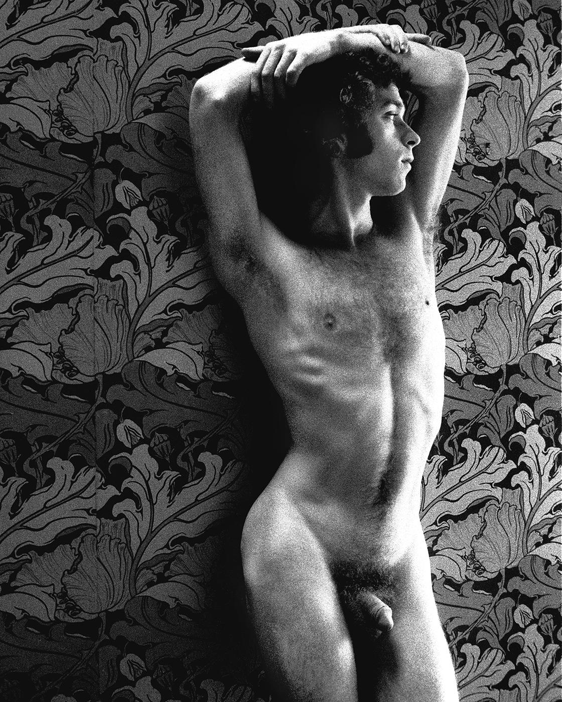
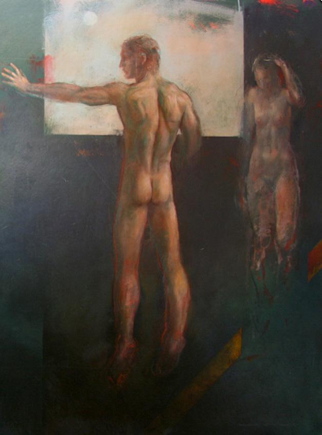
cover: Male bather on gold acrylic on cotton by Michael Leonard, 1983.
Care and technique were used in the edition of this magazine. Even so, typographical errors or conceptual doubt may occur. In any case, we request the communication (falonart@gmail.com) so that we can verify, clarify or forward the question.
Editor’s note on nudity:
Please note that this publication is about the representation of masculinity in Art. There are therefore images of male nudes, including images of male genitalia. Please approach with caution if you feel you may be offended.
Rights and Commitment:
This magazine is committed to artists retaining copyright of their own work. All rights are reserved and therefore no part of this magazine may be reproduced mechanically or digitally without the prior written permission of the artist.
We have been careful to ensure that the images used in this publication have been provided to us by the creators with copyright permission, or are copyright free or are being used under the “fair usage” protocol shared over the internet (images are low resolution, attributed to their creator, not for profit and used only to illustrate a relevant article or story).
If, however, you feel your image has been used by us unfairly and your copyright breached, please contact us at falonart@gmail.com and we will proceed in the best way possible.
Submissions:
If you are interested in participating in the magazine either as an artist, model or journalist, please contact us via e-mail falonart@gmail.com
Editorial
Iwill be obliged to repeat here the phrase by Edmund Burke that I had already included in the editorial of last year’s Falo History annual: “Those who don’t know history are doomed to repeat it.” What we see every day is an atrocious setback in the fundamental rights of humanity in the name of capital; xenophobia, racism and LGBTphobia have reached global proportions.
So, this annual ends up coming with a much greater protesting force. There are artists facing religious institutions, there are designers challenging the fashion industry, there are famous and unknown people, and even that macho gaze full of desires that remains hidden, but takes advantage of sports competitions.
I believe that the best way to fight is to acquire knowledge beyond social networks. Seek to inform yourself from reliable sources that truly aim to enlighten you and bring you closer to the Truth.
Stay safe.
FC Design
R. Mario Portela 161/1603 C, Laranjeiras Rio de Janeiro – RJ 22241-000 Brazil
Filipe Chagas, editor
(Photo: Brazil Photo Press/CON. Source: Them.)
Michael
by Filipe Chagas
Leonard
1933-2013
Born in Bangalore, India, in 1933 to British parents, Michael Leonard (1933-2023) returned to England to complete his education in 1945, at the end of World War II in Europe. At the age of 19, he served in the army and, two years later, went to St. Martin’s School of Art (now part of Central Saint Martins) in London where he studied Commercial Design and Illustration.
At the time, these seemed like subjects more likely to give me a viable future than fine arts. There I learned about the world of typography and graphic design. Since this was long before the advent of computers, everything had to be done by hand.
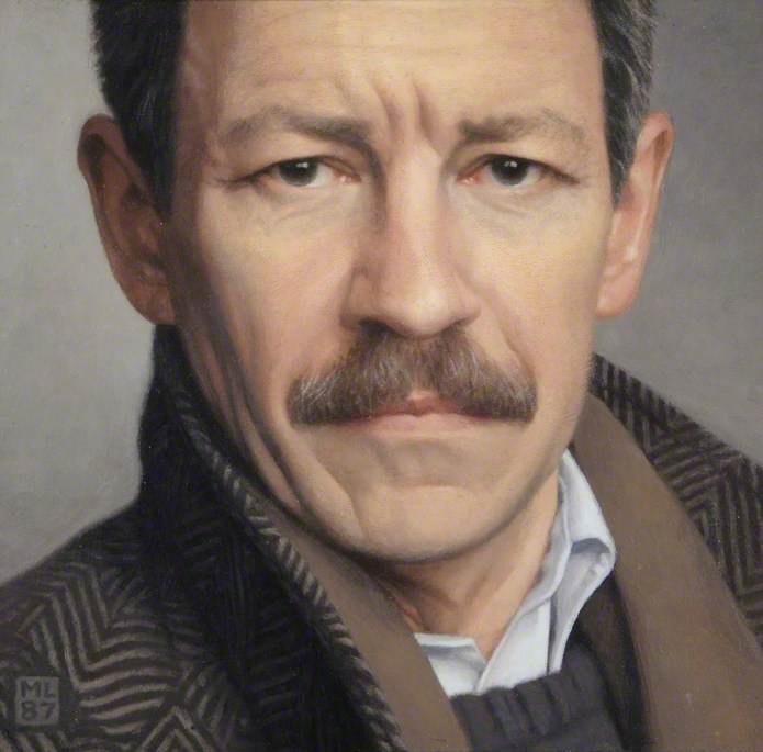
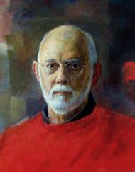
Self-portrait, alkyd oil on Masonite, 1987.
By the time he left the Art School in 1957 he was already working as a freelance illustrator (notably for Reader’s Digest and The Sunday Times Magazine), and for many years he was busy producing artwork for magazines, advertising and the press. He produced covers for every conceivable category of book (biographies, romances, thrillers, war epics and westerns, as well as ghost stories, science fiction and fantasy) and found this great variety extremely stimulating.
While working as an illustrator in a small studio in Soho, New York, Leonard experimented with painting at home (“I felt the need to express a more personal vision”). Lunchtime visits to the National Gallery fueled his growing desire to make pictures for the wall rather than the page.
Although I loved illustration I was aware even then that a good painting had to be more than just a big illustration in a frame. What that ‘more’ might be I was yet to discover.
At first, his paintings tended to be formal, sober and discreet, with people sitting in their living rooms with their dogs or sailing on the river, in an attempt to distance himself from his school sketchbooks and the sensationalism of the commercial world. He was inspired by American realist painters such as
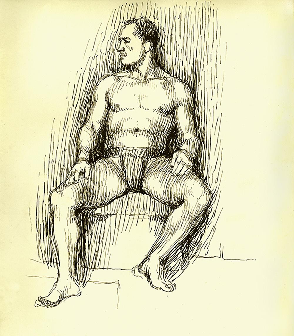
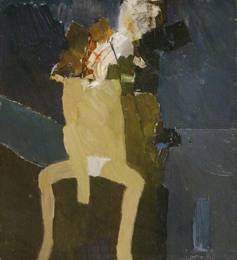
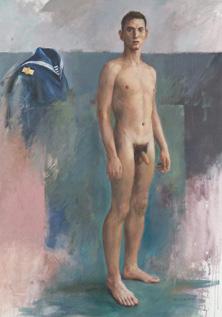
Hefty nude, pen and Indian ink on paper, 1955.
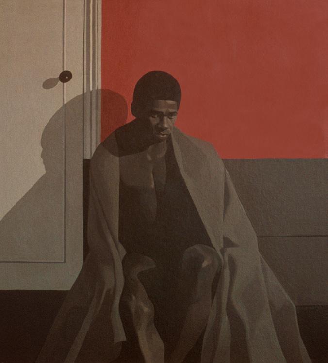
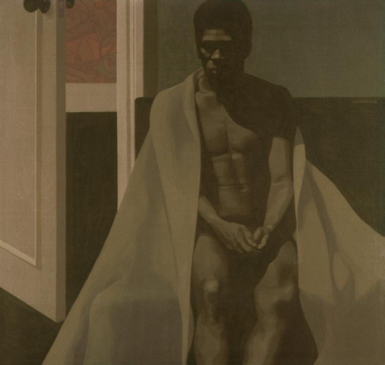
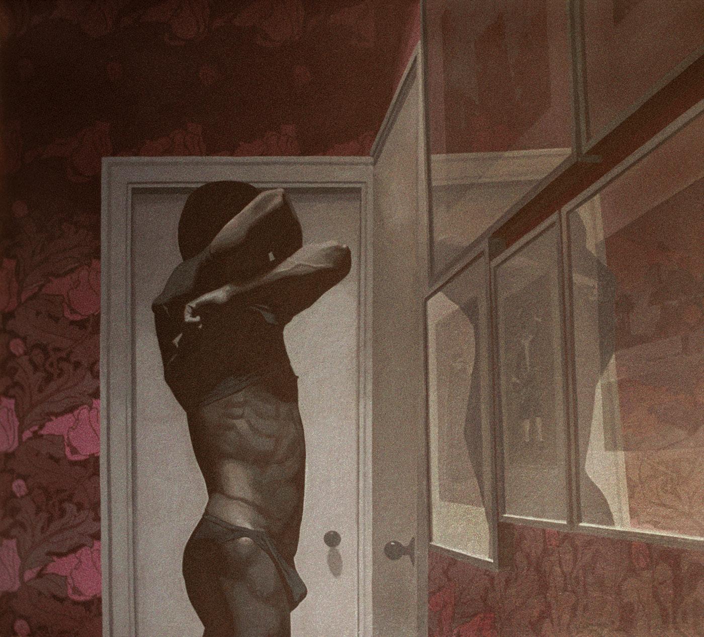
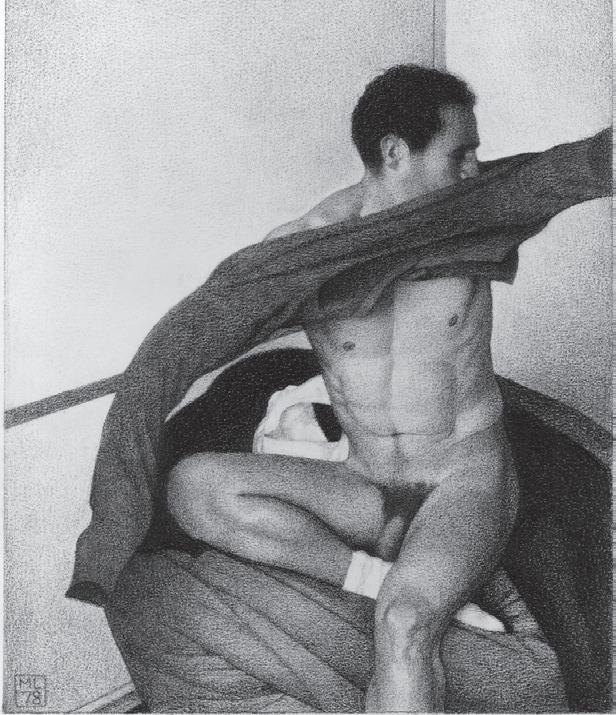
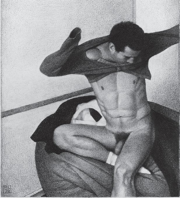
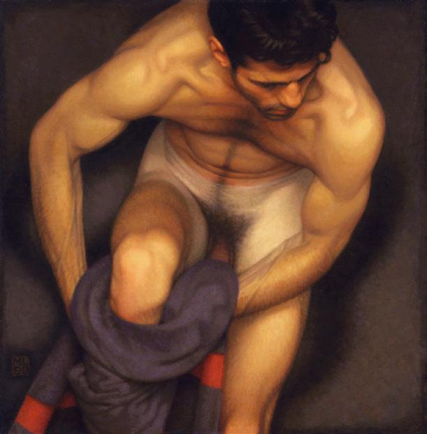
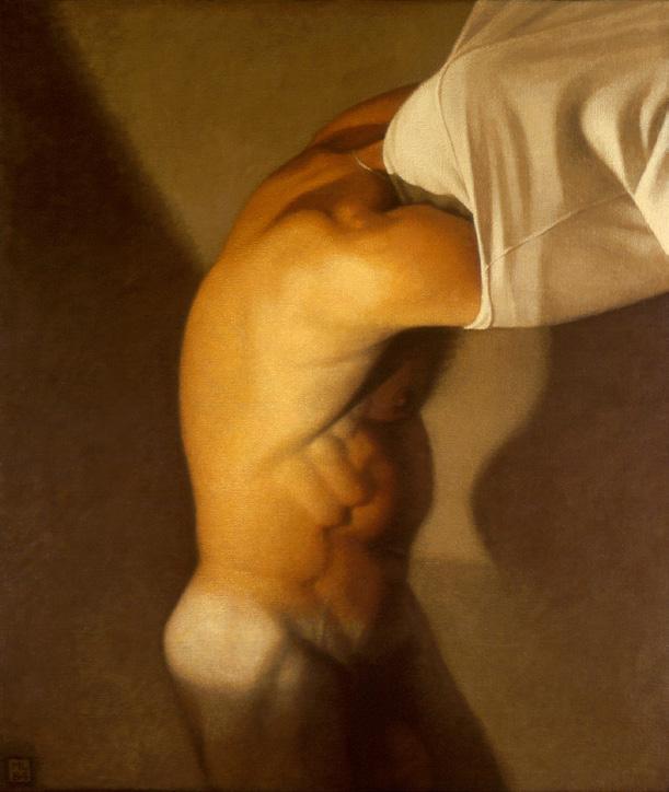
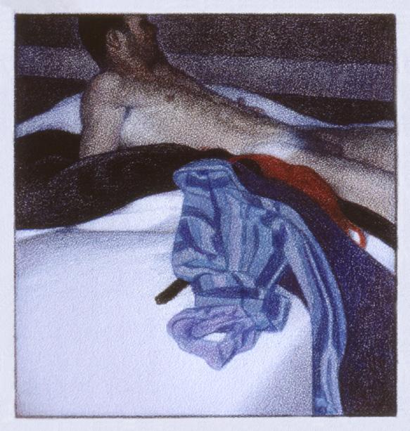
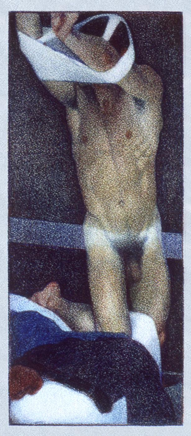
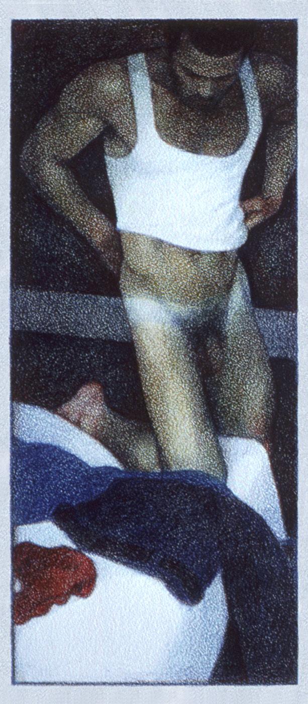
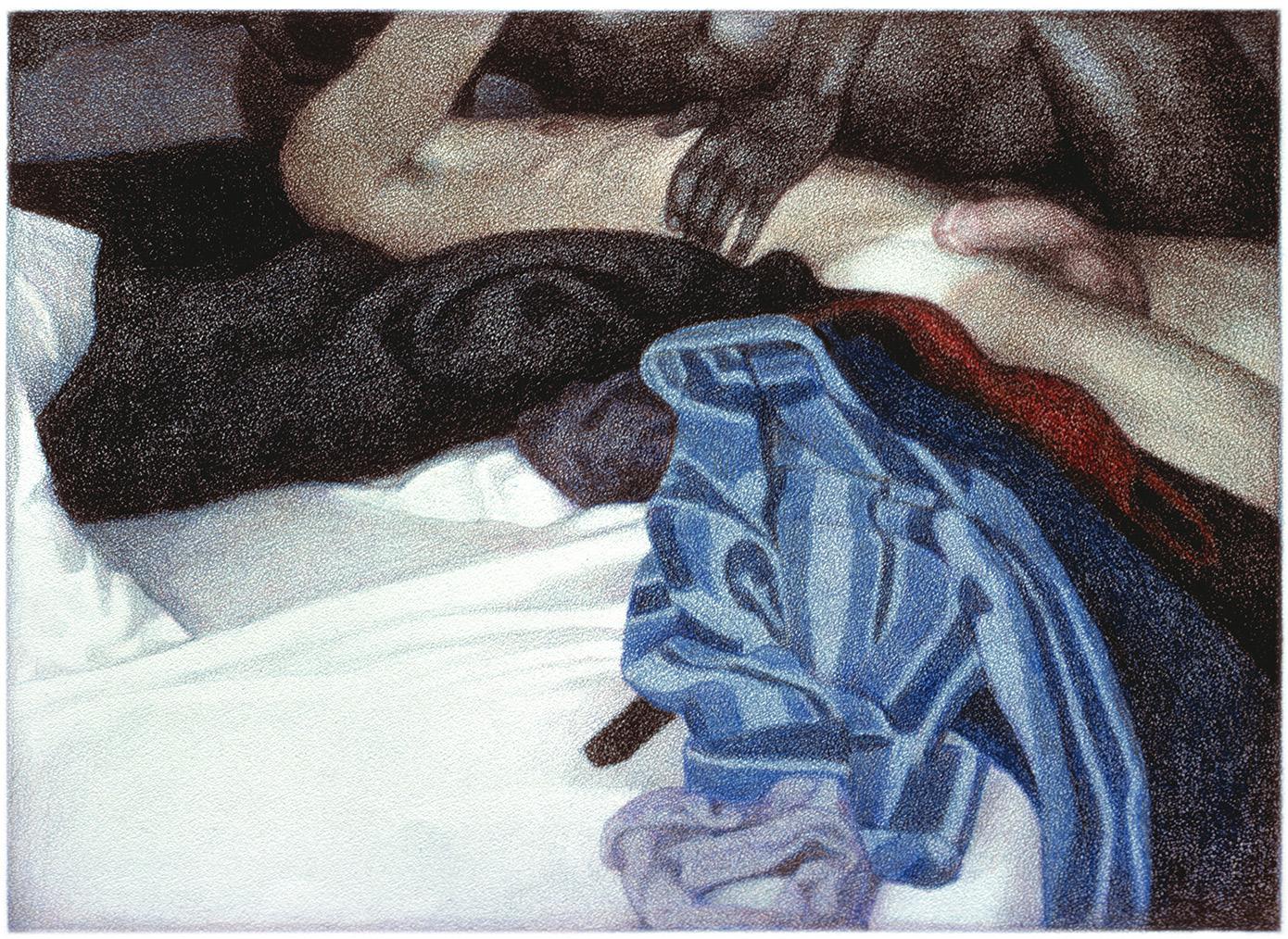
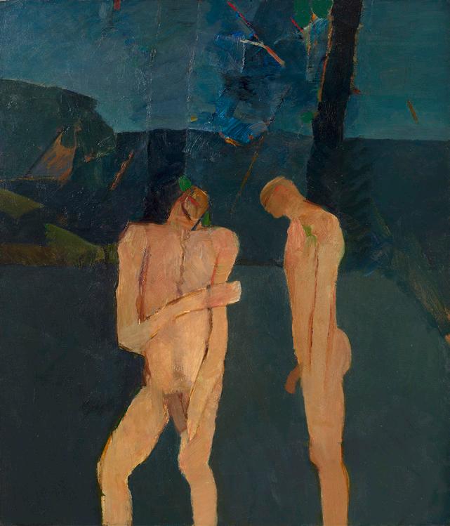
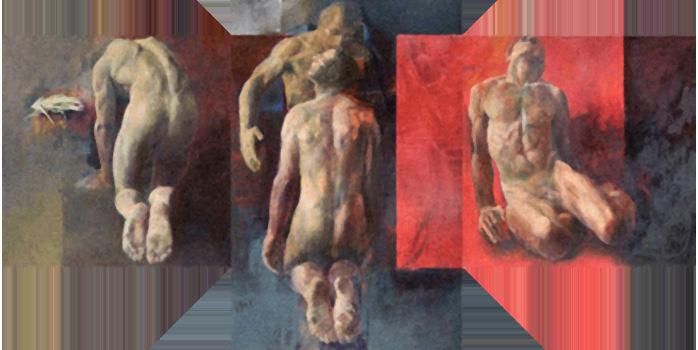
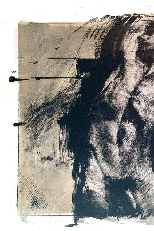
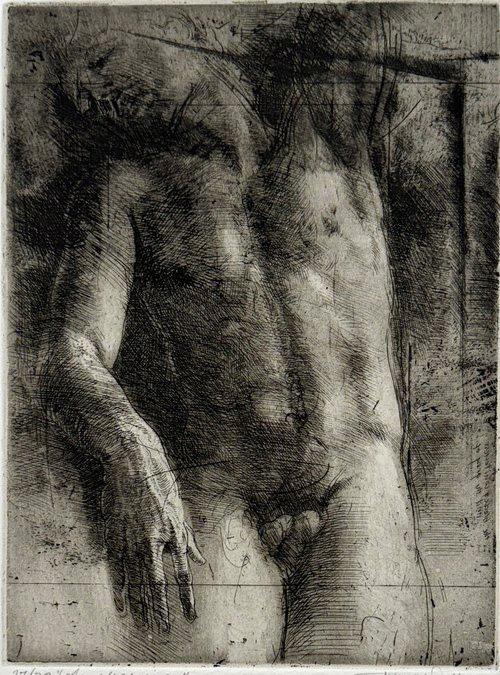
Next page, Leroy with blanket 1 and 2 and Dark figure undressing, all in acrylic on Masonite, 1970.
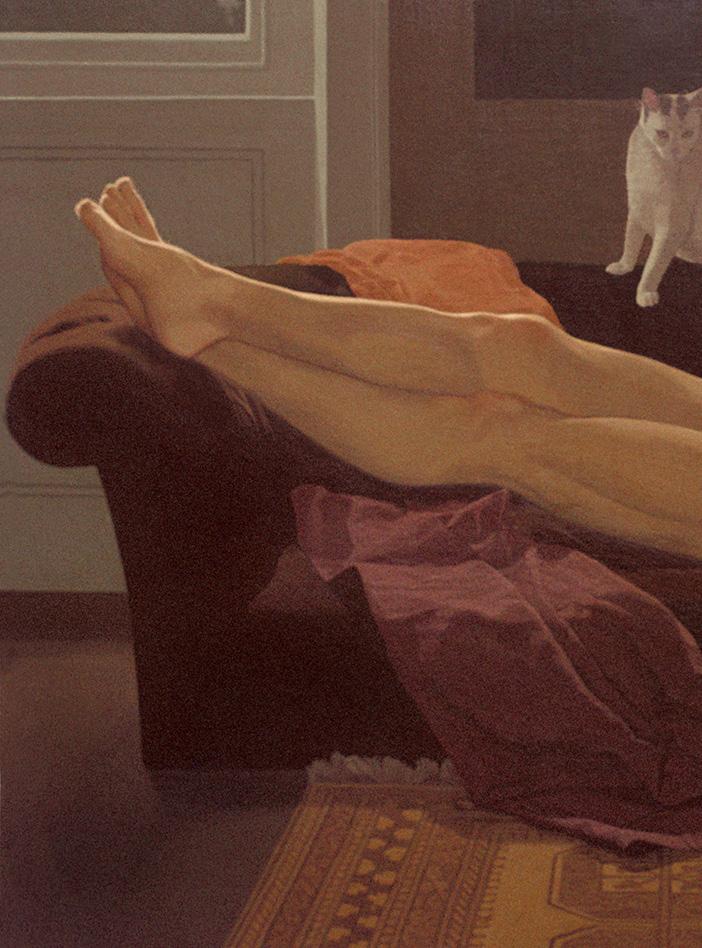
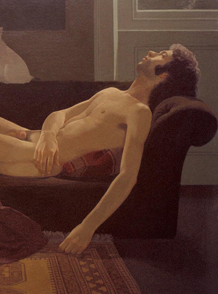
Shawn with a white cat, acrylic on Masonite, 1971.
Edward Hopper (1882-1967), who had also made a career as an illustrator, and by “lyrical” realists such as Paul Cadmus (1904-1999).
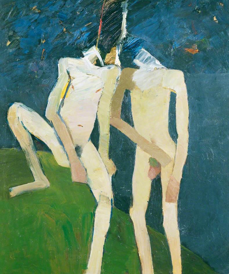
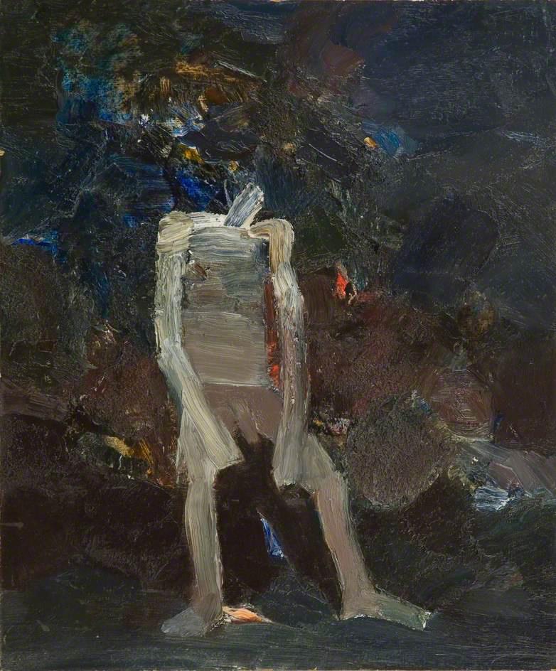
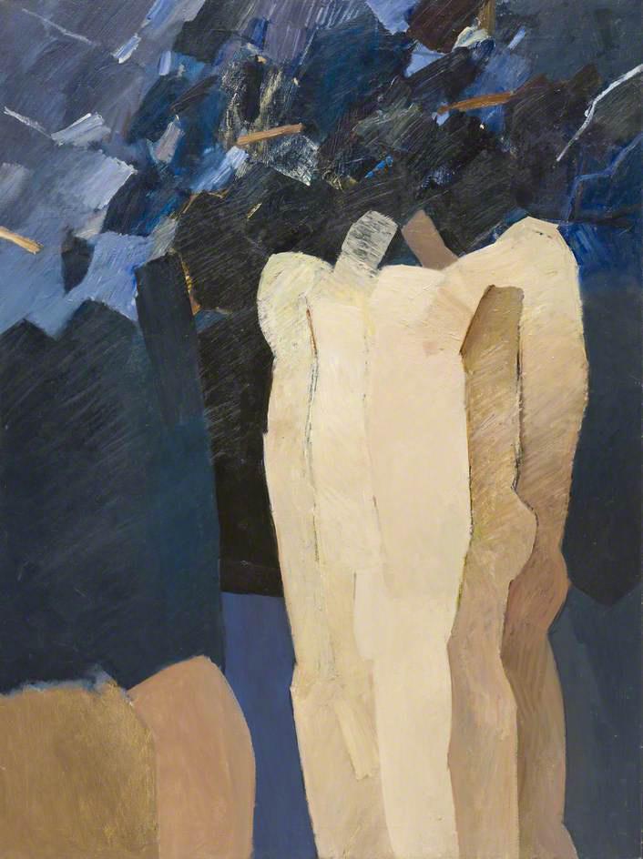
In 1966, still searching for a suitable mode of expression, he embarked on a series of highly textured paintings on mythological themes (“I was obsessed at the time”). He also created images that suggested recently excavated ancient artifacts, with traces of dirty still clinging to them. There is a noticeable abstractionist inclination (“which I found in the work of Robyn Denny [1930-2014]”) during this period, but it did not last.
Emerging Figure, mixed media, c. 1960.
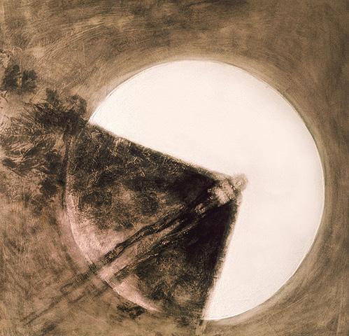
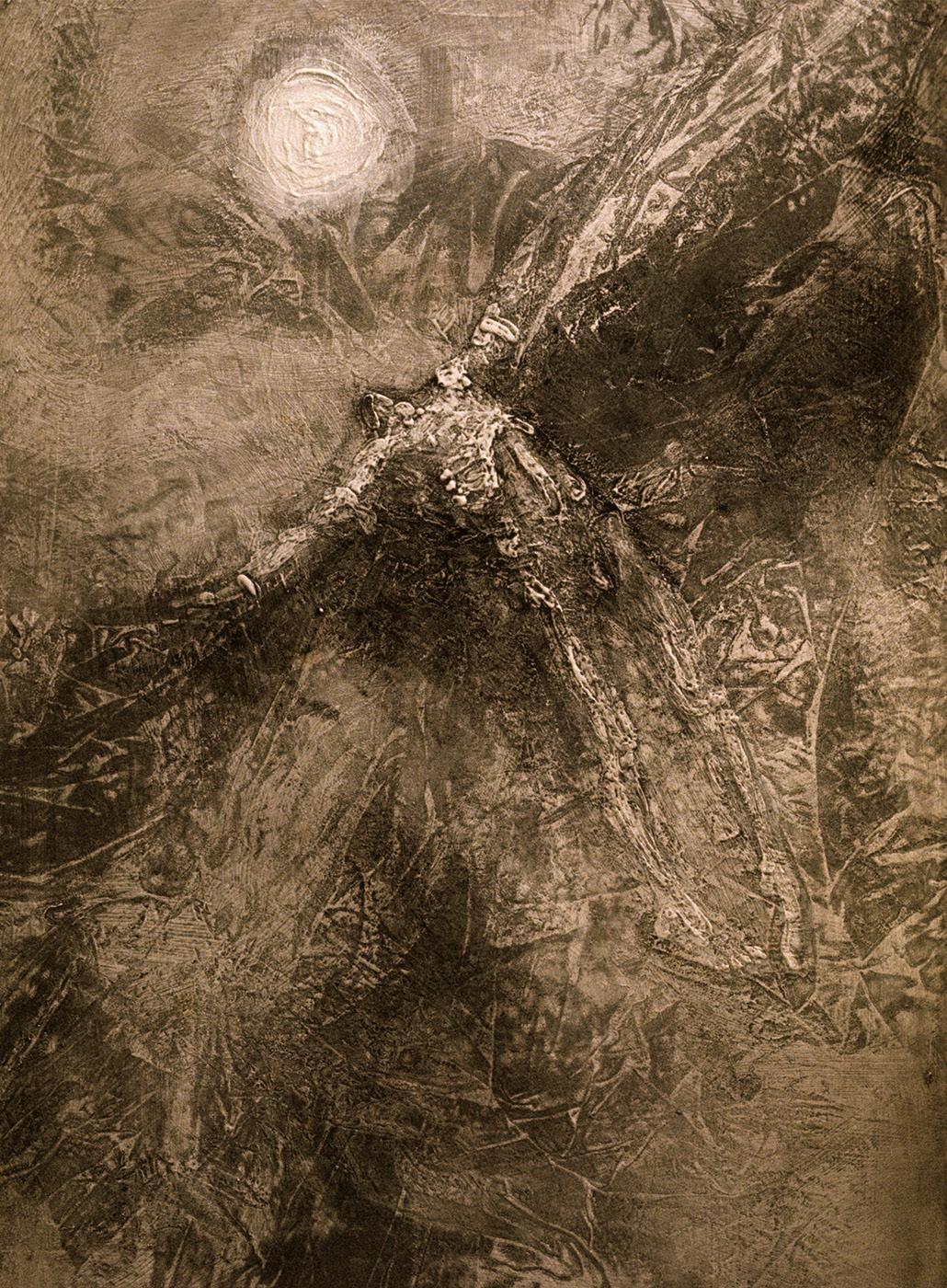
Icarus across the Sun and Icarus burning up, both in mixed media, c. 1960.
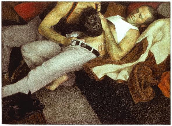
Throughout his professional life, Leonard also used photography – which he developed himself – whether as a hobby, a means of expression or a tool to record for his pictures. He often encouraged his models – usually friends – to act rather than expecting them to be themselves in front of the camera (“paradoxically, this helped them relax”).
I processed a film for the first time in 1967, passing it nervously from hand to hand through some developing fluid in a darkened room. [...] Soon I discovered that dense black negatives subjected to long exposure, could result in prints as seductively grainy as Seurat drawings.
Shawn’s photo.
In fact, many of Leonard’s graphite drawings suggested the same grainy path taken by George Seurat (1859-1891) in the development of Divisionism, a painter he revered for his treatment of negative space, that is, the importance given to the entire composition, not just the main figures. Over time, even his photography lost its graininess and took on a more documentary tone.
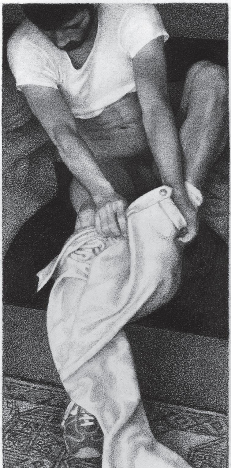
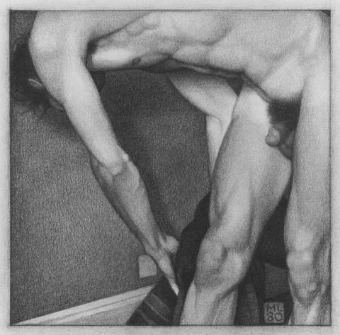
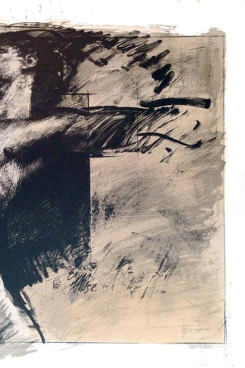
Graphites on paper, 1978-79.
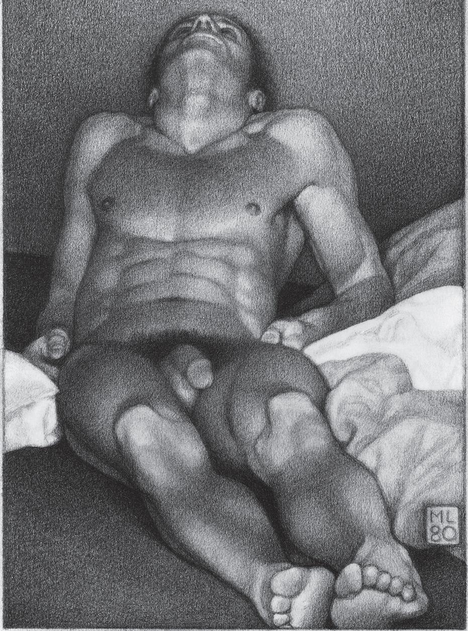
Man lying back, graphite on paper, 1980.
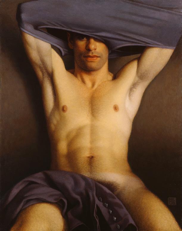
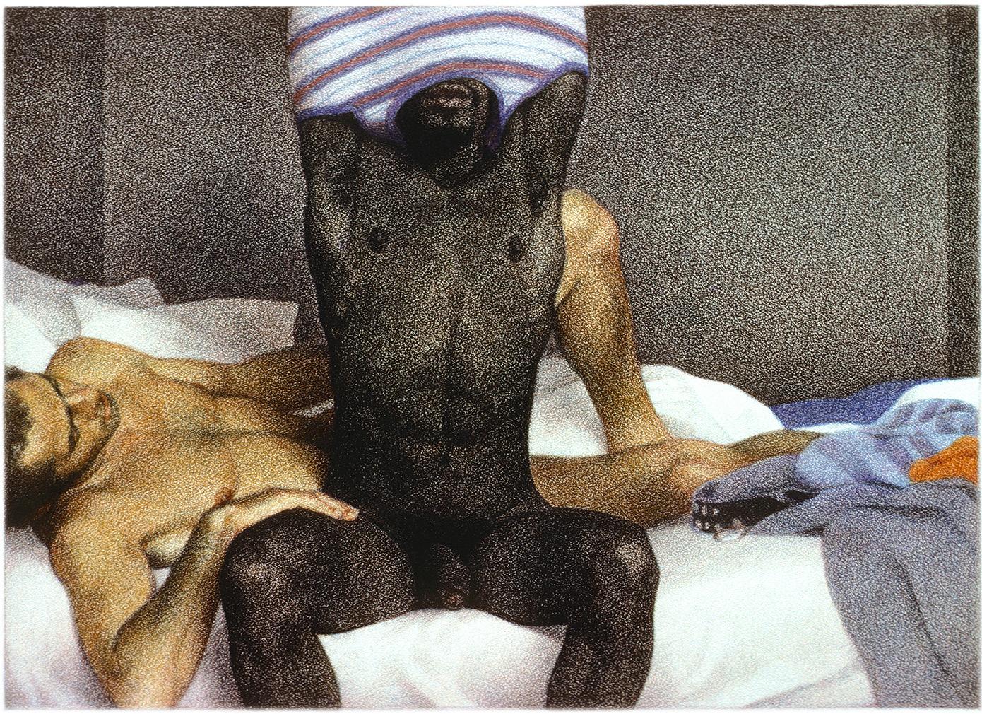
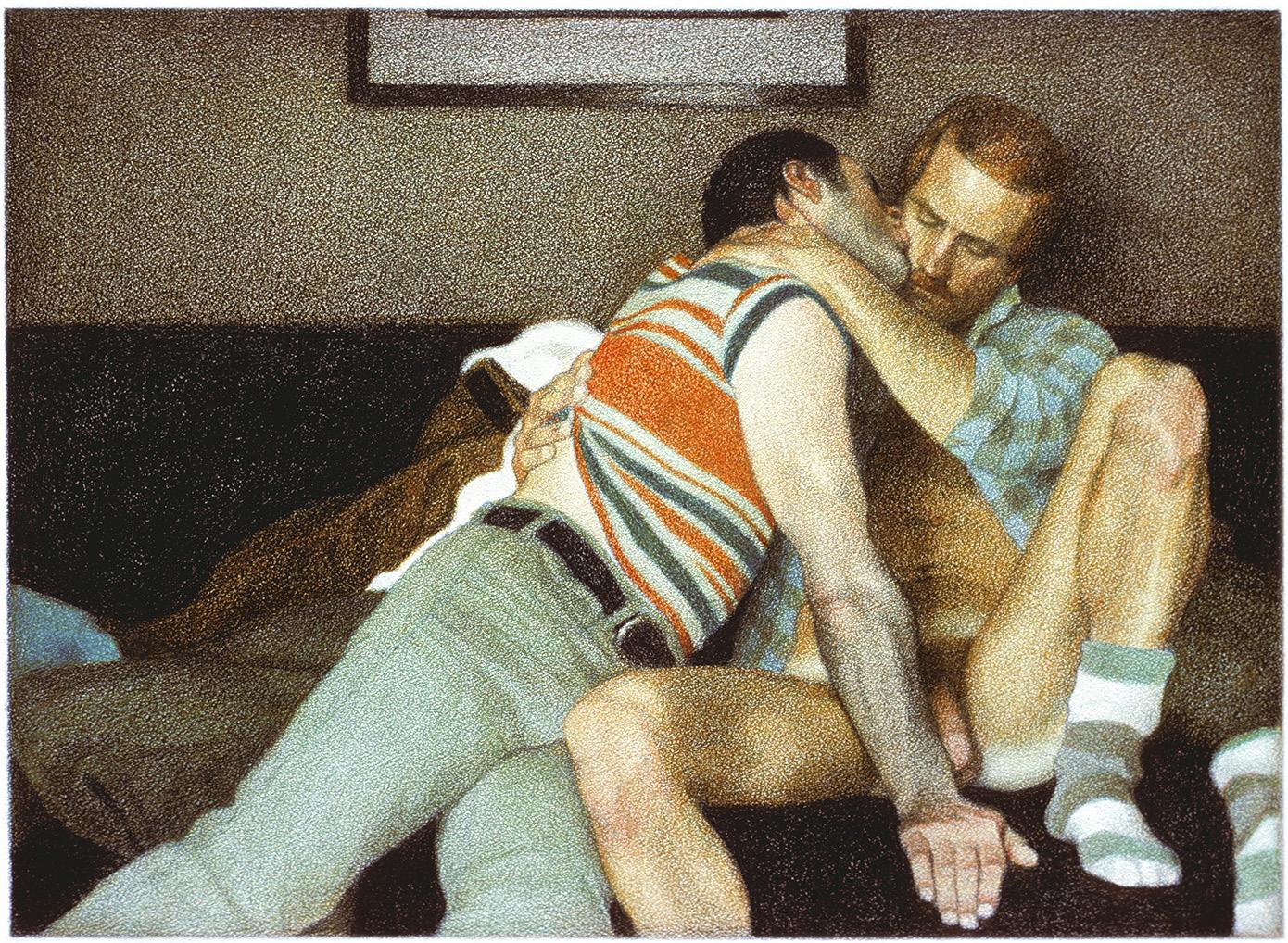
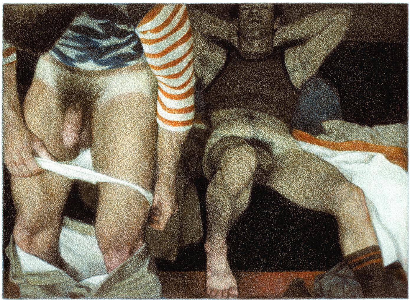
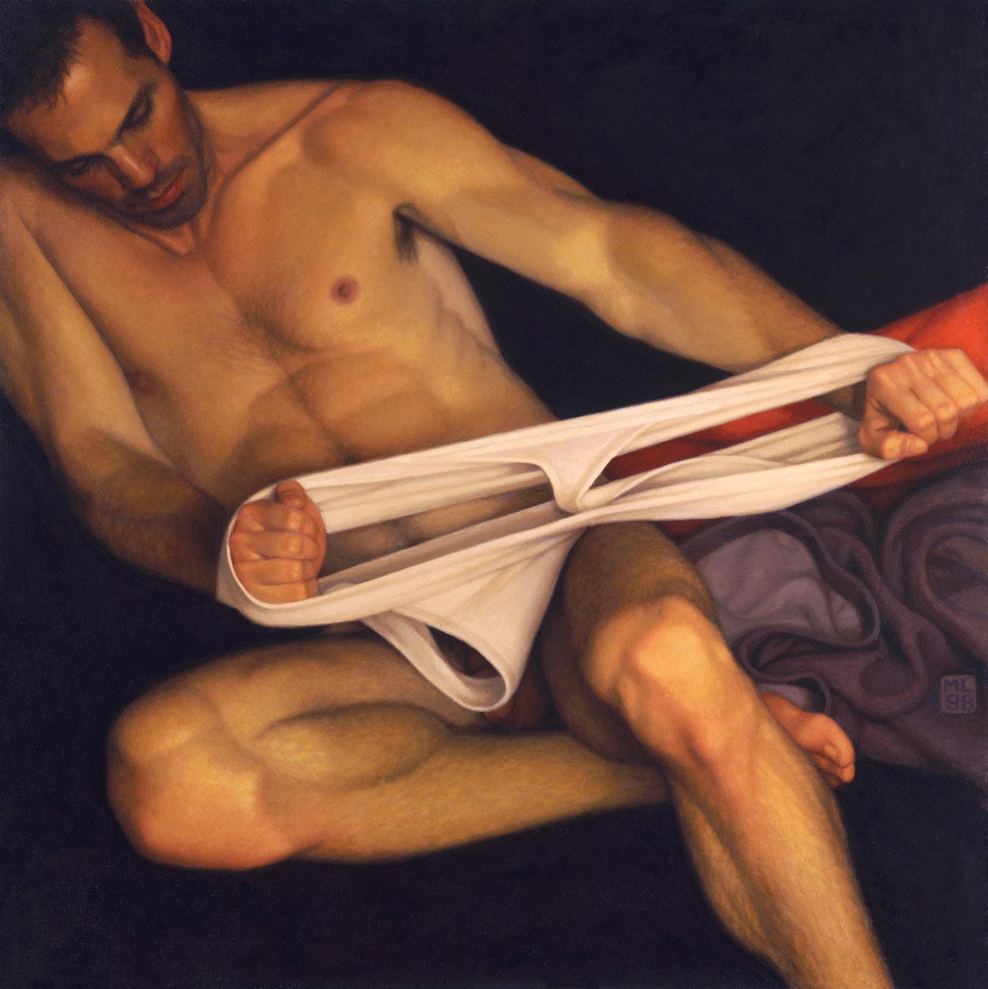
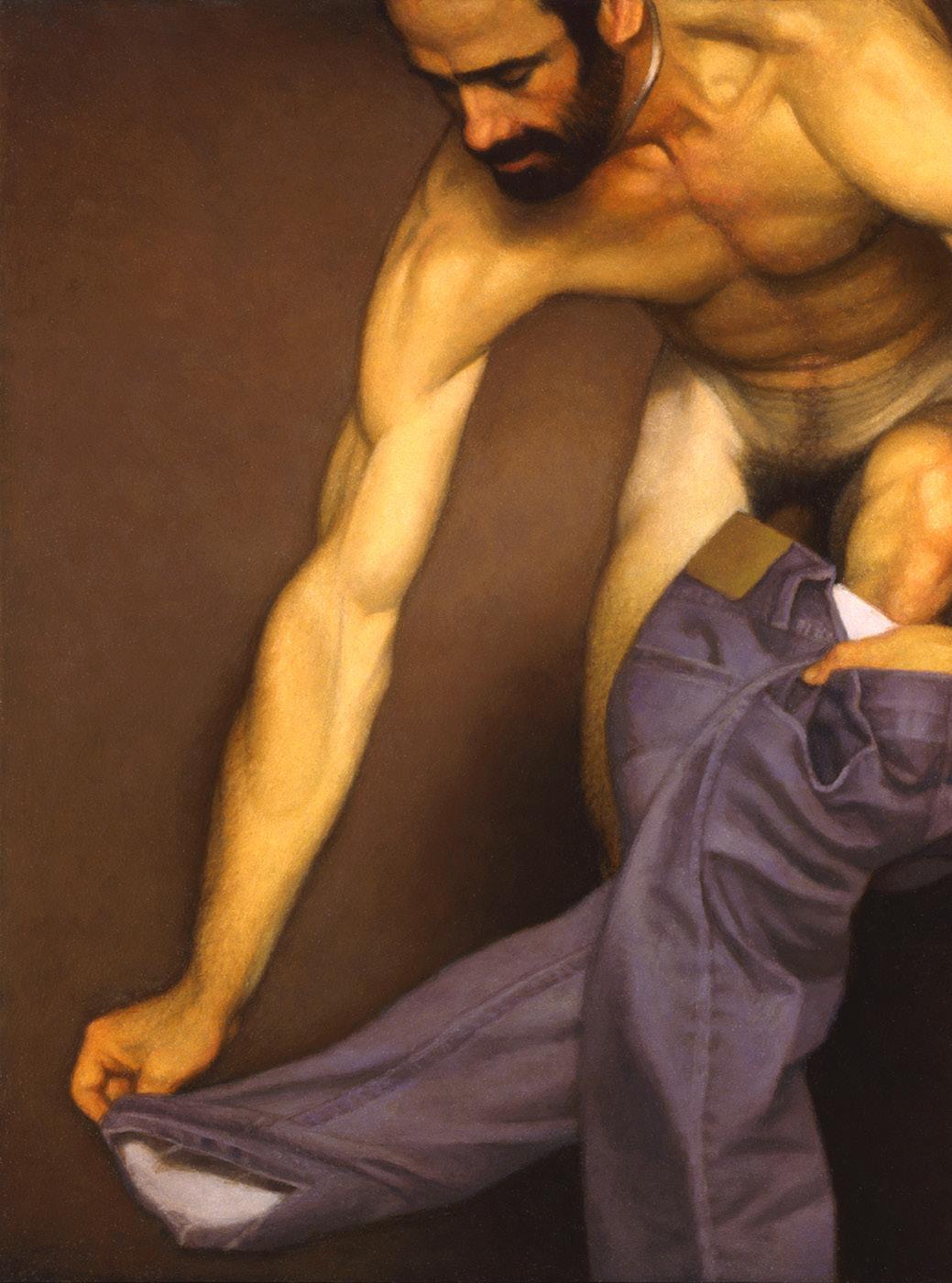
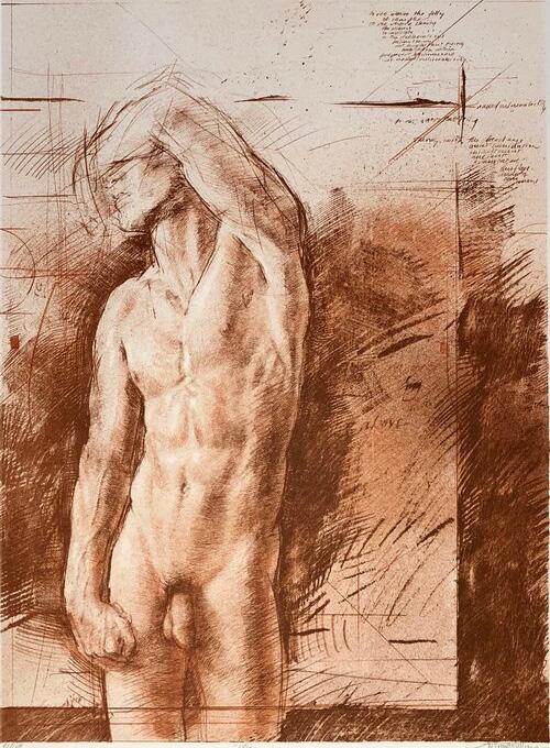
Color and dynamism began to emerge in his painting, inspired by the impressionist painters Edgar Degas (1834-1917) and Gustave Caillebotte (1848-1894). The male nude became a recurring theme for the study of dynamic movement, even when the figures were at rest or in a state of transition (mostly in the act of undressing or dressing). For this reason, almost all of his nude paintings have drawings that, in addition to being preparatory studies, are ends in themselves.
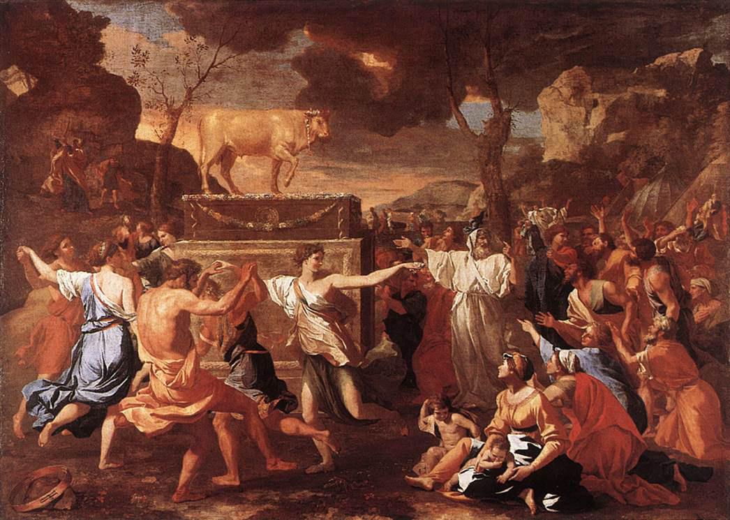
In 1969, Leonardo painted his fellow illustrator Roger Coleman, with whom he enjoyed visiting the National Gallery. Leonard revealed that one day, while the two were standing in front of Nicholas Poussin’s (1594–1665) “The Adoration of the Golden Calf,” Roger asked him what he thought of the painting. After looking at it for a while, Leonard realized that, although full of dancing and gesticulating figures, the image maintained a satisfying balance in an ordered sequence of forms and spaces. Then he realized that this was the creative path he had been searching for all along.
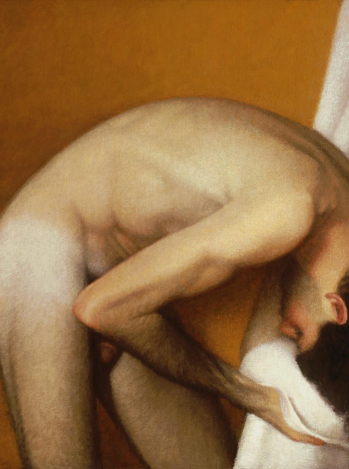
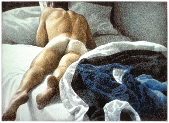
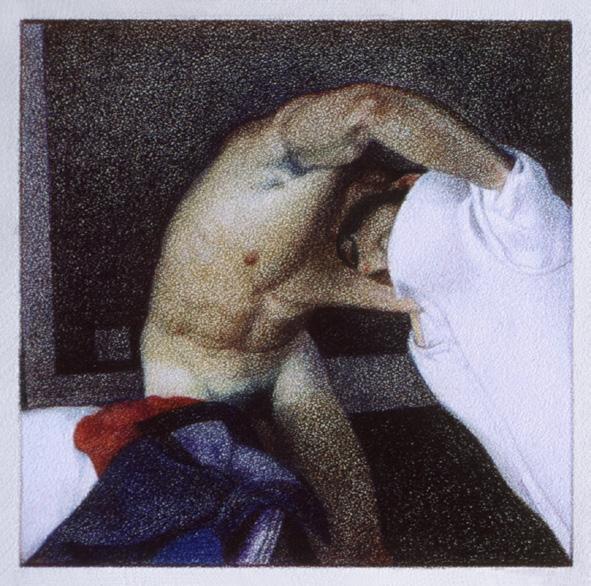
The ordinary actions of every day present endless pictorial potential. A half turn, a change of balance, sometimes just an intention to move can animate an entire figure. This is most clearly and dramatically apparent in the male anatomy. I am fascinated by the subtle interactions of muscles, bones, and tendons that come into play when a body moves. Quite unconsciously, a man makes wonderful shapes in the course of pulling on a T-shirt, stepping into a pair of trousers or towelling himself dry after bathing. I would ask my models to move in slow motion to give me a chance to capture some of the wonderful shapes they were making. These shapes often suggest the urgency of sport or the measured grace of dance and every now and again, bring to mind the posture of a memorable figure from a great work of art. I admire [Egon] Schiele (1890–1918) for his erotic power, graphic perfection, and unerring sense of design. With these references in mind, even the most routine activity acquires resonance.
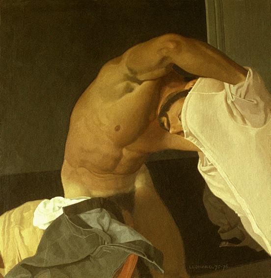
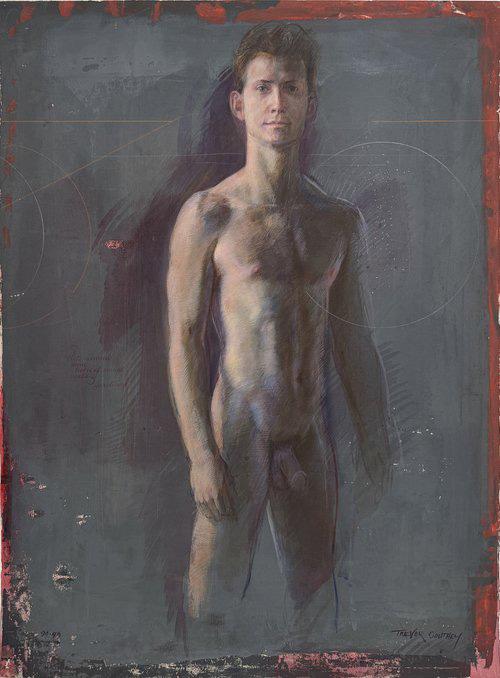
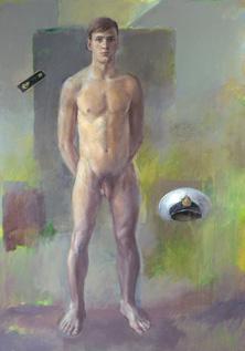
Man undressing, acrylic on Masonite, 1978.
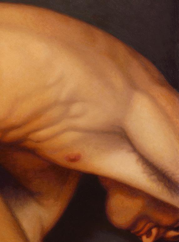
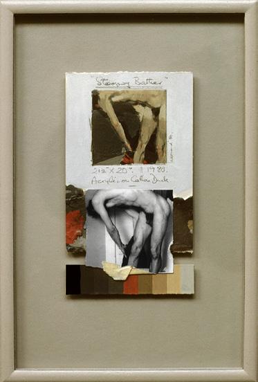
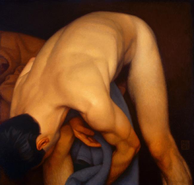
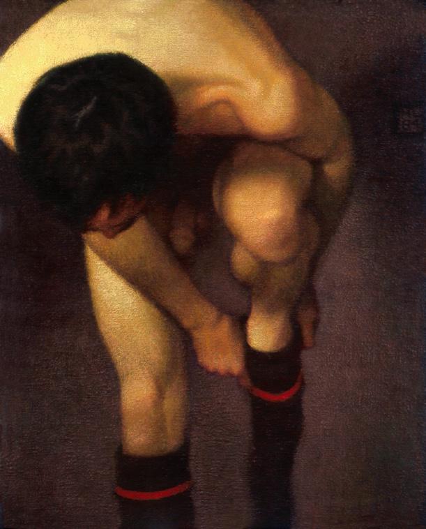
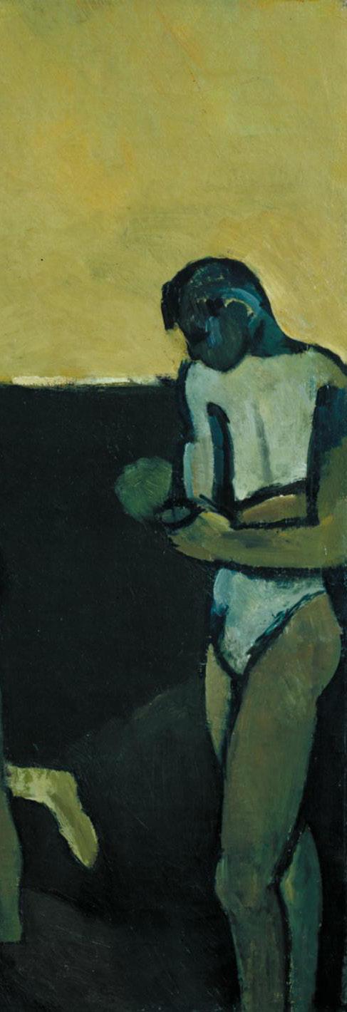
Above, Stooping Bather, acrylic on cotton, 1980. Beside, graphite study and mixed media collage with original photo and color palette.
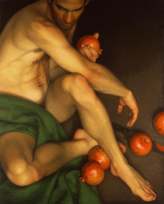
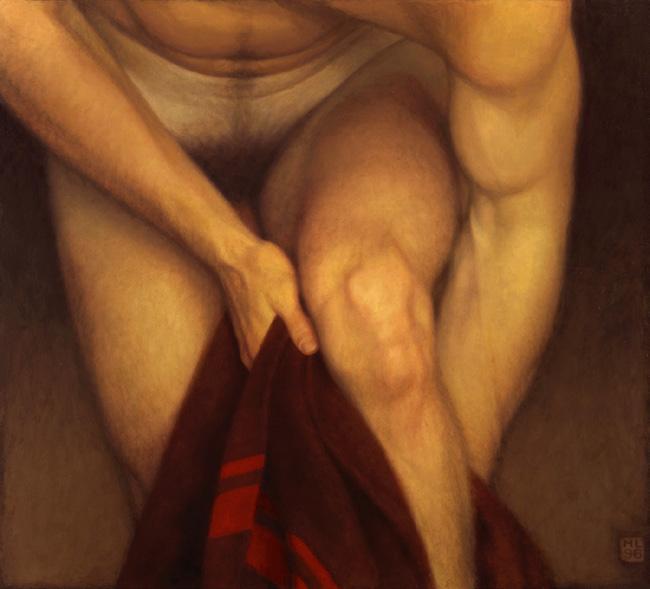
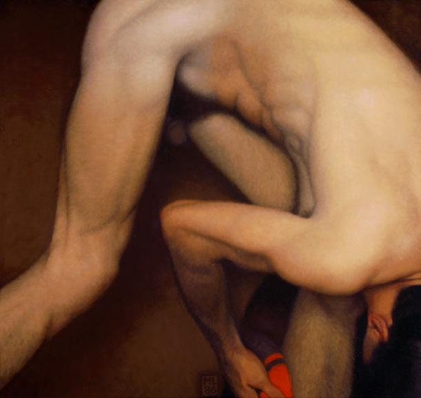
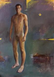
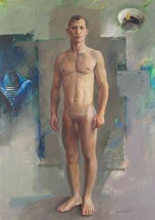
(12) Nu curvado, acrílica sobre algodão, 1984. On previous page: (1) Bather off balance, alkyd oil on Masonite, 1999; (2) Seated Nude, acrylic on cotton, 1983; (3) Torso, alkyd oil on Masonite, 2008; (4) Change into white, alkyd oil on Masonite, 1994-96; (5) White sock, alkyd oil on Masonite, 1986; (6) Twisting torso, acrylic on cotton, 1986; (7) Bather drying his leg, alkyd oil on Masonite, 1991; (8) Bather drying his leg, alkyd oil on Masonite, 1986; (9) Pomegranate Man, alkyd oil on Masonite, 1995; (10) Torso; The Minotaur, acrylic on cotton, 1984; (11) Bather’s Knee, alkyd oil on Masonite, 1996; and (12) Bending Nude, acrylic on cotton, 1984.
In portraits I aim for a vivid presence, in nudes a sense of dynamism and animal grace, in still-life a charged but harmonious arrangement. In all my work observed reality is underpinned by abstract values.
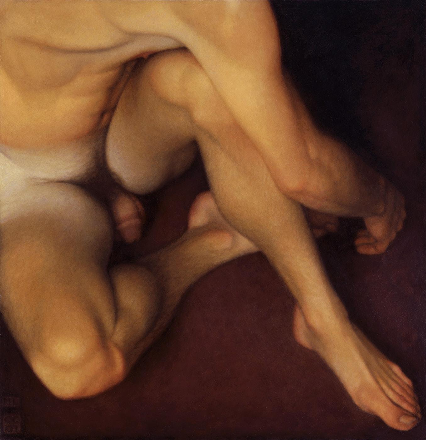
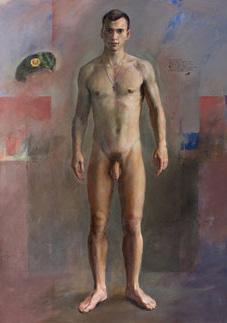
Pattern of Limbs, alkyd oil on Masonite, 2000-2001.
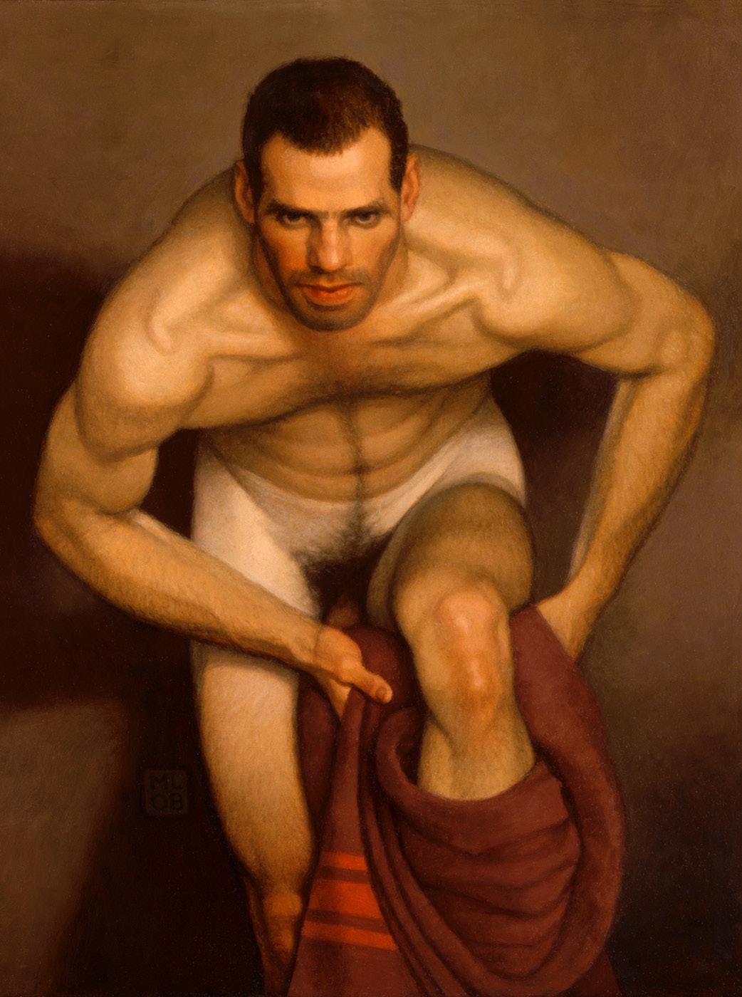
Bather with intent 2, alkyd oil on Masonite, 2008.
In 1972, his work caught the attention of a distinguished London gallery, and several of his paintings were included in one of their group exhibitions. Finally, after forty years of creating, in 1974 the gallery gave him his first solo show, and he gradually left illustration in the background.
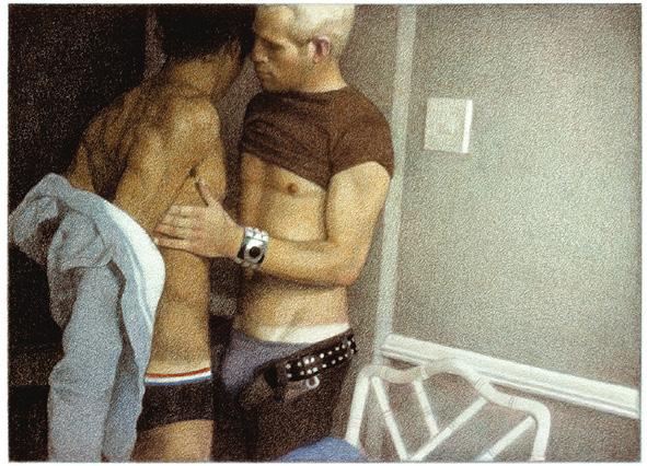
In 1977, Leonard created works for the book The Joy of Gay Sex and says:
[British publisher] Mitchell Beazley enlisted my help with their next project, The Joy of Gay Sex, a gay counterpart to Alex Comfort’s The Joy of Sex. The world was a very different place in the mid seventies. The gay revolution was still in its early days and the spectre of AIDS had yet to fully reveal itself. To a diffident gay man like myself, it seemed the perfect moment for such a book.
It is worth remembering that having homosexual relations was considered a crime in England and Wales until 1967, in Scotland until 1980 and in Northern Ireland until 1982. Leonard used his images with excessive voyeuristic sensuality to touch on changes in society.
Colored pencil illustrations for the book The Joy of Gay Sex, 1977.
On the steps, acrylic on cardboard, 1981.
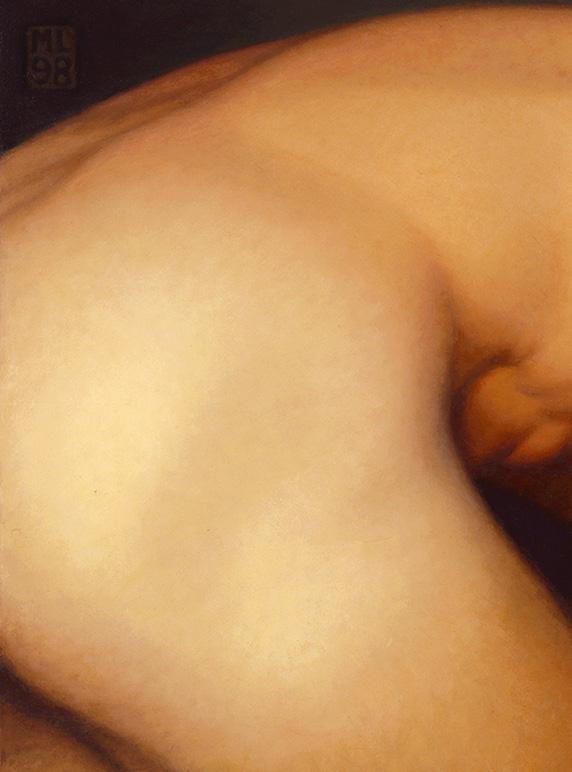
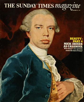
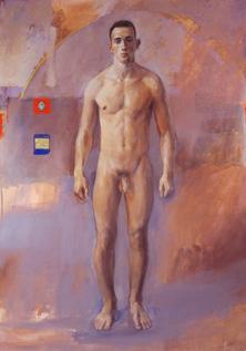
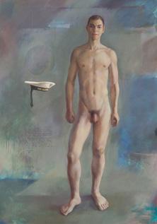
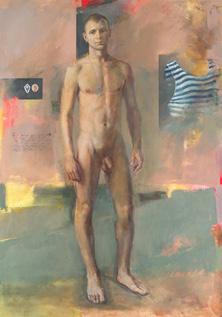
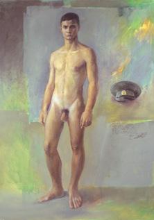
By the 1980s, Leonard was painting full-time – with a preference for bathers, sometimes slightly off-balance, in the act of drying themselves, in reference to the German avantgarde and Cubist styles. He also illustrated and painted portraits on commission, the best-known of which are the portrait of Jackie Kennedy (cover of The Sunday Times Magazine, 1967), Mick Jagger as Casanova (cover of The Sunday Times Magazine, 1977) and the Portrait of Queen Elizabeth II*, commissioned in 1985 by Reader’s Digest magazine in honour of her sixtieth birthday (which is now in the permanent collection of the National Portrait Gallery, London).
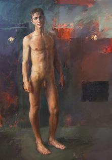
Stretch, alkyd oil on Masonite, 1998.
Climbing out, alkyd oil on Masonite, 2008.
Another well-known series was “Portraits in Time,” which casted contemporary faces back in time to a period that best matched their facial features. Adopting the style of an old master, Leonard used the trompel’oeil technique with graphite. By this time, he was no longer taking on commissions for book designs. However, several authors asked permission to use his paintings and drawings as cover art.
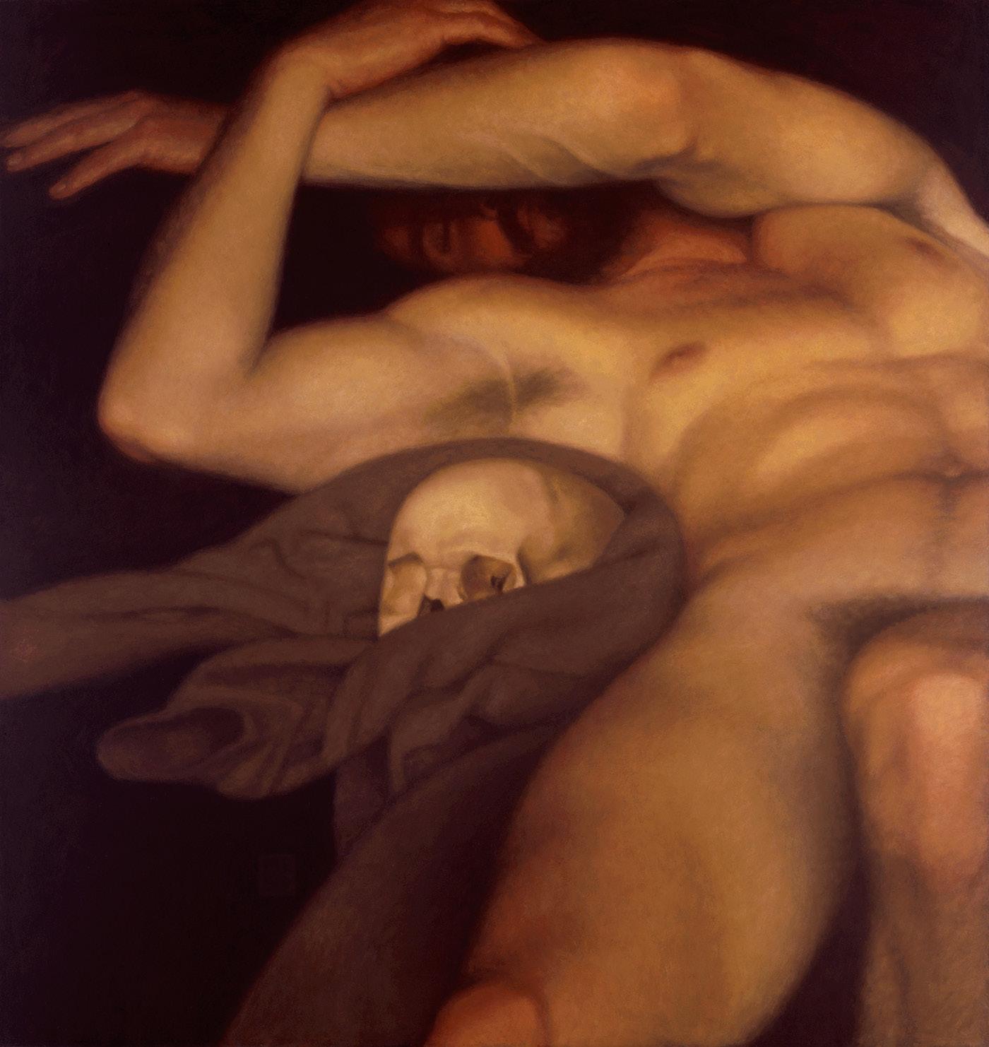
It was not uncommon for Leonard to revisit one of his compositions if he felt particularly drawn to it. In 2009, Leonard was revisiting his earlier painting Vanitas (alkyd oil on Masonite, 1991, above) when he decided to stop due to tremors in his hands. He died in London in July 2023.
While my paintings are largely celebratory, I try to charge them with enough intensity and inner life to persist in the memory.
8=D
Keith Vaughan
1912-1977
by Filipe Chagas
Ninth Assembly of Figures (Eldorado Banal), oil on canvas, 1976.
Through his 61 diaries – published in a selected mode in 1966 and in a more extensive mode in 1989, after his death – the British painter, designer and writer John Keith Vaughan (1912-1977) became better known to the general public.
Born in Selsey, West Sussex, the son of Eric George Story Vaughan, a civil engineer, and his wife Gladys Regina Marian Mackintosh, he attended Christ’s Hospital School, where he suffered intense bullying. He was fortunate to have been encouraged by the headmaster of the institution, who noticed the boy’s clear interest in the visual arts. Self-taught, he began to study the works of the great masters and the technique of oil painting.
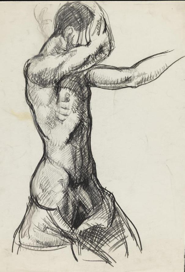
Life-drawing of a male nude, graphite and charcoal on paper, 1932.
After leaving school, Vaughan was hired by Lintas, a Unilever advertising agency, where he worked from 1931 to 1938 and acquired some knowledge of form and composition. He befriended the Australian artist John Passmore (1904-1984), who also worked at the agency, and they spent time together painting, listening to music and enjoying ballet.
He left the agency in 1939 to paint full-time and began writing his diaries. However, his art was interrupted by the outbreak of World War II. Vaughan registered as a “conscientious objector” (i.e., he claimed his right not to serve in the war) and joined the St. John Ambulance, but was eventually conscripted into the NonCombatant Corps along with the painter John Minton (1915-1957). He worked as a clerk and German interpreter in a prison camp, and met the painters Graham Sutherland (1903-1980) and John Craxton (1922-2009), who were also serving.
Due to the lack of time to paint during the war, he combined watercolor, gouache, pen, ink and wax with a visual result appropriate to the decadence in which he lived. He held his first exhibition of drawings at the Reid and Lefevre Gallery in London in 1942, and participated in an exhibition on war art at the National Gallery.
In 1945, Vaughan was impressed by works by Pablo Picasso and Henri Matisse on display at the Victoria and Albert Museum. Fascinated by Cubist studies, Vaughan wrote in his diary that Cézanne affected him “in a total, almost physical way.”
After the war, he worked part-time as a teacher in illustration at Camberwell School of Art (1946-48) and as an illustrator for the Hogarth Press, the poet John Lehmann (1908-87), and others. Sharing a studio with Minton, Vaughan
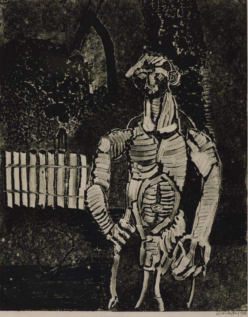
Figure in a Churchyard, relief print on paper, 1948.
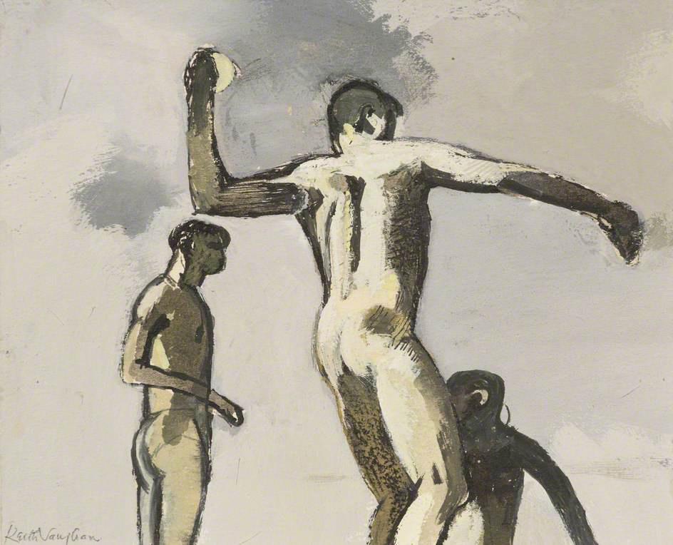
Figure throwing at a wave, gouache on paper, 1950.
returned to painting dreamlike landscapes populated by tense, agile figures, inspired by the ballet he so admired. Both were part of the neo-romantic circle that flourished during the war, combining idyllic pastoralism with a romantic sense of the natural world as a threat to humanity.
He taught at the Central School of Art from 1948 to 1952. One of his students, Ramsey McClure, became his lover and life partner. Despite their complicated relationship, McClure provided some inner stability for Vaughan. By the mid-1960s, they began to live apart.
In 1953, Vaughan discovered the work of Nicolas de Staël and devoted himself to exploring a fusion of figurative and geometric abstract art to develop a particular style that, consequently, distanced him from neo-romanticism and set him apart in British painting. He confessed to believing that he was out of step with his time, finding similarities in “Auden, Beethoven, Cézanne, but in no living person”. It is worth mentioning that the artist never saw himself as a completely abstract artist, as he considered that “painting that does not contain a representational element hardly goes beyond design”.
Leaping figure, oil on canvas, 1951.
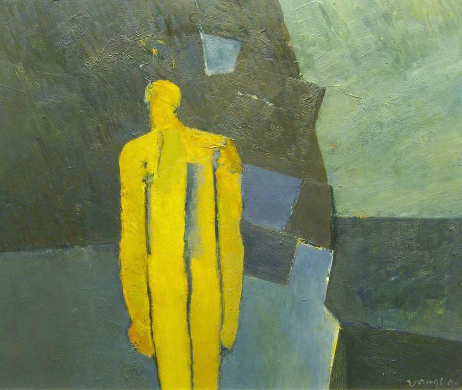
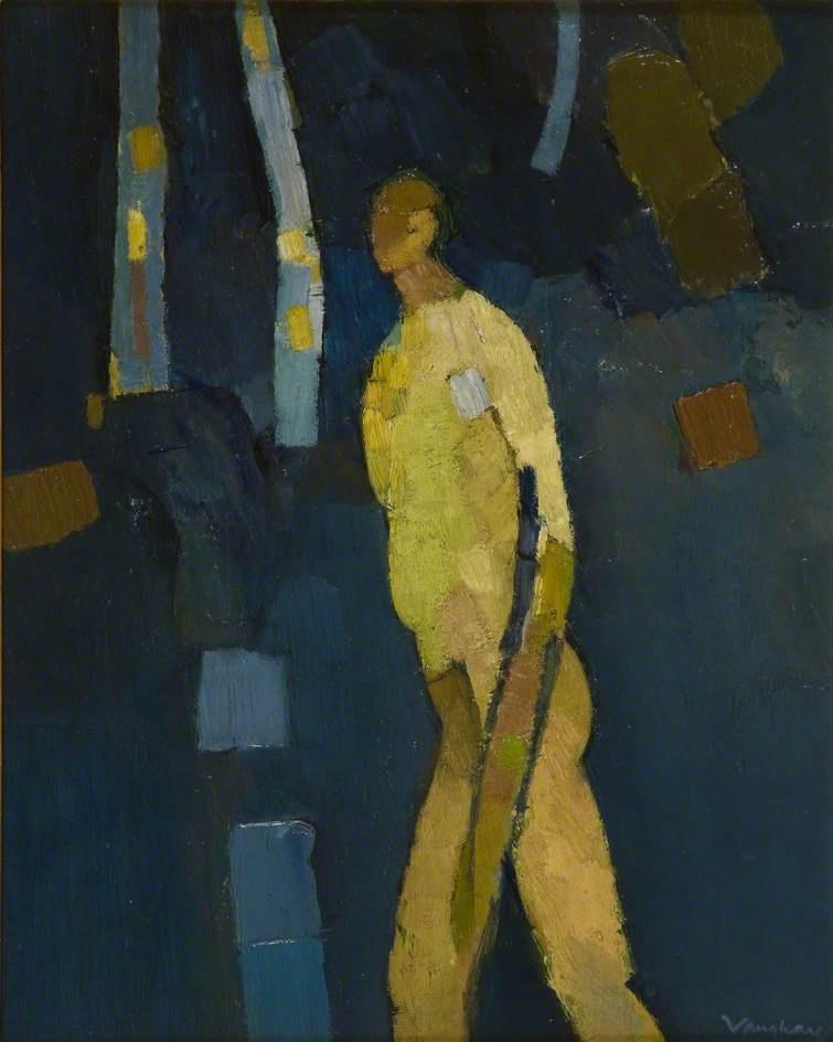
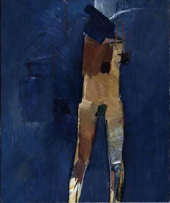
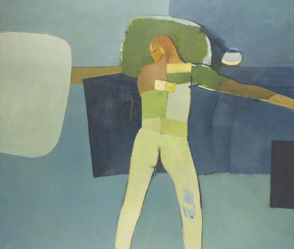
One of Vaughan’s artistic actions was the gender reversal of the classic theme of bathers, so frequent in the works of Cézanne and Picasso: instead of women, the artist painted nude men. The male nude was a frequent theme, a possible way of dealing with the frustrations of his homosexual fantasies. He constructed his nude figures as hard and soft, geometric and organic, lacking almost all detail and offering little insight into individual personality or even sexual narrative. This universal image of man became a vehicle for the expression of his emotions, of a poignant loneliness.
His diary entries from this time reveal his anger and struggle against the injustices of being a gay man living in a time when samesex relationships were still criminalized. Historian and curator Ian Massey considers that all of Vaughan’s landscape work is, in fact, “a metaphor for both the physical body and its absence.” The artist himself wrote:
These compositions are based on the assumption – perhaps difficult to justify, but no less real for me – that the human figure, the nude, is still a valid symbol for the expression of man’s aspirations and reactions to the life of his time.
Small Assembly of Figures, oil on canvas, 1951.
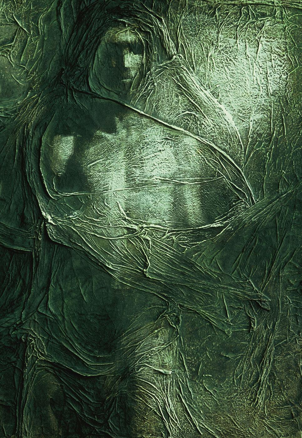
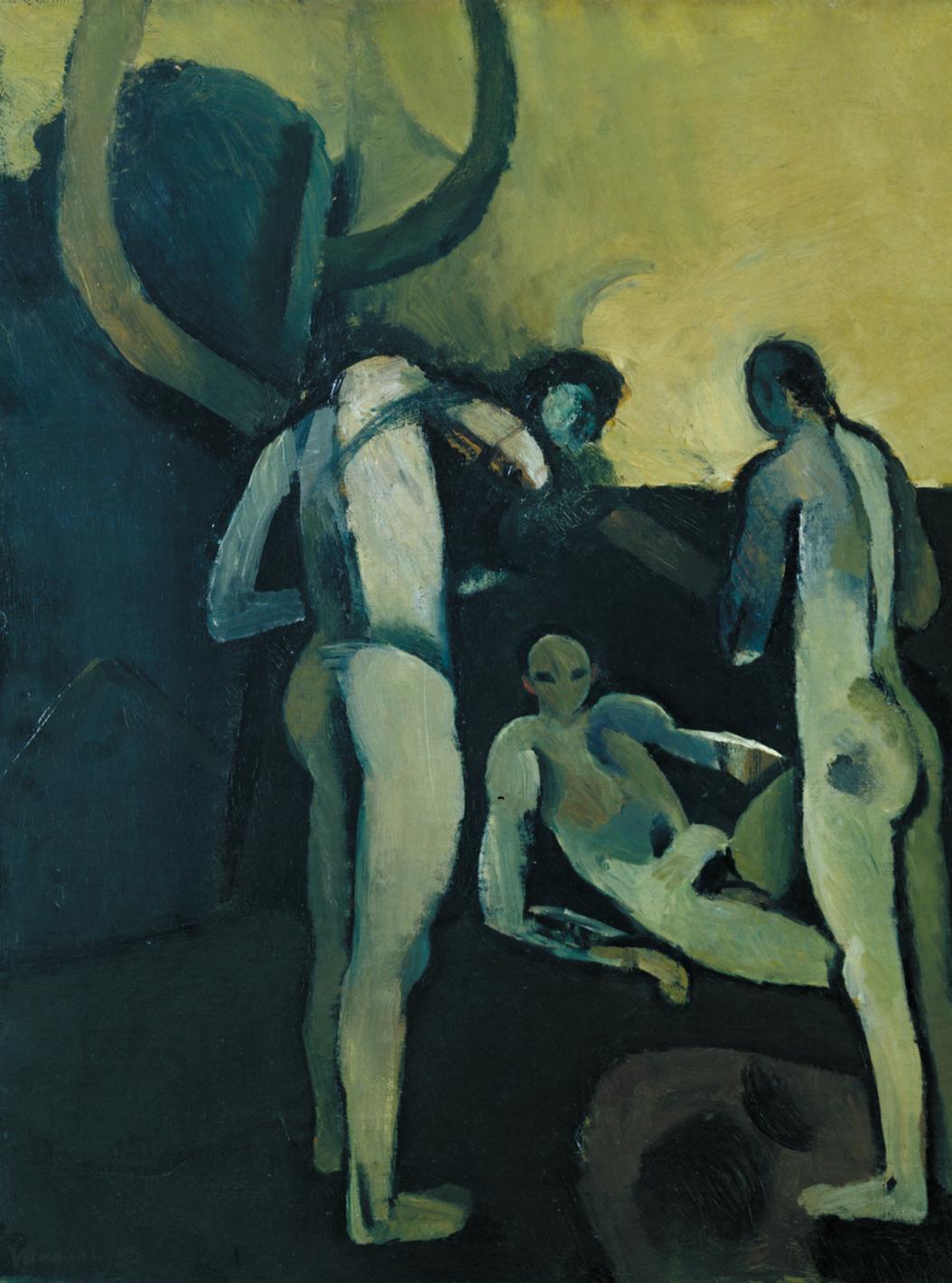
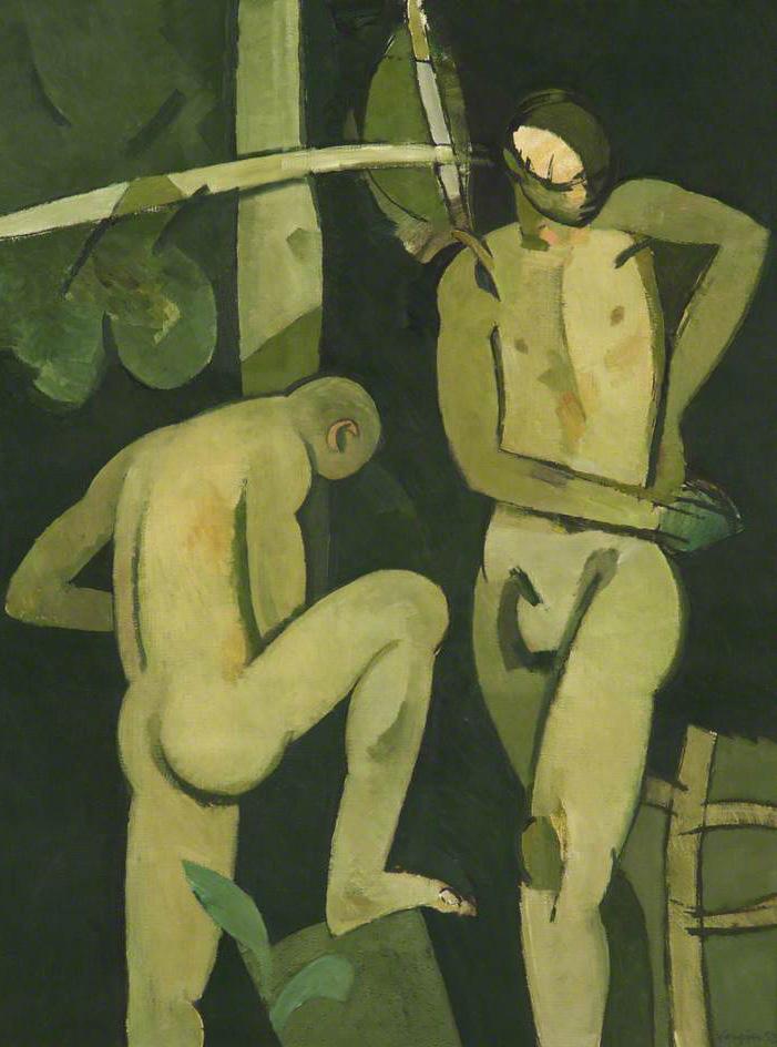
Green bathers, oil on canvas, 1952.
Grey bather, gouache on paper, 1954.
Above, Landscape with two bathers (The diver), oil on hardboard, 1954. On the side, Fourth Assembly of Figures, oil on canvas, 1956.
Vaughan’s reputation peaked in the mid-1950s, with continued invitations to exhibit. The poet Stephen Spender (1909-1995) wrote the introduction to the catalogue for a retrospective exhibition of his work at the Hatton Gallery, Newcastle, in 1956, and the art historian and critic Alan Bowness (1928-2021) called him “the outstanding English painter of his generation”. The Annual Report of the Art Galleries and Museums Committee (1960–1961) in the United Kingdom reported:
This artist is unique in his ability to express, in a thoroughly modern idiom, an emotional and intellectual response to the male nude that was quite common in the Renaissance but startling in the mid-20th century.
Nude against a rock, oil on board, 1957.
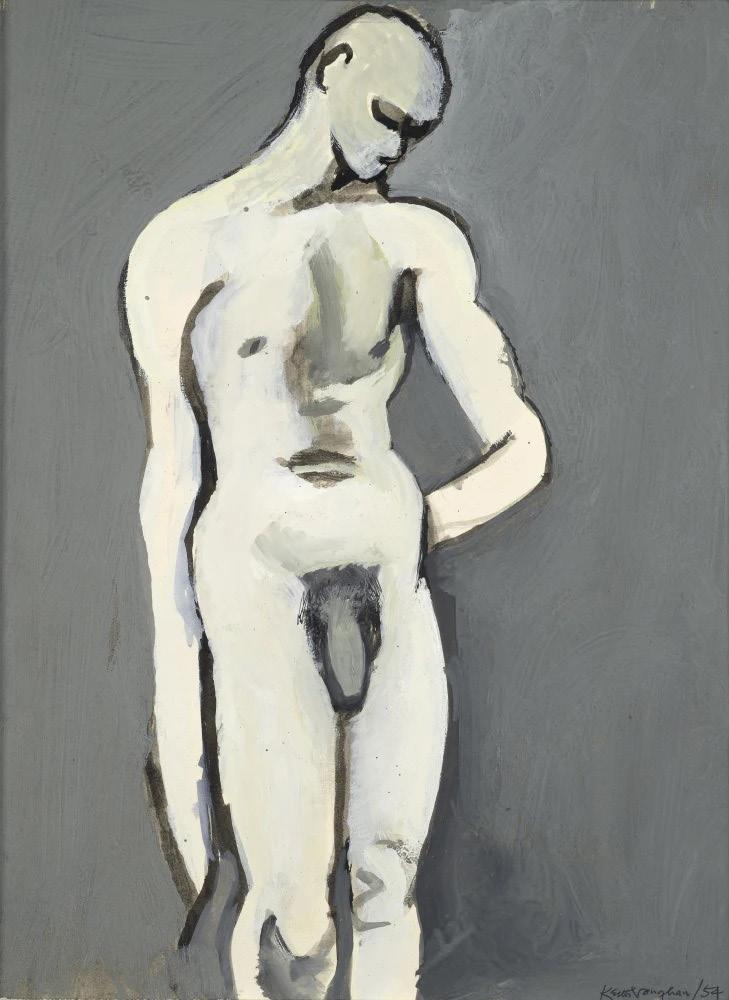
Below, Walking Figure (oil on panel, 1958) and Standing Figure (oil on canvas, 1960).
The bather, oil on board, 1960.
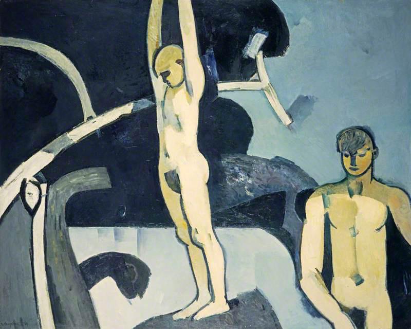
Below, Two bathers by a pool (oil on panel, 1968) and Bathers by a green bank (oil on cardboard, 1972).
The bather, oil on canvas, 1960.
If Vaughan never achieved the stature of the modern masters he so admired, he certainly learned their lessons and made them his own.
Adrian Hamilton, The Independent
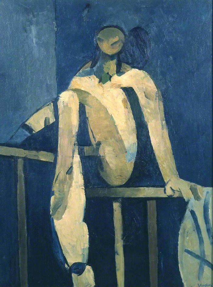
Seated Figure, oil on board, 1972.
In 1957 he became a visiting professor at the Slade School, and the following year Vaughan completed a six-month residency at Iowa State University. America excited and inspired him, and he ended his residency with a trip to Mexico. On his return he was diagnosed with depression, an illness that haunted him for the rest of his life and led to alcohol and substance abuse.
During the 1960s, Vaughan visited Greece several times. The experience of sailing around the Greek islands had a profound effect on his landscape painting and gestural charcoal works. In 1962, he had a major retrospective at the Whitechapel Gallery, and in 1964 he was made an honorary fellow of the Royal College of Art. The following year, he was awarded the Order of the British Empire as a Commander, in recognition of his contributions to the arts, and took a holiday in North Africa, which had a profound effect on his subsequent work.
His various activities brought him critical and financial success, but he felt profound insecurity about his work and his role in life, as his diaries reveal. In addition to containing many insightful comments on art, his diaries offer a remarkably frank (and often humorous) account of his homosexual and masturbatory activities, as well as his struggle with bowel cancer (diagnosed in 1975) that left him melancholic and reclusive. He even recorded his final moments when, after an evening with close friends and veiled personalized goodbyes, he ingested a lethal dose of barbiturates in November 1977:
It’s a sunny morning. Full of life. A morning in which many people died…
Vaughan sought to bring European modernism to British art. For him, his desire and libido were at the center of his work and, therefore, despite his notoriety during his lifetime, there is still a lack of knowledge about his work.
8=D
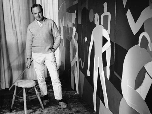
Above, Two figures (oil on canvas, 1966) and Landscape with seated figure (oil on board, 1964). Below, Vaughan in his studio, 1963 (photo: Jorge Lewinski).
Norval
Morrisseau
1931-2007
by Filipe Chagas
The oldest of five children, Anishinaabe* artist Norval Morrisseau (1931-2007) was born at a time when Canada’s indigenous people were confined to reserves, forced to attend residential schools**, and prohibited from practicing traditional ceremonial activities. In keeping with his people’s tradition, he was sent to live with his maternal grandparents on an Indian reservation, where he learned Anishinaabe stories and traditions from his grandfather, a shaman trained in the Midewiwin spiritual tradition, and about Catholicism from his grandmother.
At the age of six, he was sent to a residential school, where he faced abuses***. After four years, he returned to the reservation to attend public school. However, Morrisseau was not like the other children in his community. The young artist preferred to spend his time in the company of his elders, listening and learning, or completely alone, drawing and studying local cave paintings, and so he left school at the age of ten. Even without any formal artistic training or support from members of his community, he wanted to draw things he had heard about or spiritual beings that appeared as visions.
At the age of nineteen, Morrisseau became seriously ill and his family organized a healing ceremony, during which he was given the name “Miskwaabik Animiiki” (Copper Thunderbird). At the age of 23, the artist contracted tuberculosis and was sent to a sanatorium, where he met Harriet Kakegamic, a patient from the Cree community, who became his wife in the 1950s.
Like many young artists, Morrisseau did not earn enough to live on. Around 1958, he found a job at a gold mine near Red Lake, Ontario. That is where he met the Weinstein couple, Joseph and Esther, who trained as artists in Paris and developed ties to the European modern art scene. Esther saw two works by Morrisseau in a local warehouse and wanted to meet the artist. When Morrisseau knocked on the Weinsteins’ door a few days later with paintings to sell, the couple quickly welcomed him. The artist spent hours reading art books and, discussing art with the two, began to consider himself a professional artist
* The Anishinaabe (“the good people who are on the right path”) are a group of culturally related indigenous peoples present in the Great Lakes region of Canada and the United States. They include the Ojibwe (including Saulteaux and Oji-Cree), Odawa, Potawatomi, Mississaugas, Nipissing, and Algonquin peoples.
** Residential schools were part of an educational system created by the Canadian government in the 1880s, which operated until the last decades of the 20th century and separated indigenous children from their families, prohibiting them from recognizing their cultures or even speaking their traditional languages.
*** As an indigenous person trained by his grandfather from an early age, Norval stated that the abuse he suffered did not “enter the soul” and, therefore, did not interfere with his artistic production.
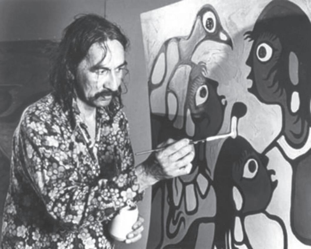
Norval Morrisseau painting while artist in residence at the McMichael Canadian Art Collection in 1979. (Photo: Ian Samson)
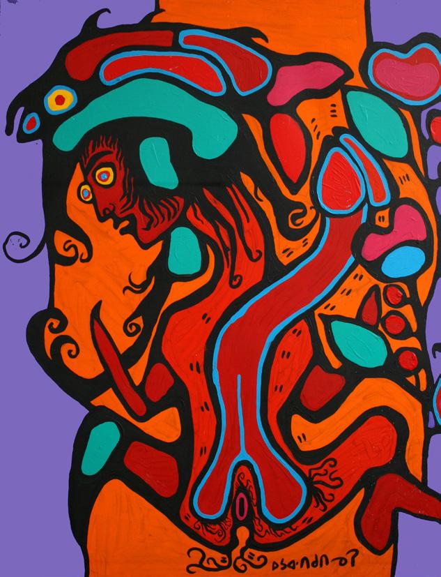
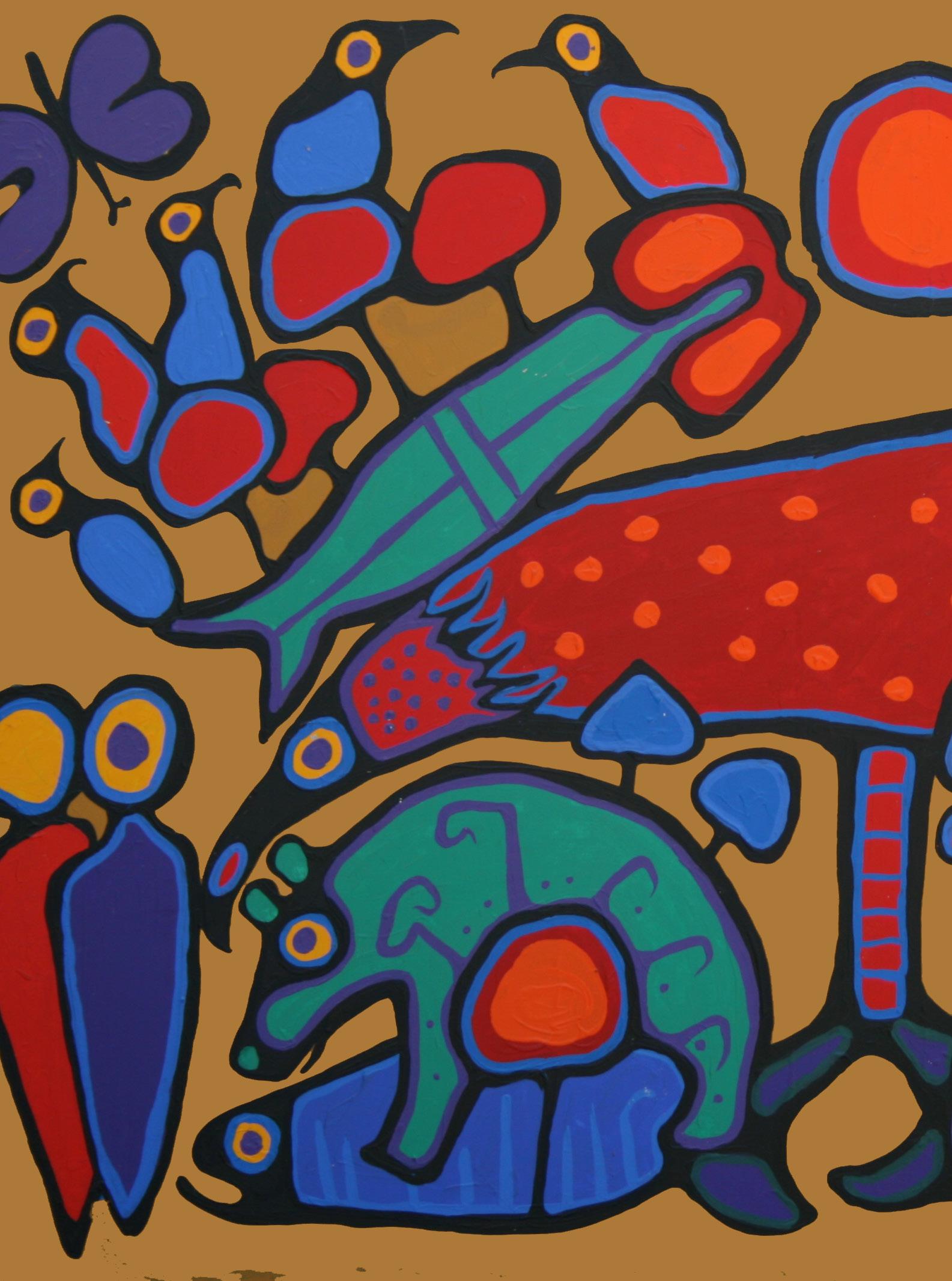
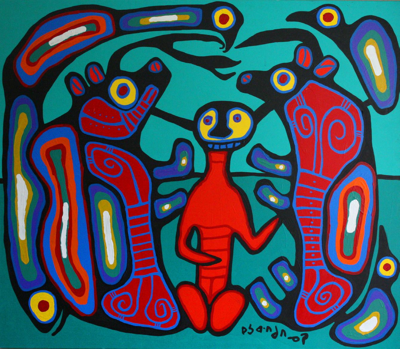
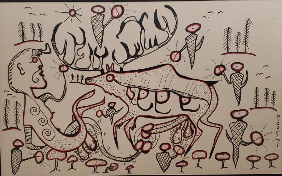
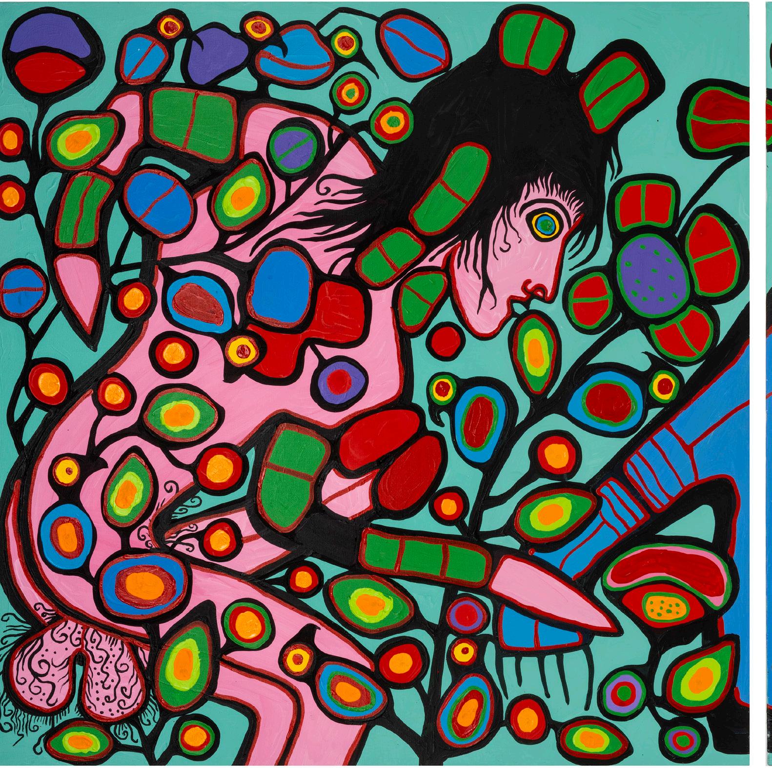
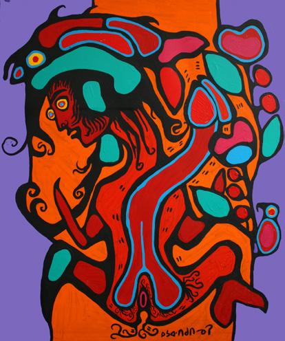
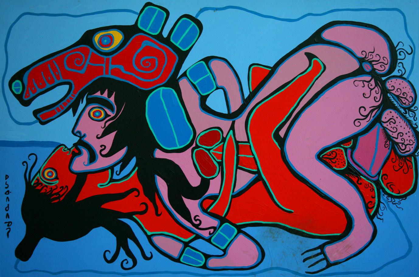
In the work Untitled (Phallic Bears) – acrylic on canvas, n.d. – we see an ancestral figure with a phallic body connected to spiritual animals, such as bears, birds and fish.
“in the Western sense” and not a producer of tourist souvenirs. This casual alliance between an indigenous man and a cosmopolitan couple gave Morrisseau a broader understanding of art.
Around the same time, Morrisseau was also introduced to Susan Ross (1915-2006), a printmaker and painter who specialized in painting portraits of local indigenous people in a post-impressionist style. Morrisseau would send his paintings by train for Ross to sell, and with the proceeds from these sales, Ross would buy art supplies for Morrisseau.
In 1960, Morrisseau was introduced to Selwyn Dewdney (1909-1979), an anthropologist and artist who recorded pictographic locations. Dewdney shared with Morrisseau his interest in the Mexican mural painting of Diego Rivera (1886-1957), the surrealist art of Salvador Dalí (1904-989), and works by avant-garde artists such as Picasso (1881-1973) and Matisse (18691954). Unlike the Weinsteins who provided high-quality art materials like papers and gouaches, Dewdney encouraged the artist to work in traditional mediums like birch bark and leather. Morrisseau, in turn, shared his cultural knowledge of rock art with the anthropologist,
who studied and wrote about the subject. Their partnership resulted in the book Legends of My People: The Great Ojibway. It is believed that Dewdney pressured Morrisseau to sign his work in syllabic Cree, an alphabet the artist learned from his wife.
Word of Morrisseau’s art spread and in 1962, Jack Pollock (1930-1992), a Toronto gallerist, decided to exhibit Morrisseau’s work, marking the first time that an Indigenous artist exhibited work in a contemporary art gallery in Canada. The media hailed the premiere as a new development in Canadian art. All the paintings sold were on the first day, which made Morrisseau a famous artist and public figure. His success also generated interest in the work of other Indigenous artists across Canada. Collectors began to take contemporary indigenous art more seriously.
However, every success has two sides and criticism of his art based on colonialist views, as well as the invasion of his privacy, left the artist uncomfortable:
I’m tired of hearing about Norval the drunk, about Norval with a hangover, about Norval in prison, about Norval torn apart by his loyalty to both Christianity and the old Indian ways... They talk about this tortured man, Norval Morrisseau - I am not tortured. I had so much fun. I had a wonderful time in my life. — Morrisseau, in an interview with the Toronto Star, in 1975.
In 1965, the Glenbow Foundation in Calgary purchased eleven works by Morrisseau, which led to an exhibition at the Musée du Québec the following year, signaling a growing national interest in the artist’s work. In fact, he was one of nine indigenous artists commissioned to create work for the Canadian Indigenous Pavilion at Expo 67 in Montreal. His largescale exterior mural depicted bear cubs being suckled by Mother Earth, and when organizers raised concerns about this unorthodox environmentalist image, Morrisseau decided
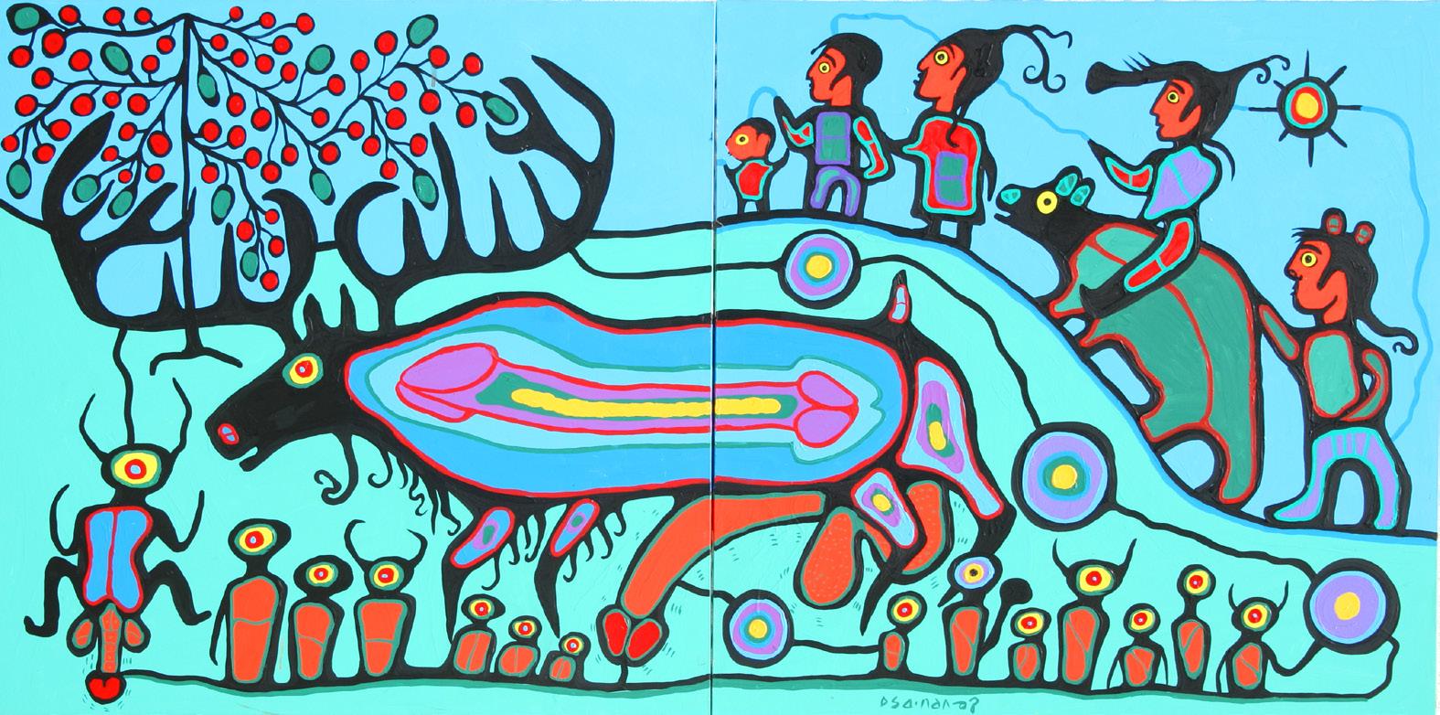
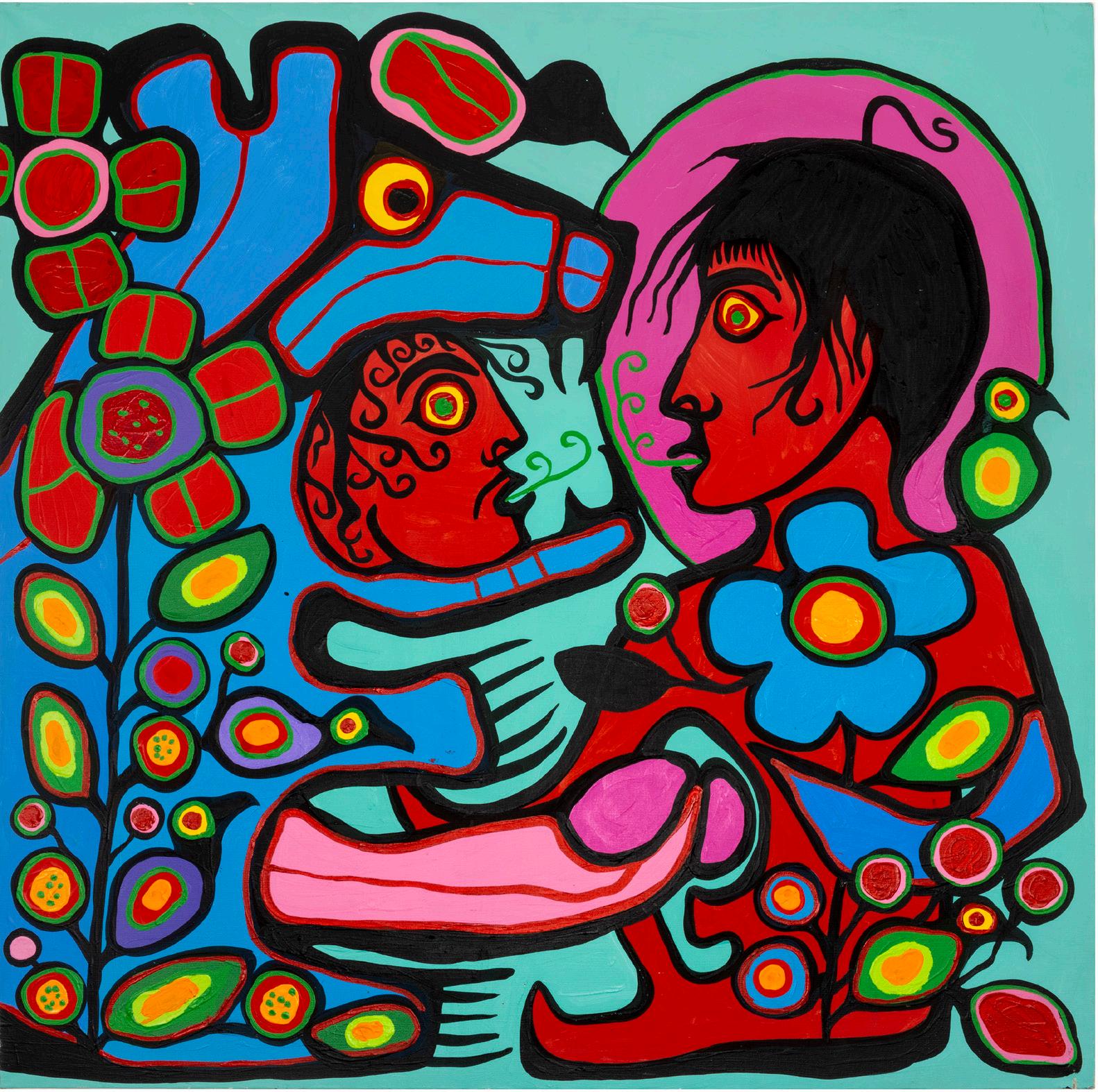
Androgyny, acrylic on canvas, 1983. This 12 x 20 foot work features Norval as the Thunderbird, centralizing the idea that we are all connected regardless of race or gender.
to abandon the project rather than censor his drawing – which was altered and completed by Carl Ray (1943-1978). Through this commission, however, Morrisseau met Herbert T. Schwarz (1921-), pavilion consultant and gallerist, who encouraged him to illustrate traditional Anishinaabe legends for a book.
Schwarz also organized Morrisseau’s first international exhibitions: in 1968 at the Art Gallery of Newport, in Rhode Island, USA, and, in 1969, at the Saint Paul Galerie in Saint-Paul-de-
Vence, in the south of France. These exhibitions established Morrisseau’s international reputation, and he became widely known as the “Picasso of the North”.
In 1971, artist Daphne Odjig (1919-2016) founded Professional Native Indian Artists Inc. (PNIAI), which became known as the Indian Group of Seven, to promote and support Indigenous artists across Canada and to change public perception about them. Even so, institutions remained divided between
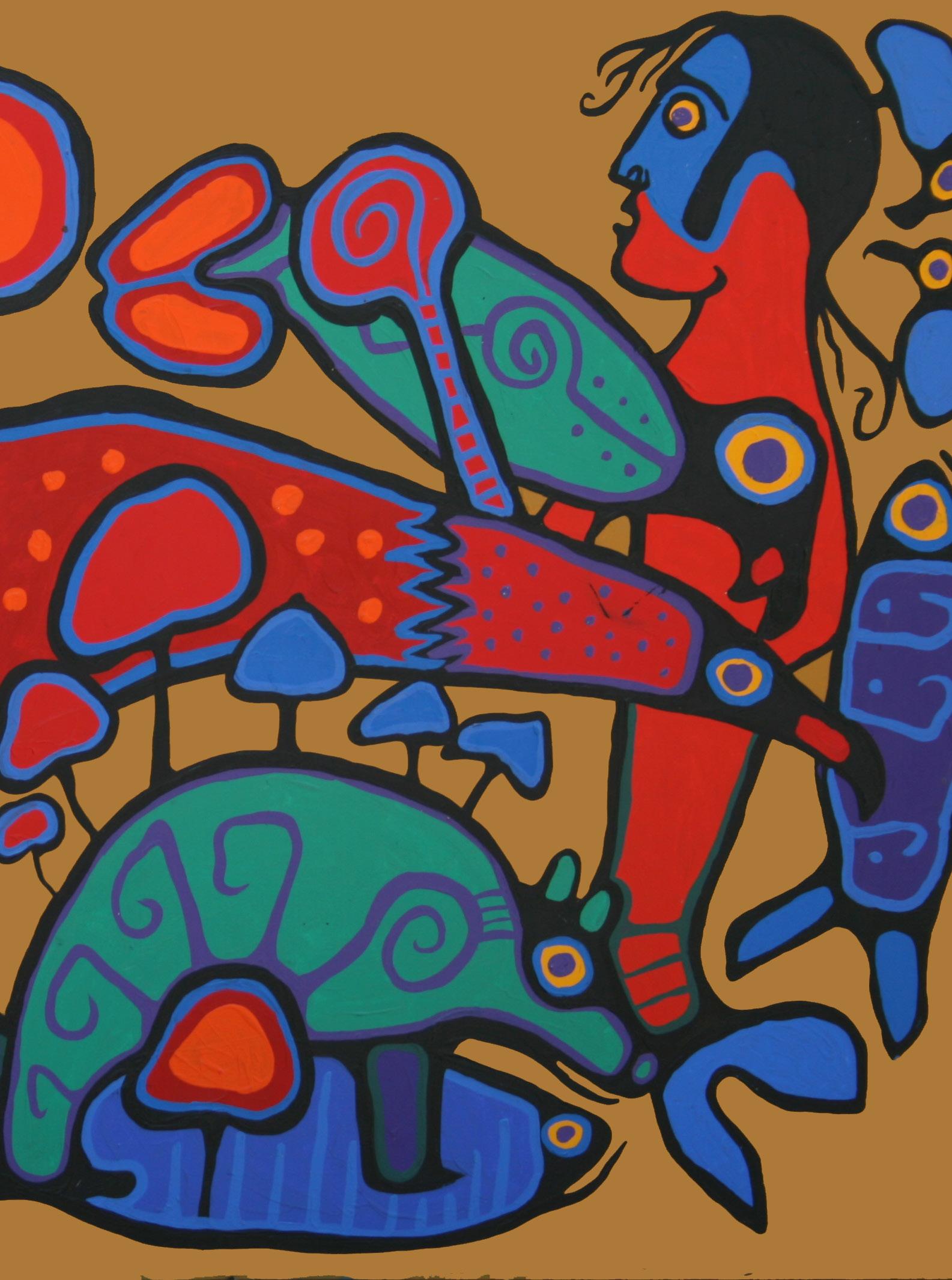
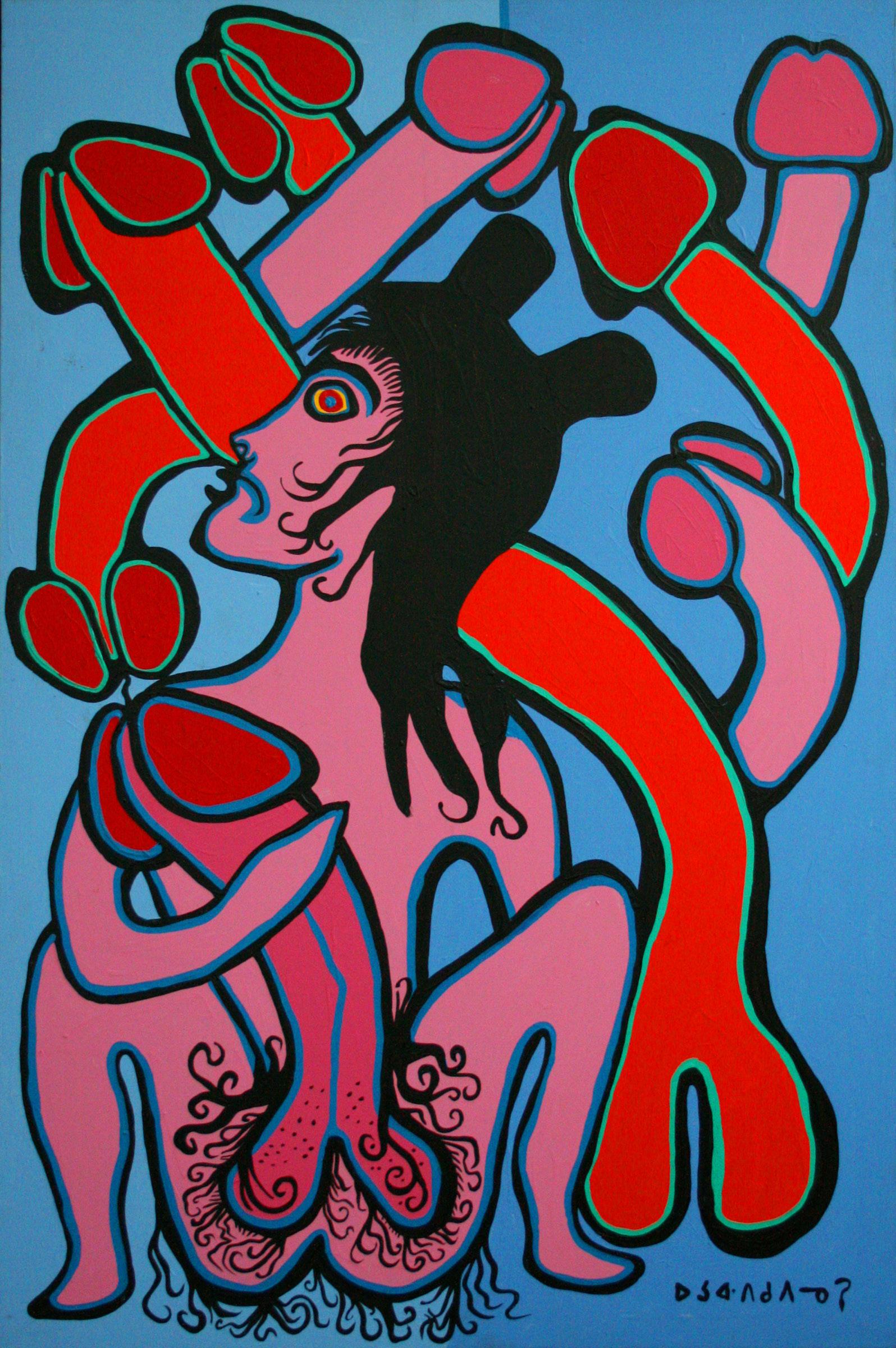
In this drawing, Norval portrayed himself in a ritual of communication and transformation with a spiritual moose. You can see an antler appearing on Norval’s head, as well as his legs becoming like those of the moose.
ethnographic art and contemporary art: for example, the Royal Ontario Museum and the Museum of Civilization did not know how to catalog or display the works they acquired from Morrisseau.
In 1974, Odjig founded the New Warehouse Gallery with an inaugural exhibition that featured more than two hundred works, including some by Morrisseau, which helped to establish contemporary indigenous art. Around the same time Morrisseau, along with his brother-in-law Johim Kakegamic (1952-1993) and Carl Ray, worked to raise awareness of indigenous art by participating in a series of educational workshops organized by the Ontario Department of Education in local schools and community clubs. In these workshops, the three artists presented their approaches to painting and drawing, while demonstrating a form of visual storytelling.
When three of Morrisseau’s brothers-in-law formed the Triple K Cooperative – a screenprinting company designed to give Indigenous artists control over the art they produced and access to new Indigenous and mainstream audiences – the artist also began producing graphic art. He realized the potential of reproducing prints as a way to publicize his artistic vocabulary and thus strengthen the movement that needed to be taken seriously in the Canadian art scene.
Although this period was one of immense artistic productivity, Morrisseau continued to struggle with alcoholism, which had plagued him since his youth. In 1973 he was arrested for public drunkenness and imprisoned for six months. Ironically, it was a busy time for the artist, as he had plenty of time to paint in the additional cell he was given to use as an art studio.
In the mid-1970s, Morrisseau was introduced to the Eckankar spiritual movement, which combines Eastern spiritual traditions from India and China, and soon began to present himself as a shaman artist beyond the strict protocols of Anishinaabe culture.
In the fall of 1978, Morrisseau was named to the Order of Canada in recognition of his contributions to Canadian art. He had previously received Canada’s Centennial Medal (1968) and been named a Fellow of the Royal Canadian Academy of Art (1973), but this honor solidified his reputation as an artist of national and international stature.
By the 1980s, it was clear that Norval Morrisseau had inspired a new generation of artists. An exhibition titled “Norval Morrisseau and the Emergence of the Image Makers” in 1984 celebrated the artist’s importance as a pioneer of an artistic movement called the Woodland School.
In early 1987, even as his work was celebrated at a series of art events, Morrisseau, who had been sober for several years, began drinking again and was discovered living on the streets of downtown Vancouver. The press attacked him and, even though he recovered, he decided not to pay attention to the media, refusing interviews and TV appearances to focus on his spirituality.
In 1989, he was included in a major international art exhibition at the Center Georges Pompidou in Paris, but for more than a decade later, as he aged and suffered from Parkinson’s disease, Morrisseau remained isolated to continue creating.
That changed in 2006, when the National Gallery of Canada mounted a retrospective of Morrisseau’s work, the first by a contemporary Indigenous artist. The public came to understand the artist’s importance to the history of Canadian art. Sadly, the following year, Morrisseau died from complications related to Parkinson’s disease.
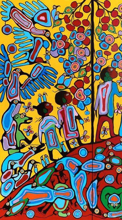
The great spiritual moose connects to everyone through phallic energy: both the ancestral beings (seen below), as well as the animals and people who head towards the tree of life – which also connects to the moose’s antlers.
On the previous page, The Phallic Shaman (1989) depicts Norval in a masturbatory act to raise his energy and thus transform himself into a bear (see the ears beginning to appear on his head). The other penises present in the representation may signify either the presence of other men during the ritual or the conjuration of other phallic forces to enhance the transformation.
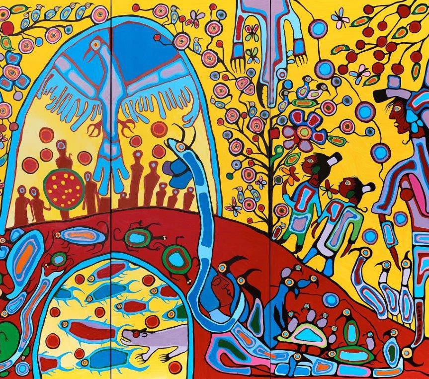
On the side, the work Phallic Shaking Tent shows an initiation ritual. Inside the tent below, there is a frightened young man, surrounded by protective animals who await the arrival of the shaman Norval to transmit all the ancestral knowledge of Mother Earth/ Turtle. Small vibrating lines come out of the turtle’s penis towards the anus of a Norval connected to ancestral beings.
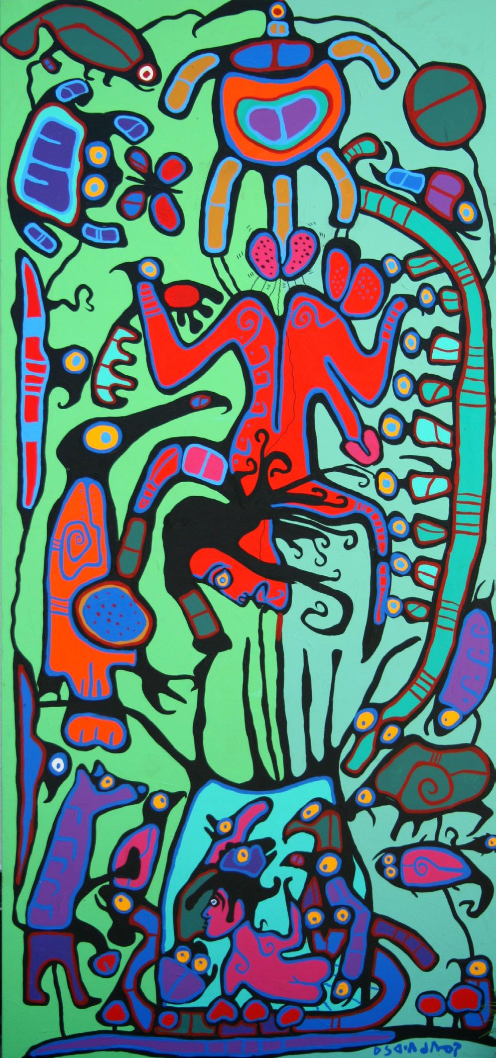
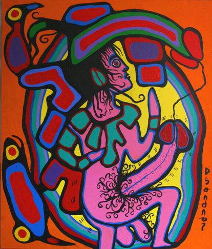
In this diptych, Norval wanted to show the connection between his philosophy and religion. Norval is at the center of the work, as a spiritual bear. Here we have a white man who has accepted Norval’s philosophy and is already connected to Nature, showing his erect phallus and beginning a process of transformation into a bear (see the ears on his head).
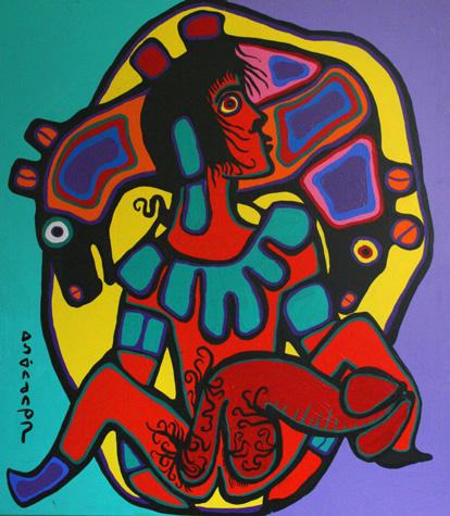
Here we have a Catholic indigenous man – notice the difference in skin color compared to the white man, the ring around his head and the absence of a penis – allowing himself to talk to Norval (green lines coming out of his mouth and large penis in contact) and, thus, Nature begins to emerge around him.
MORRISSEAU’S NON-EROTIC ART
It is essential to understand that Morrisseau’s visual narrative seeks a spirituality far from the concept of church or God. Anishinaabe culture says that two genderless energetic beings came out of the Great Lake to teach and this reveals to us that the binary conception is seen in another way, since, if we are all energy, gender is a concept that does not matter.
This information is important for us to approach Morrisseau’s art from the perspective of sexuality. The artist’s bisexuality – which is cited as both a source of pride and ridicule – does not exist: if we are energy, there is no single, rigid sexual orientation, but a desire independent of gender. Morrisseau said:
I am everything, I am “try-sexual”. LGBTQIAPN is equal to E, E of energy.
In this philosophy, sex becomes an essential energy-producing ritual. Masturbation becomes training in control and energy production, just as the consensual sexual act is a moment of exchange of energy, of knowledge, a moment of communication, and, thus, the organs are seen as conduits of energy. That said,
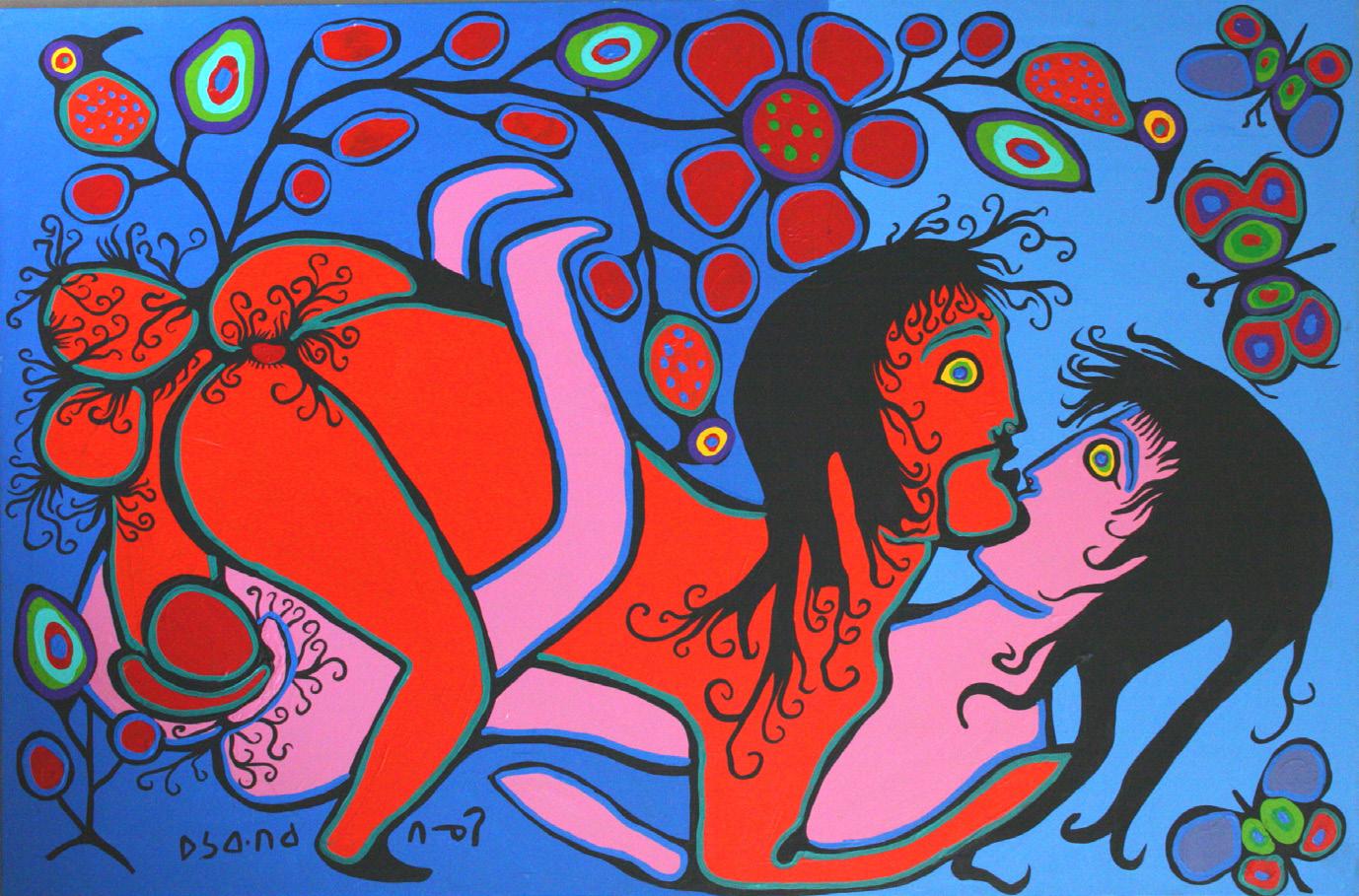
In this diptych, we have Norval in an energetic exchange with a woman and a man. With the woman, it’s possible to see the tree of life emerging from the act; with the man, Norval presents himself as a shaman, in a ritual of knowledge transfer.
In these three works, the great phallus is the conduit of spiritual transformation.
scenes of sex, masturbation or large penises in Morrisseau’s art should be analyzed from this point of view rather than an eroticism constructed by a prudish religious society. Many of the images with phalluses show connection, communication and also transformation, as the energy produced is capable of elevating the spirit.
In relation to pictorial compositions, the vibrant colors represent the natural world as much as the spiritual planes presented in his visions. The strong black contour lines come from two sources of inspiration: the stained-glass windows of churches (which always impressed him with the strength of their color and image) and comics (which he found in the trash and became the only way to learn about “white men”), and they are the connection between all the characters represented. These artistic characteristics are similar to the so-called primitivism constructed by Europeans and, mainly, to the synthetism of Paul Gauguin (1848-1903) and prove that Morrisseau’s production has always been at the forefront. 8=D
Oferenda, óleo sobre tela, 1987.
Trevor
Southey
1940-2015
by Filipe Chagas
Painter, printmaker and sculptor Trevor Jack Thomas Southey (1940-2015) was born in Rhodesia, Africa – now Zimbabwe. His African heritage can be traced back to the settlers who settled in Cape Town, South Africa, in the 17th century.
Africa is part of my spiritual fiber. I am, in fact, white, British colonial by direct cultural experience. But African people surrounded me. I believe that as I internalized the sounds of the native languages, although I never learned them much, I also internalized a sense of their natural beauty: the generosity of their features, the lithe easy way of movement, and all the variety of their color – some a blue black like the patina of living bronze sculpture, some a chocolate brown, some a creamy ochre.
Southey’s early interest in art developed during bouts of childhood rheumatic fever that often confined him to bed with only pencils, paper, and art books from the school library. His formal education began at Brighton College of Art in Sussex, England. A year later, he studied at Natel Technical College in Durban, South Africa, where he converted to Mormonism. In the early 1960s, he served as a missionary with the organization’s South Africa Aid program.
Charmed by the welcome he received among the Mormons, he decided to emigrate to the spiritual center of his religion – Utah*, in the United States – to study at Brigham Young University – a Mormon institution where Southey earned a bachelor’s and master’s degree in fine arts, and later taught until 1977.
However, before the US, he took a trip to Italy and the Vatican, where he was impressed by the artistic, visual, expressive and psychological power of the works in Catholic churches. So, one of the first things he did when he arrived in Utah was to put himself at the service of the church. He was commissioned to do the “First Vision”, but when he delivered the result, they asked for it to be redone according to church rules.
After a visit to the New York World’s Fair in 1964, where he came across Michelangelo’s Pietà, the artist began to question the meaningless art that was being produced within the Mormon
Self-portrait, oil on canvas, 199-.
* Known as the “Mormon State” or “Zion,” Utah has about 70% of its population who are followers of the Church of Jesus Christ of Latter-day Saints. Mormon pioneers settled in the region in 1847.
institution. After all, if the Catholic Church invested in artists like Da Vinci and Michelangelo, why couldn’t Mormonism hire them to create masterpieces that would make the world revere them? Southey saw this questioning as a “vocational calling.”
What they wanted was illustration. What I wanted was art, because illustration answers questions, and art asks questions. –
Neil Hadlock, in “Bright Spark” documentary.
Together with fellow Mormon artists from BYU – Neil Hadlock (1944), Gary Ernest Smith (1942-) and Dennis Smith (1942-) –, in 1966 he founded a relevant artistic group in the city of Alpine, Utah: the Art and Belief Movement.
We all aspired toward contemporary significance. And that is a thing we struggled with. Through the early part of our careers was “how do I get my stuff accepted by the general authorities of the church and at the same time in the Museum of Modern Art?” That’s a broad bridge to try to stretch across. – Dennis Smith, in “Bright Spark” documentary.
The group even created the annual Mormon Art Festival and worked for the church, but always had to bend to tradition. Other artists from various artistic languages emerged on the Mormon scene, with the Alpine group as a conceptual and creative center capable of changing the
Watch the documentary Bright Spark.
way the church viewed art, even after a famous speech in 1976 by a local authority:
I want to respond to a question that I face with some frequency: why do we not have more inspired and inspiring music in the church? Or why do we have so few great paintings or sculptures depicting the restoration? The reason we have not produced a greater heritage in art, in literature, in music, in drama, is not, I am very certain, because we have not had talented people. For over the years, we’ve had not only good ones, but great ones. It’s sad but true that almost as a rule, our most gifted people are drawn to the world. They who are most capable to preserve our heritage and to extend it because of the enticements of the world seek rather to replace it. They think what they do is to improve it. Unfortunately many of them will live to learn. And I repeat, many men do struggle to reach the top of the ladder and finally they arrive only to find that it has been leaning against the wrong wall. – Boyd K. Packer, counselor to the Twelve Apostles, in a speech in 1976 at BYU.
In addition to these practical issues, other more personal ones were at work: since the age of 19, Southey knew he was homosexual, but, committed to his faith, he decided to distance himself from who he was. Even though his closest friends and religious authorities knew of his orientation, in 1967, he married Elaine Fish –with whom he had four children.
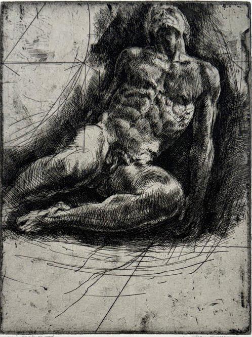
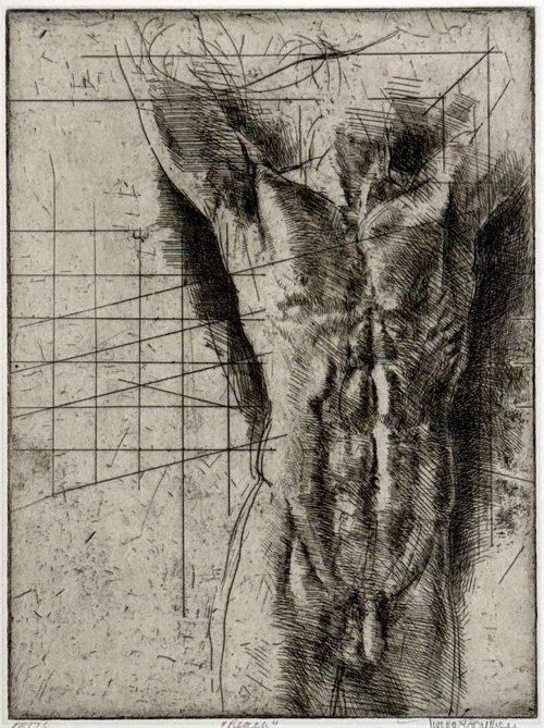
Oakland, California. His artistic career continued to grow, and he became a stained glass designer, book illustrator and printmaker. His many intaglio etchings exhibited the same elegance and delicate draftsmanship of his paintings. He received commissions in the United States, England, and even for the Catholic Church.
All this life experience became a great source of inspiration and eventually made Southey a reference in the LGBTQIA+ community. When his daughter Sarah received help from the church during treatment for a brain tumor and Southey considered returning to the religious environment, he was heavily criticized, but he understood the importance of his story and maintained his position in favor of human rights, far from dogmas.
In 2013, after a decade-long battle with prostate cancer and a recent diagnosis of Parkinson’s disease, Southey returned to Utah to be cared for by friends and family. Two years later, he passed away. Southey’s work is included in numerous private, institutional, and corporate collections.
Southey used the representation of the physical body to portray the soul, following the Renaissance masters. He sought to express human spirituality through common figures of an ethereal nature in scenes that combined realism and allegory with a personal charge.
I’ve always expressed my ideals as if I were living and painting in Renaissance Italy, not puritanical heartland America. – Southey for the Salt Lake Tribune, 2010.
In 1981, Southey was divorced. Since homosexuality is a serious sin in the Mormon religion, he was eventually excommunicated. After these events, he set up his studio in
His intuitive romantic idealism found focus on themes as varied as eternal family connections, human interaction, explorations of the plan of salvation, environmental issues, and urban planning. Nudity was a constant in his work
Russ, silkscreen drawing, 1990.
Lifting, lithograph, 1998.
as a way to expand the human experience and reflections on sensuality and spirituality. Geometry enters as reason in contrast to emotional intensity.
I freely acknowledge that my art does not easily have a place in the current art world. It is certainly not cutting edge as defined by the establishment but nor is it always easily accessible to the novice. A curator once said to me that I appear to have missed the 20th century. My work really evolved free of much influence because I lived in what was truly a backwater. Added to that was my somewhat isolated childhood elaborated an already retiring and romantic nature. My use of the nude comes from a timeless tradition in art. So I come to this time and place honestly and with enthusiasm. I express myself as I do because that is who I am as a poetically inclined individual. Allowing my natural subconscious free rein and trying to hold back intellectual interference to a large extent is the way that I work.
At the beginning of the new millennium, Southey spent a month in Russia creating a project exploring the theme of war in all its complexities. The twelve models selected were paid (5 dollars each) and posed for photographs and drawings that would serve as reference material for paintings in the Warriors series. The nudity was deliberately chosen to suggest the absolute vulnerability of human beings, similar to everyone else, but hidden under a uniform, making them anonymous and much easier to kill. Each portrait also includes fragments of uniforms, other military paraphernalia and a brief biographical note written by the models themselves (screen-printed on the canvas).
Above, the etchings Transition (1980) and Reach (1986).
Below, the etching Awakening (1988) and the lithograph Rising (1994).
Of course, this attracted censors. In 1981, for example, he painted the mural “Flight Aspiration” at Salt Lake City International Airport, but the nude man and woman flying drew protests from the American Family Association, a national anti-pornography group run by Mormons. The mural was removed and, five years later, placed in the permanent collection of the Utah Museum of Fine Arts.
It is interesting to think that the History of Art tells us about the patronage of churches without saying much about the personal lives of artists. Even the great Vasari’s Vite* preferred to praise Renaissance talent without mentioning Da Vinci’s sexual adventures or Michelangelo’s preferences. Thus, in addition to his artistic production, Southey left a legacy of courage and resilience. 8=D
or Le vite de’ più eccellenti pittori, scultori e architettori (The lives of the most excellent painters, sculptors and architects) is a compendium published in 1550 that places Italian art as responsible for the European cultural Renaissance and became the first book on the History of Art.
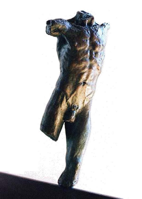
Races end, bronze, n.d.
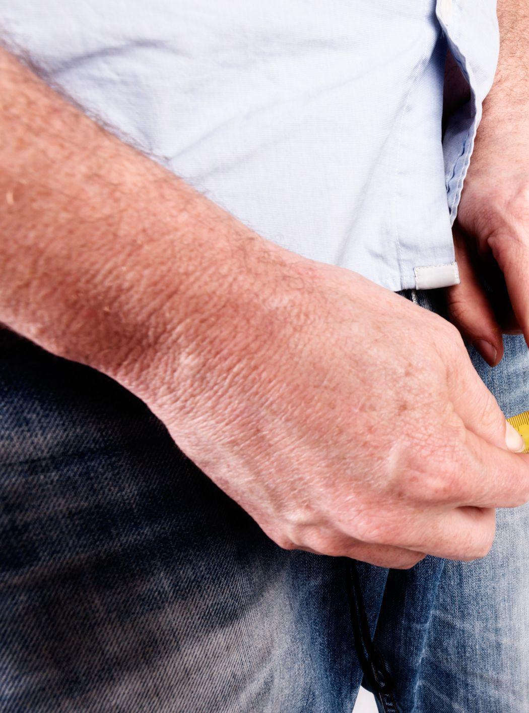
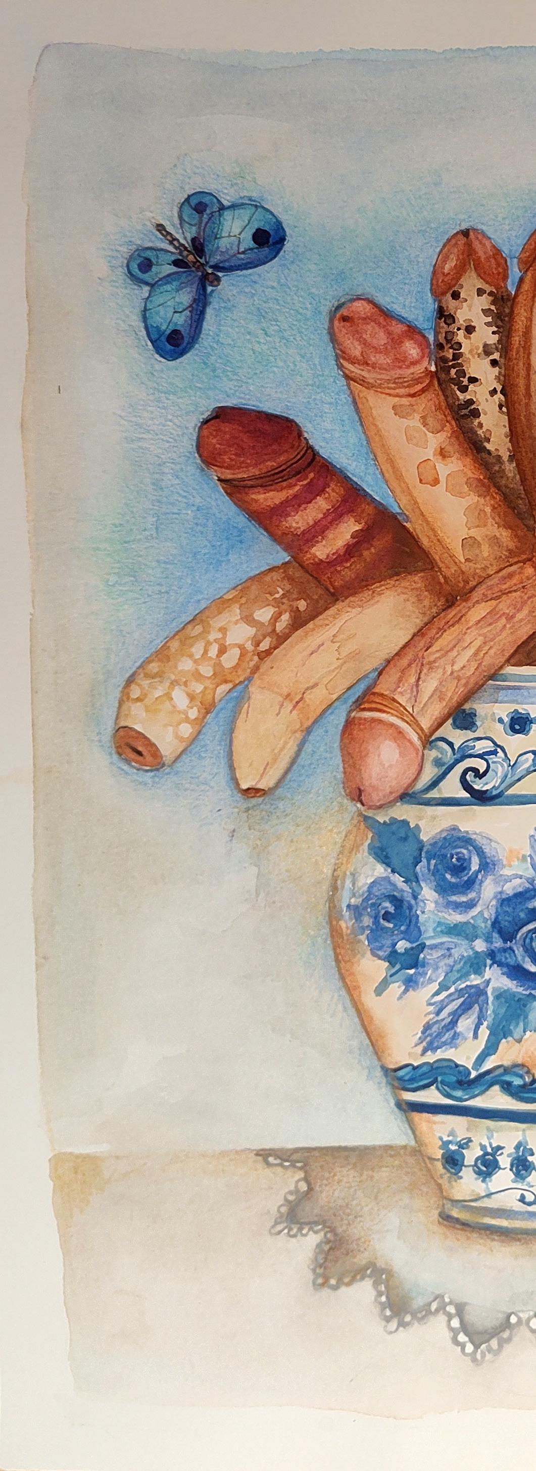
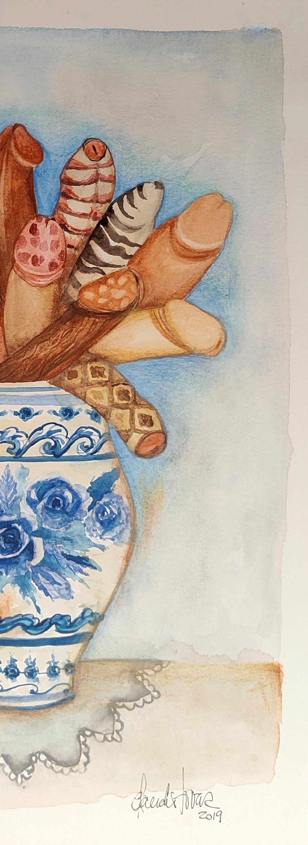
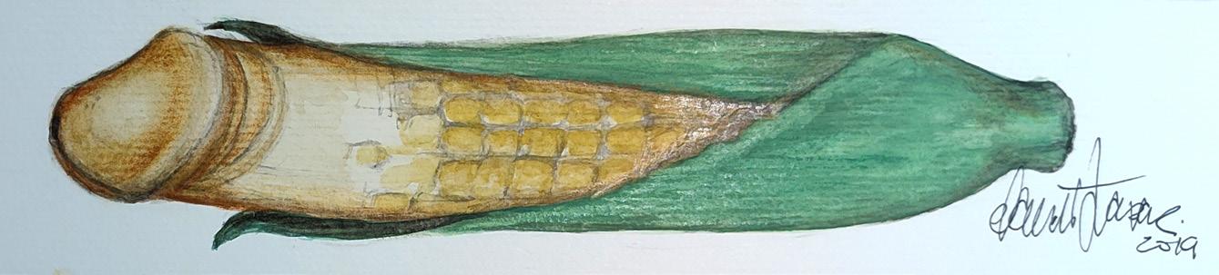
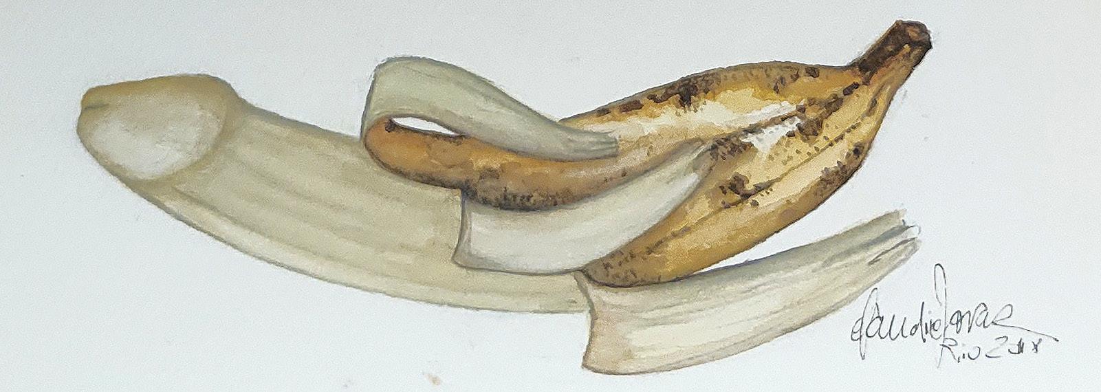
After all does size matter?
NO! And I can prove it!
Phallus Focus in
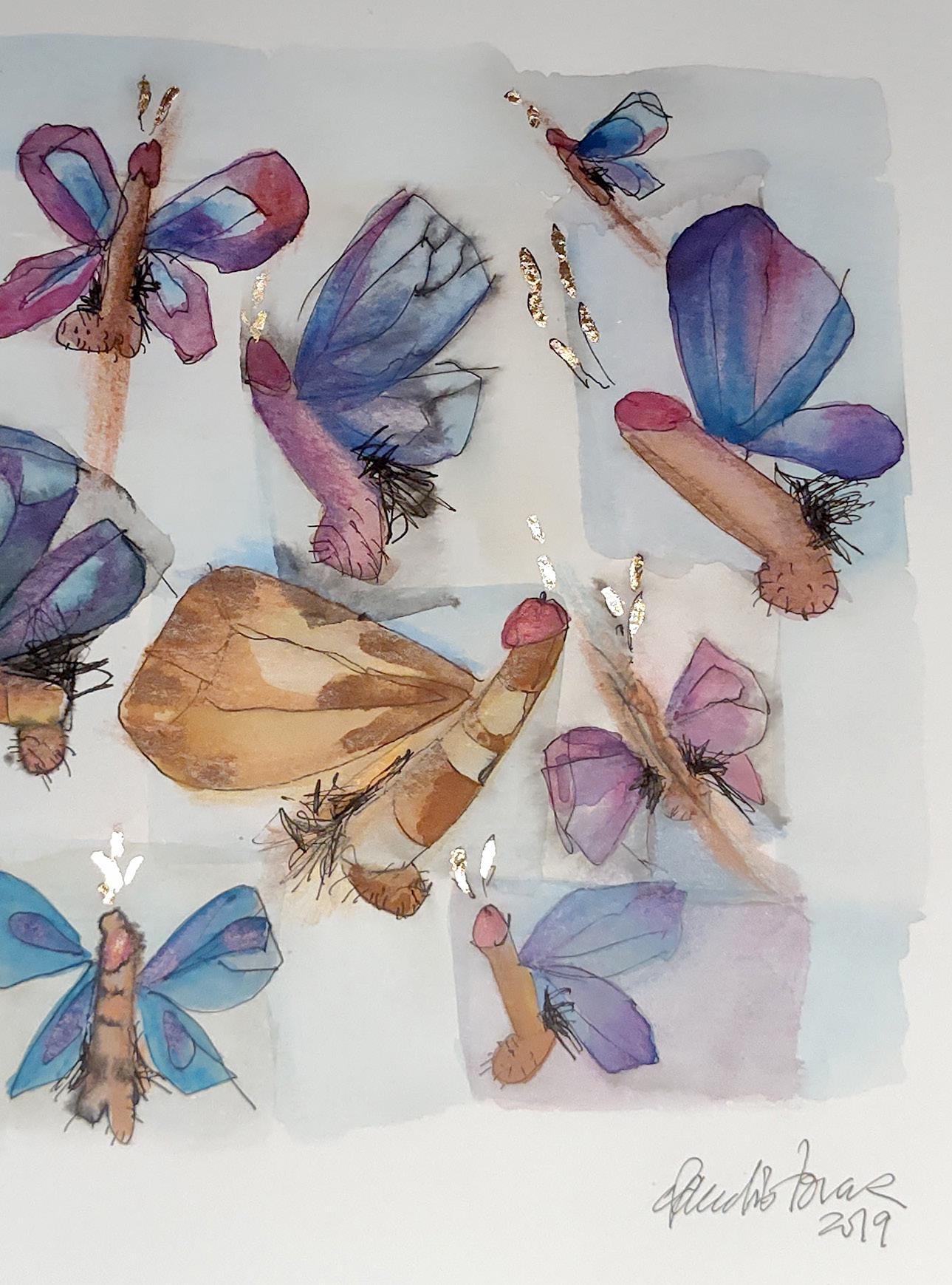
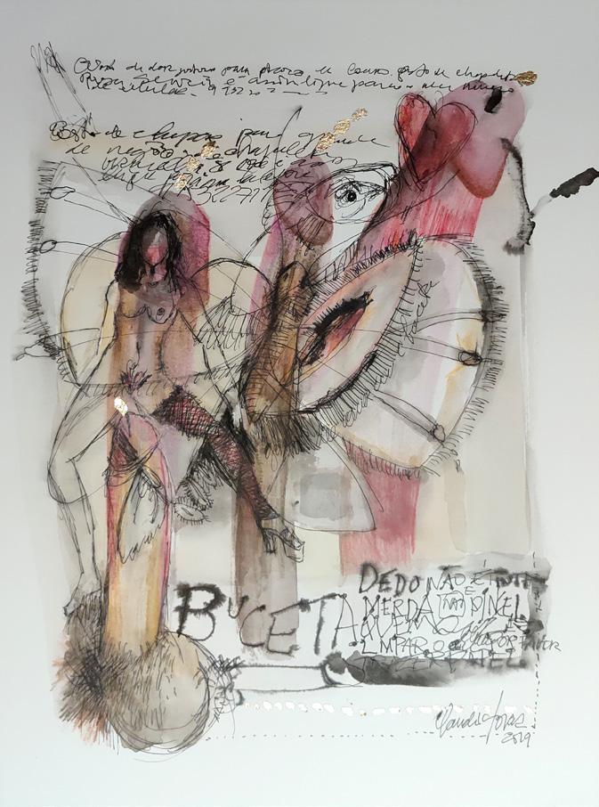
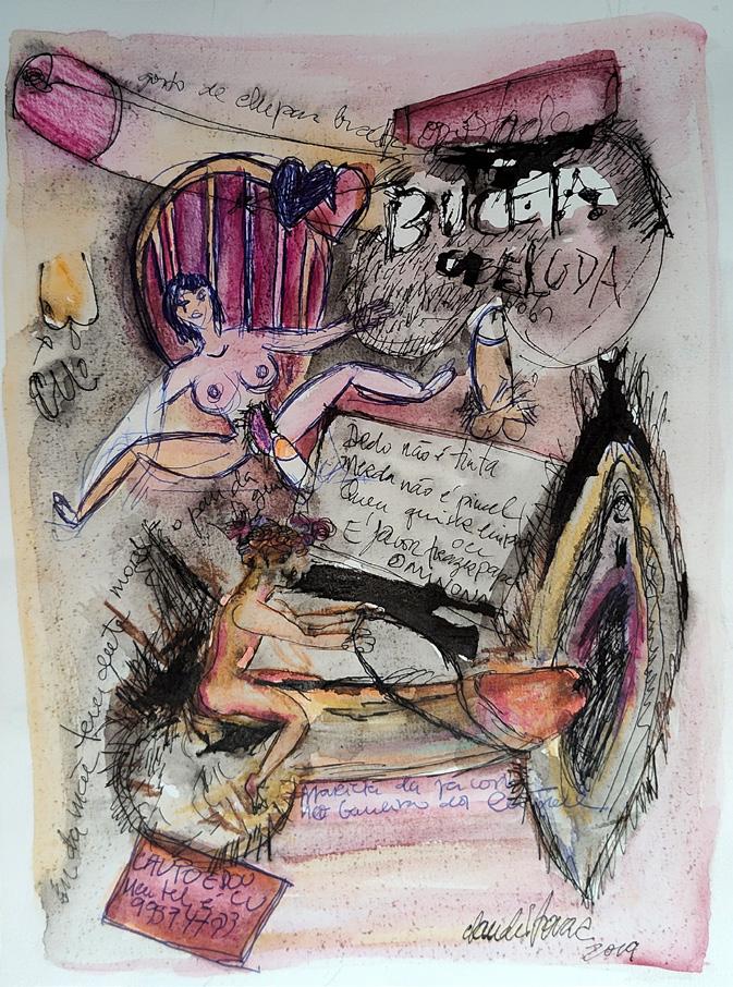
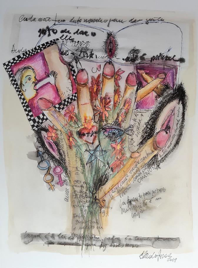
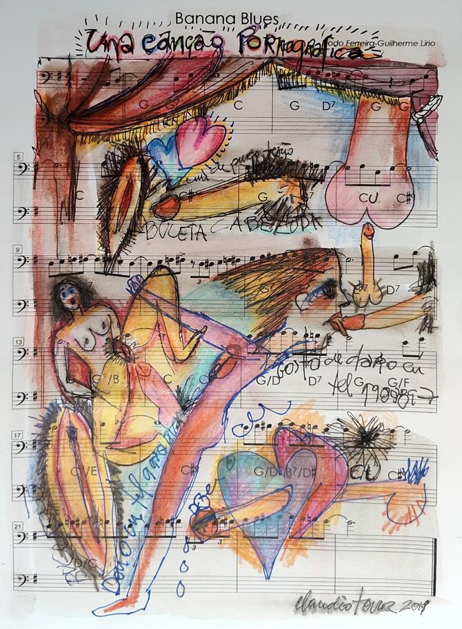
Claudio Tovar is known for soap operas, movies, plays or in Dzi Croquettes*. More than this public figure, Tovar has a history in the Arts that is worth knowing:
I was born in Vitória (Espírito Santo, Brazil), where I lived until I was 18. One day I decided to travel the world, without a specific destination. I went to Brasília, which had been inaugurated a few years earlier, and worked as a construction janitor. I took a History of Art class and another on Observational Drawing with students from the Faculty of Architecture at the University of Brasília and was fascinated! It was the world I was looking for! I took the entrance exam, studied at the construction site and got there. I became an architecture student at University of Brasília and the world opened up to me. I arrived in Rio de Janeiro already graduated and worked in set design for theater and film. I had already had the experience of performing at the University Theater, but when I entered Dzi Croquettes… it was a path opened to a thousand artistic expressions! The group’s success took me to Europe and I became a dancer.
Despite this trajectory, he never abandoned his origins in drawing as his main means of expression. When he traveled, he took his
* Dzi Croquettes were a theater group that performed between 1972 and 1976, in Brazil and Europe, and stood out for its exuberant visuals and its ironic and androgynous musical sketches during Brazil’s military dictatorship.
watercolor material (“the result of years of work, as an intern, documenting the vegetation of the cerrado”) and understood it as a “mixture of all the artistic activities” he experienced.
Keeping in mind that it’s necessary to know the form in order to break it – a fundamental concept in the history of art – Tovar’s creative process is spontaneous. Even if there is an initial trigger for production, it is free imagination that guides his creation:
The result is a surprise even to me. Then, suddenly, I no longer see the work. I liked the creative process, the result was that I abandoned it immediately.
He is currently working on recycling materials and upcycling to question waste and excessive consumption. He has also ventured into erotic content work that would serve to overcome his own barriers.
The human body, male or female, has always been exalted by great artists and is beautiful! Why not go deeper and work to overcome this taboo?
Why not do something beautiful and creative? Eroticism is infinite and full of fantasies, with much more to explore. It was a new door that opened.
A door that Tovar associates with public bathrooms, full of erotic drawings, or with the pages of the Kama Sutra that refer to extravagant positions. The penis became fish and vegetables; the vagina turned into mussels and fruits. At 80 years old, Tovar wants to continue questioning and breaking taboos through his creations.
8=D
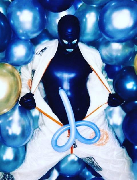
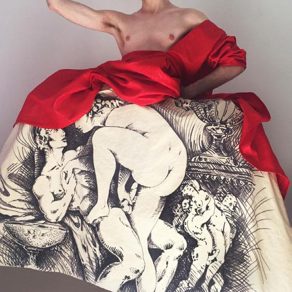
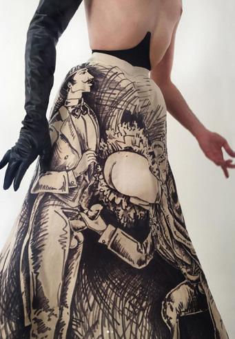
Fashion Phallus
Lby Marcos Rossetton
et’s start by creating some agreements and organizing our understanding of this subject. First, this is not an approach to the history of fashion and clothing. Therefore, the notes will not be chronological, but they will be contextualized.
Second, we must rescue and promote the subject of fashion as a point of view from language of artistic creation. We know that there are classic media, such as drawing, painting and sculpture, and more contemporary ones, such as performance and video art. Fashion also has the perception of being a platform for visual and creative expression, provoking the public, exposing reflections and emotions, and even creating a vast museum collection around the world, with original sculpture-like clothing, specific curatorship for exhibitions and the existence of art spaces dedicated to clothing and accessories. Therefore, as a materiality of artistic thought, fashion designers are true visual artists, not only for fashion, but also for a specific chain of the art market.
Finally, there is no intention here to heat up any discussion about whether fashion is Art or not. The idea here is to bring curiosities, proposals and references about trends in dressing, in the creation of clothes and in the processes of inspiration for fashion collections by contemporary designers, and to create a controversy: the focus is on nudity – hidden or explicit – and phallic genitalia as a fashion trend!
BREAKING INTERNATIONAL STANDARDS
Fashion runways are platforms for promotion, exposure, marketing and work spaces for brands and designers. They still have a bigger spotlight on the so-called female segment, compared to the openness and exposure for the so-called male segment, because fashion still has a binary construction that yields incalculable fortunes and sustains the fashion industry and culture itself. In other words, it is very difficult to change this global capitalist chain!
The body on the runway needs to have a standard feminine silhouette, however, this aesthetic standard borders on unreality – it has even been anorexic. Social pressures and activist demonstrations on important runways have sought to make changes, and, therefore, the fat (plus size), black (dark-skinned), trans (female and male) and disabled bodies are seen more frequently in fashion weeks and collections. However, the exposure of the nude or semi-nude body – especially if it is a body with a phallus – is a delicate chapter: yes, the Fashion Phallus is still a taboo! But not for all designers… take a look:
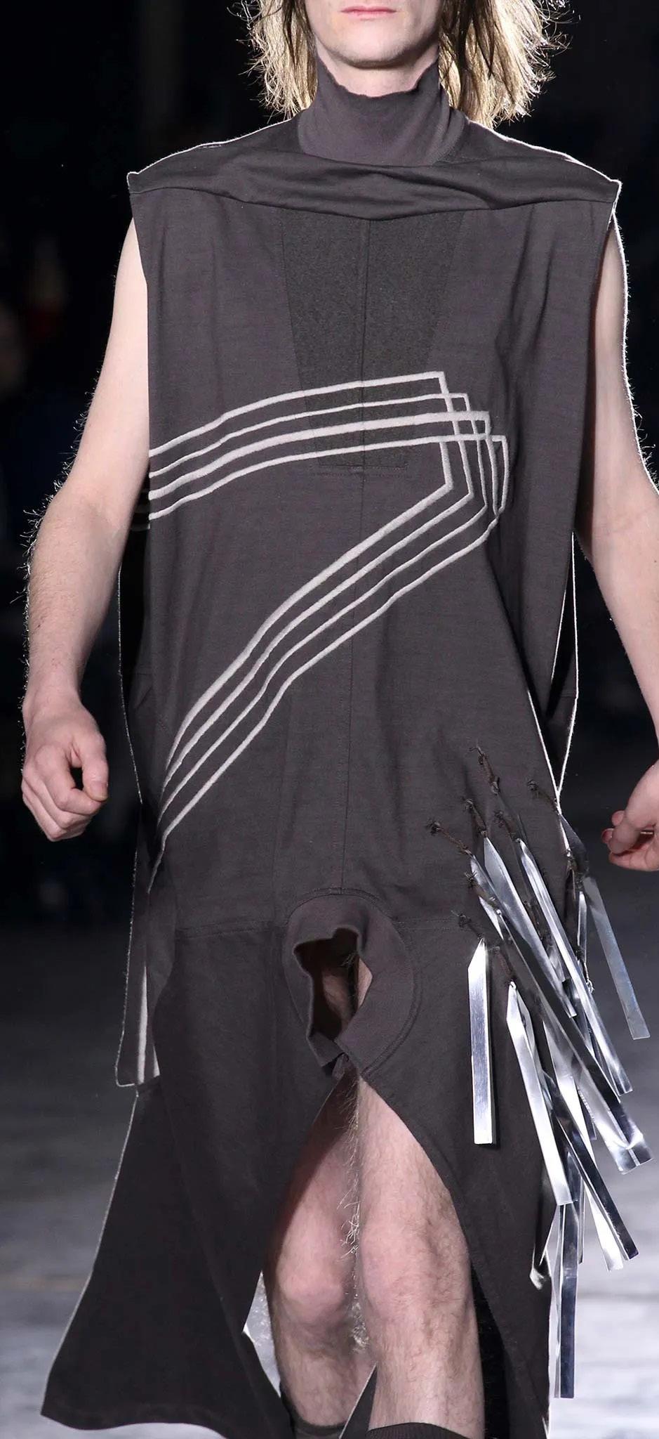
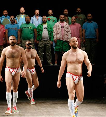
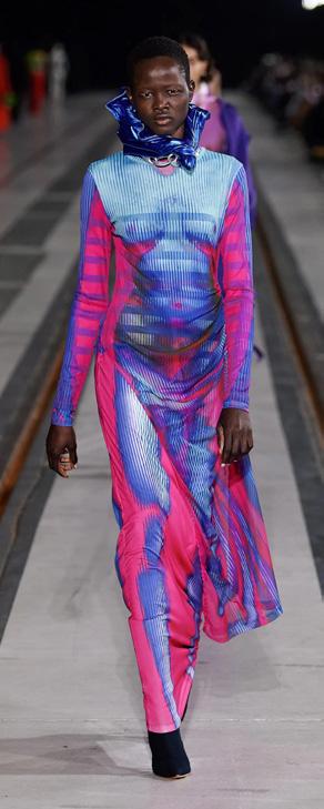
RICK OWENS
British designer Rick Owens presented “Sphinx,” his fall/winter 2015 menswear collection, where the clothes had slits and holes that revealed the naked front of the body during the catwalk. It caused a stir among the audience in the first row of seats, generating nervous laughter, whispers and squeals from the guests: a true fashion moment –making the hashtag #dickowens go viral! The designer was inspired by an old French film set in a submarine (hence the holes in the windows of these vessels). It was quite subliminal that the designer chose to place the window in the crotch of some of his models! The audience certainly gasped! The visual reading of the models of some of the pieces reminded one of glory holes, but that’s a bit of queer poetic license!
Doing what Owens proposed is subversive in that it inverts the binary and sexist view of catwalks, literally throwing the “dick it in the face” trend into the fashion conglomerate, with irreverence, boldness, creativity and daring. This is very powerful and, at the same time, says something about being independent and free.
Photo: Marcus Tondo | In Digital
Vogue Runway
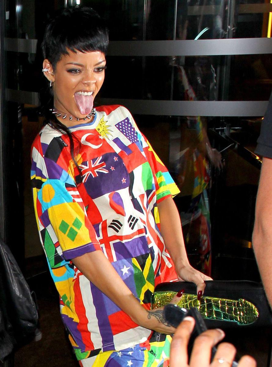
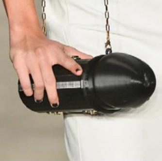
VIVIENNE WESTWOOD
The British designer responsible for highlighting punk and new wave fashion in the 1970s and 1980s is often controversial with her transgressive brand in the fashion market, where she always displays clothes with sexually themed prints. At the men’s edition of London Fashion Week 2016/17, Westwood showed the phallus in accessories incorporated into clothes and jewelry. An emblematic example was a black clutch bag with a phallic print that made waves on social media after singer Rihanna wore it in 2013. Of course, the pop star’s provocation divided opinions with more than two thousand comments on social media: “Is this a penis?”, “And since when is a mature woman a slut for wanting a penis?” and “I love your attitude, you always show a sexy side. You’re not afraid to show your sexuality.”
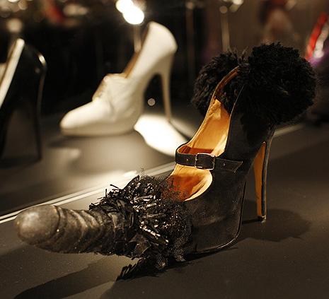
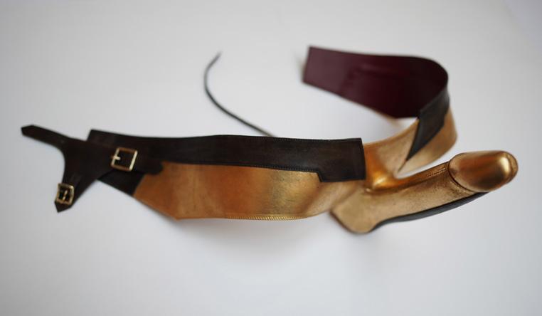
Penis Shoe. (Source: Brand disclosure)
Photo: Yannis Vlamos | In Digital. Source: Vogue Runway
Photo: Yannis Vlamos | In Digital. Source: Vogue Runway
Photo: Yannis Vlamos | In Digital. Source: Vogue Runway.
Photo:
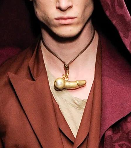
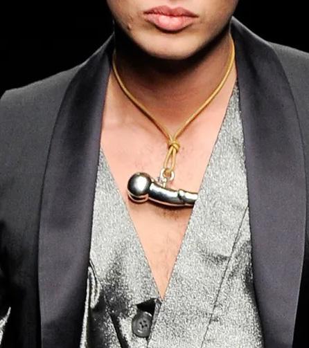
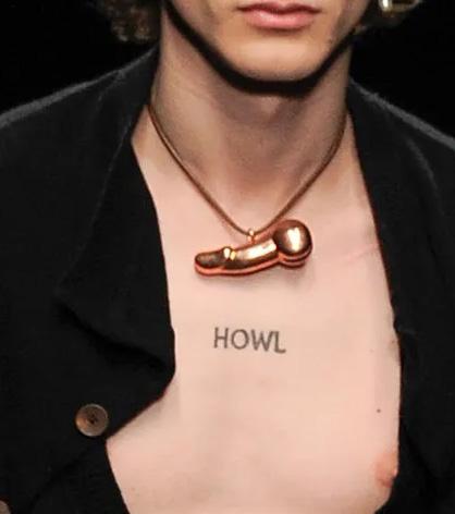
WALTER VAN BEIRENDONCK
The Belgian designer and “bear” is a big name in haute couture, who has effectively abused the image of “lumberjack men” and the body type of “bears” on the traditional catwalk. Beirendonck was recently head of the fashion department at the Royal Academy of Fine Arts Antwerp, where for more than three decades he presented Belgian fashion to the world, with a sense of irony and a sarcasm as sharp as a scalpel.
The designer is seen by fashion critics as a visionary, channeling inspiration from the arts, pop music, street and contemporary culture, and involving technology and science fiction for his radical and post-modern fashion collections, where he constantly stimulates his clientele with sensations that involve all human senses. His vast history includes clothes with dildo prints, accessories with phallic objects in evidence, and even alien personas with their genitals on display.
Conceptual tailoring with unusual contours is the highlight of his collections, blended with these eclectic influences and presented in bold prints with irreverent slogans for his menswear. With Robert Mapplethorpe as one of his inspirations, in his spring/summer 2010 collection, Beirendonck brought his “bears”, not teddy bears, but big hairy men to present the collection wearing “Wonderbea” T-shirts with all their “limbs” on display! Oh my loins!
On the Tom of Finland Store, it is not difficult to find more commercial pieces by the designer with phallic prints. Another iconic reference is an image of Beirendonck wearing a papiermâché hat in the shape of a penis (Sexclown), made in partnership with Stephen Jones’ hat shop, which also created the “phallic helmets”. The hat was made while he was questioning more critical social issues: after all, the phallus is both fashionable and political!
The truth is that Walter Van Beirendonck doesn’t shy away from sex. Whether it’s shiny shoes adorned with phalluses, hats to complement his styling and DNA in the shape of a rooster, or prints with giant slogans, the designer uses fashion as a means of addressing important and often sensitive issues, such as fetishism, racism, BDSM, and HIV prevention. The designer is also an inquisitor of social standards and fashion conventions regarding the “traditional masculine and feminine”, thus dressing men in high heels, corsets, and skirts. It’s no wonder that Beirendonck is invited to collaborate, such as costumes for Marina Abramovic.
Photo: David Bailey
Products featuring , the designer’s symbol, Wildo . Source: Tom of Finland Store.
Explicit Warning Burqa Photo: Maison Klaus. Source: Designer’s Instagram
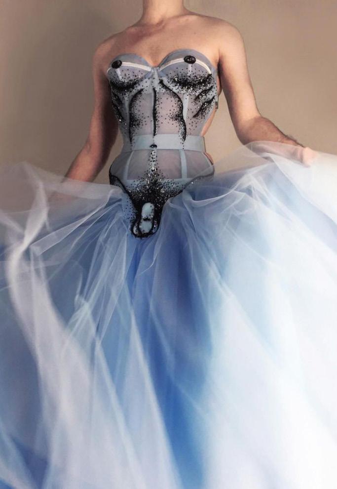
The talented Italian couturier specializes in the artisanal construction of corsets. Corsets were designed primarily by the French and Spanish aristocratic circles, whose purpose was to accentuate the shape of the waist, lift the breasts and correct the female posture of women in the 16th century. The piece gained fetishistic contexts and was reinterpreted by countless designers, such as the famous cone bra a la Jean-Paul Gaultier (who made Madonna’s corset for “The Blond Ambition Tour” in the 1990s). However, what Priciotta proposes for this classic piece is the non-binary image with a critical, reflective and creative positioning on what clothing should be for women or men.
Priciotta’s figure already brings a persona with an ambiguous and provocative image, mixed with references from the Belle Époque. One of the many emblematic pieces created by the designer is the Merry Widower dress, of 2021, which no longer exists. His technical excellence and skill as a seamstress are outstanding, embroidering his widower manually with invisible threads and sequins on fine tulle, in addition to the use of beads, tiles and bugles, in the construction of a beautiful corset dress with phallic embroidery, provoking reflection on non-binary identity, with sensuality and delicacy.
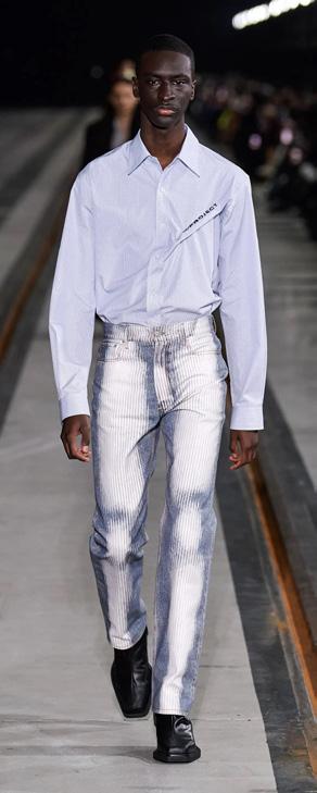
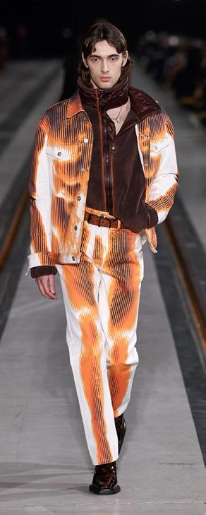
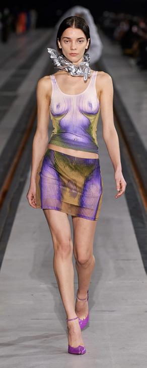
Y/PROJECT + JEAN-PAUL GAULTIER
The Y/Project brand invited French designer Jean-Paul Gaultier for a collaboration in October 2022, detailing a muscular torso and male anatomy with a three-dimensional effect on the garment, like an X-ray. It all reflects the brand’s DNA – fashion is cyclical, mon amour! – since Gaultier used The Body Morph Polka Dot print in the Spring Summer 1996 collection called Cyberbaba
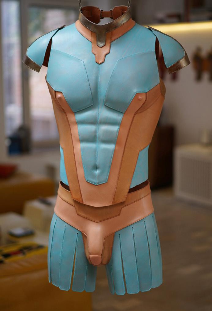
WHITAKER MALEM
Designer duo Patrick Whitaker and Keir Malem are known for their costumes that incorporate contemporary takes on superhero clothing from pop culture. In their self-description (united by art and love!), they both say they are obsessed with the human form, describing their clothes as sculptures of a body that occupy the fantastic realm between art, fashion and costume. Their creations made with penises are truly breathtaking and the detailing is very chic!
Men’s Body Armor. Source: Designers’ website
(Source: Designer’s Instagram).
YES, BRAZIL ALSO HAS FASHION!
The understanding of what Brazilian fashion is and its production systems is still considered recent as a national identity and market, since its entire complex structure was only recently incorporated into the calendar and the international circuit. Therefore, phallic references also make their way timidly, in experimental presentations or very specific ones in clothing pieces and accessories, by some designer who already translates into his own personality some irreverence that goes beyond the fashion or brand itself.
This is the case of Walério Araújo, from Pernambuco. Coming from a family of seamstresses and embroiderers, the designer brings excellence in craftsmanship, as well as the humor of a perceptive northeasterner! We can mention two iconic, humorous and symbolic fashion products from WA: the Pirocuda (Big Cock) Black Bag and the penis prints on knitwear of blouses and pants. On the runways, the male models present the collection with gold, low-cut and provocative swim trunks! Breathtaking!
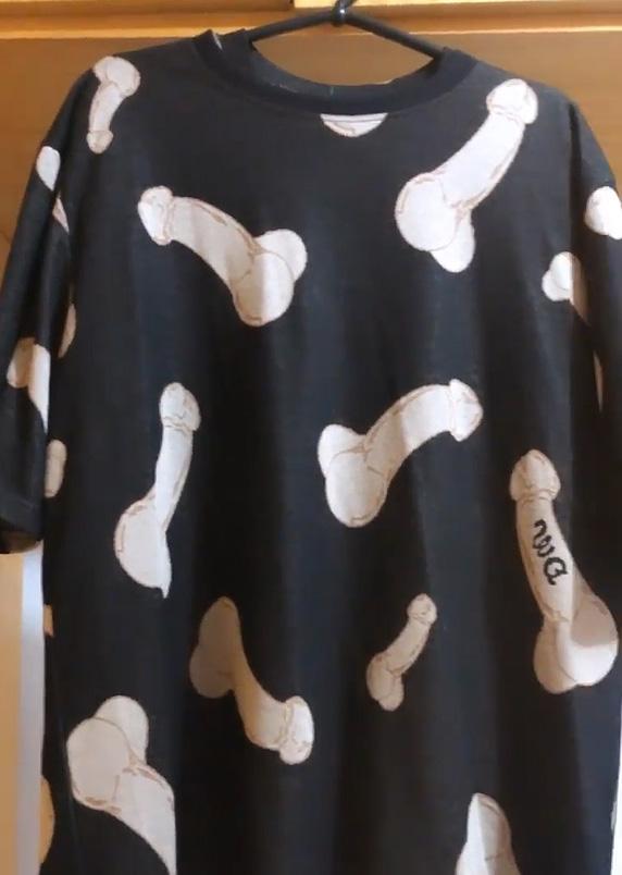
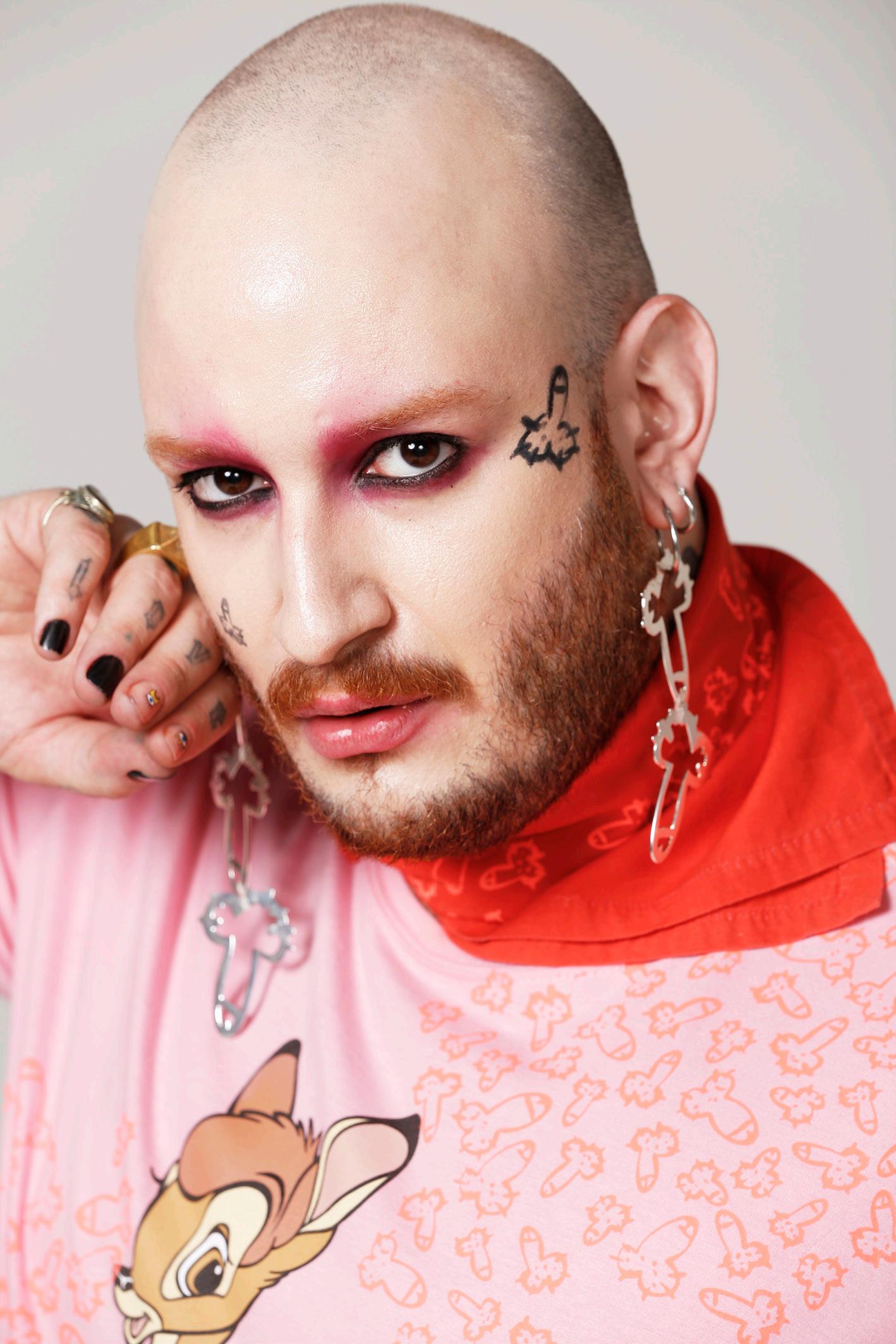
For fast fashion, we can mention the irreverent creativity of the pieces by the São Paulo brand Comfort Pintos, by artist Julia Portella. Penises are printed on everything: t-shirts, sweatshirts, shorts, pants, design pieces (chairs, cups and picture frames) and accessories (jewelry, cell phone cases and playing cards). An overdose of “penisland” that brings provocative interventions to fashion, design and art products to question issues such as feminism, machismo and established social norms.
Above, Desire bag (Photo: Agência Fotosite) and, below, Exu t-shirt, by designer Walério Araújo
Have you read the special article with Júlia Portella in the annual Falo History 2021?
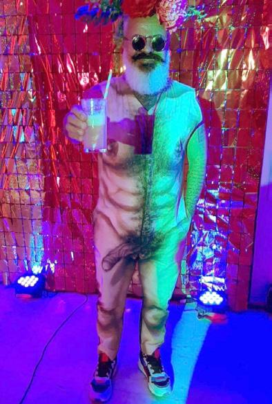
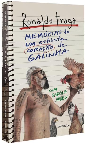
It is important to mention some actions involving the exposure of the body with a phallus, involving the designer Ronaldo Fraga, an iconic name in the history of Brazilian fashion, present since the creation of the trajectory of Brazilian fashion, in events such as Mercado Mundo MIX, Morumbi Fashion and São Paulo Fashion Week. Recently, the designer went “fully frontal” in the cover illustration for the book “Memórias de um estilo coração de galinha” (Memoirs of a Designer with a Chicken Heart, 2023), his biography written in partnership with journalist Sabrina Abreu. Shockin’ – the designer and the phallus illustrated by Felipe Macedo!
For the carnival fashion party at the Grande Hotel Ronaldo Fraga – a party venue, art gallery, bistro and store in partnership with Ivana
Illustration by Felipe Macedo (Bicho Nu) for the cover of Ronaldo Fraga’s book.
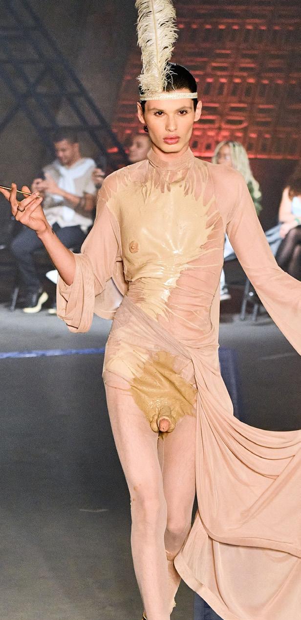
Ronaldo wearing the “The Emperor is Naked” outfit.
(Source: Cabaré da Rosa Instagram)
Neves – the mature, gray-haired designer showed off his big dick in a nude look inspired by the classic tale “The Emperor Has No Clothes” by Danish writer Hans Christian Andersen. Two examples that capture the essence of a true sugar daddy that will take your breath away!
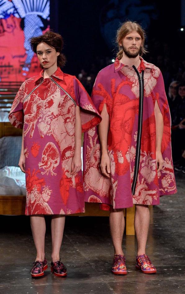
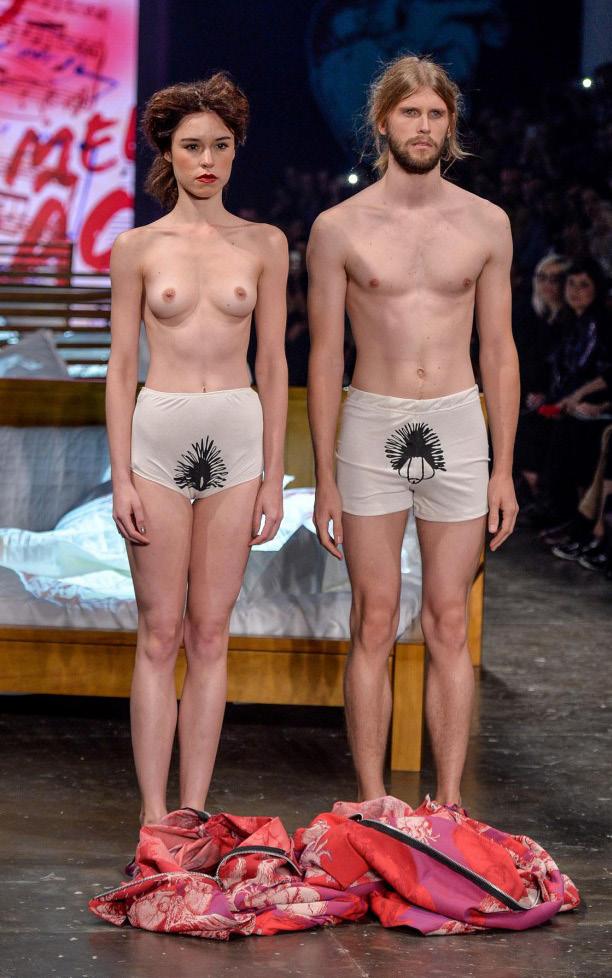
Fraga’s 2016 winter collection was themed around love. The designer created fluid pieces, with both masculine and feminine styles. His idea was to transcend the concept of gendered clothing, eliminating fashion’s dictatorship over dress codes. On the runway,
models in pairs started the show and, as soon as they reached the end, they swapped clothes, leaving each wearing the other’s piece, creating a performance that featured lingerie embroidered with penises and vaginas.
Fraga is one of the Brazil’s leading and relevant designers. On his catwalk, he has discussed dissident bodies, with exclusive transsexual models, elderly models and people with disabilities; always aware of his time and understanding fashion as a platform for social reflections.
And speaking of love... Collection, by Ronaldo Fraga. Photos: Zé Takahashi | Agência Fotosite. Source: FFW Uol
More recently, and no less important, the fashion collection entitled “Toda Nudez Será Bem Vestida” (All Nudity Will Be Well Dressed), presented by designer Rober Dognani at the 53rd edition of Casa de Criadores, in São Paulo, enhanced the meaning of the representation of the naked body with its own existence. In silhouettes created in shapes using latex, prints, satin and performances, it represented the synonym of life*!
Dognani provoked important reflections: what is a state of purification, prohibition,
sin or glorification, exposing silhouettes with nudity as the main feature? Why are breasts allowed, but vaginas and penises not allowed to be exposed in the contours of clothes or in conceptual avant-garde garments? The designer’s answer was broadcast live to everyone present at the show, in a great fashion orgy at the end of the performance presentation.
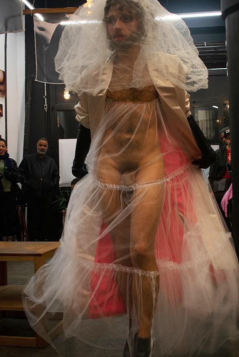
In particular, I recall the performance-show called “Óperah Punky: Kaos in Fashion”, presented in 2022 at Objectos do Olhar Gallery, in São Paulo, with streetwear from the Urbno brand (by designer Bruno Dalcheco) and costume pieces
* It is worth noting that, in his previous collection, Dognani presented a collection about mourning, due to the loss of his own mother.
Photo: Lucas Sant’Ana. Source: Vogue/Globo website.
from Controllu Ateliê (by Paula Gascón) for which I was creative director and styled. In this fusion of urban clothing with theater pieces, one look in particular caused a stir as it showed off the phallus behind a tulle bridal veil! A model that anyone would hunt for! Other models wore artistic objects from my “Assentos Graves” (Low Seats) series as accessories. It was beautiful and punk!
Ultimately, modesty dominates the general public and creates situations that make all these examples seem obscene, vulgar, and derogatory to fashion. The naked body with the phallus visible, veiled or conceptually presented is forbidden and considered pornographic. However, this article proves the opposite with courage, lightness, beauty of dissident and diverse bodies, affection for nature and plasticity of the naked, natural, organic and living body! These are precedents for fashion and reveal the phallus as a fashion icon to be applauded. 8=D
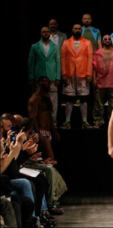
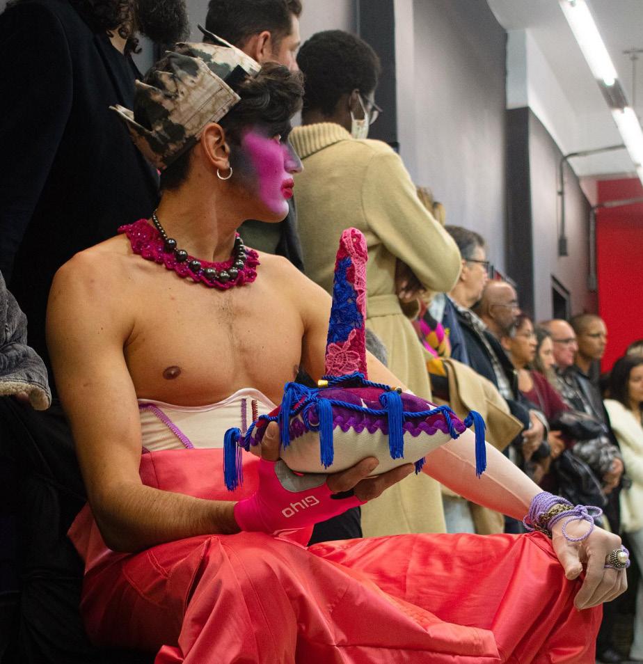
Backstage (photo: Jorge Maluf) and fashion show (photos: Carol Damario).
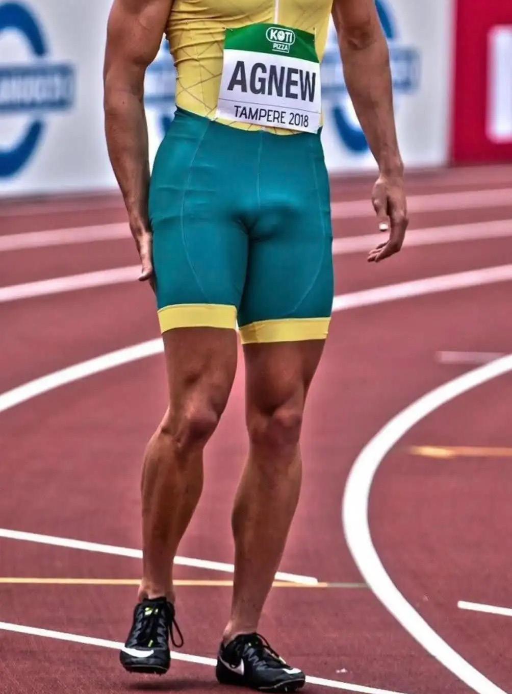
PHALLORRAGIA Athletic volumes
by Filipe Chagas
On the curve... of the race!
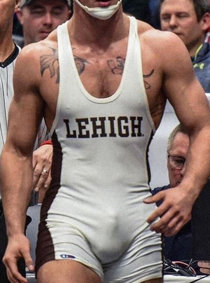
Idoubt anyone would look at athletes’ tight-fitting clothes to check out their bulges. If they already do this with swim trunks on the beach, imagine the slowmotion replays of world broadcasts! But after all... why are they so tight?
They have many uses: they reduce air resistance and friction, provide muscle support, improve movement efficiency and offer muscle compression to reduce fatigue and increase performance. These benefits are particularly important in sports where speed, agility and efficiency are key. These garments are also designed to improve kinesthesia and muscle recovery by increasing blood flow and consequently improving oxygen delivery*.
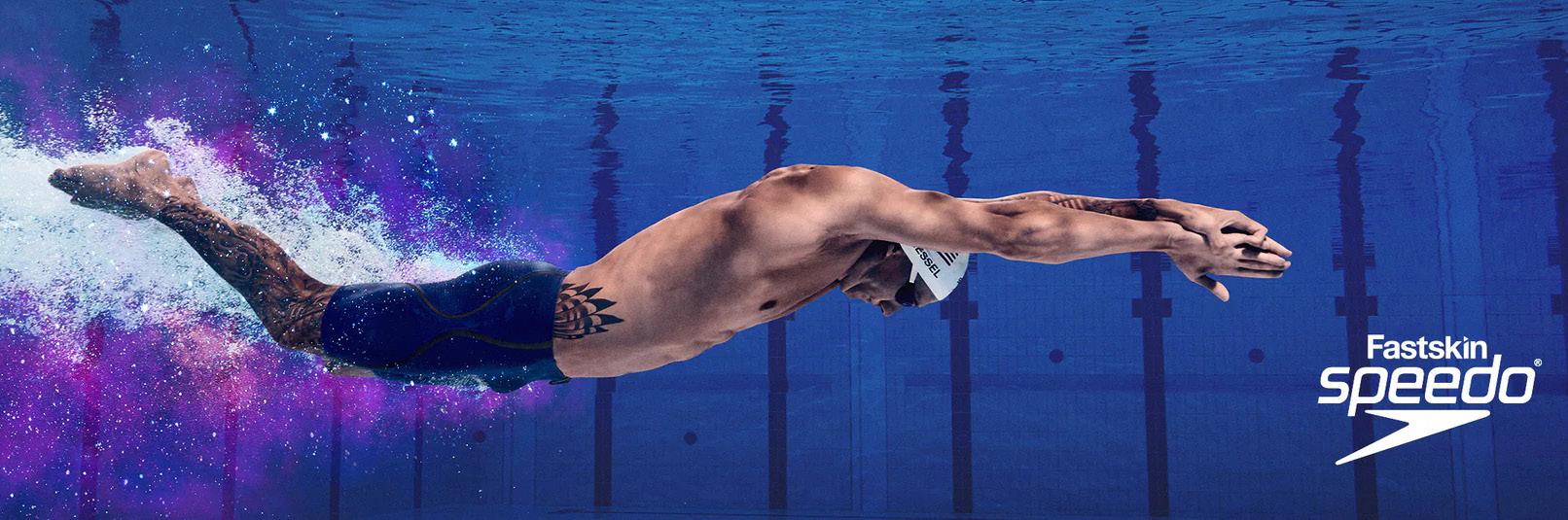
The evolution of sportswear began to gain prominence in the 1950s. During this period, more elastic materials and textile innovations* allowed the creation of tighter and more functional clothing, especially to improve athletic performance and find competitive advantages in swimming and cycling. In swimming, for example, tighter-fitting suits help reduce water resistance, while in cycling they offer aerodynamic benefits, and in running they reduce friction between the thighs.
The development of sportswear is not associated with a single historical record, but rather a gradual evolution over time based on constant technological innovation. However, a notable turning point in the quest for competitive advantage through design was the introduction of full-body suits in competitive swimming. The “Speedo Fastskin” suit was launched in 2000 and attracted attention for its innovative approach to reducing drag and improving efficiency in the water*.
* Kinesthesia is the ability of a person to recognize how the body is positioned in space and the force exerted by the muscles. The better the kinesthetic awareness, the less tiring and more effective the movement becomes. However, it is worth mentioning that numerous scientific studies refute this improvement in performance from compression.
** Some of the most common materials are: spandex (lycra or elastane), polyamide/ nylon, polyester or a blend of synthetic materials. The choice of material is related to the specific requirements of the sport, such as chlorine resistance in swimming costumes, sweat absorption capacity in running clothing, or the need for muscle compression in some sports.
*** These suits minimize the surface area exposed to the water flow and the compression provided improves the body’s position in the water.
But tight isn’t always ideal. Tight-fitting clothing may not be ideal in situations where flexibility and range of motion are essential, or even in hot environments, as it can trap too much heat. In some cases, tradition and established norms in the sport influence clothing choices, and adopting new forms of clothing may encounter resistance*. In addition, cultural issues and the preferences of the athletes themselves must be taken into account.
* In February 2024, Nike changed the material of the uniforms of some teams in the American baseball league and caused an outrage among athletes and fans: all because the clothing was translucent and it was possible to see the underwear (and even the shirts) inside the pants.
If anyone is thinking that penis size can interfere with sports performance – despite there being no conclusive scientific evidence – the answer is yes, especially in running sports with frequent and sequential leg movements, but athletes always train knowing their capabilities and physical characteristics.
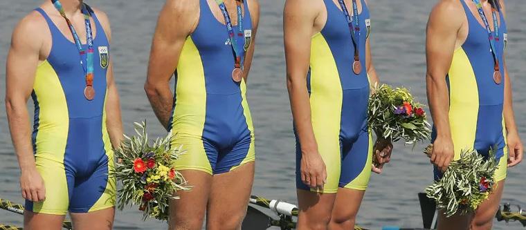
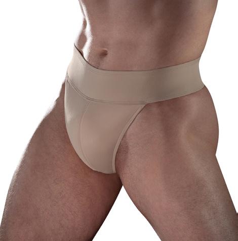
Some combat sports use a cup, a protective sleeve in front of the genitals that protects them from impacts. The cup is inserted into an athletic supporter (like a jockstrap) or into an adjustable fabric pouch in the front of the underwear under the sports uniform. Of course this increases the bulge in the middle of the legs. Greco-Roman wrestling is well known for its tight singlets without any protection that let the spectator know who has or has not been circumcised. These wrestling suits were designed to make it difficult to grab.
You may be thinking, “If they’re going to make grappling more difficult, why aren’t they naked? After all, it’s Greco-Roman wrestling!” Although athletic competitions in Ancient Greece often involved naked athletes, the practice has evolved over time due to cultural and social changes. The adoption of form-fitting clothing serves specific purposes, such as preventing injuries, reducing friction, and ensuring fair competition conditions by standardizing the uniform.
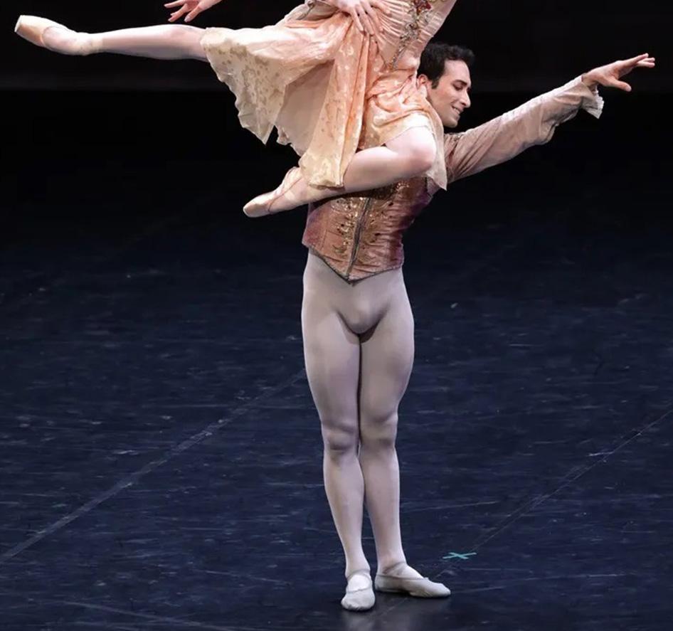
However, it is not only in sports that tight clothing attracts attention. Male dancers are also the target of malicious glances. The tightness of the clothing allows spectators to appreciate the dancers’ technique and body expression, emphasizing the beauty and elegance of their movements. In addition, tight-fitting clothing in ballet helps instructors to correct the dancers’ posture and technique, as it provides a clear view of the dancers’ body position and muscles in movement.
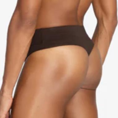
Unlike sports protection, ballet uses a support called a “dance belt,” similar to a tight, high-waisted elastic thong that lifts and supports the testicles so that they remain out of the middle of the thighs and ensures comfortable movement. The dance belt also softens the phallic contours that are considered a distraction for the audience. It is worth mentioning that whether it is a thong or a jockstrap, the phallus may be protected, but the butt remains free.
The fact is: in sporting and artistic contexts, where the emphasis is on performance and technique, general social perception accepts and admires volumes that celebrate anatomy in its physical excellence by naturally revealing the athletic body and aesthetic expressiveness. 8=D
Photo: Brescia e Amisano. Source: Gramilano.
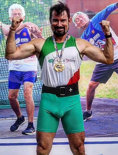
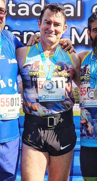
Based on my own experience in athletics, clothes that fit the body make all the difference in performance. From the beginning, I wore short, tight shorts.
In the beginning, the prejudice and disapproval were visible. However, the fact is that today’s technological evolution of sportswear provides not only better performance, but also greater comfort. For me, a well-fitted model that fits the body well and is well-fitted with exposed volumes is a style that defines the look and attitude. It’s a sexy, attractive, comfortable look.
First place in the 5th Santa Catarina State Master Athletics Championship (2023) and in the XXX Fluminense State Master Athletics Championship (2024).
Jerry Edson da Costa is a Pan-American, South American and Brazilian champion in Master Athletics.
Sports voyeurs don’t live just on tight
clothes…
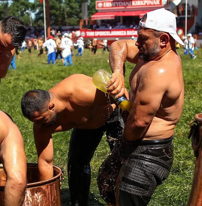
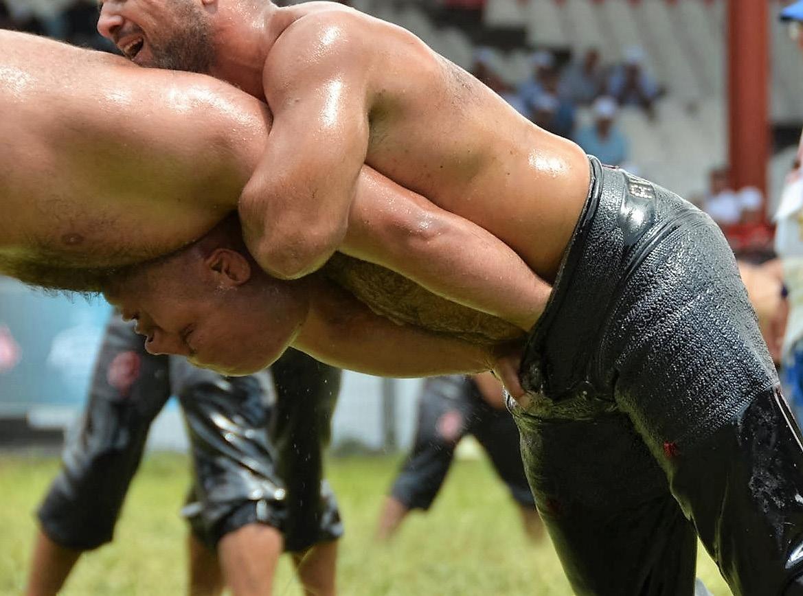
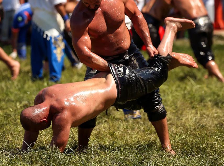
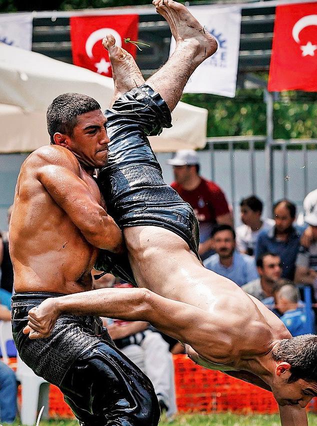
Yağlı güreş (“oil wrestling” or “fat wrestling” in Turkish) is a Turkish wrestling match in which the wrestlers (pehlivan, from Persian, meaning “hero” or “champion”) wear leather shorts (kıspets) and smear their entire bodies with olive oil. The wrestlers rub olive oil on each other before the fight as a demonstration of balance and mutual respect. The function of the oil is to make it difficult to grab the body directly, in proximity to the fabric of the singlets in Greco-Roman wrestling.
The kıspets follow the minimum standard of modesty for Muslim men, where the garment starts at the belt and goes down to just below the knee. However, it is believed that the shorts were introduced by Islam in the 10th century, as there are records of wrestling using oil on the naked body in Ancient Egypt, Assyria and other civilizations around 2650 BC.
According to the rules, the loser is the wrestler whose back touches the ground as a result of the opponent’s actions (“showing his belly to the stars”) or sits on both hands behind him or touches the ground with both elbows or elbow and hand. The winner (başpehlivan) is the wrestler who lifts his opponent and carries him three steps or spins him around. Therefore, the most common move is to attempt control by sticking one’s arm into the opponent’s shorts to lift him up. If a wrestler’s kıspet is pulled down (revealing his genitals), he also loses, although this is unlikely due to the tightness of the clothing.
The annual Kırkpınar tournament – which runs for three days in June – has been happening since 1361 and is the oldest sporting competition in the world according to the Guinness Book of Records. In 2010, UNESCO classified the tournament as an Oral and Intangible Heritage of Humanity.
Source:
I invite you to join us in celebrating bodies of all shapes and sizes wearing swim briefs! Join us at The Speed-Oh Movement!
Cody Owner/Creator of TSM
Model: Adrian. Photo: self-portrait.
BE MORE.
Falo Magazine has as its main principle the knowledge for free. It was always thought that way through online platforms, where the reach could be maximum and timeless.
The work is hard. A single person is the editor, the reporter, the researcher, the writer, the translator, the proofreader, the designer, the marketing advisor, the social media manager, the janitor etc etc ... without any financial gain. The advantage is that the cultural, social and personal gains are immeasurable. However, it is necessary that the magazine become self-sustainable and can invest in itself.
You are already our collaborator just because you access the magazine, the social networks and have made it this far. If you want to collaborate a little more to leave quality material as a cultural and social legacy, click the logo to donate!
Thanks to you who believe in the magazine and the transformative power of Art!
Alcemar Maia, Orlando Amorim, Marcos Rossetton, Maria da Graça, Silvano Albertoni, Christopher Norbury, Daniel Tamayo, Eduardo Filiciano, Giovanni Ravasi, Murilo Assis, Paulo Cibella and anonymous benefactors.