A research/competition on the expressive forms of mosaic art
in collaboration with

Concorso-indagine sulle forme espressive dell’arte del mosaico
si debbe osservare il decoro. cioè che li movimenti sieno annunziatori dei moti de l’animo — Leonardo da Vinci
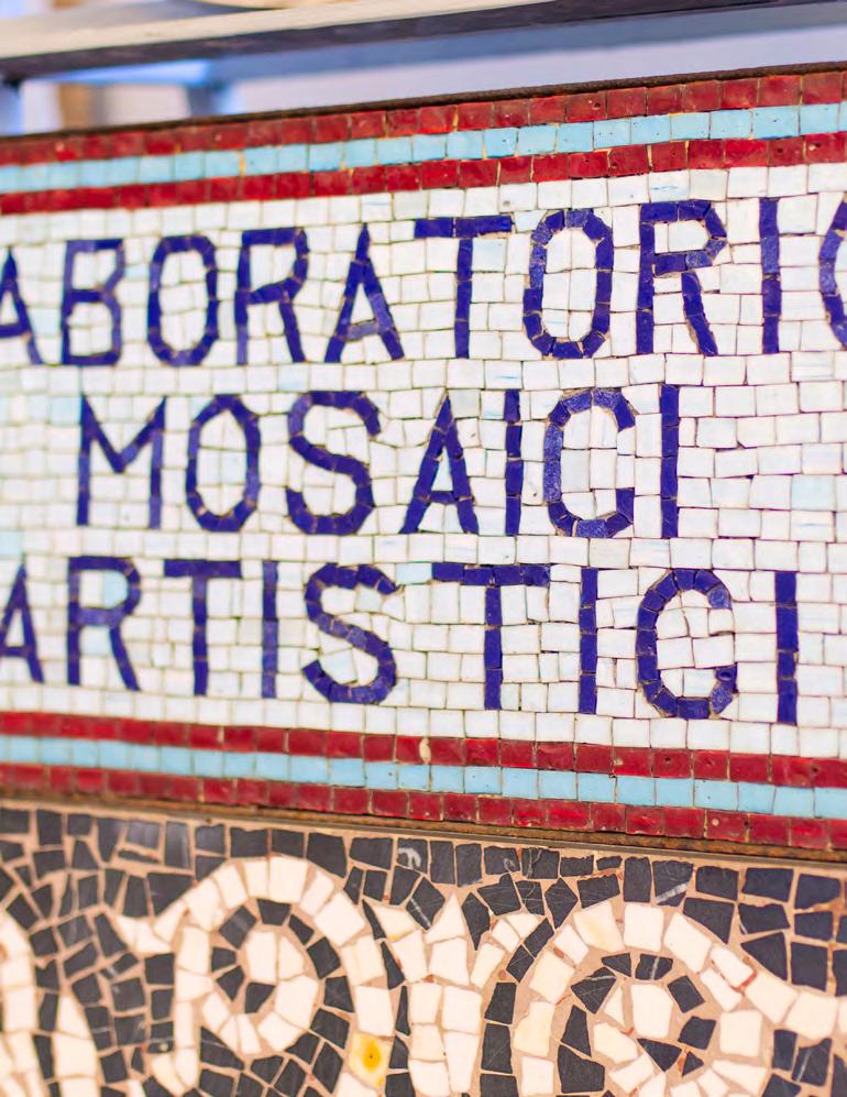
Per la prima volta nei suoi oltre 120 anni di storia Fantini Mosaici ha promosso un concorso creativo per giovani talenti intitolato: “Un racconto di bellezza, decoro, materia e superfici. Concorso-indagine sulle forme espressive dell’arte del mosaico.”
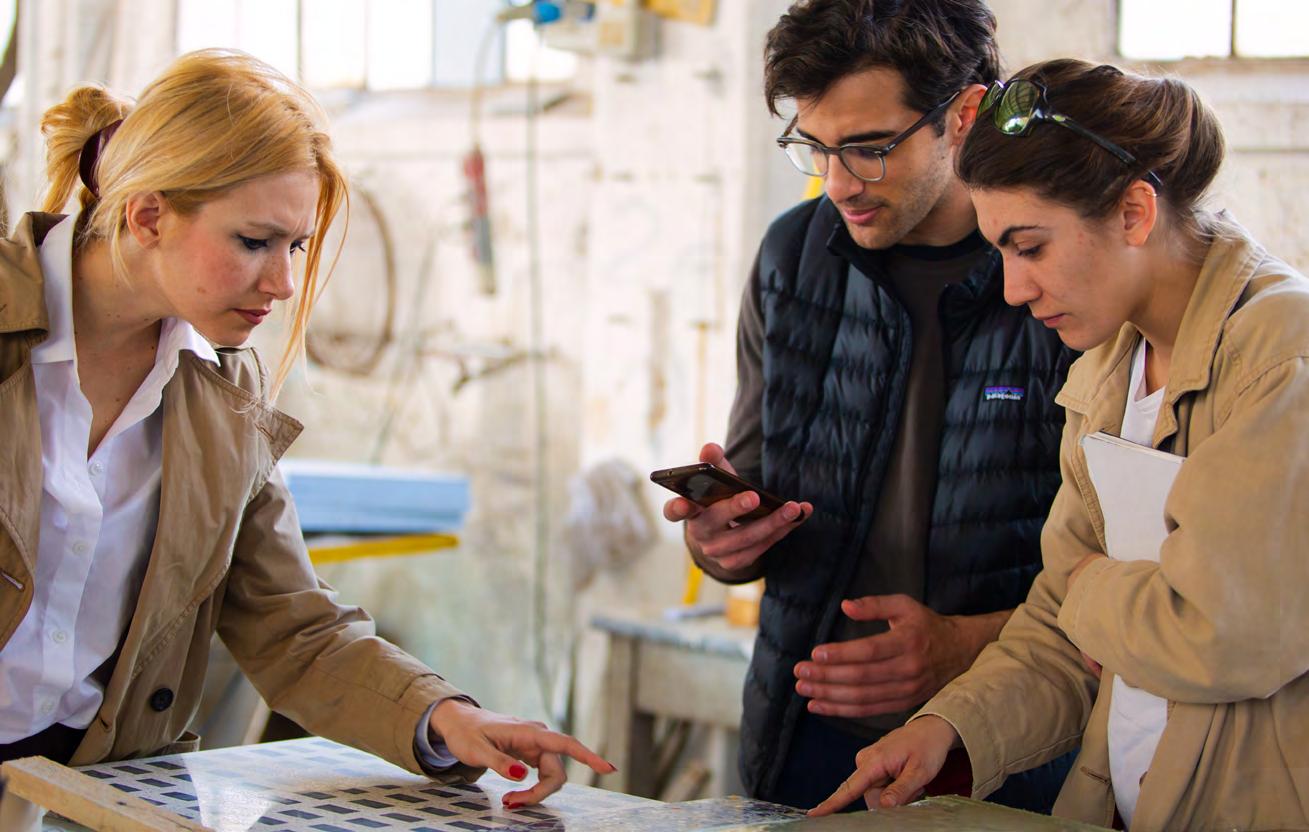
Ideato e promosso in collaborazione con l’Accademia di Belle Arti di Brera di Milano, che conta oltre quattromila studenti di tutte le nazionalità, il bando è stato lanciato nel dicembre del 2022, a tutti gli studenti in corso di studio presso l’Accademia.
I giovani talenti sono stati invitati a interpretare, nella massima autorialità del proprio linguaggio poetico e figurativo, il potenziale rappresentativo dell’arte del mosaico. A pensare opere visive completamente riproducibili con tecniche musive, composte da materiali duri, lapidei e vetrosi. A esplorare, in ultima istanza, le forme narrative ed espressive dell’alta manifattura italiana del mosaico tranciato a mano.
“Lo scopo è innanzitutto comprendere come un’arte antichissima e classica come il mosaico possa interpretare anche le figurazioni e i linguaggi della nostra cultura contemporanea” dichiara Enrico Fantin, AD di Fantini Mosaici.
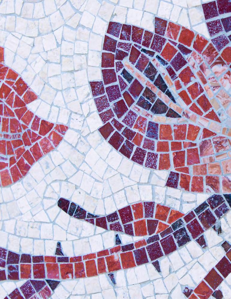
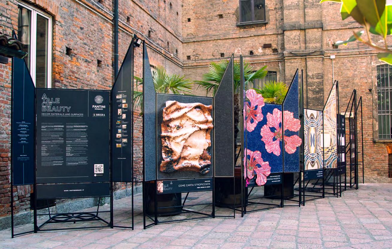
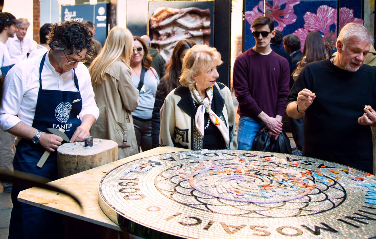
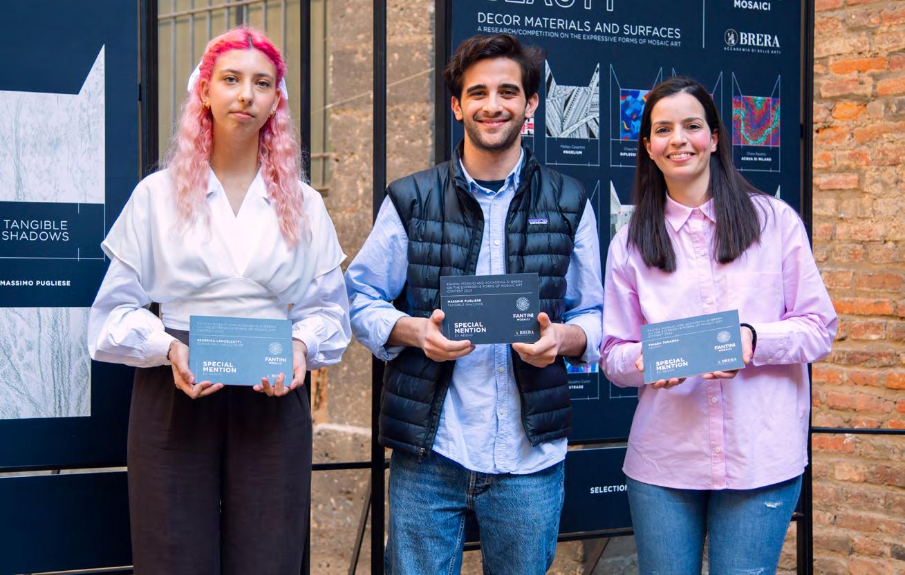
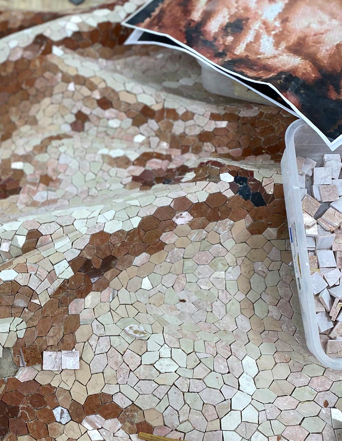
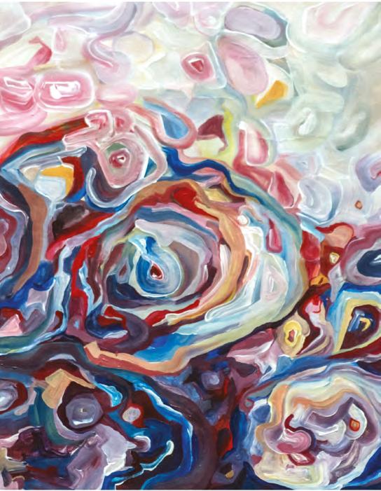
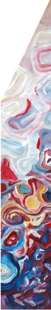
Le opere qui pubblicate rappresentano 21 differenti interpretazioni artistiche sull’arte del mosaico, fra le oltre 60 pervenute. Le 3 opere vincitrici (ex aequo) sono state tradotte in opere fisiche a mosaico dall’alta manifattura artigianale di Fantini Mosaici, mentre le 3 opere Menzioni Speciali (ex aequo) sono state riprodotte a stampa su un pannello separato.
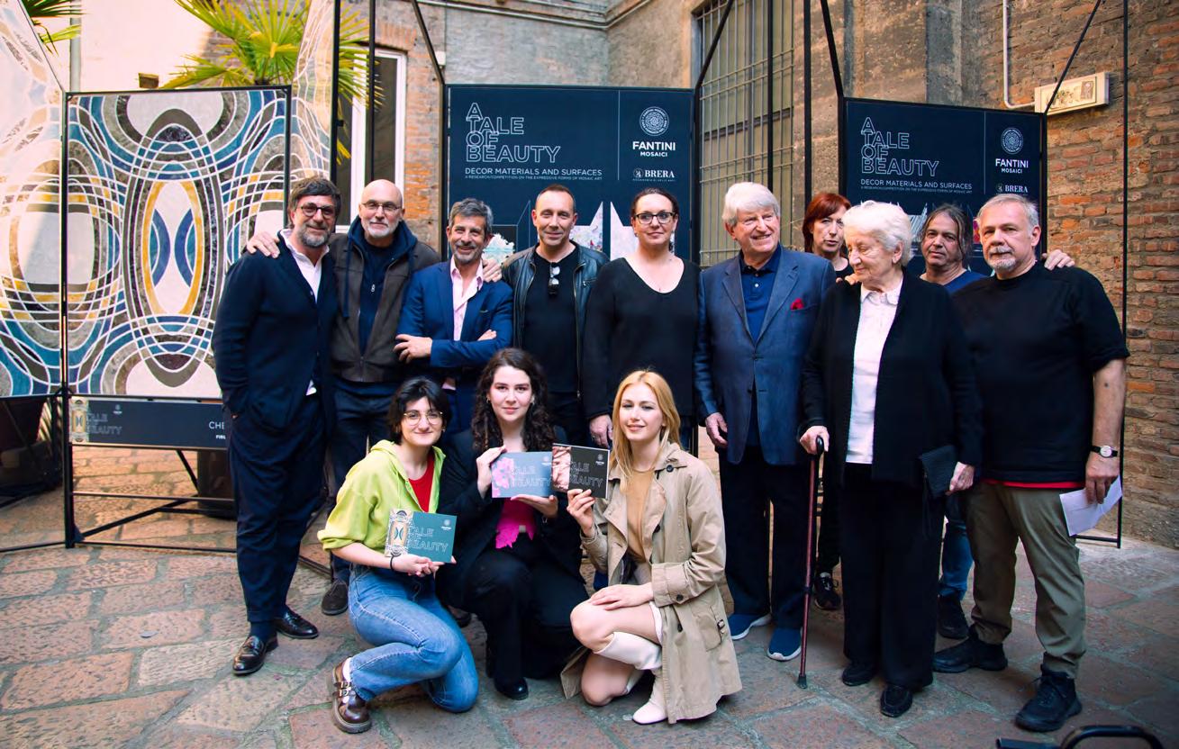
Il presente catalogo racconta l’intera operazione di talent scouting: gli obiettivi generali, i premi e la valutazione della giuria, composta da: Maria Cristina Galli Vicedirettrice Accademia di Brera, Dany Vescovi Direttore Scuola di Pittura Accademia di Brera, Felice Martinelli Professore di Progettazione Interventi Urbani e Territoriali Accademia di Brera, Laura Traldi Coordinatrice editoriale internimagazine.it e curatrice DWProfessional, Sandra Kapp Responsabile Contenuti e Progetti Speciali Fantini Mosaici, Massimo Bruto Randone Fondatore Cxine, Alessandro Consolo Fondatore Consolo Hub.
“Molte generazioni di artisti e artigiani per secoli hanno lavorato attorno ai valori poetici ed espressivi della materia figurativa e decorativa. Una relazione di rispetto e di sfida fra Arte e Natura che si è articolata all’interno della polarità fra capacità tecnica (Mimesis-μίμησις) e volontà interpretativa (Poësis)” dichiara Massimo B. Randone, curatore del Fantini Mosaici Academy Project.
Un percorso di lunga durata che intende coinvolgere i giovani talenti internazionali, nell’interpretazione del potenziale rappresentativo dell’arte del mosaico nel nostro contemporaneo. Un progetto di ricerca che si inserisce nel più ampio e storico Fantini Mosaici Art Programme, le cui origini risalgono agli anni ’30 del 900.
A research/competition on the expressive forms of mosaic art
decor should be observed. that is, that the movements announce the motions of the soul — Leonardo da Vinci
For the first time in its 120-year history, Fantini Mosaici has promoted a creative competition – “A tale of beauty, decor, materials and surfaces. A research/competition on the expressive forms of mosaic art” – aimed at university students.
The contest has been conceived with, and is presented by, Fantini Mosaici in collaboration with the Accademia di Belle Arti di Brera di Milano, regarded as one of the most prestigious universities in the world and attended by over four thousand students of all nationalities.
In December 2022, students enrolled at Accademia were encouraged to participate in the contest. Young talents were invited to interpret the representative potential of mosaic art through the utmost authorship of their own poetic and figurative language. They were asked to create a visual work, designed to be reproduced in glass and stone mosaic, and to explore and enhance the narrative, expressive and decorative potential of high-end Italian craftsmanship using speciality hand-cut mosaic.
“Our first goal is to understand how a very ancient and classical art like hand-crafted mosaic can also interpret the figurations and languages of our contemporary culture,” says Enrico Fantin, CEO of Fantini Mosaici.
The works published here represent 21 different artistic and poetic interpretations of the art of mosaic, out of the more than 60 received. The three (ex aequo) winning artworks were translated into mosaic panels by Fantini Mosaici’s highly specialized master mosaic craftspeople. The three (ex aequo) Special Mention artworks have been reproduced in print on a separate board.
This catalogue, dedicated to the initiative, features detailed explanations of the entire talent scouting programme: its objectives, the awards and the evaluation of the jury, which was composed of: Maria Cristina Galli Deputy Director of Accademia di Brera, Dany Vescovi Director of the Accademia di Brera School of Painting, Felice Martinelli Professor of Urban and Territorial Intervention Planning at the Accademia di Brera, Laura Traldi Editorial Coordinator of internimagazine.it and curator of DWProfessional, Sandra Kapp Head of Content and Special Projects at Fantini Mosaici, Massimo Bruto Randone Founder of Cxine and Alessandro Consolo Founder of Consolo Hub.
“Over many centuries, generations of artists and craftspeople have worked around the poetic and expressive values of the figurative and decorative material - a long relationship of respect and challenge between Art and Nature that has been articulated within the polarity between the technical ability (Mimesis - μίμησις) and the interpretative will (Poësis),” says Massimo Bruto Randone, curator of the Fantini Mosaici Academy Project.
This long-term initiative is aimed at involving young international talents in interpreting the representative potential of mosaic art in our contemporary context. it is also a research project that is part of the broader and historical Fantini Mosaici Art Programme, whose origins date back to the 1930s.
Milano, Aprile 2023
“Il mosaico è un’opera d’arte decorativa che può essere fatta risalire al terzo millennio a.C. e che ha catturato l’attenzione degli intenditori d’arte per migliaia di anni. Fondere la nostra abilità artigianale con l’immaginazione e la creatività di artisti di spicco, significa accrescere il valore e il profilo di questa tecnica che siamo orgogliosi di ampliare nelle sue applicazioni e di portare avanti in forme nuove”. Enrico Fantin, amministratore delegato di Fantini Mosaici
Da oltre un secolo, Fantini Mosaici, azienda milanese creatrice di superfici artistiche, ha avviato sinergie con la comunità artistica per la realizzazione di opere d’arte originali e innovative in mosaico.
Oggi i marchi più celebri del mondo realizzano importanti progetti insieme ad artisti e ad altre aziende di successo che rendono i loro prodotti di lusso più attraenti per un consumatore sempre più giovane. Tra queste, Louis Vuitton x Yayoi Kusama, Nike x Tiffany, Loewe x Howl’s, Moving Castle o Adidas x Prada.
Tuttavia, per Fantini Mosaici, promuovere collaborazioni con artisti, gioiellieri, stilisti, grafici e architetti di primo piano è sempre stata una seconda pelle, una sorta di atto incondizionato. Ricordiamo per esempio i progetti svolti con l’artista milanese Bobo Piccoli (Palazzo delle Stelline e Castello di Macconago), Guido Canella (Centro Civico di Pieve Emanuele e Piazza Cisalogo), Giorgio de Chirico e Achille Funi, accanto ad altri autori di spicco, che hanno ampliato in queste realizzaziono la propria espressione artistica portandola ad alti livelli.
In occasione del recente traguardo dei 123 anni di attività di Fantini Mosaici nel settore della creazione di superfici funzionali di lusso di rara bellezza, è nato, da uno sforzo concertato, il Fantini Mosaici Art Programme. Un’iniziativa lanciata dalla quarta generazione della famiglia, con l’intento di dare un’investitura più formale al rapporto con l’ambiente artistico, promuovendo gli antichi mestieri del mosaico, della tecnica a terrazzo e di quella dell’acciottolato.
Se il progetto artistico dell’azienda risale già agli anni Trenta, il nuovo programma si è ampliato e arricchito della collaborazione con l’artista belga di fama mondiale Luc Tuymans, il cui dipinto Schwarzheide è stato ricreato in mosaico da Fantini Mosaici e installato a Palazzo Grassi durante la Biennale di Venezia del 2019.
L’azienda, con filiali negli Stati Uniti e negli Emirati Arabi Uniti e con prestigiosi progetti in tutto il mondo, ha anche collaborato a lungo con il defunto stilista Gianni Versace, con il gioielliere americano delle star Neil Lane e con l’artista argentino Fabián Ríos Rubino, solo per citarne alcuni. Più recentemente, durante la Settimana del Design di Milano 2022, è stata presentata la collaborazione con il graphic designer e artista newyorkese Justin Teodoro.
Quest’anno l’attenzione è andata ai giovani, con il sostegno e il tutoraggio del concorso creativo Fantini Mosaici & Accademia di Brera 2023, che ha offerto agli studenti del prestigioso istituto la straordinaria opportunità di creare e sviluppare proposte artistiche da realizzare con le principali produzioni artigianali di Fantini, tra cui il mosaico, il terrazzo alla veneziana e l’acciottolato.
All’inizio di quest’anno, l’azienda ha intrapreso una collaborazione con il Sotheby’s Institute of Art di Londra e con l’Università Bocconi di Milano con il fine di avvicinare gli accademici al mondo delle Belle Arti. Molteplici sono le iniziative di Fantini a favore di studenti internazionali mirate a sviluppare e coltivare nuovi talenti, promuovendo al contempo il meglio del Made in Italy.
Come ha affermato il CEO di Fantini Mosaici, Enrico Fantin: “Abbiamo tratto grande ispirazione dalla originalità, dalla freschezza, dalla libertà ideativa dei numerosi partecipanti al concorso. Il lavoro fatto dai nostri maestri artigiani per trasformare in opere i loro progetti creativi risponde alla necessità di trasmettere la nostra tradizione artistica alle nuove generazioni”.
Milan, April 2023
“Mosaic is a decorative work of art that can be traced as far back as the third millennium BCE and has captured the attention of art connoisseurs for thousands of years. Combining our craftsmanship with the imagination and art of leading artists adds value and heightens the profile of this technique, which we are proud to stimulate and elevate.”
Enrico Fantin, CEO of Fantini MosaiciFor over a century, Milan-based artistic surface creator Fantini Mosaici has fostered relationships with the art community, collaborating to produce innovative, original hand-crafted artworks in mosaic.
Today, the world’s leading brands are engaging in powerful collaborations with artists and other successful brands to make their luxury products more appealing to the increasingly youthful consumer. Such collaborations include Louis Vuitton x Yayoi Kusama, Nike x Tiffany, Loewe x Howl’s Moving Castle and Adidas x Prada.
However, it has always been second nature – a sort of reflex action – for Fantini Mosaici to foster collaborations with leading artists, jewellers, fashion designers, graphic designers and architects. These include Milanese artist Bobo Piccoli (Palazzo delle Stelline and Macconago Castle), Guido Canella (Pieve Emanuele Civic Centre and Piazza Cisalogo), Giorgio de Chirico and Achille Funi, as well as other leading creatives, propelling their repertories to new levels.
With Fantini Mosaici recently marking 123 years in the sector of creating functional luxury surfaces with outstanding beauty, a concerted effort was made to launch the Fantini Mosaici Art Programme. An initiative launched by the fourth generation of the family, the programme seeks to formalize these relationships within a more focused and formal framework that will promote the ancient crafts of mosaic, terrazzo and pebble stone.
While the company’s art programme can be traced back to the 1930s, this new programme was expanded and enhanced with the collaboration with world-class Belgian artist Luc Tuymans, whose painting, ‘Schwarzheide’, was recreated in mosaic by Fantini Mosaici and installed in the Palazzo Grassi during the Venice Biennale in 2019.
Fantini Mosaici, which has branches in the US and the UAE, and undertakes prestigious luxury projects globally, has also enjoyed long collaborations with the late fashion designer Gianni Versace, with American jeweller-to-the-stars Neil Lane, and with Argentinean artist Fabián Ríos Rubino, to name a few. More recently, a collaboration with New Yorkbased graphic designer and artist Justin Teodoro was presented during Milan Design Week 2022.
This year the focus has been directed at young people with the support and mentorship of the 2023 Fantini Mosaici & Accademia di Brera Creative Contest, which gave students at the prestigious art institute a rare opportunity to engage, create and develop designs to be realized using Fantini’s prime crafts – including mosaic, terrazzo and pebble stone.
Earlier this year, the company worked with Sotheby’s Institute of Art in London and Bocconi University in Milan to engage academics with the world of fine art. Other initiatives with students in various parts of the world are paving the way for the firm to develop and nurture new talent while promoting the best of Made in Italy.
‘We have been greatly inspired by the original, fresh, freespirited ideas of the numerous participants and by having our master craftspeople transform them into works of contemporary art, as part of our responsibility to pass the traditions to the next generation.” Enrico Fantin.
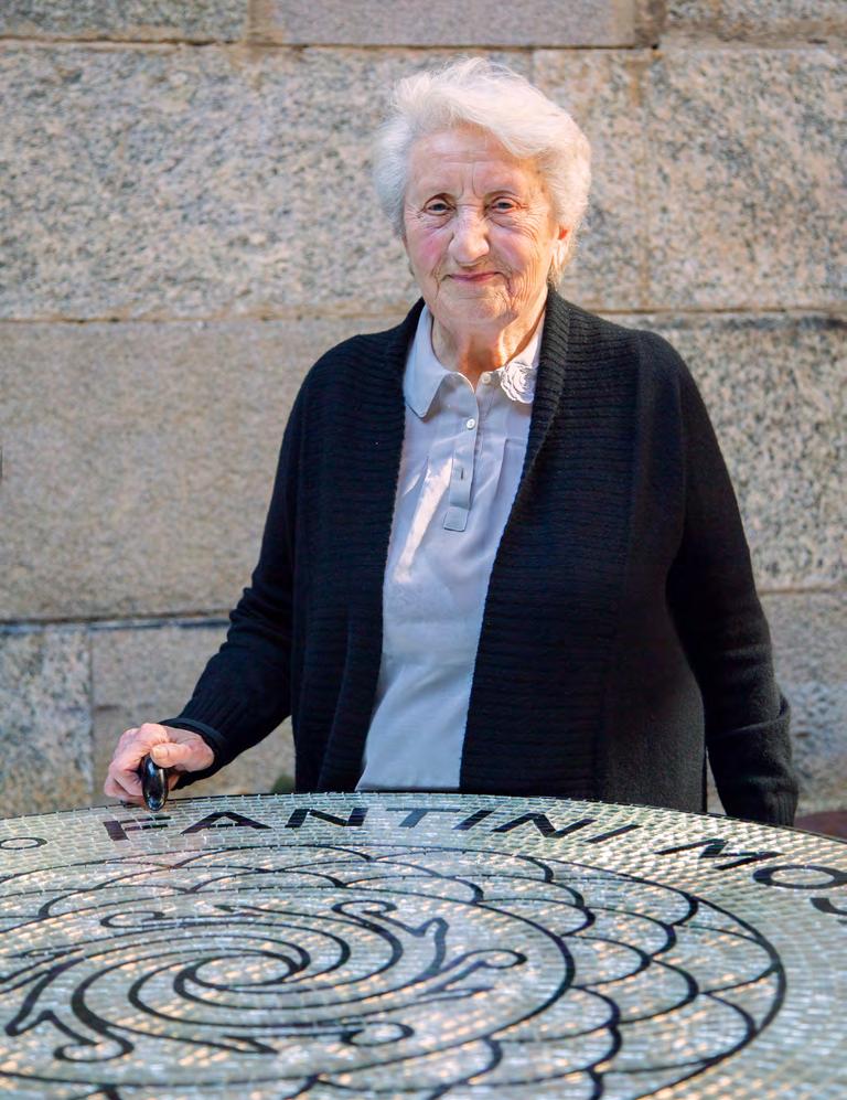
Maria Cristina Galli — Milano, Aprile 2023
Nasce con questo importante progetto una preziosa collaborazione tra Fantini Mosaici, prestigiosissima azienda italiana nel settore del mosaico, e l’Accademia di Belle Arti di Brera.
Un’opportunità capace di sottolineare il valore indiscusso che assume la relazione intercorsa fra queste due protagoniste dell’eccellenza italiana con vocazione e riconoscimento internazionali nella promozione della qualità creativa e della cultura dei giovani talenti.
Si traccia in questa occasione una storia tra le tante che da secoli legano fortemente la maestria dell’arte musiva alle fascinazioni e alle proiezioni immaginative delle opere di artisti che ne hanno abbracciato le potenzialità espressive. Una storia ancora, una volta di più, scritta in un tessuto di materia e di luce, pietra e vetro e colore e impasti, tagli inattesi di tessere e frammenti che costituiscono di fatto la grammatica di una voce di forme che si rende manifesta e che lascia irrompere la forza dell’opera d’arte e la sua capacità di creare mondi.
In questo racconto sono stati coinvolti gli studenti del Dipartimento di Arti Visive dell’Accademia, coordinati e supervisionati dai docenti Galli, Martinelli e Vescovi, che li hanno accompagnati nello sviluppo dei progetti. I 21 lavori finalisti sono stati selezionati tra quasi settanta partecipanti, segno di un accorato e vivo interesse per la bellezza intrinseca e inattesa che la tecnica del mosaico custodisce segretamente.
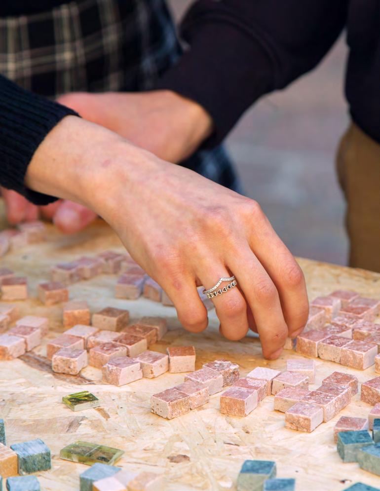
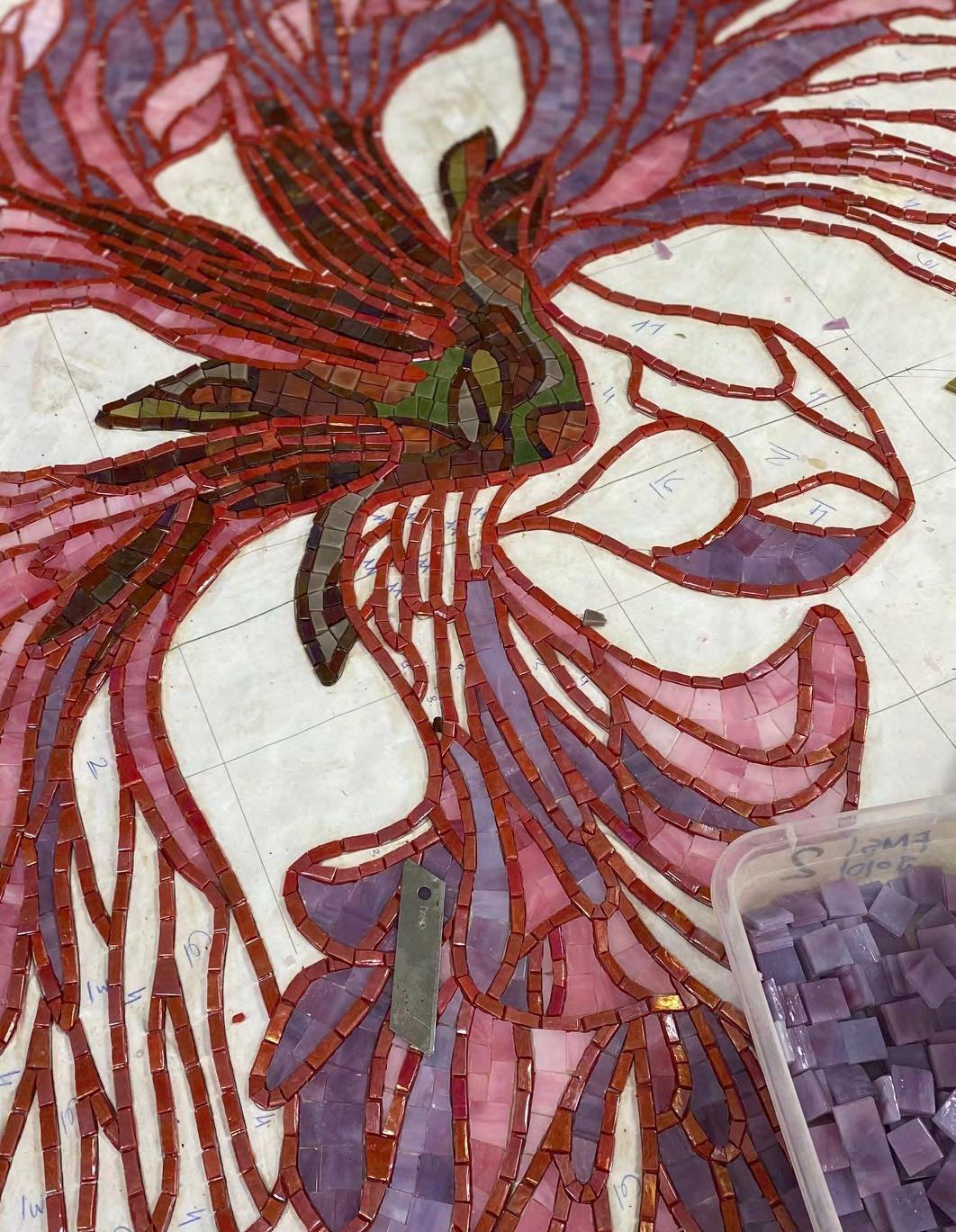
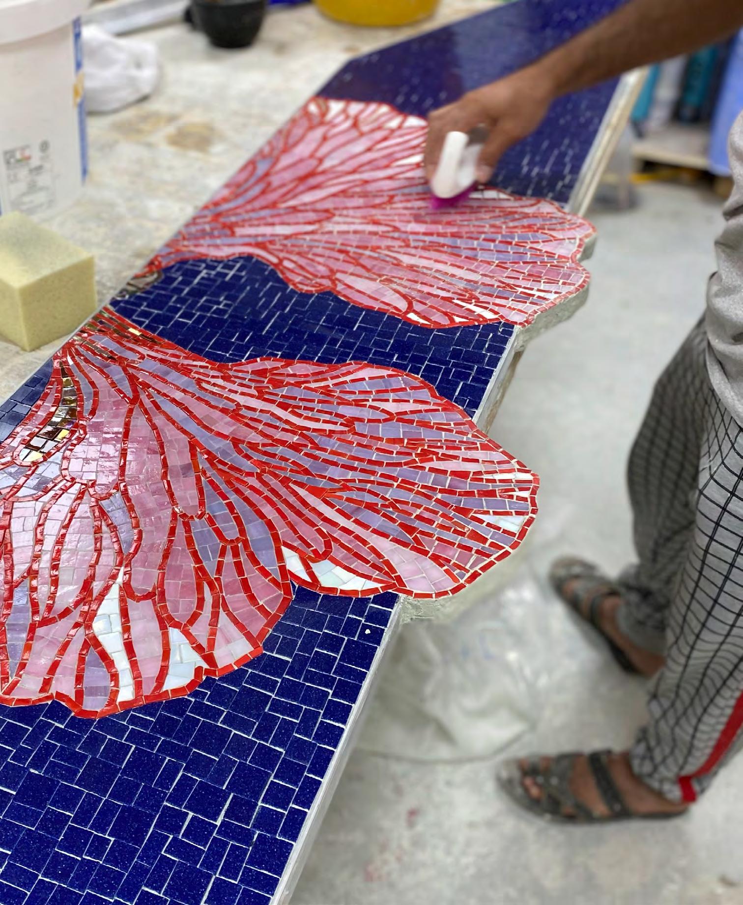
Le immagini che sono nate sulla carta sono state poi in effetti tradotte, per i tre vincitori del concorso, nei pannelli realizzati dai talentuosi maestri artigiani di Fantini Mosaici con una rara ed elegante perizia che possiede un sapore antico, secolare, ma capace di ascolto, e quindi in grado di restituire e esaltare tutta l’intensità espressiva che il contemporaneo esige dall’opera.
Le opere prodotte risuonano in corrispondenza con l’esperienza sensibile, e in questo senso estetica, e la materia viene colta nella sua veste simbolica di interprete di uno sguardo poetico sul mondo.
Il viaggio nasce dall’incontro tra l’idea, lo sguardo, il segno, il pensiero dell’artista e la seduzione di una tecnica il cui destino è quello di accogliere le tracce dell’immaginazione, di cedervi, di restituirne il potere di rivelazione. Il disegno nasce coerentemente già proiettato in direzione del luogo della sua rappresentazione; è necessario e fondamentale non disgiungere l’intenzione dallo strumento che ne coglierà l’essenza. Ogni gioco ha la sua regola e l’artista, consapevolmente, sceglie di entrarvi e di porsi in una condizione permeabile e partecipativa. Si libera così una vera e propria esperienza immaginale in cui le strutture concettuali si trasmutano in corpi di forma e di luce. L’ibridazione genera un’opera viva, in cui ogni tessera di pasta di vetro, ogni granello di pietra, ogni bagliore minerale formano, congiuntamente al pensiero e al desiderio struggente dell’artista, un mondo, un altrove.
L’arte in tale circostanza giunge a un approdo in cui la natura, in questo caso minerale, non è più oggetto di mimesis, ma soggetto agente, complice formale, materia apparentemente sorda e frantumata, lama e scheggia, che abilmente si ricompone e diventa co-creatrice. Come nella Chora primordiale del Timeo di Platone, “ricettacolo dell’intero divenire (…) fatta per essere un modello per tutte le cose, che muove e prende la forma di ciò che riceve” 1 , dall’impasto preformale si genera lo spazio della possibilità e della creazione, nella scansione quasi alchemica di un ritmo di senso.
With this important project, a valuable collaboration between Fantini Mosaici - one of the most prestigious Italian companies in the hand-made mosaic sector - and the Accademia di Belle Arti di Brera has emerged.
This is an opportunity based on the undisputed value of the relationship between these two protagonists of Italian excellence, both internationally recognised as promoters of creative quality and the art culture of young talents.
The competition’s theme draws back to the history that, for centuries, has strongly linked the mastery of mosaic art to the fascinations and imagery of the works of artists who have embraced its expressive potential. Once again, a story is woven with matter and light, stone and glass, colour and unexpected cuts of tesserae and fragments that dictate shapes. At the same time, the strength of the work of art and its ability to generate new worlds breaks through.
In this narrative, the Accademia’s Visual Arts Department students were involved under the coordination and supervision of lecturers Galli, Martinelli and Vescovi, who assisted them in developing their projects. The 21 finalists’ works were selected from almost 70 participants, evidence of a keen and lively fascination for the mosaic techniques’ intrinsic and unexpected beauty and mystique.
The images initiated on paper were then translated, for the three winners of the competition, into the panels produced by Fantini Mosaici’s talented master craftspeople, employing an uncommon and elegant skill that possesses an ancient, secular flavour, capable of interpreting and therefore able to restore and enhance all the expressive intensity that the contemporary work requires.
The works produced resonate with the original concept. In this respect, aesthetics, experience and material are captured in a symbolic guise as the interpreter of a poetic gaze on the world.
The journey undertaken starts from the encounter between the idea, the gaze, the gesture, the thought of the artist and the seduction of a technique whose destiny is to embrace and reproduce the imagery, yield to them and reinstate their power. The drawing is consistent with and projected in the direction of its place of representation; intention must go together with the means that will capture its essence. Every game has its own rules. The artist consciously engages in a participatory and receptive attitude that allows an authentic imaginary experience in which conceptual frameworks are transformed into bodies/forms that release shapes and light.
The hybridisation generates a living work in which every tessera of glass paste, every grain of stone and every glow of mineral merges with the thoughts and yearning of the artist, the world and elsewhere.
In such circumstances, art reaches a landing place where nature - in this case, mineral - is no longer an object of mimesis, but an acting subject, a formal accomplice, an apparently deaf and shattered matter, blade and splinter, which skilfully recomposes itself and becomes a co-creator. As in the primordial Chora of Plato’s Timaeus1, “receptacle of the entire becoming (...) made to be a model for all things, which moves and takes the form of what it receives”, conceptual, potential space and creation are generated from the primordial mixture in a nearly alchemic scan of meaningful rhythm.
1 Plato, Timaeus & Critias, Ancient Greek Literature “The Greeks” Series 171, ed. Odysseus Chatzopoulos, Kaktos Publications, Athens, 1993, 50c (57c,e, 58a-c).
di Laura Traldi — Milano, Aprile 2023
Di mestiere faccio la giornalista e scrivo di design, che solo in rari casi vuol dire parlare di mosaico. Il mosaico mi affascina ma l’ho sempre osservato, fino ad ora, da lontano, come una forma d’arte fra le arti.
Il mio lavoro, però, mi ha insegnato ad analizzare le cose inseguendo due valori, importantissimi anche quando si parla di un’opera d’arte o di limited edition, anche musiva: la progettualità e la contemporaneità
Per progettualità intendo la capacità di un oggetto, o di un’opera, di essere la manifestazione pratica di un pensiero, e di svilupparsi seguendo una logica chiara rispetto ad alcune premesse, e condivisibile con gli altri, siano essi il pubblico o la comunità degli addetti ai lavori. E penso che un racconto sia realmente riuscito quando si può riassumere in un concetto sintetico, spesso una singola frase. Quando invece parlo di contemporaneità mi riferisco alla ricerca di gesti creativi di rottura: capaci di tradurre in forme, colori e texture le tematiche di oggi (sociali, culturali, psicologiche, antropologiche).
È attraverso queste due lenti che ho analizzato le opere degli studenti di Brera trovandoci, in taluni casi, grande progettualità e ricerca di un significato culturale ampio (e quindi giustamente premiati).
In questo percorso di lavoro è emersa chiaramente l’importanza di operazioni di questo tipo: un grande marchio del mosaico italiano nel mondo che investe nella ricerca di giovanissimi talenti. Una ricerca importante in tutti gli ambiti, anche nel mondo in cui mi muovo io: quello del design e degli interior.
La contemporaneità, infatti, si nutre sempre di più di personalizzazioni artistiche.
Non è un caso che, mentre le tecnologie digitali permettono di realizzare opere sempre più indistinguibili da quelle realizzate dalla mano umana, il mondo dell’arte torni a concentrarsi sul figurativismo, sui pastiche di colore, sulla tecnica ardita di chi sa maneggiare con grandissima destrezza pennelli, spugne e carboncini. Lo si è visto all’ultima Biennale d’Arte di Venezia, dove la vera cenerentola era l’arte digitale, scalzata da tantissime opere realizzate su supporti
e con tecniche tradizionali da artisti giovanissimi. E, ha detto recentemente il direttore Nicola Ricciardi, lo vedremo anche al Miart 2023.
È un modo per ribadire il primato dell’uomo sulla macchina: un ritorno a un passato forse psicologicamente più confortevole dopo l’abbuffata di digitale, o un semplice trend?
Io credo che, in un mondo in cui l’accesso alla personalizzazione è diventata una condizione chiave per il successo in tutte le categorie merceologiche (dalle sneaker alle auto) insistere sul valore del saper fare, spesso saper fare a mano, sia ormai un’esigenza per innumerevoli mondi. In primis, quello del design e degli interior.
Ecco perché è fondamentale portare avanti operazioni come questa di Fantini Mosaici. Fare scouting di giovani talenti nelle scuole d’arte e premiare la progettualità e la contemporaneità, piuttosto che la semplice estetica (o, consentitemi, l’Instagrammabilità), è fondamentale per promuovere una cultura della decorazione attenta e di valore.
Una cultura del decoro che non sia styling ma che si riallacci alla tradizione di grandissimi architetti. Mi riferisco ad autori come Gio Ponti e Franco Albini in Italia o Arne Jacobsen in Danimarca, solo per citarne alcuni, che progettavano sì le case ma anche tutto quello che ci stava dentro: dalle suppellettili alle lampade, dai colori alle pareti agli accessori.
Perché la decorazione artistica, quando è progetto e contemporaneità, è, come la moda, anche cultura: una manifestazione di quello che siamo. E, per chi fa Made in Italy, anche un’opportunità per continuare a differenziare la produzione del nostro paese, da sempre incentrato su qualità, saper fare e un pizzico di genialità
I am a journalist by profession, and I write about design, which seldom means talking about mosaics. Mosaic art has always fascinated me, indeed, but so far, I have always observed it as an art form among the arts.
However, my job has taught me to analyse any work, be it a production or a limited edition piece, by following two main criteria: a design approach and a focus on contemporary languages.
A piece of work has been designed when it is the practical execution of a thought; when it is the development of an idea that follows a clear internal logic, relates to set criteria, and can be shared with others: the public or the design community. And its narrative is to be considered successful when it can be summarised as a concise concept in a single sentence.
When I speak of contemporary languages, instead, I refer to the search for creative breaking gestures: a work capable of translating today’s issues (social, cultural, psychological, anthropological, etc.) into forms, colours, materials and so on.
Through these two lenses, I analysed the works of the Accademia di Brera students who took part in this competition, investigating the expressive forms of mosaic art. We found that the majority of their art representations embedded a great design ability and the quest for a broad and up-to-date cultural meaning. The jury’s final assessments considered their desires and interpretative abilities.
From the first contacts between Fantini Mosaici and the Accademia di Brera to the launch of the call for entries, from the analysis of the works sent to the exhibition to this catalogue, the overall workflow highlighted the importance of the initiative: a great, globally renowned brand of Italian mosaic art investing in the search for very young talents through institutional collaborations with prestigious international schools and academies. This is definitely a fundamental activity in every sphere, including in the world of design and interiors which concerns my work.
Contemporary life, in fact, feeds more and more on artistic customisation.
It is no coincidence that, while digital technologies make it possible to create works that are increasingly indistinguishable from those made by the human hand, the art world is recovering the figurative tradition, the pastiche of colour, the daring technique of those who know how to handle brushes, sponges and charcoals with great dexterity. We noticed this trend in the last Venice Art Biennale, where the real Cinderella was digital art, ousted by works by very young artists, created on physical media and with traditional techniques. A change of direction that we will also see at the 2023 edition of Miart, as director Nicola Ricciardi has recently anticipated.
Is this a way of reaffirming the supremacy of man over machine? Should it be interpreted as a return to a past that is perhaps psychologically more comfortable after the digital binge, or just as a mere current trend?
I believe that in a world where access to customisation has become a key condition for success in all product categories (from sneakers to cars), insisting on the value of know-how, on making things by hand, is becoming a requirement in almost every branch - definitely in that of design and interiors, but also in that of mosaic.
This is why scouting for young talent in academies and art schools is becoming essential, as is acknowledging the high value of design and continuing the search for contemporary languages to promote an accurate, up-to-date and valuable culture of applied art and decoration. This is what Fantini is doing with this whole project.
This is basically a promotion of a new culture of decoration that is not styling but goes back to the tradition of the great 20th-century architects. Creators such as Gio Ponti and Franco Albini in Italy, or Arne Jacobsen in Denmark, to name but a few. Architects who, while designing houses and everything inside them, created a new living dimension: from furnishings to lamps, from colours to walls and home accessories.
Artistic decoration and fashion, when it is based on design and contemporaneity, is also a form of culture. It represents who we are. And for those who produce Made in Italy items, it also represents an opportunity to pursue excellence in a distinguished way, relying on quality, expertise and a pinch of genius.
Note sul rapporto immagine/testo nei lavori degli studenti
di Massimo Bruto Randone — Milano, Aprile 2023
“Possiamo distinguere due tipi di processi immaginativi: quello che parte dalla parola e arriva all’immagine visiva, e quello che parte dall’immagine visiva e arriva all’espressione verbale.” Visibilità, Lezioni americane, Italo Calvino.
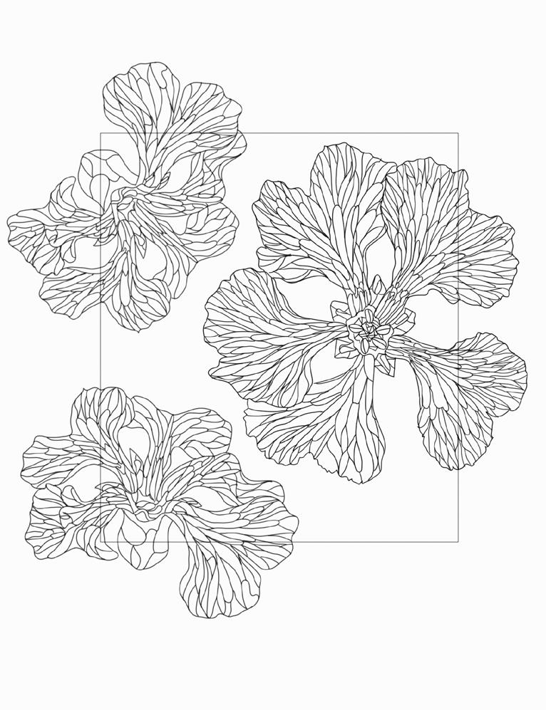
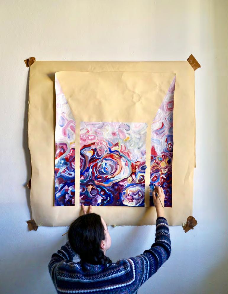
Il concorso A TALE OF BEAUTY ha chiesto agli studenti dell’Accademia di Brera di elaborare un progetto interpretativo declinato attraverso due forme espressive: un Bozzetto e una Relazione.
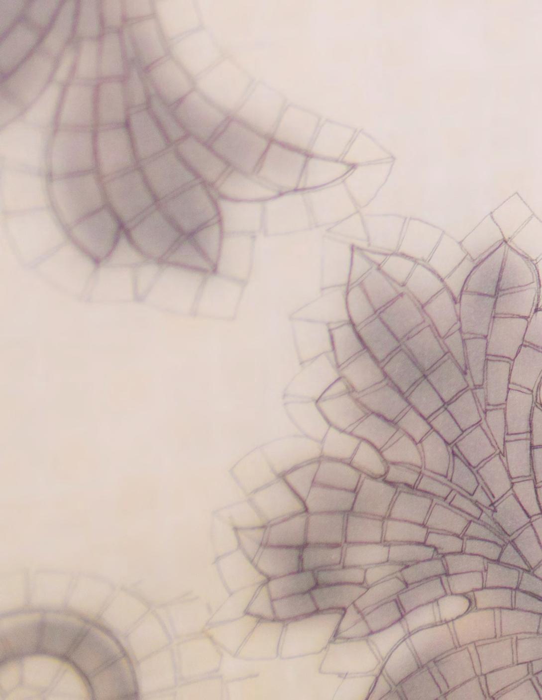
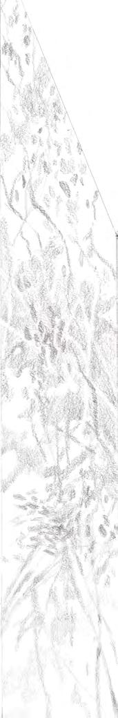
Il Bozzetto è la rappresentazione visiva dell’opera _manuale, digitale o ibrida_ pensata per essere successivamente tradotta in mosaico.
La Relazione è la sua descrizione tecnico-ispirazionale. Uno scritto in grado di raccontare le motivazioni, i sentimenti, gli afflati _e in certi casi anche la tèchne (Τέχνη)_ riguardo l’indagine sulle forme espressive dell’arte del mosaico.
Due forme del racconto intente a rafforzare la coerenza dello sguardo artistico generale. Due progetti e due linguaggi strettamente connessi attorno ad un’unica visione. L’uno, quasi, la ragion d’essere dell’altro. Ma anche due mondi, due capacità _la figurazione e la parola_ che non sempre si parlano, che non sempre coesistono nello stesso autore. E che avrebbero potuto generare convergenze oppure scarti, affinità o difficoltà, e in qualche caso persino, scintille non previste.
E l’esito generale delle oltre 60 Relazioni inviate assieme ai Bozzetti, è stato sorprendente. Un’estrema capacità dei giovani autori di costruire un unico ampio racconto, chiaro e poetico, in grado di coniugare la volontà figurativa con il pensiero verbale, l’intuizione con l’intenzione.
In questo senso leggere tutte le Relazioni è stato un esercizio di esplorazione e scoperta all’interno di oltre 60 mondi molto ricchi e significativi. Un viaggio per comprendere a fondo il loro metodo di lavoro: _cosa c’è dietro un gesto, una visione, un materiale…? _cosa definisce una specializzazione tecnica in lento apprendimento presso l’Accademia di Brera di Milano…? Ma anche un modo per comprenderli come piccola comunità, come giovane generazione in piena formazione: _dove stanno guardando…? _quali sono le loro emozioni o desideri…? _quali le loro frustrazioni o paure…? E soprattutto: _qual è la loro capacità creativa, di riscatto o di rivolta, per sublimare i sentimenti e le pulsioni in forte ebollizione, e riuscire a trasformarli in opere espressive?
Le considerazioni sui linguaggi visivi degli studenti le lasciamo al vostro occhio curioso e veloce che sfoglia questo catalogo.
Per la meraviglia dei racconti contenuti nelle Relazioni ci piace allineare qui di seguito, in forma di frammento, i 21 incipit _come in certe liste care a molti semiologi del ‘900 Un modo sintetico, quasi da laboratorio, per riprodurre parte dell’esperienza di lettura comparando solo le prime battute dei testi, tagliati brutalmente al secondo capoverso (testi che naturalmente appaiono tronchi di significato e le cui versioni complete sono riportate nelle pagine seguenti insieme ai progetti).
buona _ seppur sincopata_ lettura…
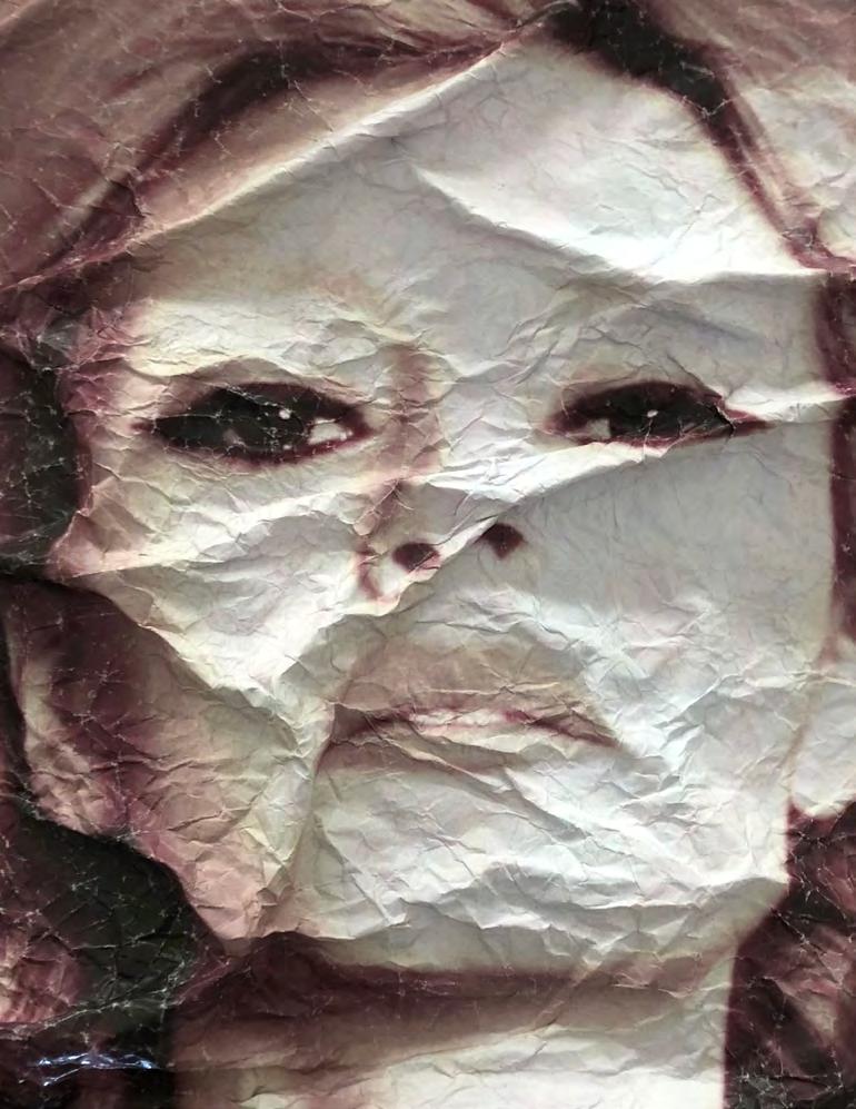
Come carta stropicciata. Autoritratto imperfetto per mosaico. Come carta stropicciata Fino all’osso mi consumo nel torpore di un giorno spinoso Tra le pieghe affilate dei minuti che scorrono Tra le grinze//
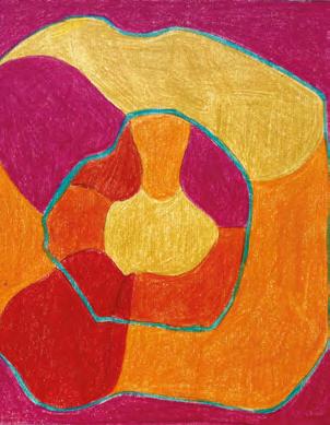
Armonia Magenta si ispira a un fiore chiamato Silene di Elisabetta. È un fiore che cresce in condizioni molto particolari, e che si trova solo nel nord Italia, tanto da essere il fiore della Lombardia. Il suo//
Chessboard. Immagino una sala da ballo di un edificio Art Decò a New York negli anni ‘20, dove le persone danzano e si muovono come pezzi da gioco su questa gigante scacchiera colorata. Mentre la//
Forme dell’Inesistente è il tentativo di dare forma a qualcosa che non esiste. Convertire in materia un sentimento universale, prendendo ispirazione dalle forme sfuggenti dell’acqua. Si cela qualcosa oltre la//
Legami. “Creare un’opera è creare il mondo” sosteneva Kandinsky nei primi anni del 1900. Vi invito dunque a entrare nel mio. Un caleidoscopio di colori, un horror vacui che trae ispirazione dalla natura e//
Tangible shadows. La natura con le sue forme mutevoli e le sue strutture da sempre costituisce la più affascinante fonte di ispirazione per la creazione artistica. L’uso della grafite, che è alla base della//
Heels on a walk at sunset. Fili d’erba si muovono col vento, il sole cala sull’orizzonte, un tacco rosso sfila durante una passeggiata e i bagliori dell’acqua come specchi illuminano ogni sua falcata, il suo//
Proelium. La forma artistica di quest’opera si ispira agli elementi decorativi tipici della cultura greco-romana e a quelli dei popoli della Polinesia. Non è l’artista a decidere dove inserire una determinata//
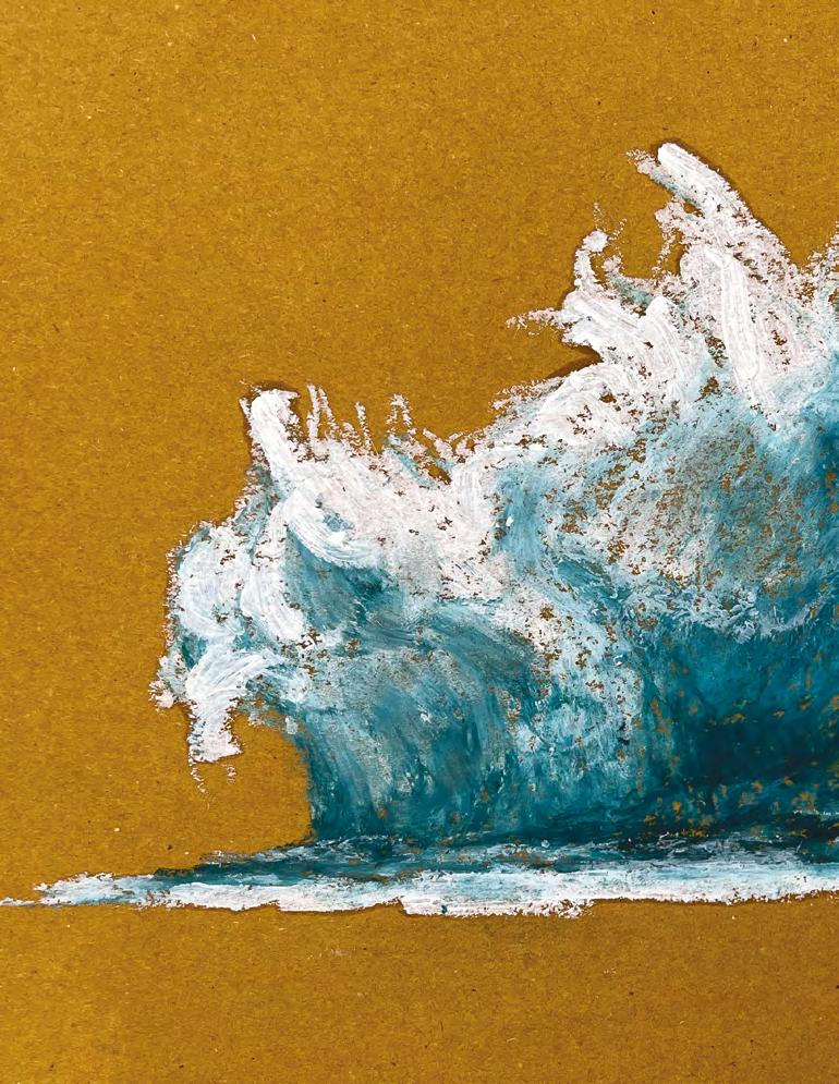
Prima Proposta. «L’acqua è senza colore, l’acqua bassa appare del colore di ciò che si trova sotto di essa, ma l’acqua profonda è piena di questa luce diffusa, più l’acqua è pura più il blu è profondo//
Mappa di Milano. Quando sono arrivato a Milano ho utilizzato molto una mappa della città per guidarmi. L’ho trovata graficamente interessante e così ho deciso di prenderne//
Riverbero. Frammenti di luce s’infrangono sulla trama delle superfici, riverberano sulle paste dorate creando giochi luminosi, svelandone il ritmo, le cromie e la composizione. La Luce che si espande//
Acqua di Milano. Ho voluto creare una mappa che mescoli le caratteristiche della città che mi ospita e della città da cui provengo. Vivo in una città costiera dove il mare è essenziale nella mia vita e così//
Untitled. Naufragò nell’Oceano Atlantico, al largo delle coste africane. Le scialuppe risultarono insufficienti, così la promessa fu una zattera. Il cavo, che permetteva il traino della zattera da parte//
Folle. La fisicità della tessera nei suoi spessori, nel suo mancare, permette sottili passaggi tonali, ritmi fluidi d’un materiale duro. Sovrapposizioni e intersezioni modulano luce e colore in un discorso//
Blu Teheran. Spesso temo di sbagliare strada e a volte temo che poi dovrò pentirmi. Ma posso anche decidere di fidarmi e di abbandonarmi alla corrente, rimanendo ad ascoltare il rumore dell’acqua//
Il passaggio della bellezza. Per la mia proposta di mosaico, “Il Passaggio della Bellezza”, ho scelto sia motivi che elementi iconografici tipici del mosaico italiano, poiché entrambi si basano su//
Realtà specchiata nella finzione. Il mosaico invade lo spazio reale dello spettatore, il soggetto invece diventa parte dell’opera riprendendo la tecnica settecentesca del trompel’oeil. Si crea un dialogo tra la//
Tre strade. L’opera tratta i temi dell’incomunicabilità e della distanza, racchiudendo tre personaggi di un mondo fiabesco, ed estraniante, all’ interno della costrizione dello spazio, in modo da rappresentare//
Unbreakable. L’opera è un riferimento alle ‘Crying girl’ ideate dall’artista pop Roy Lichtenstein, dove sono riportate icone del cinema dipinte con un tratto esplicitamente fumettistico. Il titolo Unbreakable è//
Observers. L’Osservatore e l’attività dell’osservare non devono avere solo la connotazione negativa che ho espresso nel mio lavoro. Osservare ci permette di capire le cose che il corpo e il mondo ci dicono//
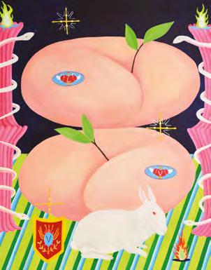
Prophecy. La pesca simboleggia il potere divino di perseguire il male nella cultura orientale. Tuttavia, le pesche simboleggiano anche, a causa della loro forma, l’erotismo. Il mio lavoro mira a creare tensioni//
“We may distinguish between two types of imaginative process: the one that starts with the words and arrives at the visual image, and the one that starts with the visual image and arrives at its verbal expression.” Italo Calvino, Visibility, Six Memos for the Next Millennium
To participate in the Fantini Mosaici-initiated competition, A Tale of Beauty, Accademia di Brera students were asked to submit two kind of projects: one Sketch and one Report.
The Sketch is the visual representation of their work — manual, digital or hybrid — designed to be subsequently translated into a mosaic.
The Report is an inspirational and technical description of the purposes, feelings, insights —and even the tèchne (Τέχνη)— that guided the student’s investigation into the expressive forms of the art of mosaic.
Two forms of the story focus on strengthening the coherence of the general artistic eye; two projects and two languages closely connected around a single vision. One is almost the raison d’être of the other. But also two worlds, two abilities _imaging and the written word_ that are not always consistent in the same author, and which may even take convergent routes or sidetracks, show affinities or conflicts, and even create unexpected sparks. The contest required these two different types of accounts to reinforce the coherence of the author’s overall artistic vision.
And the general outcome of the 60-plus Reports sent together with the Sketches was surprising. All the young authors showed the ability to develop a single, broad and poetic, narrative, the ability to match a visual insight with a verbal thinking, an intuition with an intent.
In this sense, reading all the Reports was a journey of discovery within 60-plus very rich and significant worlds. A way to fully comprehend the students’ working method: what is behind a gesture, a vision, a material...? _what defines their technical specialization at the Accademia di Brera di Milano...? But it was also a chance to understand them as a small community, as a young generation in the midst of their educational path: _what are they looking at...? _what are their emotions or desires…? _what are their frustrations
or fears...? And finally: _what is their creative capacity, for redemption or revolt, to sublimate feelings and impulses, and to be able to convert them into meaningful artworks?
We leave all considerations on the students’ visual languages to your curious and quick eye as it browses this catalogue.
For the wonder of the stories contained in the Reports, we like to present below, in fragmented form, the 21 incipit _as in certain lists dear to many 20th-century semiologists. A concise way, as in a creativity workshop, to reproduce part of the reading experience just by comparing the first lines of each Report, abruptly cut off at the second paragraph (lines which naturally appear truncated in meaning, the complete versions of which are reported in the following pages together with the projects).
Wishing you an inspirational _though syncopated_ read…
Like crumpled paper. Imperfect self-portrait for mosaic. Like crumpled paper. To the bone, I consume myself in the torpor of a thorny day. Between the sharp folds of the minutes that flow Between the wrinkles//
Armonia Magenta. Inspired by a flower called Elisabetta’ Silene. It is a flower that grows in very unusual conditions and is only found in Northern Italy, so much so that it is the flower of Lombardy. Its//
Chessboard. I imagine a ballroom in an Art Deco building in New York in the 1920s, where people dance and move like game checkers on this giant, colourful chessboard. While the//
Forms of the Nonexistent. It’s an attempt to give shape to something that does not exist. Converting a universal feeling into matter, taking inspiration from the elusive shapes of water. Something is hidden beyond the ties//
Ties. To create a work is to create the world - argued Kandinsky in the early 1900s. I, therefore, invite you to enter mine. A kaleidoscope of colours, a horror vacui inspired by nature and//
Tangible shadows. With its changing forms and patterns, nature has always been the most fascinating inspiration for artistic creation. The use of graphite, which is the basis of the//
Heels on a walk at sunset. Blades of grass move with the wind, the sun sets on the horizon, a red heel parades during a walk, and the glow of water-like mirrors illuminates her every stride, her//
Proelium. The artistic form of this work is inspired by the decorative elements typical of Greco-Roman culture and those of the Polynesian peoples. The artist does not decide where to place a particular//
First Proposal. Water is colourless, shallow water appears the colour of what lies beneath it, but deep water is full of diffuse light. The purer the water, the deeper the blue beneath it//
Map of Milan. When I arrived in Milan I used a map of the city a lot to guide me. I found it graphically interesting and so I decided to take inspiration from it for this project. I did//
Reverberation. Fragments of light shatter on the texture of surfaces and reverberate on golden pastes creating plays of light, revealing their rhythm, colours and composition. Light that expands//
Water of Milan. I wanted to create a map that mixes the characteristics of my host city and the city I come from. I live in a coastal city where the sea is essential to my life, so//
Untitled. Shipwrecked in the Atlantic Ocean, off the coast of Africa. The lifeboats proved insufficient, so the promise was a raft. The cable, which allowed the raft to be towed by//
Crowds. The materiality of the tile in its thicknesses, as in the lack of it, allows subtle tonal transitions, fluid rhythms of a hard material. Overlays and intersections modulate light and color in a structural//
Teheran blue. I often fear that I will take a wrong turn and sometimes regret it later. But I can also decide to trust and surrender to the current, remaining to listen to the sound of the water//
The passage of beauty. In my project, I addressed the transition between art and nature. I chose both motifs and iconographic elements typical of Italian mosaics since both are based on//
Reality mirrored in fiction. The mosaic invades the viewer’s real space; the subject instead becomes part of the work, echoing the 18th-century technique of trompe-l’oeil. A dialogue is created between the//
Three Roads. The work deals with the themes of noncommunicability and remoteness, depicting three characters from an odd fairytale world, closed in constricting space, to represent//
Unbreakable. The work references the Crying Girl created by pop artist Roy Lichtenstein, in which film icons are depicted with an explicitly cartoonish feature. The title Unbreakable is//
Observers. Observing allows us to understand what our body and the world tell us. Observers and the activity of watching should not only have the negative feature that I expressed in my work//
Prophecy. Peaches symbolise the divine power to pursue evil in Eastern culture. However, because of their shape, peaches also symbolise eroticism. My work aims at creating tension//
Autoritratto imperfetto per mosaico.
Fino all’osso mi consumo nel torpore di un giorno spinoso
Tra le pieghe affilate dei minuti che scorrono
Tra le grinze taglienti della verità
L’indagine sulla forma espressiva del mio progetto ha origine sulle forme della tesseratura, che viene definita dalla stropicciatura della carta.
Sono un’attrice e il concetto di autoritratto mi interessa particolarmente, essendo quotidianamente soggetta a servizi fotografici ultra patinati, che mi ritraggono in perfezioni innaturali.
La mia ricerca vuole, all’opposto, destrutturare questa forma estetica creando autoritratti imperfetti, sfregiati e autentici, che mi rappresentano più in profondità
Ho quindi pensato a un’opera in 3D, capace di esaltare la bellezza della deformazione. Una superficie spaziale di rilievi e chiaro-scuri in cui le tessere, di pietra e di smalto vetroso, possano rafforzare le stropicciature dell’autoritratto offrendo un’infinità di sfaccettature che cambiano in relazione alla prospettiva da cui le si guarda.
(Nata a Venezia il 07/11/92, vive e lavora a Milano come attrice, 1°anno in Decorazione presso l’Accademia di Belle Arti di Brera)
Imperfect self-portrait for mosaic
To the bone I wear out in the torpor of a thorny day
Between the sharp folds of the passing minutes
Between the sharp wrinkles of the truth.
The investigation into the expressive form of my project originates from the forms of the weaving, which is defined by the crumpling of the paper.
I’m an actress and the concept of self-portrait particularly interests me, being subjected to ultra-glossy photo shoots every day, which portray me in unnatural perfection.
My research wants to deconstruct this aesthetic form by creating imperfect, scarred and authentic self-portraits, which represent me more deeply.
So I thought of a 3D work, capable of enhancing the beauty of deformation. A spatial surface of reliefs made by light and shade effects in which the cards, stone and vitreous enamel, can reinforce the wrinkling of the self-portrait by offering an infinite number of facets that change in relation to the perspective from which one looks at them.
(Born in Venice on 07/11/92, lives and works in Milan as an actress, 1st year in Decoration at the Accademia di Belle Arti di Brera)
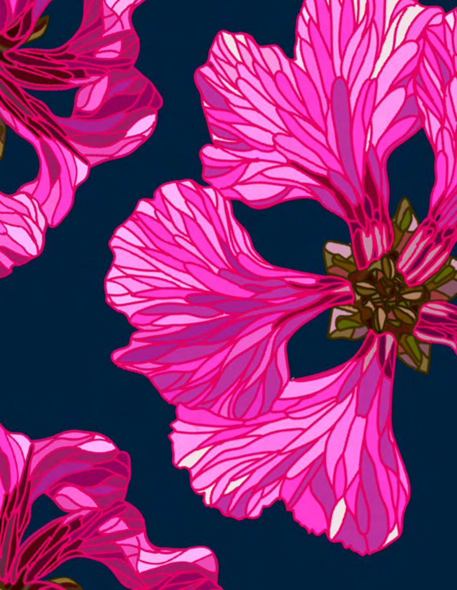
ARMONIA MAGENTA si ispira a un fiore chiamato Silene di Elisabetta. È un fiore che cresce in condizioni molto particolari, e che si trova solo nel nord Italia, tanto da essere il fiore della Lombardia. Il suo nome deriva da Elisabetta, viceregina del Regno Lombardo-Veneto, moglie dell’arciduca Raineri.
Una delle caratteristiche del luogo in cui cresce questo fiore è che deve essere roccioso. Quindi, in questo mosaico, ho pensato a questo rapporto come rappresentazione dell’armonia: la pietra riesce a rappresentare qualcosa di così delicato, come questo fiore che, a sua volta, ha bisogno delle montagne, delle rocce, per poter crescere. E si crea questo bellissimo legame tra l’opera e il suo soggetto.
Il mio progetto raffigura tre fiori che si espandono attraverso i tre pannelli e allo stesso tempo escono dalle cornici, dando un senso di crescita vitale, di spostamento fuori dalla cornice, integrandosi così con il luogo in cui si trova.
Credo sia molto importante che il tema di un’opera sia in armonia con il luogo in cui si trova o dove l’idea è nata. Mi piace lavorare con elementi della natura che sono particolari di un luogo, che lo rappresentano o ne sono il simbolo. E in particolare, i fiori, per la loro delicatezza e bellezza. In questo caso, inoltre, anche per il suo colore sorprendente, molto vicino al Viva Magenta, il colore del 2023, secondo il Pantone Color Institute.
ARMONIA MAGENTA is inspired by a flower called Silene di Elisabetta. This flower can only be found in Northern Italy, since it grows under very special conditions, and has become the representative flower of Lombardy. It is named after Elisabetta, viceregent of the Lombardy-Venetia Kingdom and wife of Archduke Raineri.
One of the most particular requirements for this flower to germinate is that it needs rocky soil. Given this fact, when approaching the design of this mosaic I thought of this relationship as a representation of harmony: stone represents quite a delicate thing like this flower that needs the mountains and its rocks to be able to bloom. It creates a beautiful symbiosis between the artwork and its subject.
My design depicts three flowers expanding through the three panels, while spreading out of the frame boundaries, giving a sense of vital growth, of moving out of the frame, and integrating within its surroundings.
I believe it is very important that the theme of a work is in harmony with the place where it is located or where the idea was born. I enjoy the most working with natural elements that belong to a specific place, becoming an archetype or a recognisable symbol. I am particularily fond of working with flowers, given its delicate nature and prevalent beauty. And, in this case, its astounding colour, a close match to Viva Magenta, Pantone’s 2023 Colour of the Year.
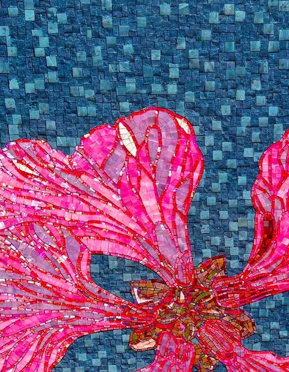
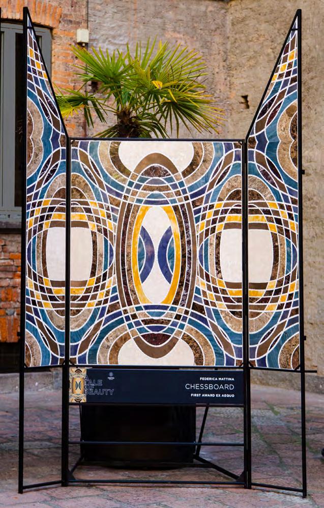
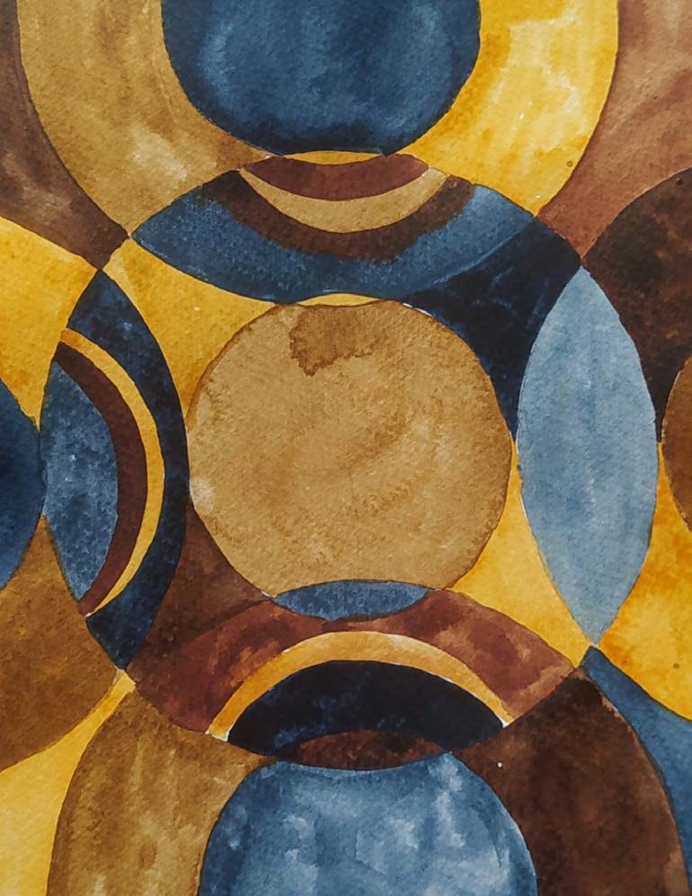
Immagino una sala da ballo di un edificio Art Decò a New York negli anni ‘20, dove le persone danzano e si muovono come pezzi da gioco su questa gigante scacchiera colorata. Mentre la musica prende il controllo la danza diventa frenetica, scatenata, e il pavimento stesso inizia a girare, distorcendosi e creando ellissi incrociate. Ci si perde cercando di seguire le linee labirintiche per pavimento dove le persone diventano i pezzi della grande scacchiera e parte stessa del mosaico. E in tutto l’ambiente lo sguardo danzante sull’immagine rievoca un tempo perduto.
Mi sono fortemente ispirata ai lavori geometrici di Bridget Riley ma soprattutto all’architettura NewYorkese degli anni ‘20, con gli ampi saloni Art Decó, rappresentati in film come il Grande Gatsby e Metropolis (1927). Un tema portato avanti dall’uso del font American Typewriter.
Il progetto si basa sulla accurata scelta di una color palette mutata e desaturata, adatta ad un ambiente architettonico ipotetico. I colori variano dal marrone scuro, al beige, al tortora al blu ingrigito. Il pattern consiste in ellissi concentriche verticali e orizzontali che sovrapponendosi formano delle scacchiere, dalle quali deriva il titolo “CHESSBOARD.”
I imagine the ballroom floor of an Art Deco building from the ‘20s in New York, where the people dancing move like chess pieces on this giant colorful chessboard; as the music takes control the dance becomes frenetic, wild, and the floor itself starts spinning, distorting creating intricate ellipses. You get lost trying to follow the labyrinthine lines of the chessboard: your gaze dances on the image recalling a lost time.
I was greatly inspired by Bridget Riley’s geometric works but above all by New York architecture of the 1920s, with its wide Art Decó halls, portrayed in films such as The Great Gatsby and Metropolis (1927). A theme carried forward by the use of the American Typewriter font.
The project is based on the careful choice of a muted and desaturated color palette, suitable for a hypothetical architectural environment. The colors vary from dark brown to beige, taupe to greyish blue. The pattern consists of vertical and horizontal concentric ellipses that overlap, forming chessboards, from which the title “CHESSBOARD” derives.
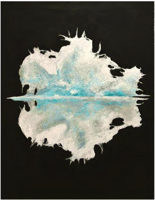
“FORME DELL’INESISTENTE” è il tentativo di dare forma a qualcosa che non esiste. Convertire in materia un sentimento universale, prendendo ispirazione dalle forme sfuggenti dell’acqua.
Si cela qualcosa oltre la trasparenza.
L’Acqua è un Essere. Una presenza.
Testimone dell’esistenza di molti prima di noi. In silenzio assiste al cambiamento e al susseguirsi di nascita e morte di ogni forma.
È un flusso contenente l’essenza delle anime del passato. Concede l’immortalità
Una promessa contro la morte.
E un elogio alla vita eterna.
La nascita del flusso Esistenziale E Inesistente.
Vorrei un giorno anche Io, non cessare mai.
“SHAPES OF THE NON-EXISTENT” is the attempt to give shape to something that does not exist. Turn a universal feeling into matter, taking inspiration from the elusive forms of water.
There is something beyond transparency.
Water is a Being. A presence.
Witness of the existence of many before us. In silence, it witnesses the change and the succession of birth and death of every form.
It is a stream containing the essence of the souls from the past. It grants immortality.
A promise against death. And praise for eternal life. It is the birth of the Existential flow and Non-existent.
I wish one day, me too,
To never cease.
“Creare un’opera è creare il mondo” sosteneva Kandinsky nei primi anni del 1900.
Vi invito dunque a entrare nel mio.
Un caleidoscopio di colori, un horror vacui che trae ispirazione dalla natura e dai suoi elementi organici visti nel loro continuo evolversi e interagire.
Un’espressione spontanea del mio mondo attraverso forme e colori che si muovono, si incontrano, si scontrano nello spazio… si uniscono o si dividono per sempre.
Un’esperienza che stimola un risveglio interiore e che custodisce in sè un senso di appartenenza a qualcosa di più profondo, ampio, universale.
Il mio è un invito a entrarci, a esplorare questa relazione emozionale che tutti noi instauriamo necessariamente con la natura.
Dove andiamo partendo da qui?
“To create a work of art is to create the world” Kandinsky claimed in the early 1900s.
So I invite you to step into mine.
A kaleidoscope of colors, a horror vacui that draws inspiration from nature and its organic elements seen in their continuous evolution and interaction.
A spontaneous expression of my world through shapes and colors that move, meet, collide in space… they unite or get divided for eternity.
An experience that stimulates an inner awakening which holds a sense of belonging to something deeper, wider and universal.
I invite you to come into my world, I invite you to explore the emotional relationship that we all necessarily establish with nature.
Where do we go from here?
La natura con le sue forme mutevoli e le sue strutture, da sempre costituisce la più affascinante fonte di ispirazione per la creazione artistica. L’uso della grafite, che è alla base della mia attuale ricerca artistica, offre la possibilità di lavorare per produrre effetti visivi che alludono a concetti come aleatorietà, impalpabilità e sfuggevolezza. Concetti che si contrappongono all’equilibrio concreto e stabile della natura, ma che si legano ai meccanismi transitori della società tecnologicamente avanzata in cui viviamo. Il disegno non è più solo la fase primaria di un’idea o di un progetto, ma acquisisce autonomia e diventa il fine ultimo della creazione. Così l’idea di effimero si lega all’ordine naturale della vita sulla terra e al suo schema strutturale implicito.
Nature, with its changing forms and structures, has always been the most fascinating source of inspiration for artistic creation. The use of graphite being the foundation of my current artistic research, raises the possibility to produce visual effects that allude to concepts such as randomness, impalpability and elusiveness. These concepts oppose to the concrete and stable balance of nature. Nevertheless, they relate to the transitory mechanisms of our technological society.
Drawing is not simply the primary phase of an idea or a project but gains independence and becomes the ultimate goal of creation. Thus, the idea of the ephemeral is related to the natural order of the world and to its implicit structural scheme.
“L’acqua è senza colore, l’acqua bassa appare del colore di ciò che si trova sotto di essa, ma l’acqua profonda è piena di questa luce diffusa, più l’acqua è pura più il blu è profondo.”
Rebecca Solnit, in “A Field Guide for Getting Lost”
“Water is colorless, shallow water appears to be the color of whatever lies underneath it, but deep water is full of this scattered light, the purer the water the deeper the blue.”
Rebecca Solnit, from “A Field Guide for Getting Lost”
La forma artistica di quest’opera si ispira agli elementi decorativi tipici della cultura greco-romana e a quelli dei popoli della Polinesia. Non è l’artista a decidere dove inserire una determinata decorazione ma è dettato dal mantenimento di un equilibrio cromatico, creando un conflitto tra chiaro e scuro.
The artistic form of this artwork is inspired by the decorative elements typical of the Greco-Roman culture and those of the peoples of Polynesia. It is not the artist who decides where a particular decoration is inserted but it is dictated by the maintenance of a chromatic balance, creating a conflict between light and dark.
Fili d’erba si muovono col vento, il sole cala sull’orizzonte, un tacco rosso sfila durante una passeggiata e i bagliori dell’acqua come specchi illuminano ogni sua falcata, il suo passo autonomo e la sua bellezza, il tempo non ha fretta e lei è donna in bilico sulla linea del mondo.
Blades of grass move with the wind, the sun sets on the horizon, a red heel parades during a walk and the glints of water like mirrors illuminates her every stride, her autonomous stride and her beauty, time is no hurry and she is woman poised on the line of the world.
Quando sono arrivato a Milano ho utilizzato molto una mappa della città per guidarmi. L’ho trovata graficamente interessante e così ho deciso di prenderne spunto per questo progetto. Ho svolto un lavoro di semplificazione per mantenere le forme essenziali. Nella mia mappa di Milano, i diversi quartieri formano un petali attorno al centro.
When I arrived in Milan I used a map of the city a lot to guide me. I found it graphically interesting and so I decided to take inspiration from it for this project. I did a simplification to keep the essential forms. In my map of Milan, the different neighborhoods form in petals around the center.
Grazie all’Erasmus che sto facendo quest’anno, ho voluto creare una mappa che mescoli le caratteristiche della città che mi ospita e della città da cui provengo. Vivo in una città costiera dove il mare è essenziale nella mia vita e così mescolo Milano con l’acqua nelle sue strade più importanti, fingendo che fossero fiumi.
Thanks to the Erasmus I’m doing this year, I wanted to create a map mixing characteristics of the city that is hosting me and the city I come from.
I live in a coastal city where the sea is essential in my life and in this way I mix Milan with the water in its most important streets, pretending they were rivers.
Frammenti di luce s’infrangono sulla trama delle superfici, riverberano sulle paste dorate creando giochi luminosi, svelandone il ritmo, le cromie e la composizione.
La Luce che si espande all’infinito è l’elemento unificante, rivelatorio, in grado di mostrarci la vera natura delle cose, nella loro più intima, preziosa materialità
Fragments of light shatter on the texture of the surfaces, they reverberate on the gilded pastes creating light effects, revealing their rhythm, shade and composition.
The Light towards infinity is the unifying, revealing element, capable of showing us the true nature of things, in their most intimate, precious materiality.
Naufragò nell’Oceano Atlantico, al largo delle coste africane. Le scialuppe risultarono insufficienti, così la promessa fu una zattera. Il cavo, che permetteva il traino della zattera da parte delle scialuppe, si ruppe. Amarono il naufragio. Avevano smesso di essere marinai, erano diventati naufraghi, senza storia personale, né collettiva.
It was shipwrecked in the Atlantic Ocean off the coast of Africa. The lifeboats proved insufficient, so the promise was a raft. The cable, which allowed the lifeboats to tow the raft, broke. They loved the shipwreck. They had ceased to be sailors, they had become shipwrecked, with no personal or collective history.
La fisicità della tessera nei suoi spessori, nel suo mancare, permette sottili passaggi tonali, ritmi fluidi d’un materiale duro. Sovrapposizioni e intersezioni modulano luce e colore in un discorso cromatico strutturale. Tra pittura ed architettura risulta forma epica, per la sua solidità permanente, partecipe alla vita urbana. In questi giochi architettonici la città brulica, le sagome si intrecciano veloci nel ritmo del traffico.
The materiality of the tile in its thicknesses, as in the lack of it, allows subtle tonal transitions, fluid rhythms of a hard material. Overlays and intersections modulate light and color in a structural and chromatic balance. Due to its permanent solidity, mosaic represents an epic form participating in urban life, between painting and architecture. In these architectural games the city teems, the silhouettes intertwine quickly in the rhythm of the traffic.
Spesso temo di sbagliare strada e a volte temo che poi dovrò pentirmi. Ma posso anche decidere di fidarmi e di abbandonarmi alla corrente, rimanendo ad ascoltare il rumore dell’acqua. Questo è solo un punto di vista, ma forse sarò nel posto esatto in cui dovrò arrivare.
I often fear I’m going the wrong way and sometimes I fear I will later regret. But I can also decide to trust and abandon myself to the flow, listening to the sound of the water. This is just a point of view, but maybe I will be at the exact place I need to get to.
Per la mia proposta di mosaico, “Il Passaggio della Bellezza”, ho deciso di basarmi sulla transizione tra arte e natura. Ho scelto sia motivi che elementi iconografici tipici del mosaico italiano, poiché entrambi si basano su componenti organiche della natura (come fiori, foglie, insetti...). Ho utilizzato una tavolozza di colori caldi e naturali per dare un aspetto organico, ricco e narrativo all’opera.
For my mosaic design proposal “Il Passaggio della Bellezza” I decided to base it on the transition between art and nature. I chose both motifs and iconographic elements typical of Italian mosaics, as both are based on organic components of nature (such as flowers, leaves, insects...). I used a warm and natural color palette to give an organic, rich and narrative look to the work.
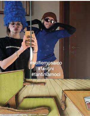
Il mosaico invade lo spazio reale dello spettatore, il soggetto invece diventa parte dell’opera riprendendo la tecnica settecentesca del trompe-l’oeil. Si crea un dialogo tra la superficie materica del mosaico, quella riflettente dello specchio e lo spettatore. Fotografandosi all’interno dell’opera ci si rapporta alla tecnica ancestrale del mosaico, riproducendo un gesto attuale espresso tramite hashtag.
The mosaic invades the real space of the viewer, while the subject instead becomes part of the work by taking up the eighteenth-century technique of trompe-l’oeil. A dialogue is created between the material surface of the mosaic, the reflective one of the mirror and the viewer. By photographing yourself inside the work, you relate to the ancestral technique of the mosaic, reproducing a current gesture expressed through hashtags.
L’opera tratta i temi dell’incomunicabilità e della distanza, racchiudendo tre personaggi di un mondo fiabesco ed estraniante all’ interno della costrizione dello spazio, in modo da rappresentare i diversi pannelli come spazi a sé stanti, display in cui la certezza della realtá è flebile e la distanza tra ognuno immensa.
The work deals with the themes of incommunicability and distance, enclosing three characters of a fairytale and alienating world within the constraint of space, so as to represent the different panels as spaces in their own right, displays in which the certainty of reality is faint and the distance between each one immense.
L’opera è un riferimento alle “Crying girls” ideate dall’artista pop art Roy Lichtenstein, dove sono riportate icone del cinema dipinte con un tratto esplicitamente fumettistico. Il titolo Unbreakable è un gioco di parole che fa riferimento allo stato d’animo del soggetto, in contrasto al tipo di materiale utilizzato per la sua realizzazione.
This artwork is a reference to the “crying girls”, created by the pop art artist Roy Lichtenstein, in which movie icons are portrayed with an explicit cartoonish style. The title Unbreakable is a word-play that refers to the feelings of the subject, in contrast with the kind of material used for its realization.
L’Osservatore e l’attività dell’osservare non devono avere solo la connotazione negativa che io ho espresso nel mio lavoro. Osservare ci permette di capire le cose che il corpo e il mondo ci dicono ma senza parlare apertamente.
The Observer and the activity of observing must not have only the negative connotation that I have expressed it in my work. Observing allows us to understand things that the body and the world tell us but without speaking openly.
La pesca simboleggia il potere divino di perseguire il male nella cultura orientale. Tuttavia, le pesche simboleggiano anche l’erotismo a causa della loro forma.
Il mio lavoro mira a creare tensioni semantiche tra i simboli culturali ed a rivelare la struttura del processo di santificazione.
The peach symbolizes the divine power to pursue evil in Eastern culture. However, it also symbolizes eroticism because of its shape.
My work aims to create semantic tension between cultural symbols and reveal the structure of sanctification and manipulation in images.
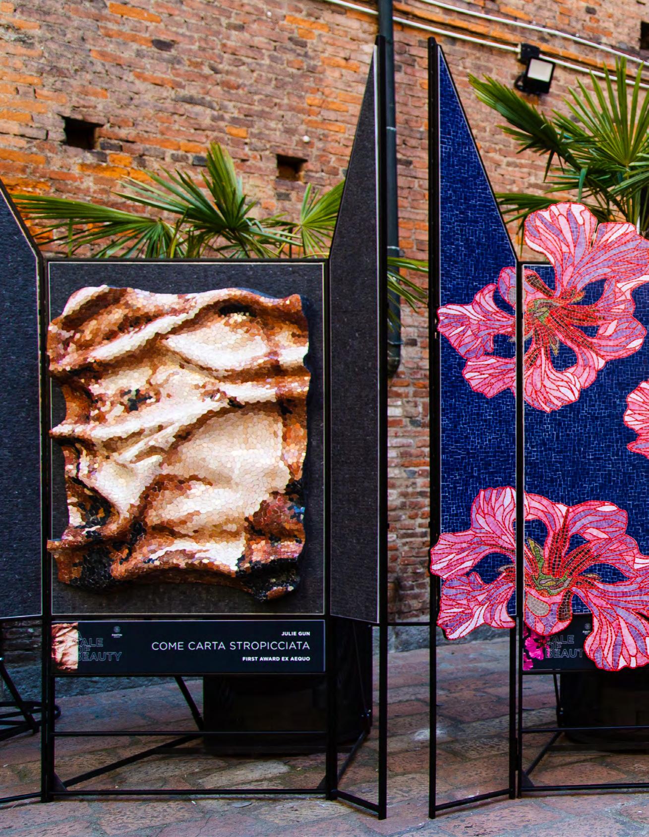
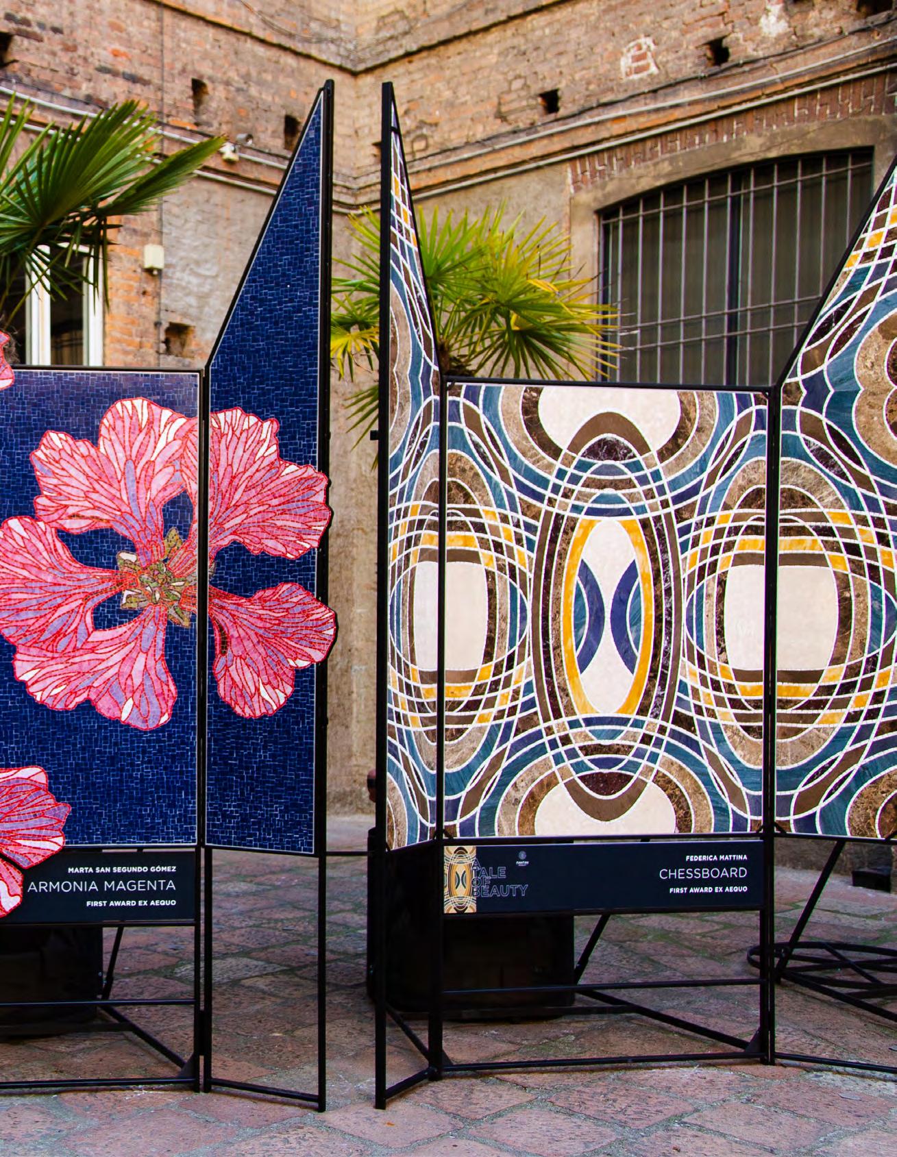
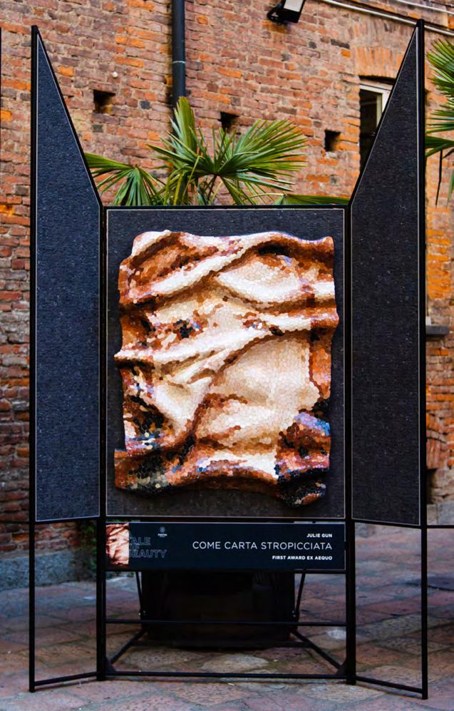
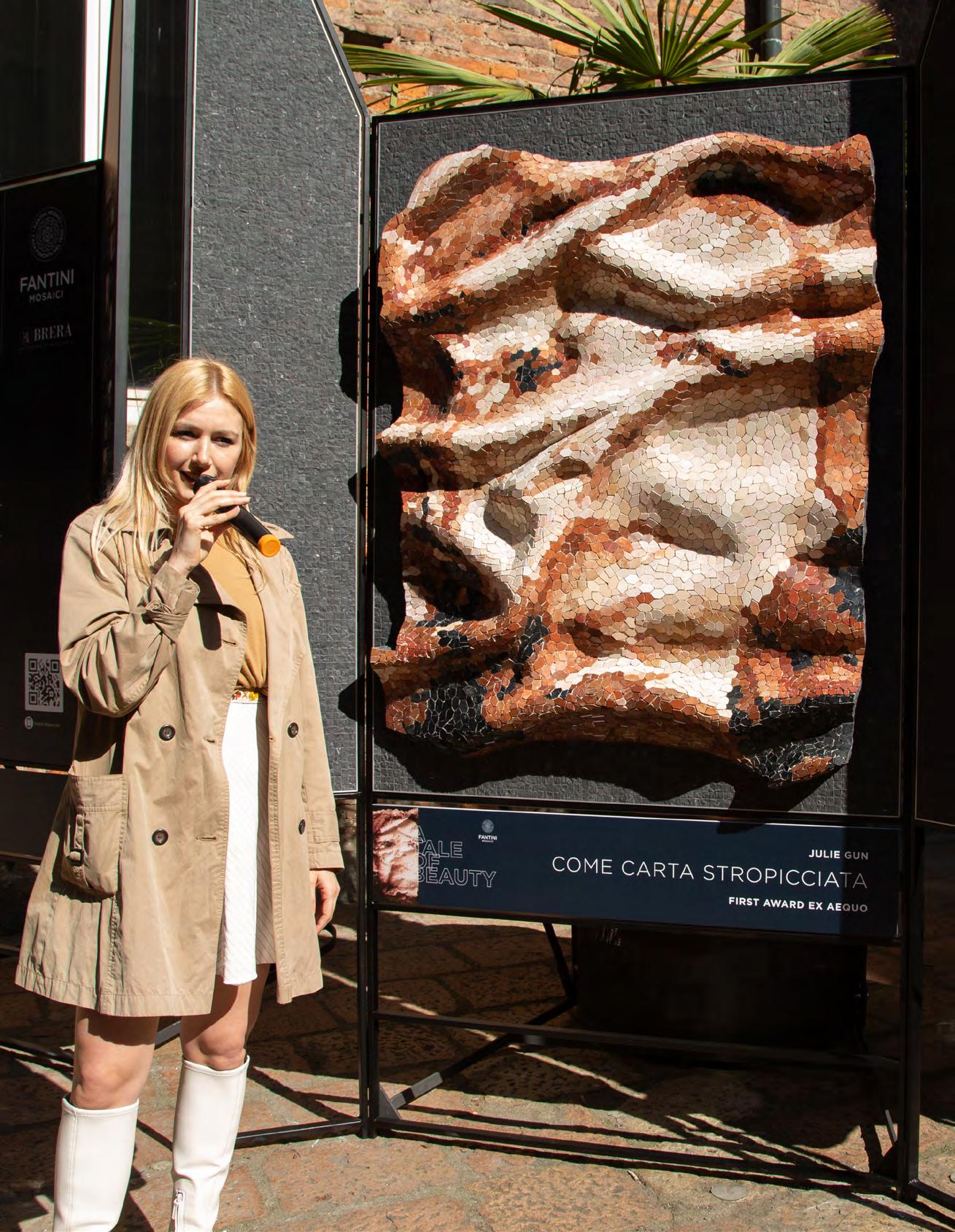
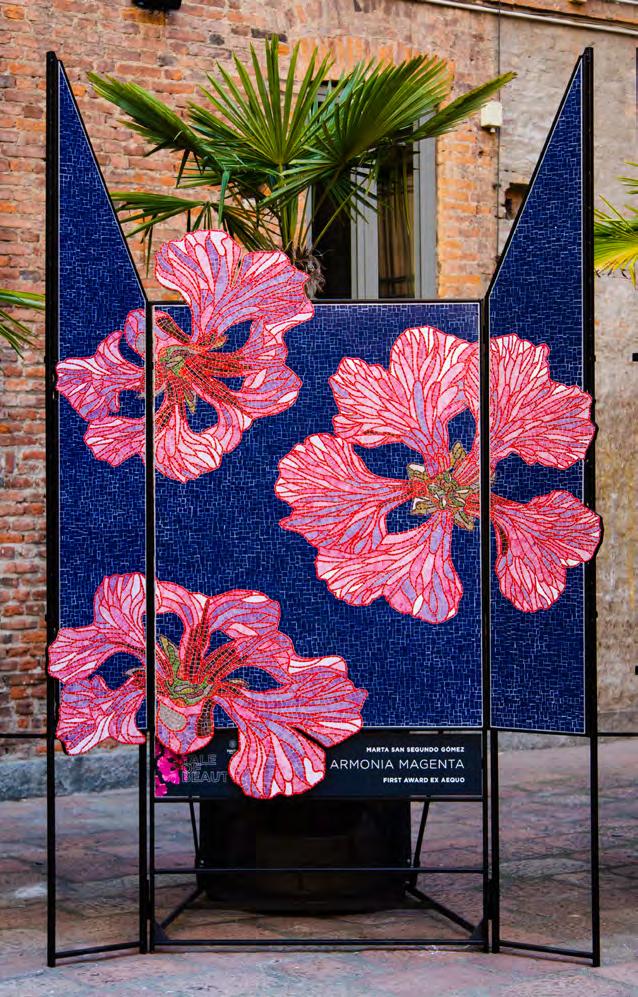
I 3 progetti vincitori (ex-aequo) sono: Come carta stropicciata Autoritratto imperfetto per mosaico di Julie Gun; Armonia Magenta di Marta San Segundo Gòmez e Chessboard di Federica Mattina.
La giuria ha ritenuto i 3 Progetti Vincitori capaci di interpretare in modo esemplare e autoriale lo spirito generale del concorso. Di costruire 3 racconti molto significativi attorno ai temi della bellezza e del decoro, introducendo anche un uso dei materiali e delle superfici molto articolato, coerente e non convenzionale.
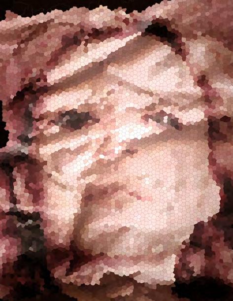
Il progetto Come carta stropicciata Autoritratto imperfetto per mosaico, di Julie Gun, è altamente innovativo nel concept: trasformare un autoritratto in una maschera di denuncia proprio attorno al principio di bellezza. Una ricerca profonda sulla dimensione dell’Essere, che nasce accartocciando quella dell’Apparire, su cui si è innestata una fortissima volontà anche tridimensionale dell’opera finita.
Il progetto Armonia Magenta di Marta San Segundo Gòmez ha saputo interpretare splendidamente la dimensione della bellezza, del colore e del decoro, raccontando della forte e inestinguibile relazione fra Arte e Natura. La Silene di Elisabetta, un fiore a petali cuoriformi, un simbolo antico, amante dei terreni pietrosi, si espande nell’opera con una tale vitalità da cercare spazio oltre la rigida cornice.
Il progetto Chessboard di Federica Mattina si identifica al meglio nel valore di decoro e di bellezza, tipico della tradizione decorativa architettonica. L’eleganza di questo
potenziale pavimento, che indica affinità costruttive con i pavimenti cosmateschi della tradizione medievale romana e bizantina, è stata riletta in chiave quasi cinematografica, come musicalmente indicato nella relazione.
I 3 progetti premiati con la Menzione (ex-aequo) sono: Forme dell’Inesistente di Federica Lancellotti, Legami di Chiara Turazza e Tangible shadows di Massimo Pugliese. Progetti capaci di penetrare in modo significativo le indicazioni del bando, alcuni scandagliando maggiormente le dimensioni della bellezza e del decoro, altri quella dei materiali e delle superfici. Ogni opera ha consentito alla giuria di soffermarsi, osservare, commentare ed arricchire il ragionamento intorno ai temi del concorso e, in generale, dell’arte e delle sue tecniche espressive.
I 15 progetti premiati con la Selezione d’Interesse sono stati tutti ritenuti interpreti interessanti di alcuni aspetti specifici dell’indagine sulle forme espressive dell’arte del mosaico indicata dal bando, offrendo dimensioni figurative di interesse e di qualità
I 21 progetti, fra Vincitori, Menzionati e Selezionati, sono raccolti in questo catalogo ed esposti in mostra presso il Cortile della magnolia del Palazzo di Brera di Milano.
The 3 winning projects, ex-aequo (equally placed) are: Come carta stropicciata. Autoritratto imperfetto per mosaico (Like crumpled paper. Imperfect self-portrait for mosaic) by Julie Gun; Armonia Magenta by Marta San Segundo Gòmez and Chessboard by Federica Mattina.
The jury considered that these projects interpreted the general spirit of the competition in an authorial manner. They developed 3 vibrant narratives around the themes of beauty and decoration by introducing a very elaborate, consistent and unconventional use of materials and surfaces.
Come carta stropicciata. Autoritratto imperfetto per mosaico (Like crumpled paper. Imperfect self-portrait for mosaic) by Julie Gun was a highly innovative project in its concept: transforming a self-portrait into a mask showing universal condemnation as a new way of conveying the notion of beauty. A profound research on the dimension of Being stems from a crumpled Appearance. A work that also included a strong three-dimensional, almost bas-relief-like.
Armonia Magenta by Marta San Segundo Gòmez carried out a superb interpretation of the ideas of beauty, colour and decoration, describing the strong and endless relationship between Art and Nature. Inspired by the heart-shaped petals flower, Elisabetta’ Silene, an ancient symbol and a lover of stony grounds spreads its vital impetus beyond the given geometric frame.
Chessboard by Federica Mattina, highly identifies with the values of decoration and beauty as in the decorative architectural tradition. The elegance of this potential floor, indicating similarities in construction with the Cosmatesque floors of the medieval Roman and Byzantine tradition, was reinterpreted in an almost cinematographic key and presented with a narrative that relies on a musical pace.
The 3 projects awarded with (ex-aequo) Mention are: Forme dell’Inesistente by Federica Lancellotti, Legami by Chiara Turazza, and Tangible shadows by Massimo Pugliese (Forms of the Nonexistent, Ties, Tangible shadows).
These projects were able to capture and broaden the directions of the competition in some cases by profoundly exploring the notions of beauty and decoration, in others, those of materials and surfaces. Each work inspired the jury to reflect, observe, comment and expand on the authors’ thoughts about the contest’s themes, art, and overall expressive techniques.
The 15 projects awarded within the Selection of Interest were considered engaging interpretations of specific aspects of the investigation/study on the expressive forms of mosaic art, unfolding relevant and qualitative figurative approaches.
The 21 Winners, Mentioned and Selected projects are compiled in this catalogue and exhibited in the prestigious Magnolia Courtyard of the Accademia di Brera di Milano.
UN RACCONTO DI BELLEZZA, DECORO, MATERIA E SUPERFICI. CONCORSO-INDAGINE SULLE FORME ESPRESSIVE DELL’ARTE DEL MOSAICO.
Molte generazioni di artisti e artigiani, per secoli, hanno lavorato attorno ai valori poetici e figurativi della materia decorativa. La relazione Arte/Natura, cresciuta nella polarità fra la capacità tecnica della Mimesis (μίμησις) da un lato e la volontà interpretativa della Poësis dall’altro, è stata sia un riferimento che una sfida. Una vasta e ininterrotta attenzione, pratica e speculativa, sul ruolo e sulle forme del Decoro sia nell’arte che nell’architettura.
All’interno di questa attenzione nel 1851 John Ruskin pubblica The Stone of Venice. Un imponente atto di riconoscenza estetica e intellettuale per ogni pietra, colonna, archivolto, loggia, colpo di scalpello, taglio di tessera, bagliore di mosaico in cui si manifesta la vocazione (di origine bizantina) alla decorazione e alla composizione intensiva delle superfici. Un testo appassionato, romantico, carico di amore per il colore, la materia, la fattura tecnica e tutte le forme della storia del decoro a cavallo fra oriente e occidente. Si coglie ed esalta la volontà narrativa, preziosa e costosa, dell’arte del costruire e del rivestire le architetture della storia. Una tradizione scultorea e musiva, religiosa e civile, che ogni palazzo, fondaco o chiesa poggiata sull’acqua incarna e riflette.
Nel 1908, in direzione contraria, Adolf Loos pubblica Ornament und Verbrechen (Ornamento e delitto): un testo caustico, partigiano, ai limiti dell’offensivo, che radicalizza lo scontro accademico sulla missione e sul destino razionale delle arti. Specie di quelle applicate, regno dell’emergente cultura del Design e del colossale business della produzione di serie. In piena seconda Rivoluzione Industriale si invoca un’urgenza di rifondazione progettuale e stilistica, d’ispirazione etica o sociale, che si concentri su funzioni, processi e tipologie, marginalizzando tematiche antiche di manifattura, texture e decorazione. Un’invettiva militante, con toni di reductio ad unum, che il Movimento Moderno e la Bauhaus assorbiranno evolvendola in codici poetici e figurativi adatti per una modernità colta, borghese e internazionale.
Negli ultimi decenni del ‘900 l’evoluzione post-ideologica del progetto architettonico in direzioni più libere e sperimentali, la nuova inclusività del multiculturalismo etnico e antropologico, lo sfondamento dei confini tecnici e immaginativi della rivoluzione digitale e infine la globalizzazione del dibattito anche nel campo delle arti, hanno squadernato nuovamente le riflessioni teoriche attorno al mondo delle forme e dei linguaggi espressivi.
Nuove complessità si sono ibridate sulla scena del Gusto, del Bello, del Rappresentativo e persino del Simbolico. E all’interno della nuova grande piazza sociale internazionale l’attenzione di artisti, architetti, designer e artigiani è tornata a esplorare anche il linguaggio della materia. L’immensa potenzialità delle sue combinazioni, la sofisticatezza delle tecnologie di trasformazione, l’antica maestria delle lavorazioni finali site specific e le consonanze tattili fra la mente, la mano e il disegno dell’uomo. Un’esplorazione, preziosa e continua, attorno all’antica nozione rinascimentale di Decoro degli artefatti creativi: “si debbe osservare il decoro. cioè che li movimenti sieno annunziatori dei moti de l’animo” (Leonardo da Vinci).
La prima edizione del concorso promosso da Fantini Mosaici con Accademia di Brera è una forma di indagine creativa sulle forme espressive dell’arte del mosaico tranciato a mano, rivolta esclusivamente agli studenti dell’Accademia di Brera iscritti a qualunque tipo di corso nell’anno accademico 2022/23, e ai neo-laureati delle sessioni dell’anno accademico 2021/22. Un modo per invitare giovani talenti a interpretare, nella massima autorialità del proprio linguaggio poetico e figurativo, il potenziale rappresentativo dell’arte del mosaico. Un modo per osservare, sorprendersi e premiare una raccolta di racconti fatti di bellezza, di decoro, di materia e di superfici.
Per ”Un racconto di bellezza, decoro, materia e superfici” s’intende un’opera visiva pensata per una manifattura finale con materiali lapidei e vetrosi anche ibridabili con innesti proposti dall’artista/autore. Un’opera capace di esprimere, valorizzare ed esplorare al meglio le potenzialità narrative, decorative, artistiche ed espressive dell’alta manifattura italiana nelle specialità del mosaico tranciato a mano, del seminato e dell’acciottolato.
Da oltre un secolo Fantini Mosaici ricerca, sviluppa e applica l’eccellenza tecnica e compositiva in tre tipologie di costruzione materica delle superfici:
- il mosaico tranciato a mano
- il seminato
- l’acciottolato.
N.B. il testo completo del Bando è disponibile @ fantinimosaici.it
Many generations of artists and craftsmen, for centuries, have worked around the poetic and figurative values of decorative matter. Over time, the Art/Nature relationship expressed by the contraposition between the technical skill of Mimesis (μίμησις) on the one hand and the interpretative power of Poësis on the other, has been both a reference and a challenge. The role and forms of decoration in art and architecture, both practical and speculative, have been, in fact, the focus of an uninterrupted investigation.
Within this conceptual framework, in 1851, John Ruskin published The Stones of Venice, an aesthetic and intellectual tribute to every stone, column, archivolt, loggia, chisel blow, cut tessera, glow of mosaic located in Venice, as evidence of the long-standing vocation (of Byzantine origins) for decoration and the work of composition on surfaces. It was a passionate, romantic essay filled with a love for colour, material, technical artistry and the history of decoration between East and West. In his essay, Ruskin captures and enhances the narrative purpose of the art of building and decorating surfaces that marked the history of architecture. Every palace, foundation or church resting on water embodies and reflects this tradition of sculptural mosaic, either religious or secular.
By adopting a radically opposite approach, Adolf Loos published in 1908 Ornament und Verbrechen (Ornament and Crime): a biased text, almost offensive by tone, radicalising the academic clash on the mission and rational destiny of the arts, specifically the applied arts, in the realm of the emerging Design culture and the colossal mass production business. During the second Industrial Revolution, design and stylistic re-foundation is invoked alongside the urgent need to find an ethical or social ground in arts and culture; functions, processes and typologies come to the fore while marginalising former commitment to manufacturing, texture and decoration. A harsh invective against instutional and traditional forms of art, that was soon embraced by the Modern Movement and Bauhaus, expressing in a new form of poetic and figurative expression suitable for a cultured, bourgeois and modern international society.
In the last decades of the 20th century, the post-ideological evolution of architectural design towards more free and experimental directions, the new inclusivity of ethnic and anthropological multiculturalism, the breaking of technical and imaginative boundaries brought about by the digital
revolution, and finally, the globalization of the debate even in the field of the arts, have once again unfolded theoretical reflections around the world of forms and expressive languages. New complexities have hybridized on the stage of Taste, Beauty, Representation, and even the Symbolic. Within the new vast international social square, the attention of artists, architects, designers, and craftsmen has returned to explore the language of material. The immense potential of its combinations, the sophistication of transformation technologies, the ancient mastery of site-specific finishing processes, and the tactile resonances between mind, hand, and human design. A precious and ongoing exploration around the ancient Renaissance notion of the Decorum of creative artifacts: “decor should be observed. that is, that the movements announce the motions of the soul” (Leonardo da Vinci).
The first edition of the call for entries promoted by Fantini Mosaici with the Accademia di Brera is a creative investigation into the expressive forms of the art of hand-cut mosaic. It adresses exclusively students of the Accademia di Brera enrolled in any type of course in the 2022/23 academic year, as well as to recent graduates from the 2021/22 academic year sessions. It’s a way to invite young talents to interpret, in the utmost authorship of their own poetic and figurative language, the representative potential of mosaic art. A means to observe, be amazed, and reward a collection of stories made of beauty, decor, material and surfaces.
“A tale of beauty, decor, materials and surfaces” consists in a visual work designed for a final manufacture with stone and glass materials that can also be hybridised with grafts proposed by the artist/author. A work capable of fully expressing, enhancing and exploring the narrative, decorative, artistic and expressive potential of high Italian craftsmanship in the speciality of hand-cut mosaic, venetian seminato and cobblestones.
For more than a century Fantini Mosaici has been researching, developing and applying technical and compositional excellence to three kinds of material construction of surfaces: - hand-cut mosaic - seminato - cobblestones. . /.
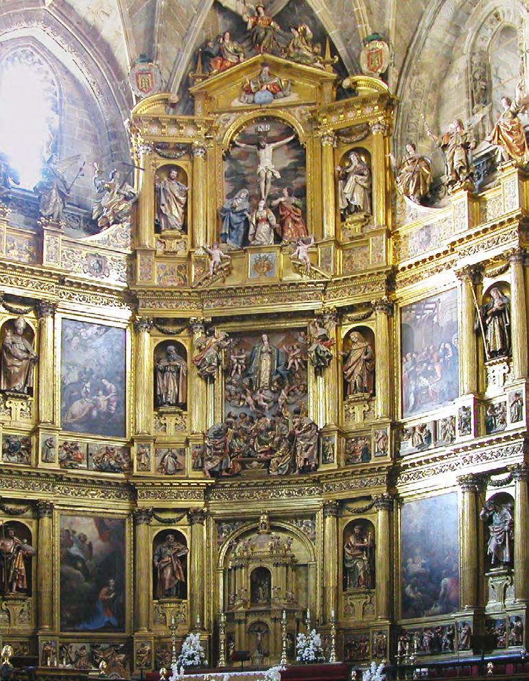
Progetto dell’allestimento a cura di CXINE
Quando, nel maggio del 2022, abbiamo visto i 6 grandi pannelli a mosaico dell’artista canadese Justin Teodoro disposti sui tavoli di lavorazione nel laboratorio Fantini Mosaici di Milano, siamo rimasti folgorati. Sembrava di assistere alla costruzione di un enorme Retablo per una chiesa barocca iberica o ispano-americana. Una interpretazione contemporanea e cinematografica delle gigantesche pale d’altare della storia dell’arte sacra occidentale.
Di fronte a quell’architettura spontanea di forme e colori in via di definizione, è sembrato naturale pensare all’allestimento dei grandi pannelli musivi attraverso una composizione legata alle esperienze dei polittici dell’arte storica. Edicole che incorniciassero un coordinamento di visioni, e di senso, da godersi self-standing nello spazio intenso di una chiesa o di una mostra.
Individuato il tipo a polittico, cercavamo una soluzione formale che dialogasse non solo con i modelli lignei più antichi ma anche con la dimensione più astratta dell’arte contemporanea. L’indicazione è giunta dall’opera ROOM 6, Channel View Hotel di Richard Wilson del 1996: lavorare con telai di ferro sottili, leggeri, in outline, capaci di tratteggiare nel vuoto l’impalpabile rimando alla dimensione della storia, dello spazio e dell’opera.
Visto il prototipo eretto nell’officina del fabbro ci siamo chiesti se quell’allestimento non dovesse avere un ulteriore valore progettuale: essere modulabile, trasportabile, ricombinabile. Avere una saggia sostenibilità di medio periodo. Un modello predisposto a riutilizzi e declinazioni per installazioni di progetti espositivi di analoga rappresentazione.
Così, alcuni mesi dopo, quando abbiamo visitato la Pinacoteca di Brera con Maria Cristina Galli, vicedirettrice dell’Accademia di Brera, camminando fra le celeberrime opere d’arte classica abbiamo discusso anche dell’allestimento del Concorso che Fantini Mosaici stava lanciando con l’Accademia. E abbiamo parlato di antichità, di polittici e di arte moderna. E lì s’è deciso di inserire nel testo del bando il riferimento alle strutture a polittico a 3 ante già sperimentate da Fantini Mosaici, come vincolo formale e dimensionale per il lavoro richiesto agli studenti.
È in questa cornice che, durante la Milano Design Week ’23, gli esiti del Concorso e i lavori premiati e selezionati degli studenti sono stati messi in mostra nel Cortile della Magnolia all’interno del Palazzo di Brera di Milano.
In May 2022, when we saw the six large mosaic panels by Canadian artist Justin Teodoro arranged on the worktables in the Fantini Mosaici laboratory in Milan, we were struck. It felt like witnessing the construction of an enormous Retablo for a Hispano-American Baroque church—a contemporary and cinematographic interpretation of the colossal altarpieces in the history of Western sacred art.
Faced with that spontaneous architecture of shapes and colors in the process of being defined, it seemed natural to think about installing the large mosaic panels through a composition linked to the experiences of the polyptychs of historical art. A small architecture that framed coordination of visions, and meanings, to be enjoyed self-standing in the intense space of a church or an exhibition.
Having identified the polyptych type, we were looking for a formal solution that would engage not only with the oldest wooden models but also with the more abstract dimension of contemporary art. The inspiration came from Richard Wilson’s 1996 work, ROOM 6, Channel View Hotel: working with thin, light, outline iron frames capable of sketching in the void the intangible reference to the dimension of history, space, and the artwork.
Having seen the prototype erected in the blacksmith’s workshop, we wondered if that setup shouldn’t have an additional design value: to be modular, transportable, recombinable. To have a wise medium-term sustainability. A model designed to be reused and adapted for exhibition projects of similar representation.
So, a few months later, when we visited the Pinacoteca di Brera with Maria Cristina Galli, deputy director of the Accademia di Brera, walking among the famous masterpieces of classical art we also discussed the setup of the Competition that Fantini Mosaici was launching with the Accademia. And we talked about antiquities, polyptychs, and modern art. And there we decided to include in the Call for Entries the reference to the 3-panel polyptych structures already tested by Fantini Mosaici, as a formal and dimensional constraint for the work required from the students.
Within this framework, during the Milano Design Week ‘23, the results of the Competition and the awarded and selected artworks of the students were exhibited in the Cortile della Magnolia inside the Palazzo di Brera in Milan.
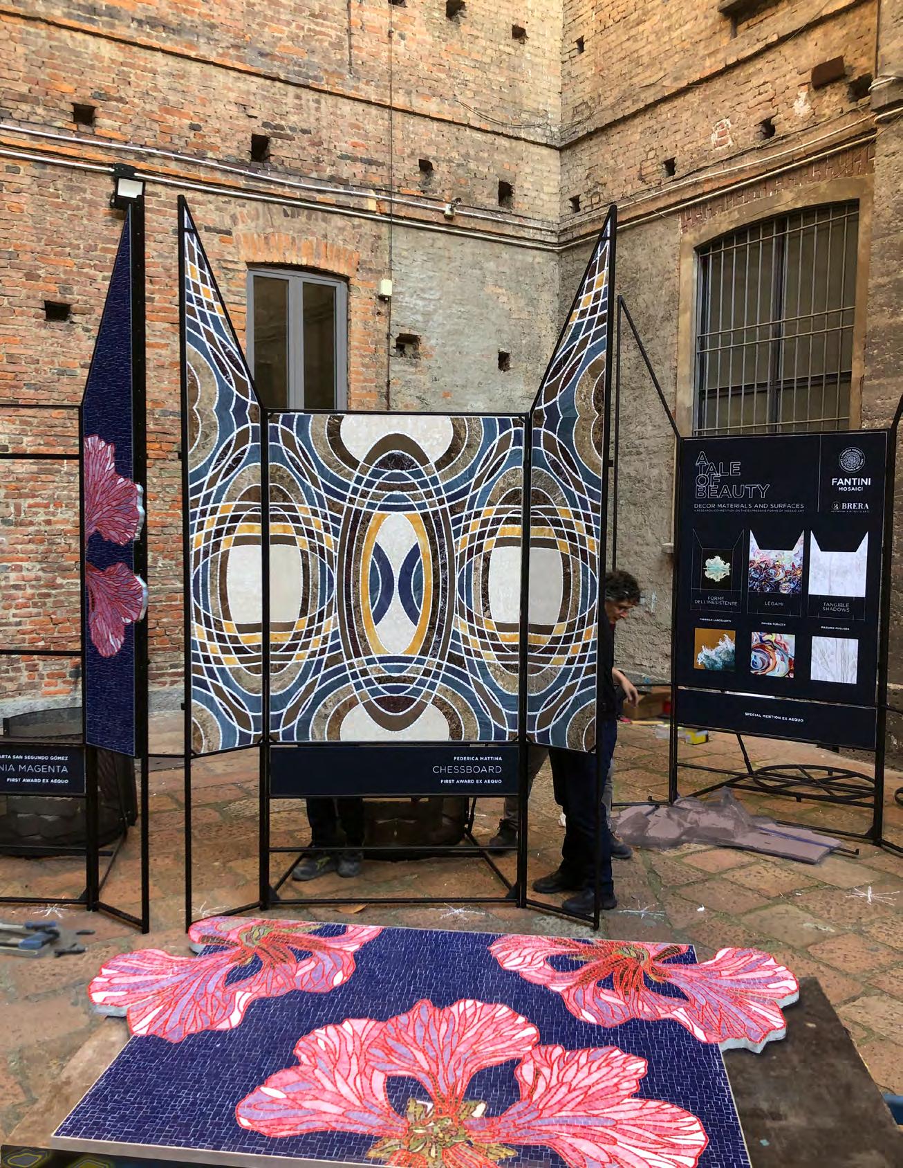
CURATORSHIP MASSIMO BRUTO RANDONE
ART DIRECTION MARGHERITA PALEARI
EXHIBITION DESIGN CXINE
COORDINATION AND PRODUCTION CONSOLO HUB
PRESS OFFICE SANTI & SANTI
PHOTOGRAPHY ELISABETTA MELFI
SPECIAL THANKS TO
MARIA CRISTINA GALLI
DEPUTY DIRECTOR - ACCADEMIA DI BRERA DI MILANO
DANY VESCOVI
SCHOOL OF PAINTING DIRECTOR - ACCADEMIA DI BRERA DI MILANO
FELICE MARTINELLI
PROFESSOR - ACCADEMIA DI BRERA DI MILANO