FORMAL ANALYSIS
GABE DARLEY
PETER EISENMAN + JERRY CHOW FALL 2022
BRUNELLESCHI
SAN LORENZO (1470) + SANTO SPIRITO (1487)
The side chapels within the San Lorenzo and Santo Spirito mark important differences in their creator’s intended spatial conditions. In the San Lorenzo side chapel, the window is small, and placed high above the entry, inaccessible to the churchgoer. In the Santo Spirito, the window has been expanded and lowered to a height much closer to eye level.
The first cathedral is highly insular due to having no real views to the outside world, while the second cathedral, designed as public space, promotes a kind of democratization in breaking the cathedral’s seal and reconnecting the occupant to the outside world.
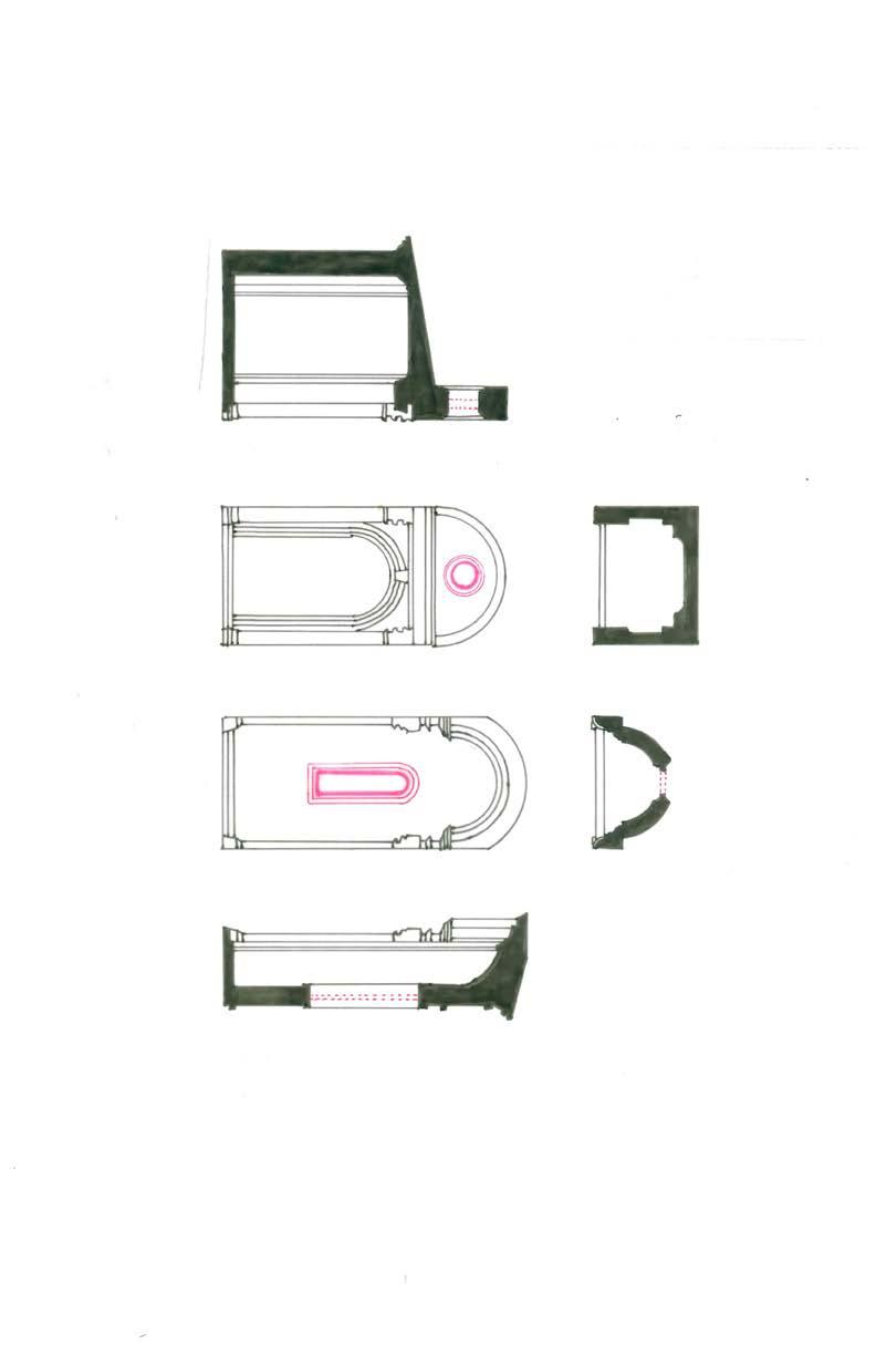
ALBERTI TEMPIO MALATESTIANO (1450)
A traditional reading of the Tempio Malatestiano’s facades follows that the outer is extremely rational and logical, governed by strictly even spacing between the punctured arches, but that the windows behind in the original facade are placed randomly and inconsistently.
In plan, it becomes very obvious that the punctures in the inner facade are also extremely rational and follow an order based on interior layout and program of the various side chapels; all are placed along a line of symmetry unique to each chapel. Both facades share a disciplined and ordered placement of punctures, and it is the determining factor of each order which sets them apart.
BRAMANTE + LAURANA
SANTA MARIA DELLA PACE (1482) + PALAZZO DUCALE (1424)
Bramante’s courtyard at the Santa Maria della Pace reflects his desire to conquer this church and Laurana’s Palazzo Ducale is particularly notable. In the Palazzo module which does not touch the others. In Bramante’s courtyard, the repetition The thread form in the corner then implies an abrupt ending to the sequence, that if these walls had not met, the pattern might have continued infinitely. is then much more clearly defined, corralled, and ‘conquered.’
conquer and contain empty space. The divergence in the use of pilasters in Palazzo Ducale, pilasters delineate space on each wall separately, as a single repetition of the pilaster seems to divide each wall into multiple planar modules. sequence, as though cut short by its intersection with the adjacent wall. It implies infinitely. In this way, a more rigid and defined intersection is created, and the cortile
RAFFAELLO
THE EXPULSION OF HELIODORUS (1512)
Raffaello’s painting, The Expulsion of Heliodorus, centers in frame a peculiar domed zone of his imagined church, just beyond the biblical scene in focus. This wing of the church utilizes a circular motif in four layers.
The first layer, in the arched entries, is a purely vertical circle, while the second and third layers of the giant order column and rounded entablature make use of a horizontal circle only. But the fourth layer of the dome, just at the top, unifies the structure by using the circle in both dimensions, promoting a harmony and order between its lower constituents.
MICHELANGELO
LAURENTIAN LIBRARY RICETTO (1525)
Michelangelo’s Laurentian Library marks an important transition from relief architecture to kinetic architecture. The library’s ricetto possesses a much higher kinetic quality for two reasons. The first is that the large columns and small pilasters taper dramatically and in opposite directions, which vibrate against the straighter axial lines of the rest of the wall. The second reason is that the ricetto shrinks the module of the wall from the bottom trim to the entablature, then stacks another module on top to make the room higher. In this way, there is a simultaneous and opposite compression and elongation.
Ultimately, the kinetic quality of the ricetto comes from its complexity in dealing with opposites: the opposites of a taper up and a taper down and of a compression and an elongation.
SERLIO HOUSE OF THE POOR PEASANT (1537)
In Book VI of his inventions, Serlio begins his collection of habitations with the House of the Poor Peasant. He describes four variations of the house, based on the peasant’s means, wherein each variation tacks on a new element: first just a single room, then an adjoining stable, then portico, and finally an oven and cantina.
Though the house is fundamentally mannerist in its expression, there is a classical logic employed in the additions of each space in the variations. A consistent measurement (seven feet) is used to structure the first room, It is then used as the width for the stables, and the gap length for the portico support and cantina additions. With each addition comes a proportional consistency, highly suggestive of a classical design sensibility.
PALLADIO
IL REDENTORE (1592) + SAN GIORGIO MAGGIORE (1610)
Palladio’s two churches, though initially seeming highly distinct, actually share many organizational elements in common. The primary difference between the two rests in the San Giorgio Maggiore’s dramatic elongation of these similar elements.
In elevation, the giant order columns and pediment have been raised up on a large pedestal. This singular move of elongation is then re-iterated multiple times in plan, where the crossing, apse, aisle, and bounding church frame have been pushed out and away from the central axes of the space. The effect is an atypical cathedral style with very familiar component pieces.
VIGNOLA VILLA GIULIA
(1553)
The facade of the Villa Giulia makes use of two distinct styles: rusticated and classical, presented in a state of compromise. This compromise is primarily manifest in the arrangement of elements.
Depicted are two examples, where the classical elements and rusticated elements alternate showing faces and obscuring portions of one another. Neither dominates the other completely and there exists an extreme ambiguity in which element is subtracting from the other. Is there a full Doric column with stone wrapped around? Or are the rusticated stones breaking up the column? Are the rusticated stones on the classical arch embedded within the wall or are they applied on top, leaving the classical element intact?
BORROMINI
SANT’ IVO (1660) + SAN CARLO ALLE QUATTRO FONTANE (1646)
Looking at the beginning of the domed ceiling condition, just above the entablature in the Sant’ Ivo and San Carlo alle Quattro Fontane, each ceiling gives preference to a corresponding portion of the floor plan.
For the Sant’ Ivo, there is radially symmetrical placement of windows. Each window introduces an axis from outside to inside and all 6 meet in the center. The base shape of the ceiling can also be inscribed in a circle, reinforcing that same center point, and the pockets carved out of that triangle are circular, pushing out symmetrically from the center. The preference for this building is for the center of the room.
For San Carlo, the lone window produces an axis that meets no resistance up until the solid wall directly across from it. The base shape, a diamond, cannot be perfectly inscribed in a single circle, but instead requires two, so there is an elongation of the original perfect geometry of the triangle, and another axis matching the window’s is created. Lastly, the pockets which break the base shape are ellipses, with primary axes. These axes run parallel to the window axis. All of these directionalities point toward the apse, the preferred zone of this church.
BERNINI + RAINALDI
SANTA MARIA DEI MIRACOLI (1597) + SANTA MARIA IN MONTESANTO (1679)
Bernini’s churches play with languages of density and threshold in order to of built elements at the same cut plane show a much denser and less variable consistent and provides more breaks in high-density areas. Additionally, Montesanto contains a version of every threshold path that the Miracoli accessible paths from zone to zone. The result is a much freer and fluid interior
(1679)
to create varying interior effects. Plans mapped out based on the density variable language in the Miracoli, while the Montesanto appears much less lines tracing paths from each spatial threshold in the plan show that the Miracoli does, but adds more intermediate thresholds, exponentially increasing interior in the Montesanto.
RAINALDI
SANTA MARIA IN CAMPITELLI (1667)
This analysis of the Santa Maria in Campitelli relies on the distinction between the footing, and a “niche” column connected to walls on two sides.
Rianaldi uses “detached” columns to mark thresholds and partitions and “bounded” thresholds emphasize the isolation and sanctity of the posterior crossing while transepts. This implies a hierarchy of spaces, with the posterior crossing as primary
Another reading of the columns is that they create directionality and subsequent through the church’s center is defined by the detached columns. A secondary while a tertiary axis solely exists defined by bounded columns. Contrary to the space to the posterior. These contrasting readings contribute to the overall stylistic

between two types of column: a “detached” column connected to a wall by one side of
“bounded” columns to mark distinct zones of transversal interruption. Double while the single thresholds segment the anterior zone into a crossing with two primary and the anterior as secondary.
subsequent axial hierarchy in the opposite priority. The primary axis of orientation secondary axis is created through the combination of detached and bounded columns first analysis, this also implies a hierarchy of spaces, but prioritizes the anterior stylistic and spatial ambiguity of the church.
