


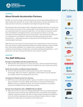
GAP is a strategic technology solutions partner providing an exceptional experience in Digital Transformation and the Delivery of Software and Data Solutions via world-class consulting and engineering teams. By building strategic, long-term partnerships with clients, we develop extensive domain knowledge combined with deep technical expertise. We have the architectural skills to design next-generation strategic technology solutions utilizing the latest cloud-based technologies. Our talented engineering teams are agile, transparent, accountable and focused on customer success, with one of the highest satisfaction scores in the industry. GAP helps you scale smarter, transforming your objectives into data and delivering software solutions that drive business outcomes.
28.
38.
This is the main logo of GAP. Use this logo in it's entirety, do not cut, stretch, or otherwise combine as shown below. Download here!
It can be used in full color
Or all white for dark backgrounds or images

To ensure the legibility of the logo, a safety margin must be maintained around it, which must not be less than the size of one of the letters in "GROWTH ACCELERATION"

Logo Colors
#006489 Pantone 7706C #453F3e Pantone 447C #777373 Pantone 424CTo ensure brand consistency and logo legibility, a set system of logo sizes has been developed.
Minimum screen size: wide 130px
Minimum icon screen size: wide 25px

Minimum print size: wide 2in or 5cms
Minimum icon print size: wide 0.5in or 1.27cm

Logo icon alone, as a representation of the brand.

Don't use the icon in outlines.
Primary Logo used on light backgrounds or images.


Primary white logo used on dark backgrounds or images.

Don't change the icon color.
Primary white logo used on patterned backgrounds images.

Logo icon zoomed and cropped for creative purposes. The full logo may not.
Don't place images or colors inside the circle icon.
Don't use the logo without the icon.
Don't use outline stroke on the circle icon or the logo.

Don't use the logo in other colors.
This version should be used only in small application, when our full logo wouldn't be legible at sizes specified on the previous pages. Download here!
It can be used in full color

Or all white for dark backgrounds or images

Minimum screen size: height 30px

Minimum print size: height 0.5in or 1.27cms

Allowed in backgrounds or texts:
#FEBD12
Pantone 1235 C
These are the main brand colors, to use in any communication
Download here!
YELLOW:
Use to highlight a maximum of 2 words, preferably from a title.
In a specific element of the design (example: in a button or punctuation symbol).
Do not use as backgrounds.
Use these colors (from blue) to combine with the main palette.
Allowed in backgrounds, titles, texts and elements mostly to create changes and breaks visually without using the color of the secondary palette.
NOT ALLOWED USAGES
Background: dark gray
Text: blue
Complete Background in yellow
Background: gray
Background: light gray
Background: light blue
Paragraphs or complete titles in yellow
Text: blue Always
Title with yellow
Text: light gray
Background: blue
Text: dark gray
Background: light blue
Title with yellow
Corporate and internal communication
Internal communication
#80468C
These colors may be use in details, small graphic elements, 2 max words, illustrations; where a wider color palette is neccessary to convey a variety of information.
#E5E1E6

Primary font
Corporate typeface
Must be used in all GAP communication
Titles: Black or Extra Black (one or the other, don't use both in same document).
Subtitle: Thin or Light one or the other, don't use both in same document).
Body text: Regular (may not smaller than 10pt).
Call-outs within the body text: Semi-bold or Bold (on or the other, don't use both in same document).
Download here
PROXIMA NOVA EXTRABOLD & BLACK
Proxima Nova Extrabold and Black can be use in hollow option.
Only use in Titles, Subtitles or Call-outs (may not smaller than 20pt).
Use a maximum of 4 words of a title or phrase that needs to be differentiated.
Decorative font to complement the corporate typeface and add variety, it should be used exceedingly sparingly
a b c d e f g h I j k l m n
ñ o p q r s t u v w x y z
Use a maximum of 2 words of a title or phrase that needs to be highlighted.
Don't use Olivier font on the company name 'Growth Acceleration Partners' or the acronym 'GAP'.
Do not use in the body of the text, in numbers or all capital letters.
Olivier font can't be used with Google Suite products only use Proxima Nova in those cases.
Download here
These fonts may be used instead or Proxima Nova for web-based applications or when creating documents that will be shared as live files with people outside GAP organization who don't have access to Proxima Nova.
Same guidelines for use are applicable as those provided for Proxima Nova
It’s possible make variations in designs while maintaining GAP’s Branding, we can use some graphic elements and play with transparencies and color combinations.
Dowload here some used Graphic Elements


All images in Marketing Drive • Pictures & Videos • Pictures
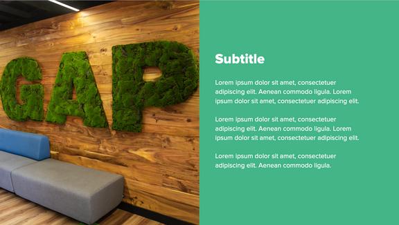
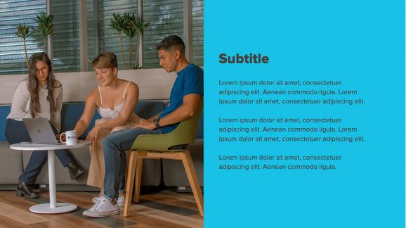
These are images approved for external use that show GAPsters and our company culture, including social events, GAPsters working, office life, client entertainment and others.
These images were selected for their quality. Don't use others images for external purposes as they may feature GAPsters who didn't sign a photo release, show client information or not meet required level of quality (out of focus, poor compositions, bad lighting).
Only the official GAP media are authorized to use these images, if it's necessary use them in other pages, please consult with the Marketing department.


All images in Marketing Drive
Pictures & Videos
These images primarily show GAP Spaces rather than GAP People. The purpose is to show to clients that GAP is a world-class operation that invests in its people and technology infrastructure by offering beautiful spaces to work and collaborate.

To create an external graphic that incorporates text or other material over photos, please reach out to marketing team for help.


All images in Marketing Drive
Pictures & Videos
Pictures
Images purchased online though iStock.
Stock library is maintained by the Marketing team, who can help you to find the one for you project.
Don't use images pulled off the internet, they are usually low quality and may have copyright restrictions.

Don't use images with infrastructure that does not correspond to GAP services.
Don't use images where the technology floats or levitates.
Don't use images where a human touches technology.


An extended set of icons has been developed to help provide visual interest to describe GAP's services and industry.
Minimun icon sice: 0.6 inches or 1.5 centimeters. Colors may not be changed.
The full GAP icon library can be found HERE!

The mascot will be used for different purposes internally and externally.
For external use: it is recommended only for very special occasions.
For internal use: the sky's the limit. Bit Bytes can be used to announce things, provide reminders, create community, as part of activities and events, etc.
Before using Bit Bytes in your communications it is important to generate the request to the Marketing and Design team a month in advance in case we need to generate special material such as animations, new looks, etc.
FIND HERE SOME IMAGES OF ME!











Steps template

Announcement template

Department template

Info template

Basic template

Activities template


Define shirt color.
Contrast shirt color and design colors (GAP Palettes).
Avoid very small elements and very thin lines.
Can be printed:
On the front (chest area), letter size 8.5x11”.
Sleeves (GAP logo minimum size: 5cm wide).
On the Back (top), letter size 8.5x11”. Avoid printing on the lower parts of the shirt.


Use the necessary logos in full color or in white, depending on the color of the item. A design related to the area or event for which it is required can be added.
FOR INTERNAL USE:

FOR EXTERNAL USE:


Use the necessary logos in full color or in white, depending on the color of the item. A design related to the area or event for which it is required can be added.
FOR INTERNAL USE:

FOR EXTERNAL USE:
Please read these graphic lines before working on the Branding of the offices


Please read these graphic lines before working on the GAP Internal Newsletter


Please read these graphic lines before working on the GAPsters HUB GAPsters HUB: Graphic Line Guide


