5 minute read
5.2. Developing the User Interface
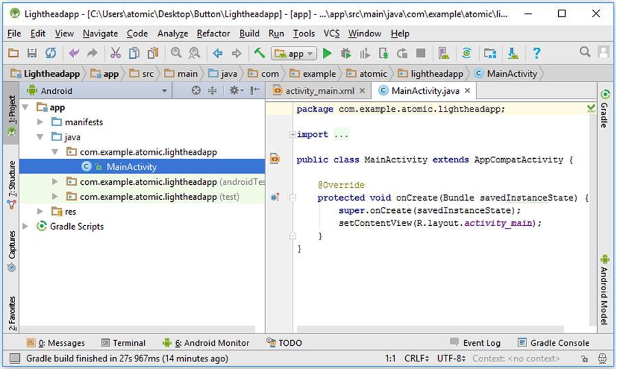
After the project is successfully created, the default view of the Android Studio will appear in which the middle pane will show the “MainActivity.java” file as shown below:
Figure 5.6. Default view in Android Studio
Advertisement
5.2. Developing the User Interface
Let‟s open the user interface layout file activity_main.xml where we will place the button on the screen. As we can see from the figure above, the left pane shows the folders and files of our project. Make sure that the view type is Android and select the folders res layout and then double-click on the file activity_main.xml there as shown in Figure 5.7.
When the activity_main.xml file is opened, the layout it contains will be shown in the middle pane as shown in Figure 5.8. This file and other xml files contain the layout information of an Android app in Android Studio. In fact, xml files are not only used in Android app development but also in other areas of computing. xml files are good to express the relations among different entities in a hierarchical way therefore is a good choice to use in layout design. xml files are text files but Android Studio interprets them as layouts as long as they are in the correct format. We can also view the text file representation of activity_main.xml in
Android Studio by selecting the Text tab as indicated by the arrow in Figure 5.8.
Figure 5.7. Finding activity_main.xml file in project explorer
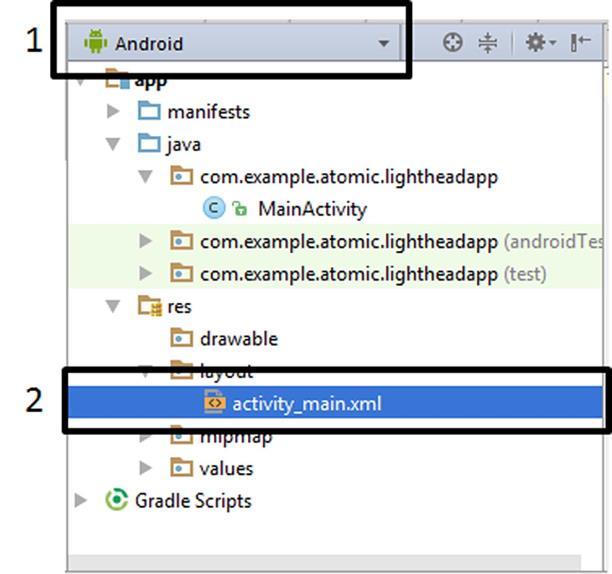
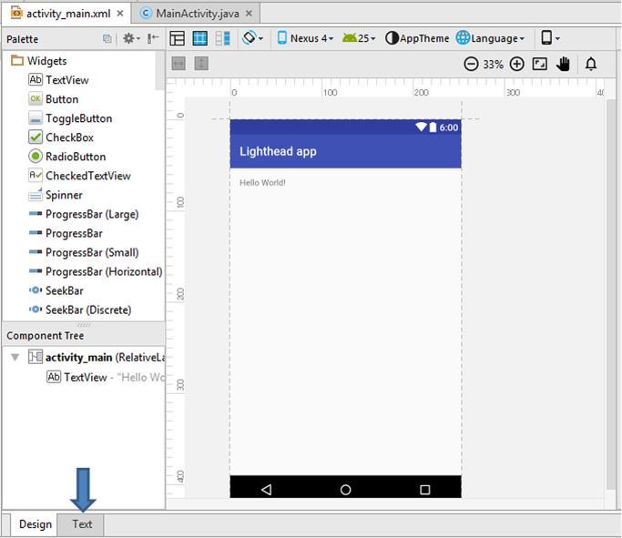
Figure 5.8. Viewing activity_main in Android Studio
When the Text tab is selected, the text format of the activity_main.xml file is displayed in the middle pane as follows:
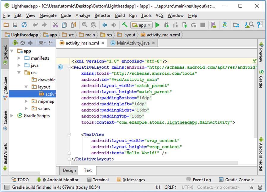
Figure 5.9. activity_main.xml file in text representation
You don‟t need to be confused about the contents of this file. We‟ll do most of the layout operations visually. We‟ll only use this text representation in special cases. However, it is a good practice to follow the contents of the xml file as we design app layouts. In the above figure, we can see that our layout consists of a RelativeLayout structure, which begins by the line <RelativeLayout… and ends with </RelativeLayout>. Inside this layout, we have a TextView component. In other words, a TextView component exists inside the RelativeLayout component. Let‟s now see how an Android app GUI is built in general using these components.
In Android, all user graphical user interface (GUI) objects (widgets, layouts, image objects, etc.) are derived from the View class of the
GUI library. The basic hierarchy of GUI classes are shown in Figure 5.10.
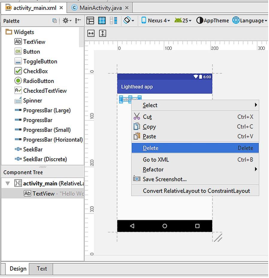
Figure 5.10. Basic hierarchy of the GUI components
The components of the GUI of an Android app have the following basic properties:
Because all GUI objects are derived from the View class, these GUI objects are also called as views in Android programming. ViewGroup‟s child classes RelativeLayout, LinearLayout,
AbsoluteLayout and GridLayout are special views that can contain other views and components. These are used for shaping the layout as you wish.
An Android GUI should consist of at least one layout class. For example, our activity_main.xml file has the RelativeLayout as shown in Figure 5.9. We can build any GUI by using the subclasses of the View class shown in Figure 5.10.
We‟ll see several GUI designs during our app development journey. Different developers prefer different strategies for shaping their app‟s GUI. In my personal opinion, RelativeLayout provides more flexibility therefore easier to use. The basic property of the RelativeLayout is that each GUI object is positioned relative to each other.
Anyway, let‟s continue developing our red/blue strobe light app. Please switch to the Design view of the activity_main.xml file as in Figure 5.8 so that we can design the GUI visually.
First of all, please delete the default “Hello World” TextView by rightclicking on it and selecting “Delete” as shown below:
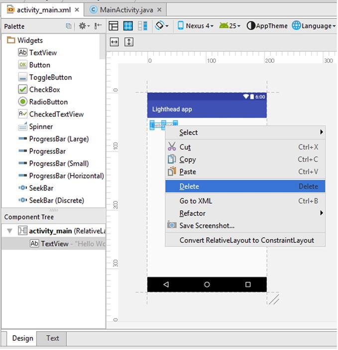
Figure 5.11. Deleting the default “Hello World” TextView
After deleting the default TextView, please find the Button widget from the objects palette and then drag and drop it in the middle of the GUI by the help of the guiding lines as shown in Figure 5.12.
Figure 5.12. Adding a button widget in the middle of the user interface
When we add a widget to the GUI, it keeps being selected and then its properties can be viewed from the right pane as shown in Figure 5.13. The basic properties of the button are shown in this pane. However, we can see the full list of properties by clicking on the View all properties (can be seen after scrolling down) as shown in Figure 5.14.

Anyway, let‟s go on with the basic properties pane shown inside the rectangle in Figure 5.13. In this pane, one of the most important properties for accessing the button is the ID. All objects of the GUI of an Android app are accessed through their IDs in the coding part.
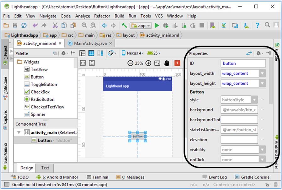
Figure 5.13. Basic properties of the button widget
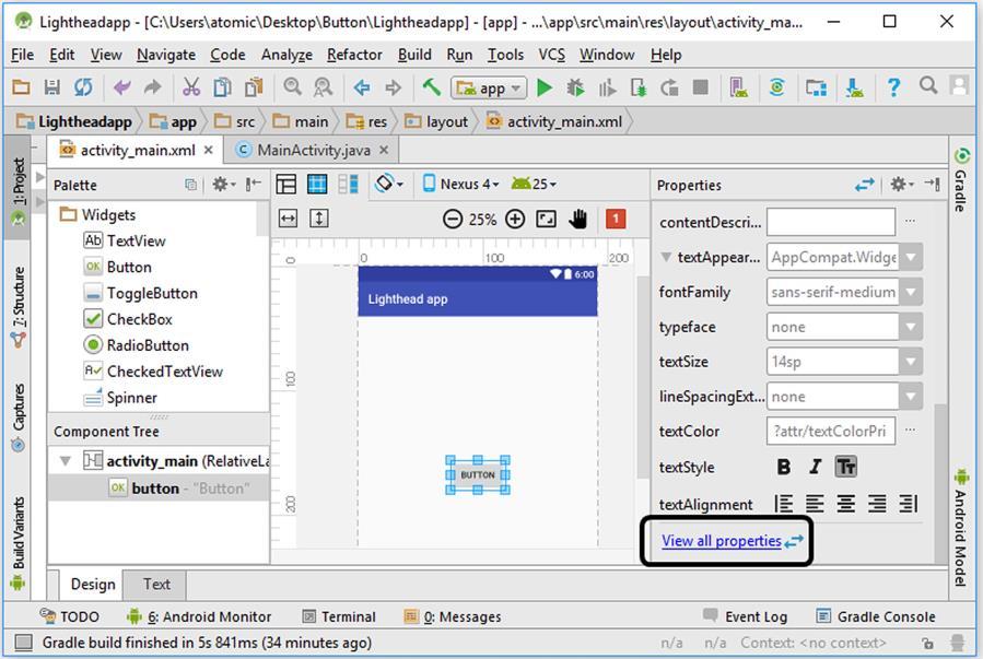
Figure 5.14. Switching to all properties of the button widget
In our app, the default ID of the button widget is set as button by Android Studio. We can change it just by clicking the ID box and replacing the button text.
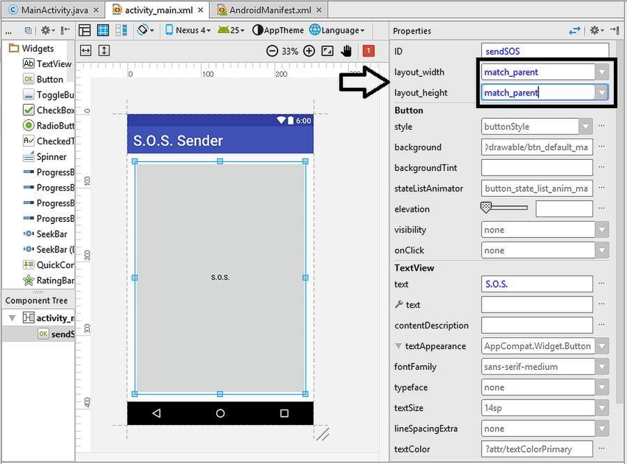
The next two boxes refer to the layout width and layout height properties of the button widget. Their settings determine the width and the height of the button object in the GUI. They are set as wrap_content by default. This means that the width and the height of the button will be adjusted to wrap (cover) the text written inside the button (i.e. button‟s label). The other available choice for these parameters is the match_parent as shown in Figure 5.15. If this is selected, the respective property (width or height) will be equal to the width or height of its parent container (which is the RelativeLayout covering the whole screen in this example).
Figure 5.15. The alternatives for the layout_width and layout_height parameters

Since we don‟t want the button to have a width or height filling the whole GUI, we need to leave these parameters having the value of wrap_content.
In our app, the button is supposed to change the background colour of the screen therefore it is good to change the label of the button accordingly. The button‟s label (the text on the button) is Button by default. Let‟s change it to “Change!” as shown in Figure 5.16.


