7 minute read
06 Advancing US Leadership in
from AS WE REOPEN...
CONNECTION A HISTORIC A sneak peek into the past reveals that geographic information has played a key role in epidemiological breakthroughs, highlighting the power of ‘where’ in healthcare. By Mahashreveta Choudhary

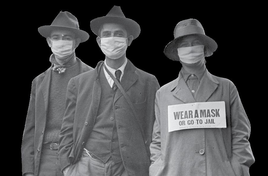


We all are dealing with a common enemy today — SARS-CoV-2, or the Novel Coronavirus, which originated from Wuhan, China, towards the end of last year. Apart from causing deaths and infecting millions of people worldwide, the virus has quite literally pushed the global economy into recession, forcing our well-connected global village into self-quarantine. The picture is grim, but could have been a lot worse, if we hadn’t figured out the origin of the virus, and could not track its movement.
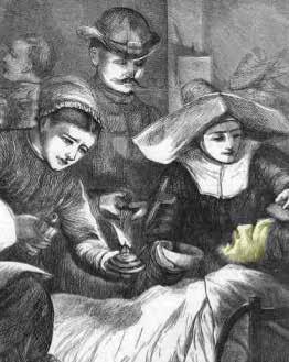
History is replete with instances in which geographic information has played a key role in epidemiological breakthroughs, highlightYellow fever mystery In 1793, Philadelphia city in the US state of Pennsylvania lost nearly 10% of its population to yellow fever. At that time, the authorities assumed that the fever springs from ‘corruption’ of the air, and that its ‘violence’ is in proportion to the continuance of the heat and moisture. In areas with high mortality, sanitarians assumed that the ‘corruption’ in the air originated from the foul odor emanating from stagnant ponds and unsanitary streets, where human and animal waste was left uncollected for days. Contagionists, on the other hand, believed that the fever was not locally generated, and was in fact ‘imported’ in the cargo holds of trading ships that brought slaves and raw goods to American ports.
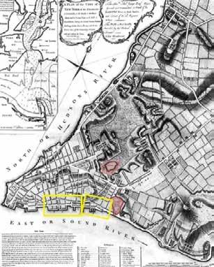
In 1796, Dr Valentine Seaman, with the help of maps designed on copper plates, attempted to correlate the location of yellow fever cases with waste sites in the city streets. Through his maps, Dr Seaman defined the nature of the disease and the scale of response required by public officials to prevent recurrent epidemics. Later, Dr Seaman also overlaid the location of yellow fever cases with the position of dumping areas and sewage sites in lower
DR VALENTINE SEAMAN Manhattan. He marked these sites with a thick ‘S’. Reflecting upon his observations, he (1770-1817) concluded that the deadly outbreak was linked to certain areas with putrid emanations. ing the power of ‘where’ in healthcare. Even today, governments and medical experts are extensively using maps to deal with all aspects of the pandemic — to from tracking cases to planning relief measures.
The practice of tracking a disease goes back to the 17 th Century in 1692 when plague was wreaking havoc in Europe, Fillippo
Through this map in 1692, Fillippo Arrieta, an Italian royal auditor, spatially visualized the strategy for containing Courtesy: ResearchGate the spread of plague in Italy’s Bari region

Arrieta, an Italian royal auditor, spatially visualized the strategy for containing the spread of the disease in Italy’s Bari region. On Arrieta’s map, Bari was separated from the rest of the country by a dashed line that represented a cordon sanitaire, which is similar to a containment zone of our times. The map shows two areas within Bari, separated from the cordoned-off province by a thick line.
There are several such fascinating stories, telling us about the strong connection between geographic information and epidemiology. Let’s turn the pages of history to
revisit some of these stories.
In 1780, Dr Valentine Seaman overlaid the location of yellow fever cases with the position of dumping areas and sewage sites in lower Manhattan
Cholera puzzle
In the middle of the 19 th Century, with the help of maps and other illustrative tools, Dr John Snow, a scientist-physician, discovered that Cholera was a contagious
JOHN SNOW waterborne disease. (1813-1858) Termed Father of Medical Cartography, Dr Snow mapped the distribution of cholera deaths around a water pump on Broad Street in London’s Soho in 1854. He identified the relation between the pump and the populace, and eventually convinced the authorities to get the pump handle removed.
Over the next century and a half, Dr Snow’s story was reconstructed, as he crafted the map during the outbreak, and the evident clustering of deaths led to the famous breakthrough. Over time, his map evolved from an analytical tool to an effective cartographic communication device.
Dr. John Snow mapped the distribution of cholera deaths around a water pump on Broad Street in London’s Soho in 1854
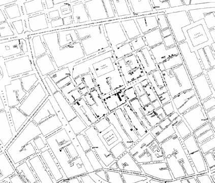
Courtesy: ResearchGate
In the middle of the 19 th Century, with the help

Courtesy: Pavel Fedotov This 19th Century painting by Pavel Fedotov depicts death from cholera in Russia Tracking cholera morbus In 1819, a new and violent epidemic, known as Cholera Morbus, was reported in the British army barracks of Peshawar, then India. Over the next decade, the disease spread to the Middle East, Russia and Europe. In a review article in 1831, when cholera arrived in England, the Lancet mapped the progress of the disease in Asia, Europe and Africa. The authors of the map claimed they had traced the epidemic through 700 ‘irruptions’, and shown it ravaging nearly 2,000 towns.
Each of these ‘irruptions’ was presented on the map as a circle, with a dot inside to mark a cholera-reporting city. In the mapping of geography, the extent of the disease as a single thing was constructed. This was for the first time that international data from a variety of public and professional sources was collected and organized in a manner describing the international geography of a disease.
Curious cases of cancer In 1868, Dr Alfred Haviland used a map to advance a biogeographical explanation for higher cancer rates in certain parts of England. The intent behind the exercise was not only to
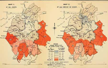
In 1868, Dr Alfred Haviland used a map to advance
This map by Dr Alfred Haviland highlights bimodal depiction of cancer with orange color indicating the least medical hazard and grey color indicating the highest
Courtesy: Brianaltonenmph This picture depicts cancer cases in the mid 19 th Century

map the spread, but to figure out concern — the cancer epithe aetiology of the fatal disease. demic. The challenge was to Although limited to a specific identify specific biogeographregion, Haviland’s work sparked ical profiles that could explain a series of studies and reports high number of cases in certain that identified an increasing towns, districts and regions. In incidence of different forms of cancer in the UK, with some of DR ALFRED HAVILAND 1975, US Cancer Atlas identified ‘hotspots’ on the basis of coastal the cases connected to specific (1824-1903) shipyards, whose workers were biogeographies. exposed to asbestos. Elsewhere,
Soon, those reports led to high rates could be connected similar studies across the Commonwealth to air pollution from a copper smelter. These and elsewhere, transforming anomalous findings highlighted environmental and social regional incidence into a global health variables that seemed to cause cancer. Learning from history Epidemiologists have traditionally used maps to analyze the association between location, environment and disease, and it is a given that good epidemiology science and good geographic information science go hand in hand. Since the SARS outbreak in 2003, the world has seen a revolution in applied geography through web-based tools. Currently, there are umpteen maps and charts to show the alarming spread of COVID-19 and how health infrastructure across countries is under tremendous stress.
Location is the basic principle of any field investigation. In case of a global pandemic like COVID-19, the dimension of ‘where’ becomes more important than ‘who’ and ‘when’. Geospatial tools and data have immense potential in epidemiology, and can help in mapping a disease, procuring relevant supplemental data and taking evidence-based decisions.
Mahashreveta Choudhary
Correspondent mahashreveta@geospatialmedia.net


