

Color Trends 2025
navigating the unclear
Times are rapidly evolving, marked by excitement and challenge, as well as a blend of physical and digital realms due to technological advances like AI. As design becomes more democratic and accessible through AI, there is a growing emphasis on authentic, handcrafted designs created by humans.
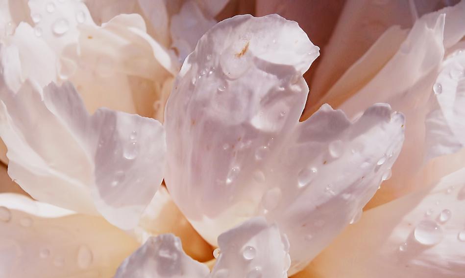
The rapid pace of technological and global changes—characterized by climate crises, political shifts, and economic instability—has made predictions more difficult and is influencing our design choices. This complexity is reflected in our use of overlapping, blurred colors that convey uncertainty. Amid these challenges, there is a growing emphasis on reconnecting with nature, leading to a preference for calming greens and blues.
Our evolving perspective values the human touch and sustainability, which entails a shift from bright, chromatic colors to more muted, earthy tones. Yet, we still seek light, airy colors to maintain a sense of hope and balance, bridging the gap between our need for comfort, and connection with the natural world.
R32020
B53030 Y20510
B16010 B14030 R94030 sunny dunes midnight stone pure ocean analog blue ancient blue
baked brown lilac dream airy candy purple cloud blue clarity silver sand coral reef
feeling violet golden grain terracotta steel blue camelia red
warm beam dark bark lime acid proud purple power purple powder purple
G90505 G98010
G71070
R55030 R58010
R51005
R25020
Y74020
Y12050
Y96030
R87005
Y92060
R11010
R50510
R80510
B10010
Y70560
G20400 renew dew


TREND ①
liquid
An homage to water and nature, highlighting blue and green. The effects of climate change, which are leading to a drier and warmer world, are guiding us toward colors that evoke our essential resource: water.
This shift reflects a growing yearning for the soothing and natural presence of these hues in our environments and daily lives.
B53030 Y20510
B16010 B14030 R94030 sunny dunes midnight stone pure ocean analog blue ancient blue
G20400 renew dew


As climate change intensifies, we are transitioning from mere awareness to active adaptation, facing disruptions in natural water cycles and increasing extremes in weather patterns. This shift has moved our focus from simply connecting with nature to recognizing its resilience, prompting a desire for calming blues and greens that symbolize water and survival. Amid rising eco-anxiety, off-grid living is gaining traction, with homes designed to integrate sustainable technologies and natural elements. This trend reflects a preference for cool tones that evoke a refreshing, greenish-blue vision of our world.

Y20510 sunny dunes


B53030 ancient blue
THE COLOUR PALETTE
Greens will still be a dominant hue group in 2025, but the trend will shift towards more bluish greens rather than yellowish greens. All shades of blue that remind us of the pure water of our waterfalls, lakes, rivers, seas and oceans are gaining prominence. These colors symbolize the
natural resources we aim to preserve on our world. As an additional reminder of the natural origin of these colors, a soft and washed-out effect will be important. The so-called halfway colors are one of the more potent color elements of 2025 and beyond.

B14030 pure ocean


R94030 analog blue

Y20510 sunny dunes


G20400 renew dew

TREND ②
antipode
In a world marked by stark contrasts, we seek solace in embracing extremes, blending light and dark hues using two chromatic colors to symbolize unity. Our aim is to convey a sense of connection and hope by harmonizing these opposing elements.
In an era of profound extremes and simultaneous crises –ranging from climate issues to resource shortages and media portrayals–, we experience a sense of division and crisis fatigue, underscoring our quest for safety. This dichotomy is reflected in our fascination with both science and mystery, as we seek to bridge these realms for a deeper understanding.
dark bark lime acid proud purple power purple powder purple warm beam
G90505
G98010 G71070
R55030
R58010 R51005


Amidst crisis and polarization, our desire for luxurious and nuanced colors—blending subtle darks and lights with vibrant, yet restrained accents—mirrors our need to reconcile contrasts. In both design and life, we aim to connect, inspire, and heal, striving for unity and hope in a divided world.


lime acid
G71070


powder purple
R51005


power purple
R58010

THE COLOUR PALETTE
In this trend direction, the bold use of darktinted colors is crucial. We aim for larger, darker surfaces balanced by lighter colors. This focus drives a direction towards using light and dark colors, unified by other hues. To find comfort, we must X both extremes with colors that can be appreciated in both darkness and light.
To simplify adoption, the colors used are either similar in hue or perfectly juxtaposed as complementary. This connects the contrasts perfectly well. The two key colors are perfectly complementary, while the dark and light shades support these primary hues.


R51005 powder purple


dark bark
G98010


proud purple
R55030
TREND ③
within
In today’s divisive environment, we turn inward and rely on our instincts, leading us to favor warm, earthy midtones that evoke comfort and joy while reflecting subtle yet enduring strength. As our world becomes increasingly blurred, we seek a deeper understanding of ourselves, craving warmth, comfort, and authentic sensory experiences beyond the superficial gratifications of social media.
baked brown feeling violet golden grain
terracotta steel blue camelia red
R25020
Y74020
Y12050
Y96030
R87005 Y92060


terracotta Y96030


baked brown
Y74020

This desire drives us to fully engage ourselves by incorporating materials and acoustics within our homes to enhance our comfort and wellbeing. Amid this shift, people are embracing hobbies and crafts for their sensory and emotional benefits, disconnecting from the metaverse to focus on real, tangible experiences. Concurrently, AI design tools are democratizing creativity, allowing everyone to explore artistic endeavors and enhance human well-being through simple pleasures. However, In the long term a return to traditional handicrafts will prevail.

camelia red
Y92060


R87005 steel blue

baked brown
Y74020


baked brown Y74020
Recent advancements in technology, such as fMRI, have enabled scientists to map brain activity and understand how we perceive and appreciate colors and art. This has led to a focus on neuro-aesthetics in design, ensuring that color choices align with human cognition, behavior, and wellbeing. By emphasizing neuro-design, we aim to create designs that resonate with our inner selves, incorporating layered shapes and diverse colors to reflect both individual and collective experiences.
THE COLOUR PALETTE
Discover a palette of mature pastels, unique inter-tone colors, and midtones, not loud but strong. These human-connected colors are warm and earthy, reflecting our inner selves. In a sense, these colors can be described as "digested," "fermented," and "nostalgic."


TREND ④ grace
Light, fluid colors embody a liquid state of mind, merging the digital and physical worlds. This seamless blend of airy aesthetics with technology creates immersive experiences within the multiverse.
We are immersed in liquid worlds, with AI deepening this mindset and prompting us to explore alternative personalities and create parallel "eras" and "avatars." Engulfed in a multiverse, we adopt an ethereal mood, celebrating multiculturalism and choice, which alleviates anxiety and fosters self-empowerment.
R32020
lilac dream airy candy purple cloud blue clarity silver sand coral reef


blue clarity
R80510

coral reef Y70560


silver sand
B10010


Digital reality introduces liquid colors that we seek to incorporate into our physical spaces, using sustainable techniques such as food waste and bacteria to create delicate, ethereal hues. This aesthetic encourages abstract, whimsical shapes and dreamy environments. The high-tech mood integrates social technology with light tones and vibrant reds, blending human warmth with futuristic elements.

R32020
lilac dream

THE COLOUR PALETTE
The two key colors are similar in nuance but contrast with each other in hue. All the other colors share a similar level of blackness and most are similar in chromaticness. They are also closely related in hue. One of the colors is more chromatic and signifies the beginning or end of our ethereal experience.


blue clarity
R80510


purple cloud
R50510


silver sand
B10010

R32020 lilac dream
G20400 renew dew
B53030 ancient blue
R32020 lilac dream airy candy
R11010 purple cloud
R50510
feeling violet
R25020
baked brown
Y74020
golden grain
Y12050 warm beam
G90505 dark bark
G98010 lime acid
G71070
Y20510 sunny dunes
B16010 midnight stone
B14030 pure ocean
R94030 analog blue
power purple
powder purple
blue clarity
R80510
silver sand
B10010
coral reef
Y70560
terracotta
Y96030
steel blue
R87005
camelia red
Y92060
proud purple
R55030
R58010
R51005
DEEP RICH COLORS

Intense Colors is a high-quality 100% pure acrylic based emulsion paint, engineered to give a high end smooth luxurious matt or silk finish. It is produced with best in class ingredients to prevent fungus and bacterial growth. Enhanced with our state of the art technology to produce unprecedented smoothness and deep rich colors.

Disclaimer: We have made every effort to reproduce these colors as accurately as modern technology allows it. However slight changes may occur with the actual paint.
INTENSE, is the result of years of research dedicated to creating richly pigmented paint using the finest ingredients to curate this capsule collection of 140 colors. Intensely deep, intensely pure, intensely timeless.

Since its establishment in Egypt, GLC paints has been a leading coatings manufacturer in Africa and the Middle East, providing excellent products to protect and beautify our world. We deliver full paint solutions that cater to all market segments.
German Lebanese Co.
For Industry, GLC Paints
El Obour City. Industrial Zone, B, C.
Piece 1 B Block El Mahager
El Obour City. First Industrial zone, Block 13027, Piece 3, street 54
C.R. 5231 El Obour
Hotline: 16730
