65 minute read
BEST IN CLASS


57 —57AWARDS
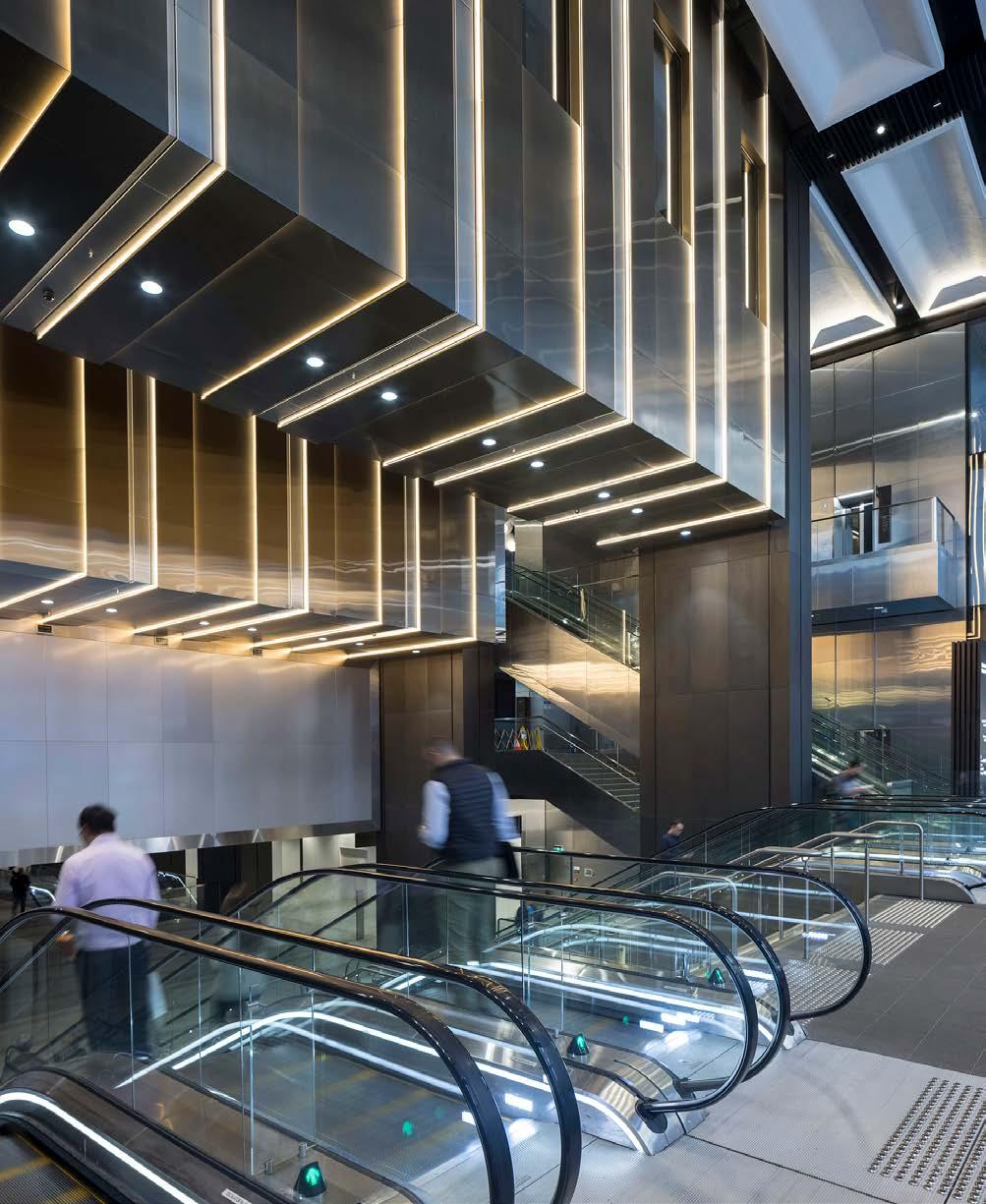
BROOKFIELD PLACE SYDNEY ARCHITECTURAL DESIGN
ARCHITECTURAL DESIGN
DESIGNED BY Make Architects Architectus (Executive architects)
COMMISSIONED BY Brookfield Properties
DESIGNED IN Australia
JURY COMMENT Creative solutions to a multifaceted problem highlight the rigour of the design process with the final result a world-class transit station with proud stewardship and a clear celebration of the site’s significant heritage elements. The full design team should be congratulated on an excellent outcome. Brookfield Place Sydney is a highly complex mixed-use project. It comprises a 27-storey, PCA Premium Grade, 6 Star Green Star and 5.5 Star NABERS Energy-rated office tower, two heritage buildings, retail space, and a new entrance hall for Wynyard Station. It has been designed for multiple public and private stakeholders.
CHALLENGE The challenge was to deliver important new public routes that would open up the precinct whilst transforming the site to create a world class and expansive transit hall for the busy Wynyard Station. At the same time the design needed to sensitively integrate the old with the new across multiple buildings on a single site and restore heritage assets such as the Shell House clocktower and facade, as well as creating a PCA A-Grade work space that provides amenity to workers – all while ensuring public safety and the uninterrupted operation of the concourse during construction.
SOLUTION The primary design move was to unlock the development with a simple yet architecturally complex design move to hang the central core of the workplace tower, using innovative engineering to transfer the shear load to the external walls and thereby open up the transit hall below to create a world class space without compromising the office tower above. It also delivered an important new east–west pedestrian connection through the block, both key to the project’s success. We also retained and restored the clock tower of Shell House sustainably retaining this important heritage asset and integrating it into the project.
IMPACT The development has transformed an entire precinct within Sydney’s CBD and facilitated sweeping, long-lasting changes that deliver benefits for Sydney as a whole. It has upgraded public infrastructure, restored critical heritage buildings, renewed and created new public walkways, and delivered a PCA Premium Grade, 6 Star Green Star and 5.5 Star NABERS Energy-rated office tower. The project also enabled the sustainable restoration, adaptation and upgrade of two heritage assets – including the tallest retained facade in the southern hemisphere, measuring 65.5m in height – integrating them into the development and breathing new life into them for a new generation.
BEST IN CLASS
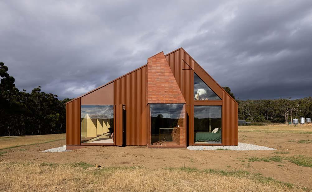

COOPWORTH ARCHITECTURAL DESIGN
ARCHITECTURAL DESIGN
DESIGNED BY Fiona Dunin Jayme Collins Alice Edwards Robert Kolak
COMMISSIONED BY Client
DESIGNED IN Australia
JURY COMMENT The designers have meticulously sited the home to capture breath-taking views of the bay and celebrate the beauty of daily farm life through rigorous and thoughtful detailing. Overall, this is a wonderful example of design excellence that has resulted in a warm, welcoming and adaptable home that sustainably celebrates the magnificence of its remote location. Nestled in the rural surrounds of Bruny Island, Tasmania, Coopworth is a contemporary interpretation of a country farmhouse. Through playful forms and an inventive approach to materials, Coopworth tactfully converses with the ever-changing landscape of Coopworth sheep, wide-ranging views, and weathering red lead shacks dotted over the island.
CHALLENGE Seeking a house that can accommodate 2-20 people, Coopworth carves opportunities to support the clients and their rural lifestyle. Rigorous understanding of the farm’s operations is reflected in hard-wearing treatments and custom elements, including elevated planters to protect foliage from sheep and ‘boot box’ to dust off before entering. Qualities of respite and relaxation sought by the clients are fostered through engagement with the landscape. Diverse spaces; lofty, snug, private, shared, allow the clients to occupy areas to best suit their needs. Coopworth is designed for universal access, with consideration of family with disabilities and the couple’s potential future needs.
SOLUTION The angular form and earthy hue of Coopworth’s exterior creates a synergy with the surrounding red lead shacks – a sympathetic contribution to the landscape. Gabled, hipped and skillion rooflines coalesce as abstracted silhouettes in homage to the ramshackle sheds and rugged mountain ranges. Coopworth is meticulously sited to capture breath-taking views of the bay, artfully framed by a steel structure and eastern deck brimming with grapevines. To the west, the ubiquitous chimney stack seen in the historic shacks is reimagined as a sunken bath, connecting the bather to the surrounding paddock and sheep, with long views to the bay beyond.
IMPACT Coopworth effectively immerses the occupants in the rural landscape, creating a delightful experience of the land, and a bold departure from the clients’ suburban home in Melbourne. The house supports the clients in managing the farm, prioritising resilience and functionality, while minimising maintenance. Access to natural light and landscape gives excellent amenity, while the broad side deck encourages outdoor dwelling amongst the elements without obstructing views. The house nurtures the couple’s shared life, giving opportunity to host larger gatherings of friends and family with comfort and ease, while elevating the clients’ daily activities by mediating functionality and delight.
BEST IN CLASS
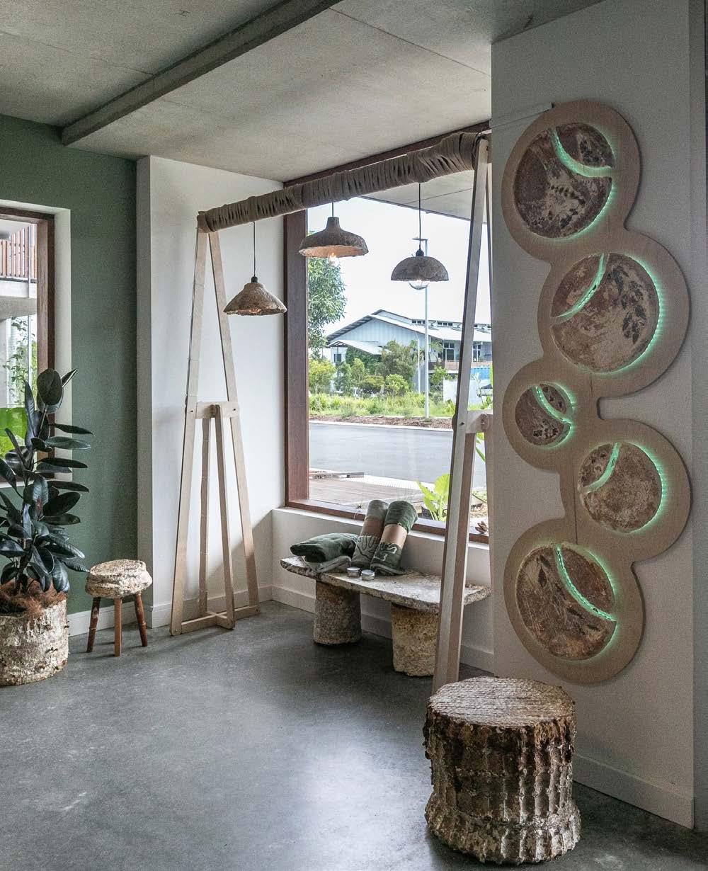
MADE+MYCELIUM ARCHITECTURAL DESIGN
INSTALLATION DESIGN
DESIGNED BY Canhui Chen, John Sadar, Adele Easton Bailey Harper, Dilan Yariz, Fifi Prayogo Harry Tweedale, Hayley Boicovitis, Jack Arceri, Louis Ryan, Luka Markulin, Marianne Coetzee, Megan Lambert, Tyson Morgan
COMMISSIONED BY Seed & Sprout
DESIGNED IN Australia
JURY COMMENT If we are to pursue regenerative design, to leave a place in better shape than we found it, we need to challenge existing aesthetic norms. This project is working with micro organisms that cooperate. We have a lot to learn from this project. Congratulations on pushing the envelope. Made+Mycelium is a pop-up store designed for eco-brand Seed&Sprout, featuring a series of furniture and functional objects grown with the root structure of fungi: mycelium. Reflecting the company’s sustainable ethos and emphasis on product life cycles, mycelium objects were designed and grown by upcycling daily household items and discarded objects.
CHALLENGE Mycelium is organic and is grown rather than made, making it a sustainable material choice. However, achieving unique geometries and surface patterns requires the creation of moulds, which can result in high-energy and wasteful machining processes. The key was to maintain low energy, non-wasteful growing processes while creating unique designs. The project also coincided with Melbourne's 6th COVID-19 lockdown. A 5-kilometre travelling distance was imposed, and access to the manufacturing space and equipment at the university was restricted. A design and fabrication solution was needed to allow unique objects to be created while requiring minimum resources.
SOLUTION Upcycling was explored by the design team as a creative solution to both the brief and the challenges. The design idea became finding beauty and design opportunities in surrounding everyday objects. The result involved turning to household products or discarded objects ranging from light fittings to pizza pans, bookcases, and kerbside hard rubbish to use as moulds for growing mycelium objects. They were either used as removable moulds for creating geometries and later returned to their original use, or purposefully left in place to be digested by the mycelium, and become part of the final objects.
IMPACT Mycelium is still an experimental material. The successful delivery of this project confirms the feasibility of mycelium bio-composite as an alternative material for commercial projects. It not only widens the material palette for designers but also provides a sustainable and circular option. Furthermore, the design and fabrication process has identified a new line of inquiry for the research of using bio-fabrication as a medium for design upcycling. This is important for the design of temporary spaces where the design, construction methods and material choice should consider product end life and ensure minimal landfill and environmental impact at its disassembling.
BEST IN CLASS

ANZ BREATHE ARCHITECTURAL DESIGN
INTERIOR DESIGN
DESIGNED BY Jeremy McLeod Jacqueline Nguyen Shannon Furness Patricia Bozyk Han Wu
COMMISSIONED BY ANZ
DESIGNED IN Australia
JURY COMMENT Cleverly designed using a highly flexible, repeatable kit of parts solution, this system can be adapted to all ANZ branch locations. It embraces the opportunity for highly sustainable outcomes to be visibly different from the status quo, while also heightening the customer experience through beautiful spaces - an exemplar for the retail interiors industry to follow. ‘Shape a world where people and communities thrive’ is the driving force behind ANZ’s nationwide 100% carbon neutral in operations new branch design known as “ANZ Breathe”. ANZ Breathe is simple kit of modular parts that come together to form each branch setting a new benchmark for corporate Australia.
CHALLENGE ANZ wanted to create a future that’s not just about returning money to stakeholders but is instead based sincerely around 3 important values. That of environmental sustainability, secure housing and financial wellbeing for all Australians. They wanted these values reflected in their branches nationwide.
SOLUTION Breathe Architecture delivered on ANZ's core values by creating an elegant and sustainable branch design solution, demonstrating ANZ’s commitment to doing business responsibly in the 21st century. “ANZ Breathe” is a simple kit of modular parts that come together on site, like Lego pieces, to form each branch. The design is about doing a lot with a little. It’s simple, and elegant, adapted easily with a system that can be replicated and scaled. The message to customers is one of financial responsibility and financial wellbeing.
IMPACT “ANZ Breathe” has set a bold new benchmark for corporate Australia, one that considers the environmental impacts on community and planet first. Each branch is entirely constructed of sustainable materials that are natural and locally sourced, designed for disassembly and are either biodegradable or recyclable. The modular system makes the branch rollout reduce in cost over time. Biophillic design is at the heart of each branch to improve the wellbeing of staff and customers. The message to customers is that of financial wellbeing, of connecting people and business to create strong, cohesive, and vibrant communities.
BEST IN CLASS

PLACE DESIGN
DESIGNED BY McGregor Coxall with Noxon Giffen OPS Engineers
COMMISSIONED BY Parks Victoria
DESIGNED IN Australia
JURY COMMENT The Grampians Peaks Trail makes a gentle and respectful mark on the Gariwerd Aboriginal cultural landscape, with a series of considered and interconnecting elements that thread together to encourage people to dwell and appreciate being on Country. It demonstrates a timely expectation of a well-designed public amenity within our National Parks and plays a critical role in demonstrating the care needed for the environment through its gentle and considered response. Spanning 160km, the Grampians Peaks Trail (Gariwerd; GPT) will conserve, protect, and celebrate the Victorian wilderness’ unique beauty while achieving the highest possible grade of environmental sensitivity. A landscape-led collaboration culminated in a world-class hiking experience that curates the various contexts, stories, histories, and conditions of 11 hiker camp locations.
CHALLENGE The brief for GPT demanded designs that deeply connected to landscape and enhance hiking experiences as they evolved through diverse terrain. Fundamental were three key elements: a celebration of Gariwerd with landscape as the hero, recognition of scale and diversity of terrain through site responsive designs, and the adoption of design strategies for construction and maintenance that respond to the trail’s remote nature. Design called upon high-quality accommodation solutions, optimised for walker experiences through a focus on arrival experience, site appreciation, awareness of site-specific conditions, and enabling of social interaction between walkers whilst maintaining a level of privacy and remoteness.
SOLUTION New minimalistic campsites scattered along the Gariwerd wilderness feature amenities restricted to essentials of tent platforms, communal areas, shelters, and toilets – amplifying the immersive hiker experience with an appropriate level of comfort. A considered and evolving selection of natural materials was used throughout, responding to the specific nature, colours and textures of each individual campsite. Designed to bring campers together while offering privacy, the Communal Hiker Shelter provides a central breezeway link with an enclosed gathering space and separate food preparation area. Large sliding doors and outdoor decks allow spaces to be protectively enclosed or opened to the landscape beyond.
IMPACT Campsites ‘touch the ground lightly’; Gariwerd’s landscape is the hero. Architecture offers protection from the elements without completely inhibiting sensations of nature. Off-grid campsites are designed with mindfulness to guidelines and tracks; intuitive circulation allows for more sustainable campsites that minimise public access to dense vegetation. In complement, site greywater is treated to the highest possible standards through passive systems. Working with Traditional Owners, clear guidelines and boundaries for landform, ecology, spatial typology, and cultural immersion were clearly outlined – bringing visitors closer to rich Aboriginal culture of the Jardwadjali and Djab Wurrung peoples who’ve lived in these ranges for millennia.
BEST IN CLASS
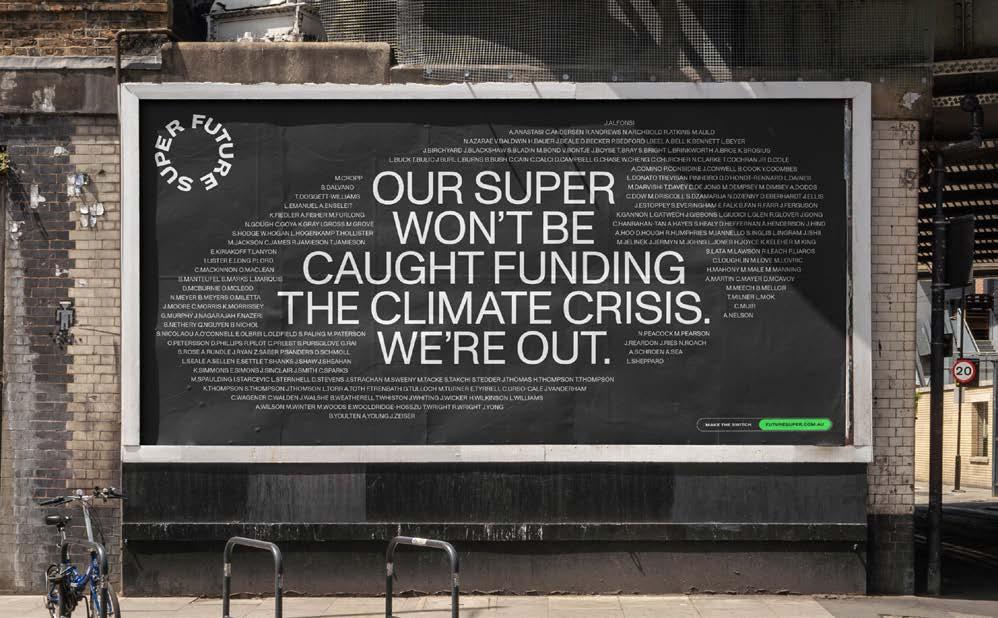


FUTURE SUPER COMMUNICATION DESIGN
BRANDING AND IDENTITY
DESIGNED BY Universal Favourite Future Super Alex Barnet Oli Bussell
COMMISSIONED BY Future Super
DESIGNED IN Australia
JURY COMMENT Carefully considered, designed to move, and fluid with a strong design ethos. But it is so much more meaningful than that – this solution changes the conversation in a conservative category. Rather than fluffy promises, the brand now leads with easy to access facts. But more importantly, the use of activism language and messaging, to shift the idea of superannuation from being a financial decision to a form of environmental activism is very compelling. The influence of fossil fuel money is everywhere; sports, politics, and pension funds - the 4th largest pool of assets in the world. Future Super needed to reframe super as a mechanism for climate action. The new identity embodies a bold voice for change, building a future worth retiring into.
CHALLENGE Future Super needed an identity to demonstrate its bold commitment to climate action, the stringency of its investment philosophy, make the power of money visible, and help people see switching their super as a climate action as ubiquitous as using a KeepCup. Our goal was to build a verbal and visual identity system that demonstrates their clear point of view on the world and reinforces that position to existing members, attracts like-minded new members to join Future Super, and lifts the high water mark for impact investing.
SOLUTION We began with a new logo. Built for motion and interaction, the mark is responsive; it adapts and flexes to reveal content, push away unnecessary noise, and put a spotlight on the Super industry. Scalable for any format, the logo can shift its size and shape to best suit each communication, even moving into 3D space when required. The logo anchors the system and facilitates a type-based framework that heroes communication over visual fodder – a stark contrast to every other superannuation company in Australia. With this in mind, the design system is built for flexibility and responsiveness.
IMPACT Future Super operates in an industry known for being opaque and saying as little as possible to its customers. Nonetheless, “greenwashed" marketing has become a trend in the sector, despite exposure to oil, coal and gas. Most funds rely on colourful stock imagery to appear ethical and confuse consumers, but Future Super has nothing to hide. The brand favours black and white, a stripped-back aesthetic that focuses attention on what matters most - the facts. Words are our most valuable tool, and Future Super's visual identity elevates their role throughout their communications.
BEST IN CLASS
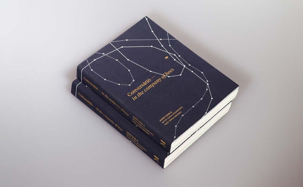

CONVERSATIO IN THE COMPANY OF BEES COMMUNICATION DESIGN
DESIGNED BY Anna Brown Anne Noble Zara Stanhope
COMMISSIONED BY Massey University Press
DESIGNED IN New Zealand
JURY COMMENT This is such an amazingly executed piece of communication - full of depth, complexity, and consideration. A real masterpiece of design. Big congratulations to everyone involved. Conversat o explores how humans relate to bees as seen through the lens of renowned photographer Anne Noble. Comprising a rich and diverse selection of images alongside an eclectic text accompaniment drawn from classical texts to contemporary interviews, it addresses a readership curious about art, ecology, science, literature and their intersections.
CHALLENGE This book combines a number of design choices intended to make the work into a balanced, beautiful and satisfying object. This is appropriate for a work built out of an open process of creation. It comprises multiple paper stocks, using high gloss for the opening photographic work. Cream stock to avoid garish white, with a screen printed sakura cloth French fold dust jacket. The coptic binding allows the interior mechanisms of the book assembly to be visible. The format of the book is relatively small for its scope, akin to a compendium rather than the trophy coffee-table book.
SOLUTION This book represents an 18-month project derived from exhibitions, residencies and an extensive collaboration between three collaborators — photographer, curator and designer. The visual elements, drawing on a decade of photographic material, cohabit with a collection of texts without competing and losing a sense of overall purpose. Collected writings about bees, educational projects, correspondence between and interviews with beekeepers and a scientific essay all find their place within the overall work alongside ten years’ photographic oeuvre of bees in myriad contexts and formats.
IMPACT This book brings collaborators and concepts together in a single volume in a way that balances their expertise, spotlight and interactions. "For quite some time now, Anne Noble has been obsessed — if that’s not too strong a word — with bees. This has resulted in a rich, macroscopic body of work exploring the crises that face these little handmaidens of nature, from colony collapse to climate change. Conversatatio provides a textual consideration of the ideas embodied in these powerful images" — Art Beat’s Best Art Books of 2021.
BEST IN CLASS
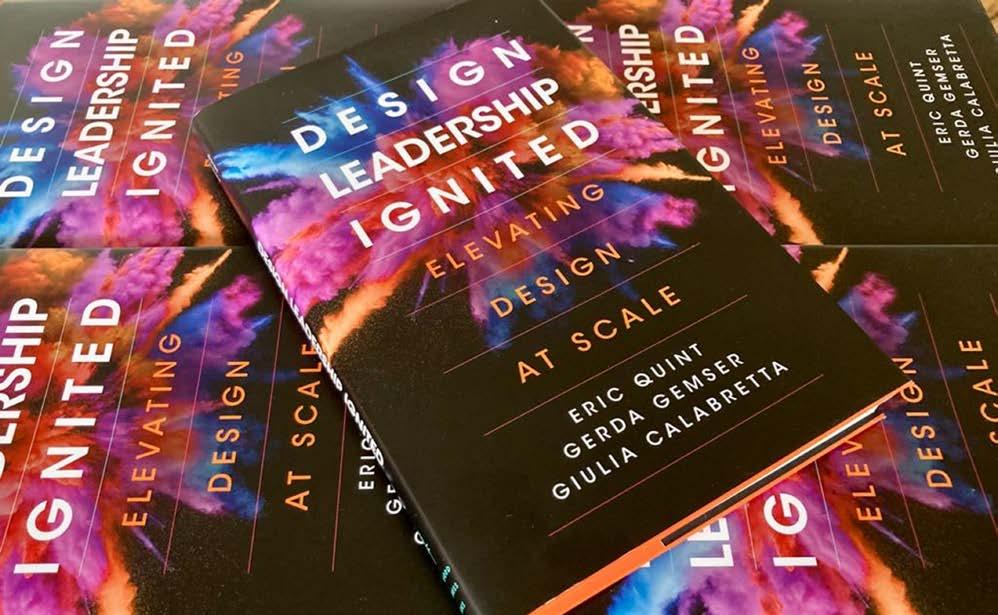

DESIGN LEADERSHIP IGNITED DESIGN RESEARCH
DESIGNED BY Gerda Gemser Giulia Calabretta Eric Quint
COMMISSIONED BY Gerda Gemser Giulia Calabretta Eric Quint
DESIGNED IN Australia
JURY COMMENT Design leadership is an emerging area of leadership that is already having a significant impact on the corporate world and beyond. This research provides much needed insights for current and prospective design leaders on how to manage design at scale and establish design excellence. This Stanford University Press publication is the outcome of a research project on design leadership involving 59 design executives. The research provides insights for design leaders managing in-house design teams on how to elevate design at scale and establish design excellence. It is a unique collaboration between industry and academia.
CHALLENGE An increasing number of firms invest in in-house design teams and extend the influence of design to the executive level to stimulate performance. Effective design leadership is essential to optimise the value design can bring. However, not much is known about how design leaders should operate in practice. In this research, it is argued and found that effective leadership goes beyond stimulating design’s integration into the fabric of the organisation to actualise the value of design; it also requires carefully curating designs’ ‘differentness’ compared to other functions or knowledge areas, as this differentness is what adds value in the first place.
SOLUTION Based on the research, practices, frameworks and tools are provided to help design leaders cultivate acceptance and appreciation for design and establish a thriving environment for their creative teams. Design strategy formulation and execution, organisational structure and taxonomy creation for design, talent management and design scaling from a quantitative and qualitative perspective are among the solutions explored. Furthermore, design leadership behaviours that facilitate the journey towards design excellence are described. In particular, it covers how design leaders can balance often-contradictory objectives and activities in a both/and manner, effectively navigating between opposing options.
IMPACT The research provides practical advice about design leadership and hopes to inspire design leaders, both current and emerging, to become more knowledgeable and confident. When design leadership is effective, design as an organisational capability will flourish, positively impacting firm performance. Secondly, the research attempts to guide business managers on how to effectively collaborate with their design peers. Finally, by providing examples and insights from design executives working in different cultural and organisational contexts, it helps design leaders enhance their strategic impact within organisations, as more strategic impact increases opportunity for design leaders to realise company outcomes that are desirable and sustainable.
BEST IN CLASS


AURECON HE RAUTAKI MAORI: A STRATEGY OWNED BY THE PEOPLE DESIGN STRATEGY
DESIGNED BY Aurecon
COMMISSIONED BY Aurecon
DESIGNED IN New Zealand
JURY COMMENT Design Strategy starts by putting your customer at the core of your business model and aligning all business activities to this. This project is an exemplar of how this can be achieved and the impact that can be delivered. The impact of this work will be felt by many – congratulations! Aurecon believes in creating a positive legacy within the communities we work and live. To help our Aotearoa (New Zealand) business nurture and develop Maori cultural awareness to act in the best interest of Maori communities, Aurecon developed He Rautaki Maori, a Maori strategy to provide direction and drive decision-making.
CHALLENGE For years, Aurecon intended to create a Maori strategy that honours both legal obligations and the spirit of the Treaty of Waitangi to help achieve our aspiration of being a known and trusted organisation within Maori communities. We see it as an opportunity to connect the many existing threads within Aurecon and extend them in new directions. Our primary challenge was to develop a strategy that integrates Maori ethos into Aurecon’s culture and values, and employees and stakeholders own and endorse. Our second challenge was to execute the strategy meaningfully and inclusively through strong leadership and demonstrate commitment through actions.
SOLUTION By forming a steering committee and engaging Te Amokura, a Maori consultancy, Aurecon established and launched our Maori strategy in September 2021 through internal engagement activities: creating an Aurecon Maori song, translating Aurecon's purpose into Maori, leadership participation in Maori workshops, and Maori lessons for employees. To refine and drive its implementation, we appointed a dedicated Maori Leader. The result is He Rautaki Maori, a comprehensive strategy that places people at the core. It develops our cultural capability to benefit our clients, our people, and our Maori communities and consequently supports broader social, economic, cultural, and environmental outcomes for Aotearoa.
IMPACT Embracing a people-first design approach enabled Aurecon to create a Maori strategy that resonates with all. Since its implementation, we have seen a significant increase in employees’ confidence in using Te Reo Maori in communications. The strategy guides embedding Maori principles and decision-making into the organisation, notably integrating Maori culture into the interior design and design process of our new Tamaki Makaurau (Auckland) office. Its impact extends to projects. Our work on Manawatu Tararua Highway won an award by Diversity Works for its unique approach to partnering with Maori communities and commitment to embedding Maori world view throughout project delivery.
BEST IN CLASS

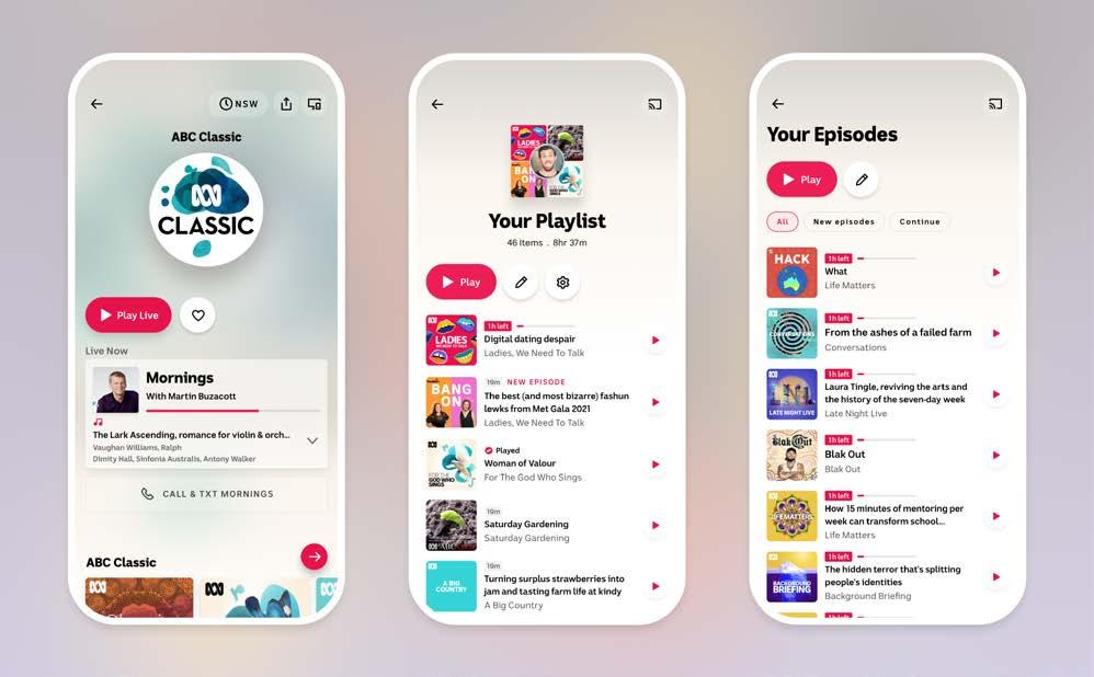
ABC LISTEN APP DIGITAL DESIGN
APPS AND SOFTWARE
DESIGNED BY Emma Gogolewski, Andrew Bray Gina Laverone, Danny Webster Alex Bilbie-Clarke, Alex Crook Darren Cox, Sabari Priya Jim Trail
COMMISSIONED BY Tim Hardaker, Mary Claire Monsalve Joel Brydon, Scott Spark, Carlin Beattie, Adam Jesson, Judy Adair, Andrew King
DESIGNED IN Australia
JURY COMMENT By providing a mix of curatorial and personalised content through an intuitive and well-designed platform, the ABC Listen App ensures listeners won't become trapped in a "filter bubble." The design team should be proud of their work and hold their efforts to a high regard. For years, the ABC listen app has been the audio companion for Australians of all walks of life. The app continues to represent the breadth and immediacy of Australia’s national broadcaster, and now surpasses the level of experiential quality that the listening world has come to expect from other apps.
CHALLENGE Aggregated streaming experiences with colossal content offerings and enormous production teams have raised expectations for streaming apps everywhere. To maintain ABC listen's value in our listeners' lives, we had to think beyond brute force tactics and create an experience which reflects the ABC’s unique relationship with its audience. Audio-first apps face an additional challenge: most of the audience experience is based on listening, not interacting with a screen. The screen experience therefore needs to provide a seamless and efficient journey to content, whilst simultaneously offering opportunities to discover and explore but not overwhelm.
SOLUTION Creating a set of research informed design principles was a crucial early step to ensure that design decisions stay true to the needs and aspirations of both our audience and internal brand. The result is an experience that only shows what's needed, when it's needed. It showcases the vibrant look and feel of the ABC’s brand and artwork, sprinkling magic into each interaction. It also provides the right balance of agency and convenience. It ensures the ABC’s trusted and valued voice reaches its audience, through an experience which has been shaped by that audience’s habits and needs.
IMPACT The baseline impact is to provide fast, yet meaningful choices to our listeners as they go about their day. To ensure that any glance at the screen is always met with a manageable amount of information and a mix of new and familiar content choices. On a deeper level, we can think of ABC listen as an audio companion. Favourites from previous sessions greet listeners when they open the app. Meanwhile a mix of curatorial and personalised content ensures they won't become trapped inside a 'filter bubble'. Any given content page contains well-considered next steps to present as options.
BEST IN CLASS

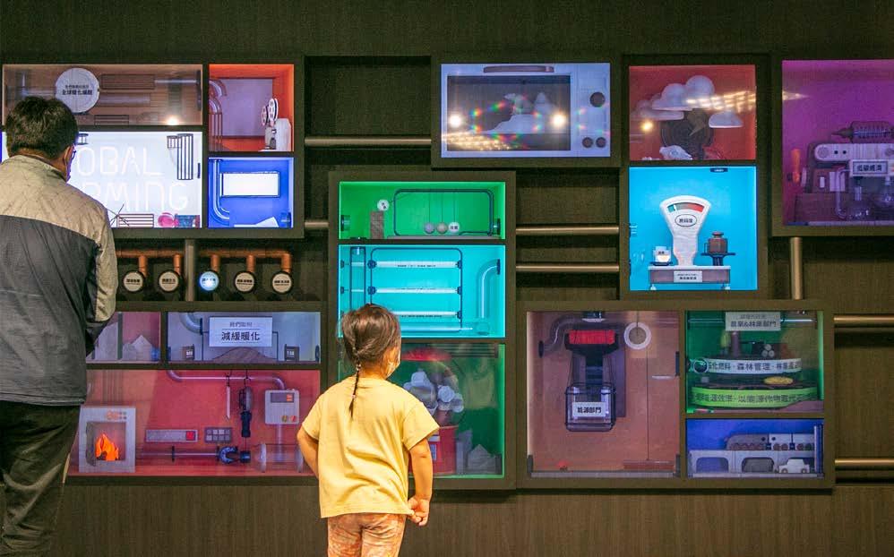
SEEING OUTSIDE BOXES DIGITAL DESIGN
GAME DESIGN AND ANIMATION
DESIGNED BY Play Design Lab
COMMISSIONED BY National Science and Technology Museum DESIGNED IN Taiwan
JURY COMMENT Great thought using the 'Rube Goldberg Machine' trope and attention to detail in the physics of the animations has paid off. This is a clever solution to keeping viewers' attention and rewarding their curiosity. Well done. The work is a connected digital sign that shows moving images in Rube Goldberg’s comic style. It's designed as an entrance image for a Climate Change Exhibition at the National Science and Technology Museum to evoke audiences’ interests and convey the connotation of a global warming concept map to promote science education.
CHALLENGE The client has excogitated a global warming concept map based on a scientific (DPSIR) model to illustrate the interdependencies of causes and effects of global warming, as well as possible countermeasures. We were entrusted with designing and presenting the connotation and underlying analytical thinking of the concept map through a creative entrance display. Unlike many other communications on global warming that emphasise perceptual appeals, we hoped to highlight that many factors cause the global warming issues that humankind is currently facing, and how we might solve these problems.
SOLUTION We further summarised the concept map and used 21 connected screens to render seven routes to explain: 1. Causes of global warming 2. Scientific facts 3. Environmental impacts 4. Adaptation methods 5. Adaptation strategies 6. Mitigation methods (policy aspects) 7. Mitigation methods (living aspects) The 7 buttons on the installation, which can respectively trigger the virtual ball rolling through seven different routes in a Rube Goldberg machine style, will activate 3D anamorphic animated mechanisms on different screens to guide audiences’ visual attention to make it more fun.
IMPACT The significance of this work is to point out that many key factors cause the global warming issues that humankind is currently facing in a rational, scientific yet fun way. And through scientific modeling and analysis, we might find ways to solve these problems. Ball-rolling through connected screens highlight various linkages and factor nodes, and the audiences are visually guided to read and understand the chain reactions, interdependencies and causes and effects of global warming, thus ultimately assimilated into an understanding of the Global Warming issues.
BEST IN CLASS
DESIGN AND RIDE DIGITAL DESIGN
INTERFACE
DESIGNED BY DOTDOT
COMMISSIONED BY Kapiti District Council
DESIGNED IN New Zealand
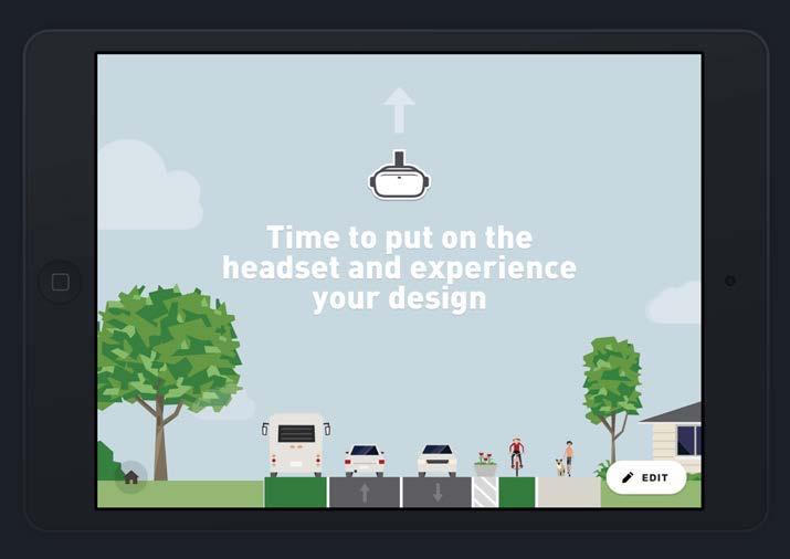
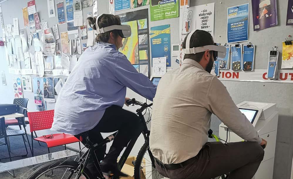
JURY COMMENT Great imagination and canny knowledge of how to combine existing pieces of tech in innovative and accessible ways. What really impressed the Jury was how this system elevates the co-design process - an exemplar that every design team needs to see, especially in regards to the insertion of new tools for community stakeholders to use and then receive immediate feedback. Chef's kiss. Design And Ride is an engaging way for the community to get involved in the layout of their own roads. In this experience, community members create a new road design, then experience it as a cyclist – in virtual reality - and send feedback to their local council or urban planners.
CHALLENGE Urban planning usually operates from the top down. City and district authorities plan, build and manage infrastructure, including transport. Despite public outreach, many local authorities struggle to get substantive public engagement in civic planning and it is difficult to enable community members to offer meaningful direction. Road safety and accessibility for cyclists are either ignored or become hotly contested by a minority of the community. Design And Ride is an innovative approach and a world first that delivers the ability to engage community members in meaningful decision-making around cycleway design and urban planning, using an embodied, participatory approach.
SOLUTION Members of the public are able to design a cycleway for their community on an iPad, and then test the design by riding down a 3D generated version of their road on a physical bike connected to a virtual reality headset. The experience highlights cyclist safety while keeping pedestrians and drivers in mind too. Community members can then rate their design based on the quality of their ride and forward this design and feedback to the city council. The experience is designed to be simple to navigate. It resets itself automatically once the user rates their design.
IMPACT Data collected from the initial run of Design And Ride suggests it increases community engagement in civic planning, and has improved communication between urban planners and the community about street design initiatives. Looking to the future, Design And Ride can be easily customised to any street or city environment. This means it can enable city-dwellers to see the impact of different transport options, including greater use of public transport, increased cycleways and decreased availability of parking. Small towns can assess practical ways to make cycling safer or look at the effect of adding traffic lights and roundabouts to their roading.
BEST IN CLASS


INTERFACE
DESIGNED BY Nightjar
COMMISSIONED BY Lifeline Australia
DESIGNED IN Australia
JURY COMMENT The designers have hidden the complexity and volume of information in the Lifeline Crisis Supporters Service Tool, to make it as easy as possible for the crisis supporters to serve people calling up and seeking help. Applause also for adapting technology to match crisis supporter's mental models, as well as the clean, elegant interface. Two grateful thumbs-up. A digital replacement for an antiquated system - we created an easy to navigate and intuitive tool for Lifeline Crisis Supporters (phone volunteers) to efficiently find relevant support services and share them with Help Seekers calling Lifeline’s suicide prevention line.
CHALLENGE Every year, over one million people reach out to Lifeline for support, many of which going through the darkest moments of their lives. The phone is usually picked up by a Crisis Supporter, a volunteer who offers referrals to free and low-cost local providers of mental health support options, such as clinics, shelters and other helplines. Their online system was clunky and difficult to search - so much so that each Centre used their own version of a paper folder rather than try to navigate the system. We needed to create a tool which enabled Crisis Supporters to find and share resources, adding more value than their current paper ‘cheat sheet’.
SOLUTION Needing to align with Lifeline’s corporate palette, the design system is functional with minimal fanfare. The real solution to the problem lies in the UX. Taking principles from the paper version being used, we created an improved version online, where Crisis Supporters could access popular shortlists, bookmark frequently searched services, and easily share them. The UX took into account all information the Crisis Supporter needed at a glance based on extensive user testing. We featured a simple onboarding to cater for volunteers aged 18-80, ensured WCAG 2.0 accessibility standards, incorporated drag & drop functionality, tooltips on hover and keyboard shortcuts.
IMPACT The long-lasting positive impact of the tool cannot be understated. It plays a core role in the experience of both Crisis Supporters and Help Seekers. Previously, Crisis Supporters themselves often felt frustrated and helpless when they were unable to find the right support services for Help Seekers. The tool noticeably improves the current system and is the change 10,000 Crisis Supporters have been waiting for.
BEST IN CLASS


MORE THAN A PRAWN DIGITAL DESIGN
WEB DESIGN AND DEVELOPMENT
DESIGNED BY ROMEO Digital
COMMISSIONED BY Australian Council of Prawn Fisheries
DESIGNED IN Australia
JURY COMMENT Full disclosure: the 'More than a prawn' website's appeal really snuck up on us. The fresh visual look and feel and the layered content hierarchies do a great job at drawing the audience into the individual's video stories, which is where the real richness of this website lies. Extra points for the attention to detail to how the website adapts to mobile devices. Well done. 'More than a prawn' is a provenance and community engagement campaign launched by the Australian Council of Prawn Fisheries. The australianwildprawns.com.au website gives people a greater sense of connection between the food on their plate, the wild regions it’s from and the values of the people who provide it.
CHALLENGE People are genuinely worried about the sustainability of fisheries and there is a disconnection between Australian wild prawn fishers and consumers. Decreased trust in government regulation and an absence of a compelling industry voice put Australia’s wild prawn fishers’ social licence to operate at risk. Sensational but factually flawed documentaries like Seaspiracy have further bundled hard-working Aussie prawn fishers and the Australian Wild Prawn industry with the egregious practices captured elsewhere in the world. This requiring a rapid response of transparen-sea. Limited budgets excluded mass media, but a website and in store campaign could gather these stories for all to watch.
SOLUTION We connected people concerned about overfishing to the people doing the fishing and recognised a common thought: they all loved and wanted to preserve the ocean. To preserve Aussie wild prawn fisher’s social licence to operate, we needed to lift the veil and tell their stories in their own words. So, 16 compelling stories were collected at www.australianwildprawns. com.au and delivered through social media, point of sale and augmented reality experiences on the floor tiles of seafood retailers. With social media geographically activated around key ports, we appealed to key, contextual markets.
IMPACT With social media geographically activated around key ports, we invited people into the world of the wild prawn fishers. We brought a trawler to life on a canvas that had never been used before - the retailer shop floor. And we built a helpful website that collects all the stories in one place. Website: 116,725 unique page views 3:15 minutes average time on page 2,314,737 people consumed 2 years, 4 months and 2 days of video content 12,487 interactions with 3D/AR in store/at home experience 2:34 average time on 3D/AR experience 2,127,089 people reached through Facebook, generating 434,662 tracked engagements
BEST IN CLASS


HAMMERHEAD CRUSHER BUCKET ENGINEERING DESIGN
DESIGNED BY Flip Screen Australia Pty Ltd Sam Turnbull Sujesh Thottumkara
COMMISSIONED BY Flip Screen Australia Pty Ltd
DESIGNED IN Australia
JURY COMMENT The on-site crushing of materials, such as building demolition waste, to various sizes is a solution to one of the construction industry's greatest environmental challenges. A wider variety of output sizes and crucially smaller sizes should see the Hammerhead Crusher Bucket find many customers and deliver a positive impact both commercially and environmentally. The company has developed a new on-site and mobile crushing system for the mining and recycling industries. The Hammerhead crusher bucket achieves high-volume crushing rates, with a substantially larger range of crush sizes versus conventional less-portable solutions. The Hammerhead is an excavator attachment which provides significant versatility and mobility.
CHALLENGE Due to environmental, material and transport costs, recycling is becoming critical. The Hammerhead must process large rocks and reinforced concrete on-site, requiring a high-volume, large input-sized crusher fitted to a carrier machine to process. Conventional solutions are under-powered and offer low efficiency and production rates. The solution should be unique, patentable and more powerful than current jaw-crusher buckets. Requirements: Crush rocks from 500mm down to 10mm in one pass, adjustable crush size, weight within the carrier’s capacity, utilising all the power of the carrier machine, blockage-resistant, as per FlipScreen’s reputation, must be worthy of the label “best in the world”.
SOLUTION Multiple eccentric rollers with independent outer sleeves were the ultimate solution for crushing large rock and concrete containing reinforcing steel. Hydraulic cylinders enable instantaneous adjustment of crush sizing. The use of high-tensile T6 alloys and UHMWPE satisfy the lifting capacity of the excavator. Use of an automatic, variable displacement motor providing up to 720kw of power. A constantly increasing throat and a bottom jaw detachable in-field without tools for de-fouling and replacing wear parts. An integrated oil circulation and filtration system vastly extending maintenance hours. Exceptional performance on large rock and processes concrete with reinforcing steel faster than without.
IMPACT Hammerhead’s patented crushing action outperforms current European crusher buckets. It offers customers the mobility and compactness of a crusher bucket utilising its carrier’s full horsepower and achieving a higher throughput rate. Many of the issues associated with developing a high-volume crusher limited by the weight capacity of the carrier machine have been solved. This was achieved by using steel only where necessary and using lightweight T6 alloys. UHWPE is used in the transmission and throughout the whole machine to replace heavier steel, including the barrier between vulnerable hydraulics and the crushing rollers which fully dismantle with the use of a lever.
BEST IN CLASS

SPACE BIOENGINEERING: SIMULATED MICROGRAVITY PLATFORM TO ADVANCE HUMANS IN SPACE ENGINEERING DESIGN
DESIGNED BY EXPLOR Space Technologies Dr. Joshua Chou Anthony Kirollos
COMMISSIONED BY EXPLOR Space Technologies Dr. Joshua Chou Anthony Kirollos
DESIGNED IN Australia
JURY COMMENT The team is to be congratulated for producing a device of such simplicity, ease of use and at a fraction of the cost of existing solutions. The Simulated Microgravity Platform is a very clever platform, combining hardware and software with a promises to widen access to simulated microgravity technology for research and development. Well done. Truly impressive. The EXPLOR Biogravity platform simulates the microgravity (10-3g) of space right here on Earth. It allows researchers to study the human and plant physiological disease response to microgravity. These findings can help researchers develop technologies to advance human space flight and also improve health on Earth.
CHALLENGE The existing simulated microgravity technologies have not been updated for the last 20 years. One of the key challenges was to ensure that we can achieve the microgravity conditions at the cellular level with a platform that is able to be applied for different research conditions and scientific questions. We wanted a plug-and-play device that is ergonomic and allows our users to be able to focus on their applications rather than spend time trying to figure out how the device works and functions. This needed to be mobilised by an easy user software interface.
SOLUTION To sustain the microgravity condition accurately in the device, we applied satellite tracking robotic technologies and stepper motors to ensure long-term durability. To date, our machine has operated non-stop for 4 years and only requires a simple yearly application of motor oil. It is made of anodized aluminium in order to be lightweight and long-lasting. Our team developed a modular sample holder system that allows users to directly utilise existing materials and equipment without changing their application model.
IMPACT The platform works to democratise space biology development and cater to user needs. It is now used by world space agencies including NASA and JAXA, government institutions (CSIRO, ANSTO) and world renowned research institutions including MIT, Harvard and Mayo Clinic. The device is now at the forefront of space biology and health discoveries owing to how it was designed to cater for different users and with human-centric design in mind. In addition, pharmaceutical companies in the United States and Japan are planning to use the Biogravity platform to develop and design new classes of drugs that could not be synthesised on Earth. The impact is out of this world.
BEST IN CLASS
NEURAL TOURNIQUET NEXT GEN (STUDENT)
DESIGNED BY Kathy Ky
COMMISSIONED BY Kathy Ky
DESIGNED IN Australia
JURY COMMENT Exquisitely designed, modelled and presented, this concept is well-researched underpinned by working technology in the medical field. It is more accessible and deployable in trauma situations outside hospitals to a band-aid level. This is an impressive example of design for impact and a standout project ticking every box for good design in this category. Congratulations, and well done! The Neural Tourniquet is designed for paramedics to use in emergency situations where rapid bleeding control is required to save lives in the critical minutes following a traumatic injury. The device uses TENS technology to stimulate the cervical vagus nerve, proven to stop uncontrollable bleeding in under a minute.
CHALLENGE Existing solutions, including tourniquets and haemostatic products for wound packing, are not efficient in cases of multiple traumatic injuries. Common tourniquets are only suited for limb injuries, whilst haemostatic products which expand inside the open wound are extremely invasive and must be surgically removed post-application. Furthermore, the effectiveness of these products in stopping the bleed is significantly reduced in patients who suffer from bleeding disorders or those taking blood thinners. For a future shaped by minimally invasive healthcare, how might we harness the power of bioelectronics to breakthrough in trauma emergency responses and improve patients’ outcomes?
SOLUTION The solution is a cervical Vagus Nerve Stimulation (VNS) device that uses electrical stimulation to stop traumatic bleeding in a single application. Electrical VNS at the left neck muscle stimulates a specific neural pathway that enhances the body's innate immune response to injury. This process involves rapidly increasing blood clotting factors at the open cavity; forming a natural 'plug' that can stop bleeding in less than a minute. Supported by pre-clinical studies from the Feinstein Institute, this non-invasive neurostimulation method has been proven to significantly reduce the amount of blood loss by 50% with promising potential on addressing internal bleeding.
IMPACT Over the next two decades, bioelectronic medicine is predicted to drastically transform the medical industry and multiple disciplines. For example, the small and portable device can be equipped on army soldiers to rapidly staunch bleeding from multiple traumatic injuries on the battlefield. Moreover, the device has a significant impact in the civilian setting, where violence and accidental injury remain the leading causes of death worldwide. Patients with haemophilia may also benefit from quick intervention by applying the device to themselves and perhaps during surgical repair where haemorrhage is a major cause of trauma mortality in the operating theatre.
BEST IN CLASS

FORCITE MK1S PRODUCT DESIGN
AUTOMOTIVE AND TRANSPORT
DESIGNED BY Alfred Boyadgis Julian Chow
COMMISSIONED BY Alfred Boyadgis
DESIGNED IN Australia
JURY COMMENT The single-piece front-mounted camera/dual mic integration is a real innovation. Sustainability cred is upped with a program to replace and recycle tech (for free) and the shell after an accident. Its community-based trials demonstrate social and financial sustainability. From form and function, to sustainability, to innovation and progression, the Forcite MK1S ticked every box for this panel. If Tony Stark made a lid for riders, this would be it. Following his accident, Alfred Boyadgis partnered with Julian Chow to radically improve the design of motorcycle helmets in a way that no longer required bulky clip-on cameras or headsets and could alert riders of upcoming dangers. The MK1S provides a safe riding experience with integrated smarts, inbuilt camera, audio and a rider-alert system.
CHALLENGE Other smart helmets have often been designed tech first and failed to really achieve what motorcycle enthusiasts are wanting. After launching the Forcite MK1, the design team looked to what improvements they could make on the Forcite motorcycle helmet. With 1400 riders using the MK1, the team sourced feedback from this group, coined the Forcite Helmet Test Pilots, on what elements real riders wanted to change. This broad collaborative approach to research and design is unique to motorcycle helmets and has created a deep and meaningful engagement with the Australian motorcycle community.
SOLUTION Our design engineers used this info to craft more luxurious padding to reduce road noise, introduce high-end speakers to improve audio quality on calls and music and enhance camera quality in the Forcite MK1S. The result uplifted safety and comfort, whilst also allowing riders to capture and share every exciting moment out on the road. Our rider alert system and peripheral LED display is also more dialled into real-time road conditions with a new predictive mapping algorithm.
IMPACT The Forcite MK1 and MK1S are the world's first ECE approved smart helmets on the road. With collaborative R&D at the heart of the design, motorcyclists are loving them. The MK1S sold out of its first build slot of 200 helmets in three hours upon opening. We have 14,000 riders on our EOI list, 40% of which are from overseas. Forcite technology has the capacity to integrate with smart cities and autonomous cars to ultimately create a safer road environment for all users.
BEST IN CLASS

EXOSPHERE BY FLEET - PASSIVE MINERAL EXPLORATION AT THE SPEED OF LIGHT PRODUCT DESIGN
COMMERCIAL AND INDUSTRIAL
DESIGNED BY Fleet Space Technologies
COMMISSIONED BY Fleet Space Technologies
DESIGNED IN Australia
JURY COMMENT With ExoSphere’s innovative, targeted, fast, low impact and cost effective digital solution to mineral exploration, the Jury were unanimous in recognising ExoSphere at the highest level in these Awards. ExoSphere is a first-of-its-kind, passive, non-destructive mineral exploration solution combining three radical technologies: ambient seismic noise tomography (geode sensors), low-power satellite connectivity (alpha constellation) and intelligent cloud-processing (Nebula visualisation software) to discover critical resources 100x faster than traditional methods, while drastically reducing the requirement for environmentally damaging elements of existing surveillance practices.
CHALLENGE At this critical point for our planet, the world is rapidly transitioning to green energy and cleaner industrial operations. The IMF predicts that in just two decades more than $13 trillion (USD) worth of the four major energy transition minerals must be mined to reach net zero ambitions. This requires more sustainable, faster and economically viable exploration practices. Exploration is a costly, time intensive, manual process with varying levels of accuracy and scope, with efficiency being a critical metric for investors. New technologies are converging to revolutionise exploration with unprecedented opportunity for those who embrace innovation.
SOLUTION Our end-to-end solution, ExoSphere, is combining revolutionary non-invasive, low environmental impact sensors, unlimited global satellite data transmission and intelligent cloud processing to create a lightning fast, highly scalable, 3D exploration solution that rapidly pinpoints high value minerals beneath the earth. This removes the need for invasive drilling practices, significantly reduces cost and can speed up discoveries more than 100x. We are proud to enable this critical step in mining to provide better access to the resources we need to make a better future for humanity and unlock exploration at a scale unparalleled.
IMPACT Founded to open new frontiers on Earth and beyond, Fleet is building a prosperous and sustainable future for humanity. Now increasingly threatened by the climate crisis, we’ve focused on how we use our revolutionary technology to help. Designed to explore space, Fleet can help on Earth finding the resources needed to reach net-zero by 2050, making mineral exploration hyper efficient and lightning fast, all with less environmental impact. Reaching net zero is vital but unachievable without critical minerals. If we can’t explore rapidly, responsibly and widely enough to discover abundant deposits, the frantic satisfaction of demand could be catastrophic for communities and ultimately delay the energy transition.
BEST IN CLASS
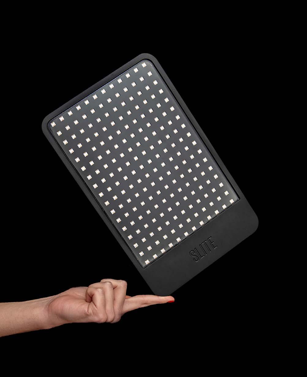
SLITE - THE WORLD'S MOST PORTABLE LIGHT FOR CREATORS PRODUCT DESIGN
CONSUMER ELECTRONICS
DESIGNED BY Nila Rezaei Andrew Simpson
COMMISSIONED BY Slite
DESIGNED IN Australia
JURY COMMENT This is an innovative product responding to a clear need. Slite is an impressive design solution that gives rise to new and emergent use cases. This is a refreshing and relevant product for the modern content creator in an image driven world. Well done. Slite was born out of a need for portable and professional lighting for modern content creators. Slite's co-founder, Alex, was shooting in an 160-year-old building without any power when the idea struck: "why not power a light from a power bank?"
CHALLENGE The world of professional lighting is super intimidating. They're bulky, cumbersome and expensive, limiting their use and use cases. Slite needed to be portable, powerful and offer professional quality lighting that anyone - regardless of experience - could easily use. Slite needed to work with existing traditional mounts/stands, but also offer more intuitive and innovative mounting solutions. In short, a light that would exceed the needs of a professional, whilst being accessible to newcomers. A light that could take your creativity to new places both metaphorically and physically.
SOLUTION Slite used cutting-edge heat-sync technology to allow for an ultra slim 14mm thin profile, without compromising the output of the custom-built LEDs. Working closely with electrical engineers and LED manufacturers, Nila was able to create a beautiful, sleek design unit - roughly the size of a tablet - that packed a 3400lux at 1m, weight only 890g and could fit in a laptop sleeve. Stripping away intimidating and unnecessary buttons made for a user-friendly interface, making pro lights easier to use than ever. By integrating magnets into the unit's front and rear, Slite could also be mounted in new ways.
IMPACT Slite is the first professional-quality light to implement USB-C technology, allowing the unit to be powered from an everyday power bank and offer unparalleled portability. This, combined with its 14mm profile and <900g weight, meant you could pack a studio-worth of lights into your backpack for the first time. And, thanks to the magnetic rear, Slite could be mounted to anything metallic, allowing content creators to do away with stands and mount in new and innovative ways with ease and minimal footprint.
BEST IN CLASS
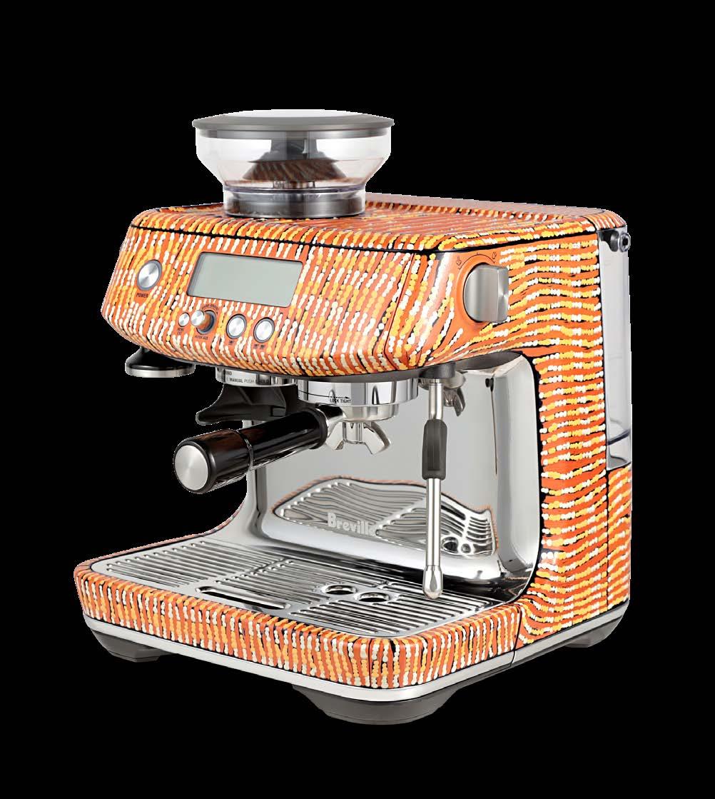
AN ABORIGINAL CULINARY JOURNEY PRODUCT DESIGN
DOMESTIC APPLIANCES
DESIGNED BY Yukultji (Nolia) Napangati Yalti Napangati Warlimpirrnga Tjapaltjarri Lucy Simpson Breville | Sage Global Product Team
COMMISSIONED BY Breville | Sage
DESIGNED IN Australia
JURY COMMENT There is a magical quality to this product range that transcends its utilitarian and decorative elements, making the whole greater than the sum of its parts. This project embodies an incredible sensitivity, breadth, and depth, spanning cultural, technological, and commercial chasms. It brings home the story of a 60-thousand-year-old food culture in a subtle and beautiful way. They remind us that the world’s oldest living culture is alive all around us, waiting to be (re)discovered and embraced. An Aboriginal Culinary Journey is a collaboration between Breville|Sage and Aboriginal artists who decorated appliances with stories of food, culture and community to celebrate and raise awareness of 60,000 years of Indigenous Australian culture. This project will be the start of ongoing initiatives to give back to the Indigenous community.
CHALLENGE An Aboriginal Culinary Journey combines ancient stories with the best of contemporary design - an invitation to experience the world’s oldest living culture. When beginning the 3-year long design process for the Aboriginal Culinary Journey, we knew we wanted the artwork to be authentic and have a meaningful connection to the appliances themselves. To faithfully represent these world-renowned artist hand painted works, Breville had to work on a new high-quality industrial process to apply graphics to products. This process had to accurately capture colour and texture and produce a product that’s virtually identical to the original.
SOLUTION The development of the Aboriginal Culinary Journey resulted in Breville innovating an industrial process that combined high tech and artisan methods. 3D-photogrammetry is used to digitally remove the painted artwork off the products and reproduce them at the highest quality. The art is re-applied to our products as a multilayer decal. The final decals intricately layer inks and texture. Some products have up to 16 decals which are all skilfully applied by hand. The end product, whilst being tedious and technical, captured the most faithful representation of the original artwork.
IMPACT As a proud Australian company, Breville recognises the need and responsibility to form a reconciliation action plan and to give back to the Indigenous communities of Australia. We see an opportunity to share Australia's long history of food and culture through native Australian art, on a global scale, to lovers of art, decoration and design. As part of this campaign, all profits are dedicated to funding Indigenous charities and philanthropic works. It is also the hope that this initiative will be the start of ongoing future projects for Breville in giving back to the Indigenous community on a global level.
BEST IN CLASS

PLUSMINUS BY VIBIA PRODUCT DESIGN
FURNITURE AND LIGHTING
DESIGNED BY Diez Office
COMMISSIONED BY Vibia
DESIGNED IN Spain
JURY COMMENT Pure delight from the product design, to application, right through to unboxing. The capacity for truly flexible design solutions from a limited number of power sources opens up unlimited creative potential for interior designers without being constrained by arduous pre-planning. A superb solution for awkward or difficult to light places like pop up venues and events. Plusminus is a modular lighting toolkit for interiors. It allows designers to create unique and original lighting solutions using a range of connectible and interchangeable parts. Plusminus is configured using free online design software, allowing users to create their own unique designs based on the dimensions of their chosen space.
CHALLENGE Limits commonly faced by lighting and interior designers include: • The difficulty that comes with lighting unconventional spaces and the need for adaptive solutions • The need for time-consuming wiring and specialist tools during the installation process • The very few electrical connection points within a space • The need to explicitly visualise how a piece of lighting will look within a finished space during the design process • The need to customise lighting after installation to better fit the needs of the project
SOLUTION Plusminus offers a conductive textile belt that carries up to 80W of power. This belt can be ordered up to 30 metres long and can be cut to size on-site should the need for customisation arise during or after installation. Luminaires are attached to this belt using a click-and-connect system that is fast, easy and safe. This system includes six different models, from globes to spotlights. The Plusminus is configured using an online tool which allows designers to explicitly visualise how their Plusminus design will look once installed. Furthermore, only one electrical connection point is needed for a full-scale design.
IMPACT The Plusminus lighting toolkit provides lighting designers, interior designers and architects with an adaptive and endlessly customisable solution for lighting virtually any interior. It also allows lighting designers to think 'off the grid' and create unique lighting configurations regardless of how an interior is wired, as only one connection point is required. Because its textile belt is conductive yet safe to touch, designers can play with their Plusminus design, freely attach their luminaires as desired, install their belt using a range of (freely provided) extra accessories and light an entire space in little under a day.
BEST IN CLASS
PIVYT ARCHITECTURAL HARDWARE BY LANE PRODUCT DESIGN
HARDWARE AND BUILDING
DESIGNED BY bangdesign in collaboration with ITW
COMMISSIONED BY ITW-Australia Pty Ltd
DESIGNED IN Australia
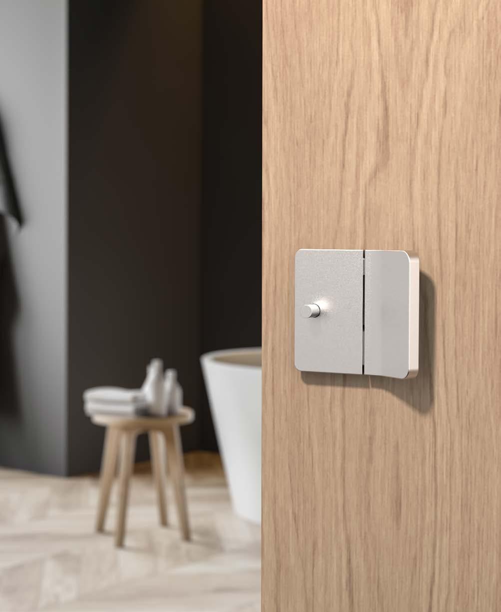
JURY COMMENT The judges were unanimous, the PIVYT range transforms a detail in our homes which is usually taken from granted into an elegant, well considered, beautiful product. The design team should be extremely proud of the final silhouette and attention to detail which sits below the surface. PIVYT by Lane is a sleek, new way to access and secure your home. Rather than the traditional rotation of a handle or knob, PIVYT opens with a simple pulling action. PIVYT’s elegant form perfectly embodies the innovative and compact engineering across a coordinated range of architectural-hardware products.
CHALLENGE The design brief was to develop a completely new and unique door-hardware product, system, and solution that didn’t rely on traditional componentry or methods. Traditional door-hardware componentry has existed and remained unchanged for decades, and the challenge for this project was to break new ground in order to improve the way door-access and door-levers work and in parallel to the way the door-access and door-handles look. The design brief required this to be achieved through the design and development of new patent-protected technology.
SOLUTION The project painstakingly developed patented designs for the door’s latch mechanism through simple and more compact mechanisms, making it quicker to install and easy to use. The unique mechanism and design provided the opportunity to develop a completely new interaction for door handles and their action of operation. Simply tilt the door lever towards yourself to release the latch and open the door. Expressed with authenticity, the elegant and evocative aesthetics are more akin to adornments on the door, rather than an apparatus on the door.
IMPACT This project has achieved a new benchmark for door hardware innovation that will provide ongoing benefits to Lane through the patented technology. Not only has it delivered a “standout” product into a highly competitive market that constantly contends with commodification, but it has also enhanced the Lane brand and set it apart from competitors. In addition, the technology has long-lasting applications across future product developments, adding to the return on investment. For the end-user, for the first time in a long time, this project offers a new choice in a market that has had an array of “sameness” for too long.
BEST IN CLASS
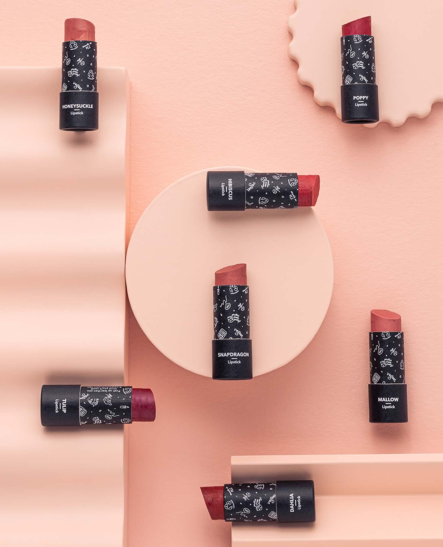
ETHIQUE - HOME-COMPOSTABLE LIPSTICKS PRODUCT DESIGN
HOUSEWARES AND OBJECTS
DESIGNED BY Ethique Brianne West Jenn Loh
COMMISSIONED BY Ethique
DESIGNED IN New Zealand
JURY COMMENT Not only an impressive concept to compost the lipstick, but all the judges were impressed with the integrity and consideration prevalent from product creation right through to packaging. Ethique lipsticks are designed to be buried. Unlike wasteful plastic-packaged lipsticks, every element of Ethique’s packaging is home-compostable, including the push-up tube. It can be buried in the ground, thrown in your compost or pushed down in a plant pot to return valuable nutrients to the soil.
CHALLENGE Around the world, 800 – 900 million lipsticks are sold annually. Most are packaged in plastic – rarely recyclable and usually sent to landfill. And even when packaging is recyclable, systemic issues with global waste systems mean only 9% is actually recycled and repurposed. It was clear to Ethique that a better solution was needed: cosmetics packaging that would leave no trace on the earth or better yet, would leave a positive impact. The team also knew a sustainable change would only go the distance if it performed just as well as – if not better than – its traditional counterparts.
SOLUTION A range of seven timeless shades were designed and packaged in home-compostable materials crafted to disappear when buried in the ground. Buildable colour was achieved through naturally occurring child-labour-free pigments such as mica, manganese violet and iron oxide. To meet the brand’s strict criteria, the lipstick also needed to be made without palm-oil (which is associated with deforestation and unethical farming practices) and instead created with directly traded, ethically sourced ingredients. Extensive supply chain research and auditing was conducted to find sustainable palm-alternatives, ultimately achieved through a blend of plant-based waxes and organic moringa oil from Rwandan co-operative, Asili Oils.
IMPACT As well as the benefits to soil, the planet also benefits from fewer items of plastic in landfill with each Ethique lipstick. In ten years, Ethique and its customers have saved 20 million plastic containers from being manufactured. With this new range, Ethique is on track for its target of half a billion by 2030. The range will also have a big impact on producers, who benefit from the brand’s adherence to direct trade, fair wages and supply chain monitoring. This ensures producers can be confident of year-round income and thrive rather than just surviving, adopting regenerative farming techniques along the way.
BEST IN CLASS

ADVANCELL ISOTOPES 212PB GENERATOR PRODUCT DESIGN
MEDICAL AND SCIENTIFIC
DESIGNED BY AdvanCell Isotopes Design + Industry (D+I)
COMMISSIONED BY AdvanCell Isotopes
DESIGNED IN Australia
JURY COMMENT AdvanCell's Generator is a revolutionary product that is going to have a remarkable impact on the lives of many people. The attention to detail in the design of the device is exemplary, particularly the use of recycled materials to create the isotopes. It's outstanding to see how a product of this size can replace a half-room-sized machine, while also negating the need to source radioactive elements from Russia. Truly inspirational. AdvanCell's Generator is a world-first alpha isotope generator which addresses the greatest unmet need in targeted alpha therapy – the reliable and scalable supply of isotope. The manufacture of clinical doses of a high-value isotope Alpha 212® (Lead-212) for use in targeted radionuclides therapy is a game-changer for prostate and several other cancer treatments. Enabling scalable local isotope production capability, the Generator will fast track the delivery of cutting-edge cancer treatments to patients.
CHALLENGE Lead-212 possesses a half-life of 10.6 hours. Current production methodologies severely impact the availability of radionuclide therapy and limits access to the therapy for patients in need. The challenge was to design + engineer a small footprint generator that could be produced and operated at scale around the world to serve large patient populations. The generator needed to be safe, intuitive and enable reliable production of radio isotopically pure product for an extended period. The goal was to cultivate a design that would encompass all electronics and mechanical apparatus required to automate the production of the high-value isotope (Lead-212).
SOLUTION The Isotope Generator is a platform technology that enables the scaled production of isotopes, enabling clinical trials, treatments and the development of a number of Targeted Alpha Therapies for different cancers that had previously been restricted. A focus on quality, reliability, traceability and a goal of a GMP product will provide clinicians with access to mission critical medicines when needed, and not only when or if available. The Generator is currently producing clinically useful amounts of Lead-212 daily and is being used by researchers in Australia, with a clinical trial scheduled for 4Q 2022. The Generator is optimised for safe use within space and time constrained conditions, bench-sized, portable and intuitive.
IMPACT The Isotope Generator can easily scale production of Lead-212 and allow greater access to therapies that are beneficial to the treatment of prostate and neuroendocrine cancers. Due to Lead-212’s short half-life, transporting, storing and administering the isotope is time-sensitive, so the innovation has the potential to save countless hours and lives by eliminating the challenges associated with long-haul transportation and storage. Scalable production of these rare alpha emitting isotopes and turning them into therapies for a broad range of cancers enables greater access to treatments for patients who need it most.
BEST IN CLASS

SUPERSPACE PRODUCT DESIGN
SPORT AND LIFESTYLE
DESIGNED BY 4DESIGN
COMMISSIONED BY Everplay Ltd
DESIGNED IN New Zealand
JURY COMMENT The Superspace is a clear winner of this category. This premium example of thoughtful design seems simple, but can make such a huge impact in family lives. In addition to fostering creativity and imagination for kids, it is a chic and stylish item for the family home. Beautifully designed and executed. Superspace is a magnetic modular play space builder for kids. Life-size magnetic panels allow children to create almost any structure they can dream up for creative play.
CHALLENGE Inspired by watching our children try to create their own independent play spaces and still be near to us. The unsuccessful use of cardboard boxes, sheets and cushions (collapsing and taking over the room) led to the idea of Superspace. The challenge was to create panels that were lightweight and simple enough for kids to use so they would be inspired to build and rebuild their own life-sized structures. They had to be easy and fun to use or they would get ignored.
SOLUTION After many iterations we came up with three things that allowed us to hit these goals: Creating a magnetic system using diametrically opposed strong magnets, creating a frame that would house the magnets while allowing the panels to be lightweight and strong enough to handle the knocks from kids and the use of PET felt for durability and lightness. Throughout the process we focused on reducing the environmental impact of the panels, each 24-panel set contains approximately 150 recycled plastic bottles. Recycle-grade Polycarbonate was used to house the magnets and locked together using 100% natural bamboo with the FSC tick.
IMPACT In a world increasingly dominated by screens, toys that encourage creativity and imaginative play are of increasing value. The motivating factor that inspired the creation of Superspace was to create a toy that would get kids to put down their screens and engage with the physical world without the limited possibilities of traditional toys. There are no rules, and no right or wrong way to use it. Kids learn through experimenting, building, and can create new structures each and every time. It stimulates their mind and allows them to dream of things they would otherwise might not have thought of.
BEST IN CLASS

CURBYIT SERVICE DESIGN
COMMERCIAL SERVICES
DESIGNED BY CurbCycle
COMMISSIONED BY CurbCycle
DESIGNED IN Australia
JURY COMMENT Early and successful engagement of key stakeholders and a solution that's simple, holistic and highly effective. This project had all the jurors talking and keen to find out more. The potential for positive design impact is significant - well done. CurbyIt connects community and industry through an innovative extended product stewardship service of soft plastics and other targeted materials through the kerbside recycling bin. The Curby App and unique QR Codes inspire and empower the community to ‘CurbyIt’: divert problem materials from landfill and enable ReMade in Australia products.
CHALLENGE Soft plastic is one of the most problematic materials to recover. It cannot be sorted in a loose form at the material recovery facilities and during the past 20 years, councils have had to instruct householders not to put soft plastics into the kerbside recycling bin. Communities and governments are frustrated by the lack of solutions. Producers are now expected to develop extended producer responsibility schemes to support the collection of soft plastics at levels of >70% and feed large scale processing facilities. Recovering this light fluffy material overflows drop off locations.
SOLUTION Households recycle their soft plastics by segregating them into used plastic bags and fitting them with our CurbyTag and QR code. This is to be scanned before placing the bag into a kerbside recycling bin. The CurbyTag enables efficient identification and sorting of the bag at the recycling facility and households receive acknowledgement from Curby that enables rewards in the future. The geolocation, quality and quantity of the targeted material is reported to councils, recyclers and industry partners through an interactive dashboard. CurbyIt builds, guides and nurtures sustainable behaviour within the community so we can recover and reuse most problematic materials.
IMPACT CurbyIt amplifies the community's desire to recycle by gamifying the experience. It prevents and diverts soft plastics from becoming wind-blown litter in streets, pollutants in waterways and waste in landfills. The first Curby pilot (2020) inspired the massive cross-industry collaboration that resulted in a first of its kind Kit Kat wrapper re-made from consumer-collected soft plastics and the pilot has moved to full scale. Initial analysis indicates CurbyIt operates ~20 times more efficiently for soft plastics than container deposit schemes for plastic. Councils across Australia and global leading brands are now seeking to CurbyIt.
BEST IN CLASS
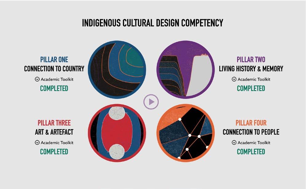

SUPPORTING EXCELLENCE IN INDIGENOUS CULTURAL DESIGN COMPETENCY SERVICE DESIGN
EDUCATION SERVICES
DESIGNED BY Greenshoot Consulting (Lead Consultant) Learning Hook (Delivery Partner)
COMMISSIONED BY Melbourne School of Design University of Melbourne
DESIGNED IN Australia
JURY COMMENT Thank you for sustainably training and empowering trainers to lead the way in building cultural intelligence. A simply beautiful and inspirational project. Well done. Greenshoot Consulting was engaged by one of Australia’s leading Indigenous Architects and design academics, Jefa Greenaway to create a suite of Indigenous Cultural Design Competence learning modules. The modules were designed to support academics with the Melbourne School of Design to build competency and Indigenise the current student curriculum.
CHALLENGE In 2017, the Melbourne School of design initiated a pioneering aspiration to enhance the student experience and delivery of programs by incorporating Indigenous Design Cultural Competencies across all of its academic programs. Greenshoot Consulting supported Indigenous architect and lecturer Jefa Greenaway to co-design four unique Indigenous Design pillars, which were subsequently validated with Indigenous academics and Elders representing Wurundjeri, Boon Wurrung, Bunurong and Yorta Yorta. These Indigenous Design Pillars were translated into four learning modules within a bespoke bi-directional learning platform for academics to build their own cultural competency, whilst providing resources and case studies to support student curriculum development.
SOLUTION This design solution reflected Indigenous led decision making across all key decision points. We delivered a design discipline-specific learning solution supporting academics teaching in the built environment, to develop student curriculum that embeds an understanding of the value of Indigenous design. The four learning modules sought to decolonise the traditional learning model archetype by using artwork as the canvas for the learning module navigation. Each learning module used a different canvas and centred the learner by beginning with a narration of the learning objective by an Elder, reflective of oral learning traditions.
IMPACT The Indigenous Cultural Design Competency training modules empower academic staff to become advocates for Indigenous design and engage with Indigenous knowledge systems, as they relate to the built environment by embedding Indigenous voices into curriculum and strengthening relationships with Traditional Owners. This work supports cultural change at scale by ensuring Indigenous design is infused into all future student curriculum. This will not only increase the cultural safety of the curriculum, attracting more First Peoples to pursue careers in design, but will fundamentally transform the relationship that future generations of built environment professionals have when designing on Country.
BEST IN CLASS

DIGITAL SKILLS PROGRAM – BUILDING THE DEPARTMENT OF REGIONAL NSW’S FUTURE-READY WORKFORCE SERVICE DESIGN
PUBLIC SECTOR SERVICES
DESIGNED BY Department of Regional NSW (DRNSW) UNSW Horizons McKinsey Digital
COMMISSIONED BY Department of Regional NSW (DRNSW)
DESIGNED IN Australia
JURY COMMENT The designers have used a very clear design-led methodology for user research and problem exploration. This allowed for rigorous prototyping and the validation of assumptions about required digital skills. A standout example of good design in this growing design discipline. By 2030, McKinsey estimates 5 million Australian jobs will be significantly disrupted due to technological, societal, and environmental shifts. NSW Government believes developing a future-ready workforce and skills-based economy is critical to regional NSW. In response, DRNSW has co-designed, piloted and is now scaling an innovative workplace skill building program.
CHALLENGE Tenets of the Department of Regional NSW (DRNSW) are providing improved NSW citizen outcomes through service simplification, innovation, and improved government productivity through human-centred design (HCD), digital and automation. To meet the new government strategy, DRNSW must invest in contextualised (on-the-job) re-skilling and up-skilling of its workforce to be more effective, resilient and responsive to change. Preliminary strategic design work revealed: •Reduced productivity under increased remote and digitally intermediated ways of working, accelerated by COVID-19 •A widening digital inclusivity gap, with clear disparity in technical skills between regional and metro geographies •Financial impacts across programs due to employee digital capabilities
SOLUTION Together we designed and built the Digital Skills Program (DSP) – a continuous skills building capability comprising strategic workforce assessments, holistic diagnostics, competence and measurement frameworks, innovative skills-building journeys, coaching, social and operational support. The DSP delivers contextual and scalable workforce skilling by: •Leveraging HCD to recognise the contextualised needs of regional workforce, and their operational context •Innovative assessment frameworks that link skills to impact across multiple dimensions •Emphasising experiential, on-the-job learning in their own working environment, over self-paced digital environments isolated from real-world projects •An end-to-end Learning Operations function that enables scale, manage and report on program success
IMPACT Results from two pilots validated the need and benefit of building skills on-the-job with contextualised content and coaching support: •89% of learners say the DSP is relevant to their role and/or career aspirations, •91% say coaching was valued and one of the most enjoyed aspects •70% feel their productivity increased immediately as a result of the skills gained during the pilot alone We estimate 2,500 employees will experience 300,000 hours of tailored learning over the next three years to uplift their digital skills, with 600 employees completing the program over the next 12 months.
BEST IN CLASS

GROOTE ARCHIPELAGO HOUSING PROGRAMME SOCIAL IMPACT
DESIGNED BY TheFulcrum.Agency Anindilyakwa Community
COMMISSIONED BY Anindilyakwa Land Council Anindilyakwa Housing Aboriginal Corporation
DESIGNED IN Australia
JURY COMMENT An inspiring example of human centred-design in practice. The evidence of the engagement of people from the community, and the persistence of the team should be an example for future projects of this type. The approach led to a deep understanding of the complexities of creating culturally sensitive housing in remote Australia, and as a result an extraordinary outcome of which both the team and the community can be proud. Over a period of seven years, TheFulcrum.Agency have been working with the Anindilyakwa Land Council to improve life for the Indigenous population on the Groote Archipelago through better designed housing. The work is extraordinary, combining long-term community planning and cross-cultural co-design processes.
CHALLENGE On our first trip, we were presented with a Strategic Plan that declared 100 houses needed to be built. We were asked, where should they be built... and how quickly can you do it? The first thing we did was take a step back; we wanted to find out what was needed and what has/hasn’t worked in the past. Critically, we wanted to understand why. Through conversation we discovered that people felt disengaged by earlier housing delivery processes. Our job became to develop a program that enabled community leadership, empowerment, and control over the design and delivery of new housing.
SOLUTION The project required building long-term relationships with community. We met with people one-on-one, hosted BBQ’s and held meetings outside. We learnt about Anindilyakwa culture. We developed iPad surveys to gather information and employed local people to conduct the surveys in Language. This cost a fraction of what it would to fly someone in and built community investment in the project. Finally, we advised: ‘build no more than 6–10 houses per year and design them so that local contractors can do the work. Build for the long-term. Ensure all houses are culturally and climatically appropriate and delivered through genuine community co-design.’
IMPACT By working with community over several years, we were able to enhance built-environment literacy and empower people to be proactively involved in the housing design. The community was involved in the whole process, from lot allocations to specific design issues, to handover. This ensured that the housing facilitated healthy living from both a physical and cultural perspective. The community is better connected to the project because their input was fundamental at every stage. ‘It’s important for Indigenous people that we have our own housing committees, chairs and directors. Strong leaders, strong voices.’ Elaine Mamarika, Director, Anindilyakwa Housing Aboriginal Corporation.


