
HYPOTHESIS
The Spatial and Sensory organisation, Products and Programmatic of the retail space plays a critical role in the client’s experience. Each strategy contributs to a sensory journey that is consistent with the needs of the queer and neurodivergent demographic. L’Oréal group represents an expansive selection of brands within the cosmetics, skincare, and beauty sector – many of which channel brand identities which parallel L’Oréal’s contributions to inclusivity.
However, these brands each carry a level of specificity or are subjected to siloing which begins to exclude intersectional reading of an inclusive retail cosmetics experience.
For example, brands like NYX (within the L’oréal Group) tend to have a greater level of gender representation and participation in queer allyship compared to the L’Oréal Cosmetics umbrella, which has a focus on an older demographic and typically represents cis-gendered women.
When working specifically within the L’Oréal cosmetics brand, with consideration of the larger intersections of the queer and neurodivergent community it is integral to include that age and aging is a lived experience in both of these intersecting communities. It is recommended that L’Oréal begins to cross reference its own stock of brands, as the distinct division of minority populations may be exclusive.

I have chosen to create a concept store that begins to merge the whole of the brand identity whilst championing the True Match Collection of cosmetics.
I have identified some aspects of the designed experience that flow on from the initial research component of the dossier. This includes striking a balance between a spatial layout that supplements the client’s difficulty with executive functioning by distinguishing spaces, without creating an expanse that is overwhelming.
Creating finishes and experiences that limit sensory overwhelm, referencing the material and finishing palette that is informed by the material index.
Minimising product display and eliminating the reflective packaging of the True Match Collection.
Highlighting localised queer artists and artworks within the space.
Recommendations to diversify brand campaign imagery to be gender inclusive.
Staff hiring and training policy that aligns with a neutrally gendered experience.
BRAND IDENTITY

“Our objective is to be the most inclusive beauty leader and contribute to a society in which everyone can live safely, peacefully and equally.
For over a century L’Oréal has been dedicated to one sole vocation: creating beauty.
Our goal is to offer each and every person around the world the best of beauty: for all skin and hair types, all genders, all identities, all cultures, all ages.
• It means developing formulas that ensure quality, efficacy, and safety for all of our consumers and their specific needs
5
• It means celebrating the infinite diversity of beauty in our advertising
• It means working to eliminate bias in algorithms
• It means recruiting diverse teams and prioritizing inclusive leadership and management
2 3 4
• It means partnering with responsible suppliers who share our commitments”
L’oreal Group. n.d. “L’Oréal Group : Promoting Diversity & Inclusion.” L’Oréal. Accessed 2023. https://www.loreal.com/en/commitments-and-responsibilities/for-thepeople/promoting-diversity-and-inclusion/.
SPATIAL AND SENSORY ORGANISATION
L’Oréal’s client facing retail experience is limited to designated stockists like Priceline and Chemist Warehouse which has been observed to clash with the minimalist aesthetic of the brand.
A dedicated concept store is the opportunity for imagining L’Oréal autonomously in the built form. With no precedent, it is important that each design choice is aligned with the requirements of a queer and neurodivergent facing retail experience.
People with ASD often struggle with executive functioning due to hypersensitivities, so I have decided the spatial arrangement of the store should create points of focus that eliminate peripheral clutter – a strategy that can be applied to both retail and ecom, for omnichannel consistencies.
Secondly, I have arranged the store to reflect the routine of applying make-up, starting with base products and onto eyes and lips. The customer journey becomes intuitive and cyclical to reduce overwhelm by providing ample space for each step.
Generating spatial possibilities


Generating interiority


MATERIAL PALETTE
The material palette and colour scheme is derived from the original True Match product.

Low contrast neutral shades, smooth plaster walls, and low reflective sheens, mimic the tones of foundation.


The iconic green is used in the break space to carry through the true match identity and to generate a focal point.

The material palette uses a gradient - colour and shade creates high and low points that mimics the form of the space.
Textiles become integral to soften the acoustics created by hard surfaces.


PACKAGING REIMAGINED

In the initial phases of research, it was determined that the reflective packaging on the True Match collection contained overstimulating reflective materials. In the L’Oréal concept store, we intend to use high opacity recycled plastic and frosted glass, to align the product with the consumer requirement of minimal visual stimuli.


The visual merchandising of this new product will be limited to testers only, arranged in a gradient of colour and tone to eliminate unnecessary contrast. We recommend the names of foundation shades to be altered to a numbered and lettered system to denote shade and undertone, as a numerical arrangement is universally clearer and more inclusive.


The current shade names for the True Match collection, where darker skin tones are likened to chocolate and coffee has been brought to attention by POC as being offensive. This is an important intersection in the Queer community identified in the primary dossier.


SIGHT AND SIGHTLINES
I have decided to flip the orientation of the focal points to create an interior within the store for the break space. This layout, in scaled down and exploratory visualisation reveals the qualities of the proposed site.
The direction of intended movement is circular, creating an opportunity to conceal the mirrors in the space by placing them behind the direction of navigation. The mirror only becomes visible when the customer is engaged with a particular focal point or pivots around.
This gives the customer control over their engagement with reflection, making the space predictable through repetition. This can help ease feelings of gender disphoria or disorientation.
The central break space is visible between each focal point, but whilst inhabited obscures all vision of product, to generate sightlines that can assist in soothing hypersensitivities.

Elements Exploded


The store is open Wedneday - Sunday for general access, and Monday - Tuesday for appointment bookings. There is a maximum store capacity of 5 customers to ensure the service functions as intended.
The experience begins with a warm greeting from our staff. Each customer receives equal treatment regardless of gender. Noise cancelling headphones, to create a cue for staff and assist with auditory hypersensitivity are offered to the customer, along with a basket.
The customer can proceed to a particular product or walk around the circut.

Swatching of testers is permitted in each booth.

At any time, the customer can use the central break space to pace their journey.
When the customer is ready, they provide our staff with the basket, and the staff collect a new product from off-floor storage.
The staff return with the items scanned and bagged, and approach the customer using the Square, wireless point of sale, allowing transactions to occur anywhere in the store.
The customer is farewelled.
QUEER SPACE
For this retail space, I recommend a wider scope of allyship that extends beyond pride month. This can include campaigns that spotlight local queer and neurodivergent folk, to instigate conversations and celebrate this intersectional identity.
The retail store as a minimal space is ideal for reformation, to become an exhibit, a place to host or develop a program of events for L’Oréal and their consumer to connect and develop meaningful allyship and representation.
Without a physical retail space, it is difficult for a brand to interact with the consumer, outside of data mining and online surveys. A place for queer expression is fundamental to bolstering community. L’oreal’s Australian operations are relatively detatched from the brand objectives for inclusivity.
This retail space has potential to reallocate profits to local queer initiatives and realign with the principles of the L’oreal Group. This could include introducing hiring and training procedures, supporting NGO’s like Black Rainbow, Queerspace or Autism Awareness Australia, and opening up avenues for feedback.
The space becomes a place to celebrate the array of queer aesthetics, artistry and identities whilst providing the essentials for a safe retail experience, guided by L’Oréal’s celebration of all things beautiful.
L’oreal Group. n.d. “L’Oréal Group : Promoting Diversity & Inclusion.” L’Oréal. Accessed 2023. https://www.loreal.com/en/commitments-and-responsibilities/for-thepeople/promoting-diversity-and-inclusion/.


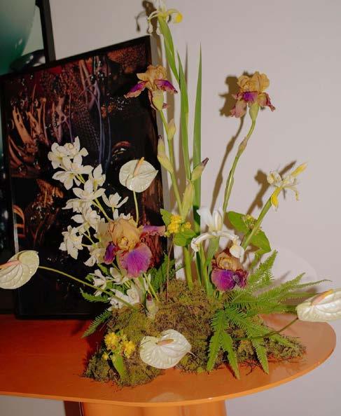
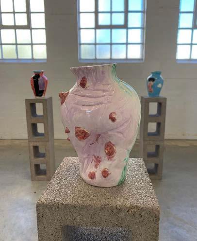
“ Diversity, Equity and Inclusion fuel the innovation, inspiration, and ambition that help us to create the beauty that moves the world.”Exhibition Precedent: Ceramic works by Artist Bella Frobel, 2019 each vase was painted by a member of the artist’s queer friendship circle. Floristry Precedent: Collingwood Yards Retail Resident, Kayla Moon (@xflos__) floral arrangements.

