


BroughttoyoubytheArtHarrovianteamofthe2023-2024ArtSociety,this editionisnamedbythetitle“YOU”.
Today,thequestionofidentity,whetherornotthatisinthecontextof appearance,personality,relationships,experiences,gender,sexuality,etcetera, isonethatisaskedmoreandmoreoften.Whenweareaskedtointroduce ourselves,weareoftenasked“Howwouldyoudescribeyourselfinoneword?” Butthereisnowaytotrulysummariseone’sself.
Whilstitisagrossoversimplification,Theword“YOU”canbeinterpretedasthe pronoun,thereader,theartist,orinanyotherwayfit Andthisthemewas chosenwithhopestoallowabreadthofinterpretationbyourcontributors,to useartasamediumtoexpressandexploretheiridentity;todescribe themselvesortheirinterpretationofthisthemeasonesingularpieceofart, muchliketheword“YOU”summarises.
Thankyouandenjoy.
Sincerely,
The5thEditionArtHarrovianTeam
WithspecialthankstoBethanyKerr (Y12,Wu)forcreatingthetitlepagefor thisissueoftheArtHarrovian

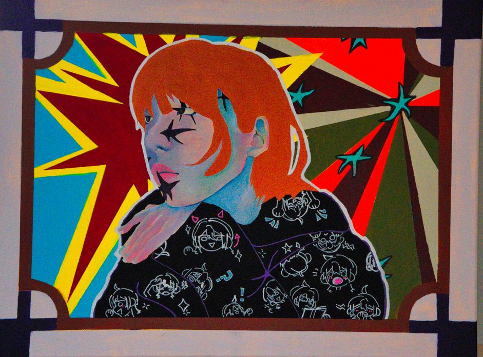
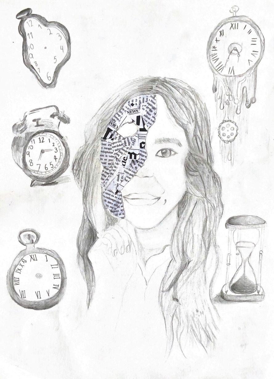
YUTONG YAN (Y11, KELLER)
YUTONGYAN(Y11,KELLER)
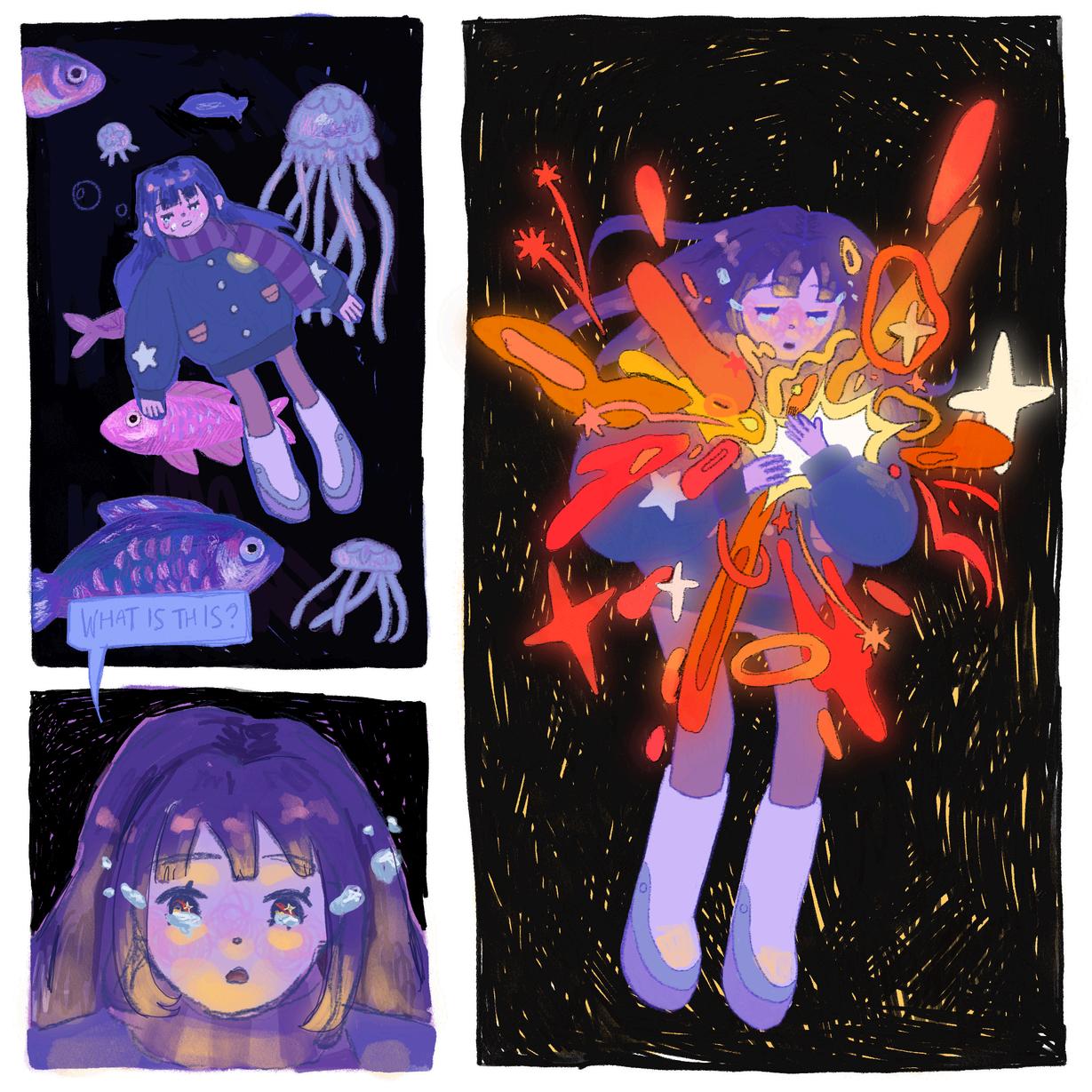
ndmoremessy/patchyshading,asItypicallyuse myart,soIwantedtoexperimentwithdifferent andlearnhowtousemessylineart.”
nted to depict a visual representation of what selfike and how it's about finding light from within and t.Thisartworkisdrawnincomicstyle,asIwantedto ry with my art. I primarily used cool-toned colours urples to contrast with the flames and shapes coming use very warm, bright colours such as orange and
“I purposely did this because, even though this piece is in the style of a comic panel, I wanted the centre of attention to still be on the sparks and flames.”
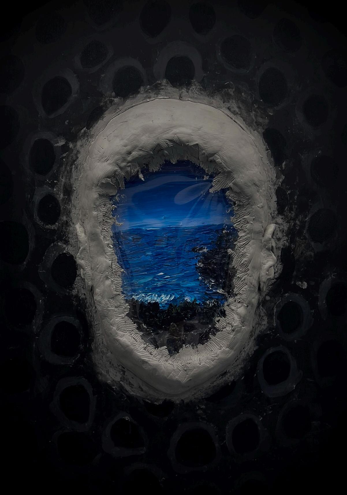
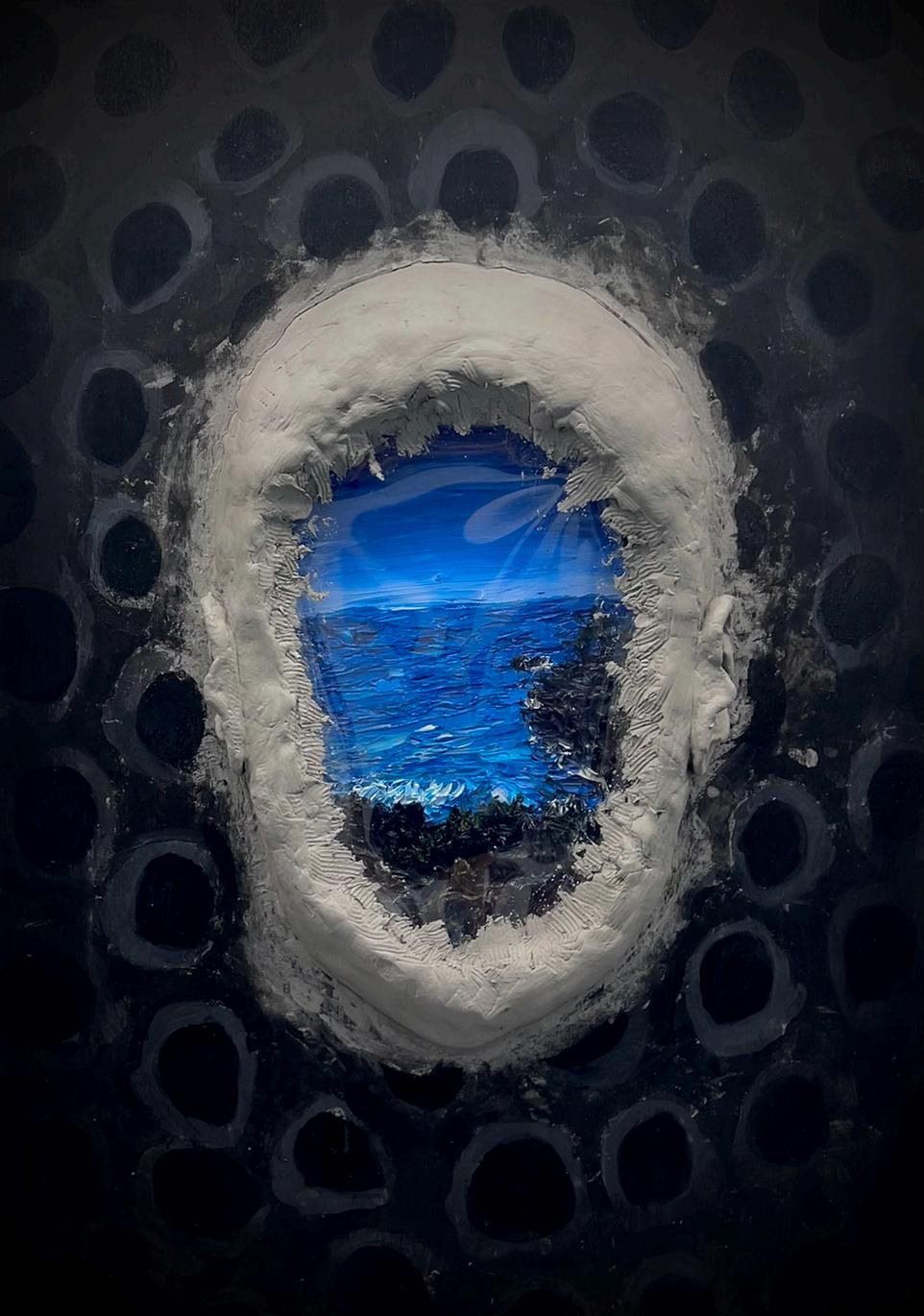
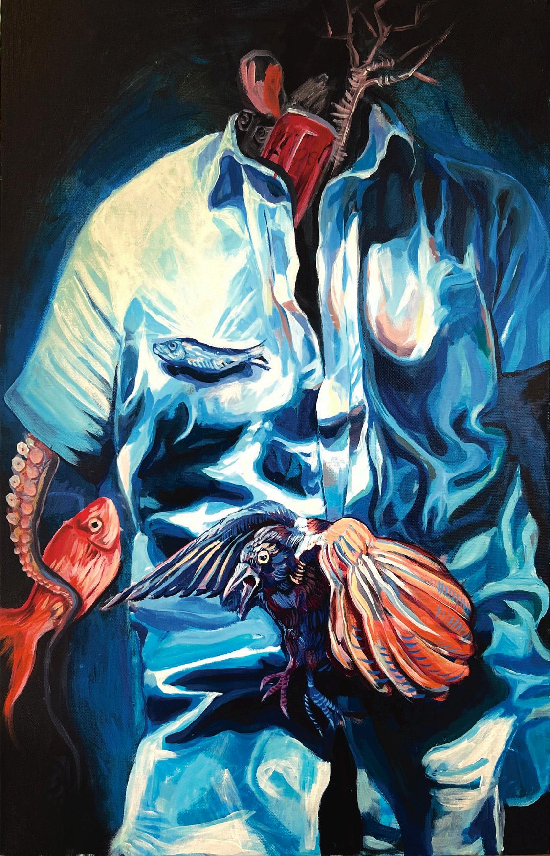
An entity is defined as “a thing with distinct and independent existence
- Oxford dictionary
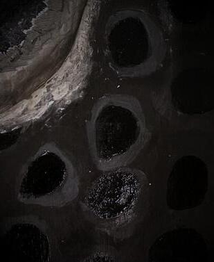
Exploring themes of identity and individuality, the small, empty entities give a claustrophobic feeling, closing up on the main subject The uniformity of the empty faces give a feeling of eeriness and isolation for the large entity, which represents my interpretation of the herd mentality of humans. The main subject is outcast. The reflective barrier between the entities and the world shows a layer of protection and self preservation, and the vibrant paint in the main entity shows the innate and intrinsic need to have individuality and identity, which will always be frowned upon by those who lack them.
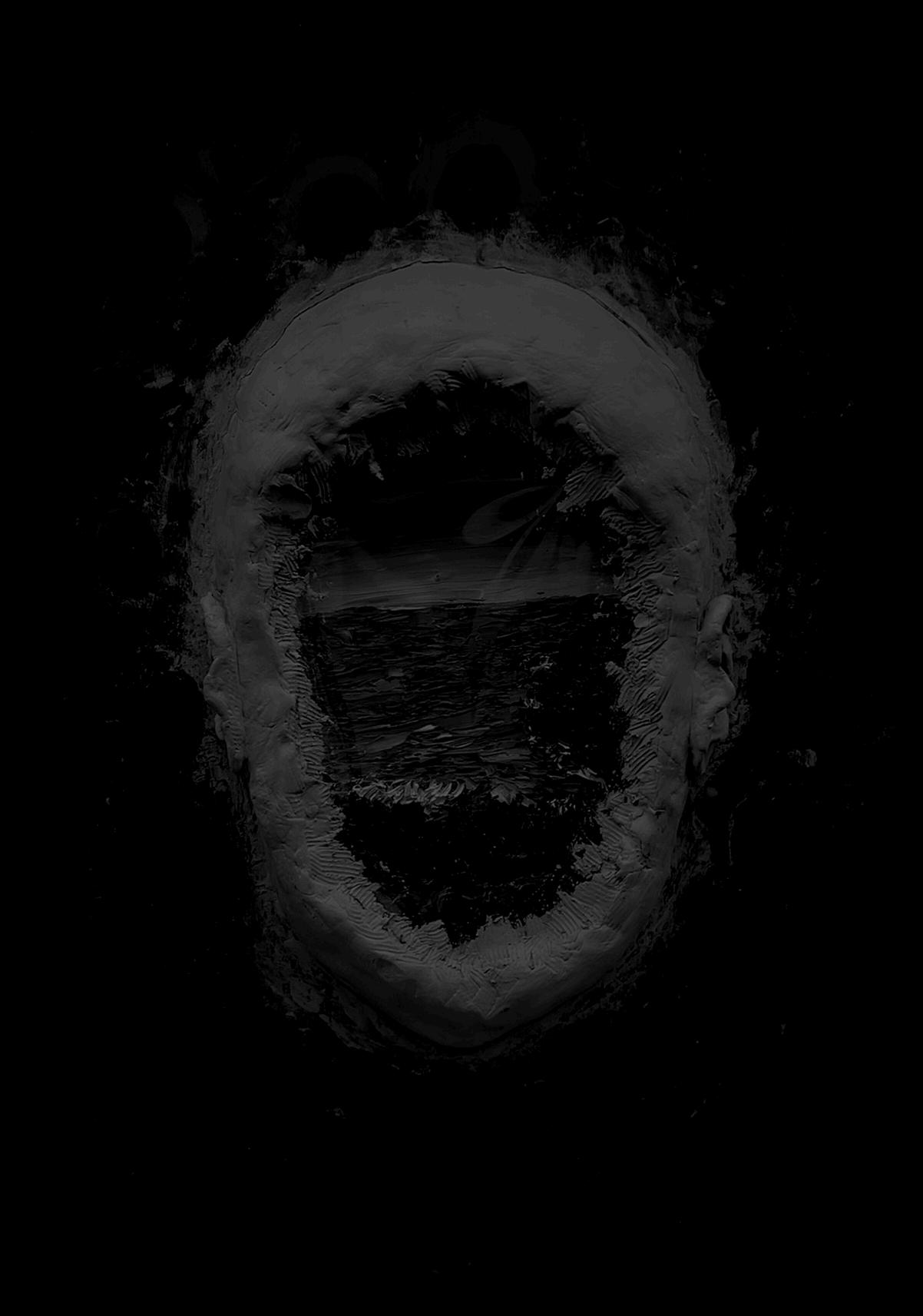
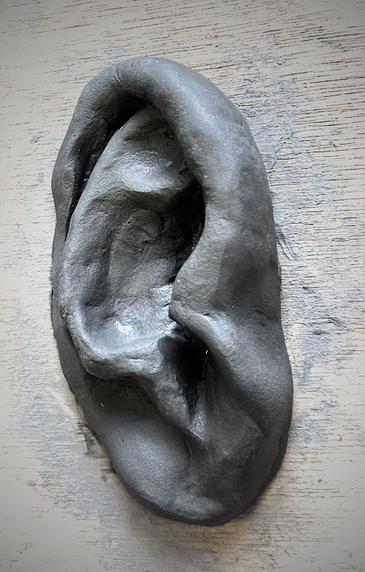
This mixed-media artwork was made with acrylic paint and varnish for the exterior; Air dry clay, acetate film and oil paint for the main entity The contrast between 2D and 3D material further emphasises the message of isolation and individuality. The colourful nature of the main entity is almost like a call for help, looking for attention, as its centre is the first thing the eye is directed towards, unintentionally. The seeping of clay into the background shows the desire of the main entity to sink into the ‘sea’ of homogeneity
Despite the colour drawing attention in, blue is often considered a calming colour, often even being perceived as a new ‘neutral’ colour in contexts such as interior or graphic design. Therefore, it could be interpreted alternately that despite the fact that the blue, put into the context of the artwork, stands out a lot, in the grand scheme of the world, the blue is not so different from their surroundings
The process of creating this artwork was inspired by Johnson Tsang’s use of clay in his sculptures, Carlos Fdez’s use of manipulating human subjects by removing or distorting their features, and Vita Schagen’s vibrant impasto paintings of landscape and nature.
The mash of the many different elements shows the chaos in humans as a community, and how we are complex even in a seemingly homogenous society Additionally, the fact that the different artists and how their styles influence different elements of each artwork also gives meaning on the complexity of society, how society is built through the efforts of many, not just one. However it can also be a commentary on how often times, society can conflict, shown in the conflicting medium and colour use
Expressed in the composition, there is also a symbolism of power, how the monotonous, larger society consumes and contains the small pocket of colour.
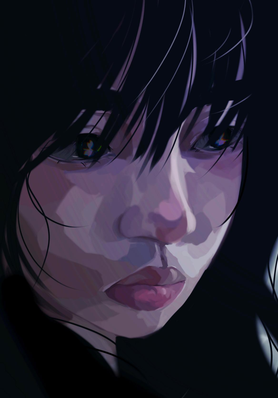
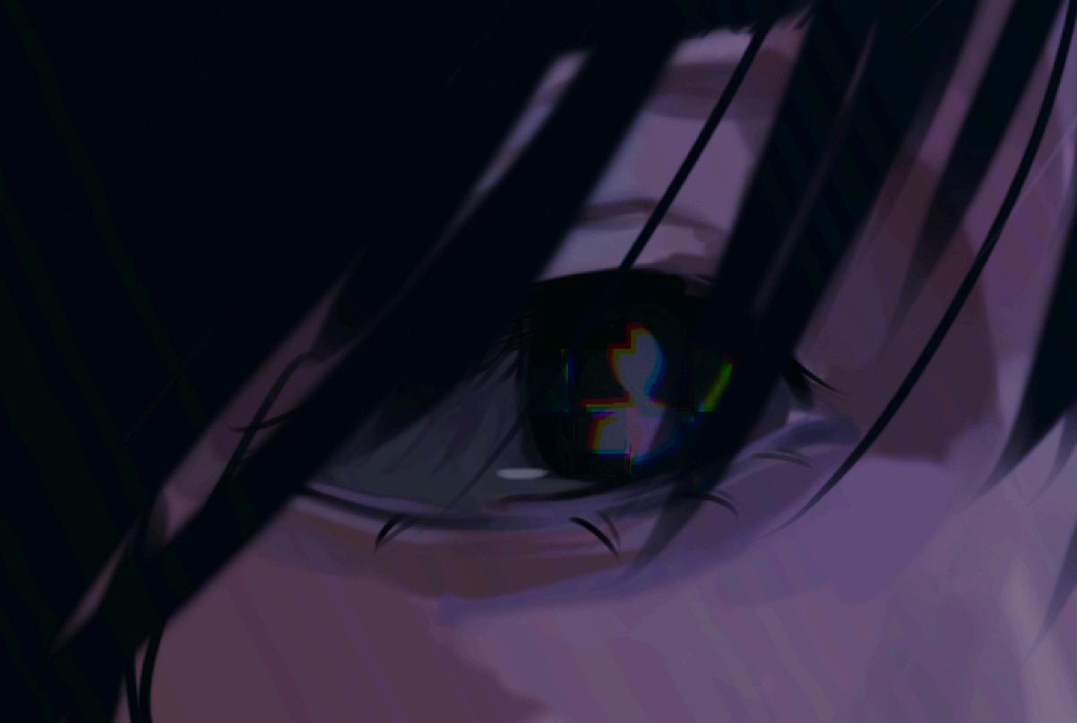
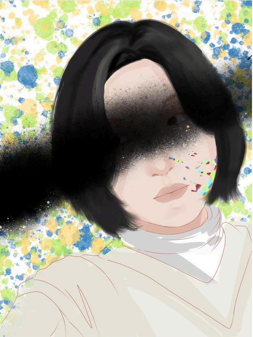
“?” is an artwork that depicts a girl who stares blankly into what is unknown.
This artwork explores the themes of uncertainty and xenophobia (the fear of the unknown). Both of these themes/ideas are fears that are evident among many people.
This artwork adheres to the theme ‘You’ as it explores the themes of uncertainty in a person’s future. As a Year 12 student, graduation is drawing close, and it’s a very stressful time in which my main concern is the future. The glitching person in the girl’s eyes reflects how the future seems so fragmented in the present moment.
In addition, the blank expression emphasises how we may not believe in the future that we can see before us and how we may not believe in ourselves in general.
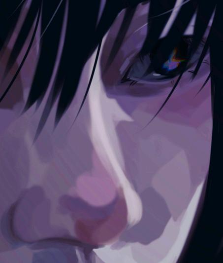
The main colours that are present in this piece are cold and have a purple undertone. The colour purple can represent insanity, which is an emotion you could feel to some extent if you feel your future is uncertain. Many issues stem from the idea of uncertainty, including self-harm, dismotivation, etc.
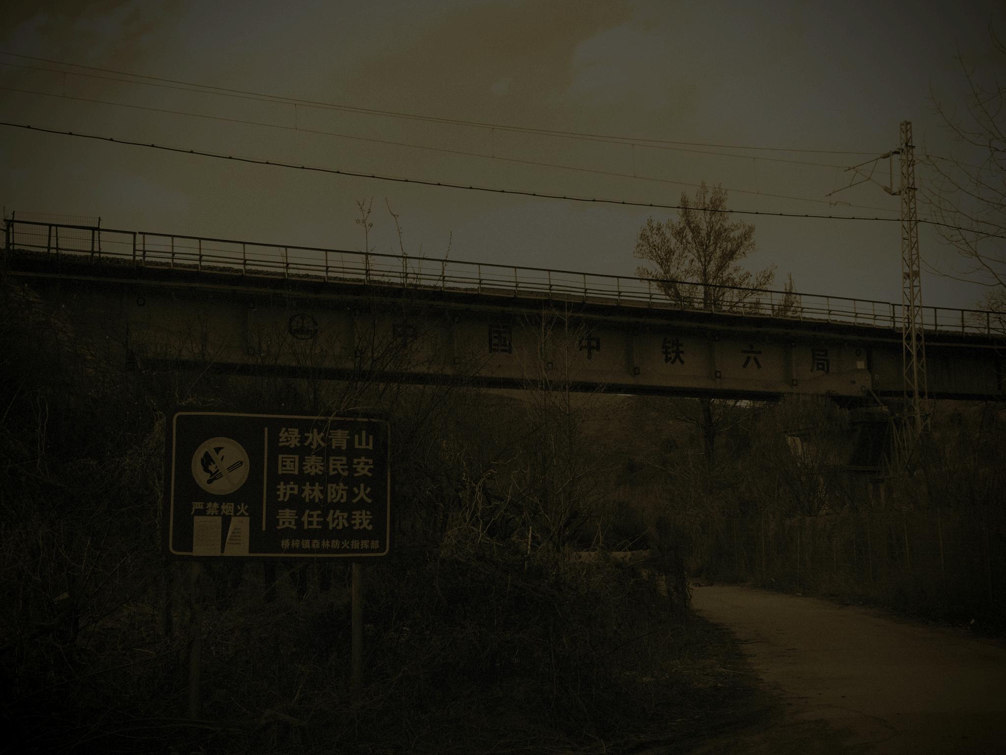
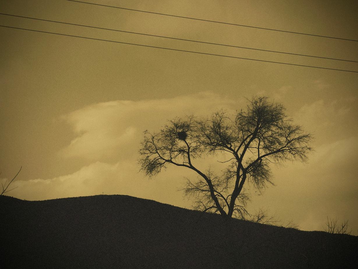
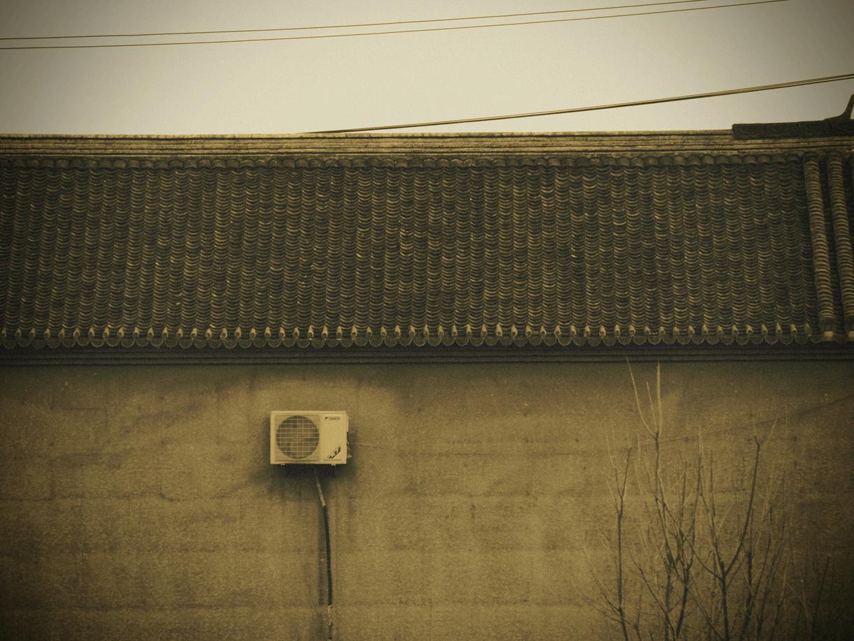
I really enjoy staying out of the city and into the rural areas where there are little to no people around, and I could just feel the breeze of air. I feel like it gives a sense of loneliness and calmness at the same time, so I decided to capture this moment. I decided to edit my photo to be more monotonous and monochromatic to create this atmosphere of loneliness.
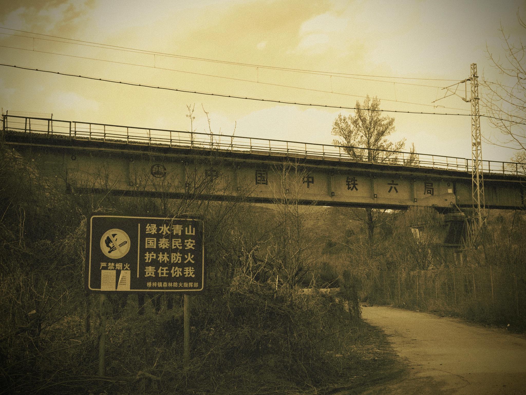
I feel that photography does not only convey the beauty of capturing something down; It also reflects ‘ you ’ , and your feelings at that specific moment. This really relates to my feelings and emotions of loneliness but calmness at the same time around that environment, which I hope evoke empathy from ‘ you ’ . For all my 3 photos, 2 of them are really simple, almost having only one object, such as the tree or the air conditioning outdoor unit. The third photo has more complexity to it: the depth between the front sign and the back bushes and railway. This shows both the empty calmness and the complex feeling of loneliness. In terms of editing, I created my piece monotony and with a high noise level to both emphasise the feelings and to make my piece seem ‘frozen’ in that moment and in that atmosphere.
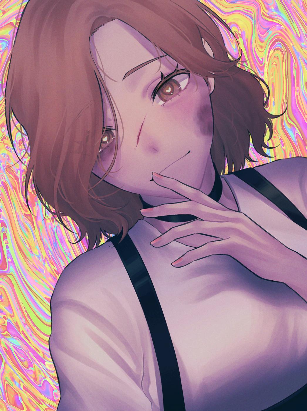
Since the theme was "reflections", I wanted to focus on what I liked, as I believe “reflection” is what brings about our sense of identity. I decided to take inspiration from the motif of stars and "incorrect" and clashing colours from the style of the artist in my favourite manga. For the background, I initially wanted it to be pop-art inspired, so I decided to do some research and found interest in Yoko Tadanori, since he also designed the graphics of this famous TV programme which I occasionally watched with my family. I didn't have much that I wanted to convey to the viewer, but I guess I just wanted to use it as a form of conveying my likes in a way that I completely focused on what i liked.
I initially drew this under the theme of "reflections", with the pop art style background being inspired by Yoko Tadanori and the colour scheme and stars inspired by Araki Hirohiko.
I sketched with pencil using a reference photograph and painted my canvas in orange (as base/undercoat). Then the rest is a mixture of gouache and regular acrylic.
“忍痛割爱”
“Reluctant to give love up”
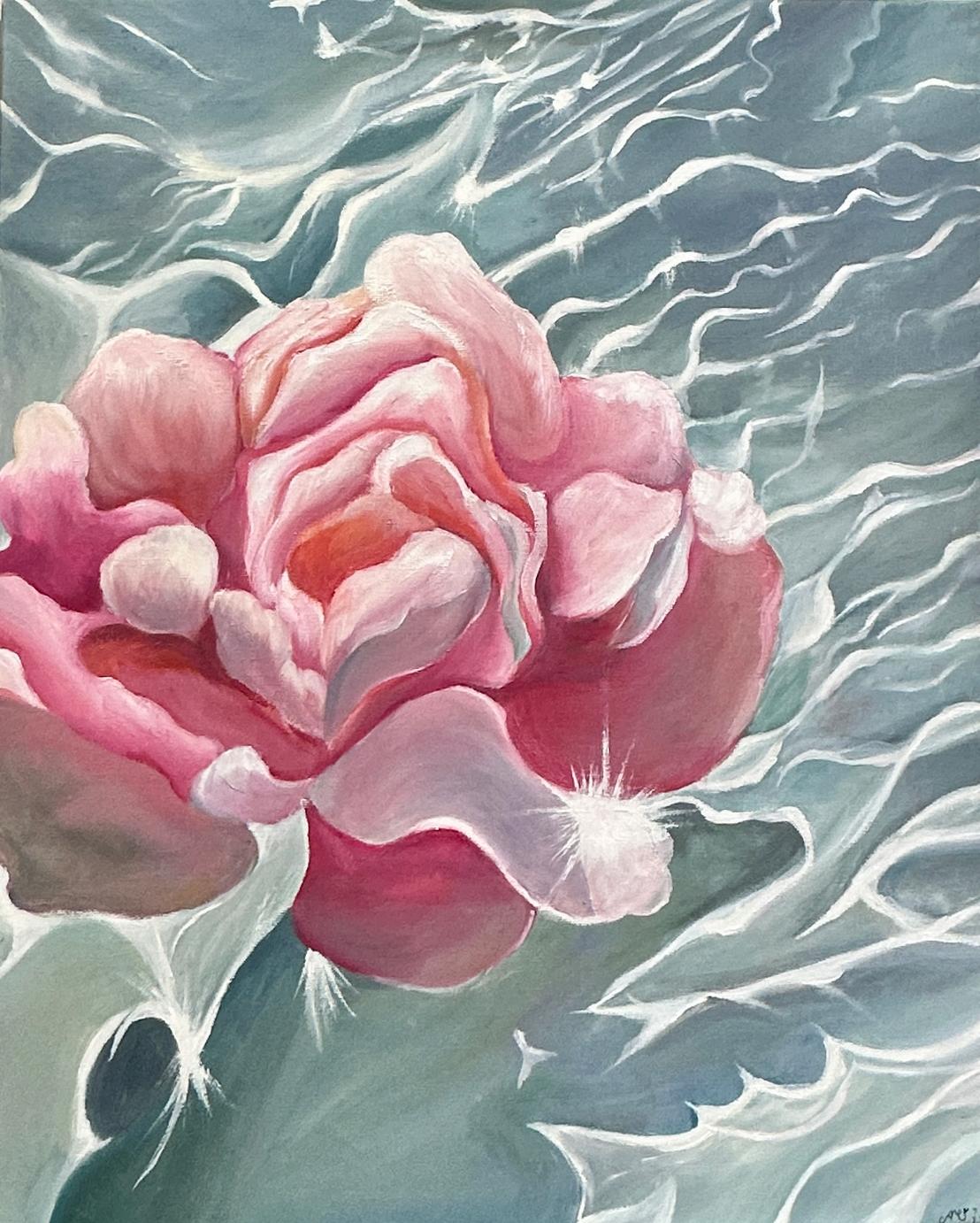
I used the classical medium of oil paint to make this artwork From working with such a classical medium that has been used by artists for centuries, one important lesson that I learned was patience. Oil paint takes a lot longer to dry compared to other paints, such as acrylics, so it really tested my patience and creative drive to stop and take a moment to wait and think through what my next layers of paint would be. From this, I was able to paint multiple layers of petals that composed the Bauhinia, the main subject, as well as layer white highlights on top to reflect the glimmers of sunlight reflecting on top of the water.
This artwork depicts a Bauhinia flower presented with layers of warm coloured petals layering over one another, while resting on water painted with cool, shaded tones that contrast with th This artwork adheres to the respective theme “ you ” , as at ti myself as a flower. A flower is in constant change through seasons of life under any circumstance, similarly to how we adapt to all the changes that inevitably come with life This was inspired by Claude Monet’s iconic water lilies that I sa L’Orangerie museum in Paris, which is most definitely my f museum. I was absolutely in awe of how naturally he comp lilies using more muted and pastel colours which I al personally prefer. From this, I decided to create a painting floral subject matter, but instead of water lilies, I decided t Hong Kong Bauhinia flower, as it symbolises the whole city and my upbringing here. I hope that the viewer will be able t and stimulate feelings of serene emotions and tranquility, a use more than one of their senses, when viewing my work. picturing the sweet smell of the petals with the cool and glos the water
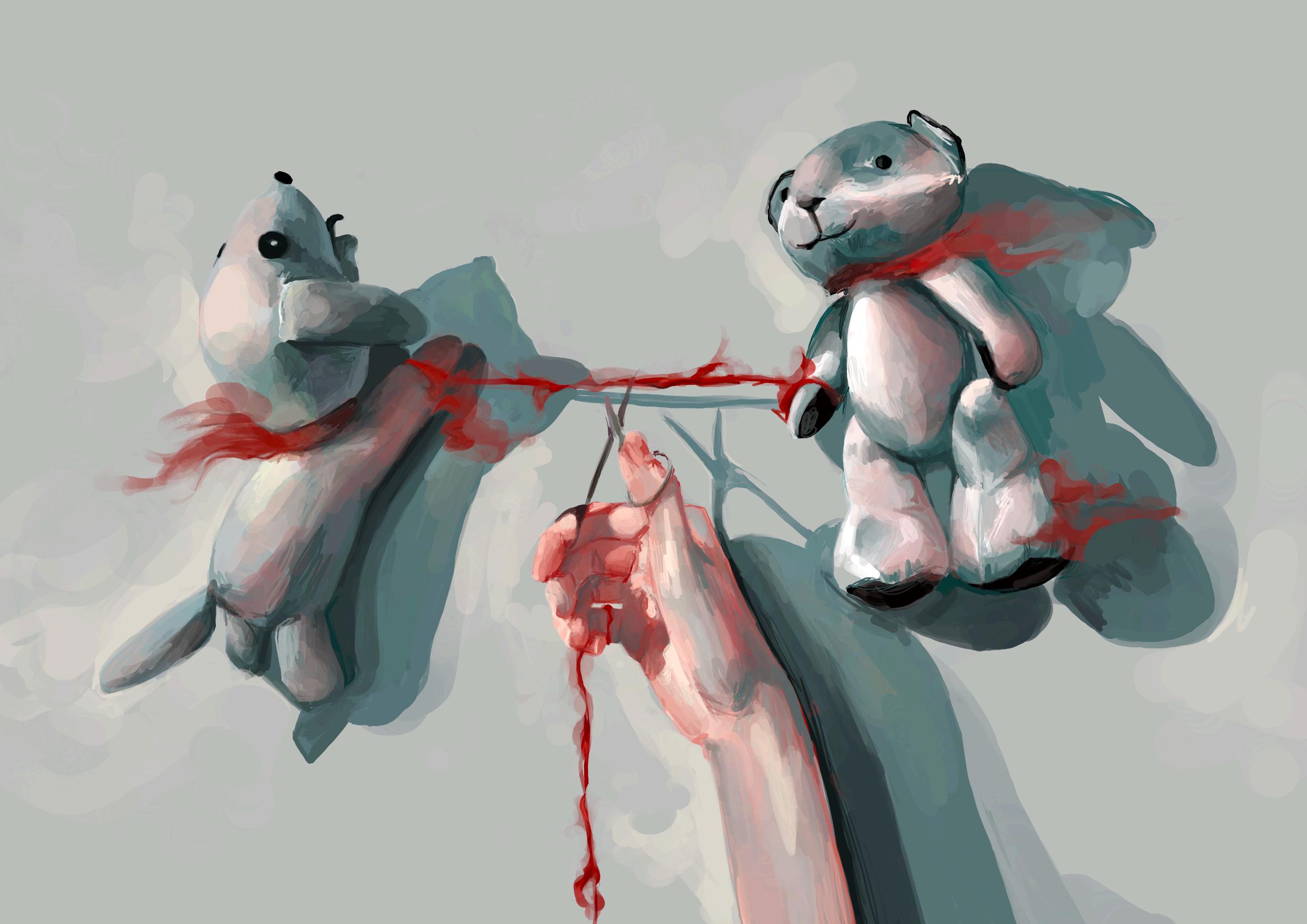
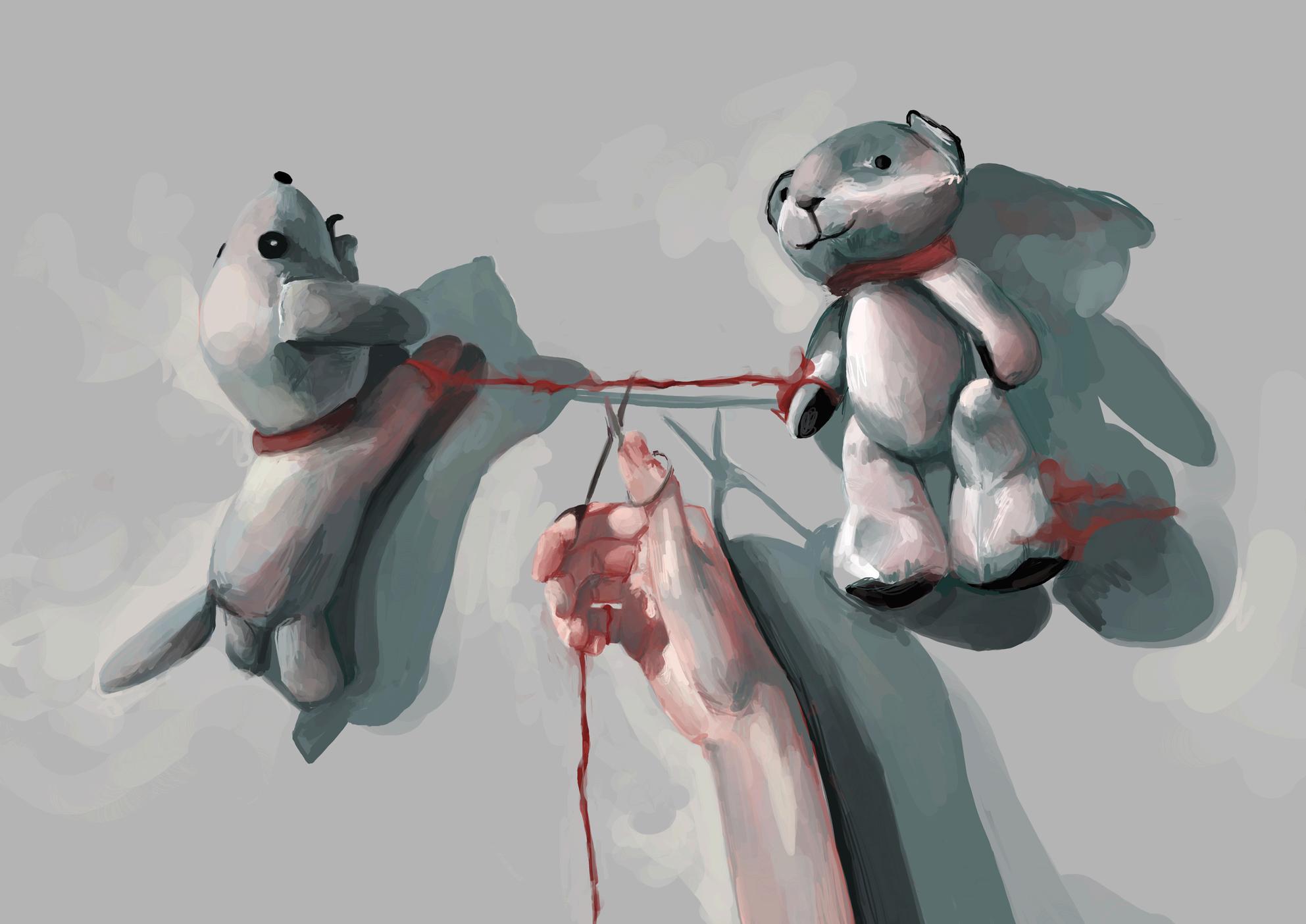
“Inspired by the belief in the red thread of fate from Chinese mythology, I decided to explore the themes of soulmates and having a destined person. Having someone who is meant to be with you, who will inevitably find you due to this connecting string, seemed comforting yet daunting to me. On the one hand, this belief would mean that there would always be someone in this big, overwhelming universe meant for me; I would never be alone. However, for the better or the worse, this string can never break. So what if I am inescapably destined to be with someone who is the perfect epitome of pure evil? The idea of a soulmate, leaving you rendered powerless at the hands of some fate, seems absolutely terrifying - terrifyingly thrilling!”
“I wanted to convey my uncertainty and turbulent, contrasting thoughts on the red thread of fate through my brush strokes, so I decided to go for more relaxed and expressive strokes than precise small ones by putting my brush on a thicker setting and stopping myself from erasing or redoing any strokes.”

I found a lot of inspiration from p broken glass, since it reminds m trying to be pieced back togethe consider our identity as a whole, exploration of finding identity T create somewhat of the same eff human face
Sofia Huang (Y10, Gellhorn)
tation: highlights the complexity of oncepts of yourself. Looking at tives and viewing yourself as g strips of characters in one ng a better ‘ you ’ and blooming t th t t th
art,
NGA KIU HO (Y10, GELLHORN)
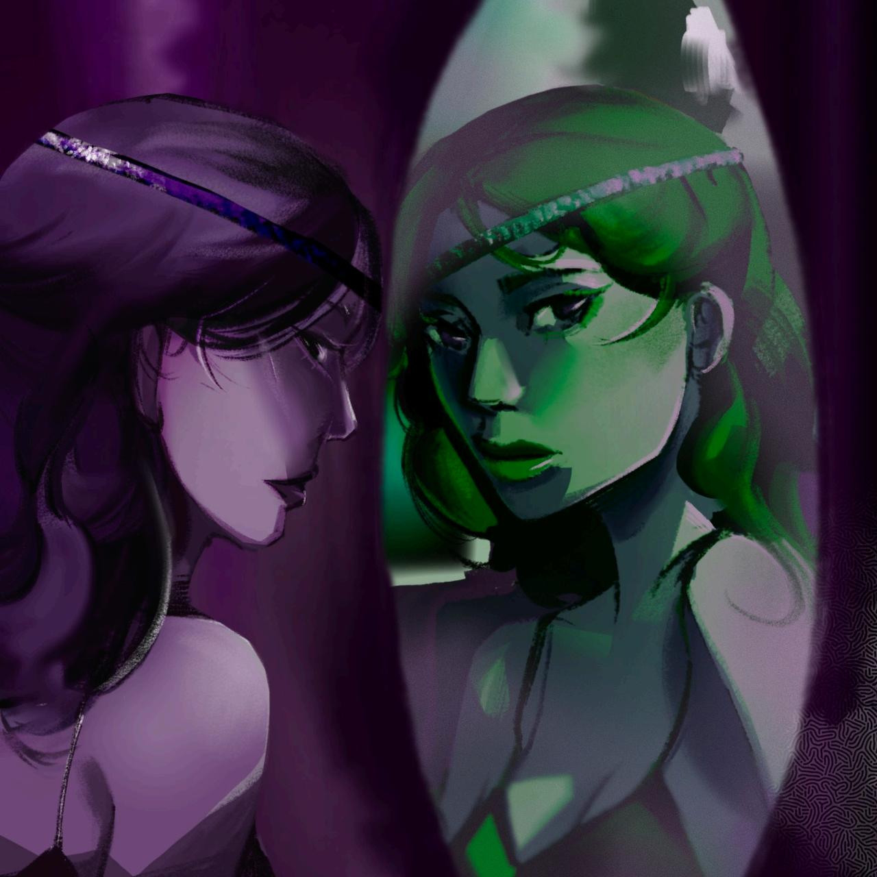
“This artwork is about a conversation between two identical people who are different versions of themselves in parallel universes.”
“It adheres to the theme by suggesting the dual nature of these two people, who are mirrored versions of themselves but at the same time are complete opposites.”
“I used purple and green, which are contrasting colours, to represent the antagonistic nature of the two personas This artwork is drawn from the perspective of the purple character and depicts her surroundings as being purple as well, illustrating how she is conversing with the green character from a different universe.”
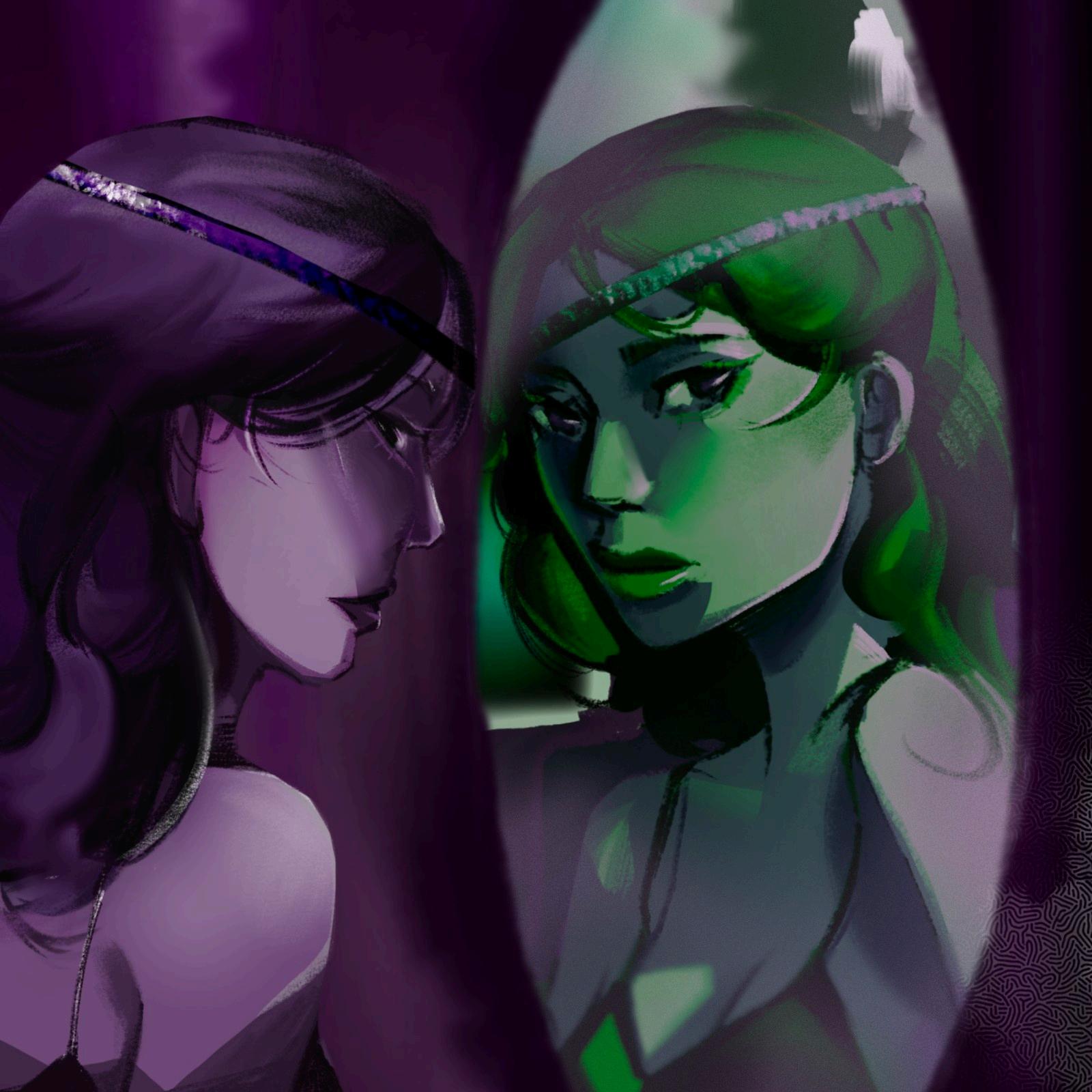
“I wish to convey a sense of unease. Many of us often think about meeting a parallel version of ourselves, or a 'doppleganger'. I was inspired by urban legends that say meeting your doppleganger is in fact a sign of bad luck.”
“I sketched with pencil using a reference photograph and painted my canvas in orange (as a basecoat). Then the rest is a mixture of gouache and regular acrylic.”
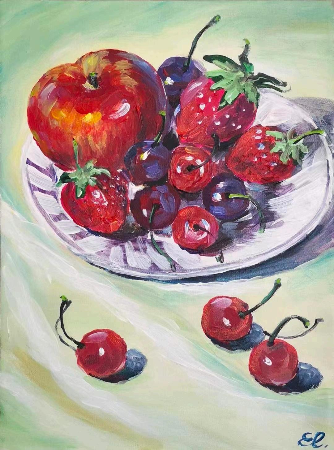

This artwork showcases a vibrant composition of various fruits arranged on a plate. The colours are vivid, capturing the freshness of the fruits. Acrylic paints were used for their bold colours and smooth finish. The main intention behind this artwork is to convey abundance, joy, and vitality. It celebrates the beauty and richness of nature, reminding us to nourish our souls. Through the depiction of the colourful plate, I would like the viewer to appreciate nature's gifts and find harmony in a balanced life. The artwork encourages savouring the present moment and finding joy in everyday pleasures. Overall, this artwork visually celebrates nature, invites abundance, and reminds us to find happiness in the simplest things.
I chose to use acrylics in order to allow the vibrant and saturated colours of the fruit to shine. What I learned is to celebrate the simplest things of colour, and appreciate my understanding of the visual appeal of fruits.
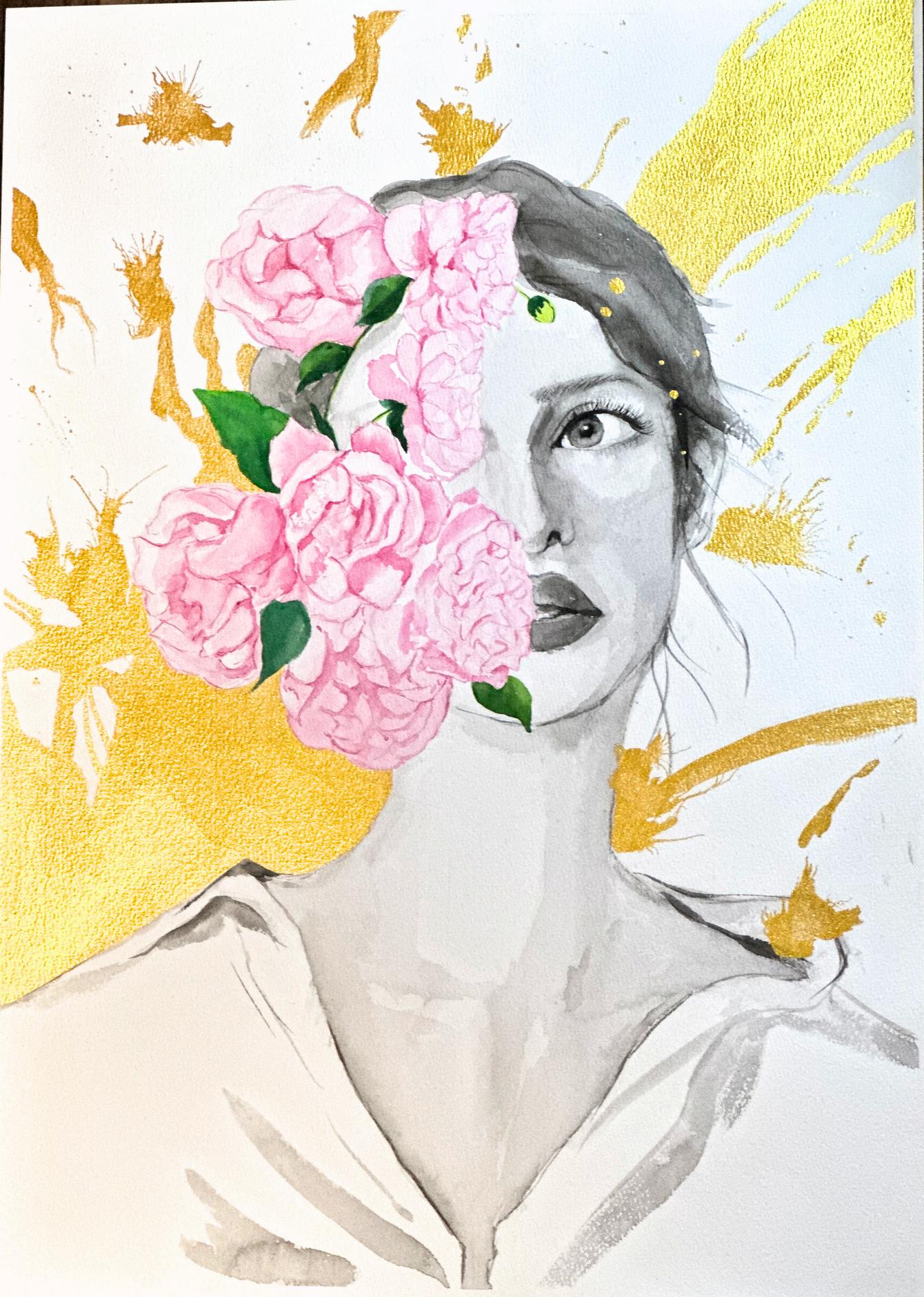
My artwork is a reminder of our intrinsic beauty, about how beauty blooms from within you, that no matter how bright everything around you is, there is always a place for you, and that you are important to the people around you Just like flowers in nature.
The artwork not only has personal connections to myself but also many around me, as I'm sure many people have felt lost and purposeless in life I chose to use black and white for the girl, as it symbolises how one might feel colourless, and ordinary. Contrasted with the pink roses and a golden background that is quite random and abstract, it shows the uniqueness each of us possesses. I took inspiration from Salvador Dali's "Surrealist Flower Girl", using the idea of roses and the colour gold.
I used pictures of roses and a girl and placed them together so that they combined well, and then used gold acrylic paint in the background and a straw to spread it out in random shapes and areas. I have learned that although others may look like they have a wonderful life, there will always be times when you feel powerless and overwhelmed. You should not let those feelings consume you, as you have the potential for a brighter future that awaits.
i see myself, in the little things that have made me i am in the town cats with crescent moon eyes full of undiluted joy i am in the fields with the wind in my stems and freedom at my tips i am in the street lamps with light to bring hope come night but I am not whole am i content?
i am thirsty and drinking water yet my thirst lays unquenched no, i am not the thought comes chasing at my coattails once again. am i fated for more than this?
S pThis artwork reflects my current situation and feelings. The person in the middle is myself I love the messiness of the splashes because they show all of my ideas are bundled up, and I may have a lot of ideas, but I often don't really know how to express them properly The colourful splashes on the background represent all my ideas about everything, my creativity and my passion for the things I like. But when my mouth is shut, I am often too shy and nervous to express them, which is what the red splash across my eyes represents, trapping me and preventing me from getting a wider view of society, which restricts my creativity.
I called this artwork “Spills”, because I want to let the viewers know that, in creativity, an idea that you feel connected to is so rare, so if you find something you resonate with, don't be restricted by your shyness. Spill it out, because there are no limits for creativity
I cannot answer
The wind blows gently against my back as I lean over the railing overlooking the vibrant plains of my hometown. The sun is rising, and I think to myself it is as beautiful as it has always been, yet always a new work of artistically blended golds and honeydews. And bringing with it a new day and new possibilities. I don’t know when it started, but those possibilities grew dull and mundane, and every day began to mould into one long era of my life. The only times when life would not be so black and white was when the sun rose and it set. Yet even that is the same in its movements. We rotate around the sun once every 24 hours and although the art that comes with it is different each time, I cannot help but notice the base of it all is the same.
And there is no way to escape it.
But then again, is there really a need to escape something so beautiful? Sure, the cruel repetition of each 9-5 feels like it will never end but at least I have the crisp mornings and the soft comforting nights to myself.
Even then, this thought of being trapped in this cycle haunts me as I make my way down to the fields , past them and their habitually neverending plains. I stutter in my footsteps as I trip over a rock—I hadn’t done that here before—and int town.
The thought haunts me less now that I can see the bustling crowds ready for a bright and early day of work. It becomes less than a whisper in my head when I make my way past the town’s renowned bakery, past the centre square fountain that has stood there for centuries on end, even as the town around it changed. I sit on my bench, as it has always been since the day I got my first paycheck from my first ever part-time job at the library.
I make to open the loaf I’d bought—again, as always—from the bakery, and I realise as my eyes overlook the streets that line my childhood that I am in them. I am part of it all. I am in the bakery that sells freshly baked loaves each morning before the rooster cracks open an eye, I am in the fountain that flows water that shines so iridescently that it seems crystallised, I am in the flowers that hang from the awnings of every store on the main street.
And I think repetition may not be such a bad thing after all, if life is always this serene, who am I to complain?
Who am I?
I am made of memories.
by Rylee Yeo (Y11, Anderson)
(Graphite on paper)
ChiefEditor:
AnnieYiu(Y12,Anderson)
HannaKim(Y12,Anderson)
Artists:
ChloeLau(Y12,Keller)
HannaKim(Y12,Anderson)
AnnieYiu(Y12,Anderson)
CindyWong(Y12,Anderson)
AlexKwong(Y12Peel)
YutongYan(Y11,Keller)
CynthiaLi(Y11,Keller)
VannessaHo(Y10,Anderson)
ChiseIwakawa(Y10,Anderson)
ArabellaChong(Y10,Gellhorn)
SofiaHuang(Y10,Gellhorn)
NgaKiuHo(Y10,Gellhorn)
EmilyLi(Y9,Anderson)
AngelLee(Y9,Gellhorn)
MaisieLiu(Y9,Wu)
KaitlynYong(Y7,Nightingale)
QQChau(Y6,Parks)
CoverArtist:
BethanyKerr(Y12,Wu)
Photographers: JordanLau(Y12,Gellhorn)
Writers: RaynaYang(Y10,Gellhorn)
RyleeYeo(Y11,Anderson)
Editors: CherryHo(Y11,Keller)
AnnieYiu(Y12,Anderson)
Formatters:
AngelaWei(Y12,Anderson)
HannaKim(Y12,Anderson)
AnnieYiu(Y12,Anderson)