JURIED BFA EXHIBITION 2O23
HATTON GALLER Y
DEPARTMENT OF ART AND ART HISTORY
COLORADO STATE UNIVERSITY

HATTON GALLER Y
DEPARTMENT OF ART AND ART HISTORY
COLORADO STATE UNIVERSITY
Released to accompany the Juried BFA Exhibition 2023
May 04 – August 9, 2023
Cyane Tornatzky , Co-Curator and acting-director of the Hatton Gallery
Silvia Minguzzi , Director of the Hatton Gallery and Catalog Designer
Andrea Bagdon and Spencer Gillespie , Exhibition's Jurors
Anna Bernard, Director, Stanley G. Wold Resource Center
Photography by BFA Students
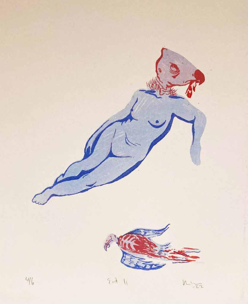
Students & Artwork : Silas Nelson, Loop Form 3-5; Miles Buchan, Spectrum; Trinity Richardson, The Jones Home; Sophie Nance,Our Choice is the Right Choice; Logan Causey, Basement; Cameron Douglas, Red Room; Rachel Garrison, Watch out; Noemi F. Gonzalez, Como se dice? Kickin’ it; Kelsey Gruber, Leaned; Brian Raftery, Hands Off Poster #2; Emma Mourfield, Teapots; Ava Schuetter, Disruptive Cycles; Dorie Keck, The Rabbit and the Coyote; Emily Pfanstiel, Dissonance; Diane McGovern, Eat II; Grace Baldwin, Signs of Aging; Sabrina Moskoe, Galactic Ground; Cameron Douglas, Rollers; Carlos Adonay Moreno
Loachamin, Overload; Riley McGill, DW; Malia Berry, Les Cauchemars; Kelsey Gruber, In One
Out the Other; Amanda Rooms, Voyeur; Erik Reynolds, Continuous Synapse; Molly Haynes, Owl Vase; Rongxian Xu, Lotus; Becca Hotra, Satanic Panic; Dillon King, Drunk Driver Hit and Run; Lucille Wright, Duck and Cover; Dominic Nagle, Wall 1-3.
JURORS' STATEMENT.............................. 3
BFA CAPSTONES ............................. 4
©2023 Hatton Gallery, Department of Art And Art History, Colorado State University Visual Arts Building, 551 W. Pitkin, Fort Collins, CO 80524-1770
hatton-gallery.colostate.edu
As MFA graduates of Colorado State University, we, Andrea and Spencer, are both honored and delighted to have been chosen as jurors for this year's Annual Juried BFA Exhibition.
The Hatton Gallery has been transformed into a vibrant space, showcasing an exceptional collection of artworks by recent graduates who have earned their Bachelor of Fine Arts degrees from Colorado State University, majoring in an array of disciplines. Having had the privilege to teach some of these students during our first year as grad students, we feel a deep sense of pride and excitement as we witness their growth as artists. Colorado State University holds a special place in our hearts, and being able to contribute to this exhibition as jurors has been an incredible honor.
The selection process was quite challenging, as we were presented with an abundance of outstanding work. The final pieces not only resonated with us on a personal level, but also demonstrated an insightful engagement with contemporary issues surrounding identity, culture, and society.
Earning a BFA is an extraordinary accomplishment, and we would like to extend our heartfelt congratulations to all the graduates. The Department of Art and Art History at Colorado State University has fostered a nurturing environment where students have honed their skills, expressed their unique perspectives, and prepared themselves to make meaningful contributions to the art world.
As these artists embark on their professional journeys, we eagerly anticipate the ways in which they will continue to shape the landscape of the art world. We are confident that their talent, creativity, and dedication will lead them to great success.
Once again, congratulations to all the participants and graduates. We look forward to witnessing the evolution of your artistic careers and the lasting impact you will undoubtedly make.
Sincerely,
Spencer and Andrea La.dy.Like Art Project | Cofounders Jurors for 2023 Juried BFA Exhibition 2023Loop Form 3-5, 2022
Pottery
Artist Statement
In my body, I shoulder the burden of a heavy record: a record given to me, and the reckoning that has followed. In the clay, I capture the record in an instant moment. The body is the conduit. Hands, wrists, and the weight of a body wrestle clay into a workable submission. Forearms and fists pound and slam the clay down into immense slabs. The back, legs, and chest strain under the clay, turning it and willing it to become a body of its own. The two bodies then enter a conversation of compromise, each giving and requesting amends from the other.
Each piece finds structure in either a grid or a landscape, seeming opposites that are two sides of the same coin. Both can hold space for the same stories. My pieces vibrate between putting on air and collapsing into the visceral. Plastic, gleaming surfaces, and precise lines betray the eye, as scrutiny reveals an inescapable vulnerability in even the most manufactured pieces. Other pieces eviscerate this same vulnerability into something raw, peeling, contorting; naked with nowhere to hide.
My most recent works explore coding of interactive stories and games, using film to push the narrative of a world that intersects our own, bringing the cryptic and unsettling into a more personalized experience for the viewer/participant. This has been used in various projects of mine, from a coded website ( Cryptids’R’Us ) to surreal videos ( Merging ) and my biggest undertaking, a work in progress titled Cryptic Calling which will be a fully interactive game made in Unity. I hope to get people thinking about their own folklore and how, despite advances in technology and medical understanding, our modern minds continue to adapt and maintain these cryptic traditions in our lives.
Drawing
This series serves as an exploration of my personal condition and experience with extreme light sensitivity and “legal blindness”. Between the binary of the sighted and the blind exists a spectrum of perception, that drastically affects lived experiences. As an individual with Oculocutaneous Albinism 1, my sight varies and depends greatly upon my surrounding environment, particularly when it comes to light, movement, and scale. This has impacted my life beyond my own understanding, as it is all that I’ve known. As I learn more about myself and the world around me, I begin to question how deep these implications lie.
I’ve addressed and confronted this reality in both scale and material including paintings, sculptures, experimental drawings, and installations.
For drawings and sculptures which exist three-dimensionally, I am interested in exploring and manipulating the effects of light, physical space, and orientation to engage with viewers' own senses. For twodimensional work, I focus on some of the same qualities through composition. Utilizing color, contrast, and pattern to create a sense of space that interacts with the viewers' perception to create meaning. As a visual artist working with a visual disability my style, process, and finalized work are all informed by both preference and ability. Whether I’m creating something meant to be representationally naturalistic or fully abstract, I must work and negotiate with my eyes and sight throughout. classifications but borders on many.
MILES BUCHAN
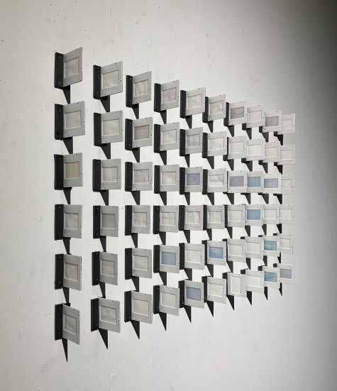
Spectrum, 2022
Mixed media
The Jones Home , 2022
Photography
Artist Statement:
I have long been interested in the personalities of people and how their personal spaces reflect who they are as an individual. The nature of how people interact with their own environments is very interesting. A lot can be observed about a person through how they decorate and live in their home. These photos show the personal spaces of people throughout Colorado. The goal of these photos is to see a portrait of an individual through observation and assumption without actually seeing or knowing the person who occupies the space photographed.
All fifteen images in this portfolio are archival inkjet prints made with a DSLR camera.
TRINITY RICHARDSON
The Jones Home , 2022
Photographic Image Making
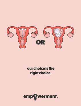
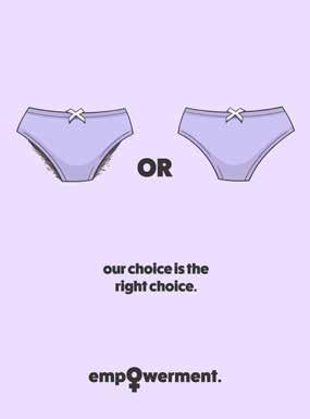
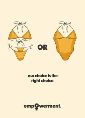
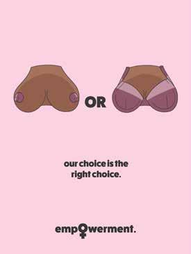
Our choce is the right choice , 2022 Digital Print
Graphic Design
Artist Statement:
I was fortunately encouraged growing up that my career should reflect my passions in life. I always craved a fulfilling career path that had an emphasis on empowerment. As time went on, I came to the realization that my potential lies in art. I valued my art classes in primary school because I could use the pieces I created to express myself, find peace of mind, and advocate for change.
I initially wasn’t aware of what medium would be my expertise, but like fine wine, it developed through age.
Before graduating high school, I decided my concentration in college would be Graphic Design. I chose Graphic Design because I saw activism, opportunity, success, and growth throughout the practice. I then dedicated my creativity along with my willingness to learn in order to exceed expectations in college.
My college education allowed me to discover that I have strengths in typography and illustration; although, I find strength in combining both elements to create balanced design work. Because of my experience in the Graphic Design program at Colorado State University, I am well-versed in Adobe programs such as Illustrator and InDesign, along with being self-taught in Photoshop. A current theme in my design work could be described as minimal, yet communicative. I design in a fashion that a project’s intention can be effectively interpreted by my target audience without excess distraction.
My design process stays consistent throughout each project I complete. I highlight that throughout my process, I receive feedback from my colleagues to gain additional perspectives. I begin by conducting research; this usually involves thoroughly reading scholarly articles, taking notes, finding inspiration from other artists who have similar conceptual
development, and asking questions. I then move on to sketch with pen and paper, creating quick thumbnails to get down foundational ideas. After sorting through the weak and strong components I have developed, I then transfer my work into Adobe software that best suits my direction. From there, I explore typefaces, color swatches, document sizes, different brush strokes, etc. I work on layers to build up and refine sketches and layout. Once my peers and I feel confident with the final product after additional critique, I print and format my work so it can be displayed digitally and/or physically. It’s important to note that around the end of my sophomore year of college, I became motivated to use my design skills to advocate for third-wave feminism and gender equality. A majority of my projects since then have targeted gender issues such as sexual assault, representation, menstruation, self image, and gender norms. My gravitation towards creating feminist projects throughout the last couple of years is derived from my personal experiences as a woman in America. I aim to create powerful and visually effective pieces to emphasize the injustices that women face in their daily lives. Through my design work, I desire to spark change that will make not only our country, but the world, a more equal and safe place for women to flourish.
SOPHIE NANCE
Our coice is the right choice, 2022
Digital Print
Photography
Artist Statement
I am passionate about design that communicates a message in a simple, effective, straightforward manner. I like to approach design as a puzzle, while there are endless possibilities and variations to a design there always seems to be a specific combination and layout of elements that just “fit”. Many of my designs center around typography, I believe it is crucial to the integrity of a design to treat type as a visual element that not only needs to communicate a message but first and foremost must seamlessly blend into a composition.
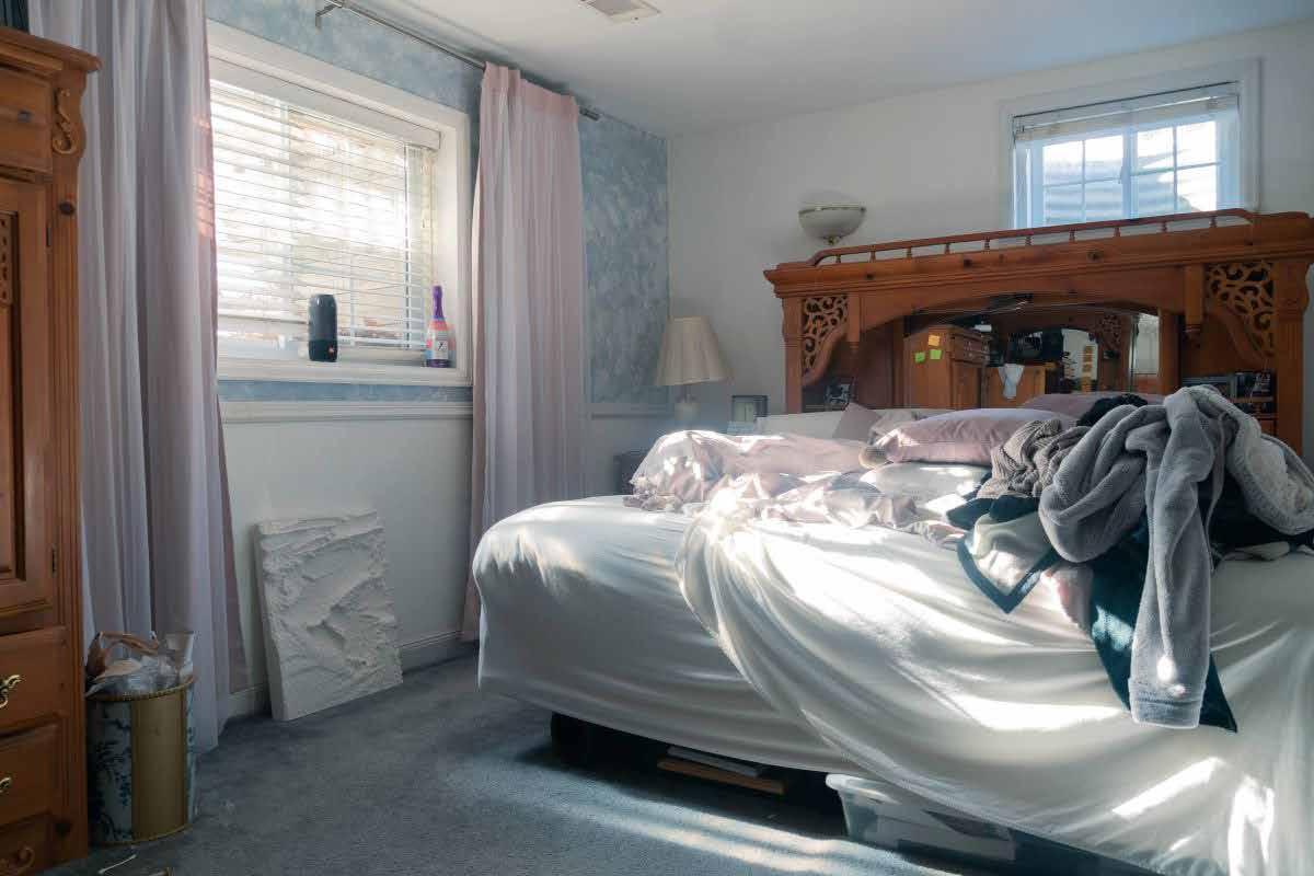
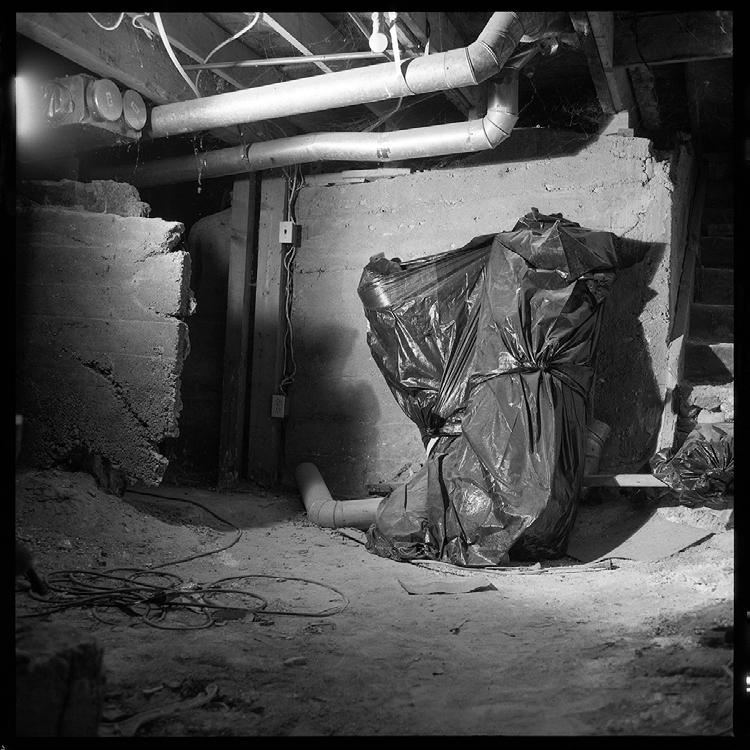
LOGAN CAUSEY Basement, 2022
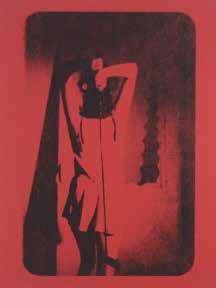
Red Room, 2022
Printmaking
Artist Statement
Red Room is self-portrait of the artist taken by Renee Shu@leworth. Red Room is a part of a larger performative series depicts authentic feminine rage through various still-shots of a woman committng acts of violence. The series is intended to juxtapose modern medias diluted imagery of an infuriated woman.
The full series is futured on the artist Instagram page: @ro@en.prints
The human imagination holds critical roles in our lives. It can create places in which we seek excitement and safety outside of the real world. It can assist in problem-solving or understanding emotions. It is unique and private to each individual and something we can consistently control. Furthermore, our imagination is influenced by our memories, opinions, experiences, and subconscious thoughts. Imaginary worlds are a way of exercising our experiences and, in turn, serve to understand ourselves. My works are focused on my internal dialogue that is brought to fruition through my imaginative processes. Before starting each piece, I choose a specific concept or experience that I want to explore emotionally. While working with my canvas, I allow my imagination to wander, creating characters and narratives throughout. Being in complete control of this process has been reminiscent of the times when I would play with dolls as a child. My canvas serves as a safe space to engage in the playful and straight forward child-like thought process while coming to terms with complex emotions.
Creating in such a way has blessed me with the ability to create hand in hand with my inner child and present self. It has given me the fulfillment of exploring emotions, controlling the narrative, and providing fulfillment for myself. By emphasizing imagination in my work, I have found a great understanding of who I am. My paintings range from silly, angry, and distorted, all of which reflect the state of mind when grappling with complex emotions. Each addition to my painting is a glimpse into my intentions and feelings, even when they are random choices. My paintings have become a messy reflection of my entire being and the complexity of life and self. It has given me a window to see myself and how I operate. Artmaking has become an interaction with my adult self, my inner child, and my canvas, all tangled into one conversation.
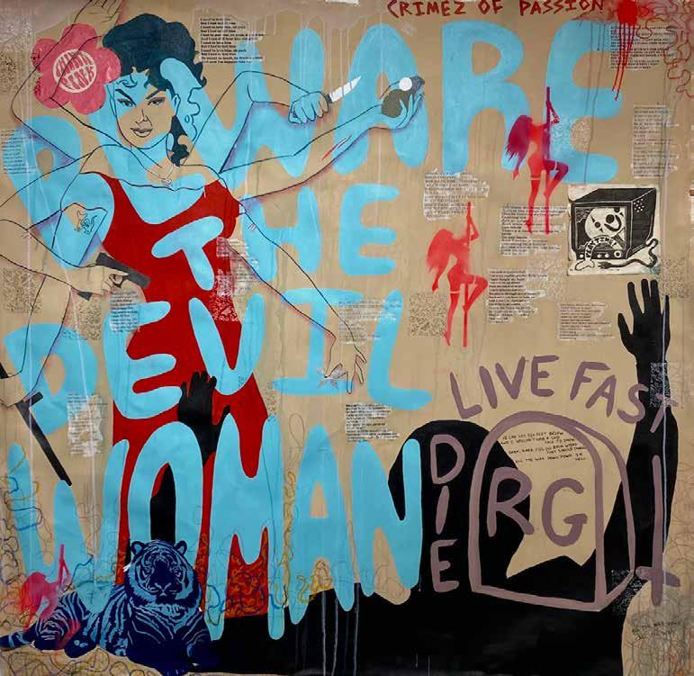
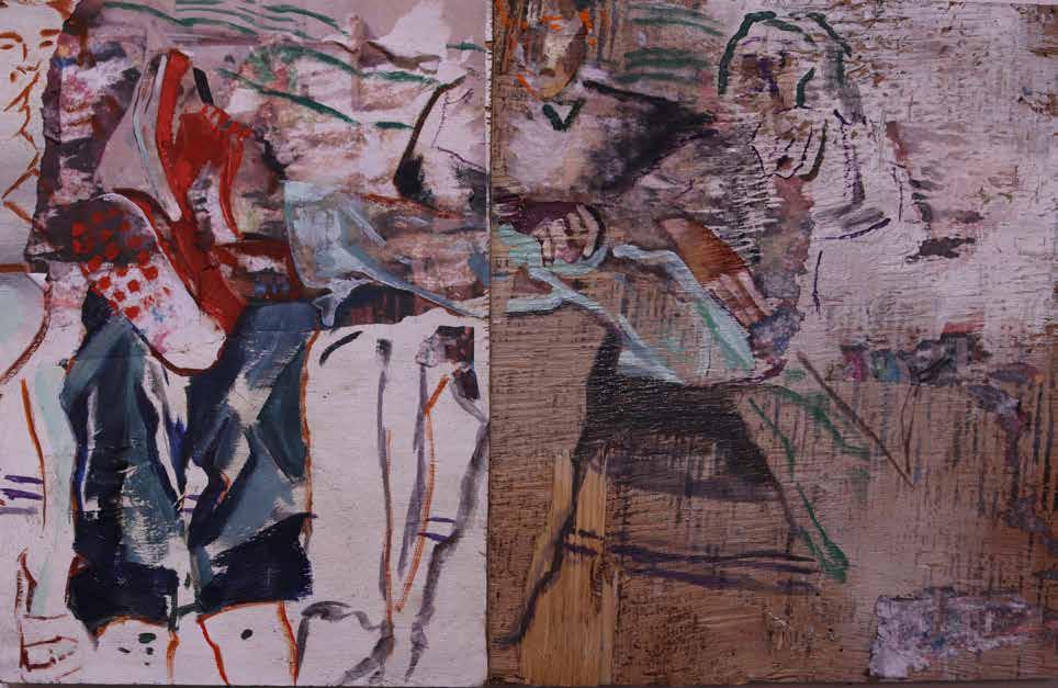
RACHEL GARRISON WATCH OUT, 2022
Mixed Media
Working primarily with found objects and collage elements, my oil paintings deal with social issues pertaining to race, class, and immigration. Informed and often inspired by personal experiences, my paintings shed light on the complex immigrant experience through everyday life’s moments while also surfacing hardships pertaining to race and class. I work with an array of found material that is relevant to these issues, such as wood or drywall retrieved from construction sites, found imagery from magazine interviews, and personal abandoned family photographs. I see these themes working in conjunction with the process of collaging, sanding away, painting over, concealing, or revealing. Through this, my work grapples with reconstructing narratives, materials and their context, the found and lost, the past and the present.
Artist Statement
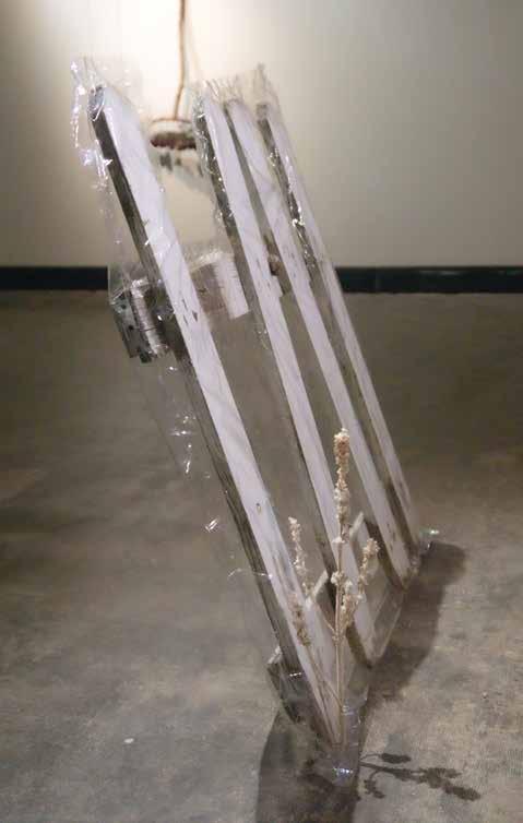
My work explores the phenomenon of death as a portal. I transmute antiquated objects into something new through various types of preservation. I let most of my materials come to me through happenstance, or what I believe to be fate. This implies that the materials have died in some way, whether it be a literally dead specimen or a metaphorically dead object: one that is obsolete, or has been given up by its previous owner. I take these objects and I conserve their liminal attributes in a way that protects, honors, and holds as sacred. I use vinyl plastic furniture wrap to preserve larger found objects that associate to the daily home (chairs, fence). I custom “tailor” the plastic wrap to each object and hand-sew the wrap along with the “ruined” parts of the found object; perceived brokenness. By honoring the broken parts, the pieces are given a new meaning and new life through preservation. For more natural materials like the wasp nests and dead flora, I apply coats of clear protective spray enamel to harden their structure and in some cases to add shine. This elongates their lives and “freezes” them in the state of death - this state becomes a portal to rebirth. By combining notions of overgrowth and death with preservation and protection, my work creates a liminal yet everlasting portal.
This transformation shifts our common narratives around death into something continuous rather than something that is final. I have been curious about death from a young age, and I needed to come up with a way that I could connect with death in a factual, but meaningful way. Death does not only exist in the cessation of life: it exists in creation and all throughout life in terms of rebirth. Death is not an end, it is in fact a cycle that is as close to us as our waking lives. Between these moments of constant death and life is where I find the fibers of creation; the poetry of existence; the honey and the egg.
KELSEY GRUBER
Leaned, 2022 Sculpture
Hands off, 2022
Digital Print
Artist Statement
My design practice revolves around finding fresh unique ways to communicate, whether it be through experimental typographic placements or combining very different mediums within my compositions. My favorite part about the design process is the ability to work from a basic set of rules and then bend those rules in order to creatively express oneself. In my practice, I insure that there is a personal touch seen in my work that you wouldn’t see in anyone elses work. While many people can create work that “does the job,” I put in the effort to create work that stands out among the rest.
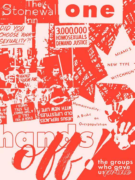
With the experience I have had working with clients, I have put in the effort to exceed the set expectations. Having extensive knowledge of the Adobe Suite, especially Photoshop, has allowed me to be able to succeed when working in professional and non-professional environments. Taking time to properly research and brainstorm before diving into any programs is an important part of my process as well. Being able to show potential clients the effort I put into making sure that the designs I create are the best they can be at representing them is something I take pride in. Outside of professional environments, I create work that relates to causes I care about. I have designed multiple posters, as well as a full mockexhibition, touching on LGBTQ+ topics. As a queer designer, these works mean a lot to me personally. Not only do I learn new techniques and build on my skill set, I get to work on something that I’m truly passionate about. These are the works that I believe best represent my design practice, as they are the perfect display of my current skill set and well as the type of work I like to create aesthetically.
BRIAN RAFTERY
Hands off, 2022
Digital Print
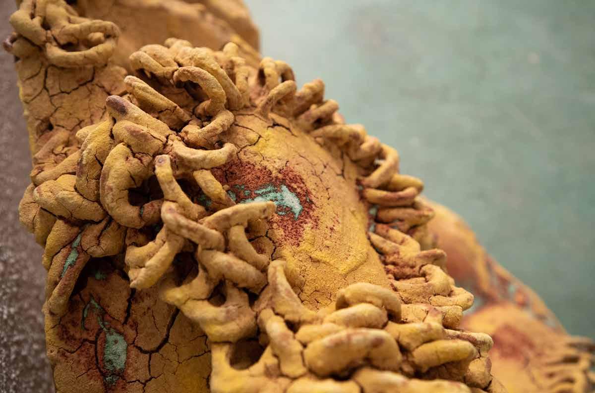
Pottery
Artist Statement
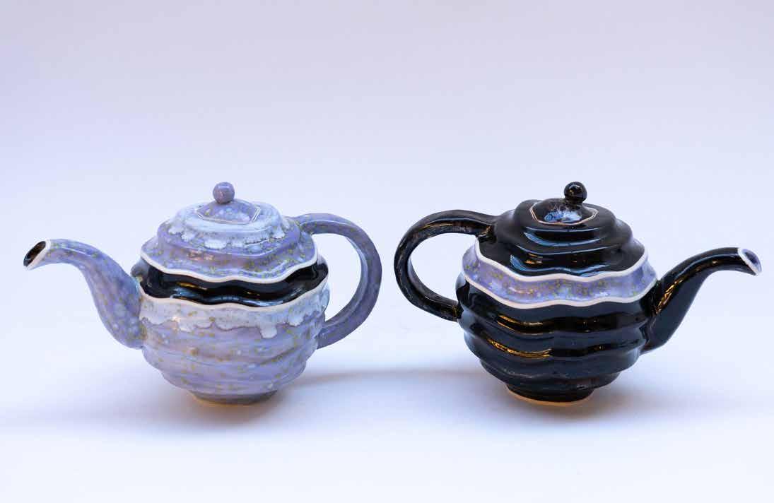
Clay is a material that has a strong connection to the body, making it important for me to emphasize process and hand work within my practice.
Because clay is inherently malleable, each touch creates a physical memory of the artist’s hand. This bodily connection is shown within my work through focus on small details and finishings, instilling an intimate sense of personal touch in each piece. In order to further the personal connection between the medium and self, I often reflect my own style and autobiographical narrative into the pieces that I create. Using stoneware, porcelain, and casting slip, my work ranges from traditional wheel thrown pottery to slip casted sculptures. Within my body of work, I touch on subjects of form, beauty, design, self reflection/ image, control, irreverence, humor, and play.
Artist Statement
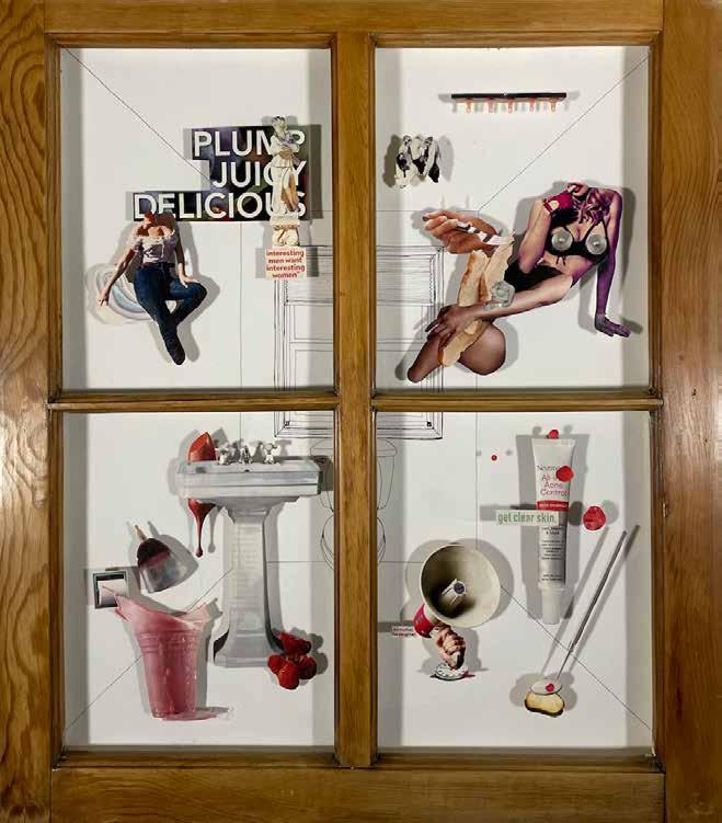
The art I create allows me to navigate through the various transitions in life. Between the materiality and the process of making each piece, I can confront what is troubling me and attempt to understand it. I wouldn’t say this process allows me to fully overcome every obstacle, but rather gives me the space to approach them in a comfortable, therapeutic way. Recently, I have explored themes of mental illness, gender, sexuality, and family.
A commonality between all my work is material. Sourcing materials second-hand is a large focus of my process; I believe there is value in continuing the life cycle of objects that already exist, rather than buying something just to be used once.
This largely stems from my fears for the future of our earth, but there is some satisfaction I draw from reimagining how something can be used. For instance, using an old, gifted window to become a wall installation about my experience of being a woman. I strive for my work to feel familiar, but make viewers question what parts of themselves might need some more care.
AVA SCHUETTER
Disruptive Cycles, 2022
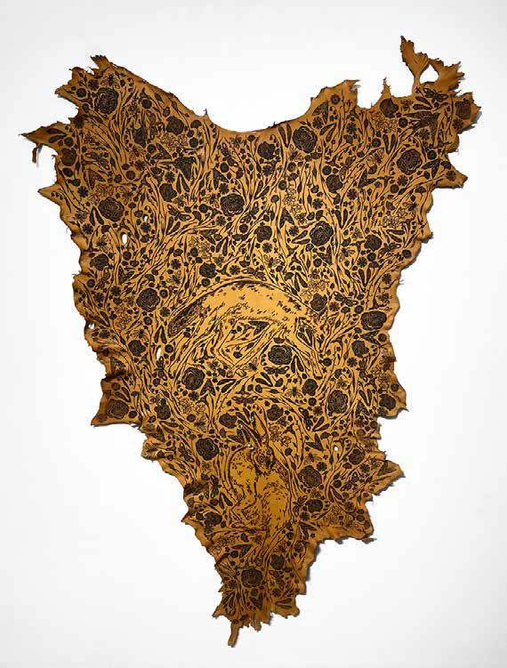
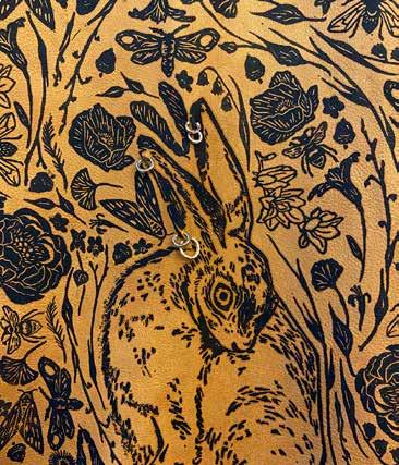
Much of my artistic process involves the revising and reworking of a piece. Often, I will finish something entirely before deciding that an integral part of it needs to be changed and restarting. The Rabbit and the Coyote was no exception to this and changed drastically from its initial conception. Through the process of making the first iteration, a simple, smaller piece of a few rabbits and some poppies, I realized that what I really needed from the work was something much more personal.
The Rabbit and the Coyote is an exploration of personal trauma using animal characters as stand-ins for the real characters in my story. In making this, I hoped to bring up ideas of the kinds of marks made on and to an individual, both consensually and nonconsensually, predation, instinct, and assumptions. The surface was a large part of inspiration for this; I found a decades old animal hide second-hand and it instantly changed the course of the piece. What is leather other than a non-consenting body? To this non-consenting body, I printed and pierced, covering nearly every inch with my own marks and camouflaging the danger of the coyote’s predation towards the rabbit.
Though this piece is very different thematically from my typical work, it still includes a kind of storytelling and a heavy emphasis on ornamentation, both very intrinsic to my artistic practice. The story of the coyote and the rabbit is a difficult and traumatic one but through this piece, I have found a way to speak about it, and in a lot of ways this feels more precise than words could ever be.
Drawing
Artist Statement
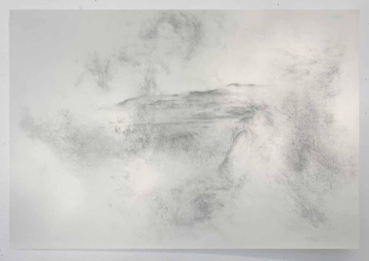
I create illustrations based on altered realities. My latest series tackles one of the final stages of grief, a long-term existence in one’s mental fog. This concept was then split into bodies of work dissecting the recognition, recollection, and relinquishing of grief. I find great significance in the use of memories and their deterioration over time. Whether caused by physical displacement, a migration, or a grief of loss, I use these moments to visually demonstrate how individual realities are impacted by psychological pain. Often those in bereavement carry the collision of past and present to their experience of everyday life. This projection is where I feel most compelled to approach the corrosion of a memory.
I follow a love for architecture, as one’s most intimate memories are attached to their home environment. I introduce landscapes, as their appearance cycles with the change of season. When we hold nostalgia to moments of time, this is often attached intrinsically to an item symbolic of those memories. With memory, my images contain personal references to objects of attachment, or the social life of objects. This could be explained like the vision of an old notebook, a well loved blanket, a torn photograph, or the fences of a home you won’t return to. There are connections to our environments that continue to bring us fulfillment after they have served their purpose. It is emotional to recall the past and have it fade unconsciously, but it goes nonetheless.
My media works to demonstrate the context of erasure and disintegration. Alongside the medium, I work with fading a recollection of memory, adding graphite in layers as a rendering technique that disorients the viewer. Thin hatching marks are a repetitive marking tool that I pair with fragments of content. This limits the viewer’s digestion of information, as grief is pain experienced internally and emotionally, lacking physical
appearances. I am drawn towards ink, watercolor, and graphite-based tools. Textures of paper and its application to the narrative play an important role, as my erasure techniques connect with ideas of loss or the absence of something important. Text is also used to quietly support this idea of the finite construct of time. Working with limited material keeps my process evolving deeper into experimentation. Some pieces are fused together as a storytelling element, with a variety of color palettes, materials, and textures to connect into a singular moment of expression. These media allow each composition to evoke the impression of events fading into the fog of memory, or the loss of this moment altogether.
Graphic Design
Artist Statement:
Diane is a graphic designer and illustrator from Montana, though they have lived in a lot of different states. They enjoy bugs, board games, dessert, and drawing. They got their start in drawing when they discovered cartoons and loved how much narrative art can have. They very much enjoy bringing in some elements of narrative and character into her work.
They also enjoy working on colorful and imaginative illustrations in addition to dynamic design projects. Diane loves receiving and conceptualizing work that has meaningful ties to community and social justice and they are especially passionate about using design to apply and promote change. Their work is mostly digital, but they love adding a touch of physical media, whether that be watercolor, colored pencil, or gouache paint.
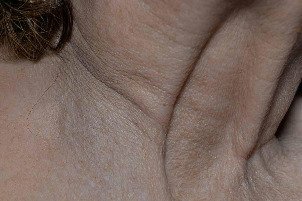
Signs of Aging, 2023
Photography
Artist Statement
I’ve been making photographs since I was in elementary school, capturing memories of my friends, the things we did together, and the places we went. I ended up being an honorary member of the yearbook in middle school because I took hundreds of pictures of the people around me, and joined the yearbook officially in high school so that my endless phototaking of my friends wouldn’t just be for selfish reasons. My love for taking photographs of people only grew when I tried focusing with an artistic lens, and I started seeing the beauty in every part of a person. With the use of double exposure, someone’s face could be mixed with flowers, with the right lens I could capture the intricacies of an iris and the galaxy it contains; and I could show people how I saw them. That’s my biggest motivator: to capture the beauty I see in others and have them see it too.
My most recent body of work focuses on the body. All participants are asked “What’s your favorite feature on your body, and what’s a feature on your body that you think is really interesting?” Often, we focus on the things we don’t like about our bodies, but they’re all so beautiful. Every body is so incredibly unique, and yet we are all the same. Some of the elements I’ve captured are rotting teeth, a stray piece of gravel embedded in a knee, the curve of a back, the most gorgeous eyes I’ve ever seen, and the unique growth pattern of an eyebrow. While I photograph plenty of other subjects besides people in my day-to-day life, people mean so much to me and are so complex that I don’t think I’ll ever have my fill of capturing the beauty of them. People say no two snowflakes are the same, and that goes for people too. The beauty is: though different, we’re all made of stardust and water.
Signs of Aging, 2023
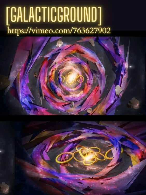
Galactive Ground , 2022
Electronic Art
Artist Statement
I’m a visual designer, new media artist, and researcher who creates art and design.
Driven by interdisciplinary thought that encompasses art, design, technology, and social science, my work explores physical and digital landscapes as well as the human perception of these spaces. Working primarily in digital software and computer programming, I utilize my experience in graphic design, game design, and illustration to experiment with various media such as virtual/augmented reality, animation, large-scale installations, and computer vision.
My artistic endeavors reference and take inspiration from the experiences.
SABRINA MOSKOE
Galactive Ground , 2022
Electronic Art
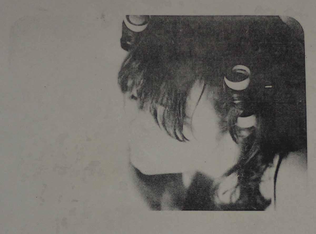
Rollers is self-portraits of the artist taken by Renee Shu@leworth. and is a part of a larger performa:ve series depicts authentic feminine rage through various still-shots of a woman committng acts of violent. The series is intended to juxtapose modern medias diluted imagery of an infuriated woman. Rather than a literal violent act, Rollers represents the period of reflection and satisfaction one feels aPer an appropriate physical release of emotion.
The full series is futured on the ar:st Instagram page; @ro@en.prints
Drawing
Artist Statement
The body of work I have made in the past four years has been a steady evolution in expression of issues with mental health. This evolution has taken place through material exploration and the means in which the message itself is conveyed. Beginning with pen and ink on paper my freshman year, I have ventured into different media and painted, sculpted, animated pieces which are imbued with flashes of self-flagellation, exhaustion, and the weighing down that can occur when one holds onto unrealistic standards for long periods of time.
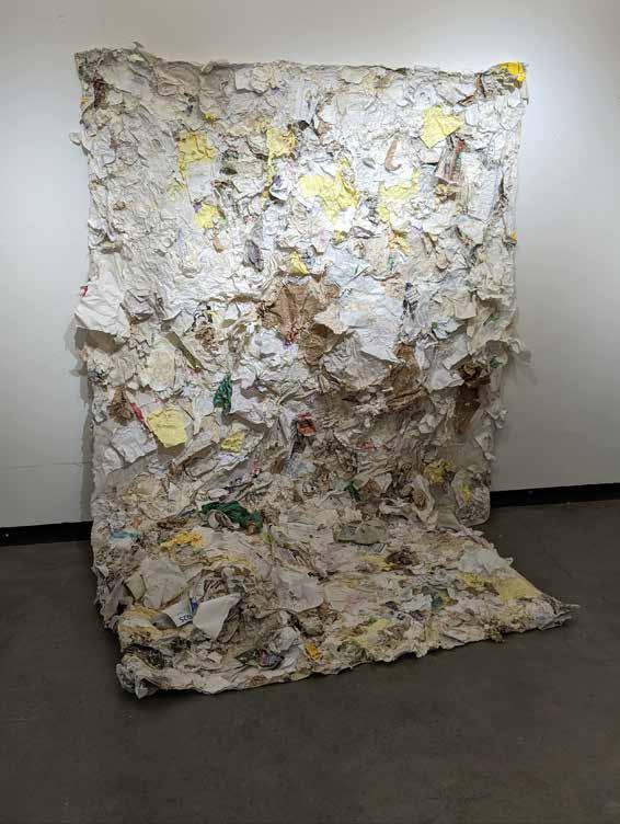
My work is made with the idea of self-reflection in mind. It is inspired by contemporary American mental health struggles, the notion of the sublime, the beauty in representing and growing through feelings of internal pain, guilt, shame and exhaustion. The pieces made this last year in my 400 level Drawing concentration courses have been based upon differing media to make drawings in a three dimensional space. The first work has been made into a video work, a collection of images and video documenting the semester-long construction and following deconstruction of the piece entitled “Cavern” which now only exists in this format. Made with wax paper, acrylic paint, and pipe cleaners, this piece became a place to continue growing it as I wanted to create an overwhelmingly large piece. The second piece, entitled “Inundado”, or the Spanish word for Inundated, was made to convey information overload as portrayed by soaked papers adhered to a large canvas. The work was meant to visually recall flood recovery imagery as naturally occurring floods decimate and contort what they come into contact with, leaving only distinct traces of what was once there. Similar to information overload in young Americans, the effect on the papers and canvas from the manner of adhering the paper leave a blurry, foggy mess to attempt to put together in some sense.
Inundato (Overload), 2022
Drawing
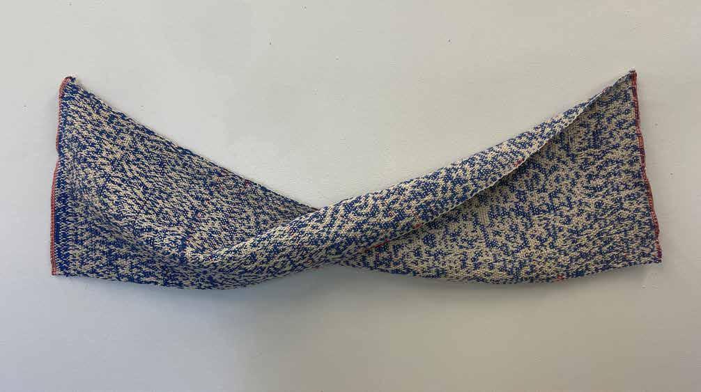
Abstract Double Wave, 2022
Fibers and Graphic Design
Artist Statement
I am a artist originally from Denver, CO, but now am spending my time living between Estes Park and Fort Collins. I am graduating in may ‘23 with my Bachelors of fine arts with concentrations in Fibers and Graphic Design.
In my fibers work, I focus heavily on instinctual process - making quick decisions and doing what the piece feels it needs while deconstructing ideas of traditional processes and ”rules” for methodology. I like to have many small elements and details to look at and feel, while repurposing materials that may have previously been thrown in the trash.
RILEY MCGILL
Abstract Double Wave, 2022
Graphic Design
Artist Statement
My name is Malia Berry and I am an illustrator, character artist, and graphic designer. I work both digitally and traditionally in a variety of styles, using most frequently Photoshop, Illustrator, watercolor, and india ink to create my pieces, though I love experimenting with other media as well, such as animation, oil and acrylic paints.
I draw inspiration from my other interests relating to pop-culture, such as novels, manga, comics, anime, movies, animated films, and especially video games. All of these influence the subjects, themes, and look of my art and characters, showing up in the form of whimsical, fantasy imagery. I believe that art should be flexible, and to limit myself to one theme or subject would be to limit my self-expression. Therefore, the themes in my artwork vary greatly; I touch on both darker and lighter subjects, including topics of mental health, and negative emotions, but use more whimsical imagery to create lighthearted, cartoon-like illustrations and stories. These two pieces discuss the two sides that manifest as a result of poor mental health. Les Rêves represents what we present on the outside; someone who is calm, collected, and socially acceptable. There is, however, the part of our struggles we hide from the public. This alternative is represented by Les Cauchemars, which is unpleasant, tattered, and chaotic. Through these works, I hope to bring attention to the internal struggle of poor mental health - the unsightly thoughts we think to ourselves - and help break down the stigma that comes with it.

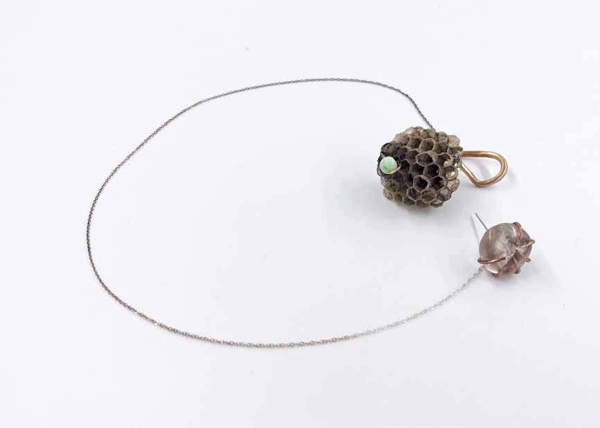
In One out the Order, 2023 Matalsmithing Artist Statement
I am currently exploring the relationship between found and discarded materials in relationship to preciousness and adornment in my metals work. The materials and symbols in my work imply death in some way, whether it be a literally dead specimen or a metaphorically dead object: one that is obsolete, has been given up by its previous owner, or is a made representation of something dead. I take these objects and I conserve their dead attributes in a way that protects, honors, and holds as sacred. I work specifically with nests and integrating them into the language of craft and adornment. Wasps, birds, and other creatures create their nests out of discarded and dead materials to then create life in, only for the nests to be left behind and discarded once again. This cyclical nature of material is in direct relation to the cyclical nature of life and death; I view these cycles as a portal for new transmutations. These cycles are also a reminder of the preciousness of life and death - to hold death as sacred is to transform our narratives of death into something continuous rather than final. There have been a lot of deaths close to my heart in the recent years, and with little room to grieve amidst the business of getting a degree, I needed to come up with a way that I could connect with death in a factual, but meaningful sense. Death does not only exist in the cessation of life: it exists in creation and all throughout life in terms of rebirth. Death is not an end, it is in fact a cycle that is as close to us as our waking lives. Between these moments of constant death and life is where I find the fibers of creation; the poetry of existence; the nests with their honey and eggs. Death will always feed life, and life will always feed death.
KELSEY GRUBER
In One out the Order, 2023 Matalsmithing
Artist Statement
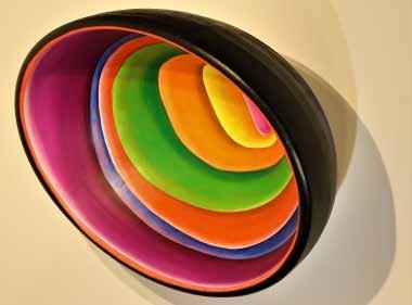
As a multimedia artist whose primary focus is sculpture and installation art, my goal is to let the materials guide my process in creating interactive artworks. My current body of work combines sculpting and painting, centered around my generation’s experience with unsolicited videos found through social media. These videos, which have content viewers don’t consent to consuming, contribute to a lost sense of innocence. Unsolicited content is burned into the consumer's memory. There is no agency in viewing this unregulated media. The work I create focuses on conceptualizing how these videos affect us. The forms in this body of work aim to capture desensitization, curiosity, and uncomfortable spaces.
Voyeur , 2023
Painting
Drawing
Artist Statement
My art is a visual expression of a change in my world. This change is often highlighted through the process I take to get from concept to completion. I do very little sketching or planning for my projects, instead that process and change is integral to the final piece. This dynamic way or creating has lead me to mostly work in series because a series allows me to explore how one idea can morph and change over time. I start with a conceptual phrase that I try to keep each piece aligned with.
As that concept becomes more fleshed out as the work continues, the image gets more and more refined. Generally, by the end of a piece I have moved so far away from the original concept that the original concept has evolved into a different idea all together. However, this new idea contains the same roots as the previous image, and thus is contained in the same conceptual idea. It’s a type of narrative; not a narrative for the viewer to be absorbed in like a Neil Gaiman story, but one that allows the viewer to consider the different possibility’s of a single event.
The majority of my work is done with pen and ink, all be it many different iterations of that tool. Technical pens, brush pens, calligraphy pens, dip pens, fountain pens, all are up for grabs for the different kinds of marks they are capable of making. In many ways my work relies on the exploration into these different marks and how they interact or support/are supported by other materials. The interplay between marks is where a lot of the change I search for is found; out of the rough and chaotic nature of a single mark blooms an endless amount of collective ideas.
A month or so ago I watched a video essay by Jacob Geller titled After a City is Buried in which he main thesis deals with how civilizations tend to build and rebuild each consecutive city or culture on top of the one that came before. My most recent work was heavily influenced by this idea of a changing space or location. Originally I was looking for an inspection into the features that played into the procession from one civilization to another. However this body of work became much more a cases study into how the land and civilizations could change over time.
Continuous Synapse, 2023
Drawing
Pottery
Artist Statement
Clay and painting have given me the space to reflect on emotions, experiences, and memories that I have a hard time putting to words. Both clay and paint hold memory: memory of material, a collective moment in time, and process. My practice aims to explore personal and collective memories of loss, grief, and ritual. In a world of constant change, I reflect on my own personal experiences as a tool to give them a voice so that I can learn to let them go.
My process involves using a range of different painting and drawing mediums from oil to watercolor and ink. In my pottery practice I work with glazing stoneware and porcelain at mid-range temperature. I hope my work can create an intimate space of reflection as we collectively grapple with loss and the changing world. I enjoy researching projects and it is fun learning about how art and objects have always been used to influence society. Art can be enjoyed as part of pop culture or find a permanent place in documenting history. I enjoy discussing and answering questions about my art because it means I have brought interest to a subject or event. Art is always a learning process, and it never gets boring. And so, even if I no longer cry at a Picasso, I still ask - why?
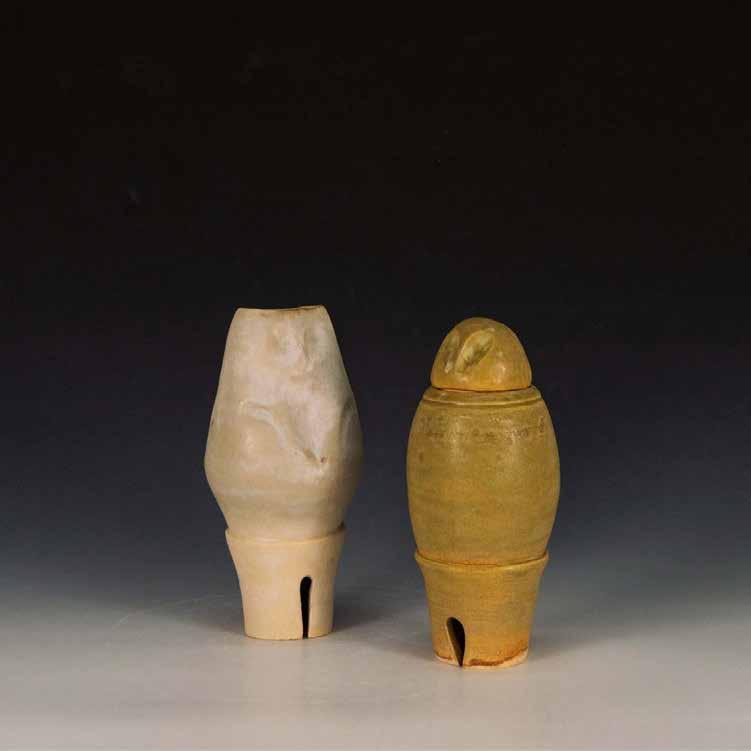
MOLLY HAYNES
Owl Vase , 2021
Glazed Stoneware
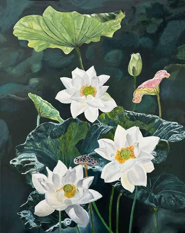
Lotus , 2023
Painting
Artist Statement
As an artist who focuses on drawing and painting still life, my work is centered on capturing the beauty and complexity of everyday objects.
I find inspiration in the way light interacts with different textures and surfaces to create a unique and dynamic visual experience. My creative process begins with the careful selection of objects that will be arranged in a visually striking composition. I pay close attention to the shape, color, and texture of each object and how they relate to each other in the overall composition.
When I begin to draw or paint, I pay great attention to detail, carefully rendering each object in a way that highlights its unique qualities. I use a range of techniques to create depth and dimension, including shading, blending, and layering colors.
Through my work, I hope to inspire viewers to appreciate the beauty in everyday life.
By highlighting the complexity of common objects, I aim to encourage viewers to slow down and take notice of the world around them.
Satanic Panic, 2023
Graphic Design
Artist Statement
My tendency to daydream and escape into my favorite story or imagination as a kid is something that is still heavily reflected in my work today. As an introverted artist existing in such a fast-paced, often overwhelming world, I often like to capture a sense of light-hearted escapism within my work that I can share with others. My work’s influences range wildly: from the nostalgia of pop culture and jaded ironic humor of internet culture to the whimsy and warmth of personal childhood memories-- all captured in the medium of digital illustration and design for the purpose of inviting others into that moment of light-hearted laughter and escapism.
Some of my favorite stories as a kid revolved around the fantastical adventures of talking animals or the mythological interpretations of the natural world. My current focus of work revolves around developing my own animated characters that reflect this childhood passion of mine, as well as being inspired by the work of UK photographer George Kells and Hayao Miyazaki. Not only am I interested in the logistics of bridging the gap between conceptual designs to fully-realized storytelling, but I find that projects of this nature allow me to indulge in a passion for creating charming and loveable characters that I hope audiences can take comfort and joy in. I’ve found myself imagining the lives and adventures of the smaller creatures in our world, and so I’ve taken that approach to my current development of a mouse character and her bumblebee sidekick in a world much larger than her.
While I keep a number of sketchbooks and pens on hand, I most often find myself reaching for my digital design tools, in both my personal and professional work. I find that the medium of digital illustration gives me a flexibility I’ve not experienced in other mediums, as well as the opportunity to explore a variety of options in a short amount of time. I can almost instantly draft an idea and share it with anyone but return to my work and revise it to my liking at any time, in virtually any place.
BECCA HOTRA
Satanic Panic, 2023 Digital Print
Photography
Artist Statement
My name is Dillon King and I’m a photographer. My focus is based around the narrative or the storytelling ability an image has. I use a combination of elements including color and complex composition to assist the viewer in finding an emotive response. A few artists I look towards are Nan Goldin, Gordon Parks, Gregory Crewdson, Robert Capa, and Eddie Adams for their ability to show stories.
With the age of social media, we are fed images over and over again that are shallow in both focus and meaning. While a shallow focus, used properly, has the ability to show us the depths of emotion, I chose to primarily use a wider range of focus to bring in more elements for storytelling. If the image contains a human figure, we are given more potential narrative with every new object we can see clearly. Within an image that doesn’t contain a human figure, I aim to give enough information for deduction of the objects interplay within the frame. I choose to primarily use digital image capturing as it gives more potential for color. Color, a primary focus of my artistic technique, has a profound ability to direct a story due to its association with emotion. Digital gives me more manipulatable information to begin with.
My focus is based around the storytelling ability an image has. I use a combination of elements including color and complex composition to assist the viewer in finding an emotive response, leading the audience to fabricate a story for themselves. Each image is intentionally unrelated for this reason.
DILLON KING
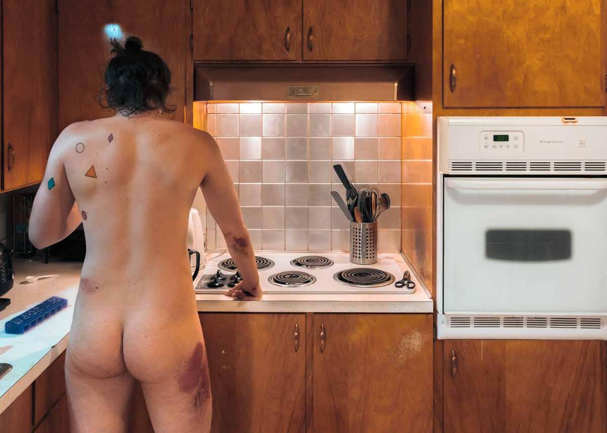
Drunk Driver, Hit and Run, 2023
Photographic Image Making
Electronic Art
Artist Statement
We plant seeds in soil made from decomposed corpses and wonder why the flower looks familiar.
I am interested in how history repeats itself. How our human race manages to run itself in a circle. Animation is to bring life. It comes from the latin root “anima,” meaning life and breath. While I believe my art is alive, its purpose is not to birth something new. My artwork has a much more fungal quality. It lingers between life and death. It secretes itself into the contemporary and takes it over with something fouler. Something old. Digesting in order to create.
I work in a combination of traditional 2D animation, stop-motion, rotoscoping, scanned-image animation, and collected footage.
My pieces combine techniques and imagery.
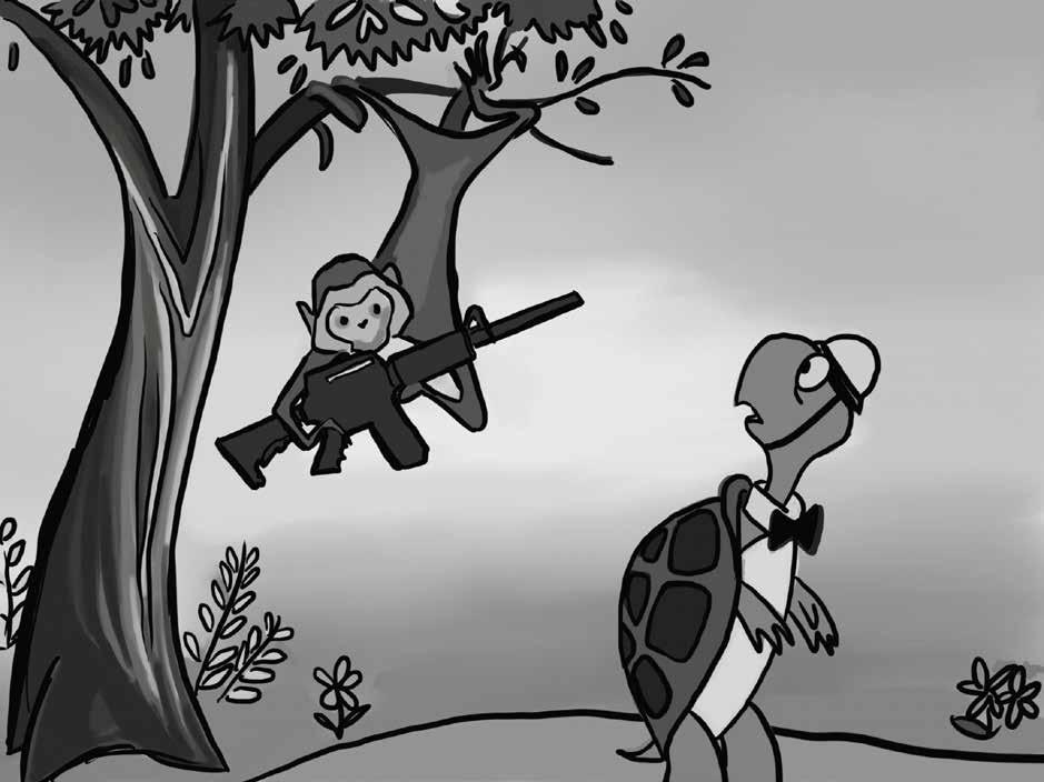
My piece, Duck and Cover (2022) combines 2D character animation with borrowed footage. By combining the gentle illustrations of Bert the Turtle, re-animated from the 1951 Duck and Cover campaign, with footage taken by students, it creates a dissonance. The Duck and Cover campaign from 1951 was a civil defense film on atomic bomb safety. It was made for public school children to prepare them in case an atomic bomb be dropped while they were in school. The video instructs these children to duck their heads and find cover. This won't necessarily save them, but it will make them feel safer in case of an emergency.
I find it repulsive that the government understands children in schools are at risk, and rather than do the work to reduce the bomb threat, they place the responsibility of safety in the hands of the children. It's strikingly similar to the “lock, lights, out of sight” campaign I was raised with. But instead of atomic bombs, this campaign was centered around school shooters. Gun violence and atomic bombs. Protect yourself, kids. I find inspiration for my pieces by looking backwards. What is happening now has happened before. What is happening now is a culmination of the efforts of those who came before us. This fight is an old one. And the fight before it was even older. History has proven to us again and again that we are fickle creatures, set on repeating ourselves. I try to express this in my pieces. The iterative nature of our problems. They evolve. We make progress. But we fall into the same worn-down ruts.
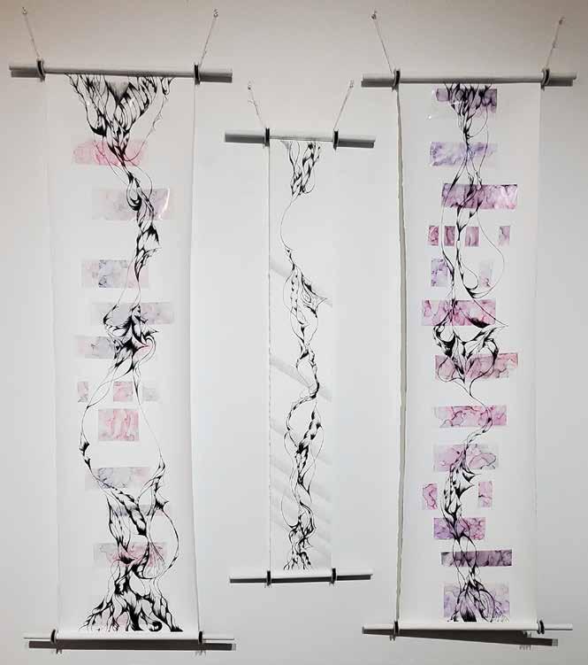
Wall 1-3 , 2023
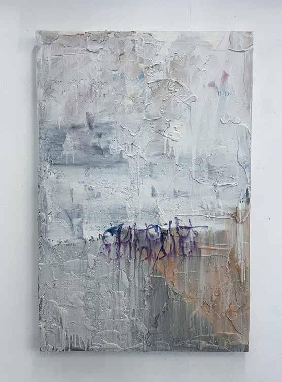
Painting Artist Statement
My art is the result of my perceptions, filtered through my intuition. Whatever the viewertakes from my work is none of my business.
My pieces in this space reflect abstract and instinctive urban art with a concentration on graffiti and street experiences.
