


Fish Island sits on a body of land in east London located between the River Lea and the A12 motorway. It is an area of intense and continual change that has both shaped and been shaped by the shifting tides of economic development in London and Britain.
Ecologically a marshland, Fish Island was a pastoral hamlet on the outskirts of London until well into the 18th century. The development of the Hertford Union Canal and the North London Railway in the middle of the 19th century caused the area to transform rapidly.
With the increased navigability of the River Lea and the possibility of transporting goods and materials both by water and by rail, there was a marked increase in industry in the area. By the 1860s, Fish Island was a full blown industrial town, made up of grids of terrace housing interspersed with factories and warehouses. It became instrumental in producing new technologies and a pioneering site for the production of plastics, petrol, dyes, rubber, and other materials that drove the dawn of the consumer age in Victorian and Edwardian Britain. Factories churned out a steady supply of everything from folding boxes, roasted peanuts and safety treads to waterproof clothing, rubber stamps, banknotes, chocolate and pianos.
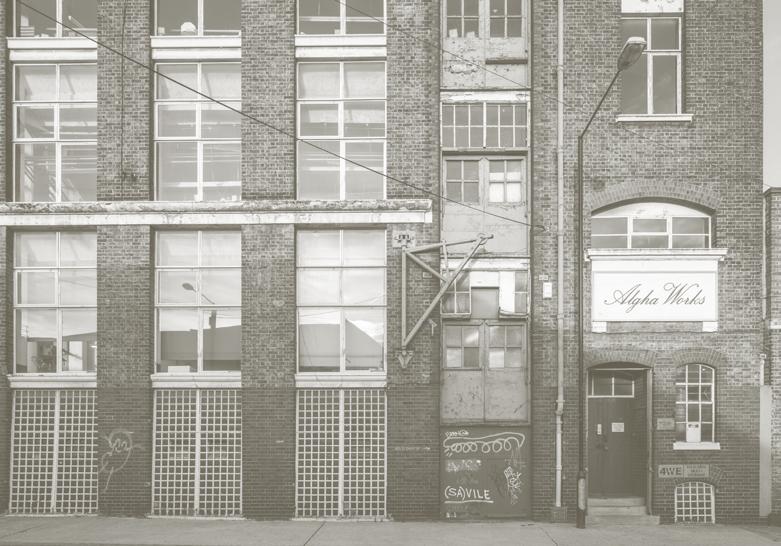
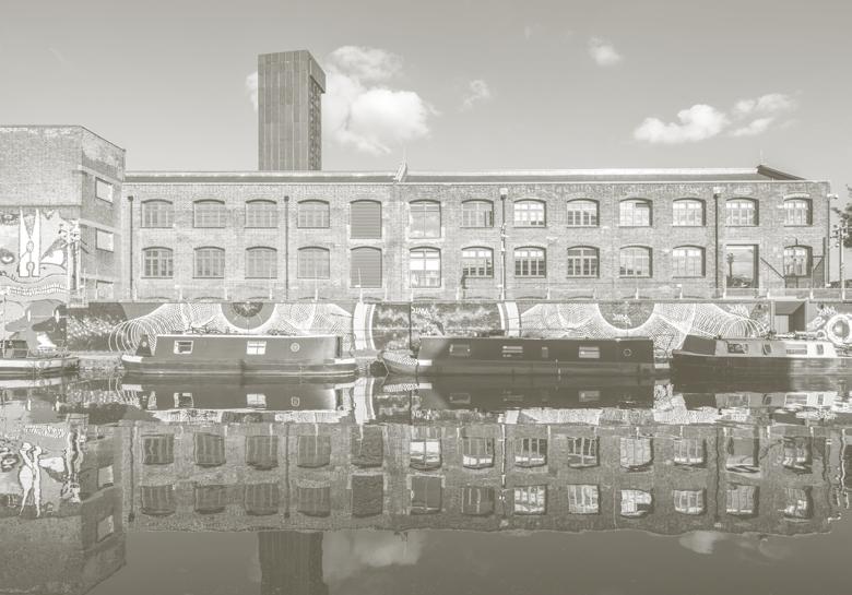
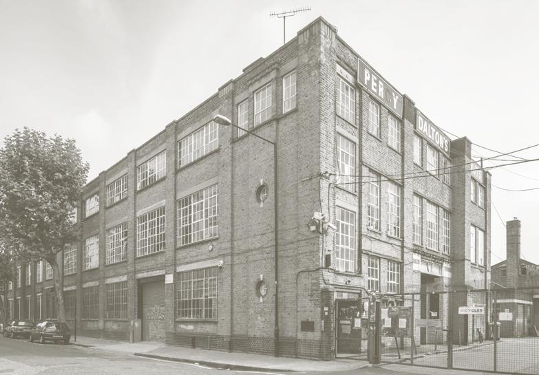
A distinct building fabric emerged that comprised largely mid-to-low rise factories, terrace housing and a street pattern recognisable for its yard spaces of varyingly large or densely clustered layouts. The area became characterised by the prevalent use of varied brick stock and the merging of these more traditional materials with the emerging construction technologies of iron, steel and concrete to form distinctive “hybrid” architectures.
The growth of the area stalled during and following the Second World War as intense bombing followed by slum


clearance greatly reduced the scale of industry. Later railway closure followed by the construction of the A12 motorway in the 1970s further bypassed and isolated a once highly connected part of London.
Post-war development has largely been ad hoc and opportunistic. Empty lots caused by bombing either remained vacant or made way for less labour intensive spaces such as warehouses, low-rise portal sheds and storage yards. The area became typified by a cycle of erasure, unplanned rebuilding and neglect that created a patchwork urban fabric.
However, like many post-industrial sites in European capitals, Fish Island found itself the ideal setting for other activities. Since the early 1980s it has been a home for a new cluster of creative industries and a rich community has grown here in the spaces vacated by industry, with artists and designers attracted by the cheap rent and flexible use of space. A 2009 study on Fish Island and the wider Hackney Wick area found it to contain one of the densest concentrations of artist studios in Europe.
Between 2008 and 2009, the London Legacy Development Corporation (LLDC), working with the boroughs of Hackney and Tower Hamlets, designated Fish Island and Hackney Wick a conservation area in a move to preserve both its material and cultural character. The sites were identified as being in need of redevelopment but also vulnerable to uncontrolled change that would negatively impact the area and possibly lose both the historically important building fabric and the strong communities that were flourishing there. Just over the river lies the London Olympic development and Stratford, where the large towers and dearth of affordable housing speak to the outcomes of rapid property development.
Identifying that change in the area was inevitable but the need for thoughtful and considered redevelopment was key, a number of independent but interconnected schemes began in the Fish Island and Hackney Wick area under the direction of the LLDC.
In this space sits Fish Island Village, a 2.23 hectare development located on the site of a former distribution warehouse. After acquiring the site in April 2014, Peabody and Hill appointed Haworth Tompkins, Pitman Tozer Architects and Lyndon Goode Architects, tasking them with creating a mixed used development to accommodate both residential and flexible commercial space.
The development is divided into three schemes: Monier Road by Pitman Tozer Architects comprises two wings of stacked family maisonettes, with a head block of apartments above ground floor workshops; Lanterna, a pavilion block opening up onto a new public square, by Lyndon Goode Architects; and Neptune Wharf by Haworth Tompkins, which makes up the majority of the site. With the third and final phase completed in October 2022, the scheme provides a total of 588 new homes, 25 per cent of which are designated affordable rent, alongside 5,522 square metres of new workspace.
The Haworth Tompkins team worked to identify and nurture the existing material and cultural character of the area, drawing on historical and contemporary precedents in their process of placemaking.
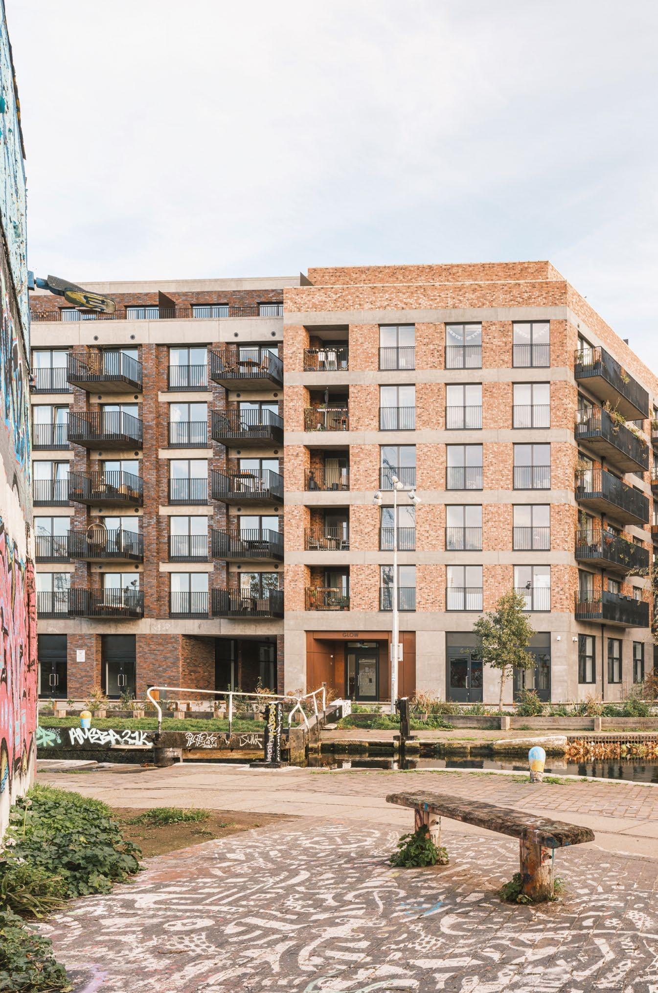
Formally, the buildings take their cue from the historical fabric of Fish Island. A multitude of brick types combined with grit blasted, acid etched and fair faced concrete echo the area’s robust factory and warehouse building stock. The elevations are intentionally heterogenous yet coherent while the plan follows a legible public realm of tree-lined streets and distinctive yard spaces that are characteristic of Fish Island’s historical urban grain. All blocks are named after boats from the Chartered Gas Light & Coke Company that once used the River Lee Navigation, further connecting to the cultural memory of the locale.
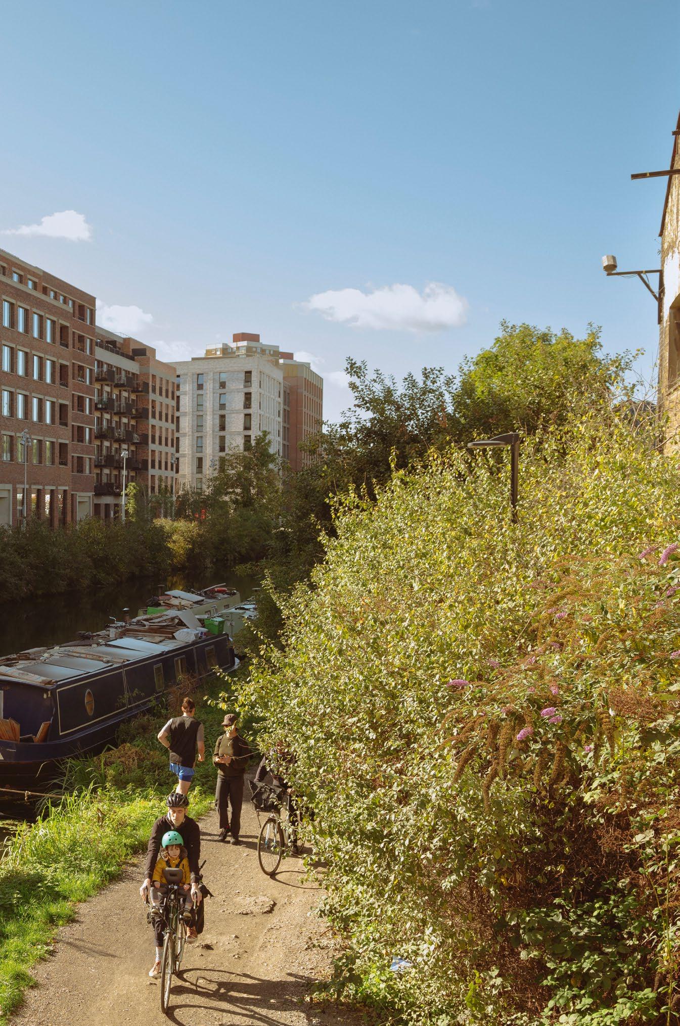
Key infrastructural changes, such as the creation of a new public square and opening up a previously inaccessible stretch of the Hertford Union Canal, have provided increased access to amenities and better connect this formerly isolated area to its wider surroundings. Throughout the development great importance was placed on striking a balance between residential and commercial usage that builds upon Fish Island’s pre-existing network of creative live-work communities. Residential space is of uniformly high quality with a strong provision of affordable housing, while commercial units are occupied and managed by social enterprise and arts charity The Trampery to create a network of studios and social spaces with a focus on fashion design and production. The resulting flexible ground floor workspace numbers 63 studios, making it the largest new complex for creative practitioners in London. Together these measures – both spatial and social – aim to shore up the foundations of a place and harness the potential of urban redevelopment as a means for positive change rather than disruption.

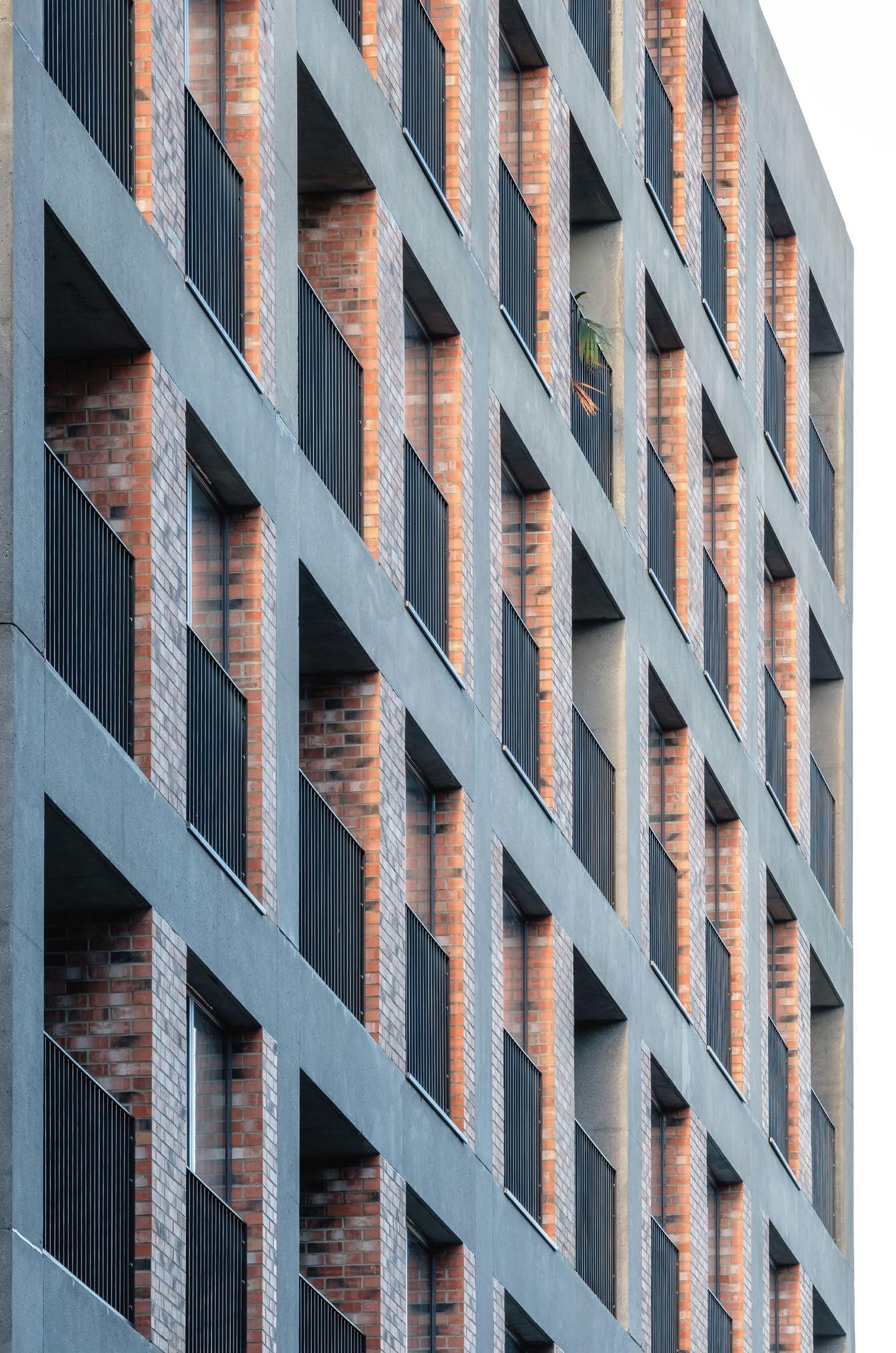


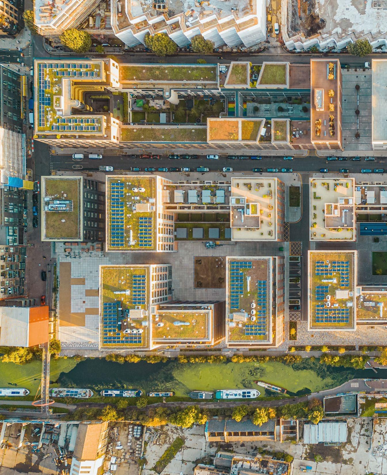

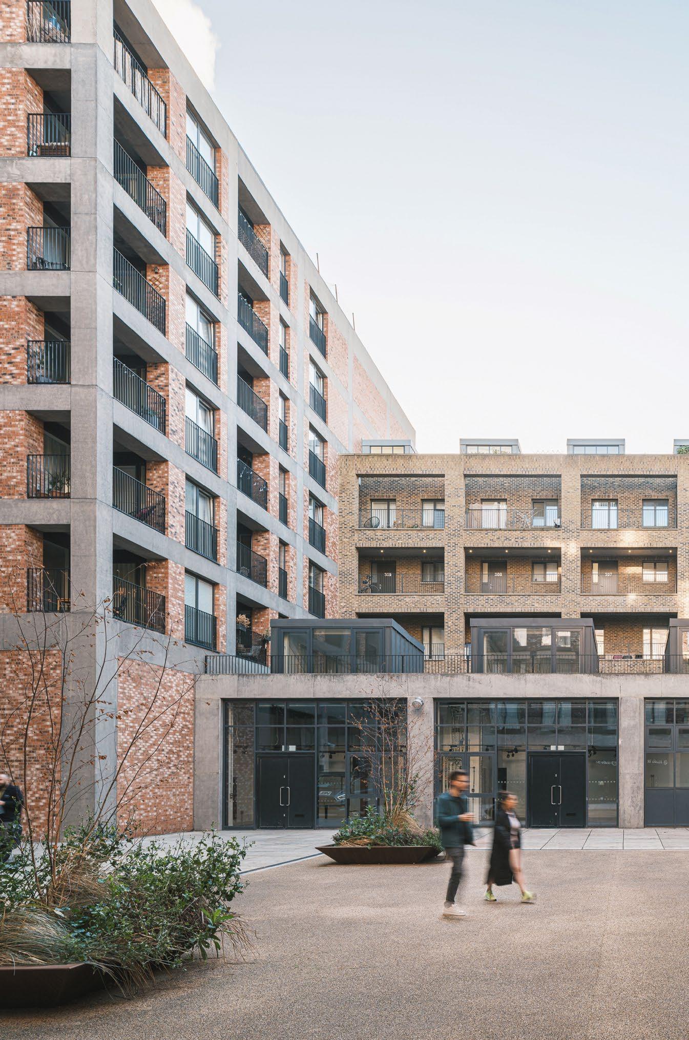

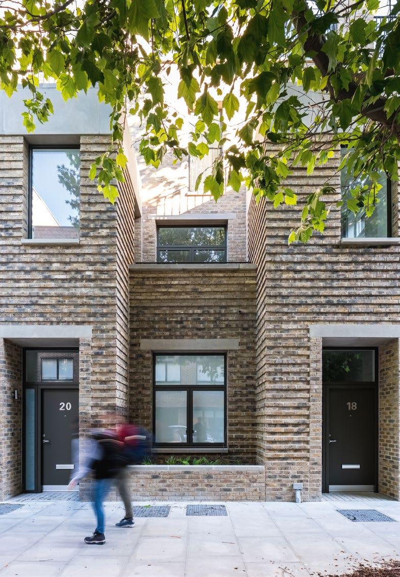


Incorporating the social and cultural heritage of an area into methods of placemaking was an integral part of the Fish Island Village proposals. Starting with a deep analysis of the historical context of their site and a sensitivity to the complexities of urban redevelopment projects, Haworth Tompkins placed the wider cultural fabric of Fish Island and Hackney Wick at the core of the design process. A system of open engagement with community stakeholders and care for what was already existing aimed to harness the positive potential of change as a means of meaningfully reinforcing a community.
EH Perhaps we should begin with some context as to how Fish Island Village fits within the wider redevelopment of Fish Island and Hackney Wick.
GH It’s useful to understand the planning context of the development in order to better understand the completed urban form and designs. For the last ten years there has been a large-scale redevelopment project taking place across Fish Island and Hackney Wick, comprising a number of independent sites and developments that are joined together under a wider area loosely directed by the London Legacy Development Corporation (LLDC). There are about 30 sites, of which Fish Island Village is one of the largest. Unlike a normal masterplan, where there’s a co-ordinated design, in this situation we have a number of independent development plots each taking quite unique approaches but united under a broader set of guidelines mapped out by the LLDC. These guidelines are the opposite of a single-vision masterplan with established design codes and parameters.
They allow for more granularity and expression across incremental plots and the process relies on the scrutiny of individual planning applications as they come forward.
EH What were these guidelines primarily concerned with?
KO There was an emphasis on identifying things that are more intangible, like character and materiality, and those factors acting as a set of cultural principles to adhere to. We have been quite surprised at how well that has worked. Much of the LLDC’s work focussed on identifying the culture of the area and trying to figure out how it could be retained and how it might inform the new developments. They realised that change was going to happen, but they wanted to avoid change beyond recognition, or in a way that totally disregarded who and what was here before, as has often been the case in London.
GH There is a fragility to communities and places in a city like London and a real danger that things can very easily be swept away if there isn’t care given to identifying and preserving them. If we look at the specific case of Fish Island and Hackney Wick, it was evolving from post-industrial backwater to something else in a large part due to what was happening around it with the Olympics. The reality is that this area is no longer an industrial outskirt of London, it’s Zone 2. This area used to be where the scrap yards, breakers yards and refuse processing sheds were. It was where all the big, messy stuff happened. Now all those processes have moved further out leaving large gaps in the urban grain, and this area has had to adapt.
KO It existed in an interim condition for some time but that wasn’t sustainable or a good use of valuable land. Although, sentimentally, it could have been retained as a loose-fit semi-industrial area, because of its proximity to the canal and various green spaces it had almost too much natural amenity and infrastructure for that not to be harnessed for an expanding community.
GH Instead of fighting that change it became about trying to find a way to harness it, to create a development framework that enabled flexibility for new things to happen but also respected the place and its cultural memories.
The LLDC encouraged investment in time to research and properly understand what this was by analysing the cultural heritage, the existing condition and how people were already actively using the buildings to create a distinct sense of community.


KO The spatial practice muf architecture/art were commissioned to conduct a study alongside the critic Robert Bevan, AZ Urban Studio, dRMM Architects and Civic Engineers. They did a really deep analysis of the social fabric of the area and one of the key findings was the density of artists and creatives. They found that spread over Fish Island and Hackney Wick there were 610 studios, each of which was occupied by up to five artists. At that point this made it possibly the densest collection of artist studios in Europe. Once that statistic came out it really shaped the way the LLDC perceived the whole area. It gave voice to the already very rich sense of community surrounding the site and the strong grassroots activity here such as the Creative Wick group and Stour Space.
EH How did you engage with existing communities and how did that shape your approach to the scheme?
GH The initial research got under the skin of what this area was and that definitely influenced the emerging design proposals. It was important not to shy away from the underlying cultural and social issues inherent in a project such as this. We wanted to address concerns around the potential negative aspects of regeneration such as displacement and gentrification. We held an event quite early on called Beyond the Red Line, which brought together communities and architects from not just our own plot, but many of the others, to discuss how these sites might interact with one another beyond the confines of their planning zone. It was also set up as a space where local stakeholders could freely voice their thoughts and concerns.
KO It was quite a big thing for us. We actually weren’t sure how it would turn out, but we felt it was important to hold an event like that to show how integral dialogue was as part of the process and how it could influence what was happening with the project. There were still tensions around the wider Hackney Wick redevelopment at the time and we were half expecting people to come along with banners and placards, but in the end it was more about people just wanting to know what was going on. They wanted to understand and also make sure they were going to be listened to and that the changes would be positive.
GH There’s a video of the event and, having watched it back recently, it’s really striking that there was simply this expression of a collective wish to break the cycle of thoughtless development and regeneration in which residents and existing communities are often totally


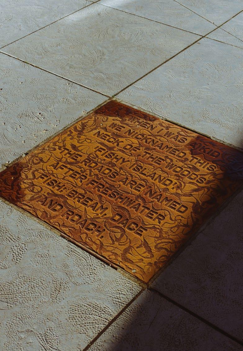
bypassed. There was an assumption and a fear that the place that would result from the redevelopment would be a disappointment and that generic developments would displace the positive qualities and distinctiveness. People were concerned about projects that would ignore the flourishing arts and cultural scene and the robust, adaptable, historical buildings that made the DNA of the place. We encountered a real desire to not simply resist that kind of development but to try and harness what was happening. So our approach became about shoring up the foundations of the place, not sweeping away what was there but nurturing what was special. We collaborated with Fish Island-based artist William Cobbing to develop Written in Water, a sitespecific art installation comprising a constellation of twelve cast iron plates embedded in the ground, embossed with quotes, local stories and oral histories. They reveal the memories rooted in the area, from the recollections of horse drawn barges and old factories, to personal and cultural reflections marking particular spots.
EH How do you measure whether you have been successful in achieving your aims?
GH We’ve had to continually assess how successful we have been in avoiding one thing and achieving another. It’s something we have thought about a lot and in some ways we still don’t have the answer as it’s so complex. The reality of how successful we have actually been will be borne out over time, but we were helped in our research by written critiques of cities and neighbourhoods and how they work, evolve and change. Books like ‘Twenty Minutes in Manhattan’ by Michael Sorkin or ‘How to Kill a City’ by Peter Moskowitz. These are works that deal in detail with issues such as gentrification and affordability and they became touchstones for much of our decision making. It’s all about cities evolving – for good and for bad – with the reality of redevelopment being change. Things are different, and hopefully for the better, but it’s important to acknowledge that change can often bring about friction or compromise. We had an aim and a sense of duty to make that change a positive force rather than something destructive.
EH How have those considerations translated into the approach to planning the site?
KO One of the ways in which Fish Island Village tries to identify and respond to an existing culture is through careful consideration of building usage. Our site is owned by Peabody, and their involvement has been really key


in shaping the use of the scheme. Being a Peabody development, there is a high proportion of affordable housing and there is also a large proportion of commercial space. The affordability of residential units is of course very important in making the area more inclusive. But we also thought very hard about how the commercial spaces would be used. This is an area where, rather than being purely residential, a lot of people were both living and working, primarily through the use of studio spaces that house a great number of creative practices. We wanted to maintain that usage as it was integral to the culture of the place.
GH From the outset of the commission, Peabody were having talks with The Trampery, a social enterprise with an emphasis on providing affordable workspaces that benefit wider communities. They asked them to take on and curate the commercial space in its entirety, specifically with an emphasis on accommodating fashion and textile makers and designers as part of a newly emerging fashion district. So we had a real sense of clarity as to what was going to go into the commercial space. It has been important for the weighting to be much more on workspace rather than retail or hospitality; it’s in keeping with the use of the area in its recent history and it also avoids the usual pitfall of creating generic space and randomly seeing who’s going to take it. By priming the commercial space and making it part of the development and getting proper occupancy of it, you create the place from day one.
KO Another key factor has simply been thinking about how this site is situated and figuring out how it could be better connected to its surroundings. It had a real sense of otherworldliness and for a long time it felt very cut off and slightly isolated, particularly after dark. It suffered from being stuck in a hinterland between what was previously a highly industrialised zone and the mixed-use area that it was becoming.
EH What was on the site before?
GH There were a few residential blocks. But only a couple. Then a lot of warehouses. There were a lot of B1, small-scale shed industrial buildings. There was a big waste disposal shed which processed rags or something like that. There was also a refuse dump. There were a lot of really raw spaces of industry and dereliction, which was the result of manufacturing industry leaving this area post-war, resulting in these interim land uses. And then there’s also the A12 ring road, which was a really damaging piece of infrastructure
when it was put in. The entire site was badly in need of repair. Through the redevelopment of this site, a quarter mile of previously inaccessible land on the Hertford Union Canal has been opened up and there has also been improved access through the addition of new bridges. It suddenly connects the site to its surroundings in a significant way. EH Are you seeing the effects of these interventions already?
KO It makes such a difference just having these fundamental amenities that make the space more connected to its surroundings. There’s already an incredible sense of community. It feels like there are a lot of people who are invested in this place. Not just financially invested, but invested in their time and commitment to shaping the space and what it can become. There is space for creative studio activity. Key grassroots organisations like Stour Space are still there. It also has proximity to good schools and a lot of green amenities so there are families here, too. We’ve even heard of people who have moved in and already had their parents move in next door. GH These are the things that go into creating a place. The scheme is really quite personal for us. Several of our architects live in the area and have been consultees on the proposed developments from the very beginning – even before we were involved. So when we were appointed as architects on what is one of the largest sites, we knew what it was like to be on the other side of the discussion and felt that it was really important that we got it right. There’s now a sense of it being a much wider network of people and a space for people at all stages of life. That’s what is really starting to happen now. Rather than being a space that feels expedient and temporary, it is now gaining a critical mass that enables it to have its own identity that is grounded in a new sense of longevity and robustness.







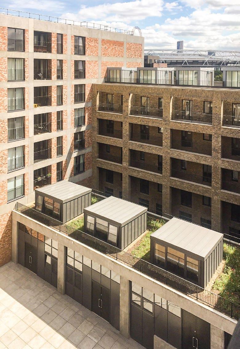


The modern history of Fish Island and Hackney Wick is one of continuous industrial innovation and change. This has profoundly shaped the spatial organisation of the area and the buildings that are found there. While considering their approach to Fish Island Village, Haworth Tompkins placed importance on learning from and adapting this existing architectural context. After all, buildings never exist in isolation. Identifying key typologies in the area gave cues on form (warehouses, wharfs and maisonettes) and materiality (mixed brick and concrete). Further attention was given to both building usage and the spatial planning of the area, which echoes the distinctive yard spaces that have become important sites of social and creative activity. As explained by Graham Haworth, the resulting development extends from a belief that responding to material, formal and spatial context can achieve a degree of coherency between a site and its wider surroundings that goes far beyond questions of style.
“Before we were ever involved with it, the Fish Island Village site benefited from an existing planning permission, by Stockwool, that had started to think about an appropriate urban form for the site. It was centred around two large courtyards, a new street connecting to the idea of opening up the canal, and a large new public space to the north, adjacent to the existing pedestrian bridge crossing. We thought it was a strong urban response and it began to tap into the yard spaces that are inherent to the culture of Hackney Wick. Rather than just changing everything for the sake of it, we decided to keep this overall site organisation that made a lot of sense. However we then changed the visual language of the buildings quite considerably.
Beyond the site plan, the actual architecture that was being proposed didn’t really respond to the context and it contained very little workspace or affordable housing: there was an emphasis on taller buildings and exclusive penthouse apartments to capitalise on the great views. The scheme was on the verge of becoming a more generic, almost opportunistic approach to residential development with no real sense of purpose to the buildings or contribution to a wider community. So we put the brakes on that and started to bring in other design considerations such as character, appearance and materiality. We thought about what sort of buildings would go here and what use they would have, which led to increasing the amount of workspace and restricting height to a uniform six-to-seven storeys, which gives the development an overall consistency of form. The architecture that needed to be built required a certain amount of sensitivity and skill to understand the correct urban grain and scale and to explore how it could develop as a place. All three collaborating architects have a shared ethos about placemaking. Our methods were rooted in something of an anti-modernist approach to urbanism, found more often in mainland Europe in the work of architects such as Hans Kollhoff and in Aldo Rossi’s ideas about the autonomy of form and the importance of tradition and visual memory. The idea that character of place can be formed through the character and appearance of buildings, that architecture and buildings have an autonomy, was definitely a point of inspiration. In the modernist tenet, everything had to be swept away to create new programmes. Buildings looked the way they did irrespective of what people thought they should look like. Whereas this is about buildings that reinforce an existing situation and culture. One of the ways in which we tried to establish this visual language was through identifying key materials and typologies that were already prevalent in the area. A lot of architects dismiss the idea of identifying and using typologies. But for us it was key to trying to understand the mix of characters that these forms could have. We identified that one
building type could be a frame, one could be a warehouse with simple load-bearing precast lintels, one could be a wharf with vertical piers and projecting balconies, one could be a stacked maisonette that’s quite typical of residential streets in the area. All the forms are very simple, but we worked hard to make the most refined version of that simplicity. They’re not trying to be attention grabbing. They’re just robust and confident in what they’re doing.
It’s very contextual, basically. It’s about picking up cues from the language of what was there before in terms of materiality. It’s echoing what had been a quite diverse building stock to create a language that is very diverse but with a clear coherency to it. The frame building is directly influenced by Swan Wharf, a historical building located further along the canal. Even the brick colours that we picked, you can go around Hackney Wick and see them on the buildings that were here originally.
We wanted the buildings to feel synonymous with the existing character of this place. And this isn’t a purely aesthetic choice. These forms and typologies also shape the way people use space. They create a type of granularity and programme in the neighbourhood. It’s important to understand that buildings have a presence, not only in how they look but also in what they do.
We felt it was important that the six or so buildings that make up each urban block were conceived as individual pieces, to create variety within the block structure. A block could have just been a homogenous 360-degree, flatted courtyard in the same form and material, which would have been perfectly adequate, but by introducing different typologies, it immediately creates a very different streetscape and a very different public reaction to it. It creates a varied rhythm to the buildings. And that naturally influences how people respond to and use space. Where the maisonettes are located the form opens up and embraces the plane trees that were already there. The way the buildings sit on and open up onto the street feels very human in its scale. Elsewhere, around the courtyards, the plots and the forms are tighter, more rectilinear.




The courtyard spaces are particularly exciting.
Those are really typical of the Hackney Wick area, but although there are a lot of yard spaces in Hackney Wick, there aren’t many publicly accessible squares that can be programmed and curated for public uses. It could be food markets, performance events; there’s a local arts festival that already used some of that space a couple of years back.
The layout of the blocks break some of the rules in terms of planning. There are very tight passageways of the kind you might find in historic settings, little get-throughs and things which, in pure modernist planning terms, would be deemed as being too close together. In reality they actually create an amazingly complex set of relationships that have a resonance with the existing buildings.
You’d only be able to get this diversity over a hundred years, as buildings came and went, if you weren’t conscious about it. So what we were trying to do was increase the diversity of the buildings from the outset. We think a bit of forestry. Planting with variation in mind rather than monoculture. There’s a purpose to it. You aren’t just planting things because you want them to look different, it’s because different species of plant have different functions; different roles and possibilities in their ecosystem.
It comes back to the anti-modern idea. We’re consciously trying to avoid a uniformity and preimposed order that doesn’t reflect the diversity of the community that’s going to live and work there. We were continually introducing things to disrupt that. It’s very deliberate and permissive. We think you can argue either way whether that approach is right or wrong, but it’s definitely successful in immediately locking people into the heritage, culture and character of a place.”



Project
Fish Island Village
Address
Wyke Road, London E3
Architect Haworth Tompkins
www.haworthtompkins.com
Collaborating Architects
Lyndon Goode Architects
www.lyndongoode.com
Pitman Tozer Architects
www.pitmantozer.com
Clients
Peabody The Hill Group
Quantity Surveyors Hill Hunters
M&E Engineers
Sweco (MLM)
DW Pointer and Partners
RB Emerson
Landscape Architect Design Farrer Huxley Associates
Landscape Architect Contract Place Design and Planning
Planning Consultant
Tim Gaskell
Collaborating Artist
William Cobbing
Client The Trampery
Interior Architect Bureau de Change
Architect Team
Haworth Tompkins
Neptune Wharf
Irfan Alam, Tomoyo Arimoto, Annecy Attlee, Mel Bax, Anke Boehme, Rowena Bond, Jorge Camacho, Matthew Dalziel, Sho Das-Munshi, Daniel Diaz, Ana Durao, Sarah Firth, Sarah Hare, Graham Haworth, David Hodgson, Toby Johnson, Alex Johnstone, Christopher Laing, Harriet Mulcahy, Ken Okonkwo, Albert Olivares, Patrick Quinn, Ben Rea, Michele Venturini, James Walker, Jacqueline Wheeler, Jonni Woo
Pitman Tozer Architects
Monier Road
Jonathan Crossley, Jonathan Harker, Oliver Joyce, Tim Pitman, Jack Scaffardi, Luke Tozer
Lyndon Goode Architects
Lanterna
Michael Clarke, Amy Corrigan
Colin Erridge, Simon Goode
David Lyndon, Simona Mizzoni
Anna Mryga, Emily Pacey, Jennifer Pirie, Ava Richardson
Published
Title
Form & Fabric: Fish Island Village
Editor
Eliot Haworth
Design Cartlidge Levene
Printing
Pureprint
ISBN 978-1-3999-4412-0
Image credits
Page 2: Reproduced with the permission of the National Library of Scotland
Page 4 (upper): H. Forman & Son
Page 4 (lower): Britain from Above
Pages 8 and 56-59: Gareth Gardner
Pages 9-19, 24, 27 (lower), 48 and 61-66: Fred Howarth
Pages 20-21: Kilian O’Sullivan
Page 22-23: Rory Gardiner
Page 31 (lower): Agnese Sanvito
Page 34: JC Candanedo
Pages 37-47 and 50-52: Josh Greet
Page 49: Sho Das-Munshi

