
8 minute read
3ds Max Making of “A Passage”
from feb06
by Hiba Dweib
Making of “A Passage”
All the modeling in the scene was done using 3ds max 6. For texturing I used around 20-25 medium resolution pictures and combined them in Photoshop. Light Tracer was used for the rendering.
Advertisement
My intention was to create a work that depicts my love for art. This is not very detailed scene and modeling wise it takes only few hours to get the stage set. But, lighting and texturing is very important to convey the meaning of the image. I was inspired by a painting I saw in book few months back. I was so moved by it that I drew a sketch in my drawing pad later that evening. It ended up something like the one I attached below.
That painting depicts a lonely corridor running in between two walls, staying neglected for ages and stood guarded by two dampen walls.
A staircase at the end of the corridor also serves a special meaning. The scene ends there but it gives kind of suspense feeling as to what lies after that. In this sense the scene makes someone to think a lot.

Modelling
Modeling this scene involved very little time. But to get the concept and idea to the drawing board took longer than actual modeling.
I started with a box and converted it to poly and made the two main walls on the right side. These are the walls where most of the drama will take place. I was very particular in the height and their joining angle. I used a camera from the beginning to determine the exact placement, since; the angle will play a major role. As you can see in the picture below the placement of the walls and how the camera is placed. I also added a ground.

Then I modeled the top portion of the wall using same poly modeling method. I also used Tessellate command and noise modifier to make the edge more random. The picture below shows the close up.
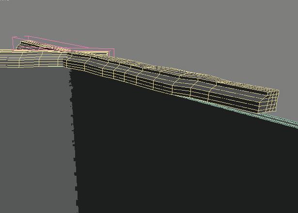
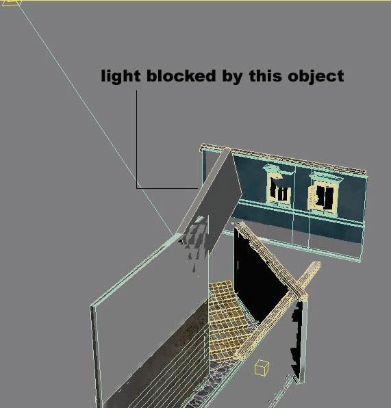
Then I turned my attention to the wall on the left side that will make it impossible to see the other side of the scene. Although very small part of this wall is actually seen from the camera angle but it serves as a barrier between the passage and the light source.

I had to add light source at this point to determine the exact light and shadow angle and made adjustment to the height and orientation of the wall.
Thefollowing picture shows how the wall is actually placed and the light source behind it.

Next I was concentrating on making the backdrop. The backdrop has to be interesting enough to catch the attention and at the same time should convey the basic meaning the image in proper synchronization. I did lots of experiment before coming to make this object. The wall is placed in such way so that it shows the two windows from the camera angle. This picture shows the walls of a building positioned in the scene.
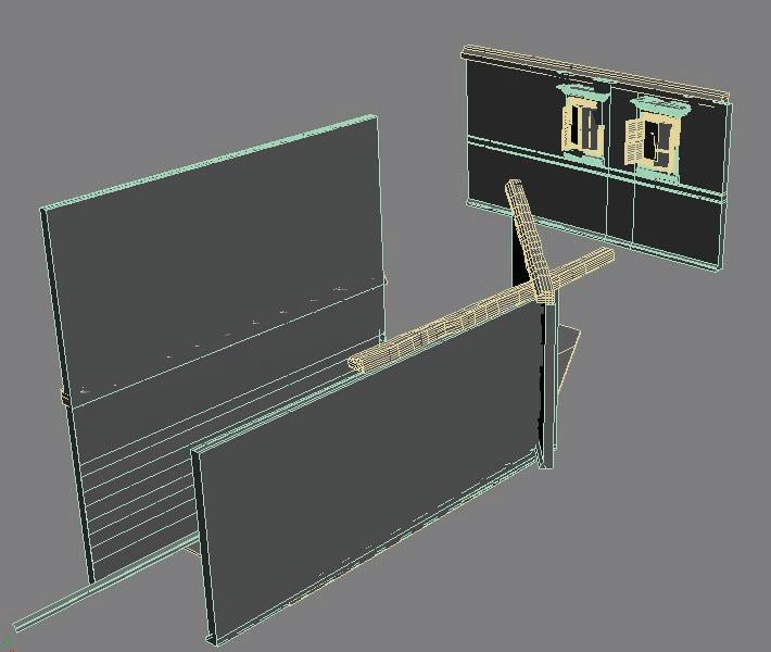
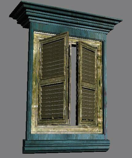
The next picture shows a close up of the window with shutters like we have in old buildings built around the first quarter of 20th century.
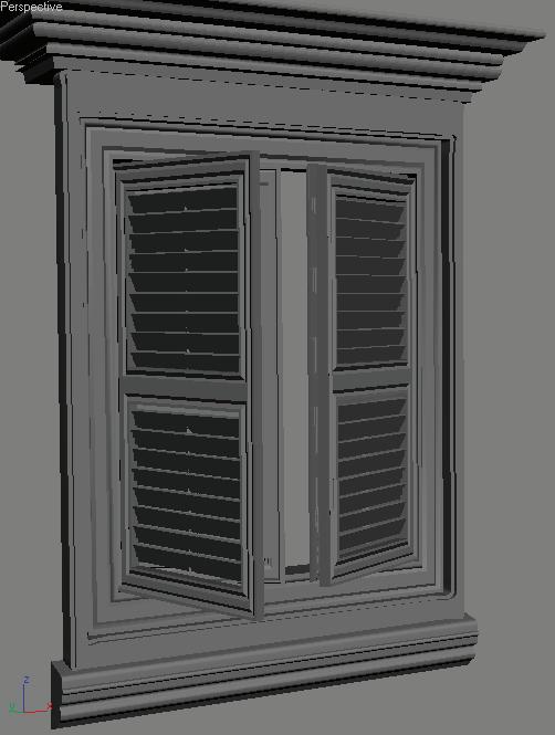
Next I added the staircase at the end of the corridor. The edge is again made random and rounded to showcase the weathering and aging.

When I was almost satisfied with the scene setup I added some pot with plants and wooden planks near the wall. The picture below shows a close up of the pots, one broken partly.
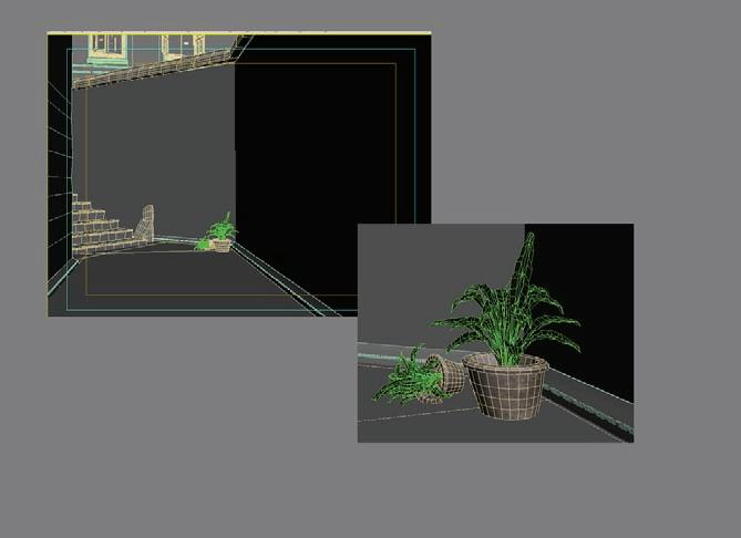
Texturing
Texturing was a challenge in this particular scene. I used Unwarp UVW in most cases. For the wall first I added an Unwarp UVW and then took the map into the Photoshop and placed several layers of texture maps on the base. The picture below shows how base layer containing the Unwarp UVW grid is placed.

I used around 20-25 medium resolution maps for the entire texturing procedure. The process went like this way; I took a base texture for the wall from my collection and placed on top of the Unwarp UVW layer. Then I added moss layer, stain layer and water mark layer accordingly.

Once this major texturing is done I added some special layers that contain a tic-tac-toe and graffiti sign. I used various layer blending method to seamlessly match the layers with the base layer, for example Multiply, Screen and Overlay.
The backdrop is given a blue colored wall. I was trying with different color and found blue color quite appealing for this scene. For the window and shutter I used an aged wood texture with lots of variation in color.
Lighting
I used one target light and one omni light as fill light in the scene. The picture shows the placement of the lights.
I placed a sky light to used with Light Tracer. There was something more with the light setup. I needed to create a nice shadow in the foreground area. That was achieved using a light blocker in front of the light path. As shown here a box is placed so that to cast a good shadow in the corridor.

Post Processing
Rendering process involved some tweaking with the light and shaders to get the proper mood in the scene. I tested with various light settings and shaders for couple of hours before coming to a satisfactory level.
I used Light Tracer of Scanline renderer with Bounce value 2. Then I took the raw render image in Photoshop and did some color correction. I mainly work with Curve, HSL and Channel Mixer to correct the contrast level. Beside these I also had to manually use Dodge and Burn tool for perfection.
I hope this article will be interesting to read and also be informative for you. Thank you for your time. Feel free to comment on this and send me your queries at my email address.
Pradipta Seth
pradiptaseth@yahoo.co.in http://pra-seth.3dup.net [Personal Site] http://www.3dallusions.com/forums [I am moderator at this site]
For discussion on this tutorial please click here


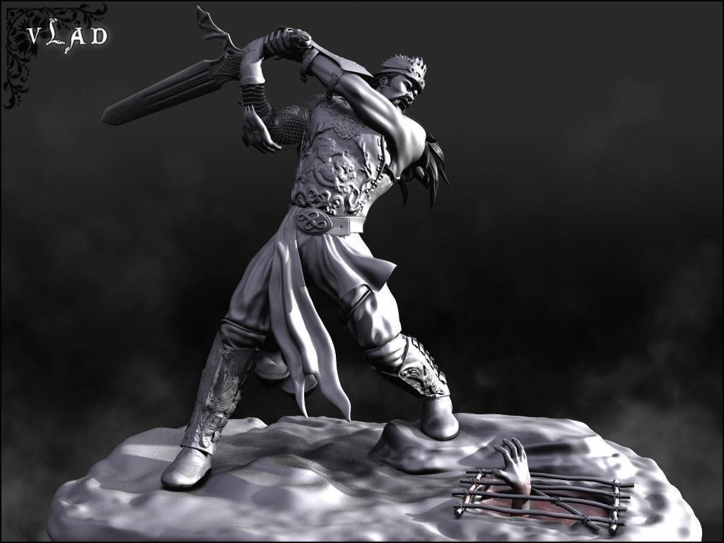
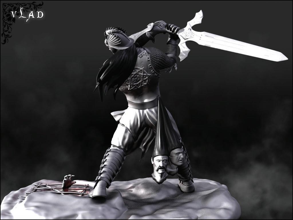
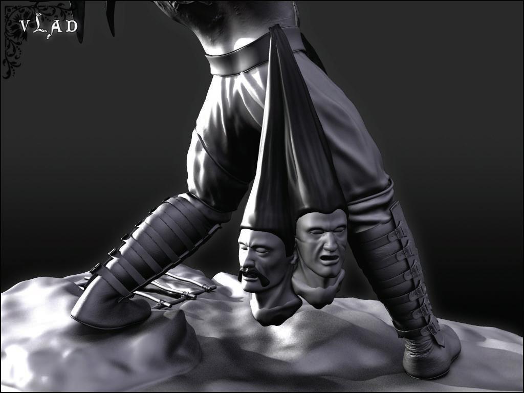
VLAD THE IMPALOR
Harshdeep Borah, Canada harshdesign@gmail.com Maya


ALL ROAD
Neil Maccormack, Geneva, Switzerland Neil.Maccormack@mccann.ch Lightwave 3d
ANDO - CHURCH OF LIGHT
Karunakaran, India karun@cnt-semac.com 3ds Max


PICASSO TOWER
Juan Carlos, Spain jcjimenez@render3d.net 3ds Max

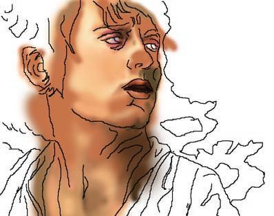
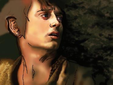
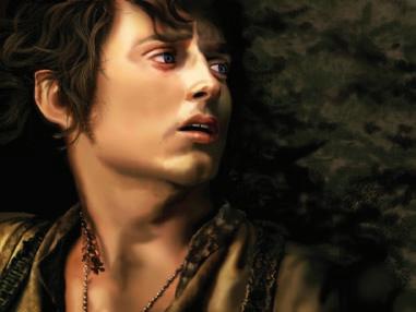
FRODO
Vishal Pawar, India vishalpower@yahoo.com Photoshop
For Detailed Tutorial on Making of Frodo Click Here



SPIDER & TANKLOW
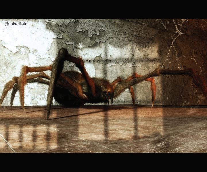
Marco Antonio Delgado, Spain webmaster@pixeltale.com Softimage XSI

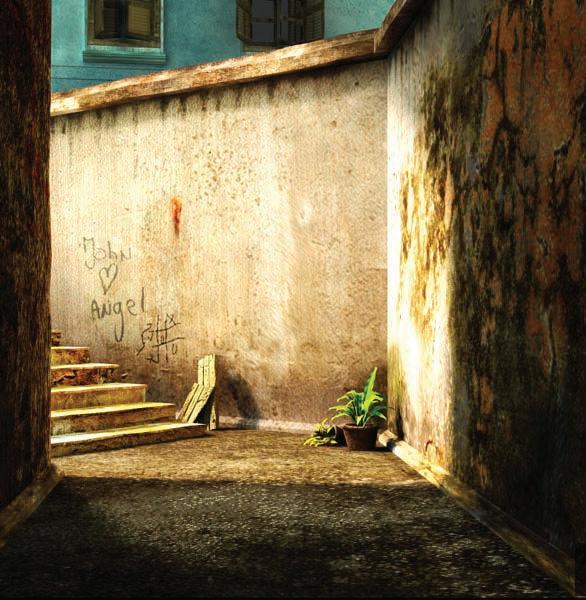
A PASSAGE
Pradipta Seth India pradiptaseth@hotmail.com 3ds Max

How to send in your images...
We showcase the cream of reader images in E-Zine and on website - here’s how to get yours noticed
BY EMAIL

This is by far the quickest and easiest way to send your images to us. Send the images on ezine@cgarena.com and include the following details in the email.
a) Your Name, Image Title, Software Used, Your Country
b) JPEG format at 300 dpi (if possible)
and any other detail you like to add.
Upload Images through Website


