

PREFACE
Tall buildings give form to human aspiration. For the past two centuries, they have served as powerful expressions of our creativity, knowledge and will. They are symbols of their time and place.
As people around the world gravitate toward urban cores, how will our big cities continue to add density while preserving vital open space? The cities of the future will ultimately have just one direction to grow: up. One can imagine vertical cities with clusters of interrelated high-rises linked by aerial thoroughfares and side streets. In these vibrant mixed-use towers, people will live, work, shop and choose from numerous dining and entertainment options. Green zones and public plazas within the buildings will sustain the people who occupy these 24-hour environments.
This book demonstrates how HOK's architects have approached tall building design in the recent past and how global social and economic forces are transforming the towers of the future.
Readers will see that each tall building has its own personality and character. Some are iconic, while others fit comfortably into their context.
Each of HOK’s tall buildings integrate sculpture and science to create a sustainable, high-performance structure. The forms emerge from our clients' needs as well as from the building program, structural and vertical transportation systems, site, climate and culture.
We thank our clients for their trust, vision and partnership as together we give shape to the future landscape of tall buildings and urban cores.
HOK Design BoardHOK’S MISSION IS TO DELIVER EXCEPTIONAL DESIGN IDEAS AND SOLUTIONS THROUGH THE CREATIVE BLENDING OF HUMAN NEED, ENVIRONMENTAL STEWARDSHIP, VALUE CREATION, SCIENCE AND ART.
4th and Harrison
535 Mission Street
Abu Dhabi National Oil Company Headquarters
Allen Hotel Condo Tower
Atlantis Sanya
Beijing China Resources Lize
Chengdu Forte Financial Island
China Overseas International Center
China Overseas Suzhou Super Highrise Tower
Confidential Mixed Use Tower
Confidential Super High Rise Mixed-Use Project
Corporativo Neuchatel
Crystal Tower
E5 New Songdo City
Forte Jinan Finance Tower
I Park City
Intercontinental Beijing Sanitun at Towpin Center
Jiangxi Commerce Union Center
Jinan China Resource Center
JP Morgan Chase Tower
KAAR
L&T Tower
Le Méridien Hangzhou
Lend Lease Circular Quay
Makkah
Mixed-Use Tall Building Design Competition
Msheireb Doha
Ogilvie West Tower
OIC Tower
PIF (Public Investmend Fund) Tower
Ping An Hangzhou Finance Tower
Spire London
Sutton Place
TAS
designboom archdaily


INHABITAT


FRAME

INHABITAT


YouthArch


ARCHITECT
KAAR Gateway Development




CONSULTANTS

Follow: Follow:


WORLD MAP
Confidential Mixed Use Tower
Ogilvie West Tower
4th and Harrison 535 Mission
Corporativo Neuchatel RSJ
USF
JP Morgan Chase
Allen Hotel Condo
As we compiled the projects for HOK Tall Buildings, the world map showing their locations began to tell a story. This map illustrates the number and sheer monumentality of the tall buildings rising in Asia and the Middle East, reflecting the economic growth and optimism of these regions.
HOK Tall Building Project
HOK Office
Sutton Place Crystal Central Bank Abu Dhabi National Oil Company MsheirebI Park City
E5 New Songdo City
Crystal Tower of Kuwait
Msheireb Doha Fund) Tower KAAR
Makkah OIC Tower Spire London
Company Headquarters
Mixed-Use Tall Building Design Competition
Chengdu Forte Financial Island
China Overseas International Center
China Overseas Suzhou Super Highrise Tower
Confidential Super High Rise Mixed-Use Project
Forte Jinan Finance Tower
Intercontinental Beijing Sanitun at Towpin Center
Jiangxi Commerce Union Center
Jinan China Resource Center
Le Méridien Hangzhou
Ping An Hangzhou Finance Tower
Tianjin China Overseas International Center
Atlantis Sanya
Beijing China Resources Lize

street rendering


Area: 820,000 sq. ft./ 76,180 sq. m.
Height: 203 feet / 62 meters 15 stories
Designed: 2021
4th and Harrison Mixed-Use Development
San Francisco, California, USA
This mixed-use development in San Francisco’s Central SoMa neighborhood links the Financial District with the burgeoning Mission Bay area.
The 770,000 square feet of Class A office space has large floor plates and amenities including five roof decks with city views from all sides. The project also includes 36,000 square feet of retail, on-site childcare and production-distribution-repair space, street level micro retail and 16,700 square feet of public open space.
Rising 15 stories above grade, the building is designed to enhance the neighborhood’s character while acknowledging its context and history. Instead of the monolithic tower
shape characteristic of many downtown office buildings, it takes inspiration from the intrinsic geometries found in the built and natural environments. The articulation of the building on large and small scales creates a cascading effect reminiscent of falling leaves.
HOK’s design team used parametric design tools to create a pulsating rhythm of expansion and contraction with different panel sizes and colors. The metal panel facade blends seven copper and eight zinc tones highlighted by a gradient color shift from the ground up. Unique stacking arrangements and facade treatments visually
break up the building’s mass. The glazing, metal panels and reliefs arrayed across the individual facades are environmentally responsive to solar orientations.
The team is targeting LEED Platinum certification, which would make this San Francisco’s largest core and shell carbonneutral development.
Two large, privately owned, publicly accessible open spaces (POPOS) at street level are unique to San Francisco’s planning code as part of the city’s 1% Art Program, which requires developers to integrate public art in all new buildings equal to at least one percent of the total construction cost. This art will enhance the building’s inviting urban streetscape, outdoor rooms and open spaces.


Area: 354,000 sq. ft. / 32,900 sq. m.
Height: 378 feet / 115 meters 27 stories
535 Mission Street
San Francisco, California, USA
The slender urban form of this Class A office tower will transform the South of Market (SoMa) district of San Francisco.
Tapered facade corners and a sculptural cornice line define the building’s silhouette. A double-height ground floor lobby, pedestrian plazas and improvements along Shaw Alley shape the street-level experience.
Expected to be one of the first LEED Core and Shell Gold pre-certified office towers in San Francisco, the building’s advanced mechanical systems, high-performance skin and water use efficiencies will promote sustainability, occupant comfort and productivity. The facade will feature highperformance glass that integrates with indoor controls to enhance its energy and light transmission performance.


The project will provide 3,700 square feet of ground-floor retail space to serve building occupants, visitors and city residents. The building lobby includes publicly accessible open space that flows into the covered outdoor plaza, featuring flexible seating, generous landscaping and an espresso bar.
The addition of new trees and a continuous band of planting along Shaw Alley softens the streetscape and enhances the pedestrian environment linking the building to the adjacent Transbay Terminal.
To expand the public open space, the project proposes to close Shaw Alley to vehicular traffic during the lunch hour on weekdays. New concrete paving in the alley will add pedestrian scale and texture, establishing visual continuity.


HOK Studio: Washington DC
Abu Dhabi National Oil Company Headquarters
The new headquarters for Abu Dhabi National Oil Company symbolizes the company’s importance in the development of the United Arab Emirates.
Located on one of Abu Dhabi’s most prominent urban sites, the tower will create a new city landmark while articulating ADNOC’s role as one of the world’s most dynamic, influential petroleum companies. The proximity of the Emirates Palace Hotel adds to the site's exclusivity, with the tower serving as the primary view for VIPs and patrons at the Emirates Palace complex.
The structure’s design maximizes views of the Arabian Gulf and takes advantage of the site’s prime location through careful massing of the tower and placement of the surrounding courts, plazas and landscape.
The design combines majestic spaces and high-quality materials. To maximize flexibility, offices are organized with a modular approach that is interchangeable and repeatable.
The tower's north-south orientation minimizes the ground-level footprint, leaving ample room for landscaped amenity space. A rectilinear podium extends from the base of the tower. A curvilinear auditorium adjacent to the tower acts as a contrasting sculptural element.
Extending south of the tower structure, the three-level rectangular podium houses employee services, retail space, the service loading area, a heritage museum, and the main lobby and circulation space. Area: 1.9 million sq. ft. / 175,300 sq. m.


Area: 1.3 million sq. ft. / 120,700 sq. m.
Height: 470 feet / 143 meters
42 stories
Built: 2024
HOK Studio: Houston
Allen Hotel Condo Tower
Houston, Texas, USA
The Allen is a new innovative 6-acre phased mixed-use development situated just west of downtown Houston along the Buffalo Bayou. The masterplan strategically organizes the buildings around a central park, fostering visual and pedestrian connectivity to Buffalo Bayou and its park spaces and trails.
The first phase of the development features the Pavilion and the Hotel Condo Tower. The Hotel and Condo Tower rests elevated on a podium, emphasizing a pedestrianfriendly scale and seamless integration with neighboring buildings. The subtle curved tower massing accentuates the stacked program volumes, featuring condos atop the hotel, resulting in a visually striking cantilever on the north side. This architectural expression is complemented by a convex-shaped carved-out terrace at the tower's apex.

Residences feature individual balconies for each unit, some with plunge pools, strategically expressed at the corners and recessed in the center, highlighting the stacked floor bands. Additional condo amenities include a shared indoor lap pool, gathering and conference rooms on level 16. The 170-key hotel includes a sky lobby with panoramic views of downtown and an expansive outdoor amenities deck on level 7. The hotel's conference center and ballroom on level 5 are seamlessly connected to the ground level drop-off through a set of public escalators and a monumental stair leading to the hotel sky lobby.
All tower parking is intelligently located either below grade or within the podium, enhancing the overall pedestrian experience within the development.


 aerial renderings ▲


 ▲ plaza renderings street view rendering ►


Area: 2.55 million sq. ft. / 237,000 sq. m.
Height: 748 feet / 228 meters 55 stories Built: 2018
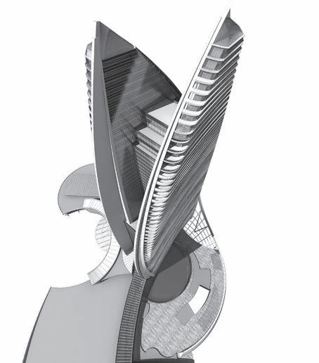
The design for this guestroom luxury resort hotel reinterprets the myth of Atlantis on Hainan Island.
Derived from the crashing of the South China Sea against the island’s rocky coast—once considered to be the end of the earth—the tower rises in two fin-like forms to create a dramatic massing. The building podium, including the main lobby rotunda, is conceived as a series of spiraling vortexes of water streaming away from the towers.
Capping the 55-story tower is a 79-foot-high lantern that pulls the rhythm of the tower’s continuous linear balconies up to its peak. The curtain wall and balcony rails incorporate a waved frit that appears to send ripples up
the building, reinforcing the fluid nature of the design.
Pushing the building core back to the arrival side of the tower introduces a subtle inflection to the plan that allows the guestrooms to be angled toward beach and ocean views.
The podium includes more than 320,000 square feet of retail, restaurants and conference space. The signature Atlantis Bridge Suite is on the tower’s penthouse level.
The arrival porte cochere and lobby reception are developed on an axis with views of the waterpark and ocean. They also provide a strong cross-axial orientation to the signature Lost Chambers Aquarium beyond.
The project owner is Fosun International Limited, and the resort is operated by Kerzner International Holdings Limited.




Area: 1.7m sq. ft. / 160,000 sq. m.
Height: 328ft. / 100m. 24 stories
Designed: 2018
HOK Studios: Chicago and Beijing
Beijing China Resources Lize – Mixed Use Building
Beijing, China
HOK was engaged in a design competition focused on proposing a collection of four mixed use buildings on a centrally-located plot in Beijing. As the last new development district allowed within the 3rd ring road, the team prioritized a future-forward vision for the office/residentially zoned towers.
After winning the competition in 2018, HOK's driver for design was reconnecting the urban environment to greenery and an oasis of landscape and gentle respite. Signatures of place, such as a centruy old tree, were retained and celebrated in the design.
The collection of towers are designed within a 100m ceiling (24 stories tall) . At ground level, pedestrian pathways focused on movement amd emphasize the space between the buildings, further creating a sense of place.
The façade, despite looking glassy/ light, is only 50% transparent to improve building performance and reduce excessive reflections to neighboring buildings. The gypsum-fiber reinforced concrete louvers conceal operable panels to allow for natural ventilation within the building.
Two of four towers support office functions including flexible shared office spaces (similar to WeWork) that address potential changes in Beijing's workforce. The other two are used as Serviced Apartments with an option to convert to office space in the future.
This final design is respectful to the history of the site while creating a vision for the future of mixed office and residential use. More than an architectural intervention, HOK's design was about creating a place.


 ▲ office view rendering
▲ facade detail


Area: 2,782,965 sq. ft. / 258,546 sq. m.
Height: 820 feet/ 250 meters 48 stories
Designed: 2020
HOK Studio: Hong Kong
Chengdu Forte Financial Island
Chengdu, China
Located in the middle of Jinjiang River, the Chengdu Forte Financial Island is becoming a significant new urban destination in Chengdu. HOK provides facade design for three 150m-tall towers and a group of retail buildings with 2 to 3 stories in phase 2 and full architectural design for phase 4 which is consisting of two 250m-tall office super towers and retail podium rising from the island and emerge as a landmark of region.
The architecture of the retail podium mass and the towers echoes the island’s unique form that is shaped by the natural erosion of the river surrounded. The inner edge of the outdoor shopping street is curved and shaped to mimic the river edge eroded by the natural water flow while the pavilions on the other edge of the retail street stand out like boulders push into the middle of the river by the natural force. The retail experience culminates in the indoor mall below the two skyscrapers. The pedestrian circulation flows smoothly between the towers and ends perfectly at Circus du Soliel Playscape pavilion sitting the park on the northern tip of the island.
The geometry of the towers further illustrates the theme of natural river erosion and formation. The towers are curved in sympathy with the retail podium. The subtle curve in plan changes throughout the height of the tower starting as convex at the base to becoming concave at the top. The fluidity of the towers and retail podium demonstrates perfect integration and adaption of architecture and environment.
HOK scope of services includes façade design for phase 2 from concept to design develop and full design from concept to design develop for phase 4.


Area: 1.05 million sq. ft. / 98,000 sq. m.
Height: 460 feet / 140 meters 32 stories Built: 2018
China Overseas International Center
Shanghai, China
The 98,000sqm China Overseas International Plaza features a high-end commercial complex with two premium office towers joined at the podium level by a landscaped retail plaza, with one tower housing the largest WeWork space in Asia.
It is located at the intersection of two subway lines in Shanghai’s former French Concession quarter and near Huahai Road, a shopping street referred to as the Champ Elysees of Shanghai.
As a new prototype for international business, the building architecture focuses on sustainability and cutting-edge technology while incorporating modern functionality and intelligent design.

Positioning the retail mall as "small boutique" creates a trendy, elite lifestyle destination for the 800,000 businesspeople working within 3km.
Targeted to become one of the new chic, commercial areas in Shanghai it will combine commerce, cultural and leisure facilities whilst connecting at ground level with its historic urban texture.


Area: 4 million sq. ft. / 371,000 sq. m.
Height: 1,500 feet / 460 meters 99 Stories
Designed: 2021
HOK Studio: Hong Kong


China Overseas Suzhou Super Highrise Tower
Suzhou, China
The 460 meter Suzhou Peaks Tower is located on the site to foster synergy with Zhong-nan Center and Suzhou Center and to maximize the open Plaza area available to Public on the South. Through extensive use of hardscape and landscape the plaza and tower will complete the iconic gateway to Suzhou. The tower will be a destination with daytime and nighttime activities, an observation deck, retail and restaurants.
A series of generous and well-connected drop-off frontage along the tower have four distinct areas, serving the public, with access to the observatory, access for the office tower on west, retail along the north, and residential access to the east. Convenient ramp access from the drop-off areas is provided for access to public and private parking below-grade along with an underground connection at Basement Level 2. This site arrangement allows for pedestrian connection from the podium retail and office lobby directly to the underground MTR pedestrian connection to the South. The residences of this landmark development have been designed form the inside out, providing luxurious units that have expansive
views and exposure, are efficient and functional. A series of open green spaces and terraces steps up the tower at multiple levels through the site.
The floor plans for the residences were designed to provide a functional and flexible interior fit-out in a chamfered rectangular form. Each residence is accessed via one of the three residential sky lobbies. After each sky lobby the floorplate is optimized to increase efficiency. The spiral stepping of the plan is expressed in the exterior enclosure vertical expression. The stepping of the building shapes from ground to top presents a dynamic gesture.
The unique character of Suzhou is a perfect marriage between the city’s inherent poetic elegance and the cultural heritage over millennia of Chinese literature.
The architectural design morphs Lingering Garden’s Guanyun Feng (the cloud-capped peak), resembling the dynamic form of a peak and crowned with a wreath of cloud while Zhongnan Center is the osmanthus by the lake. Super high-rise pairs of stone and osmanthus becomes a couplet of Suzhou's gateway, translating the literature and
culture of Suzhou into urban design and architecture.
The super tall architecture is inspired by a poetic couplet in Suzhou's UNESCO Lingering Garden: Scholar stone amasses essence of nature over millennia, fragrance of the Osmanthus triumphs over all flora and fauna. Couplet is a pair of traditional rhyming verses hanging next to a doorway, often with poetic or prosperous meaning. This couplet talks about Suzhou's garden gathering the best in the nature. While Zhongnan Center represents the osmanthus by the lake, The Suzhou Peaks Tower morphs Lingering Garden’s Guanyun Feng (the cloud-capped peak), resembling the dynamic form of a peak and crowned with a wreath of cloud. Super high-rise pairs of stone and osmanthus becomes a couplet of Suzhou's gateway, translating the literature and culture of Suzhou into urban design and architecture. Shared neighborhoods encourage creativity & wellness.
◄ street rendering




Area: 1.5m sq. ft. / 140,000 sq. m.
Height: 604 feet / 184 meters
40 stories
Designed: 2023
HOK Studio: Chicago
Confidential Mixed Use Project
Chicago, Illinois, USA
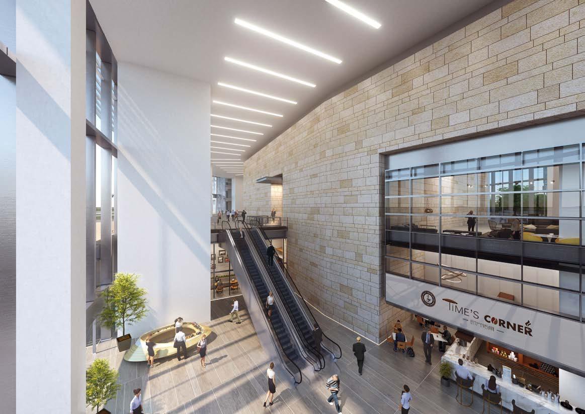
Set to replace what is currently a fullblock parking lot, this new office building represents a new era in office buildings in Chicago. The two-tower, 1.5 million square foot development will be phased in construction beginning with the taller of the two towers. The two towers are connected by a shared five-story podium, which will be topped by a one-acre outdoor park and includes interior and exterior amenities for tenants.
The site adjacent to the highway is significant. Where the highway creates a chasm in the city and breaks ties between the east and west portions of downtown, this development is an important piece to overcome this. The new towers are meant to bridge the neighborhoods on either side and strengthen the street and connection across the highway.
The development, designed in collaboration with Juan Gabriel Moreno Architects, integrates the tower and podium into a singular, angular language. The high performance façade is punctured by protruding floor slips to reduce the amount of glass and balance between opaqueness and transparency. V-shaped trusses support the towers and large interior open spaces are bathed in natural light.
Located on the western edge of downtown Chicago with close access to major transportation points, the project will be among the most high-tech, healthy buildings in North America. The building explores the use of multiple floor plate sizes for companies with large and small employee counts, drawing smaller businesses into a more boutique office environment. Each office floor will have a dedicated fresh air intake system to minimize air mixing with other floors.
Programmatically the building is one of the most amenitized office buildings in the nation, with ground floor retail, covered porte-cochere, conference center, wellness and several floors throughout the building solely dedicated to workplace amenities. With over 36,000 square feet of amenities, the entire building has been designed with the workplace of the future in mind.




Area: 12,500,000 sq. ft. / 1,160,000 sq. m.
Height: 2,185 feet / 666 meters
141 stories
Designed: 2020
HOK Studio: Hong Kong
◄ street rendering

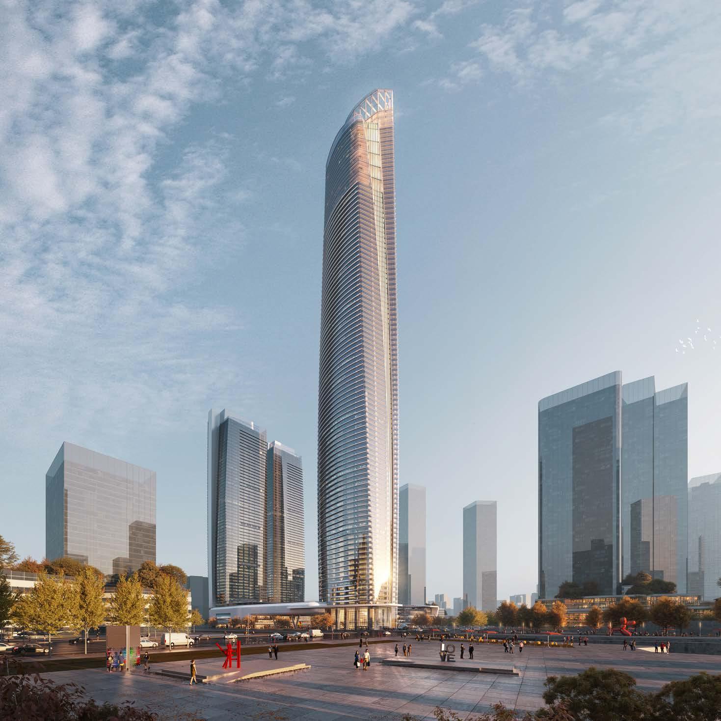
Confidential Super High Rise Mixed-Use Project
Guangzhou, China
The Super High Rise Mixed-Use development offers an opportunity to create a modern commercial hub that will be a key node within the larger development of the Greater Bay Area as one of China’s major economic centers.
In creating a new iconic city center, the project will enhance the growth and urbanization of Huang-Pu Harbour and strengthen Guangzhou’s position in the global market. The development will be home to one of the tallest commercial towers in the world and a premier global business hub integrated with world class commercial and lifestyle offerings from world class shopping to high end hospitality.
This new landmark development will form the Eastern Gateway of the Pearl River into Guangzhou.
The site is strategically located at the crossroads between 2 major axes within the new masterplan for Huang-Pu Harbour, the main East-West arterial addressing road and a pedestrian oriented canal front that
leads to the new waterfront planned for the city. The proximity to this new waterfront to the development provides an opportunity to fully integrate the waterfront into the development creating a unique urban experience where the riverfront and the city meet to create a dynamic destination within the Greater Bay Area. The opportunity to integrate the harbour and the development together will create a world class waterfront destination.
When fully realized, the entire waterfront will need to accommodate a large number of workers, citizens and visitors. As such an integrated public transit network will be necessary not only to make access convenient but to also promote the Huang-Pu Harbour as a destination to live, work and play. While some underground metro stations exist, it will be important to integrate a variety of transport options. The waterfront directly south of the development would be idea area to integrate a major bus station for local and regional buses as well as a water taxi stop for those who prefer maritime commutes between Hong Kong, Shenzhen
and Guangzhou. Designed sensitively these transit stops can be integrated with parks and commercial offerings that make arrival into the city both convenient and pleasant.
The proximity to the Pearl River and the aspiration of the city as a world class waterfront destination inspired a number of aquatic related and nautical themes that help to form the identity of the development and make it an urban landmark. The main tower located on the southwest corner anchors the site as a prominent landmark of the new waterfront. It’s massing and facade is reminiscent of dual piscatorial forms recalling mythological tales that presage wealth and prosperity. The tapering forms culminating in extortionary high altitude atria for hotel guest and casual observation deck tourist offering panoramic views of the city and the Pearl River.




Area: 443,100 sq. ft. / 41,165 sq. m.
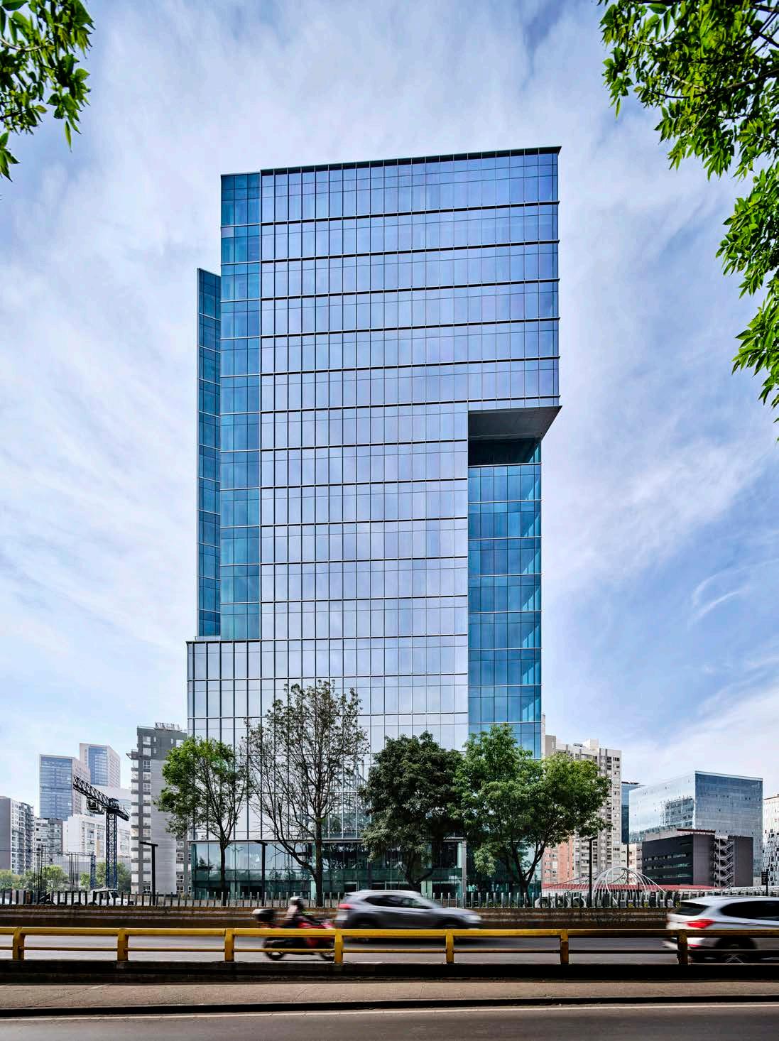
Corporativo Neuchatel
Mexico City, Mexico
The Corporativo Neuchatel tower is the first office building within the Cuadrante Neuchatel Polanco, a master-planned mixeduse development located in the Polanco neighborhood of Mexico City.
The project sets a new standard for the commercial office market in Mexico City with a high-performance building featuring 19 floors of Class A office space with 24,200-square foot floor plates. The building offers community and neighborhood integration with a thoughtful mixed-use program, a site-specific approach to massing, and a seamless integration of the outdoor and indoor environments. In keeping with the Master Plan, the office tower sits above 9 levels of underground parking, which are planned to expand as future phases are added.
A key strategy for the overall site development is to enhance pedestrian connectivity for the entire Polanco neighborhood and therefore all the vehicular basement ramp access points are organized along the perimeter. The main vehicular site entrance is along the northern perimeter
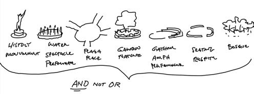
from Avenida Rio San Joaquin with direct access to the building drop-off, valet area, and vehicular ramps to the nine basement parking levels. The master plan proposes an east-west pedestrian greenway that serves as a common public pedestrian spine connecting the entire development. A northsouth pedestrian spine connects Neuchatel street and the Polanco neighborhood. At the intersection of these two spaces is a central plaza. Inspired by historic plaza precedents in Mexico City, the design provides for a series of exterior rooms defined by sculptural pods. The three-dimensional pods provide a multitude of functions such as landscaped seats, family play areas, social sporting enclosures, shade structures, and group gathering spaces.
The new office tower is located along Avenida Rio San Joaquin and directly east of the new proposed central Boulevard. The building form follows the parcel geometry with an angled north façade facing Avenida Rio San Joaquin, anchoring the northern gateway to the overall development. The simple building mass is enhanced by carving
the building corners and the articulation of façade details. The main façades are clad in slightly reflective floor-to-ceiling glass with vertical accent fins that provide shade and create a textured expression. In contrast, the subtracted corners are void of any exterior articulation, utilizing a non-reflective high transparent glass that further emphasizes the gateway and corner views. The result is a faceted and dynamic design that responds to the rich urban context while maintaining a cohesive identity.
The two-story building base integrates seamlessly into the exterior garden and urban plaza with large clear glass panels. The lobby concept is hospitality focused, creating an active space for working, meeting, and enjoyment, with a day/night café/bar, library/ lounge, and retail. By providing seating nooks along the exterior wall, and operable folding doors, the lobby activities extend to the outdoors and further integrate the office tower into the pedestrian and communityfocused Cuadrante Neuchatel development and Polanco neighborhood.
The high-performance building is expected to be LEED Gold certified.




Area: 452,000 sq. ft. / 42,000 sq. m.
Height: 787 feet / 240 meters 52 stories
Crystal Tower
Kuwait City, Kuwait
Crystal Tower, a delicate balance of sharp, angular forms of glass and metal, rises from the city skyline in the Al Sharq district of Kuwait City. The design contrasts with the solidity and sweeping contours of the HOKdesigned Intercontinental Mixed-Use Tower several blocks away.
Composed of sloped glass and a metal panel curtain wall, the tower features elegant, slender proportions and a compact floor plate. The building includes 45 stories of office space, with a multi-level stone and glass podium at the ground level housing a three-story entrance atrium, retail spaces, building services and two levels of underground parking.
A striking open-air sky atrium at mid-tower height relates to the surrounding context of mid-rise buildings while providing sweeping, panoramic views. A 20-meter-tall steel truss spire atop the tower emphasizes the building’s dynamic asymmetrical composition.
The tower’s overall slenderness ratio of nearly seven to one posed a structural engineering challenge for the design team. A cast-in-place concrete wall replaces the original steel V brace, absorbing the tower’s twisting motion under wind loads. The addition of perimeter tension columns in the concrete core compensates for the unbalanced twisting of the typical floor plate.
After the wind tunnel testing, the team incorporated chamfers along the corners of the tower and used the firefighting water tank at the top as a dampening element. This refinement reduced overall accelerations for serviceability while enhancing occupant comfort.


Area:
Height: 505 feet / 154 meters
Designed: 2018


E5 New Songdo City
Songdo, South Korea
Block E5 is the last prominent site to be developed along Central Park in Songdo city. Extending the successful design legacy of developments at Block D-22 & D-23 across the park, the design evolved from the goal of combining distinctive architectural forms, efficient planning and great amenity for the residents.
Two residential towers are conceived as organic twisting forms that create a dynamic skyline. Whilst dramatic, the forms are built from repetitive floor plates that optimize planning efficiency and modular constructability. Internal planning is prioritized through the design of optimal units, each floor plate consists of 5 units that maximizes amenity and views for the residents. This stack of 5 units is then repeated each floor and rotated an equal distance. Within the repetition lies an opportunity to perfect the detail and achieve high quality.
Development of the site and massing is structured around the concept of the towers with the low rise and site features flowing around the towers. The low-rise forms respond to the context by providing a strong street edge that reinforces urban experience whilst crafting an inner court for residential use. Two three story retail buildings run along the north and south edges of the site with a five-story commercial building anchoring the southeastern corner of the site. The northern building is conceived as a shophouse typology allowing flexibility of use and ownership. The southern retail building is designed as modular retail on the lower two levels with office amenity on the third floor. Both retail buildings incorporate terraces that look onto Central Park and offer outdoor amenities. The inner court is formed off the architecture of the buildings, centered on an arrival / entry court, landscaped terraces
emanate from the buildings. These terraces mitigate the effect of interior facing blank facades of the retail, creating a more intimate human scale and elevating residential amenity for privacy.


Height: 853 feet / 260 meters 53 stories
Designed: 2021
HOK Office: Hong Kong
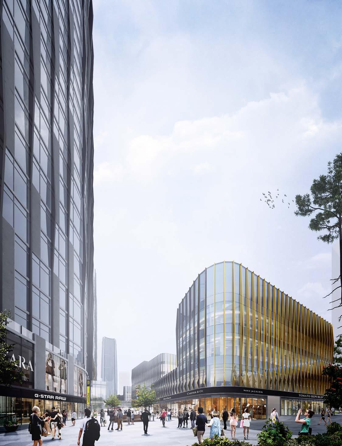
Forte Jinan Finance Center
Jinan, China
This 342,000-square-meter mixed-use development comprises five office and apartment towers. The tallest tower is 53 floors and 260 meters high.
The site faces the north side of Ribbon Park and a pedestrian walkway. The height of the three serviced apartment towers cascades down from the highest point of the A1 plot. The tallest building will be the highest tower within the A1-A4 site, forming an arc-like skyline.
A northern retail street that serves as the “front door” for the development and the retail and office spaces along the building podiums are sized to maintain the traffic flow on surrounding streets. Curvilinear elements
within the internal retail and office streets echo the smooth architectural vocabulary.
The sparkling surface of an adjacent lake influenced HOK’s design of the building exteriors. The contemporary, elegant language includes slender towers with minimalist facades. The glass curtain wall uses dark gray metal accented with dark gold, with details reflecting the image of the lake and mountains.
Building podiums are conceived as a series of undulating forms beneath the towers. They feature a streamlined architectural vocabulary and are arranged to form a
relaxing, lake-shaped plaza.
The tower forms that make up the composition are unpredictable yet consistent. Their varied height creates ripples on the skyline. The curved edges of the apartment towers maximize scenic views to the outdoors.
Inspired by the concept of ripping waves, the architectural design provides feelings of serenity and purity and corresponds to the overall planning concept of “mountain, spring, lake, river, city” centered around the five natural resources of Jinan.


Area: 1,340,000 sq. ft. / 124,260 sq. m.
Height: 722 feet/ 220 meters
50 stories
Designed: 2019
I Park City Seoul, Korea
Our proposal achieves this vision through the urban design of the district and its three primary components.
The first includes a mixed use district designed as a vertically zoned urban grid.
The proposed mixed use district contains 16 housing towers atop a flexible, commercial podium organizing all necessary living components accessible from the street level. This podium creates “new ground” above retail/commercial space as the primary upper, connecting level of the site.
The second includes the Central Hub and Landmark Tower, again designed as a vertically mixed, multiuse tower and podium. The Hub is designed bring together the 200 meter mixed use tower, an innovation center and knowledge cluster and the public functions to the north. As such, it is truly the Hub of the project and a connecting point from the urban grid and skywalk system.
The third component of our proposal defines the public and historic resources as an extension of the Forest Park Greenway in support of both the public and commercial experiences of North Seoul IPARK City. This area engages the historic Train Building and Silos on the site to create a public extension accessible from the Forest Park Greenway and the streets within.
Together these elements provide optimal connections to the surrounding districts and function and sustain a flexible framework for evolution and development of North Seoul IPARK City.


Area: 1,323,960 sq. ft. / 123,000 sq. m.
Height: 492 feet / 150 meters
48 stories
Built: 2016
InterContinental Beijing Sanitun at Topwin Center
Beijing, China
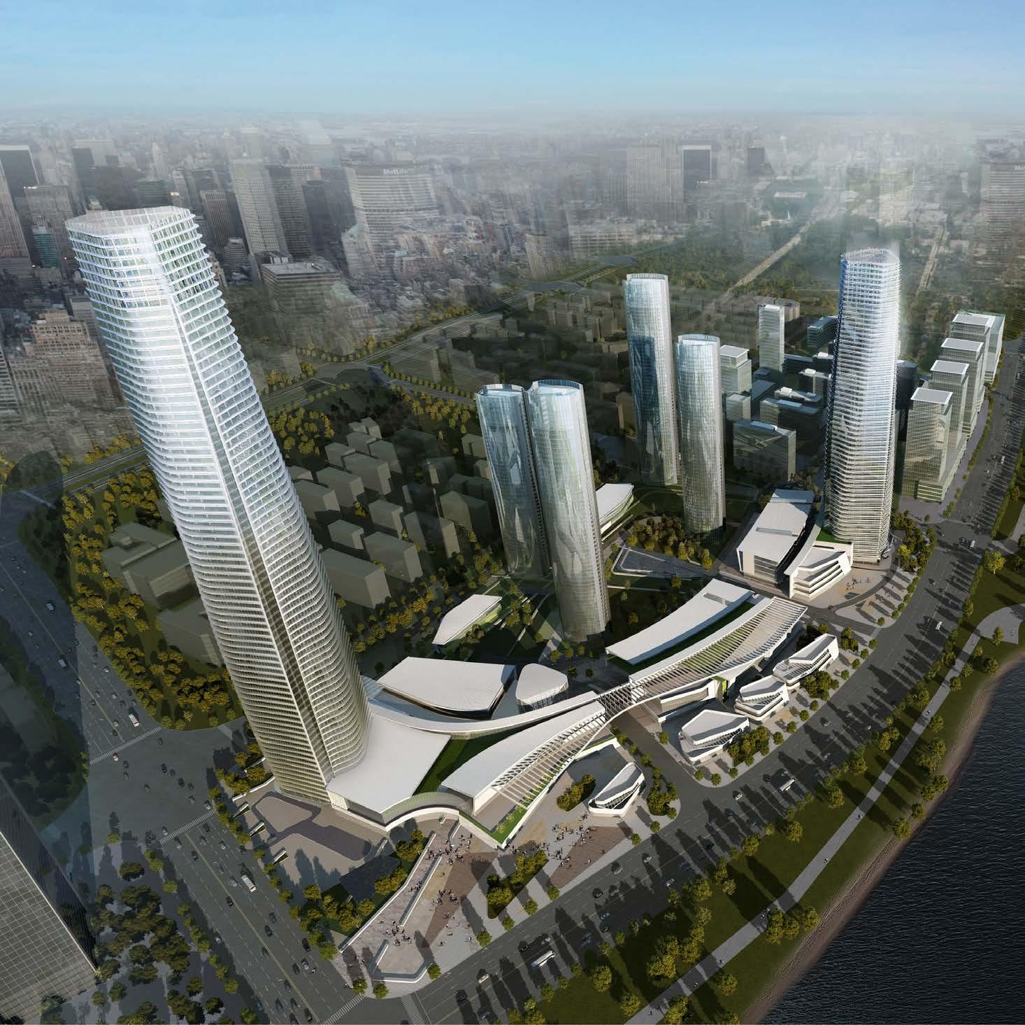
The hotel building, which is in a trendy and creative neighborhood, distinguishes itself as a modern landmark with a hexagonpatterned facade that gives it a distinctive honeycombed texture. At night, the tower’s skin comes alive to create mesmerizing light shows.
In addition to the 305-key InterContinental Hotel, the property also includes 48 luxury apartments and a boutique shopping mall.
Challenged by a narrow site, HOK’s team designed a tapered silhouette at the two ends of the tower with a linear silhouette at the building’s core. This form creates a dramatic exterior that offers uninterrupted panoramic views for hotel guests.
Located within the tower’s linear massing, hotel guestrooms offer stunning vistas onto the Forbidden City and Beijing’s financial district to the west and a vibrant cultural district to the east. Suites on the north and south ends have a triangular floor arrangement that provides 270-degree views onto the city.
Separate entrances welcome residents, shoppers and hotel guests onto the property. One of Beijing’s largest revolving doors creates a grand entry into the hotel lobby, where a connected restaurant patio allows diners to experience the neighborhood’s hustle and bustle.




Area: 3,767,370 sq. ft. / 350,000 sq. m.
Height: 820 feet / 250 meters 58 stories
Designed: 2016
HOK Office: Hong Kong
Jiangxi Commerce Union Center (Nanchang Commerce Center)
Nanchang, China
Soaring more than 800 feet above the city, Jiangxi Commerce Union Center lies within Nanchang’s new central business district. Inspired by the region’s natural beauty, the center’s two towers—an office high-rise and mixed-use building—anchor a retail mall and offer panoramic views of the Gan River and Nanchang’s cityscape.
In designing the towers, HOK’s team found inspiration in the sculptural form of the ceramic vases produced in the Jiangxi region. Tapering at the top and bottom, the smooth, undulating facade creates a distinct appearance that, like the river, appears to change shape when viewed from different angles.
The retail mall’s canopy offers a unique indoor-outdoor experience that features international brands and dining facilities.
For the interior design of the 277-room Nanchang Westin hotel in the north tower, the team sought to visually convey the rich history of the province and the entrepreneurial spirit of its people. The hotel atrium offers a contemporary interpretation of the siheyuan, a traditional Chinese courtyard house that historically has represented the mercantile essence of local residents. Thirteen floors of guestrooms surround this atrium and its views onto a courtyard garden. Fine art displays on each floor showcase contemporary interpretations of traditional crafts such as ceramics and carved jade sculptures.
Additional HOK-designed amenities include three signature restaurants, an executive lounge, a sky bar, pool and wellness facilities, and a conference space with a ballroom.


Area: 1,250,000 sq. ft. / 116,000 sq. m.
Height: 814 feet / 248 meters
59 stories Built: 2018
Jinan China Resources Center
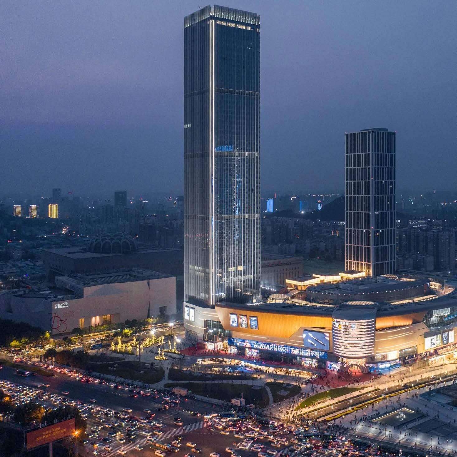
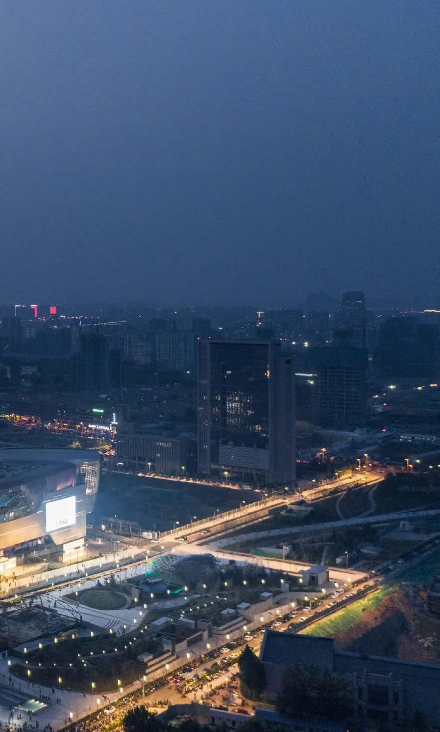
The development of Jinan China Resources Center introduces a new hub for a dynamic 21st century urban lifestyle into the heart of the city’s emerging Central Business District. Strategically situated among several important cultural, civic, commercial, and residential destinations, the proposed highrise design of the Jinan China Resources Center envisions a bold and timeless landmark imprinted strongly on Jinan’s modern skyline.
Prominently seen from throughout the city, the pairing of the Center’s 250-meter-tall commercial office tower with its 180 meter tall SOHO tower will identify one of Jinan’s most desirable live, work, and play locations. Users of the CR Land towers will experience
a sophisticated level of architectural material and detail while capturing stunning views of Jinan’s unique blend of natural, cultural, historic, and modern features.


Area: 2,243,013 sq. ft. / 208,382 sq.m.
Height: 1,000 feet / 305 meters
JP Morgan Chase Tower
Houston, Texas, USA
Designed by I.M Pei in 1982 for Hines, the 75-story JPMorgan Chase Tower opened as the tallest building in Texas. Since then, it has remained a premier business address and an icon on Houston’s growing skyline. Nearly four decades later, developer Hines asked HOK to help breathe new life into the aging building to attract new tenants.
JPMorgan Chase Tower’s expansive 1.5-acre outdoor plaza presented an opportunity to reimagine the ceremonial entry plaza into an active urban space along Capitol Street. A ground floor lobby, originally designed as a grand portal, was reconfigured to allow for informal gathering, working, and meeting. Bank spaces were converted into tenant amenities for conferencing, lounges, and retail.
HOK redesigned the plaza to provide a variety of spaces for outdoor activities while linking the areas around the lobby with new landscape, paving, and seating areas. The
large Miro sculpture was preserved and integrated into the design as a pivot point in the composition. The plaza is above the lower floors of parking and service areas, requiring careful coordination with the contractor and client. A strategy of layered spaces, combined with outdoor seating rooms and trellis structures, creates a rich assembly of experiences and scales for informal connections, for tenants and citizens.
The tower footprint is based on a square with a corner removed. Recognizing this geometry, the square plan at ground level is restored to expand the lobby footprint. The resulting form creates an inverted triangular glass roof which is supported by the structure of its side walls. The triangle is divided into a rhomboid structural and glazing frame. The sidewalls are treated as light, transparent surfaces. This new glass pavilion bridges the exterior and interior spaces, transforms from day to night, and links the tower to the urban realm.
Interior design enhances the modernist roots of this building, incorporating a carefully crafted palate of warm materials, details, furniture, and artwork. Aside from the enlarged lobby, the design added a new conference center, lounge, sky lobby, and mezzanine retail café with connections to the exterior plaza seating areas. Careful attention to lighting adds color to darker interior core spaces.
Cognizant of the importance of this seminal building, this respectfully crafted transformation, contributes to city life, and optimizes the tower’s prime location and proximity to downtown Houston’s historic and cultural district.


 ▲ new plaza


Area: 4,000,000 sq. ft. / 372,000 sq. m.
Height: 590 feet / 180 meters
33 stories
HOK Office: Houston
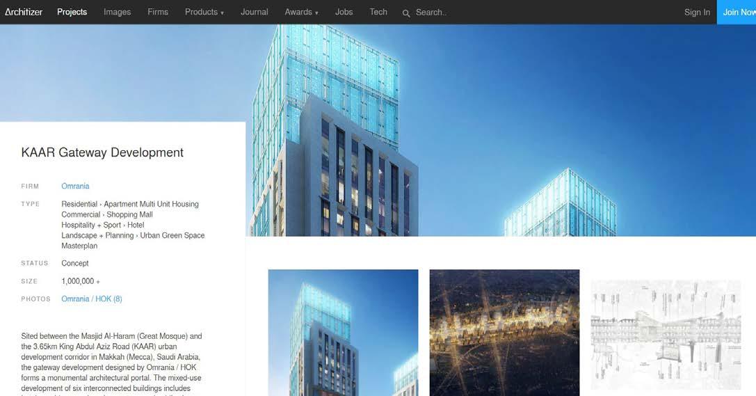
KAAR Gateway
Makkah, Saudi Arabia

The King Abdul Aziz Road (KAAR) Project in Makkah, Saudi Arabia, is a significant masterplan aimed at improving the urban experience for visitors and facilitating the movement of pilgrims from mass transit nodes to the Al-Haram Mosque. At the apex of this master plan is the KAAR Gateway project, which acts as a key hub connecting various public transport networks to the mosque.
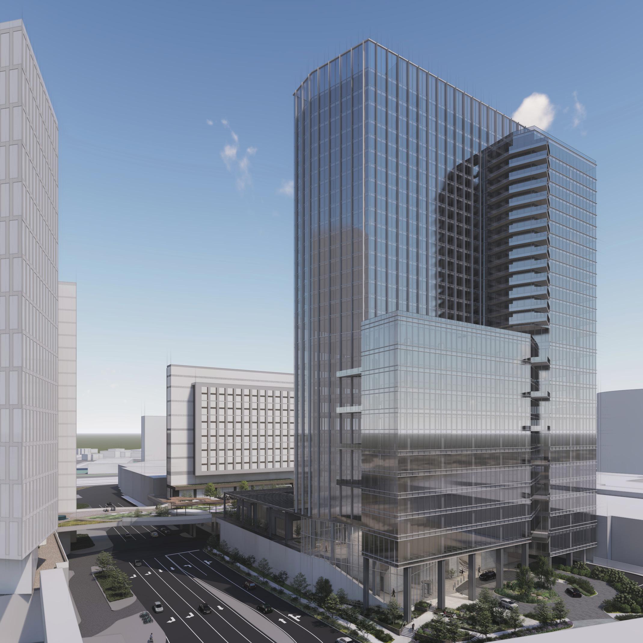
The KAAR Gateway project is a monumental architectural portal designed by Omrania / HOK. It comprises six interconnected buildings, including two 5-star hotel buildings, one 4-star hotel building, a high-end residential tower, and two retail buildings. These structures set the architectural tone for the entire KAAR Project and provide a mixed-use development with hotels, residences, shopping centers, and public plazas accessible from a central pedestrian boulevard.
The design of the KAAR Gateway considers four key contextual aspects: the street arrival, the boulevard entrances, the sky gardens, and views of the mosques and mountains. The hotel/residential towers are designed as a collection of four stepped rectangular forms. The towers on the west are arranged in a pinwheel form, gradually diminishing in size as they rise and culminating in a rectangular mashrabriya that acts as a beacon. The towers on the east are stepped to create a gateway at the beginning of the boulevard, with masses overlapping each other and culminating in illuminated mashrabriya beacons.
The architectural design of the KAAR Gateway development is both contemporary and contextual. The cladding system incorporates stone, glass, and aluminum screens, reinterpreting traditional local building traditions on a larger scale. The rhythmic spacing of deeply set windows and geometrically patterned screens serve both climatic and cultural functions. The building's energy performance is enhanced by a stateof-the-art insulated curtain wall system, a water recycling system, and other design and engineering features.


 ▲ exterior rendering


▲ facade patterns and details


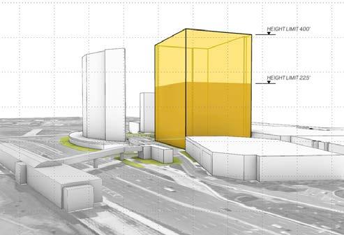

Area: 698,500 sq. ft. / 65,000 sq. m.
Height: 400 feet / 122 meters
31 stories
Designed: 2022
L&T Tower
Fairfax, Viginia, USA
The Tysons L&T tower includes an integrated, stacked microcosm of uses and joins multifamily, office, and retail space into a single experience. This mixed-use project is a part of a multi-phased master plan at Tysons Corner Center in Fairfax County, Virginia.
The project site is the former Lord & Taylor (L&T) location, off One Tysons Place. The southern site boundary abuts Tysons Corner Center, which has evolved over the past decade into a mixed-use development with the Tysons Tower office building, the Hyatt Regency hotel, and the VITA apartments.
The Phase 2A site is uniquely located next to a successful outdoor plaza and a vibrant shopping mall that is a destination for the community and beyond. The design of the new building and site is about creating distinct settings and experiences for the tenants and community. New connections will be made to promote walkable and multi-modal activities in this pedestrian and transit-oriented community.
The 31-story mixed-use tower will include approximately 330,000 GSF of commercial office space, 286 residential apartment units totaling about 318,500 GSF, and retail space at the Plaza level of approximately 50,000 SF. There are approximately 675 new parking spaces in a five-level parking, including four levels below-grade. The parking strategy is based on a master plan for tenants, with an optionality to utilize existing parking spaces in the adjacent retail parking decks.
The tower is placed to take advantage of views and mitigate wind and solar impact on the existing plaza. The stepped tower massing responds to the different uses to create outdoor terraces and amenity areas for the residential and office tenants. The elevated retail plaza area is directly connected via a monumental outdoor stair to the vehicular drop-off area on the east. The two-story retail pavilions located on the plaza level inform outdoor rooms with opportunities for outdoor dining, amenities and with direct access to the existing plaza.


Area: 376,735 sq. ft. / 35,000 sq. m.
Height: 427 feet / 130 meters 33 stories
Le Méridien Hangzhou
Hangzhou, China
Le Meridien Hangzhou Hotel, a gleaming 33-story tower located in the vibrant Binjiang Business District, celebrated its grand opening. Overlooking the iconic Qianjiang River, the hotel offers easy access to commercial and cultural destinations.
HOK Office: Hong Kong
Hangzhou’s elegant tradition of silk production inspired HOK’s design. The building geometry has a fluid, natural form. Composed in distinctive layers of a minimally detailed exterior glass and metal wall, the tower’s form elicits a soft play of light throughout the day and produces a silk-like veil across the building.
The conceptual ‘fabric’ of the project facade is based on tightly-woven Silk textile, with both horizontal and vertical texture being clearly visible.
In the case of our project, additional emphasis is given to the vertical glass fin facade elements which, similar to weaving, can be used to introduce color and texture to the entire composition.
Borrowing from the handcraft of silk weaving, the tower facade uses a similar approach to define massing, create visual movement and add additional layering to the façade design. Warp (‘Jing’) verticals are interrupted by more expressive Weft (‘Wei’) interventions to create order in the facade. ‘Jingwei’ = ‘A clear order’
The hotel’s north and south sides face the Qianjiang River and its tributaries. HOK’s design orients the building layout to capture the best views and maximize the number of rooms facing the river. Residents of the apartments on the north side enjoy plenty of natural light and scenery.
The hotel features 199 contemporary guestrooms and suites in addition to amenities including a well-equipped fitness center with an indoor swimming pool. Le Meridien’s family program offers a large kid’s club, indoor golf simulator, and an art studio for painting and drawing. Three different restaurants cater to diners seeking to experience the local cuisine.


Area: 715,000 sq. ft. / 66,500 sq. m.
Height: 863 feet / 263 meters
55 stories
Designed: 2016
HOK Studio: Chicago


Lend Lease Circular Quay
Sydney, Australia
The design proposal for the Lendlease Circular Quay Tower creates a structure that addresses multiple scales, from silhouette to surface, similar to the nearby Sydney Opera House.
At the macro scale, the team designed the 814-foot-tall tower to be the tallest building in Sydney, with a distinct profile on the skyline. At the micro scale, the tower is situated within an active pedestrian zone in the city center. It complements and promotes the busy pedestrian laneway network while touching the ground as lightly as possible, despite the building’s size. Both scales help create a new city landmark and welcoming destination for residents and visitors to work, eat, shop and pass through.
To maximize space on the ground plane, the design pushes the tower bulk to the ceiling of the buildable envelope, lifting the first full floor plate 80 feet above the lobby. This gesture creates a porous, multilevel ground plane and lobby, accommodating grade changes on site. More importantly, it encourages pedestrian movement through the site and draws natural light into otherwise cavernous laneway spaces.
To create a flexible office plan, the design creates an offset core to the south of the building, preserving coveted harbor and Sydney Opera House views to the north.
An external structural shell supports office flexibility through a 39-foot, column-free band on the north side of the floor plan. The exterior structural grid also protects the
north facade from direct solar exposure. The design team, which included HOK’s in-house structural engineers, developed a highly efficient, hybrid structural precast column system with tensioned steel diagonals.
Splitting the tower plan into two slender lobes and expressing the 13-foot slot in the building silhouette creates zones for both catching daylight and providing natural ventilation.
The project brief requested that all teams work with artists on their proposals. HOK elected to collaborate with James Carpenter Design Associates to integrate art within the architecture. The design designates plazas as public event spaces rather than just places for sculpture.
◄ tower view from Sydney harbor
detail of 1:500 model ►
sketch of precast facade elements ▼


 ▼ lobby view from bulletin place
▼ eye-level view at Pitt street and rugby lane


Area: 11,840,300 sq. ft. / 1,100,000 sq. m.
Height: 577 feet / 176 meters
20 stories
Designed: 2017
HOK Studio: New York
Makkah, Saudi Arabia
Makkah is a city defined by the hills that surround and embrace the Kaaba at its holy center. These hills have been scoured and forged by the growth of the masses that come to worship, and constantly evolving development that comes with this growth.
Rather than start with the premise that the site is a conventional set of towers on a podium, this architectural proposal envisions it as a monument on a hill. The proposed design is deeply inspired and informed by the fluid form of carved volumes, narrow files cut by wind and water, hidden and discovered moments of calm and respite, hints of moisture and quiet, glimpses of flora and the scent of pools of water. Rather than level a hill, we burrow in or perch on top. In these coarse or delicate interventions and engagements, we find privacy, protection, and spirituality.
A smooth limestone-clad facade is interrupted at regular intervals by parametricallydetermined voids. Within this operation of ‘removal’ is nested a modular insert, an articulated, folded surface that creates a ‘filter’ between the privacy and ‘humility’ of the cool interior space, and the relentless, arid, glowing atmosphere of the exterior environment. In plan, this articulated surface folds in, ‘protected’ by the mass, but then folds out to form a bay window, geometrically responding to Qibla, to orient the occupant directly to the Kaaba. Upon folding back into the building, the folded surface rotates again into alignment with Qibla. The result is two equal surfaces, one ‘within’ and one ‘without’, common in their orientation and transparency. The remainder of the folded surface is clad in an ornamental, perforated metal screen that affords privacy to the inside and shading from the outside.
The landmark project includes a Four Seasons Hotel, Four Seasons-branded serviced apartments, two additional residential towers, over 45,000 SM of Commercial space, and a multi-purposed Musallah. The Musallah will provide praying space for 30,000 worshippers, including pilgrims on their way to the Haram, residents of the Jabal Omar residential buildings, and hotel guests. A processional pedestrian ramp within the lower levels of the Musallah structure provides a safe and gentle path down the 26-meter elevation difference between the higher elevation of the bowl above and the Haram plaza below.
The HOK proposal respects the sanctity of the Haram, serves the physical and spiritual needs of the Project’s distinguished guests, fulfills the urban design ambitions for the site, and optimizes the direct views of the Holy sites. The project prioritizes reinforcing, deepening, and imprinting the spiritual focus and the spiritual journey of a visit to Makkah, a site which is considered holy by 25% of the world’s population.
▲ axonometric diagrams


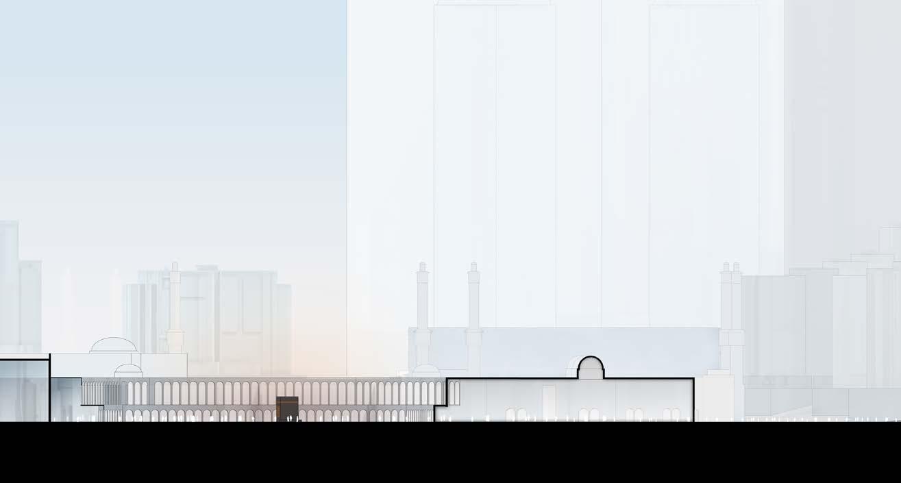 ◄ physical model from top


Area: 2.15 million sq. ft. / 200,000 sq. m.
Height: 820 feet/ 250 meters 64 stories
Designed: 2021
HOK Studio: Hong Kong
Mixed-Use Tall Building Design Competition
Changsha, China
HOK designed this 64-story tower in the heart of Changsha’s River Delta District as part of a design competition for a confidential client. The building offers breathtaking views of the Xiang Jiang and Liuyang Rivers and is near one of Changsha’s primary transportation hubs.
Changsha is one of China’s “Star Cities,” which means the government has designated it as a hub for science and technology. It’s surrounded by stunning mountain and water landscapes.
Taking cues from the nearby mountain peaks, HOK’s design creates clusters of high-rise buildings of varying heights to present a unified appearance from a distance. The main tower’s interlocking forms taper toward the top, mimicking the tectonic beauty of the nearby mountains.
The tower offers Class A office space, high-end private residences and a luxury clubhouse perched atop its peak. Inspired by the ancient legend of the “Tian-Xin (SkyHeart) Pavilion,” this space offers panoramic views of both the old city and the breathtaking natural environment. The restaurants and multifunction halls ensure that the clubhouse will be a hub of activity.
Sustainability was a key consideration. The results of the team’s solar analysis informed the building facade design. Careful attention was paid to the positioning of the building fins to limit heat gain and lower energy use.
The tower is a true representation of Changsha’s status as a “Star City.”


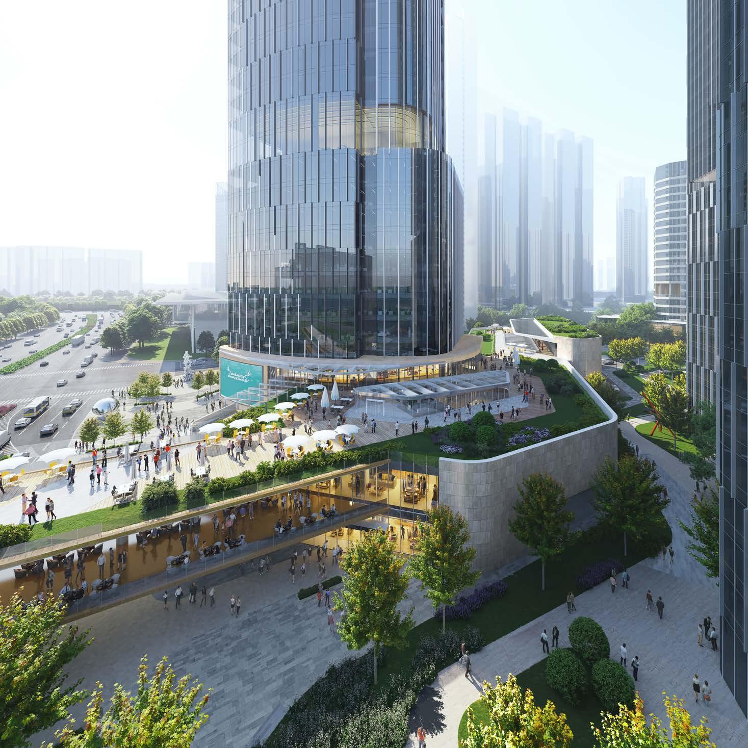


Area: 1.4 mill sq. ft. /13,000 sq. m.
Height: varies - 27 floors
Built: 2021
HOK Office: Washington DC

Msheireb Doha
Doha, Qatar
What if you could design an entire city center from scratch? How could you make it respond to the needs of today and challenges of tomorrow? How could the design enrich the health and happiness of residents and reflect the history and culture of the community? Those were questions HOK grappled with in creating Msheireb Downtown Doha, an urban renewal that creates the world’s first fully built smart and sustainable city center. HOK’s design of Phase 4 was the final phase of the 77-acre district and adds a vibrant, mixeduse neighborhood known as the Business Gateway District.
Few cities in the past century have grown faster or more remarkably than Doha. Gone are the low, adobe buildings and in their place, steel and glass towers stretch into the sky. Yet for all of Doha’s modern success, it can be easy to lose sight of the city’s past and culture. Msheireb Downtown Doha is a response to that.
The Business Gateway District is the densest section of Msheireb Downtown Doha. Its 15 buildings include office towers, residential buildings, a hotel and retail shopping. HOK planned the district to support human connection. The site layout incorporates elements of the historic city grid. Building orientation and massing thoughtfully shades pedestrian walkways and allows prevailing breezes from the nearby bay to pass through the site. Traditional building materials provide proven, time-tested sustainability solutions. Narrow streets prioritize pedestrians, not autos.
The district boasts one of the world’s largest underground car parks extending the entire footprint and accommodating 10,000 parked vehicles. In addition, a metro station beneath the district serves as the main hub of Doha’s subway system.
Msheireb Downtown Doha boasts the densest concentration of LEED buildings in the world. All 15 buildings within the HOK-designed Business Gateway Quarter are now LEED Gold certified.


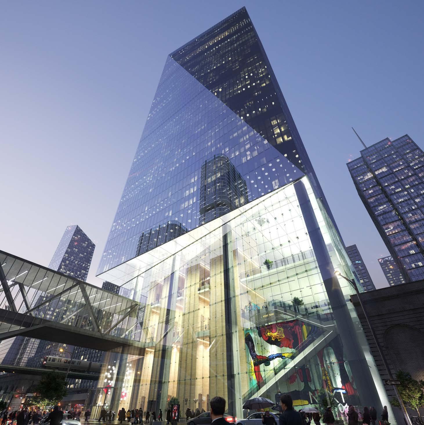


Area: 1m sq. ft. / 930,000 sq. m.
Height: 805 feet / 245 meters
40 stories
Designed: 2019
HOK Studio: Chicago
Ogilvie West Tower
Chigago, IL
The speculative Ogilvie West Tower, located at the Ogilvie Transportation Center in downtown Chicago, occupies an irregular slot of land created by the commuter rail terminal that passes through. While rail is vital for cities and a more sustainable future, it interrupts the urban fabric. Ogilvie station services half a million passengers a week, but its 16 rails and eight island platforms block several downtown streets traveling east to west. Pedestrians, bikers and drivers experience long, narrow underpasses when crossing underneath the terminal in their daily commutes.
Located at the southwest corner of Lake and Canal Street, Ogilvie Tower has the chance to grow the public space that connects Ogilvie Station, two CTA "L" lines and 12 CTA buses to the surrounding area. Within the tower's mixed-use base, a retail and transportation concourse levels provide direct access to train platforms.
The tower's podium base also expands public space. The 3rd level roof garden creates a destination and refuge. Its landscaped plaza and amphitheater provide a place where people can gather and connect. Retail, restaurants and restrooms are available, and elevators, a grand staircase and escalators improve the flow of movement to create a vibrant urban, transit-oriented environment.
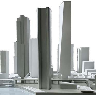
The tower creates one million sq. ft. of commercial space coupled with the amenityrich, transit-oriented public base. The design considers its position on the north branch of the Chicago River and the city skyline. Rising 40 stories, the tower is a beacon that announces itself in the skyline.
The first phase of construction relocates existing train operations, clears the site and drills a caisson for the tower support. Support columns flank the rail lines to allow the concourse level to bridge over the existing rail and connect to Metra and CTA platforms. Finally, the tower is constructed above the concourse, increasing the footprint of the building beyond the wedge of the site below.
Ogilvie West follows a larger vision for Chicago that heals the city's infrastructure scars. By stitching and expanding public space, Chicago's downtown starts to become better connected, stitching together the Loop and West Loop neighborhoods to support a lively, active environment.
 section facing South ▲


Area: 1,980,000 sq. ft. / 184,000 sq. m.
Height: 1,260 feet / 384 meters
76 stories
Designed: 2021
OIC Tower
Riyadh, Saudi Arabia
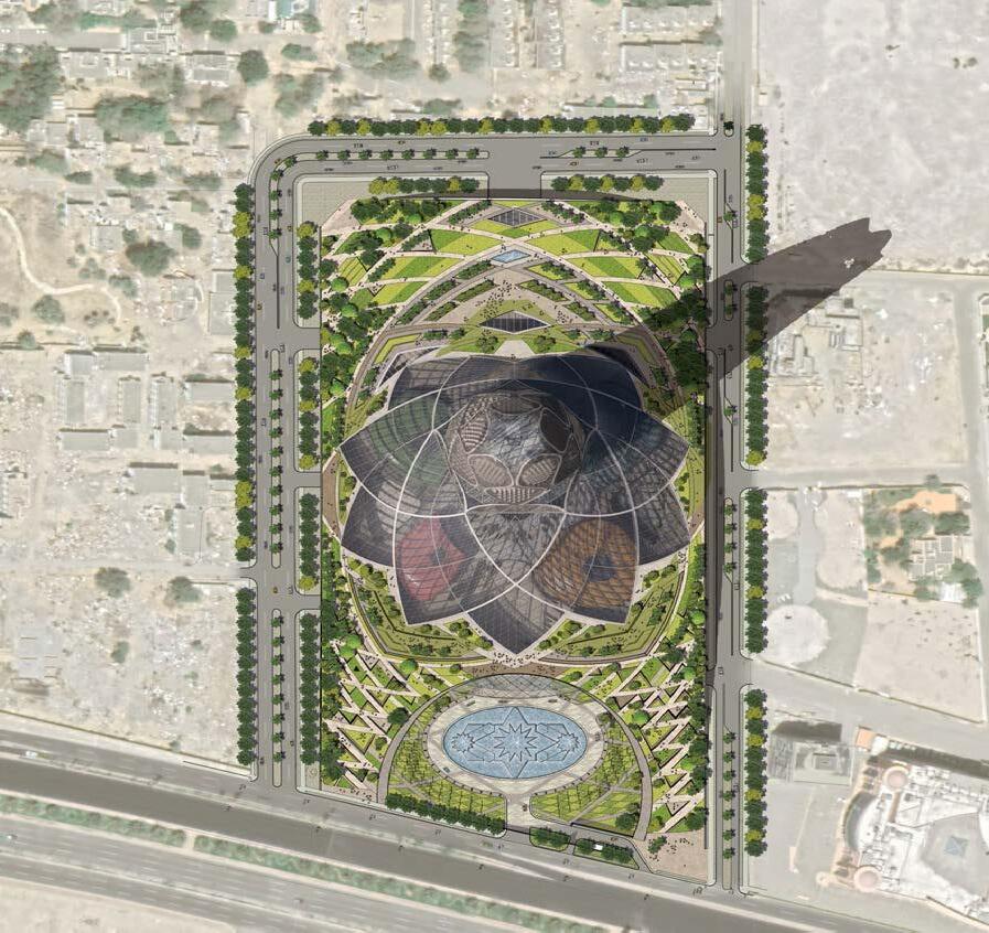
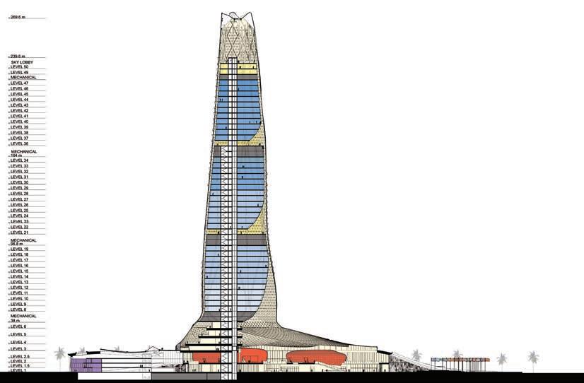
Initial investigations of the building’s organization focused on the re-envisioning the historic Islamic courtyard. Traditionally, courtyards in the Islamic world have served as extremely civic spaces where public bodies could go to gather, unify, and collaborate. HOK is hoping to provide a singular iconic meeting space, in the form of an enduring conference center, that embodies all of the communal aspects of the Islamic Sahn.
Our proposal puts forward a multi-level gathering space that has a connection to the sky & outside world. It is intended to be a zone of transparency and connection where all members of the OIC are represented in an equitable fashion. The convention center core connects directly with planted roof scape allowing for convention goers to breakout into more private meetings in both indoor and outdoor gardens.

Podium functions are distributed below the office tower beneath its glass skirt and the adjacent “green roof”. The faceted, circular tower skirt creates a contemporary “dome” above the conference center as a daylight luminaire, lighting the public space of the conference center below. Its geometry, designed as extensions of the tower façade, recalls the non-figurative pattern of domes from across the Islamic world. It’s structure and high performance, fritted glazing provide daylight while reducing solar gain on the space below. Overall, the space draws upon culturally specific references in order to promote an impression of “Islamicness” throughout.




SECRETARY GENERAL SUITE
CABINET OF THE SECRETARY GENERAL
DEPARTMENTS OF THE ASSISTANT SECRETARY GENERAL
SUBSIDIARY ORGANIZATIONS
CONFERENCE CENTER COLLABORATION
SECTION 5m10m25m 50m
SECRETARY GENERAL SUITE
CABINET OF THE SECRETARY GENERAL
DEPARTMENTS OF THE ASSISTANT SECRETARY GENERAL
SUBSIDIARY ORGANIZATIONS


VIP DINING HALL
ESCORT/ GUEST DINING HALL

GENERAL DINING HALL
ROOF GARDEN ACCESS
SHARED DINING HALL

TRANSLATION ROOMS
TRANSLATION ROOMS

SECRETARY GENERAL’S RESIDENCE
PRESIDENTIAL HALL
TOWER LOBBY
STRUCTURED PARKING
MINISTERIAL HALL

SECRETARY GENERAL’S RESIDENCE
STRUCTURED PARKING
SMALL MEETING ROOMS
TOWER LOBBY
MEDIUM MEETING ROOMS
MINISTERIAL SUITE


TRANSLATION ROOMS
TRANSLATION ROOMS
MAIN ASSEMBLY HALL
GENERAL ASSEMBLY HALL
SEMINAR ROOM
PRESIDENTIAL SUITE
CULTURAL CENTER
LIBRARY
CONFERENCE LOBBY
PRESS HALL
SHARED MEETING ROOMS




Area: 1,980,000 sq. ft. / 184,000 sq. m. Height: 1,260 feet / 384 meters
PIF (Public Investment Fund) Tower
Riyadh, Saudi Arabia
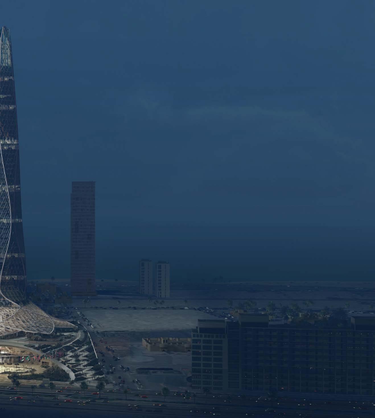
Soaring 1,260 feet above the surrounding cityscape, the PIF Tower is the tallest of the five structures that make up the financial plaza of the King Abdullah Financial District. The team designed the iconic tower as the centerpiece of this new office district. It symbolizes the beginning of a new era of global financial leadership within Saudi Arabia's capital city.
The Public Investment Fund will occupy 300,000 square feet of space in the top floors of the 76-story office tower.
Representing timelessness and openness, the tower's transparency relates to the cultural value of the crystals found along the wadis in the Saudi Arabian desert. This transparency creates internal openness and provides access to natural light within the workplace.
A high-performance solar control system moderates the intense Saudi light and heat. An external layer of fins, gantries and perforated panels provides shade, amplifying the thermal efficiency of the triple-pane, unitized glazing. Together, these shading devices minimize solar gain and internal cooling loads, reducing HVAC requirements. Electrical energy is reclaimed through a photovoltaic array installation on the tower’s roof.
Eliminating copper-wire-based distribution systems for data and security further reduces internal heat gain. The design uses the "cool" technologies of wireless communication, air-blown fiber optics and converged networks. The intelligent infrastructure merges voice, data and video networks to reduce costs, centralize management and boost productivity. To accommodate future expansion and upgraded technology, all systems have redundant capacity.
The podium structure at the base of the tower integrates public circulation with private amenity spaces, including dining facilities and a two-story auditorium.
HOK designed the tower, which is expected to achieve LEED Gold certification, in collaboration with Omrania & Associates.


concept sketches


 ▲ south elevation
▲ tower sun shading detail
▲ tower curtain wall detail
▲ tower curtain wall detail
cma service lift
local lifts (53-76)

technical levels
shuttle service
fire lift + service lift
local lifts (26-51)
technical levels
shuttles local lifts (1-24)
core
low-rise core ►


 ▲ physical model


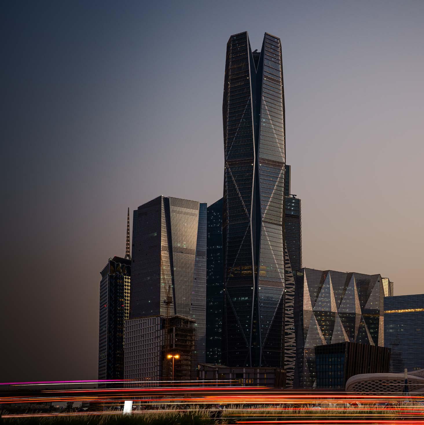


Ping An Hangzhou Finance Center
Hangzhou, China
2018 HOK Studio: Hong Kong
The three towers that make up the finance center are located in the center of Qianjiang New City, gradually rise from the north-west to the south. Through a 45-degree rotating layout, the rich tower grouping emerges to capture panoramic views of Hangzhou’s skyline as well as the Qianjiang River. On the modern curtain wall façade, delicate metal fins, carefully proportioned panels and mullion details emphasize the building’s vertical expression. The crown and chamfered corner continue the main façade concept but with a subtle refinement, adding another layer of sculptural form to the buildings. The clarity of the geometry reveals a continuous wholeness and strength among the tower group through the chamfering and folding treatment of each towers’ edge.
A three-level podium is placed along the main thoroughfare to maximize the retail’s commercial value and the central courtyard enclosed by the three towers provides a tranquil break out area for office workers. The podium is designed as a high-end retail destination in the business center and adopts the tower’s folding concept, which is applied to its rich massing form.


Area: 1,133,870 sq. ft. / 105,340 sq. m.
Height: 67 stories
Built: 2017
HOK Studio: London
Spire London
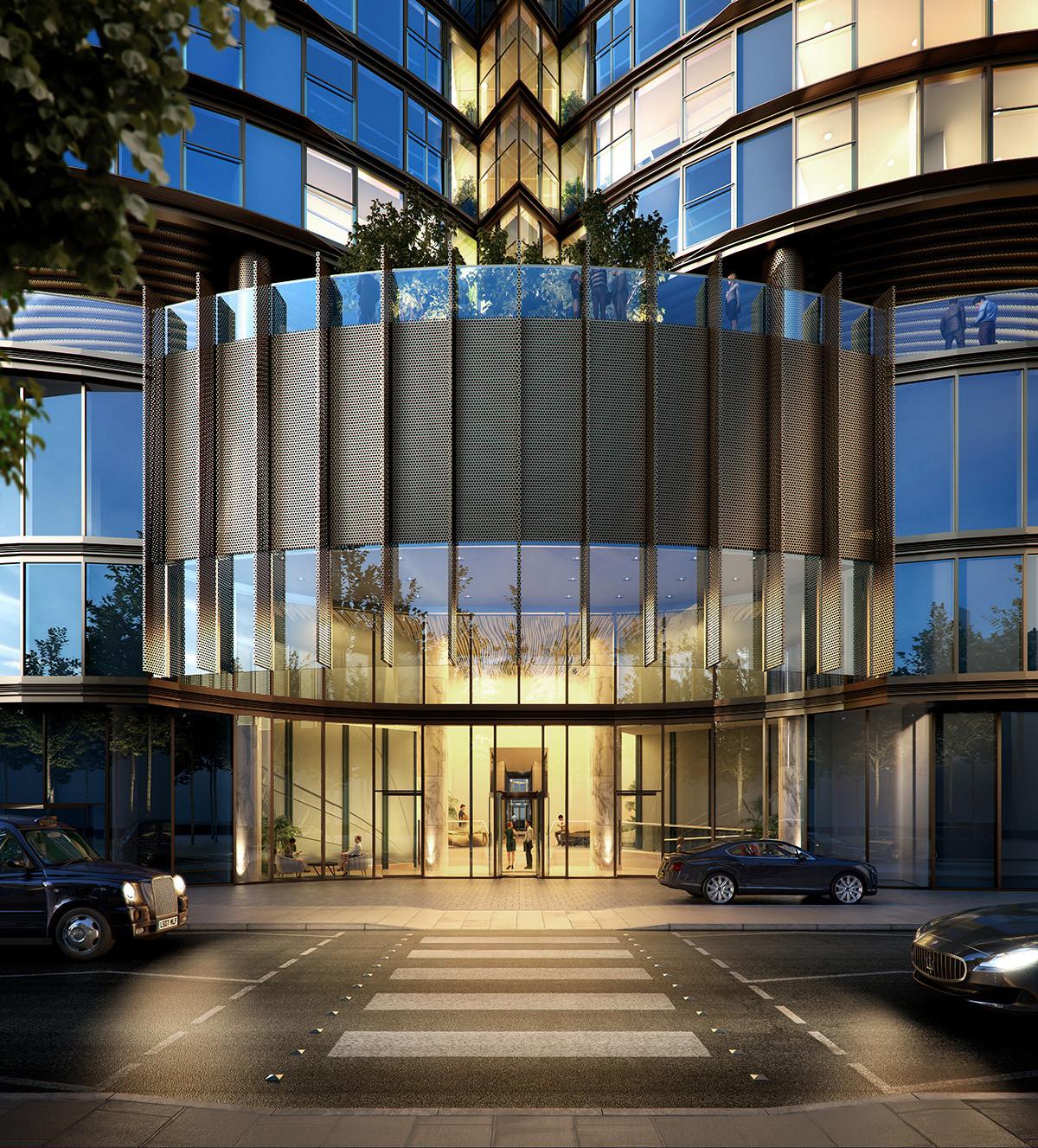
HOK was appointed by Greenland Group, China’s leading real estate developer, in March 2014 to design a landmark residential tower situated at the North Dock of Canary Wharf. Spire London received full planning consent in 2016 and was set to be Western Europe’s tallest residential tower at the time, and a new landmark on the city skyline.
Our design of the 67-story tower provides 861 high-quality private apartments as well as community and children’s play spaces. Located in Hertsmere Road, adjacent to Canary Wharf and fronting West India Quay’s historic waterside, Spire London provides a focal point at the western end of the dock.
The site is partly located within and adjacent to the West India Dock Conservation Area, and is surrounded by several listed buildings. The tower has been designed to provide uninterrupted panoramic views over the whole of London – the highest and most far-reaching ever provided by apartments in the capital – capturing the Thames, Canary Wharf, the City of London, and numerous famous and historic landmarks.
The development includes significant public realm and landscaping improvements, alongside new shops and cafes that will revitalize the West India Quay area.
The expansive design of Spire London’s reception hall will welcome visitors to all the luxury of a five-star international hotel. The building will feature communal amenity pavilions including glass winter gardens, landscaped roof terraces, public open spaces, a games room and carefully designed external and internal children’s play areas, including a soft-play space for the youngest children.



Area: 305,000 sq. ft. / 28,335 sq. m.
Height: 415 feet / 126 meters 60 stories
Designed: 2017
Sutton Place Manhattan, New York, USA
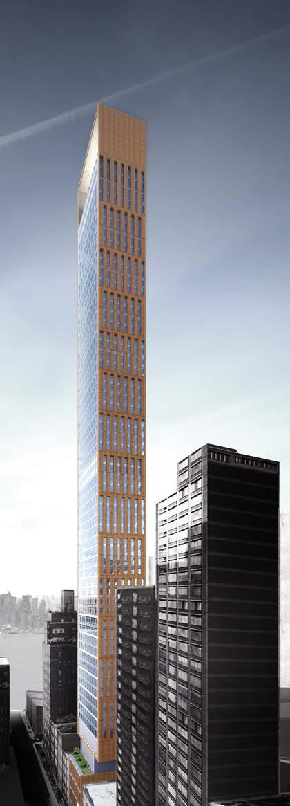
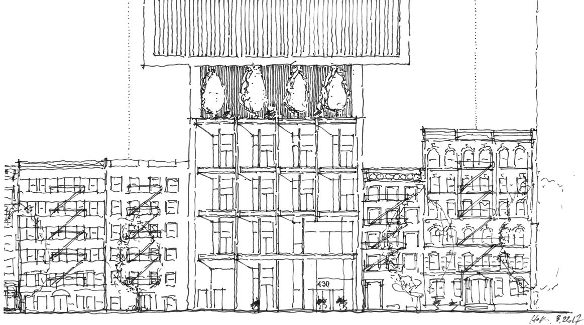
Sutton Place is a quiet enclave in Manhattan located south of the Ed Koch Queensboro Bridge and north of the Midtown East neighborhood. The highly visible East River site creates a significant opportunity for 430 East 58th Street to become an urban expression of Sutton Place on the Manhattan skyline.
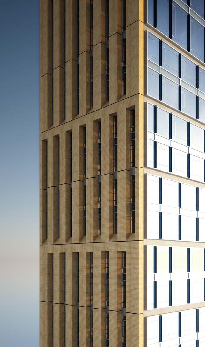
The new development visually anchors the neighborhood with an elegant tower featuring a terra-cotta frame, punched openings and a taut curtain wall. The top of the high-rise culminates with an oculus facing south to honor the United Nations Headquarters.
Terra-cotta reinforces the neighborhood palette, while the four-story frame openings relate to the scale of adjacent townhouses. As the tower rises, staggered fenestrations convey a sense of movement and form a streamlined statement that creates a dialogue with surrounding buildings.
Crafted as a contextual “townhouse,” the building’s base includes the resident entrance and amenity floors. Vertical terra-cotta elements are linked with bronze channels and limestone to create a doubleheight cantilevered entry canopy with a welcoming street presence. A private rear garden reinforces Sutton Place’s small park environment.
The conceptual design provides floor plan options for both a central core and a north side core without altering the exterior design. The central core option provides 360-degree views and more daylight penetration on all four sides. The north side core could offer a more efficient option that allows for improved layouts and better views to the south.
Representing a new generation of Sutton Place residents, the timeless design celebrates the unique scale, charming character and breathtaking views that draw people to the neighborhood.
 ▲ aerial rendering
▲ terracotta facade render


 ▲ floor plans ▲ physical model

 ▲ facade physical model
▲ facade hand sketch




Area: 465,000 sq. ft. / 43,200 sq. m.
Height: 415 feet / 126 meters 38 stories
Designed: 2019
TAS 7 Labatt Toronto,
Canada
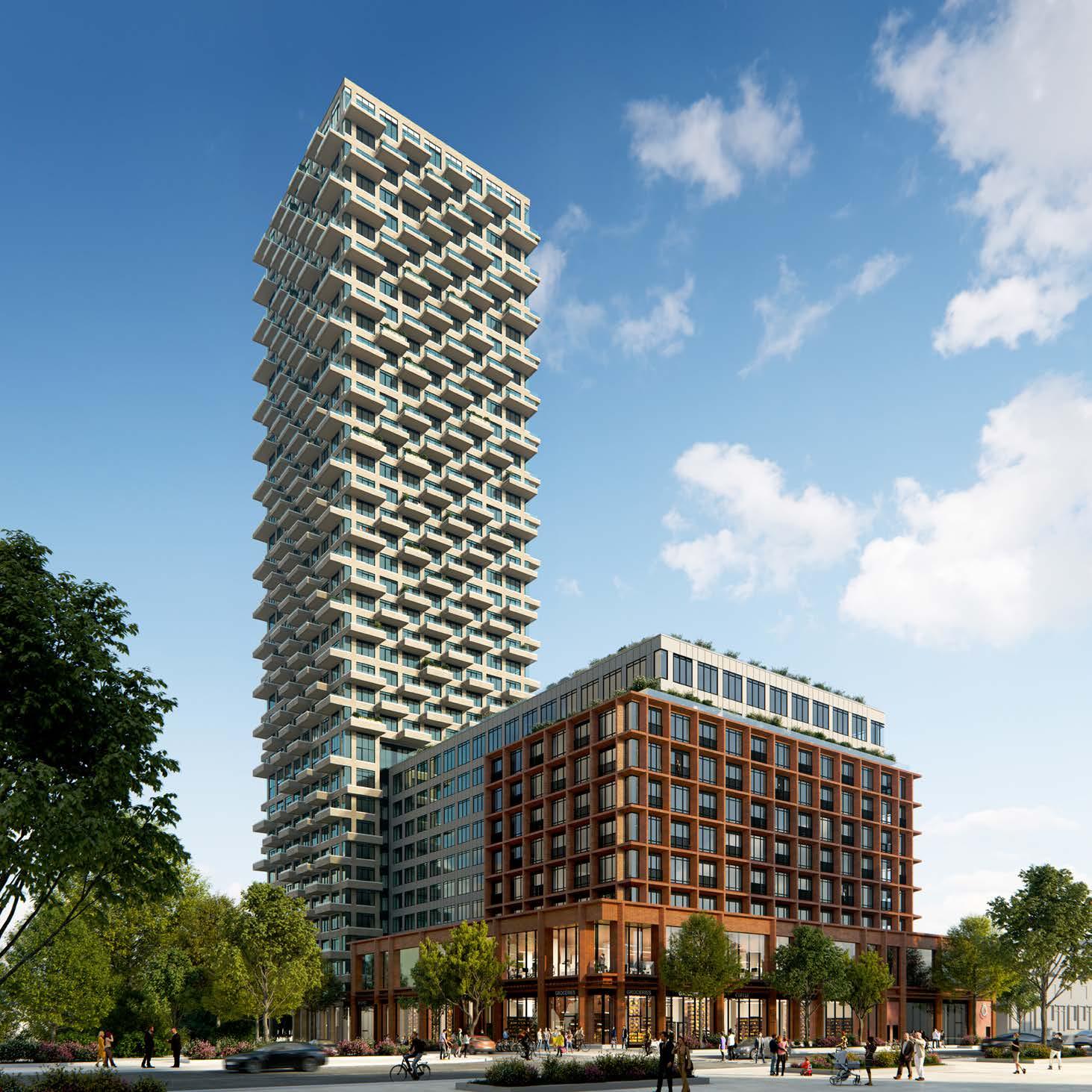
HOK’s Toronto studio created an innovative concept for a mixed-used high-rise development on behalf of TAS, an unconventional Toronto-based real estate developer.
With an emphasis on creating a true community for its residents, the project’s vision is centered on creating a vertical extension of the neighborhood throughout the building. It provides a variety of amenities for healthy and communal living, such as urban farming, bicycle facilities and coworking spaces.
While maintaining the social fabric of its neighborhood with the reprovision of Salvation Army facilities, this project also enriches the public realm by providing public green spaces and retail spaces. The richly textured façade not only helps the building blend into its context of lowrise homes but is also performative and contributes significantly to its sustainability goals.
The balconies are designed as true private outdoor spaces and are staggered to maximize daylight into all residential units.


Area: 4 million sq. ft. / 371,000 sq. m.
Height: 1,115 feet / 340 meters 71 stories
Designed: 2021
HOK Studio: Hong Kong
Tianjin China Overseas
International Center
Tianjin, China
The development includes two office buildings and retail podium. The tallest tower is 71 stories and 340 meters high.
The site is in the heart of Tianjin’s central business district (CBD) on the east bank of the Haihe River. With its beautiful natural scenery, this prime location offers tenants and visitors easy access to historical and cultural destinations.
Highlights of HOK’s architectural design include the high-performance building envelopes, integrated sustainable design strategies, high-level amenities and ample green spaces. All will position this new mixed-use development as one of Tianjin’s premier commercial venues.
The design creates a new landmark for the world that is in harmony with its local context in the center of Tianjin. The modularity and structural grid of the neighboring buildings are mimicked and represented in a modern, sophisticated way.
With a simple and elegant design, the facades resemble those of the surrounding buildings while also achieving a sculptural effect. By displacing the modules of the facades, the design creates a rhythmic effect that echoes the gentle waves of the Haihe River while integrating the new buildings into the city. The 71-story tower appears to twist from the bottom to the top. With an elaborately shaped “crown” at the top, the building will be a stunning addition to Tianjin’s skyline.
A dynamic urban window provides visual connections between the two office buildings by cutting the upper portions of the north side of the main tower that is not blocked by surrounding tall buildings. This highlights the dynamic façade while allowing the lower levels to maintain visual links with surrounding buildings.
The holistic design approach integrates the program requirements with opportunities for interaction, health and well-being, and a variety of experiences. Beginning with the site, a careful study revealed opportunities to integrate the building form and functions within the surrounding environment. The form of the towers responds to a composite analysis of idealized program floor plates and the desire to create a distinguished form. Outdoor spaces promote interaction with the environment. The design uses natural elements to establish both visual buffers and connections to surrounding developments. Placing parking and service loading functions underground reduces the heat island effect and helps preserve the site’s natural condition.
◄ aerial rendering
The office tower is prominent on the Tianjin skyline. Its complementary east and west volumes are held apart, creating a highly visible vertical space. This sculpted glass curtain wall is contrasted by the elegant, modular skin system. This accentuates the building’s slenderness and further distinguishes it as a landmark and beacon. The glass walls capture and draw light deep into the building. The subtle yet strong silhouette marks the building as an important urban landmark.


Area: 394,000 sq. ft. / 36,600 sq. m.
Height: 13 stories
Built: 2020
Houston
Tampa, Florida, USA
The USF Health Morsani College of Medicine and Heart Institute creates a new downtown campus, stacked in one dynamic, vertical, urban form.
The new building establishes the University’s presence in Tampa’s evolving walkable downtown waterfront district and serves as an anchor for the new Water Street mixeduse development.
The building massing expresses the program and reveals the interior movement and functional composition through the faceted form creating interest not only for the pedestrian experience but more importantly connecting campus users visually to the district. The vertically organized spaces for the medical school and the research facility are linked through a series of great stairs and interconnected atria, to promote movement and create neighborhoods that provide impromptu collaboration and educational opportunities.

The new building integrates a large auditorium, state-of-the-art classrooms, flexible simulation space, virtual anatomy technologies, and informal learning settings around small team-based education pedagogies.
This vertical campus supports the learning and discovery settings required to achieve the University’s vision for the future of medical education and research. Woven through the design is a concept of studentcentered learning. Wellness amenities, learning communities, common areas, and access to advanced technologies are ubiquitous in the experience of the place. The project represents a defining moment in the history of USF and the future of how research, medicine, and medical students transform health together in the service of our communities.


