

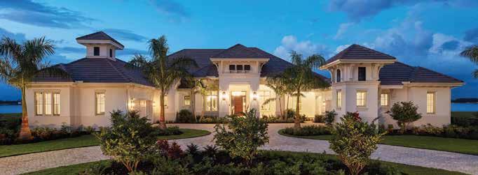
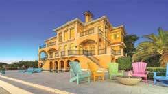
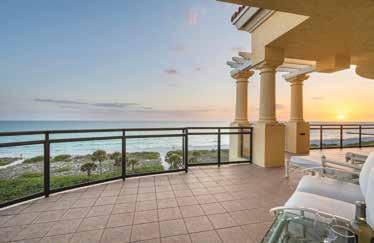
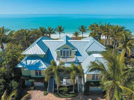
Introducing Wild Blue at Waterside, the luxury coastal community featuring a community park with tennis, pickleball and miles of trails to explore. There’s also an exclusive clubhouse with indoor and outdoor dining, a Fijiinspired lagoon pool, state-of-the-art fitness and so much more. Discover the newest single-family luxury community from STOCK, the award-winning luxury homebuilder in Southwest Florida.





Michael



President & Publisher
Jennifer
Director of Business Development
Catherine
Advertising Account Executive
McKiverkin
Operations & Social Media Manager

Creative Director & Copy Editor
Contributing Editor
Erika M.
Distribution Manager
DeFerrari
Chief Accounting Officer
Ronchetti
Graphic Designer Jennifer Betterman Creative Design & Print 239.325.9161 | cdpnaples.com
HOME & DESIGN MAGAZINE, INC 205 N. Orange Ave, Suite 201 Sarasota, FL 34236 941.328.8386 HomeAndDesign.net

Advertising Opportunities: info@homeanddesign.net
Editorial Submissions: publisher@homeanddesign.net
Online Magazines & Mail Subscriptions: HomeAndDesign.net
Newstand Consultant: Tom Ferruggia
Cover image by: Robb & Stucky
Home & Design® is published by Home & Design Magazine, Inc. © Copyright 2022. All rights reserved. All prices, specs and financing rates & terms are subject to change without notice. All real estate advertised herein is subject to Federal Fair Housing Act, which makes it illegal to advertise “any preference, limitation or discrimination because of race, color, religion, sex, handicap, familial status, or national origin, or intention to make any such preference, limitation or discrimination.” We will not knowingly accept any advertising for real estate which is in violation of the law. All persons are hereby informed that all dwellings advertised are available on an equal opportunity basis.
Each edition of Home & Design brings many exciting projects and new collaborations with top local designers, architects, builders, and luxury home professionals. We are pleased and honored to share the homes featured in our Fall 2022 issue. On the cover, designers joined forces and brought a breathtaking mix of bespoke finishes and furnishings that shine with the client’s creativity and taste. From reimagined homes in Tampa, Florida, to a brand-new modern earthy-warm Sarasota penthouse, a waterfront sophisticated bachelor pad, and open-concept single-family homes in Lakewood Ranch, the featured homes reflect Florida’s Suncoast thriving real estate market.
We are fortunate to live and work in a market where innovative architecture, high-quality construction, and innovative interior design are desired and appreciated. Expansive outdoor living spaces, multifunctional rooms, and technology-friendly workspaces are some of the top emerging home building requests for 2022. In addition, homeowners are making more room for home offices and utilizing the often-overlooked formal living room by turning it into an intimate, inviting gathering area. With the holiday season upon us, a space designed to entertain is a must!
We can all agree that design trends have constantly changed over the years. Brushed silver, polished nickel, and chrome finishes share the stage with brass and gold as they make their way into every aspect of interior design, from artwork to lighting to furniture. Gold tones enhance the richness of the new slate of jewel-toned palettes that will embrace the design world in the coming years. But industry professionals will tell you that the best homes reflect their owners’ personalities and individuality while welcoming the newest design trends.
Collaborating with the many talented professionals throughout the Suncoast of Florida is one of the best parts of our job. It brings our team joy to see the accomplishments and growth within our local industry. Brand ambassadors Catherine Ceballos in Sarasota and Jessica McKiverkin in Tampa Bay are dedicated to meeting and learning more about local companies that provide quality products and services to the luxury home market. We have enjoyed watching our local industry continue to lead, flourish and grow, and we are proud to highlight the work of those who continue to inspire us and bring our readers the best to the area. Enjoy the magazine,
 Jennifer Evans


P.S. On page 14, Catherine and Jessica shared with us their favorite things to do in their hometowns of Sarasota and Tampa.
Showcasing the area’s finest collection of homes and the professionals who bring them to life.
homeanddesign.net
“I enjoy all aspects of living in Sarasota, from its unique charm, burgeoning food culture, and vibrant art scene, to strolling Siesta Key Village or St. Armands Circle for its intimate seaside ambience, or tracking down a secluded beach with a good book in hand. You can find me shopping at my favorite farmers market or hosting weekend events for family and friends when they visit me in my new hometown.”
Catherine Ceballos Business Development Manager Catherine@homeandddesign.net 239.465.2401


“In my spare time I like to be outdoors, whether that’s soaking up the sun at the beach, paddle boarding the intercoastal, or visiting a nearby spring. I enjoy the weekend food festivals and markets or an outdoor concert at Jannus Live in St. Pete. I like being part of the community and enjoying the fun events that all of Tampa Bay has to offer!”
Jessica McKiverkin
Advertising Executive | Tampa Bay jmckiverkin@homeanddesign.net 914.673.4769

A







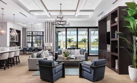
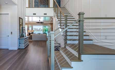
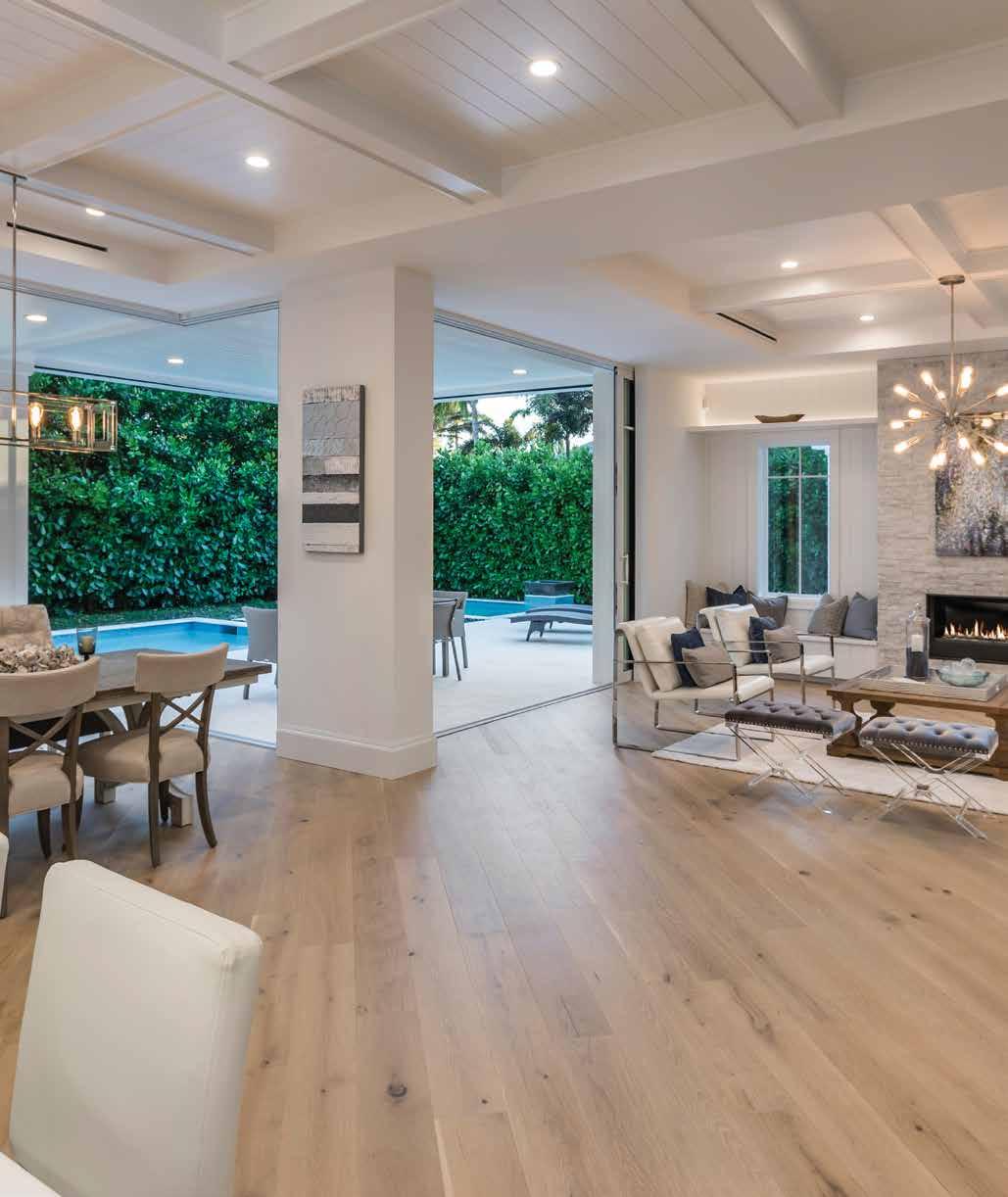
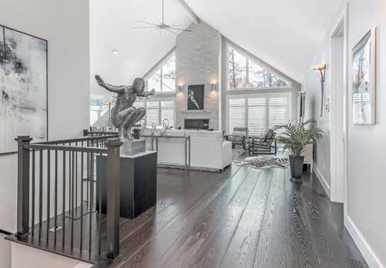
The interior detailing shines in this timeless, transitional model Photography by Blaine Johnathan Photography
A Florida retreat for California clients shines like a diamond Photography by Craig Hildebrand | The Shoot Group
A riverside home mixes family history with a boho coastal aesthetic Photography by Jimmy White Photography
An unprecedented makeover made a world of difference Photography by Ryan Gamma Photography
Masculinity infused with barefoot elegance defines this entertaining home Photography by Dylan Jon Wade Cox Photography
DSDG Architects
MHK Architecture
Stofft Cooney Architects
Work Architecture
Art
530 Burns Gallery 203
Janet Mishner Contemporary Art & Gallery
Maves Art
MARA Art Studio & Gallery
Meg Krakowiak Contemporary Art Gallery & Studio
Palm Avenue Fine Art
Woodfield Fine Art Gallery
J.R. Evans Engineering
Floors and Walls of Distinction
Flooring
Legno Bastone Wide Plank
Flooring & Design
& Stones Flooring
Digital Homes
SmartHouse Integration
Smart Homes
Art to Walk On 115
Blinds & Designs of Florida 60
Cappadocia Arts 134
Charlotte’s Grace Fine Linens & Luxe Home Accents 42
Clive Daniel Home 17
Dutch Crafters 150
International Design Source 210
Miller’s Dutch Haus Furniture
99
Robb & Stucky 212
Rugs As Art 112
BeNNettles Concrete Design 209
Amy Lou Interiors
11
Angela Rodriguez Interiors 94
Chic on the Cheap 111
Drew Designs 36
HSH Designs 116
JKL Design Group
Pecky Interiors 59
Pizzazz Interiors 133
Richard Stembridge Interiors 21
Studio G Home
151
Trade Mark Interiors 180
Wilfredo Emanuel Designs
Willow & August Interiors 14
Zazoo’d





Affinity Kitchen & Bath 204
Cabinet Design Studio 113
Campbell Cabinetry Designs 184
Design Works 181
Ferguson Bath, Kitchen & Lighting Gallery 55
Metro Cabinet Company 79
Mullet’s Appliances 168
The Plumbing Place
98
Sarasota Architectural Woodworking 96
The Shower Shop 206
SRQ Custom Cabinetry 41
Lucas Lagoons
Siesta Key Landscape 130
Light Up Your Life 43
LyteWorks 61
Gagne Construction
114
Markley Construction 58
Perrone Construction 95
STOCK Custom Homes 4
Talon Home Builders 132
Trinity Construction & Design 185
Voigt Brothers Construction 149
Michael Saunders & Company 8
Sarah & Don Howe | Compass 78
Cabex Construction I Cabinets Extraordinaire .. 38
Mullet’s Aluminum Products 23
Design Services Sarasota 183
301 Granite & Marble 135 International Artistic Stone
97 Mont Krest 37, 153
Tile Market of Sarasota 182
D & D Garage Doors 131 Storm Smart 117


TThe owner of this Tampa, Florida home had an array of seemingly opposite desires for her remodel, and she brought her vision to Mandy Drew of Drew Designs. She wanted a contemporary but classic design. It needed to be unassuming and approachable yet swanky and poignant; and every material had to be livable, durable, practical, elegant, glamorous, and chic. So, with the help of interior designers Kelly Kilgo and Robin Azevedo of Robb & Stucky, Drew brought a breathtaking mix of bespoke finishes and furnishings that shine with the client’s creativity and taste. u
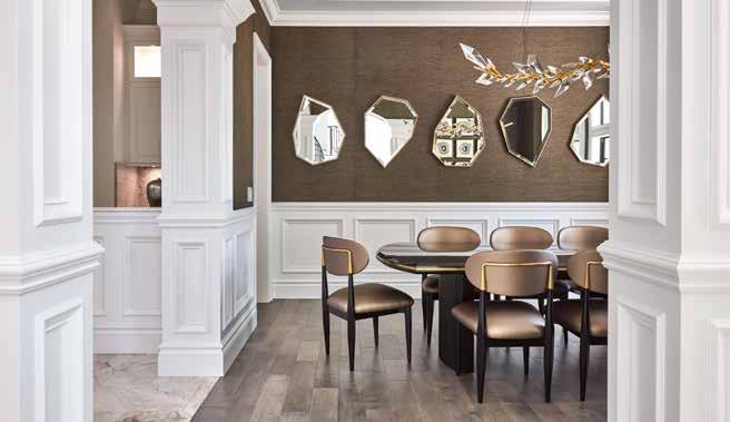
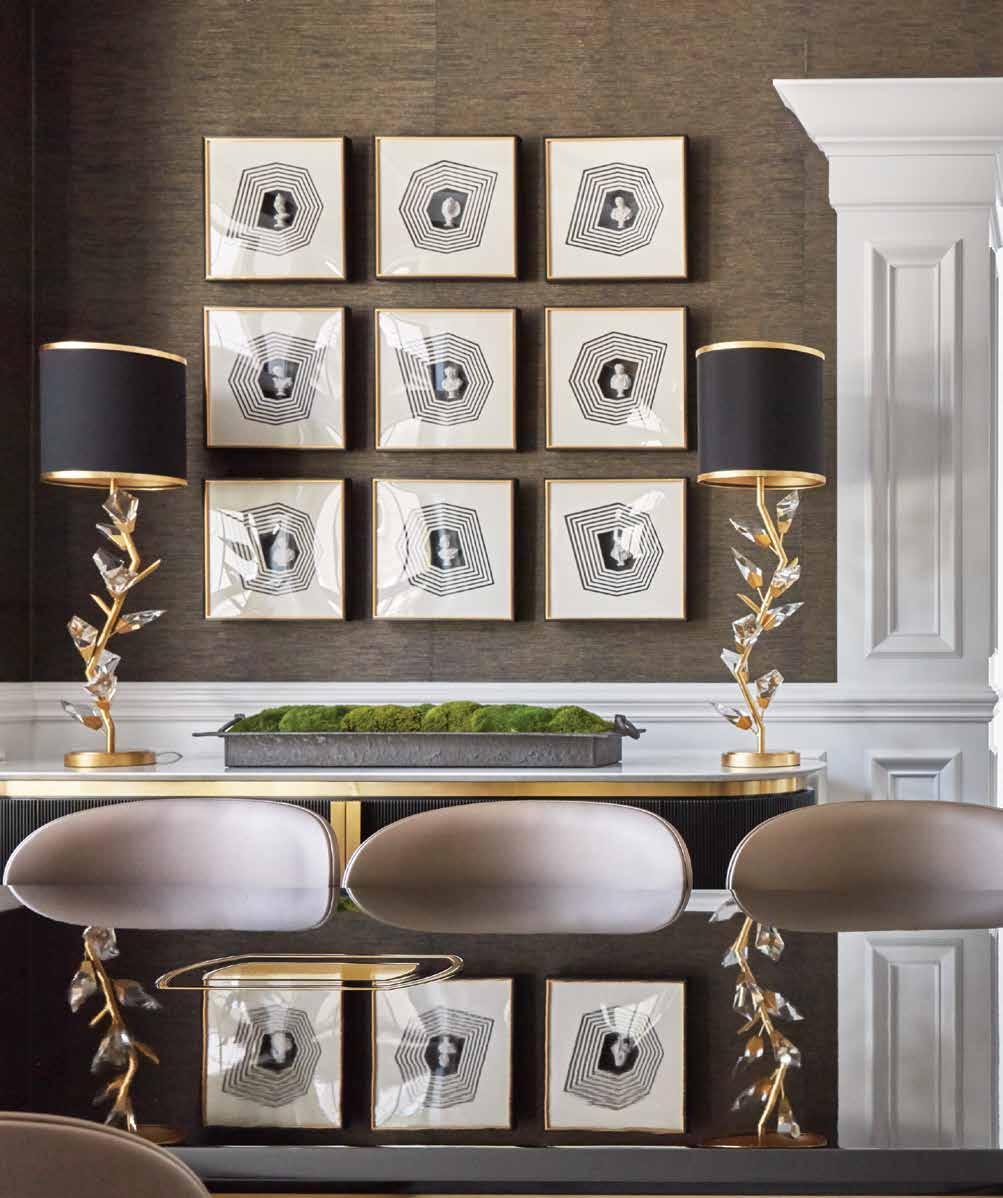
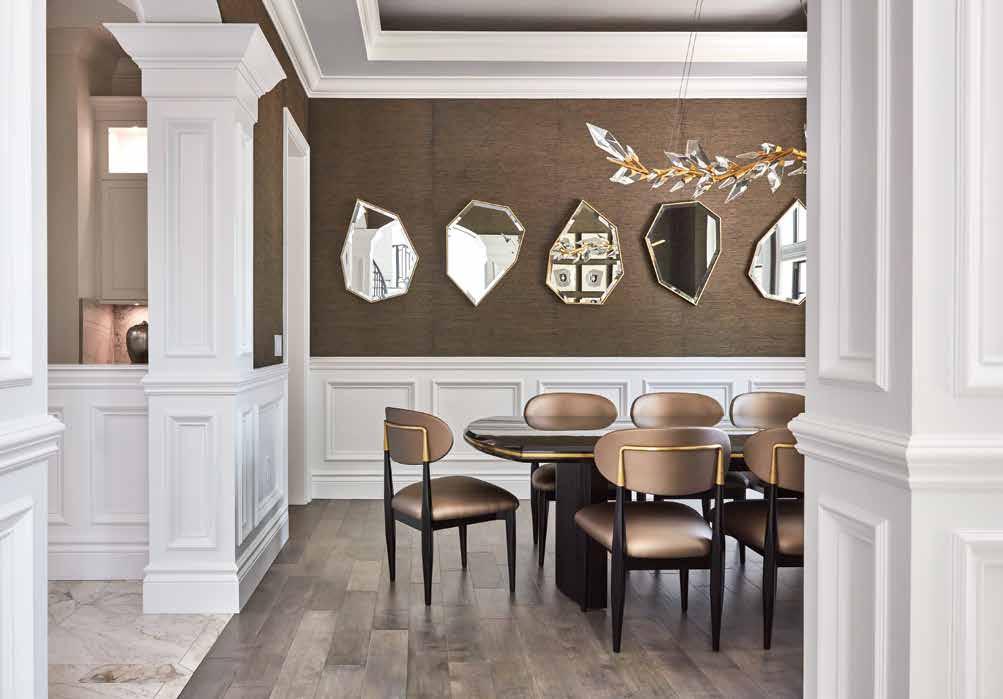
Dining Room: Another view of the dining room reveals a series of John-Richard mirrors in organic geometric shapes that reflect the artwork on the opposite wall. “The client didn’t want anything traditional. We saw these mirrors displayed in a cluster of three, and we had the idea to use more for even greater impact,” adds Drew. The recessed ceiling and niches in the adjoining butler’s pantry were original to the home but fit well with the overall vision.
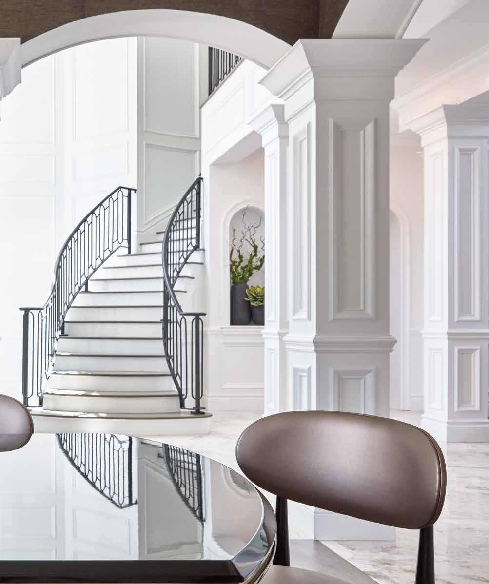
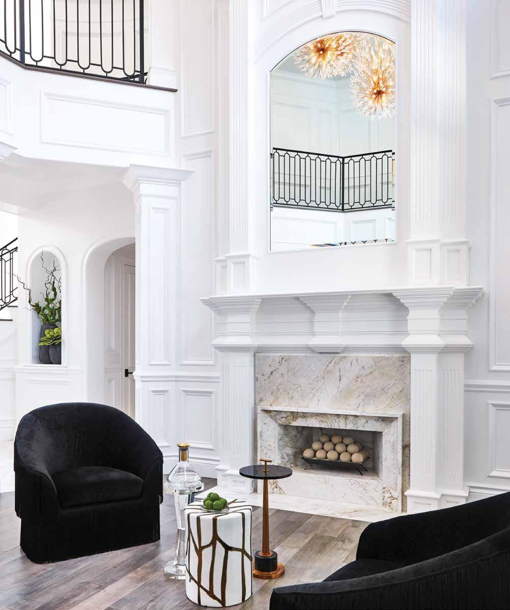
Living Room: Intricate and commanding custom moulding on the walls of the formal living room provides an elevated, high-end frame for bespoke Italian side chairs in front of the Michelangelo marble fireplace. Made Goods and John-Richard tables add a punch of interest with their unusual shapes and materials. The dramatic mirror reflects starburst chandeliers from Fine Art, and a custom ironwork railing on the second floor adorns the elegant room with angular patterns and color contrast.
Dining Room (Previous Spread): “The homeowner had a specific, custom vision in her mind for the dining room,” relates Drew. That vision inspired the room to become a work of art in addition to a formal dining and entertaining space. The elegant table and chairs were sourced from Robb & Stucky, and a York wallpaper on the walls adds dramatic texture to the room, highlighting the contrasting glamour of the Crystal Laurel Fine Art lamps and geometric prints.
“She had a firm idea of how she wanted her home to look and knew what she wanted it to be,” says Drew, “and that was an elevated space, full of high-end, custom pieces that were unique to her and her lifestyle.”
The remodel was a two-year project that began with purchasing the dining table from Robb & Stucky. “We met her in the showroom and knew right away her sense of style and design would be a huge influence,” relates Kilgo. The client then reached out to Drew to help her achieve the custom, one-of-a-kind look she was after, and it became an organic collaboration process to bring her vision to life. u
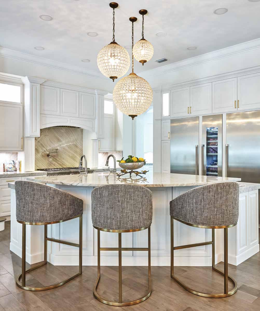
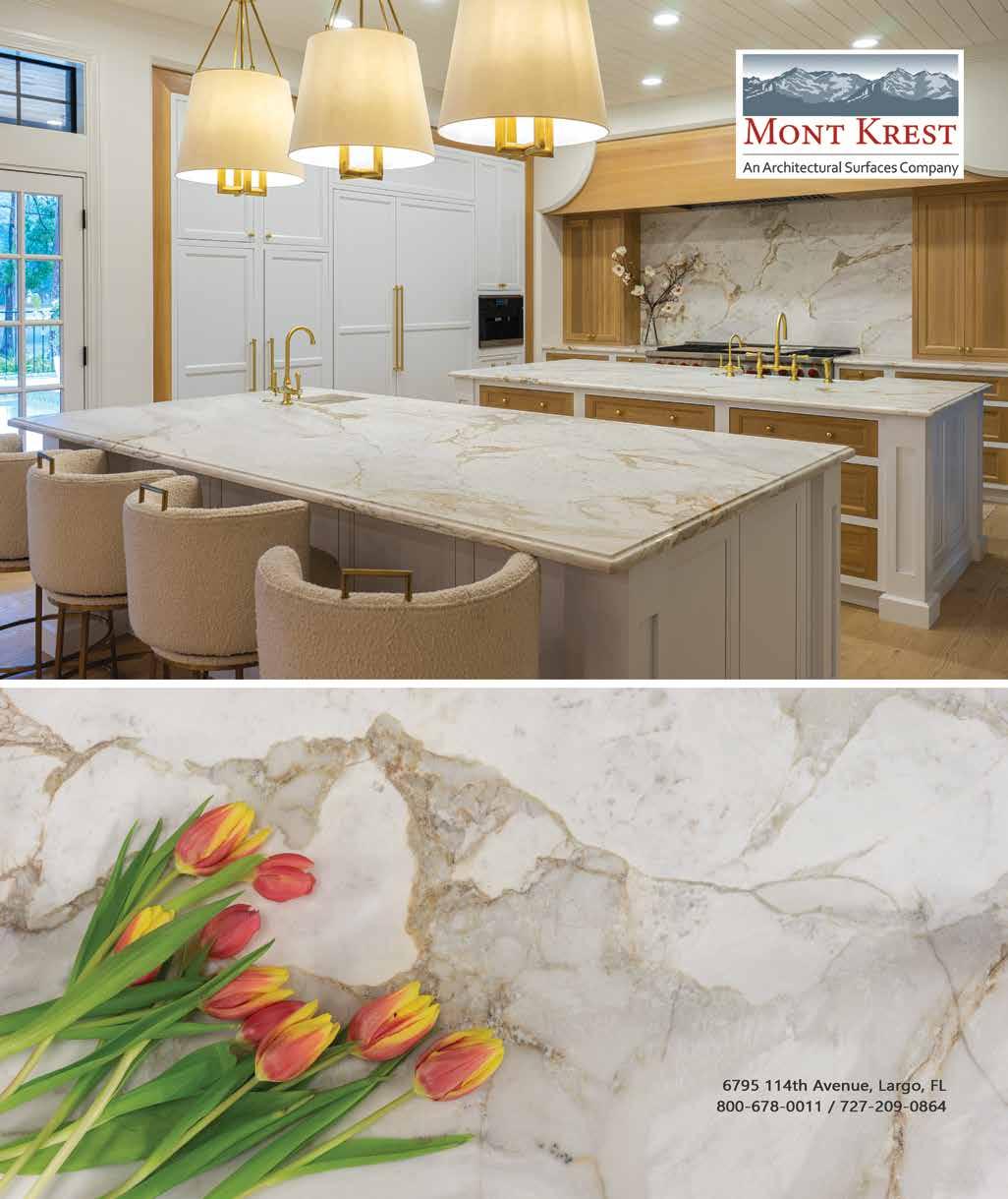
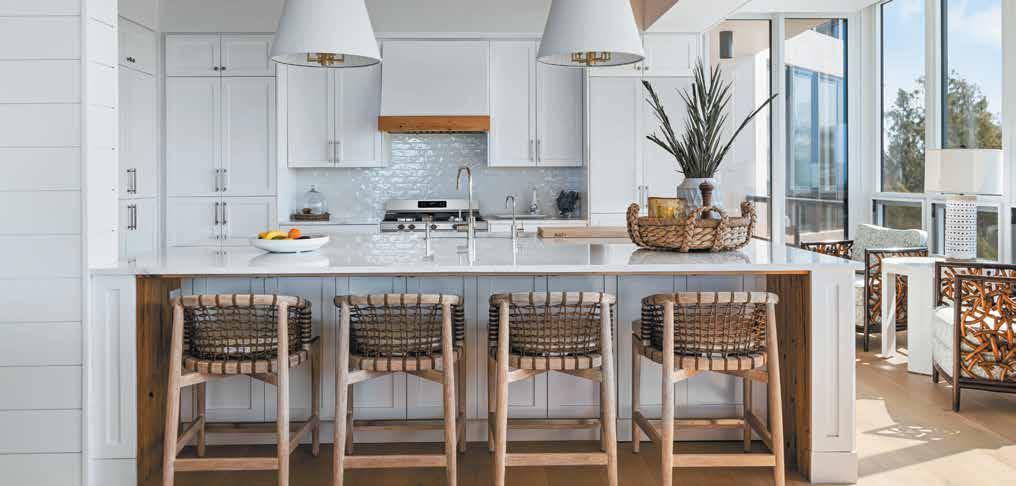
Kitchen: Pronounced veining in the marble slab from Mont Krest behind the stove adds exciting movement and flair to an otherwise all white custom kitchen. Two 36-inch refrigerators flank a vertical wine cooler surrounded by plenty of cabinet storage. A 60-inch chef’s sink in the quartzite-topped island sports dual fixtures for shared cooking and cleaning duties. The brass frames on the Vanguard counter stools add class and complement the gold-toned features in this space, like the varying height globe pendants above the island.
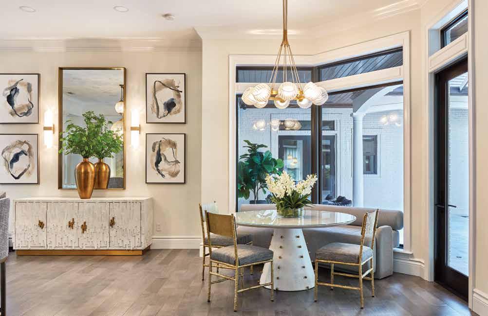
Breakfast Nook: “The client needed upholstery and furniture that would perform well with kids and dogs,” says Kilgo. Drew worked with Robb & Stucky on the custom-designed bench, utilizing Krypton performance fabric for an easy-to-clean solution in the eating area. A round table and cane-framed chairs from Made Goods add style to a typically overlooked space, and another Fine Art chandelier provides glitz and shine. The custom art echoes the geometric patterns in the dining room.
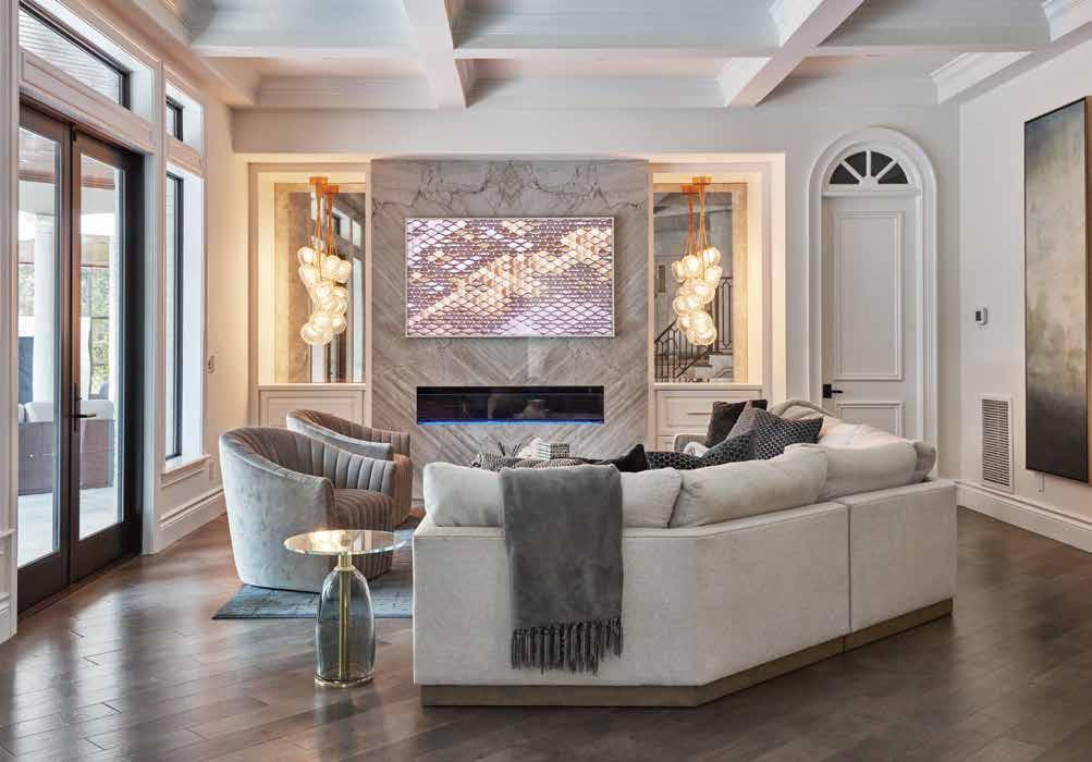
Family Room: While the family room serves as a relaxing space to hang out and watch television, it also reflects the client’s signature style. The same marble slab that backs the kitchen stove also surrounds the sleek fireplace and is flanked by mirrored niches housing unparalleled Fine Art chandeliers. “We added the coffered ceiling to give more height to the small room,” shares Drew, “and the sofa is custom designed for the best view of the outside area.”
“Because she was firm on sourcing and customizing pieces that couldn’t be found anywhere else — that were tailored to her desires and needs — only an interior designer could really deliver what she was after,” explains Drew. Working with a designer gave her access to brands and fabrics that would not only look beautifully individualized but would also last. Because this home was intended to meet her needs into the empty-nest years, Drew helped her client make investments in longevity as well as design, such as performance fabrics on high-end chairs so they could be easily cleaned. u
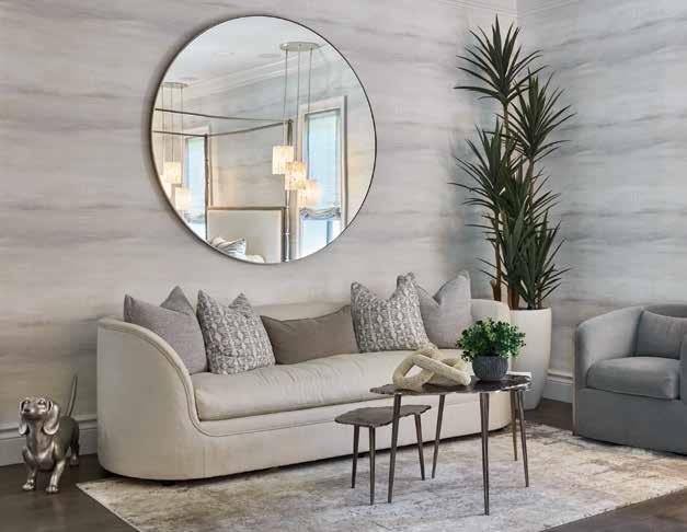
Primary Bedroom Sitting Area: The chic main bedroom embodies the client’s style and taste, with sumptuously calm and airy wallpaper from York adorning the walls to give the impression of an elegant wash of clouds. A downy Bernhardt sofa paired with a velvety side chair offers a soothing place to relax, and the custom rug anchors the corner with texture and contrasting color. The oversized Gabby Home mirror on the wall helps the space feel more expansive.
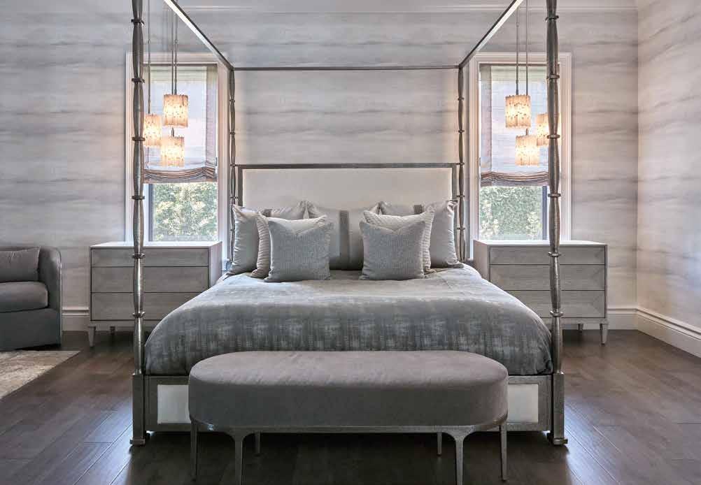
Primary Bedroom: “The client chose color on color tones to keep the room neutral and zen,” explains Azevedo. The window treatments — Roman shades draped over Bandalux roller shades — make use of layering to mute the ambient light in the peaceful bedroom. A custom Bernhardt four-poster bed is adorned with velvet bedding, and Currey & Company pendants hang on either side, providing both soft illumination and sparkle. The muted violet bench, also by Bernhardt, carries the tone-ontone scheme through in a different shade.
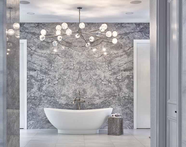
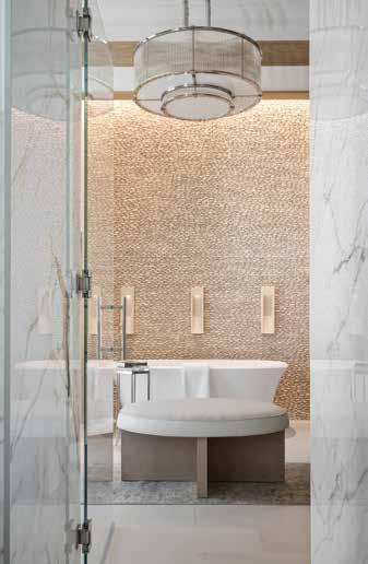
Primary Bathroom Soaking Tub: Floor-to-ceiling slab marble accentuates the soaking tub from Ferguson Bath, Kitchen & Lighting Gallery, and a Restoration Hardware chandelier makes a dramatic statement while also reinforcing the client’s vision for the space. “We wanted a large fixture that would add interest but let the marble be the star,” recounts Drew. “Going wide with the chandelier solved that challenge well.” The same tone-on-tone color convention carries through this room from the adjoining bedroom, making the suite feel cohesive.
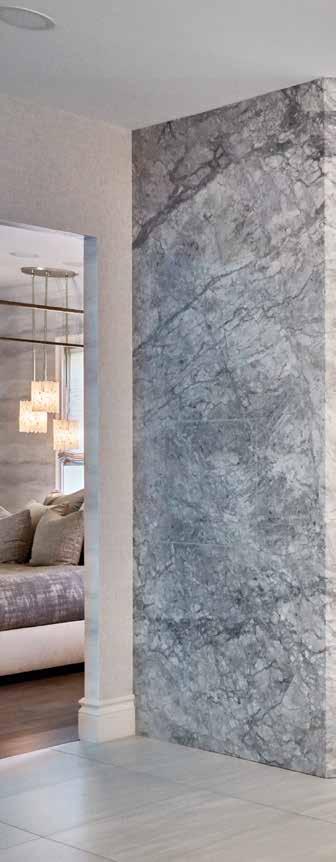
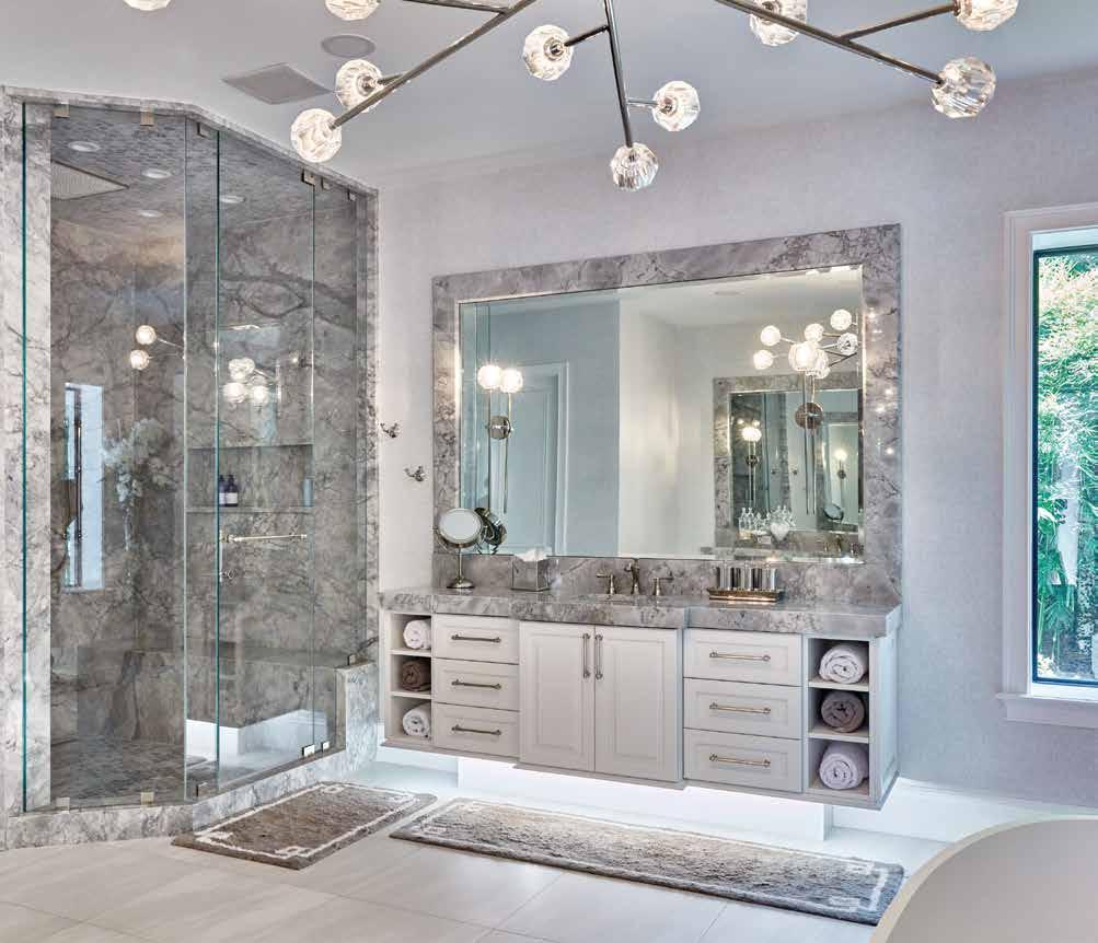
Primary Bathroom: The bathroom floor is graced with 24-inch by 24-inch marble tile, which creates a continuous visual sweep that was important to Drew’s client. “She didn’t want grout lines, so large-format tiles set close together were the answer,” she describes. Floating vanities add to the unbroken aesthetic line of the floor, and the same gray marble wraps the mirror and shower as a callback to the tub wall. The slim window looks out over a peaceful private courtyard.
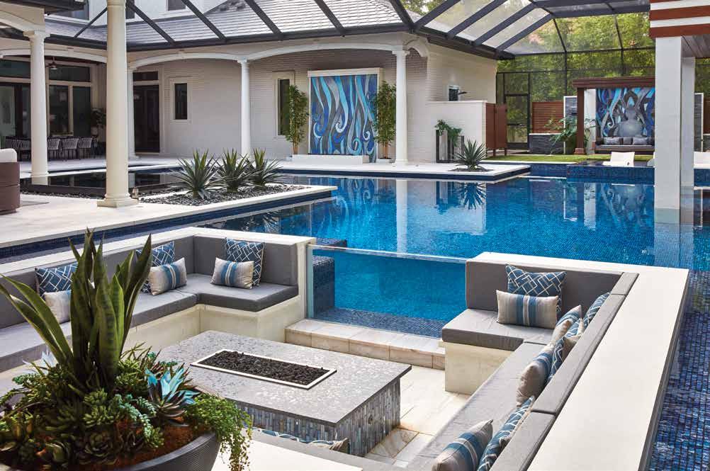
That unique balance extends to the stunning outdoor pool and entertainment area, which was inspired by luxurious hotels the homeowner had visited on her travels. “Throughout the execution of this project, we recognized the client’s contemporary tastes along with her desire for a grotto-like feel,” explains Ryan Hughes of Ryan Hughes Design, who created the over 5,300-square-foot area. “Our signature design philosophy — creating lines of sight — was still important, but with the added dimension of surrounding multiple water elements.” Some of those elements were specifically created to resemble those found at the Aria Hotel in Las Vegas, including walls lined with slabs of black basalt they coined “Aria walls.”
With an inspired, foundational vision, a team of renowned professionals at the pinnacle of their talents, and the desire for bespoke finishes and furnishings tailored just for her, this client now has a one-of-a-kind Avila home full of elegance and style. n
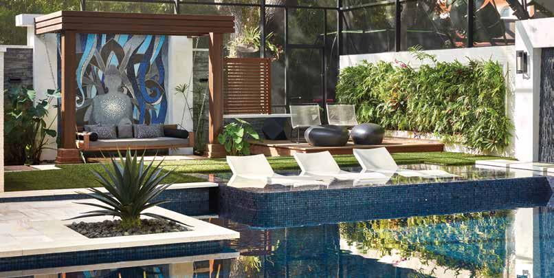
Mural: The design plan Hughes created for this area included the massive custom mural to illustrate moving water through a blueand-white gold tile beneath the shady pergola in this outdoor living area. All of the screening surrounding the 5,300-square-foot space was designed to disappear into the background, something the team accomplished by using innovative products, such as woodlook aluminum from Australia. Stained and polished concrete that mimics carved marble forms the walls.
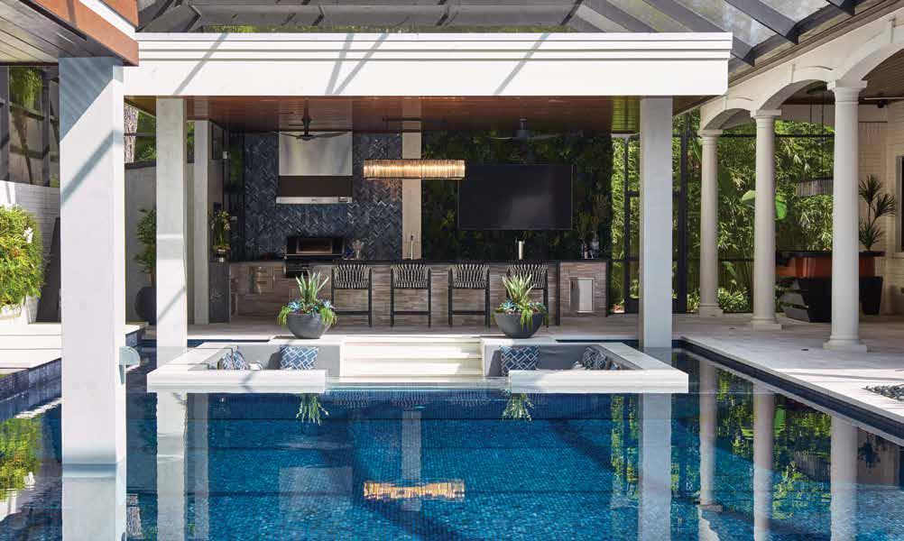
Pool: “Everything within the outdoor living area was designed to be anchored by the pool,” says Hughes. At over 1,700 square feet alone, the pool serves as the crown jewel among other water features and elements designed to give the client the grotto-like feel she desired without the typical rock or naturalistic feel of such spaces. A towering wall of mosaic tile in shades of blue, green, and silver carries the shimmering waters theme to the bar area.
Sunken
 Written by Shawna Hampton
by Robb & Stucky


















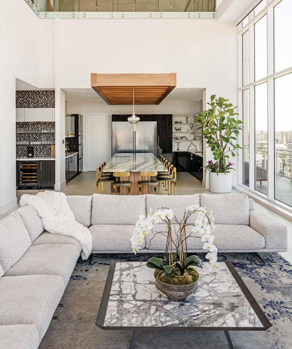
Designer Kurt Lucas has a delightful sense of humor. “I empty the trash, but I own the place,” chuckles Lucas, owner of JKL Design Group. Humor aside, Lucas is serious about design. “I have the same job description as anyone else here: whatever it takes.” Having been known on occasion to go over the top, Lucas takes this brand-new Sarasota penthouse in a different direction and labels the overall palette Divinely Neutral — a harmonious flow of neutrals from room to room. u
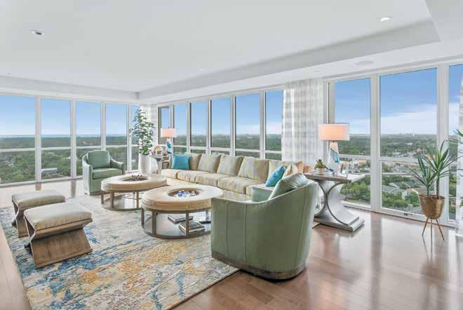
Living Room: Lucas positions the furnishings to face the view. The voluptuous white throw blanket atop the Giuseppe & Giuseppe corner sectional is an inviting textural element against the smooth, low-profile marble-top coffee table centered on the Jaipur Living lapis-blue and gray area rug. The interior sightline toward the dining space and wet bar is full of various natural finishes and eye-catching gold, silver, copper, and bronze accents.
Kitchen & Dining: “This modern building has a warm quality to it, and I wanted to keep that earthy-warm effect by adding this modern trellis that also allows light to pass through,”
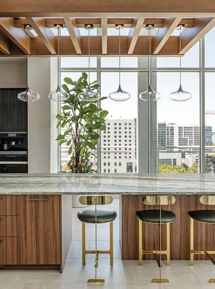
Lucas shares. The white oak trellis hangs over the counter-height slab of green, white, and coral granite that makes up the dining table with a natural walnut base. Shiny gold metal counter-height bar stools are a sleek complement to the stainless-steel appliances from Ferguson Bath, Kitchen & Lighting Gallery.

The 180-degree view of downtown Sarasota and the waterfront serves as artwork through the tall windows of this modern-style building, BLVD.
Lucas fashions a serene design that is in step with the architecture of the building. Still, on a personal note, Lucas infuses the palette with hues that merge coastal city touches and the mountainous region that these clients also enjoy. The elegant design draws on nature’s beauty to inspire the materials, textures, and unique fixtures.
No other unit in the building resembles this one in any way. “We changed the floor plan extensively and were fortunate enough that the developer allowed us to make the architectural changes we needed,” Lucas says. In the bar, it is as if the wall has been peeled away, revealing the profile of the walnut-clad stairs — transforming this functional feature into architectural art. u
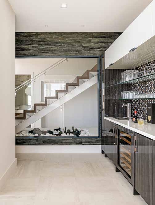
Bar: This Ceramiche Coem white porcelain floor tile that looks like travertine runs the main areas and through the serving bar. The see-through glass wall that frames this architectural stair detail features a Palm Tree wallcovering from Élitis, showing off natural green and brown hues, while the backsplash tile from Lunada Bay Tile displays a mix of copper and bronze. Beneath the stairs, Lucas adds another natural element, a rock garden.
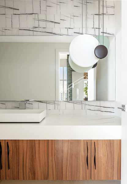
Hall Bath: “I have been known to do ‘over-the-top,’ but this space did not require that over-the-top influence since we have this spectacular view out the windows,” shares Lucas. The backlit mirror casts a warm glow onto the Glazzio Tiles Yosemite Collection glass tile backsplash. At the same time, the flattened glowing orbs pendant — Cosmos, from Vibia in celadon, matte gray, and white — shines a subtle pinpoint beam downward to the stunning natural stone countertop.
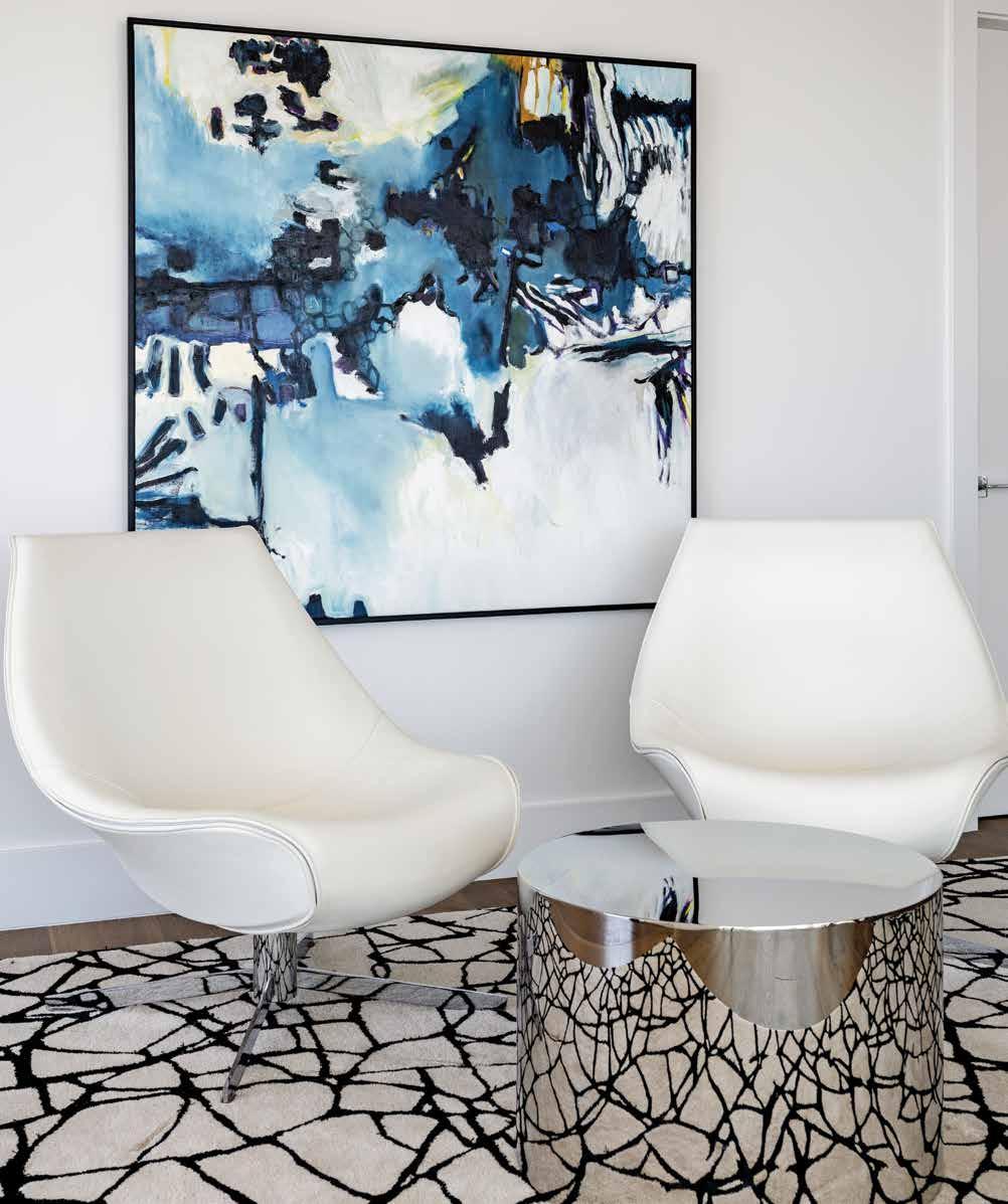
Sitting Area: This oil and China marker abstract artwork, “Sunson” from Laurie Maves Art, reflects the colorway of both mountains and snow yet can simultaneously conjure a seaside effect, again inviting nature into this design. Two white leather and chrome chairs from i4Mariani sit atop this black and white area rug that reflects its stunning natureinspired pattern on the highly polished stainless-steel drum table by Thayer Coggin.
The penthouse has wrap-around windows and boasts a vaulted ceiling with a fantastic open-to-below experience. The warm glow of the sun’s bright rays pours in through the tall windows, reflecting off the gold accents, and passes effortlessly through the delicate clear glass pendants of the dining space.
Elements of nature show up throughout the spaces, from the twiggy door pulls on the hall bath cabinets to the butterfly-wing pattern on the area rug in the hall. At the same time, the deep navy, powder blue, and billowy cloud-white in the abstract artwork is a convergence of colors that honor the clients’ desired coastal and mountainous environments.
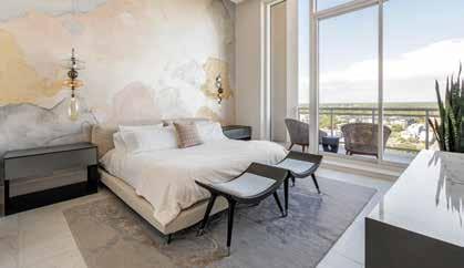
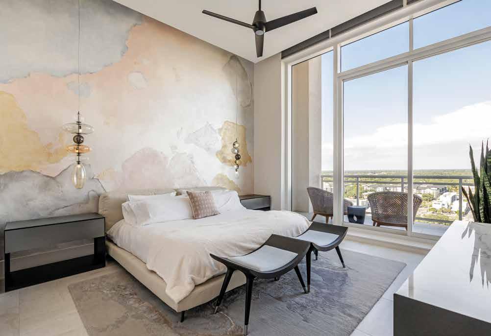
Floor-to-ceiling windows invite this enticing view into the design of the primary bedroom, where the handmade rug displays soft gray, lilac, and blue — a look that mirrors the sky. Hair-on-hide, sheep skin, and fringe-tassel are textural accents that show up sporadically throughout the primary suite, while the glass lighting fixtures in the bedroom add a lofty, lighter-than-air feel to this elegant design. u
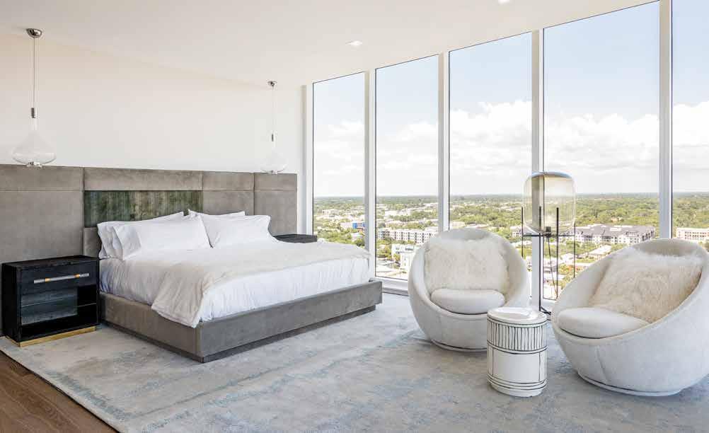
Primary Bedroom: The bed, with a quadrant headboard, is gray velvet with a hair-on-hide accent in shale green to add an earthy textural element. Lucas places the Edison-look Oda floor lamp by Avenue Road between the two Good Egg mid-century-style chairs from Thayer Coggin. “I like to design with the principle of opposites by adding this rustic-look table to this elegant bedroom,” Lucas states, describing the Made Goods side table.
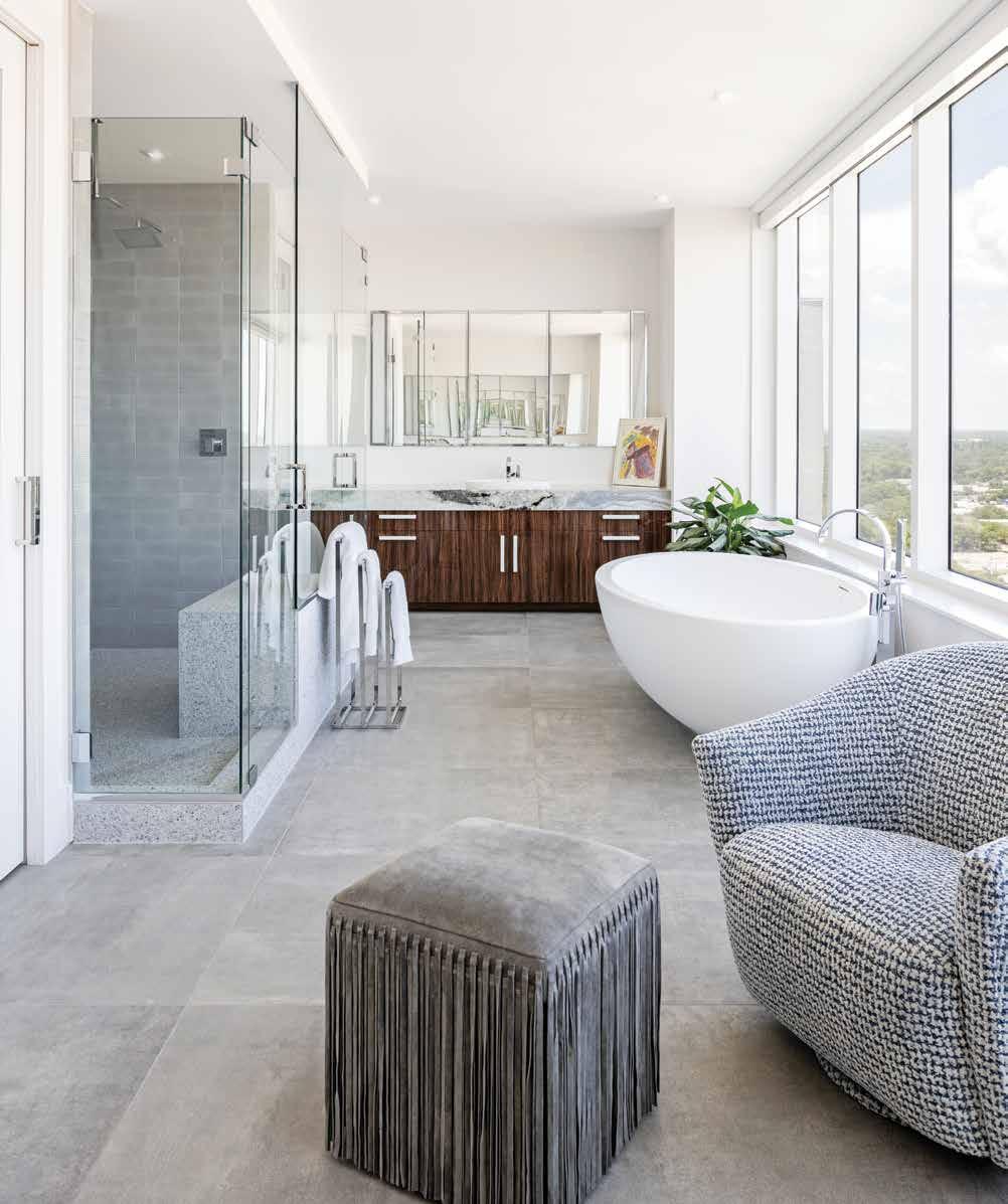
Primary Bathroom: The design of this bathroom unfurls a natural elegance defined by the luxurious selections Lucas curates, namely the Tyrrell & Laing International Imperia soaking tub, from which there is a spectacular view. The Porcelanosa leather-look floor tile pairs beautifully with the cowboy-jacket-style fringe ottoman in slate gray beside the Lazar club chair in custom fabric from Romo. The shower floor is Pebblini tile, while the walls are finished in a handcrafted tile from Design Works.
“Our world is not just browns and rust,” Lucas expresses, “Earth tones are all the colors of nature from the flowers, to the sky, to even beautiful fish.” Lucas weaves a palette that pulls from warm and cool tones and organic shapes and forms, highlighting the design with enriching art-like fixtures.
The design of this penthouse imparts an inviting and enjoyable atmosphere that is second to none — except maybe the enjoyment of relaxing on this penthouse rooftop with a view of The RitzCarlton, Sarasota. n
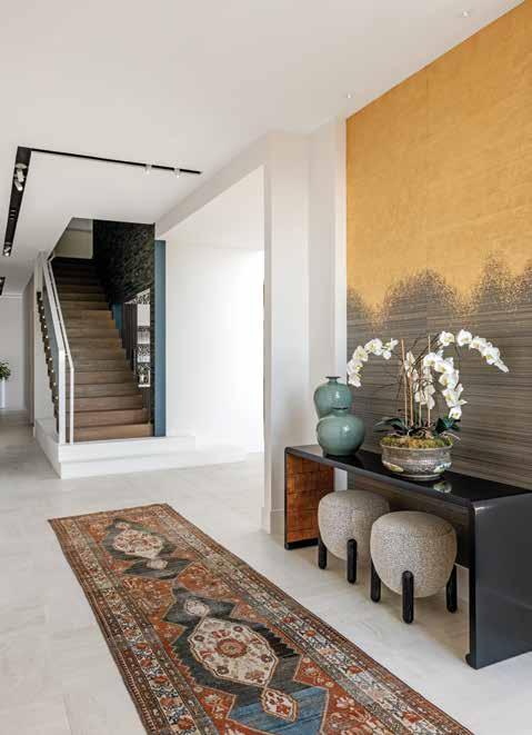
Entrance: Lucas infuses historical ambiance to the modern palette with this antique runner from Surya. Furthering his balance-ofopposite design approach, Lucas selects a metallic ombre grayto-gold Phillip Jeffries wallcovering as a statement for the entrance and a backdrop to the ebony lacquer and gold accent Ribbon Console Table from Decca Home. The first steps of the stairs are white concrete and transition to a natural walnut, lit by a customcutaway ceiling trough with recessed lighting.
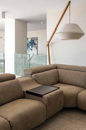
Theater Room: This ample sueded brown leather sectional from Bracci is welcoming and durable for this theater room. The floor lamp in a wood base and cotton shade offers the space a natural yet modern presence, much like the neutral area rug that anchors this open space. Lucas selects a glass railing that spans the secondfloor halls to ensure panoramic views from the second story.
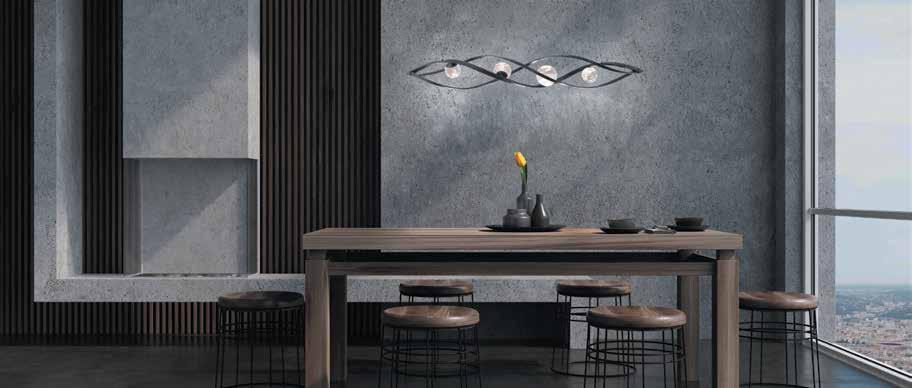
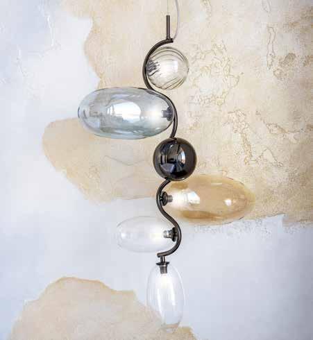
Lighting Detail: “The fixtures from Cattelan Italia are, to me, designed without fear,” Lucas celebrates. “To take a swirly piece of metal and combine it with orbs gives us art and is a piece of lighting jewelry.” The eloquent fixtures imbue the perfect amount of elegance and whimsy befitting this space.
Junior Suite: Lucas describes the wallcovering in the junior suite as the world and all the parts, yet nothing is defined — a melange of earth tones from the mountains, waters, and sky. Between the nightstands by TRICA is a luxuriously comfortable overstuffed bed from Ditre Italia with two Asian-influence benches at the foot. Sturdy, woven chairs from Palecek invite one to the balcony to take in nature’s view.
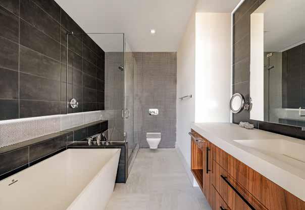
Guest Bathroom: Behind the wall-hung toilet is a dainty Constantine mosaic tile in the GalahadIcelandic colorway from Design Works. The tile flows to the shower and down the opposite wall, accenting Construct’s leather-look, charcoal, and gray-brown tile. The sleek, modern lines of the Petra Boutique Collection tub from MTI offset the warmth and organic grain lines on the French walnut vanity.
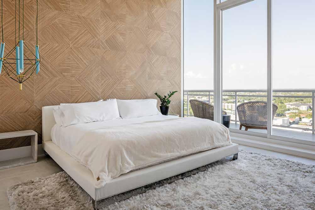
Guest Bedroom: “The blend of the white marble and the woven-look wallcovering creates a natural elegance, in keeping with the genre of the whole home,” delights Lucas. The white marble nightstands from Noir rest beside the clean-lined bed from Modloft atop the cozy, shag Chandra area rug. The Designheure chandelier Mozaik in duck blue delightfully contrasts the striking Noa-L Tanzania Wine woven wood-look wall tile from Porcelanosa, which evokes a rustic feel.
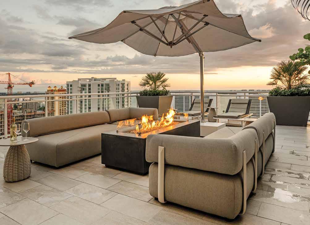
Outdoor Living: The neutral palette of this rooftop deck sits against the bustling view of Sarasota and the Bay beyond and is the definition of stunning natural elegance. The umbrella and end table are from Dedon, and Lucas drapes the outdoor sofa in durable Dune fabric and adds a complementary light bronze structural element to finish it off. A rectangular fire table from Architectural Pottery in dark charcoal contrasts this otherwise serene palette.
 Written by Rachel Seekamp Photography by Nicholas Ferris Photography
Interior Designer:
JKL Design Group 1839 61st Street Sarasota, FL 34243 941.358.4994 www.jkldesign.com
Resources:
Ferguson Bath, Kitchen & Lighting Gallery 5521 Fruitville Road Sarasota, FL 34232 941.951.0110 www.build.com/ferguson
Laurie Maves Art 1839 61st Street Sarasota, FL 34243 941.900.4145 www.lauriemavesart.com
Design Works 4500 Carmichael Avenue Sarasota, FL 34234 800.226.9434 www.floridadesignworks.com
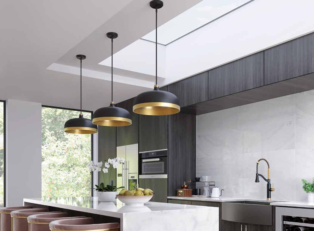
experts at Ferguson Bath, Kitchen & Lighting Gallery are here to help create a home that’s as extraordinary as you are.
project, any style, any dream—bring your inspiration to Ferguson Bath, Kitchen & Lighting Gallery. Visit build.com/ferguson
schedule your personalized showroom experience










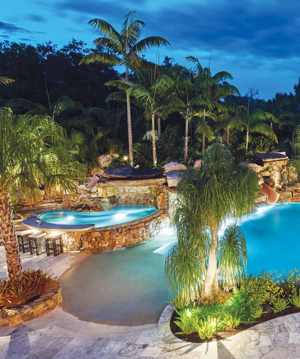
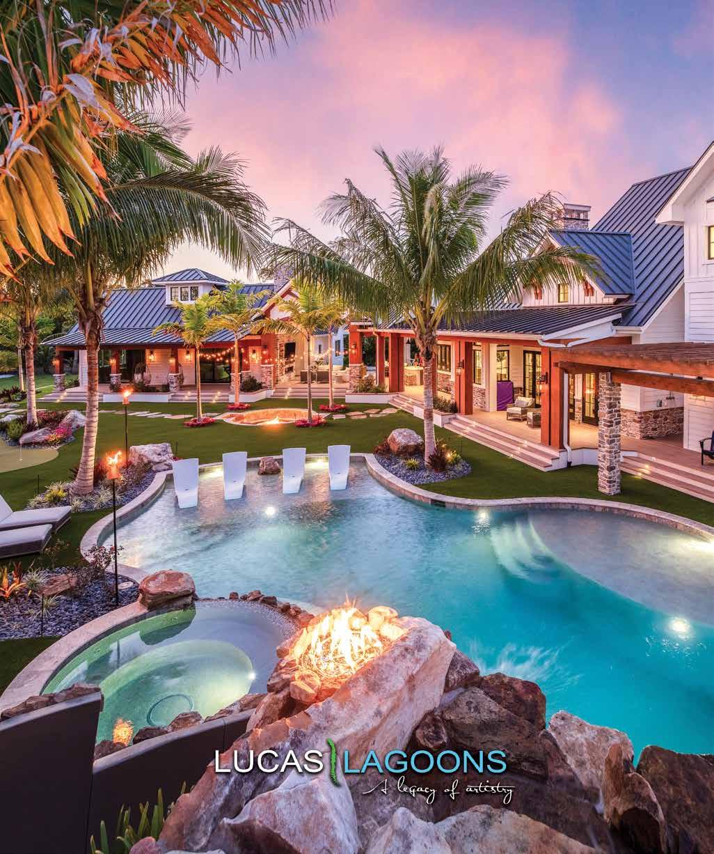
A mixture of lush, mature vegetation shelters this inviting pool. The beach entry has a PebbleTec finish in Sandy Beach that lures the eye to the deep blue waters. The elevated hot tub features a pull-up bar where David Fischer, owner of ZaZoo’d, places faux bamboo-coated steel-frame bar stools in a durable Sunbrella fabric from ZaZoo’d. Lucas Congdon, owner of Lucas Lagoons, designs a ledge in the shallow water beside the spa that leads to the grotto, serving as yet another way to experience this magical place.
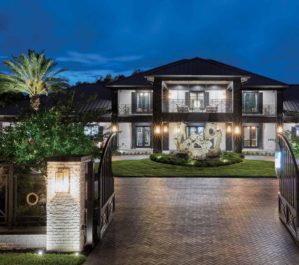
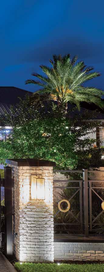
Front Elevation: “I do not believe there is a defined style to this home,” shares Fischer. “Part of my style as a designer is to meld old and new elements.” Drawing from what the clients love about their other residence, Fischer updates the look by giving this exterior the sensibilities of a French chateau melded with a traditional carriage house. The custom aluminum railing design is mirrored in the fencing, showing off horizontal lines juxtaposed by softer circular gold accents.
Pool Aerial: Across the substantial silver travertine deck are various furniture gatherings, where Fischer places large, round daybeds with canopies to soften the hardscape. Congdon uses nearly 150 tons of Tennessee fieldstone boulders to build out the grotto with a waterslide winding through it. The waterfall flows from the grotto and cascades over, and it is there that one can slide right through the spilling waterfall. Congdon incorporates a sunning shelf, adding features to suit everyone.
W“When someone says, ‘Game House,’ you have this vision of a game room,” reminisces David Fischer, principal interior designer and owner of ZaZoo’d. “When the clients showed me the plans, I realized that this wasn’t the game room I had envisioned — this was a Game House and much, much more!” That “more” Fischer refers to extends to the resort-style pool by the acclaimed Lucas Congdon, pool and landscape designer and owner of Lucas Lagoons.
The purpose of this home and outdoor experience is so the clients can host charitable events and company parties, and it has even been the backdrop for a runway fashion show. The sprawling estate-style home needed a backyard experience to match it, so Congdon approached the design strategically, balancing all the features to be proportionate with the giant oak tree and the scale of the house, while creating the look of a mature oasis ready for entertaining. u


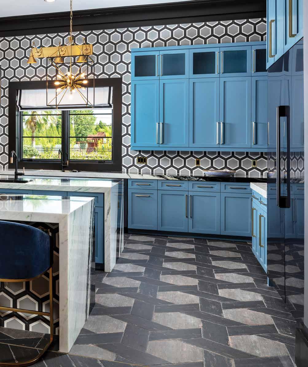
Fischer selects the ceramic floor tile, pairing it with the gray, chocolate-black, and white cement tile on the back and island walls. The second island acts as a serving counter during parties, drawing the guests into the kitchen. Black stainless-steel Dacor appliances from Ferguson Bath, Kitchen & Lighting Gallery complement the vibrant colorway, at the same time delicate brass lighting fixtures from ZaZoo’d lend a nod to the other gold accents found in the hood vent and the island stools. Finally Fischer creates the cabinetry design, and a local company finishes them in a custom shade of contrasting blue.
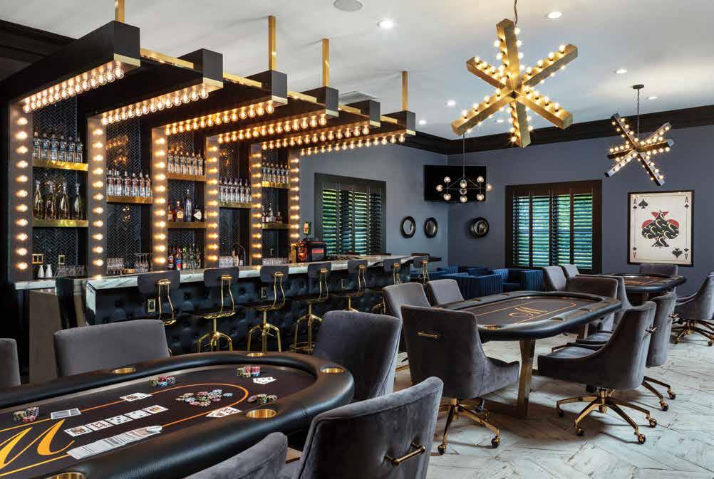
Poker Room: Three generous Maneto poker tables display the family’s initial atop the felt. Alongside the tables are thirty gray-velvet poker chairs with brass bases from ZaZoo’d. Fischer’s originality to the bar design is without equal. Hollow beams are suspended from gold rods to shelter the bar, giving this niche prominence in the space. This poker room has dimmable LED bulbs that can adjust to any mood. The bar stools cozy up to the tufted black leather bar.
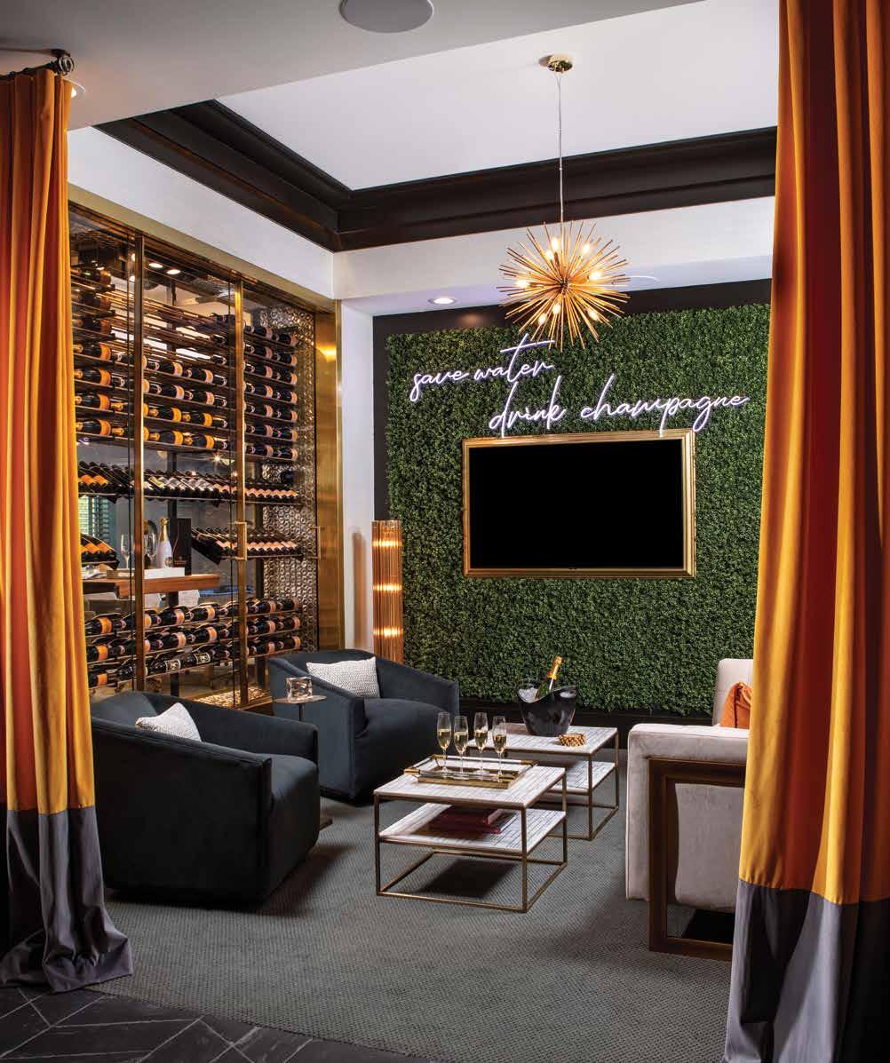
Champagne Room: This custom see-through Champagne wall by ZaZoo’d houses more than 600 bottles and has sliding glass doors on both sides for easy access to the collection and the tasting board. Fischer positions two smokey-gray velvet swivel chairs across from a plush white velvet sofa, while the faux boxwood wall and luxurious, flowing Veuve-orange and chocolate-gray drapes soften and elevate this social space.
The interior is expansive, so Fischer uses materials and finishes that transform the open-concept layout into an inviting and comfortable environment. Many rooms open onto the other, so cohesiveness within the interior becomes a high priority for Fischer. The industrial influences are a subtle backdrop to the brilliant design features, deep chocolatey-gray hues, bold patterns, and gold accents — what tops this interior design is Fischer’s pure creative genius.
Every design feature in this home has an origin story — a spark of inspiration that explodes into this swanky party-vibe design. Fischer takes one of the client’s love of Veuve Clicquot Yellow Label Champagne and designs a place she can gather with friends but still be part of the action — and as the playful neon sign suggests, save water, drink champagne! u
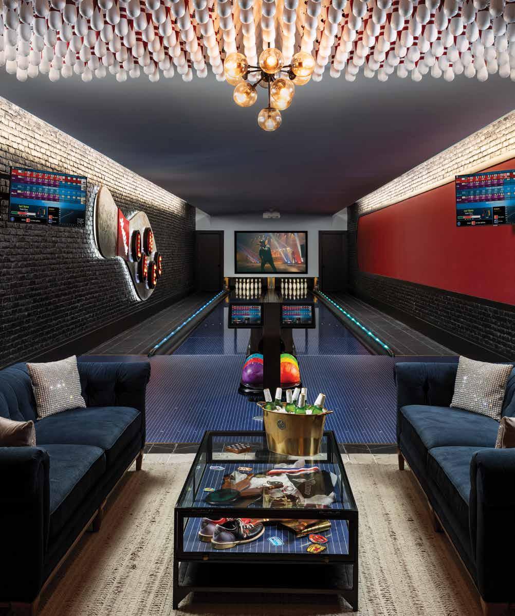
As the clients are immensely proud of their heritage, Fischer accents the home with the first letter of their family name and names the bowling alley after this gracious family. Upstairs, the interior emanates the same level of sophistication and style as the first floor; however, should this party house become a full-time home, the second floor is also dedicated to family life. u
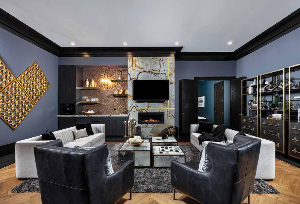
Living Room: Fischer lays out a charcoal-gray shag rug for this second-story living room to create an inviting gathering space. The silver channel-tufted velvet sofas complement this regal space, as do two black leather wingback chairs and a cluster of goat skin vellum that surround the antique brass coffee tables, all sourced from ZaZoo’d. Glitz pops on the natural stone fireplace with gold banding, and the beverage bar boasts a glittering gold penny tile against the custom tiger-wood cabinetry.
Bowling Alley: Fischer works with Brunswick Bowling & Billiards on the finishes for these glow-in-the-dark bowling lanes. Drawing inspiration from a bowling pin, Fischer takes a crimson stripe down one side across the industrial brick wall. Above the seating area is a custom, backlit chandelier made of 300 vintage bowling pins, a brainchild of Fischer’s. Between the two swanky, navy-velvet sofas from ZaZoo’d, there is a shadow box coffee table full of vintage bowling memorabilia from estate sales.
A wrap-around balcony on the back of the house overlooks the stunning grounds with an expansive covered patio and bar below that leads to the lush pool. “The home has a high-contrast interior, and I chose a light color deck and a deep blue interior finish for the pool to reflect the style that was happening on the inside of the home,” shares Congdon.
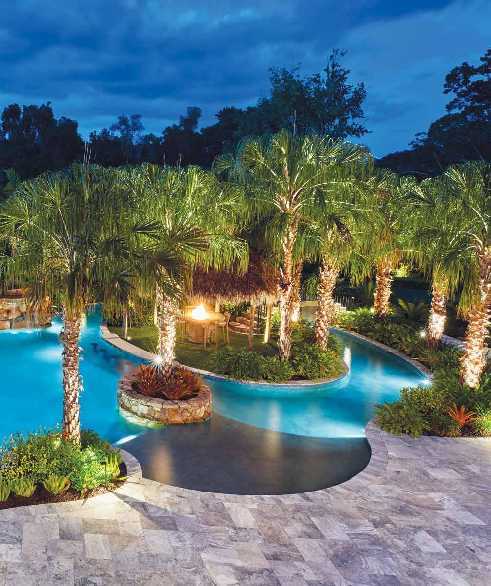
Beside the sizable spa is the undulating waterslide that wraps around the rocky grotto where the waterfall spills into the organically shaped pool. On the opposite side is a lazy river — shaded by a dense cluster of ribbon palms — wrapping around the tiki hut island that can be accessed from the bridge or the swim-up ledge bar.
Congdon delights, “I usually try to find something to improve upon when I look at the finished project, but this one came out flawless. There is not one thing I would change.” And with that, this game house and pool are made of pure pizzazz. n

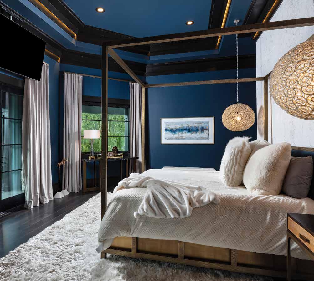
Primary Bedroom: A deep chocolate hue was the first color chosen, so Fischer designed a sleek, non-traditional, layered flat moulding in the ceiling with LED strips that emit a soft glow against the teal walls. Luxurious silk drapery and the plush shag rug soften the hard lines of the stamped brass canopy bed from ZaZoo’d. Two cut crystal and iron sphere chandeliers hang low on either side of the bed, inches away from the cork wallpaper.
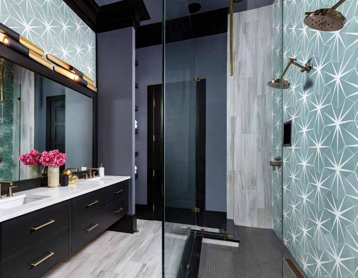
Primary Bathoom: The client fell in love with this green and pacific white sunburst cement tile, so Fischer uses teal paint from the adjoining bedroom to build harmony between the two spaces. Contrasting ivory porcelain tile runs across the floor underneath the custom floating vanity and then up an adjacent wall. Industrial-style matte black and gold leaf pipe lights from ZaZoo’d line the top of the vast, black-framed mirror.
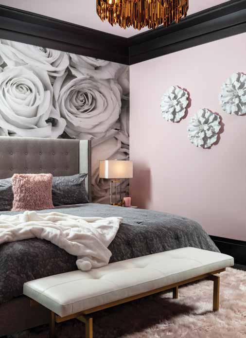
Guest Bedroom: The plan was to create two feminine and two masculine bedrooms — here, femininity reigns. The soft pink of the shag rug speaks to the delicate rosy hue on the wall called Demure by Sherwin-Williams. Custom wallpaper from Murals by Matt features roses on a large scale in a black-and-white photography presentation. Finally, a touch of gold enhances the legs of the white leather bench on a champagne-finished, stainless steel base from ZaZoo’d.
Outdoor Living: Beneath the shelter of the ribbon palms is a lush mixture of bushy philodendrons that line this island escape, while the Midnight Blue PebbleTec in the pool reflects a gorgeous aqua color. “The idea is that you step onto this island, and it gives the illusion of being instantly transported to a faraway, fantasy island,” shares Congdon, who reminisces about his childhood love of high-seas, fantasy-island adventure stories.
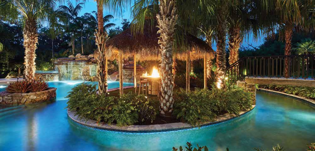
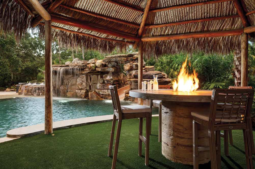
Tiki Hut Island: “Under the tiki hut, you hear the captivating sound from the waterfall and the rustling of the trees, and as the fire dances, it reflects light off the underside of the hut,” Congdon describes the enchanting experience of the island. The fire table is made of concrete, and the base is stamped to look like wood, while the top is polished concrete from Lucas Lagoons. Four faux bamboo steel-covered chairs with a Sunbrella fabric cozy up to the table.
Written by Rachel Seekamp Photography by Blaine Johnathan PhotographyInterior Designer: Zazoo’d 631 Central Avenue St. Petersburg, FL 33701 727.344.9663 www.zazood.com
Landscape Architect: Lucas Lagoons
1280 North Palm Avenue Sarasota, FL 34236 941.366.7700 www.lucaslagoons.com
Resources:
Ferguson Bath, Kitchen & Lighting Gallery 5521 Fruitville Road Sarasota, FL 34232 941.951.0110 www.build.com/ferguson
Owner and Principal Designer of ZaZoo’d, David Fischer, loves to mix treasured memories and keepsakes with new design elements. David is a five-consecutiveyear HOUZZ Design and Service award winner with rave reviews from his nationwide design clients.


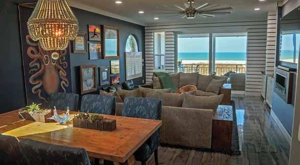
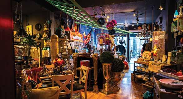
Creative Loafing magazine says, “The storefront display window at this imaginatively curated shop is an adventure by itself. Once inside, you’ll find unique pieces and creative ideas that can’t be found anywhere else.”
Another happy customer says, “David and his team did a phenomenal job designing a space that fit our desired needs and style! We couldn’t be happier.”
If you’re looking for unique home furnishings and interior design services, ZaZoo’d has been in business on Central Ave in downtown St. Petersburg, FL since 2013. Stop by and see for yourself.
ZaZoo’d


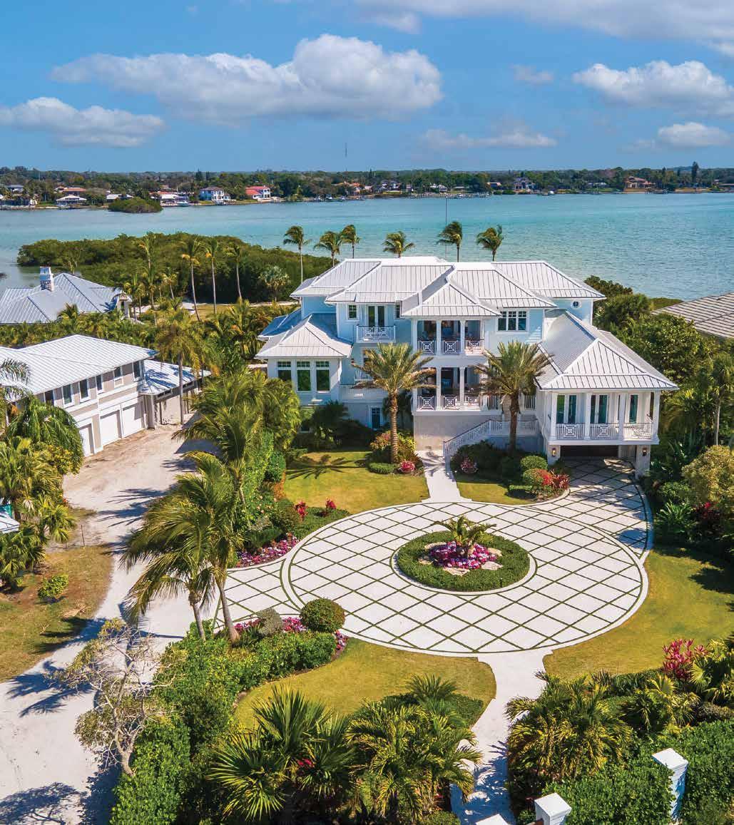

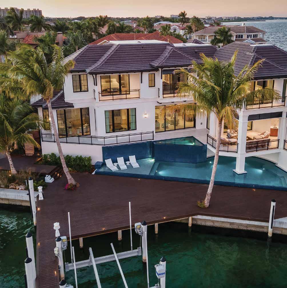
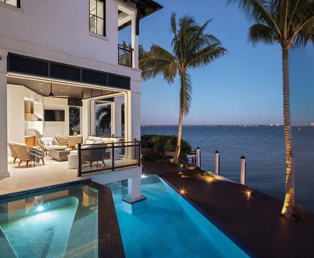
Rear Elevation: The home is situated on the lot at a 45-degree angle to provide water views from multiple vantage points throughout the home, while also capturing natural light in as many rooms as possible. Providing a seamless flow from the pool, the boat dock extends past the infinity edge to the boat launch with soft uplit LED lights. “I believe we maximized the property to its fullest capacity and the homeowners are so happy,” says John Cooney, co-principal at Stofft Cooney Architects.

WWhen a couple discovered an available parcel of land at the end of a cul-de-sac with access to Sarasota Bay on Longboat Key, it embodied all the qualities they desired in a seasonal home; though they weren’t sure if the idyllic site could accommodate the 5,000-square-foot plus home and the large pool they desired. To learn if the project was doable, they consulted Ricky Perrone, president and home builder at Perrone Construction.
“From our first meeting, it was clear we required a creative, extremely cohesive approach by the entire team,” says Perrone. “Even the integration of the decking to the pool had to be considered before we tore down the existing home and installed the seawall.” u
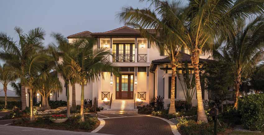
Front Elevation: Built with the finest custom materials available, this charming waterfront residence withstands anything nature throws at it. “There are so many incredible materials available to us today. When you build in these harsh waterfront environments, you become a master in the art of utilizing unique details and materials that withstand the effects of the coastal environments,” explains Perrone.
“It was important to them that their home be entertainment-friendly, to host friends and family, take the boat out, and enjoy the indoor-outdoor lifestyle together. It’s a happy place to be.”
One of the first luxury home industry professionals Perrone conferred with was John Cooney, co-principal at Stofft Cooney Architects. “There were two things happening and both were challenging from design and construction standpoints: The lot is at the end of the street and the views were strong to the right, so we made the decision to rotate the house to take advantage of a strong right view,” explains Cooney. “The second thing we did was cantilever the first floor to maximize the pool, which comes in under the home and creates a grotto-like pool.”
Interior designer Angela Rodriguez, CEO and director of design at Angela Rodriguez Interiors, stepped in before the foundation was laid and began adding her expertise to the ambitious endeavor. u
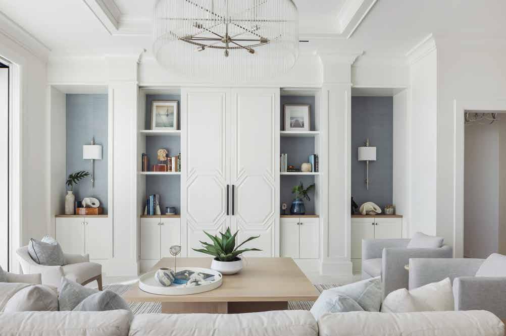
Great Room: Faced with an unmovable vertical post in the great room, Rodriguez added a second post and created a custom media wall to further elevate this comfortable space. The two cabinet doors slide back into the columns to expose the television. Blue grasscloth wallpaper in the inset behind the cabinetry adds color and texture. “From the entrance, this room appears to be floating right on the water thanks to the architecture. We enhanced this feel with our interior design choices,” says Rodriguez.
Dining Room: Sliders open up on both sides providing dramatic water views from the beautiful indoor dining space. Eight oak-framed dining chairs are clad in a neutral performance fabric, surrounding a locally fabricated blonde wood table. The designer added an antiqued mirror backing on the bar’s upper cabinets to reflect the views and light.

The clients were delighted with the imaginative solutions.
“One of my favorite distinctive features of the home is that it does not face the front property line but rather the front facade is canted at 45 degrees so the home is revealed as you approach it,” says Perrone.
“We were hired to design the home’s interior from scratch, building further upon the architectural floor plan. The process begins by getting to know our clients, their story, interests, and lifestyle. Our two biggest sources of inspiration are always our clients and nature,” notes Rodriguez. u
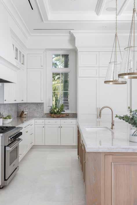
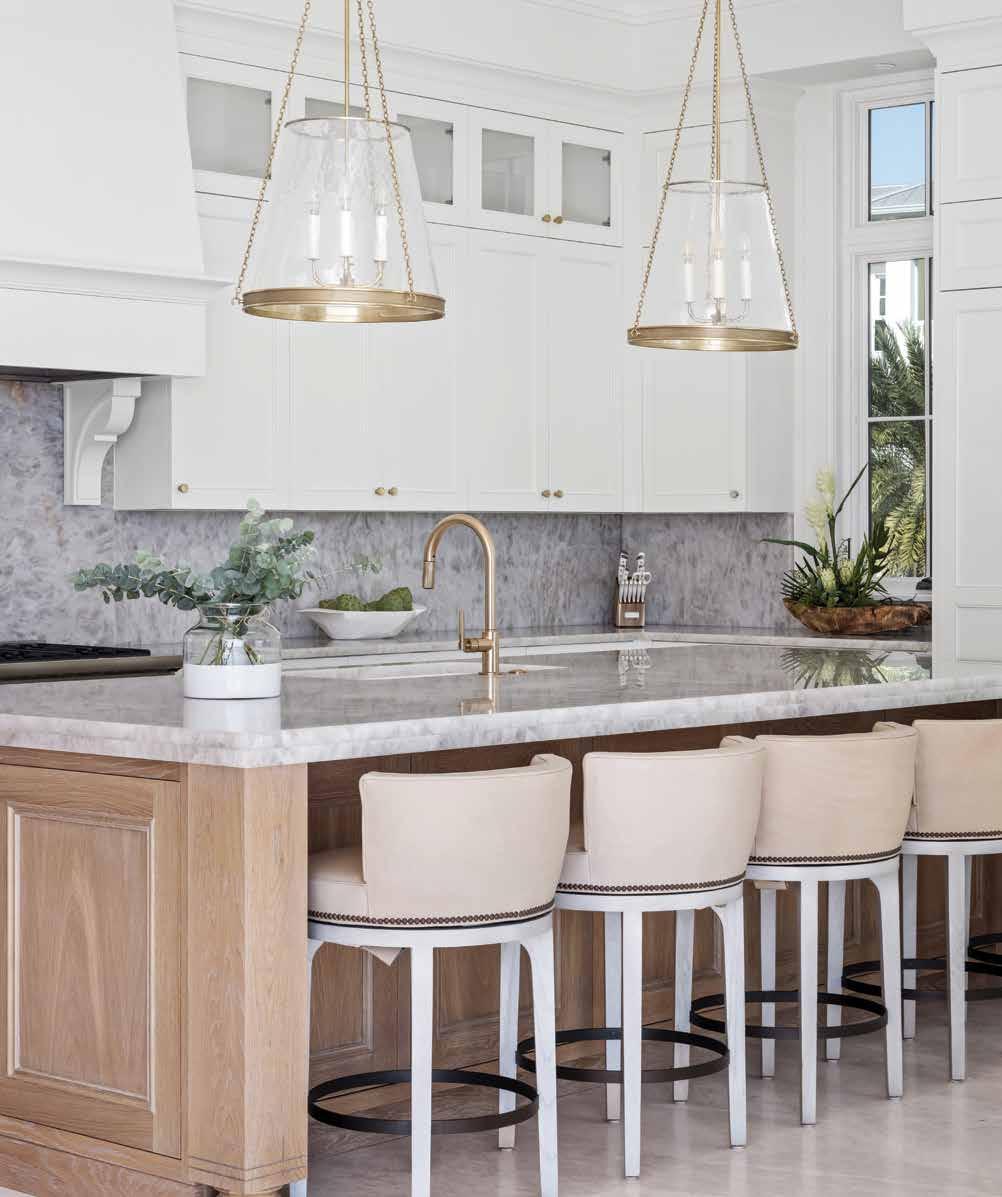
Kitchen: One of the many special features in the kitchen include the Cristallo quartzite countertops and backsplash. Rodriguez says, “It took a little extra love, but everyone comments on the translucent stone.” Complementary white cupboards from Sarasota Architectural Woodworking stretch to the ceiling for cohesiveness, while a stainless-steel Viking range, wall ovens, and a Sub-Zero paneled refrigerator, as well as a Miele paneled dishwasher, contrast the ivory colorway.
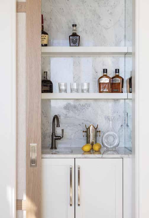
Bar: Hidden behind a pocketed door in the television room is the whiskey bar. The element was inspired by the clients; they saw a whiskey bar while traveling and liked it so much they had one installed in their home. A door on the bottom cabinet hides a Sub-Zero ice maker, and the side splash mirrors reflect the marble countertop and backsplash to create visual depth.
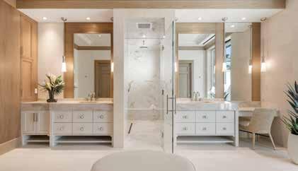
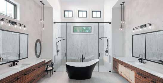
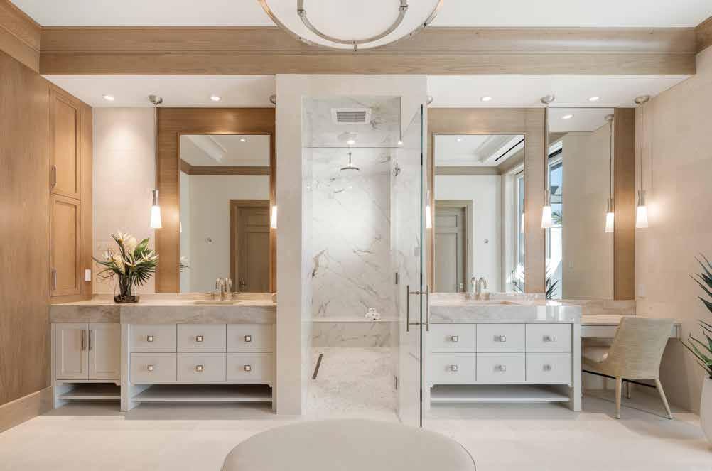
Primary Bathroom: Following her client’s wish for the primary bathroom to replicate a luxury resort, Rodriguez set the space’s lush overtone in motion by separating the client’s dual vanities with an opulent steam shower. Designed to look more like furnishings than standard bathroom cabinetry, the custom vanities from Sarasota Architectural Woodworking are appointed with two-inch square drawer pulls with a pearlesque finish. Floors and walls are garbed in easy-to-care-for porcelain slabs in a neutral tone to complement the custom-stained European white-oak cabinets that frame the two inset vanity mirrors.
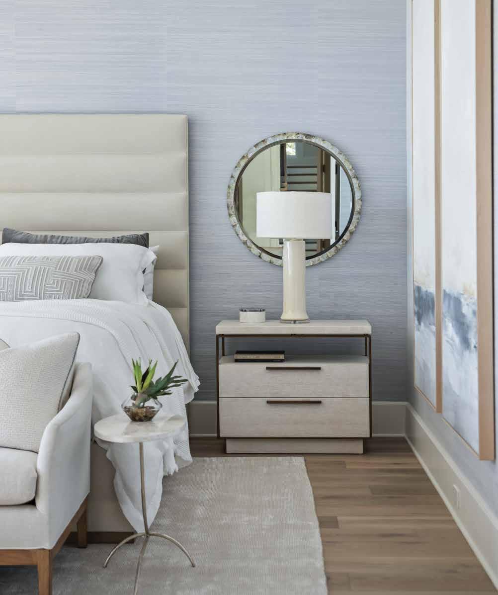
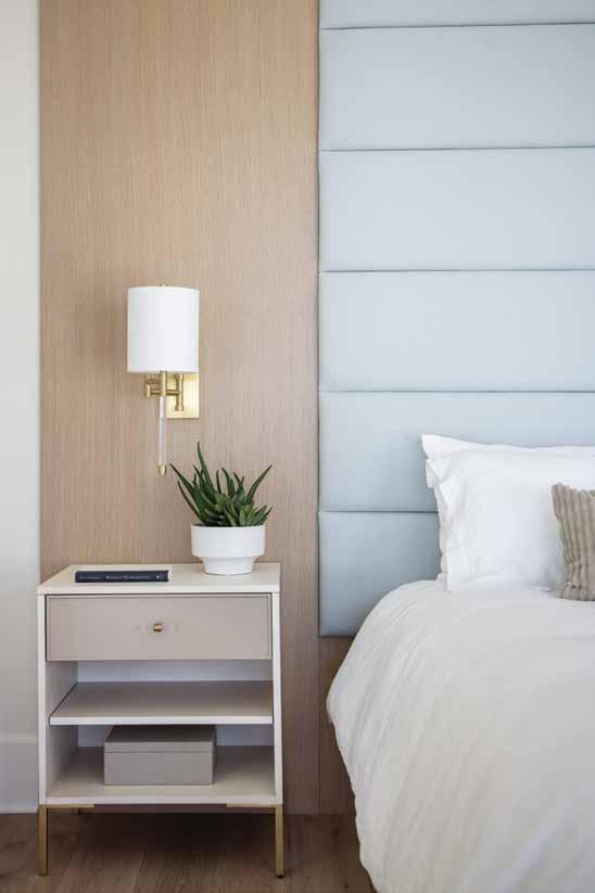
Primary Bedroom: The ceiling in the bright and lavish primary bedroom suite was originally quite tall. The designer “tricked the eye” by extending the crown moulding downward and by starting the finely woven, light blue grasscloth wallpaper at a lower level than is typical. The higher headboard further amplifies the decorative illusion. Electrical outlets are placed in the baseboards so as not to interrupt the wall finishes and to make the electrical plates less noticeable.
Communication between the team and the clients, creative problemsolving, and forward thinking resulted in a dramatic, five-bedroom, British West Indies styled home perched gracefully on a picture-perfect setting.
“The clients were active in establishing the design direction, and put their trust in us to develop it. It was a great balance of collaboration and creative freedom, which is reflected beautifully in the results,” says Rodriguez. “It was important to them that their home be entertainment-friendly, to host friends and family, take the boat out, and enjoy the indoor-outdoor lifestyle together. It’s a happy place to be.” n
Guest Bedroom: This guest room was inspired by a luxury resort. Rift white oak side panels run alongside the custom cotton and linen headboard. Unseen sliding doors lead to a patio overlooking an incredible view of the water. “Guests are excited to visit and hospitality is a big deal. I treat each guest room as its own hotel suite,” says Rodriguez.
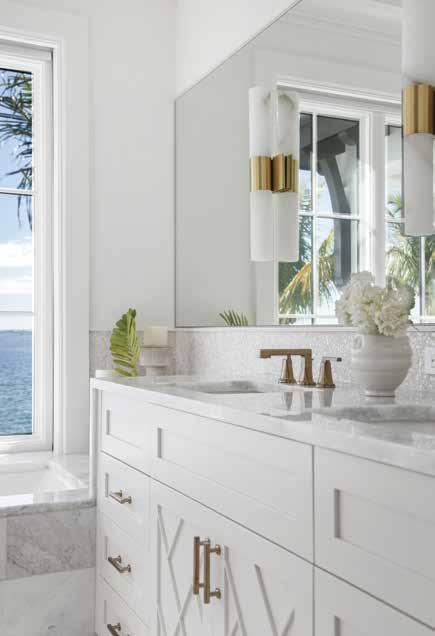
Guest Bathroom: This charming guest bathroom provides natural light enhanced by a water view and reflects beautifully in the mirror. A mother of pearl mosaic backsplash sparkles and softly adds to the stylish tropical vibe. Natural alabaster pendant lights with gold accents are affixed to the expansive mirror and sourced from Hudson Valley Lighting.
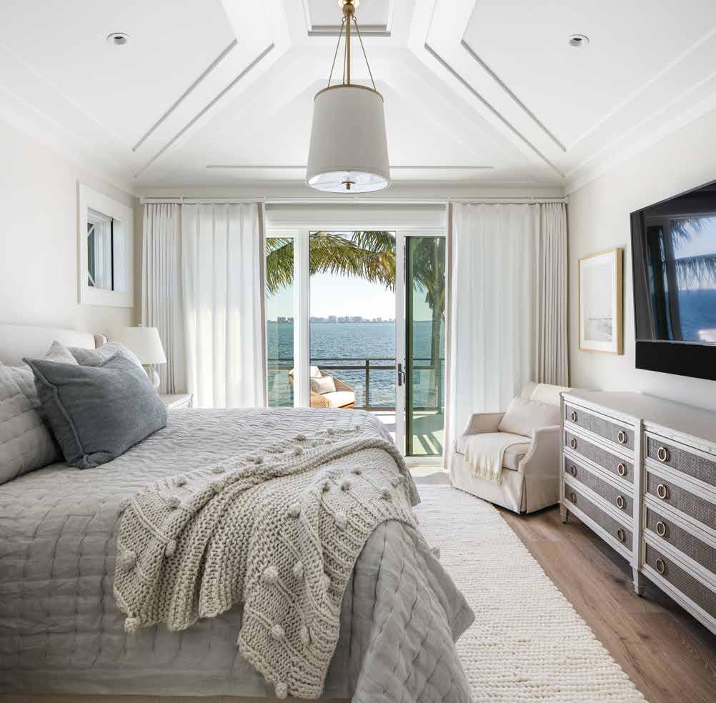
Guest Bedroom: This guest bedroom has a neutral color palette and is all about the exquisite view, including the sparkling lights of Sarasota that can be seen at night. Floor-to-ceiling sliding glass doors — framed by custom draperies — provide a gorgeous view of the water and allow guests to walk out to a private patio. The shape of the room is defined by the moulding details, designed by the architect and produced by Rodriguez. Incorporated in the design are furnishings from the clients’ previous home; the bed, and the armchair. The pinch-pleat linen bedding and cream-colored wool rug from New Zealand tie this neutral space together against the darker furnishings in the room.
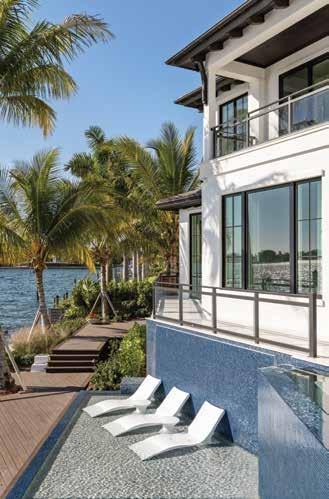
Pool Sun Shelf: When looking at the generously sized outdoor living area and pool, it is easy to understand why the homeowners named their second home the Happy Place. The infinity edge pool with transparent tempered glass provides swimmers with a striking water view. A water curtain behind the lounge chairs on the sun shelf produces soothing white noise.
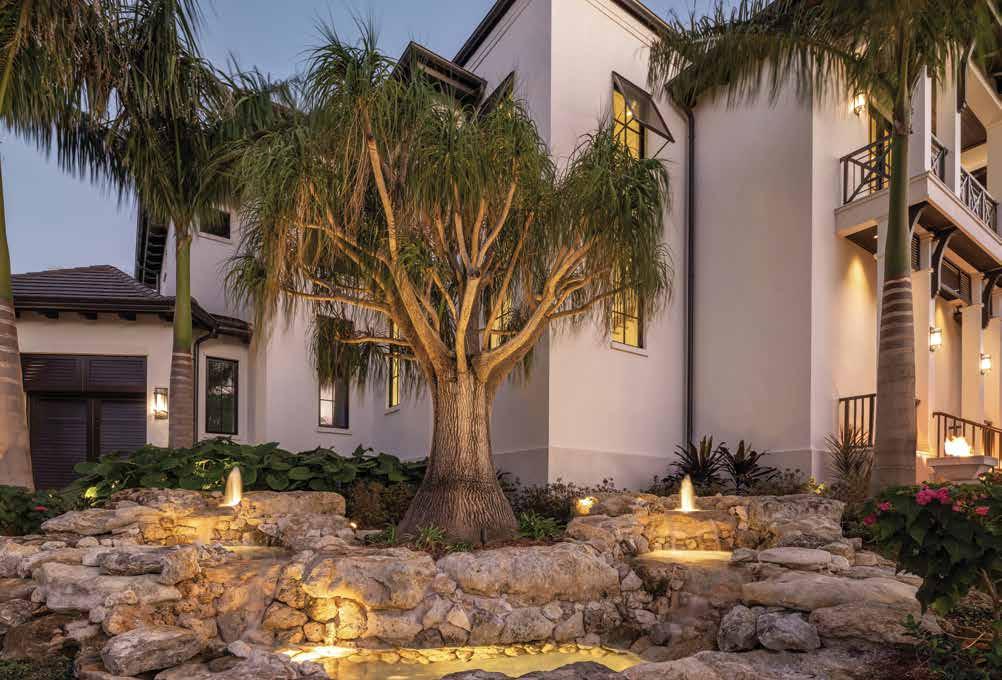
Front Elevation Focal Point: Salvaged prior to the previous home’s demolition, the ponytail palm is original to the site. Eventually it was placed at the forefront of the property where the clients had asked for something special to be crafted. Now functioning as a welcoming feature surrounded by cascading waters, the storied tree and water features bring movement and intention to the once neglected space.
Grotto-Like Pool: Lacking square footage for a large home and pool, the architect increased the pool’s size by carving out a space beneath the elevated outdoor living area to create the grotto-like pool area. “This is a great example of clients who know what they want and are able to relay that information to me to get what they want quickly,” says Cooney.
Interior Designer:
Rodriguez Interiors
International Place,
34240
Luxury Home Builder:
Construction
South Tamiami Trail
FL 34231
Architect:
Cooney Architects
Resources:
Sarasota Architectural Woodworking
Clark Center Avenue
FL 34238


Angela Rodriguez Interiors is an award-winning, full-service interior design firm based in the Sarasota area since 2009, specializing in constructionintensive and full-furnishing projects. We’re on a mission to create remarkable places to thrive: at home, at work, and out in the world. You’ll find the Angela Rodriguez Interiors team in that magic place where wild dreams meet thoughtful planning, where architecture and decor intersect, and where outstanding design meets conscious luxury. Every day we help our clients and their families create their ideal homes, custom designed for living the Florida lifestyle to its absolute fullest. We are proud to be the interior design firm behind the project, The Happy Place, featured here in this issue of Home & Design magazine.
Angela

Renowned for building many of Southwest Florida’s stunning palatial waterfront residences, Perrone Construction’s time-tested, comprehensive approach enables them to build beautiful homes in any style, delivering for local and global clientele for over fortytwo years.
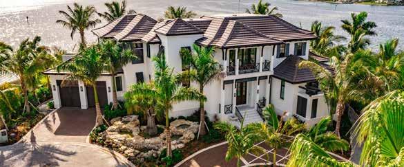
Through an in-depth understanding of the complexities and nuances of building in coastal locations and working with some of the most celebrated design teams in the world, Perrone Construction has developed proprietary systems of managing projects to deliver superior quality. From land procurement through to project completion and maintenance of the homes, they pride themselves on providing a seamless experience for clients.
named Builder of the Year 2021 by the American Institute of Architects Florida Gulf Coast Chapter, the prestigious award reflects the company’s culture as a client-centric, concierge-style builder.

Perrone
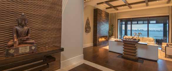
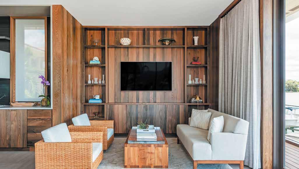

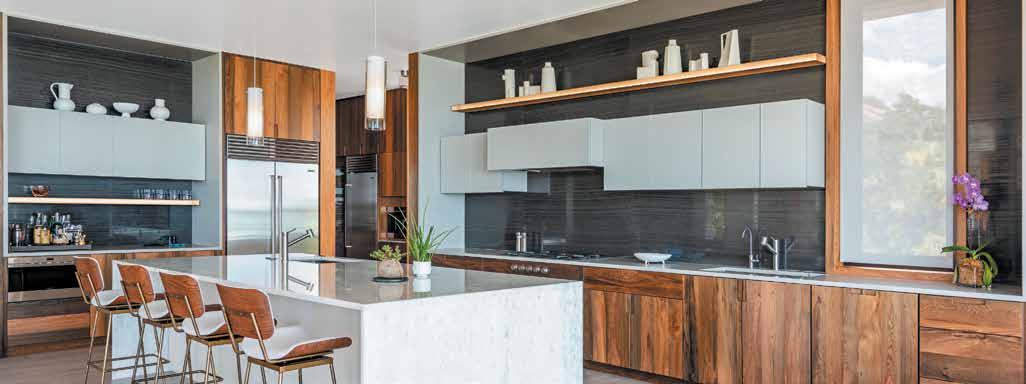








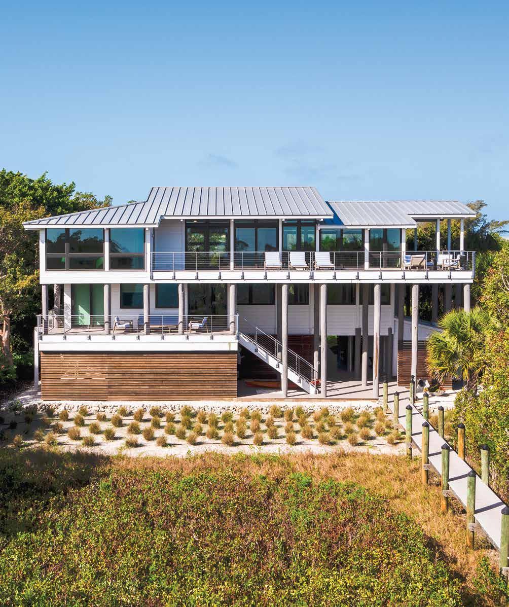
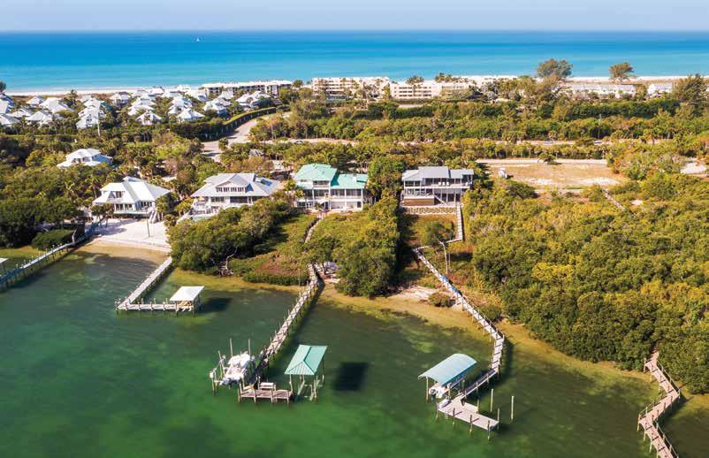
JJill Geisdorf, senior interior designer of Chic on the Cheap, redesigns a drab Boca Grande beach house by taking it down to the studs and joists and giving it an unparalleled update, focusing on functionality and a modern minimalist coastal style full of warmth and charm.

“Since we were updating every element of the home, we got to design the interior and the exterior simultaneously so we could create a strong connection between the inside and outside,” shares Geisdorf. Adding floor-to-ceiling windows across the back of the house illuminates the interior and lifts it out of the dark, uninviting atmosphere it once had. Geisdorf assembles a warm-neutral color palette with white oak and walnut and keeps the walls and ceilings white. The warm wood and the white vaulted ceilings give this home its sophisticated coastal charm. u
Rear Elevation: The exterior redesign sees an impressive increase of windows and sleek railing across the decks from Mullet’s Aluminum Products. Gray, white, silver metallic, and a warm mahogany-stained ipe combine to create a soothing modern palette. While the design calls for more natural vegetation to encapsulate the house, a simple modern-style garden steps away from the patio is the perfect transition from nature to this sleek modern home. Perez Homes incorporates a tankless water heater, durable products, and spray foam to achieve greater energy efficiency.
Living Room: Airy minimalism lends maximum flexibility to this living room. The lush Gulf view from the large windows is unobstructed by the low-profile modern furnishings. Behind this large, sleek pewter-gray sectional is a built-in cabinet that houses various games for this growing family. Pops of sunny yellow carry the eye across the space to the punchy golden-yellow USM Haller media storage credenza.
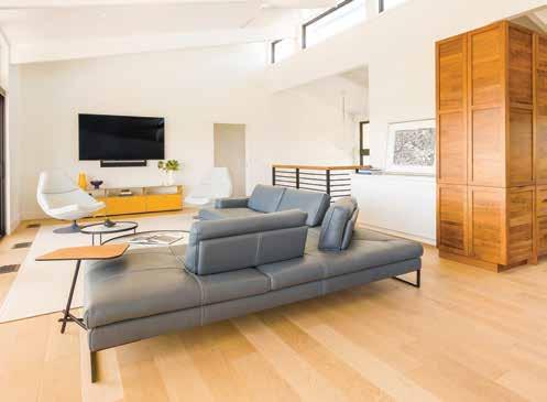
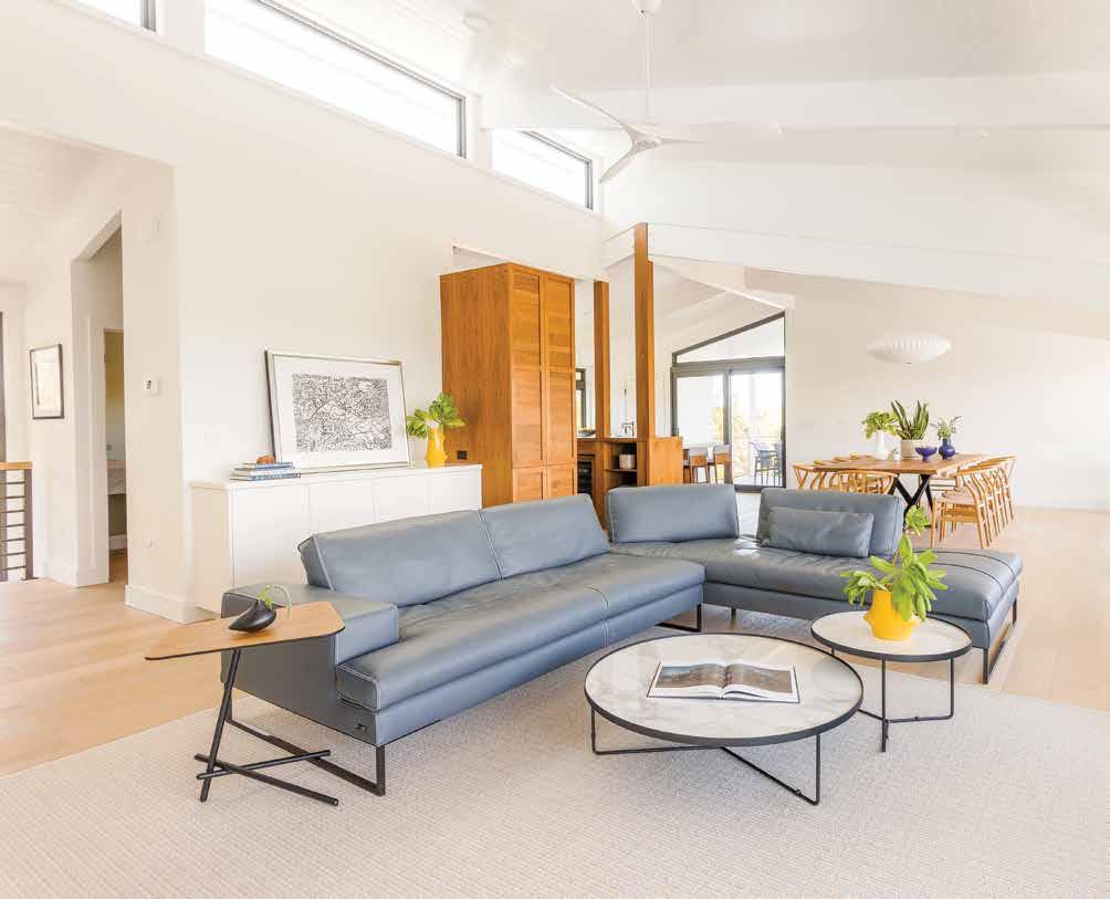
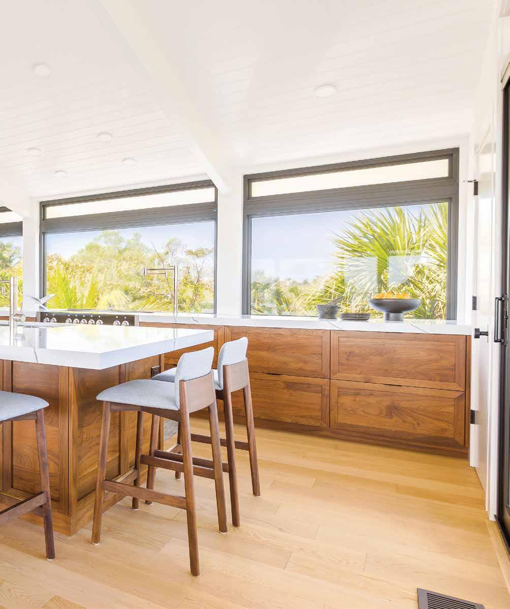
Geisdorf embraces this modern minimalist approach with both the finishes and furnishings, designing with an emphasis on simple refinement and purpose. Low-profile, modern furnishings throughout the main living, dining, and kitchen maintain the view and provide relaxed seating for the whole family. The kitchen is clad in rich walnut, and new window openings above the range are creative alternatives to upper cabinets. u
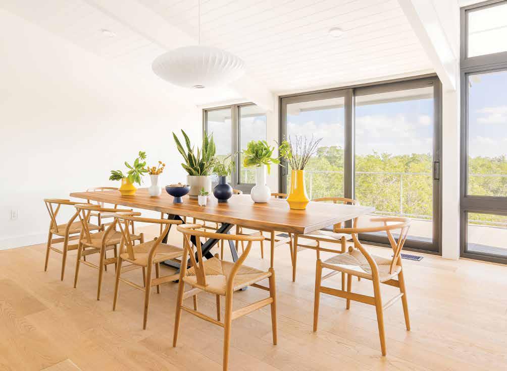
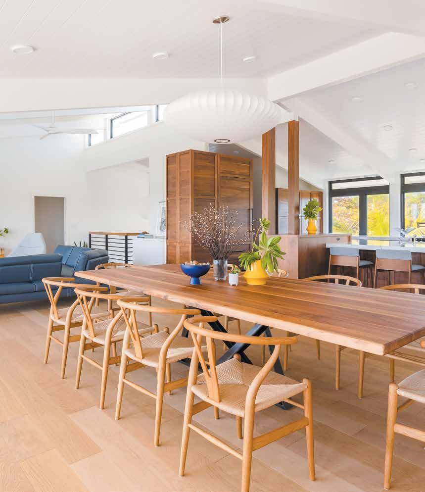
Dining Room: “The black frames on the windows have a rich look that adds punctuation to this light and airy space,” says Geisdorf. The white tongue-and-groove ceiling amplifies the natural light, while the engineered French white oak floor grounds the room. This expansive, live-edge dining table can seat up to ten with slender woven-seat wishbone chairs, calling to mind that casual-coastal aura.
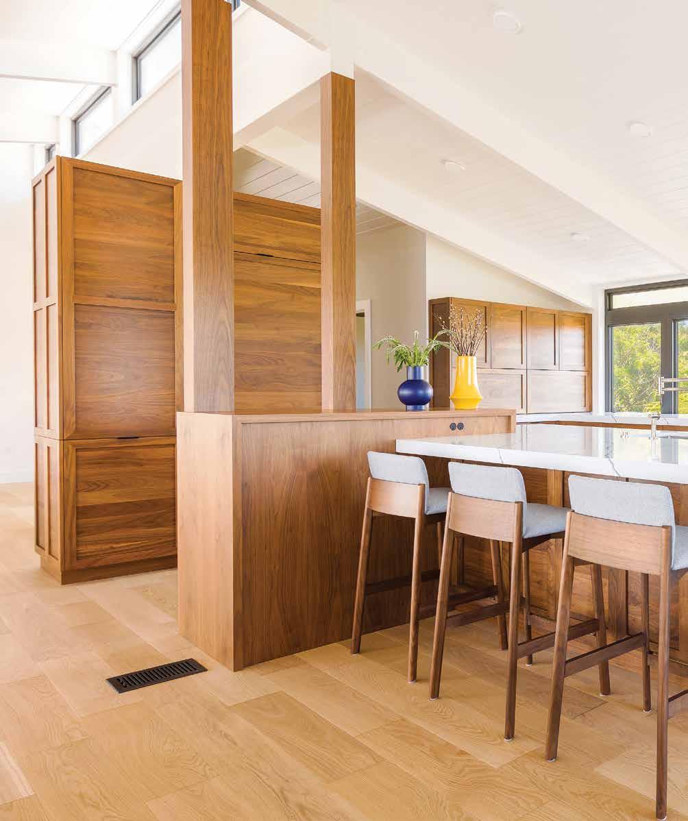
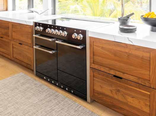
“This kitchen is meant to look like a living space,” shares Geisdorf. The structural columns are clad in walnut, integrating them into a bar-height, built-in bookcase below, adjoining to the Greylac quartz island countertop from Pompeii Quartz — this, alongside the white oak and neutral tones, is a winning combination. In addition, the homeowners have a view overlooking paradise at the 48-inch-wide Aga induction range from Ferguson Bath, Kitchen & Lighting Gallery. The kitchen cabinetry in a rich warm walnut finish is by Cabinet Design Studio.
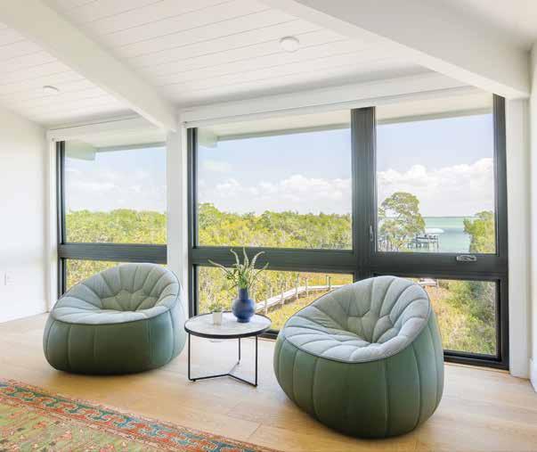
Primary Bedroom Sitting Area: With a view like this, a lounging niche fits the bill. Geisdorf places two large Ottoman armchairs by Ligne Roset, drawing the sage green color from the area rug. The round, marble-look side table is situated between the cozy seats that can be joined with the nesting coffee table in the living room, maximizing flexibility with elegant pieces.
Primary Bathroom: The team maps out the new bathroom layout and window placement, deciding on a wall-to-wall floating-style vanity with a custom mirror and wall feature — concealing the overt appearance of the outlets is a priority to make them seem invisible. Geisdorf carries the walnut, white oak, and white quartz countertops into the bathroom for a cohesive look, yet sets this space apart with its bold, graphic pattern tile floor.
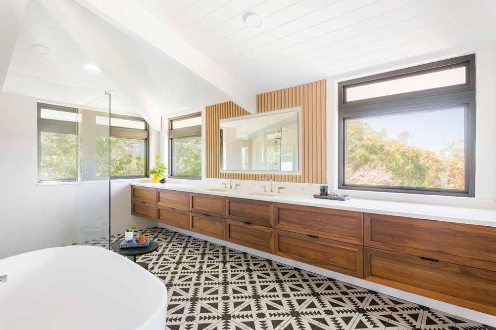
The relationship between Geisdorf, the architect, and builder Perez Homes makes this home’s transformation harmonious inside and out. There were no windows in the primary bathroom — a huge design flaw that these professionals sought to remedy. Now with windows on two sides, this space has a view of the canopy that evokes a lush, tropical escape. Geisdorf endows the room with its unique flair using a graphic floor tile. “When you design a patterned floor tile, it gives the space an inviting, wallto-wall area rug feel versus other options like a stone look,” delights Geisdorf. u
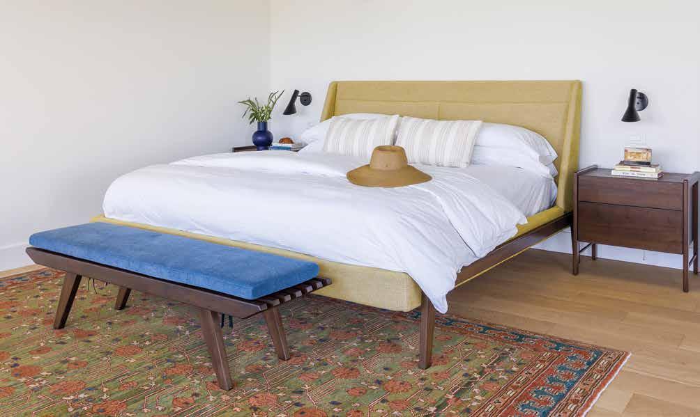
Primary Bedroom: “The rug caught the client’s eye, and I utilized the color scheme of the rug as a foundation for this bedroom’s unique design,” describes Geisdorf. Hues of rust, mossy greens, marigold, and sapphire blue make up the colorway of this original rug from Art to Walk On, and Geisdorf repeats some of those hues around the room, like that on the headboard and upholstered seat on the bench.
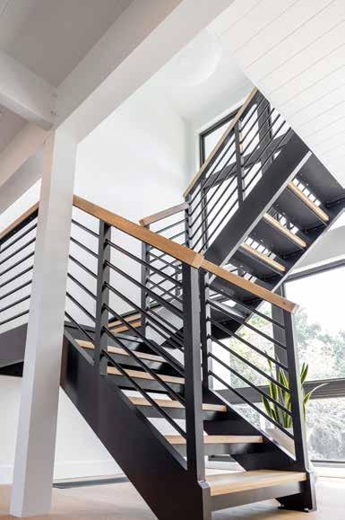
Staircase: The new custom staircase with French white oak treads from Panaget offers continuity to the French white oak flooring that runs through the home, echoing the modern exterior. This vignette is an architectural feature that greets you as you enter the house, and since it is open, it allows natural light to flow straight into the adjacent office.
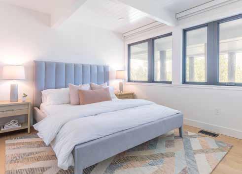
Guest Bedroom (Above): Each guest space gets a fresh and unique look. Geisdorf dives deep into color theory to balance the powerful, punchy hue the bathroom tiles brandish with a soft blush and soothing blue, garnering a feminine expression desired for this suite. A soft gray upholstered bed from Serena & Lily sits atop the Rugs As Art area rug, showing off the colors that tie the space together.
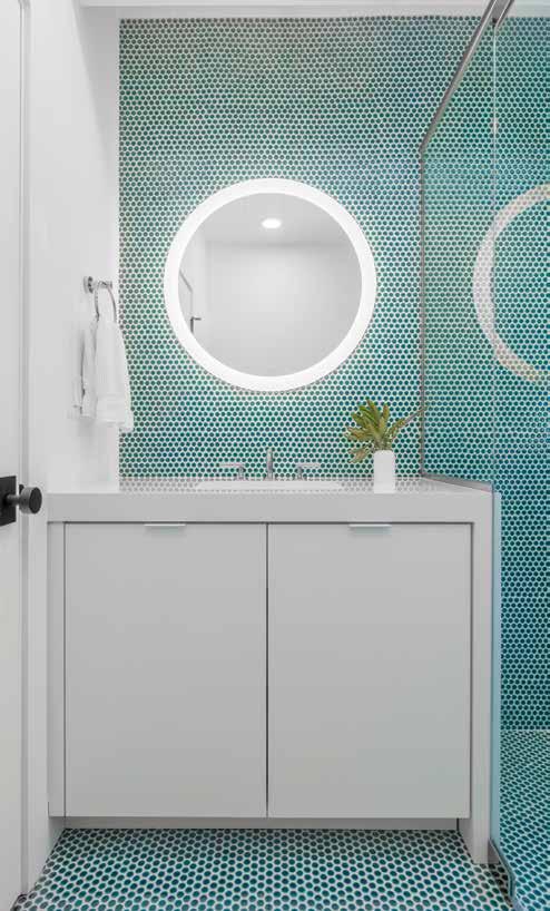
Guest Bathroom (Above): This ultra-fun application of the emerald green penny tile with white grout gives this bathroom its strong, playful character but in a sophisticated way. The bright white countertop spills down one side, sharing the impact of this design application with the shower. The round, lit mirror from Electric Mirror repeats the round expression of the penny tile on a larger scale.
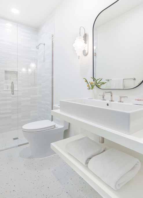
Guest Bathroom (Left): Geisdorf adds texture to the design for this white-on-white bathroom with the shower wall tile. The rectilinear vessel sink sits atop the painted-white wood countertop, juxtaposed by the organic form of the Visual Comfort wall sconce and the round-edge wall mirror. The terrazzo-like ceramic tile sparks this guest suite’s orange and blue colorway.
To ensure this home could be a gathering place for family, the remodel absorbs some patio space to create another bedroom. In each guest suite, the bathroom finishes inspire the adjoining bedroom selections — each in a unique style. For one of the guest bathrooms, an emerald-green penny tile catches the client’s eye. “The complementary color to green is red,” Geisdorf explains. “We used this color theory and a little creative license to complement that emerald hue with blush tones in the bedroom for a soft, feminine feel.”
The goal of this remodel was not simply to make it pretty but a complete and thoughtful redesign of the exterior and interior, pulling inspiration from the structure to create an inviting, warm-modern beach house. n
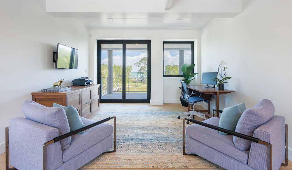
Office (Above): Just past the staircase is the office, and beyond is the lush view in the back. Since this is what you see when you first walk in, Geisdorf sets the tone with an ample area rug made of hues reminiscent of the sunset and two oversized lounge chairs to kick off that casual air. For continuity, the storage credenza is in the same walnut finish as the kitchen cabinetry.
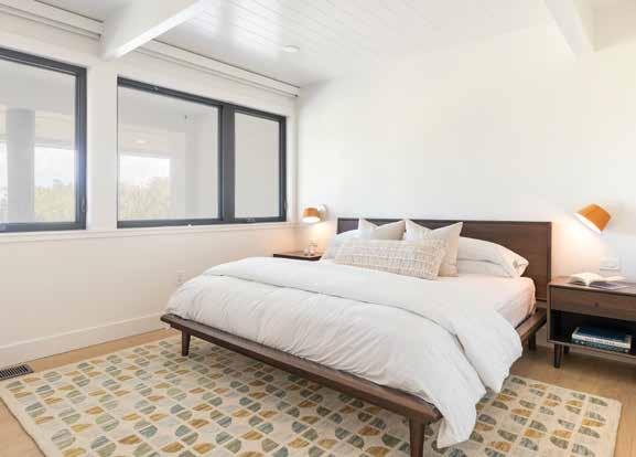
Guest Bedroom (Left): This guest suite gets retro-style furnishings and a soft orange and white colorway. Plush bedding creates an inviting ambiance atop the modernstyle bed, while wall-mounted nightstand sconces with colorful orange shades repeat the palette and offer a warm glow to instill this space’s unique feel.
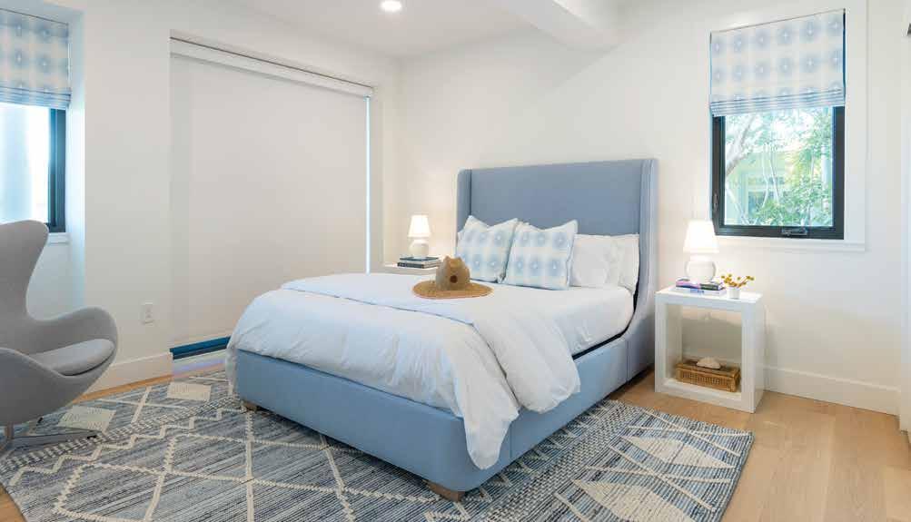
Guest Bedroom: From sky-blue to deep navy, this guest suite is full of blue and white, giving the room its coastal-chic appeal. The tie-dye-look fabric from Eskayel on the Roman shades fills this room with an airy vibe. A motorized shade is available for privacy and light control.
Guest Bathroom: This bold navy-and-white tile in a starburst pattern spans the floor. Geisdorf keeps the rest of the space bright white, using an elongated white tile in a straight-stack pattern. The see-through glass partition on the tub is an excellent choice for this dainty bathroom to maximize the natural light, lending a relaxed feel to this casual-chic bathroom.
 Written by Rachel Seekamp Photography by Piper Creative Group
Interior Designer: Chic on the Cheap 866.663.6062 www.chiconthecheap.net
Resources:
Art to Walk On 16 South Palm Avenue Sarasota, FL 34236 941.951.5454 www.arttowalkon.com
Cabinet Design Studio 825 South Tamiami Trail, Suite 2 Venice, FL 34285 941.488.8413 www.cabinet-design-studio.com
Ferguson Bath, Kitchen & Lighting Gallery 5521 Fruitville Road Sarasota, FL 34232 941.951.0110
Mullet’s Aluminum Products 6345 McIntosh Road Sarasota, FL 34238 941.371.3502
Rugs As Art 6650 South Tamiami Trail Sarasota, FL 34231 941.921.1900


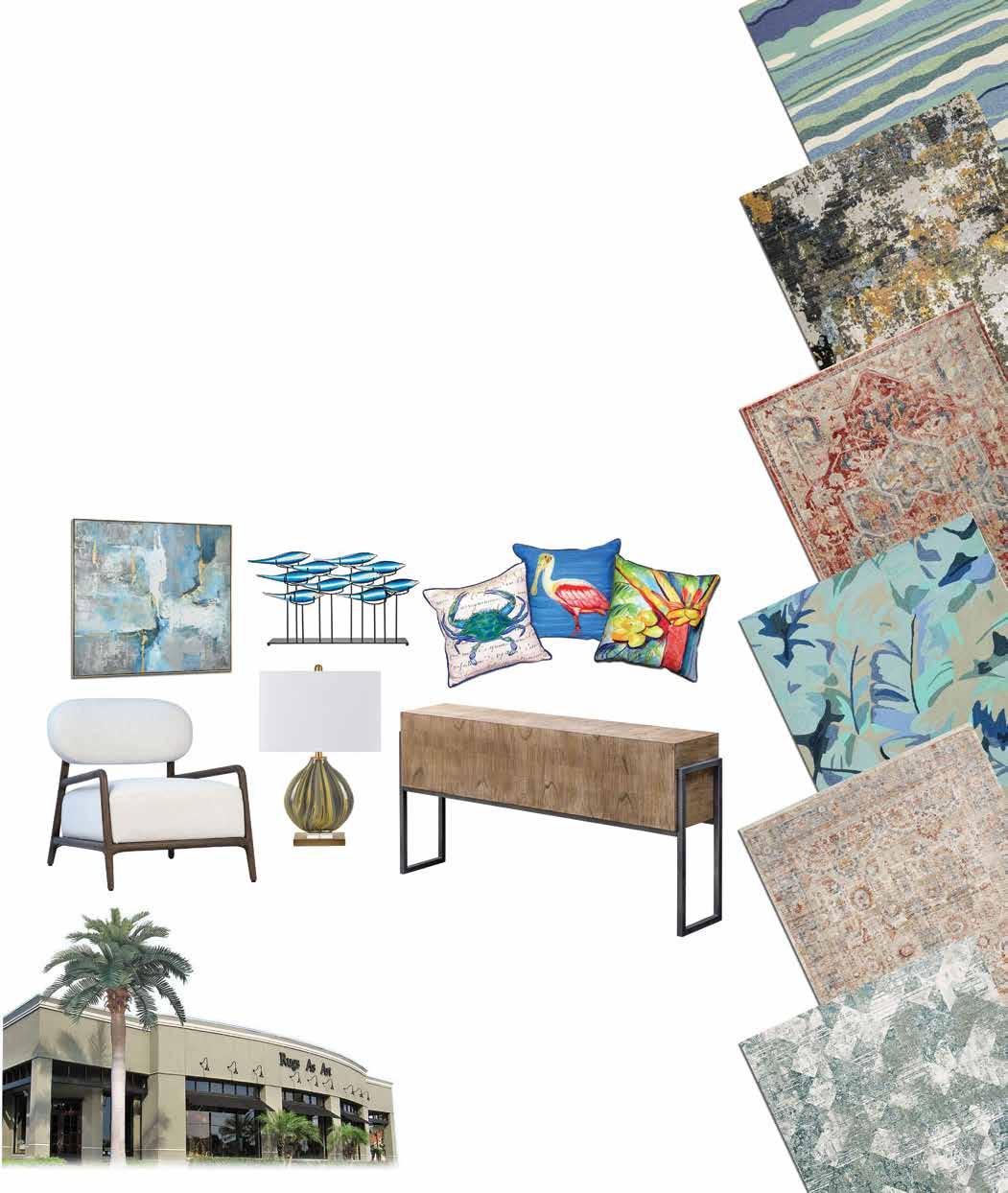

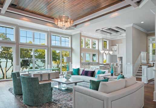
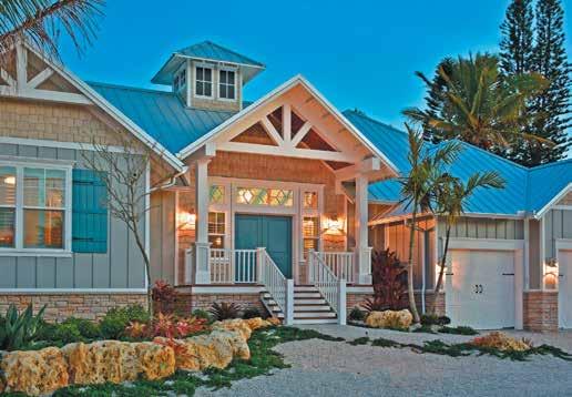
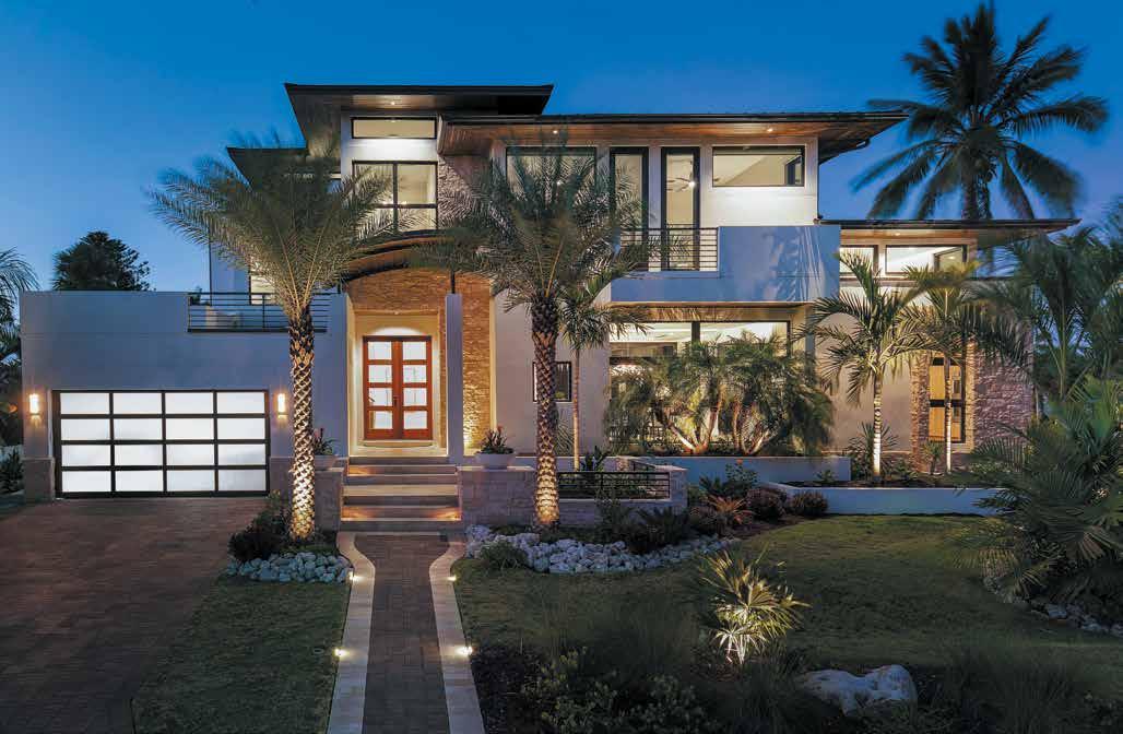

When working with HSH Designs you get some local flare, a smidge of history, and a splash of nature. We’ve been helping people make their spaces truly feel like home for over 20 years.

2nd St, Suite E, Sarasota, FL 34236

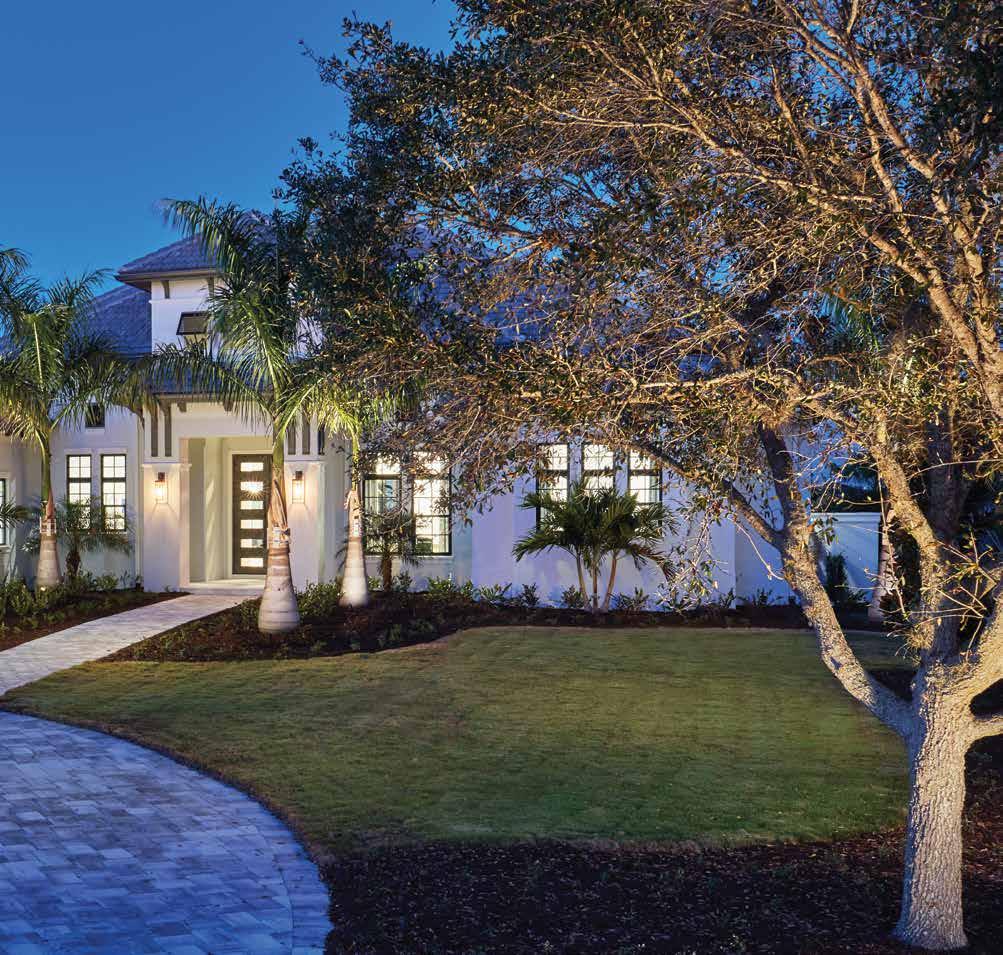
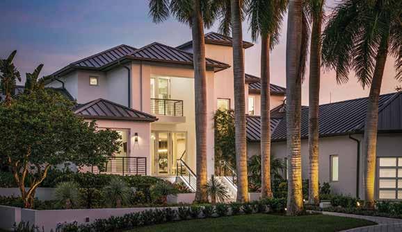
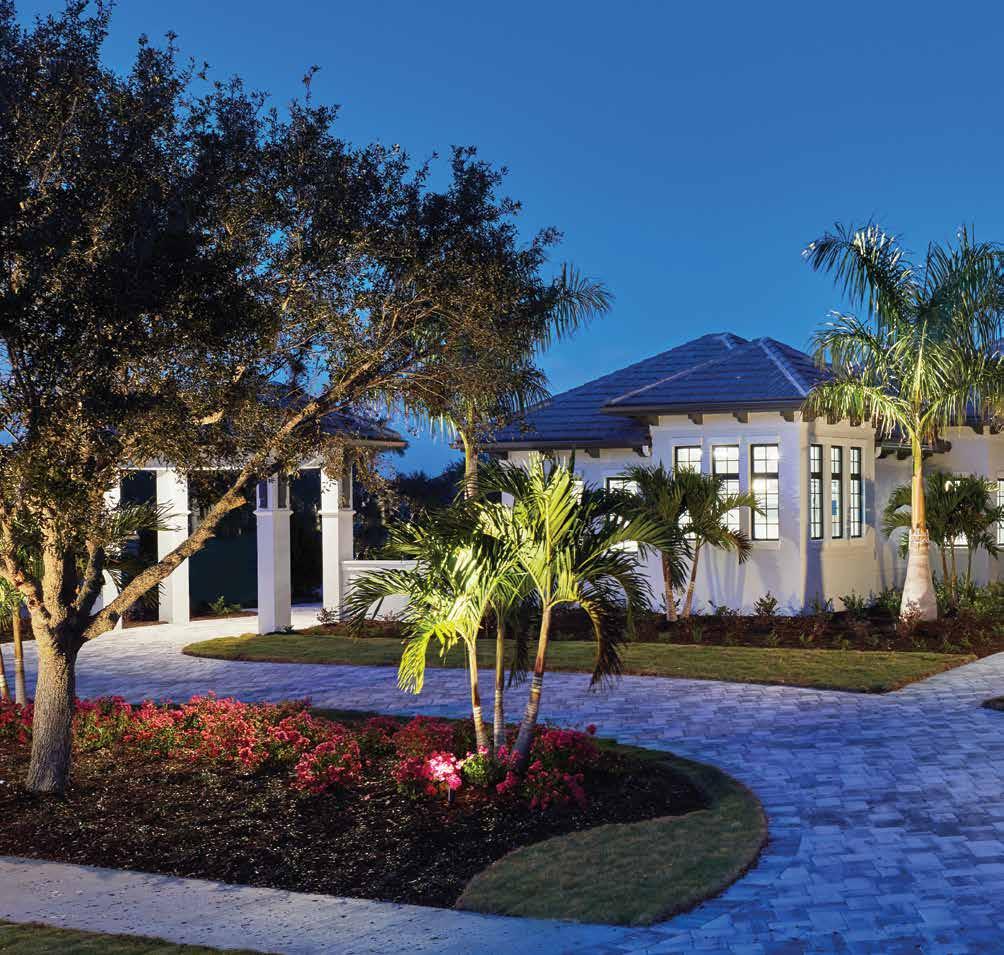 Front Elevation: A multi-tonal gray and white paver drive leads to this Sarasota home’s grand entrance and the porte cochère to access the four-car garage by D & D Garage Doors. This elegant structure connects to the main home stylistically, showing off the ardent attention to detail that begins on the exterior with precast elements like water tables, decorative brackets, and banding that enrich this home’s aesthetic.
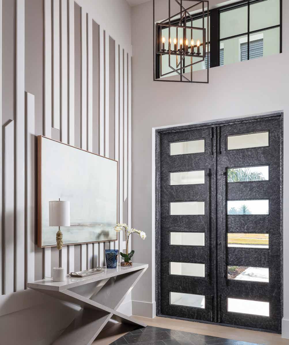
Great Room: Extensive detailing begins with the iron entry door. Bright white trim on the foyer wall stands out against the studious-gray paint, creating visual contrast. The stately colorway of dark charcoal and inky blue anchors the space, while the textural palette plays out in velvety fabric, geometric and herringbone patterns, and embroidery embellishments. A prominent feature is the dark espresso stain built-in; the design team enhances the background with variegated gray tile.
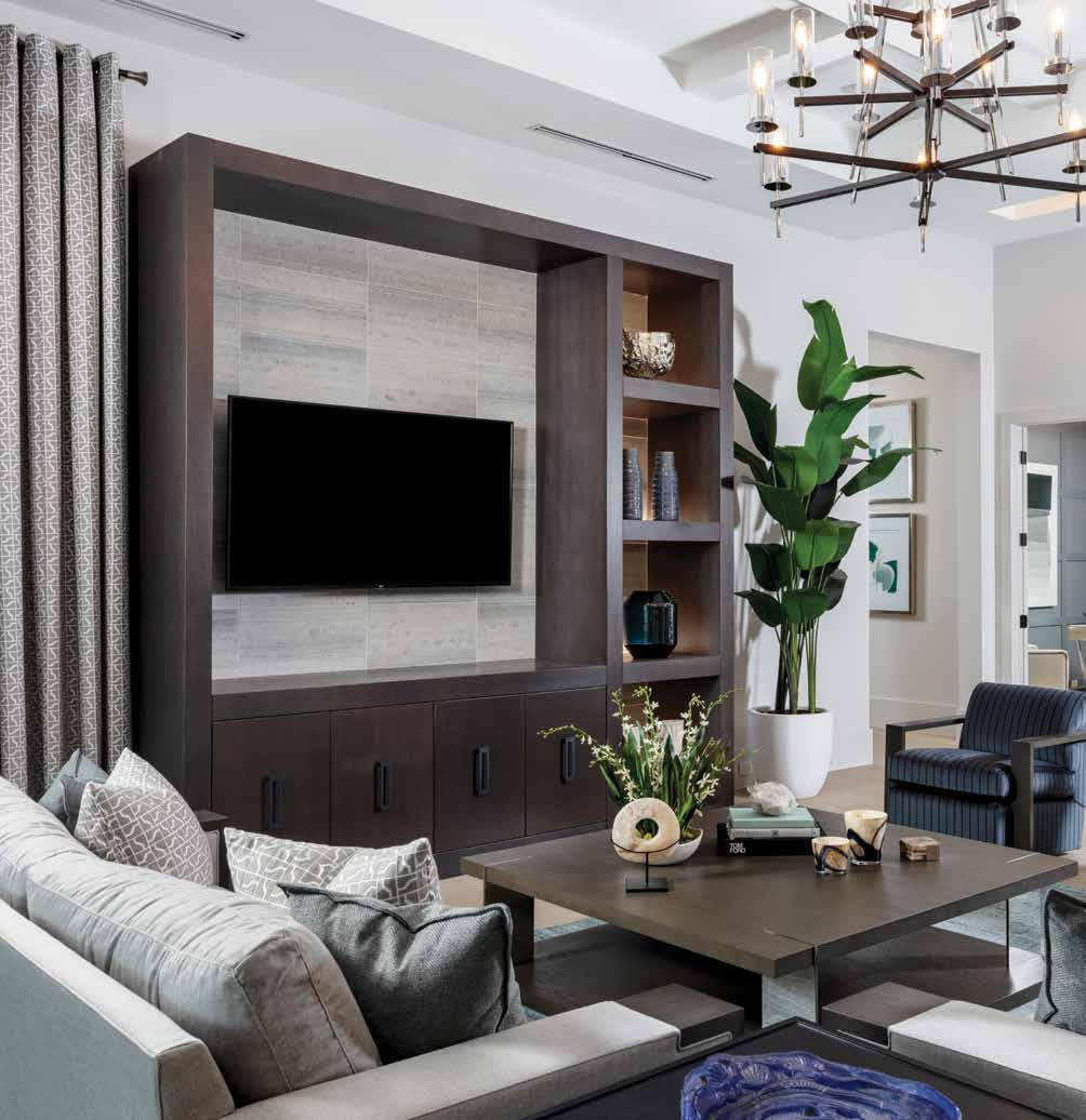
Vice President of Sales and Marketing at STOCK Custom Homes, Claudine Leger-Wetzel, affirms the Sarasota luxury market is thriving, and the response from buyers has been overwhelming. The reaction to this stately, furnished Sarasota model in Lakewood Ranch was equally resounding.
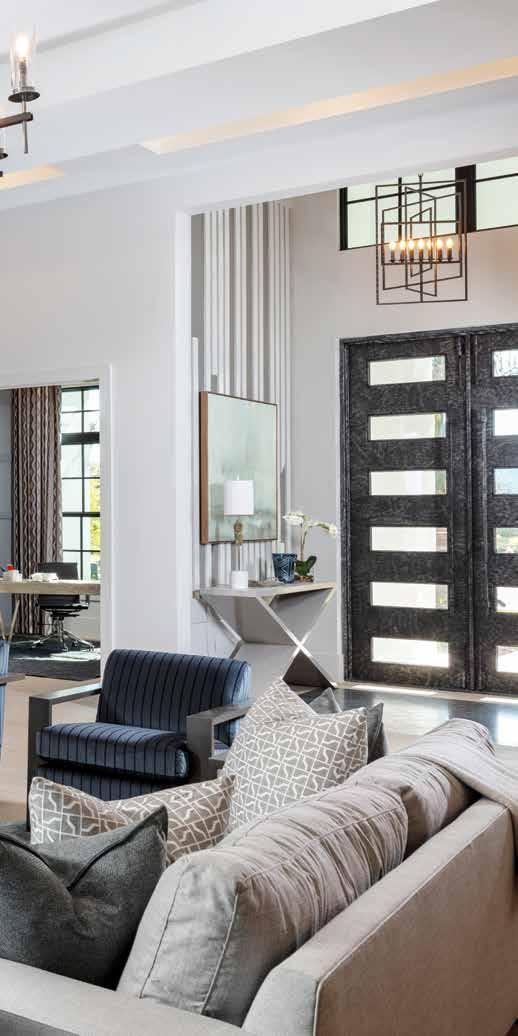
STOCK Custom Homes and South Florida Architecture have been designing homes collaboratively across Southwest Florida for a long time. Getting an interior design team early means rich detail and robust design according to STOCK Custom Homes. Brian Ahmedic, an architectural designer with South Florida Architecture, describes the aesthetic of this home as timeless and one that effortlessly endows the resident with positivity. “The interior designers elegantly complement the architectural design concepts to enhance the overall design of the home,” says Ahmedic. u
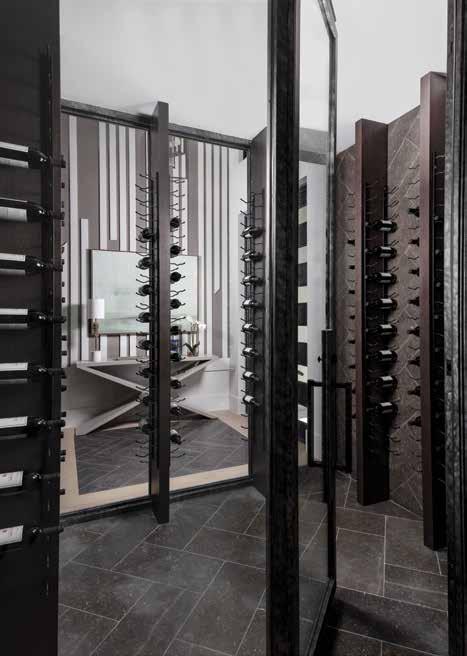
Home receive the architectural plans and immediately layer intricate and mindful details throughout the interior. “The first thing Charlie and I do is talk about making the floors, walls, and ceiling designs relate to each other before the color palette and furniture selections. Then we hand pick the other elements until it all flows together,” shares Errett-Pikosky.
The balance of color, visual texture, and the creative detailing in the study’s floor, wall, and ceiling is an exceptional illustration of the interior design team’s meticulous process. The dining room benefits from this creative approach by showing off a large-scale crosshatch in the ceiling tray. Hansen calls it “a refreshed version of a classic element.” u
 Interior Designers Charlie Hansen and Rebekah Errett-Pikosky of Clive Daniel
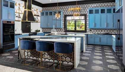
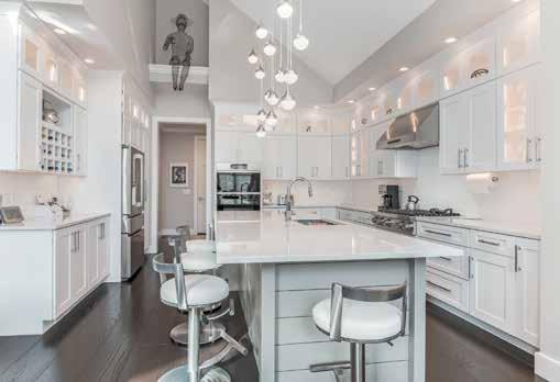
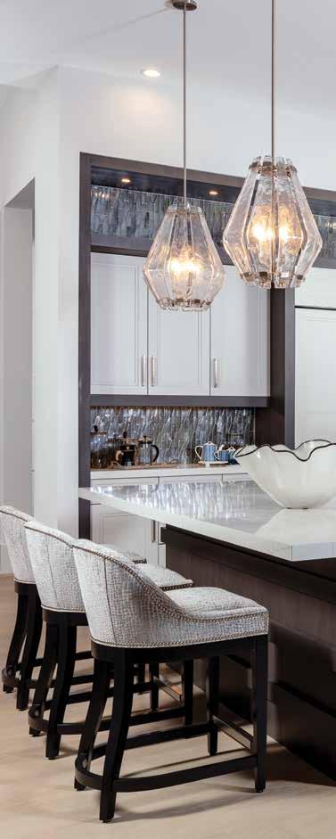
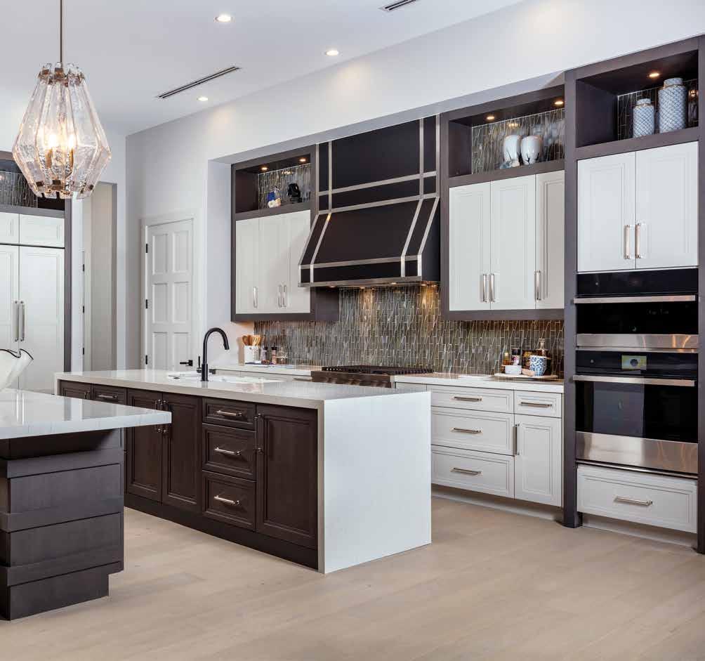
Kitchen: “We emphasize the development of livability, functionality, and high-end design,” shares Leger-Wetzel about this kitchen. Hansen and ErrettPikosky custom design a showstopping hood in black metal with stainless-steel strapping, while a contrasting White Macaubus quartz from Pompeii Quartz cascades over the working island and acts as the tabletop on the second island. Three substantial glass pendants above, from Ferguson Bath, Kitchen & Lighting Gallery, anchor the space.
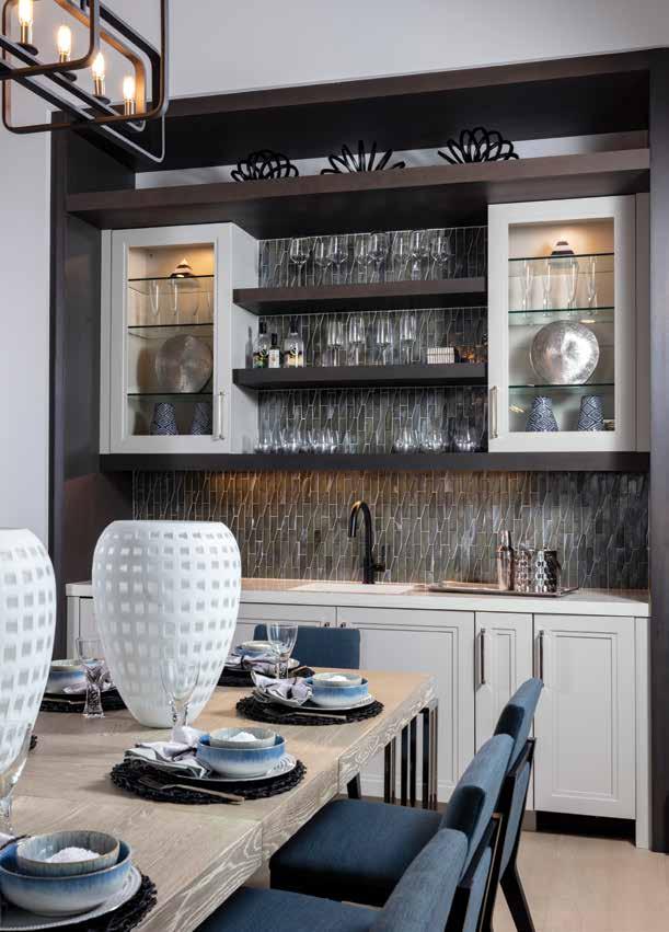
Built-in Bar: “Certain design aspects are often overlooked, but our firm strives to incorporate even the smallest design features to emphasize elegance and use of a space,” Ahmedic delights. The entire niche is cased in the dark stain trim, and overall, the bar is a combination of dark charcoal shelving and soft white Omega Cabinetry. To accentuate the grandness of the ceiling height, the design team runs the Luca Lunada Bay backsplash tile up and behind the open shelves.
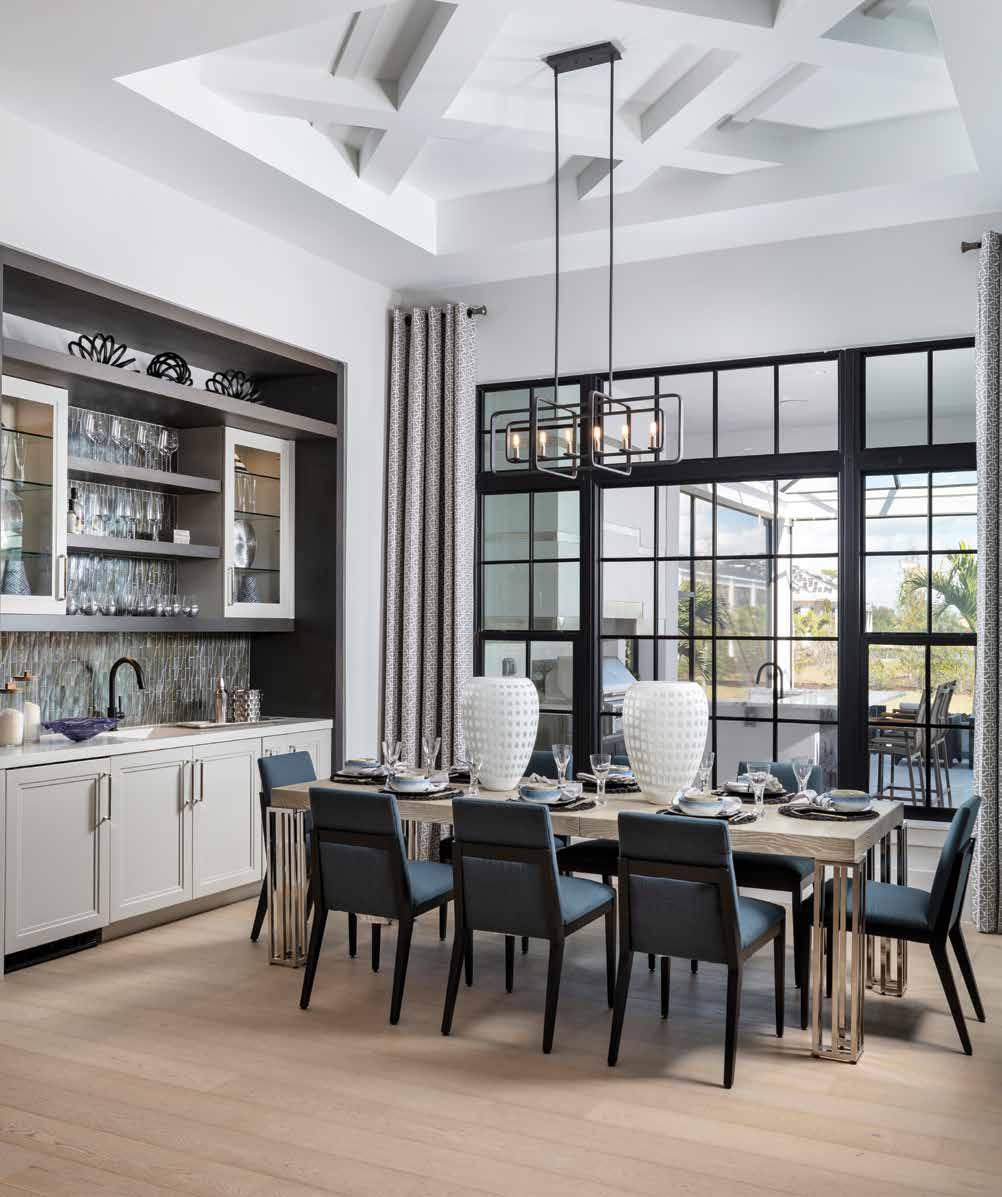
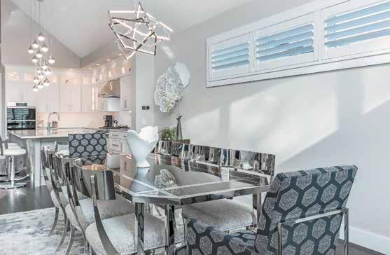
Dining Room: The black frame windows span the dining room. “Incorporating these large, expansive windows is not just to capture natural light, but it creates a visual connection between the exterior and interior spaces,” describes Ahmedic. This chandelier’s style connects to others in the home, much like the soft white oak hardwood floor across the main living and dining that builds harmony into the design.
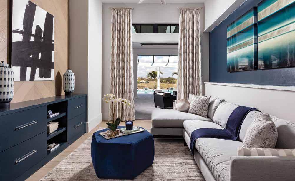
Bonus Room: Hansen and Errett-Pikosky search for furniture in unexpected shapes, and Clive Daniel Home creates this hexagonal, velvet cocktail ottoman in navy. The design duo situates the custom piece in the center of the room to transition the navy hue from one feature wall to the other. Smart home solutions make it easy for the homeowners to transform this flexible space into a home entertainment dream by replacing the artwork above the entertainment cabinet with a television.
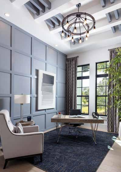
Den: This study is set up with light and airy furniture pieces to make the space flexible for the homeowner. Large windows with black frames and transoms draw natural light and an expansive view of the vibrant landscape. Rebekah Errett-Pikosky of Clive Daniel Home says, “With the lighter floor, we wanted to accentuate the wall feature and repeat that color in the ceiling but with an atypical expression,” using Steely Gray by Sherwin-Williams for this feature and the thin accent ceiling beams.
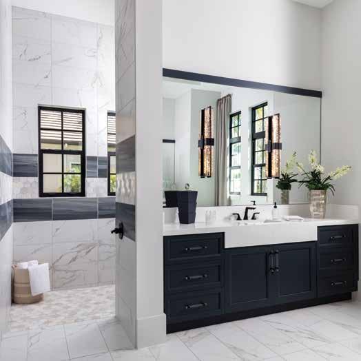
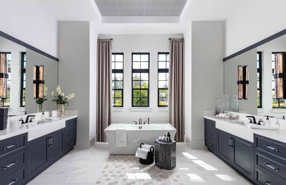
Primary Bathroom: A natural stone blend mosaic inlay from the Metropolitan Collection by Tesoro — set into the 12-by-24-inch Roma Statuario porcelain tile — leads to the soaking tub that is framed by tall, warm gray drapes. This understated tub from Ferguson Bath, Kitchen & Lighting Gallery sits beneath a ceiling tray that features Noam wallpaper from Thibaut. The Glacier White marble countertop is a stunning sight atop the blue-tone cabinets, while the mirrors stretch from one end of the space to the other, accentuating the light from the black-framed windows and creating a sense of stateliness.
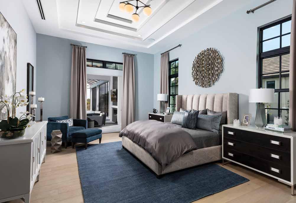
Primary Bedroom: Above the channel back, king-size bed is the unique, graduating step ceiling detail, accented with SherwinWilliams’ color First Star. To offset the crisp white ceiling, the team selects a soothing, soft blue hue, Samovar Silver, for all four walls. The dusky-navy rug anchors the space, while the two-tone Vanguard nightstands with alabaster handles add a punch of high-contrast edge to this stylish primary bedroom.
All of the ceiling details frame the individual spaces, while the finishes traverse the open-concept layout, creating a seamless experience throughout the home. Overall, the palette is built from just a handful of colors but is strong in various textures. Midnight blue accents the neutral stone-gray backdrop, while the design team’s black accents are a confident, bold statement.
When asked what her favorite feature in the home was, Leger-Wetzel gave an emphatic and enthusiastic answer — the kitchen. The kitchen is well thought out where flow, function, and refreshing interior finishing are concerned. “I like the richness of the wood tone and the crispness of the white — it’s a striking look,” shares Leger-Wetzel. “For several years, the predominant design direction has been gray or white, and with this kitchen, we took that to a whole new level.”
The window layouts, namely in the primary bedroom and bathroom, display Hansen and Errett-Pikosky’s symmetrical success. Yet, the duo purposefully applies asymmetrical design to the ceiling in the outdoor living space to create cohesiveness.
This impressive, detail-rich home is the product of pure creativity and collaboration. Leger-Wetzel delights, “We thought outside of the box, and at the end of the day, it was a winner and was received with high acclaim.”
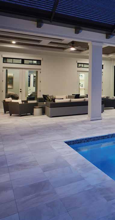
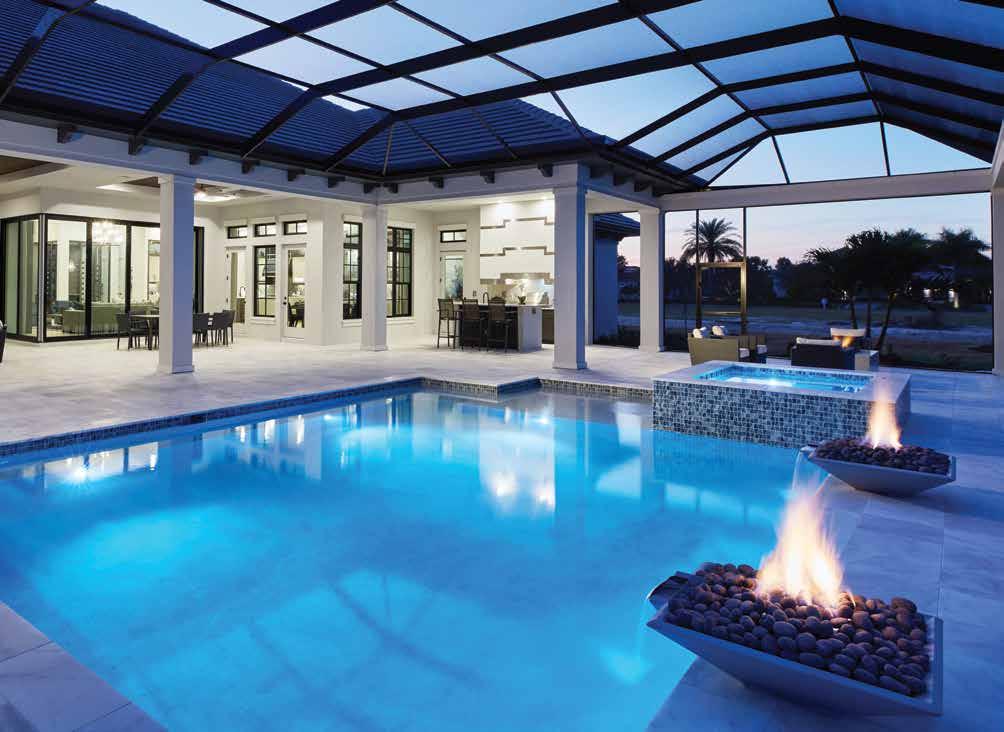
Pool: “Architecture is not only about beautiful design — functionality is equally important,” Ahmedic shares. “In our Florida climate, we have to be mindful of our designs to emphasize the natural light while minimizing the harsh direct sunlight.” This exceptional outdoor living and pool area are a buffer between the natural elements and the home. The screen structure, custom-made by STOCK Custom Homes, lines up beautifully with the brackets on the house.
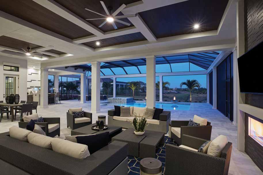
Outdoor Living: “We love symmetry, but this ceiling treatment is intentionally asymmetrical,” shares Hansen. The ceiling planks in mahogany fill the space between the white stucco beam-work that creates this warm, high-contrast design. Stainless-steel inlay creates geometric interest on the oversized stucco hood in the outdoor kitchen. This grand focal point fits the intentional over-scaling of this outdoor entertaining space, featuring furnishings from Pelican Leaf and COUTURE Jardin.


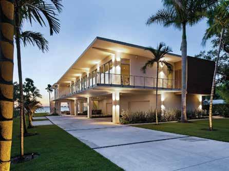
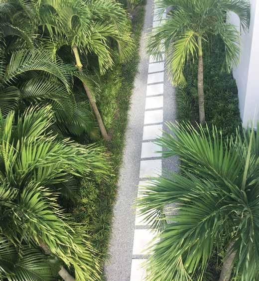


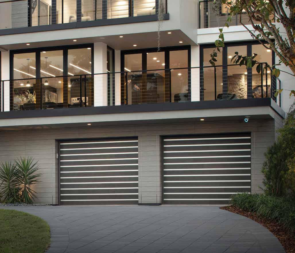

without hesitation, recommend Tom and Jennie Shumway, owners of Talon Home Builders, to anyone who is considering building or renovating a home. They are honest, determined to deliver as promised and extremely talented.
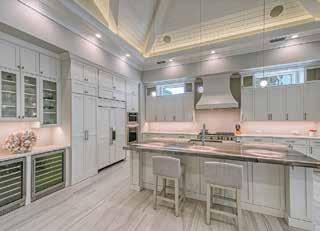

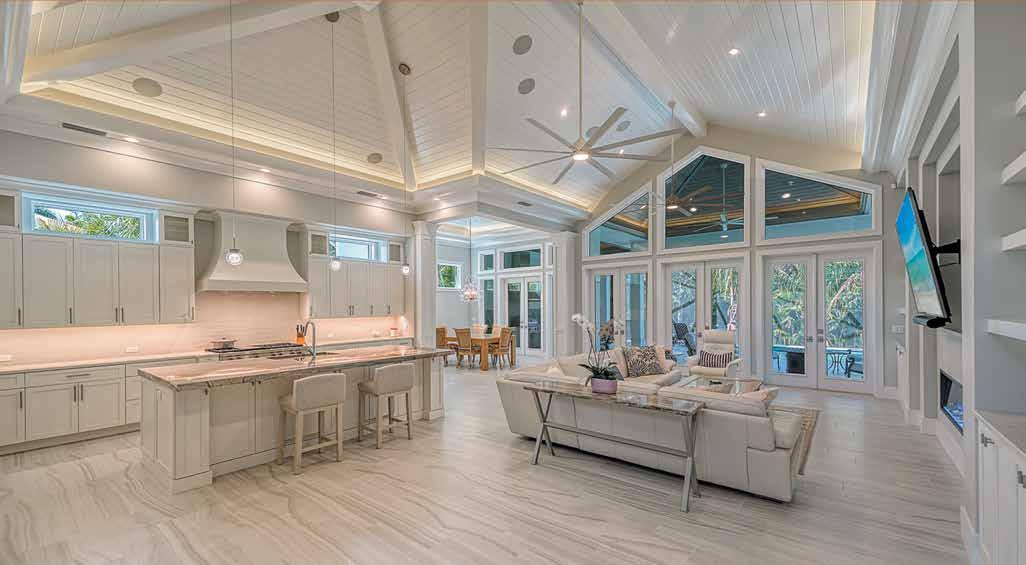



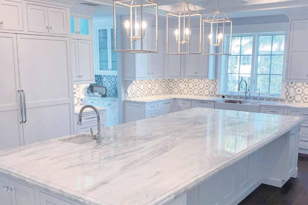




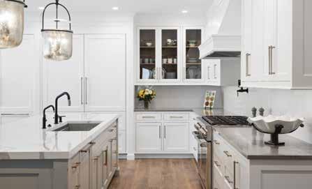
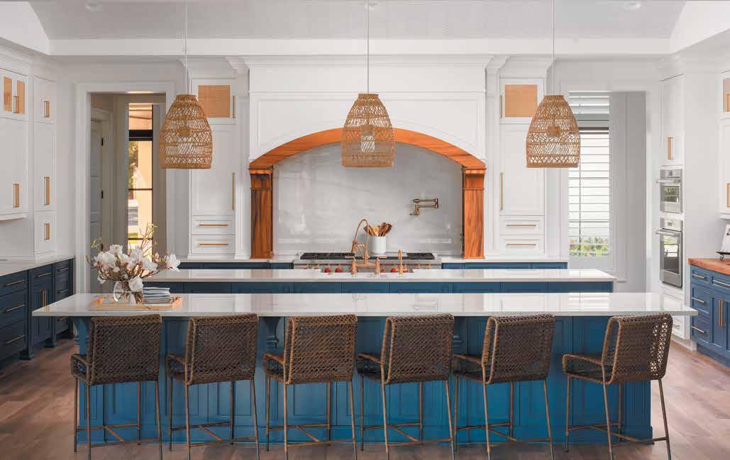
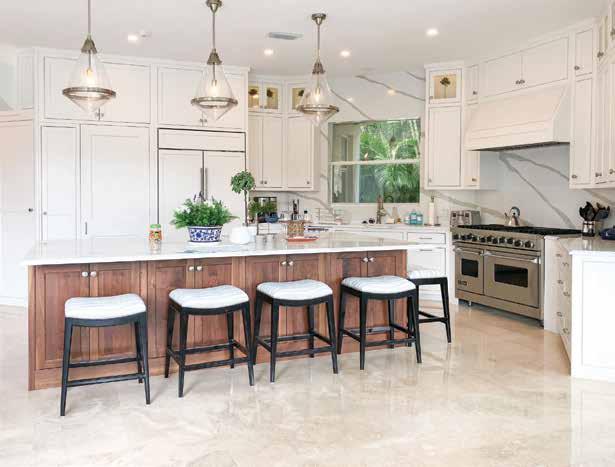
The kitchen’s look started with the 14-foot-long island, designed by Amy Lou Smith of Amy Lou Interiors. The oversized light fixtures add an essential focal point and connect the expansive coffered ceilings with the island and the room. “I knew I had to find lighting to do the island justice,” explains Smith. “When I found these lights, they were almost as tall as me, but they seemed like the only choice for the room.”
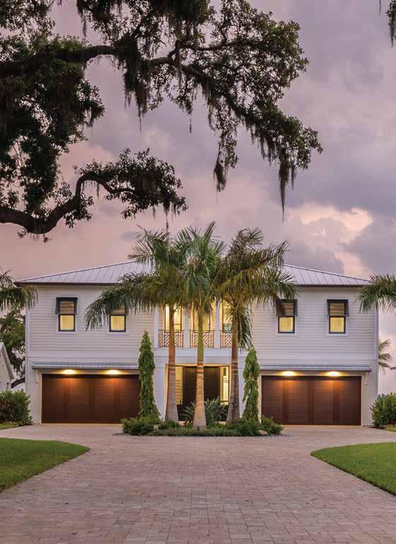
Front Elevation: “I really wanted a statement front door and knew it would have to be really big,” states Johnson. The home’s 10-foot by 10-foot entry doors are the most extensive Smith has ever used on a project. The team also selected the louvered, paneled garage doors to enhance the home’s look, and the Bahama shutters were an integral part of their vision for the exterior.
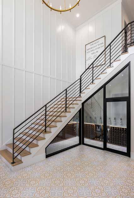
Entry | Wine/Whiskey Closet: The downstairs entryway needed a wow factor, so Smith and Johnson created a statement staircase with black powder-coated aluminum rails. A neutral-toned, patterned marble tile gives durability to the entry, and one-by-two wood panels add interest to the 24foot walls that connect the downstairs with the upstairs living quarters. A refrigerated wine/whiskey closet takes advantage of the space under the stairs, handy for outdoor entertaining due to its convenient sliding glass door access from the outdoor entertainment area.
“The property had been in my wife’s family since 1870,” says Johnson. “We felt like it was the best place for us to raise our children and lay our roots. It felt like we were coming home.”
WWhen Brian Johnson of Johnson Homes of West Florida and his family decided the time was right to build their forever home, they called on their long-time colleague Amy Smith of Amy Lou Interiors.
The home’s location held special meaning for the family. It has been passed down through generations and is close to where the homeowners grew up — and where many family members still live. Subsequently, Johnson wanted its design to reflect its history. “The property had been in my wife’s family since 1870,” says Johnson. “We felt like it was the best place for us to raise our children and lay our roots. It felt like we were coming home.” In addition to that feeling of coming back to the family’s roots, Smith adds, “The home is situated on the river, with expansive views, so they came up with the name ‘River Roots’ to combine the location with the sentimental value of the land.” Perfect for their love of the water, entertaining friends and family, and the architecture and style of Palmetto. u
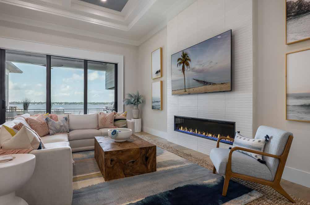
Family Room: The family room has stunning views, and the water is reflected in the artwork flanking the fireplace. The floor-to-ceiling surround is natural stone in a color that blends with the walls but offers a raised wave design for texture. The wood coffee table is a nod to the home’s theme. “I wanted to add subliminal pieces that said ‘River Roots,’ and this table has a live-wood look that flows with the dining table,” recalls Smith.
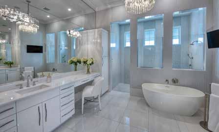
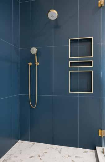
Primary Bathroom Shower: The moody blue wall tile gives the main bathroom shower a modern look. Smith chose the same color tile for the shower walls to create continuity with the tile used in the bathroom but mixed it up with different patterns. The Calacatta marble shower floor is the same stone used on the bathroom floor, creating a seamless flow through the space. The niches are trimmed in gold-toned metal for a touch of glamour.
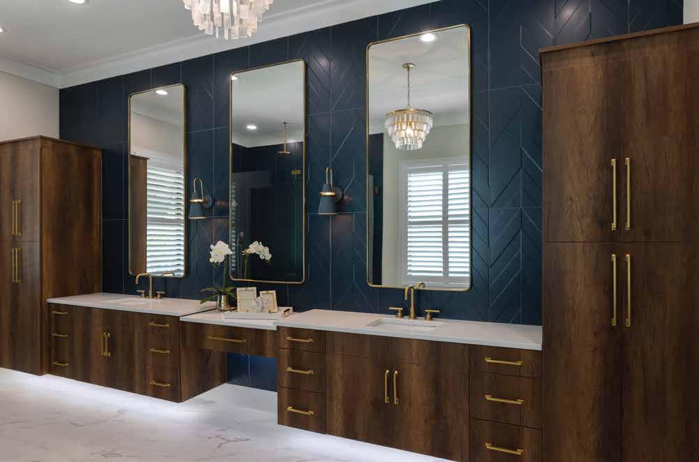
Primary Bathroom: “The floating wood-grain vanities were spot on with the dark wood look; we wanted to give this bathroom a more moody vibe,” recalls Smith. She also added undermount lighting for late-night ambiance, and a stunning chandelier completes the scene. The sconces were a color gamble but integrated seamlessly with the blue chevron wall tile. Seven-foot-tall mirrors balance the size of the vanity and the height of the walls, and goldtone fixtures add shine and elegance.
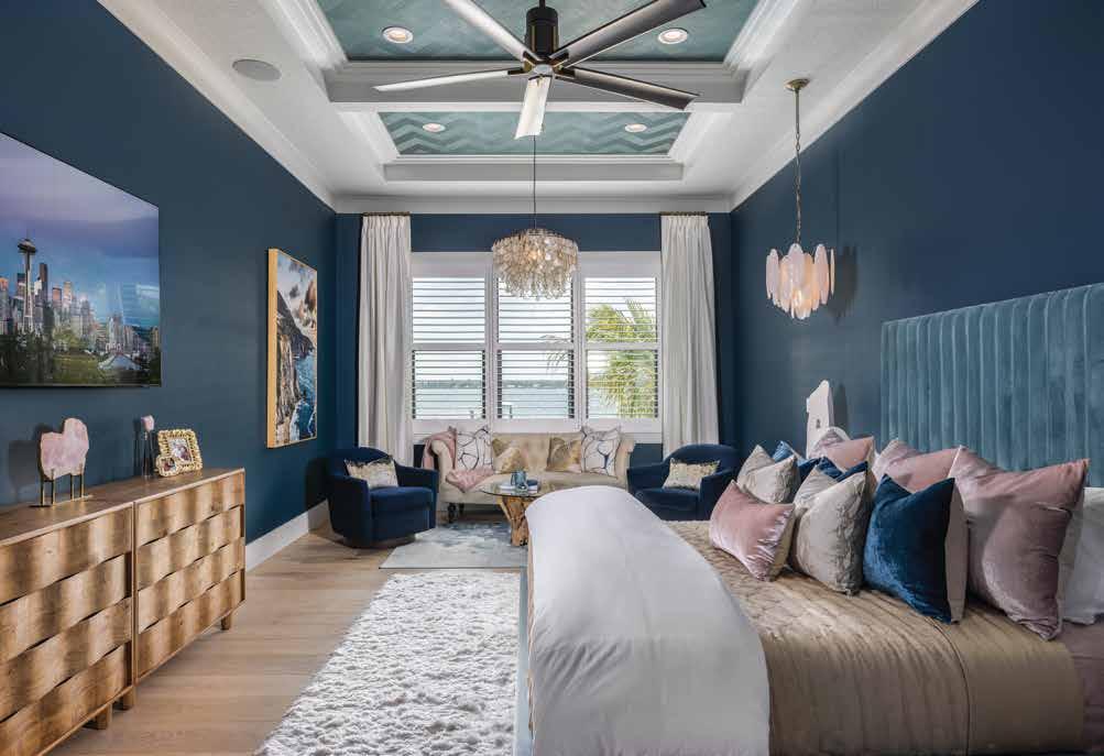
Primary Bedroom: Smith wanted the main bedroom to coordinate well with the rest of the home but have a darker, more dramatic feel, which complements the oceanside art piece in the sitting area. She added wallpaper in a lighter color to enhance the ceiling and designed the coffering to separate the sitting area from the rest of the bedroom.
With the name “River Roots” established to guide the design, Smith also took the family’s love of the boho, California-coastal aesthetic to heart in creating the look and feel of the home. She selected eclectic, organic, and nature-inspired furnishings and finishes and mixed them up with pronounced colors and patterns to elevate the vibe with the unique and unexpected while always keeping the river views and the family’s needs in mind. “They love the water, so we wanted the home to not only have views of the water but also the feeling of being inside a fun getaway on the water,” Smith explains. The family is also very active in sports, so Smith focused on things like flooring that could hide dirt and fun wallpapers that reflected their passions and tastes. “The home had to be able to be ‘lived in’ and feel casual but classic. Each room was carefully curated to reflect their lifestyle and not just because it looked great.” u
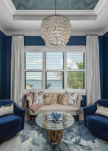
Primary Bedroom Sitting Area: “We used the sofa from the formal living room in the client’s previous home to add some formality to the space,” says Smith. The ocean-blue wall color perfectly frames the gorgeous water view from the picture window, and the root-base coffee table adds a natural feel, helping to soften the formality a touch and call back to the home’s overall “River Roots” theme. A soft rug in watercolor blues anchors the space.
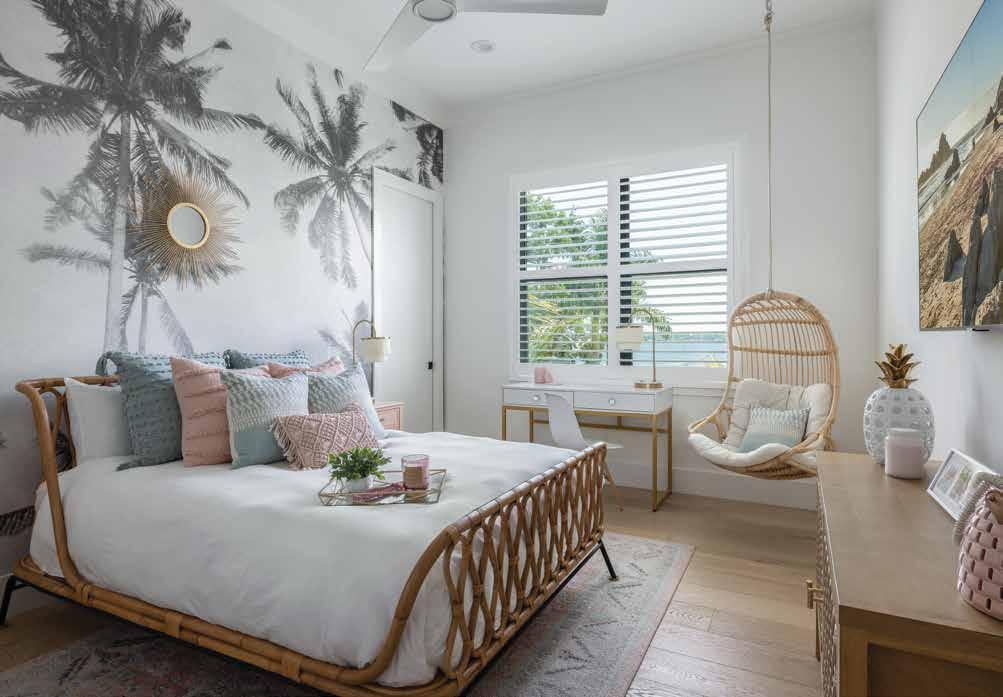
Teen Bedroom (Above): Another custom mural graces the teen’s bedroom to satisfy her request for a more boho coastal feel. The rattan bedframe was custom made, and a hanging lounge chair in the corner completes the room’s vibe. “This room was a labor of love,” Smith recounts. “With the teenage daughter loving pink and boho, I believe we pulled it off.” The room also looks out on the river, tying this space neatly into the home’s “River Roots” theme.
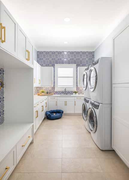
Laundry Room: The walls of the home’s laundry room are wrapped in a hand-painted patterned tile, and the large-format tile on the floor was chosen specifically to blend with the wood floors throughout the rest of the house. Smith designed the bench and drop space and included a dual-stacked washer and dryer to accommodate the family’s hobbies and active, busy lifestyle. Gold-toned cabinet hardware elevates the utilitarian room and coordinates with the hardware used in the kitchen.
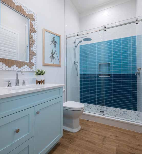
Kid’s Bathroom: The en suite bathroom for the surfer-themed bedroom mixes 3-by-12-inch individual tiles in shades of dark blue, aqua, and white to emulate a 10-foot wave on the shower wall, with dark blue near the floor and seafoam near the ceiling. A blue-and-white hex tile on the shower floor brings all the shades together, and a wood-look tile continues the surfer theme on the bathroom floor.
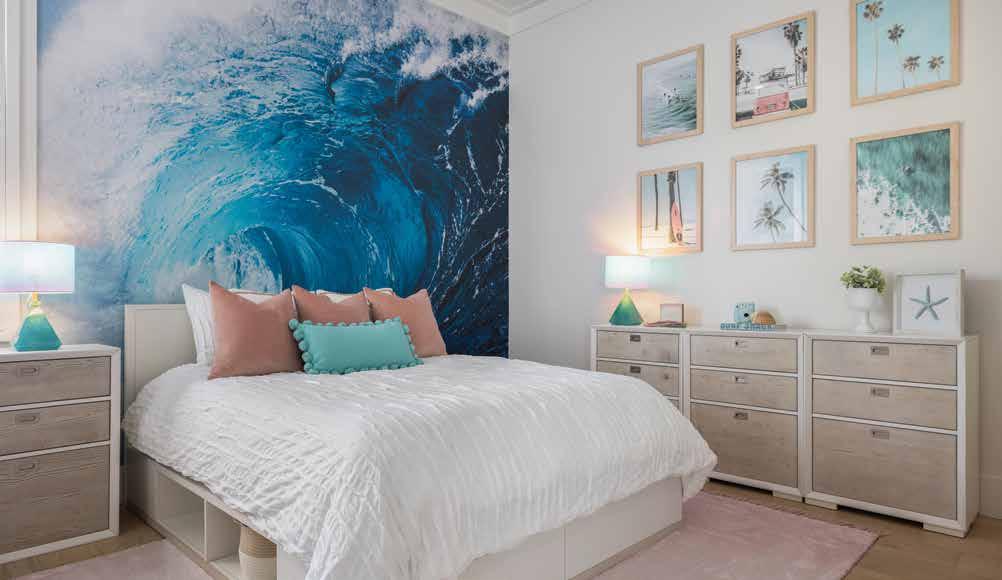
Kid’s Bedroom: One of the family’s children requested a surfer-themed room, which Smith accommodated by covering one wall with a custom wave mural and using coastal-themed artwork on the adjacent wall. The platform bed offers clever integrated storage cubbies to supplement the storage in the dressers. The blush tones of the throw pillows and rug add a feminine touch without being too child-like, while also coordinating with the many watery shades throughout the room.
A deep professional relationship with Johnson helped Smith deliver precisely what the family needed and wanted. “My wife and I had a very specific vision of how we wanted the interior design to look,” recalls Johnson, “and Amy did a phenomenal job bringing that to life.” Being able to put his builder’s hat on for such a personal project, which involved his entire family and having control over design decisions and selections, was also a unique experience. With such deep roots and a strong personal connection to the project, plus the trust that comes from years of working together, this team’s efforts resulted in a stunning home that was everything this family dreamed of in a place they can call a forever home. n
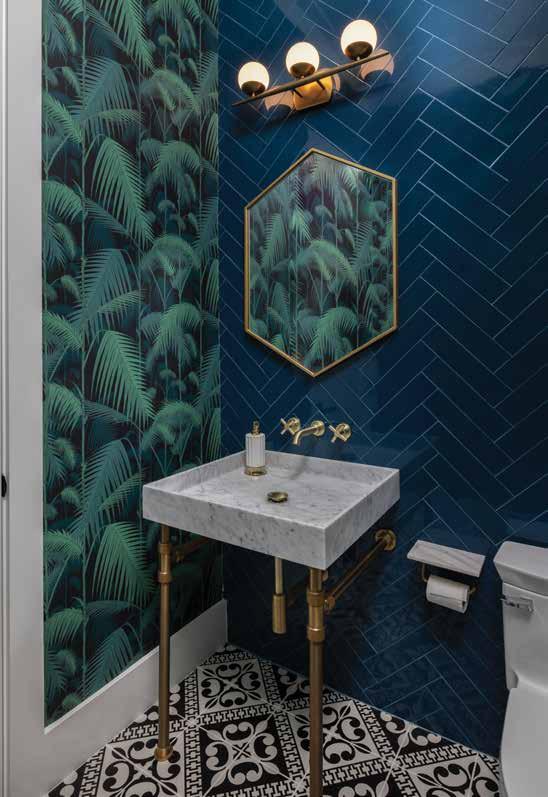
Guest Bathroom: Smith and her clients wanted something unexpected and unique for this bathroom next to the movie theater area. With wall tile set in a herringbone pattern and the same deep blue color found in other rooms, this small bathroom brings an even moodier vibe to the space with a black-and-white Moroccan tile on the floor and palm-frond wallpaper. In addition, she selected a marble and brass sink and installed the fixtures on the wall for added luxury.
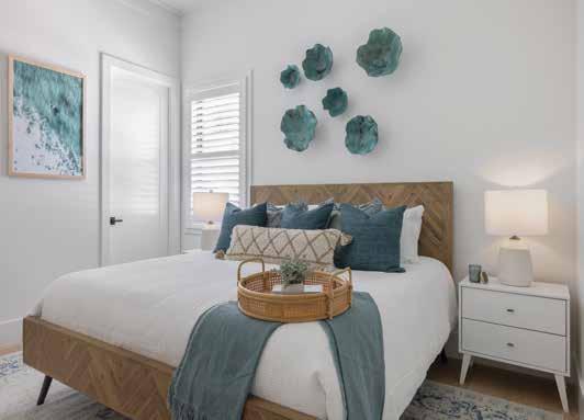
Guest Bedroom: The guest bedroom infused the coastal feel Smith and her clients wanted and provided calm respite for guests. White walls with matching ceilings provided a peaceful backdrop for a series of aqua mango wood bowls above the headboard and reflected the color in the water scene canvas on the adjacent wall. In addition, the woodplank bed frame incorporates more of the herringbone pattern used in the home’s tile walls and floors.
Office Seating Area: The color of this feature wall in the home’s office, while still a deep, moody blue, has fewer aqua tones than the other shades used throughout.
Light-colored caning on the cabinet fronts of the credenza brings in the coastal feel, and a dramatic photo of a rocky shoreline adds movement and impact.
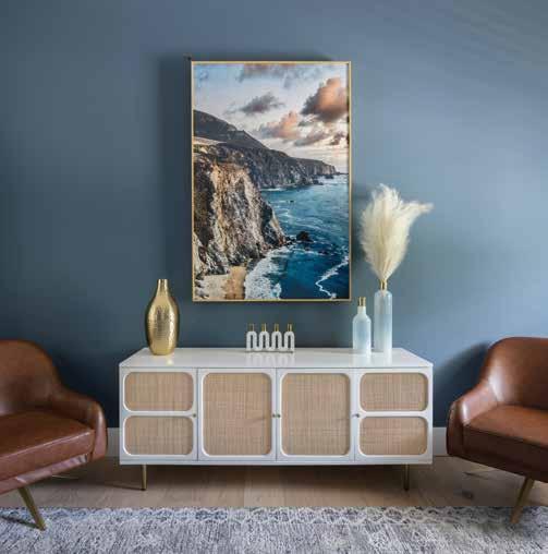
Leather seating grounds the space, providing a stately quality to this productive working space.
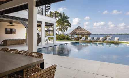
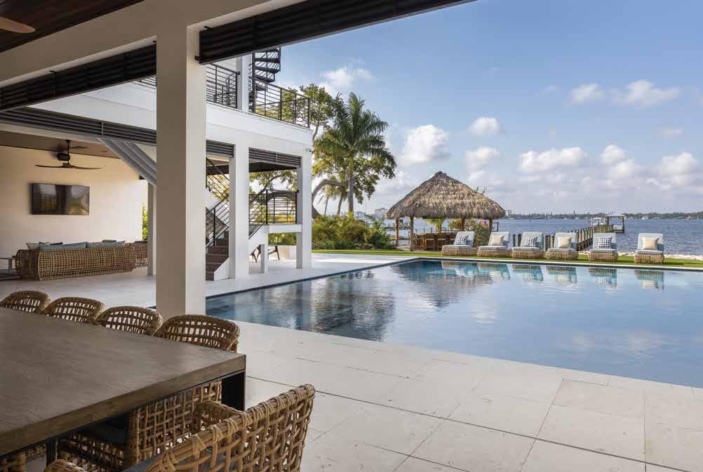
Pool: The focus of the backyard pool area was to emphasize the impressive view of the water just beyond the yard. The shell stone decking stays cool under the hot sun and isn’t slippery when wet. The 12foot custom-designed wood outdoor table gives way to a neutral color palette outdoors, echoed by the loosely woven cane chairs. “We wanted this area to feel like a resort, perfect for entertaining and for kids to have fun all year round,” states Smith.
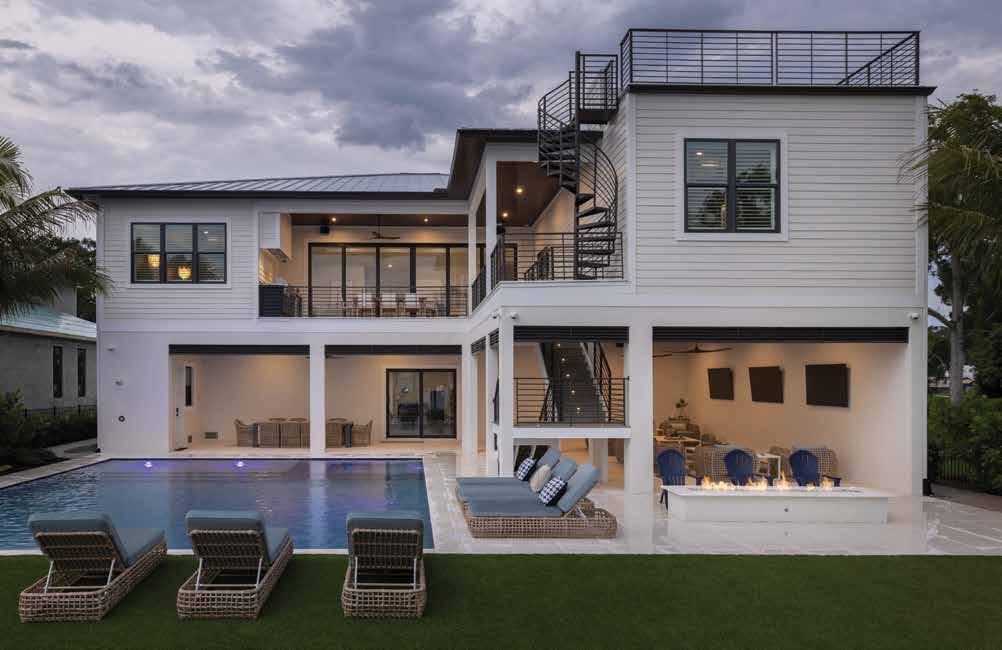
Roof Deck: The backyard area has room to entertain up to fifty people with its rooftop deck, accessed via a spiral staircase. Sliding glass doors from the lower level provide access to the wine/whiskey closet under the stairs in the showstopping front entryway. “We also designed the back to be another front door to the home, since just as many people see it from the water in the back,” says Johnson.
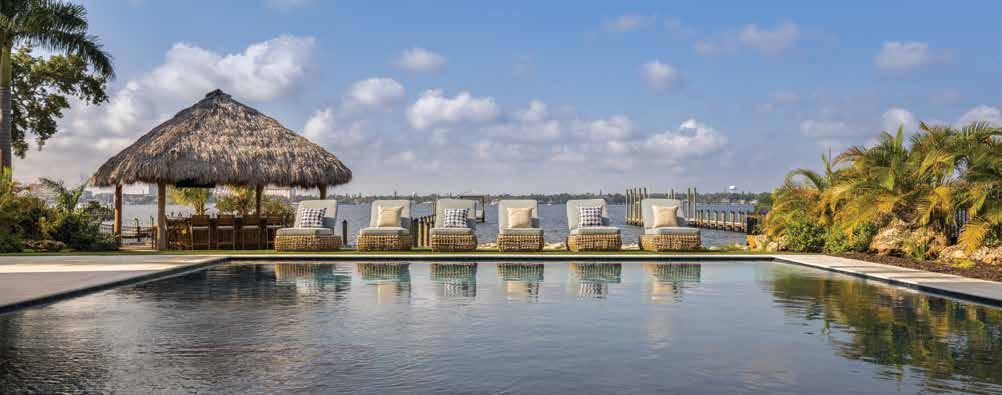
Tiki Bar: A tiki hut at the property’s edge offers a fun spot to belly up to the bar and enjoy the breeze from the river. The 35,000-gallon pool, perfect for starting or ending the day with a quick swim, was designed to be the focus of the backyard and includes an oversized spa and LED accent lights for dramatic impact at night. The pebble finish has a blue glass additive to make the water color pop under the sunlight.
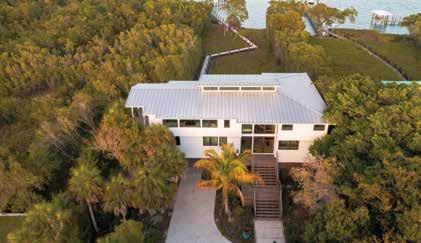
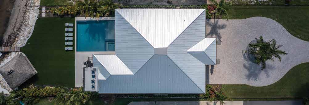
Aerial View: The view of the home shows off the standing-seam metal roof, selected in keeping with the coastal vibe, and the proximity to the river. The backyard includes a vibrant faux-turf lawn, chosen for its ability to withstand the Florida elements and stay green all year long. The bordering landscaping of palms and other tropical plants give the home a seaside beach resort appeal.
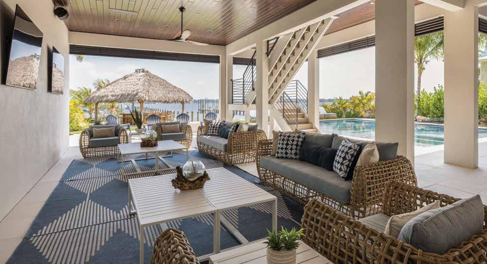
Outdoor Living: The client desired an outdoor space to watch games while entertaining guests, so three televisions span this wall and include a complete surround sound speaker system. Ample seating flanks the television wall beneath a wood-plank ceiling, which provides plenty of shade from the hot sun. The loose caning on the sofas and lounge chairs mimics the bar stools in the adjacent eating area and is topped with dusky blue throw pillows in modern geometric prints.
 Written by Shawna Hampton Photography by Jimmy White Photography
Interior Designer:
Amy Lou Interiors
5317 Lena Road, Suite 107 Bradenton, FL 34211 941.400.0803 www.amylou.com













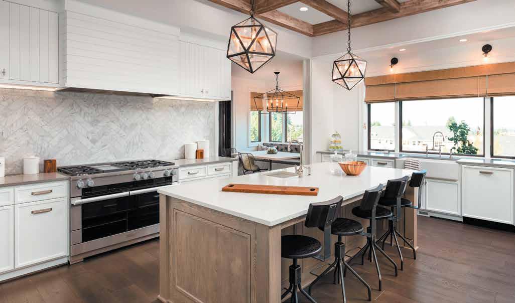






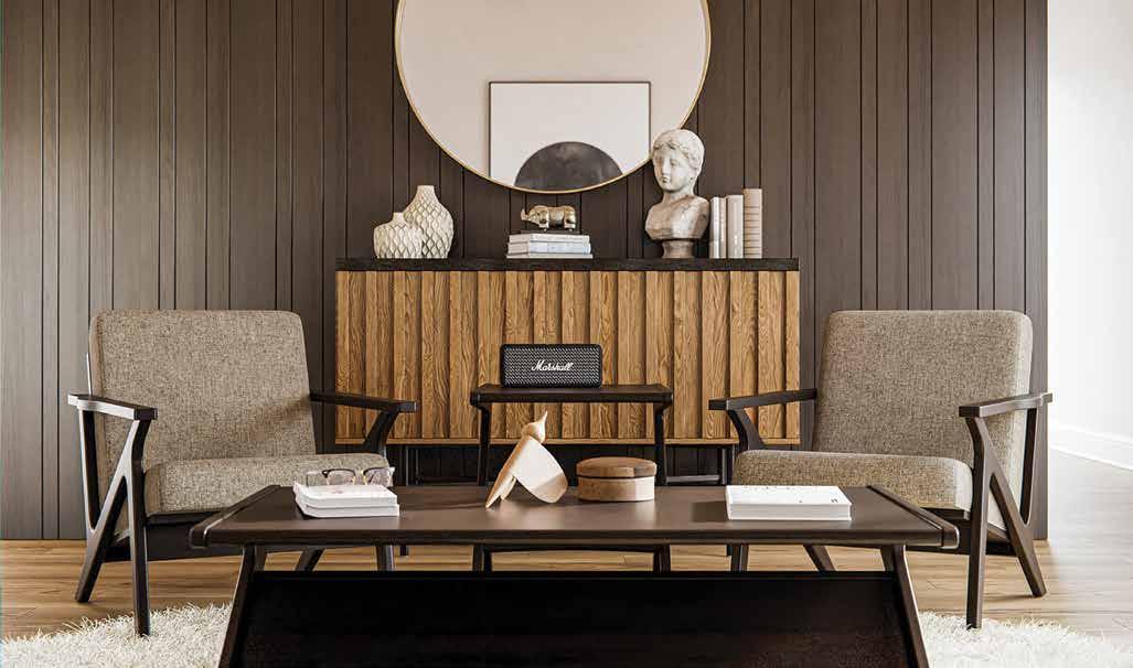
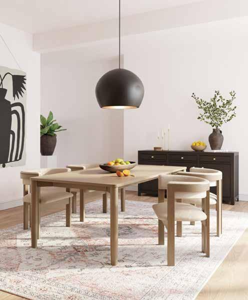
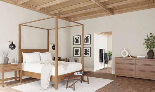

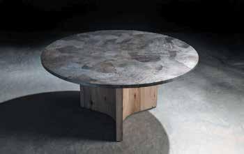
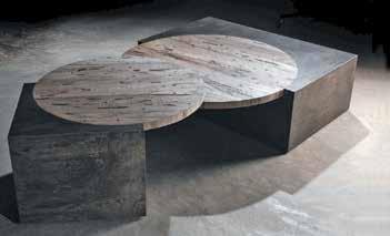
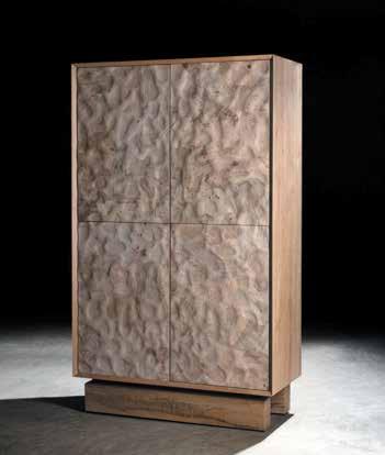












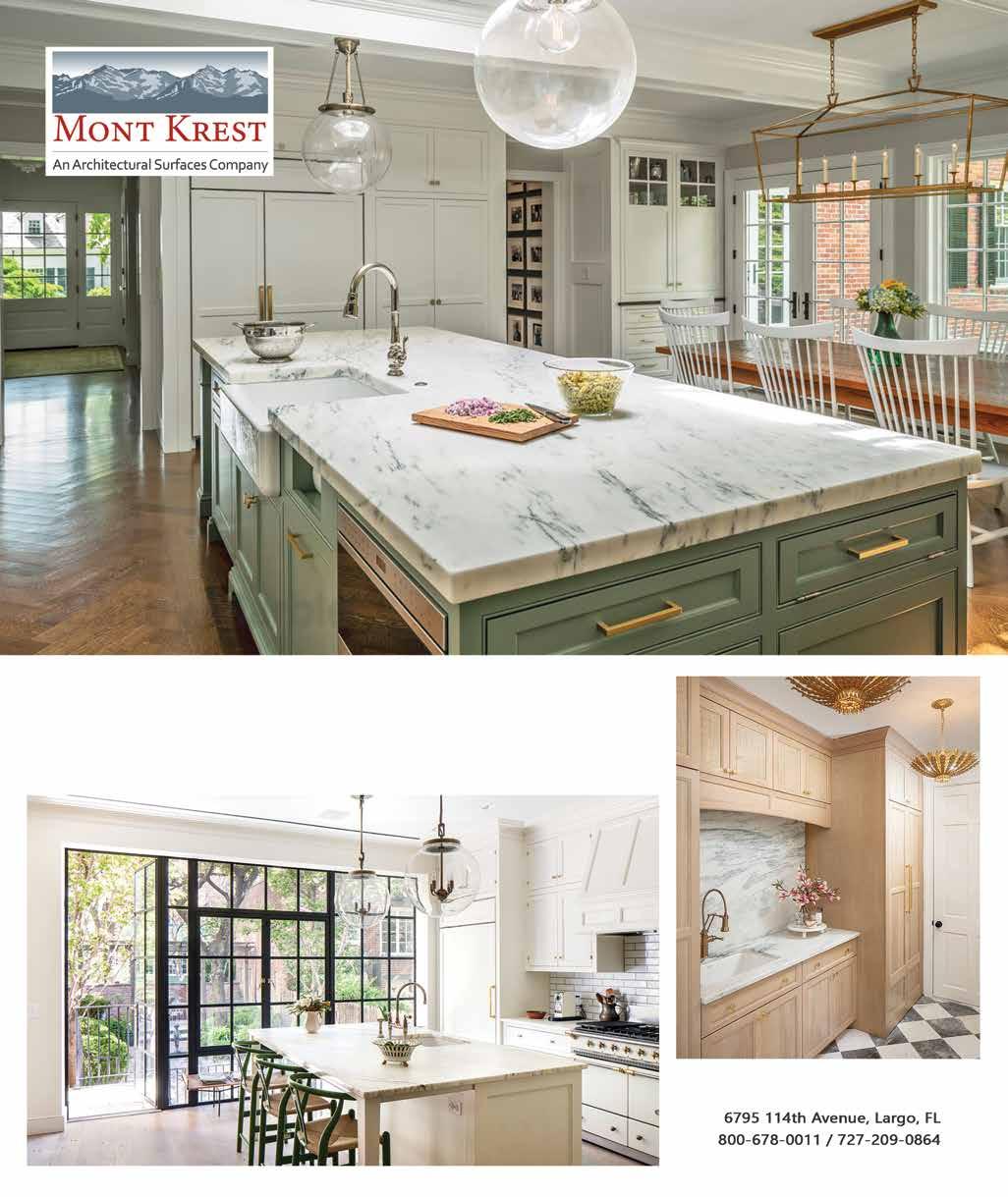

This private residence — Built by STOCK Custom Homes in The Lake Club at Lakewood Ranch — reflects its owners’ contemporary California aesthetic with clean lines and minimal architectural embellishment and their aspirations of a Florida home. Designed by Salvatore Giso of Wilfredo Emanuel Designs, the home’s interior represents the high level of customization achieved through collaboration between client, designer, and builder, elevating a popular floor plan and luxury selections for a personalized vision.
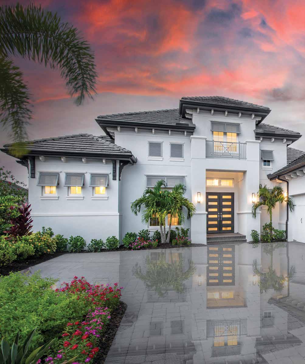
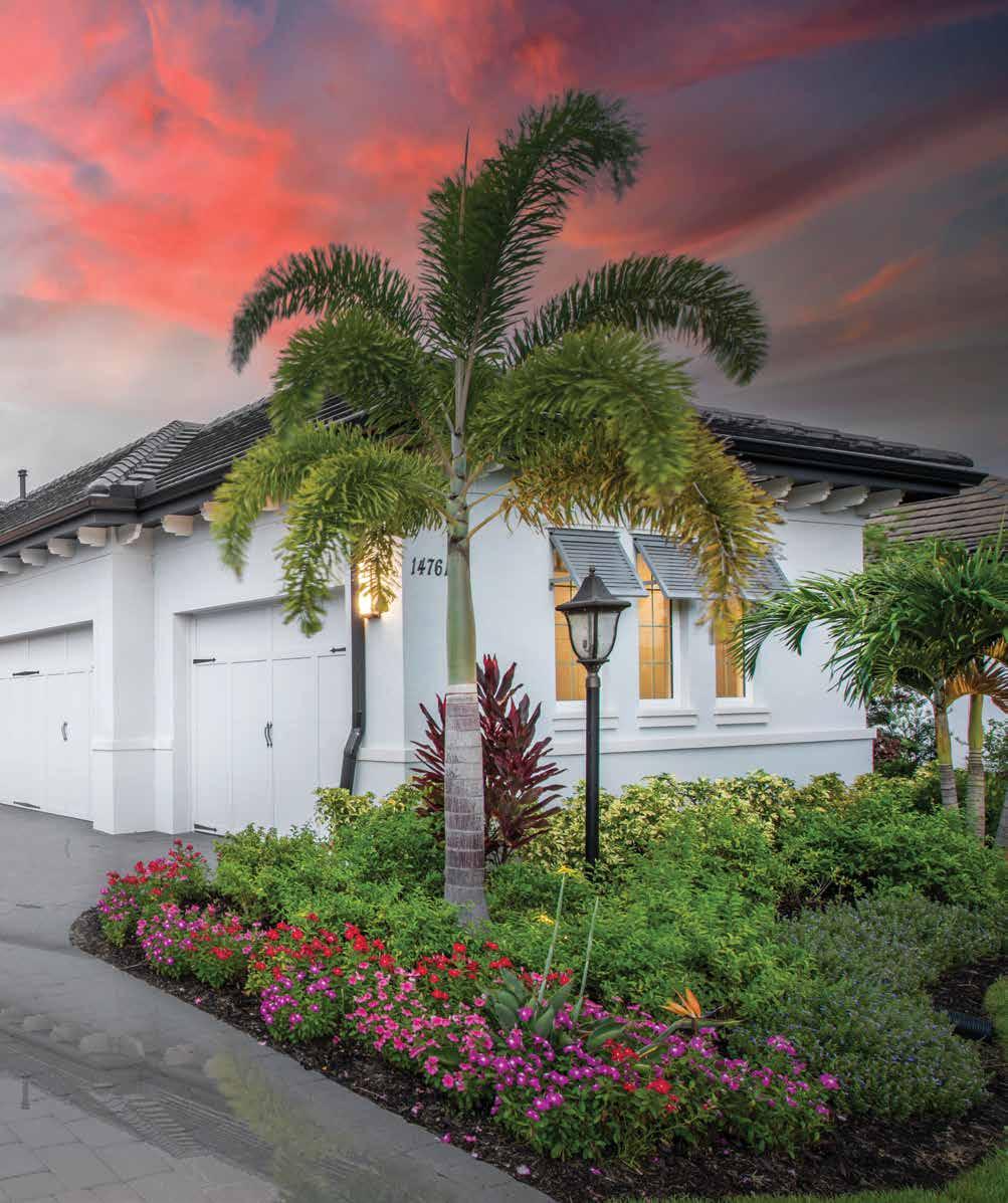
The homeowners’ private art collection and lighting selections inform the design direction of glossy, winking, and metallic surfaces introduced in the foyer’s lustrous porcelain tile flooring, which echoes the look of natural dolomite marble while adding black striations. A Phillip Jeffries wallcovering extends into the high ceiling in this luxe entry space. “The lacquered top and base of a custom-made Lily Koo console table suspended between stylized roots is a contemporary version of black,” notes Giso.
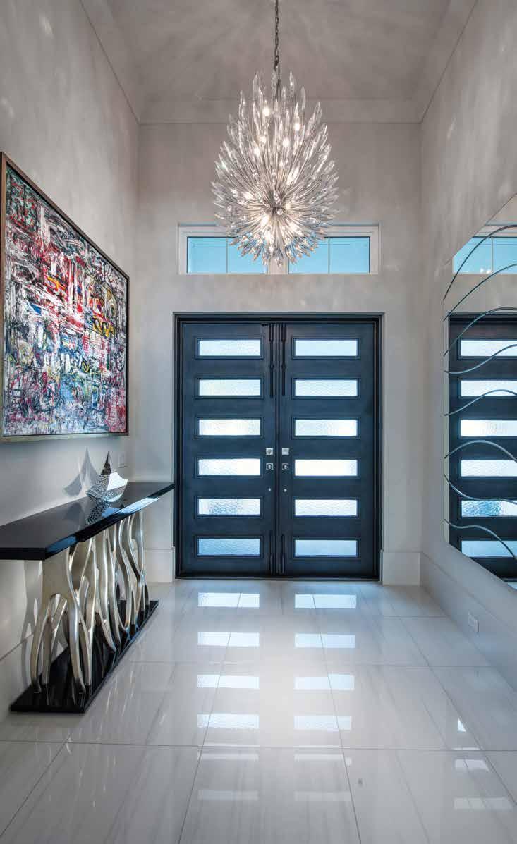

designers and builders will tell you the best homes reflect their owners’ personality and individuality. A painting with a whirl of vivid colors speaks volumes about a client’s vivacity, and an ethereal chandelier or a touch of crystal expresses effervescence and vibrancy.
A private residence in The Lake Club at Lakewood Ranch evolved with its California homeowners as their vision of a Florida retreat for entertaining and family vacations shifted into high-resolution clarity. It represents the advanced level of customization and self-expression created by the intuitive client-designer-builder collaboration of Salvatore Giso, an interior designer with Wilfredo Emanuel Designs, and STOCK Custom Homes. u
Great Room: “Our selections are muted while also making a dramatic statement,” Giso says of the black-and-white palette accented with deep grays, with whispers of barely detectable muddled mossy green and shimmering surfaces in the open great room. A coffee table with a 700-pound quartz top is paired with Taylor King furniture below a dropped backlit ceiling. A 12-foot custom black-lacquered credenza floats against a wallcovering, hand-painted in Italy, that sparkles with a metallic overlay revealing the maker’s marks of a palette knife.
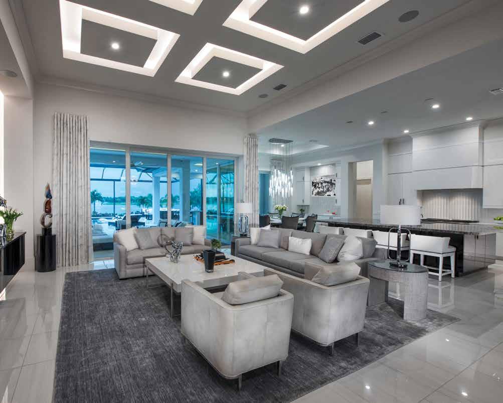
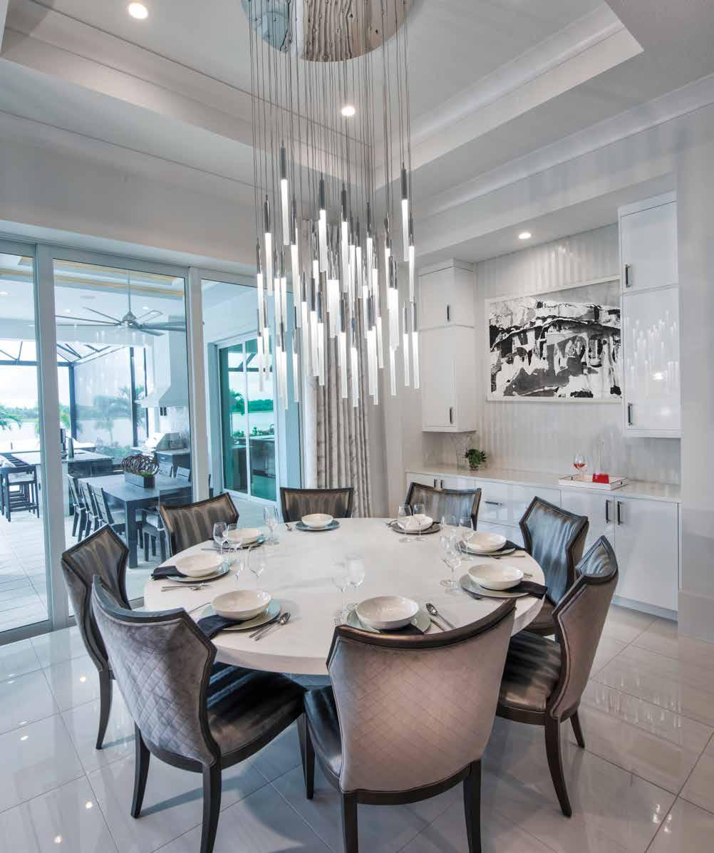
Dining: Light cascades from glimmering pendants, hung at varying heights to enhance visual impact and create a focal point above the 82inch sandblasted wood Old Biscayne Designs dining table. An octet of sculptural chairs with concave backs elevates the sophistication of this traditionally casual dining destination. Their dark frames add dimension to the surrounding white backdrops of the floor, walls, and custom-designed lacquered cabinetry in a serving area Giso extends from the kitchen.
Kitchen: The clients’ emphasis on entertaining influences the kitchen design and the oversized freestanding island, topped by a 14-foot diamond marble slab on black lacquered cabinetry. The stone contrasts the all-white kitchen’s glossy arctic perimeter cabinetry, Avorio quartz countertops, and leather barstools, chosen to balance the island’s scale, and dropped soffits blend ceiling and cabinetry. Pendants are intentionally omitted, allowing the eye to move freely through the space.
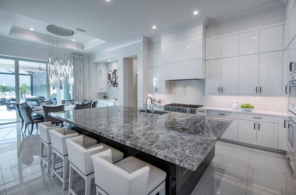
Kitchen Vignette: Seemingly counterintuitive, the rounded shape of glass tiles in the backsplash above the six-burner cooktop not only creates white and gray stripes but also reveals a pattern of chevrons upon closer inspection. Glossy, flat-panel cabinetry doors complement its reflective surface finished in arctic white, Avorio quartz countertops, and the twinkle of door and drawer pulls.
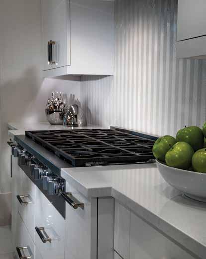
Primary Bedroom: Hand-embroidered silver-beaded bedding and shams, in addition to glass and metallic finishes, intensify the primary bedroom’s luminosity. This space is further enhanced by large windows, sliding glass doors, and a regal-ringed chandelier suspended from the cove ceiling. The bed’s metallic silver-gray chenille upholstery is grounded by a matte black frame. Orange-peel walls in a near-neutral white and the fluted fronts of the nightstands infuse texture. The chaise is reminiscent of a traditional piece but with a modern look.
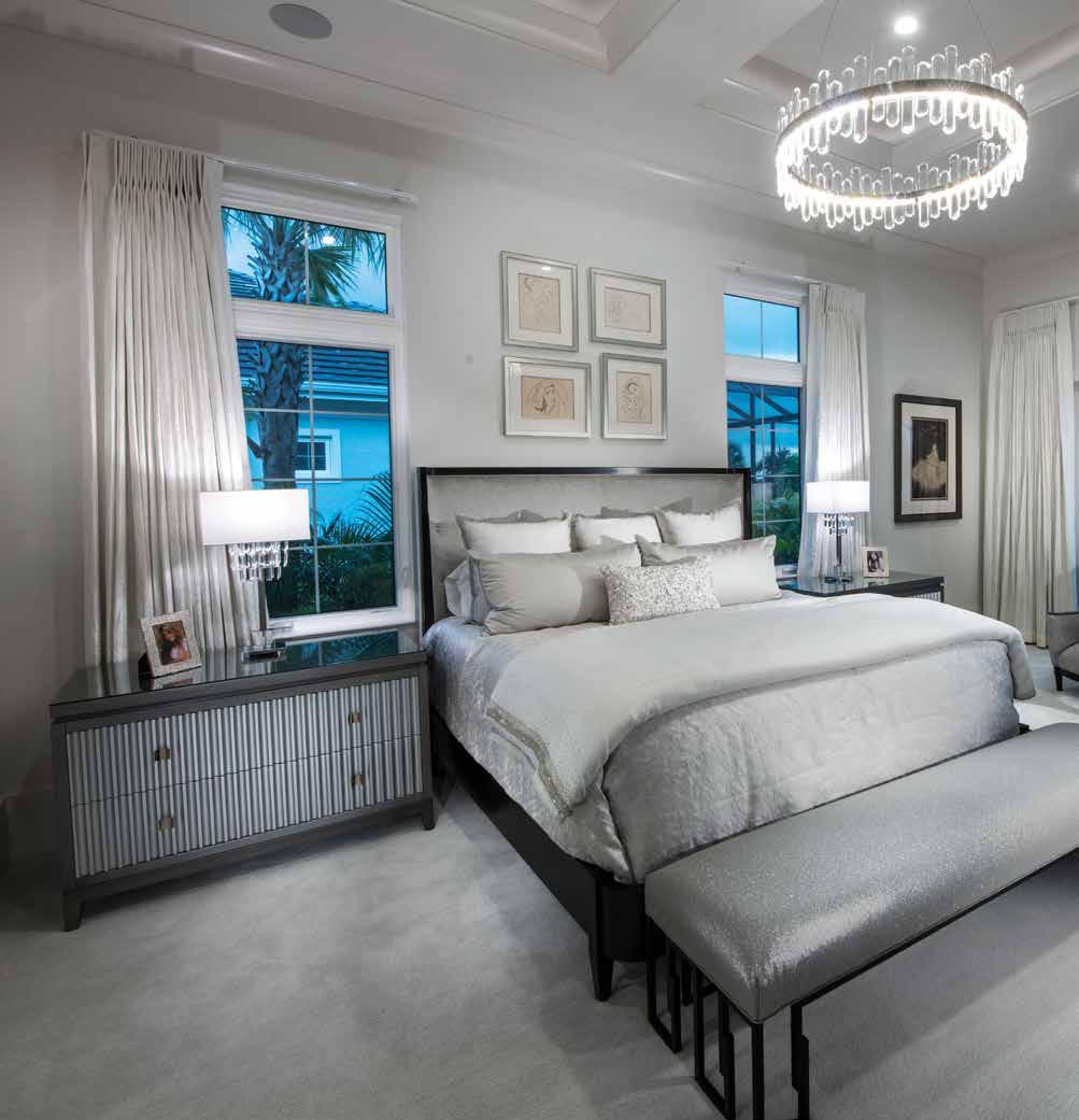
“We originally selected finishes offered by the builder,” says Giso. “After reviewing our selections, we then decided to come up with a new concept which was more conducive to their lifestyle. We selected lighting that would best highlight our new backgrounds before moving to the interior design of the home.”
The sparkle of diamonds and jewelry worn by the homeowner inspires the lighting, from the glossy and high-polished lacquered finishes and silverbeaded bedding to the wallcoverings with shimmering metallic overlays that sing against a muted black-and-white palette with dark grays and dustings of mossy green. It also speaks to who the residents are.
“My clients are from Los Angeles, which has a different vibe than Florida,” explains Giso. “They love contemporary clean lines and have a beautiful art collection we wanted to highlight. The home was designed as a space that is used for entertaining with their friends and family.”
The subdued color scheme creates drama, a mood the designer amplifies with oversized elements like a cantilevering 14-foot diamond marble slab countertop on the kitchen island, a hefty 700-pound quartz-topped coffee table, and an 82-inch sand-blasted dining table, both from Old Biscayne Designs. Strategically placed furniture maximizes entertaining, emphasizing a cohesive connection between gathering spaces inside and out. u
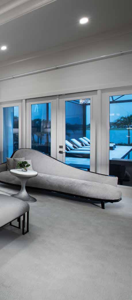
Primary Bathroom: The translucency of a glass chandelier and lighting selected for the primary bath intensifies its effervescence, complemented by Swarovski crystal-studded hardware, the sheen of white lacquered clean-line vanity cabinetry, and by the repetition of the polished porcelain flooring used throughout the home. “Gray and white mosaic glass and porcelain chicklet tile inlays in the walk-in shower create a waterfall effect,” says Giso, who introduces texture in the folds and crinkles of the room’s Phillip Jeffries wallpaper.
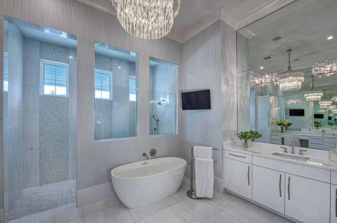
Interior designers keep a mental list of products they covet for just the right client, just the right home. The Lake Club residence provided the creative outlet for Italian hand-painted wallcovering, much adored by Giso, who also worked closely with the builder to source materials not available in their selection studio.
“As a regional homebuilder, our highest priority is to make sure our customers’ homes are completely unique to them. This is their dream come to life,” notes Claudine Leger-Wetzel, vice president of sales and marketing for STOCK Custom Homes. “Designers will sometimes see new finishes and luxury brands they want for their clients, and we collaborate with them to source from our wide selection of luxury options and install these selections from our vendors.”
The result shines like a jewel box. n
Guest Bedroom: A glossy ebony wood floor provides warmth and depth to an en suite guest room, cloaked in subdued shades of gray and cream with hints of pale green. Century and Vanguard furniture includes a leather-upholstered bed and matching nightstands with four fluted drawers. The bathroom features a wallcovering with a shagreen pattern and a vanity with a driftwood finish.
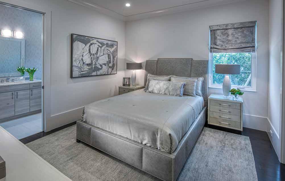
Powder Room: The powder room shines – literally and figuratively. The wallcovering embellishes an ethereal opulence with microbeads mimicking animal print, a texture also referenced in the shagreen finish of a black and brass sink. The custom-designed floating vanity’s pull-latch drawers keep the lines simple and sleek, while brass flits around in the art and the frame of the mirror.
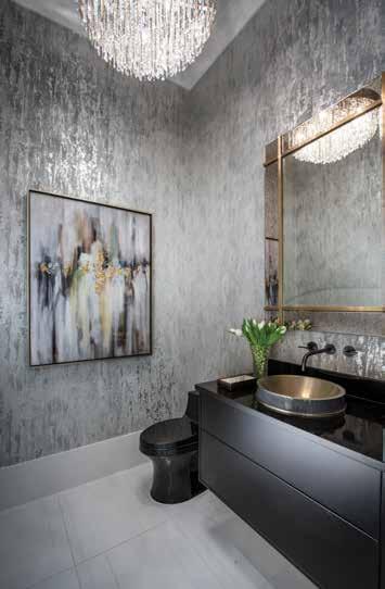
Guest Bedroom: Giso repeats the ebony-hued wood flooring in another guest bedroom, where white and cream are more pronounced and paired with green-grays and blue-grays. The white wood headboard of the bed by Century Furniture is inset with black stripes. Nightstands add to the contemporary aesthetic with the warm wood tones of drawers encased in a white frame. The striped silk window treatments and all draperies in the home are custom made and include automated blackout shades.
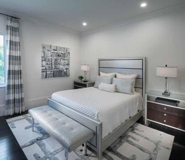
Office: The minimal profile of the Old Biscayne Designs desk elevates the openness of the home office and two plush armchairs in a sitting area encourages interaction. Custom built-in cabinetry features grooved door panels and a green-patinaed metallic gray finish, a hue echoed in the area rug’s gray chenille. A painting from the owners’ private collection adds jolts of vivid color against a wall accented with a blockprinted wallcovering, while the dropped ceiling casts soft illumination.
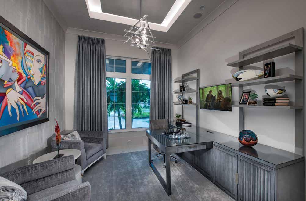
Outdoor Kitchen: Aswirl with white, black, and gray, the viscount white leathered granite countertops and backsplash in the outdoor kitchen and bar visually connect indoor and outdoor spaces. Stainless-steel Danver cabinetry boasts a gunmetal surface and eases maintenance — “just spray it with a hose,” says Giso. Four Restoration Hardware stools cozy up to the bar, providing another entertainment venue for the owners.
Outdoor Living: “We maximized the outdoor space by extending the lanai as much as possible to fit a larger pool and more spacious outdoor living,” observes Giso. Restoration Hardware furniture — two armchairs, a sofa, ottomans, and a pair of coffee tables poised to the linear fireplace and television — continue the contrast of light and dark tones and appeal to the owners’ preference for a low-profile look. The ceiling is highlighted with double trays and cove lighting.
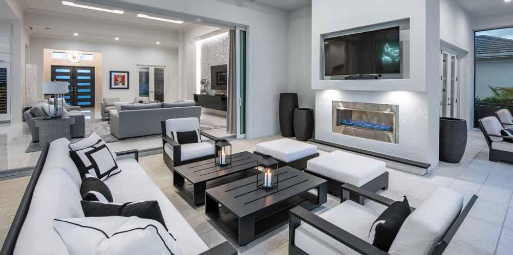
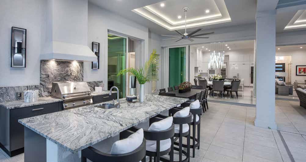
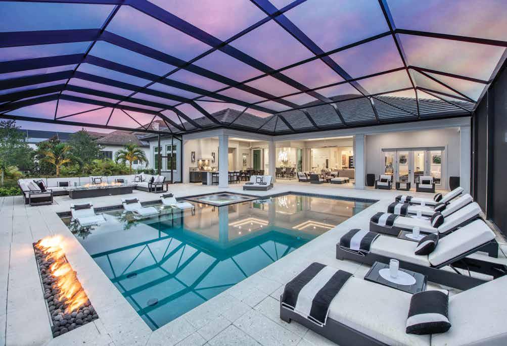
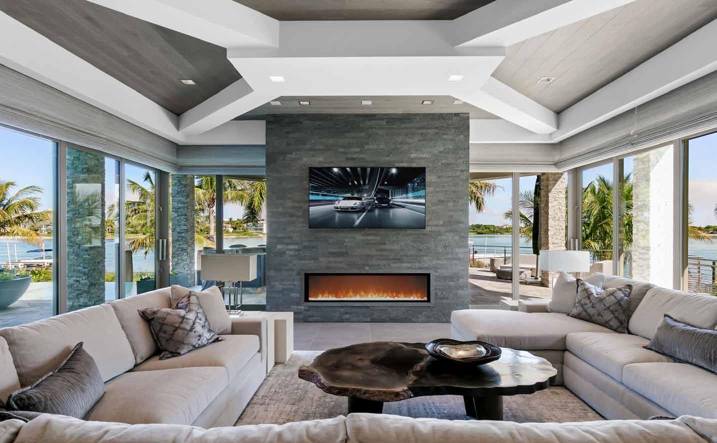


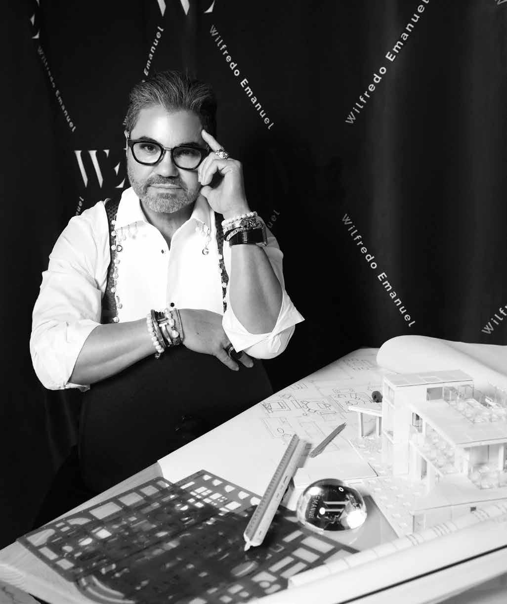




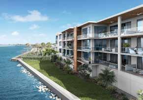

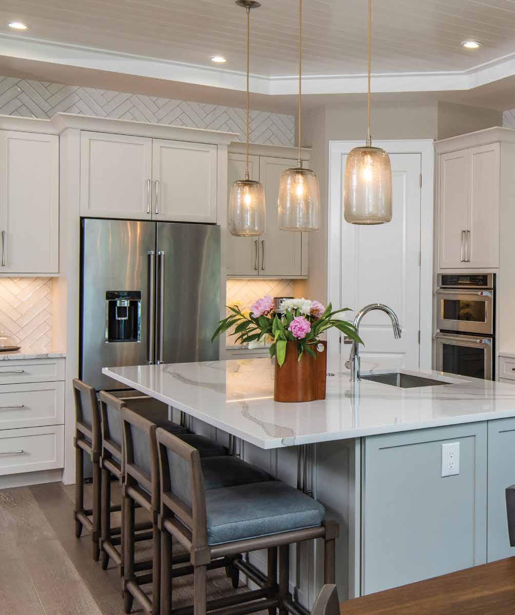
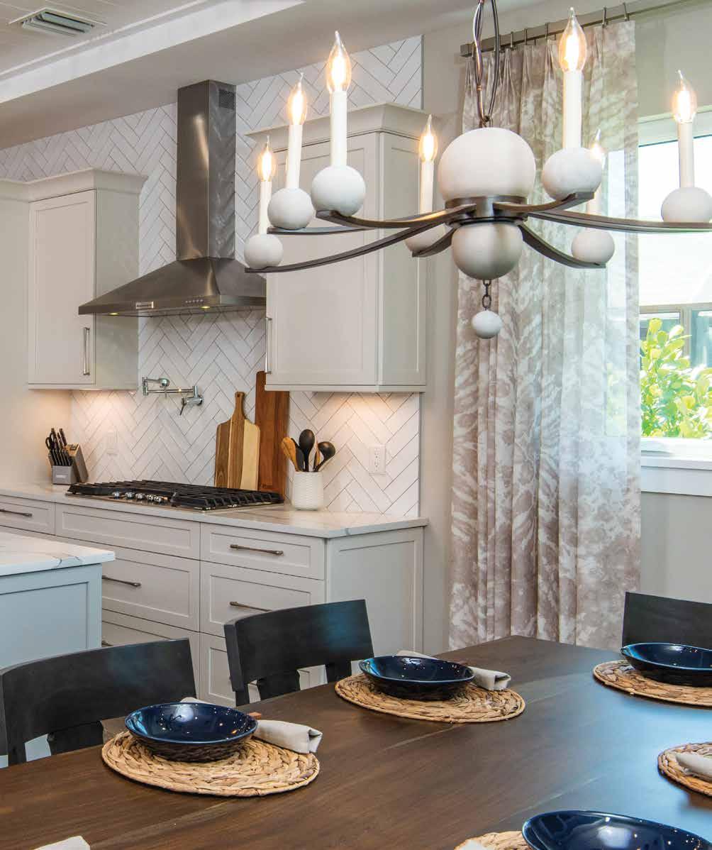
Sited in Nokomis on Blackburn Bay — where small-town charm and a laid-back beachy spirit abound — this 5,550-square-foot waterfront home was partially built when Trade Mark Interiors’ CEO and Principal Designer, Tracee Murphy, was asked to lend her design skills.
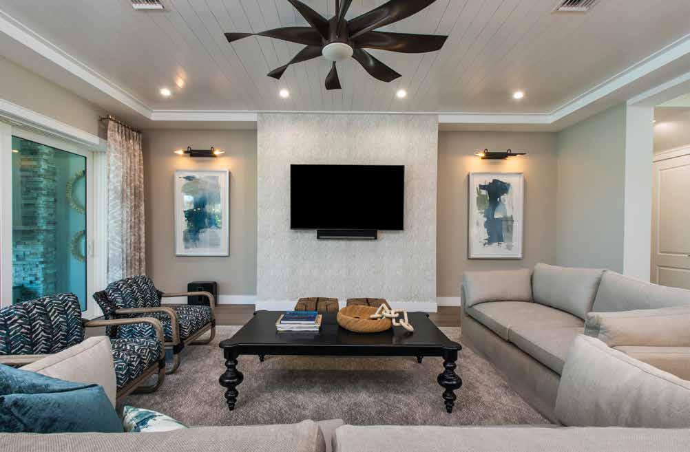
Built by President and General Contractor of Vertical Design+Build Grant Castilow — and Murphy’s husband and business partner — it became clear midway through the project that the client needed help with the many decisions and options he needed to make.
“I advised my client this was a great home, but when faced with all of the selections, it was overwhelming. If he wanted his home to be fantastic, I suggested he consider including Tracee’s input. Tracee and I frequently work together,” details Castilow. The client readily agreed. u
Kitchen & Dining (Previous Spread): The client opted out of ceiling-height cabinetry, so to create a more finished look, Murphy says, “we added white herringbone tile from Design Works” above the kitchen cabinetry from Metro Cabinet Company. The Britannica quartz on the island and countertops was sourced from Cambria and is beautiful as well as germ resistant. Three seeded glass globe pendants from Arteriors Home Lighting add glamour to the space. Clad in blue leather with a driftwood-stained frame, the barstools are durable and easy to clean.
Family Room: The family room is welcoming and exudes the livable luxury the client desires. Guests immediately feel at ease relaxing on the comfortable furnishings — most covered in performance fabric — even after they’ve just walked off the homeowner’s boat. The large-scale cocktail table is stained in dark mocha with matching rattan lounge chairs framed in a driftwood finish that are sheathed in a tropical pattern. For some drama, the designer selected a stunning gray and white wallpaper sourced from Phillip Jeffries for the family room media wall. The wallcovering pattern adds texture and interest like agate or quartz printed grasscloth. Sand-colored stationary linen panels sourced from The House of Scalamandré soften the pocketed sliders leading to the lanai. A forgiving nylon rug from Anderson Tuftex grounds the space, while a large, dark bronze ceiling fan ties the darker elements together.
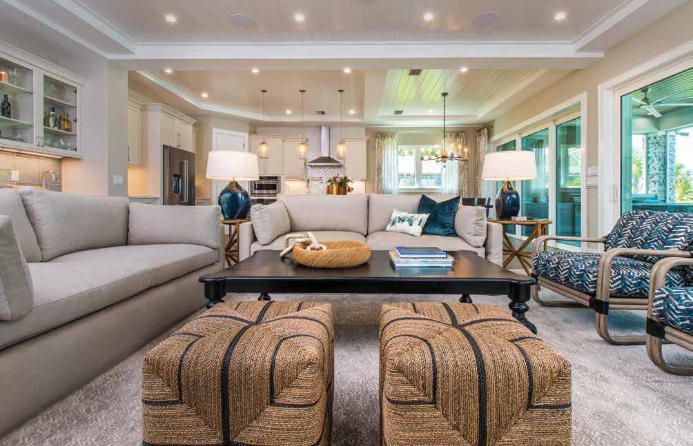
Bar: The wet bar against the wall in the family room makes entertaining fun and easy. After applying the same cabinetry and quartz countertops used in the kitchen, the designer sourced a custom blue, 6-by-12-inch ceramic tile from Tile Market of Sarasota for the backsplash to provide intrigue. “I used glass doors on top of the built-in so special glasses and bottles could be seen,” notes Murphy.
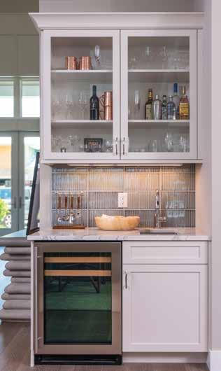
Guest Bedroom: The charming second-floor guest bedroom is one of the designer’s favorite rooms. A sculpted teal headboard flanked by free-hanging rope sconces create a touch of the unexpected. On the balcony, a swing bed is another happy surprise. The designer chose Stickwood, a sustainable peel-and-stick version of reclaimed wood, to add a wow factor to the tray ceiling. The rattan framed corner chair was sourced from Palecek and complemented the other wood elements found throughout this stately guest room.
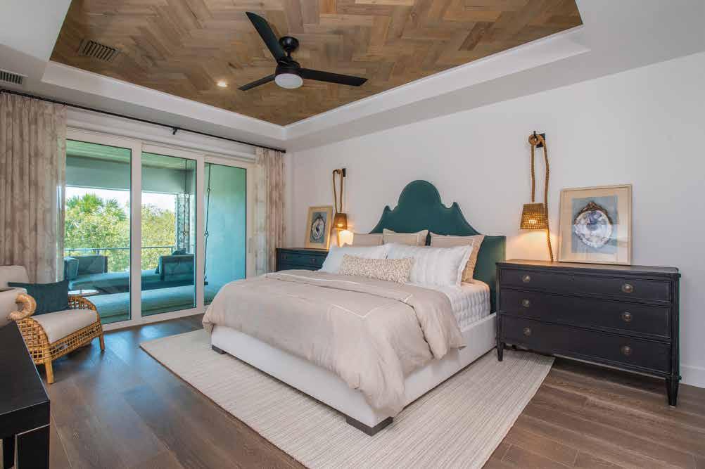
Pool Bath: This fun aquatic pool bathroom features a school of fish swimming upstream in a zigzag formation on the Benjamin Moore Agean teal wall. With a nod to the home’s waterfront location, cabinet fronts are driftwood stained, and a contemporary oyster shell framed mirror further influences the space’s beachy vibe. Plumbing fixtures in the home were sourced from Ferguson Bath, Kitchen & Lighting Gallery.
The gentleman is a single man from the northeast venturing into retirement, and he was looking to step down from his career in corporate America. “My client knew what he wanted and how he wanted to live. He loves to entertain, and having a bar where everyone can hang out and watch games is very important to him,” explains Murphy. “In short, he wanted livable luxury with a masculine vibe. He just didn’t know how to pull it together.” u
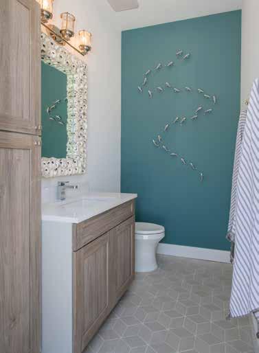
Foyer: Applying detailed wood moulding painted with Benjamin Moore’s Chantilly Lace led to the ultimate luxury look in the beautiful two-story foyer. The commanding entry is further enhanced with driftwood-stained newel posts and modern stainless-steel railings. Stained to match the stairway, the European white oak hardwood flooring was sourced from Duchateau. Finally, a door to the left of the unique console table — comprised of concrete slats — hides the residential elevator. “We had the idea that since everyone comes into the foyer, we wanted to make a statement and give the space a luxe feeling,” states Murphy.
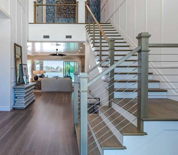
Study: The homeowner was still working, so he needed a study. Murphy chose a heavy metalframed desk with a glass top to make a solid masculine statement. Created by the designer to flank the desk, the custom cabinetry was built by Metro Cabinet Company and finished in a dark blue hue. Adding a contemporary wallpaper from Schumacher enhances interest over the desk area. For fun, Murphy selected a hooded accent chair from Palecek. The gray and white organic-patterned linen draperies from Peter Fasano and mirror other earth tones seen throughout this space.
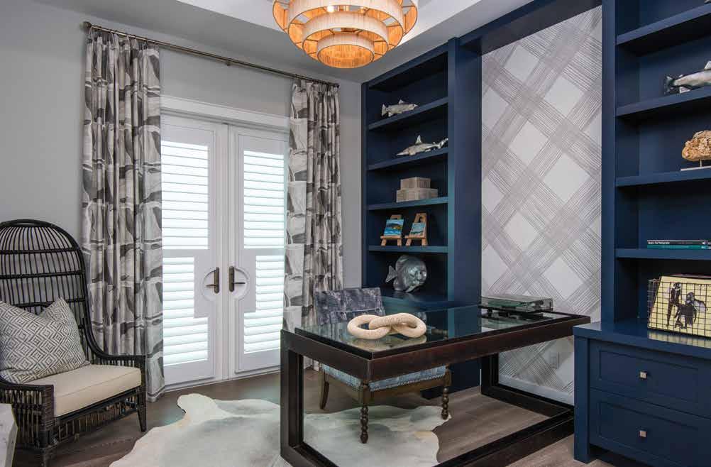
Because it is a waterfront home, it warrants a relaxed coastal setting. Still, being a large house requires accommodations for various types of people with different needs who visit frequently. “One weekend it might be his brother and his brother’s children. The following weekend it might be all men. The design was similar to hospitality in that we designed for a diverse set of guests,” says Murphy. u
Primary Bathroom: Immediately setting the stage for the modern masculine undertone in the primary bathroom are a pair of rectangular mirrors adorned with coco beads — made from the brown outer shell of a coconut — each hanging above the double sinks, which sit atop a floating vanity. In keeping with the space’s less-is-more appeal, the open concept shower has no door and sports pebble tile and a linear drain. The shower walls are 12-by-24-inch matte tile in a light beige installed in a straight-stack style. The striking pendants are clear glass truncated with curved metal bars.
Primary Bedroom: The stately primary bedroom hosts a fully upholstered, winged king-size bed with custom striped cotton and linen bedding. The geometric concrete stools at the foot of the bed starkly contrast this neutral space’s clean lines and circular elements. Because of the needed length, the console under the television is a custom-sized piece. The sitting area is bathed in natural light and outfitted with two small patterned swivel chairs sourced from Palecek that overlook the pool area.
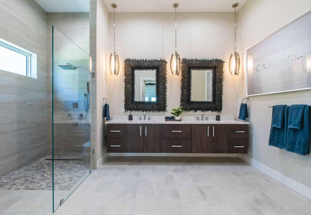
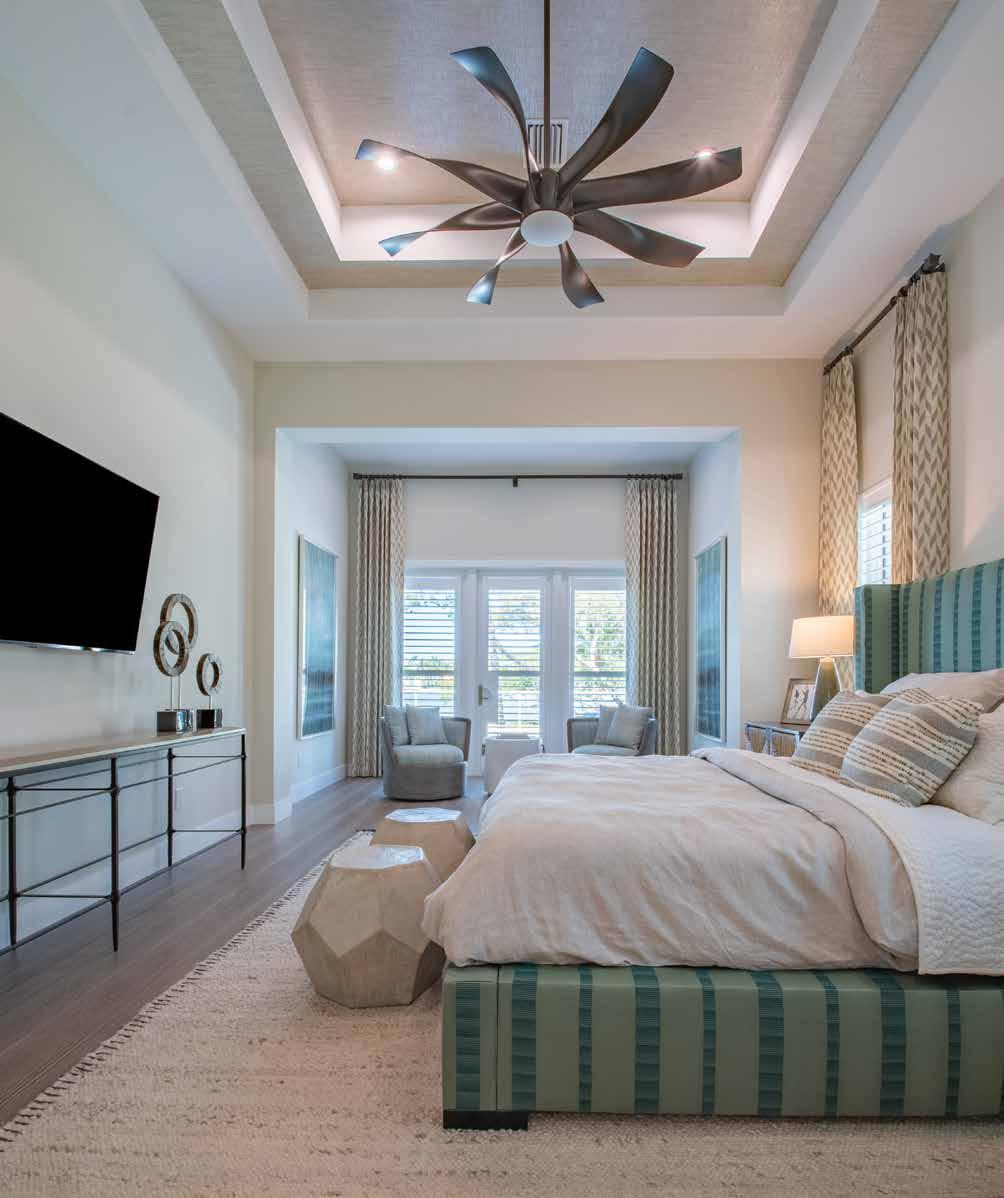
To achieve a coastal ambiance imbued with a rugged, sophisticated appeal, Murphy applied the distinctive blue and green shoreline color scheme, albeit in deeper and warmer tones. Touches of black in the four-bedroom dwelling against the home’s copious neutral walls create drama and add a hint of formality. Rich detailing — such as the shiplap, the warm moulding used throughout, and the extensive trim treatment — heightens the solid masculine essence of the space without going over the top. The client’s desire for comfort and a welcoming atmosphere were also driving forces.
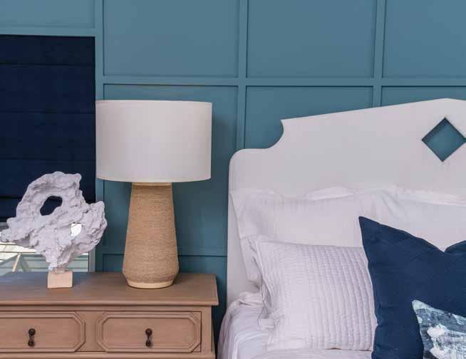
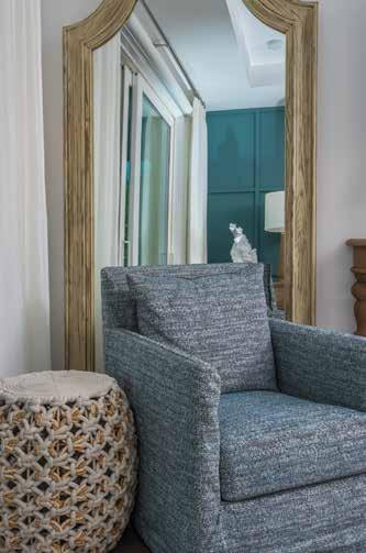
In the end, the client was thrilled with the results of his fabulous new home. So is the designer. “This is a great example of pure trust in your design team. It came through beautifully and we’re super proud of that,” says Murphy. n
Powder Room: Used by almost everyone who enters the home, this all-important powder room is a surprise. The standout gray and white wallpaper with printed palm leaves is similar to grasscloth. Flanked by 12-by-36-inch natural stone tile, the space conveys a tropical resort spirit. Wall faucets are carefully situated over the black nickel glass vessel sink, sourced from Oceana Sinks. “The frosted glass and brushed nickel mirror is slender and tall with a gunmetal frame. It’s perfect for the space and wasn’t easy to find,” recalls Murphy.
Guest Room: Custom moulding in the second guest room was painted with the same Benjamin Moore Agean teal as the pool bathroom and contrasted boldly against the crisp white paint on the carved wooden headboard. Nightstands feature carved detailing and a driftwood finish. The bedside lamp is wrapped in layered rope, adding to the traditional coastal elements found throughout the rest of the home.
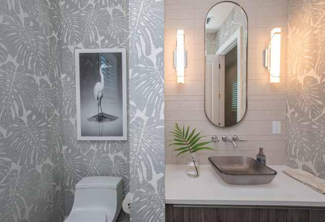
Pool & Outdoor Living: Bordered by a million-dollar view and verdant landscaping, the pool area is fabulous. The fencing separating the pool area from the lush landscaping beyond is a white aluminum rail with the same cable railing seen in the foyer. The designer selected the stacked stone that flanks the screened lanai — outfitted with retractable screens — and was responsible for the pool deck’s stone-gray pavers. Gray and white striped poolside loungers were sourced from Brown Jordan. The inviting outdoor living area is grounded by a blue and white rug, where two black stone chairs are grouped as small tables and, when needed, provide additional seating. The Palecek sofa, framed in natural teak and aluminum, contrasts the darker tones in the cushioned, open-weave rattan chairs.
Written by Mary Thurman Yuhas Photography by Dylan Jon Wade Cox PhotographyInterior Designer:
Trade Mark Interiors 3232 South Tamiami Trail Sarasota, FL 34239 941.879.9494
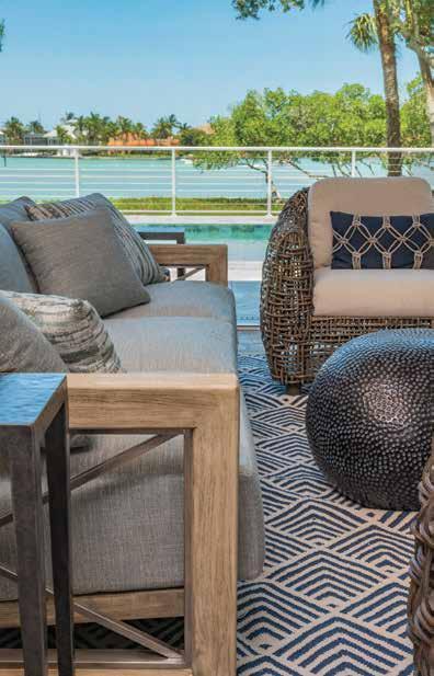
Resources: Design Works 4500 Carmichael Avenue Sarasota, FL 34234 800.226.9434 www.floridadesignworks.com
Ferguson Bath, Kitchen & Lighting Gallery
5521 Fruitville Road Sarasota, FL 34232 941.951.0110
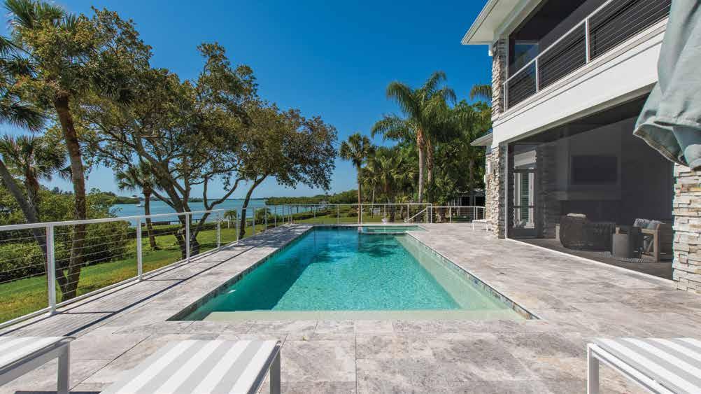
Metro Cabinet Company 2095 Siesta Drive Sarasota, FL 34239 941.377.8777
Tile Market of Sarasota 1962 Main Street, Suite 120 Sarasota, FL 34236 941.365.2356

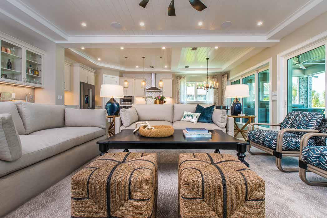
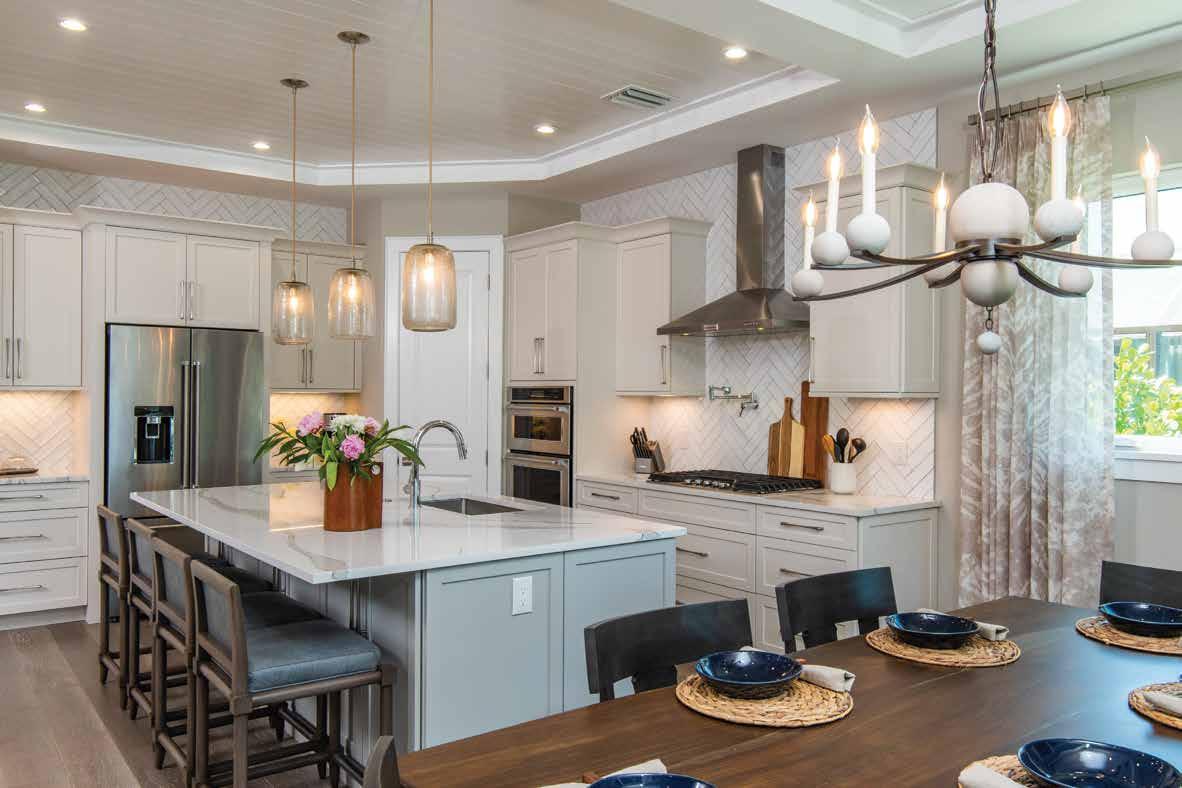
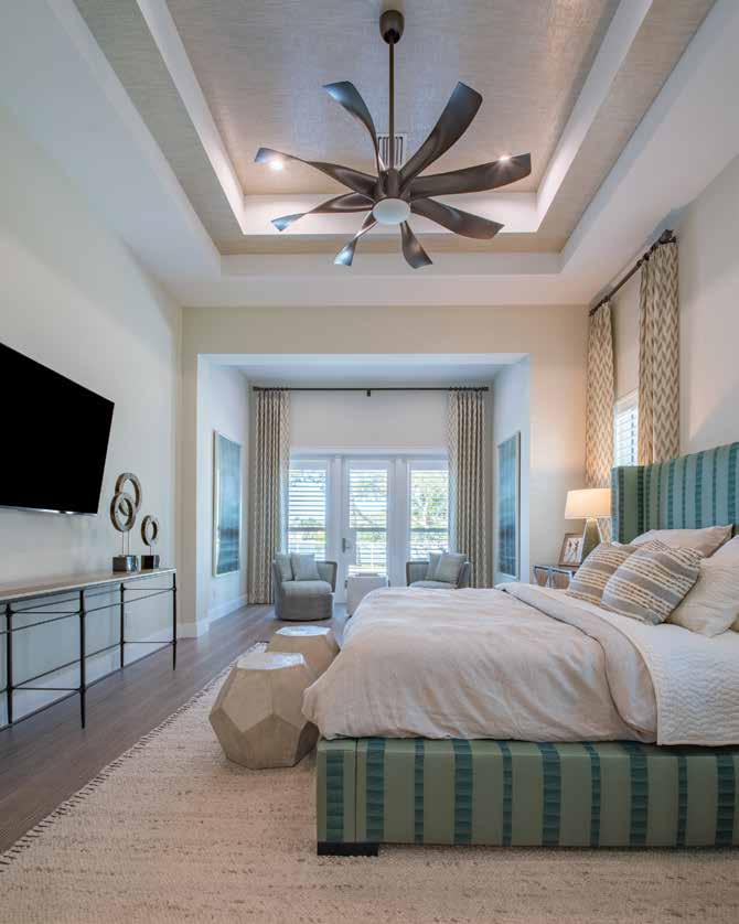
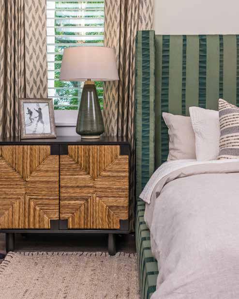
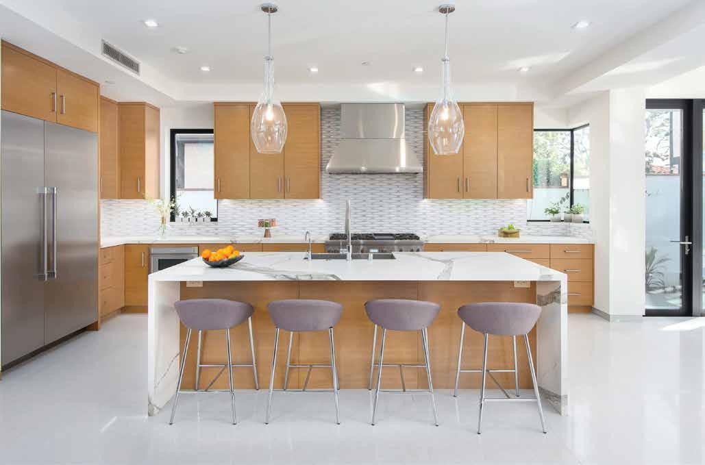
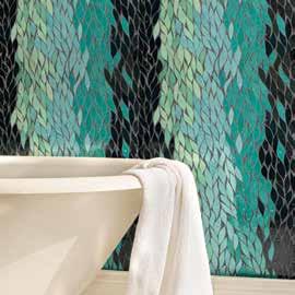
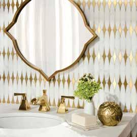
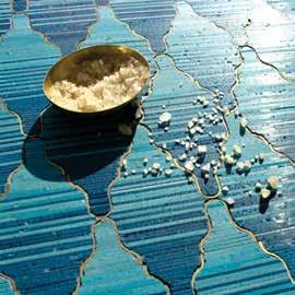
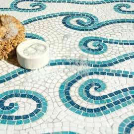
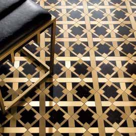
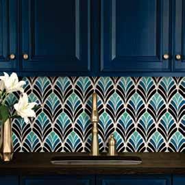

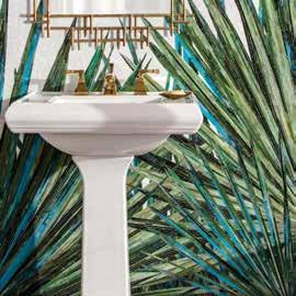























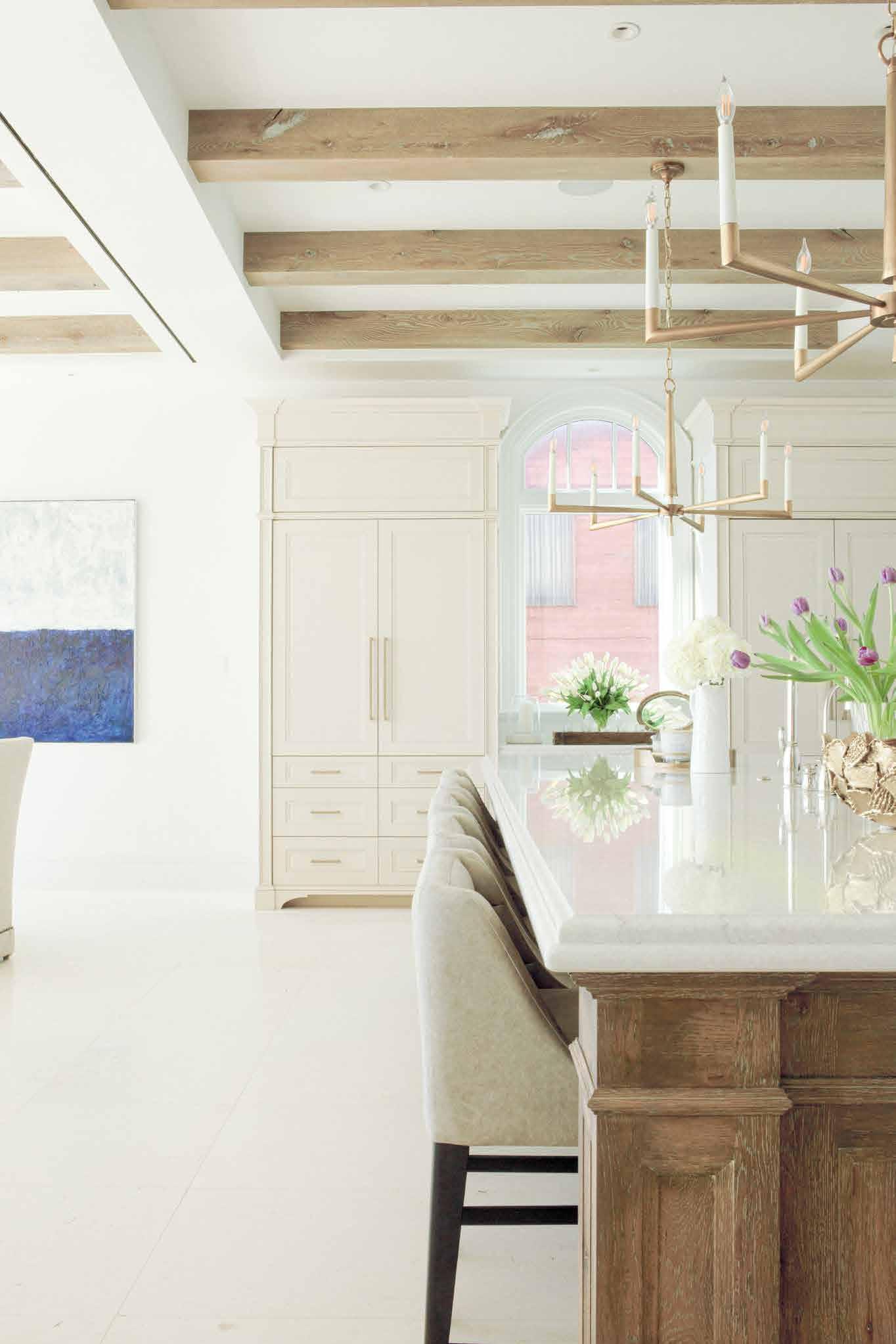


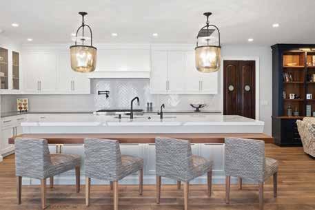
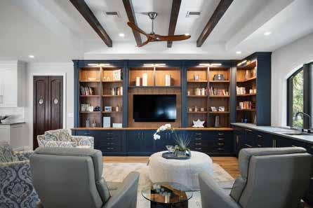
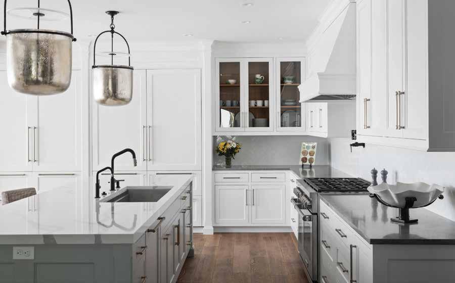
Formal Living Room: Covered in soft gray, a pair of Lee sofas with tufted back and seat cushions invite lounging in the sun-drenched, eastern exposure formal living room, where a trio of double windows takes advantage of the two-story ceiling in this space. The serene atmosphere is enhanced using Sherwin-Williams’ iconic Agreeable Gray on the walls and white trim on the window frames Above the slim wood and metal coffee table, strands of crystal span the metal ribs of the chandelier while droplets shimmer down the length of each. Delicate branches of fan coral, custom-framed in acrylic, echo the chandelier’s airy ambiance.
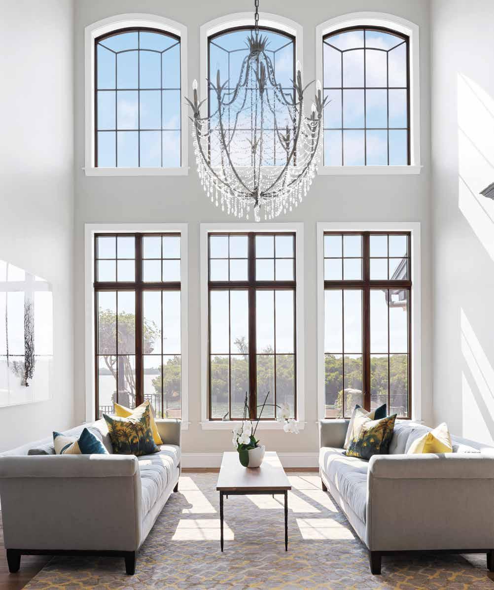
on the mouth of South Coconut Bayou, the view features the tranquil waters of Roberts Bay beyond the mangroves. The main objective for this redesign was to move the entire kitchen to the opposite end of the home. Trinity Construction & Design partner Jay Schoenfelder insists, “This is one of the more accessible renovation projects I have been involved with! The Pecky Interiors team was very organized, and we had a very good plan to begin with; the scope of the project was well defined. We all — contractor, designer, and owner — understood it from the very beginning. The owner was confident in us, trusting of our opinions, and that shows in a project,” Schoenfelder continues. “He let us put our own thoughts and designs into the project.” Patricia Estes of Pecky Interiors appreciated that most when it came to the kitchen. “I love doing kitchens and with the degree of latitude the owner extended to us, I kept calling it my kitchen!” Estes laughs. “Seriously, the owner okayed most everything; there were few changes.” u
Kitchen: A pair of mercury glass and gilded iron five-bulb Lorford Smoke Bell Lanterns from Visual Comfort glow above the island’s Premium Natural Calacatta quartz countertop. Glossy white subway tile is laid in a herringbone pattern on the backsplash. The quartet of kitchen chairs, grouped at a drop-down counter of reclaimed lumber, are upholstered in the same fabric as the dining room chairs, allowing for expanded seating. The soothing color Ice Cube from Benjamin Moore covers the walls within. The perimeter countertops were clad in Piatra Gray Caesarstone to camouflage spills. Sub-Zero and Wolf appliances were installed, including a 48inch six-burner gas range. Using European oak flooring from Duchateau throughout the first floor unifies the rooms. Litze fixtures in matte black with Brilliance Luxe Gold trim from Brizo serve the kitchen, coordinating with the cabinets and drawer handles.
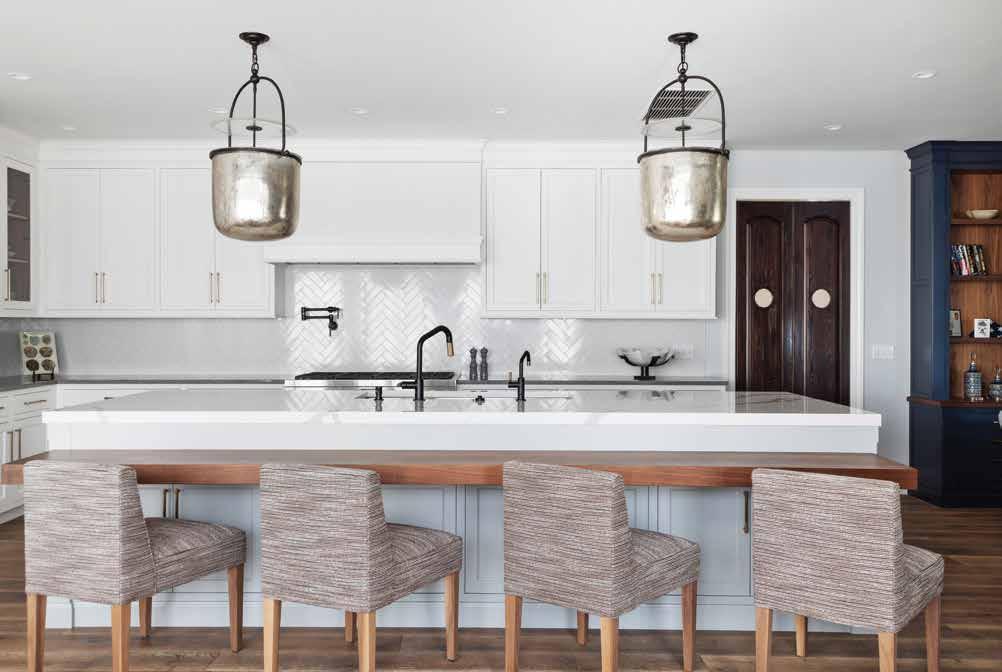
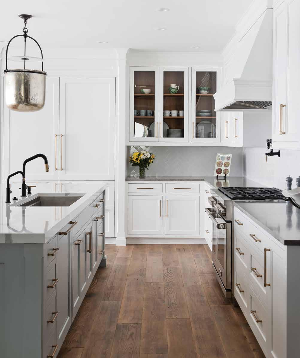
In addition, this makeover features recentered box beams in the gathering room, ceiling details in the primary bedroom, new hardwood floors, and an extensive outdoor entertainment deck.
Campbell Cabinetry Designs Co-Owner Darrin Campbell is a third-generation member of the family-owned business, and he convinced Schoenfelder and Estes that the flip-flop would get more light into the room and create a view of Roberts Bay. Skeptical at first, Estes soon shared Campbell’s vision, specifying light colors for the cabinets and walls, bright white tile for the backsplash, and a brilliant Calacatta quartz for the kitchen’s central island. The new room arrangements resulted in open spaces filled with light and movement.
Dinette: “The existing dinette entry was small and did not provide a view from the kitchen. So, structurally, we opened it up as much as possible,” Estes explains. Hunter Douglas shades diffuse the light from the trio of floor-to-ceiling windows in the new space. The focal point is Ironies’ Asilah Chandelier, an eightlight candelabra set amidst a quatrefoil openwork drum in natural Black Capiz shell veneer.
Formal Dining: The formal dining area is located at one end of the family room. Glass-fronted display cabinets in a warm greige finish flank the window. Estes surrounded the owners’ dining table with Parsons-style upholstered chairs, elegant in their simplicity.
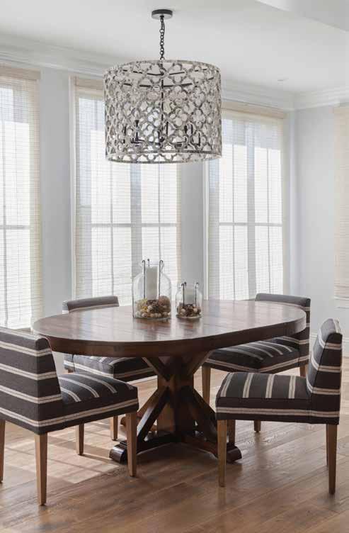
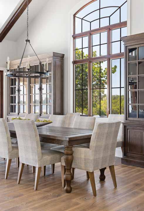
The project originated with Pecky Interiors, whose downtown Sarasota showroom originally drew the homeowners in to shop among the furniture, gifts, and accessories. Having collaborated on half a dozen projects previously, Estes brought in Trinity Construction & Design. The team was tasked with reimagining the first floor of the 6,400-square-foot home. Sited on the north end of Siesta Key, the six-bedroom, five-and-one-half-bath home was built in 2009, toward the end of the Mediterranean style surge. Characteristic of that style, the house was awash in shades of brown. Mismatched wall colors and an assortment of flooring materials combined to present a choppy, uncoordinated décor. u
Family Room: In gilded iron, the clean lines of Visual Comfort’s Darlana chandeliers by E.F. Chapman draw the eye upward to the vaulted, beamed ceiling. “Removing the corbels and refinishing the beams made a dramatic difference in the family room, bringing it more into the present,” says Schoenfelder. Estes chose a pair of Verellen leather Jan club chairs to complement the owners’ sofa. The Lortz cocktail ottoman in leather features two lift-out trays, while the judicious use of area rugs defines spaces.
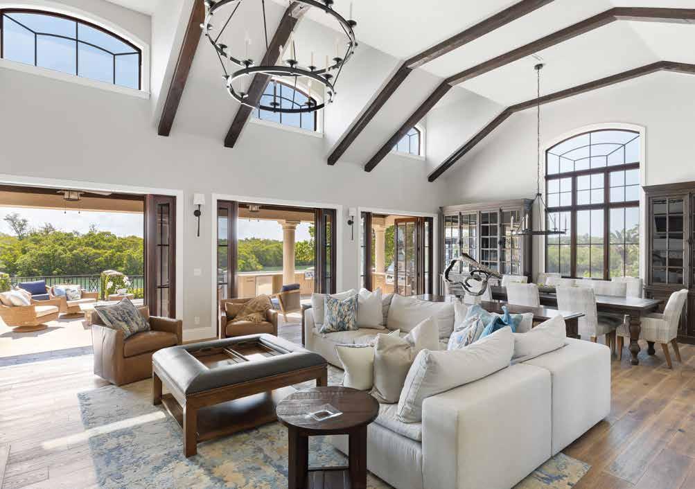
Gathering Room: Moving the kitchen called for recentering the box beams in the adjoining gathering room. A second entry to the home can be seen through the cased opening. The entry table does double duty as a buffet or wine-tasting table when needed. Windows were removed to create the focal wall, which features the Reflejos palmiers panoramic wallpaper from Maison Lévy. Benjamin Moore’s Beach Glass quietly supports the watery image.
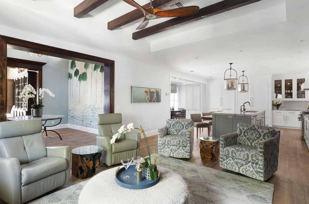
Entertainment Wall: Walnut was used abundantly inside the cabinetry throughout the kitchen. Here it takes center stage as the background for the entertainment wall, designed by Estes and built by Campbell Cabinetry Designs. Reeded doors add some texture to the wall. Above, brass pharmacy lights echo the door and drawer pulls. Overhead, a sleek, three-blade Haiku fan cools the room.
Primary Bedroom: Brightened up with Benjamin Moore’s Gentle Grey, the headboard wall in the primary bedroom rises to meet a cathedral ceiling clad in Synergy Wood Southern Pine tongue and groove stained in Colonial, a rich brown. The bed from Lee Industries, upholstered in a fine linen, is dressed in Matouk bedding with custom pillows. It is flanked by a pair of Tribeca nightstands from Century Furniture. Estes recovered the owners’ bench and slipped a Kravet area rug underneath it all.
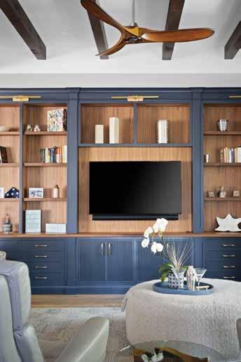
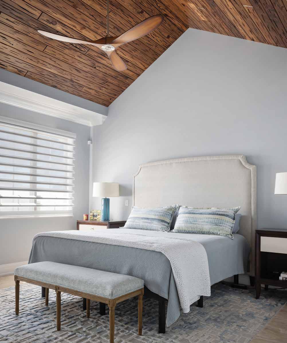
The duo removed the heavy, outdated Mediterranean-style elements, smoothed the walls, and replaced ornate fixtures and trims with sleek counterparts. They tempered the overabundance of brown with shades of gray and laid one style of flooring, in one color, throughout the first floor. “The flooring was an excellent choice,” Schoenfelder says. Estes complemented the few furniture pieces the owner wished to retain with new ones from various manufacturers in Pecky Interior’s showroom.
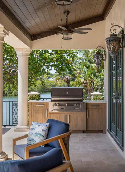
In approximately six months, the team accomplished the transformation. Schoenfelder credits the expedited timeline on having all the details communicated clearly and understood early in the project, saying, “It worked like clockwork.” n
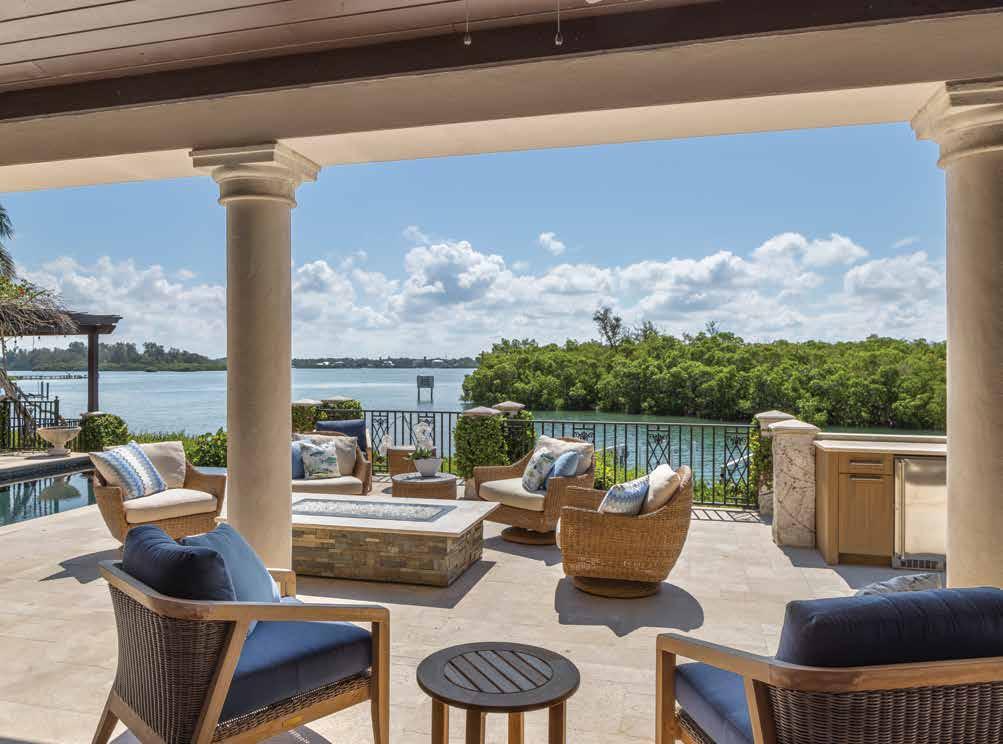
Deck: A new stacked stone fire table holds court amidst a group of swivel chairs positioned here to facilitate conversations with those on the lanai or inside the home. A trio of stacking sliders opens the entire family room and dining room to the outside. The home’s original Mediterranean design is evidenced by the terra-cotta barrel tile roof and adobe stucco finish, but from the inside out, the renovated interior space says smooth, elegant transitional coastal living.
Lanai: The spacious outdoor entertainment area encompasses several seating options. Using the original travertine, Schoenfeld rebuilt the extensive outdoor deck. In addition, Pecky Interiors team member Candayce Shaw designed an all-new outdoor grill and service area at one end of the lanai.
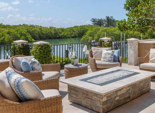
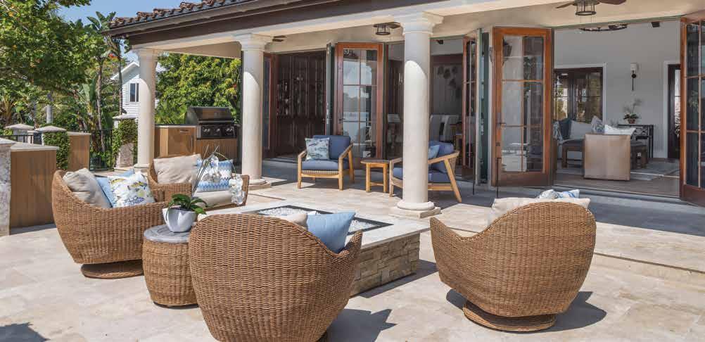 Written by Ginny Peterson Photography by Ryan Gamma Photography
Luxury Home Builder:
Trinity Construction & Design
2017 Fiesta Drive
Sarasota, FL 34231 833.777.8746
www.sarasotacustomhomebuilder.com
Interior Designer:
Pecky Interiors
100 Central Avenue, Suite 1026
Sarasota, FL 34236 941.957.0300
www.peckysrq.com
Resources: Campbell Cabinetry Designs
1531 Main Street
Sarasota, FL 34236 941.378.3922 www.campbellcabinetrydesigns.com
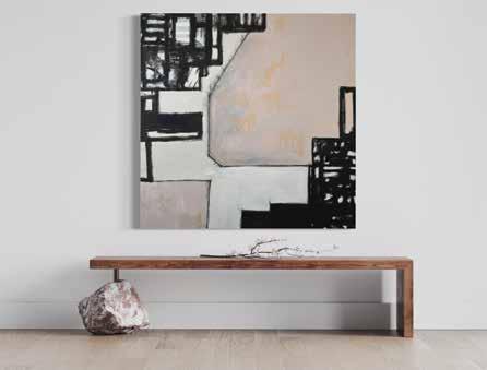
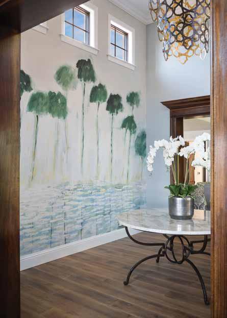
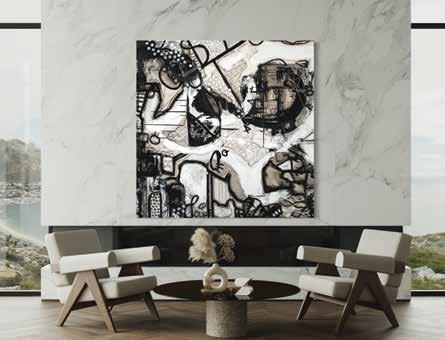
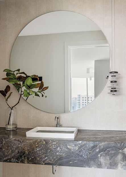 Courtesy of JKL Design Group
Courtesy of Pecky Interiors
Courtesy of MARA Art Studio
Founded in Bohemia in 1870, Schonbek offers a rich tradition of designing and manufacturing the most elegant breathtaking crystal chandeliers, pendants, and sconces for over four generations. Continuing the 150-year heritage of craftsmanship and cutting-edge design, Schonbek reveals a groundbreaking collection of all LED luxury crystal luminaires, including dazzling symphonies and edgy motifs in the fine multifaceted crystal that captivates the imagination.
Elegant, dramatic, and distinctive Schonbek BEYOND features sophisticated crystal forms that create a soft, welcoming glow from high-quality, state-of-the-art LEDs, Lustrous beauties, and gorgeous and brilliant shining jewels.

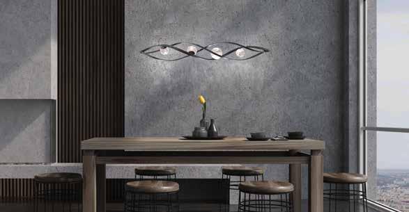

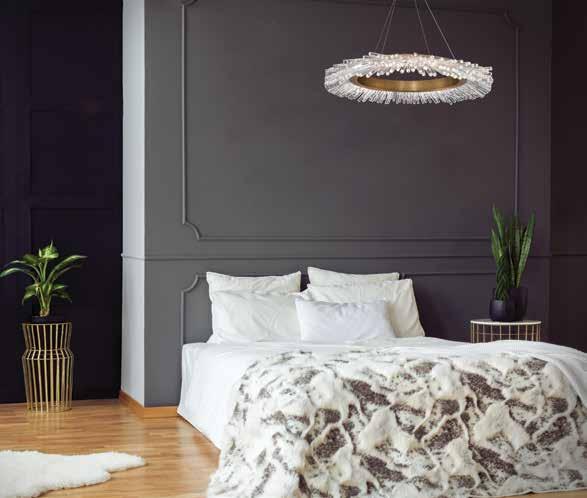
The new SIGNATURE collection of innovative LED luxury crystal luminaires, traditional and best-selling handcrafted pieces, features unparalleled timeless elegance.
Schonbek BEYOND and SIGNATURE collections may be found at Light Up Your Life.
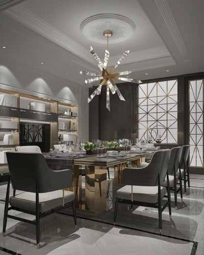
q Skullery | Laundry Room: This laundry room doubles as a skullery. Dressed up with a stainless steel backsplash makes a luxurious work space.
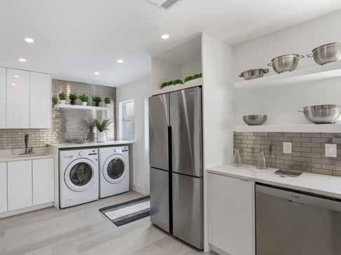
q Fireplace: Using the same flooring throughout your space creates a continuous cohesive appearance. The space will seem larger and will have a smooth flow from room to room.
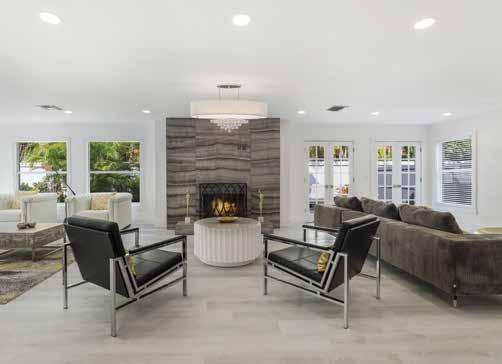
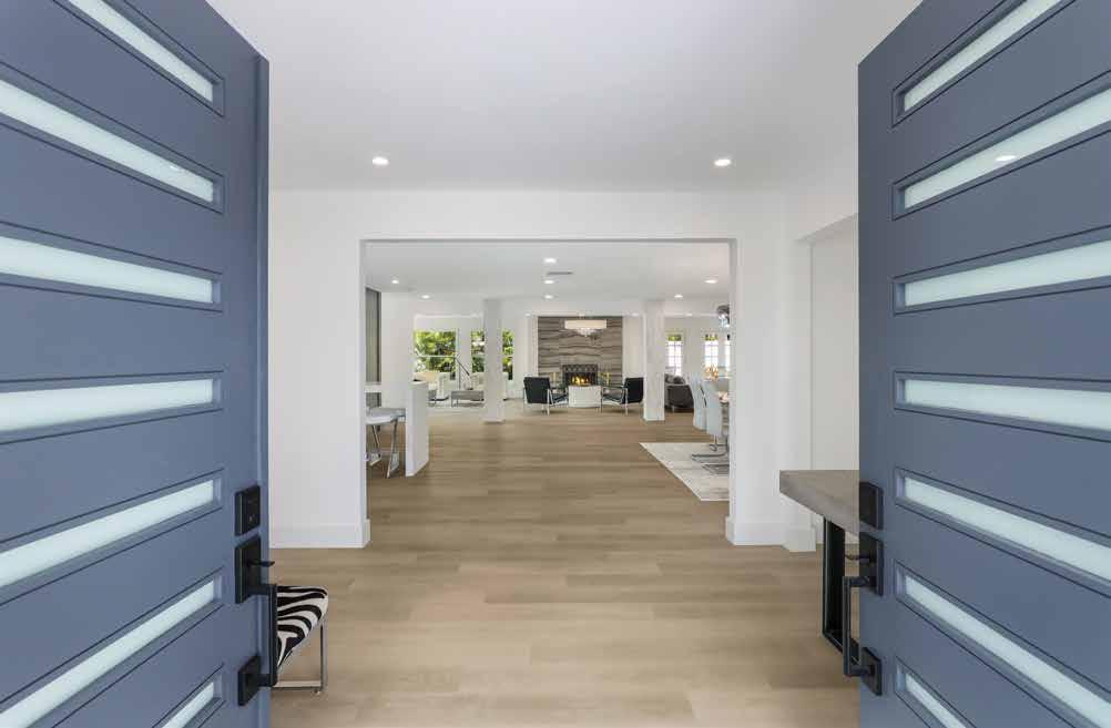
Den: High-end luxury vinyl flooring. Durable finish and resistant
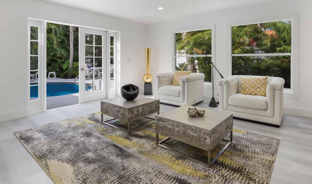
water damage. Many people are turning to this product in higher-end homes for areas that have
Bedroom: High definition digital imprint luxury vinyl flooring.
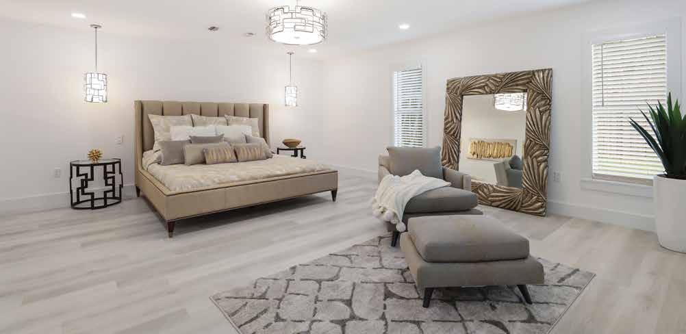
of
and
the look of European White Oak Hardwood Flooring.
SmartHouse Integration has been focused on the art of blending cutting edge technology with Interior design and architecture since 1998. Great design comes from experience. Experience comes from time. Our common sense approach and keen attention to detail ensure a bespoke design.
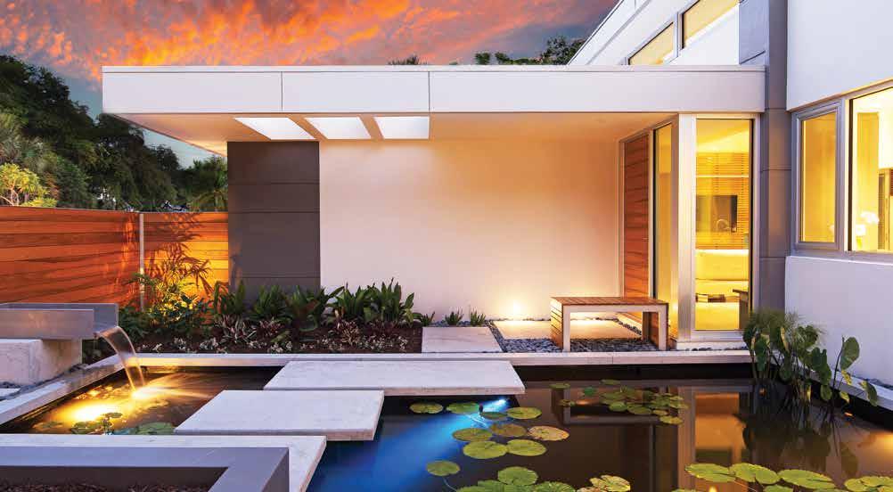
Inspired lighting design for extraordinary spaces. We ensure we have the right light, in the right place, at the right time. Our designs dissolve the boundaries between indoors and outdoors.
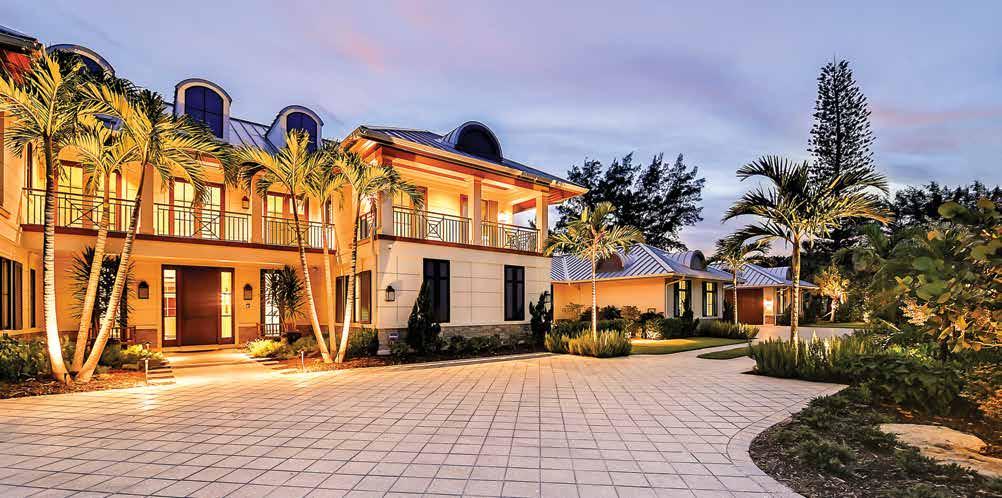
Experiencing
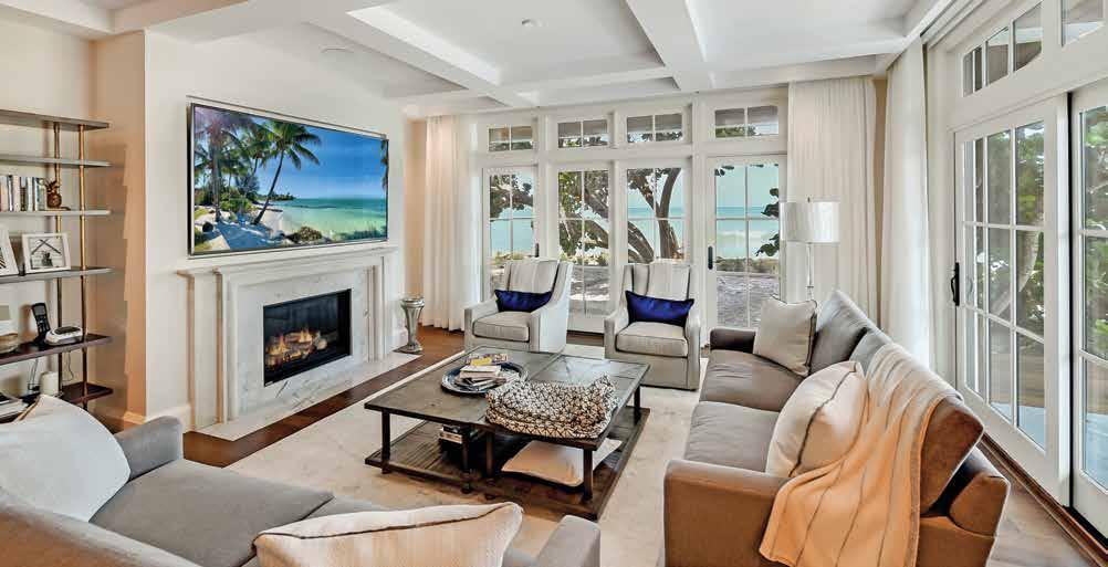
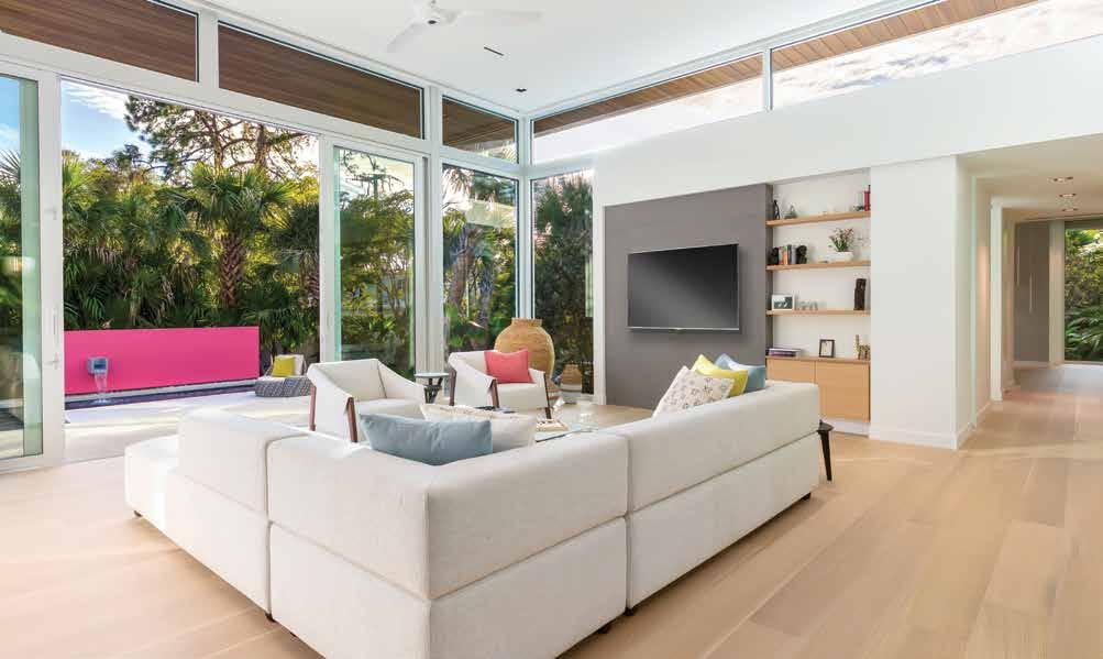
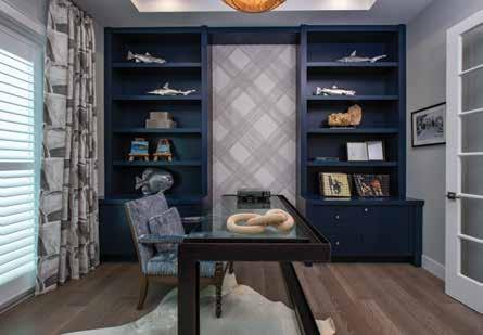
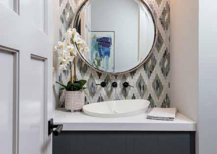

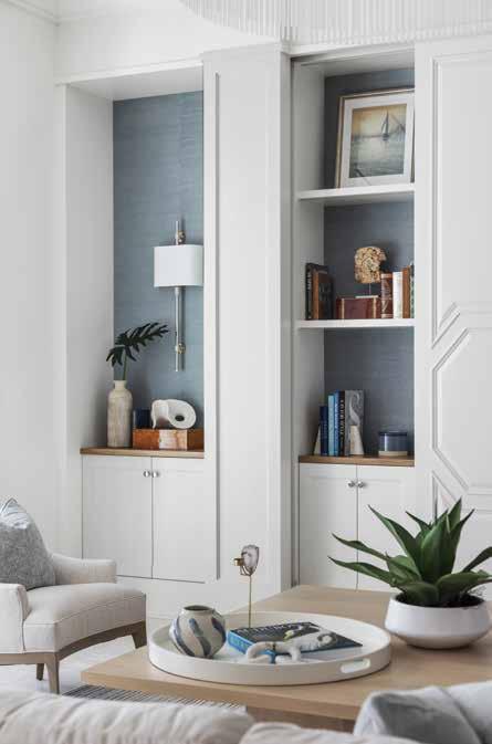 Courtesy of Angela Rodriguez Interiors + Perrone Construction Courtesy of Amy Lou Interiors
Courtesty of Trade Mark Interiors Courtesy of Clive Daniel Home + Stock Custom Homes


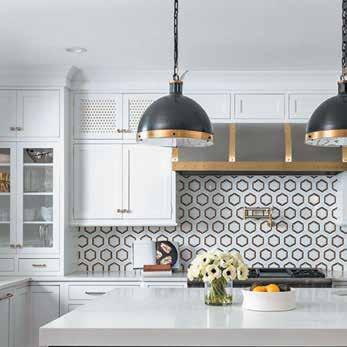
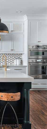
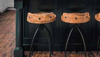


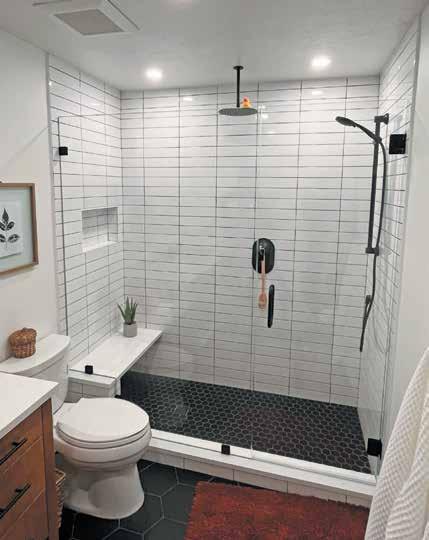
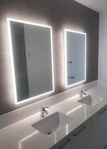

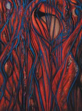



Sarah & Don Howe


Estate
Sarasota Architectural
Bath & Cabinetry
The Shower Shop
Bath & Cabinetry
Siesta Key Landscape
Services
SmartHouse Integration
Automation & Security
SRQ Custom Cabinetry Kitchen, Bath & Cabinetry
Sticks & Stones Flooring
Custom Homes Luxury Home Builders
Stofft Cooney Architects Architects & Residential Designers
Smart Windows & Doors
G Home
Designers & Decorators
TTalon Home Builders
Home Builders
Tile Market of Sarasota
& Stone
Trade Mark Interiors
Designers & Decorators


