QUARTERLY OF THE INDUSTRIAL DESIGNERS SOCIETY OF AMERICA
2012 Yearbook of Design Excellence international design excellence awards
fall 2012
ENTER IDEA 2013
Our 33rd year of recognizing and promoting the most innovative, thought-provoking designs in the world. Call for Entries begins Dec. 3, 2012. For more information, visit www.idsa.org/idea
2013 INTERNATIONAL DESIGN EXCELLENCE AWARDS
CALL FOR ENTRIES
QUARTERLY OF THE INDUSTRIAL DESIGNERS SOCIETY OF AMERICA
FALL 2012 速
Publisher Roxann Henze IDSA 555 Grove St., Suite 200 Herndon, VA 20170 P: 703.707.6000 x102 F: 703.787.8501 roxannh@idsa.org www.innovationjournal.org
Executive Editor Mark Dziersk, FIDSA Managing Director Lunar | Chicago mark@lunar.com Advisory Council Gregg Davis, IDSA Alistair Hamilton, IDSA
Managing Editor & Designer Karen Berube K.Designs 3511 Broadrun Dr. Fairfax, VA 22033 P: 703.860.4411 k.designs@cox.net Contributing Editor Jennifer Evans Yankopolus
Advertising Katie Fleger IDSA 555 Grove St., Suite 200 Herndon, VA 20170 P: 703.707.6000 x104 F: 703.787.8501 katief@idsa.org advertising@idsa.org
速
The quarterly publication of the Industrial Designers Society of America (IDSA), Innovation provides in-depth coverage of design issues and long-term trends while communicating the value of design to business and society at large.
Annual Subscriptions Within the US $60 Canada & Mexico $75 International $110 Single Copies Fall/Yearbook All others
$35+ S&H $17+ S&H
2012 yearbook of design excellence 5 From the Editor by Mark Dziersk, FIDSA 6 Design Defined by Philip Thompson, IDSA 8 Book Review by Scott Stropkay, IDSA 9 2012 Student Merit Award Winners
Introduction by IDSA’s Education VP Sooshin Choi, IDSA
Commercial & Industrial Products 32 37X/38X Clamp Meters with iFlex™ 34 B/E Aerospace Essence Inserts Collection 36 Crown RM 6000S MonoLift™ Reach Truck 38 Silver Winners 42 Bronze Winners
Communication Tools 15 Reflecting on Five Years 46 Lumia 800 and Lumia 900 by Joice Joppert Leal 48 Silver Winners 16 Beautiful, Useful and 50 Bronze Winners Compelling by Rhys Newman, IDSA Computer Equipment IDEA 2012 jury chair 51 Silver Winners 18 The IDEA 2012 Jury 61 Bronze Winners 22 Best of Show 2012 Design Strategy Nike+ FuelBand 64 GE User Experience Strategy 29 Sustainability Award and Capacity Building LED Clear Bulb 66 Silver Winners 30 People’s Choice 69 Bronze Winners Embrace Infant Warmer Digital Design 199 2012 Finalists 70 Teagueduino/teagueduino.org 217 IDEA 2012/Brasil Winners 72 Silver Winners 218 2012 Index of Winners 75 Bronze Winners 220 Signposts Entertainment by Alistair Hamilton, IDSA 77 Barnes & Noble Nook Simple Touch 78 Beats by Dr. Dre Beats Mixr & Wireless 80 Propellerhead Balance 82 Silver Winners 86 Bronze Winners
QUarterlY oF tHe indUstrial designers societY oF aMerica INNOVaTION 2012 YEarbOOk Of INDusTrIal DEsIgN ExcEllENcE
2012 Yearbook of Design Excellence international design excellence awards
fall 2012
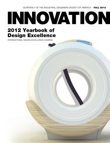
Cover photo: Gold IDEA winner Cocoon Open MRI Chair by GE Medical (France)
fall 2012
Innovation is the quarterly journal of the Industrial Designers Society of America (IDSA), the professional organization serving the needs of US industrial designers. Reproduction in whole or in part—in any form—without the written permission of the publisher is prohibited. The opinions expressed in the bylined articles are those of the writers and not necessarily those of IDSA. IDSA reserves the right to decline any advertisement that is contrary to the mission, goals and guiding principles of the Society. The appearance of an ad does not constitute an endorsement by IDSA. All design and photo credits are listed as provided by the submitter. Innovation is printed on recycled paper with soy-based inks. The use of IDSA and FIDSA after a name is a registered collective membership mark. Innovation (ISSN No. 0731-2334 and USPS No. 0016-067) is published quarterly by the Industrial Designers Society of America (IDSA)/Innovation, 555 Grove Street, Suite 200, Herndon, VA 20170. Periodical postage at Sterling, VA 20164 and at additional mailing offices. POSTMASTER: Send address changes to IDSA/Innovation, 555 Grove Street, Suite 200, Herndon, VA 20170, USA. ©2012 Industrial Designers Society of America. Vol. 31, No. 3, 2012; Library of Congress Catalog No. 82-640971; ISSN No. 0731-2334; USPS 0016-067.
Patrons of Industrial Design Excellence investor IDEO, Palo Alto, CA; Shanghai, China; Cambridge, MA; London, UK; San Francisco; Munich, Germany; Chicago; New York Jerome Caruso Design Inc., Lake Forest, IL Masco, Taylor, MI Procter & Gamble, Cincinnati, OH Webb deVlam Chicago, Chicago, IL Cultivator Altitude, Somerville, MA Cesaroni Design Associates Inc., Glenview, IL Continuum, Boston; Los Angeles; Milan, Italy; Seoul, South Korea; Shanghai, China Crown Equipment, New Bremen, OH Dell, Round Rock, TX Design Concepts, Madison, WI Eastman Chemical Co., Kingsport, TN Hewlett-Packard, Palo Alto, CA IDI/Innovations & Development Inc., Edgewater, NJ Lunar Design Inc., Palo Alto, CA Metaphase Design Group Inc., St. Louis, MO Nokia Design, Calabasas, CA Smart Design, New York; San Francisco; Barcelona, Spain Stanley Black & Decker, New Britain, CT Teague, Seattle, WA Tupperware, Worldwide Charter Patrons indicated by color.
For more information about becoming a Patron and supporting IDSA’s communication and education outreach, please contact Katie Fleger at 703.707.6000 x104.
Advertisers’ Index c2 IDEA 2013 65 K.Designs 1 LaFrance Corp. c4 Lunar 76 MIDEA 110 MIDEA 216 MIDEA c3 PTI Design 7 Stratyasys Far Left: Silver IDEA winner notchless.
2 0 1 2 yearbook of desig n excelle n ce
Environments 88 THINK: An Exploration into Making the World Work Better 90 Silver Winners 92 Bronze Winners Bathrooms, Spas & Wellness 94 Silver Winners 96 Bronze Winners Gardens & Outdoor 98 Bronze Winners Kitchens 99 One-Burner Portable Induction Hob 100 OXO Tot Seedling Youth Booster Seat 102 Silver Winners 104 Bronze Winners Living Room & Bedroom 107 Silver Winners 110 Bronze Winners Leisure & Recreation 111 Silver Winners 114 Bronze Winners Medical & Scientific Products 116 Cocoon Open MRI Chair 118 DISCOVERY IGS 730 120 Samsung XGEO GC80, XGEO GU60 & X-ray System UX 122 sleepToo™ 124 Silver Winners 132 Bronze Winners Office & Productivity 134 Horizon LED Task Light 136 Tools at Schools 138 Silver Winners 141 Bronze Winners
4
www . I N N O V A T I O N jo u r nal . o r g
Packaging & Graphics 143 Ecologic Brands Paper Bottle 144 Silver Winners 146 Bronze Winners Personal Accessories 148 Bronze Winners Research 149 Silver Winners 152 Bronze Winners Service Design 153 Silver Winners 155 Bronze Winners Social Impact Design 156 UNICEF Project Mwana: Using Mobile Technologies to Improve the Lives of Underserved Children 158 Silver Winners 155 Bronze Winners Student Designs 160 Balde a Balde: Safe Agua 162 C-Thru Smoke Diving Helmet 164 DIGIFI: Audionauts 166 GiraDora: Safe Agua – Washer and Spin Dryer 168 Medical Toolkit for Surface-Mount Microdialysis (SMD) 170 Nursing Kit 172 Smart Squeeze 174 The Campus Mini Velo: Redefining Utility 176 Silver Winners 186 Bronze Winners Transportation 194 Silver Winners 197 Bronze Winners
from the editor
Trending Toward Excellence
W
elcome to the 2012 edition of IDSA’s International Design Excellence Awards (IDEA) Yearbook. For me it is always one of the true joys of my year and of our modern age of industrial design to see and review these important award-winning entries in the world’s most
important design competition—the Oscars of Design—the IDEA competition. This enormously optimistic collection of winners is a reflection of our current societal concerns and culture as expressed in artifacts and behaviors. At this year’s IDSA International Conference in Boston, where the award winners accepted their trophies, these awards represented, to all who attended, a unique perspective and an increasing focus on human-centered concerns for the made world.
powerhouse consultants were locked out of Gold this year but took a lot of awards nonetheless. Newer and up-andcoming firms like Artefact, Carbon Design Group and Bould made an impression. You can decide for yourself, as you review this Yearbook, your view of this year’s trends. What stood out to me were all the designs aimed at headsets, which are uberpopular this year, as well as any consumer elec...this year’s designs have in the consistency of great design executions. tronics that create a “lifestyle” promise. It also strikes me that medical products are now They outlined, in a meaningful way, the impact the products recognized for an increased aesthetic and conceptual and services we design and make are having on humanity. posture as compared to years past. Finally, I think that you The industrial design profession shapes and influences might agree, this year’s designs have raised the bar in the the world that we live in. It also acts as an indicator of things consistency of great design executions. From the Nest therto come. The International Conference attendance was up mostat to Crown’s stunning Gold award-winning lift truck, 25 percent over last year, a good sign for design, especially it is a collection worthy of the bar for excellence in this age industrial design and the economy as well. After design gets of industrial design. busy manufacturing, retail will follow suit. Next year’s International Conference will be held in The IDEA ceremony featured great designs and overall Chicago. With the always enthusiastic and brilliant leadbuzz. The Best in Show went to the Nike Fuel Band, an ership of Paul Hatch, IDSA from Teams Design as the innovative makeover of a sports watch into a device to help chair, and the Windy City as a backdrop, we will celebrate us all live better. The People’s Choice went to the Embrace and raise that bar again next year. So please enjoy this Infant Warmer, a humanistic answer for warming babies. Yearbook, a stunning profile of the designer’s mission and Panasonic was recognized for its Clear LED Light, the inauthe very best way there is to spend a career, in my view: to gural winner of the IDEA Sustainability Award. Corporations make a difference in people’s lives and in the world. like Samsung and Crown Equipment took Gold. Some
“
raised the bar
”
—Mark Dziersk, FIDSA, Innovation executive editor mark@lunar.com
I N N O V A T I O N F all 2 0 1 2
5
desig n defi n ed
What’s the Plan?
W
hen something looks right and works well we experience a precious, though often subconscious, moment of appreciation for all the effort that has gone into creating that experience. It’s a moment when we are reminded that good design is not the result of a series of lucky accidents or random acts of fortune. Instead it’s the hours of dedication, hard-earned expertise and heartfelt emotions that manifest themselves through countless discussions, reams of sketches and numerous prototypes. When something looks right and works well it proudly sits itself down at the intersection of art and science and firmly strikes the nerve at the center of left- and right-brain thinking. When employed together, “good design is good business” and “by design” are exactly that: intentional, engaging, considered and rewarding. Design defined, however, is not such a pure experience. Definitions, of course, exist; most are widely accepted and achieve their intention well enough. But given the vast array of ways in which the term can be used, they often fall short in one aspect or another. For this reason, I support the position that simply says “design” is a noun and a verb. As a noun it is the output, the conveyer of the precious experience mentioned earlier. As a verb it is the input, the robust, repeatable and predictable process otherwise known as a “plan.” “Failing to plan is planning to fail,” the popular adage often attributed to Benjamin Franklin, has to me always been synonymous with the unifying and strategic power of design management. A firm believer that a designer is as good as the brief means that not taking the time to bring structure and vision to the often broad and sometimes seemingly intangible initial requirements will almost always lead to failure in the end. The common threads in ensuring the foundations of a robust plan are purpose, people, process and projects (the 4 Ps). Understanding and alignment of these simple tenants, a skill at which designers at all levels can and must excel, can yield huge dividends. This opportunity (or, in fact, responsibility) to direct one’s individual or collective design muscle to communicate a vision with language others can relate to and visuals that initially provide broad context and later maintain laser-like focus is one to be seized. As Edward Tufte says, “The map is the metaphor for visual thinking.”
Clearly not all situations are created equal and one size does not fit all when it comes to planning; nonetheless, below are examples of the questions that should be asked when considering the 4 Ps. Purpose (Why?): Why is this important? What are the motivations? What is the reward for success or the cost of failure? Such whys can range from designing a specific solution to a clear need, all the way up to building an organization capable of scaling the design maturity staircase and moving from “design as a service” to “design as an integral part of a company’s culture.” People (Who?): Who cares? Who are the individuals, internally and externally, who are directly involved and have directional influence: team members, specialist advisors, internal stakeholders, intermediate customers and end consumers? Are the right skills and capabilities available to deliver success? Is there a healthy balance of perspectives? Is there a balanced percentage of in-house and consultant resources involved? How is the team integrated, physically and virtually? What are the forums for decision making and how are decisions taken? Process: (How/When?) Is there an agreed definition of the development process (e.g., discover, define, design, develop and deliver)? Where, at any point in time, do we sit along this continuum and how and when do we intend to move forward? What is the funding structure? Is there a master timeline? Have targets (and associated metrics and measures that facilitate meaningful analysis of progress) been identified to drive results? Projects: (What?) What does success look like? What is the health of our future product pipeline? To what principles and guidelines are we aspiring? Is there a North Star from which to track back concepts that could be classified in terms step, stretch and leap (risk/reward)? Robert I. Sutton said, “From chaos comes creativity, from order comes profit.” Sustained leadership is not achieved by “pickers” operating under a fire-aim-ready policy. Leadership is achieved by being able to design and communicate a clear, concise and compelling plan and then by having broad teams of talented people capable of understanding, committing and converting that plan into a reality. —Philip Thompson, IDSA, Masco Design
6
www . I N N O V A T I O N jo u r nal . o r g
G I VE YOUR B I G I DE A A LIT T LE M O J O. Introducing A World-Class 3D Printer For Only $185/Month. When you bring an idea to the table, the new Mojo 3D Printer brings it to life with ease. Now you can have 3D printing right at your desktop at a remarkably low cost. With the magic of Mojo at your finger tips, there’s really no limit to your creativit y. The affordable Mojo 3D Print Pack includes everything you need to start printing immediately – matching your design’s brilliance with an equally inspiring model. Find out more at www.Mojo3Dprinting.com/IDSA
3D PRIN T ER
Leasing available only in the United States. Additional options, shipping, applicable taxes and/or duties not included. ©2012 Stratasys, Inc.
I N N O V A T I O N F all 2 0 0 7
7
book review
Seven Principles for Creating Insanely Great Products, Services and Experiences
Design Like Apple W
ritten for business executives who wish to understand how Apple creates and delivers exceptionally successful products, Design Like Apple is a detailed response to the predictable “we want to be the Apple of our industry” challenge directed to development teams everywhere. Having interviewed numerous former Apple employees, consulted industry thought leaders and drawn on personal experience, John Edson, president of LUNAR, describes the way Apple thinks about design in terms of principles that other companies can learn and leverage. Unlike in other innovation books, Edson takes a very design-centric view of business success. He builds the designer’s argument that great products exude the specific intangible qualities of beauty, ingenuity and charisma to attract attention. He discusses design’s role in organizations. He describes the role of the product as both brand message and messenger for the company. He then turns to bigger ideas, like design as systems thinking, the role of prototypes, the value in being human-centered and committing to a unique voice as a company. Finally, he describes how Apple brings it all together and how the startup Nest, reinventor of the age-old thermostat, has exemplified these principles in its early success. Edson recognizes that it is one thing to understand design principles on a conceptual level, and it’s quite another to reduce these principles to practice. To his credit, he addresses this issue at the end of each chapter with key questions and challenges, giving his readers thought experiments and exercises they can use toward the practical implementation of each principle he details. In clear, sometimes provocative and occasionally contentious terms, Edson compares competing products and companies to illustrate the relative power of design when embraced as a corporate value as opposed to a
“Design must become part of your company’s DNA.” last-minute veneer. Though aimed at nondesign executives, designers will identify with the cases, analogies and lessons described. Edson’s use of analogies and metaphors to explain design ideas is fresh and helpful. They can assist any designer in the quest to reinforce prodesign arguments. To illustrate one corporate design-management strategy, for example, he describes how Herman Miller curates its designers like a record label curates its artists. On design process, he explains how Apple and others build prototypes as “navigation tools” for their development journeys. And to illustrate an idea about clear vision, he discusses how great design, like great music, is created by a single voice with a point of view. Although when Edson compares a company’s design approach to the personas of different cocktail-party guests, he asserts a bold viewpoint that will wound some. Of course, this is a book about Apple and its leader, who was famous for taking critical positions—so perhaps there is a lesson in that as well. Though I’d like Apple to write a book like this, as I imagine that book, I realize it would be introspective and Apple would be reluctant to directly compare itself to other companies as Edson has. That book would be about design for designers. This book is for business people, and Edson does a fine job taking an outside consultant’s big-picture comparative framework to build his ideas in a constructive, educational way. Design Like Apple is an excellent book to give executives as a primer in the value of design and the value of a corporate design strategy. It’s also a meaningful reminder to designers to be clear and effective in the way they communicate design value. It may even provoke you to be as bold as Apple in your effort to make design one of your corporation’s core values. —Scott Stropkay, IDSA scott@essential-design.com
8
www . I N N O V A T I O N jo u r nal . o r g
By Sooshin Choi, IDSA IDSA Education VP Sooshin Choi is an associate professor of industrial design and the director of the University of Cincinnati’s School of Design.
2012 Student Merit Award Winners
global outreach
A
s an industrial design educator, it is a privilege to see the future through the students in design classes. I am certain the future will be in the hands of many talented design students. Their enthusiasm, energy and effort will change the way we live tomorrow.
It takes more than a beautiful design to receive the IDSA Student Merit Award distinction. The process is quite comprehensive. First, a student is nominated and selected through a competition within their respective institutions. Because the nominees are already outstanding design students, it was a challenge to showcase their design portfolios in a short seven-minute presentation. In addition, they must endure professional critiques. Each institution then sends its winner to the district-level competition, where they compete against the winners from the other schools in their district. In these presentations, they were assessed not only on their design work, but also on their personality and preparedness as a professional designer. The bar is set high, and it goes higher every year. These students need to show their philosophy, passion, process, productivity and professionalism. A clear message I heard from the Student Merit Award winners this year was their concern for improving people’s lives. The designs shown here successfully demonstrate a perfect use of aesthetics and technology to turn an experience into something more enjoyable. Some designs focus on social and communal concerns and some deal with individual issues—all solutions are beautiful, useful and meaningful. Some of the winners even coped with issues in other countries—Haiti, Laos and Nepal. Every industrial design student from every institution pays close attention to the selection of the Merit Award winners. It motivates them to be more successful while they are in school. In this sense, the nominees and the
winners are already playing a leadership role in their communities. Design is a real social changer and designers are the people who can realize it. I wish them success in their future careers and hope they continue to be great leaders. Congratulations to the class of 2012 industrial design students and kudos to all their professors and mentors for teaching these future talents. The entire design community owes you a great deal of appreciation. I would also like to thank the IDSA members who participated in the selection of this year’s winners. n
I N N O V A T I O N F all 2 0 1 2
9
Haley Toelle, IDSA California College of the Arts 2012 Western District Student Merit Winner www.haleytoelle.com
H
aley Toelle makes art that can be manufactured and used to solve a problem. Put another way, she’s a designer. Once upon a time, Toelle studied sculpture to satisfy her interest in the handcrafting of physical things. As she was exposed to the study of sustainability and the processes of 3D modeling and 3D printing, a different interest was triggered. “For me, being an artist was about reflecting and translating the world around me,” she remembered. “As a designer, I can create the world around me. That is a very powerful thing.” Toelle’s studies have taken her from the Minneapolis College of Art and Design to the California College of the Arts (CCA). Along her travels she has deepened her interest in the urban experience and the various design opportunities city life offers. She has also deepened her experience in the process of creating objects. “My first internship was at frog design as a model maker,” she said. “I really embraced working in the model shop at frog. I learned that physical problems require physical solutions. In my experience, many of the real insights come from the physical prototypes. How better to test an idea than to make a model of the idea that you can hold in your hand?” A subsequent internship landed her in Nike’s Innovation Kitchen. She recalled, “Being at Nike really confirmed my hands-on approach as well as pushed me to think not just about designing products but designing everything from the user experience to entirely new processes for production. My time there really inspired me to think big.” That outsize thinking reveals itself in two standout projects from her portfolio. The Flex Ice Pack reimagines the common icepack as a piece of gear—a cousin of the bike helmet, if you will—that aids urban athletes in recovery by providing a solution that conforms and moves with the body. “The body and the way we use our bodies aren’t exactly standard or predictable,” she said. “For the Flex pack, I had to figure out how to make something work on many different parts of the body and also for many different sizes and
10
www . I N N O V A T I O N jo u r nal . o r g
shapes of people. It had to be comfortable and easy to use.” The resulting design features an adaptability that removes the awkwardness of applying ice or heat to an injury and improves the device’s ability to support the healing process. Toelle’s scheme for the VendShare Pod system offers a different take on sustainability. Her solution provides a legal platform for small business owners who have limited capital and limited space needs. This system of customizable payby-the-hour stands creates a mini-marketplace that leverages solar power to operate the pods and increases safety by producing low-cost light for nighttime use. “Although it’s not strictly about the environment, it is about sustaining people, entrepreneurship, communities and culture,” she said. After winning the IDSA Student Merit Award and completing her studies at CCA, Toelle will spend the summer doing an industrial design internship at Lytro, a new camera company that uses light-field technology to capture images, enabling a user to focus after taking a picture. “I’m just starting to figure this out,” she said. “I’ve been getting a taste of everything, and I think as long as there’s opportunity for me to grow, learn new things and have something to offer, then I’ll be happy.” n
Reid Schlegel, IDSA Virginia Tech 2012 Southern District Student Merit Winner www.reidschlegelindustrialdesign.com
N
ature combined with nurture has steered Reid Schlegel toward a career in industrial design. As he’s begun to walk that path, he’s found that creating things can be a way to empower people. Growing up outside New York City, Schlegel spent a lot of time at his maternal grandfather’s studio admiring his elder’s sketches and models from his work designing World’s Fair and other trade show displays. His paternal grandfather frequently gave him power tools as holiday gifts. In hindsight, Schlegel’s grandfathers were preparing him to seize a revelation that occurred while working a part-time job. “During the end of my sophomore year in high school, I worked with a contractor remodeling houses, and I began to realize I could take my interests and actually make a living out of them,” he said. “I discovered industrial design during my junior year of high school,” he said. “I was always interested in Virginia Tech, because I had an older cousin who went there. When I discovered ID and learned that Tech has a great program, it became a no-brainer to become a Hokie.” Apart from providing the inspiration and the tools that fostered Schlegel’s interest in making things, his grandparents also helped illuminate an opportunity for him and some of his Virginia Tech classmates to design for a population that has a great need for multiple applications of design. Schlegel’s paternal grandparents have lived in Haiti at different points during the last 20 years because of their desire to help those less fortunate than themselves. In doing so, they’ve exposed Schlegel to the culture and the people of Haiti. One unfortunate situation piqued his interest.
Children in Haiti cannot attend school unless they wear shoes. Many families live in such poverty that they cannot afford to buy shoes and therefore are unable to send their kids to school. Schlegel and his fellow Hokies, Oscar Salguero and James Conners, developed a solution that could solve both problems at the same time. They designed shoes made of duck cloth and bicycle tires that could be made locally in Haiti. They also designed the manufacturing process that would produce the footwear, the Vole Shoes. The system design calls for publicprivate collaboration between the Haitian government, NGOs and the Haitian business community. It creates jobs and enables impoverished Haitian children to attend school. Each pair of shoes costs only 80 cents to produce and provides jobs to urban as well as rural Haitians, who are commonly overlooked. “I enjoy empowering people,” he said. “This project showed me that design really can make a difference in people’s lives.” And there’s a good chance it will be activated, according to Schlegel. “During our pro practice project, the group ironed out the details for the system, including the five-year rollout, the financials, etc. We’re hoping to work on implementation some time after we graduate.” But before he does, Schlegel will complete an internship at Quirky this summer. n
I N N O V A T I O N F all 2 0 1 2
11
Yasemin Uyar, IDSA Pratt Institute 2012 Northeast District Student Merit Winner www.yaseminuyardesign.com
Y
asemin Uyar was born in Turkey to a left-brained father (a chemical engineer) and a right-brained mother (an architect). Her choice to pursue industrial design married the aptitudes of her two favorite people. “I grew up wanting to be an engineer to follow in my father’s footsteps,” she remembered. “But I was also very interested in handcrafts as I saw my mother doing hobby projects with knitting and crocheting. I realized industrial design was the only profession where I could bring the left and right sides of my brain together and make a living doing something I love.” As she studied design at Pratt Institute, Uyar began to sense a different kind of marriage taking shape: the union of her unique Turkish empathy and her natural gift for thoughtful manipulation of form. One project, where she and her classmates were tasked with translating a dynamic concept into a static object, neatly symbolizes this pairing. Uyar designed the Crescendo Dinnerware Set to be capable of transforming from subtle and formal to gregarious and playful depending on how the pieces are arranged. “In a successful dinner party, the presentation
12
www . I N N O V A T I O N jo u r nal . o r g
of the food is as important as its taste,” said Uyar. “The Crescendo Dinnerware Set gives the user the freedom to arrange them according to the mood they want to set on the table.” That freedom is especially important with Turkish custom as Turks take great pride in their tradition of hospitality, where guests are honored in the ways most familiar and most comfortable to the visitor. While Uyar’s cultural intuition helped inform her design, the resulting product has universal applications—it’s a dinnerware set that empowers any host in any country. “Design is about understanding your user and giving them what they want, not only through function, but also emotionally,” she said. The project also represented a milestone for Uyar’s development as a maker of things. “I finally felt comfortable combining digital and manual techniques to translate an abstract sketch into a fully developed product,” she said. Uyar built on that understanding of product development during an internship with Specific Objects when she collaborated with Katrin Mueller Russo and Rhett Russo on a ceramic stool. “I helped them build a full scale foam model, which was later used to create the mold for the actual stool,” she said. “I learned a lot from their aesthetic awareness and attention to detail.” Uyar’s own attention to detail helped earn her special distinction earlier this year as a winner of the Rowena Prize, an honor reserved for Pratt students who understand and exercise the elements of abstract design that were developed by Rowena Reed Kostellow, FIDSA. In the last quarter of her studies at Pratt Institute, Uyar has developed a passion for design research. “I like observing people and finding clues in the things they don’t say but do,” she says. n
Emmanuel Carrillo, IDSA University of Cincinnati 2012 Mideast District Student Merit Winner www.emmanuelcarrillo.com
E
mmanuel Carrillo didn’t have an aha moment, he had an aha project. During his junior year in the University of Cincinnati’s Design, Art and Architecture Program (DAAP), Professor Dale Murray assigned a chair project to Carrillo’s class. Murray tasked them with using a unique personal perspective as the inspiration for a form. For Carrillo, the assignment represented a culmination: He finally understood the many facets of the design process to tackle the project holistically. “It was the first design I felt wasn’t limited by my growing skill set,” he said. “The three years before then, I was still really beginning to understand the technical side of design: perspective, line weight, form development, CAD and model making. All my previous projects were explorations into an unknown side of design.” Carrillo was born without a right arm. Consequently, he has experience with prosthetic arms—one of which served as an obvious source of inspiration. “I used my prosthetic as the form and material inspiration for the final direction of the Tres Chair,” he said. “There are subtle cues throughout the chair that pay homage to it.” The prosthetic in question is made of carbon fiber and has a metal claw. Carrillo used the carbon fiber base of his prosthetic to inspire the base form of his chair. The seat pan is organic in shape and mimics the fueled forms of the carbon fiber, while the more rigid seat pan is meant to play off of the mechanical nature of the claw. Despite its value as a source of inspiration, Carrillo’s prosthetic has generally played only a minor role for him. “It gives me a unique perspective in designing for one-hand use—another lens through which to see product interaction problems,” he said. “But I never really liked to use the prosthetics I had. They always felt bulky. I was quicker without them.” Carrillo preferred to play without the artificial limb when he was a forward and four-year letterman on his high school soccer team. He also has long been an ace at stand-up arcade games, like Dance Dance Revolution (DDR) Extreme and Capcom vs. SNK. His passion for games and gaming is mirrored by a passion for taking on DIY projects. “I made plenty of metal DDR pads and arcade fight sticks when I was younger,” he said. “Lately, I’ve been really interested in leather goods and have been making iPhone cases and wallets.”
As a maker and tinkerer, Carrillo has always moved nimbly between old and new interests. That intellectual dexterity served as a great asset while he completed the University of Cincinnati’s rigorous internship requirements. Thus far, he has interned at Fisher-Price, K-Swiss, Dick’s Sporting Goods, Priority Designs and Eleven. “Graduating with a year and a half of work experience is invaluable and really helps shape you as a designer,” he noted. That experience has informed a diverse set of design interests. Whether working a day job or pursuing a DIY project off-hours, Carrillo is developing capabilities in categories including lifestyle products, footwear, watches, bags, headphones, eyewear and consumer electronics. “I hope to work in various parts of the design industry,” he said. “Maybe a consultancy. Or somewhere that focuses on lifestyle products. Then work my way up to Nike’s Innovation Kitchen or Puma’s Advanced Concepts Group. I’d also like to teach at some point in my career.” n
I N N O V A T I O N F all 2 0 1 2
13
Ryan Geraghty, IDSA University of Notre Dame 2012 Midwest District Student Merit Winner www.coroflot.com/rgeraghty
R
yan Geraghty is no stranger to awards. Nor is he a stranger to leveraging design to compete on stronger footing in the global market. In addition to claiming an IDSA Student Merit Award, this University of Notre Dame graduate earned kudos from the International Housewares Association (IHA) for a project that really tested his ability to problem solve. After receiving the assignment to deliver a solution to save counter space in the kitchen, Geraghty went to work developing concepts for cutting boards. “I spent two months researching and conceptualizing ideas for saving counter space using cutting boards—to no avail,” he said. “After some much-needed advice from Professor AnnMarie Conrado, IDSA, I went back to the drawing board (literally) to look at the observational photos I had taken to find another possible solution. By focusing on the problem as
14
www . I N N O V A T I O N jo u r nal . o r g
opposed to making a solution, I was able to create a much more elegant and simple design.” He then devised the Bol solution—a system of bowls that stack and nest easily to save kitchen counter space. The IHA recognized the project with an Honorable Mention award in 2011. Also in 2011 Geraghty participated in a 10-week internship in Nepal where he worked with the Association for Craft Producers, a fair-trade organization that a number of Notre Dame design students have worked with in the past. For Geraghty, the experience taught him about designing across cultures to deliver products that resonate in multiple markets. The challenge of working with the artisans involves helping them transform their ideas into products that can be made and sold. Geraghty took a popular product—copper tea lights—and helped the artisans design a line extension that exploited a previously unrecognized area of opportunity: the garden. “The treatment of outdoor space is vastly different in Nepal versus the Western world,” he noted. “I altered the existing designs to project their light patterns downward and attached them to bamboo stakes creating beautiful ambient lighting along outdoor paths and gardens. It helped direct their work toward a global market.” Geraghty is the fifth Notre Dame student in six years to earn the Midwest District Student Merit Award. The reason? He cites two: a culture of sibling rivalry and Conrado. “We’re all competitive, but in the way siblings compete with each other,” he said. “You get a lot of feedback and help, whether you ask for it or not.” He added, “As for the streak we’ve been on, I attribute that to Ann-Marie. She taught me how important storytelling can be and helped me hone my ability, which is something I’m extremely grateful for.” n
idea / brasil
By Joice Joppert Leal Joice Joppert Leal is the executive director of the Objeto Brasil Association and the organizer of the IDEA/Brasil Awards.
Reflecting on FIVE years
I
n 2012 we celebrated the fifth year of the IDEA/Brasil Awards, which have become the largest, most comprehensive and most important design awards competition in Brazil since IDSA began endorsing the event. The opportunity to collaborate with IDSA to establish global recognition and visibility for
Brazilian design is beyond description. I would like to share the results of this alliance. With more than 400 annual entries across 20 categories, the IDEA/ Brasil Awards have been given to more than 600 winners since 2008, certifying the excellence of design offices, professionals and brands, such as Embraer, Caloi, Electrolux, Natura, Apothecary, Agrale, Fiat, Havaianas, Deca, FaberCastell, Pado, Nestlé and Coca-Cola. The talents of Brazilian design students have also been recognized. We are celebrating half a decade of anticipating trends, disseminating good partnerships and honoring to Brazilian creativity and talent. Democratic as design should be, the main aspect of the award is its scope—from utilities to transportation, packaging to appliances and accessories to medical equipment. Multiplicity prevails, revealing in every edition the amplitude of our national design. In addition to products, we honor design strategies, services and ecodesign, thus following the increasingly diverse paths design takes in the marketplace. We have also contributed new dimensions to the IDEA program. Since the first year, IDEA/Brasil has had an exclusive category, jewelry, which evolved as a result of our wealth in gems, precious stones and the use of unusual materials. In 2011 we launched another category—textiles—a fruitful area both in home décor and fashion. Through this, we made the IDEA/Brasil even more representative of our country’s design heritage today. The program has provided recognition for the winners on a national and international scale. We’ve had the pleasure of seeing a winning product—the Original People Bank, created by the company Quadrante Design—on the telenovela Fina Estampa, TV Globo. Several winners appeared in major Brazilian newspapers and magazines around the world. Winners have received invitations to exhibit their products in South Korea, the United States and in several Brazilian cities. In the main IDEA competition, Brazilian entries have
now celebrated more than 40 victories, including awards for the Football Museum, Guaraná Jesus, Globo News brand, Pado padlocks and Biombo 30 = 80. Since its inception, the IDEA/Brasil Awards have also been true to its mission by advocating about design’s role in the socioeconomic context. Design world leaders such as Tucker Viemeister, FIDSA, Gianfranco Zaccai, FIDSA, John Barratt, IDSA, Hartmut Esslinger and Davin Stowell, IDSA have all participated in panel discussions and the annual MOB Design Conference. Moreover, the traditional annual exhibition of the IDEA/Brasil winners has had more than one million visitors throughout these years. We share our achievements from the last five years with Associação Objeto Brasil, more than 50 institutional partners, designers, industry, university students and design lovers. Most importantly, we share this victory with IDSA, an institution that broadens possibilities for design professionals, brands, consumers and students around the world. Without this partnership, IDEA/Brasil would not be a reality. I invite you to visit www.ideabrasil.com.br and check out this year’s IDEA/Brasil winners. n A complete listing of all the IDEA/Brasil winners can be found on page 217.
I N N O V A T I O N F all 2 0 1 2
15
IDEA 2012
Beautiful, Useful and Compelling
I
think the story of why the Nike+ FuelBand won the Best in Show in the 2012 International Design Excellence Awards (IDEA) is fundamentally linked to the composition and selection of the jury. I have had the pleasure of participating in the IDEA program for three years, the first two as a juror and the last
as chair. As much as possible, each year approximately half the jurors return for a second year and half are new. This composition builds continuity and consistency while also refreshes the jury. The selection of these new jurors is the main task of the chair. So when I was nominated as this year’s chair, it was my chance to shape the balance and subsequent sensitivities of the jury as a whole. Other factors are important in selecting the jury: making sure you have a broad set of skills and competencies that cover all the categories and a balance of gender (which is tough). But ultimately my main focus was to build a jury that embodied a fair representation of a broader set of perspectives and competencies—most importantly, digital and service. Historically, IDSA is an industrial design organization, and that still is the case. There’s also a lot of really great, innovative industrial design work going on. But for me, the forefront of our industry and the most exciting work is being done in the convergence of industrial, user-experience, user-interface and service design. Also, tie that to my personal belief that we should harness all this creativity for some sort of good beyond profitable business. So I tried my best to include some designers who may have not been previously included in the jury. Mike Kruzeniski from Microsoft and now Twitter, Matt Jones from Berg in London
Thank You to Our IDEA 2012 Sponsors
16
www . I N N O V A T I O N jo u r nal . o r g
and Jan Chipchase from frog all helped shape the discussions. You can get a sense of why the Nike+ FuelBand was awarded the Best in Show. Nonetheless, it was not inevitable that Nike would win. With a strong, opinionated, experienced group of jurors, the discussions were passionate and often contentious—which is as you hope and expect. Other products challenged the Nike entry; the Gold winners were all candidates, with varying degrees of emphasis on great product design and amazing humanitarian or environmental impact. What was good about the FuelBand, however, was that as each juror questioned its individual elements, each found that it was a well resolved product. The (hardware) wrist band is nicely done, the user experience delightful, and Nike’s sleight of hand in creating “fuel” as the common unit of measure, as opposed to calories, speed or distance, allowed a lot of the complexities to be resolved. Lastly, and for me more importantly, it’s
a product that gets people moving—literally—which is not a bad thing. Other standout projects or trends include the quality and valuable student work coming out of the Design Matters program from Art Center—both in terms of the subject areas that the projects focus on, but also in the students’ ability to communicate, prototype and realize functional products that make a tangible, positive difference to people’s lives. The medical category is always impressive, but this year, we could see the influence of designers really making a difference: humanizing technologies in often dehumanizing experience. GE’s winners are a standout example of this trend. A personal favorite of mine, which is unusual but gained some advocates and a few passionate speeches, was the Gold student winner Digifi: Audionauts. This was a contentious winner; the student category was well represented,
with such mature work. But the Audionaut represents a passion and commitment that I felt was underrepresented in the awards: the seemingly crazy inventors/designers exploring subjects at the fringe of our design schools and discipline. I congratulate all the winners. It has been a humbling experience to participate in the IDEA competition for the last three years. While I have a strong opinion as to where the future of design may go, it is important to recognize the phenomenal creativity, skill and expertise of all the entrants and winners. It is increasingly easy to make products; the threshold to prototype and manufacture is getting lower and open to more people. While this is exciting for the future, it remains really, really difficult to make beautiful, useful and compelling products. I was impressed by how many beautifully designed products that entered this year’s IDEA program. But that’s just my opinion. I encourage readers to judge for themselves. n —Rhys Newman, IDSA, IDEA 2012 jury chair
I N N O V A T I O N F all 2 0 1 2
17
idea 2 0 12 jury
the IDEA 2012 Jury jonah becker
Jonah Becker is a principal and creative director of One & Co, a San Francisco design studio immersed in technology, sport, furniture and fashion. His passion, thoughtful perspective and keen eye for cultural relevance have benefited leading brands such as Nike, Amazon, HTC, Council, Burton Snowboards and Microsoft. Becker holds a bachelor’s in philosophy from the University of California, Berkeley and a bachelor’s in fine arts in industrial design from the California College of the Arts. jan chipchase
rhys newman, IDSA IDEA 2012 Jury chair
Rhys Newman is head of advanced projects at Nokia, where he leads a multidisciplinary design team in Helsinki and Los Angeles. He established the strategic projects team specifically to bring creativity, designers and designing to the heart of Nokia’s corporate strategy, business development and decision making. He is also an artist and maker. He draws voraciously, builds public art and pursues personal discursive projects. He has held parttime faculty positions at Art Center in Pasadena and Goldsmiths University in London.
18
www . I N N O V A T I O N jo u r nal . o r g
Jan Chipchase’s role as executive creative director of global insights is to bring real world insights to frog and to use this to inform and inspire the design process. It’s a journey that has taken him to the four corners of the globe—from understanding the media consumption patterns of teens in Tokyo the communications patterns of bankers in New York, all the way to redesigning the holistic mobile experience of illiterate farmers on the outskirts of New Delhi. His industry experience includes 10 years with Nokia as well as a number of years as principal scientist in Nokia’s Tokyo research lab. He has submitted over 26 patents in the telecoms and user experience space. His work is widely covered in the media, including The New York Times, The Economist, Nikkei and Bloomberg Businessweek, and he is a frequent keynote speaker on design and design strategy at events ranging from design conferences, governmental and C-level events to TED. In 2010 Fortune named Chipchase one of the 50 smartest people in tech. ed dorsa, IDSA
Ed Dorsa is an associate professor of industrial design and assistant director of the School of Architecture + Design at Virginia Tech. He has been teaching design for over two decades, with appointments at Iowa State, Arizona State and Virginia Commonwealth University, before coming to Virginia Tech in 1998. He teaches junior ID studio and materials and processes courses. He also has a National Science Foundation–funded studio in interdisciplinary product development with faculty from engineering and marketing. In 2005 Design Intelligence chose him as one of the 40 most admired industrial design faculty in the US. He is the past VP of education for IDSA and serves as a member of the Commission on Accreditation for the National Association of Schools of Art and Design (NASAD).
khodi feiz
Khodi Feiz is an industrial designer who was born in Iran, grew up in the US and now resides in the Netherlands. In 1998 he founded Feiz Design Studio with graphic designer Anneko Feizvan Dorssen, specializing in the fields of product design, furniture design, graphic design and strategic design. Previously, Feiz was the design manager and creative director for the Advanced Design Group at Philips Design. He has lectured at the Design Academy Eindhoven, Domus Academy and the Harvard Design School. He is the recipient of numerous design awards, including the Dutch Design Prize and a finalist for the World Technology Award for Design. His work has been featured in exhibitions and publications worldwide and his clients include Alessi, Artifort, Cappellini, Electrolux, Geiger, Heineken, Herman Miller, Nokia, Offecct and Samsung. The overriding inspirations for Feiz’s work can be summed up by these three words: clarity, concept and context. sean hägen, IDSA
Sean Hägen has over 20 years of research and design experience with a primary focus on mission-critical design and the health-care industry. Since founding BlackHägen Design in 1995, he has initiated or co-invented over 80 patents for companies as diverse as Lockheed Martin, Tupperware and Cordis Cardiology. He is the principal and director of research and synthesis, and he has been the principal investigator in global user research and development projects for clients such as Convatec, Edwards Lifesciences, Ethicon Endo-Surgery and Baxter Healthcare. Hägen is currently the Medical Section chair for IDSA and is a member of the Human Factors Committee in the Association for the Advancement of Medical Instrumentation. He holds a bachelor’s in industrial design from The Ohio State University.
lance Hussey, IDSA
Lance Hussey has been instrumental in the rise of RKS as a global industrial design firm for more than 20 years and, as VP and creative director, he oversees the design of every project that comes in the door. As a partner in the firm, Hussey ensures that the design intent is always framed in reference to the client’s business strategy. He accomplishes this by drawing on broad experience gained from working with clients developing medical and dental devices, consumer electronics, consumer packaged goods, appliances, professional A/V equipment and consumer audio devices among others. He holds numerous patents and has received multiple design awards, including IDEA, Good Design, Spark and CES Innovations. He is a graduate of the industrial design program at California State University, Northridge. Shaun jackson, IDSA
Educator, inventor, designer and entrepreneur, Shaun Jackson founded his first company, Eclipse Inc., while still a student at the University of Michigan. He guided its growth from a small entrepreneurial venture to a multimillion-dollar corporation. Jackson holds more than 50 patents and has received numerous national and international honors, in addition to his designs having been featured in publications such as the New York Times, Washington Post, BusinessWeek and Wired. He holds a triple joint professorship at the University of Michigan in the School of Art and Design, Taubman College of Architecture and Urban Planning and Steven M. Ross School of Business. Through Shaun Jackson Design Inc., he serves clients such as Apple, General Electric Medical Systems, Herman Miller, Nike, L.L.Bean, Harley Davidson and Patagonia.
I N N O V A T I O N F all 2 0 1 2
19
matt jones
Matt Jones is a principal at BERG and has delivered digital products and services since 1995. He was creative director for the launch version of the BAFTA award-winning BBC News Online. Between 2003 and 2005, he worked at Nokia in areas as diverse as RFID/NFC applications of tangible/physical interfaces and the human universal experience of play. From 2005 to 2007, he was director of user-experience design for Nokia’s Nseries range within Nokia Design. In early 2007, he cofounded and designed Dopplr.com, which grew into an influential and popular startup travel service, before Nokia bought it in fall 2009. He has spoken at events such as Reboot, Ars Electronica, Webstock, O’Reilly’s Etech and FooCamp, is a visiting tutor on the Design Interactions course at the Royal College of Art and has written about interaction design, comic books and planetary-scale, self-replicating robot dogs for 10 years at www.magicalnihilism.com. mike kruzeniski
Mike Kruzeniski is a creative director in the Windows Phone Design Studio, where he leads design for the communications, productivity and international experiences on the Windows Phone. He recently led the design effort to help third party developers learn and build apps for the new Windows Phone platform, and he helped to establish the design relationship between Microsoft and Nokia. Before joining Microsoft, Kruzeniski worked for Nokia Design on their Insight + Innovation team in Los Angeles and Designafairs in Erlangen, Germany. He has a master’s in interaction design from the Umeå Institute of Design in Sweden and a bachelor’s in industrial design from Emily Carr University in Canada. He also has studied at the Kunsthochschule Berlin-Weissensee, the Yale School of Management and the UCLA Anderson School of Management. He occasionally writes about design at www. kruzeniski.com. sam lucente, IDSA
Working at the intersection of design, innovation and customer experience, Sam Lucente brings his world-class design approach to bear on complex problems for society, organizations and the design profession at large. As former VP of design, he now consults with Hewlett-Packard. Lucente is a frequent speaker and lecturer at universities, conferences and design symposiums. His work has been recognized with major design awards and is in the permanent collections at MoMA, SFMOMA and the Cooper-Hewitt, Smithsonian National Design Museum among others. Lucente graduated magna cum laude from the College of Design, Architecture and Art at the University of Cincinnati.
20
www . I N N O V A T I O N jo u r nal . o r g
thomas overthun
Since 1993 Thomas Overthun has been an associate partner and practice director for IDEO’s Consumer Experience Design practice. Overthun has in the past managed a group of seven designers and now directs large design programs at IDEO. His expertise is in the areas of contract furniture and seating, office and consumer electronics, kitchen tools and appliances, personal care and sports products. His clients include Audible, Brooks England, Cisco, Eastman, fizi:k, Microsoft, National Panasonic, Oral B, Procter & Gamble, Selle Royal, Steelcase, Western Digital and Zyliss Switzerland. Overthun’s work has received Gold and Silver IDEAs as well as several if and Red Dot awards. His products have been exhibited at the Chicago Atheneum and the Cooper-Hewitt, Smithsonian National Design Museum in New York City and featured in publications, including Businessweek, ID international, Axis, Frankfurter, Allgemeine and GQ magazine. Overthun has a bachelor’s in industrial design from the University of Wuppertal, Germany. carrie russell, IDSA
Carrie Russell holds degrees in both anthropology and industrial design from the University of Michigan as well as an MBA from Xavier University. For the past seven years, she has been a key member of the Procter & Gamble design team and is currently senior global design manager for beauty and grooming new business creation. leslie speer, IDSA
Leslie Speer was one of the founders of IDSA’s Design for the Majority professional interest section and served as its chair. She is a designer and educator with a long-time passion for helping people use design to improve their world and others’ lives. For the last 15 years, she has been educating students, currently as a professor in industrial design at San José State University and, before that, as professor and assistant chair at the California College of the Arts (CCA). She emphasizes innovative interdisciplinary courses and projects, often with students or user populations in emerging markets, such as Africa, Central America and China. She pioneered the teaching of sustainable design and design research to undergraduates while at CCA and for 10 years co-taught a new product development class with design students collaborating with MBA and graduate engineering students from UC Berkeley. Speer received the prestigious IDSA Educator of the Year award in 2009. She has her bachelor’s in industrial design from California State University at Long Beach and her master’s in design (MDES) from Middlesex University in the UK.
philip swift, IDSA
Philip Swift is director of design for North America at Crown Equipment Corp. Before joining Crown, Swift held design and innovation management positions at Ciba-Corning Diagnostics, founded the design group at Symbol Technologies (now Motorola) and developed the Innovation Centers at Sapient. He still gets satisfaction today when he sees cashiers everywhere using the Symbol handheld scanners that were designed more than 15 years ago. He graduated from the University of Cincinnati in 1983 and has been named in a variety of publications, patents and design awards. tad toulis, IDSA
Currently creative director at Teague, Tad Toulis manages and mentors the studio’s design staff and its processes to ensure design excellence. Before joining Teague, he spent several years as the lead industrial designer at Motorola’s advanced concepts group, two years as design manager at Samsung Telecommunications and seven years as senior industrial designer at Lunar Design. In 1996 and 1997, Toulis conducted independent research as a Fulbright Scholar in Italy. During that time, he was affiliated with the Politecnico in Milan and the American Academy in Rome. Later he founded designRAW, a provocative design co-op that investigated cultural conventions through design. His work has received numerous awards, and he is also a featured columnist for Core77 and often contributes to magazines, including Fast Company and Seed. In 2011 he was the chair of IDSA’s International Conference and was appointed to the advisory board of SVA’s master’s in fine arts program in products of design. Toulis has a master’s degree in industrial design from the Pratt Institute and a bachelor’s degree in English literature and studio art from Wesleyan University. Duncan Trevor-Wilson
Duncan Trevor-Wilson is the global design manager for emerging markets at GE Healthcare in Shanghai. He is responsible for driving strategic design solutions to developing nations’ health-care challenges. Formerly he was a design manager at Motorola’s Consumer Experience Division in Beijing and ResMed in Australia. In addition, he has been awarded multiple design awards and patents for his innovative creations.
tucker viemeister, fidsa
Tucker Viemeister brings new meaning to the term “multi-media.” Trained as a product designer, he is also involved in architecture, graphics and new media. Viemeister is director of special projects for Ralph Appelbaum Associates. Before this, he was lab chief of the LAB at Rockwell Group. He helped found a number of design organizations: frog design NY, Razorfish’s physical design capability, Smart Design and Springtime USA, who specialize in mobility, brand development and smart products for clients like Heineken, Nike, Toyota and Kate Spade. Dubbed “industrial design’s elder wunderkind” when he was included in America’s hottest 40 by ID, not because he was old but because of his energy. Viemeister has lectured from Budapest to Tokyo, including the Pompidou Centre in Paris, the Cooper-Hewitt’s Millennium conference in New York and HAL in Osaka. He was on the faculty of Yale, NYU and Parsons and has taught at Pratt Institute, California Institute of the Arts, University of Cincinnati and Ecole Nationale Supérieure de Creation Industrielle. As a Pratt graduate (bachelor’s in industrial design ’74), he is chair of the Rowena Reed Kostellow Fund. Viemeister is vice president of the Architectural League of New York and was on the Board of the American Center for Design. simon waterfall
With a master’s in industrial design from the Royal College of Art, Simon Waterfall established the Deepend studio in London with partners Gary Lockton and David Streek in 1994. His passion for creative freedom and innovative ideas was the driving force that gave Deepend its distinctive creative approach. After the company went under with the implosion of the dot-com bomb, he set up another company, Poke, with five partners. Established in 2002, it had offices in London and New York. In 2006 Waterfall won the prestigious online award “The Webby” for Alexander McQueen’s website. Poke won nine Webbies in five years, more than any other UK company. In 2008 he was awarded the United Kingdom’s highest design honor—the Royal Designer of Industry (RDI). This award often referred to as the Queen’s 100 is in recognition of his life’s work in all design areas. He is the first digital RDI to be recognized. In January 2010 he started his new company Fray, “to defend creativity.” Fray is set up to work inside and outside clients’ and partners’ problems, to find a progressive and honest way to connect the many moving parts that are needed to inspire, unite and promote cultural and creative design. n
I N N O V A T I O N F all 2 0 1 2
21
best of show By Tim Adkins, Innovation contributing writer
Nike+ FuelBand
22
www . I N N O V A T I O N jo u r nal . o r g
BESTin SHOW 2012
Game On, World
N
oble intentions often stall before they become sustained action. The pursuit of change or improvement or starting
is made possible when a person gets a nudge to stay motivated, on task and inspired. How many of us have declared that we’d like to be more active, fitter or healthier? And how many of us have reached for tools and systems to assist us with those pursuits? Finding a solution that will work— and keep working—is a common fitness dilemma. The more accessible the solution, the more likely it is to stick. And it doesn’t hurt if it taps into those intrinsic human urges to compare and compete. Such is the thinking behind the Nike+ FuelBand. A+ Design Heritage Nike sets the bar pretty high for itself. Using one award scheme as a gauge, it does a fine job of clearing it regularly. From 1995 to 2011 the company earned 22 IDEA trophies: seven Golds, eight Silvers and seven Bronzes. One of those Gold awards—for the Trash Talk basketball shoe in 2009—claimed Best in Show that year as well. A different article could delve more deeply into whether this correlation doubles as causation for Nike’s business model, but it is fair to say here that design drives Nike. The company exists to bring inspiration and innovation to every athlete in the world. Co-founder Bill Bowerman long ago defined an athlete as follows: “If you have a body, you’re an athlete.” It’s an egalitarian ethic that, in practice, is top-down.
I N N O V A T I O N F all 2 0 1 2
23
best of show
24
www . I N N O V A T I O N jo u r nal . o r g
“
Nike has made the most of human performance data generated by inexpensive, high quality sensor technology,
richly integrated all the elements of user experience: an elegant interface, simple interaction,
and has
refined industrial design and a compelling Web application. It also tells time.
”
—Philip Swift, IDSA, director of design, Crown Equipment Corp.
Nike’s elite stable of pinnacle athletes (think Serena Williams or Kevin Durant) have long benefited from the performance data generated through the Nike Sports Research Lab (NSRL). This 33-year-old sports science lab (including biometrics, exercise physiology and sensory-perception research) houses equipment that helps researchers better understand how the human body and Nike’s latest products respond to an extreme range of movement and usage scenarios. The lab features, among other things, a sensor-filled track and force plates to gauge torque, an environmental chamber to test reactions to bitter cold or withering humidity, and a 3D body bioscanner to observe how the bodies of some of its top athletes change before, during and after their sports’ seasons. The Innovation Kitchen, as its name suggests, is a place where future opportunities are explored. Situated next to the NSRL, the Kitchen mines data accumulated by the NSRL’s researchers to develop or refine Nike’s product offerings. The data is not used exclusively to support the best of the best, but there is a Talented Tenth-like paradigm at work here. As in W.E.B. DuBois’ classic theory calling for a group to aspire to the standards established by its most gifted members, Nike’s performance benchmarks are shaped by its most superior athletes. Out of the lab, a question materialized some years back: Could Nike scale this data-based model for the ordinary runner? The answer to that question, Nike+ Running, delivered NSRL-level insight to runners of all levels enabling them to know how far, how fast and how often they ran. “It gave them a measure they could progress from,” said Jamian Cobbett, IDSA, design lead for Digital Sport at Nike. “Before Nike+, it was pen and paper logbooks. It changed running. From there it became a matter of how we can build upon the learnings of Nike+ Running to benefit all athletes.” Two early products from the Nike+ Running line earned IDEA honors. The Nike+ iPod Sport Kit claimed Bronze in 2007 and the Nike LunarGlide+ took Bronze in 2010. Apart from design awards, Nike+ Running amassed a global community of runners totaling over 3.5 million who had logged
almost 310 million miles by the end of 2010. Based on any standard, the technology used in Nike+ Running products was quite smart, and the application of it proved to have great appeal for athletes of all persuasions. But was the idea being fully realized? Could there be more to this concept? Possibly an eco-system where any body engaged in any activity could track and broadcast its performance? Making Fuel In 2010 Nike combined its Techlab and Digital services to create Digital Sport, a new business unit charged with creating end-to-end digital experiences for athletes. Stefan Olander, VP of Digital Sport, tasked design, engineering and user-experience teams with creating a universal metric of performance that could enable athletes at all levels to compare, compete and collaborate. If you’re looking to create a universal measure of activity to unite all athletes, you’d need one that applies to every level of every imaginable activity. So you start with the fundamentals—like oxygen consumption. “Nike worked directly with some of the world’s leading experts to create an algorithm using oxygen kinetics,” said Aaron Weast, engineering lead for Digital Sport. “Activity intensity can be derived from quantifying the oxygen uptake both during an activity and while at rest, expressed using the M.E.T. (metabolic equivalent of a task) index. Nike measured the M.E.T. scores of activities and linked those to activity patterns to formulate NikeFuel.” Unlike calorie counts, which vary based on gender and body type, measuring oxygen uptake can generate a normalized metric that remains consistent across bodies and activities—from the 100-yard dash to descending a flight of stairs and everything in between. “You’re moving and walking and active in ways that you’re probably not recognizing yet,” said Kwamina Crankson, UX lead for FuelBand. “This experience starts to give me a measure of how active I am and how much my body is traveling throughout the day.” The algorithm for NikeFuel subtly shifts people’s focus from how much energy they’re burning to how much activity they’re accumulating while creating a context for a collab-
I N N O V A T I O N F all 2 0 1 2
25
best of show
orative competition. In essence, it adheres to that Talented Tenth performance paradigm. “There’s a reason top athletes train together,” said Crankson. “Teammates can push each other and celebrate their successes together. Now with NikeFuel they can even see who is working harder.” With the methodology in place—a dramatic build on the thinking that underpinned Nike+ Running—the Digital Sport teams simply needed to make a pathway product to empower athletes of all persuasions to get in this new game. A Scoreboard on Your Wrist The initial FuelBand concept was dreamt up by Stefan Olander, Ricky Engelberg and BJ Naedele, the senior leadership team from Digital Sport. They envisioned reviving the sweatbands tennis players wore in the 1970s as a flexible wristband that changes color to register the amount of accumulated NikeFuel. Although that concept was not feasible within the timeline, it set a precedent for a product that employs color as a key communicator of performance and has game-changing potential. The Digital Sport design team partnered with Astro Studios to fully explore what the Fuelband could be. Astro infused Nike’s persona of the everyday athlete into the aesthetic attitude of the product and the visualization of NikeFuel accumulation, from dropping in at the skate park to imagining a transition from the gym to a night out on the town. “Designing a low-profile form factor with universal appeal and personality was a real challenge,” said Kyle Swen, IDSA, a partner at Astro Studios. One proposal aligned perfectly with Nike Digital Sport’s principles: simple, human and indispensible. Inspired by parkour, it edited down the product attributes to a thin cylindrical band. In opposition to the original concept, it was a livable statement: attention grabbing but easily worn throughout the day. “It had to be as universal as NikeFuel,” said Cobbett. “It was essential that the band be an appropriate fusion of sport and fashion. It needed to balance personal and public communication. It had to make a bold statement yet be infinitely wearable.”
Editor’s Note: In addition, the Nike+ FuelBand received a Gold IDEA in the Leisure & Recreation category.
26
www . I N N O V A T I O N jo u r nal . o r g
“
From the out-of-box experience to the easy-to-read feedback you get while you are still at your desk at 6 p.m.,
the Nike+ FuelBand helps anyone to see their daily physical activity and motivates them to do more. A
”
perfect integrated health solution for a complex world. —Leslie Speer, IDSA, associate professor of design, San Jose State University
The Nike+ Running experience featured a dense series of color-based levels associated with kilometer or mileage accumulation that acted as a scoreboard of sorts for runners. The teams adapted this concept for the FuelBand, proposing the spectrum ranging from red through yellow to green to represent progress toward a daily activity goal. “The use of color sparks an emotional response,” said Cobbett. “Green is a positive reinforcement of an active day, whereas red incentivizes you to get moving. We realized that color alone is too abstract, so we added a linear dimension to further clarify NikeFuel accumulation and progression toward a defined goal.” The resulting design employed a progress bar consisting of 20 LEDs, covering the spectrum of red through green, and a matrix of 100 white LEDs to elaborate on specific NikeFuel accumulation, communicate other metrics and display the time of day. All were concealed within the band and would appear at the touch of a button. “It complements the technology with a wink toward the magic of the product,” said Swen. “In an off state, there is a mild sport-bracelet expression. But in the on state, the display and activity magically appear, inspiring further interaction and the ability to show off a little.” The LEDs, of course, would draw considerable battery power. The accelerometer needed to constantly record movement, and the Bluetooth connectivity required to sync effortlessly to mobile devices drew a lot of power as well. Couple the FuelBand’s hefty fuel needs with its elliptical shape and the engineering team faced a steep challenge. “Not many parts of the human body are flat,” said Weast. “We designed a two-part curved battery out of necessity. Battery makers like things to be flat to keep costs down, but we pushed for it. The battery design was critical to the product to enable the team’s vision.” Crankson added, “Managing power was a key aspect. We wanted it to last around four days on a single charge.” When it does come time to recharge, simply open the band to reveal the seamlessly integrated USB and connect it directly to a laptop, or use the specially designed USB cord and desk stand.
Unlike the shape of the Nike+ FuelBand’s curved split battery, Nike expected users to come in all shapes and sizes. The FuelBand team conducted extensive research on wrist sizes and shapes to develop profiles of users occupying pretty distant poles. “Engineering and design collaborated to develop the final fit geometries based on Nike’s proprietary wrist data,” said Weast. The Nike+ FuelBand, which is not quite a perfect ellipse, uses detachable links to enable users to customize the fit. Cobbett said, “We visually integrated the links and created the band in three sizes to limit the visual impact of the sizing.” “In human terms, this one design fits ballerinas to offensive linemen,” added Swen. The scoreboard could be made to fit a variety of wrist profiles, and it could be powered sufficiently. But how would it fit into users’ lifestyles? And how would they interact with it? The You in UX Nike’s top-down innovation approach often results in products designed for performance applications. A pair of Air Jordans may have become a style icon, but its first intent was to support Michael Jordan’s play on the basketball court. The design intent for the FuelBand was to create a performancebased object of desire. Cobbett said, “It’s a simple form from a distance, but when people get up close and see the LED display, you want them to say ‘Cool. What is that?’” A deep respect for everyday life informed that design intent. Cobbett said, “It had to be rugged enough to participate in sport and activity but comfortable to wear everyday, all day. And it needed to be complementary to what a person might wear during the different activities of the day.” The Digital Sport team chose materials based on both functional needs and quality perspective. “Most products have an exoskeleton, but this has a flexible spine upon which the FPC is mounted and then encapsulated in a soft outer shell to bring down the size and achieve flexibility,” Weast said. “Thixo molded magnesium is used to achieve rigidity around the batteries, while not impacting the overall product thickness. Materials are used honestly throughout the product, resulting in an authentic premium product.”
I N N O V A T I O N F all 2 0 1 2
27
best of show
At the risk of trafficking in cliché, the clean look of the FuelBand derives from its utterly simple functionality. It features a single button to cycle through a tightly defined core experience, which is defined around accumulating NikeFuel and is articulated by three colors. It also connects with the mobile ecosystem. “The design intent focused around mobile because it’s the most convenient for athletes,” Crankson explained. “Mobile has limited real estate, so the user experience had to be refined to its simplest form. We focused on the key information the device needs to impart, which is their personal daily goal, how well they’re reaching it and their motivation to do more. Athletes can also visit nikeplus.com to explore their information in more depth.” The FuelBand features both Bluetooth and USB connectivity. Once they’ve synched with the ecosystem, users can compare, collaborate and compete with other athletes. The digital design of the physically durable object makes for a highly adaptable experience. “We architected this to be an open and expandable feature set,” said Weast. Behavior Change The Nike ethos encourages multiple applications of motivation. With the NikeFuel ecosystem, users are able to compete against themselves as well as their friends—and complete strangers, like Nike’s pinnacle athletes. Ostensibly, ordinary users could measure themselves against Serena Williams to determine who accumulated more NikeFuel in a day—even if she’s tracking hers while serving and volleying at Wimbledon. In fact, Williams wore a FuelBand earlier this summer when she won her fifth Wimbledon championship. She chal-
lenged her Twitter followers with hashtags like #fuelserena and #makeitcount. She’s not the only pinnacle athlete who has jumped into the FuelBand fray. As part of his training to compete with USA Basketball in the London Olympics, NBA scoring champ Kevin Durant tracked his NikeFuel by his Twitter feed, taunting followers with hashtags like #keepupwithKD and #gameonworld. The world on the other side of Nike’s wrist-worn device exists today as a very early iteration. If online reviews from slightly less celebrated athletes are to be believed, early adopters are already demonstrating the FuelBand’s potential to change behavior. To wit, one anecdote emerged from the IDEA 2012 jury process to articulate the Nike+ FuelBand’s ultimate output. When design leaders from around the world convene at the Henry Ford Museum each spring to evaluate the IDEA finalists, they engage in a vigorous evaluation that requires them to be active in ways they may not recognize. However, it’s not nearly as heart-pounding as getting in a good run. This year, at the end of a full day of measuring design excellence, one juror checked his FuelBand to determine where he was on his NikeFuel goal for that day. When he learned that he hadn’t met his goal yet, he asked if he could walk a mile and a half back to the hotel rather than board the museum shuttle. He remarked afterward that he never would have thought to do so had he not been tracking his activity by his Nike+ FuelBand. “We want this to be indispensable, a part of your usual routine when you leave the house,” said Cobbett. “You make sure you have your keys, your wallet, your phone and your FuelBand.” For one IDEA juror, the FuelBand already is indispensable. And he’s more motivated because of it. n Designed by Nike Digital Sport and partners
28
www . I N N O V A T I O N jo u r nal . o r g
sustai n ability award By Colleen Browning, Innovation contributing writer
LED Clear Bulb
A bright
T
his year IDSA granted the debut IDEA Sustainability Award, given to the product that meets standards of long-term responsibility on an environmental, economic and social level while exhibiting design excellence, to the Panasonic LED Clear Light. There was some initial discussion among the jury as to whether so utilitarian a product can merit a design award. However, light bulbs have become a complicated and even controversial topic with much of the argument having to do with sustainability: their lifespan, toxicity and cost, not to mention the quality of light they emit. And the fact that there were a half dozen or so light bulbs submitted for consideration to the IDEA 2012 competition indicates that the problems in replacing the energy-greedy incandescent have not been adequately resolved. But what makes the Panasonic LED Clear Light Bulb so special as to be rewarded with the very first IDEA Sustainability Award? Is it mastery over energy waste and barriers to consumer acceptance while exhibiting superior innovation in development? Of course. But it was actually a little more than that. For a time in light bulb evolution, compact fluorescent lamps (CFL) appeared to offer real answers. CFLs use a little more energy when they’re first turned on, but once the electricity starts to flow, they use 75 percent less energy than incandescent bulbs and last about 10 times longer. Unfortunately, the curly CFLs have other qualities that consumers find undesirable: an unflattering light, a slowness to ramp up to full light output, the use of argon
idea and small amounts of mercury. Some CFLs even hum. People began hoarding incandescents. Subsequently, light-emitting diodes (LEDs) were introduced. The focal point of LEDs is usually the heat sink— that big aluminum-alloy finned turtleneck that sits around the bulb and absorbs excess energy (heat). The LED bulb, with its 25,000 to 100,000 life hours, is definitely more energy and cost efficient than even the CFL. They automatically illuminate to 100 percent when you flip the switch, and they don’t hum. Bonus: LED light bulbs don’t attract insects. People still continue to hoard incandescents. But perhaps not for much longer, because the Panasonic LED Clear Light Bulb gives the appearance of a technological leap backward while actually leaping ahead of everyone else. It looks like an old fashioned incandescent light bulb and emits a warm glow like an incandescent. It’s made from clear glass as opposed to the frosted glass we’re becoming accustomed to. And if you look closely at the filament, you’ll realize that what you’re really looking at is a heat sink. As one of the jury members said, “They went to the trouble of making it look like a light bulb.” And that made all the difference. Nobuyuki Mase and his design team at Panasonic not only solved the technological problems, they captured the lost comfort of those old bulbs. It turned out that consumers do want sustainable and economically responsible light bulbs, but it was the ingenuity with which Mase’s team answered the consumers’ emotional requirements that won the award. n Designed by Nobuyuki Mase and Haruhiko Uneo of Panasonic Corp. (Japan)
“
...The
”
conceptual and organizational tenacity it takes to deliver such dead-simple elegance. Wow. —Tad Toulis, IDSA, creative director, Teague
Editor’s Note: In addition, the LED Clear Bulb received a Gold IDEA in the Living Room & Bedroom category. I N N O V A T I O N F all 2 0 1 2
29
people ’ s choice By Jennifer Yankopolus, Innovation contributing writer
Embrace Infant Warmer
Nurturing Life
“
An affordable, comprehensive
solution designed for a specific
need and place but that is scaleable for other parts of the world.
Who knew that something so simple could do so much for so many?
”
—Leslie Speer, IDSA, associate professor of design, San Jose State University
30 30
www..IIN NN NO OVVA ATTIIO ON Njo jou ur rnal nal..o or rg g www
O
ver 20 million premature and low-birthweight babies are born each year around the world. Four million of these die, and those who survive often grow up with lifelong illnesses. One of the main causes of this problem is hypothermia; these babies don’t have enough body fat to maintain their own body temperature. Traditional incubators are expensive, require constant electricity, are complicated to use and are often only found in major urban hospitals. In the absence of any appropriate equipment, current local solutions in developing countries include wrapping hot water bottles around babies, placing them over hot coals or placing them under light bulbs—all extremely dangerous and ineffective methods. The Embrace Infant Warmer is an innovative and affordable product designed for premature and low-birthweight babies in developing countries. It was designed around the specific needs and living conditions of these communities. It has three components: a baby interface or sleeping bag, a pouch of phase-change material and an electric heater to warm the pouch. Users first insert the pouch into the electric heater; once it melts the user places the heated pouch into the sleeping bag and places the baby inside. The pouch will remain at 98.6 degrees for at least
four hours. The dynamic phase-change material absorbs heat from the baby if the baby gets too hot or releases heat if the baby gets too cold. The pouch has an indicator that shows when it must be reheated, and the pouch can be reheated hundreds of times. Through its user-centric design, the Embrace Infant Warmer addresses the functional requirement of safely providing warmth to low-birthweight babies, but does so while meeting the usability and cost requirements that are unique to this population. To address the challenge of intermittent electricity, which is pervasive throughout rural clinics, the phase-change material uses an electric heater for only 35 minutes. Because the pouch need not be continuously connected to an electricity source, the infant warmer becomes highly transportable, allowing physicians and patients to transport babies from villages to hospitals, between hospitals, and within hospitals all while providing critical warmth to help these babies survive. Perhaps most importantly, this transportability helps promote mother and child bonding. Babies who were once required to lie isolated within a neonatal intensive-care unit to receive warmth can now stay by their mothers’ side. The impact of this project was not achieved by simply providing a solution, but also by the users’ ability and willingness to use that solution. To this end, the infant warmer’s clean intuitive design means that its one-button operation allows even unskilled staff to operate it. And to accommodate the resource constraints of clinics that often hinder access to care, its simple elegance paired with manufacturing expertise means that this device can be provided at a fraction of the cost of traditional incubators, so the people who need it the most can afford it. n Designed by Jane Chen, Linus Liang, Naganand Murty and Rahul Alex Panicker of Embrace (India) Editor’s Note: In addition, the Embrace Infant Warmer received a Gold IDEA in the Social Impact Design category.
I N N O V A T I O N F all 2 0 1 2
31
co m m er ci al & i ndust r i a l Produ c ts
37X/38X Clamp Meters with iFlex™
A New Spark A
clamp meter is an electrical tester that combines a voltmeter with a clamp-type current meter. It is used by electricians to measure electrical energy. Voltage is measured by attaching a set of test leads and probes, which make contact with an electrical source, such as a household electrical outlet. Alternatively, when you clamp the instrument’s jaws around a conductor carrying AC current, that current is coupled through the jaws and a reading can be obtained in a noncontact way.
The company’s existing line of amp clamps had become iconic best-sellers in the industry known for their unique shape, trade dress and a reputation for ruggedness and safety. However, the family was beginning to age in appearance and feature set. To restore vitality, the new design had to visually communicate innovation while acknowledging the brand equity of its predecessor. The design of the new 37X/38X Clamp Meters with iFlex™ introduces a color and material palette more closely tied to the company’s other core electrical products. The shape of the new products mimics the old in its basic silhouette but differs in touch points and ergonomic details. For instance, the 381 model has a remote display, an innovative design that significantly increases the tool’s functionality. Displays on clamps can be awkward to read because the clamp has to be held more or less perpendicular to the wire being measured, which does not always present the most ergonomic viewing angle for the user. The 381’s remote display detaches from the clamp’s housing and can be mounted some distance away. The remote display communicates with the device using wireless technology. n Designed by Ferdinand Laurino, IDSA, Matthew Marzynski, IDSA, Jeff Worones, Tiena Yang and Duncan Kearsley of Fluke Corp.
32
w w w . I N N O V A T I O N j o u r na l . o r g
“
Fluke has combined the perfect
pairing of usability and
”
simple fresh aesthetics that evolve the established design language. —Lance Hussey, IDSA, vice president of creative, RKS Design
I N N O V A T I O N F A LL 2 0 1 2
33
co m m er ci al & i ndust r i a l Produ c ts
B/E Aerospace Essence Inserts Collection
The Sky’s the Limit S
ince the introduction of the modern airplane galley for wide-body aircraft in the late 1960s, the industry has seen little change to the galley in terms of technology and innovation. Today, in an era centered on brand and differentiated services, and at the crux of a new economy focused on value, airlines can no longer afford to overlook the galley as a potential space for cost reduction and brand differentiation. Consisting of 10 products ranging from a steam oven and bun warmer to an espresso maker and beverage chiller, the Essence Inserts Collection, the first complete family product line of its kind, redefines the aircraft galley experience. Designed to work alone or as an integrated system, Essence products bring a new level of comfort and ease of use to the galley with an innovative user interface and plug-and-play accessibility. With its consistent design language and user experience, it meets the demand for long-term value while offering meaningful innovation to end users. Prototyping both the industrial and interaction design proved instrumental in developing a consistent product line. Armed with knowledge gained through research, the design team experimented with various materials deemed appropriate to the airplane cabin environment. The exploration of shapes, colors, materials and finishes led to a distinct design language that conceptually diverges from the technical aesthetic that previously dominated the inserts category. The design language of the Essence Inserts Collection creates a sense of harmony and balance within the cabin galley enhanced by a new level of visual sophistication. The core principles of the design language—a highly intuitive and refined user experience and a neutral color palette in combination with an ergonomically friendly rotary latch that uniquely couples first and secondary latching—help define and ensure a distinct, constant and consistent quality of brand expressions across all touch points. A distinctive palette of colors and materials were selected to support a minimalist look and
34
w w w . I N N O V A T I O N j o u r na l . o r g
feel, communicating a message of understated elegance unique to the Essence product line. Essence’s intuitive interface synchronizes with button iconography and layout; a high contrast screen makes for easy use and touch interaction zones. Menus can also be preprogrammed on the fly with simple input commands that maximize efficiencies. Responding to an increasing demand for solutions that speak to long-term value, Essence embodies advanced technologies and innovative features, setting a new industry standard for functionality, reliability, quality and value that results in the lowest cost of ownership available on the market. Weight reduction varies from 3 to 40 percent, depending on the product, while the full range of Essence products benefits from improved power efficiencies, superior product performance, increased reliability and progressive design coupled with enhanced ergonomics. n Designed by Brian Conner, Tony Bravetti, Sebastian Petry and Adam Kumpf of TEAGUE and B/E Aerospace
“
Over years of air travel, I imagine I’m not the only designer who has periodically had time for a long enough
look at the aircraft galley to muse that it was likely created by aeronautical engineers and that perhaps it was a
design opportunity. The B/E Aerospace Essence Inserts Collection is a superbly refined and appropriate
design solution at the opposite end of the spectrum from most aircraft galleys we regularly see. Bravo!
”
—Philip Swift, IDSA, director of design, Crown Equipment Corp.
I N N O V A T I O N F A LL 2 0 1 2
35
co m m er ci al & i ndust r i a l Produ c ts
Crown RM 6000S MonoLift™ Reach Truck
Expanding Potentials
T
he Crown RM 6000S MonoLift™ Reach Truck delivers breakthrough operator visibility and unsurpassed lifting capabilities—taking loads higher than ever before. Used in warehouses and distribution centers to store and retrieve pallets of inventoried goods, the RM 6000S allows racks to be constructed higher, increasing the pallet capacity up to 30 percent. The innovation centers on the MonoLift mast, a singlecolumn mast design that provides unprecedented strength and a clear view of the warehouse environment. All competitive reach trucks use conventional twin-column masts with shorter lift-height capabilities that limit warehouse operations. The challenge was to balance two goals that were seemingly at odds: For the operator, make the width of the mast as small and unobtrusive as possible for unparalleled visibility of the warehouse environment, and for the customer’s business, make the mast stronger to lift heavier loads higher than any other reach truck. Success required close collaboration between design and engineering team
members to define the mast’s lifting capabilities and integrate that solution into an updated truck chassis. To determine the true market potential for the RM 6000S, the team sought to understand operator benefits and validate the impact of the value propositions on the customer’s business. Extensive field-testing was used to quantify the value and establish a customer’s potential return on investment. Subsequently, gaining acceptance from operators and companies currently using competitive trucks was another significant challenge and a key business mandate. The most challenging reach truck task involves aligning the forks to a 3.5-inch-tall pallet opening that is 42 feet above the floor. The RM 6000 makes this task easier with enhanced visibility and greater truck stability, improving operator confidence and productivity as well as reducing the risk of damage to product, racks and truck. The RM 6000S also provides operators the flexibility to sit, lean or stand, creating a more comfortable, less fatiguing experience that delivers greater operator, truck and operationwide productivity. The RM 6000S runs 25 percent longer between recharging and lifts up to 30 percent higher and 1,000 pounds more than other reach trucks without growing the truck’s physical size or footprint. A reach truck is no longer the limiting factor in warehouse operations because going higher no longer means using larger trucks with reduced capacity in wider warehouse aisles. Operations managers gain the flexibility of placing heavy loads at almost any height in the racks, simplifying warehouse logistics and maximizing space use. New warehouses can be built taller with denser aisles, saving capital investment—it’s less costly to build up versus out. The RM 6000S has exceeded expectations. In less than one year, sales have doubled original projections, and businesses that were once brand loyal to competitors have switched to Crown. n Designed by Mike Gallagher, IDSA, Roger Quinlan, IDSA, Adam Ruppert, IDSA, Philip Swift, IDSA, Jim Kraimer, IDSA and Craig Rekow, IDSA of Crown Equipment Corp.; Ben Purrenhage, IDSA of Tekna Inc.; Eric Hanson, IDSA of Caterpillar Inc.; Robert Henshaw, IDSA of Formation Design Group and Lexant Group
36
w w w . I N N O V A T I O N j o u r na l . o r g
“
Crown continues to
redefine functionality with their
latest reach truck, benefiting users and allowing for
higher density stacking in warehouses, which is huge! —Lance Hussey, IDSA, vice president of creative, RKS Design
”
I N N O V A T I O N F A LL 2 0 1 2
37
co m m er ci al & i ndust r i a l Produ c ts
3M Speedglas 9100 FX The 9100 FX is a shield for protection during welding and grinding tasks. It offers a new level of outstanding protection and functionality; users stay protected at all times. When the welding visor is flipped up, the grinding visor gives users an unobstructed view and still provides facial protection from spatters and sparks. n Designed by Oskar Juhlin, Martin Birath, Henrik Olsson and Erik Wahlin of Ergonomidesign (Sweden) for 3M
38
w w w . I N N O V A T I O N j o u r na l . o r g
Effisense - Efficient Heating in Style The Efficient Heating in Style electric radiator is a close-circuit water system contained in an elegant, seamless cover that gives the unit a floating effect, unobtrusively blending into the surrounding environment and fitting well into prevailing home dĂŠcor trends. It is made of materials that maintain low surface temperatures, mitigating safety risks. n Designed by Mormedi (Spain) for DurĂĄn (Spain)
I N N O V A T I O N F A LL 2 0 1 2
39
co m m er ci al & i ndust r i a l Produ c ts
NCR 30 Series – Point-of-Sale Terminal Platform
The NCR 30 Series is a point-of-sale terminal system for use in restaurants, convenience stores and other customer-facing retail applications. The heart of the system is a solid-state touch-screen terminal running sophisticated point-of-sale software. The base terminal is designed to grow through the addition of accessories such as touch screens, card readers, barcode scanners, currency validators, finger-print readers and printers. n Designed by Suzuko Hisata, Mark Kruse, Philip Palermo, Russell Kroll, Robert Henshaw, IDSA and Ben Stephens of Formation Design Group and Seng Chan, Bill Ward, Bob Stone, Kurt Knull, Carlyle Taylor and Azieza Uhnavy of NCR Corp.
40
w w w . I N N O V A T I O N j o u r na l . o r g
Shure Axient Wireless Microphone System The Shure Axient Wireless Microphone System was designed for live broadcast, theater, music and corporate events. It can automatically change frequencies, undetected by the user, to avoid interference. The smart lithium-ion rechargeable battery packs deliver accurate battery life metering in hours and minutes, so audio engineers don’t have to worry about the microphone running out of power during a show. n Designed by Shure Inc. and Essential
I N N O V A T I O N F A LL 2 0 1 2
41
co m m er ci al & i ndust r i a l produ c ts
1. Belkin Advanced Secure DVI-I KVM Switch The Advanced Secure DVI-I KVM Switch provides superior security for government agencies that access sensitive data from multiple computers connected to different networks. It reduces the danger of entry into or data leakage from secure networks. It was designed to meet and exceed the stringent requirements of government agencies and the military. n Designed by Thorben Neu, IDSA, Abraham Camacho, Michael Wick, IDSA and Robert Jeng of Belkin 2. BIP CONCRETE ACCESSORIES BIP concrete chairs hold rebar securely at standard specified heights within concrete slabs. This product allows for a typical rebar grid to be constructed quickly with very little labor compared to traditional methods. Instead of having to balance rebar on top of low-precision concrete blocks and then securing the rebar by tying a thin-skin cutting wire, the worker just snaps the rebar into the BIP chair. n Designed by Toren Orzeck, IDSA, Dave Lindberg, Ivan Epling, IDSA and Ross Savage of FUSE for BIP Co.
1
RoomMatch®
3. Bose array module loudspeakers The Bose RoomMatch array module loudspeakers are designed to provide concert-quality audio for permanently installed sound systems for almost any room size, shape or acoustic requirement. With RoomMatch loudspeakers, virtually any seat in auditoriums, houses of worship, performing arts centers and sports arenas can provide attendees with excellent sound quality. n Designed by Bose Corp. 4. Cat CT660 Vocational Truck The CT660 is the first in a line of premium purpose-built vocational trucks from Caterpillar. Designed with safe operation in mind, the bold exterior features a sloped hood providing best-in-class visibility, while the modular three-piece stainlesssteel bumper and grille are designed for ease of serviceability. Extensive user research and driver ride-alongs result in an operator-friendly interior. n Designed by Eric Hanson, IDSA and Gary Bryant of Caterpillar Inc. and Robert Riggs, Christian Hardin and Joe DeNatale of Navistar 5. cubeXX – Forklift System Concept The Still cubeXX is an intelligent, small, multifunctional cube floating serenely under the control of an intelligent network. To adapt to each day’s varied tasks and operators, the cubeXX transforms from an easily stored compact cube into a fully functioning forklift that runs by automatic programming or with a driver. Various configurations allow this one vehicle to perform the tasks of many without the need to store and pay for multiple vehicles. n Designed by TEAMS Design Corp. for Still GmbH (Germany)
2
42
w w w . I N N O V A T I O N j o u r na l . o r g
3
5
4
INNOVATION Fall 2012
43
co m m er ci al & i ndust r i a l produ c ts
6. Husqvarna TS 60 The TS 60 is a robust full-featured wet tile saw intended for both home and professional users. It is equipped with a patented water and slurry system, known as the Jet Stream Containment System, for little to no mess. This includes an efficient recycling system that cleans water for reuse. Additional features include a refined cart and rail system, a powerful motor with overload protection, integrated transport wheels, and the ability to do plunge and miter cutting. n Designed by Beyond Design for Husqvarna (Sweden) 7. John Deere 944K Wheel Loader The challenge of the 944K Wheel Loader, the largest of John Deere’s loaders, was to develop a substantially proportioned machine with the same design language as smaller machines so that the entire line of loaders will have a distinct and cohesive family aesthetic. The 944K features a best-in-class interior with a comfortable, spacious and functional cab that can take on the rigors of a 10-hour workday. n Designed by BMW Group DesignworksUSA for John Deere 8. Milgard SmartTouch® Patio Door Handle Milgard’s SmartTouch Patio Door Handle is a simple one-touch opening mechanism for sliding glass doors. The elegant handle locks or unlocks the door in one easy motion, all with one hand. It provides rock-solid security, exceeding California’s strict forced-entry requirements. This stylish new patio door handle enhances Milgard brand equity by expanding the SmartTouch family of products. n Designed by Robert Hubler, IDSA and Tim Hulford of Carbon Design Group for Milgard Windows & Doors
6
9. Milwaukee M12 Thermal Imager The Milwaukee M12 Thermal Imager was designed for professional technicians in the use of preventative maintenance in electrical, mechanical and HVAC applications. It captures high-resolution thermal images as well as standard digital photos with a single trigger pull for quick assessments. Its rugged construction can withstand a 6-foot drop and still operate in calibration. Its simplified interface was designed for professional tradesmen and is optimized for productivity. n Designed by Jason Crowe, IDSA, Steven Lau, Carter Wong, Wade Burch, IDSA, Scott Bublitz, IDSA and Leon Yoong, IDSA of Milwaukee Electric Tool Corp. 10. NAMSUN: New Innovative Milling Machine Design The design language of the Namsun Milling Machine not only portrays a professional image but also offers greater reliability and quality. The functionality of the machine is greatly improved for ease of operation. Larger windows, easy-access doors and status bars guarantee transparent workflow. n Designed by Sangmin Bae, Jieun Shim, Kansik Yoo, Boram Won, Heewon Lee, Eunjung Lee, Kyunghyun Kim, Joonseo Lee and Lin Hur of ID+IM Laboratory, KAIST (South Korea) for Namsun Machinery Corp. (South Korea) 11. Stair climbing hand truck The lifting mechanism of the Techaulogy Hand Truck cuts the force used to climb stairs by half. The mechanism is activated by extending the handle, which has the added benefit of putting the user in a more upright and ergonomic position, reducing joint and lower-back stress. When not climbing stairs, the lifting arms tuck behind the wheels allowing the Techaulogy Hand Truck to be as maneuverable as a standard two-wheeled hand truck. n Designed by Douglas Sabin, Paul Sabin, Timothy Deso and Joshua Gomes of Fikst and Daniela Stark of DHS Design for Techaulogy
44
w w w . I N N O V A T I O N j o u r na l . o r g
11
8
9
10
7
INNOVATION Fall 2012
45
co m m u ni cat i o n t ool s
Lumia 800 and Lumia 900
Aspiring Beauty
T
he smartphone market is highly competitive with two operating systems currently taking a large share. With the Lumia project, Nokia set out to establish the Windows Phone operating system as the third ecosystem, building awareness of its superior capabilities and simplicity, and to establish Nokia as the leader of this ecosystem. Designed to be singularly beautiful, the Lumia line is also the lead product in the company’s brand renewal strategy. Building on its reputation for making reliable, easyto-use phones, Nokia is now seeking something more—to be an aspirational brand. The Lumia 800 and 900 smartphones combine impeccable hardware design with the beautifully conceived Windows Phone user interface. They both feature a 1.4 Ghz processor, a big and bright AMOLED display with capacitive touch (3.7 inches for the 800 and 4.3 inches for the 900), and an 8 megapixel autofocus camera with Carl Zeiss optics and dual-LED flash. The 800 sports MPEG-4 video capturing, while the 900, designed specifically to meet the needs of the US market, offers HD video as well as LTE data speeds and a 1830 mAH battery. From the working design principles to the actual visual expression, the design team strove to ensure that the physical form and digital user interface perfectly complement each other. Everything about the Lumia 800 and 900 begins
and ends with the user. The design team followed a key principle: what is left out is just as important as what is included. This focus on the essentials resulted in balanced products that are elegantly simple and deceptively easy to use. The phones were designed to feel human and to fit beautifully in the hand. At first glance they look advanced and feel progressive. The sleek form of the polycarbonate unibody flows seamlessly into the curved Gorilla glass display. This blurs the boundary between physical and digital, and accentuates the tactile experience of the swiping gesture that is core to the user interface. Laminating the display module directly to the 3D glass gives the appearance that the content is swimming on the surface. It brings simplicity and a quiet intrigue that is beautiful to the eye but complex to achieve. The designers scrutinized every detail to ensure visual purity and functional superiority. Examples of this attention include CNC milling of all part interfaces and speaker holes, printing of product details on the SIM card drawer to reduce unnecessary noise from the body, and the custom-designed audio jack that allows positioning concentrically to the main radius of the device. Designed from the inside out, the shell is made from a single piece of injection-molded polycarbonate. The body is molded using a pigment that provides inherent color throughout. This solid color substrate serves to hide any scratches and dings—not to mention injects a dose of color into a dominantly monochrome market, helping these smartphones further stand out in a crowded marketplace. The Lumina 800 and 900 are bold—a uniquely modern expression of mobile capability and design. n Designed by Tina Aarras, Casper Asmussen, Anton Fahlgren, Lynda Jones, Nicolas Lylyk, Mika Nenonen and Axel Meyer of Nokia Design
46 46
ww ww w..IIN NN NO OVVA ATTIIO ON Njjo ou ur rna nall..o or rg g w
“
In a market in which it is difficult to stand out, the Nokia Lumia brings a
fresh perspective. The iconic form
is personal and inviting without sacrificing precision, and the construction is modern, efficient and well-crafted
down to the smallest details. It’s a bold, Gold-worthy effort, and I’m glad Nokia reclaimed its design swagger.
”
—Jonah Becker, principal and creative director, One & Co
INNOVATION Fall 2012
47
co m m u ni cat i o n t ool s
Elite Silver BT Headset
The Motorola Elite Silver Mono Bluetooth Headset was designed with discretion in mind for users looking for an elegant, unobtrusive style and high performance. Its sophisticated ultra-small form is balanced to fit over the ear and out of sight; it ships with five soft gels to provide users with a personalized, precise fit. When not in use, the headset is protected and charged inside the portable pocket-sized case. n Designed by Motorola Mobility
48
w w w . I N N O V A T I O N j o u r na l . o r g
HTC Rhyme
The HTC Rhyme is a smartphone for those more interested in style and real-life utility than in technical specs. It is a holistic ecosystem of phone, accessories and user experience to simplify and enrich a person’s day. This seamless integration is proven in that the accessories are included in the box with the phone, rather than offered on a separate retail shelf as an afterthought. n Designed by One & Co
INNOVATION Fall 2012
49
co m m u ni cat i o n t ool s
1. CarAudio Connect AUX with Bluetooth CarAudio Connect lets you play music from your playlist and make hands-free calls directly through your car speakers. It’s easy to install and works with any Bluetooth-enabled mobile phone and any car stereo with an auxiliary audio jack. CarAudio Connect is reduced to a simple intuitive button interface that’s paired with a high-quality microphone mounted on the car’s dashboard. n Designed by Mitchell Suckle, IDSA, Ernesto Quinteros, Oliver Duncan Seil, IDSA, David Kleeman, Chad Singer and David Hoard for Belkin 2. HTC Droid Incredible 2 Like skin over muscle or bulging hood scoops over the engine of a ’60s-era muscle car, the Droid Incredible 2 smartphone was designed to reflect the power inside. While the topographic sculpting on the back surface creates a rich tactile experience in the hand, it is created by precisely wrapping the interior components— the processor, battery, PCB and other components that provide the power and magic of the experience. n Designed by One & Co
1 3. Tagg – The Pet Tracker™ Tagg – The Pet Tracker uses advanced GPS and wireless technology to help find lost pets. When pets escape the designated Tagg zone (geofence), owners are quickly notified by text and email. To locate a pet, owners simply log on to the Tagg website or use the Tagg smartphone application to see a map of the pet’s last-known location. The Tagg tracker attaches securely to a pet’s existing collar. n Designed by Snaptracs Inc.
3
2
50
w w w . I N N O V A T I O N j o u r na l . o r g
c o m p u t er e q ui p me nt
Belkin 19-inch Widescreen Rack Console
The Belkin 19-inch Widescreen Rack Console is an articulating LCD monitor, keyboard and touch pad that installs in a standard 19-inch server rack. With a 19-inch widescreen display, the console provides a clear, comfortable viewing area, allowing users to view several applications at once. Energy Star compliance helps save energy and money in the server room. A plastic enclosure, rather than sheet metal, saves weight, reducing shipping and installation costs. n Designed by Michael Wick, IDSA, Thorben Neu, IDSA, Avery Holleman, IDSA and Robert Jeng of Belkin
INNOVATION Fall 2012
51
c o m p ut e r e q ui p me nt
Belkin Next Generation Wireless Router Family
Belkin’s Next Generation Wireless Routers are a family of networking routers geared at the consumer market. They provide nontechnical customers with a wireless network for the home. The design is scalable to hit different price points and provides different levels of capabilities depending on people’s specific needs. n Designed by Yuji Ikeda, IDSA, Thorben Neu, IDSA, Avery Holleman, IDSA, Ernesto Quinteros, Oliver Duncan Seil, IDSA, John Wadsworth, Dale Honda, Matt Glidden, Jon Plummer and Chad Singer of Belkin
52
w w w . I N N O V A T I O N j o u r na l . o r g
Dell XPS 13 The Dell XPS 13 mobile laptop was tailored to the professional consumer. It places an extra-large display in the smallest-sized enclosure possible by combining the mobility of an 11-inch laptop enclosure with a 13-inch screen along with a full-size keyboard. Using key technology components, such as aluminum and carbon fiber to minimize thickness and overall size, enhances the laptop’s durability and portability. n Designed by Dell Inc.
INNOVATION Fall 2012
53
c o m p ut e r e q ui p me nt
HP Envy 14 Spectre
The HP Envy 14 Spectre laptop achieves an elegant harmony of ultra-modern materials and best-in-class features. Visually stunning and lightweight, it boasts an all-glass LCD enclosure, palm rest and touch pad. Audio interaction is enhanced with the inclusion of an analog volume wheel, inviting a more emotional engagement, and the backlit keyboard uses LEDs placed underneath each key. n Designed by Hewlett-Packard Co.
54
w w w . I N N O V A T I O N j o u r na l . o r g
HP Omni 27 All-in-One With a large 27-inch edge-to-edge glass display, the latest entertainment and productivity features and a minimal profile that fits harmoniously into any environment, the HP Omni 27 All-in-One will be a hub of fun, style and entertainment in the home. Its ease of use is achieved with a wireless mouse, keyboard and single-cord setup and expressed through its iconic all-in-one look. n Designed by Dave Skinner and Peter Lee of Hewlett-Packard Co. and Sasha Tseng of LUNAR
INNOVATION Fall 2012
55
c o m p ut e r e q ui p me nt
Intuos5
The Intuos 5 Touch is a highly sensitive pen-based tablet. It is a digital tool intended to emulate the natural drawing experience. It is the preferred professional work tool for digitally inclined comic book artists, photographers and other creatives. n Designed by Carl Jonsson, Jason Martin, Patrick Triato and Chase Thompson of NEW; Ellen Burton, Susan Adam and Stephanie Connor of Wacom Technology Corp.; Stefan Kirmse, Heidi Thurner and Hartmut Woerrlein of Wacom Europe GmbH (Germany); and Hidehiko Yokotsuka Takenori Kaneda, Yutaka Nomura, Masuo Hirota and Masahiko Yamada of Wacom Co. Ltd. (Japan)
56
w w w . I N N O V A T I O N j o u r na l . o r g
Nest Learning Thermostat The Nest Learning Thermostat learns about you and your home to develop a customized temperature schedule that will keep you comfortable while also conserving energy. It automatically shuts down when you are away and encourages energy conservation when you are home. When you adjust the temperature, Nest tells you how long it will take to get there, allowing you to make more conservationminded choices. n Designed by Tony Fadell and Ben Filson of Nest Labs Inc. and Fred Bould, IDSA of Bould Design
INNOVATION Fall 2012
57
c o m p ut e r e q ui p me nt
Notebook PC, New Series 9 900X
The New Series 9 is an ultrathin premium notebook for high-end users. Various resource-consuming software programs can be used for long hours without having to charge the battery. The design delivers a sense of elegance and solidity despite its slim characteristics. The unique hinge structure provides durability along with an intriguing, seamless profile when the screen is closed. n Designed by Junghwan Hong, Chungha Kim and Sangwon Yoon of Samsung Electronics Co. Ltd. (South Korea)
58
w w w . I N N O V A T I O N j o u r na l . o r g
Wacom Bamboo Digitizing Tablet Line – 3rd Generation
Bamboo is a line of pen and touch-sensitive tablets aimed at the creative consumer. Light, slender and lower priced than Wacom’s professional tools, this third generation of the Bamboo series features visual, tactile and functional improvements that appeal to the tech-savvy Gen Y user without alienating Bamboo’s existing fans. n Designed by Takaaki Nakata of Wacom Co. Ltd. (Japan)
INNOVATION Fall 2012
59
c o m p ut e r e q ui p me nt
Wacom Cintiq 24HD Pen Display
The Cintiq 24HD digitizing tablet for graphics professionals allows users to draw directly on the screen with a customizable in-bezel interface that can be navigated by touch alone. The display floats on a spring-loaded dual-hinged frame, enabling quick manipulation into dozens of different orientations to maximize flexibility and optimize ergonomics during long work sessions. n Designed by Kai Halsinger, IDSA of Ziba Design and Wacom Co. Ltd. (Japan)
60
w w w . I N N O V A T I O N j o u r na l . o r g
co m p u t e r e q ui pme nt
1. 2012 SB970 PLS Monitor The 970 PLS Monitor was designed to accentuate the high image quality guaranteed by the plane-to-lineswitching panel and the wide viewing angle. On the front, emphasis was placed on the clean, neat image of glass and metal and the purity of the materials to highlight the screen’s functions. All unnecessary elements were removed from the rear to achieve the most basic form while retaining all the functions that a monitor is expected to provide. n Designed by Hee-bong Kim, Gyoo-sang Choi and Byung-min Woo of Samsung Electronics Co. Ltd. (South Korea) 2. ASUS Transformer Prime The ASUS Transformer Prime is a compact, sleek and fashionable tablet that combines functionality and usability into one. Aluminum forging and numerical control machining were used for the monocoque design, which keeps it slim (only 8.3 millimeters), light and durable. In addition, the mobile dock gives users the option of turning the tablet into a laptop with a physical keyboard, gaining 18-hour battery-life in the process. n Designed by Asustek Computer Inc. (Taiwan) and ASUSDESIGN (Taiwan) 3. Bamboo™ Stylus The Bamboo stylus pen was designed for mobile devices like the iPad and the Android tablet. It provides a natural, intuitive writing feel that offers users a premium experience for sketching, drawing and navigation. n Designed by Takaaki Nakata of Wacom Co. Ltd. (Japan)
1
4. HP Envy 15 The HP Envy 15 entertainment notebook provides seamless innovation and design. The six speakers plus subwoofer deliver Beats audio like never before. Audio interaction is further enhanced with a machine-crafted analog volume wheel that invites a more emotional engagement with the sound. It uses LEDs placed underneath each individual key, rather than the industry-standard four-LED light guide. n Designed by Hewlett-Packard Co.
2
3 4
INNOVATION Fall 2012
61
c o m p ut e r e q ui p me nt
5. IdeaPad U300s The inspiration for the U300s’ design came from a journal shape that encourages users to discover what’s inside. The front cover is anti-concave, which makes the laptop easy to open with just one finger. The metal cover is soft-touch coated, which makes the cold metal feel natural and gentle. The keyboard placed close to the hinge increases the space for the palm to rest and for the oversized glass multi-touch pad. n Designed by Lenovo Ltd. (Beijing) 6. Ideapad Yoga The IdeaPad Yoga is a multimode notebook with a 360-degree flip-and-fold design that allows consumers to use it in four positions: notebook, tablet, stand and tent. Its versatile form factor strikes the ideal balance between creating and consuming content, while at the same time it offers users the optimal experience of a notebook and tablet in a single device. n Designed by Lenovo Ltd. (Beijing) 7. Kobo eReader Design Language Kobo Inc. is an international e-reading service with more than 2.5 million e-books, magazines and newspapers, making it one of the largest e-reading catalogs in the world. The company offers a proprietary suite of e-reader devices whose consistent and coherent design language is designed to appeal to people around the world and to generate strong brand recognition. n Designed by IDEO, Celestica (Canada) and Apparatus for Kobo (Canada)
5
8. Microsoft Touch Mouse The Microsoft Touch Mouse is a multitouch mouse optimized for Windows 7. It was designed and engineered to make interacting with your PC faster, fluid and enjoyable. The Touch Mouse features a capacitive sensor inside an ergonomically contoured shell that recognizes one, two and three finger gestural input to better control content, windows and your entire desktop with just a touch. n Designed by Microsoft, Microsoft Research and Carbon Design Group 9. Netgear ProSafe Dual Band Wireless-N Access Point The Netgear ProSafe Dual Band Wireless-N Access Point is an elegant long-range router developed for Netgear’s business division. Created for unmatched connectivity, the ProSafe is meant to mount to the ceilings or walls of libraries, community centers and other gathering places. Bringing commercial equipment out of the server room and into the common room allows for a direct line-of-sight connection. n Designed by Gadi Amit, IDSA, Julien Rouillac and Chad Harber of NewDealDesign LLC and John Ramones and Rose Hu of NETGEAR Inc. 10. SWYP: See What You Print SWYP (See What You Print) is a near-term concept for printing. A large touch screen simplifies printing by giving users the ability to see and manipulate, in 1:1 scale, what the finished result will look like before printing. The underlying idea is that user frustration and many common problems (such as wasted time, paper and ink) could be fixed by making all aspects of the printing interaction more natural, predictable and understandable. n Designed by Jonas Buck, IDSA, Fernd Van Engelen, IDSA, Tucker Spofford and Christoph Ptok of Artefact
62
w w w . I N N O V A T I O N j o u r na l . o r g
6
8
7
9
10
INNOVATION Fall 2012
63
d e s i g n st r at e gy
GE User Experience Strategy and Capacity Building
Advancing the Value of Design
GE
takes pride in the quality of its engineering, but customers do not perceive its software as being on par. GE realized that its software engineering needed user-experience design to succeed. But while there was strong executive-level support for a global user-experience strategy, the company’s business culture is driven by a process that prioritizes efficiency and bottom-line results over creativity and empathy. This strategy developed in parallel with the execution of a series of pilot projects that applied user-experience thinking to high-profile software applications that demonstrated how user-experience design creates value. The project team worked with four businesses (transportation, energy, aviation and health care) to introduce user-experience methods and improve the design of software applications that do everything from tracking aircraft engines through repair and maintenance to managing the performance of a fleet of energy plants to monitoring compliance in hospitals with hand-washing regulations. These hands-on design efforts provided a good understanding of the operating environment across a broad range of businesses and helped to identify user-experience practitioners and executives who saw the value of userexperience thinking for their businesses. These pilots provided an indispensable base of knowledge to understand how to build a broader user-experience strategy. The pilots were supplemented with a survey of the software landscape, auditing 18 different applications from across the businesses to better understand the variety of contexts in which GE software was used. This research uncovered a set of patterns regarding common user types across industries and common capabilities necessary to support business processes and add value. Consolidating
this knowledge into a map of the software landscape revealed the value of design in identifying patterns and highlighting valuable areas for investment. Analyzing the different ways that software is packaged and sold within GE, often as part of long-term service and maintenance contracts in which software was either given away or provided incremental revenue at best, provided insight into business arguments for investing in user-experience thinking. More than 50 design and product leads were convened for a series of quarterly workshops to tackle topics like user-experience process, roles and business value frameworks. This was the first chance for many design practitioners, even within the same business, to meet and share their experiences. These sessions created a foundation of language, needs, roles, tools and success metrics that is the core of an emerging user-experience knowledge base, UX Central, an online digital hub for the entire organization. This led to a GE-branded user-experience process that pools the experience of these teams and aligns with GE’s famous Six Sigma process. The design team identified key metrics that can be used by the businesses to certify their approach to the user experience. These activities culminated in a two-day workshop that brought user-experience, business and software leadership together to set a roadmap for user-experience investment priorities for 2012. This is a long-term initiative in a global organization with nearly 300,000 employees. Stakeholders across the business have begun to appreciate the role that userexperience design can play in increasing the value of their products and supporting the growth of the software business. Encouraging results have already been seen at many levels of the organization, from the executive team down to individual practitioners. n Designed by frog for GE UX Center of Excellence
“
An unspoken definition of ‘design strategy’ should be the capacity of the work to dominate bad behavior in
64
clear, concise and overarching that anyone not following suit would be
a business. This was so
identified and taken outside. w w w . I N N O V A T I O N j o u r na l . o r g
”
—Simon Waterfall, founder, Fray
C1
3/20/09
9:25 AM
Page 1
*C1_alt
QUARTERLY OF THE INDUSTRIAL DESIGNERS SOCIETY OF AMERICA
2/25/10
4:42 PM
SPRING 2009
Page 1
QUARTERLY OF THE INDUSTRIAL DESIGNERS SOCIETY OF AMERICA
SPRING 2010
INNOVATION
INNOVATION
ECONOMY
INTROSPECTION
DESIGN RESEARCH
POTENTIAL
Design Research CULTURAL CONTEXT COMMENTARY CONSUMER ELECTRONICS
SPRING 2009
SPRING 2010
THE DESIGN ECONOMY
Navigating Uncharted Waters
QUARTERLY OF THE INDUSTRIAL DESIGNERS SOCIETY OF AMERICA
summer 2010
fall 2010
CONCEPTS
yearbook of design excellence INTERNATIONAL DESIGN ExCELLENCE AwARDS 2010
Design in Business
MATERIALS
n
SPRING 2011
INNOVATION
PATENTS
the right rx
Material Witness automotive history
n
consumer electronics
n
in his own write
fall 2010
design of the decade
winter 2010
SPRING 2011
Design in Business
n
yearbOOk Of desIgN excelleNce
EDUCATION
Quarterly oF the inDustrial DesiGners society oF america
winter 2010
innOVAtiOn
INNOVaTION
Interactive experiences
QuarterlY oF the industrial designers societY oF aMerica
n
housewares n
the last design challenge
QUARTERLY OF THE INDUSTRIAL DESIGNERS SOCIETY OF AMERICA
SUMMER 2011
QUarterlY oF tHe indUstrial designers societY oF aMerica
Overcoming Barriers fashion design
n
the business of design
n
housewares
spring 2012
international design excellence awards
fOrm
2011 Yearbook of Design Excellence
QUARTERLY OF THE INDUSTRIAL DESIGNERS SOCIETY OF AMERICA
winter 2011
spring 2012
innOVATiOn
FUTURE CONCEPTS
OVercOming BArriers
n
2011 YEarbOOk Of INDusTrIal DEsIgN ExcEllENcE
FRONTIERS OF DESIGN
PAST INSPIRATIONS
innOVAtiOn
INNOVaTION
INNOVATION
Frontiers of Design
QuarterLY of the industriaL designers soCietY of aMeriCa
fall 2011
fOrm EvA ZEISEL
n
SHOwCASE
n
wHO wE ARE
winter 2011
SUMMER 2011
fall 2011
QUarTerly oF The inDUsTrial DesiGners socieTy oF america
QUarterlY oF tHe indUstrial designers societY oF aMerica
Summer 2012 INNOVaTION
INNOVATION
biomimicry
n
showcase
n
obsolescence
Summer 2012
2012 YEarbOOk Of INDusTrIal DEsIgN ExcEllENcE
WOuNDeD WArrIOrS + DeSIgN
Wounded Warriors + Design
2012 Yearbook of Design Excellence international design excellence awards
fall 2012
101 issues
... and counting!
fall 2012
K.designs k.designs@cox.net 703/860.4411
d e s i g n st r at e gy
B/E Aerospace Essence Inserts Collection
Consisting of 10 products ranging from a steam oven to an espresso maker, the Essence Inserts Collection offers a consistent design language and user experience. Designed to work alone or as an integrated system, Essence products bring a new level of comfort and ease of use to the airplane galley with an innovative user interface and plug and play accessibility. n Designed by Brian Conner, Tony Bravetti, Sebastian Petry and Adam Kumpf of TEAGUE and B/E Aerospace
66
w w w . I N N O V A T I O N j o u r na l . o r g
TDK Audio Product Line Strategy
In collaboration with a brand whose heritage is based in music culture, designers developed a product-line strategy that allows TDK to offer more attainable products while continuing to build brand equity and loyalty with the urban male consumer. As an outcome of this project, the designers helped shift the brand from offering content-aggregating products to content-connecting products. n Designed by Oved Valadez, IDSA, Tom Lakovic, IDSA, Kaitlin Paul, David Thorpe and Meral Middleton of INDUSTRY for Imation Corp. and TDK Brand
INNOVATION Fall 2012
67
d e s i g n st r at e gy
UNICEF Project Mwana: Strategy for Integrating Mobile Services and Real-Time Data
Project Mwana is a mobile service that delivers HIV lab results in real time to rural clinics. It is also a messaging platform between clinics and community health workers to ensure that results are communicated directly to mothers. Project Mwana is currently serving as a demonstration project for a new approach to collaborative design to enhance the use of real-time data within UNICEF. n Designed by frog and UNICEF
68
w w w . I N N O V A T I O N j o u r na l . o r g
d e s i g n s tr at e gy
1. Brand design, visual identity and signature for the Ensina Brasil social organization Ensina Brasil has the ambitious goal of bringing educational inequity in Brazil to an end. The brand identity for the initiative is focused in the motto of “Learn, Teach, Transform.� The solid three-dimensional typography reinforces the goal of building a strong future, and the addition of the exclamation point expresses that Ensina is no longer a project but is instead a call. The multicolored logo reflects the multiplicity of voices that have different views, feelings and origins. n Designed by Ricardo Leite, Paula Damazio, Simone Lagares, Luciara Rocha Gomes and Priscila Zamponi 2. Brand for Cearense Craft Program The challenge of this design strategy was to create a unique, original brand suitable for domestic and foreign markets that evokes the local culture and is dynamic, modern and flexible in application. In addition, the client wanted it to be adaptable to the period of the 2014 World Cup. Brand guidelines that direct all its applications were developed through field research and the internal and external analysis of iconography. n Designed by Tadashi Sawaki, Waleska Vianna, Marcelo Vasconcellos and Bruno Nogueira of Eita Iltda for Sebrae-CE
1
3. DROID DESIGN LANGUAGE STRATEGY The objective of this strategy was to reinvigorate the Motorola RAZR brand and align it closely to the Verizon DROID brand so that the combined marketing dollars spent by both companies would have the broadest reach possible. The net result was to elevate the RAZR brand and refocus the DROID brand. n Designed by Motorola Mobility 4. Intuit Quickbooks Customer Care Strategy Designers partnered with Intuit QuickBooks to create a new approach to customer service that centers on one key shift: moving from providing support to providing care. This approach includes a new set of practices and norms for employees, extending beyond the customer interaction itself and creating cultural change within the organization. This cultural shift has enabled successful implementation and dramatic improvements in customer care. n Designed by IDEO with Intuit
3
2
4
INNOVATION Fall 2012
69
d i g i t a l de si g n
Teagueduino/teagueduino.org
Grows with the User T eagueduino is an opensource hardware platform that makes building interactive projects—from classroom experiments and games to prototypes—a whole lot easier. Writing code and wiring up circuits are becoming necessary tools around the world, but the technical challenges of learning to use such skills still remain. Teagueduino bridges the gap between everyday craft supplies and Arduino (an open-source microcontroller), offering real-time feedback, always-valid code creation and a solder-free experience. Tools and platforms for electronics that enable exploration and learning are often incredibly complex. Even tools designed to simplify the learning curve, such as Arduino, are often only accessible to a quasi-technical crowd already familiar with electronics and/or writing code. Teagueduino makes electronics and programming easier for a much broader audience. In addition to creating a clean user interface, simple plug-and-play connectors and a community website (teagueduino.org) for sharing and exploration, Teagueduino was built to grow with the user. Each aspect of the programming software was carefully considered to provide a simple, informative interface that helps users learn to program without requiring prior technical code-writing skills. Using a combination of iconic graphics, real-time feedback, sparkline data graphs and drop-down menu programming, Teagueduino users are empowered to jump right in and start making interactive projects while learning the basics of code as they explore. Plugging a sensor into one of the input ports, hooking up an output device and using the very simple Teagueduino
user interface can make anything from a harmonic music generator to a robotic frog. Since everything changes in real time, users don’t have to wait for things to compile or the device to reset. Learning about electronics and programming is intuitive. On teagueduino.org, step-by-step tutorials are available for wiring up custom sensors and outputs. For software writers, Arduino project templates help users migrate to working directly in the C programming language. And for the truly advanced, the main control board (Teensy++) can be popped off the Teagueduino board for full-out embedded development. As the users’ skills and needs grow, Teagueduino’s capabilities grow with them. Teaching with Teagueduino is engaging and exploratory. Because everything is built from the ground up, it is very easy to get started, and users will find many ideas and projects to stir their imagination. Teachers can browse projects in related fields to get ideas about where to start and how to build interactive models and real-time experiments with students. Teagueduino started as an experiment to look at ways to make embedded development and programming easy and more accessible to the education and design fields. A quick prototype was built that consisted of a simple real-time platform allowing for code to be modified while a program is running, enabling designers to immediately view feedback as their projects take shape. After three rounds of internal prototyping, workshops and testing, Teagueduino was launched on Kickstarter and raised over $75,000 in funding for the first 328 limited-edition kits. n Designed by Adam Kumpf and Matt Wolfe of TEAGUE
70
w w w . I N N O V A T I O N j o u r na l . o r g
“ lower barriers
Every part of Teagueduino has been considered with design
to
for those wanting to explore making with
electronics, software and connectivity. The software components,
the packaging and, of course, the literal plug-and-play of the electronics
themselves, all are part of an overall interaction design that takes a
playful, practical and appropriate approach to learning. Bravo.
”
—Matt Jones, principal, BERG
INNOVATION Fall 2012
71
d i g i t a l de si g n
HBO GO
The HBO GO app provides HBO subscribers with instant access to more than 1,400 titles, including every episode of the best and most popular HBO series. It allows users to begin watching the full-length content on their iPad, iPhone, iPod Touch or Android, minimizing click-throughs and maximizing usability across the various devices. n Designed by Alison Moore, Hans Deutmeyer, Joe Bahr, Carla Labianca, Paul Sacchetti, Lucas Perlove, Otto Berkes, Rob Caruso, Gianna Luppino of HBO and Gene Liebel, Felipe Memoria, Thadeu Morgado, Jordan Knott, Jea Yoon Lee, Joshua Dern, Todd Grimason, Marcelo Eduardo, Andre Cunha, Grace Salem and Samir Zahran of Huge
72
w w w . I N N O V A T I O N j o u r na l . o r g
Redbox速 Kiosk Consumer Experience Redesign
Redbox速 collaborated with the design team on a digital communication and interaction redesign project aimed at optimizing the rental process at the Redbox self-serve kiosks from start to finish. The new design bridges key digital and physical experiences to engage renters in innovative new ways that create and sustain customer loyalty. n Designed by IDEO with Redbox
INNOVATION Fall 2012
73
d i g i t a l de si g n
Sesame Street’s Elmo Calls App
The Elmo Calls iPhone app engages kids ages 2–5 in listening skills and active participation during what can be challenging everyday situations, such as potty training, getting dressed, going to the doctor or going to bed. Kids receive or initiate pretend video calls, audio calls and voicemail with Elmo and are entertained with imaginative games, educational opportunities and fun sing-a-longs. n Designed by IDEO with Sesame Street
74
w w w . I N N O V A T I O N j o u r na l . o r g
d i g i t a l d e si g n
1. EES Generator G11 User Experience (UX) The Generator G11 is a power source for advanced energy technology. It was designed to accommodate the unique needs of every member of the surgical staff. Meaningful audio feedback assists with surgical procedures and onscreen diagnostics help resolve errors efficiently. Its simplicity stands in contrast to highly technical equipment that demands extensive training. n Designed by Smart Design and Ethicon Endo-Surgery 2. FreeStyle InsuLinx Blood Glucose Meter InsuLinx is a blood glucose meter designed for patients injecting insulin as part of their diabetes treatment. Unlike most meters, it not only tests blood glucose but also helps guide patients to correct insulin doses. Programmed by a clinician for the particular patient, it performs calculations for the patient, requiring only the simple entry of meal information via a touch screen. n Designed by Diana Greenberg, Andy SantosJohnson and Matt Presta of Bridge Design and Mark Jesser, Jonathan Fern, Lynne Lyons, Lynn Dixon, Alexander Ghesquiere and Namvar Kiaie for Abbott Diabetes Care
2
3. Lytro Light Field Camera UI The Lytro Light Field Camera uses a new kind of sensor to capture dynamic vectors of light color, intensity and direction. This allows for images to be focused after they are captured. The Lytro UI interfaces with this groundbreaking technology and makes it approachable and usable, enamoring users with the new device upon first use. n Designed by Gadi Amit, IDSA, Karl Frankowski, Maya Acosta and Amy Yip of NewDealDesign LLC and Ren Ng, Dave Evans, Kira Wampler, Timothy Knight, Jason Wilson and Mike Knott of Lytro Inc.
1
3
INNOVATION Fall 2012
75
d i g i t a l de si g n
4. Medley Medley is a mobile collaboration application that leverages existing electronic medical record databases, like Cerner and EPIC. It equips medical teams with mobile access and visualization of data centered on patient stories, an easy way to prioritize patient information and a dynamic engine to share patient goals that promotes more efficient collaboration. n Designed by Martijn Van Tilburg, Jennifer Darmour, Daniella Spinat, Craig Erickson, Shyam Habarakada and Jeff Ort of Artefact
4
76
w w w . I N N O V A T I O N j o u r na l . o r g
e n t e r t a i nme nt
Barnes & Noble Nook Simple Touch
A Digital Paperback B arnes & Noble, the largest bookstore chain in the US, is at a crucial point in its transformation from a brick-and-mortar retailer to a global digital service provider. While the company has made quick work of capturing almost 30 percent of the e-book market, the rise of digital reading has increased the pressure on Barnes & Noble to devise a long-term strategy to compete with Amazon. The challenge for the Nook Simple Touch was to create a lower-cost full-function e-reader and to do so on a timeline that would allow it to move to market quickly. The goal was to evolve and engage new and existing customers by creating a product experience that expresses an intimacy and understanding of their needs, something that Barnes & Noble has always done with its in-store experience. Coming just seven months after the launch of the Nook Color, the Nook Simple Touch was inspired by the idea of a digital paperback. Although intended to be a full-featured reader, it was simplified and made smaller, lighter and more portable, all at an affordable price. With its touch interface and wireless connectivity, the Nook Simple Touch creates an immersive, personal reading experience. It is capable of purchasing, downloading and storing digital books and other published reading material in a simple, flexible format. The device has a 6-inch screen surrounded by a black bezel with just one obvious button, putting
“
Simple is very difficult to do.
the actual reading experience front and center. It weighs just 7.48 ounces and is small enough to fit in a jacket pocket or purse while holding up to 1,000 digital books plus personal content using the expandable memory slot. The screen uses the latest e-ink technology to display crisp, clear text that allows users to read anywhere, even in bright sunlight. There’s no traditional touch screen. Instead, optical infrared sensors from the Swedish company Neonode surround the display and locate the position of the user’s finger on the screen. Page turns are lightning fast using the touch screen or the well-placed side buttons. The design team went through many revisions to find the most comfortable grip, with a gradual scallop making its way into the final design. Rounded edges were also very important so that the device would not dig into the palm. A soft-touch polyurethane material coats the entire device, giving the plastic a softer, warmer feel and a secure grip. Such tactile perception is important when replicating the experience of holding a paperback book. n Designed by Robert Brunner, IDSA and Timothy Tan of Ammunition for Barnes & Noble
It’s not easy. It’s appropriate and measured. This is the product to case study—
not a curve or even a logo is out of place or superfluous. I can see legions of kids with them in their back
pockets and grandparents around the pool reading on this perfect Nook.
”
—Simon Waterfall, founder, Fray
INNOVATION Fall 2012
77
e n t e r t ai nme nt
Beats by Dr. Dre Beats Mixr & Wireless
pure sound
“
If it wasn’t for me looking like an old man in a hoodie, I would have stolen both these pairs at judging.
78
When asked to define which one should be Gold, Bluetooth or Mixr it’s like asking which of my children
I love the most.
”
w w w . I N N O V A T I O N j o u r na l . o r g
—Simon Waterfall, founder, Fray
B
eats by Dr. Dre has always been committed to restoring the emotional connection between the artist and the listener, enabling consumers to feel music the way the artist intended. The challenge for its latest offerings was to design professional-style headphones capable of distinguishing themselves in an already crowded and expanding market while answering the needs of users for advanced solutions not offered by other headphones. The Beats Mixr over-the-ear headphones bring the Beats sound profile to professional DJs and audio enthusiasts, while the Beats Wireless headphones are the first completely wireless design to join the Beats by Dr. Dre line. DJs work in an environment with an immense sound pressure level. For the Beats Mixr, the design team needed to build a highly efficient passive headphone that could perform in such conditions to the highest standard of sound quality. In addition, DJs live in sound, so they not only are very demanding as to how the bottom end moves but also need clear definition and imaging in the mid and top ranges. DJs know sound—it has to be true and authentic. These were the issues that drove the Mixr sound profile. The Beats Mixr integrates powerful audio and a compact size into one simple, clever solution. The headphones are sturdy and secure on the head yet lightweight enough to be worn for long sets without creating fatigue. Their volume levels were optimized to perform in loud environments without compromising the studio-quality sound expected from all Beats by Dr. Dre products. While mixing in a dark environment, the left and the right ear cups can be differentiated by a small protruding bump on the inner cover of the right hinge. Swiveling ear cups allow users to conveniently rotate the ear cups 180 degrees to listen to the external environment, providing users with a direct connection between the music and the
audience. Dual 3.5-millimeter jacks on the bottom of each ear cup give users maximum flexibility to make sure that the headphone cable doesn’t get in the way and to enable users to share music by daisy-chaining devices. The cable itself is 6 feet long and coiled at the bottom for freedom of movement without getting tangled in the cord. The Beats Wireless headphones provide an even greater range of freedom, enabling users to move away from the music source and still keep control of what’s playing. These over-the-ear headphones are intended for people who don’t want to be tied to their device or burdened with a cable. The challenge for the Beats Wireless was to design a simple Bluetooth headphone in a compact form that would maintain the equity of the brand in terms of audio performance and iconic design and meet the stringent audio requirements of the Beats sound profile. With controls on the side of the ear cup and protruding tactical feedback, the buttons are easy to locate and intuitive to use. The headband structure, battery life and generous ear cushions allow continuous comfort for hours of listening at home or on the go. Using an aesthetic similar to the flagship Beats Studio headphones and comparable in size to the previously released Beats Solo, the Wireless headphones feature a glossy exterior, rubber and matte interior, pivoting ear cups and soft ear pads. Interacting with the headphones couldn’t be easier. A small light on the left ear cup glows red when the rechargeable battery is refueling, while a light on the opposite ear cup flashes red, white or blue to indicate the Bluetooth pairing and power status. Managing volume, skipping tracks and answering phone calls is handled directly from the right ear cup. A combined power and accept/end call button is located at the top, track back is on the left side, track forward is on the right side and volume up and down buttons are below the rest. The play/pause button is hidden behind the iconic “b” logo. A mic hole is hidden in the bottom of the right ear cup, similar to the location of the micro-USB port that is used for recharging the headphones. n Designed by Robert Brunner, IDSA and Gregoire Vandenbussche of Ammunition for Beats by Dr. Dre
INNOVATION Fall 2012
79
e n t e r t ai nme nt
Propellerhead Balance
Turning Good Ideas into Great Songs
80
w w w . I N N O V A T I O N j o u r na l . o r g
“
Like a fine pair of Christian Louboutin red-soled high heels, this little garage audio mixer packs
”
a huge desire punch. —Simon Waterfall, founder, Fray
P
ropellerhead Balance is a two-in by two-out audio interface designed for people who want to create music. Propellerhead, makers of the music recording and production software Reason, has done away with software pop-ups and control panels by taking the soundboard out of the box. The device is equipped with separate controls for monitors and headphones, has eight input connections for instruments and is USB powered. The Propellerhead Balance empowers music makers with the ability to record and create—right in their hands. The design team looked at recording from the musicians’ perspective. They found that musicians were spending their time concerned with issues other than making music: installing software, managing cables, setting up control panels, setting gain levels, tweaking recording parameters and more. Recording wasn’t as easy and straightforward as it should be. So designers were compelled to create a combination of the Balance audio interface and the Reason Essentials music recording software that lets musicians focus on creativity, not on technology. Propellerhead Balance brings all of the company’s signature software touches—ease of use, stability, pristine sound quality and uncompromising focus on music making—to the audio hardware world. It takes care of all the tedious stuff musicians are used to, from latency problems to complicated installation and setup. All instruments can be connected at all times, so musicians are always ready to record that song. It is fully USB2 powered with large volume knobs for both speakers and headphones.
While musicians most often only record one thing at a time, they do have lots of stuff they record: mics, instruments, synthesizers, mixes. Balance offers a box where musicians can connect everything they own and select inputs from the front panel. No hassling with cable swapping or a software control panel is required for selecting the active inputs. All the necessary controls are on the front panel, and the desktop-friendly design ensures that the controls will always be within reach. Once they start recording and putting their all into a performance, musicians often find that their playing is louder than it was when they set their levels. Those who have lost too many good takes to distortion end up recording while watching the levels carefully. That sort of distraction hurts the performance. It’s very difficult to be both the performer and the engineer at the same time. The Clip Safe feature lets musicians record, concentrate on their performance, and know that even if they do overload while recording, they can simply repair the distorted audio and save that perfect take. Putting music making in focus, Propellerhead Balance provides all the essential tools for turning good ideas into great songs. n Designed by Ernst Nathorst-Böös, Marcus Zetterquist and Fredric Vinnå of Propellerhead (Sweden) and Anna-Carin Neale, Thomas Mach and Jonas Westius of Nopicnic (Sweden) INNOVATION Fall 2012
81
e n t e r t ai nme nt
553D OLED TV (EM9600)
The EM9600 OLED TV set is only 4 mm thick and weighs only 16.5 pounds. Consumers can mount the TV on the wall like a picture frame, without using brackets, or on the gaspowered floor stand that is height and swivel adjustable with a simple touch. Moreover, one transparent optical line connects all devices, eliminating the unsightly tangle of cords. n Designed by Yoo-seok Kim, Hye-young Hong, Ji-yeon Lee and Woo-suk Kim of LG Electronics (South Korea)
82
w w w . I N N O V A T I O N j o u r na l . o r g
NX200
The NX200 is a lens-alternating mirror-less compact camera. It is housed in real metal that enhances its sophisticated, professional look. The top cover, in particular, is finished with aluminum alloy forging to achieve a solid, durable look not obtainable through other methods. With attention to such details as the read-mode dial and the grip, the design is focused on professional performance. n Designed by Samsung Electronics Co. Ltd. (South Korea) and Yamauchi Kenji of Kataoka Design Studio (Japan)
INNOVATION Fall 2012
83
e n t e r t ai nme nt
Shure KSM353 Shock Mount
The Shure KSM353 is a shock mount designed specifically for high-tier studio and live-performance microphones. With highly sensitive microphones, a very small stimulus can move the transducer diaphragm. This leads to higher audio quality but can also make the microphone highly sensitive to vibration, producing audible noise. This shock mount isolates mechanical vibration to ensure the highest sound quality possible. n Designed by John Miller, IDSA, Dan Pratt and Al McGovern of Shure Inc.
84
w w w . I N N O V A T I O N j o u r na l . o r g
Xbox 360 Wireless Speed Wheel
The Xbox 360 Wireless Speed Wheel offers a realistic driving experience to a range of consumers, from casual fans to car fanatics. Intuitive motion controls invite anyone to grab the wheel and experience the joy of racing. Simply turn the wheel and the car responds, just like in real life. n Designed by John Ikeda, Brett Christie and Richard Harley of Microsoft and Scott Wilson, IDSA, Matt Puhalla, Leon Fitzpatrick and Dave Seal of Minimal
INNOVATION Fall 2012
85
e n t e r t ai nme nt
1. Denon Cocoon High Fidelity Sounddock range The Cocoon range of sounddock systems are the embodiment of sound coupled with iconic design. Sculptural in form, it is both expressive and reflective in form language. Inspired by the expressive sculptural works of Brancusi, the Cocoon not only captures the essence of sound, but its pure and clean lines are also a reflection of today’s aspirational lifestyle. n Designed by Khodi Feiz, Johan van Hengel, Jerry Thong and Charlotte Franssen of Feiz Design Studio (Netherlands) for Denon (Japan) 2. LED TV LM8600 with Magic motion remote controller M4 The LM8600 LED TV has a 1 millimeter bezel, which achieves a near-bezel-less look. In addition, instead of the typical heavy and dull look, the unique form of the LM8600, with its silhouette that looks like banded wires, will stand as a stylish design object in any interior. The M4 remote controller is equipped with a motion sensor that provides enhanced grip sense by applying ergonomic features with soft curves. n Designed by Yong-ho Lee, Tae-uk Kim, Kyong-tae Han, Jeong-rok Lee and Nari Lee of LG Electronics (South Korea) 3. Lytro Light Field Camera While traditional cameras capture only partial data, the Lytro Light Field Camera captures dynamic vectors of light to create living images, which contain the color, intensity and direction of all light rays existing in a scene. The results are photos that can be focused infinitely after they are taken. Derived from the human gesture of viewing a kaleidoscope or spyglass, the extruded lens form is clean and easily fits into the palm of the hand. n Designed by Gadi Amit, IDSA, Inbal Etgar and Chad Harber of NewDealDesign LLC and Ren Ng, Dave Evans and Bob Groppo of Lytro Inc. 4. Roku 2 Roku 2 is a little box with a simple remote control that enables anyone to instantly stream video and audio entertainment to their TV. Setting up Roku is a snap. Plug the power cord into the wall, attach the video cable to your television, connect to your home network and start streaming. The simple Roku remote control doubles as a two-handed motion game controller, so you can play games like Angry Birds, Pacman and Sudoku. n Designed by Fred Bould, IDSA, Eric Fields and Kristen Beck, IDSA of Bould Design and Anthony Wood and Chuck Seiber of Roku
2
86
w w w . I N N O V A T I O N j o u r na l . o r g
1
3
4
INNOVATION Fall 2012
87
e n v i ronme nt s
THINK: An Exploration into Making the World Work Better
A big idea
“
An immersive experience that
tickles your eyes, your ears, your brain; a visual and sensual passage —Leslie Speer, IDSA, associate professor of design, San Jose State University
88
w w w . I N N O V A T I O N j o u r na l . o r g
”
through dense information that is beautiful, complex and simple at the same time.
A
cornerstone of IBM’s centennial celebration, THINK was a multimedia exhibition that brought to life the many ways in which people are making the world work better through innovation. It drew more than 25,000 visitors, from CEOs to school kids, in its monthlong run at New York City’s Lincoln Center. THINK was inspired by IBM’s 1964 World’s Fair Pavilion, which ignited widespread interest in computing and set the stage for the technological revolution. Just as the pavilion demystified the complex scientific concepts of that era, THINK aimed to define today’s conversation about technology. The purpose of the exhibit was to build constituency around a big idea, one that is core to IBM but much broader than the company alone: progress, how it happens and how it can be accelerated by technology. The exhibit had to be both relevant to scientists and CEOs and fun and engaging for kids. The team worked with a broad range of experts—from researchers building traffic models to biologists studying the rice genome—to ensure that every detail of the exhibit was scientifically accurate. Then the team of designers, filmmakers, architects, developers and artists translated the science into an emotional and visceral experience using some of the most current technologies. From the beginning, the design team understood that conveying the complex idea of progress through a single exhibit experience would require a clear framework—a coherent through line that a compelling narrative could rest on. Working in partnership with IBM, the design team examined innovation and invention throughout history and began to see a pattern, one that has driven the perpetual
forward momentum of humankind. With this pattern in place, the team began the design process, creating a three-part experience that used technologies developed specifically for THINK. The 128-foot LED data-visualization wall used over 1.18 million pixels. Live data from solar, traffic and air-particle sensors were fed to a central computer that processed the information and created real-time animated renderings that were displayed on the wall. Visitors socialized and rested on the benches in front of the wall while learning how to see opportunities, waste and change in the world’s systems. To fully immerse visitors in the story of progress, the design team traveled the world to create a 10-minute film to be viewed in the round on more than 40 digital panels. The film showcased a broad range of awe-inspiring stories of progress and brought them to life in an emotional and visceral way. At the conclusion of the film, large interactive touch screens transformed the space into a forest of discovery. Visitors learned how maps have been used to track data, from early geographical maps to the most recent databases and data-visualization platforms. They interacted with the models used to understand the complex behaviors of our world—from weather-prediction algorithms to virus-spread simulations; they heard from leaders of world-changing initiatives about how they built belief; and they read about some of the most inspiring examples of systemic progress around the world. A poll of visitors showed that more than 70 percent of adults said they felt inspired to think of ways they can make the world a better place to live. n Designed by SYPartners, Ralph Appelbaum Associates Inc., Mirada and George P. Johnson for IBM
INNOVATION Fall 2012
89
e n v i ronme nt s
NAVER APP-SQUARE The NAVER APP-SQUARE project transformed a shipping container into a giant cardboard box to showcase the mobile app services of Naver, a South Korean search engine. The structure was installed in Seoul and Busan, providing a unique experience for visitors; staff inside helped smartphone users to install and navigate the Naver app. This project also created positive buzz that strengthened the Naver brand in the mobile market. n Designed by Hang Soo Jo, Seung Eon Kim, Yoon Jae Yoon, Hyun Kyung Shin, Hana Cha, Philjun Kim, Yun Hee Park and Eun Kyung Park of NHN Corp. (South Korea) and Urbantainer (South Korea)
90
w w w . I N N O V A T I O N j o u r na l . o r g
Town of Kansas Bridge Entry/Rain Garden
The Town of Kansas Bridge Entry/Rain Garden is an engineering solution that became a design opportunity. It is a landscaped bio-retention garden, seating area and bike rack that collects and distributes 800 cubic feet of excess storm water from adjacent buildings and the beginning of Main Street. The design also establishes the entry to the pedestrian bridge as a trailhead to the newly completed series of riverfront parks below. n Designed by Jonathon Kemnitzer, IDSA, Brad Satterwhite, IDSA, Jon Taylor and Chris Grill of KEM STUDIO and Vireo for Port Authority of Kansas City, Missouri
INNOVATION Fall 2012
91
e n v i ronme nt s
1. Infinite Variety: Three Centuries of Red and White Quilts Infinite Variety was an exhibition of a private collection of 651 quilts arrayed to enable the public to experience the vibrancy, creativity and exuberance of the quilts and the communities that make them. A large plinth with printed statements formed the threshold of the exhibit— the only interpretation in the otherwise unmediated experience—with the full array of quilts, suspended from simple gossamer structures, visible beyond it. n Designed by Tom Hennes, Steven Shaw, Sherri Wasserman, Aki Shigemori, Bix Biederbeck and Joe Ruster of Thinc Design; Paul Palazzo of Palazzo Lighting Design; and John Wolf of Production Resource Group for American Folk Art Museum 2. Music players’ park The Music Players’ Park was designed and composed with three music therapy sections to support the healthy physical and emotional development of children. Children can enjoy various sounds and melodies composed on the playground’s piano, xylophone and organ sections. These sections encourage children to participate in the playground. They can make and play their own creative sounds and rhythms at each section to express their emotions. n Designed by Song-young You, Sera Kim and Jin-hee Eom of Hyundai Engineering & Construction (South Korea) and Mina Kim and Hyunyoung Hwang of ardion (South Korea)
1
3. O.BOX The O.BOX is a portable store that can be installed anywhere with a flat surface and electricity. Designed in dimensions that allow for easy transportation, similar to a shipping container, it can be customized in accordance with the intended use, such as a showroom, a shop, a pub or a newsstand. Its flexible layout facilitates the installation of shelves, doors and windows. n Designed by MVC Soluções em Plásticos and G11 Engenharia 4. Seoul Design Festival 2011 NAVER X ARTISTS For the Seoul Design Festival the NAVER search portal provided artwork and a booth where users could expand their online NAVER experience offline. The exhibit featured 20 artists’ ideas about green thinking; the artwork was displayed on oversized easels. The booth was constructed using environmentally sensitive methods; the nonwoven fabric used in the construction was later repurposed into 220 eco bags. n Designed by Hang Soo Jo, Seung Eun Kim, Tae Kyung Jang, Hye Eun Son, Yun Hee Park, Hye Won Ok, Jung Ho Park, Soo Kyung Lee and Chang Hoon Lee of NHN Corp. (South Korea) 5. THE STOP LINE THE STOP LINE was designed to help drivers stop where they should. At traffic lights, drivers often stop in the crosswalk blocking safe pedestrian use. Inspired by the pattern of a chessboard, THE STOP LINE uses bolder lines and patterns to indicate the pedestrian zone and where cars should stop. The purpose of this design is to cultivate a safe driving environment, instill a sense of responsibility toward driving and encourage drivers to think of others first. n Designed by Seohyun Baek of Seoul National University of Science & Technology (South Korea)
5
92
w w w . I N N O V A T I O N j o u r na l . o r g
FPO 2
3
4
INNOVATION Fall 2012
93
b a t h r o oms, s p as & w e l ln ess
APM-1211GH (Air Purifier+Humidifier+Dehumidifier)
The APM-1211GH is a multifunctional air purifier. It provides clean air purified through a four-step filtration system. Its humidification and dehumidification functions also make any indoor environment as fresh as any natural environment. To maximize usability, the water tanks on both sides, one for humidification and the other for dehumidification, are easily detached with a single touch. n Designed by Hun-jung Choi and Dae-hoo Kim of Coway (South Korea)
94
w w w . I N N O V A T I O N j o u r na l . o r g
Elevance Rising Wall Bath
The Elevance Rising Wall Bath is an above-the-floor bath. The sitting area is at chair height, which allows users to comfortably relax without requiring the muscle and body strength normally needed to navigate into and out of the bathtub. It features a rising wall with managed water containment, foot well, grab bar, integral fill, deep water depth, fast fill time and short drain time, bubble massage option and modular construction. n Designed by Kohler Co.
INNOVATION Fall 2012
95
b a t h rooms, s p as & w e l ln ess
1. Bullfrog Spas - SportX 151R Round Hot Tub The Hot Tub Model 151 brings back the classic hot-tub styling reminiscent of traditional Japanese or California redwood hot tubs. It incorporates JetPak technology and modern manufacturing processes to create a small and affordable spa with comfortable seating. The JetPaks are modular jetted seat backs that provide seemingly endless options for customization. n Designed by John Omdahl, Lee Croy, IDSA, Tyler Allen and Michael Horito, IDSA of Rocketship Inc. and Marv Howell, Steve Fleischer, Dave Ludlow, Alan Robins, Jerry Pasley and Jaden Kemp of Bullfrog Spas 2. Chapter of Water Water is a necessity of life, with liquid containers such as teapots, watering cans and milk bottles playing an important role in each chapter of human civilization. The Chapter of Water faucets combine the concept and imagination of Western and Eastern cultures with modern design, creating simple and beautiful products. n Designed by SHENGTAI BRASSWARE Co. Ltd. (Taiwan) and JUSTIME (Taiwan) 3. Clover Clover is a multifunctional shower designed for older people and children who want or need a comfortable and safe way to sit down while showering. Clover is compact and cleverly uses available space, even in the smallest bathrooms, by combining shower, safety handle and folding chair. n Designed by Inkuk Kim and Sukki Kim of Ssangyong Engineering & Construction (South Korea) and Jaehun Jung and Sungjin Kim of Cebien (South Korea) for Ssangyong Engineering & Construction (South Korea)
4
4. Philips Sonicare AirFloss HX8181/8141 Using dental floss to clean between teeth can be cumbersome and time consuming, causing a lot of people to skip the process. AirFloss is an effective and easier-to-use alternative to dental floss. It uses a quick burst of compressed air and micro-water droplets to remove harmful plaque bacteria in between teeth. It is fast, painless and efficient. n Designed by Philips Design (Netherlands) for Royal Philips Electronics 5. Sally Hansen Beauty Tools The Sally Hansen Beauty Tools line is a set of expertly designed beauty tools created for everyday savvy-conscious consumers who want beauty with brains. Each product offers its own unique benefit that is communicated through its product name, such as Cuticle Tamer, Eazy Tweezy and Bushy Brows Be Gone. n Designed by Anton Ljunggren, Anthony Di Bitonto, Joern Vicari, Philip Hartley and Paulette Bluhm-Sauriol of Smart Design for Sally Hansen and Coty LLC 6. Xinyue Integrated Toilet The Xinyue Integrated Toilet combines all the functions of an integrated toilet in a smooth seamless shape. Inspired by a stone shaped by water, the Xinyue Integrated Toilet holds, concealed within its shell, state-of-the art functions. The driving force behind the design was to create an object that complements and doesn’t clutter the bathroom environment. n Designed by Mimi Jiang of Kohler China Investment Co. Ltd. (China)
96
w w w . I N N O V A T I O N j o u r na l . o r g
1
2
6
3
5
INNOVATION Fall 2012
97
g a r d ens & outdo or
1. Pure Rain™, Essentials with Nano-Bubble Technology The Pure Rain, Essentials line of products—handheld spray nozzle, low-end water sprinkler, high-end water sprinkler and handheld wand spray nozzle—for the home gardener, introduces a proven technology from industrial and agricultural applications that oxygenates the water as it passes through the system. The devices are easily connected to a garden hose just like a standard nozzle. The embedded generator creates millions of microscopic nano-bubbles of oxygen that enhance the plants’ ability to absorb nutrients from the soil for up to 30 percent more growth. n Designed by Cary Chow, IDSA, Robert Quintero, John Duval, Will Smith, Ed Rodriguez and Darren Saravis of Nectar Product Development for Bluemark 2. Urbio Urbio is a magnetic vertical garden designed to transform any wall or ferrous metal surface into a beautiful living green space. Each Urbio vessel is made of recycled plastic and is equipped with neodymium magnets that are strong enough to hold almost anything to the wall. Urbio can accommodate any space, allowing users to mount a single vessel or tile or to create an entire wall. n Designed by Jared Aller, Beau Oyler, Julian Bagirov, Seounghyun Son, Conner Wishard and Tim Cui of Enlisted Design
2
1
98
w w w . I N N O V A T I O N j o u r na l . o r g
k i t che ns
One-Burner Portable Induction Hob
Smart Cooking
T
he One-Burner Portable Induction Hob is a compact one-burner induction hob. Its portability and easyto-use interface let users enjoy and share the fun of cooking and eating with friends and family inside or out. And its soft rounded shapes, recessed controls and translucent body generate a harmonious aesthetic—no clunky dials and no unsightly seams. With five different available colors, home cooks will be able to select the perfect cooktop to match any kitchen décor. The One-Burner Hob was designed with the intent of providing leisure to people who lead busy lives. The portability of the induction hob is central to its convenience. Slim ergonomically smooth lines were used for the design in consideration of portability and mobility. The eco-friendly induction technology is highly efficient, saves energy, and it can be easily used anywhere, anytime without any discharge of harmful gases. Based on a user-centered design and eco-friendly
technologies, the design of the One-Burner Hob minimized all unnecessary elements to increase usability. Aesthetic elements were maximized to produce a simple exterior that strikes harmony with the surrounding environment no matter where it is placed. When in off mode, the One-Burner Hob demurely stands on any countertop or cook surface. When turned on, the subtle illumination scheme highlights the controls while still maintaining a simple elegance. The ergonomically shaped base sits comfortably in the hand as users cup the base when adjusting the controls. The recessed touch-wheel control places the highest priority on convenience, letting users intuitively choose the burner power level by easily gliding their fingers around the recessed dial. When interacting with the controls, the glass surface offers a pleasing tactile experience. This glossy surface also repels food stains and is easy to clean. The bottom parting line was designed for cooking safety; it prevents internal water leaks and enables easy product repair. n Designed by Gilock Lee and JungKyung Kwack of Samsung Electronics Co. Ltd. (South Korea)
“ iconic harmonization An
of beautiful form and function introducing
”
a higher level of aesthetic consciousness and intuitive interaction to the category. —Carrie Russell, IDSA, senior global design manager, Procter & Gamble
INNOVATION FALL 2012
99
k i t che ns
OXO Tot Seedling Youth Booster Seat
Right Start
“
Smart and practical: This design puts context and use as top-tier criteria and
unobtrusive and elegant manner, proving that
solves the rest in an
even simple and utilitarian designs deserve Gold!
”
—Khodi Feiz, founder, Feiz Design Studio
100
w w w . I N N O V A T I O N j o u r nal . o r g
P
arents and kids alike desire a smooth transition from high chair to booster seat to big chair. This was OXO’s goal in designing a new booster seat. The extensive user testing showed that some kids have trouble keeping their balance in standard booster seats and are prone to falling backward. The booster needed to be portable to accommodate today’s on-the-go lifestyles. It also needed to fit in with any household environment. With the Tot Seedling Youth Booster Seat, OXO has extended universal design to the youngest generation with a foldable, portable booster seat that meets the needs of both kids and parents. With the help of a comfortable, cushioned seat, the OXO Tot Seedling Youth Booster Seat positions children age three and up at the perfect height to join the family at the table. Since the Booster allows them to sit toward the chair’s front edge—their natural inclination—meals are now within reach and little legs can dangle comfortably over the cushion’s rounded front edge. With a mid-century modern aesthetic, it complements most households, fitting seamlessly into any kitchen or dining room environment. Whether the family is headed to Grandma’s or a local restaurant, the Booster folds into itself, creating a compact plastic container. It is easy to carry by its integrated handle. The Booster backrest stays securely open by locking into place; it collapses in an instant with the push of a button. It even stands on its side for easy storage and is scaled perfectly for a diaper bag or large purse. The Booster’s backrest supports toddlers in any position on any type of dining chair. Secure grips on the bottom of the Booster keep the child safe and the seat in place. The removable, crevice-free, soft-skin urethane cushion was designed to facilitate cleaning; it is resistant to spills and is a cinch to wipe down. BPA-, Phthalate- and PVC-free, the OXO Tot Seedling Youth Booster Seat keeps children safe and healthy. n Designed by Brook Kennedy, Colin Kelly, IDSA, Charlie Paradise, Steven Vordenberg and Gina Gargiulo of Smart Design for OXO
INNOVATION FALL 2012
101
k i t che ns
Appliance Link Built-In Microwave/Oven and Refrigerator
The Appliance Link Built-In Microwave/Oven and Refrigerator bring harmony to kitchens. Kitchens are filled with appliances, but most have differing appearances, bringing visual disorder. This product series features compact flat-black tempered glass and hidden metal handles, an aesthetic that is ideally suited to the modern home environment. n Designed by Kim Jaehoon, Yan Dengkun, Kim Woonhyoung, Ou Jie and Wen Feng of Midea MWO Division (China)
102
w w w . I N N O V A T I O N j o u r nal . o r g
Teeny-Weeny (Countertop Water Purifier)
The Teeny-Weeny countertop water purifier uses three advanced filters to remove harmful substances like bacteria, carcinogens and other heavy metals. It provides users easy filter changes by combining the three filters into one. One press of a button pops out the filter unit so a new one can be inserted. n Designed by Claire Sulki Lee and Hun-jung Choi of Coway (South Korea)
INNOVATION FALL 2012
103
k i t che ns
1. Brastemp Retrô Family Brastemp Retrô products incorporate brand elements inspired by a ’50s and ’60s aesthetic. It is aimed at an audience that appreciates this unique style without compromising the appliances’ performance. The line is composed of a frost-free refrigerator and a four-burner gas range. The appliances offer many useful features, such as the extra-cold compartment, fast-freezing option, fruit basket and can rack inside the refrigerator. n Designed by Whirlpool Latin America (Brazil) 2. govino® ‘go anywhere’ flute The govino ‘go anywhere’ flute is a shatterproof drinking vessel that allows for an enhanced experience of drinking sparkling wine in settings whenever and wherever breakable glass may be inconvenient or prohibited. Its elegant stemless shape showcases the bubbles and helps preserve carbonation. Made of a BPA-free polymer, it encourages a healthy conscience when enjoying a glass of delicious bubbly. n Designed by Boyd Willat, A/IDSA, Joseph T. Perrulli and Barbara Heizer of govino / By the Glass
1
3. Ice Shaving Blender The Ice Shaving Blender is the perfect combination of a professional drink-making tool by night and standalone blender by day. Mixing and matching the glass jar and ice hopper on top of one motor base breaks down two different blenders into one seamlessly integrated system. Pre-programmed time and ice-shaving settings create restaurant-quality frozen drinks at home. The brushed nickel design works within any setting, including kitchens, patios or poolside. n Designed by Continuum 4. OXO Good Grips Bag Cinch The OXO Good Grips Bag Cinch replaces weak, cumbersome bread tags and twist ties. The soft nonslip pads communicate where to squeeze the Cinch; teeth-like grips communicate where the Cinch should be secured over the twisted section for a tight seal to seal in freshness and keep air out. Plus, its bright, bold colors make it easy to find in a cluttered kitchen drawer. n Designed by Kirsten Climer, Michael Schumann, Stephanie Scherer and Eric Freitag of Smart Design for OXO 5. OXO Tot Feeding Line The OXO Tot Feeding Line offers a comprehensive group of products that grow with children to minimize frustration as they exert their independence and learn to self-feed. It includes sippy cups, plates and bowls, baby spoons, a self-feeding fork and spoon, and snack cups. A modular system, it is aesthetically pleasing and enables parents to reduce the clutter that comes with having kids. n Designed by Brook Kennedy, Alistair Bramley, Boris Kontorovich, Colin Kelly, Diane Lee, Eric Freitag, Gina Gargiulo, Jonathan Cedar, Paulette Bluhm-Sauriol and Steven Vordenberg of Smart Design for OXO 6. Tea-Time Tea Steeper Tea-Time is a handheld tea-steeping device that can be used to make and drink tea. It consists of two double-wall cups and one spring-loaded timer in the middle. By introducing a new user-product interaction that is inspired by an hourglass, it makes the tea making and drinking experience both fun and convenient. n Designed by Pengtao Yu, Jake Childs and Matt Heller of Continuum
104
w w w . I N N O V A T I O N j o u r nal . o r g
2
5
3
6
4
I N N O V A T I O N F all 2 0 1 2
105
k i t che ns
7. Zoku Chocolate Station Designed to be used with the Zoku Quick Pop Maker, the Zoku Chocolate Station enables users to easily and efficiently coat ice pops with hard chocolate shells. Ice pops can be dipped or drizzled with chocolate to create an endless variety of flavors and designs. The unit includes two sprinkle trays that can hold sprinkles or nuts and a specially designed drizzle spoon. n Designed by Yos Kumthampinij, Ken Zorovich and John Earle of Zoku LLC 8. Zoku Single Quick Pop Maker The Zoku Single Quick Pop Maker freezes pops in as little as seven minutes without electricity. Using their own healthy ingredients, users can quickly make striped pops, yogurt pops or flavored pops. To enjoy Quick Pops at a moment’s notice, simply store the compact base in the freezer. Once frozen, the Quick Pop Maker can make up to three 2-ounce pops before it needs to be refrozen. n Designed by Yos Kumthampinij, Ken Zorovich and John Earle of Zoku LLC
7
8
106
w w w . I N N O V A T I O N j o u r nal . o r g
l iv i n g room & b e droom
1.3 Chair: Balsa Wood Furniture
Inspired by the British wooden bomber airplane, the De Havilland DH 98 Mosquito, the 1.3 Chair is constructed from compressed balsa wood (a fast-growing, underused, sustainable source of wood), lime wood and a hardwood veneer (for structural stability). This modest, practical and beautiful everyday chair reinterprets craft techniques to find alternative industrial production methods. n Designed by Kihyun Kim of Royal College of Art (UK) for ZEITRAUM GmbH (Germany)
I N N O V A T I O N F all 2 0 1 2
107
l iv i n g room & b e droom
Infinite Zone
The Infinite Zone, a ceiling-mounted LED light fixture, provides soothing, glare-free indirect illumination for interior spaces. It can be installed horizontally, vertically or as a pendant to suit each user’s environment. The biggest advantage of Infinite Zone is that it smoothly and uniformly diffuses light indoors. n Designed by Woo Jin Yun and Gil-Hoon Cho of KHVatec (South Korea)
108
w w w . I N N O V A T I O N j o u r nal . o r g
Moment
The generous flowing cup shape of the Moment chair supports your body, and a small table can be cantilevered outside the chair when you need a place for your coffee or rotated directly in front of you for a place to work. This articulating motion reinforces the notion of private and public, suggesting to others that you are available for conversation or you are busy with work—a social gauge, if you will. n Designed by Khodi Feiz and Johan van Hengel of Feiz Design Studio (Netherlands) for OFFECCT (Sweden)
I N N O V A T I O N F all 2 0 1 2
109
l iv i n g room & b e droom
1. Haiku Bamboo Ceiling Fan The sleek look of the Haiku ceiling fan conceals patented electronics and a cool-running inverter motor that delivers an 80 percent improvement in energy efficiency over conventional ceiling fans. Haiku’s airfoils are made of moso bamboo, a sustainable resource with the tensile strength of steel that renews itself every five years. Its sophisticated control features include the whoosh mode to simulate natural airflow, increasing effective cooling by 40 percent. n Designed by John Noble of Big Ass Fans Co.
1
110
w w w . I N N O V A T I O N j o u r nal . o r g
l e i s ur e & r e c r e a ti o n
Ola
Ola is a personal vibrator that uses squeezable technology to create an intuitive, personalized and interactive experience. Ola’s interface allows users to control the intensity of the vibrations by simply squeezing harder or softer, making Ola feel like an extension of the body. It can also capture and play back users’ squeeze patterns, enabling them to create an infinite number of personalized compositions to suit their desires. n Designed by Christine Marcelino, John Pelochino, Jon Thomas, Brian Krieger, Akbar Dhanaliwala and Tae Kim of Minna Life Inc.; Jonathan Motzkin and Melissa Schmechel of Makewell and Pocobor LLC
I N N O V A T I O N F all 2 0 1 2
111
l e i s ur e & r e c r e a ti o n
Tugboat, Fire Truck, Stacking Blocks and Stacking Cups
Green Toys are a durable, sustainable and safe family of domestically produced toys made with 100 percent recycled high-density polyethylene (HDPE) milk jugs from the California municipal curbside recycling system. The toys can also be recycled, resulting in a closed-loop manufacturing model. The toys encourage play, age-appropriate learning and stimulation for children 6 months and up. n Designed by Robert von Goeben and Brian Gulassa of Green Toys Inc. and Jeff Servaites and Scott Herbst of LUNAR
112
w w w . I N N O V A T I O N j o u r nal . o r g
Spectrum
Spectrum is a chess game entirely manufactured with paper and assembled by the user. Aimed at the educational field, Spectrum addresses the assembling phase as recreational, entertaining and educational opportunities in which the user plays an active role. Aesthetically, Spectrum simplifies the shape of the traditional chess pieces, absorbing their personalities and hierarchical positions while rebuilding them through a process of simplification without symbolic loss. n Designed by Paulo Nogueira (Brazil)
I N N O V A T I O N F all 2 0 1 2
113
l e i s ur e & r e c r e a ti o n
1. Blinder Lights Blinder Lights are USB-rechargeable bike safety lights that are waterproof, bright, efficient and intuitive. Custom lenses focus the light to maximize intensity and visibility. Lithium polymer technology allows up to 50 hours of running time when set to one of four flash modes. The quick-release mechanism is robust and simple to use and allows the product to complement any frame aesthetic to cater to the diverse audience within urban cycling. n Designed by Hugo Davidson, Mal McKechnie, Jonathan Chan, Tim Besley, Chris Bilanenko, Kynan Taylor, Joelene Tee, David Edwards, Mike Lelliot and Lucy Glade-Wright of Catalyst Design Group Pty Ltd. (Australia) for Knog Pty Ltd. (Australia) 2. Build-a-Robot Build-a-Robot features four interchangeable geometric-shaped heads with the emotions of happiness, sadness, anger and surprise to help children ages 3 to 7 with autism spectrum disorder to identify emotions and increase fine motor strength. The robot also features a range of textures and a surprise element of sound to address sensory issues. n Designed by Laura Chun Urquiaga of PlanToys Inc. for PlanCreations Co. Ltd. 3. LOCAL bicycle The LOCAL bicycle integrates function with form, ensuring that while the bike answers safety concerns and carrying capabilities, the aesthetic remains simple and elegant. With a front platform capable of carrying nearly anything you might want, it is perfect for getting around, transporting kids or surfboards, or fetching groceries. Additionally, LOCAL has integrated lighting and dual hydraulic breaks for a safe, secure riding experience. n Designed by Yves BĂŠhar, IDSA, Josh Morenstein, Noah Murphy-Reinhertz and Nick Cronan of fuseproject and Jeremy Sycip of Sycip Cylces
1
4. Recline Personal The Recline Personal recumbent bike lets users have a safe, quality cardiovascular workout at home. It provides an ergonomic seat and pedals, elegant finishings and materials, and intuitive adjustments. The biomechanics were meticulously crafted, entertainment is guaranteed via Visioweb over the Internet, and its functional components are in line with the professional brands used in gyms. n Designed by antonio citterio and partners (Italy) 5. The Original Ba The Original Ba is a bottle holder for babies. Its spherical shape and rounded ergonomic cuts allow the smaller hands of a child to have a better grip on the bottle during feeding, resulting in less drops and spills. The Ba also provides parents with a truly unique tool to help begin their children’s transition to solo feeding. It is made of medical-grade, BPA-free silicone, making it both durable and soft to the touch. n Designed by Jason Martin of NEW and Travis Hendricks and Courtney Taylor of The Original
3
114
w w w . I N N O V A T I O N j o u r nal . o r g
2
4
5
I N N O V A T I O N F all 2 0 1 2
115
m ed i c al & sci e nt i f i c produ c ts
Cocoon Open MRI Chair
Welcoming Patients
T
he Cocoon Open MRI Chair concept is dedicated to spinal exams, focusing on the anatomy of the vertebrae, disks, spinal cord and the spaces between the vertebrae. Its design redefines the spine exam, increasing patient comfort and decreasing patient fear. The design uses a shell metaphor, which is associated with a cocoon and provides a welcoming, nonthreatening feel when patients enter the exam room. The size of an MRI system is relative to its power. Therefore, improving image quality implies a larger volume that can hamper patient comfort and increase stress, consumes more space in the hospital and implies increased cost. Therefore, both the problems of space and stress reduction were correlated in this challenge. The anxiety
116
w w w . I N N O V A T I O N j o u r nal . o r g
“
This is potentially a paradigm shift at the system-architecture level— the whole claustrophobic tunnel goes away with a
welcoming lounge-chair
—Sean Hägen, IDSA, founder, BlackHägen Design
related to lying inside a tunnel is also due to a patient’s mental perceptions of the system before entering. Turning this first impression into a positive experience that reduces patient stress is one of the greatest benefits inherent to this technology. The Cocoon Open MRI Chair is helpful for examining patients who are fearful of being in a closed space. The system’s reduced footprint is more welcoming to patients; the chair configuration further reduces the perception of mass, so patients will think in terms of space instead of volume. Once patients are placed in the chair, an interior light and openings on each side of the patient provide a safe and open feeling. A video can be projected onto an adjustable transparent glass to occupy patients during the exam. When patient anxiety is reduced, physicians don’t need to prescribe mild sedatives to calm patients. The decreased volume of the Cocoon Open MRI Chair concept also gives clinicians better access. Being able to position the system in the middle of the room provides more flexibility during the workflow. The user interface, a tablet PC, can be placed on the left or right side of the opening,
”
semantic.
optimizing the clinician’s access to information. Locating the interface so close to the opening also allows clinicians to focus more of their attention on the patient during the preparation of the exam. The Cocoon Open MRI Chair concept features a simple, light and welcoming configuration that relieves patient stress, increases value for hospitals, improves interaction for clinicians and contributes to the brand statement of GE Healthcare. n Designed by Lionel Wodecki and Ludovic Avot of GE Healthcare (France)
I N N O V A T I O N F all 2 0 1 2
117
m ed i c al & sci e nt i f i c produ c ts
Discovery IGS 730
Space + Motion
“ Clean and concise iteration
118
w w w . I N N O V A T I O N j o u r nal . o r g
”
of an integrated technology solution.
—Sean Hägen, IDSA, founder, BlackHägen Design
T
he Discovery IGS 730 is a laser-guided robotic interventional X-ray system. It has the mobility of a small C-arm with the power and image quality of a fixed system, enabling full patient access without having to suspend the device above the patient. Based on laser guidance, the C-arm is mounted on an advanced guided vehicle and is placed using predefined trajectories. Motion is predictable, precise and easy to use while creating sterility for a flexible and secure operating-room environment. It features one-touch back out and back in, enabling fast and easy system movement away from the patient and exact repositioning. Parking locations and back-out distances are customizable for different room configurations. Its widebore design allows for steep angles and ease in 3D C-armrotation acquisition, especially with large patients. In the three years that the IGS 730 was developed, the design team had to tackle many challenges: make the system technically achievable and aesthetically perceptible as a premium design, be unique but consistent with other interventional guided systems, anticipate future hybrid room requirements and procedures, be adjustable to multiple room dimensions, enable fast installation and serviceability, limit collision but allow the system to move quickly, manage cables, develop controls at the advanced guided vehicle and the table side, be preventive without being invasive, keep the patient accessible and be movable in case of a power shut down. The integrated team (engineering, marketing, ergonomics and design) quickly developed a functional prototype based on worldwide observation research, vision validation and user testing following a common goal: revolutionize minimally invasive imaging. The system combines engineering breakthroughs (a laser-guided robotic system), with user empathy (by optimizing working footprint and system mass, which often stand in the way of the operator), which together form a surprisingly delightful new user experience for radiologists and surgeons. Patient stress was also decreased though reduced volume perception and by creating a calm shadow area around the patient’s head. The Discovery IGS 730 ensures that the highest quality images are captured using low X-ray dose emissions for optimum patient safety. The interventional market is mature and conservative, and the business decision to move forward with this product represents a bold step for GE. Design was a key driver of this concept and has enabled the interventional business to move forward. n Designed by Jean-Michel Marteau of GE Medical Systems (France)
I N N O V A T I O N F all 2 0 1 2
119
m e d i c al & sci e nt i f i c produ c ts
Samsung XGEO GC80, XGEO GU60 and X-ray System UX
A Unified, Holistic User Experience
T
he Samsung XGEO GC80 and GU60 are the new flagship digital X-ray systems from Samsung Electronics. They offer an ergonomic approach that enhances efficiency, productivity and patient comfort. Paired with the GC80 and GU60, the XGEO user interface design maximizes the user experience by applying a consistent and intuitive graphical interface design to both the top head unit and the workstation. Although radiographers are the primary users, patients were also remembered during the design process, because the X-ray device is also a part of their holistic experience in hospitals. The GC80 is a ceiling type X-ray system targeted to large-sized hospitals that take more than 100 X-rays a day. Quick throughput and ease of use were its design challenges. The GU60, a fully motorized U-arm X-ray system, was designed to operate in confined spaces and is ideal for small and medium-sized hospitals that take less than 50 X-rays a day. The tube head, control part, receptor, collimator and remote control parts are all used in common between the two devices. This crossover economized the investment costs and created a unifying design identity. Before imaging even begins, the system offers guidance for patient positioning to ensure accurate results, and the anatomical programmed radiography (APR) mapping selects the filming method that corresponds to the parts being imaged; an APR database applicable to the needs of the hospital is provided. And immediately after the images are captured, the clinician can review them instantly to decide if they need to be retaken. Throughout the exam setup and during the exam itself, different sounds and colors, which are assigned to each movement of the system, help clinicians determine the location of the top head unit while keeping patients under observation. The illuminated components alert clinicians and patients as to the progress of the exam: blue when the
120
w w w . I N N O V A T I O N j o u r nal . o r g
components are moving, green for ready mode, orange when the X-rays are being taken and red to indicate an emergency. Embedded sensors also prevent any moving components from hitting patients. Radiographers can easily become fatigued because of the repetitive yet complex nature of taking X-rays. Therefore, designers prioritized key information and streamlined it within a limited design space so that the cognitive load of radiographers is minimized. For instance, the touch screen presents complicated information effectively. Every component of the control panel, including the handle, speaker and buttons, are located on the same layer for ease of use. Information and measures are also clearly delivered; here the designers aimed for high legibility with the use of brightness and contrast. Many design concepts from consumer electronics devices were also applied, such as an image preview option and easily accessible help function. Automatic functions, such as auto positioning, auto centering and smart stitching, were designed to minimize user errors. To further reduce fatigue, clinicians can easily operate the system by hand; the swiveling arm is controlled with a handheld wireless LED remote control. The designers took a holistic and systematic approach in the design of the GC80, GU60 and the XGEO user interface to provide an effective and useful user experience. They involved radiographers early in the design process by conducting an analysis of end-user needs through observation and in-depth interviews. Task flow diagrams as well as user journey maps were produced. Pain points were identified, and solutions were designed and implemented. Radiographers tested many prototypes, and the designs were modified as a result. Lastly, since radiographers are used to traditional X-ray systems, the learning curve of this new design was minimized, so hospitals will experience minimal downtime when transitioning to this new system. n
“
Every detail is an
”
elegant solution to a significant design challenge.
—Sean Hägen, IDSA, founder, BlackHägen Design
Samsung XGEO GC80 designed by Jae Hwa Moon, Jung Hoon Kim, Jun Pill Moon and Yun Su Kim of Samsung Electronics Co. Ltd. (South Korea)
n
Samsung XGEO
GU60 designed by Moon Jae Hwa, Moon Jun Pill and Kim Ki Soo of Samsung Electronics Co. Ltd.
n
Samsung Digital
X-ray XGEO UX designed by Hyewon Lee, Sungnam Kim, Sung Park, Haeung Jung, Jinho Yim, Youngjun Hong and Jonghyun Shin of Samsung Electronics Co. Ltd.
I N N O V A T I O N F all 2 0 1 2
121
m e d i c al & sci e nt i f i c produ c ts
sleepToo™
Helping Families Help Patients T he sleepToo™ is a virtual family room for hospital rooms. This revolutionary seating unit has an integrated height-adjustable table and a three-seat sofa that transforms into a chair with ottoman or a twin-size bed. It enables a patient’s family to stay for a day or overnight or for weeks on end, both in comfort and in the knowledge that they are valued contributors to the healing process. And it does all that in as little as 18 square feet. With the integrated table docked in its base position, the sleepToo is a comfortable sofa with a side table. Docked in its mid-position, the raised table can be used as a work surface or as a place for a child to do homework. With the table docked in its highest position, it’s now perfect for a young couple celebrating the birth of their child to share a dinner, or for a doctor to discuss findings with a concerned parent. With the built-in ottoman, a family member can change positions and relax, and by pushing the actuation button, the back automatically rises up and folds over into a twin-size mattress on which one can sleep, too, hence the name.
The challenge was incorporating many functions into one fully renewable sleep-sofa strong enough to meet the rigorous demands of a hospital environment, compact enough to fit into the allotted footprint, while being aesthetically compelling enough for the discerning health-care designer. Its strength is seen in the fact that the seats can absorb an amazing 750 pounds dropped from 6 inches and the sturdy cantilevered table a remarkable 500 pounds. Its compactness is apparent in that only 18 square feet is required. And finally, design sensitivity is seen in sleepToo’s multiple functions, which could have distorted it into a clunking contraption, were all cleverly concealed within classic lines, tight reveals and crisp corners. The sleepToo relieves the significant tension generated when hospital designers attempt to reduce square footage requirements while still creating an environment that increases positive patient outcomes. Those two imperatives do not easily coexist. The average cost to operate a hospital is as high as $43 a square foot. The pressure to drive down square footage is, therefore, understandably immense. The principal problem caused by this pressure, however, is that as square footage is reduced, the patients’ families are squeezed out. While it’s now universally acknowledged that nothing contributes to a positive patient outcome more than the sustained, supportive presence of family members, at the same time, family members are afforded less and less space. The people who are essential contributors to patient recovery barely have space to sit, let alone relax, eat, work and sleep. And there’s the dilemma: It’s essential that the patient’s family be made welcome in the patient room with amenities to support their needs too, but it’s impossible to provide the space for all of that. Until now, until sleepToo. n Designed by Blair Wieland, IDSA for Sauder Manufacturing Co.
122
w w w . I N N O V A T I O N j o u r nal . o r g
“
Clearly the user experience was
well understood in the execution of
”
the design—the level of detail thoroughly addresses the usage scenario.
—Sean Hägen, IDSA, founder, BlackHägen Design
I N N O V A T I O N F all 2 0 1 2
123
m ed i c al & sci e nt i f i c produ c ts
A-dec LED Dental Light
The A-dec LED Dental Llight uses LED technology to create a high-efficiency light for dental practitioners. It offers three brightness modes and a yellow cure-safe mode for use when applying light-sensitive composite fillings. Many advances were enabled by the LED light engine, such as nearly frictionless positioning, simpler cleaning and disinfection, and more precise light-level control. n Designed by Jason Alvarez, IDSA of A-dec
124
w w w . I N N O V A T I O N j o u r nal . o r g
ClearCut™ S Safety Series Incisional Instruments
The new ClearCut™ S Safety Series scalpel is a disposable surgical incisional instrument used during cataract surgery. The retractable blade guard protects doctors and nurses from accidental sharp injuries, minimizing the spread of infectious diseases. Intuitive single-handed activation enables protection with minimal change to the typical workflow. n Designed by David Schiff, Mathieu Turpault, IDSA and Seth GaleWyrick of Bresslergroup; Randy Berardi of Alcon Inc.; and Marc Hunter, Jayne Lynch and Jonathan Sundy, IDSA of Metaphase Design Group Inc.
I N N O V A T I O N F all 2 0 1 2
125
m ed i c al & sci e nt i f i c produ c ts
EMS400 Variable Voltage Power Supply
The EMS400 is the backbone of a professional tattoo artist’s equipment. Artists apply designs using several machines with various needle configurations in concert. These are plugged into and powered by the EMS400 and operated using a footswitch. With clear feedback on the custom LCD, touch controls and built-in timer, artists can quickly switch between machine presets, tweak settings and keep track of their progress. n Designed by Mike McGuire, IDSA, Mark Simmons, Roy Eng and Matt Herlihey of Wingspan Design (Canada) and Dean Byrnes, Ben Campbell and Monika Stengele of Eikon Device Inc. (Canada)
126
w w w . I N N O V A T I O N j o u r nal . o r g
ENSEAL速 G2 Super Jaw and ENSEAL速 G2 Curved and Straight Tissue Sealers
The ENSEAL速 G2 line of Super Jaw (for open procedures) and Curved and Straight Tissue Sealers (for open and laparoscopic procedures) provides sterile single-patientuse surgical instruments for coagulating and transecting vessels up to and including 7 mm in diameter as well as tissue bundles. These devices are designed for colorectal, gynecology, urology, thoracic and general surgery. n Designed by Matt Miller, IDSA of Ethicon Endo-Surgery and Bill Clem, IDSA of StrategixVision for Ethicon Endo-Surgery
I N N O V A T I O N F all 2 0 1 2
127
m ed i c al & sci e nt i f i c produ c ts
Glucose Sensor Serter System
The Serter system is used by people with diabetes to insert a continuous glucose monitoring sensor into their bodies. A user loads the sensor into the Serter, places it on the skin and presses a button to place the sensor beneath the skin and activates the needle-safe feature. A new sensor needs to be inserted about every six days. n Designed by Uli Rankers, Eric Larson, Andrew Bryan and Jose Ruelas of Medtronic Minimed Inc. and Phillip Halbert, Ronaldo Carreon and Bill Evans, IDSA of Bridge Design Inc.
128
w w w . I N N O V A T I O N j o u r nal . o r g
nECG The nECG platform allows for the capture of a dynamic ECG via an innovative system that is cost-effective, wearable, remote, continuous and noninvasive. It provides a proven and protected product platform for remote cardiac monitoring. n Designed by Daniel Llorca, Jorge Alberola, Roberto Beretta, Christian Vicente and AgustĂn MaciĂĄ of Nuubo (Spain)
I N N O V A T I O N F all 2 0 1 2
129
m ed i c al & sci e nt i f i c produ c ts
pennypad™ electro pain relief pad
Blending the concept of a pain-relief patch and an electric stimulator, the pennypad™ offers a natural method of relieving pain by cutting off the pain gate and helping induce endorphins. All components are integrated in a small core device, and built-in target-oriented programs provide different types of relief for conditions such as general pain, menstrual pain, neck and shoulder pain as well as lowerback pain. n Designed by David Tuan of HIVOX BIOTEK Inc. (Taiwan)
130
w w w . I N N O V A T I O N j o u r nal . o r g
SenoCase The SenoCase portable digital mammography system makes it easier and more convenient for women to be screened. Senocase is easily transported by a clinician; it can even be placed in the trunk of a car. To install the system on site, the operator opens the suitcase, unfurls the device and plugs in the X-ray tube and the breast support. The data is sent to a remote reading center for postexamination review. n Designed by Aurelie Boudier and Regis Personnelli of GE Healthcare (France)
I N N O V A T I O N F all 2 0 1 2
131
m ed i c al & sci e nt i f i c produ c ts
1. A5 Anesthesia System The A5 Anesthesia System provides universal ventilation capabilities and anesthesia delivery to operating rooms of all acuity levels. The design is the result of a concerted effort to improve the user experience at every level of interaction and to allow clinicians to spend less time focusing on their equipment and more time focusing on their patients. n Designed by Mindray 2. Hamilton T1 Ventilator The Hamilton T1 Ventilator features a compact, powerful design that increases the availability of appropriate modes of therapy. It incorporates many features that facilitate use whether at an accident scene, in surgery or in the intensive care unit. It also eliminates the need for separate transport and intensive-care ventilators, providing a cost-effective all-in-one ventilator appropriate for patients of all ages. n Designed by RKS and Hamilton Medical 3. RAYSCAN a The RAYSCAN a is a piece of dental diagnostic equipment that provides high-quality X-ray and CT images for accurate surgical planning and treatment. It offers universal design through an ergonomic approach and a user-friendly design by an emotional approach. Thanks to its compact design, efficient space use is possible for users with limited space. It also provides RF wireless remote control. n Designed by Young Sam Kim, Ikbum Pyun and Sang Guen Kwon of Nobledesign (South Korea) 4. Spot Vision Screening Spot is a fast, portable, easy-to-use vision-screening system designed to detect several ophthalmological issues in children from near-sightedness to eye misalignment. The typical user is a volunteer vision screener who is part of a school or community vision-screening event. The Wi-Fi-enabled handheld device makes vision screening as easy as using a camera; the touch-screen interface clearly displays results accurately and instantly. n Designed by Rob Tannen, IDSA, Mathieu Turpault, IDSA, Andrew Weiman and Chris Evans, IDSA of Bresslergroup; Tom Nemeth of EDesignWare; Visual Optic Research; and Nuvation Research Corp. for Pediavision 5. V2 Renal Denervation System™ Used in hospital cath labs, the V2 Radiofrequency Generator deactivates nerves at the base of the kidney, treating one of the key physiological roots of hypertension with a precise, temperature-controlled pulse of radiofrequency energy through a proprietary catheter. It guides operators through setup and treatment with simple visual prompts on its full-color screen; when activated, it delivers RF energy in just 30 seconds per artery. n Designed by Stuart Karten, IDSA, Eric Olson, IDSA, Dennis Schroeder, Eric Schmid, IDSA, Cynthia Kossayan, Erin Williams and Chris Clark of Karten Design for Vessix Vascular
1
132
w w w . I N N O V A T I O N j o u r nal . o r g
2
4
3
3
I N N O V A T I O N F all 2 0 1 2
133
off i c e & produ cti v i t y
Horizon LED Task Light
Hands-On Illumination
“ design
An exquisite coming together of classic
minimalist
, ergonomics and state-of-the-art, thin-film LED
technology. Strong evidence that sustainable design can
be at once timeless, functional and beautiful.
”
—Shaun Jackson, IDSA, University of Michigan
134 134
ww ww w..IIN NN NO OVVA ATTIIO ON Njjo ou ur rnal nal..o or rg g w
T
he first task light to use thin-film LED Technology™, the Horizon Task Light delivers a striking combination of form and function. Using a series of highintensity LEDs surrounding several layers of polycarbonate and optical films, Horizon produces an ultra-wide footprint of warm glare-free 3000K light and eliminates the shortcomings of traditional LED task lights. In addition to a compelling aesthetic that complements any interior, Horizon offers a broad range of intuitive functionality in a simple, highly durable form. The primary challenge in designing Horizon was to create an ergonomic and energy-efficient LED task light that overcomes the weaknesses of current-generation LED task lights, including poor light quality, oddly shaped illumination footprints and multiple shadows. Because different tasks and different users require different levels of light output, it was essential that Horizon offers enhanced usability and functionality that enable users to effortlessly adjust the light’s intensity and position. Throughout the design process, an overarching consideration was to embody ergonomics and function in a refined aesthetic that would suit any modern interior. Horizon’s design employs three main components: an ultra-thin rectangular lamp head, an elegant round base
and a minimal support stem connected to the base and lamp head by spherical joints. The spherical joints facilitate fluid positioning. An organic membrane-like skin forms the cover for the lens and base, leaving no exposed wiring or mechanical fasteners to distract from the luminous beauty of the light itself. The resulting aesthetic is a unique hybrid of rectilinear architectural forms and natural organic forms. The lamp’s head offers a full range of adjustability in all axes and variable height control, so the light source can be positioned exactly where it’s needed. Its builtin dimmer control provides seven levels of adjustable illumination to customize light intensity according to each task. Offering enhanced functionality, Horizon also remembers the previous session’s light level, includes a night-light setting that uses just 1 watt of energy and displays an internal indicator light so it can be easily located in a darkened room. Engineered for energy efficiency and a long life, Horizon consumes only 9 watts and is rated for 60,000 hours of use. Its advanced design dramatically minimizes the number of components and simplifies disassembly. Made predominantly of recycled aluminum, Horizon also comes with a 10-year, 24/7 warranty to support its exceptional lifespan. n Designed by Michael McCoy, IDSA and Peter Stathis of Humanscale
I N N O V A T I O N F all 2 0 1 2
135
off i c e & produ ct i v i t y
Tools at Schools
Designed for Kids by Kids
T
he Tools at Schools (TAS) Collection is the end result of the Tools at Schools program, an initiative designed to integrate design thinking into early education. For the program’s inaugural year, 44 eighth-grade students were asked to rethink the classroom, focusing on the iconic basics. Their cumulative ideas were incorporated into a singular, collaborative vision for the locker, desk and chair. One of the project’s objectives was to instill in the students an experience of design thinking and creativity as problem-solving tools for real-world solutions. The intent was to focus on the process rather than end products; however, prototypes would be manufactured. Therefore, to make the process truly applicable, the students were asked to focus on the attainability and craftsmanship of their designs. The challenge then was to take the students’ final proposals, extract the strongest ideas, identify the most collective needs and create singular designs for each item—all while maintaining a cohesive voice for the collection. Furthermore, the design team had to finesse the concepts to a manufacturable state while ensuring that the students’ vision had not been sacrificed.
Throughout the Tools at Schools process, the students expressed an overwhelming need for personalization in lockers and flexibility in the classroom and in classroom products that offer inspiring alternatives to the boring classroom staples. This resulted in three designs: locker, desk and chair. Inspiration for the locker came from some students who referred to their lockers as their bedrooms for the year. The TAS locker incorporates design details such as a doorknob lock, mailbox for notes, a writable magnetic whiteboard surface, modular storage units and a customizable nameplate— intimate touches that give students a sense of ownership of their space. The modularity of the TAS desk was designed to meet the needs of different age groups in various sixth-to-eighthgrade classroom settings. For example, the desk’s accessories system allows for students and teachers to customize the desktop to enhance the given class activity. Integrated storage solutions on the TAS chair enable students to store their items without sacrificing precious classroom space. The chair incorporates a back hook to hang jackets or bags and a rear storage unit that can be used to hold school books or personal items. Furthermore, the chair allows for fidgeting, permitting students to gently rock in their chairs, an idea that grew out of the students’ feeling that simple movement enhances their ability to focus. All design considerations were carefully thought out with the needs of the audience in mind. The students considered elements that would promote the learning environment, not serve as a distraction from it. The result is not only a cohesive and valuable collection, but also a collaborative vision of the classroom today—designed for kids by kids. n Designed by Johan Liden, IDSA, Rinat Aruh, IDSA, Olivier Gregoire, Haney Awad, Frank Zaremba and Yifei Zha of aruliden and The School at Columbia University: Class of 2015 for Jerry Helling and Todd Campbell of Bernhardt Design
136
w w w . I N N O V A T I O N j o u r nal . o r g
“
This extremely well-executed participatory design research project with 44 eighth-
fresh, innovative and humanistic rethinking
grade students resulted in a
of the current classroom paradigm.
”
—Shaun Jackson, IDSA, University of Michigan
I N N O V A T I O N F all 2 0 1 2
137
off i c e & produ ct i v i t y
2 Point
With 2 Point, a multifunctional magnet, not only can clippings, photos, posters or notes be easily anchored into position, items like earphones can be stored when not in use. Form follows function dictated its minimal functional appearance. When not being used, the magnets can be stacked inside each other, curbing items from being casually strewn about and lost. n Designed by Rex Kao, Jaxston Lee, Ming Li amd Chunbing Liu of Aurora Co. Ltd. (China)
138
w w w . I N N O V A T I O N j o u r nal . o r g
Elo TouchSystems 15E1 Touchcomputer The 15E1 Touchcomputer is a compact low-cost point-ofsale computer designed for aggressive adoption in developing countries. The screen is clad in edge-to-edge glass and supported by a wedge-shaped body that also cleverly conceals the PC and its cables. Multiple flat surfaces were purposefully integrated into the design to enable ad placement or branding options. n Designed by Gadi Amit, IDSA, Jacqui Belleau and Julien Rouillac of NewDealDesign LLC and Jeff Haller of Elo touchsystems Inc.
I N N O V A T I O N F all 2 0 1 2
139
off i c e & produ ct i v i t y
notchless
The notchless is an adhesive tape dispenser for Scotch Magic™ Tape. It cuts adhesive tape in the same way as conventional tape dispensers but leaves a straight edge, not a zigzag one. Tape cut with a straight edge looks better and does not leave behind stickiness or dirt. Having a straight edge also prevents pieces from splitting off when tape is removed, as happens with a zigzag cut. n Designed by Mamoru Yasukuni of Kikuchi-yasukuni architects Inc. (Japan) for 3M
140
w w w . I N N O V A T I O N j o u r nal . o r g
off i c e & produ ct i v i t y
1. CR Series Architectural LED Troffer The CR Series Troffer uses a patented technique to generate white light by mixing the light from yellow and red LEDs, delivering an unprecedented combination of high color rendering and consistency. Clean lines, low glare and balanced light distribution help create comfortable visual environments that promote employee productivity and positive visitor experiences. n Designed by Cree 2. DUMONT SIDEBOARD The Dumont sideboard, as well as the whole Dumont Line, has modern lines, combining renewable eucalyptus, stainless steel and aluminum. The steel rods are reminiscent of the support cables from airplanes and serve the same structural function in the furniture. It is a sophisticated product oriented to the corporate market. The drawers have a sliding system with a damping feature and a pushto-open structure that eliminates handles, providing a clean, soft design. n Designed by Flexiv Escritórios de Sucesso, Ronaldo Duschenes, Dari Beck and Estúdio Flexiv de Design 3. Herman Miller SAYL Side Chair The SAYL task chair is the first in the lineup of the SAYL family of products. The design of the side chair, akin to the task chair, makes it suitable for light desk work or conference and auditorium seating. It is also versatile enough for use in home environments. n Designed by Yves Béhar, IDSA, Bret Recor, Qin Li, Naoya Edahiro, Matt Swinton and Noah Murphy-Reinhertz of fuseproject for Herman Miller
1
4. JumpSeat Auditorium Seating The JumpSeat is a lowprofile folding auditorium seat designed as an elegant, modern alternative to the typical movie theater or stadium seat. Through its innovative design and use of materials, it is able to support up to 600 pounds when opened, yet folds up to a thickness of only 3.5 inches, leaving auditorium walkways open for easy access. n Designed by Mehdi Mojtabavi, Sohrab Vossoughi, IDSA, Pierre Harper and Dave Knaub of Ziba Design
2
3
4
I N N O V A T I O N F all 2 0 1 2
141
off i c e & produ ct i v i t y
5 . MAST™ Monitor Support Arms & Accessories MAST is a family of flat-screen-monitor support arms and accessories. It was designed to support today’s workplace technology while anticipating the next level of technology, including tablets and OLED and curved screens. MAST is built around a stanchion that is extremely strong. Stanchions accommodate up to four monitors on a single-height post and up to eight monitors by combining dual-height posts side by side. n Designed by Carl Gustav of Magnusson Design LLC 6. RICOH Unified Communication System P3000 The Ricoh Unified Communication System P3000 is a portable, easy-to-use remote meeting system that doesn’t need a computer and can be used in places that do not have remote meeting equipment. Images, voices and documents can be shared with remote viewers to facilitate natural communication and sharing information. n Designed by Ryota Yano of Ricoh Co. Ltd. (Japan) 7. Room Wizard II from Steelcase RoomWizard II is a digital scheduling system designed to maximize space resources. The device is wall-mounted next to a conference room and ambient illumination of the room’s availability status is visible from afar. Room reservations and meeting times may be set up and managed on the device itself or remotely via the Web. The system’s database tracks space usage and reservation patterns company-wide to enable more efficient planning. n Designed by IDEO and Steelcase
7
142
w w w . I N N O V A T I O N j o u r nal . o r g
5
6
pa c k ag i n g & grap hi cs
Ecologic Brands Paper Bottle
Challenging the Status Quo
T
he Ecologic Paper Bottle is a sustainable packaging solution consisting of a molded paper shell and a thin plastic liner that is intended to hold mass-market liquid laundry detergent. The bottle’s iconic paper aesthetic communicates its environmental attributes and is very comfortable to touch and use. The outer shell comprises 70 percent of the bottle’s weight and is formed from 100 percent post-consumer paper fiber. The lightweight recyclable plastic inside the pouch uses up to 75 percent less plastic than rigid containers. Once the bottle is empty, the user separates the outside paper shell from the inside plastic liner. The shell is recyclable as paper or compost, and the liner is recyclable as plastic. The initial Ecologic idea was a bottle made of two components: a thin liner and a paper structure. Out of that, a simple, separable assembly was created. Developing appropriate design solutions to meet physical performance requirements was critical to the bottle’s success; the product’s identity was worked into the performance features. Pulp thermoforming was selected for robustness and water resistance. The bottle’s surfaces were crowned, and the profile was arched to add strength and improve impact. Addressing capping torque without glue resulted in a visible interlock at the spout and shell. And the design was developed to accommodate natural dimensional variations. Because the empty pouch and outer shells nest densely, one truckload of Ecologic packaging is equivalent to nine truckloads of rigid packaging.
“ bold icon of sustainable design A
Moving from concept to high-volume production was a challenge to the industry status quo. The detergent co-packing infrastructure fills rigid plastic bottles, requiring adjustments in order to manufacture and fill the Ecologic bottle. Pulp molders produce independent parts, such as disposable plates and bowls, and are not used to contribute to an assembly. Pouch manufacturers use mixed material film to create stiff stand-up pouches, which sacrifice recyclability. Leveraging these attributes was challenging, especially to maintain tolerances and pouch flexibility. The design team also had to ensure that the bottle is easily separable by users. Surviving a logistics chain geared to rigid plastic challenged designers to truly understand the design and step up their game throughout development. Strong sales of the bottle have helped it meet its ambitious firstyear revenue goals. For instance, the Ecologic bottle has helped Seventh Generation, the largest green cleaning products company in the US, gain market share and build its brand value. Seventh Generation launched a new 4-times concentrated detergent using the Ecologic bottle in the natural grocery channel in March 2011; the company’s liquid laundry sales increased over 17 percent since launch. This visibly different tactile bottle also helped strengthen the emotional bond between the Seventh Generation brand and its consumers. n Designed by Romeo Graham, IDSA, Rob Watters, IDSA and Mike Sirois, IDSA of DW Product Development Inc. (Canada) and Julie Corbett of Ecologic Brands Inc.
—it’s very noticeable on store shelves and it gets consumers to
”
follow through on the separation into recyclable materials thanks to the clever clamshell design.
—Thomas Overthun, associate partner and practice director, IDEO I N N O V A T I O N F all 2 0 1 2
143
pa c k ag i n g & grap hi cs
Ramlösa, Premium PET
This design challenge involved creating a design to take the Ramlösa brand of mineral water from glass to plastic PET without reducing the premium impression and positioning of Ramlösa in restaurants. In addition to the bottle’s sculpted design, the label and the graphics enhance its high-end feel by creating an unbroken seal that assures quality. n Designed by Isabelle Dahlborg Lidström and Björn Studt of NINE (Sweden) and Mårten Lundberg, Åsa Jonsson and Sofia Berg of Nopicnic (Sweden) for Carlsberg Sverige AB (Sweden)
144
w w w . I N N O V A T I O N j o u r nal . o r g
Welcome Package & Service Brief
An integrated communications strategy was needed to better position this home-health appliances company. The existing system was cumbersome and confusing. Central to the new unified service identity is the redesigned logo, which combines a check mark (reflecting the company’s careful and considerate management of its products and service) with a heart (conveying that it cares about its customers). n Designed by Hun-jung Choi and Jee-youn Lee of Coway (South Korea)
I N N O V A T I O N F all 2 0 1 2
145
pa c k ag i n g & grap hi cs
1. Designs On – Packaging Designs On – Packaging, the fifth edition of this publication, explored 18 unexpected packaging ideas for products, tools, containers, scents, interactions and environments. Ideas included manufacturing of sustainable cups through synthetic biology, expiration date signals for medicine bottles inspired by banana decay, and cigarette packages that draw inspiration from Rubik’s cubes to promote behavior change. n Designed by IDEO 2. Intuos5 Packaging Since the Intuos5 tablet is used by artists, retouchers and professional creatives, it was important that its packaging not only appeals to this audience but also communicates the features and improvements they would appreciate. Other goals for the packaging design were to improve the out-of-box experience, reduce material waste and open up opportunities to introduce more sustainable options wherever possible. n Designed by Carl Jonsson, Jason Martin, Patrick Triato, Mike Prstojevich and Shelby Tiffany of NEW; Ellen Burton of Wacom Technology Corp.; Stefan Kirmse, Heidi Thurner and Hartmut Woerrlein of Wacom Europe GmbH (Germany) and Hidehiko Yokotsuka Takenori Kaneda, Emiko Kanno, Naomi Ogura and Hiroyuki Seki of Wacom Co. Ltd. (Japan) 3. Jawbone JAMBOX Since the Jambox was the first Jawbone product in the portable Bluetooth speaker market, it needed a memorable, considered and cool holistic experience. The packaging reflects the device’s innovation and extends the product message through its eyecatching graphics and considered design. With a silk-screened boom box on a retro shoebox, the packaging immediately connects to the music culture of the ’80s, suggesting that the Jambox inside has the power to revive it. n Designed by Yves Béhar, IDSA, Gabe Lamb, Sara Butorac, Sean McBride and Hardy Chambliss of fuseproject for Jawbone 4. Sabi Sabi’s product line, Vitality, includes nine fun and friendly products to aid in pill management for people of all ages. With discreet pill storage and on-the-go solutions, Sabi products help to reduce the stigma around these issues and make each interaction fun and special. n Designed by Yves Béhar, IDSA and Serge Beaulieu of fuseproject for Sabi
1
5. Sally Hansen Beauty Tools Brand and Packaging The Sally Hansen Beauty Tools’ new eye-catching brand and packaging system draws consumers to the display, highlights the unique product features and invites people to physically interact with the beauty tools. The communication points demystify the intended use of the tools and build trust among a new generation of home beauty consumers, empowering them to take charge of their beauty routines. n Designed by Andrea Floren, Paulette Bluhm-Sauriol, Anthony Di Bitonto, Philip Hartley and Joern Vicari of Smart Design for Sally Hansen and Coty LLC
3
146
w w w . I N N O V A T I O N j o u r nal . o r g
2
4
5
I N N O V A T I O N F all 2 0 1 2
147
p er s o n al acce ss or i e s
1
1. Capsule Urn Design Language The Capsule Urn line is a family of contemporary cremation urns and keepsakes designed and crafted in America. Capsule Urn offers memorials with unique personalization options, including premium finishes, exotic materials, special color combinations and laser engraving. n Designed by Joyce Chua and Steve Prastka, IDSA of Capsule Urn LLC 2. Evercare fur erase CARE’s new Evercare fur erase lint rollers combine the cleaning power of Evercare’s lint removal tape with rubber agitating surfaces. Rubber bristles and blades lift tightly entwined pet hairs and fibers up to the surface, allowing the lint tape to work more efficiently. The hinge flange holds the tape roll in place, adds structural integrity and allows the quick removal and replacement of the roll. n Designed by Erin Riddell, Scott Mizer, IDSA, Brian Milliff and Mike Maczuzak, IDSA of SmartShape Design and Mark Butts of oneCARE
2
148
w w w . I N N O V A T I O N j o u r nal . o r g
3. Revolver-8PL On the outside the Revolver-8PL camera bag looks like an ordinary backpack; on the inside it is pure ingenuity. The DSLR sits snugly in the top compartment, while the main front compartment packs five different backup lenses in a revolving setup that provides access to the desired lens without having to put the bag down and without exposing the rest of the lenses. n Designed by Alona Komsky of Manfrotto Bags Ltd. (Italy)
3
r e s e ar ch
Next Door for State Farm速 Insurance
State Farm速 Insurance wanted to build stronger relationships with younger consumers and meet the challenges of a rapidly changing marketplace. This research initiative found that Millennials perceive banks and insurance companies as intimidating and unwelcoming, and that they sell products and services that are confusing, expensive and irrelevant. These insights led to the development of Next Door, a living learning lab that offers free no-pressure financial coaching for young consumers. n Designed by IDEO with State Farm速 Insurance
I N N O V A T I O N F all 2 0 1 2
149
r e s e ar ch
Radically Disruptive Empathy Lunch Workshop
Most hospital staff value the high patient-satisfaction numbers that reflect high-quality care, yet even world-class teaching hospitals may keep patients waiting for hours without reliable information about next steps in their treatment plans. This research initiative involved a mock restaurant experience in which actors, playing waiters, treated hospital staff, the restaurant patrons, in the same manner that hospital patients are treated. This immersive learning experience helped the client, a group of hospital caregivers, connect with patient research in a powerful new way. n Designed by IDEO
150
w w w . I N N O V A T I O N j o u r nal . o r g
Redesigning the UK Emergency Ambulance: Improving Mobile Emergency Healthcare
Research shows that patients don’t need to be admitted to the hospital in about 50 percent of UK emergency calls. The outcome of this research initiative delivered a redesigned ambulance treatment space with better clinical efficiency and reduced health-care costs. This ambulance is a key element of a distributed model of health care allowing more cost-efficient use of specialist treatment centers instead of monolithic hospitals. n Designed by Dale Harrow, Peter Stevens, Richard Winsor, Ed Matthews, Gianpaolo Fusari and Yusuf Muhammad of Helen Hamlyn Centre for Design – Royal College of Art (UK); Professor Jonathan Benger and Dixie Dean of University of the West of England-Bristol (UK); London Ambulance Service Advanced Paramedic (UK); and Dominic King of Imperial College St. Mary’s Healthcare Trust for NHS London (UK)
I N N O V A T I O N F all 2 0 1 2
151
r e s e ar ch
1. Crown QuickPick® Remote Advance – Deep Dive research into warehouse order-picking The design research team was charged to take an in-depth look at warehouse order picking from the viewpoints of the worker, customer and supply chain to generate knowledge to drive future design innovations. Lab testing and field studies resulted in substantial change to a common distribution center task—a new application of technology that improves the worker experience and delivers value to the customer. The patented QuickPick Remote emerged from the research. n Designed by Steven Pulskamp, IDSA, Jay Pollack, Jess Gilland, Mike Gallagher, IDSA and Jim Kraimer, IDSA of Crown Equipment Corp. and Steven Casey of Ergonomic Systems Design Inc. 2. Defining patient-centered design opportunities in stereotactic breast biopsy In this research and design project, ethnographic methods were employed to define opportunities for improving the delivery of care in stereotactic biopsy procedures. Extensive observation and contextual inquiry with patients and clinicians helped shape the design of user-centered equipment, environments and interaction concepts that address three main issues: promoting patient comfort, managing patient attention and streamlining the process and environment. n Designed by Charlotte Lux of University of Notre Dame
1
3. GE Mammography: Redesigning the Women’s Breast Health Journey As part of a $1 billion global commitment to accelerate cancer innovation, GE partnered with designers, foundations and corporations to reimagine the breast-cancer screening and treatment journey. To gain a better understanding of the full screening cycle and its relationship to the emotional and physical needs of women, GE launched a design research project that explored the reasons why some women don’t get screened more frequently. n Designed by IDEO and Sub Rosa with GE Healthcare (France)
3
152
w w w . I N N O V A T I O N j o u r nal . o r g
2
s e rv i c e d e si g n
Next Door for State Farm® Insurance
State Farm® Next Door is a community-focused learning center that offers free no-pressure financial coaching to consumers. It provides people with experienced coaches who can help them set sound personal financial goals and who, along with other experts, teach classes about everything from student loans to savings plans. The center’s goals are to teach the public how to make better financial decisions and to help State Farm understand younger urban consumers. n Designed by IDEO with State Farm® Insurance
I N N O V A T I O N F all 2 0 1 2
153
s e rv ice d e si g n
Sacred Care for St. Joseph Health
Designers worked with the St. Joseph Health System to invent and scale a new organizational capacity for front-line health-care providers called Spotlighting. It helps caregivers honor patient dignity, compassion and connection at key moments of hospital admission, bedtime and discharge routines. After six months of testing, patient feedback has been so positive that the concept is being rolled out system-wide. n Designed by IDEO with St. Joseph Health
154
w w w . I N N O V A T I O N j o u r nal . o r g
s e rv i c e d e si g n
1. Healthy Workplace for Kimberly-Clark The KimberlyClark Healthy Workplace Project is a suite of products, services and communication tools that enables health and wellness in an office environment. The project works to stop infection before it starts among commercial customers and their employees by promoting hand and surface hygiene through custom solutions that are easy for anyone to assemble and maintain. n Designed by IDEO with Kimberly-Clark
1
s o c i al i mpa ct d e si g n
2. Brand design, visual identity and signature for the Ensina Brasil social organization Ensina Brasil has the ambitious goal of bringing educational inequity in Brazil to an end. The brand identity for the initiative is focused on the motto of “Learn, Teach, Transform.” The solid three-dimensional typography reinforces the goal of building a strong future, and the addition of the exclamation point expresses that Ensina is no longer a project but is instead a call. The multicolored logo reflects the multiplicity of voices that have different views, feelings and origins. n Designed by Ricardo Leite, Paula Damazio, Simone Lagares, Luciara Rocha Gomes and Priscila Zamponi. 3. EzyStove® EzyStove is a wood-burning stove developed with local users and produced locally for developing countries in need of a solution that replaces cooking over an open fire. EzyStove traps and insulates heat, thereby reducing the amount of wood needed by one-third, the carbon-dioxide emissions by 40 percent and other toxic gases by 70 percent. n Designed by Mårten Andrén, Håkan Bergkvist, Jonas Dolk, August Michael, Stefan Strandberg and Elisabeth Ramel-Wåhrberg of Ergonomidesign (Sweden) for Creative Entrepreneur Solutions
3
2
I N N O V A T I O N F all 2 0 1 2
155
s oc i al i mpa ct d e si g n
UNICEF Project Mwana: Using Mobile Technologies to Improve the Lives of Underserved Children
reaching out P roject Mwana is a mobile service that delivers HIV lab results in real time to rural clinics. It is also a messaging platform between clinics and community health workers to ensure that results are communicated directly to mothers. Project Mwana is currently serving as a demonstration project for a new approach to collaborative design to enhance the use of real-time data within UNICEF. Despite major advances in vaccines and treatments, many millions of children die unnecessarily each year, as much due to the lack of access to information as to the lack of access to medical supplies. The health minister of Zambia asked UNICEF to improve infant diagnosis and treatment of HIV and AIDS in rural areas that sit far outside the reach of traditional infrastructure. UNICEF normally takes a supply-first approach. The goal here was to flip that model and start with the end user. The team hoped to demonstrate the power of combining collaborative design methods and mobile technologies to reach underserved communities and to create a model that could be applied across other programming areas.
The team faced a number of challenges in rural Zambia: few families own mobile devices, network coverage is intermittent, there are long distances between villages and clinics, and clinics have only the most antiquated recordkeeping systems. These constraints forced the team to work with the materials and people at hand, focusing on volunteer community health workers (CHWs) who are the only consistent link in the chain. The solution had to be designed for and with the CHWs without adding more layers of rules to further complicate their lives. The quality of the solution is based entirely on working rapidly and iteratively to design and deploy concepts in small increments. The first piece tested was a system for getting HIV results from a central lab back to the clinic by text messages, replacing a postal system that took up to four weeks to deliver the same information. The success of this solution created trust within the community, which was essential to solving the much more difficult problem of helping CHWs understand the information, communicate it effectively to mothers, get infants into treatment and report back to the health ministry. The design of the next layer required active participation from the CHWs. The team got immersed in their lives and routines, both in the clinic and in the community, and gave them phones to test early prototypes. Because CHWs receive very little feedback, the design team wanted a feature that let all the CHWs within a given community see how many results each worker was delivering per week. The CHWs also requested an open channel to ask questions, which allows the system to learn from them. Finally, upon reporting results, each CHW gets thanked by a text message, a perfect illustration of the type of feature that would not have been created without a user-centered design process. n Designed by frog and UNICEF
156
w w w . I N N O V A T I O N j o u r nal . o r g
“
Design thinking combined with design making can have
huge benefits not just for needy corporations
”
but for sick people on the outskirts of the techno-sphere. —Tucker Viemeister, FIDSA, director, special projects, Ralph Appelbaum Associates Inc.
I N N O V A T I O N F all 2 0 1 2
157
s o ci al i mpa ct d e si g n
Firefly Phototherapy
The Firefly Phototherapy device was designed to treat newborns with jaundice in low-resource remote settings in Vietnam and Southeast Asia. The combination top and bottom phototherapy, robust enclosed housings, table-top size, removable and cleanable single-infant bassinet, and high-tech medical aesthetic make it trustworthy, intuitive and effective for in-room use with mothers in rural hospitals. n Designed by William Harris, IDSA, Elizabeth Johansen and Timothy Prestero of Design that Matters; Dave Duncanson and Oakley Thomas of Lincoln Design Solutions; and Mike Damiano and Joe Galibois of Boston Design Solutions for East Meets West Foundation 158
w w w . I N N O V A T I O N j o u r nal . o r g
OpenIDEO
OpenIDEO.com is a Web platform where creative thinkers worldwide can design better together. The community of over 26,000 members tackles global challenges for social good. Community members can contribute to the process in a variety of ways, from inspirational observations to business models and code snippets. The strongest ideas are then published in the public domain and can be taken forward by the community or the sponsoring organization. n Designed by IDEO
I N N O V A T I O N F all 2 0 1 2
159
s t u d e n t de s i g n s
Balde a Balde: Safe Agua
bucket to
“
If a student project can provide a solution to
a humanitarian problem that is simple, useful
and changes lives, then there’s
”
hope for
the future.
—Rhys Newman, IDSA, head of advanced projects, Nokia
160
w w w . I N N O V A T I O N j o u r na l . o r g
bucket
B
alde a Balde (Spanish for “Bucket to Bucket�) is a portable faucet that delivers water from any container. The intention behind the design was to make the convenience and health benefits of running water available to the 46 percent of the global population living without it. Balde a Balde maximizes the benefits of clean water to improve health, makes washing hands easy and accessible, and enables users to control exactly where and how much water is used. Most of all, it delivers the experience and dignity of using a tap. A universal clip attaches the Balde a Balde unit to any existing container. A squeeze of the siphon pump initiates a continuous flow of water. Tapping the spout instantly turns on and off the water, and twisting the valve regulates the volume of water. The goal of this project was to relieve the burden of water poverty through social innovation and co-creation with the families of Cerro Verde, a slum in Lima, Peru. The solution needed to be affordable for people living on $4 to $10 a day, be scalable to reach at least 1 million people and either save money or help generate income for users. Hand washing can save two times as many lives as
clean drinking water. But without running water, people, especially children, often skip washing their hands or they wash their hands in gray water, exposing themselves to potentially harmful contaminants. Research was conducted in Lima where it was observed that women spend the majority of their day keeping things clean: laundering clothing, washing dishes, cleaning produce. In the process, they transfer water from bucket to bucket, often spilling or contaminating it. The Balde a Balde concept was developed from observing patterns of behavior and consumption during field research. Regular phone and video feedback during development dictated the direction of design, and the value of the solution was validated by field testing functional prototypes in Lima. Unlike other hand-washing interventions, Balde a Balde addresses not just clean hands but optimizes the full range of water-related tasks performed in the home. By working with existing containers and patterns of use, this product provides running water wherever it is needed without costly purchases or requiring burdensome, and often impossible, behavior modifications. n Designed by Kim Chow of Designmatters at Art Center College of Design for Innovation Center of Un Techo para Mi PaĂs
INNOVATION Fall 2012
161
s t u d e n t de s i g n s
C-Thru Smoke Diving Helmet
eliminating guesswork
“
One of the most
162
thoroughly researched and professionally executed student designs I have seen in
many years. Every aspect of the problem statement has been appropriately addressed in this exceptional
student project.
”
w w w . I N N O V A T I O N j o u r na l . o r g
—Shaun Jackson, IDSA, University of Michigan
C
-Thru is a smoke diving helmet designed to aid firefighters in search and rescue missions. Since it is almost impossible to see in highly dense smoke, smoke divers have to crawl on the ground and find their way by keeping in contact with the walls, all while carrying heavy air supports and hand-held equipment. At the same time, they need to keep checking their thermal imaging device and hold onto their partner’s air tank handles so they don’t lose each other. One of the goals of this concept was to provide a nearfuture vision of the possible solutions to fire-rescue vision and communication problems through the use of technology. With C-Thru, firefighters can walk or run toward a victim instead of crawling on the floor holding the fire hose in one hand and their teammate’s tank handle in the other hand, all while trying to maintain contact with the wall to navigate through the building. Using C-Thru, smoke divers can simultaneously get ready within seconds, keep track of each other, see what is going on around them and get vital information. C-Thru’s vision system integrates many technologies to aid firefighters, such as a head-mounted projection display, optical thermal camera, cloud computing, selective active noise cancellation and target acquisition. The optical thermal camera captures images of the surrounding area and sends the data to the smoke diver leader’s handheld
device. The data is calculated there and sent back to the helmet. Newly generated 3D wire-frame data is projected by the head-mounted projectors through the retro-reflective front visor of the helmet. This wire-frame outline of the surroundings helps firefighters find a path through the building and locate victims. C-Thru also simplifies many separate layers of heat and impact protection into a single package, which stabilizes and eases movement. A burning building is a noisy place. Firefighters like to listen for the warning sounds before a ceiling or doorway collapses. But the loud fire sounds also interfere with communication between the smoke diver leader and the team. The Selective Active Noise cancellation feature cancels the sound of the smoke diver’s breathing and enhances the potential structural crack and victim sounds to provide better information for the smoke diver and better communication with team members. Also, everything is recorded simultaneously, eliminating any guesswork when the smoke diver leader is later filling out reports, maybe even eliminating the need for a written report at all. C-Thru provides many improvements for future rescue missions. It offers a solution to the complexity of vision, protection, communication and rescue difficulties—all in one package. n Designed by Omer Haciomeroglu of Umeå Institute of Design (Sweden) for Umeå Fire Brigade (Sweden)
INNOVATION Fall 2012
163
s t u d e nt de s i g n s
DIGIFI: Audionauts
Reviving High Fidelity
164
w w w . I N N O V A T I O N j o u r na l . o r g
T
he years between 1999 and 2008 saw a 25 percent decline in music sales and the beginning of the end of the traditional recording industry. Without official standards in recording quality and the equity of music nearing zero, how can the music industry innovate to become profitable again? Most pirated files are low-quality MP3 files. While the inexperienced can’t tell the difference, for one who truly appreciates a particular song, the difference is unacceptable. Perhaps quality is the innovation the music industry needs to adapt. The Audionaut is the tool to draw popular attention to the cause. Reinvigorate interest in high-fidelity, foster newfound respect for an art form and innovate the music industry for the future—that is the purpose of the Audionaut. Not every human is an audiophile, but there is something in music that resonates within humans. Every song that makes an impression on us also records a particular moment or vibe in our lives. We go back to these songs to feel within us that same excitement we had when the memory was first recorded. The better the sound, the more vivid the memory. Thus begins the epic search for higher fidelity audio. It is fine art at the speed of sound, but unlike its 3D counterparts, it is difficult to convey to the audience.
Inferior components, resonating acoustic environments and the improper time are some of the myriad of problems that can pervert the original intentions of the piece itself. However, when the piece can be delivered successfully, it replicates a pure emotion that, as many enthusiasts know, can be breathtaking. This project dwelled deep into the core of what makes an audiophile. The Audionaut helmet is the cultural bridge between older audiophiles and what contemporary audiences enjoy. It serves as a limited-production marketing tool to bring hi-fi culture into the future and innovation to the music industry. So long as this helmet stirs excitement and positive emotions, it will serve its purpose despite how nonsensical it is. In addition to attracting attention, the helmet was intended to deprive the senses, and then overload them. The helmet isolates Audionauts in a dark, silent environment so they can mentally distance themselves from where they are physically. To do this, the helmet was lined with both liquid and foam sound deadeners that create a seal around the shoulders to block light and dull ambient noise. From there, six studio speakers and a 7-inch LCD monitor were installed to overload the senses and mentally direct the users elsewhere. n Designed by Mike Kim of Art Center College of Design
“
We should celebrate the passionate
pursuit and single-minded determination that challenges
convention, bridges the gap between art and design, and explores subjects at the fringe of design.
”
Audionauts is brilliant and bonkers. —Rhys Newman, IDSA, head of advanced projects, Nokia
INNOVATION Fall 2012
165
s t u d e nt de s i g n s
GiraDora: Safe Agua – Washer and Spin Dryer
Dignity for All G
iraDora, a human-powered washer and spin dryer, increases the efficiency and improves the experience of hand-washing clothes for people living without access to running water. The user sits on the drum-like appliance and pumps the pedal with the foot, which agitates, cleans, rinses and then spin dries clothes. Local assembly and an innovative business plan with three revenue streams for micro-entrepreneurs provide supplemental income. For under $40, GiraDora’s comfortable and ergonomic operation more than doubles productivity, increases health, instills dignity and affords opportunities to begin breaking the poverty cycle. The design team partnered with a prominent South American NGO who challenged the designers to create products to alleviate water poverty in the slums of Lima, Peru. The design brief also stipulated that the design must be viable for real-world implementation and potential scalability for up to 1 million people. During field research in Lima’s slums, the designers discovered that families’ livelihoods and futures depend on clean clothes; whether work clothes or a child’s
school uniform, the clothes need to be presentable. They also discovered that the burden of laundry falls on women, which with no running water or drainage and unpaved, muddy conditions takes six hours a day three to five times a week. Families in Peru tested working prototypes and shared their own ideas to drive the final design. GiraDora is the only human-powered combined washer and spin dryer for families earning $4 to $10 a day. Current electric spin dryers and manual washers are too expensive for this demographic. GiraDora’s comfortable and ergonomic operation more than doubles productivity and increases health. Its design allows the user to sit in a more ergonomic position, thereby reducing chronic back pain from squatting. Its ability to wash, rinse and spin dry clothes removes the user’s hands from painfully cold water, reduces water use by rinsing more efficiently and eliminates the risk of tenosynovitis from wringing clothes. Compared to hand-washing clothes, GiraDora saves water by eliminating a rinse cycle and facilitating the reuse of water with a drain. The design combines a modern, clean form language with elements from water barrels found in slums. The color palette was based on Peruvian Cultura Chichare, recognizable by its use of bright colors and folkinspired patterns. GiraDora reaches a wide market with a product designed specifically for underserved consumers. Its innovative business plan provides users with three revenue streams to supplement income. By increasing efficiency, GiraDora increases the earning potential of those providing laundry services; its compact size makes it ideal for renting; and owners can easily become sales representatives, selling directly to the community. With 46 percent of the world population living without running water, GiraDora’s value proposition of increased productivity, ease of use and income-generating possibilities creates a significant impact in families’ lives. n Designed by Alex Cabunoc and Ji A You of Designmatters at Art Center College of Design for Innovation Center of Un Techo para Mi País
166
w w w . I N N O V A T I O N j o u r na l . o r g
“ simple, well-engineered A
, nonpatronizing solution to
the problem of washing clothes in poverty-stricken areas of the
world without electricity or running water. Well researched ...
well executed.
”
—Shaun Jackson, IDSA, University of Michigan
INNOVATION Fall 2012
167
s t u d e nt de s i g n s
Medical Toolkit for Surface-Mount Microdialysis (SMD)
Reducing Complexity
T
he Surface-Mount Microdialysis (SMD) Medical Toolkit was designed around the SMD invention. The designer worked in close collaboration with Pernilla Abrahamsson, the inventor of SMD, and surgeons and nurses at Ume책 Hospital in Sweden. SMD is a patented invention that measures local metabolic changes in special tissues during open surgery; a catheter is adhered onto a specific organ and needs to be closely monitored by medical personnel. The Medical Toolkit consists of a package design, tubes, connectors, introducers and a pump. Key users include surgeons, operating-room and intensive-care nurses, and, most importantly, patients. The Medical Toolkit streamlines the number of procedures that need to be carried out during the surgery and monitoring phases. By doing so, the design reduces the risk of contamination, medical error and workload while increasing monitoring time. Microdialysis is a new procedure; only a handful of SMD equipment exists. These products, however, do not consider all users involved in the procedure, including patients. When introducing the catheter into the body during open surgery many unnecessary steps and equipment are used; besides the added workload, tools such as forceps can accidentally
168 168
ww ww w..IIN NN NO OVVAATTIIO ON Njjo ou ur rna nall..o or rg g w
“ exquisitely executed holistic An
industrial design solution that leverages the potential of Surface-Mount
Microdialysis while at the same time enhancing the user experience both for the patient and the practitioner
... Every aspect of this very complex design problem has been thoughtfully and elegantly addressed from the
sterile protective packaging to the designed in-patient safety features.
”
damage an organ or the membrane of the catheter. The current packaging of these products doesn’t optimally protect the catheter during shipping and lacks label visibility when stored on a shelf. The package design of the Medical Toolkit protects the SMD catheter, which is the most critical and valuable element, from damage during shipping. The layering of the package also works with industry standards for the inside sterile zone and the outside nonsterile zone. During surgery, the nonsterile nurse peels the cap and presents the insidesterile zone to the sterile nurse. The sterile nurse takes out
—Shaun Jackson, IDSA | University of Michigan
the inside-sterile zone and presents it to the surgeon. The orientation of the catheter helps the surgeon pick the end tip of the catheter. Patients typically can’t go into MRI or CT machines with a pump because of the pump’s electrical components. The pump in the Medical Toolkit has no electrical components, so it can be safely used during MRI and CT scans. There are two pumps in the kit: big and small. The big pump is for stationary use, whereas the small pump makes the mobilization of the patient easier. The container of the pumps is elastomeric, which means that the perfusion fluid comes prefilled in a balloon tube that is put inside the pump. This way the syringe refill, which involves multiple steps, is avoided. This reduction in the number of steps not only saves time but also prevents potential medical errors. While patients are mobile, tubes clog from folds and tangles or catheters can pull out of the organs, losing critical continuous patient monitoring. In the Medical Toolkit, two safety clip connectors were designed for each cable to ensure that the catheter stays inside the body even if it is accidentally pulled. n Designed by Cenk Aytekin and John Lee of Umeå Institute of Design (Sweden) for Pernilla Abrahamsson
INNOVATION Fall 2012
169 169
s t u d e nt de s i gn s
Nursing Kit
First Aid with Flare T he Nursing Kit is a family first-aid kit designed to blend into its surroundings and be a part of people’s daily lives. The designers observed that the concept of a first-aid kit is not familiar to typical Taiwanese families. Therefore, they began the design process by seeking a form with which affinities could be easily found and that could be looked upon as a piece of art within the home. The designers’ aim was to address the physical and spiritual aspects of health in the design language. When the Nursing Kit is picked up, the red emergency first-aid cross lights up. The user opens the kit by pushing down on it and turning. Inside, the container is separated into three sections: one for sterilization, one for medication and one for dressings. The lid portion functions as a light source, so when the kit is taken apart it can be used as a flashlight. Inside the kit are multiple components: curvy scissors, a tape dispenser, a tweezers clip and medicine caps. Universal design principles informed the shape of this domestic first-aid kit as well as the interior components. The curvy scissors were designed with curved handles that are angled upward 6 degrees. This curvature makes it much easier for users to pick up and hold the scissors, no matter which side is used. The tape dispenser doubles as a mirror base when not in use, and the tape can be cut from multiple angles and easily applied to any part of the body. The wavy surface on the tweezers clip improves grip; the tweezers clip can also be used to seal packages. The medicine caps make it easy for people with limited dexterity to easily open medicine containers; the small integrated magnifying element also helps users read labels. The Nursing Kit was also conceived as a decorative object for the home. When not in use, it stands discreetly in any home environment. The base may be illuminated to provide subtle lighting or accent a dark corner, adding a breath of fresh air to the mundane. n Designed by Sheng-Hung Lee, Yu-Lin Chen and Ding-Bang Luh of National Cheng Kung University (Taiwan) for Industrial Technology Research Institute (ITRI), China Technical Consultants Inc. (CTCI Foundation), Homepro Reprographics & Data Processing Co., LEXIN OPTO Co. LTD., WU2 CreativeCo. Ltd., NDD Design Co. Ltd., Chuang Yi Zhe Art Store, Puten Design Co. and Cjmark Int’l Corp.
170
w w w . I N N O V A T I O N j o u r na l . o r g
“
Thorough attention was given to every
small detail of the numerous components.
The concept walks the (potentially stressed) user through a well-organized presentation,
wrapping it all up in a cheerful and compact format.
”
—Thomas Overthun, associate partner and practice director, IDEO
INNOVATION Fall 2012
171
s t u d e nt de s i gn s
Smart Squeeze
When and Where It’s Needed
172
w w w . I N N O V A T I O N j o u r na l . o r g
S
mart Squeeze is a wearable sensory tool to calm teens with autism or attention disorders. The inside layer is an inflatable bladder that places pressure on the torso. Firm pressure to the body is known to relieve anxiety and increase focus and attention when the sensory system is overstimulated. When feeling anxious, Smart Squeeze enables users to inflate their vests to the desired pressure with the use of a discrete hand pump. The outer shell is composed of a large collar and hood to block out overwhelming distractions and light. Textured pockets attach for individuals who crave tactile stimulation for additional calming. Smart Squeeze uses air to provide evenlydistributed and adjustable pressure that can be discretely controlled by the user to promote independence. Teens with autism often experience anxiety and benefit from deep pressure therapy. In school, it is inappropriate for caretakers to give hugs for pressure, and therapists are not present to provide pressure therapy techniques (such
as rolling clients in blankets) when needed. Current products for providing pressure inhibit mobility and do not allow the user to have control. Unfashionable weighted vests are most commonly used; however, they only provide pressure on the shoulders, and the pressure is not adjustable and cannot be controlled. Unlike many products for providing deep pressure therapy, the Smart Squeeze allows mobility and promotes independence. In addition to providing effective, even adjustable pressure distribution, the Smart Squeeze is an entire sensory-calming garment with additional features, such as the large hood and textured pockets to suit each individual’s needs while catering to individuals on the entire autism spectrum range. The style of the Smart Squeeze is intended for a teenage girl. Many other styles to suit individual preferences can be used to conceal the inflatable bladder technology, helping users fit in with their peer groups. Smart Squeeze can be worn anywhere, so it is instantly ready when needed. It does not have to be removed when not in use. Because the inflatable bladder adjusts in length and width, it will fit properly to each user and provides product longevity, since Smart Squeeze will adapt as users grow. Many products on the market for providing pressure as well as other therapeutic devices are not user friendly and have a social stigma surrounding them as their visual appearance does not support the users’ dignity. Smart Squeeze is a stylish alternative that also functions more effectively. It enables users to complete their daily tasks efficiently and with ease. Because Smart Squeeze relieves anxiety and helps increase focus, it can aid in reducing tantrums and other inappropriate behaviors and help users communicate better. n Designed by Lisa Fraser of Emily Carr University of Art & Design (Canada)
“
This design is cool—that’s important because for super sensitive kids that’s the first barrier to feeling OK. This solution shows a real
”
empathy for the troubled kids as well as real practical sewing skill! —Tucker Viemeister, FIDSA, director, special projects, Ralph Appelbaum Associates Inc.
INNOVATION Fall 2012
173
s t u d e nt de s i gn s
The Campus Mini Velo
redefining utility
“
The ultimate
student-collaborative project brought to fruition … —Carrie Russell, IDSA, senior global design manager, Procter & Gamble
174
”
exceptional holistic design development driven by user-centric thinking to redefine a product category.
w w w . I N N O V A T I O N j o u r na l . o r g
T
he Campus Mini Velo has the versatility of a car without the financial burden, environmental impact or maintenance hassles. Compact and modular, it’s an endlessly customizable solution for the needs of today’s students and tomorrow’s professionals. College students have many things to worry about—getting around shouldn’t be one of them. From books and projects to basics like groceries and laundry, students carry a lot of stuff with them. The Campus Mini Velo is designed to take the stress out of getting it from point A to point B. With customizable and removable cargo racks, a retractable kickstand and fenders, and tires that never go flat, to a dynamic and a unique look, the Campus Mini Velo redefines utility. The design challenge was to create a versatile bicycle for people who might otherwise drive a car and who would never imagine themselves owning and loving a utility bike. College students were the focus. These students are at a stage in life where they could head down the path of car ownership, but it is also an opportunity to foster a generation of bike users. To motivate students to ride instead of drive, a bicycle must present incentives. It must be practical, affordable and adaptable. It also must connect with students, have great style and be a pleasure to ride. In reinventing the utility bike, the designers redefined utility as what meets the ever-changing needs of the rider, as opposed to a one-size-fits-all approach. From time to time a college student will find it necessary to carry large objects. In that same day a student may attend class, visit a friend or go out to eat. The Campus Mini Velo doesn’t just carry large loads or get people from place to place, it is designed to fit seamlessly into the lives of its users and is customizable to their changing needs and tastes. The Campus Mini Velo stands out in a crowd. The distinct trapezoidal frame and mini-velo style, with its 20-inch wheels, makes space for interchangeable attachments,
such as collapsible cargo racks, cup holders and lights. All connection points use the same lockable drop pin, allowing the rider to reconfigure the bike without any special tools. The bike can be loaded up with racks and other attachments one minute, then stripped down to the bare essentials the next. The Campus Mini Velo is also easy to use and maintain. An integrated retractable kickstand and fenders are always there when needed and out of the way when they’re not. Airless tires, disc brakes and a belt drive take the lion’s share of maintenance out of owning this bike—no more flats, rusting chains or brakes that slip in the rain. The customizable frame case, available in a multitude of colors, adds personality, provides a secure compartment for a tool kit and locks the saddle. These integrated features make the Campus Mini Velo simple, personalized and fun—the perfect bike for campus life. n Designed by Teressa Hamje, Matt Raphael, Adam Horbinski, Scott Warneke, Jeremy Androschuk, Ian Kenny and Heath Korvola, IDSA of the University of Oregon
INNOVATION Fall 2012
175
S TUDENT DE S IGN S
ALLAYANT: A Shirt with Built-In Back Support for Paramedics
ALLAYANT is a paramedic uniform with a built-in adjustable artificial spine (spring) for back support. As the EMT bends over to lift, the back brace automatically adjusts, assisting the EMT in tightening the lower back muscles. With this built-in back brace, EMTs can safely lift and transport patients and other heavy loads. n Designed by Leonardo Ochoa, IDSA of Art Center College of Design
176
w w w . I N N O V A T I O N j o u r na l . o r g
BearHug BearHug is an inflatable vest to provide deep pressure therapy to children with autism. Many children with autism become overwhelmed by their environment. Firm pressure to the torso helps to regulate the sensory system to relieve anxiety and symptoms, such as tantrums, self-injury and repetitive behaviors. BearHug provides a stylish solution that promotes independence and integration with the users’ peers. n Designed by Lisa Fraser of Emily Carr University of Art & Design (Canada)
INNOVATION Fall 2012
177
S TUDENT DE S IGN S
Easily Thread a Needle
This project was designed to help anyone easily thread a needle. The design maintains the common form of a needle, but the needle head is made of rubber. By using the elasticity of rubber, when you press the top of the head, the hole will widen so you can push the thread through more easily than with a common steel needle. n Designed by Hye-jin Lee and Mi-yeon Kim of Hoseo University (South Korea)
178
w w w . I N N O V A T I O N j o u r na l . o r g
Easy to Press Easy to Press suggests that using a thumbtack can be easier. Its angled profile makes pushing it in and pulling it out a simpler task. n Designed by Junwon Yang of Yeungnam University (South Korea)
INNOVATION Fall 2012
179
s t u d e n t de s i g n s
Freedom of Underwater Mobility for Disabled Divers
In scuba diving, buoyancy is important, despite it being one of the most difficult skills to master in the sport. For paraplegic divers, it’s almost impossible to keep balance and position underwater without special adjustments in equipment. This concept for a buoyancy compensator/diving vest widens the inflatable areas on users’ upper torso, lower torso and side, making it possible to control their position in real time while underwater. n Designed by Emil Orman of Umeå Institute of Design (Sweden) for Waterproof
180
w w w . I N N O V A T I O N j o u r na l . o r g
Frozen In Frozen, the ice expands, shatters and creates new meaning for words and images. Paper-cut-out letters and images are frozen within small and large ice blocks. The ice and the act of freezing externalize the concept of stopping a moment in time, preserving a fragment. Freezing a word or image offers different ways of reading it, requiring viewers to reconsider their notions of the word or image. n Designed by Sung Suh of School of the Art Institute of Chicago
INNOVATION Fall 2012
181
S TUDENT DE S IGN S
Lendas Gaúchas – Folklore of the State of Rio Grande do Sul
The Lendas Gaúchas project is aimed at promoting the folklore of the Brazilian state of Rio Grande do Sul. To obtain a spontaneous aesthetic, the top 10 legends of the state were told to children, who in turn represented them through drawings. A set of icons symbolizing each legend was designed upon careful analysis of the drawings. Making use of the colors of the state’s flag, a product family was developed that includes books, posters, t-shirts, toy art and a booklet. n Designed by Rafael Wagner Poloni, Eric Pautz and Grazielle Bruscato Portella of Universidade Federal do Rio Grande do Sul
182
w w w . I N N O V A T I O N j o u r na l . o r g
REScue – Medical Ventilator for Primary and Secondary Care
REScue enables very precise and adapted ventilation for patients. Fast-access buttons enable easy access to customized interfaces for optimal patient care for different uses, from simple breathing support for paramedics to complex ventilation modes for intensive-care physicians. Furthermore, the integrated wireless pulse oximeter can monitor the intubation and ventilation performance at all times. n Designed by Oliver Mueller of University of Wuppertal (Germany)
INNOVATION Fall 2012
183
S TUDENT DE S IGN S
Sensum Hearing is one of the senses used when driving; people try to avoid accidents by sounding their horn or tuning into aberrant noise. The Sensum steering wheel plays the role of ears for hearing-impaired drivers. By providing information about surrounding sounds on the embedded LED, the steering wheel visualizes hearing, giving users the information they need to stay safe. n Designed by Jungjoon Hwang and Jaeryong Lee of Konkuk University-Glocal Campus (South Korea); Jungjun Park of Sejong University (South Korea) and Yongbum Lim of Seoul National University of Science & Technology (South Korea)
184
w w w . I N N O V A T I O N j o u r na l . o r g
Traverse Ski Patrol Rescue Toboggan The Traverse Rescue Toboggan provides a modern security-oriented tool that meets patroller needs while enhancing the guest’s safety and rescue experience. A ski patroller’s job requires correctly assessing an injured guest’s condition, providing first aid to stabilize the guest’s condition, and moving the guest quickly, securely and as comfortably as possible to the resort’s emergencyaid center. The Traverse Ski Patrol Rescue Toboggan addresses these needs in detail. n Designed by Geoff Ledford of Art Center College of Design
INNOVATION Fall 2012
185
s t u d e n t de s i g n s
1. AmoeBAND The AmoeBAND concept improves existing bandages. It was inspired by amoebas, which are able to adjust their shape to their environment. The same AmoeBAND can be used on different parts of the hand. Simply tear off indicated sections to suit the specific spot on the hand: For fingers and finger joints, tear off the left and right side; for fingertips, tear off the upper and lower sides; and for flat areas, use the entire surface. n Designed by Tay Pek-Khai, Hsu Hao-Ming, Tsai Cheng-Yu, Chen Kuei-Yuan, Chen Yi-Ting, Lai Jen-Hao, Ho Chia-Ying, Chen Ying-shan, Weng Yu-Ching and Chung Kuo-Ting for Shih Chien University (Taiwan) 2. Beach Trashcan The main challenge of this project was to decrease the amount of trash left on the beach and increase the recycling of coconuts. Lixeira de Praia is a beach trash can that collects discarded coconuts shells separately from other trash so that the coconut fibers can be reused as raw material in industrial processes. In addition, its functional clean design makes the trash can more attractive. n Designed by Augusto Ribeiro, Daniel Araujo and Daniel Lole of Universidade Federal do Rio de Janeiro (UFRJ) (Brazil) and teacher Beany Monteiro of UFRJ 3. Blu – Musical Instrument for Children Blu is a musical instrument for children. Drawing inspiration from a musical keyboard, it reinvents the idea of keys and presents itself as a highly modular, versatile product. By positioning the movable keys, the user can determine the note and time in which they are to be played. Blu provides an experience analogous to that of playing with building blocks; by playing with the keys, the child understands advanced concepts and acquires a good sense of timing and improvisation. n Designed by Eric Pautz of Universidade Federal do Rio Grande do Sul
3
4. Concave Lock When you arrive home after dark, it can be difficult to correctly insert your key into the keyhole. Concave Lock was designed to address this problem. An annulus device with fluorescent material illuminates the lock in the dark, and a concave surface on the lock helps users correctly slide the key into the keyhole on the first try. n Designed by Poh Liang-Hock of National Chiao Tung University (Taiwan) 5. Connect: Blood Glucose Monitoring System Aimed at improving the health of diabetic patients, Connect is a personalized management device that collects, records and organizes data into easily interpreted visual outputs. Based on a variety of parameters, individual results are placed into sections to be easily interpreted. The passive ability to review trends and testing information provides a unique way for diabetics to be active participants in their own well-being. n Designed by Erin Cochrane of University of Alberta (Canada) 6. Drywall scanning and cut-out system The Drywall scanning and cut-out system allows efficient measuring and cutting of drywall for wall penetrations, such as plumbing, conduit and air ducts. The handheld laser scanner locates the position and size of the penetrations. The device creates an image of the scanned information that is sent wirelessly to a router attachment. Using sonar location technology, the router attachment determines the tool’s location on the drywall sheet, allowing the user to make precise cuts. n Designed by Nathan Roche of Auburn University for DEWALT
186
w w w . I N N O V A T I O N j o u r na l . o r g
4
1
5
6
2
INNOVATION Fall 2012
187
s t u d e n t de s i g n s
7. E.Clar The E.Clar is a transformation from a classic woodwind instrument into a digital practice piece. The placement of keys and holes is maintained to create an authentic practice experience, while the rest of the instrument is compacted to improve portability and cost. The E.Clar wirelessly controls any computer (PC, tablet or smartphone), which outputs the sound and can give feedback. n Designed by Andrew Lindley of University of Oregon 8. FULCRUM Fulcrum is a crutch that also transforms into a cane, therefore extending the usability of the product in the post-injury recovery process. The four different adjustments, including the pivoting mechanism, are designed to provide maximum comfort to the user. Its timeless design allows Fulcrum to accompany its user for a lifetime. n Designed by Arman Kirim of Purdue University 9. Gig Pack Gig Pack is a scooter backpack for daily use. Unlike conventional folding bikes and scooters, it can be carried on the back, allowing the user to have both hands free. This also makes it more convenient when getting on the bus or subway. It is perfect for college students, people who live in big cities and users of public transportation. Gig Pack is a great way to avoid traffic and a greener way to move. n Designed by Gustavo Brenck of FUMEC University (Brazil) 10. Harvesting sugarcane on hillside plantations This sugarcane harvester was designed especially for operation on hillside plantations. Harvesting sugarcane on hillsides is typically performed by hand with a machete. The development of a machine harvester offers more humane working conditions and increased productivity. Its adjustable tilting platform and steering column provide the best ergonomic position in any terrain. The operator can drive the harvester while riding or walking behind it. n Designed by Francisco Lindoro of Umeå Institute of Design (Sweden) for Husqvarna AB (Sweden)
7
11. Hold Chair Cleaning the floor is a daily routine after a restaurant closes. To clean under the tables, the cleaner turns the chairs upside down and rests them on the tables, which is an unsanitary motion. The dirt on the chair feet adheres to the hands and falls onto the tabletop. The Hold Chair was designed to hang suspended from a table for easy cleaning while keeping conditions sanitary. n Designed by Poh LiangHock of National Chiao Tung University (Taiwan) 12. immune (vaccination-aid program) Immune is a smartphone-based record-management system for community health-care workers to increase vaccinations in developing countries. A QR code embedded on a pendant that is worn by a child interacts with the smartphone app to record the child’s vaccination information. Keying the information to each child’s pendant makes it very easy for both parents and health-care workers to take care of the child’s vaccination needs. n Designed by Peter Beegle of Virginia Tech 13. KPCC+ Development Strategy KPCC+ is a systematic multipronged growth strategy for this public radio station intended to increase listenership and maintain a long-term competitive advantage. KPCC+ connects listeners both in person and over the air through five initiatives. One of the initiatives is Klik, a digital application that allows listeners to participate in real-time conversations with other listeners who share their interests. n Designed by Andy Ogden, H Wook Kim, Stan Kong, Siddharth Vanchinathan, Hugo Giralt Echevarria, Philip Keller, Jan Lienhard and John Badalamenti of Art Center College of Design and Hideki Yamawaki, Nicholas Fusso and Heather Hoopes of Peter F. Drucker Graduate School of Management for Southern California Public Radio
188
w w w . I N N O V A T I O N j o u r na l . o r g
8
9
10
11
13
12
INNOVATION Fall 2012
189
s t u d e n t de s i gn s
14. LaXmi – Educational Tool LaXmi is a hands-on visual educational system derived from the traditional Indian floor game, Chaupar. It was designed to introduce illiterate women to the concept of microfinancing. By enabling women to physically experience a simulation of micro-financing, they will be better able to save and invest small earnings that will grow exponentially through collaboration with other group members. n Designed by Lina Garada, Kees Luyendijk and Oscar Salguero of Virginia Tech for the Bottom of the Pyramid Students 2010-2012 15. Link Collapsible Recurve Archery Bow and Prosthetic Link is a collapsible recurve bow designed for the Mathews brand of high-performance archery equipment. It bridges the gap between special needs users and performance athletes. With the companion prosthesis, it enables amputees to participate in this sport and become a part of the community. The bow works for able bodied athletes as well. n Designed by Derrick Tan of Art Center College of Design 16. metro dot This bracelet-type transportation card was designed for the visually impaired. While in the subway, users can verify the station they are at or how many stations are left until their destination using the Braille on the bracelet. Also, vibrations from the bracelet will let riders know when to get off or when it is time to transfer so they do not have to worry about missing their stop. n Designed by Hoyeoul Lee, Jinwoo Kim and Sangyong Choi of Gachon University (South Korea) 7. Nucleario Based on the theories of natural succession and nucle1 ation techniques, the Nucleario project is a geoengineering concept for forest restoration in degraded areas. Nucleario was designed to be 100 percent biodegradable and perform multiple functions, such as protection from ants, water accumulation, shade for the seedlings and crowning of invasive species. With the growth of the Nucleario unit, the forest fragments begin to interconnect and exchange genetic material, moving toward a dynamic balance independent of human action. n Designed by Bruno Pagnoncelli and Professor Augusto Seibel of PUCRio (Universidade Catolica do Rio de Janeiro) (Brazil)
14
18. Pal IV Pump System Pal is a complete rethinking of the traditional IV pump. IV pumps are ubiquitous medical devices that are large and clumsy, limiting mobility for patients. Pal fixes this by positioning the fluid bags and mechanics low to the ground. This enables users to effortlessly pull the device, making daily tasks easier and motivating patients to be active. Also, nurses are able to load fluids in a fraction of the time of traditional systems. n Designed by Andrew Kim of Art Center College of Design 19. Postal Pod Postal Pod is an electric-powered mail-delivery vehicle designed to increase postal workers’ ergonomic comfort and be seamlessly used in modern urban spaces. The workers’ stress is overcome by the optimized vehicle layout, the open structure that enhances their active delivery routines and its professional visual language that uplifts their image. n Designed by Salim Dogan Sekercioglu of Umeå Institute of Design (Sweden)
190
w w w . I N N O V A T I O N j o u r na l . o r g
15
16
18
17
19
INNOVATION Fall 2012
191
s t u d e n t de s i gn s
20. Shudh Pani Shudh Pani is a water purifier that costs approximately $1.50 and uses cotton, sand and charcoal as purifying agents. These elements together can purify 98 percent of the water, thus avoiding diseases like cholera and diarrhea. The purifier is made to sit on top of the traditional matka (water pot) that villagers already own, so the purifier can become a natural addition to their way of life. The only maintenance required is to wash and dry the cotton cloth and the pot. n Designed by Anne-Laure Delva and Laura Erbacher of DSK International School of Design (India) 2 1. Simple Life starts from the kitchen The goal of this kitchen sink system was to create a better experience for people when preparing food. Users can easily cut, transport and clean ingredients with ease because all the work can be done within the same footprint of the sink. A cutting board and different-sized containers for rinsing, draining and storing food easily nest in the rim of the sink and stack within each other. n Designed by Chun-Ming Wu of Academy of Art University 22. Tilt Cup Tilt Cup is a cup with a clipped edge that enhances drying. When the cup is turned upside down, water flows along the inside wall and drains out through the gap created by the clipped edge. The tilted angle also enhances the weight balance so the cup can stand up by itself when overturned. n Designed by Shi-Hao Huang of Tatung University (Taiwan)
20
23. Touch-reader Touch-reader is a machine for learning Braille. When users touch the Braille on the surface, the machine reads the typed words out loud. The combination of touch and hearing aids comprehension, helping blind children learn Braille more effectively and more efficiently. n Designed by Han Like, Liu Peng, Wei Chengjie, Ren Mingjun and Yang Xiao of Zhejiang University (China) for EVEN design 24. Wave painting bucket The wave form of this paint bucket’s design allows users to open the can without tools. The wave shape also allows users to pick up an upturned lid off the ground without getting paint on their hands. The grooves along the opening act as a funnel for clean, easy pouring of paint into a paint tray, eliminating the mess that collects along the rim of standard paint cans. n Designed by Li Yin-Kai, Shy Shou-Ren and Fu Yu-Cai of National Taipei University of Technology (Taiwan) 25. xBand xBand is an ultra-low-cost, flat-packed leg-splint system for use in disaster situations. In natural disasters, medical supplies are often in short supply due to their high unit prices and the difficulty of shipping them to the disaster site. To address these problems, xBand uses highspeed die-cut manufacturing and a flat-pack design to maximize the number of units in each shipment. Production to delivery and use can be achieved within the critical first 72 hours of a disaster. n Designed by Leo C.H. Chen, IDSA of University of Houston
192
w w w . I N N O V A T I O N j o u r na l . o r g
25
21 23
22
24
INNOVATION Fall 2012
193
sttra u dnespor n t de s ti i gonns ta
Audi A6 Sedan
The new A6 features a long engine hood, a low and sweeping roofline, and prominent lines on the flanks that create a dynamic appearance and sense of athleticism. State-ofthe-art materials and design methods ensure extremely low interior noise levels. Precision tuning of all components and systematic hydraulic damping in the axle and drivetrain bearings provide excellent vibrational comfort. n Designed by Audi AG (Germany)
194
w w w . I N N O V A T I O N j o u r na l . o r g
Boeing 747-8 Intercontinental
xxxxx n Designed by xxxx
The Boeing 747-8 Intercontinental’s sweeping curves and sculpted ceilings evoke a sense of comfort and luxury, providing passengers a relaxed and open area to enjoy their travels. Dynamic LED lighting enhances the cabin’s ambiance, simulating day-to-night light patterns. Larger overhead bins increase storage, while large windows connect passengers to the sky. n Designed by Boeing Co. and TEAGUE
INNOVATION Fall 2012
195
t ra n spor t a ti o n
Smart Walker (Walk Assist Utility Vehicle)
Smart Walker is a walking aid for people who need assistance. Users can adjust the direction of movement with a natural gesture using the high-precision sensor on the handlebar. A regular speed can be maintained, and users can walk stably and steadily up a hill or down a slope. In addition, the folding-type seat and foothold let users rest or ride whenever they are fatigued. n Designed by Byung-mu Huh, Yuon-ui Chong and Sang-ho Lee of LG Electronics (South Korea)
196
w w w . I N N O V A T I O N j o u r na l . o r g
t ra n spor t a ti o n
1. Agrale Trucks 2012 More than a new line of vehicles, Agrale’s new light midsized trucks stand for a series of important innovations when it comes to designing a truck. Safety (the project was entirely validated virtually before manufacturing), component optimization (cabs fit different sizes) and the use of new materials and technology represent significant improvements for the driver, the buyer and the factory. n Designed by Aloysio Coelho, Daniel Turiani, Fellipe Maffezzolli, Levi Girardi, Marcelo Valença, Mauricio Freitas, Rodrigo Ciossani, Sharley Oliveira of Questto|Nó (Brazil) and Eliana Bertola, Gisele Leiva, Luiz Alves, Rafael Del’Agnolo and Roberta Baggio - consultants (Brazil). 2. Dassault Falcon 2000S One of the biggest challenges in the interior design of the Dassault Falcon 2000S business jet was to lower the cost while keeping the same elevated premium look and feel of a Falcon. The design philosophy was based on the concept of timeless elegance with an emphasis on clean and calm spatial perception and a high level of craftsmanship and detailing. n Designed by BMW Group DesignworksUSA for Dassault
1
3. DLP Automotive Dashboard This is a prototype that uses Texas Instruments’ digital light-processing technology to explore and demonstrate opportunities for a more expansive, dynamic, in-car experience. It features a fully interactive user-interface concept that balances large-scale immersive interaction with driver-focused haptic, physical and gestural controls. n Designed by Native Design 4. KIA RIO 2012 Within this new incarnation of the Kia Rio is a car that is extremely attractive with a fresh feeling of sportiness—a car that people will want to buy for its looks as well as its environmental credentials. In the 2012 model, Kia created a car that answers consumer demand for more quality, more choice and a more attractive, exciting design. It is available in five-door and sedan versions. n Designed by Peter Schreyer, S. H. Youn, Tom Kearns, Enrique Giner, Erik Klimisch and Mollie Engel of Kia Design Center
2
xxxxx n Designed by xxxx
4
3
INNOVATION Fall 2012
197
t ra n spor t a ti o n
5. Moving Platforms The Moving Platforms concept was designed to address the infrastructure shortcomings that inhibit the optimum functioning of high-speed rail. Local trams connect to a network of nonstop high-speed trains. When a moving tram docks with a moving train, passengers can embark and disembark, transferring passengers to and from their local destinations without forcing the high-speed train to slow. The tram, in effect, acts as a moving station. n Designed by Paul Priestman, Son Tran and Dan Window of Priestmangoode (UK) 6. The Meerkat Seat Concept The Meerkat is a concept design for long-haul economy-class seating that introduces ways to enhance the passenger experience while minimizing fuel and maintenance costs. For example, the dual-user armrest eliminates the battle for the armrest, and a backrest cushion helps passengers stretch out. The iPad/tablet stand and the headphone hook bring convenience to passengers but do not bring added weight or complexity to the airline. n Designed by James Lee of Paperclip Design Ltd.
5
6
198
w w w . I N N O V A T I O N j o u r na l . o r g
finalists
Commercial & Industrial Products Better Place v1 Wall and Pole Charge Spots designed by Gadi Amit, IDSA, Mike Massucco, Chad Harber, Quinn Fitzgerald and Inbal Etgar of NewDealDesign LLC; Dan Ram of Better Place Ltd. and Nekuda DM Ltd. (Israel) Craftsman® NEXTEC™ Compact 12.0 Volt Lithium-Ion Multi-Tool with Quick-Release designed by Chervon Ltd. (China), Craftsman and Chervon North America Inc. DEWALT 15oz Light-Weight Framing Hammer designed by Karl Vanderbeek, IDSA of Stanley Black & Decker DH28PD / DH28PC designed by Takeshi Taniguchi and Takeshi Matsuoka, I/IDSA of Hitachi Koki Co. Ltd. (Japan) Dremel Saw-Max designed by TEAMS Design for Robert Bosch Tool Corp. ET1 Enterprise Tablet designed by JaeHo Choi, IDSA, Ian Jenkins, IDSA, Curt Croley, IDSA, Sunmee Kim, Graham Marshall, IDSA, Chandra Nair and Esha Bhargava of Motorola Solutions Inc. n The ET1 is a tablet computer intended to serve the needs of employees and managers in retail, hospitality, health care and manufacturing environments. It is designed to give mobile workers a new and intuitive way of conducting transactions, sharing and collecting information, connecting with other associates and helping manage tasks in a mobile and reliable way. f i.d.o Pet Tag Engraver Kiosk designed by ATOMdesign and Mark Tarter, IDSA of The Hillman Group Hewlett-Packard T400 Color Inkjet Web Press designed by Mark Schoening, IDSA of SIGMA Design; Mark Hardin, Heather Stokes, Ron Hall and Suzanne Middleton of Hewlett-Packard and Bryan Baumgartner of EMT International for Hewlett-Packard Instant Change Saw System designed by Eric Ranieri, IDSA of Stanley Black & Decker INTEGREX i-200 designed by Minoru Kitayama of Yamazaki Mazak Corp. and Ken Kiyoyuki Okuyama of KEN OKUYAMA DESIGN Co. Ltd. (Japan) LED Hybrid Lighting designed by Wendell Brown and Jonathan Fram of Nularis Inc. SCENESTAR LED High-Power Light designed by Ludwin Mora, IDSA, James Lua, IDSA, Chris Daniels, Brent Burchfield, Don Meves and Paul Kolada, IDSA of Priority Designs SHS-3320 designed by JaeHoon Kim, JeongHoon Ha and SangHyuk Kim of Samsung SNS Co. Ltd. (South Korea) Smart Door Communication System designed by JaeHoon Kim, SangHyuk Kim and JeongHoon Ha of Samsung SNS Co. Ltd. (South Korea)
Smart Home System designed by JaeHoon Kim, SooYeon Chung and JeongHoon Ha of Samsung SNS Co. Ltd. (South Korea) Smart Janitor (Daelim Onegate Parking System) designed by Yonghee Lee, Sungsoo Pae and Haeyoon Lee of DAELIM / Living Design Institute (South Korea); Bongkyu Song, Sukwoo Lee, Dongjin Byeon and Yongwoo Choi of SWBK (South Korea) for DAELIM (South Korea) Synchronized Timekeeping Systems designed by Safi Hefetz, Eyal Cremer and Gosha Galitsky of I2D (Israel) T50elite Staple & Brad Nail Gun designed by Michael Reedy, IDSA and Man Ki Yoo of Masco Design for Arrow Fastener n The T50elite is a professional-quality manual staple gun for both professional and DIY users. In addition to its sleek look and ergonomic feel, the T50elite is versatile and includes a patented drive technology that creates up to 60 percent more power while being easier to squeeze than the original Arrow T50. The additional power allows the tool to fire six sizes of T50 staples and brad nails up to 1-inch long. TASER® AXON™ Tactical System designed by ATOMdesign and TASER International Inc. Tetsuwan GT designed by Shinnosuke Kawai, Masanori Ando and Mitsuhiro Takasaki of Engineer Inc. (Japan) and Yoshihiro Hirata of Ergo Design Studio (Japan) World’s First Complete, Fully Integrated Photovoltaic System designed by Wayne Miller and Brian Hinman of GreenVolts®
Communication Tools Æ+Y designed by Yves Béhar, IDSA, Angie Tadeo and Sara Butorac of fuseproject BiKN iPhone Smart Case and Tags designed by Bryan Hunter, IDSA, Mark Gilson, Jared Mockler, IDSA and Henric Jentz of Fahrenheit Design and Natalie Jacobs of Platypus Strategic Creative n BiKN (bee’-kin) is a location tracking solution to help you find anything that has a tendency to get lost: keys, purses, dogs, cameras, kids. It is a radio-enabled smart case for your iPhone with accompanying tags for your all of your favorite stuff. Using the myBiKN application, your iPhone can track and easily locate any tagged item.
INNOVATION Fall 2012
199
finalists
BungeeAir Power™ Wireless Security Tether and Battery for iPhone 4/4S designed by Jon Corpuz, Wilson Tse and Ben Roberts of Kensington COIN 4 designed by YOW!design (Taiwan) and Urban Prefer (Taiwan) n The COIN 4 completely covers the iPhone 4/4S to prevent bumping or scratching and allows the mobile phone to stand upright. Take a coin and insert it into different gaps to find a standing angle for the mobile phone that meets your preference. Galaxy Note designed by SangSik Park, Jung Hyuck Im, JunSung Hyun, YeoJin Moon, Minjung Moon of Samsung Electronics Co. Ltd. (South Korea) n Galaxy Note is equipped with a large 5.3-inch display with a 1280x800 resolution that makes photos and text sharp and videos look more real. It features an embedded S-PEN that recognizes writing pressure and enables users to create memos and pictures that can be edited according to preference. HBS-800 designed by Seung-hee Ha, Hong-kyu Park and Hyun Lee of LG Electronics (South Korea) HTC EVO 3D designed by One & Co iFusion SmartStation designed by the Pilotfish (Netherlands), Pilotfish (Germany) and Pilotfish (Taiwan) n The patented iFusion is an integrated communications docking station for the iPhone. It extends a traditional telephone handset and hands-free speakerphone to the iPhone. Users no longer have to switch between their landlines and mobile phones, but may use the iPhone as their single business communications device. LevelStar/APH Orion-18 designed by Ravi Sawhney, FIDSA, Lance Hussey, IDSA, Nour Malaeb, Eric Lai, John Vernon and Kurt Botsai of RKS Design; Matt Mulcahy and Marc Mulcahy of Levelstar and Larry Skutchan of APH PRADA 3.0 (P940) designed by Young-ho Kim and Min-sun Park of LG Electronics (South Korea) SmartWatch™ designed by Sony Ericsson Mobile Communications AB (Japan) n The Sony SmartWatch™ is an Android Bluetooth device that’s a small but powerful tool to keep you connected with your friends, the latest news and the world of entertainment. It can be worn around the wrist in one of six fresh watchband colors, or users can use the watchband adaptor to attach SmartWatch to various standard watchbands to maximize personalization possibilities.
200
w w w . I N N O V A T I O N j o u r na l . o r g
Smart Wireless Headset Pro™ designed by the Sony Ericsson Mobile Communications AB (Japan) n The Smart Wireless Headset Pro™ is a sleek Bluetooth headset with superior audio. When a call or text comes in, the clean surface of the unit comes to life, displaying who is calling or who has sent a text message. And you don’t need your phone to enjoy a superior sound. The Smart Wireless Headset Pro has a standalone MP3 player and FM radio built in. Speedport W 921V designed by the Deutsche Telekom AG (Germany) Third Rail System for iPhone 4/4s designed by Victoria Slaker and Gregoire Vandenbussche of Ammunition for Third Rail Mobility Volume Plug designed by Tae Yong Kim of Glasgow School of Art (UK) Wireless Charging Desktop Cradle (WCD-800) designed by Young-ho Kim, Ho-phil Lee, Seung-beum Park and Seung-hwan Song of LG Electronics (South Korea) Xperia™ S designed by the Sony Ericsson Mobile Communications AB (Japan) n The Xperia™ S is a smartphone that incorporates a minimalistic design approach with attention to detail. It includes a unique transparent element in addition to an iconic silhouette. The display floats in the air and creates an element of surprise from all angles. The transparent element isolates the display to provide the user with an unobstructed view of the beautiful HD display.
Computer Equipment AbsolutePower designed by Jason Stone, Ryan White and Barry Marshall of Kensington BenQ PointDraw Pen 3.0 designed by the BenQ Corp. (Taiwan) HP Elitebook Workstation 8760w designed by Hewlett-Packard Co. n The HP Elitebook Workstation 8760w is a notebook computer for users who desire the best performance without compromise. Every aspect of the workstation exudes the power and performance that lies waiting to be unleashed. HP Probook 5330m designed by Hewlett-Packard Co. n The HP ProBook 5330m is perfect for highly mobile professionals who want a thin, stylish notebook that allows them to remain productive on the go. The focus was to make the notebook as thin as possible without compromising the basic necessities that business users demand.
HP TopShot LaserJet Pro M275 designed by Michael Leman, David B. Larson, Dean Richtsmeier, Matt Blue and Shanshan Li, IDSA of HewlettPackard Co. and Native Design Huawei Orb Data Card designed by Dan Harden, IDSA of Whipsaw Inc. and Hanjiang of Huawei Devices Inc. (China) for Huawei Devices Corp. (China) IdeaCentre A720 AIO designed by Lenovo Ltd. (China) Ideatab S2110A designed by Lenovo Ltd. (China) Mint Plus Automatic Floor Cleaner designed by Yves BĂŠhar, IDSA, Josh Morenstein, Nick Cronan and Matt Malone of fuseproject for Evolution Robotics NC215_Solar (Solar Cell Note PC) designed by Seo Lee and Sangwon Yoon of Samsung Electronics Co. Ltd. (South Korea) n The NC215_ Solar is lightweight (1.32 kilograms), making it an easily portable laptop PC. The embedded photovoltaic panel results in increased battery time, and it also means that the battery can be charged even where there is no power supply. NETGEAR WNDR4700 designed by Jared Aller, Beau Oyler, Julian Bagirov, Seounghyun Son and Conner Wishard of Enlisted Design and John Ramones of Netgear n The NETGEAR WNDR4700 combines the bestin-class N900 Wi-Fi router with data and media storage functionality. It is the ideal backup and storage solution for devices like notebooks, iPads, tablets, smartphones, PCs and Macs. Easily connect these devices, store and backup your media and share your files across all Internet-enabled devices with incredible speed. NOOK Tablet designed by Yves BĂŠhar, IDSA, Josh Morenstein, Nick Cronan and Dan Synder of fuseproject for Barnes & Noble P1 Projector designed by the Asustek Computer Inc. (Taiwan) and ASUSDESIGN (Taiwan) Performance Optimized Datacenter (POD) Graphics designed by Belgie McClelland, IDSA of Hewlett-Packard Co. and Enterprise Design Group n The graphics of the Performance Optimized Datacenter represent the energy and excitement customers demand from their selfcontained data centers. It closely resembles a nondescript shipping container with large flat surfaces for applying graphics via adhesive-backed vinyl film. Exterior flat surfaces become a blank canvas for customers to request custom branding and artwork.
Series 5 Ultrabook (500U3A) designed by Minji Kim, Seo Lee, Iksang Kim and Sangwon Yoon of Samsung Electronics Co. Ltd. (South Korea) n This Series 5 Ultrabook features a slim design and high responsiveness. It sports a simple yet strong exterior. It weighs a mere 1.4 kilograms for increased portability and showcases an extremely slim design, making it distinctive from other products. Smart 3D Monitor TV (TM2792/DM2792) designed by Byung-mu Huh, Jae-neung Jung and Hyun-tae Ahn of LG Electronics (South Korea) Teagueduino designed by Adam Kumpf, Matt Wolfe, Joshua Maruska and Tad Toulis, IDSA of TEAGUE n Teagueduino is an open-source hardware platform that makes building interactive things a whole lot easier, from experiments and games to classroom projects and prototypes. It offers real-time feedback, provides always-valid code creation and does not require soldering. Wireless Speed Wheel designed by Carl Ledbetter, IDSA, John Ikeda and Brett Christie of Microsoft and Scott Wilson, IDSA, Matt Puhalla, Leon Fitzpatrick and Dave Seal of Minimal Zenbook Series designed by Asustek Computer Inc. (Taiwan) and ASUSDESIGN (Taiwan) Zero Technolgies Computer System designed by Dan Harden, IDSA, Hiro Teranishi, IDSA and Kyle Buzzard for Whipsaw Inc. for Zero Technologies Inc.
Design Strategy BlackBerry 7 Product Portfolio Strategy designed by Todd Wood, Ingve Holmung, Anders Fahrendorff, Di Tao, Brian Paschke, Jody Fletcher, Chris Wong, Marco Ferrari, IDSA, Cortez Corley and Joseph Hofer of Research In Motion (Canada) BOEING Sky Interior designed by the Boeing Co. and TEAGUE n The Boeing Sky Interior Strategy was designed to reconnect passengers with the flying experience. The new cabin architecture creates a dramatically open look and feel that is distinctive and comfortingly positive. The innovative overhead lighting complements the architecture for a sense of sky overhead. New pivot bins feature an intuitive design and provide more usable space for passenger belongings within convenient reach.
INNOVATION Fall 2012
201
finalists
OpenIDEO designed by IDEO PUMA Clever Little Bag designed by Yves Béhar, IDSA, Josh Morenstein and Logan Ray of fuseproject for PUMA Tools at Schools designed by Rinat Aruh, Johan Liden, IDSA, Kate Hoehlein, Haney Awad and Olivier Gregoire of aruliden; Don Buckley and Kim Lane of the School at Columbia University and Jerry Helling and Todd Campbell of Bernhardt Design Vessix Vascular Brand Identity designed by Stuart Karten, IDSA, Eric Olson, IDSA, Dennis Schroeder, Cynthia Kossayan, Erin Williams and Eric Schmid, IDSA of Karten Design for Vessix Vascular You Meet H.E.A.R.T. Service designed by Taewan Kim of Samsung Art & Design Institute (South Korea)
Digital Design Appie/www.appie.nl designed by frog Avaya Flare Experience designed by Native Design (UK) and Avaya Inc.
NAVER Real Estate App designed by Sung Hoon Yeon, Kang Jin Ko, Hyeong Ji Son, Sung Yong Kim, Sun Joo Lee, So Hyung Yoo and Hyoung Joo Kim of NHN Corp. (South Korea) and Hyuntak Sung, Jun Ha Park and KiYoung Yun of NBP Corp. (South Korea) OpenIDEO designed by IDEO
Bloomberg L.P. Corporate Web Site designed by frog
San Francisco Federal Building Video Wall designed by IDEO and General Services Administration (GSA)
CritWalls.com designed by Johnny Liao and Josh Wu of CritWalls
ShopWell iPhone App designed by ShopWell
Dell Quick Resource Locator (QRL) designed by Dell Inc.
Smart Actions Application designed by Motorola Mobility
Eastman Innovation Lab Redesign designed by Alan Lee, Paul Robinson, Nick Parsons and Steve Thornton of Uber (Canada)
Smart Q App (for Air-Conditioner) designed by SunYoung Seo, JoonTaek Lee and Sunae Kim of Samsung Electronics Co. Ltd. (South Korea) n The Smart Q is an airconditioner control application that is installed on a smartphone. In addition to providing control functions offered by standard remote controls, it suggests an appropriate operation mode based on local weather data. Users can also check the amount of electricity used and make necessary adjustments to reduce their electricity bills.
ecomagination.com designed by frog eQ from Sappi Fine Paper North America designed by IDEO Future of the Book Concepts designed by IDEO H&R Block Live designed by Verena Hurnaus, Martijn Van Tilburg, Kevin Wong and Ken Fry of Artefact for H&R Block Herman Miller SAYL Live Unframed designed by Yves Béhar, IDSA, Sara Butorac, Logan Ray and Nathan Sharpe of fuseproject for Herman Miller i-Function from Samsung designed by IDEO and Samsung Co. Ltd. (South Korea) LensFacts App from Alcon Laboratories Inc. designed by IDEO and White Rock Interactive LLC for Alcon Laboratories Inc. MiniMe and the Future of Integrated Health Care designed by Daniel Höglund, Jakob Boije, IDSA, Lennart Andersson, Rahul Sen, Madlene Lahtivuori, Ricardo Sa Freire, Stefan Strandberg, Siamak Tahmoresnia, Liselott Silvhed and Olof Bendt of Ergonomidesign (Sweden)
202
Music Square designed by Joonho Won, Hoik Hwang, Eun Hye Lee, Chulmin Choi and SangHoon Oh of Samsung Electronics Co. Ltd. (South Korea) n The Music Square application is a smart music player that analyzes and rearranges various attributes of a music file, such as mood, tempo, brightness and year of release, using an algorithm, and automatically creates a playlist on the music map consisting of square cells. Music Square resolved the problems with the play function of the existing music player and dramatically improved the way in which people can listen to music.
w w w . I N N O V A T I O N j o u r na l . o r g
Spotify App for Windows Phone 7.5 designed by Niklas Wolkert and Magnus Gyllenswärd of Ergonomidesign (Sweden) for Spotify (Sweden) Your Video designed by Jeong Seonghoon, Lee Jeongyeon, Kwon Heuijin, Sanghee Lee and Yeori Yoon of Samsung Electronics Co. Ltd. (South Korea)
Entertainment 2012 3D Blu-ray Airtrack / HT-E8000 designed by Chae-joo Son and Jaehoon Hyun of Samsung Electronics Co. Ltd. (South Korea) 2012 SMART TV / ES7500 designed by Ok-keun Lee and Jun-ho Yang of Samsung Electronics Co. Ltd. (South Korea) n The ES7500 makes a closer connection between people and the TV. It provides a human-centered interface using a motion/voice recognition camera that allows human emotions to serve as a controller to the TV. 2012 SMART TV / ES8000 designed by Chae-joo Son and Jun-ho Yang Samsung Electronics Co. Ltd. (South Korea) n The ES8000 is an innovative premium TV that is focused on human interaction and user communication. It recognizes individual users and engages them in intuitive interaction that includes speech and motion. BBH-200 Ball Head for Camera Tripods designed by Charles Hsu and Daniel Kao of VANGUARD Belkin Camera Grip designed by Kenneth Mori, Ernesto Quinteros and Kazu Otani of Belkin Belkin Camera Remote designed by Kenneth Mori, Yuji Ikeda, IDSA and Kazu Otani of Belkin Belkin ScreenCast AV 4 designed by Thorben Neu, IDSA, Yuji Ikeda, IDSA, Avery Holleman, IDSA, Robert Jeng, Dale Honda, Oliver Duncan Seil, IDSA and Ernesto Quinteros of Belkin Bowers & Wilkins C5 In-Ear Headphones designed by Morten Warren, IDSA, Marcus Hoggarth, Simon Matthews, Liam O’Brien, Seongmin Hwang, Jesper Brehmer and Doris Bolck of Native Design (UK) and Chris Wolfe, Stuart Nevill, Doug Standen and Natalie O’Hara of B & W Group Ltd. (UK) Collage – Audio Art designed by Marcus Solomon, Enzo Su, ChunHsien Kuo and Chih-Wei Huang of XD Automotive & Industrial Design Inc. and Marcus Solomon, Enzo Su, Jack Wang and Marshall Lee of IN2UIT Inc. n Collage – Audio Art is a compact audio hi-fi system with ultrathin electrostatic speakers. It streams digital music wirelessly from any Bluetooth device regardless of make. It has minimal interfaces and no docking to mar the aesthetics. The emphasis is on simplicity and aesthetics; hung on the wall or displayed on a tabletop, it looks like a piece of modern art.
Crayola ColorStudio HD designed by Blair Hasty of Griffin Technology Dropcam HD Video Security Camera designed by Dan Harden, IDSA of Whipsaw Inc. for Dropcam Inc. Dual Docking Speaker / DA-E650 designed by Kyoung-hoon Kim and Ji-gwang Kim of Samsung Electronics Co. Ltd. (South Korea) n The DA-E650 is a dual-docking audio speaker. Mobile products such as the iPhone, iPad and Galaxy Note can be docked for main speaker output, allowing the user to enjoy music in high-quality sound. It also handles music transmission and charging simultaneously. DVS588 Digital Camcorder designed by Martin Lin of DXG Technology Corp. (Taiwan) E Ink eMusic Stand designed by lenartstudios LLC for E Ink Eton FRX Field Radio Line designed by Sam Benavidez and Dan Harden, IDSA of Whipsaw Inc. for Eton Corp. Filo – Stylish Mobility designed by Marcus Solomon, Enzo Su and Chun Hsien Kuo of XD Automotive & Industrial Design Inc. and Marcus Solomon, Enzo Su, Jack Wang and Marshall Lee of IN2UIT Inc. n Origami Stylish Mobility is a paper-thin ultralight portable Bluetooth audio device that streams music wirelessly with sweet sound for 10 hours continuously using only one battery charge. The chic design is wall or desk mounted with a color combination customized to match any décor in the home. Finale designed by Marcus Solomon, Enzo Su, Chun-Hsien Kuo, Justim Pan and Chih-Wei Huang of XD Automotive & Industrial Design Inc. and Marcus Solomon, Enzo Su, Jack Wang and Marshall Lee of Enigmacoustics n The Finale is an audiophile’s dream speaker system, a hi-fi system that incorporates electrostatic super tweeter component units. Its acoustic performance is centered on a nano-film electrostatic tweeter and traditional woofer systems. Flat Screen TV Cord and Cable Power Kit designed by IN2 innovation and Legrand (France) House of Marley Trenchtown Rock Headphones designed by Joseph Lee and Jongho Nho of TEAMS Design for HoMedics
INNOVATION Fall 2012
203
finalists
Hybrid Dual Docking Speaker / DA-E750 designed by Ji-gwang Kim and Kyoung-hoon Kim of Samsung Electronics Co. Ltd. (South Korea) n The DA-E750 is a hybrid dual docking audio system. It creates a natural and warm sound output. A mobile product can be docked to enjoy music through the main speaker. The design brings together a wooden form and vacuum tube for middle-aged and senior users who are accustomed to analog audio sound. Line 6 StageSource L3t designed by RKS Design and Line 6 M20d designed by Dale Wagler of Line 6 MV800 designed by Seung-Ho Jang and Sung-Min Shin of Samsung Electronics Co. Ltd. (South Korea) NIXON Block Speakers designed by Astro Studios and NIXON n NIXON Block Speakers are a light and compact portable speaker system ideally designed for desktop use. It features a magnetic closure for easy, compact storage and a rechargeable lithiumion battery that provides up to six hours of play time. NVIDIA 3D Vision 2 designed by Astro Studios and NVIDIA n The NVIDIA 3D Vision 2 is a combination of high-tech wireless three-dimensional shutter glasses and advanced software. The 3D Vision kit transforms hundreds of computer games and Blu-ray and 3D movies into an eye-popping interactive experience. Peel designed by Yves Béhar, IDSA, Serge Beaulieu, Josh Morenstein and Noah Murphy-Reinhertz of fuseproject for Peel Pivot Power designed by Jordan Diatlo and Kate Vallon of Quirky Inc. and Steve Remy and Jake Zien of Freelance Skyworth_Transformer designed by Jie Wang, Zhengxian Wang, Yu Tian, Zhao Li, Gu Luo, Ying Jin and Liyuan Peng (Hong Kong) SOL Republic Tracks designed by Astro Studios and SOL Republic n SOL Republic Tracks headphones are interchangeable on-ear headphones featuring V8/V10 sound engine speakers, switchable cables and sound track headbands. They also feature a new polymer called FlexTech. Stella Reading Light designed by Irina Kozlovskaya, IDSA, Aaron Tsui, Fabian Monsalve, Sofia Kim and Joo Young Lim of Vim & Vigor Design Inc. for Barnes & Noble
204
w w w . I N N O V A T I O N j o u r na l . o r g
The 3rd Generation OLYMPUS PEN products designed by Daisuke Tainaka and Tomomi Kaminaga of Olympus Imaging Corp. (Japan) n The OLYMPUS PEN series features high-resolution digital cameras with interchangeable lenses. Their remarkably compact design enables users to carry them in their pockets like a pen. The Architect Stylus designed by Pedro Gomes Design and Arctic Accessories Toggle™ Multi-Mode Touch Remote designed by Peter Bristol, IDSA, Jeff Mills and Ian MacDuff of Carbon Design Group Top Series AVANT designed by Matt Duncan, IDSA of Morphix Design; John Loftus of Loftus Design and Christopher Mondragon, IDSA, Brett Bleacher, Jack Daly, Ton Do, Michail Reznic, Derek Nguyen, Dave Pook, Ali Shafai and Joshua Stumpf of Thales Avionics TouchTunes Virtuo SmartJuke designed by frog Wi-Vie Audio System designed by Kenmura Jeng and Percent Chuang of D-Link Corp. (Taiwan)
Environments 4 Seasons Playground designed by Choi Byung Ho and Park Ji Hae of Hanwha Engineering & Construction (South Korea) Carmanah EverGEN™ 1700 Solar LED Lighting System designed by frog CityBench designed by Ignacio Ciocchini, IDSA for NYC Dept. of Transportation and Chelsea Improv. Co. Colour with Asian Paints designed by Darren Watson, Mariani Manja and Jessalynn Chen of FITCH (UK) for Asian Paints (India) Detroit Medical Center 24 Hour Observation Unit designed by Maureen Riley, John Miller and Bill Derwin of Detroit Medical Center – Facility Engineering & Construction, Jennifer Henson-Pecic, Linda Buie and Richard Spoutz of American Interiors and Hans Wissner, IDSA of DIRTT Environmental Solutions for Detroit Medical Center Dutchville designed by Wendy Rommers, Marleen Bos and Quirine van Wieringen of Tinker imaginers (Netherlands) for Netherlands Architecture Institute (Netherlands) GE Healthcare – RSNA 2010 designed by Charlie McMillan, John Grasso, Mike Walsh and Tara Hernandez of McMillan Group n GE for GE Healthcare (France) Healthcare’s annual exhibition at the Radiological Society of America includes 13 primary business units within a 33,000-square foot space. The design of the exhibit was planned to provide both brand and product continuity among the diverse businesses to make navigation, wayfinding and product exploration a clear and simple process for all visitors.
Holiday Inn Hub designed by Continuum and Ai3 InfoLock™ a Patient Information Display System designed by Jeff Cobb and Ben Bell of APCO Graphics Inc. n InfoLock™ is a sign system designed to quickly communicate critical information to hospital staff and visitors regarding a patient’s health. It is affixed to the wall at the entrance of a patient’s room. Pressing a concealed release button at the lower edge of the sign allows message tabs to be pulled into a visible position thus communicating specific health precautions for the patient. Mole’s Hide & Seek Bike Rack designed by You Song Young, Eom Jin Hee and Kim Sera of Hyundai Engineering & Construction (South Korea) and Hong Sung Min of n DEOSWORKS (South Korea) Mole’s Hide and Seek bike rack places the bicycle rack on the ground to maximize the use of outdoor space. When not in use, it is pushed into the ground and it becomes a multifunctional fixture that also takes into consideration the needs of pedestrians. National Museum of Scotland designed by Phillip Tefft, Vicci Ward, Jessica Holbrook, Simon Leach, Patrick Swindell and Nuria Montblanch of Ralph Appelbaum Associates Inc.; M Partners (Canada); Gareth Hoskins Architects (UK); DHA Design (UK); David Narro Associates (UK); Beck Interiors (UK); Turner & Townsend (UK) and Fraser Randall (UK) for National Museums Scotland (Scotland) Natural History Museum of Utah at Rio Tinto Center designed by Ralph Appelbaum, IDSA, Tim Ventimiglia, Jennifer Whitburn, Kai Chiu, Anthony Dong, Brian Walker, Sanne van Haastert and Niki Shah-Hoseinnii of Ralph Appelbaum Associates Inc.; Ennead Architects LLP; GSBS PC; Design Workshop; Maltbie Associates; Big-D Construction; Boston Productions Inc.; Mediatrope Interactive Studio; Frankly Green + Webb; Northern Light Productions; Brandston Partnership Inc.; BBI Engineering Inc. and Shen Milsom & Wilke for Natural History Museum of Utah
Smart Showcase designed by JaeHoon Kim, JeongHoon Ha and GoEun Han of Samsung SNS Co. Ltd. (South Korea) The Darkroom designed by Kossmann.dejong (Netherlands) for Nederlands Fotomuseum (Netherlands) The Elinor Bunin Munroe Film Center designed by David Rockwell, Shawn Sullivan, Michael Fischer, Sarah Abdallah, Bonny Bellant, Linda Casper, Kevin Caulfield, Michael Dereskewicz, Eric Hsu, Ariana Lopes, Morgan Moore, Richard Veith and Shelley Yoon of Rockwell Group for The Film Society of Lincoln Center The Sea Voyage designed by Erik Bar and Imke Asmussen of Tinker imaginers (Netherlands), Alex McCuaig and Peter Karn of MET Studio (UK) and Martin Grootenboer of Tungsten (Netherlands) for The National Maritime Museum (UK) U.F.O (Unified Functional Object) designed by Sang hui An, Chang uk Lee, Won jea Park and Young woo Song of YOUL (South Korea) for Y&L (South Korea) n The U.F.O (Unified Functional Object) is a self-assembly light with a new concept that can be used in many applications, such as streetlights, park lights and industrial indoor lights. The module assembly method is simple. As a result, it reduces package volume and saves packing, transportation and manpower costs. Yotel designed by David Rockwell, Gregory Stanford, Catherine Yatrakis and Lauren Farquhar of Rockwell Group and Oliver Salway, Christopher Bagot, Mike Hartley, Lukas Rungger, Kevin Haley, Iwan Halstead, Alice Lund and Ricardo Feijo of Softroom (UK) for Yotel (UK)
Bathrooms, Spas & Wellness
Portland Art Museum: Object Stories designed by Jon Irick and Michael Etter of Ziba Design
ActiveIon designed by Nottingham Spirk n This rechargeable handheld device cleans and sanitizes bathroom surfaces without chemicals. Activelon’s unique ionizing technology transforms ordinary tap water into a powerful cleaning agent that is safe for people, pets and the planet.
RIVELI Shelving System designed by Mark Kinsley of Lake and Wells LLC and Jill Pai of Iconic Revolution
Airfoil faucet series designed by Feiying Su of Kohler China Investment Co. Ltd. (China)
Sikorsky Aerospace Services-HAI 2010 designed by Charlie McMillan, Nancy McMillan, IDSA, Alph Leydon and Blaine Phillippi of McMillan Group for Sikorsky Aerospace Services n This exhibit is an interactive experience that explores the complete range of products and services that Sikorsky Aerospace Services provides throughout the aviation industry. Created in modular segments, the exhibit is configured to address the needs of different audiences at different shows and configurations.
AP-0111LC (Portable Air Purifier) designed by Hun-jung Choi and Seungwoo Kim of Coway (South Korea) BATS19 (Integrated Toilet with Bidet) designed by Hun-jung Choi and Mi-youn Kyung of Coway (South Korea) Bobrick Contura Tampon Dispenser designed by Dan Harden, IDSA and Rob Strickler of Whipsaw Inc. for Bobrick Corp. C-hanger (Clothes & Closet Care System) designed by Hun-jung Choi, Dae-hoo Kim and Seo-hee Kim of Coway (South Korea) Clearasil PerfectaWash Automatic Face Wash Dispenser designed by Richard Clough and Alex Peacop of DCA Design International Ltd. (UK)
INNOVATION Fall 2012
205
finalists
Equal designed by Inkuk Kim and Sukki Kim of Ssangyong Engineering & Construction (South Korea) and Jaehun Jung and Sungjin Kim of Cebien (South Korea) Floating Vanity - Glass and Aluminum designed by Howard Katz, Rohit Thali, Brian Kaule and Jim Stanley of Robern Inc. Flushmount Body Sprays from Moen® designed by Chris Gilbert, IDSA of Moen Inc. GROHE Digital designed by Grohe AG (Germany) Hair Slash designed by Jae-yong Park and Soo-yeon Jin of Hyundai Engineering & Construction (South Korea) and Il-woong Kwon of VITICROMO (South Korea) n Hair Slash easily and safely cleans hair out of the shower drain. Its outward appearance is that of a clean drainage cap, but hidden underneath are two mesh bowls with blades that slash hair like scissors when the user washes hair down the drain. MAZE Hairbrush designed by Scott Shim, IDSA and Morris Koo of The Ohio State University OXO Tot Whale Pail designed by Tucker Fort, Hideaki Matsui, Brook Kennedy and Nicholas Oxley of Smart Design for OXO Power & Soul Collection designed by Grohe AG (Germany) RUB TUB designed by Yuhyeon Jun and Seobin Oh of Korea Design Membership/KAIST (South Korea), Gahye Shim of Korea Design Membership/Hongik University (South Korea) and Sihyun Jeong of Korea Design Membership Cheongju University (South Korea) Similac SimplySmart Baby Bottle System designed by Nottingham Spirk and Abbott
Gardens & Outdoor Cherry Blossom Station designed by Yoon Jongjin, Cho Chuhee, Song Guiyon and Lee Junhyung of Samsung C&T (South Korea) and Lee Dontae and Kim Byungchan of Tangerine (South Korea) CUBY® designed by Daniel von Waldthausen and Benjamin Beck of Nerd Communications (Germany) for OSRAM AG (Germany) dsolv® Lawn & Leaf Bag System designed by Paul Kolada, IDSA of PD Worx LLC and Priority Designs Inc. Elements designed by Richard Frinier, IDSA of FrinierAtelier and Greg Robb, Tom Taggart, Victor Garcia, Rory Craig and Martha Lopacki of Brown Jordan for Brown Jordan GE Residential Wattstation designed by Yves Béhar, IDSA, Noah MurphyReinhertz, Matt Malone, Matt Swinton and Serge Beaulieu of fuseproject for General Electric
Rain Slope designed by Song-young You, Sera Kim and Jin-hee Eom of Hyundai Engineering & Construction (South Korea) and Min young Choi of Spacetalk n The Rain Slope is an eco-friendly pergola that collects rainwater through grooves naturally formed by triangles. It can be modified in size to fit the needs of the user. Its design is refined and sophisticated so that it harmonizes with other outdoor furniture and facilities. RAYSTAR® designed by Daniel von Waldthausen and Benjamin Beck of Nerd Communications (Germany) for OSRAM AG (Germany) Ryobi 24 Volt Cordless Trimmer and Edger designed by Clint Thackery, Keith Long, IDSA and Ken Brazell, IDSA of Techtronic Industries
Kitchens “Viking2-Switch Batter” Built-in Microwave Oven designed by Kim Jaehoon, Zhang Zhe, Wang Haiying, Wu Ziming and Min Shangjian of MIDEA MWO (China) 321 Water designed by Gretha Oost of Half A Teaspoon Pty Ltd. (Australia); Paul Charlwood of Charlwood Design (Australia) and Mark Bayly of Bayly Design (Australia) A1_CHP-240N (Water Purifier) designed by Hun-jung Choi and Jin-gyu Seo of Coway (South Korea) Android Series Built-in Microwave/ Oven and Refrigerator designed by Kim Jaehoon, Cao Pei, Hong Min,Tang Wen Yuan, Min Shangjian, Ou Jie and Kim Woonhyoung of MIDEA MWO (China) n This product series includes a built-in microwave/ oven combination and a built-in sideby-side refrigerator. The design of the appliances is simple and straightforward. They feature tempered glass and large, metal handles that emphasize grasping comfort. The red LED display offers users an interesting operational experience and a technological feel. BabyBjörn® High Chair designed by Jakob Wikner of BabyBjorn AB (Sweden) Belkin Kitchen Cabinet Mount designed by Mitchell Suckle, IDSA, Chad Dejong, Ernesto Quinteros, Oliver Duncan Seil, IDSA and Vince Razo of Belkin Bumblebee Over the Range Microwave Oven designed by Kim Jaehoon, Gao Song, Le Jinliang, Zhou Liangsheng and Dong Zhihui of MIDEA MWO (China) Bunn MyCafe designed by Continuum and Bunn Bunn Phase Brew HT designed by Continuum and Bunn Chef Stand + Stylus designed by Mitchell Suckle, IDSA, Oliver Duncan Seil, IDSA, Ernesto Quinteros and Vince Razo for Belkin
206
w w w . I N N O V A T I O N j o u r na l . o r g
Chocolate Steam Oven designed by Kim Jaehoon, Liang Wengan, Cao Pei, Zhu Zhi, Tang Wen Yuan and Min Shangjian of MIDEA MWO (China)
LINO Collection designed by Julie Smith-Clementi, Frank Clementi, Chiaki Kanda and Clancy Pearson of notNeutral for Intelligentsia Coffee and Tea
CHP-290N _Hybrid Water Purifier designed by Hun-jung Choi and Seung-woo Kim of Coway (South Korea)
Lotus Gas Cook Top B809C designed by Thibault Poyet, Xiangfei Yuan, Keshu Shen, Xin Li and Yu Zhang of CBD Group Corp. (China) for Zhongshan Vatti Gas Appliance Stock Co. Ltd. (China)
CHPI-280 _Water Purifier + Ice Generator designed by Hun-jung Choi and Seung-woo Kim of Coway (South Korea) Collapsible Kettle designed by Ronald Tuan of Ricco Engineering International Inc. (Taiwan)
Mini Electric Water Heater designed by Zou Guoying, She Yuliang and Feng Junjie of sacon (China) Onion Plates designed by Matt Heller of Continuum
Collapsible Produce Keeper designed by Larry Hauser and Sally Seitz of Progressive Intl.
OXO Egg Beater designed by Evan Abel of OXO and Eric Colburn, Doug Donaldson, Michael Laskowski and Grégoire Aby-Eva of Bally Design
Discovery Steam Oven designed by Kim Jaehoon, Cao Pei, Zhu Zhi, Min Shangjian and Cao Qiu of MIDEA MWO (China) n The Discovery Steam Oven combines bright metallic materials and pure dark glass to make the product appear low key but luxurious. The dynamic white LED display offers users a more interesting operational experience. The bright metal handle is a key feature and is ergonomically designed for grasping.
OXO Good Grips Compost Bin designed by Kirsten Climer, Michael Schumann, Leah Hoxie and Richard Whitehall of Smart Design for OXO
Draftmark™ Tap System designed by Jonathan Sundy, IDSA, Bryce Rutter, IDSA, David Kusch, Josh Leedle, IDSA and Jeff Feng of Metaphase Design Group Inc. and Jeff Pierson and Mic Zavarella of Anheuser-Busch Companies Inc. Filtrete™ Slim Pitcher designed by the 3M Design Lab Filtrete™ Water Station designed by 3M Design Lab GE Cafe Appliances designed by Clay Clements and Kevin Laundroche of GE appliances Hobi Tree_Smart designed by Jin-Young Lee of i-CLUE DESIGN (South Korea) n Hobi Tree_ Smart dries and sterilizes an infant’s tableware using a sterilizing pole with UV lamps. A special pattern applied to the sterilizing pole protects the user’s eyes. 700 Series iRobot Vacuum Cleaning Robots designed by iRobot Corp. and Essential n The iRobot Roomba® vacuum cleaning robots bring robotic cleaning technologies to the real-world task of vacuuming. Using its patented threestage cleaning system, Roomba lifts dirt, pet hair and other debris from all areas of a floor, including under and around furniture and along wall edges. Roomba®
K7 Kitchen System designed by Grohe AG (Germany) KitchenAid® 5-Speed Hand Blender designed by Zachary Lownds, Leif Norland and Patrick Schiavone of Whirlpool Corp.
OXO Good Grips French Press designed by Paul Katz, Gina Gargiulo, Joern Vicari and Goeran Jerstroem of Smart Design for OXO OXO Good Grips Water Bottle designed by John Kiechel, Dominik Langhammer, Jonathan Cedar and Eric Freitag of Smart Design for OXO Perfect Mix Home Presence designed by Mario Gagnon, IDSA, Patrick Mainville, Benoit Orban and Thomas Rouayroux of Alto Design Inc. (Canada) for Trudeau Corp. Inc. (Canada) Plate-Oh! designed by Sahar Madanat Haddad of Sahar Madanat (Jordan) n Plate-Oh1 is a biodegradable plate with a unique construction made of individual layers pressed together. It allows the user to peel off the used upper layer, revealing a clean plate underneath. It lasts for up to 10 uses. Pyrex Next Generation (Easy Grab) designed by Kirsten Climer, Mike Schumann, Leah Hoxie, Richard Whitehall, Agnete Enga and Brian Chui of Smart Design for Pyrex and World Kitchen Rabbit Wine Chilling Carafe designed by Ed Kilduff and Shane Blomberg of Pollen Design and Riki Kane and Bob Larimer of Metrokane Ref-M2CS designed by Yin Jingxuan, Yang Falin, Li Xiang, Wu Jian and Chang Yonghun of Haier (China) Ref-YIICS designed by Huang Zeping, Chang Yonghun, Li Xiang, Xia Xu and Chi Shasha of Haier (China) Rice Cooktender designed by Won-suk Lee, In-ha Tak, Su-min Yu and In-young Jang of Hong Ik University (South Korea) SMART (Water Filtration Appliance) designed by Seung-woo Kim and Hun-jung Choi of Coway (South Korea) Smart IH Cooktop (Built-in type) designed by Soo-shin Lee, Ai-rim Ko and Min-soo Han of DESIGNK2L (South Korea) and Kevin Jung of Rinnai Korea Corp. (South Korea) SmartMix Bowl designed by J. Ryan Eder, IDSA, Chris Daniels and Paul Kolada, IDSA of Priority Designs
INNOVATION Fall 2012
207
finalists
Surprise Pan designed by George Davison of Inventionland SUS Film designed by Yeoungmi Ko, Soonwha Kim, Taeyeon Kim, Miran Koo, Joonhye Baek and Yunjung Kim of LG Hausys (South Korea) Swan (Water Filtration Appliance) designed by Young-jo Kim and Hunjung Choi of Coway (South Korea) the front-loading washing machine MG60-1409VD(R) designed by Shuwang Song, Chunyan Song, Aixing Yang, Wenya Mo, Xusheng Feng of Wuxi Little Swan Co. Ltd. (China) and Italia SrI, Bruce Fifield, Christopher Knox and Emanuele Teobaldo of Design Continuum the front-loading washing machine TG85-1406LD(S) designed by Feng Xusheng, Shen Juanjuan, Mo Wenya and Yang Aixing of Wuxi Little Swan Co. Ltd. (China) and Michael Lanz, Stefan Hillenmayer and Ante Kristo of Designaffairs GmbH (Germany) The Scoop™ single-serve coffee maker designed by Mark C. Steiner, Mark Romandy and Dane Starr of Hamilton Beach Brands Inc. Thermador Freedom Collection designed by Laura Ringemann, Andrew Roberson, Matt Ricket and BSH Home Appliances Thermador Pro Grand Steam Range designed by Richard W. Funnell II, IDSA, Graham Sadtler, IDSA and Jonathan Grey, IDSA of BSH Home Appliances Trudeau Stressless Can Opener designed by Eric Chan, IDSA, Greg Healey, IDSA and Chad Hodge of ECCO for Trudeau (Canada) n The Trudeau Stressless Can Opener is designed to allow the home chef unparalleled convenience in opening metal cans. Its ergonomic handle relieves stress and fatigue of the wrist and its drawer-friendly shape makes it easy to store. Trudeau Stressless Garlic Press designed by Eric Chan, IDSA and Greg Healey, IDSA of ECCO for Trudeau (Canada) n The Trudeau Stressless Garlic Press is equipped with rubber feet that are designed to be placed against a cutting board for increased mechanical advantage with less fatigue. Its hinged design allows the user to easily clean the device after each use. UCAN Untrash Can designed by Steven Takayama, IDSA, Branko Lukic, IDSA and Gustavo Fricke of NONOBJECT for UCAN Products n The UCAN Untrash Can is a kitchen food-waste bin that enables users to separate their food waste in a clean, easy and odorless manner. Features include a carrying handle that folds away and a unique lid design that allows consumers to empty the contents of the can with one hand.
208
w w w . I N N O V A T I O N j o u r na l . o r g
Living Room & Bedroom 28d designed by Omer Arbel of Bocci Design & Manufacturing Inc. (Canada) Asteria MR16 V6 designed by James Liang of Aeon Lighting Tech. Inc. (Taiwan) Aurelia Light designed by QisDesign (Taiwan) BE Light designed by QisDesign (Taiwan) Coral Reef LED Table Light designed by QisDesign (Taiwan) CR6 Six-Inch LED Downlight designed by Cree FISHSCAPE designed by Johan Liden, IDSA, Olivier Gregoire and Yifei Zha of aruliden Free-Standing Air Conditioner for the Living Room designed by Joonggil Yoo, Joo-sang Kim, Miju Kim and Yeun-sung Roh of LG Electronics (South Korea) KOO designed by Sandrine Lebas and Bob Lane of LUNAR n KOO is a convertible bassinet designed with the urban family in mind. It can be used as a bassinet when it’s time for baby to sleep, but easily folds down into a chair that provides a comfortable place for parents to sit during feeding time. Nature K designed by Woosung Park of Seoul Women’s University (South Korea) and Jungho Lim and Sooyoun Ahn of Maltani Lighting Co. Ltd. (South Korea) n Nature K is an LED light that provides a fresh, eco-friendly environment using natural potpourri or charcoal. These natural resources help remove moisture and unpleasant smells and keep the environment fresh for a long time. They also serve as natural decorations in harmony with the organic shape of the product. Oil-Filled Electric Radiator Plate designed by Lei Qiu and Qiang Liu of LKK Design Co. Ltd. (Beijing) for Beijing Sampux Electric Appliances Co. Ltd. (Beijing) OneLessDrop designed by Dean Heckler of Heckler Design Oreck® Magnesium™ Vacuum Cleaner designed by Jon Lee, IDSA and Javier Verdura of Product Ventures n The Oreck Magnesium™ Vacuum is a lightweight full-powered upright vacuum. Designed with the discriminating consumer in mind, the vacuum has a magnesium frame that is pound-for-pound stronger than steel with an ultrasleek modern profile.
OXO Flip-In Lid Hamper designed by Erica Eden, Agnete Enga, Arsenio Garcia, Tara Marchionna, Richard Whitehall and Boris Kontorovich of Smart Design for OXO Rolo designed by Kim Bourdages and Dirk Zylstra, IDSA of Eureka Lighting n Rolo is a fun and functional little projector light. With its 4-inch diameter, spherical form and clever magnetic attachment, Rolo can be adjusted almost infinitely. Shaker designed by Frederic Galliot, Alan Wu and Dirk Zylstra, IDSA of Eureka Lighting SKATE BENCH No.1 designed by Jonathon Kemnitzer, IDSA, Brad Satterwhite, IDSA, Jon Taylor and Chris Grill of KEM STUDIO sleepToo™ designed by Blair Wieland, IDSA of Sauder Manufacturing Co. Swarovski AMPLIFY designed by Yves Béhar, IDSA, Josh Morenstein, Seth Murray, Isabelle Olsson and Dan Synder of fuseproject for Swarovski SWITCH75 designed by Travis Lee, Jeff Salazar, Kevin Ciocia, Ben Robertson and Alex Rochat of LUNAR and Dave Horn, David Titzler, Rolf Wendt, Ronan LeToquin, Andrew Webb, Vanvisa Attaset, Doug Tse, Roget Ratchford, John Grainger and Brian Cumpston of SWITCH n SWITCH75 creates beautiful energyefficient LED light bulbs that are carefully crafted with an industrial aesthetic and engineered with the most technically advanced cooling system. They can be used in any orientation for uniform light anywhere. Therapy (Module Down Light) designed by Sang hui An, Chang uk Lee, Won jae Park and Young woo Song of YOUL (South Korea) for Y&L (South Korea) n The Therapy Module Down Light creates a comfortable interior environment using the motif of nature. The colorful character line supports various colors and gives customers more choices. The base cover, in combination with the LED, lowers brightness and reduces glare. Versatile 3 Dimensional Ceramic Wall Tiles Collection ARC designed by Yigit Ozer of Yigit Ozer Design Studio (Turkey) for Kutahya Seramik (Turkey) Versatile 3 Dimensional Ceramic Wall Tiles Collection AXIS designed by Yigit Ozer of Yigit Ozer Design Studio (Turkey) for Kutahya Seramik (Turkey)
Leisure & Recreation BLACKOUT designed by Johan Liden, IDSA, Olivier Gregoire, Yifei Zha and Frank Zaremba of aruliden for PUMA CTRUS Soccer Ball designed by Alberto Villarreal, Michel Rojkind, Enrique Fernández de la Barrera, Víctor Alemán and Isaac Smeke of AGENT (Mexico) Frisbee® Toss – Racket Sport Game designed by David Hamann, IDSA and Steve Martin of David Hamann Design, Tom Scott of ScottModels and David Fitzgerald of Wham-O Janome MC12000 Computerized Sewing Machine designed by Hideki Muto of Janome Sewing Machine Co. Ltd. (Japan) Matrix Ascent Trainer designed by Eric Peterson, Jon Alling and Mrako Fenster of Johnson Health Tech Nike Method Concept C1 Putter designed by Carl Jonsson, Jason Martin and Greg Hinzmann of NEW and Andrew Oldknow, Tom Stites and David Franklin of Nike Nike Method Core Drone designed by Carl Jonsson and Jason Martin of NEW and Andrew Oldknow, Tom Stites and David Franklin of NIKE Pilates Allegro 2 Reformer for Balanced Body designed by IDEO with Balanced Body Run Personal designed by Antonio Citterio and Toan Nguyen Suits of Children’s Study Treasures designed by Ma kan of kanai Co. Ltd. (Beijing) TB511G/INNOVA designed by Chin-I Lai, Shihwei Lin and Hungwen Huang of Tung Tzu Industrial Co. Ltd. (Taiwan) for Chin-I Lai (Taiwan) VorTech MP60w ES designed by Justin Lawyer, Tim Marks, Patrick Clasen and Mark Lindenmoyer of Ecotech Marine Xbox 360 Wireless Speed Wheel designed by Carl Ledbetter, IDSA, John Ikeda and Brett Christie of Microsoft and Scott Wilson, IDSA, Matt Puhalla, Leon Fitzpatrick and Dave Seal of Minimal
Medical & Scientific Products AGILA Concept designed by Jean-Michel Marteau of General Electric Medical Systems (France) Airwing designed by Minah Song of MAS (South Korea) Apnicure Winx Sleep Apnea Therapy designed by Matt Vaska, Jon Podmore and Jed Crowe of Apnicure Inc. and Dan Harden, IDSA, Ari Turgel and Kyle Buzzard of Whipsaw Inc. for Apnicure Inc. Children’s Hospital PVS designed by Continuum and Dr. Hunter of Mass General Hospital ClearVue 550 designed by Philips Design (Netherlands) and Royal Philips Electronics (Netherlands)
INNOVATION Fall 2012
209
finalists
Compass™ System Enhancements designed by Gianfranco Zaccai, FIDSA of Herman Miller and Continuum ECHELON FLEX Powered ENDOPATH® Stapler designed by Patrick Swindon, Cory Kimball, IDSA, John Hunt, IDSA and Shawn Snyder of Ethicon Endo-Surgery Firefly Phototherapy designed by William Harris, IDSA, Elizabeth Johansen and Timothy Prestero of Design that Matters; Dave Duncanson and Oakley Thomas of Lincoln Design Solutions; and Mike Damiano and Joe Galibois of Boston Design Solutions for East Meets West Foundation FreeStyle InsuLinx designed by Ronaldo Carreon, Diana Greenberg, Matt Presta and Andy Santos-Johnson of Bridge Design and Mark Jesser, Jonathan Fern, Lynne Lyons, Lynn Dixon, Alexander Ghesguiere and Namvar Kiaie of Abbott Diabetes Care Generator G11 with Cart G11 and Footswitch G11 designed by Dan Price, IDSA of Ethicon Endo-Surgery; Bill Clem, IDSA of Strategix Vision; Smart Design and Modo IPLEX UltraLite designed by Yasuo Funakoshi and Tomomi Uemura of Olympus Imaging Corp. (Japan) n The IPLEX UltraLite is an industrial videoscope that enables users to perform inspections of objects and areas that are difficult to access directly, such as inside pipes and machines, by using the insertion tube equipped with a CCD camera at the tip. The scope tip part of the insertion tube is flexibly controlled by the joystick on the body, allowing inspection of target areas with the greatest of ease. Life Technologies Ion Proton Sequencer designed by RKS Design for Life Technologies PICO™ designed by the Smith & Nephew Advanced Wound Management, PICO, Matt Pattison and Rupert Shreeve of 7bn Insight & Strategy and Flex medical for Smith & Nephew Planmeca ProMax 3D ProFace designed by Kari Malmen of Planmeca Oy (Finland) Planmed Verity Extremity Scanner designed by Tapio Laukkanen of Planmed Oy (Finland) Sabi designed by Yves Béhar, IDSA, Josh Morenstein, Serge Beaulieu and Bret Recor of fuseproject for Sabi SonoSite Edge designed by Steve Christopher, Scott Wilson, IDSA and Jon Godston, IDSA of Minimal; and Brad Sliger and Josh Hansen, IDSA of SonoSite Storz Medical Modulith SLK Inline Lithotripter designed by frog
210
w w w . I N N O V A T I O N j o u r na l . o r g
Thermo Scientific TruNarc designed by Carl Betterley, Alex Tee, Philip Leung and Paul Gregory of Altitude Inc. and Maura Fitzpatrick, Steve McLaughlin and Greg Vander Rhodes of Thermo Fisher Scientific TRIA Hair Removal Laser designed by Chris Bradley, Jeffrey Tilley and Alan Crarer of 2ndEdison Inc. for TRIA Beauty Inc. Waterlase iPlus designed by Matt Duncan, IDSA of Morphix Design; Doug Patton, IDSA of Patton Design and Dmitri Boutoussov, Federico Pignatelli, Glenn Empey, George Puzichowski, Julio Cely, Larry Charles, Peter Pham, Vladimir Netchitailo, Jamey Nguyen, Shannon Donatelli, Florence Ng, Clark Tooley and Michael Shmassian of Biolase Technology
Office & Productivity Allsteel Inspire designed by Continuum and Allsteel ENVELOPE Seating Unit for Open Office Work Spaces and Lounge Areas designed by Ece Yalim, Oguz Yalim and Feride Toprak of Artful Interior and Product Design Co. (Turkey) for ERSA Office Furniture Co. Ltd. (Turkey) n Envelope is a seating unit that uses folding side panels to provide privacy for office workers. It allows workers to separate themselves from tiresome computer vibration, while giving them options to socialize and exchange ideas or concentrate privately. Available in a wide variety of colors, these barriers increase creativity, productivity and motivation. Integrated Palette designed by Dan West and Steffen Lipsky of Haworth Design Studio IPSiO PJ WX4130/4130N designed by Hiroshi Morohoshi of Ricoh Co. Ltd. (Japan) n Convenient and easy-to-use functions are incorporated in this mirror-reflective ultrashort focus projector. The IPSiO PJ WX4130/4130N was designed to provide an increased projector distance in a smaller footprint. LRP38-10L LED HO-PAR Lamp designed by Cree meda:scape mobile & mini: Collaboration in a Range of Settings designed by Steelcase and IDEO RICOH Pro C751EX/C651EX designed by Takashi Munakata, Tomohiko Sasaki and Masanao Takahashi of Ricoh Co. Ltd. (Japan) n The Pro C751EX/C651EX printer has a printing resolution of 1200 by 4800 dpi and it meets the user’s high-resolution requirements. It also features a large, color LCD operator panel for a user-friendly experience.
Staples High-Speed Shredders designed by Sasha Barausky, Michael Kent, Dave Hyde and Bob McAdams of Staples and Scott Jackson, Steven Lau, Carter Wong, Leon Yoong, Andy Chick and Josh Davis of Techtronic Industries (China) n Staples’ High-Speed Shredders are twice as fast as older models enabling them to shred the same amount of paper in half the time. They are available in two sizes to suit the varying needs of business versus personal shredding. Both models can shred credit cards, CDs, DVDs and paper. Staples Professional Series Shredders designed by Sasha Barausky, Michael Kent, Dave Hyde and Bob McAdams of Staples and Scott Jackson, Josh Davis, Steven Lau, Carter Wong, Leon Yoong of Techtronic Industries (China) n Staples’ Professional Series Shredders are designed for high-demand shredding. They are available in three models offering varying size, capacity and security options to best satisfy the diverse needs of consumers and businesses. Stationlink Modular Utility System designed by ATOMdesign Swoop designed by Brian Kane, IDSA of Kane Design Studio for Herman Miller Inc. Fellowes Tilt ‘n Slide Pro™ Keyboard Manager designed by Larry Hamilton, Taiwon Choi, Maria Angelakos and Mic Jensen of Fellowes Inc.; Nelson Li (ChunSheng Li) of Fellowes Inc. (China) and Doug Carpiaux, Adam Shileny, Heidi Anna Dondlinger and Martin Behling II of Brooks Stevens Design n The Tilt ‘n Slide Pro Keyboard Manager attaches easily to the front edge of the user’s desk, eliminating the need for an underthe-desk keyboard manager. This product helps put the user in a reclined, comfortable position while working. It features a single adjustment for the tilt angle and height of the unit above or below the edge of the desk.
Packaging & Graphics 2012 NHN Diary designed by Seung Eon Kim, Tae Gyung Jang, Seung Hye Son and Ju Young Park of NHN (South Korea) Dearly Beloved designed by Kevin Shaw of Stranger & Stranger Glade® Expressions™ Fragrance Mist designed by William Gordon and Jon Mandell of SC Johnson Design and Erica Eden, Nathanial Giraitis, Paul Katz, Nicholas Oxley, Jacob Palmborg, Jessi Pervola and Richard Whitehall of Smart Design Great King Street designed by Kevin Shaw and Guy Pratt of Stranger & Stranger for Compass Box Whisky Co. (UK) Green Day designed by Julian Ditchburn of O-I (Australia) and Cowan Design Agency (Australia) for Victoria Pale Lager (Australia) PACT Essentials designed by Yves Béhar, IDSA and Sara Butorac of fuseproject for PACT Printer Ink Cartridge Package (LPP6010N) designed by Mun-hwa Kim and Young-mi Yoon of LG Electronics (South Korea) REPAPERS designed by Yejee Lee of National Hanbot University (South Korea); Eunyoung Won of Cheongju University (South Korea) and Jayoung Kim of Korea Polytechnic University (South Korea) Samsung Smart TV Logo and Guide/Manual designed by Min-sung Kim and Jin-sun Kim of Samsung Electronics Co. Ltd. (South Korea) n Samsung Smart TVs are the outcome of the evolution of television. Based on the concept that TVs are like a magic box that contains various types of content, the design team reinterpreted the cube shape of a TV into a logo that inherits and develops the Samsung TV philosophy. A manual was created that enables the appropriate use of the Samsung Smart TV logo based on various interesting user experiences. It also enables consistent visual communication across various forms of media. SC Johnson All-In-One designed by Jeremy Knopow, IDSA, Jose Arevalo and Cory Nelson of S.C. Johnson & Son Inc.; Larry Fenske, IDSA and Jeff Crull of Bjorksten / bit 7; Aaron Eiger, IDSA and Jim Stango of Design Integrity and Mark Cors, Craig Connors and Dainel Nett of Design Concepts Stranger & Stranger Spirit No.13 designed by Kevin Shaw and Guy Pratt of Stranger & Stranger
INNOVATION Fall 2012
211
finalists
Personal Accessories
Service Design
Apptivity Case designed by Chris Drosendahl, Gary Weber, Ken Morton, Dan Damon, John Smokowski, Laurie Hulton, Kathy Gil, Tony DeSimone, Karen Baker, Deb Weber and Kathie Watt of Fisher Price n The Apptivity Case is a baby-appropriate hard case that fits most iPhone and iPod Touch models. It offers sturdy protection for expensive electronic devices, while keeping the device fully interactive for babies as young as 6 months old. The case also includes rattle beads, a mirror and teethable handles.
Health and Daily Living at Walgreens designed by IDEO with Walgreens
Belkin Keyboard Folio designed by Kenneth Mori, Eric Ulvog, Barry Sween and Kazu Otani of Belkin Issey Miyake VUE designed by Yves Béhar, IDSA, Josh Morenstein and Bret Recor of fuseproject and Issey Miyake (Japan) MEME designed by Johanna Schoemaker, IDSA, Daniella Spinat, Christoph Ptok and Moe Chan for Artefact MIX Shoes designed by Sun JingYi of Li-Ning Sports Goods Co. Ltd. (China) n Li-Ning’s MIX shoes can be easily disassembled or changed, allowing users to rapidly change their style. The shoes are made of three separate interlocked parts: a flexible outer skeleton, an integrated sole and a removable inner boot. Parts can be replaced individually, recycled easily and reused repeatedly, extending the life of the shoes and greatly reducing waste. Model 21 designed by Benoit Ams of Smith & Norbu Ltd. (Hong Kong) for Smith & Norbu Ltd. (Hong Kong) MYKITA MYLON “ARDEN” designed by Moritz Krueger, Daniel Haffmans and Philipp Haffmans of MYKITA GmbH (Germany) ORIGEND designed by Pin-Ho Wang, Jian-Hung Liu, Hsi-Wen Huang, WeiLi Hsiao and Pin-Shian Wang of TreAsia Design (China) PACT Essentials designed by Yves Béhar, IDSA, Angie Tadeo and Sara Butorac of fuseproject for PACT Phosphor Appear Micro-Mechanical Digital Watch designed by Donald Brewer and David Cope of Phosphor WIMM One designed by Robert Brunner, IDSA, Victoria Slaker and Christopher Kuh of Ammunition for WIMM Labs
212
w w w . I N N O V A T I O N j o u r na l . o r g
Social Impact Design “An Apple A Day” Children’s Nutritional Tracker designed by Douglas Halley and Adrian Slattery, IDSA of Design Interface Inc. and David Cagigas and Lisa Cagigas Johnson of Famore LLC Backpack Bed™ designed by Tony Clark and Lisa Clark of Swags for Homeless n The Backpack Bed is a portable single-person outdoor sleeping unit. It is a lightweight, fully functioning backpack that rolls out into an outdoor bed with a built-in insulated mattress. It is made from hygienic fire-retardant materials that are resistant to mildew. It is intended for use by the homeless or for people displaced by natural disasters. Erikoodu Charcoal Briquette Cooking System designed by Ramsey Ford, Kate Hanisian, Adam Shaw and Paul Long of Design Impact; Bob Roth, Kory Gunnerson, Justin Miller and Meghan Moore of Kaleidoscope and Jeyaraj Elango, Usha Mahgeshwari, Jeyaraj Ilavarasu and Seemaichamy Kathanan of ODAM Paruva Kaalam: Fair Trade Soap designed by Ramsey Ford, Kate Hanisian, Lisa Barlow, Daniel Timothy Edmundson, Kitu Jhaveri and Paul Long of Design Impact; Larry Barbera, Aaron Kurosu, Chelsea McLemore and Michael Roller of Kaleidoscope and Usha Mahgeshwari, Jeyaraj Elango and Jeyaraj Ellavarsu of ODAM Regen ReNu designed by Robert Brunner, IDSA, Matt Rolandson, Gregoire Vandenbussche and Christopher Kuh of Ammunition and Farzad Dibachi, Rhinda Dibachi, David Pierce and Chris Robinette of Noribachi for Regen Revolver Personal Wind Turbine designed by frog San Francisco Federal Building Video Wall designed by IDEO with the General Services Administration (GSA) SOUNDSPRAY: Self-Generating + Non-Toxic + Ultrasonic AntiMosquito Spray designed by Sangmin Bae, Heewon Lee, Eunjung Lee, Kyunghyn Kim, Boram Won, Jieun Shim and Kansik Yoo of ID+IM Laboratory, KAIST (South Korea) TEDx in a Box designed by IDEO with TED Trunky & Monkey Tackling Malnutrition designed by Philips Design (Netherlands) Ver Bein para Aprender Mejor (See Better to Learn Better) designed by Yves Béhar, IDSA, Josh Morenstein, Pichaya Puttorngul, Isabelle Olsson, Matthew Swinton, Jenny Olson and Matthew Malone of fuseproject for Augen Optics
Student Designs :D Helper designed by Lo Li-Te, Lee Tai-Yen and Chen Song-Jung of Shih Chien University (Taiwan) for Green Smile Design (Taiwan) ‘Flow’ - public lighting for the Third World designed by Alberto Vasquez of Moholy-Nagy University of Art and Design Budapest (Hungary) 1limit designed by Do Yong Gu, Oh Se Won, Kim Do Hyung and Choi Hyun Cheol of Hoseo University (South Korea) and Kim Tae Hee of Seoul National University of Science & Technology (South Korea) 2Duo designed by Ahlim Son of Samsung Art & Design Institute (South Korea) A Place For My Stuff designed by Jonas Kristiansson of Art Center College of Design A.C.R. designed by Tay Pek-Khai, Hsu Hao-Ming, Tsai Cheng-Yu, Chen Kuei-Yuan, Chen Yi-Ting, Lai Jen-Hao, Ho Chia-Ying, Chen Ying-shan, Weng Yu-Ching, Chung Kuo-Ting of Shih Chien University (Taiwan) ACCOMPANY WITH TREE designed by Chunho Lee, Myungsung Seo and Junghyun Lee of Konkuk University (South Korea) ADI: Safe Agua Toys to Build, Discover and Inspire designed by Mariana Prieto and Alexandra Yee of Designmatters at Art Center College of Design for Innovation Center of Un Techo para Mi País Airia Rescue Backboard designed by Joel McDavitt of Art Center College of Design arc mouse designed by Seunghoon Shin and ChangSeok Kim of Beakseok University (South Korea) AURA designed by Philip Nordmand Andersen of Umeå Institute of Design (Sweden) for Philips Consumer Lifestyle (Netherlands) Avra designed by Shravan Patil of DSK International School of Design (India)
Braille Pot designed by Sunghoon Jung and Dongwon Jang of Yeungnam University (South Korea); Sungik Bae of Kyungwoon University (South Korea) and Deoksoo Park of Daegu University (South Korea) BRAILLE SIGHT designed by Harim Lee and Seung-Woo Kim of Konkuk University (South Korea) Caja Del Tesoro: Safe Agua designed by Seth Weissman and Viirj Kan of Designmatters at Art Center College of Design for Innovation Center of Un Techo para Mi País Color hook designed by Li Yin-Kai, Fu Yu-Cai and He Chung-Reui of National Taipei University of Technology (Taiwan) Comfi Ground designed by Chunyu Wang of Academy of Art University Convenient Cavity designed by Hailong Piao, Haimo Bao, Yuancheng Liu, Weihua Zhang, Song Qiao, Feng Zeng, Kun Xu, Jiwei Zhang, Mingcang He, Jiaqi Wang and Pengpeng Miao of School of Design, Dalian Nationalities University (China) Correct Road designed by Haimo Bao, Wenqiang Zhou, Zhixun Jin, Meiyan Li, Weihua Zhang, Kun Xu, Song Qiao, Cheng Guo, Yueting Bian, Delin Hou, Mengyin Jia and Lixin Zhang of School of Design, Dalian Nationalities University (China) Crawler Sickbed designed by Haimo Bao, Weihua Zhang, Zhengmao Liu, Xuewu Zhang, Xianming Yin, Song Qiao, Kun Xu, Chenglei Sun, Haoyu Pei, Na Jin and Pengpeng Miao of School of Design, Dalian Nationalities University (China) dipping cover designed by Bae Su-kyoo of Sejong University (South Korea) and Noh Haeun of Sungshin Women’s University (South Korea) Dispatch: Mine ATU Concept // Ambulance - Taxi - Utility designed by William van Beek of Umeå Institute of Design (Sweden) for New Boliden AG (Sweden) and Atlas Copco AG (Sweden)
BaseCamp by Zipcar designed by Dave Pickett, IDSA of The Cleveland Institute of Art
Diver Distress Signal System (DDSS) designed by Salim Dogan Sekercioglu, Gosha Galitsky and Carol Tang of Umeå Institute of Design (Sweden)
BlackBerry Peer designed by Felix Lorsignol of Carleton University (Canada) for Research in Motion (Canada)
Dustatic designed by Won-suk Lee, In-ha Tak, Su-min Yu and In-young Jang of Hong Ik University (South Korea)
Blind Spot Laundry Kit for the Visually Impaired designed by Chelsea Jihong Park of Art Center College of Design
Easy Eye Drops designed by Il-mo D.D Ahn of Konkuk University (South Korea)
Bottle Speed Collector designed by Xiang Gao, Haimo Bao, Yusheng Yin, Weihua Zhang, Song Qiao, Kun Xu, Qi Meng, Xinyi Li, Jiwei Huang and Ya Tang School of Design Dalian Nationalities University (China)
Easy Grow designed by Avian D’souza of DSK International School of Design (India)
Boundary Bump designed by Seungjae Shin of Hongik University (South Korea); Woojun Ahn of Silla University (South Korea) and Yelim Jeong of Yonsei University (South Korea) Braille Magic Cube designed by Chen Cui, Shan Huang, Yizi Chen, Wenhan Bian, Chenchen Xie, Zixiao Hong, Jingqi Xing and Kaifan Yang of Samsung Design Membership (China)
EBO Interactive Experience Design of Virtual Queuing System Face to Museum & Exhibition designed by Xuan Lai, Xia Huang, Jinlong Chen and Gang Hu of Xihua University (China) EG – Personal Head Protection for Mining Environments designed by Maxime Dubreucq of Umeå Institute of Design (Sweden) for Boliden AG (Sweden) and Atlas Copco AG (Sweden) Embracing Warmth designed by Jaehwa Lee of Chonbuk National University (South Korea)
INNOVATION Fall 2012
213
finalists
ES Pipe: Waterwheel designed by Jongwoo Choi of University of the Arts London Central Saint Martins (UK)
Green Bump designed by Taewan Kim of Samsung Art & Design Institute (South Korea)
EZE-share designed by Wang Pei-ying of Chaoyung University of Technology (Taiwan)
Green Cracker designed by Incheol Hwang, Hyunjin Ahn and Seongmin Lee of Dong-A University (South Korea)
Ferrite designed by David Markus, IDSA of Savannah College of Art and Design n Ferrite explores ferrofluid. Composed of microscopic iron particles suspended in oil, ferrofluid is an inky black liquid. However, when exposed to a magnetic field, the liquid reacts by creating unexpected patterns and forms. Ferrite creates an iconic design showcasing ferrofluid.
Grobrick designed by Manojna Bellur of DSK International School of Design (India)
FillTop designed by SeRa Park of Samsung Art and Design Institute n FillTop allows (South Korea) users to put detergent into a washing machine without agonizing over the proper quantity. The washing machine measures the appropriate quantity needed for the user based on the type and weight of the laundry. FIRE RESCUE AIR CUSHION designed by Hao Zhang, Haoyu Ye and Yiqing Shen of China Jiliang University (China) and Ruoqiong Wang of Durham University (UK) FLA-C designed by Jungjoon Hwang and Jaeryong Lee of Konkuk University (South Korea) and Jungjun Park of Sejong University (South Korea) Flat IMPact designed by Daniel Fein, Damien Menard-Oxman, Jacob Fromer, Matthew Kennedy, Andrew Lindley, Jeremy Androschuck, Tera Nielson, Annah Kessler, Alyssa Wasson and Brittany Rekate of University of Oregon Flex-Clean up the line hair dryer designed by Tae Myoung Yoon and Young Hee Kwon of Kyungwon University (South Korea) FLEXAIM designed by Philip Nordmand Andersen of Umeå Institute of Design (Sweden) FLEXER designed by Minsoon Kim of Samsung Art & Design Institute (South Korea) Flexible Colander designed by Ho-Tzu (River) Cheng, Wen Zheng and Xi Chen of Royal College of Art, IDE (UK) Freeride Special Needs Tricycle designed by Alexander Dorfman, IDSA, Rachelle Chibitty, Brendan Joyce, IDSA and Henry Hamann of Purdue Univeristy Gait Trainer designed by Jungsun Park, Hyerim Shin and YoonJoo Kwon of Sook Myung Women’s University (South Korea) Giardino: Garden tools for Kids designed by Christopher Armstrong of Art Center College of Design
214
w w w . I N N O V A T I O N j o u r na l . o r g
HAN Keyboard designed by Taewan Kim of Samsung Art & Design Institute (South Korea) hands+on: Sensory Gloves Promoting Positive Social Behavior in Children w/Autism Spectrum Disorders designed by Dan Jacobs of University of Notre Dame HELEN designed by Yujin Kang of Kyunghee University (South Korea) Imajen Exploration Tools designed by Kenji Huang of Art Center College of Design iugo – a new shock monitoring device designed by Neil Aguinaldo, IDSA and Hanelore Trafnik, IDSA of University of Washington Jane designed by Tom Rim of University of Illinois at Urbana-Champaign Joyful Learning designed by Yi-Tsen Lin and Cyun-meng Jheng of National Taiwan University of Science and Technology (Taiwan) Layline designed by Brian Moy, IDSA of University of Illinois at UrbanaChampaign Life-boat designed by Xiangzhan Kong, Yan Huang and Bolong Huang of Beijing Institute of Technology (China) LINK designed by David Westwood of Emily Carr University of Art + Design (Canada) Lockeeper designed by Youngdo Choi of Samsung Art & Design Institute (South Korea) and Younghwa Choi of Korea University of Technology and Education (South Korea) LOTA AGUA designed by Yasaman Sheri of Carleton University (Canada) Low-Impact Forwarder designed by Regimantas Vegele of Umeä Institute of Design (Sweden) for Komatsu Forest (Sweden) Lucid Force Umpire Helmet designed by Jeremiah Etchison, IDSA of Purdue University Melas-Park Lighting System designed by Damien Menard-Oxman, Charlie Hartzell and Ian Kenny of University of Oregon Moosh Watches – Social Outdoor Play designed by Martin Spurway of Loughborough Design School (UK) Multi-Head Extinguisher designed by Haimo Bao, Yuancheng Liu, Weihua Zhang, Hailong Piao, Song Qiao, Kun Xu, Ran Li, Rui Zhang, Senyuan Luo and Zhicheng Zhang of School of Design, Dalian Nationalities University (China) Mummy’s Baby designed by Liu Peng, Wei Chengjie, Han Like, Ren Mingjun and Yang Xiao of Zhejiang University and Shen Fa, Li Ning, Li Yong and Li Dandan of Ningbo University (China) for EVEN Design
Next Generation of Rock Drilling designed by Erik Borg of Umeå University (Sweden) for Atlas Copco Rock Drills (Sweden)
seed pencil designed by Wang Wei and Liao Hua of Sichuan Fine Arts Institute (China)
Nutriflex Flexible Infant Nutrition System designed by Lindsay Nevard of Art Center College of Design
Shareable Coverall designed by Jong Yun Lee of Hyupsung University (South Korea)
Oil Collector designed by Haimo Bao, Bo Li, Weiyin Luo, Weihua Zhang, Kun Xu, Song Qiao, Junwei Hou, Qianwen Zhao and Xiaobu Jia of School of Design, Dalian Nationalities University (China)
Soap Buddy: Safe Agua designed by Carlos Vides of Designmatters at Art Center College of Design for Innovation Center of Un Techo para Mi País
Omi: Traditional Iraqi Handicrafts designed by Jupone Wang of Art Center College of Design
SOS Stick designed by Jieon Kim of Samsung Art & Design Institute (South Korea)
Oxygen Extinguisher designed by Yoonjung Choi and Yeonju Kwon of Hoseo University (South Korea)
soul window designed by Chen Cui, Shan Huang, Yizi Chen, Wenhan Bian, Chenchen Xie, Zixiao Hong, Jingqi Xing and Kaifan Yang of Samsung Design Membership (China)
Parachute shelter designed by Kwon Do-hyuk and In Sung-hoon of Konkuk University (South Korea)
Standing Broom designed by Poh Liang-Hock of National Chiao Tung University (Taiwan)
Petra designed by Namyoon Kong of Academy of Art University for Ralf Hotchkiss from Whirlwind Wheelchair
Steamy Window designed by Hyerim Kim, Hanearl Chang and Junhoe Kim of Dlab
PIEZO Self-Charging Blood Pressure Monitor designed by Xuyao Shi, Siwen Liu, Tianren Wang and Wenjiao Wang of North Carolina State University n PIEXO is a selfcharging blood-pressure monitor that is battery free, environmentally friendly, energy saving and easy to use. Since it does not rely on an outer power supply, it can readily be used in circumstances where there is no electricity available, such as in post-disaster emergency situations.
Syncro – Post-surgical Knee Rehabilitation Device designed by James Cha of Art Center College of Design
Re stamp designed by Eun ah Kim, Se lim Yoon, Se jin Yoon and Sun young Kim of Samsung Design Membership (China) n Re stamp is a new device that can analyze different types of plastic. It makes the dangerous and complicated process of classifying plastics easy and safe. It also makes it possible to sort the plastic before it is recycled.
The Ev Cardboard Eco Vacuum Cleaner designed by Jake Tyler of Loughborough Design School (UK) for Vax Ltd. (UK) The Marquee Trench designed by Ruby Amelia Sprengle of University of Oregon Tri Handle designed by Derek Bennion, IDSA of College for Creative Studies Tridration designed by Brendan Joyce, IDSA of Purdue University Twinkle designed by Dong-Hyun Kim of Northumbria University (UK) U-Can designed by Diane Dupire of DSK International School of Design (India) Umbra designed by Roshan Hakkim of DSK International School of Design (India) Under the Sea designed by Jihye Kim, Eunjin Yi euno and Lee Bokyung of Kim Sookmyung Women’s University (South Korea) Upside Down designed by Tripthi Gaddam of DSK International School of Design (India)
Rebranding & Repackaging of AutoZone designed by Vinh Pho of Art Center College of Design
Urban Hotel designed by Lo Li-Te, Lee Tai-Yen, Cheng-Yu Tsai and Chen Song-Jung of Shih Chien University (Taiwan) for Green Smile Design
ReDesigning the Voting Experience designed by Dave Fustino, IDSA of Wentworth Institute of Technology
Useful Edge designed by Haimo Bao, Weihua Zhang, Xuewu Zhang, Zhengmao Liu, Xianming Yin, Kun Xu, Song Qiao, Guanzhu Song, Haoyu Pei, Na Jin and Pengpeng Miao of School of Design, Dalian Nationalities University (China)
Rehabilitation Wheelchair designed by Haimo Bao, Jiwei Zhang, Mingcang He, Weihua Zhang, Feng Zeng, Kun Xu, Song Qiao, Huanle Li, Cong Tian, Bei Wu and Ting Wu of School of Design, Dalian Nationalities University (China)
Vibrate Dish designed by Gyeiyong Lee of Hongik University (South Korea)
Robotic Patient Transport designed by Emil Orman of Umeå Institute of Design (Sweden)
INNOVATION Fall 2012
215
finalists
Wanderlust designed by Jess Stubenbord of Savannah College of Art and Design n The Wanderlust chair collapses down to take up less than one-fifth of its area, making transportation and storage easier as well as greatly reducing shipping costs. It is constructed using a Kevlar composite for the body and high-grade aluminum for the joints and connections. The seat is made from comfortable yet tough quilted leather that slides off for storage. Water Lock designed by T.K Philip Hwang, Cheng Kuei Fan, Shou-His Fu, Chih Wei Wang, Wei Ling Hsu, Yi An Chen and Yu Ren Lai of National Taipei University of Technology (Taiwan) Window Garden designed by Jianxing Cai, Qi Wang and Chao Chen of Zhejiang University (China) Windscreen Warning Wiper designed by Ho-Tzu (River) Cheng and Ssu Kai Laio of Royal College of Art (UK) YOMi – A New Experience in Toy Design to Allow Visually Impaired and Sighted Children to Play Together designed by Ruixiao Zhang of Academy of Art University Z Climb Wheelchair designed by Sung-Young Eom of Cheongju University (South Korea)
transportation BMW K 1600 GTL designed by the BMW AG (Germany) BRP Can-Am® Spyder™ RT Hybrid Electric Roadster designed by Bombardier Recreational Products Inc. (Canada) Faraday – electric bicycle designed by IDEO and Rock Lobster Intermarine 55 designed by BMW Group DesignworksUSA for Intermarine KIA TRACK’STER SHOWCAR designed by Tom Kearns, Enrique Giner, Erik Klimisch, Brian White, Ray Ng, Matt Zoller, Mike Torpey, Andy Kort, Peter Blades-Nixon and Robin Reed of Kia Design Center America MINI Roadster designed by BMW AG (Germany) WESTbahn designed by Daniel Huber, Maria Hell, Nina Lindl and Guillaume Korompay of Spirit Design Innovation and Branding (Austria) for Westbahn Management GmbH
216
w w w . I N N O V A T I O N j o u r na l . o r g
I D E A / B razil winners
Product IDEA/US a+ Medicina Diagnóstica Finalist 3M Scotch-Brite Floor-Care Line Finalist ACS-100 Sora Finalist Bronze Agrale Trucks 2012 Alba Collection Finalist Finalist Alba Collection Alpargatas Finalist ARRAIA ARM CHAIR Finalist Finalist Autoclaves: Proposal to optimize their use by usability and interfacial changes Beach Trashcan Bronze Finalist Bioelasticas Collection Blink: Concepts for the interactive digital television Finalist Blu – Musical Instrument for Children Bronze Board Game Etnolê Finalist Brand design, visual identity & signature for the Ensina Brasil social organization Bronze Brand for Cearense Craft Program Bronze Brand São Paulo Finalist Brastemp Retro Family Bronze Brothers - The Xingu of the Villas Bôas Finalist Cadeado Papaiz ACTIVE® Finalist Cadeado Papaiz WHITEBOARD® Finalist Cadeados Papaiz NODE® Finalist Calender Monorol Finalist Ceiling Fan LATINA Lumen Control Finalist Ceros Finalist Chair Dew Finalist Characterization of Wood Waste and Development of Technologies Finalist Class Sassor Finalist Coca-Cola Collective Finalist Comil’s Double Decker Finalist Concept store layout design for the Vinci brand Finalist Creation of the brand Eudora – naming, brand strategy, brand design, packaging Finalist Data Collection Wand – Traxxer Finalist Dauro Oliveira Signage Finalist Desk OFFICER Finalist DUMONT SIDEBOARD Bronze EcoBagCar Finalist Ecosimple´s Cloth By Herchcovitch; Alexandre Finalist Embraco | Branding the cold Finalist Espaço Itaú de Cinema Finalist Esphigmomanometer Omron Hand Brassard Finalist ETP - Patient Transfer Equipment Finalist FAU Forma : Design Exibition Finalist Flow Box Finalist Frutein Finalist GE Ingenious Refrigerators Range Finalist Gertec Time Register Finalist Gig Pack Bronze Graduation Work - Technology in Fashion: How to apply LED on clothes Finalist Guide Registration Finalist Hospital Screening Station - TRIUS Finalist I- Kitchen MTX52 Microwave Oven Finalist ID Sonora Finalist i-kitchen 76DIX Stove Finalist I’m Green, Braskem’s Eco-friendly Plastic Finalist
Product IDEA/US Industrial Recycler of Cooking Oil Finalist Interactive Digital Interface for the Urban Public Transportation System of Curitiba Finalist Iron Performance II Finalist Finalist Itaú | Brand Strategy and Architecture Kiron Angiographic Scan Finalist Finalist KUBI Luminaire Lendas Gaúchas - Folklore of the State of Rio Grande do Sul Silver Lévo - multi-use cart to transport several objects. Finalist Finalist Logo Olympic Games Rio 2016 Logo Paralympic Games Finalist Finalist Luggage loading and unloading system for airplane cargo compartments Medusa Finalist momento teeter-tooter Finalist Moovi Finalist Mover: Guidance and Navigation System for Urban Bus Terminals Finalist Nativa SPA Senses Finalist Necklace “Nests” Finalist NeoB - Public Mobile Eco-efficient Toilet of Zero Contact Finalist Nereya’s Line Switch Finalist New positioning of the visual identity for the Pontofrio brand Finalist NEXT LINE - Eletronic Bodybuilding Finalist Nucleario Bronze O.BOX Bronze Olhar com outro Olhar Finalist Orus Surface Mounted Finalist Perenne MBR 90C Compact Water Reuse Unit Finalist Pligg – Telephony Product and Service via Internet Finalist PPT PAINEL TEAR Finalist Professional Food Prep Refrigerator Finalist Project Beehive Finalist Reading Station Finalist RING EXTEND Finalist ScopeCare Endoscopy System Finalist Secure Design Finalist Sofá PEDRA Finalist Spectrum Silver Suzano Signage and Ambience-setting Finalist Tapioca’s package - consumption and transportation Finalist Tensegrity Centerpiece Finalist The Gourmet Tea -Lounge & Store Finalist Tide of books Finalist Touch Multicolor Mirror Finalist TRYO - systemic furniture Finalist Twill made with silk and plastic P.E.T – Quality and Sustainability Finalist TWIN SPA Finalist U.n.I Finalist Uma Chair Finalist Uniport 3030 Finalist VAVYLONA - URBAN FARMS Finalist Voltage Regulator CUBIC 300 Finalist WALLPAD Finalist Waste sorting and compactor trolley Finalist Water Purifier LATINA VITAPLUS Finalist XAC 4000 SMART CONTROL Finalist
INNOVATION Fall 2012
217
I D E A 2 01 2 I ndex of winning firms
FIRM
PRODUCT
AWARD PAGE
A-dec A-dec LED Dental Light Alcon Inc. ClearCut™ Instruments Ammunition Barnes & Noble Nook Simple Touch Beats by Dr. Dre Beats Mixr & Wireless antonio citterio and partners Recline Personal Apparatus Kobo eReader Design Language ardion Music Player’s Park Artefact Medley SWYP: See What You Print aruliden Tools at Schools ASUSDESIGN ASUS Transformer Prime Asustek Computer Inc. ASUS Transformer Prime Audi AG Audi A6 Sedan Aurora Co. Ltd. 2 Point B/E Aerospace Essence Inserts Collection B/E Aerospace B/E Aerospace Essence Inserts Collection Belkin 19-inch Widescreen Rack Console Belkin Belkin Next Generation Wireless Router Family Belkin Advanced Secure DVI-I KVM Switch CarAudio Connect AUX with Bluetooth Tools at Schools Bernhardt Design Husqvarna TS 60 Beyond Design Haiku Bamboo Ceiling Fan Big Ass Fans Co. BMW Group DesignworksUSA Dassault Falcon 2000S John Deere 944K Wheel Loader BOEING 747-8 Intercontinental Boeing Co. Bose RoomMatch® Loudspeakers Bose Corp. Firefly Phototherapy Boston Design Solutions Nest Learning Thermostat Bould Design Roku 2 ClearCut™ Incisional Instruments Bresslergroup Spot Vision Screening Glucose Sensor Serter System Bridge Design Inc. FreeStyle InsuLinx Blood Glucose Meter Bullfrog Spas – SportX 151R Round Hot Tub Bullfrog Spas Capsule Urn Design Language Capsule Urn LLC Milgard SmartTouch® Patio Door Handle Carbon Design Group Microsoft Touch Mouse Catalyst Design Group Pty Ltd. Blinder Lights Caterpillar Inc. Crown RM 6000S MonoLift™ Reach Truck Cat CT660 Vocational Truck Cebien Clover Celestica Kobo eReader Design Language Continuum Tea-Time Tea Steeper Ice Shaving Blender Coway APM-1211GH Teeny-Weeny (Countertop Water Purifier) Welcome Package & Service Brief Cree CR Series Architectural LED Troffer Crown Equipment Corp. Crown RM 6000S MonoLift™ Reach Truck Crown QuickPick® Research Dell Inc. Dell XPS 13 Design that Matters Firefly Phototherapy DHS Design for Tech. Stair Climbing Hand Truck DW Product Development Inc. Ecologic Brands Paper Bottle Ecologic Brands Inc. Ecologic Brands Paper Bottle EDesignWare Spot Vision Screening Eikon Device Inc. EMS400 Variable Voltage Power Supply Eita Iltda Brand for Cearense Craft Program Elo TouchSystems Inc. Elo TouchSystems 15E1 Touchcomputer Embrace Embrace Infant Warmer Enlisted Design Urbio
218
w w w . I N N O V A T I O N j o u r na l . o r g
n 124 n 125 n n n n n n n n n n n n n n n n n n n n n n n n n n n n n n n n n n n n n n n n n n n n n n n n n n n n n n n n n n n n
77 78 114 62 92 76 62 136 61 61 194 138 34 66 51 52 42 50 136 44 110 197 44 195 42 158 57 86 125 132 128 75 96 148 44 62 114 36 42 96 62 104 104 94 103 145 141 36 152 53 158 44 143 143 132 126 69 139 30 98
FIRM
PRODUCT
AWARD PAGE
Ergonomic Systems Design Inc. Crown QuickPick® Research n Ergonomidesign 3M Speedglas 9100 FX n EzyStove® n Essential Shure Axient Wireless Microphone System n Ethicon Endo-Surgery EES Generator G11 User Experience (UX) n Feiz Design Studio Moment n Denon Cocoon High Fidelity Sounddock Range n Fikst Stair Climbing Hand Truck n Fluke Corp. 37X/38X Clamp Meters with iFlex™ n Formation Design Group Crown RM 6000S MonoLift™ Reach Truck n NCR 30 Series – POS Terminal Platform n frog GE User Experience Strategy & Capacity Building n UNICEF Project Mwana n UNICEF Project Mwana n BIP Concrete Accessories FUSE n Herman Miller SAYL Side Chair fuseproject n Jawbone JAMBOX n LOCAL bicycle n Sabi n O.BOX G11 Engenharia n Cocoon Open MRI Chair GE Healthcare n Senocase n GE Mammography: Redesigning the Journey n DISCOVERY IGS 730 GE Medical Systems n THINK: An Exploration George P. Johnson n govino® go anywhere flute govino / By the Glass n Tugboat, Fire Truck etc. Green Toys Inc. n Hamilton T1 Ventilator Hamilton Medical n HBO GO HBO n HP Omni 27 All-in-One Hewlett-Packard Co. n HP Envy 14 Spectre n HP Envy 15 n pennypad™ electro pain relief pad HIVOX BIOTEK Inc. n HBO GO Huge n Horizon LED Task Light Humanscale n Hyundai Eng. & Construction Music Player’s Park n NAMSUN ID+IM Laboratory n Next Door for State Farm® Insurance IDEO n Next Door for State Farm® Insurance n OpenIDEO n Radically Disruptive Empathy Lunch Workshop n Redbox® Kiosk Consumer Experience Redesign n Sacred Care for St. Joseph Health n Sesame Street’s Elmo Calls App n Designs On – Packaging n GE Mammography: Redesigning the Journey n Healthy Workplace for Kimberly Clark n Intuit Quickbooks Customer Care Strategy n Kobo eReader Design Language n Room Wizard II from Steelcase n INDUSTRY TDK Audio Product Line Strategy n Intuit Intuit Quickbooks Customer Care Strategy n JUSTIME Chapter of Water n KAIST NAMSUN n Karten Design V2 Renal Denervation System™ n Kataoka Design Studio NX200 n KEM STUDIO Town of Kansas Bridge Entry/Rain Garden n KHVatec Infinite Zone n Kia Design Center KIA RIO 2012 n Kikuchi-Yasukuni Architects Inc. notchless n Kimberly-Clark Healthy Workplace for Kimberly Clark n Kohler China Investment Co. Ltd. Xinyue Integrated Toilet n
152 38 155 41 75 109 86 44 32 36 40 64 156 68 42 141 146 114 146 92 116 131 152 118 88 104 112 132 72 55 54 61 130 72 134 92 44 149 153 159 150 73 154 74 146 152 155 69 62 142 67 69 96 44 132 83 91 108 197 140 155 96
FIRM
PRODUCT
Kohler Co. Lenovo Ltd. Lexant Group LG Electronics Lincoln Design Solutions London Ambulance Service LUNAR Lytro Inc. Magnusson Design LLC Makewell Manfrotto Bags Ltd. Medtronic Minimed Inc. Metaphase Design Group Inc. Microsoft Microsoft Research Midea MWO Division Milwaukee Electric Tool Corp. Mindray Minimal Minna Life Inc. Mirada Mormedi Motorola Mobility MVC Soluções em Plásticos Native Design Navistar NCR Corp. Nectar Product Development Nest Labs Inc. NETGEAR Inc. NEW NewDealDesign LLC NHN Corp. Nike Digital Sport NINE Nobledesign Nokia Design Nopicnic Nuubo Nuvation Research Corp. One & Co oneCARE Palazzo Lighting Design Panasonic Corp. Paperclip Design Ltd. Philips Design PlanToys Inc.
Elevance Rising Wall Bath n IdeaPad U300s n IdeaPad Yoga n Crown RM 6000S MonoLift™ Reach Truck n 553D OLED TV (EM9600) n Smart Walker (Walk Assist Utility Vehicle) n LED TV LM8600 with Magic Motion Remote n Firefly Phototherapy n Redesigning the UK Emergency Ambulance n HP Omni 27 All-in-One n Tugboat, Fire Truck etc. n Lytro Light Field Camera n Lytro Light Field Camera UI n MAST™ Monitor Support Arms & Accessories n Ola n Revolver-8PL n Glucose Sensor Serter System n ClearCut™ Incisional Instruments n Microsoft Touch Mouse n Xbox 360 Wireless Speed Wheel n Microsoft Touch Mouse n Appliance Link Microwave/Oven & Refrigerator n Milwaukee M12 Thermal Imager n A5 Anesthesia System n Xbox 360 Wireless Speed Wheel n Ola n THINK: An Exploration n Effisense – Efficient Heating in Style n Elite Silver BT Headset n Droid Design Language Strategy n O.BOX n DLP Automotive Dashboard n Cat CT660 Vocational Truck n NCR 30 Series – POS Terminal Platform n Pure Rain™ Essentials n Nest Learning Thermostat n Netgear ProSafe Access Point n Intuos5 n Intuos5 Packaging n The Original Ba n Elo TouchSystems 15E1 Touchcomputer n Lytro Light Field Camera n Lytro Light Field Camera UI n Netgear ProSafe Wireless-N Access Point n NAVER APP-SQUARE n Seoul Design Festival 2011 NAVER X ARTISTS n Nike+ FuelBand n Ramlösa, Premium PET n RAYSCAN a n Lumia 800 and 900 n Propellerhead Balance n Ramlösa, Premium PET n nECG n Spot Vision Screening n HTC Droid Incredible 2 n HTC Rhyme n Evercare Fur Erase n Infinite Variety n LED Clear Bulb n The Meerkat Seat Concept n Philips Sonicare AirFloss HX8181/8141 n Build-a-Robot n
AWARD PAGE
95 62 62 36 82 196 86 158 151 55 112 86 75 142 111 148 128 125 62 85 62 102 44 132 85 111 88 39 48 69 92 197 42 40 98 57 62 56 146 114 139 86 75 62 90 92 22 144 132 46 81 144 129 132 50 49 148 92 29 198 96 114
FIRM
n Gold n Silver n Bronze
PRODUCT
AWARD PAGE
Pocobor LLC Ola n 111 Priestmangoode Moving Platforms n 198 Production Resource Group Infinite Variety n 92 Propellerhead Propellerhead Balance n 81 Questto|Nó Agrale Trucks 2012 n 197 Ralph Appelbaum Associates Inc. THINK: An Exploration n 88 Redbox Redbox® Kiosk Redesign n 73 Ricoh Co. Ltd. RICOH Unified Communication System P3000 n 142 RKS Hamilton T1 Ventilator n 132 Rocketship Inc. Bullfrog Spas – SportX 151R Round Hot Tub n 96 Roku Roku 2 n 86 Samsung Electronics Co. Ltd. One-Burner Portable Induction Hob n 99 Samsung Digital X-Ray XGEO UX, GC80 & GU60 n 120 Notebook PC, New Series 9 900X n 58 NX200 n 83 2012 SB970 PLS Monitor n 61 sleepToo™ Sauder Manufacturing Co. n 122 Sesame Street’s Elmo Calls App Sesame Street n 74 SHENGTAI BRASSWARE Co. Ltd. Chapter of Water n 96 Shure KSM353 Shock Mount Shure Inc. n 84 Shure Axient Wireless Microphone System n 41 OXO Tot Seedling Youth Booster Seat Smart Design n 100 EES Generator G11 User Experience (UX) n 75 OXO Good Grips Bag Cinch n 104 OXO Tot Feeding Line n 104 Sally Hansen Beauty Tools n 96 Sally Hansen Beauty Tools Brand & Packaging n 146 Evercare Fur Erase SmartShape Design n 148 Tagg – The Pet Tracker™ Snaptracs Inc. n 50 Ssangyong Eng. & Construction Clover n 96 Sacred Care for St. Joseph Health St. Joseph Health n 154 Next Door for State Farm® Insurance State Farm Insurance n 149 Next Door for State Farm® Insurance n 153 Room Wizard II from Steelcase Steelcase n 142 StrategixVision ENSEAL® G2 Super Jaw and Tissue Sealers n 127 GE Mammography: Redesigning the Journey n 152 Sub Rosa LOCAL bicycle Sycip Cycles n 1114 THINK: An Exploration SYPartners n 88 TEAGUE B/E Aerospace Essence Inserts Collection n 34 Teagueduino/teagueduino.org n 70 B/E Aerospace Essence Inserts Collection n 66 BOEING 747-8 Intercontinental n 195 TEAMS Design Corp. cubeXX – Forklift System Concept n 42 Tekna Inc. Crown RM 6000S MonoLift™ Reach Truck n 36 The Original The Original Ba n 114 Thinc Design Infinite Variety n 92 UNICEF UNICEF Project Mwana n 156 UNICEF Project Mwana n 68 Urbantainer NAVER APP-SQUARE n 90 Vireo Town of Kansas Bridge Entry/Rain Garden n 91 Visual Optic Research Spot Vision Screening n 132 Wacom Intuos5 n 56 Wacom Bamboo Digitizing Tablet Line n 59 Wacom Cintiq 24HD Pen Display n 60 Bamboo™ Stylus n 61 Intuos5 Packaging n 146 Whirlpool Latin America Brastemp Retro Family n 104 Wingspan Design EMS400 Variable Voltage Power Supply n 126 Ziba Design Wacom Cintiq 24HD Pen Display n 60 JumpSeat Auditorium Seating n 141 Zoku LLC Zoku Chocolate Station n 106 Zoku Single Quick Pop Maker n 106
INNOVATION Fall 2012
219
signposts
Acknowledgements “Collectively, all these people lend proof to my conjecture that we are far less smart individually than we are collectively.
—Bill Buxton, from the acknowledgements in Sketching User Experiences
I
t is a familiar practice for writers to recognize the contributions that help them get their books onto the shelf and into your hands. If you are the type who appreciates knowing a little bit about the person behind the pen, the acknowledgements page gives you a peek into the personality of the author, how they perceive themselves, how they value the world and people around them, and even how they work. It can reveal fascinating details of the creative process, the development process and the roles within the publishing industry. It is fun to imagine how that editor feels when the author—whose name is in lights—publicly claims that the book would not have been possible without the editor’s help, or that their writing is actually garbage without the editor’s input. Does that old friend, family member or random encounter glow upon hearing that they may have provided a key insight that made something magnificent happen? I have always remembered David Bodanis’ acknowledgments in his book E=mc2. I love how he describes the constraints of having to center his life around the quirky interruptions of raising two kids and how that gave him an unexpected advantage. He described writing with his notes spread out on the floor of their room after they were asleep in their bunks: “A few times—the writing racing along; my coffee long since cold—I realized I’d gone the whole night through.” I remember the work a lot more knowing a bit about his personality and his method. I also admire him for being able to look at interruptions as creative opportunities and how he turned a massive task into a warm memory. I have read of pets and parents and of places from
diners to natural escapes. Each little thank you fills out the picture of how the creation was built and who played a part. Knowing these details can change the experience of consuming the end product. Feeling like you know the back story or the people brings you in closer. Movies and films do a great job of calling out the intricate roles and contributions in the credits, even if they don’t get into the personal details and inspirations that we see in books. We don’t do this in product design. Products usually don’t bear any trace of authorship or acknowledgments. It’s impractical on most products, but we still don’t provide any other surface where the people and stories are shared. This comes to mind at a time when design awards are documented and celebrated and, even if brief, the people behind the products have a chance to be known. We take it pretty seriously, though, and default to telling the biography and birth story of the products—but not so much the tributes to the teams behind these achievements, let alone the unexpected inspirations or personal stories that fueled these creations. It would be a great tradition to start. Imagine if all these great products in our lives came with easy access to this kind of background. A sticker on the back, an insert in the box, a page on the website or a story on the blog. Maybe the experiences that are being created would be richer for it. Maybe students would gain hidden insights and inspiration into the designer’s alchemy of creating designs that can change the world. To Bill Buxton’s point: It is certain that the more wisdom we share, the smarter we all will be. —Alistair Hamilton, IDSA arh@designpost.com
220
”
This sharing of knowledge and insight is fundamental to intellectual and cultural growth.
w w w . innovation j o u r na l . o r g
OUT OF YOUR MIND, DESIGN
Introducing the IdXtractor! A PTI Design original, the IdXtractor is a system we’ve been perfecting for over 25 years. It is comfortable and non-invasive, only takes minutes to use and provides a lifetime of essential data. Shared with the likes of flying cars and time machines, the IdXtractor is a virtual mind reader, capable of guiding your idea from mind to manufacturing. To learn more about PTI Design, visit us at teamptidesign.com
50900 Corporate Dr., Macomb MI 48044 | 586.203.4700 | teamptidesign.com
The Nova climbing wall and interface by luNAR
REIMAGINING EXPERIENCE Lunar.com
Creativity that makes a differenCe | CAlIfoRNIA – CHICAGo – EuRoPE – HoNG KoNG