GLENN MURCUTT’S MAGIC THE LATEST KITCHENS
CONTEMPORARY BEACH HOUSES NEW ZEALAND
INSPIRATIONS KEVIN LOW IN DETAIL MALAY
CULTURAL EXCHANGE THAI DESIGNER ON SHOW
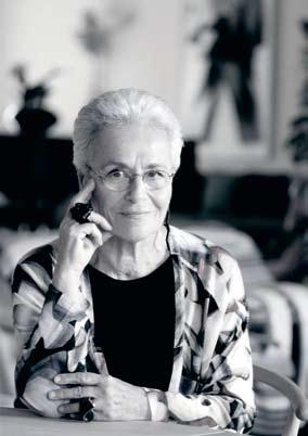
ROSITA MISSONI ON DESIGN TOURING BERLIN

GLENN MURCUTT’S MAGIC THE LATEST KITCHENS
CONTEMPORARY BEACH HOUSES NEW ZEALAND
INSPIRATIONS KEVIN LOW IN DETAIL MALAY
CULTURAL EXCHANGE THAI DESIGNER ON SHOW
ROSITA MISSONI ON DESIGN TOURING BERLIN
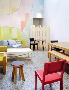
DESIGNERS AT HOME

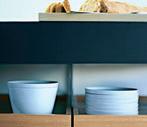
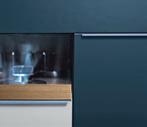
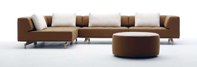
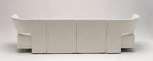
 CONVIVIUM - design Antonio Citterio
“Where the kitchen is the home, it is the home which revolves around the kitchen.”


I DISCOVER AN ARRAY OF THOUGHTFUL AND INNOVATIVE DESIGN OBJECTS FROM THE REGION AND BEYOND. READ ABOUT THE LATEST BOOKS, TAKE A LOOK AT THE SOME NEW BOOKSHELVES AND REVEL IN WINE AND DESIGN.
24
DeSign newS
Our picks from the Decorate Life 2008 fair in Frankfurt, and the best furniture, objects, lighting and technology from around the globe.
32
re-Shoot
An old pastime is given a facelift –grab a book (or magazine), sit down and relax. habitus reviews an everyday object transformed by design. This issue we look at bookshelves.
35
conVerSation
There’s a certain breed native to many cities that has been spotted more recently in Sydney – the elusive wine bar. Associate Editor, Andrea Millar, visits Millevini in Surry Hills, to learn about the wine and design within the space.
39 montage
Paul McGillick takes a look at the idea of ‘layered experience’ found in four recent architectural books.
2.
PEOPLE &
I MEET A COLLECTION OF DESIGN ADVENTURERS WHO HAIL FROM SOUTH-EAST ASIA AND AUSTRALASIA, AND SEE HOW THEIR ENVIRONMENTS REFLECT THEIR LIFE AND WORK.
46 PartnerShiP
Stephen Crafti visits the studio of Pierre and Charlotte Julien, who have developed asuccessful business while also sustaining their shared passion for design.
65 creation
Furniture and lighting designer Kenneth Cobonpue studied in New York and Germany before returning to his homeland, the Philippines, to design. Stephen Crafti talks to him about his journey.

81
cLoSe UP
Chu Lik Ren visits Kevin Low’s body of architectural projects that explore the idea of ‘garden houses’.
68 Portrait
Andrea Millar visits Inge Holst of EDIT, whose creative path has taken her through many roles, and provided a sense of stability in somewhat tumultuous times.
89
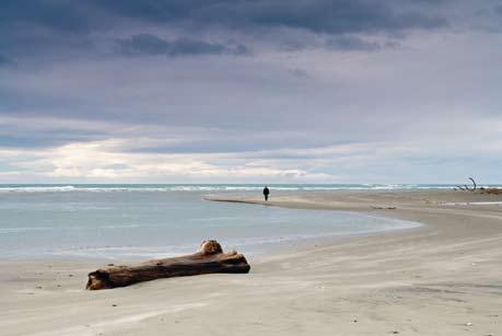
52 on Location
Andrea Stevens takes a trip to Hawke’s Bay, New Zealand, and discovers that various places, people and cultures have been amongst the inspirations for David Trubridge’s timber creations.
72
SLow DiSSoLVe
Rimbun Dahan, a creative sanctuary in Malaysia, fosters cultural exchange between South-East Asia and Australasia. Paul McGillick visited and was taken in by the literal and metaphorical beauty.
3. HABITUS HOMES
I A DIVERSE SELECTION OF THE BEST IN RESIDENTIAL DESIGN FROM AUSTRALASIA AND SOUTH-EAST ASIA.
cLoSe UP
Tonkao Panin explores Boonlert Hemvijitraphan’s architecture, which expresses both a Thai climate and a particularly Thai way of living, encompassing traditional values in a contemporary context.
61 inSPireD
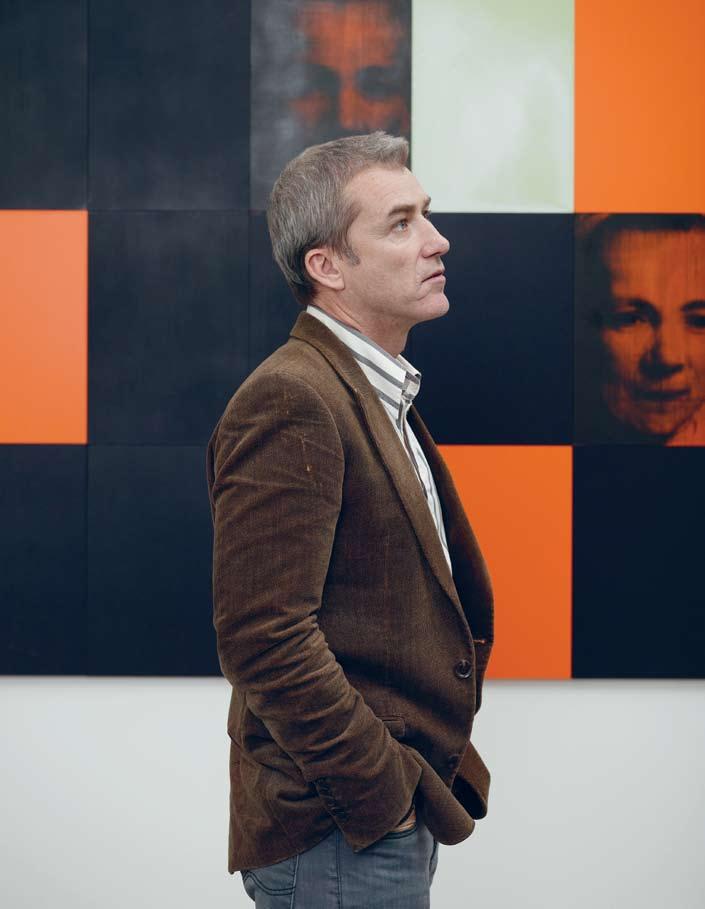
Andrew Parr, Director of SJB Interiors in Melbourne, has had a long career. But something that has always inspired him are the colours and textures of Missoni. Stephen Crafti talks to him about how this translates into his projects.
99
Scenario: naSSim roaD Darlene Smyth explores this project for a family designed by Ernesto Bedmar, which encompasses more than one residence.
115
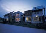
Scenario: ten hoUSing CASE, a group of Bangkok architects, has designed and lives in a project that explores the nexus between community and individual living. Tonkao Panin investigates.
124
Scenario: Batten hoUSe
Penelope Barker visits a house in NSW and finds a contemporary example of Bruce Rickard’s Sydney School style of architecture.
155
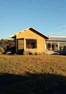
Scenario: Lorne
A holiday home in Lorne, Victoria, designed by architect, Simon Swaney, is much more than the beach houses from childood memories, Stephen Crafti discovers.
183
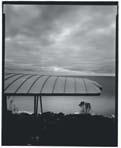
home moVie: qUentin DemPSter
Perched on the Tasmanian coast is the home of television reporter Quentin Dempster, by artist and architect Richard Goodwin.
190
home moVie: DanieL thomaS Andrew Anderson’s house for art critic and museum director, Daniel Thomas is as much a gallery for his art as it is a home.
163
Scenario: BrUce martin
A 1970s home by John Scott, belonging to potters, Bruce and Estelle Martin, has stood the test of time. Andrea Stevens reports.
134
Scenario: eLLwooD
Jenna Reed Burns visits a house in Victoria, refurbished by interior designer Leigh Ellwood, fellow designer Donald Holt and landscape and furniture maker, Greg Hatton.
145
Scenario: LanDScaPe
Chu Lik Ren finds a house by K2LD Architects in Singapore that expresses a characteristic Singaporean respect for its environment.
174
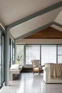
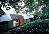
croSS FaDe: white hoUSe: A 1982 Glenn Murcutt-designed home south of Sydney has had a recent change in ocupants, and a subsequent addition, also by Murcutt. Paul McGillick explores the development of the structure.
200
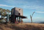
JUmP cUt: roBert Brown Same theme, different solutions… Philip Drew compares and contrasts two very different projects by Robert Brown – one in the Sydney suburb of Bellevue Hill, and the other, a hut in the iconic outback of Mudgee, NSW.
TAKE A VOYAGE TO SPACES THAT INSPIRE AND A CITY REBORN THROUGH ITS SPACES. LOOK TO KITCHEN TRENDS OF THE FUTURE SEEN AT MILAN’S EUROCUCINA EXHIBITION.
218
SPaceS we LoVe A collection of diverse and beautiful spaces from the Region.
226
in camera: KitchenS Giovanna Dunmall takes us through Eurocucina and what we can look forward to in kitchen design.
236
SnaPShot: BerLin Mona Nümann discovers the re-use of old spaces is revitalising Berlin’s architectural landscape and culture.

the fascination of a new idea of form. An
alliance proving that good design can never be anonymous.

Like any magazine, Habitus is a work in progress and we look forward to constantly refining it.
But, of course, there is a highly developed idea behind Habitus and this will always be the foundation on which the magazine is built. Basically, Habitus is a magazine about how the design decisions people make are an expression of who they are. Whether it is the homes they build, the gardens and landscapes around those homes, the furnishings inside or even the clothes they wear – all of these things tell us a lot about these people as individuals, as families, as cultures and how they respond to contextual issues of place such as climate, landscape and cultural heritage.
In this issue, for example, I look at some books which deal with the layering of time and history. This will always be an issue lurking in the background of the Habitus stories, because even something which is apparently all about now – fashion, recent design and so on – actually comes from somewhere. Take David Trubridge, for example. He is one of the most outstanding designers in the Region with a substantial worldwide reputation, but all that he produces resonates with his own remarkable story and with the astonishingly beautiful part of New Zealand where he lives and works.
But if we take just a random sample of the architects whose work is represented in this second issue of Habitus – Ernesto Bedmar (an Argentinian living in Singapore), Kevin Low (a Malaysian-Chinese based in Kuala Lumpur), Glenn Murcutt (based in Sydney, but often designing for a rural Australian context) or Boonlert Hemvijitraphan (from Thailand’s vibrant capital) – each of them has a fascinating story which in turn responds to the stories of their clients and the context in which they are living and working.
Crucially, Habitus is about cultural engagement – about architects and designers from Australia, New Zealand and South-East Asia enriching one another in an on-going dialogue. The differences and commonalities all add up to a matrix of ideas which can lead to better outcomes for the environment we live in. Perhaps nothing sums up this part of the Habitus agenda more than our story on Rimbun Dahan in Kuala Lumpur, a remarkable story of exchange, sharing and cross-cultural inspiration and support. The kind of cross-cultural encounters which Rimbun Dahan engenders are the kind from which we can all benefit. In fact, we are already benefitting. It is often just a case of realising what is going on and then building on that in a conscious way.
Paul McGillick, Editor
I Habitus #01 has finally launched and, as the feedback comes in, the fine-tuning begins.
I “Habitus is a magazine about how the design decisions people make are an expression of who they are.”
AndreA StevenS
Writer
Last issue Andrea wrote about an inspirational treehouse by Joseph Lim in Singapore for Spaces We Love. This issue her stories were a bit closer to home: Andrea visited Bruce Martin’s 1970s house in Hawke’s Bay (page 163), and bought one of his beautiful wood-fired pots. Not far from there, she also spoke to David Trubridge (page 52), who is making his fine timber furniture in an old brick warehouse.
nicky ryAn
Photographer
Nicky first picked up a camera in high school, when her love affair with photography began – a recent fling taking place while shooting the Millevini wine bar on page 35. She has travelled the world through her photography and is currently based in Sydney’s Bondi Junction. Her favourite design object is a lead crystal lamp with a white shade which takes pride of place in her lounge room.
Prue ruScoe
Photographer
Prue is renowned for her fashion and beauty photography as well as her inspiring interior and lifestyle images – you can see her take on Inge Holst on page 68. Prue has been in the industry for 15 years, working her way up from an assistant, to contributing to various publications, including books. It’s fortunate she resides in Sydney’s Bondi Beach, with partner George and two children Luca and Eva, as her favourite pastime is spending time at the beach with her family.
StePhen crAfti
Writer
Stephen wrote three articles for Issue #2 of Habitus – Partnership on page 46, Inspired on page 61 and Creation on page 65. He also wrote the Lorne House feature on page 155 in the Scenario section. Stephen believes “...it’s important to broaden the discussion on design, whether the subject is architecture, interiors, furniture or fashion. Finding out what a graphic designer thinks about an artist is as interesting as how a person lives.”
GiovAnnA dunmAll
Writer
Giovanna, a freelance journalist living in London, travelled to Milan to research her In Camera story, on page 226. Giovanna hopes to launch an eco-website in 2009, and loves her pool rocker chair at home, made by young London-based designer Giles Miller. She asked him to make it for her after interviewing him and says – “It is so strong and durable. It is beautiful too as it is full of patterns and shapes. Anyone who thinks cardboard is for hippies is wrong!”
chu lik ren
Writer
Lik Ren worked on two projects for this issue of Habitus – the profile on Kevin Low on page 81 and the Landscape House on page 145. He says “It’s evident the best residential designs in Singapore and Malaysia are reaching their own high levels of maturity and sophistication. There’s the earthy Malaysian house and the pristine Singapore model. They are obviously each other’s counterpoint.”
trevor mein Photographer
Trevor Mein shot the Lorne House Scenario story on page 155, though his work first came to prominence in the late 1980s. Trevor trained in fashion design and graduated with a bachelor degree in architecture. He shoots for major designers, corporations and journals and is extensively published. His philosophy is to imbue images with atmosphere, to embrace the designer’s intentions with the subsequent layering of habitation and environment.
JennA reed BurnS
Writer
Melbourne-based Jenna is a writer and journalist with an interest in design and architecture. Jenna wrote about a house in her own suburb in the Scenario story on page 134. Jenna loves the “simple shape and deep rich colour” of her cobalt blue Holmegaard Gul vase, designed by Otto Brauer in 1962 and picked up from a garage sale in Sydney around 20 years ago.
Anthony Browell
Photographer
Anthony photographed three projects this issue for the Home Movie stories on pages 183 and 190, and the Cross Fade story on page 174. As with the Langston-Jones house in Issue #1 of Habitus, Anthony used a large pinhole camera to interpret Quentin Dempster’s house (page 183), capturing the extroverted, elegant assemblage of shapes. Anthony also personalised the project by adding a visual commentary of the team who conceived and crafted it – owner, architect, builder and critic.
Simon devitt Photographer
Simon worked on two photo shoots in this issue representing a rich vein of New Zealand design. First up was a Hawke’s Bay mid-century delight in Bruce Martin’s 1970s house on page 163, and a more modern touch nearby at the home and studio of David Trubridge on page 52, with his fine timber furniture and the landscape that inspires him.
tonkAo PAnin
Writer
Tonkao comments “As someone whose main job is teaching architecture, especially its history and theory, it is refreshing to contribute some points of views towards built projects such as TEN Bangkok (page 115), as well as Boonlert Hemvijitraphan’s design (page 72). Theoretical reflections, either critical or informative, only become ‘real’ once buildings are built, dwelled in and transformed. It is a point where the dialogue between theory and practice is possible.”
SPAceShift Studio
Photographers
Pirak Anurakyawachon of Spaceshift Studio shot two stories. He, along with partner Arunyarat P, explains “We present selected houses by Boonlert (page 72) – we really love his super delicate and so accurate signature of his works. Also, please enjoy the utopian TEN housing project (page 115) which we have learnt a lot from on how to share living space.”
lizette Bell
Photographer
Lizette photographed the Inspired story on page 61, the Partnership story on page 46, and the Ellwood House feature on page 134 of this issue. She lives in a sun-drenched Melbourne apartment a short walk from the beach. Her favourite design object is her Greg Hatton sugar gum log stool – she has an obsession with weathered, raw and recycled timber.
hAnS SchluPP
Photographer
Hans graduated from the oldest school of photography, the Lette-Verein in Berlin. He has worked as a freelancer in many parts of the globe and currently lives between Sydney, Hong Kong and Beijing. He also has a strong presence in Singapore, where he shot some of the images for the Kevin Low profile on page 81. Hans loves his old Eames lounge and says “...it’s the only seat I really relax in.”
fionA lim
Photographer Fiona Lim of FIFOTO
Photography shot the story of Rimbun Dahan on page 89. Her company is based in the heart of Kuala Lumpur, known for its colourful diversity both in food and the people who make it their home. Fiona loves the retro fibreglass Pastil chair by Eero Aarnio in her apartment saying, “It is super comfy to laze and spin around in!”
monA nümAnn
Writer / Photographer
Mona grew up in West Germany before emigrating to Australia, where she studied film and communications and began her career in the same area. After nearly three decades in Australia, she has taken up part-time residency in Berlin to rediscover her German cultural heritage, including the art, architecture and design she writes about for the Snapshot story on page 236. She loves her ageing Bang & Olufsen sound system because “... it strikes with its unique utopian design and still ensures ultimate listening quality.”


issuE 01 corrEctions:
On the Issue #1 Contributors page we said that Philip Drew lives with his daughter. In fact, she lives in Coffs Harbour and he in Annandale.
In Issue #1 Design News, page 24, The Strauss Chair was incorrectly attributed to Thonet Australia.
Thonet Australia Pty. Ltd. is the registered proprietor of Trade Mark A488756 being Thonet® in Australia. Thonet Australia gives notice that it will take steps necessary to protect the trade mark in Australia and any other jurisdiction where the trade mark is registered.
The Strauss Chair is available through Format Furniture, formatfurniture.com.au.
In Issue #1 Design News, page 25, the Andoo Lounge Chair is incorrectly attributed to Knoll/ dedece. The Andoo Lounge Chair is manufactured by Walter Knoll, available from Living Edge walterknoll walterknoll.de / livingedge.com.au.
In Issue #1 Director’s Cut, page 166, text is incorrectly attributed to Stephen Crafti. It actually was written by Paul McGillick.
Editorial dirEctor Paul McGillick habitus@indesign.com.au
associatE Editor Andrea Millar andrea@indesign.com.au
assistant Editor Nicky Lobo nicky@indesign.com.au
dEsign and art dirEction Wishart Design wishartdesign.com
Art Director: Karlee Bannon Junior Designer: Jessica Ryan
contributing WritErs Penelope Barker, Chu Lik Ren, Stephen Crafti, Philip Drew, Giovanna Dunmall, Tempe Macgowan, Mona Nümann, Tonkao Panin, Jenna Reed Burns, Darlene Smyth, Andrea Stevens
contributing PhotograPhErs Pirak Anurakyawachon, Lizette Bell, Patrick Bingham-Hall, Grazia Branco, Anthony Browell, Penny Clay, Simon Devitt, Max Dupain, John Gollings, Ian Hobbs, Simon Kenny, Albert Lim, Fiona Lim, Trevor Mein, Michael Nicholson, Mona Nümann, Louis Petruccelli, Prue Ruscoe, Nicky Ryan, Hans Schlupp
PublishEr / Managing dirEctor
Raj Nandan raj@indesign.com.au
oPErations ManagEr
Adele Troeger adele@indesign.com.au
businEss dEvEloPMEnt ManagEr
Richard Burne richard@indesign.com.au
Production dEsignErs
Bronwyn Aalders, Lauren Mickan, Sarah Djemal, Camille Manley, Eunice Ku
Production assistant Kristy Macfie kristy@indesign.com.au
Financial dirEctor Kavita Lala kavita@indesign.com.au
accounts Gabrielle Regan gabrielle@indesign.com.au
Darya Churilina darya@indesign.com.au
onlinE coMMunications ManagEr
Rish Raghu rish@indesign.com.au
onlinE coMMunications assistant Simon Layfield simon@indesign.com.au
EvEnts coordinators
Kylie Turner kylie@indesign.com.au Angela Raven angela@indesign.com.au
advErtising EnquiriEs
Richard Burne richard@indesign.com.au 0423 774 126
covEr iMagE thai architect, boonlert hemvijitraphan
Photography: Pirak anurakyawachon
indEsign Publishing
Level 1, 50 Marshall St
Surry Hills NSW 2010
(61 2) 9368 0150
(61 2) 9368 0289 (fax) indesignlive.com
All rights reserved. No part of this publication may be reproduced, stored in a retrieval system, transmitted in any form or by any other means, electronic, mechanical, photocopying, recording or otherwise. While every effort has been made to ensure the accuracy of the information in this publication, the publishers assume no responsibility for errors or omissions or any consequences of reliance on this publication. The opinions expressed in this publication do not necessarily represent the views of the editor, the publisher or the publication. Contributions are submitted at the sender’s risk, and Indesign Publishing cannot accept any loss or damage. Please retain duplicates of text and images. Habitus magazine is a wholly owned Australian publication, which is designed and published in Australia. Habitus is published quarterly and is available through subscription, at major newsagencies and bookshops throughout Australia, New Zealand, South-East Asia and the United States of America. This issue of Habitus magazine may contain offers or surveys which may require you to provide information about yourself. If you provide such information to us we may use the information to provide you with products or services we have. We may also provide this information to parties who provide the products or services on our behalf (such as fulfilment organisations). We do not sell your information to third parties under any circumstances, however, these parties may retain the information we provide for future activities of their own, including direct marketing. We may retain your information and use it to inform you of other promotions and publications from time to time. If you would like to know what information Indesign Group holds about you please contact Nilesh Nandan (61 2) 9368 0150, (61 2) 9368 0289 (fax), subscriptions@indesign. com.au, indesignlive.com Habitus magazine is published under licence by Indesign Group.
ISSN 1836-0556


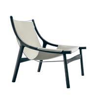

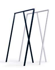
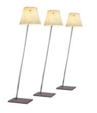
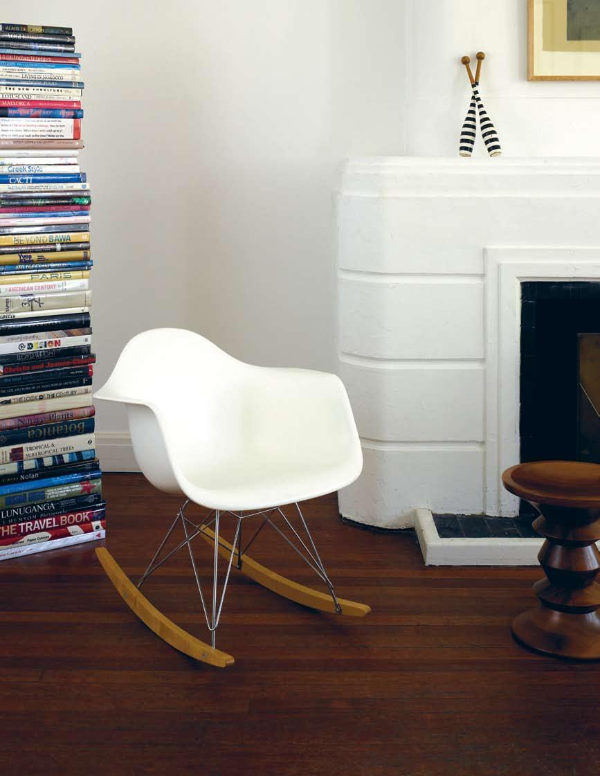
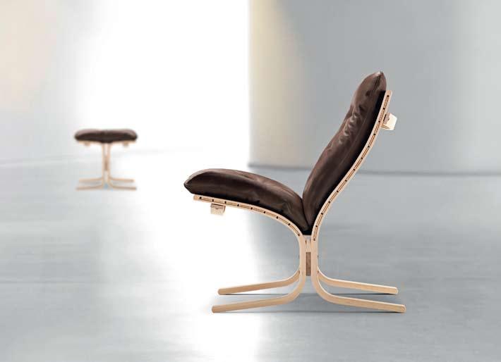
HERON CHAIR Australian designer Charles Wilson reinterprets the organic curves of the Victorian era into this graceful chair, whose profile is the streamlined form of a bird’s body cantilevering into the legs, livingedge.com.au
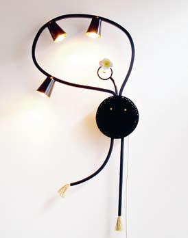
SCREW Ross Didier’s latest coat-hanger oozes masculinity, practicality and contemporary cool. Larger than life, this piece is sure to attract attention. The wall-mounted object is made from solid melamine polymer and cast aluminum, 225mm length x 120mm diameter, rossdidier.com

ZOE Cool, contemporary – bean bag? Designers Lievore, Altherr and Molina bring a whole new meaning to this once casual lounge piece with Zoe. Constructed from five internal chambers filled with glazed beads, Zoe is easily manipulated into various positions. Available upholstered with expressed seams in both fabric or soft leather, this über cool piece is sure to please, stylecraft.com.au
DELPHI A collaboration between Erik Jørgensen and Swiss architect Hannes Wettstein has produced a stylistic, versatile new concept modular sofa. Consisting of 11 different modules, it’s possible for the lounge to be used in an array of configurations to suit the busy lifestyles of modern families, corporateculture.com.au
“The urge for GOOD DESIGN is the same as the urge to go on living.”

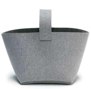
FIREWOOD BASKET Made of 100% pure wool from German experts in felt, Hey-Sign, this basket is the perfect, stylish way to carry your logs to the fireplace, hey-sign.de
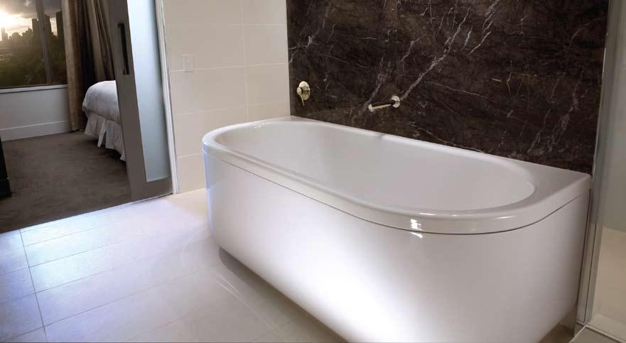
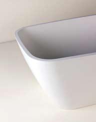
ZURI Both modern and classic, this freestanding bath-tub is manufactured from quartz and resin, in a simple form whose subtle geometric lines are ideal for the contemporary bathroom, rogerseller.com.au
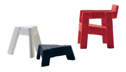
FRACTURE Quirky Dutch designer Ineke Hans has created a lightweight, yet strong series of furniture that looks like it’s wrapped in bandages, cappellini.it / dedece.com.au
I
I 11
LOOP STAND Designed by Leif Jørgensen for HAY, the ultra chic Loop Stand has a three-dimensional, graphic look. Available in black or white powdercoated finish, corporateculture.com.au
HARRY BERTOIA
PALETTE PLATE Little eaters will enjoy mealtimes with this new plate, decoratively shaped like an artist’s palette. The microwave-safe plate comes with three boldly coloured drop-in bowls, allowing early eaters to sample, explore and discover new foods without fuss, skiphop.com

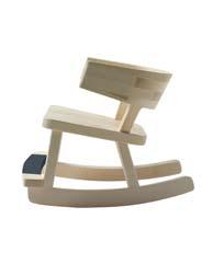
NEO COUNTRY This rocking chair designed for little people is made in solid wood and based on the kind of rural furniture found in traditional Dutch homes, cappellini.it / dedece.com.au
APEHANGER Contemporary Swedish design company Our Children’s Gorilla had function and a healthy dose of humour in mind with these cute ape clothes hangers for kids, ourchildrensgorilla.com

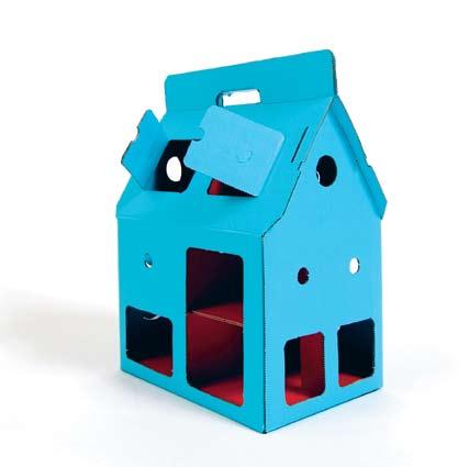
MOBILE HOME Made from colourful eco-friendly cardboard by Amsterdam-based Kidsonroof, this is a house made for knights, pirates and princesses, kidsonroof.com
PIPPOCAMPUS Designed to blend in with adult furniture, this is the rocking horse re-invented, with new materials and contemporary style, disguincio.com / milkfurniture.com
MIAMI With overscaled dimensions, this outdoor light has a shade made of waterproof white resin glass and a frame made of inox stainless steel, gineico.com
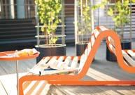
SUNDECK GARDEN LOUNGER This lounger from German company Flora, is just the thing for enjoying the summer sun with a good book, flora-online.de
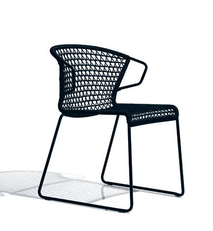
VELA This new range of outdoor chairs hits the mark in terms of covetable design and materials that can withstand outdoor use. Made by Accademia in Italy, they’re made with AISI 316/L stainless steel tubing and weaved PVC rope, accademiaitaly.com / spacefurniture.com.au

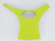
ZOOP The self-titled Poet of Plastic, leading design figure Karim Rashid, does it again with this new watering can for Propper in a variety of wild colours, propper.de / outliving.com.au
RE-TROUVÉ Spanish designer Patricia Urquiola takes us back into the 50s with this entertaining reinterpretation of the delicately handcrafted lace metal designs of the era. The style is characterised by the repeated diamond patterns in the delicate curls and twists of the metal work. Unlike its predecessor Re-Trouvé is not handcrafted, although superior technology used to manufacture these pieces ensures a high-quality product, kezu.com.au
BAR WARE Oozing aesthetics and practicality, Michael Young’s striking Bar Ware range, complete with swizzle sticks, is sure to draw in the crowds. This British-born designer makes a unique comment on what to expect from the modern cocktail set, optique.com.au

IDOLL MOOD BOOK It’s good to see the art of journal writing is still a protected species with thoughtful (and quirky) designs still being produced. Each page has been carefully designed to cover all areas, pups.it

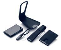
BLACK TITANIUM SERIES This elegant and functional set from Danish design company Menu is discreet and stylish, and includes a mobile phone charger tray, card beeper, luggage tag, keychain and cardbox, menu.as
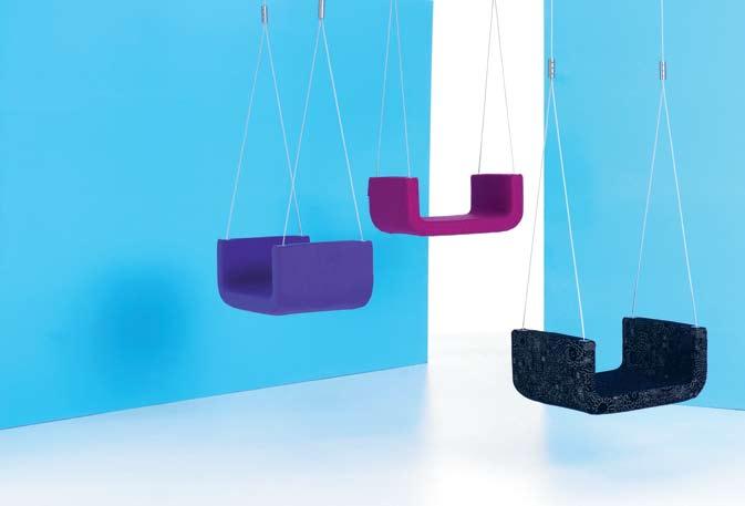
ME&U Hanging about at home? This upholstered indoor swing may be the answer to the contemporary challenge of limited floor space. Designed by Danish duo Busk+Hertzog, it hangs from a cable wire attached to the ceiling, interstudio.com.au

RRP$3500
RRP$21,850
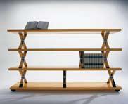
The X-System bookcase from Planex’s Australian design and manufacture program, is a chic choice for the modern home. Incorporating a modular design, the X-System can be adapted from a simple credenza to a full-wall shelving system. Available in 120 colour options.
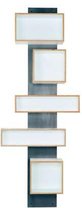
The great charm in Swen Krause’s elegant bookshelf is in its endless possibilities for layout: a metal sheet mounts horizontally or vertically (or diagonally) on the wall, while the storage boxes, with their magnetic backing, attach to the sheet in any position. Mix and match as you please.
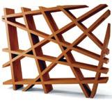
Bookshelf or sculpture? This item has a decisive energy thanks to its multi-directional shelving and crossed lines. The absence of solid backing gives it a light feel, making it an ideal solution to gently divide space. Available in tinted oak, open pores lacquer or matte lacquer finish.
Opus Incertum
Furniture formatfurniture.com
RRP$1810
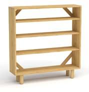
Jasper Morrison’s bookcase is an integral part of his Crate Series: a collection of furniture originally inspired by the simplicity of a found wine crate. Incorporating the trademarks of the series, solid materials and striking usability, this bookcase will be a good fit for contemporary homes.
Sean Yoo Casamania casamania.it Insitu insitufurniture.com.au
RRP$570 white/black; RRP$615 grey; RRP$793 orange
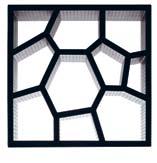
Functioning as both bookshelf and stunning display case, Sean Yoo’s Opus Incertum is compact, sculptural and inspiring. Suitable for outdoor and indoor conditions, Opus is designed to be stacked in multiple formations, and in good news for the environment, Opus is constructed from 100% recycled materials.
right now there’s good reason to buy books


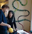
I What can you expect to find when a young, savvy interior designer, a high-end furniture retailer and two Italian restaurateurs come together to open a new wine bar in one of Sydney’s signature design precincts?
What you find are spaces that are meticulously designed – with a few surprises – to be the embodiment of a fine glass of red wine. Food that is creative and delicious wine to match (literally).
Millevini is the work of three partners from other well-known Sydney institutions, Khali Khouri from designer furniture house, Poliform, and Mauro Marcucci and Sabina Boncompagni of Italian trattoria, Pizza e Birra, also in Surry Hills.
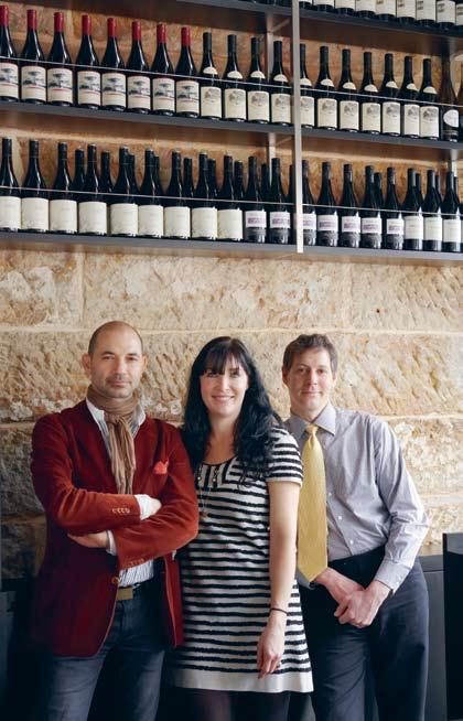
The three partners enlisted the creative talents of interior designer, Cressida Kennedy of Space Control Design for the interiors, who responded to the brief with an intimate, contemporary interpretation of a classic winemaker’s den. “My brief was to create an Italian tapas feel to the place. From this I decided to keep the design quite raw, working with the architecture,” says Kennedy.
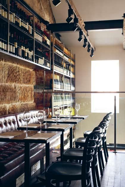
Key features of the new wine bar include raw, exposed rafters on the mezzanine level, a twostorey display of local and imported wine bottles and an exposed fireplace flue on the eastern wall. Considered details such as a custom crafted front door handle in the shape of grapes in metal, and mirrored ceilings in the bathrooms provide pleasant design surprises.
Fine wine consultant Guy Vaillant has introduced a range of local and important fine wines designed to match with the flavours of the dishes served. Head chef, Cristian Di Sandri has created an Italian tapas menu that combines modern classic Italian dishes such as risotto ai funghi porcini e tartufo bianco (risotto with porcini mushrooms and white truffles) with fast and tasty servings that have a distinct tapas inclination, such as spiedini d’anitra con prataioli e prosciutto (mini skewer with duck and champignon wrap on parma prosciutto). If Millevini is an indication, good design, good wine and good food will continue to forge new ground in the harbour city due to the relaxed licencing laws in the state, and its inhabitants don’t mind at all.
A The trick is to create a harmony of balance on the palate. When you taste the wine and you taste the food, none of the compounds should overpower the other. A wine becomes one more dimension of the taste of the food.
Q&A
If you were given an hour with a sommelier what would you ask? Andrea Millar talks to fine wine consultant, Guy Vaillant:
Q How does a sommelier choose wines for a restaurant?
A The wines I choose depend on the style of food served. For instance, in a seafood restaurant a third would be white wines in an aromatic style, wines without too much oak. Another third would be fruit driven reds such as Pinot Noir. The last third would be unusual wines say from up and coming vineyards. These I tend to include by the glass so customers can discover them.
Q What are the basic rules of food and wine matching?
I 02
Fine wines line sandstone walls on the mezzanine level.
Q Can you drink one single wine throughout an entire meal?
A There are notions that you need a different wine for fish or red meat for instance, but the reality is that people tend to stick with what they know or be a certain varietal lover. At a restaurant a sommelier can choose a wine to go with the dishes chosen – a Pinot Grigio works with a seafood entrée and a pasta for main, for example.
Q What is the height of bad taste – what shouldn’t you match?
A There are no general bad matches but if for instance you match a heavy, rich red with seafood the use of oak and tannins will make the wine taste bitter on your palate. Sometimes, if a wine tastes too acidic it could be the food you’re having it with.
Q If you were stranded on a desert island what bottle would you take with you?
A Montrachet, a French Chardonnay because it’s one of the most expensive. Also, a bottle of red like Serafino from McLaren Vale. These wines retain natural acid, they last longer and age well. Lastly, an aged Semillon like Tyrells Vat 1 that has complexity.
Q Are there any foods that are impossible to match with wine?
A Usually curries, but you serve them with white fruity styles to reduce the heat on the palate. The same applies for chilli dishes. However, anything with cheddar cheese, you have to match with beer.
Q What’s your choice of the best three wines to drink?
A A Pinot Noir from Pemberton in Western Australia, a Sangiovese from central Victoria or McLaren Vale and a Chardonnay from Western Australia – they tend to be more fruit driven, richer and have more weight on the palate.
...a custom crafted front door handle in the shape of grapes in metal , and mirrored ceilings in the bathrooms provide pleasant design surprises


Designer: Ingmar Relling
Rybo West Nofa is the Norwegian company which produces the “Siesta” range. Designed in 1964 by Architect Ingmar Relling, known as one of the greatest contributors to Scandanvian design. With its clean structural based design and well considered ergonomics, the Siesta chair has received numerous accolades and is exhibited in design museums and galleries around the world.
Melbourne
237 Napier Street, Fitzroy VIC Australia 3065
Freecall 1800 800 777
Phone 03 9417 0077
Fax 03 9417 0011

Email sales@thonet.com.au
Sydney 21 Boundary Street, Darlinghurst NSW Australia 2010 Phone 02 9332 1600
Fax 02 9332 4073
Email nsw@thonet.com.au
www.thonet.com.au
Adelaide Stylegroup Phone 08 8232 2155
Perth Katsui Phone 08 9385 3005
Newcastle HVD Phone 02 4929 6066
New or old, the most interesting architecture reveals layers of experience. Paul McGillick reviews four books which explore layering in both the public and private spheres.
I recently read J.G. Ballard’s autobiography, Miracles of Life. Ballard grew up in Shanghai and was still a boy when he and his family were interned by the Japanese for the duration of World War II. His childhood experiences were celebrated in his most popular book, his autobiographical novel, Empire of the Sun, subsequently made into a highly successful film directed by Steven Spielberg.
Ballard returned to Shanghai for the first time in 1991 and puts his finger on some intriguing paradoxes. Ballard asserts that the Chinese are uninterested in the past, and the destruction of Beijing would seem to support this. But Shanghai has tended to defy this trend. Substantially, of course, it was a European city, built up by European entrepreneurs who created a heady and hedonistic outpost laid over the top of almost inconceivable vice and poverty.
After 1949, the city was completely sinified and the vestiges of European life were driven out. But as Ballard points out, the old French Concession is “still today one of the largest collections of domestic art deco architecture in the world. The paintwork was shabby, but there were the porthole windows and marina balconies, fluted pilasters borrowed from some car factory in Detroit in the 1930s. Curiously, the TV towers, broadcasting the new to the people of Shanghai, seemed rather old-fashioned and even traditional, as seen everywhere from Toronto and Tokyo to Seattle. At the same time, the dusty and faded art deco suburbs were bracingly new.”
Ballard’s observations are supported by Anne Warr in her fascinating guide Shanghai architecture. It is, she says, “a city of contrast and paradox. Notorious in the 1990s for having the world’s largest agglomeration of construction cranes it is, nevertheless, one of the few cities in the world where a majority of the buildings of the 20s and 30s have not been pulled down.
“Stop for a moment before an apartment building in the former French Concession and look beyond the wires and air-conditioning units clinging to the exterior. Gradually you will see the sleek unencumbered lines of an original Art Deco building and realise that all around you, beneath the electronic cobwebs, are the bones of the old foreign city.” The paradox, of course, is that Shanghai is also home to one of the most phenomenal building sprees of all time – in the business districts of Puxi and Pudong, across the river from the Bund. As Ballard observes, looking down from his room on the seventeenth floor of the Hilton Hotel, “I could see at a glance that there were two Shanghai’s – the skyscraper city newer than yesterday, and at street level the old Shanghai that I had cycled around as a boy.”
Shanghai, of course, pre-existed the European concessions (which dated from the Opium Wars in the early 1840s) and significant layering of that past still exists. As Warr comments: “Over its history, each of the city’s distinct phases left an imprint on the built form. It is all here from the temples and gardens of the walled city to the Tudorbethan villas and faux French châteaux of the foreign settlements. That is not to mention the Art Deco apartment blocks, the Jewish ghetto, the Sino-Soviet Friendship Hall and the burst of Post-Modernism in the 1990s.”
The Bund (the word, Warr tells us, is Hindi for ‘embankment’ and is pronounced as in ‘fund’) is best known for its imposing array of Beaux-Arts and Art Deco buildings from the great days of the European trading companies. But the entire city is a marvel of the preserved past. And while there is a layering in the sense of accretion, there is also another layering in the form of the lilongs (unfortunately these have been more prone to destruction), which were an extraordinary blending of local and imported forms. Initially, the Chinese were forbidden from living in the foreign concessions. However, the Taiping Rebellion (1850–64) precipitated a flood of refugees to the cities and the proscription broke down. The trading companies soon found they could earn more from real estate than opium. They developed entire city blocks into a unique form of mass housing: a perimeter of shop houses enclosing a network of lanes with row housing. To make the tenements more attractive to the Chinese, small courtyards were inserted, “accessed through pairs of black timber doors framed by stone portals – called shikumen.”
01, 02 Shanghai
Anne Warr
Published and distributed by Watermark Press 340pp softcover AUD$49.95 watermarkpress.com.au
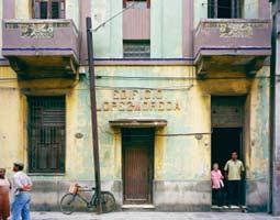
03, 04, 05 FaçadE
Tom Evangelidis
Published and distributed by Jules Laverne 220pp hardcover AUD$110 juleslaverne.com
06, 07 t hE nE w Ma L ayS ian houSE
Robert Powell
Published by Periplus Editions 224pp hardcover US$34.96 peripluseditions.com
08 roM ancing thE t ropic S:

BE dM ar & Shi
Oscar Riera Ojeda (editor)
Published by Oro Editions 240pp hardcover AUD$112.50 oroeditions.com
“More than any other building form in Shanghai,” says Warr, “the lilong encapsulates the unique intertwining of Chinese and Western society. Today, the inner life of Shanghai cannot be fully understood without venturing through one of the lilong gates into the parallel world of serenity and order.”

Today, the Xintiandi precinct is best known as a restored lilong, incorporating restaurants, bars and boutiques – and including preserved shikumen houses. Since 1994, the Shanghai Government has actively sought to preserve the city’s heritage alongside the gobsmacking rates of development. At the same time, many fine pre-War buildings are being restored and adapted for new uses.
All of this is magnificently recorded in Warr’s book. This guide is the first thing you need to pack when you next travel to Shanghai. But it is far more than a guide, because Warr is a pioneer in researching Shanghai’s built heritage and the book represents a crucial body of research.
Of course, this remarkable heritage in Shanghai really comes down to us by default, cocooned as it was by more than 50 years of communism. The absence of capitalist development preserved the buildings, even though they were allowed to deteriorate (the Cultural Revolution was one period where a certain amount of destruction did take place). The same is true throughout the former (indeed, current) communist world.
Prague is probably the finest example. The communists built their hideous panelaks (cheap, high-rise apartment towers) out in the suburbs, but the city remained untouched, much of it gradually crumbling. By the time the communists were thrown out, there was no question that any of this heritage would be allowed to be developed. In fact, any form of development faces a real obstacle race – witness Frank Gehry and Vlad Milunic’s ‘Ginger and Fred’ House on the river, built on the site of the only bomb to fall on Prague during the War.
Tom Evangelidis lived in Prague for a time and first came to prominence with his exquisite photo archive of the city. This revealed the layers of history which characterise the city (it is not, as Milunic once explained to me, a coherent city architecturally, but derives its unity through a common scale and the topographical definition of the river and the hills on either side).
Now Evangelidis has produced a handsome collection of recent photographs in a large format book called Façade. The collection includes shots from Prague, but also St Petersburg, Moscow, Hanoi, Havana, Sofia, Bucharest and Istanbul. The book has no text (apart from a brief introduction by Barbara Messer) and one needs to go to the back to finally identify each image. Evangelidis wants to privilege the images. Again, we see a default heritage from communist times, as well as some extraordinary images of communist architecture. We see the layering of time. But we also see a strange entropic process as many of these buildings gradually deteriorate (as in Vietnam and Cuba), seeming to shed their layers until, presumably, there will be nothing more to shed.
As the title implies, Evangelidis prefers the façades of buildings, usually shooting them straight on. What he sets out to do is to allow the story of the building to emerge through the palette and texture of its façade. Some of the buildings are quite paradoxical, while all of them hint at histories which we will never really know.
On the other hand, these images can be read as portraits and the entropy of the buildings seen as a metaphor for ageing. The vanity and ego of the spurious idealism of communism is exposed and, like Dorian Gray, the corruption within becomes gradually manifest.
Layering – the resonance of the past through contemporary forms – is also the major presence in Robert Powell’s latest book, the new Malaysian house. Along with Singapore-based architect, author and publisher, William Lim, Powell has been the most important researcher
and advocate of the new wave of South-East Asian architecture, especially domestic, since it first emerged in the early 1990s.

Post-colonial debate about culturally and climatically appropriate housing forms in South-East Asia initially triggered a wave of vernacular revival. This saw a revived interest in traditional building forms, local materials and passive climate control strategies. But a new generation of architects and clients in the early 1990s saw a flowering of highly sophisticated and invariably quite beautiful housing. Singapore led the way, but Thailand and Malaysia are now also fascinating for the imagination of their new housing solutions.
Those solutions are highly varied, as can be seen in Powell’s new book. All the residences are in Malaysia, although some of the architects are actually based in Singapore. Powell provides an all-too-brief introduction (for fuller discussions on the development of the new SouthEast Asian house and the role of the seminal, Geoffrey Bawa, one needs to go back to Powell’s earlier books) and then looks at the houses in categories: detached houses, extended family houses, houses in gated settlements, refurbished houses, second homes and retreats.
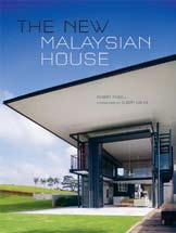
What is revealed – thanks in great part to Albert Lim’s sublime photography – is an extraordinary diversity. Above all, it reveals a hugely imaginative response to the challenge of reconciling universal modernism with the particularities of place, culture and climate. Each building is given ample pages, generous photographs, plans and a detailed discussion from Powell. What Lim is able to bring out is the sheer beauty of these buildings, superb detailing and sensitivity to materials and landscape.
Robert Powell has also supplied the foreword to a new monograph on Singapore-based Ernesto Bedmar in Romancing the Tropics: Bedmar & Shi. Bedmar hails from Argentina, but has lived in Singapore for more than 20 years. The sheer beauty, serenity, intelligence and pure good taste mark him out in a category all of his own. Powell comments that he “has always seemed to me an exotic transplant from one culture to another, with an acute appreciation of the nuance of climate and culture.”
For Geoffrey London, who has written the essay for the book, climate is central to the way Bedmar has inflected universal modernism. But London adds that he has always been “drawn consistently to the idea of the vernacular” and in “the way weather expresses itself in the architecture and the use of materials like stone, timber and water, a part of Asian culture and not a part of his own Argentinian tradition.” Likewise, says London, he is drawn to the “privateness and quietness” of Asian cultures, “the oppositie of his own Latin cultural beginnings”.
In a statement of his own, Bedmar attributes his love of material texture to his rural origins, along with the dialogue between exterior expanse and “the intimacy of the habitat, house and shed”. Here he acknowledges the seminal influences of Barragán and Geoffrey Bawa, commenting that “I am able to perceive visual poetry – a language of sort, in which textures, shadows and forms coalesce with simple elegance, which captures my senses and leads me on an enjoyable journey with discoveries at every junction.”
This brief, lyrical essay by Bedmar himself is complemented by an insightful interview with Erwin Viray from the National University of Singapore. Fittingly, this small-scale book is as exquisite as the work of this most exquisite of all architects –beautifully laid out, excellent photography, an illustrated timeline and luscious colour drawings.
In Ernesto Bedmar we have another species of layering, both in the origins of the work, but in the houses themselves which offer not so much layers, as veils of experience which part gently in the breeze to engender an invariably sublime experience. As the landscape architect from Kuala Lumpur, Ng Sek San, remarked to me when we visited the Subang Jaya house outside KL together: “He is the Master.”

Melbourne Showroom
285 -287 Swan St. Richmond +613 9421 1191
www.morticeandtenon.com
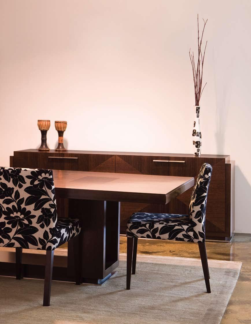
HiRise Dining Table, Buffet & Heron Chair designed by Tony Stuart Manufactured in Australia by Mortice & Tenon
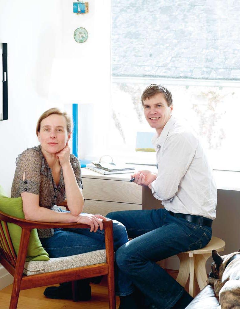
After 22 years of marriage, it’s understandable when partners finish off each other’s sentences. For Charlotte and Pierre Julien, the words are sometimes out before the sentence even emerges. “It’s something that happens when you’ve been together for so long. Working together also makes you that much closer,” says Charlotte, who has been designing furniture and lighting with Pierre since the early 1990s.
Many of the Juliens’ designs appear in their apartment in Melbourne’s St Kilda East. Some of the pieces, such as a desk in the living area, are built in. Other pieces, such as their Cardinal sideboard (also in the living area), are used to display an eclectic assortment of objects and artefacts. A precious Victorian candelabrum, once Charlotte’s grandmother’s, is placed next to a china cat, a feline symbol of good fortune. “We eventually find a place for most things,” says Charlotte.
While the couple’s home includes several of their chairs, lights and tables, they have now produced too many designs to include everything
at home. The Juliens’ North Melbourne studio, however, provides the required space and also doubles as a showroom.
While some designs displayed in North Melbourne are recent, others were designed at the start of their careers. The Cardinal sideboard, for example, was designed in 1992 and still remains one of their most popular styles. This typifies their approach says Charlotte. “We’re not interested in creating faddish pieces. Things should have a sense of longevity, rather than being the fashion of the moment.”
Ironically, however, it was fashion that brought the Juliens together. Charlotte modelled in the early eighties for designers such as Romeo Gigli and Thierry Mugler, and Pierre modelled for Jean Paul Gaultier. While Charlotte loved the buzz of the runway shows, Pierre was keen to get out of the industry. “Pierre hated modelling. He’s quiet and reserved. In modelling, you need to be an extrovert,” she says.
Charlotte kept modelling until her late 20s
while Pierre switched to restoring ornate French furniture in Paris. Although not formally trained, Pierre made the transition to furniture effortlessly. “I’ve always loved working with my hands. And it was a pleasure restoring exquisitely made furniture, whether from the seventeenth or the nineteenth century,” says Pierre.
Post-modelling, but also still based in Paris, Charlotte began painting film sets. “I’d assist the master set painters, mixing their colours,” says Charlotte, recalling the vast amount of paint required to complete entire street scenes.
Both Pierre and Charlotte put their new careers on hold when they migrated to Australia (where Charlotte was raised) in 1992. “I’d been modelling in Europe since I was 16. I was keen to come home and start a family,” says Charlotte, who now has a 15-year-old daughter, Billie. “I fell pregnant as soon as I stepped off the plane,” she adds. The early nineties coincided with one of Australia’s worse recessions. “We knew the first few years would be difficult financially,” says
I After 15 years designing furniture and lighting, the Juliens compare their work to solving a jigsaw puzzle. Each design fills in the picture, adding meaning to the Pierre and Charlotte collection. Stephen Crafti caught up with them at home in Melbourne.
Charlotte, who was keen to work with Pierre in a creative industry. “But we were also mindful of making a living, something that would allow us to support ourselves.”
That something was furniture and lighting. With Pierre’s sharp technical skills and Charlotte’s highly trained eye, they found a small niche in the market for well made, highly crafted design. At the couple’s dining table sits the first chair Pierre made in Australia. A reproduction of a Swedish chair owned by Pierre’s great grandfather, it is made from Sycamore and features a finely carved backrest.
Other designs, such as the classic Cardinal sideboard, exhibit a strong Japanese influence. Made from stained American Oak, the sideboard reflects the couple’s aesthetic for minimal and highly considered design. “I lived in Japan for four years. It’s something that still resonates with me,” says Charlotte, who finds inspiration from reading books on Japan. Inspiration sometimes comes from unexpected holiday finds too. Recently in Tasmania (where Charlotte was raised), the couple discovered, half buried in the sand, a 19 th century ‘snuffer’, used to extinguish candle flames. “Both of us were instantly drawn to its shape, like a bell,” says Pierre, who sees the form of the snuffer as a possible wall light.
It’s not just form that attracts Pierre and Charlotte, but also the way natural light reacts with a surface, whether it is stained American Oak, polyethylene or steel. Natural light was fundamental in organising the spaces within their apartment. Initially, there was a corridor running through the centre, opening to three small bedrooms. However, requiring a large living area and one less bedroom, walls needed to be knocked out. “Charlotte and I removed the bricks ourselves. It was definitely a hands-on exercise,” says Pierre, who also remodeled the kitchen and bathroom. Now the apartment enjoys full light during the entire day, with the kitchen receiving morning sun and the living areas, northern sunlight.
I 02
The couple’s French bulldogs, Ferdinand and Nancy take full advantage of a large daybed made of American Oak with a leather seat. A photo of Ferdinand is proudly displayed on the living room wall, in a steel frame designed by the Juliens. While Nancy is not featured on the wall, she appears in one of the Julien’s magazine advertisements. The greatly over-scaled Nancy dominates a small figure of Pierre, picking up ‘stools’ of the furniture variety. “There should be an element of humour in design. That sense of irreverence is a particularly Australian characteristic,” says Pierre.
Since living in Australia, Pierre has developed a love of Australian Rules football. A St Kilda fan, he fondly recalls watching the game on television for the first time. “At first, it looks like complete chaos. But when you understand the rules, there’s a level of skill and finesse,” he says. “It’s like furniture. Those who understand furniture appreciate the level of detail involved.”
The same level of detail can be appreciated in the renovation of their apartment. While not large, it has been thoughtfully considered. The kitchen for example, features Oregon cupboards, with ribbon-like handles for the doors. “We use the same handles on some of our credenzas,” says Pierre. As distinctive, Bucket wall lamps are also in the kitchen. “They were designed as up or down lights,” says Pierre, who placed the bucket on a vibrant orange base. Other lights in the Julien’s apartment have greater subtlety. Wall lights in the living areas are made of hydro-stone, creating elegant as well as functional wall sculptures.
Ideas, like the furniture they bring from studio to home, go back and forth. “We need to fully agree on a design before it goes into production,” says Charlotte. And while there may be
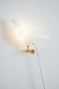
“We’re NOT interested in creating faddish pieces. THINGS should have a SENSE OF LONGEVITY, rather than being the fashion of the MOMENT.”I 01 Previous Charlotte and Pierre with French bulldog, Ferdinand. I 02 Pigeon Light by American artist, Ed Carpenter. I 03 Red Toto stool
a stalemate for a short period, things get resolved fairly quickly. “We rarely leave things to discuss later,” says Charlotte. For designs to move forward they must be practical and there must be a need for them in the first instance. “We’re not interested in designing things just for the sake of design,” says Charlotte, who compares each design to pieces in a puzzle. “Each chair, table or light is another piece in that puzzle. We see our work as a progression. The image in the puzzle becomes clearer with each new shape that’s placed on the board,” she adds.
Sometimes, a design isn’t an instant success. It can be a few years before a certain design really takes off in the marketplace. “People like a sense of familiarity. They often need to be reassured of their decisions,” says Pierre, who likes to push boundaries where appropriate. “After 15 years, we’re more assured of what works and what will take some time before it’s accepted,” says Charlotte. “We tend to work in a fairly intuitive way. We generally steer away from things that are too hard edged,” she adds.
After 15 years in the furniture business, the Julien’s fashion careers are truly over. Charlotte and Pierre are far more comfortable in jeans and loose fitting jumpers than wearing clothes from the fashion runways. “We buy less clothing, but we still prefer quality clothes, whether it’s a woollen jumper or well made shoes. Clothes should be as comfortable as sitting in one of our chairs,” says Pierre.
Pierre & Charlotte, pierreandcharlotte.comI 07
08
“There should be an ELEMENT OF HUMOUR in design. That SENSE OF irreverence is a particularly AUSTRALIAN characteristic.”
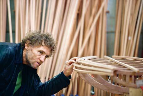
I met David Trubridge at Cicada Works, his workshop and studio in Whakatu. Within a collection of red brick industrial buildings, the most beautiful objects are being crafted. A team of local and international furniture makers are steaming and bending timber, riveting and oiling, to create the light, graceful forms that are the hallmark of David’s work.
Abstractions of natural form and pattern are expressed using skeletal and skin-like structures to make light shades, recliners, seats and bowls. They embody a sense of place, as objects of the South Pacific, yet they also allude to other cultures and times. Some pieces have a timeless Japanese quality, some remind me of patterning from the 1970s or the elegance of Danish design.
David has been making furniture across four decades with a personal design evolution tied to his values and travels. What he sees and believes, finds an expression in his art form. His work has grown out of a vision to create the lightest of structures. In his words, “Simple and low impact, made of natural materials and processes, leaving a delicate footprint.” It is a unique body of work, establishing him as one of the world’s top eco designers.
When his children were two and four years old, he and his wife Linda sold their house in Northern England and bought Hornpipe – an ocean-going yacht. They set off on a voyage that lasted 10 years. Much of that time was spent in the Pacific Islands and New Zealand’s Bay of Islands. During those years, Trubridge made bespoke furniture when they needed money. He started using local materials and experimenting with traditional techniques. Instead of post and rail construction, he began lashing wood together in tension structures. Boats, fish traps, a clump of tied reeds became generators of form.
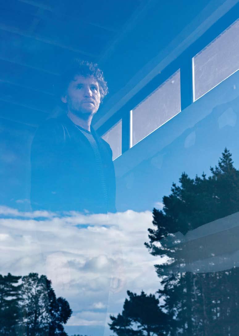
I David Trubridge’s iconic furniture and lighting have been exhibited in the Pompidou Centre in Paris, ICFF in New York and the Salone del Mobile in Milan. Andrea Stevens caught up with him in his studio in Hawke’s Bay, New Zealand, where he talks about his favourite sources of inspiration for the fine sculptural objects he produces.

In 2001 he took his Body Raft to the Milan Furniture Fair. The piece is made of curving timber slats screwed to internal frames, referencing traditional boat building. It caught the eye of Italian furniture manufacturer Cappellini, who now manufactures it under license. Linda describes the reaction to Body Raft: “They liked it because it evoked the exotic. It had a sophistication of design, but it also had a feeling of nature in it. People live in cities and want stylish things and yet they want something more that has a heart and soul.” Since then, his career has been propelled from a craftsman/maker to a designer with an international reputation.
The demand for his work causes major reflection for David – “Who needs another design object? The only justification for me is not the object itself but its message. If it acts in some way as an agent for change, if maybe it causes a few thoughts and reflections, then it has a value.” He gets plenty of opportunity to talk about sustainable design. He teaches at the Vitra Design Museum summer design classes in France. Already this spring he has spoken at a design week in Brussels, as part of 100% Design in London with Essenze (his export partner) and at a symposium in San Francisco. He will return to Milan again next year with new work.
He believes the importance, or the role, of ‘design’, is in (re)designing processes not objects – finding better ways of doing things. At the Vitra summer school, he has been running a workshop on sustainable design. He questions why we need to design yet another table when there are already so many. Instead, he leads a workshop on re-designing the ritual of eating. “Hopefully, in thinking about the ritual, you’ve improved on the way in which we go about things, so we don’t need as many objects. And the objects you’ve identified a need for, there’s now a reason to design them. This is how to design in ways to actually ensure survival rather than cause our destruction.”
I 02
At Home David designed his retreat, set in the striking New Zealand landscape.
I 03
In the Studio David’s maquettes on display in his studio –each representing his craft-like aesthetic.
I 04
Mahia Peninsula Looking south along the coast towards Napier.
I “Every creative person needs some sort of studio where you have your own bits and pieces that inform and are important to you – the ‘way points’ along your course.”
DAVID
Fashion for David is, of course, a four-letter word. He makes his furniture to last and aims to give it an emotional content that will make people want to keep it.
He finds his creative energy in the open spaces of the coast and mountains. This is largely why he and Linda moved to the South Pacific. They live on the Heretaunga Plains, in Hawke’s Bay on the eastern coast of the North Island. The Pacific Ocean lies to the east and the Kaweka Range to the west. There has always been a strong artistic community in the region, centred in and around the Art Deco city of Napier. The closest major city is Wellington, a four-hour drive away.

His view on creativity is layered, “I really believe in a process that transcends traditional boundaries of art, craft and design. People try to categorise things. Are you an artist? Is that design? You’ve got to be everything. I think it’s crucial that you work as an artist first to find your place, to know what you are saying and how you say it. As a designer, how do I use those forms, that vocabulary, for making something? And as I am designing, I need to know how to make it.”
When Body Raft was first received with great acclaim in Europe, someone commented, “This is the way it is going, this is the future.” His reply was “If you say so. I’m just doing what I do. I’m just doing my own work.” I look forward to the next leg of his journey.
My family, Linda and our kids, are the most important. Even though the boys are away doing their thing, this is still their home base. Home is important and part of that is the whole home studio. Every creative person needs some sort of studio where you have your own bits and pieces that inform and are important to you – the ‘way points’ along your course. It is space in which I can develop ideas.
I deliberately said ‘develop’ ideas above because to me part of that creative process can’t happen in my studio. I actually need also to go
I “It is the place where there’s much more empty space to allow things to slowly filter to the surface. You see things more clearly and you can have ideas from there.”
DAVID
further away and have more space and more freedom and let that surface clutter of life float away. Our retreat at Mahanga is really important in that sense. It is the place where there’s much more empty space to allow things to slowly filter to the surface. You see things more clearly and you can have ideas from there.
And, if you take that path to its ultimate, it’s Antarctica. Even Mahanga doesn’t have the emptiness of Antarctica. To me, that has been the most amazing place I have been to, the most inspiring, the most awesome in the true sense of the word. In that emptiness I saw things about my creative process that I wasn’t able to see anywhere else, and to reassert that connection with the landscape is always important for me. The wilder, the emptier the place, the more I find that connection, the more energy I get from that.
My model canoe is from Vanuatu. It’s a very simple thing, a beautiful object in its own right. I love the visual tension between the grid of those outrigger frames, the platform and the loose curve of the hull, of the waves and the paddle. In a way it’s what New Zealand is – between the Cartesian, Western way of thinking, of living where everything is quite rigid and set into grids; and the Polynesian way which is completely opposite, much more feminine and loose, open and flowing. The canoe sums up that place we are in the world between Polynesia, Asia and Europe.
Our yacht Hornpipe was a number of things – it was a self-contained home, it was our transport we could take anywhere in the world. That lifestyle, it’s not something I could do forever. By the end we had done it, we enjoyed it and we got an enormous amount out of it. Looking back on it now, the most important thing was the family time. For the first 10 years of the kids’ lives we lived together completely, and mostly they never went to school. The other thing is understanding that when you are living on a small boat, you can’t have much stuff. There isn’t the room and you don’t need it because you are living this fantastic life. It was a simple life and that has become a great lesson.
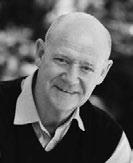
Some people’s inspirations may be predictable. But Andrew Parr, Director of SJB Interiors in Melbourne, takes his professional cue from a slightly more colourful source. Stephen Crafti investigates.
Andrew Parr’s parents had great faith in his talents as a designer. When he was only 16, they handed him a brief to design the new family home in East Doncaster, Melbourne. His concept, a courtyard style house with a discreet façade, was actually built. “There were four garage doors at the front. And in the centre was a pathway leading to two courtyards, one used by the living areas, the other, the bedrooms,” says Parr, Director of SJB Interiors. “My father worked as an engineer so I had help with the documentation,” he admits.
Parr’s talent for design was formalised, when he graduated in Interior Design from RMIT in 1987. Unlike many emerging designers who start off in small firms and are given projects sized to match, Parr went to work with Synman Justin Bialek Architects (now SJB Architects) soon after graduating. His first project was designing plush new headquarters for Smorgon Industries in West Footscray, Melbourne. “It was a quite a lavish project. Particularly as the site was once an abattoir,” says Parr, who has since designed numerous interiors around Australia and abroad – the Establishment Hotel in Sydney, the Royce Hotel in Melbourne, as well as the chain of Adina hotels in Germany (two in Berlin, Hamburg and Frankfurt), and in New Zealand.
collection of Missoni crockery, evocative of the 1950s. “I bought this crockery a few years ago. I love the intensity of the colours – turquoise, brown and ambers,” he says. Parr also delights in his Missoni towels, which feature up to 20 to 30 colours, from reds, pinks and yellows to every shade in between.
Parr enjoys experimenting with colour. “I designed a carpet for a hotel in Canberra. It’s grey, cream and charcoal, in a geometric pattern. It’s not almost primitive like Missoni’s designs. But it has quite a Peruvian feel, like many of Missoni’s designs,” says Parr.
Habitus caught up with design luminary Rosita Missoni, now as influential in the world of interior design as she was once in the world of fashion.
Q What was the catalyst for the Missoni Home label?
A Ten years ago I handed over the reins of the fashion collection to my daughter Angela. After enjoying a short sabbatical period I started suffering a kind of vertigo.
Q At the time, why did you make the move?
“I generally take a brief, absorb it, and then mull over it for a week or so. But I give myself quite a strict deadline,” says Parr, who regularly writes the words ‘concept today’ in his diary. A recent diary entry is for the much celebrated Australian chef, Luke Mangan, who is opening a new bar and restaurant in Melbourne. “I already have the floor plan worked out. But the concept will become clearer as the week moves on,” says Parr, who is thinking of creating a moody Melbourne experience, with exposed bricks, black steel windows and recycled timber floors. The exposed brick walls will also feature large fabric panels, as according to Parr, “Textiles are a form of art. It just depends how they’re used.”
While the raw finishes for Mangan’s bar and restaurant are mulling over in Parr’s mind, so too are sumptuous Missoni designed textiles, the fashion label that moved into homewares 25 years ago. “I’ve always loved Missoni, particularly its primitive African inspired designs, often in black and white,” says Parr, who has several Missoni designs in his own house – towels, sheets, throws and bedspreads. He also has a
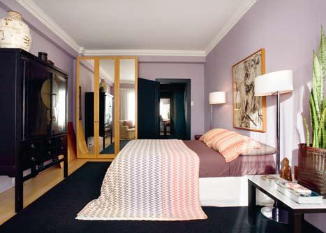
While the carpet in Canberra is restrained in its use of colour, Parr’s Sydney apartment, however, is definitely not. Pink and lilac feature on the bedroom walls, complementing the Missoni bedspread, the dining room walls are a pale turquoise and the apartment’s light timber furniture and floors create an interesting juxtaposition. “I love putting unexpected combinations together,” says Parr.
Like Missoni, Parr has a preference for geometric rather than floral patterns. “Florals aren’t in my repertoire. I find them far too busy, particularly when you have a series of floral patterns going on in the one room,” says Parr.
The Adina hotels also feature strong colour. The Adina in Berlin, already completed, has tan orange walls with strong accents of lilac. And like a Missoni towel, black is used to separate the vibrant hues. “It’s not just about colour. Missoni has built a reputation for texture,” says Parr. “I like mixing things up. Like Missoni designs, interiors should be animated. There should be a level of the unexpected.”
SJB
Interiors, sjb.com.auA I felt the home was becoming more fashion orientated. The existing Missoni Home collection needed direction – and I knew I had the passion and creativity to work on it.
Q If you heard that an influential Australian designer cited Missoni as one of his biggest creative influences, what would you say?
A I would hope to meet him/her and share feelings.
Q What do you have a greater passion for, fashion or homewares?
A I still do have a passion for fashion but I feel I lost track with creativity in that field –my life does not correspond anymore. The home is now my passion and I enjoy every single minute of my creative work.
Q What’s the greatest distinction between the two, besides the obvious?
A Fashion is ephemeral and this is its great charm. Home is long lasting, like elegance.
Q What or who inspires Rosita Missoni?
A I am a sponge and I enjoy life, nature, art, sports and people. I have the rare privilege to work in a field that is also my hobby.
Q At home, what other styles of furniture and accessories do you mix in with Missoni Home?
“Textiles are a form of art . It just depends how they’re used.”
A I simply mix. I love design, textures, patterns, colours and comfort. I like to associate old and new pieces of furniture, objects and lamps. I have testimonials of great designers like Le Corbusier, Giò Ponti, Hans Wegner, Gaetano Pesce, Verner Panton mostly found in flea markets that live happily in my homes on Missoni rugs, fringed curtains and pillows.
Q What was it like to be a visionary, a strong woman in Italy in the 1950s and 60s?
A I was more a dreamer than a visionary woman. My strength came out step by step. I grew up in my family’s factory among yarns, fabrics, embroideries and fashion magazines. The factory was my playground and my fashion school. At 21 in 1953 I married Tai Missoni, an eclectic, handsome athlete, an artist with a great sense of humour who had just started a small business of knitted jumpsuits. Mixing our experiences we started building little by little, sweater by sweater what became the Missoni style.
Q Missoni Home is sold all around the world. How does the label transcend cultural boundaries?
A Missoni is a style, a way of life for us and our worldwide clientele.
It’s a style that transmits joy and optimism and by following our basic suggestions, many of our customers share with us the pleasure of playing around with things and objects in a timeless and endless creative game.
I 01 Previous Andrew Parr
I 02
Bedroom
Pink and lilac walls complement the Missoni bedspread.
I 03
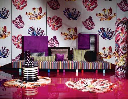
Missoni Home
A bold addition.
I 04
Rosita Missoni
I 05
Missoni Homewares
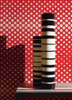
Characteristic Missoni vibrancy.
I 05


Kenneth Cobonpue sits surrounded by bamboo twigs, sea grasses, hemp and rattan. In his studio on Cebu, a bustling island in the Philippines, Kenneth creates contemporary furniture and lighting using traditional materials. Organic shaped rattan lights are shipped to furniture stores in almost every country of the world, including KE-ZU in Sydney and Hermon & Hermon in Melbourne. Wall lamps, pendants, screens, chairs and beds are ready to go, each piece conveying a sense of the handcrafted. Bamboo twigs are tied to a welded metal frame, creating a screen, and rattan lamps are inspired by jellyfish and sea anemones.
For Kenneth, the choice to pursue a career in furniture wasn’t a difficult one. His mother, Betty Cobonpue, founded a furniture design and manufacturing company in the Philippines in the early 1970s. “She built a reputation for her innovative use of rattan. It was the type of furniture that could be placed in a thatched hut or a contemporary Western home,” says Kenneth. However, rather than stay and learn from his mother’s skills, he went to New York in 1987, studying industrial design at the Pratt Institute and in 1994, studying furniture marketing and production in Germany.
Ten years ago, the prodigal son returned. And like his mother before him, Kenneth has developed a reputation for beautifully made furniture and lights. While his New York studies and work experience at a leather and wood studio in Florence were crucial to his development, his career path was determined as a child. “I can still remember when my mother set up her first work station in our
I The organic forms created by Kenneth Cobonpue are inspired by his native Philippines, but also have a place in the wider world. How has he achieved this relevance, Stephen Crafti asks.
backyard. I used the wood and rattan scraps I collected from the carpenters to make toys,” he says. As a child, one of his first larger scale projects was a bridge, made from wood and placed over a fishpond. “I had no knowledge of structure. I fell into the water several times before the bridge was resolved.”
Fortunately, mishaps are now few and far between. Kenneth’s first commercially successful design turns ten this year. The ‘Yin & Yang’, a steel and wicker range of furniture, wrapped in rattan skin, is as popular today as it was ten years ago.
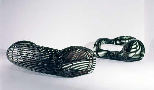
Like most of his furniture and lights, the process from design to development can take months. And the use of rattan continues to evolve in the collections. “Rattan is extremely flexible. It can be easily stripped to its various forms. It continues to be a springboard for new ideas,” he says. “I love working with natural fibres, whether it’s rattan or hemp. They’re extremely sensual. You can touch, smell, bend and twist them in so many ways,” says Kenneth, who is also interested in fusing technology with renewable and environmentally friendly materials.
While particular materials inspire Kenneth’s creativity,
he can’t exactly pinpoint where or when an idea might emerge. “Sometimes it’s a certain material, but ideas tend to lurk in my mind. Other times, it could be something like a simple object on my breakfast table,” he says. However, when the idea starts to crystallise, it’s articulated as quickly as possible. “I try to sketch the idea and then build a model. My designs have a very three-dimensional quality to them. There’s no substitute to actually making something yourself,” says Kenneth, who works with three designers from a small studio. “I still do pretty much everything from answering emails to meeting clients,” he adds.
Time spent traveling to the studio doesn’t eat into Kenneth’s day. His house, located in a hilly village nearby, takes in the city lights down below. “You could say that it’s a fairly contemporary structure, full of glass and filled with light. It was inspired by traditional Asian pavilions,” he says. And though he has forged a reputation for his design acumen, many creative decisions are made at home. “My wife is my most trusted critic,” he admits.
Living and growing up in Cebu made Kenneth culturally sensitive to the Asian traditions of craft and history. Having left the Philippines to study and work heightened his design sensibilities, and provided him with a contemporary global context. However, the times he lives in have also shaped his philosophy, both in design and otherwise. “I am a child of our time. And these times call for a return to caring for our planet and finding sustainable ways of living. My work will always be contemporary in aesthetic. But it will always stem from nature and be crafted by hand.”.
Inge Holst, object designer and business manager for Edit, has arrived at a particularly interesting, often quirky and very beautiful place. Edit is the latest venture of one-off design objects, fabrics and artworks by partners, Belinda Seper and Sharyn Storrier Lyneham. The combination of skills by the talented trio is seeing the works gaining international acclaim and being snapped up by Liberty of London. Australian fashion protagonist, Belinda Seper, has brought some of the world’s most celebrated fashion labels to Australian shores and Sharyn Storrier Lyneham, ex-editor of Vogue Living and Vogue Entertaining and Travel, has literally helped define an Australian creative industry.
ing costumes. It was this passion and skill that attracted the eye of Storrier Lyneham after seeing some handmade coat hangers Inge produced for Seper’s The Corner Store. ‘The sensitivity’ was as clear as day to the former editor and it was this validation of a creative talent, sprung simply from a coat hanger, that began the collaboration between the two more established women and the young designer.
Edit is a natural destination for Inge who, after working as a freelance costume designer on Australian films, musicals and commercials, ultimately became disillusioned with the craft. “As a maker of costume for film and TV, you are often
Edit uses the pop-up store concept with great success to ‘exhibit’ the Edit range of wares that sell out within days. In a society where interior furnishings and objects – the layers that create the story of a life being lived – are mass produced, the one-size-fits-all approach has started wearing thin, not just for the elite, but for many who’d rather have an empty shell than a house full of generic furniture and soft furnishings.
Inge began a creative career by studying fashion at East Sydney Tech (the National Art School) and from there went to Glasgow where she studied the history of costume. An industry course back in Sydney some time later sealed the young designer’s love of the craft of mak-
carrying out someone else’s vision, never your own.” After a short break, this dilemma pushed Inge to set-up alone in the fashion business, and she started up her own range of clothing, Estate Red Label.
The label, with its trademark feminine, preppy designs that sought their inspiration from vintage blouses, dresses and skirts from the 1930s and 1940s – with a contemporary twist – were compared favourably to the work of illustrious American designer, Marc Jacobs. “I had great success quickly after showing at Sydney Fashion Week,” says Inge, who took part in the event’s New Generation Show. The show yielded clients from New York, London, Singapore, Hong Kong
I A costume maker, a much publicised fashion designer, a businesswoman, and now an object designer, Inge Holst has had her share of creative incarnations. Whether the role changes have been due to an unrelenting creative journey, to overcome adversity or just one woman’s constant surrender to fate, Inge has proven that talent and courage are enough, and has produced some beautiful things along the way.I 01 Opposite Inge Holst In her home studio.
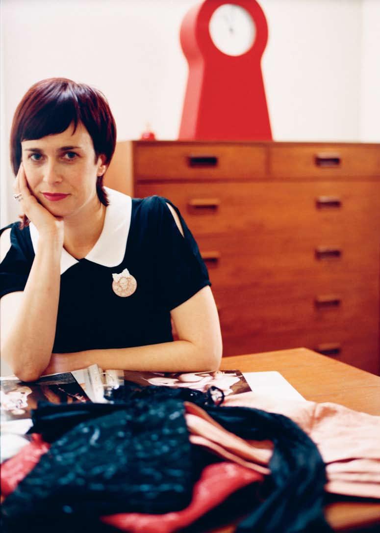
and New Zealand. Marie Claire magazine cited Inge as “the one to watch” in Australian fashion. It was a wonderful period for Inge who had built a successful label as its sole creative director, designer, production manager and only investor.
It was the latter that was to be the undoing of the label. “I had a fated sale to a Perth store of a substantial order. Almost as soon as we loaded the boxes onto the courier’s truck, I found out that the shop in Perth had gone bankrupt, and at
that point, I knew my business was gone. I wasn’t connected, I didn’t know anyone who could help. Why they made that order, even though they were on the way out, I don’t know,” says Inge. In the same week as the demise of her label, Inge and her partner’s home suffered a harrowing house fire in which the entire back half burnt down. It was a devastating time. Looking through the press reviews of her fashion label, through the pages of precisely kept records, Inge is noticeably moved by the memories. Asked if she is bitter about the events, Inge says, “No, it’s a process of life”.
Inge’s next move was to take a job as NSW area manager for stationery retail business, Kikki K. “I learned the nuts and bolts of running a business and on the side I made coat hangers for Belinda’s stores as a creative outlet.” When Storrier Lyneham approached Inge for Edit, she began by making one-off signature pieces and was soon poached from Kikki K.
“I’m in a great place now. I contribute to the vision and direction of Edit, and the business as well. I’m very close to an object’s making. Either I’ve made it or worked very closely with the artist.”
When asked if her pieces for Edit are craft or design, Inge says, “It’s a combination of the two. I believe design considers the end user, how the person will use [the object]. We do that, we need to consider how it will be used. It can’t just be all fantasy. But there is a lot of ‘serious’ design out there. That’s why Edit works, because we are
I 02
Inge at work in Edit’s Paddington shopfront.
I 03 Opposite A vintage dressmaker’s dummy transformed with the Edit stamp.
having fun with it – we don’t take design TOO seriously. When we finish something that works, we jump up and down.”
When asked if the move from fashion to interior furnishings was a difficult transition, Inge says, “What transition? It didn’t really occur to me. I’m still using beautiful fabrics to make things. I’m just replacing the basic element of form, switching from the human body to chairs, lights, votives, and wall art.”
The gap between design and craft keeps narrowing. Edit has recently begun a collaboration with Australian high design retailer, Format Furniture. ‘Edit at Format’ makes the subtle declaration that contemporary design has many faces, and hi-tech polymers are no more about design than frills and floral fabrics. It’s what they do for the end user that counts and Inge’s craft is worth the floor space in any design showroom.
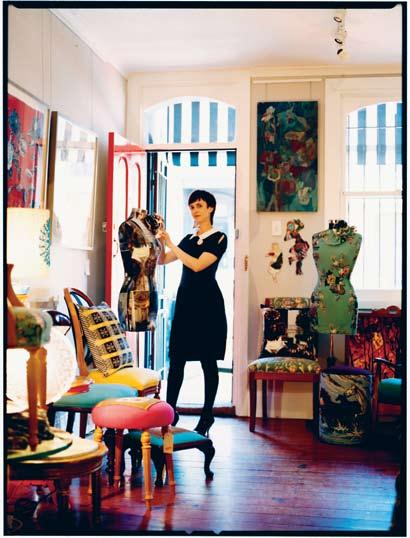
“I’m in a great place now. I contribute to the vision and direction, and the business as well.”
_ INGE
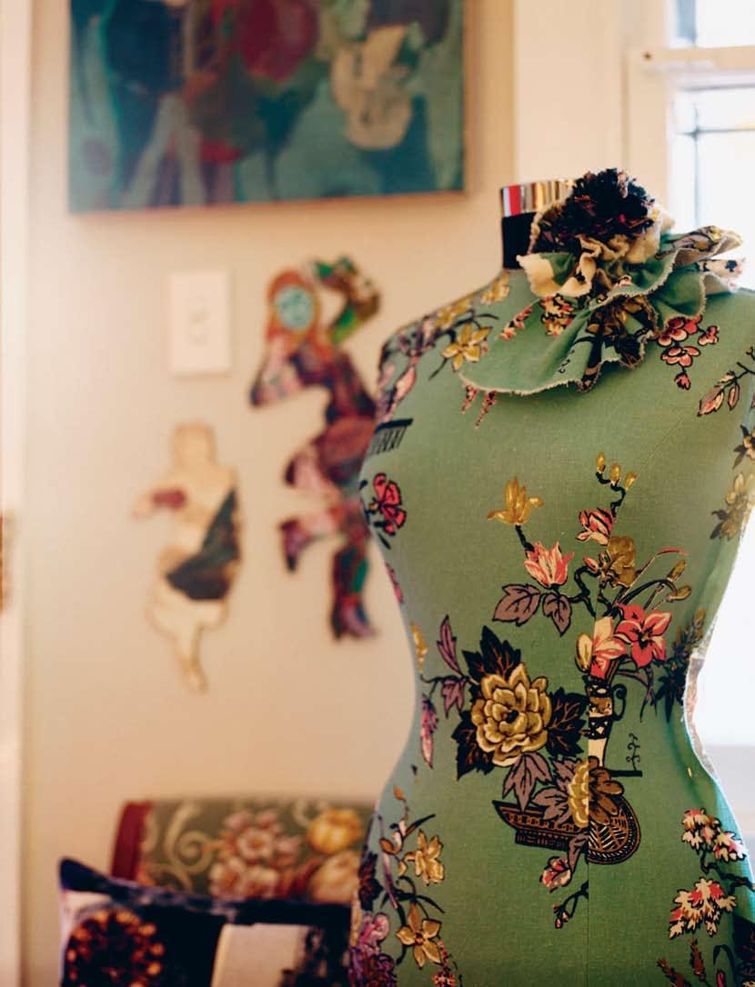
Heavy clouds hang above, the weather is hot, while humidity sinks into our skin. We are in Bangkok, Thailand. What are the images that come to our mind? Some may envision panoramic paddy fields, white sand and deep blue sea, rainforest and mountainous jungles. Others may think of the glittery palaces with tiers of gabled roofs, tranquil temples, wooden houses on raised platforms and leafy courtyards. Many of these images stand in sharp contrast with Bangkok’s traffic nightmare, air pollution, busy Sunday markets and labyrinthine shopping malls. You don’t really know what makes up the identity of the place. But you always know where you are.
As for the architecture of Thailand, while the traditional is firmly defined, the contemporary seems impossibly elusive. For the past 50 years, contemporary Thai architecture has struggled to find its own definition and identity. Is it to answer to new materials and technology? Is it to borrow foreign forms? Is it to stick to traditional appearances? If it is to adapt and blend, the question is how. Countless attempts have been made and different solutions have been offered by generations of architects. Yet, the question of Thai architectural identity is still a challenge.
Boonlert Hemvijitraphan has offered an alternative definition. An architect born and educated in Thailand for his first professional degree, Boonlert went on to study at the Bartlett School, University College in

I Architecture in Thailand inspires an ever-present debate on traditional and contemporary ways of living, and the Thai identity. Tonkao Panin looks at Boonlert Hemvijitraphan’s body of work, which embodies this identity for so many different kinds of families in Thailand today.
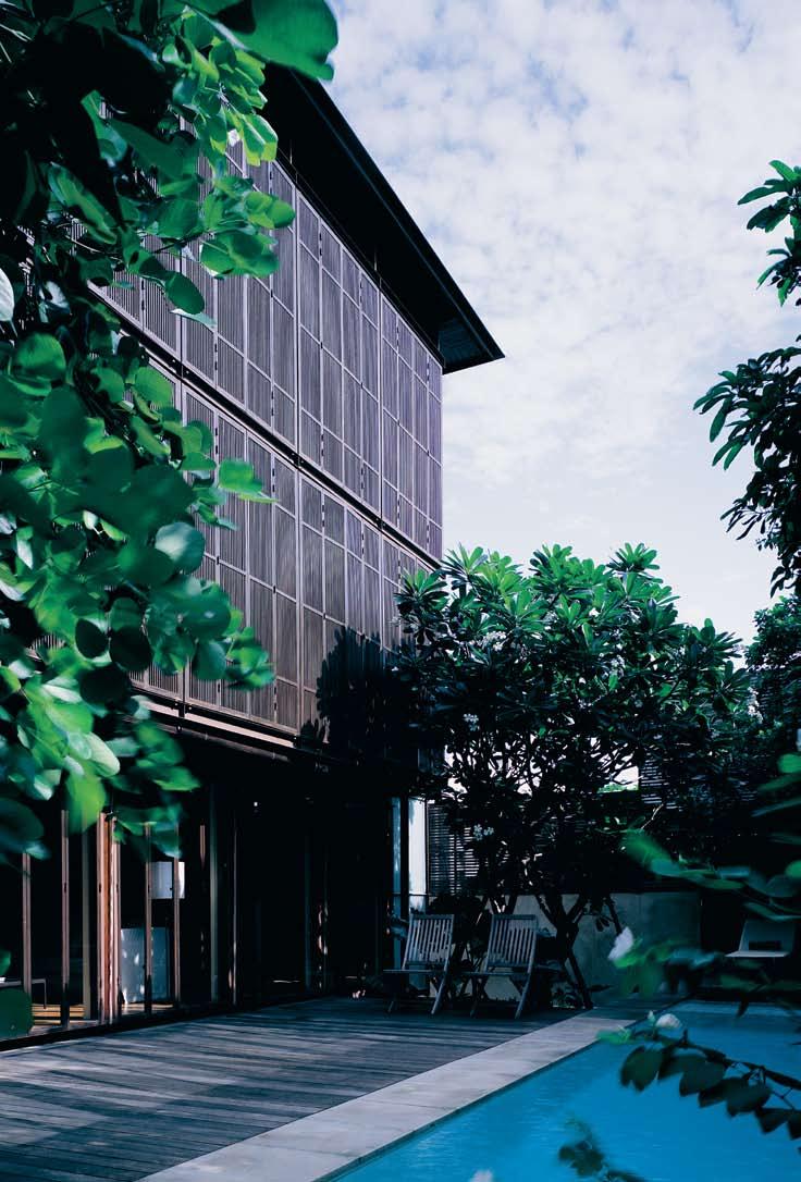
London and started his own practice in 1993. Over the past 15 years, through the ups and downs of the Thai economic climate, he has proved that his quiet architecture has never been silent. They say something fundamental to the place and time. Not so much in a ‘style’, for most of his buildings are different, but it is the art of enclosure articulations and spatial configuration that distinguishes Boonlert’s architecture.
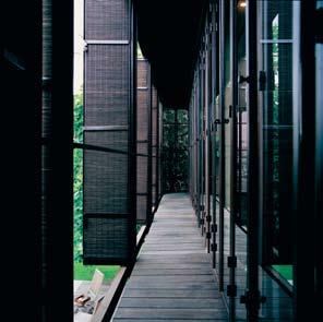
If we want to see the Thai people in their truest aspect 50 years ago, we go out to the markets, onto the courtyards, into the gardens. The key situations of people and place used to be un-enclosed: under a roof, raised on a platform, in an open veranda. In each instance one could see what is essential and primary. Today, we simply come back indoors, within the glass walls. During the past 10 years, realising these changes, interests in the vernacular and the traditional architecture have gradually arisen among Thai architects. Boonlert’s designs, on the other hand, though close to those architects in both subject matter and intention, are not the same, and do not demonstrate the same desire to either return to the traditional or recreate the modern vernacular. With pure forms and seemingly ultra-modern motifs, he does not seem to have longed for pure manifestations of Thai spirit untainted by contemporary culture and prosaic affairs. Instead, he focused on settings that are more or less prosaic and unobtrusively interwoven into everyday praxis. When he referred to the Thais, it is neither the idealistic traditions nor the celebrated voice of vernacular culture. He included them, but not especially reverently, thus never resulting in designs that are easily identifiable as Thai. Looking at his architecture, it is better to think of the Thais to whom he referred as his typical contemporaries, neighbours, individuals who happened to be living here and now, who needed neither naming nor mythologising to merit attention. In many ways, his architecture is aimed at individuals who may have had ancestry that stretched back 500 years but most importantly are living at the moment within current functional and climatic needs.
Boonlert’s opus of domestic architecture has grown throughout the years, offering alternative solutions to new requirements. In terms of spatial configurations, although all of the designs are unique, they explore similar questions of how to accommodate the changing lifestyles while stay firmly rooted in local domestic culture. While single-family dwellings have dramatically increased, Thais still value the tradition of extended family where at least three generations live together. The Thai compound house has always been a community. Thus the question today is: how do we maintain a sense of privacy of individual living, while benefiting from the comforts that a larger familial community offers? In other words, can we live in a house that is both a single-family dwelling and an extended family compound? Only sensitive design solutions can do so. And Boonlert’s designs have always tried to do just that. On the one hand, they offer unique spatial configurations that answer particular requirements of each family; on the other hand they always refer to common social and cultural implications that have preoccupied Thai domestic architecture for the past 50 years.
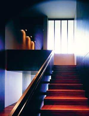
I Boonlert’s designs... do not demonstrate the same desire to either return to the traditional or recreate the modern vernacular.
I 03
Sunlight filtering down the staircase.
I 04
Between two layers of the building’s operative skin.
I 05
The light-filled mezzanine.
I 06 Following Intermediate space connecting exterior and interior space.
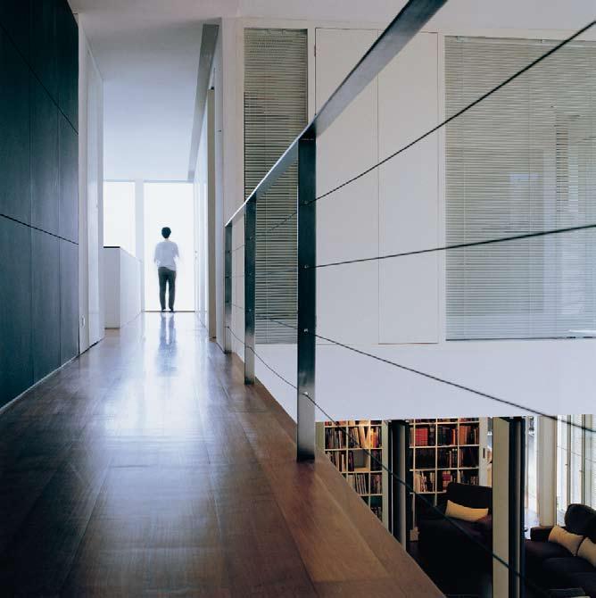
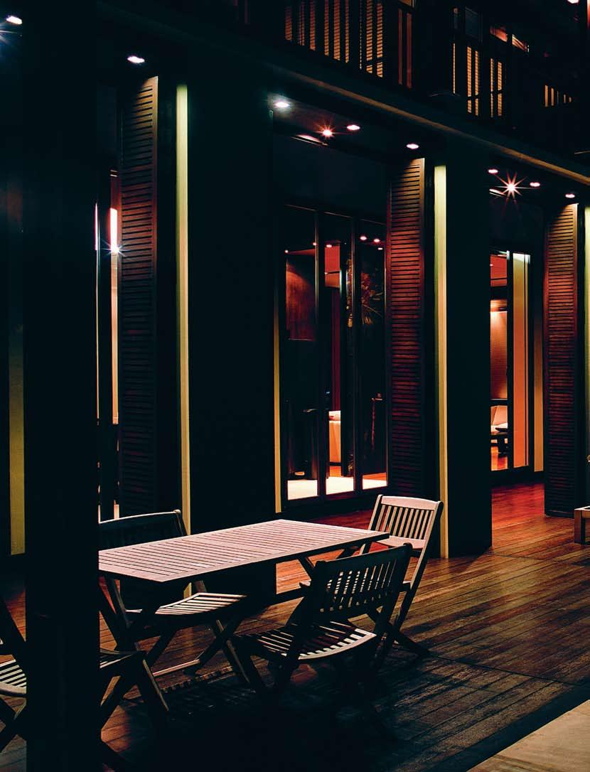
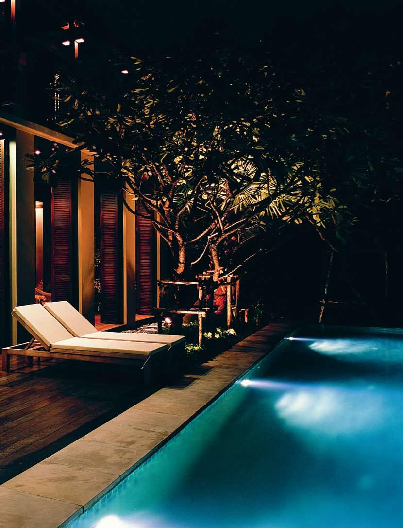
Apart from aiming to redefine the typological configuration to accommodate contemporary requirements, Boonlert’s architecture also tries to befit local climate and topography. Never self-contained and fully enclosed, all of his houses offer unique enclosure articulation and meticulous detail. The façades of Boonlert’s houses are always presented with articulated skins that do not just cover but also operate. Folded metallic or wooden screens envelope rectangular concrete structures, creating sharp lines and edges, and many of his houses are enclosed by walls of apertures that allow us to a glimpse of their interiors through occasional flips and folds of the skin at various locations. The skins are far from ornamental for they operate within the functional and formal as well as spatial framework of the building. They are the type of cladding that deviates from the usual definition of architectural wall, neither dependent nor independent of the body. They simply let the house breathe, cast the shadow, let the light in. Flexibility and adjustability are unique to Boonlert’s enclosure design for they allow the dwellers to go from being snugly enclosed and protected to become fully open and free. Different layers of materials also act as insulation against heat transfer, keeping the interior cool. Where and when diverse materials do meet, they converge with crafty and innovative detail, creating the language that becomes an important part of the building’s identity.
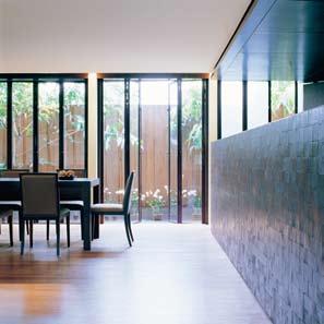
The architecture of contemporary living Boonlert presents as essentially Thai is not necessarily of native origin. While the spatial organisations answer to particular requirements, the meticulous details are borne out of both contemporary materials and techniques. And those ‘current’ elements are not examples of traditional building, if that term is taken to mean in the manner or the styles of native Thais. This separates his position from the back-to-the-roots movement now beginning to emerge in Thailand. Each of these characteristics has a positive side. An architecture that seeks to be local, but arises out of diverse intelligences, becomes architecture that is not styled in the manner of traditional motifs but may be maintained by contemporary possibilities. At any rate, Boonlert’s architecture offers a tradition that does not represent a dead faith in what is now past, but is one that continues a living, re-animated faith in what has been shown to be still relevant today.
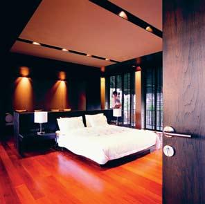 Boonlert Hemvijitraphan, Hem_boonlert@yahoo.com
I The key situations of people and place used to be un-enclosed: under a roof, raised on a platform, in an open veranda… Today, we simply come back indoors, within the glass walls
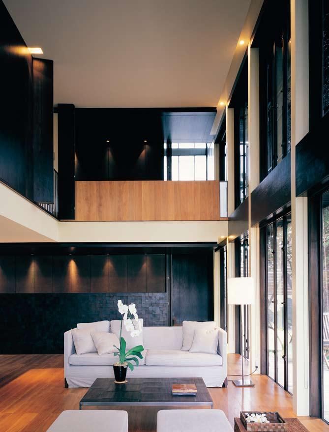
I The architecture of houses designed by Kevin Mark Low, as a body of work, has been remarkably consistent over the past six years of his individual practice, and can be seen as heralding something distinctive and significant in recent Malaysian architecture. Chu Lik Ren discovers the ideals that characterise these dwellings, and the project that embodies them all.
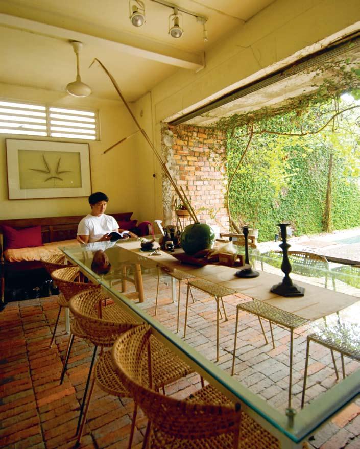
Kevin Low’s projects are an ongoing exploration of what he calls “garden houses”, a mix of minimalist elegance with rustic tectonics that fuses the man-made with the natural. Granted, these are early days still and the number of houses built fewer than a dozen. But an original style is evident – a common palette of forms and materials, a means of tackling the climate and construction, and a belief about what constitutes an ideal dwelling in the Malaysian context.
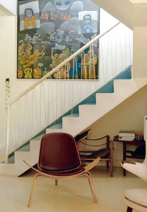
That there is a notion such as a ‘Malaysian context’ is critical to understanding Kevin’s works. For one, it is a recurring phrase in his lexicon, underpinning all his design decisions. Though schooled on both the west and east coasts of the United States, he returned to Malaysia in 1992, and worked with one of Malaysia’s largest corporate practices, GDP Architects, for 11 years before setting up on his own. His works for GDP such as the Yong Residence (1994), the Greenstreet Sierramas Bungalows (1994), the Garden Shelter (1998) and the Sierramas Golf Townhouses (1999) allowed him to experiment on the landed houses as a viable, desirable commodity specifically within the context of Malaysia. These invaluable years reeducated him on the local means and mores and provided him with the chance to evolve a new language for residential architecture.
To Kevin, “design is the conversation between creativity and context,” and “context is, quite simply, the most important consideration in design”. It is in the context of the hot and humid climate that he now sets his houses in ‘garden rooms’, raises them on ‘landscaped plinths’, and shelters them using ‘safari roofs’. Local materials are chosen with consideration on how they will be constructed and how they will weather with time. For security reasons, he often designs the first storey cocooned by unplastered brick walls that look visually imposing, and conceals the latches to the main door from view. He jokes that with the level of workmanship he has encountered in some projects, buildings often look better while they are under construction than when completed so he gamely christened his designs the ‘under-construction style’. The finished houses, however, are anything but disorderly or unresolved. His friend, landscape architect Sek San, comments that Kevin has a knack for using cheap materials and “making them look like a million bucks”. Yet, the designs are not skindeep, and it is misleading to think of them as finished at the point the occupants move in. The character of a house for Kevin will always be more complete after it has undergone a fair amount of weathering and the maturing of the gardens over time. As he succinctly says, “Time completes the architecture,” and the works are consciously planned to accommodate graceful ageing.
But on a larger stage, within the context of a region known as ‘tropical’, Kevin’s seemingly nondescript, earthy houses are a breed apart. They are indeed aptly tropical but not within the stylistic milieu the term is currently taken to mean, either as images of idyllic resort settings in the vernacular traditions, or as images of elegant glass boxes finished in expensive stones and metal, as popularised in Singapore. During his time with GDP, Kevin’s works were admittedly more categorically vernacular, with clay-tile pitched roofs and centralised plans but this has ceased to be the case in his current practice. He has now moulded a highly individualised aesthetic broadly characterised by a heavy base of masonry, a lightweight mid-section, and roofs that float as horizontal planes above spaces that flow out and embrace their natural settings. The gardens are complemented by gravel courtyards
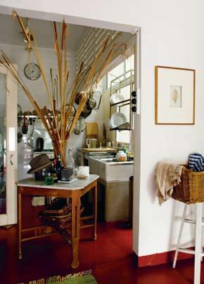
I ...a house for Kevin will always be more complete after it has undergone a fair amount of weathering and the maturing of the gardens over time
I 01 Previous Kevin Low enjoying the virtues of simplicity.
I 02
Main Staircase
The light-filled stairwell creates an ideal gallery.
I 03 Kitchen
The drying racks were designed by Kevin.
I 04
Internal Courtyard
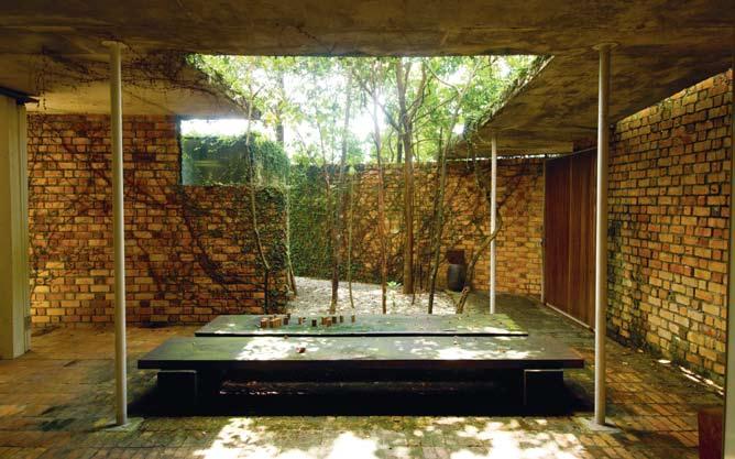
Tree-filtered light softens the brickwork.
I 05 Following Pool Area
Gravel, concrete, creepers and timber decks combine in an agreeable rusticity.
I 06 Following Living Room
The bookshelves were designed by Kevin.
I 07 Following Entrance Porch
External stairs and gate lead to Kevin’s loft office.
planted with Ash trees and the swimming pools are finished in their raw, off-form concrete state, bearing the imprints of recycled formwork. Steel members are absurdly slender, materials are inventively mixed and connected with customised details, and there is delight in expressing the sinews and joints of moving components. There is an atmosphere of authenticity, of unostentatious elegance in his architecture, and they chart a new path in Malaysian, if not, tropical architecture.
Occasionally, Kevin speaks admiringly of Geoffrey Bawa, Luis Barragán and Frank Lloyd Wright. But his own works are more indicative of the ideals these past masters embodied rather than any direct visual influences.
Was there then a starting point for this present oeuvre, a physical birthplace to his distinctive vision? If there was it would most likely be his own ‘lightwell house’ (lower case on his cue), where Kevin works from, and on which he has continually modified and tinkered with over the last eight years. In considered prose, this is how he describes it:
“The lightwell house is a renovation on a pre-War row house at the edge of brickwalled storage yards. It is formalised and entered through a series of linked garden rooms that lead up to the centre of the house: a brick-floored dining room. In plan, the house opens out through its study, living and dining rooms and kitchen to light wells and garden rooms. The outer walls of the house have been left in their raw brick state for purposes of weathering and their ability to age well. The garden has been left to complete what has been begun. A pool constructed of scrap timber and reused formwork sits to the corner of the dining garden room. The predominantly horizontal ledges cast by the timber allow for a convenient alternative to the typical pool stair and the colour of concrete in its raw state filled with salinated water give the colour of a sunburned sea. The lightwell house is a renovation on a budget and one driven by its context of building culture, climate and local construction materials. It has been designed for continuing experiment and for it to take to its garden the way a garden takes to a ruin. It is designed with a varied palette of gravel,
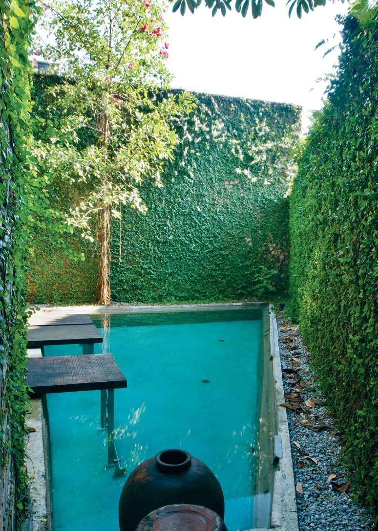
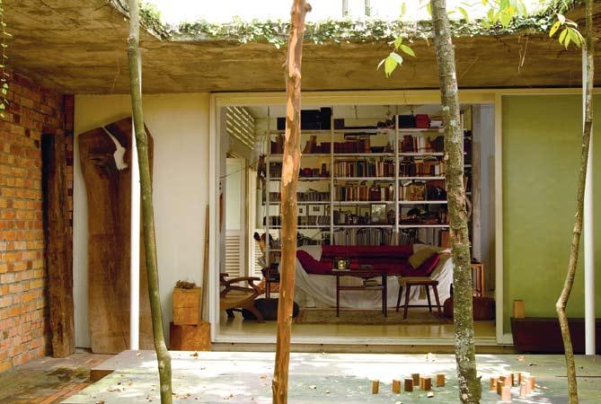
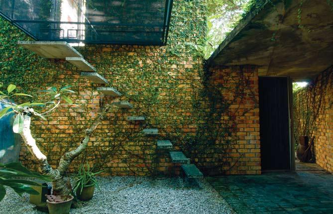
concrete, glass, grass, brick and bougainvillea, morning light, utility kitchens, painted floors, steel posts and trees inside, surface wiring, natural ventilation and squirrels.”
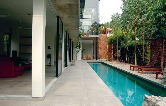
Over the years, he has added a ‘garden gate’ to allow direct access from the entrance porch up to his loft office. A series of cantilevered steps leads one up to the underbelly of a steel mesh cage, which is opened with an ingenious set of pivoted counterweights. Next to the stairs is the original, formal entry to the house, which features a sliding timber slat door lined with steel frame and concealed locking mechanism. Together, they showcase Kevin’s obsession with evocative thresholds, the crossing-over of zones between public domain to private gardens. They are fastidiously detailed, and yet are not contrived or fussy. He speaks of good details as a kind of revelatory experience a child in his innocence may grasp because good details are simple details.
Like Louis Kahn’s search for the primordial idea, Kevin likens his attitude to details to an almost religious quest, “Few are those who ever succeed in re-defining that simplicity. For the seeker, simplicity can be found again in the beginnings of journeys and things, both of which have one thing in common: context. The quality of a detail almost always comes from its response to context.” The lightwell house is replete with fascinating details in the calm context of a pervasive garden. It can surely be rated as the cultivated test-bed and well-spring of his creative ideas.
If the architecture of a single architect can sometimes be intimately connected to a place, as Geoffrey Bawa was to Sri Lanka, or Glenn Murcutt is to Australia, then the ongoing work of Kevin Low is compellingly etching out its own unique mark in the Malaysian scene, and in the process, extending the discourse on an appropriate architecture for the tropics.
Small Projects, small-projects.com
I “Design is the conversation between creativity and context,” and “context is, quite simply, the most important consideration in design.” KEVIN
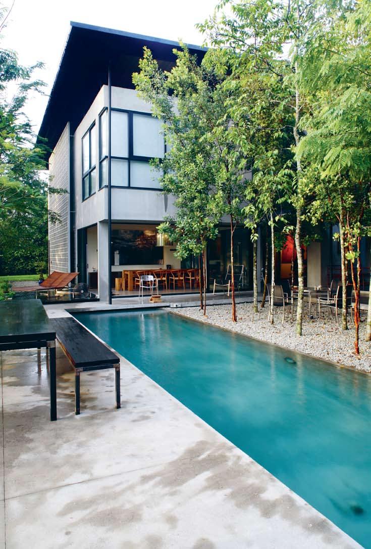

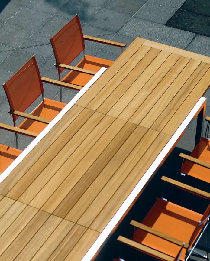
I Globalisation can bring many benefits. But it can also put cultures on a collision path. Paul McGillick visits Rimbun Dahan, a project in Malaysia realised by the eminent architect Hijjas Kasturi, which transforms that collision into something more like a harmonious marriage. Bringing together artists from around the region – with a particular emphasis on Australia – Rimbun Dahan has become a place of modern cross-cultural creativity and engagement.
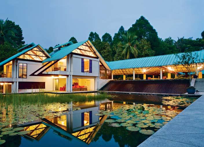
It lies on the outskirts of Kuala Lumpur in a semi-rural area. You turn off the main road, up an access road and park the car. Then it is a brief walk through the forest before emerging in the central courtyard around which the main complex is organised.
The transition is important because, at the end of this journey, is a magical place of elegant pavilions, terraced water features, enchanting walks through cultivated forests and unexpected encounters.
This is the home of eminent Malaysian architect, Hijjas Kasturi and his Australian-born wife, Angela. But it is much more than that. It is the centre for an ongoing program of cultural exchange, artistic exploration and ecological celebration.
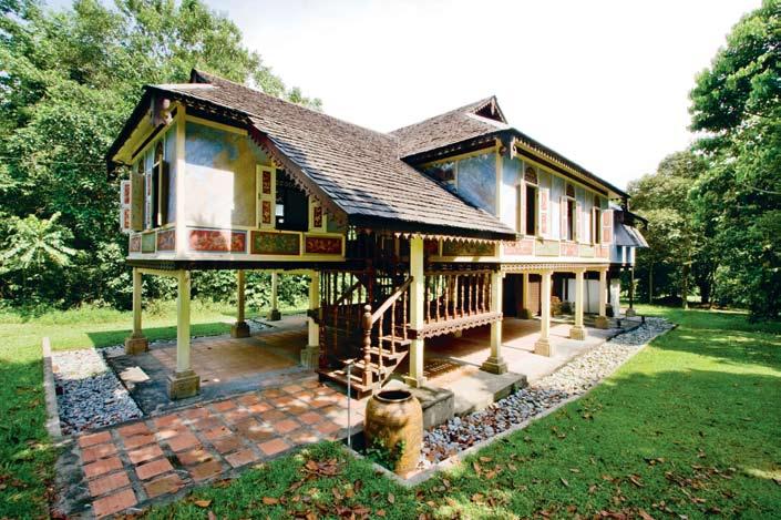
Rimbun Dahan means ‘laden branch’ in Bahasa Malaysia, as in an orchard – which, indeed, the property used to be. For Hijjas and Angela it is a retreat from a hectic commercial architectural practice in Kuala Lumpur. But it is also home to many of their passions, the most important of which is to bring people from different cultures together through art.
It is also a reflection of Hijjas’ own principles as an architect, key to which is the reconciliation of traditional cultural values with the needs and character of the contemporary world. The main house and the guest pavilion – linked by a loggia, itself flanked by the courtyard on one side and the water terraces on the other – are contemporary reinterpretations of the traditional kampung house. In fact, a short walk away through the trees is the Rumah Uda Manap, a traditional village house moved from Parit in Perak to the compound in 1998 and restored. The house is a fascinating blend
I At the end of this journey, is a magical place of elegant pavilions, terraced water features, enchanting walks through cultivated forests and unexpected encounters.
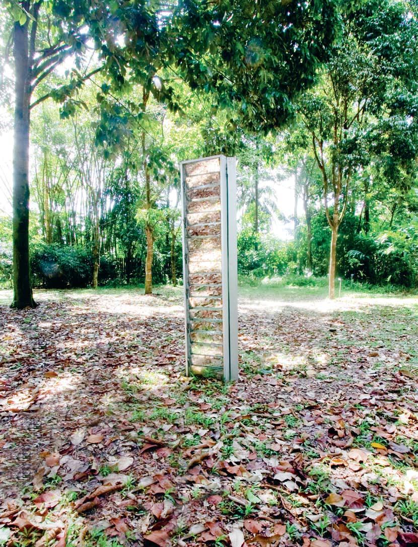
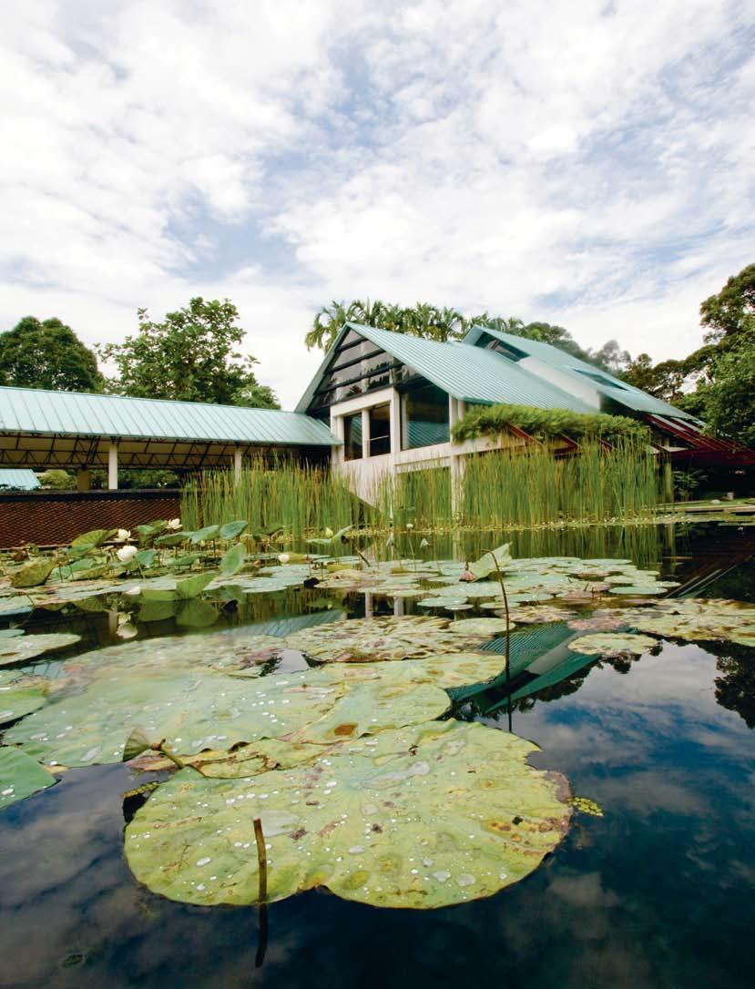
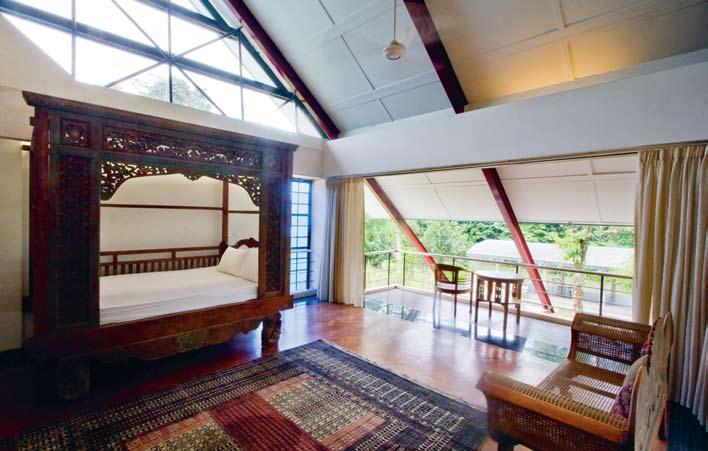
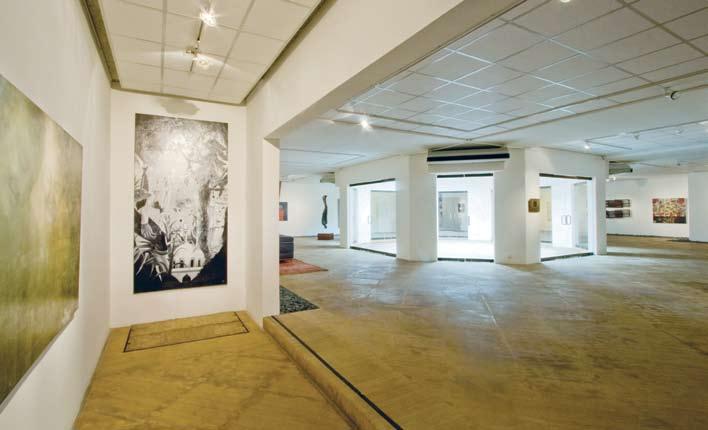
of Chinese decoration and Malay architecture and perfectly represents the Rimbun Dahan agenda of making connections across time and cultures.
Central to Rimbun Dahan’s program is an artist-in-residence scheme. On-site residences are provided, along with studios for both visual and performing artists, together with writers. Airfares are covered and residents receive a stipend for the duration of their residency which can be from three to 12 months.
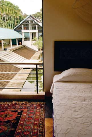
Artists are selected from all over the region. But there is a special emphasis on connections with Australia and the program enjoys joint support from the Australia Council’s Asialink scheme. Hijjas originally trained in Australia as an architect and planner with the support of a Colombo Plan scholarship. His daughter, Serina, completed her initial architectural training at the University of Sydney and her sister, Bilqis, studied at Melbourne University. So, for Hijjas, the Rimbun Dahan program is an expression of appreciation for the opportunities provided to him and his family by Australia.
At the same time, it is also a gesture of appreciation to Malaysia because Hijjas was actually born and reared in Singapore (with a Malaysian father and Chinese-Indonesian mother), before being enticed to Malaysia in 1967 to establish the first faculty of architecture at the MARA Institute of Technology. Since Hijjas Kasturi Associates was formed in 1977, it has been highly successful and certainly the most innovative and distinctive commercial architecture practice in Malaysia.
Central to the Rimbun Dahan project are the indigenous gardens that offer a kind of sample of the tropical rainforest, punctuated by sculptures made by past artists-in-residence. The gardens include a herb and spice garden, together with an organic vegetable garden. The gardens are also home to an extensive range of medicinal and culinary plants and trees, scrupulously captioned and a drawcard for many visiting study groups.
My first experience of Rimbun Dahan really summed up the character of this extraordinary project. I arrived on a Saturday night. It was already dark, but the courtyard was ablaze with light and activity – because this was the launch of a new exhibition of work completed by three of the residents whose terms had come to an end (including Australian artist, Tony Twigg, who with his art critic and curator wife, Gina Fairley, had been at Rimbun Dahan for the past 12 months).
The perimeter of the courtyard was dotted with food stalls and a bar which remained open until 1am. Underneath the courtyard is the circular gallery with its central atrium pushing up into the courtyard above. This is the only air-conditioned part of the complex and is a splendid exhibition space – and big enough to host large-scale dinners, as I discovered when, 12 months later, we celebrated the launch of a monograph on Hijjas Kasturi to which Gina and I had contributed.
Later in the evening, many of us retreated to the main house where we could inspect Hijjas and Angela’s impressive art collection before enjoying a concert of classical music performed by members of the Malaysian Symphony Orchestra. Here again, the concert grand piano signalled significant cultural exchange because Rimbun Dahan also sponsors performances and research into traditional South-East Asian musical and dance forms.
I stayed at Rimbun Dahan that night in a sumptuous room in the guest pavilion overlooking the water gardens. This meant that the full magic of Rimbun Dahan was not revealed to me until the morning when I could stroll throughout the compound and its forests in the daylight.
The Rimbun Dahan project is an astonishing emblem of generosity and vision, not to say an inspiring assertion of civilised values across cultures. It is a celebration of cultural engagement and a powerful antidote to the ignorance, prejudice and complacency which so often keeps nations apart.
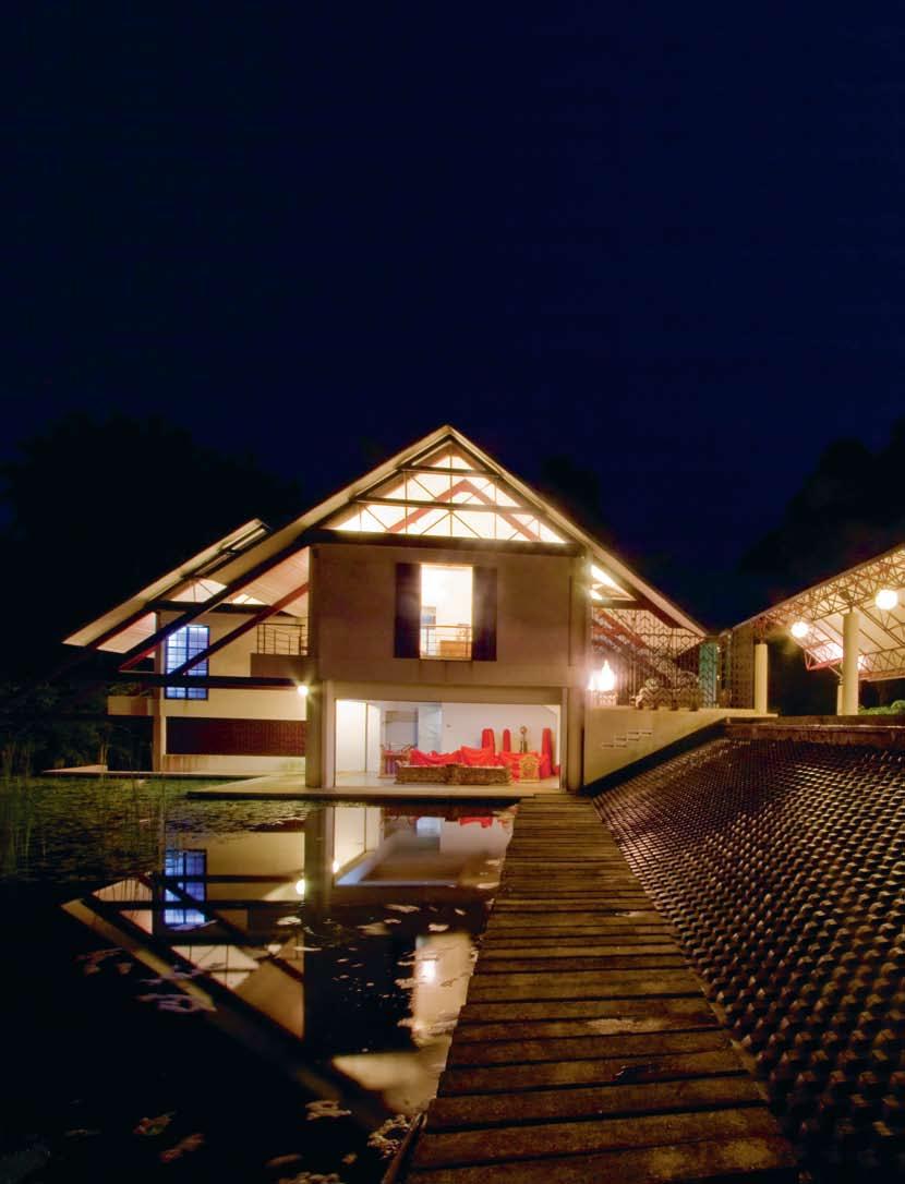

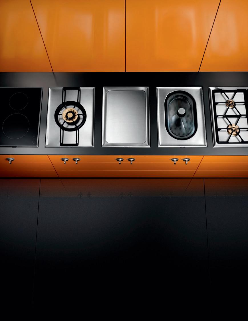 nassim road house — singapore
I A home can be seen as an ongoing expression of its occupants. Darlene Smyth discovers a project by Bedmar & Shi in Singapore, that takes the dual nature of family living, and represents it quite literally.
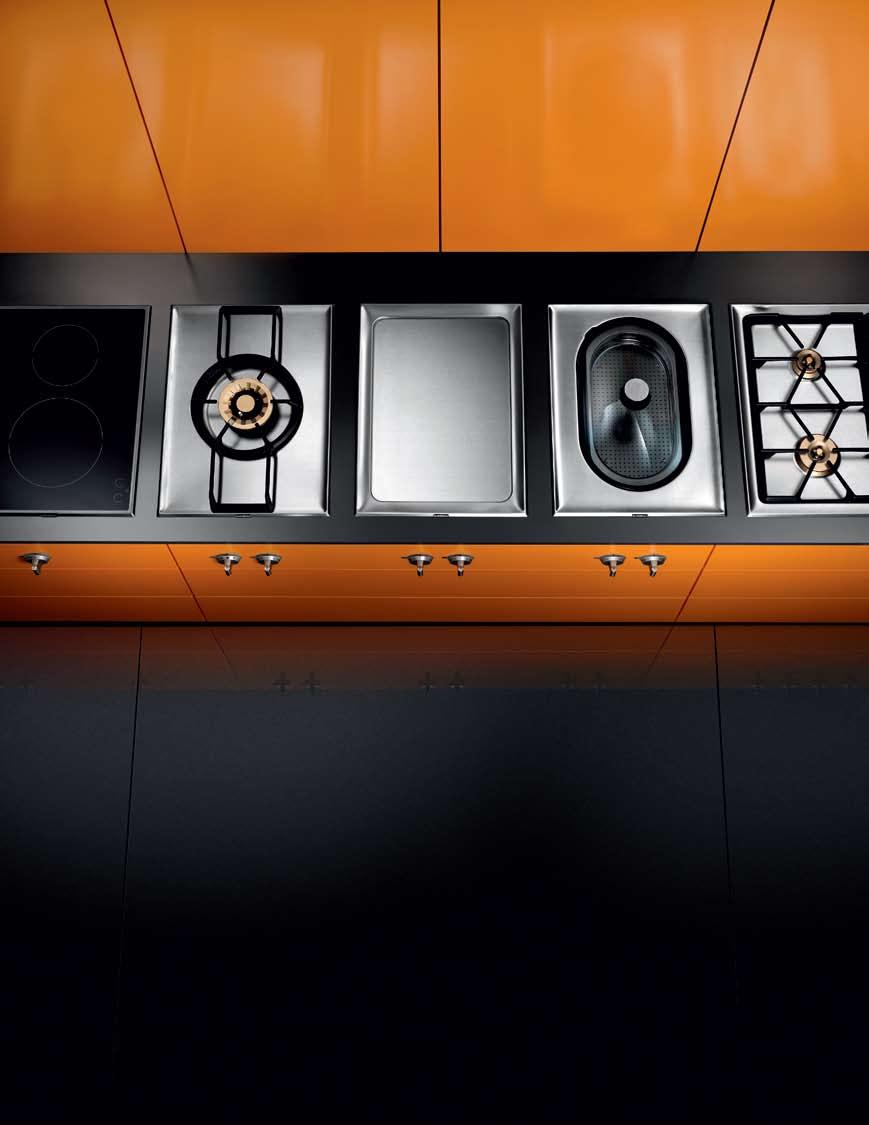
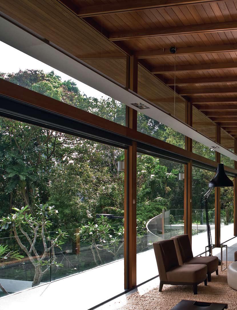
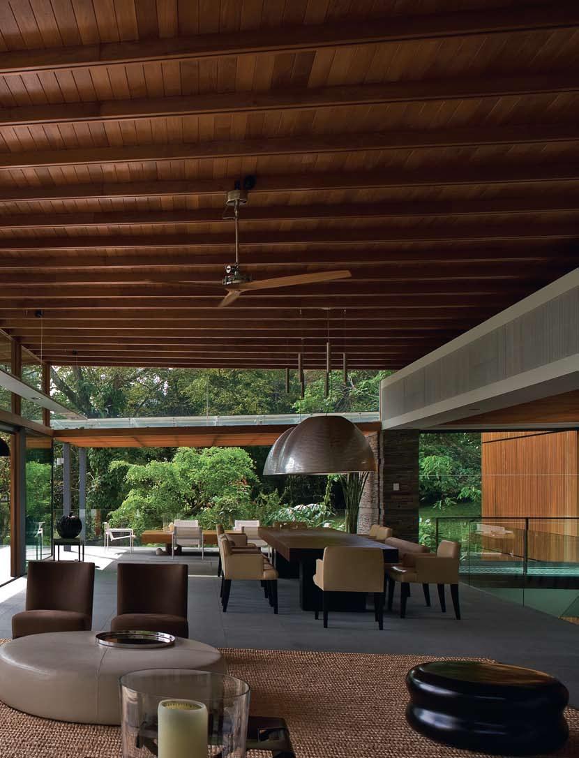
At first glance it is clear to see that these two houses on Nassim Road in Singapore come from the same family, but in many ways they act out a fascinating narrative, like two sisters with strikingly different personalities. One proud and forthright, the other shy and secretive, the two structures face each other across the road that divides them in a state of eternal duality.
Having completed both houses for the same client, Singapore-based designer Ernesto Bedmar from Bedmar & Shi explains the two buildings are in a sense the physical manifestation of the public and private lives of the owners. The more reclusive nature of the larger of the two houses lends itself to the everyday private business of the family. The extroverted façade of the smaller house, which the designers refer to as the ‘clubhouse’, is where the family does its entertaining.
In a delightful scripting of prophetic fallacy, nature seems to be in harmony with the actions of man as if the two sites themselves have somehow adopted the qualities and characteristics of the architecture. The clubhouse sits on a broad rectangular piece of land with the widest side facing the street. The slightly raised centre of the site elevates the building on a pedestal-like structure that makes it visible from the street.
In contrast, the private domain has a very narrow frontage that splays outward toward the back to create a secluded enclave for the family. There is also a drastic increase in height of around six metres off the road level to the first storey of the home that helps to distance the site from the city. The upper land enjoys views of the surrounding greenery on a private perch. The notional distance of the house from the road is amplified by a long sloped driveway that leads the owners into a more exclusive realm.
Although both houses have diverged from some of Bedmar’s earlier house plans which were somewhat more organic in layout, the designer’s emphasis on creating drama in the circulation of the house is here re-interpreted with the use of a spine-like axial wall that divides the service from the served spaces.
I 01 Opening Clubhouse A shallow pool separates the Clubhouse from the tennis court.
I 02 Previous Clubhouse Ceiling Timber clad ceiling floats above living and dining spaces.
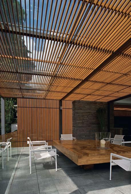
I 03
Trellised Ceiling Skylights create ambiguity between
indoor and outdoor spaces.
I 04 Clubhouse Lower Level A series of stone walls breaks down sunlight entering the Clubhouse.
I 05 Clubhouse Side Elevation
I 06 Following Spiral Staircase Provides access to Clubhouse.
I The strips of filtered light that animate the rough surface of the stone wall and floor below through this trellis create a magical aura of warmth and serenity.
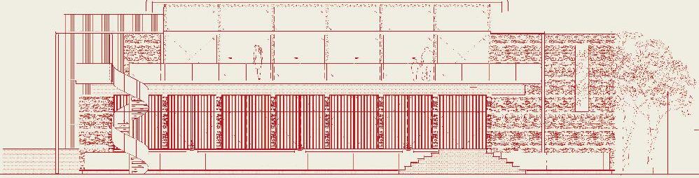
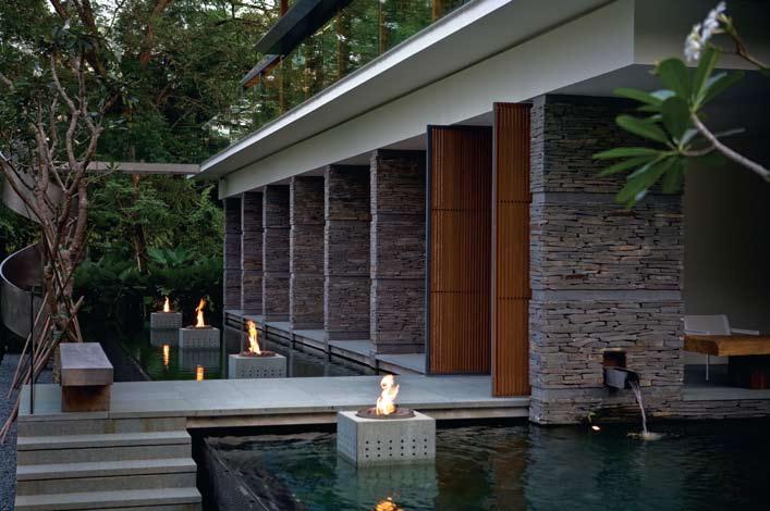
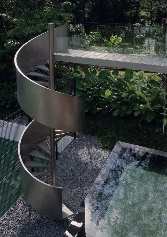
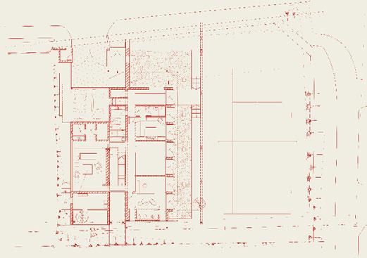
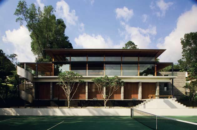
Both houses are clearly divided into three linear segments, the more public spaces on one side, the private and service spaces on the other, and a circulation zone flanked by the dividing fin wall in the centre.
“The drama is more in the light filtration,” explains Bedmar. A certain mystery is created by the different manner in which the designer brings light into the three bands of spaces. In the clubhouse, the central circulation space is lined by the thickened fin wall which is clad in volcanic slate. Daylight is brought in to wash along the side of this wall, giving the impression that it is an external garden wall. Under the skylight above the central circulation area is a secondary layer of timber trellis. The strips of filtered light that animate the rough surface of the stone wall and floor below through this trellis create a magical aura of warmth and serenity.
In the dining and living spaces that flank the wall, this mystery of whether the space is inside or outside continues. Here, a massive timber ceiling seems to float like a canopy amongst the surrounding treetops. The dark ceiling and open sided bright wall and sides of these rooms create the illusion that the house has no back and no boundary. The edges of the building appear to dissolve into the lush greenery that surrounds the house. The awareness of this landscape is felt throughout the entire house.
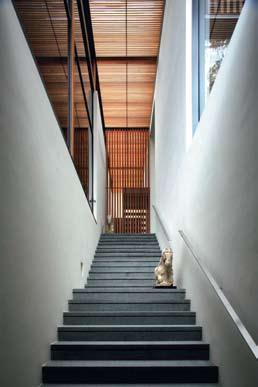
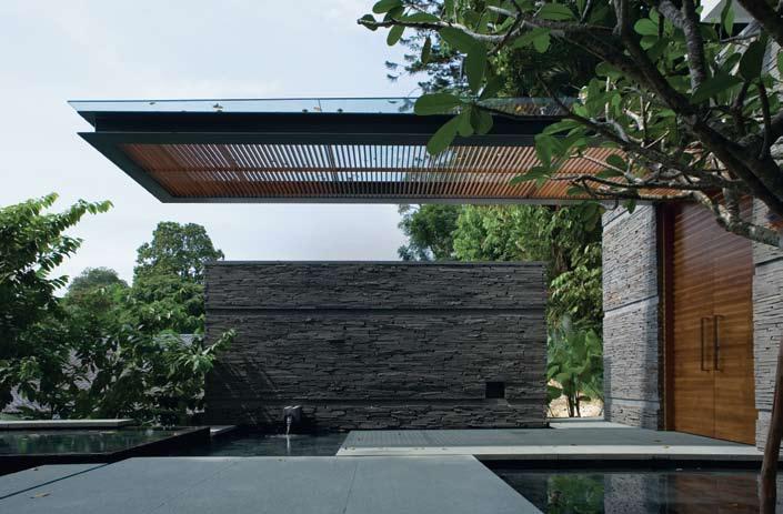
I 07 Previous Clubhouse Plan
I 08 Previous View of Clubhouse Seen from the tennis courts.
I 09
Main House Stunning cantilevers greet the inhabitants.
I 10
Main House Approach
A central circulation spine creates drama.
I 11 Opposite Private Enclave A hillside position adds to seclusion.
I 12 Following Garden Pavilion
An effective counterpoint to the main house.
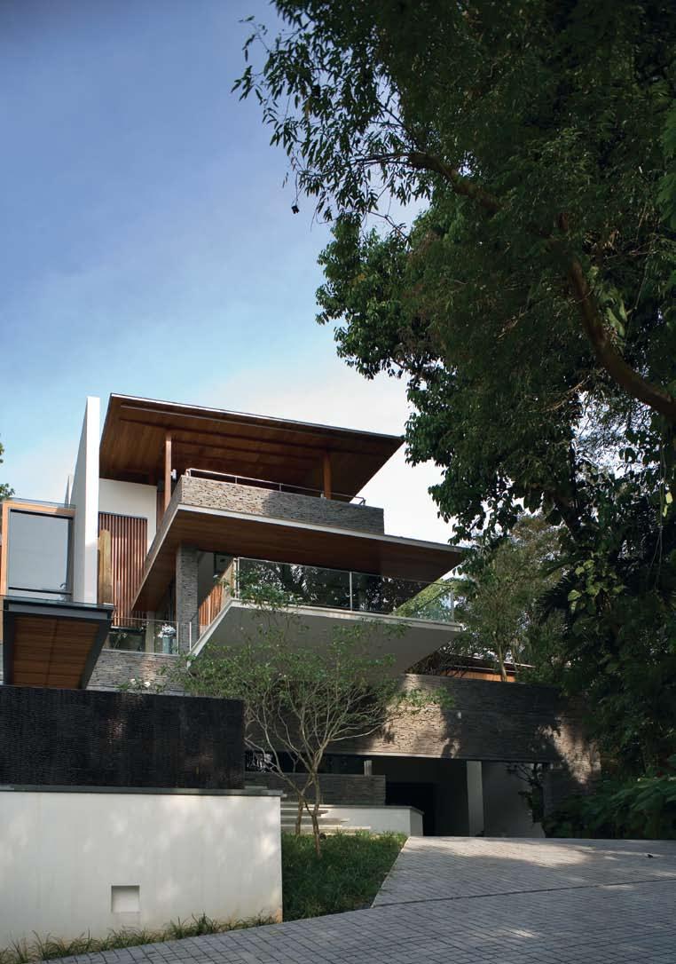
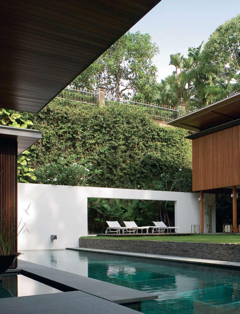
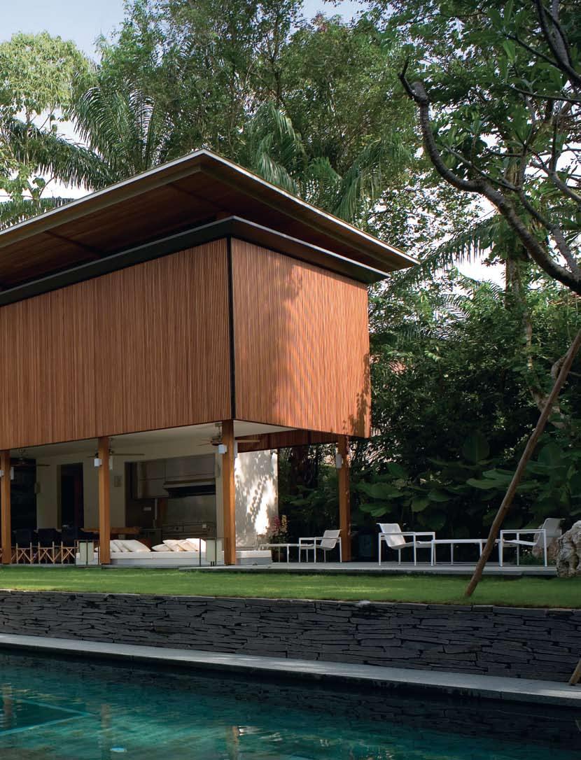
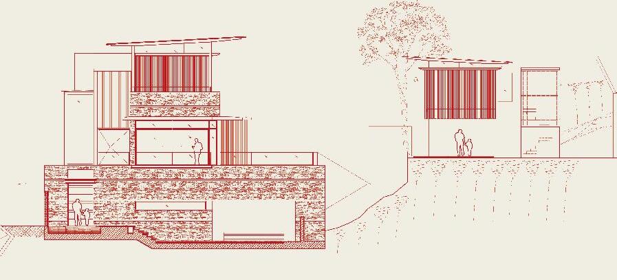
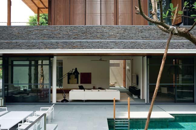
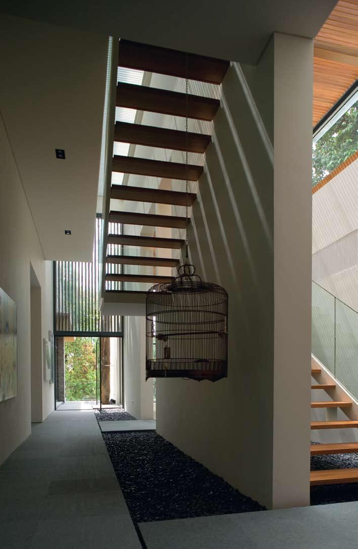
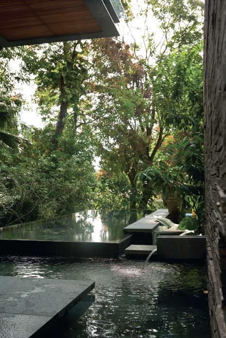
ARCHITECT
Bedmar & Shi
MAIn ConTRACToR
Sysma Construction
STRuCTuRAl E ngI n EER
Tham & Wong LLP
M&E EngInEER
Tham & Wong LLP
QuAnTITy SuRvEyER
Ian Chng Cost Consultant
Bedmar & Shi
(65) 6227 7117
Bedmar-and-shi.com
FuRnITuRE Lounges Living Divani
Family Lounge from Cream, cream.com.sg and Flexform
Groundpiece from Space Furniture, spacefurniture.com.
sg. Study room sofa Zanotta
Milano from Space Furniture, as before. Ottoman B&B
Italia Harry Large from Space
Furniture, as before. Armchairs
Minotti Pasmore from Space Furniture. Coffee table Maxalto
SMTV from Space Furniuture, as before. Side table Pulpe by Christian Liaigre, christianliaigre. fr. Armchairs Chauffeuse
Mandarin by Christian Liaigre, as before. Dining table, coffee table and verdanda table
natural wood from Bali. Dining chairs Isotta armchair by Promemoria, promemoria.com.
Dining bench, Isotta Panca by Promemoria, as before. Outdoor chair Richard Schultz 1966-26 by B&B Italia from Space Furniture, as before. Desk Poltrona Frau CEO, infoasia@poltronafrau.it.
Office chair Vitra Ea219 from Space Furniture, as before. Study room rug Paper Yarn Cotton by Woodnotes, woodnotes.fi. Bed e15 M0 from Cream, as before. Bedside table e15 Emil from Cream, as before.
FInISHES
Rug Jumbo Binding Weave in natural Abaca and Woollen Spun
Abaca by The Natural Carpet Co, naturalcarpetcompany.com.
Floor line chiselled granite in Olive Green. Ceiling Golden Teak. lIgHTIng
Profile light I-Max by Wever & Ducre, wever-ducre.com.
Floor lamp Max Lamp by Max Inc, maxinc.co.uk. Pendant
lamps Pierre Au Paul by Ingo Maurer, ingo-maurer.com.
In the more private house, Bedmar furthers this ambiguity between the inside and out by bringing the notions of outdoor space inside, as well as positioning architectural elements across the garden. A gazebo-like pavilion in the far corner of the site is visually linked to the main house by a freestanding garden wall that opens up to frame the lushly planted retaining wall behind it. This framing of nature with architecture echoes the techniques Bedmar uses within the house.
I 16
I
Previous
I 14 Previous
I 16
Shallow Pools
Another clever counterpoint between the two houses is the reversal of their sections. The private house is planned in a more traditional organisation where the main public living spaces such as the living and dining rooms are on the ground floor with the more private bedroom areas above. In the clubhouse, this arrangement is reversed, with the public spaces above and the bedrooms below. These bedrooms are then separated from the tennis court area by a pool of water.
Although they have some basic architectural components in common, the personalities of these two houses are vastly divergent. Yet as in many relationships of opposites, they seem to perfectly complement and complete each other.


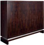
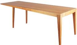
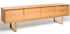
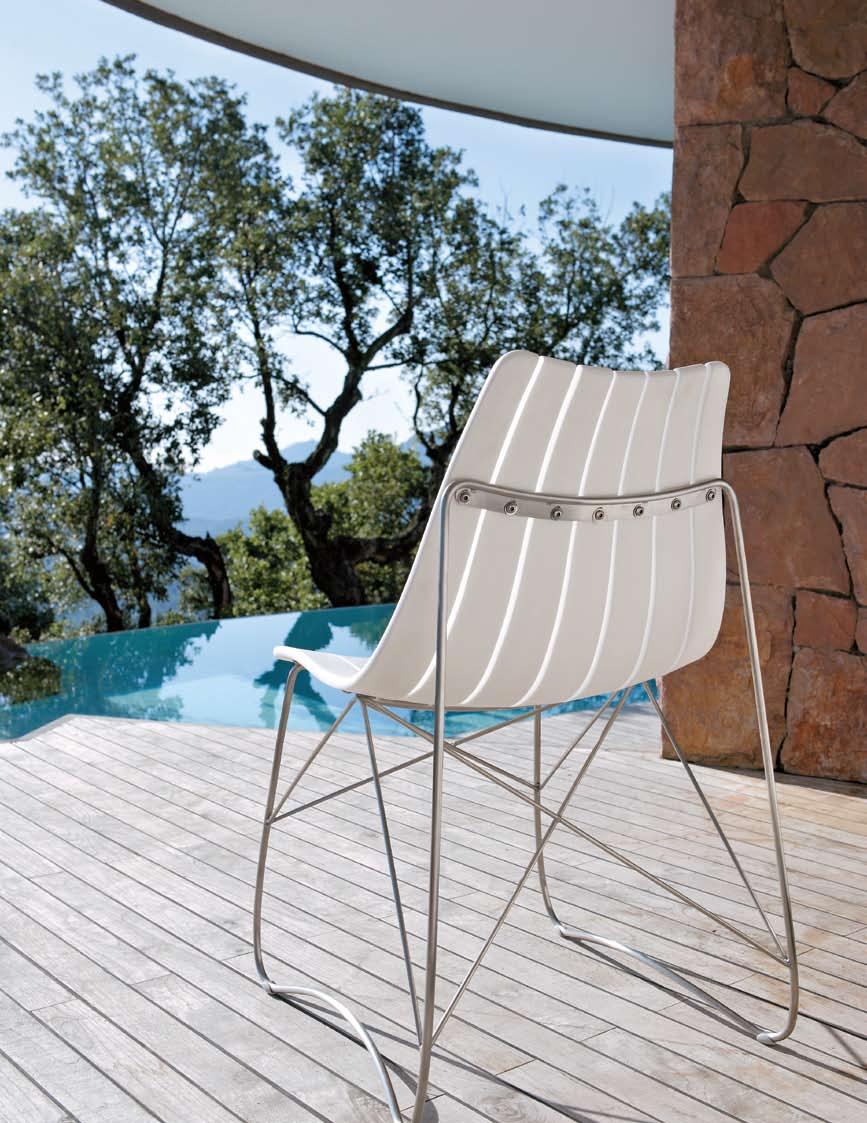


ten housing — bangkok, thailand
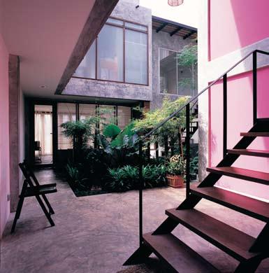
I The desire for privacy and the need to belong are integral to human nature. Tonkao Panin looks at a housing project in Bangkok by CASE which aims to reconcile these two often conflicting needs.
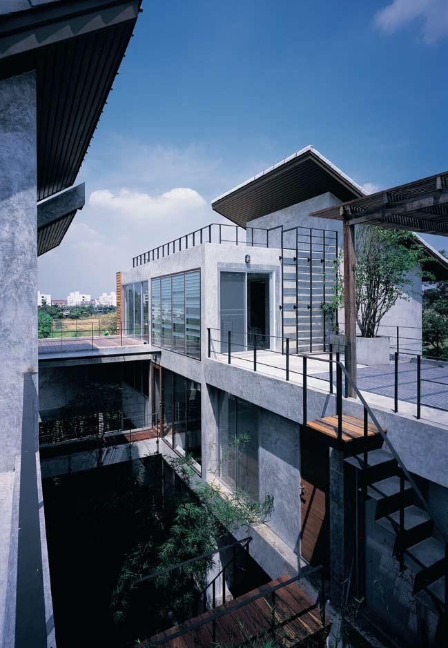
Do we want to live alone? Do we need the company of others?
These simple questions are not easy to answer. As our dwelling habits all differ, it is never easy to tell at which point privacy turns into unbearable solitude or when socialising may become overwhelming.
TEN Bangkok is a housing project that stems from these questions, aiming to re-define the notion of community and individuality. It offers alternative understanding to both housing design and dwelling concepts, while it explores the fundamental relationship between the two.
To what extent can housing design and dwelling be cooperative? If each and every inhabitant is involved in the design process, then, at which point does design end and dwelling begin? How can one ‘create’ and ‘own’ a place that also belongs to others?
The issue of cooperation between architects and inhabitants has been the focus of CASE Thailand, the creator of TEN Bangkok. CASE, or Community Architects for Shelter and Environment, is a group of Thai architects formed in 1996 with central interests in alternate housing visions. Its major concern lies in the relationship between dwelling and context. Both the physical environment and the human element of the place are considered vital to CASE’s housing concept.
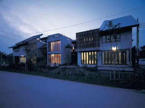
In many ways, TEN originated from Bangkok’s current housing problems. Overpriced housing is out of reach for people on medium incomes but they are also ineligible for government housing aid. Hence, they are forced to enter the vicious circle of Bangkok housing, with little opportunity or choice.
With this problem in mind, CASE Thailand began to shift its focus towards the concept of community. What would happen if each of these powerless individuals developed strength through collaboration with others?
As a collective force, would they be able to create homes specific to their needs? As individuals, each remained powerless, but as a community, their economic and creative power could multiply. So, CASE began the process of initiating, looking, searching, discussing, negotiating. As a pilot project, CASE began by searching for the project’s prospective inhabitants who might share the same desire
for an ideal home. This resulted in ten willing members of various professions, of whom eight were young Bangkok architects.
The working members/designers/ inhabitants of TEN Bangkok then considered site selection. First and foremost, the land had to be affordable and the site had to be situated in a location that was equally convenient for everyone. Future expansion of Bangkok’s transportation system was taken into account. This meant the site did not have to be situated in the most accessible location of the city. All aspects of the context were considered as a potential framework for the design.
TEN Bangkok gradually became a collaborative project which required contributions from all involved. In terms of the physical collaboration, the project would occupy a single plot of land, divided into ten subplots. The footprint of each subplot was equal. Each inhabitant would act as the designer of their own home in collaboration with their neighbours.
This method of sharing a single plot of land resulted in the mandatory design collaboration between all inhabitants. Everyone involved would have to set their individual and collective design and dwelling criteria. Participants could not insert their design into the site without careful consideration and negotiation with others. Ultimately, each house would – conceptually – be born out of the site
I As a collective force, would they be able to create homes specific to their needs?
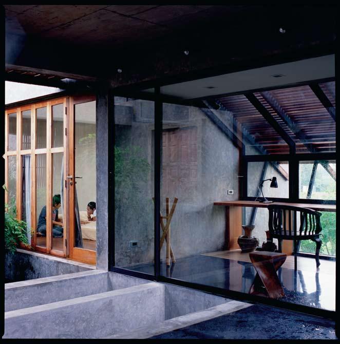
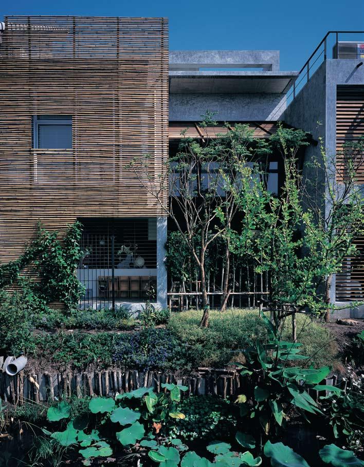
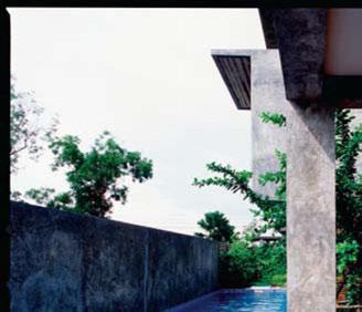
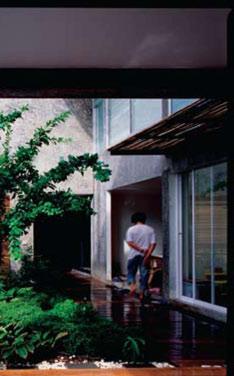
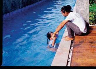
this case did not result from the architects’ determination and control. Rather, the architecture was the fruit of cooperative design where the architects were the clients and the clients were also the architects. Each design resulted from laborious negotiation with others. Therefore, each and every design had to be shaped and reshaped collectively. As the design transformed, the dwelling requirements of each inhabitant were also reconstructed. The result is a unique collective project whose sense of totality is marked by the diversity of each individual design. Cooperative design works if it also allows individual identity to emerge.
As a pilot project, TEN faced various difficulties. Its novelty and experimental nature meant TEN did not effectively fit any of the pre-established programs required for most housing projects. TEN also had to establish new relationships with the usually restricted financial programs, and had to establish new understanding with existing building regulations.
These difficulties became creative and productive challenges that encouraged the project to examine all possible alternatives so TEN could become a flexible housing project capable of fitting into today’s changing lifestyle.
I 08
and context, along with other houses. Each inhabitant would, therefore, own a house in a place that also belonged to others.
Ten co-existing dwelling units means much more than ten varying needs. TEN Bangkok’s unique inhabitants can be understood in terms of both their similarities and differences. Although sharing certain visions, they also differ. They may have something in common, but in details, their ways of living, dwelling habits and preferences are very dissimilar. Thus the question predicating the design is. to what extent can each and every need, requirement and criterion be fulfilled? And to what extent can each inhabitant conform to the collective living within the community? Both individual and collective dwelling criteria needed to be established before the design began.
TEN did not result from the design of a single creative genius. It is a housing project in which each and every unit was born along with the others; each and every design could not be done individually. Although the actual design began after the dwelling criteria were established, each inhabitant began to dwell within the project even before the actual design started. As they worked together to frame the design, the community was formed and the cooperative dwelling began. Architecture in
I 06 Plan
I 07
Swimming Pool
Another ‘shared’ space.
I 08
Swimming pool entry
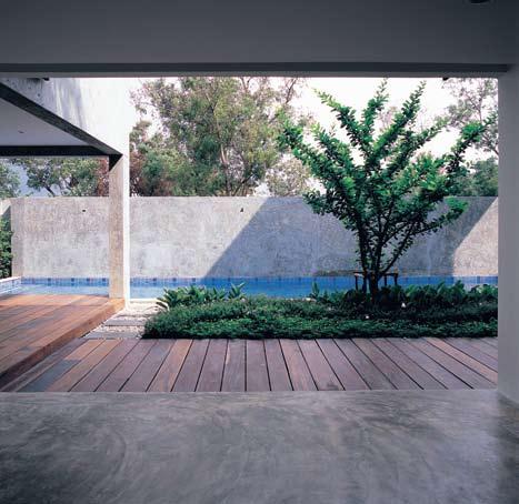
I 09 Following Strong visual connection, through the main courtyard.
ArChit EC t CASE (Community Architects for Shelter and Environment)
Contr AC tor Con Case CASE (66 2) 919 5918 casestudio.info
FiniS hES
Structure reinforced concrete Finish polished cement. Door and window frames timber and aluminium. Stairs iron.
The construction process of TEN Bangkok was recently completed, with its inhabitants moving in. As one walks in, the dominant courtyard acts as a main spatial organiser and navigator. It both unites and separates the labyrinthine passages of all the units. The boundary of each unit is conceptually defined, yet partially unbounded. It gives a sense of interconnectedness without a loss of privacy. Each inhabitant can live in his or her own private area, yet also be part of the community. Each unit becomes a part of the whole project which is waiting to evolve as lives progress.
Yet, the ultimate goal of this project is not to serve a single group of people. TEN Bangkok set itself up as an experimental project in search of alternate housing visions. This also opens doors for possibility. It may provide choice and opportunity for those who are sympathetic to TEN’s working method and concept. Thus TEN may become a model for the kind of housing suitable for both individual and collective application, as well as for specific locations.
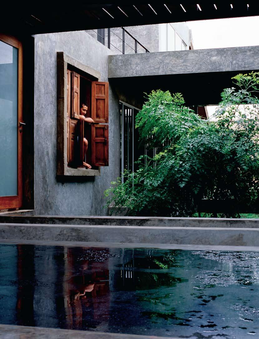
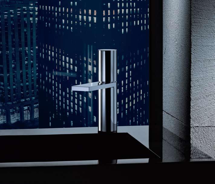
There are wide views to the ocean. I 02
The built-in concrete seating provides vantage points to enjoy the outlook.
Searching for a seachange around 12 years ago, Jan Batten combed the area around Berry, on the south coast of New South Wales. “I’d been looking around for a long time but the minute the real estate agent drove me up the drive to this property I knew it was the one,” recalls Jan. “I’d made three offers by the time we were halfway up the drive and the real estate agent chastised me for not waiting for the vendor’s counteroffers!”
Jan had been determined to find a property in a high position and “this was the most perfect location,” she says. “The 2.2 hectares have 360 degree views and the land was already partially cleared with several potential building sites.”
Busy with a high profile career in the Sydney arts world as media consultant to Sotheby’s auction house and later as the media relations manager for the Art Gallery of New South Wales, Jan waited some years before embarking on building a home on the property. Then she had to find an architect. Fortuitously, friends with a house in nearby Kangaroo Valley had neighbours who had done the research and selected Bruce Rickard & Associates to design their house.
With a career spanning more than 40 years and a reputation for designing simple, yet exquisitely detailed dwellings sympathetic to their natural settings, Rickard also became Jan’s choice.
I Looking for respite from the intense world of PR, Jan Batten looked south of Sydney and found a site with panoramic views across the coastal plain to the sea. Then she found the ideal architect to exploit the site – the iconic Bruce Rickard.
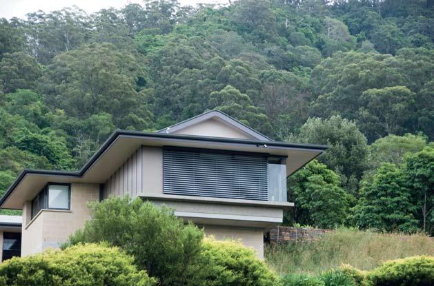
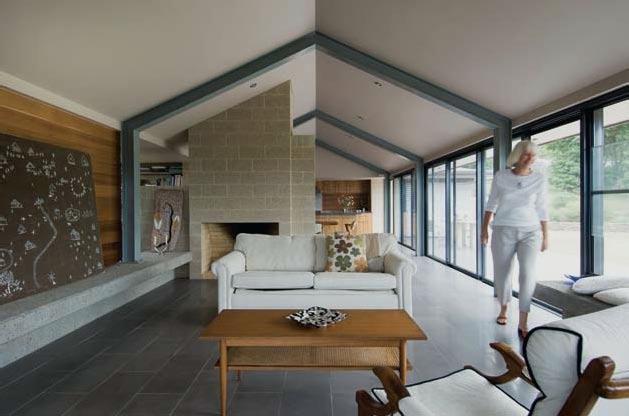
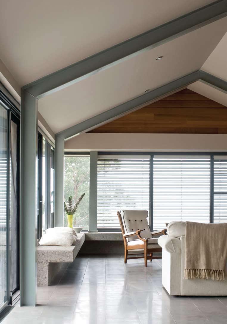
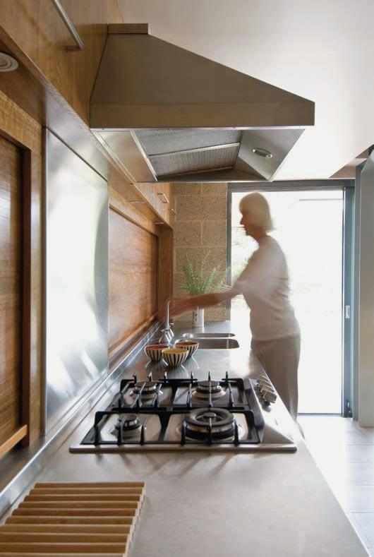
Of the completed house, Jan says: “I like the Japanese sensibility of the house, the simplicity of the design, the open spaces and the way it sits comfortably in the environment –it’s not intrusive”.
In the 1950s, Bruce Rickard undertook postgraduate studies in the USA, where he was greatly influenced by the design philosophies of Frank Lloyd Wright. On his return to Sydney, Rickard proceeded to sympathetically adapt the esteemed American architect’s language to local climatic conditions, designing his early houses with integrated interior and exterior spaces, floating roof planes, low, almost fortress-like lines and mellow natural colours and finishes.
Along with other architects working in a similar style, including Peter Muller and Neville Gruzman, Rickard became a seminal influence in the so-called ‘Sydney School’ of organic residential architecture, otherwise known rather less seriously as the “nuts and berries style”.
Sydney School houses of the 1950s and 1960s were mainly built on sloping bushland sites around Sydney Harbour’s sheltered upper areas, and typically displayed a fundamental respect for the native landscape, following the slope of the site through split level planning with roofs parallel to the slope, creating complex and interesting interior spaces. Natural materials were exploited with dark tiles, clinker or painted bricks and stained timbers creating a sense of warmth and connection with the surrounding bushland.
Half a century later, Rickard is still designing houses that are freshly contemporary, while remaining true to his original ideals. Perhaps the biggest difference is that he is now affectionately known as “the Frank Lloyd Wright of Australian architecture”.
After looking at several options for the house site on Jan’s property, Rickard settled on the southern edge of a flat, cleared plateau and designed the house with a north-facing aspect and views to the east towards the ocean. The house is constructed of Ivory River gravel concrete block by C&M which is left in its natural state on the exterior and honed inside. Exposed steel portal frames support wave-like roof forms rolled by a water tank manufacturer using a single sheet of Colorbond steel for each section. The long living space is partly divided by an open fireplace through to a north-facing terrace via sliding doors. “It’s a warm, human scale house,” says Bruce, “capturing great views to the east. I suppose it’s a very liveable house
I
I 03 Previous Living Area
The armchair was found in a local secondhand shop.
I 04 Previous Kitchen
Spotted gum veneer contrasts effectively with the granite benchtops.
I 05 Plan
I 06 Opposite Dining Area
Scandinavian designed furniture complements the clean lines of the galley kitchen.
rickard + aSSociateSdoing all the right things. It captures the sun in winter, has all integrated finishes and you can quickly move from inside to outside. We think it should be a great house for Jan to live in.”
The cruciform plan is intended to give a level of intimacy so no room is isolated but there are distinct public and private zones. The main entry is at the rear of the house, with an entry vestibule flanked by two bedrooms and the main bathroom. The remainder of the compact house is an open plan kitchen, dining and living area, with a small home office cleverly tucked away behind the open fireplace.

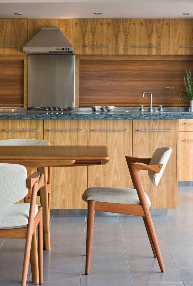
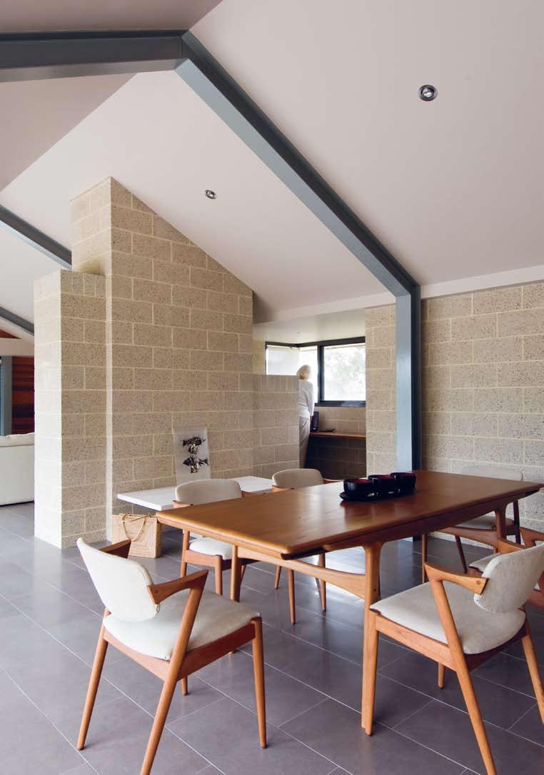

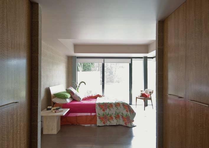
I 07 Previous
The fireplace acts as a room divider.
I 08 Previous
Main Bedroom
There’s a strong visual connection from all spaces in the house to the patio.
I 09 Previous
Open Courtyard
The paved area outside is defined by a stone wall.
I 10
Ensuite Bathroom
The same tiles used throughout the house create a cohesive look.
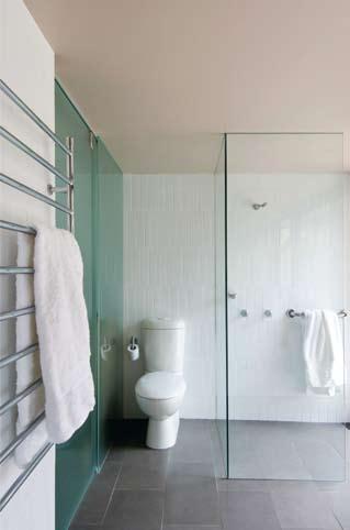
I 10
discuss things. Brett Hofman, the stonemason who built the surrounding dry stone wall, was also just an amazing craftsman. It was a really happy worksite. Sometimes people who weren’t working on the house at the time would just drop by to check on how it was progressing, which was just lovely.”
With the house completed, Jan is now turning her attention to the landscaping. “There’s a lot of work to be done,” says Jan, who plans to keep all the planting confined to species native to the local area. Inside, she is furnishing the house with select pieces of mid-twentieth century Scandinavian design, beginning with a Finn Juhl dining table and Kai Kristiansen dining chairs. Surprisingly, given Jan’s background, artworks are few but include two mid-seventies Indian Warli paintings in poster paint on cow dung.
And the most surprising aspect of the house when she first moved in? “At night, with all the lights twinkling on the plain below, it’s like living in a hovering aeroplane,” says Jan. “It’s quite magical.”
architect
Bruce Rickard + Associates
ProJect architect
Nick Kent eNgiNeer
Taylor Lauder Bersten
coNtractor
Strongbuild – Jamie Strong
Bruce rickard + aSSociateS
(61 2) 8354 0646 brucerickard.com
artWork
Loungeroom ‘The Hermit’s Daughter’ artist unknown from Warli tribe, India, purchased from Hogarth Galleries, aboriginalartcentres.com, and ‘Untitled’ by Munjal. Dining room ‘Travellers 1 and 2’ by John Davis.
FurNiture
Dining table Finn Juhl from 20th Century Modern, 224.com.
au. Chairs Kai Kristiansen from Great Dane, greatdanefurniture. com. Bed from The Comfort Shop, thecomfortshop.com.
au. Outdoor setting Air Chair by Jasper Morrison, jaspermorrison.com.
FiNiSheS
Roof corrugated Colorbond, pre-curved from BlueScope Steel, bluescopesteel.com.au. Fascia treated Pine. Ceiling
Gyprock. Walls concrete block in Ivory Smooth Stone (external) and Ivory Honed River Gravel(internal) from C&M Brick, cmbrick.com.au. Cladding FC sheeting. Windows aluminium frame by Capral, capral.com.
au, powdercoated in Dulux
Precious Steel Pearl, dulux.com.
au, manufactured by Alumode Windows, (61 2) 9608 4521.
External retractable louvres by Technical Blinds, technicalblinds. com.au. Dry stone walling by Stonehenge, (61 2) 9629 1809. Paint Dulux, dulux.com.
au. Floors Tobacco Lapp tiles.
Roller blinds by Silent Gliss, silentgliss.com.au. Joinery designed by Bruce Rickard and Associates, brucerickard.com, constructed by Strongbuild, strongbuild.com.au. Kitchen bench top stainless steel and
granite. Kitchen cupboards in Spotted Gum Veneer. Bathroom wall tiles white by Academy Tiles, academytiles. com.au. External stone wall by Stonehedge
FixtureS/equiPmeNt
Door furniture by Madinoz, madinoz.com.au. Oven, gas cooktop and dishwasher by Miele, miele.com.au.
Microwave by Panasonic, panasonic.com.au. Rangehood by Qasair, qasair.com.au.
Bathroom tapware by Brodware, (61 2) 9421 8200. WC and basin by Caroma, caroma.com.au. Bath by Decina, decina.com.au.
I The cruciform plan is intended to give a level of intimacy so no room is isolated but there are distinct public and private zones.
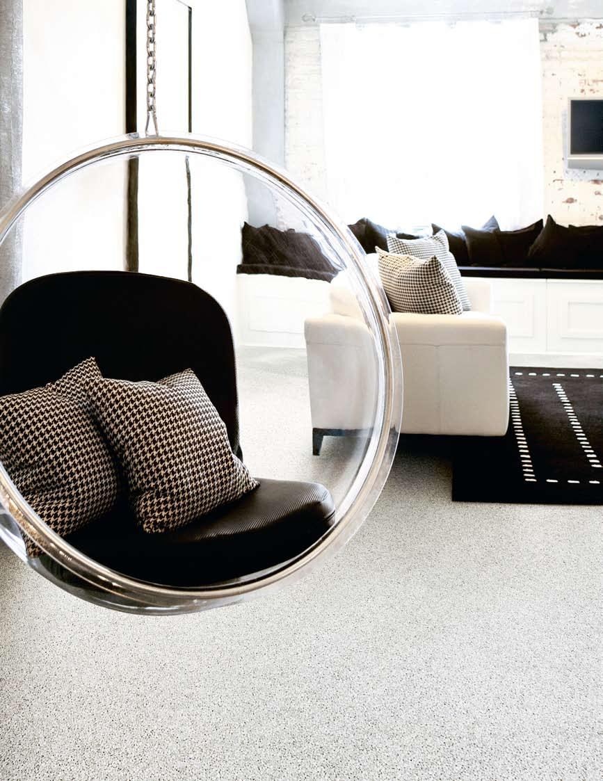
After removing the nylon cream carpet, re-stumping and then polishing the hardwood floorboards, little else needed to be done to the main downstairs living rooms than to fill them with Leigh and Stephen’s classic midcentury furniture and to hang their extensive collection of modern Australian art on the walls. “It was a house that hadn’t been loved,” says Leigh. “But when we put furniture in it that had something going for it, and some nice, contemporary light fittings it started to shine again.”
The service rooms, however, required a bit more work so Leigh called in friend and sometime collaborator, fellow interior designer, Donald Holt.
The process of transforming what was a worn deceased estate into a vibrant living space was a true meeting of minds, with contributions from three creative people all armed with different skills. Their canvas was a two-storey, semi-detached house, built in 1921 in a bayside Melbourne suburb. When the current owners, interior designer Leigh Ellwood and her husband, Stephen Carpenter, bought the house four years ago, a hastily executed patch-up job by the previous owners did little to hide the house’s neglected state.
“I’ve always referred to it as a bit of a ‘fugly’ house,” says Leigh, “but even then, it had something nice going on, it still had its charm”.
Apart from the generous room sizes and decorative plaster ceilings, the panelled front doors, each with a quarter-circle of frosted glass, that could have been designed by Charles Rennie Mackintosh, was a major drawcard.
“I admire Donald’s work so much I wanted to let him loose on the planning of the next stage of the house – essentially a re-fit of the upstairs bathroom and a new kitchen area downstairs,” Leigh explains. “I had very fixed ideas about what I wanted and Donald’s role was to step in from a removed perspective to add aspects and a way of planning that we hadn’t considered. Together we worked to form a master plan.”
Because the plans for the back of the house involved extending slightly beyond the existing footprint, council approval had to be sought. In the meantime, work started on the bathroom, which was completely stripped out and re-fitted. What was a poky and dated room is now a refined contemporary space. Clever tricks such wall-mounted basins, builtin storage, concealed lighting and a sliding entry door that’s hung outside in the hallway, extend the room’s compact dimensions.
I Being close to a project isn’t always the best thing. Leigh Ellwood discovered this while refurbishing her home in Melbourne, requiring the insight of people outside the circle, to get it right.
Jenna Reed Burns reports.I 01 View of front garden A meandering slate path leads from the front gate to the entry porch. I 02 Lower level plan

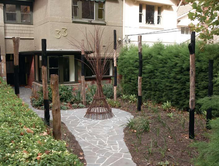
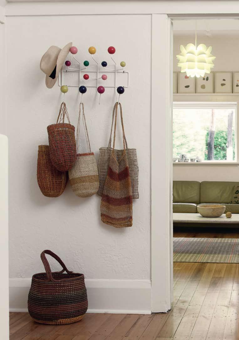
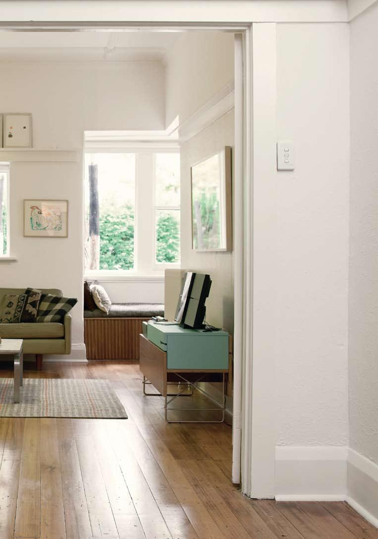
Bespoke stainless steel fittings, a recycled Oak floor flush with the hallway boards and a sculptural chrome-plated radiator suspended over one end of the bath all lend a luxurious, tactile quality. “I just adore the bathroom,” says Leigh. “All those things that designers get cranky about have been thought through, which makes it so well resolved and such a happy place to be. It’s a very beautiful, considered space.”
Holt also designed the five-metre long wall of storage that lines one side of the hallway leading to the new bathroom and third bedroom. The necessary space for the cabinetry – featuring chestnut doors and vertical handles of recycled Ebony – was cribbed from the adjacent, already generous second bedroom.
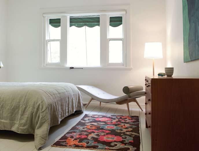
A new laundry, also designed by Holt is on the far side of the back garden, beside a
double-car garage leading off a cobblestone lane. Taking his cue from old concrete laundry tubs, the room’s walls and ceiling were lined with untreated cement board. Customdesigned stainless steel rails were added for airing clothes and a painting was hung on the opposite wall. “There’s always room for another painting,” says Leigh with a laugh.
While the interior was being planned work was already underway on the front garden, which is where landscaper and furniture maker Greg Hatton was called in. “I had an idea of how I wanted to travel through the garden but Greg came up with how to achieve it,” says Leigh.
A new path of slate crazy paving was laid in a sweeping curve from the front gate to the entry porch. Privacy was already afforded by clipped Cypress hedges to the south and
I “I had very fixed ideas about what I wanted and Donald’s role was to step in from a removed perspective to add aspects and a way of planning that we hadn’t considered.”
–LEIGH
I 03 Previous
Living Area
Picture windows frame views of the front garden from the living room.
I 04
Main Bedroom
An antique Tibetan rug acts as an effective counterpoint to a Featherstone chaise.
I 05
Child’s bedroom
Child’s built-in bed featuring storage and a reading platform.
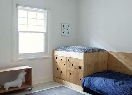
I 06 Below
Bathroom
Wall-mounted basins and built-in storage maximise limited space.
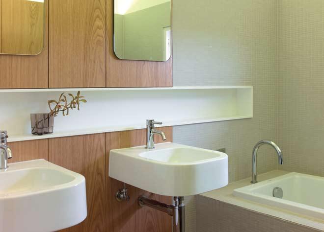
west, and tall plane trees planted in the street sheltered the garden from the hot summer sun. “I decided something vertical was needed to draw your eye up, but if we did it with plantings it would close the garden off and there would be no sense of depth,” Greg explains.
After talking it over with Leigh he decided on an installation, and a Christmas gift of old-fashioned pick-up sticks provided the inspiration. Some tall Eucalypt poles left over from another job were positioned in place after burning selected areas to produce blackened bands. The effect of the totem-like poles surrounded by native groundcovers, grasses and succulents is dramatic, imbuing the front garden with a mystical quality.
When approval for the downstairs extension was finally granted it was too late. By then Leigh and Stephen had found another project to move on to. And it looks like the same creative team will again be employed to effect another transformation.
I 07
View to garage and laundry
A panelled plywood door with circular cut-outs conceals the double garage.
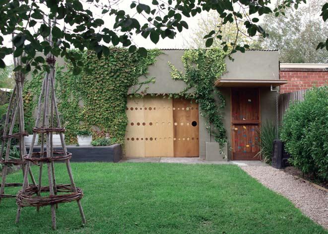
BuILDER
Robert Leddingham
Ca R pENTRy
Edward Hyde
BaTHROOm/Ha LL JOINERy Fineform Joinery
HVaC
Hub-Air
HOLT.CLIFFORD/ DESIGNERS holt.clifford@email.com
Greg Hatton (61) 411 624 712 greghatton.com
aRT wOR k
Above mantel ‘Budgies’ by Jennifer Mills. In corner ‘Dunes’ by Kim Westcott. Above sofa ‘Collages’ by Heidi Wood. Bedroom ‘Hands’ by Cameron Fraser. Child’s room ‘Bird’ by Dorothy Berry from Arts Projects Australia, artsproject.org.au.
FuRNIT uRE
Sofa Hudson from Norman and Quaine, normanquaine.com. au, and upholstered in Rustical from Contemporary Leathers, contemporaryleathers.com.au.
Armchair Featherstone (now discontinued) upholstered in Contemporary Leathers, as before. Chaise Featherstone in Elitis linen from Seneca Textiles, senecatextiles.com and Contemporary Leathers, as before. Stools white painted and 3-legged by Greg Hatton, greghatton.com. Coffee
table vintage stainless steel and marble from The Bitch is Back, (61 3) 9534 8025. Rug Society from Seneca Textiles, as before. Table Eames wire
base table from Living Edge, as before. Bag rack Eames
Hang-It-All from Living Edge. Bookshelf Book Trough designed by Donald Holt, holtclifforddesigns.com. Bedspread Society from Seneca Textiles, as before. Child’s bed built-in designed by Leigh Ellwood and built by sculptor Jason Hartcup.
FINISHES
Flooring Comcork in Sky Blue from Comcork Flooring, comcork.com.au. Cement compressed sheet from James Hardie, jameshardie.com.
au. Counter topping Forbo
Desktop Extravaganza furniture linoleum from Duroloid, duroloid.com. Ceramic tiles
Jatoba vitrified mosaic and Sannini rustic terracotta from Artedomus, artedomus.com.
au. Paint by Dulux, dulux.com.
au. Laminates by Laminex, laminex.com.au and Abet Laminati, abet.com.au. Stone Carrara from The Marble House, (61 3) 9484 4066. Timber Grey Box from Urban Salvage, (61 3) 9391 0466 and salvaged Ebony
from Shiver Me Timbers, (61 3) 9397 5993. Timber veneer Chestnut from Fethers Veneer, gfethers.com.au.
L IGHTING
Lamps in living room, Lettura from Artemide, artemide.com and in bedroom, Reel from Pierre & Charlotte,pierreandcharlotte. com. Indirect Marset Lin and Fineline from Inlite, inlite. com.au. Shelf light Modular from JSB Lighting, jsblighting. com.au.
FI x T uRES /EquIpmENT
Bath Duravit Starck from Mary Noall, marynoall.com.au. WC, cistern and shower from Rogerseller, rogerseller.com.au.
Laundry Posh Solus trough and Dorf Milan taps from Reece, reece.com.au. Hardware from Häfele, hafele.com.au, Evans & Evans, (61) 414 943 285, Access Hardware, (61 3) 9329 8833, Bellevue Imports, (61 3) 9571 5666 and Lockwood, (61 3) 8574 3888. Sliding door track from Charles Marshall, (61 3) 9429 9044.
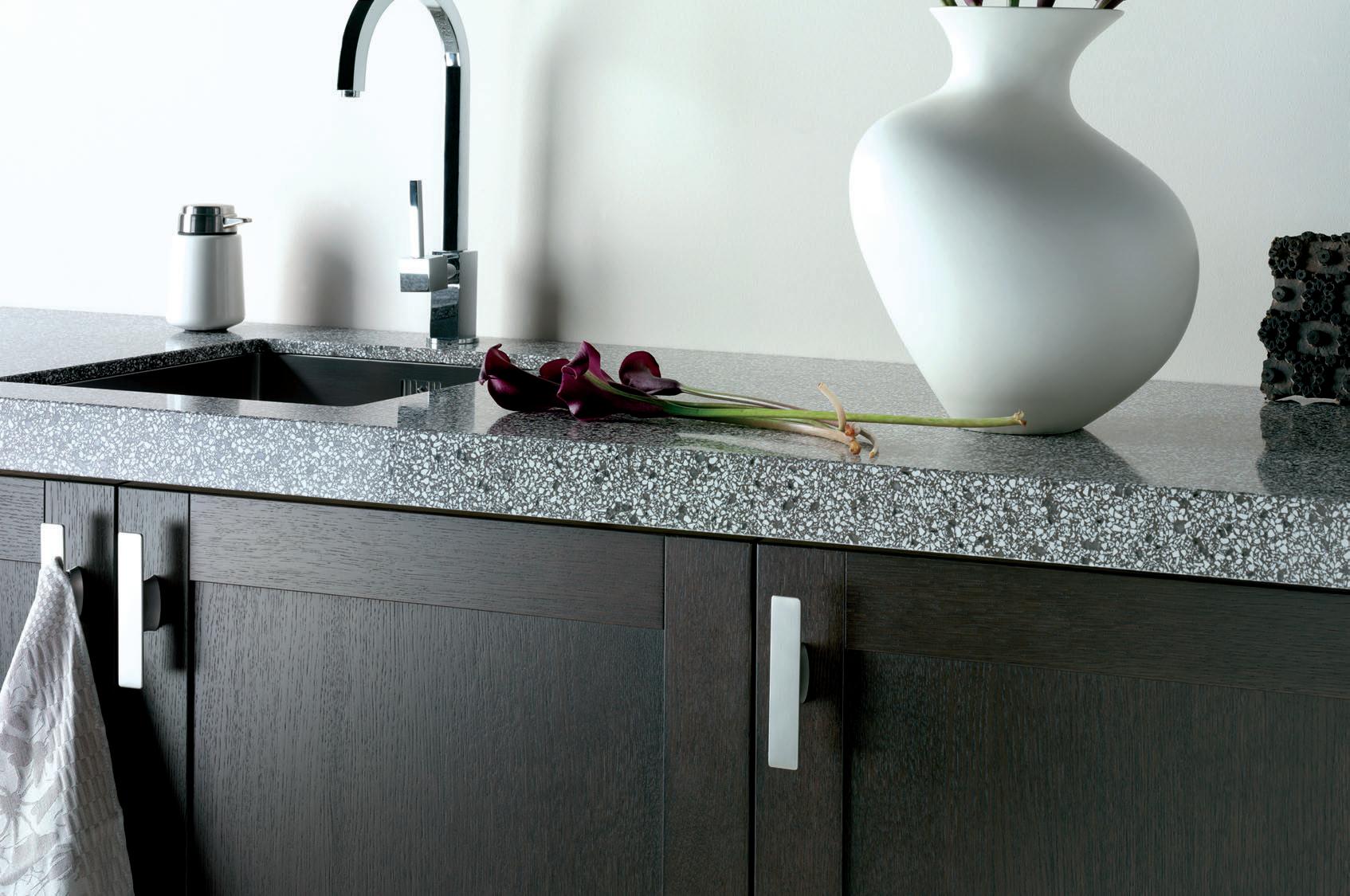


landscape house — singapore
I Ko Shiou Hee’s design for the Landscape House in Singapore’s Cluny Hill is like a little island of perfection on an island state obsessed with stability and order. Chu Lik Ren finds a project infused with a sense of calm, of reasonably balanced parts making up a picturesque whole, and the whole sustaining a symbiotic relationship with its wooded grounds.
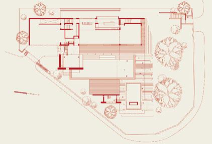
I 04
It is also remarkably open towards both the potential of its sloping site and the influences of its cosmopolitan owners, a North American couple with two children who have been residents of Singapore for over a decade. They give the house its determinedly modernist outlook and have domesticated it with a weaving of local texture and artefacts.
As with most Ko-designed houses, the Landscape House began life as a series of small cardboard models constructed in his office, K2LD. There are two early study models that show how the design evolved in tandem with the client’s input and knowledge about the mature trees ringing the compound. Three majestic Tembusu trees line the southern edge of the sloping terrain, taking up about a third of the triangular site that falls within the country’s tree conservation zone. Ko decided early on to fix the entrance to the untouched site from the higher northern corner so that one enters at an elevated plateau and proceeds to an unfolding array of spaces before being
I 01 Previous Entrance porch Granite boulders with a rust-like patina line the entrance porch.
I 02
Bedrooms
The bedroom wing docks beside two Tembusu trees.
Tony Twigg artwork in foreground.
I 03
First Storey Plan
I 04
Gallery
The double-volumed gallery houses an extensive book collection.
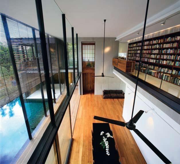
rewarded by an extended vista over the southern drop.
In its first incarnation, the house was designed to skirt around all the trees, in effect making them and the vista beyond the terminating focus of the V-shaped built forms. This natural deference, however, restricted the main two-storey wing of the house to a length that bore the full glare of the late-afternoon sun. But as the design proceeded, an arborist determined the central Tembusu had to be felled, effectively liberating the possibilities to the main wing’s present shaded fit on site. In an inspired move, the upper floor bedrooms of the main wing were pivoted away from its first storey so that the latter could gain a double-volume space and the re-aligned bedrooms could hover dramatically between the pool and the two remaining Tembusu trees. The house was, therefore, less compact, but the living quarters could now be in the midst of nature rather than fringe it.
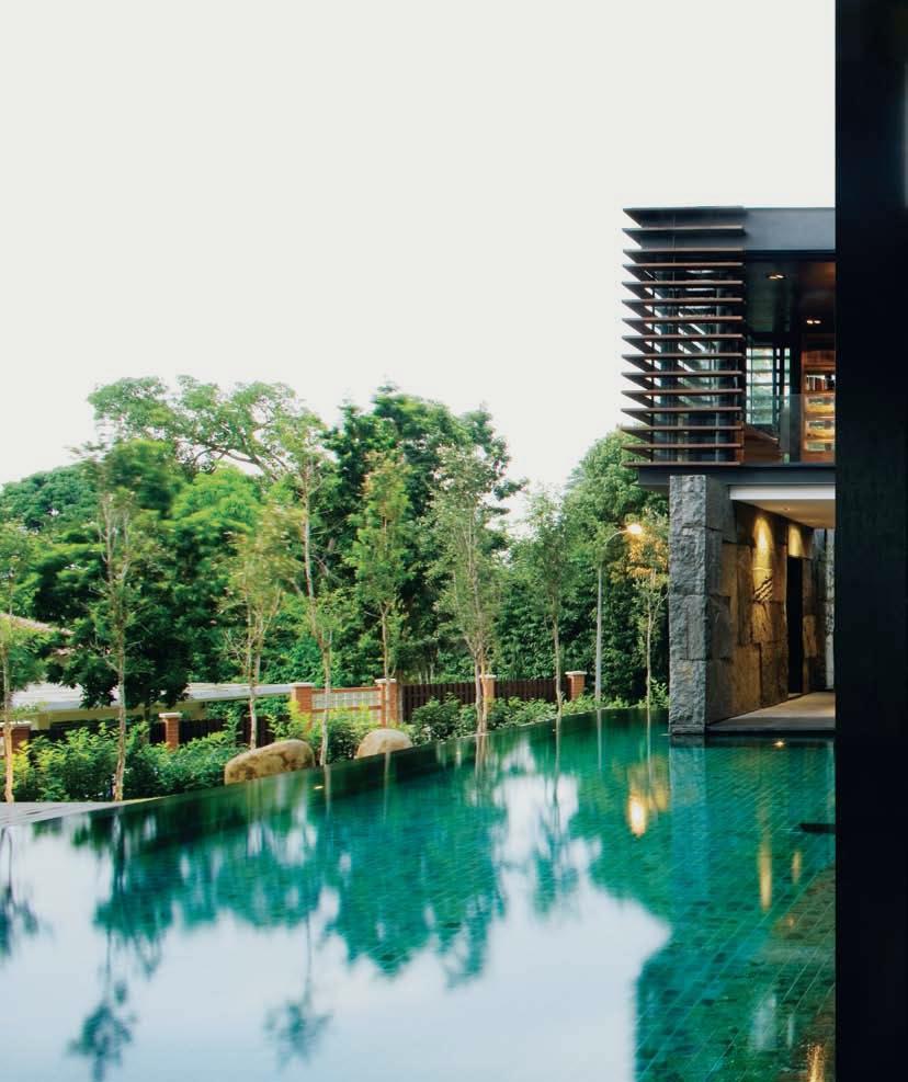
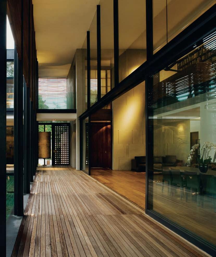
Clever use of natural materials interconnects indoor and outdoor spaces.
I 06
Bedroom Wing
The corridor’s sloping ceiling caters to the clerestory light.
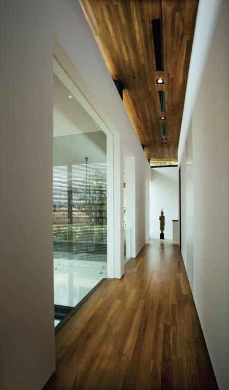
I 07
Entrance Gate
I 08
Second Storey Plan
Ko’s architectural ideology can be deciphered from how he treated the elevated bedroom wing, which forms the most dominant bulk of the house. Here, the wing would appear to float above a body of water over an apparent span of 19 metres, when in fact, it is deftly supported by the slenderest of slanted columns, disguised amongst groups of slanted poles. While a technically-minded practitioner would have opted for a truss-bridge or other forms of structural bravado and then expressed its construction, Ko’s approach is rooted in a more humanistic and ultimately more romantic code. To be sure, there is structural ingenuity at work here, but its exact working is suppressed on behalf of more serene displays. We drink in the tranquil settings, the spatial and volumetric openness, the tactile play of materials, and then almost like an afterthought, we wonder how that Teak-ceilinged aerodynamic-roof defies gravity, and that would be as Ko intended.
Over the years, Ko has demonstrated an acute sensibility towards the texture and expressive qualities of a wide range of materials used over a series of house and interior designs that are seldom alike formally. While a few of his houses are technically and structurally innovative, it is often the sheer beauty of their precisely crafted stone or glass or timber facing that makes them powerfully evocative and sensual. Materials are often used to define zones and convey moods, with a change in colour and texture marking the transition between different usages of space. In the Landscape House, Ko’s palette was given a further depth of meaning by the re-use of the felled Tembusu lumber as the facing material for the bedroom wing. Arranged randomly over the full height of the floating wing, they read as a mirage of the live Tembusu trunks beyond and a memorial to what had stood on that spot. Another homage of sorts
I 06
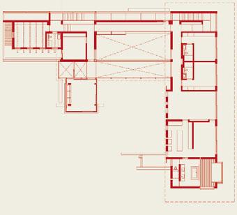
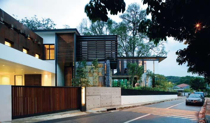
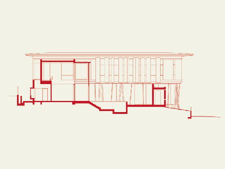
I 09
Master Bathroom
Stone and wood finishes and large glass panels create continuity.
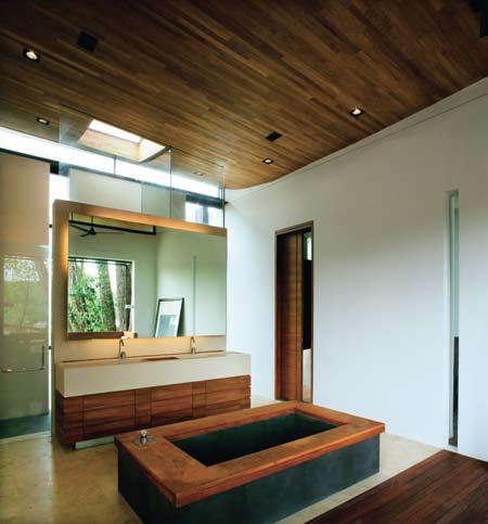
I 10
Cross-section of the dining room overlooking the bedroom wing.
was paid by Australian sculptor, Tony Twigg, who was engaged to fashion an art installation out of the dissected trunks of the fallen Tembusu. His Stonehenge-like assembly invites a walk-through exploration at the western tip of the site, next to the glazed music room. The remaining parts of the tree were used for cabinetry works in the bedrooms.
Ko’s sensitivity to the finishes of materials was one of the factors that earned him this commission, and the clients were keen to employ the materials for the house in their natural state. The concrete walls are left as exposed finish and the rusted COR-TEN steel claddings over the pool bath and playroom are assembled with a touch of ‘wabi-sabi’
I 09
imperfections. The granite boulders that line the entrance porch were chosen particularly for their patina of rust-like texture, and sourced directly from the quarries of China. Recycled timber from a Thai house was used for part of the reception lobby. Together they form an assembly of rusticity that mirrors the texture of the surrounding trees, and completes the ethereal interplay of images set up by the reflections of leaves on large glass panels and clouds on a body of still water. Their naturalness tempers the house’s uncompromising geometries with a softer skin, and paradoxically become the ornate counterpoint to the massive whiteness of a Modernist wall.
I 10
I Ko’s palette was given a further depth of meaning by the re-use of the felled Tembusu lumber...
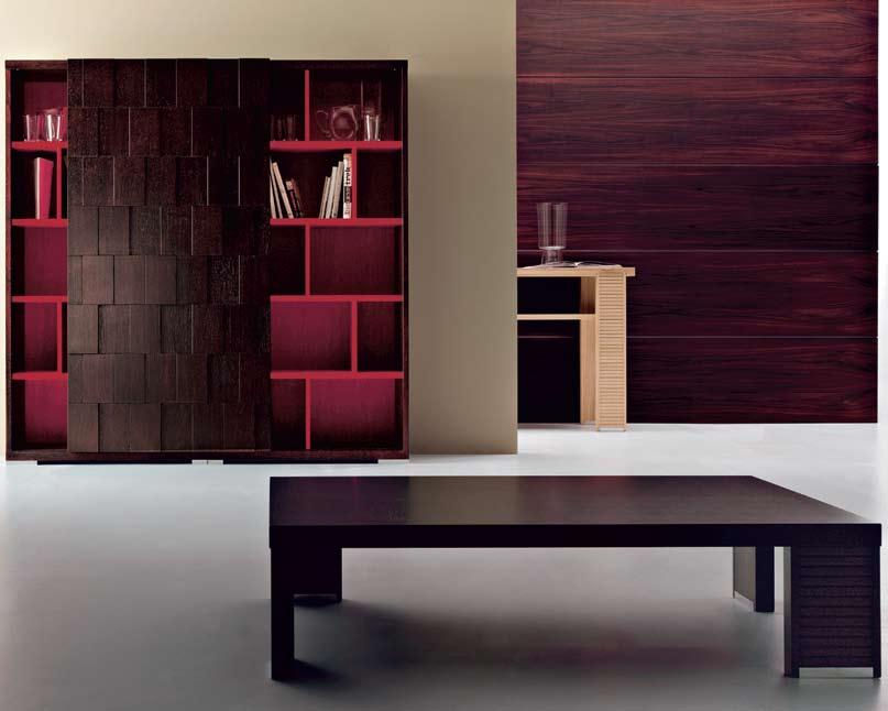
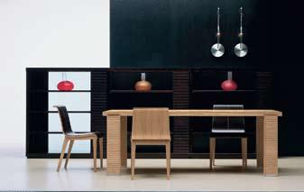
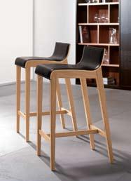
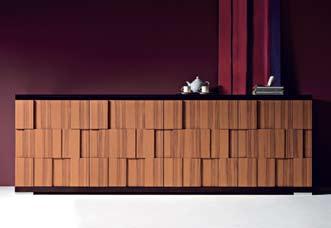
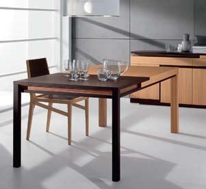

FLUSH MOUNTING - TO HAVE A MUCH LOWER PROFILE MORE USE OF NEW TECH GLASS - HAS EXCELLENT HEAT TRANSMISSION QUALITIES.


HEAT TECHNOLOGY TO SPERSE HEAT MORE EVENLY CROSS THE BODY
Inspired by designers, brought to reality by IXL’s engineers, the Tastic® Neo Dual and Single are the culmination of hundred’s of hours spent researching customer needs, developing new technologies and sourcing quality materials.
The Tastic® Neo uses 800 W tungsten halogen heat lamps, in conjunction with re ective elements, for a more e cient dispersion of radiant heat. Its in-line fan improves air ow ensuring a pleasant, temperate bathroom clear of moisture, while gimbal-mounted downlights allow directional lighting.


CONTE
STRAIGHT LINES. NEEDS TO FIT WITHIN CONTEMPORARY HOMES
Side ducting provides versatility for installation into multi-storey dwellings, venting directly to outside. The Tastic® Neo also has minimal overall height for a low pro le.
Accompanied by a ve year in-home warranty and a two year replacement warranty on heat lamps, the Tastic® Neo provides unsurpassed safety and quality
www.sampfordixl.com.au
We listened to the designers…
lorne house — VIC, australia
I The requirements of a holiday house are few – space, a sense of escape, perhaps a view of some description. Stephen Crafti visits a family beach house in Lorne by architect, Simon Swaney, and finds all of this, and more.
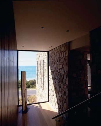
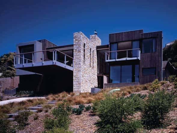
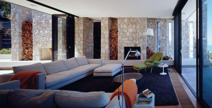
As a child, architect Simon Swaney loved going to Lorne. On warm nights, he’d sleep on the verandah with his siblings and the smell of the Eucalypts is still easily evoked as is the sound of the surf. Now, with this large family beach house in Lorne he says, “I wanted to create simple and open spaces in this house, as well as connecting to the sea”.
The house, overlooking Loutitt Bay, isn’t a montage of the childhood house from Swaney’s memories. There are, however, some similarities such as the honest use of materials like sandstone and timber and the strong connection to the outdoors. “The fragrances at Lorne are as memorable as the vista,” he says, pointing out the 180 degree views from the lighthouse at Aireys Inlet to the pier at Lorne.
Designed by Swaney for a family of five, the house is located on a slope with a 25 degree fall. Land was excavated to the rear by more than a full storey to ensure the multi-level home didn’t dominate the coastal road below. “We wanted to anchor the house. But we also wanted to create a private enclave, without neighbours overlooking,” says Swaney, who cantilevered the front deck three metres beyond the garage to maximise privacy.
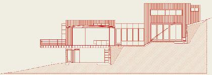
While the dark-stained timber-clad home takes a backseat to the view, a sandstone spine wall extending from the front façade to the rear courtyard draws attention. Approximately eight metres in height, the sandstone wall also defines the functional spaces within the house. “Our forms are highly modulated. You have an idea of where the living spaces are as well as the bedrooms, even before you enter the house,” says Swaney.
In contrast to the home’s monumental sandstone wall which contains two fireplaces (one inside and one out), the lobby is relatively modest in scale. “It isn’t the grand affair with all the bells and whistles upon arrival. This house was designed for the family as a retreat from the city,” says Swaney. A combination of materials – timber on one wall, and stone on the other – draws both family and friends up the timber and glass staircase. “You don’t really take in the vista,” he says, “until you arrive at the top of the stairs”.
I
I
A stone feature wall separates bedrooms and living areas.
I 02
Rear Aspect
Elevated above the road, the house benefits from 180 degree views.
I 03
Indoor / Outdoor
These spaces are connected by a stone wall and fireplaces.
I 04
Side elevation
I 05
Bathroom
The open plan bathroom enjoys unimpeded ocean views.
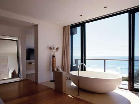
I 06 Following Courtyard Garden
The courtyard garden provides a protected dining area.
I 07
Dining Area
A built-in window seat creates a cosy nook in the dining area.
Text
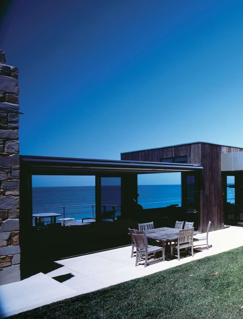

says Swaney, pointing out the timber louvres below the window seat. “Cool air is drawn into the house and purged at night through these highlight windows.”
The kitchen, made of stone and stained American Oak joinery, was treated as a piece of furniture. Rather than tuck the kitchen sinks into a corner of the room, they occupy a central position in the island bench. “You can stand here and enjoy the horizon lines. On bright
days, it’s difficult picking out the sea from the sky,” says Swaney. “Down here, the preparation of a meal is as important as enjoying the vista. The meal doesn’t just arrive at the table.”
As Lorne can be cold and windy, the architects included a protected courtyard to the rear of the house for alfresco dining. Accessed via glass doors from the lounge, the courtyard also offers unimpeded views of the water. As the courtyard faces west, an automatic awning creates protection from the afternoon sun.
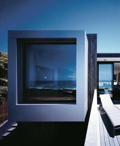
The brief included spaces for divisions within the house. One wing, leading from the kitchen and oriented to the north, is the children’s play area/television room, but television doesn’t dominate family holidays. “The focus is really on the outdoors,” says Swaney, pulling back glass bi-fold doors to connect with a small patch of turf.
While the emphasis of this home is on the outdoors, there is a sense of luxury in the main bedroom suite, located on the top floor at the front of the house. “The owners bought
a rChI te C t
Swaney Draper
Lan DSC ape De SIgner
Anna Nadenbousch
Inter Ior De SIgn
Hecker Phelan & Guthrie
Quant I ty SurV eyor S
Prowse Quantity Surveyors
StruC tura L e ngI neer S
Meyer Consulting
BuILDI ng SurV eyor S
Gardner Group
Swaney Draper (61 3) 9486 6606
Furn I ture
Coffee table Knoll
Saarinen from dedece, dedece. com. Armchair Knoll Womb from dedece, as before. Dining chairs Panton from Format Furniture, formatfurniture.com.
FI n IS he S
Roofing Colorbond Ultra Steel Kliplok from BlueScope Steel, bluescopesteel.com.au. Glass
doors Artisan bi-folding from Capral, capral.com.au. External wall cladding Alucobond in Champagne from Alucobond, alucobond.com.au. Timber cladding shiplapped Blackbutt from Australian Recycled Timber, australianrecycledtimber.com.
au. Limestone Modica from Signorino Tile Gallery, signorinotilegallery.com.au.
Wall and floor tiles glass mosaic from Classic Ceramics, classicceramics.com.au. Paint
Sienna Frost by Taubmans. Sandstone paving from Gosford Quarries, gosfordquarries.com.au. Carpet Classic Cayenne in Karak by Feltex, feltex.com. Flooring recycled Blackbutt from Australian Recycled Timber, as before. Concrete topping X-Bond in Sandstone from Alternative Surfaces, alternativesurfaces. com.au. Joinery in American Oak. Kitchen joinery in Dulux, dulux.com.au. Stone benches Jaipur Anis from Stone Italiana, stoneitaliana.com.au.
L Ight I ng
Downlights from Moonlight, (61 3) 9563 3063. External lighting from Lumascape, lumascape.com.au. Lamps
Tolomeo Mega and Tolomeo Reading from Artemide, artemide.com.au.
FI xture S / eQuIpment
Bath Oval from Boyd Design, boyddesign.com.au. Bath spout from Omvivo, omvivo. com. Handbasins Parisi Twinset from Reece, reece.com.
au. Tapware Dornbracht from Mary Noall, marynoall.com.
au. Sink Franke from Mary Noall, as before. Rangehood from Qasair, qasair.com.au.
Hydronic heating floor grills from Hub-Air, (61 3) 9853 6659. Motorised blinds by Shadefactor, shadefactor.com.
au. Louvre windows by Breezway, breezeway.com.au.
this bath [freestanding and egg-shaped] before construction started. It was destined for this spot,” says Swaney, who incorporated the bath at the end of the room, void of walls. For quick showers, there is also an enclosed bathroom and dressing area to one side.
The house, approximately 450m 2 , wasn’t designed to be knocked down and replaced in ten years time. “The design is really about creating a sense of where you are, exploring light as well as volume,” says Swaney. From every vantage point, vistas are thoughtfully framed. The built-in study in the main bedroom overlooks native grasses. From the guest bedrooms above the children’s play area there are delightful vignettes, capturing an established Acacia tree and the Lorne pier. And while the house is large in comparison to Swaney’s childhood holiday home, there is the same sense of being part of Victoria’s unique and magical coastline.
I “The owners bought this bath before construction started. It was destined for this spot.”
–SIMON

bruce martin — hawke’s bay, new zealand

I In 1970 Bruce and Estelle Martin built a dream – a John Scott- designed home and workshop in Hawke’s Bay, New Zealand. Andrea Stevens visits their home, which along with their work, has become a national treasure.
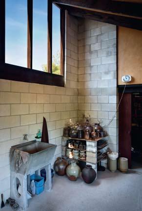
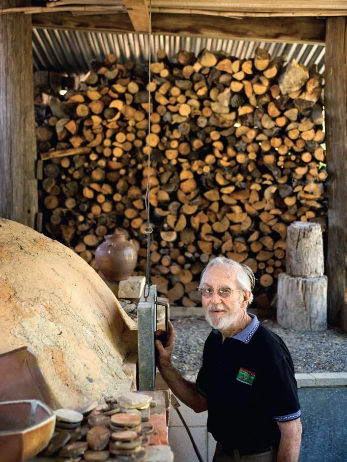
Ngatarawa is an area ten kilometres south-west of the Hawke’s Bay town of Hastings. The land has been shaped by earthquakes, volcanic deposits and the changing path of the Ngaruroro River. A Maori Pa or village was located on a river tributary and European settlers established farms in the area. Changing watercourses and dry soils high in pumice eventually turned the land over to new uses, such as grape growing and lifestyle blocks. Several farms were sub-divided in the late 1960s when Bruce and Estelle Martin purchased a ten-acre site.
I 01 Previous Glaze Room Corner of the glaze room with large windows for southern light.
The couple had established full-time potting careers and needed more space for their work and three teenage sons. They met architect, John Scott, through friends and visited his most celebrated building, the Futuna Chapel in Wellington. Often commissioned for work themselves and understanding creativity, they gave Scott as minimal a brief as possible. Other than needing a separate wing for their sons, their only requirements were no wallpaper, carpet or Venetian blinds.
In the site’s centre is a terrace which Scott used as a natural divide between the public world of the pottery workshop, and the private world of the family home. The house is set on the terrace facing north-west, overlooking the workshop. In much the same way shoes are left at the door, cars are left at the front and a short walk takes you up to the house. There are no driveways or footpaths, allowing the buildings to sit object-like on the land.
I 02 Opposite Workshop
Bruce with his Japaninspired anagama kiln.
I 03 Workshop
Pots made by Estelle and Bruce.
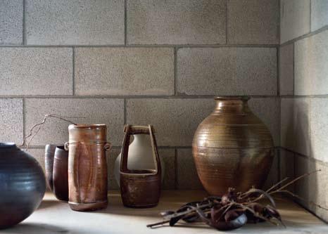
I 04 Following Sitting Room
Hand-crafted bathroom tiles are glimpsed from the sitting room.
I 05 Following Dining Room Bruce with Maree Mills from the Hastings Arts Centre.
Approach to the house is from the lower terrace. Four white forms with steep monopitch roofs are arranged sculpturally. They vary in height, orientation and location. Enclosing living, dining and main bedroom, they are interlinked by a series of flat roofs of post and beam construction. These ‘verandahs’ alternate between being fully glazed interior spaces, completely open as breezeways or performing a more traditional porch function.
Entry is via the central breezeway, at which point the visitor is at the centre of a U-shape plan. To the left is entry to the boys’ wing, to the right is entry to the main dwelling. It has an intimate scale due to its separated zones, delicate interlinking spaces and detailing.
In plan each room is joined but offset in a similar manner to a traditional Japanese house. Intricate corners and spaces are created around the edge. A courtyard is formed between the kitchen, living and bedroom and is overlooked by all three. Multiple axes never permit a singlular view of the whole. Tall volumes within the main forms combine with low ceiling heights under the ‘verandahs’, to provide a rich spatial experience.
I This is a gentle house, a house that is soft acoustically and thermally. In many ways the house is a larger scale version of the earthy and textural anagama pots...Photography Simon Devitt Text Andrea Stevens
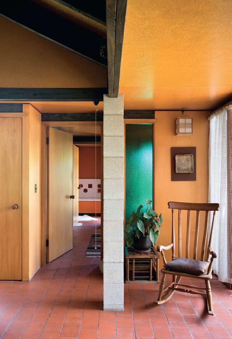
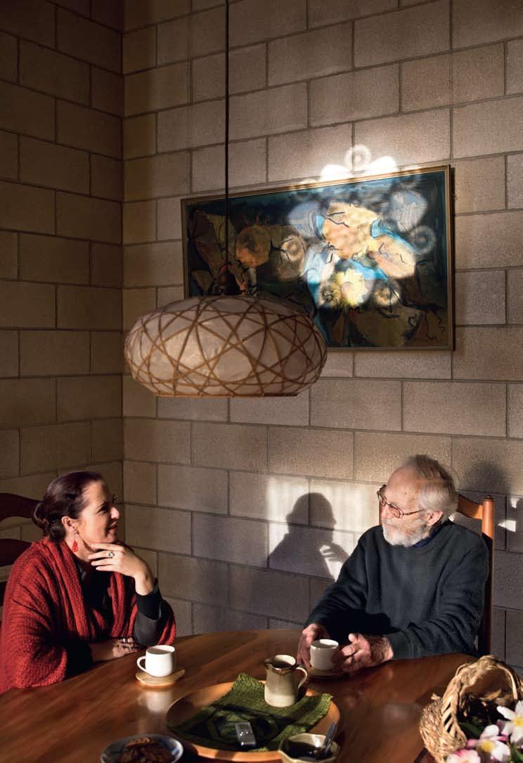
The house has a beautifully simple palette of raw and natural materials – concrete blocks, dark stained posts and beams, clay floor tiles, chipboard ceiling panels and plywood wall panels. Native timbers are used throughout –Rimu, Kaihikatea, Totara and Matai. This is a gentle house, a house that is soft acoustically and thermally. In many ways the house is a larger scale version of the earthy and textural anagama pots made by the Martins.
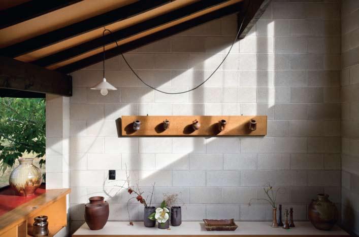
The builder, Ian Kepka and his team were craftsmen – their workmanship was immaculate. Negative details and a multitude of corners and junctions were put together precisely, and timbers have hardly moved in the 37 years since the house was built.
The Martins got on well with Scott, trusting his ideas and allowing him to lead the process. This was no small thing in the late 1960s when modernist abstract homes were incredibly few in number. Bruce recalls that Scott educated them about space and form.
“Early on he had a shed-type roof. It was as if he had taken a conventional roof line, split it in half and turned it in the opposite direction. Estelle and I were able to visualise it and we loved the idea.”
Bruce and Estelle created a significant body of work over more than 30 years of professional potting. Their most important work was made following an extensive study tour to Japan in 1978, and on building a fullsized Japanese-style anagama kiln on their land in 1981. The quality and beauty of their work were recognised when they exhibited jointly with their teacher and master potter, Sanyo Fujii, at the Mitsukoshi Gallery of Fine Art in Osaka. During their careers they received several national New Zealand awards.
Japanese pottery offered the Martins an artistic and spiritual approach to their work. The historic depth in the tradition of anagama resonated with them. It had a natural, rustic quality yet was made with a highly
I “Estelle and I did not study Zen, but somehow we both had a natural affinity to Zen ideas of beauty. We seemed to feel the ‘spirituality’ of the tea ceremony, the utensils used and the tea gardens.”
–BRUCE
I 06
Pottery Gallery
Main pottery gallery showing Kakehana – hanging flower containers.
I 07
Plan
I 08
North-west aspect The steeply, monopitched roofs create a sculptural effect.
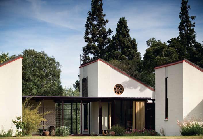
I 09
Wall Hanging
Tapestry wall hanging by Sudanese children.
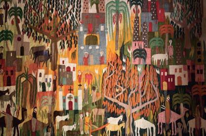
I 10
Dining Room
The north-west facing dining room subtly illuminated by the ‘Rose Window’.
ArCHi TECT
John Scott
BuiL dE r
M.B. Kepka
Fi N iSHES
Cement sheets from James Hardie, jameshardie. co.nz. Windows Cedar sashes and native timber frames, windows and doors manufactured by Hortop & Son, hortopltd@paradise. net.nz. Glazing by Smith and Smith, smithandsmith.co.nz.
Roof tiles by Monier, monier. co.nz. Internal structure Oregon posts and beams with charcoal finish. Walls Kaihikatea plywood panelling with matte polyurethane finish. Doors Heart Rimu veneer. Paint Resene, resene.co.nz. Floor tiles installed by Parallel Blocks, (64) 6878 9874. Kitchen cabinetry in Matai and Rimu timber manufactured by Hortop & Son, as before. Bathroom tiles commercial, decorated by Kenneth Clark, London. Curtains readymade and by Estelle Martin.
LigHT i Ng
Shades rice paper from Lighting Depot, (64) 6878 2244. Fix T ur ES
Tapware by Methven, methven.co.nz
sophisticated understanding of the process and art form. “Estelle and I did not study Zen, but somehow we both had a natural affinity to Zen ideas of beauty. We seemed to feel the ‘spirituality’ of the tea ceremony, the utensils used and the tea gardens.”
Scott had visited Japan in the same period he began designing the Martins’ house. With his and the Martins’ mutual respect for Japanese art and architecture, it was natural for some of that spirit to be drawn into the house’s design.
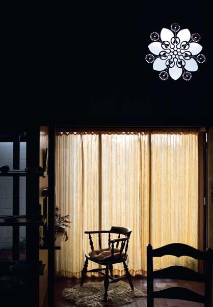
Pottery enabled the Martins to live a rich life surrounded by their art, local architecture and the landscape. The house, workshop and kiln recently received the New Zealand Historic Places Trust’s highest rating. This was a wonderful career highlight for Bruce and an acknowledgement of his and Estelle’s life’s work, and one of Scott’s beautiful buildings.
Bruce and Estelle’s work is available from: Kamaka Pottery home.clear.net.nz
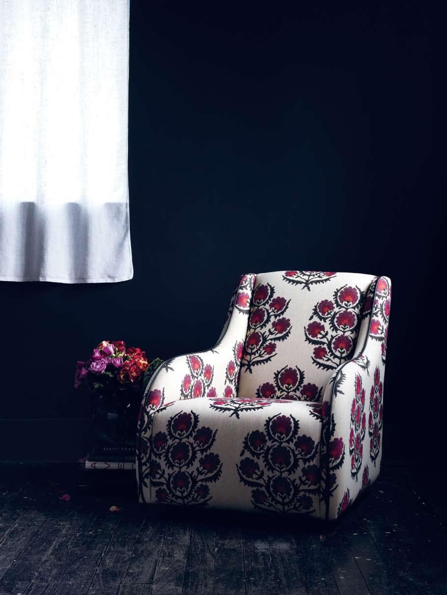
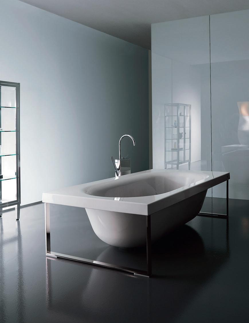
An ENDLESS Journey
I Any house by Glenn Murcutt is about relationships – client, site, landscape, materials, climate – but the White House in Jamberoo, south of Sydney, is especially fascinating for the layering of relationships which have come about over time. Paul McGillick explores a house which seems to have only now, after almost 30 years, discovered what it always wanted to be.how much it went for and he told me. I then said: ‘Who bought it?’ And I thought he said ‘He did’. And I said: ‘Who’s he?’ But Ron was saying ‘We did’. I got him to repeat it about three times before it finally got through to me that he’d bought the house. About three days later we thought: My God, what have we done?’”
In the end, they negotiated for the Fredericks to stay on in the house – because they had nowhere to go – which gave them the time to negotiate the sale of the Bowral house.
This is an oft-repeated story, capped off by Ron’s just as often-repeated remark that “It was the most expensive dinner party I’ve ever been to.”
Looking at the original Max Dupain photographs and comparing them to the house today – after renovations, after what the Whites call “enhancing” of the landscape and following Glenn Murcutt’s new addition – it is hard to not believe that this magical house has finally discovered what it always wanted to be. In fact, even among Murcutt’s extraordinary body of work, there can be few houses so perfectly united with its setting, so much so that it seems scarcely accurate to talk about it as a house separate from the landscape it inhabits.
I 01 Opposite Southern view through to the new living space.
That was in 1982. Fast forward 20 years to a Saturday night dinner party given by Ute Rose from Sydney’s iconic furniture showroom, Anibou, and attended by Glenn Murcutt, his wife and partner, Wendy Lewin, and hotelier and occasional developer, Ron White and his horticulturalist wife, Robyn.
Ron and Robyn had a house in Bowral, but were looking for something different. “The more we looked,” says Robyn, “the more we wanted some land which had a natural feel to it. Parts of the Southern Highlands are quite
Sitting next to Glenn at dinner, Robyn mentioned that she had noticed one of his houses coming up for auction the following week. He said: “It’s in such a beautiful setting. It’s a classic house. One of my favourites.”
In fact, says Robyn, she and Ron had never seen a Murcutt house, only pictures in Philip Drew’s book, l eaves of Iron. So, after much debate, they decided to attend the final inspection. They thought it was “fabulous”, but decided not to buy it because they had not yet sold their Bowral house and simply couldn’t afford it.
“The auction,” Robyn continues, “was the next Thursday. I was out and about and when I got home, Ron wasn’t there. So, I called him on his mobile and said: ‘Where are you?’ And he said: ‘I’ve just been to the auction.’ I asked
The house is timber-framed, opened up to the north and the spectacular view across the Jamberoo Valley towards the Pacific Ocean in the distance. It is approached from the rear, or southern side, which is entirely timber except for a couple of slot windows. Inside, the postand-beam structure is timber clad, apart from the northern face of the cathedral-like ceiling cavity which is glass, protected from the northern sun on the outside by a slatted timber screen. The high pitch of the roof enabled a secondary ‘attic’ bedroom to be included in the original house with an imposing internal prospect down the length of the house. The Whites had asked Murcutt for an extra bedroom and an indoor/outdoor space, “but a built space, not a campsite”, as Ron puts it. “We all agreed,” says Murcutt, “the house would lose its integrity if the addition was on the view side because it would have involved some demolition.”
What eventuated was an extension of the original ‘railway carriage’ plan – that is, adding an additional bay to the existing sequence of bays and converting the existing master bedroom into the new ‘outdoor room’, which has become a transition space leading to the new master bedroom, all connected by what Murcutt calls a “one-sided corridor”.
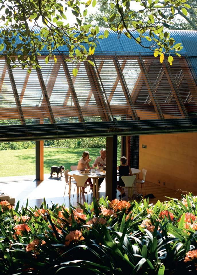
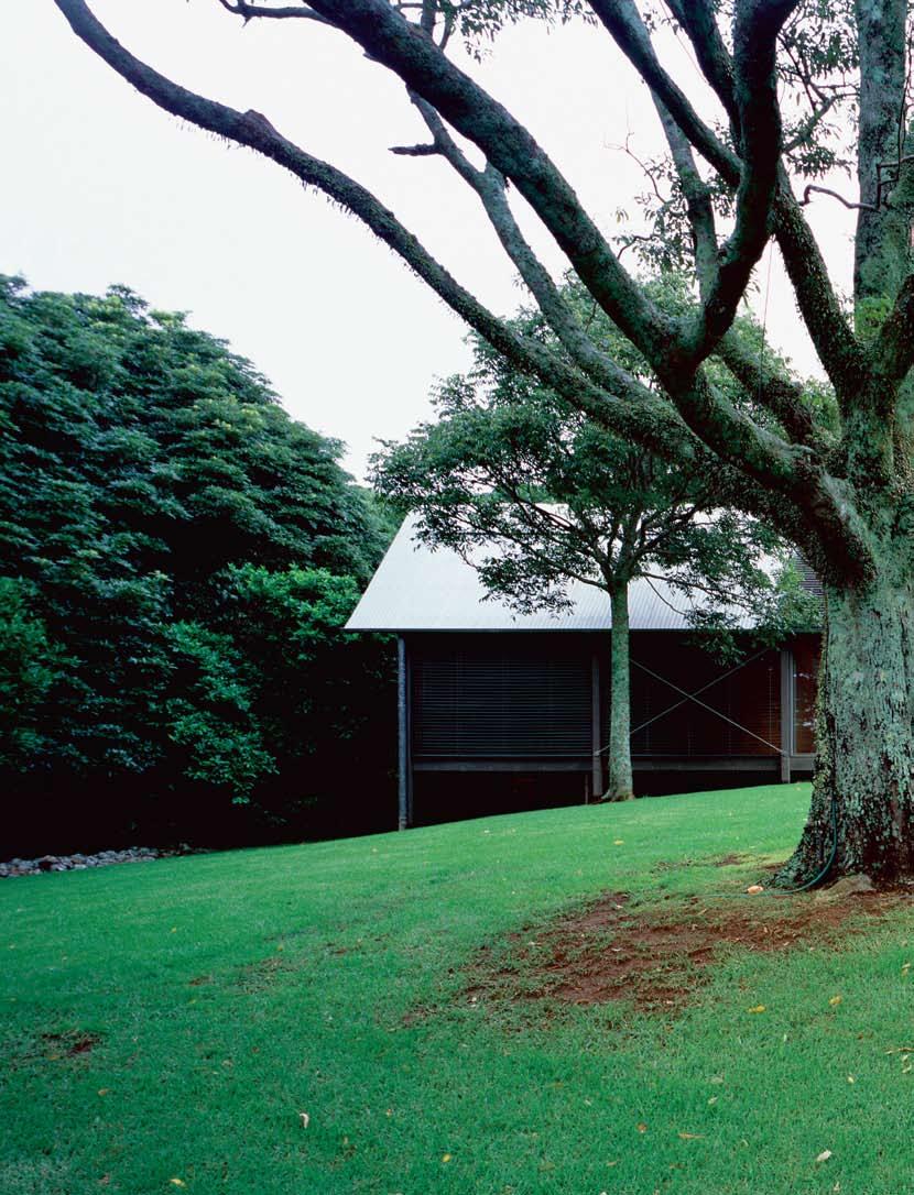
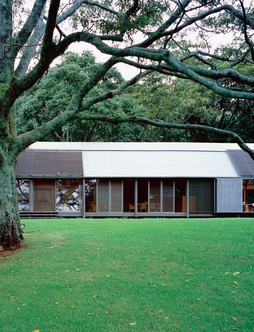
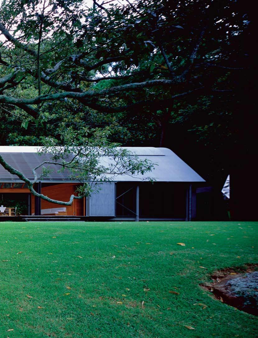
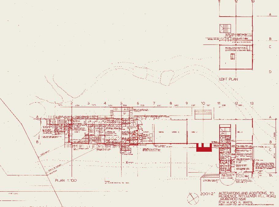
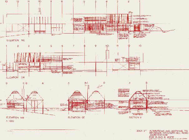
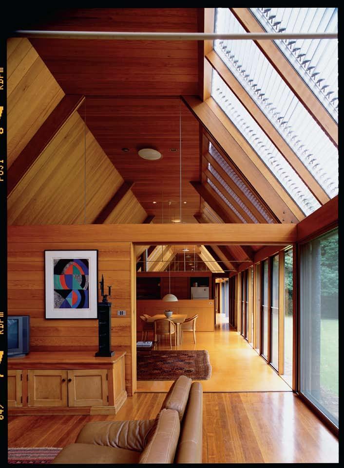
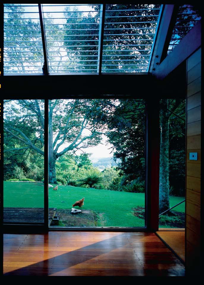
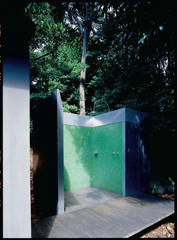
Nearly all the materials used were recycled from the existing house and the overall ‘language’ of the house has been maintained – the roofing, Blackbutt flooring, pine wall and ceiling paneling, floor-to-ceiling sliding glass doors, timber-slatted screens, adjustable aluminium louvres for northern sun control and slot windows to provide glimpses of the outside landscape and trees.
The Whites’ other request was for an outdoor shower, pointing out that they had always had outdoor showers, even in the Blue Mountains. The shower in Jamberoo is a work of art to match the fine collection of sculptures which punctuate the garden. “It wasn’t the outdoor shower we had in mind,” says Ron, “but he’s made it a thing of beauty.” The shower sits at the western end of the house, alongside the new bedroom. Here the stand of rainforest creates a kind of courtyard, giving the shower and the bedroom their own sense of privacy without actually separating them from the rest of the house and the garden.
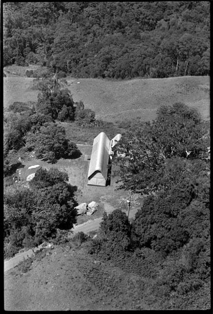
Murcutt also re-worked the study (originally a garage) and the bathroom serving the extra bedrooms (one on the ground floor and two in the roof space). Effectively, the house now consists of two wings with the master bedroom separated from the guest rooms on the eastern side by the communal spaces – living area, dining/kitchen and the new outdoor room – but all linked by the corridor running down the northern flank of the house.
Just as the house itself offers all kinds of Bachelardian nooks and crannies with selectively framed views through slot windows, the Whites have developed the landscape to also offer artfully cropped vistas and an endlessly revelatory stroll garden, starting from a dry stone wall which marks the edge of the lawn and the slope down into the rainforest. The aim, says
I The house is timberframed, opened up to the north and the spectacular view across the Jamberoo Valley towards the Pacific Ocean in the distance.
Ron, “was to make it an accessible and walkable garden. There are some lovely rocks down there. They are a feature of the garden and we have just tried to enhance the rocks.” Like a Japanese or Chinese garden, it represents a reinterpretation of nature through rocks. Complementing the rocks, however, are extensive plantings and selective thinning of the rainforest. “We are,” says Robyn, “keen on seeing vistas through, but not seeing everything.” Complementing the natural aesthetics is a sensitive collection of Australian sculpture – by Bert Flugelman, Inge King, Robert Klippel, Bronwyn Oliver and Emanuel Raft, and including some Mimi Spirit Poles from Maningrida – which in concept, materials and scale blend perfectly with the rocks and lush vegetation.
ArcHI tect
Glenn Murcutt BuIlder
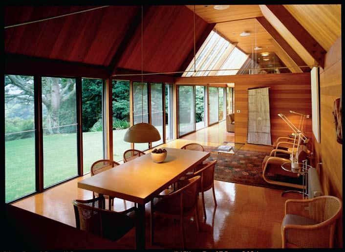
C. & C. Symonds e nGI neer James Taylor & Associates
Glenn Murcutt (61 2) 9969 7797
FI n ISHe S
Living area and master bedroom rugs from Nomadic Rug Traders, nomadicrugtraders. com.
Furn I ture Outdoor room chairs Fritz Hansen 7 series from Corporate Culture, corporateculture.com.
au. Outdoor room tables Alvar
Aalto Artek 84 and Artek 95 from Anibou anibou.com.au. Outdoor room lounge Longreach in cane by Neil Burley from Anibou, as before. Stools Artek 60 from Anibou, as before. Dining table
Artek H92 extension from Anibou, as before. Armchairs
Artek 44 in bedroom and 400 series in living area from Anibou, as before. Table Eileen Gray
from Anibou, as before. Bed In Spirit of Aalto designed by Glenn Murcutt and constructed by David Muston, available from Anibou, as before.
lIGH t I nG
Bedside lamp Louis Poulsen
AJ Floor by Arne Jacobsen from Targetti, targetti.com. Dining room lamp Louis Poulsen
AJ Royale by Arne Jacobsen from Targetti, as before. Table lamps Artemide Tizio by Richard Sapper in white enamelled steel from Artemide, artemide.com.au.
FI tt I nGS
Shower head from Raymor, raymor.com.au. Taps original Fairfax Seagram designed by Mies van der Rohe.
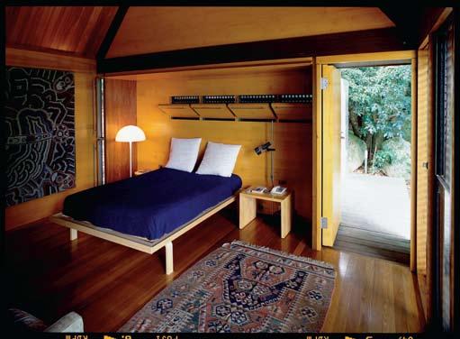
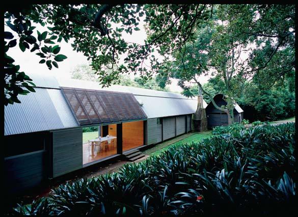
49 colours
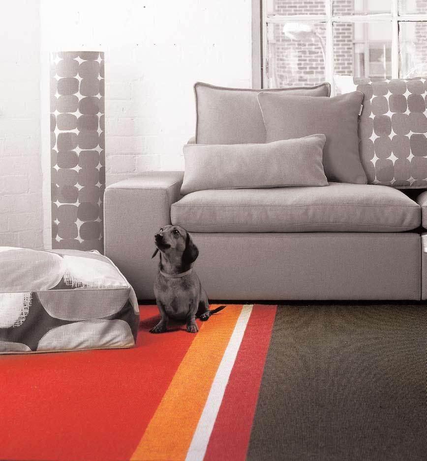
endless combinations
gibbon group p: +61 7 3881 1777 www.gibbongroup.com.au
I An artist/architect and a television political commentator might seem an unlikely pairing for a holiday home project. But Richard Goodwin and Quentin Dempster have more in common than meets the eye and the partnership has resulted in a remarkable house overlooking Bass Strait.
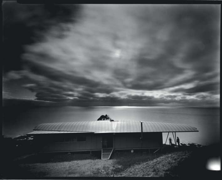
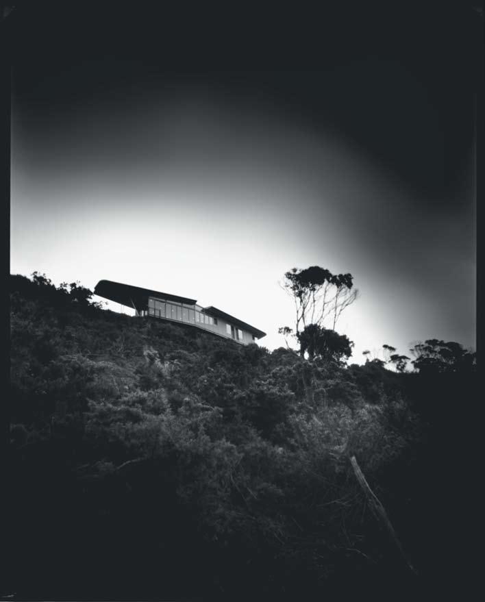
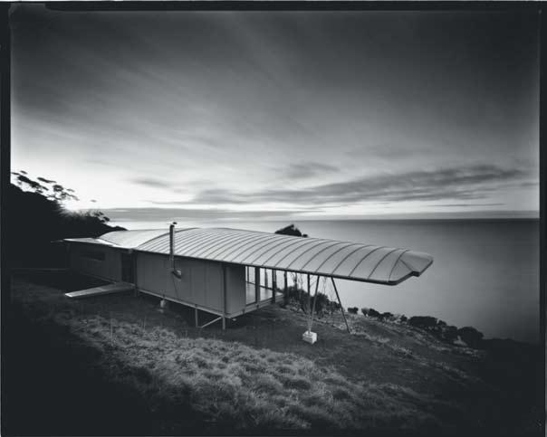
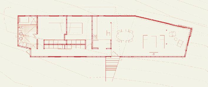
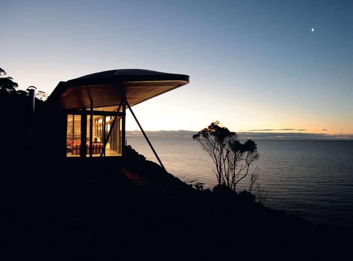
First, some facts about the two main players. Richard Goodwin is an architect and an artist whose major preoccupation is bringing architecture and art together in a seamless union, working on freeway walls, bridges and extensions. His ‘gallery’ art typically involves the re-assembly and documentation of industrially constructed vehicles such as bicycles, cars, motorcycles and helicopter models, although examples of his paintings are to be seen on the walls at the Winged House. But central to his practice is the fusion of art and architecture, which apart from calling into question traditional public art, explores urban political issues such as the progressive alienation of public space for private purposes.
Quentin Dempster is a television journalist who made his name as an investigative reporter exposing corruption in Queensland. He now lives in Sydney where he hosts a straightshooting weekly exposure of state politics on ABC TV.
You see, there is something in common – they are both political pot-stirrers. But it was art that brought them together. “We had bought Queensland art,” says Quentin, “but when we moved to Sydney in the early 1990s, it was Richard’s art which was captivating”. Quentin and his wife, Beth (a psychiatrist) had first taken an interest in Richard’s freeway walls in Sydney. “Then,” says Quentin, “we got in touch with his other stuff – ‘Möbius Sea’ and the Parramatta Square fountain. We did a story on the design competition for what is now the Anzac Bridge and I was interested in Richard’s proposal, seeing what he was doing with art and architecture.” The families became friends and the Dempsters began to collect Richard’s work.
In the effluxion of time, Quentin and Beth began looking for a place to get away from it all, which could also double as a holiday house to rent out and pay for itself. After toying with New Zealand and checking out the south of NSW, they began to focus on Tasmania.
“On one of our trips to Tasmania,” says Quentin, “we found this area (on the northern coastline of the island overlooking Bass Strait) through a producer on Australian Story (an ABC television program). Eventually, we got an option to buy this property subject to development approval. Richard had offered that if we ever found a place, let him know.”
So, they flew down together. “My recollection was getting in that plane after our site visit,” says Quentin, “and the plane fortuitously banks over the site and I said, leaning over, ‘There it is.’ And we could see the magnificence of this piece of coastline, this basalt escarpment and I think he could see the challenge of it…”
“Quentin arrived with a genuine passion for the place,” says Richard. “Which we now know is linked to his ancestry, and with specific
I 06
I 01 Opening The house enjoys a magnificent vista over Bass Strait.
I 02 Previous From below, the house looks like a bird about to take flight.
I 03 Previous From above the house suggests a plane taking off.
I 04 Living / dining / kitchen space.
I 05 Plan
I 06 Richard Goodwin, John de Jong and Quentin Dempster.
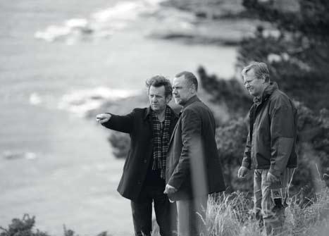
I 07 Following East Elevation
requirements – the views, being actually on the cliff, being halfway down the site, engaging with the place properly and seeing some specific views (such as Rocky Cape to the west).”
Asked why the Dempsters chose Tasmania, Quentin replies simply, “Because it is away”. But it is also close to Burnie airport, which makes the house easily accessible from Melbourne and helps the commercial viability of the project.
“We wanted something natural and a little bit wild. We’d looked all over the west coast, but it was just too remote to be practicable even though we saw some tremendous places. Then we saw the north coast. Initially, it could have been just a shack, go trout fishing, read, play some music, somewhere genuinely to escape to. But then this opportunity came up.”
Turning to Richard, Quentin continues, “I remember you picking up some rocks and we were looking at the texture and at that time we wanted a more robust concrete bunker-type of structure…” “You have a good memory,” Richard interrupts. “Because the other good thing about that trip was that we went around Boat Harbour and picked up some shale. I had these slivers of shale and I made a pile of them on the desk. And because they were slivers they were wing-like and immediately the metaphor came to me of the wing, the bird…”
Hence, the strongly sculptural form of the house, set on a specially excavated shelf halfway down a very steep slope. “From the top,” says Richard, “it looks like a bird. From the bottom it looks like a plane.” It is very much a case of function following form. But not so that the program of the house is compromised. According to Richard, “If the coat rack’s right, you keep hanging your hats on it”.
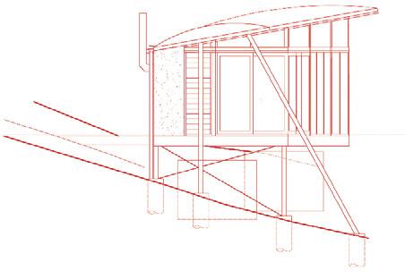
The site combines a steep gradient, high winds and the potential for slippage. So, the original idea of a heavyweight building on a concrete slab was abandoned in favour of a raised building anchored into the rock by deepset piles which emerge from the ground like the struts of a vintage aircraft – an impression reinforced by the house’s lightweight structure with its floating, curved and ribbed zinc roof, cantilevered out on the eastern side, its steel frame and stressed, plywood skin.
From the top of the site the house looks more like a massive bird of prey about to launch itself out across Bass Strait – although from here it is also possible to appreciate Goodwin’s favourite piece of detailing, the feathered, western rear edge of the roof which draws its inspiration from the form of the famous wartime German fighter aircraft, the Messerschmitt 109. “I knew,” says Richard, “there was no point to doing this house unless the wings were beautiful as wings”.
“I like the idea of attaching things,” says Richard. “You know, the parasite action (a reference to one of his typical urban strategies). Well, here was a situation where the site was so extreme the building becomes like a parasite, clinging for survival to this edge. And it didn’t take long for the metaphor of flight to come up. You stand there in the wind with your arms out and you’re almost doing the building.”
At the same time, the building does not impose itself on the site. Instead, it floats free of the land with its industrial grey palette blending into the black stone typical of the area and the dark tones of the vegetation.
“What makes this so viable,” he says, “is not only does it have a claw in the ground, but what’s on top is extremely light apart from the transfer of the huge wind loads. So, the building actually weighs nothing in building terms. It’s not affecting the site at all. When those big wind loads come on, you want them to go straight into the rock.”
If, from the outside the house resembles a plane, from the inside it provides the ultimate bird’s eye view – no deck, but a continuous floor-to-ceiling window along the living/dining space with expansive views north across the sea. The rooms spill off a corridor running down the southern side from the bathroom with its seductive corner window, through two bedrooms to the open plan kitchen/living/ dining. The simplicity of the interior suggests a traditional holiday house, with the combination of refuge and prospect we all want when we retreat from the frenetic urban rat race.
The builder, John de Jong, sums it all up when he says, “The great thing about this project is that we have exceptional clients. Beth and Quentin had faith that I could do something a bit out of the ordinary, and that’s quite exceptional.”
Note: The Winged House won the Tasmanian Steel Design Award and a Highly Commended Award in the Creative and Innovative Category for the Australian Steel Institute Awards (ASI Steel Awards, Victoria and Tasmania, 2008).
thewingedhouse.com.au
I “The site was so extreme the building becomes like a parasite, clinging for survival to this edge.”
GOODWIN
dempster house — TAS, australia RICHARD GOODWIN
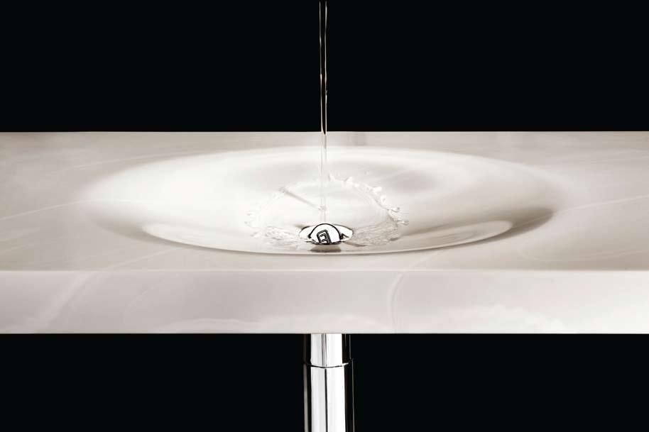
I The culmination of a long-term professional relationship between an art museum director and a leading architect resulted in a remarkable house on the beautiful north coast of Tasmania. Paul McGillick indulges his love of art and landscape at the daniel Thomas House.
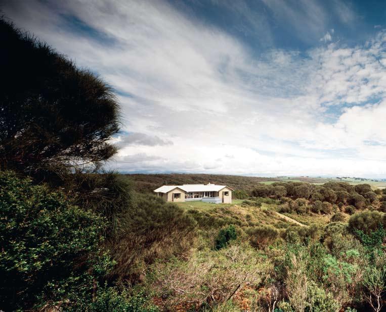
I have known daniel Thomas for many years, from my days running an inter-disciplinary art space in sydney and indulging in some precocious art criticism. But I hadn’t seen him for years when I found myself co-assessing a Ph d candidate with him at the sydney College of the Arts. I told him I would be visiting Tasmania soon to see r ichard Goodwin’s house for ABC presenter, Quentin d empster. daniel insisted that I visit him – and I did.
daniel has a formidable CV – as curator and ultimately Assistant director at the Art Gallery of nsW, as a curator at the national Gallery of Australia in Canberra, then as d irector of the Art Gallery of south Australia, as well as being a prolific art critic and historian. And along the way, an enthusiastic
and discriminating collector of contemporary Australian art.
Over lunch at his home on the northern coast of Tasmania near the town of devonport, daniel explained that he had been retired for several years from the Art Gallery of south Australia when, overnight, he was afflicted with painful arthritis. six months later, although the arthritis had cured itself, daniel saw it “as a signal I should leave this single-lift flat in Adelaide. I’d rather enjoy a tailor-made house in old age – sunny, by a beach, by the sea, looking at the ocean.”
On the point of buying land south of Adelaide, a phone call alerted daniel to a 40 hectare lot in Tasmania, coincidentally adjacent to a property owned by his twin brother.
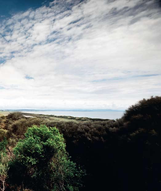
“so, I raced across from Adelaide,” he says, “and then I thought: Oh, well, it may not be a good idea to go home to die. But it was a terrific site and it saved the search. In fact, it has turned out pretty well. It’s nice having a brother, nephews and nieces, and great nephews and great nieces close to hand.”
enter Andrew Andersons, a director at PTW, one of Australia’s oldest and most prestigious architectural firms (designers of the Watercube for the Beijing Games). Andersons has an enviable reputation for his museum design, which includes two additions to the Art Gallery of nsW. It was during the design and construction of the Captain Cook Wing there that he formed a friendship with daniel.
“Knowing daniel”, says Andrew, “has been a terrific thing for me, especially in appreciating the world of contemporary art, of art generally and its relationship to architecture”.
daniel was d irector of the Art Gallery of sA when Andrew drew up the plans for an extension there, so when daniel looked for an architect for his “tailor-made house”, he went to Andrew, even though Andrew, by his own admission, had only designed one house before – his own.
“It has always struck me,” says Andrew, “with domestic architecture in particular, the quality of light and the orientation is everything. Manipulating light is what makes a place. so, if this house ( daniel’s) has any artifice at all, it is about how daylight works –light from above, light from the sides, shutters, bay windows and very carefully oriented towards certain views.”
“There are some rooms with very little light,” he continues, “like the library, which is all about books. It’s just got a couple of little light tubes coming through the ceiling and then there is just one quite modest window where the desk is. so, the library is a complete contrast to the glassed-in verandah on the other side. so, you’ve got the top-lit window in the middle.
I ...the house provides for both privacy and communing with guests
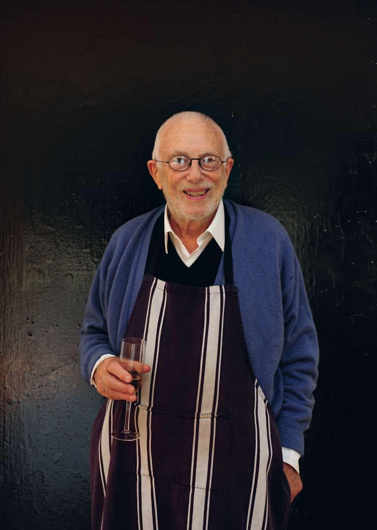
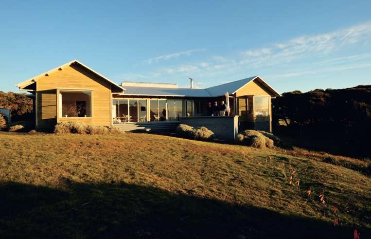
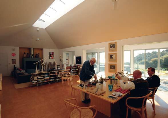
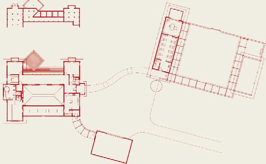
That’s a room in which works of art are to be seen (there are no books in the living room) with a vast panorama over Bass strait.”
The site is 40 hectares because that is the minimum size one can build a house on a rural preservation site in Tasmania. “It’s a very traditional house,” says Andrew. “It’s like an old weatherboard Tasmanian farmhouse. It’s just that the scale of the rooms is extended. Like both bedrooms, the bathroom’s got a bay window with a bath jutting out into the view.”
The aim, he says, was to provide daniel with “an appropriate setting for him, his art collection and thousands of books”. In addition, since daniel is fundamentally a cosmopolitan, it provides accommodation for visitors, thus helping him to maintain his friendships with urbanites from the mainland – or, as daniel likes to put it, from Australia.
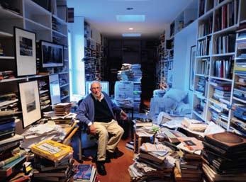
reflecting daniel’s personality, the house provides for both privacy and communing with guests. Hence, daniel has his own bedroom and bathroom with direct access to the library, and the guests have their bedroom and bathroom on the other side of the house, separated by the living/dining area and glassed-in verandah.
“The aim,” says Andrew, “was to optimise the site. Obviously, it is a fantastic site with a due north view across Bass strait with this wonderful gully.” Through orientation and choice of materials, the house is also very efficient in terms of passive climate control. The north facing verandah with its charcoal floor is a solar collector in winter, but ensures that the house remains cool in summer.
The living/dining area is essentially a gallery, lit from above by the roof light, with no ceiling lights at all, just floor and table lamps and a set of light boxes. “The concept,” says Andrew, “is that the big room is like a room in an art gallery – how the light works, how the scale works – and it just happens to have a dining table and a lounge suite so that daniel can live among his works of art”.
I 02 Previous daniel Thomas in front of Peter Booth painting.
I 03 Previous
The house is effectively two wings connected by the living / dining space.
I 04 Previous daniel enjoys matching art and design with natural forms.
I 05 Dining / Living Space
The space also acts as a gallery for daniel’s art collection.
I 06 site Plan
I 07
Library daniel in his library / study.
I 08
A detail from a rosalie Gascoigne construction.
I “Obviously, it is a fantastic site with a due north view across Bass strait with this wonderful gully.”
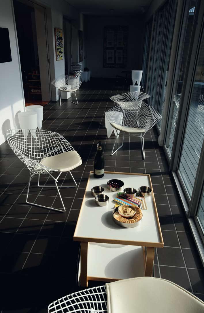
At night, when the verandah starts to cool down, glass doors can be slid across to create an internal room which is relatively easy to heat with the fireplace (although the house does have underfloor heating). Both bedrooms have bay windows which also act as heat traps ( daniel, in fact, maintains a small flower garden in his bedroom bay window). They also have shutters, with smaller windows to provide ventilation.
This is a very simple house, using simple materials – cork tiles, plasterboard and standard window frames. As a result, it cost, Andrew estimates, about half that of a typical architect-designed holiday house. Just as the art works have been collected over years according to daniel’s meticulous taste, the house is also furnished very deliberately, albeit largely second-hand – note the Bruno Mathsson mobile shelving, beds in the guests’ room, chaise longue and side table, the Thonet chairs, the eames chair, Aalto vases and coffee trolley, the Magistretti sofa, Tizio table lamps, the artfully adapted Grant Featherstone bed in daniel’s bedroom down to the exquisite Janet dawson side table.
so, in fact, there is an intriguing blend of simplicity and sophistication both in the house and in the way it sits in its landscape, its palette and form melding quietly into the slope and coastal scrub, framed to the east by a splendid rock outcrop, to the north by the expanse of Bass strait and to the west by a fertile plain which, as the sun sets, could well be straight out of a Turner landscape.
I 09 Opposite Sunroom
This is a transition area between the deck and the living / dining space.
I 10
Guest Bedroom
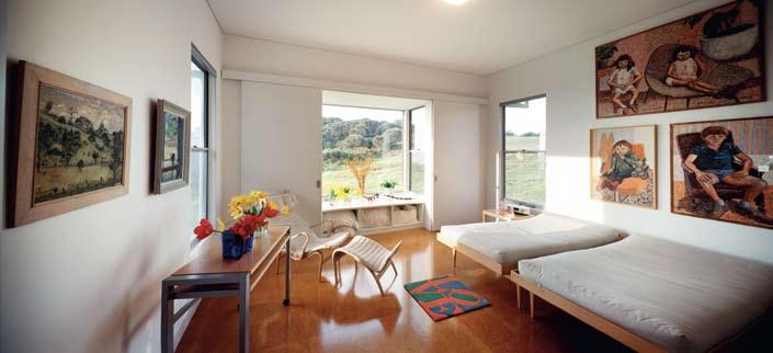
I 11 Following Bay window garden in master bedroom.
Archi T ec T
Andrew Andersons (PTW) projec T Te A m
Jim doefler, sybil Andersons BuiL der
Matthews Constructions
p T w (61 2) 9232 5877 ptw.com.au
Furni T ure
Dining table Cassina
La Barca in Ash by Piero de Martini from Space Furniture, spacefurniture.com.au. Chairs
Le Corbusier bentwood by August Thonet in natural European Beech from Thonet Australia, thonet.com.au.
Lounge Cassina Maralunga
3-seater by Vico Magistretti from Space Furniture, as before. Living room armchairs
Knoll Wassily by Marcel Breuer from decece, Grand Confort by Pierre Jeanneret, Le Corbusier and Charlotte Perriand (no longer distributed) and Eames Lounge Chair and Ottoman by Ray and Charles Eames from Living Edge, livingedge. com.au. Coffee table Artek by Alvar Aalto in Birch from Anibou, anibou.com.au.
Shelves Stories Table by Bruno Mathsson from Funkis, funkis. com. Sunroom armchairs
Knoll Diamond Chairs by Harry Bertoia from dedece, dedece. com. Stools XO Design Bubu 1 by Phillippe Starck from Space Furniture, as before. Chair
Cassina Rietveld Red Blue Chair by Gerrit Rietveld in lacquered wood from Holdsworth Galleries. Coffee table Janet Dawson Round Coffee table
in blue, faux marble and faux woodgrain Laminex from Gallery A. Deck lounge Alias
Longframe by Giandomenico Belotti in aluminium and white polyester from Space Furniture, as before. Chairs G’Day by Brian Sayer and Christopher Cornell in recycled aluminium from G’Day Chair Company.
Occasional table Annika square by Bruno Mathsson. Bed Rock Maple custom built to client’s specification by Gordon Mather. Bedroom easy chair Miranda by Bruno Mathsson from Form.
Umbrella stand Vertebrata by Caroline Casey in laminated Hoop Pine from Anibou, as before. Coat hanger Hang-ItAll by Charles and Ray Eames in coated steel wire and painted wood from Luke, luke.com.au.
Doorstop Magis Rock by Marc Newson from Object, object. com.au. Tea trolley Artek 901 by Alvar Aalto in Birch and white laminate from Anibou, as before. Candlesticks Orrefors, orrefors.com, pewter and gold by Georg Jensen, georgjensen. com and Skandiform stainless steel by Jonas Lindval from Scandinavium, now available from Fred International, fredishere.com.au. Office
chair Aeron from Herman Miller, hermanmiller.com, also available from Living Edge, as before. Vases Alvar Aalto from Anibou. Glass jugs Aino Aalto from Anibou. Stainless steel buckets, bowls and coasters from Corporate Culture. Ligh T ing
Table lamps Artemide Tizio by Richard Sapper in white enamelled steel from Artemide, artemide.com.au. Floor lights custom built by Opus. Fix T ure S / e quipmen T Tapware Vola by Arne Jacobsen from dedece, dedece.com.
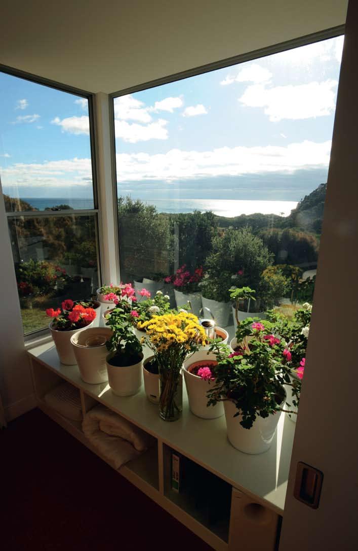
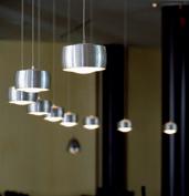
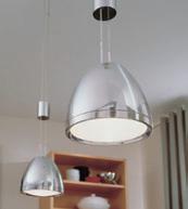
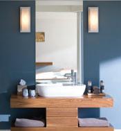

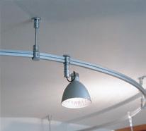
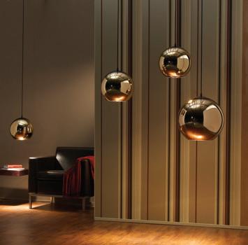
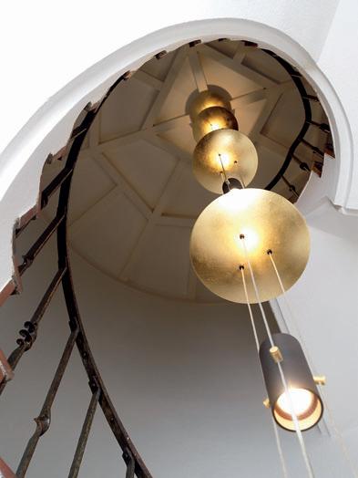
I There can hardly be a more contrasting pair: a pre-assembled rural hut, just 3 x 3m consisting of two rooms placed one on top of the other; and a large family house in Sydney’s affluent eastern suburbs. But these two buildings by Sydney architect, Robert brown, are not opposites, says Philip Drew. They are really consistent with a subtly intoned language. Both employ straightforward principles to achieve low-energy solutions and are delicately attuned to their sites.
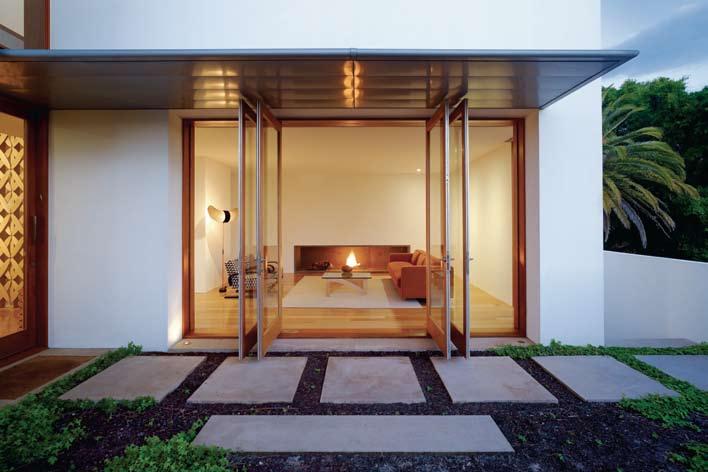
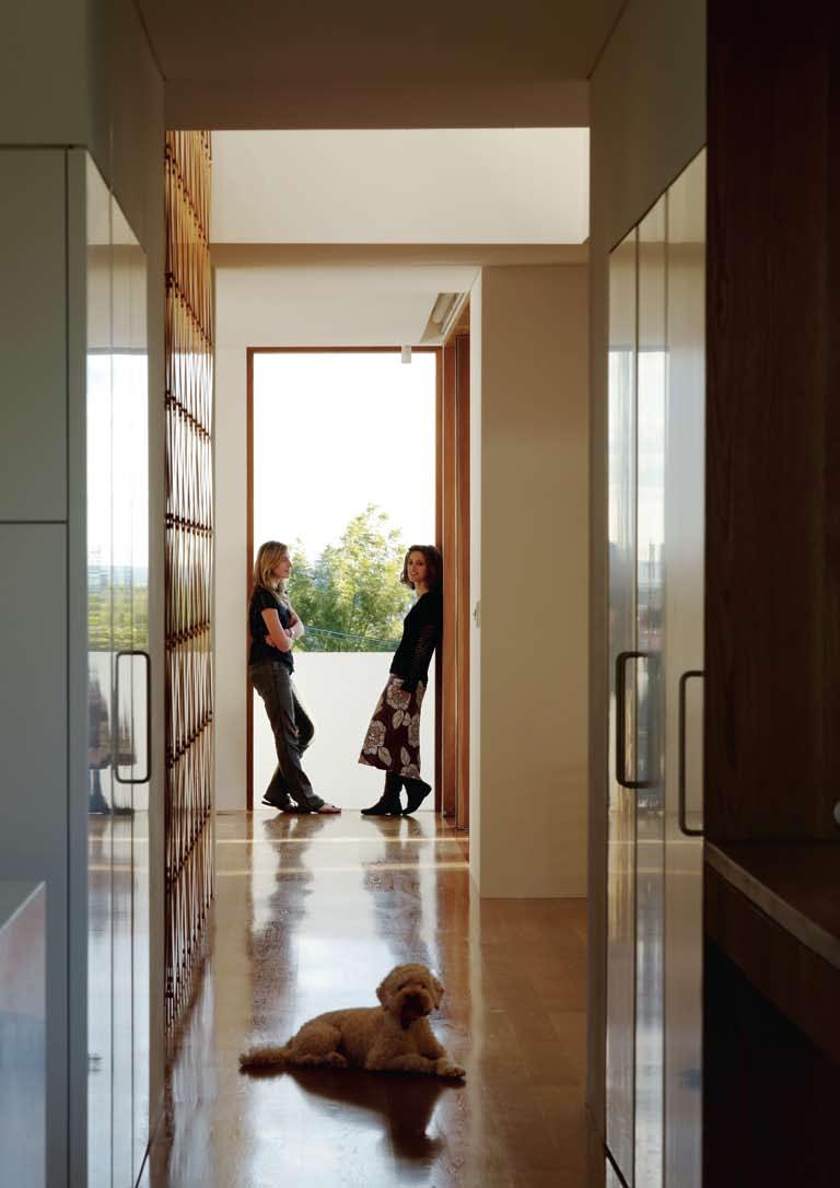
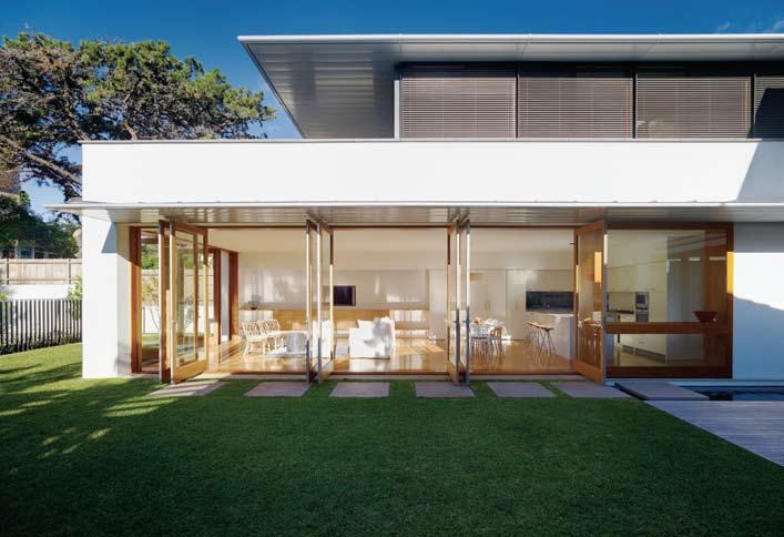
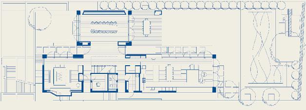
Leading Japanese architect Arata Isozaki has identified two opposed principles: jomon and yayoi – the former Dionysian/populist/nativist/ dynamic, the latter Apollonian/traditional/ elitist. Yayoi is related to artifice or ‘will to construction’, and jomon (or ‘self becoming’) to nature imposing its spirit. The Mudgee hut and the Bellevue Hill house demonstrate the two principles: while Mudgee exemplifies ‘becoming’, Bellevue Hill is about ‘construction’, or composition. The different weighting results from where they are situated. But, for all that, the architecture is not fundamentally different.
At Mudgee, jomon has the upper hand, while the composition and formal perfection at Bellevue Hill suggests yayoi – with nature seemingly dominating one, while in the other it is the architect’s sophisticated hand that guides everything.
Over four levels, the Bellevue Hill house is large. It rises above the footpath on a sandstone base which anchors it to the ground. It then rises in white cubes topped by a continuous transparent horizontal sill with a band of transparency like a belt around the house, and crowned by a series of floating round-edge zinc roofs.
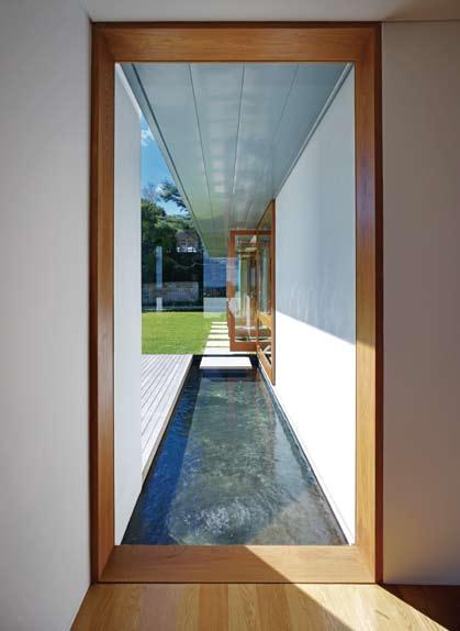
The composition is organised around three east–west axes that stretch out parallel to each other. On the north, a short ceremonial axis aligns with the city in the distance and crosses the special Friday room for regular family gatherings. It is separated from the extended living/sleeping axis on the south side by the transparent, and largely empty, central axis that draws air from the car garage at street level, upwards through to the roof, exploiting the traditional Middle Eastern principle ‘bad-gir’, or malkaf wind scoop.
The floor-to-ceiling American Oak doors assist the capture of breezes, swinging out perpendicular to the façade and capable of being set at any angle to suit wind direction. They capture the air and route it though the interior, working in unison with the malkaf window in the upper storey. The doors convert the rooms into open rooms or deep verandas that extend outwards to capture the outdoor space and bring it inside, unifying it with the interior space.
Interweaving through the controlling triple axes is the upward path leading from the garage to the sleeping spaces atop the house. There are two ways to reach the main ground level, one leads from the right side of the garage up an oak veneer lined stair, past a gym then up to ground level. From the street access, one climbs to the front west-facing terrace (a Santorini-esque experience) held between walls, climaxing in a vista of the city.
I 05
I 01 Previous Artek 400 chairs, Longreach sofa, Woodnotes rug and Leapfrog coffee table from Anibou.
I 02 Previous The hallway is one of three axes the house is constructed around.
I 03
Ground Floor Plan
I 04
Full height glass doors open up the internal living spaces.
I 05
The middle axis extends to the pool.
The route up through the house determines the quality of the spatial experience. It has strong vernacular, even Mediterranean, overtones. From the narrow confined stair at ground floor level, the space expands, then ascends again behind a timber-screened stair, until the visitor reaches the light-filled upper floor. Reminiscent of a Japanese stroll-garden, it is tempting to describe it as a ‘stroll-house’, so central is the structured movement sequence in navigating the house.
There is a strong Wrightian dimension in the interplay of the roof planes which hover like the massing of aircraft wings – silver, shiny and lightweight in appearance.
Like Wright, the house digs into the hill and creates a platform that reaches out into the space beyond it. We sense that, overriding the obvious formality of the living spaces, nature rises up from beneath to give the house its form.
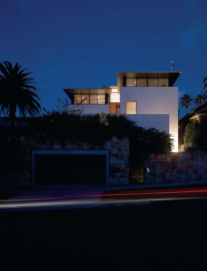
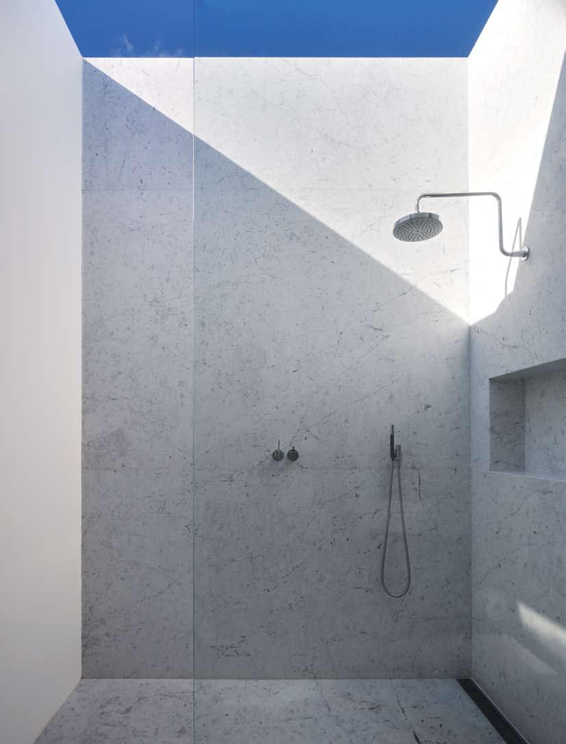 RobeRt bRoWN
be LL e VUe HoUSe
aRCHI te C t
Casey Brown Architecture
De SIg N aRCHI te C t
Robert Brown
PRoje C t aRCHI te C t
Huw Evans
PRoje C t t eam
Antje Mahler, Scott Lester
FURNI t UR e De SIg N e R
(Se L e C te D PIe Ce S)
Caroline Casey
St RUC t UR a L eNgIN ee R
GW Engineers
bUILDe R
Chris Dimopoulos
joIN e RY Courtown
Se L e C te D FURNI t UR e
Scammel Furniture
RooFINg/CL a DDINg
ARC
meta L WoR k
The choice of materials is indicative of the organic character of the house. The softened effect of the interiors results from the extensive use of American oak for the joinery, furniture, floors and stair screen. Like Wright, who sought to integrate furniture with the house, Brown has worked closely with designer, Caroline Casey, to ensure that the interiors amplify the architectural thinking – in the cabinetry and with the stair screen (not dissimilar in effect to the mushrabiya interlaced wooden screen of Islamic tradition). With the side dining cupboards, a woven textile theme is picked up (not dissimilar to Dutch leather strapwork for façades in the 16th century) consisting of interlaced bands and forms similar to fretwork or cut leather used in screens and funerary monuments.
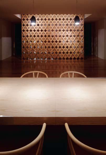
Hunter Metal Work DooRS a ND W IND oWS Gladesville Joinery
Casey brown architecture (61 2) 9360 7977 caseybrown.com.au
FINISHe S Floor oak by Blackwattle Hardwood Floors, blackwattle. com.au. Joinery American white ash by Courtown, courtown@bigpond.net.au. External stone walls by Sandstone from A1 Village Stonemasons, (61) 418 777 666. Roof Zinc by ARC, arcroofing.com.au. Doors and windows Tasmanian oak by Gladesville Joinery, (61 2) 9809 7700.
This lends an element of fantasy, a ritualistic dimension – a reading of life as formal and constrained. It is at once surprising and intriguing.
This reaches a climax in the formal dining space dedicated to regular family gatherings. The space is dominated by a large, rectangular American White Ash dining table (4.6m long x 1.1m wide) and 1950 Hans Wegner Wishbone chairs. The muted simplicity of the open-ended space, skewered on its extended axis from rear garden to the city in the distance, here assumes the austere simplicity of ritual, of repeated human ceremonies with the row of tiny suspended Tobias Grau Bronze Egg overhead lights. The facing wall panel is framed by concealed fibre-optic lights with colour wheel to affect changes in colour to match the occasion. The printed stainless steel inserts at two corners borrow motifs from the Katsura Imperial Villa in Kyoto (a yayoi reference to aristocratic taste) that tips the balance towards artifice and ‘construction’ – a quotation from a quotation.
There is a durable lightness throughout. The space surges upwards around the central stair which serves as a flue for natural airventilation. There are echoes of this spatial freedom in the master bedroom shower with its sliding glass roof that retracts to open the shower to the outside sky. The liberation of the interior to the outside, takes on a deeper symbolism as a device signalling a surrender of the architecture to nature, inscribing in it the notion of ‘selfbecoming’ in our surrender to the outside.
Note: For a detailed discussion of the jomon and yayoi opposition, see Arata Isozaki’s japan-ness in architecture, MIT Press, Cambridge, MA, 2006, mitpress.mit.edu
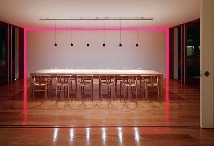
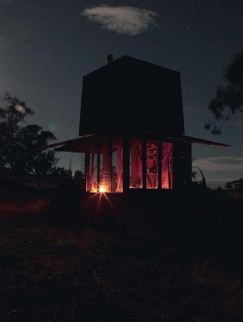
“The best of them were houses cast in the first person singular, each the precise material expression, in wood or canvas or aluminium or plastic or simple tar paper, of a single individual.” Michael Pollan, a Place of my o wn, 1997
Rob Brown’s hut near Mudgee is surrounded by bush. Lines of mountain ranges can be seen in the distance, and between them flashes of light from a distant reservoir, its appearance ever-changing with the sky. There is no sign of habitation anywhere.
The hut is not something that everyone would wish for. But for this client, who grew up on a nearby property, it represents a poignant homecoming. As a child, it was a camp site he liked to visit on horseback, just to take in the surrounding bush and panorama. Here he revelled in the sense of distance and freedom on offer – the spaciousness of the mountains, something Gaston Bachelard referred to as “intimate immensity… Far from the immensities of land and sea, merely through memory, we can recapture, by means of meditation, the resonances of this contemplation of grandeur.”
Such memories need to be refreshed after a while or they fade. This was the point behind building the hut where it is: to provide a base camp to be returned to again and again to recharge those memories.
Many years later, as an adult who worked in Sydney as a graphics designer, the client managed to acquire the site. Nothing happened easily – a lot of planning was required, materials had to be bought, and, since no builder could be found to do the work on site, the modest 3 x 3m hut had to be pre-fabricated and trial-erected beforehand to achieve the goal of permanently camping in his daydream hut in the wilderness.
The Mudgee hut was the result of several people working in collaboration – the builder (Jeff Broadfield), the client and the architect and his staff.
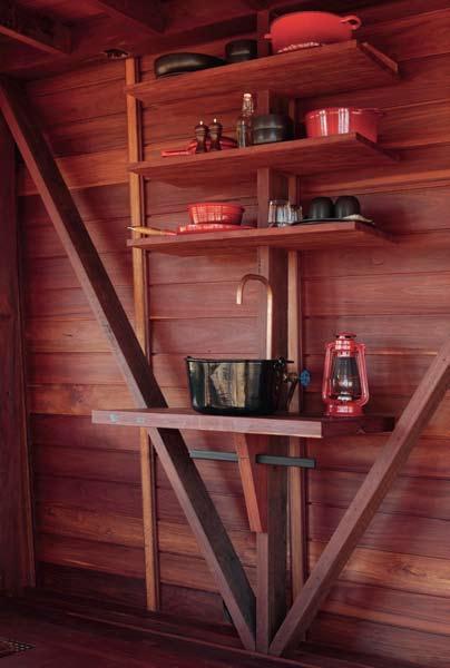
A place to daydream! In 1958, Gaston Bachelard, suggested “If I were to name the chief benefit of the house, I should say: the house shelters daydreaming, the house protects the dreamer, the house allows one to dream in peace... the house is one of the greatest powers of integration for the thoughts and memories of mankind.” There can be no better description of the hut.
The site occupies a long finger which widens towards its end into a flat which is surrounded by a crescent of trees on its south. Irregular rocks jut out of the ground and the skeletons of ringbarked iron bark trees stand guard over the hut. It suggests a bushranger’s
I 12
I 11
A single light in the hut creates a warm glow at night.
I 12
The simple kitchen comprises four shelves, a tap and a removable sink and gas cooker.
I 13 Following Three walls can be lifted on pulleys to open the inside of the hut to expansive views.
hide-out. However, it is really contemporary –less a refuge from the law than a retreat from the city, from civilisation, from today’s tensions and anxieties.
Cold in winter and at night time, hot in summer, the land is harsh. It has its own beauty, a certain rugged toughness and intense isolation. It asks a lot of anyone who would choose to stay here.
Our story begins in 2004 when the client started collecting the corrugated copper sheeting to clad the outside – a wise move considering the high price of copper these days! Next came the Iron Bark timber for the frame. It all had to be pre-fabricated in Sydney. That meant the frame had first to be fabricated, all
mudgee tower — NSW, a ustralia
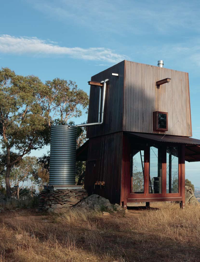
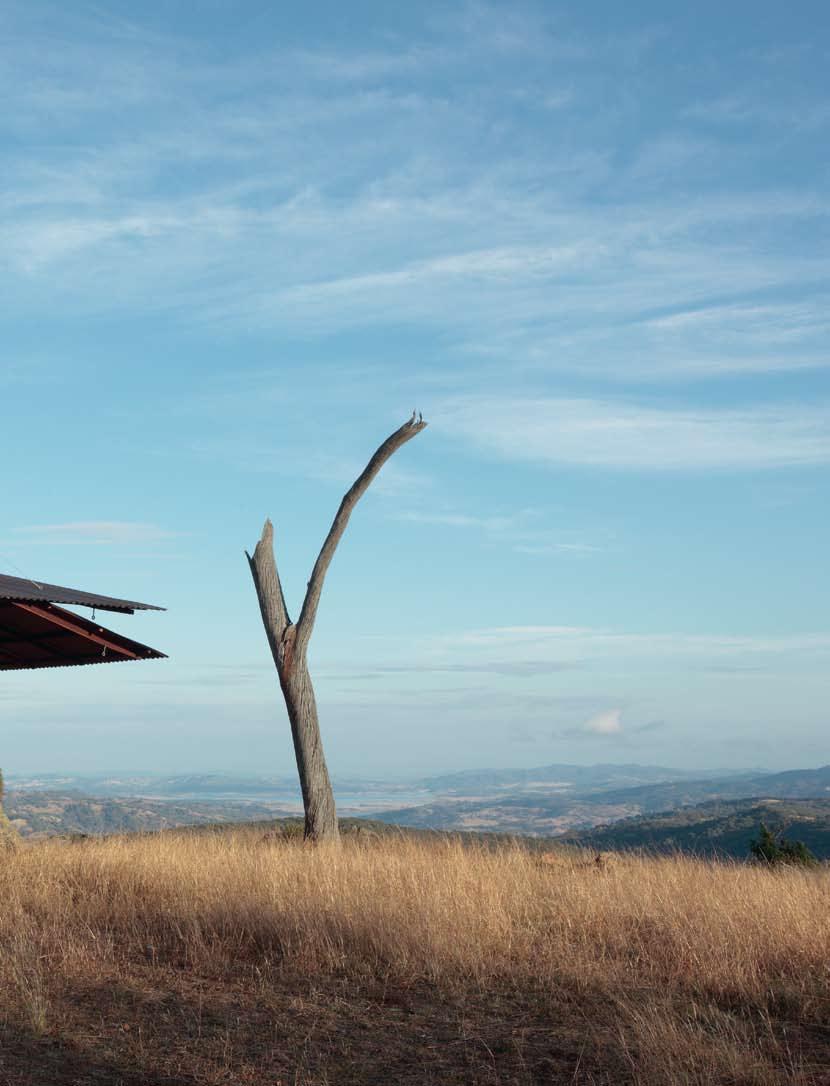
the joints pre-cut to eliminate site work as much as possible. When all the parts were ready, the hut was trial-erected by the builder at his Mona Vale workshop to make sure everything fitted together as it should. No steel or nails were used. Instead, all the joints were pre-cut in the same way as a traditional Japanese carpentry house.
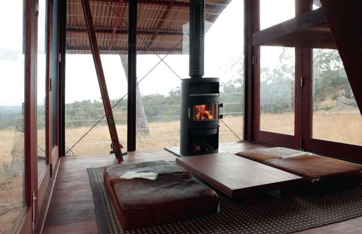
The hut and toilet components were delivered by truck, then the main iron bark framework was erected. First, the parts were laid out on the ground. Then, since everything had been done beforehand, the actual work of assembly and fixing happened remarkably quickly – much as it does when erecting a tent. The lower frame went up first. Then, the upper loft section was dropped into position. This took a day or so; another day was required to fix the copper cladding
For coolness, the wall construction is complicated: a series of air gaps behind the copper to allow heat to rise and escape at the top, and behind this is building paper, insulation, plywood.
On three sides, the downstairs walls are hinged at their top so they open out like a flower
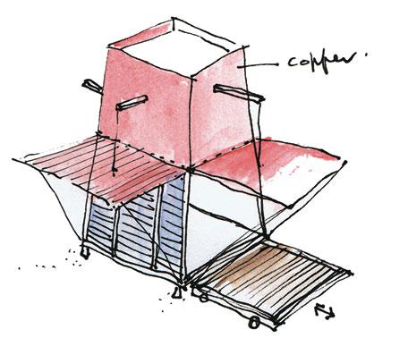
I 14
Interior
I 15
Early
I 16
Three small windows look out from the elevated sleeping loft.
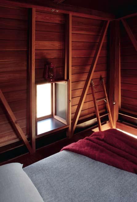
spreading its petals in the morning sun. They can be lowered to close up the hut at night. During the day they enlarge it by creating temporary verandas.
The deck living area has elementary cooking and washing facilities. Above this, warmed by rising hot air, is an enclosed sleeping-loft with three small windows. Along the back wall the kitchen is provided with four shelves, a tap connected to the water tank at the back, a removable sink which can be replaced by a gas cooker supplied by a bottle under the water tank.
The two storey hut has a smaller, matching offspring down the slope. The longdrop toilet behind the main hut is down the hill and has just three walls and a door opening onto truly spectacular views. Inside, there is just a wide, single piece of hardwood for a seat with a carved hole. Without a roof the outhouse becomes a ‘toilet under the stars’. It can be a bit wet inside when it rains, but the gain is the skylight of so many stars.
The entire construction is a mixture: part ancient Egyptian, part flower and part Ned Kelly. Egyptian because the copper walls slope inwards at 3 degrees so they vent upwards; flower because three of the copper lower walls are hinged with ropes attached to pulleys from three beams to raise them (when raised they form outstretched veranda panels); and Ned Kelly, because when the petals of the flower are closed up, the hut strikingly recalls Sydney Nolan’s stylised Ned Kelly helmet.
The colour at present is a soft pink that in time will melt into the bush as it acquires its characteristic green patina. But for the moment, it adds a touch of warmth that is almost human and contrasts with the black aggressiveness of the Ned Kelly image.
As a designer, the client approved the irony of the hut shape – a structure armoured against and in keeping with the harshness surrounding it.
I It has its own beauty, a certain rugged toughness and intense isolation . It asks a lot of anyone who would choose to stay here.
The hut has much in common with a tent: the process of pre-fabricating the parts, trial erection, transport and final erection on site, repeat the same sequences as setting up a tent. Where the hut differs is that it is not intended to be repeatedly erected or re-located as is the purpose of a tent – it is not truly movable. You might say it was a permanent campsite, or ‘batch’ – the handy New Zealand term for this sort of construction.
This hut represented a ‘once in a lifetime’ opportunity for Rob Brown to “...chisel back to the essence of life.” It was, he says, “Wonderful
A roofless toilet maximises the experience of the night-sky – one of the glories of the outback.
mUD gee toW e R
aRCHI te C t
Casey Brown Architecture
De SIg N aRCHI te C t
Robert Brown
PRoje C t aRCHI te C t
Hernan Alvarez
bUILDe R
Jeffrey Broadfield
St RUC t UR a L CoNSULta N t
Murtagh Bond (Ken Murtagh)
me CH a NIC a L CoNSULta N t
Jonathan Temple
CL a DDINg ARC
PLUmbINg
Blakboy Plumbing
Casey brown architecture (61 2) 9360 7977 caseybrown.com.au
FINISHe S
Structure, lining, floor and shelves oiled ironbark from Australian Ironwood Antique Timbers, ironwood.com.au.
Cladding Copper from Stramit, stramit.com.au.
to experience it, then to be involved in its building, added a further layer to the experience.” It also responds to Henry David Thoreau’s plea to “simplify, simplify, simplify”.
Many very Australian things are gathered up in the hut, but much is below the surface – it is subliminal. It might seem slightly ridiculous, but in these days of rising home interest rates and families struggling to hang-on to the family home, it suggests many applications as a shelter just a few steps up from a tent. It could serve as a shelter in a rainforest or desert, and a collection of similar scattered huts forming a village.
It is also the quintessential Australian shelter – the bushranger’s hide-out. It looks defensive, yet in true frontier fashion, its space is centrifugal and unfolds outwards, spreading itself into the landscape. And for all its seeming simplicity, it is anything but.
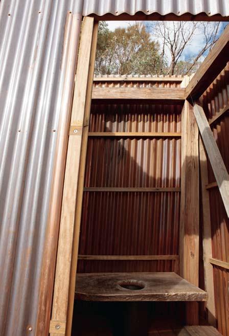
I The colour... is a soft pink that in time will melt into the bush as it acquires its characteristic green patina.
STUNNING AND EFFICIENT WINDOW COVERING SOLUTIONS. SOLIS OFFERS THE VERY LATEST AUSTRALIAN AND EUROPEAN SYSTEMS AND TEXTILES.

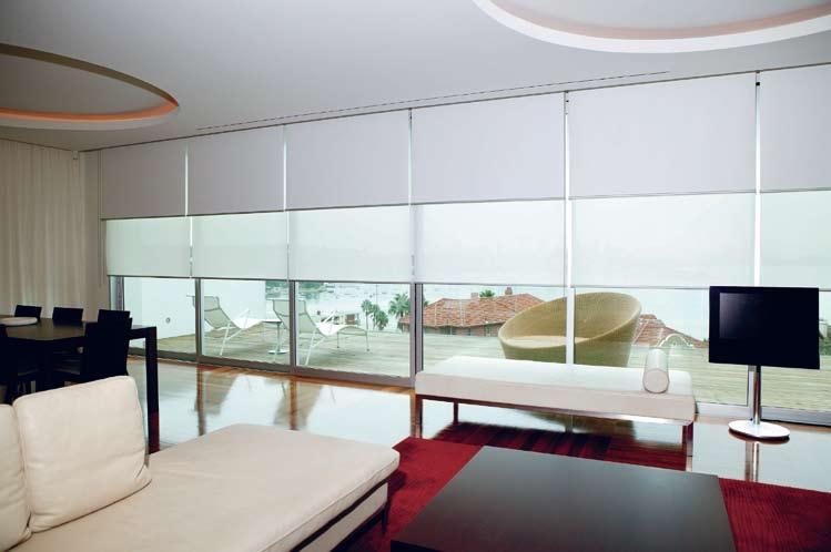
Extensive range of fabrics, curtain designs & rods Expert advice given by our highly trained staff Combined 36 years experience within the Industry
The Petruccelli House
Location: Camberwell, Victoria
Architect: McBride Charles Ryan
Text: Nicky Lobo
Photography: Louis Petruccelli
Upon entering this family home in Victoria, visitors are immediately confronted by what appears to be an enormous aquarium. However, it holds a creature of a very different kind, because what you see is the deep end of the residents’ lap pool. This pool establishes a continuum as you move throughout the house –the stairs ascend along its side, and it is visible from both levels. The sloped site has created an opportunity for the two-metre window to be placed just so, creating underwater views and a sensual element to what might otherwise have been a stark space.
This front foyer becomes a gallery complete with a liquid artwork, the lighting design created by the play of light on water, abundance of white finishes and metallic glazed mosaic tiles within the pool. It is a good example of enchanting design that can elevate the Australian suburban home.
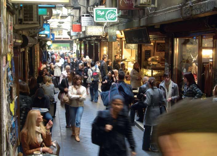
Location: Melbourne, Victoria
Architects: Melbourne City Council
Text: Paul McGillick
Photography: Paul McGillick
When they made a movie of Neville Shute’s catastrophe novel On the Beach in Melbourne in the late 1950s, its star, Ava Gardner famously remarked that Melbourne was the perfect city to make a movie about the end of the world. How things have changed! That drab city centre has been brought to life by the City Council’s Laneways Project, helped along by more enlightened licencing laws which have prompted an explosion of delightful small bars and cafés. Previously ignored laneways have been animated with a profusion of bars, cafés and boutiques, meshing into Melbourne’s beautiful collection of arcades to create a network of links throughout the CBD while the City Lights Project has transformed other laneways into alfresco galleries.
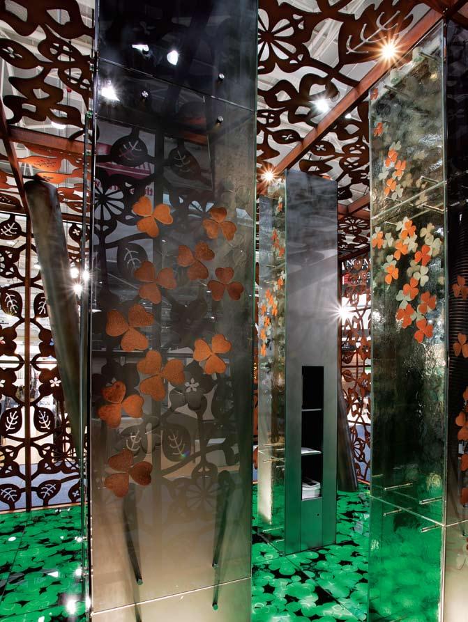
Barcom Park
Location: Sydney, Australia
Architect: Sue Barnsley Design
Text: Tempe Macgowan
Photography: Ian Hobbs
When a once lost and forlorn local park is reclaimed for the community, there is good reason to celebrate. With ingenuity and flair, award-winning landscape architect, Sue Barnsley Design have reinvented Barcom Park, Darlinghurst. We don’t demand a lot of such places in high-density areas – we look for some green grass, a seat, a tree and some light. It now has all these and more. Tucked behind the back of St Vincent’s Hospital, it used to face a jumble of unsightly services and garbage bins. With Barcom Avenue slicing down alongside it, the terraces beyond the avenue were far removed. By working with the hospital and Sydney City Council (the client), the park has been doubled in size through clever planning. There is now a bio-retention basin at the lowest part that treats runoff from the park and roof water from the hospital irrigates the park. The park is now part of a local ecosystem and more.
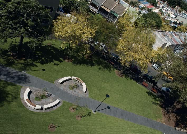
interior | exterior quartz carpet
featured project
Quartz Carpet 2 – 3mm exterior stone carpet
National Sales - 1300 760 877 – www.alternativesurfaces.com.au
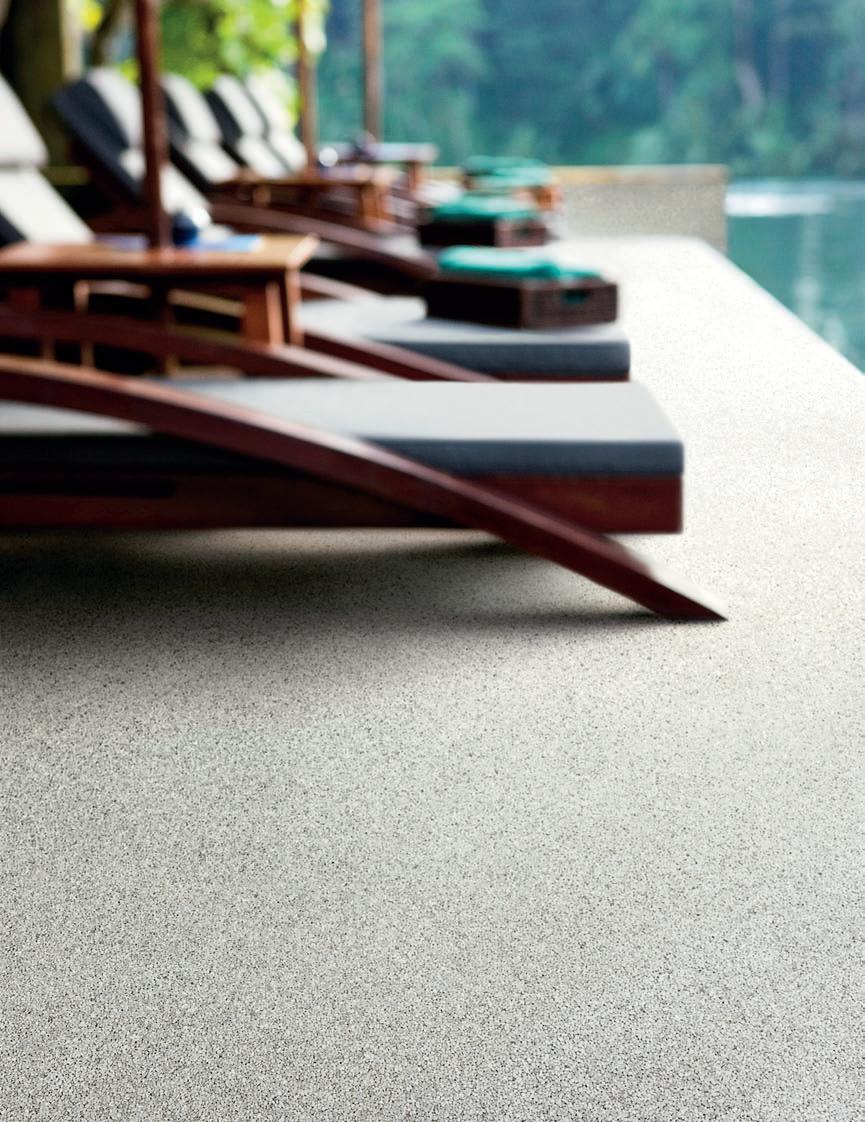
Kumutoto Plaza
Location: Wellington, New Zealand
Architect: Studio Pacific Architecture and Isthmus Group
Text: Andrea Stevens
Photography: Simon Devitt
As an Aucklander visiting the nation’s capital, I always head to Wellington’s waterfront to experience the harbour’s edge. Over the past 20 years the city council has progressively opened up the working port. New construction and adaptive reuse of historic sheds and wharfs have created venues for art galleries, cafés and businesses. The latest precinct to be redeveloped is Kumutoto, linking city to sea and completing the pedestrian promenade. What is most exciting about the urban spaces is the varying degree of enclosure and release. Dramatised by the notorious Wellington winds, sheltered plazas and laneways contrast with the edge experience of wharf and pontoon. Stepping down terraces beside the Kumutoto stream mouth, I can engage with the harbour directly, at a human scale. The robust materials and detailing of sea walls and bridge, are countered by more refined seats and paving in the plazas. I love the sense of the old working port blended with its new civic use.
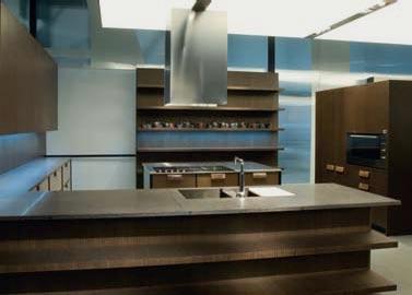
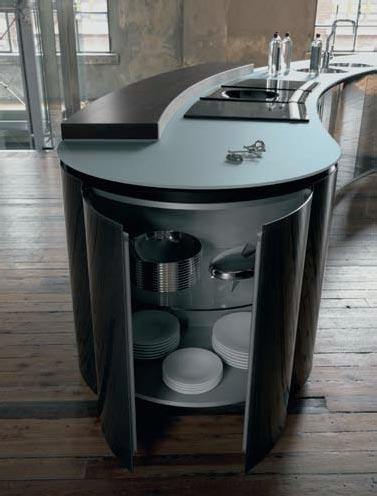
Europeans, particularly Italians, take their kitchens seriously. Make that very seriously. Did you know, for instance, that Italy is the second biggest manufacturer and supplier of kitchens internationally? This is just one of the reasons why a trip to Milan’s Salone del Mobile is always an exhilarating and essential (albeit exhausting) way of finding out what is going on in the world of kitchens today. Wandering up and down the four massive pavilions at Milan’s fairground dedicated to kitchens and all things kitchen-related (pavilions 18, 22, 24 and 26 to be precise), and popping in and out of various showrooms around town, it was possible to spot some beautiful and innovative creations.
This year’s cucine confirmed the ongoing love of wood, a material that brings warmth and an element of the natural world to the spaces it inhabits. The wood used is dark, veined and valuable, with the regular appearance of natural or stripped Oak or Elm. A lot of steel, a lot of glass and a lot of high-gloss lacquered fronts were on view this year (and literally on view since very few companies seemed to feel the need to hide away kitchen appliances and furniture behind sliding doors as in the past); kitchen doors and cupboards were adorned with highly decorative but functional handles; and the cooking areas were multifaceted and highly flexible. Above all, this year seemed to welcome a return to the notion of the kitchen as the central room in the home, a space where you meet, socialise, congregate and get creative, as opposed to a room where you merely make food. And technology is ever more present to aid and abet this counter-evolution.
For examples of what I mean one need look no further than youthful Italian kitchen firm Ernestomeda (founded in 1996 as part of the Scavolini Group). Rodolfo Dordoni’s Texture kitchen for the company is a reaction to the huge minimalist kitchens filled with large and mostly unused appliances. His version of the room is a space for spontaneity, relaxation and, of course, cooking. As its name suggests, this kitchen is designed to evoke the senses and appeal to the tactile desires in all of us, effortlessly combining the smooth surfaces of lacquered elements with rough ones such as scratched Pinewood. In an attractive
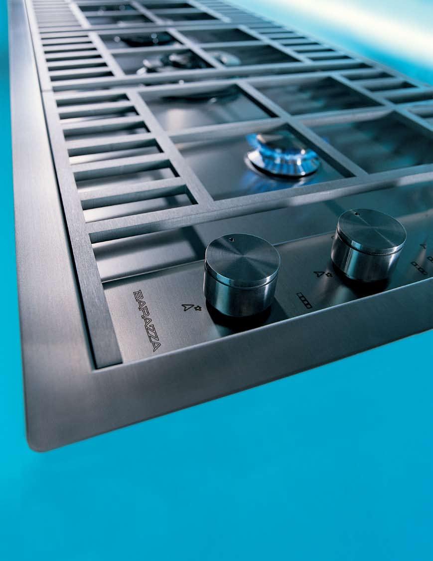
flourish Dordoni adorns his doors with porcelain handles that are decorated with a craquelé (or ‘cracked glaze’) finish.
Pushing this idea of the house as a focal point even further is Alfredo Häberli’s concept kitchen for Schiffini (a kitchen that is not yet in production, but which should eventually be manufactured). This kitchen is chunky, approachable and visibly inspired by the idealised olden days of family life. The company’s philosophy, as conceived by the late and highly respected Italian designer, Vico Magistretti (who designed some of the most influential pieces for the firm in the mid-60s, such as the 1966 kitchen Timo which featured ‘invisible’ handles that were hidden in the doorframes, a real technical and formal innovation), is that every project or design must have an idea or concept behind it, and not just be functional or aesthetically pleasing.
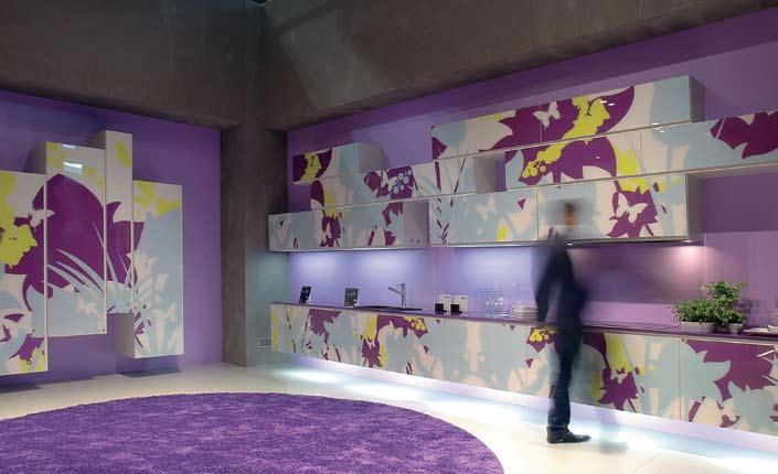
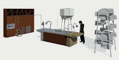
Alfredo Häberli thinks of the kitchen as “the soul of the home, the room around which all the other spaces of the house rotate and to which all members gravitate”. In fact, the Swiss designer has frequently described his childhood in Argentina as one where the large, central kitchen was a focal point of family life, as much a workshop and living room as a place for preparing food. His Concept Kitchen, therefore, is made up of individual pieces – such as a highly attractive solid wooden table with extractable benches and a cooking island with a single block marble sink and a wooden work surface – which can be connected to create a whole (some of the elements can also be used outdoors). On one wall, a series of questions provided the visitor with engaging and provocative food for thought (no pun intended), such as:
TWICE THE EXPERIENCE.
With twin fully-fledged 60cm Thermoseal ovens, the Smeg CSA122X gastop freestander will help make you twice the cook.
www.smegappliances.com.au
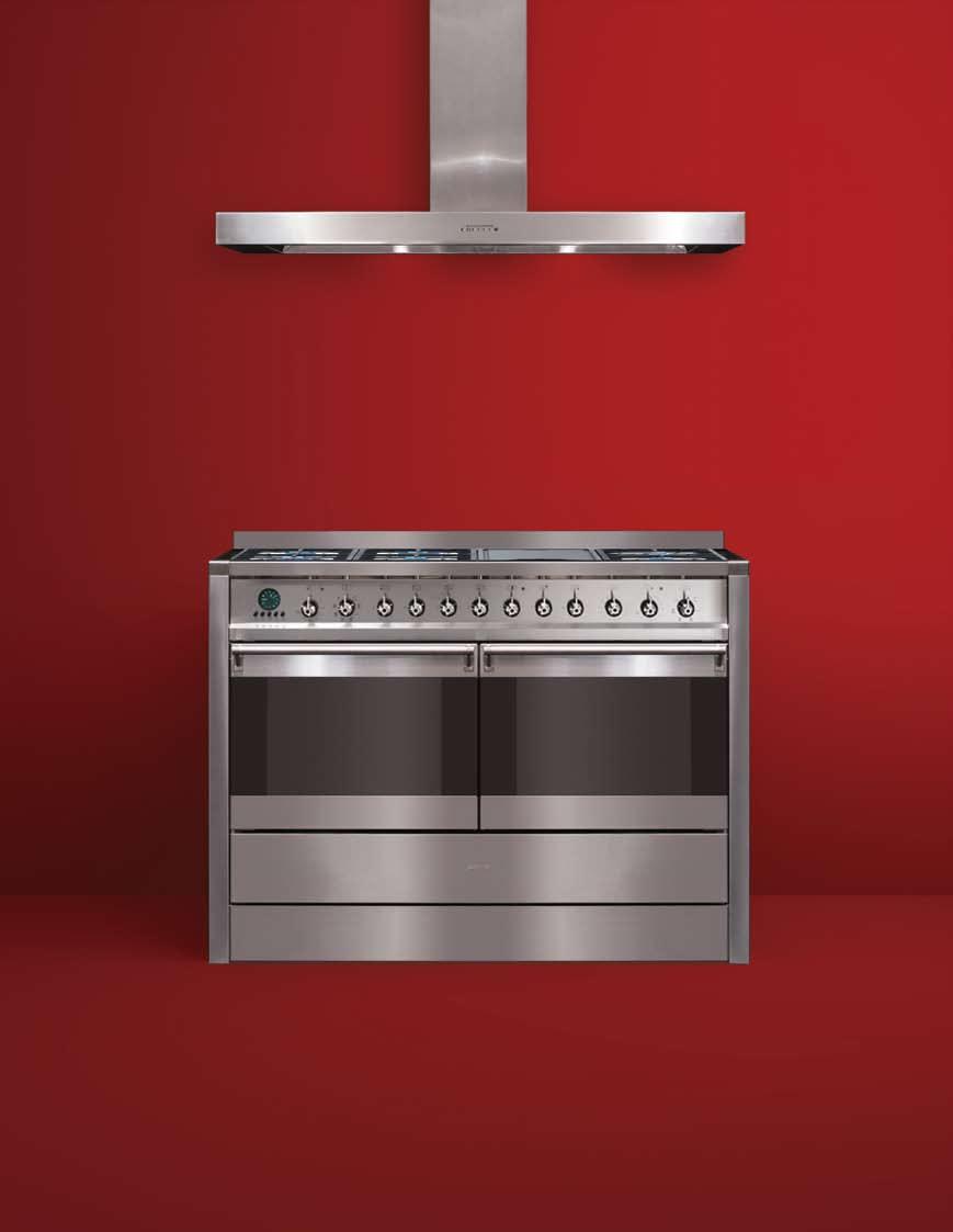
‘How have kitchens become so aseptic?’ or ‘Can designers cook? If so, how many of them?’ and ‘Is a kitchen more important than a car?’
This is the year that sustainability and environmental consciousness hit the mainstream at Milan’s renowned furniture fair, or so the media and organisers would have had us believe. The words ‘eco’ and ‘sostenibilità’ were emblazoned across countless magazines, posters and stands and many designers turned their hand to making at least one (and sometimes many) product from recycled or reclaimed materials or that were designed to save energy. Considering the seriousness of the environmental crisis, however, it was sad to note that there was a distinct lack of serious propositions, especially by the big design houses with the financial support to experiment with new materials and manufacturing techniques. The place where some of the most genuinely eco or eco-themed products could be found, was, perhaps unexpectedly, in the world of cooking…
One of the most ubiquitous of kitchen accessories – the fridge – also got an eco-makeover this year. Two of the most memorable are by Bosch. VitaFresh avoids food waste by keeping food fresh “three times longer” than in a conventional fridge, and Celebrity looks very sexy and allows no frost build-up while being an A+ fridge. A first, I was told. Far more exciting, however, was Whirlpool’s long-researched and hotly anticipated Green Kitchen concept. This amazingly hi-tech kitchen offered various ingenious solutions to reduce energy consumption and prevent energy wastage: the fridgefreezer has several distinct food storage areas; the warm air generated by the fridge’s compressor is retrieved to heat water stored in a special tank so that it can be used by the dishwasher; the heat from the oven and humidity produced by the dishwasher are, in turn, conveyed into a mini-herb garden located over the cooking units. The overall energy saved by this eco-integrated kitchen can reach a staggering 50% according to Whirlpool, and the consumer an even more jubilant 70% off his/her electricity bills. If this kitchen is really as good as it sounds, then I can’t wait to have one. Unfortunately, they are not due for production until 2012.
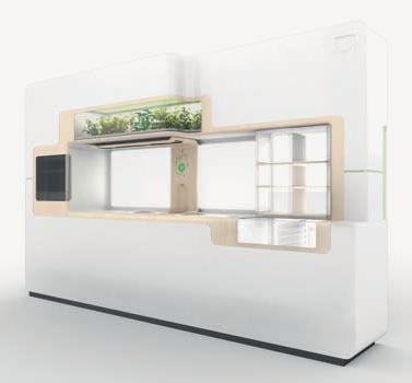
Also in the fairground venue, the FTK (Technology for the Kitchen) pavilion offered much to admire in terms of innovation and technological advances in the field of built-in electrical appliances. Not one to usually get too excited about extractor hoods, I have to admit to being fairly bowled over by the charming and retro-looking Greta and Black Stream models by Italian hoods specialist Elica Group. Both are designed in the form of overhead lamps; the former is white in colour, the second is made out of sleek black Murano glass and steel. The Greta model also provides 50% energy savings over conventional hoods says the manufacturer, its outer fabric can be removed and washed in a washing machine, and, most appealingly, can simply be plugged in to a mains with a plug (thus avoiding any pesky irritations such as tearing down walls or having to pre-plan its installation). Something that these two models, and all Elica hoods share, as well is total silence…when they’re on you can hardly hear them.
Back in town and at the grittier, hipper and more informal Via Tortona site, Alessi’s kitchen, rather understatedly called La Cucina, made a big impression. A collaboration between Alessi, Italian kitchen biggie, Valcucine, and using the creative talents of Alessandro Mendini and Gabriele Centazzo, this was another example of a company making a really believable effort to create a cleaner and greener product.


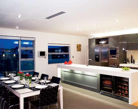

I
I 09
All the materials used in this kitchen are recyclable, have near-zero formaldehyde emissions and only water-based paints and lead-free colours were used in its production.
Glass features heavily in this kitchen, in all its forms –cut, curved, etched and painted – and these rounded elements that can be seen in the work surfaces, wall cupboards and sliding doors create a feeling of approachability, security and softness that many kitchens, with their impractical hard corners and edges, patently don’t have. Mendini’s idea was that food prepared in a happy and relaxed setting is more likely to be “food prepared well”.
The food is also likely to be prepared well if there are many different ways of cooking it, depending on your mood, state of fitness and time available. This modern need for flexibility was echoed in many kitchens I saw. Whirlpool’s Green Kitchen has a basin incorporated into the worktop to cook pasta and vegetables; Rex Electrolux’s Puzzle cooktop combines gas rings with induction hobs; Siemens has created a combined steam-and-heat oven called VarioSteam and Scholtès (a brand of Indesit) has produced an integrated cooking hob called Multiplo that does away with the need for pots and pans. The appliance contains two receptacles that can be used for steaming, boiling, roasting, frying and simmering and can be combined with a traditional hub unit for a truly exhaustive array of cooking possibilities.
I 07 Previous
Black Stream rangehood from Elica Group.
Andrea Branzi’s Incubator concept for Veneta Cucine.
Ernestomeda
kitchen designed by Rodolfo Dordoni.
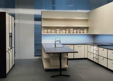
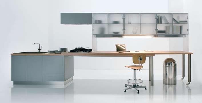
Habitus magazine is available at newsagents and bookshops across Australasia, South-East Asia, the USA, Canada, Europe, the Middle East and South America. Habitus is published quarterly in September, December, March and June. To subscribe securely online visit indesignlive.com, or you can email subscriptions@indesign.com.au to subscribe or request a full list of locations where Habitus magazine is available.
The team at Habitus magazine thanks our advertisers for their support. Use the directory below to see what page a specific advertisement is on, and visit their website to learn about the great products and services they offer.
transtherm.com
18–19 Tsar tsar.com.au
38 Thonet thonet.com.au
240–IBC Wedderspoon wedderspoon.com.au 60 Whitecliffe Imports whitecliffe.com.au 06 Woven Image wovenimage.com 54 Woodmark woodmark.com.au 14 Zip Industries zipindustries.com
An iconic Melbourne mansion that has played many roles over the years from vice-regal residence to convalescent hospital to teacher’s training college, now serves as inspiration for Stonington Malvern, a new project by Ashington. Designed in 1890 by Charles D’ebro, architect of other Melbourne landmarks such as Prahran town Hall, Stonington mansion sits within one of the most sought-after and prestigious locations in Melbourne, and has been selected as the site of Ashington’s latest development.
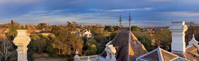
Stonington Malvern is located in the heart of one of Melbourne’s most established suburbs just seven kilometres from the CBD, with the High Street antique strip, iconic cafés and restaurants nearby. the gardens are also in keeping with the original Stonington gardens, thought by many to have been created by William r. Guilfoyle, director of the royal Botanical Gardens in South yarra. With project landscaping by renowned designers, tract Consulting, the project surrounds will feature “classic, exotic species, ground covers, elms, oaks and colourful perennials” (Michael Stokes, tract Consulting).
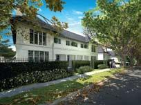
Due for completion in 2010, Stonington Malvern is bordered by the historic Stonington Mansion and gardens on one side, and Somers Avenue on the other. it will comprise the Demaine Partnership-designed Somers Avenue residences, as well as the luxurious Mansion Garden apartments; each home within these two precincts has been designed with luxury, low maintenance living in mind. Adjacent to these will be the contemporary Stonington terraces and expansive norfolk Place townhomes, designed by progressive architectural firm, rothe Lowman. the new properties will feature a rich combination of natural stone, oak flooring, travertine and glass to sensitively combine the traditional aesthetic with the contemporary. Premium kitchens by italian stylehouse Poliform, are incorporated into some of the properties with timber and glass features to kitchens and bathrooms.
I 01
Stonington Malvern is set to embody a traditional sense of fine living, with a contemporary layer of finishes and appliances offering a unique way of living for singles, couples and families today.
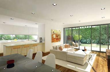
Ashington (61 2) 9239 0899
stonington.com.au
It’s official – Berlin is creative to the core. In 2006, UNESCO welcomed Berlin as the first European city into its Creative Cities Network – a project that celebrates a city’s rich cultural diversity. Less fixed and defined than many other global cities, Berlin has become a hub for ideas and trends that surprise with its boldness, and ingenuity that is uniquely its own.
In an echo of the ‘Golden Twenties’, Berlin has again become a magnet for art and culture from around the globe – from visual arts to music, design, fashion and architecture.
By last count, there were an astonishing 420 art galleries and more than 1300 designers calling Berlin home. How can such a vast number of creative enterprises exist? One of the answers lies in the fact that many such ventures are part of the daring urban concept zwischennutzung, or ‘interim urban use’. ‘Urban Space Pioneers’, as they have been called, are creating legal temporary venues for all types of creative endeavours: from hip design outlets, to beach bars, and from fashion showrooms to contemporary art spaces. Whether skate parks, tent lands or one-bedroom hotels, Berlin has become the capital of dynamic urban spaces.
I 01
Hairdressing salon in Neukölln, Berlin.
I 02
Bicycle shop in Neukölln, Berlin.
I 03
Installation by Caner Aslan for the 5th Berlin Biennial for Contemporary Art.
I 04
Artist’s studio space, Berlin.
I 05
Interwall – a club space, fashion store and café.
I 06
A beach bar on the River Spree, along the strip of the East Side Gallery. This 1.3km stretch of the Berlin Wall has been ‘graffitied’ by international artists since the reunification in 1989.
I 07
A women’s accessories store in Neukölln, Berlin.
I 08
A view of the River Spree from a temporary beach bar.
I 09
Installation by Pedro Barateiro for the 5th Berlin Biennial for Contemporary Art.
However, rather than being sites of despair, Berlin’s lacunae are sites of endless possibility. Here Berlin’s creative Urban Space Pioneers have made widespread temporary use of abandoned industrial zones, empty warehouses, areas alongside the former Berlin Wall and prime real estate along the river frontage, waiting for development to go ahead. These temporary practices are transforming Berlin. Not to be mistaken with the urban squatters of the seventies, the businesses popping up today are serious attempts by creative entrepreneurs – without the associated high costs in rentals hampering ambition. To bring ideas to fruition, there is assistance from specialised Zwischennutzung agencies, which are composed of diverse professionals, including architects and town planners. The agencies bring together investors, house owners, real estate companies and city councils with potential temporary users. Via a specifically designed interdisciplinary databank, the agency can network with diverse players. Issues that are dealt with range from legal questions to sustainability, corporate social responsibility, new forms of employment and the socio-economic impact of temporary business development in Berlin and the surrounding region.
The rents that are negotiated between the parties are often extremely low. In return, home/land owners will see their vacant or disused lots turn into a more attractive piece of real estate. The ironic downside is, of course, that once an area has become more upmarket, the temporary players, who helped to create the positive change, will have to move on. As such, Berlin’s creatives are always on the move and the culture is constantly in motion.
Temporary projects defy the bounds of traditional urban planning. For instance, Berlin’s Neukölln quarter was plagued by an image problem due to a high migrant population, the result being that many of the late 19 th century buildings in the style of Gründerzeit (‘founding epoch’) have been left unoccupied. These four- to six-storey buildings with richly decorated façades, used to house small grocery stores in their basements. Of no interest to large supermarket chains, these spaces have been difficult to lease. Today, however, through the strategic placing of trendsetting shops in design, fashion, social services and art, whole living quarters are being revitalised.
Alongside the banks of the River Spree, in the former Osthafen (East Harbour) area, lies an area of around 180
Before the wall came down, Berliners were suffocating from a lack of space. Today, they can take a deep breath. Despite the wave of restorations, spectacular urban changes, exemplary redevelopment and daring new building projects transforming the city since reunification, Berlin’s centre is dominated by urban wastelands, still bearing the scars of war and of the former militarised border zone.


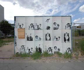
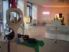
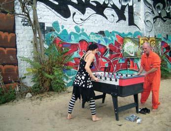
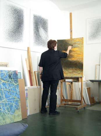
hectares of open, mainly disused, industrialised sites and buildings. In this highly desirable piece of waterfront real estate, which already houses large international investors such as MTV and Universal, a colourful mix of urban ‘in-between’ culture has found its niche. Each summer beach bars, fleamarkets and music clubs spring up, attracting vast numbers of local and international visitors.
While many of these places may only exist for one season, the area’s club and music enterprises have proven to be an ideal example of how vibrant urban culture can establish itself on previously unused and underdeveloped land.
In the historic heart of Berlin, in the city’s diplomatic quarter, Sculpture Park occupies five hectares of prime real estate, owned by various private companies and individuals. This urban void was formerly part of the ‘death strip’, the militarised
zone within the Berlin Wall. With rampant weeds and dumped cars, the land remained an eyesore until 2006, when the art association KUNSTrePUBLIC hosted an exhibition series which supported sitespecific projects dealing with the history, geography, culture and significance of the place. In 2008, Sculpture Park was utilised as one of the day venues to host the 5th International Berlin Biennial for Contemporary Art.
Just around the corner from Sculpture Park (and a short walk from the Australian Embassy), Interwall, a culture–lounge bar, recently opened its doors. Here, three young designers have created a meeting place for art, design, commerce and communication. Various interdisciplinary projects, such as workshops, book readings and DJ parties, ensure for a funky and versatile program.
In its place, the East German parliament was built, the Palast der Republik. After the collapse of the communist regime – and not without impassioned debate – this contentious building is again in the process of demolition to make way for the White Cube. This time though, the intention is for the building to not last.
The White Cube, designed by Austrian architect Adolf Krischanitz, will be dedicated to showcasing works by local contemporary artists, both inside and on its outside walls. Estimated at €950.000, the White Cube is scheduled to open in October 2008 and will remain on the site until 2010, when it will make way for the building of the new Humboldt-Forum. Reviving the idea of the Enlightenment from the early 19th century, by combining art, science and communication, the Humboldt-Forum with the reconstructed façades of the original palace will be located on the Stadtschloss site. The White Cube, therefore, just like so much of temporary urban culture in Berlin – indeed like much of art itself – addresses the unknown and the future, or the re-conceptualisation of time altogether. Despite, or maybe because of this constant change, Berlin bleibt doch Berlin (‘Berlin remains Berlin’).
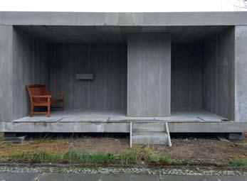
Perhaps the most spectacular example of temporary, in-between use in Berlin is the creation of the White Cube. The project comprises a massive 600 square metres of contemporary exhibition space to be built (temporarily, of course) on the site of the Stadtschloss. This historic site has been in a state of transience for centuries. It was originally built to be the winter residence of various Prussian kings, and was later used by Geman Emperors. Although damaged, it survived the Second World War, but was later demolished by the East German authorities, which regarded it as a symbol of Prussian imperialism.

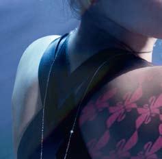

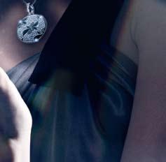


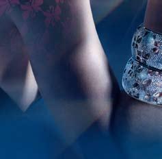


THERE IS SUCH A THING AS SUSTAINABLE AUDIO VISUAL SOLUTION

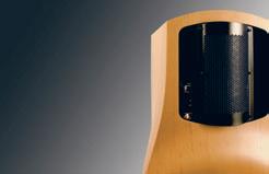
Since it’s founding in 1978, T+A has applied a philosophy of environmentally sustainable manufacturing practices.
They have always prohibited the use of materials such as chlorine based solvents • and CFCs in the production process.
They have avoided the use of plastics and alloys instead using metals and other • non-harmful materials, which are easily recyclable.
All T+A devices (electronics and loudspeakers) are at least 90% recyclable.


In 1999, T+A partnered with the German Government to develop a proprietary technology designed to reduce power consumption within its Amplifiers by up to 60%. If this T+A technology were used in all Home Entertainment products, this would equate to a reduction, in Australia, of 120,000 tonnes of greenhouse gas emissions per year or the equivalent of taking almost 28,000 cars off the road.

Celebrating its 50th anniversary
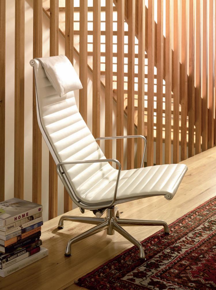
Experience the original Pass it on.