


ISSUE 03 2009 A HOUSE RE-CRAFTED COLOUR & LIGHT THE BEST NEW SIDEBOARDS POOLE’S DESIGN FOR TRACEY MOFFATT MOD LIVING IN SINGAPORE GOLLINGS: BEYOND THE LENS NZ’S MARSHALL COOK THESEUS CHAN – GRAPHIC DESIGN REBEL NEW DINING FURNITURE SOUTH AMERICA – DESTINATION URUGUAY CONTEMPORARY AUSTRALIAN HOMES AUD $12.95 NZ $13.95 USD $15.95 CDN $16.95 GBP 8.50 SGD $10.95
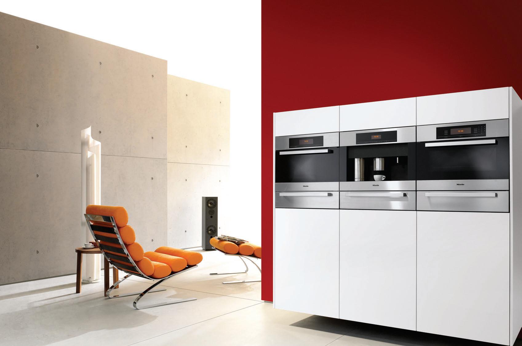
For more information on Miele’s impeccable fleet design range of ovens, rangehoods, microwave combi ovens, cooktops, plate warmers, steam ovens, coffee machines, dishwashers and refrigeration contact the specialist Project Division in your state. VIC 03 8633 8335 NSW 02 8977 4235 QLD 07 3632 2471 SA 08 8352 9500 WA 08 9286 7800 NZ 09 573 1269 www.miele.com.au TRP MI 1218
Because great coffee should be up there with great food, our machines are built in, next to our ovens.
Built into your kitchen, a German engineered Miele coffee machine makes a clear statement of streamlined, good taste – along with impeccable espresso, cappuccino or latte macchiato, all with perfect Barista crema.
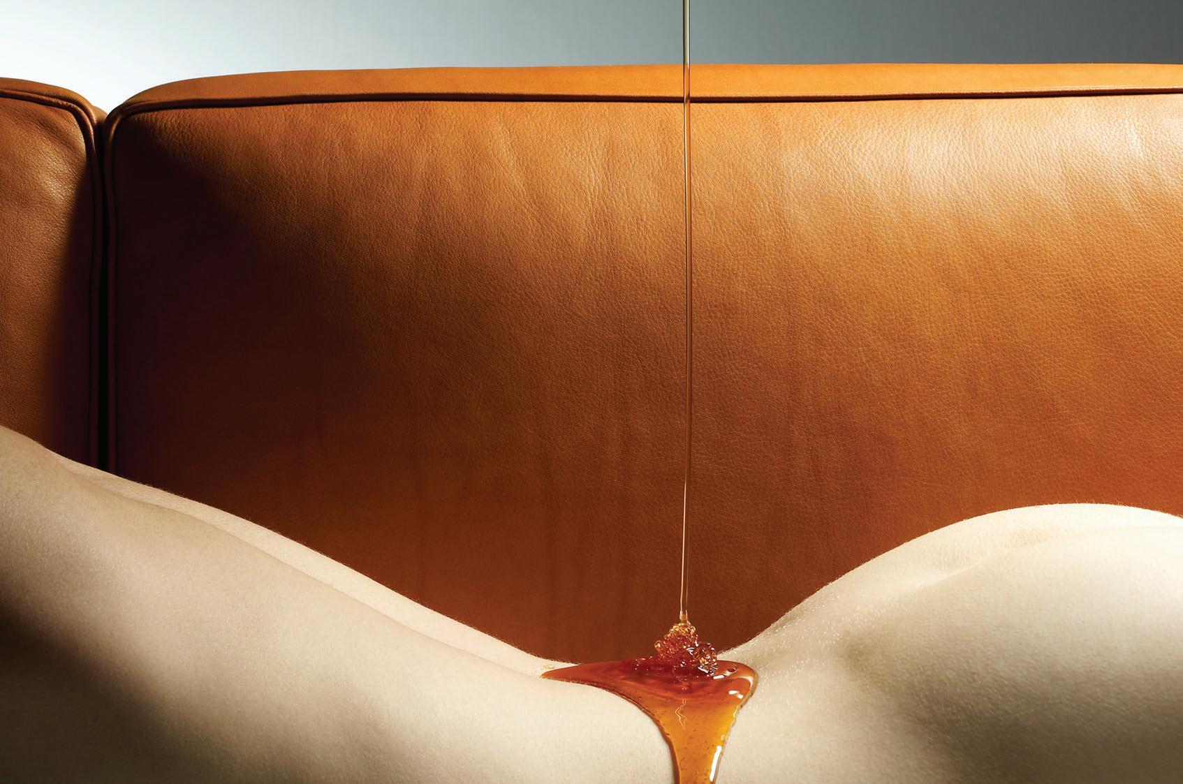
Hey,it’sonlynatural. puretann ® VegetabletannedPureAnilineLeather OnlythefinestBavarianhidesareselectedforPuretann®. Eachuniquehideistannedonlywithextractsfrompodsofthe Taratree,growninthetemperateclimateofthePeruvianAndes. ThisgivesPuretann® anunbelievablysoft,luxuriousfeeland appearance. AvailableexclusivelyfromContemporaryLeathers.
c contemporaryleathers contemporaryleathers www.contemporaryleathers.com.au c yescommunications
Casamilano
Made in Italy
Images shown: Pillopipe sofa/pouf, Ray table lamp, Jackie floor lamp, Sissi armchair.
To view the full Casamilano catalogue and more go to www.fy2k.com.au
FY2K 17 Thurlow St, East Redfern, Sydney Ph +61 2 8399 1644 info@fy2k.com.au

Zip HydroTap® at home. Imagine. Imagine. No more waiting for water to boil. No more bottled water to buy. Zip HydroTap gives filtered boiling water and filtered chilled water instantly. For a free quotation call 1800 42 43 44 or visit www.zipindustries.com The terms ‘HydroTap’ and ‘Zip’ are trade marks. Instant Boiling Water
1. HABITUS REVIEWS
I CELEBRATE THE BEST IN DESIGN – BOTH CLOSE TO, AND FARTHER FROM, HOME. READ ABOUT THE LATEST BOOKS. TAKE A LOOK AT DESIGNER SIDEBOARDS AND CONTEMPLATE BUYING A CLASSIC CAR.
23
DeSign newS
Habitus takes you through the latest and most exceptional design objects for the home, the office, for travel and for children.
32 re-SHoot
We celebrate the reinvention of the sideboard and take a fresh look at this multi-purpose essential.
35 conVerSation
Kirsty de Garis gets behind the wheel at Rory Johnson’s Classic Throttle Shop and discovers why design enthusiasts the world over are excited about classic cars.
47 inSPireD
Australian architectural photographer, John Gollings, has taken decades to hone his craft, based on a love of form. Stephen Crafti examines Gollings’ own inspirations – with surprising results.
64 on location
Malaysian-born fashion designer Grace Tan calls Singapore home these days. Darlene Smyth gets the inside track on Tan’s life in her new home town, a melting pot of local cultures and creative influence.
86
Slow DiSSolVe
Australian-born Richard Goodwin took a long time to decide whether he was an artist or an architect – or is he both? Paul McGillick meets the enigmatic visionary.
3. HABITUS HOMES
I A DIVERSE SELECTION OF THE BEST IN RESIDENTIAL DESIGN FROM AUSTRALASIA AND SOUTH-EAST ASIA.
72 creation
Theseus Chan has come a long way from his life as an electrical engineer industrialising Singapore. The graphic designer shares his thoughts with Darlene Smyth.

52 at Home
Jac + Jack knitwear designer, Jac Hunt, lives in a style that is a wacky, colourful and eclectic departure from her minimalist creations. Kirsty de Garis reports.
99
Scenario: corintH Street
Andrea Stevens talks to Aucklandbased architect Daniel Marshall and his clients, the McCabe family, about the contemporary renovation of a classic post-War home design.
39 montage
Philip Drew is inspired by three new books to reflect on the importance of hand drawing in architecture.
2. HABITUS PEOPLE & PLACES
I MEET A COLLECTION OF DESIGN ADVENTURERS WHO HAIL FROM SOUTH-EAST ASIA AND AUSTRALASIA, AND SEE HOW THEIR ENVIRONMENTS REFLECT THEIR LIFE AND WORK.
76
cloSe UP
Truly a Pacific Rim architect, Marshall Cook draws on his travels around the far-flung islands of his native New Zealand and beyond to create an authentic Kiwi flavour in his work. Andrea Stevens reports.
59 PartnerSHiP
21 years ago, Steve and Pat Ronayne found themselves in the Adelaide Hills almost by accident. The result is a delightful local gallery of international standard, housed in a reinvigorated church.
110
Scenario: manSfielD loDge
In the high country of rural Victoria, Nicky Lobo visits this family holiday retreat, which embodies the elements of style that are the hallmarks of great design.
habitus | Issue 03
07
contents
121
sCENARIO: whAlE bEACh
The owners of this Whale Beach, home sought a result that they could hose down, in keeping with the archetypical beach house. Heather Barton investigates.
147
sCENARIO: multIplICIty
Stephen Crafti guides us through this dynamic blend of architectural styles in Melbourne’s Hawthorn, where a family lives in harmony.
131
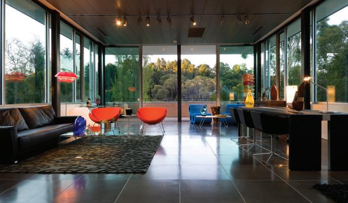
sCENARIO: CODE hOusE
Nestled in the steaming backstreets of Bangkok’s bustling heart, this bold architectural gem embodies the realisation of dreams both for the Thailand of old – and the new.
138
sCENARIO:
m AROub RA A pAR tmEN ts Sydney architect, William Smart, interpreted the rocky coastline at Maroubra in a dazzling new way with this four-storey apartment building, dressed to thrill.
157
sCENARIO: NA’s hOusE
On the green outskirts of Brisbane, Margie Fraser reports on a creative blend of Asian sensibilities with the vast, open Australian landscape.
175
DIRECtORs Cut: COlIN sEAh
Colin and Joy Seah approached the interior design of their first home purchased as a couple with an almost sacred joy. Andrea Stevens savours the benefits of their work.
184
DIRECtORs Cut: bEllEmO CAt
Peter Hyatt explains how partners, Michael Bellemo and Cat McLeod, have renovated their Melbourne warehouse to house their home and work lives in one exceptional space.
202
Jump Cut: CsyA
Singaporean architect Chan Sau Yan’s design approach is entirely dependent upon the site he’s presented with Darlene Smyth examines a renovated barn-style dwelling and a bungalow addition.
4. HABITUS SIGN-OFF VISIT INSPIRATIONAL SPACES FROM ACROSS THE REGION, MARVEL IN THE BEAUTY OF THE IDEAL DINING SETTING, AND FLOAT AWAY ON A URUGUAYAN ODYSSEY OF LOVE.
216
spACEs wE lOVE
A collection of diverse spaces from the Region, with water at their heart.
224
IN CAmERA: DININg
Rethink one of the most luxurious rooms in the home – designed for pleasure. The best in dining settings.
192
hOmE mOVIE: tRACEy mOFFAt
Once Manhattan-based, artist Tracey Moffatt now divides her time between the Big Apple and this tranquil Queensland retreat, designed by one of her heroes, Gabriel Poole. Margie Fraser visits.
166
CROss FADE: kAmpuNg hOusEs
Chu Lik Ren investigates four dramatically different takes on the re-thinking of the traditional Singaporean Kampung house.
232
sNAp shOt: uRuguAy
Andrea Millar travels to the South American country of her birth and reveals exciting design finds, both in Montevideo and off the beaten track.
contents habitus | Issue 03 08
KOS
84 O’Riordan Street Alexandria 8339 7000 103–123 Parramatta Road Auburn 9648 5411 bathroom design centre
Introducing the Corporate Culture Lighting Collection
Warm your turbo heart. Saab 9-3 Convertible.


Performance. Design. Together as one. To empower the senses. All of them. Open your eyes. Feel. Touch. Listen. Saab 9-3 Convertible. Designed with you in mind. And inspired by Scandinavia. Where nature’s elements affect daily life. Making it a true four-season, four-seater convertible. That’s sporty. Elegant. And exhilarating. Even standard features are innovative. Enjoy heated front seats. Automatic climate control. So you can avoid the cold. Even with the roof down. It’s everything your turbo heart desires. No compromises. The heart of every Saab is its turbo. Experience it with a test drive. Call 1800 50 7222 or visit saab.com.au


SAA27861/HAB
Ask any architect and they will tell you that great architecture only happens with great clients. Actually, that’s the case with all design, because it is the clients – consumers, buyers, punters, players, call them what you will – who give permission to the designers to be genuinely creative.
This is all about vision. The client has a vision. It may not be clear or articulated. It is probably just a general vision of how they want to live. But where it is most particular is in its passion to live a life of quality –to reject the mediocre in favour of uniqueness, and to have the courage to try something new and different.
This doesn’t have anything to do with following fashion blindly. That is for the herd and for those who would rather have other people think for them. People with a real passion for quality design are looking for houses and products which align with who they are and what matters to them.
Enter the architect stage right; the designer stage left. Prompted by the passion of their clients, they now have permission to play with possibilities, play with place and play with the personalities of the clients who will be their collaborators on the journey.
This is why Habitus gives air time to the people who live in the houses, who furnish them, decorate them, landscape them and generally enjoy them. Our agenda is to tell the stories of all those collaborations which go to make up a life of quality and value. Albert Einstein once remarked: “Do not try to be a successful man. Try to be a man of value.”
We are interested in the values that people invest into their lives and how these find expression in the houses they have designed for them, for all those products which give their lives texture.
More or less any of the stories in this issue of Habitus would illustrate my point. But take Na’s house in Brisbane as an example. Here the architect, in close collaboration with her clients, has not only created an extension which successfully blends old and new, but also manages to embody Thai and Japanese elements which express the origins and history of the family.
Or take the Corinth Street house in Auckland, the Bellemo Cat house in Melbourne, Colin Seah’s own apartment in Singapore’s Little India or the remarkable Code house in Bangkok – all of them are architectural expressions of the way of life of the people who live in them, all of them are furnished and are decorated with art works which tell the story of the people who live there and all become a statement of what is most important to the people who live in them.
Stories lie at the heart of all human experience. Habitus tries to tell some of those stories.
15 paul mcgillick editor’s letter habitus | Issue 03
Paul McGillick, Editor
I The client has a vision. Where it is most particular is in its passion to live a life of quality.
I This is why Habitus gives air time to the people who live in the houses,who furnish them, decorate them, landscape them and generally enjoy them.
Darlene Smyth
Writer
For this issue of Habitus, Darlene Smyth wrote the story on Theseus Chan on page 72. She says: “Despite feeling like a knock-kneed teenager auditioning for the school drama club, I found it truly refreshing to have met such a colourful, inspired professional who, despite his years of experience, does not seem to have lost any of the joy and youthful innocence in his artistic creation.”
a aron Pocock
Photographer
Born in NZ, Aaron attempted several different career paths (including architecture) until he discovered photography. He shot one of the Jump Cut projects on page 202 of this issue. Aaron lives with his actor girlfriend in a classic art-deco apartment in the leafy suburb of Hawthorn in Melbourne’s inner east. Aaron’s favourite object at home is his hand-made 7’6” Ashley surfboard – it’s perfectly designed for his height, weight (and skill), and beautiful to look at from any angle.
h an S SchluPP
Photographer
Hans shot Na’s House, a Scenario story in Brisbane on page 157 of Habitus 03. He has humble plans for 2009 – to spend more time at home. And his inspirations are also very close to home: Hans says he gets a kick out of assistants coming to his studio and teaching him new and interesting photography tricks.
c hriS Jone S
Photographer
Chris, who has barely put his camera down since his passion for photography was ignited while travelling 12 years ago, shot Tracey Moffatt’s house on page 194. He lives with his wife, Carla, on an acreage north west of Brisbane and loves the recently completed ‘pod’ studio extension to his house, which references the surrounding bush.
a lina Gozin’a
Photographer
You can see Alina’s artistic approach to photography in the Conversation story on page 35. She lives in Sydney’s Potts Point where, “on Macleay Street, I can pretend I am in Europe – the cafés, the trees and the street buzz”. At home, Alina loves her Tower of Knowledge bookshelf by Peter Mortiz because it’s easy to dust and in 2009 Alina will direct her next short film, expand her shoe collection and exhibit On Both Sides of the Camera –a collection of portraits of people who work in the film industry.
Derek Swalwell
Photographer
Derek lives with his partner, Georgia, and young daughter, Mia, in a funky 1950s apartment in Caulfield, Melbourne. He shot the Multiplicity project on page 147 and also travelled to shoot Grace Tan for the On Location story on page 62. Derek loves to look at his 1970s Chiswell sideboard, saying, “they just don’t make ‘em so authentic anymore”.
e ric Sieren S
Photographer
Eric lives in a 100-year-old semi in Sydney’s Crows Nest but shot something a little more modern for this issue: a house in Whale Beach on page 121. He lives with graphic designer wife, Emma, and two children, Sonicka and Andrej. He says: “the house barely survives a semi-demolition by the kids so there isn’t much left by way of design.”
a laana fitz Patrick Writer
Alaana contributed to the Design News pages of Habitus 03 from her new home in London. She is thoroughly enjoying all that the city has to offer, and will spend at least part of 2009 exploring Europe. Having packed light for the move, she doesn’t have much in the way of design with her, but her favourite object is a Tord Boontje-designed garland, which she has draped over a lampshade.
Sam noonan Photographer
Living in the Adelaide Hills with wife, Sophie, and daughter, Hannah Aurora, Sam didn’t have to travel far to shoot Steve and Pat Ronayne of Aptos Cruz for the Partnership story on page 57. Sam’s favourite object is his handcrafted and well-used Laguiole knife for its simple beauty, sentimental value and corkscrew.
a lbert l im Photographer
Albert shot the kampung houses in the Cross Fade story on page 166. He lives on the east coast of Singapore in a house/ studio designed by Richard Ho Architects that won an SIA Award. Last year, Albert completed an exhibition on the theme of “man and environment” and he loves the lightwell in the middle of his house. “I enjoy the light change every time I pass by it,” he says.
m arG ie fra S er Writer
Margie was able to indulge in her first love, writing, for the Na’s House Scenario story on page 157. She lives in Brisbane next to the bush and mountains and can see Moreton Bay on a clear day. Her children are intermittent residents, but Margie and her husband hold the fort while they’re away travelling. She loves her Lloyd Kwilla painting, which she bought on a recent trip to Australia’s Kimberley region, and plans to explore Egypt this year.
S Pace S hift Stu Dio Photographers
Multi-tasker Pirak
Anurakyawachon flexed his photographic muscles on the Code House story on page 131, for which he also wrote the text. He and his partner Aranyarat Prathomrat say their signature in photography is “not only to take pictures of buildings or design objects, but also to clarify the creativity and imagination of those creators into frames”.
heather barton
Writer
Heather, who wrote the text for the Whale Beach story on page 121, lives in Darling Point, Sydney with husband, Paul, and seven-year-old son, Turlough (Tully). They spend a lot of time in nearby Rushcutters Bay Park where Tully gets very spoiled by the staff at the park’s café. Heather loves her reindeer skin, saying it is “intelligent design and feels wonderful in a barbaric sort of way”.
k
Writer
For this issue of Habitus, Kirsty wrote the At Home story on page 52 about Jac + Jack designer Jackie Hunt. This year Kirsty will be busy in the middle of nowhere on South Australia’s Yorke Peninsula writing a feature-length film script. She gets a kick out of beautiful design and admires “people who live courageously, something my husband does with aplomb”.
Peter h yatt
Writer / Photographer
Peter wrote and shot the Bellemo Director’s Cut story on page 184. He lives in a Victorian-style house with partner, Jennifer, and two daughters, Ella and Sunday. His favourite object at home is a turn-of-the-19 th-century Italian bust that expresses a beautiful poise and elegance. Peter says of 2009: “Who knows? It’s a year at a time and a step at a time.”
Paul l ovelace
Photographer
Paul wants to make time this year to spend on his own photography projects outside of work assignments, but we’re pleased he was able to shoot Richard Goodwin’s portrait for the Slow Dissolve story on page 86. His craft inspires him, as “one never stops learning as a photographer”. As for specifics, he mentions Richard Avedon and Guy Bourdin as photographers whose work have inspired him over the years.
16 habitus | Issue 03 contributors
ir S ty De GariS
editorial contributors


17
Eric SiErEnS Photographer
AlAAnA fitzpAtrick Writer
AlinA Gozin’A Photographer
pEtEr HyAtt Writer / Photographer
pAul lovElAcE Photographer
AlbErt lim Photographer
mArGiE frASEr Writer
SpAcESHift Studio Photographers
AAron pocock Photographer
HAnS ScHlupp Photographer
cHriS JonES Photographer
HEAtHEr bArton Writer
dArlEnE SmytH Writer
kirSty dE GAriS Writer
SAm noonAn Photographer
dErEk SwAlwEll Photographer
Shop 8, Q1 3011 Surfers Paradise Boulevard QLD 4217 +61 7 5592 4866 enquiry@stiledivita.com.au www.stiledivita.com.au Available Nationwide
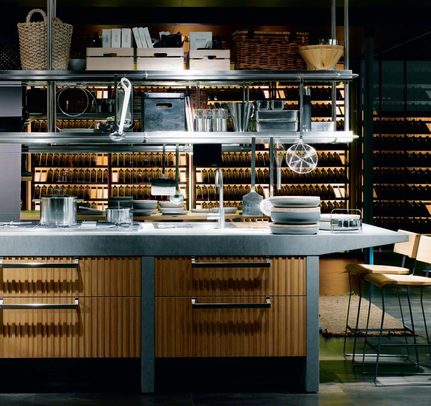

“Where the kitchen is the home, it is the home which revolves around the kitchen.”
ITALIA - design Antonio Citterio
“Where the kitchen is the home, it is the home which revolves around the kitchen.”
ITALIA - design Antonio Citterio
Lignum et Lapis – design Antonio Citterio
Editorial dirEctor Paul McGillick habitus@indesign.com.au
associatE Editor Andrea Millar andrea@indesign.com.au
assistant Editor Nicky Lobo nicky@indesign.com.au
dEsign and art dirEction Wishart Design wishartdesign.com
Art Director Karlee Bannon
contributing WritErs
Pirak Anurakyawachon, Heather Barton, Chu Lik Ren, Stephen Crafti, Kirsty De Garis, Philip Drew, Alaana Fitzpatrick, Margie Fraser, Peter Hyatt, Tempe Macgowan, Darlene Smyth, Andrea Stevens
contributing PhotograPhErs
Pirak Anurakyawachon, Patrick Bingham-Hall, Anthony Browell, Simon Devitt, James Geer, Alina Gozin’a, Peter Hyatt, Chris Jones, Albert Lim, Paul Lovelace, Rocket Mattler, Ben Millar, Sam Noonan, Esteban Perez, Aaron Pocock, Andy Rasheed, Sharrin Rees, Prue Ruscoe, Hans Schlupp, Kyal Sheehan, Eric Sierens, Dianna Snape, Darren Soh, Derek Swalwell
PublishEr / Managing dirEctor
Raj Nandan raj@indesign.com.au
oPErations ManagEr
Adele Troeger adele@indesign.com.au
businEss dEvEloPMEnt
ManagEr
Richard Burne richard@indesign.com.au
Production dEsignErs
Bronwyn Aalders, Lauren Mickan, Sarah Djemal, Camille Manley, Eunice Ku
Production coordinator
Kristy Macfie kristy@indesign.com.au
Financial dirEctor
Kavita Lala kavita@indesign.com.au
accounts
Gabrielle Regan gabrielle@indesign.com.au
Darya Churilina darya@indesign.com.au
onlinE
coMMunications ManagEr
Rish Raghu rish@indesign.com.au
onlinE coMMunications assistant Simon Layfield simon@indesign.com.au
EvEnts coordinators
Kylie Turner kylie@indesign.com.au
Angela Raven angela@indesign.com.au
advErtising EnquiriEs
Richard Burne richard@indesign.com.au
(61) 423 774 126
Marie Jakubowicz marie@indesign.com.au
(61) 431 226 077
Bernadette Bellwood bernadette@indesign.com.au
(61) 401 641 679
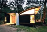
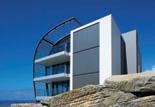
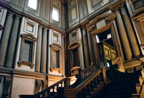
covEr iMagE auckland, new Zealand daniel Marshall architect
Photography: simon devitt
indEsign Publishing Level 1, 50 Marshall St Surry Hills NSW 2010
(61 2) 9368 0150
(61 2) 9368 0289 (fax) indesignlive.com
Printed in Singapore
All rights reserved. No part of this publication may be reproduced, stored in a retrieval system, transmitted in any form or by any other means, electronic, mechanical, photocopying, recording or otherwise. While every effort has been made to ensure the accuracy of the information in this publication, the publishers assume no responsibility for errors or omissions or any consequences of reliance on this publication. The opinions expressed in this publication do not necessarily represent the views of the editor, the publisher or the publication. Contributions are submitted at the sender’s risk, and Indesign Publishing cannot accept any loss or damage. Please retain duplicates of text and images. Habitus magazine is a wholly owned Australian publication, which is designed and published in Australia. Habitus is published quarterly and is available through subscription, at major newsagencies and bookshops throughout Australia, New Zealand, South-East Asia and the United States of America. This issue of Habitus magazine may contain offers or surveys which may require you to provide information about yourself. If you provide such information to us we may use the information to provide you with products or services we have. We may also provide this information to parties who provide the products or services on our behalf (such as fulfilment organisations). We do not sell your information to third parties under any circumstances, however, these parties may retain the information we provide for future activities of their own, including direct marketing. We may retain your information and use it to inform you of other promotions and publications from time to time. If you would like to know what information Indesign Group holds about you please contact Nilesh Nandan (61 2) 9368 0150, (61 2) 9368 0289 (fax), subscriptions@indesign. com.au, indesignlive.com Habitus magazine is published under licence by Indesign Group.
ISSN 1836-0556
20 habitus | Issue 03
Hamilton, seating system design: Rodolfo Dordoni
Australia: Sydney - Dedece - Tel. 02 9360 2722
Melbourne - Dedece - Tel. 03 9650 9600
Brisbane - Dedece - Tel. 07 3367 0755
New Zealand: Auckland - ECC Lighting & Living - Tel. 09 379 9680
Minotti S.p.A. 20036 MEDA (MI) ITALIA via Indipendenza, 152 Tel. +39 0362 343499
- info@minotti.it
www.minotti.com

Discerning design: the best in furniture & lighting, technology
designer kids &
23 habitus | Issue 03 1. news
habitus | Issue 03
24 living
design news
I 01
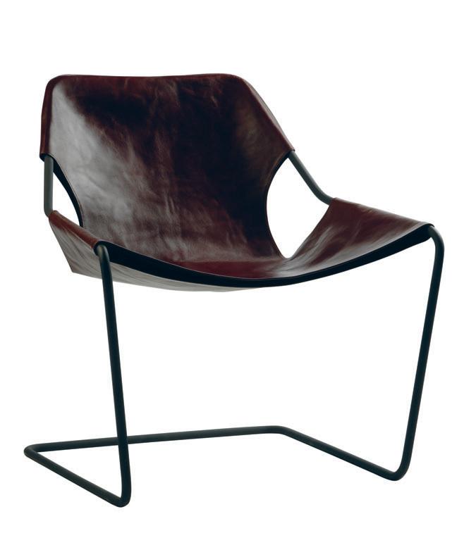
PAULISTANO ARMCHAIR This masterpiece was designed by 2006 Pritzker Architecture Prize laureate Paulo Mendes da Rocha in 1957. The single bar of bent steel, and leather or cotton seat gives it a light aesthetic that feels just as at home in contemporary settings as in its original place in the Athletic Club of Sao Paulo, objekto.fr / hubfurniture.com.au
“Form and function SHOULD BE ONE, joined in a spiritual union”
FRANK LLOYD WRIGHT
FURNITURE OR OBJECT A sculptural solution to the age-old problem of what to do with excess coats and bags, this piece is both intriguing and understated and aligns with Kwon Jae Min’s belief that “furniture is a metaphor of that time”, kwonjaemin.com


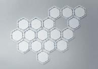
SYSTEM 2D Uniting technology, handcraft and a sense of playfulness, the woven felt segments of this rug puzzle can be configured into endless designs and the material is dust- and water-repellent, mohodesign.com
25 living
I 04
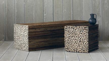
TWIG Designed by the husband and wife team behind Pinch, Russell Pinch and Oona Bannon, the Twig bench and stool offer a small slice of nature in an increasingly modern world, pinchdesign.com
I 02 I 03
STELLA RUG Taking inspiration from vintage lace, this rug by designer Michelle Mason is made from 100 per cent Merino wool felt. You can choose from either black or natural cream, and they are 5.5mm and 6mm thick respectively, michellemason.co.uk
I 05 I 06
RELAX CHAIR Dutch designer Sander Bokkinga’s collection of hosepipe furniture is guaranteed to put a smile on your face, sanderbokkinga.nl
RAVEN


habitus | Issue 03 living
26
design news
CORIAN LOVES MISSONI A union of the iconic Missoni style and the versatility of DuPont’s Corian solid surfaces, Corian Loves Missoni is a project highlighting the best that each has to offer. After years of mutual respect, it is little wonder that the union has achieved such an inspirational result, dupont.com / missonihome.com
I 09
H5981 This new range from Miele offers a combination of elegant design and innovative features in a roomy 90cm width. The oven loving continues with Moisture Plus technology and more than 100 automatic programs are available, miele.com.au
I 07 I 08
HANGER With these striking pieces by Ingibjörg Hanna, you’ll want to keep your clothes on display. Available with steel wire to attach directly to your ceiling, or with a conventional hook, ihanna.net
baby + child
I 11
I 13
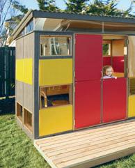
PLAY SHED The pre-finished panels of this childsized playhouse are just as easy to assemble as a shed, but a lot more glamorous, with a sloping roof, Dutch doors and windows, modern-shed.com
I 14
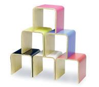
SHORTSTOP This stool/table/storage system has been a hit with the youngsters for some time now, and with good reason. They now come in an array of fabulous laminate colours, inyourroom.com.au
JAPANESE DOLL CRAYON CADDY Keep little fingers busy when on the go with this handy crayon caddy in fun fabric, which contains eight crayons and a notebook, styledbaby.com.au

27
I 10
12
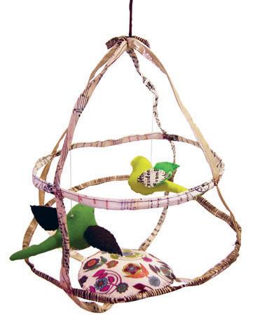
TWO BIRD CAGE Hand stitched from treasures of linen, mohair, wool, cotton, vintage fabrics, tweed and antique embroidery, these bird cage mobiles are works of art, tinypeople.com.au
I
OTTO The modern silhouette of this table and chair set is not just good looking, it’s space saving as well – the chairs slide right underneath the table when it’s pack-up time. Otto is formed in patented stylewood and is available in a range of shades, bloombaby.com
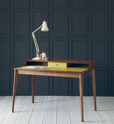
YVES A classic design for a classic piece of furniture
the writing desk. Yves, designed by Russell Pinch, is built in solid walnut with a leather top and two drawers, pinchdesign.com
I
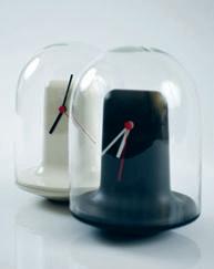
MANTEL DOME The first product in a collaboration between Innermost and designedbyitem, this design thrusts an industrial aesthetic upon the traditonal carriage clock, innermost.co.uk / optique.com.au
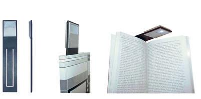
FLAT Anything but flat, this flexible bookmark, designed by Gabriele Pezzini, has a handy built-in reading light that marks the spot, areaplus.com.hk / muji.it / habitat.co.uk
I
ANYTHING SCISSORS The Samurai sword was the inspiration for these scissors, which are part of a collection that creates visual cohesion for stationery items, michaelsodeau.com / anything-design.com

I 17 10KEY CALCULATOR Designed by Ippei Matsumoto, this simple and colourful calculator can be connected to your computer with a USB cable – a particularly helpful addition to the laptop, idea-in.com

habitus | Issue 03
28 work I 15
18
design news
I
19
–
16
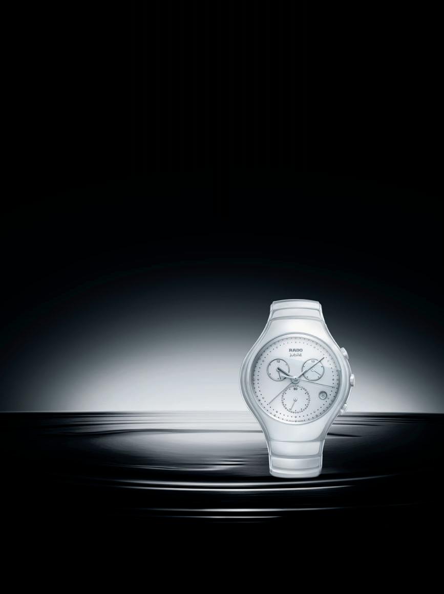
www.rado.com RADO TRUE CHRONOGRAPH JUBILÉ
ONEHUNDRED&TEN To commemorate British luggage brand Globe-Trotter’s 110th anniversary, Ross Lovegrove has designed this case from lightweight, durable carbon fibre and Kevlar, globe-trotterltd.com
KIRIKABU The green bug has bitten JVC, who have created these personal speakers that double as plant holders. In the form of tree stumps, the Kirikabus can be connected for a rich audio experience, jvc.com


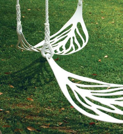
LEAF SWING The delicate veins of leaf are traced and make up the playful yet sophisticated seat of this grown-up swing. Revert to your childhood for just a few moments as you rock back and forth in your surrounds, enea-studio.com
BABUSHKA LIGHT Capturing the familiar nesting shapes of Russian Babushka dolls, these ornamental lights are made from blown glass and Perspex, and are highlighted by coloured LEDs, mathmos.com

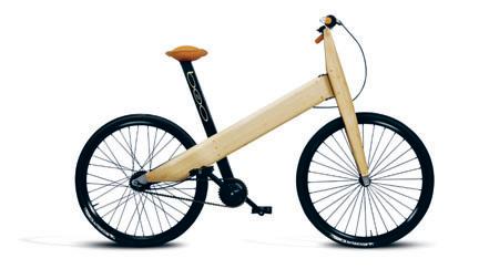
B20 With a simple aesthetic, this bicycle from Fritsch Partners is extra-clean for the environment, by virtue of its function and through its material – it’s made completely of bamboo fibre, fritsch-associes.com
habitus | Issue 03
30 play
design news
I 20
22
23
24
21
I
I
I
I
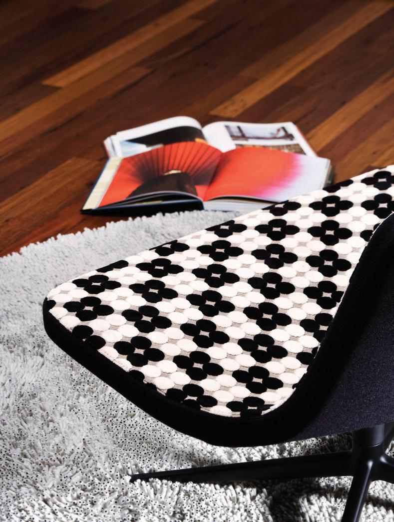
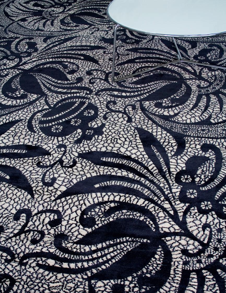
LUSH SPOT A STRIKINGLY BEAUTIFUL VELVET COLLECTION. wovenimage.com
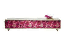
Photo: Paul Gosney / Stylist: Kathy McKinnon / Corporate Culture Furniture
Vissy Frag Woodall Woodmark woodmark.com.au
RRP $11,000
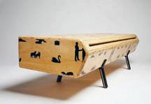
The elegant form and squeaky-clean highgloss finish of the Vissy – highlighted by the fruit bowl morphing into the surface of the credenza – is juxtaposed with the exuberant textured fabric on the doors. The credenza is also available with timber sliding doors stamped with a dandelion-inspired motif.
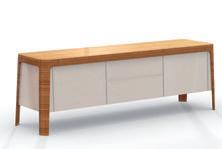
Tierra George Harper Tide Design tidedesign.com.au
RRP $4100
The handmade Tierra (Spanish for ‘earth’) in American cherry or American oak, boasts careful attention to detail and a unique leg structure, as well as surprising door-todrawer proportions. Tierra can be custom made to suit individual requirements.
Alba Russell Pinch Pinch pinchdesign.com
RRP £3995
Lewis Sideboard Design Refinery Tongue and Groove tongueandgroove.com.au
RRP from $3575
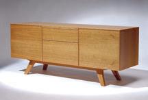
BoReD WITH SIDeBoARDS?
This low sideboard in sustainable Hoop Pine plywood celebrates the traditionally elegant angles of Scandinavian design, with the modern twist of a screenprinted illustration by Tim Fleming. Just the right height for a flat-screen television, Lewis also doubles as an entertainment unit.
Radii
Jason Bird Interstudio interstudio.com.au
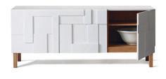
RRP from $3500
This intriguing piece in 100% FSc timber draws inspiration from mid-century relief plasterwork for its façade. The sculptural doors conceal two centre drawers and two cupboards, each with an adjustable shelf. Alba is available in a range of colours.
Designed and manufactured in Australia, this sideboard is both classic and contemporary, with an oak veneer carcass that can be colour stained and two-pack polyurethane lacquer to the cupboard facings.
32 habitus | Issue 03 re-shoot
We’ve got some inspiration for you
HIDDEN BEAUTY
The Fifty Table is beautiful both outside and in. Hidden beneath the surface lies a very clever extension mechanism, allowing you to extend from six to ten or up to twelve people in an instant! Perfectly suited to home and office, Fifty is available with a light-weight timber surface, or in polished or matt glass in numerous colours. Made in Italy using only the finest materials and manufacturing techniques, Fifty proves that beauty is not only skin deep.
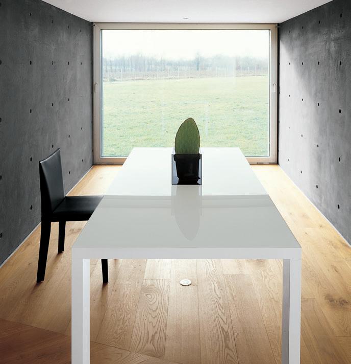
Milk Furniture 1 St Kilda Road St Kilda 3182 tel 03 8598 9900. Open 7 days. www.milkfurniture.com KMD 0620 HAB
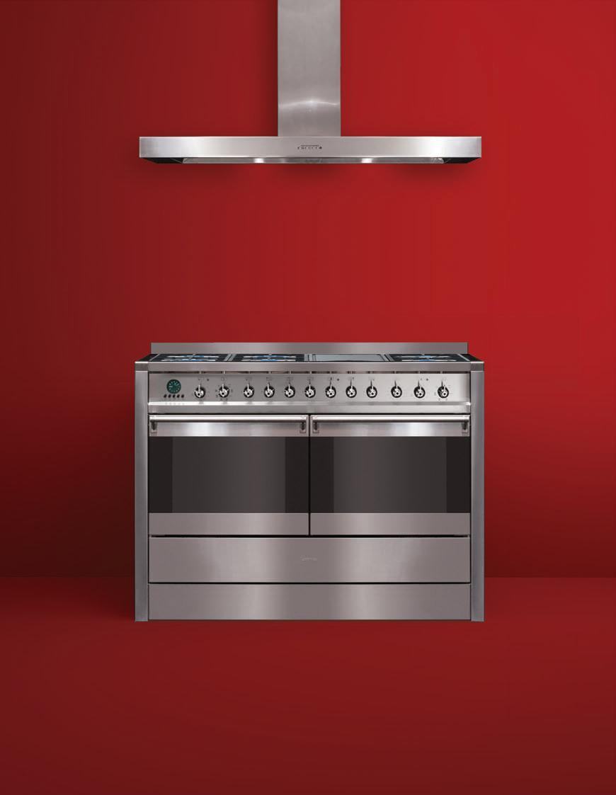
technology with style
With twin fully-fl edged 60cm Thermoseal ovens, the Smeg CSA122X gastop freestander will
help make you twice the cook. www.smegappliances.com.au
TWICE THE EXPERIENCE.
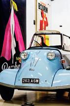
Rory Johnston doesn’t take holidays. Instead, he attends classic car events across the world. It’s lucky, then, that his wife is as car-obsessed as he is (“that’s how we met”), and it’s also lucky that Johnston loves what he does. Such are the benefits of following his passion unfettered by pressure to do anything else. “It absolutely becomes about the people,” Johnston explains, “it’s a way of life and I love it.”
He grew up around classic cars, learning to drive aged 11 in a split-window Volkswagen Kombi. “I suppose you could call that my first classic car. I was always fixing up cars with my dad, so it’s something that I’ve been involved with all my life.”
It is no surprise, then, that Johnston chose to work with classic cars himself. Since emigrating to Australia from the UK with wife Karin in 2002, he has built a booming business around Australians’ increasing enthusiasm for one-of-akind, top-of-the-line automobiles.

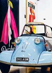
Classic renaissance
The mascot of the business, Classic Throttle Shop – based beneath the austere arches of the Sydney Harbour Bridge run-off that forms the start of the Pacific Highway – is a pale blue Messerschmitt KR200. This charming cabin scooter was owned by Johnston’s father 40 years ago and Johnston brought it to Australia when he and his wife moved to Sydney.
They arrived in Australia with nine collectible cars and a sketch of an idea to somehow work with the vehicles they loved. Shortly after arriving, they set up shop in a studio space a few doors from where the business is now based and began to trade. From those beginnings, Classic Throttle Shop flourished.
For Rory, his whole business is indulging a design passion. Various factors contribute to a car’s sale value and at this end of the market, entry level is high. Badge, provenance, availability, number built, condition and previous owners all contribute to a car’s contemporary retail value. “I do a lot of research before I buy a car,” he explains. “There are fakes out there.” Johnston
habitus | Issue 03 35 conversation designer drive
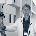
I For the hunters and collectors of design classics, it’s irrelevant whether the object of desire is a chair, a bottle opener, a watch or a car. What matters is its ability to inspire emotion. Rory Johnston has created a successful, full-time career out of his passion for classic design automotives, and while new car sales seem to be dwindling, Rory’s Classic Throttle Shop in Sydney is a hub of activity.
Text Kirsty De Garis
Photography Alina Gozin’a
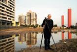
I 01 Rory Johnston in one of his beloved vintage cars. I 02
I 01 I 02
This Messerschmitt KR200 is the mascot of the business.
has one Ferrari in his showroom valued well over a million dollars; it is the only example of the car built in aluminium rather than stainless steel, so that it could be driven as a lightweight racing vehicle, and was custom-made for an Italian race car driver.
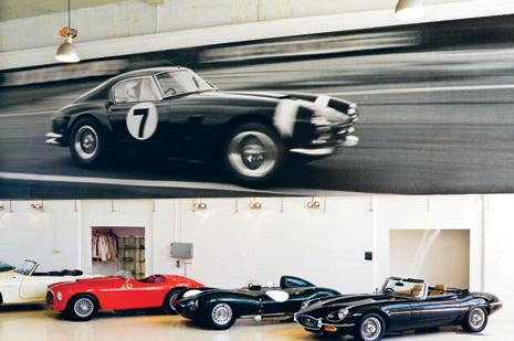
Johnston considers the golden era of automobile design to be the 1960s and 1970s, when the design of top-notch cars at that time was in the hands of a chosen few elite designers who forged their careers with the big car manufacturers of the era. Italian design studio Bertone’s designer, Marcello Gandini, was just 27 when he drew the outlines of Johnston’s current obsession, the Lamborghini Miura, in 1966. “I’m a big fan of Bertone,” Johnston muses. “I think their design in the 1970s was fantastic.”
Johnston even sold his home to buy the Miura, believing the car’s value increase would far outweigh the financial benefits of home ownership. His eyes glaze over as we look at it. “It was designed so that, on its side, it had the curves of a woman’s body,” explains Johnston. With only 760 ever made during the early 1970s,
this rare right-hand drive model, painted a racy red (paint jobs can set you back in the hundreds of thousands) sports a V12 engine and has a resale value of somewhere around $1.5 million. It reaches a speed pushing 300 km/hour, however driving blogs insist it isn’t an easy car to drive.
On the showroom floor at the time of publication was a 1971 Lamborghini Espada Series 2. Looking, at first glance, like something out of Austin Powers, the car benefits from some of the Miura’s spectacular detailing and tops the speedometer at more than 200 km/hour. “Love it or hate it, you just have to look at it,” he laughs.
Classic Throttle Shop’s clientele is a select community. Last year, Johnston and Karin traveled to Goodwood Revival – the UK’s premier
classic car racing meet – with one of their cars. “Once you’re invited – and you’re only invited if you own one of these cars,” he says, “you are admitted into a fantastic social scene.”
The showroom and its staff also star in a new television program, airing in early 2009 on Australia’s Network Ten. “It’s about the cars and the racing, with a bit of lifestyle,” Johnston explains. It seems from the outside that Rory Johnston can’t quite believe his luck, as he strolls leisurely around the showroom, caressing the body of a priceless Lamborghini. “These cars are really pieces of art,” he sighs. “I could never treat them like a modern bit of metal.”
Classic Throttle Shop, classicthrottleshop.com
habitus | Issue 03 36
drive conversation I
A
I
A
designer
03
print of Stirling Moss in a Ferrari 250 GT SWB graces one wall of the showroom.
04
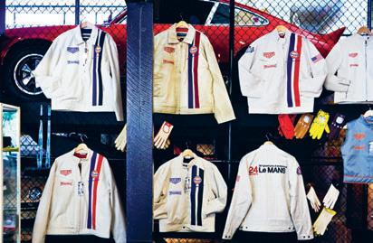
range of Le Mans gear is displayed in homage to the Steve McQueen film.
I 04
03
I Badge, provenance, availability, number built, conditions and previous owners all contribute to a car’s retail value.
I


Tibetan Carpets ...imagine the possibilities www.rc-d.com.au MELBOURNE (HEAD OFFICE) 573 CHURCH STREET, RICHMOND T: 03 9428 6223 SYDNEY 112-116 PARRAMATTA ROAD STANMORE T: 02 9519 8555 BRISBANE 5 LIGHT STREET FORTITUDE VALLEY T: 07 3852 6300 PERTH T: 04 2221 2400


For distributor listing & complete product range please visit www.parisi.com.au or call 02 9559 3666 2008 Series
the best
architects EVEN TODAY still draw by hand. PHILIP D REW discusses three books which EXPLORE drawing and architecture
habitus | Issue 03 montage 39
the lamp of drawing:
michelangelo to murcutt
“I say he ‘thinks’ this, and ‘introduces’ that. But strictly speaking, he does not think at all. If he thought, he would instantly go wrong; it is only the clumsy and uninventive artist who thinks. All these changes come into his head involuntarily; an entirely imperative dream, crying, ‘Thus it must be,’ has taken possession of him…”
John Ruskin commenting on Turner, ‘Of Turnerian Topography’, 1856 Drawing involves more than simply seeing what is there. It is a magical act, the beginning of speech in making the world real. It played a crucial role in primitive religion, as in the early Paleolithic cave art of Altamira and Font-de-Gaume. To draw an animal was to make it real and tame it. Sight was more important to John Ruskin than drawing. He thought its value lay in learning to love nature rather than looking at nature as a subject. Drawing does teach us to see better, to notice and analyse, possibly to understand how things are constructed and, thereby, to understand a little better their design.
Two new books – one on Michelangelo’s drawings, and another on the architectural drawings of Glenn Murcutt – challenge the dominant worship of digital imaging in architecture. This is most welcome: we place too much emphasis on the visual fakery flowing from the computer, which can prove so misleading. Computers lie because they are just machines – perverted into selling architectural dreams.
The over-reliance on the computer substitutes for genuine creativity and encourages the production of meaningless forms. It generates images that, while they are noticeably excellent in depicting alien life forms and alien worlds, they are distant and cold. Drawing, like handwriting, has a real intimacy, a directness that instantaneously connects us to the mind of the drawer. They are very personal – unique to that individual.
Both books accept the premise that drawings are design and Cammy Brothers points out that the Italian word for drawing, disegno, also included design in its meaning. Drawing was inseparable from and integral to the design continuum – part exploration, part discovery.
I
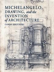
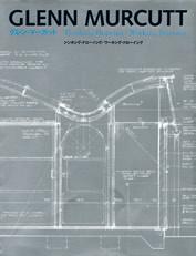
01, 02, 03, 05 Michelangelo, Drawing, an D the i nvention of a rchitecture
Cammy Brothers
Published and distributed by by Yale University Press 272pp hardcover US$65 yalepress.yale.edu
04, 06 glenn Murcutt: t he a rchitecture of glenn Murcutt
glenn Murcutt: t hinking
Drawing/ working Drawing
Published by Toto Shuppan
Distributed by Idea Books
328pp hardcover AUD$140 & 248pp hardcover AUD$106 ideabooks.nl
07 t he JuDicious e ye
Joseph Rykwert
Published by Reaktion Books

Distributed by Footprint Books 432pp hardcover AUD$92 footprint.com.au
Previous books have concentrated on the relationship between the architecture and Michelangelo’s drawings. Brothers adopts a different perspective by examining how the artist used drawing as a medium of thought and design, using procedures he developed for painting and sculpture, then applied with great success to architecture. In this way the reader can see the same procedures at work, but to different ends.
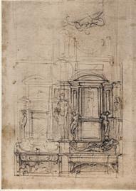
Michelangelo used drawing to discover his own language of architecture. It was a gradual process, built upon his earlier drawing practices of tracing, overlaying and sketching models in series. His great obsession, indeed his sole subject as an artist, was with the human figure. He believed, “…it is a certain thing, that the members of architecture derive from the members of man. Who has not been or is not a good master of the human body, and most of all of anatomy, cannot understand anything of it.”
Michelangelo extended what he learned about the human figure and its gestures to architecture. With this he animated the classical scaffolding the Quattrocento had studiously re-invented by measuring and drawing the ancient monuments of Rome, often from scattered incomplete fragments. But Michelangelo was less interested in archaeological authenticity, than in using Ancient Rome as a starting point.
He was not content to copy the ancients, following their rules of proportion, imitating moulding profiles, applying Vitruvius. He meant to outdo them. This sits at the core of his Mannerism – the need to go beyond the ancients in a free interpretation and inversion of classicism. Along the way, he created his own anti-Classical language that overturned and inverted classical convention. For
habitus | Issue 03 40
montage philip drew
01
02
I
nearly two centuries, until the advent of Neo-Classicism, Michelangelo’s capricious undermining of Renaissance practice was widely influential. He harnessed the classical to his own expressive ends. Though the drawings are exquisite and seductive in themselves, they are arbitrary distortions of the classical.
In the Laurentian Library he imprisoned paired pilasters within the wall. Brackets that were supposed to support them were too fragile for the loads they carry, and a gap separates the two. The stair explodes into the vestibule. It is much too large and presses itself against the confining walls. The result is psychologically oppressive. His architecture, like his sculpture, strains against its corporeal bonds. The body, Michelangelo seems to say, is a prison for the immortal soul.
He glories in his war with flesh. Yet it imprisons him, leaving him a restless, tortured and unquiet soul.
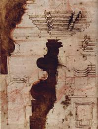
Not only did Michelangelo not measure and draw the Roman monuments – he saw no point in doing so, just as he thought perspective, the very foundation of Renaissance pictorial space, was a waste of time – he displayed no interest in ancient monuments except to re-draw the reconstructions of other antiquarians. He plays with and teases such profiles, adds a mouth, a nose, human features, that humanise otherwise abstract geometrical exercises in light and shadow, that express load and support and the flow of gravity to the ground through a frame of classical architectural lineaments glued to the wall.
His overthrow of classicism initiated Baroque and Mannerism, leaving a difficult legacy behind for lesser talents.
A contemporary Spaniard, Santiago Calatrava, also starts with the human figure. Its gestures inspire his structures, as if they are human figures that resist loads. So we place ourselves within his creations, feel and resist the loads in place of his constructions. Calatrava is an heir of Michelangelo with a similar emphasis on architecture as sculpture. Glenn Murcutt’s subject is Australian nature. Unlike Michelangelo, the human figure is only of passing interest.
The two Murcutt volumes were published simultaneously with the Thinking Drawing/Working Drawing exhibition at the Gallery Ma in Tokyo (June 12-August 9, 2008). There are supporting essays by Catherine Lassen, Tom Heneghan, Shoko Seyama and Maryam Gusheh. Shoko Seyama is by far the most perceptive. She does not
shrink from asserting: “Murcutt’s architecture is an Australian architecture, born of the uniqueness of his country. And, it is his manner of response to this uniqueness that gives Murcutt’s architecture its irresistable beauty”.
and including, sketches simultaneously exploring aesthetic and construction assembly issues, joints, culminating with working drawings and large details. Taken together, they offer a fascinating opportunity to explore Murcutt’s architectural process. This is a welcome change from the customary glamour coffee table genre beloved by architects, and instantly registers his emphasis on construction. Unlike an earlier Haig Beck monograph, which included digital scans, the drawings with their notes can be easily read. You have to chip away at a problem – Michelangelo and Murcutt’s drawings do so patiently. Sometimes the discoveries seem inevitable, at other times a surprise. The essays miss Murcutt’s deeper preoccupations; he emerges instead as a dexterous technician when it is really the poetry that sets the agenda – “the dream that has taken possession of him”, which says “thus it must be.” If the technician was all there is to Murcutt he would be far less interesting an architect and far less important. It is a mistake to read his drawings too literally and not to inquire into what they work towards. What is his goal, or, as Ruskin asked: what is the imperative dream that cries out to Murcutt?

41 I 03 I 04 I 05
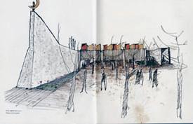
The second drawings volume surveys 13 projects from the 1972 Douglas Murcutt House to the 2005 Walsh House. These are copiously illustrated by early conceptual sketches through to,
Michelangelo inverted Classicism. Murcutt turns modernist orthodoxies and conventions to secure an Australian expression that responds to the country, instead of twisting northern hemisphere approaches, following the example of Sydney Ancher who did so much to encourage him in this enterprise. The Renaissance invented perspective. It was so much more than a drawing technique, inasmuch as it unified the visual field and rendered it coherent. The world is tied to a single vanishing point. It was a closed world that Renaissance artists constructed, space was contained and limited, just as explorers were breaking out of European geography and discovering a new world beyond it. Ships did not fall off the edge as was supposed.
Murcutt’s architecture expresses a different spatial sense, one that is mono-axial and emphasises the dimension of distance. His is a world of limitless horizons, single axes driving into nothingness, even though the majority of his buildings are on the coastal edge away from the outback within a comfortable three-hour drive of Sydney. His railway carriage houses recall endless steel tracks running on and on to the horizon. This makes his space special. The poetry derives from this expanding frontier utilising a hybridisation of our 19th Century colonial industrial foundations, in combination with modernism.
He remains anchored to this model. The Lidco aluminium windows don’t seal properly, they are 1970s technology that has been superseded; his corrugated iron is a 19th Century invention that also has been superseded.
This has largely gone unnoticed. Murcutt’s engineer and collaborator, James Taylor, says: “Glenn makes his buildings as light as possible, partly out of a concern to minimise the use of natural resources”. In fact, the amount of steel used is excessive: something like 38 tonnes in one 250m 2 house, or 26 psf (152.7kg/m 2), compared to 42.2 psf (206 kg/m 2) for the 102-storey Empire State Building with its 1930s riveted-steel frame, and 33 psf (161 kg/m 2) for the 110-storey Sears Tower. Look for inconsistencies – they lead directly to real discoveries, if you wish to truly understand the architecture.


The value of the two Murcutt volumes is less what they say than what they illustrate. That is why Murcutt’s drawings are so valuable and repay close study and analysis. They manifest an intense concentrated focus on specific problems. Too many architects seem afraid to work out their own solutions and are content to copy from others instead of thinking for themselves.
That way leads to Zaha Hadid and the erosion of function in meaningless forms. This is in part the subject of Joseph Rykwert’s most recent book which takes for its subject the breach between architecture and the arts of painting and sculpture from 1760 to the 1930s. It is a dense work of scholarship that could have benefited from judicious editing. He frequently strays off subject, but there are rewards – though often, irritatingly, it seems that Rykwert has lost contact with his chosen theme and is writing a history of architecture with asides on art. It is not without its errors: the Nazis are credited with closing down the Bauhaus when what happened was Joseph Goebbels approved its continuance only to see it closed by Mies van der Rohe.
Not only does the narrative lack continuity, the book produces no conclusions. If we are to conclude anything, it is that any synthetic work of architecture, painting and sculpture, even when this is the given goal, is an achievement against all odds. Rykwerk does find one example worthy of celebration. This is Josep Lluis Sert’s Spanish Pavilion for the Paris International World’s Fair of 1937, about which he writes: “…what seems powerful now, 70 years after the event, is that a political conjunction prompted the incandescent fusion of building, painting and sculpture”.
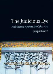
Sydney’s well-intentioned attempt at a similar political fusion in the Federation Pavilion of 1988 resulted in a saccharine imitation of a Roman temple and a plagiarised Aboriginal art work by Imants Tillers. If anything, it demonstrated just how impossible such Gesamtkunstwerke are. Hermann Finsterlin’s architecture game in Frühlicht 3, played out the generation of architectural styles from orthogonality to organic form now seems especially prophetic in view of the current Hadid craze.
Drawing, because it is a tool common to painting and sculpture, offers a means for architecture to move closer to the other visual arts of painting and sculpture. In Michelangelo’s time an artist could be an architect, painter and sculptor, so it was not an accident that buildings and the arts were total works. We have largely lost this capacity. Drawing is a natural spontaneous activity that, like handwriting, we are in danger of losing under the onslaught of the computer and digital technology. It is perhaps time to think again about, and to re-value, what drawing can contribute in the increasingly rarefied artificial culture we are creating. That which flows directly from the mind to the hand can unite us with others and assist us in shaping the public sphere when it expresses our imperative dreams. Drawing makes us human and individual.
habitus | Issue 03 42 philip drew
montage
I 06 I 07
FORWARD THINKING IDEAS, PLACES OF INTEREST, CREATIVE SOULS & VALUABLE
INSIGHTS
45 2. people & places habitus | Issue 03
German design and engineering has made Neff a market leading brand in Europe.
The latest sales figures from Europe by industry research specialist GfK show that Neff is No. 1 in Great Britain, No. 2 in Germany and No. 4 in Central Europe. *
And is it any wonder given Neff has been writing kitchen history with their cooking appliances for over 130 years. Today Neff is still 100% German designed with extensive production facilities and headquarters in Bretten.
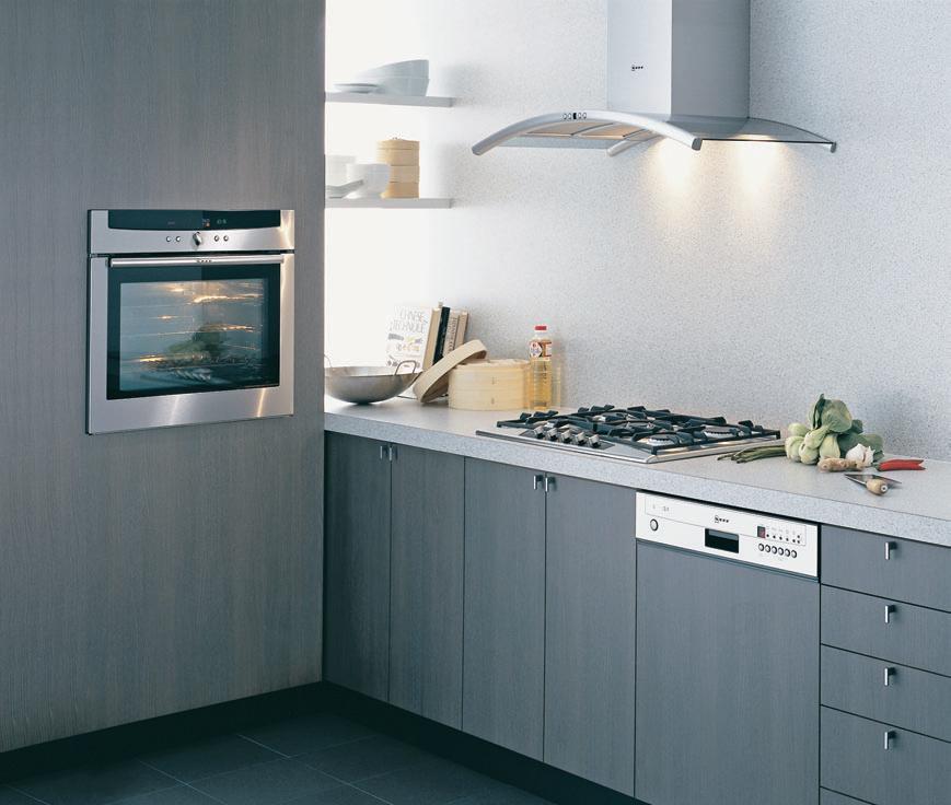
Perhaps another surprise - Neff is more technically advanced and offers superior features to many other leading brands. Like the precise temperature control of the CircoTherm cooking system, the unique rotating Revolution handle, the Point & Twist cooktop control and the reassurance of a 4 year warranty on all Neff appliances.
To uncover the benefits of Neff for yourself arrange an appliance demonstration at one of our showrooms, or locate your nearest retailer by calling 1300 727 421 or visit www.neff.com.au.
Proudly imported, distributed and supported by Sampford IXL.
Europe’s kitchen specialist
*The GfK Group is one of the largest market research companies in the world. Figures refer to the period from January to August 2008 based on sales value. Central Europe is Austria, Belgium, Germany, Spain, France, UK, Greece, Italy, Netherlands and Sweden.
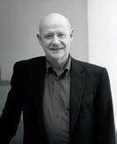
lens Through the
John Gollings is widely regarded as the master of architectural photography in Australia. His images typically convey the inspiration behind buildings. But what inspires John Gollings? Stephen Crafti finds out.
47 habitus | Issue 03 inspired
Photography John Gollings
Text Stephen
Portrait Photography Tom Hutton
Crafti
I 01
john gollings — VIC, australia

photographed Denton Corker Marshall’s first building, a pilot station at Queenscliff.”
DCM’s concrete bastion, a radio communication centre designed to guide ships into port, was photographed with seagulls circling the building. “I wanted to show the bastion against the elements – against the roughness of the heads,” Gollings adds.
Architect Peter Corrigan had also just completed two churches, both of which were to feature in Domus magazine. “Peter was considered one of Australia’s greatest proponents of post-Modernism,” says Gollings, who understood Corrigan’s theatrical approach to architecture. “I photographed both churches at night. I wanted to accentuate the polychrome brickwork as much as the forms,” he says. In one photo, a tree creates a shadowy effect over a spire. In another the priest stands in front, with his parish almost painted with light.
John Gollings has had a camera in his hands since he was 12. “My first photos were of my sister and brother jumping off a mountain of potting mix,” says Gollings. Another photo captured his sister balanced precariously on top of the ‘mountain’. “My brother was supporting her on his shoulders. But he’s concealed from view,” says Gollings, who has always been fascinated by surrealist images.
The mountain of potting mix was one of many in the garden nursery surrounding the Gollings’ family home in Carnegie, Melbourne. While ‘Gollings the Florist’ nursery provided a fertile environment for an inquisitive teenager, it was his father’s ‘Ensign’ folding camera that took hold of his imagination. “Ray Oliver (a keen amateur photographer and employee of the nursery) taught me how to develop and make contact prints, “ says Gollings. “I knew I’d always come back to photography.”
Gollings’ father sold the nursery and went into the building industry. “I have to confess my father was responsible for many of the walkup 1960s apartments around Prahran and South Yarra,” says Gollings. With the intention of joining his father in the construction business, Gollings enrolled in architecture at Melbourne University in 1964. His contemporaries at university included the directors of Denton Corker Marshall, as well as architect Peter Corrigan of Edmond and Corrigan. But unlike his esteemed classmates, Gollings wasn’t in the graduating class. “I was already married with two children and I needed work. But in the four years I was there I spent more time as a stage manager in the Union Theatre than in architecture classes.”
In photography, as in life, timing is everything. Gollings’ friend, the late photographer Rennie Ellis, introduced Gollings to the advertising agency, Orpin & Bourne. “They were probably the edgiest agency at the time, completely in step with swinging London of the late 60s,” says Gollings, who stayed with the agency for three years.
While not formally trained, Gollings’ inquisitive mind was appreciated. “Before I photograph anything I like to read up on the subject, garnishing as much detail as possible. I learnt everything I could about colour theory as well as optics and lenses.”
One of Gollings’ first assignments was photographing a disco in Melbourne’s Flinders Lane. “The brief was to capture the energy in the club,” says Gollings, who used a 35mm camera with high speed film. “From memory, my black and white photos taken that night were quite grainy, with people completely intermeshed,” he says. By the mid-70s, Gollings’ architectural friends were completing their first buildings. “Peter Corrigan and Kevin Borland wanted their buildings photographed. I also
One of Gollings’ first large assignments was via the Australia Council. Three photographers (the others were David Moore and Max Dupain) were selected to photograph some of Australia’s most significant buildings. “We all approach architecture quite differently. Max had a slightly romantic perspective and David worked with a small camera, creating a documentary style,” says Gollings. “I worked with colour and captured wide elevations. I always show the context of a building, where it sits in a landscape, be it urban or rural.”
Since the early 1980s, Gollings’ name has become synonymous with architecture because he has photographed most of Australia’s landmark buildings.
Whether it is an individual building or an entire region (Gollings has just completed a book on mud brick homes in Xianjiang in China), composition is the foundation of each image. “I’ve often said my approach is quite dumbly simple. My horizon lines are always in the centre of a photo. And I never tilt my camera, even if it is considered artistic. I think it’s important to offer a critique of the building as well as allowing the viewer to come to their own conclusions,” says Gollings, who tries to expose a building for what it is, rather than covering it up with photographic tricks.
Form is also a crucial feature in Gollings’ photographs. Whether he is behind a lens, or looking out of a hotel window, the form of a building resonates. He was recently standing at his hotel window in Sydney, looking out towards the Art Gallery of New South Wales. While he found the 19 th Century building inspiring, an addition made to the gallery in the 1980s disturbed him. “[The extension] may be a suitable interior, but it failed to communicate its ideas on the outside,” he says. “Look at the Richard Johnson extension – It’s far more discrete, but more engaging.”
habitus | Issue 03 48
inspired
I 02
One of Gollings’ first assignments was photographing a disco on Flinders Lane.
I 01 Previous John Gollings
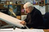
At work, photographed by his assistant, Tom Hutton.
I 02 Kashgar, China by John Gollings.
I 03
A Giardino painting
Commissioned by John Gollings, it features Gollings’wife, Marion, and also his son, Sam.
I 04
Artist Pasquale Giardino

Who migrated to Melbourne from Spain with his family.
I 05
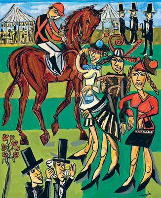
Fashions on the Field From A Day at the Races series by Pasquale Giardino.
49 I 04
I 05 I 03
I
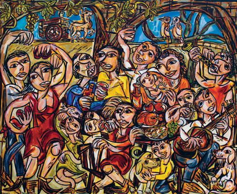
John Gollings’ photographic studio in St.Kilda was designed by Denton Corker Marshall. A graphic staircase leads to a gallery-like environment. The studio features several sculptures by various artists, including Lauren Berkowitz, Louise Lavarack, Robert Owen and Tony Pryor. In his collection are several paintings by artist Pasquale Giardino, a Spanish painter. “Pasquale’s family migrated to Melbourne several years ago,” says Gollings. “The entire family understands the pleasure that comes from domesticity. The family bottles their own home grown tomatoes.”
Gollings started purchasing Giardino’s paintings from the early 1980s when the artist was part of Raw Studios (which also included artist David Larwill). “Pasquale isn’t part of the art scene. You could say that he’s not popular taste. And he doesn’t compromise,” says Gollings, who appreciates the artist’s ‘ joie de vivre’. “His paintings bring a European understanding of the simple pleasures of life,” he adds.
Gollings feels that he often intellectualises too much over what he sees behind his lens. In contrast, Giardino’s paintings show a more spontaneous side to life, imbuing each of his canvases with emotion. One of Giardino’s larger paintings is displayed in Gollings’ living
I 06
Virupaksha Temple, Hampi, India
 By John Gollings.
room. Commissioned by Gollings, the painting features several figures enjoying a festive occasion. Gollings’ son Sam is depicted patting his dog, and his wife Marion is also part of the celebrations. The image of a horse and cart appears in one corner of the painting. “They relate to an earlier painting I commissioned,” says Gollings.
“I remember being hit with a ruler by the art teacher when I was in grade two. Like Pasquale, I outlined my figures in heavy black lines. I was told it was stupid and just to use flesh colours,” says Gollings, who appreciates Pasquale’s heavily defined eyes and lips.
Giardino’s paintings are a sharp contrast to Gollings’ photos, which are highly composed, with the context of each building clearly articulated. Giardino’s paintings are far from ordered – if anything, there’s a sense of chaos. “With Pasquale’s paintings, you get to understand how other people see the world. There are certain things that may escape me when I’m behind the lens. But I’m reminded of some of the simple pleasures in life when I stand back and look at these paintings.” Gollings Photography, gollings.com.au
50 habitus | Issue 03 inspired
06
“ I always show the context of a building, where it sits in a landscape, be it urban or rural.” JOHN
STYHAB0309 available exclusively from stylecraft moon chair design pietro arosio Sydney 1300 306 960 Melbourne Brisbane Canberra Adelaide Darwin Perth Singapore +65 6511 9328
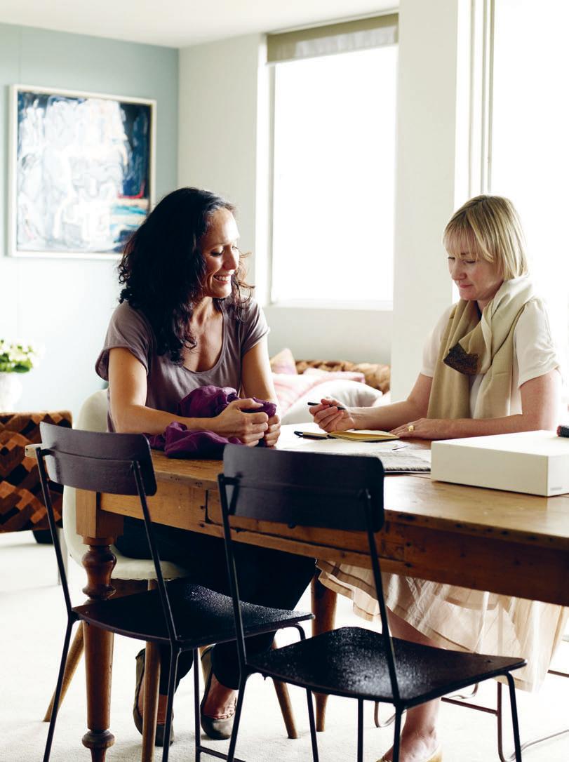
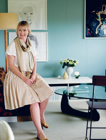
jac hunt — NSW, australia
Treasure BOX
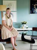
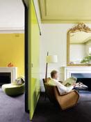
For a designer known for her timeless, understated creations woven from quality yarns – a truly noughties approach to knitting – it comes as something of a shock that Jac + Jack designer Jac Hunt lives in what can only be described as creative chaos. However you would only draw this conclusion from the surface.
Jac does a lot of designing for the nearly five-year-old label from her home in Sydney’s Centennial Park. She looks out the windows onto the vivid pops of Australian outdoor colour. Much of the colour inside her home comes from Jac’s extensive shawl collection, which she’s been collecting for 20 years and displays in wire baskets. “I look at all these beautiful textiles together and it reminds me of the places I have been to collect them,” she says.
The Jac + Jack brand was born as a conversation between Jac and then-colleague at Marcs,
Lisa (‘Jack’) Dempsey. “I was womenswear buyer at Marcs and we worked together there, then at Jigsaw, and again at Marcs when I went back as brand manager,” Lisa explains. While working together, Jac recalls, “We would constantly talk about our label, how it would look, different ideas.” The ideas distilled until they met with the third member of their business team, honed the idea, and went into business. Their first collection was a 29-piece ensemble, several items of which are still in the collection today, which says a lot about the effortless, enduring tone Jac has set with her creations – both in form and style.
In 2004, when Jac + Jack was born, the concept of an Australian fashion label devoted entirely to knitwear was a new one. Lisa says, “We always felt knitwear in this country was lacking in simplicity.”
“Simplicity in the true sense of the word,” Jac elaborates. “Quality yarns, well designed and beautifully knitted.”
Homegrown support for the young label has been fantastic, with David Jones a major stockist. Independent boutiques including Belinda, Blood Orange, davidmetnicole, and Lee Mathews have also taken up Jac + Jack, which Lisa reports many customers still perceive to be an imported knitwear label.
For Jac, inspiration begins with the raw materials. “I’m not one of those designers who says, ‘I’m going to do Santa Fe now,’” she explains. Instead, she does her groundwork, visiting yarn fairs (the world’s best are in Shanghai and Florence). At the fairs, Jac will select yarns: “I’ll take a kilo of something I like,” she explains, and from there will experiment with swatches. It’s important, she says, to see how something knits.
habitus | Issue 03 52 Photography
Text Kirsty de Garis
Prue Ruscoe
at
home
I The Sydney-based fashion label Jac + Jack is quietly gaining cult status for its purist yarns and simple forms. At home, designer Jac Hunt – one half of the Jac + Jack duo – prefers a bowerbird approach to collecting pieces to live with.
I 02
This can be a prolonged process of trial and error, as was the case with recently developed ‘second skin’ cashmere. “It took a long time,” she says. “There are so many elements to consider. But we are thrilled with the result, and it is always worth it to work so hard to get it right.” Jac and Lisa are also passionate about using australian superfine merino wool in their designs. “It’s such an under-utilised raw material,” she says.
Jac is also very hands-on with the creative team that makes her designs a reality. “I spend a lot of time at our factories,” she explains, adding that she has recently made contact with a 30strong team of women hand-knitters in India, with whom Jac + Jack are set to work moving forward. “I was so excited to meet with these women and see what they do,” she says.
I 01 Previous Design duo Jac + Jack at the dining tableturned-workspace.
I 02
Jac Hunt has taken an eclectic approach to her apartment.
I 03 Opposite Her collection of coloured glass has been amassed over the years and is regularly rearranged.
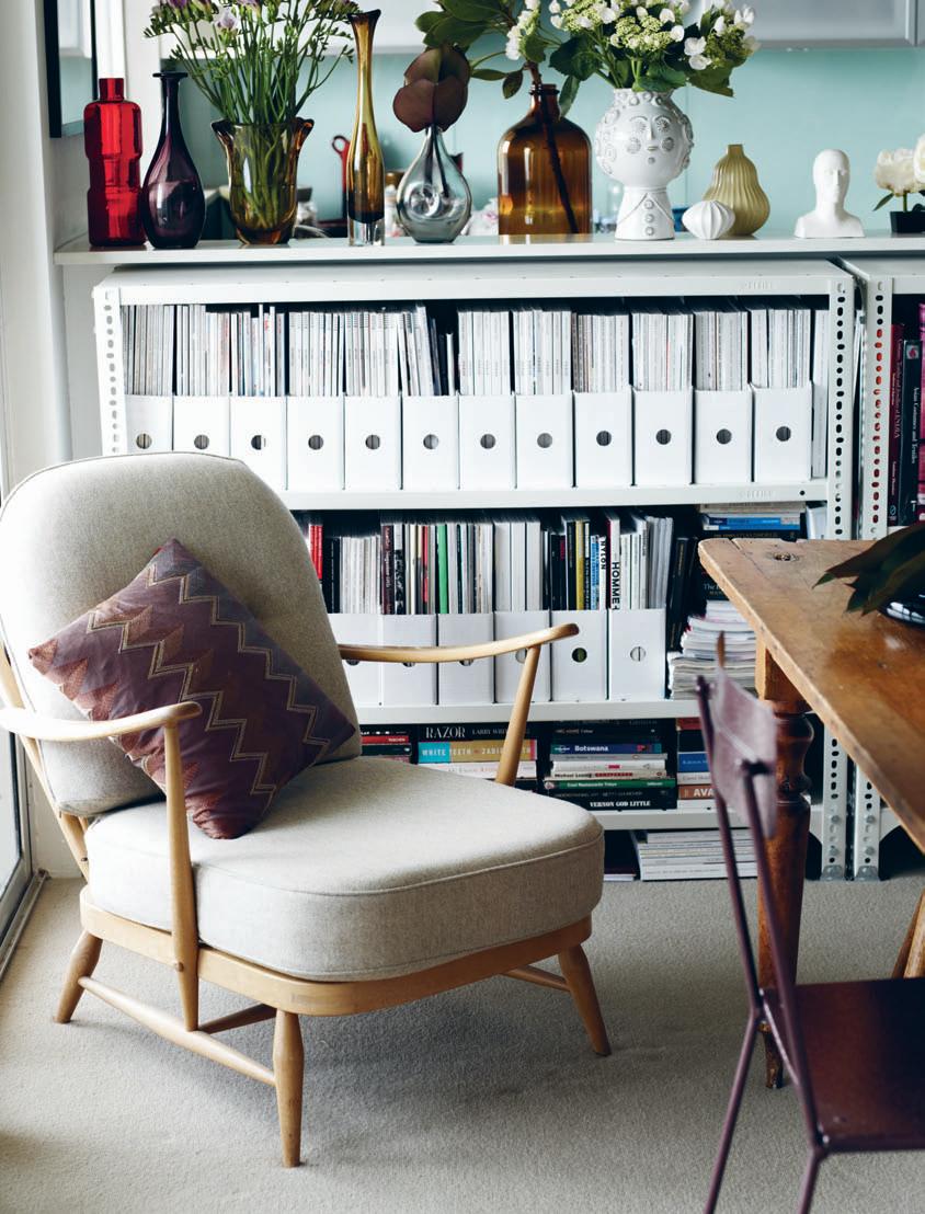
Jac’s approach to the decoration of her home interior is a lively, colourful complement to the warm minimalism of her knitwear. “I like the idea that your life evolves,” she says, “your style evolves. That’s why I like pieces with a bit of history.” So while you will find a classic Noguchi coffee table in her home, it is not filled with modern classics. “In context with other things, it looks really fantastic,” Jac explains, “but not en masse. That doesn’t speak to me of a personal touch. I like to put things together my way.”
and that’s exactly what Jac does: a decades-old collection of glass is displayed on one surface, and Jac confesses to frequently rotating the vases on display. The stack of brightly coloured hats is an expression of the world in which she works as much as it is a decorative feature. “For me there’s no philosophy. It’s intuitive,” she says. “I’m not into anything that’s too contrived. Really I respond to whatever I think looks good.” This usually means items with texture; what Jac would describe as pieces with a history and soul. “I’m not into things that are too shiny and clean. I like the idea of pieces adding layers to a home,” she says.
Back to the subject of work, Jac says thatwhen it comes to turning to other designers for inspiration, the name that comes immediately is Dries Van Noten. “His are such classic designs, with a wonderful choice of colour,” Jac says.
“We don’t take the easy route of choosing off a colour palette,” Lisa adds. “at the end of the day it’s about function: it has to be wearable, feel great, and have a timelessness about it so it’s not in one season, out the next.”
habitus | Issue 03 54
“I look at all these beautIful textiles together and it remInds me of the places I have been to collect them.”
–Jac
at home
“And you’ll find that our greys are never just grey,” says Jac. “We do grey marle, charcoal, slate grey, donkey grey. And we never just do a brown – it is every shade of that.”


This commitment to taking the difficult path to great design is one element that has set the work of Jac + Jack far apart from other contemporary Australian fashion designers. The rich variety of colour is indicative of their meticulous approach to their business. As a result of this attention to detail, business is going brilliantly for the pair. And, despite past protests, Jac may even see herself moving from her cosy apartment overlooking the trees to somewhere with a bit more space for the homewares range – in timeless shades and silken cashmere, of course – that is next on the agenda for Jac + Jack.
I 06
habitus | Issue 03 56
at home
I 04 I 05
Jac + Jack, jacandjack.com
I 04 Olive Dress in Coffee from Jac + Jack Winter 09 collection.
I 05 Baskets of coloured shawls brighten up corners of Jac’s apartment.
I 06
Kyd Shawl in Wedgewood, Sadie Tank in Wedgewood and Jonnie Pant in Grey, all from Jac + Jack Winter 09 collection.
“I’m not into things that are too shIny and clean. I like the idea of pIeces addIng layers to a home.”
–JAC
FEEL THE DIFFERENCE. LONGBARN COMPANY SYDNEY 95 BRIDGE ROAD GLEBE NSW 2037 T 02 9692 8822 MELBOURNE 1 B CHATSWORTH ROAD PRAHRAN EAST VIC 3181 T 03 9510 0501 W WHITECLIFFE.COM.AU E SALES@WHITECLIFFE.COM.AU
Aptos Cruz — SA, australia
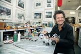
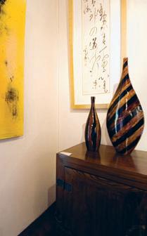
Cultural Cross-Over
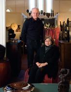
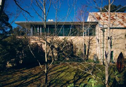
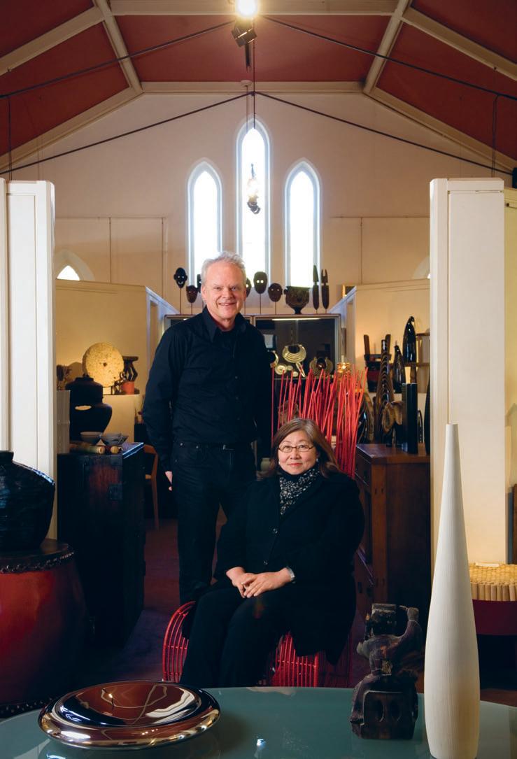
I They had worked all over the world, but came to rest in a pretty village called Stirling in the Adelaide Hills. Twenty-one years later, Steve and Pat Ronayne still complement one another running their gallery/showroom/bookstore, Aptos Cruz. Now, reports Paul McGillick, it boasts a new gallery extension by architect Con Bastiras.
I visited Aptos Cruz with Con Bastiras on a crisp and sunny day last August. It’s a magic name in a magic location and winter is probably the ideal time to make the short drive up from Adelaide into the Hills. The light has an alchemic effect on the trees and the local bluestone from which many of the buildings are constructed.
Aptos Cruz has never advertised and it does not have a sign. But you can’t miss it. It’s in the 1869 bluestone Ashton Memorial Church which sits at the crest of the hill with a verdant and enticing valley as a backdrop. You can’t help but pull off the road and drop in. aptos /æptos/ n.(Amerindian) coming together; cruz /kruz/ n. (Spanish) cross
Directors Steve and Pat Ronayne used to live in a village in California called Aptos, the inspiration for a gallery that brands itself by bringing together different cultures. “We’re a complement,” says Steve. “She’s the designer
– and all the nuts and bolts. I just kind of hang out. But there’s the buying and manufacturing. And I put words to what she is doing.”
It is quite a story. Originally from California, they have been an item now for 38 years, working together in the U.S. and Europe before coming to Sydney in the 1980s where Steve was director and general manager of Design Warehouse with Pat doing the importing. After 10 years, they wanted a break. Steve was offered a position in importing in Adelaide. “That lasted three months,” he says. “It was the worst mistake I ever made. I decided I didn’t want to work for anyone else again.”
So, they hired a campervan and travelled around Australia for six weeks trying to decide what to do next. “Because of my experience,” says Steve, “I hated Adelaide. But nothing worked out elsewhere, so we thought: ‘Why not Adelaide?’”
Starting from where they had left off at
Design Warehouse, they set up in a little cottage in Druid’s Avenue, Stirling, where the key idea was to use room settings to show people how they could use the products on show. “Why would people buy this sort of thing?” asks Steve rhetorically. “The general public had no concept – only the architects. The room setting was a way to soften it.”
When they moved into the church, it had been vacant for 13 years. A firm of engineers had owned it and they had done some renovations and added a mezzanine. “It was unbelievably cheap,” recalls Steve, “but in disrepair.” Later, running out of space, Steve and Pat decided on an extension. Needless to say, the original pitched roof and arched windows of the church give the place a lot of character – for the antiques and tribal art, but not necessarily for their contemporary furnishings and lighting.
According to Con Bastiras, the arched
59 habitus | Issue 03
Text Paul McGillick
Photography Sam Noonan
partnership
windows gave the building an “introverted feel”. So, his strategy for the new extension was to “open it all up, open up to the views and make it suitable for the display of modern furniture – take advantage of the views and contrast it with the existing spaces”.
Con had gotten to know Steve as a supplier of furniture for both residential and commercial projects. “He was familiar with my work,” he recalls, “and wanted something of that language here.”
Working within the original envelope of the building, Con designed a seven-metre extension with new gallery and terrace above, and storage below. He wanted hard, clean surfaces, but also to make it pleasant acoustically – hence, the perforated metal ceiling to prevent echo. The addition itself is supported on the original stonework, which provided a connection between the old and the new, as well as keeping costs down.
Aptos Cruz products have a fascinating range and diversity. On the one hand, there are antiques, contemporary art (they hold six exhibitions a year) and tribal art. On the other, they have a wide range of contemporary furnishings – they are distributors for Corporate Culture, Fontana Arte, Ke-Zu and Kenneth Cobonpue lights, for example, and produce their own products (such as the handsome
I 01
The new extension for contemporary product
I 02
The new extension is unapologetically modern against the old church.
habitus | Issue 03 60 partnership
I 03 Steve and Pat Ronayne upstairs in the original gallery.
I 01 I 02
stainless steel and glass Trapeze table) which are often customised and intended to complement the other ranges.
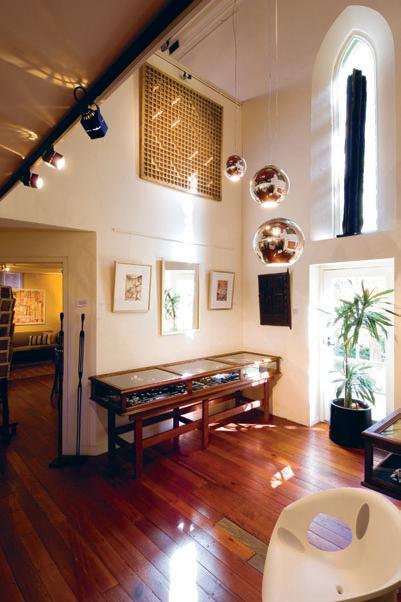
According to Steve, the “eclecticism of the product” makes the gallery a destination. “People will come and have a look,” he says, “because it is interesting, less intimidating. That’s why we have the books. They had seen an exhibition, but didn’t know what to think. But they could buy a book and the next time they came they were experts.”
I put it to them that their location was surely irresistible, but Steve responds that it is both a plus and a minus. “It is a plus,” he says, “because it is a destination. We’re only 20 minutes away from Adelaide, but the perception is that it is a long way away. Where it is difficult is in the commercial field. It is difficult to get the architects and designers to come up. So, we have to go to them.”
Well, we had dealt with the partnership, the character of the building and the gorgeous location. So, what else has helped Aptos Cruz survive all the economic ups and downs? Steve responds decisively that it is their consistency of quality. Other showrooms can have strengths and weaknesses, he says, but Aptos Cruz’s consistency, coupled with its diversity make it one of the brightest gems among many in the Adelaide Hills.
62
habitus | Issue 03 partnership I 04 Gallery Interior The original upstairs space shows antiques, art and tribal artefacts. I 05 Gallery Detail Contemporary art and ceramics in the original gallery.
Aptos Cruz, aptoscruz@tpg.com.au
I 04 I 05
“People come and have a look because it is interesting, less intimidating. That’s why we have The books.”
STEVE
First called the A811, this early 1920s design may be attributed to Josef Frank. Available with handsewn cane seat and back. European beech frame.
Hoffmann
Melbourne 237 Napier Street, Fitzroy VIC Australia 3065 Freecall 1800 800 777 Phone 03 9417 0077 Fax 03 9417 0011 Email sales@thonet.com.au Sydney 21 Boundary Street, Darlinghurst NSW Australia 2010 Phone 02 9332 1600 Fax 02 9332 4073 Email nsw@thonet.com.au Adelaide 1000 Chairs 45 Gilbert Street, Adelaide SA Australia 5000 Phone 08 8232 2155 Perth Katsui Phone 08 9385 3005 Newcastle HVD Phone 02 4929 6066
on
fashioning fabric: GRACE tan
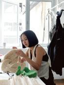
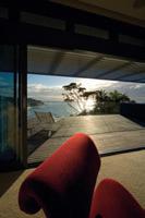
I She is originally from Malaysia, but these days Grace Tan calls Singapore home. It is here that she is pushing the limits of fashion design, with a unique approach that combines a grounding in mathematics and structure, with a hands-on application of her ideas. Grace speaks to Darlene Smyth about her work and why she takes her inspiration far and wide, from legendary architects to intricate Japanese confectionary.
64
location
Text Darlene
Photography Derek Swalwell, Darren Soh
Smyth grace tan — singapore
habitus | Issue 03
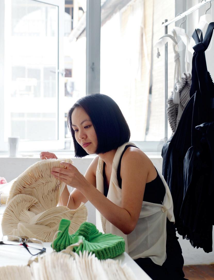
With her refreshing approach to design, Grace Tan tests the limits of the fashion industry in Singapore as she stitches up her version of ‘anti-fashion’. By using abstract notions such as the mathematics of the patterning and stitching, methodology and cross-disciplinary influences as the starting points for her work, Grace rejects traditional forms of tailoring and creates fashion that is visually and conceptually unique.
This young, intellectual designer moved to Singapore when she was 13 years old. With her mixed heritage of Taiwanese and Malaysian, Grace laughingly describes herself as “rojak” – a Malay term that refers to a haphazard mixture, such as in the local vegetable dish of the same name. Far from being haphazard, however, Grace’s work displays a creativity achieved through a highly disciplined and focused concentration on the methodology of her work.
I 01 Previous Grace Tan works on one of her intricate neckpieces.
I 02
Nature, particularly the art of bonsai, has influenced Grace’s work.
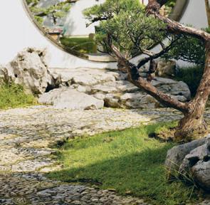

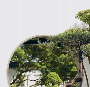
I 03 Opposite Having begun her career in fashion design, Grace now incorporates elements of craft, architecture and more.
Grace received her Diploma in Apparel Design and Merchandising from Temasek Polytechnic in Singapore where she became fascinated by books on architecture and ways of expressing herself using other disciplines.
After graduation, Grace worked for esteemed local fashion design firm, Song & Kelly, where she designed and developed the womenswear line. Her struggles with the role of concept in her work led her to start up her own company, kwodrent, in 2003. At that time, she was focused on the idea of how to construct clothing out of rectangular pieces of fabric – how to take twodimensional angular pieces of fabric and make them into three-dimensional design that follows the soft curves of the human body. “I wanted to challenge the structure of clothing,” she explains, “how to construct clothing out of geometric shapes, how the clothing reacts on different bodies.” One of her early inspirations was the work of Japanese architect, Tadao Ando. The abstraction of his philosophy into geometric forms that are in themselves devoid of emotive meaning inspired Grace to test out a similar thinking in her work.
One trademark piece of her early collection was a shirt made from two simple pieces of rectangular fabric with angular cuts for the armholes and two stitches up the sides. A further development of Grace’s interest in rectangles is a series of giant neckpieces. She explains that the idea of the twisted fabric in these neckpieces originated when she made temporary stitches and then quickly pulled them out, causing the fabric to fold. Such a simple starting point belies the detail involved, as the neckpieces are constructed using highly structured methods and patterns with intricate folding and twisting of rectangular pieces of fabric. She examined the effects of using different fabrics to see how they behave as they twist. She rigorously experimented with variations in the arrangement of the folds to see what sculptural forms could be created. She added coloured fabric and altered the scale of the neckpieces to see how all of these variations behave as they interact with the human body.
The intensity and rigour in this series of Grace’s work reflects her belief that to master something is to study the methods and techniques of the craft, but after mastering them, to
on location
I 02
I She experiments with the fabric physically and lets it tell her what it wants to be...
66 habitus | Issue 03
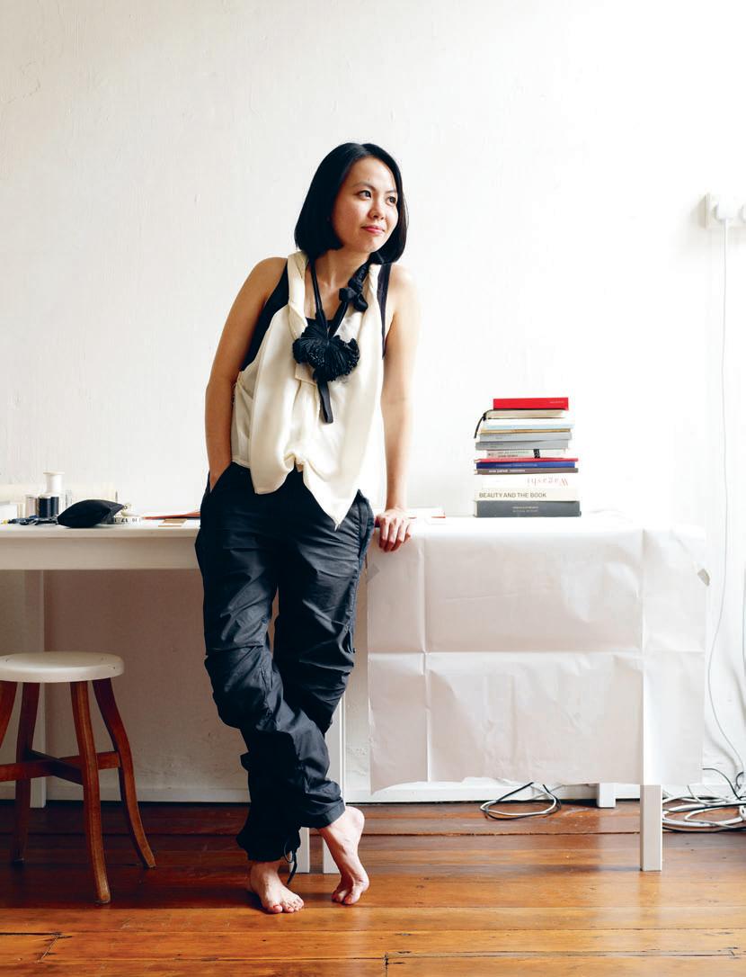
discard them. “I think this was a revelation that I had, how not to be constrained by a set of rules,” she reflects. Grace explains that she is greatly inspired by nature. She looks at the variations in her work in the same way that she observes how natural light can alter a landscape, how the growth of plants can change your perception of them, and how the budding, blooming and decaying of flowers can inspire the way she manipulates the organic forms of her design pieces.
A third inspiration for Grace’s work is the philosophy and aesthetic of the art of bonsai. Bonsai philosophy is based on diligence and reverence by following and mastering a technique, often through learning the technique of a master and adopting it within your own trade. Her rigorous exploration of the folding of her fabric to create organic forms is influenced by this art form. The notion in the art of bonsai of constructing something that is organic out of a technique that is calculated and precise also bears similarities to Grace’s design and approach to her neckpieces.
Another lovingly constructed art form that replicates nature and has served as a form of inspiration to Grace is Japanese confectionary, which tends to be beautifully crafted. One particular book, Wagashi by Kumiko Sudo, has influenced her thinking as well as her presentation with its luscious images of Japanese sweets that replicate or make reference to nature. The influence of these colorful and delicate creations that reflect the colours of changing nature, encapsulated into an intricate overlapping form, can be seen in a few of Grace’s more sweetly coloured
I 04
Rakugan
This cotton-candycoloured neckpiece was inspired by Japanese confectionary.


I 05
Tadao Ando’s Church of the Light Ando’s work – including this building in Osaka, Japan – has been influential.
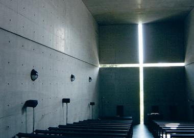
I 06
The hand-made feel to Grace’s work is underpinned by mathematical details.

I 06
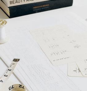
on location habitus | Issue 03
I 05
04
I
68
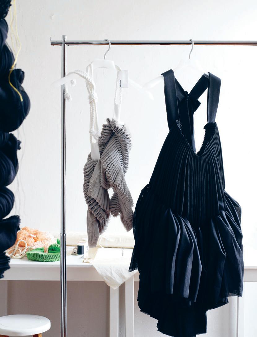
on location
pink and peach works in French silk chiffon. Called Rakugan, these works were completed in 2007 and through their visual lightness and freshness bear a sensory and visual connection with the Japanese confectionary.
An interesting dichotomy in Grace’s design is a highly tactile hands-on emphasis versus an abstract mathematical strategy. She finds that, “when you rely on machines and tools, you tend to lose your physical connection with the fabric.” Grace prefers to hand-make all her pieces. In fact, she admits that she now rarely works graphically. She experiments with the fabric physically and lets it tell her what it wants to be and how it wants to behave. Grace explains that many of her inspirations are cross-disciplinary influences that are visual as well as theoretical, such as Sori Yanagi’s craft-based design philosophy. This hands-on approach seems to contrast with her obsession with mathematics. It began in 2007 with an exhibition called Dual City Sessions, in which she displayed a graphic representation of the stitch points in the folding fabric of her neckpieces. Each stitch was given a value and represented in a graphic where the coordinates of the stitch points created patterns. Her intention in graphically representing her work as a set of coordinates was to display the work at its structural core in order to see the forms in a different way.
In a further development of this mathematical strategy, Grace did a collaborative work with a Singapore-based theatre company, Theatre Works, in a production named V.I.S.T.A. LAB. Grace designed the dress for the dance performance and the coordinates for the stitches in the dress were given a tonal value by the musical composer. The result was a musical composition based on the mathematics of the dress construction. The dancers then performed to this music as the audience, in a sense, “listened” to the dress.
Since then, Grace has engaged in further cross-disciplinary collaborations that have allowed her works to cross the line between fashion and art. In a recent exhibition in Melbourne called Envelop, Grace collaborated with Farmwork, a Singapore-based design studio. The result was
an organic art piece constructed from 2,492 parts of folded A4-sized sheets of paper suspended from the ceiling above a display of Grace’s fabric creations.
From her emphasis on the mathematics of a stitch, to her love of architecture and her natural hands-on approach to the fabric, Grace Tan’s multi-disciplinary approach to her designs put into question the definition of the boundaries between artistic disciplines. Out of these explorations, she creates highly original and thoughtprovoking work.
70 habitus | Issue 03
I 08
of Grace’s designs take on a sculptural quality.
on art and design are within arm’s reach in her studio.
I 07 Previous Many
I 08 Books
kwodrent , kwodrent.com
I
“When you rely on machines and tools, you tend to lose your physical connection with the fabric.” GRACE
In the early 1960s, an innovative employee of COR, Friedrich Wilhelm Möller, developed a pioneering upholstery system. Derived from the Latin ‘consedere’, which means “sit together”, the system was named Conseta – offering modular flexibility while being as adaptable as a chameleon. Conseta’s simple and streamlined design has survived countless changes in styles and trends; it was and continues to be the perfect expression of a holistic sofa system.
Shop 1/360 Pacific Highway, Crows Nest NSW 2065 t 02 9906 5472 e siekaup@bigpond.com www.siekaup.com.au COR
in Germany
Siekaup: Australian + New Zealand agents
Made
Model: CONSETA designed by F. W. Möller
theseus chan — mount sophia, singapore
A graphic rebel

He explains that although art had always come naturally to him, when he was growing up it was not considered a viable career, so by default he became an electrical engineer instead. With time, his destiny became clearer and he returned to school to study graphic design at Nanyang Academy of Fine Arts in Singapore. In the ensuing years, Theseus developed his graphic skills and ideas in an advertising firm and while art directing commercials and films, such as Eating Air, which took the Jury Prize at the 2000 Stockholm International Film Festival. Throughout all these projects, he was concerned with different ways to conceive the moving image.
“I would like to believe that I’m still rebellious,” Theseus Chan says simply. We’re in his office, located in an upscale artists’ community in the Mount Sophia area of Singapore. Voted Designer of the Year at the 2006 Singapore President’s Design Award, and well known as the country’s graphic design guru, Theseus sits facing me across an antique wooden school desk in his front room, which is currently set up as a guerrilla store for Comme des Garçons. His statement makes me smile. If ‘rebellion’ can be described as a defiance of the norm, then not only does Theseus Chan fit the bill, but he has turned it into an art form. He has developed the expression of his rebellion into both his persona and his creation, and in doing so, has achieved success in a city and culture that traditionally, has hardly smiled upon the notion of rebellion.
Born in 1961, Theseus’s early years coincided with Singapore’s own independence as a nation.


In 1997, Theseus started an advertising company called WORK that has gone on to produce campaigns for such prestigious clients as the Hong Kong-based Pedder Group, Tangs department store in Singapore, and Club 21, in addition to producing a cutting-edge magazine called WERK, which Theseus describes as more of a personal adventure. “The objective of the magazine is to profile what we can do, to help us define ourselves as graphic designers. It becomes a beacon for us,” he explains.
Some of the most exploratory aspects of his work are played out in the magazine. For example, he outlines how, when a printing machine is cleaned, it sometimes creates a chance double imagery that has inspired the aesthetics of his graphic design and influenced the way he presents imagery. A certain amount of science is also used in the creative process, for instance by adding acid to the printing process and using
72
creation
habitus | Issue 03 Text Darlene Smyth Photography WERK magazine, Wendy Ng (portrait)
I A self-confessed rebel, graphic designer Theseus Chan has carved out a niche in Singapore for his signature style of design. It’s a style that is gaining plenty of attention for its experimental qualities and demonstrative approach, as Darlene Smyth discovers.
I 01
THESEUS
I 01 Opposite Design rebel Theseus Chan in his Singapore studio.
I 02 Pages from Issue 5 of WERK magazine.
I 03
Theseus’ association with the Comme des Garçons guerrilla stores makes its way into his magazine.
it as an element of design. “The magazine is more like a personal work”, Chan explains. “It is more evolutionary, things overlap, some things are brought from the past and looked at differently... It is a platform for allowing me to express how I see things.”
After producing the first six issues of WERK, Theseus invited other artists to collaborate on the design. The latest issue (number 16) features a collaboration with British artist and illustrator, Joe Magee, while Yasushi Fujimoto, a Japanese art director who has also worked on Vogue Nippon, has worked with Theseus on two separate issues. Through such collaborations, the magazine is moving toward a coming together of minds, an act of mutual respect between designers instead of one man’s view of design.
Another joint project that Theseus is involved in is the running of the guerrilla store for Comme des Garçons, to which I find my eyes being drawn as we sit in his office. This temporary shop is located adjacent to the office space of his company WORK, in a development called Old School (“new digs for newschool thinkers”) in Mount Sophia. The name derives from the fact
I “The magazine is more like a personal work. It is more evolutionary, things overlap , some things are brought from the past and looked at differently.”
I 03
I 02 73
that it is located in a conservation project that was once the home of the Methodist Girls School. Theseus has taken the memory of the school into the design concept of the store, where the merchandise is displayed on a series of antique school desks. Other school paraphernalia has been introduced into the store, such as blackboards, school clocks and
crests. In a clever interpretation of a layering of the new over the old, a thin layer of whitewash has been painted over several of these antique items, including the windows. The whitewash theme is carried over to some of Theseus’ own design material, such as his card and even an issue of WERK magazine, both of are skimmed over with strokes of white paint.
Theseus opened his first Comme des Garçons guerrilla store in Singapore’s Chinatown, the second was in the Arabic quarter of Haji Lane, and another one popped up in a government housing estate. The idea that binds all of these stores, he explains, is the expression of a series of incidents, encounters and accidents. The stores attempt to re-define aesthetics, to challenge the ways that expensive clothes are displayed.
In an industry that is notorious for its competitiveness in creating an edge, Theseus Chan would rather inspire than be competitive. “Perhaps through demonstration I can find my edge,” he says with sincerity.
Werk Magazine, workwerk.com

I 04
The launch issue of WERK is now a collector’s item. I 05
An example of the cutting-edge design that has earned Chan a reputation in design circles internationally.
habitus | Issue 03 74 creation
I 04 I 05
I The Comme des Garçons guerrilla stores attempt to re-define aesthetics, to challenge the ways that expensive clothes are displayed.
AustrAliA’s lArgest collection of contempor Ary design Sydney 84 o’r iord A n s treet, Alex A ndri A t 02 8339 7588 Melbourne 629 c hurch s treet, r ichmond t 03 9426 3000 b ri S bane 10 J A mes s treet, f ortitude VA lley t 07 3253 6000 Singapore milleniA WAlk, leVel 2, 9 rAffles BVd t 65 6415 0000 Kuala luM pur 65 JAlAn mAArof, BAngsAr BAru t 603 2287 8777 www.spacefurniture.com CHarleS | D esi Gn antonio citterio | www.bebitalia.com
close up
marshall cook — new zealand
nomad Pacific
| Marshall Cook is one of New Zealand’s most significant architects with a body of work spanning 40 years and six countries. His critical understanding of local climate and construction produces work that is rich, layered and highly crafted. Andrea Stevens speaks to him about the permanent and the ephemeral in his houses and the social dimension of his architecture.
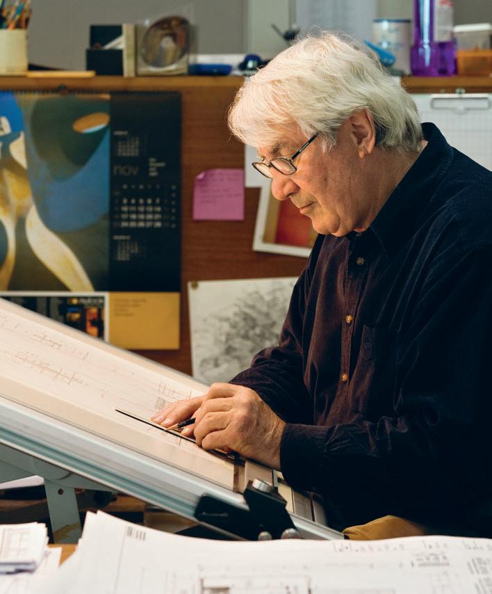
76 habitus | Issue 03
Text
I 01
Photography Simon Devitt
Andrea Stevens
Inspired by the buildings of his youth, and his work and travel around the Pacific Rim, Marshall Cook draws on two distinct architectural traditions to express a New Zealand identity. He contrasts the solidity and permanency of his European heritage with the lighter and more ephemeral qualities of timber architecture from Asia and the Pacific. He believes the dynamics between permanent and transient, solid and light, past and present, express aspects of the national psyche. “Many New Zealanders are culturally and intellectually nomadic,” says Cook, “quick to pick up ideas, and quick to move on. We continually question whether we belong here.”
The notion of temporary occupation and a light footprint, in a land where Maori teach custodianship rather than ownership, connects with Cook’s ideas about the environment and our place in it. He has responded to these issues throughout his career by exploring the social and environmental aspects of housing, and by developing a modern vernacular that symbolically expresses his views. He enjoys working on low-cost housing and has been involved with several government social housing projects. Currently, he is most interested in developing urban models for residential architecture and sees a move towards shared occupancies and ownerships – of offices, apartments, cars, beach homes – and a subsequent greater use of facilities. “That is what really interests me about the future,” he says.
Growing up in the small Art Deco town of Napier gave Cook a very early appreciation of modern architecture. His father was a cartographer and knew many of the local architects from the post-War period, when there
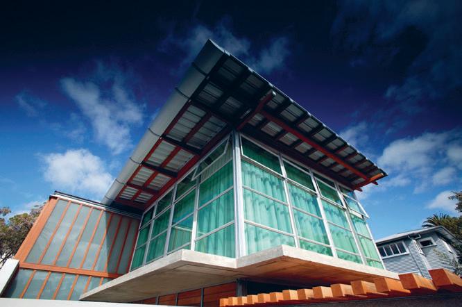
77
I 01 Opposite Marshall Cook at work in his studio.
I 02
Wallace House
I 02
Looking up at the top floor reveals architectural references to the sheds in neighbouring backyards.
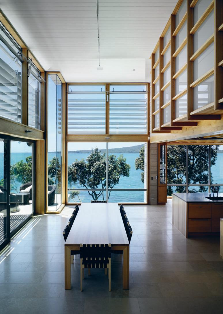
I 03 Opposite North Shore House
A central ‘street’ acts as main entry and circulation corridor.
I 04
Wallace House
The contrasts of solid and ephemeral can be seen in the play between concrete block and the open filigree timber and steel of the upper floors.
I 05 Following Cook House
The internal ‘street’ in the Cook family home of 1989 was a place where all family members could connect.
I 06
Cook House
The ensuite bathroom in the first Cook House displays subtle Japanese influences.
I 07
Wood/Golder House
The careful selection of materials for this house knits it into an established neighbourhood.
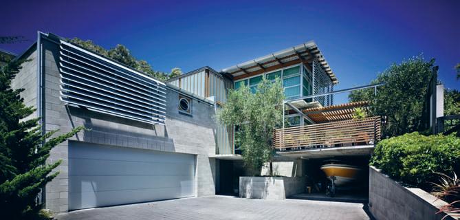
I 08
Wood/Golder House
The main living space of the Wood/Golder House.
was a focus on ideas coming from the New World. “I grew up with this idea that architecture represented newness and progress,” recalls Cook, “rather than looking back to historical gestures.” During his university holidays, Cook worked for the influential architect John Scott, who drew inspiration from traditional Maori structures and simple farm buildings. “Scott’s work was revolutionary. He influenced our generation rather than the previous one, so we all worked in concrete block and timber, and I still do.”
He took a three-year break from his degree in Auckland to work for Bill Wilson and Ivan Juriss from Group Architects. This period exposed Cook to some of New Zealand’s most innovative residential architecture, and an entirely different response to climate and lifestyle than he had experienced in the cooler climate of Hawke’s Bay. The light timber buildings were unpretentious and open in planning, with indoor-outdoor flow and large areas of glass. This early exposure to New Zealand’s modern movement is still evident in his work. The Wood/Golder House of 2002 has a string of children’s bedrooms opening onto a north-facing playroom, then outdoors onto a wide patio. Skylights, timber joinery and exposed timber beams create a warm, honest house. Subtle Japanese qualities are evident in the elegant fenestration and post-and-beam detailing.
Cook set up his own practice in 1968, and the firm continues today as Cook Sargisson & Pirie. The practice has spent long periods working around the Pacific Rim – Colorado, Japan, Australia and Thailand. His exposure to traditional tropical architecture added a further dimension to Cook’s work. He began layering the skin of his buildings, and incorporating what he calls ‘eyelashes’ to moderate light, rain and wind. Overhangs, pergolas, deep mullions and louvres are used in combination to filter and soften light, creating a transition between inside and out. These environments are both comfortable and energy efficient. “Our light is bright but soft, and our dark bush absorbs all the light and shadow. This comes out in our architecture. The colour, the light reflection and the glass ratios
79
I 04
are different to other countries, and the way buildings sit in the landscape responds to that difference,” Cook explains. In almost all of his houses he incorporates solid concrete floors and masonry trombe walls to act as heat sinks.
The social dimensions of his architecture are incredibly well resolved, both internally and externally. “The biggest change I’ve seen is how you manage a contemporary family and the presence of all the members of the family at the important collecting times like eating. That always has priority in planning,” he says. In the first house he built for his family in Parnell of 1989, a central ‘street’ acts as main entry and circulation corridor with the two main living spaces opening on to it. As a gateway, family members and friends must always pass this central social space before moving on to private areas. It keeps everyone in touch with each other and allows for the subtle surveillance of children and adolescents. The practice’s most recent house, the North Shore House of 2008, features a similar space only much more sophisticated. Large movable walls enable whole sections of the house to be completely shut down and others opened up.
Cook’s new family home in Freemans Bay, completed in 2008, is a synthesis of his beliefs on urban housing and his tectonic approach to design. Set in an historic neighbourhood of timber colonial houses on small lots, the Cook House responds very carefully and sensitively to scale and materials. This has enabled a contemporary house in terms of form and detail, to integrate gracefully into its context. While existing houses are located on the street edge with empty backyards, the planning for the Cook House was in response to sun orientation and privacy. Two-storey volumes occupy the front and rear of the site, book-ending the conservatory-like
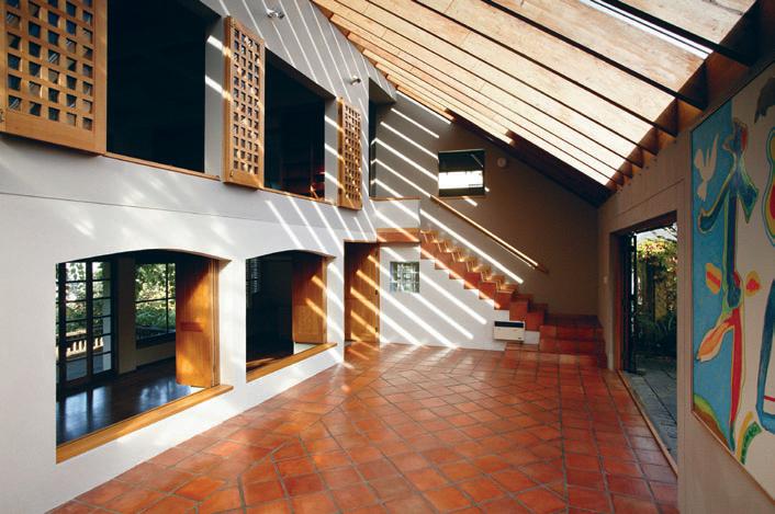
habitus | Issue 03 close up 80
I “I’ve always liked the idea that houses have an anchor – the permanent and the ephemeral, the heavy and the light working together. I believe we are part of the environment, but we are not really permanent.”
I 05
MArSHALL
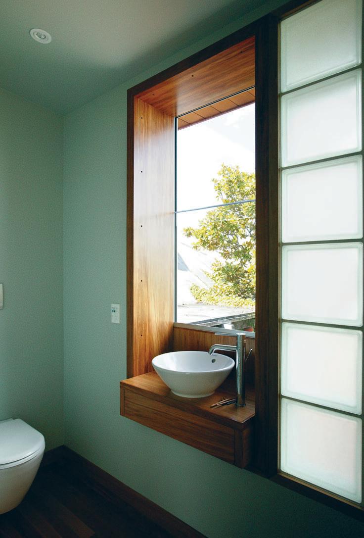
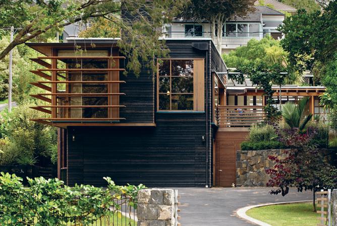
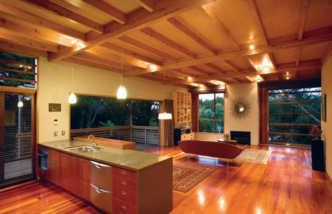
83 I 08 I 07
central living space – a contrast of solid and light. Facing east, the space opens onto a private, walled courtyard. The wing located at the rear of the site has been detailed in timber to soften its presence and be in harmony with its neighbours. The wing addressing the street is altogether more urban – clad in brick tile, Carrara marble, glass and large motorised external timber louvres – and it creates a strong formal presence to the public realm. An innovative feature of the house is the flexibility it offers for family, extended family or working from home. The entry hall can be completely open or completely closed off from the living area, creating a separate apartment from the main house. The apartment itself can be further closed down with acoustic sliding walls, to form individual rooms or leave as a single open space.
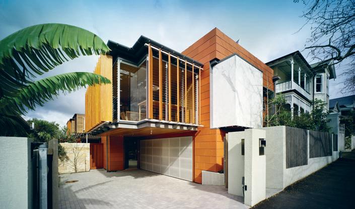
“I’ve always liked the idea that houses have an anchor – the permanent and the ephemeral, the heavy and the light working together. I believe we are part of the environment, but we are not really permanent. So, in the last two years I have been trying to express that in architectural terms, as a social condition of New Zealanders,” says Cook. All of his houses deal with this in some way. In the Wallace House of 1998, the solid anchor appears as a large concrete block volume for garage and accommodation at ground and first floors. A three-storey glazed stair and circulation space links this to stacked ‘glasshouses’ – rich in references to the garden sheds found in neighbouring backyards.
Cook has developed an architectural synthesis from the cultural, social and environmental landscape of his country. His buildings are lovingly and carefully crafted, with an innate understanding of materials, texture and detail. Beautifully proportioned spaces and openings, human scale and warmth, and the play of light across surfaces combine to create buildings with great depth, richness and charm.
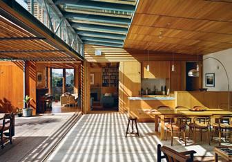
84 habitus | Issue 03
close up
Cook Sargisson & Pirie, cooksargisson.co.nz
I 09 Franklin Road House
I
The new Cook House displays subtle references to its historic neighbourhood through its use of scale.
10 Franklin Road House
I 09 I 10
The light-filled kitchen and dining room flows seamlessly into a walled courtyard.
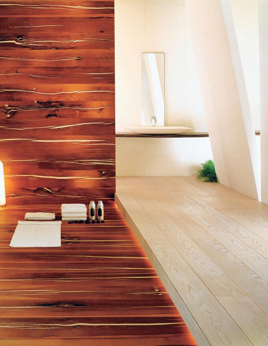


Head Office – VIC 361 Bridge Road Richmond VIC 3121 P 03 9421 0068 F 03 9421 0209 NSW 311–313 Sailors Bay Road Northbridge NSW 2063 P 02 9958 0999 F 02 9958 3390 QLD 72 Ferry Road Southport QLD 4215 P 07 5591 7353 F 07 5591 6323 www.mafitimber.com.au
Ash Domino Beech Volcano Natural oil
Larch Country White oil
Larch
Domino Ash Volcano Natural oil
Nero Oak Volcano Natural oil
Tiger
European
Mafi timber flooring is suitable for over underfloor heating
Nero Oak Volcano White oil
Oak
Character White oil
Oak
Character Natural oil
Oak
Volcano Natural oil
Oak Black fill Natural oil
Walnut Natural oil
slow dissolve
GUERRILLA WARFARE
I Sometimes architecture is art, and sometimes art is added to architecture and the built environment generally. But rarely does one person fuse the two in an inseparable way. Paul McGillick looks at the extraordinary Richard Goodwin – artist, architect and urban guerrilla.
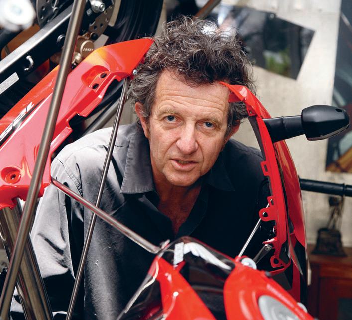
86 habitus | Issue 03
Portrait Photography Paul Lovelace
Text
Artwork Photography Anthony Browell
Paul McGillick
richard goodwin — sydney, australia
I 01
He started out studying architecture at the University of New South Wales, but took time out to live in Europe, wrestling with doubts and exploring other possibilities, especially the emerging avant-garde – groups like Fluxus, the Arte Povera movement and especially the German artist, Joseph Beuys, who used performance and installations to transform highly personal experience into something universal.
But Richard Goodwin eventually came back to Australia, finished his architecture degree and began to practise. Along the way he picked up a couple of credits any young architect would envy. He did a suite of masterful and evocative perspective drawings for the legendary landscape architect Harry Howard, as he worked on the iconic Sculpture Garden for the National Gallery of Australia in Canberra. Then he worked for the equally legendary architect Bruce Rickard, absorbing Rickard’s adaptation of Frank Lloyd Wright to the Australian landscape, light and climate.
Very early on, though, his architectural interests turned towards the politics of urban planning. At the same time he found that, through his art, he was beginning to develop a cluster of analogues and metaphors that could be used to explore and debate these issues.
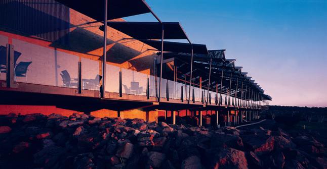
Today Goodwin is still a ‘gallery artist’. But his work extends way beyond gallery exhibitions to encompass architecture and urban design, along with ongoing research – through his Porosity Studio – and teaching, both here and in the U.K. “Art’s good at redirecting architecture,” says Goodwin, “and inventing what architecture should do next.”
Essentially, Goodwin’s work is about the weaving of art and architecture. And his ongoing concerns are with the way human beings are shaped by both internal and external forces, the way in which they simultaneously inhabit private and public space and in the way they are always a combination of public persona and private self.
An interesting aspect to Goodwin’s own multiple personas is that they allow him to balance his more introspective side (the artist in the gallery) with a more public, more utilitarian side (freeway walls, pedestrian bridges, building extensions). In other words, he is playing two roles at the same time: an aesthetic role and a social role.
87
I 02
I 01 Opposite The multi-disciplinary Richard Goodwin. I 02 The Shellharbour Workers Club is an example of one of Goodwin’s “parasite extensions”, attached to an existing building.
I
slow dissolve
The social role is also highly political because Goodwin is preoccupied with what he sees as a failure of contemporary architecture and planning, especially in the city, where public space has been alienated from private space and where the quality of life for city-dwellers has been increasingly compromised. Everywhere you look with Goodwin there are metaphors and with this perceived disjunction between the public and private realms in the contemporary city we see a social version of a very private struggle –namely, the need for a balance between our private and public lives. For Goodwin, the city ought to nurture that balance, but mostly it doesn’t.
As part of his critique of the modern city, there is also a critique of public art – and Goodwin is often regarded as a public artist. But he is critical of public art because he sees it as simply making up for a lack of aesthetic stimulation in the built environment. In fact, Goodwin’s aim is to make public art unnecessary – through his idea of porosity.
Porosity is about how public and private spaces blend into one another. So, Goodwin is fascinated by the interstitial spaces, or the transitional spaces between one building and another: the more ambiguous the transitional
I 03
Prosthetic Resort, 1997
An installation using stainless steel, timber and sailcloth.
I 04 Opposite Goodwin works on a model for a new artwork.
I 05
An animated still from Goodwin’s ‘What Buildings Desire’ series of 2005.
habitus | Issue 03
03
88
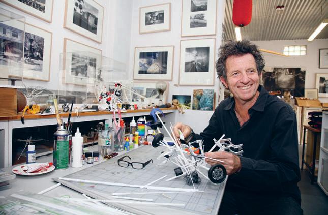
89 I 04 I 05
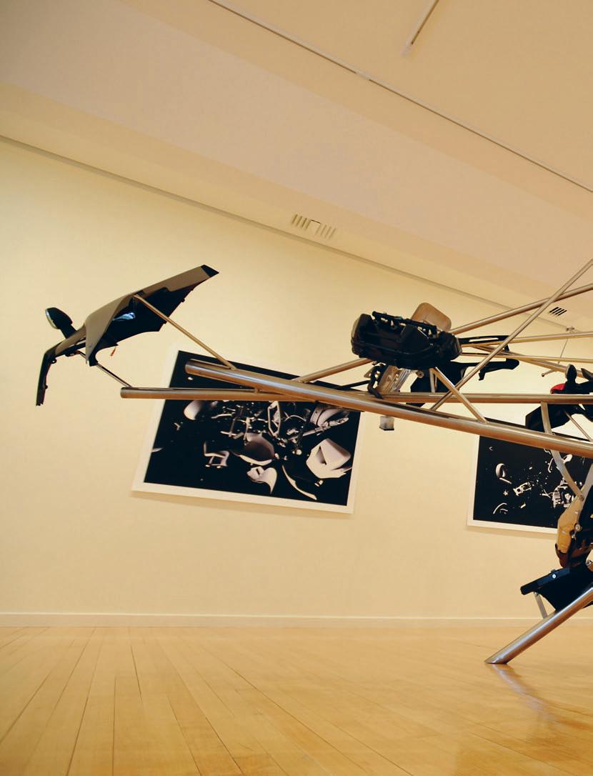
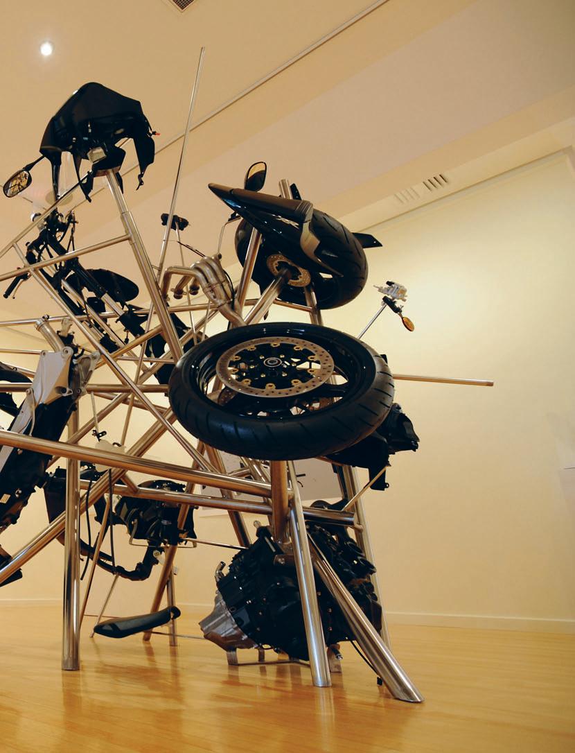
slow dissolve

space, the richer the experience. Goodwin argues that the less distinction there is between public and private space, the less need there is for public art. He sees Tokyo as a good example of a porous city. “Every three metres,” he says, “there is another opening and inviting threshold beckoning the pedestrian in to sit, eat and restore.”
Or, think Venice and you have the ultimate example of porosity with spaces continually blending into one another, abrupt changes of scale, the collision and interpenetration of water and masonry, coupled with constant visual surprise. The few examples of public art there struggle against the endlessly fascinating texture of the city itself.
Just as art aims to heighten our awareness of the world around us – and as public art also does in all its forms from sculpture to installation – so Goodwin aims to make his architectural structures trigger a new awareness of how we live in an urban environment. Typically, these are additions to an existing structure, or what he calls parasites. They extend out from the building, but rather than set up boundaries, they deliberately make the transition from public to private space ambiguous.
But Goodwin’s work is highly diverse – additions to buildings, freeway walls, pedestrian bridges, freestanding sculpture, domestically-scaled maquettes, institutionally-scaled assemblages and photomontages. But going right back to his early wrapped sculptures of people and horses, his preoccupation has been with what it means to be human and how human beings are
I 07
I 06 Previous Poroplastic,
Goodwin’s
92 habitus | Issue 03
I Goodwin aims to make his architectural structures trigger a new awareness of how we live in an urban environment.
2008
2008 exhibition at Australian Galleries used explosion as a metaphor.
I 07 Poroplastic Explosion Motor, 2008
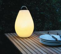
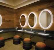
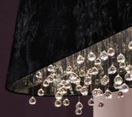
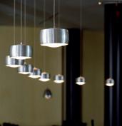
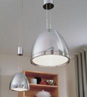
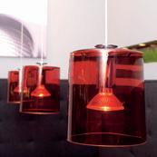
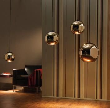
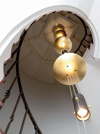
Showroom G03, PYD Building 197 Young St Waterloo 2017 NSW +61 2 9699 6007 new site now live! www.kodalighting.com.au
I
shaped by a combination of internal and external forces – living simultaneously in private and public words as both private and public creatures.

His recent gallery work, for example, has used explosion as a metaphor. Entire motorcycles have been taken apart and reconstructed, apparently haphazardly, creating the image of an explosion in suspense – a kind of combination of I Ching philosophy and big bang theory. “Yes,” says Goodwin, “art’s good at playing the chance, art’s good at rethinking – you know, how do you make something something else?”
So, Richard Goodwin’s diverse art is all about creating metaphors for what he sees as the human condition – a delicate, if constantly shifting, balance of contesting forces. Just as in his ideal porous city where the street and the inside approach and retreat from one another in an erotically charged dance, so we as individuals advance and retreat from our private to our public selves.
Just as the human face is never really still (and so defies portraiture), so Goodwin’s vision of a human being who is never truly stable but the sum of a set of constantly moving parts.
Richard Goodwin richard-goodwin.com
habitus | Issue 03 94
08
slow dissolve I
I Richard Goodwin’s diverse art is all about creating metaphors for what he sees as the human condition – a delicate, if constantly shifting, balance of contesting forces.
08
The Charles Street Bridge in Leichhardt, NSW.


CELEBRATE the diversity of THE REGION’S
architecture & DESIGN
97 3. houses habitus | Issue 03
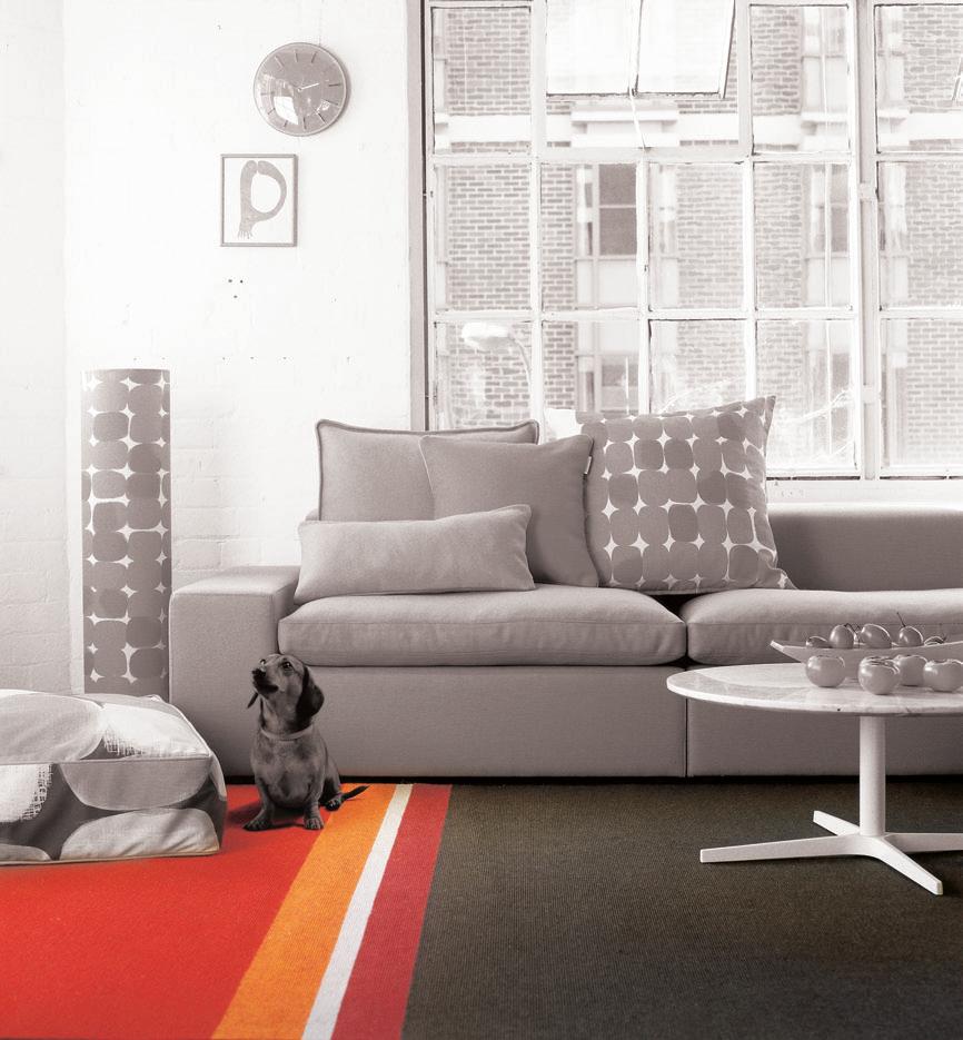
group p: +61 7 3881 1777 www.gibbongroup.com.au
49 colours endless combinations gibbon
furniture and rug design by Koskela, Sydney NSW upholstery fabric Woven Image Icon classic felt
corinth street house — new zealand
A PAUSE in TIME
I With a growing family and ever expanding treasure trove of modernist furniture and art, John McCabe and Maron Clague needed more space. Andrea Stevens reports that in this addition to their classic 1960s house, Auckland architect Daniel Marshall has designed a black box as a counterpoise to the original.
habitus | Issue 03 scenario
Photography Simon Devitt
Text Andrea Stevens
corinth street house — new zealand
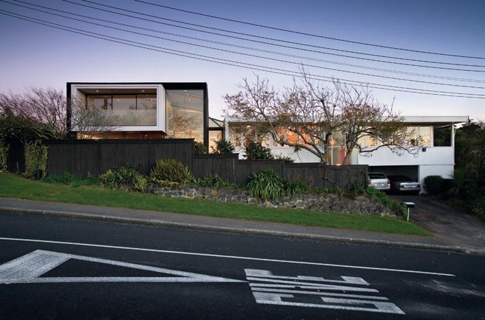
In 1999, the McCabe family purchased a house originally designed by Czech émigré architect, Vladimir Cacala. As with other post-War European architects who settled in the New World, Cacala brought an International Modernism to his buildings. He designed many houses in Auckland. The McCabes’ features a flat roof, white painted vertical weatherboards and strip windows. The elegantly proportioned spaces and fine detailing display the great skill of the architect.
John McCabe developed a love of design while growing up in a modernist house in the eastern suburbs of Melbourne. Regular visits to local art galleries with his father exposed him to modern art. His Art Deco-furnished student flat was the start of a collection that became even more diverse following a move to the UK and that now comprehensively spans top international and New Zealand designers.
As furniture and art collectors, the McCabes were familiar with Cacala’s work and thrilled to have found one in almost original condition. As their family grew, however, thoughts turned to extending the house.
They had met architect Daniel Marshall some years earlier. His work is characterised by bold conceptual ideas and an artist’s approach to materials and colour. Marshall’s architecture is, in many ways, a large-scale equivalent to the design pieces within the McCabe’s collection.
The original house was left as untouched as possible with the addition offset by a metre and linked by a simple glazed walkway. Living, dining and kitchen were created in the new wing, with the main bedroom and en suite above.
Marshall has designed a two-storey black zinc box with a white box suspended within. The white form is derived from the Cacala house and conceptually and visually links the two. Details and proportions from the original are threaded through the new forms both directly and in reinvented or more subtle ways. White painted vertical timber cladding and a wide recess define the edge of the suspended box. The seams of the black zinc imitate the rhythm of the original cladding. Window proportions, double-height spaces and the colour red recur throughout. This is where the similarities end, for the new forms are incredibly expressive and individual.
100 I 02
I 01 Previous Living Room I 02 View of the addition (left) and the original house. I 03 Opposite Entry to the original house Double-height ceilings are a feature.
habitus | Issue 03
Daniel Marshall
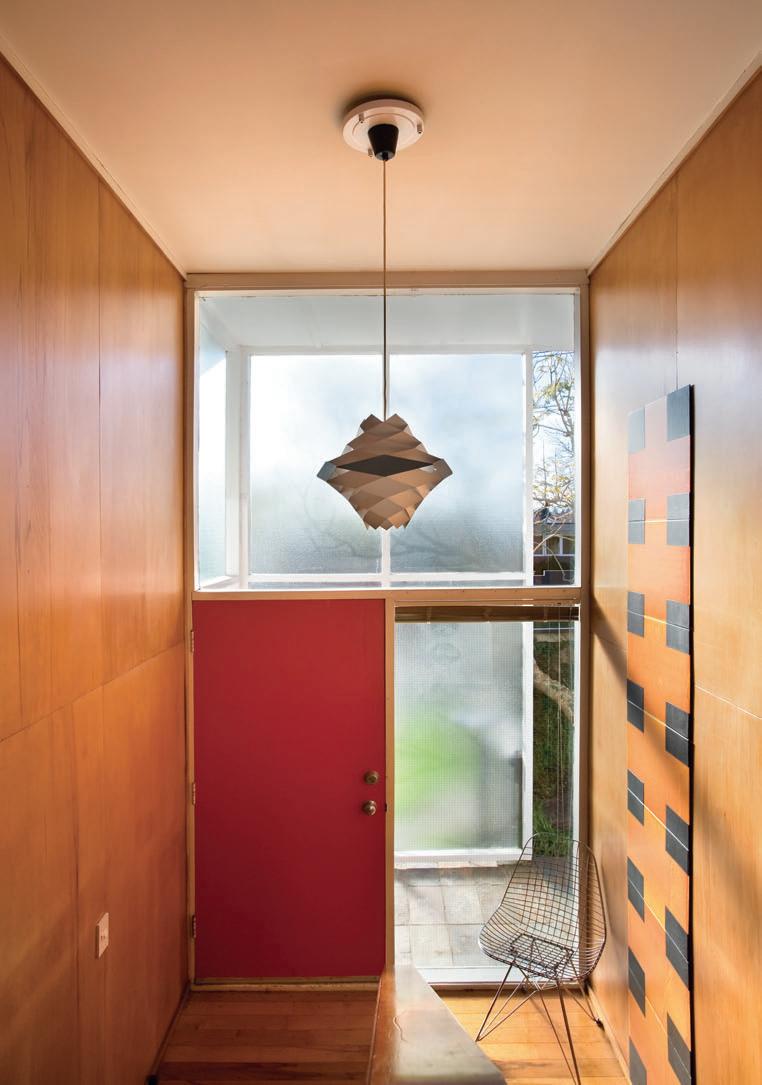
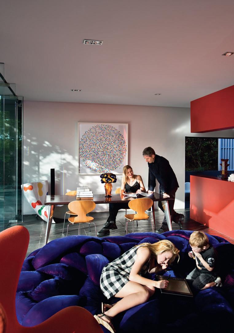
Marshall wanted the addition to appear “as if it had just landed” and it does. From a distance it looks to be a separate dwelling. Its dark cladding and abstract form distinguish it from the original house and its 1960s neighbourhood. However, the dialogue between new and old prevents the addition from overwhelming the original. The three boxes (two white and one black) are in harmony with colour and detail. The height and dark zinc cladding of the addition anchors the whole composition, allowing the original Cacala horizontal form to maintain a strong presence.
Resting on a slate plinth, the folded zinc box has one glazed side that opens the living spaces to a sunny and private northern courtyard. Internally, the dining space is compressed then released into a double-height space for living and a library. Structural gymnastics leave the white box floating in thin air, piercing the glass skin to hover out over the courtyard. Wall cut-outs in the kitchen and living further play on this idea of weightlessness.
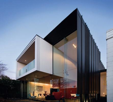
I
Opposite

Ground floor plan 06
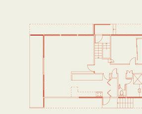
Addition
The glass walls showcase some of the McCabe’s furniture collection.
103 I 06 I 05
04
The narrow gap between existing and new is a metaphoric pause in time. A brightly coloured mural by Justin Boroughs demarcates the end of the original house. This colourful salute to the era counterbalances the two-storey zinc wall of the addition. A slot window provides a glimpse through to the past. The mural, based on Harry Seidler’s 1948 mural at Turramurra in Sydney, can only be seen in part through the window, or obliquely at either end of the gap. A reflective pool extends between old and new, adding a whole other dimension. When one crosses the link bridge, Living
Area
I 05
The family in the new living/dining space.
I
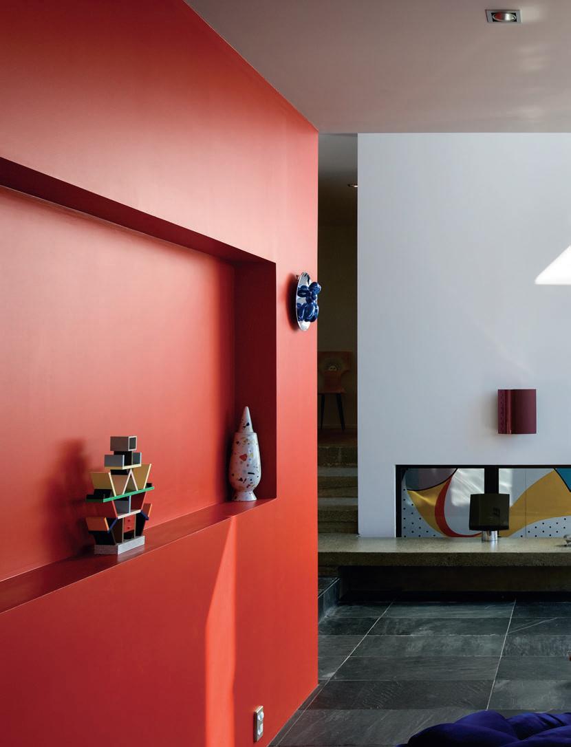
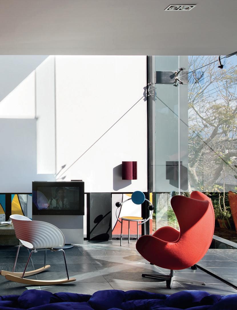
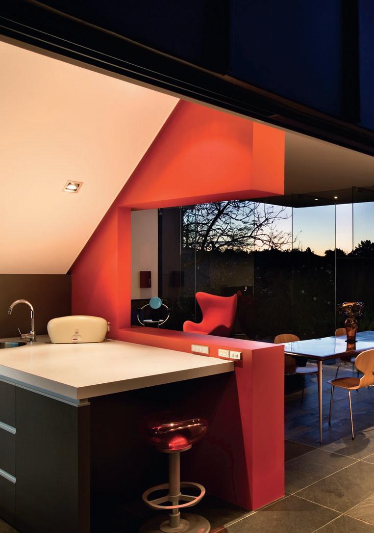
I 07 Previous Living Area
I 08 Opposite Kitchen Wall cut-outs create a weightlessness.
I 09 Dining Room
In the original house.
I 10 Courtyard
the water reflection dematerialises the surface of the pool, giving the impression of being metres off the ground.
The circulation corridor of the original house is extended across the bridge, into the double-height space of the new and up the stairs to the main bedroom. Although from the outside the forms look separate, inside this corridor integrates them spatially. The view is long – it extends from the far western wall of the original house to the eastern wall of the addition. The differences between old and new create a visual layering of tones, materials and the patina of age.
While so many modernist gems have been lost or restyled beyond recognition, this Cacala house has a bold new offspring alongside it. In moving between old and new, the contrast makes one acutely aware of the passage of time, and yet of how good design is timeless.
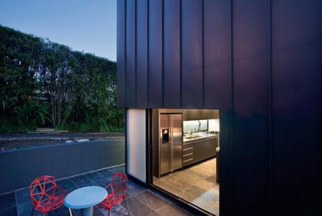
Corinth s treet won the 2007 n Z ia national award and the 2006 n Z ia auckland award.
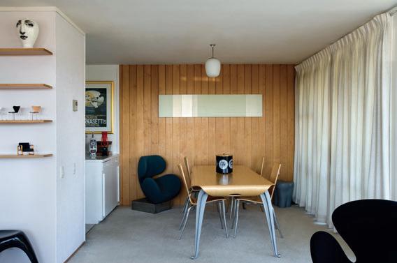
107 I 09 I 10
Daniel Marshall
corinth street house — new zealand
The new kitchen leads to a private eastern courtyard.
corinth street house — new zealand danieL marshaLL
artwork Dining ‘Valium’ Lambda print by Damien Hirst (2000).
Furniture
All furniture through Minima Design, minimadesign.com.
Tables Philippe Starck M.Serie Lang by Driade, Philippe Starck Miss Balu by Kartell and Ron Arad table. Chairs Arne Jacobsen Ant by Fritz Hansen, Eames Rocker and Wire Chair by Herman Miller, Richard Hutton Table-Chair by Droog, Arne Jacobsen Egg Chair by Fritz Hansen, Ron Arad T. Rock Chair by Vitra and Rocking Chair, Michele De Lucchi First Chair by Memphis, Marc Newson Orgone Chair, Konstantin
Grcic Chair One Stacking by Magis. Lounge Fernando and Humberto Campana’s Boa for Edra, edra.com. Cupboard Butterfly by Piero Fornasetti, fornasetti.com.
Finishes
I 11
Main Bedroom
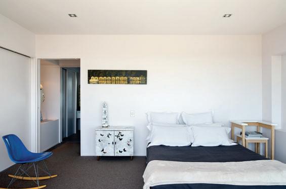
On the upper floor of the addition.
I 12
En Suite
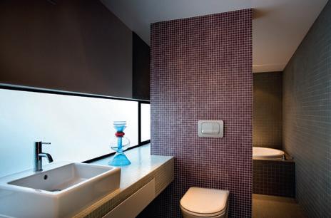
Marco Zanini’s Alpha Centauri vase sits by the sink.
a rchitect
Daniel Marshall Architect
project t eam
Daniel Marshall, Daniel Lewis
Bui L der Gracewood Industries
structura L e ngineer
Brown and Thomson
Consulting Engineers
danie L marsha LL architect (64 9) 302 3661 marshall-architect.co.nz
Wall and roof cladding ZM Anthra Zinc in Eurotray profile by Calder Stewart Industries, calderstewart.co.nz. Windows and doors black anodised aluminium by Fairview Windows and Doors, fairviewwindows. co.nz. Curtain wall glass by Metro Glass Tech, metroglasstech.co.nz. Walls boards in paint by Resene, resene. com. Floor slate tiles from SCE Stone & Design, scestoneanddesign.co.nz / In bedroom, carpet from Cavalier Bremworth, cavbrem.co.nz. Bathroom floor tiles from Heritage Tiles, tile.co.nz. K itchen bench stainless steel and Formica, formica.co.nz. Kitchen joinery spray-coated MDF.
Lighting
Pendant vintage from Real Time, (64 9) 376 3814. Downlights and wall lights iGuzzini from ECC Lighting + Furniture, ecc.co.nz.
Fixtures/ e quipment
Kitchen by Rotherham Interiors, rotherhaminteriors. co.nz. Kitchen joinery handles by Hafele, hafele.co.nz. Door handles stainless steel from F.L Bone, flbone.co.nz.
108
habitus | Issue 03 I 11 I 12
MELBOURNE
SYDNEY
BRISBANE
PERTH
CANBERRA
ADELAIDE
GOLD COAST
ALBURY
LAUNCESTON
HOBART
mansfield lodge — vIC, australia
A MOUNTAIN LEGEND
DARREN SINCLAIR-COLE
I 01
Building Exterior Nestled between native Australian alpine trees.
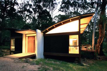
I 02
Living Room
The simple, eco-friendly and fire-safe design is a great family escape.
Stringybark Creek, where the Kelly gang infamously shot three policemen dead trying to flush them out from hiding, is just north of the town of Mansfield in inland Victoria. With a population of just 7,500 and set among forests of Alpine Ash, Snow Gum woodlands and open plains, Mansfield retains its rustic beauty and atmosphere of times gone by.
Here, horsemen made immortal in Banjo Paterson’s epic poem, ‘The Man From Snowy River’, drove their cattle up to the plains in summer. Dotted throughout the landscape are the remains of their huts. It is these huts that inspired architect Darren Sinclair-Cole when designing and building a lodge for his own family in the same mountains.
“As simple shelters from the harsh alpine elements, cattlemen’s huts are a unique Australian structure, vernacular in form and using local timbers, stone and corrugated iron,” Darren explains. “These principles have been adopted to provide an elegant but simple structure in this building.”
But it is not just the beauty of the landscape and connection with Australian history that draws Darren and his young family to these parts. “My family have been holidaying in this area for over 25 years,” he recalls. “It seemed natural that I would also build something and undertake a development close to the ski fields to complement my passion for skiing.”
Mansfield and its surrounding land and lakes offers a range of activities throughout winter and summer that promote the typical healthy outdoor Australian character. Nearby Mount Buller and its peak at 1805 metres above sea level attracts thousands of keen skiers annually from June to August, while in the summer months tourists and locals alike can be found mountain-biking, rock climbing, fishing and bushwalking, not to mention the range of trail rides that follow the paths of the long-gone cattlemen.
Just two hours’ drive north-west from Melbourne, Mansfield represents an escape
Photography James Geer
110
habitus | Issue 03 scenario 110 Text Nicky Lobo
I Victoria’s high country is steeped in Australian mythology – a backdrop for legendary horsemen and the notorious Kelly Gang. It is here, writes Nicky Lobo, that architect Darren Sinclair-Cole built a holiday home for his family.
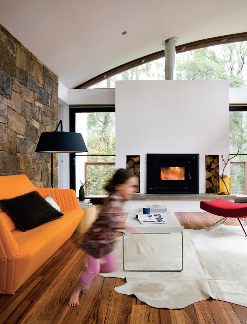
I 03
The Sinclair-Coles.
I 04 Living Space Natural timber flooring and sturdy stone walls.
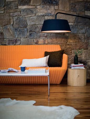
I 05 Kitchen/Dining The retreat is designed for weekend escapes that the family loves.
I 06 Following View to entry and hallway
I 07 Following Master Bedroom Creative solutions to furniture.
DARREN SINCLAIR-COLE
from the hectic rush of the week for Darren, wife Vanessa, daughter Ella, son Miles and Buzzy the dog. “We try to get up there at least once a month over summer, but over the winter period we are are up there often every weekend while the snow is around.” But when the littlies are tired and the adults have had enough, Darren adds that the family lodge also “makes a great retreat after a hard and busy day on the slopes, to relax in front of the fire and have a few quiet ales.”
Darren’s experience as one of the directors and principal of architecture, visualisation and software programming company, Orbit Solutions, stood him in good stead throughout
DARREN
the design and construction process, as the site initially posed a few challenges. Nestled into the Mountain Ash forest, the structure sits on a steeply sloping site which called for a lightweight post-and-beam construction.
Darren has witnessed firsthand the hazards of the deceptively serene landscape, which despite becoming snow-covered in winter, is in summer one of the most fire-prone regions of Australia. During the building of the lodge “We were hit by the worst fires in Victoria since Ash Wednesday and were faced with a fire front about 600 metres away from the building,” he remembers. The structure was spared, but Darren heeded the destructive possibilities of the surrounding environment, determined to minimise risk to his family.
The design employs both passive and active fire prevention methods, adopting the highest levels set out by the country’s peak standardising authority, Standards Australia. “The dwelling uses steel stirrups to lift the
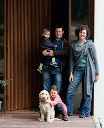
112
|
I 03 I 04
“As simple shelters from the harsh alpine elements, cattlemen’s huts are a unique Australian structure, vernacular in form and using local timbers, stone and corrugated iron.” –
habitus | Issue 03
Craig’s Hut on nearby Mount Stirling, built as a replica for the ‘Man from Snowy River’ film. Courtesy of Mansfield Shire Council.
timber posts off the ground, and uses large open areas under the floor for debris flooring, compressed strawboard for internal lining, and masonry for the internal support structure,” Darren explains. “There is also an active fire sprinkler and pump system attached to a large tank, sitting under the dwelling.”
As well as these fire-prevention strategies, Darren took on the pioneering spirit of those first settlers in the area, his lodge being the first project to use CSR’s Hebel domestic floor panel in an alpine application. As with the strawboard, he was keen to adopt the Hebel in the project because of its numerous merits, not least of which were environmental. “Both these products are traditionally used in commercial applications, but they have worked brilliantly here, acting as both sound and thermal barriers to the outside extremities.”
The layout, like the construction method and material selection, is driven by function. A central masonry core houses all the wet areas and a centrally located drying room radiates heat through the building in the cold winter months. The perimeter of this central core also separates the sleeping and entertaining areas, so that “even when there are a lot of people staying you can retreat to the bedrooms or loft area, while still maintaining a ski lodge feel in the main living lounge area around the fire”.
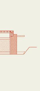
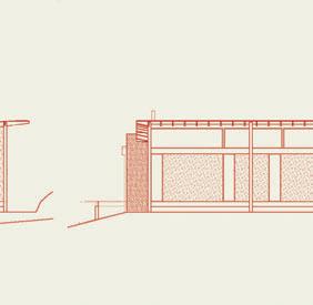
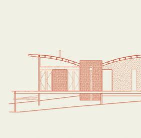
With the consolidation of services, the cost of plumbing was kept to a minimum, with short pipe runs from the hot water system to the taps. Runoff from the two butterfly roof
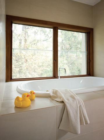
116
I 08 I 09 I 08 Side elevations I 09 Bathroom
views out to the
I 10
inspiration
surrounds.
mansfield lodge — vic, australia
With
bush setting.
Local
I11 Deck Buzzy the dog relaxes on the large verandah where the family can take in
habitus | Issue 03
DARREN SiNcLAiR-cOLE
structures which cover the external box elements is collected, then deposited into the tanks positioned below the clear spanning floors to the rear of the building.
Because of these energy – and cost –saving features, Darren could use high quality materials and products while not blowing out the cost too drastically. He also maintained an environmental emphasis to the finishes. “All timbers used are plantation timbers and strawboard lining in lieu of plaster has been used,” he says. “Double-glazing and the highest insulation is used throughout the house, all water outlets are of the highest ratings and we have two tanks, one for fire and the other for secondary water use.”
Darren has designed the lodge as a space for his family to relax, enjoy the environment and each other’s company, even when doing everyday activities. “The living area layout enables interaction from the whole family when entertaining and cooking, which is generally a big event; we enjoy preparing fresh food from the local area whenever possible,” he says.
“Last year,” he reminisces, “we had a family Christmas day at the lodge which was an amazing day in a beautiful bush setting, on our large balcony to the side and rear of the lodge.” It’s these memories that, like the legends borne of the landscape, will resonate with generations of his family to come.
Architect
Darren Sinclair-Cole
Surveyor S
H.J. Macey & Associates e ngineer S
Orbit Structures
Builder S
Cole Sinclair
Building Surveyor S
Shire of Mansfield or Bit SolutionS (61 3) 9620 5200 orbitsolutions.com.au
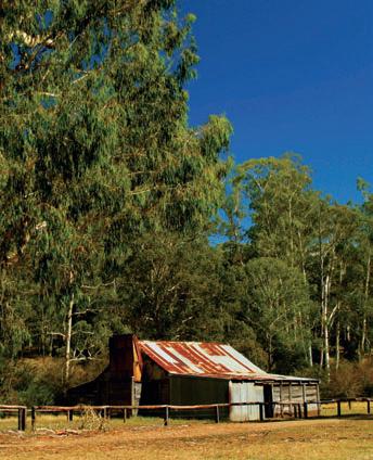
Furniture
Unless otherwise stated, furniture manufactured by Ligne Roset and supplied by Domo, domo.com.au. Sofa Facett. Chair and footstool Pop. Dining table Eureka. Coffee table Tess by Ligne Roset Side table Everynight. Console table Contours. Galvanised chair and stool from Thonet, thonet.com.au. Vase Tord Boontje in green from dedece, dedece.com. Cushions from Seneca, senecatextiles.com and Safari, (61 3) 9510 4500. Bedlinen from Seneca. Blanket army from Aussie Disposals, aussiedisposals.com.au. Side table from Safari. Cowhide in white from NSW Leather, nswleather.com.au.
FiniS he S
Floor CSR Hebel, hebelaustralia.com.au and Eco Timber Group, ecotimbergroup.com.au. Roof timber beams from Hyne, hyne.com.au. Cladding Ecoply from Carter Holt Harvey, chh.com. Windows by Canterbury Windows, canterburywindows.com.au and Moen Glass, moenglass.com.au. Insulating timber panels Durra from Ortech, ortech.com.au.
Fixture S /equipment
Fixtures/Equipment
Kitchen and bathroom all fixtures and fittings supplied by Reece, reece.com.au.
117
I 10 I 11
|
“The living area enables interaction from the whole family when cooking, which is generally a big event : we enjoy preparing fresh food from the local area whenever possible.”
–DARREN


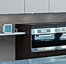
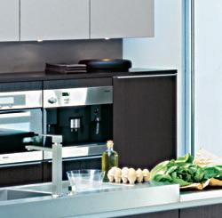
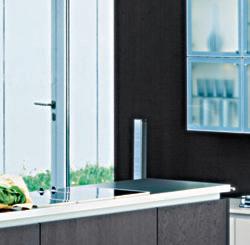
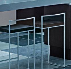
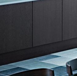
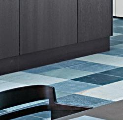


SEGMENTO®
FG 369 Marsh Oak
VH 478 Mineral Beige
Satin Lacquer
SEGMENTO
a la carte design 118 edgecliff rd, woollahra sydney +61 2 93691766 | da vinci designs 46 douglas st, milton brisbane +61 7 33678955 | pepper kitchens & interiors 213 bay st, brighton melbourne +61 3 95306680
poggenpohl 10/77 the strand, parnell auckland nz +64 9 3071577 | german kitchens 13 buckle st, te aro
wellington nz +64 4 8024805 | european kitchens 88 moorehouse ave, christchurch nz +64 3 3650796
For further information and contact details of your nearest studio please visit www.poggenpohl.de

Knowing what counts.
good design award 2000
DI LORENZO Pty Ltd Tile and Bathware Concepts ABN > 38 002 487 872 13-15 Lexington Drive, Norwest Business Park, Baulkham Hills NSW 2153 Telephone 02 8818 2999 Facsimile 02 8818 2900 Suite 48, 26-32 Pirrama Road, Jones Bay Wharf, Pyrmont NSW 2009 Telephone 02 9692 0542 Facsimile 02 9692 0857 (by appointment only) Unit 2, 37 Griffiths Road, Lambton, Newcastle NSW 2299 Telephone 02 4957 9925 Facsimile 02 4965 5434 sales@dilorenzo.net.au www.dilorenzo.net.au Inkredible 919-13
Matouche Ivoire
Modernist Liveability
| t he owners of this house at s ydney’s Whale Beach wanted a house they could “hose down” – in keeping with the great Australian beach tradition. Heather Barton visited this house by architects Cullen Feng , which enjoys sublime views down to one of s ydney’s finest beaches and north along the coastline.
habitus | issue 03 scenario
Photography eric sierins Text Heather Barton
whale beach — NSW, australia
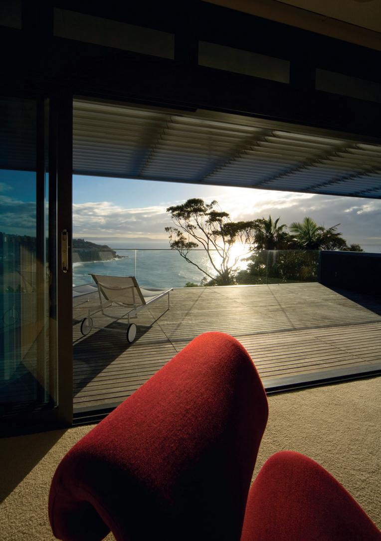
I 01 Previous The Staircase Acts as the home’s backbone, linking all levels.
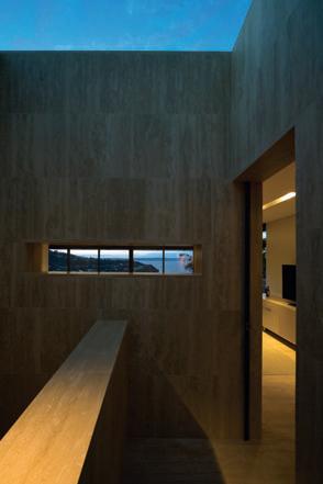
I 02
Slow reveal Views are delivered in stages, so they don’t overwhelm the home.
I 03
Bathroom
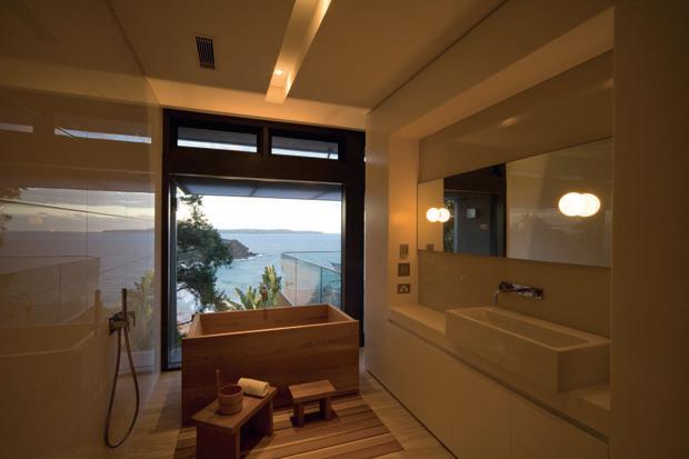
Natural materials and a back-to-basics approach are vital.
I 04
Snapshot Windows Assist in layering access to outside.
While there is no dominant architectural style in the Whale Beach area, there is a loose tradition of organic Modernism, taking material cues from James Barnet’s local sandstone, colonial architecture, and the mid-20 th Century designs of Burley Griffin and Ruskin Rowe that pepper the Barrenjoey Peninsula.
More recently, Alex Popov, Tonkin Zulaikha Greer and Stutchbury Pape have made monumental marks in the area, once occupied by the indigenous people of the Guringai language group, before they were decimated by smallpox and measles in 1790.
The area now defined as Whale Beach is a pocket of land popular with those prominent in business and particularly the arts, including film directors George Miller and Peter Weir, actors Bryan Brown and Rachel Ward, author Thomas Keneally and opera singer Joan Sutherland, but was once part of Father John Joseph Therry’s 1837 land grant.
The Jesuit order sold the land after Therry’s death to finance the construction of a new Catholic cathedral in Sydney, replacing the original razed by fire.
Architeture and interior design firm
Cullen Feng’s contribution to Whale Beach is executed on a trapezoidal-shaped site, accessed from the rear via a private road and falling away to the north approximately 11 metres. They have avoided intruding on the landscape by making the house, which lies in a foreshore protection area, barely visible from the beach.
123
I 03 I 04
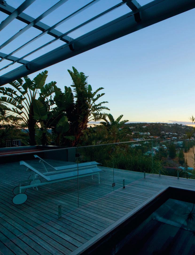
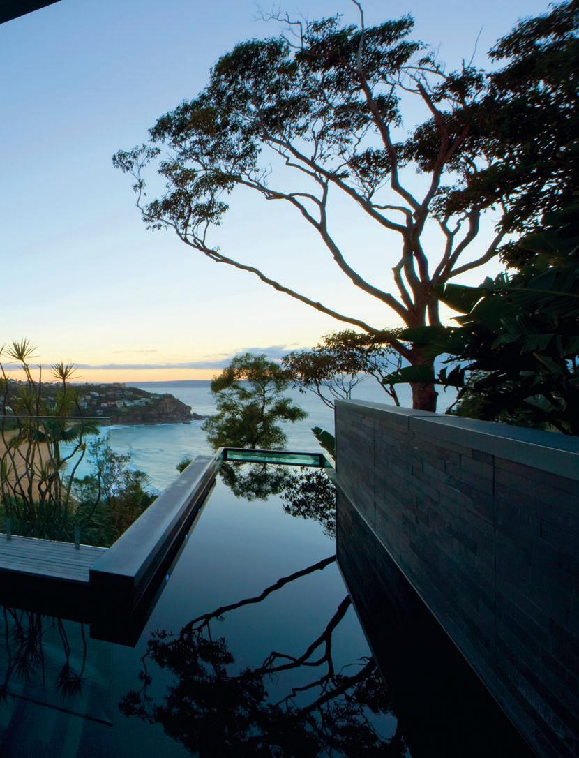
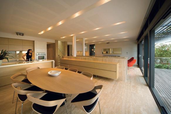


126 habitus | Issue 03
Cullen Feng
I 07 I 06 I 05 Previous Balcony/Pool An
I 06 Side
I 07 Kitchen/Dining The
I 08 Home Exterior
I
Living
whale beach — nSW, australia
outdoor room with a view across Whale Beach.
elevation
natural materials blend with the timber deck.
Steps down the site to lap pool.
09
Area An intimate space within a larger, flowing space.
In keeping with the tradition of the beach shack, this house harbours a concept of habitability, but within the more grand Modernist proportions of the three overlapping, offset rectangular pavilions, placed diagonally down a hillside with a unifying staircase holding a straight line through the section.
This generates a rich source of formal interest, enhanced by material selection, to accentuate each part of the composition. A Colorbond parapet and end-wall cappings form a series of continuous rectilinear ribbons around the composition, stepping down the site and taking advantage of the exhilarating views via the northern aspect over Whale Beach.

In reference to Peter Zumthor’s Heideggerean experiential, sensory architecture, Jon Cullen and Michelle Feng have created a liveability with a staged experience achieved through clever framing, heightened by sensitivity to materials.
Feng comments that “The views from the site are so spectacular, they needed to be framed so their impact would not be experienced all at once.”
127
I 08 I 09
cullen Feng whale beach — nSW, australia
The façade, therefore, gives no hint of what lies beyond. Once inside the entry vestibule, a rectangular aperture at eye height creates a snapshot of the ocean view. Designed as a contemplative antechamber, the vestibule gives pause upon arrival – relief from the traffic and intensity of the trip to the house and an invitation to the peaceful retreat below.
On departure, the frameless skylight leaves an after-image of the relationship of the house with the splendour of its setting.
Similarly, on descending the stair –deliberately compressed by the full-height travertine walls and illuminated naturally from above – the view opens up and retreats over the three-level journey.
Each level is oriented to the view, with the widest possible shaded northern elevation opening out to external living decks. The southern elevation is partially buried into the hill, housing services, rainwater tanks and garage space. Slits and hooded windows to the side create vignettes of the setting, while the forecourt frames a space open to the sky between house and garage.
“The house is externally dignified and reserved and purposely low-profile,” says Cullen. “It relies on a series of rich formal and spatial experiences to create effect rather than epic exterior monumentalism. We’ve inverted the concept of monumentalism to achieve it through materials such as the use of travertine in the soaring stairs and atrium walls used in the interior.”
The plan responds to the steep topography by growing out of the site with solid and private rear and side walls, while the north face of the house has a lighter filigree treatment of glazing and louvres that open onto a series of decks formed by the roofs of the levels below.
“Embedding the house into the hill, stepping it over three levels and using the rooves of the lower levels as large northern living decks captured the site’s topography and climate potential,” says Cullen. “The flat metal rooves support pool solar heating tubes as well as solar collectors for hot water. The majority also drain by gravity into the rainwater tank. And the east wall of the pool is a charcoal slate material, which works like a heat sink to give passive solar heating for the pool water.”
The site is fortunate to have a northern aspect and being just below the top of the ridge behind, so it offers a magnificent solar aspect in sync with the direction of view and the sea breeze while being sheltered from the colder and more viscous southerlies particular to the area.
I
Architect Cullen Feng Project te A m
Michelle Feng, Jon Cullen, Gerald Li, Nik Wong
Builder
FS Hough Structur A l e ngineer MPN Group joinery
PJR Industries lA ndScAPe Architect Peter Glass & Associates home Autom Ation Smart Home Solutions
c ullen Feng (61 2) 9310 4365 cullenfeng.com.au
I 10
Lower level plan
Furniture
Dining table Emmemobili UFO from FY2K fy2k.com.au. Dining chairs Emmemobili C130 from FY2K. Lounges in lounge room Vitra Soft Shell from Format Furniture, formatfurniture.com.au, in bedroom Crassevig Etcetera from FY2K. Armchair Kudos Meri from FY2K. Occasional and side table s Kenneth Cobonpue Stitches Revolving from KE-ZU, kezu.com.au, in bedroom Tissettanta Naos from FY2K. Stool Vitra Butterfly, vitra.com.au. Outdoor chairs Crassevig Net from FY2K and Alias Bigframe from Space, spacefurniture.com.au.
Outdoor tables Richard Schultz Petal and Indecasa Domino Teak table from FY2K. Chaise Richard Schultz 1966 adjustable from FY2K. Serving cart Helit Porsche from Space Furniture.
FiniS he S
Roofing Colorbond premium, bluescopesteel.com.au.
Windows aluminium framed sashless with powdercoat finish
Vivica Brilliance by Interpon, interpon.com.au. Pergola paint finish St Enoch Grey by Dulux, dulux.com.au. Flooring Simona Travertine, honed and filled, and Kohinoor carpet in Old Lace from Cavalier Bremworth, cavbrem.com.au. Benchtops Caesarstone Osprey, caesarstone.com.au. Joinery satin polyurethane and New Age Veneers Alabaster veneer straight quarter cut, newageveneers.com.au.
Blinds Silent Gliss motorised roller blinds, blockout and screen fabric, silentgliss.com.au.
Rug Woodnotes New York from Anibou, anibou.com.au.
Bathroom tiles Rogerseller rectified white gloss, rogerseller.com.au. Pool finish custom black Pebblecrete, pebblecrete.com.au and Brazilian slate wall tiles from Onsite.
l ighting
Downlights recessed from LPA, lpaust.com.au. Bedrooms and bathrooms Glo-Balls from Euroluce, euroluce.com.au.
Floor lamp David Weeks Toroja standing from FY2K.
Fixture S & Fitting S
Baths cedar from The Japanese Bath Company and Kaldewei classic, japanesebath.com.au and kaldewei.com / bathe.net.au.
Basins Rogerseller Scarabeo. WC Rogerseller Verso. Shower bar Rogerseller Acquatonica. Tapware Intamix Borma from Accent International, accentinternational.com.au.
habitus | Issue 03 128
Towel rails from Hydrotherm, hydrotherm.com.au. Oven Fisher & Paykel, fisherpaykel.com.au. Cooktop Miele induction, miele.com.au. Rangehood Qasair, qasair.com.au. Refrigerator Liebherr, liebherr.com. Dishwasher Neff integrated, neff.co.uk. Sink and mixer Blanco undermounted, blanco.com.au. 10
lifeneeds
Laufen.Atributetotheclassicmodernism. Clearshapes,harmoniousproportions,flawless ceramicsfromEurope’sleadingbathwareproducer. bathe 1300133320orwww.bathe.net.au
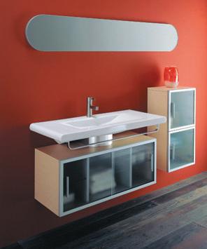


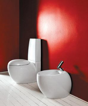
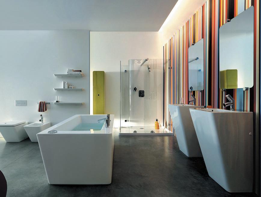
yescommunications SwissQuality
A top chef uses the finest ingredients to create an excellent meal. An architect turns them into a kitchen.
The difference is Gaggenau.
For over 30 years now, the Vario 400 series cooktops have provided the perfect combination of cutting-edge technology and superior design. They have been finetuned and improved at every turn. Each of the appliances - from the gas and induction cooktops to the electric grill, Teppan Yaki and steamer - are state of the art and yet incredibly simple to use. What’s more, they are all modular, so they can be mixed and matched as desired. It’s everything you could need to create something truly individual - before the cooking even starts.
Visit one of our national showrooms to discover the strikingly beautiful world of Gaggenau. To arrange an appliance demonstration or to locate your nearest retailer phone 1300 727 421 or visit www.gaggenau.com.au
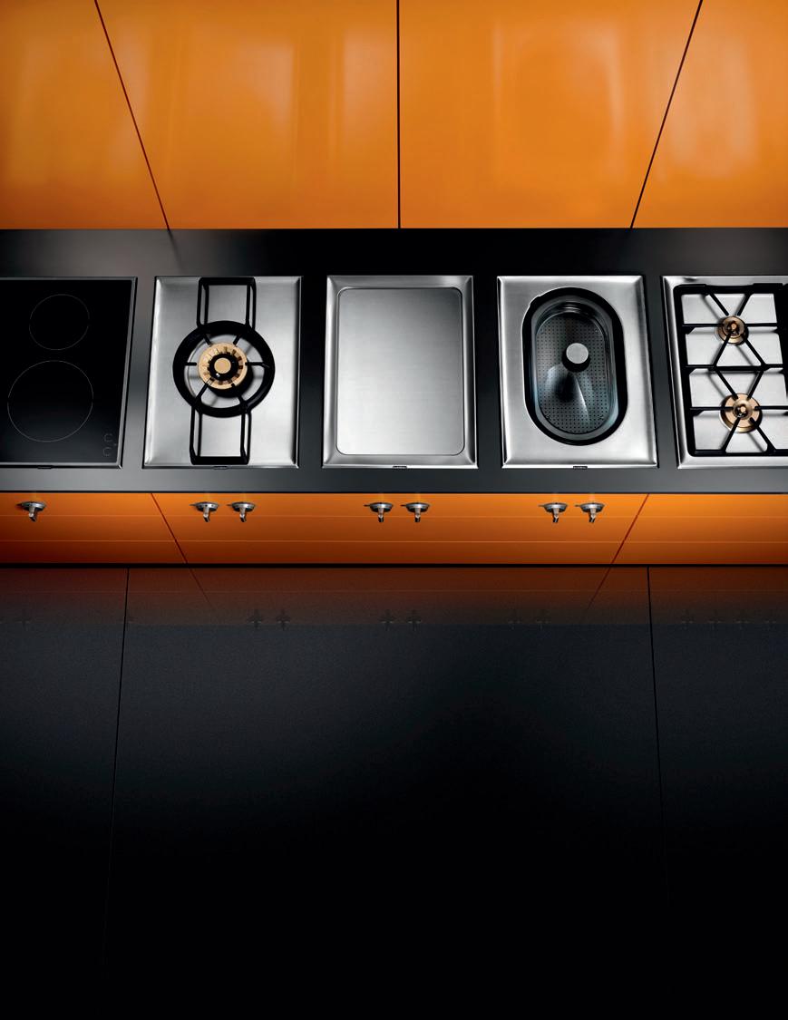
code house — Bangkok, thailand
CulTur A l Continuity
| Creating a marriage between the old and the new does not stop with the building and its interiors. It also involves how the house sits with its neighbours. Pirak a nurakyawachon ventures into downtown Bangkok to see what architect Jök Premthada has made of a traditional Thai shophouse.
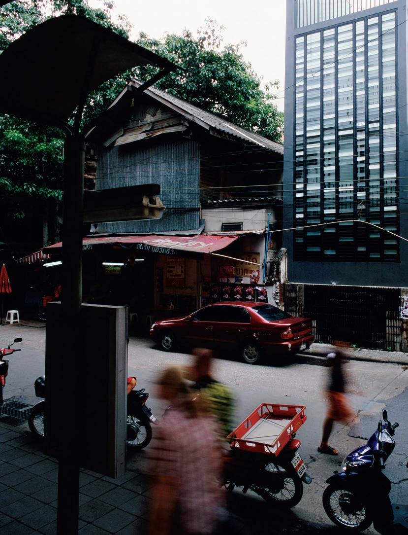
habitus | Issue 03 scenario
Text Pirak Anurakyawachon
Photography Spaceshift Studio
code house — bangkok, thailand

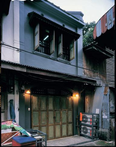
Located in the heart of Bangkok’s business district, Charoen Krung Road and its surrounding small pathways and dusty walls enclose an array of old shop-houses. The architecture, covered with dark, grey dust and greasy smoke-stains from urban pollution, dramatically presents as a huge mass or pile of foggy charcoal. Seen from a distance, we can tell that Code House has been part of this over-a-century-old residential community.
The south façade of the house is detailed with an unorganised pattern of translucent black, white, and some transparent glass louvres, which metaphorically reminds us of the pattern of industrial barcodes. It definitely causes this renovated house to stand out as the new landmark for this area.
Jök Premthada, the architect for the renovation of this old house explains “I created this house with the idea of producing an appropriate structure and interior design that are best suited to their particular physical and cultural environment. The character of the design changed to respond to the local climate, society, culture, owner’s character and various other aspects of human life.” Equally, artistic emotion is also a key factor influencing his architectural and interior design processes. Premthada is bold about inventing a new language and always energetically utilises experimentation to find different possibilities in his work.
habitus | Issue 03 132
I 02 I 03
Bangkok Project co. ltd.
I 01 Previous South Façade The ‘barcode’ exterior in its gritty urban environment.
I 02
Ground floor plan
I 03 North Façade
A taste of the building’s original state remains.
I 04 Interior Staircase Vertically connects the levels.
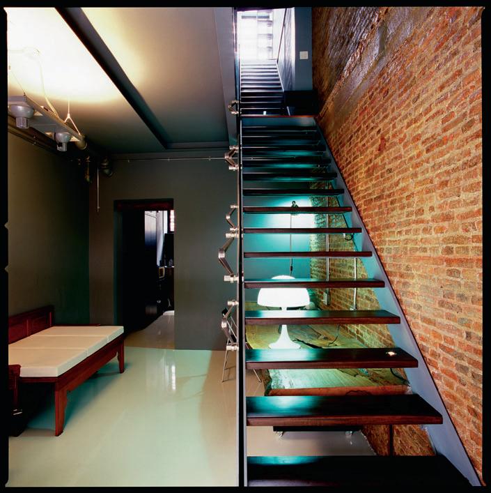
133
I 04
code house — bangkok, thailand
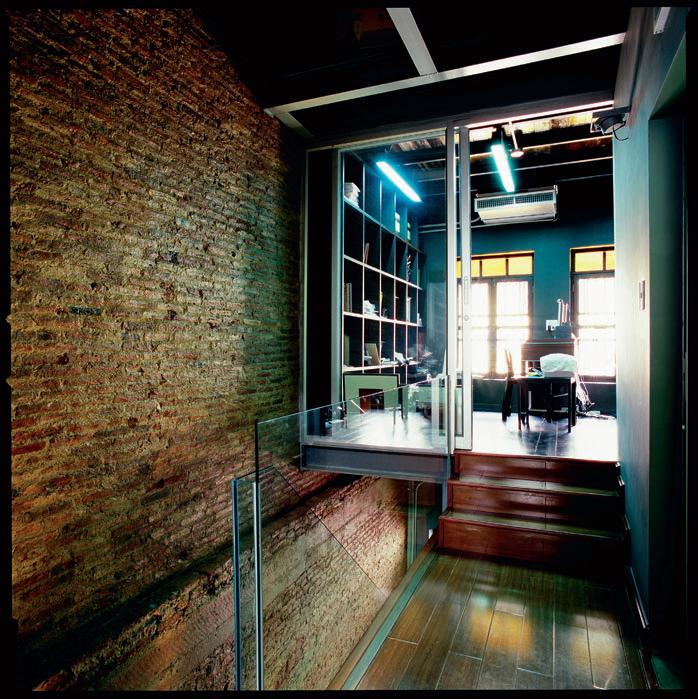
habitus | Issue 03 134
I 09 Following Exterior Roof Terrace The elevated space enjoys panoramic cityscape views.
I 05
Old and New
A modern addition to the original paredback brickwork.
I 06
Interior Structure
The design approach enables space and uses texture creatively.
I 07
Bathroom Bright, contemporary pieces are used in this room, with attention to detail a priority.
I 08 Following Ascending Staircase Leading to roof deck.
I 05
Bangkok Project co. ltd.
The home was created for an early-30s magazine editor, who also has a hobby of collecting anime and manga models, toys, and art pieces. The program of the living space is designed to consist mainly of two units: the primary old-style structure built in the reign of King Rama VI, and the new expanding house. Rather than following the original style of the building, the architect chose a more simple and contemporary style for the extended area. It enables us to see a trace of the original elevation of the building, where folding doors are on the ground floor and the upstairs casement windows and steel window guards can still be seen, while the other side of the building is in the style of an entirely new architecture.
Sustaining the whole architectural construction, which was the owner’s intention, the architect began with ordering interior details. He created a flow of space by absence in the interior structure as much as possible, and selected suitable materials and colours to show the interior structure by representing characteristics of void and solidity. Consequently, on entering, the linkage of space expands horizontally and vertically. The common space – a living and dining room – are set as open plan which is flexible and brings about continuity of indoor and outdoor spaces. The ceiling of the living room is opened up into double space and the connection inside the two buildings is done by the use of a staircase, which functions as a vertical connector and passageway.
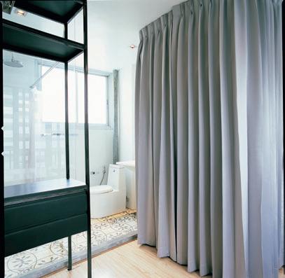
The architect was able to keep parts of the functional areas and the original structure of both areas in the same condition, while some functions are improved and added into some other areas of the house. The floor material is changed and the cement wall surface is taken off to show the original brick pattern and structure. The only other additional functional areas in the structure are the attic space, which is turned into a chanting room according to the owner’s religious belief, and a study room. The second part is the extension at the back of the building facing the BTS train station and minivan taxi stop, where the mass of people and traffic is very dense and busy almost all day long. However, the area is more tranquil at night, and so the bedrooms are located on the second and third floor spaces on this side of the structure. On the rooftop, the architect has designed a staircase to look like a white,
I 07
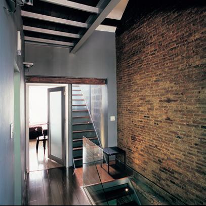
135
I 06
code house — bangkok, thailand
BAngkok Project co. ltd
Architect Bangkok Project Company Limited
PA rtner in ch A rge
Jök Premthada
Project te A m
Thebinly
Structur A l
Preecha Suvapabkul, BKKP mech A nicA l & electricA l
Pass-ad Company Limited
conSultA ntS
Boonlerd Prachasirikul
contr ActorS
Ferrentti, Tor Tok Tang, Mungkorn Furniture Floor Are A 175m 2
Bangkok Project c ompany
l imited (66) 2 910 2120
bkk_project@yahoo.com
Furniture
Furniture Touchable from Kenkoon, kenkoon.com.
FiniS he S Floor ornamental cement tile from Sinpongsathorn, cecrete. co.th. Ceiling gypsum board from Siamgypsum, siamgypsum.com. Roof cement tile. Paint white epoxy from TOA, toagroup.com. Steel finished in Devo clear epoxy from I.C.I paint, icipaints.com. Façade KG-White frosted and clear glass louvres from Glassform Manufacturing Co., glassform.co.th.
l ighting
LED by Zumtobel, zumtobel. com and Optex, from Lighting and Equipment, l-and-e.com. Fixture S & Fitting S Sanitaryware by Mogen, mogen.co.th. Hardware from VVP Marketing, vvpmarketing. com. Electrical Siemens from Sangchai Air Quality, sangchaiairquality.com.
translucent light box, which provides a surreal feeling as we walk up to the roof, as if we are entering the door of an unknown space.
The collaboration between owner and architect has been able to bring out solidity, density and provide lightweightedness to the whole image of the structure, from which any unnecessary details, such as primary decorated elements, are withdrawn. They use louvre glass with steel frames in three shades for receiving natural light during the day, also affecting the outside in terms of aesthetic value, and, in addition, generating good air circulation. Indirect lights are set in several parts of the house to create a gentle and warm mood.
The architect’s intention was to preserve and reveal primary elements of the old building, such as wooden components and brick walls. Accordingly, he cracks the cement surface, applying a grey colour to highlight the texture of brick. For the rest of the wall, he utilises concrete blocks to reveal the distinctive impact between old and new materials, harmonising them with grey colour tones.
The architectural and interior elements of the two houses set up a perfect dialogue between the traditional Thai house and contemporary architecture, demonstrating that old and new can be combined harmoniously via good design.
habitus | Issue 03 136
I 08 I 09
175 parramatta road annandale nsw 2038 T. 02 8090 9039 | info@minosa.com.au minosa.com.au Ovo washbasin
maroubra apartments — nsw, australia
NOT AN ICON
I 01
Northern Aspect
The dramatic curved profile echoes the cliff and the streetscape.
I 02
Inside / Outside
Transparency makes being in the living room like being in the ocean iteself.
buildings. It was here, on a splendid triangulated site right on the headland that William Smart was asked to renovate an existing apartment block. In the event, it would have been too high, blocking out the neighbours’ views. So, the scheme was reconceived, allowing for demolition of the existing building and a lower underground carpark in a new building, thus conforming to the scale of the neighbourhood, protecting views and avoiding over-shadowing.
There are many things that astonish me about Australia, but if I were to choose just one stand-out it would be how we manage to build such appalling man-made environments on the edge of some of the most sublime coastline in the world.
Maroubra is just one of many superb beaches surrounding Sydney, every one of them embraced by the headlands thrust up millions of years ago by tectonic upheavals. Stand on the Maroubra headland and you are overwhelmed by the magnificence of the coastline and the peerless dome of the Pacific Ocean.
But turn around and look back and you are assaulted by an urban wasteland of cheap, badly built and architecturally bankrupt low-rise, post-War apartment
“It is a hard suburb to draw inspiration from,” says Smart, “but we tried to make a contribution to the area.” The ‘we’ included designer Brenon Liston, who acted as an artistic advisor/collaborator to help develop the sculptural form of the building and its ground plane.
And this raises another issue – the lack of imagination in Sydney’s multiresidential architecture. It is a litany of orthogonal glass and steel structures, with barely a hint of formal daring. But with Smart’s building we have a wonderfully bold, curvaceous form. It was, he says, “an opportunity to create a building which was a little more three-dimensional.”
And so it is as it responds to the curves of the beach below and the headland, as well as to the road – but without imposing itself on its neighbours. This must have been temptation, given the mediocrity of the urban context. But Smart resisted this, designing a building which is a ‘good neighbour’, adding to its context without any displays of egomania.
habitus | Issue 03
138
scenario
|
“We wanted to respond to the headland, but not make it iconic,” says william smart of his distinctive new apartment building overlooking the ocean at Sydney’s Maroubra Beach.
Paul McGillick explores Smart’s approach.
Text
Paul McGillick
Photography Sharrin Rees
sMart DesiGn stuDio
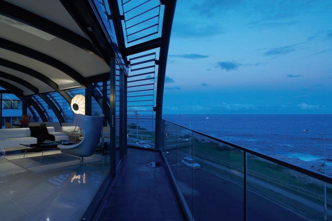
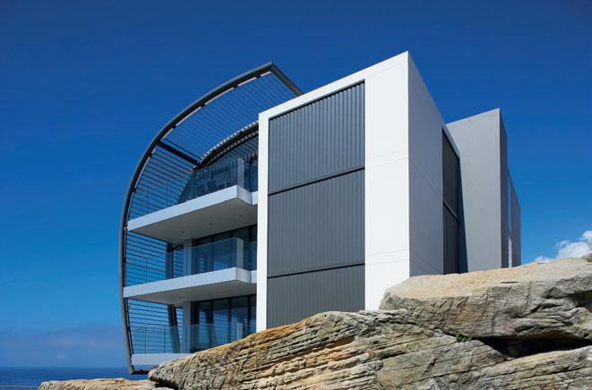
I 01 I 02 139
I 03
Kitchen
The top-level penthouse responds to the building’s curved profile.
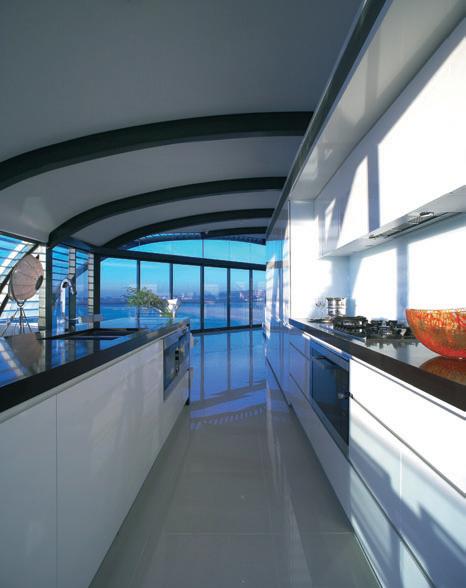
I 04
Southern Aspect
The building addresses the sweeping curve of the road.
I 05 Following Living Space
External louvres control the levels of direct sunlight.
There are four units in the building, each occupying an entire floor. It consists of three basic elements. The first is a rectilinear block at the back which connects visually with the neighbouring buildings and includes the bedrooms and bathrooms. Then there is the ground plane with its curving wall to the street and its series of serrated concrete block blades. Finally, there is the curved, lightweight glass and steel façade, dressed with a fixed louvred aluminium screen which provides protection from the sun and privacy from the street without diminishing views.
The combination of the three elements makes for a dynamic building which constantly changes character as one moves around it.
Inside, the planning is adroit. The bedrooms in the rear block are separated from the open-plan living/dining areas by a central corridor and accessed down the middle by the entry vestibule leading off from the lift core. This creates a reassuring separation between the two areas of the dwelling, minimising any sense of claustrophobia from living in an
I 03
| “It’s a hard suburb to draw inspiration from, but we tried to make a contribution to the area. It was an opportunity to create a building which was a little more three-dimensional. ”
140 habitus | Issue 03
–SMART
maroubra apartments — nsw, australia
smart Design stuDio
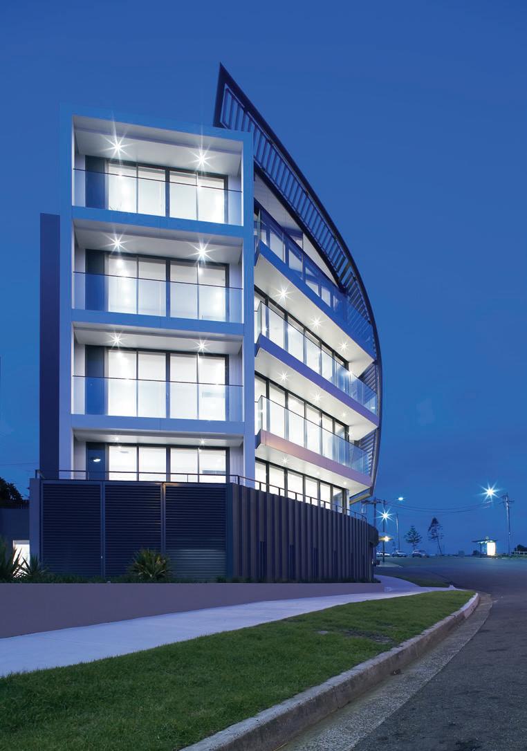
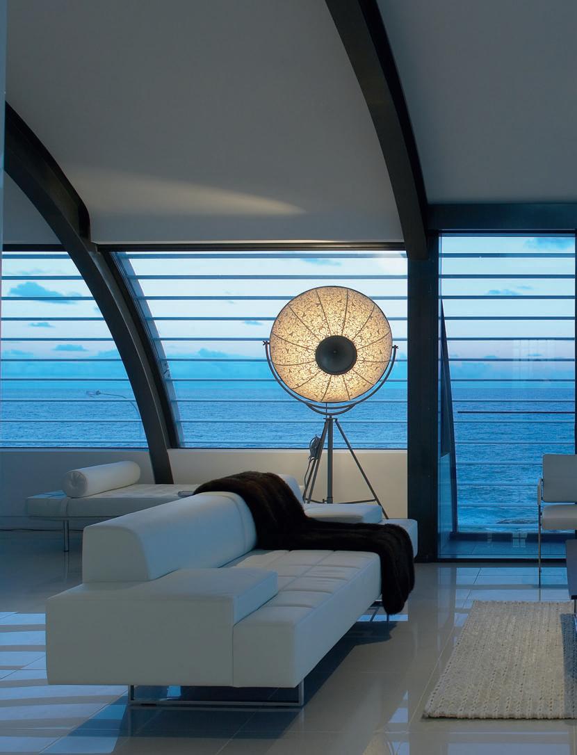
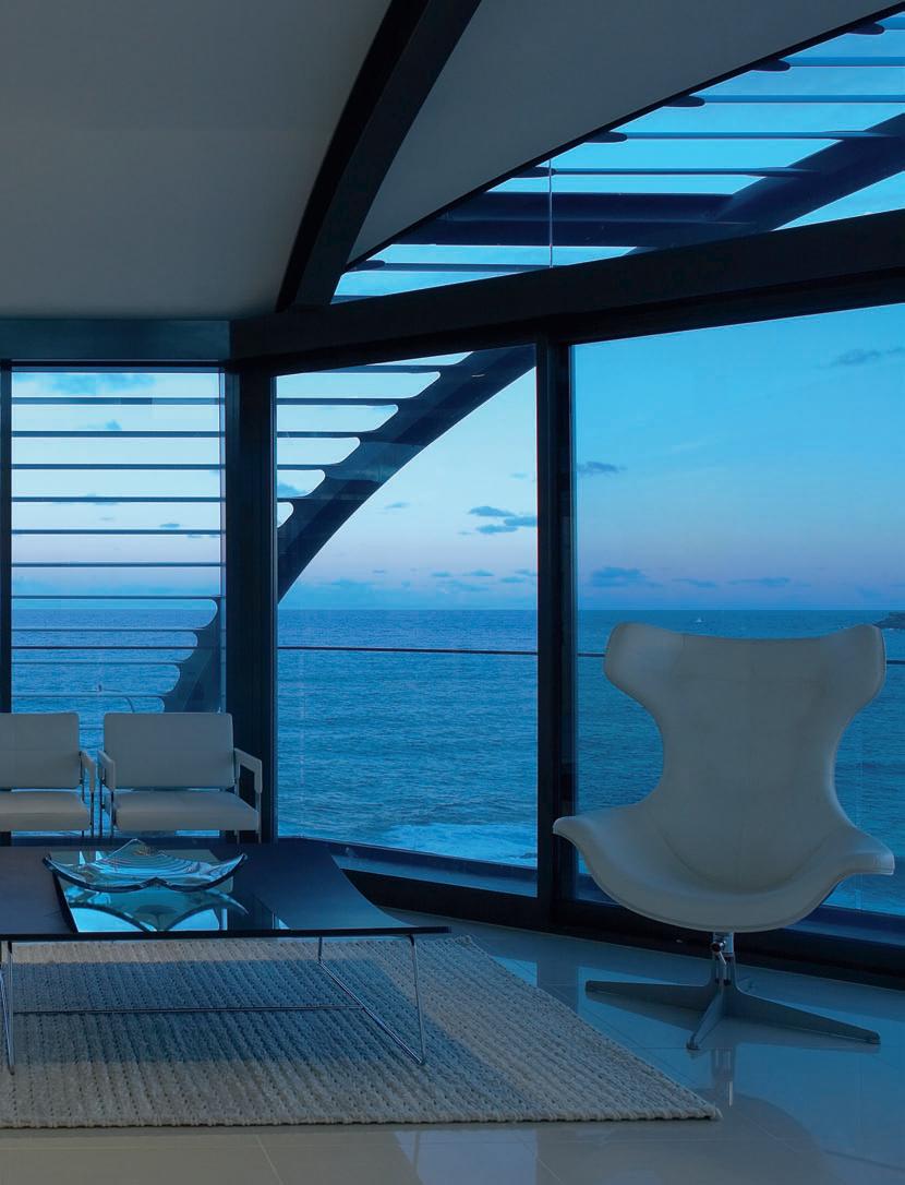
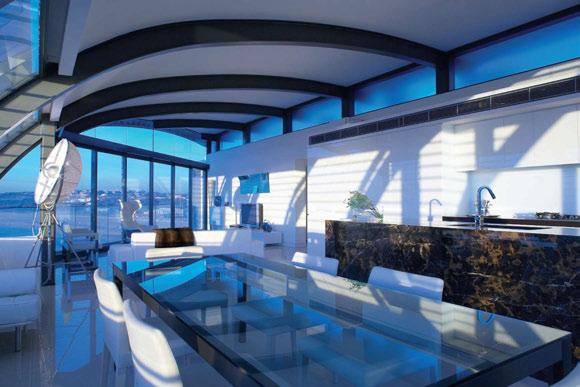
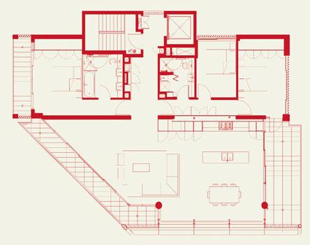
habitus | Issue 03 I 06 Plan I 07 Top floor apartment Enjoys a nautical feel with its curved ceiling and façade. I 08 Street Frontage The building breathes new life into its more conservative environment. I 06 I 07 144
maroubra apartments — nsw, australia smart Design stuDio
apartment – and optimising the sense of light and space which comes from the unbelievable views on offer in the living/dining areas.
The top floor apartment has its own uniqueness with its curved façade and a certain nautical feel – due to the expansive view, the curved ceiling and to the fact that one does not see the road. Instead, one feels a part of the sublime vista of the ocean.
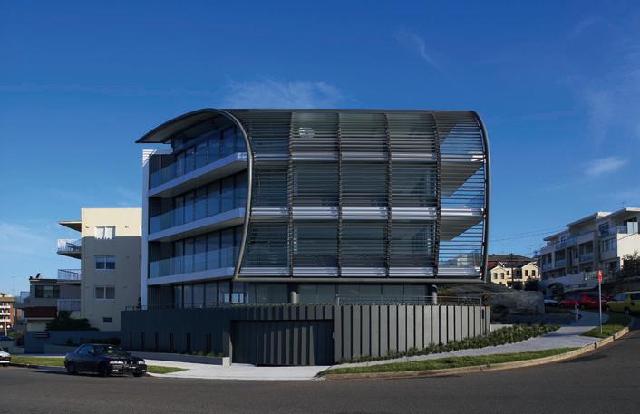
It is a distinctively Modernist building, but somehow retains the mood of beach life and culture. And like that culture, it is very much a part of its environment with a pronounced sustainable sensibility – passive solar design using orientation and louvres, natural cross-ventilation, energy efficient fittings and a careful consideration of materials.
Architect Smart Design Studio Design t e A m
William Smart, Cameron Donald, Zig Peshos, Troy Melville, Tatsu Hayashi, Derek Chin, Kylie Tse
Buil Der J and CG Constructions mech A nic A l/ e lectric A l/ h y Dr Aulics, l ighting
Donnelly Simpson Cleary DSC structur A l
JJ Marino
lA n D sc A pe
Aspect
QuA ntity surveyor
BMT & Associates
Bc A
Anthony Protas Consulting
pl A nner
SPD Town Planners
Acoustic
Acoustic Logic
s mart Design s tudio (61 2) 8332 4333 smartdesignstudio.com
Furniture
Lounge Poltrona Frau
Quadra from Space Furniture, spacefurniture.com.au. Side chairs Poltrona Frau Astor X from Space. Armchairs Poltrona Frau Regina from Space. Coffee table
Acerbis Lit from Space. Dining table Poltrona Frau Laurana from Space. Dining chairs Poltrona Frau Liz B from Space.
Finishes
Walls Taubmans paint, taubmans.com.au. Floor honed stone tile and Feltex Hemisphere Cairo, feltex.com.au. Benchtops polished Ceasarstone in Ice
Snow, caesarstone.com.au.
Splashbacks white colourback glass. Bathroom and laundry walls white glazed ceramic tile. Joinery polyurethane. Balcony floor natural vitrified tile.
Rug client’s own.
l ighting
Downlights Audrey circular from Boaz Australia, (61) 413 809 098. Feature light Artemide Fortuni
from Poliform, poliform.com.au.
Fixtures/ eQuipment
Basin Rogerseller Duravit, rogerseller.com.au. Taps and mixers Accent Geo Viva, accentinternational.com.au.
WC Fowler Newport, fowler.com.au. Bath Rogerseller Classic in steel. Toilet roll holder Madinoz, madinoz.com.au. Towel ring Vola, vola.com / dedece.com. Rangehood Qasair telescopic, qasair.com.au. Cooktop, dishwasher and oven Smeg, smeg.com.au. Fridge Fisher & Paykel, fisherpaykel.com.au. Kitchen sink Franke undermount, franke.com.au. Kitchen mixer
Caroma Liano, caroma.com.au. Water chiller Zip Chilltap, zipindustries.com.au. Hot water Rinnai Infinity Instantaneous, rinnai.com.au. Laundry taps and spout Caroma Leda. Laundry tub Clark, clark.com.au. Washing machine stop cocks Dorf Mini, dorf.com.au. Home automation Clipsal C-Bus, clipsal.com.au.
145
I 08
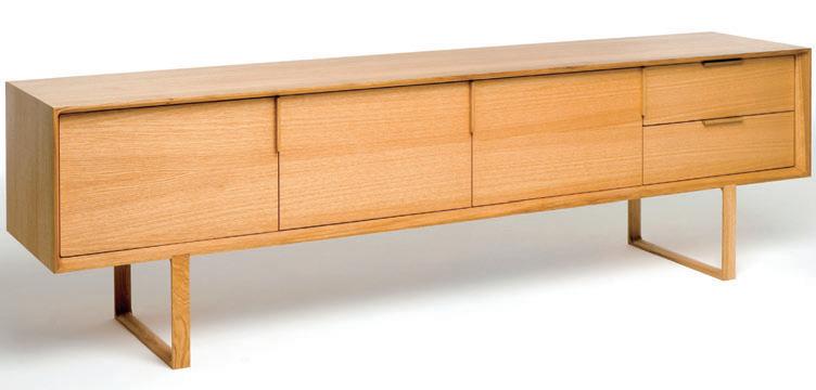
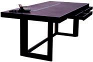
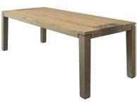
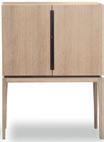
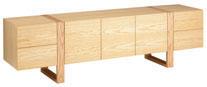

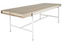
Showroom open Tuesday to Saturday 15, 198 Young Street, Waterloo, 2017 +612 9698 6422 www.beclau.com
MAKING
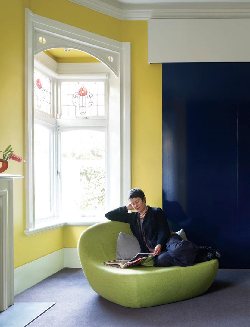
CONNECTIONS
147 habitus | Issue 03 scenario
hawthorn house — vic, australia
I Adapting to changing needs is a challenge. Stephen crafti reports that for this suburban Melbourne house, cross-disciplinary firm Multiplicity had to reconcile history with the needs of a modern adult family.
Photography Derek Swalwell Text Stephen Crafti
Located
In 1992, when Peter and Margaret Wilson bought the house, it was divided into two flats. “There was an old timber lean-to which contained both the kitchen and laundry,” says Peter, who lives in the house with his wife and one of the couple’s two sons, PJ.
While the period home features rich architectural detail including an abundance of leadlight windows and architraves, it was ill-suited to a family. “We extended the house and put in a new kitchen. But after a few years, we realised the boys’ bedrooms were too small. And there was little connection from the living areas to the garden,” says Margaret, who is a keen gardener. “The other problem was that most of the rooms weren’t used. Increasingly, they were just used for storage.”
The initial renovation to the house mimicked the original design. A pitched tiled roof covered the new wing and red bricks were chosen to blend in with the home’s original brickwork. “People have since come to understand that working with period buildings requires a clear distinction between the past “and present,” says interior designer, Sioux Clark, co-director of Multiplicity, commissioned to renovate the house second time around.
The initial brief to Multiplicity was to focus on the kitchen and living areas at the rear of the house. But it was soon clear to both architect and client that other rooms needed to be incorporated into the new design. “The house faces north, but the living areas face south. We really needed to borrow light from the front garden,” says architect Tim O’Sullivan, Multiplicity’s other director.
Although the configuration of the original rooms wasn’t ideal, the Wilsons were not
I 01 Previous Living Space
Period detailing has been retained in part.
I 02 Dining Room
The tactile kitchen renovation.
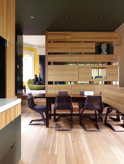
I 03 Old and New Modernist chairs and a gilt mirror share space.
I 04 Following Living/Kitchen
A customised shelving system both connects and separates zones.
interested in increasing the home’s floor area. “[elder son] Henry had left home. We didn’t want more spaces, but flexible ones,” says Margaret. “I also wanted to look out to the garden from wherever I happen to be in the house.”
One of the first cues for Multiplicity’s design came from a photograph Margaret had seen of densely planted Silver Birch trees. The image has been interpreted in new floorto-ceiling glass walls framing the kitchen and living areas. Evocative of the trees are slender steel columns irregularly spaced along the glass walls, painted in a range of green and brown hues. “The columns are both decorative and structural. We wanted to maximise the use of glass. But we were also mindful of supporting a substantial tiled roof,” says O’Sullivan.
habitus | Issue 03 148 Multiplicity I 02
in the Grace Park Estate in Hawthorn, Melbourne, this Edwardian home built in 1914 is as rich in detail as the estate’s history. Once owned by two elderly sisters, the building was used as a boarding house for some time. Artist Charles Blackman and his wife Barbara lived across the road. And – according to one neighbour – comedian, Barry Humphries, was once a lodger in the house.
hawthorn house — vic, australia
I It was soon clear to both architect and client that other rooms needed to be incorporated into the new design.
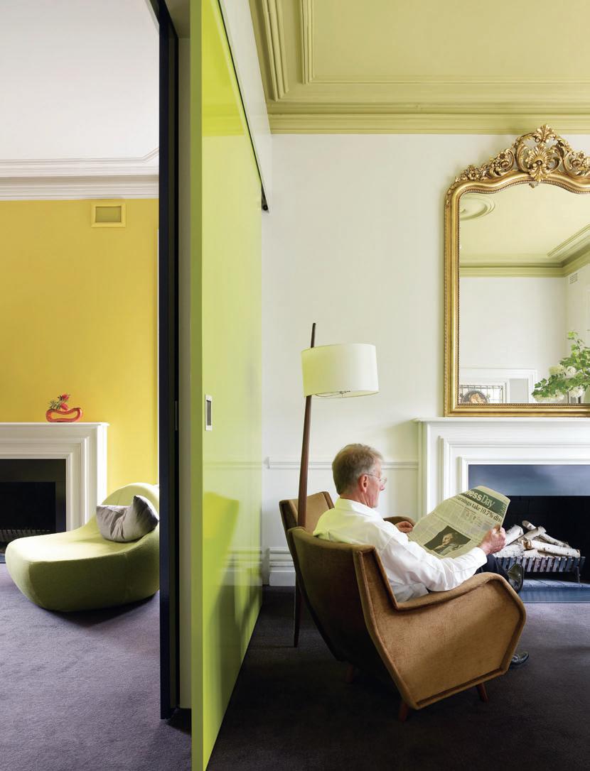
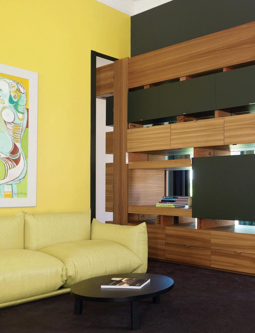
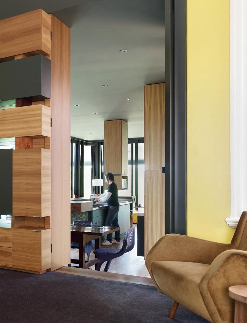
While steel can be used in an austere manner, in this case it has an organic quality. “I didn’t want a minimal contemporary box added to the house. I wanted something quite warm and tactile,” Margaret explains.

The kitchen highlights the brief for something more tactile. The central island bench, for example, is made from Spotted Gum. And to create surface interest, each of the returns are ‘stacked’ rather than aligned. Mottled green tiles used to clad the base of the bench are also subdued. The only reflective surface in the kitchen is the glass splashback, reflecting the garden. “The kitchen plays a recessive role in the design. Margaret and Peter didn’t want the kitchen to be the focal point of the design,” says Clark.
One of the main challenges in the renovation was linking the piano and television rooms at the front of the house with the dining and living areas at the rear. One solution is a customised shelving unit between the dining area and television area. Made from Spotted Gum, the unit is framed by a sliding door on one side and glass panels between shelves. “If someone is watching television, the door can be moved across. Likewise, if PJ is practising the piano, he can slide these doors across,” says O’Sullivan, who included two sliding doors between the piano room and the television room to control the acoustics.

While some of the Wilsons’ furniture (such as a French 1760 Oak dining table) was retained, it was given a contemporary twist with new dining chairs from Insitu. And although Peter was keen to hang on to his old lounge suite, Margaret convinced him the renovation required a few pieces from Format furniture. The ‘Flintstone’, a pebble-like chaise gives the television room a more contemporary edge. “We’re still debating over the gilt mirror [in the piano room],” says Margaret.
What also created healthy debate was the re-working of the main bedroom. While new wardrobes and a new bathroom were easily ‘ticked off’ the Wilsons’ list, the butynol (black rubber) applied to the bedroom walls was queried. Peter’s older sons Nick and Julian, responsible for building Multiplicity’s design, thought the rubber would smell in the heat, preferring to use timber as originally planned.
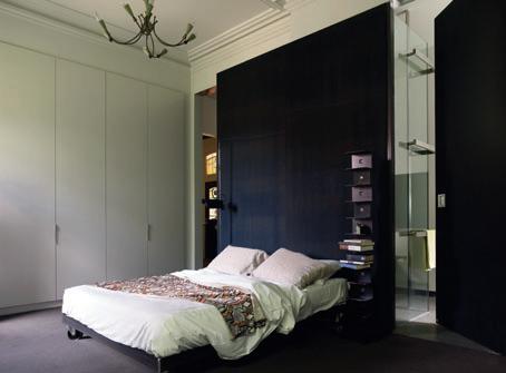
I 05 I 06 152 Multiplicity hawthorn house — vic,
australia
habitus | Issue 03
I While some of the Wilsons’ furniture was retained, it was given a contemporary twist with new dining chairs.
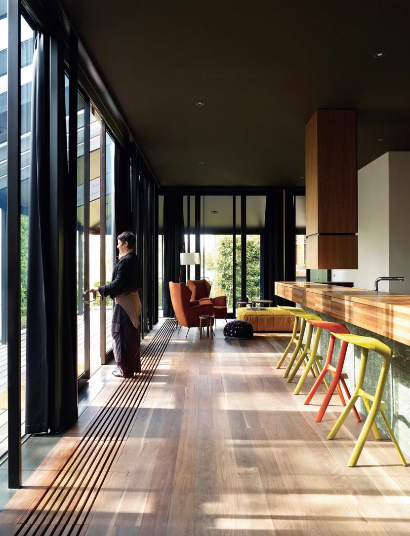
Before the rubber was applied to the wall, Peter tested a sample in a microwave. The house still features wonderful period details. The generous proportions of the original rooms have also been retained. But instead of a series of closed doors, the family enjoys the fluid spaces. “We’ve quickly adapted to these new spaces. And where we once simply gravitated to the back of the house, we’re now using all the rooms,” says Margaret.
Architect Multiplicity
Project t e A m
Tim O’Sullivan, Robin Larsen, Ro Berry, Sioux Clark e ngineer
Ray O’Byrne
Builder
Caedman Constructions (Nick Wilson)
cABinetm A ker
Colonial Cabinets h ydronic he Ating
Hunt Heating/Hydronic Systems
WindoW c overings
Graeme Bergman/Designer
Window Furnishings
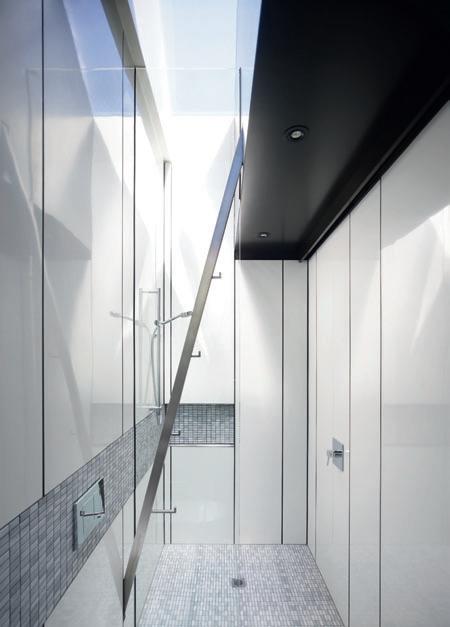
multiPlicity
(61 3) 9388 0790 multiplicity.com.au
Art Lounge painting by client’s daughter, Ingrid Wilson.
Furniture
Chairs Australian 20 th Century chairs from Design Dilemmas, (61) 425 718 736, upholstered in Garin Camona Naranja fabric from Boyac, boyac.com.au.
Lounge Arflex Markenko from Format Furniture, formatfurniture.com.au. Coffee tables e15 Leila in black timber and e15 Alex nest tables in timber from Format. Dining chair Myto by PLANK from Insitu insitufurniture.com.au.
Stools Miura by PLANK from Insitu. Dining table pre-loved period piece. Ottoman Strips by Arflex from Format.
Armchairs period piece from Geoffrey Hatty Applied Arts, (61 3) 9510 1277.
Cushions Bovist by Vitra from Format. Bed steel base designed by Multiplicity and made by Nick Wilson of Caedman Construction.
Finishes
Kitchen joinery Spotted Gum veneer from George Fethers, gfethers.com.au and 2-pac polyurethane low gloss finish. Walls Wishful soft grey by Haymes Paint, haymespaint.com.au.
Ceiling Green Waterloo paint from Resene, resene.co.nz. Benchtops and island bar solid laminated Spotted Gum with oil finish. Sink worktop stainless steel. Cooking work surface Corian by Dupont, dupont.com.au. Splashback and ensuite bathroom walls ceramic mosaic tiles in green from Perini, perini.com.au and colourbacked glass. Bathroom tiles rectangular glass mosaics from Artedomus, artedomus.com. Bathroom walls gloss white Aquapanel from Laminex, laminex.com.au.
l ighting
Floor lamp Ripsal French from Geoffrey Hatty. Bedside lamp Dim by Oluce from Home Furniture on Consignment, hfoc.com.au.
Fixtures & Fittings
Tapware from Rogerseller, rogerseller.com.au. Vanity and basins formed in Corian.
habitus | Issue 03 154
I 05 Previous Master Bedroom With the butynol walls that were queried at first. I 06 Previous Plan I 07 Previous Kitchen/Living With views to the garden as desired. I 08 Bathroom Elegant and minimal.
vic,
I 08
multiPlicity hawthorn house —
australia
X-Bond Latex Polymer Floor National Sales - 1300 760 877 – www.alternativesurfaces.com.au
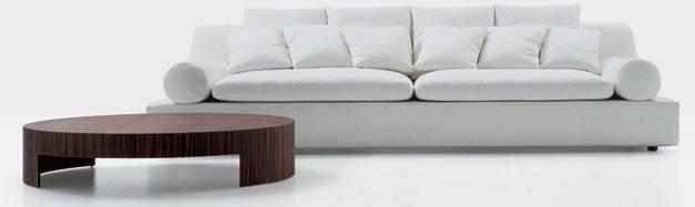
 Tender sofa manufactured by Nube designed by Carlo Colombo
sir armchair manufactured by Nube designed by Carlo Columbo
Tender sofa manufactured by Nube designed by Carlo Colombo
sir armchair manufactured by Nube designed by Carlo Columbo
www.ar T esofas.com pyd building showroom 201 197 young street waterloo nsw 2017 t 9690 0488 f 9690 0499 e sofas@artesofas.com Arte SOFAS
maxi ho sofa manufactured and designed by Arte Sofas
na’s house — qld, australia
CULTURAL EXTENSION
I Thailand, Japan and 1970s Australia are brought together in this intriguing residential cluster in suburban Brisbane. Margie Fraser reports on a project by architect, Elizabeth Watson Brown, for an extended, bi-cultural family.
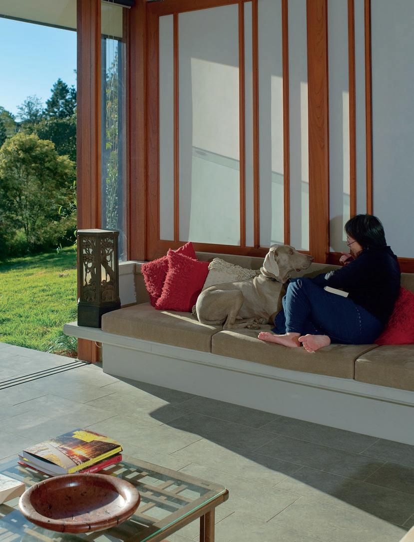
157 habitus | Issue 03 scenario
Photography Hans Schlupp Text Margie Fraser
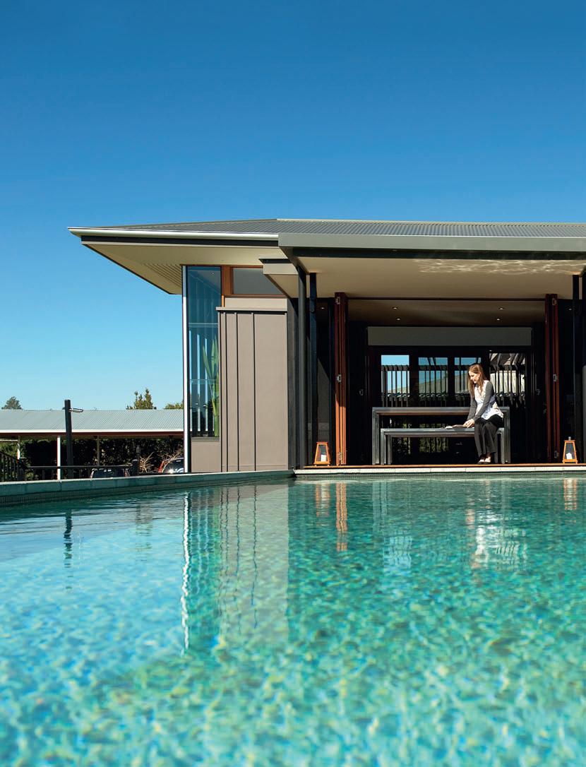
A bucolic existence in the outer ’burbs is not always synonymous with the good life. Experiments in super-sizing can render the verdant glades and rolling hills of greenchangers’ dreams into nightmare scenarios of overblown mansions with demanding maintenance schedules. Remnant work sheds from yesteryear’s grazing paddocks are replaced with cabanas, gazebos and follies vying for attention in overpopulated sites. Landscape is relegated to the backdrop status it receives on the old quarter acre, and construed as artifice.
This house on Brisbane’s semi-rural outskirts is not victim to such false enchantments. The natural setting is picturesque. Undulant, grassed hills, distant mountains, majestic gums, pines and silky oaks are dotted about, with the rough textures and silver-grey hues of the Australian bush adding a powerful, tough edge. When architect, Elizabeth Watson Brown, was briefed to design a new house on the site, she conceived of the dwelling as “only a tiny fragment of the whole concept”. Considerations of the landscape were paramount.
“The landscape is the context,” says Watson Brown. “Over time the house will become absorbed into it and the demarcation between green and building will become ambiguous.”
Watson Brown conceived of the ‘metalandscape’ in which the house resides as a ‘mosaic’ of fields circumscribed and defined by lines of sub-tropical planting. The axes and geometries of the landscape equate with the axes and geometries of the house. The strong grid of the vertical timber mullions within the glazed walls, criss-crossed by horizontal planes, forms a ‘tartan’ pattern reflected in plantings of hedgerows – large shade trees
I 02
I
I 03
Casual Living Doors retract for uninterrupted external views.
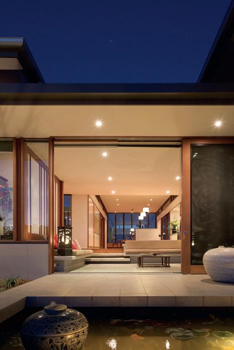
I 04
bordering and bisecting fields of indigenous grasses. The grid of the intended landscape is elaborated in the rigorous alignment of the conjoining and overlapping pavilions.
I 02
Pavilion Living Crisp shoji screens offer versatility.
Building Exterior
The pavilions will become part of the landscape in time.
The existing house was a nondescript, low-slung timber structure, circa 1970, perched on the hilltop of the one-hectare site. When the owners returned to Australia with their two children after a 20-year stint in Tokyo, they were attracted to the fresh air and open spaces
habitus | Issue 03 158
ElizabEth Watson broWn architEcts
I Rather than invest in having an entirely new home built on the site, they would... have a new design drawn up –one that worked with the 1953 blockwork structure that was already there.
01 Previous Easy Living Rooms are “humansized” in scale, enabling comfort for the whole family.
na’s house — qld, australia
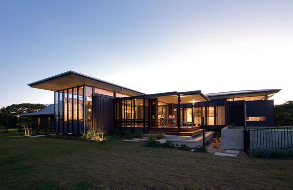
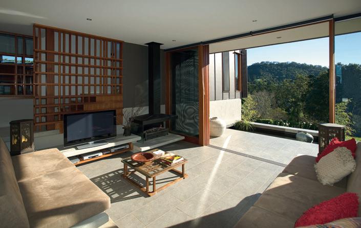
159 I 03 I 04
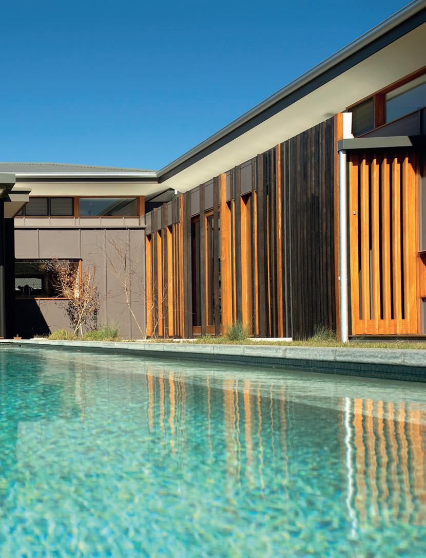
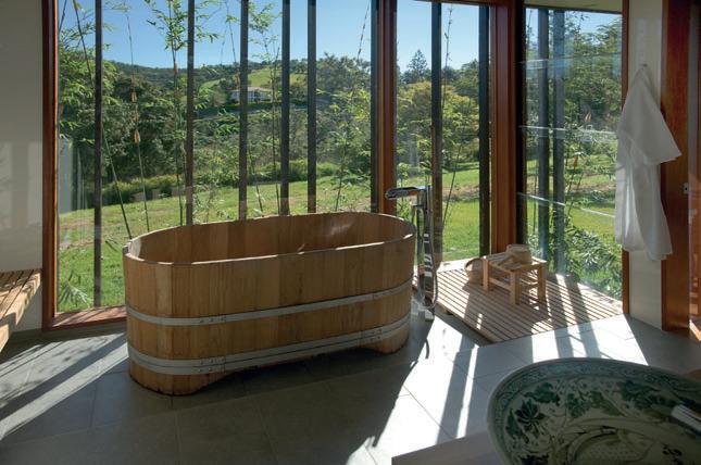

162 habitus | Issue 03 I 06 I 07
ElizabEth Watson broWn architEcts na’s house — qld, australia
the site offered. As the children approached adulthood, interior spaces came to feel more cramped and the decision was made to extend the home. The adult children now occupy the original home as a semi-self-contained unit. The new section it adjoins accommodates the family meeting zone and several ‘rooms of one’s own’ for the parents.
“As with many of our projects, we designed a collection of human-sized spaces rather than grand ballrooms,” says Watson Brown. “Many of the spaces are no more than 4 x 4m – it’s the right size for five or so people to gather – a comfortable, human size.”
The owners agree that massive scales were repellent. “We didn’t want elaborate media rooms and huge spaces – just nice neat niches for the family,” they say. “It is a house designed specifically for us, not around guests or the latest fads.”
The existing house became one of four pavilions which provide a balance of private and public spaces; of quiet retreats and convivial gathering zones. The long north-south axis of the original house extends into a new wing accommodating the main bedroom and study. Bisecting the two, and forming a roughly cruciform plan, is the main living pavilion, jutting eastwards. A double-storey pavilion of guest bedroom, study and garage is tucked into the steeper western slope. The house adjusts to the land’s contours and slopes so that each of the pavilions is separated from its neighbour by only a few steps, and long sight lines and a northern aspect are retained through the various spines of the building.
The owner, recalling the buildings of her home country of Thailand, agreed that the pavilions should float above the ground.
“I was keen to have the house rising above the ground and the air circulating under,” she says. “It’s reminiscent of Thai houses. It also means there’s an amazing integration of inside and out.”
I 05 Previous Pool
The sunken fence allows for clear sightlines to the landscape.
I 06
Bathroom
A traditional Asian mood is conveyed by the bath and connection to nature.
I 07 Plan
I 08
Master Bedroom
Clerestory windows and floorto-ceiling glass doors maintain connection with the outside
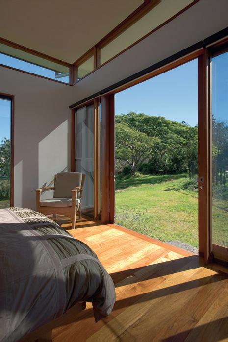
At a metre above ground, the suspended floors not only allow the house to ‘touch the ground lightly’, but also create easy access from each of the pavilions to its associated garden. Balustrades are unnecessary. The view across the pool from the outdoor dining deck is uninterrupted; a pebbled haha is a pleasing substitute for a security fence. Each of the wings of the house overlooks a courtyard or garden, and each is also afforded carefully framed views to the broader landscape beyond. The outlook to both intimate garden and broader landscape dons interior spaces with a sense of expansiveness.
Transparency also operates within the spaces, which are divided by flexible screens, sliding walls and glazing, or simple changes in
163 I 08
I The fourth wall of the building – the front façade facing due east to the ocean – has been opened up and a new dark-stained, timber-clad, steel-framed wing has been added.
levels. A study off the fireside lounge room is like a control tower, says the owner, who works from home as a Thai-English translator. s hoji screens give a choice of privacy levels. When open, there are views in all directions, including to the front entry. Other exotic remnants are seen in the Japanese timber bath and a Sukhothai ceramic basin.
Memories specific to the family’s Tokyo home were also recalled in early briefings. The kitchen was a favoured hearth. “The kitchen wasn’t large, but had a wonderfully high space, and lots of light,” says the owner. “It was where we spent most of our time together. It was the home’s centre.”
The living pavilion emulates these qualities. The long, high space houses a dining zone at one end with the cosy fireside space sunk a few steps down at the other. A granite bench straddles the two areas, providing an impressive stage for gathering the clan and cooking. A louvred clerestory floods the space with light, and enables the roof to float above.
“We had a lot of lovely conversations about aesthetics in the early days of the briefing process,” says Watson Brown. “The clients are very sensitive and knowledgeable about architecture, art, design and culture. They have a wonderful collection of treasures and artworks. We all wanted to house them well. But what was most important was to create a simple place using natural materials... somewhere for relaxation and revival.”
Furniture
Coffee table antique glass Japanese Kotatsu. Cushions silk from Doi Tung Lifestyle in Thailand. Dining table and chairs custom made in Jiyugaoka, Tokyo, in American Walnut timber. Outdoor furniture Baitong table and bench from Kenkoon, kenkoon.com.
Finishes
Floor concrete, Golden Wattle timber from Agora Trading, agora.com.au. Lagos ceramic tiles from Stone & Tile Studio, stoneandtilestudio.com.au.
Susan
Murty McKeague
Bui
Walls paint by Dulux, dulux.com.au and Resene, resene.com.au. Roof Woodland Grey Colorbond from BlueScope Steel,
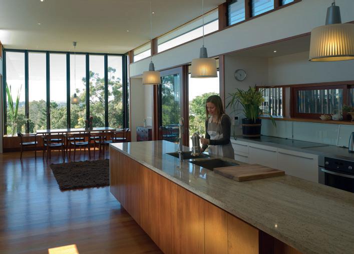
bluescopesteel.com.au.
Benchtops stainless steel and Kashmir White granite from Marbleworks. Joinery Wattle timber veneer.
Lighting
Pendants from Ikea, ikea.com.au.
Fixtures & Fittings
Kitchen mixer Gessi Oxygene Hi-Tech with pull-out spray from Abey Australia, abey.com.au.
Basins handmade Sankhalok Celadon from Sukhothai, Thailand. Bath Teak spa pail bucket tub from Suan-lum night bazaar, Thailand.
Freestanding tap and spout
Love Me by Maurizio Duranti from Elite Bathware & Tiles, (61 7) 3391 1399. Handles by Kethy, kethy.com.au.
164
I 09 habitus | Issue 03
Architect Elizabeth Watson Brown Architects Project Architects
Holden, Jaime Weber, Elizabeth Watson Brown structur AL e ngineer
L der Crocker Builders
elizabeth watson brown architects (61 7) 3870 7760 elizabethwatsonbrownarchitects.com.au
eLizABeth WAtson BroWn Architects na’s house — qLd, australia
Melbourne Showroom 285 -287 Swan St. Richmond +613 9421 1191 DeUnie Sofa & Side Table designed by Ljiljana Gazevic www.morticeandtenon.com Moroccan Screen designed by Tony Stuart Manufactured in Australia by Mortice & Tenon
Kampung quartet
In a frantic, globalised world, one is occasionally arrested by the epiphany of something familiar, much like how the stern food critic in Ratatouille was jolted back to childhood memories of his mother’s cooking by the taste of a “new” cuisine. These experiences are an evocative reminder that the world is not as ‘flat’ as hyped, and that taste is a cultivation of a treasured past. One may make a stance against provincialism, but as any weary traveller can attest, the familiar is comforting.
Singapore is often regarded as a mall city of soulless glass façades and granite corridors. This has tended to obscure its distinguished legacy of vernacular houses which are underdocumented, although books such as Lee Kip Lin’s The Singapore House and Julian Davison’s Black and White: The Singapore House 18981941 have gone some way to redress this. There are also continuing studies on the traditional Malay ‘kampung’ houses done within academia, but the better examples of such houses are today more frequently found in neighbouring countries, Indonesia and Malaysia. Collectively, however, the multi-ethnic pre-War houses form a large portion of Singapore’s heritage and serve as a point of reference in the subconscious of a generation of architects who have been raised and trained locally.
For Yip Yuen Hong, being entirely homegrown has attuned him to the specifics of the
place. After graduating from the National University of Singapore in 1987, he has worked in the offices of both William Lim and Tay Kheng Soon, two of Singapore’s major architectural thinkers and practitioners. His early work includes the restoration of old shophouses in Emerald Hill and Saunders House at a time when conservation efforts were gathering pace in Singapore. At the same time, the demise of Postmodernism was met with an unusual cultural invasion of sorts with roots from the island of Bali. This period of genuine discourse and search for what constituted an authentic culture forged in Yuen Hong a certain rootedness and empathy to place, and he speaks carefully of “memories” and “identity” as major
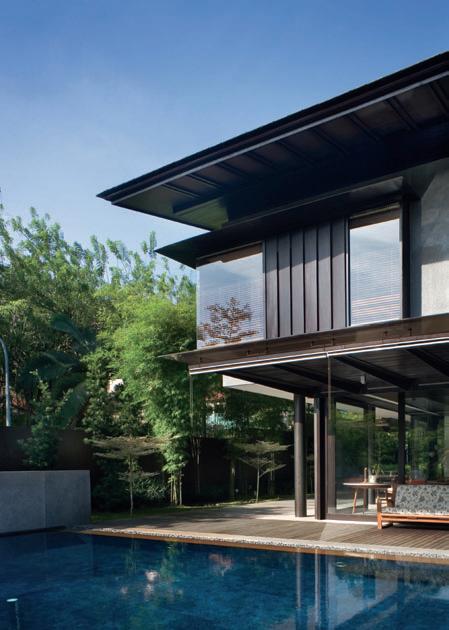
habitus | Issue 03 cross fade
166 Text Chu Lik Ren
Photography Albert Lim
I 01
I The contemporary Singaporean house is typically conscious of place. Chu Lik Ren looks at four houses by ip:li architects which reinterpret the traditional kampung house.
I 01 Linden Drive House (2005) Simple rectangular plans and generous overhangs.
I 02 Plan I 03
The main house and guest pavilion cluster around the pool.
kampung houses — singapore IP:LI ARCHITECTS
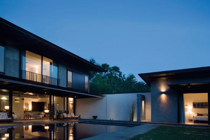
167 I 03 I 02
starting points for his designs. “At the risk of being presumptuous, I guess at some point we should ponder the question of identity and ask whether we should try to address it or if there is a need?” Little wonder, then, that one of the architects he continues to admire is Robert Venturi, whose polemical works question the basic tenet that modern architecture should be generated purely from the demands of an abstract brief, site constraints and truthfulness to materials. Like Venturi, Yuen Hong wondered if there was not more to the design of a house than a statement of universal truth.
Since 2002, when he set up ip:li architects with partner Lee Ee Lin, Yuen Hong has managed to wrestle with these issues in a singular way over a series of four detached houses. Built between 2003 and 2007, they experiment with the notion of dwelling as exemplified by the ‘kampung’ house. They are the Eng Neo Avenue house (2003), the Linden Drive house (2005), the Sunset Place house (2006) and the Cable Road house (2007).
These houses are characterised by simple rectangular plans, sweeping overhangs, timber wall panels that can be manually opened to help the upper floors breathe, living rooms
that extend into large shaded patios, a virtual absence of walls on the ground floor and the brooding presence of dark timber – almost his trademark running through these houses. The interiors are, however, kept bright and spacious with light wells, white curtains and white ceilings. They are almost never air-conditioned, practically maintenance-free, and sustainable at a time when it was still not fashionable. Poised somewhere between Minimalism and Regionalism, they are distinguished by the conspicuous absence of the gestures one has come to associate with contemporary design –the double-volume space, cantilevered floors, the pre-eminence of solid walls and the inordinate use of glass. But such a hard-nosed survey would have missed the point, and the point here is the modest, poetic serenity that these houses exude. A large part of their appeal is how they conjure up the domesticity of a ‘kampung’ house and the sense of being lived in. They are not out to awe but to put one at ease with a laid back, even ‘old-world’ charm.
Ironically, the first of these houses almost did not happen. The clients for the Eng Neo house had asked Yuen Hong to design a “Balinese house” and Yuen Hong said no.
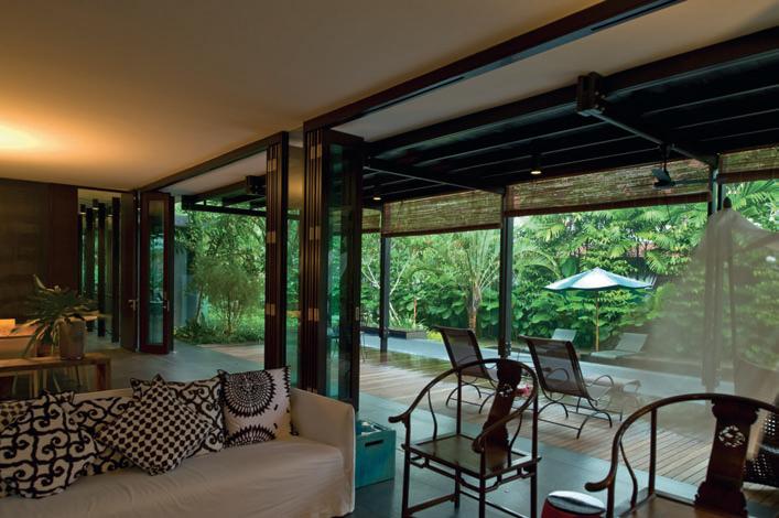
habitus | Issue 03
168
cross fade
I 04 I 04
(2007)
I 05
I 06 Plan
Cable Road House
The living area connects with the timber deck and pool.
The pool is a metaphor for the river.
kampung houses — singapore
IP:LI ARCHITECTS
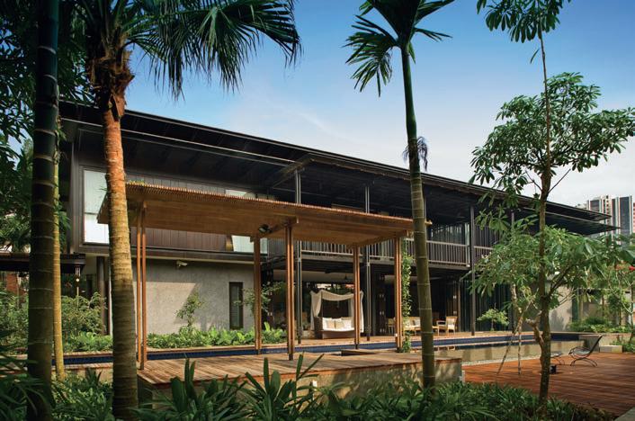
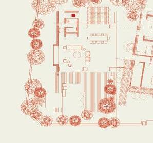
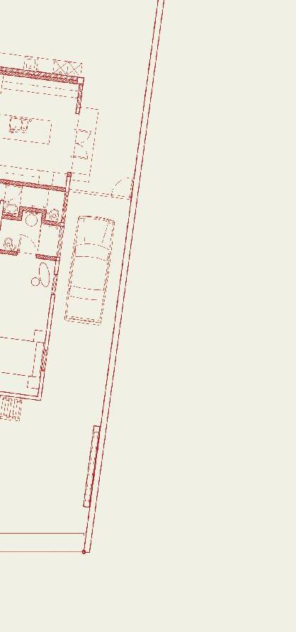
169 I 06 I 05
“The reason is that we’re building in Singapore, not Bali,” he says. As it turns out, he was not only appointed as the architect, the commission would prove to be the start of an engaging pursuit of a central theme: the question of what is an appropriate language for a modern house in Singapore. “In these houses it’s back to simple, basic living, away from the ‘noise’, too much technology and too much fashion, a direct relationship with earth, rain, wind, sun, trees... in urban Singapore! I also wanted to search for some relevance in terms of a vernacular architecture – if not just in Singapore, then at least of the region. I know this sounds a bit pompous and self-righteous, but that’s what I’m after.”
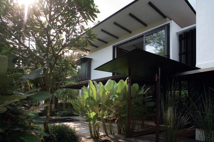
Speaking of a subsequent house at Sunset Place, Yuen Hong is almost pure Heidegger: “When what is around us is emphasising so much on making a statement, of what is fashionable and of breaking new ground, I just want to remember that in most homes, there could be memories of grandparents that one wants to keep, the father and mother with their sons and daughters that they want to provide for in the future. Hence, in this house, I hope to look to the future, but not forgetting the
past.” At 395m², Sunset Place is the smallest of the four houses here, and the only one without any sort of water feature or pool. Yet, it bagged the Singapore Institute of Architects’ Design Award in the highly competitive Individual House category in 2006. Sunset Place is Yuen Hong’s homage to the traditional Malay house. “This house is a ‘kampung’ house on stilts, with an open public space on the ground that extends to the outside world and a private space that is heavily veiled on the upper floor so that there is a sanctuary for one to retreat to. There are two-metre overhanging roof eaves to keep the harsh afternoon sun and driving rain out. It is also deliberately built in low scale with low ceiling heights so that the trees and house will be one eventually.”
The last phrase is a recurring one in Yuen Hong’s conversation. In these houses, there is clear restraint on the part of the architecture to impose itself on the landscape, such that one is a compact, stand-alone entity and the other a borderless compound. This has as much to do with the sociological needs of the house as with respecting and maximising the landscape. It once again harks back to how spaces were used in a ‘kampung’ house, of how the generations
habitus | Issue 03 cross fade 170
I 07
I 07 Eng Neo Avenue House (2003) Passive cooling is provided by overhangs, crossventilation and luxuriant vegetation. I 08 Plan I 09 Informal living tumbles easily from inside to outside.
I “I also wanted to search for some relevance in terms of vernacular architecture – if not just in Singapore, than at least in the region.”
kampung houses — singapore IP:LI ARCHITECTS
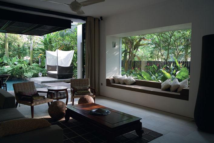
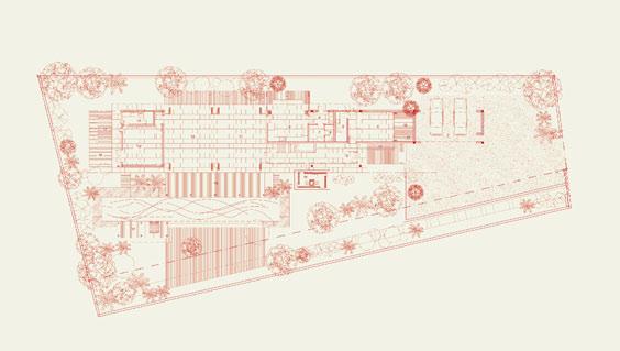
171 I 09 I 08 1. Driveway 2. Garage 3. Entrance 4. Guest Room 5. Guest Bath 6. Utility 7. Maid’s Room 8. Maid’s Bath 9. Dry Kitchen 10. Wet Kitchen 11. Dining Room 12. Living Room 13. Bedroom 1 14. Bedroom 2 15. Powder Room 16. Patio Terrace 17. Pond 17 16 13 12 11 10 15 16 16 17 17 17 9 6 7 8 5 3 4 2 1 14
kampung
would interact in a central living space which reaches out horizontally to adjoining rooms and the gardens. In rare cases there is an upper floor to a ‘kampung’ house, zoned for unmarried daughters. This is the ‘heavily veiled’ upper floor that Yuen Hong alluded to. The home is a cycle of routines and rituals and a compact setting like the Sunset Place house helps to perpetuate them at a leisurely pace.
For the house on Cable Road, Yuen Hong comments: “This house is both modern and old-fashioned. It yearns for an era where life was slow and relaxed, of quiet contemplation and good conversation. It also possesses a modern spirit as it satisfies the basic functional and utilitarian needs of the owner while forging a relationship with the sun, rain, wind and trees of this region. They have a vocabulary that allows a direct involvement with the inhabitants. Kampung houses allow additions and alterations as and when the need arises and they still look right. And that’s what life is about, constant changes.”
One of the indelible memories I have of the Cable Road house is the white-cushioned swing chair on the patio. It completes the house in a way that a hammock under a leafy tree
completes the image of the ‘kampung’ house. As with all his houses, Yuen Hong designs the total environment and that includes choosing all the furniture and blinds, recommending which hand-me-down furniture is to be kept and which is to be discarded. He has a commendable body of work as an interior designer and is well aware of the sensory potential of materials. Of the Cable Road house, he says: “It has a balcony with a timber floor (as distinct from timber finish on RC floor for main house), to relish the joy of a live, moving, giving and sometimes creaking floor. I tend to use honest and almost cheap materials. Building in Singapore is so expensive and can be so wasteful. Here we have rusted steel (when mild steel was still cheap), recycled timber, metal-deck roof, wooden staircase treads used as window panes, and so on.”
With the Cable Road house, Yuen Hong feels he has come to the end of a particular cycle of exploration. A new study model in his office offers some clues to his forthcoming direction. It resembles an old plantation house of the kind one would encounter in old Louisiana or early Singapore; all the spaces are compacted under a massive hipped roof. The mind is intrigued with the
I 10
Sunset Place House (2006) The screening simulates traditional timber shutters.
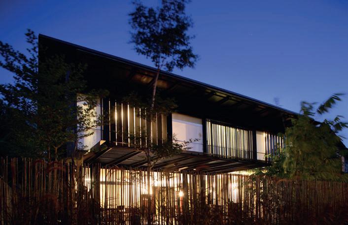
I 11
Plan
Replicates the lay-out of the kampung house.
I 12
Private Space
Is created by the louvred screen.
Finishes
Similar finishes are used throughout the four projects
Steel rusted mild plates coated with epoxy. Walls Balau timber. Floors Chengai timber outdoor and Teak parquet strips indoors. Concrete off form with rubber wood formwork. Roof corrugated metal with heavy duty insulation for heat and noise of rain. Paving granolithic pebblewash and cobblestones. Stone homogenous tiles and granite.
habitus | Issue 03
172
cross fade
I 10
houses — singapore iP:Li ARChiTeCTs
possibilities – perhaps one will re-discover the benefits of the stack effect, or will we see exposed timber trusses crafted with ingenuity? Yuen Hong is reticent for now. “Perhaps it looks a bit old fashioned, but I happen to love pitched roofs,” he says. “My next few houses will explore them a bit further...” But he does add that, although the form of these houses is his preoccupation, the house is still fundamentally about its inhabitants. “I do believe that design is for people. We create so that people can have a better life regardless of whether they have modest means or abundant resources. My purpose is to be there for them. I want to help them live their dreams. I want them to be happy and find themselves with what I create with them. My job is to create an appropriate frame for them so that they can be inspired to make a masterpiece of their life.”
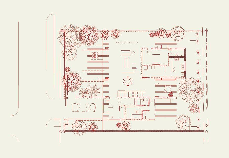
ip:li architects (65) 6536 9881 ipli architects.com
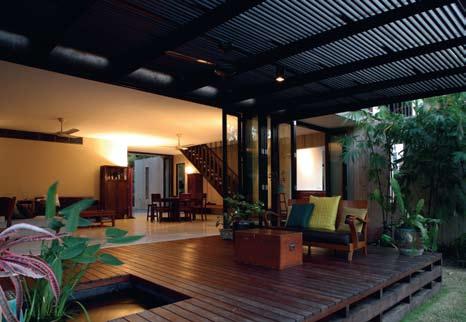
173 I 12 I 11
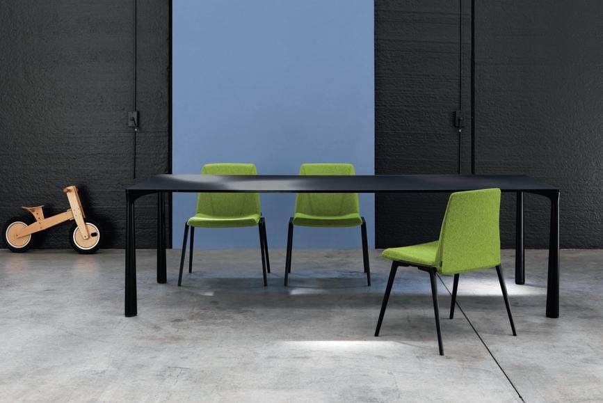
Theatre in Little India
Home, for Colin and Joy Seah, needed to be a retreat from the city and a very busy work schedule. Jointly running the spatial-design practice, Ministry of Design (MOD), the Seahs wanted to be in the heart of the city, yet able to withdraw to find peace and renewal. Their apartment provides intimate settings for simple daily routines, elevating living to an art form.

Like much of the population, the Seahs grew up on a housing estate outside the CBD. As a young couple buying their first home, they preferred to be close to their office in Chinatown and the activity of the city. The government had recently opened up plots of land in Little India, building several new apartment blocks.
As the historic and cultural centre of Singapore’s Indian community, Little India is full of local businesses, temples and shopfronts. They coexist to create a wonderfully diverse and colourful neighbourhood. Seah and his wife Joy were drawn to this character and purchased a top-floor apartment on Klang Lane. Changing the standard interior to suit their needs was an opportunity for Seah to test highly conceptual ideas within a residential brief.
175 habitus | Issue 03
director’s cut seah apartment — singapore Ministry of Design
Text Andrea Stevens
Photography Simon Devitt
I 01 I 01
I By dramatising spaces for the everyday rituals of life, Singapore architect Colin Seah redefines apartment living. Andrea Stevens visited his own apartment, which is a convenient retreat from the bustle of the city.
Study
Swathes of curtains lend a dramatic air to everyday spaces.
Colin set up MOD in 2004 and his avantgarde design soon attracted significant commissions, most notably the Sho U restaurant and New Majestic Hotel in Singapore. Both went on to receive international acclaim. “We have an ethos to question, disturb and redefine. So style and issues of that nature come very secondary to issues of ‘How do we reinvent typology? How do we recontextualise something?’”
Theatre became the conceptual basis from which the interior could be re-created at will. They demolished as many walls as possible and ground back surface finishes to reveal the concrete shell. This neutral background is the stage against which changing settings and atmospheres play out. This allows for not only daily cycles, but also for long-term evolution in personal tastes and collections. Much of the character of the apartment is created by fabric, lighting and objects, which can be completely and easily substituted without expensive structural work.
The theatre metaphor also offered a way to dramatise the experience of everyday rituals. As a young couple buying their first home, everything felt so new and exciting. “I felt life was so precious, there was a desire to celebrate every single gesture whether it was just the banal act of cleansing, sleeping, lounging, cooking or whatever.” Moody lighting, dark colours and theatrical thresholds serve to heighten this experience.
From the lift lobby, entry is onto a raised catwalk that travels down one side of the living space. This zone has the greatest flexibility and has been rearranged many times. From the catwalk, the kitchen can be accessed to the right, while to the left, a meandering route takes you through the dining space and towards the bedroom. Finding the bedroom, however, is another matter. Like backstage in a theatre, heavy curtaining obscures what lies behind. “The funniest thing,” says Seah, “is people who have no trouble finding their way around a busy city, but get lost in the bedchamber. They forget which curtain they came through, they try to walk out through the wardrobe!”
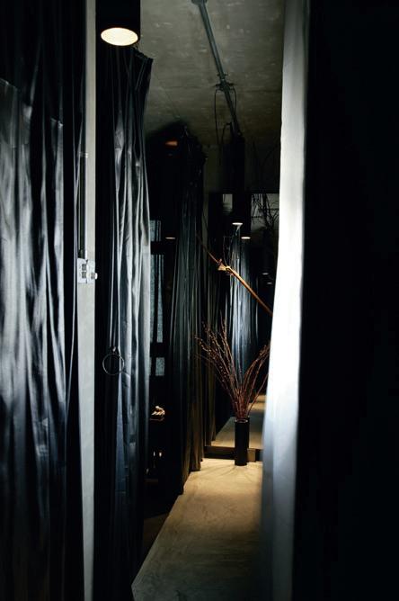
seah apartment — singapore Ministry of Design 176 habitus | Issue 03
I 02
I “I felt life was so precious, there was a desire to celebrate every single gesture...”
–
COLIN
I 02
Catwalk
Hallways become ‘catwalks’ punctuated by exposed cables.
I 03 Opposite Floor Plan
Creative planning gives the illusion of more space.
I 04 Opposite Living Area
The living area has been rearranged numerous times since the couple moved in.
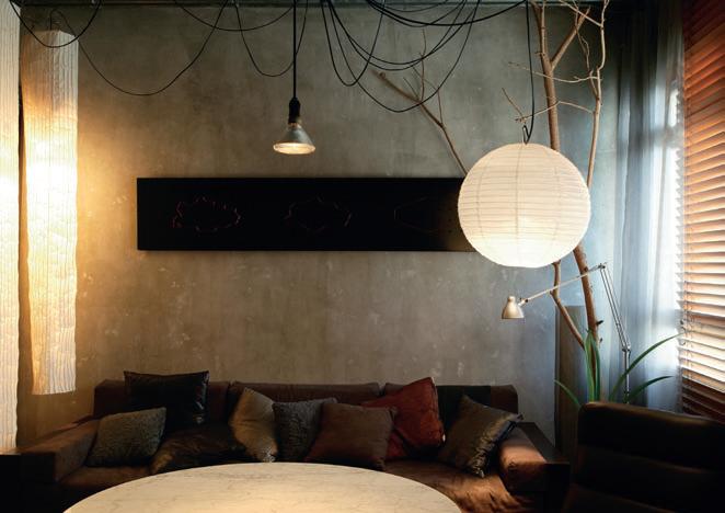


177 I 04 I 03 1 Entry Catwalk 2 Flexible Living Space 3 Study 4 Wardrobe 5 Bedroom Catwalk 6 Make-up Area 7 Bed Chamber 8 A/C Ledge 9 Bath 10 W.C. 11 Laundry 12 Kitchen 13 Bar Counter 14 Pantry 3 3 4 4 1 2 9 10 11 12 13 14 8 5 7 6
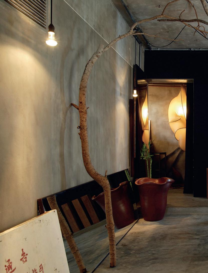
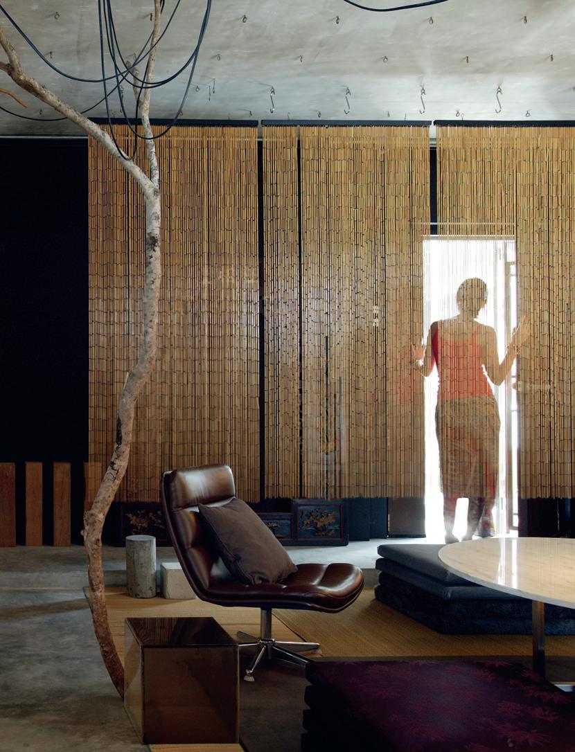
I 05 Previous Living Area
Polished concrete floors and walls create a neutral backdrop throughout.
I 06
Bedroom
Cloaked in black fabric, the bedroom becomes a cocoon.
I 07 Entry
The apartment’s front door leads to a catwalk alongside the main living area.
I 08 Opposite Bathroom
The concrete finish is used throughout the apartment, through to the bathroom fixtures.
I 09 Following Study
The study wing is divided into two adjoining areas.
Architect
Ministry of Design
Design Architect
Colin Seah
Buil Der
Interior Composite
Ministry of Design (65) 6222 5780 modonline.com
Finishes
Floor concrete. Upholstery, curtains, lights and partitions from Bangkok Chinatown.
l
ighting
Custom-made by Ministry of Design, modonline.com.
Fixtures
Bathroom from Sim Siang Choon, simsiangchoon.com.
Throughout the living zone, ceiling hooks allow for lighting, art objects and screens to be located almost anywhere. Electrical cables hang down as sculptural objects. Most of the furniture is custom-made and modular so it can be moved to create a different setting for events such as a birthday parties.
As a retreat in which to relax and unwind, a palette of rich, earthy colours was selected. Curtaining is used extensively, softening edges, filtering sound and light. The fabrics can also be pulled across openings to act as room dividers. Around the perimeter they conceal shelving and act as a textural backdrop. They veil, screen and mystify, creating a subtle spatial layering.
The bedroom is completely cloaked in black fabric, creating an incredibly dramatic atmosphere. “It is the most sacred, the most private space,” says Seah. “Once you close all the curtains behind you it is literally just a bedchamber – no views to the outside, it is like a cocoon.”
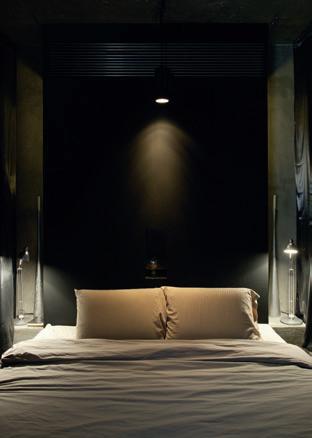
The apartment is just over 80m 2 , yet it seems much bigger. A visual depth is created by vertical elements. Catwalks and fullheight mirrors give unexpected views. All these devices combine to create a sense of disorientation, blurring edges and increasing the perception of size. Seah says friends often overestimate the floor area by 25 to 50%.
Furniture and sculptural lights were designed by MOD and made specifically for the apartment. Objects have been collected over time and find a natural home within the space, rather than from any orchestrated approach. Seah loves finding objects around the city and in the markets. An abandoned sign creates a beautiful ready-made artwork. Its cracking paint and pictograms look so poetic, yet it reads: “Warning. Don’t park here. The Management.” Similarly, fallen tree branches were hauled back to the apartment and installed indoors for their beautiful sculptural qualities. “It’s a little bit like a work in progress. If things around them don’t work anymore, we readjust them and fine tune.”
The Klang Lane apartment is a place of contrast – restrained yet luscious, industrial yet romantic, inwardly oriented yet set in the city –a stage against which the art and beauty of life can be expressed.
habitus | Issue 03 180
I 06 I 07
Ministry oF Design
I The character of the apartment is created by fabric, lighting and objects, which can be easily substituted.
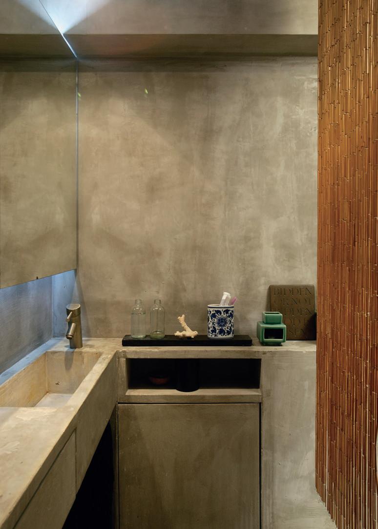
I Furniture and lights were designed by MOD and made specifically for the apartment.
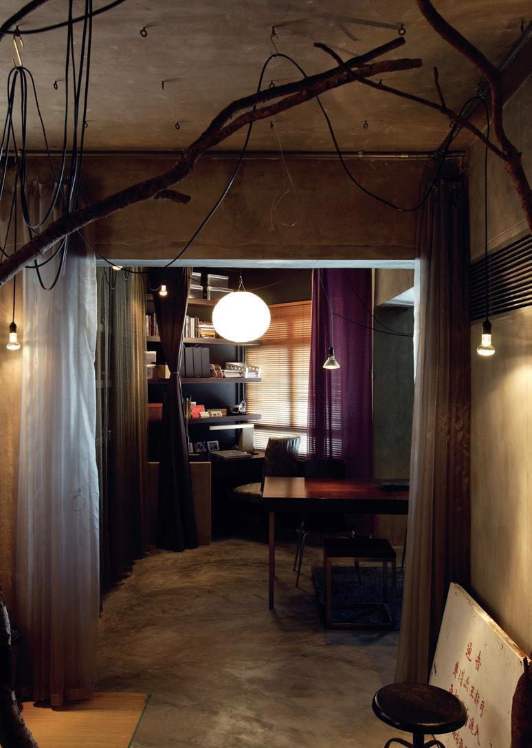
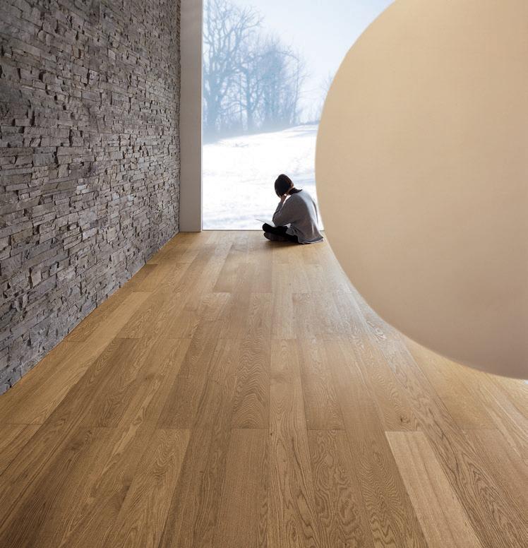

showroom 188 chalmers street surry hills nsw 2010 Sydney telephone 02 9690 0991 facsimile 02 9690 0992 precisionflooring.com.au
Sign language
t his is almost the ultimate Green House. is it as fully green as it appears?
Michael: Compared to the mud brick house covered in solar panels it isn’t as green. It uses passive solar principles, has water collection tanks. But this house sends a message from a symbolic viewpoint – that within an artificial jungle, you can create a viable alternative. Its other sustainability attraction is the home/office housed in a very economical container with a small footprint.
So what are the principal green strategies?
Cat: The basics – such as orientation –help overcome the need for the usual artificial heating and cooling. Double-glazing, for example, means we don’t run the heater all day. In winter it might be on for a few hours in the morning and evening and that’s it. We never need lights on during the day. There’s also something about the façade print that has the emotional and psychological benefit of occupying a green leafy environment.
one of the consequences of building light and stepping back from thermal mass is that you expose yourself to greater internal temperature fluctuations.
Re-charged inner city locations are all the rage in Australia’s inner suburbs. Pastiche abounds in the world of re-development. Originality and authenticity are in comparatively short supply, but vital to the oxygenation of old streets made new again. Bellemo and Cat’s fibreglass walled home/ studio in Northcote, Melbourne, expresses street art and presence in its neighbourhood of red-brick Victorian-era warehouses.
Cat: When the house was unveiled and I saw the cladding, I remember thinking it was so beautiful it could as easily be a jeweller’s shopfront in Zürich as a home/office in a Melbourne laneway.
Do you regard the house as sculpture or architecture?
Cat: We see it as a billboard for our practice and as a two-dimensional painting that’s wrapped as an image or a painting we’ve made for ourselves. Because the image goes around corners and becomes three-dimensional, from that point of view it becomes sculptural.
there’s an interesting narrative to the design. While most houses have a front and back door, this has an office door and side residential door. that’s a hint of the radical design.
Cat: It’s not a Venetian palace, of course, but it has similarities from the outside. There is some elaborate detailing, not formal but decorative, with cornices and curlicues. You enter on the ground floor and it’s virtually empty. The ground floor is always on the first level. Here the services, garage and office are at ground level, but upstairs there is garden and main living space to capture views and sunlight. Australian houses usually put living areas downstairs.
How important is it for you to pursue the prototype rather than the stereotype?
Michael: Very. I think we would be scared of producing a stereotype of our work. The design should express the clarity of an idea that still looks like an idea. I couldn’t imagine Cat and I repeating the same old thing. Every project we do is an experiment in some way. Life’s too short to do otherwise.
Michael: If the upper level had a concrete floor, that would further stabilise temperature. But having said that, we achieve pretty good results with insulation. We’ve over-insulated the ceiling, floor and walls and that’s one reason why it works so well. The other is that it’s north facing with a decent overhang/awning that shades the living spaces in summer. There are also louvres for cross-ventilation and a ground floor concrete slab that invites a good flow of cool air throughout summer.
Did you have a real sense of risk-taking?
Cat: When we showed our plans to build a family home and office we received all kinds of gasps. My mother’s response was ‘Yes, well you’re very clever’, meaning that you will need to be because this is not an obvious home or office site.
Well, what you have done is to create this quite large play-house. t here is this real sense of adventure that carries right through from the design idea to the spatial experience.
Cat: The local kids definitely see it as this huge playhouse. They also see it as a cool house to hang out in. We had a group of 20 in here on the weekend and they were definitely very excited about exploring the place. Maybe there is something about seeing the colour and print that they think this is somewhere where they can break all of the rules and do all of the
habitus | Issue 03 director’s cut 184
Text & Photography Peter Hyatt
Bellemo & Cat bellemo & cat — viC, australia
I Working together, working at home? A green or grey outlook? Everyone has a different solution.
Peter Hyatt talks to architects and partners, michael Bellemo and Cat mcl eod, about their solution in suburban Melbourne.
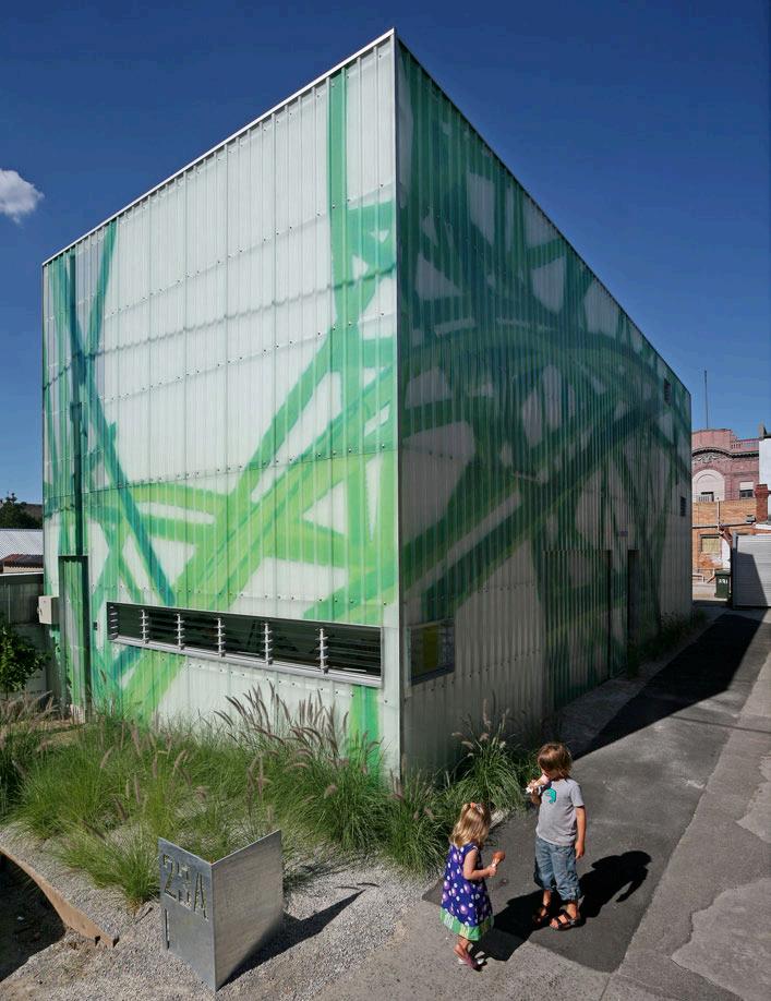
185 I 01
things they can’t do at home! While that’s not true, they do seem to see the house as a big adventure.
How did council respond?
Michael: We had no problem, especially because this part of Northcote is designated as an Arts precinct. It’s really just a modern warehouse exactly like all of the others built to the boundaries and it’s straight up and down.
One of your early projects was the wellpublicised Pod House on the coast. What did that teach you – especially in terms of skin?
Michael: We’re just as interested with how a house should appear from the outside as from the inside. That comes back to whether it’s sculpture or architecture. The context of the object is vitally important. What does it look like when you come around the corner? That matters to us because we both work as public artists.
It seems that Japanese architecture is a big influence with regard to skin which is almost paper thin. The fibreglass skin is translucent and luminous of an evening and lustrous by day.
Michael: Shigeru Ban is a great Japanese architect, but I wouldn’t say it was uppermost in our minds with regard to influence. We make a point of reading very little media that might influence how we might approach a project. Of course we look at them, but we don’t search them out. Humanism is important.
It’s a great example of being considerate to the street. It might say ‘Look at me’, but it’s not ‘Me, me, me’. Even residential design can be generous and provide social enrichment.
Cat: It’s an interesting point because our neighbours love it. Most of them say: ‘You must have done it for us.’ We’re definitely interested in the idea that it will be viewed and experienced by neighbours. We were quite conscious that we were going to build directly in front of the neighbouring property to the south. What that meant potentially was an overshadowing. By using web-glass we draw a lot of light right through the building and that then cascades out the other side into the laneway and onto their property.
Were you the dream clients?
Cat: We allowed ourselves to spend the money on the outside of the building. In practical terms it was quite unnecessary because we were almost broke. But we put the money into it. We would find it hard to convince a client who was struggling with budget to go to those lengths to support our ambition or vision. Our view was we won’t have a bathroom, but we’ll have the art. So you do what’s important to you.
I 02
I 01 Street Frontage
The light-refracting exterior skin.
I 02
Work Zone Office space is easily accessible on the ground floor.
I 03 Living Areas Split levels offer light and air.
I 04 Outer Space
The childrens’ play area – a slice of urban fun.
I 05
Upstairs/Downstairs
Continuous flow of zones created with staircases uniting all the spaces while still allowing for separation.
Are you obsessive?
Cat: Yes, because it means that you’re driven doesn’t it and you’re driven by what’s really important to you. This is a ‘look at me’ house from that point of view. But we’ve done it because it’s important to us. We’re nice and kind to our neighbours, but we’ve really done it to enliven our own lives and it’s really made this house very beautiful.
This house was built as much as an adventure house for our kids as our love of building. Eventually, when the kids grow, we will move on. But it could just as easily be a design studio here with a boardroom where the master bedroom is. Were we to stay here, it’s been designed to allow an extra level. So there is that flexibility.
habitus | Issue 03 186
bellemo & cat — vIc, australia BELLEMO & cAT
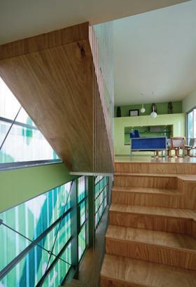
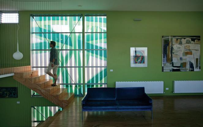
187 I 04 I 05 I 03
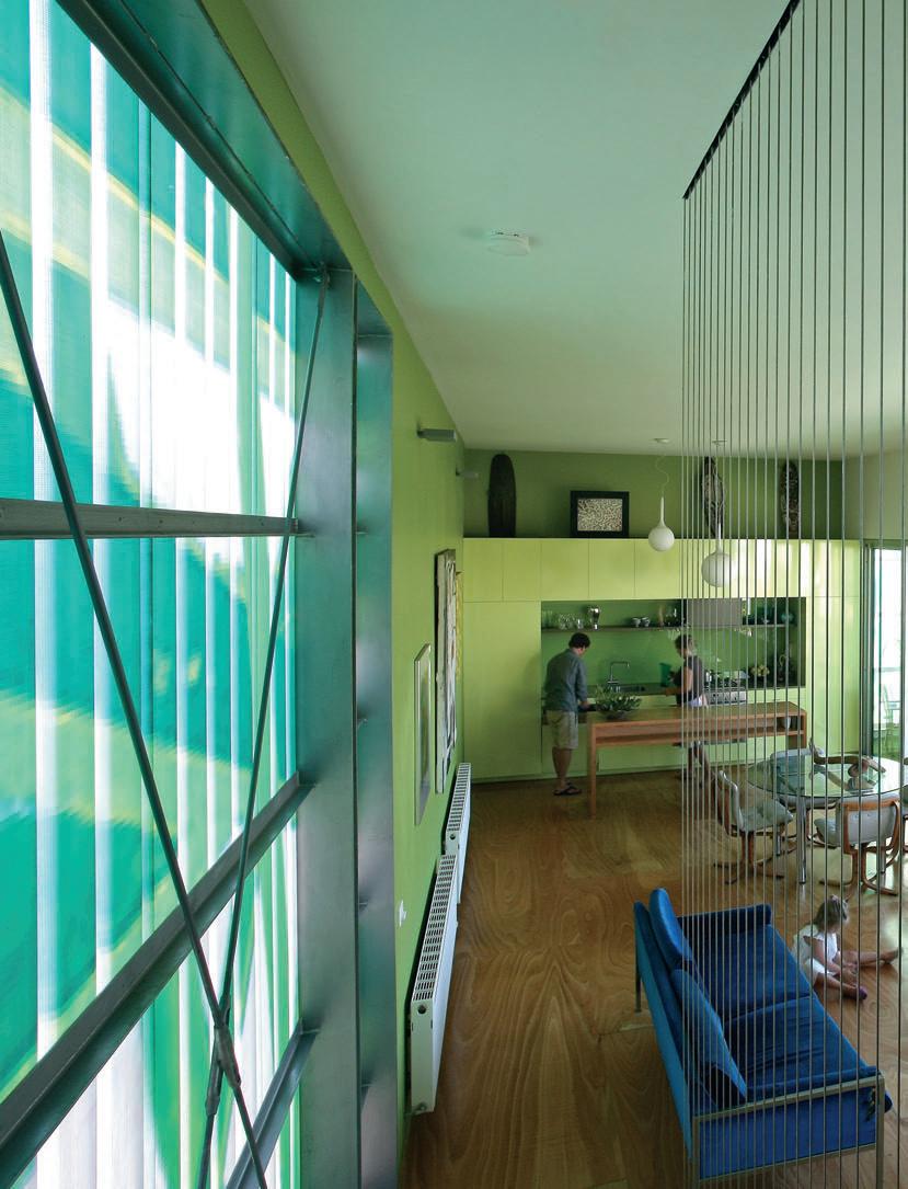
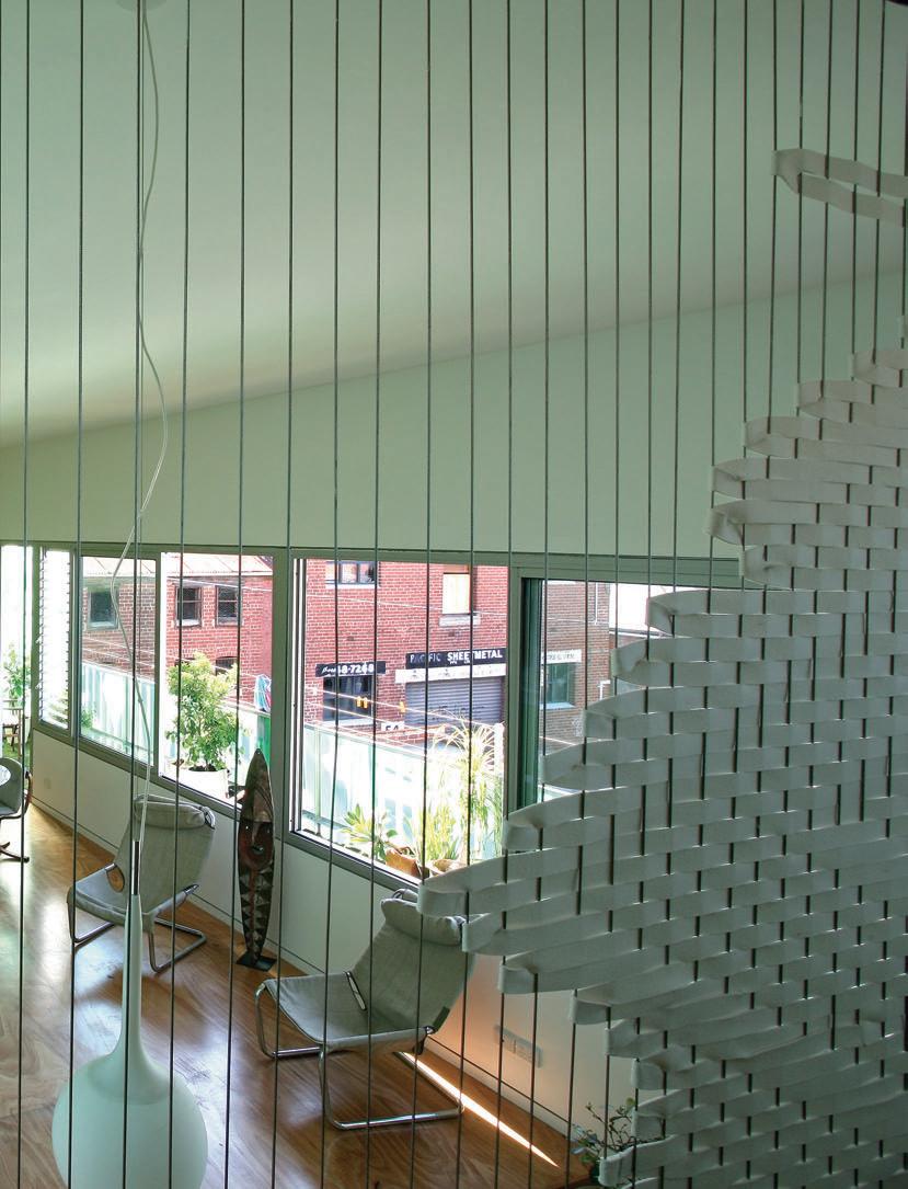
Was there the moment of elation when you opened the champagne?
Michael: The most exciting time was seeing the pixel print of the fibreglass sheets and we could read the surface and visualise the completed skin.
That’s the thing isn’t it? When you build a house, the foundation work is really just like pulling on your underpants. It feels okay, but you really want the wow factor and that happens when you put on that final layer that, with some luck, people will notice.
Cat: You got it!
Do you prefer to design on a sheet of paper or computer screen?
Michael: We almost never do the initial concepts on computer. We almost always do drawings and make models.
Is it simply more intuitive?
Cat: On a recent project we did sketch up on a computer and it all came together quite quickly and easily. We stepped back from it and looked at each other and asked: What has that got to do with anything? We took it to our clients, told them we didn’t like it and asked them if we could start again from scratch. It hadn’t felt like ours and quite frankly any one of 10 practices in Melbourne could have come up with that design.
Who’s the moderating influence between you?
Michael: Everything that comes out of this place is collaborative, whether it’s a model or a drawing.
Cat: We both have a bit of that. We’re probably likely to say: ‘Honey you haven’t gone far enough’.
ArchI tect Bellemo & Cat
c oll A bor Ator/Assoc IAte
Des Igner
Michael Bellemo, Cat McLeod, Ashley Every structur A l e ngI neer Felicetti
c onstruct Ion M Ater IA l Corrugated fibreglass with print of firms design Are A 155m 2, deck 27m 2
b ellemo & c at (61 3) 9489 5812 bellemocat.com
A rt Wor K Lounge room, left lithograph by Sonia Delaunay. Lounge room, right ‘ Stony Ridges’ painting by Graeme Altman.
Furn I ture
Chairs vintage timber and leather from JR Furniture, (61 3) 9809 1180. Sofa vintage Australian from garage sale. Table vintage chrome and glass.
FI n Ishes Floor Alpine Ash Plywood from Big River Timbers, bigrivertimbers.com.au.
Kitchen walls plasterboard with Persian Belt Paint by Dulux, dulux.com.au. Kitchen splashback glass from Design Inferno, designinferno.com.au.
Kitchen, bathroom, ensuite, laundry and children’s joinery Lemon laminate from Amerind Laminates, amerind. com.au. Benchtop Sage Quartz from Caesarstone, caesarstone.com.au.
Bathroom walls gel coat Webglass from Ampelite, ampelite.com.au. Bathroom and ensuite floor white matte ceramic from Classic Ceramics, classicceramics.com.au.
Children’s joinery Lemon laminate from Amerind Laminates. Feature wall divider designed by Cat Macleod in felt from JJ Davies, jjdavies.com.au.
lIght I ng
I 06 Previous Kitchen/Living
The spacious open plan enables relaxed family living.
I 07
Bathroom
Colour panels brighten from within.
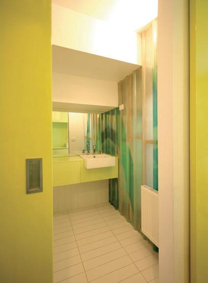
I 08
Inside/Outside Windows open fully to blend with the exterior spaces.
I 09
Ground and Master Bedroom Levels Plan
Kitchen suspended Castore from Artemide, artemide.com. au. Kitchen wall mounted Platform from Inlite, inlite.com.au.
FI xtures/ e quIpMent
Kitchen bin slide-out twin bin in chrome from Parbury, parbury.com.au. Door and joinery hardware from Designer Doorware, designerdoorware.com.au.
Oven and cooktop Neff from Elite Appliances, eliteappliances.com.au. Sink Abey Select from Abey, abey. com.au. Tap Gessi Oxygen from Abey. Dishwasher Bosch from Elite Appliances.
habitus | Issue 03 190
I 07
bellemo & cat — vIc, australia belleMo & cAt
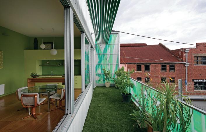


191 I 09 I 08
A place in the sun
I Twice a year, artist and filmmaker Tracey Moffatt swaps her Manhattan studio for a spell of sun and salt air back home in Queensland, australia. Margie Fraser visited her Australian home and found the more relaxing counterpart of her very contrasting environments.
Her Chelsea apartment, in the heart of New York’s art precinct, is so small Tracey Moffatt admits to “going crazy with lack of space”. Fire engines are ever-present in the soundscape of the street below. “Woody Allen is sentimental about them,” she says, “and calls them New York’s lullaby.” Inside, the loft-cum-working studio has high ceilings and exposed beams, but “not quite enough room to make art”. For her current work in progress, the “Plantation” series, Moffatt is on the train to Brooklyn each morning to a place where she can print old negatives of a “mysterious landscape” that she shot more than 12 years ago.
Memories of childhood beach holidays and a hankering for the relaxation were revived when Moffatt spotted a house for sale at Castaways Beach just south of Noosa. The landscape has its own resonance. The windbent banksias, pounding surf and highways of bleached sand are a long way from Chelsea. But the crowning glory was the house on the block – a modest lightweight beach house from the stable of local architect Gabriel Poole. This detail was the clincher for Moffatt.
“I was homesick for the Australian nature I grew up with – long hot summers spent on
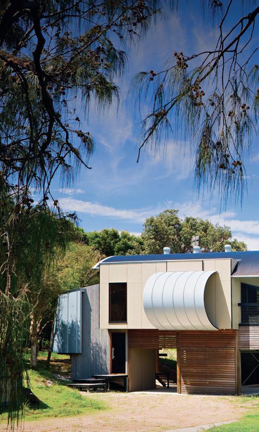
192 habitus | Issue 03 home
movie
Text
Photography Christopher Frederick Jones
Margie Fraser
Gabriel Poole castaways beach — QlD, australia
I Discussions in a local restaurant embraced Moffatt’s idea that the house’s shape be reminiscent of a gun pointing to the ocean.
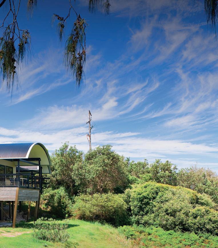
193
castaways beach — QLD, australia
I 01 Previous Home Exterior Gabriel Poole’s gun-shaped design.
I 02
Kitchen/Balcony
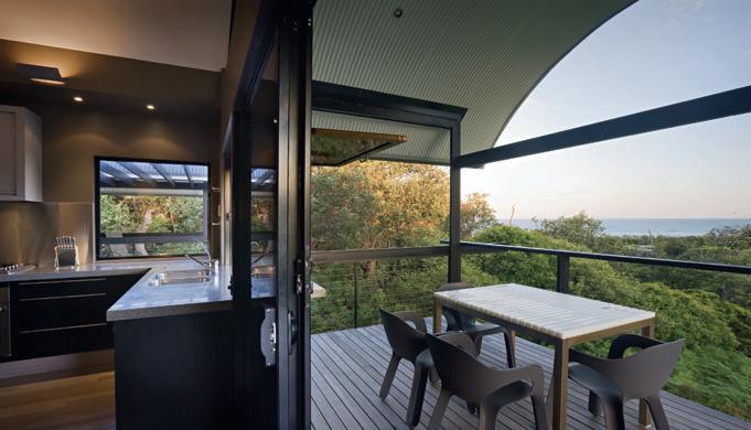
Tracey enjoys views to the sea from her kitchen sink.
I 03
Artist and filmmaker Tracey Moffatt with local legend, architect Gabriel Poole.
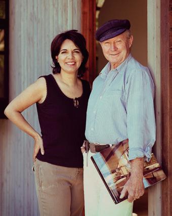
Photography by David Matheson
I 04
Eastern elevation
I 05
Under the Sun of Scorpio, Georgia O’Keefe, 2005 by Tracey Moffatt.
Bribie Island and the Sunshine Coast, with the freedom of roaming barefoot all day. I couldn’t believe it when I found a Poole house for sale by the beach. I jumped at the chance to get it.”
In Moffatt’s galaxy of architecture idols, Poole commands a starring role. The house, however, had seen better days, and Moffatt became entranced by notions of “a shiny new kitchen and shaded deck, since I’ve always lived the artist life in shabby rentals.” Gabriel took the old house away on the back of a truck. “He and his wife Elizabeth painted it red and fixed it up so well that I am secretly jealous!”
A new house was commissioned to replace the old. Discussions with Gabriel and Elizabeth in a swanky local restaurant embraced Moffatt’s idea that its shape be reminiscent of a gun pointing to the ocean. Poole made a clever sketch – on a table napkin of course – of the home’s distinctive shape. The trio had met before through mutual friends in the art world. Elizabeth is an artist as well as representing “half the architecture practice as a brilliant colourist and smart designer,” says Poole.
Moffatt claims to “love and adore Mr Poole. He is a true artist and a total original –he lives for his work. He also has a temper and explodes, which is so refreshing.” Poole says he “always knew Tracey was a bit crazy, but then she knows I am too...”
194
I 02
I 03 habitus | Issue 03
GabrieL PooLe

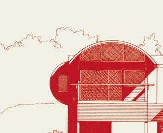
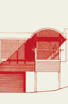


195 I 05 I 04
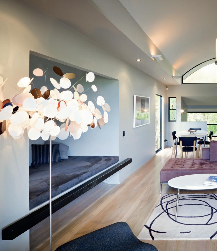
196
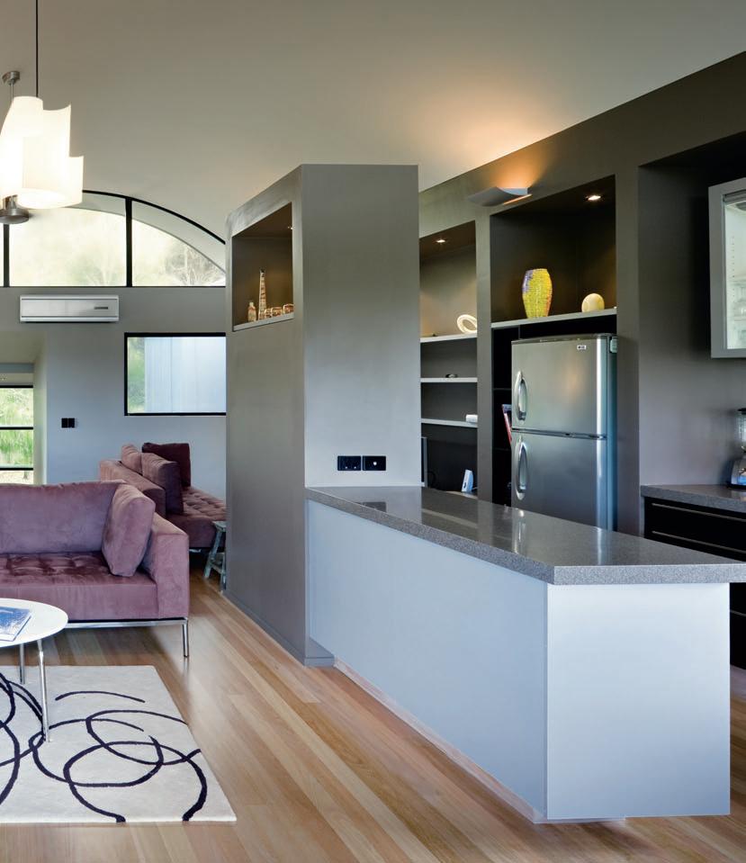
197
castaways beach — QLD, australia
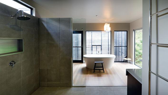
198
I 07 I 08 habitus | Issue 03
GabrieL PooLe
Moffatt requested a large open space with a table for her art, and a day bed for naps and reading. Initial ideas of a grander scale were reduced by Poole, who has long been an advocate of the small footprint. “The house is built on a small scale and as economically as possible,” he notes. He convinced Moffatt that two bedrooms rather than four were sufficient, placed the day bed in the curved loop (aka the gun barrel) pointing to the ocean, and told her to leave the garden unkempt. Why waste time and water on cultivating a decorative garden when you can cook, read, and engage with loved ones instead? Moffatt has embraced all this and loves the way the house regularly fills with her “delicious nieces and nephews” who scream with excitement and run in and out.
“I’ve had 12 family members stay at a time and it doesn’t feel crowded. I wash dishes facing the ocean and whales glide past in winter.”
The Pooles had meanwhile become disenchanted with the Sunshine Coast. After years of hard slog at establishing a distinctive and responsible architecture for the region and nurturing their own progeny of innovators, they came to deplore the greed and ostentation which they believe now consumes the region. Moffatt’s house is perhaps the last of a dying breed.
“I deplore what’s happening in architecture today with clients demanding huge houses as a means to demonstrate their importance to others,” says Gabriel. “They’re coming to grief, and so are the architects. We’re not meant to be acting as sculptors –we’re meant to design houses. People have to go back to being in houses they can afford.”
The couple upped stumps and headed back to the bush, this time to the small inland township of Toogoolawah. “It’s a bit like going home,” he says. “Lizzie was born and bred in the bush, and I spent many years in it as a jackaroo and overseer. Seeing what’s happening on the coast, we were glad to get away from it.”
The little red house from the beach now sits in a five-acre paddock, and the Poole practice is devoting its time to developing Gabriel’s true passion – affordable, transportable and sustainable housing. But that’s another story. Moffatt has another, more playful theory that relates to the move west.
“I love that Gabriel loves watching Westerns. I imagine he identifies with the John Wayne character in Red River who runs the cattle drive and is in charge of all those men. For Gabriel trying to build a house must be like running cattle – the daily obstacles he faces.”
Moffatt is currently contemplating how to spend more time in the house by adding an art studio and moving her tools and materials from New York. Harder to transport are the computer assistants and printers integral to her creations. “I feel terribly upset that I can’t be here all the time,” she says.
I 09
A Rchitect
Gabriel Poole, Dan Sparks, Elizabeth Poole
Builde R Horizon Builders
i nte R ioR s Elizabeth Poole st RuctuRA l e nginee R Bligh Tanner
g abriel and e lizabeth Poole d esign company (61 7) 5423 0163 gabrielpoole.com.au
FuR nituR e Deck lounge grey from Outdoor Furniture in Warana. Ashtray ceramic painted from Boomalli Aboriginal Arts Sydney, boomalli.org.au. Table and chairs plastic from ECC, ecc.com.au. Outdoor dining table white Gandia Blasco from Paterre, parterre.com.au.
Finishes
Metal Titanium in Graphite Grey from Rheinzink, rheinzink. com.au. Walls external FC sheeting painted Dulux Grey, internal plasterboard painted Dulux Bogart and Ponytail, dulux.com.au. Ceiling painted Gull Grey. Vertical timber boards rough sawn Cypress Pine stained weathered grey
by Feast Watson, feastwatson. com.au. Roof Colorbond
Custom Orb in Windspray, bluescopesteel.com.au.
Flashings Armour Grey by Colorbond. External steel powdercoated black. Floors limewashed Blackbutt in matte finish. Bathroom floor and walls Mirage Classic ceramic tiles from Classic Ceramics. Splashback and vanity ZIncalume powdercoated Armour Grey. Barrel vaults lined internally with plasterboard, externally with sheet metal in Surf Mist by Colorbond. Structural hardwood and decking timber left to weather naturally. Driveway and carport grass pavers.
Window and door frames powdercoated black. FixtuR es & Fittings
Fixtures and fittings supplied by Tradelink unless otherwise stated, tradelink.com.au
Kitchen mixer Caroma Nordic, caroma.com.au. Handles from Halliday Baillie, hallidaybaillie. com. Fridge LG in titanium finish, lg.com.au. Dishwasher and washing machine Miele miele. com.au. Cooktop Smeg, smeg. com.au. Oven Blanco, blanco. com.au. Rangehood Fisher & Paykel, fisherpaykel.com.a.
Air conditioning Mitsubishi, mitsubishi-electric.com.au. WC
Fowler Newport, fowler.com.au
Bath Mizu island from Reece, reece.com.au. Shower rose Dorf Indus. Bath and shower mixers Dorf Kytin, dorf.com.au. External shower Greycott Bushman. Wall mounted plate and toilet roll holder Rogerseller Logic. Basin Caroma Leda Vasque. Small basin Caroma Compact. Vanity mixer Caroma Leda. Towel ladder Rogerseller Tondo, rogerseller. com.au. Heated towel rail
Atlantic Mona Lisa Ventilo from SunRay, sunraycomfort.com. au. Laundry sink Leichhardt. Concept from Hunter Pacific International.
Tracey Moffatt’s current series of photographs, “First Jobs 2008”, was created for the 2008 Liverpool Biennial and is on display at the University of Queensland Art Museum until February 1 2009, artmuseum.uq.edu.au.
She is also collaborating with Gary Hillberg on a series of Hollywood montage films, the latest of which is “Revolution”, shown at the 2008 Sydney Biennale, roslynoxley9.com.au
I 06 Previous Kitchen/Living With daybed for afternoon naps.
I 07 Bathroom
Bathing embraces space and the outdoors.
I 08 Plan
I 09
First Jobs, Selling Aluminium Siding 1978 By Tracey Moffatt.
199
The new face of bou T ique luxury aparT men T s
The development of a 1.7 hectare site adjacent to an iconic melbourne mansion and a new development in the prime harbour-side suburb of potts point in sydney are set to define new standards and trends in luxury living.
stonington malvern and Ten wylde street are two of the latest projects by forward-thinking and innovative developer, ashington. both offer the latest in architectural, design, and building technologies. founded in 1999, ashington focuses on the development of premium lifestyle projects including posT at 46a macleay street, potts point, and the upcoming redevelopment of the former ritz carlton hotel at 33 cross street in sydney’s Double bay.
stonington malvern is located in the exclusive melbourne suburb of malvern, and is a $150 million project that features a combination of residential dwellings bordered by the historic stonington mansion and gardens on one side, and somers avenue on the other. There are 12 luxury single-level residences, 14 expansive apartments, 31 contemporary terraces and 19 spacious town-homes as part of the development.
The design collaboration between rothe lowman, Demaine partnership and mba Design has resulted in dwellings that employ the ultimate in luxury.
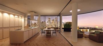
The new properties will feature a rich combination of natural stone, oak flooring, travertine and glass to sensitively combine the traditional aesthetic with the contemporary. premium kitchens by italian style-house poliform are incorporated into many of the properties with timber and glass features to kitchens and bathrooms.
stonington malvern is set to embody a traditional sense of fine living, with a contemporary layer of finishes and appliances offering a unique way of living for singles, couples and families.
Ten wylde street, due for completion in mid-late 2010, is a boutique luxury apartment development in the cosmopolitan village of potts point with 10 oversized apartments spread across six floors.
in designing the building, renowned architects Tzannes associates have sought to take advantage of the best characteristics of the site, including its harbour-side location, and deliver authentic and memorable architecture. an outstanding design feature is the flexibility for owners to customise internal layouts to their individual tastes.
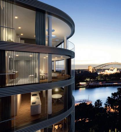
34 AD sponsored
I 01 200 I 03
I 02
The interiors enjoy 270 degree views to Sydney Harbour’s north, east and west and were designed by fashion designer, Alex Perry, in consultation with interior design firm, Pike Withers. Perry says “The inspiration for the interiors came from my books on the ball gowns and timeless glamour of the 1920s and 30s. Interpreted into interiors, this has meant finishes with longevity and integrity – such as oak parquet floors, marble, and leather.”
Ashington (61 2) 9239 0899 ashington.com
I 01
Ten Wylde Street, Potts Point. I 02
Stonington Malvern Mansion Garden Apartments, penthouse living & dining room.
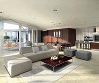
I 03
Ten Wylde Street, Potts Point, penthouse.
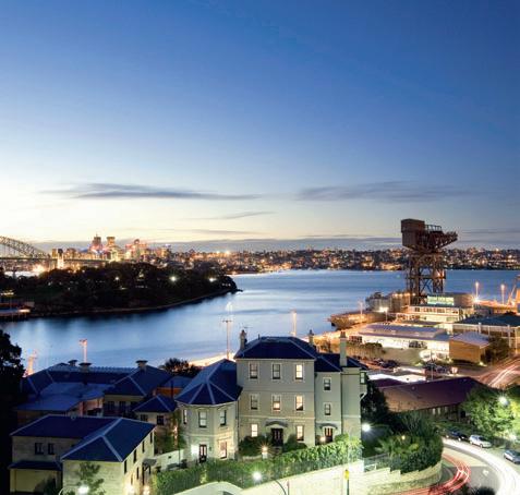
I 04
Stonington Malvern
Landscaped mansion walk adjacent to Stonington Terraces.
I 04
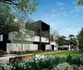
35 habitus | Issue 01 news 201
jump cut


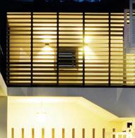
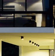
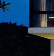


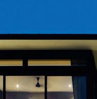
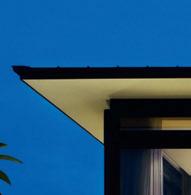


202 cable road — singapore CHAN SAU YAN ASSOCIATES
habitus | Issue 03
Something Old, Something New

I Universally known as Sonny Chan, Chan Sau Yan is one of the Region’s most admired architects. As Darlene Smyth discovers, one reason is the integrity of the work which responds without pre-conceptions to site and brief, resulting in a rich diversity of output.
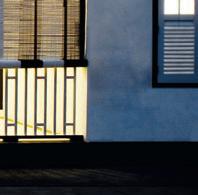
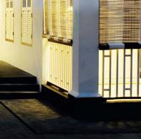
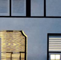
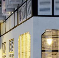
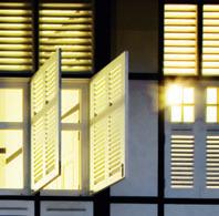
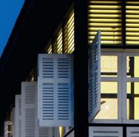
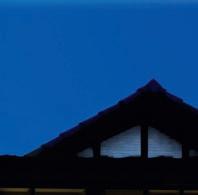

203
Text Darlene Smyth
Photography Patrick Bingham-Hall (Cable Road) Aaron Pocock (Bishopsgate)
Whether it is due to his many architectural design awards, or to the fact that after 46 years of practice his designs are still current and ever thoughtful. Or whether it is because, after all these years, he still looks forward to designing houses, there is no doubt that Chan Sau Yan of CSYA in Singapore is a designer to be respected.
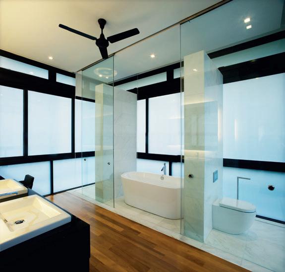
Chan was born in Malaysia, completed his architectural studies at the Architect’s Association in London, and returned to Singapore to begin his career when Singapore was still a part of Malaysia. In 1993, he set up Chan Sau Yan Associates and still runs this company from his charming conservation shop house in Singapore’s Chinatown.
“We don’t have a particular style,” Chan says thoughtfully as he shows me images of his diverse projects. “For each commission we go back to basics. We don’t always have an idea of the end product. In fact, we start off with
no pre-conceived idea. What we do is to try to come up with new ways of thinking about the problem... we spend a lot of time with the plan, and the elevation is a result of the plan.”
Chan looks at the images of two recently completed houses in Singapore, one at Bishopsgate and the other on Cable Road. These two vastly different houses exemplify his earlier words. One is a bold modern reinterpretation of a barn aesthetic in off-form fairface concrete, the other a sensitive addition to a conservation bungalow. The two projects have in common a rational and thoughtful approach to the planning as well as a logic in their use of materials.
The conservation project is an addition to an existing ‘Black-and-White’ colonial house that had a very Palladian plan. Unlike most such houses in Singapore that were built by the British army during colonial rule, this one did not have servants’ quarters. Chan explains
204 cable road — singapore CHAN SAU YAN ASSOCIATES I 02
Bathroom
estration
the original house.
New
I 01 Previous Cable Road Entry The addition creates a porte cochère I 02
The palette and fen-
echoes
I 03
Kitchen The glass-ceilinged kitchen connects old and new and opens onto the pool deck.
habitus | Issue 03
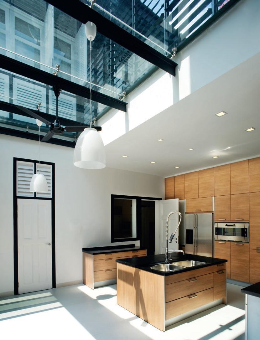
I 04
cable road — singapore
that the house had been part of a larger estate comprising four houses that were built to house unmarried colonial officers – which is why they lacked the service wing, which would typically have been located at the rear of the house. When the land was sub-divided into bungalow lots of minimum 1400m 2 each, the entrance to this house was diverted to the back where
I 04
Rear Elevation
What was once the ground entry hall is now an ‘outside room’.
I 05
Roof Terrace
This private outdoor space sits above the new kitchen.
I 06
Ground floor plan
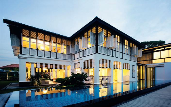
I 07 Following Bishopsgate Road
a new extension was added with a new car porch and garage. This move effectively reversed or flipped the significance of the ceremonial entrance to the Palladian plan which was also made possible because there was no original back-of-house to be retained. Chan’s strategy in designing the new extension was to echo the architectural logic of the original heavy masonry base with lightweight timber second storey. “We didn’t want to replicate the colonial architecture,” he explains. “We wanted the new extension to harmonise with the old, but for it to be a bit more academic... to reinterpret it in contemporary terms with contemporary materials.” The first storey of his new extension is in reinforced concrete with a second storey constructed of lightweight steel with a very shallow hip roof. A lower structure links the old and the new buildings, clad with modern aluminum louvres that echo the traditional timber louvres in the conservation house. The new extension uses modern glass paneling, materials and language,
206 habitus | Issue 03
I “ We wanted the new extension to harmonise with the old, but for it to be a bit more academic...”
–CHAN
The sloping allows for two separate but connected apartments, one above the other. CHAN SAU YAN ASSOCIATES
Cable Road
aRC hite C t
Chan Sau Yan Associates
PRoje C t t eam
Chan Sau Yan Sonny, Chea Nary, Goh Jin Chuan, Pakawadee Chiyachan
St RuC tuR al e nginee R
Web Structures
me C haniC al & e le C t R iC al e nginee R
Chee Choon & Associates
Quantity SuRveyoR

Faithful & Gould
builde R Milliard
FlooR aR ea 744.61m 2
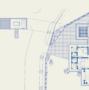
CS ya Studio (65) 6324 3128 csya.com
FuR nituR e Furniture by Minotti, minotti.it and Le Mercier, lemerciers.com.
FiniS he S
Flooring Volex marble, Chengal and Teak timber and black and white tiles. Pool artificial grey timber deck, feature mosaic tiles, black granite coping and wall finish.
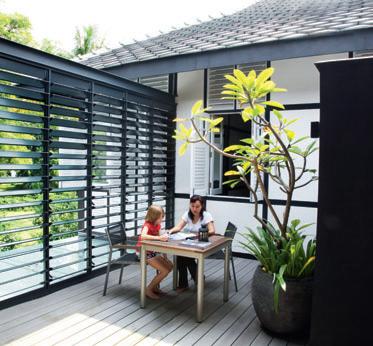
l ighting
Lighting from Phillips, phillips. com and Recolite.
FixtuR e S & Fitting S Sanitaryware from Oxo, oxosa.co.za.
207
I 06 1 Porch 2 Living Room 3 Guest Room 4 Dining Room 5 Kitchen 6 Pantry 7 Swimming Pool 8 Pavilion 9 Terrace 10 Powder Room 11 Guest Bath 12 Maid’s Room 13 Maid’s Toilet 14 Laundry Area 15 Store Room 16 Car Porch 17 Covered Link Way 18 Pool Deck 19 Basement Celler 1 7 9 4 6 3 9 9 2 5 8 20 19 Cable Road 16 15 15 14 12 13 21 22 17 18 17 11 15 10 20 Courtyard 21 Pump Room 22 Balancing Tank I 05
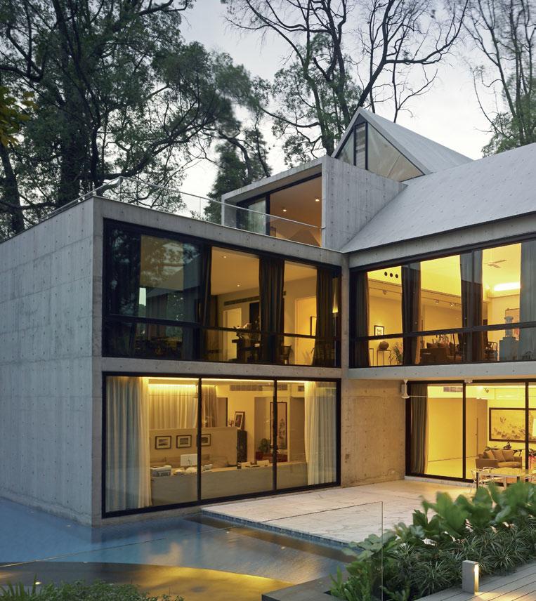
CHAN SAU YAN ASSOCIATES habitus | Issue 03 I 07 208
bishopsgate road singapore
yet maintains an interesting dialogue with the old traditional architecture by maintaining the fundamental ordering principles and architectural logic of the conserved portion. This new extension houses the car porch, garage and service wing on the ground floor, cellar and games room in the new basement, and luxurious master suite on the second level.
The new entrance to the house approaches the original living room from the back, giving it a fresh perspective. The original entrance hall is now converted to a semi-outdoor verandah which is approached from the rear and has as a backdrop the lush green front landscaped garden. Chan explains that the entrance from the back gave the house more privacy as opposed to the original monumental entrance, as well as making the larger front garden and new raised tension-edged swimming pool in the side garden more intimate and exclusive to the main living and dining areas. For the new architectural elements and details, Chan chose to make them look obviously new, yet with modernised tie-backs to the original house language. For instance, the new staircase off the living room in the conserved portion of the house is a modern folded steel plate aesthetic. Also, in the master bathroom, the original timber screens are reinterpreted as modern sliding translucent glass panels. Although the recent additions are clearly not replicas of the old, they somehow sit quite comfortably in the more traditional context since they share a similar logic of planning and use.
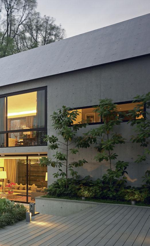
209
I “ We wanted to evoke a traditional house form using modern materials...”
–CHAN
I 08
bishopsgate road — singapore
I 08 Connection
I 09
Outdoor room
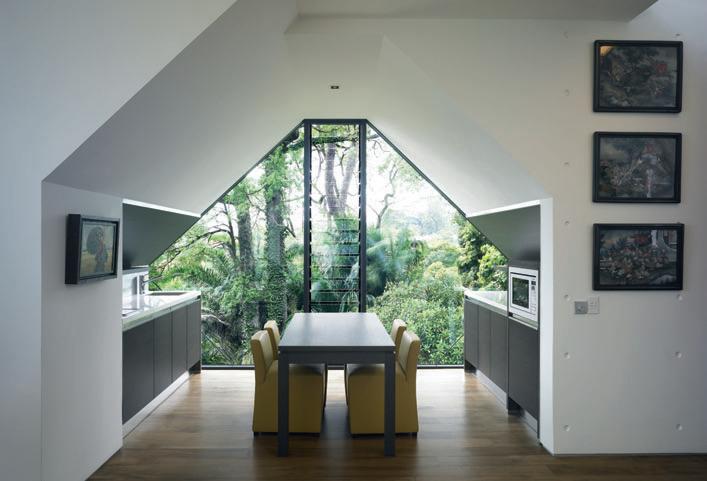
I 10
More connection
With Bishopsgate Chan shows his diversity and flexibility as a designer. “Here we wanted to evoke a traditional house form using modern materials,” he explains. “We were intrigued whether we could do a house using the simple iconic house form a child would draw.” The designer’s solution was a barn-like structure with its outline expressed as a narrow
edge with glass infill, all in simple off-form fairface concrete construction.
The site slopes a full storey from front to back. This stepping landscape gave the designers the opportunity to sub-divide the house into two seemingly separate, but interlocking apartments for the owners and their daughter and son-in-law. Two separate entrances lead to a common stair core where the stairs scissor around each other but never meet, giving the inhabitants a sense of commonality, yet privacy. The lower level apartment for the younger generation has direct access to a pool that is built all the way up to the walls of the house, making the main house structure appear to grow out of the pool. The upper level apartment for the parents enjoys the voluminous doubleheight spaces under the lofty pitches of the simple sloping rooves.
Another play on the barn imagery is a modern interpretation of an outhouse. The powder
210
An informal seating pod seems set amongst the trees.
The basement level living area opens directly on the pool terrace.
habitus | Issue 03
The upper level kitchen connects with the grille deck.
I The powder room is constructed as a simple cube that seems to float on a pool of water...
CHAN SAU YAN ASSOCIATES
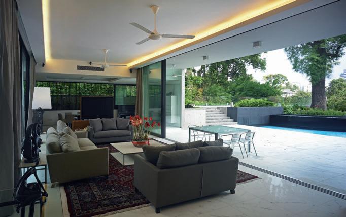
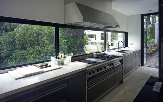
211 I 09 I 10
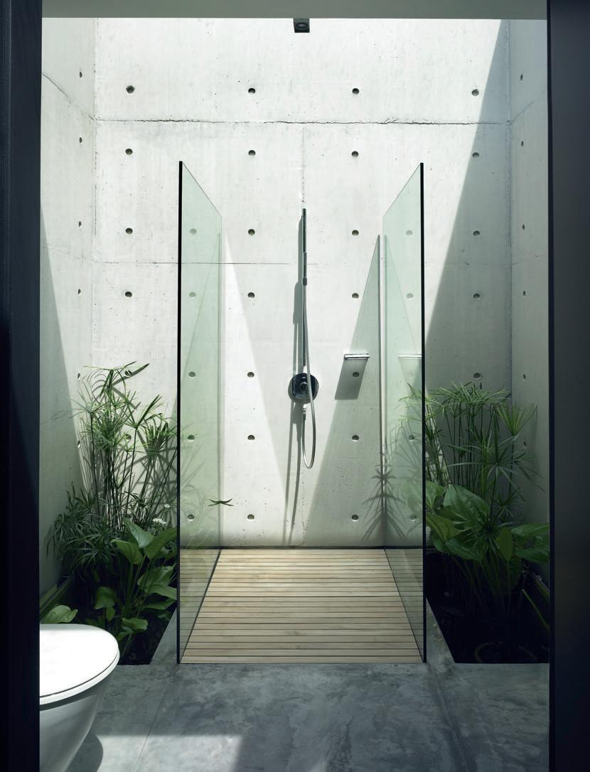
I 25 23 22 21
24 20 9 9
17 18 19 24
17 15 16
26 19 15 15 9 27 10
12 14 28
11 13
2
1 3
9 4 5 6 7 8
I 11 Powder Room Suggests al fresco bathing and continues the off-form concrete theme.
I 12
Part Basement / Part
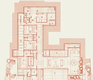
First Storey Plan
BISHOPS GATE HOUSE
Arc HITE c T Chan Sau Yan Associates
PrOjE c T T EA m Chan Sau Yan Sonny, Chea Nary, Goh Jin Chuan, Chia
Jui Siang
ST rUc TUr A l EnGI n EE r Tham & Wong
mE c HA n Ic A l & El E c T r Ic A l EnGI n EE r Enkon International Consulting Engineers
QUA n TIT y SUrv E yOr Northcroft Lim Consultants
In TE r IOr DESIG n E r Edith Leschke Interior Design
lA n DS c APE cOnSUlTA n T Studio Steed
BUI l DE r
Sysma Construction jOI n E ry
Tisettanta
K ITc HE n
Unique Kitchen
Fl OOr Ar EA
978.48m 2
c S yA Studio (65) 6324 3128
c SyA .cOm
FUrn ITUr E

Furniture selected by interior decorater, Edith Leschke Interior Design.
FI n ISHES
Flooring Statuarius marble from Bruni Marmi Graniti, omgmbellani. it, American Walnut timber from Wood Doctor, wooddoctor.com. sg, off white tiles and Hunter Green granite in bush hammer finish. Pool artificial grey timber deck, blue mosaic feature tiles and black granite edge.
lIGHTI nG
Lighting from Antares, antareslighting.com, Wever & Ducre, wever-ducre.com, Erco, erco. com, Delta, deltalight.com, Bega, bega.com and Simes, simes.it. Fixtures
Sanitaryware
range
Duravit, duravit.com. Basins Flaminia, ceramicaflaminia.it.
Fittings Starck, Uno and Citterio ranges from Axor, axor-design.com.
213
& Fittings
Starck
from
Family Room 2 Pond 3 Informal Dining Room 4 Pantry 5 Music Corner 6 Terrace 7 Pool Deck 8 Deck 9 Store 10 Swimming Pool 11 Master Bedroom 12 Master Bath 13 Study 14 Master Walk in Wardrobe 15 Bedroom 16 Walk in Wardrobe 17 Bath 18 Powder Room 19 Corridor 20 Maids Room 21 Maids Bath 22 Utility Area 23 Laundry 24 Courtyard 25 Covered Wash Area 26 Drivers Toilet 27 Lift 28 Garden
1
room, which can be seen off the main driveway, is constructed as a simple cube that seems to float on a pool of water like an independent building linked to the house. A skylight above the room furthers the sense of detachment from the main house. In order to feel the full effect of the barn form from the inside of the house, the architects have at times designed the rooms as detached, free-standing forms within a larger barn-shaped enclosure. The guest room on the first floor is an example of this. It is designed like a box that sits at the far end of the living room. A separate flight of stairs leads to the roof of the guest room, echoing the notion of a loft within a barn. This upper level is used as a library that overlooks the first floor of the house. With these moves, the architects have managed to capture the open airiness of the traditional barn experience using very modern language and construction techniques. 12
A LC he M y At h o M e
When building a new home or re-crafting an older one, it’s valuable to know that what you have isn’t necessarily what you have to live with. Whether you prefer antiques, the latest designs or something in between, the spaces you inhabit are an important expression of your taste and personality. With the ability to coat any substrate with a range of over 200 real metals and alloys, along with various skins, motifs and patinas, Axolotl Metal offer limitless possibilities for creative expression. It’s the contemporary version of alchemy – turning brick into bronze and concrete into copper. the exterior provides the initial portrayal of a home’s character; amongst monotonous facades, a bold front or garage door conveys individuality. the extensive range of Axolotl Metal means that you can select a unique look that still sits within the neighbourhood aesthetic.
Indoors, create a unique finish on floors for impact, or make the details shine – elements such as cabinets, handrails and kitchens have the potential to transform the feel of a space. the range has also proven a popular choice for objects such as water features, statues and sculptures.
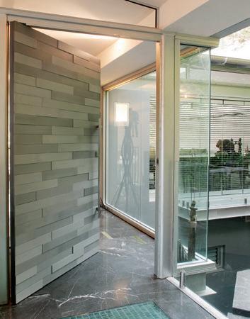
In nearly 15 years since brothers Kris and Kim torma founded the company, Axolotl have collaborated with architects, designers and artists to create a multitude of effects for spaces in the home. Axolotl also offers a range of services, such as design assistance, colour interpretation and project consultancy, which operate out of the 11,000 square foot factory in Sydney.
Catering to creatives across the globe, Axolotl has licensed operations in the UK, Italy, Russia and Korea. their metal-coating technology is only one area of their expertise with a panel system and a full range of glass increasing the creative possibilities on offer.
Rather than static solutions, Axolotl Metal provides the point of inspiration for whatever your individual needs may be – with Axolotl there are no standard finishes and every project is customised.
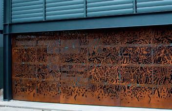
Axolotl Group (61 2) 9666 1207 axolotl-group.com
I 01
I 02
I 03
habitus | Issue 01 sponsored
Nickel garage door designed by Michael Folk from Campbell Luscombe Folk Lichtman
Zinc Meccano door designed by Axolotl
Brown Rust garage door designed by Susan Cadby
I 02
03
01 214
I
I
Vamp up your DINING ROOM AND GO FAR-FLUNG
to an enchanting DESTINATION ’
habitus | Issue 03 215 4. sign-off
spaces we love
01. WE LOVE Sydney Sublime
Sam Fiszman Park
Location: Ben Buckler Point, Sydney, Australia
Architect: McGregor Westlake
Architecture in association with 360º
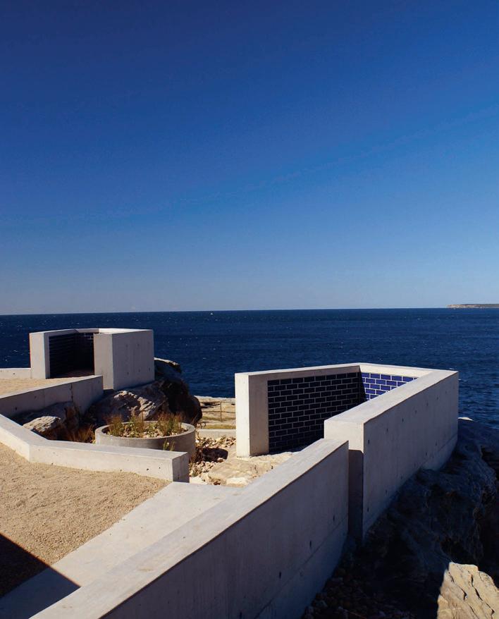
Text: Paul McGillick
Photography: Kyal Sheehan
For landscape architects Peter McGregor and Daniel Baffsky, working on this extraordinary site was more about revealing what was already there and working with the landscape than imposing anything on it. This involved quite a lot of remediation to begin with, removing an ugly carpark to create a large disc of lawn that signals how the park acts as a link between Bondi Beach and the coastal walk. The site steps down a series of terraces, responding to the tumbling sandstone outcrops patterned by the water which, aeons ago, lapped around them. In McGregor’s words, the view is sublime with two angled look-outs – one over the Pacific Ocean, the other down the coastline south of Sydney.
habitus | Issue 03 216
spaces we love
02. WE LOVE Sculp-itecture
Onetopo Footbridge
Location: Birkenhead, Auckland, New Zealand
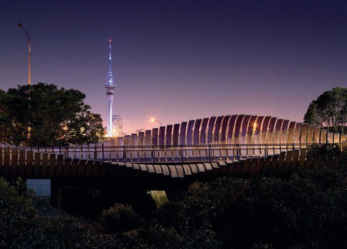
Architect: Beca Architects
Text: Andrea Stevens
Photography: Simon Devitt
The Onepoto footbridge is one of those rare projects where architecture and sculpture combine to create a work as beautiful as it is functional. Beca Architects has designed an exoskeleton of laminated timber ribs to envelop a conventional bridge structure. By slicing and peeling open a simple tube form, a sinuous and intricate object has been created.
The bridge forms a shield to the heavy traffic environment while offering glimpses of the city through small ‘windows’ in the ribs.
The metaphors of skeleton and ribcage reference the history of the site, a traditional Maori fishing area. Organic processes of decline and renewal are alluded to in the many interpretations of its form – a curling leaf, a rolling wave and the flax foliage used for Maori weaving. This visual richness, in combination with its location on the harbour’s edge, creates an enchanting experience.
habitus | Issue 03 218 0
v
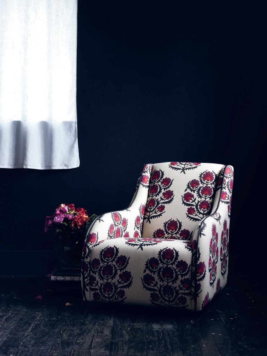
Perth Showroom - Now Open +618 9286 1433 Melbourne +613 9543 4633 Sydney +612 9516 0968 Amelia chair designed & manufactured in Australia | www.arthurg.com.au
spaces we love
03. WE LOVE The Simple Life
Boathouse Location: Broken Bay, NSW, Australia
Architects: Andrew Coomer & Associates
Text: Nicky Lobo
Photography: Rocket Mattler
What is this – boathouse, studio, bunker? This intricate little building was designed by Andrew Coomer and Jenny Mahon to be a simple setting for all the activities that make life pleasurable – fishing, swimming, art, meditation, sleeping, yoga, eating and entertaining.
The site played a significant role in the design. Located at the bottom of a steep slope leading to the bay, the existing stone structure and beautiful views determined the orientation of the structure.
In time, the materials used – zinc, recycled Blackbutt from an adjacent jetty, off-form concrete and teak marine ply – will weather and age naturally. Through a close relationship between the natural and built elements and unification of the interior and exterior aspects, this space achieves a harmony that will extend to the wellbeing of its occupants.
habitus | Issue 03 220
Aside from being environmentally friendly, the format allows you to search, scroll or zoom through pages. You can also forward articles, click directly through to website links, print or download articles and read past issues.

And when you subscribe to Habitus in print, you will automatically receive access to the eMag version free of charge.


subscribe to Habitus
A new way to
Visit habitusonline.com for details. Now you can explore Habitus in an accessible and convenient online format, with a subscription to the eMag version. hab03_Emag.indd 1 16/1/09 4:35:55 PM Get street cred at... SYDNEY MELBOURNE www.interstudio.com.au INTERSTUDIO interstudiov3_Amended.indd 1 17/12/08 4:42:37 PM
spaces we love
04. WE LOVE A Mediterranean Meander
Mediterranean Garden
Location: Adelaide, Australia
Architect: Taylor Cullity Lethlean
Text: Tempe Macgowan
Photography: Andy Rasheed
Enjoying the beach at Port Willunga and the shade of apricot and peach trees in a wide backyard is what I remember most about long, hot and dry South Australian summers. Water is so precious here, and this is the central idea behind the Mediterranean Garden at the Adelaide Botanic Gardens. The best of what can grow from the five different climatic regions of the Mediterranean are displayed, proving that so much more can grow in the Australian climate than tough natives.
Taylor Cullity Lethlean has displayed these worlds on either side of a central water rill. The water rill echoes that of gardens in Granada and Valencia, Spain, and is inspired by an exploration of how water is used most efficiently in different cultures. Walking alongside it on the interlacing paths reveals some quite surprising species such as artichoke. Lining both sides of the garden are the old shady wisteria walks and there’s also the newly renovated and romantic Schomburgk Pavilion that now has a bookstore and shady terraces.
habitus | Issue 03 222


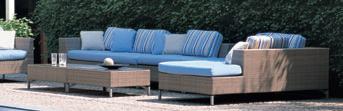
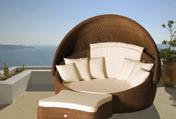
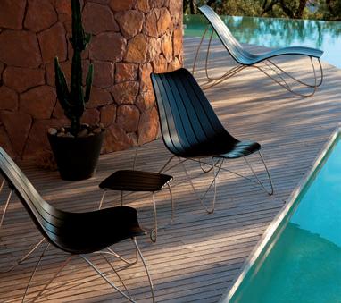
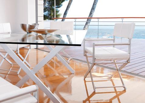


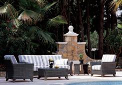

224 I 01 I 02
DINING DETAILS:
Table stainless steel and GRC.
Dining bench seat and chairs white polypropylene Luna from Contemporary Outdoor Furniture, cafeideas.com.au. Lounge Dedon woven cane in bleached finish from Domo Collections, domo.co.nz.
Fireplace wall cladding limed
Ash-stained Cedar with rose head nail fixings. Ceiling lining natural Cedar-stained Cypress. Flooring light ground and polished concrete.
Overhead louvres aluminium by Louvretec, louvretec.co.nz.
Fireplace Fires by Design from Warmington, warmington.co.nz.
Dining distinction
I 01 Previous Sliding walls reveal dining spaces for all weather and seasons.
I 02
Innovative louvres control light in the living spaces.
In this New Zealand beach house Xsite Architecture has designed an outdoor dining and living space for all seasons. A covered courtyard forms the “central social space of the house, with cane lounge furniture, large dining table and fireplace to allow for extended hours of outdoor living,” explains architect Malcolm Taylor. Screens and louvres filter light, air and rain, linking the inhabitants more closely with the seasons. It is easy to control the extent of openness or enclosure by adjusting the building’s skin.
Materials are robust and weatherproof with exterior claddings wrapping the corner to continue through the space. Visually anchored by a dark-stained cedar wall, the courtyard centrepiece is the open fireplace. Sidewalls are a contemporary take on the translucent Shoji screen – clad in corrugated opal polycarbonate, the house glows like a lantern at night. To the west, the screens slide completely away to open the courtyard to a large lawn.
Stainless steel-and-GRC dining table and bench is matched with outdoor Luna chairs. The pale colour palette of the furniture contrasts elegantly with the charcoal-stained cedar wall.
Unified by the timber-lined ceiling and polished concrete floor, a glass living pavilion extends the courtyard northwards and indoors, creating an expansive and casual beach lifestyle. Changes in light quality, temperature and degrees of enclosure subtly differentiate between a sense of being ‘indoor’ and that of being ‘outdoor’.
habitus | Issue 03 225 in camera omaha — new zealand
Text Andrea Stevens, Nicky Lobo Architect Xsite Architecture
Photography Simon Devitt
| The sharing of food is an intimate experience, so the environments we create for this purpose and the products within them need a balance of space, colour, form and texture. The following pages take you through a project from New Zealand that allows for different ways of dining in different spaces, plus some of the latest products for dining and how they can be used to create a specific experience.
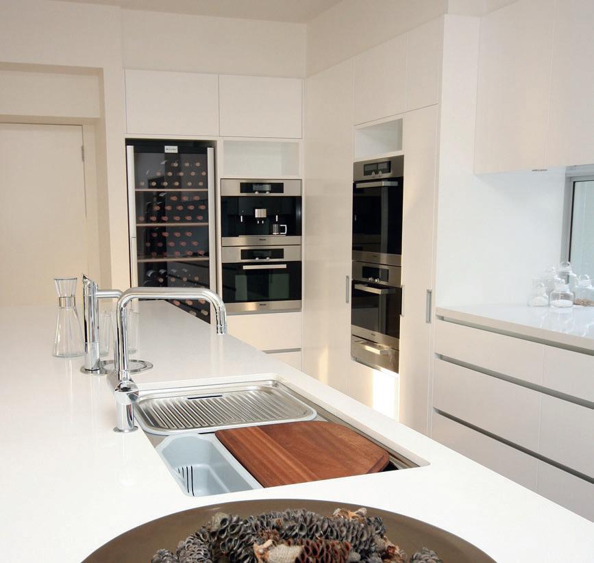
Vintec Australia Pty Ltd 210 Crown Street Darlinghurst NSW 2010 | 1800 666 778 | 02 9360 3199 | sales@transtherm.com.au | www.vintec.com.au New Zealand Agent Vintec Transtherm NZ Toll free 0800 550 020 | mobile 0274 959 815 | robert@vintec.co.nz WINE STORAGE CABINETS FOR ALL SITUATIONS
Photo shows VINTEC 190SG2E 177 bottle wine storage cabinet in situ at Seven Mile beach housing development

227 habitus | Issue 03 in camera I 03
storytelling. Every year a precious limited edition reminds us that great storytellers are also rarities.
The Writers Edition: G.B. Shaw with its dark green marbled lacquer body celebrates the Irish roots of Pygmalion’s prime father. A flower engraving adorns the 18 K gold nib in a tribute to the flower girl Eliza Doolittle.
www.montblanc.com
I 03 Previous A glimpse of the outdoors provides the inspiration for a splash of colour used in this predominantly dark dining space. Although the tall ceiling height could potentially overwhelm the space, the low-hanging sculptural pendant light creates a sense of intimacy.
This furniture doesn’t compete with the textured floor. Designed by Gae Aulenti, the Sanmarco table is a clean design with a demountable frame in steel and a variety of table top options including glass, veneer, bleached Oak, varnished Wenge timber and plastic laminate.
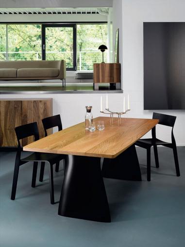
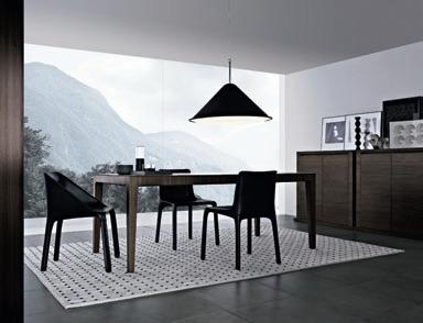
The aluminium alloy frame of the Lialta chair stands tall, enhancing the long, elegant windows through the slimline aesthetic. The frame is either polished or painted and the seat and back are upholstered in polyurethane with a removable external cover in fabric, leather or cowhide. Loose covers are also available on request.
I 04 In this dining space, the functional element of dining is made more sculptural through the selection of furniture. The convex curve of the Canto table’s long sides and the gradating bevel make it an elegant option. It’s not just sophisticated design for the sake of it, though; the legs are shaped to provide maximum leg room for the user. The Torsio chair takes inspiration from the human form, which produces naturally ergonomic shapes perfect for dining.
Timber finishes add warmth and texture to the matte finish of the floor and resonate with the other timber finishes used in the space and beyond. Canto is available in solid Elm or American Walnut top, in two dimensions, and Torsio uses the flexural capabilities of laminated wood to create comfort in this dining chair.
I 05 Here the focus is the contrast between elements of light and dark. The fantastic view from the full-height window takes centre stage and the dark furniture and lampshade create a subdued and intimate setting from which to enjoy it. The rug defines the zone and heightens intimacy as a textural element.
Upon further inspection though, the furniture has its own subtleties. Taglio, an extendable table designed by Emmanuel Gallina, celebrates the natural elegance of minimalism and embraces fine craftsmanship of timber through detailing of the legs. The Manta chair, completely upholstered in leather, adds sophistication to any setting.
habitus | Issue 03 in camera I 05 I 04
Canto
From $11,340 Torsio From $1390 Hanspeter Steiger Roethlisberger Collection Switzerland Anibou, anibou.com.au
Sanmarco
From $2495 Lialta From $1640 Zanotta Space Furniture, spacefurniture.com.au
229
Taglio From $8350 Manta From $1990 Poliform poliform.com.au
Habitus magazine is available at newsagents and bookshops across Australasia, South-East Asia, the USA, Canada, Europe, the Middle East and South America. Habitus is published quarterly in March, June, September and December. To subscribe securely online visit indesignlive.com, or you can email subscriptions@indesign.com.au to subscribe or request a full list of locations where Habitus magazine is available.
The team at Habitus magazine thanks our advertisers for their support. Use the directory below to see what page a specific advertisement is on, and visit their website to learn about the great products and services they offer.
155 Alternative Surfaces alternativesurfaces.com.au 44 Amalgamated Marble amalgamatedmarble.com 95, 234 Artemide artemide.com 156 Arte Sofas artesofas.com 219 Arthur G arthurg.com.au 200–201 Ashington ashington.com 214 Axolotl Group axolotl-group.com 129 Bathe bathe.net.au 146 Beclau beclau.com 239 Caesarstone caesarstone.com.au 02–03 Contemporary Leathers contemporaryleathers.com.au 96 Clipsal clipsal.com 12–13 Corporate Culture corporateculture.com.au 240–IBC Core Furniture corefurniture.com.au 223 Cosh Living coshliving.com 09 Designer Rugs designerrugs.com.au 120 Di Lorenzo dilorenzo.net.au 10–11 Domayne domayne.com.au 174 Fanuli Furniture fanuli.com 04–05 FY2K fy2k.com.au 130 Gaggenau gaggenau.com.au 98 Gibbon Group gibbongroup.com.au 221 Habitus habitusonline.com 236 indesignlive.com indesignlive.com 221 Interstudio interstudio.com.au 22 Jardan jardan.com.au 93 Koda Lighting kodalighting.com.au OBC Living Edge livingedge.com.au 85 Mafi homestone.com.au IFC –01 Miele miele.com.au 33 Milk Furniture milkfurniture.com 137 Minosa minosa.com.au 21 Minotti minotti.com 228 Montblanc montblanc.com 165 Mortice & Tenon morticeandtenon.com 46 Neff neff.com.au 38 Parisi parisi.com.au 118–119 Poggenpohl poggenpohl.com 82 Poliform poliform.com.au 183 Precision Flooring precisionflooring.com.au 29 Rado rado.com 109 Rogerseller rogerseller.com.au 37 Rugs Carpet & Design rc-d.com.au 14 Saab saab.com.au 231 Sampford IXL sampfordixl.com.au 71 Siekaup siekaup.com.au 34 Smeg smegappliances.com.au 75 Space Furniture spacefurniture.com 18–19 Stile Di Vita stiledivita.com.au 51 Stylecraft stylecraft.com.au 217 Tecno Furniture tecno.com.au 226 Transtherm transtherm.com 43 Tsar tsar.com.au 63 Thonet thonet.com.au 58 Whitecliffe Imports whitecliffe.com.au 31 Woven Image wovenimage.com 57 Woodmark woodmark.com.au 06 Zip Industries zipindustries.com
habitus | Issue 03 directory 230
FLUSH MOUNTING - TO HAVE A MUCH LOWER PROFILE MORE USE OF NEW TECH GLASS - HAS EXCELLENT HEAT TRANSMISSION QUALITIES.

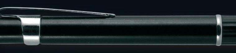
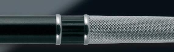


HEAT TECHNOLOGY TO SPERSE HEAT MORE EVENLY CROSS THE BODY


STRAIGHT LINES. NEEDS TO FIT WITHIN CONTEMPORARY HOMES
DIRECTIONAL LIGHTING


Inspired by designers, brought to reality by IXL’s engineers, the Tastic® Neo Dual and Single are the culmination of hundred’s of hours spent researching customer needs, developing new technologies and sourcing quality materials.

The Tastic® Neo uses 800 W tungsten halogen heat lamps, in conjunction with reflective elements, for a more efficient dispersion of radiant heat. Its in-line fan improves airflow ensuring a pleasant, temperate bathroom clear of moisture, while gimbal-mounted downlights allow directional lighting.
Side ducting provides versatility for installation into multi-storey dwellings, venting directly to outside. The Tastic® Neo also has minimal overall height for a low profile.
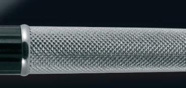
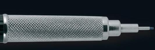
Accompanied by a five year in-home warranty and a two year replacement warranty on heat lamps, the Tastic® Neo provides unsurpassed safety and quality
www.sampfordixl.com.au


We listened to the designers…
V INT INNTEG E W
CONTE
thE AtLANtIC PEARL OF URUGUAY
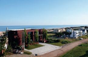
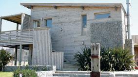
You may not have heard much about Uruguay, and that’s fair enough. It’s population hits a mere 3.4 million, and it’s a tiny country. Although not South America’s smallest country –that fame goes to both Suriname and French Guiana – Uruguay is often overlooked in favour of its bigger and better-known neighbours, Argentina and Brazil. As a Uruguayan expat (if you could call me that – I left my homeland at age 20 days), I have been a traveller to this enchanting place for a lifetime. today its beaches, food, architecture, music and soul are ripe for the traveller looking for a South American experience to rival its big sisters, or to complement them.
Of course there is already a dedicated following of persistent travellers to this country, lured by a favourable exchange rate and having heard the stories of the ‘St. tropez of South America’. A surprising number of the jet-set crowd flock in herds during the holiday season between December and February, destined for the upscale resort town of Punta del Este. From as far as Russia and Miami they come for the summer to take advantage of the glamour of South America on show in all its finery (Town and Country magazine has said “New Yorkers
habitus | Issue 03 232 snapshot Text Andrea Millar
Photography Ben Millar, Esteban Perez
I t his page
Relaxed beachside living at Punta del Este, including a street sign at Jose Ignacio.
I Facing page
The beach at La Barra in Punta del Este, plus examples of classic and contemporary beach houses at the popular holiday spot.
have The Hamptons, Miami has Punta del Este”). George Clooney and Antonio Banderas are both rumoured to have houses here. This is not to take away from the breathtaking beauty of Uruguay’s coastline, which stretches from the south-eastern mouth of the Rio de la Plata, which divides Argentina and Uruguay, to the terrestrial border between Uruguay and Brazil to the north-east. Its natural beauties, waterside towns and cities, the rich visual contrasts, and diversity of its built forms make it a goldmine of inspiration.
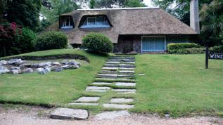
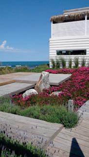
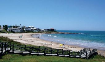
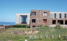
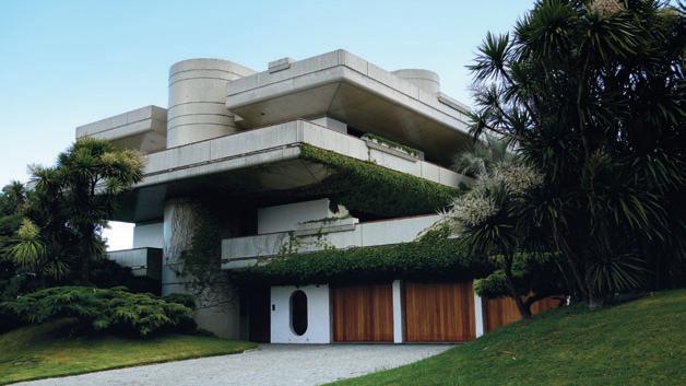
233
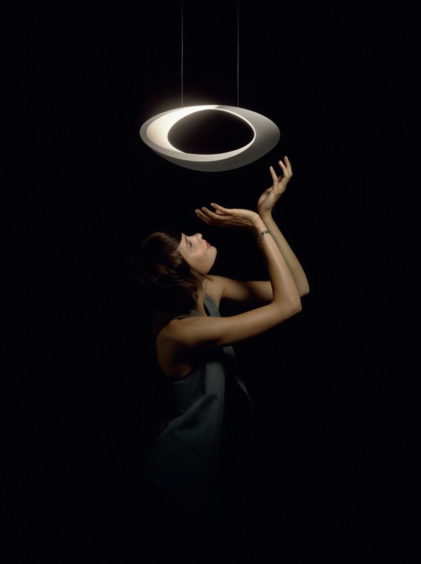
Montevideo

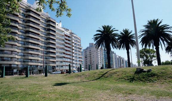
This is the largest city, the capital and chief port of Uruguay. You will probably fly into Carrasco International Airport or sail into the port if it’s a cruising holiday. I’ll be frank, Montevideo is not tourism at its commercial best, unlike Venice, Rome or Paris. It’s raw and caught up in the business of being Montevideo for Montevideans. There aren’t a string of design hotels or entertainment centres. However you do get the ‘authentic experience’ travel that many of us lust after. Montevideo is what I imagine Paris was, at some point before mass tourism, and there are some other comparisons too, like their penchant for delicious pastries (the French have patisseries, the Uruguayans have confiterias). On that note, for fabulous traditional cuisine, go to Mercado del Puerto any day of the week for lunch. Formerly the grand central train station building, it’s now packed with Parillada (barbecue) restaurants with their live burning flames on show. On Sundays the feria is on, the city streets bring to life the greatest street fair in Uruguay. Stroll by fruit and veg stalls to wonderful brica-brac, antiques, collectables and furniture stalls where you will find objects to rival those in flea markets in New York. The exchange rate means that things are affordable too (as a sometimes stylist, I was in prop heaven – I paid AUD$40 for an antique English solid silver-serving tray). Find the market at street Tristan Narvaja off 18 de Julio in the centre of town. It goes for many kilometres so start early. Next on the must-do list is the Ciudad Vieja , the historical quarter of Montevideo close to the port. Of late it has seen massive investment to resurrect the area’s impressive French Nouveau, Spanish Colonial and Art Deco buildings. Walk down street Sarandi, stop for a cortado (short flat white) or a cerveza (beer) at La Pasiva restaurant (a classic favourite). Next, visit a city beach, the best known is Pocitos. Montevideo’s beaches are essentially river beaches – the Atlantic Ocean doesn’t hit until further up the coast. For architecture and design nuts, driving around the park-side district of El Prado will deliver wonderful examples of post-War modernist South American architecture. Drive around Carrasco’s impressive mansions and you will start to get a sense of the sharp socio-economic contrasts in the country.
235
habitus | Issue 03 snapshot
I Modern Montevideo Scenes from the bustling market; beachfront apartments in Pocitos; more of the feria; the historic old town Ciudad Vieja, which is beginning to enjoy significant interest in urban regeneration.
Join the ranks of design lovers around the world addicted to indesignlive.com. With the latest profiles, architecture & interiors, design events, parties and products from Australasia and around the globe. R INTERIORS, ARCHITECTURE, DESIGN UPDATED DAILY HAve you HA d your dA ily fix? online Print events
Great restaurants (including La Pulperia De Los Faroles, top) line the streets of this colourful centre south-east of Montevideo. A UNESCO World Heritage-listed site where
On the day I visited Colonia del Sacramento –two hours’ drive south-east of Montevideo – the silhouette of the city of Buenos Aires in Argentina was visible over the Rio de la Plata. Day-trippers from Buenos Aires catch a Buquebus (fast ferry) to Colonia to visit the city’s historic quarter, which is a UNESCO World Heritage site. The city was founded in 1680 by Manuel Lobo, Governor of Rio de Janeiro, but taken over in 1777 by the Spanish until its independence in 1825. The result is a fascinating mix of period buildings that are well preserved as homes, boutique bed and breakfasts, museums and restaurants. Take a walking tour of the quarter; ask about this at the tourist information centre. Highlights are Calle De Los Suspiros (‘street of the heavy sighs’), a traditional 17th century Portuguese street where the historic homes – until as recently as the 1970s – housed the sex workers who serviced the soldiers that guarded the city. Stop at Plaza Mayor (main square), an open space where the change of guards took place, and also take in the Museo Municipal (municipal museum) as well as the gift shops filled with traditional artisan goods, cow hides, antiques and local art. Stop to eat and drink at one of the many authentic Parillada restaurants that fill the air with the smoky aroma of barbecued steaks, chicken and pork. A popular one is the pink La Pulperia De Los Faroles restaurant.
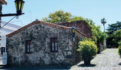
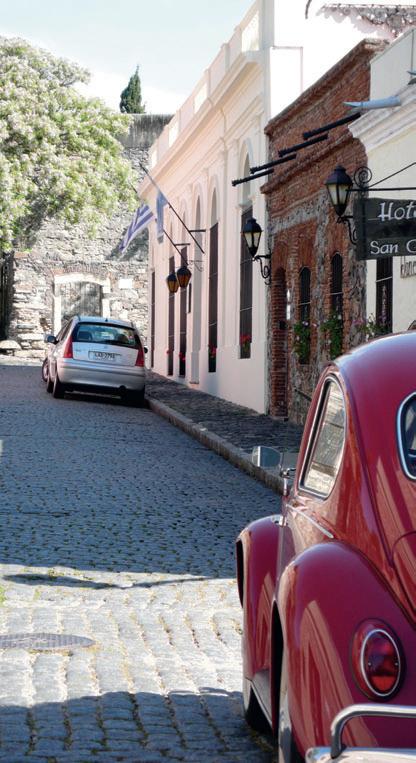
237
Colonia del Sacramento
habitus | Issue 03 snapshot
I Colonia del Sacramento
classic cobblestone streets and boutique bed and breakfast destinations provide for the discerning traveller.
North of Punta del Este is another summer holiday destination that couldn’t be more of a contrast to the resort town. Simultaneously charming and confronting, the fishing village Cabo Polonio is surrounded by sand dunes (and only accessible by four-wheel drive vehicles that pick you up at the nearest (dirt) highway or by walking seven kilometres through natural fauna and sand). Here you can forget about internet connection and mobile phones – heck, forget about running water and electricity. Despite what you might call basic conditions, people come here in their hundreds in January –mostly bohemian artists, designers, architects, filmmakers and the unconventional-minded – to spend time in hand-built huts, by candlelight and portable gas stoves. The sight of the buildings is a picturesque, arresting one. Rather than primitive looking, the huts that dot the spectacular natural landscape are a thoughtful experimentation of form, colour, texture, shape and materials, each one a curious and successful attempt at raw creativity and survival. I was sorry that the huts were mostly boarded up when I visited in October 2008, waiting for their time to shine during the ensuing warmer months. Set on a small peninsula, the main attraction here is the majestic Atlantic Ocean beach, still and quiet on the protected side and wild on the other. The area also has mobile sand dunes. That is, the sand is blown by the wind and moved around so the dunes actually change their position – a unique phenomenon. On the morning I arrived on my day trip, a monolithic whale lay dead on the beach. Its scale was enormous, it had turned to shades of crimson and amber under the hot sun and was awash with seagulls. It was a beautiful and unaffected, if somewhat challenging sight. I could say that sums up Cabo Polonio, and indeed Uruguay.
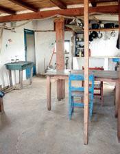
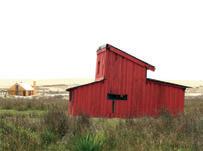
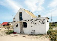
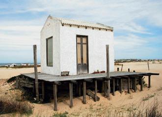
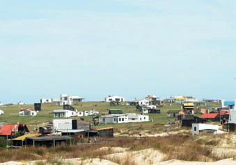
238 habitus | Issue 03 snapshot
Cabo Polonio
USEFUL WEB SITES gosouthamerica.about.com cabopolonio.com vivapunta.com visit-uruguay.com
I Cabo Polonio
As well as the whale carcass (above), the landscape is dotted with dozens of hand-made beach huts, each with its unique undeveloped charm.
Hut interiors are spartan affairs with few luxuries, allowing the visitor to take stock of what’s important in life.
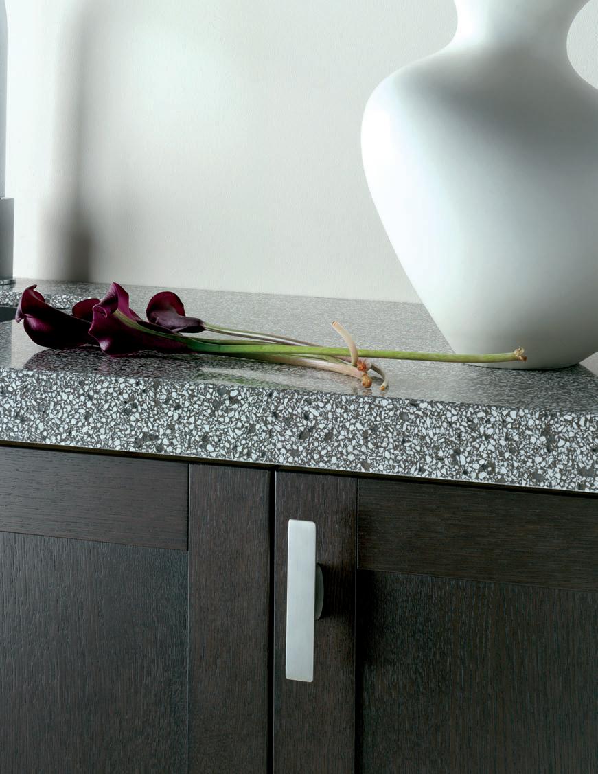


Imagine the Difference For our latest brochure phone 1300 119 119 www.caesarstone.com.au Mosaici Carbon Mosaici Marrone Mosaici Collection Made from up to 42% recycled material
Eames Moulded Rocker
Experience the original Pass it on.