
SPACE AT HOME BREATHING AUD $12.95 NZ $13.95 USD $15.95 CDN $16.95 GBP £8.50 SGD $10.95 ISSUE 06 JANUARY – MARCH 2010 habitusliving.com INSPIRATION FOR THE ENTERTAINING SEASON MALAYSIAN DESIGN MASTER EDRIC ONG EXPLORING ABORIGINAL ARTEFACTS SYDNEY PENTHOUSE RE-INVENTED FAMILY LIVING IN THAILAND SISTER DESIGN ACT NEW SINGAPORE HOUSE NEW ZEALAND’S MITCHELL STOUT IN TOWN AND COUNTRY MELBOURNE SOPHISTICATION INDIA DOWN UNDER habitusliving.com explore the design hunt continues
Who says you can’t have everything?


NEW GRANTURISMO S AUTOMATIC
stunning
440hp 4.7 litre V8,
six-speed automatic transmission,
of Maserati’s Skyhook suspension:
SYDNEY +61 2 9360 1155 | MELBOURNE +61 3 9270 7000 | BRISBANE +61 7 3252 8222 | GOLD COAST +61 7 5532 4000 PERTH +61 8 9231 5999 | ADELAIDE +61 8 8338 7755 | AUCKLAND +64 9 526 6962 | CHRISTCHURCH +64 3 977 8779 www.maserati.com.au | www.maserati.co.nz
The
performance of a
the convenience of a
and the comfort
proof that you don’t have to compromise.





































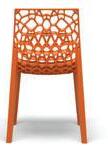
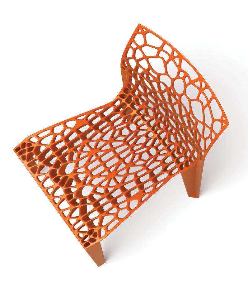
A natural wonder.
exclusively in Australia through UCI
Coral.
Available

www.uci.com.au Australia Wide 1300 824 824
1. HABITUS PRODUCTS

STIMULATE YOUR SENSES WITH OUR WORLD-CLASS RANGE OF PRODUCTS FOR HOME, WORK AND PLAY. DISCOVER A NEW WAY TO LOOK AT ROOM DIVIDERS, AND THREE WAYS TO DINE IN STYLE.
24
DESIGN NEWS
Take a fresh, and sometimes environmental, approach to living and working with some of these great ideas from around the globe.
32
RE-SHooT
We’re showcasing a collection of contemporary screens that are functional and creative and do more than just divide rooms.
35
coNVERSATIoN
Tim Klingender discusses the new wave of art collectors interested in Aboriginal artefacts.
39
IN c A mERA
It’s the season to entertain, and we’ve created three different ways to dine.
2. HABITUS PEOPLE & PLACES
CREATIVITY IS THE THEME
ACROSS THESE DIVERSE HABITUS PERSONALITIES. WE’LL INTRODUCE YOU TO A RANGE OF TALENTS FROM ACROSS THE REGION.
48
PARTNERSHIP
Mary Temelovski discovers how three sisters from Newcastle work together seamlessly and successfully on their fashion label High Tea With Mrs Woo.
66
c REATIoN
It was Ann Pamintuan’s jewellery designs that first caught Aya Maceda’s attention in a museum in Manila. Ann, part of the Philippine Moderne, is now paving the way for furniture design in the Philippines.

79
A lc HE mIST
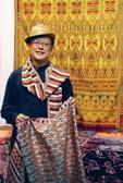
Architect-turned-textile designer Edric Ong has a deep passion and understanding of Malaysian indigenous art and craft. Lucy Bullivant looks at how he keeps tradition alive in his work.
3. HABITUS HOMES

BE INSPIRED BY THE DIVERSITY OF THESE HOMES. DISCOVER NEW WAYS OF LIVING AND NEW APPROACHES TO DESIGN AS WE TRAVEL AROUND AUSTRALIA, NEW ZEALAND, THAILAND AND SINGAPORE.
98
S cENARIo: VERDANT AVE HoUSE

Residential architecture
Architect Rob Mills was given free reign on the design of this Melbourne home, which replaced a 1930s brick dwelling. Stephen Crafti reports.
57
INSPIRED
Stephen Ormandy, one third of the highly successful Dinosaur Designs, talks with Nicky Lobo about his own art practice and reveals his inspirations.
107
S cENARIo: WoNGA BEAc H HoUSE
Residential architecture
Located north of Cairns, Paul McGillick discovers a family beach house designed by Domenic Alvaro that would be equally at home in the Mediterranean.
85
S loW DISS olVE
Renowned Australian artist Janet Laurence is known for her ingenious use of glass and other materials that play with the reflective properties of light. Paul McGillick explores her work in residential spaces.
habitus 06 contents 07
148
c Ro SS FADE: WYNNE HoUSE
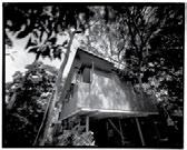
Paul McGillick investigates how architect William Smart has achieved a feeling of cohesion in this contemporary addition to a California bungalow located in an area renowned for its wellpreserved heritage streetscape.
117
S cENARIo: PloY HoUSE
Residential architecture
The challenge for architect
Pongsakorn Kitkajornpong in this project was to create a residence with enough space and privacy for an extended family and a business. Tonkao Panin visits this model of harmony and diversity in Bangkok.
127
S cENARIo: E l IZABETH BAY HoUSE


Residential architecture
The owners of this classic penthouse apartment asked interior designer Tonka Andjelkovic to collaborate with them on this re-modelling project. Andrea Millar discovers a variety of inspirations and an apartment that was the result of a two-year process.
156
DIRE c ToR’S cUT: TRAPEZ oID HoUSE
Architects and designers designing for themselves
The first project of economistturned-architect Robin Larsen was designing his own home.
180
HomE moVIE: JoHN G oW
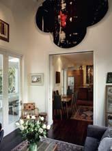
Where personality and residential architecture meet “A family home in which to hang art” was the brief given, by New Zealand gallery owner John Gow, to architect Richard Priest. Andrea Stevens visits the renovated villa in Auckland and discovers a family home that also successfully accommodates a vast art collection.
4. HABITUS SIGN-OFF GET INSPIRED BY THE MI x OF OLD AND NEW IN KYOTO, AND BECOME FAMILIAR WITH RESIDENTIAL ARCHITECTURE IN THE TROPICS
207
SNAPSHoT
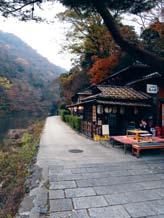
Charlotte Julien visits Kyoto with her daughter and re-discovers a city that will always inspire.
212
moNTAGE
Paul McGillick explores residential architecture in the tropics of Bali and Singapore through three books.
166
DIRE c ToR’S cUT: TURRA m URRA HoUSE
Architects and designers designing for themselves
Architects Kausar Hukumchand and Sarita Chand have built a house for themselves that is highly sensitive to its environment.
137
S cENARIo: m ARG ol IoUTH RoAD HoUSE
Residential architecture


Life in the tropics is a reality for some. Lynn Tan explores how living in this Singapore house, designed by architects a-dlab, epitomises the notion of bringing the outdoors in.
189
JUmP cUT: mITc HE ll SToUT
Two projects by one architect New Zealand architects Julie Stout and David Mitchell are renowned for their understanding of the South Pacific climate and its regional building traditions. Andrea Stevens explores two projects in very different environments.
habitusliving.com habitus 06 contents 08
The Oliver Lounge by Norman+Quaine
A subtle reference to mid 20th century form


The perfect host to passionate debate, late nights and sleepy afternoons
Every piece has a story
clockwise from top: Norman+Quaine Oliver lounge, Oscar armchair by
Knoll,
side table by
For product enquiries please call 1300 132 154.
Pass it on.
Walter
Nelson
Herman Miller.
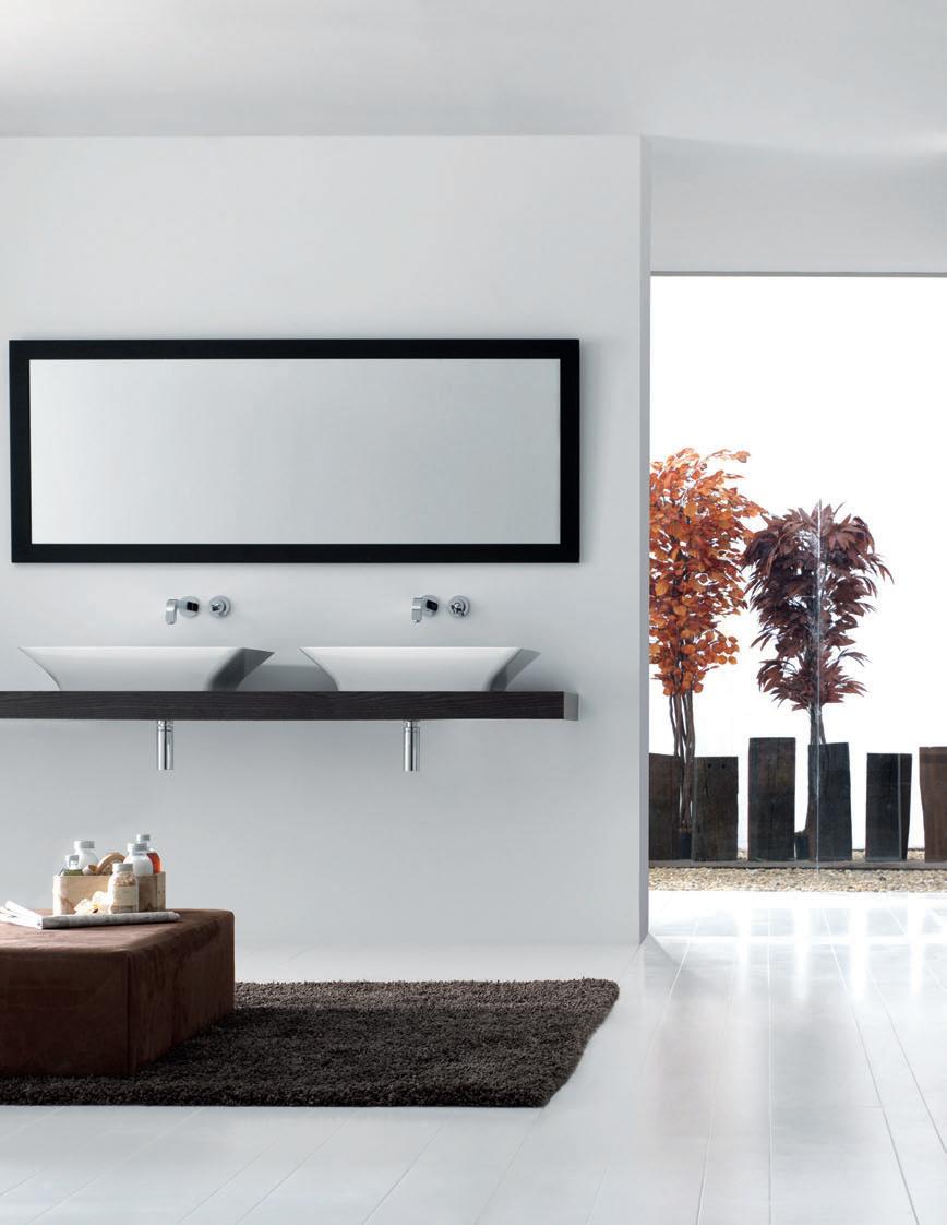
y, contemporarclassic baths
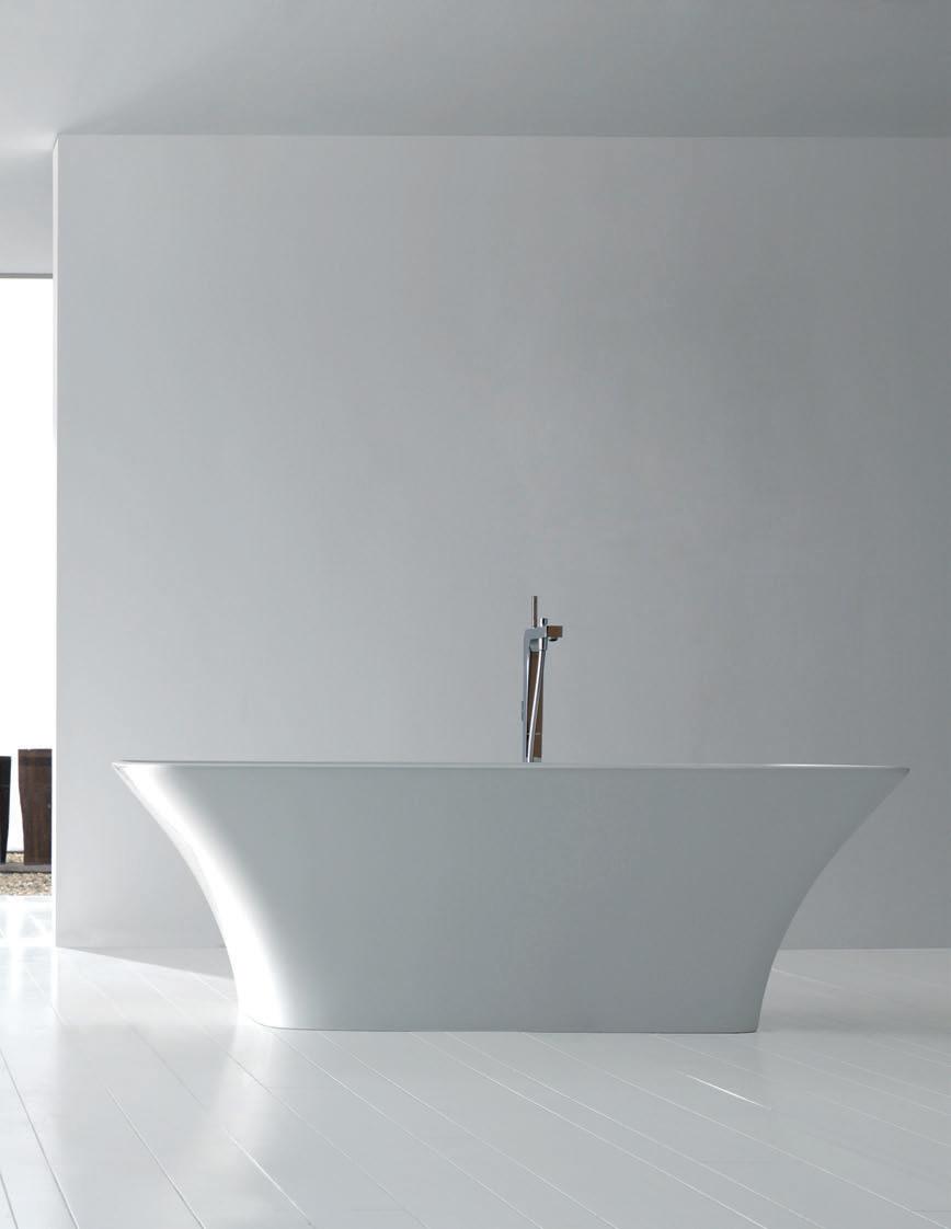
bathroom design centre 84 O’Riordan Street Alexandria 02 8339 7103 103–123 Parramatta Road Auburn 02 8748 4367
Australia: Sydney - Dedece - Tel. 02 9360 2722 Melbourne - Dedece - Tel. 03 9650 9600 Brisbane - Dedece - Tel. 07 3367 0755 New Zealand: Auckland - ECC Lighting & Living - Tel. 09 379 9680

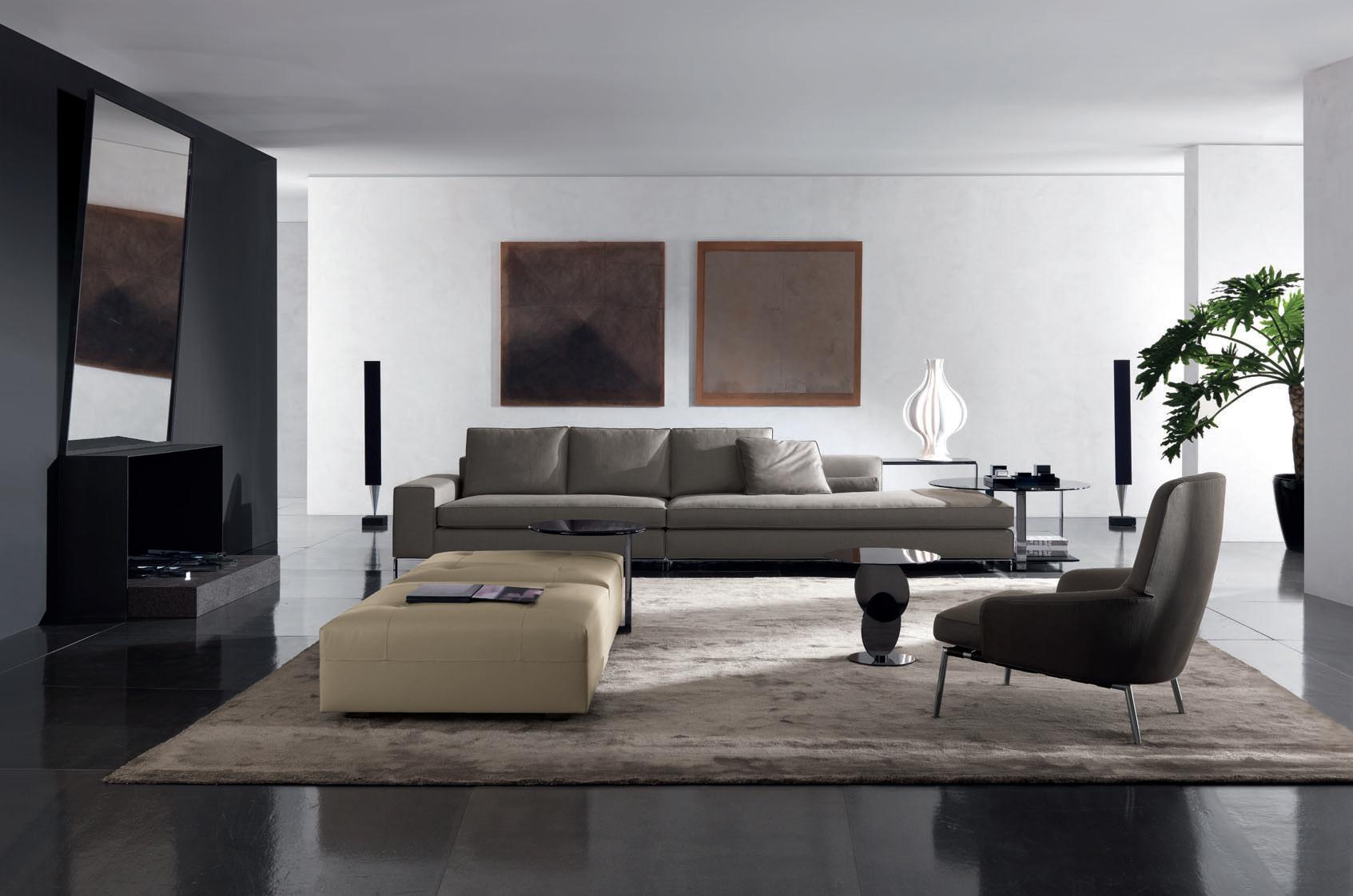
Minotti S.p.A. 20036 MEDA (MI) ITALIA via Indipendenza, 152 Tel. +39 0362 343499 www.minotti.com - info@minotti.it
Williams, seating system design: Rodolfo Dordoni
“THE STONE THEY IMPORT HAS BEEN SELECTED DEEP WITHIN THE QUARRY. OTHER SUPPLIERS WILL TEND TO SOURCE THE CHEAPER SURFACE QUARRIED STONE THAT WILL HAVE THE SAME LOOK BUT WITH INFERIOR TECHNICAL PROPERTIES.”


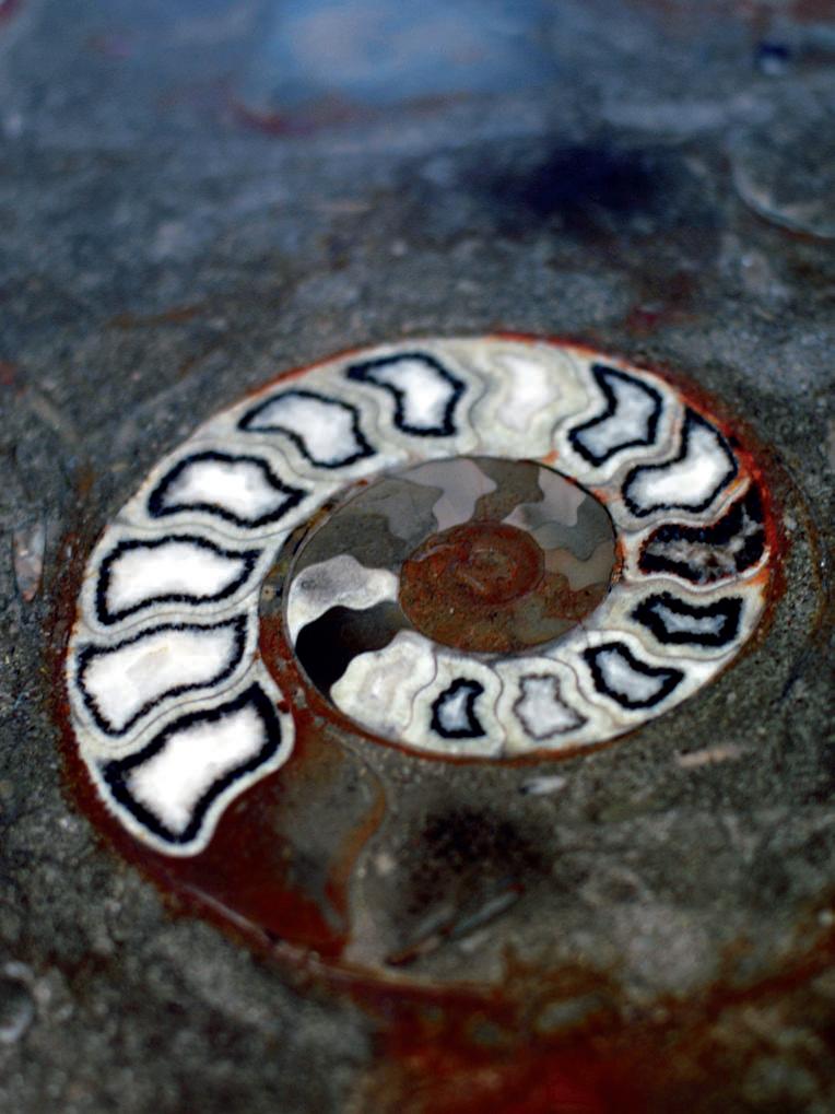
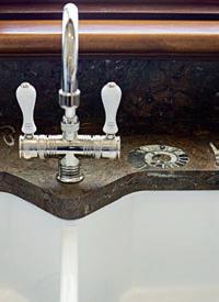
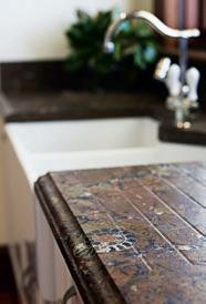
The stone pictured – Gran Fossile, is a natural limestone that was sourced by Gitani Stone for its natural beauty and durability. The limestone contains ammonite fossils. The fossils are an extinct group of marine animals that date back over 250 million years. They are related to the squid of today.
For more information on this stone or any other exotic stone please contact: GITANI STONE 15 Boden Road Seven Hills NSW | Ph:9838 8880 | www.gitanistone.com.au

In my last letter I floated the idea of conversation as a metaphor – in fact, an analogue – for what we are on about in Habitus. I also let slip the fact that, in a previous life, I had been an academic. This was at the University of Sydney where my areas of research were in conversation, the role of pronunciation in communication and child language learning.
Now, this may not seem immediately relevant to Habitus, so let me explain. Talking to one another is about generating meaning. So, children when they learn to talk are “learning how to mean” (to quote the great linguist, Michael Halliday). Meaning is not a given – it is something which we create through conversation, just as the words in a dictionary only have meaning when we use them (to quote that other great linguist, Humpty Dumpty). Meaning is not delivered like a message in one of those pneumatic canisters in department stores – it is generated through interaction and collaboration.
The best architecture and design results from interaction as well. It is, if you like, a conversation between designer and client. Each comes from their own space with their own message, and somewhere in the middle an agreed message, which is not exactly the same as either of the original messages, is worked out.
As I pointed out in the last issue, the different sections of Habitus reflect different kinds of conversation, most obviously in Close-Up and Jump Cut. But we also have Cross-Fade where, as with the Wynne House in this issue, we look at how an existing house engages in a conversation with the present. But there are many other conversations going on in this issue of Habitus
Ann Pamintuan is a wonderful designer from the Philippines who is in conversation not just with her natural environment, but with the history of artisanship in her region to create highly contemporary products with wide appeal. Likewise, Malaysian Edric Ong combines sophisticated internationalism with a commitment to local craft tradition. In Australia, Janet Laurence is also engaged in an on-going conversation with what she calls the “alchemy” of nature, along with an intimate conversation with her residential clients.
Then there are the cross-cultural dialogues which can also involve intra-cultural conversations – see Montage for a discussion of the ‘Balistyle’ and our story on a house in northern Sydney where two Indian architects have given form to a conversation with their own cultural background, with the Australian landscape, and with furniture classics from international modernism.

The important thing is not to take anything for granted. So, thanks again to our advertisers and readers who have supported Habitus through its first year.
Paul McGillick, Editor

habitus 06 editor’s letter paul mcgillick 17
The best architecture and design results from interaction as well. It is, if you like, a conversation between designer and client.
AndrEA StEvEnS
Writer
Andrea worked as an architect for 10 years, and started teaching and writing when she had children. She lives in a house she designed, and believes good design means “spaces that are truly beautiful – full of light, well proportioned, with sensitive use of materials.” She is currently finishing writing a book, and hopes to finish it over summer – with plenty of time to swim at Mangawhai Heads in New Zealand.
BrEtt BoArdMAn
Photographer
Brett Boardman graduated from architecture at the University of Sydney but describes his career as an architect as “stunningly short”. He was unable to completely escape though and now spends all his time photographing buildings around the world. He lives with his partner, Lee, in an old terrace in the inner west of Sydney with a lovely collection of fruit trees.
JASon BuScH
Photographer
New Zealand-born photographer
Jason lives with his wife Penny in a 1910 apartment in Woollahra, next door to where he lived when he first arrived in Sydney. He says the only downside to being exposed to so much great design with his job is deciding “what to have at home that you know you will still love when the next generation of designs come through”.
SiMon dEvitt
Photographer
Simon is a self-taught photographer who exposes “beauty in situations where inherent beauty might be present but not articulated as a dramatic moment”. He is fascinated by decay and would love to revisit the places he photographs in 10 years to see how they look. This summer he is visiting Hokianga at the top of New Zealand’s North Island, “the soul and spirit of New Zealand”.
AnSon SMArt Photographer
Anson lives with his wife Jody and his two blue-eyed daughters, Scarlett and Roxie, by the ocean in Clovelly, Sydney in a house that contrasts “old and new, industrial and indigenous”. He studied aviation science with the intention of becoming a pilot, before he discovered and studied photography in San Francisco. This summer he’s looking forward to visiting New York and surfing in Sydney.
cHArlottE JuliEn
Writer
Charlotte has always been inspired by Japan and wrote our Snapshot on Kyoto on page 207. She has been working as a furniture and lighting designer for fifteen years with her French husband, Pierre, who she met in Tokyo 24 years ago. Their daughter Billie, who just turned 16, accompanied Charlotte on her recent trip to Kyoto.
lucy BullivAnt
Writer
Lucy is a curator, author and critic specialising in architecture. She grew up surrounded by Danish design and still has a lot of classic ‘60s Danish teak furniture. She believes design at home needs to be “functional, robust, light, mobile as well as beautiful”. She is currently researching her next book and curating an exhibition on London’s new landscape designs for public places.
StEPHEn crAfti
Writer
Stephen started writing on architecture and design in the early ‘90s after purchasing a modernist 1950s home. He believes good design “is difficult to articulate in words,” and enjoys writing because it allows him “to discover talent from a broad range of design disciplines”. He loves collecting furniture and objects, and it doesn’t take long to nominate his ideal travel destination: “Tokyo –my senses go into overdrive”.
AntHony BrowEll
Photographer
Photographer Anthony Browell took the black and white shots for our Turramurra House story on page 166 with his pinhole camera. He has been busy lately researching large-format projects and exhibiting at the Ballarat International Photo Biennale. He describes his living surroundings as “anti-design” but says “I really love to see a beautifully-designed product, whether it be a tin opener, a car, or a camera”.
crAiG wAll Photographer
“After being catapulted out of suburban Sydney and spending many years as a globetrotting hippie, I stumbled upon the bright idea that I could perpetuate my wanderlust by becoming a roving national Geographic photographer,” says Craig of his start in photography. Ten years later, he has found himself studio-bound taking photographs of beautiful objects. He plans to become a globetrotting hippie again someday in the near future.
PAul HoPPEr Stylist
Paul styled the In Camera shoot on page 39. When not styling photo shoots, he’s scouring various design blogs to keep up to date with the latest in design, fashion, art and music. He says good design is an integral part of life and “forms the fabric of day-to-day living”. This summer he’s planning on keeping busy by opening a pop-up shop for his online furniture business, Terrace Outdoor Living.
tonkAo PAnin Writer
Tonkao, who wrote about Ploy House on page 117, is a practicing architect and teaches architecture at Silpakorn University, Bangkok. She says teaching architecture is a way to incorporates design into her life. Her ideal travel destination is Kyoto, Japan, and this summer she hopes to finish writing a book she’s been working on.
AyA MAcEdA
Writer
Aya is a Senior Associate at Alex Popov & Associates, and wrote the profile on furniture designer Ann Pamintuan on page 66. Born and educated in the Philippines, Aya continued her training in Singapore and began her professional career in Sydney. She lives in North Bondi with her photographer husband, Kurt Arnold and their two chow chows. She is fascinated by the colours of each sunrise, and finds it essential to travel to a new destination every year to keep herself balanced and in tune with the world.
JAnE rilEy
Writer
Jane is a Sydney-based freelance writer and editor who specialises in architecture and design. She has been working on the design of her new house with her husband (and, of course, the architect). They can’t wait to start building. This summer will be spent at Waiheke Island and Whiritoa – beaches in her home country of New Zealand.
PirAk AnurAkyAwAcHon
Photographer
Pirak is one part of Spaceshift Studio, an internationally recognised architectural photo studio based in Bangkok, and associate editor of art4d magazine. He works from a small studio house in Bangkok, but returns to his hometown in the east of Thailand every weekend. His favourite design object is a Yok-Yek rocking chair by Mooofstudio that the designers swapped with Pirak for a camera – “They love our camera, we love their chair, deal!”
trEvor MEin Photographer
Trevor comes from a “collecting, hoarding country family with a passion for engineering,” and design has always been important in his life. “In addition to the completely useless objects, we enjoy collecting paintings, drawings, pressings and photographic work.” He plans on visiting Brussels this summer.
18 habitus 06 contributors habitusliving.com











19
AnSon SMArt Photographer
SiMon dEvitt Photographer StEPHEn crAfti Writer
tonkAo PAnin Writer
trEvor MEin Photographer
PirAk AnurAkyAwAcHon Photographer
PAul HoPPEr Stylist
lucy BullivAnt Writer
JASon BuScH Photographer
AndrEA StEvEnS Writer
BrEtt BoArdMAn Photographer
cHArlottE JuliEn Writer crAiG wAll Photographer
JAnE rilEy Writer
AyA MAcEdA Writer
AntHony BrowEll Photographer
EditoriAl dirEctor Paul McGillick habitus@indesign.com.au
contriButinG Editor Andrea Millar habitus@indesign.com.au
ASSiStAnt Editor
Nicky Lobo nicky@indesign.com.au
EditoriAl ASSiStAnt Mandi Keighran mandi@indesign.com.au
dEPuty Art dirEctor Bronwyn Aalders bronwyn@indesign.com.au
dESiGnEr Lauren Mickan lauren@indesign.com.au
contriButinG writErS
Lucy Bullivant, Stephen Crafti, Charlotte Julien, Tim Klingender, Aya Maceda, Tonkao Panin, Jane Riley, Andrea Stevens, Lynn Tan, Mary Temelovski
contriButinG PHotoGrAPHErS
Pirak Anurakyawachon, Thomas Bloch
Photography, Brett Boardman, Nick Bowers, Anthony Browell, Jason Busch, Chris Chen, Emma Cross, Simon Devitt, Charlotte Julien, Paul Lovelace, John McCarten, Wawi Navarroza, Edric Ong, Aaron Pocock, Justin Russell (assistant), Anson Smart, Sotheby’s, Craig Wall, John Wheatley
contriButinG StyliStS
Sarah Ellison (assistant), Paul Hopper
covEr iMAGE
Margoliouth House Singapore a-dlab
Photography: Aaron Pocock
indESiGn PuBliSHinG
Level 1, 50 Marshall St Surry Hills NSW 2010 (61 2) 9368 0150 (61 2) 9368 0289 (fax) indesignlive.com
Printed in Singapore
PuBliSHEr/ MAnAGinG dirEctor
Raj Nandan raj@indesign.com.au
oPErAtionS MAnAGEr
Adele Troeger adele@indesign.com.au
Production coordinAtor/dESiGn
Sarah Djemal sarah@indesign.com.au
Eunice Ku eunice@indesign.com.au
Production ASSiStAnt Grace Hall grace@indesign.com.au
finAnciAl dirEctor Kavita Lala kavita@indesign.com.au
AccountS
Gabrielle Regan gabrielle@indesign.com.au
Darya Churilina darya@indesign.com.au
onlinE coMMunicAtionS MAnAGEr Rish Raghu rish@indesign.com.au
onlinE
coMMunicAtionS ASSiStAnt Simon Layfield simon@indesign.com.au
EvEntS And MArkEtinG
Kylie Turner kylie@indesign.com.au
Angela Raven angela@indesign.com.au
AdvErtiSinG EnquiriES
Marie Jakubowicz marie@indesign.com.au
(61) 431 226 077
Ali Festa ali@indesign.com.au
(61) 401 641 757
oriGinAl dESiGn tEMPlAtE Wishart Design wishartdesign.com
All rights reserved. No part of this publication may be reproduced, stored in a retrieval system, transmitted in any form or by any other means, electronic, mechanical, photocopying, recording or otherwise. While every effort has been made to ensure the accuracy of the information in this publication, the publishers assume no responsibility for errors or omissions or any consequences of reliance on this publication. The opinions expressed in this publication do not necessarily represent the views of the editor, the publisher or the publication. Contributions are submitted at the sender’s risk, and Indesign Publishing cannot accept any loss or damage. Please retain duplicates of text and images. Habitus magazine is a wholly owned Australian publication, which is designed and published in Australia. Habitus is published quarterly and is available through subscription, at major newsagencies and bookshops throughout Australia, New Zealand, South-East Asia and the United States of America. This issue of Habitus magazine may contain offers or surveys which may require you to provide information about yourself. If you provide such information to us we may use the information to provide you with products or services we have. We may also provide this information to parties who provide the products or services on our behalf (such as fulfilment organisations). We do not sell your information to third parties under any circumstances, however, these parties may retain the information we provide for future activities of their own, including direct marketing. We may retain your information and use it to inform you of other promotions and publications from time to time.
If you would like to know what information Indesign Group holds about you please contact Nilesh Nandan (61 2) 9368 0150, (61 2) 9368 0289 (fax), subscriptions@indesign.com.au, indesignlive.com Habitus magazine is published under licence by Indesign Group. ISSN 1836-0556
habitus 06 habitusliving.com
HAB05_Tsar.indd 1 6/7/09 2:31:51 PM


BOLD DESIGNS
FROM AROUND THE globe,
ScREENS FOR TODAy & three ways TO ENTERTAIN
habitus 06 1. news 23
STACK Questioning the elements of a traditional chest of drawers prompted designer Shay Alkalay to develop Stack. The resulting colourful ‘floating’ drawer units create an irregular, sculptural form. The Established & Sons range has recently been launched in Australia exclusively at Living Edge, raw-edges.com / establishedandsons.com / livingedge.com.au

habitus 06 24
living
design news
“The only important thing about design is how it relates to people”
–
01 habitusliving.com
Victor Papanek, designer
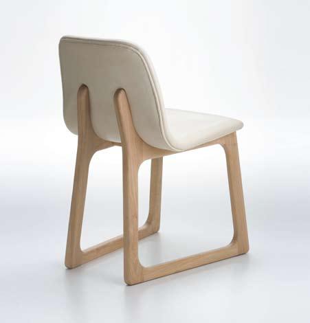
TILLER CHAIR The solid angled blades of this chair are reminiscent of the pre-industrial tilling plough from which the Tiller chair takes its name. The outer faces of the carefully engineered frame angle into the centre like a three-sided pyramid to achieve maximum strength, rossdidier.com / corporateculture.com.au
CASpIAn & poRToBELLo These two new Australianmade fabrics for window coverings have been sanitised for optimal hygiene, making them perfect for allergy sufferers, or in children’s bedrooms. Sanitised blinds discourage dust mites, mould and mildew, luxaflex.com.au / hunterdouglas.com.au

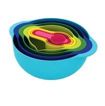
nEST 8 Eight essential kitchen items designed to stack together and occupy the minimum amount of space. The bright kitchen collection is the recipient of a red dot 2009 award, josephjoseph.com
BELLA VISTA This vibrant rug is part of the Bella Vista collection at Designer Rugs. Each rug in the collection is designed in Australia and hand-tufted in New Zealand wool, designerrugs.com.au

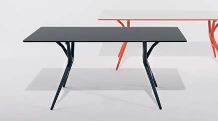
Spoon TABLE A folding table characterised by its extreme lightness and practicality. The structural surface is made of honeycomb aluminium and is only 15mm thick. The thermoplastic legs are easy to fold, making it perfect for small living spaces. Spoon Table comes in three sizes and a variety of colours, kartell.it / spacefurniture.com.au
25
02 05 06
04 03

26 habitus 06 living design news
09 07
FLIn T Equally at home at a casual, outdoor BBQ or a fine dining room, Flint is a versatile dining setting designed by Ross Gardam for Tait. Available in dark Spotted Gum with slatted tops for exterior use (pictured) and White Birch with solid timbers for interiors, tait.biz
08
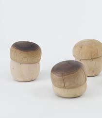
FUnGo Designed by Paola Navone for Riva 1920, these whimsical mushroom-shaped stools look as if they have sprouted in an enchanted forest. Each stool is solid timber, with a Cedarwood base, and the option of a Walnut or Cedarwood seat, riva1920.it / fy2k.com.au
habitusliving.com
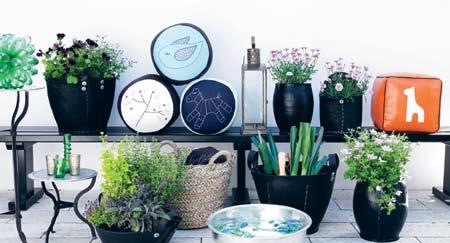
DACARR BASKETS These versatile baskets are handmade from recycled car tyres cut to shape and hand-stitched together to create a variety of forms and sizes. The eco-friendly vessels can be used as planters outside, but can also be used as storage both indoors and out, nordicfusion.com.au
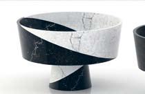
MARBLEWooD A collection of eight sculptural components that can be assembled to create a variety of serving bowls, candleholders and candelabras, materdesign.com / corporateculture.com.au
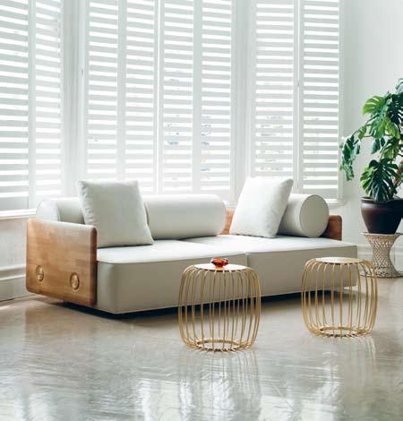
DECo SoFA Autoban have taken a modernist approach to Art Deco, with a focus on geometric forms and clean shapes. Deco Sofa has a large seating area and is available with Walnut or Oak timber panels and fabric or leather upholstery, autoban212.com
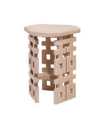
FoRTUnE STooL This seat is supported by the Chinese symbol of double happiness used at wedding and New Year’s celebrations, maoandmore.com
KIRIKABU The green bug has bitten JVC, who have created these personal speakers that double as plant holders. In the form of tree stumps, the Kirikabus can be connected for a rich audio experience, jvc.com
EBon Y Drawing on emerging design trends seen at Milan Design Week, the Ebony Kitchen Collection is dark and seductive. The black finish of each piece gives a new edge to white goods, electrolux.com.au

LEAF SWInG The delicate veins of leaf are traced and make up the playful yet sophisticated seat of this grown-up swing. Revert to your childhood for just a few moments as you rock back and forth in your surrounds, enea-studio.com
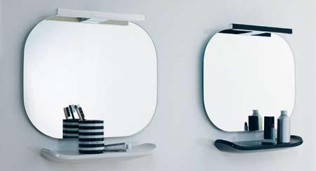
MIMo This complete bathroom range from Laufen combines curvaceous shapes in pink, white or black with compact design and environmentally-friendly materials. The recipient of a red dot 2009 award, mimo was developed with small dimensions in mind, laufen.com / bathe.net.au
BABUSHKA LIGHT Capturing the familiar nesting shapes of Russian Babushka dolls, these ornamental lights are made from blown glass and Perspex, and are highlighted by coloured LEDs, mathmos.com
27 living XX XX XX
XX 11
10 13 14
12
design news

CYCLopS For those searching for a relaxed alternative to the precise nature of minute and second hands, Cyclops uses a single black ring passing over coloured spots
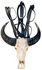
QUARA n TE Belgian eyewear label Theo revisits the 1960s with this collection of stainless steel and horn frames. The use of ethically-sourced water buffalo horn makes each frame unique, theo.be / scoogle.com.au

15 28 habitus 06
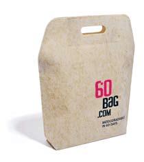
60BAG Made from flax-viscose non-woven fabric that doesn’t exploit natural resources and requires minimal energy during production, 60BAG naturally decomposes around 60 days after being discarded, 60bag.com
to mark the hour, mrjoneswatches.com
16 17 18 work + play
habitusliving.com
5o Designed by Tomás Alonso for Nils Holger Moormann, 5o is a three-legged family made up of high and low narrow stools and a tabletop supported by two trestles. The Oak set with distinctive red braided rope is easily folded away, making it perfect for small or multi-use spaces, moormann.de / smow.com / corporateculture.com.au
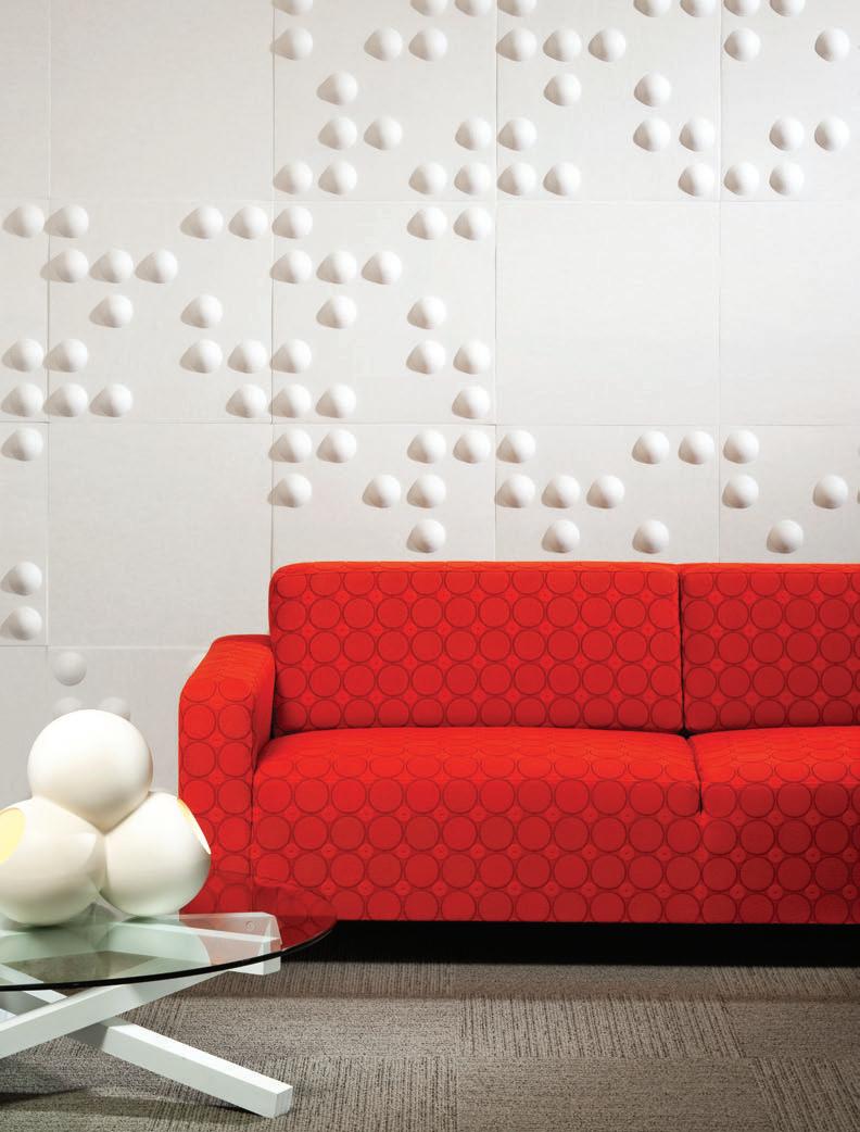
EchoPanel®Tile, the next generation in sustainable 3D wall tiles from Woven Image. wovenimage.com VERTICAL SURFACE: ECHOPANEL ® TILE 909 CHAIR: UPHOLSTERED IN KNOLL TEXTILES GIBSON MARASCHINO “THREE 7S COFFEE TABLE” BY CIRCA+ONEHUNDRED PO/0129 LAMP FROM CAPPELLINI @ DEDECE PHOTO: PAUL GOSNEY
design news
baby + child
SHApEMAKER Harking back to a time when kids brought toys to life through their imagination, the awardwinning Shapemaker is a set of 25 colourful, handprinted Rubber wood blocks with endless geometric possibilities, millergoodman.co.uk

K noLL KIDS Why should design classics come only in adult sizes? Isamu Noguchi’s Cyclone table and Bertoia’s Diamond chair have been scaled down as part of a collection of modern furniture for a younger generation by Knoll, knoll.com / dedece.com

KIDDIMoTo A

for kids designed to be an early introduction to two wheels.
has no pedals or stabilisers, helping young children learn to balance,
 pARADISE TREE The bold and playful design of this colourful hanging tree is sure to brighten bedrooms and engage the imagination of kids of all ages, magismetoo.com / ecc.com.au
21 22 23
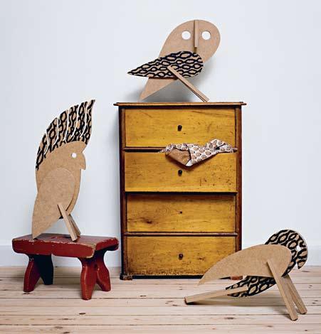
BIRDS A few simple pieces slot together to create the beautiful shapes of these cockatoo, barn owl and hawk MDF toys. Paint and decorate the birds to make them completely unique, ourchildrensgorilla.com / wannekes.com
30 habitus 06
Ducati
The timber bike
kiddimoto.com.au
20 19
habitusliving.com

The World’s Purest White Pure White. One of nine new colours. Im a gine the Diff er ence For our latest brochure phone 1300 119 119 www.caesarstone.com.au
ThE GREAT divide
01
Nomad System
Designed by Jaime Salm & Roger Allen Mioculture mioculture.com
RRP USD$56
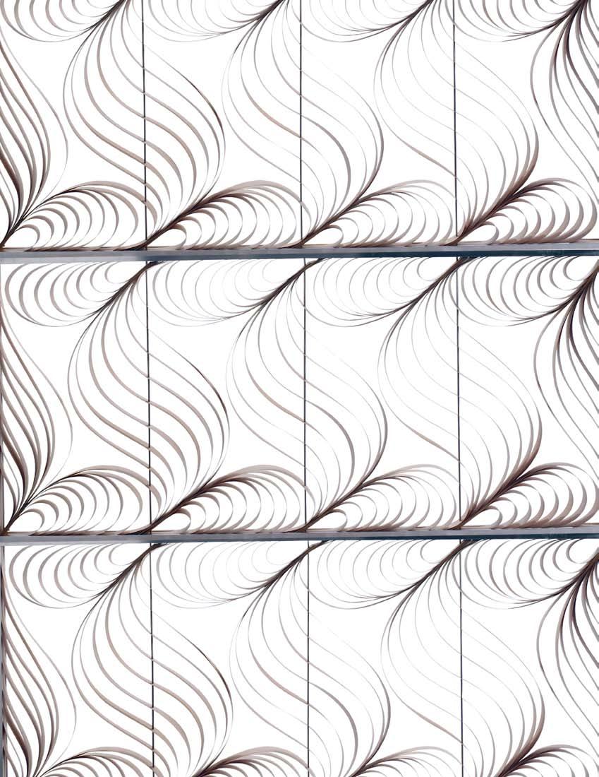
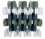
01 Inspired by nomadic lifestyles and a desire for flexible space, NOMAD is a modular system that can be assembled into free-standing, sculptural screens, temporary partitions and even rooms. The recycled, double-wall cardboard pieces are available in nine colours.
02
Paisley Screen Designed by Luis Eslava Studio LZF / KE-ZU lzf-lamps.com / kezu.com.au

RRP AUD$2,870, AUD$5,739 inc GST
03
Dunes Designed by Outofstock outofstockdesign.com
Prototype
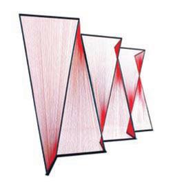
03 Thick elastic cords are woven within an inversetriangulated steel frame to create a screen with rich colour gradients that define semi-private spaces. DUNES can be combined to form a continuous linear partition.
04 Clouds Designed
RRP

habitus 06 re-shoot
04 A standing screen, a hanging screen or a wall-hung installation, CLOUDS is a sophisticated tile concept that evolves as you add to it. Bi-colour tiles are joined with specially designed rubber ribbon, so you can easily arrange and re-arrange the tiles in an infinite number of ways.
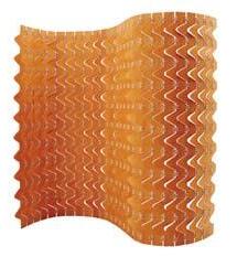
02 A modern twist on traditional paisley, the curving shapes in this screen cast intricate shadows that change with the light. The sinuous shapes are made possible by Polywood, a flexible veneer material.
by Ronan & Erwan Bouroullec for Kvadrat kvadratclouds.com / bouroullec.com
from AUD$630 inc GST (for pack of 8 tiles)
habitusliving.com 32
05
Softblock
08 Piasa
06
Little People
Contemporary screens
07 Honeycomb
33
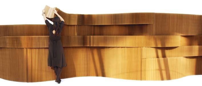
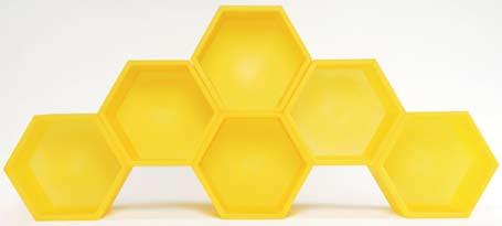
07 This flexible shelving system makes the perfect room divider. The strength of the honeycomb structure allows for stacking up to seven metres in two directions, and for the removal of units within a built wall to create ‘windows’.
Designed by Molo molodesign.com RRP from USD$250
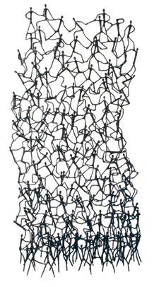
06 Hundreds of little hand-bowed metal figures coated in salago fibre clamber over each other to form this playful screen. Filipino designer Kenneth Cobonpue is known for his use of locally-sourced organic materials and handmade production techniques.
are more than just decorative – from modular walls and shelving to sculptural installations, these screens are dividing the rooms of today.
Designed by Godoylab godoylab.com
RRP USD$2,400, USD$2,900
Designed by Clive Wilkinson & I.D. Quinze & Milan / Corporate Culture quinzeandmilan.tv / corporateculture.com.au
RRP AUD$449 inc GST (per unit)
Designed by Kenneth Cobonpue for hive kennethcobonpue.com / h-i-v-e.com / kezu.com.au RRP from AUD$1,637 inc GST
05 Part of the permanent collection at MoMA in New York, SOFTBLOCK is a flexible, freestanding partition system made from stiff robust kraft paper. The pleated, cellular structure is easily manoeuvred and dampens sound.
08 Part of Godoylab’s knitted furniture family, the Beechwood pieces of PIASA are joined with cotton rope in such a way that they can freely rotate to create different profiles, and can be manufactured in any length.

17 Thurlow Street East Redfern, Sydney +61 2 8399 1644 www.fy2k.com.au info@fy2k.com.au
PALERMO Table, Ferruccio Lavani MODULAR Credenza, Giuseppe Vigano KIA Chair, Ferruccio Lavani
Emmemobili Made in Italy
For more from Emmemobili’s extraordinary catalogue, simply visit the FY2K website
A new appreciation
around the globe, an American art collector was determined to obtain one such striking example and finally did so last year at auction for $36,000.
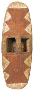
The refined aesthetic found in the broad shields and parrying shields of southeast Australia are often replete with finely engraved traditional motifs. Earlier examples were incised with pre-contact tools such as possum jaw engravers and now attract the attention of art collectors. The National Museum of Australia acquired two shields last year, both stone carved and superbly engraved using traditional tools.
Indigenous artefacts
Elegant interiors in Paris and New York have displayed contemporary art and furniture alongside African and Oceanic sculpture since the early 20 th Century. Australian indigenous artefacts are also no longer purely in the realm of ethnographic or ‘tribal’ art collectors.
In recent years, these artefacts have started to be appreciated for their aesthetic and artistic merit as much as their historical significance. This has seen a new wave of art collectors and art museums, including major state and national art galleries, competing at auction with Australian and international art collectors.
Indigenous objects from all over Australia, such as shields, engraved spear throwers and pearl shell pendants from the rainforest area, broad shields from southeast Australia, and Wunda shields, dilly bags, bi-cornual baskets, boomerangs and fighting clubs from west Australia, are now displayed in the company of other exceptional contemporary and traditional Australian and international art.
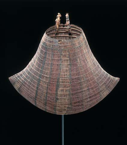
Amongst the most sought after artefacts are those produced by the rainforest peoples of northeast Queensland. Jawun, or bi-cornual baskets, were made by men using Lawyer cane
and used by women for a variety of purposes ranging from carrying babies to collecting food and catching fish. The baskets are deceptively strong and prized for their elegant construction. In 2005, the National Gallery of Australia purchased a magnificent Jawun (remarkable both for its large size and highly exaggerated form) at auction for $24,400.
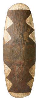
Similarly prized by collectors are the large fighting shields from the same region. Each large shield is painted with traditional bold designs in yellow, white and red earth pigments, outlined in black charcoal. The different designs each carry totemic meaning and were given to the owner at the time of his initiation to be painted onto his shield from then on to give it protective qualities. Last year, one of these shields set a record price for an Aboriginal artefact at auction, when it sold for $84,000. The shield’s high price was in part due to its impeccable provenance and excellent condition, having been collected by Robert Stewart, a squatter, in the 1870s and housed in the family’s Scottish residence until 2007.
The Queensland shields from further south are characterised by bold, minimalist, almost ‘modernist’ traditional designs. Appreciated
Indigenous artefacts come in a wide variety of forms created for a broad range of uses. The variety of boomerang forms, for example, can be attributed to the variety of purposes the boomerang was used for: there are particular types for fishing, bird hunting, fighting and ceremonial use. Some of the forms have remarkable sculptural qualities and are often engraved. Despite this relationship between form and function, there is still much we don’t know about artefacts. An almost ‘bird-like’ hooked boomerang is of an exceedingly rare type, for which there is no recorded use known. The rarity of this particular artefact and its outstanding aesthetic qualities as a work of art led to furious competition by numerous bidders who pushed the price to $20,400 – a record for a boomerang at auction.
Unfortunately, many of the traditional skills required to make these artefacts have been lost. Since 1990, Michael Boiyool Anning, a North Queensland artist of the Yidinji people of the Atherton Tablelands region, has been instrumental in reviving the tradition of making shields and related artefacts. In 1998, he was recognised for his work, winning the Wandjuk Marika Award for Sculpture at the 15th Telstra National Aboriginal and Torres Strait Islander Art Awards.
Artefacts such as these represent both the day-to-day and ceremonial lives of the indigenous people of Australia. Many collectors are attracted not only by their magnificent form and design, but the cultural beliefs and history of one of the world’s oldest continuous cultures that are embodied in the artefacts.
35 habitus 06 conversation aboriginal artefacts
Text Tim
Photography © Sotheby’s
Klingender
Australian indigenous artefacts embody the beliefs of one of the world’s longest continuous cultures. Tim Klingender, Head of Aboriginal Art at Sotheby’s, looks at the new wave of art collectors who value the objects not only for their historical significance but their aesthetic and artistic importance.
come in a wide variety of forms created for a broad range of uses.
aboriginal artefacts

36 habitus 06 habitusliving.com conversation
02 01
02
03
03 01
Unfortunately, many of the traditional skills required to make these artefacts have been lost.
An exceptional bi-cornual basket (Jawun), from northeast Queensland.
Bold, minimalist designs on a shield from north-east Queensland.
A fine broad shield from south-east Australia.
You




FACT #2
From 2010, 6 star energy ratings will become mandatory for all new homes and major renovations. Now is not the time to leave your choice in windows to chance. With the right choice in windows you can have the home you want without sacrificing energy performance. For all the facts you need to know about windows visit SeeBeyondWindows.com ernmenT SeeBeyond is a trade mark of CSR Building Products Limited. DISEGNO VIR2845B
mAY noT rATe windows VerY highlY, buT From 2010 The goVernmenT will


DI LORENZO Pty Ltd Tile and Bathware Concepts ABN > 38 002 487 872 13-15 Lexington Drive, Norwest Business Park, Baulkham Hills NSW 2153 Telephone 02 8818 2999 Suite 48, 26-32 Pirrama Road, Jones Bay Wharf, Pyrmont NSW 2009 Telephone 02 9692 0542 (by appointment only) Unit 2, 37 Griffiths Road, Lambton, Newcastle NSW 2299 Telephone 02 4957 9925 sales@dilorenzo.net.au www.dilorenzo.net.au Inkredible 1212-08
Neoedonismo Collection

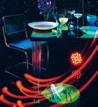
Photography Craig Wall Photography Assistant Justin Russell Styling Assistant Sarah Ellison dining inspiration in camera habitus 06 Entertain your way Imagine a new way of entertaining with three very different ways to dine. Styling Paul Hopper Production Andrea Millar Neon nights FROM LEFT: Drinks cabinet Pandora by Konstantin Grcic for ClassiCon, $6,298, from Anibou. Mirror 6 Gli Specchi Di Dioniso designed by Ettore Sottsass, $3,900, from Space Furniture. Bottle by Paola C, $165, from Hub Furniture. Jug Ananas, $209, from Genevieve Lethu. Coloured glass tumblers, $130 each, from Nachtmann. Decanter Flamingo, $635, from Riedel. Decanter Minima by Holmegaard , $135, from Jarass. 39

habitusliving.com habitus 06 in camera 40
Neon nights
FROM LEFT: Drinks cabinet as before, from Anibou. Chair Ami ami by Kartell, $355, from Space Furniture. Charger plate Black Mambo, $60, by Nachtmann. Coloured tumblers, as before, from Nachtmann. Napkins Easton Pearson, $175 (8-piece set), from Easton Pearson. Mobile phone Vertu Signature S Design in stainless steel, $19,100, from Luxury Goods Australia. Fluorescent lamps ultra slim designed by Geoffrey Mance, POA, from Mance Design. Pressed tin panels on wall POA, from Pressed Tin Panels. Paint on tin panels high gloss acrylic in Aniseed from Porter’s Paints.
dining inspiration
Neon nights
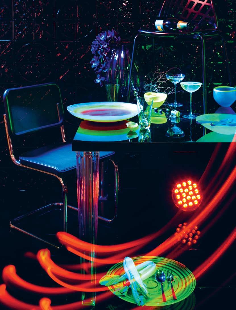 Dining table Top Top by Kartell, $3,595, from Space Furniture. Vase 2Lips by Holmegaard, $550, from Jarass. Chair Spiderwoman by Louise Campbell, $660, from Corporate Culture. Champagne Veuve Clicquot, $90, Mo ët Hennessy. Chair S 32 N Cantilever by Marcel Breuer, $1,155, from Anibou. Salad bowl Sunshine, $550, Small Spore Bowl, $110, Medium Sunshine Bowl, from $80, from Short Dew, Servers, $100, all by Dinosaur Designs. Tumblers by Dibbern, $25, from Chee Soon & Fitzgerald. Wine goblets La Sfera by Driade Kosmo, $82 each, from Spence & Lyda. Swizzle sticks Muddlers, $32.50 for set of 6, from top 3 by design. Platter Form by Andrew Baldin, $190, from Anibou. Servers Linea Q Noir by Sambonet, from $25, from Spence & Lyda.
White dining
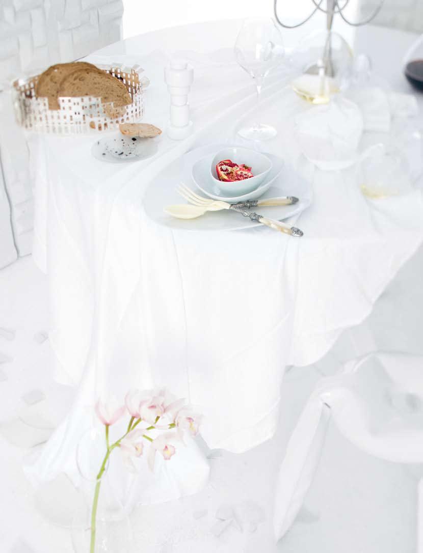
FROM LEFT: Dining table, as before. Flat dish small deep bowl and small shallow bowl as before, from top 3 by design. Serving set Paloma, $279, by Genevieve Lethu. Side plates Delicate shell, $60, by Dinosaur Designs. Salt grinder Muuto, $145, from top 3 by design. Decanter by Paola C, $180, from Hub Furniture. Napkin rings crystal by Genevieve Lethu. Shiraz glass, as before, from Riedel. Decanter Magnum O, $315, from Riedel. Silver plated brass tray by 100 Piazze Lucca, $1,760, from Spence & Lyda. Stool Plopp in white, $865 each, from Corporate Culture.
habitus 06 in camera
dining inspiration
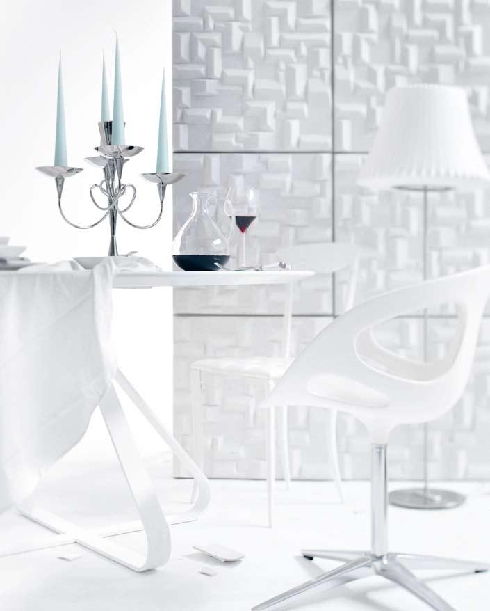
White dining
FROM LEFT: Acoustic panelling Soundwave Village, from $254 each, from Corporate Culture. Round dining table in white by Fjord, $6,550, from Hub Furniture. Chair Charme by Fasem, $1,390, from FY2K. Chair Rin, $1,591, from Corporate Culture. Floor lamp medium shade Lotus by Modernica, $1,180, from Spence & Lyda. Brass stand Matthew Boulton III by Driade Kosmo, $1,440, from Spence & Lyda. Cone candles, $14.50, from top 3 by design. Carafe by Paola C, $168 from Hub Furniture. Shiraz glass Vitis, $159 (set of 2), from Riedel. Colombina small deep bowl, $50, Colombina small shallow bowl, $45, Colombina flat dish, $169, all by Alessi from top 3 by design. Tablecloth and napkins restaurant quality cotton by Rapee.
Back to nature
habitusliving.com habitus 06 in camera 44 dining inspiration
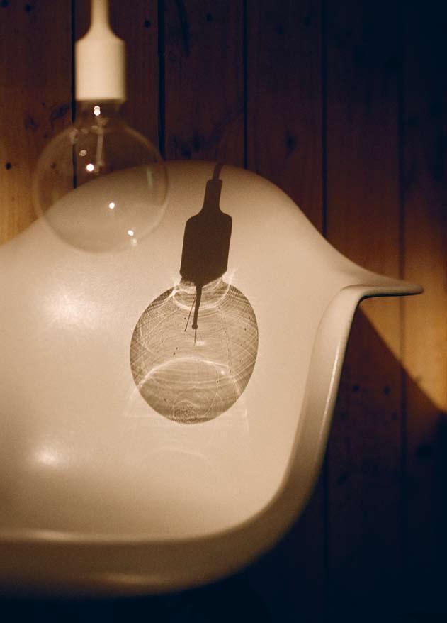
Chair white fibreglass armshell on walnut Prince Charles base by Modernica, $840, from Spence & Lyda. Pendant lamp E27 in white by Muuto, $158, from top 3 by design.
Back to nature
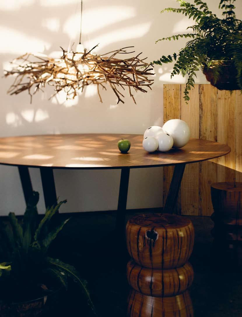
Pendant lamp Ghost Story designed by Geoffrey Mance, POA, from Mance Design. Round dining table by Atticus, $11,275, from Hub Furniture. Table base Jo Wilson, from $690, from Planet Commonwealth. Vase Pollen by Ligne Roset, $234, from Domo Collections.
Back to nature

46 habitusliving.com habitus 06 in camera dining inspiration
Dessert bowl Fish $60, fork Victoria, $45, spoon Victoria, $40, all by Driade from Space Furniture. Ceramic bowl with timber lid by Vincent Van Duysen, When Objects Work, $360, from Hub Furniture.
A CROSS-CULTURAL KALEIDOSCOPE OF the Region’s
MOST CREATIVE PEOPLE
habitus 06 2. people 47
high tea with mrs woo — NSW, australia
SISTER ACT
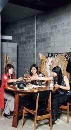
“Our grandfather used to say ‘You can’t have a stool with only two legs’. So it’s lucky our parents had three children, and we’re lucky that we work well together, balancing each other’s skills and weaknesses,” says Angela Foong, the youngest in the talented sibling design trio behind the fashion label High Tea With Mrs Woo.
Since first setting up shop in 2004, on Darby Street in Newcastle, there have been many ups and downs, daily disagreements, lengthy decision-making discussions, and the continuous stresses of juggling creativity and commerce. “But,” says Juliana, the middle sister, “at the end of every long day, we’re not just business partners, we’re sisters – we are family. It’s been such a great pleasure sharing the rollercoaster ride with each other, and we’re still on it.”
When working with family, the best things can also be the worst. “We are completely reliant on each other, trusting, obligated, supportive, committed and connected in almost everything we do,” says Rowena, the eldest.
“We’re best friends but we can also be each other’s worst enemies,” adds Juliana.
The Chinese Malaysian-born sisters and their parents immigrated to Australia in 1988, setting up home in Newcastle, where Rowena and Juliana studied graphic design and visual communication, and Angela undertook a double degree in economics and commerce. This combination of creative and business training means their quirky east-meets-west aesthetic is complemented by a savvy business model that targets the quality end of the bespoke market. “None of us had any formal training in fashion, so we’ve grown our label in a very organic way, learning as we go and developing our business slowly, but we’ve always been very resourceful,” says Angela.
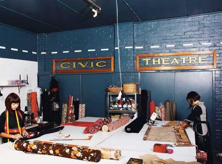
The sisters’ interest in fashion began when they were students working part-time in a vintage clothing store, where they began reworking retro garments into more contemporary cuts. An enterprise that started as a hobby in a rumpus room-cum-cutting room in their Newcastle family home eventually moved into a studio workshop in Hamilton. This warehouse space is where the trio think, draw and create.
Each High Tea With Mrs Woo collection is inspired by the sisters’ love of travel and cinema, exploring themes of nostalgia, romanticism and journey. The label also celebrates the handmade. Traditional tailoring techniques and antiquated prints are paired with natural fabrics – cotton, linen, wool and silks – that evoke an understated luxury. Surplus fabric never goes to waste, but is salvaged and used in their object designs.
The sisters’ focus is to make charming, thoughtful and everlasting designs, and they achieve this by expressing whimsical moments as conventional shapes re-told. This is a process that allows the sisters to tell stories and weave memories with yarn. It seems to be a winning formula, and their popular Darby Street store has a loyal following.
High Tea With Mrs Woo has shown runway collections at Shanghai fashion week and Australian Fashion week (both Sydney and Melbourne), and had their signature designs on display in formal exhibitions at the Victoria & Albert Museum in London, the Anne & Gordon Samstag Museum of Art in Adelaide, and
48 partnership habitus 06 habitusliving.com
Text & Production Mary
Photography Nick Bowers
Temelovski
High Tea With Mrs Woo is a fashion label originally out of Newcastle run by three sisters. Mary Temelovski explores how the trio has worked together, with the help of their partners and family, to create the popular label.

high tea with mrs woo — NSW, australia
Object Gallery in Sydney. In April this year they opened their second store in the long established retail mecca of Oxford St, Paddington.
“We’re in such a great community here,” says Rowena. “There are so many interesting locals who live and work around here. This part of Paddington is such a great mix of art students, teachers and craftspeople.”
“We’d always loved this shop and its position, so when it became vacant, we thought why not give it a go?” explains Angela of their decision to expand their fashion business in a market that’s been difficult to judge. “It’s been a challenge, but we didn’t want to regret not taking the chance.”
”The new store,” says Juliana, “is a merchandiser’s dream come true. For as long as I can remember I have imagined playing shop. Now it’s not just one shop but two. All it took was three crazy sisters, three insane partners and one dedicated Mum and one Dad to design and build everything from scratch. I can’t imagine a more perfect place to complement our label and what we represent.”
The “three insane partners” are also immersed in design-related fields – Rowena’s boyfriend, Sean O’Connell, is a jeweller; Juliana’s partner, Ben Gallagher, is an industrial designer; and Angela’s boyfriend, Matthew Travis, is an architect. They all played a major role in helping set up the new premises. Sean was recruited for all the metal work, Ben to design the shop fittings, and Matt to create plans for the new layout. After ripping out the space’s previous fit-out, they spent two weeks scraping wallpaper off walls and the next month travelling between Newcastle and Sydney on weekends, with carloads of tools and equipment.
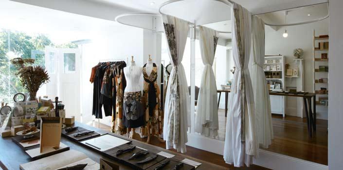
The interior of the new inner city retail store was inspired by a “love of old pieces, furniture and antiques that we’ve collected over the years,” says Angela. “We cut up a lot of the pieces and put them back together. We’ve included an old carpenter’s work bench as a counter and we’ve got an old mantelpiece, a kitchen cupboard, a wardrobe and some desks.”
The new store also features a glass wall looking onto Jacaranda trees that provide a serenely peaceful and natural backdrop. Earthy dark wood is contrasted with an industrial touch, and intricately crafted objects, jewellery, and stationery are elegantly displayed alongside High Tea With Mrs Woo garments in a space that combines the old with the new.

50 partnership habitus 06 habitusliving.com
“At the end of every long day, we’re not just business partners, we’re sisters.”
02
JuLIANA
01
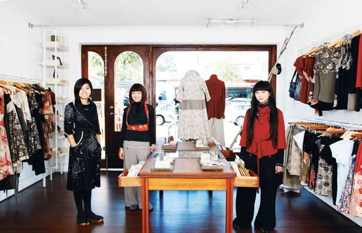
(l-r) Rowena, Angela and Juliana.
02 The Paddington store showcases the sisters’ love of vintage.
03 Juliana arranges a postcard display at their design studio.
04 Angela, Rowena and Juliana at the Darby Street store in Newcastle.

51
03 04
high tea with mrs woo — NSW, australia
“We wanted the Paddington shop to have the same cosy and inviting feel as our Darby Street store. But here the ceilings are much higher, so we’ve adapted our look a little to suit this modern setting. It’s all about creating a feeling,” explains Angela.
“Our new Sydney store is a natural and strong step forward for our label. It has a warm, beautiful energy and light,” says Rowena. “We’ve handmade it and filled it with all the things we love and that we want for ourselves.”
highteawithmrswoo.com.au info@highteawithmrswoo.com.au

52 partnership habitus 06 habitusliving.com
JuLIANA 05 Bespoke tailoring is an important part of the sisters’ label. 06 The Paddington store interior is a mixture of old and new. 05 06
“We’re best friends but we can also be each other’s worst enemies.”
6/ 2-6 Waltham Street Artarmon NSW 2064 t: +61 2 9460 9222 f: +61 2 9460 6599 e: sales@pelleleathers.com.au www.pelleleathers.com.au Environmentally responsible – Naturally!
54 partnership habitus 06 habitusliving.com
tea
mrs
high
with
woo — NSW, australia
ROWENA 08 07 07 Rowena and Angela at work in the sisters’ industrial Newcastle workshop. 08 Supportive family have encouraged the sisters’ creativity.
STORE
Darby Street, Cooks Hill
2) 4926 4883
STORE
Oxford Street, Paddington
2) 8065 5345
“We are completely reliant on each other, trusting, obligated, supportive, committed and connected in almost everything we do.”
NEWCASTLE
74
(61
SYDNEY
72b
(61


MOVING BY CARLO BIMBI
a mechanism allowing seat cushion adjustment relax sit recline
SYDNEY 2/30 – 32 Beaconsfield Street, Alexandria (61 2) 9690 7100 MELBOURNE B2 – 8 Rogers Street, Port Melbourne (61 3) 9646 8611 kfive@kfive.com.au www.kfive.com.au
With
rest.
A top chef uses the finest ingredients to create an excellent meal. An architect turns them into a kitchen.
The difference is Gaggenau.
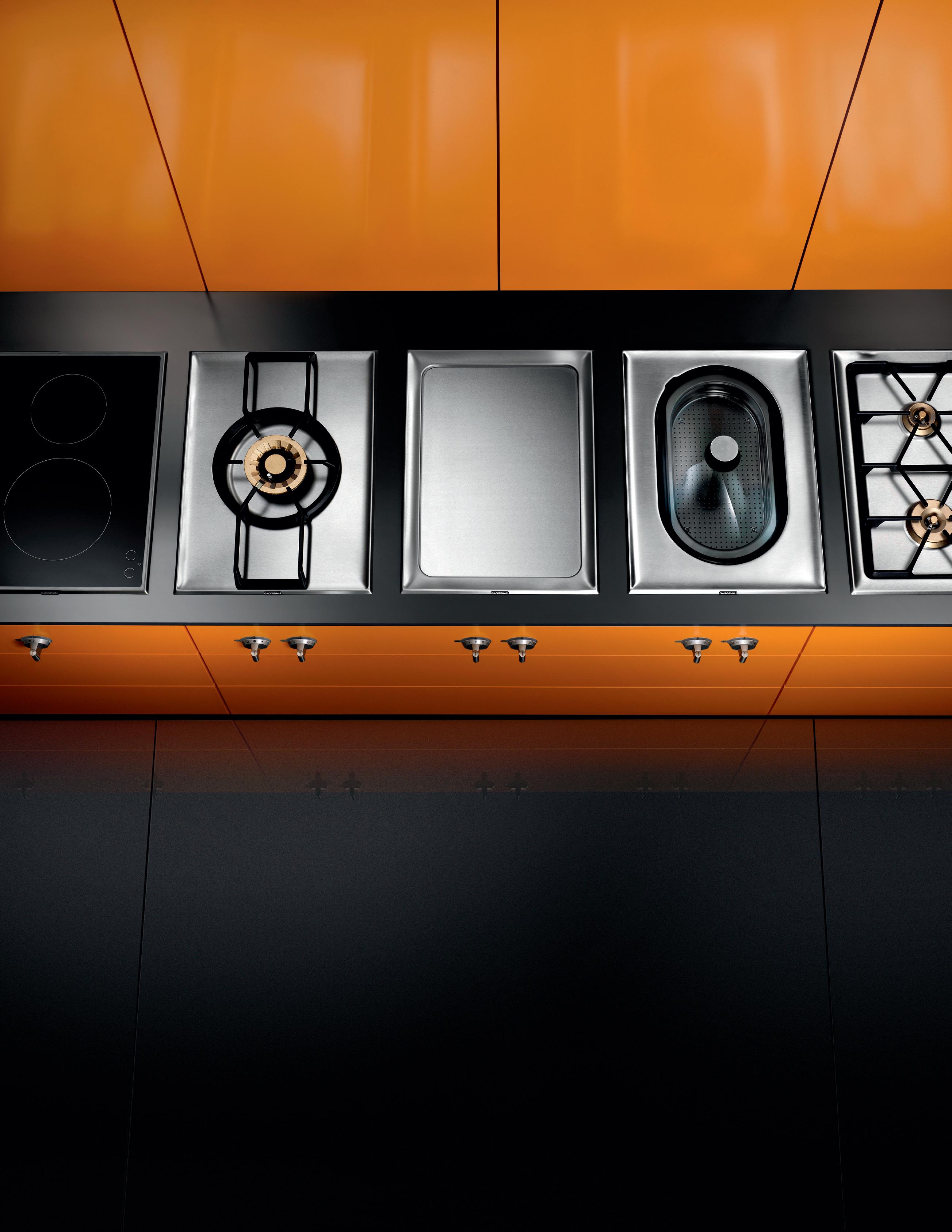
We have been making the Vario cooktops 400 series for more than 30 years. During this time, technology and design have progressed constantly. Each of the appliances brings state-of-the-art professional technology into the home. They are all perfectly matched and can be combined as desired.
Visit one of our national showrooms to discover the strikingly beautiful world of Gaggenau.
To arrange an appliance demonstration or to locate your nearest retailer phone 1300 727 421 or visit www. gaggenau.com.au
Art, Design and a Dinosaur
Dinosaur Designer, Stephen Ormandy, revealed his true origins as an artist when Nicky Lobo asked whom it was that inspires him.
57 inspired habitus 06
Chris Chen Text Nicky Lobo
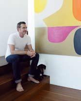
stephen ormandy — NSW, australia Production Andrea Millar Photography
After almost 25 years of creating, the trio behind Dinosaur Designs hardly needs an introduction. Their name has become synonymous with contemporary Australian design, and the prolific collection of jewellery and homewares produced since their first experiments with resin in 1986 are testament to their relevance and longevity.
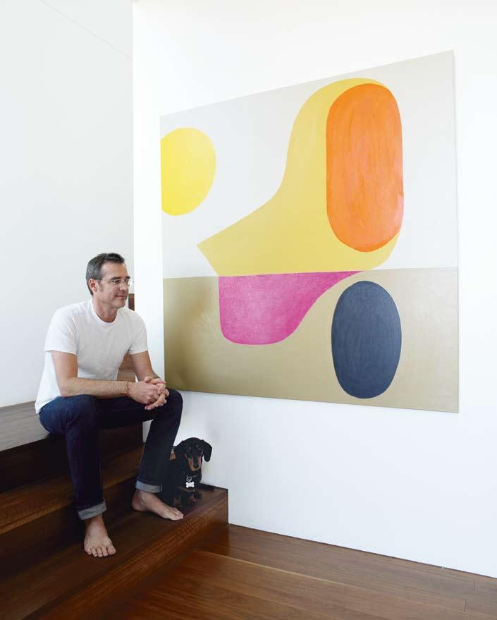
Stephen Ormandy is the intriguing male counterpart to the glamorous duo of Louise Olsen (his partner, with whom he has a child) and Liane Rossler. But he brings a particular element to the group dynamic that is expressed in his individual creative endeavours.
Art has recently returned to the forefront of Stephen’s creative psyche. After graduating from art school and due to the growing popularity of Dinosaur Designs, “there was a period of about eight years of not painting,” he remembers.
Then, about five years ago while drawing with his daughter, Camille (now 10), he “suddenly realised something was missing”. This simple and intuitive act became the ‘seed’ of this return to painting. These crudely cut paper squares he coloured that day hang on the wall of his studio today as mementos of this turning point.
Perhaps this realisation was also inspired by two of Stephen’s favourite artists. Introduced
01
One of Stephen’s paintings hangs at the entry.
02
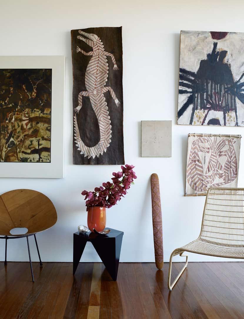
A diverse collection of tribal, modern and classic design and art find harmony in Stephen and Louise’s home.
03
Tools of the artist’s trade.
04
Form and colour are celebrated in every corner.
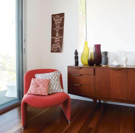
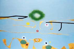
to the work of British artist, Victor Pasmore, there was an instant attraction – “I saw his work in an art catalogue for an auction, and the minute I saw these images, I thought – ‘Wow, look at that. Who’s that? What’s going on?’ So I went straight down there to the auction and I just had to have them.”
The series of five paintings he purchased that very day is hung on the wall across from the dining table, where he and his father-in-law, painter John Olsen, “sit and talk about them for hours,” says Stephen.

It is clear that Pasmore originally followed the Impressionist school, before experimenting with abstraction, which he pioneered in Britain (he also had an interest in architecture). Turning the pages of a long-sought-after Pasmore tome, Stephen explains the development in style: “Most people thought he was crazy to do this abstract stuff after his impressionism stuff. But it was so bold. I love that.”
Some might say that Stephen’s recent refocusing on his own art practice is just as bold, but it’s “all one expression” to him. The move is not exactly out of the blue – he is a trained artist deeply connected to the Olsen creative dynasty, which includes his partner, Louise, her brother, gallery owner Tim and their father, John.
For Stephen, the creative process for his art and his design is quite similar, the difference being that Dinosaur Designs is a planned team event whereas with his own painting, “spontaneity and the unconscious play a large role,” he says. Looking at the developing works, echoes of the Dinosaur aesthetic are clearly recognisable and
59
04 03
he admits that his own art and Dinosaur Designs work “inform each other.”

Finnish designer and artist, Tapio Wirkkala, is a similar character in terms of crossing creative boundaries – in fact Stephen sees him as “an older version of where I’m headed.” His works range from exclusive glass sculptures in galleries to industrial concepts with a significant commercial run, such as the Finlandia vodka bottle, iittala’s Ultima Thule glass range, and the Finnish currency, the markka banknote (in use until the changeover to the Euro in 2001). In all Wirkkala’s works, Stephen says, there is a particular aesthetic – “like that Aboriginal concept of songlines, the handing on of tradition, those threads that join the dots.”
Stephen enjoys the way that Wirkkala “took his sculptural sensibility to the everyday”, an approach that also characterises Dinosaur Designs. Stephen sees people as being like bowerbirds, that industrious and selective Australian native species that search for bits of blue to decorate their home. “We as a human culture have an interest in things aesthetically pleasing to us, in putting things together. Of course, a salad bowl has to hold salad, but if it can also look sculptural and beautiful, why not?”
Stephen has a refreshing take on Australia’s design culture. “I think it’s pretty dynamic here. We’re lucky that modern Australia doesn’t have a massive cultural cloud looming over the top of us. It’s liberating – there’s a certain freedom. Imagine the pressure of being an object designer in, say, Scandinavia.”
This optimism permeates all that Stephen does and he has an organic approach to creativity and life. He searches out inspiration relentlessly, this eternal hunt a joyful sacrament of the soul – “There are all sorts of new discoveries ahead, whole new worlds. That never stops.”

60 inspired habitus 06 stephen ormandy — NSW, australia habitusliving.com 05 Stephen in his lightfilled studio. 06 A work in progress by Stephen. 07 A wall of Stephen’s work, including the drawings that mark his return to painting.
05 06
This optimism permeates all that Stephen does and he has an organic approach to creativity and life. He searches out inspiration relentlessly, this eternal hunt a joyful sacrament of the soul.

07
61

“ There are all sorts of new discoveries ahead, whole new worlds. That never stops .”
STEPHEN
Tapio Wirkkala
Tapio Wirkkala gained international recognition in the years following the Second World War.
Born in Finland 1915, he worked across the disciplines of design, art, graphics
and sculpture, often inspired by nature. over his lifetime, he created a prolific amount of artworks and products, many of them expressing his own craftsmanship and a deep and natural
understanding of materials and forms, from everyday items to intricate glassworks. Wirkkala’s creations are part of many prestigious design collections around the world.
His simplified abstracted aesthetic is one thing. But it is his ethos, an unashamed enthusiasm for design and for life, that are the songlines of this particular bowerbird.
Tim Olsen Gallery is showing an exhibition of Stephen Ormandy’s work from February 2010. The new Dinosaur Designs Moon range is launching in Winter, 2010.
Dinosaur Designs, dinosaurdesigns.com.au
08
The dining table faces a series by Pasmore.
09

Sculptures by Tapio Wirkkala in Stephen and Louise’s home.
10
The Garden of eden –Blue Symphony, 1981, Victor Pasmore.
VicTor paSmore
Born in 1908, Victor pasmore became interested in painting, especially French impressionism and British watercolours. elected a member of the london artists’
association in 1933, he then founded an art school and devoted his time to painting and teaching. in 1947 he began to experiment in purely abstract form based on cubist collages and geometric
figures. He continued to be actively involved in art education until his death in malta in 1988 and is still recognised as one of the most influential abstract artists in Britain.

joker light peg light bolas wallpaper Tres Tintas Wallpaper Mil Caras by Javier Mariscal www.funkis.com +612 93650573 office@funkis.com HAB6_Funkis.indd 1 30/9/09 8:39:12 AM 09 10
63
of Essentials New York| London | Munich | Paris | Moscow | Shanghai | www.porsche-design.com | www.poggenpohl.com a la Carte Design, 118 Edgecliff Rd Woollahra NSW 2025, tel: 02/9369 1766, fax: 02/369 1765, www.poggenpohl.com.au 9
The Engineers
 Porsche Design kitchen ß7340
ann pamintuan — Davao City, philippines
Metal Morphosis
For some, design is a conscious ambition, something aspired to over a lifetime of work. But for former housewife and Filipino, a nn Pamintuan, the transformation into object and furniture designer and global exporter was more organic. aya Maceda discovers how a nn is gilding a new creative future for her native country.
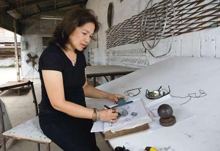
I happened to chance upon Filipino designer, a nn Pamintuan’s name on my recent trip to the Philippines when her jewellery collection, ‘a nntiu.a lchemy’, was on exhibit at the Yuchengco Museum in Manila. What caught my attention was my discovery of her as an internationally-awarded designer, not only for her jewellery, but also for her furniture creations which art curator, Sonia Ner, wrote about for the exhibition. t he published interview chronicled a nn’s transformative journey as a designer from gilding twigs and leaves into jewellery to creating furniture from cast metal. It revealed that she never studied art, was a business graduate, became a housewife, and began crafting jewellery as a hobby.
Since expanding her imagination to designing furniture, she has become a leadinng force of Philippine Moderne, the new generation of Filipino designers. For her successful design, production and export business, t he Gilded expressions, a nn works hard metal into delicate
modern expressions in the form of jewellery and furniture. She started t he Gilded expressions as a small entrepreneurship project in her humble garage, and it was this compelling narrative I wanted to explore further and discuss with her. a nn is best known for her intricately crafted and sculptural Cocoon furniture series, which launched her name on the international design scene. t he long list of international and national design awards she has received since is testament to her success and she has had global accolades bestowed upon her in tokyo, New York and other design capitals worldwide. In 2000, she became the first asian female designer to be included in the prestigious annual publication, international Design yearbook a nn Pamintuan may have progressed into the art of metal casting furniture relatively late, but her story as a designer began when she was a child of Chinese heritage growing up in the province of Surigao, on the northeastern tip of the large island of Mindanao that lies in southern
Photography Wawi Navarroza
66 habitusliving.com
creation habitus 06
Text aya Maceda
01
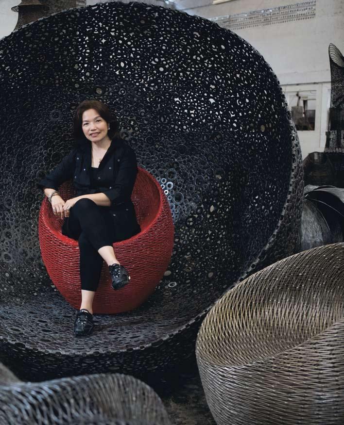
ann Pamintuan sitting amongst her award-winning Cocoon chairs.
67
68 habitusliving.com
habitus 06
creation
02
ann pamintuan — Davao City, philippines
Philippines. t he myriad colours, shapes and textures of trees and flowers in the dense forest that was within her reach had always fascinated her. t his fascination with nature was further enhanced when she moved to Davao City, in the south-eastern part of Mindanao. Caught between the highest peak in the Philippines, Mt. apo, and the Davao gulf, Davao is blessed with a typhoon-free climate, virgin forests filled with varieties of hardwood and wild fragile orchids, fertile soil for fruits and flowers, and rich marine life. It is populated by migrants from indigenous cultural communities, conflict-torn areas of Mindanao, and other islands of the country, making it a natural site for the convergence and exchange of diverse cultures.
a self-trained designer
With no formal training in art or design, except for simple ikebana lessons to introduce her to composition and clean lines, but equipped with inherited design instincts from her father (an avid collector of shells, old coins, local exotic plants and old timber), a nn’s pursuits in design began as a hobby. During her spare time as a housewife, she started making accessories by electroplating exotic flowers and roots. “It was after I successfully plated a termite-eaten piece of wood that I knew I could venture into sculpture,” says a nn. t he scale of her design experiments grew as her

69
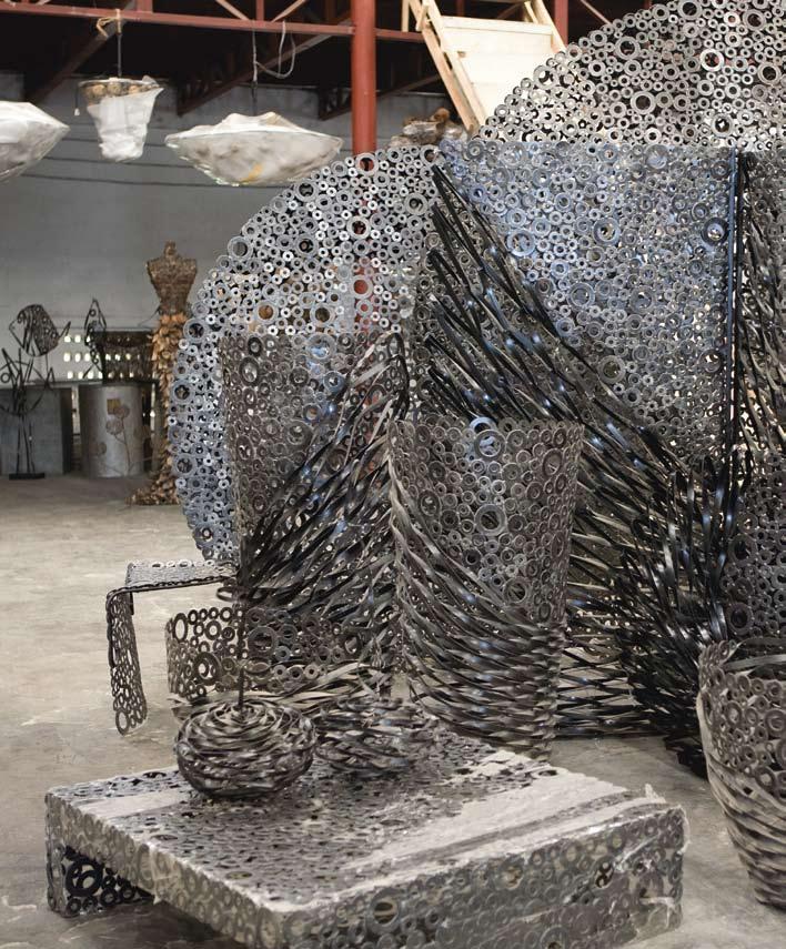
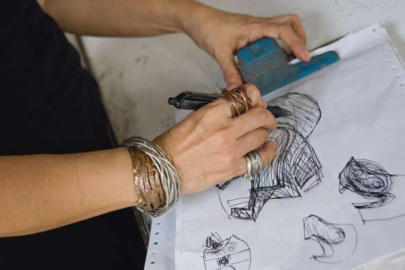
02 Pieces from ann’s Oxygen Collection. 03 a sketch of ann’s work in progress. 04 anntiu.alchemy bracelets. 03 04
...her well-crafted, intricate and sculptured Cocoon furniture series... launched her name on the international design scene.
Zip HydroTap® at home. Imagine. Imagine. No more waiting for water to boil. No more bottled water to buy. Zip HydroTap gives filtered boiling water and filtered chilled water instantly. For a free quotation call 1800 42 43 44 or visit www.zipindustries.com The terms ‘HydroTap’ and ‘Zip’ are trade marks. Instant Boiling Water
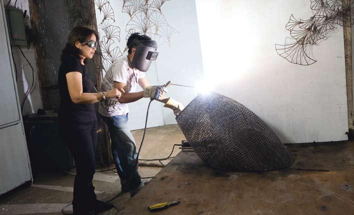
confidence in playing with welded metal and her understanding of its malleability increased. She progressed into designing chairs, lounges, wall art and large vases.
It is her respect for and understanding of metal and the inspiration she constantly draws from nature that have influenced her design direction. ann’s personal background has very much to do with this. Her fascination with metal as the fifth element is strongly rooted in her Chinese heritage, while her understanding of its properties comes from lessons gained from trial and error.
“My creations are expressions of life’s raw elegance,” she says.
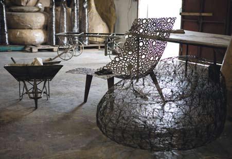
a nn took the essence of a bird’s nest and welded metal to form the simply-shaped Cocoon chairs. t his collection defies the cold, heavy and hard character of metal with undulating forms that appear to flow, breathe and bend. t he beautiful and sculptural pieces are simple in form but complex in texture. Her chairs come with a variety of accompanying cushions to give greater comfort and playfulness and to serve as a separation from the cold material.
Despite metal’s formidable characteristics, a nn manages to manipulate metal in a way that exudes strength within delicate organic forms parallel to the structure and aesthetic complexity of nature.
71 creation habitus 06
ann pamintuan — Davao City, philippines
05 Welding process in the workshop.
05 06
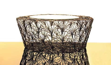
06 Ginko coffee table.
>> MOROSO SPA
CAVALICCO/UDINE/ITALY
T +39 0432 577111
INFO@MOROSO.IT
WWW.MOROSO.IT
MOROSO AVAILABLE EXCLUSIVELY AT HUB FURNITURE
LIGHTING LIVING
>> MELBOURNE 63
EXHIBITION ST MELBOURNE
T +61 3 9652 1222
>> SYDNEY 66–72
RESERVOIR ST SURRY HILLS
T +61 2 9217 0700
WWW.HUBFURNITURE.COM.AU
>> SHANGHAI TIP >> ANTIBODI BY PATRICIA URQUIOLA
PHOTO ALESSANDRO PADERNI AD DESIGNWORK
Context
t he forms, workmanship and details in a nn’s furniture echo local skills. t hey seem to defy the heaviness of metalwork and reflect the lightness of local Philippine furniture typically woven in abaca (the hemp plant) or rattan.
“ t he design is fluid, every piece of metal intertwining with one another. You cannot see the beginning or the end,” says a nn. “It seems to go on like infinity. Somehow, my designs reflect the situation in Mindanao, ever complicated, yet there are pockets of air, pockets that seem to give the eye spaces... that we are open to change.”
Her art reflects the very site of her workplace, Davao City, a metropolis that is like a patch of peaceful land, fertile with hope and brimming with creativity in the midst of the decades-old conflict on the southern island of Mindanao.
Her organic metal furniture bears hints of Mindanao’s traditional woven mats, t’boli tinalak bark cloths and even fishing nets. the fluidity of her art also echoes the fluidity of the music of local brass gongs called kulintang, similar to Indonesia’s gamelan
ann is reviving this dying art with a fresh and inventive palette, introducing Philippine workmanship in metal to the world. Her Cocoon collection won Best in Craftsmanship in New York’s ICFF editors Guild in May 2004 and Best in Metal Design in Stockholm’s Grand Prix, autumn FORMeX Priset.
New directions
aside from promoting and exhibiting around the world, a nn continues to travel to gain inspiration for her new collections. One of her design philosophies is to exhaust all the design possibilities of the forms and materials she works with. t he ginko leaf, for example, has been transformed in a variety of ways in a nn’s jewellery, furniture and interior accents. Further exploring her existing collections, she has recently been testing alternative materials she can combine with her signature medium,
73 habitus 06 creation
ann pamintuan — Davao City, philippines
07 Chairs from
Collections. 08 ann at the
with
07 08
“My creations are expressions of life’s raw elegance .”
_ aNN
the Oxygen and Ginko
drawing board
her intricate designs.
From a classic Roman to the striking appearance of timber-batten blinds — every blind we create is designed with an eye to quality and craftsmanship.
Choose from over 200 stunning fabrics to complement your sense of design, along with motorised systems to smoothly move your blinds.
The quality, innovation and fabrics on offer mean you can finally leave behind blinds that merely blend in.

Australia 1300 322 254 New Zealand 0800 222 024 www.dbablinds.com.au
Most blinds are manufactured. Ours are designed.
ann pamintuan — Davao City, philippines
75 creation habitus 06
“
t he design is fluid , every piece of metal intertwining with one another. You cannot see the beginning or the end.”
aNN 09
09
_
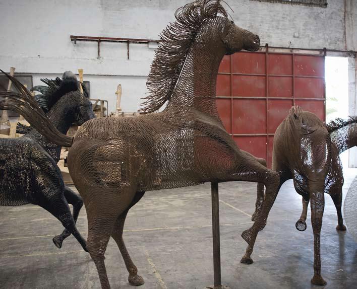
Sculptural horses.
ann pamintuan — Davao City, philippines
a nn Pamintuan’s furniture designs are available at Hermon & Hermon, Merlino, Budji Living outlets in a sia and KE-ZU.
Sonia Ner, 2008. interview with a nn Pamintuan, “Finding her o wn Road” in exhibition catalogue for Pamintuan’s jewellery show, yuchengco Museum, Makati (2008). Posted by Karla Maquiling at Culture, innervie, 13 august 2008. Uploaded by Carla Martinez and Jeannie Javelosa at pinoycentric. com/2008/08/13/annpamintuan-finding-herown-road/
a nn tiukinhoy Pamintuan’s Midas touch” can be found at pinoycentric. com/2008/03/17/annpamintuans-midas-touch
a nn Pamintuan is exhibiting as part of Movement 8 and the a sia Pacific triennale at the Gallery of Modern art, Brisbane in December 2009.

metal. She has released powdercoat finishes for the Cocoon chairs and t hreesome, and early this year she re-introduced her Cocoon chairs in a combination of plastic and metal.
a nn’s pieces appear to defy the predictable outcomes of working with metal in recent contemporary furniture design. Her instinctive, non-conformist attitude and innovative experiments inspired by nature have produced her refreshing sculptural designs.
a nn is one reason why the Philippines is gaining global recognition in furniture design. She is part of Movement 8, a consortium of
Filipino contemporary designers that also include Kenneth Cobonpue.
t he narrative of a nn as an artist began as a child with an innate sensitivity to the marvellous life found in forests, the sea and the diverse cultures, resulting today in a highly innovative art which is distinctively Filipino.
a nn Pamintuan, thegildedexpressions.com
10
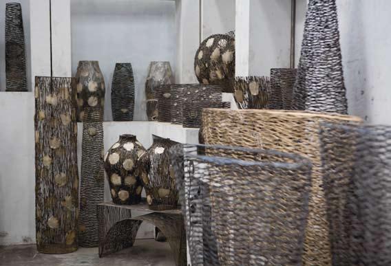
a selection of delicately woven vases and urns.
76 habitusliving.com creation habitus 06 HAB6_Scoogle.indd 1 24/9/09 3:09:15 PM
10



THE MANY DIFFERENT FACETS OF A LUXURY LIFESTYLE.
Pursue your passions. Surround yourself in luxury – in your home or workspace. At Ashington we develop properties for the individual. In sought after locations using the fi nest in architecture and design. We aim to ensure that the distinctive difference of living, shopping or working in an Ashington property is clearly recognised.


/ Set within the gardens of one of Australia’s finest mansions


/ Four elegantly designed residential precincts will be developed

/ Positioned in the heart of exclusive Malvern
/ Ten luxury homes with panoramic Sydney Harbour and City views

/ Contemporary architecture by Tzannes Associates

/ Interiors by fashion designer Alex Perry
/ Luxury office and retail space in cosmopolitan Potts Point
/ Sydney’s ultimate business lifestyle centre


/ Designed by Burley Katon Halliday


Enquire / 1800 005 980 / www.ashington.com
Something OLD, Something NEW
Malaysia has a rich history of arts and crafts, and it can be a challenge for designers to marry this tradition with contemporary design. Lucy Bullivant explores how architect-turned-textile designer Edric Ong has been involved in reviving indigenous crafts with a contemporary twist.

79 alchemist habitus 06
Text Lucy Bullivant
Photography Edric Ong
edric ong — KUCHING, malaysia
edric ong — KUCHING, malaysia
Edric Ong is a man with a mission. His 2009 travel schedule spans the Far East, the States, Europe and the Middle East, but for someone so seemingly nomadic, 55-year-old Edric is devoted to his home of Malaysia. He is passionate about invigorating its rich crafts tradition with new designs, and travels extensively around Sarawak, one of the two Malaysian states on Borneo, nurturing the unique working relationships he has built with the artisans who make the textiles and interior accessories for his label, EO-Edric Ong.
One of the challenges facing many Asian countries is defining design and innovation in relation to cultural identity. It is an issue Edric’s work addresses, and in 2009 he was awarded Malaysian Designer of the Year in recognition of his efforts. “Cultures are alive and changing; so are lifestyles,” says Edric. “It is always a challenge to make traditional arts and crafts relevant to a new generation.”
Edric is actively involved in numerous organisations focused on reviving indigenous crafts and promoting Sarawak culture, and it is clear he is passionate. His background, however, is as a trained architect with a career spanning 30 years. He studied at Singapore University in 1972, a time when there were very few architects in Sarawak, going on to work for Malaysian Associate Architects. Amongst the buildings he designed, he favours the Sarawak Cultural Village, which was nominated for the Aga Khan Award for Architecture. “It is now a great institution, which has had an impact on people’s understanding of Sarawak indigenous culture and habitat,” he says. “I guess my architectural design and practice experience allows me to see things in a different perspective – to be able to design interior accessories and furnishing textiles.”
Edric was introduced to traditional local arts and crafts during his time at university, and he began travelling all over the region, collecting antique Sarawak ceramics. From ceramics, he progressed to beads and then onto textiles, which he regards as the “truly great Sarawakian art treasure”.
Edric’s mother, immaculately dressed in her sarong-keybaya , cheong-sam and ji-pao outfits, 02
80 alchemist habitus 06 habitusliving.com
“Cultures are alive and changing ; so are lifestyles.”
_
EDRIC
was an early source of inspiration. At a college fashion show she took him to, students had used segments of cassava stems dipped in dye to stamp designs onto fabric. Edric immediately experimented with the technique on one of his father’s old shirts, now a treasured artefact.
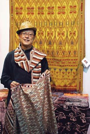
Malaysia is a multi-cultural country, with over 28 ethnic groups, and Edric works with more than 50 longhouse-based artisans, regularly visiting them and running workshops to help advance their techniques. The artisans embrace the new developments, but both Edric and the artisans prefer natural dye hand printed batik textiles. Edric is part of an Asian eco-textiles network, the World Eco-Fiber and Textile Forum (WEFT), and has staged workshops on using natural dyes for many communities, including the Christian community of Lun Bawang in the Ba’Kelalan highlands.
Edric also runs workshops with the Iban weavers, who weave pau kumbu cotton, make exquisite baskets and mats, and represent about 30% of the 2.5 million Sarawak people. In an effort to revive Iban textiles, Edric has curated exhibitions and, in 1986, wrote a book on the subject called Pua Iban Weavings of Sarawak At a workshop in 1988, he introduced silk yarn to 70 enthusiastic Iban weavers from five districts.
“The traditional Iban viewpoint is very ‘green’,” says Edric. “It’s about man living in harmony with his longhouse and with his environment, with respect for the forest, the land
01 Bakelalan reed and bark covered tray boxes.
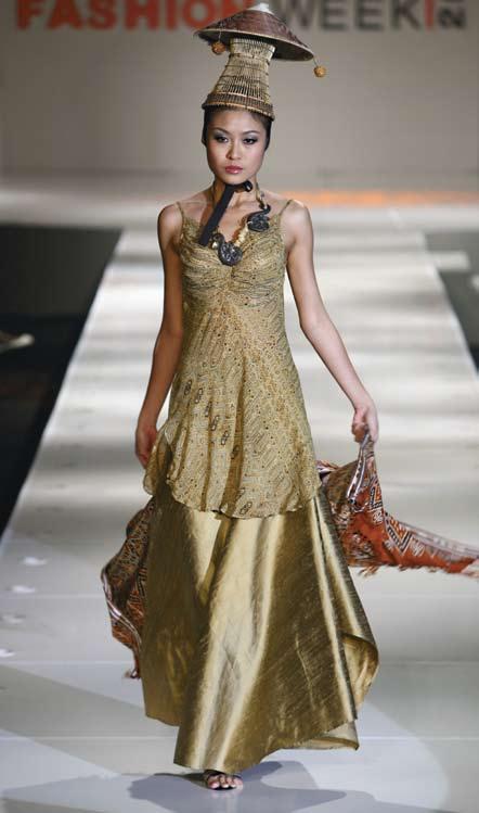
02 Chiffon and muga silk gown on show at the Kuala Lumpur Fashion Week.
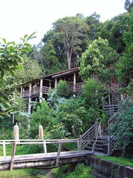
03 Orang Ulu House at Sarawak Cultural Village.
04 Edric won three top prizes in ikat and batik at the ASEAN Silk Expo.
05 Rock Engraving textile design –natural dye batik on handwoven silk.

81 03 04 05
edric ong — KUCHING, malaysia

and the spirits.” Spiritual life is important to the Iban people and Edric says, their ancestors “believed their patterns and motifs were given through dreams inspired by Kumang, the weaving goddess. Now as Christians, they believe the Holy Spirit inspires them.” Edric set up EON, an eco-textiles company, of which label EO-Edric Ong is a part, in 1986 after meeting the Iban weavers, and becoming interested in pua kumbu cotton.

Today Edric operates EON with five staff from a SoHo – a small office/home office – in a 1950s building on the main waterfront street in Sarawak’s capital, Kuching. The building also houses his photo studio and guest rooms, and is a five-minute walk from his parents’ home.
Traditional Sarawak patterns and craft techniques make Edric’s work unique, and he is a visionary figure straddling the past, present and future. He deftly combines craft and design, giving each collection worldwide appeal. In America, Edric’s collections are marketed as ‘Jungle Arts and Flora’, and during a Malaysian promotion at Harrods in London, he showcased western-style chiffon and silk cocktail dresses with hand printed motifs from Sarawak’s traditional Dayak bamboo carvings. His recent Saffron Blues collection has brought him accolades from around the world.
Edric never stops promoting recognition for his weavers as artists in their own right, and in 2006 was recognised with an Aid to Artisans Advocate Award. He encourages master weavers to exhibit their work, which then motivates the younger ones, and is passionate about the continuity of the weaving tradition – “otherwise pua kumbu becomes an endangered textile,” he says. However, with Edric’s inspired leadership the future of this unique craft/design eco-system looks to be in robust shape.
Edric Ong, edricong.com
82 habitus 06 habitusliving.com alchemist A I T T OUTDOOR + 61 3 9416 0909 www.tait.biz MELBOURNE STORE NOW OPEN 176 JOHNSTON STREET FITZROY HAB6_Tait.indd 1 24/9/09 3:30:21 PM
06
Edric deftly combines craft and design , giving each collection worldwide appeal.
06
Traditional Iban bemban baskets.




Boutique is back, baby! SYDNEY | CANBERRA | MELBOURNE Take a look inside Australia’s premier boutique hotel collection. Hip hotels, hot locations, incredible value. www.eighthotels.com
janet laurence — NSW, australia
The Art of Reflection
Janet Laurence is one of Australia’s most prominent public artists. But her distinctive installations are increasingly being commissioned for residential settings. Paul McGillick looks at her unique form of domestic art.
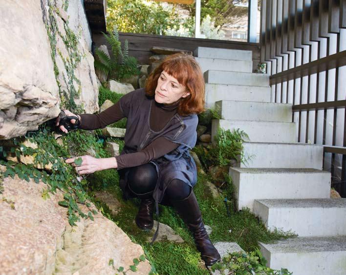
85 slow dissolve habitus 06
Text
Photography Brett Boardman, Paul Lovelace
Paul McGillick
slow dissolve
janet laurence — NSW, australia
Janet Laurence has said that she aims to create ‘slow space’. Like other ‘slows’ – slow food, slow education, slow towns and slow sex – the idea is to slow things down so that we have the chance to truly experience what it is that we are doing or what is happening. Basically, it is about getting the most out of being human. So, slow food is about using organic, local produce and really savouring its taste; slow towns use planning to calm or isolate traffic and give people the chance to genuinely enjoy their public space; slow education is about understanding and personal growth rather than cramming; and slow sex, well... think about it.
Typically, Laurence’s work brings together the built environment with the natural environment. Sometimes, her pieces are outside – such as ‘Veil of Trees’ (1999) in Sydney’s harbourside Domain parklands or ‘Edge of the Trees’ (1994) outside the Museum of Sydney – where they provoke reflection on the natural and historical context. At other times, they may be inside, perhaps part of a corporate lobby with public access (as with ‘Water Veil’, 2006, in the Council House 2 building in Melbourne, a milestone in the use of biomimicry in architecture) or in a more communal setting, as with ‘49 Veils’ in Sydney’s Central Synagogue (1997/98).
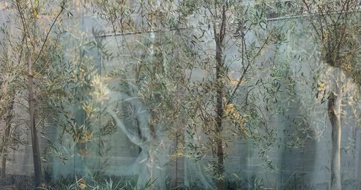
Whether it is reconciling inside and outside, the built and the natural or the haptic (felt) and the optic (seen), Laurence’s work is invariably about resolving apparent opposites into a moment of harmony. If the installations engender reflection on a place – how it came to be what it is – we need to remember that out of reflection comes transformation. And transformation – sometimes Laurence refers to it as alchemy – is a major theme in her work. Equally, her work is about memory, often invoking memories which lie hidden in the individual or collective unconscious. With memory comes meaning – just as loss of memory (as with Alzheimer’s disease) leads to loss of meaning and identity.
Laurence’s bringing together of the public and private domains is a metaphor for bringing together our outer and inner worlds and thereby resolving Cartesian duality, or the separation of our objective and subjective lives.
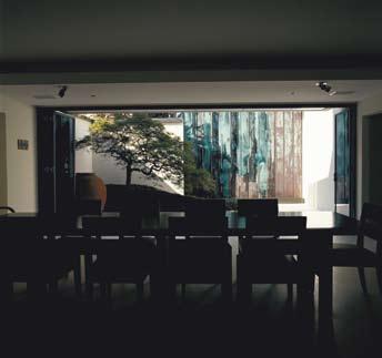
86
habitus 06
habitusliving.com
03 02
...Laurence’s work is invariably about resolving apparent opposites into a moment of harmony.
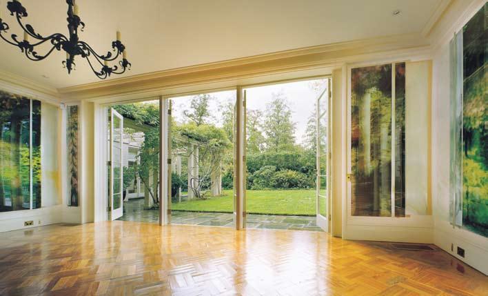
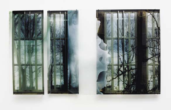
87
01
Janet Laurence tends her moss garden.
(Photo: Paul Lovelace)
02
Transient in Light, 2007, Siber House Melbourne. Glass fired screen print, 900 x 250 x 100cm.
03
Water Falling Freeze, 2000, Baffsky House, Sydney. Glass over copper, stainless steel. 04
Memory Enclosed, 2004, Melbourne House. Duraclear, pigments, oil, glaze, 120 x 220cm.
05
05
A Garden for Edna Walling, 2000, private collection, Melbourne. Glass, aluminium, shinkolite, acrylic, duraclear, oil, glaze, pigments.
04
slow dissolve
janet laurence — NSW, australia

88
habitus 06
habitusliving.com
06
...her work is about memory, often invoking memories which lie hidden in the individual or collective unconscious.
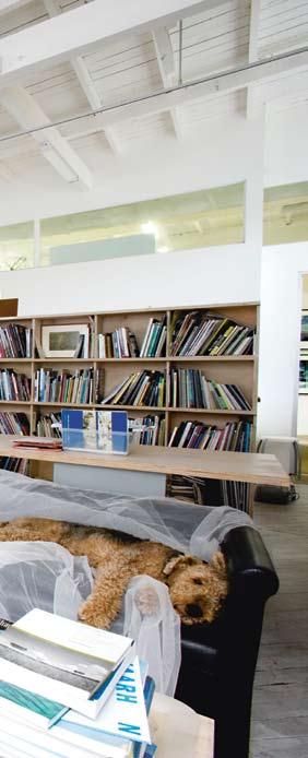

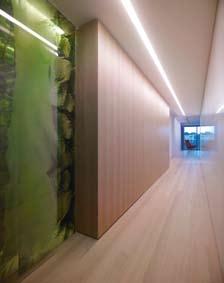
89
07
08
08 07
06 Janet Laurence in her Chippendale studio.
View from Transpiration – The Breathing of Plants, through to Circular Quay.
Transpiration – The Breathing of Plants, 2009, site-specific installation in Sydney apartment. Glass, duraclear, pigments, oil, glaze, 228 x 138 x 50cm.
slow dissolve
janet laurence — NSW, australia
Glass has become a crucial material for Laurence in pursuing these themes. This is partly because it is a synthetic material which she can put against organic matter and so set up another opposition. But glass is also ideal for extending the metaphorical force of her installations. Glass is transparent, but it is also reflective. And while we can often see clearly through it, it can just as easily create distortions and a fugitive world which we cannot quite pin down. Laurence has exploited this in many works which use layers of glass with applied colour film images (sometimes abstract, but more often drawn from the natural world), setting up an optical conundrum. On the one hand, there is an illusion of depth, while on the other, we see the world reflected back at us so that we become
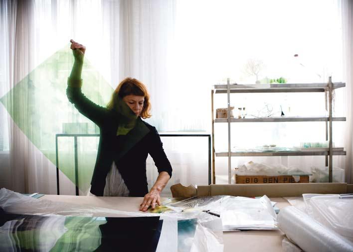
aware of a profound mystery – namely, that we are a part of the world we are observing.
Laurence talks about “the membrane between architecture and nature” – or, that thin, fragile point of connection between inside and outside, between the natural world and the constructed world of buildings and interiors. These, she says, are “sites which reveal the fragility of nature”. People often see her individual pieces in exhibitions and they want one. But they might also want a whole wall of that kind of work and so Laurence makes a whole wall for them – extending an exhibition piece into a site-specific installation.
90
habitus 06
habitusliving.com
09
...glass is also ideal for extending the metaphorical force of her installations. Glass is transparent, but it is also reflective.
10
Janet Laurence in her studio.
09
Janet Laurence in her native garden in Balmain. (Photo: Paul Lovelace)

91
slow dissolve
janet laurence — NSW, australia
Over recent years, Laurence has exhibited glass constructions which “played on the idea of glass houses”, inspired by botanical glass houses and by famous architectural examples such as Mies van der Rohe’s Farnsworth House and Barcelona Pavilion. This coincided with a growing interest in botany (“I love all the botanical research”) and gardens. In fact, she is currently developing new work which explores the garden as a work of art – paralleling the moss garden, native garden and vegetable garden at her own home on Sydney Harbour which, in the great tradition of Chinese and Japanese gardens, are both aesthetic delights and opportunities for meditative work.
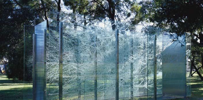
Increasingly, Laurence is being approached to create site-specific installations for private homes. “A lot of it,” she says, “comes about through my shows in the galleries. People recognise the sense of place in them and they also recognise that I am trying to connect architecturally in the work. They might say: ‘I’ve got a space which I’d love you to make a work for’. Because I was showing these glass houses with the garden reflected in them, I then did a lot of gardens as reflections into architecture. So, it set up the imagining for a lot of people of their own inside-outside reflected into a work of art in their house.”
Hence, a lot of her commissions for private homes are site-specific to those houses or apartments. “It might be,” she says, “these people’s gardens in panels placed inside their house that reflect the garden back into them in a way that changes during the day. So, there is this sense of transience.”
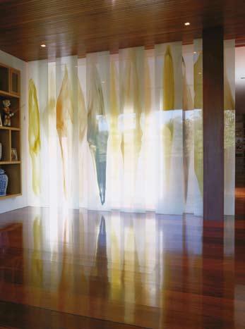
92
habitus 06
habitusliving.com
11 Ghost Glasshouse, 2003, located in a private garden. Screenprinted glass, stainless steel.
12 11
12 Plant Spill 2004, in the House in the Trees. Glass, pigmented resin, paint, 290 x 300 x 80cm.
COURSES
INTERIOR DECORATION ESSENTIALS 101
DECORATE & STYLE YOUR HOME 201
STYLING SAVVY 301
CLASSIC COLOUR 401
COLOUR DESIGN & CONSULT 501
The Coco Republic Design School cements the marriage between education and practical experience within a design environment. The school will focus on engaging the community, designers, decorators, artists, and industry professionals.
The fusion between the established furniture brand Coco Republic and the nationally renowned Design Centre Enmore (part of TAFE NSW Sydney Institute) will provide Coco Republic Design School students with an education of interior design and decoration skills, through the development of premium courses and teaching excellence in a sophisticated and exciting environment, at our new purpose built Alexandria student facility.
These five courses are open to anyone and no prior design or decoration study is necessary for most courses, which cover exciting topics such as colour, elements and principles of design, identifying trends, freehand sketching, drawing to scale, mood lighting, soft furnishings and many more.
Each course runs for 15 weeks of 3 hour studio sessions and will commence in January 2010. Our dedicated team of teachers have been carefully selected by Design Centre Enmore and are keen to share their knowledge and real life expertise, in an inspiring Coco Republic environment. All our courses are developed and presented by the Design Centre Enmore and are nationally accredited.
The Coco Republic Design School will be launching in January 2010 its first custom made student facility in Alexandria, Sydney. Book now to secure your place.
Coco Republic Design School
PO Box 7176, Alexandria NSW 2015 Phone 1300 323 171
www.cocorepublic.com.au
designschool@cocorepublic.com.au
Through the imagery, the layering of glass, the reflections and the shifting light during the course of the day, Laurence’s installations have the effect of dissolving the architecture into nature. In this sense, they work just as all her public art works – namely, to heighten our sense of place and of the mutability of life. Nature is in a state of constant transformation. Nothing is forever and yet within the immensity of nature, time itself dissolves into an eternal present.
If her public art makes us reflect on public space, her domestic installations trigger reflection on private space. The home is a refuge and so a place for reflection. Laurence’s private installations use literal reflection to engender a metaphorical reflection on how fugitive, fragile and mutable our lives are.


94
dissolve habitus 06
habitusliving.com Made in Germany Siekaup: Australian + New Zealand agent
1/360 Pacific Highway, Crows Nest NSW t (61 2) 9906 5472 e siekaup@bigpond.com w siekaup.com.au
slow
janet laurence — NSW, australia
Shop
HAB06_Seikaup.indd 1 28/9/09 12:46:32 PM
SINUS chair + stool designed by Reinhold Adolf + Hans-Jügen Schöpfer CONSETA divan sofa + table designed by Fredrich-Wilhelm Möller
12
Janet Laurence is represented in Sydney by Breenspace, breenspace.com, in Melbourne by Arc One Gallery, arc1gallery.com and in Brisbane by Jan Manton Art, janmantonart.com
12
A room-dividing screen designed by Janet Laurence in her home in Balmain. (Photo: Paul Lovelace)
VAPOUR CLEAN TECHNOLOGY

Fantasy has become reality. Smeg’s new range of ovens leads the way with cutting-edge Vapour Clean technology. By simply selecting this function, adding a small amount of water to the specially designed well on the oven floor and lightly spraying detergent mix, vapour is created and circulated which softens any residue for an easier clean. This is all made possible by the world-leading Ever Clean enamel surfaces which were developed by, and remain uniquely, Smeg. These lustrous interior finishes also ensure durability and longevity. With this and many more technologies available across the entire range, you’ll be wondering what Smeg could possibly dream up next.

www.smegappliances.com.au

BIGRIVER_OMS_0001_15
what walls caN say
From the intricate detail and textures of Victorian wallpapers to the bold free-flowing psychedelic patterns of the 70s, wall coverings have always expressed something about our times. It is with this in mind that Porter’s Original Paints has launched their new range of handcrafted wallpapers, representing a mix of contemporary and traditional options for today’s interior spaces.
the new range embodies a complete redesign of the Porter’s offering, based on current trend forecasts for wall coverings and design. Drawing inspiration from the animal world, such as dragonflies and sparrows, and the botanical, with ‘Eucalyptus’ and ‘Banksia’, the wallpapers have been designed in collaboration with acclaimed australian designers, including the award-winning production and costume designer catherine Martin and fashion designer Bowie wong.
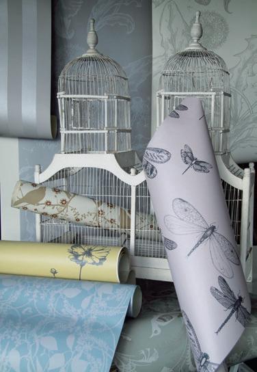
Offering a variety of unique colour-ways the designs have been carefully selected to inspire creativity. you can also be assured that being environmentally responsible doesn’t mean compromising on quality – with all Porter’ Paints low or zero Volatile Organic compound (VOc) products providing that distinctive richness for which they’ve become so well known.
Each wallpaper print has its own story to tell, from the imagery to its production – printed locally in australia by Porter’s specialised staff using their own wallpaper press and on the highest quality paper. a further sign of quality design, all the wallpapers have the hues knitted in, pigment by pigment.
Our homes not only say something about what we like and how we live, but also about who we are and what we value. In years to come the colours we choose, what we say on our walls will be an indication of the times in which we live.
Porter’s Original Paints
(61 2) 9698 5322
1800 656 664 (toll-free) enquiries@porters.com.au porterspaints.com
New season colour range
02 Porter’s colour swatch
habitus | Issue 01 sponsored
01
96
01 02
CREATIVE & susTAI nA bl E ways
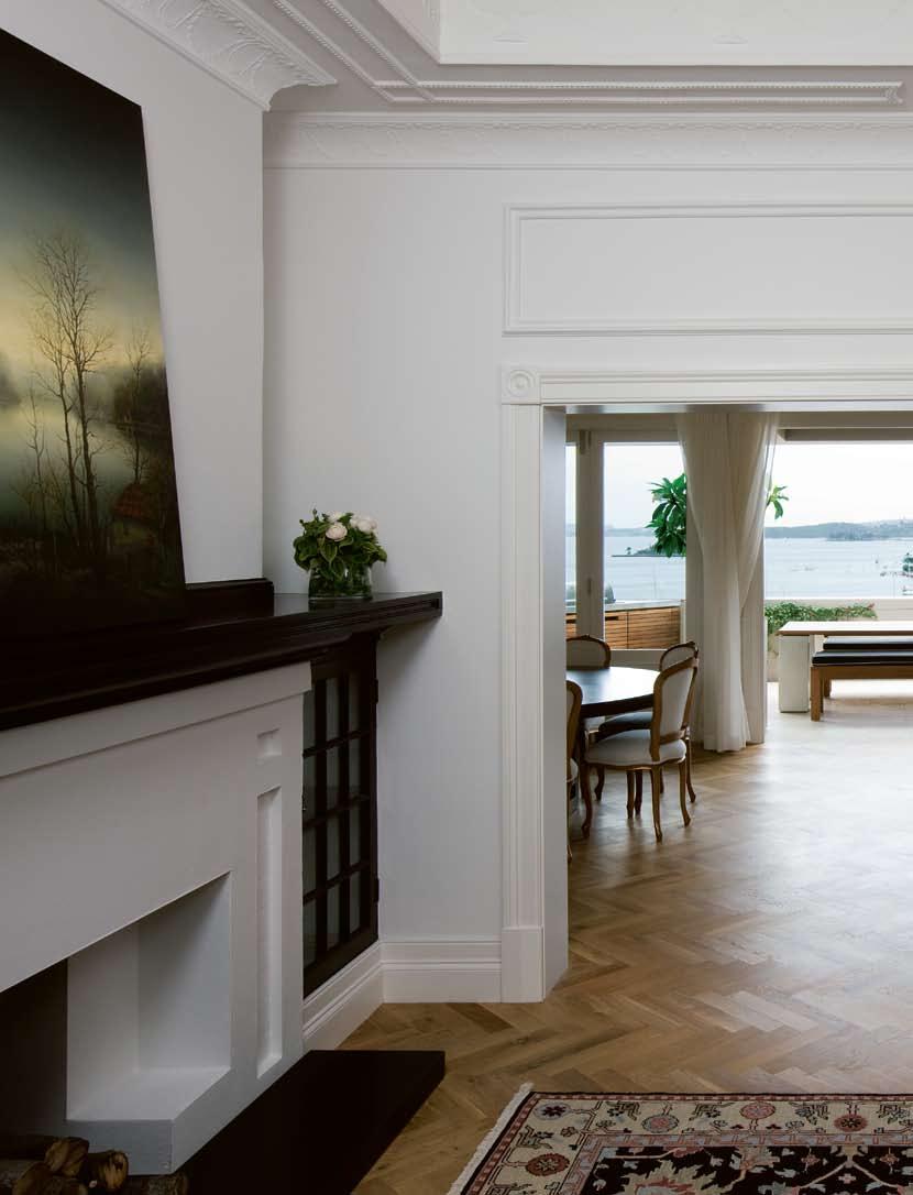
TO T u R n HOusEs into HOME
s
habitus 06 3. houses
97
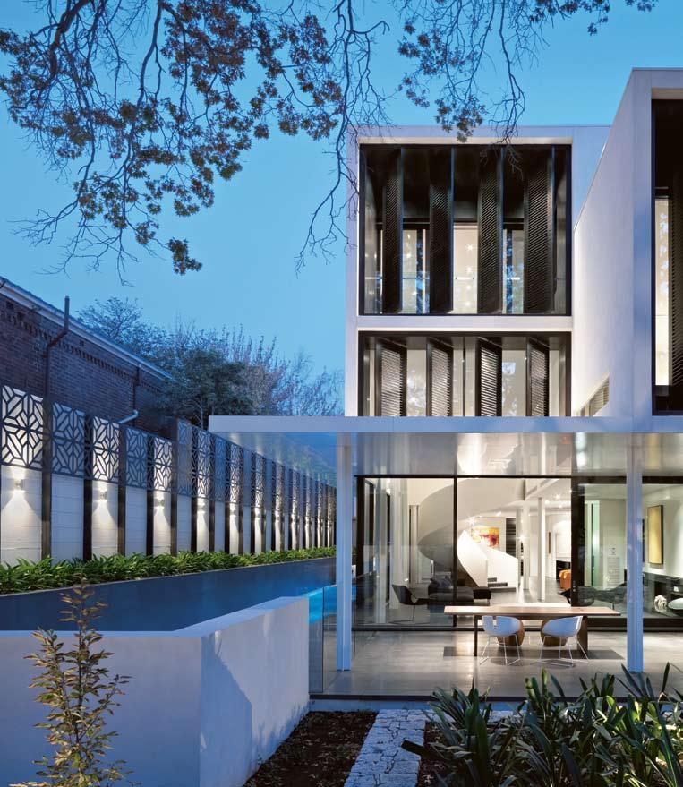
98 habitusliving.com
scenario habitus 06
Photography John Wheatley
Text
Stephen Crafti
ROB MILLS ARCHITECTS verdant avenue house — VIC, australia
A LIVING SpACe
This family home in Melbourne was designed by architect Rob Mills to “break down the walls of a traditional house”.
Stephen Crafti explores how the dynamic spaces respond to this challenge.

99
Melbourne is recognised for its leafy streets and gardens, a feature that was not lost on both the architect and owners of this house in Toorak. “The house was designed around a 60-year-old p in Oak. We were extremely careful not to damage its root system,” says architect Rob Mills.

This palatial new house not only benefits from views of the tree, but also has glimpses of tennis courts directly opposite. “ even a slow game of tennis animates the vista,” says Mills.
Designed for a couple with two young children, the new house replaced a 1930s clinker brick home. “Originally, our clients were looking to renovate a house in the area. I asked them if they’d consider building,” says Mills, who was surprised to hear from them three days later with news they had purchased an old house on a 9,000m 2 site.
Rather than present Mills with an endless wish list the clients simply said, ‘You know what to do, just go ahead,’ recalls Mills. “The only thing specified was the number of bedrooms,” he says.
Constructed in concrete and rendered brick with lightweight upper levels, the house is loosely based on a warehouse model. “I wanted to break down the walls of a traditional house
and create one grand open living area,” says Mills. One of the few divisions on the ground floor is a graphic circular steel staircase that links three levels within the home. Completely detached from surrounding walls, this staircase has a force of its own. “I was fortunate to find an elderly German steel maker to create this form,” says Mills, of the staircase that stands in a nine-metre high void.
The staircase not only animates the interior, it also separates the formal living areas from the informal areas. White painted steel columns in the living areas also create a subtle delineation of spaces within the home. “I didn’t want to carve up these areas, but I also wanted each area to be enveloping,” says Mills.
The kitchen, located to one side of the informal living area, is of a similar scale to other areas within the home. Loosely defined by a honed black granite bench with American Oak cupboards, the kitchen joinery was treated as furniture. “I didn’t want the kitchen to dominate the living areas,” says Mills, who included at the rear of the kitchen, two walk-in pantries, an area for wine storage, and a laundry.
Also important for Mills was the link between the house and the garden. Large glass sliding doors open to a western terrace on
01
The living areas are framed by garden views and a lap pool. With a built-in fireplace, the large terrace functions as an outdoor room.
02
The double height space in the living area accentuates the grand proportions of this home.
03
The curvaceous staircase provides a contrast to Mills’ rectilinear design.
100 habitusliving.com scenario habitus 06
ROB MILLS ARCHITECTS
verdant avenue house — VIC, australia
02
One of the few divisions on the ground floor is a graphic circular steel staircase that links three levels within the home.
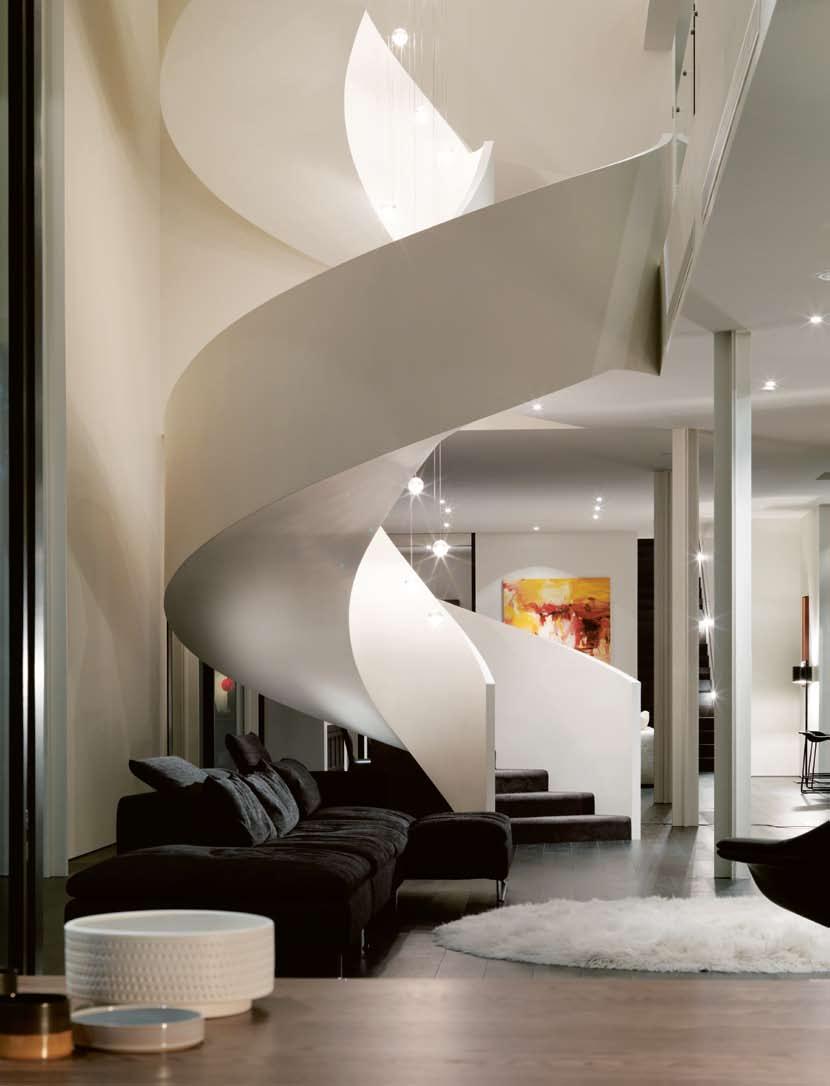
verdant avenue house — VIC, australia
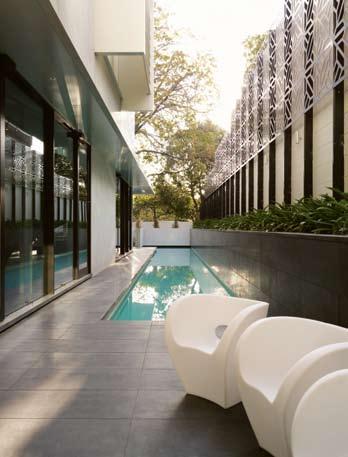 ROB MILLS ARCHITECTS
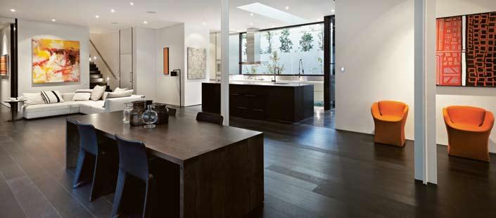
one side of the living area and to a 25-metre lap pool on the other side. Given his clients’ propensity for outdoor dining, Mills included a sophisticated arrangement of cooking appliances on the terrace, as well as an outdoor fireplace. “Our clients wanted a garden they could enjoy rather than spend time mowing lawns,” says Mills. “This screen [a contemporary Moroccan steel screen framing the pool] will eventually be covered with vines and creepers.”
The scale of the first floor is as vast as that of the ground floor. At one end are two children’s bedrooms, together with a guest bedroom. The children’s wing also includes a television area. At the other end of the floor plate, separated by a large pivotal door, is the parents’ retreat.
“The main bedroom was modelled on a hotel suite. Instead of a traditional bedhead, there’s a limestone-clad nook offering views of the ensuite bathroom, also finished in limestone.” To reduce glare from the western sun, Mills designed a series of operable steel shutters across the home’s façade.
Some of the features in this Toorak house have been developed by Mills over a number of years. Sliding doors in the bedrooms, for example, feature a second layer of toughened glass that functions as a balustrade. Water is both visually and audibly integral to many of Mills’ designs, including this one, as is the inclusion of two staircases. “The children can run in after school, get changed and jump in the pool. They don’t have to cross paths with parents and can make as much noise as they like,” says Mills.
“This is not a static house,” says Mills. “It responds to the elements as well as providing the level of privacy required.”
102 scenario habitus 06 habitusliving.com
04 Laser cut screen along the lap pool will eventually be covered in ivy. 05 The kitchen, nestled to one side of the house, is integral to the dining and informal living areas. 06 Floor plans of the three-level home. 04 05
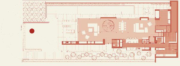
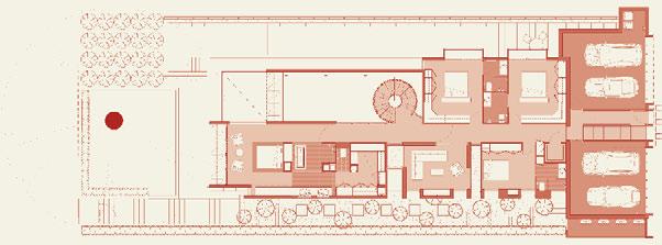
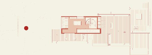
103 1 Front gate 2 Entry 3 Powder 4 Living 5 Dining 6 Kitchen 7 Pantry 8 Lift 9 Dry store 10 Laundry 11 Dty cabinet 12 Cellar 13 Study 14 Bathroom 15 Store/pool equipment 16 Terrace 17 Swimming pool 18 Garage 19 Hall 20 Bedroom 21 Family room 22 Master bedroom 23 Ensuite 24 WC 25 W/R 26 Library 27 Raised platform 06 1 23 4 4 16 17 16 13 14 12 98 7 6 11 10 15 5 18 2 19 20 8 23 23 20 20 23 21 25 23 24 22 18 26 27 Ground floor First floor Second floor
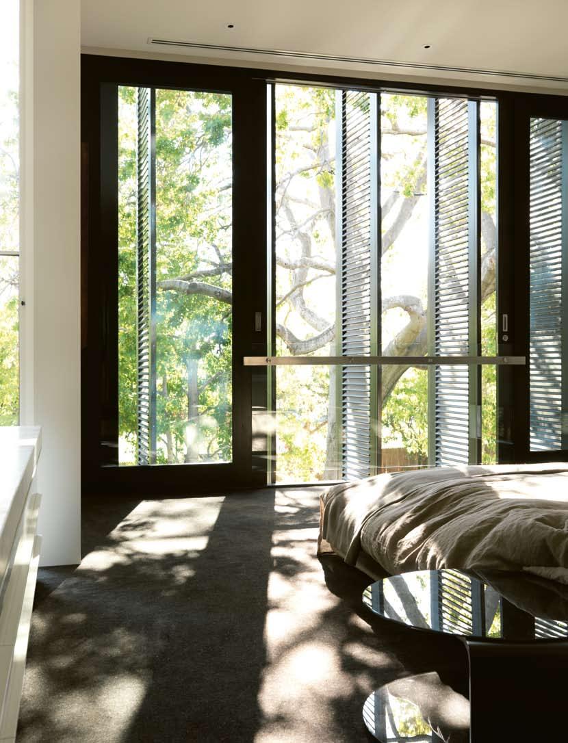
“This is not a static house. It responds to the elements as well as providing the level of privacy required.”
–ROB
07
The main bedroom, oriented to the west, features external shutters that diffuse the afternoon light.
(photo: Trevor Mein)
08
Looking down the staircase from the top floor.
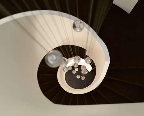
09
The ensuite features extensive built-ins.
ARCHITECT
Robert Mills
LANDSCAPER
Jack Merlo Design BUILDER VCON
Rob Mills Architects robmills.com.au info@robmills.com.au
Jack Merlo Design jackmerlodesign.com
ARTWORK
Living room painting by George Tjungurrayi from Cross Cultural Art Exchange, ccae. com.au. Sitting room painting by Ningura Naparrula from Sotheby’s, sothebys.com, and Sweetheart by Todd Hunter from Scott Livesey Galleries, scottliveseygalleries.com.
Dining room Untitled by Boxer Milner Tjampitjin, and painting by George Tjungurrayi from Utopia Art Sydney, utopiaartsydney. com.au. Study painting by Patrick Olodoodi Tjungurrayi from Scott Livesey Galleries.
FURNITURE
Furniture supplied by Hub Furniture, hubfurniture.com.au.
Rugs Flower Rug in theatre by Moroso, moroso.it, Mongolian goat Leon Rug in living room by Redaelli. Armchairs Hi-cove armchair in living room by Molteni & C, molteni.it, all others by Moroso. Sofas in living room by Moroso, all others by Molteni & C. Dining chairs Bloomy Chair by Moroso, Glove Chair by Molteni. Dining table by Lowe, lowefurniture.com. Side tables by Moroso. Bed by Molteni.
FINISHES
Exterior rendered in Irving by Toscano Roman Render, toscanoromanrender.com.au.
Cladding aluminium in Castle White by Alpolic, alpolic.com, and motorised louvres by Reflex Shading Systems, shadingsystems.com. Interior walls
finished in White Sand paint by Porters Paints, porterspaints. com.au, in study stucco-finished in Fresco Finish paint also by Porters Paints. Veneer Oak in study and living room from Briggs Veneers, briggs.com.
au. Stone in bathroom Bianca
Perla marble from Artedomus, artedomus.com. Floor in living room Brown Black American Oak by Harper & Sandilands, harper-sandilands.com.au, in study honed Zimbabwe black granite from City Stone, citystonevic.com.au. Carpet Torcido
Negra from Velieris, velieris. onlinegalleries.com.au.
LIGHTING
Lighting from Hub Furniture. Floor light in dining Alfa by Anta, anta.de. Table lights
Post Krisi by Catellani & Smith, catellanismith.com, Half Moon by Karboxx, karboxx.com, and Eclipse by Objekto, objekto.fr. Pendants in Stairwell by Bocci, bocci.ca.
FIXTURES/EQUIPMENT
Bath by KOS, kositalia.com. Vola Bath spout, vola.dk.
Basins from Parisi, parisi.com. au. Other sanitary fittings from Rogerseller, rogerseller.com.au.
09
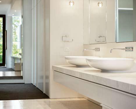
105
08
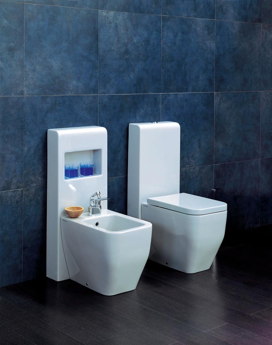
by
Niagara Terra WC & Bidet Ellisse Tapware.
Designed by: Sergio Mori, Ludovica & Roberto Palomba
www.parisi.com.au
Refi N eD RAW BUT
This New Zealand family were looking for a holiday house “which would exemplify tropical modern architecture whilst accommodating their private lives”. Paul McGillick looks at how architect, Domenic Alvaro, matched brief to site.
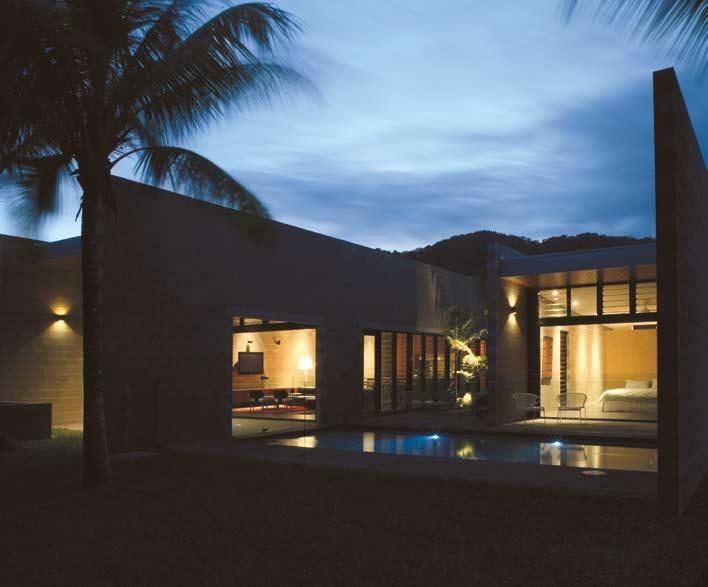
107 scenario habitus 06 Text Paul McGillick
Photography Thomas Bloch Photography
Domenic AlvAro wonga beach house — QlD, australia
wonga beach house — QlD, australia


108 scenario habitus 06 habitusliving.com
Domenic AlvAro
02 03
The house is at Wonga Beach, about an hour’s drive north of Cairns, and at the gateway to Australia’s magical tropics. it is, says Domenic Alvaro, “where the houses peter out and the cornfields begin to expand,” right at the ocean’s edge with the rainforests of the Daintree National Park looming out of the hinterland.
Wonga Beach is a small, beachside community with most of the houses aligned along the beachfront, but separated from the beach itself by a strip of liminal forest approximately 15 metres deep and connected by informal paths. Presumably, the tropical location appealed as a holiday destination to a family used to living in the temperate climate of New Zealand. They were looking for a house big enough to accommodate two families at a time and affording a degree of luxury but with a personalised and intimate ambience – what Alvaro refers to as “a raw but refined luxury retreat”.
As it happened, the clients were highly literate architecturally and aware of the vogue for ‘tropical modernism’ in the region. effectively, they were looking, says Alvaro, for a project “which would re-interpret regionalbased modernism”.
“Having located a beachfront site on the stunning Wonga Beach,” say the clients, “we wanted a house that didn’t get in the way of the location – and amplified our enjoyment of this remarkable part of the world. We wanted a house that flowed seamlessly to the beach and outdoors, but at the same time created an internal sanctuary. The juxtaposition of the raw, large-scale construction and the touches of luxury in key spaces was fully intentional – and reflected the untamed, but luxuriant nature that surrounds the property. The house’s simplicity and spaciousness allows us to walk in and relax instantaneously – and walk out and do the same.”
So, how did Domenic Alvaro go about realising these aspirations?
Well, he began with a study of the shape and orientation of the site – a 40 metre-long and 25 metre-wide block with the long axis facing north. This, says Alvaro, suggested a “courtyard solution” with two linked pavilions framing a garden courtyard cooled by a breezeway. it also suggested a number of strategies borrowed from tropical vernacular architecture – ‘verandah rooms’, porches, a raised floor, glass and timber louvres for natural ventilation, water and lush tropical vegetation to promote cooling, and blade walls to provide shade.
The aim, says Alvaro, was to be “contextual without being referential”. i n other words, the house is very much of its context, using local materials such as Queensland Spotted Gum for the timber cladding and internal wall lining, and single skin concrete blockwork which is very typical of Australian coastal construction. Likewise, the planning of
the house around the courtyard and pool with all rooms opening up to the tropically lush outside.
But the house does not overtly reference tropical vernacular architecture. i n fact, with its bold planar forms – especially the street elevation with its thrusting blade walls defining the arrival sequence capped by the emphatic horizontal fascia – it presents as a very modernist house, perhaps more at home in the Mediterranean than in the tropics.
The house gives little away to the street with the Spotted Gum cladding interrupted only twice by vertical glass louvre windows for the entry and one of the secondary bedrooms. i nside, however, an interesting conversation takes place between the bold, raw concrete block blade walls which define the spatial organisation of the house and the intimacy of the home.
The house consists of two pavilions which open on to a central garden courtyard and the pool. it is this connection which generates the intimacy, together with the sense of reassuring enclosure which only falls away on the eastern side, beyond the pool, where a wire fence allows the impression of uninterrupted connection with the bush and the beach beyond.
The interiors retain the raw, industrial quality of the exterior, but softened by timber detailing, joinery, carefully selected furnishings and the vibrant custom-designed rug in the living area. Also, despite the strong sense of connection, the “courtyard solution” allows for privacy with family bedrooms in the northern pavilion and guest bedrooms in the
01
At the rear, the two partions appear to float on the water, dissolving into the garden.
02
Two blade walls define the entry.
03
The living room exemplifies the simple materials and use of natural ventilation.
04
Cooling is created by greenery and crossventilation.

109
04
With its bold planar forms... it presents as a very modernist house, perhaps more at home in the Mediterranean than in the tropics.
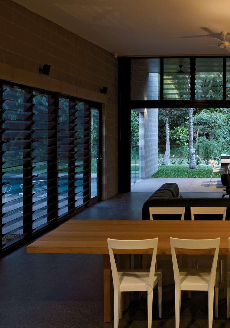
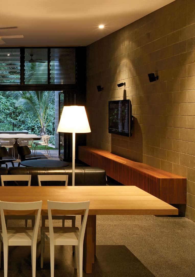
wonga beach house — QlD, australia
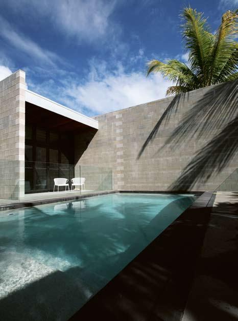
southern pavilion which also hosts the kitchen, living, dining and al fresco dining terrace.
Although mechanical air-conditioning is provided, it is only necessary during periods of extreme heat. The depth of the pavilions, the concrete floors, louvres (glass in the public areas, but timber in the bedrooms for complete night time darkness) and high ceilings with their ceiling fans all help to cool the house – along with the free-standing blade wall on the northern side of the courtyard and the breezeway which captures breezes from the coast. The use of tank water and septic tank for sewerage completes an environmentally responsible house.
Domenic AlvAro
A rcHi T ec T
Domenic Alvaro
BUil Der
De Brincat Constructions
enGineer
Arup
l A n DSc APe
Hortilus Design
De S iG n & D ocUmen TAT ion
four months
S i T e S i Z e
1,190m 2
Floor A re A
250m 2
conST rUc T ion
10 months
Domenic Alvaro (61 2) 9249 2500 domenic@woodsbagot. com.au
A rTWor K Artwork by Michael Hensley (Portland, USA).
FUrni TUre
Chairs Eames LCW chairs from Living Edge, livingedge.com.au.
Wall unit 4000mm x 600mm
console custom-made in Queensland Spotted Gum. Sofa
B&B Italia Tufty Time, bebitalia.it.
Dining table Poltrona Frau H_T, poltronafrau.it. Bookcase Moco
Ptolomeo Tower of Knowledge, Dining Chairs Livia L series all from Space Furniture, spacefurniture.com.
FiniSHe S
External walls Boral concrete masonry blockwork, boral. com.au, with Dulux Aquaban impregnated sealer finish, dulux.
com.au. Roof sheeting Stramit CapacityPLUS with Zincalume finish, stramit.com.au. Insulation EnviroCell cellulose fibre, envirocell.com.au. Internal walls Boral concrete masonry blockwork, with Queensland Spotted Gum linings and Timberglow timber sealer finish, timberglow.com. Plasterboard in Taubmans Sienna Frost, taubmans.com.au. Windows
Louvremaster with integrated flyscreens from Architectural Window Systems, awsaustralia. com.au, and powdercoat finish in Dulux Precious Titanium Satin. Doors custom-made solid core lined with Spotted Gum with Dorma pivot hardware, dorma.com. External flooring water-washed concrete with exposed aggregate. Internal flooring reinforced insitu concrete with exposed aggregate finish in Boral Onyx. Living area rug was designed by the owner and made by Rugs and Carpets by Design, rc-d.com.au.
liGHT inG
Interior Lotis downlights and Duel-Surface from Modular Lighting, Melampo Mega Terra floor lamps from Artemide, artemide.com.au. Bedrooms
Tolomeo Tavolo in main bedroom from Artemide, artemide. com.au, Flos May Day in the other bedrooms from Euroluce, euroluce.com.au. External
Dual wall washer from Modular Lighting, Greenlee garden spike uplights from Xenian Lighting, xenian.com.au.
112 scenario habitus 06 habitusliving.com
06
...a wire fence allows the impression of uninterrupted connection with the bush and the beach beyond.
05 View into the garden towards the liminal forest. 06 The bedroom pavilion with its high screening wall for privacy. 07 Plan.


113 Showroom open Tuesday to Saturday 15/198 Young Street Waterloo NSW 2017 P 02 9698 6422 E info@beclau.com www.beclau.com BEC-2008 GECA 28-2006–Furniture and Fittings HAB6_BECLAU_1-2.indd 1 6/10/09 10:23:51 AM 07 1 Entry courtyard 2 Entry 3 Entrance hall 4 Garage 5 Bedroom 6 Service yard 7 Robe 8 Main bedroom 9 Portico 10 Pool 11 External shower 12 Courtyard 13 Living 14 Dining 15 Kitchen 16 Laundry 17 Beach access 18 Public path 123 6 4 5 5 5 78 9 13 1415 16 10 18 11 12 17
Everything we learn here,
Electrolux Integrated Barbecue


Beautifully designed outdoor spaces deserve a barbecue to match. The Electrolux Integrated Barbecue features a cooking surface with a completely linear design allowing it to integrate seamlessly into a bench or working surface. According to Jamie Durie, “There isn’t a barbecue in Australia that works as harmoniously with the outdoors than the Electrolux Integrated Barbecue. It’s all about taking the luxuries of indoor living, outdoors. And as we know everything tastes better outside!” We couldn’t agree more. Share more of our thinking at www.electrolux.com.au
 Jamie Durie, Australian Landscape Designer
we apply here.
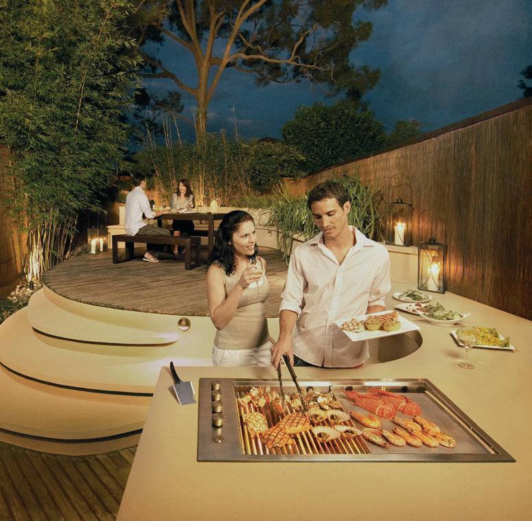

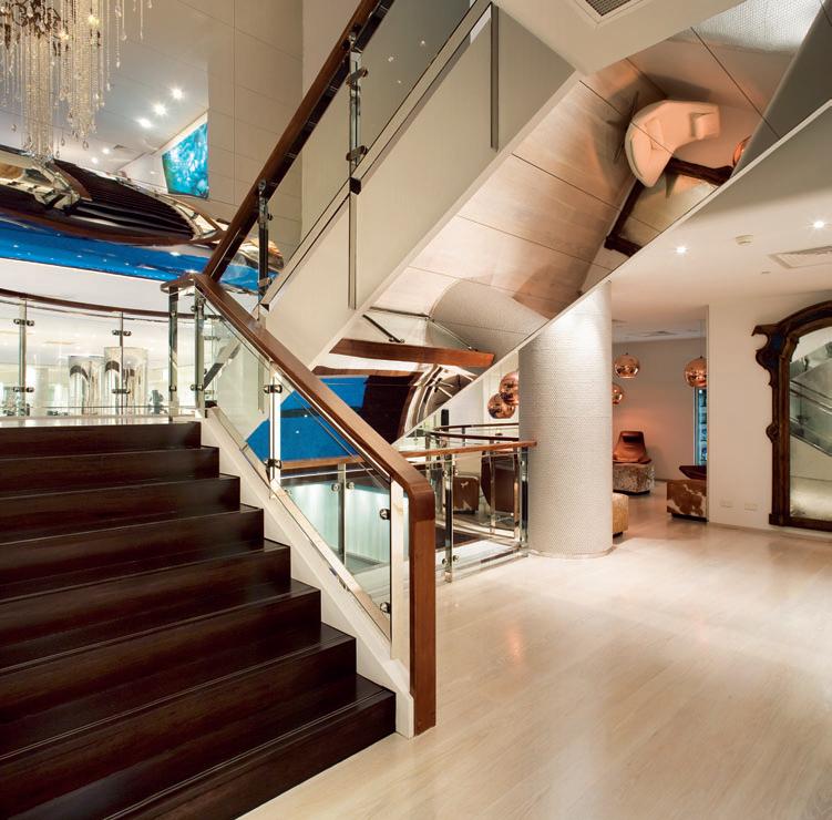

showroom 188 chalmers street surry hills nsw 2010 Sydney telephone 02 9690 0991 facsimile 02 9690 0992 precisionflooring.com.au
TWO in ONE
Architect Pongsakorn
Kitkajornpong has created two distinct living areas in this ‘housing compound’ in Thailand. Tonkao Panin explores the way the activities of a family have shaped the spaces in which they live.
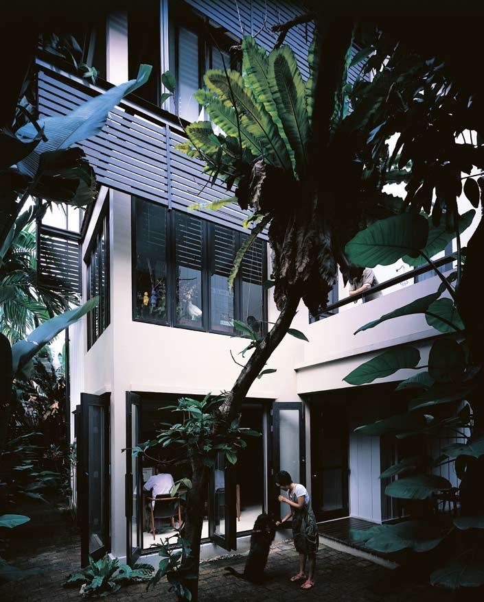
117 scenario habitus 06
ploy house — BANGKOK, thailand
PONGSAKORN KITKAJORNPONG
Text
Photography Pirak Anurakyawachon
Tonkao Panin
ploy house — BANGKOK, thailand
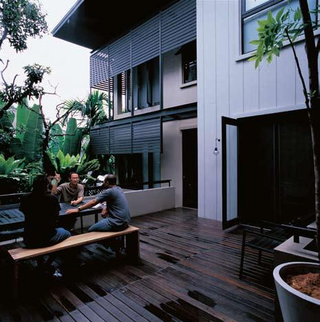
PONGSAKORN KITKAJORNPONG
Family living entails a certain commitment to sharing of space. When designing a home for a family of four, the designer must ask to what extent can each family member’s particular needs be fulfilled, and to what extent should each inhabitant conform to collective living within the family.
These questions are hardly challenging when a house is simply a place that inhabitants leave daily and return to for rest. It does, however, become challenging when a house is required to perform multiple tasks, becoming a place for work, a place for business, a place for professional productions, and countless other possibilities.
Hidden in the labyrinthine road networks of Bangkok is a house for a family of four, whose daily activities revolve around their home. Pongsakorn Kitkajornpong, the architect, acquired the peaceful plot of land in the heart of Bangkok with a vision to create a home he could share with his extended family, as well as a space from which he could manage his own practice. Also living in the house is his retired father, who spends most of his time in and around the house, Pongsakorn’s brother, Bin Kitkajornpong, a renowned film director and his wife, Ploy Mallikamas, a well-known writer. Bin and his wife also use the house as both a domestic and professional domain.
In order for the design of a single house to accommodate such diverse domestic and professional needs, as well as take into account personal and aesthetic preferences, individual and collective dwelling criteria needed to be established before work on the design began. The first task of the architect was to understand not only the physical requirements but also socio-cultural specificities within the micro-scale of the family. Only when such an understanding had been established could Pongsakorn begin to translate the individual and collective needs into a unique spatial and formal configuration.
The first solution, one that seems natural to the Thai way of living, was to envision a house ‘compound’ of multiple living quarters both separate and joined. Occupying the front is the area belonging to the architect and his father; at the back lies the home of his brother’s family. The two houses share the entrance
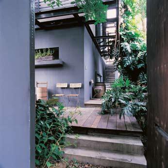
118 scenario habitus 06 habitusliving.com
–02 03
The concept of private and enclosed is re-defined and re-interpreted by the architect.
stairs leading to the upper terrace that acts as both the unifying and segregating element – it is a point of entry that everyone shares before going their separate ways.
Elevating living areas from the ground has been a longstanding method used in Thailand to organise the hierarchy of diverse domestic activities. In this house, while multiple service areas are tucked underneath the terrace level, the main living and working areas of both ‘houses’ are raised on a platform joined by
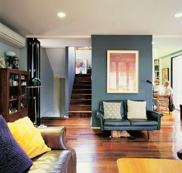
the extended terrace. The courtyard between the two houses performs a similar task to the terrace, becoming either a place to join or a point to depart. Both the courtyard and the terrace are transitional elements that allow the two houses to co-exist as one.
The interior makes use of a range of wide-and-high apertures that create a sense of openness that belies the spatial separation in the house. Indeed, some parts of the interior are decisively walled in to accommodate the
01
An inner courtyard connects the two houses.
02 The central terrace connects the two houses at the upper level.
03
The point of entry the two houses share.
04
The living area is closely connected to the working space.
119
04
ploy house — BANGKOK, thailand
diverse usages, but strategic positioning of openings creates a close relationship between interior activities and exterior spaces, making the walls less confining. It is as if the living box is pierced, allowing space to flow freely. The openings do not, however, necessarily frame specific views; instead one is aware of the landscape through an abundance of natural light and free-flowing air.
There are also open rooms and rooms with dematerialised walls. These spaces are not limited to the public or social parts of the house, and transparent walls loosely demarcate some of the private spaces. In this way, the concept of private and enclosed is re-defined and re-interpreted by the architect. The private space can be as open as the public, so long as it is placed in an appropriate location, orientation and sequence in relation to the surrounding spaces. These spaces in the house are defined
architecturally by light, especially daylight, rather than articulated by walls.
Seen as one, the two parts of the house share a certain aesthetic, yet the spatial configuration of each ‘house’ is different. While the planning of the front part, occupied by the architect and his father, is relatively free, the back is more traditionally defined. This is a result of diverse requirements in terms of habits, rituals and personal preferences.
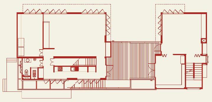
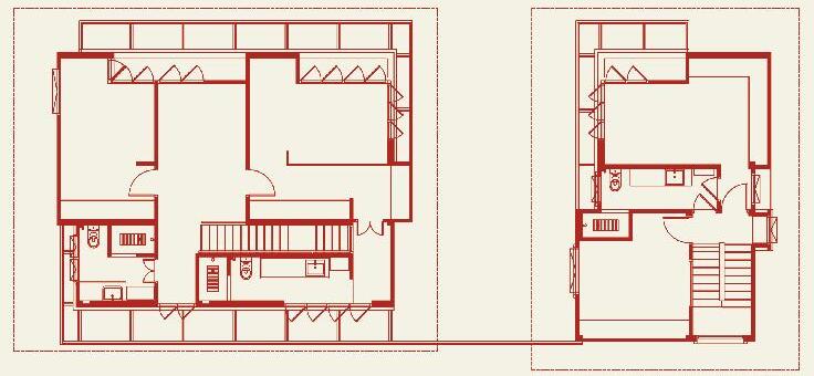
In the different parts of the house, activities define the spaces, creating settings that perfectly reflect and suit the activities that occur within.
The language used in the finishing of the floors also affirms the specific nature of each setting. The different floor surfaces are an expression of care, not just for the building’s continuity, but also as sequential interruptions from one usage to the next.
120 scenario habitus 06 habitusliving.com
2 1 4 5 3 2 1 4 3 1 Bedroom 2 Bedroom 3 Bedroom 4 Bath 5 Working 1 Bedroom 2 Living/working 3 Living 4 Working 05 06
PONGSAKORN KITKAJORNPONG
05
Plan of the third level.
06
Plans of the upper level showing the central connecting terrace.
07 Stairs leading up to the private spaces.
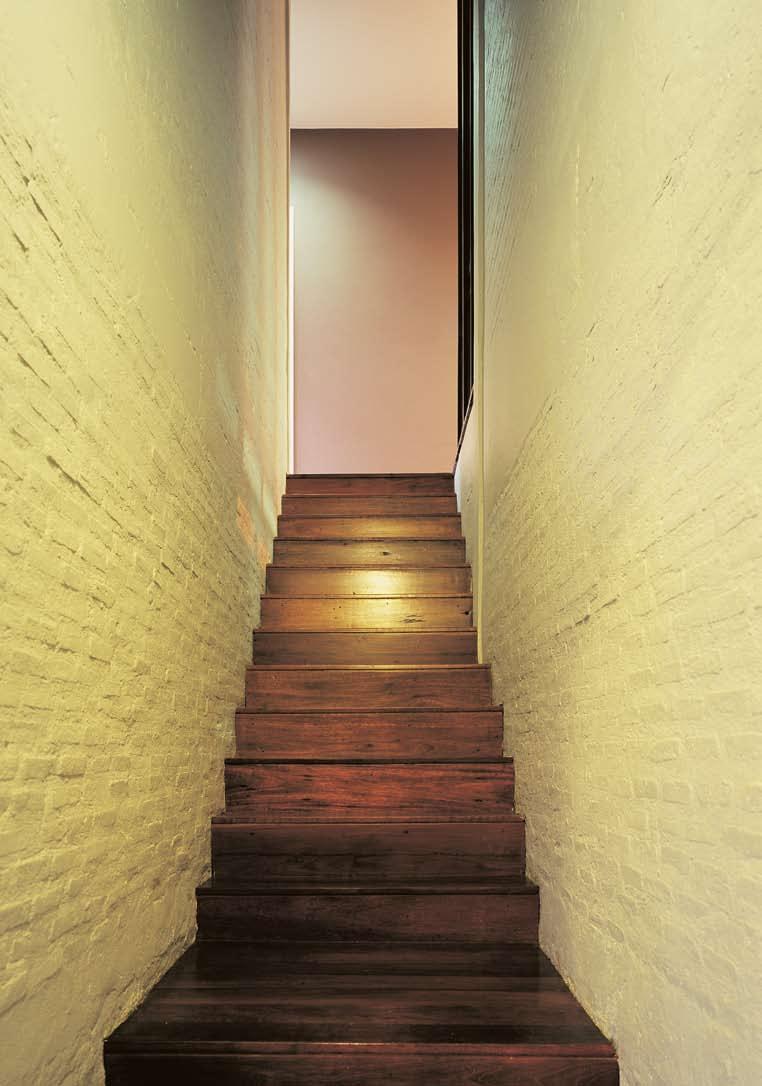
08 The light-filled bathroom.
09 Spaces for working are connected to the living spaces.
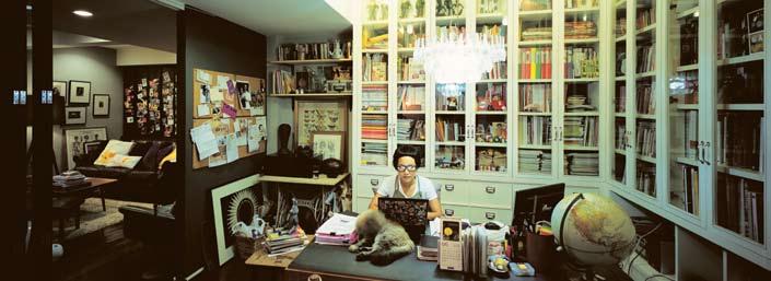
10 Bedrooms on the third floor feature long windows.
11 The bedroom windows allow for abundant natural light to filter through the external screen.
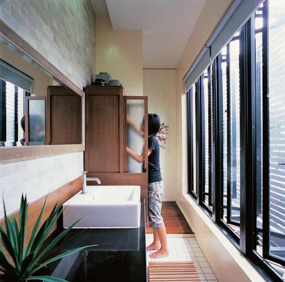
122 scenario habitus 06 habitusliving.com
KITKAJORNPONG 08 09
ploy house — BANGKOK, thailand PONGSAKORN
The house is neither one nor two, but a compound of relationships with developed vocabularies and concepts that demonstrate how settings that are distinct from one another can be interconnected. The diverse uses of the house by the four inhabitants do not need to be accommodated by the same material, nor does the house need to be spatially continuous, or given the same profile. Design, in this situation, depends on insight into situational similarities as well as differences. It has to establish the grounds for analogical relationships rather than concentrate entirely on shape or form. The floor plan creates alternatives that result in fluid yet well-defined spaces.
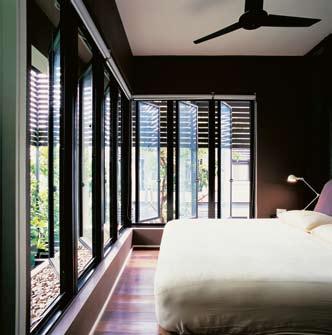
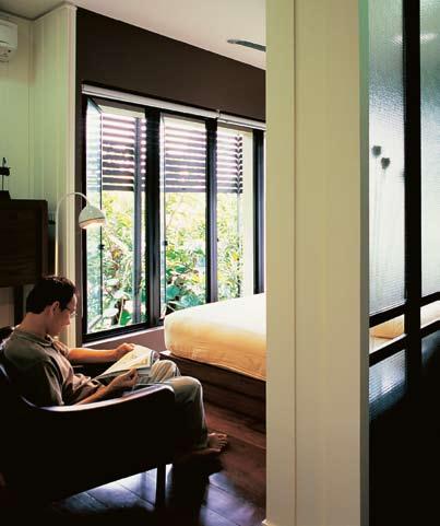
Both the land and the building are much more than aggregates of physical properties or something only to be enjoyed aesthetically. The project is not stylised in a sense that signifies authorship, but in a way intended to define and redefine ways of living in distinct and unique settings that are adaptable.
This house demonstrates architecture’s capacity to guide our lives, but at the same time shows ways in which our activities shape and reshape architectural configurations. Such a building may not be famous or considered exemplary of creative genius, but may, nevertheless, be indicative of what the true purpose of good architecture is. If such architecture is prosaic, it is also capable of standing silent witness to the stories of lives inscribed in its spaces. It is an architecture that does not intend to become a statement but a receptacle of life, a form that is never finished or final, but that is completed over time by the people that inhabit its spaces.
123
–11 10
Strategic positioning of openings creates a close relationship between interior activities and exterior spaces, making the walls less confining.
ploy house — BANGKOK, thailand
12
An external screen filters light into the interior.
ARCHITECT / INTERIOR
DESIGNER
Pongsakorn Kitkajornpong
STRUCTURAL ENGINEER
Panit Supatsiriluk
CONTRACTOR
A N T Engineering
LANDSCAPE ARCHITECT
Thanathep Tanvarawuttichai
Pongsakorn Kitkajornpong pongsakorn_k@yahoo.com
Thanathep Tanvarawuttichai thanathep.tan@gmail.com
SITE AREA 388m 2
BUILDING AREA 176m 2
TOTAL FLOOR AREA 333m 2
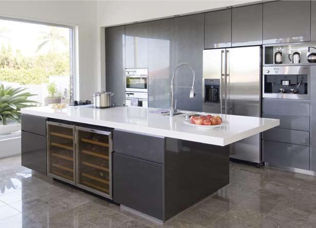
DESIGN 12 months
CONSTRUCTION 12 months
ARTWORK
Framing by Mesa House, mesahouse@gmail.com.
FURNITURE
Furniture custom designed and made.
LIGHTING
Hanging lamp from Habitat, habitat.net.
FINISHES
Floor hardwood flooring with matte polyurethane finish and concrete flooring finished with epoxy topcoat. Windows powdercoated aluminium frames. Ceilings plasterboard.
FIXTURES/EQUIPMENT
Screen system insect screen/ roller blind from Ultra Screen, ultrascreen.co.th. Sanitaryware from Cotto, cotto.co.th, and Kohler, kohlerthai.com. Faucets from VRH, vrh.co.th.
PONGSAKORN KITKAJORNPONG
124 scenario habitus 06 habitusliving.com
1 29/9/09 10:38:34 AM
Photo shows 2 x Vintec V40SGESS
HAB6_Transtherm.indd
12
The ultimate in comfort and craftsmanship, erba draws on more than 60 years of quality and design innovation to produce the finest Italian furniture.
To help clients in planning their furniture layouts, a complimentary design service is available from Milano’s qualified interior designers.
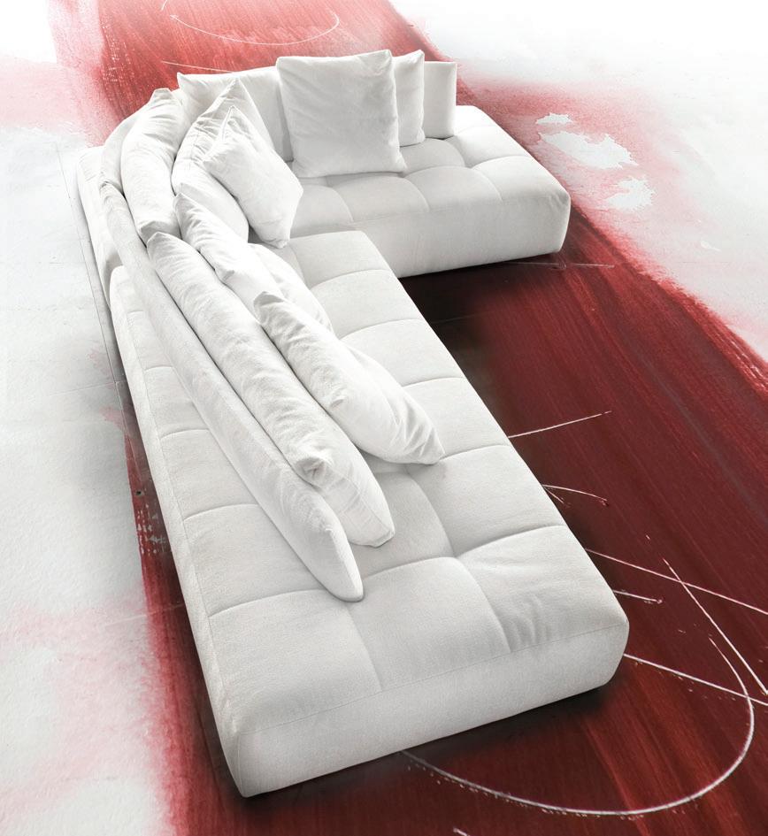
open 7 days 140 Parramatta Road, Ashfield Telephone 02 9799 5499 www.milanofurniture.com.au
Showroom
Conversation modular sofa in various sizes and configurations. Available in leather or fabric. Exclusively from Milano Furniture.
FLUSH MOUNTING - TO HAVE A MUCH LOWER PROFILE MORE USE OF NEW TECH GLASS - HAS EXCELLENT HEAT TRANSMISSION QUALITIES.




HEAT TECHNOLOGY TO SPERSE HEAT MORE EVENLY CROSS THE BODY


Inspired by designers, brought to reality by IXL’s engineers, the Tastic® Neo Dual and Single are the culmination of hundred’s of hours spent researching customer needs, developing new technologies and sourcing quality materials.

The Tastic® Neo uses 800 W tungsten halogen heat lamps, in conjunction with re ective elements, for a more e cient dispersion of radiant heat. Its in-line fan improves air ow ensuring a pleasant, temperate bathroom clear of moisture, while gimbal-mounted downlights allow directional lighting.
DIRECTIONAL LIGHTING


CONTE
STRAIGHT LINES. NEEDS TO FIT WITHIN CONTEMPORARY HOMES
Side ducting provides versatility for installation into multi-storey dwellings, venting directly to outside. The Tastic® Neo also has minimal overall height for a low pro le.

Accompanied by a ve year in-home warranty and a two year replacement warranty on heat lamps, the Tastic® Neo provides unsurpassed safety and quality
www.sampfordixl.com.au


We listened to the designers…
V INT INNTEG E W
R ESToR E A nd
RE -inv En T
This classic penthouse apartment by Tonka Andjelkovic in Sydney’s Elizabeth Bay gives light to the idea that to be contemporary is to borrow from the past.
Andrea Millar discovers a timeless rendition of new and old.

127
Text & Production Andrea Millar TONKA ANDJELKOVIC habitus 06 scenario
Photography Jason Busch
elizabeth bay house — NSW, australia

“We’ve pulled together what we like from different places as sympathetically to our own environment as possible”
–KyM ElphinSTonE
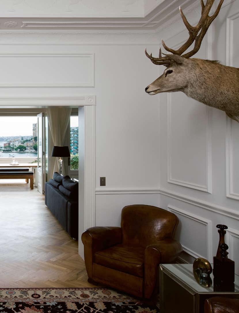
TONKA ANDJELKOVIC elizabeth bay house — NSW, australia
Given the opportunity to re-invent a period penthouse, Tony Benjamin, a property investor, and Kym Elphinstone, an arts consultant, faced the challenge of modernising a unique apartment without stripping away the layers of history and heritage.
h igh ceilings, original architraves and grand rooms were all period features that had been a main attraction of the home when they bought in 2007. “We had been looking for a 1920s or 30s apartment with original features because they have such a sense of history and unparalleled style,” Kym explains.
A gracious residential apartment block built in 1930 in a coveted harbour-side spot, darnley hall is a prized example of local Art deco architecture, and is recognised as 12th on the Royal Australian i nstitute of Architects (RA i A) register of significant 20 th Century buildings in Australia. The penthouse is a two-level apartment with five bedrooms, three bathrooms, and two delightful terraces, one facing a 180 o view of Sydney harbour and the other towards neighbouring buildings in the Art deco enclave that is Elizabeth Bay.
The purchase sparked a two-year period of re-modelling, restoration and pushing creative boundaries with the collaboration of interior designer Tonka Andjelkovic. “it was a difficult floor plan, so there was a lot of planning required so that we could update without ripping it all apart,” says Tonka looking past the new living room into the atrium, one of the original rooms kept and cherished. The room, which features an original leadlight dome ceiling and a fireplace, now marks the transition between the entry and the new living areas.
The floor plan was a peculiar one, and despite sales brochures given to the couple describing the penthouse as ‘renovated’, it had two pokey kitchen and living areas at the back, away from the views, while the bedroom wing was split in half by a huge ballroom facing the views. o ppressive, dark panelling on walls, poor lighting and small bedrooms were other problems needing attention.
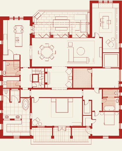
Completely re-working a floor plan placed the couple’s life under a microscope with questions about how they ‘wanted’ to live. d id they want open plan or separate spaces? Bright or dark living areas and bedrooms? “Getting the new spaces right took some time. We had to imagine ourselves living here and so we’d walk around the rooms with chalk, marking out where rooms could be,” says Kym.
The new floor plan developed by Tonka favours flexible spaces that can be opened up or closed off by partition doors depending on the mood. now the kitchen, study and terrace can be closed off from the lounge and dining room. “We decided not to go completely open plan because we didn’t want to remove all the walls. part of the brief was to keep what we could,” says Tonka. “it’s also nice to be able to close off the spaces, to cook away from guests or work in
130 scenario habitus 06 habitusliving.com
1 Lobby 2 Entry 3 WC 4 Bath 1 5 Bedroom 1 6 Robe 1 7 Cellar 8 Balcony 9 Master bedroom 10 Robe 11 Ensuite 12 Laundry 13 Exit 14 Atrium 15 Fire stair 16 Lift 17 Formal lounge room 18 Formal dining room 19 Bath 2 20 Pantry 21 Kitchen 22 Terrace 23 Study 1 16 23 3 4 5 8 9 14 22 18 21 20 19 12 13 11 10 6 7 15 2 17 03 01
The preserved atrium features an original leadlight ceiling. 02
view from the atrium through the new living area to Sydney harbour.
03 Ground floor plan. 04 The lounge room features a dale Frank painting. 05
Stained oak bookshelves in the study.
a quiet space,” adds Kym. A dining and living area now sit where the ballroom once was, with doors that slide away to reveal a glorious view from beyond the terrace.
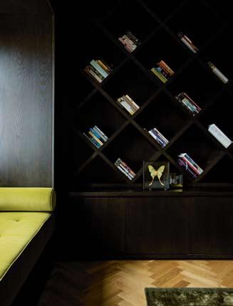
A former bedroom has been converted into a state-of-the-art kitchen that also opens up to the terrace through original French doors and flows into the dining room through the new partition doors. The industrial stainless steel and marble finishes are reminiscent of a favourite restaurant of the couple. The design harps back to italian functionality. “i really like Boffi kitchens,” says Tonka who reveals that the italian kitchen design powerhouse inspired the no-fuss design. it’s a contrast to the classic ‘parisian apartment’ look that dominates in the living and dining rooms with its panelled walls and parquet flooring. “We chose finishes that lent themselves to that parisian look in the living areas because of the grand scale of it, but we didn’t want that for the kitchen. it had to be the latest in design.”
The master bedroom, now re-located to the back of the apartment, opens up to the second balcony and marks the ‘softer’ side of the apartment. here the darker, quieter spaces, including the over-sized ensuite, are in contrast to the light and bright spaces facing the harbour.
These moods are reflected in the choice of materials. The living areas in their plaster moulded panel detailing are painted a crisp d ulux natural White while the bedroom
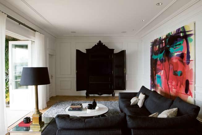
131
04 05
features a solemn grey and green coloured wallpaper that was inspired by a picture of a nyC apartment. A very communicative client, Kym had produced a scrapbook of pictures and creative ideas for the apartment that was handed to Tonka upon commencement of the project. The bold ensuite design incorporates a combination of design influences, from mosaics that create an age-old back drop of tiled tapestry to the latest bath tub, free-standing and organically shaped making the room a successful marriage of contrasts.
Another notable interior design solution that borrows from international influences is the study. “it’s like an old English den, modernised by the contemporary joinery design,” says Tonka. here, an artwork by artist Alexander McKenzie provides the muse for the room’s rich colour scheme. dark and moody, the work’s feel is reflected with antique furniture and a wrap-around dark timber diamond-shaped bookcase. A testament to good detail, this diamond pattern is repeated in the wallpaper.

i n each of the re-worked spaces, furniture, art and objects from different periods and styles
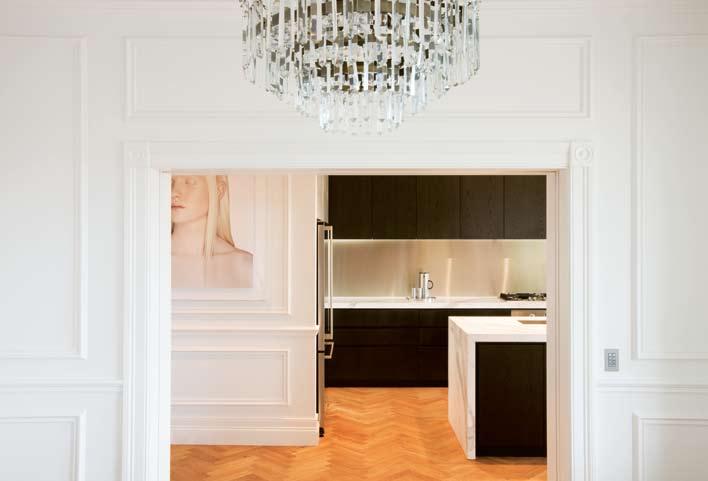
132 scenario habitus 06 habitusliving.com
TONKA ANDJELKOVIC
elizabeth bay house — NSW, australia
06 in the kitchen, a photograph
con-
to the decorative
07 The kitchen
a monolithic
08 The dining room. 06 07
by petrina hicks provides
trast
period wall panelling.
features
slab of Calacatta marble.
collide to create a result that is hard to pin down as being from one particular place. This could be Sydney, paris, l ondon, San Francisco or hong Kong, and is the result of influences drawn globally. Kym says, “We travel a lot, and i guess we’ve pulled together what we like from different places as sympathetically to our own environment as possible.”
no other design element offers as much evidence of this than the sumptuous vertical garden on the terrace. The terrace itself was also re-worked to remove two prevalent columns that prevented any kind of dining table fitting into the space.
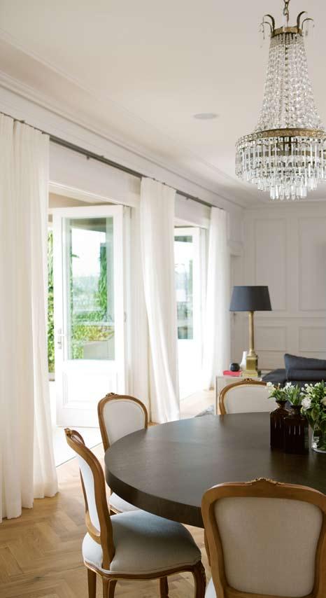
i nspired by French-born botanist patrick Blanc’s much-published vertical garden walls on buildings throughout the world, the couple and Tonka decided on this design solution to get as much greenery as possible on the terrace. With local collaborators, the vertical garden took trial and error to find plants that would withstand the conditions and technique. The result requires no soil, is self-watering, self-fertilising, and is an eye-catching, contemporary marvel. it’s something the old penthouse could never have had imagined, but that fits in unquestioned among all the other new – and old – ideas in play.
INTERIOR DESIGNER
Tonka Andjelkovic design
PROJECT TEAM
Tonka Andjelkovic
BUILDER
platinum Constructions & Consulting
JOINERY
van & Son detail Joinery
STRUCTURAL ENGINEER
M pn Group
LANDSCAPER plantdeco
LIGHTING CONSULTANT
Filament lighting
ARCHITECTURAL CONSULTANT
Studio R
AUDIO VISUAL CONSULTANT
Access Electronics Australia
Tonka Andjelkovic Design (61 2) 9331 5995
ARTWORK
Living room painting by Dale Frank, 2006. Kitchen ‘Lauren’ by Petrina Hicks, 2003.
FURNITURE
Sofa Sabi Black Pepper sofa from Poliform, poliform.com.
au, Minotti coffee table from Dedece, dedece.com, Bravoure hand tufted rug from Hub Furniture, hubfurniture. com.au, nested side tables from Laura Kincade, laurakincade.com. French 1940 club chairs from The Country Trader, thecountrytrader. com.au. Rug in Artrium from Whitecliffe Imports, whitecliffe.com.au, and deer’s head from Becker & Minty, beckerminty.com. Dark Oak dining table from Mortice & Tenon, morticeandtenon.com, Louis XV-style dining chairs from Desks of Distinction, desksofdistinction.com.au. Beech bar stools in kitchen from Hub Furniture. Terrace outdoor table from Anibou, anibou.com.au. BBQ and bench seat from Van & Son Joinery, vanandson.com.au.
FINISHES
Floor re-milled antique French Oak parquetry from Salvage, salvage.com.au. Joinery timber veneer from Van & Son Joinery, solid Teak from Bruynzeel Australia, (61 2) 9939 1175 and Hermes
133 08
Bathroom
au.
bay house — NSW, australia
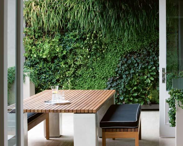

Paint
LIGHTING
Entry chandelier from Vintage
Glamour, vintageglamour.com.
au. Dining room chandelier from Sally Beresford Antiques, sallyberesford.com.au. Wall lights from Custom Lighting, customlighting.com.au.
Table lamps from Becker & Minty. Kitchen pendant from
TONKA ANDJELKOVIC
Optique Lighting, optique.com.
au. Downlights from Erco Lighting, erco.com.
FIXTURES/EQUIPMENT
Kitchen Vola mixer from Cass Brothers, cassbrothers.com.
au, and Franke undermount sink from Winning Appliances,
winningappliances.com.
au. Bathroom NuCast bath from Malcolm St James, malcolmstjames.com.au, and Villeroy & Boch basin from Cass Brothers.
134 scenario habitus 06 habitusliving.com
HAB6_Baylisss.indd 1 15/10/09 2:07:15 PM 09
elizabeth
Statuarietto honed stone from Euromarble, euromarble.com.
au. Stone slabs from Gitani Stone, (61 2) 9838 8880.
stone tiles from Euromarble, glass mosaic tiles from Pazotti, pazotti.com.
Terrace tiles also from
Pazotti. Glass from Pilkington, pilkington.com. Wallpaper in master bedroom from Unique Fabrics, uniquefabrics.com.
and polyurethane from Dulux, dulux.com.au.
09
The vertical garden wall on the patio is inspired by Frenchborn botanist patrick Blanc.
CHAIR
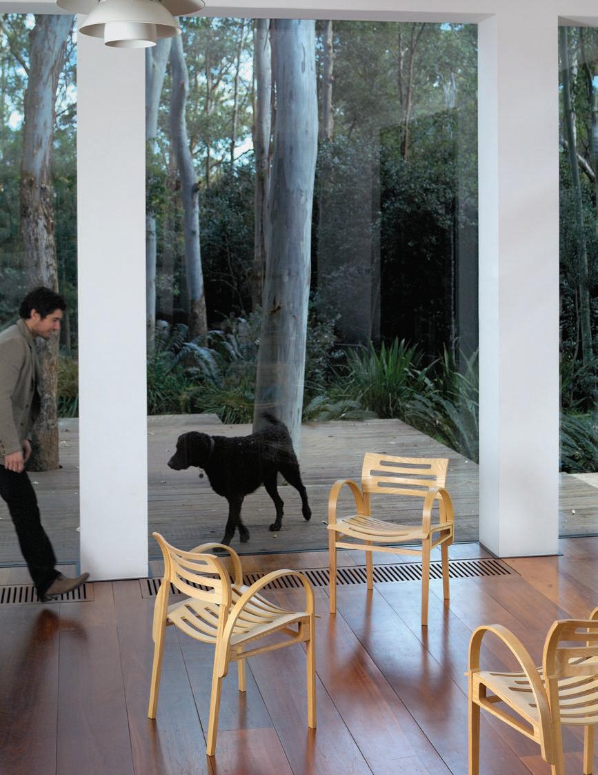 Designed by Gary Galego




Outside-In House
How relevant are popular Western house typologies in the tropics of Singapore? Lynn Tan discovers a new type of house by a-dlab that explores ideas of tropicality and sustainability by bringing the outside in.
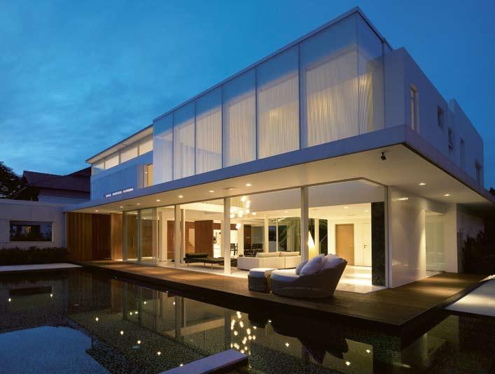
137 a-dlab scenario margoliouth road house — singapore habitus 06
Photography Aaron Pocock
Text Lynn Tan

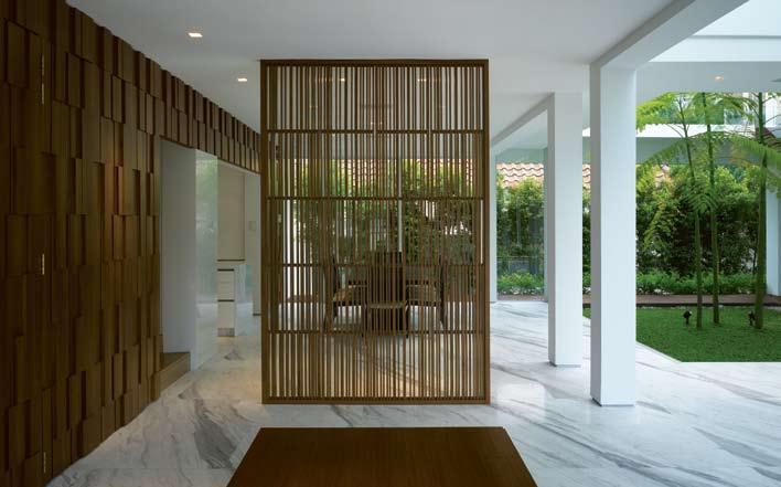
138 scenario habitus 06 margoliouth road house — singapore a-dlab habitusliving.com 02 03
It was raining the morning I visited the house, but the passing showers only served to heighten its outside-in quality. Inside the house, you see and feel the rain so closely it is almost as if you are in the garden. The effect is exactly as the architect, Warren Liu, director of a-dlab, had intended.
The concept of bringing the outside into the house is a-dlab’s take on tropicality, an aspect of sustainability and one of the firm’s key ideologies. The premise of tropicality lies in the fundamental questioning of the relevance of popular Western house typologies in the tropics. This is especially pertinent in landscarce Singapore, where house plots are small and the competing demands of built-up areas and open spaces need to be addressed. a-dlab’s solution is to blur the boundaries between inside and outside and bring the external garden into the house.
The existing house was a two-storey detached unit with a single-storey extension to one side. Having previously lived in a long, narrow semi-detached house that was fairly enclosed, the clients longed for a more open house with plenty of space and areas extending into the outdoors.
Built in the late 1980s, the existing house had been well maintained. A tabula rasa approach – demolishing the original building – would have given Liu a clean slate, but considering the good condition of the house it would have been wasteful and far from sustainable. “Our approach was to retain as much of the existing house as possible to minimise structural costs, thereby freeing up more budget for architectural works and finishes,” recalls Liu. The strategy was to build sideways instead of up, to avoid
04
01
From the outside, the house appears like a garden pavilion floating on water.
02
The dining area is housed in one of four pavilions surrounding a central garden pavilion.
03
A simple screen at the entrance foyer holds the secret to an encrypted binary code inspired by biomimicry. 04
First storey plan.
05
Second storey plan. 05
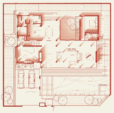
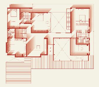
139
...as open as possible, allowing external areas to flow freely into the house.

140 scenario habitus 06
road house
a-dlab habitusliving.com 06
margoliouth
— singapore
costly micro-piling needed to support additional loads on the existing structure, while respecting the low-rise scale of the surrounding context. The two-storey house stayed, but the one-storey annex was demolished in order to make way for a new two-storey extension that would provide enough rooms and family areas for the extended household.
The garden area was reduced as a result of the renovation but the outside-in approach to the design of the house more than made up for this. Like many creative solutions, this approach arose partly from constraints on space and budget. Instead of one solid massing, the house is made up of four pavilions conceived as containers of spaces and activities, but designed to be as open as possible, allowing external areas to flow freely into the house. The relationship between pavilion and garden demonstrates a duality between inside and outside, solid and void, and creates a certain tension that binds the different elements into one unified composition.
06
The porosity and transparency of the house is apparent in this view.

07
Details include the carpet pattern featuring mathematical principles and suspended glass baubles reinforcing the loftiness of the living area.
The largest pavilion is the original twostorey block, containing the communal spaces of the dining room, kitchen, entertainment, family hall and three bedrooms. The original pyramidal pitched roof has been replaced with a flat roof to give it a modern look that is in sync with the new additions. The existing structure of this pavilion is predominantly bricks and concrete and it thus appears more solid than the new pavilions which are designed to be as light as possible. a-dlab achieved this lightness by playing with double volume spaces, enveloping the pavilions with skinlike glass enclosures and using slender metal columns that echo the graceful tree trunks in the courtyard.
At the heart of the house lies the garden court pavilion, an open-to-sky courtyard whose outdoor presence explodes into the surrounding pavilions. The courtyard is intertwined and symbiotic with the house, creating an ongoing dialogue between indoors and outdoors which encapsulates the essence of the house.
141
07
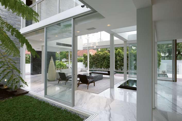
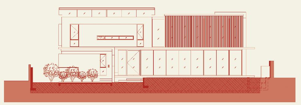
142 scenario habitus 06
a-dlab habitusliving.com 08 09
margoliouth road house — singapore
08
Eastern and western halves seamlessly join as one in the front elevation.
09
The slender columns can be likened to metal ‘tree trunks’.
At the heart of the house lies the garden court pavilion, an open-to-sky courtyard whose outdoor presence explodes into the surrounding pavilions.
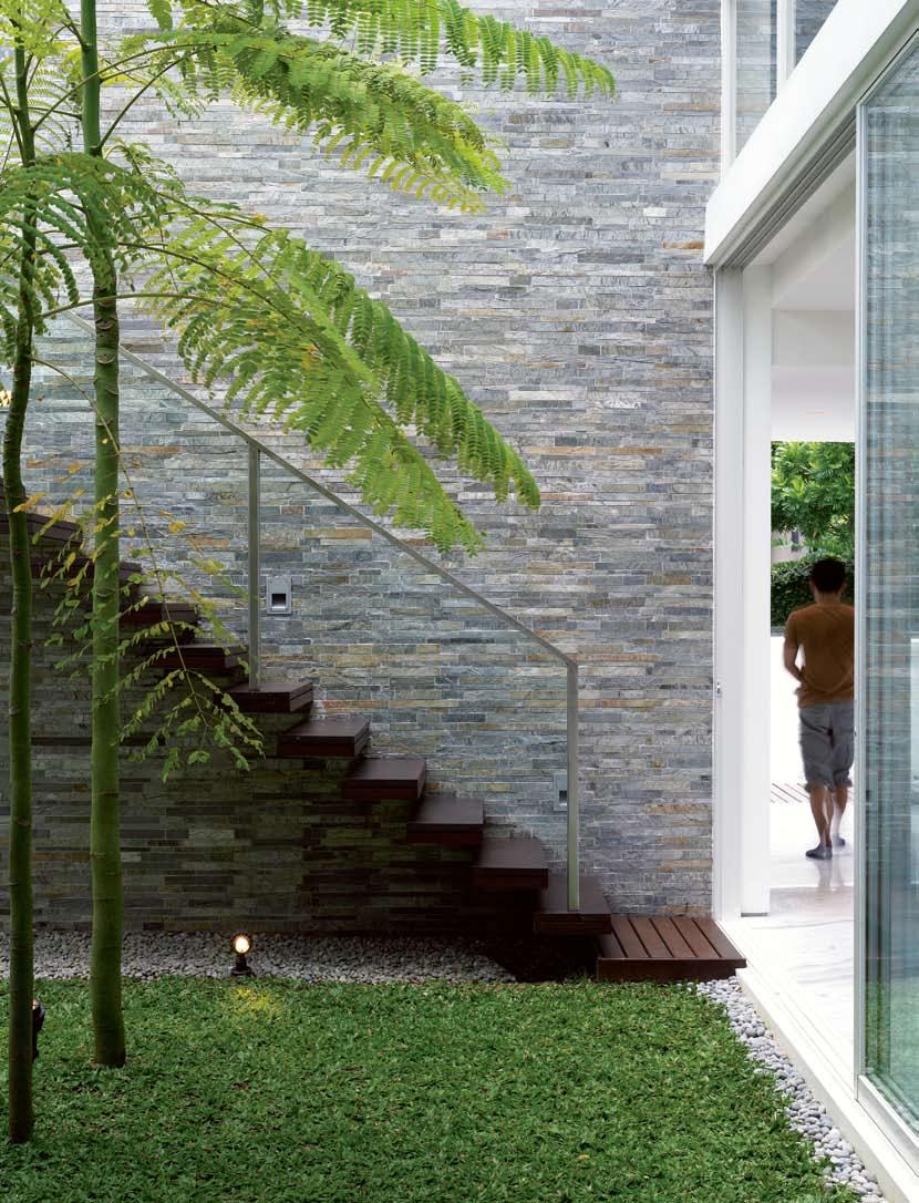
margoliouth road house — singapore
The living room takes the form of a double-volume light pavilion that extends out onto a timber deck and pool. As the skies cleared and the sun emerged during my visit, the interior of the pavilion became bathed in the warm glow of diffused daylight streaming through the fritted glass and blinds, which are part of a specially-designed, yet simple air pocket system that allows hot air to escape through grilles at the top. The study is contained in a frosted glass cube that cantilevers over the living room, like a gemstone purposefully poised within its showcase. Its floating quality heightens the sense of space and openness, evoking the feeling of being outdoors.
The architectural design and outside-in concept lends itself naturally to tropical and sustainable paradigms. The openness of the pavilions ensures good cross-ventilation and abundant natural light, while elements such as screens and fritting moderate heat and glare, and decks and pools provide a transition zone between indoors and outdoors. These are all passive means that control the environment and make the house more habitable. a-dlab has
taken this a step further with their research in biomimicry, which emulates and uses as creative inspiration the complex processes of nature. These theories underlie many of the firm’s projects and are applied not only to overall architectural forms and building systems, but also to detail designs for feature walls, screens, light fixtures and even carpets. As Liu puts it, “Instead of creating technology to solve problems caused by technology in the first place, we should look to nature for lessons on how to balance nature and technology. After all, nature is the most sustainable form of life.”
ARCHITECT
a-dlab
MAIN CONTRACTOR
Builders 265
CIVIL & STRUCTURAL ENGINEER Engineers Incorporated
a-dlab
admin@a-dlab.com a-dlab.com
a-dlab
10
The presence of the central garden court pavilion is evident from every corner of the house.
11
Interesting textures and patterns on a feature wall relate to natural processes.

FURNITURE
Furniture by Minotti, minotti.it, supplied by Marquis, marquis.com.sg.
FINISHES
Exterior granite by Ocean Granites, oceangranites.com. sg. Interior by Polybuilding, polybuilding.com.
LIGHTING
Lighting from Million Lighting, (65) 6743 3033.
144 scenario habitus 06
habitusliving.com
11
win a Dinosaur Designs Sunshine Salad Bowl




from the new Sun Range valued at $550 RRP


Dinosaur Designs have transformed the luminescence and poetry of the sun into a radiant collection of homewares and jewellery. Echoing the vivid colours of the sunset and the flickering quality of light, each piece is handcrafted in the Sydney studio.


Bring the sun into your own living environment with one of these unique pieces.

To enter, subscribe to Habitus magazine and tell us how you will bring warmth into your home this summer.
Fill in your details overleaf or subscribe securely online at habitusliving.com/subscribe before 28 February 2010.

subscription offer
sUBscrIBe to HaBItUs maGaZINe
For myself For a gift
maIlING DetaIls
NAMe
PrOFeSSION
COMPANy AddreSS
AddreSS
AddreSS
StAte
aUstralIa, New ZealaND aND sINGaPore
1 year – $45 (4 issues)
2 years – $85 (8 issues)
3 years – $120 (12 issues)
INterNatIoNal
1 year – $90 (4 issues)
POStCOde
COuNtry
PHONe eMAIL
PaymeNt metHoD
CHeque / MONey Order eNCLOSed $ PLeASe CHArge My CredIt
CArd tHe AMOuNt OF $
2 years – $180 (8 issues)
3 years – $240 (12 issues)
Please seND comPleteD form to:
Habitus Magazine
CArd NuMBer
exPIry dAte
SIgNAture
tell Us How yoU wIll BrING warmtH INto yoUr Home tHIs sUmmer.
Level 1, 50 Marshall Street Surry Hills NSW 2010 Australia (61 2) 9368 0150 (61 2) 9368 0289 (fax) Or subscribe securely at habitusliving.com/subscribe
Subscribe before 28 February 2010 and complete the above statement for your chance to win. For terms and conditions go to habitusliving.com. All prices in Australian dollars.
sUBscrIBe to HaBItUs maGaZINe
For myself For a gift
maIlING
CArd tyPe
CArd NuMBer
exPIry dAte
$ PLeASe CHArge My CredIt CArd tHe AMOuNt OF $
NAMe ON CArd
SIgNAture
tell Us How yoU wIll BrING warmtH INto yoUr Home tHIs sUmmer.
All cheques / money orders must be in Australian dollars and payable to Indesign Publishing Pty Ltd. ABN 96 101 789 262. Offer valid until 28 February 2010, or while stocks last. Habitus is published quarterly. (61 2) 9368 0150, subscriptions@indesign.com.au, indesignlive.com, habitusliving. com, indesignthecollection.com.au, dinosaurdesigns.com.au
Subscribe before 28 February 2010 and complete the above statement for your chance to win. For terms and conditions go to habitusliving.com. All prices in Australian dollars.
aUstralIa, New ZealaND aND sINGaPore
1 year – $45 (4 issues)
2 years – $85 (8 issues)
INterNatIoNal
1 year – $90 (4 issues)
2 years – $180 (8 issues)
3 years – $240 (12 issues)
Please seND comPleteD form to:
Habitus Magazine
Level 1, 50 Marshall Street
Surry Hills NSW 2010 Australia
(61 2) 9368 0150
(61 2) 9368 0289 (fax)
Or subscribe securely at habitusliving.com/subscribe
All cheques / money orders must be in Australian dollars and payable to Indesign Publishing Pty Ltd. ABN 96 101 789 262. Offer valid until 28 February 2010, or while stocks last. Habitus is published quarterly. (61 2) 9368 0150, subscriptions@indesign.com.au, indesignlive.com, habitusliving. com, indesignthecollection.com.au, dinosaurdesigns.com.au
3 years – $120 (12 issues) DetaIls NAMe PrOFeSSION COMPANy AddreSS AddreSS AddreSS POStCOde StAte COuNtry PHONe eMAIL PaymeNt metHoD CHeque / MONey Order eNCLOSed
CArd tyPe NAMe ON CArd
It’s a light switch. It’s a dimmer. It welcomes you home and shuts everything off as you leave. It controls your home’s temperature, plays music


in any room of your home – all at the touch of a button or remote control. C-Bus home control; for your new home or the one you’re in now.


Start with a simple system and add to it as your needs change. Start your life switch today. Visit www.clipsal.com for more information.
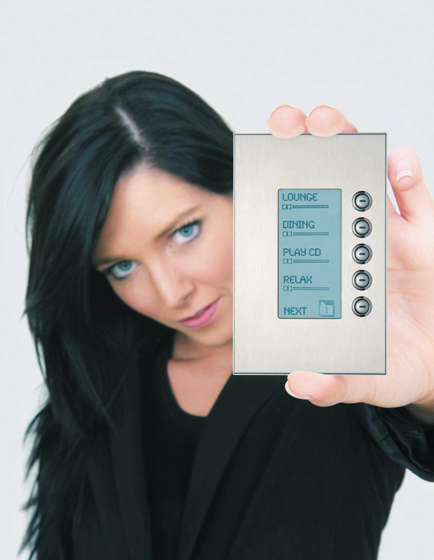
CLIPCOM20289
MORE OF A LIFE SWITCH THAN A LIGHT SWITCH
© 2009 Clipsal Australia Pty Ltd. All rights reserved.





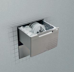
fisherpaykel.com.au
cross fade
selwyn street house — NSW, australia
SMART DESIGN STUDIO

148
habitus 06 habitusliving.com
Photography Anson Smart
Text
Paul McGillick Production Andrea Millar
An ElEGA nt Domestic Refuge
Artarmon is a suburb north of Sydney, developed in the 1920s and 30s, with a stock of classic California bungalows. Additions in a conservation area like this can be fraught. But Paul McGillick reports that William Smart has resolved the problem with elegant simplicity.

149
selwyn street house — NSW, australia
SMART DESIGN STUDIO
Strictly-speaking, it is East Artarmon – home to some of Sydney’s best-preserved California bungalows with their tuck-pointed dark brick façades, decorative porches and geometric art deco leadlight highlight and casement windows.

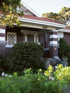
t he client – a planner – knew the area and loved it. All he needed was a house there with a generous backyard facing the sunny north. And having found it, he needed to make it work for a modern family of four. He had worked with architect, William Smart, before. So, he turned to him again for a solution to the challenge of how to carry out alterations and additions in a heritage and conservation area. What this means in effect is that any additions need to be invisible from the street in order to preserve the scale and character of the heritage streetscape.
Fortunately, the house was slightly elevated on the higher (northern) side of the street. t his enabled Smart to demolish all the accumulated (non-heritage) lean-to additions at the back and build a new living and dining area on the ground floor with a new master bedroom, bathroom and home office above –but without the new elevated bedroom cube being visible from the street.
t he brief was for an addition and restoration providing the house with four bedrooms, two bathrooms and strong connection to the expansive garden with its pool and splendid established tree. t here was never any question that the addition would be contemporary. How else to open up the relatively inward-looking California bungalow? Anyway, the art deco spirit was in its own time ‘modernist’, so there was a natural affinity between the two – an affinity which Smart has subtly enhanced with the detailing. “It is,” he says, “very much about the details.”
Invisible from the street it may be, but from the garden the addition is formally very assertive with the aubergine central box framed from behind by the white rectangular expanse of the kitchen, dining, living pavilion which opens up to the garden through 14 metres of bifold timber-framed glass doors. But, says Smart, “it’s deliberately not a wide, single-volume
150 cross fade habitus 06 habitusliving.com
02 03
There was never any question that the addition would be contemporary.
01 the rear addition resolves into simple, elegant, geometric planes.
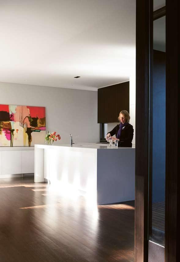
02 the finely preserved street elevation which masks the rear addition.
03 the original living room restored with new fabrics.
04 the new kitchen.
151
04
cross fade
SMART DESIGN STUDIO selwyn street house — NSW, australia
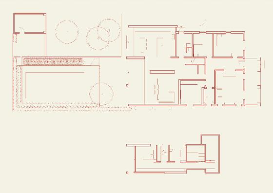
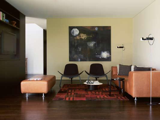
152
habitus 06 habitusliving.com
05 the new living space. 06 Ground floor plan. 07 View down corridor linking the entry to the addition. 05 06 1 Living 2 Dining 3 Kitchen 4 Bedroom 5 Bathroom 6 Bedroom 7 Bedroom 8 Lounge 9 Master Bedroom 10 Home Office 11 Bathroom 1 5 4 3 2 67 8 9 10 11
The whole opens up through the bi-fold doors to embrace the pool area and the garden...
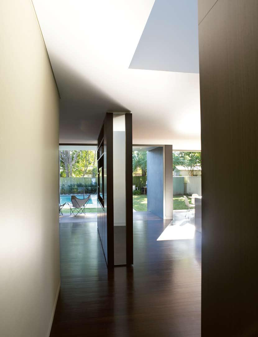
cross fade
selwyn street house — NSW, australia
SMART DESIGN STUDIO
space.” t here is, he says, “an overlapping of elements”. Hence, it is broken up – by the way the frame of the central box sits in front of the white frame, by the central joinery unit with its vertical strip mirror reflecting the garden, by the vertical slot window in the kitchen providing a visual link to the front of the house and by the counterpointing of materials.
t his is a counterpoint between the glass, steel and white render, and the Western Red Cedar timber privacy screens and louvres that warm the palette.
Inside, work to the original house has been largely restoration, using an upbeat palette of playful pastels (redolent of the arts and crafts movement which invariably tempers the modernism of art deco) and carefully selected furnishings and fittings, especially in the children’s rooms.
Rather than the usual central corridor, this house always had a kink connecting the front of the house to the rear. Smart has retained this so that the transition from front to back now articulates around a central robe and the timber staircase to the new upper level. Even then the approach to the rear pavilion is interrupted by the joinery unit, which – along with the blade walls of the box that intrudes back into the house – acts as a space divider. Hence, although the living, dining and kitchen areas inhabit a single space, it is a space that is loosely divided to create a rhythmic flow between one area and another.
t he whole opens up through the bi-fold doors to embrace the pool area and the garden, forming an ‘outdoor room’ with the interior floor continuous with a timber deck before stepping down to the lawn.
t he rear addition has a strong sculptural presence – a kind of three-dimensional planar construction reminiscent of De Stijl – but ultimately resolves itself into a simple, if elegant, domestic refuge.
ARCHITECT
Smart Design Studio
PROJECT TEAM
William Smart, Hamish
Ginn, tatsu Hayashi, Cameron Donald, luke Moloney
STRUCTURAL ENGINEERS
O’Hearn Consulting
BUILDER
Steele Associates
Construction
CONSTRUCTION PERIOD
6 months
TOTAL INTERNAL FLOOR
AREA
250m 2
Smart Design Studio (61 2) 8332 4333
habitusliving.com
154
habitus 06
08 Restored children’s bedroom. 09 Master bedroom en suite. 10 the new dining area. 08 09
ARTWORK
Art from Richard Martin Art, richardmartinart.com.au. Living room Lily by Moonlight II by Belinda Henry. Dining room Bedtime by Waldemar Kolbusz.
FURNITURE
Lounge Cassina lounge and ottomans from Space Furniture, spacefurniture.com.au.
Armchair Hans Wegner from Corporate Culture, corporateculture.com.au. Dining table from Planet Furniture, planetfurniture. com.au, Eames DSR plastic chairs with Eiffel base from Living Edge, livingedge.com. au. Kitchen stools Alvar Aalto from Anibou, anibou.com.au.
Outdoor chairs butterfly chairs from 506070, 506070.com.au.
FINISHES
Flooring throughout Blackbutt timber with Feast Watson stain, feastwatson.com.au. Roof Kliplok 700 from Bluescope Steel, bluescopesteel.com.au, finished with Colorbond, colorbond. com. Exterior wall cladding is Blueboard fibre cement sheeting from James Hardie, jameshardie.com, finished with Eurorender cement render from Euroset, euroset.com.au.
Timber cladding and louvres are Western Red Cedar timber with Feast Watson clear finish. Windows frameless double hung windows from Aneeta, aneetawindows.com. Skylight by Solar Space, solarspace.com. au. Doors aluminium framed glazed bifold doors from Alspec, alspec.com.au. Benchtops Ice
Snow CaesarStone, caesarstone.com.au. Kitchen joinery
10
satin polyurethane by Miratone, with True Grain Black Onyx veneer from Briggs, briggs. com.au. Paint throughout from Dulux, dulux.com.au.
Blinds throughout from Luxaflex, luxaflex.com.au.

Rugs from Whitecliffe Imports, whitecliffe.com.au.
LIGHTING
Exterior uplights from Inlite, inlite.com.au. Exterior downlights from Boaz, (61 4) 1380 9098. Twinspots from Gamma, gammaillumination.com. Dining room pendant Globe from Inlite. Media room pendant Lah from Globe Lighting, jsblighting.
com.au. Floor lamp Oluce Spider by Joe Columbo from Euroluce, euroluce.com.au.
FIXTURES/EQUIPMENT
Bathroom Lorenzo basins, and Matilda Bush Rose showerheads from Candana, candana.com. au. Fowler Newport WC from Caroma, caroma.com.au.
Bert_Habitus_179x531.0:179x5324/9/097:21AMPage1
Inwall tapware from Accent, accenttapware.com.au. Kitchen Liano tapware from Caroma, Miele cooktop and dishwasher, miele.com.au, Qasair rangehood, qasair.com.au, and Blanco sink, blanco-australia.com.
FRESH CUISINE MACHINES
Bertazzonihasnewingredientsforyourkitchen. Eightbold,exuberantcolours-red,white,green,black, cream,blue,burgundyandyellow.

Italy’straditionoffinedesignandculinary culturecombined.
Forthefullrangeofcoloursandoptionsphone 1300727421orvisitww.sampfordixl.com.au
155
Rosso/Red
HAB6_Bertazoni.indd 1 24/9/09 8:58:47 AM
director’s cut
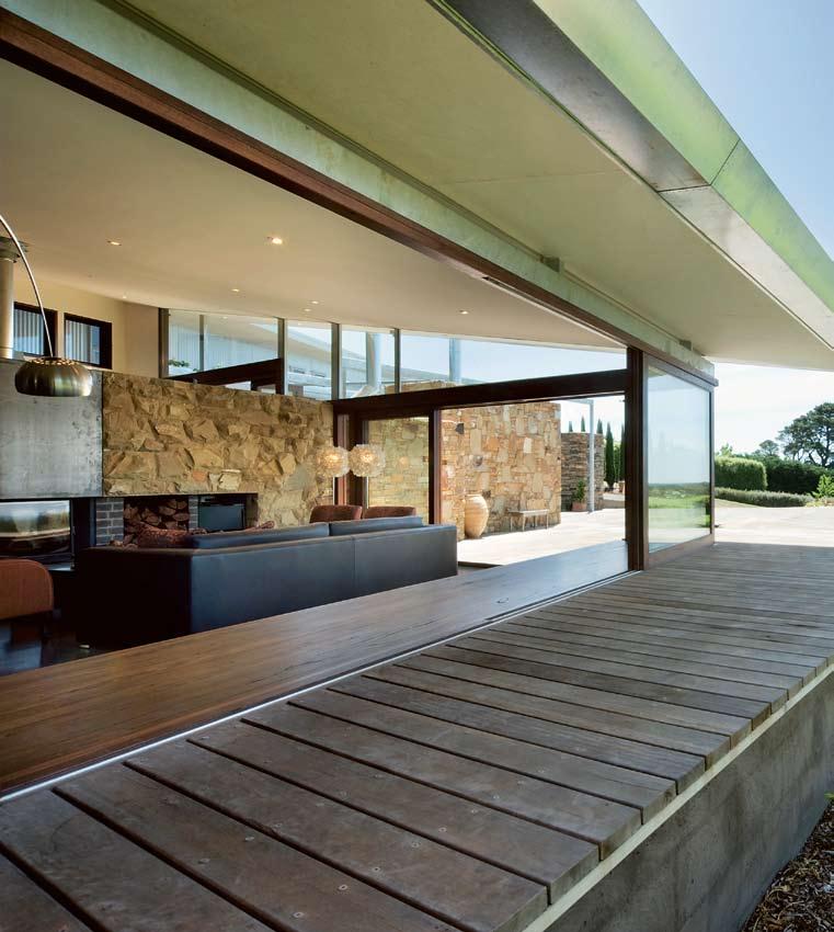
156 habitusliving.com habitus 06
ROBIN LARSEN trapezoid house — VIC, australia
Text Jane Riley
Photography Emma Cross
LA n DsCA pE Embodied
For Melbourne architect, Robin Larsen, a change of career gave him the chance to master a discipline in which he had always been interested, to break free from the analytical world of economic forecasting and dive into the creative challenges of architecture. The result of his first work is a home that embodies the landscape: representing it and integrating with it.
“I was fortunate to have the opportunity to design my own house at the beginning of my architectural practice,” says Robin, who began its design while completing Melbourne University’s five-year architecture course.
“My wife [Joanne, a senior partner in an accounting firm] and I had a rural plot of land on which we wanted to build,” he says of his four-hectare block near the Central Victorian spa town of Daylesford.
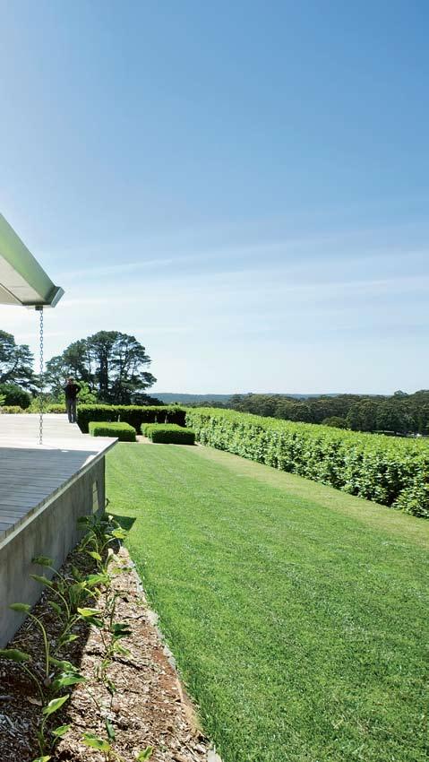
Having already turned one floor of an old Melbourne city warehouse into a stylish two-bedroom apartment in which they live and Robin works during the week, this project was to embody a new way of living for the couple and a new future for Robin.
While preparing the site and landscaping, the locale became an integral part of the planning. situated at the top of Central
157
An architect designing his own home is an interesting enough concept in itself. But an economist-turnedarchitect whose first project is to be his second home adds another dimension entirely. Jane Riley visits Daylesford in rural Victoria, where recent graduate Robin Larsen has constructed a trapezoid domain.
director’s cut
— VIC, australia
Victoria’s dividing range and next to the state forest, the block was narrow with a high elevation against a north-facing hillside, had established eucalypts, olive and fruit trees, views in a northerly direction and was exposed to wind and rain.
“The house had to be located within the landscape,” says Robin. “In a sense, we built from the outside in rather than the inside out. I left a wedge-shaped area for the house – a trapezoid form that drove the design.”
They increased the number of olive trees to 90, added an organic vegetable patch and built a garage with a granny flat in which they could stay while the house was being designed and built.
While the home was to be a comfortable abode for relaxing and gardening, they also wanted to incorporate quality finishes and materials to make the overall feel one of a luxury retreat that could accommodate visits from friends and family.
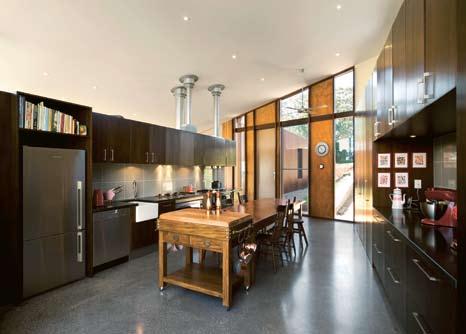
It doesn’t disappoint. The Trapezoid House sits snugly against the hill. Its sharp angular forms of glass, timber and local stone, both inside and out, blend with the environment and offer protection from the sometimes harsh conditions.
“We wanted to capture the views and turn away from the south-westerly bad weather,” says Robin of the sweeping roof and large
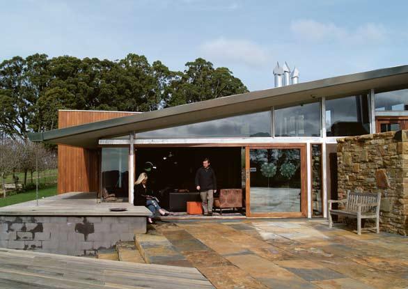
158 habitusliving.com habitus 06
ROBIN LARSEN trapezoid house
01
The expansive, north-facing deck. 02
Robin and Joanne Larsen on the deck.
03
The kitchen is designed to be a communal space.
04
02 03
Opulent wallpaper and designer furniture dramatise the dining space.
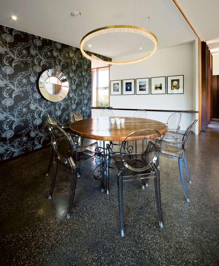
159 04
“The house had to be located within the landscape. In a sense we built from the outside in.”
–ROBIn
director’s cut
ROBIN LARSEN trapezoid house — VIC, australia

glass north-facing doors. “The angular forms go diagonally across the property and create pockets of shelter from the wind and rain.”
As such, the timber deck, featuring a wall made from local Castlemaine stone, offers two outdoor living spaces: a wind-protected area near the kitchen with an outdoor fireplace and an expansive deck off the living area that overlooks the sunny garden. The wall continues inside to form the foundations of the fireplace in the living area and the wood stove in the kitchen, its length extended with slate and brick.
Light floods the living space via floorto-ceiling glass doors and windows. A timber daybed on one side offers a place to lie or sit outside. Thermally, high windows opposite can be opened in summer for cross-ventilation, and an insulated polished-concrete floor slab is insulated from the outside and the base. It offers thermal mass heating to complement the heat produced from the woodstove, fireplace and under-floor heating.
The kitchen is a modern take on a working farmhouse kitchen with cabinets either side of an old French timber table at which Robin and Joanne can eat, prepare meals and filter olive oil – all at the same time.
This is designed to be a productive, communal space. At the far end, the dining area is glamorous, with dark patterned wallpaper and philippe starck’s Louis Ghost chairs.
The geometrical bedroom wing extends behind the living and is clad in Australian Blackbutt timber from new south Wales. The three bedrooms and their ensuites are virtually identical, each with a large recessed window facing the sun and view, a bed-head made from recycled timber that is also a wall panel. The joinery includes built-in side tables and a base for the beds, louvred doors with fly screens and high windows for cross ventilation.
The only bath in the house is a sculptural egg-shaped bath that sits at the far end of the bedroom wing. It has a large floor-to-ceiling window that faces a private courtyard planted with a rose tree. Views of the surrounding land can be seen through the rusting steel screen that encloses the courtyard.
160 habitusliving.com habitus 06
05
...a home that embodies the landscape: representing it and integrating with it.
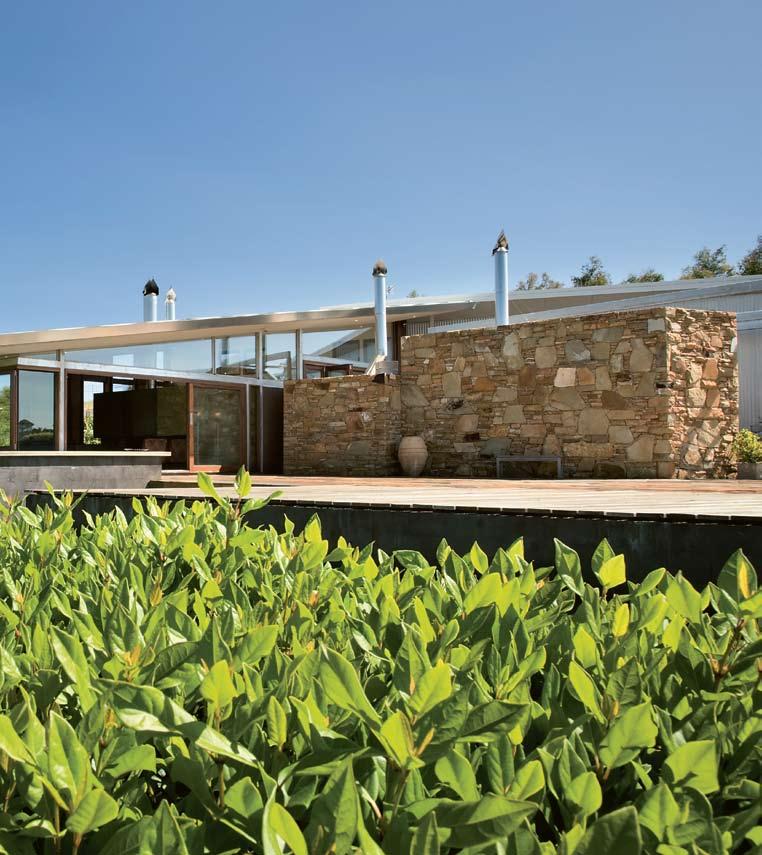
161
director’s cut
05
Low-lying and embedded into the hillside, the house integrates with its surrounding environment.
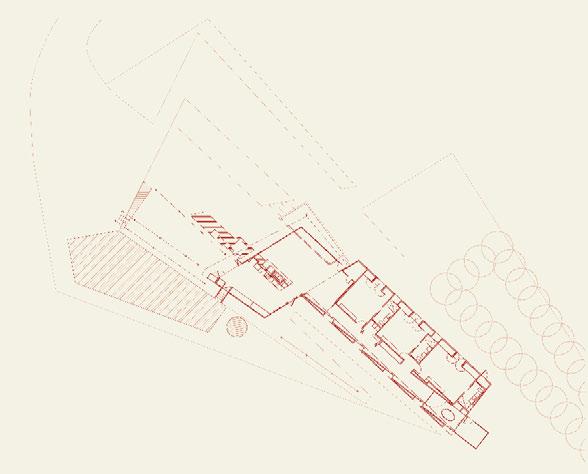
06
The use of natural materials and glass in the living space bring the outside in.
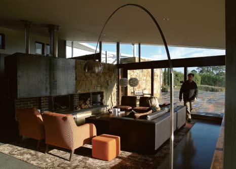
07 plan.
08
The bath looks out to a private courtyard.
09
In the bedroom wing, recessed windows in the long corridor frame the view.
1–3 Bedrooms
4 Bathroom
5 Kitchen
6 Living
7 Deck
162 habitusliving.com habitus 06
ROBIN LARSEN trapezoid house — VIC, australia
06 07
1 5 7 6 2 3 4
The Trapezoid House may offer simplicity in its living requirements but it presents a complexity in its use of angles and geometry. It is an unlikely design from a newcomer to the profession, but one that Robin was determined to get right. “Its complex form – a shape without right angles – created a few challenges in terms of setting it up and getting it right,” he says. “Getting the roof on pitch and the tapered awnings and steel work right took more time from my perspective as I had to be on site to ensure the builder and steel engineering company knew what I wanted.”
“It’s not just about the building process; it’s about how the design works in the end. It has to flow together from every angle. But now I can appreciate and understand the possibilities for other designs I am working on.”
Yet detaching himself from the house when he’s living in it can be tricky. “You reflect on how things work and still play with it, rethinking it like a painter with a painting.”
The Trapezoid House proves that understanding the site and all its elements can produce a home that not only respects the landscape, but becomes it.
ARCHITECT
Robin Larsen
INTERIOR DESIGNER
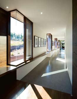
OlsenID (Rachel Olsen)
STRUCTURAL ENGINEER
TD&C
BUILDER
scanbuild (Tim scanlan)
STONEMASON
Artwithstone (Jai Bulatovas)
STEELWORK
Daylesford Engineering
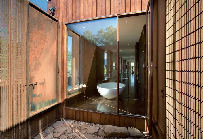
TOTAL FLOOR AREA 280m 2
Robin Larsen treearc.com.au
163 08 09
trapezoid house — VIC, australia
Hettich

ROBIN LARSEN
10
All three bedrooms have built-in furniture and views to the lush garden.

ARTWORK
Paintings by Jonathon Larsen, artbytes.com.au.
FURNITURE
Chairs Philippe Starck Louis Ghost chairs from Space Furniture, spacefurniture.com.
au. Rugs by Rugs Carpet & Design, rc-d.com.au. Wood stove Rayburn from The Aga Shop, theagashop.com.au.
Firebox Cheminees Philippe from Wignells, wignells.com.au.
FINISHES
Exterior Castelmaine sandstone and Pyrenees slate from Pyrenees Quarries, pyreneesquarries.com.au, and Blackbutt timber cladding
from Woodform Architectural, woodformarchitectural.com. au. Interior timber from Urban Salvage, urbansalvage.com.au, and ensuite tiles from La Pege, (61 3) 9419 8777. Windows by Pickering Joinery, (61 3) 5243 4166.
LIGHTING
Dining Crystal Ring by Dean Phillips Architectural Lighting and Design, deanphillips.com.
FIXTURES/EQUIPMENT

Bath by Boyd Alternatives, boydalternatives.com.au. Ensuites from Rogerseller, rogerseller. com.au. Photovoltaic panels and system from Energy Matters, energymatters.com.au.
Making Living Spaces Work Beautifully


164 habitusliving.com habitus 06 director’s cut T
P: 1800 687 789 E: architecture@hettich.com.au W: www.hettich.com.au 9/09/2009 5:39:47 PM HAB6_Hettich.ind.xls 1 24/9/09 1:25:02 PM
fittings for kitchen applications, including : InnoTech customisable drawers with soft closing, Easys electronic drawer opening system, Sensys hinge with integrated soft closing, ProDecor European designer handles and Cosario hidden storage unit.
10
Reflecting the look and character of the past. Reclaimed hardwood and French oak is being used to create truly unique floors. Cut to size, sanded by hand and restored with natural oil to create traditional European patterns. We also offer a wide range of bespoke furniture.
Showroom: 73 Beattie Street, Balmain NSW 2041
Opening 10 - 6 Tues, Wed, Fri, 10 - 8 Thurs, hours: 10 - 2 Sat and Sun
Tel: 61 2 9810 8838
Fax: 61 2 9810 8839

Email: info@antiquefloors.com.au
www.antiquefloors.com.au
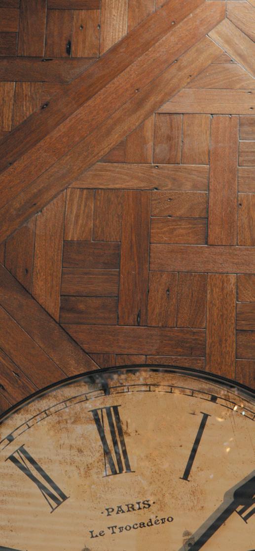
director’s cut
turramurra house — NSW, australia
r esPecT fullY
Yours
This house was designed and built by its owners, architects Kausar Hukumchand and Sarita chand, to be a model of ingenuity, affordability and environmental civility. Paul mcGillick discovers a bushland refuge in suburban sydney.
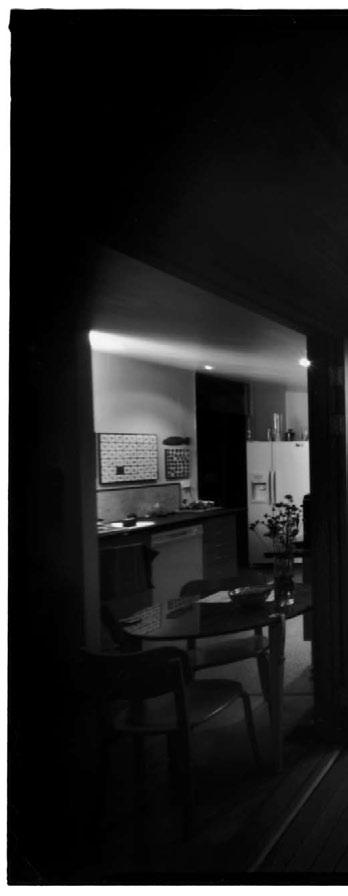
166 habitusliving.com
habitus 06
Text
Photography Anthony Browell
Paul McGillick
KauSar HuKumcHaNd aNd Sarita cHaNd
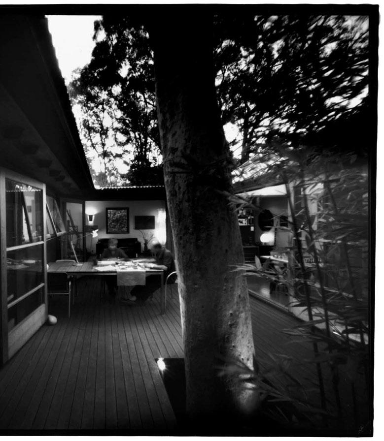
167
director’s cut
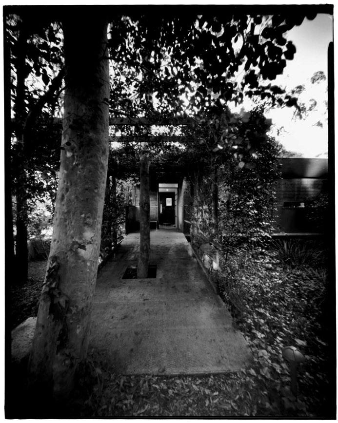
168 habitusliving.com habitus 06
02
turramurra house — NSW, australia KauSar HuKumcHaNd aNd Sarita cHaNd
The house is designed around a tree – an 80-year-old Angophora, predicted to live for 200 years. In fact, no trees at all were cut down to build this house. Nor was there any excavation done which might have disturbed the site. Instead, the house sits on a galvanised steel frame, so that it ‘floats’ above the ground, sheltered by its protective Angophora. It wraps around the tree to form a continuous outdoor room with the house spilling out on all four sides to the elevated timber-decked courtyard. “The courtyard,” says Kausar, “was like a sanctuary, because we were both brought up in courtyard houses. so, the courtyard had to be a theme.”
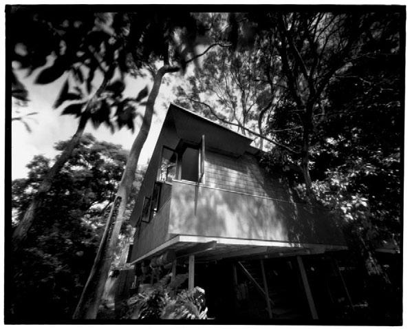
o riginally from rajasthan in India, Kausar and sarita have lived in Australia for 20 years and prior to that in Malaysia and singapore. Kausar works from home as sole practitioner of core Projects and also teaches in the faculty of the Built environment at the university of New south Wales. sarita is a Principal with the prominent practice, Bligh Voller Nield.
In many ways, the house is a subtle reinterpretation of traditional Indian architecture for a specific Australian context – for example,
the central courtyard, the way in which every room in the house opens out onto the courtyard, even the projecting eaves which are reminiscent of the chhajja , typical of Mughal architecture in areas such as rajasthan. These eaves provide solar protection, but also extend over the gutters so that rainwater spills into the ground to feed the Angophora. “There are,” Kausar suggests, “a number of cultural things which are built in – they’re subtle.”
But if we also take into account the interiors of the house, it is very much a marriage of cultures, with traditional Indian elements complementing not just the Australian bush, but indigenous Australian art and modernist european furnishings.
still, there is even more to the story of this house. It is not only a very sustainable house in the sense that it ‘touches the earth lightly’, it is also very sustainable in terms of construction, materials and cost. Kausar and sarita projectmanaged the job as owner-builders and brought it in at Au D$800/m 2 in just eight weeks.
As far as size is concerned, the house is only as big as it needs to be, the size being “predicated on the trees”, according to Kausar. Actually, it is quite small, but because of
169
03
01 The elevated central courtyard with the protective Angophora. 02 entry to the house is up a gentle ramp. 03 The north-eastern elevation shows the hinged corner windows.
“We were both brought up in courtyard houses. So, the courtyard had to be a theme.”
–KAusAr
cut
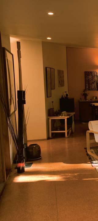
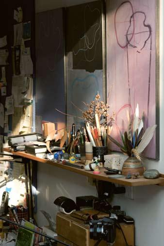
170 habitus 06 habitusliving.com
director’s
turramurra house — NSW, australia
04 05 04 Bric-a-brac in the studio gives added texture. 05 The living/dining area with views out to the guest pavilion.
KauSar HuKumcHaNd aNd Sarita cHaNd
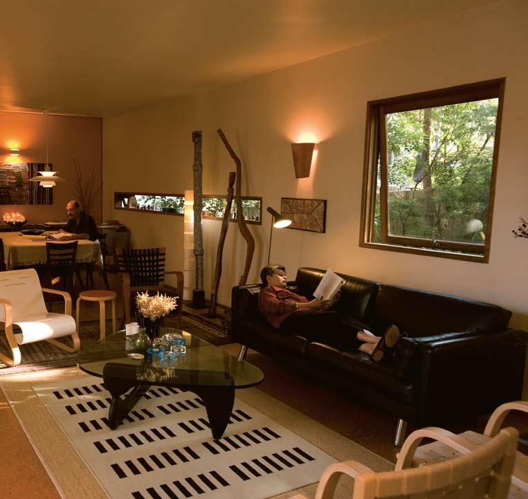
171
In many ways, the house is a reinterpretation of traditional Indian architecture for a specific Australian context.
director’s cut
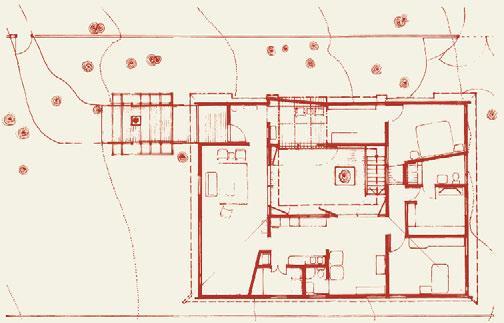
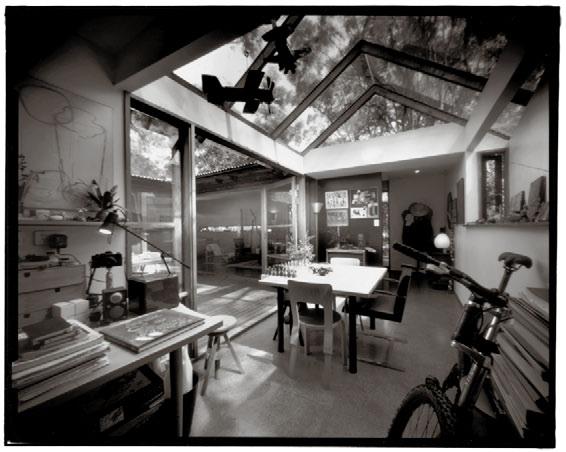
172 habitusliving.com habitus 06
06 Plan. 07 Kausar’s studio looking toward the entry and living room. 08 The living room looking back towards the studio. 09 The second bedroom doubles as a home office. 07 06 1 2 5 6 8 7 9 14 12 10 11 13 3 4 1 Entry ramp 2 Entry hall 3 Study 4 Bedroom 5 Living 6 Courtdeck 7 Bath 8 Robe/dressing 9 Dining 10 Kitchen 11 Family/guest 12 Store laundry 13 Bath 14 Bedroom
turramurra house — NSW, australia KauSar HuKumcHaNd aNd Sarita cHaNd
its connection with the outside it gives the impression of ample space. Moreover, a range of creative solutions has, in many places, optimised the available space – for example, the angled dining room wall, which creates additional space for a larder on the other side, or the shared robe and bathroom.
Ingenuity and creativity not only minimised cost and optimised space, but produced a house full of incident. It has been, says Kausar, “built from the inside out with windows, for example, designed to capture views”. A good example is the hinged corner window, designed like all the other windows in the house by Kausar himself. The fenestration in general is a constant source of delight precisely because each window is a one-off, each with its own purpose, but collectively creating a visual rhythm – the room-wide windows in the shared bathroom, the skylight over the shower which extends over the internal corridor, the ‘gunslot’ on the northern side drawing light into Kausar’s studio, the juxtaposition of another gunslot and a square window in the living room.

like the windows, all eight “Aaltoinspired” doors in the house are custom-made and quite different from one another. each is 1.2 metres wide and basically a standard door with a plywood addition, creating a positive/ negative image. similarly, the desk in the study is custom-made from plywood.
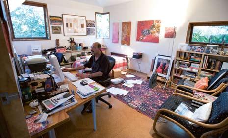
Indeed, the house is effectively a case study demonstrating what can be achieved with a simple material like plywood. Plywood is used on the inside and e coply for the exterior cladding, with cedar windows and doors. In plan, an informal internal corridor links all the spaces, although apart from the two bedrooms, the house is effectively open plan; its circulation defined by the wrap-around organisation of the house – and the downlights which act as a guide.
The main house was built in 1997, but a year ago Kausar and sarita built a guest pavilion to complement the house. The freestanding, steel-framed, timber-clad pavilion runs at a right-angle to the main house. It floats low over the ground, supported like the main building on a steel frame and approached up timber steps, past a pond (black to reflect the sky and protect the fish from marauding kookaburras) to a timber deck which runs the length of the pavilion. The interior is opened up along its entire length by massive glass doors that slide out to a cantilevered frame.
173
08 09
director’s cut


174 habitusliving.com habitus 06
turramurra house — NSW, australia
10 11
KauSar HuKumcHaNd aNd Sarita cHaNd
10
The entry ramp looking back towards the guest pavilion.
11 exterior view of living room windows.
12 Guest pavilion. 13
Part of Kausar and sarita’s extensive Aboriginal art collection.

12
175
Spatially liberated, the two buildings are neither big nor small – but just right for what they need to do.
director’s cut
turramurra house — NSW, australia
similar in character to the main building, the guest pavilion also employs similar strategies – slot windows, a skylight in the ensuite, a custom-designed work bench with adjustable legs and a bed which folds up to become part of the joinery.
effectively, both buildings tend to ‘dematerialise’, with a marked ambiguity between inside and outside. They emerge quietly and respectfully from the site, where the vegetation is left to its own devices without any attempt to create definition through landscaping. spatially liberated, the two buildings are neither big nor small – but just right for what they need to do.
arcHit E ctS
Kausar Hukumchand, sarita
c hand
BuiL dE r
o wner builder
mai N cON tractOr
redgum Building services
(Mark Newman)
Structura L
BHP ‘Quick-a-f loor’
ELE ctrica L
Peter McBride
HY drauL ic S
Ian Birchill
air- cON ditiON i NG
e agle engineering
cE dar d OOr S & W i N d OWS
Windoor
Wa LLS & cE iL i NGS
Austral linings
core Projects
(61 2) 9440 8161
schand@bigpond.net.au
Fur N itur E
Dining chairs are Thonet, thonet.com.au. In the Living Room Artek 41 and 406 armchairs, Stool 60 and Coffee table trolley 901 from Anibou, anibou.com.au. The Noguchi coffee table supplied by Euroform, euroform.net. au. Sofa from Resource (no longer available). Guest pavilion fold-up bed is designed for hospitals and is manufactured by Interfar, interfar.com.au. Italian adjustable legs for study desk and guest pavilion bench from ECC Lighting and Living, ecc.com.au.
Fi N iSHES
Exterior cladding is EcoPly ‘Plain’ and ‘Shadowclad’, supplied by Mr Plywood, misterplywood.com.au.
Living Room rug is from India, designed by Shaym Ahujha. Roof is Colorbond Mini Orb, bluescopesteel.com.au
L iGH ti NG
Dining room pendant is the Louis Poulsen PH5 from Eagle Lighting, eaglelightingsydney. com.au. Akari hanging paper light in Living Room and Akari light sculptures elsewhere in the house are by Isamu Noguchi and not available in Australia.
art WOr K Aboriginal art work sourced from Hogarth Gallery, aboriginalartcentre.com.au, Palya Art, palya-art.com.au, Jinta Art, jintaart.com.au and Aboriginal Art Australia, aboriginal-artaustralia.com.
Note: a nthony Browell’s black and white photographs were taken using a pin-hole camera

176 habitus 06
habitusliving.com
KauSar HuKumcHaNd aNd Sarita cHaNd
13
Both buildings tend to ‘de-materialise’, with a marked ambiguity between inside and outside
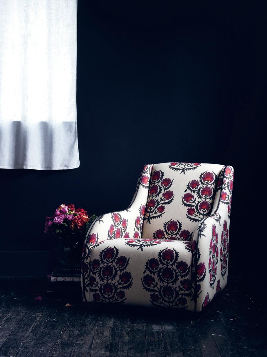
Perth Showroom - Now Open +618 9286 1433 Melbourne +613 9543 4633 Sydney +612 9516 0968 Amelia chair designed & manufactured in Australia | www.arthurg.com.au
TAPPING INTO DESIGN
As contemporary cultures become increasingly focused on aesthetics, design has become more than functional. Our homes, particularly, are not purely functional environments, but spaces that can be filled with design that is aesthetically pleasing and a reflection on the way we live. In this context, the question arises of how designers can produce products that are attractive yet remain efficient and affordable. In areas of the home where high levels of functionality are needed – such as bathrooms – this issue becomes even more pertinent.
Parisi Bathware recognised this gap in the market for tapware that could successfully combine function with aesthetics, and their designers have responded with the design of an incredibly comprehensive range of cutting edge designer tapware that looks to emerging trends from Europe and design classics for inspiration.
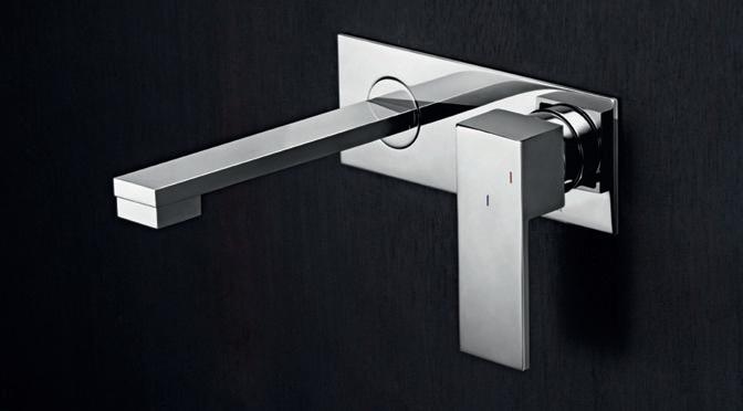

Acknowledging that water is a precious resource, sustainability and efficiency were as big concerns for the Parisi Bathware designers as aesthetics, and the tapware range is predominantly six star (WELS) rating.
The water efficient tapware is Italian and Australian designed, with components from both Italy and Germany, and has been produced to Australian Standards with the Parisi Backup of a 10-year warranty. The new range of tapware from Parisi Bathware is the culmination of industry eagerness to meet the needs of the contemporary market, and successfully bridges the divide between functionality and aesthetics.
Parisi
(61 2) 9559 3666 techinfo@parisi.com.au parisi.com.au
habitus | Issue 01 sponsored 178
01 02 03
01 EB.01-2WP 02 QQ.01-3H 03 EE.01-1HA
Slide & Hide ® A light touch of the handle is enough for the door to open, then glide smoothly and silently underneath the oven, as if all by itself – leaving you clear space to season, turn or baste. What’s more, with CircoTherm® the heat stays in the oven, which is good not just for the meal, but also for your energy bill. Find out more by visiting us at www.neff.com.au or call 1300 727 421. Proudly imported, distributed and supported by Sampford IXL.


“Perfect ingredients combine to create stress-free cooking.”
“Not even the oven door gets in your way.”
john gow house — AUCKLAND, new zealand HILLERY PRIEST ARCHITECTURE

Art A n D Object
“A family home in which to hang art” was John Gow’s brief to architect Richard Priest when he and partner Sara Howard renovated their villa in Auckland’s Herne Bay. Andrea Stevens visits the gallery owner and finds a warm house full of stories and treasures.
180 home movie habitus 06
Photography Simon Devitt
Text Andrea Stevens
habitusliving.com
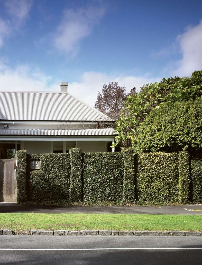
181
home movie
john gow house — AUCKLAND, new zealand
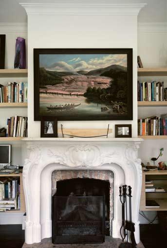
01
A soft street appearance conceals a large family home.
02 Sara’s
03 the study houses John’s early new Zealand painting and photographic collection.
04
HILLERY PRIEST ARCHITECTURE
John Gow’s art expertise is diverse. As a collector, dealer and sometime book publisher, he has a passion for Maori carving and early colonial depictions of people and place. His passion for history and heritage led him to be one of new Zealand’s first dealers to specialise in these works, previously the domain of auction houses and second-hand bookshops. Out of Time: Maori and the Photographer 1860-1940, a book John co-wrote with art researcher (and ethnographic expert) Michael Graham-Stewart, documents 80 photographs from 15 years of joint collecting. He also owns the highly influential Gow Langsford Gallery in partnership with Gary Langsford, specialising in contemporary painting and sculpture.
“When the kids were young, I remember being perturbed about how to keep them in touch with their Maori culture,” recalls John. “So I began collecting Maori carvings. Every carving is like a painting, it has different marks and techniques, and different tribes carved in different ways. On that realisation, I started really looking and studying, and became quite obsessed with it.”
John grew up surrounded by the visual and performing arts by way of his parents’ hobbies and later professions. “We were not your typical farming family,” says John. “Mum was a singer, Dad potted and painted. We were unusual in that we had a contemporary house and an art collection.” A move from rural Waikato to Auckland came about in 1977 when the family bought shares in the John Leech Gallery. Following his overseas trip to London, John became involved in the business and he now runs the gallery in partnership with Langsford.
A 100-year-old Herne Bay villa accommodates John and his partner Sara’s extensive collection of art and objects, along with the needs of a growing and blended family. With 200 artworks and six children between them, finding the right balance between a functional home and one that could contain the art was critical. But they haven’t been precious about it. Art is everywhere. t he children each have collections in their bedrooms, it hangs in the stairwell and in bathrooms. Every wall is animated with giants of contemporary new Zealand art and photography, not to mention the historical work.
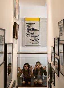
Set behind an ivy-covered wall, the transitional villa has clean unadorned lines in contrast to the more ornate timber villas of the area. Its atypical construction is of hollow glazed clay blocks that are plastered inside and out.
Good friend and architect r ichard Priest designed renovations 15 years earlier when it was converted from three flats. t he major work then was to excavate and create a bedroom floor below, and to bring light into the typically dark villa interior. t he result was a house pivoted around a central double height space. t he conservatory-like void is floodlit with sun and
182
habitus 06 habitusliving.com
daughter Imy and friend Olivia in the stairwell.
02 03
A Max Gimblett painting overlooks the adults’ lounge.
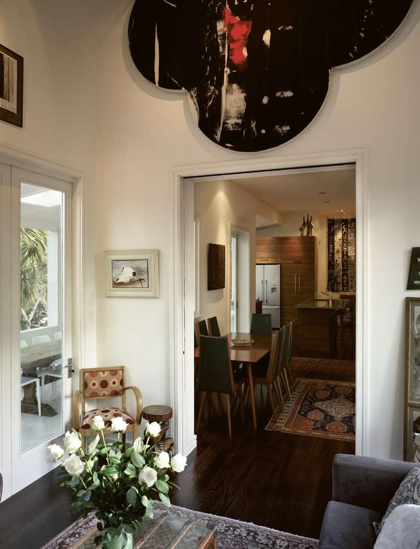
“So, I began collecting Maori carvings... became quite obsessed with it.”
–JOHn
home movie
john gow house — AUCKLAND, new zealand
HILLERY PRIEST ARCHITECTURE
overlooks an enclosed courtyard. Glassbacked shelves allowed for artefacts and objects to be seen from several rooms. t he void adds a spectacular scale and caters to the social needs of a modern family. A new round of alterations to the house, completed last year, has allowed it to adapt once more to changing family structures, ages and stages. t he children range from eight to 19 years of age so they needed more rooms, catering for differing social needs. t he rear of the house has been pushed out in order to create more bedrooms, to add another living room upstairs, extend the kitchen and create a large enclosed concrete veranda for dining.
t he three-wall kitchen designed by Brasell + Ojala has two benches with a sink in each. t he island bench allows the family to hover and circulate around the kitchen efficiently. t he ingenious use of an electric Shugg window suggested by builder, Jerome Box, means the cooktop can be part of the veranda and accordingly function as a BBQ in summer. new finishes include stained American Oak flooring used throughout the first floor, plastered block walls and stone tiles for the veranda, a marble bench, and floor-to-ceiling stone tiles in the new bathroom. With most new Zealand houses built in timber, the Gow villa has quite a different character and quality.
John’s personal and professional interests are displayed in his art collection. t here is a commitment to diverse artistic practices and different cultural voices. t he historical artefacts have a quiet presence and speak of their time and place, while the contemporary
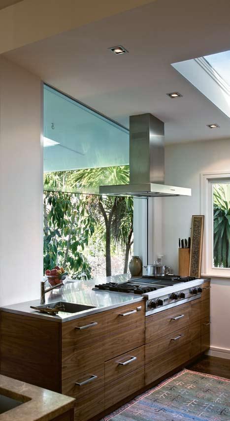
184
habitus 06
habitusliving.com
05
Finding the right balance between a functional home and one that could contain the art was critical
–
06

07
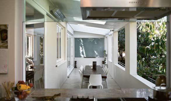
185
05 the cooking surface is shared with the outdoor veranda in summer.
the main living spaces overlook this eastern courtyard.
07 06
Outdoor dining veranda glowing with soft southern light.
home movie
john gow house — AUCKLAND, new zealand

HILLERY PRIEST ARCHITECTURE
work is more expressive and sometimes political. Shane Cotton’s work entitled ‘Whakakitenga ki te Kenehi’ (1998) is a multi-layered work based on the chapters of the Bible in Maori. He draws from the remote empty landscapes of McCahon and populates them with words, the tiki figure, the American eagle and a ghostly figure of Christ. niuean artist, John Pule’s 1993 work, ‘Moe (Sleeping)’ records family history and place within the framework of a traditional hiapo (tapa) panel. Born in niue, Pule is a major local artist and poet and has been with the Gow Langsford Gallery for 15 years. t hese moody works are in contrast with the bold and expressive Max Gimblett painting, the pop humour of the Dick Frizzell and the light box works by Michael Parekowhai.
t he children have grown up with all this and, like John, have absorbed it by osmosis. As Sara reflects: “ t hey are all quite involved and know who the artists are. When they bring new friends around and are asked questions, we hear the kids start up a dialogue with more knowledge than we had realised.”
t he softness of the house comes from its age, natural materials and gentle light. new architectural spaces and finishes are sympathetic to the old while catering to the ever-changing needs of a busy family home.
ARCHITECT
Hillery Priest Architecture
DESIGN ARCHITECT
r ichard Priest
ARCHITECTURAL DOCUMENTATION
Steve Davis
BUILDER
Jerome Box
STRUCTURAL ENGINEER
Harris Foster Consulting (rob Foster)
KITCHEN DESIGN AND INTERIOR FINISHES
Brasell + Ojala (r ichard Brasell)
Hillery Priest Architecture (64 9) 376 6337 hillerypriest.co.nz
Brasell + Ojala (64 9) 361 1103 brasellojala.com
ARTWORK
Main bedroom The Clouds are Pink at Sunset, 2001, Reuben Paterson. Living room View of the Pink Terraces, c. 1880, T.A. McCormack.
Cathedral room Cave Drawings, c. 1950, by A.R.D. Fairburn. The Red Parrot, 2000, by Allen Maddox. Drawing for a Song Cycle, 1976, by Ralph Hotere. Toku Whanau Ataahua, 2001, by John Walsh. Still Life with Sheep Skull and Cork Screw, 1986, by Dick Frizzell. Mondrian’s Studio, 2004, by Max Gimblett. Untitled Tiki figure, 2005, by John Walsh. 19th Cenury photographs of Maori subjects by Arthur Isles. Untitled Walking Sticks, c. 1993, by Peter Robinson. Upstairs hall Baked Bean Boogie Woogie, 1997, by Dick Frizzell. Garden ceramic Pepolic figure, c. 1992, by Barry Brickell.
FURNITURE
Outdoor antique table from the Paris market Porte de Clignancourt. Outdoor chairs and stools from ECC Lighting + Furniture, ecc.co.nz. Kitchen vintage Marilyn Sainty chairs. Hallway credenza by David White, davidwhite.co.nz. Study built-in shelves also by
habitusliving.com
186
habitus 06
08
David White. Dining vintage
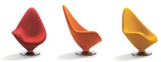
Swedish dining suite purchased in 1960 by John’s parents.
Lounge Louis Vuitton chest, louisvuitton.com.
FINISHES
Verandah floor Iserna
Southern Italian limestone from Artedomus, artedomus. co.nz. Interior floor stained
American Oak floorboards from Artedomus. Walls Aalto paint, aaltocolour.com. Bathroom
Elba marble tiles from Artedomus. Kitchen joinery
by Hafele, hafele.co.nz, and Blum, blum.com, handles from Katalog, katalog.co.nz, and Morato Anticated benchtop from Artedomus.
LIGHTING
Lighting from ECC Lighting + Furniture.
FIXTURES/EQUIPMENT

Kitchen Viking oven and hob, vikingrange.com, Miele dishwasher, miele.com, and Fisher & Paykel fridge, fisherpaykel.co.nz. Shugg window, shugg.co.nz.
08 two carved figures by Bryan McCurrach c. 1965.
09
Italian marble lines the upstairs bathroom.
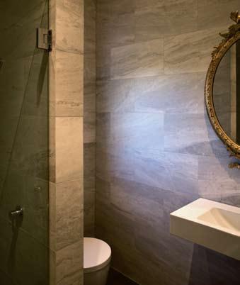
Plateau
By Eric Magnussen
For Engelbrechts
Now has a home at Interstudio
187 I N T E R S T U D I O www.interstudio.com.au MELBOURNE SYDNEY I N T E R S T U D I O www.interstudio.com.au
HAB6_Interstudio.indd 1 29/9/09 10:43:34 AM
09




Where will you be sitting this Summer? CDA Centre 513-515 South Dowling Street, Surry Hills, Ph: 8353 3888 Dural 658 Old Northern Road, Dural, Ph: 9651 7807 www.yardware.com.au THE CDA CENTRE, 513-515 South Dowling Street, Surry hills. tel: (02) 8353 3888 www.thedesignestablishment.com.au HELIX DINING TABLE
Poetry of Light
Years spent sailing have given New Zealand architects, Julie Stout and David Mitchell a critical understanding of the South Pacific climate and its regional building traditions. Andrea Stevens looks at two small houses set in very different environments that blur the boundaries between interior and exterior space.
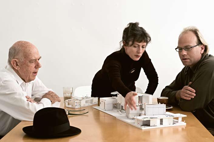
189 jump cut habitus 06
julie stout and david mitchell — AUCKLAND, new zealand MitCheLL & StoUt ArChiteCtS
Text Andrea Stevens
Photography Simon Devitt
Mitchell & Stout Architects are one of New Zealand’s most important and influential practices. Led by Julie Stout and David Mitchell, business and life partners, their extensive output includes built projects, master planning, books, articles, lectures and lobbying. They have evolved a regional language which they combine with varied international references, allowing them to contrast and contextualise within individual projects and within their body of work as a whole. Diverse personal and professional interests see them working across all scales, budgets and landscapes – in urban design, university buildings, art galleries and incredibly grand homes, through to very simple, artful houses.

David has a direct connection to New Zealand’s Modern Movement via his teachers, Vernon Brown and Bill Wilson. This heritage is continued in the warm timber detailing, honesty of materials and gentle scale evident in many of Mitchell & Stout’s residential projects. The practice’s body of work has several threads and is highly collaborative, so cannot be neatly defined. Firstly, they seek a critical understanding of the client, context and climate, in search for what is most personal and particular to each project. Experimentation and innovation throughout the design process throw up the unexpected. What at first appears to be simple in planning or formal idea will invariably have subtle shifts, intriguing details or total inversions along the way. This makes for work that is wonderfully complex and highly idiosyncratic. The practice is small and non-hierarchical and includes David’s son Julian, and Ginny Pedlow. They prefer to work as a team with more than one author on any scheme, thus every design is vigorously debated and highly developed before reaching the client.
For much of the 1990s Julie and David were sailing – the Pacific Islands, South-East Asia, the Red Sea and the Mediterranean. They regularly flew home to complete large commissions and spent a year working in large Hong Kong firms. This adventurous yet simple life on a yacht had a profound impact on their approach to life and work. Ever urbane and insightful designers, the years spent drawing and studying the elegant
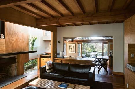
190 habitusliving.com heke street — AUCKLAND, new zealand MitCheLL & StoUt ArChiteCtS
habitus 06 02 03
jump cut
e xperimentation and innovation throughout the design process throw up the unexpected.

191 04
01
David Mitchell (left), Julie Stout and David’s son Julian.
02
David and Julie’s previous house, Heke Street, in Freemans Bay.
03
In the main living space, the top-lit volume over the fireplace glows.
04
The pond is intimately connected with the house.
jump cut
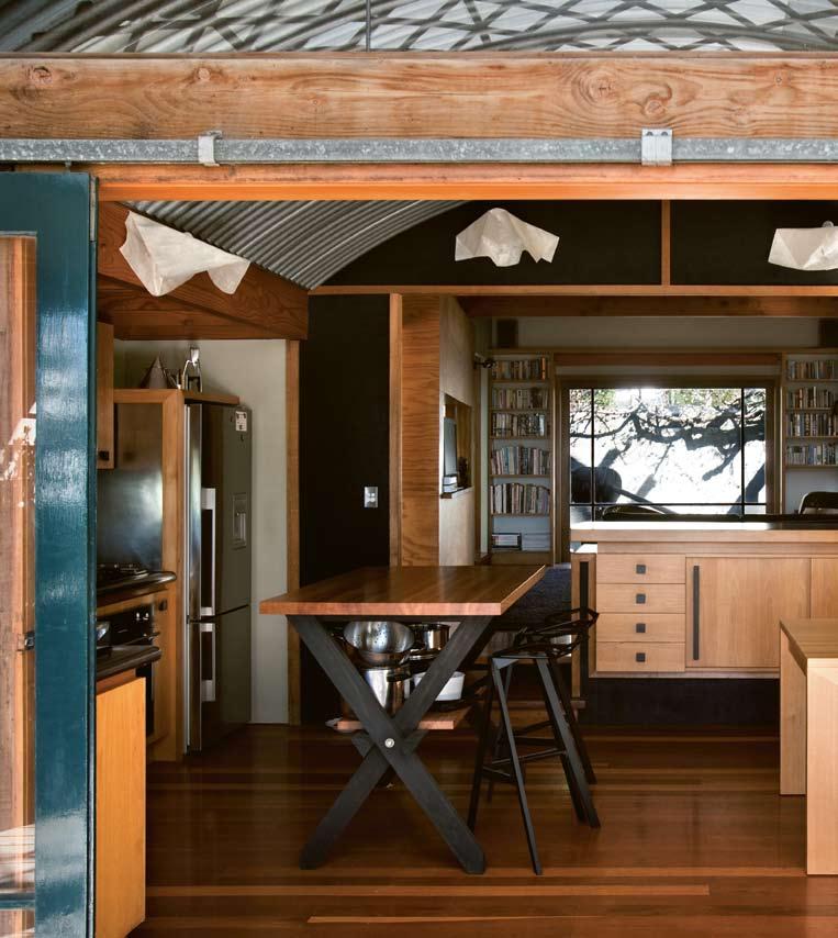
192 habitusliving.com
habitus 06 heke street — AUCKLAND, new zealand MitCheLL & StoUt ArChiteCtS 05
thatched homes and boats of Polynesia and Asia added a deeper understanding of what it is to be part of the Pacific. Their work became more layered and began to celebrate the collection and diversion of water. Raw materials began to be used more extensively, and the relationship between inside and outside space became critical. The controlled play of light and view in and around a building continues as a major focus in all their work.
Some of these threads had already begun in the 1980s when David was designing simple shed-like dwellings in humble corrugated iron and plywood. “We knew Ric Leplastrier’s work well, and loved his steely attitude to comfort and his spare and immaculate detail,” recalls David. They were to meet up with architect Glenn Murcutt in 2005 at Julie and David’s Freemans Bay home when he was in Auckland judging an award. Glenn gave them his extraordinary life story and they discussed the importance of sticking to your guns and doing the kind of work you really believe in.
Heke Street, as their previous house is known, is one of Auckland’s most beautiful and best-loved homes. Conceived while sailing in the Pacific, this small urban house in Freemans Bay does so much with so little. It is a highly crafted and very personal project. As the architects’ own home, it was grounds to test ideas and a new way of living. They had become accustomed to a pared back existence on the boat and sought to remain close to the outdoors and the elements, and to create a building that related to the South Pacific climate and regional building traditions. It has achieved a synthesis of thought and execution and stands as one of New Zealand’s most indigenous modern buildings.
The house is set among pre-1910 timber colonial houses on the city fringe. In a similar manner to its neighbours, this three-storey weatherboard house is set central on the site with a formal elevation to the street. This is where the similarities end. Heke Street is an essay in indoor-outdoor relationships and the play of light and water. Its multiple physical and aesthetic layers offer subtle spatial shifts and readings.
The central volume is a living space with bedroom above, clad in rough sawn black-stained plywood and cedar battens. This skin almost entirely wraps the volume, moving between inside and outside, blurring boundaries. Two single-storey ‘sheds’ are separated from this main volume to east and west by narrow double height spaces. They contain bathroom/dressing room and study/ spare bedroom. A change in light, floor level and materials further differentiates them. The southern wall of each shed is clad in translucent polycarbonate sheeting reinforcing the
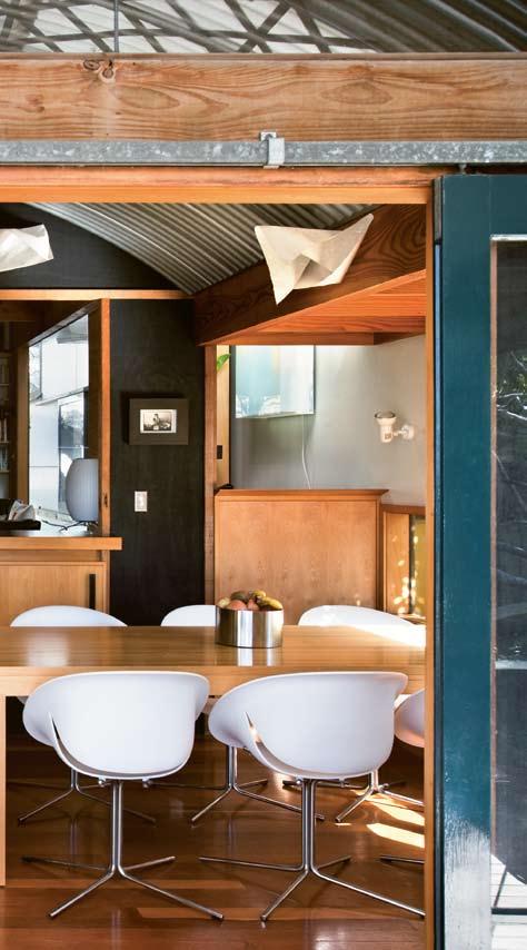
193
jump cut
simplicity of construction while transmitting soft light. A large fishpond fills the rear of the site and laps the walls of the house. The main space can be fully opened to the pond by lifting a large window with pulleys and counter weights. “We loved it when it rained – the sound of rain drops bouncing off the surface of the water. Then everything just shone afterwards,” says Julie. It is an incredible moment in the whole experience of the house and the Japanese air it creates is otherworldly.
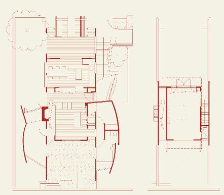
At the opposite end of the house, the north-facing kitchen/dining space opens onto a large verandah that overlooks the city and street. A woven lattice pergola of thin timber battens overlaid by polycarbonate roofing and grape vines shade and enclose this outdoor room. Post-and-beam structure is combined with hanging timber screens, and cantilevered and interlocking furniture. Built by Julian Mitchell and Robert Hancock, this space is a symphony in timber construction. “They both have a very refined sense of craft and this shows through in the detailing. Every detail and material was discussed and approved by them before they would build it!” recalls Julie. It is very private yet still very much part of the city.
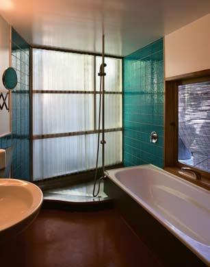
194 habitus 06
habitusliving.com heke street — AUCKLAND, new zealand MitCheLL & StoUt ArChiteCtS 06 07 1 Verandah 2 Living 3 Study/spare room 4 Wardrobe 5 Pond 6 Void 7 Main bedroom 05 Exterior materials define the transition into the living room 06 The bathroom occupies a ‘shed’. 07 Ground floor plan of Heke Street. 08 The main bedroom looks to the pond. 09 The veranda overlooks a gulley of trees and the city.
1 2 5 3 4 7 6
Ground floor Upper floor
Proje C t A rChite C tS
David Mitchell, Julie Stout
BUiLDer
Julian Mitchell, Robert Hancock
StrUC t Ur AL e Ngi N eer
Thorne Dwyer Structures (Steve Thorne)

ArtWorK
Fishpond
FUrNitUre
Dining
FiNiSheS
Flooring interior is Matai
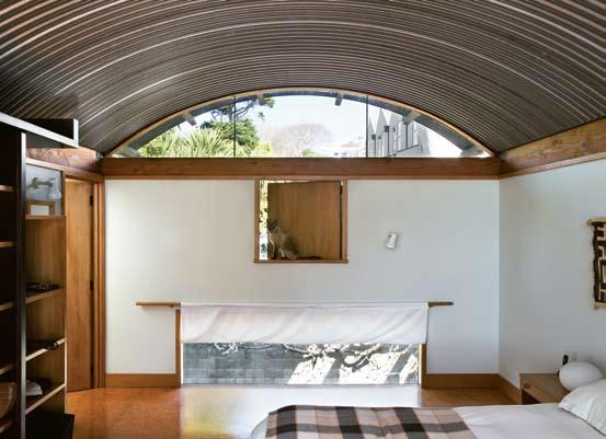
Strandboard,
LightiNg
Dining
room
Nelson
FiXtUreS/eQUiPMeNt
Tapware
195
sculpture by Dennis O’Connor. Dining room paintings by James Robinson and Keren Cook. Living room painting by Jim Speers. Study painting by Callum Innes. Bedroom large cloth made by the Kuba people of the democratic republic of Congo.
room table from Katalog, katalog.co.nz, chairs from Matisse, matisse.co.nz. Lounge Eames lounger from Matisse, Metro couch by Insight, insightfurniture.co.nz, Nelson coffee table from Matisse. Exterior chairs purchased second-hand.
verandah is Pulularis. Wall paint by Resene, resene.co.nz.
room
Bubble lamp from Matisse. Dining
rice paper shades custom–made by Mitchell Stout.
08
by Grohe, grohe.com.
09
...similar to Heke street in scale and construction, yet is set in a very exposed and dramatic King Country landscape.

MitCheLL & StoUt ArChiteCtS otoparae —
KiNg CoUNtrY, new zealand
David’s son Julian, in the constant company of architects and engaged with the design of Heke Street, stopped building and studied architecture. Following his degree, he joined the practice to be project architect for Otoparae. It is similar to Heke Street in scale and construction, yet is set in a very exposed and dramatic King Country landscape. Overlooking a Tawa forest and precipitous valley, the site is on a sensitive ridgeline. The house is unobtrusive and embedded in the land. Local rhyolite boulders are used to retain and insulate the earth and form one side of a walkway. Living and sleeping pavilions are separated and accessed off this space. Fully enclosed but not weather-tight, it has become verandah, corridor and entry all in one. The owners love the outdoors and wanted separate buildings. “The moment the kids’ bedrooms are detached off the main house, they get that
quality of a sleep-out instead of a bedroom,” notes David. “I think it does terrific things for family life.”
Like Heke Street, built-in cabinetry, soft honey-toned timber and black infill panels give the house a strong visual link to New Zealand’s modern movement. The house had a modest budget. However, the elegant structural solutions led to some enchanting detail. “The Murcutt-type house is classically generated by its cross section, and you can repeat it bay after bay. So we realised that was going to help us meet the budget rather than a more fluid volume,” says David. Struts were used to reduce rafter spans. In the living pavilion these have been enclosed in every second bay with folding MDF ceiling panels. In every other bay the ceiling runs to full height with a clerestory window. This alternating containment varies the light and experience of the space.
10
Otoparae house overlooks a magnificent valley in the King Country.
11
Warm timber tones contrast with black rough-sawn plywood.
12 Sensitive scale and form work with the landscape.

197
11
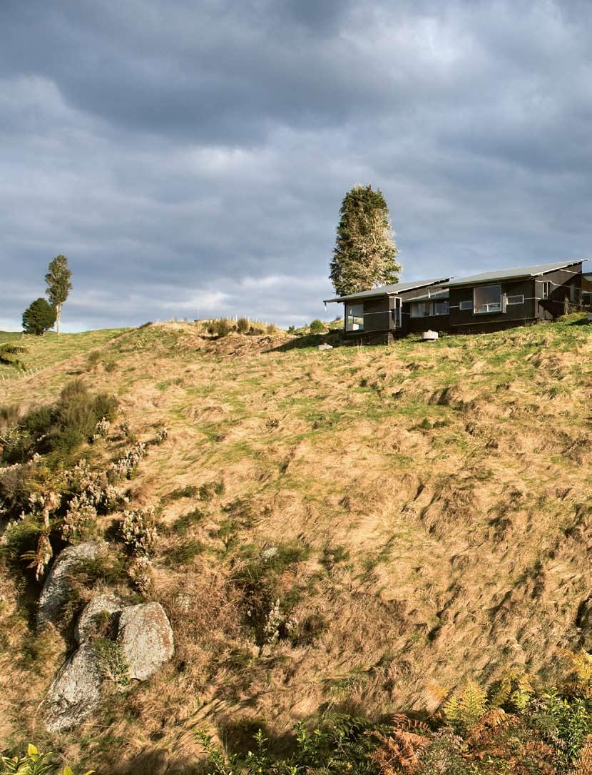
“I wondered what had happened to introspective architecture, to enclosure, to the hole-in-the-wall, to the soft fall of light in a dark space.”
–
DAVID
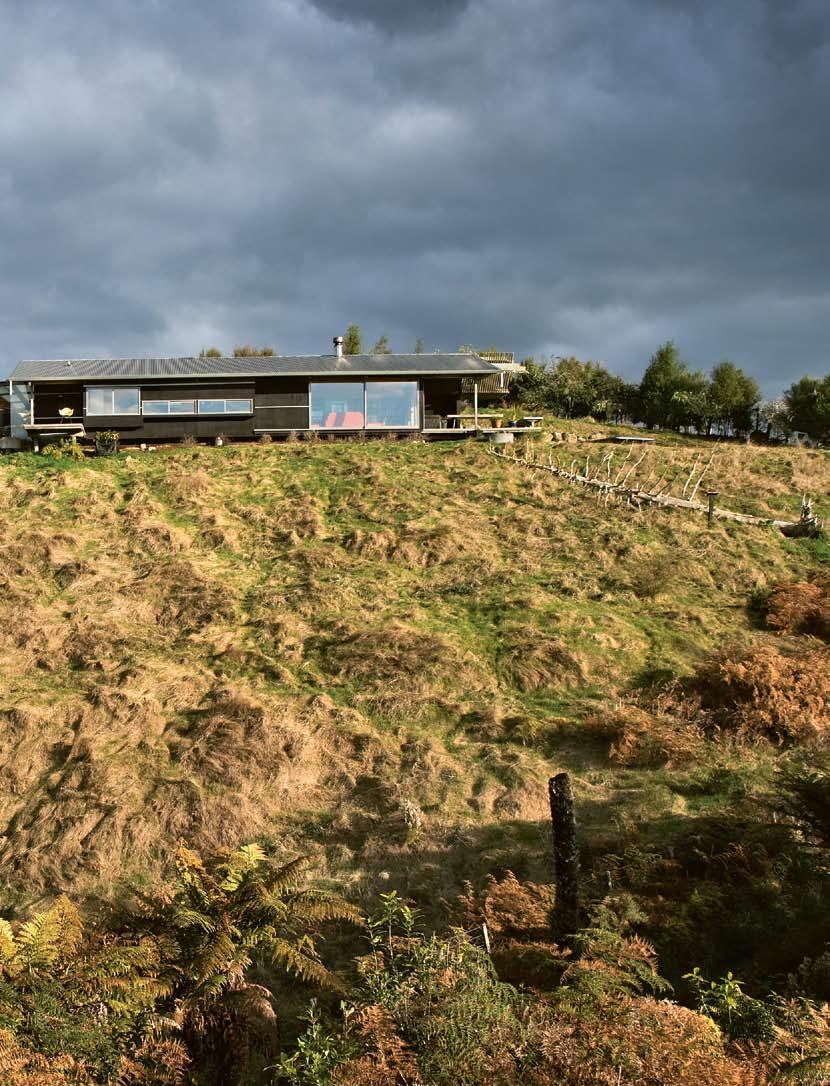
jump cut
On the walkway side, the struts are concealed and braced with yellow stained ply. These cantilevered roof elements avoid any need to structurally engage with the retaining wall. Their warm tones and translucent roofing make the space glow.
“I wondered what had happened to introspective architecture, to enclosure, to the hole-in-the-wall, to the soft fall of light in a dark space,” muses David over recent architecture award entries. Both Heke Street and Otoparae carefully select and frame their views – floor level windows that look out on to a garden, mid-level windows that allow views out while seated, the cosy bay window and the occasional popped out window to highlight a moment. All are used in various ways to heighten the experience of the internal and external environments. Following on from Heke Street, Otoparae house also celebrates the rain, of which there is a lot in this country. Large concrete cattle troughs have been filled with stones and the downpipes discharge on to them making rainstorms quite an event.
The two houses featured here are modest in scale and cost and, as such, must focus on the rituals and experiences of everyday life. In this respect they can highlight the key concerns of a practice perhaps more than a much grander project can.
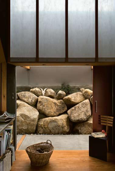
Proje C t te AM
David Mitchell, Julie Stout, Julian Mitchell
BUiLDer
Alex Sutherland in Te Kuiti
StrUC t Ur AL e Ngi N eer
Thorne Dwyer Structures (Steve Thorne)
Mitchell & Stout Architects (64 9) 306 2043 mitchellstoutarchitects.co.nz

ArtWorK
Living room triptych from the Waikato series by Dave Goodwin, painting by Rodney Fumpston, and Muka samples by Clowdy Ngatai dyed by Rangimarie Hetet. Dining room paintings by Dick Frizzell, Ida Eise, and Margret Plank.
FUrNitUre
All furniture pre-owned.
FiNiSheS
Flooring from Greenseal, greenseal.com.my. External cladding stained Ecoply Texture 2000, ecoply.co.nz. Internal lining stained Ecoply Texture 2000 and plywood. Wall paint by Resene, resene.co.nz. Kitchen joinery designed by Mitchell & Stout Architects and fine woodworking by Alex Sutherland.
LightiNg
Dining room shades from Eno Studio, enostudio.net. Lounge room Wire shade custom–made by Bruce Maunsell, bruce@huhcafe.co.nz. Other lighting from Modus, moduslighting.co.nz.
FiXtUreS/eQUiPMeNt
Tapware by Grohe, grohe.com.
200 habitus 06
habitusliving.com
MitCheLL & StoUt ArChiteCtS otoparae — KiNg CoUNtrY, new zealand
13 14
13
Local boulders are used as a retaining wall beneath doubleskin polycarbonate skylights.
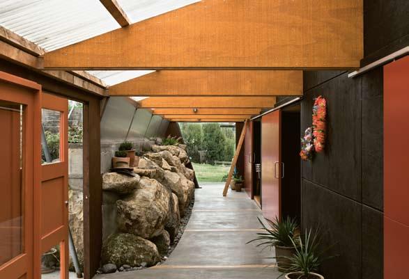
14
The main bedroom overlooks the bush.
15
This indoor/outdoor space is entry and main corridor.
16 Plans for Otoparae house.
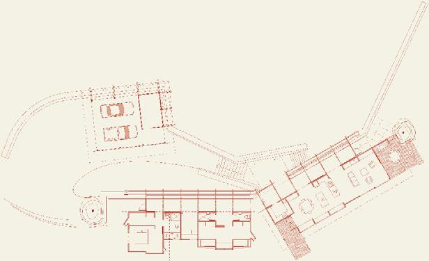
17
A veranda takes advantage of expansive views. 15
201
16
jump cut
MitCheLL & StoUt
• David Mitchell graduated from University of Auckland in 1963
• Worked for John Goldwater until 1966 and then Thorpe Cutter Pickmere Douglas until 1972
• Senior Lecturer, School of Architecture, University of Auckland, 1972–1987
• Set up Hill Manning Mitchell with Jack Manning and Peter Hill 1972–1988
• Wrote the elegant Shed, New Zealand Architecture Since 1945, published in 1984 and fronted the six-part television documentary of the same name
• Wrote Corrugated iron in New Zealand, published in 1983
• Won the New Zealand Institute of Architecture (NZIA) National Award for the Gibbs House, Auckland in 1985
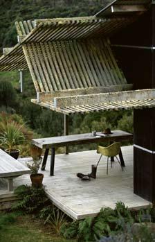
• Won the NZIA National Award for the Music School, University of Auckland in 1986
• Julie Stout graduated from University of Auckland in 1985
• Worked for Auckland-based Cook Hitchcock Sargisson and then Murray Cockburn Partnership in Fiji
• Worked for two years at Hill Manning Mitchell
• David and Julie set up Mitchell & Stout Architects in 1988
• Julie worked in Hong Kong for Tao Ho Architects and David for Leigh & Orange during 1993
• Won the CHH Study/Travel Award for their own home in Freemans Bay, Auckland in 1995
• David was Adjunct Professor, School of Architecture, Unitec, 2000–2001
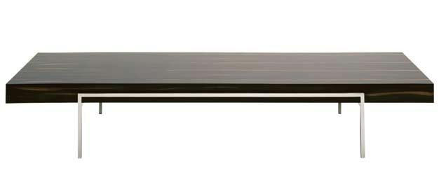
• Won the NZIA National Award for the New Gallery, Auckland in 2001
• David was awarded the NZIA Gold Medal for Achievement in Architecture in 2005
• Julie won the NZIA President’s Award in 2005
• Won the NZIA New Zealand Award for Unitec Landscape and Plant Sciences Staff Studies Building, Auckland in 2005
• Won home and entertaining magazine, Home of the Year in 2005 and 2009
202 habitus 06
habitusliving.com Showroom open Tuesday to Saturday 15/198 Young Street Waterloo NSW 2017 P 02 9698 6422 E info@beclau.com www.beclau.com BEC-2008 GECA 28-2006–Furniture and Fittings HAB6_BECLAU_Ad2.indd 1 12/10/09 4:17:07 PM
MitCheLL & StoUt ArChiteCtS otoparae — KiNg CoUNtrY, new zealand
17
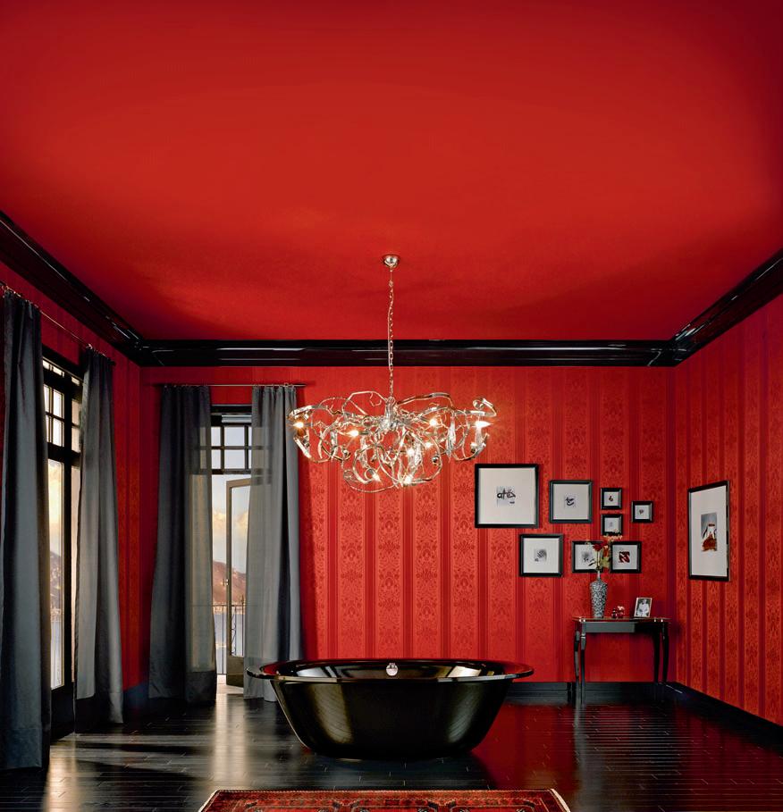
Contact Bathe: 1300 133 320
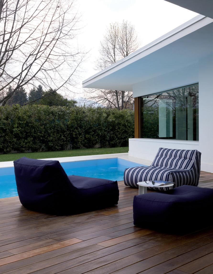

New to the Zoe family Zoe lounge Design Lievore Altherr Molina Sydney 1300 306 960 Melbourne Brisbane Canberra Adelaide Darwin Perth www.stylecraft.com.au www.stylecraft.asia www.stylecraft.com.au www.stylecraft.asia 1300 306 960 +65 6511 9328 www.stylecraft.com.au www.stylecraft.asia 1300 306 960 +65 6511 9328 Singapore +65 6511 9328
CONTRAST
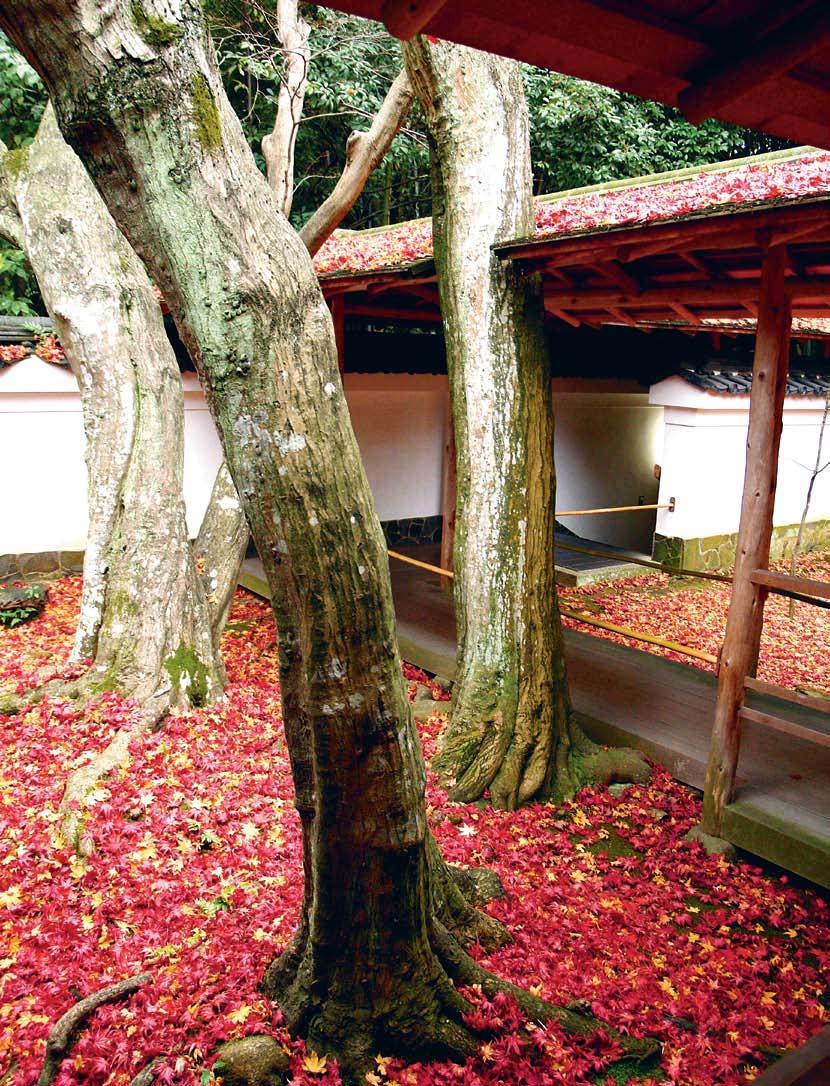
T he Au T um N C h AR m of
wi T h T he
Y e AR-l ONg m AgiC of
habitus 06 4. sign-off
KYOTO
205
BA li
KYOTO INSPIRED BY

Although my present home is Melbourne and a part of me belongs on the East Coast of Tasmania, with a piece of my heart and soul in Paris, Japan holds a particular fascination for me. I still feel the initial attraction and wonder I felt when I first visited Japan at the impressionable age of sixteen. I am comfortable there, and at the same time inspired, intrigued and sometimes overwhelmed by the simple beauty of the place and the people. My time in Japan, three years in total, became a continuing source of inspiration for the lighting and furniture my partner, Pierre, and I create. Our approach and design aesthetic is simple, visual, structural and practical. At the core of our work is a curiosity about the beauty of construction and I think this is possibly a Japanese way of approaching things.
It seems fitting to return to Japan with my daughter, Billie, just before her sixteenth birthday, and we decide to explore the ancient capital of Kyoto.
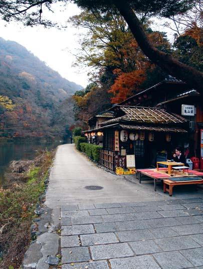

206 habitus 06 snapshot habitusliving.com Text & Photography Charlotte Julien
Clockwise from right: Pumpkins for sale in a vegetable shop in Nijo-dori; a traditional restaurant on the banks of the Hozukyo River in Arashiyama on the outskirts of Kyoto; Ema (small wooden plaques on which Shinto worshippers write prayers) at Kiyomizudera (Pure Water Temple) in eastern Kyoto (Photo: John McCarten).
A refined simplicity
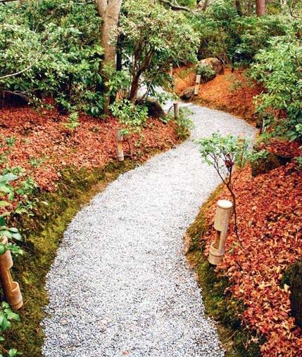
Kyoto was established by the Imperial family in the 8th Century and became the cultural and spiritual centre of Japan. Artisans and merchants flocked to serve the Imperial Court and Kyoto become a hub for craftsmen and trade that flourished and evolved into Japan’s cultural centre. Despite a tumultuous history of floods and fires and a narrow escape from the bombs of World War II, the old Kyoto is still visible. Today, the streetscapes are a jumble of traditional wood, stone and tile buildings that look as if they have grown up from the earth, and post-War prefab concrete buildings. The city seems like a picture postcard. Kyoto is relatively flat and easy to get around. The Kyoto Basin is surrounded on three sides by mountains and the Kama-gawa River cuts through the centre, dividing the city into uptown and downtown. We rent bikes and explore the paths that line the Kama-gawa in search of restaurants, shops and museums.
An appreciation of objects


Most of the places we visit are in the heart of the downtown shopping district that runs between Marutamachi-dori and Shijo-dori, where big, modern Japanese department stores mix with smaller, traditional shops and restaurants. My love of hand-crafted Japanese tools and utensils leads Billie and I to a number of talented artisans producing cooking, woodworking, cleaning and painting equipment. We make our way down the bustling lane of Nisho Market, just off Teramachi Arcade, to Aritsuga , a kitchenware shop that has been producing handmade kitchen equipment for 18 generations, since 1560.
Nearby, where Teramachi Arcade meets Teramachi-dori we find Nishiharu, a tiny shop dealing exclusively with antique woodblock prints where nothing is on display – all the prints are carefully stored in drawers and lacquered boxes. The customer specifies the kind of print they would like and a selection is brought out to view in the small tatami-mat room. This, like so many Japanese businesses, is family run. It is here that we purchase a wonderful wood block print of two birds in a
207
This page, top left to bottom: Charlotte’s daughter, Billie, at Café Bibliotic Hello; gardens at Okochi Sanso; Antique kimono fabric from Konjaku Nishimura; the Imperial palace gardens.
Persimmon tree dating back to 1857. Also in Teramachi-dori is Seikado, a shop specialising in contemporary pewter ware as well as silver, brass, copper and bronze pieces. We purchase a bronze vase by Tadahiro Baba who, at nearly eighty years of age, is still producing extraordinary work.
Not far from Nishiharu is Saiun-do, a calligraphy shop where we marvel at handmade brushes and powdered pigments. Each calligraphy brush is made from a single piece of bamboo, the ends split so finely they create a wonderful sweeping brush.

On the other side of the river between Sanjo-dori and Shijo-dori is Konjaku Nishimura , an antique textile shop where we riffle through cuttings of ancient woodblock printed silks. In the Kyoto of today I find it hard to imagine geishas strolling the streets, so many years ago, in kimonos emblazoned with these beautifully graphic designs.
Down the road closer towards the water but still in Nawate-dori, is the Sfera building. Behind the perforated titanium façade designed by Swedish graphic designer, Markus Mostrom we find a design, architecture and craft bookshop alongside a contemporary art gallery. Kyoto is full of an appreciation of objects.
Wonderful meals

In a desperate search to find coffee we discover Café Bibliotic Hello, a quirky bookfilled café a short walk along Nijo-dori off Teramachi-dori. I need two double espressos to get the equivalent of a standard Melbourne caffeine fix.
Our first meal is at Ichi-ban, uptown and close to the bridge on Sanjo-dori. The tiny yakitori bar, popular with locals, seats only ten people and serves an assortment of meat, fish
208 habitus 06 snapshot habitusliving.com
Clockwise from top left: Detail of a gate at the Silver Pavilion; gardens at Okochi Sanso; Billie standing at the entrance to Koto-in at Daitokuji Temple; Shops in a tiny street parallel to Kiyamachi (Photo: JM); detail of bamboo gate at the Silver Pavilion (Photo: JM).
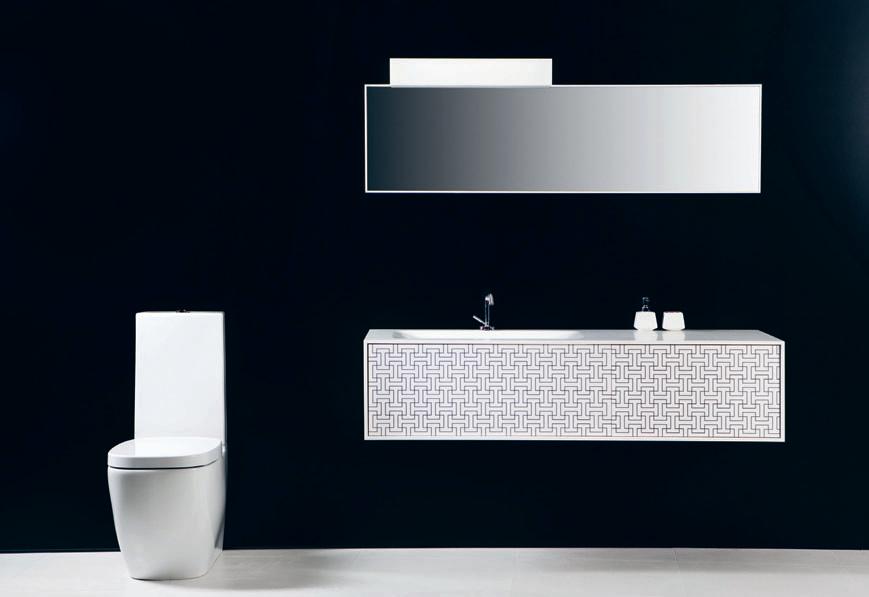
bathroom design centre 84 O’Riordan Street Alexandria 02 8339 7103 103–123 Parramatta Road Auburn 02 8748 4367
and vegetables cooked over open charcoal grills and washed down with warm saki and beer. Other nights we eat downtown. Nishiki Market is a renowned food market here with over a hundred shops crowding the narrow lane, but with so many people squeezed into the space we eat most of our meals at reasonably priced small traditional restaurants nearby. Tomizushi becomes a regular favourite. We have several wonderful meals at the tiny sushi bar in a side street off Shinyogoku and Teramachi Arcades, our favourite being the kisu (Japanese whiting) with shiso leaf.
A space for reflection
I don’t know much about gardens, but have always enjoyed them and the way their design can inspire and give space for reflection. There are different types of Japanese gardens – gardens for strolling, for reflection and for meditation. Many of these gardens use the technique of shakkei, (borrowed scenery), where the design takes into consideration the scenery that lies beyond the garden.
We are visiting at the end of autumn and the leaves have only just fallen from the trees. The magnificent colour that crowds flock to see is not on the trees, but on the ground. To us this is no less beautiful. In the Imperial Palace Park the amazing colours around a bare tree seem to light the dull grey afternoon from below.
We go to Arashiyama , separated from cental Kyoto by the suburbs, where we wander the gardens of Tenryu-ji and the villa complex of Okochi-Sanso. The paths, moss gardens and views in the gardens of Okochi-Sanso are magical and peaceful. This was once the home of silent film actor, Okochi Denjiro (18981962), who constructed this unique garden on the south side of Mount Ogura over a period of 30 years.
The temples and gardens of Kyoto are full of wonderful myths and legends – of Buddhist sects and famous priests, emperors and royal families, military leaders and samurai, gods and goddesses.

We fall in love with Koto-in – one of the sub-temples at the Daitoku temple complex in the north of the city at the foot of the eastern mountains near central Kyoto. It is easy to explore the area on bikes, and the popular Kiyomizu-dera (Pure Water Temple) and Ginkaku-ji (Silver Pavilion) are well worth the visit. During our visit Ginkaku-ji is under repair, but even with the temple hidden it is a beautiful place with wooded hillsides, amazing mosses and the sculptural sand gardens. Omen, the restaurant near Ginkaku-ji set in a traditional Japanese house with pebble floor, specialises in thick homemade omen noodles served with soup, mountain vegetables, Japanese condiments and pickles.
A continuing inspiration

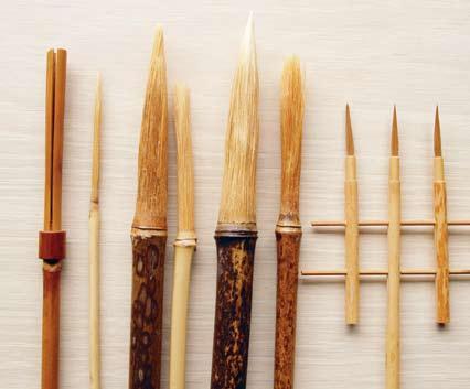
To visit a place and love it is like planting a seed that will grow, and that you will always be able to pick from. I remember only too well that enthusiasm of youth some 28 years ago when I first stepped out in Japan, and it was wonderful to see this also in Billie.

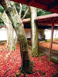
habitus 06 snapshot habitusliving.com 210
Clockwise from right: The Otwaw-no-taki waterfall at Kiyomizu-dera (Photo: JM); bamboo brushes from Saiun-do painting supplies; inside Koto-in at Daitokuji Temple; brass kitchen utensils from Aritsuga; Gion – Kyoto’s most famous geisha district (Photo: JM).
A fake is always a fake. Fake feels different, lacks integrity and leaves an unpleasant taste in the mouth. Compare that to supporting original design – the real thing. Sure you might spend a bit more initially, but original design is more likely to go up in value. Original design is durable and can be serviced over time. Original design is 100% true to the designer’s intent. Original design shows respect for the creator. Original design promotes future classics. Original design makes you feel good. Support original design. www.authenticdesign.com.au

Living in the tropics
Paul mcgillick looks at contemporary approaches to residential architecture in the tropics of Bali and Singapore.
Aldous Huxley published his final novel, Island, in 1962. It was always intended to complement his 1932 dystopian novel, Brave New World and offer a vision for an ideal, yet practical, society which balanced the benefits of industrialisation and science with the maintenance of a life grounded in the natural world where the environment had been respected and preserved.
Island has always attracted debate as to its inspiration: Was it Bali or Singapore? Of course, at the time of writing, Singapore was but a primitive version of what it is today, while Bali was still to experience the ravages of uncontrolled tourism and development. But it is tempting – from the perspective of 2009 – to see Huxley’s island of Pala as an amalgam of the two, blending the high-tech garden city of Singapore and its Confucian civic values with the easy-going, but deeply spiritual and traditional Hindu society of Bali.
The Balinese house has become something of a model or an ideal of the tropical home, no doubt influenced by fantasies of living on tropical islands such as the musical, South Pacific. In fact, there are commonalities throughout South-East Asia as far as dwellings are concerned, but also a lot of variety. Bali, being an island, is blessed with sea breezes and enjoys an especially beautiful landscape with its hills and terraced rice paddies –features not always available elsewhere in South-East Asia.
Anyway, Bali was a highly desirable destination for those Westerners in the know long before South Pacific. Kim Inglis in Bali Home gives an all-too-brief summary of what she calls the “boutique villa”, otherwise known (erroneously, says Inglis) as the “Bali-style villa”. Purists, she notes, argue that there is no such thing as a coherent Bali style. Instead, there has been an evolving style (itself quite varied) which has come about as a result of the marriage of Western modernist architectural ideas and certain key features found in Bali houses, but also throughout the archipelago. Inglis begins with a nice insight by quoting Louis Kahn to highlight his interest in fluid space and functionally adaptable space. She notes here that South-East Asian dwellings typically do not make clear distinctions between the individual functions of different spaces. Hence, in these houses verandahs become bedrooms, living areas merge into the kitchen, and so on.




By starting off with Kahn, Inglis is able to quickly establish the link between European modernism and the tropical house, a link commonly dated from the 1920s when German artist, Walter Spies, built a home for himself in Bali, followed by others such as Rudolph Bonnet, Hans Snell and Theo Meyer. She mentions the Batujimbar Estate project in Sanur by Geoffrey Bawa (the seminal figure in the movement to ‘modernise’ the tropical home), Donald Friend and Wija Waworuntu – pavilion-style homes with loggias, thatched rooves and raised combined dining/living pavilions with enclosed masonry bedrooms all clustered around a pool and luxuriant garden.
212 habitusliving.com habitus 06 montage
BALI Home K Im I NgLIS PHotogr APHS By Luc A I N ver NI zz I t ettoNI Published by Tuttle Distributed by Scribo 144pp Hardcover AUD$40 scribo.com.au
Then came the ‘Bali-style’ hotels and resorts, led by Peter Muller’s Hotel Kayu Aya (later the Oberoi) followed by Kerry Hill and the landscape design of Made Wijaya with hotels, resorts and the most recent phenomenon of villas.
This ‘Bali-style’ celebrates what Inglis calls “sophisticated calm” and, despite its association with affluent tourists, has a connection with Balinese asta kosali, the equivalent of feng shui or Indian vaastu shastra. “The primary function of these systems,” says Inglis, “is to ensure that the gods are appeased, the occupants are happy, the spaces are functional and greater harmony between the spiritual and the physical worlds is attained.” Hence, symmetry is crucial, with ordered geometry to the spaces and furnishings and a central cooling pool allowing qi or life force to enter the living space.

This book is a sequenced description of the typical features of tropical homes – open-plan, verandah room, tropical dining outside, inside-outside bathroom, Bali platform bed (taban) and so on, but distilled into a kind of style guide for anyone who fancies designing a Bali-style home.
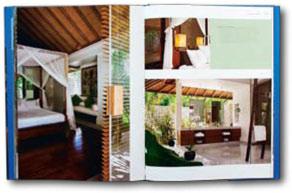
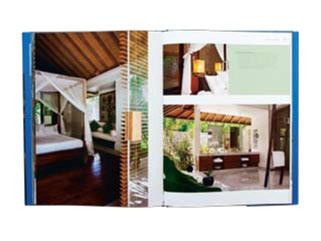

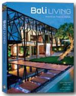
Bali Living – Innovative tropical Design, on the other hand, is a collection of buildings – homes, villas, boutique resorts, and a restaurant – selected, say the authors, “because of their architectural creativity and their un-hackneyed interior design schemes”. They are also “perfect repositories” for both international furnishings and locally designed and manufactured products as well as being representative of indoor-outdoor living and epitomising “the true essence of tropical living”.
The authors note the relentless urbanisation of Bali and the emergence of short-stay tourism, which has produced some very indifferent housing stock. And they argue that Bali “is at a crossroad”. On the one hand, they say, “there is the demand for globalised, standardised products, on the other there is a group of tropical visionaries creating ever more artistic offerings”. This book looks at the latter.
As promised, there is much diversity in these buildings. What is also clear is that the contemporary tropical home is moving away from direct vernacular reference. In fact, several houses in this book owe as much to modern Mediterranean design as they do to South-East Asia (a number of the architects are actually Europeans). What is happening in Bali is that the principles of vernacular design (rather than the scenography) are being assimilated into a generally modernist aesthetic with contemporary materials being used in conjunction with climatically responsive planning and local, natural materials that give these houses a texture, character and intimacy unique to the region.
This same trend is evident in the houses collected in Robert Powell’s new book, Singapore Houses. A new and younger generation of architects made a clear break with the vernacular revival movement quite some time ago resulting in Singapore being effectively a case study. The big difference between Bali and Singapore is the far greater urbanity of the new Singapore residential architecture. These are very much city houses,
213
The Balinese house has become something of a model or an ideal of the tropical home , no doubt influenced by fantasies of living on tropical islands .
BALI LI v INg gIANNI Fr ANcIoN e WI t H K Im I NgLIS , PHotogr APHS By mASANo K AWANA Published by Periplus Distributed by Scribo 224pp Hardcover AUD$70 scribo.com.au
but still tropical and without losing touch with the colour and luxuriance of the jungle – after all, Singapore is the Garden City.

Powell has a long and impressive provenance in researching and documenting contemporary architecture in South-East Asia, while his collaborator, photographer Albert Lim, is the stand-out architectural photographer in Singapore. So, not surprisingly, this is a substantial book – indeed, a little more so than usual with longer project descriptions and detailed plans.
The selection of architects is enlightening as well because it really identifies three waves of contemporary architects – the well-established group of Sonny Chan Sau Yan, Kerry Hill and Ernesto Bedmar; then a younger generation including Mok Wei Wei, Chan Soo Khian and WOHA; and finally some new kids on the block such as Rene Tan, Brenda Ang, Ko Shiou Hee and formwerkz architects who have done their apprenticeships with older architects (such as William Lim and Kerry Hill) and then set up on their own.
SINgAPore HouSe S roBert PoW e LL

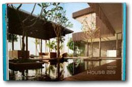


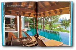
 PHotogr APHS By
A LBert L Im
Published by Tuttle
Distributed by Scribo 240pp Hardcover AUD$80
scribo.com.au
In his introductory essay Powell neatly sums up the factors which have governed the emergence of Singaporean architecture. As he comments, “The houses in this book epitomise cutting edge residential architecture in Singapore at the beginning of the Twenty-First Century and demonstrate a remarkable surge of design exploration in the city-state.”


This surge began with the ‘global versus local’ debate, which really continues to this day. This debate has been informed by high levels of architectural education, and Powell gives an overview both of the overseas training local architects have undertaken, but also the vital role played by the School of Architecture at the National University of Singapore with its blend of local and international teachers. Powell also looks at specific contextual issues – designing ‘bespoke family dwellings’, designing for the tropics, reconciling security with openness to the outside, demographic shifts, changing clientele and new directions in lifestyle.
These are issues which I cannot go into here. But, as Powell, points out, there has been a belated recognition in Australia of the quality of residential design coming out of South-East Asia, Singapore especially. Here, there is enormous diversity of practice, including challenging Singapore’s notorious conspicuous consumption with affordable, sustainable dwellings while retaining a characteristically high level of detailing and finishes, together with a heightened sensitivity to materials.
214 montage habitusliving.com habitus 06
These are very much city houses, but still tropical and without losing touch with the colour and luxuriance of the jungle – after all Singapore is the g arden c ity .
Habitus magazine is available at newsagents and bookshops across Australasia, South-East Asia, the USA, Canada, Europe, the Middle East and South America. Habitus is published quarterly in March, June, September and December. To subscribe securely online visit indesignlive.com, or you can email subscriptions@indesign.com. au to subscribe or request a full list of locations where Habitus magazine is available.
The team at Habitus magazine thanks our advertisers for their support. Use the directory to see what page a specific advertisement is on, and visit their website to learn about the great products and services they offer.
002–003 Anibou anibou.com.au
157 Antique Floors antiquefloors.com.au
037 Apaiser apaiser.com.au
123 Arthur g arthurg.com.au
168 Beclau beclau.com
187 Bertazzoni bertazzoni-italia.com
076 Blinds by Bayliss bayliss.com.au
099, 101 caesarstone caesarstone.com.au
223 classic tiles classictiles.net.au
145 corian casf.com.au
064–065 corporate culture corporateculture.com.au
197 Dado Quartz dadoaustralia.com.au
133 DeLonghi delonghi.com.au
146 Designed Blinds Australia dbablinds.com.au
010–011 Designer rugs designerrugs.com.au
034 Di Lorenzo dilorenzo.net.au
012–013 Domayne domayne.com.au
102 e ight Hotels Australia eighthotels.com
134–135 Fisher & Paykel fisherpaykel.com.au
088 Funkis funkis.com
004–005 F y 2K fy2k.com.au
063 g aggenau gaggenau.com.au
110 g ibbon g roup gibbongroup.com.au
014–015 g itani Stone gitanistone.com
AD
188, 215 habitusliving.com habitusliving.com
170 Häfele hafele.com
208 Hettich hettich.com.au
103 hub furniture hubfurniture.com.au
029, 31 Ilve ilve.com.au
132 Interstudio interstudio.com.au
016, 217 Kfive kfive.com.au
089 Kohler au.kohler.com
091–094,oBc Living e dge livingedge.com.au
IFc –001 miele miele.com.au
Anibou (61 2) 9319 0655 anibou.com.au
chee Soon & Fitzgerald
(61 2) 9360 1031 cheesoonfitzgerald.com
corporate culture
1300 768 626 corporateculture.com.au
Dinosaur Designs
(61 2) 9698 3500 dinosaurdesigns.com.au
Domo collections
(61 3) 8803 8870 domo.com.au
e aston Pearson
(61 2) 9331 4433 eastonpearson.com
F y 2K
(61 2) 8399 1644 fy2k.com.au
g enevieve Lethu
(61 2) 9327 8307 genevievelethu.com
Hub Furniture (61 3) 9652 1222 hubfurniture.com.au
Jarass
1300 527 277 jarass.com.au
Luxury g oods Australia
(61 2) 9007 5330 luxury-goods.com.au
mance Design (61 3) 9429 1959 mance.com.au
Nachtmann
Stockist: riedel nachtmann.de Planet commonwealth (61 2) 9211 5959 planetfurniture.com.au
Porter’s Paints
(61 2) 9698 5322 porterspaints.com.au
Pressed tin Panels (61 2) 6332 1738 pressedtinpanels.com
rapee (61 2) 9496 4511 rapee.com.au riedel (61 2) 9966 0033 reidel.com
Space Furniture (61 2) 8339 7588 spacefurniture.com.au
Spence & Lyda (61 2) 9212 6747 spenceandlyda.com.au
top3 by design
1300 867 333 top3.com.au
moët Hennessy
1300 136 590 moet.com
075, 177 milano Furniture milanofurniture.com.au
112 minosa minosa.com.au
021 minotti minotti.com
210 Neff neff.com.au
156 Nicholls Design nichollsdesign.com.au
108 Parisi Bathware parisi.com.au
IBc Poggenpohl poggenpohl.com.au
082 Precision Flooring precisionflooring.com.au
158–159 roca roca.com
038 r yan renshaw ryanrenshaw.com.au
090 Sampford IXL sampfordixl.com.au
062 S coogle scoogle.com.au
178–179 SIc IS sicis.com
196 Siekaup siekaup.com.au
022 Space Furniture spacefurniture.com 009 Stylecraft stylecraft.com.au 074 tait tait.biz 124 e nglish tapware company englishtapware.com.au 020 tsar tsar.com.au 081 vintec vintec.com.au
169, 198 Winning Appliances winningappliances.com.au
055 Woven Image wovenimage.com
209 Xilo xilo.net.au
yardware
070
yardware.com.au 006, 219 z ip Industries zipindustries.com
StocKIS
t S From IN c A mer A (p39)
directory 215 habitus 06


 pARADISE TREE The bold and playful design of this colourful hanging tree is sure to brighten bedrooms and engage the imagination of kids of all ages, magismetoo.com / ecc.com.au


 Dining table Top Top by Kartell, $3,595, from Space Furniture. Vase 2Lips by Holmegaard, $550, from Jarass. Chair Spiderwoman by Louise Campbell, $660, from Corporate Culture. Champagne Veuve Clicquot, $90, Mo ët Hennessy. Chair S 32 N Cantilever by Marcel Breuer, $1,155, from Anibou. Salad bowl Sunshine, $550, Small Spore Bowl, $110, Medium Sunshine Bowl, from $80, from Short Dew, Servers, $100, all by Dinosaur Designs. Tumblers by Dibbern, $25, from Chee Soon & Fitzgerald. Wine goblets La Sfera by Driade Kosmo, $82 each, from Spence & Lyda. Swizzle sticks Muddlers, $32.50 for set of 6, from top 3 by design. Platter Form by Andrew Baldin, $190, from Anibou. Servers Linea Q Noir by Sambonet, from $25, from Spence & Lyda.


 ROB MILLS ARCHITECTS


 Jamie Durie, Australian Landscape Designer


 Designed by Gary Galego


 PHotogr APHS By
A LBert L Im
Published by Tuttle
Distributed by Scribo 240pp Hardcover AUD$80

