NZ fashioN icoN at home Primary colour ex Plodes small spaces, big ideas i nside The selby greeNiNg Jakarta sydney conversions + addi T ions apartmeN t liviNg iN melbourNe landsca Pe design classic luke NguyeN’s m arrakech moun Tain life lookiNg at ba Ngkok m anila’s culT ural hoT sPoTs

room To move
aud $13.95 NZ $14.95 usd $15.95 cdN $16.95 gbp £8.50 sgd $10.95 habitusliving.com
issue 11 aPril – June 2011

TRP MI 2856 VIC 9765 7436 NSW 8977 4235 QLD 3632 2471 SA 8352 9532 WA 9286 7835 NZ 573 1269 www.miele.com.au

new
Our new 4.5 and 5 star WELS water rated dishwashers are intelligently designed to deliver even greater water and energy efficiency… with perfect results. For a closer look at all our brilliant new G 5000 dishwashers go to www.G5000.miele.com.au German engineered and tested to the equivalent of 20 years usage. Contact Miele’s specialist Project Division, a dedicated team of industry specialists or call into any of our Miele Galleries to view and discuss our impeccable fleet design range of ovens, rangehoods, microwave combi ovens, cooktops, plate warmers, steam ovens, coffee machines, dishwashers and refrigeration.
Our
star of sustainability.
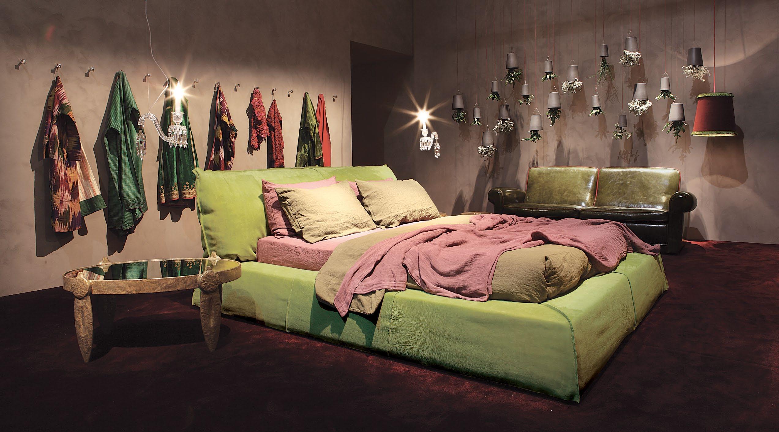
2 - 6 Birmingham Street • Alexandria • NSW 2015 ❘ Ph 61.2.83391500 Email sales@baxtershop.com.au ❘ www.baxter.it

Once you’ve been everywhere, go to extremes.

The GranTurismo’s lean, muscular lines are a reflection of the 440hp V8 alloy engine concealed beneath. Aerodynamic enhancements, low weight and high power output make this the most dynamic Maserati in production today.

GRANTURISMO S
SYDNEY 02 8577 8100 | MELBOURNE 03 9270 7000 | BRISBANE 07 3252 8222 | PERTH 08 9231 5999 ADELAIDE 08 8338 7755 | AUCKLAND +64 9 526 6962 | CHRISTCHURCH +64 3 977 8779 www.maserati.com.au | www.maserati.co.nz
SUITA
 Suita Sofa. Developed by Vitra in Switzerland.
Design: Antonio Citterio
Suita Sofa photographed at VitraHaus, Vitra Campus 2010
v
1. HABITUS PRODUCTS take the lastest INNOVatIVe PRODUCts, stIR IN sOme INVeNtIVe New COat haNgeRs aND aDD a sPlash Of COlOUR. we COOk UP a COCktaIl Of IDeas fOR lIVINg IN DesIgN
24
DESIGN NEWS
we’ve searched the world over to bring you the best ideas in design for home, work and play.
34
RE-SHOOT
hang up your wardrobe woes and rethink your sartorial storage with these quirky new coat hangers.

2. HABITUS PEOPLE & PLACES
OUR haBItUs PeRsONalItIes take YOU INtO theIR INteRwOVeN wORlDs Of aRt, fashION, PhOtOgRaPhY aND aRChIteCtURe.
48
aT HOmE
mixing high fashion with art, architecture and design – stephen Crafti visits the home of renowned NZ fashion designer marilyn sainty.

57
cON v ERS aTION
In his New York studio, maverick photographer todd selby talks to elise Coroneos about his project, the selby, and his views of sydney.
38
IN camER a Banish the beige and colour up your world with an amazing array of products to enliven your home.
65
I NSpIRED artist lisa Cooper is inspired by the work of groundbreaking austrian architect adolf loos. megan morton investigates.


77
ON l O caTION
aya maceda meets with filipino fashion designer Rajo laurel, at home and work, and discovers his favourite places in his home town of makati City.
3. HABITUS HOMES
PeeR thROUgh the kaleIDesCOPe Of INsPIRatIONal hOmes fROm aROUND the RegION. we BRINg YOU POetRY IN BUIlDINgs aND laNDsCaPes.
98
ScENa RIO: mENDING Wall HOuSE

Residential architecture
Paul mcgillck visits a house on a knoll and discovers how a Robert frost poem about a wall and ‘good neighbours’ inspired the monastic qualities in this dwelling in the hills above sydney.
87
pa RTNERSHIp
an architect who paints and an artist who teaches architectural design – andrea stevens meets with Pete Bossley and miriam van wezel and discovers their synergistic partnership.


110
ScENa RIO: S ITHOWaTI HOuSE
Residential architecture
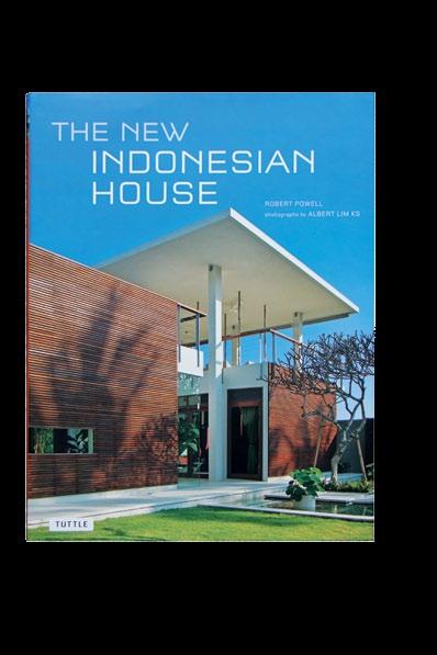
Part house, part amphitheatre –kerstin Rose travels to Indonesia, visiting a home that sets the stage for an extended music-loving family, that also integrates nature in a city of depleting foliage.

7 habitus 11 contents
141
ScENa RIO: JERvOIS HI ll HOuSE

Residential architecture
Chu lik Ren explores the materially rich, sensory experience in this new house in singapore designed by ko shiou hee of k2lD.
123
ScENaRIO: STRElEIN WaREHOuSE
Residential architecture
Ian moore’s black and white conversion of an inner suburban sydney warehouse is a stroke of structural genius that epitomises elegance. Paul mcgillick reports.
154
ScENa RIO aRROWTOWN HOuSE


Residential architecture
Nestled among the snowy peaks and alpines of New Zealand’s south Island, sits a Cedar house. andrea stevens investigates how architect Noel lane brings the scenic landscape inside.

133
ScENa RIO: D Oma IN a pa RT mENT
Residential architecture stephen Crafti visits the home of a couple of empty nesters in their inner-city apartment, in melbourne, and uncovers an interior transformation by stephen Jolson, worthy of the breathtaking views that surround it.
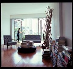
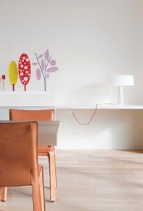
167
DIRE c TOR’S cu T: aT ypIcal HOuSE
Architects and designers designing for themselves a typical shophouse provided architects thingsmatter with the perfect container for their atypical refurbishment. tonkao Panin discovers how it was converted into a home/studio.
179
cROSS Fa DE: B ONDI HOuSE
Renovations and additions
Jane Burton-taylor visits a home in Bondi, sydney, and investigates how Drew heath’s renovation of this beachside semi is customised to suit the particular needs of a family of five.
4. HABITUS SIGN-OFF taste the UNIqU e flaVOURs
Of ma RR ake Ch a ND DIsCOV eR the ROOts Of mODeRN
V eRNaCU la R IN sOU th-east asI a N a RCh I te C t UR e.
198
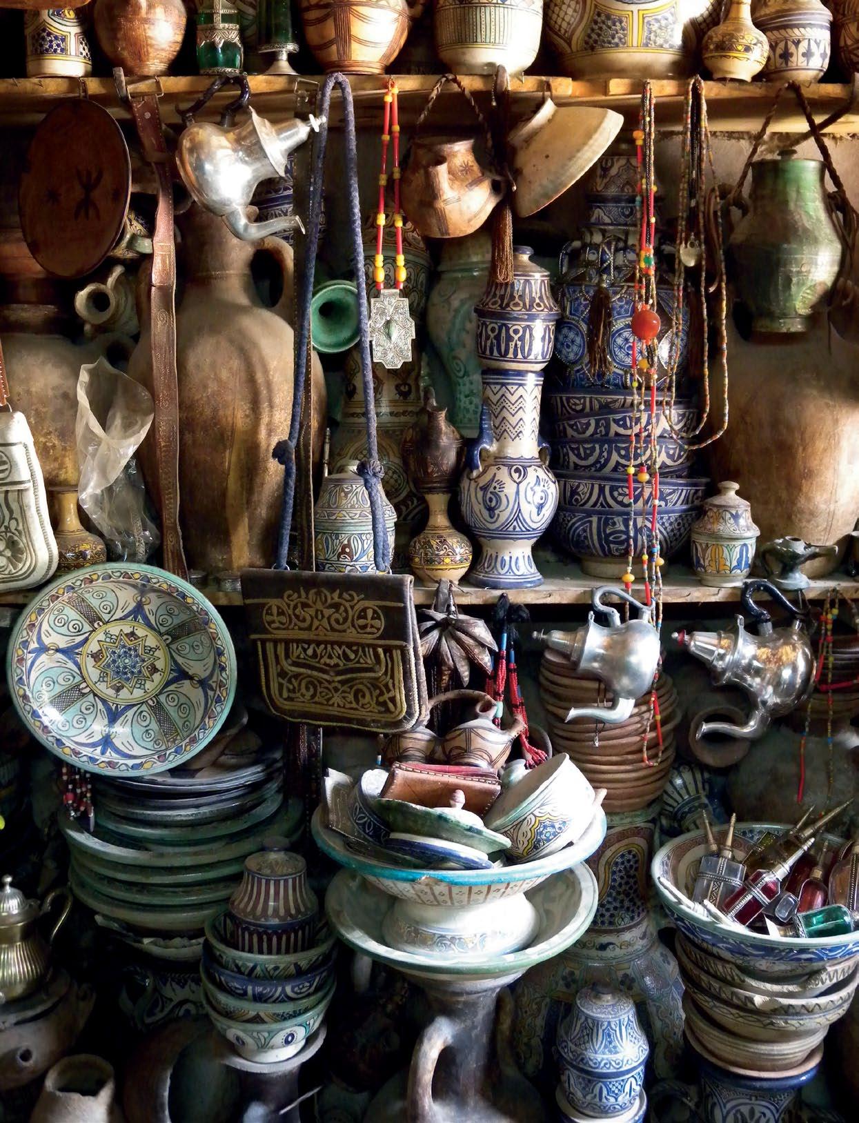
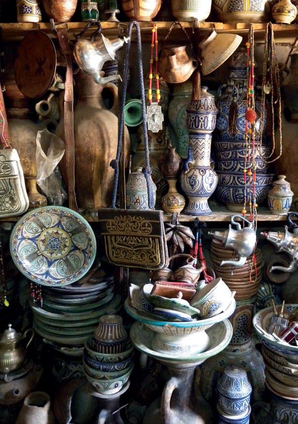
SNapSHOT: m a RR ak E c H luke Nguyen and suzanna Boyd wander the streets of marrakech, in morocco, and report on the rich exotic flavours of this middle eastern city, as they serve up an assiette of places to eat, stay and explore.

187
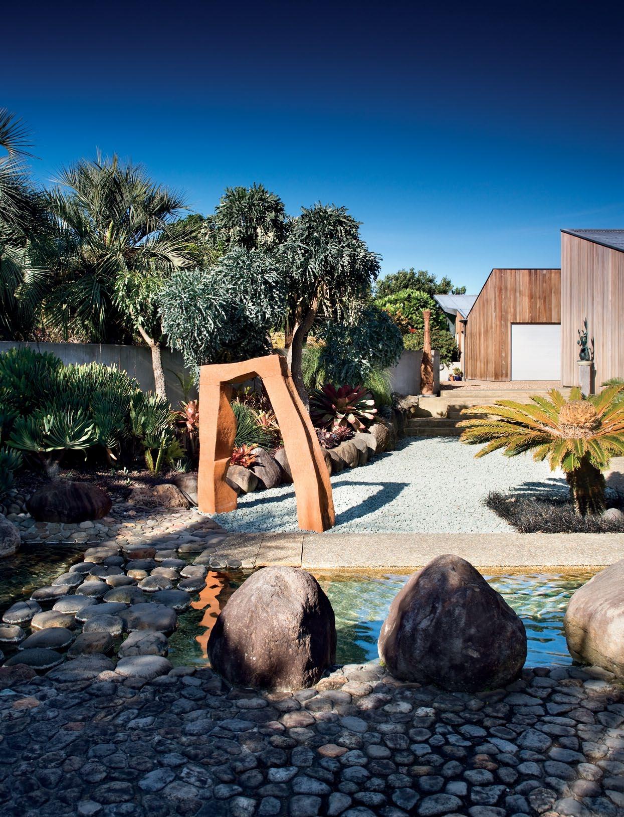
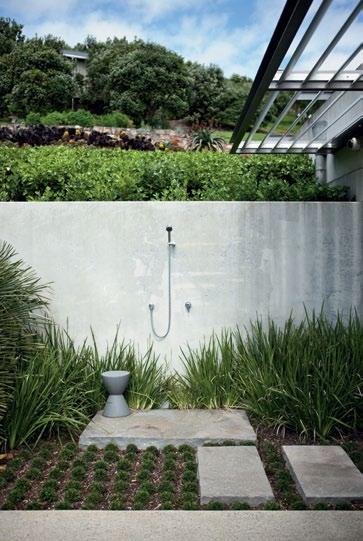
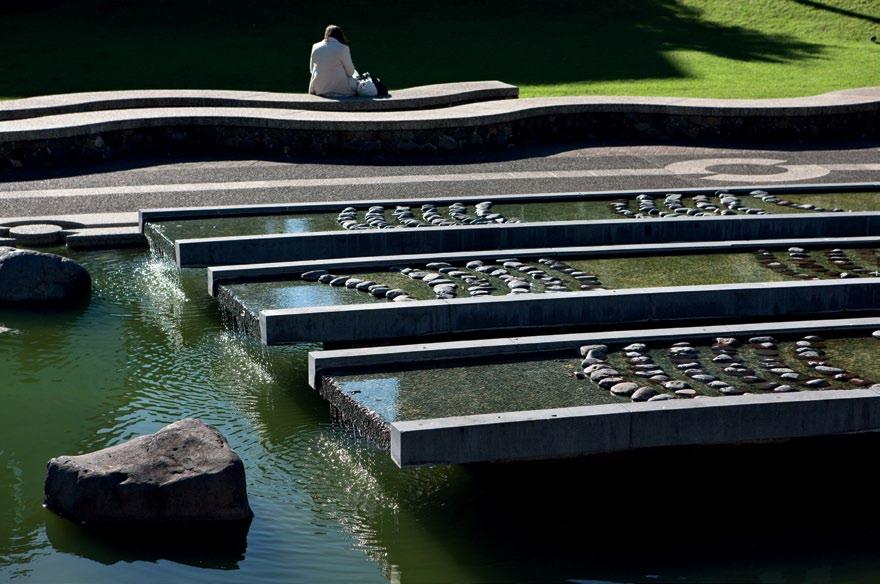
Sl OW DISSOlv E: T ED Smy TH Landscapes and garden design for almost five decades, ted smyth has been creating landscapes that are steadfastly uninfluenced by other landscape architects’ work. andrea stevens talks to him about his unique approach and his diverse body of work.
204 mONTaGE
Over the past 20 years, architecture in south-east asia has experienced a quasi-Renaissance out of the shadows of colonial rule. Paul mcgillick explores the implications of the post-colonial condition on architecture in the region.

correction
In habitus 10, in the story on the a ng house by Chenchow little, we failed to credit k atherine lu for her photography. we apologise for this oversight. Visit habitusliving.com/katherinelu to see more of k atherine’s work.
8 habitusliving.com habitus 11 contents
Splash is a stackable indoor/outdoor chair that comes in 15 beautiful colours


e legance is more than just beauty; it is also the portrayal of timeless sensuality

bathroom design centre 84 O’Riordan Street Alexandria 02 8339 7103 103–123 Parramatta Road Auburn 02 8748 4367


 Left to right: Vario wine cabinet RW 464, Vario freezer RF 463 and Vario refrigerator RC 462. Fitted with Gaggenau aluminium doors (optional accessory).
Endless combinations that will exceed expectations.
Uncompromisingly professional. The new Vario cooling 400 series.
With an impressive range of technologies and features setting new standards. Interiors made of high-grade stainless steel for levels of hygiene previously only found in professional kitchens. Select and combine Vario cooling, freezing or wine - everything is stored exactly how it should be. The difference is Gaggenau.

Visit one of our national showrooms to discover the strikingly beautiful world of Gaggenau.
To arrange a demonstration or locate the nearest retailer phone 1300 727 421 or visit www.gaggenau.com.au

BARCELONA LONDON SÂO PA OL O SHANGHAI CASABLANCA MERIDIAN FITS EVERYWHERE Roca launches Meridian - its most comprehensive collection to date. A collection with over 36 units that are well suited for any need and space, whether it’s a small or a disabled bathroom, all carrying the same design line. Meridian is the perfect solution for any bathroom Proudly distributed in Australia by Streamline Products www.streamlineproducts.com.au
“It is impossible to explain architecture in words – architecture cannot be

I suppose those words of Bawa could act as a warning to the entire architecture and design press, whose ambition is to replicate the experience of buildings and landscapes. Bawa could have added photography to the equation. t his most democratic of art forms lays claim to evidentiary authority. In other words, it claims to record what is out there, tacitly asserting that, in so doing, it is entirely objective and factual. more than that, it is delivering the experience of a place. Implicit in this is the notion of the primacy of the visual. since human beings are 70% visually dominant, this ocularcentric world view may not be surprising.
But our experience of the world is actually multi-sensory – a fact increasingly denied by a world obsessed with visual images. t he finnish architect and writer, Juhani Pallasmaa (who will be presenting a paper at the National a rchitecture Conference in melbourne, 14–16 april, 2011) has been a trenchant critic of a visually dominant architecture and has called for an architecture of “resistance to current cultural erosion”. he has also argued for haptic architecture – one which responds to the multi-sensory reality of our everyday lives. (a review of Pallasmaa’s The Thinking Hand appeared in Habitus #7).
for us working in the architecture and design press, the limits of photography are all-too-obvious when we compare the actual physical experience of a building (and we at Habitus require all our writers to actually visit the buildings they discuss) to the photographs. No matter how good the photography, it inevitably distorts the space.
some photographers, acknowledging the problem, decide to hang their interpretive colours from the masthead and brazenly manipulate the images. Others cling to a belief in the evidentiary capacity of photography. t he former approach at least has the advantage of being more animated.
t hat said, Habitus does not have the answers, either – except to be as inclusive as possible and provide as much material as possible to enable the readers to reach their own conclusions, including the judicious use of people in shot to establish scale and a sense of habitation. we have also, from time to time, enlisted the pin-hole camera of a nthony Browell to convey a feeling of what it is like to be in the space – as we do in this issue with our story on the mending wall house in the hills above sydney.
so, it is always advisable to take what you see in an architecture magazine with a pinch of salt and lashings of imagination.
a nd before I go – we greatly value your feedback, so please have a look at page 132 for details of our reader survey.
paul mcGillick, Editor
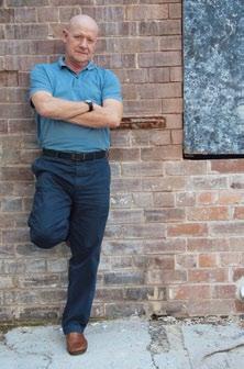
habitus 11 editor’s letter paul mcgillick 17
...Our experience of the world is actually multi-sensory – a fact increasingly denied by a world obsessed with visual images.
totally explained, but must be experienced.”
– g eoffrey Bawa
kuRT a RNOl D
Photographer since the age of 17, kurt a rnold has never been without a camera. g rowing up in New York City, he learned by photographing the distinctive expressions and movements of people in an urban setting. he has a love of black and white photography, as it allows him “to see life in a new way without the distraction of colour”. he now lives in North Bondi with his architect wife and son, with the streets of sydney as his new canvas.
suzanna Boyd shares her sydney home with her partner, luke, their two cats, and a long-time friend, a manda. It was while travelling with a manda’s family in O’Reilly’s rainforest in southern q ueensland, at the age of 16, that suzanna was first introduced to the slR camera. “I remember thinking how incredible things looked through a camera lens,” she reflects. suzanna now splits her time between sydney and Vietnam.
elise Coroneos is an australian based in New York. she contributes to a variety of publications on topics as wide as design, travel and finance. elise lives in an apartment on the Upper west side with her partner, marc, and loves riding her bike in Central Park and along the hudson River, where she enjoys quiet moments away from the hustle and bustle.


stephen Crafti was inspired to write about architecture and design after purchasing a modernist 1950s home designed by architects montgomery k ing & trengove in the early 1990s. he has since published numerous books and contributed to design magazines and newspapers. stephen is always excited to discover something new. “sometimes you can’t put your finger on it,” he says, “you just know it’s an important story.”


E l IZ a GOR ka
Photographer
eliza g orka is a photographer based in sydney. she describes herself as someone who likes to “joke, capture, cook, eat, spend it, eyeball, scoff, ruminate and discard”. she first discovered her love of photography after constructing a pinhole camera at the age of 11. her favourite object in her Potts Point home is her astier De Villatte vase.

HOul
a rtist as an artist, houl has created work for k artell furniture, Inked magazine, and Belvedere Vodka among other well-known brands. But since emerging on the street art scene, houl has become a recognised growing talent, winning australia’s first ever series of secret wars, a live art competition. houl grew up on the hawkesbury River, in sydney, in what he describes as “some huckleberry finn or tom sawyer daydream childhood”.
TI
Photographer
tim k nox discovered his fascination for photography when he came across e dward weston’s shell photos, while studying typography and negative space. “I find my inspiration after I remove myself from seeing,” he reflects, “and at that point, I hope to observe something greater than me.” tim has become a widely published professional photographer. he lives in williamsburg, New York, by the Brooklyn Bridge.

JOHN

Photographer a melbourne-based photographer specialising in food, portraiture, travel and lifestyle, John laurie was travelling through the remote outer islands of Indonesia when he first fell in love with his craft. h is favourite object is a carved wooden bowl from Papua New guinea, of which he says, “It reminds me of surfing with my brother in the middle of nowhere.” John lives with his children and soon-to-be wife and is, of course, looking forward to getting married.

18 habitusliving.com contributors habitus 11
m k NOX
lauRIE
Su Z a NNa BOy D writer and Photographer
E l ISE c ORONEOS writer
STE pHEN c R a FTI writer
Iain D mackenzie is a prolific photographer, having shot countless celebrities. he is also a cinematographer and director, most recognisably for the qantas advertising campaign with a choir of children. he was first inspired after watching Norman wisdom films and seeing Hiroshima mon a mour for the first time. Constantly travelling between his homes in la, Brussels and sydney, Iain most looks forward to “a glass of meursault and a lie down”.

E NGuy EN writer

acclaimed chef, restaurateur, author and t V presenter, luke Nguyen is the owner of sydney’s Red lantern restaurant. with his partner, suzanna, he founded the little lantern foundation, which supports the disadvantaged and under-educated in Vietnam. h is favourite design object at home is an antique t honet bentwood rocking chair.


ERSTIN ROSE writer



kerstin Rose is a journalist and producer who travels the world to discover different people in their surroundings, how they live and their philosophies of life. she began 15 years ago, visiting monks, fisherman and the like, but now prefers designers, architects and artists. kerstin lives in hamburg, with her 13-year-old daughter, g reta, and is looking forward to her next trip to a rgentina and malaysia.

BEYOND THE PAGE
We take you beyond the pages of Habitus with extra content from people, homes and products featured in the magazine. See more at habitusliving.com/beyond. Just look for the black and white .


19
+ LISA COOPER
+ THE SELBY Habitus magazine now on the iPhone, iPad and iPod
+ RAJO LAUREL + SITHOWATI HOUSE THE DESIGN HUNT CONTINUES HAB11_HL_1-2.indd 1 22/12/10 5:10 PM
habitusliving.com/beyond
aya macEDa writer
filipino architect aya maceda is a senior associate at Popov Bass a rchitects, and has been working between sydney, singapore, manila and New York for the past 10 years. she lives with her husband, photographer kurt a rnold, and her new son, kosi. as a new mum, her favourite design object is her son’s stokke cot. “Children’s furniture needs to be well crafted too,” she says. Contributing to Habitus allows aya to rediscover her roots by exploring Philippine design.
I a IN D. mack ENZIE Photographer
luk
k
habitus
EDITORIal DIREcTOR
Paul mcgillick habitus@indesign.com.au
DEpuTy EDITOR Nicky lobo nicky@indesign.com.au
aSSOcIaTE EDITOR andrea millar habitus@indesign.com.au
EDITORIal aSSISTaNT/ pa TO EDITORIal DIREcTOR linda Cheng linda@indesign.com.au
DEpuTy aRT DIREcTOR Bronwyn aalders bronwyn@indesign.com.au
SENIOR DESIGNER lauren mickan lauren@indesign.com.au
DESIGNER morgan Coyle morgan@indesign.com.au
cONTRIBuTING WRITERS
Jane Burton-taylor, Chu lik Ren, elise Coroneos, stephen Crafti, aya maceda, megan morton, luke Nguyen, tonkao Panin, kerstin Rose, andrea stevens.
cONTRIBuTING pHOTOGRapHERS
Pirak anurakyawachon, kurt arnold, Brett Boardman, suzanna Boyd, anthony Browell, Jason Busch, simon Devitt, eliza gorka, tim knox, John laurie, Iain D. mackenzie, Nicky Ryan, Jeremy san tzer Ning, Christian schaulin.
cONTRIBuTING STylE EDITOR

Paul Joseph hopper.
cONTRIBuTING SuB-EDITORS
michelle Bateman, andrea sophocleous, Carolin wun.
cOvER ImaGE
Strelein Warehouse, Sydney photography: Iain D. mackenzie
INDESIGN puBlISHING level 1, 50 marshall st surry hills Nsw 2010
(61 2) 9368 0150
(61 2) 9368 0289 (fax) indesigngroup.com.au
puBlISHER/ maNaGING DIREcTOR
Raj Nandan raj@indesign.com.au
pa TO puBlISHER Colleen Black colleen@indesign.com.au
OpERaTIONS maNaGER adele troeger adele@indesign.com.au
pRODucTION maNaGER sarah Djemal sarah@indesign.com.au
aDvERTISING TRaFFIc/ OFFIcE aDmINISTRaTOR hannah kurzke hannah@indesign.com.au
FINaNcIal DIREcTOR kavita lala kavita@indesign.com.au
accOuNTS gabrielle Regan gabrielle@indesign.com.au
Irina Davydova irina@indesign.com.au
ONlINE cOmmuNIcaTIONS
Rish Raghu rish@indesign.com.au
Ramith Verdheneni ramith@indesign.com.au
ONlINE EDITOR Ben morgan editor@habitusliving.com
EvENTS aND maRkETING kylie turner kylie@indesign.com.au grace hall grace@indesign.com.au laura sue-san laura@indesign.com.au
aDvERTISING ENquIRIES marie Jakubowicz marie@indesign.com.au
(61) 431 226 077
Nicholas Riviere nicholas@indesign.com.au
(61) 401 641 679
ORIGINal DESIGN TEmplaTE wishart Design wishartdesign.com
a retrieval system, transmitted in any form or by any other means, electronic, mechanical, photocopying, recording or otherwise. while every effort has been made to ensure the accuracy of the information in this publication, the publishers assume no responsibility for errors or omissions or any consequences of reliance on this publication. the opinions expressed in this publication do not necessarily represent the views of the editor, the publisher or the publication. Contributions are submitted at the sender’s risk, and Indesign Publishing cannot accept any loss or damage. Please retain duplicates of text and images. habitus magazine is a wholly owned australian publication, which is designed and published in australia. habitus is published quarterly and is available through subscription, at major newsagencies and bookshops throughout australia, New Zealand, south-east asia and the United states of america. this issue of habitus magazine may contain offers or surveys which may require you to provide information about yourself. If you provide such information to us we may use the information to provide you with products or services we have. we may also provide this information to parties who provide the products or services on our behalf (such as fulfilment organisations). we do not sell your information to third parties under any circumstances, however, these parties may retain the information we provide for future activities of their own, including direct marketing. we may retain your information and use it to inform you of other promotions and publications from time to time. If you would like to know what information Indesign group holds about you please contact Nilesh Nandan (61 2) 9368 0150, (61 2) 9368 0289 (fax), subscriptions@indesign.com.au, indesignlive.com. habitus magazine is published under licence by Indesign group. IssN 1836-0556
20 habitusliving.com habitus 11
Printed in singapore all rights reserved. No part of this publication may be reproduced, stored in
HAB10_Tsar.indd 1 20/9/10 11:37:51 AM


Nera Lava Tiles : Extraordinary proportions, timeless space
COLOURS Warm

Inkredible 1480-16 DI LORENZO Pty Ltd Tile and Bathware Concepts | www.dilorenzo.net.au NSW Bella Vista 02 8818 2999 | Redfern 02 9698 8737 | Newcastle 02 4957 9925
Grey, Cool Grey, White, Brown, Black
30x60, 60x60, 30x120, 60x120, 120x120
SIZES 15x15,
international design, creative clothes hangers & colour makes a comeback


T exci T ed:
ge


habitus 11 24 design news 01 habitusliving.com living
the sauherad project A collaboration between emerging designer Øyvind Wyller and cabinetmaker Truis Ellev Schia, the legs of this table and chair are reminiscent of slim tree trunks in a Norweigan wood. Launched at 100% Norway 2010 at the London Design Festival, it combines local Ash or Oak timber with clever construction, oyvindwyller.no
william Typical British restraint is embodied in this modular sofa and pouf designed by Damian Williamson for Zanotta. Pure materials, including goose down upholstery, meets clean lines and polished aluminium alloy feet. A fabric or leather cover is removable for easy cleaning, so that this set is always well-dressed, zanotta.it / spacefurniture.com.au
si X oF oNe Six equal segments make a multitude of sculptural and functional configurations, designed by Matthew Sheargold, sheargold.com.au / top3.com.au
stacK iNG storaGe module A Sycamore structure features pleated technical fabric, available in four colours from Paris brand Moustache, dawsoninteriors.com.au
02 03 04 05
diNo stripe New directional hues burst with colour in this high-performance textile created in collaboration with Dinosaur Designs, wovenimage.com
ma NGier Bring back the days where food had to be physically gathered, not just bought. Mangier is a table-sized forest made of natural timber, ready to blossom with whatever tidbits you desire. Three models cater for 20 – 100 skewers that create the structure for a multitude of delicacies. French-born designer, Stephanie Marin, is self-taught yet sensitive to the archetypal values of design, with shifting ideas and forms responding to the user experience, which propose a non-conformist, playful and dreamlike universe, bestowed.com.au

NooK Simplicity is sacred in this lounge designed by Nick Garnham and Rod Carlson. A mid-century aesthetic is updated with an environmentally friendly kiln-dried hardwood frame, high-resilience CFC-free polyurethane seat and back and American Oak legs, made to order fully upholstered with pinched edge stitching detail, jardan.com.au

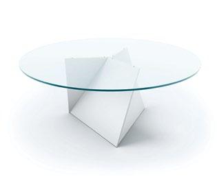
3d table Three panels meet to form a stable, yet dynamic, and sculptural base for this dining table designed by Michael Bihain, feld.be
25
06 07 08
bedside libraries The digital age holds no romance for architects Owen & Vokes, who find solace in the analogue and timeless quality of books. This personal library, bedside table and lamp in Hoop Pine is composed as a miniature building and contains its own narrative in the selection of works encased within, owenandvokes.com

elemeN t No shrinking violet in the outdoor environment, this planter makes a statement with bold angles and a unique form, planterworx.com

Frame A simple settee with enough space to allow reflection on the bigger questions in life. Master style manufacturer Erik Jørgensen once again offers new Nordic interpretations of contemporary seating with this clean-lined timber frame designed by Johannes Foersom and Peter Hiort-Lorenzen. Sensitivity of material and simple construction combine to create an ideological connection to original Scandinavian church architecture, while also providing a decorative element to this otherwise solid sofa, erik-jorgensen.com / corporateculture.com.au

habitus 11 26
habitusliving.com living
design news
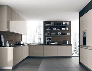
boN tempi ra NGes Cutting-edge Italian design brings classic lines and a new sense of integration between kitchen and living, rogerseller.com.au
09 10 11 12
simia A new living room range with a contemporary aesthetic that still remains true to natural materials. Timber is juxtaposed with matte lacquer finishes, along with stained or BlackMagic glass, developed by Hülsta to become transparent and reveal the interior when illuminated. In this deceptively simple range, detailing is paramount – an intricately processed, flush-front handle strip in Walnut or Ash highlights the horizontal planes and draws the eyes serenely along each piece, huelsta.com

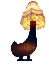
sillY ducK UK designer Matt Pugh makes a series of animal companions a little light-headed, including dog, cat and duck, shown here in Walnut, mattpugh.co.uk
studio KoNcer N Hailing from the Czech Republic, Studio Koncern presented a new designer glassware collection as part of Bohemia Machine at 100% Design London. These vessels are not just beautiful and quirky in their own right, but are also a conscious push for revival of the glass-making industry in the region , bm-glass.cz

alasK a Four new collections inspired by travel destinations, in quality quartz benchtops, splashbacks and vanities in a 28-colour palette, smartstone.com.au

27
13 14 15 16
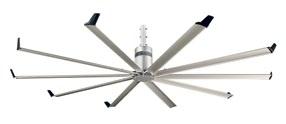
isis With a 2.4- to 3-metre wingspan, Isis produces maximum airflow, while using only minimal energy and operating at a library-quiet decibel, bigassfans.com.au
bric-a-brac Ordered chaos is the mantra of this shelving unit made up of 11 compartments in 100% solid Oak securely tied together, drugeotlabo.com
wish boNe table The matching side table to the Wish Bone Coat Stand embodies the same clear idiom in the pure, branching structure, interstudio.com.au


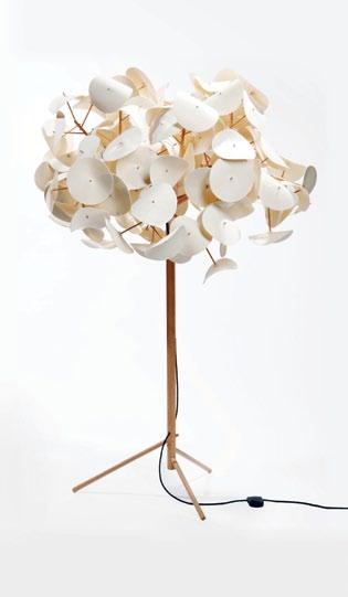
leaF lamp Designed by Australian Peter Schumacher, with Birch parts wedged together (no glue) and starched wool 'leaves', greenfurniture.se
GlowbellY steamboat Designed by Singaporean Tan Lun Cheak for World Kitchen as part of the ‘Imprints: Designing from Memories’ exhibition, the components of this elegant light can be reconfigured into a cooking vessel. Safe for oven, cooktop and freezer in pyroceramic glass, it becomes a portable stove, perfect for the traditional hotpot or steamboat family meal. Tan says, “the joyful memories of past reunion dinners continue to glow as an ever-present reminder of the values and ingredients that go into making a happy family”, littlethoughts.org
28 habitus 11
habitusliving.com living
design news
17 18 20 21
19
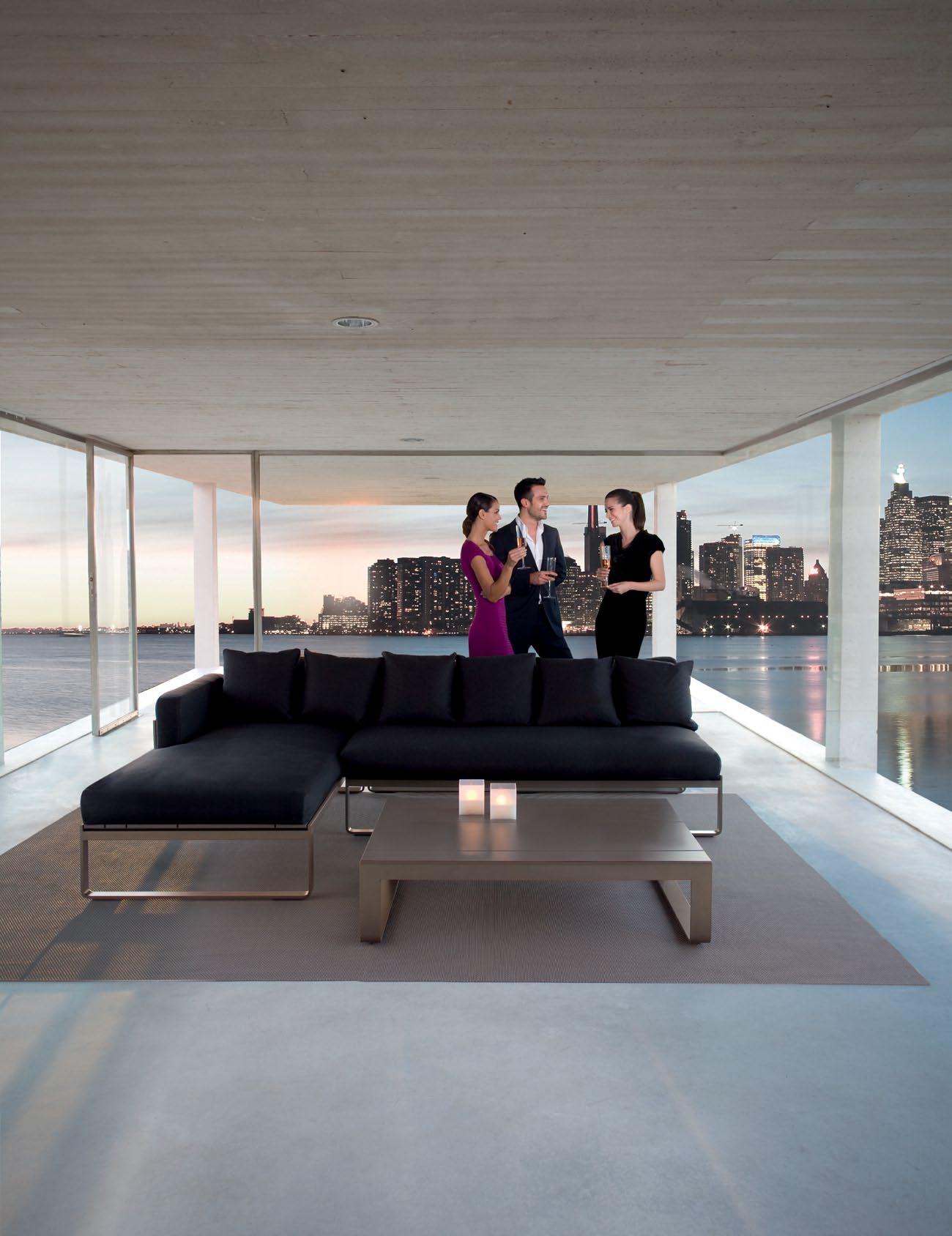
Distributed by PARTERRE GARDEN Sydney 493 Bourke Street Surrey hills nsw 2010 T. 02 9356 4747 Melbourne 916 High Street Armadale Vic 3143 T. 03 9576 3022 www.gandiablasco.com GANDIA BLASCO T. +34 902 530 302 GANDIA BLASCO OUTDOOR & PASSDOOR SHOWROOMS ANTWERP BARCELONA BOLOGNA DOETINCHEM ISTANBUL LISBOA MADRID MALLORCA MIAMI MILANO NEW YORK OORDEGHEM PORTO VALENCIA
lorca desK Part of its full Lorca range, this office desk by Sellex enjoys strong angular forms and contemporary materials for a bold statement. Lorca is equipped with a steel tray cable holder, and is suitable for home offices or at work. Available with timber veneer legs or lacquer with its frame lacquered to match, sellex.es / kezu.com.au

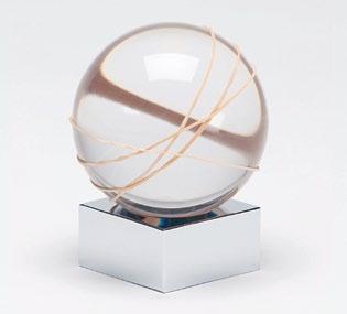
rubberba Nd ball Simple, carefully considered form and pure materials challenge the trend of overembellished design objects, daniel-emma.com
pYGGY ba NK A whimsical nod to the history of the piggybank, Nendo equips this money jar in unglazed fired pygg clay with a pig-snouted top, nendo.jp/en
Fohla collectioN Adriano Design has released a collection of luminous desk organisers manufactured by Alledesign. One hundred per cent recyclable Methacrylate® forms the contemporary shape of the exterior, while a lightbulb illuminates the space from inside, adrianodesign.it / alledesign.com.br


30 habitus 11
habitusliving.com work + play
design news
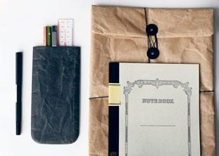
siwa pouch Designed by Naoto Fukasawa and made from soft paper-like material developed by Japanese paper manufacturer Onao, cibi.com.au
22 26 25 23 24
The Santorini Collection.
A dazzlingly beautiful and versatile range of pure, perfect whites.
Presenting the Santorini Collection, one of the four stunning new collections of Smartstone engineered quartz surfaces. Choose from 25 exclusive colours – the purest and most beautiful palette available – from this incredibly durable stone- and marble-look surface range.
To find out more, call 1300 888 607. Visit www.smartstone.com.au to view the four new collections. Smartstone is a subsidiary of HVG (Halifax Vogel Group).

design news

orGa Nic hooded towel Milo the Monkey will keep little ones warm and dry, made from organic cotton and natural terry towling, 3sprouts.com

board Games A range of yo-yos, spinning tops and other toys designed and made by Jason Greene from recycled skateboards, etsy.com/shop/boardgames

bears oN meltiNG ice A rocking toy for children inspired by the ’love story’ between grizzly bears and polar bears. As the ice in the North Pole melts due to global warming, polar bears are losing their environment and some grizzlies are moving north. Although rare, grizzly-polar bear hybrids have been confirmed in the North Pole area, masahiro-minami.com
31
caraVa N crib A crib that grows with your child, from baby to toddler. The sides of the crib are removeable, turning the solid and safe crib into a bed for toddlers. The bold, modern design is available in 100% raw Maple or with black, red, yellow, blue or green crib rails, kalonstudios.com
diNGariNGs A rattle, wooden teething ring and soft toy all in one, DINGaRINGs are a range of quirky Australian animals ideal for teething tots, obdesigns.net


32 habitus 11
habitusliving.com baby + child
27
30
28 29





Wit H style Hang

re-shoot 34 habitus 11 habitusliving.com
01 Made for small spaces, Italian designer Alice Rosignoli offers a solution using a cluster of 20 timber hangers hung with simple black ropes (fixable to ceiling or wall) to create a functional wardrobe that is also a contemporary feature.
01
Hangers Wardrobe
Designed by Alice Rosignoli alicerosignoli.it €120
The humble clothes hanger is all grown up – from green variations to designs inspired by the office paper clip, hanging your clothes has taken on a new twist.
02
Blow Up Hanger

Designed by Tina Lenndahl Bosign AB bosign.se 69 krona or AUD$12 for two
03
Max Rope Coat Hanger

Designed by Rainer Subic & Admir Jukanovic Pink Pinguin pinkpinguin.com
€ 20
04
Hercules
Designed by Marc Newson Magis / Corporate Culture magisdesign.com / corporateculture.com.au
AUD $45
02 Lightweight and deflatable, the Bosign Blow Up hangers are ideal for those who hate the sound of hangers hitting against each other. Designs vary from those with the words ‘Blow Up’ to patterns with flowers and leaves.
03 Inspired by its designers’ passion for sailing, this hanger is made from authentic nautical rope with a rigid PVC core. The ends are rounded off by laser engraved stainless steel rings. Available in red and black, soon to be available in blue.
04 Created from air-moulded polypropylene for snag-free garment hanging, the Hercules design is available with or without trouser-bar. Hercules comes in hues of matte brown, green, orange and white.
05
Clip Hanger Broadhong Design broadhong.com prototype
05 A hanger designed to dry small garments, the Clip Hanger puts the winding form of the familiar office paper clip to clever use. The product is still a concept design but will be made from flexible plastic when manufactured.
06
Green Hanger
Designed by Josh Cohen, Christian Ferrante & Ash Black greenhanger.com.au
AUD$5.95 (10-pack)
06 Australian made in 100% recycled and biodegradable cardboard, this is a green alternative to the wasteful and unweildy wire version. The design is long-lasting and easily stackable, with smaller sizes available for children.

07
s olid Coat Hanger


Designed by Alfredo Häberli Mater / Corporate Culture mater.dk / corporateculture.com.au
AUD$88
07 A hanger with a low carbon footprint, the Solid Coat Hanger is sculpted from durable carbonised bamboo. As well as creating a comfortable, organic shape, its extended handle makes rifling through your closet that much easier.
35
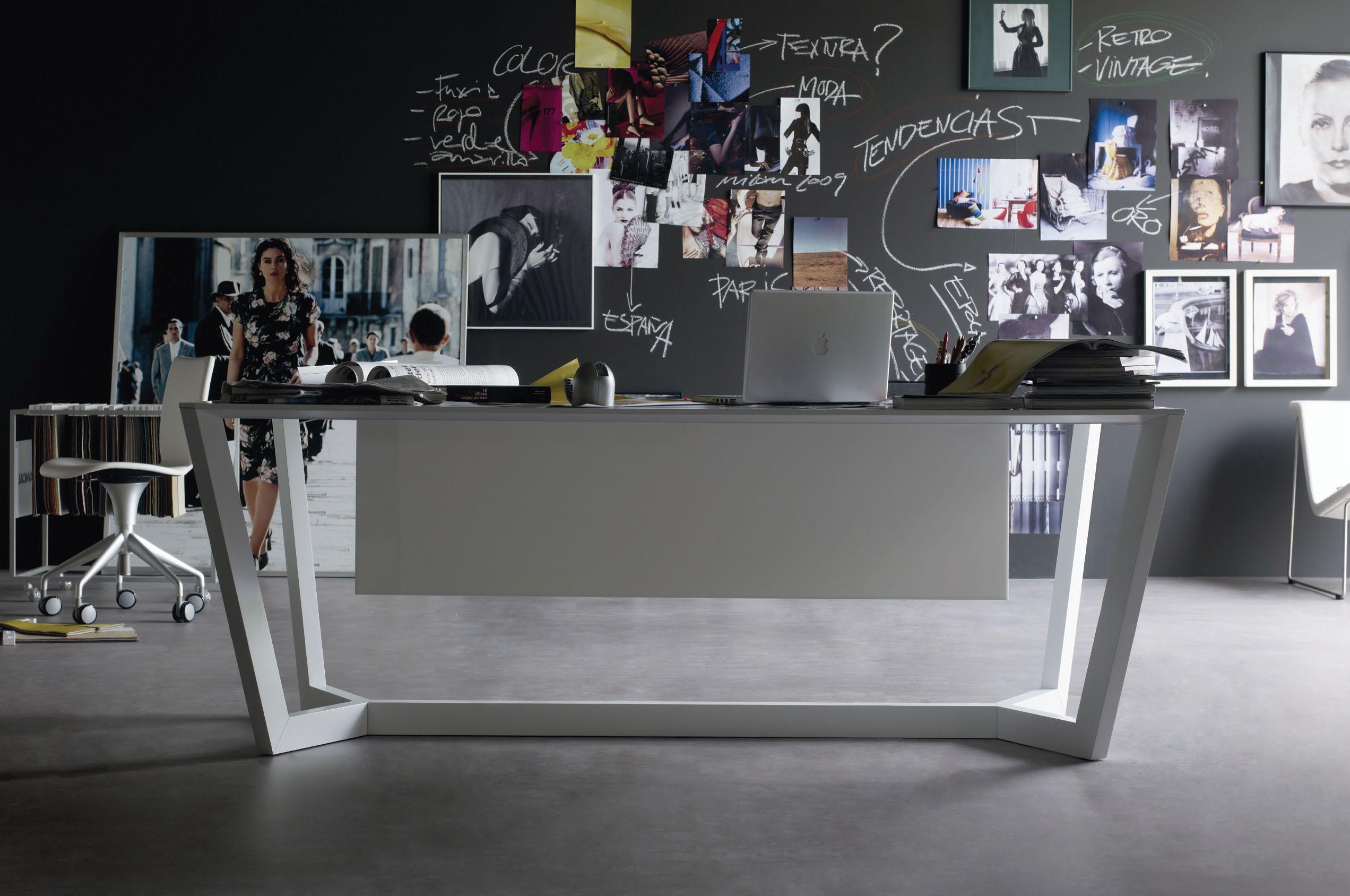
NEW SHOWROOM Level 1, 69 O'Riordan Street, Alexandria

www.kezu.com.au | 1300 724 174 Lorca desk and table program by Abad Diseño for Sellex
Flying colours
Colour has the power of emotion. It affects how we view our surroundings and in uncertain times it makes a bold statement of rebellion and joy. For over a decade the trend has been towards a neutral palette. Now is the time for change – illuminate your world with colour.

in camera habitus 11
38 habitusliving.com colour
Photography Nicky Ryan Stylist Paul Joseph Hopper Stylist’s Assistants Natalie Dummigan Peter Dickin
Over the rainbow

Chair Cappellini Proust Geometrica, $15,967, Corporate Culture. Ceramic Poodle by Lisa Larson $195, Via Alley. Rug Hay Studios Pinocchio Multicolour 1400, $2,767, Corporate Culture. Wall clock Diamantini & Domeniconi Calice, $950, Space Furniture. Low table Glas Italia XXX, $2,240, Space Furniture. Vases Nano Centro Alto in orange $165, in red $122.10, and Kose Calice satin clay $740, Space Furniture. Water can Bloccon in green, $19, Via Alley. Artist wearing own T-shirt and UNI-PRO disposable hooded coveralls, $4.65, Bunnings. 39
Binding colours

40 habitusliving.com in camera habitus 11
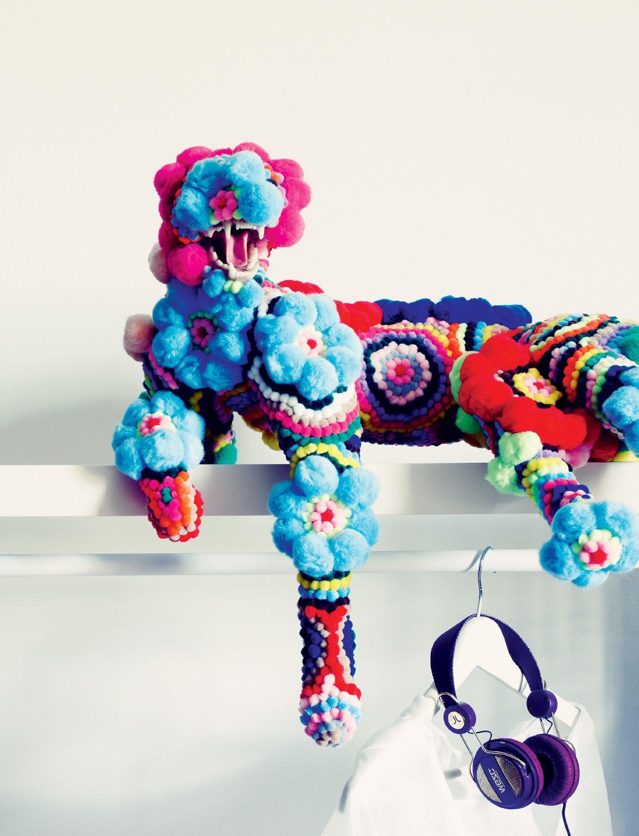
colour
Rug Betsy Rasa in New Zealand wool designed by Yvette Balderston, POA, Tsar. Table Xraydio 2 Disc by Diesel for Moroso, $1,740, Hub Furniture. Bowl large Dot in Berry by Paul Smith for Stelton, $82, Top3 by Design. Vintage shade Sleeping Beauty with cord, $896.50, Volker Haug. Headphones WeSC, $79.95, Typo.
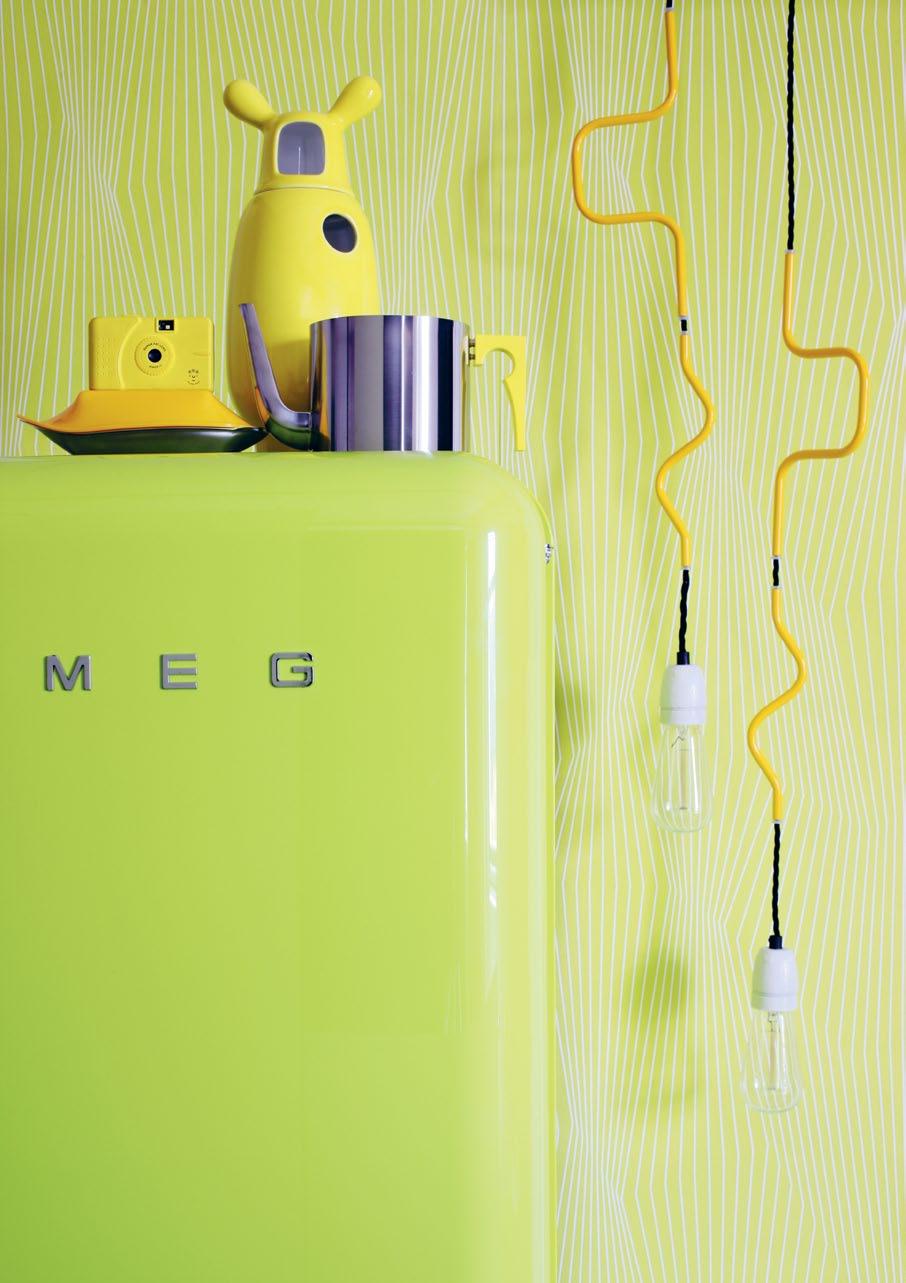
Mellow yellow
Refrigerator Smeg FAB28 in Lime, $3,390, Smeg Appliances. Wallpaper Living Walls Linear Landscape, $150/roll, Eurowalls. Vase Showtime in yellow, $700.70, KE-ZU. Teapot Addcolour 1.25L in yellow by Arne Jacobsen and Paul Smith for Stelton, $795, Top3 by Design. Butter dish Fink in yellow, $130, Top3 by Design. Wide-angle camera PowerShovel in Yellow
Peace, $75, Via Alley. Light Cable Jewelry double component, $407, Volker Haug.
41

42 habitusliving.com habitus 11 in camera colour
Colour up
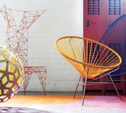
Lockers Locker room metal in orange, $650, Dug Up On Bourke. Rug Lava from Series 2 by Dinosaur Designs in New Zealand wool felted yarn, from $3,390, Designer Rugs. Chairs Acapulco in Yellow, $484, La Perla in Purple, $484, Acapulco Chair. Stools Yellow Diva S1 miniature, $380, Interstudio. Pendant light 600mm diameter Coral by David Trubridge in Bright Spark, $479, Exhibit Interiors. Chair Pylon by Tom Dixon for Cappellini, $9,139, Corporate Culture.

43
Purple haze
Shirt Cowper Check in Purple, $169, Baubridge & Kay. Tie Mazzini Stripe in purple, $109, Baubridge & Kay. Wall shelf Lack, $69, IKEA. Shoes Melissa MZero lace up in Matte Purple, $145, Top3 by Design. Chair Minimii Miniature Egg Chair in Purple, $119, Top3 by Design. Globe Atmosphere in Mauve, $165, Flight 001. Toy watch in Fluoro Purple, $345, Papoucci Imports. Wallpaper Persian Hadi Teherani, $330/ roll, Eurowalls. Earphones Oboe golden, $99.95, Typo. Coveralls UNI-PRO disposable hooded, $4.65, Bunnings. Artwork Wild Thing I by Troy Emery, private collection, Iain Dawson Gallery. Spray paint purple, Bunnings.

habitus 11 in camera colour habitusliving.com 44
45

For colour & design inspiration and to find your nearest display, visit... www.caesarstone.com.au Phone 1300 119 119
we wander, the artistry OF O thers
awes & inspires

habitus 11 2. people 47
Wherever
marilyn sainty — AUCKLAND, new zealand
Fashioning
a home
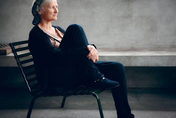
iconic fashion designer and retailer Marilyn Sainty, home is a modern sanctuary where architecture, design, art and fashion mingle beautifully. Stephen
For New Zealand’s
Crafti talks home and shop.
Marilyn Sainty needs no introduction to New Zealanders or to many people in the design community in Australia. One of the country’s most revered fashion designers, her designs have been the subject of exhibitions as well as books. From humble beginnings running her own boutique Starkers, in Sydney in 1968, Sainty now operates the renowned Scotties boutiques in New Zealand, with her business partner Sonja Batt. While officially retiring as a designer in 2005, Sainty and Batt continue to remain at the forefront of fashion, stocking the likes of Comme des Garçons, Lanvin, Ann Demeulemeester, Martin Grant and Dries
Van Noten. Scotties also sells Beth Ellery and Camille Howie, two protégées from New Zealand, whom Sainty has nurtured.
Sainty has also surrounded herself with many New Zealand creatives at home. One of the works of art on her wall is by artist Martin
Poppelwell. His white ceramic letters spelling the word ‘Reputation’, appear to come apart. “It’s a loaded word, particularly if you grew up in my generation,” says Sainty. “But the late 1960s certainly changed things like no one could imagine,” she adds.
A minimalist aesthetic runs through both the Scotties boutique in Lorne Street, Auckland and Sainty’s home in the inner city, allowing individual pieces to shine. “I’ve never been a fan of fast fashion and I rarely created ‘collections’ in the usual sense. I always preferred to focus on a few key pieces each season, rather than designing a series of pieces that can be interchanged,” says Sainty.
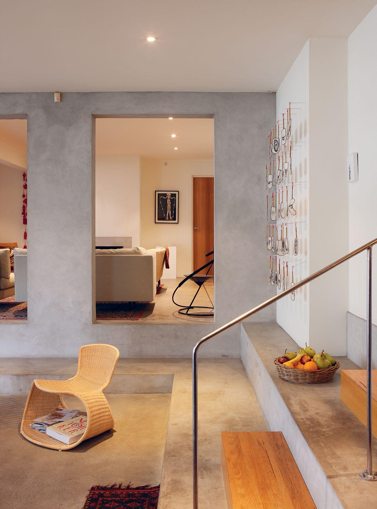
Sainty’s home, which she shares with partner Peter Black, was originally a warehouse. Home for the past 15 years, the split-level space has been re-designed by architect Nicholas Stevens, co-director of Stevens Lawson
Architects. The space is as unexpected as the photos by Deborah Smith, with whom Sainty has collaborated over many years. “We never thought we’d stay for so long. Initially, it was a transitory move,” says Sainty.
“The re-design started with a series of discussions. The largest problem was getting northern light into the place,” says Stevens, who inserted frosted glass walls across the living areas. “I describe the place as a minimalist theatre,” adds Stevens, referring to the platforms which frame the kitchen area.
Sainty is drawn to form, whether in a piece of clothing or furniture. There’s a white table in her living area, designed by Ann Demeulemeester, which is layered with white objects. Like the way Sainty designs clothes, less is more. A Philippe Starck high-back velvet chaise from the early 1980s (initially designed for the Royalton Hotel in New York),
Photography Simon Devitt Text Stephen Crafti habitus 11 at home
48
habitusliving.com
49

50 habitus 11 at home
habitusliving.com
marilyn sainty — AUCKLAND, new zealand
is memorable, as is a cardboard chair by Frank Gehry. Sainty also owns a timber slatted chair by Ron Arad. And in one corner of the living area is a curvaceous steel chair, designed by Sainty in the mid-80s. Titled the Cocktail chair, lines form a spiral around the sitter. “I’m always drawn to the form of something. I’m drawn to individual pieces. Like my clothes, I’m not really interested in planning an entire interior. It’s more about letting things evolve,” she adds. While comfort may be a priority in clothing, many of Sainty’s chairs weren’t purchased for comfort. “They’re sculpture,” she says.
Like Deborah Smith’s photos, one of which shows a model sitting on a horse with a typewriter, there’s a sense of the unexpected in Sainty’s home. Yuk King Tan’s series of fans, each depicting a fragment of the artist’s face, are featured on one wall. And on another wall are a series of Yuk King Tan’s objects, ranging from corn cobs to masks, all dipped in red wax. Other arrangements in the home are considerably more chaotic. A table brimming with objects near the kitchen appears spontaneously arranged. There are photos, Russian dolls and even a miniature of a Michael Graves whistling kettle from the 1980s. “I love the idea that things don’t just go out of fashion, but are made to last. This table is full of memories,” says Sainty.


As Sainty and Black’s home extends across the ground level of a two-storey building, it wasn’t possible to create a skylight. One of the ways Stevens increased the light in the main bedroom was by installing Noguchi paper
02
03
04
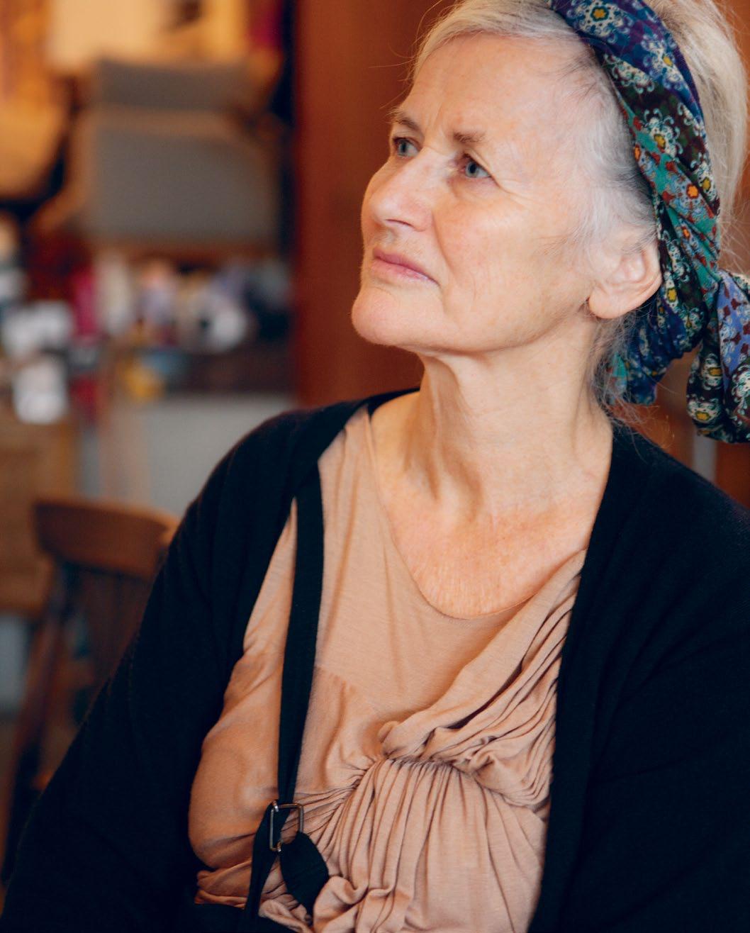
01 Designer Marilyn Sainty in her Auckland home.
An artwork by Yuk King Tan features objects dipped in red wax.
A table in the lounge topped with a collection of milky-white pieces.
A table near the kitchen is covered with mementos of Sainty’s life. 03
“i ’m drawn to individual pieces . Like my clothes , i’m not really interested in planning an entire interior .” –MARILYN
04 51
at home

marilyn sainty — AUCKLAND, new zealand
MARILYN

52 habitusliving.com habitus 11
05 06
05
Open shelves in the kitchen allow for easy reach of utensils.
06
An installation of fans by Yuk King Tan adorns a wall in the living area.
07
The different spaces within the home are defined by changes in levels, and connected by block-like timber stair treads.
“i love the idea that things don’t just go out of fashion, but are made to last .”
–
53
at home
marilyn sainty — AUCKLAND, new zealand
lights across the ceiling. “Nick has since used these lights in other projects. But at the time, it made quite an impact,” says Sainty. Stevens also designed the marble kitchen table, complete with cast concrete legs.

While Sainty has a significant collection of chairs, her wardrobe isn’t brimming with her own clothing designs. She can only put her hands on one of her own skirts from her walkin wardrobe. This skirt features distinctive appliqué. Other Sainty designs are to be found in museums, carefully archived. One of her career highlights was a collaborative project with Smith, at Hawke’s Bay Museum & Art Gallery in 2000, titled ‘Dust Cloak’, which featured Sainty’s sheer and ethereal creations. For Sainty, “it was like a true collaboration where someone presents something, then you present something and you feel really good about the end result,” she told Angela Lassig in New Zealand Fashion Design (Te Papa Press, 2010).
Indeed for Sainty, pleasure comes from collaboration. “The best things come from working with other people, whether it’s working with a sample machinist, a photographer, or an architect.”
habitusliving.com/beyond/marilynsainty
54 habitusliving.com habitus 11
Scotties Boutique, scottiesboutique.co.nz
08
Elevated above the kitchen, the main bedroom features a dynamic ceiling light by Noguchi. It’s a striking feature that architect Nick Stevens has gone on to use in other projects.
09
08 09
Marilyn Sainty relaxing on the terrace, with its built-in concrete seating.

Woven Image Dino Stripe wovenimage.com DINO STRIPE 315
PHOTO: ALEX MILES
SMEG LINEAR GAS COOKTOP | PVS750A


Born from a collaboration of world leading designers and Smeg’s highly experienced engineers, the silver glass Smeg Linear Gas Cooktop is the pinnacle of avant-garde design and advanced technology. Smeg’s energy-efficient vertical burners direct the powerful flame to the base of the pot for improved cooking performance and better fuel economy.
www.smegappliances.com.au
cient
Avant-garde design, fuel effi
burners

57
Text Elise Coroneos habitus 11 conversation todd selby – New York, usa theselby.com has become a cult, colourful and quirky archive of global creatives at home. elise Coroneos talks with founder Todd Selby about his studio, celebrities and Sydney. InsI de The selby
Photography Tim Knox and Todd Selby
todd selby – New York, usa
It is a hot afternoon in New York’s East Village and Todd Selby is in his studio updating his website. Located below the staircase of a former tenement building, Selby is uploading the images from his most recent photo shoot. Less than three years ago, Selby was a somewhat successful full-time commercial portrait photographer working in New York. However, waiting for the phone to ring to herald his next job was his least favorite part of the job. So instead of waiting, Selby decided to reach out to people he knew and ask if they would let him photograph them at home and post the result on his website. Many agreed.
Within three months, the part-time project had developed into a full-time passion. Now, a mere three years later, the website attracts 35,000 unique daily visitors. The beauty of Selby’s work is that it combines the feel of a hip online interiors magazine with a documentary-like, voyeuristic style by capturing people inside their private realms. Each entry is literally a series of snapshots revealing the subject in the place they call home. Shots of individual pieces, whether upmarket design chic or eclectic umbrella stands, provide a surprisingly revealing insight into the personal taste of each subject.

Being a subject of The Selby carries a certain cache, with many considering it a badge of credibility. The only criteria is that Selby himself finds you inspiring and, in his own words, “cool”. Simply being rich or famous will not suffice. “It does not play one way or the other. I am really interested and driven by who they are as a person,” says Selby.
That said, A-listers can arouse Selby’s interest. He has photographed designer Karl Lagerfeld, model Helena Christensen and Olivier Zahm of fashion magazine Purple, but regards them in a similar way to his sessions with lesser-known members of the global creative community. “I am not interested in creating an online tabloid for the artistic community,” says Selby, who, when growing up in Orange County, California, was interested in ceramics before discovering a passion for photography.
A typical shoot lasts about three hours. Selby requests a tour of the home and at least one change of wardrobe. Each subject is also asked to fill out a questionnaire, usually using a coloured Texta, which he then scans and posts on the website to accompany the photos.
One of his favorite shoots to date was with Paris-based interior designer Jacques Grange,

habitusliving.com 58 habitus 11
conversation
01 Todd Selby in his studio.
02
Todd’s quirky eye and character have made the website a cult favourite.
03
The studio is alive with ideas in progress.
04 Odds and ends.
02 03

59
“I found people in Australia to be some of the most supportive and open to meeting with me.”
04
–TODD
OBJECT OF DESIRE
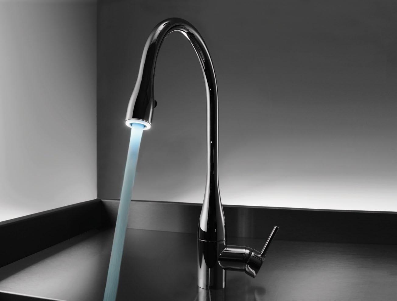
A sculpture that captivates with slim lines, curved and feminine with subtle illumination, transforming it into an object of desire.

kwcaust.com.au 1800 060 875 McK30567
whose work for Yves Saint Laurent Selby greatly admires. “His home is just really fantastic. He has a really eclectic, humorous and colourful aesthetic that doesn’t seem to play by anyone else’s rules, yet still works, which I find really ingenious,” he says.


During a visit to Sydney last year, Selby photographed many local entrepreneurial designers including Dan Single and George Gorrow, the founders and creative directors of Ksubi, fashion and costume designer Tina Kalivas, photographers Lyn Balzer and Tony Perkins, as well as model Emma Balfour and photographer Andrew Cowen.
So inspired was he by his visit, Selby released a limited-edition booklet called The Selby Sydney. Despite having travelled all over the world to photograph for his website, the only other stand-alone booklet commemorating his visit to a single city has been The Selby Paris In addition to the booklet and on the website, some Sydney sessions appear in his latest book, called The Selby is in Your Place, which was released in April 2010. Essentially a coffee-table hardcover version of the website, the book sold out of its first printing within the first month and was in its third printing in August 2010.
“I found people in Australia to be some of the most supportive and open to meeting with me. They were similar to Americans, except that Australians let me into their homes out of a sense of hospitality, whereas Americans more
61 conversation
05
Inside the home of ‘Dangerous Dan’ aka Dan Single, co-creator of Ksubi jeans.
06
The home of surfer, artist and filmmaker,Ozzie Wright, and his family – Mylee Fitzgerald and Rocky Rover Wright.
When it comes to his own personal style , Selby believes it is his studio , not his home, that best reflects his personal taste .
05 06
todd selby – New York, usa
07

Front
often do it because they want to show everyone everything,” observes Selby.

Selby describes Sydney as “nice and relaxed” and reveals that when he was leaving he asked himself, “why am I going back to New York?” He hopes to embark on another trip to Australia soon, with Melbourne and a visit to New Zealand likely to be included on his itinerary.
When it comes to his own personal style, Selby believes it is his studio, not his home, that best reflects his personal taste. Crammed with posters and objects he has collected during his travels, the narrow room, not much bigger than a large walk-in closet, evokes a sense of a home away from home. “My studio is my special inspiration because it is where I like to hang stuff that I am interested in working on,” says Selby, who lives close by with his girlfriend, Danielle Sherman, a designer for Alexander Wang.
While the queue to get Selby’s attention has grown over the years, he does like a challenge. He hopes to photograph the Obamas in the White House within the next few years. “They are style icons. If he gets re-elected, I believe I will have a good shot at making it happen,” says Selby.
The Selby, theselby.com

habitusliving.com/beyond/theselby

HAB09_CafeCulture.indd 1 7/7/10 12:32:32 PM habitus 11 conversation
cover of Todd Selby’s book, The Selby is in Your Place (Abrams, 2010).
todd selby – New York, usa
07
Your invitation to view...
Inspired by nature and created with the latest technology.... Brilliante by FAP evokes the natural appearance of precious marble, expressed through the superior technical qualities of ceramics. Brilliante uses a revolutionary production process, resulting in lightweight, easy to lay tiles with an imperceptible flexibility and a mirror-like shiny surface.
....See it for yourself at your nearest Tile Boutique


35 Stores Nationwide www.tileboutique.com.au

From Vienna to Sydney
Artist Lisa Cooper cites Austrian architect Adolf Loos as a kindred spirit. It’s an improbable match in some regards, but time is of the essence...

65 inspired habitus 11 Text and Production Megan Morton
lisa cooper — NSW, australia
Photography John Laurie and Eliza Gorka
lisa cooper — NSW, australia

habitus 11
inspired
For Sydney artist Lisa Cooper, inspiration and the experience of living are indivisible. “I had trouble deciding on one sole inspiration,” she says. “It could have been artist Louise Bourgeois, flowers, rapper Eminem, gold, conviction or all of the brave.” Regardless, she settles on the influential Austrian architect and writer, Adolf Loos. For Lisa, Loos is a muse, his work “a kind of encouragement”, she explains.

Aside from his designs for clarified or plain architecture and interior design, he worked as a journalist writing for Freie Presse (Austria’s daily paper) on matters of architecture and the design of interiors. “It was an intuitive or aesthetic encounter with images of his designs that provoked me to look more deeply at his practice. The initial experience of reading his essay ‘Ornament and Crime’ was when I really fell,” Lisa says.
The ironic and, for Lisa, intriguing ‘hook’ was Loos’ attack on the ornamental and his linking of tattooing (body ornamentation) and crime, a kind of analogy he uses to elaborate his conceit that ornament in all of its guises – but particularly in relation to design – is immoral. For Lisa, this connection has the motivating effect of a manifesto – she happens to have a very elaborate floral chest tattoo. For her, this tattoo is a constant reminder that she is marked; one of the lawless whose task it is to make art. A reminder that, as Louise Bourgeois once said, “An artist can show things that other people are terrified of expressing.”
Today, Loos would have been an authority on lifestyle, a guru if you like. “Because he wrote, his ‘silent’ work in design and architecture was fully articulated through his thought,” Lisa explains. The result was that his audience might not only experience the inhabitable and material work, but also know his approach. And it’s Loos’ writing Lisa loves the most. “They are strong words, defiant in every way.” Loos’ multi-disciplinary approach is akin to Lisa’s own in that her work spans a broad material range, application and context.
67
“It was an intuitive or aesthetic encounter with images of [Loos’] designs that provoked me to look more deeply at his practice.” LISA
03
01 Artist Lisa Cooper in her Potts Point studio.
02
‘The Ghost Who Walks Will Never Die’ (2005) by Nell overlooks a breakfast table.
03
A collection of ceramics includes some by French brand Astier de Villatte.
Though she is committed to video portraiture (the subject of her PhD research), painting, and object-making, she has also expressed the philosophical concerns of her art through her work with flowers (she worked at Sydney’s Grandiflora) and through her designs for her jewellery label The Butcher’s Daughter. “In a couple of weeks I will complete my work for The Butcher’s Daughter, then it will be done. Each Butcher’s Daughter piece originates from an artwork and I just feel that the work is complete.” Cooper is passionate about focusing her attention on a new video project, as well as a new series of paintings.
The Crucible Project, a suite of six video projections, was shown at the Sydney Theatre Company in 2009, the same year that the director Benedict Andrews invited her to design a single piece so powerful that it could share the spotlight with Cate Blanchett for the seven-and-a-halfhour Sydney Theatre Company production of The War of The Roses. The result: a spectacular gold crown. “It was an extraordinary context for my work and a privilege to work with such amazing people,” Lisa recalls. “Theatre-makers like Alice Babidge (costume designer) and Benedict Andrews are visionaries.”
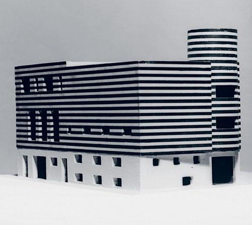
Such collaborations occasionally become legend. One of Loos’ more famous projects was a residential design for iconic performer Josephine Baker (who, as it happens, died on the day that Cooper was born). Loos designed for her a spectacular house that took over a corner block, resplendent in black and white horizontal stripes. The design was born of enthusiasm and homage rather than commission. Loos considered the marble-based house to be one of his best works, though it was never actually built. The design was entirely avant-garde and unconventional for its time, with a striking flight of stairs, angles of vision, and a fantastical upstairs indoor pool. Perhaps in thanks, Baker taught him the Charleston and is said to have considered him one of Paris’s best dancers. “This design is an enduring contribution though it was never owned or even realised in a physical sense,” Lisa says. “Similarly, artists make work daily born of enthusiasm and homage – now that is inspiring.”
For Loos, “the building must please everybody. In contrast to the work of art, which doesn’t have to please anybody. The work of art is a private affair of the artist. The building is not.” Adolf Loos and Lisa Cooper have missed one another by decades, but there is communication and contradiction between what he left behind and what she is just beginning.
Lisa Cooper, doctorcooper.com.au
04
One of three crowns Lisa crafted for the Sydney Theatre Company’s production of The War of the Roses Photo: Eliza Gorka.

05
The desk where Lisa wrote her PhD, crafted Cate Blanchett’s crown, mixes palettes and edits her video work.

06
A detail from one of Lisa’s paintings, from her series ‘Mountains I Have Never Seen’.
68
05 04
inspired habitus 11
habitusliving.com
Photo: Eliza Gorka.
lisa cooper — NSW, australia
habitusliving.com/beyond/lisacooper

69
LISA 06
“...artists make work daily born of enthusiasm and homage – now that is inspiring.”
lisa cooper — NSW, australia
ADOLF LOOS

AT A GLANCE
Born in Moravia (now in the Czech Republic) in 1870, the son of a stonemason, Adolf Loos studied at Dresden’s Technical University but didn’t complete his course. He left Austria for America and, after three years away, he took a trip to London and Paris, before returning.
In 1896, back in Vienna, he began to work as an architect, for Carl Mayreder. He stated that, “an architect is a master builder who has learned Latin”.
In 1899, Loos’ coffee house, Café Museum (nicknamed Café Nihilism), was completed and became a Viennese design attraction,
renowned for its minimal language both inside and out.
He penned his famous essay ‘Ornament und Verbrechen’ (‘Ornament and Crime’) in 1908, the same year his Kärntner Bar (American Bar) was finished. The essay was translated into English in 1913.
He designed the Josephine Baker house in 1927, with indoor swimming pools, fantastical angles, and a horizontal striped façade upon a white marble base.
The “interior of the private sphere within architecture” was Loos’ greatest insight and while he didn’t achieve the star status enjoyed by Le Corbusier, Walter Gropius or Mies
van der Rohe, he is today considered one of the most important prophets of modern architecture and design.
Loos died on August 23, 1933, leaving an incredible body of work littered throughout Europe.
07
The model for Josephine Baker House designed by Loos in 1927, now housed at the Albertina Museum in Vienna.
08
The Loos-designed Café Museum in Vienna is considered one of the starting points of modern interior design.
inspired habitus 11 07 08
70 habitusliving.com
Photo: Imagno/Hulton Archive/Getty Images.


eidosbathware.com.au Sydney | BriSBane | MelBourne | TaSMania | adelaide | PerTh
in iTaly
SiSeMi nel Bagno SaniTary ware
Made
tHE RE c IPE F o R t HE PERFE ct KI tc HE n RE qu IRES on LY on E m EAS u RE m E nt…900mm.
At Fisher & P A ykel we h A ve been thinking A lot A bout your business, A nd your client’s kitchen. w e believe 900mm is the new 600mm. s o we’ve cre A ted the i zon A 900mm modul A r r A nge o F APP li A nces th A t o FF er e FF iciency, sim P licity A nd F lexibility.
All the better F or you to cre A te your next A w A rd winning design with.

FISHER & PAYKEL. H ow v ERY t H oug H t F u L
t he A ll new 900mm wide, FA mily-sized
d ish d r A wer A ccommod A tes nine l A rge
P l A ce settings in one dr A wer, yet si P s
F rug A lly A t 4 st A r wels i ntegr A te to hide A w A y or m A ke A st A tement with A st A inless steel FA ç A de.
Izon A vE nt S u RFA c E
the v ent s ur FA ce is const A ntly sensing, thinking. i t A djusts so the user doesn’t h A ve to. i ts P erimeter extr A ction cre A tes A n A ir curt A in A round the cookto P , so nothing gets out! Av A il A ble in 900mm w A ll mount or 1200mm isl A nd c A no P y styles.
Izon A c oo L D RA w ER
t his is the F uture o F re F riger A tion – distributed re F riger A tion. Pl A ce c ool d r A wers A nywhere you P le A se. u se them A nyhow you P le A se, they A re AF ter A ll F ive P roducts in one. Perh AP s A low humidity PA ntry tod A y to A F reezer or discrete wine c A binet tomorrow.
As the most so P histic A ted cookto P in the world, the c ook s ur FA ce bo A sts A n ergonomic A lly correct 3 in A row con F igur A tion where A ll g A s burners, PA n su PP orts A nd control knobs retr A ct into sheer bl A ck gl A ss. i ntelligent P er F orm A nce meets P ure the A tre.


c ook sPA ce oven com P letes the underbench set with identic A l dimensions A nd h A ndle heights F or utterly consistent lines. b e A uti F ul glowing h A los com P liment A very sm A rt interior. c ook two F ull sized chickens on the intern A l rotisserie, then select P yrolytic sel F cle A n.


fisherpaykel.com.au
Izon A c oo K Su RFA c E
D ISH D RA w ER wIDE
Izon A c oo K S PA c E
Evoking the classic style of plantation shutters with a modern twist, Jennifer thinks our new range of Polyresin Shutters are smashing. Her best friend couldn’t agree more.

Designe D to MAK e A n i MPAC t
1300 322
w: dbablinds.com.au Visit our Melbourne & Sydney flagship stores or find your nearest retailer on our website.
t:
254
on location
Rajo Laurel is one of the Philippines’ major fashion talents. Aya Maceda talked to him at his atelier about his work and five favourite places in his home town of Makati City.

Manila MoM enTs
75
Text Aya Maceda
Photography Kurt Arnold
habitus 11
rajo laurel — MANILA, philippines
on location
rajo laurel — MANILA, philippines
Filipino fashion designer Rajo Laurel revels in paradoxes. Evident in his creations, it is also manifested in his home and work environment and what he considers as sources of inspiration.


Laurel made his mark in the Philippines’ fashion industry dressing the country’s most sophisticated and influential women. After 15 years, the Rajo Laurel name has become a brand exuding luxury and elegance. Outside his couture business is a streamlined ready-towear line responding to a growing international clientele. He extends his creative reach by designing jewellery, linen and stylish uniforms for the hospitality and airline industries.

This season, Laurel launches his ‘Sci-Fi Africa’ couture collection. Not to be taken purely literally, Laurel draws from the contrasts of a traditional African woman teleported to the future. Modernising African-inspired aesthetics and magnifying on specific textile patterns, he unveils the balance between certain design paradoxes – the raw and refined, the fast and slow, the smooth and organic textures. A clear evolution from his ‘Insect Collection’ are the bold cuts and patterns that evoke strong masculinity and his clever ways of draping and hugging the contours of the body to radiate femininity.
Laurel’s collections are displayed at the ‘House of Laurel’, his three-storey atelier in the backstreets of Makati City. Home to his showroom, studio, library, salon, production, and seamstress workrooms, its interiors are minimal, drawing the focus to his work and evolving art installations. Timber and glasslined corridors lead to his office – a serene, double-height, white room with concrete floors, a white desk and three working mannequins.
76 habitusliving.com habitus 11
01
Filipino photographer Jake Verzosa’s café and gallery in Cubao X.
02
Ready-to-wear tank top from Rajo Laurel’s ‘Insect Collection’.
03
Rajo designing in his light-filled, minimalist studio.
04
04 02 03
A mish-mash of furniture and collectibles Rajo shares with his partner in their Makati City home.
Their home showcases Laurel’s appreciation for oddities, textures and layering and like the couple’s works, it is an evolving project.

77
on location
rajo laurel — MANILA, philippines

78 habitusliving.com 05 habitus 11
05, 06
Furniture gallery and residence of designer Eric Paras tucked in the A-11 compound of ‘old Manila’.
Overlooking his desk is his library and creative meeting room with books ranging from architecture, interior design, travel, film, art and fashion.
Like many designers, Laurel’s home is in stark contrast to his workspace. While his office is calm and contained, his apartment is opulent and has no precise order. Conveniently located minutes from work and with startling views of Makati City, the apartment he shares with his partner, interior designer Nix Alanon, is a treasure trove of favourite books, mismatched furniture, art, textiles, a strange collection of little figurines and a mish-mash of tokens collected from many travels together. Their home showcases Laurel’s appreciation for oddities, textures, and layering, and like the couple’s works, it is an evolving project.
Laurel lives and breathes design and sharing his finds is intrinsic to his nature. His design blog is a growing platform to let people see design through his eyes. With no predictable formula for inspiration behind his collections, he is in constant search for anything and everything odd and beautiful.
As a romantic, he is enthralled by the still existing ‘old world’ culture in the Philippines where women dress their best for dinner or the theatre. But not stuck in this era, Laurel keeps a fresh eye by submersing himself in the local contemporary art scene and by indulging in many travels.
His interest in paradoxes is again revealed in the sites that he continually draws inspiration from. His five favourite Philippine locations for design hunters, that are alive in pockets of Manila, illustrate Laurel’s pull toward polarities and variegations.
For Laurel, these places and what they represent lure him as he looks back and beyond for inspiration to break free from the norm.
A-11 Compound
Built in the 1940s, this hidden gem, in Harris Street in the ‘old district’ of Manila, is a residential enclave of artists and designers. Open to the public, people are free to move around and discover pieces of furniture and art, tastefully arranged, as in a home rather than in a contrived atmosphere. Furniture designer Eric Paras owns a two-storey gallery showcasing his line. Laurel frequents the compound to savour the ambience of old Manila that the artists and designers have carefully preserved.

79
06
With no predictable formula for inspiration behind his collections, he is in constant search for anything and everything odd and beautiful.
 Luxury New Zealand wool carpet
Antonio’s Garden Restaurant
Two hours south of Manila in temperate Tagaytay is Laurel’s favourite restaurant. Guests take the trouble of negotiating a narrow road, off the main highway, to reach Antonio’s and experience fine food and personalised service in a colonial hacienda setting replete with antique furniture.

The Cultural Center of the Philippines
Built in the 1960s along Manila Bay, the Cultural Center [sic] of the Philippines (CCP) is a striking example of architecture as sculpture. Designed by architect Leandro Locsin, it looks like a massive slab of concrete, hovering over a pool of water. The main entrance is receded and invisible until one climbs the sloping driveway. A venue for the performing and visual arts, CCP is where people like Laurel escape to relish art in and out of the building.

81 habitus 11 on location
08 07
rajo laurel — MANILA, philippines
Schock black & white


If you’re looking for the latest in sinkware – give your kitchen the black & white Schock treatment




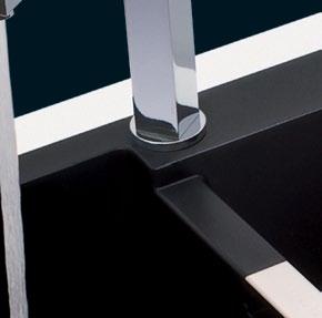


Black & White Schock sinkware has taken Europe by storm. With stunning crisp lines and a silky smooth finish, this quality German engineered sinkware has been created using state-of-the-art composite nanogranite ® materials offering exceptional strength and durability, stain resistance and inert, antibacterial properties. Available only in the purest arctic white and the richest black.

THE DESIGNER’S CHOICE
VIC 208 York Street, South Melbourne 03) 8696 4000 | NSW 1E Danks Street, Waterloo, Sydney 02) 8572 8500 QLD 94 Petrie Terrace, Brisbane 07) 3369 4777 | WA 34 Walters Drive, Osborne Park, Perth 08) 9446 8255 TCC16230
www.abey.com.au
With over 500 designer accessories for the home, office and garden, you’ll find something for everyone in a convenient online shop.

rajo laurel — MANILA, philippines
07
A dining hall of Antonio’s restaurant decorated in Spanish Colonial furniture and local art.
08

The Cultural Center of Philippines, an architectural landmark along Manila Bay.
09

The Silverlens Gallery has become one of the hip artists’ hubs in Metro Manila.
Cubao X
An old shoe expo site, transformed into a motley crew of vintage stores and spaces for eclectic art, from the traditional to the contemporary. There is always a brand new concept store to see in each visit. Its liberating spirit has made it a place of congregation for young, independent artists and musicians.
Silverlens Gallery
A piano factory in Makati is now a specialist photography gallery and contemporary art space. It has become a venue for artists’ forums, art film screenings and other creative industry gatherings. For Laurel, Silverlens Gallery expands his art perspective as he experiences the world through the lens of other artists.

Rajo Laurel, rajolaurel.com rajolaurel.com/blog.php
habitusliving.com/beyond/rajolaurel
habitus 11
on location
SHOP
HAB11_Habshop.indd 2 22/12/10 5:36 PM 09
ONLINE FOR qua LI ty d ESI g N , in your own time
He unveils the balance between certain design paradoxes – the raw and refined, the fast and slow, the smooth and organic textures.

SEATING SYSTEM ANDERSEN | DESIGN RODOLFO DORDONI AUSTRALIA: SYDNEY - DEDECE - TEL. 02 9360 2722 MELBOURNE - DEDECE - TEL 03 9650 9600 NEW ZEALAND: AUCKLAND - ECC LIGHTING & LIVING - TEL 09 379 9680

www.minotti.com

Earp Bros introduce ARABESCATO tiles by Porcelanosa Earp Bros Sydney (61 2) 9410 3222 Melbourne (61 3) 9328 8598 Newcastle (61 2) 4962 5500 earp.com.au
ground effecT
Art and architecture are the passions of Miriam van Wezel and Pete Bossley. Andrea Stevens visits the couple in their Orua Bay home, and discovers how their work responds to the seen and unseen in the New Zealand landscape.

87 habitus 11 partnership
Text Andrea Stevens
pete bossley and miriam van wezel — AUCKLAND, new zealand Photography Simon
Devitt
Life and creative partners Miriam van Wezel and Pete Bossley traverse the disciplines of art and architecture. Miriam, an artist, taught architectural design and visual communication for 12 years, while Pete, an architect, paints in his spare time. Their chameleonic abilities mean ideas can be reinvented within a different context, producing highly idiosyncratic results.
Where their explorations intersect – and a great place from which to understand their work – is their response to New Zealand’s natural environment. Physically and metaphorically, they dig through layers, reflecting, reconfiguring and contrasting. In different ways and for different reasons, they are both interested in local context and its effects on personal and communal identities.

Miriam emigrated from the Netherlands to New Zealand in 1982. She had a classical education from the Royal Academy in The Hague, yet her roots lay with Dutch modernism – the art, architecture and material culture of her youth. Moving from a highly domesticated landscape to a raw antipodean one was quite a shock. “I didn’t realise until I came here how manufactured the Dutch landscape was, because that was my patterning,” she recalls. “Nature
here is so palpable and powerful, it comes straight from a completely wild and uncontrolled source. That was challenging.”
Today, the abstract artist navigates both cultures in her work. She combines a highly rational ordering of ideas and elements, with a more intuitive process of discovery and exchange. She is able to go beyond what her intellect alone might produce, into a very contemplative practice, a journey through an inner landscape. And because her raw materials and ‘subject matter’ are of New Zealand, her work has a strong physical presence to it. “I am not trying to make New Zealand work, it is unavoidably of here because I am trying to connect and find a way into the culture and into the land. This is not necessarily a conscious thing, it is guided by what comes up and by what I find.”
She has restricted her colour palette to pigments she can make herself, from the sandstone and sand collected near their Orua Bay retreat. The coastal cliffs are being constantly eroded, and before the tides erase the evidence, she gathers red, yellow and grey rock fragments. She then grinds, purifies and binds the granules with a water-based medium. Her ‘paints’
habitusliving.com 88 habitus 11 partnership
pete bossley and miriam van wezel — AUCKLAND, new zealand
02
02
Miriam’s
03
The living room in the couple’s Orua Bay retreat. Miriam’s painting is called ‘Falling Dark/Falling Light’ (1999).

04
Orua Bay is a relaxed coastal backwater.

89
01 Miriam and Pete discuss a glass mosaic for their bathroom.
gallery features her ‘Charcoal Ground’ (2009) and glassworks by Ainsley O’Connell.
03 04
Where their explorations intersect is their response to n ew Zealand’s natural environment.


“As two strong-minded creative people, there needs to be a sense of individuality and a sense of freedom.”
–MIRIAM
MELBOURNE
SYDNEY
BRISBANE
PERTH
CANBERRA
ADELAIDE
GOLD COAST
ALBURY
LAUNCESTON

HOBART
CHATSWOOD
therefore embody an essence of the land, which she then applies to various ‘grounds’ – crumpled Belgian linen in ‘Charcoal Ground’ and ‘I and Thou’; plywood boxes in ‘Cave Cosmos’; and timber dials in the ‘Time-Tide’ series.
Pete, on the other hand, grew up in New Zealand. The potent, raw, open space – and the mental freedom it brings – is part of his psyche. “In New Zealand the land is incredibly significant, and it varies as dramatically as the climatic zones,” he says. “Because we are spread so thinly across the country, it is almost impossible for an architect to work without confronting the issue of the land, and how to deal with it conceptually.”
In his work, Pete poetically explores land habitation and settlement patterns, and the perilous nature of living on the Pacific Ring of Fire. From his museum projects to his houses, he explores contradiction and formal tensions – mute grids versus fluid orientation, fractured forms with precarious supports, dynamic movement. His ideas can be very subtle –present in the plan only – or incredibly bold – as in the luminous lurching planes of the Voyager Maritime Museum extension. A strong impulse in his creativity comes from a long-time passion for painting.
“When you are drawing for architecture, you are thinking about space and light, the plan, the cross section,” describes Pete. “Whereas a line you draw for an abstract composition –which is comparatively unloaded – is trying to


05
06
07 Miriam’s ‘Mako’ (2009).
08
09
93 habitus 11 partnership
pete bossley and miriam van wezel — AUCKLAND, new zealand
Pete in his painting studio; the piece on the wall is untitled.
Miriam working on ‘Step’ in her studio.
The art collection at home includes a red vase by Hella Jongerius and a Philippa Blair painting.
07 08 09
A recent house by Pete at Thorne Bay in Auckland.
find its own presence rather than representing an architectural presence. Those kind of drawings or paintings are really important for me to keep the breadth of possibilities and gestures alive.”
Interestingly, Miriam and Pete have a very similar drawing style and aesthetic, even though they come from very different cultures. Their Auckland house and Orua Bay retreat are full of their personalities – collections of art and furniture, many that they or friends have created. It is in these special places where their voices overlap, where ideas and projects are debated.
“The first time we ‘almost’ collaborated, was on Mir’s studio in Titirangi,” recalls Pete. “I designed this really pragmatic little tin shed, which I thought would stretch the budget. But when I went to show her, she had already produced her own version of what she wanted, painted on a piece of black wood. It was so beautiful. It was this idea of one building telescoping out of another building, each in different materials. I just quietly put mine away and showed her afterwards. I had been totally outclassed!”
Their professional collaborations have included an arts precinct competition design; a conceptual model for the 2000 Pacific Rim Conference in Tokyo; and the Treaty of Waitangi exhibition at the Museum of New Zealand Te Papa Tongarewa.
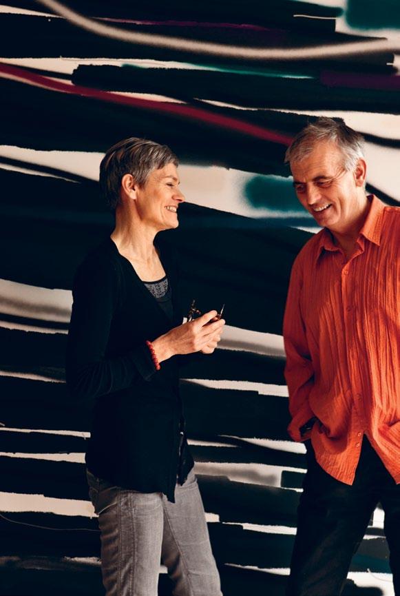
The exhibit for Tokyo was a synthesis of ideas on New Zealand architecture. Inside a perspex cube, a timber structure sits on a bed of iron sand. As the container is turned, the structure’s ‘foundations’ are continually undermined, and it struggles to regain a foothold. The sand represents the instability of a country straddling a tectonic plate boundary, while the structure represents a Cartesian ordering – perhaps the colonial desire to dominate nature. Black iron sand is a key element in Miriam’s work. It is a way she connects with the physicality of her adopted ‘Nieuw Zeeland’.
For most of the time, however, the couple work in their own studios on their own work, and collaborations are purely in the realm of ideas. “As two strong-minded creative people, there needs to be a sense of individuality and a sense of freedom,” describes Miriam. “Synchronised, but you part to do your own thing and then you come together. It is like a dance which is open, I hope.”
habitusliving.com 94 habitus 11 partnership
pete bossley and miriam van wezel — AUCKLAND, new zealand
Pete Bossley Architects, bossleyarchitects.co.nz
10 Miriam and Pete at home in front of ‘From Black Skies’ (2008) by John Reynolds.
10 habitusliving.com/beyond/petebossley
Miriam and Pete have a similar aesthetic, even though they come from very different cultures.
It’s


art, without the breathtaking price tag.



I Need Nice Things was created to make contemporary art collectable, changeable and most important of all, affordable. Each week, we create and commission art inspired by the latest global trends in contemporary art, design, and fashion to add to our online gallery of vibrant graphics, illustration, photography and typography. We also produce bespoke artwork – from one-off pieces and purpose-built installations to themed collections designed to a brief.
To find out more visit www.ineednicethings.com or call +612 8115 8674




breathtaking
HAB11_Ineednicethings.indd 1 21/12/10 10:30 AM Adelaide: Transforma, 21 Kensington Road, Norwood SA 5067, Tel. 08 8364 6588 Perth: Ultimo Interiors, No.4 Hutton Street, Osborne Park WA 6017, Tel. 08 9201 2479 Melbourne : Image Interiors, 610 Church Street, Richmond VIC 3121, Tel. 03 9421 6655 Sydney: Covemore Designs, 43 Prime Drive, Seven Hills NSW 2147, Tel. 02 9624 1011 www.hulsta.com.au | Made in Germany MEGA-DESIGN Cultivate your passion. We do the same for your home. AZ_Habitus_3_4_2011.indd 1 17.12.2010 11:50:42 Uhr HAB11_Hulsta.indd 1 20/12/10 12:07 PM
SUBSCRIBE & WIN ONE Of t WO DREam COffEE maChINES

each valued at $1,399 rrp
Get your coffee fix and your design fix in this dreamy piece of machinery. Combining technical precision with hand-built craftsmanship, Dream features a 1.3-litre water tank, hand-polished aluminium body, 16-bar pump and temperature gauge, and produces a professional brew whether your favoured fix is an elegant espresso, creamy cappuccino, or something in between.
To enter, simply subscribe to Habitus magazine and complete the question overleaf or enter online at habitusliving.com/subscribe. Good luck!
subscription offer
EXPLORE spaces which embody
th E va Lu E s OF thO sE
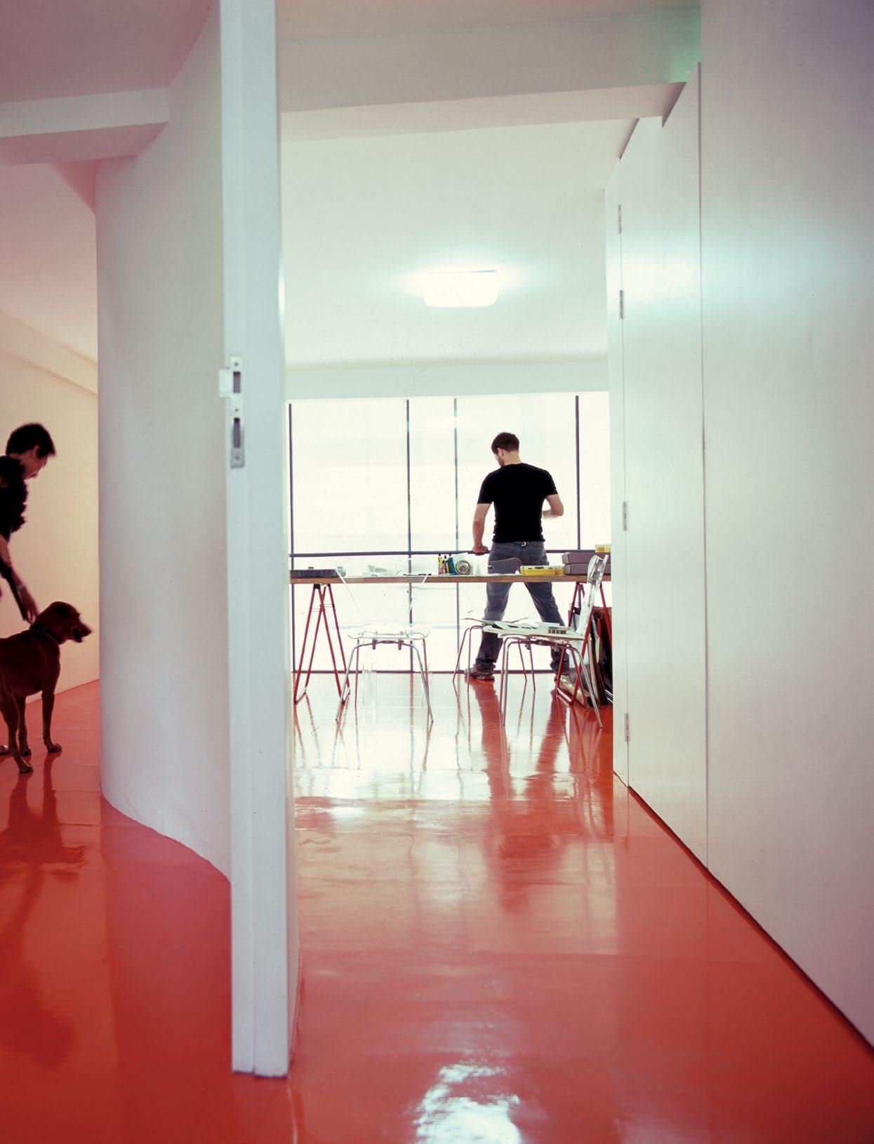
habitus 11 3. houses 97
whO L iv E within

habitus 11 98 scenario habitusliving.com
Grose Bradley
mending wall house — NsW, australia
Text Paul McGillick
Photography Anthony Browell
Convivial
Solitude
A poem, a spectacular landscape and a love of good company were the elements of the brief which Barbara schmidt and Peter Cudlipp gave to architect, James Grose, for this house in the mountains above Sydney.

99
mending wall house — NsW, australia
something there is that doesn’t love a wall, That sends the frozen-ground-swell under it a nd spills the upper boulders in the sun, a nd makes gaps even two can pass abreast.
So begins Robert Frost’s poem, ‘Mending Wall’ – a poem not so much about a wall as about people living in harmony with one another.
talking to Peter Cudlipp about how the poem inspired the house, i get the impression that, for him, it acts as a complex web of metaphors which works best if we don’t attempt to untangle it. Sure, it’s literally about walls –in particular, traditional dry stone walls – but it is also about how walls don’t only separate, but bring people together, embracing them, protecting them and creating a reflective refuge of stillness and silence.

“o ne of things that drew us both to Mount Wilson,” says Peter Cudlipp, “is the dry stone walls. t hat clicked with me... and the area of Westchester County (in the u.S.) where Barb grew up... where there are still vestiges of dry stone walls... i had adored Robert Frost as a kid at school. i remembered ‘Mending Wall’ and it seemed a really lovely phrase. And in that area everybody ends up naming their properties.”
But when it came to briefing James Grose, the most important thing was to describe what the experience would be for somebody coming to stay. “it was,” says Peter, “very much trying to say ‘t his is how we want to use the place –this is what we want it to feel like for people who are coming to visit’.”
For James Grose, imagining how he would want to experience the house, it had to have a “monastic quality” to it. “i would want it,” he says, “to be calm, embedded in the ground and i’d want to feel like the ground came up and embraced me.”
t he house sits on a plateau, backed by stands of tall, mature trees and looking eastwards over the sprawling Cumberland Plain. At night, the lights of Sydney can be seen flickering in between two distant hills. But, surrounded by cleared ground (bushfires are a necessary consideration), the house seems almost solitary, reinforcing the impression of a monastery or place of contemplation.
Approaching the house over the crest of the hill, it really does present as a wall in the landscape. o r, more accurately, the illusion of a wall – except that there are really two walls, the main one made from concrete blocks, and one panel made from sandstone to vary the texture and animate the grey of the concrete block wall. t he dramatic incisions of the living/ dining space downstairs, the upstairs bathroom
02 – 03
Custom
habitusliving.com 100 scenario habitus 11
02
Grose Bradley
01
The house sits on a plateau overlooking the Cumberland Plain.
made solid American Black Cherry dining table; custom coffee table; Series 7 Fritz Hansen dining chairs, vintage EJ5 Corona lounge chair and Louis Poulsen PH5 ceiling lights from Corporate Culture; rug from Designer Rugs; Lola lounges by Norman & Quaine from Living Edge; Thomas Jacobsen side table; Indecasa stools from KE-ZU; Yamaha piano; bench is old NSW railroad private antique; ceramic vessels by Robbie Harmsworth, Gallerysmith; painting above fireplace by Minnie Pwerle.

101
“I would want it to be calm, embedded in the ground, and I’d want it to feel like the ground came up to embrace me.” –GRoSe
mending wall house — NsW,

habitusliving.com 102 scenario habitus 11
03
Grose Bradley
australia
window and vertical slot window are abstract elements which further emphasise the apparent two-dimensionality of the ‘wall’.
t he use of concrete blocks was partly a matter of economy because to use the stone used in Mount Wilson’s colonial buildings would have been prohibitively expensive. But just as importantly, says Grose, “you don’t want to be seduced by the romance of the stone wall”. i nstead, he made the house “the abstraction of a stone wall” and a subtle reminder of the stone wall heritage of the area. Grose describes the overall effect as one of “modern antiquity” – a contemporary house, but resonating with the past.
“i hope,” he says, “that in fifty years when someone comes across Mending Wall, all the walls will be stained and it will be slightly overgrown and it will be like a stone wall.”
t he house is not so much in the landscape as a part of it – not just because of its materials, but also because of its transparency, especially at ground level.
it effectively consists of two wings – the living/dining/kitchen wing and the bedroom wing with the master bedroom upstairs and a guests’ wing underneath which runs behind the kitchen and is essentially self-contained, even including its own ‘family’ room.
t he spacious living area is the ‘public’ area of the house where Peter and Barbara can relax with friends. it is an extraordinary doubleheight space with gantries running on three sides, two of them devoted to bookshelves.
“We hadn’t imagined that it would be anything like that,” says Peter. “We’d said i had lots of books, we’d said something biggish. But i don’t recall we had said anything about ceiling height. And, apart from adding little walkways along the top – as opposed to the initial humorous scheme of a very tall ladder.”
t his space combines two experiences. At ground level, it is a large communal space

...he made the house
“the abstraction of a stone wall” and a subtle reminder of the stone wall heritage of the area.


1 Living / Dining 2 Kitchen 3 Powder Room 4 Guest Bedroom 1 5 Bathroom 6 Guest Bedroom 2 7 Rumpus Room 8 Guest Pavilion / Garden 9 Barbecue Deck 10 Deck 11 Library Gallery 12 Master Bedroom 13 Bathroom 104 scenario habitus 11 habitusliving.com
04
mending
wall house — NsW, australia Grose Bradley
linked to the landscape on two sides by floorto-ceiling glazing (and on the western side to an outdoor timber deck). But upstairs, apart from a single vertical slot window and another narrow horizontal slot along the northern wall, it is closed to the outside – a veritable monastic library and place for contemplative reading.

i n the end, it is the location that gives this house its dual character: on the one hand, a place for friends to gather together, on the other, a retreat offering those most precious of modern commodities, silence and solitude. transplant this house to an inner suburban location and it would be an affably urban dwelling. But here, especially when the winter mists descend, it is a richly private place where one can truly experience that great unity with nature.
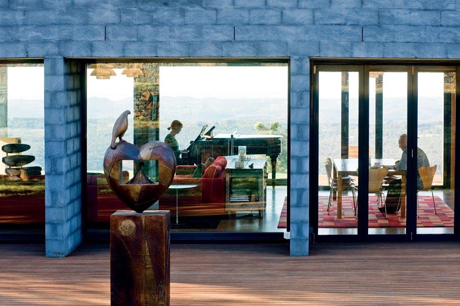
105
04
Section (top), and plans for first floor (middle) and ground floor (bottom).
05
Lamps in bedroom are Tolomeo from Artemide.
06
05 06
Bronze sculpture on deck by Paul Dibble from Black Barn Gallery.
mending wall house — NsW, australia


arChi T e CT
Grose Bradley
ProJe CT T eam
James Grose
Nicola Bradley
Matthew Blair
Sarah Kirkham
sT ruCT ural e NGi N eer
Simpson d esign Associates
hydrauliC e NGi N eer
t homson Kane
ele CT riC al e NGi N eer
Mick Jackman
Builder
Aligra (Grant l acey)
Grose Bradley BVN bvn.com.au
(61 2) 8297 7200
arTWork
Black and white photographs on library mezzanine are (L – R) Bristlecone Pine by Brett Weston, Weston Gallery; Oculus by Linda Connor, Pointlight Gallery; Halloween, 1950 by Saul Leiter, Howard Greenberg Gallery; RFK Funeral Train by Paul Fusco, Bonni Benrubi Gallery; Lanesville, 1959 by Saul Leiter, Howard Greenberg Gallery; The Guardian by Robert and Shana ParkeHarrison, Bonni Benrubi Gallery; Parihaka by Anne Noble, Bartley and Company; Maps to Murrawa by Jon Rhodes, Stills Gallery.
Fi N ishes
Joinery Beech timber veneer, white melamine and Corian bench top in ensuite.
Fix T ures/ e quiPme NT
Fireplace from Jetmaster. Ducted vacuuming system from VMC. Tapware from Brodware. Bath from Kaldewai, available from Bathe. Basins from Caroma. WC from Fowler.
scenario 106 habitus 11
habitusliving.com
Grose Bradley
07 08
07
the house.
The north-east aspect of
08
flanking the guest wing.
A sandstone wall encloses a garden
09
The mists typical of the mountain site create a poetic atmosphere.

in focus
mending wall house — NsW, australia

01. Series 7 chair A comfortable, classic dining chair which fits a desire for clean lines.

02. EJ 5 Corona We had this classic chair re-upholstered in black leather and it plays a perfect role as a feature lounge chair for comfortable reading and relaxing
03. PH 5 pendant For us, l ouis Poulsen lighting epitomises danish design and it reminds us of cosy dinners at friends’ homes in Copenhagen. We acquired the lights secondhand before we even engaged James Grose to design –they were included from the outset!
04. ‘The Drifter’ We approached Stephen Marr to see if he would be interested in making a large scale version of a work called ‘outback Sideshow Man’, which included a sculpted figure best described as “made of paint”. Based on a maquette the work was accepted and shown at Sculptures by the Sea 2008. After this we placed ‘t he d rifter’ in the garden choosing a position that added a sense of expectation and observation. 05. TB stool We needed something simple and strong, with a bit of timber, so these were perfect.
Poul Henningsen, born in 1894, is revered as Denmark’s first expert in lighting theory. Although he never graduated as an architect, he studied at The Technical School at Frederiksberg, and then at Technical College in Copenhagen before working as an independent architect in Copenhagen. In 1925 he invented the PH-lamp (image 03), a three-shade hanging lamp based on a scientific analysis of the way its size, shape and position determines its light distribution. The PH-lamp was soon joined by a series of other three-shade designs, including table lamps, floor lamps chandeliers and wall-mounted designs and Henninsen also began producing in metal and glass of varying colours and transparency. He forged a lifelong relationship with Louis Poulsen Lighting, whose lighting designs are informed to this day by the inventions of Henningsen. At his death in 1967

Poul Henningsen had designed more than 100 lamps.
01 Series 7 chair designed by Arne Jacobsen for Fritz Hansen fritzhansen.com

Available from Corporate Culture corporateculture. com.au
02 EJ5 Corona designed by Poul M. Volther for Erik Jørgensen erik-jorgensen.com
Available from Corporate Culture corporateculture. com.au
03 PH 5 pendant designed by Poul Henningson for Louis Poulsen louispoulsen.com
Available from Corporate Culture, corporateculture. com.au
04
‘The Drifter’ by Stephen Marr, stephenmarr. com.au
05
TB stool designed by Joan Casas y Ortinez , for Indecasa indecasa.com
Available from KE-ZU kezu.com.au

03
108 habitusliving.com 02 05 04
01

TH e CITY Greening
Adi Purnomo is a pioneer. He wants to contribute to the world in which he lives by doing good and creating meaningful things. His aim is to improve the quality of people’s lives via architecture. He believes in the power of individual action and counters deficits in the field of architecture with his own designs.
For several years now, Purnomo has been interested in botany, although – as he readily admits – he doesn’t know a great deal about it. “The amount of green space in Jakarta has shrunk from 30% to 9% in 20 years,” he laments, a trace of anger audible in his voice as he slowly and deliberately recites these figures. The thing he misses most in this megacity are the foliage plants. But he now employs these as his most effective weapon, using them to create
symbols whenever the opportunity arises – in gateways, on free-standing walls, on the walls of houses (both inside and outside) and on roofs.
Over the years, his work has attracted a wide circle of admirers, and many wealthy Indonesians now commission him to design their houses for them – not only on account of his ‘green’ ideas, but because he is simply regarded as the best architect in the country.
When banker, Sandra Sithowati and her husband Hari Yuwono, an engineer, were planning their town house, Adi Purnomo was the only architect they considered for the design of their new home. But the architect had serious doubts as to whether he would be able to complete the task presented to him by the amicable couple, who wanted him to create
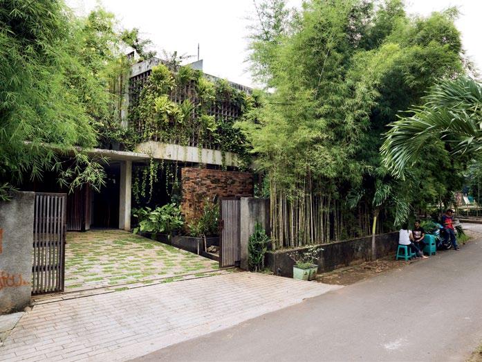
110 habitusliving.com
Text / Production Kerstin Rose
habitus 11 scenario
Photography Christian Schaulin
MaMo Studio
adi Purnomo is regarded as one of Indonesia’s most innovative architects.
So, it seemed logical to throw him the challenge of designing a house which is simultaneously theatrical and intimate. Kerstin Rose reveals how it does this, as well as integrating with its landscape.
01
View from the street onto the jungle house with bamboo and other foliage.
02
The entrance to the roof garden is an oasis in the megacity of Jakarta.
sithowati house — JaKaRta, indonesia

nothing less than an inhabitable amphitheatre – built on a 480m 2 corner plot right in the middle of the city! However, the couple’s aim in having an amphitheatre built was not to stage gladiatorial games involving human combatants and animals, but to provide their many musical relatives with a forum for singing, dancing, and making music. This placated Purnomo, who then agreed to take on the commission. “Besides, I was able to persuade them to cap off the building with a planted roof,” he concedes.
Purnomo adapted his clients’ Roman fantasies to the conditions prevailing in Indonesia. When he revealed his plans to them, they were initially dumbfounded, as the ideas announced by this quiet, unassuming man seemed to be apocalyptic: “The wood will rot, the brick walls will be covered with moss, plants will be allowed to run riot, and large areas will be covered by moving water.” Then they looked at the plans – and knew that everything would turn out alright.
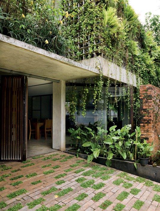
A wide open-air staircase forms the centre of the house. Its appearance and construction are a reminder of the amphitheatre idea – the steps also provide seating with a splendid view of the wooden platform at its base. This platform functions as both a quadrangle and a stage. Suspended above it is a section of the building’s first floor, which has no windows on this side. “We use it as a screen for showing films,” explains Sithowati, who is extremely proud of her new home. From the stage, one enters the living space, a wide room whose walls and floors are made of concrete that was cast in situ. Large, ceiling-high windows in

112 habitusliving.com
habitus 11 scenario
MaMo Studio
sithowati house — JaKaRta, indonesia
04 03

113
Purnomo adapted his clients’ Roman fantasies to the conditions prevailing in Indonesia.
03 Section on the street side.
04 View at the entrance. Plants are growing out of the concrete cage which surrounds the house.
05
05
View from first floor to the open air stage on the ground floor.

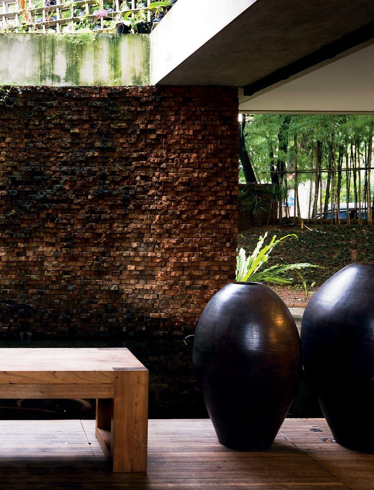
06
View from the open-air stage to the pond which naturally cools the ground floor living area.
07
Ground floor living area adjacent to the open-air stage.
08
The living space can be divided into separate rooms by glass sliding doors.

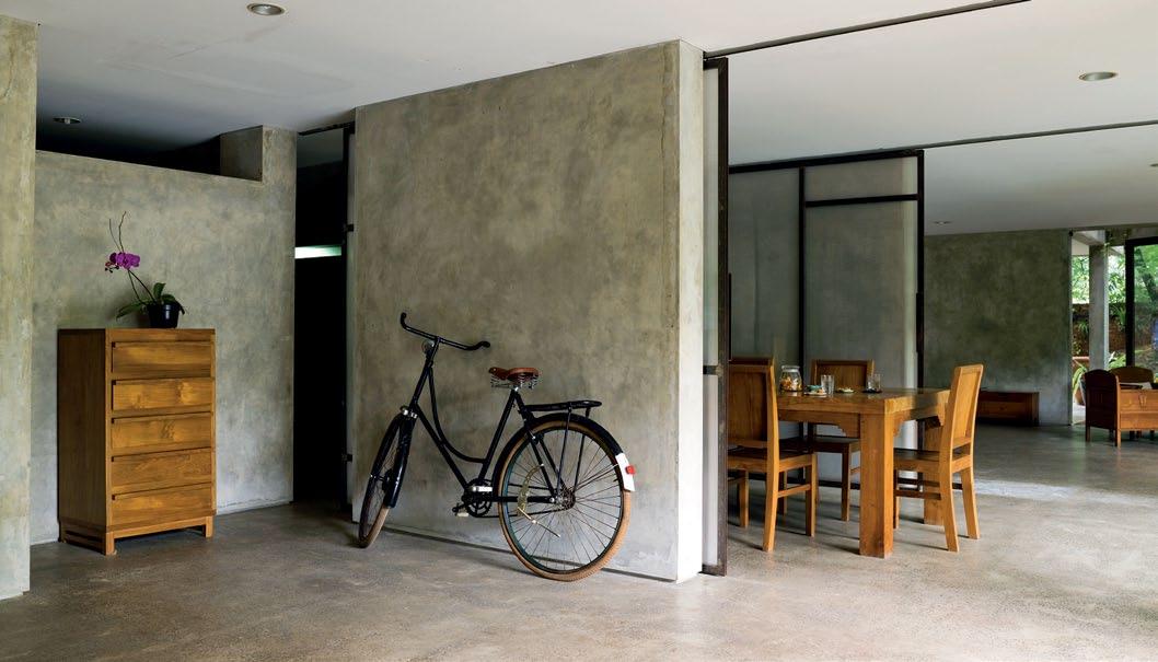
09
Access into the garden from the living area with open window walls.
10
Plans for lower floor (bottom), upper floor (middle) and roof (top).
habitus 11 scenario 116 habitusliving.com
MaMo Studio
07 08
sithowati house — JaKaRta, indonesia
iron frames can be opened completely to turn house and garden into one continuous area. The living space can be divided into separate rooms by means of sliding frosted glass doors. In addition, the roof – which is accessed via a narrow, shaft-like stairway – can also be used for parties. The Sithowatis’ private realm is the first floor, which is where the bedrooms and bathroom are situated.

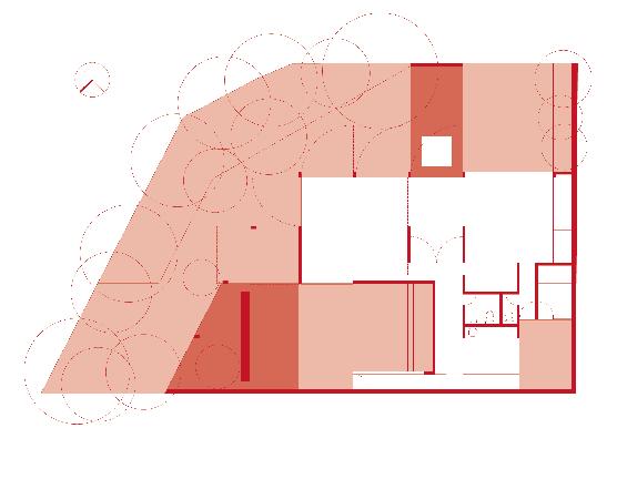

Purnomo integrated as much nature as possible into the building. In addition to the flat roof, he also planted grass and plants on the open-air staircase and the terrace beside it. In the monsoon season between November and March, rainwater cascades down over the hardy vegetation, runs across the wooden platform and ends up in the adjoining pond, which is teeming with goldfish and water plants.

Finally, Purnomo built a kind of enclosure made of concrete columns around the actual residential building. On top of these are used tin cans in which orchids and tropical pot plants have been planted. Viewed from the street, the vegetation grows from the inside outwards, seeming to burst out of the building. In the small garden, a bamboo hedge protects the occupants’ privacy and converts CO2 into oxygen. The scent of lemongrass bushes helps to keep mosquitoes and midges at bay.
In Indonesia’s architecture scene, Purnomo is considered a somewhat exotic creature. Recently, he was invited to speak at a congress. While his colleagues described their respective visions at great length and tried to outdo each other with PowerPoint presentations, Purnomo simply projected a photo onto a wall – the image of a plant. Almost whispering, he extolled the plant’s virtues – including its potential uses in architecture. One visitor to the congress shakes
10
117 1 Entrance Hall 2 Maids Room 3 Bath 4 Kitchen 5 Open Stairs 6 Water Basin 7 Brick Wall 8 Living 9 Dining 10 Water Garden 11 Staircase 12 Open Plan Area with Garden 13 Main Bedroom 14 Guest Bedroom 15 Roof Garden
09
11 5 3 3 13 14 14 12 1 2 4 5 9 10 6 8 7 3 11 15

118 habitusliving.com
habitus 11 scenario
MaMo Studio
sithowati house — JaKaRta, indonesia

119
Viewed from the street, the vegetation grows from the inside outwards, seeming to burst out of the building.
his head and smiles when he remembers this moment. However, he cannot help but praise the simple beauty of his colleague’s designs. Purnomo believes that “much too much energy is put into the creation of aesthetics that could be put to better use conceptually”.
This is why he thought up further ecological features when planning the Sithowatis’ house. each room has a square opening directly below the ceiling that allows the air to circulate freely, thus making air conditioning superfluous. Between the kitchen and the patio, there is no wall at all (no problem with average daily temperatures of around 30ºC and this allows cooking fumes to disperse into the outside atmosphere. Washing is also hung up to dry there. In addition, Purnomo has employed recycled materials all over the house. For example, the walls in the outer area were built from old bricks; for the flower shelves, he mostly used wood left over from other building sites, and the tin cans for the pot plants were salvaged from the dustbin.
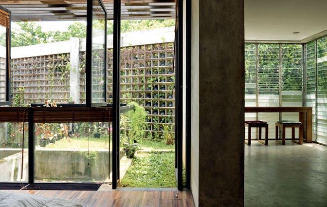
Since its completion, the Sithowatis’ house has become a symbol for environmentallyfriendly architecture. The couple have even held an open day, architecture students regularly make pilgrimages to the house, and the project has received the Indonesian Architecture Design Award. But above all, Adi Purnomo has once again put his ideas into action and drawn attention to the ecology. Jakarta’s green lung is now a tiny bit bigger.
habitusliving.com/beyond/mamostudio

120 habitusliving.com
habitus 11 scenario
MaMo Studio
12 13 Site 464m² Building 220m² Building CoveR age 36.4% de Sign 2004 FiniShed 2005 a RChiteCt Mamo Studio St RuCtuR e Muchamad Umar Cont R aCtoR Paulus Mintarga Mamo Studio mamostudio@gmail.com mamostudio.com
sithowati house — JaKaRta, indonesia


HAB11_Interstudio.indd 1 14/12/10 9:31 AM
Perillo Topo by
11 Detail of a freestanding wall. The architect placed greenery wherever he could.
12 View into the bedroom and bath on the first floor.
13 View from the bedroom to the outdoor wooden shelves. All furniture is made from Teak wood.
14 The open-air stage is also used as a terrace. The wall is constructed from old bricks. 14



Black & White PoeM I n
elegance, restraint and structural ingenuity is always associated with the work of Ian Moore. But, says Paul McGillick, in this home he has designed in inner suburban Sydney, it is seen on a uniquely intimate scale.

123 IAN MOORE ARchI t Ects habitus 11
strelein warehouse — NsW, australia
Text
scenario
Photography Iain D. MacKenzie
Paul McGillick
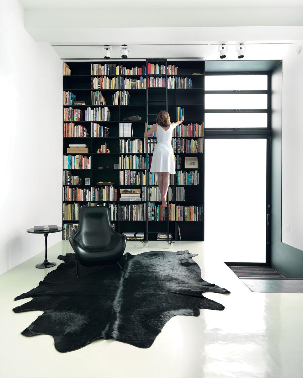
habitusliving.com 124 habitus 11
scenario
IAN MOORE ARchI t Ects
strelein warehouse — NsW, australia
It used to be a grocery warehouse servicing the corner stores of Sydney’s city fringe suburb of Surry Hills. It was double-fronted, with one, a loading dock at the end of what is now a pretty cul-de-sac of restored terrace houses and a mysterious sandstone retaining wall at the end; and the other, facing north onto a through-street.
The internal width of the house is 4.65 metres. As Ian Moore points out, once the guest bathroom, laundry, storage, the stair to the upper level and the minimum width required for the garage were taken into account, there remained just 10mm for the wall between the garage and the stair. “What could I use which was 10mm thick which could hold the house up?” Moore asks rhetorically. The answer was a 10mm thick steel plate structure which forms the entry portals, the stairway wall, the kitchen surround and the floor-to-ceiling bookcase in the main living area – thus defining the functional and aesthetic character of the house.
In fact, the upstairs is wider than the downstairs, but has been brought in to match the downstairs width, mainly in order to accommodate the steel columns in the walls which support the steel beams needed to open up the roof.
But for Ian Moore, who originally trained as an engineer, the difficulties thrown up by re-inventing an inner suburban warehouse are simply creative challenges, especially given his portfolio of supremely elegant houses and apartment buildings.

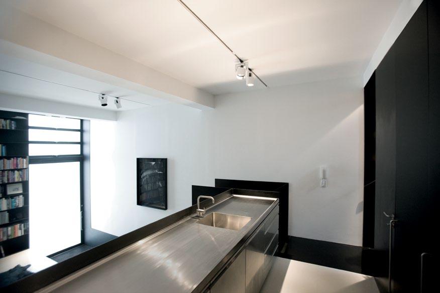
01 The garage entry with the address laser-cut into the steel portal.
02
Visitor entry featuring the floor-to-ceiling steel bookshelving, Antonio Citterio Mart armchair by B&B Italia, from Space Furniture; vintage Eero Saarinen Tulip side table by Knoll from Shapiro Gallery, restored by Your Home Design.
03 The kitchen looks down on to the visitor entry and main living area. Kreon track lighting from dedece.
04
Vintage Eero Saarinen Tulip dining table; Tulip dining chairs from decece; built-in banquette by Peter Byrne at Recovery Upholstery.
125
03 04
...for Ian Moore... the difficulties thrown up by re-inventing an inner suburban warehouse are simply creative challenges...
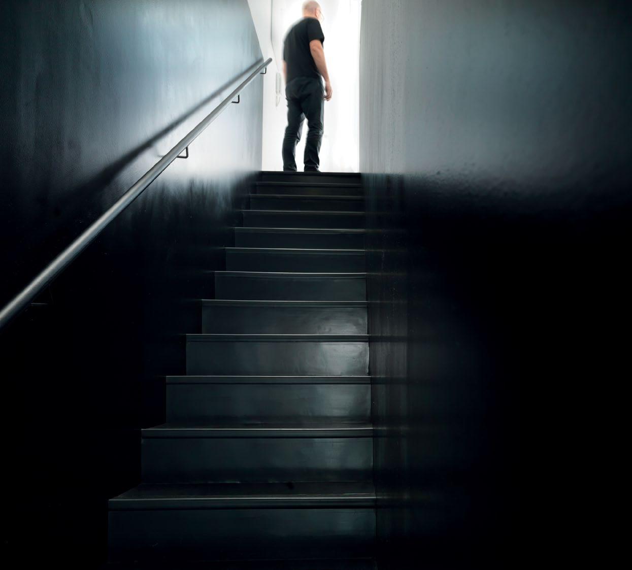
126 habitusliving.com habitus 11 05
strelein warehouse — NsW, australia
scenario
IAN MOORE ARchI t Ects

127
06
This tonal counterpoint works in tandem with a splendid manipulation of space and light…
The catalyst, in this case, was his client who, after hunting around for some time, asked him to come and take a look at the warehouse. “I said ‘It’s perfect’. She said she’d go to the auction and asked me what she should go to. I said, ‘Keep going until you get it.’ Which she did, thankfully.”
Thereafter, the client remained at arm’s length, giving Moore the simplest of briefs: “All I want is a black and white Ian Moore house with a very well-lit bathroom and a big bath.”

From this simple brief has emerged what could be described as a poem in black and white. This tonal counterpoint works in tandem with a splendid manipulation of space and light to make the house absolutely right for what it needs to do – not too big and not too small, private but never claustrophobic, compact but flowing and providing the opportunity for two people to have their own personal space when required.
The front door is the old cul-de-sac loading dock, but now with a massive, pivoting translucent glass door. This opens directly into the main living space and a black steel stairway which leads up to the next level (with the kitchen and the other loading dock, now the garage with laundry, storage and guest bathroom) and then continuing on to the upper

128 habitusliving.com habitus 11
07 08
scenario
strelein warehouse — NsW, australia IAN MOORE ARchI t Ects


129
05
Stairs to the top level are a steel plate frame.
06
Top level sitting room featuring a Tunnel coffee table and Bridge desk by Piero Lissoni, Marc Krusin and Carlo Tamborini for Glas Italia, from Space Furniture; vintage telephone from Sydney Antique Centre; black wall lights Serge Mouille.
07 A pivoting translucent glass door enters directly off the street. Photography art: ‘Salt Miner’ by Iain D. MacKenzie.
08
Upstairs sitting area with windows referencing the building’s industrial past combine with vintage Art Deco armchairs from Shapiro Gallery, upholstered by Recovery Upholstery; Kennedee sofa by Jean-Marie Massaud for Poltrona Frau, available from Corporate Culture.
09
1 Living/Dining 2 Kitchen 3 Laundry 4 Powder Room 5 Garage 6 Storage 7 Sitting Room 8 Bathroom 9 Bedroom 1 2 5 3 4 6 9 8 7
First floor plan (top), ground floor plan (middle), south elevation (bottom left), north elevation (bottom right). 09
level with a sitting room, bathroom and the only bedroom.
The ground floor living room is framed on the street side by an impressive black steel plate floor-to-ceiling bookcase, and on the other side by a steel plate-framed banquette above which is the galley kitchen.
A steel portal frame – yes, 10mm thick –runs up the two levels and encloses the stairway to the upper level which helps create a great sense of adventure as one climbs the stairs into the light that suffuses through the upstairs translucent glass windows.
The warehouse had been bought by an artist in the 1970s, who then converted it to a studio and residence. The bedroom and living room were upstairs. “We have added the bathroom,” says Moore. “We just got a big can opener, got the roof and cranked it up, so it is flooded with light.”
The bathroom Moore describes as a “major success”. It sits between the upstairs living room and the bedroom, a floating black cube (the joinery is black anodised aluminium), but with clear glass highlight windows on the three interior sides and the roof jacked up on the southern side to accommodate a bank of electrically operated glass louvres which draw

light in literally day and night. “You can get up in the middle of the night,” says Moore, “go there and you don’t need lights at all.” Black on the outside, inside the bathroom glows and reflects Moore’s on-going adventure with Corian which here includes the bath, the walls, the floor and the custom-designed basins.
The bathroom, says Moore, creates a sense of separation between the bedroom and the sitting room, but also a sense of containment for the bedroom. It also contributes to the black-and-white graphic poetry of the house because, as Moore points out, you can stand at the top of the stairs and see the black box of the bathroom and the black box of the stairway, while downstairs when you enter you see the black box of the kitchen.
The garage has a white epoxy floor. But this was not possible on the upstairs timber floor where an epoxy finish would crack. Instead, Moore has used a rubber finish which not only softens the experience of moving around in the house, but offers a beautifully subtle variation –a warm off-white to complement the otherwise pure white of the house. Similarly, a series of black-and-white photos along the upstairs wall provides an intriguing contrast to the pure blacks of the new insertions.
11
12
130 habitusliving.com habitus 11
10 Marcel Wanders Dream bed by Poliform; Eero Saarinen Tulip bedside tables by Knoll from dedece.
Handbasin is custom designed by Ian Moore in Corian; Cube WC by Caroma.
10
Vola tapware from The Bath House; Giulio Cappellini Wash bathtub by Ceramica Flaminia, available from Parisi.
strelein warehouse — NsW, australia
scenario
IAN MOORE ARchI t Ects
“All I want is a black and white Ian Moore house with a very well-lit bathroom and a big bath.”


–oW neR 11 12
Deciding not to use curtains was an important factor in using the high performance translucent glass for the windows – drawing in modulated sunlight during the day and filtered light from the streetlights at night. When open, the bedroom window frames the outside Paperbark tree, but screens out the neighbouring houses. o therwise, the black steel framed windows quietly reference the light industrial buildings typical of the precinct. Space, light, elegance and restraint – these are qualities I associate with Ian Moore’s previous work, and they are defining characteristics of this intimate house. As with his other, larger scale projects, light is used here to create the space. What distinguishes this new house is the way in which he has used black as a unifying graphic element. Like a De Stijl painting, the composition of the house is essentially musical with the tangible, assertive black line counterpointed against the intangible, fugitive white space to create the rhythm of space itself.
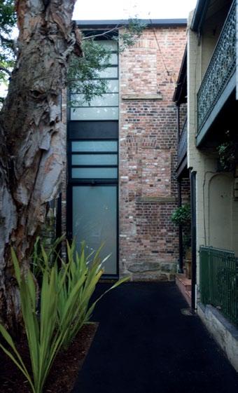
xt URE s






Door hardware and bathroom fittings D Line from Keeler Hardware.


Prizes include home accessories from Paris brand Moustache, as well as 5 x 1-year Habitus magazine subscriptions. *Prizes and subscription offer available to Australian residents only. HABITUS READER SURVEY Give us your feedback for your chance to win a design hunter prize Head to habitusliving.com/survey today! PLUS every person who takes part will be eligible for a special deal of 5 issues for the price of 4. HAB11_ReaderSurvey_2.indd 1 14/01/11 11:16 AM habitus 11 ARchI tEct Ian Moore Architects PRINcIPAL ARchI tEct Ian Moore PROJEct tEAM Ian Gorton Danny Mathis IN tERIOR DE sIGN Ian Moore st RUct URAL ENGINEER Benvenuti SC (Ruggero Benvenuti) hERI tAGE cONsULtAN t Urbis (Stephen Davies, Fiona Binns) BUILDING cERtIFIER Paul Rolfe Consulting BUILDER Seager Constructions stEEL FABRIcAtOR Salken engineering LANDscAPING Fast Feet Garden Design t YPOGRAPhER eamon Davern PhOtOGRAPhIc AssIstAN t Daniel Mayne Ian Moore Architects ianmoorearchitects.com (61 2) 8354 1887 A Rt WOR k Artwork framing throughout by Acme Framing. EqUIPMEN t/FI
13
scenario
strelein warehouse — NsW, australia IAN MOORE ARchI t Ects
Inner CI ty
When two empty-nesters decided to move to an inner city apartment, family and friends were not convinced. But stephen crafti reports that stephen jolson’s makeover of this converted commercial space with fabulous views has turned a sow’s ear into a silk purse.

jolson architecture 133 Text Stephen Crafti habitus 11 domain apartment — vic, australia scenario Photography
Jason Busch
Calm
domain apartment — vic, australia
Dusha l efkovits and her husband, robert, left their family home in east Hawthorn, melbourne, for an apartment on the edge of town. t hirteen years ago, the move was considered unusual by family and friends. However, their children had grown up and they were ready to make a change.
t he couple found what they were looking for in what was formerly BP House. Originally designed by Demaine russell trundle a rmstrong & Orton in the early 1960s, the high-rise office block was transformed into apartments in the early 1990s. Overlooking the Shrine of remembrance and the Botanical Gardens, the apartment enjoys panoramic views of the city skyline in one direction and a lbert Park lake in the other. “robert just stood on the terrace and said ‘where else would you find views like this?’” recalls Dusha.
But if the views were impressive, the interior fit-out was less so. “ t here were some great ideas. But some of the spaces were a little awkward, and some just weren’t fully utilised,” says architect Stephen Jolson, who was commissioned to rework the apartment.

First, two circular partition-like walls were removed and the elevated formal lounge was realigned to form part of one continuous level. Once this had happened, the apartment presented itself as a blank canvas. “We had seen Stephen’s work in a number of magazines,” recalls Dusha. “By the time we rang him, we had quite a file on him. I was drawn to his clean lines. It’s pared back, but you can see there’s rigour with each decision.”
t he brief to Jolson was initially a ‘white on white’ composition. “I wear black all the time,” says Dusha. “I thought a completely tonal palette would be appropriate. I think I’d already earmarked white furniture in magazines.” But while Jolson could appreciate where Dusha was coming from, he was also mindful of creating depth and texture.
Pivotal to the final design is a seven-metrelong travertine island bench in the kitchen. Complete with integrated travertine sink, this extruded block appears monumental. Framed by 2-pac satin polyurethane joinery and Corian benchtops, the arrangement allows unimpeded views over the living area and beyond. “We saw the kitchen bench as a piece of sculpture, but highly functional,” says Jolson. t he rangehood over the bench is just as considered, with a crisp rectangular form. to ensure the kitchen remains uncluttered, there’s a walk-in pantry and appliance cupboards, while a spacious laundry is also concealed.
t he same level of detail appears throughout the apartment. european Oak flooring, used throughout the entire apartment, has been acid-washed and brushed. a nd in the dining area there’s an Oak table, also designed
scenario habitus 11
habitusliving.com 134
02 1 Lounge 2 Dining 3 Kitchen 4 Study 5 Guest Bedroom 6 Master Bedroom 7 Master Ensuite 8 Powder Room 9 Laundry 1 2 3 4 5 6 7 8 9
The elevated formal lounge was realigned to form part of one continuous level throughout the apartment.
jolson architecture


135
01
The dining area features a sculpture by Peter D. Cole and Cassina Cab chairs from Corporate Culture.
02 Floor plan showing the fan-like arrangement.
03
The living areas enjoy unimpeded views of the city, also featuring Cassina Utrecht chairs from Corporate Culture and 265 wall lights by Flos from Euroluce.
04 The kitchen’s central island bench creates a sculptural element in the open-plan space.
03
04
domain apartment — vic, australia
One of the client’s requests was for a library that integrated to the living spaces.

habitus 11
scenario
jolson architecture
by Jolson. “We’ve designed the table as though it was carved out from the floor,” says Jolson, pointing out the beautifully matched lines between floor and table.
to demarcate the kitchen and dining areas from the formal lounge, Jolson designed a buffet, made from fumed Oak. On the dining side, doors open to reveal shelves for wine storage and crockery. On the other side of the unit is a niche for the television set, together with cupboards for storage. Jolson even clad one of the balcony walls with a mirror to magnify the city aspect from the dining table.
One of robert’s requests was for a library that integrated into the living spaces rather than relegated to an unseen corner of the apartment. a s a result, shelving wraps around the formal living area, the entrance, as well as the kitchen. a nd for ease of reach, a modular leather lounge extends from the living room to the library. For the furniture, subtle hues of browns through to soft greens were selected, from Bellini dining chairs to r ietveld arm chairs in the lounge. “ many of these colours were inspired by looking over to the Botanical Gardens,” says Jolson.
eliminating the curved partitions in the apartment allows a Dale Frank painting in
the entrance can be enjoyed from numerous vantage points, along with Peter D. Cole’s sculpture, ‘maple l eaves’. t here are also works by John Firth-Smith and Jennifer Goodman. the apartment includes two bedrooms, with a powder room for guests. Originally, the plan was to renovate the kitchen and living areas, leaving the bedroom to be considered as ‘Stage two’. “But when we started to get quotes,” recalls Dusha, “it would have been more expensive and disruptive to put off the inevitable.” entering the main bedroom confirms the decision to act holistically. Featuring an elevated ensuite bathroom with Oak floors, a free-standing bath and travertine walls, it exudes a sense of tranquility. What was once a narrow terrace has been lined with white stones to create the effect of a river bed. now, Dusha and robert couldn’t contemplate living anywhere else. “ t he thing we notice most is the calmness of the space, reflects Dusha. “It’s understated, but Stephen has considered everything to the nth degree.”
t he albert road apartment won two awards at the 2010 australian timber Design awards: Best interior Fit- o ut (residential) and Best use of timber Flooring.
04
Part of the brief was designing a library that was integral to the living areas. Also featuring a Knoll Platner stool from dedece.
05
The main bedroom is rich in timber detailing, from the bed to the walls and floors.

architecture anD
interior DesiGn
Jolson a rchitecture
Project tea M
Stephen Jolson
mat Wright
Josh Saunders
Buil Der Visioneer Builders
joiner
a & C Custom Built
Mechanical consultant
David Couper & associates
Fire consultant
Wormald
jolson architecture (61 3) 8656 7100 jolson.com.au
Furniture
Coffee table Dama by Poliform.
Finishes
Kitchen bench Corian. Mirrors
Viridian Glass. Paint finish
China White by Dulux. Bulletin
board in study by Forbo from Duraloid. Credenza in Eveneer Saltwood from Elton Group. Travertine to Kitchen and Master Ensuite Classico slabs and mosaic in Bathroom from Signorino Tile Gallery.
l iGhtinG
Integrated lighting system Clipsal.
Fixture/ e quiPMent
Hot water Rheem. Wall mixer Zuchetti Spin from Streamline Products. WC and bidet Catalano soft-close toilet from Rogerseller. Bath Kaldewai Classic Duo, available from Bathe. Wall basin Alape, available from Reece. Sink mixer Oxygene from Abey. Oven, microwave and fridge and freezer from Miele. Bar fridge from Liebherr. Rangehood Qasair. Kitchen storage Häfele. Cooktop De Dietrich. Music room manager Hills Home.
137
06
in focus
domain apartment — vic, australia
01. Dale Frank artworks

Chosen for their artistic merit and connection with the greens of the royal Botanic Gardens viewed from the northern terrace.
02. Utrecht chairs t hese have a sculptural quality and are comfortable with an intimate detail in the blanket stitch. again, the colour was selected to reflect the shades in the park landscape.
03. Peter D. Cole sculpture a work which is based upon the Japanese maple. It is a whimsical addition to the space.
04. 265 Light t his is a flexible reading lamp option for the living area. It also provides a third dimension above the floor level which gives the living area an interesting scale.
05. Mex low modular sofa a lthough it can be raised, it was chosen because it adds volume to the apartment which has restricted ceiling height

06. Cab chair Chosen for comfort, the lineal form of this Bellini classic also relates to the lineal form of the timber dining table. a lso, the elevation of the Cab chair is equally beautiful from the rear and side.
The Flos 265 wall lamp (image 04) was designed in 1973 by Paolo Rizzatto. Born in 1941 in Milan, Italy, he undertook a degree in Architecture in I965 at the Politecnico di Milano. In 1978 he founded Luceplan together with Riccardo Sarfatti, and he has since designed for Arteluce, Artemide, Luceplan, Alias, Cassina, Nemo, Molteni, Knoll, Kartell, Philips, Montina, Thonet and Guzzini. Many of Rizzato’s works are included in permanent collections of various museums including Wave Hill Museum Centre in New York, Museum of Modern Art in New York, and the Victoria and Albert Museum in London. As well, he has been awarded numerous prestigious international design prizes. Still based in Milan, Rizzato now works freelance in the fields of architecture, design and interior design and continues to design lighting.
01 Dale Frank artworks available from Anna Schwartz Gallery annaschwartzgallery. com.au


02 Utrecht armchair designed by Gerrit Thomas Rietveld for Cassina Available from Corporate Culture corporateculture. com.au
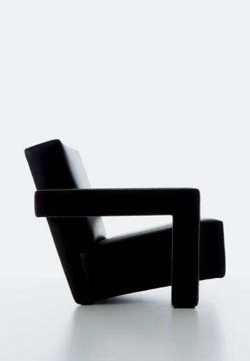
03 Peter D. Cole sculpture from John Buckley Gallery johnbuckleygallery. com
04
265 wall light designed by Paolo Rizzatto for Flos Available from Euroluce, euroluce. com.au
05 Mex low modular sofa designed by Piero Lissoni for Cassina cassina.it Available from Corporate Culture corporateculture. com.au
06 Cab chair designed by Mario Bellini for Cassina cassina.it Available from Corporate Culture corporateculture. com.au
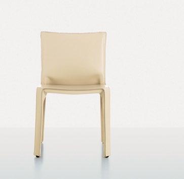
01 03
138 06 02 04 – 05 habitusliving.com
jolson architecture

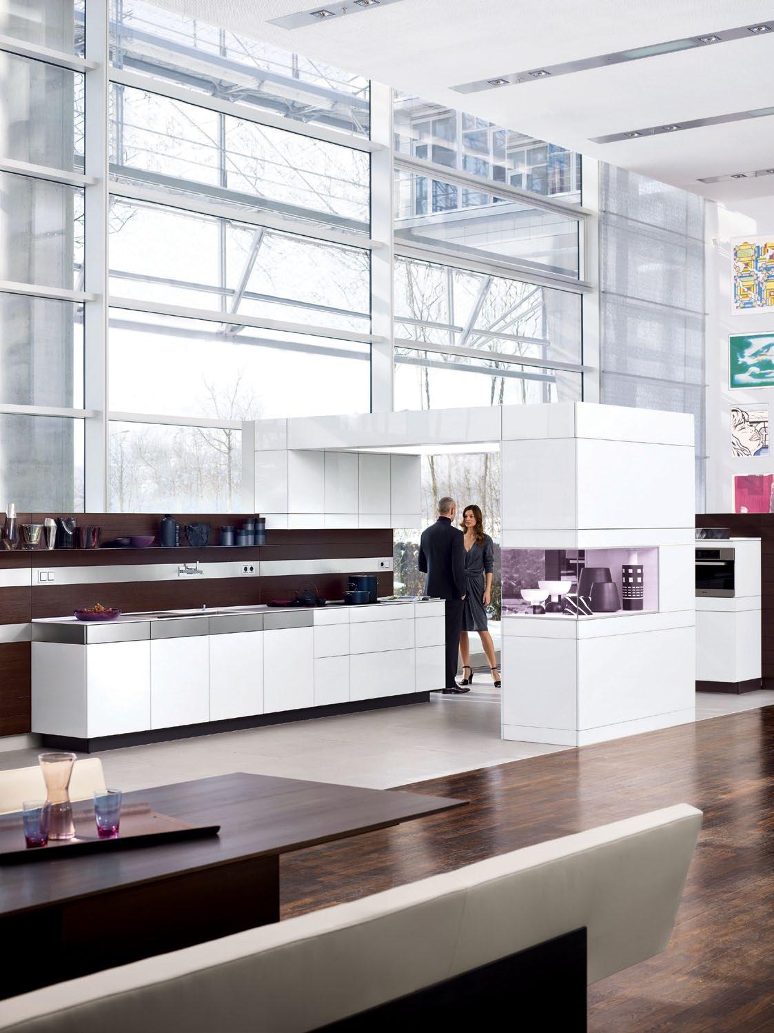
poggenpohl australia qld da vinci designs 46 douglas st milton 07 3367 8955 nsw a la carte design 118 edgecliff rd woollahra 02 9369 1766 vic pepper kitchens & interiors 213 bay st brighton 03 9530 6680 Knowing what counts. www.poggenpohl.com.au
SeNSoRy Living
chu Lik ren writes that architect Ko shiou hee is interested in the emotional responses his work evokes. In this new house in Singapore, we can see how typical strategies, such as integrating the landscape, help invest the house with emotional richness.
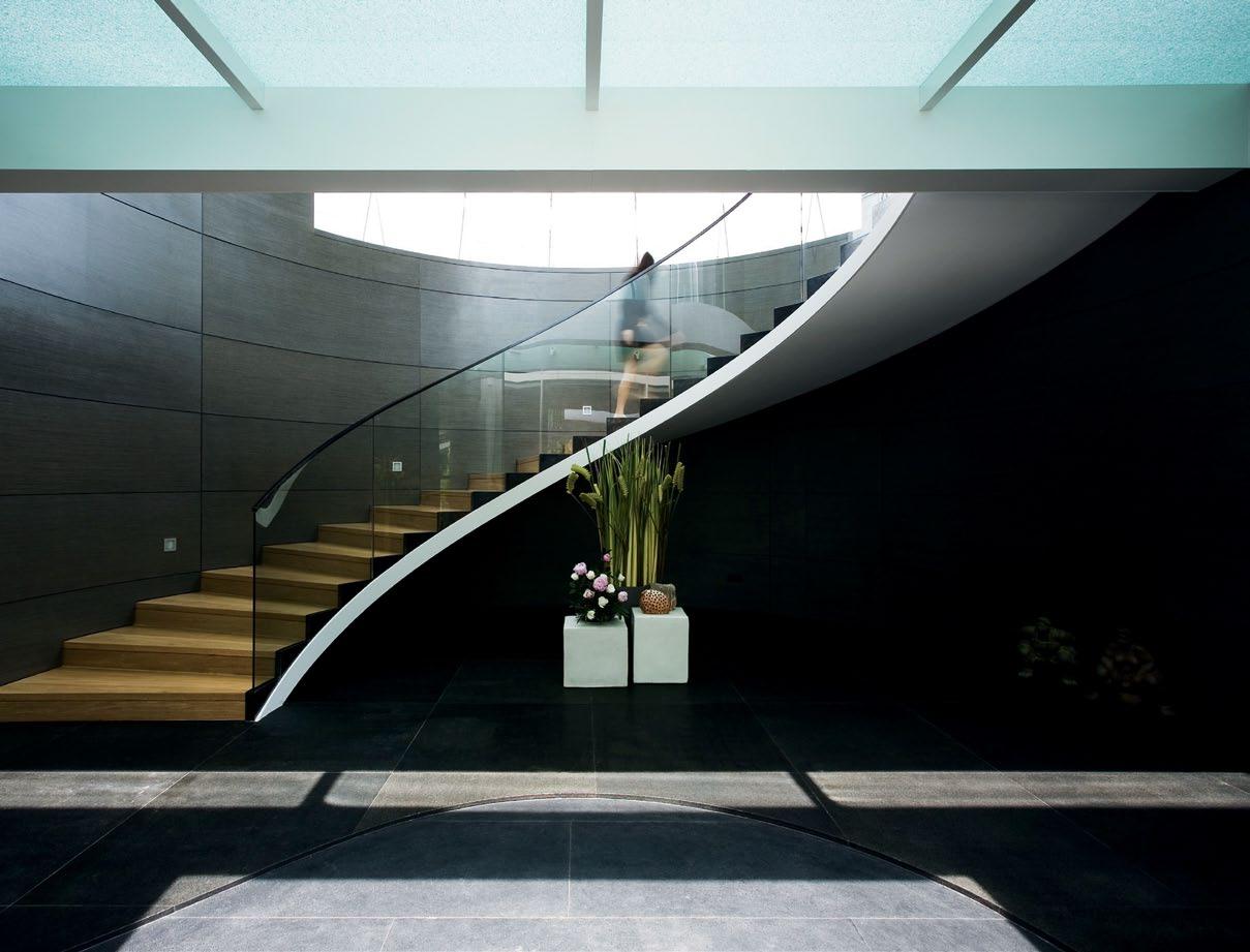
habitus 11 scenario K2LD Architects jervois hill house — singapore Text Chu Lik Ren 141 Photography Jeremy San Tzer Ning
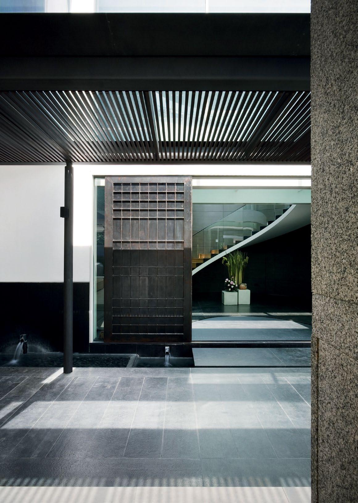
It is sometimes convenient to think of houses as falling into two categories: those that are cerebral and architecturally self-conscious, conforming to some abstract theories, and those that are visceral, which speak to the senses and convey comfort and calmness above all else.
ever since starting K2LD with David Lee and Ben Teng Choon Aik in 2000, Ko Shiou Hee has made it almost a mission to position “sense and sensibility” as the keystone of his design philosophy. He is more interested in the emotional response his works will evoke, and less in accommodating them to a theoretical framework or in adopting a consistent style. Instead, when one talks to Shiou Hee, the words “experience” and “materials” are frequently used. And when one walks through a house he has designed, one experiences a heightened sense of space and the textures are artfully put together and bathed in modulated light. They are like walk-through sculptures, without a boundary dividing interior design from the exterior architecture. Indeed, the total
environment, including the landscape, has been conceived holistically. They are the epitome of what acclaimed Swiss architected Peter Zumthor refers to in his essay “The Magic of the Real”, in t hinking Architecture
The sensual aspects of Shiou Hee’s works are once again in full evidence in a house designed for a couple on a hilly site in southcentral Singapore. The couple re-located to Singapore a few years ago and have two sons and a daughter. They are frequent travellers as well as frequent hosts to large social gatherings, with their guests staying over periodically. At the same time, they value their privacy and chose to build on this site precisely because it is near the cul-de-sac of a private road lined with new, modestly scaled, but immaculately designed, bungalows.
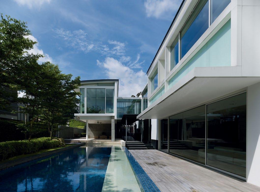
The brief is simple enough, but the built result is a choreography of micro-worlds of differing character, each designed to suit the intended occupant or mood. In plan, the distribution of rooms is plain enough to see: the
02
03
143
01 The feature curved staircase at the entrance is an anomaly in a house of straight lines.
A domestically scaled canopy sits above the sliding shoji-inspired doors at the main entrance.
03
All the major spaces in the home look onto the swimming pool.
jervois hill house — singapore
K2LD Architects


habitusliving.com 144 habitus 11 scenario
04 1 Server Room 2 Media Room 3 Bathroom 4 Bedroom 5 Store 6 Car Porch 7 Gym 8 Patio 9 Pool 10 Study 11 Living & Dining 12 Powder Room 13 Passageway 14 Dry Kitchen 15 Wet Kitchen 16 Laundry 17 Entry Foyer 18 Family Room 19 Bridge 20 Walk-in Wardrobe 21 Master Bathroom 22 Outdoor Deck 23 Master Bedroom 24 Gallery 01 02 03 03 03 04 04 11 06 07 08 19 04 03 18 20 21 22 23 24 09 10 12 13 14 15 16 05 17 05 05 04 04
house is arranged like an elongated C-shape along the length of a long and narrow plot. The narrow ends face the road on the western side and a large open compound of a neighbour on the eastern side. From the road, the upper floor of the house is set back a fair distance from the roof porches so that it almost seems like a self-effacing, single-storey building. Past the solid timber gate, one is greeted with a straight-canopied passage that nudges one away from the utilitarian areas to the sliding shoji-inspired main doors. It is here that a hint of the ‘far eastern’ design sensibility, for which Shiou Hee is known, is sensed (Shiou Hee has worked for a number of years in Japan). you are on a narrow path flanked by white walls with black dado, beside young bamboo shoots and pebbled waterways. you are within the house compound, but not yet within the house.
Just beyond this ‘alleyway’, you perceive the major spaces of the house – its living/dining area and the pool next to it. But you are gently persuaded to take a detour by the change in levels and the abrupt end of the roof canopy. you now enter the house by stepping over a granite plinth and into a spacious foyer rimmed

04
Plans for the basement and two-storey home.
05
Unusual details make a statement in the guest bathroom.

06
The Living Divani Softwall lounge came from Xtra and looks out onto the pool. 05
145
06
jervois hill house — singapore
K2LD Architects

146 habitusliving.com habitus 11
scenario

147
…when one walks through the house… one experiences a heightened sense of space and the textures are artfully put together and bathed in modulated light.
jervois hill house — singapore
07
The solid walnut table from Hudson Furniture Inc. and Matthew Hilton’s Tapas dining chairs sit below Tom Dixon’s Beat pendants.
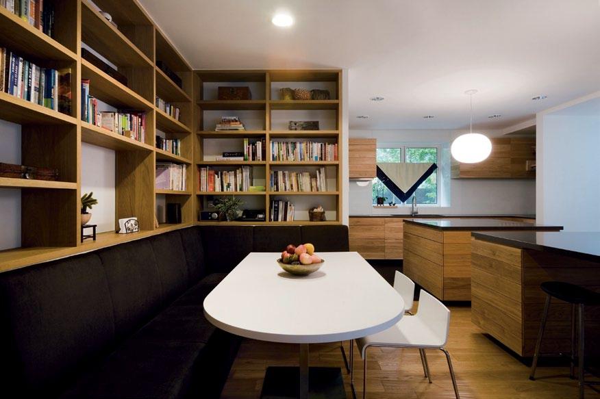
08 A cosy corner of the main kitchen.
09 The service corridor connects to the lift. 08
with a semi-circular staircase. overhead, a bridge of sandwiched, fractured glass links the adjoining rooms. The light is intense and unfiltered. The curved stair is an anomaly in a house of straight lines and right angles, but it is sensible within the confines of a narrow plot. It slows the journey, and offers multiple changes in perspectives. Beyond the living area, there is another half-spiral stair in the house, one that descends into the guest suites at the semibasement level. Again, the effect here is heavily sensorial. The stair is constructed of welded steel, in effect a coupling of massive C-sections in the raw state. The walls beside it are lined with a chunky granite ‘skin’ sourced from quarries in China. The stairs are an engineering marvel, but this is secondary to the fact that they are a pleasure to the senses. While the
stair at the foyer conveys a cool, commercial feel, the smaller stair is earthy and warm. K2LD confide that the house took almost two years to build – partly due to the client’s infrequent stays in Singapore during construction, but also because of the surfeit of design decisions and approvals needed for the materials and the colours. The stunning dining table that seating 20 people, for example, is cut from a single Walnut tree, and imported from the USA. Much of the flooring is distressed oak, which gives a rustic feel under the feet. every room is designed with a slightly different theme, almost like a “mini-hotel”, in the words of Iris yeo, the project architect. The guest rooms are more showy, with pull-out wardrobes, cleverly disguised as zig-zagging wall panels. The master bedroom is more austere, all bright and spartan. The media room with its raised dais resembles a royal court. The daughter’s bathroom has LeD lights inserted between the wall tiles. The guest bathroom uses stainless steel mosaic tiles. For a son’s room that faces the pool, the bath is walled with fullheight clear glass that becomes frosted at the turn of a switch. It is no small achievement that the myriad of materials assembled here are then made subservient to the calm, refined manners of the larger picture.
habitusliving.com 148 habitus 11 scenario
K2LD Architects
…the built result is a choreography of microworlds of differing character, each designed to suit the intended occupant or mood.
habitusliving.com/beyond/jervois
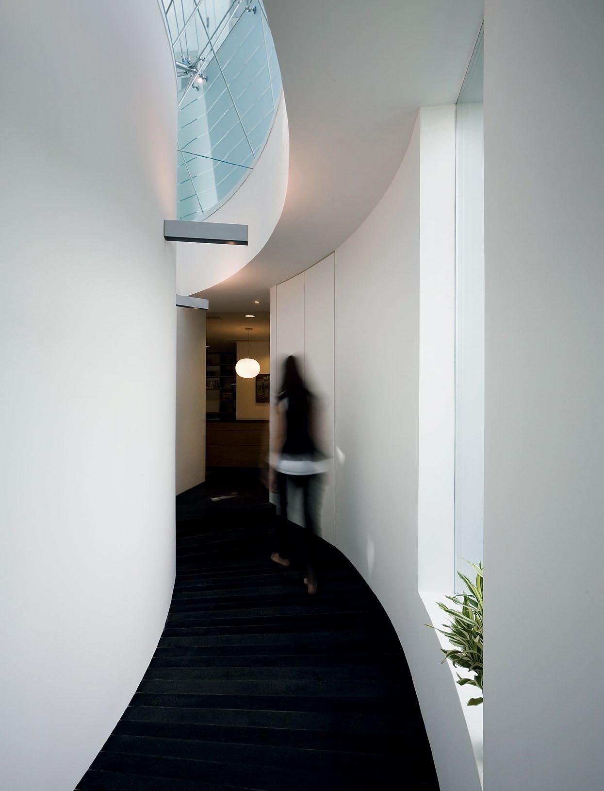
149
jervois hill house — singapore

habitusliving.com habitus 11 scenario 150 A rchitect K2LD Architects PrOJect te AM Ko Shiou Hee Joseph Lee Iris yeo M&e Peter Teo & Associates strUct Ur AL eNGiNeer JS Tan & Associates QUAN tit Y sUrVeYOr Ian Chng Cost Consultants LANDscAPe Watermount Gardens MA iN cON tr ActOr Daiya engineering Construction iN teriOr DesiGNer K2LD Architects iN teriOr cON tr ActOr SSN Industries site A re A 1,400m 2 GrOss FLOOr A re A 970m 2 K2LD Architects (65) 6738 7277 k2ld.com K2LD Architects
10 FUr N it Ure Chaise lounge designed by Eames manufactured by Herman Miller. Sofa and kitchen cabinetry custom made. Kitchen table and stool clients own. LiGhti NG Downlights from Antares Lighting. Spotlight from Erco. Fix tUres/ eQUiPMe N t Bathrooms Neorest suite by Toto in all bathrooms. Washbasin in Master Bathroom is Laufen Palomba Collection.
12


151 11 12
10
A second half-spiral staircase – this one in timber-lined steel – descends to the guest suites on the basement level.
11
The wall to a bedroom is lined with a striking granite ‘skin’.
A son’s bedroom, featuring a Carl Hansen Wishbone chair designed by Hans J Wegner, from Space Furniture, sits at the rear of the first storey.
in focus
jervois hill house — singapore
01. Eames lounge chair and ottoman It gives a different touch to the room it sits in, which is very Japanese-style. And it’s comfortable for watching movies.
02. Beat pendant lights The dining table and living room is simple and clean. This pendant lights add warmth to it.
03. Extrasoft sofa Modular in design, we can lay the segments out in interesting ways to complement the long dining table.
04. Palomba Collection basin
We like the generous size of the bowl and fin, which provides space and convenience.
05. Tapas dining chair These chairs sit very well with the masculine dining table.

Born in Hastings in 1957, Matthew Hilton is known as one of Britain’s leading furniture designers for his innovative attention to function and finessed approach to form. After achieving a degree of Furniture Design Kingston Polytechnic in 1979, Hilton began designing and producing objects using low-tech casting techniques. These designs caught the interest of Paul Smith and Joseph Pour La Maison, who sold his designs in their London showrooms. Between 1980 and 1984, Hilton worked for the product design company Capa as an industrial designer. He also began designing sets for Cultureshock, the company of the prominent fashion designer Koji Tatsuno. In 1985, Hilton began designing classic furniture pieces for retailer and manufacturer SCP. The most prominent of these designs include the Flipper table (1988), the Balzac chair (1991), a soft leather chair with rounded forms (1991) and the three-legged Antelope table (1998). Other notable designs include the Auberon table (1991), the velvetcovered Orwell sofa (1996), Wait plastic chair (1998) and the Tapas dining chair (image 05). Hungry for creative control, Matthew established his own brand, Matthew Hilton Limited in September 2007. It soon established it’s first licence agreement for manufacturing and distribution with De La Espada. In 2008 Hilton was named Designer of the Year by Elle Decoration at the British Design Awards.

01 Lounge chair and ottoman designed by Charles and Ray Eames, manufactured by Herman Miller hermanmiller.com

Available from Living Edge livingedge.com.au
02 Beat lights designed by Tom Dixon tomdixon.net Available from dedece dedece.com

03 Extrasoft sofa designed by Piero Lissoni for Living Divani livingdivani.it
04 Basin from the Palomba Collection manufactured by Laufen laufen.com
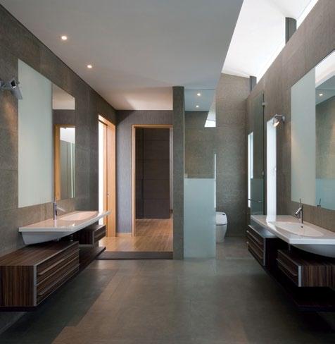
Available from Bathe bathe.net.au
05 Tapas dining chair designed by Matthew Hilton matthewhilton.com
Available from Spence & Lyda spenceandlyda. com.au
03
152 habitusliving.com 01 04 05 02
Be inspired TemperaturebyDesign for custom, commercial and creative projects.




A fusion of creative design & manufacturing capabilities that bring together an everchanging collection of contemporary furniture & accessories that can be tailored to your needs & budgets.

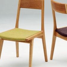
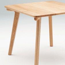
Victoria New South Wales Queensland South Australia 03 9419 1447 temperaturedesign.com.au
Natura Veritas
The New Zealand landscape permeates this new house by noel l ane. andrea stevens explores the delicate balance between containment and openness.

154 habitusliving.com habitus 11 scenario
arrowtown house — queenstown, new zealand noel lane architects
Text
Photography Simon Devitt
Andrea Stevens

155
On a clear day, flying over the Southern Alps offers a surreal view into a craggy milky wilderness. This chiaroscuro landscape of glaciated valleys and snowy peaks traces the length of the South Island and the alpine fault. Alluvial planes fall toward the east coast and out of sight, peaks plummet into the west coast rainforest.
Shades of white eventually give way to rivers, inland lakes and a mosaic of fields. I have reached the old gold-mining settlement of Queenstown, a remote yet international destination for avid climbers, skiers and scenic tourists.
It’s another world for this North Islander, more accustomed to the semi-tropical north. Mountains loom on all sides. It is dry, golden and clear.
Otago stone makes the buildings foreign, and the wines are as dry as the climate. An almost Nordic atmosphere is tinged with English picturesque by the liquid amber and lakeside Willow. I have come to see a new house by Noel Lane, twenty minutes drive toward historic Arrowtown.


156 habitusliving.com habitus 11 scenario
arrowtown house — queenstown, new zealand
02
03
noel lane architects
The road arcs north-east, over the Shotover River and below Coronet Peak. On approach to Lake Hayes, we branch off the main road and on to gravel, to reach a subtle stone and Cedar house. Low and wide, nesting on the brow of a hill, it reflects the materials and colours of the landscape.
It looks like a local, until I see its vaulted copper roof. Lane always does something different with a roof. It is his fifth elevation, and this one is special.
From the gravel driveway, a garden wall signals entry through a passage and into a glazed lobby. Rather than being taken ‘inside’, we’re now on the edge of a 14m 2 open courtyard. A pathway leads through it to the living space, or we can circle the courtyard via a glazed gallery. The architect has brought the landscape inside, and in so doing inverted the typical New Zealand house plan. Two interlocking pavilions now form the ‘verandah’ for living, encircling a void.
“There is a very strong relationship to the land – to the mountains, lake and plain below,” says Lane. “The view is south to Lake Hayes, but there is also a strong southerly wind. The idea was to create shelter and be able to go outdoors, but maintain the views and family connections.”
Plan dimensions and roof pitch were carefully calculated to maximise the sun and view, and minimise the presence of house structure. At the same time, in a climate as cold as this, there was a need for solidity and warmth. The architect has skilfully navigated the two, and created a house that is contained yet open, anchored yet light, practical for the dry summer heat and the wet winter chills.
The courtyard reminds me of the internal double-height void in Lane’s own house (habitus 05 ). As a spatial and social pivot, communal family life is connected visually and acoustically. Kitchen, living and children’s areas circle the void, separated but also united within a large footprint.
This sense of community is repeated here, and reinforced by the building’s materiality – its careful and consistent detail unites the whole. “The entire house has the same identity, the same simple palette of materials,” project architect Tom Rowe points out. “It is very restrained, but very rich in texture.” Flamed granite, local schist and glazed or painted white walls quietly contain the interior space. It also defers to the heroic landscape in material and form.
One of the most striking things I see in this house is its Japanese influence. Lane worked on and off in Japan over a sevenyear period. He built several houses, a studio and studied the culture and art. It is not a conscious thing according to the architect, yet the deep eaves, copper roof, and horizontal

157
01
The site has a strong connection to mountains above and plains below. 02
The house’s low roof profile is subtle in the landscape.
03
04
Facing south over Lake Hayes and The Remarkables mountain range and ski field.
04
A blend of openness and enclosure is used in materials and structure.


158 habitus 11 scenario arrowtown house — queenstown, new zealand habitusliving.com noel lane architects In a climate as cold as this, there was a need for solidarity and warmth. 05 Floor plan. 06 The schist stonework unites inside and out. 07 Simple detailing allows a fulness to materials in the kitchen. 05 06 1 Entry 2 Lobby 3 Hall 4 Bedroom 5 Dressing 6 Ensuite 7 Office 8 Kitchen 9 Dining 10 Lounge 11 Terrace 12 Family 13 Courtyard 14 Laundry 15 Garage 16 Workshop 01 02 02 04 04 03 04 04 05 06 07 08 09 10 11 11 16 12 13 14 15

159 07

160 habitus 11 scenario
habitusliving.com 09
noel lane architects arrowtown house — queenstown, new zealand
proportioning are incredibly evocative. The courtyard, too – with its water, stone and plants – is a poetic miniaturisation of the landscape. And indeed the climate here is not dissimilar to parts of Japan.
Every house has a period of gestation, and the design process for this one was a four-year, long distance conversation between architect and client – a Swedish national. He bought the land while on holiday, drawn by its natural beauty and similarity to his homeland. Lane had a similar affinity with the landscape, and so he was commissioned to create a permanent family residence.

They quickly worked out how they would communicate between Lane’s Auckland office and the owner’s many countries of work.
“He was inquisitive and thoughtful, and we’ve had a very good dialogue right through,” says Lane. “I suggested he tear out pages of buildings he was attracted to from books and magazines, and photograph places he liked.”
“He did this while he travelled, so we had huge number of images from all around the world. I grouped the pages into common themes, and found the same spatial idea recurring. Even though he’d grown up in an
09
10
161
08
The living wing is mostly glazed to let in sun from the north and open to the view south.
A large picture window in the ensuite frames the majestic view.
The main bedroom faces southeast.
10
“The entire house has the same identity, the same simple palette of materials. It is very restrained, but very rich in texture.” –ROWE

162 habitus 11 scenario
habitusliving.com
noel lane architects arrowtown house — queenstown, new zealand

163
alpine environment, he never showed me a building with small windows. He once said this process taught him to really look at his surrounds and not just pass through.”
This dialogue between client and architect included joint trips to Queenstown and Arrowtown to look at materials. When they found stone walls they liked, they visited the quarries and spoke to the stone smiths who built them. The attention to detail was intense, and the client became more and more specific as time went on.
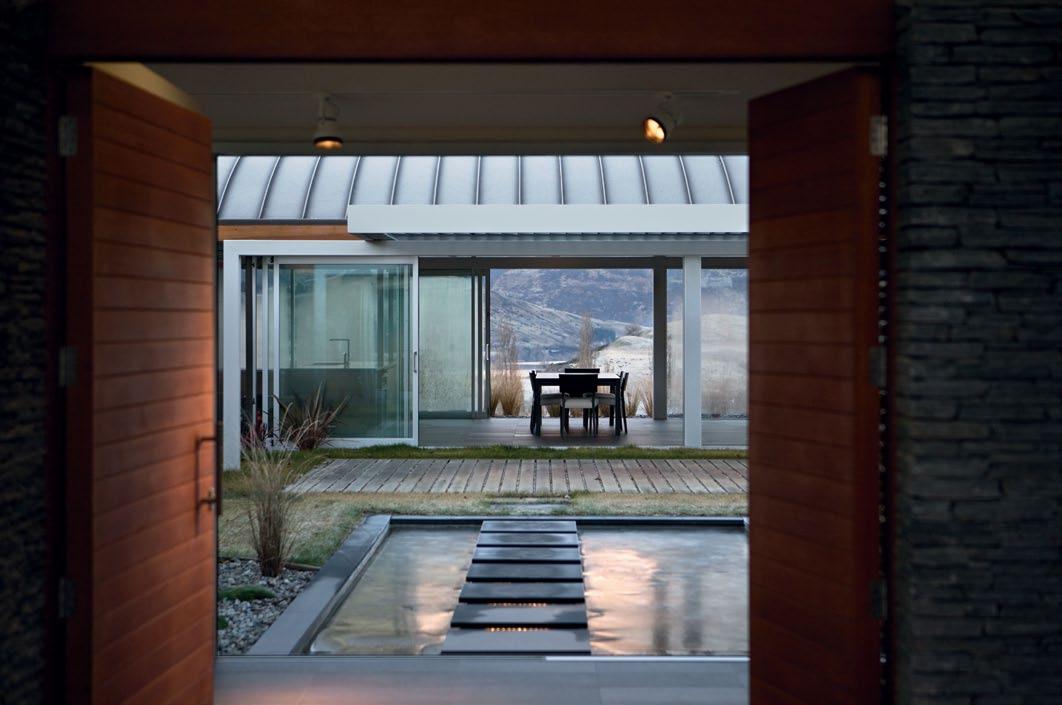
“If you use natural materials, select them carefully and place them without fuss, you get very beautiful results,” Lane asserts. “A minimalism in detailing leads to a fullness in materiality.”
Like early Modernist pavilions – Mies’ Farnsworth House and Johnson’s Glass House – this house also seeks an immersion in nature. By necessity, it has more solidity – it is a family home after all and is responsive to vernacular materials. However, by combining these, it has achieved a poetic connection with the landscape, and is literally permeated by it.
architect Noel Lane Architects
DesiGn architect
Noel Lane
ProJect architects
Tom Rowe, Amy Hendry, Aaron Paterson (assistant to project architects)
structural enGineer
Holmes Consulting Group
contractor
A J Saville
quantit Y surVeYor
Maltbys (Jeff Turner)
lanDsca Pe architect
Baxter Design (Paddy Baxter)
total Floor area
590m 2 house
58m 2 terraces
construction
Began December 2007, completed October 2009
noel l ane architects (64 9) 309 4800
Furniture withheld by client
Finishes
Stone from Italian Stone. Cabinetry by Wood Solutions. Blinds by New Zealand
Window Shades.
l iGhtinG
Lighting by Targetti. Fixtures/equiPment
Hardware from Halliday & Baillie.Tapware and sanitary fittings from METRIX New Zealand. Fireplace from Living Flame.
164 habitusliving.com habitus 11 scenario
noel lane architects arrowtown house — queenstown, new zealand
11 11
A view through the courtyard from the main entrance. habitusliving.com/beyond/arrowtown
01 Cannon Canterbury Freestanding heater (CANTFS-SDEEB)
02
Cannon Fitzroy Inbuilt Platinum Powerflue heater (FITZIB-PMEXP)
BrIllIANT hEATINg
The coming of winter is a sign for a number of changes to our cultural and everyday activity. We enjoy different foods, warmer clothes and a greater number of indoor activities. It can also mean looking for ways for you and your family to maintain a particular lifestyle without being affected by the elements.
In today’s contemporary environment, we look for heating appliances that have come a long way from the simple fire our ancestors survived with. It’s not just warmth we crave, but the experience, and within this, are a range of expectations that must be catered for.
Some of the key features when choosing the right heating appliance are performance and reliability. Safety is of utmost importance, especially where young children are concerned. As with any home design product, energy efficiency has come to the forefront of development. More and more people are concerned with the energy efficiency of their home and the appliances and electrical goods they hold.
Manufactured in Australia, the Cannon gas log heater range comes in diverse models and accessories to suit a variety of applications and environments. With 100 years of experience, Cannon heaters provide fast room heating while also being energy efficient and economical. The


Cannon Powerflue is the ideal choice for the energy conscious, with a double flue system that draws air from the outside for combustion and vents the flue gases outside. Depending on what flue configuration is used, the Powerflue models can achieve up to 5.5 stars in energy ratings.
Features across the Cannon range include audio indicators, electronic controls and ignition, enhanced flame effect and versatile flueing options, – plus all can be operated via a remote thermostat. Quality, contemporary casings are available in a platinum or metallic baked enamel black finish in the Fitzroy models, while all Cannon heaters can be fitted with a glass or mesh fascia. These options combine to create different forms and styles, from discrete slimline to feature pieces, to suit any interior.
Freestanding kits are available, and many models can use either natural or lP gas. Cannon offers a premium product that is not only functional, but also creates an atmospheric central point of a living space, with efficient heating and the ambience of a real fireplace.
Sampford IXL
1300 727 425
sampfordixl.com.au
166 sponsored 02
01
Urban Potentials
buildings sometimes allow themselves to be seen independently as images, and other times recede from prominence in deference to daily life. Tonkao Panin visits the home/studio of the couple behind architecture practice Thingsmatter, which manages to do both.

167 habitus 11 director’s cut Photography Pirak anurakyawachon Text tonkao Panin THINGSMATTER
atypical shophouse — BANGKOK, thailand
savinee buranasilapin and tom Dannecker of t hingsmatter have been working in bangkok, offering design solutions for a broad range of projects that never draw the line between architecture and other design fields. t he challenge of designing their own home started with the conscious choice they made from the very beginning. i nstead of either searching for a condominium unit, a typical dwelling solution for young urbanites, or creating their new architecture on an empty piece of land, they looked for something familiar that has always been there.

bangkok’s urban condition has been dramatically transformed during the past fifty years by a large number of projects and urban development, yet the livelihood of daily activities on the street still gives the city its tangible sense of place and location. shophouses have been the type of architecture that enveloped bangkok streets for decades. but as large shopping malls gradually sprang up over the city, the role of local commerce – once the staple of bangkok’s urban life –began to fade, resulting in a large number of shophouses that have been left abandoned or waiting to be sold. i n search of their ideal playground, buranasilapin and Dannecker quickly saw the potential of creating new dimensions of dwelling possibilities while remaining firmly connected to the urban milieu that bangkok streets provide. a dilapidated end shophouse in e kamai thus provided them with the basic platform. What followed were the results of spatial visions they introduced to a familiar structure.
While the street level provides workspaces for the owners and their co-workers, the owners never felt the need to privatise the spaces or shield themselves from the streetscape. large folding doors are installed both at front and back, offering not only the flow of light and ventilation but also of potential activities and gazes. by letting parts of the street in, they also extend their lives beyond the physical footprint of their home. as a place to live and work, while the house needs to answer prosaic needs, it must also be a refuge, providing a broad range of possible modes of dwellings.
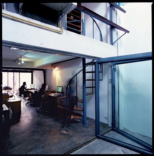
o nly four metres wide and 12 metres deep, each level anticipates different activities, thus requires distinct planning solutions that would never be fulfilled by generic layouts. above the street level, three other floors are planned out as distinct units, each with its own sense of individuality responding to different needs.
take place and events
Performances
01 The welcoming ‘front’ of the house. 02 From the street level. 03 Working space on the ground floor. 04 View from Ekamai Road. 02 03 168 habitus 11 director’s cut
habitusliving.com atypical
THINGSMATTER
shophouse — BANGKOK, thailand

169

05 05 Connecting different levels of spaces. 06 Curved blade walls create both horizontal and vertical flow of spaces. 170 habitusliving.com habitus 11 director’s
atypical shophouse —
cut THINGSMATTER
BANGKOK, thailand
only four metres wide and 12 metres deep, each level requires distinct planning solutions not fulfilled by generic layouts.

06 171
director’s cut
THINGSMATTER atypical shophouse — BANGKOK, thailand


habitusliving.com habitus 11 172
require locations. t he connection between performance, place and purpose result in different spatial structure within each and every level. such differences erase the traces of the totally open and flexible floor plans found in typical shophouses, giving them the framework of possible activities that have already been thought out. With innovative spatial arrangement, while the second floor private space is self-contained, it is also connected as part of a vertical spatial network that binds all levels together. stairs are seen not only as vertical circulation but become the means by which the spaces of each floor are divided or united.


t hrough visual connection with both the tree-lined street at front and the leafy private property at its back, the house is able to borrow the trees from its surroundings, lending it the natural environment that typical urban shophouses always lack. both its large openings and its tiny portholes allow the house to catch a glimpse of a significant collective urban order. a nd by letting go of the idea of the self-sufficient, the balance between sharing and privation suggests that the design is co-determined by various conditions of its location which involves a centering of building outside itself. it simply becomes a part of the community.
by restructuring its spatial configuration, buranasilapin and Dannecker have given the familiar shophouse new possibilities. t he design solutions that bridge the gap between the urban public and the private realm enable them to live within their own home while being an integral part of the city. it is a choice that desires neither urban arrangement that has been lost, nor a city possessed of splendid architectural coherence. t he concern is with the cities we actually have, particularly their urban potentials. o nly by accepting the fact that contemporary buildings lack full
07
both its large openings and its tiny portholes allow the house to catch a glimpse of a significant collective order.
173
The home is within a private realm, yet always a part of the city.
director’s cut
THINGSMATTER atypical shophouse — BANGKOK, thailand


1 Meeting 2 Office 3 Kitchen 4 Bathroom 5 Garden 6 Model Making 7 Laundry 8 Bedroom 9 Living 10 Study 08 5 4 1 2 3 6 9 8 8 4 3 10 9 3 4 8 7 3 4 174 habitusliving.com habitus 11
by restructuring its spatial configurations, the owners have given the familiar shophouse new possibilities.

09 175
director’s cut
THINGSMATTER atypical shophouse — BANGKOK, thailand
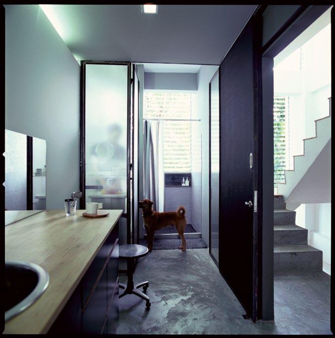
reciprocity with the coherent city can we put ourselves in position to envisage a new urban order, a new sense of what building share, and a new understanding of the way they can communicate with one another. i n this house, the greatest challenge for the designers is to work through the double task of showing and serving required for this sort of dialogue. it is a design that discovers the building’s desire for what it can neither generate nor possess. a nd by realising that the preexisting and undersigned urban conditions are both the pretext and the result of its design, the house begins to unleash new possibilities for urban dwellings that conform to no other criteria except those of our own living conditions.
A RcHITE c T t hingsmatter
PROjE c T TEAM savinee buranasilapin, tom Dannecker BuIldER objectsmind



cRA f TSMEN
suton Kongrangdee a nake namsuntia
Wirat saengpunta t hongchan Moonsan Panwoot Vanichsawangpun
THINGSMATTER thingsmatter.com
(66) 89 925 2516
08 Plans for (bottom to top) ground, mezzanine, second, third and fourth floors. 09 Bedroom and private living area on the second floor. 10 Through the airy bathroom, towards the back of the house. 10 PR Kitchen Systems Pty Ltd 1800 372 653 |Tel: 03 9237 8000 | Fax: 03 9753 2620 | 1263 Ferntree Gully Road Scoresby, VIC 3179, Australia | www.prks.com.au THE
HAB10_FRANKE.indd 1 28/09/10 4:05 PM habitus 11
PERFECT UNDERMOUNT GRANITE SINK COMBINATION BY FRANKE
LIFE.QUALITY.STYLE.
Melbourne: 309 Swan St, Richmond, VIC.
Ample Parking On-Site. Open Mon – Sun, 9am to 5pm. Phone: 03 9427 8452 | Email: sales @jati.com.au
Sydney: 79 Whiting St, Artarmon, NSW.
Drive-in parking. Open Tues – Sun, 10am to 5pm
Phone: 02 9439 4727 | Email: sydney@jati.com.au
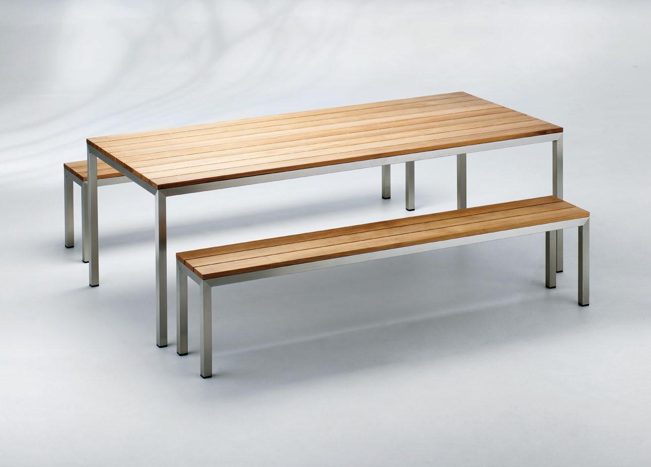 Atlanta – made with premium grade plantation teak and marine grade stainless steel.
Award winning German design and engineering has made Neff a leading brand in Europe - and now Australia.


Neff appliances feature a range of amazing and thoughtful technology developments designed to make the cooking experience truly exciting. Some of Neff’s unique oven features include the precise temperature control of the CircoTherm® cooking system, the ergonomic Slide and Hide door which allows the oven door to slide neatly under the oven, saving space and allowing ease of access and the illuminating NeffLight®
Combined with ease of cleaning, efficiency and a 4 year guarantee, you’ll begin to understand why Neff has been writing kitchen history since 1877. Select from ovens, cooktops, specialty appliances, rangehoods and dishwashers.

B46W74N0GB Coffee centre C77V60N01
&
T44T90N0 900mm
wall
available in Australia D79F35N0
Appliances featured (left to right) CircoSteam oven C47C42N0GB Small warming drawer N21H40N0GB Single oven with Slide & Hide door
900mm Point
Twist induction cooktop
Canopy rangehood, only
mounted model
Family Solu T ion
Semi-detached houses bring a lot of constraints with them. But Jane Burton taylor reports that this renovation by drew heath succeeds in customising one perfectly for a family of five.

179
cross fade habitus 11
Text
drew heath architects
bondi house — Nsw, australia
Jane Burton Taylor
Photography Brett Boardman
cross fade

180 habitusliving.com habitus 11
bondi house — Nsw, australia drew heath architects
When Jane Wallace bought a semi-detached house in a quiet cul-de-sac in Sydney’s beachside suburb of Bondi, she knew the home needed serious work. The semi had a certain charm, but it also had a pokey 1980s kitchen with too much slate and an upper floor set up as an artist’s studio – hellishly hot in summer.

Wallace had been an admirer of Drew Heath since she had seen an article on a renovation he had done on a nearby semi. Heath had opened the home up to a green wall of vines along its northern side boundary. She liked Heath’s timber work and the quirky solution.
Wallace says that when she first called Heath, he had a three-year waiting list, but in a rare upside of the global financial crisis, a few of his clients had dropped off and she stepped into their place.
like Wallace, Heath doesn’t like predictable renovations and professes to a hatred of ‘the bi-fold door solution’ of opening up the rear of a semi.
Wallace says she was looking for an architect with whom she would have rapport as well. “i was looking for an architect i liked as a person, someone i could put my trust in and who could inspire me,” she says. “After our initial meeting, we were both confident we could work together to transform the haphazard semi into something interesting and beautiful.”
Wallace’s brief for the job was to re-think the whole semi, maximising its potential to house her three children – Harriet, 15, Roy, 9, and Charlie, one-and-a-half – delivering them with individual bedrooms and creating a lightfilled, shared living space where they could all come together.
Heath says he found his key to the design in Wallace’s partner, Teo Gebert. “As an architect, you always look for a key, a way to bring life to a space, and the inspiration here was Teo,” Heath says. “He is an actor and works from home a lot of the time, so i was intent on this living area being a very beautiful space to be in. He is also a passionate chef and the kitchen was his favourite domain.”
Another early influence was client and architect’s mutual admiration for Queensland architect, Donovan Hill’s detailing in their Tibet House in Sydney’s Woollahra. They thought similarly finely crafted joinery, tailor made for the semi’s tight dimensions, would work.
01
a
and then
181
The new opening to the rear garden has a central kitchen bench which morphs into
day bed
a concrete outdoor dining table. Exterior bench cushion fabric by Sunbrella from Goodearl and Bailey.
02
The windows and doors to the rear garden are designed for beauty and play. The doors pivot out and the windows pivot upwards.
cross fade
Heath wove together these ideas of a centre-stage kitchen, sculpted joinery and his own yearning for a kitchen island that morphs into other furniture. He designed a central bench-cum-breakfast bar that runs from inside to out, turning into a day bed and then an outdoor table and benches, shaded by an awning of timber dowels.
“He [Heath] is wonderful with his overlapping lines and it creates movement,” Wallace comments. “it keeps drawing your eye to the next space.”
i n addition to this seductive horizontal engagement with the outdoors, Heath lifted the roof over the rear of the living space and installed highlight windows, thus pulling in more light and creating a sense of space. He
vapourised the rear wall, replacing it with glazed openings of varying types and sizes. “i never get tired of looking at it,” Wallace says enthusiastically of the idiosyncratic geometry of the openings.
Heath used the same variation of openings, doors pivoting outward and windows upward, in his Stradbroke island house. He say he likes the idea of openable walls with windows and doors doing different things.

“We are very experimental with our timber detailing because we make it on-site, made to fit,” he explains. “We don’t have to go to a traditional door and window fabricator and explain it.”
Heath applied this same skill to the rest of the living space, shoehorning in a small study nook adjoining the kitchen, and designing book shelves and storage spaces under and around a long internal bench seat opposite.

“He transformed a practical need into another opportunity for beautiful design work,” says Wallace.
Wallace and Gebert love the end result, even though they were initially a little nervous about it – particularly the idea of one long bench that essentially dominates and forms the hub of the rear living space.
habitus 11
182 habitusliving.com
bondi house — Nsw, australia
drew heath architects
03 04
The rest of the renovation serves as the backdrop... forming a buffer between the new and the old.
“Kitchens are often cold, sterile spaces, but his one hums along with warmth and energy,” Wallace says.
The renovation of the rest of the house serves as the backdrop to this sunny space. There is a new bathroom forming a buffer between the new work and the old.
“it is one of my favourite spaces,” Wallace says. “Particularly the timber bench seat. it means that when Charlie is having a bath we can sit and talk to him. it is a very social room, the bathroom.”
The two existing front rooms of the semi have been left untouched and now serve as the parents’ and Charlie’s bedrooms. Meanwhile, upstairs has been designated the domain of the two older children.
Here, Heath tweaked the roof and installed two bedrooms book-ending a sitting room and new bathroom. Wallace and Gebert graciously gave the larger and sunnier north-facing upper bedroom to Harriet.
“She spends a lot of time in her room, studying, writing music, chatting to her friends. We only sleep in ours. So it seemed fairer to provide her with a space she could expand into and be comfortable in,” says Wallace. Heath
seems to have had fun designing this upper floor. He introduced wrap-around windows into Roy’s room, so that his bed feels like it is in a tree-house. “He loves it. He spends hours in here reading,” his mother says.
Meanwhile, Harriet’s room has a bank of north-facing casement windows overlooking the garden and a desk running the length of one of the walls.


“it is a private and comfortable hangout for Harriet and her friends. Who knows, half a dozen kids could be up there smoking,” Heath says. it is a joke, but it shows how much he appreciates the need for each family member to have their own private space.
From Wallace and Geberts’ point of view, Heath has succeeded in doing that for all of them. Equally important, he has made them an exquisite social space, one in which they all really do live, cook, eat and play in on a day-today basis.
Wallace makes a comment that is similarly telling of their appreciation of Heath’s work: “i am not huge on housework, but we love the place so much we tidy it everyday. it is a ritual.”
183 1 Bedroom 2 Bathroom 3 TV room 4 Kitchen 5 Dining room 6 Lounge room 03 New bathroom. Wall and floor tiles from Indigo Tile Design. 04 An existing room at the front of the house is the main bedroom with a fresh coat of paint. 05 Plans for ground (bottom) and first floor (top).
05 1 4 5 6 1 1 3 1 2 habitusliving.com/beyond/drewheath
cross fade
bondi house — Nsw, australia

The dining area is on the street side of the living space; all spaces interconnect comfortably. 07 The original frontage of the semi is retained.
architect Drew Heath
BuiL der
Drew Heath
PrOJect architect
Morgen Figgis
BuiL diNg FOreM a N Blair Ashenden
eNgiNeer
Simpson Design Associates
L a Ndsca PiNg Bay Street Gardens
certiFier Greenfield Certifiers
PLuMBer Jan Henkel
eL ectricia N
Joel Fulton
PaiN ter Richard Baldwin
d rew heath architects drewheath.com
(61) 414 491 270
Fur N iture Deck chairs in Garden from Ici et La.
Lighti Ng
Uplight in Kitchen from Lightstyle. Nook light in Dining with Perspex cover by Australian Plastic Fabricators.
Fi N ishes
Bench seating upholstery in Dining from Royal Upholstery. Carpet from Carpeteria. Fixed a N d Fitted Kitchen and outdoor

drew heath architects
appliances from Winning Appliances unless otherwise noted. Cooktop 6-burner gas by Highland. Ovens integrated and pyrolytic by Smeg. Fridge integrated by Fisher & Paykel. Dishwasher Miele. Integrated barbecue Electrolux. Kitchen sink and Bathroom basins, toilets, tapware, shower roses and towel ladders
Reece Plumbing. Laundry appliances Harvey Norman at Domayne. Washing machine
and dryer AEG Electrolux. Air conditioner Daikin from CoolServe. Cupboard and door handles Architectural Door Hardware.
184 habitusliving.com habitus 11
06 06
07


Available nationwide. Contact your local LUXAFLEX® Gallery on 13 LUXAFLEX (13 58 92) www.luxafl ex.com.au You’ll love living with NEW LUXAFLEX® PIROUETTE® Shadings LUXAFLEX® Window Fashions: Beautiful blinds and awnings since 1953. LUXAFLEX® PIROUETTE ® Shadings are no exception, they provide maximum light control and privacy in one simply stunning shade. © Copyright 2011 Hunter Douglas Limited [ABN 98 009 675 709] ® Registered Trade Marks of Hunter Douglas Limited C9557/HAB_0 3.2011


SPIRIT OF SITE
From his dramatic coastal landscapes to his carefully crafted courtyard designs, ted s myth is a virtuoso with outdoor space, form and materials. Andrea stevens visits the elder statesman and finds a self-taught, fiercely independent designer.

187
Text Andrea Stevens ted smyth slow dissolve habitus 11
smyth —
Photography Simon Devitt
ted
AUCKLANd, new zealand
slow dissolve
ted smyth — AUCKLANd,
Ted Smyth is New Zealand’s most renowned landscape architect. This accolade is not simply due to the near half-century that he has practised his art, but more for his experimental approach and his ongoing ability to reinvent the New Zealand garden.

Outside the mainstream, this self-taught designer keeps a very personal focus. He has never travelled outside New Zealand, and rarely looks at other designers’ work, yet his work is remarkably international. His creative spring is found within, and on the rural block in West Auckland he shares with his wife, where he has been experimenting for over three decades.
When I ask Smyth what his influences are he says, “I don’t think I have any. I’ve always made a point of not looking at anything, especially with landscape. I build on what I have done before. It’s always developing, yet has an underlying language of structural elements and plant material.”
Landscape design came about by chance for Smyth. After dropping out of school at 15 years old, he tried his hand as a commercial illustrator, then fine artist. He showed several times to positive reviews, however painting didn’t pay the bills. He picked up landscape contracts by day and continued to paint at night.
True to form, he taught himself the trades and about plants. His first design opportunities came along in the 1960s via architect friends and contacts – Ron Sang, Rolly Adams and Alan Warwick. His association with these architects helped Smyth see the landscape through the lens of modern architectural space.

01
02
03
03
188 habitus 11
ted smyth habitusliving.com
new zealand
Ted Smyth’s own garden incorporates a sculpture by Rudy van der Pol called ‘A Journey Bound’.
Black taro leaves silhouetted against a sun room.
02
Smyth has filled his own garden with favourite plant species.

189

“I didn’t know anything about plants. I was more interested in landform and architectural landscape,” describes Smyth. “By building things myself, I had a hugely different basis to my work than those from university.”
His painting background enabled him to think abstractly. He avoided the “cult of the flower”, and focused on hard landscaping elements. Plants became an element in the composition, selected for their formal and sculptural qualities. By keying off architectural axes, extending vistas and mirroring forms, he anchored outdoor space to the house.
Another seminal influence – as it was for his contemporaries – was traditional Japanese garden design. Some of the great lessons from this art form – balance and counterbalance, a miniaturisation of the greater landscape, and precise formal composition – can still be seen in his work today.
From the mid-1960s, Smyth broke away from explicitly Japanese and native gardens, and began defining his own style. He mixed subtropical species with natives, and in the 1980s picked up on his childhood fascination with South American plants. Graphic dragon trees, giant aloes and cycads became a foil to his precise minimalist lines in stainless steel,
neon and concrete. This was such a startling shift and so exquisitely crafted that he changed the path of New Zealand landscape architecture for good. And his work from this period remains a strong influence in New Zealand gardens today.
Strong forms, well-defined space and rich foliage distinguish a Ted Smyth garden. They are bold, confident designs. His canvas has become the land. His pigments are foliage, stone, timber and concrete. He renders the foreground and background as a landscape artist would, bringing the view into his immediate composition.
Smyth almost always uses stone. It is the anchor in his triptych of materials –earth, plant and mineral. Sometimes they are architecturally placed, sometimes they occur as a ‘haphazard’ cascade down a bank. In recent years he has imbued the larger ones with a spiritual presence, referring to them as kaitiaki or guardians, where they are placed like islands in a sea of grass.
The Guthrie garden of 2000 has two contrasting landscapes – an enclosed pebbled courtyard carved into the hill, and an infinity pool which hovers on the edge of a coastal cliff. Both use straight lines and curves.

191
04
05
The courtyard at the Guthrie garden features a large terracotta work by Jan White and ‘The Arrivals’ by Paul Dibble (back right) and an untitled work by Phillip Luxton (back left)
Water, mineral and plants forms of the Guthrie garden. Also featured is an untitled work by Murray Swan (left) and ‘Voyager’ by Louise Purvis (right).
05
strong forms, welldefined space and rich foliage distinguish a Ted Smyth garden.


habitusliving.com habitus 11 192 ted smyth ted smyth — AUCKLANd, new zealand
dissolve 07 06 08 06 Outdoor shower at the Kelland garden. 07 Aloes were selected for their tolerance to the exposed coastal site. 08 Smyth gradually blends planting near the house with the more rugged native landscape.
slow
Plants are classically arranged for their sculptural qualities, and for their subtle colour palette.

193
slow dissolve
The former is loose, the round boulders creating blunt edges. It is intimate, textural and earthy. The latter has a machine-like precision; the cliff platform is exposed, planar and expansive. Smyth is playing with ‘man-made’ and organic. And by dramatising these two conditions, he’s heightening our experience of each.
He received his first civic commissions in the mid-1990s. His most famous is Quay Park, within a mixed-use area near Auckland’s ports. Smyth’s oeuvre is on display here – in its subtle Japanese aesthetic, clever play with levels and transitions, and his shift to poetic forms. What I love most about the park is how it engages visitors. Some of the clean, minimalist lines of previous work have given way to a more humanist approach.

The amphitheatre he has created cradles a shallow pool. Along one boundary of the pool, water ‘displaces’ the concrete path and completes a motif in relief. Along the other, a stone beach allows visitors to touch the lapping water. These intriguing edges are an open invitation to explore the boundaries of the pool, and to get closer to the landscape. “The design has two baselines,” says Smyth. “The first evokes the spirit of the site, reflecting that it was once sea. The second was to reflect the return of the land ownership to the local tribe Ngati Whatua; a celebration.”
ted
09 Quay Park poetically and decoratively references Maori mythology.
10 The ‘river’ creates movement and sound, and acts as a transition between park levels.

Smyth’s latest project, the Kelland garden on Waiheke Island, works again with the sea, but in an entirely different manner. He has used terracing and mass plantings to sweep its banks, creating pathways and sheltered niches for habitation. Plants are classically arranged for their sculptural qualities, and for their subtle colour palette. Wind-blown tussock enhances the drama of the exposed site.
The genius in his work is his plant knowledge and the understated yet sophisticated way he composes space and materials. His early design vocabulary came from Japanese garden design, and he continues to use its subtle and complex principles in his work. Rod Barnett, a great friend and colleague of Smyth’s, writes 1 “He introduced a heroic concern for abstract form... at a time when there was little interest in the arrangement of plants for other than typological reasons... His work over four decades is a fascinating document of the emergence of modern space in the New Zealand garden...”
ted s myth, (64 9) 810 9697
habitusliving.com/tedsmyth
habitusliving.com
194
habitus 11
smyth ted smyth — AUCKLANd, new zealand
09 10
1 Barnett, R J & margetts, J A. ‘Celebrating ted smyth: the emergence of modern space in New Zealand gardens’ published by the society of Architectural historians, Australia and New Zealand 2005.


SYDNEY 2/30 – 32 Beaconsfield Street, Alexandria (61 2) 9690 7100 MELBOURNE B2 – 8 Rogers Street, Port Melbourne (61 3) 9646 8611 USA – 28471 El Peppino, Laguna Niguel California 1-877-533-7068 kfive@kfive.com.au www.kfive.com.au
POD DESIGNED BY AUSTRALIAN DESIGNER JOHN SULLIVAN.
A new
way to relax outdoors and indoors. Available as a single or two seater with coffee tables in a choice of colours.
City Comfort

the city can be a place of excitement, a bustling hub of activity. But this level of energy can also be draining, especially when travelling, either for business or leisure. in this case, after business hours are over and the bar has closed, you want to be heading to an environment that makes you feel at home – even if you aren’t. And if you’re creatively minded, the bar is set higher – you’re looking for something that goes beyond just comfort and it’s the little touches that make all the difference.
the new Park8 Hotel in Sydney offers a city oasis located in the heart of the central business district and on the doorstep of the iconic Hyde Park. Previously known as the Central Park, the hotel has undergone an extensive refurbishment to lift it into a league of its own. Space is of utmost consideration, with 36 oversized rooms and split-level loft apartments with a natural, contemporary and spacious ambiance, and the latest in room amenities. the generous bathrooms enjoy separate rain showers and some also come with the luxury of free standing baths.
interior designer, Connie Alessi, has created a fresh and unique aesthetic inspired by Sydney’s natural environments. Combined with a personalised approach for guest services, Park8 provides accommodation that caters to all the senses, and every need of the designconscious visitor. it’s central location means easy access to all that Sydney is known for –
shopping, dining and entertaining, as well as the famous Sydney harbour. Whether at home, or in another city for work or just getting away, discerning individuals will always be inspired to search out the level of comfort and service that are the hallmarks of a niche environment. in true boutique style, Park8 offers a guest experience worlds away from standard accommodation.
8Hotels (61 2) 9295 8807 8hotels.com

196 sponsored 02 01 Deluxe room 02 Loft 1 bedroom 01
the magic OF m arrake c h entice & engage with

197 4. sign-off habitus 10
L ar
Let
vernacu
architecture
Moroccan Feast

Bustling and aromatic, Marrakech is a medley of exotic goods to be touched and tasted. We get the tips on where to stay and eat from Luke Nguyen’s discriminating palate.


198 habitusliving.com
habitus 11 Text Luke nguyen
snapshot
Photography suzanna Boyd
clockwise from top left: Evening in the Riad Zahir courtyard; treasures and dust – a million trinkets to tantalise tourists; a young waiter from #26 stall entertains his customers; food stall #26; the chaotic and exciting scene of the night food markets; tables are filled with finished plates and waitstaff struggle to stay on top of table demands; Marrakech sleeps as bakeries begin their morning deliveries; a mixed plate of briouates and Moroccan salads at Le Foundouk.

Marrakech is one place in the world where you feel as though you’ve stepped back in time, particularly coming up to midnight in the Djemaa el Fna, one of the most iconic and busiest squares in north a frica where the locals serve up a vibrant, bustling and chaotic scene full of vendors, touts, musicians and entertainers*, just waiting for the chance to give you a taste of the Marrakech madness.

The ci T y
You’ll have donkey carts, mopeds and cyclists pass you by while meander through the labyrinth of the old city – full of antiques, trinkets, spice shops, leather goods, butchers, sweets shops, secret alleys, restaurants and riads (boutique hotels). Getting lost in the medina (city quarter) is almost a given, and if you’re one of those people who can’t find your way out of a paper bag, give yourself about two hours to get anywhere by foot within the central medina (if you’re not travelling in a straight line, that is!). a nd don’t bother following directions that younger men and boys give you… they seem to have a running joke where they try to get you so lost that you’ll end up paying for a guide (them) to get you home again. If you do get hopelessly lost, try to find an older person to ask directions, or go into a riad for a map and directions.
Meeting friendly locals is what will make your time in Marrakech memorable. Here are a few places where you are sure to meet a smiling face, someone who is proud to welcome you to their home town.


199
t his page, clockwise from top left: A quiet haven on a tiled patio inside the Riad Zahir; the famous Moroccan mint tea is laden with sugar, giving a well-needed afternoon pick-me-up for travellers; the food stalls in the medina do multiple seatings, serving until late in the night; the medina at midnight is a sight to be seen – one of the busiest in North Africa, it’s an ancient trading square at its best ; men dominate the busy marketplace, working as chefs, touts and waiters.


200 habitusliving.com snapshot habitus 11
t his page, clockwise from top left: Le Foundouk’s pastilla with seafood and a glass of Moroccan Cuvée Rose; the night market was one of the few places where photographing people was acceptable – most refuse portraits as it goes against religious teaching; delicious local food found in an arcade; in the labyrinthian old town, a street sign is a blessing; the courtyard at Le Foundouk; a gathering in the market.
eaT ing Ou T

café #18
It doesn’t have a name, but look for café #18 in the first arcade next to restaurant a rgina on the Djemaa el Fna square. not only is it cooler in this café than on the sweltering café terraces overlooking the square, they serve delicious local food and offer local prices too.


Lamb tagine, slow-cooked in spices with potato and carrot, was Dh30 (the local currency is Moroccan dirham), equivalent to aU$3.60. t he meat just falls off the bone – yum! Handcut chips, sweet tomato, a vinaigrette salad and smoky charcoal eggplant was Dh15 (aU$1.80) for two. t he service is honest and friendly, and the chefs were very hospitable here, serving us one of the nicest meals we had in the medina.

Le Foundouk restaurant


to escape the midday heat, retreat to 55, souk Hal Fassi, Kat Bennahïd. now in its eighth year, this beautifully restored hotelturned-restaurant underwent two years of renovation, including a new bar. It has three levels including a rooftop terrace that overlooks the souk (commercial quarter), which is particularly popular in the evening. Le Foundouk is located in the oldest area of the medina, right near Kutubiyya Mosque – dating from the 12th c entury, this was one of the first mosques to be built in Marrakech. Le Fondouk is a beautiful and cool place to retreat to during the day, serving innovative food and with an international and local wine list that is well priced. We ate the mixed plate of briouates and Moroccan salads, pastilla with seafood, and the Berber tagine. We drank a bottle of Moroccan c uvée rose after our aperitif of c ampari and soda; all were served by a very hospitable and warm waiter named Lahceu. t he cost of the meal was Dh700 (aU$84) for two, foundouk.com .
Djemaa el Fna night Markets
t his nightly event is what people come to Marrakech to see. With fantastic food to sample and sights that will awe, we can only steer you to stall #26, where playful Marrakech boys will keep you amused throughout your meal. as at any un-priced eatery, be sure to secure the cost of dishes as you order, otherwise you’ll

201
be paying double when the bill arrives! We ate whole fried sardines with a fresh tomato salsa and spiced lamb skewers, which cost Dh80 (a$9.65) for two.
communal Bakeries

Many homes in Marrakech don’t have ovens, so each day, locals deliver their homemade dough to be fired at the communal bakery, hot, dark rooms silhouetted by a giant woodfired oven. Great sights, great smells, but we didn’t get to taste unfortunately, as nothing was for sale – it’s BYo dough only! ( not to worry, commercial bakeries are available, too.)
and alsO check OuT:
Maison de la Photographie
For an interesting look at Berber and Marrakech history through the lens of early photography, including rare Japanese charcoal printing, visit Maison de la Photographie at 46 a hal Fès. a sk the staff to talk you through the first floor of historical images – they’ll give insightful cultural information along with descriptions of stunning old printing techniques. e ntry is Dh40 (a $4.80) per person, maison-delaphotographie.com.

r iad Zahir

It is a little on the outskirts, taking about 15 minutes to walk to the medina, but with only six rooms, r iad Zahir is small and simple, run by lovely staff (only the management speak english though). With thousands of riads to choose from, this beautiful place is still considered budget, but is nevertheless a treat for almost any basic traveller, with its small courtyard pool, private cook and hammam (a type of steam bath) on request, riadzahir.com

It is very close to the north/northwestern gate, which gives good access to the Ville nouvelle area (the new city built by the French in the 20 th century), or venture out to the Jardin Majorelle botanic gardens if you’re into cacti and succulents, jardinmajorelle.com


* Be a responsible visitor: This ancient practice should have died out a long time ago; the animals being used for entertainment are suffering. It is not so amazing to watch when you know that the cobra has its mouth sewn shut and will die of starvation. So please, don’t stop to look and don’t take photographs.
clockwise from top left: Bread is packed into huge baskets and delivered by bicycle to shops and cafes; locals rest in a seated shady spot, which is not easily found within the alleyways; cats are popular in the city, and the locals can often be seen feeding them (a sight that we loved); some of the cacti at the Jardin Majorelle; Lahceu, our waiter at Le Foundouk, poses proudly for a photograph after entertaining us all afternoon; the common courtyard at Riad Zahir.
202 habitusliving.com habitus 11 snapshot
Excellent design by Phoenix Design of Stuttgart/Tokyo

To Tom Schönherr and Andreas Haug, good design means giving products not only durability and ecological qualities, but also a magic that transcends the pure benefits. A magic that has the power to transform even series-produced items into genuine product personalities. A wealth of design awards testify to the success of Phoenix Design’s works.

Resolving T h E PARA dOx
The post-War history of architecture in South-East Asia is a fascinating one – and a contentious one. With the exception of Thailand, the countries of the region were passing from colonialism to independence and entering a phase of nation-building, accompanied by intense debate about values and identity. Countries like Malaysia, Singapore and Indonesia had not existed before as nation states, so nation-building was a very real imperative –reflected by Indonesia’s national slogan, ‘unity in diversity’ and the strong commitment to multi-cultural policies in Singapore and Malaysia.

An indigenous profession of architecture was still emergent. Expatriate firms dominated the scene and most young architects trained abroad until relatively recent times – the architecture school at the National University of Singapore opened in 1958, while the first tertiary architecture school in Malaysia opened at the MARA Institute in 1967.
Nonetheless, there was a strong tradition of vernacular architecture which was highly climate-responsive – for example, the Malaysian kampung house, raised above the ground with monsoon windows, broad eaves and breathing walls. And while much has been made of imposed foreign building typologies, there were also plenty of examples of European models successfully adapting to local conditions – the faux Tudor ‘black and white’ houses in Singapore are a good example with their underfloor ventilation, cross-ventilation and extended eaves.
The post-colonial agenda, however, required an autonomous architecture, one which sprang from the social, cultural and climatic reality of its place. But the young architects were returning from the architecture schools of Europe, the USA and Australia imbued with Modernism.
The problem with this was that, by now, Modernism had become a dogma and a style when, originally, it had been a way of thinking about the built environment. It would take at least until the mid-1980s before the process of de-constructing Modernism could begin and progress was made towards an authentic and appropriate form of tropical architecture. As the Singaporean architect and theorist, Tay Kheng Soon, commented in 1984: “What we need is a new modernism, one which can include matters of the spirit and of the senses. The rich oriental traditions can be a source

204 habitusliving.com montage habitus 11
The New I N doN es I a N house
Published by Tuttle, 2010 Distributed by Scribo 240pp hardcover AUD$80 scribo.com.au
Over the last twenty years, Modernism has undergone a thorough re-investigation within the focus of genius loci in South-East Asia. Paul McGillick reviews this process and looks at three new books on architecture in the Region.
Robert Powell, Photography by Albert Lim
of inspiration for this new modernism and in the search for a dynamic balance of the complex and contradictory realities.”
In the meantime, there was a vernacular revival as some architects re-visited traditional building forms. Often denounced as sentimental pastiche, it nonetheless helped to focus attention on how these buildings worked with the tropical climate and environment rather than denying it. Eventually, this would lead to a quest to identify what was unique about living in the tropics and about the societies which had grown up there.
Effectively, this meant searching out a design language for the tropics which would take into account both the climate and the way of life. Figures such as Tay, William Lim and Ken Yeang led the way in developing a culturally and climatically embedded architecture through both their architecture and their writing. Yeang, in fact, exported his ‘bio-climatic skyscraper’ to Europe, demonstrating how such climatically responsive and sustainable buildings could also work outside the tropics.

Robert Powell has also been very influential through his many books (starting with The Tropical a sian house, 1996), which have revealed the innovation and imagination of contemporary tropical architecture. In his most recent book, he turns his attention to new residential architecture in Indonesia, contextualising it within the broader discussion about contemporary, post-colonial, tropical architecture. he notes, for example, that by the mid-1980s “the question of a national architectural style had become a controversial issue for Indonesian architects” and quotes philosopher, Paul Ricour, as saying that this issue boils down to a paradox: “how to become modern and to return to your sources.”


Powell quotes a list of principles for tropical design from Geoffrey Bawa – close connection with the landscape, minimal use of glass, wide overhangs, high ceilings, permeable walls, plans just one room deep etc. –with the caveat that “the urban house cannot be so pure” and noting how the contemporary urban Asian house makes a clear separation between the public and the private, turning the private domain away from the public realm for reasons of privacy, peace and quiet.


Most of his houses reflect these principles and most are designed by members of the Arsitek Muda Indonesia, the group formed in 1989 to promote debate, experiment and advocacy of an authentic Indonesian architecture. In terms of referencing the vernacular, the task is not straightforward, since the architectural heritage of Indonesia, like the nation itself, is extremely diverse. But this diversity is reflected in the 27 houses reviewed in this book, not to say the diversity of landscape and culture – the houses being in Jakarta, Yogyakarta, Bandung and Bali. Powell’s informative introduction is followed by the individual houses accompanied by brief descriptions and Albert Lim’s superb photography.
In many ways, Sri Lanka can be seen as the source of the modern tropical house with Geoffrey Bawa’s name invariably invoked. But there is

by Tuttle, 2009 Distributed by Scribo 240pp hardcover AUD$79 scribo.com.au
aNjale N dra N –a rchIT ec T of s r I l a Nka David Robson, Photography by Waruna Gomis Published
more to Sri Lankan architecture than Bawa as david Robson’s new book on Anjalendran testifies. Robson, of course, has produced two splendid books on Bawa and Anjalendran – who graduated “from the role of humble admirer to become his (Bawa’s) architectural assistant, then his amanuensis and finally his friend and companion” – was, as Robson says, “inspired by Bawa, rather than directly influenced by him”.
Anjalendran is a one-off. he has, says Robson, no office, no secretary, no car, no mobile phone, no bank account and has never signed a contract with either a client or a builder. Trained in Sri Lanka and at University College London, Anjalendran’s work is informed by the spatial vision of modernism, but is otherwise completely of its place – a kind of contemporary re-invention of local tropical living. But he is not one to lapse into decorative pastiche. As Robson points out, finishes, colour and form-making are subservient to how space “is contained, articulated, manipulated and interconnected (and) how inside and outside space can become one”. It is very much about the ‘poetics of space’.
It seems fitting that an architect whose work is so holistic should be represented by a book which sets out to give the complete picture – not just the buildings, but special sections on the art and objects which form part of Anjalendran’s life together with an extensive end-chapter on his favourite places. Robson also tells the fascinating story of Anjalendran’s

life, contextualising it in the complex and tragic modern history of Sri Lanka, along with all the fascinating people who give texture to his life – Bawa, Barbara and dominic Sansoni, et al.
Robson writes fluently and accessibly (although, disconcertingly, in the third person) and the book at 26.5 x 23.5cm has an ideal scale. It is also beautifully designed and richly illustrated with splendid photography by Waruna Gomis. Robson quotes one of Ajanlendran’s favourite comments of George Bernard Shaw: “Your friends are the dullest dogs I know: they are not beautiful, they are only decorated.”
Sadly, this sums up the houses in Elizabeth V. Reyes’ new book on contemporary homes from the Philippines. Titled The Tropical house, these houses by some of the Philippines’ leading architects, bear little resemblance to the architectural explorations in other parts of the Region. Sub-titled “Cutting Edge design in the Philippines”, there is nothing remotely cutting edge in these complacently affluent urban refuges.


Of course, this may say something about the idiosyncratic aesthetics of the Philippines. But then, Reyes quotes one of the Philippines’ best architects, Ed Calma, as saying “we are limited because clients in the Phiippines are very conservative, so we must always compromise, according to the choices of the clients. Practising architecture is a constant compromise, never offering full satisfaction.”
Basically, this book is about style. Accordingly, the houses are all heavily styled for the photography (by Luca Invernizzi Tettoni). There is vernacular pastiche and there is contemporary pastiche. These houses are a survey of the latter where the vernacular is appropriated for the odd decorative highlight, but without any insight into its cultural expression or environmental function.
Reyes seems to acknowledge this, using terms like “global stylisation”, “tropical-modern fusion” and “contemporary chic”. I suspect the choice of houses was also weighted towards the fashionable. Certainly, Calma can do better – and you will be able to see for yourself in the next issue of habitus
206 habitusliving.com montage habitus 11
The TroPIcal house Elizabeth V. Reyes, Photography by Luca Invernizzi Tettoni Published by Tuttle, 2009 Distributed by Scribo 208pp hardcover AUD$65 scribo.com.au
Join the conversation
Be a part of the unique event series bringing Habitus magazine to life.
Mingle with other Design hunters in intimate design venues, where people featured in the magazine will share their inspirations and creative journeys. Join them for a casual, meaningful discussion on their work, whilst getting a real-life glimpse into their personality and unique way of life.

habitus Conversations have taken place so far in Sydney, Melbourne and Brisbane, with plans to develop the series across Australia, and the Region.


Creative personalities that have already taken part include:
• Stephen ormandy of Dinosaur Designs
• Fashion textile designers Sixhands
• Cult denim label noBoDY
• Creative design duo easton Pearson
• More to come in 2011
Stay tuned to habitusliving.com/conversations for more details.
Editorial Index
41, 100, 108 kezu.com.au
AD habitus 11 directory 208 Abey 138 abey.com.au Acapulco Chair 43 acapulcochair.com.au Acme Framing 132 acmeframing.com AEG Electrolux 184 aeg-electrolux.com.au Alape 138 alape.com available through Reece Anna Schwartz Gallery 139 annaschwartzgallery.com Antares Lighting 150 antareslighting.com Architectural Door Hardware 184 architecturaldoorhardware.com.au Artemide 105 artemide.com Australian Plastic Fabricators 184 ausplasfab.com.au B&B Italia 125 bebitalia.it available through Space Furniture Bartley and Company 106 bartleyandcompanyart.co.nz Bathe 106, 138, 152 bathe.net.au Baubridge & Kay 44 bkay.com.au Black Barn Gallery 105 blackbarn.com/gallery Bonnie Benrubi Gallery 106 bonniebenrubi.com Brodware 106 brodware.com.au Bunnings 39, 44 bunnings.com.au Carl Hansen 151 carlhansen.com available through Corporate Culture Caroma 106 caroma.com.au Carpeteria 184 (61 2) 9389 4389 Cassina 135, 139 cassina.com available through Corporate Culture Catalano 138 catalano.it available through Rogerseller Ceramica Flaminia 130 ceramicaflaminia.it available through Parisi
Glas
Goodearl and Bailey
Häfele 138 hafele.com Halliday
hallidaybaillie.com Harvey
Herman
152 hermanmiller.com available through Living Edge Highland 184 highand.com.au Hills Home Solutions 138 hillshomehub.com Howard Greenberg Gallery 106 howardgreenberg.com Hub Furniture 40 hubfurniture.com.au Hudson Furniture Inc. 148 hudsonfurnitureinc.com Iain
MacKenzie Photography 129 iaindmackenzie.com Iain Dawson Gallery 44 iaindawson.com Ici et La 184 icietla.com.au IKEA 44 ikea.com Indigo Tile Design 181 indigotiles.com.au Interstudio 43 interstudio.com.au Italian Stone 164 italianstone.co.nz Jetmaster 106 jetmaster.com.au John Buckley
johnbuckley.com Kaldewei
kaldewei.com
KE-ZU
Keeler Hardware 132 keelerhardware.com.au Knoll 125, 137 knoll.com available through dedece Laufen 150, 152 laufen.com available through Bathe Liebherr 138 liebherr.com Lightstyle 184 lightstyle.com.au Living Divani 145, 152 livingdivani.it Living Edge 100, 152 livingedge.com.au Living Flame 164 livingflame.co.nz Louis Poulsen 100, 108 louispoulsen.com available through Corporate Culture Matthew Hilton 148, 152 matthewhilton.com available through Spence & Lyda METRIX New Zealand 164 metrix.co.nz Miele 138, 184 miele.com Minnie Pwerle 100 minniepwerle.com New Zealand Window Shades 176 newzealandwindowshades.co.nz Parisi 130 parisi.com.au Peter D Cole 135, 139 available through John Buckley Gallery Pointlight Gallery 106 pointlight.com.au Poliform 130, 138 poliform.com.au Poltrona Frau 129 poltronafrau.it available through Corporate Culture Qasair 138 qasair.com.au Recovery Upholstery 125, 129 (61 2) 9999 5425 Reece 138, 184 reece.com.au Rheem 138 rheem.com.au Robbie Harmsworth 100 available through Gallerysmith Rogerseller 138 rogerseller.com.au Royal Upholstery 184 (61 2) 9555 7888 Shapiro Gallery 125 shapiroauctioneers.com.au Signorino Tile Gallery 138 signorino.com.au Clipsal 138 clipsal.com.au Cool-Serve 184 cool-serve.com.au Corian 130, 138 casf.com.au Corporate Culture corporateculture.com.au 39, 43, 100, 108, 129, 135, 139 Daikin 184 daikin.com available through Cool-Serve Dale Frank 139 available through Anna Schwartz Gallery De Dietrich 138 dedietrich.com dedece 125, 137, 152 dedece.com Designer Rugs 43, 100 designerrugs.com.au Domayne 184 domayne.com.au Dug Up On Bourke 43 duguponbourke.com.au Dulux 138 dulux.com.au Duroloid 138 duroloid.com Electrolux 184 electrolux.com.au Elton Group 138 eltongroup.com Erco 150 erco.com Euroluce 135, 139 euroluce.com.au Eurowalls 41, 44 eurowalls.com.au Exhibit Interiors 43 exhibit.net.au Fisher & Paykel 184 fisherpaykel.com.au Flight 001 44 flight001.com Flos 135, 139 flos.com Fowler 106 fowler.com.au Fritz Hansen 100, 108 fritzhansen.com available through Corporate Culture Gallerysmith 100 gallerysmith.com.au
Italia 129 glasitalia.com available through Space Furniture
181 goodearlandbailey.com.au
& Baillie 164
Norman 184 harveynorman.com.au
Miller 150,
D.
Gallery 139
106, 138
available from Bathe
Advertiser Index
196 8 hotels 8hotels.com
082 abey abey.com.au
009 a nibou anibou.com.au
203 Bathe bathe.net.au
002–003 Baxter baxter.it
122 Billi home billihome.com.au
046 caesars tone caesarstone.com.au
062 café culture cafeculture.com.au
060 caroma d orf caroma.com.au
080 cavalier Bremworth cavbrem.com.au
021 corporate culture corporateculture.com.au
186 d ado australia dadoaustralia.com.au 074 d esigned Blinds australia dbablinds.com.au
022 d i l orenzo dilorenzo.net.au
010-011 d omayne domayne.com.au
086 e arp Bros earp.com.au 071 eidos Bathware eidosbathware.com.au 072–073 fisher & Paykel fisherpaykel.com.au
014–015 Gaggenau gaggenau.com.au 029 Gandia Blasco gandiablasco.com
207 habitus conversation series habitusliving.com/conversations
132 habitus reader survey habitusliving.com/survey 019, 083 habitusliving.com habitusliving.com
095 hülsta hulsta.com.au
185 hunter d ouglas hunterdouglas.com.au
095 I need nice things ineednicethings.com
033 IlV e ilve.com.au 121 Interstudio interstudio.com.au
177 jati jati.com.au 036–037 ke–Zu kezu.com.au
195 kfIV e kfive.com.au
004–005 Maserati maserati.com.au
Ifc –001 Miele miele.com.au
109 Minosa minosa.com.au
084–085 Minotti minotti.com
habitus magazine is available at newsagents and bookshops across Australasia, South-East Asia, the USA, Canada, Europe, the Middle East and South America. habitus is published quarterly in March, June, September and d ecember. To subscribe securely online visit habitusliving.com/magazine, or email subscriptions@indesign. com.au to subscribe or request a full list of locations where habitus magazine is available.
The team at habitus magazine thanks our advertisers for their support. Use the directory to see what page a specific advertisement is on, and visit their website to learn about the products and services they offer.
178 Neff
140 Poggenpohl
176 Pr kitchen systems
064 Precision
016 roca roca.com 092 rogerseller
166 s
031 s
056 s
006 s
139
oBc s tylecraft stylecraft.com.au 153 Temperature d esign temperaturedesign.com.au 165 The e nglish Tapware company englishtapware.com.au 063 Tile Boutique tileboutique.com.au 020 Tsar tsar.com.au 055 woven Image wovenimage.com 012–013 Zip Industries zipindustries.com.au
neff.com.au
poggenpohl.com.au
prks.com.au
flooring precisionflooring.com.au
rogerseller.com.au
ampford IX l sampfordixl.com.au
mart s tone smartstone.com.au
meg smegappliances.com.au
pace spacefurniture.com
s pence & lyda spenceandlyda.com.au
Smeg Appliances 41, 184 smegappliances.com.au Space Furniture 39, 125, 129, 151 spacefurniture.com.au Spence & Lyda 152 spenceandlyda.com.au Stephen Marr 108 stephenmarr.com.au Stills Gallery 106 stillsgallery.com.au Streamline Products 138 streamlineproducts.com.au Sunbrella 181 sunbrella.com available through Goodearl and Bailey Sydney Antique Centre 129 sydantcent.com.au Targetti 164 targetti.com Thomas Jacobsen 100 thomasjacobsen.com Tom Dixon 148, 152 tomdixon.com available through dedece Top3 by Design 40, 41, 44 top3.com.au Toto 150 toto.co.jp Tsar 40 tsar.com.au Typo 40, 44 typoshop.com.au Via Alley 39, 41 viaalley.com Viridian Glass 138 viridianglass.com VMC 106 vcmsecurity.com.au Volker Haug 40, 41 volkerhaug.com Wallspace Gallery 108 wallspacegallery.com.au Weston Gallery 106 westongallery.com Winning Appliances 184 winningappliances.com.au Wood Solutions 164 woodsolutions.co.nz Xtra 145 xtra.com.sg Yamaha 100 yamaha.com Zucchetti 138 zucchettidesign.it 209
Black isn’t the new black…
Because it was always black — by saying it’s the ‘new’ black you’re inferring it went out of style. Black isn’t new, in fact it’s better than new — it’s classic. At Stylecraft we know trends come and go but great design is timeless. We’re passionate about furniture of original design. Let us share our passion with you.

Featured | Black Series Classic 369 by Walter Knoll Team Australia | www.stylecraft.com.au | 1300 306 960 Singapore | www.stylecraft.asia | +65 6511 9328


 Suita Sofa. Developed by Vitra in Switzerland.
Design: Antonio Citterio
Suita Sofa photographed at VitraHaus, Vitra Campus 2010


 Left to right: Vario wine cabinet RW 464, Vario freezer RF 463 and Vario refrigerator RC 462. Fitted with Gaggenau aluminium doors (optional accessory).


 Luxury New Zealand wool carpet


 Atlanta – made with premium grade plantation teak and marine grade stainless steel.


