ArtfUl liviNG iN NZ CoUN trySiDe EcO LIGhtS F rOM banGkOk ComPAC t SPACeS th At work Pa I nt I nG POLI t IcS I n VIEtna M tADAo ANDo iN Sri l ANk A ba LI MEEtS baU haUS SolU tioNS for mUlti- GeNer AtioNA l liviNG barn an D Ex-I n DUStr I a L
hOUSES: Lat ESt MUSt-haVE New Cy Ber A rt PortA l W En Dy Wh I t ELEy’S PaSSIOn
th E art ISSUE
AUD $13.95 NZ $14.95 USD $15.95 CDN $16.95 GBP £8.50 SGD $10.95 habitusliving.com ISSUE 13 OctObEr – DEcEMbEr 2011


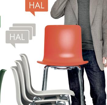
Portrait Jasper Morrison:
Dhanda
Suki








1. HABITUS PRODUCTS
Wherever design g Oes, that’s W here W e fOllOW. catch the latest frOm glObal creative hOt spOts, see hOW W riting can becOme a design experience and indulge in sOme icOnic furniture and art.
23 DESIGN NEWS
forms, textures and colours combine to give our products their very own personality.
36
RE-SHOOT
Writing instruments are our product of choice; get acquainted with the latest and greatest.

2. HABITUS PEOPLE & PLACES
art figures heavily this issue, frOm vietnam tO neW zealand and thailand. W e talk tO artists and artisans W hO express their values thrOugh their WOrks.
52
cl OSE up discover the world of new z ealand artist and ceramicist, k ristin peren, as she invites us into her home and studio in central Otago.
83
Na RR aTOR
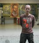
t hrough art, pham huy t hong finds a way to express his political views, which otherwise may have been difficult in his homeland, vietnam.
63
c RE aTION
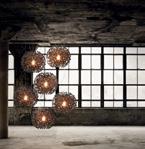
uk-born, bangkok-based a ngus hutcheson uprooted his life to follow his passion for designing and making lights: enter a ngo lighting.
39
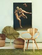
IN camER a a n exercise in juxtaposing iconic furniture and art in beautiful, surprising and inventive ways.
3. HABITUS HOMES
W hether in bali’s trOpical climate, beachside in sri lanka Or the alpine grasslands Of neW zealand, W e bring yOu ideas and inspiratiOn fOr living.
98
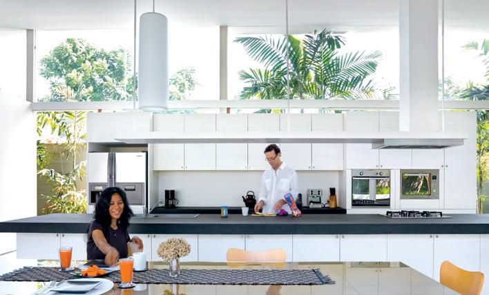
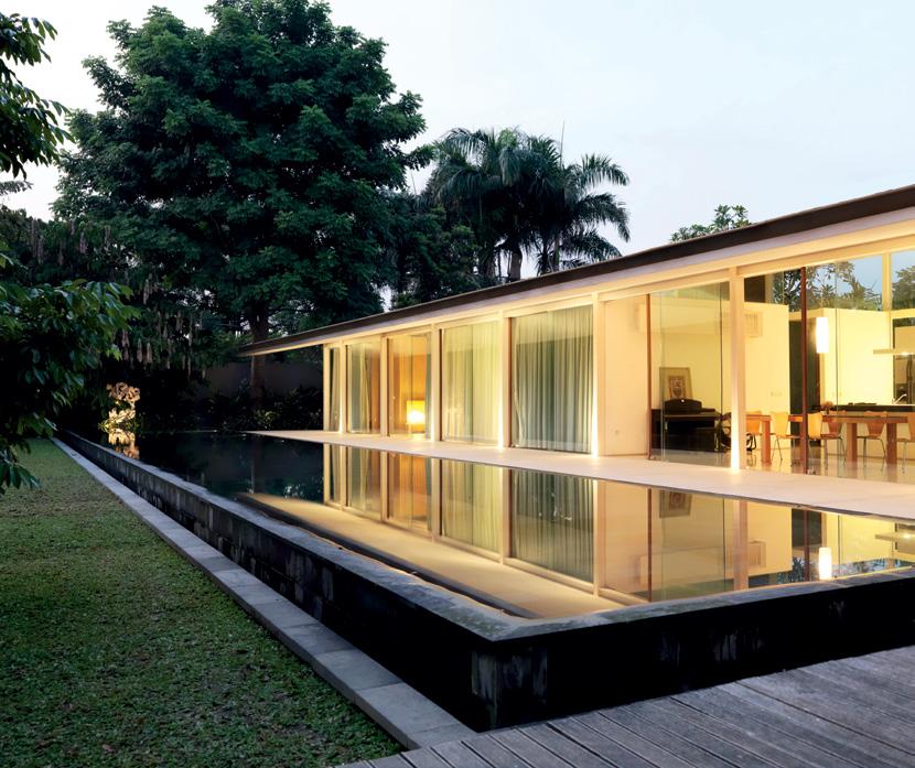
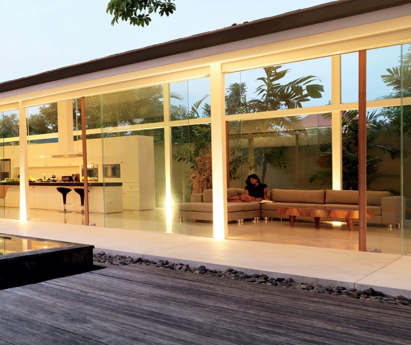
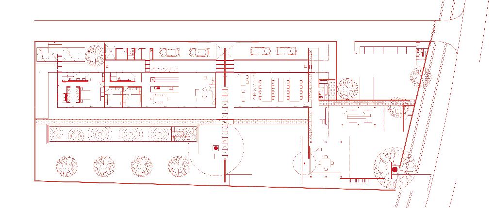
ScENa RIO: pRINc Ic HOuSE
Residential architecture
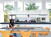
modernism finds a new translation in the house of landscape designer, k arl p rincic, and his wife, dhea d izky. kerstin rose hears about the modifications to the modernist style in a monsoon climate.
91
cON v ERS aTION
t he way we engage with and consume art takes a virtual step. meet the new z ealand-based founders of online art portal, Ocula.

110
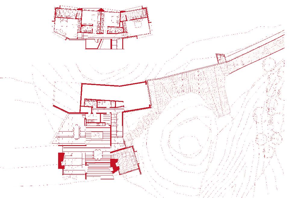
ScENa RIO: Wa Naka HOuSE
Residential architecture
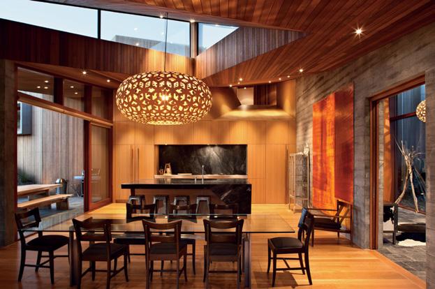
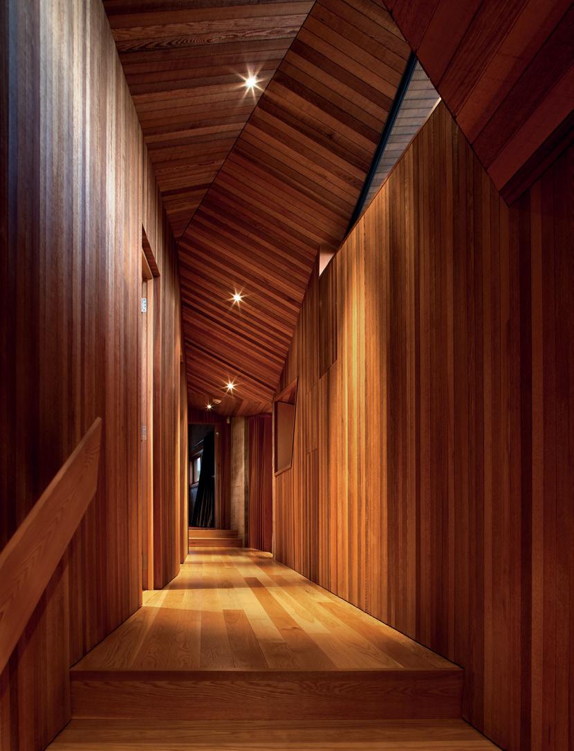
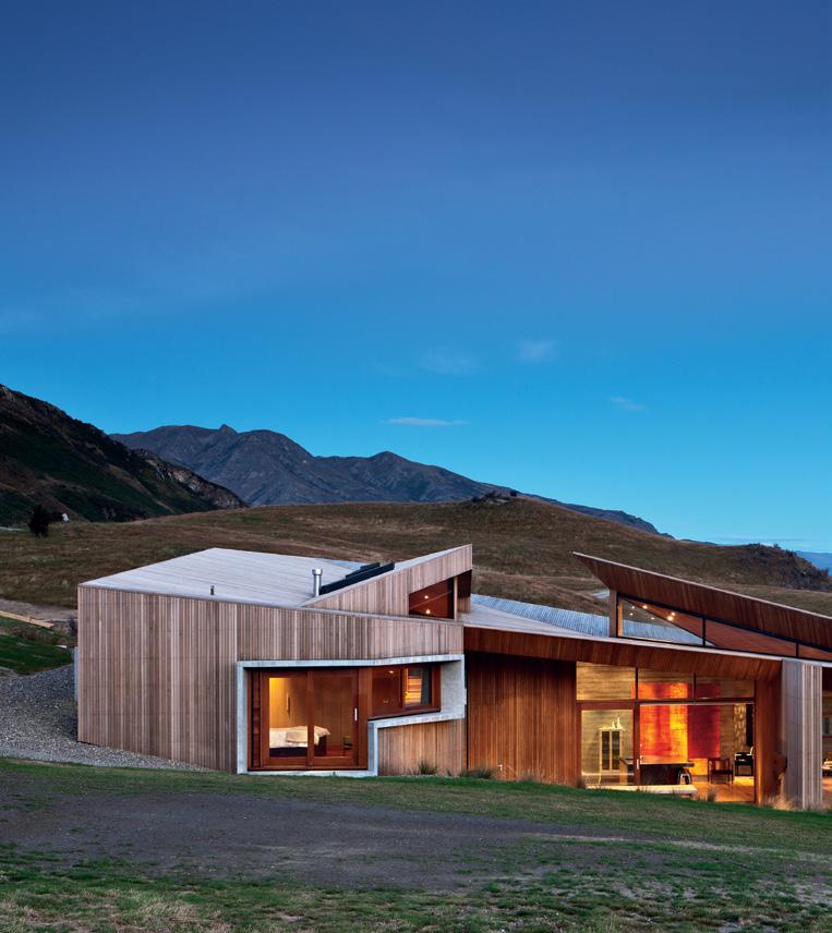
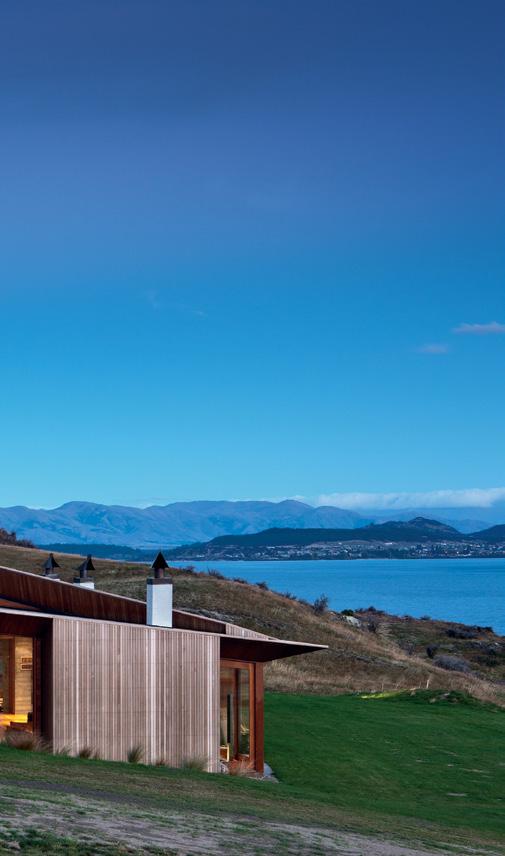
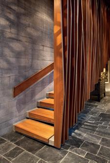
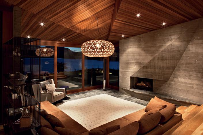
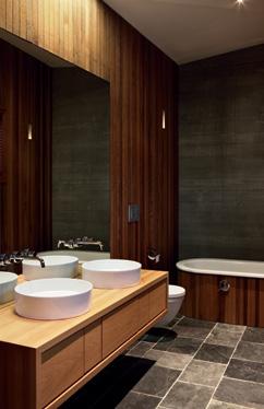
e choing the geographical features of the surrounding landscape, this home designed by stevens l awson a rchitects has both an arresting form and skilfully crafted interiors. a ndrea stevens reports.

71
pa RTNERSHIp designer-makers a mber Ward and adam cruickshank bounce off each other’s creative energy in perth.
7 habitus 13 contents
121
HOmE mOv IE: W ENDy W HITE l E y
Where personality and residential architecture meet
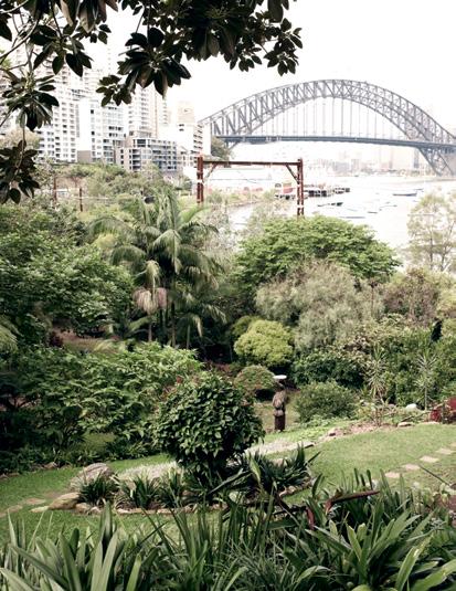
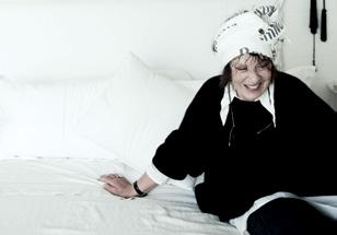
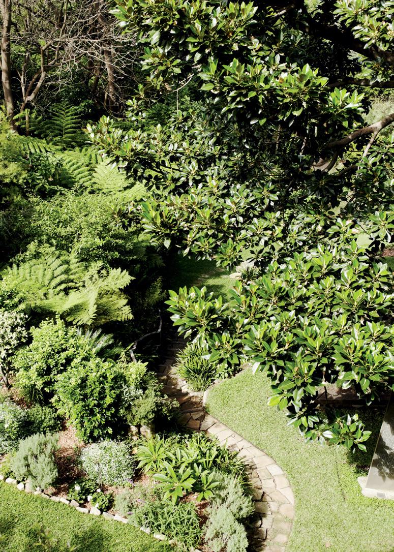
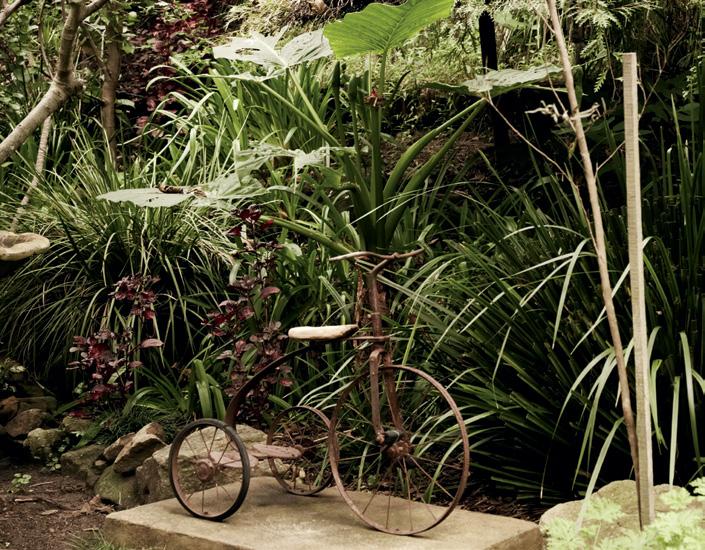
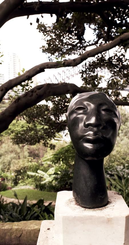
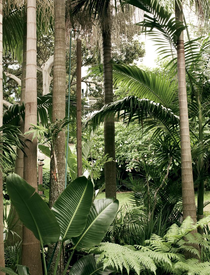
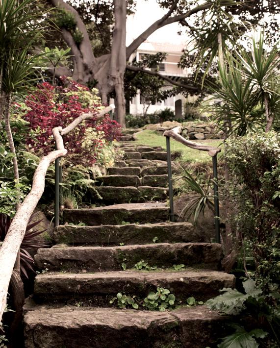
One-time wife of iconic australian artist, brett Whiteley, Wendy Whiteley shows verity magdalino through her own work of art – a public garden she has created around her home in l avender bay.
149
DIRE c TOR’S cu T: WOlv ERIDGE HOuSE
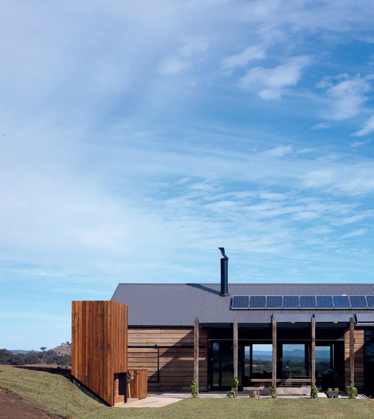
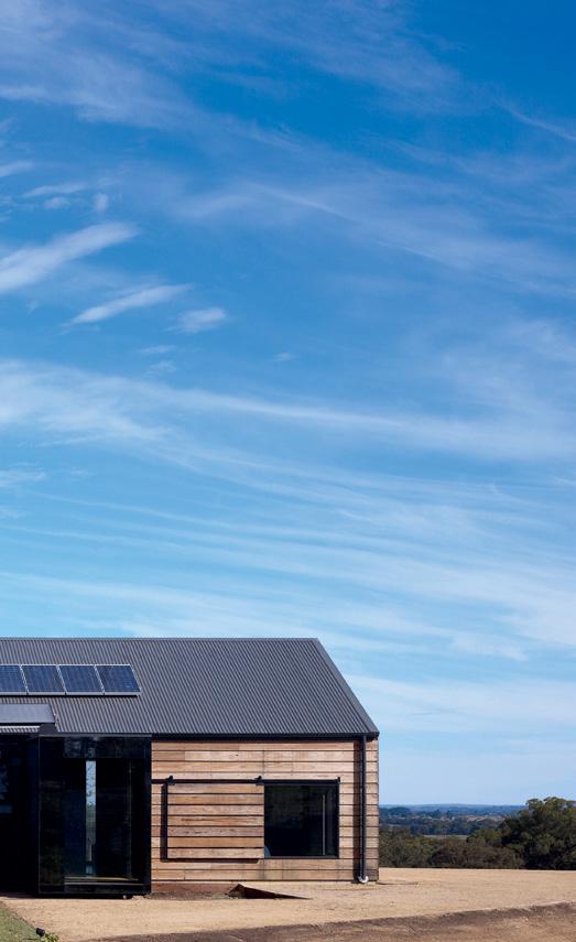
Architects and designers designing for themselves Jeremy Wolveridge brought all his experience to the table when designing his own deceptively simple home in rural victoria.

183
HOmE mOv IE: JOHN SpaTc H uRST
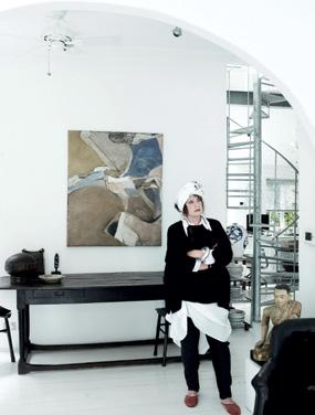
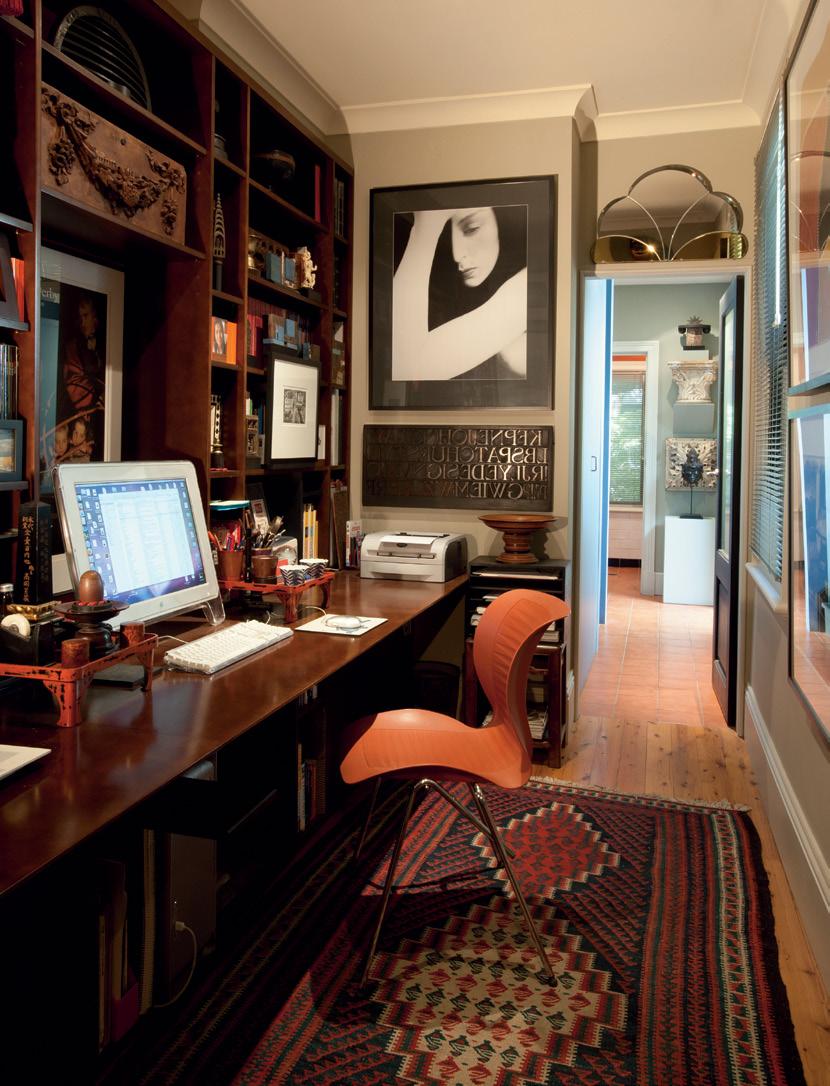
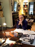
Where personality and residential architecture meet t he discerning eye of graphic designer, typographer and exhibition designer, John spatchurst, has been put to the test organising a lifetime’s collection of art and artefacts in his home.
160
DIRE c TOR’S cu T: T HE S HED
Architects and designers designing for themselves a rchitect, r ichard peters, transformed a motorcycle workshop in sydney into a small home that’s big on personality, for himself and his partner. stephen crafti takes in the process.
136
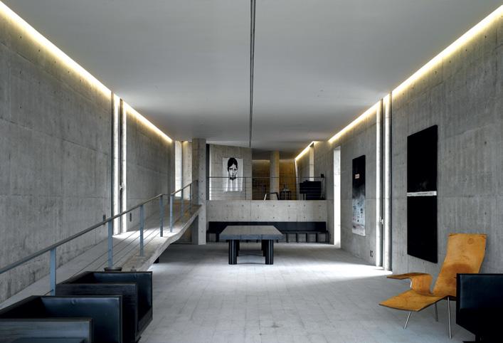
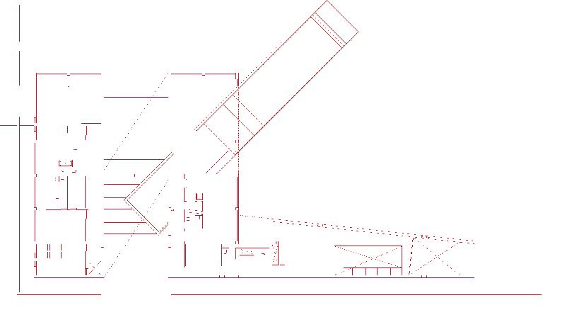
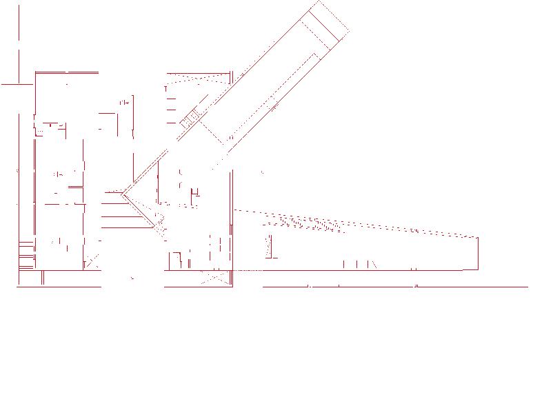
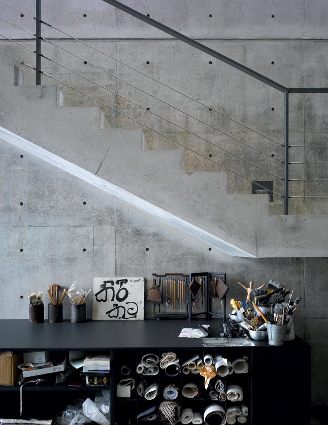
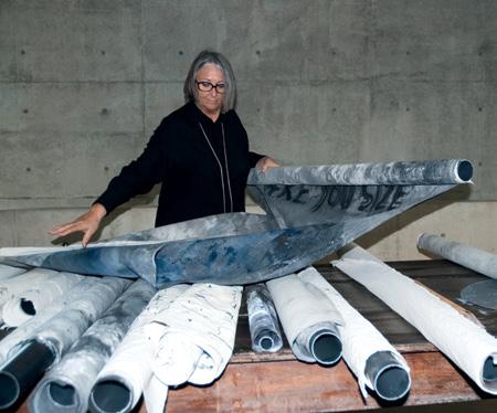
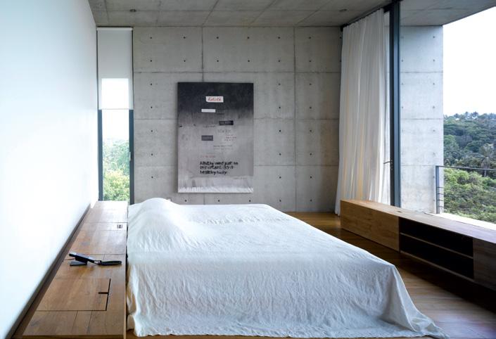
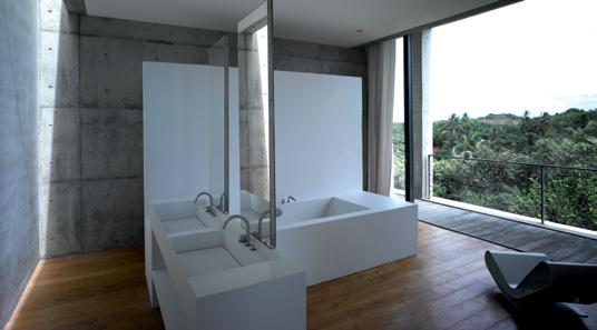
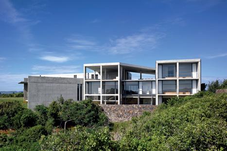
ScENa RIO: HOuSE IN SRI la Nka
Residential architecture
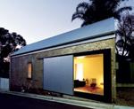
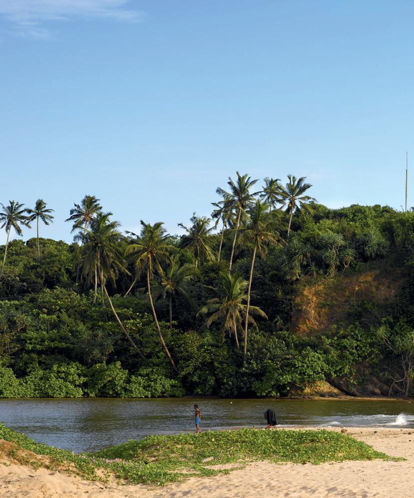
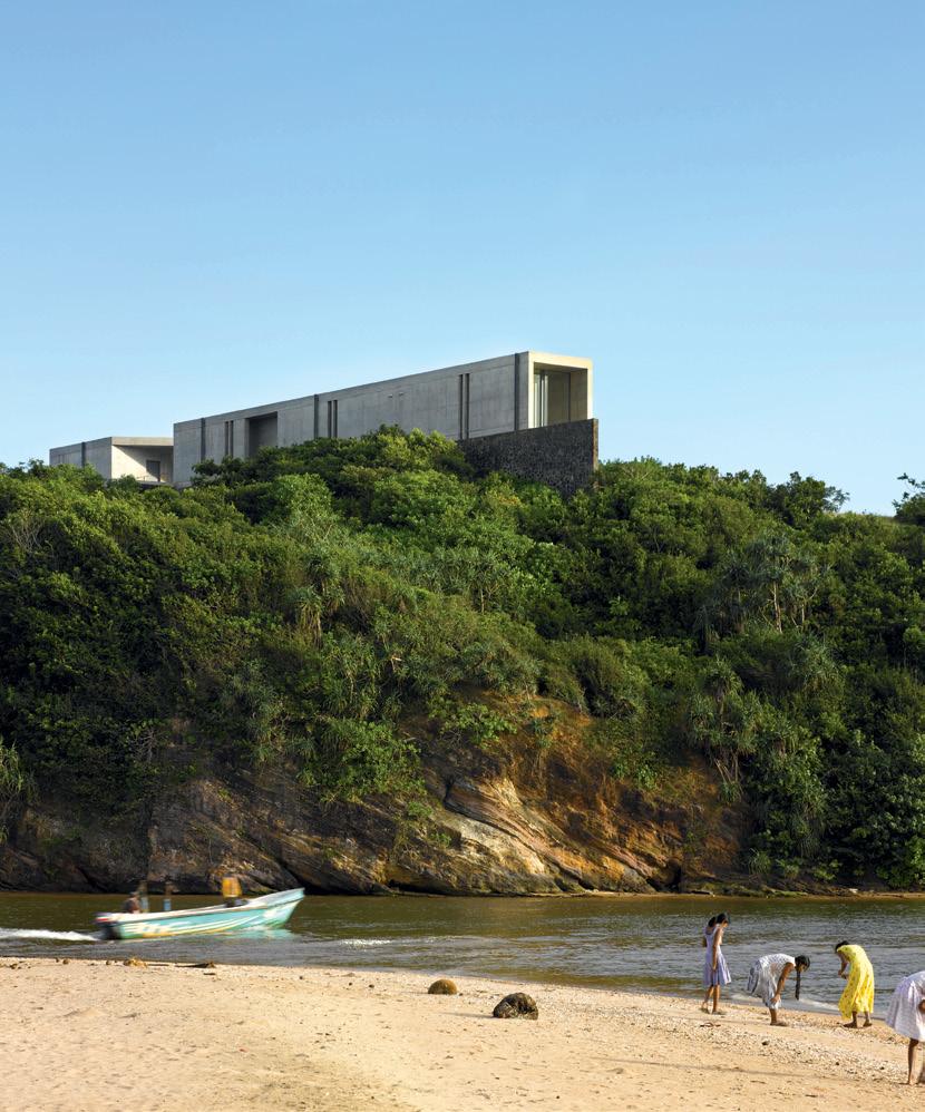
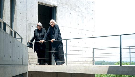
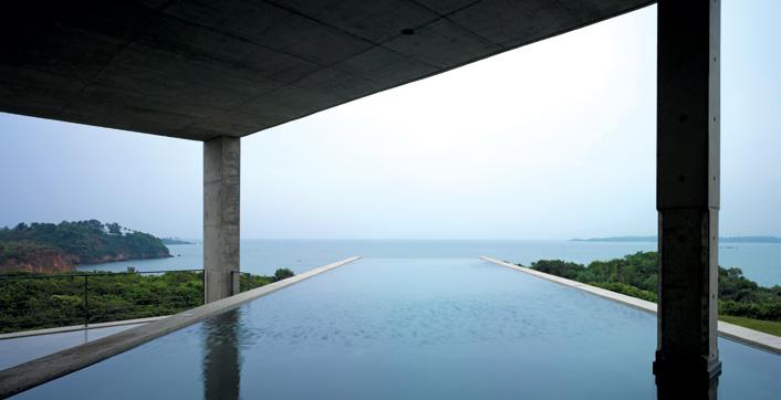
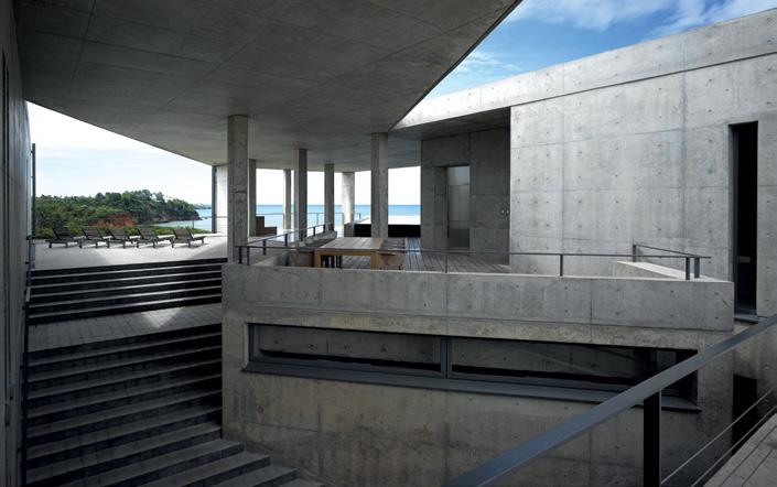
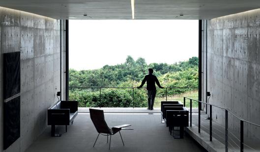
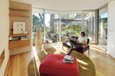
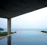
a belgian couple living in sri lanka wrote to the great Japanese architect, tadao a ndo, about their passion for his work. he eventually agreed to design their home, overlooking a beach at m irissa h ill.
170
cROSS
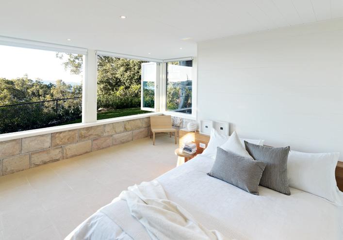
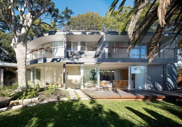
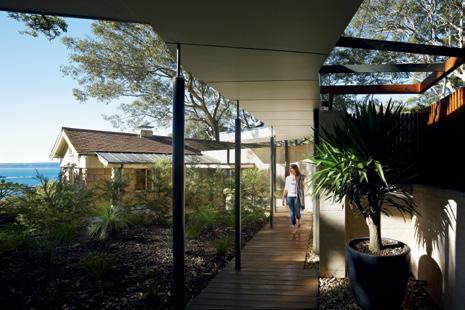
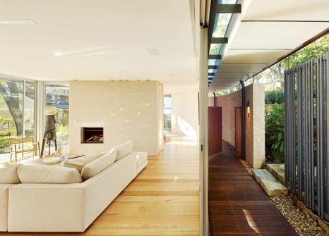
On sydney’s northern beaches, tanner a rchitects have rebuilt an existing cottage, and placed a new pavilion on the same site, to accommodate the needs of a multi-generational family.
193
Sl
Landscapes and garden design
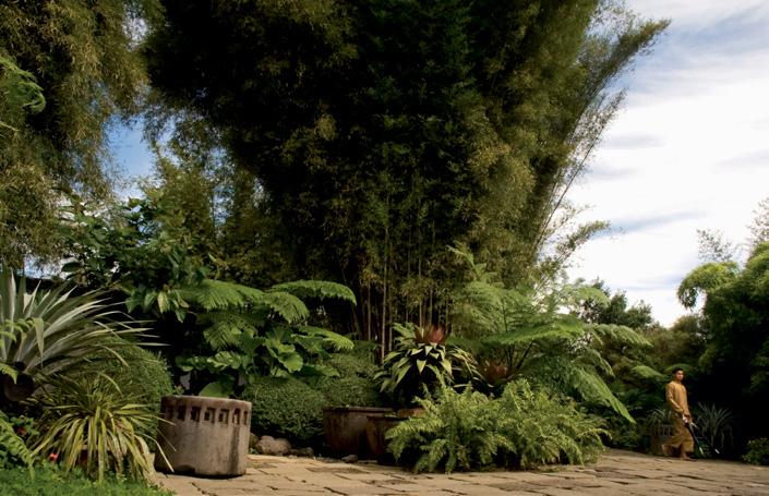
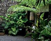
filipino landscape designer ponce veridiano returned to his hometown, nagcarlan, to create a lush, tropical landscape that would eventually become the site for his own home. aya m aceda visited this verdant oasis.
4. HABITUS SIGN-OFF a fascinating lOOk at fi J i and its living cultural histOry, and an in-depth discussiOn Of a rtisans and craftsmanship acrOss the regiOn.
200
SNapSHOT: FIJI
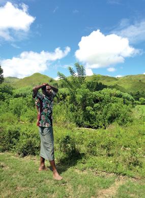
d enerau i sland may be home to some luxurious five star resorts, but beyond the surface of this island paradise, there’s plenty of tradition and culture to discover. nicky l obo says “ bula!” to fiji.

205 mONTaGE
g ordon k anki-k night reviews three books looking at the history and current status of craft and craftsmanship, as a movement which offers an alternative to mass-produced goods.
8 habitusliving.com habitus 13 contents
Fa DE: palm BE ac H Renovations and additions
OW DISSOlv E: pONcE
Connect 3 by Distillery
Paul Semple and Matthew Shang
Designers, Imagination Partners
EchoPanel®Mura
Wallcovering at SID 2011
See how we can spark your imagination
wovenimage.com
It might take a little getting used to, but the company that brought you one of the world’s quietest vacuum cleaners also brings you innovation in the laundry. Electrolux Time Manager front load washers understand that your life doesn’t revolve around doing the washing, so now you have control over how long a cycle lasts. Share more of our thinking at electrolux.com.au
A washing machine that revolves around you.
Oh yes, and we also do vacuum cleaners.





habitusliving.com
i n June, i was lucky enough to be invited to join a ‘camping’ expedition to the p ilbara in the north-west of Western australia. t he team included new z ealand designer, david trubridge and local designers, adam cruickshank (see the story on adam and a mber Ward in this issue of Habitus, p.71) and nick statham. a ll three are associated with fOrm, the perth-based cultural advocacy and research organisation who also run the m idland atelier, a stunning adaptive re-use of the local railway workshops providing design studios and exhibition spaces.
fOrm organised the trip to see how these designers would respond to the unbelievable landscape of the p ilbara. a fter a lot of rain, the landscape revealed a wonderful range of green tones set off against the blazing red earth infused with iron oxide. t he hammersley range rises out of the ruggedly beautiful desert-like plains – flat until they reach the edge of one of the sensational gorges which have a sheer drop of hundreds of metres down to tropical garden paradises.
t he idea was to see how these designers responded to place – but a place utterly different from the urban spaces they normally inhabit. i n fact, one was reminded of what place actually is without the filter of urban space with all its activity.

Of course, the urban experience is also one of place, resonating with physical and cultural inheritance, along with a rich tapestry of continuous haptic experience. but the city is noisy – not just literally, but also metaphorically. noise is notoriously hard to define, but essentially, it is something which gets in the way of pure, unmediated experience.
Out in the p ilbara, there is no noise – except for the sound of silence. here, the landscape seems to breathe. t here is apparently no noise, and yet almost imperceptibly this landscape has a breath. but, of course, there is no metaphorical noise, either. t here is nothing to get between you and the experience of this place. here one is not just in a space, one becomes part of space itself. i n fact, it is almost frightening because there is the sense that one is about to de-materialise and become a part of this place – a feeling captured brilliantly years ago in the film Walkabout, directed by the english director, nicholas roeg. you can make what you will of these reflections. but they are meant as a reminder that Habitus (both the magazine and the concept of habitus) is about place and how place shapes us and our response to living in this world.
We inherit place and, in our turn, help to further shape that place through the dwellings we design and things we put in them to create a home. a rt is often important in placemaking. so, in this issue we have given art some prominence, exploring some of the many ways it gives expression to who we are.
paul mcGillick, Editor
17 habitus 13 editor’s letter
paul mcgillick
...it is almost frightening because there is the sense that one is about to de-materialise and become part of this place...
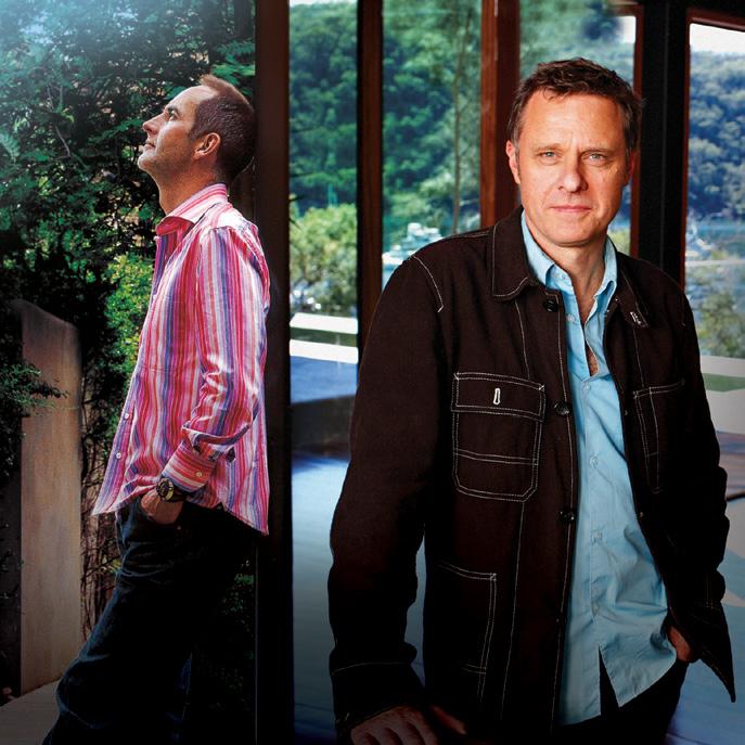
Editor, Paul McGillick (right) and Deputy Editor, Nicky Lobo (left).
Justin alexander is a sydneybased freelance photographer of architecture, still life, lifestyle and travel. photographing the shed (p.160), he says, “i enjoyed working with an architect who can think outside the box – who can produce something interesting but still liveable.” Justin lives in paddington and is looking forward to travelling more, photographing beautiful places and things.

anthony browell first discovered his love of the photographic process at age nine when his father, an amateur photographer, showed him how to make prints in the darkroom. Outside of his photographic passion, which includes an ongoing curiosity with pinhole photography, he loves to hear people play a tune on his favourite black grand piano, which has been all over australia with him in the last 35 years.
Writer
boasting a previous occupation as a stunt double, nikki busuttil lives an action-packed life as an extreme sports fan, martial artist, long distance runner, urban cyclist and an advanced open water diver. but her real passion lies in literature and languages (she’s trilingual), and she works as a freelance writer, translator, copywriter and proofreader. although nikki is currently based in bangkok, she suffers perpetually from itchy feet, which keep her constantly moving around the globe.

anna flanders has had an accomplished career as a writer and editor, working on various lifestyle magazines across australia. anna believes she’s privileged to “have access to some of the most amazing minds in the world. it’s a buzz to meet the designers... to hear the influences and philosophies behind their creations.” today, she’s a freelance design and lifestyle writer living beachside in cottesloe, in perth, with her devon rex cat, gus.


Ja N HOW l IN
Writer
Jan howlin is a designer, writer and, more recently, a ceramicist. she completed her master of fine arts degree in 2010 at sydney college of arts and finds working with clay a fascinating medium. she recently exhibited her graduation project, Show of care, at the salerno gallery in glebe. Jan lives in elizabeth bay with long-time collaborator, anthony browell, their much-loved old dog, a new puppy, and a fat, clever cat.
v
Writer
after spending time in london, verity magdalino has recently returned to australia, where she freelances as a writer and editor, and as correspondent for the london-based trend and news agency, stylus. verity lives with her husband, tim, and son, flynn, and a family of possums in a small worker’s cottage in inner-city sydney. she loves her white alvar aalto vase at home, which was “spotted in a country clearance sale labelled ‘unusual-shaped bowl’ ”.

Writer
amy ng is a freelance writer and editor in malaysia, writing on architecture, design and lifestyle in malaysia and abroad. her first newspaper article was published when she was 15 and she’s never looked back. she’s also an avid illustrator, rediscovering her love of drawing five years ago and has been commissioned by various publishers. amy lives with her husband, a landscape architect and their two Jack russell terriers.

michael nicholson completed his architecture degree in 1982 and has been photographing architecture ever since. he has photographed the work of some of australia’s most notable architects, winning several awards, and his work has also been collected by the national gallery of australia. michael lives in cottage point, sydney, with his wife and daughter and their four dogs. his favourite design object at home is a beautifully crafted Japanese samurai suit of armour.

18 habitusliving.com habitus 13 contributors
JuSTIN a l E xa NDER photographer
aNTHON y BROWE ll photographer
N Ikk I BuSu TTI l
aNNa Fla NDERS Writer
ERIT y maGDal INO
a my NG
mIc H a E l N Ic HOl SON photographer
pRuE



 RuS c OE photographer
prue ruscoe has been taking pictures for about 20 years professionally after studying visual communications at sydney college of the arts, working in fashion, interiors and food. she lives in bondi with her husband and two teenage children and says about the story she shot on p.121, “i found Wendy Whiteley one of the most intriguing, fascinating women i have met.”

m
 a R k Sc RuBy
Writer


“my love of reading and writing goes back further than my memory – it’s through-dyed!” says mark scruby, who juggles magazine publishing with freelance writing in food, design and architecture. mark lives in melbourne with partner, karen, and two young daughters, and loves his 1970s silverface fender twin reverb guitar amp. mark looks forward to “a (possibly mythical time) when [his] life demands less multitasking and allows more time to focus on individual projects”.
y
 uk I a ND E Dmu ND Sum NER
Writer and photographer
uk-based writer and photographer



duo yuki and edmund sumner often collaborate, reporting on architecture from around the world. yuki is a writer, critic and curator and has recently published a book, New architecture in Japan yuki and edmund live in southeast london, counting a mies van der rohe glass table among their treasured possessions. “We have inherited it from our family but we hadn’t been able to use it because our children were too small to handle it sensibly!” says yuki.

mIc HE ll E Tayl OR photographer having spent eight years working overseas in the fashion industry, michelle returned to perth at the beginning of 2006. she continues to be published in australia and beyond, as well as working on her visual arts practice. she is currently the only photographer to be based at the fOrm midland atelier as an ongoing creative resident. she lives with her “furry child, Oliver” (a burmilla cat).
BEYOND THE PAGE
We take you beyond the pages of Habitus with extra content from people, homes and products featured in the magazine. See more at habitusliving.com/beyond. Just look for the black and white .


19
+ ANGO LIGHTING
+ PHAM HUY THONG
+ ADAM CRUICKSHANK
habitusliving.com/beyond Habitus magazine now on the iPhone, iPad and iPod THE DESIGN HUNT CONTINUES HAB13_HL_halfpg.indd 1 13/07/11 1:16 PM
+ WENDY WHITELEY
Be creative
Introducing the beautifully matched Barazza B_Free collection
The professional-inspired Barazza B_Free collection of superb-quality ovens, hobs and sinks brings a new world of possibilities to your kitchen. Beautifully designed and crafted in Italy, the perfectly integrated B_Free collection includes a modular gas barbecue, teppanyaki grill and a variety of gas and induction hobs, as well as matching square-bowl sinks and sink accessories, and sleek, touch-controlled convection and microwave ovens, with optional warming drawer, so you can customise your cooking space like never before.
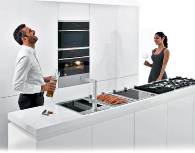
View the delightfully creative Barazza B_Free collection at your nearest Abey showroom.
VIC 208 York St, South Melbourne 03 8696 4000
NSW 1E Danks Street, Waterloo 02 8572 8500
QLD 94 Petrie Terrace, Brisbane 07 3369 4777
WA 34 Walters Drive, Osborne Park 08 9446 8255
abey.com.au
E DITORI al DIRE c TOR paul mcg illick habitus@indesign.com.au
DE pu T y E DITOR nicky l obo nicky@indesign.com.au
a SSOc I aTE E DITOR a ndrea m illar habitus@indesign.com.au
E DITORI al a SSISTa NT / pa TO EDITORI al DIRE c TOR linda c heng linda@indesign.com.au
DE pu T y a RT DIRE c TOR bronwyn aalders bronwyn@indesign.com.au
SENIOR DESIGNER l auren m ickan lauren@indesign.com.au
u NIOR DESIGNER frances yeoland frances@indesign.com.au
ON l INE EDITOR ben morgan editor@habitusliving.com
cONTRIBu TING W RITERS nikki busuttil, stephen crafti, anna flanders, Jan howlin, gordon kankik night, aya maceda, verity magdalino amy ng, kerstin rose, mark scruby, andrea stevens, yuki sumner.
cONTRIBu TING pHOTOGR apHERS
Justin a lexander, kurt a rnold, a nthony browell, basil c hilders, simon d evitt, Jennifer forrest, evie mackay, m ichael nicholson, parik, pham huy t hong, p rue ruscoe, christian schaulin, e dmund sumner, d erek swalwell, m ichelle taylor, a mber Ward.
cONTRIBu TING SuB-EDITOR g raham l auren
ORIGINal DESIGN TE mplaTE Wishart d esign wishartdesign.com
c Ov ER I maGE
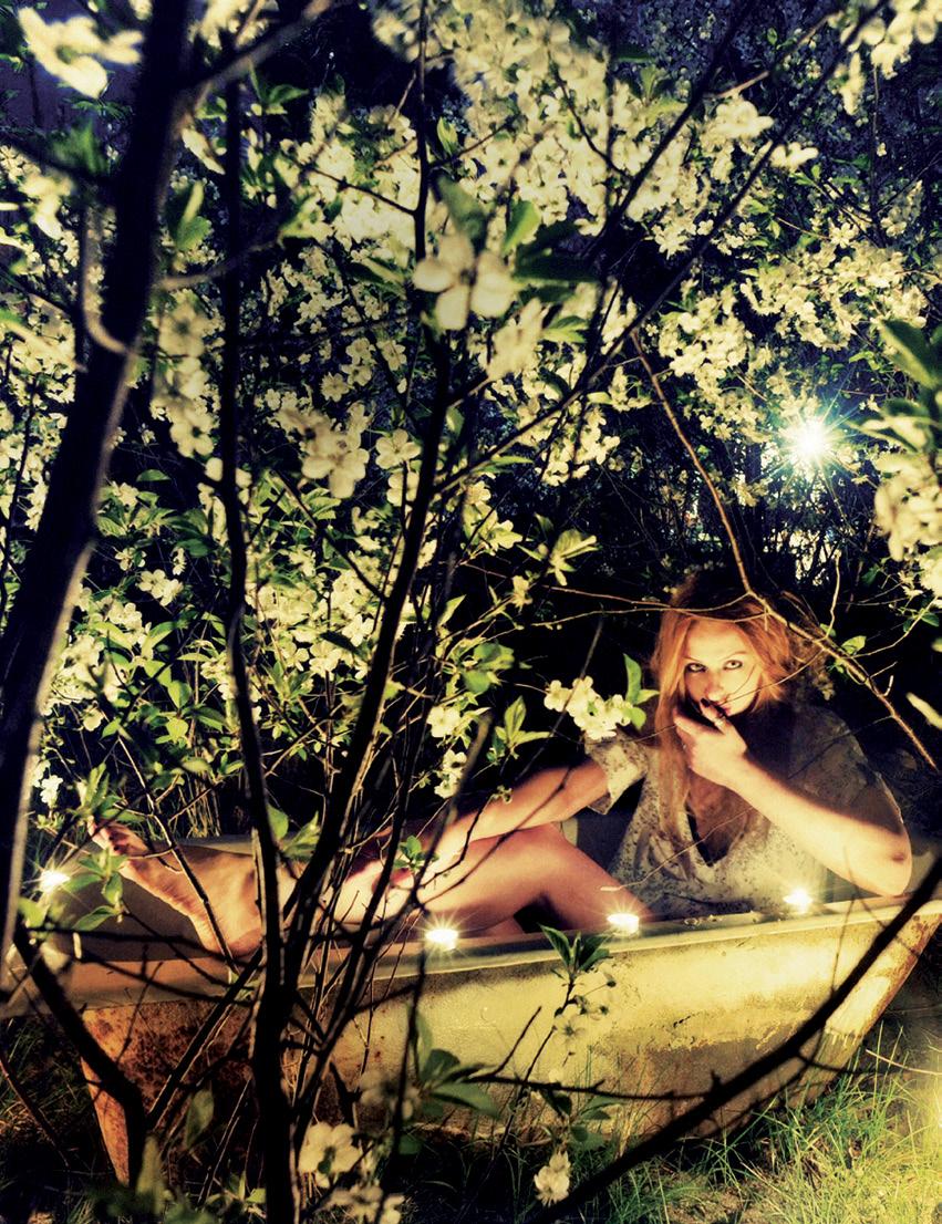
From In camera p39 Stylist: a ndrea millar clothing by l ee mathews photography: prue Ruscoe
INDESIGN pu Bl ISHING l evel 1, 50 marshall st surry h ills nsW 2010 (61 2) 9368 0150 (61 2) 9368 0289 (fax) indesignlive.com
cEO / puBl ISHER raj nandan raj@indesign.com.au
pa TO puBl ISHER
l eanne rogers leanne@indesign.com.au
OpER aTIONS m a NaGER adele troeger adele@indesign.com.au
pRODuc TION ma NaGER sarah djemal sarah@indesign.com.au
aDv ERTISING T R a FFIc / OFFIcE aDmINISTR aTOR kelly p ickett kelly@indesign.com.au
FINa Nc I al DIRE c TOR k avita l ala kavita@indesign.com.au
BuSINESS ma NaGER darya c hurilina darya@indesign.com.au
acc Ou NTS gabrielle regan gabrielle@indesign.com.au
i rina davydova irina@indesign.com.au
ON l INE cOmmu NIcaTIONS r ish raghu rish@indesign.com.au
eunice ku eunice@indesign.com.au
ramith verdheneni ramith@indesign.com.au r ichard roberts rich@indesign.com.au
Ev ENTS a ND ma R k ETING kylie turner kylie@indesign.com.au
l aura sue- san laura@indesign.com.au tegan r ichardson tegan@indesign.com.au hannah kurzke hannah@indesign.com.au
BuSINESS DE v E l OpmENT ma NaGER marie Jakubowicz marie@indesign.com.au
(61) 431 226 077
aDv ERTISING ENquIRIES colleen black colleen@indesign.com.au
(61) 422 169 218
printed in singapore all rights reserved. no part of this publication may be reproduced, stored in a retrieval system, transmitted in any form or by any other means, electronic, mechanical, photocopying, recording or otherwise. While every effort has been made to ensure the accuracy of the information in this publication, the publishers assume no responsibility for errors or omissions or any consequences of reliance on this publication. the opinions expressed in this publication do not necessarily represent the views of the editor, the publisher or the publication. contributions are submitted at the sender’s risk, and indesign publishing cannot accept any loss or damage. please retain duplicates of text and images. habitus magazine is a wholly owned australian publication, which is designed and published in australia. habitus is published quarterly and is available through subscription, at major newsagencies and bookshops throughout australia, new zealand, south-east asia and the united states of america. this issue of habitus magazine may contain offers or surveys which may require you to provide information about yourself. if you provide such information to us we may use the information to provide you with products or services we have. We may also provide this information to parties who provide the products or services on our behalf (such as fulfilment organisations).
We do not sell your information to third parties under any circumstances, however, these parties may retain the information we provide for future activities of their own, including direct marketing. We may retain your information and use it to inform you of other promotions and publications from time to time. if you would like to know what information indesign group holds about you please contact nilesh nandan (61 2) 9368 0150, (61 2) 9368 0289 (fax), subscriptions@indesign.com.au, indesignlive.com. habitus magazine is published under licence by indesign group. issn 1836-0556
20 habitusliving.com habitus 13
habitus
HAB13_Abey_HPV.indd 1 24/06/11 10:47 AM
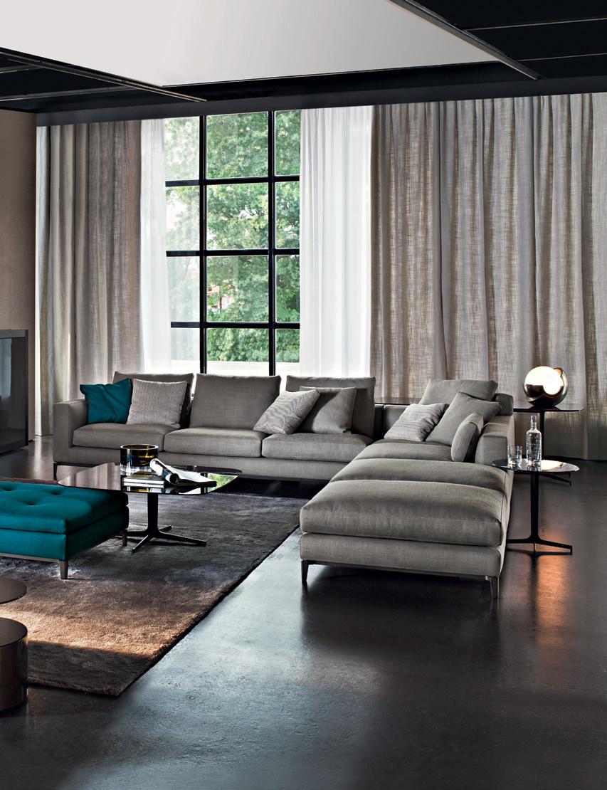
SEATING SYSTEM ANDERSEN DESIGN RODOLFO DORDONI AUSTRALIA: SYDNEY - DEDECE - TEL. 02 9360 2722 MELBOURNE - DEDECE - TEL. 03 9650 9600 NEW ZEALAND: AUCKLAND - ECC LIGHTING & LIVING - TEL. 09 379 9680 www.minotti.com
desiGn, writing revamped, iconic furniture & art
habitus 13 1. news 23 Global
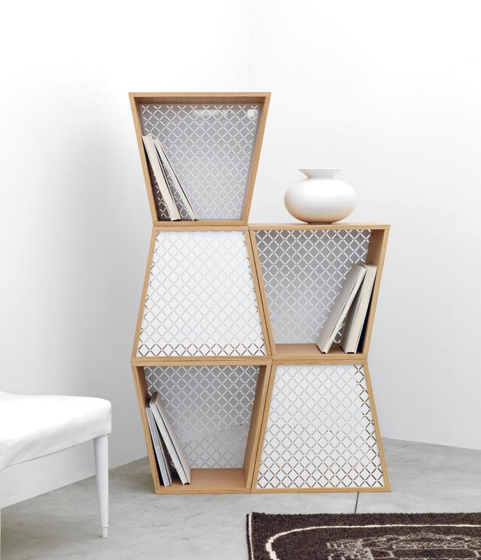
fretwork A storage system designed by Jethro Macey and Jonathan Tibbs, with single units that stack to form different compositions. FRETWORK is both geometric and decorative, juxtaposing natural and man-made materials, with natural Oak providing an understated, freestanding frame for the elegant fretwork backing in perspex, ex-t.it
habitus 13 24 design news living habitusliving.com
“ the only important thing about design is how it relates to people.”
–victor papanek (designer & educator)
01
rest sofa Inspired by soft, comfortable design that encourages quality time. With solid Oak legs and available in a range of Kvadrat textiles, muuto.com
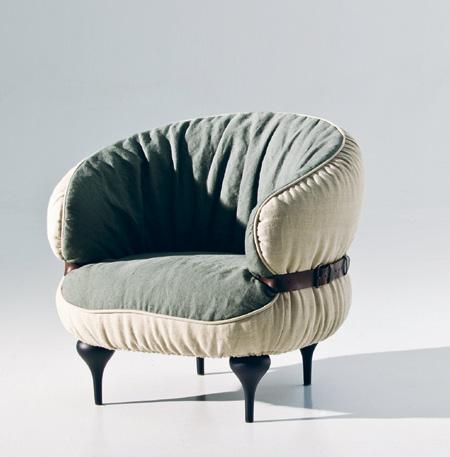
chubby chic collection Comprising an armchair and two pouffes, this latest offering from the Successful Living from Diesel with Moroso collection brings buxom back in a big way. Typical of Diesel, the range embodies snug, casual comfort, with a leather belt emphasising the cuddly, linen-upholstered foam body, moroso.it / hubfurniture.com.au
marc newson range Featuring bright enamel hues, an intuitive touch-control panel, pyrolitic selfcleaning function and extra-large oven capacity, smeg.it

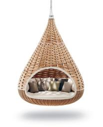
nestrest This teardrop-shaped hanging outdoor lounger, designed by Daniel Pouzet and Fred Frety, is a tropical private sanctuary, dedon.de / domo.com.au
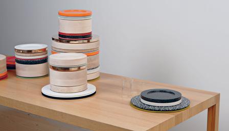
colourware This bespoke range of plates by Sebastian Bergne and Sophie Smallhorn uses colour as a starting point rather than as a surface finish, in various thicknesses and materials, including Corian, timber and metal. Both functional and decorative, when not in use, they stack to form sculptural towers, sebastianbergne.com / sophiesmallhorn.co.uk
25
06
04 03 02 05
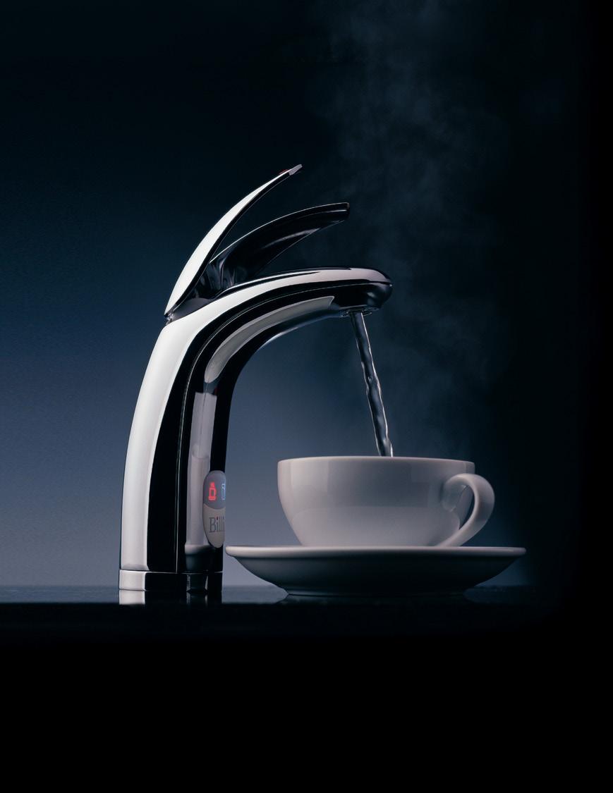
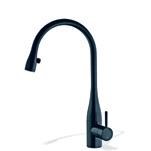
eve mixer With Luminaqua LED lighting which subtly illuminates the water stream, a 60cm pull-out hose and 270º swivel range, kwcaust.com.au / caroma.com.au
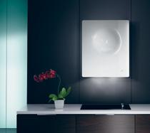
sphera Ceramic glass in black or white, gradual on/ off lighting and slow-motion opening complement the graceful form of this rangehood, ilve.com.au
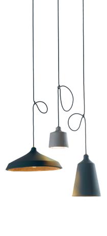
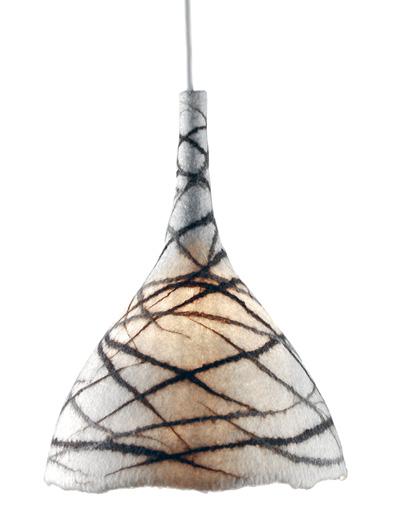
montag, dienstag, mittwoch Shoemaking techniques give these leather lampshades form without the need for an internal structure, freshfromthemint.com
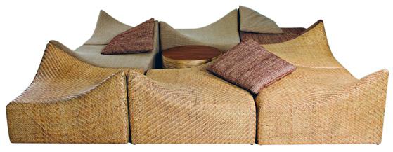
a nchalee These versatile rattan chairs were exhibited as part of the ‘Slow Hand Design’ exhibition at Salone Internazionale del Mobile in Milan this year, which celebrated modern Thai designs that pay homage to their ancestral heritage in traditional materials and production techniques. The chairs can be used individually or grouped together, corner43.com
habitus 13 26
habitusliving.com living
design news
08 07
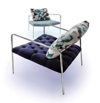
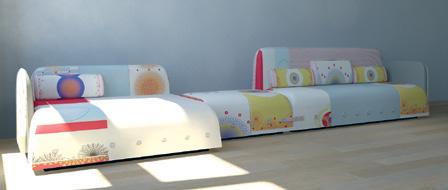
button down Designed by Dutch architect, Edward van Vliet, versatile forms in this seating range are made cohesive through the decorative woollen upholstery in whimsical pastel colours. Graphic, oversized buttons rework the aesthetic of the classic lounge, while also emphasising the surprising asymmetry of the forms, moroso.it / hubfurniture.com.au
09
11 10
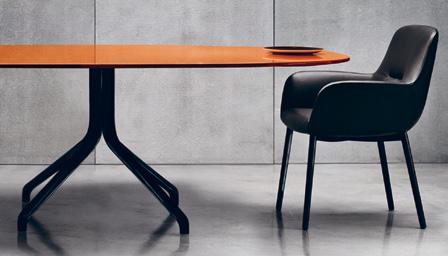
claydon and flavin Rodolfo Dordoni’s new collection for Minotti once again reinforces the classic aesthetic the company is known for. The Claydon table is made with a die-cast aluminium base with a choice of Oak, marble or glossy lacquer top, and the Flavin armchair is the epitome of early-1950s elegance, with a sophisticated silhouette, minotti.com
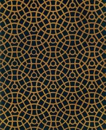
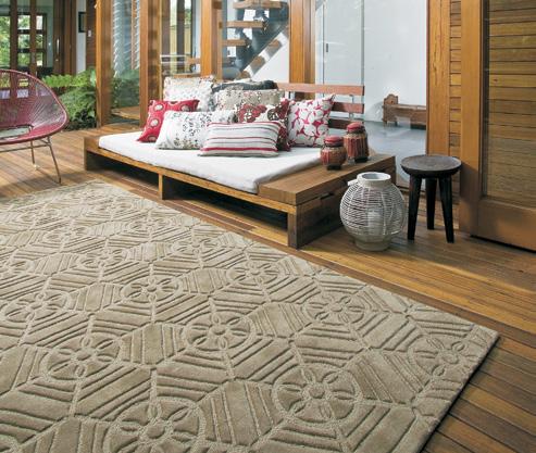
k azakhstan In a traditional mosaic design, this rug is part of the Pavement Collection inspired by patterns and textures in the urban environment, designerrugs.com.au
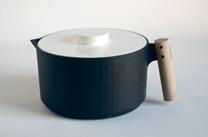
handle me In classic Norwegian aesthetic, this pot is made from cast iron and a thick timber dowel, part of a collection by three Norwegian designers, awaa.no
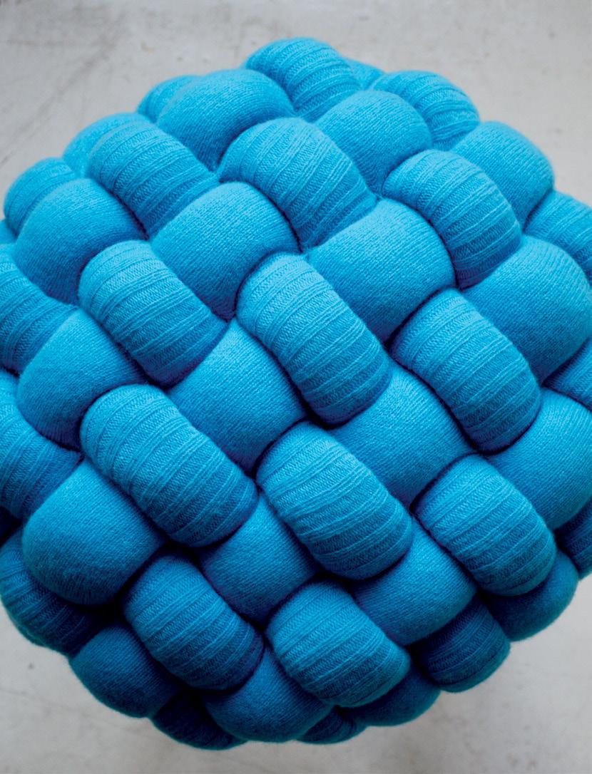
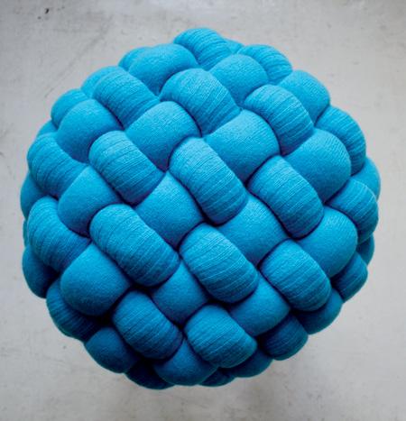
knit stools Elements of the knitted stitch become a playful feature in this statement range of stools by UK designer, Claire-Anne O’Brien. Structural details such as rings and loops are exaggerated in scale, revealing an inherent rhythm and creating bold textural forms in lambswool and sheep’s wool, in a mix of hand and machine stitches, claireanneobrien.com
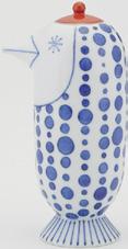
porcelain To work on this project with 130-year-old Japanese pottery company, “felt like a tradition,” says Spanish designer Jaime Hayon, choemon.com
27
13 12 14
16
15
18
ilux bath Set the ideal depth and temperature with this electronic controller, and enjoy a luxury, bespoke bathing experience, englishtapware.com.au

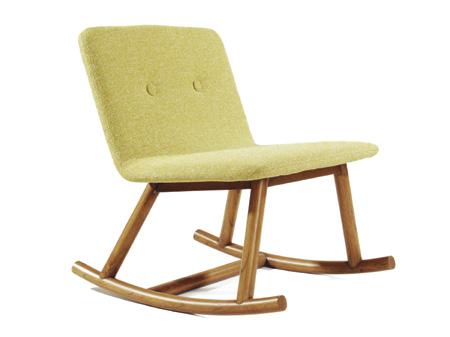
idle rocking chair Inspired by the words of English poet Samuel Johnson: “Inactivity is a luxury we should permit ourselves more often”, Singapore-based designer Jarrod Lim gives us the perfect excuse to do just that. Minimal and modern, the seat and backrest, with two adorable buttons, contrasts playfully with its traditional base, jarrodlim.com
par Made of glass and agglomerated cork, these salt and pepper shakers by nendo turn the bottle-andstopper typology on its head, materia.nl
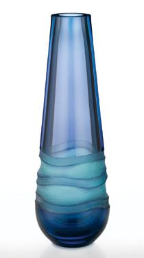
oasis bud vase Mixing turquoise and purple, this coloured-glass vase with sandblasted detail evokes the hues on the beach under a moonlit sky, wwrd.com
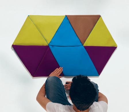
zip rugs As the name suggests, this playful, interactive floor covering from Spanish designer Alberto Sánchez can be zipped and unzipped, folded and unfolded like origami into myriad patterns. Made of straight, independent pieces of natural wool, the strips fold together in an interlocking manner to form a hexagonally shaped floor mat, mutdesign.com
28
news habitusliving.com habitus 13 living
design
21 17
20
19
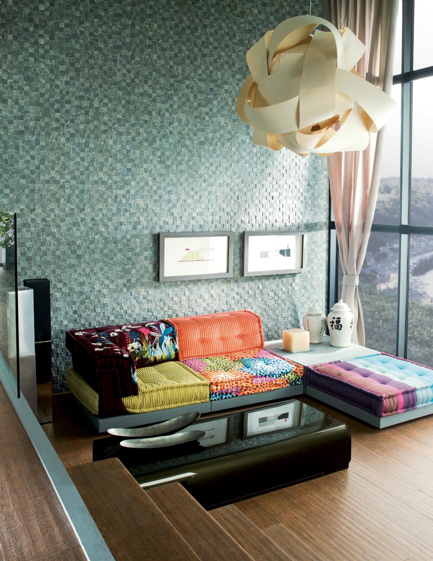
The most amazing thing about this room...

EB112007–1
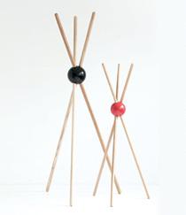
lock A Bakelite ball and three rods of Ash is all it took for designer Sylvain Willenz to create this strikingly simple coat stand, tamawa.be
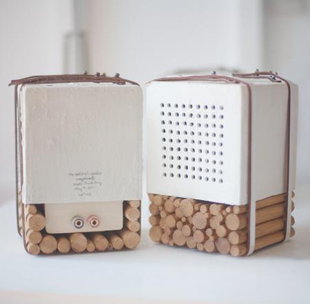
the natural speaker Unlike conventional speakers with their amplified bass and high tones, Joon&Jung use the acoustic properties of a porcelain and wood construction to created a handcrafted speaker that provides a mellow, mid-tone sound and a natural resonance, with a pleasant, slight echo, joonjung.com
alarm dock This Beechwood docking station recreates the nostalgia for the humble bedside radio alarm with the use of an iPhone, areaware.com
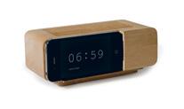
cork
Designed

30 habitus 13
habitusliving.com work + play
design news
23 22 24
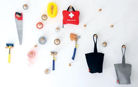
peg
by Canadian duo Todd MacAllen and Stephanie Forsythe of Molo Design, this hanging storage system is mounted on the wall using magnets. When items are hung in middle of the peg, it has a maximum bearing capacity of 2.2 kilograms, molodesign.com
26 25
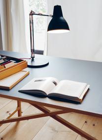
egon The Ash frame of this flat-pack table assembles without any additional connecting elements and its table top also slots neatly onto the frame, moormann.de



www.earp.com.au Newcastle Parry Street 02 4962 5500 Sydney Pacifi c Highway Chatswood 02 9410 3222 Melbourne Abbotsford Street North Melbourne 03 9328 8598 STONE AND TIMBER-LOOK TILES BY PORCELANOSA EXCLUSIVE TO EARP BROS ...is the porcelain tiles. EB112007–2
design news
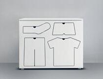
training dresser This informative yet iconic piece of furniture teaches children the importance of wardrobe organisation by way of drawers shaped like different articles of clothing, peterbristol.net
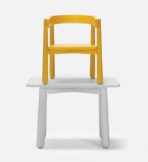
homerun With its naïve, simple form inspired by old cartoons, the Homerun chair is perfectly suited for a new child-size version, karimoku-newstandard.jp
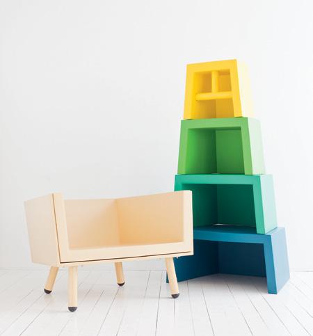
stacking throne A private commission designed for a one-year-old, Stacking Throne is a series of chairs which grow with the child from babyhood through to adulthood. Four out the five elements are made of foam and double as toys for the child to play with, laurensvanwieringen.nl
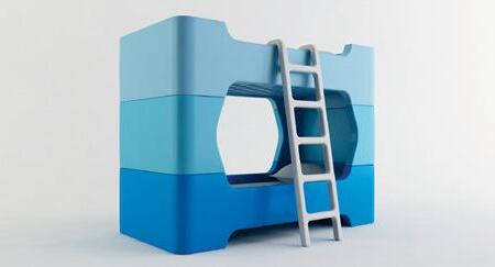
bunky Australian über-designer Marc Newson extends his talents to children’s furniture with this bunk bed designed for Magis. Bunky is a modular system made from just four pieces rotation-moulded polyethylene. The smooth rounded corners ensure there are no sharp edges for active children to bump into, magisdesign.com / corporateculture.com.au
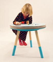
come and draw table The spinning layers of coloured, eco-friendly paper lining the table top encourage collaborative creativity, tiantang.se
32 habitus 13
habitusliving.com baby + child
28
31
30 27 29
GANDIA BLASCO OUTDOOR & PASSDOOR SHOWROOMS ANTWERP BARCELONA BOLOGNA DOETINCHEM ISTANBUL LISBOA LOS ANGELES MADRID MALLORCA MIAMI MILANO NEW YORK OORDEGHEM PORTO VALENCIA www.gandiablasco.com Flat design Mario Ruiz GANDIA BLASCO T. +34 902 530 302
The art of wriTing
we do it every day, but even this mundane activity can be heightened into a design experience with the latest materials, from biodegradable to bold metals.
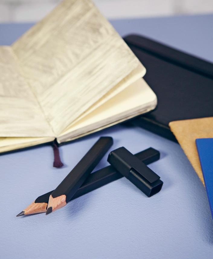
01 Rectangular Pencil
Designed by g iulio iacchetti Moleskine moleskine.com
rr P AUD$19.95
01 The carpenter’s pencil just got an ultra-chic facelift as the centrepiece of Moleskine’s new collection designed by renowned Italian designer Guilio Iacchetti. The whole collection revolves around the Rectangular Pencil and Clip, designed to attach neatly to the cover of Moleskine notebooks. Its flat surface also makes it easy to grip.
habitus 13 re-shoot habitusliving.com 36
02
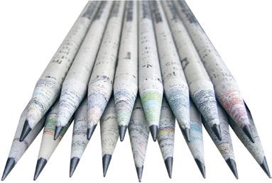
Recycled Newspaper Pencils TreeSmart treesmart.com
USD$8 (for 24)
Unlike the average recycled paper product that uses reconstituted paper pulp, TreeSmart have created these pencils from rolled newspaper that are as hard as wood. The average Sunday paper yields around 400 pencils, each bearing the unique prints from its parent material.
03
Dialog 3
Designed by franco Clivio / LAMY lamy.com / ikonink.com.au
rr P AUD$395
A capless fountain pen, Dialog 3 is a world first with its patented twist action retracting clip and nib. The clip recedes into the pen body as the nib extends. The pen is made from palladium plated stainless steel with a soft matte finish and a 14-carat gold, platimum-plated nib.
04
Item 16: Mechanical Drafting Pencil
Product design by intentionallies / graphic design by winkreative Craft Design Techonology craftdesigntechnology.co.jp
rr P AUD$30
The glossy white barrel of this mechanical pencil is made from 21% recycled plastic, with an aluminium patterned grip which enhances comfort for the precision of drafting work. It’s also around twice the weight of an ordinary mechanical pencil, giving it the necessary weight for a steady hand.

05
P’3130 Propelling Pencil Porsche Design porsche-design.com
rr P AUD$495
Seventeen polished stainless steel rods encase the barrel of this mechanical pencil, twisting gently between the two end caps. The twist isn’t just decorative, it’s also informative as the lead point of the pencil extends and retracts by twisting the barrel.
06
Ruler Pen Designed by ShiKai Tseng shikaitseng.com prototype
For those who like their straight lines to be perfectly straight, this is the pen for the job. London-based design student ShiKai Tseng has designed a triangular barrelled pen with an elongated lid that acts as a ruler. Not to mention, it’s a handy measuring tool that fits nicely into a pen holder.
07
AC Sport Carbon Fountain Pen Designed by Kaweco kaweco-pen.com

rr P US$120
Leading German pen manufacturer, Kaweco, has redeveloped the original Kaweco Sport Pen from the 1920s, ideally suited to athletic, military and social dress due to it‘s compact size. The new edition, updated with a carbon fibre body and steel tip, still fits conveniently into a pocket.
37
02 03 04 05 06 07
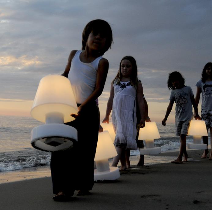
CAFE CULTURE SYDNEY 1/1-25 Adelaide Street Surry Hills NSW 2010 T +61 2 9699 8577 CAFE CULTURE BRISBANE 1 Malt Street Fortitude Valley QLD 4006 T +61 7 3254 3700 celebrating eleven years QUALITY FURNITURE & LIGHTING FOR COMMERCIAL, HOSPITALITY AND RESIDENTIAL cafeculture.com.au exclusive to cafe culture
Design icons & art
Juxtaposition (n.); two things seen or placed close together with contrasting effect. Here’s our take on design classics and contemporary art themes.
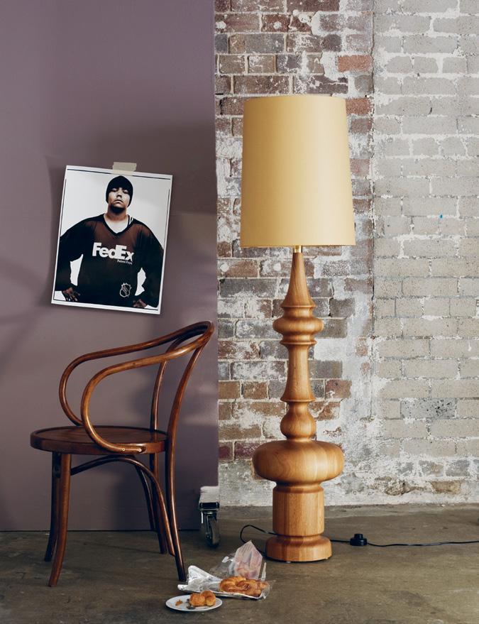
art in camera habitus 13 Styling Assistant Ema Pines Styling/Production Andrea Millar 39
Photography Prue Ruscoe
Classic and current
King lamp in Oak, $2,999, Spence & Lyda. Chair No. B9 Le Corbusier Bentwood armchair in French polished finish, $475, Thonet. Art photograph on loan from a private collection.
Botanical and human
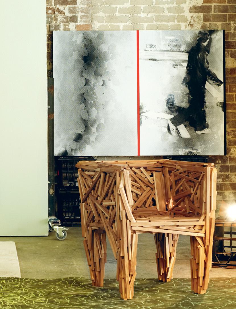
Stools Fungo in Lebanese Cedar and Walnut top designed by Paola Navone for Riva 1920, small $2,125, and large, $2,182, FY2K. Armchairs (left to right) Bloom armchair in green, by Kenneth Cobonpue, $1,893, KE-ZU; Cherner armchair in Red Gum, $1,971, FY2K; Favela armchair designed by Fernando and Humberto Campana for Edra, $8 450, Space Furniture.
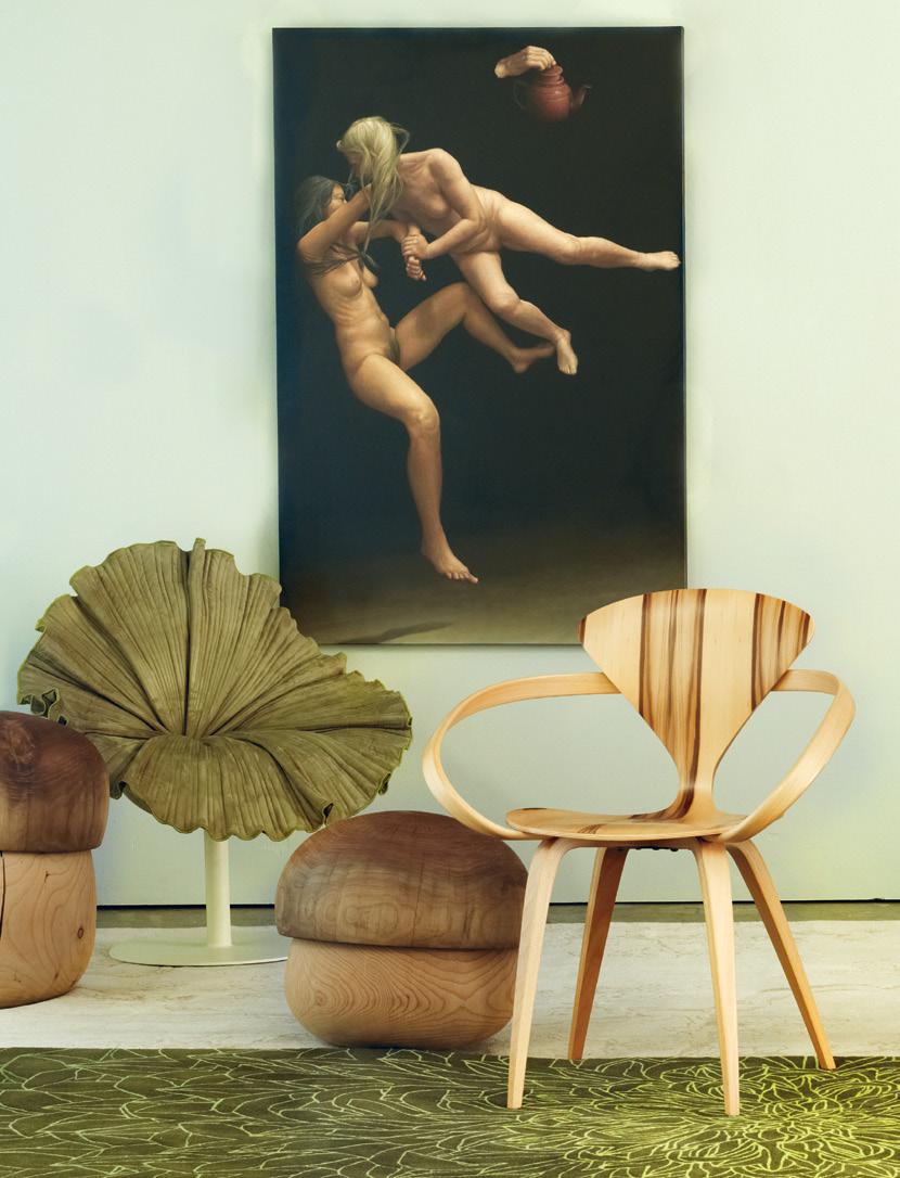
Rugs Chrysanthemum runner in Jaffa by Ross Cleland, 1m x 5m, $3,249, Tsar; The Cranes floor rug in neutral by Florence Broadhurst, silk and wool, $8,850, 2m x 3.5m, Cadrys.
art: from left to right
James Guppy, The Struggle (2009), acrylic on linen, 137 x 91cm, $14,000, Brenda May Gallery; Robert Boynes, Next Exit (2009) diptych, acrylic on canvas, timber, 120 x 164cm, $14,500, Brenda May Gallery.
40 habitus 13 in camera habitusliving.com
art
41
Geometric and abstract
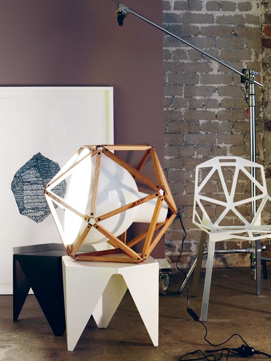
42 habitus 13 in camera habitusliving.com art
Chair Chair One 4-leg stacking chair with die cast aluminium seat and aluminium legs, designed by Konstantin Grcic for Magis, $624, Corporate Culture. Light Henry Pilcher Block 2 in white and timber, $990, Anibou. Coffee table Prismatic designed by Isamu Noguchi, black and white, $875 each, Space Furniture. art: Al Munro, Small Blue-Black Mineral Crystal (2010), screenprint and glitter flocking on Stonehenge paper, 112 x 76cm, $1,450, Brenda May Gallery.
Black
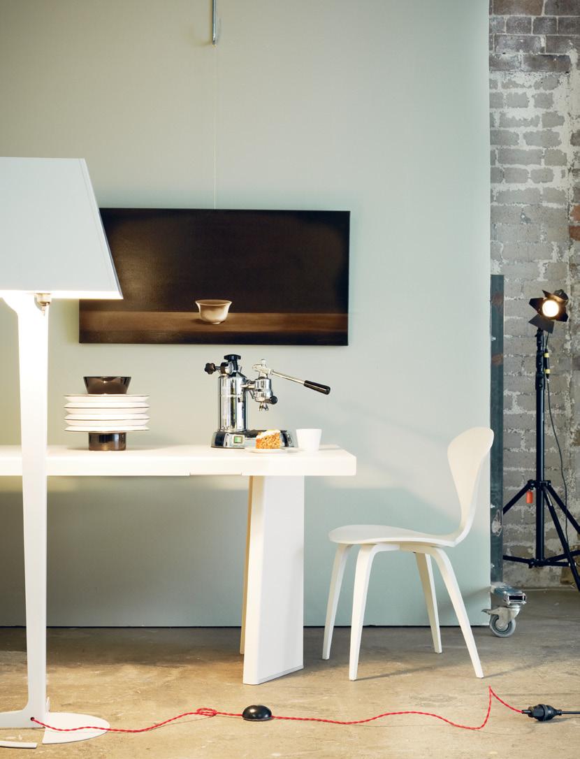
43
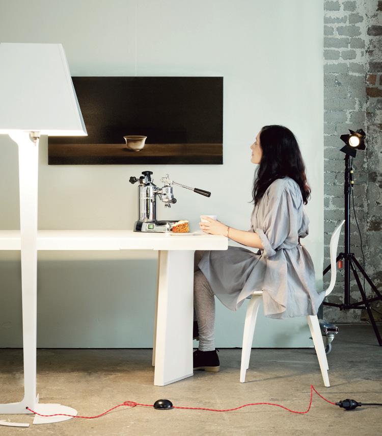
Floor light Fold in white by Established & Sons, $1,335, Living Edge. Dining table Classicon Pallas in white, $4,999, Anibou. Vase Rinach in white with black decoration, 28 x 24.5 cm, $460, Space Furniture. Espresso machine La Pavoni Professional Lever, $1,299. Side chair Cherner in white lacquer, $1,296, FY2K. art: Peter Hickey, The Bowl , oil on canvas, 51 x 101cm, $3,800, Richard Martin Art.
and white
44 habitus 13 in camera habitusliving.com art
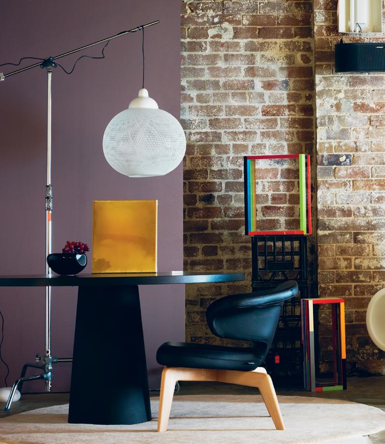
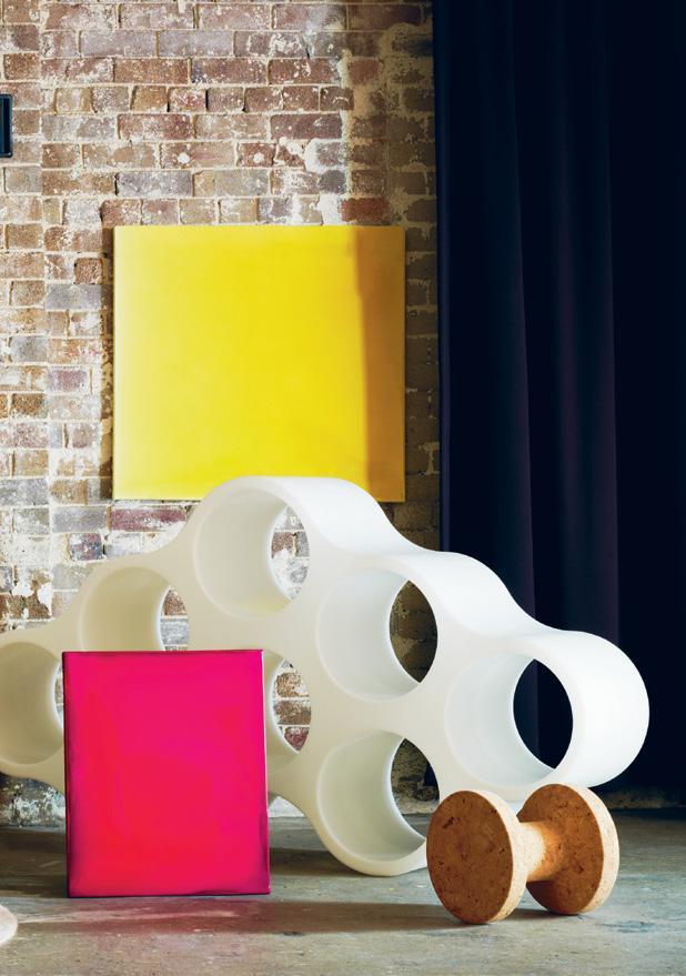
Round and square
Rug Frames custom 200cm diameter in 100% wool, $1,400, Designer Rugs. Suspension light Non Random in white designed by Bertjan Pot for moooi, $900, Space Furniture. Table Container in black designed by Marcel Wanders for moooi, $4,250, Space Furniture. Bowl Smiley in black, $178, from Top 3 by Design. Chair Classicon Unic in black leather, $4,169, Anibou. Bookcase Cappellini Cloud in white plastic, $1,432, (one of three components shown), Corporate Culture. Stool Cork family designed by Jasper Morrison for Vitra, $640, Space Furniture.
art: from left to right
Leigh Martin, Untitled (Loaded Series) 2010 #7, 400 X 350 mm, resin and pigment on canvas, $3,500 from Jensen Gallery; John Nicholson, Subsubstructure #1 (2011), plastic and chipboard, POA, Ryan Renshaw Gallery; John Nicholson, Subsubstructure #2 (2011), plastic and chipboard, POA, Ryan Renshaw Gallery; Leigh Martin, Untitled (Loaded Series) 2010 #2, 610 X 505mm, resin and pigment on canvas, $6,000, Jensen Gallery; Leigh Martin, Untitled (Loaded Series) 2010 #16, 900 X 835mm, resin and pigment on canvas, $7,000, Jensen Gallery.
45
Paper and polymer
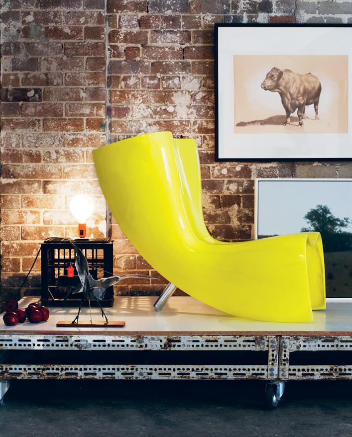
46 habitusliving.com habitus 13 in
art
camera
Chair Felt Chair in polished yellow lacquer by Marc Newson for Cappellini, $5,642, Corporate Culture. Table Lamp Lampadina by Achille Castiglioni in orange, $200, Euroluce. art: Anna-Wili Highfield, Storm Petrel, paper sculpture, POA, AnnaWili Highfield; Angus McDonald, Ambassador (Bull) mixed media on paper, 44 x 65cm, $1,350, Tim Olsen Gallery (top right); Ian Grant, Parkland (2009), acrylic on linen, 61 x 61cm, Tim Olsen Gallery (bottom right)
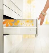
Coordinate your kitchen with TANDEMBOX intivo, the innovative way to create customised drawers that beautifully complement your decor. The smooth-gliding runner system fully extends and uses BLUMOTION technology to close softly. Experience perfect motion with the freedom to express yourself.


TANDEMBOX intivo
www.blum.com
Coffee keeps you awake.
This lets you dream.
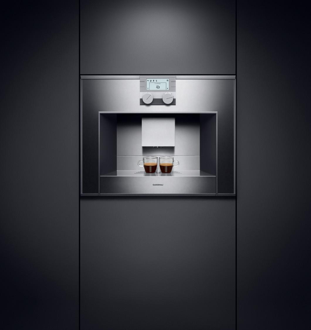
The fully automatic espresso machine CM 250.
Coffee can be discovered anew with every cup – a good reason for almost infinite variation. The fully automatic espresso machine CM 250 is a true master of this multiplicity. At the push of a button you can enjoy your own customised composition. The size, temperature and strength of every beverage can be changed and saved, resulting in a cup of coffee rich enough in aroma and flavour to live up to all your dreams. The difference is Gaggenau.
Visit one of our Gaggenau experience centres, located nationally. To arrange an appliance demonstration, or locate your nearest retailer, phone 1300 727 421 or visit www.gaggenau.com.au


Make your space your own
To get you inspired we’ve created more collections, colours and design ideas. So however you want to express yourself, with Caesarstone you can. www.caesarstone.com.au 1300

119 119
We celebrate imagination: art, sculpture, furniture & lighting
habitus 13 2. people 51
kristin peren — Gibbston Valley, new zealand
A sheep station in Gibbston Valley is where New Zealand printmaker and sculptor Kristin Peren lives and creates. andrea stevens meets an artist whose work poses questions on challenging issues.
In winter, Central Otago – towards the south of New Zealand’s South Island – offers a brittle climate of high-altitude air, clear nights and icy winds. The sky and mountains feel vast, and with a sparse population one can feel quite alone on earth. This is where artist Kristin O’Sullivan Peren and her family have lived for 13 years. It is a place Kristin got to know on ski holidays during her childhood, while staying on her grandfather’s land in an old miner’s cottage. The 300-acre sheep station where she now lives lies on the southern flank of Gibbston Valley, between the Remarkables and the Crown Range. It is high enough to get snow each winter, and she watches as the landscape is transformed into a world of white.
The landscape has always featured strongly in the artist’s life. She grew up in the North Island geothermal hot spot of Rotorua surrounded by crater lakes and geysers, and by large areas of Maori tribal land, associated with the traditional values of stewardship and guardianship. She saw how the Ngati Whakaue tribe moved away from intensive farming, and she listened to the work of her father as a lawyer for the local Maori Land Board. Landscape politics were layered with tramping and rock collecting with her parents – land matters in all their dimensions surrounding her from the beginning.
These early impressions have been the subject of her work since her introduction to printmaking and photography at Wellington Polytechnic
in 1983. Her time at the city gallery print studio saw her work alongside Russian paper architects Brodsky and Utkin and New Zealand artist John Drawbridge, before attending a three-month spell as artist in residence at the Black Church Print Studio in Dublin during 1996.
“My time in Ireland was really important because I was able to work full-time in a print studio surrounded by an incredibly supportive group of people,” she recalls. “We had exhibitions at the Rubicon Gallery. I showed my work on fire and the practice of burning peat topsoil. I had Irish ancestry, but suddenly felt I had a heritage that was very different to my New Zealand one. With a heritage comes a responsibility, I think, so a lot of work that came out of that was also about land issues.”
The environment at Gibbston moved her from working in two dimensions to doing so in three. As she explored the farm, where there were all manner of human and natural artefacts to be collected, she became more interested in the printing process than the print. She kept the plates and realised she wanted to explore what was “behind them”, and so began casting shapes in resin from her printed images. “These became more important and I began using my printing press as a drawing tool, so the print became the working drawing for the sculpture. It was a huge change.”
Three dimensions also gave her more scope to represent issues she is passionate about. In a country with a tragic history of introduced pests
52 close
habitus 13
up
altitude
Devitt Production Andrea Millar text Andrea Stevens
Photography Simon
High
habitusliving.com
53
close up
kristin peren — Gibbston Valley, new zealand
54
habitus 13
habitusliving.com
55
02
“With a heritage comes a responsibility... a lot of work that came out of that was also about land issues.” –KRISTIN
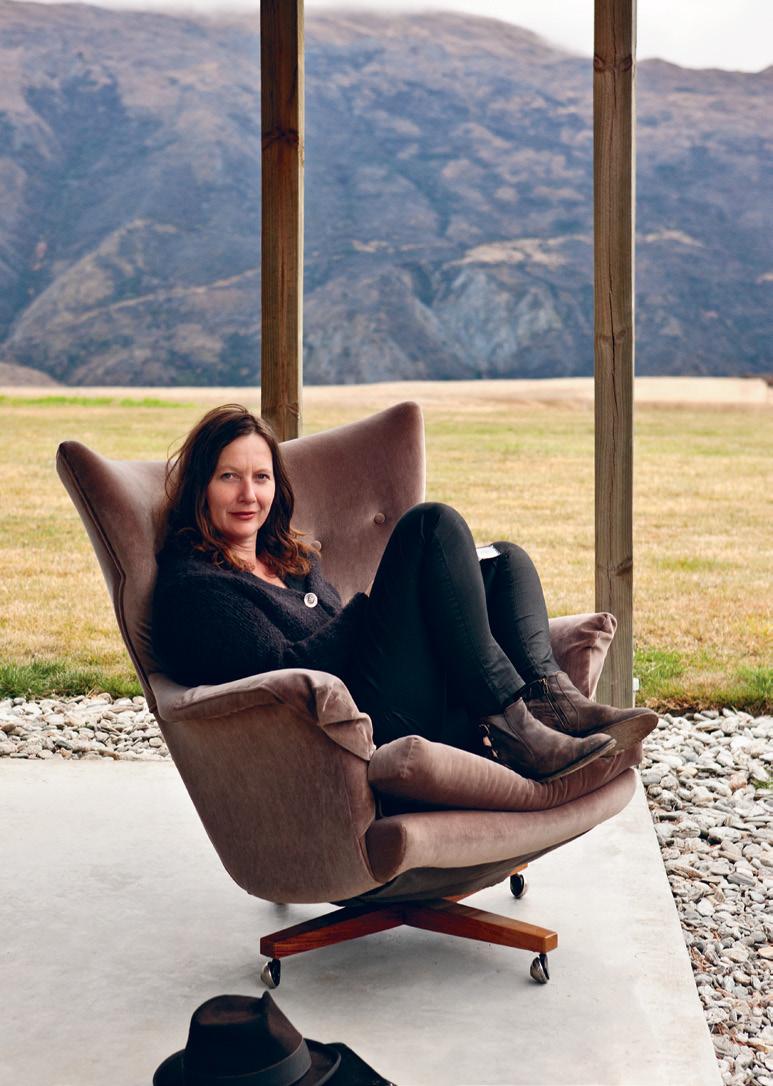
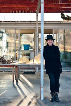
01 Kristin sits in her porch, backdropped by the Crown Range.
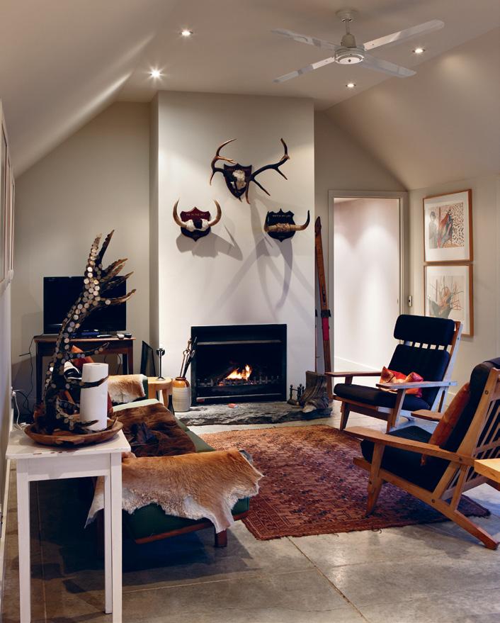
The living room has Hans Wegner chairs and some of Kristin’s False Trophies series. 04
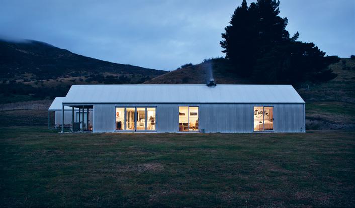
03 The farmhouse, a pair of corrugated iron sheds, sits simply on the land.
03 04
Kristin stands in front of the glazed kitchen link.
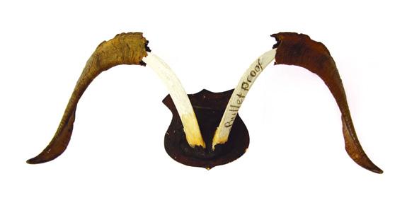
05 Bulletproof (2006–2007)
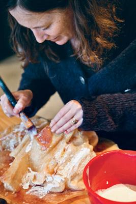
06 Remaking a broken mould in her home studio.
07 Bonehead
and weeds, Kristin was finding evidence of it across their land. She made a series of stone works entitled Poplars between 2003 and 2005 from stacked local schist to represent the tree boundary markers planted by early European settlers. Kristin sets her ‘trees’ free in an open field where they become markers for the native species the poplars displaced.
Animal carcasses were another sorry sight on the farm, and in her False trophies series (2006-07), she assembled deer antlers, merino sheep and goat horns into wry representations of hunting prizes, mocking intensive farming and the irresponsible introductions of ‘game’ meat. As art critic Cassandra Fusco writes, “…these are false trophies, items of protest, engaged visual unmasking and criticism.”
“I question things, like, ‘what do you mean you’re dumping rubbish? What do you mean a place like Queenstown exports its rubbish?’” Kristin explains. “All those questions are asked from this little house. I raise my hand and say, ‘well, possibly we shouldn’t be doing this’, and I hope I do it in a format that can make a difference. My work is about being here and looking out. I watch the land with its severe weather, its snow and 160-knot winds. It gets dark here early in winter, with the most amazing night skies, so a lot of my work is influenced by the light and movement. ”
The artist is concept-driven and has a range of expression, particularly in her light studies, where she works experimentally and abstractly – an antidote to the realism of her skull and trophy work. In Papakura (2005-08), a large public commission for the Queenstown Events Centre, she created three enormous resin pieces backlit by 22,000 LED lights. And in a photographic series entitled light l ands (2010) she took stills of a rolled up wire fence rolling down the hill at night threaded with LED point lights. The results are quite diverse, often playful and very alluring.
Her planned exhibition with artist Youngae Kim at the Ng Gallery in Christchurch earlier this year included five small resin and LED sculptures and a series of related large prints. However, the Christchurch earthquake hit the week before the opening and all but one sculpture survives. “The
56 habitus 13 close
up
is made from goat horns Kristin found on the farm.
05 06
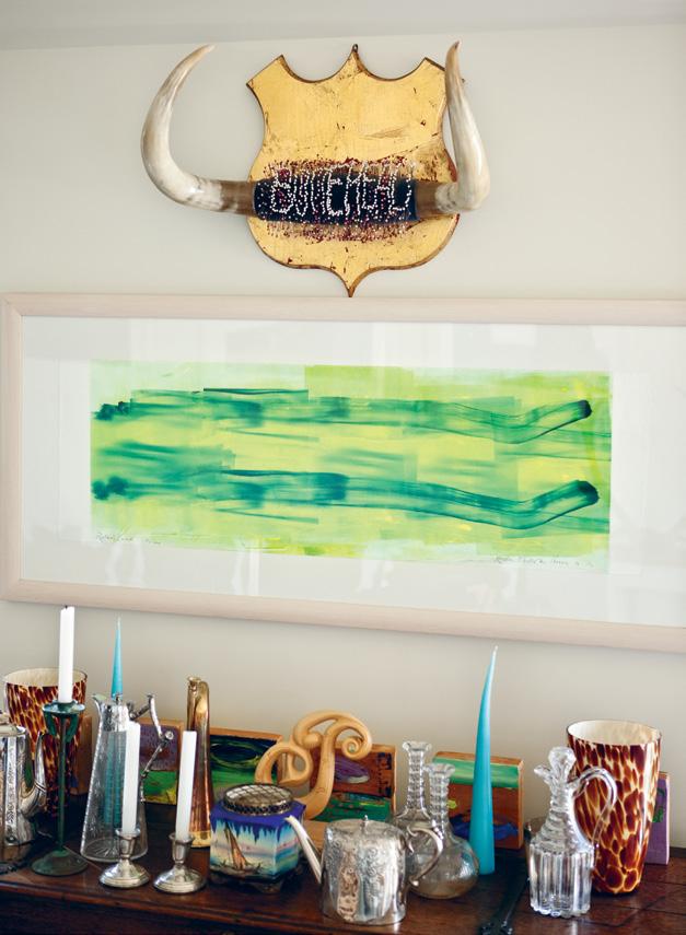
and a print from 1996 hang above her glass and ceramic collection.
habitusliving.com
kristin peren — Gibbston Valley, new zealand
57 07
Your invitation to view...

The new Doghe 0.3 collection from Panaria is the essence of modern living. The 3mm slim wood look tile is available in three colours, offering a warm design and feel that is contemporary and unique. The reliability of the laminated porcelain stoneware makes the Doghe 0.3 thin planks the avant-garde of beauty. See
35 stores nationwide www.tileboutique.com.au
it for yourself today at your nearest Tile Boutique Showroom.


59
08
08 habitus 13 close up
Kristin nicknames her farm “the beach” – a place to collect flotsam and jetsam.
kristin peren — Gibbston Valley, new zealand
close up
kristin peren — Gibbston Valley, new zealand
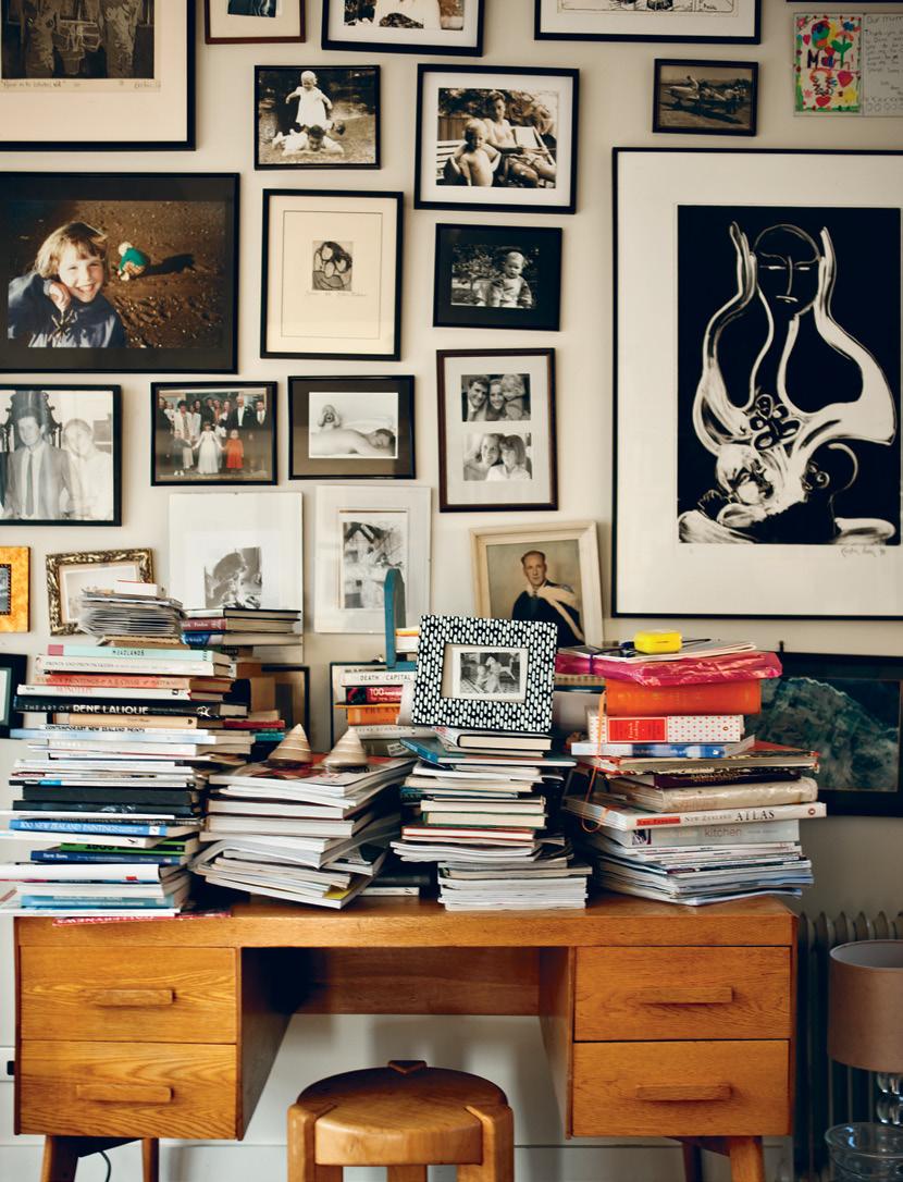
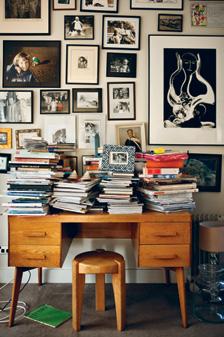
09 The library has hundreds of books and family photos. Black and white print by Kristin from 2009.
10
In the main bedroom, Kristin’s work Shut The Gate speaks about New Zealand’s isolation and sensitive ecology.
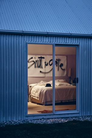
work was called Moment: Moments of illusions because it was all about light and darkness. A bit scary because it was a bit like that on the day.” Her car was thrown into the air, but she and the prints were unharmed.
Originally, it was grapes that brought Kristin and her husband Adam down to Gibbston Valley. They started Peregrine Wines in 1998 on Kristin’s grandfather’s land, when their daughters Niamh and Sorcha were seven and three years old. After Peregrine, they established Two Sisters, a boutique winery that hand-harvests Pinot Noir, Pinot Gris and Riesling. As well as tending grapes, they manage the farm – just 25 minutes from the vineyard – on which they run Wiltshire sheep and cattle.
Architect and friend Chris Kelly of Architecture Workshop designed the winery at Peregrine and, in 2000, the farmhouse. For Kristin, the sanctuary of the home is also the sanctuary of the studio, “a peaceful place and an incredibly creative place.” The H-plan house is reminiscent of traditional Central Otago sheds. Incredibly practical and functional, its clean lines, corrugated iron cladding and steep roof suit the alpine climate and landscape – a farmhouse with no pretensions. It sits on the site of the original: two joined gold-miners’ cottages that had sadly rotted away. The previous family had farmed the land for generations, and several other cottages from their time remain as implement and wool sheds – places where Kristin makes her castings. She loves their old charm so much that she refuses to do them up.
Inside the farmhouse, a warm and eclectic art and furniture collection reflects the couple’s interests. Among Kristin’s own art is work by her daughters, by New Zealand artists such as Gordon Walters, Michael Parekowhai, Phil Price and Stephen Bambury, and work by contemporary Japanese print makers and potters. Their furniture is mostly mid-century, with a large dining table Kristin herself designed on which she makes much of her work.
“We have family heritage pieces like old silver teapots and black and white photographs. That’s really important. It’s part of the development of your life as a family – things that evolve and you pick up along the way.”
Kristin Peren, blue@kristinperen.com
habitusliving.com/beyond/kristinperen
60 habitus 13
“We have family heritage pieces... i think that’s really important.”
–
KRISTIN
09 10 habitusliving.com
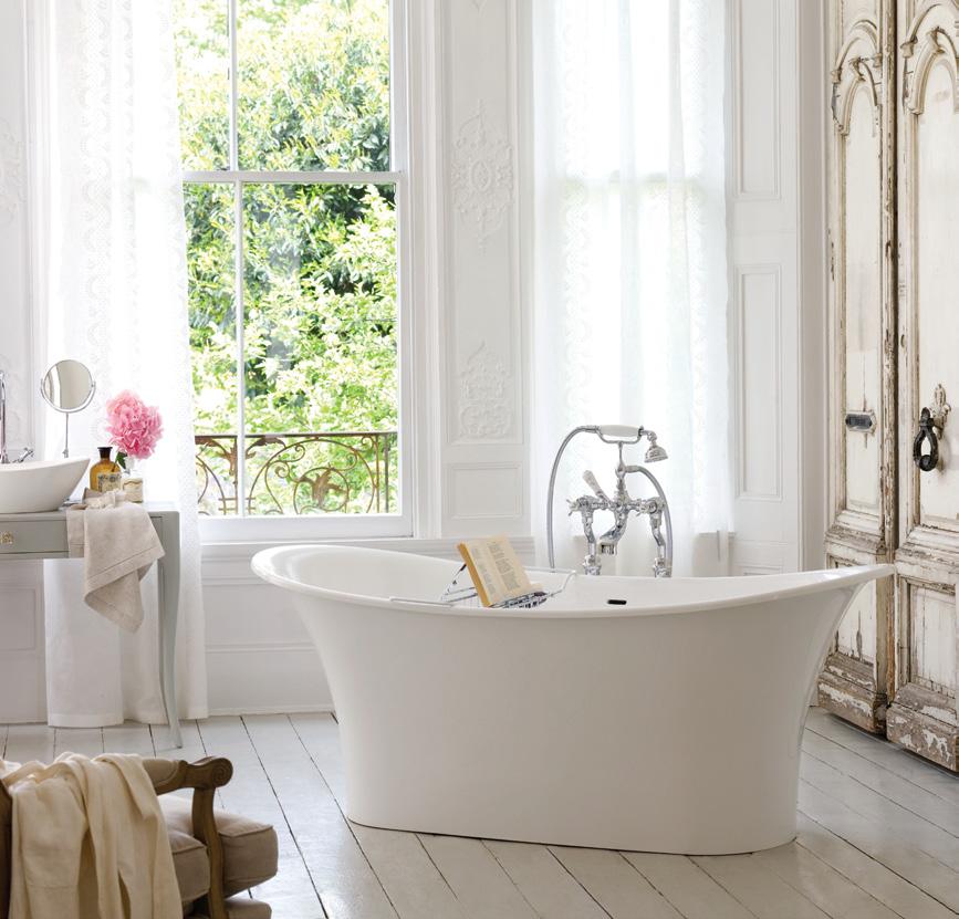
volcanic limestone baths The Toulouse Inspired by French double ended baths first seen in the 1860s, the new Toulouse is a bateau bath for today. Rich in volcanic limestone, its QUARRYCAST® construction makes it silky smooth, warm to the touch and highly insulating to water. New classical design from Victoria + Albert - discover it today. Australia: 1300 737 779 • New Zealand: 09 573 0490 www.vandabaths.com
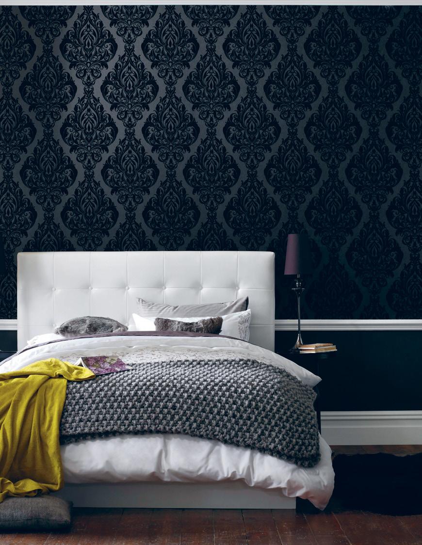
Perth & Sydney New Sydney showroom now open 420 Crown Street, Surry Hills NSW 2010 (02 ) 9331 5884 wallcandywallpaper.com.au info@wallcandywallpaper.com.au Kinky Vintage Flock in Naughty Noir
ango lighting — Bangkok , thailand
Hitting the switch
nikki Busuttil takes an illuminating look into the small, award-winning Bangkokbased design firm, Ango, led by London expat angus Hutcheson, that is making strides on to the world design stage.
63 habitus 13 creation
Text Nikki Busuttil Photography Remix Studio (product), Basil Childers (portrait)
ango lighting — Bangkok , thailand
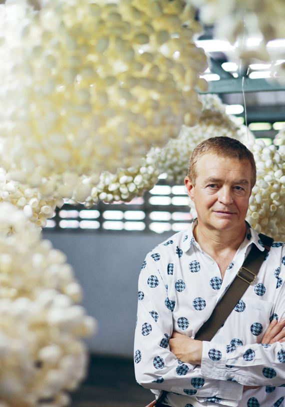
Angus Hutcheson always had a keen fascination for architecture and light. From the age of five, he played in an old stable, a building with no windows. “I discovered the joy of making penetrations in the brick walls to allow light in, and I think it was the initial creation of these shafts of light in a black volume that led me to understand something about the magic of architecture and light,” Angus reminisces.
Originally from London and following an education, training and career there in architecture, lighting somehow fell by the wayside, until eight years ago. In a planned move, for a complete change of direction, Angus moved to Thailand, with the intention of starting a lighting and furniture design company. Since then, he and his team have focused on lighting, but further developments on their furniture designs is forthcoming.
Angus attributes success, and the very existence of their company, to Thailand. The natural materials they use, setting up the business and daily operations, and the workmanship and techniques involved in its products “would have been [economically] impossible for us to do anywhere else,” Angus says.
“Thailand has also influenced our designs, but it’s difficult to pinpoint exactly how.” There is a playfulness in modern Thai
design, though, where traditional workmanship meets contemporary methods, which may also represent a fair assessment of Ango.
Combining traditional with modern, its early designs, launched in 2003, evolved as a vernacular, an expression of what was within, using materials readily available around them. Minimising their environmental impact has been an integral, organic progression.
The first materials used were natural and highly renewable, such as thin timber, fine rattan, mulberry tree bark and silk (for their ‘cocoon’ diffusers), as well as recycled steel and packaging. “The light bases are also designed so that when the electrical components reach the end of their life, they can be easily retrofitted,” Angus says.
A vast amount of design time is spent on research and experimentation – so much so that they also develop their own composite materials, such as the hand-cast polymer with rattan reinforcement of their ‘stone’ creations, or their tapioca polymer and metallic woven threads. “Although manufactured, they have a low impact on the environment,” he says. Each material is also developed for aesthetics and an effective diffusion of light.
Angus works with the Ango design team as its chief designer and founder, while Aon
01
Angus Hutcheson in his warehouse studio.
02
Garden
03
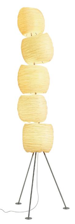
Five
04
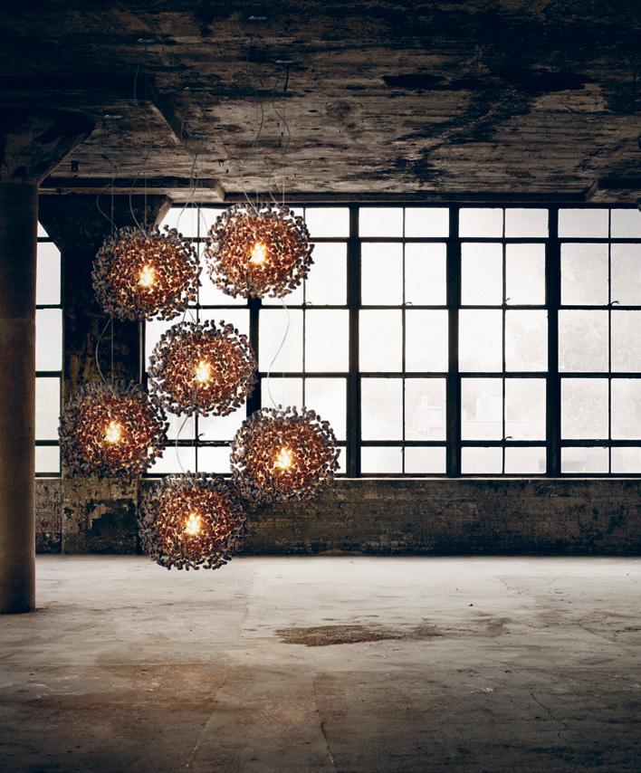
Midnight Moon ceiling lights. Hand made with silk cocoons dyed ebony black.
03
habitusliving.com habitus 13
64
creation
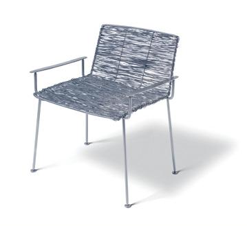
Boy indoor/ outdoor chair made of hand-finished stainless steel.
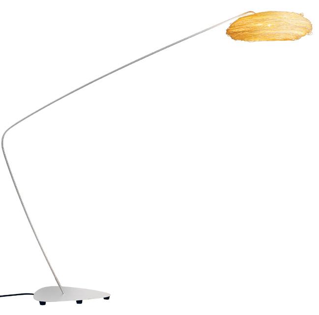
Stone floor light. Hand-cast polymer with rattan diffuser on hand-finished stainless steel stand.
02
There is a playfulness in modern Thai design, where traditional workmanship meets contemporary methods...
65 04
Benjamapa and Pui Chutitanawong also play key design roles. The bulk of the company’s 40-strong team is production-based and, interestingly, mostly female.
“Implementing our designs takes hours of meticulous concentration and artisanship. Each piece is handmade, from the small candelabras to the custom-designed installations in the W Hotels in Samui and Singapore. Handcrafting takes anywhere from a few hours to a month per piece.
“The work takes place across the river in Bangkok, with small process teams, although some pieces are produced by artisans in their homes,” Angus explains.
Ango works with a broad mix of architects, lighting consultants and interior designers to produce lights for individual projects. It supplies to wholesalers, retailers and design-conscious end-consumers from around the globe, and also creates bespoke installations.
Selected to exhibit at the 2010 Dead or Alive show, along with another 30 international artists at New York’s Museum of Arts and Design, and with a brief to transform organic materials or objects into a design or installation, Ango created a sizeable overhead silk cocoon light installation called Eight Thousand Miles of Home.
So what does the future hold for Ango? An exhibition space at this year’s September Paris Maison et Objet, where it won a best product
award for the Wraith Twig ceiling reflector in 2009, and for its Twig ceiling light in 2008. Within two years it also plans to open its own farm-factory, on an already-purchased plot of land.
“We will actually grow some of the materials we use, and create studios where visiting designers and artists can work, and nurture young design talent.”
As big changes in life go, Angus’ migration to Thailand from the United Kingdom was a risky move. Some might consider as madness switching from a stable career in architecture in Europe to start a small business from scratch in a developing country, but it seems to have been a small stroke of genius in hindsight.
“I love what I do, I love working in the magical field of lighting design here. Work is not really the right term for it,” Angus concludes. a
habitus 13 creation
ango lighting — Bangkok , thailand minosa.com.au
HAB10_Minosa.indd 1 21/9/10 2:48:24 PM
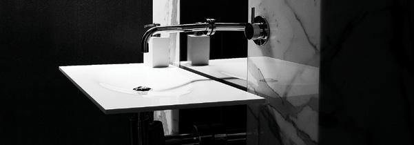
Washbasin – The Puddle®
ngo, angoworld.com
05
05
Silk Aura table light with rattan diffuser on a hand-finished stainless steel base.
habitusliving.com/beyond/ango
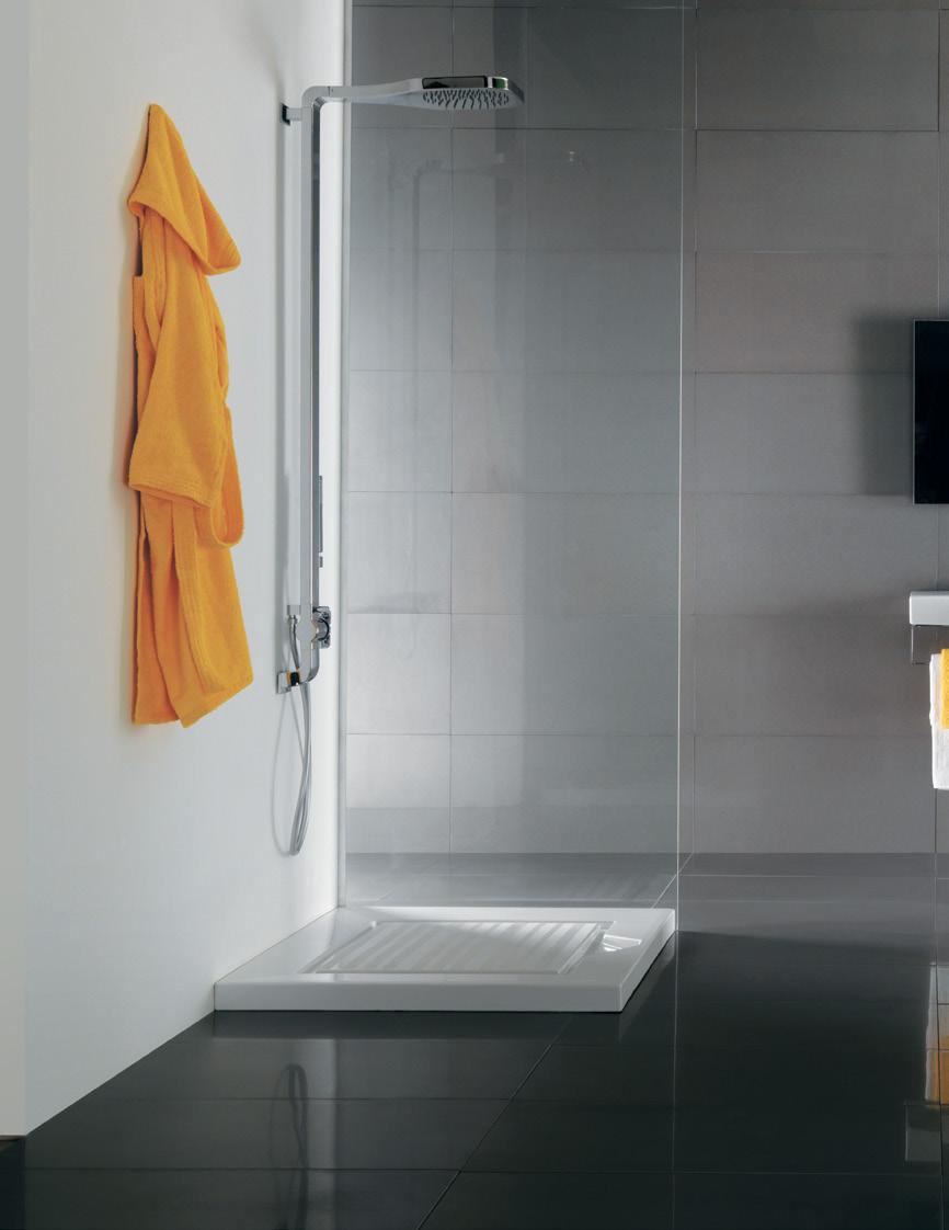
Inkredible 1642-10 DI LORENZO Pty Ltd Tile and Bathware Concepts | www.dilorenzo.net.au NSW Bella Vista 02 8818 2999 | Redfern 02 9698 8737 | Newcastle 02 4957 9925
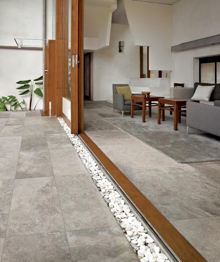
Velvet : Italian made porcelain inspired by ancient venetian marble


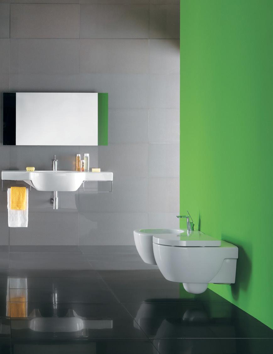
OLYMPIA Ceramica made in italy
eidosbathware.com.au
SYDNEY BRISBANE MELBOURNE ADELAIDE CANBERRA PERTH


A certain elecTriciTy
Amber Ward and Adam Cruickshank seemed destined to meet. And finally they did, to form a private and professional relationship of rich creativity.
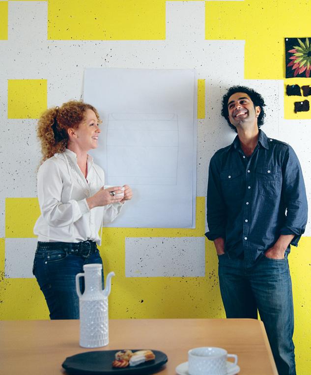
71
partnership habitus 13 Text
adam cruickshank and amber ward — wa , australia
and Styling Anna Flanders
Photography Amber Ward and Michelle Taylor
It may sound corny, but you get the feeling Perthbased designer-makers Adam Cruickshank and Amber Ward were meant to come together. Both were born to Maltese mothers in the same area of New South Wales. Both were inquisitive with materials and ‘crafted works’ from just past toddler age. Both cite the world around them as their source of inspiration. However, the couple were separated by distance in childhood and didn’t meet until their thirties when they were both guest presenters at a mid-2010 Design Institute of Australia event in Western Australia.
At a young age, Adam’s naval-officer father took his family around the world to the United States, Germany, the United Kingdom and most states along the eastern seaboard of Australia, while Amber’s family stayed put. Today, both credit their creativity to their experiences. Adam points to travel and his parents’ love of museums and art galleries as inspiring his design. Amber, feeling displaced in suburbia, became insular, retreating to her thoughts and developing a thirst for the knowledge and research which informs how she works today.
“We were pretty similar as kids –inquisitive with materials,” Adam says. They
partnership habitus 13 72 habitusliving.com
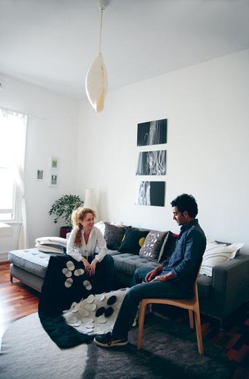
01 Amber and Adam share a laugh over the ottoman design pinned to their kitchen wall.
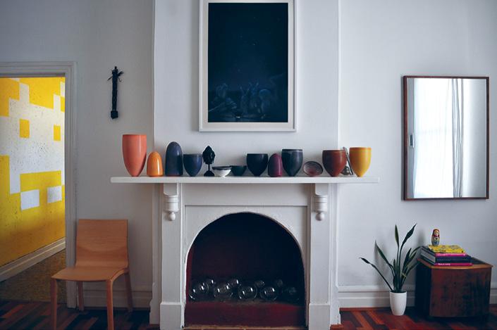
02 The living room’s Pippin Drysdale ceramics under a Linus Andersson artwork. Left, a prototype chair by Adam.
02
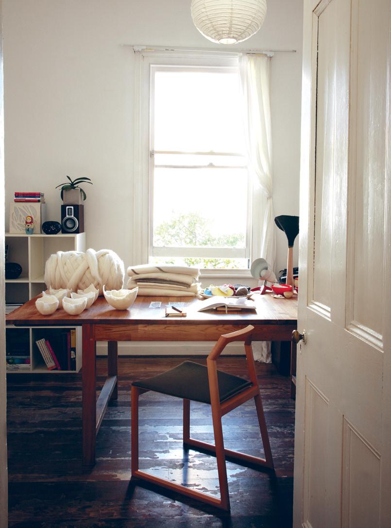
03 Amber’s studio features commissioned felt. works and Adam’s Stream dining chair.
adam cruickshank and amber ward — wa , australia
73
04
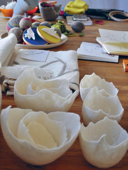
Detail of Amber’s commissioned work for retail clients, including Habitat Votive bowls.
05
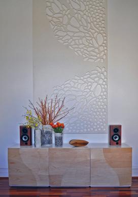
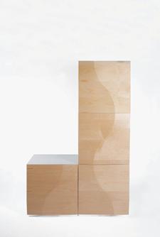
The living room features Adam’s Desert Cubes cabinet, felted glass vessels by Amber and a Symbiosis I handsculpted EchoPanel wall-mounted screen.
06
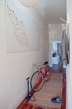
The hallway displays a Symbiosis IV EchoPanel wall-mounted screen.
partnership habitus 13 74 habitusliving.com
“Our skills complement each other... There will be some good collaboration projects coming about.”
04
adam cruickshank and amber ward — wa , australia
laugh about their similar experiences of commandeering their respective fathers’ sheds and of experimenting with found materials, hammers and nails from the age of five. But, it is their childhood experiments with electricity that makes them laugh the hardest today. At age nine, both were fascinated with blowing up light bulbs. While we must acknowledge this was perhaps a little dangerous at the time, there is some irony in this when you consider that the pair’s first collaboration was a light pendant – the Cruickshank + Kietsu Willow Light. But they insist no light bulbs were harmed in its making...
Today, the pair live in a cottage in the city of Fremantle in Western Australia (WA), where Amber works from home in her two studios as Kietsu Studios, and Adam under his own name as part of the designer-maker team at Midland Atelier, which is an initiative created through WA design body FORM, a not-for-profit organisation supporting the creative industries in the state. They work in different media –Adam is renowned for his work with wood, and Amber for hers with alpaca and wool felting and EchoPanel screens, themselves produced from approximately 60 per cent recycled PET bottles – but both studied design and across disciplines. They run independent businesses, but are increasingly coming together, with recent lighting, seating and kitchen collaborations.
“I think we both inherently like working independently, but [it is easy for us to] work together. We come up with a concept, then one of us will make up a model, then we’ll talk about it and refine and change it. One of us will take over a part of it at this stage. Although we both studied design, we have different training, so the person who [is best at the skill most] needed then takes the lead,” Amber says.
The couple’s ability to work without ego and with acknowledgement and respect comes through loud and clear. “Our skills complement each other. Amber is great on the research side and I am good on the technical front. There will be some good collaboration projects coming about,” Adam says. And while they respond to shared inspirations in very different ways, there are similarities in their overall aesthetic.
75
05 06
THINK OUTSIDE YOUR BATH SPACE






www.candana.com.au
“In probably many ways, we are quite opposing personalities, but when it comes to aesthetics, function and form – and those important things that are key to design – we both see things so similarly. When we first started working together, Adam would be talking about something and I would open my diary of a table or light that I had drawn and he would say ‘my God, that is the form I am talking about’.
“So, that synergy was there from the beginning. And we never really have major clashes on what we think will be the right solution for a finish or a form,” Amber says.
Their aesthetics are somewhat timeless –although time itself may determine how true that statement is. Both work in traditional materials – Adam in timber, Amber in felting. Each has an organic element to their work, with Adam’s a minimal look and Amber’s a holistic sustainable, ethical and environmental approach.
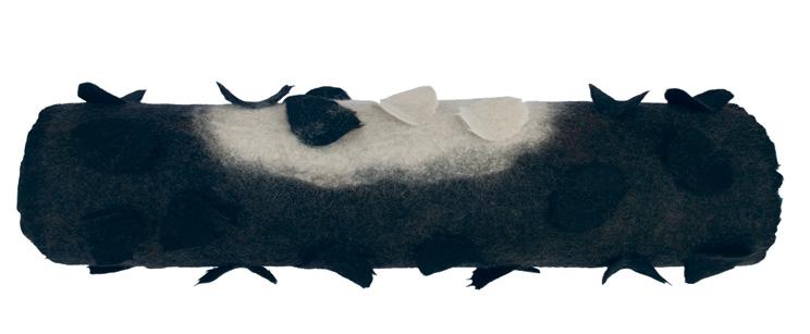
Amber chooses to work in mostly black and white, and the shades in between, used sparingly and cleverly, thanks to her ceramics and colour training under renowned Australian ceramicist, Pippin Drysdale. Adam adds colour only when necessary, preferring the natural tones of timber. Walking about their home, you find there is a synergy between their individual works.
One point of difference, however, is the way in which they approach sustainable practices. Amber credits her mother with instilling her with an understanding of ‘natural is best’, while her “inner research nerd” has honed that knowledge into an overarching, sustainable approach to her
77 partnership habitus 13
07 The Cruickshank + Kietsu Willow Mini Pendant Light in handmade wool felt using non-mulesed Western Australian merino wool. 08
08 07
A Midnight Pool rug from Amber’s Fallen Series I, handmade felt using alpaca and merino, as above.
adam cruickshank and amber ward — wa , australia
alpaca and non-mulesed wool felting and the use of EchoPanel. It’s a philosophy that sees beauty in not only aesthetics, but also deeper environmental, social and ethical impacts, from farm to finished form.
“I guess that’s where the notion of merging art and design comes together – there is a concept behind the form. Because there is so much surface emphasis in one aspect of design, sometimes we underestimate the depth it can be looked at but still serve to function,” she says.
On the other hand, Adam has developed techniques to minimise waste and his own impacts on the world. He cites Amber’s dedication and New Zealand furniture designermaker David Trubridge’s approach as having a strong influence on his work. “I keep saying to myself that [sustainability] will be a bigger driver for my own work, but I seem to be driven by other things at the moment. It is a matter of stopping, testing and developing processes. There are alternatives I would like to explore,” Adam says.
However, he says his main driver today is innovation. “There are so many different ways you can use a material and that’s the drive for me
partnership habitus 13 78 habitusliving.com
09
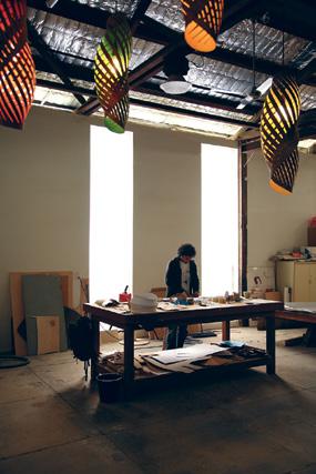
Adam at work in his studio at the Midland Atelier under a canopy of Chrysalis. Pendant lights.
10
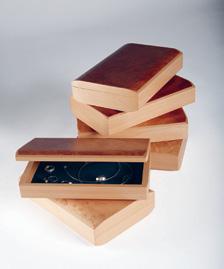
Jewellery boxes handcrafted by Adam in European Beech, Madrona, Maple and Myrtle. 11
10 09 11
Adam’s Desert Cubes cabinetry in Maple.
adam cruickshank and amber ward — wa , australia
Adam and Amber... were inquisitive with materials and ‘crafted works’ from just past toddler age.

– finding different ways to push materials and get different forms. I find it fascinating that as far as we have come with using a simple material like timber, there are still so many different ways that we can use it that haven’t been tried yet. Considering it’s one of the oldest building materials around, that’s a big drive for me.”
Adam has just returned from a jaunt in the desert with David Trubridge and fellow Midland Atelier designer-maker Nick Statham to prepare for an exhibition of the trio’s work mid-2012. He will no doubt be pushing boundaries in those protoypes. Meanwhile, Amber is planning a trip to Tasmania, which will be the catalyst for her own proposed exhibition next year. They are also fulfilling an increasing body of commissions, both individually and as a couple.
So, how do two creatives live and work – separately and collaboratively – in the one house? “We are both obsessed with our work,” Adam says. “Amber is so driven and has always been into creating with her own hands. It is how I feel about my work.
“It’s great to work with someone who also has that drive. We can understand each other and accept we are both obsessed with what we are doing and give each other space and respect that. There is support, too,” he says.
“And you know when the other person just really needs to push through – if one of us has to do something, the other one doesn’t try to interfere with that – but you also know when you need to say ‘you need a day off’, and you know when they can have that day off,” Amber adds.
With these two creatives living and working together, it will be interesting to see how their collaborative aesthetic evolves. Both have an eye on the industry, both have enormous drive and both live and breathe design.
However, above all, they both also have huge respect for each other’s skills. With the Willow Light just emerging on the retail market and more projects coming out of prototype stages, this is definitely a union to watch.
adam Cruickshank, adamcruickshank.com a mber ward, kietsustudios.com
habitusliving.com/beyond/amberadam
partnership habitus 13 80 habitusliving.com
“We are both obsessed with our work... it’s great to work with someone who also has that drive .”
–ADAM
12
12 Amber and Adam discuss Amber’s Midnight Rock Pool rug from her Fallen Series I.
adam cruickshank and amber ward — wa , australia








 pham huy thông — hanoi, vietnam
brush
with history
You might be forgiven for thinking that Vietnamese artist Pham huy Thông’s ‘Dong Bao’ series is all baby talk. But the truth, as amy ng says, lies much deeper than the paintings let on. It’s about politics.

83 habitus 13 narrator
Text Amy Ng Photography Pham Huy Thong and Parik (portrait)
pham huy thông — hanoi, vietnam
Pham Huy Thông had no idea that his wife was expecting a baby when it was time for him to head off to Malaysia for a three-month residency at Rimbun Dahan, an artist-residency programme conceived by architect Hijjas Kasturi and wife Angela, set in the verdant green kampungs on the outskirts of Kuala Lumpur.
Ironically, he was already painting pictures of babies in a series called ‘Dong Bao’. “I wasn’t thinking about babies in the literal sense. It was purely coincidental,” Thông says.
Neither humour, irony nor babies was on the 29-year-old artist’s mind during the production of ‘Dong Bao’. Thông had grown up in a liberal household with journalist parents whose conversation regularly became political –he remembers it as a running social commentary on Vietnam. Like his parents, Thông grew to develop the desire to voice his ideas and ideals. Instead of a pen, though, he chose a brush.
One of his most successful collections to date, ‘Dong Bao’ is based on the story of the origins of the Vietnamese people, and its title translates as “from the same womb”.

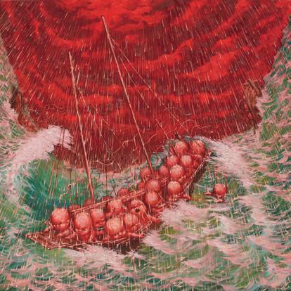
Legend has it that a long time ago, a dragon from the sea took a mountain fairy as his wife. The couple gave birth to 100 men and women, believed to be the first people of Vietnam – hence the description of being of a shared womb. The paintings in the series are of babies, which signify these mythical origins and, most importantly, portraying the umbilical cords that link them to one another. “The people of Vietnam did not take this legend to heart,” Thông says. “Otherwise, why would did they do that to each other?”
He’s referring to the Vietnam War fought between the country’s north and south from 1959 to 1975, about which he is passionate. He sees no sense in a conflict that left nearly two million Vietnamese dead or wounded.
Thông’s paintings are painful reflections of what happened in the country during almost two

01
02
Brotherhood
03
04
In
habitusliving.com 84 habitus 13
narrator
Artist Pham Huy Thông.
, 2009, alludes to Eddie Adams’ photograph of South Vietnamese General Nguyen Ngoc Loan, executing suspected Viet Cong officer Nguyen Van Lem.
Ra Khoi ’s, 2009 depiction of boat people fleeing Vietnam.
02 03
The Fall of Saigon 2009, Thông painted an analogy of corrupt officials.

85
THÔNG 04
“I wasn’t thinking about babies in the literal sense.”
–
decades of darkness. One particularly arresting piece is based on the Pulitzer Prize-winning photograph, napalm Girl, photographed by Nick Ut in 1972. The picture shows a young Vietnamese girl crying and running towards the camera, naked, amid the destruction of war.
His version, Purple Sky, alludes to the photograph by means of facial expressions and body language – only this time the core image is multiplied with each repeated character tied to another by its umbilical cord, intensifying the message of brotherhood and the pain and horror that engulfed the nation.
Another allusion, entitled Brotherhood, is based on the well-known photograph taken on a Saigon street during the Tet Offensive of 1968 by Associated Press photographer Eddie Adams, known as General nguyen ngoc Loan executing a Viet Cong prisoner in Saigon. Thông’s work in the series embodies sentiments of betrayal to question how brothers could have taken up arms against each other during this time.
05
Thông’s Party Party, 2010, pokes fun at Vietnam’s winning political party with a subtle, underlying sarcasm.

06
An as-yet unnamed painting from an upcoming series embracing social commentary, completed during Thông’s residency at Rimbun Dahan.

86 habitusliving.com
06 05
narrator habitus 13
pham huy thông — hanoi, vietnam
Social commentary is strong throughout Thông’s work and explores Vietnamese politics, economics (and the disparity of wealth), its politicians and the country’s social structure.
Thông also paints those who fled during the war who have since built communities elsewhere around the world. In one of his collection’s key pieces, Ra Khoi, he paints those fleeing crammed into a boat, braving storms to find a new home. The image’s underlying irony lies in their umbilical cords still being connected to each other – and to Vietnam. “[They] left via fishing boats, and some never returned,” he says.
The entire ‘Dong Bao’ series was painted in his small studio in Hanoi. Some were so large, however, that they had to be split in two. A hard-working artist, Thông completes a painting within two weeks, and starts another in quick succession. “At Rimbun Dahan, however, I completed a painting every five days! I ran out of canvases and had to go out to buy more,” he says. “The environment there is serene and
peaceful, which really helps me to process my thoughts.” The granting of Thông’s request for a bigger studio on the compound also meant that he could paint on a larger scale – a luxury he has taken advantage of fully for his next series, also rooted in the spirit of social commentary.
“I don’t try to explain what my work is about, usually. I let my viewers decide for themselves what it is they think the piece is about,” Thông says. In a communist country where people may not be afforded the freedom to vent their feelings on current affairs, he has been able to sidestep questions about his work.
“It’s tough to have a voice in Vietnam. But through art, I have found a way to express my thoughts and feelings. Best of all, these thoughts of mine can only be truly understood by those who look hard and deep enough.”
Pham huy Thông, thonghello.multiply.com habitusliving.com/beyond/phamhuythong

Untitled-1 1 21/06/11 5:33 PM
The underlying irony lies in... umbilical cords still being connected.
Timber possibili T ies
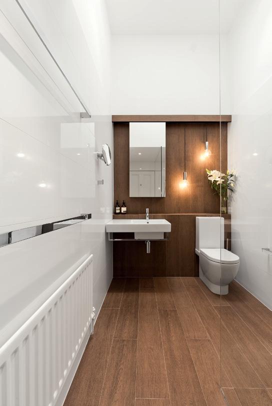
Using timber in bathrooms has always created difficulties, despite designers’ desire to do so. its natural warmth and texture makes it highly appealing for this very personal space, which is often dominated by cold surfaces and sharp edges. but timber’s other natural characteristics – permeability and the tendency to warp with moisture – also make it unusable in wet areas.


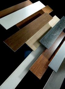
The latest technology from porcelanosa Group enables the look of natural timber, with all the benefits of a porcelain tile. The pArK er porcelain parquet range, manufactured in spain, features a number of useful properties for selection into the home.
As well as being suitable for all interior and exterior wet areas, it does not harbour bacteria or allergens, has a high acid and chemical resistance, and can be used in conjunction with underfloor heating.
Along with these physical properties are the highly considered visual qualities on the surface. pAr-K er has a non-repetitive print and texture, creating an organic timber look. it is available in a large selection of colours, finishes and formats for both traditional and contemporary environments.
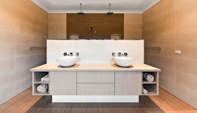
pAr-K er has recently been included in a bathroom renovation in Upper beaconsfield, Victoria, to create the luxurious feeling a day spa or the cosiness of a log cabin. Tavola Natura was installed on the floors and the shower wall, bringing the warmth of timber into what may have otherwise been a sterile, open plan design.
Victorian-based bathroom design specialists, bathtime, also selected pAr-K er, using the calming qualities of timber to open up a small space. With an aim to create an oasis for the client, Tavola Foresta was used on the bathroom floor – including the shower – and as a feature wall, with its soft colour and subtle texture highlighting the compact, yet elegant space.
pAr-K er is a new generation of timber flooring. its strength, resilience, sustainability and practicality allow the beauty of timber to shine through – in any space.
pAr-K er is supported by earp bros.
88 sponsored
Earp Bros – Innovative Tile Solutions earp.com.au (61 2) 9410 3222 01 02

89 01 Tavola Natura 02 PAR-KER the original porcelain parquet 03 Tavola Foresta 03
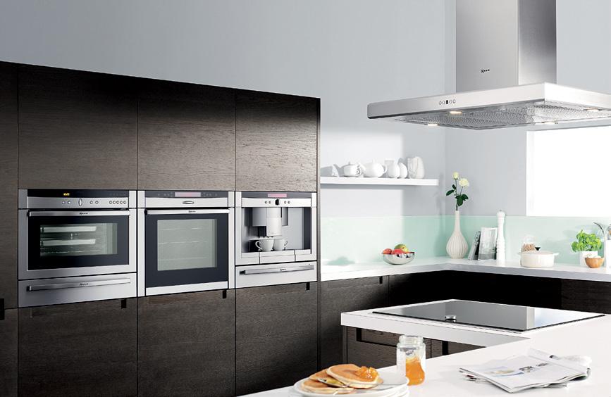
Award winning German design and engineering has made Neff a leading brand in Europe - and now Australia.


Neff appliances feature a range of amazing and thoughtful technology developments designed to make the cooking experience truly exciting. Some of Neff’s unique oven features include the precise temperature control of the CircoTherm® cooking system, the ergonomic Slide and Hide door which allows the oven door to slide neatly under the oven, saving space and allowing ease of access and the illuminating NeffLight®


Combined with ease of cleaning, efficiency and a 4 year guarantee, you’ll begin to understand why Neff has been writing kitchen history since 1877. Select from ovens, cooktops, specialty appliances, rangehoods and dishwashers.


B46W74N0GB Coffee centre C77V60N01
&
T44T90N0 900mm
wall
available in Australia D79F35N0
Appliances featured (left to right) CircoSteam oven C47C42N0GB Small warming drawer N21H40N0GB Single oven with Slide & Hide door
900mm Point
Twist induction cooktop
Canopy rangehood, only
mounted model
Exhibit A
Ocula founders Christopher Taylor and Simon Fisher get excited about presenting important Australasian and Asian art to a worldwide audience. Andrea Stevens hears how they are raising visibility for some of the most provocative local talents.

91
Text Andrea Stevens habitus 13 conversation
Photography Evie Mackay
ocula – Auckl A nd , new zealand
In 2009, art consultants Simon Fisher and Christopher Taylor conjured a vision of presenting leading contemporary art galleries from Auckland to Hong Kong in one place. Two years on, they have launched Ocula, an online gateway showcasing a unique selection of leading galleries from the region.
“Simon and I were quite passionate about doing something meaningful,” Christopher explains. “The internet is big and very broad – everything for everyone – and it is easy to get lost in the noise. The excellence we see in Australia, Asia and New Zealand isn’t easy to access, so we’ve applied that knowledge online, to promote it into an international arena”.
They have assembled a curated view of the market: a selection of galleries, which in their opinion, “have a serious purpose in their programme and who are committed to dealing with artists of excellence.”
Anna Schwartz Gallery and Roslyn Oxley9 in Sydney, Murray White Room and Niagara Galleries in Melbourne, Sue Crockford Gallery and Starkwhite in Auckland, are among the founding galleries, several of whom gave early feedback on the concept.
“I think it’s a great way to launch our artists out there,” Sue Crockford says. “Creating a bigger market will help us gain some of the advantages Europe has.” And Anna Schwartz welcomes the “diverse dissemination of the work of contemporary artists and their galleries”.
The portal allows them to break down some of the physical and cultural boundaries that galleries and artists from this part of the world contend with. In addition to pushing the work further out there, its regional representation creates a momentum in numbers with a strong presence. Recent advances in internet browsers have allowed them to build Ocula’s site using technologies that weren’t easily accessible even two years ago, when they began discussing the idea. This has been critical in displaying the art to make it feel tangible and accessible.
As well as growing the international market for the region’s works, Ocula is also a place for local collectors to stay connected. “We want people to be able to follow exhibition programmes and artists, and gain more knowledge in their own time and space,” Simon says. “This will ease access to the market, and encourage visits to the galleries and exhibitions,
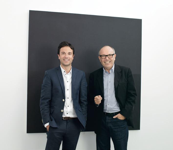
01 Ocula founders, Simon Fisher (left) and Christopher Taylor (right) .
02
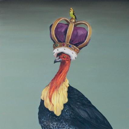
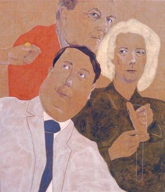
Joanna Braithwaite, Royal Turkey with Minion, 2010. Oil on canvas, 115 x 115 cm. Courtesy the artist and Darren Knight Gallery, Sydney.

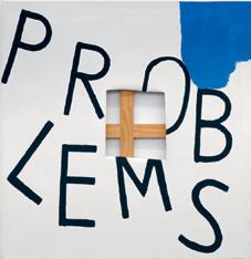
03 Tahi Moore, Problems 2006. Oil on canvas, 140 x 140cm. Courtesy the artist and Hopkinson Cundy, Auckland.
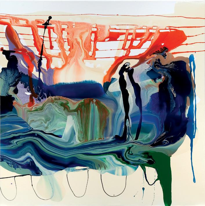
04 Dale Frank, Immortality for something anything 2011. Varnish on canvas 200 × 200cm. Courtesy of the artist and Roslyn Oxley9 Gallery, Sydney.

habitusliving.com 92 habitus 13 conversation ocula – Auckl A nd , new zealand
02 03
They have taken the art fair construct – gallery booths – into the virtual space as gallery microsites .

93
04
with the confidence of being well informed.” They have taken an art fair construct – gallery booths – into the virtual space as gallery microsites. Details about each gallery, artist and work are displayed in the same manner, making the information easy to navigate and assimilate. Ocula’s own branding has a subtle presence, ensuring gallery details have prominence. The whole experience is as seamless as possible, like a virtual re-enactment of wandering around a fair.
Conceived during the global financial crisis (GFC), Simon and Christopher’s goals were to reinvigorate the art market, and encourage gallery visitation, by making it easier for buyers to find the work they liked. The name itself, a derivative of ‘ocular’ and ‘oculus’, alludes to insight and shedding light on the market. Unlike that in a physical gallery, virtual space has no limit, allowing access to a greater depth of work, much like opening up the stockroom, if you like. By further applying marketing knowledge from industry to the more rarefied art market – by displaying more information and context to help the buyer gain a full understanding of the artwork – collectors may quickly gain more confidence to purchase.
The duo’s respective backgrounds are similar, which is what drew them to a common purpose. Christopher directed the city gallery in Christchurch for seven years, before moving to an auction house and then into private art consultancy. Simon was managing familyowned Fisher Galleries in Auckland, when they first crossed paths in the secondary art market.


Simon set up New Zealand’s first online art auction site before moving into private practice himself in 2007. “Chris and I began to work more closely then, and a lot in the international market. This project largely came from client feedback and the way the market had contracted during the GFC.”
While their main focus is on representing galleries, the website also handles auctions of special works on behalf of clients, and an art advisory service. “It is very exciting and is always changing with fantastic exhibitions,” Simon says. “We just featured Anna Schwartz’s show of Antony Gormley, a sculptor who has been rated by some publications as one of the most exciting contemporary sculptors of today.”
Ocula,
habitusliving.com 94 habitus 13 conversation ocula –
Auckl A nd , new zealand
ocula.com
05
Helen Johnson Big Boy, 2011. Synthetic polymer paint, wax pencil, dyed linen and rabbit skin glue, 66 x 76 cm. Courtesy of the artist and Sutton Gallery, Melbourne.
06
05 06
Jude Rae SL 266, 2010. Oil on Linen, 137 x 122 cm. Courtesy of the artist and Jensen Gallery, Sydney.

SUBSCRIBE & WIN
AD


ONE OF TWO MARUNI HIROSHIMA ARMCHAIRS FROM SEEHO SU

Valued at $1,950RRP each
Fusing tradition and craft in quiet, harmonious perfection, Naoto Fukasawa’s Hiroshima chair for Maruni exudes simplicity and natural warmth drawn from its use of natural materials and a rich heritage of Japanese craftwork. The seamless joinery of these pieces appears as if hand–carved, yet each piece is machine–cut from raw wood. However, it is left to the hand of a skilled craftsman to sand each piece to a smooth finish.
To enter, simply subscribe to Habitus magazine overleaf or enter online at habitus.com/subscribe
Tell us in 25 words or less why you love the Hiroshima chair. Good luck!
subscription offer
home embodies landscape, materials, form & a life expressed

habitus 13 3. houses
97
T RopiCal Transparency
i nspired by the Case Study Houses, Californian landscape gardener, Karl Princic, and Jakartabased Antony Liu, have engineered a marriage of modernity with Balinese tropicality.

A nd K A r L Princic habitus 13 scenario princic house — BAL i , indonesia habitusliving.com 98
Antony Liu
Text/Styling Kerstin Rose
Photography Christian Schaulin

99
princic house — BAL i , indonesia

The six-metre-high, impenetrable-looking walls surrounding the home of Karl p rincic and Dhea Rizky do little to prepare you for what’s within. Rather like a well-wrapped present, it’s only once you’re inside that you can appreciate this sanctuary of light and calm; the sprawling but streamlined house which took two years to plan, and the oasis of tropical foliage, lily ponds and a pewter-coloured swimming pool that surrounds it.
Dhea bought the plot of land in her native i ndonesia on the island of Bali, but the house that was built on it is the realisation of her husband’s vision. a landscape gardener who works all over i ndonesia and asia, Karl has a passion for Bauhaus-style architecture.
“i first came to Bali in 1987,” p rincic, who hails originally from California, recalls. “i fell in love with it then, and later with my wife.”
Dhea is a well-known chanteuse in i ndonesia, and the couple’s twins, Daniella and a lvar, came along in January 2010.
The house could be summed up flippantly as ‘Bali meets Bauhaus’, but this shorthand
hardly conveys how well the unlikely combination of rectangular glass box and lush island paradise actually works.
i n fact, its design principles are drawn from an even more specific source – the a merican Case Study Houses that were built as exemplars of inexpensive and efficient homes after World War ii. Most of them were built in and around l os a ngeles, with some designed by p ierre Koenig and Mies van der Rohe.
perched high up in the hills above the pacific o cean, constructed on sites previously dismissed as unbuildable, the houses were low-slung, flat-roofed glass boxes supported by steel columns. a ngular and clean-lined, often with views to die for, they were complemented by the turquoise of the requisite backyard swimming pool and Californian sky above.
Karl, along with his i ndonesian architect collaborator, a ntony liu, has now proved that this style of building can work as well in the sultry climate of Bali as it does on the United States’ West Coast, albeit with some necessary modifications.
habitus 13 scenario
habitusliving.com 100
02
Antony Liu A nd K A r L Princic
01
Privacy is assured by the high street-facing wall.
02
The entrance to the house and office, separated by a long wall of concrete and pivoting glass panels.
03
Within the living space, the sofa, coffee table and sideboard were designed by Karl Princic; painting by HANAFI; and vase on the floor is a souvenir from Vietnam.

04
The kitchen space was constructed according to Karl’s design. Dining table designed by Antony Liu, made in Sungkai wood; and Arne Jacobsen Butterfly dining chairs.

101
03 04

habitus 13 scenario
house — BAL i , indonesia habitusliving.com 102 Antony Liu A nd K A r L Princic
princic
Each room flows into the next to create a series of uncluttered, soaring spaces.

103
princic house — BAL i , indonesia


habitus 13 scenario
habitusliving.com 104
05
South-facing overhang protects the buildinglength veranda. Pool is made from granite.
06 Floor plan.
07
A milk-glass, operable, pivoting panel wall separates the house from Karl’s office.
08
06 07 24 25 26 16 16 23 22 18 17 15 14 12 13 10 9 8 7 11 11 6 5 4 20 19 21 28 1 2 3 3 1 Driveway 2 Entry 3 Garage 4 Living Room 5 Dining Room 6 Pantry 7 Kitchen 8 Storage 9 Maid Room 10 Drying Area 11 Bedroom 12 Master Bedroom 13 Fish Pond 14 Terrace 15 Swimming Pool 16 Garden 17 Deck 18 Pump Room 19 Reception 20 Lobby 21 Staff Room 22 File Room 23 Director’s Room 24 Carpark 25 Motorcycle Parking 26 Security Antony Liu A nd K A r L Princic
The lily and fish pond, surrounded by tropical foliage.

princic house — BAL i , indonesia

habitus 13 scenario
habitusliving.com 106 09
“...I made sure that the doors and windows can open up on both sides of the house to allow a natural flow of air.”
–Ka R l Antony Liu A nd K A r L Princic
Bali is subject to monsoon-strength rains between o ctober and april and, with this in mind, the characteristic flat roof of the Case Study Houses had to be altered.
“The roof was very important,” Karl says. “We decided on a single pitch, sloping from north to south to let in light on the north-facing side of the house, and provide more rain and sun protection on the south side. We purposely extended the south-facing overhang to provide protection for the veranda that runs the length of the building.”
With Bali’s humidity comes an intense heat, but the carefully considered layout, high ceilings and glossy floor keep all the rooms in the house naturally cool. Dhea likes the air conditioning on as well, though.

“i n the tropics, many people live with 24-hour air conditioning, but i can’t stand it,” p rincic says. “i prefer natural air circulation, and a ntony and i made sure that the doors and windows can open up on both sides of the house to allow a natural flow of air.”
Houses made chiefly of glass are designed to blur the boundaries between the inside and outside world. Here, where the 2,545m 2 plot is bound by high walls, the outside world is apparently kept at bay. o utside is limited to the Zen-like garden and long, stunning swimming pool that runs parallel to the house, where nature is rather better ordered than it would otherwise be. “it’s quite common to have high walls in i ndonesia,” says p rincic. “i like to create gardens that look uncontrived and natural, maybe just a bit more tidy.”
Both outside and in, this two-bedroom house could be a very well-conceived spa or luxury hotel suite. That’s not to say it’s impersonal, more that every detail has evidently been thought through. No wonder it took p rincic and liu two entire years just to finesse the plans. Some of the major changes that evolved were expanding the design to include an office building for p rincic; reducing from two storeys down to a single one; and angling the roof to make the most of the views of the pool. This perfectionism extends beyond the basic structure, and much of the house and its contents have been custom-made, from the kitchen to the patterned perimeter walls. Each room flows into the next to create a series of uncluttered, soaring spaces – all of them open
107
09 The bedroom’s furnishings are all custom-made from Sungkai, a local wood.
princic house — BAL i , indonesia
on one side to the garden and its pool, thanks to ceiling-height glass windows.

Where the abundance of glass, white paint and perfect right angles of the interior might have been rather stark and depthless, the effect has been softened by earthy vases, bark sculptures, use of natural materials such as bamboo and granite, splashes of yellow and the backdrop of the garden. as p rincic says, “The house is a simple glass box; the gardens feel like part of the living area.”
“We are very happy and feel at home here,” p rincic says. “i particularly love the pool and the reflection of the lights on it at night. We made sure you could see them from every part of the house: bedrooms, bathroom and living area. i n the morning, it’s wonderful to take an open-air shower surrounded by plants, water, gardens and sky.”
Tucked away behind those anonymous walls, this couple have pulled it off, and created their own unique kind of promised land on this most paradise-like of islands.
intaran d esign (62 361) 780 0693
habitus 13 scenario
108
p rincic
ndScAPE
ntaran
p rincic)
A r EA
coMPLEtion
habitusliving.com
A rcHitEct a ntony liu and Karl
LA
dESiGn i
Design (Karl
totAL FLoor
2,545m 2
2006 Antony Liu (62 21) 585 8074 dwitunggalmandiri@yahoo.com
10
10
The bathroom fittings are custommade and the tub sits on a granite base
Antony Liu A nd K A r L Princic


AD A WORLD PREMIERE Induction freestanding cooker with pyrolytic cleaning Opera Series A1PYID-6 Evolving manufacturing excellence Sydney 02 8667 4888 Melbourne 03 9094 1999 www.smeg.com.au SMA11364

habitus 13 scenario
Steven S LawS on a rchitect S
habitusliving.com 110
wanaka house — L ake wanaka , new zealand
Text
Photography Simon Devitt
Andrea Stevens
MOuntA in sculpture
On a remote edge of Lake Wanaka, the complex, hand-crafted, forms of this new house by Stevens Lawson architects connect it with its surrounding rugged alpine grasslands.

111
t he remarkable setting of the Wanaka House in the Queenstown Lakes District is not only beautiful – it has the kind of mountain scenery new Zealand is renowned for – but also sensitive ecologically, being close to Mount Aspiring national Park and the un ESCO World Heritage Area of te Wahipounamu. East of the great divide, its glaciated landscape of high schist mountains, deep river valleys and tussock grasslands has a dry temperate climate loved by skiers, hikers and scenic travellers.
i n one of these long, glacier-carved valleys is Lake Wanaka and Roy’s Peninsula, a ridge line that extends out onto the lake about 30 minutes by car north of Wanaka township. it is a remote and quiet place surrounded by water, low hills and steep valley walls. Against such a noble and heroic landscape – and with few other buildings in sight – in the Wanaka House, architects nicholas Stevens and Gary Lawson have drawn on the form and character of the land to express a powerful sense of place.
t heir work is renowned for its sculptural qualities, refined aesthetic and conceptual depth. its formal complexity belies the fact they develop ideas by hand with small cardboard models – an intuitive and craft-based approach – that results in warm, textural and richly
01
Lake Wanaka is one of the glacier lakes surrounded by steep schist mountains.
02
The west verandah is carved into the building, sheltered by walls and roof.

03
A skylight brings northern light deep into the kitchen and dining room. Tolix stools from Thonet; Carlo Scarpa dining table; vintage 1950s dining chairs; and Snowflake pendant by David Trubridge. Painting by Stephen Bambury.

04
Upstairs, the bedroom corridor is lined with band-sawn Cedar and an Oak floor.
habitus 13 scenario habitusliving.com 112
Steven S LawS on a rchitect S
wanaka house — L ake wanaka , new zealand
03 02
“We wanted to investigate an architectural language in conversation with the natural environment and local building traditions.”

–LAWSOn

habitus 13 scenario habitusliving.com 114
05
Steven S LawS on a rchitect S wanaka house — L ake wanaka , new zealand
layered buildings. i n one strand of their work, as seen here, sculptural content has grown to an extent that exterior and interior expression merge, with house as both ‘object’ and ‘container’.
“We wanted to investigate an architectural language in conversation with the natural environment and local building traditions,” Lawson says. “Abstracted triangulated geometries and origami-like folds and cuts were employed to create a sculptural form that relates to the alpine landscape [and was] articulated with reference to the forms and textures of the vernacular timber woolsheds of the area.”
t he result is a building that bends and deflects to mirror the terrain, and beneath its bleached Cedar skin all but disappears amongst the tussock-clad hills.
Despite the large site, local planning regulations prevented a building platform greater than 25m 2. With this constraint, the architects took a square of card and began to explore possibilities in form-making. t hey tilted the card parallel with the land contour to create a roof, trimmed it for courtyards, peeled it open for skylights and folded down its edges to create walls. Openings into the building display this handmade quality where the building fabric is pierced to create slot windows or roof planes fold under to become eaves, then walls, then ceilings.
t he resultant form is rendered in raw concrete and Cedar – a poetic expression of the surrounding bedrock and its thin layer of golden tussock. t he concrete sub-form in this case has been carved out for habitation, with folding Cedar planes forming a skin over it, lifted in parts to reveal what lies beneath.
As the architects’ process unfolded, so too did a complexity in shape, material and construction: convexity then concavity, deep reveals with thin edges, wrapping and slicing, are all gracefully deployed in a building that quietly echoes its location.
While subtle – almost recessive – on the outside, inside, the experience changes dramatically as walls and ceilings envelope interior space, cave-like by their weight, colour and sense of enclosure. Cedar is joined by off-form concrete and by Oak and split-schist flooring, whose surfaces absorb light and bring the outdoors in.
05 The house was designed to work with the contour and reflect geometries in the mountain landscape.

115


habitus 13 scenario habitusliving.com 116
06 1 Entry 2 Living 3 Verandah 4 Lounge 5 Dining Room 6 Kitchen 7 Terrace 8 Pantry 9 Laundry 10 Store 11 Drying Room 12 Bathroom 13 Garage 14 Skylight Over 15 Store 16 Bedroom 17 Ensuite 1 2 3 4 5 6 8 9 10 11 12 13 14 15 16 16 16 16 17 17 7
Steven S LawS on a rchitect S wanaka house — L ake wanaka , new zealand
“ t he concrete and stone mass provide a sense of protection from the power of the landscape and the extreme regional climate,” Stevens says. “it’s an intriguing but satisfying reversal of the orthodox material schema of concrete exterior and timber interior.”

t he floor plan responds to both lake and sun orientation, which pull in opposite directions. With the constraint of the 25m 2 platform and the need to maximise sunlight, the architects have buried the garage and services into the slope and set the four bedrooms above – as an elevated pavilion, if you like. Bedrooms thus capture not only the arc of the sun but also the 360-degree mountain and lake views. t his section of the building sits east and connects to its west-facing, lake-oriented living spaces via a sculptural staircase and internal light shaft.
Off the circulation hallway, the kitchen sits centrally and commands views across the dining space and diagonally to two living rooms. A veranda and terrace are each formed by protective arms of the house – retained earth, walls and roof overhangs – to create small microclimates and framed apertures to lake and mountain views. Where the
08

117 07 08
06
From top, first floor plan, ground floor plan and sections.
07
The lounge steps down from the dining room and opens to views of the lake. Armchair, shelving and rug by Baxter; custommade sofa by Ann Motion Design.
Angles and shapes of the house are repeated at small scale in the staircase.
10
roof is sliced and lifted, skylights bring winter sun deep into the plan giving the roof plane additional depth and playing on the subterranean nature of the space.
t he home’s “earthy sensuality creates a sanctuary for our clients, their family and friends,” Stevens says. “Although generous in proportions and theatrical in expression, it is also an intimate and sociable home with a sense of informality and an atmosphere of serenity.”
While spatially intricate, the most memorable aspect of this house, however, is its craft and materiality. With the “skill and precision of a furniture maker”, the builder has carefully measured, cut, placed and connected all the pieces to realise at large scale what the architects envisioned in miniature. t his translation from paper to “bricks and mortar” is truly remarkable and requires years of experience.
While a potter can see their creation in the flesh – and through their own hands exercise a measure of direct control over the outcome – an architect is reliant on others to realise their art.
i n this instance, the builder, tony Quirk, has brought an artisan’s approach to realise this project on behalf of both architect and owner.
architect Stevens Lawson Architects ProJect tea M nicholas Stevens, Gary Lawson, Belinda Millard, Matt Fitzgerald
StrUct Ura L enGineer Lewis Bradford Consulting Engineers
BUiLDer
tony Quirk
interior De SiGner
Ann Motion
L anDSca Pe architect Greenwood Associates

Stevens Lawson architects (64 9) 377 5376 stevenslawson.co.nz
FiniShe S Joinery Cedar. Floors schist floor tiles and Oak. Cabinetry Ebony Oak in kitchen, American Oak in bathroom. Bench top marble. Walls shuttered concrete and bandsawn Cedar. Carpet custom Damara velvet plush pile 100% New Zealand wool in Rust colour from Sallee.

habitus 13 scenario habitusliving.com 118
Steven S LawS on a rchitect S
wanaka house — L ake wanaka , new zealand
09 10
09 Schist floor tiles, Ebony Oak cabinets, Cedar and off-the-form concrete continue in the ensuite. Bette Starlet bath; Incasso 42 Foro basin from Flaminia, and Starck 3 WC from Duravit.
Furnishings and textiles are rich and warm, reinforcing the cave-like character of the interior. Vintage Danish sofa, and bed from Cavit & Co.
wanaka house — L ake wanaka , new zealand


David Trubridge graduated as a Naval Architect from Newcastle University Britain, but since then he has worked as a furniture designer/maker in New Zealand, where he settled after a long yacht voyage with his family. His design process combines craft knowledge, sculptural abstraction and computer design technology; and his work is sold and exhibited all around the world. Trubridge’s designs have been widely featured in international publications, he has been listed as one of the top 15 designers in the world (Express magazine, France, 2008), his Body Raft has been voted in the best 50 designs of the 20 th Century, and his Coral light (03) has been named as one of the top ten lights of the last 100 years by a Singapore magazine. In 2007 he was given NZ’s highest design award, the John Britten Award, by the Designer’s Institute of NZ.


119

in focus 01
Tabouret 65 stool designed by Xavier Pauchard for Tolix, tolix.fr Available from Thonet, thonet.com.au 02 Borges XL Libreria manufactured by Baxter, baxter.it Available from Cavit & Co (NZ) cavitco.com or Baxter Shop (Aus), baxtershop. com.au
03 Coral pendant designed by David Trubridge davidtrubridge.com Available from various Regional showrooms 01 03 04
04 100 Views of Mt Fuji (2001) 2.5 x 2.5 metre resin and acrylic on aluminium panels by Stephen Bambury Photo: Nik Bambury, courtesy of the artist and Two Rooms Auckland tworooms.co.nz 02 05
05
Knit White rug in 100% New Zealand wool, manufactured by Baxter baxter.it
100 Views of Mt Fuji (04) by Stephen Bambury, which “casts a beautiful golden glow throughout the kitchen dining area when the sun hits it through the skylights. We asked the architects to make sure there was a wall big enough to give this piece a place to live and be seen,” says Suzanah. Similarly, the Borges bookshelf (02) has found a considered home – “As soon as we saw them we could imagine them along this particular wall. At one stage we tried them as a partition but decided they looked better against the concrete.” All the products have a distinct aesthetic; the Tolix stools (01) are simply “different from the usual bar stools,” the Knit White rug (05) “has special hand embroidery,” and the Coral lights (03) “look spectacular at night throughout the house, especially when there is a slight breeze; their pattern dances over the walls,” says Suzanah.
Suzanah and Mark Kearn worked closely with the architect to create the perfect backdrop to the furnishings, lighting and artwork, such as:

InnovatIve outdoor furnIture dIstrIbuted by s ounds L Ike Home. sHowroom: unI t 5, 32–60 aLIce st, newtown nsw 2042 +61 2 9550 3306 mamagreen.com.au
wendy w hiteley, artist, muse and rebellious gardener, has transformed her home overlooking Sydney’s Lavender Bay into a bastion of creativity, and her garden is now an enriching public space. Verity Magdalino visits her remarkable garden and home.

Wendy’s ga R den
habitus 13
home movie
wendy whiteley house — nsw, australia
Text Verity
Photography Prue Ruscoe
Magdalino
121
Wendy Whiteley lives in an inventive, lightfilled home lined with windows on two sides of a small but very public corner site, making it as open as her honest and forthright personality. But it’s the public garden that she has expertly created on the disused land below her house, which she now finds most fulfilling. “I go over there for five minutes and five hours later come back. I try not to do that now, but that’s my obsessive nature.”
Wendy’s transformation of a derelict railway site into a lush, semi tropical garden dotted with sculptures and an eclectic mix of planting from Bangalow palms, Moreton Bay figs and native grevilleas to lavender, rosemary, camellias and citrus trees is the very model of how public spaces should be: an aesthetically enriching experience.
The topographically challenging site was originally the cliff of Lavender Bay, land-filled to create a railway, and then left to become a tangle of lantana when the local station closed. a fter years of overlooking the disused space Wendy decided to do something about it. “I was just looking at this great lump of weeds, and I thought, what a waste.”

Undeterred by her lack of experience and pointedly neglecting to alert the railways –“they would’ve done contamination reports, and it would’ve taken years,” – Wendy started clearing the land herself with the assistance of two gardeners, Rueben and Corrano.
Seventeen years later, and Wendy is still maintaining it, and even extending the now flourishing, established garden, occasionally with help from a volunteer. “I love seeing people enjoying it,” she says. “It seems relative to what we need now. To a city, the size that it is, on the harbour, we’re rapidly losing a lot of public access. There’s less and less space where you can just sit down and have a picnic.
03
04
habitusliving.com

habitus 13
home movie
122
01 Wendy Whiteley’s home with its unique tower, viewed from the garden she created from disused railway land.
02
A view of Lavender Bay, looking down to the enclosed rainforest-like micro-climate of the lower garden.
The inimitable Wendy in the bedroom of her home.
A view of the garden and its winding footpaths. The planting, featuring both native and exotic species, is deliberately eclectic.
03 02
wendy whiteley house — nsw, australia

123
home movie

habitus 13
habitusliving.com 124
“
...it’s about sharing space... sharing creativity and... the fact that you can actually change something.” –
05
WendY
wendy whiteley house — nsw, australia
05
The garden is dotted with sculpture and found objects, from old pieces of railway machinery to this antique child’s tricycle.
06
A sculpture by artist and friend Joel Elenberg –originally in marble but later caste in bronze to stop graffiti – stands at the entrance to the garden nearest to Wendy’s house.

I’ve always felt really lucky to be here and in a way it’s about sharing this space, which is why I put the sculptures in. It’s sharing creativity and sharing the fact you can actually change something – if you’re as stubborn as me.”
The deliberately eclectic planting on the now intricately terraced hillside, criss-crossed with hidden footpaths leading down to a rainforest-like micro-climate, is a constantly evolving project for Wendy and her small team.
The variation in heights of the winding paths is key to the garden’s appeal. “as you get further down to the lower levels you can’t see the harbour anymore, so you lose the sense of place, which gives it a lovely enclosed garden kind of feeling,” explains Wendy. “But I wanted people to be able to take a few steps up and suddenly realise where they were again, so you’ve got extended space. a landscape designer friend of mine calls it the view line. It’s the same with making a drawing or painting, the same kind of balance. I didn’t know anything about gardening so I just worked visually. It’s been a learning process but we’ve lost very little. There’s something instinctive about it too.”
It’s this same intuitive sense of aesthetics and desire for transformation which has seen Wendy’s home evolve from a dark, d ickensian maze of small rooms into a unique, open and light-filled space.
When she first discovered the Federationera building with her husband, artist Brett Whiteley, they had just returned from living in London. It was 1970 and they were visiting a painter friend who lived in what was then one of two dark and very dingy flats.
“We had a place in London, had lived in new York for two years, then Fiji,” explains Wendy. “We were actually thinking of going back and building a house in Fiji with a tower on the end of it.” a fter pressure from their
125
06


127 08
home movie
wendy whiteley house —

WendY
daughter, a rkie, to halt their gypsy lifestyle, the family moved into the upstairs flat at Lavender Bay. “We fell in love with the bay,” says Wendy, “It’s very magical. But the flat was really dark, really gloomy.”
a fter four years of living on one floor with an unusable veranda, which Wendy populated with parrots and doves, the couple bought the building. “The first thing we did was knock down a big wall one night in the middle of a party,” Wendy recalls. The second was to cut a hole in the ceiling and add a ladder into the roof, which was turned into a bedroom. Brett then set to work taking out walls in the downstairs flat, making two rooms into one for his studio. “We just wanted to open it up,” says Wendy. “Then we started building the tower, with an engineer’s help. That replaced the artist’s tower we were going to have in Fiji.”
The Whiteleys’ bravely inventive approach to their first renovation is still apparent in the current home, which Wendy renovated again six years ago following the deaths of Brett in 1992 and daughter, a rkie, in 2001.
Unique solutions such as enclosing a steel spiral staircase in chicken wire instead of railings to avoid it looking “too heavy”, and

habitus 13
habitusliving.com 128
“We fell in love with the bay... It’s very magical.”
–
07
The Bangalow Palms in the heart of Wendy’s garden were a gift from her late daughter, Arkie.
08 The stairway with its ‘bush rail’ leading up the steep escarpment of the garden. The variation in heights of the pathways allows intermittent view lines to the harbour.
09 10
09 View from the living area to the kitchen. A wall of masks features tribal pieces mixed with sculptures by Brett Whiteley and Joel Elenberg. A carved wooden Chinese temple lion on the floor was rescued from a waterfilled ditch in Bali.
nsw, australia
10 Wendy in the living room in front of one of her favourite pieces, a 16 th Century English table.
11 Brett Whiteley’s original studio has been returned to two rooms, a guestroom and an unconventional office space.

home movie
wendy whiteley house — nsw, australia
employing workmen to cover an old table she found on the street in the same zinc they were using to re-do the roof – “I love zinc, because it patinas. new York bars have it and it’s quite interesting, unlike stainless steel,” – are all part of the innate, emotive sense of design that makes Wendy’s vision so inimitable.
The house now consists of four levels: the top floor bedroom with its iconic views made famous by Brett’s paintings such as Balcony 2 (1975); the second floor kitchen/living area; first floor guestroom and unconventional office space; and a new level in what was once the basement, which was hollowed out from the deep sandstone foundations of the house. The elevator in the tower, an extension in the roof to make Wendy’s bedroom more liveable, and taking out a final wall to expand the kitchen, were the other major additions.
Wendy is a great collector. a mix of refined pieces – antique furniture, objects from her travels and a gallery’s worth of Brett Whiteley artworks – populate a largely white interior, even the recycled Blackbutt floorboards are painted white, which accentuates the brightness within. “I got a fetish for all white,”
12
Family photos adorn a metal cupboard, handmade by steelworkers from Newcastle’s BHP factory who used it as a locker for personal belongings.

13
The now monochromatic living area, which was the original flat and entire living space for the Whiteley family.

14
The kitchen with its winding steel staircase, enclosed in chicken wire.
12
habitus 13
habitusliving.com 130
13

14
home movie
wendy whiteley house — nsw, australia

habitus 13
habitusliving.com 132 15

home movie
wendy whiteley house — nsw, australia


16
The north-facing end of the living area, featuring works by Brett Whiteley and another of Wendy’s favourite pieces, one of two antique French chairs, she brought back from London and had re-upholstered in black patterned velvet.


17
says Wendy who counter-balances the elegant, slightly French aesthetic with the industrial feel of metal. “I like things with history and character and I wanted metal because I had too much wood... but I’m trying to stop acquiring things. I just don’t go looking anymore. I can’t. I just don’t have the room for it.”
18
A corner in the guestroom. The artwork on the walls is constantly changing. “I think things should be changed around because you stop looking at them after a while, you take them for granted.”
Brett’s original studio space, now divided back into two rooms, gives Wendy “another wall to hang something”, the guestroom and an office space, which is the only sign of slight disarray in a very ordered home. “It’s where I can put all the clutter,” explains the artist. “Working from home I find quite difficult, because I want to be in that garden... I love this place. a nd always have. Brett and I in the beginning, and me in the end.”
habitus 13
15 Wendy’s office overlooking the garden features re-purposed windows from an old factory.
A nook in Wendy’s rooftop bedroom with its freestanding bath is a favourite escape for guests.
18 17
HAB13_Milano_QP.indd 1 28/06/11 4:50 PM


135
3 7 % NATURAL COR N
MADE FROM SORONA® POLY M RE
SUGAR
A husband’s
After 40 years of marriage, a Belgian tyre magnate living in Sri Lanka commissioned Tadao Ando, his wife’s favourite architect, to design a new home.

habitusliving.com 136
Text Yuki Sumner
Photography Edmund Sumner
Gift
habitus 13 scenario
TADAO ANDO
the house in sri lanka — MIRISSA , sri lanka

137
t he House in Sri Lanka is set against a paradise on earth. White sandy beaches, dotted with palm trees and huts draped in coconut leaves, weave in and out of cliffs in Mirissa, located at the southern tip of Sri Lanka. Crocodiles, water snakes, black monkeys, wild elephants and even leopards roam freely in the jungle. Local fishermen hold on to wooden sticks buried beneath the sand at the edge of the sea as the fish swim towards them.
t he house perches on top of a cliff, as if it were a leopard whose claws edge towards the i ndian Ocean. it was a gift from a husband to his wife. t he couple has been married for 40 years and Sri Lanka has been their home for the past 30. A slab of stone, placed outside the gate and reached through a thicket of green at the end of a meandering private road, is succinctly inscribed: “ to Saskia.”
Pierre Pringiers is an industrialist who successfully built up a regional tyremanufacturing firm into a global business that now supplies over 40% of industrial tyres worldwide. He wanted his wife, Saskia Pintelon, a respected artist, to have her own studio: “One day, i asked her if she were to choose her favourite architect in the world, who would it be? She said tadao Ando.”
t he iconic images of Ando’s Church of Light, built in 1989, had made a deep impression on Saskia. Here, Ando simply made
TADAO ANDO

two cuts – in the form of a cross – on one wall of a concrete box. Using a material as hard as concrete and transforming it by a masterful integration with the intangible, as ephemeral as light, has made Ando an architectural household name in Japan and around the world.
With this house, Ando has taken a slightly different approach to his previous work, which tended to be introspective, with only small gaps for light to seep in. for Chichu Museum on Japan’s Naoshima island, for example, the architect went so far as to bury the whole structure underground. Here, however, he throws the house open to the magnificent landscape, focusing on nothing but the sky and the sea of this tropical island, which is also the source of inspiration for Saskia’s artwork. Ando says he “aimed to create an airy architecture like many of the native houses”.
Consequently, there are many ways in and out of this house. two wings, running parallel to each other, pin the house down. t he reception, kitchen, master bedroom and ‘meditation room’ are accommodated in one wing, while four guest bedrooms, each one complete with a sea view and an ensuite, are generously spread over in another.
A rectilinear box, containing the living room almost 20 metres long, slices dynamically through these wings at an angle. t he reception gives way to the dining room, which looks
habitus 13 scenario 138 habitusliving.com
01
Clad in exposed concrete, the house perches on top of a cliff in Mirissa at the southern tip of Sri Lanka.
02 Saskia Pintelon and Pierre Pringiers.
03
The open loggia is perfectly suited to the local climate.
04
02
An infinity pool juts out at an angle at one corner of the loggia.
the house in sri lanka — MIRISSA , sri lanka


139 04 03


habitus 13 scenario habitusliving.com 140 06 05
TADAO ANDO
05 Window in the living room can be made to disappear into the ocean below.
06
A long ramp initiates a passage into the living room, dotted with contemporary furniture by Maarten van Severen and Jacob Pringiers from Aiki.
07 First floor plan (top), ground floor plan (bottom).
the house in sri lanka — MIRISSA , sri lanka


141 1 Entrance Patio 2 Guest Room 3 Ensuite 4 Closet 5 Play Room 6 Toilet 7 Pierre‘s Study 8 Dining Room 9 Living Room 10 Reception Area 11 Kitchen 12 Saskia‘s Studio 13 Loggia 14 Swimming Pool 15 Master Bedroom 16 Veranda 17 Utility Room 18 Lift 07 2 13 14 13 15 16 17 18 18 6 3 4 3 12 3 4 4 2 5 7 3 4 9 8 11 10 3 12 2 3 4 4 2 1 1

TADAO ANDO habitus 13 scenario 142 habitusliving.com 08 the
house in sri lanka — MIRISSA , sri lanka
down onto a space that continues on endlessly. t he ramp along one wall is nearly as long as the room itself. Light pours in through a tunnellike opening at the end; the window on the façade can be made to dematerialise into the ocean below.
A grand staircase covers the interstitial space between the two wings. it gently unfolds onto a large, airy loggia above, whose generous dimensions are accentuated by an infinity pool jutting out at an angle in one corner. t he pool sits atop the living room – hence, it is as long and expansive as the room below it.
t he panorama from this open loggia spans almost 360º. i n the distance, we see the Jayawardene House by Geoffrey Bawa (1998) – the last project the famed Sri Lankan architect worked on. t his section of the house is Ando’s nod to the ‘regional modernism’ of Bawa and others. Solid square columns hold up the horizontal roof and a mixture of timber and stone floors subtly divide the area into smaller, more manageable sections.
t he hub of the house is Pierre’s study, located underneath this loggia, on the ground floor, in between the two wings. it’s a room made of glass, playfully reached via the living room through a zigzagging ramp. t he timberclad ramp, mixed with stairs, wraps around the triangular void created by straight walls intersecting at various angles. Hundreds of miles away from Japan, we can still witness the perfect detailing Ando is known for, with every nook and cranny of the house cleverly accounted for.
Back on the upper level, a steel bridge links the two paralleled wings, creating a shortcut. Saskia’s studio is set apart from the main hub. it extends out from it, accessed via the meditation room next to the master bedroom, all positioned at the quieter end of the house.
While the proportion of the studio is similar to that of the living room, the large window at the end does not roll down. i nstead, it is fitted with a steel frame that forms a cross. t his, then, is Saskia’s own ‘Church of Light’. A circuitous route from the upper to lower levels of the studio, complete with a steel bridge in the middle of the room, adds to its heightened religious feel.
08 Calligraphy brushes and other art material are neatly stored away under the stairways in the studio.
09 Saskia Pintelon’s artworks are painted on unstretched canvas and rolled up like Japanese emaki

143
09
Hundreds of miles away from Japan, we can still witness the perfect detailing Ando is known for...
Light, both natural and artificial, is integral to the design of this house. On one hand, Ando slices walls and punches voids to let natural light into the angular folds of solid concrete, and on the other, he tucks in artificial light into its nooks and crannies, keeping the source of artificial light hidden from view.
Light is made to reach out to all parts of the house, while air is let run wild; together, they seem to lift up even the heaviest of the steel doors.
furnishing is either in black or white, complementing Ando’s play of light and shadow. top Mouton, a manufacturing company based in Belgium, has fitted the bathrooms with cool white clusters of custommade units and furnished the rooms with top Belgian designers such as Maarten van Severen. t he company seems to have known not to bother with soft furnishing in Ando’s house.
Jacob Pringiers, one of the couple’s grown children, an industrial designer, has some of his collection scattered around the house. Shigeru Ban, another Japanese architect, designed the centrepiece table in the living room.
t he black and white furniture also complements the monochromatic theme of Saskia’s paintings, hung on the wall, gently flapping in the wind. She paints directly on to unstretched canvases, which are then stored rolled up like the Japanese emaki, or picture scrolls. “ t he sky and the sea of Sri Lanka” are painted not in blue, as we might expect, but in dark grey. Snippets from the local news or “the strange events that plague this country” make up the words sewn directly onto the canvases with threads over these moody colours.
t he darkness in Saskia’s painting comes perhaps from her own acknowledgement that paradise is not what it seems.
i n 2004, work on the house had to be temporary halted after the area was hit by the tsunami, killing 50,000 people in Sri Lanka alone. Her husband immediately put an effective rehabilitation programme together, for example, drafting the Belgian army to set up the emergency housing for locals who lost homes. i n the end, he was able to raise enough funds to build them a collection of 700 permanent houses, as well as new community centres and Buddhist temples.
Pierre now dedicates himself to a charity called the Building a future foundation (BA ff ), which he set up for the local people.
“ t he pressing problem is that there are no jobs for young people in Mirissa,” Pierre says. Combined with his passion for sailing, BA f produces sailing kits, which can, once fitted, transform the motorboats used locally for fishing into sailing boats. Along the way, young people are trained with new skills, ranging from basic carpentry to highly complicated mechanical and electronic engineering.
David Robson, in his monograph on Geoffrey Bawa, writes that regional modernism “rejects the banalities of mass consumerism but welcomes the positive achievements of globalisation, while seeking to support and revalidate local cultures”.
Pringiers House similarly stands at the juncture between the regional and global forces. its success comes from a collaboration of people from parts of the world as disparate as Japan, Sri Lanka and Belgium.
Steel window frames and metal doors were, for example, designed by Ando but manufactured in Belgium. Although Sri Lanka was the first country Ando set foot in when he travelled around the world at a young age, he has not visited the country in recent years,
TADAO ANDO habitus 13 scenario 144 habitusliving.com
Light is made to reach out... while air is let run wild... they seem to lift up even the heaviest of the steel doors.
10 Master bedroom with one of Saskia’s artworks.
11 A cool white cluster of bathroom units is custom-made by Top Mouton, a Dutch manufacturing company in Belgium.
the house in sri lanka — MIRISSA , sri lanka


145 10 11
not even for this house. i nstead, the project architect, Hidehiro Yano, visited it many times on Ando’s behalf, making sure that the architect could get enough information about the site. furthermore, two Japanese specialists, Kiyoshi Aoki and Yukio tanaka, flew out from Japan to oversee the process of casting concrete, which required even the position of a plughole in the house to be exact.
A local firm, PWA Architects, was selected by Ando to run the project on site. t hey produced most of the working drawings and played a vital role as a mediator, relaying messages from Japan to the local team of builders and engineers.
Although it was Pierre and Saskia who approached Ando, it was ultimately the Japanese architect who made the decision to work with them. it took him nearly three weeks before he said yes, and only after reviewing their five page-long essay about who they were and what they liked about the architect’s work. i n return, Ando had showered them with questions: Did they like straight lines or curves? Did they like wood, concrete or bricks?
Ando has always insisted that he is merely designing a box, that it is the client who puts the soul into it. He has therefore always carefully chosen whom he worked with. Ando is very privileged to be able to do so, but it must be a very rare occasion, indeed, to find someone who can see that which is not yet visible. i n Pierre and Saskia, the ex-boxer-cumvisionary-architect has finally met his match. t he result of the match is a tour-de-force of concrete, as solid, defiant and uncompromising as the humanistic idealism that is behind it.
ARCHITECT
tadao Ando Architects & Associates
PROJECT TEAM
tadao Ando, Hidehiro Yano

SPECIAL ON-SITE
REPRESENTATIVES
Kiyoshi Aoki, Yukio tanaka
ARCHITECT OF RECORD
PWA Architects
PROJECT TEAM
Philip Weerraratne, Ravindu Kurananayake, Yohan Abhayarantne, Sumith Perera, Kasuni Boteju
PROJECT MANAGER
Perigon Lanka (Hussein t fazleabas)
STRUCTURAL ENGINEER

NCD Consultants (Nandana Abeysuriya)
RESIDENT STRUCTURAL ENGINEER
Kokila Layan
MEP ENGINEER Building Services Consultants (tissa Gunasena)
RESIDENT MEP ENGINEER Yohan Jayantha
LIGHTING CONSULTANT
Electro Plastic Eng. Co. (Shishikala Ranasinghe)
INTERIOR DESIGNER top Mouton, Belgium (Nick top, Jacob Pringiers)


MAIN CONTRACTOR
Sanken Lanka
TOTAL FLOOR AREA
2,577m 2
DESIGN PERIOD
february 2004 – february
2006
CONSTRUCTION PERIOD
May 2006 – December 2008
Tadao Ando Architect & Associates andotadao.org
FURNITURE
Furniture is designed by Martin Van Severen and Jacob Pringiers.


FINISHES
Structure is reinforced concrete, exposed finish with SKK sealer. Glazing, steel doors and windows from Aelbrecht-Maes NV in Belgium, installed by CPP Industries.
FIXED & FITTED
Fire, telephone, data, audio-video, security and air conditioning systems from Elite Radio & Engineering. Handrails by Building a Future Foundation. Bathroom fixtures custom made by Top Mouton.
0403 857 354 nichollsdesign.com.au
Design DQ42_Nicholls.indd 1 12/04/11 4:44 PM scenario habitus 13
12
12
The house looks out to nothing but the sea and the sky.
TADAO ANDO the house in sri lanka — MIRISSA , sri lanka
AD


Not only is GOOD a major part of our name, it is a major part of who we are. GOOD MANORS’ success is built on good people, providing quality and service, to create exceptional pools and gardens that people love. We understand the importance of a garden to be an oasis for people - be it a place for entertainment, recreation or simply contemplation. We think that being outside in nature is a good thing and we enjoy creating spaces that inspire people to do that more often. GOOD MANORS offers a comprehensive service including Design, Construction and Maintenance.


IMPURE
With beauty born over millions of years, only natural stone offers a truly unique look to make all your own. For almost 30 years CDK Stone has been sourcing the most beautiful stone from around the world, and offering a superb range of finishes, textures and effects. To learn more visit cdkstone.com.au or call to join our mailing list.

EXQUISITELY
Melbourne 03 8552 6000 Sydney 02 9822 5155 Gold Coast 07 5537 3222 Perth 08 9406 3100 STUART RATTLE DESIGN
i nspired by a local barn, architect Jeremy Wolveridge has built a new home for himself and his family in rural Victoria. But Mark scruby discovers that there is more than meets the eye to this apparently simple house.

Ru R al
ConneCtionS
149 habitus 13 director’s cut hill plains house — VIC , australia
Text Mark Scruby WolV er I dge ar C h I t e Cts
Photography Derek Swalwell
Jeremy Wolveridge’s architecture practice is based in the inner-Melbourne suburb of Collingwood, famous nationally for its australian Rules football team, but celebrated locally for its evolving mix of fashion houses, galleries, furniture shops and hipster-magnet bars. of course, the journey of gentrification is far more exciting than the arrival and Collingwood still has a way to go: amongst all the urban renewal, a few of the factories still make things. it’s a fitting habitat for Wolveridge. His practice’s signature innercity residential projects are characterised by a layered industrial aesthetic that responds to the architectural palimpsests found on site.
Wolveridge a rchitects also does a lot of work in tropical north Queensland and along the Victorian coast – locations where ‘response to site’ demands mindfulness, not so much of architectural and social history as of the natural environment. But, despite this disparate grouping of architectural project types,
common themes and ideas echo throughout the practice’s folio. t his applies to the architect’s own house, even though, somewhat perversely, he eschewed both sea and city when choosing where to live, instead staking out 20 rugged acres of farmland near Kyneton, a little over an hour north of Melbourne.
i n many ways, the Hill Plains House has been designed as one element in a scene: the house sits on a ridge overlooking a large dam and bushland to the north, and undulating grazing land to the south. More than 700 native trees have been planted to create a wildlife corridor along the north-western property boundary, and two rows of Maple and Crab apple saplings, which fan out in a gentle curve away from the house, have been arranged to mark the landscape with distinct autumnal stripes of red and yellow. t he driveway – cut into the existing ridgeline under the guidance of the architect’s father, acclaimed golf course architect, Michael Wolveridge – describes a
01
Custom-designed sliding shutters, made from Blackbutt to match the cladding, protect the interior from direct sun.
02
The warm yellow of a floating kitchen joinery unit provides a counterpoint to the prevailing dark colour palette and raw textures inside the house. Blackbutt island benchtop from Steptoes, Collingwood.

03
A blade wall in the living area conceals a small home
habitus 13 director’s cut 150 WolV er I dge ar C h I t e Cts habitusliving.com hill plains house — VIC ,
australia
02
office, which allows Wolveridge to work from home.

151 03
director’s cut
hill plains house — VIC , australia
single majestic arch that leads visitors to the southern side of the house.
t he building is intentionally naïve, its eaveless gable-roofed form and weathered timber materiality was inspired in part by a Victorian-era shed a few kilometres down the road that Wolveridge had long admired. Beautiful largely by accident, the old barn’s honest symmetry is thrown off balance by windows and doors positioned for accessibility and functionality. t he Hill Plains House plays on this idea of asymmetry within symmetry: its southern elevation has a single large window at each end, lower than expected, and one wider than the other; full-height sliding glass doors in the middle; and a glazed, smoky-mirrorclad enclosed porch that protrudes from the façade. t he porch is unmistakably Modern, a deliberate transgression from the rustic, and, as the entrance to the house itself, signals to visitors that the interior may indeed be more Mies van der Rohe than Massey Ferguson. needless to say, the house is infinitely more refined than the old barn; with mitred joins at the corners giving the outer shell a
1 Porch/Wood Store
2 Entry
3 Kitchen
4 Living/Dining
5 Study
6 Lounge/Bed
7 Bed 2
8 Ladder to Mezzanine
9 WC
10 Laundry (Boiler Room)
11 Bathroom
12 Master Bedroom
13 Access to Basement
14 External Store
15 North Terrace
16 BBQ
17 Outdoor Fireplace
seamless finish, it’s more handcrafted box than timber shed. t he lineage, however, is undeniable, and it draws out the first link to Wolveridge’s oeuvre. t he Hill Plains House represents an intersection between historical, vernacular architecture and 21st Century residential design; old and new overlap, and the line between residential and non-residential form and materiality is blurred.
Programmatically, the house is relatively simple, but offers flexibility for the future. ( t his became increasingly important as the design process progressed – the project commenced as a bachelor pad but was eventually completed as a home for a young family). a services spine, comprising bathroom and laundry on one side and kitchen on the other, provides a buffer between the master bedroom at the south-western end of the house and the central living zone; at the opposite end, a blade wall clad in hundreds of timber off-cuts conceals a narrow study area, which, in turn, provides separation from the second bedroom and adjacent media/guest room.

habitus 13
152 habitusliving.com
04
t he porch... signals to visitors that the interior may indeed be more Mies van der rohe than Massey Ferguson.
04 Floor plan.
05
1 2 4 8 6 7 5 15 14 3 10 9 11 13 12 16 17 WolV er I dge ar C h I t e Cts
The front of the blade wall, clad in irregular timber blocks, combines rusticity with a strong sense of order, much like the house itself.


habitus 13
154 habitusliving.com
director’s cut
hill plains house — VIC , australia
06 WolV er I dge ar C h I t e Cts
even the sliding timber window shutters... have been designed to f ilter light rather than block it completely...
adding the study came at the suggestion of Wolveridge’s wife, Christina, also an architect. it necessitated a commensurate shortening of the living area, but allows Wolveridge to work from home regularly. Christina also suggested constructing the house’s perimeter walls as reverse brick veneer, to provide extra protection against the often harsh weather. t he resulting exposed internal brickwork adds to the interior’s warm, textural ambience.
i ndeed, the bricks, the smoky mirror panels, the timber off-cut blade wall and the dark-stained messmate strips that line the pitched ceiling over the living area, all reflect Wolveridge a rchitects’ rich, tactile sense of materiality. t hese interior surfaces are also quite dark, intentionally so, as this intensifies the effect of the outward views, drawing occupants’ attention to the hills, trees, water and sky outside. to this end, windows and doors have been positioned to maximise their effect as apertures to the landscape: the fullheight window to the shower frames a view of a monumental old eucalypt; the enclosed porch is a vantage point for watching the weather roll up the valley from the south; and the window to the second bedroom is low and wide, to capture the best possible view of Mount Macedon to the south-east. even the sliding timber window shutters fixed to the building’s outer shell on the northern and western sides have been designed to filter light rather than block it completely, keeping the interior cool while preserving outward views. a nd the positioning of the house – on the ridgeline rather than tucked into the hillside – was determined to achieve the best outlook in all directions. Clearly, the Hill Plains House has more in common with Wolveridge’s tropical and coastal houses than may be assumed from first impressions.

155
06 The house opens up to its surroundings, taking in valley views to the south and flowing into an outdoor dining area to the north.


157
director’s cut
hill plains house — VIC , australia
07
The shower projects out from the southern window, framing a view of a gnarled Gum tree.
08
With window shutters slid open, northern sunlight streams into the master bedroom, mitigating the need for heating in winter.
09
A bathing area adjacent to the master bedroom references the architect’s tropical Queensland pavilions.

arChI teCt
Wolveridge a rchitects
ProJeCt tea M
Jeremy Wolveridge (Principal a rchitect), Christina t heororou, elise
Maynard, Jesson tan, tjeerd van der Vielt (a rchitects), David a nthony, Bennet Kayser (Student a rchitects)
la NdsCa Pe desIgNer
Mel odgen
la NdsCa Pe CoNsUlta N t

Michael Wolveridge
BUIldINg sUrVeYor nepean Building Permits strUCt Ural CoNsUlta N t Don Moore and associates
Wolveridge architects (61 3) 9486 9882 wolveridge.com.au
FINIshes
Leather upholstery from Anne Reynolds. Cabinetry by Lancefield Classic Kitchens. External timber cladding custom Blackbutt profile from Timber Zoo. Internal ceiling lining rustic lining messmate from Urban Salvage. End-stacked timber wall in recycled hardwood bearers from Timber Zoo. Internal plywood lining recycled sheets from Waste Converters. Windows double-glazed Western Red Cedar from Future Windows. Timber treatment black Ash CD50 Cutek from Laminated Timber Supplies. Portal frame shed custom design from Tru Built. Steelwork from Mansfield Steel. Brickwork from Mark Tunzi. Cabinetry by MRB Contructions, Rick Egan and Vic Restorations. Mirror cladding is Outlines.
FIX ed & FI tted
Building the house atop the ridge also created scope for outdoor spaces to the north and south; the large outdoor dining area to the north enjoys winter sun and is protected from the prevailing southerly breeze, while the patch of lawn to the south provides shady respite in summer. Sitting here, looking down the valley that guides the eye to Mount Macedon, it’s easy to see what Wolveridge loved about the place. a nd, after all, ‘love of place’ – whether site of human history or natural environment – is the unifying theme at the heart of Wolveridge a rchitects’ varied output. t he Hill Plains House, then, is at once the architect’s home and an emblem of his practice.
FUr NI t Ure
Dining table from Sacha.
Dining chairs imported from Sri Lanka. Couches leather from Furniture Inspirations. Coffee tables in living room designed by Wolveridge Architects, in TV room, from Temperature Design. l Ight INg
Pendants, LED downlights and studio lights by Masson for Light from Euroluce.
Tapware recycled and aged bronze from Steptoes, Collingwood. Dishwasher and fridge Fisher & Paykel from The Good Guys. Cooktop and oven Siemens from Status Plus. Bath, vanity basin and kitchen sink from Boyd Alternatives. Door furniture and towel rails from Designer Doorware. Curtains and blinds from Clearview Sun Control.
habitus 13
09
Untitled-3 1 27/06/11 3:32 PM
WolV er I dge ar C h I t e Cts

Matthew hilton aUtoBan heRMan MilleR MaSSPRoDUCtionS la laMPe GRaS SURPil MoDeRniCa CaRPet Re-loaDeD ZeRo liGhtinG SoJi JaPan BRUtUS TABLE & DINING CHAIRS BY MATTHEw HILToN Now AVAILABLE FRoM LUKE FURNITURE new ShowRooM 214 HIGH STREET PRAHRAN, VICToRIA PH: 03 9999 8930 www.lUke.CoM.aU
Workshop DomeST iC
The Japanese influence on this converted motorcycle workshop is not so much aesthetic as about how to make the most of a small space. Stephen Crafti squeezed into Richard Peters and Heidi Dokulil’s intriguing inner-suburban Sydney home.

habitusliving.com
Photography Justin Alexander Text Stephen Crafti
RICHARD PETERS the shed — NSW, australia

director’s cut


habitus 13
162
habitusliving.com
RICHARD PETERS
the shed — NSW, australia
01
A large sliding steel door makes the laneway feel part of the house.
02
The steeply pitched roof allowed sufficient space to create a second level, with the steel treads of the stairs allowing greater natural light into the home.
Cassina Le Corbusier LC6 glass dining table from Corporate Culture; Vico Magistretti Selene dining chairs by Artemide (no longer in production); Akari Isamu Noguchi paper lamp from surrounding.com; Konstantin Grcic Model Chair One by Magis from ECC.
03
The mezzanine-style main bedroom includes its own steelmesh terrace. Artek Alvar Aalto 60 stool from Anibou. 04
02 03
The brick wall separating the neighbour’s yard allows for light while still maintaining privacy.
Designer Richard Peters and partner Heidi Dokulil spent each weekend over a two-year period looking for their new home. “We didn’t have a huge budget and most places we could afford were one-bedroom terraces. There was little opportunity to create a second bedroom or have off-street car parking,” says Peters, who was keen to take on as much of the renovation work himself as possible.

Finally, they discovered a late 1890s brick building in Randwick, Sydney. Previously used as a repair shop for motorbikes, the building covered most of its 93m 2 site. Apart from the o regon trusses and a gable tin roof, the most endearing quality of this building was its volume – with a height of approximately 5.5 metres at its apex. “We let it out as an artist’s studio for a while before we knew exactly what we were going to do with it,” Peters says. “it was fairly basic,” he adds, recalling the dirt floor and the rudimentary bathroom taking up most of the northern light.
Like Peters, Dokulil has a highly trained eye when it comes to design. She is a director of design publishing outfit Parcel, and a wellknown curator, design advocate and consultant. She was more optimistic about her future home than friends and family. “ most people who saw it thought we were taking on too much,” she says, and smiles when Peter’s grandmother still offers to “finish” the flooring using terracotta tiles. “She’s still not quite used to the concrete.”
o ne of the first things to go from the original building was the poorly positioned bathroom, which had been added. i n its place, Peters designed a small north-facing courtyard/light well. This area not only creates a light-filled interior, but importantly, a new 2.6-metre-high brick wall, which ensures privacy from a neighbour.
“This place was previously in the neighbour’s back garden,” says Peters, who has cleverly integrated the towering Gum tree next door as part of their vista. “When you’re in a place this size, it’s about borrowing views.”
The building was conceived with as few walls as possible. The open-plan kitchen, living and dining area form one space, but with subtle divisions. A black laminate galley kitchen forms a continuous ‘band’ of joinery, with the entrance slightly elevated above the home’s concrete floors. “There is quite a strong Japanese aesthetic. We ask guests if they wouldn’t mind removing their shoes when they 04
163

habitusliving.com

director’s cut
australia
enter,” says Dokulil, who is a regular visitor to Tokyo. “But as you can see, it’s not the paredback minimal Japanese aesthetic.”
While the backdrop to the living areas was designed with a restricted palette of materials, concrete floors, plywood walls and a steelmesh grid open staircase, Dokulil shows a deft touch in ‘layering’ the space. Surrounding the Le Corbusier glass dining table from the 1920s and accompanying Vico magistretti green fibreglass stackable dining chairs, is a feast of objects. A marc Newson embryo chair shares space with Noguchi paper lanterns. Quirky and often inexpensive objects are just as delightful when placed in this context.
Suspended from Noguchi’s paper lantern above the dining table is a simple woven basket, just large enough to hold a Kewpie doll. “i love the way the light accentuates her cheekbones. She also doesn’t seem to be in a hurry to be going anywhere,” Dokulil says.
o ther gems include a Russian doll, displayed in an orange wire basket on the steel treads of the staircase, and a handbag, made from recycled swimsuit Lycra. A door, originally designed to close off the bedrooms, is propped against the living room wall, with macramé and sketches adorning its surface.
“We were intending to enclose the living areas,” Dokulil says, “but we preferred to keep everything open when we moved in. i love things that are quite playful, particularly that point where design and art intersect.”
Like the subjects of the seemingly spontaneous piles of books and magazines about architecture scattered around, this is a beautifully designed home. Plywood doors and walls have been designed to look as though they are made of a precious material. As well as revealing the grain, door handles and airconditioning grates have been finely chiselled into this relatively inexpensive material. And, like the finest Japanese interiors, every detail has been considered.
The ground floor bathroom, almost the mirror image of the ensuite on the first floor, is exquisitely simple, yet complex. The Corian vanity, for example, which appears to float above the concrete floor, conceals a drawer for ‘wet products’, such as shampoo. The same unit contains a multitude of functions, including a button for flushing. “When the door to the courtyard is left open,” Peters says, “you feel as though you’re showering outdoors.”

o ne of the main challenges in this home was designing in sufficient storage. Using the southern boundary of the building as a storage wall, there’s a shoe cupboard at one end and a concealed laundry at the other. There’s also one
cupboard in the main bedroom that opens to reveal a nook for the home office.
“We see the place as a work in progress. There are still things we want to do in the place,” says Peters, who is contemplating adding a bathtub to the ensuite, as well as bookshelves above the kitchen joinery. And although some design decisions appear effortless, other ideas go back and forth between the couple.
“We tend to complement each other,” he adds. “i’m quite pared back and tend to re-visit decisions. Heidi tends to be more spontaneous.” But, while Peters may be minimal in his approach, he does use one of the large o regon beams in the living area as his ‘clothes rack’.
“We’re the only building in the lane,” Peters says. “There’s a stillness you get from being a little isolated, even though we are technically in what was someone’s backyard.”
RICHARD PETERS
05
The open-plan kitchen and living areas are delineated by the furniture, with an oversized paper light celebrating the volume. Marc Newson Embryo chair, originally purchased from Idée; Herman Miller red Eames LCW chair from Living Edge; Marenco sofa by Arflex from Format; second hand Paolo Piva Alanda coffee table by B&B Italia (no longer in production); African woven mat from The Country Trader.
06 Richard’s detailing is memorable, turning simple plywood into an elegant material.
07
First floor plan (top) and ground floor plan (bottom).
The Shed won the Single Dwelling House (Alterations and Additions) Award in the Randwick City Council Design Awards in 2010. 06
habitus 13
166
habitusliving.com
the shed — NSW,
DESIGN


Richard Peters
BUILDER
Daniel Girling-Butcher
ENGINEER Partridge Partners
LANDSCAPING
Richard Peters
LIGHTING
Richard Peters
HERITAGE CONSULTANT
Urbis
PLANNING CONSULTANT
A2 Planning
CONSENT AUTHORITY Randwick City Council PRINCIPAL CERTIFYING
AUTHORITY
Paul Pearce Consulting
Richard Peters (61) 414 630 799 richard_peters@bigpond.com
FURNITURE
Chair in study, Modernica Fibreglass Shell Chairs from Spence & Lyda.
FINISHES Sliding door in entry and roofing in Zincalume steel.
Window facing laneway is honeycomb mesh in zinc finish set within galvanised steel plate reveal. Staircase steel plate structure with steel
grating treads and landing, all in galvanised finish. Walls white Birch plywood, painted brickwork, wall panels in bathroom, white composite aluminium. Floor honed concrete throughout, Corian in level 1 bathroom, linoleum from Forbo in bedroom. Ceiling lining original corrugated steel roof. Bench unit in kitchen, stainless steel. Cabinetry
Abet Laminati. Vanity in bathrooms, Corian.
FIXED & FITTED Reverse roller blind in kitchen from Simple Studio. Taps white Vola from Candana. Sink , benchtop and cabinets in stainless steel from Southern Cross Stainless Steel. Oven and cooktop Miele from Winning Appliances. Toilet Duravit from Candana.
167
1 Entry 2 Pantry/Fridge 3 Kitchen 4 Laundry 5 Robe/Storage 6 Study/Bedroom 7 Bathroom 8 Courtyard 9 Courtyard/Garden 10 Dining 11 Living 12 Parking 13 Bedroom 14 Ensuite 15 Deck/Clothes Drying 16 Void 07 1 2 3 4 5 5 6 7 8 13 14 15 16 9 10 11 12
Richard Peters and Heidi Dokulil have furnished their home with some iconic 20 th Century designs. Here are some classics:

The LC6 Dining Table (01) by Le Cobusier is a “timeless design,” says Heidi. Designed in 1928, “it’s completely contemporary today.” The same could be said for Stool 60 by Alvar Aalto (02): “This is a very rational design which explores the shaping properties of plywood, which at the time, was a material considered inferior to other timbers.” Complementing the strong Japanese aesthetic in the house is the Akari Paper Lantern (04) by isamu Noguchi. “The scale of the piece seems to weightlessly balance the volume of our space,” says Heidi, “Living with this sculptural lantern feels like we’re living with the moon.” For a comtemporary classic, the Embryo chair (05) by marc Newson is “that key piece symbolising the start of the Sydney designer’s career.” Lastly, the African mat (03), traditionally woven from recycled waste materials is “a great example of upcycling”, says Heidi.


in focus 05

04 Akari Light Sculptures designed by Isamu Noguhi, noguchi.org Available from surrounding.com 05 Embryo Chair designed by Marc Newson, for Cappellini cappellini.it Available from Corporate Culture corporateculture com.au 01 02


01 LC6 glass dining table designed by Le Corbusier for Cassina, cassina.com Available from Corporate Culture, corporateculture. com.au 02 Stool 60 designed by Alvar Aalto for Artek, artek.fi Available from Anibou, anibou. com.au 03 African Woven Mat. Available from The Country Trader, thecountrytrader. com.au 04
XXXXX XXXXX habitus 13
168
03
director’s cut habitusliving.com
Marc Newson is perhaps the best known Australian designer worldwide and one of the most prolific in his own right. His designs hold around 25% share of the contemporary design market. Newson was born in Sydney in 1963 and started experimenting with furniture design while studying jewellery and sculpture at Sydney College of the Arts. He hit the world stage with his first exhibtion at Sydney’s Roslyn Oxley Gallery, funded by a grant from the Australia Council, which featured the Lockheed Lounge – now the holder of three consecutive world auction records. His design for the Embryo Chair (05) has become somewhat of a signature style with its futuristic, amoebic look. It’s made with three chromed steel legs and polyurethane foam covered in wetsuit fabric. Marc Newson’s works are featured as part of major collections around the world including MoMA in New York and London’s Design Museum.
the shed — NSW, australia
AD


cross fade
palm beach house — NSW, australia
TANNER ARCHITECTS

170 habitusliving.com habitus 13
Text Nicky
Photography Michael Nicholson
Lobo
GeN eratioNa L CoNN eCtioNs
on sydney’s Northern Beaches, Tanner Architects married a modern pavilion with a restored sandstone cottage to create an elegantly resolved family home.

171
cross fade
palm beach house — NSW, australia
t he 1,088m 2 block for this magnificently situated Palm Beach residence contained two original structures, each quite dilapidated. o ne was a sandstone workman’s cottage dating from the 1930s. t he other was a garage with living space above it, which had probably been added during the 1950s.
t he current owner had lived in the area for over 20 years and first noticed the block and the stone cottage while living a short distance down the hill. “i was always torn between the attraction of a classic, heritage-type place and something modern and exciting,” he says. research and the desire to have both led him to tanner a rchitects, and slowly, a design evolved for a home that could accommodate up to three generations of family on weekends. t he basic idea was to retain the cottage (which would be used by the owner and his wife) and create a separate modern structure, which could house the rest of the family.
While not heritage-listed, the cottage was deemed “a local item of significance” as project architect, David sutherland, says. Both owner and architect were committed to

02 172 habitusliving.com habitus 13
TANNER ARCHITECTS
“I was always torn between... a classic, heritagetype place and something modern and exciting.”
–
oWN er
preserving it, but the sandstone walls were such that the process of ‘renewal’ became more one of reconstruction. t his, however, allowed reworking of the original window openings to take advantage of the views. “Unlike most lots up there, this was pretty flat,” sutherland says, “it has a fantastic view up north to Palm Beach, and you also get the views west to Pittwater.”
t here were also site-specific features that played an important role in construction. First, the sandstone for the new block walls in the cottage came from the site itself. When lowering the floor of the ‘new’ pavilion, layers of local Hawkesbury sandstone were found. “You could put a saw through it,” the owner remembers, “like cutting cheese!”
Next, the a ngophora trees characteristic of the area defined the new pavilion’s form. “ t here were some pretty serious root zones,” sutherland says. “i n the end, we had this little patch of dirt where we could squeeze in, and that really formed the conceptual approach.”
replacing the old stone garage, the new pavilion was carefully located. sweeping along
01
There is a visual connection between the old cottage and new pavilion. Tilda coffee table from Jardan.
02
The cottage deck was built around existing towering Angophoras.
03
The fireplace was completely reconstructed using stone that matches the rest of the cottage.


04
Nook couch in Westbury Metropole fabric and Alby bean bag from Jardan. Fisher & Paykel fridge, Miele microwave and Qasair rangehood.
04 173 03
cross fade
palm beach house — NSW, australia
TANNER ARCHITECTS

174 habitusliving.com habitus 13

175
cross fade
palm beach house — NSW, australia

the contour lines, it took on a curvaceous, timber-clad form punctuated by full-height sliding doors on its northern side.
Where the aesthetic of the cottage marries old and new, the pavilion meets the owner’s wish for something “modern and exciting”, with crisp finishes and clean, recessed details. t hese are softened by the curvilinear form – with the most pronounced curves in the bathrooms and circulation zones – and a soft white curtain which follows the entire façade on both floors to envelop the interior when privacy is needed.
With all the ground floor living spaces and upper floor bedrooms located on the northern side of the pavilion, there are vistas at every turn. even the study alcove at the top of the stairs enjoys picturesque views through the trees to the sea – a built-in reward for any studious effort. a nd along the southern side of the pavilion where the circulation areas are, a small section of glass under the roof line allows light and warmth to penetrate what might otherwise have been a dim, cold hallway.
Linking the two buildings are the finishes. With two quite different structures, the project team was conscious of the need to imbue a sense of continuity. “We used the same flooring and the bathrooms are quite consistent,” sutherland says. “a ll the bathrooms have curves, which makes them soft and friendly, and light just wraps around.”
t he open walkway connecting the new pavilion to the cottage offers a more literal interpretation of ‘linking’. t he overhead covering floats lightly on five steel posts and “to work out the curve and the edge,” sutherland says, “was quite important.” as well as literally connecting the two structures, this walkway serves to define the boundary, with a rendered earth wall snaking alongside it. t he render, made from crushed sandstone, is another link to the original site. “You get this very varied look,” sutherland says, “it’s natural and soft and it will age.”
With three generations spending time at the residence, from grandparents to
176 habitusliving.com habitus 13
TANNER ARCHITECTS
06
05
The incredible views were opened up in the ‘renewal’ of the cottage. Barri occasional chairs and Japhy dining table from Jardan.

06
Simplicity in the cottage bedroom, so as not to compete with the views. Flynn American Oak beside tables from Jardan.
07 The linking walkway.
08 Timber-clad exterior of the new pavilion.

177 07 08


178 habitusliving.com habitus 13
TANNER ARCHITECTS
09 Ground floor circulation in the new pavilion. Empire lounge in Warwick Fabrics’ Flare from Jardan. 10 A sunny reading room with Archie lounge chair and
ottoman in Kvadrat
cross fade palm beach house — NSW, australia
Alby
Divina Melange fabric from Jardan.
09 10
...using curvilinear forms and walls that wrap around, sight lines are gently obscured and private areas created.

cross fade

palm beach house — NSW, australia


180 habitusliving.com habitus 13
TANNER ARCHITECTS
3
4
6
7 Kitchen 8
10 Family Room 11 Covered Walkway 12 Courtyard 14 Sitting 15 Study 16 Sunroom 18 Bedroom 19 Vegetable Garden 12 11 Site
5 6 7 8 9 10 11 12 13 7 6 18 19 17 9 16 14 15 15 18 18 17 2 18 3 4 2 1
2 Ensuite
Laundry
Porch
Hall
Rumpus
plan showing the two structures.
grandchildren, privacy was always a concern. Positioning the aspect of both structures towards the water focuses the interior experience around the view and provides a sense of separation. a nd, by using curvilinear forms and walls that wrap around, sight lines are gently obscured and private areas created.
t he owner and his multi-generational family have now had time to test tanner’s design, to find out whether there is space for everyone to coexist peacefully. “When the whole family came together for the first time at Christmas,” he recalls, “you could tell it was a success.”

o n this site, tanner a rchitects has composed two buildings that are as distinct and separate, yet unmistakably related to each other, as siblings.
FURNITURE
Console in cottage sitting room is Heta in American Oak from Lowe Furniture. Vases in pavilion kitchen from Hub Furniture.
LIGHTING
General lighting by Lightingroup. General pavilion lighting Modular from JSB Lighting. Uplights from Targetti. Glass pendants Bocci from Hub Furniture. Strip lighting LTS Licht & Leuchten from JSB Lighting. Garden lighting from Lumascape.
FINISHES
Stone walls salvaged and new sandstone. External rendered walls sandstone earth render by China Walls. External timber walls vertical shiplap Western Red Cedar boards with protective treatment from Timber Solutions. Timber decking Ironbark. Timber
flooring Blackbutt. Paving from Homestone. Sheet metal roofing Colorbond.
Tiles in bathroom floor from Artedomus. Mosaic tiles from Academy Tiles. Veneers from Briggs Veneers. Joinery by DSK Kitchens. Benchtop in kitchen from Euromarble.
Carpet from International Floorcoverings. Paint from Dulux. Rugs from Jardan.
FIXED & FITTED
Integrated fridges from Liebherr. Fridge, washing machine and dryer from Fisher & Paykel. Heated towel rails from Hyrotherm. Tapware and accessories from Brodware. WC Starck 3 from Duravit. Baths from Kaldewei. Basins from Parisi, Fowler and Rogerseller. Kitchen sink from Abey. Linear floor wastes from Stormtech. Curtains and blinds from Silent Gliss.
ARCHITECTS
tanner a rchitects
DESIGN AND PROJECT
ARCHITECT
David sutherland
PROJECT DIRECTOR
Howard tanner
INTERIOR DESIGN
eloise Fotheringham, Kristina Mitkovski
PROJECT TEAM a melie assouad, terence Yong
STRUCTURAL ENGINEER Hughes treman
LANDSCAPE ARCHITECT
Marcia Hosking
HYDRAULIC ENGINEER
Harris Page & associates
BUILDER
John Howell Constructions
Tanner Architects (61 2) 9281 4399 tannerarchitects.com.au
HAB13_Interstudio_HPH.indd 1 21/06/11 12:39 PM
Tiller series chairs & table design by Ross Didier

Exclusive distributor of IL Fanale, Torremato, Zava Luce, Savoy House, Royal Botania & other luxury lighting brands NEW TRADE SHOWROOM By appointment 1300 79 55 48 info@lightco.com.au lightco.com.au 6/888 Bourke St, Waterloo NSW
john spatchurst house — NSW, australia
ConTexT for Living
John Spatchurst’s skills as a graphic designer, typographer and exhibition designer all come together in his own home. Here, says Jan Howlin, there is a complex, yet simple, expression of Spatchurst himself.

183
Text Jan Howlin home movie habitus 13
Photography Anthony Browell
home movie
john spatchurst house — NSW, australia
Heading down the windswept street to John Spatchurst’s inner-Sydney victorian terrace, there is nothing about the dusty façade or the dry leaves blown into corners that singles it out for special attention. But step inside, and the meticulously crafted interior makes for a compelling contrast.
A sombre-toned hallway opens on to a compact double dining and sitting room, a space cleverly contrived to create simplicity out of complexity. A feeling of order, harmony and calm pervades, yet everywhere the eye turns, it finds rich and varied detail: the lustre of antique Mahogany and the striking stance of tribal sculpture. There are architectural prints, i ndian bronzes and John’s own sculptures, along with lamps, decorative artworks and shelves full of books, with mirrors strategically placed to amplify the whole. Other rooms in the house are equally stocked with treasures and just as serenely ordered. John’s diverse but highly selective interests, which are reflected in his collections, include g reek Revival and
01
02
A
03
Diverse
Anglo-i ndian furniture and artefacts, along with Japanese and Danish furniture and Asian calligraphy. The quality and variety of the individual pieces, and the care with which he displays them, is a subtle triumph.

The interior is an artful expression of its owner in every way. As a young teenager growing up on the fringe of London in the early 1950s, John used to ride his bicycle around the countryside to look at the grand houses and churches. in the wake of World War ii, apparently, one English country house was demolished every two and a half days, its interior stripped, its staircases burnt and its contents sold off.
John’s exposure to this desecration, and to the wealth of material history it laid open to him, fired his passion and he spent his pocket money collecting artefacts in antique markets and junk shops. He also lived near to and often visited Dulwich Picture gallery, one of the most beautiful buildings designed by acclaimed English architect Sir John Soane, whose work remains one of his strongest influences.
184
habitus 13 habitusliving.com
Designer John Spatchurst, at work in his meticulously created home environment.
sense of serenity prevails in the entry hall and front rooms of this compact inner-Sydney terrace house.
02
objects collected over a lifetime are carefully juxtaposed and displayed to handsome effect.


185 03
home movie


186
habitus 13 habitusliving.com
04
john spatchurst house — NSW, australia

n
“As an exhibition designer, I like to display things in a context that shows them off.”
–JOH
home movie


john spatchurst house — NSW, australia


188
habitus 13 habitusliving.com
06
With thoughts of becoming a painter, John finished art school in the late 1950s but subsequently worked in advertising, film and television in London, and in graphic and set design in Australia, before establishing his own graphic design firm in Sydney in the 1970s.
Creating his home environment has brought together the sum of his long experience as a typographer and exhibition designer with his love of architecture, art and furniture. (John is vice-chairman of the nSW Furniture History Society.) “it’s all interconnected,” he says, “and that’s what’s so good about being a designer because your private life and professional life is so intermeshed.”
The skill that is required to bring such diverse objects together into a harmonious whole might well be intuitive, but John offers a more concrete explanation. “As a graphic designer and typographer, line is very important to me, and if you look at the things i collect, they all have lovely lines. i love i ndian miniatures, for example, because they’re all about line.” He cites the strong linear quality or graphic element in g reek Revival architecture
(Alexander ‘g reek’ Thompson is another favourite), Anglo-i ndian and Danish furniture, and calligraphy as further cases-in-point.
Then there’s the way he physically puts the pieces together. “As an exhibition designer, i like to display things in a context that shows them off,” he says.
John recalls a revelatory visit in the 1960s to Kettle’s Yard, the Cambridge home of modern art curator and collector, Jim Ede, which is now a substantial museum and gallery. Accepted notions of interior design at the time required a polite consistency of style, whereas at Kettle’s Yard, John found a living space that vibrantly expressed individual taste. Here, an eclectic combination of modern paintings and sculpture, furniture, glass and ceramics of various eras and styles was combined with objects both old and new, found and made. “He mixed everything up,” says John. “Kettle’s Yard demonstrated more than any other post-war interior that it’s not what you have but what you do with it that makes a satisfying environment.”
Exploring the way carefully selected but assorted items in his own home can create
04
Artefacts with historic, cultural or religious significance are placed together with a designer’s eye.
05
Sited along a corridor on the lower floor, John’s work desk takes full advantage of limited space.
06
The sheen and burnish of wood and metal highlight a sensitivity to surface quality.
07
A 19 th Century
Ceylonese tent bed rules the bedroom, with a Sri Lankan mask of Naga Rassa, the snake demon, behind. 07

189
“A house like this, with time, takes on a patina that cannot be achieved by mere decoration.”
–JOH n
home movie
john spatchurst house — NSW, australia
excitement through their juxtaposition, John delights in the way particular images or tableaux are created, ‘still lifes’ of sorts, in which conversations are generated between the furniture and objects in them. He believes this re-contextualisation enriches and enlivens a space because it offers new ways to look at things and new opportunities for consideration.
Found objects exhibited at Kettle’s Yard also made a lasting impression, and for some years John has been using them to make his own sculptural forms. “i love found objects. You put them together in a way in which they talk to each other or play off against each other to create a whole new meaning.”
Perhaps the critical distinctive element to the quality of his home’s interior is the fact that each highly considered object is chosen with a deep knowledge and affection for both its visual style and its cultural significance. There is no convenient fill – the integrity of the decision behind every inclusion is absolute.

“A house like this, with time, takes on a patina that cannot be achieved by mere decoration,” he says.
“What i like about having the things around me that i do, is that they actually excite me. You choose them because you really like them, and if they don’t last, if they no longer give you that thrill, you get rid of them.
“Some things go on and on, because there’s always something new to see: like the sideboard – i would never part with that – or the hall chairs, or these pictures...”
At the same time John often scans the auctions for new thrills, and the interior continues to evolve, as both a remembrance and a living expression of his fascinations, pastimes and personality, the intense visual and cultural preoccupations that inform his life.
08 Functional items as collectibles are displayed on a 1930s French chromeplated hallstand.
09 One of John’s own artworks complements a collection of Indian chapati rolling pins.

190
habitus 13
habitusliving.com
08 09


I STARTED AS TEAM LEADER. I PROGRESSED TO DEPARTMENT HEAD. THEN I EVEN BECAME MANAGING DIRECTOR. NOW IT’S MY JUNIOR WHO CALLS THE SHOTS. Adelaide: Transforma 21 Kensington Road Norwood SA 5067 Tel. 08 8364 6588 Melbourne: Image Interiors 610 Church Street Richmond VIC 3121 Tel. 03 9421 6655 Perth: Ultimo Interiors No.4 Hutton Street Osborne Park WA 6017 Tel. 08 9201 2479 Sydney: Covemore Designs 43 Prime Drive Seven Hills NSW 2147 Tel. 02 9624 1011 IN THE END ONLY HÜLSTA WILL DO. www.huelsta.com
DesIGNING sOLU t IONs
Designing and building a house these days isn’t as simple as dreaming up your ideal home and then making it a reality. Rules and regulations, heritage conditions and existing site constraints can be highly restrictive.
the best designs are those that turn these restrictions into design opportunities. A simple building product can inspire a solution that not only meets the practical criteria, but adds to the aesthetic as well.

the brief for this coastal, family home in sydney’s Northern Beaches was “a contemporary, energy- and water-efficient home that has the elusive ‘wow’ factor and utilises the expansive sea views”. But along with the potential vistas of the site came potential view-sharing issues with neighbours that needed to be addressed. Council policies also included a restriction of 40 per cent maximum allowable site coverage (which included the building, balconies and driveway), an 8.5m height limit, setbacks on all sides and a building envelope.
the sloping site provided part of the answer to the neighbours’ sight line concerns;
and COLORBOND® Ultra steel did the rest. From the street level, the roof level was kept low – as if on a single-storey dwelling – which meant looking for an alternative roofing material. Architect Peter Downes of Peter Downes Designs says, “I personally like the iconic informality of COLORBOND® Ultra steel, it suits the beach house design and coastal lifestyle. there’s simplicity in installation and no joints or gaps for leaks to get through.”
Combining long-term durability, high formability and exceptional corrosion resistance, the COLORBOND® Ultra steel in the colour Woodland Grey® was the perfect choice for this site. With its bold sweeping forms, it becomes both a design solution and an architectural feature.
this house won the 2010 Building Designer Association NsW award for best new residential building over 450 square metres.
from

AD habitus | Issue 01 192 sponsored 02 01 COLORBOND® Ultra steel
the colour Woodland Grey® 02
in
Roofing made
COLORBOND® Ultra steel roof suits this coastal house perfectly.
COLORBOND Steel colorbond.com 1800 022 999 01
native Goi NG
Aya Maceda tracked down landscape designer Ponce Veridiano in his hometown of Nagcarlan to experience first-hand his celebration of water and native plants.

193 habitus 13
PONCE
slow dissolve
VERIDIANO
Text Aya Maceda
Photography Kurt Arnold
ponce veridiano — NAGCARLAN , philippines
slow dissolve
PONCE VERIDIANO ponce veridiano — NAGCARLAN , philippines
i magine a secluded, tropical garden paradise to call home. Well, Filipino landscape designer, Ponce Veridiano has made this a reality. After years of success in Manila and SouthEast Asia, he returned to his hometown, surrounded by lush forests, streams and mountains, to slowly craft his own oasis and eventually build a home to settle in.


His is the creative mind behind every captivating garden i have seen in Manila in recent years, and finding Ponce Veridiano became a personal treasure hunt. A private man, he has shied away from people outside his close circle. There was no website, no correct contact information published and only a first name people referred to – Ponce. Like many things in the Philippines, i had to find ‘this man Ponce’ through a meandering path of questions and associations. i ntroduced by a trusted common friend, Ponce agreed to let us take a peek into his garden retreat in the mountains.
We travelled south of Manila to Nagcarlan, an historic town with well-preserved Spanish colonial churches and houses near Laguna Lake. o pposite the town and facing the lake are lush tropical forests and mountains. Nagcarlan’s rich soil and temperate climate provide a haven for local tropical plant growers, evident in the rows of nurseries that line the streets. As we negotiated a narrow winding road away from the town and uphill towards the forests, a noticeable change loomed before us. Wild growth on both sides of the road gave way to stunning landscaped terrain. A line of bamboo in front of a tall wall of river rocks was a sign we had arrived. A concrete canopy emerged from this wall that led us through a gate and into a courtyard. i nstantly, we felt we had entered another world.
We arrived at dawn and the landscape had a misty glow. Layered walls of black, glistening river rocks stacked five metres high, surrounded us. A grand staircase, past a frangipani tree, led to the timber gate of the main house. A shy man in a black kimono opened the door and welcomed us to his home. Like a scene out of a movie, we had met Ponce for the first time. As our reserved host walked us through the estate, we started to engage him in conversation.
Ponce Veridiano comes from very humble beginnings. His strong passion for native plants springs from an innate childhood curiosity about life in the nearby forests that led him to observe the behaviour of plants and water. He familiarised himself with different plant species and how they altered during the wet and dry seasons and in different qualities of light. The forests became laboratories where he played with designs through games of trial and error that he continues to engage in to this day.
194 habitus 13
habitusliving.com
02 03
As Ponce simply puts it, “i love native plants.” All he has accomplished since stems from this passion.
Ponce’s career started when he entered his work at a local landscaping competition. There, he met an architect who took a chance in commissioning him to design the gardens of a private home. With no hesitation, Ponce jumped at the opportunity. An old-fashioned artisan, he refused to be paid until the work was done and insisted his compensation be based on the worth of the end product. The rest is history. Ponce worked his way into the most prestigious landscape commissions in the Philippines through word of mouth.
Ponce celebrates indigenous plants through his contemporary play of native greens in his dynamic landscapes. it is hard to say what the focal point of his gardens is when varied elements claim attention. His identifiable approach is his manner of highlighting
01 The entry gate into Ponce Veridiano’s landscape oasis.
02
A framed path from the gate to the main house.
03 The approach to the guest villa.
04
The open living room with a view of the guest bedroom showing how every opening of the house frames a garden.

195
04
Ponce celebrates indigenous plants through his contemporary play of native greens in his dynamic landscapes.

numerous plants in his work by showcasing them in their true form. He isolates each species through strong contrasts in textures, shapes, and mass within a monochromatic palette of greens. He would put a fern in front of a cluster of thin bamboo trunks to showcase the fern’s delicate fan-shaped arrangement of leaves. His local knowledge is invaluable as he can predict how a garden will look at any time of the year.

“i love water... i love the river,” Ponce says, recalling his childhood when he played in his hometown’s river. Where he swam is where he decided to build his haven and he intended to work on his home slowly, in stages. But, like most artists, he got carried away.
Laguna is known for its woodwork, so it was easy for him to get a local carpenter as one of his builders. He turned to a northern cordillera indigenous community known for its stone building methods to find a stonemason to construct his towering black walls. With two craftsmen, Ponce built his own one-bedroom house and a two-bedroom guest villa equipped with its own massage hut and plunge pool. The sound of a river flowing through both houses shatters the silence in this sanctuary. A reflecting pond surrounds the house. An
entry bridge over the pond leads to the lanai, an open-plan living area with white columns supporting a timber-framed roof.
Ponce’s bedroom is like an island floating over the pond. A window in every room of the house frames a garden, and the house breathes in seeming cadence with the water and plants that are integral to the landscape. Ponce’s home focuses the garden’s continuity with its surroundings. The gardens seem to have no boundary as they blend with the forest backdrop and the two mountains beyond.
As a final surprise, Ponce opened the gate to another property across the street that he calls his playground. There we were treated to a magnificent scene of a vast land slowly being transformed into one of his ingenious creations. A cliff, hovering over a river, is where he plans to build some modernist guesthouses. This we hope to see in the near future.
Many artists would escape to a place like this to find inspiration and respite. Conversely, Ponce finds the need to retreat to a confined apartment in Manila to sit still and work on his drawings for there is no time even for a pause when he is in his home. i n his oasis, he tends his gardens daily by hand while he lets his mind become a landscape of fertile ideas.
197
05 The towering walls of river rocks and the landscaped approach to the main house.
06
06 Ponce’s signature play is found in a monochromatic palette of greens and textures.
AD
stay in design, brisbane style
t hey don’t call it ‘bris-Vegas’ for nothing, and brisbane’s Fortitude Valley – ‘the Valley’, as the locals call it – is the heart of it all. Postcode 4006 is brisbane’s answer to the strip, having a thriving nightlife, bars and entertainment as well as trendy cafés, shops and restaurants. it’s places like the Valley, with all its urban vitality, that attracts and nurtures a healthy design scene in its streets, loved by design aficiandos at home and all over the world.

Part of 8Hotels, limes Hotel, designed by brisbane local a lexander l otersztain, has firmly planted itself as a worthy ambassador of the Valley. it’s the first australian hotel to become a bona fide member of d esign Hotels.

With 21 styled rooms, limes Hotel provides the design-savvy traveller with much more than a standard five-star hotel experience. limes focuses the primary travel requirements of each guest, providing all the comfort that comes with well-thought-
out interiors. each room is kitted with wireless broadband and internet, a 32-inch television with Foxtel, as well as iPod docking facilities. each guest also receives a bottle of Chandon n V on arrival and a complimentary beverage at the rooftop bar. taking advantage of the warm, subtropical climate all year round, the openair roof top bar and cinema, open to hotel guests and the public, is ideal for sipping on a cocktail watching the day wind down and sampling the tasty selections from the menu, or enjoying a good movie flick by the moonlight.
Limes Hotel (61 7) 3852 9000 limeshotel.com.au 8hotels.com
198 sponsored 02 01
01
t he roof top bar. 02 guest room.
dre A m, & A n A nA lysis of the science
& intuition in arts & crafts

199 4. sign-off habitus 13 An isl A
nd
Nicky Lobo visits Port Denarau and discovers that even within the relative seclusion of resorts, there are opportunities to discover the rich Fijian culture and traditional ways of life.


Elemental F IjI

Fiji has long been a playground for Westerners, with flocks of Antipodeans these days joined by a growing number of European and Asian visitors. Along with island weather, the ubiquitous, smiling greeting of “Bula” and the relative economy of travel there and around, one of the most attractive things is its local culture, imbued within many aspects of Fiji.
Fiji developed as a nation of tribes around 2000 BC, with different languages, dress and customs, constant warfare and rampant cannibalism.
Missionaries, who settled in the 19th Century, eventually turned the locals towards Christianity. “And now,” points out one tour guide, “we are known as one of the happiest people in the world.”
However, many of the more traditional customs remain. Much of the land still belongs to different clans – even the land on which the resorts lie on Denarau Island is leased rather than owned, and a quota of its hotels’ jobs are offered to locals in a gesture of reciprocity.


200 habitus 13 snapshot
habitusliving.com Text and photography Nicky Lobo
And there’s plenty of culture to enjoy at these resorts – a sunset fire dance, torch-lighting ceremony, cultural show and rooms themed with local icons, such as the frangipani and sacred turtle.


Sheraton Fiji Resort Ocean Breeze room from $160, includes breakfast for two adults (plus two children under 12 years stay, play and dine free when with a paying adult).

sheraton.com/fijioffers
AIR
With air temperatures of 23–27ºC, Fiji’s climate is beautiful all year round, with humid, tropical rains from December to April representing its wet season. Fiji can also be enjoyed from the air in a hot-air balloon. A friend heads out to catch the sunrise and says the early start is not in vain. Drifting along the Nadi hills and over the hinterland, she says, “gave me a peek into a side of Fiji I might otherwise have missed. To see Hindu homes, characterised by their flapping red flags, sitting comfortably beside Islamic mosques and Christian churches was a real surprise.”
Adrenalin Fiji, adrenalinfiji.com

FIRE
An ancient legend describes the Sawau tribe, who lived in a mountain village called Navakeisese on the island of Beqa. One day, a warrior called Tui-na-Iviqalita caught a Spirit God to give to the great storyteller, Dredre.
Clockwise from top left: Fresh coconut cracked by hand; Nadi from a hot-air balloon (photo by Jennifer Forrest); the sound of Fijian voices is the perfect antidote to sunburn; firewalkers performing the traditional ceremony (Zoom photography); looking out to the blue horizon from Tivua Island; cheeky village children; many of the village huts are made simply of natural woven material; a traditional dance (Zoom photography); cruising along the Sigatoka River.
The Spirit God pleaded for his freedom, offering Tui-na-Iviqalita power over fire in return. The warrior couldn’t resist, so to prove the gift, a pit was dug and lined with stones, and a great fire was lit. When the stones were white hot, the Spirit God leapt down on the stones and called Tui-na-Iviqalita to jump in with him. He plucked up enough courage to do so and was surprised that he did not feel any effect from the heat.
To this day, members of the Sawau tribes perform this same ritual and are able to walk on white-hot stones; and direct descendants of Tui-na-Iviqalita still act as Bete, or high priest, of the fire-walkers of Fiji.
WATER
Over 300 islands make up the nation of Fiji, and only about 100 are inhabited. We take a day cruise to Tivua Island; eleven miles (17.7km) north of Port Denarau, it takes only 10 minutes to walk around. Returning, we are sun-drugged and salty, our relaxed state heightened by gentle waves, the strumming of guitars and melodious Fijian voices. Fresh coconut is cracked by hand with a casual warning – “Don’t try this at home”


202 habitusliving.com habitus 13 snapshot
– and passed around. They are versatile – used for food, clothing, shelter and medicine.


Inland, the Sigatoka River snakes through the island of Viti Levu for 120 kilometres. Along its banks are traditional villages, which have relied on its natural bounties for generations. Today, it continues to bring prosperity in the form of tourists, who bring donations of food, money, kava and cigarettes, plus chocolate and lollies for the local children. Captain Cook Cruises, captaincook.com.fj Sigatoka River Safari, sigatokariver.com

EARTH
Traditional villages comprise small structures of mud brick and corrugated iron roofs. Some are for storing food, some contain mats for an afternoon sleep. The church has a beautiful plywood ceiling, they have been building it since 1998. “We don’t have five or 10-year plans,” our village tour guide says, “ours is a life plan.” We eat on mats under a shade cloth. Lunch is served by the women – fried eggplant, tapioca, chicken with sauce and spinach, skewers of sausage, banana and pineapple, and fresh juice. Everything they need, except for kerosene and salt, is grown on the land or from the river. The village shares food, goods, labour and the responsibility of bringing up the children. It is a way of living that challenges Western ideals – nothing is owned by any one individual but is for the group. But this island approach fosters strong communities, respect for elders, consideration, and a satisfaction with life that is rare in the outside world.
Air Pacific offers Tabua (Business) Class or Pacific Voyager (Economy) Class on its fleet of Boeing 747s, 767 and 737s between Fiji (Nadi) and Australia (Sydney, Melbourne and Brisbane), New Zealand (Auckland and Christchurch), North America (Honolulu and Los Angeles), Asia (Hong Kong) and the Pacific Islands (Samoa, Tonga, Vanuatu and the Solomon Islands), airpacific.com
203
Clockwise from top left: A more sturdy structure in the village; local children welcome the hot air balloon riders (photo by Jennifer Forrest); our village tour guide; the endless blue above the mast of our boat; goats, horses, chickens and dogs are commonly kept in the villages; traditional dancing after lunch and a kava ceremony; sunset from The Sheraton, Denerau Island; the village church is one of the few buildings with louvred windows; the only path in Vunarewa village.

The successful international TV show brought to life right here in Australia Tickets through ticketek.com.au or phone 13 28 49 SAVE 20% quote ‘habitus’ www.granddesignslive.com.au Sydney Convention and Exhibition Centre 21- 23 October 2011 Peter Maddison, host o fGrand Desig ns A u s t r a l i a o n T h e L i f Se lty e hClenna . K e v i n M c C loud, hos t o f Grand Designs, Channel4, UK. Start grandmaking plans Build | Kitchen & Bathrooms Interiors | Outdoors
Re-thinking CRA f T
Craft-based design has many different approaches. Gordon Kanki-Knight takes a literary tour from traditional communal craft in Thailand to contemporary crafty wizz-kids of Generation Y.

Three books with a focus on craft, three social narratives: Joe Cummings on the craft and culture of northern Thailand; David Savage on Western masters of furniture making; and cult blogger Olivier Dupon on craft’s next generation. Read synchronously, the books chart the craft world’s pendulum swing away from communal experience toward the individual and a recent movement back to that of the group.
This literary journey begins in Lanna, the kingdom founded in northern Thailand in 1259 that gave birth to much of current-day Thai culture. US-born writer Joe Cummings – Asian art history graduate, Chiang-Mai resident for 30 years and guitarist for Thai rockers The Tonic Rays – serves up an impressive amount of detail in Lanna Renaissance


The visually led tome introduces Thailand’s eight northern provinces, which grew powerful due to their position at the confluence of trade flow from China, Laos and Burma. Singapore-based photographer Luca Tettoni has shot rarely seen pieces, such as lacquerware from Burma’s Lannainfluenced border region. Shaped by a culture that was syncretic when it came to manufacturing techniques, such pieces still resonate.


205 habitus 13 montage
Lanna Renaissance Joe Cummings
Published by Dhara Dhevi Hotel Co., 2006 Distributed by Asia Books 224pp, hardcover asiabooks.com
Photography by Luca Tettoni
The possibility of a human nature existing within furniture, which allows it to resonate, is explored by Yorkshireman Savage in his book, Furniture with s oul (sadly, the final release by Japan’s Kodansha International after 48 years of publishing). finding himself moved at a Minoan pottery exhibit, he writes: “What did I have in my experience that enabled me to feel a kinship, a connection with the person who made this vibrant and living object?... After a time I realised that I had very little in common with her other than our shared humanity.”


Savage travels to the US and British Isles to explore the work of 10 master woodworkers and 10 emerging artisans to determine whether their furniture has a ‘soul’ that will resonate in centuries to come.
The 10 ‘masters’ share in common their unsurpassed skill, timeworn shirts and grey facial hair. They almost all hated design school, and it shows. Their pieces are joined, planed and steamed into jaw-droppingly impressive shapes that do not follow function, they are rarely true to their materials and their pieces are often prohibitively expensive: this is a world of patrons and fat commissions.
And the 10 are of the bah-humbug school of contemporary art criticism. “I remember reading about a German artist,” says Thomas Hucker. “He cut bits off his penis… and his ‘friend’ would photograph the process. I thought that this was not the kind of world I wanted to inhabit.” This rejection of the contemporary extends to a wariness of other modern ways. Unlike the people of the Lanna region, this is a clique who are resistant to outsiders. Savage even admits to some trepidation on meeting fellow woodworker, John Makepeace, “the big beast in the forest”.
This insularity results in a provincial naïveté that makes its way into the furniture. Many of the artisans featured have spent time in Japan, but few have come away enlightened. ‘Brand Japan’ – tea ceremonies, Zen and tranquility – has been swallowed whole. John Cederquist daubs pieces with a katakana which can be read as ‘JC’. It’s the level of sophistication found among Westerners who tattoo their bicep with a Chinese kanji
Savage avidly quotes the late Taisen Deshimaru, who promoted a branch of Zen followed by less than 4% of Japanese. Savage does not quote a phrase used by nearly 100% of Japanese – tamashii wo komeru – meaning to (literally) put your soul into your work.
In his conclusion, Savage rues coming only “half a step closer to the mystery” of furniture with soul. His problem might, however, be that he and his subjects are at least half a step too far away from everyone else.
206 habitusliving.com montage habitus 13
–
FuR nituR e with souL: M aste R wooDwoRK e R s an D theiR c R a F t DAVID SAVAGE Published by Kodansha International, distributed by Scribo. 232pp, hardcover AUD$65 scribo.com.au
“What did I have in my experience that enabled me a kinship, a connection with the person who made this vibrant and living object?”
DAv
ID SAvAGe, FuR nituR e with souL
The furniture featured in Savage’s book lacks not only soul, but also the spirit of this age: generation Y-led Steampunks with their love of ‘upcycled’ eastlake Mahogany; the acoustic folk of the New Weird America movement led by Joanna Newsom and Devendra Banhart (with its Dylanesque distrust of mass production); and a movement to reclaim public spaces and hand it over to artisans.

Olivier Dupon profiles 75 contemporary artisans spread across europe, the US and Australia (the cover is by Sydneysider Richard McAdam, aka Puddin’head). A fashion maven and former retailer, Dupon is a craft world insider and brings his passion to bear in this fantastic reference guide. But his writing is marked by hyperbole and repetition (count the times “whimsical” and “utilitarian” appear) and, worse, he appears to have succumbed to the bloggers’ vice of appropriating words from other sources. Whole paragraphs have been lifted from websites written by others. Of a chair made by Soojin Kang, Dupon writes, “Against this backdrop of this new disposability, Soojin’s collection aims to highlight the significance of handcraft.” This is repeated verbatim from Kang herself as she says, “Against the backdrop of the problem of disposability of fashion, knitted chair aims to highlight the significance of handmade, crafted.” There are many more examples to be found. In the blogosphere this is called “spinning”, in the publishing world this is still called “unacceptable”.


Dupon, presumably, cannot be blamed for the poor typesetting: words have been left stacked, widows and orphans sit at the end of paragraphs and words are poorly split. A design-oriented book should look as good as the work it features.
One line (which appears word for word on a famous design website) quotes textile designer, elisa Strozyk saying, “It is crucial to aim for a closer relationship between subject and object.” This sense of purpose – to narrow the gap between craft and society – comes across in many of Dupon’s interviews and suggests that today’s craft intelligentsia will produce original pieces that, like the craft of Lanna, will resonate well beyond the place and time they are made. Let’s hope that the new generation of writers on craft will also strive for originality.
207
the new a Rtisans: han DM a De DesiG ns FoR conte MPoR a RY L i V inG OLIVIER DUPON Published and distributed by Thames & Hudson 320pp, hardcover AUD$49.95 thameshudson.com.au
e ditorial Index
173, 177, 178 jardan.com.au
habitus 13 directory 208 Abet Laminati 167 abet.com.au Abey 181 abey.com.au Academy Tiles 181 academytiles.com.au Aelbrecht-Maes NV 146 aelbrechtmaes.be Aiki 140 aikiworld.eu Anibou 42, 43, 162 anibou.com.au Ann Motion Design 117 (64 9) 524 9396 Anna-Wili Highfield 46 annawilihighfield.com Arflex 166 arflex.it Artedomus 181 artedomus.com Artek 162 artek.fi Baxter 117, 119 baxter.it Bette 118 bette.co.uk Bosch 173, 181 bosch.com.au Boyd Alternatives 158 boydalternatives.com.au Brenda May Gallery 40, 42 brendamaygallery.com.au Briggs Veneers 181 briggs.com.au Brodware 181 brodware.com.au Building a Future Foundation 146 baf lk.org Cadrys 40 cadrys.com.au Candana 167 candana.com.au Carlo Scarpa 112 carloscarpa.com Cassina 118, 162 cassina.com Cavit & Co 118 cavitco.com China Walls 181 (61) 417 169 001 Clearview Sun Control 158 clearviewsuncontrol.com.au
Jacob Pringiers
Jardan
Jensen Gallery 45 jensengallery.com Jetblack Espresso 43 jetblackespresso.com.au JSB Lighting 181 jsblighting.com.au Kaldewei 181 kaldewei.com KE-ZU 40 kezu.com.au Kvadrat 178 kvadratmaharam.com Laminated Timber Supplies 158 lamtim.com.au Lancefield Classic Kitchens 158 (61 3) 5248 2688 Lee Mathews OFC leemathews.com.au Liebherr 181 liebherr.com.au Lightingroup 181 lightingroup.com Living Edge 43, 166 livingedge.com.au Lowe Furniture 181 lowefurniture.com Lumascape 181 lumascape.com.au Magis 162 magisdesign.com Miele 167, 173 miele.com.au MRB Constructions 158 mrbconstructions.com.au Parisi 181 parisi.com.au Qasair 173 qasair.com.au Richard Martin Art 43 richardmartinart.com.au Rogerseller 181 rogerseller.com.au Ryan Renshaw Gallery 45 ryanrenshaw.com.au Sacha 158 sacha.com.au Sallee 118 sallee.co.nz Silent Gliss 181 silentgliss.com.au Simple Studio 167 simplestudio.com.au Southern Cross Stainless Steel 167 southerncrossstainlesssteel.com.au Space Furniture 40, 42, 43, 45 spacefurniture.com.au Spence & Lyda 39, 167 spenceandlyda.com.au Status Plus 158 statusplus.com.au Steptoes, Collingwood 150, 158 steptoes.com.au Stormtech 181 stormtech.com.au Surrounding.com 162 surrounding.com Temperature Design 158 temperaturedesign.com.au The Country Trader 166 thecountrytrader.com.au The Good Guys 158 thegoodguys.com.au Thonet 39, 112, 119 thonet.com.au Tim Olsen Gallery 46 timolsengallery.com.au Timber Solutions 181 timbersolutions.com.au Timber Zoo 158 timberzoo.com.au Tolix 112, 119 tolix.fr Top 3 by Design 45 top3.com.au Top Mouton 146 topmouton.be Tru Built 158 trubuilt.com.au Tsar 40 tsar.com.au Urban Salvage 158 urbansalvage.com.au Vic Restorations 158 vicrestorations.com.au Warwick Fabrics 178 warwick.com.au Waste Converters 158 wasteconverters.com.au Winning Appliances 167 winningappliances.com.au Colorbond 181 colorbond.com Corian 167 casf.com.au Corporate Culture 40, 45, 46, 162 corporateculture.com.au David Trubridge 112, 119 davidtrubridge.com Designer Doorware 158 designerdoorware.com.au Designer Rugs 45 designerrugs.com.au DSK Kitchens 181 dsk.net.au Duravit 118, 167, 181 duravit.com ECC 162 ecc.com.au Elite Radio & Engineering 146 eliteradio.com Euroluce 46, 158 euroluce.com.au Euromarble 181 euromarble.com.au Fisher & Paykel 158, 173 fisherpaykel.com.au Flaminia 118 ceramicaflaminia.it Forbo Flooring 167 forbo-flooring.com.au Format Furniture 166 formatfurniture.com.au Fowler 181 fowler.com.au Furniture Inspirations 158 furnitureinspirations.com.au Future Windows 158 futurewindows.com.au FY2K 40, 43 fy2k.com.au Herman Miller 166 hermanmiller.com.au Homestone 181 homestone.com.au Hub Furniture 181 hubfurniture.com.au Hydrotherm 181 hydrotherm.com.au Idée 166 ideeinc.com International Floorcoverings 181 interf loors.net
140, 146 jacobpringiers.com
habitus magazine is available at newsagents and bookshops across Australasia, South-e ast Asia, the USA, Canada, europe, the Middle e ast and South America. habitus is published quarterly in March, June, September and December. To subscribe securely online visit habitusliving.com/magazine, or email subscriptions@indesign. com.au to subscribe or request a full list of locations where habitus magazine is available.
The team at habitus magazine thanks our advertisers for their support. Use the directory to see what page a specific advertisement is on, and visit their website to learn about the products and services they offer.
Advertiser Index 209
020 abey abey.com.au 012–013 a nibou anibou.com.au 070 arthur G arthurg.com.au 022 Billi billi.com.au 047 Blum blum.com 050 caesarstone caesarstone.com.au 038 café culture cafeculture.com.au 076 candana Bathroom ware candana.com.au 148 cDK s tone cdkstone.com.au 192 colorbond colorbond.com 016 corporate culture cultdesigned.com.au 034–035 Designer Rugs designerrugs.com.au 067 Di Lorenzo dilorenzo.net.au 014–015 Domayne domayne.com.au 029, 031, 088–089 e arp Bros earp.com.au 068–069 eidos Bathware eidosbathware.com.au 010–011 electrolux electrolux.com.au 135 Feltex carpets feltex.com 081 Fisher & Paykel fisherpaykel.com.au 158 Funkis funkis.com 048–049 Gaggenau gaggenau.com.au 033 Gandia Blasco gandiablasco.com 147 Good Manors goodmanors.com.au 204 Grand Designs granddesignslive.com.au 191 hülsta huelsta.com 006 ilve ilve.com.au 181 interstudio interstudio.com.au 182 Light co lightco.com.au 198 Limes hotel limeshotel.com.au 159 Luke luke.com.au 120 Mamagreen mamagreen.com.au 134 Milano Furniture milanofurniture.com.au 021 Minotti minotti.com 146 nicholls Design nichollsdesign.com.au 087 Poliform poliform.com.au 095 Porter’s original Paints porterspaints.com 079 Precision Flooring precisionflooring.com.au 004–005 Rosenthal rosenthalchina.com.au 090 s ampford i XL sampfordixl.com.au 109 s meg appliances smeg.com.au iFc –001 s pace Furniture spacefurniture.com 169 s tormtech stormtech.com.au oBc s tylecraft stylecraft.com.au 082 t he e nglish tapware company englishtapware.com.au 058 tile Boutique tileboutique.com.au 061 Vanda Baths vandabaths.com 062 wall candy wallpaper wallcandywallpaper.com.au 009 woven image wovenimage.com 002–003 Zip industries zipindustries.com


 pham huy thông — hanoi, vietnam

