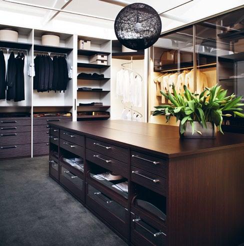
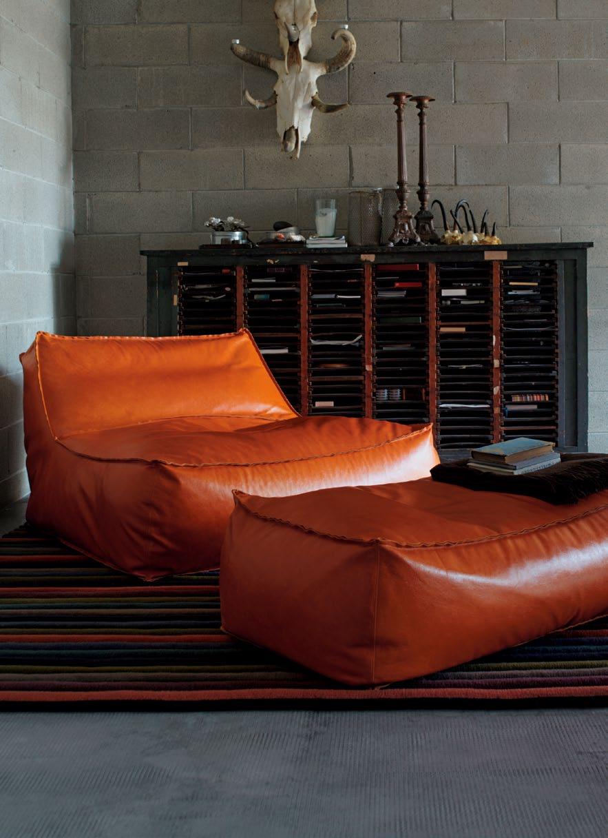
Eight of the best designers from the Region share their favourite things. Some new solutions for old challenges. And how to make small spaces work for you, and all the family.

living in design april – june | 2012 AUD$14.95 | NZ$14.95 | USD$15.95 CDN$16.95 | GBP£8.50 | SGD$10.95
# 15


In store now. For information on the BassamFellows range please visit livingedge.com.au or talk to one of our consultants on 1300 132 154. Furniture for life.
Whether you’re looking to buy or just looking for fun, the latest products never cease to amaze, pushing the boundaries and re-interpreting old classics in new and surprising ways.
24. DESIGN NEwS hot products for indoors and outdoors, and for home, work and play.
26. tIlES & B athROOMS the latest designs and innovations from the Cersaie fair in Italy.
30. wINE Equip yourself for entertainment with a connoisseur's collection of accessories.
35. CaMERaS with this selection, anyone can be a professional, or at least look like one.
Enter the home of a creative soul and you’ll also enter their mind. Meet some interesting, intellectual and inventive beings…
48. alpha60 a brother-sister design duo that lives and works together, seamlessly channelling their forces for a range of professional and personal projects. alice Blackwood is invited into the creative domain of alex and Georgie Cleary of young Melbourne fashion brand, alpha60.
61. ShalINI G aNENDRa fINE aRt art is vocation and passion for Shalini Ganendra, who has built a gallery and artist’s residence in Kuala l umpur. amy Ng visits the gallery and her home.
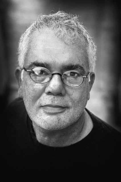
73. B aRB aRa & DOMINIC S aNSONI Sri lankan artist, Barbara Sansoni, has been the doyenne of the country’s creative scene. andrew pfeiffer meets her and her son, Dominic, a well-known photographer and more recently, Barbara's business partner.
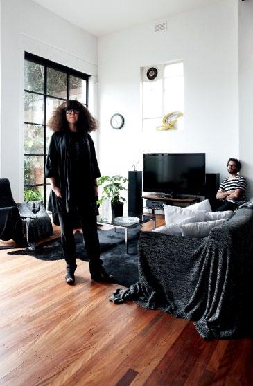
37. DESIGN hUNtER faVOURItES what products do Design hunters love? Eight creatives nominate their favourites for our gravity-defying photo shoot. #37 #48

85. aNGElENa ChaN
Singapore’s hungry housing market demands new ways of thinking about living. angie Chan of Index Design shares her unique approach –narrative-driven and flexible design solutions – with lynn tan.
habitus # 15
habitus # 15
Where we live is a reflection of our values, personality and particular way of life. Across the Region we are inspired by the diversity that we see.
98. LINEAR housE
A beach house in Portsea in Victoria by Architects EAT embodies the indoor/ outdoor living found in tropical resorts, inspired by the owners’ travels across south-East Asia. stephen Crafti visits.
109. BR ooKVALE APARTmENT
sometimes size is just a perception. singapore architect, Juliana Chan, and her interior designer husband, Tristan Tan, use height and planning ingenuity to create space in their own apartment, Darlene smyth discovers.
120. hERNE BAy housE
A sustainable approach and flexible living were factors in this Auckland home designed by Andrea Bell of Pete Bossley Architects. Andrea stevens sees how it all came together.
131. PoTTs PoINT APARTmENT
An apartment in an iconic sydney block by harry seidler received a live-in makeover by architect, Anthony Gill. Jane Burton Taylor tours the clever and compact interior.
141. mARR GR ouNDs housE
Living in art is not a myth, but the way of life chosen by architect and artist, marr Grounds. Caroline Baum visits his unique home on the New south Wales south coast.
154. GoRE sT housE
Architect Ilana Kister updated an inner-suburban warehouse in Fitzroy for her growing family – the challenges were creating privacy and light.
164. DuFFy’s FoREsT housE
Paul mcGillick pays homage to the late Bruce Rickard’s final project on sydney's north-eastern edge.
175. CousINs’ housEs
Pirak Anurakyawachon visits a project where Tonkao Panin and Thanakarn mokasmith have designed homes for a multi-generational family on one site.
184. GIBB oN sT housE
shaun Lockyer Architects reinterpreted a traditional Australian typology in the design of this Brisbane house. Jenna Reed Burns investigates.
Take some time, the Italian way, to wander through Puglia, and we drop into suburbia to critically reflect on its architecture.

198. PuGLIA
This southern region is the heel of the Italian boot. Jane Burton Taylor journeys to and around its interior and discovers its intertwining history, landscape and architecture.
205. B ooK REVIEW
The suburbs are a necessary housing solution, but much of the architecture is thoughtless, characterless and haphazard. Reviewing some recent books, Linda Cheng argues that it doesn’t have to be this way.
#154 #198 #109
Metis’ Underwater Grotto
By Amber Ward, Kietsu. Sustainable Artist & Designer EchoPanel®Mura available in 10 colours
wovenimage.com
See how we can spark your imagination at
Photo: Robert Frith Acorn Photo








Made
Australian




BA THROOM DESIGN CENTRE

•A LEXANDRIA -8 4O ’RIORDAN ST.0 28 339 7103 •A UBURN -1 03-123 PA RRAMATTAR D. 02 8748 4367 Domayne ® stores are operated by independent franchisees.
PuraVida®


221843_NAU


design with intuitive cooking technology. Pyrolytic oven with matching compact appliances including steam oven, convection microwave, microwave, coffee machine and warming drawer. Head Office 02 8667 4888
Evolving our family heritage. SMA11413
Sophisticated
Linear.







20 20 68L SAVES ENERGY SAVES MONEY AUTO COOK MICROWAVE STEAM OVEN COFFEE MACHINE www.smeg.com.au


the first word
in Habitus.
In her profile of Singaporean interior designer, Angie Chan, Lynn Tan points out that the size of apartments in Singapore is growing smaller due to the lack of land. It is a phenomenon seen all over the world – first seen in Japan where architects have become masters in maximising the amenity of minimal spaces.
Angie Chan (#85) is one person who has made it her mission to optimise the potential of small apartments. Juliana Chan (#109), on the other hand, used her own home on the west coast of Singapore as a unique challenge, radically modifying a 1980s apartment to give it an enhanced sense of space by removing walls and the ceiling, and by creating a high degree of connectivity both internally and with the outside by borrowing the landscape.
In Sydney, architect Anthony Gill (#131) took a small, but classic apartment by Harry Seidler and, on a miniscule budget, turned it into a comfortable and elegant inner suburban home. Like Juliana Chan, Gill has maximised practical space, with great creative flair.
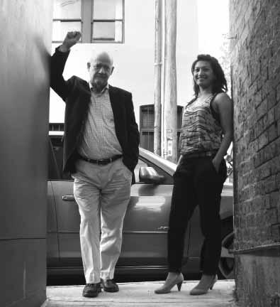
Meanwhile, back in Bangkok, architects, Tonkao Panin and Thanakarn Mokasmith (#175), have picked up on a growing trend to re-invent the traditional South-East Asian compound house as a home for the extended family. This trend involves multiple dwellings on the same site, thus maximising land use while keeping up to four generations of a family living together. The trick is how to marry communal living with the levels of privacy which a younger generation prefers.
And there are other examples in this issue involving clever planning, sustainable strategies and adaptive re-use. It may not be a deliberate theme in the magazine, but it does highlight the kind of innovative design which is making our region one the major creative hotspots in the world, especially in the light of growing environmental and societal pressures.
Paul McGillick | Editor
We don’t do themes
But if I were pressed to find one in this second issue of the new-look Habitus, it would be: making the most of what you’ve got.
LEFT | editor, paul mcgillick. rIghT | deputy editor, nicky lobo.
habitus takes the conversation to our contributors, discovering their inspirations and design hunter journeys
Caroline Baum | Writer MARR GROUNDS #141

Caroline Baum is a journalist, broadcaster and independent producer. She was the founding editor of Good Reading magazine, contributes to national newspapers and magazines, and blogs for Opera Australia. Caroline lives in Wombarra, beneath the escarpment on the south coast of New South Wales, with her husband, screenwriter David Roach. She decorates their home with organic shapes and textures and anything that marries form and function.
Peter Bennetts | PhotograPher
pOttS pOiNt ApARtMeNt #131
Chong see KWong | PhotograPher

SHALiNi G ANeNDRA #61
When he’s not scuba diving or trekking in the mountains and jungles, Chong See Kwong can be found behind the camera, photographing everything from hotels and food to architecture and landscapes. See Kwong lives in Kuala Lumpur, Malaysia, with his wife and two boys. He first discovered photography when his father showed him pictures of Adam Ansel’s black and white landscapes. See Kwong loves the outdoors, and especially enjoys travelling assignments.
James CoomBe | PhotograPher
LiNeAR HOUSe #98
James Coombe is an associate at Architects



eAt. He’s also a new photographer and is discovering “extraneous elements of buildings and space” through the camera lens. James has always wanted to make, design and craft things. He says, “At school, i gathered that architecture was the gateway to essentially any and all design and creativity.” James lives in South Yarra, Melbourne, with a couple of friends.
simon Devitt | PhotograPher
HeRNe B AY HOUSe #120
Funkis started in 1996 in Sydney’s iconic suburb of Bondi Beach. “I don’t think it would have worked otherwise,” Carina Enstrom Gibb believes. “In Bondi then, there were all the stylists, the film people and art directors who were a bit braver and liked the whole thing.” Quickly, and via these stylists and other influential creative people, Funkis prints, bags, clogs and homewares made their way into magazines. “I think because Swedish products are so graphic and photogenic, they loved borrowing it,” Carina says.
At age 13, peter Bennetts spent all his savings on a pentax SLR in Hong Kong and travelled through China, photographing the country as it was just opening up to the West. He reflects, “i remember a fascination with lakes of farmed peking ducks!” today, peter is a renowned architectural and environmental photographer. peter lives in St Kilda, Melbourne, where he and his wife, architect Rowena Hockin, are designing and building a new house and studio.
sCott BurroWs | PhotograPher

GiBBON St HOUSe #184
Self-taught photographer, Simon Devitt, captures the beauty in decay. “Decay, to me, offers the most compelling aspect of beauty,” he says. “A space has to have been lived in, or used to a degree that the original intention of the design becomes part of the person and vice versa.” He brings this unique perspective to architectural photography, which he believes offers him the broadest view of the world, through landscapes, the built environment and people.
seBastian Posingis | PhotograPher

Prior to Funkis, Carina was already sourcing vintage and antique pieces from Sweden – “we used to go to Sweden in the summer and ship them over” – but eventually decided to work with Swedish textile designers to create prints that would become cushions and lampshades, as well as being available in drops for furnishings. In addition, Carina began designing lighting, jewellery and clothing expressing the same bold, quirky aesthetic. But it wasn’t just about creating a ‘look’ – “when we made something it was always because I could imag
B ARBARA & DOMiNiC S ANSONi #73 German-born, Asia-based photographer Sebastian posingis grew up in iran, india and Sri Lanka. Sebastian specialises in humanitarian photography, documenting relief efforts and development work for UNiCeF, World Health Organisation and other aid agencies. He lives in Colombo with his Danish girlfriend. ever the perfectionist, Sebastian is looking forward to “being satisfied with my own pictures”.
Jenna reeD Burns | Writer
GiBBON St HOUSe #184
Scott Burrows is inspired by sunlight. “it doesn’t matter what i’m shooting, if there’s magnificent light around, i get excited,” Scott says. He began his career as an architect before he put away his drawing board and started documenting buildings through the camera lens. Scott lives in Brisbane with his wife, six-year-old daughter and soonto-be-born little girl. He always looks forward to good buffets when he’s travelling on shoot assignments, especially dessert.
Habitus’ Brisbane contributing editor, Jenna Reed Burns, has been writing about interior design, architecture and landscape design for two decades. “i always loved writing and telling stories at school and wanted to be a designer,” she says. “i find the process of finding words to capture the essence of a place very rewarding.” Jenna lives in Red Hill, with her husband and their two Jack Russell terriers, and has a fondness for beautiful pieces by Australian glass artists.
issue #21 habitus.com
Dominic SanSoni | PhotograPher

BarBara & Dominic SanSoni #73 at art school, Dominic Sansoni “escaped from life drawing classes and found the photography department instead”. He hasn’t looked back since. He has built up an extensive body of work on exotic locations in Sri Lanka, india, Thailand, Yemen, The maldives and mauritius. Dominic is inspired by long drives through Sri Lanka with no agenda and will soon be journeying to the Tibetan Plateau.
ruPert Singleton | PhotograPher

BrookvaLe aParTmenT #109 originally from Yorkshire, england, photographer rupert Singleton is now based in kuala Lumpur via a long stint in Singapore. He received his first commission from the New York Times, and has since worked across a number of disciplines including reportage, fashion and architectural photography. rupert lives high up on the hill in the klang valley, and up until recently, shared his home with his cat ‘i am’ who is now somewhere in the jungle behind his house.
anDrea StevenS | Writer

Herne BaY HouSe #120
an architect for ten years, andrea Stevens is now on the other side of the drafting board writing about design, architecture, urbanism and people. “i’m interested in people, objects and ideas,” says andrea. “i seek to uncover the various influences and creative impulses behind a designer’s work.” andrea and photographer Simon Devitt have been contributing to Habitus since the launch issue, and the pair have recently launched their new book, Summer Houses (see Habitus #14).
gregory yeo | PhotograPher
angeLena cHan #85
Based in Singapore, gregory Yeo is a multiaward winning creative director and a stalwart of the advertising industry. However, his passion is for photography. He has worked with a number of renowned interior design firms and has taken countless shots of their work. He is fascinated by all things beautiful, which, when on holidays, keeps his snap-happy finger glued to the shutter at all times.

THE DESIGN HUNT CONTINUES ONLINE ... Like us on Facebook Get the Habitus App habitusliving.com/the-habitus-app Habitusliving.com is the perfect complement to your Habitus subscription The companion website has been re-launched with brand new elements, including video programming and increased connections to social media. HAB15_habliving_HPV_02.indd 1 17/01/12 3:06 PM
rethink carpet

Editorial dir Ector
Paul McGillick habitus@indesign.com.au
dEPUt Y Editor
Nicky Lobo nicky@indesign.com.au
Editorial assistant / Pa to Editorial dir Ector
Linda Cheng linda@indesign.com.au
Editorial intErn
Alicia Sciberras edintern@indesign.com.au
art dir Ection & original dE sign tEm PlatE one8one7.com
sEnior dE sign Ers
Emma Warfield emma@indesign.com.au
Lauren Mickan lauren@indesign.com.au
j U nior dE sign Ers
Frances Yeoland frances@indesign.com.au
Ben Williams design@indesign.com.au
onlin E Editor
Belinda Aucott editor@habitusliving.com
contribUting WritErs
Pirak Anurakyawachon, Caroline Baum, Alice Blackwood, Jane Burton Taylor, Stephen Crafti, Amy Ng, Andrew Pfeiffer, Jenna Reed Burns, Darlene Smyth, Andrea Stevens, Lynn Tan.
contribUting
Photogra PhErs
Peter Bennetts, Justin Bernhaut, Anthony Browell, Scott Burrows, Jane Burton Taylor, Chong See Kwong, James Coombe, Simon Devitt, James Geer, Sharon Lam, Michael Nicholson, Tim Robinson, Dominic Sansoni, Rupert Singleton, Derek Swalwell, Spaceshift Studio.
contribUting sU b-Editor
Graham Lauren
COVER IMAGE
Alpha60 (p.48)
Photography: James Geer

INDESIGN PUBLISHING
Level 1, 50 Marshall St Surry Hills NSW 2010 (61 2) 9368 0150 | (61 2) 9368 0289 (fax) indesignlive.com
cEo / PU blish Er Raj Nandan raj@indesign.com.au
Pa to PU blish Er Leanne Rogers leanne@indesign.com.au
oPErations m anagEr Adele Troeger adele@indesign.com.au
ProdUction managEr Shannon Smith shannon@indesign.com.au
a dv Ertising traffic / officE a dministrator
Lauren Phipps laurenp@indesign.com.au
financial dir Ector
Kavita Lala kavita@indesign.com.au
bUsin E ss managEr Darya Churilina darya@indesign.com.au
accoU nts
Gabrielle Regan gabrielle@indesign.com.au
Jana Kralikova jana@indesign.com.au
onlin E comm U nications Rish Raghu rish@indesign.com.au
Ramith Verdheneni ramith@indesign.com.au
Radu Enache radu@indesign.com.au
Ev Ents and mark Eting
Kylie Turner kylie@indesign.com.au
Laura Sue-San laura@indesign.com.au
Tegan Richardson tegan@indesign.com.au
Hannah Kurzke hannah@indesign.com.au
bUsin E ss dE v EloPm Ent managEr
Marie Jakubowicz marie@indesign.com.au
(61) 431 226 077
a dv Ertising EnqUiriE s Colleen Black colleen@indesign.com.au
(61) 422 169 218
any
means, electronic, mechanical, photocopying,
While every effort has been made to ensure the accuracy of the information in this publication, the publishers assume no responsibility for errors or omissions or any consequences of reliance on this publication. The opinions expressed in this publication do not necessarily represent the views of the editor, the publisher or the publication. Contributions are submitted at the sender’s risk, and Indesign Publishing cannot accept any loss or damage. Please retain duplicates of text and images. Habitus magazine is a wholly owned Australian publication, which is designed and published in Australia. Habitus is published quarterly and is available through subscription, at major newsagencies and bookshops throughout Australia, New Zealand, South-East Asia and the United States of America. This issue of Habitus magazine may contain offers or surveys which may require you to provide information about yourself. If you provide such information to us we may use the information to provide you with products or services we have. We may also provide this information to parties who provide the products or services on our behalf (such as fulfilment organisations). We do not sell your information to third parties under any circumstances, however, these parties may retain the information we provide for future activities of their own, including direct marketing. We may retain your information and use it to inform you of other promotions and publications from time to time. If you would like to know what information Indesign Group holds about you please contact Nilesh Nandan (61 2) 9368 0150, (61 2) 9368 0289 (fax), subscriptions@indesign.com.au, indesignlive.com. Habitus magazine is published under licence by Indesign Group. ISSN 1836-0556
issue #15 habitusliving.com
in Singapore All rights
No part of this publication may be reproduced, stored in a retrieval system, transmitted in
form
MELBOURNE SYDNEY PERTH DUBAI NEW YORK www.tsar.com.au
Printed
reserved.
any
or by
other
recording or otherwise.
Untitled-7 1 12/12/11
1:01 PM
New colours
New designs New inspiration

Introducing our newest, exclusive Classico collection designs. So however you want to express yourself, with Caesarstone you can.


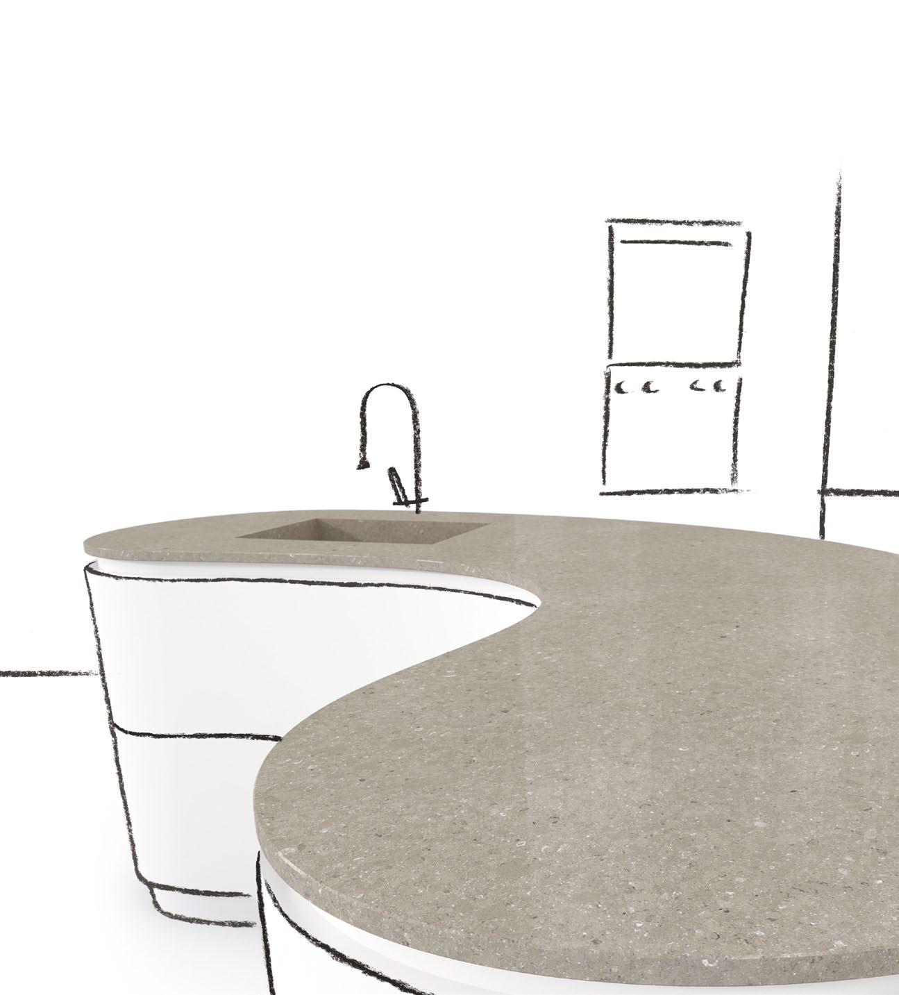
Cocoa Fudge ™ Wild Rice ™ Shitake ™ Creme Brulé ™ Ocean Foam ™ www.caesarstone.com.au 1300 119 119
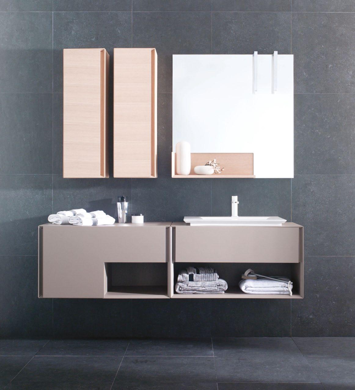
55 Holt Street Surry Hills - 02 9211 1998 - info@porcelanosakitchens.com.au porcelanosakitchens.com.au IN - bathroom collection by GAMADECOR
design news – page #24
For those who appreciate products thoughtfully crafted by an artisan.
Porter’s Paints are offering 60 new colours in their environmentally friendly water-based 2012 coll Ection paint range. The 2012 fan deck includes contemporary new hues as well as double and triple strength variations on classic favourites.
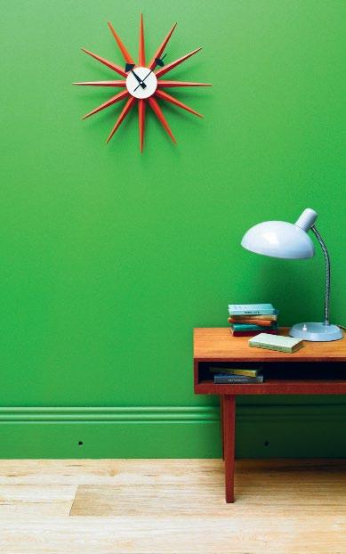
porterspaints.com
A minimalist expression of the side table, Mini M ato designed by Matthias Ferwagner simply counterbalances five bars of untreated Ash to create the structure. The table top, in either silver or black anodised aluminium, sits elegantly on the asymmetrical, seemingly precarious base.
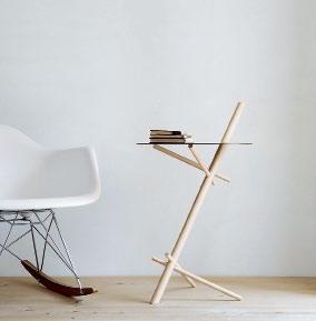
moormann.de
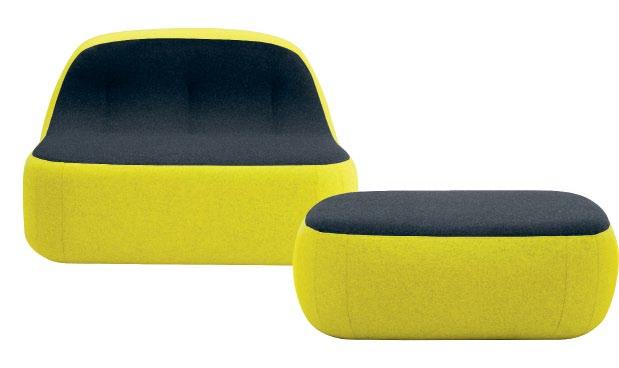
Designed by Esteban and Moreno for Softline DK, this collection of soft furnishings comprises a chair, chaise and pouf. The Sand SEri ES is inspired by the smooth, evolving form of sand and stone when transformed by the motion of water. The range offers as peaceful an experience as you would expect from the combination of nature and design, with the upholstery milled in Denmark.
softline.dk/ interstudio.com.au
#15
issue
habitusliving.com
For the design-conscious fish… or maybe just the design-conscious fish owner, archiquarium is available in two modernist models. Pictured is a two-floor villa with white and black steel walls; paired with glass and solid Ash it becomes a trifecta of classic architectural finishes. With sleek cutouts to see into your fish’s pristine aquatic environment, it may inspire you to de-clutter your own home.
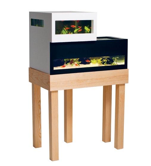
archiquarium.se
New colours from style technicians Bang & Olufsen will attract the right kind of attention to musically inclined Design Hunter heads. In vibrant hues of red, yellow and orange, plus white, these fresh looks are a welcome addition to the iconic Form 2 headphones, celebrating 25 years of equally fresh sound. The lighweight model was designed in 1986 for maximum comfort during long listening sessions, with uncomprimising acoustics –solid bass, a focused middle and precise high pitch.

bang-olufsen.com
Harking back to the Bronze Age, the cutlery bronze range designed by Skitch has a warm, rich hue due to the specially treated 18/10 stainless steel. Enjoy the dessert spoon, dinner knife, dinner fork and soup spoon while you eat.

wannakes.com
Inspired by the old tin can telephone, mr. cooper pendant lights pay tribute to a time gone by. Designed by Australian, Kate Stokes, and made in Melbourne, the pendant is in spun copper with swage line detail and available with a range of coloured cloth cables to dangle delightfully in any interior.
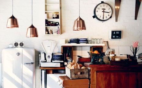
cocoflip.com.au
Made from a soft rubber, the emprom bag from Japanese brand Sceltevie is in a hardy and handy square shape that looks after a range of small items. The design also includes two hooks that can be pushed both in and out of the bag, from which you can hang a pair of sunglasses or a pen for easy access. Available in a great range of six sherbety colours including red, orange, pink, turquoise blue and green, along with classic designer shades of black or white.
beclau.com.au

1 . lightbox # 25
on the hunt... tiles & bathroomware
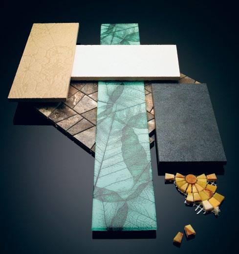
Clockwise from top left | Mutina Déchirer (La Suite) in Net pattern unglazed porcelain designed by Patricia Urquiola in Cemento, $100/m 2 , Living Tiles, Academy Tiles, Elite Bathware & Tiles; Mutina Déchirer (La Suite) in Trace pattern unglazed porcelain designed by Patricia Urquiola in Calce, $100/m 2 , Living Tiles, Academy Tiles, Elite Bathware & Tiles; Studio Glass Tile in Spring 600x100mm, $36/tile, Everstone; Pietralavica Gryphea, LAP, 60cmx60cm, $88/m 2 , Living Tiles; Joy – Multi Onyx (bottom right) 300x300mm sheets, $74/sheet, Everstone; Castle Pyramid (centre, base) marble mosaics in Silver in polished and honed finishes on 300x300mm sheets, $38/sheet, Everstone.
issue #15 habitusliving.com
photography t im r obinson | s tyling nicky lobo | art direction christey johansson
The Admir A l cast iron bathtub features a new surface texture that provides a rich copper lustre, matching the antique copper finish of the feet and free-standing Coventry bath mixer.
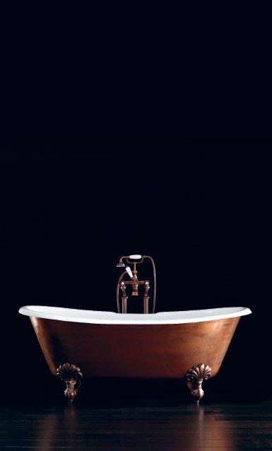
devon-devon.com / studiobagno.com.au
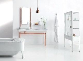
1930s glamour was in the mind of Spanish designer, Jaime Hayon, when designing a range for the newly launched Bisazza Bagno. The masterful mosaic brand has branched out into bathroomware with two collections: one from Hayon and the other from Dutch designer, Marcel Wanders. Each range comunicates their individually playful aesthetics – “The bathroom is the most important room in the home and should not be hidden,” Hayon believes. bisazzabagno.it
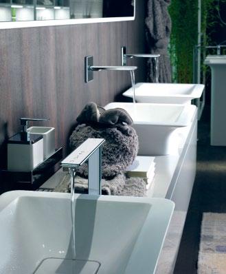
The i-obsessed among us will delight in the new iSpA range from Gessi. Featuring a human-centric approach and familiar functional language, the collection includes a number of high-tech faucets and mixers with either a soft-touch electronic or sleek joystick control mechanism.
gessi.it / abey.com.au
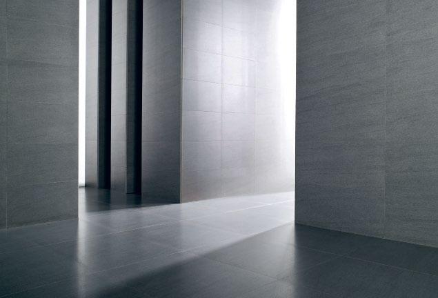
Porcelanosa’s technical branch, Urbatek , has re-imagined the stylish YA zz series with a solid, iron-like appearance inspired by basalt. The tiles are through-body porcelain –the colour on the top of the tile goes all the way through the thickness of the tile – which means they tend not to show wear. Typically harder than granite, porcelain ranges such as this are a durable option for high-traffic areas.
porcelanosa.com / earp.com.au
# 27 1 . lightbox
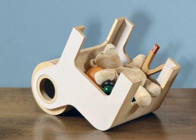
Conceptualised with the 3-6 year old in mind, Spanish designer a nder l izaso has produced the bull . This dual-purpose product is constructed from Baltic Birch plywood and can be positioned as a chair with a backrest fashioned like a spinning wheel or turned upside-down as a wagon to transport toys.
anderlizaso.com
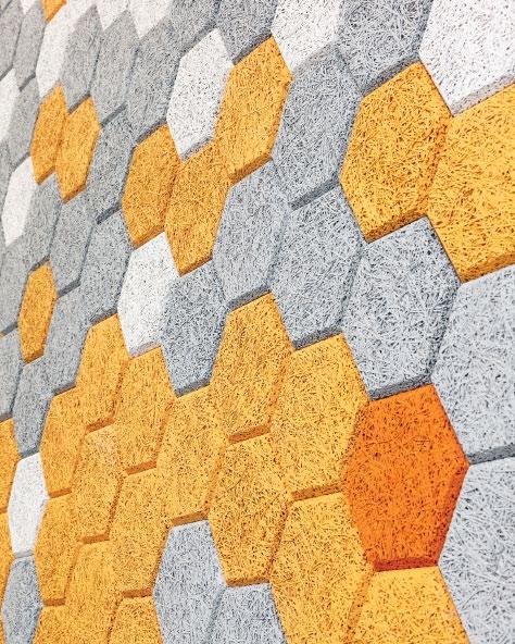
Are you looking for a water-resistant, moisture-absorbent and noise-cancelling solution to wall panelling? Well the Swedes have outdone themselves again, introducing the TaulliT Hexagon wood-wool cement that was purpose designed for acoustic benefits.
formuswithlove.se / fredishere.com.au
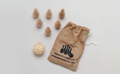
Encourage children to play, the old fashioned way. A stark contrast to television screens and cheap plastic is the natural texture of Chigo’s wood collection of toys, pigmented with non-toxic paint. bowling SeT is just one design by the Japanese brand, which also includes wooden cameras, spinning tops and kitchen sets, all made from locally-sourced timbers.
chigo.co.jp
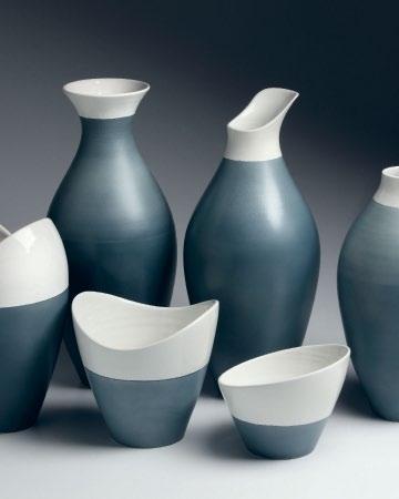
For those who appreciate products thoughtfully crafted by an artisan, satisfy your visual appetite with Gum Designs’ latest range of ceramics produced for Italian design house a bitaMi The new collection holds nine shapes and sizes with a focus on using different techniques and finishes.
gumdesigns.it
issue #15 habitusliving.com
OUTDOOR&PASSDOOR SHOWROOMS ANTWERP BARCELONA DOETINCHEM ISTANBUL LISBOA LOS ANGELES MADRID MALLORCA MIAMI MILANO NEW YORK OORDEGHEM PORTO VALENCIA
Cristal Box design José A. Gandía-Blasco www.gandiablasco.com GANDIA BLASCO T. +34 902 530 302
Flat design Mario Ruiz
on the hunt... wined up, wined down
issue #15 habitusliving.com
photography t im r obinson s tyling nicky lobo | art direction christey johansson
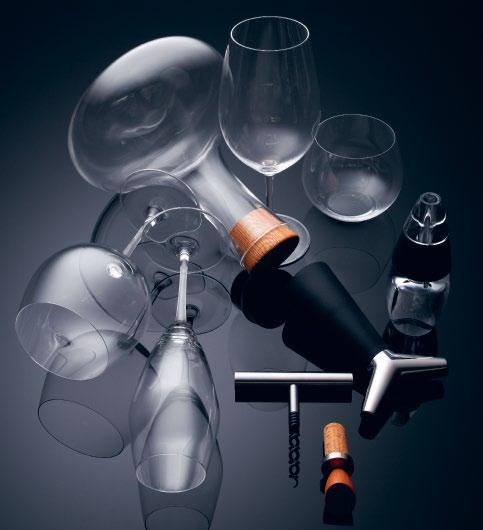
Clockwise from top left | Fia Carafe by Nina Jobs, $125, Zuster; Shiraz Syrah glass from the Vinum XL Range, $139.95 for a twin set, Riedel; O-Series Oaked Chardonnay tumbler, $49.95 for a twin set, Riedel; Vinturi aerator, $65, Top 3 by Design; Eva Solo wine bottle stopper in black , $60, Top 3 by Design; wooden bottle stopper, $39.95, from selection at Ultimo Wine Centre; Stelton Classic corkscrew in silver, $92, Corporate Culture; champagne glass from Vitis range, $149.95 for a twin set, Riedel; Montrachet wine glass from the Vinum XL Range, $139.95 for a twin set, Riedel.
Moroso Spa
Cavalicco, Udine/Italy
T +39 0432 577111
e-mail: info@moroso.it
www.moroso.it
Moroso Available exclusively at hub furniture
lighting living
Melbourne 63
exhibition St Melbourne
T +61 3 9652 1222
Sydney 66–72
Reservoir St Surry Hills
T +61 2 9217 0700
www.hubfurniture.com.au
photo Alessandro Paderni / ad Designwork
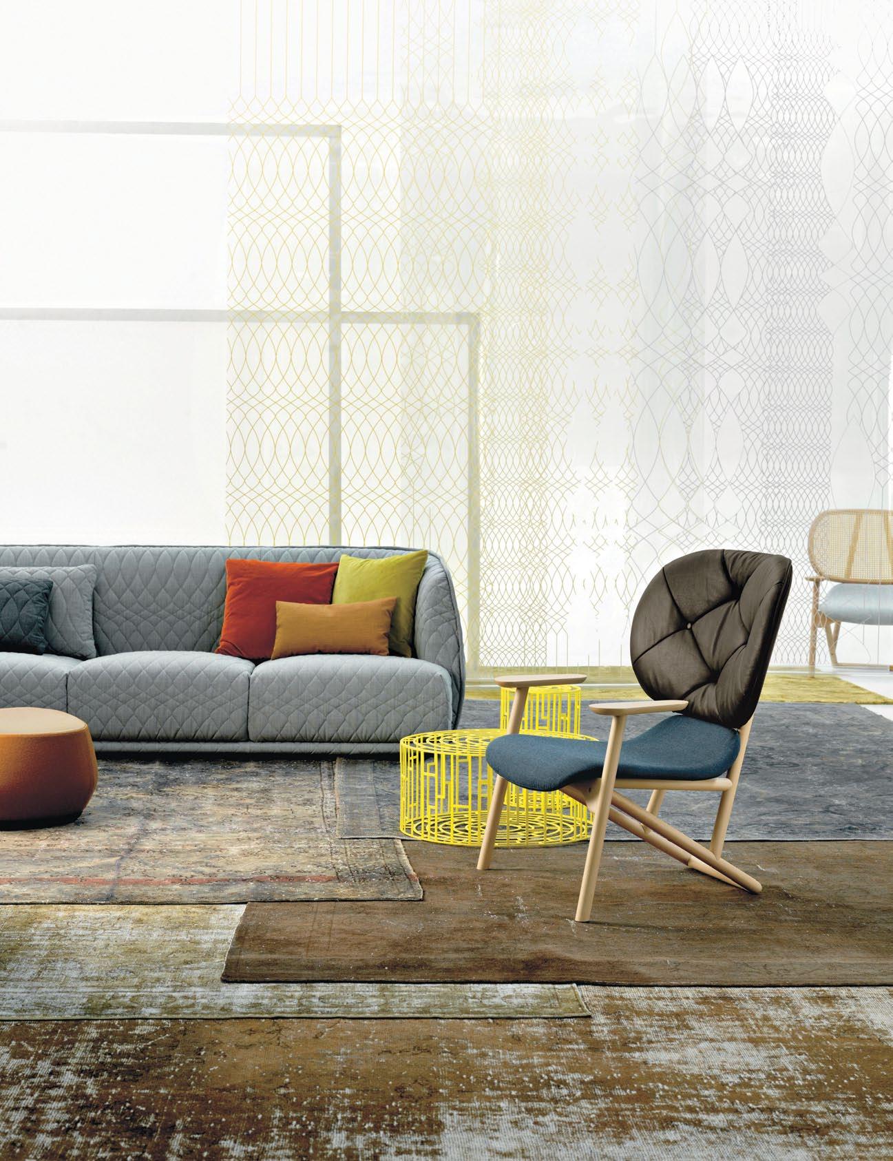
Klara armchair by Patricia Urquiola Carpet reloaded for Moroso
Kub table by Nendo
Redondo sofa by Patricia Urquiola
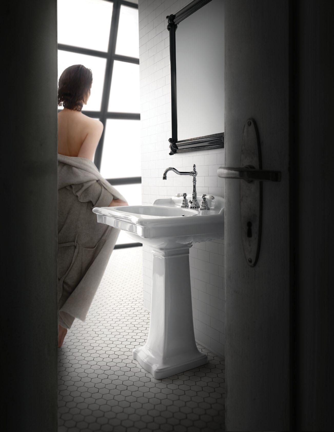
The new range of crystal from Waterford is so special that they’ve coined a new word for it. f L eurOLOgy is defined as ‘the union of crystal and floral artistry as it relates to individual style, creative expression and gracious living’, with a comprehensive range of varietal vases with complementing cutting patterns, as well as companion glass flowers. wwrd.com.au

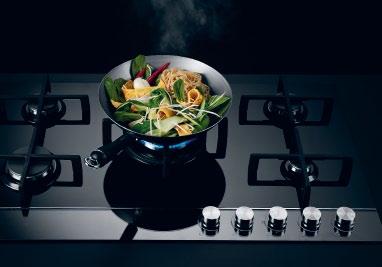
Coupling European design with efficient gas cooking and advanced burner technology, the gA s ON gLA ss cooktops are a seamless statement piece for the kitchen. Available in 90cm and 60cm variations to suit.
fisherpaykel.com.au
The glazes on these exquisite handcrafted artworks by London-based ceramicist, Lubna Chowdhary, are blended in her studio before multiple layers are painted onto tiles of various textures and dimensions. Each tile is then fired multiple times and carefully composed into a bespoke piece of art.
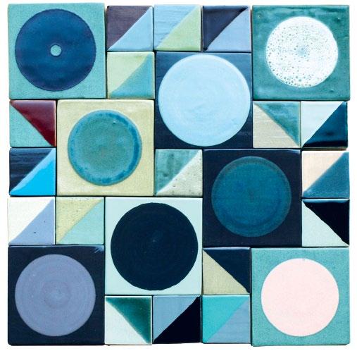
lubnachowdhary.co.uk
INOVA is a range of cabinet furniture for the bathroom intended to integrate with the leading Italian range of Catalano washbasins, with clear lines and the inclusion of one or two timber drawers for a refined casing.
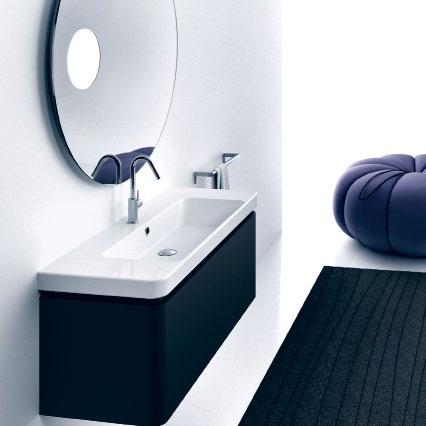
rogerseller.com
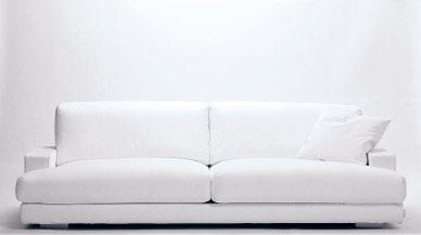
A new furniture company has landed in Australia. Cyrus Designs, originating in Italy in the 1970s, offers a collection of furniture inspired by different periods including neoBaroque, post-minimalism and glamour. There’s something for everyone and a catalogue especially for Bambinos.
cyruscompany.com.au
1 . lightbox # 33
on the hunt... freeze frame

1 . lightbox # 35
Clockwise from top left | Holga 120 with electronic flash and plastic lens in white, $130, Via Alley; Vintage Polaroid One Step Auto Focus in silver, $180, Blender Gallery; Blackbird Fly twin lens reflex camera in blue, $220, Via Alley; Lubitel 166+ Keychain in ABS plastic, $7.50, Blender Gallery; Sony HD NEX-5N in black with magnesium alloy front and top plate, touch-screen display and electronic first curtain shutter, from $799, Sony; Lomo Diana Mini in blue with wide-angle lens and flash, $120, Blender Gallery; Fujifilm X10 with die-cast magnesium top and base and precision-milled metal ring and dials, $699, Fujifilm.
photography t im r obinson | s tyling nicky lobo | art direction christey johansson
Sleek and unique

The sleek and unique IXL Tastic Neo combines cutting-edge technology with simple elegant design to create a light-filled, evenly heated, well-ventilated bathroom.

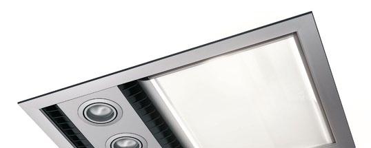
Effortlessly efficient, it complements the modern bathroom without fuss or frills, and performs brilliantly with easy to control functions. When designing your own bathroom, do it right and accept only the best. A simple feature product with outstanding function, it’s designed for living.
Australian-made with a 5-year in-home warranty, rest assured the Tastic Neo is reliable – leaving you comfortable, safe, stylish and satisfied.
Call 1300 727 421 or visit www.ixlappliances.com.au
trophy cabinet
we invite eight design hunters from the region to share some of their favourite products for our photo shoot. journey into their creative psyches and then meet them online at habitusliving.com to discover what makes them tick.
the south australianbased craftsman works mainly in timber. h ere he appreciates elegant forms by fellow australian designers in other classic materials.
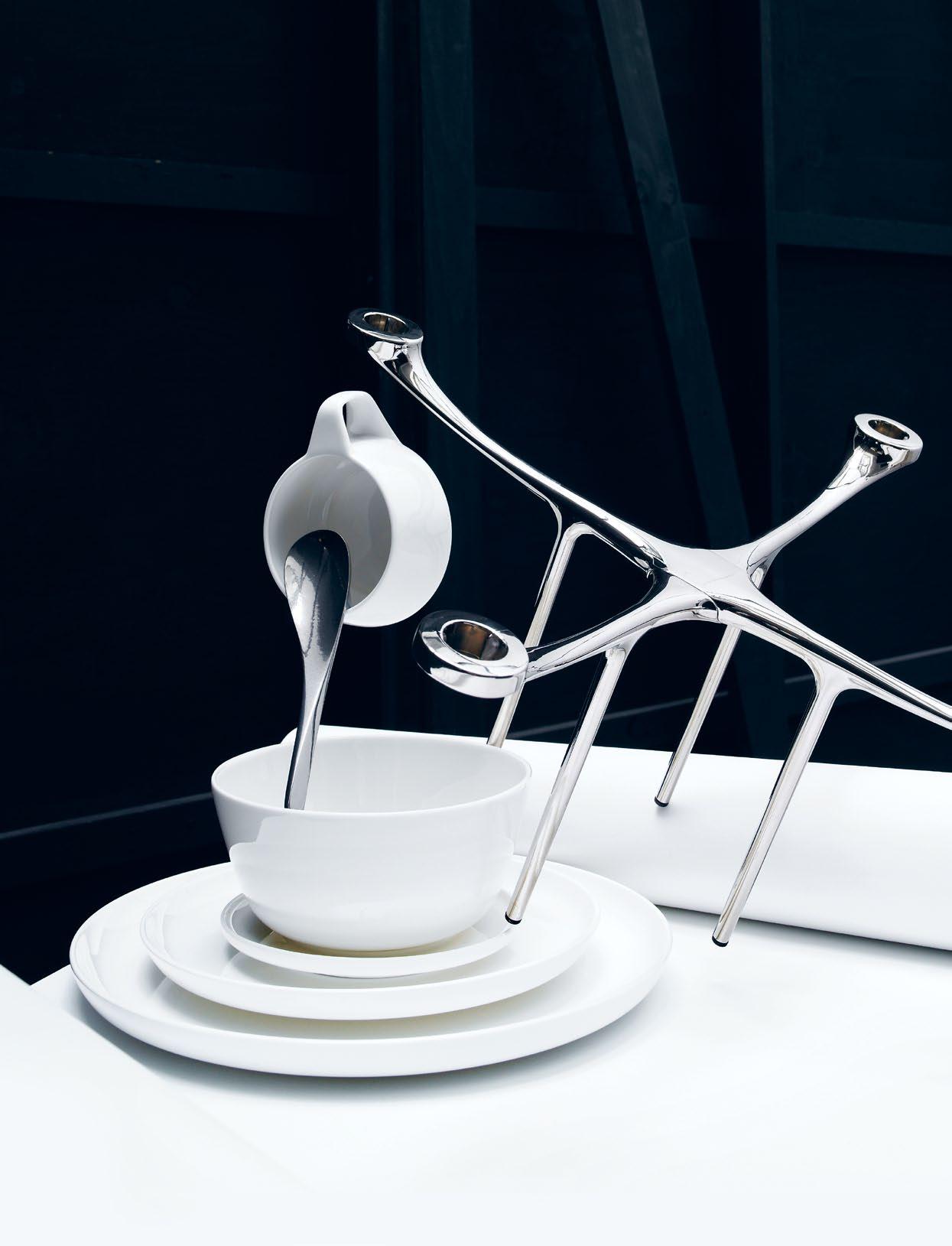 Clockwise from top left: Generation II Petal Spoons in stainless steel by oliver smith, $230 each, oliver smith; Candelabra in silvered zinc with hidden magnetic fixing by c harles wilson for menu, $396, top 3 by d esign; Marc Newson Crockery Collection for noritake in b one c hina, $349 (20 piece set), l iving e dge.
photography tim robinson | styling nicky lobo | art direction one8one7
# 37 1 . lightbox
Khai Liew | Furniture Designer
Kate Sylvester | Fashion Designer
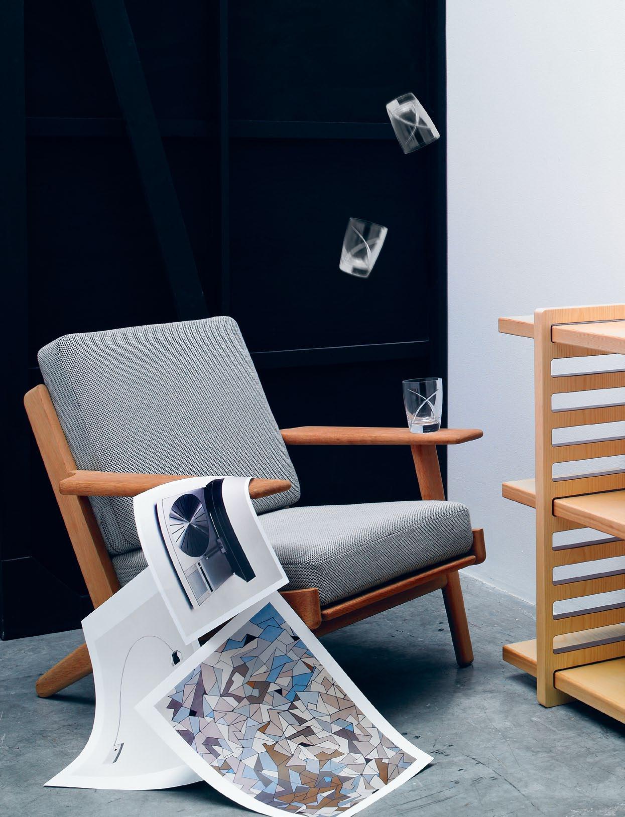
Kate’s quirky sensibility extends beyond her fashion ranges. here is her selection – a characteristic mash up of classic, ladylike shapes with an influential dash of oldschool cool.
Clockwise from top left Plank Chair designed by hans wegner for g etama in 1953, with soap washed oak frame and sprung cushions, $2,950, great dane; Crystal Siren tumblers designed in i reland in 24% lead crystal, $199 for a pair, waterford; (photographs top to bottom) Beogram 4000 turntable series developed in the 1970s (no longer in production), bang & olufsen;
a rco floor lamp designed by achille and p ier giacomo castiglioni for f los in 1962, with italian cararra marble base and satin stainless steel stem, $3,477, euroluce; Cosmo rug handtufted in 100% n Z wool, designed by Kate sylvester, $4,200, designer rugs.
issue #15 habitusliving.com issue #15 /issue15/designhunters
Nick Tobias | Architect
principal of tobias partners, nick's innate style has guided the vision of many award-winning projects. he turns a practised eye to interior products for our design hunter special.
Clockwise from top left Red Swiss Ball used as desk chair, $59.95, swiss ball; Tolomeo desk lamp in matte black designed by m ichele d e l ucchi and giancarlo fassina in 1986 for a rtemide, $374 a rtemide; SU1 shelving system designed by johan l arson in a merican w hite a sh veneer, $3,740, a nibou; (photographs top to bottom) Artek tea trolley in birch with white tiles and rattan basket, designed by a lvar a alto in 1936, $3,660, a nibou; Long Island lounge by f lexform, $11,930, space f urniture.
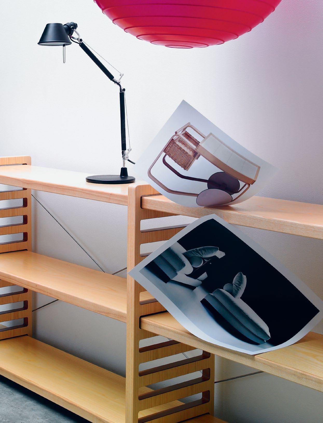
# 39 1 . lightbox
Colin Seah | Architect
Clockwise from top left Fortuny floor lamp designed by mariano fortuny y madrazo in 1907 for palluco, $7,675, poliform; Zisha crockery designed by neri & hu, $150, s eeho su; (photographs top to bottom) Oblique Big bookcase designed by marcel wanders for moooi, from $2,460, space f urniture; Alcova bed designed by a ntonio citterio for maxalto, $13,785, space f urniture; 21400mm chair, concept/ prototype, nendo; Dear Ingo pendant lamp designed by ron gilead for moooi, $5,005, space f urniture.
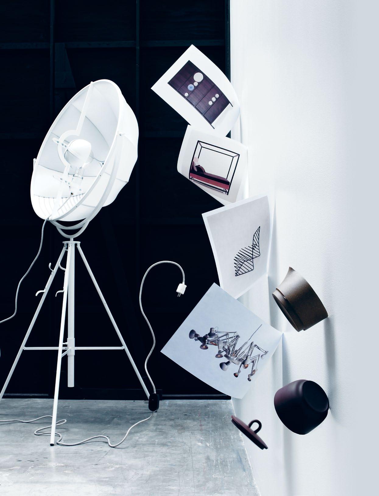
director of singapore practice, ministry of design , colin's philosophy is essentialism. here, he shares some of his own design essentials.
issue #15 habitusliving.com/issue15/designhunters
Lotersztain | Designer
BR iSBan E'S CRE aT iv E SCEn E woULDn' T BE T h E Sam E wi T hoUT iTS hoTTEST yoU ng DESign STa R , T h E CRE aToR oF aUSTR a L ia'S on Ly oFFiCia L DESign hoTEL .
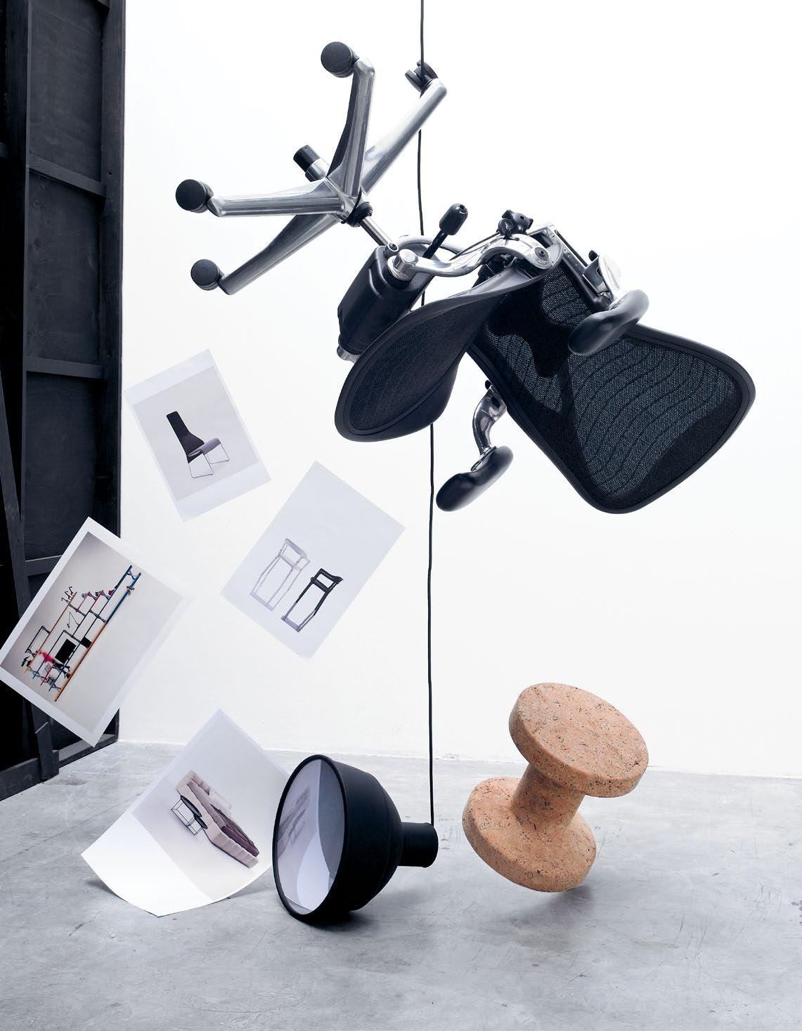 Clockwise from top left Herman Miller Aeron task chair, $1,400, Living Edge; Vitra Jasper stool in cork, $630, Space Furniture; Muuto Unfold pendant lamp, $262, Top 3 by Design; (photographs top to bottom) B&B Italia Lazy High Back chair designed by Patricia Urquiola, $1,915, Space Furniture; Magis
Steel Wood Armchair designed by Ronan & Erwan Bouroullec, $910, Corporate Culture; X-system shelving, from $2,500, Planex; B&B Italia Tufty Bed , $11,665, Space Furniture.
1 . lightbox # 41
Alexander
Mia Feasey | Interior Designer
confident, classy ceo of siren design group, mia knows what products she likes, both in the office and at home. be inspired by some of her favourites
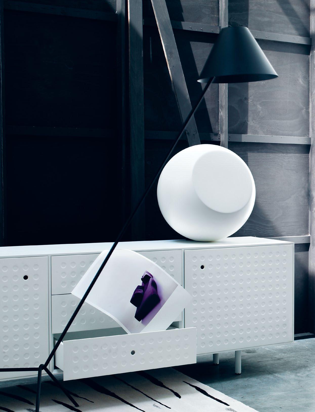
Clockwise from top left Shady floor lamp in spun aluminium with matching powdercoat shade designed by daniel barbera, $570, ism objects; Cappellini Bong side table in varnished fibreglass, $1,337, c orporate culture; Punch sideboard with indented thin gauge aluminium designed by a lexander taylor for e stablished & s ons, $8,915, l iving e dge; Body Paint rug from atnwengerrp range by m innie p werle handtufted in 100% new Zealand wool, $7,960, designer rugs; (photograph) Bend
Sofa designed by patricia urquiola for b &b italia, $8,680, space f urniture.
issue #15 habitusliving.com issue #15 /issue15/designhunters
Sibella Court | Stylist
supreme stylist and book author, sibella has a talent for seeking out something different when putting together interiors. get an insight into her design psyche
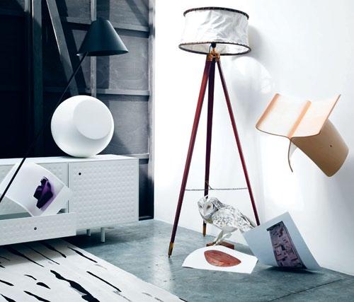
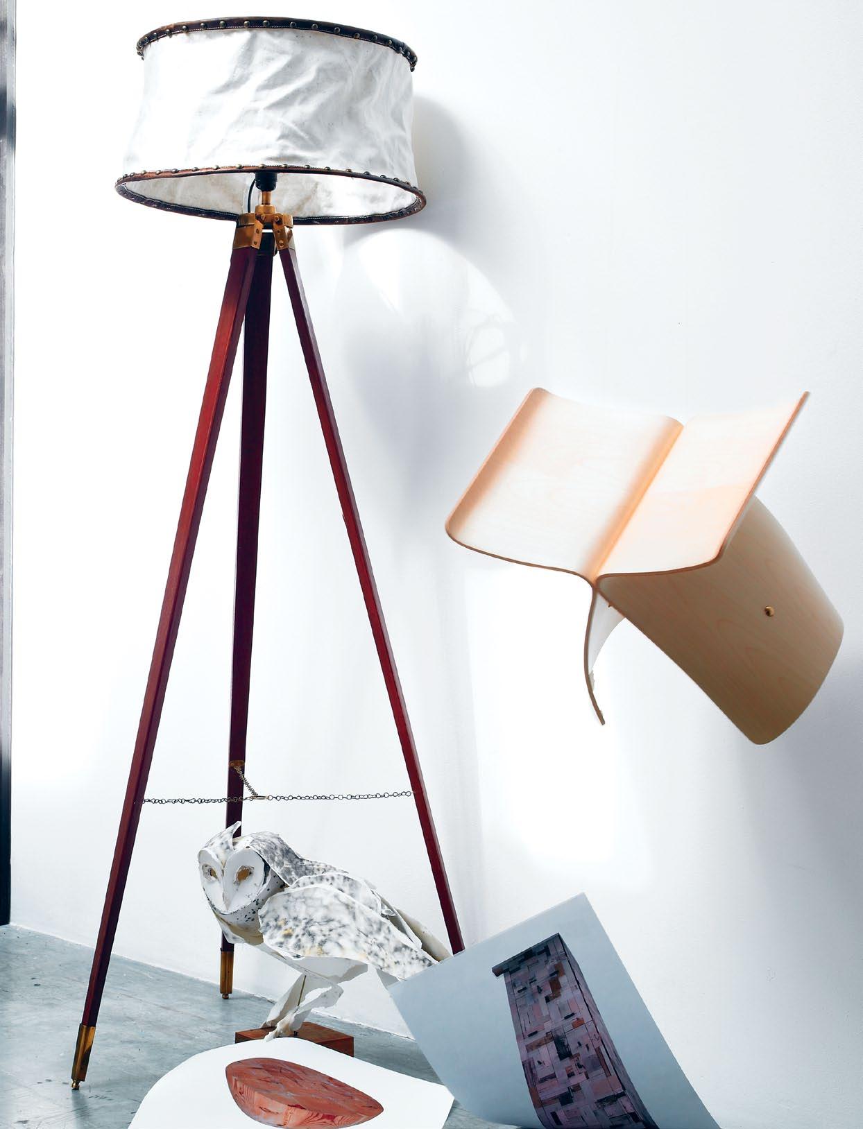
Clockwise from top left OBC Tripod floor lamp with distressed canvas and leather shade, $630, o rson & blake; Vitra Butterfly stool in plywood designd by s ori yanagi in 1954, $895, space f urniture; Owl Perched sculpture in ink, water colour, cotton paper and thread with a brass rod and timber block by a nna-wili h ighfield, poa , a nna-wili h ighfield; (photographs from top to bottom) Waste Cabinet in reclaimed scrapwood, high gloss lacquered, $14,800, p iet hein e ek ; Mega Wood Drum coffee table in o regon, $3,250, mark tuckey.
1 . lightbox # 43
Kenneth Cobonpue | Furniture / Lighting Designer
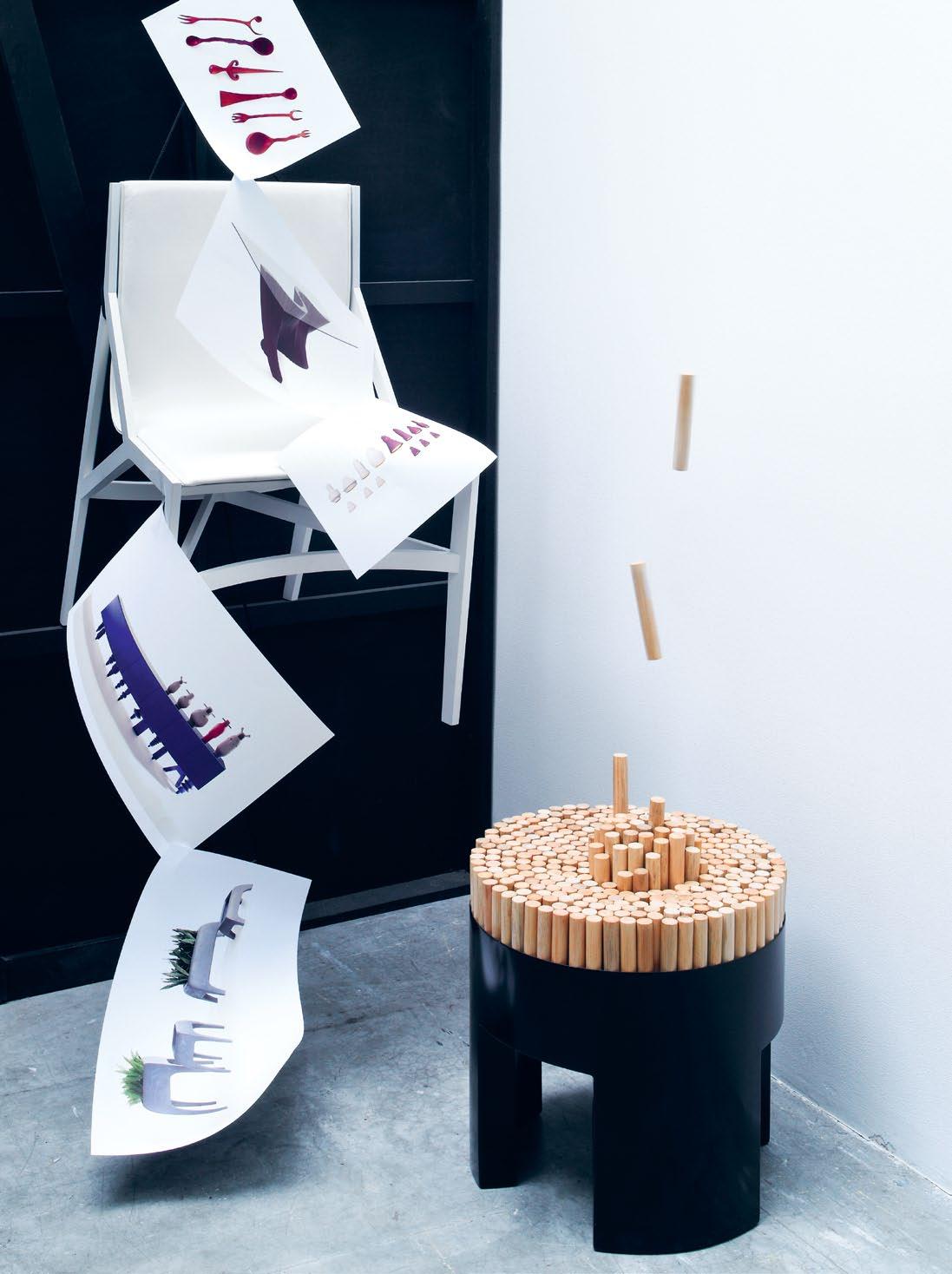
the philippines ’ best-known designer, kenneth appreciates inventiveness and quality materials, which describe his own products and those that he desires.
Clockwise from top left Pilotta dining chair in white stained open pore a shwood and leather upholstery designed by rodolfo d ordoni for cassina, $2,492, c orporate culture; Chiquita stool in matte black frame and untreated rattan poles designed by kenneth c obonpue, $788, ke-Zu; (photographs from top to bottom) Witches Kitchen handcrafted kitchenware collection by studio b oontje for a rtecnica, $770, dedece; Wave dining table in dark Mahogony and glass designed by kenneth c obonpue, $3,342, ke-Zu; Checkmate pendant lamp in salago pulp fibre and fibreglass shades designed by danny Fang for h ive, $239, ke-Zu; Crash sideboard in veneer designed by Ferruccio l aviani for e mmemobili, from $13,446, FY2 k ; Safari planters in naturally cast stone designed by kenneth c obonpue for h ive, $231 each, ke-Zu.
issue #15 habitusliving.com/issue15/designhunters
Your invitation to view...
The new Doghe 0.3 collection from Panaria is the essence of modern living. The 3mm slim wood look tile is available in three colours, offering a warm design and feel that is contemporary and unique. The reliability of the laminated porcelain stoneware makes the Doghe 0.3 thin planks the avant-garde of beauty.
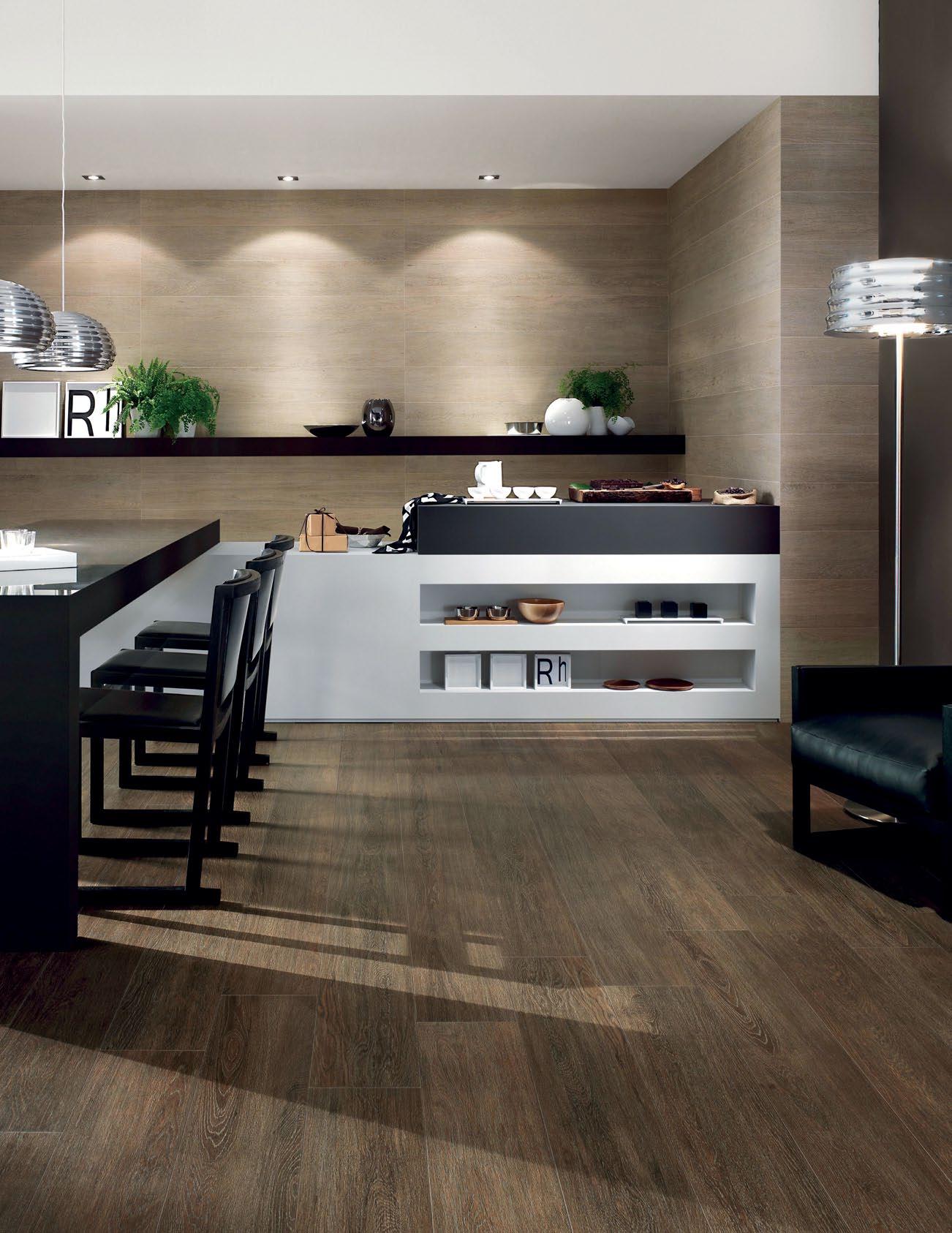
See it for yourself today at your nearest Tile Boutique Showroom.

35 stores nationwide www.tileboutique.com.au
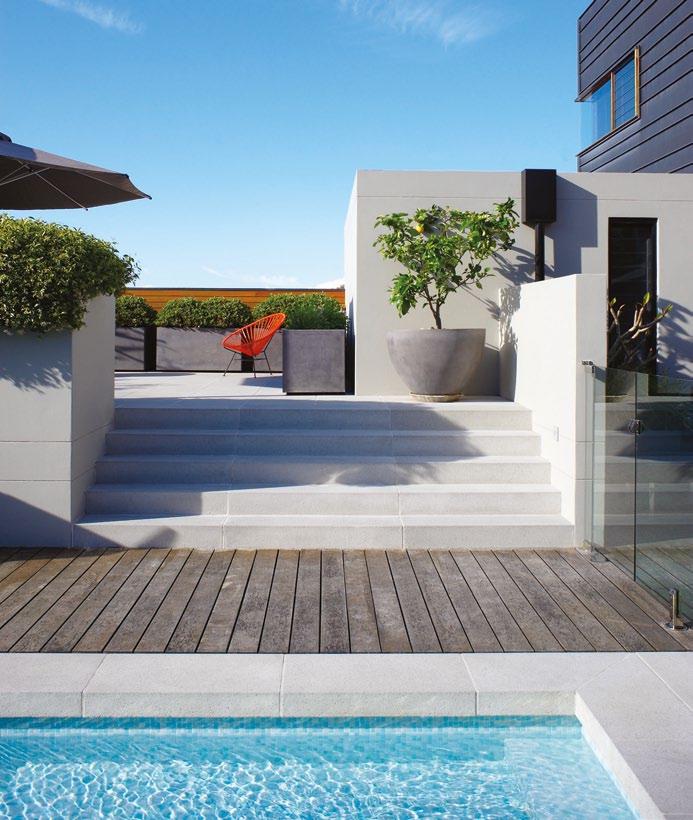
Secret Hideaway.
us create yours.
design, build and maintain
Everybody Needs a
Help
Garden
www.secretgardens.com.au
To work with people who ‘get’

AngelenA Ch A n | designer – pAge #85
you and to do it for your home is unique.
issue #15 habitusliving.com
Larger than Life
Alex
And GeorGie CleAry
–brother and sister duo behind fashion brand Alph A60 – recently extended their creativity beyond fashion and retail design to remodel their Melbourne home. And nine months of renovations has done nothing to quell their appetite for big projects, as AliCe blACkwood finds out.
2 . portrait # 49
text Alice Bl Ackwood | photogr A phy JA mes geer
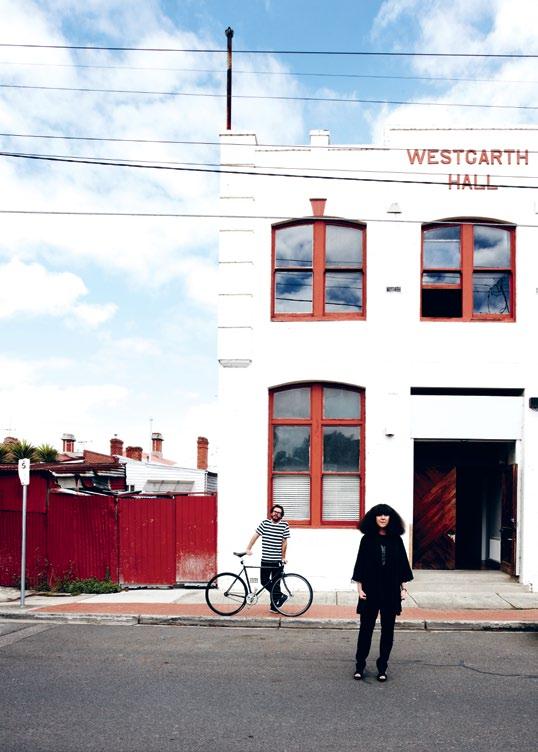
If there is one way to make a memorable entrance, it would be through the front door of Alex and Georgie Cleary’s Melbourne residence, a beautifully renovated home of warehouse proportions, shrouded within the guise of its former life as the Westgarth town hall in the inner-city suburb of Northcote.
Anyone can be forgiven for approaching the building with a touch of hesitation, but timidly tapping on its heavy, towering door is no way to seek admission in to this unlikely home. After a soft rap of knuckles received no response on this particular morning, a firm push gained me entrance, and I slipped inside to find myself suddenly dwarfed by a long, sweeping hallway.
In the echo of a “hello?” comes Alex Cleary – fashion designer, engineer, renovator, project coordinator – briskly walking down that long open stretch. Alex and sister Georgie are the heads and hands behind the ultra-fashionable Melbourne brand, Alpha60, and they both admit to a small obsession for big projects. “We feel lost when we don’t have a thousand things on,” Georgie says.
As if Alpha60 isn’t big enough, with two season releases per year and six fashion stores
issue #15 habitusliving.com
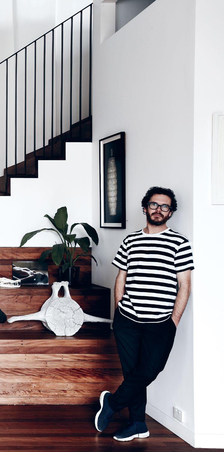
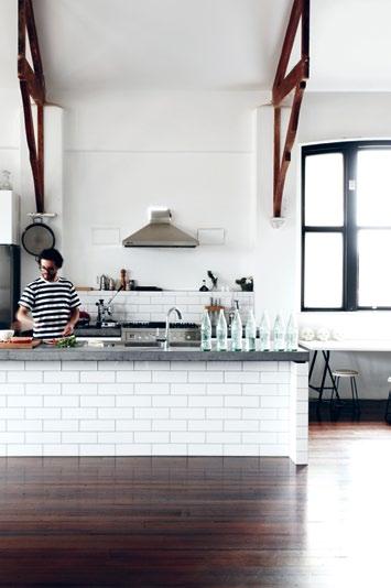
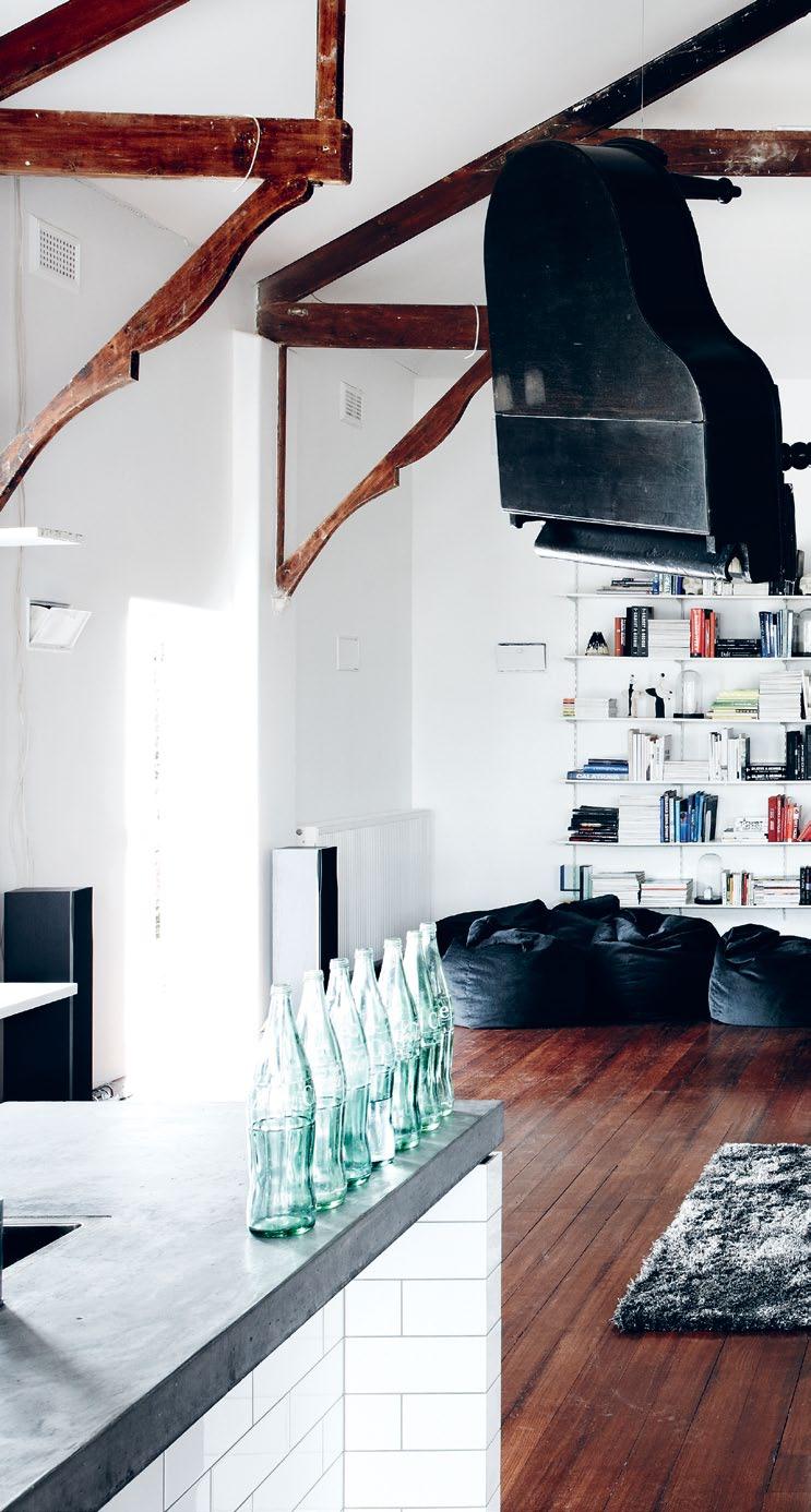
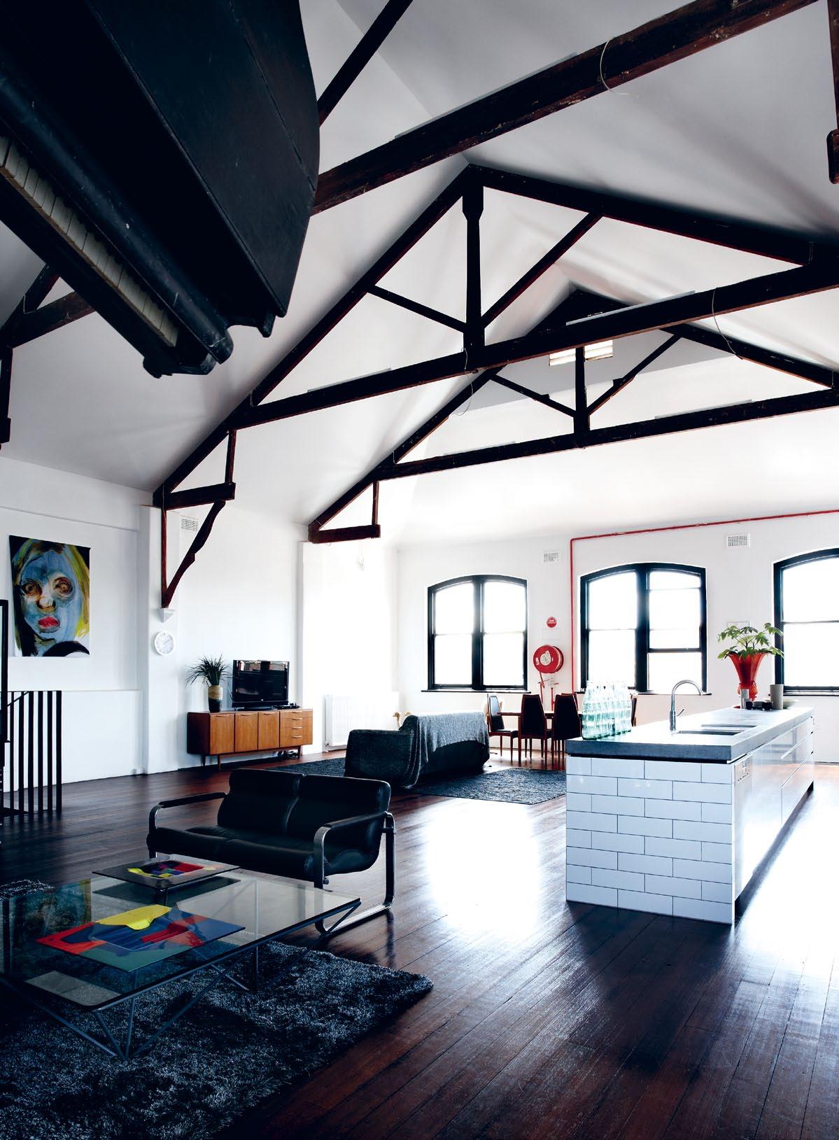
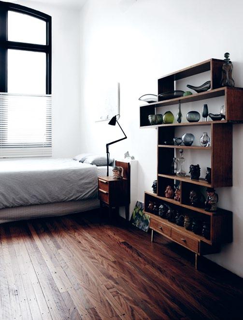
prevIous | The graphic sTripes of The sTairwell make for a sTriking TransiTion beT ween The ground floor and upper level. above left | The concreTe kiTchen benchTop is a special piece for alex and georgie, poured and seT on siTe. above rIght | The expansive living space is filled wiTh sTaTuesque iTems. The collecTion of coke boTTles was discovered under The house when re-sTumping.
2 . portrait # 51
alex | designer and resident issue #15 habitusliving.com
I’m not sure if it’s everyone’s dream, to have so much space, but this was kind of it.
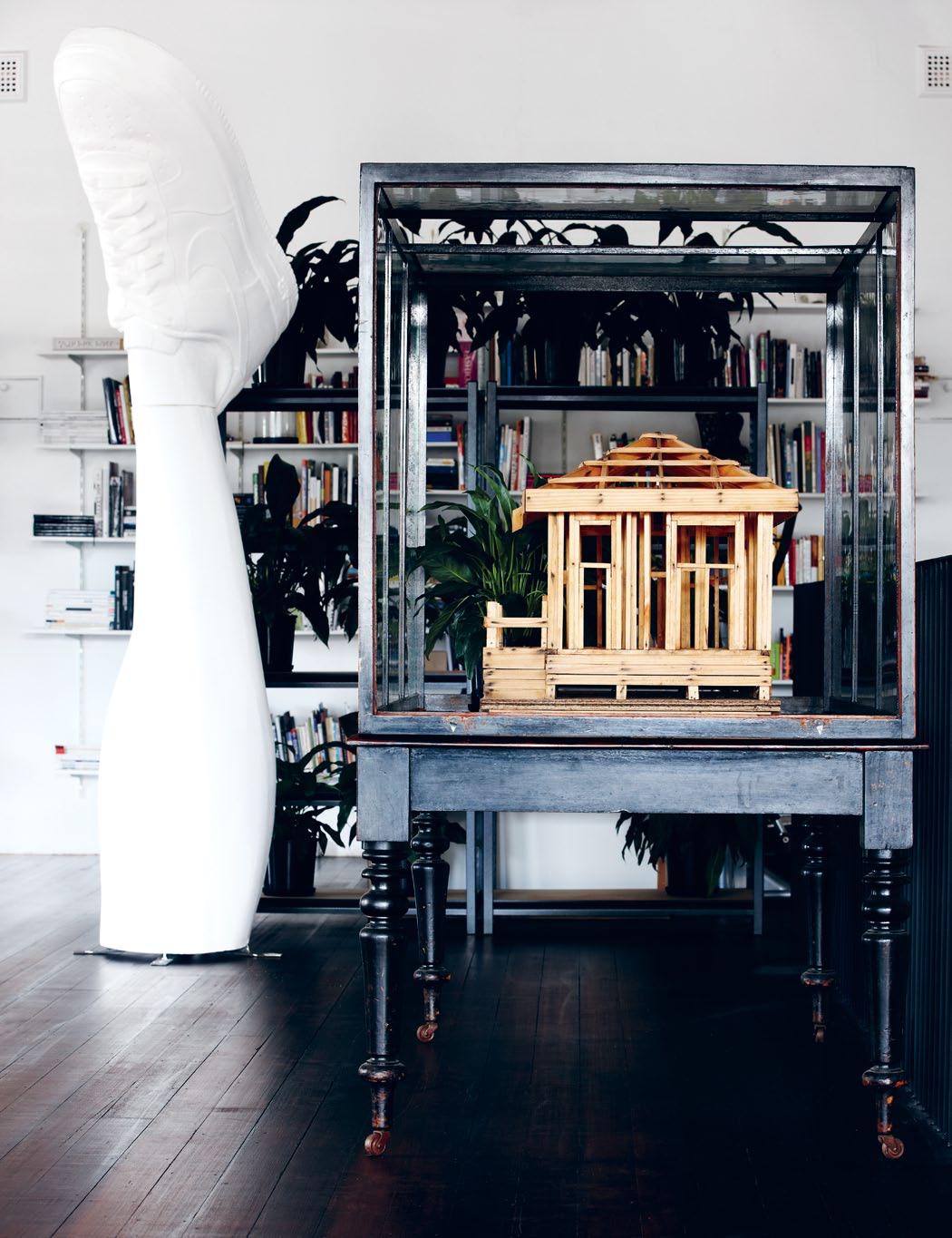
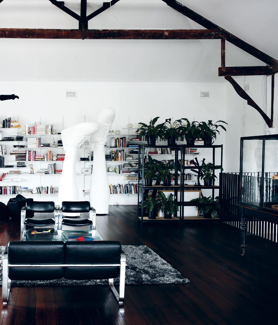
opposite | Lounge and dining areas are arranged in cLusters throughout the space. above | the warehouse features quirky pieces
up on various traveLs, Like this scaLe-modeL found at the miLL markets in dayLesford and a museum cabinet from an oLd d ougL as & hope retaiL fit-out. 2 . portrait # 53
picked
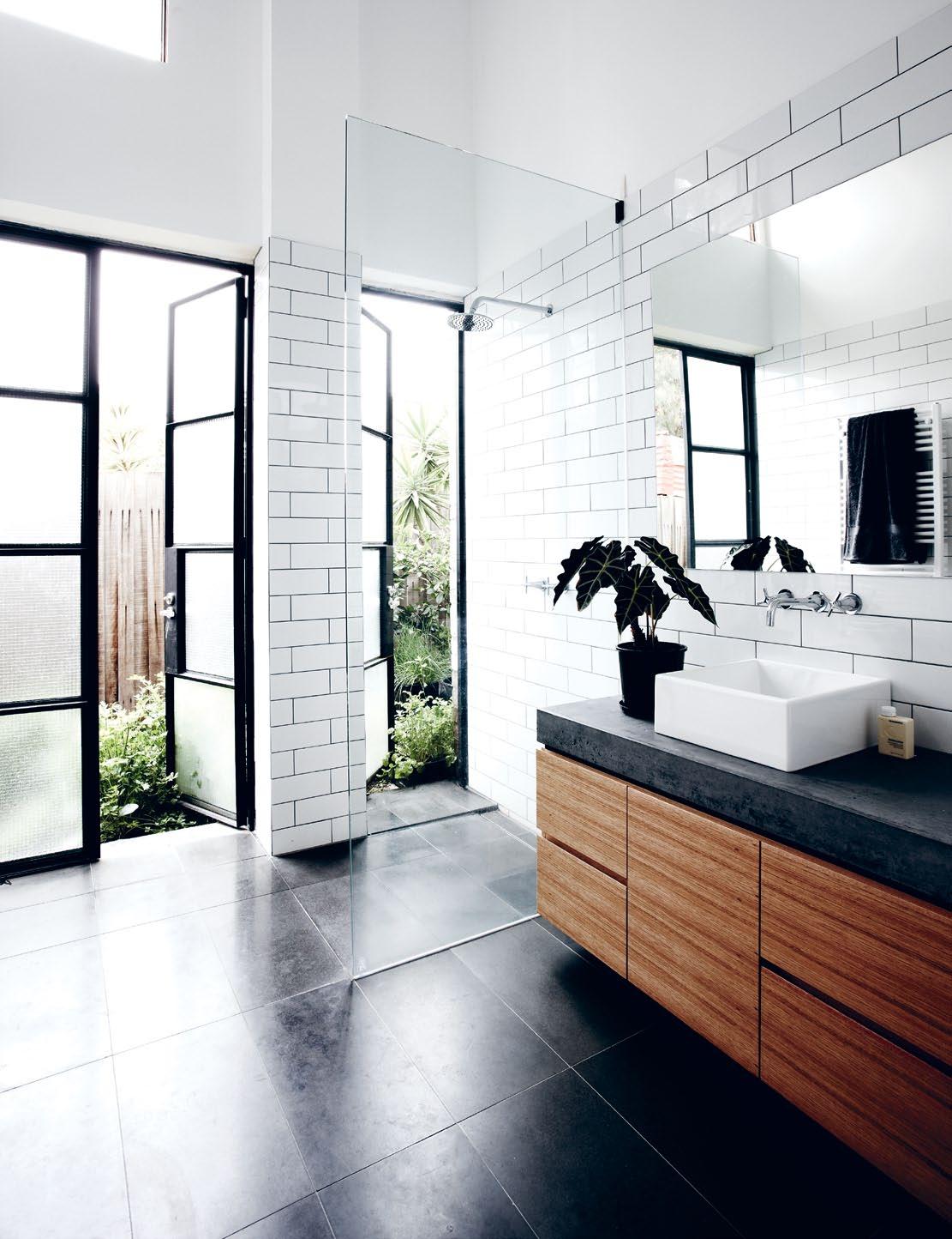
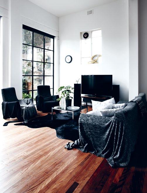
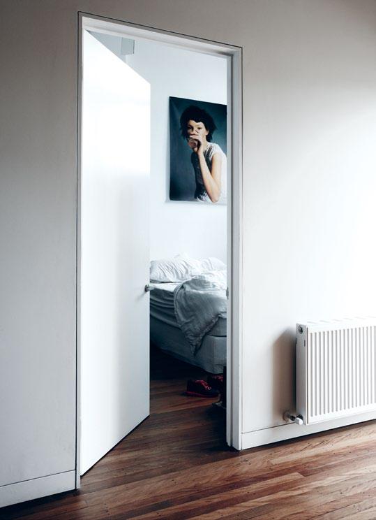
above | A ground-level bAthroom opens out to A side courtyArd And fr Agr Ant herb gArden. opposite top | A sense of texture And wArmth, the lounges Are dr Aped in long knitted jumpers, mAde by AlphA60. opposite bottom | bedrooms hAve A void-like spAciousness, thAnks to extr A high ceilings. issue #15 habitusliving.com
across Melbourne and Sydney, the brothersister team have extended their creative forces beyond the realm of the wearable and into that of the inhabitable.
The renovation of Westgarth Hall proved no small undertaking, and it has seen the siblings take on everything, from shifting a staircase and dismantling a performance stage, to re-stumping the floor and hanging a baby grand piano.
Natural evolution is key to the siblings’ largest projects – particularly in the case of Alpha60 and their designs.
Alex says, “I was an engineer and Georgie a graphic designer, and we started Alpha60 as a hobby, making a shirt for me to wear. A couple of friends wanted it, and so we made five; five grew into 10, and 10 into 50.”
In a similar way, this house – which came to them almost by fate (an auction passed through; the uncertainty of the global financial crisis; a decisive ‘yes’ moment) – has grown with them. “I’m not sure if it’s everyone’s dream, to have so much space,” says Alex, but, “this was kind of it.”
# 55 2 . portrait
It wasn’t a plan with documentation down to the last ‘corner’.
Alex | deSIGNer ANd
reSIdeNT
In bringing together their concepts for such a large double-storey building, the duo collaborated with their close friends, architects, Jen Berean and Joachim Holland, and with builder, David Murray. “It wasn’t a plan with documentation down to the last ‘corner’,” Alex elaborates. “As the spaces changed, we changed our ideas.
“The stairwell [shifted] three or four times before the end of the project. And, whilst it’s maybe not the most efficient way to renovate a house, it allowed us to feel the different spaces as they [developed].”
Stairs from ground to first level were relocated from the front of the house to the back, allowing for three bedrooms to fill the forequarters of the ground floor.
The expansive hallway, hung with work by local artists, opens into a ground-level sitting area. The space is like a sunroom, with its floorto-ceiling bi-fold doors opening into a cosy, high-walled courtyard, a secret garden of stag horns, climbing vines, herbs and vegetables.
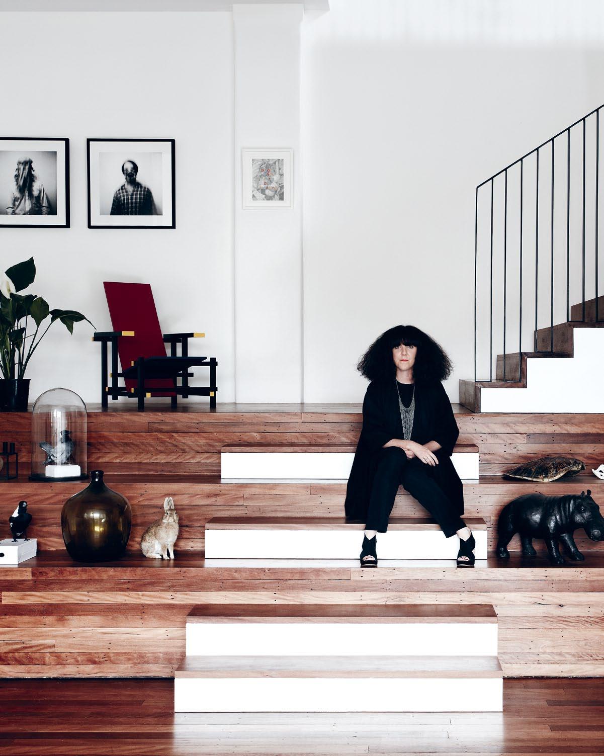
Steps, staggered like a stage, double as a display area for plants, collected artefacts and specimens of natural history – here, a
whalebone; there, a stuffed rabbit – each with its own story of origin.
This area also works to break up the staircase, a long climb of graphic stripes leading to open plan living.
The interiors across both levels can only be described as expansive – which was not lost on Alex and Georgie.
“The main thing we wanted to [remember] was we didn’t have to over-design the interior. The features are in the grandeur of it – the beams, the ceilings.”
Here, the raw bones of these structures peek through crisp coats of white paint.
“A big decision was keeping big, open spaces,” Georgie remembers. “It’s a nice aesthetic, but is it liveable?”
Alex expands, “Little things look kind of ridiculous. They look out of proportion – like a kid wearing his dad’s suit.”
Upstairs, a football field of space is broken into living zones by monolithic pieces: a piano dangles from the end of an invisible wire; two giant legs clad in Nike shoes sprout from the floor; a large museum display case holds an apprentice builder’s scale model.
A big decision was keeping big, open spaces… Little things look… out of proportion – like a kid wearing his dad’s suit.
issue #15 habitusliving.com
GeorGIe AND ALex | DeSIGNerS AND reSIDeNTS
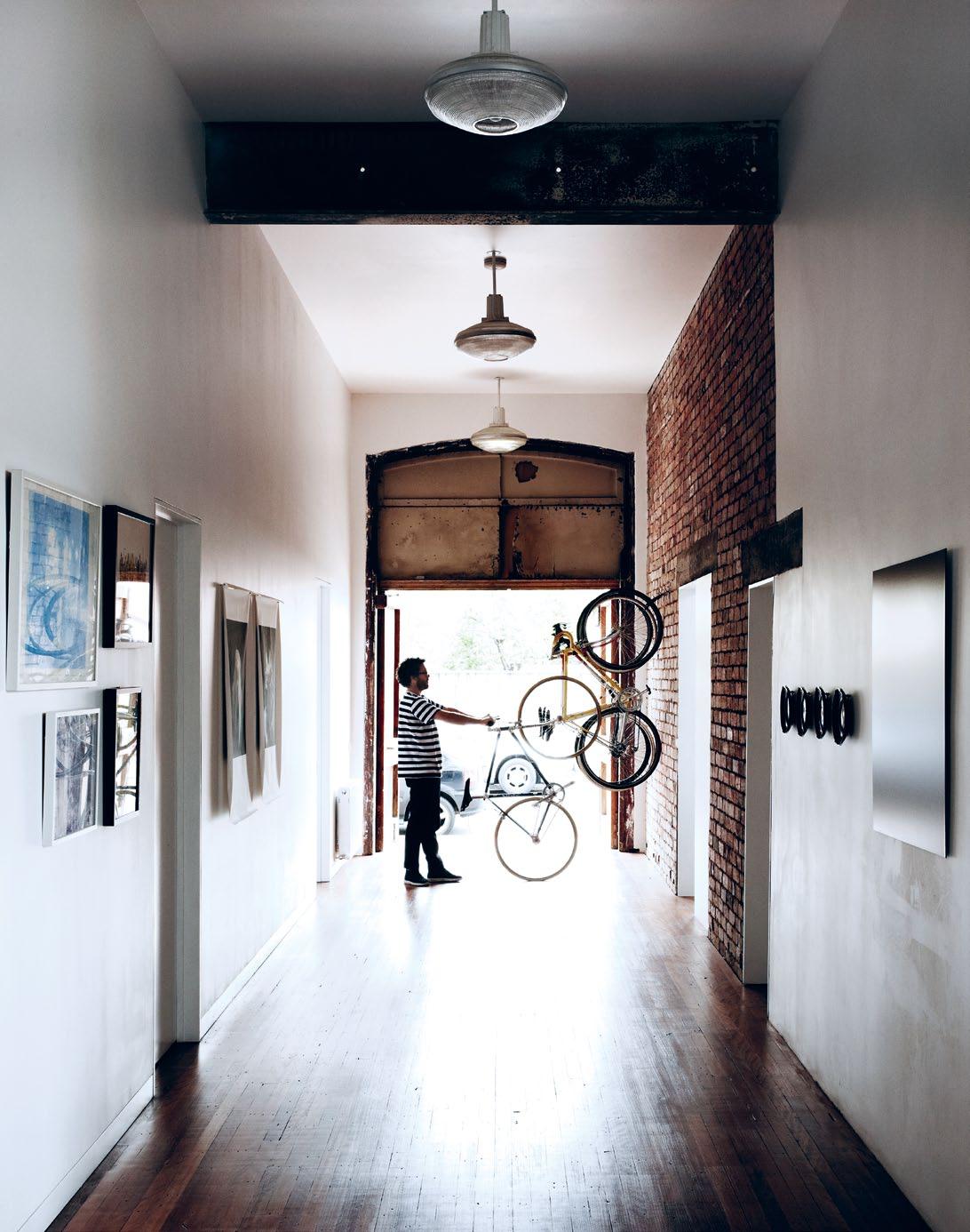
opposite | The lighT-filled bedrooms are seT To The fronT of The house. above | The wide hallway sTreTches The lengTh of The house. 2 . portrait # 57
The piano, which hangs precariously above a small sitting area (“It’s polystyrene with wood veneer – so it’s quite light,” Alex says), draws the middle ground into focus.
Similarly, the kitchen with its slab-like bench top – a sculptural feat of poured concrete running lengthways through the space – gives clear definition to the kitchen area.
The benchtop is one of Alex’s favourite features: “We brought the concrete up in buckets [1,600 kilograms worth], poured and set it up here.”
This open-air space is dense with history, having housed a stage, wedding receptions, tai chi classes and other community gatherings.
“There’s a feeling of presence. Exciting and joyous things have happened here,” Georgie says. For herself and Alex, the complete transformation of the space has been a huge undertaking, but one which they took on with enthusiasm.
“To work with people who ‘get’ you [and] to do it for your home is unique,” she says.
for us it wasn’t a bad experience.” Fitting out Alpha60’s retail spaces (many of which began just as raw as Westgarth Hall), has equipped them well for tackling a residential project. Moving beyond the fundamentals of retail design has been a revealing lesson; the duo has also come to appreciate the gift of patience and “taking things slow”.
That hard-won patience is already being put to the test, their focus now on the potential of new projects in the future. But in a moment of reflection: “A nice thing ending this project is that we wouldn’t have done anything differently,” Georgie says. “We really wouldn’t change anything.”
“Everyone has nightmare renovation stories, and you have your ups and downs, but Alpha 60 | alpha60.com.au
above | A true Adventure, the refurbishment of WestgArth hAll hAs left georgie And Alex enthusiAstic for more l Arge-scAle design projects.
A nice thing ending this project is that we wouldn’t have done anything differently. We really wouldn’t change anything.
issue #15 habitusliving.com
GEorGIE | dESIGnEr And rESIdEnT
Whether you opt for laminate or real engineered wood, each Quick Step® floor is an inspiration for your interior. Ask for your free brochure at www.quick-step.com. NSW 02 9982 3777 • VIC 03 9798 0808 • QLD 07 3273 3111 • SA 08 8345 0455 ACT 02 9982 3777 • TAS 03 9798 0808 • NT 08 8345 0455 • WA 08 9240 1966 New Zealand 09 476 0428 • Commercial Division 03 9798 0808 Quick-Step Largo 1286 QUICK STEP FLOORS. DISCOVER A WORLD YOU’D LOVE TO LIVE IN. PF0185/Habitus
Arthur G Furniture Australian Designed, Australian Manufactured Melbourne Showroom - 618 Church St Richmond 3121 - Tel. (03) 9429 6696 Sydney Showroom - Shop 1/8 Hill St Surry Hills 2010 - Tel. (02) 9332 1488 Perth Showroom - 207 Stirling Hwy Claremont 6010 - Tel. (08) 9286 1433 Belair Sofa featured - www.arthurg.com.au
Living with(in) Art

The idea of inviting art into one’s home in Asia, is still taking root. But, for Shalini Ganendra – fine art consultant, gallerist and former Wall Street lawyer – not only did she welcome it into her home, she also has a purpose-built gallery in the suburbs of Kuala lumpur, Malaysia.
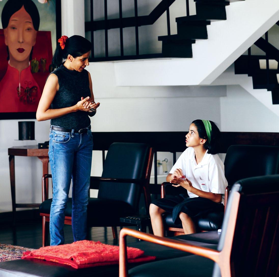
2 . portrait # 61
text amy ng | photography derek swalwell
above | ShAlini gAnendr A AT hoMe WiTh her dAughTer JuliAnA
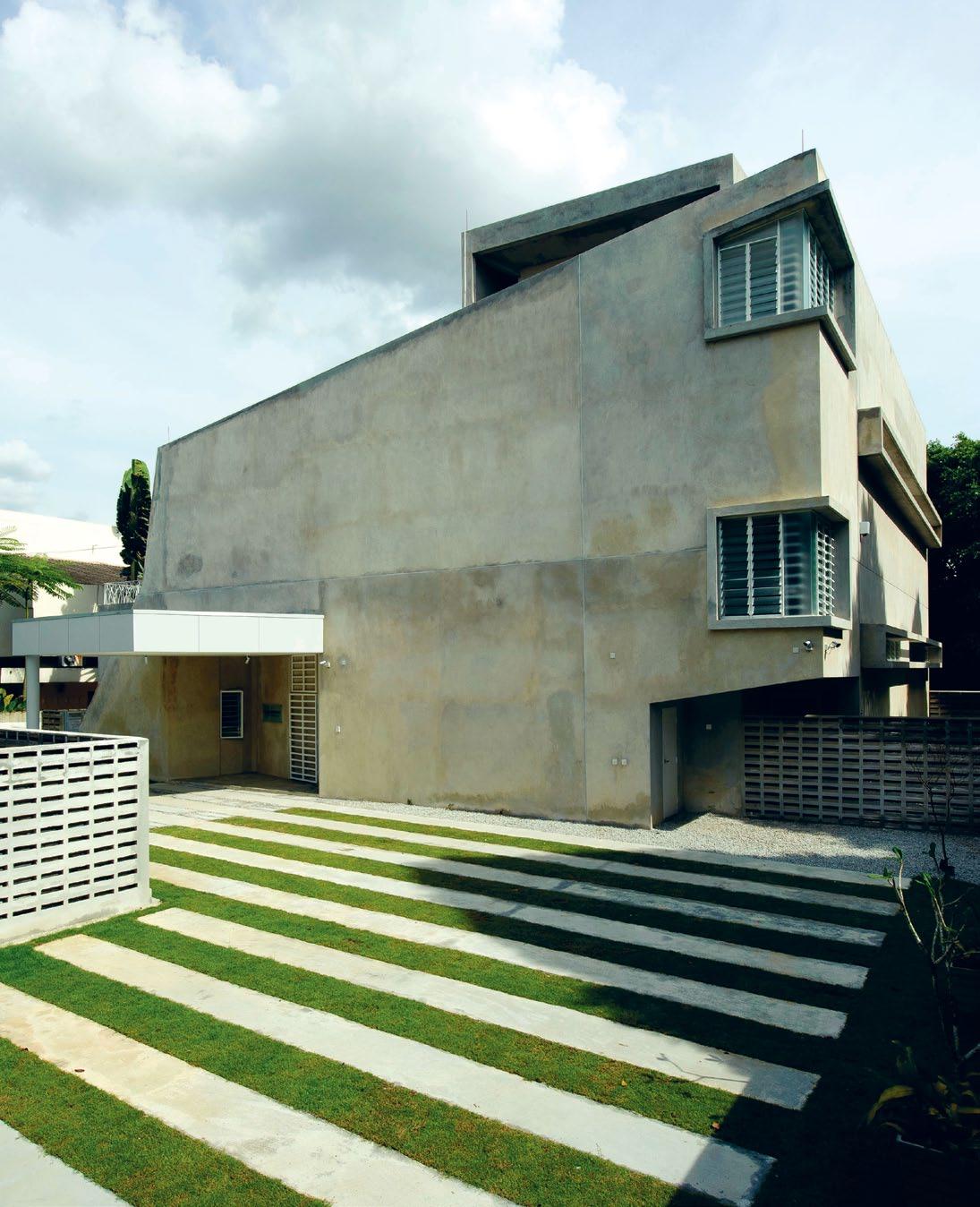
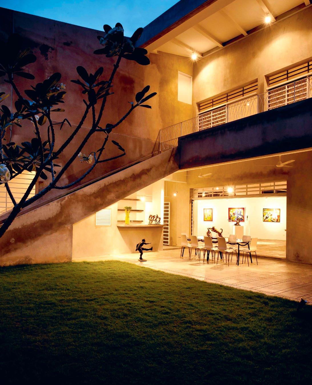
issue #15 habitusliving.com PHOTOGRAPHY ON THIS SPREAD BY SEE KWONG CHONG. ABOvE | The gallery brings The ouTdoors inTo The space in a subTle way. OPPOSITE LEFT | The angular form of The gallery residence inTegraTes sTrips of lawn inTo iTs design. OPPOSITE MIDDLE | The residence has a clean, bare concreTe facade. OPPOSITE RIGHT | The side of The residence and iTs well manicured lawn, laid ouT in sTrips, leads The eye Towards The building ThaT was designed by Ken yeang.
You get a sense of wonder when you first meet Shalini Ganendra. Calm, yet powerful, her personality shines and her eyes light up at the mere mention of art. And, she is very specific about quality.
“I am very much drawn to artists who have dedicated their life and passion to creating quality art that reflects cerebral depth and good technique. Those elements show,” she says.
Born in Sri Lanka, Shalini lived in the United States and United Kingdom before settling in Malaysia with her engineer husband, Dennis Ganendra. A financial lawyer by trade, who has practised in New York, she brings a fresh perspective to art, combining financial and legal acumen with a natural inclination to art nurtured since childhood by her grandparents and her parents. Having lived with art from a young age, she found herself happily making it a vocation later in life.
When the opportunity came up in 1998, five years after she came to Malaysia, Shalini set up independent exhibition and cultural space, Shalini Ganendra Fine Art, or SGFA, (which was then known as The
Private Gallery). The gallery specialises in contemporary art and design and has a focus on art from emerging regions, such as Malaysia and Sri Lanka. She is also pleased that SGFA presented the first aboriginal art exhibition in the region by artists from Elcho Island.
As The Private Gallery’s audience grew, a purpose-designed venue was needed to accommodate public programming, gallery projects and a swelling exhibition calendar. So, in January 2011, Shalini unveiled SGFA’s new public ‘residence’ in a bungalow nestled in the Kuala Lumpur satellite city, Petaling Jaya.
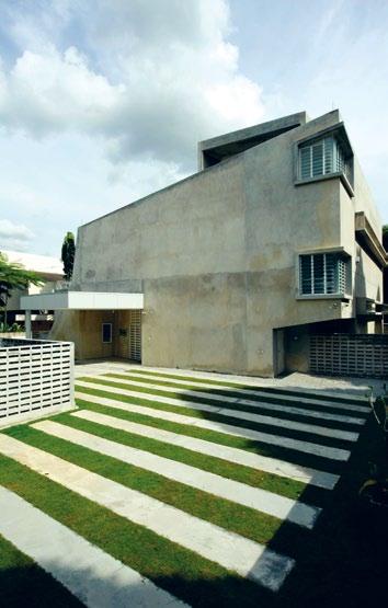
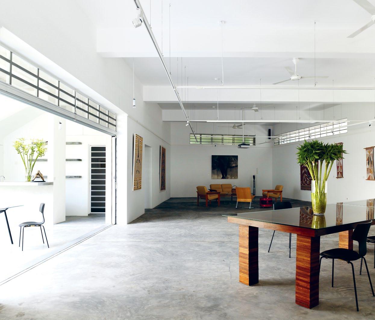
A visit to SGFA’s new Gallery Residence, designed by Malaysian architectural luminary, Ken Yeang, is a treat in the hot, humid climate of Kuala Lumpur. Walking through this green space, the air is fresh, breezy and cool, from the ground floor all the way to the second.
Like a Möbius strip, the house is seamlessly connected – a trajectory of experiences from one room to another that is almost boundless in nature.
Shalini says, “We had a very clear vision of the aesthetic for SGFA’s Gallery Residence, and Ken realised that vision.”
The construction of the house took a mere 10 months, on account of the rigorous efforts of project manager and engineering consultant, Minconsult Sdn Bhd. The quality of its design has already led to the Gallery winning an Architectural Excellence Award from the Malaysian Institute of Architects (PAM) in 2011.
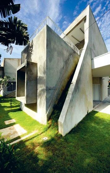
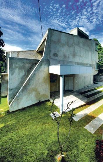
Shalini enthuses, “We chose Ken for this project because of his notable experience and contribution to green architecture. You can see his theories come to life in the Gallery.” She points out the wind chimney that draws air down into the gallery space and circulates it throughout the house.
Rainwater bioswales (landscape elements designed to remove silt and pollution from surface run-off water), locally sourced materials and an energy-efficient design have given the house a dynamic environment.
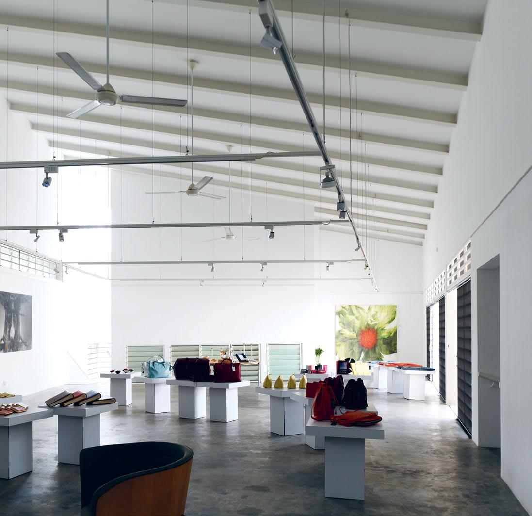
Accommodation for visiting artists and interns, along with a supplementary exhibition space, is located upstairs, while the ground floor houses the main exhibition space, an artist’s studio, resource centre/office and the courtyard garden.
# 63 2 . portrait
SHALINI |
issue #15 habitusliving.com
With art and design, there are no geographical boundaries. There is great freedom to choose with good guidance
GALLERY OWNER
2 . portrait # 65
OPPOSITE | The ground floor of The gallery is spacious and airy, wiTh air venTs ThaT allow cross circulaTion. ABOVE | a view of The gallery’s upper floor, wiTh high ceilings To dissipaTe heaT
The exterior of the building has been kept clean and well manicured, and includes strips of vegetation, and its grass ramps are a Ken Yeang hallmark.
“It was important to continue the theme of living with art, so the public space had to be in a residential setting. It was also important to have a space that spoke to memorable design, that was a work of art in itself.
“We encourage our visitors to immerse themselves in the experience of living with art, collecting for the sake of enjoyment –and we know that all else (good investment, good interior/style) will follow from that fundamental principle,” Shalini observes.
She also organises lectures. Currently in its third year, SGFA’s Vision Culture Lectures series is an innovative program that brings international art luminaries to Malaysia to speak at free events at SGFA.
The lectures have been hugely successful, attracting big names, such as Christopher Phillips, the curator at the International Center of Photography in New York; University of Queensland's Pacific art expert Dr Susan
Cochrane; photographer with the Magnum agency, Antoine d’Agata; and British surgeon and painter, Sir Roy Calne – as well as growing local audiences.
“We really appreciate the response and support for this program. Asia is so keen to learn more about cross-cultural practises, and our speakers are eager to learn about SouthEast Asia, so we provide a credible bridging mechanism,” Shalini says.
A new artist-residency program, the Vision Culture Artist Residency, will launch this year with a focus on encouraging artistic dialogue between artists from east and west. “The space has allowed us to grow and expand with positive vigour and great imagination,” she says.
“SGFA encourages collecting with a cosmopolitan perspective – we ask collectors to look at the best in Malaysia and then beyond to pick and choose the best internationally. With art and design, there are no geographical boundaries. There is great freedom to choose with good guidance,” she adds.
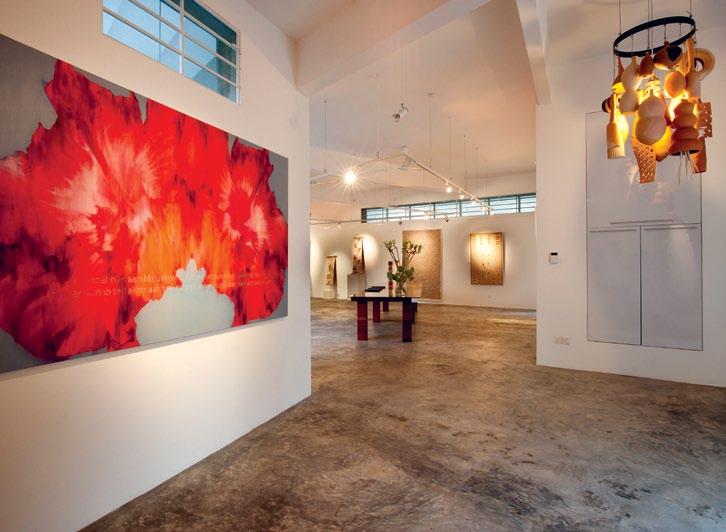
vision. A selection of pieces celebrating contemporary British design by William & Son is in the upstairs gallery, complemented by huge hibiscus oil/jute canvases by the Malaysian Zac Lee. The ground floor shows off a selection of award-winning aboriginal artists from Elcho Island off the Northern Territory in Australia.
“SGFA represents mid-career and senior artists, and we are very involved in curating the best shows by the best artists, with their best works.
“This practise has reinforced the credibility of the exhibitions and naturally lends support to the added bonus of investment value,” Shalini says.
With so many things in the pipeline for SGFA, when asked what keeps her energy up, Shalini, who has children aged 16, 15, and 10, exclaims, “Seeing more magic happen in this wonderful green Gallery Residence!”
A look around the current exhibits at the gallery provides testament to SGFA’s eclectic Shalini Ganendra | shaliniganendra.com
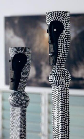 ABOVE LEFT | EntrancE FoyEr to GanEndra art HousE sHowinG tHE commissionEd Celebrations table (canvas, Glass, rEcyclEd Hardwood) by dEnnis cHan and origins cHandEliEr (cEramic) by lilEnG wonG (pHoto by sEE KwonG cHonG). ABOVE RighT | sculpturEs by award winninG aborGinal artist, JErEmiaH b onson. OPPOSiTE | sHalini’s HomE is FillEd witH FavouritE Family pHoto GrapH s, tHE E arliEst datinG From tHE latE 1800’s.
issue #15 habitusliving.com
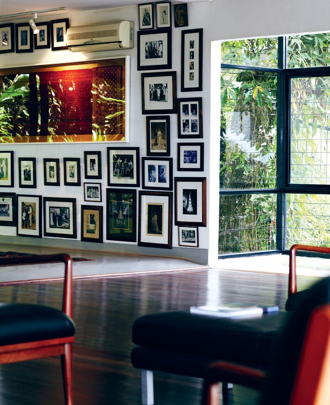
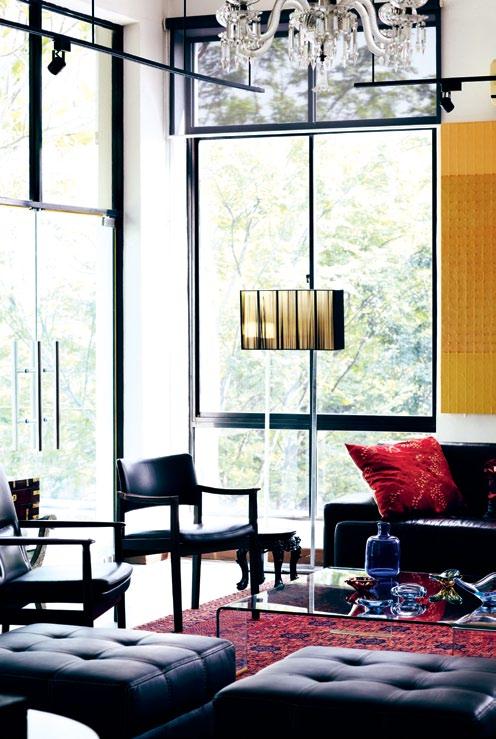
shalini | G all ERY OW n ER 2 . portrait # 67
It was also important to have a space that spoke to memorable design – that was a work of art in itself
The two-storey building was designed by T.R. Hamzah and Yeang. Just over 63% of the building is devoted to gallery space with a total floor area of 633.4m 2 . Orientation and fenestration are designed to minimise solar heat gain. Other ecological design features include:
• The wind chimney, a 360º vertical wind shaft distributing a down-draft throughout the house, controlled by operable glass louvres at the base.
• Landscaping designed to maximise greenery to reduce heat island effect
• Bioswales to absorb, collect and clean surface run-off
• Cross-ventilation to supplement the benefits of the wind chimney
• Indirect day lighting
• Sun-shading devices
• Use of environmentally friendly materials and finishes
Distributed by
www.townandcountrystyle.com.au
About the house
DRT –
– “Adagio
” HAB15_Equipo_QP_Final.indd 1 22/12/11 8:58 AM issue #15 habitusliving.com
Equipo
Wallpaper
Moderato, Negro
T.R. Hamzah & Yeang | (60 3) 4257 1966 | trhamzahyeang.com
ABOVE | The living room in Shalini’ S home feaTureS a mix of vinTage and modern furniTure. ABOVE Right | Shalini di SPlaYS Colourful ColleCTionS of oBJeCTS in her home




Caroline Baum
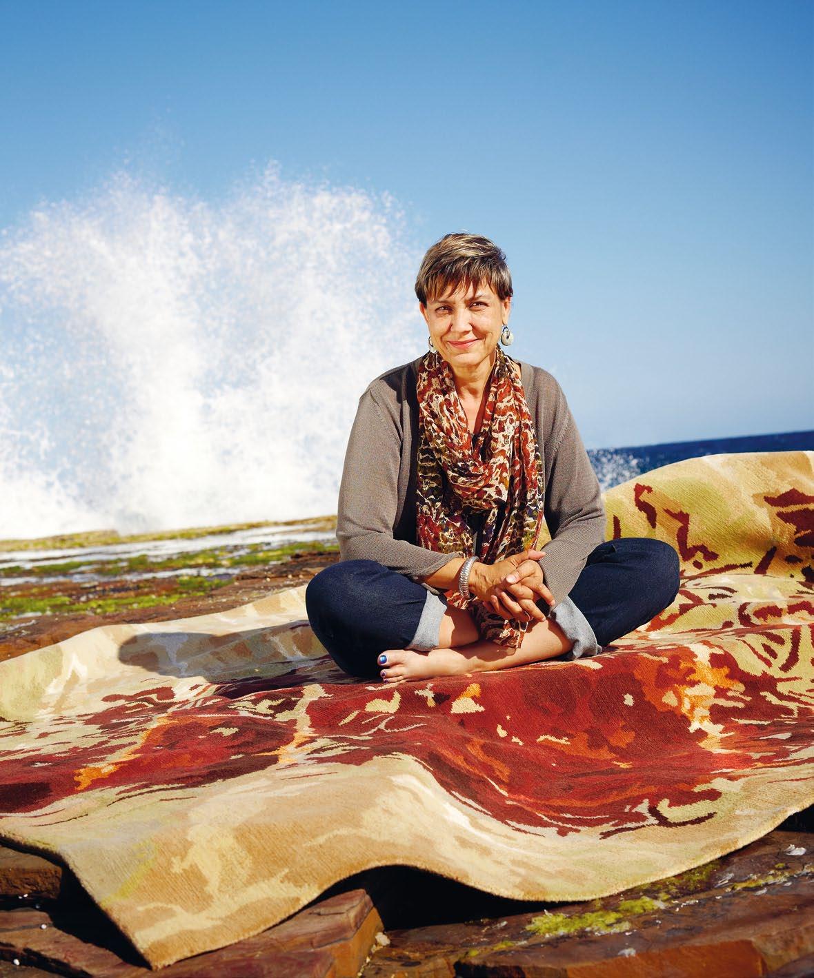
“
The backdrop of the rock, rich and vivid with minerals, was like a gorgeous abstract landscape”
Floor talk #1
The south coast of New South Wales is ruggedly beautiful, with wide beaches and a rocky coastline. As well as views, the landscape provides inspiration for many artists and other creatives that call this area home. Writer, Caroline Baum, is one such creative. Since moving to the area nearly 10 years ago, she’s taken regular time out from her busy writing and presenting schedule to become a self-confessed ‘beachcomber’.
Exploring local eroded rock shelf platforms, Caroline began photographing a colony of sea snails making patterns in the sand as they foraged for food. “The patterns looked like a lacy form of mysterious calligraphy,” Caroline remembers, “and the backdrop of the rock, rich and vivid with minerals, was like a gorgeous abstract landscape.”
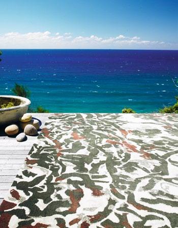
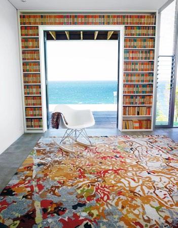
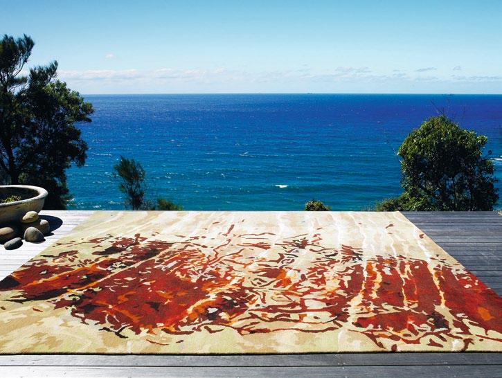
The photographs became an exhibition, and then the inspiration for a series of limited edition silk chiffon scarves. “And then,” says Caroline, “I started to think about a broader canvas that would show off the designs on a larger scale.” Rugs were a consideration from the start – “It’s like putting a painting on the floor," Caroline believes. "To me, if a rug is really luxurious and welcoming, my first impulse is to lie down on it with a good book. I love the sensuous feel of textiles underfoot and the way they warm up a space.”
Designer Rugs saw the potential in Caroline's idea and commissioned her to create a series. She worked with senior designer, Lia Pielli, to devise a digital colour map to interpret the palette of the rock shelf photographs. Then swatches were selected – 100% NZ wool for the majority of the design, with silk detailing to emphasise stippling and light, and to provide variation in texture and lustre. These base materials were sent to Nepal and woven into a series of designs by traditional artisans, and the results are impressive – “The images on the rugs are closer to the original photographic prints than the scarves,” says Caroline.
The Sand Script rug collection is available through Designer Rugs.
Designer Rugs
1300 802 561 designerrugs.com.au
Continue the conversation | habitusliving.com/issue15/floortalk
Designer Rugs x Habitus Promotion
photography tim robinson
THIS SEASON’S LOOK the same as

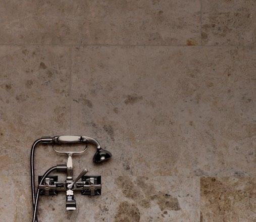
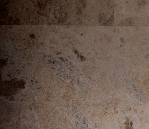
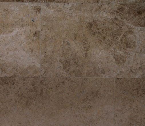
With beauty borne over millions of years, only natural stone offers a truly timeless look to make all your own. For almost 30 years CDK Stone has been sourcing only the most glorious stone from every corner of the world. Fall in love with the enduring beauty of natural stone, visit cdkstone.com.au or call to join our mailing list.

Melbourne 03 8552 6000 Sydney 02 9822 5155 Gold Coast 07 5537 3222 Perth 08 9406 3100 Auckland 09 443 3932 STUART RATTLE DESIGN
AD
the last 840,000 YEARS
On the Verandah
Sri Lanka has a rich architecture and design culture driven by a small but cohesive number of key figures. The mercurial BarBara SanSoni has been a stalwart among this group, supported in recent years by her photographer son, Dominic.
american authors Charles Hulse and Gordon Merrick both claimed that when they first came to live in Sri Lanka in 1972 there were five remarkable Sri Lankans, creatively and socially in Colombo: Geoffrey Bawa, the architect; his brother, landscape designer, Bevis Bawa; Ena de Silva, designer of unique Silhanese batik; painter and sculptor, Laki Senanayake; and Barbara Sansoni, fabric designer, artist and successful businesswoman.
Forty years later, Barbara Sansoni is acknowledged as an ever-greater institution in Sri Lanka. She and her photographer son, Dominic, are to the arts today what the dominant Bandaranaike family has been to modern politics in the country.
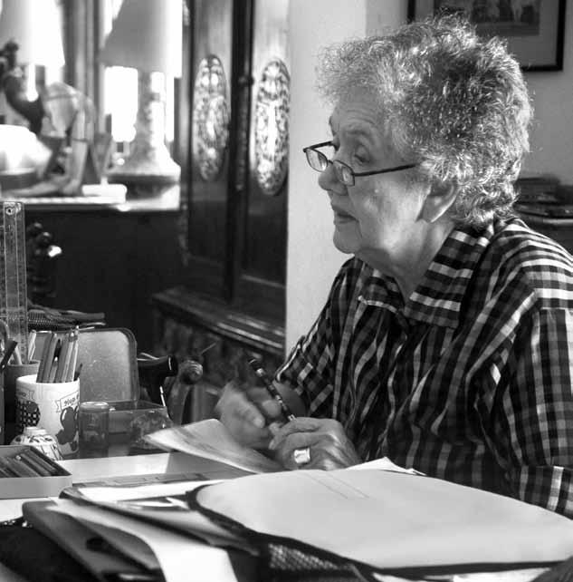
While internationally they are perhaps best known for their renowned shop, Barefoot –which, for the most part, sells fabrics, furniture and crockery designed by Barbara – both are also artists in their own right. And it is their artistic ability which has been the springboard for the success of the family business.


The Australian artist, Donald Friend lived in Ceylon (as Sri Lanka was then known) from 1958 until 1963. A friend of my parents, he often talked about the Bawas and Sansonis on visits to our house, and so I date the mid-1960s as the

2 . portrait # 73
text Andrew Pfeiffer | PhOtOgr APhy dOminic S A nSOni
above left |
(phoTo
isabella
above right |
work aT
dominic sansoni
by
sansoni).
barbara aT
her home in colombo.
beginning of a nebulous one-way relationship that I enjoyed with these Sri Lankans for some 30 years – before meeting them in the flesh on visits to Sri Lanka over the past two decades. It seems to me that Donald Friend pioneered an ever-richer cultural exchange between our two countries, which Barbara continues today since, for part of each year, she lives in Queensland.
* * * * *
Bar B ara SanS oni
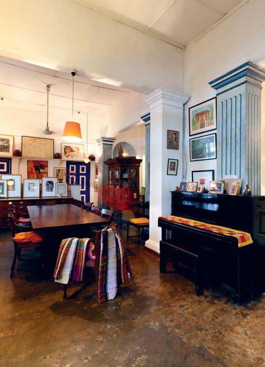
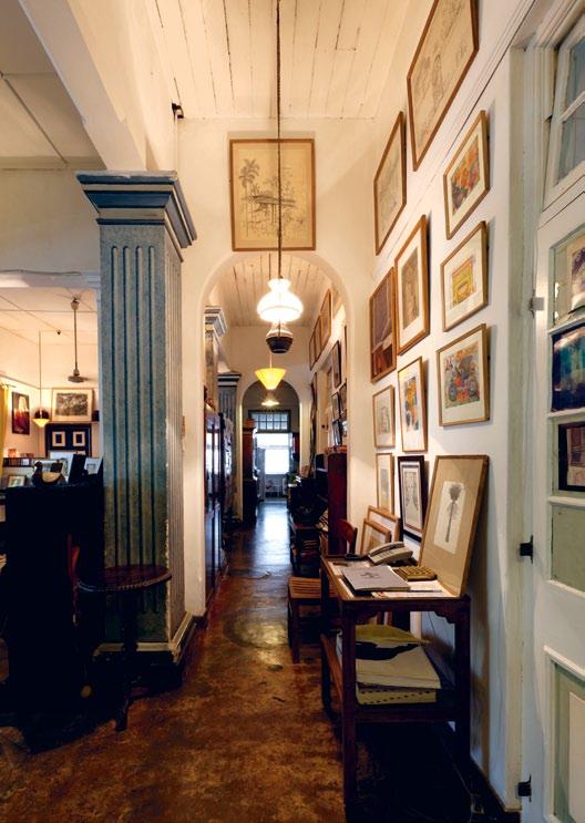
In the late afternoon, I arrive in a trishaw taxi at the Sansonis’ house in Colombo, which is situated in a leafy lane. Then, it’s up the garden path, through a comparatively large garden with trees and shrubs, but few flowers, to the house, which might almost be a large Federation bungalow in Brisbane. Barbara Sansoni is lying back on a chair on the front verandah with her feet propped up on an ottoman, walking stick at hand. Mary, her sister, sits opposite on a sofa, and one senses a strong sibling love, if only because
of the constant chafing – and sometimes, flak – passing between them.
There can be little doubt that these are the two grandes dames of Sri Lanka, inhabiting a world of exquisite manners and intelligent conversation. It is obvious that conversation is also the sport that binds the family together, although Barbara’s 14 year-old grandson, Sebastian, confesses that he’s an Arsenal supporter and loves playing tennis.
Dominic – Barbara’s son and Sri Lanka’s leading photographer – reclines in a nearby armchair, politely ceding the spotlight on th is notional stage to his mother.
Barbara is wearing a yellow striped shirt and a bouffant dress of dark jungle green and navy blue. Around her neck are two necklaces: one composed of three strings of pearls, the other – glowing with radioactive intensity – is a single string of turquoise.
We start off by talking about our now longlost mutual acquaintance, Donald Friend, who, 50 years ago was living on Bevis Bawa’s estate, Brief, some 60 kilometres south of Colombo.
“This house was Donald’s second home when he lived in Ceylon,” says Barbara, using
issue #15 habitusliving.com
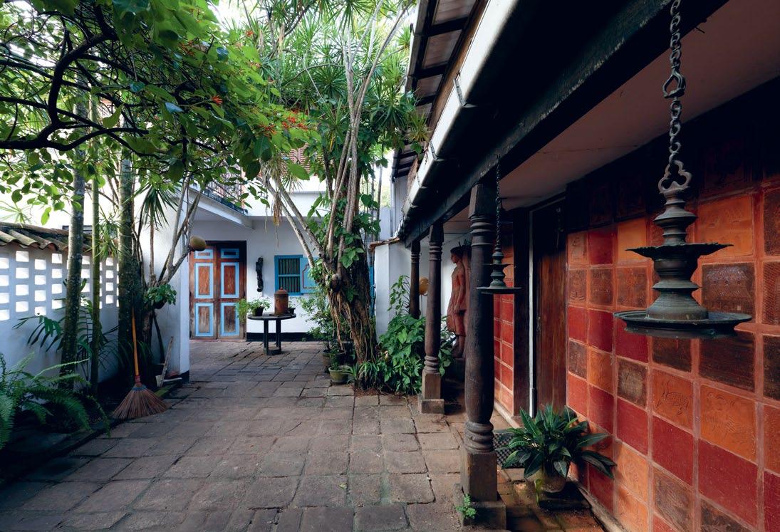
photography on this spread by sebastian posingis. above left and right | InterIor of BarBara’s home at anderson road. opposite | e xterIor wall of annexe at anderson road desIgned By UlrIk Plesner. wall covered In terracotta tIles made By d onald frIend and BarBara sansonI
the country’s former name. “He came up almost every week – each Tuesday, I think it was – and stayed with us for a few days. My husband, Hildon, didn’t mind. He really quite liked having Donald in the house. But Bevis would warn me and say, ‘He’s taking advantage of your hospitality and using you like a hotel!’ Well, to be honest, I knew that myself and didn’t mind. I enjoyed Donald’s company.”
Barbara and Donald worked together, and it is obvious from his diaries that Friend had a great fondness for the young Barbara. They often sketched and painted together, but their greatest collaboration was in the making of terracotta tiles (on which they drew designs) and which, after baking in the tile factory in the garden, were sold from the garage.
Barbara says she regularly drove Donald around the country in her Volkswagen Beetle to visit interesting temples, which they drew and painted together. Critics seem to agree that the best works of Donald Friend’s career were done during these years.
Barbara says that as a young girl she was sent to a convent in southern India in 1936.
“From there, I was to have been sent to school in England, but wasn’t, because of the Second World War. Instead, I went to England immediately after the war and studied art at the Regent Street Polytechnic, later renamed the Chelsea School of Art.
“I was there from about 1945 until about 1950, and lived in a house in Hampstead. I then came back to Sri Lanka and married my husband, Hildon, almost immediately.”
I ask how she started Barefoot, which she started over 40 years ago.
“We never planned it as a business – it just evolved spontaneously as a part of life. I couldn’t have started it without the help of my butler – a marvellous man called R.M. Ekanayake, who I called Eckers. He managed to adjust the household budget on my behalf. This wasn’t easy, as Hildon ran a very tight ship.
“ ‘What we do, Madam,’ Eckers said to me, ‘is we invite people to drinks on a Wednesday morning.’ That was the business plan! And so the people who accepted the invitation would be given a drink and encouraged to buy the fabrics that I had
2 . portrait # 75
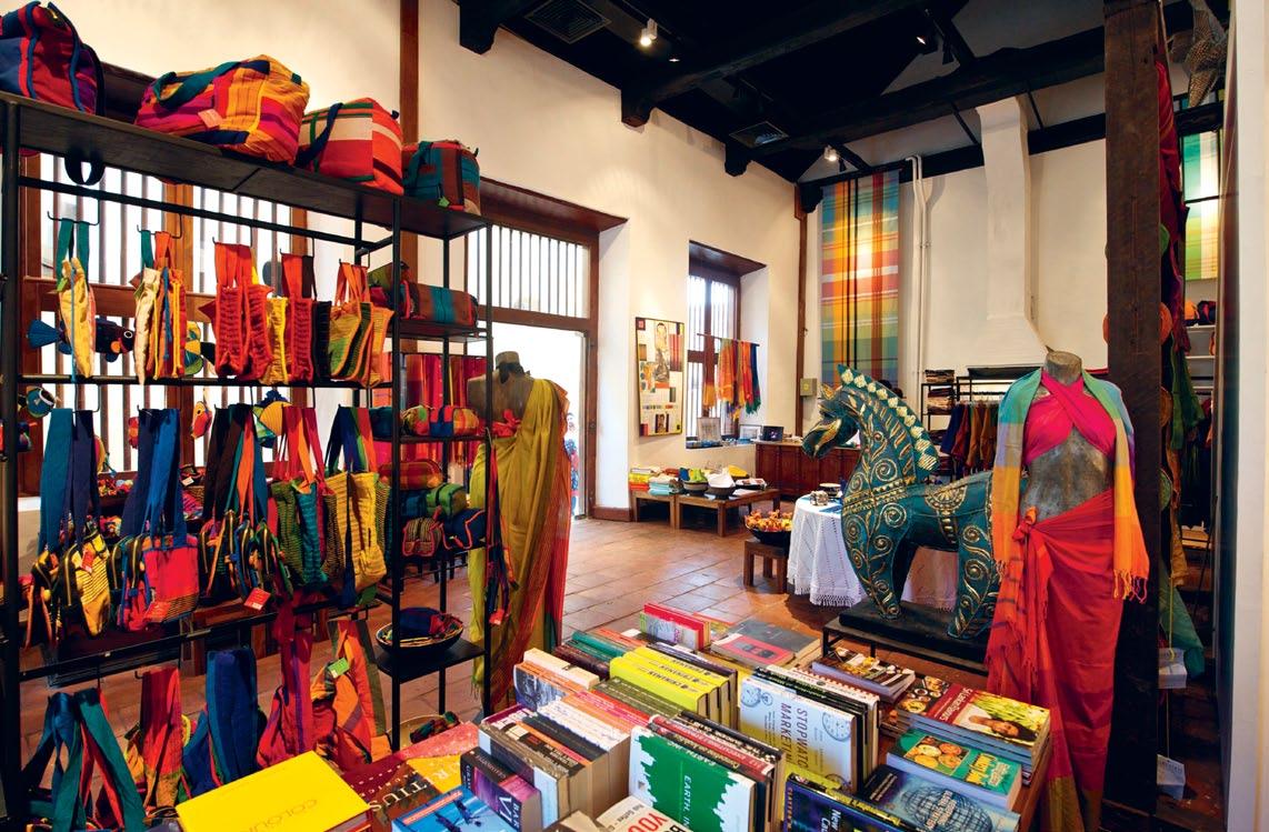
above | the BAREFOOT sTORE AT ThE Old duTch hOspiTAl in cOlOmBO A duTch pERiOd B uilding REcEnTly REsTOREd in ThE hEART OF ThE ciT y. opposite left | pAinTing OF ThE REsidEncy, mATAlE sRi lAnk A By BARBARA sAnsOni. opposite right | pORTRAiT OF ThE musicOlO gisT And cOnducTOR chRisTOphER hO gwOOd By BARBARA sAnsOni (1976).
issue #15 habitusliving.com
More than anything else, the success of Barefoot is based on Barbara’s extraordinary sense of colour.
designed and woven, which were laid out on shelves in the drawing room. This was in the early 1960s, just after Donald had left Ceylon. Hildon would be working at his desk on the front verandah, not taking much interest in the proceedings.
“It was Eckers who was indispensable to the founding of the business. He was Singhalese, a Buddhist from Kandy. At a later stage, when the business was well established, Eckers was treasurer of Barefoot, and at another stage, export manager. I was devoted to him. My second husband, Ronald, and I took him to England for a holiday before he died.
“I rented my first shop in Colombo Fort. In those days, it was called ‘House.’ Then, I started the second shop, Barefoot, next to a laundry in Galle Face Court. Things developed from there.”
More than anything else, the success of Barefoot is based on Barbara’s extraordinary sense of colour. Apart from bolts of fabric, in those days she also sold blue and green tumblers, blue and green ashtrays, brass lampshades and table linen.
“A sense of colour,” concludes Barbara, “is a gift from God. Having said that, my maternal uncle was Arthur van Langenburg, to whom I was devoted. Theatre was Arthur’s life – he was a director and designer of sets in Colombo from the 1920s until he died in the 1970s – and encouraged me greatly when I was young.
“But, the flashpoint for the first fabrics that I designed were the robes and under-robes of Buddhist monks. These robes, of course, are saffron and the under-robes are pink. The pink comes from the deep red sap of the jack fruit tree. I suspect that today it would be considered impolitic – or politically incorrect – to do such a thing!
“Other inspirations included snorkelling underwater at a reef at Passekudah, and also the Wilpattu and Yala National Parks here in Sri Lanka.”
Barbara rises from her day bed and shows me around the house. Well lived-in and loved, it was once undoubtedly old Dutch and is now cluttered with the possessions of a rich life.
This is the charm of the house, and makes the family even more endearing.
Highly respected arbiters of taste in Sri Lanka, they choose to live in surroundings they find most comfortable. In the drawing room hangs a sign: ‘Anyone who remains sane, here, is mad’. I can imagine just why Donald Friend felt so much at home here, as it’s not unlike a rambling homestead on an Australian sheep station.
Among the apparent chaos of the house are superb examples of Barbara’s work. The fabric covering a sofa resembles a parrot fish, while the heaped pillows at the head of her bed recreate the impressions of a coral reef. Elsewhere is a chair covered in a fabric of two dark blues where the same colour sings in a totally unexpected way. Then there are Barbara’s paintings which are largely surreal, at times having a psychological intensity.
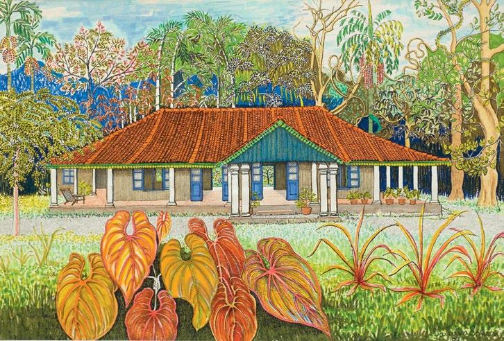
The paintings which most catch my eye are the portraits of the English musician, Christopher Hogwood. “I saw his face as leaves,” confesses Barbara. And his neck is the trunk of a sapling.
At the rear of the house is a wall of terracotta tiles, the work of Donald Friend and Barbara

2 . portrait # 77
50 years ago. It is much more impressive than a similar display of tiles at Brief, the garden of Bevis Bawa. In fact, the wall is so impressive that it’s a shrine to Sri Lankan-Australian artistic endeavour.
Dominic SanS oni
Ifirst meet Dominic in the restaurant in the garden of the Galle Face Hotel in Colombo.
One is immediately struck by his sincerity: he smiles with every muscle in his face and evinces a remarkable joie de vivre. A by-product of this seems to be his energy. He readily confesses, “I can’t go on holiday because I don’t know what to do after the second day!”
In April 2010, he went to Australia for the first time in many years, and took his wife, Nazreen, and two youngest children with him.
“Barbara and Ronald had bought a house in Brisbane, and my two eldest daughters now live in Melbourne. We purposely took the
train from Brisbane to Melbourne so as to give the children a sense of the scale of Australia, something you can’t do if you flash through the sky in a metal tube.”
Whereas Barbara and Dominic are Dutch Burghers and Catholic, Nazreen, who is astonishingly beautiful, is half Dutch Burgher and half Tamil. Dominic says how proud he is of being a Dutch Burgher – a mix of bloods which produces remarkable people – and says, “A lot of people in Sri Lanka today don’t know what a Dutch Burgher is.”
I ask Dominic to tell me about his childhood and the influences which led him to become a professional photographer.
“When I was a child, there were wonderful dinner parties with Geoffrey Bawa, who was erudite and witty. From early childhood onwards, Geoffrey had a huge influence on me. And I think it was fortuitous that as a child my parents included me in those grown-up dinner parties. With our own children in mind, Nazreen and I try and make sure that the guests invited to our own dinner parties these days are aged between 10 and 90.”
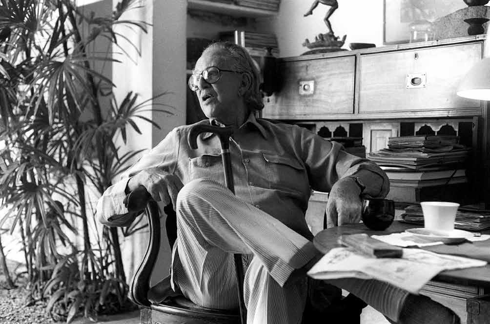
*
* * * *
above |
issue #15 habitusliving.com
PortraIt
by DomInIc sansonI of Geoffrey bawa at hIs home In colombo.


EB112154A
2 . portrait # 79
The most amazing thing about this view...
At about the age of eight, Dominic went to the Melbourne Art School in Colombo, which had a staff of remarkable teachers, including Laki Senanayake.
“I finally walked out of school after doing my O-Levels because I knew everything!...” he says, drily. “So, what to do with my life?
“In September 1973, I flew to England and entered the Cambridge College of Arts and Technology and did a foundation course in art for two years. Before being accepted for the course I had to produce a portfolio of work. But, despite my early tuition, I was not a good draughtsman or painter. Barbara and Laki had to help me with the portfolio because I wasn’t capable of doing it on my own. In fact, Barbara and Laki more than helped with the portfolio –they produced most of the paintings.”
Dominic suggests that his career as a photographer came about by default.
“I had some fantastic tutors in Cambridge and studied such things as painting, pottery, calligraphy, history of cinema, photography, and life drawing. The only trouble was that I couldn’t draw. There was a life-drawing class
every Friday. But, because of my inability to draw, I only ever attended two of them. I then learnt that there was a class in photography being taught downstairs at the same time. I don’t think photography meant much to me at the time and so, apart from being able to avoid the life-drawing class, my only other motivation in doing the course was that I could leave the grounds of the college and take photographs. I also learnt how to develop and print them.”
After the course, he returned to Sri Lanka.
“I loved swimming and so begged, stole or borrowed any car I could get my hands on to go over to the east coast and swim at places like Nilaveli. And I always took my camera with me. At much the same time, Air Lanka started their in-flight magazine called Serendib, and the early issues were unbelievably good, thanks to the art director, Kumar Pereira… and the very first issue featured a portfolio of my work – of such things as doors and windows.”
“By the way, Dominic adds, “Kumar Pereira is now a celebrity in Australia, and around the world, after his appearance on Masterchef Australia!
“However, I don’t see myself as a particularly original or ground-breaking photographer. One of the problems I face is the conflict between my life as a photographer and the job of running Barefoot, which takes up to six to eight hours a day.”
But how much can one believe of what Dominic says? In my amateur opinion, and based on those works I have seen, his paintings are very good, despite his harsh self-criticism. They display excellent draughtsmanship and a highly developed sense of plane, form, colour, depth, mass and void.
I am reminded of the former art critic of Time magazine, Robert Hughes, and the way he seemed to hint in his book, Nothing If Not Critical, that few contemporary painters in New York can actually draw properly.
It then strikes me that had it not been for Dominic’s modesty and sincerity, he almost certainly had the potential to be a dazzling contemporary artist.
Barefoot | barefootceylon.com
above | a
a. issue #15 habitusliving.com
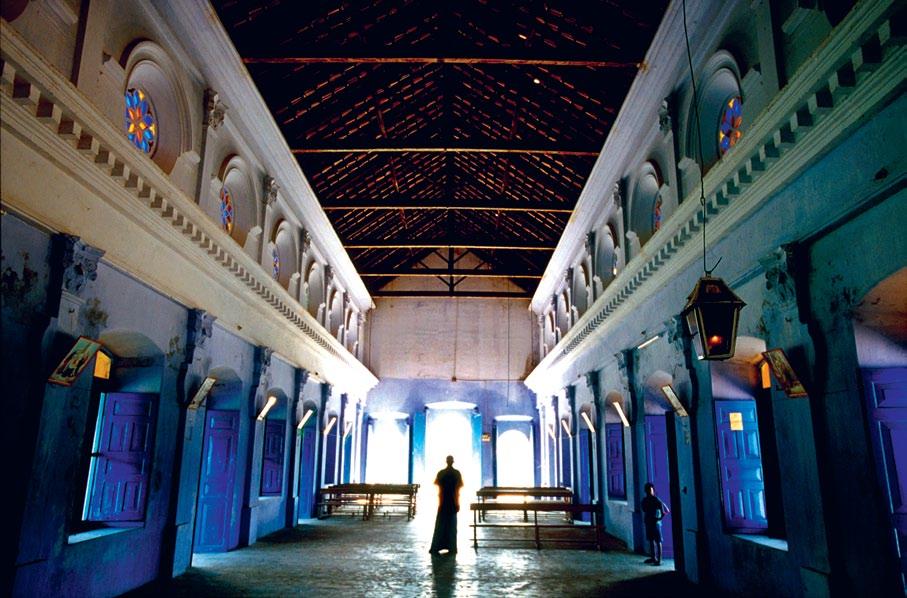
photograph by dominic of the interior of a catholic church on the small island of
Kayts, Jaffna peninsula, s ri l anK



www.earp.com.au Newcastle Parry Street 02 4962 5500 Sydney Pacifi c Highway Chatswood 02 9410 3222 Melbourne Abbotsford Street North Melbourne 03 9328 8598 PORCELAIN TIMBER-LOOK TILES BY PORCELANOSA EXCLUSIVE TO EARP BROS THE ORIGINAL PORCELAIN PARQUET ...is the porcelain tiles. EB112154B
DYNAMIC SPACE













Create the perfect kitchen environment with DYNAMIC SPACE from Blum.

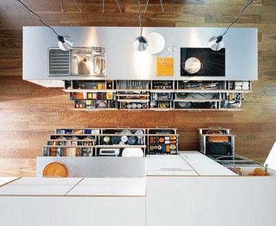
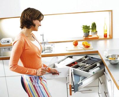
It’s the clever way to make the most of your space, improve access to your kitchen items, and enhance ergonomics. Buying a new kitchen is usually a big purchase that is often very difficult to change later on. A kitchen lasts an average of 20 years, so it needs to move with both the times and your changing needs.

Long-term comfort in the kitchen starts with planning across five zones. Through close observation of kitchen users, Blum has identified these zones as: consumables, non-consumables, cleaning, preparation and cooking.
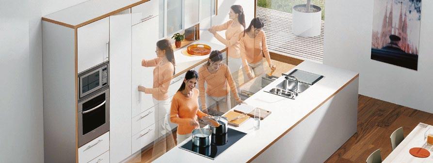
Another important consideration is adequate storage space. Few people have enough. Blum’s products solve this problem using fully-extending drawers, in the cabinetry base. This provides better ergonomics and enables you to easily view and access all items inside the pull-out. And with Blum’s practical inner-dividing system ORGA-LINE, everything is well-organised and where it ought to be.
Blum turns the opening and closing of furniture into an experience that significantly increases the comfort of motion in all areas of the house, but especially the kitchen. Blum fitting systems shout “high quality” with their well thought out function, recognized design and durability. They are designed to spark inspiration and create an emotional experience out of the day to day kitchen tasks.
All these components come together to deliver perfect motion for the life of your kitchen. That’s what Blum calls DYNAMIC SPACE.
www.blum.com


Bring
Armando Vicario
Established 1974. Gozzano, Italy.
Embodying the vision of Italy’s most renowned tapware designer, the stunning Armando Vicario collection is now available in Australia. Crafted in Italy, the Armando Vicario name is synonymous with tapware of meticulous quality, effortless functionality and unmistakable style.
View the Armando Vicario collection at an Abey showroom.
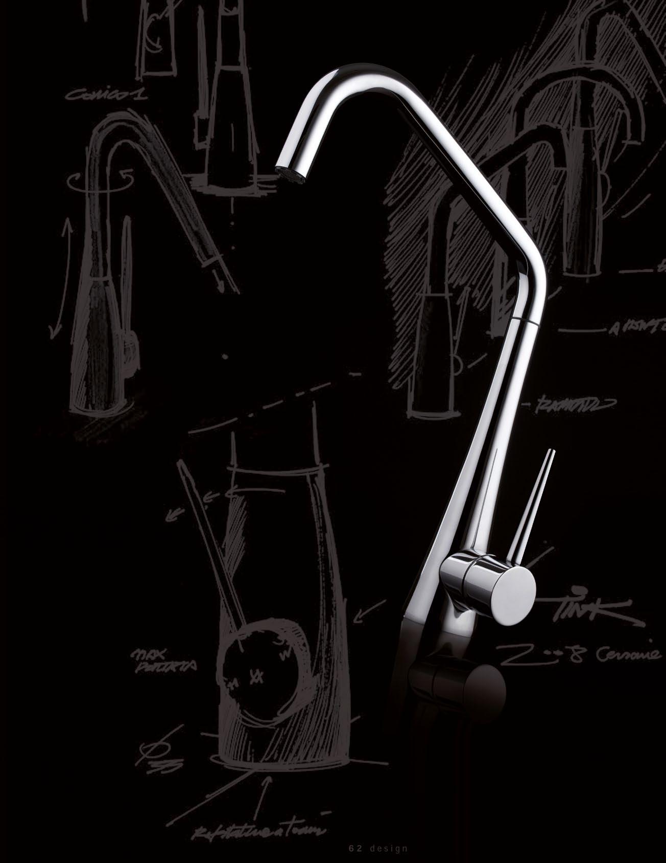
an Italian designer into your kitchen.
208 York St, South
NSW 1E Danks Street,
QLD 94 Petrie Terrace,
WA 34 Walters Drive,
8255 abey.com.au
VIC
Melbourne 03 8696 4000
Waterloo 02 8572 8500
Brisbane 07 3369 4777
Osborne Park 08 9446
higher pursuits
Two decades on, inspired by an early visit to the National University of Singapore ’s architecture faculty, angelena Chan has a thriving architectural practice and a niche in residential design. Here she talks to lynn Tan about how she works, what she believes and how she strives to get the best results for her clients.

2 . portrait # 85
text Lynn tan | photography derek swa Lwe LL
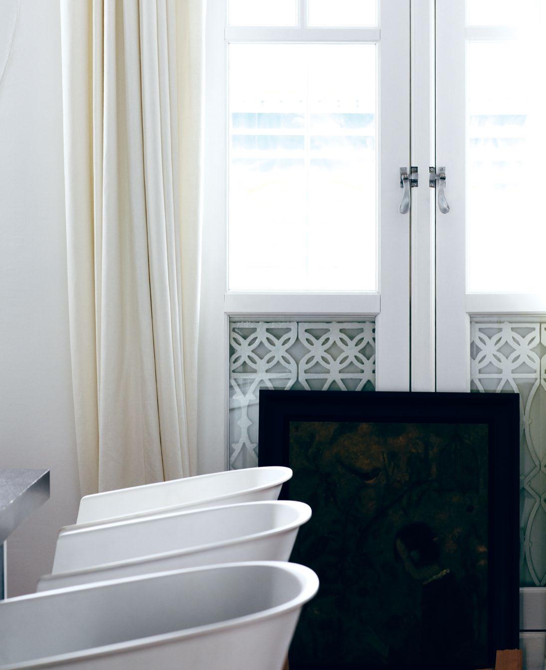
issue #15 habitusliving.com previous | Angie At work, deep in thought conceptuAlising design ide As. above | nAtur Al light coming through the French windows oF Angie’s oFFice inFuses it with A soF t glow, giving it A home-like Ambience. opposite | Angie’s oFFice is Also A displ Ay For her collection oF Art And ArteFActs.
One of Angelena Chan’s favourite childhood pastimes was flipping through the furniture books scattered around the family house, and she remembers fondly how she used to help her father paint walls.
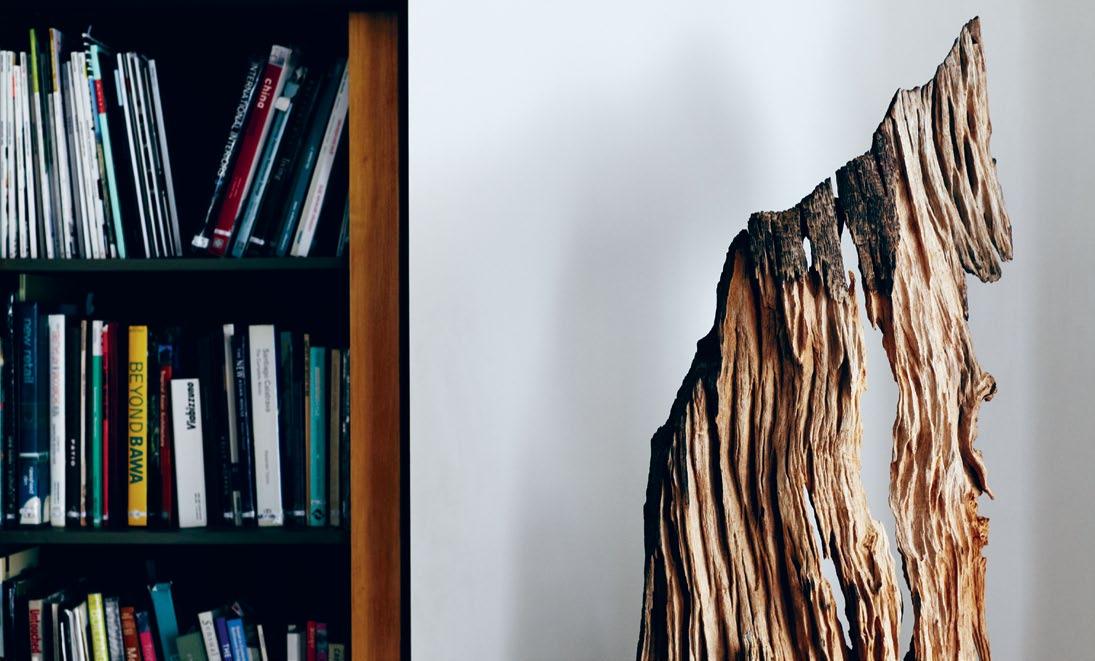
These early engagements triggered her interest in design and a visit to the National University of Singapore’s architecture faculty convinced Angie (as her friends call her) that this was the work she wanted to pursue.
Two decades on, she has carved a niche for herself through her residential work. Her practice, Index Design, was established in 1994 because she wanted to move away from corporate projects and focus more on those at a smaller scale.
Yet, the commissions started coming her way even before Index Design was officially set up. “My initial projects were mainly interiors for public-housing flats and these were very much influenced by my prior architecture work – explorations into the sculpting of space through the use of movable walls, light and other elements, expressed in a minimalist language,” Angie recalls.
It was one such project for a local celebrity that caught the eye of a developer, and the rest, as they say, is history.
High-rise apartments and show flats, massmarket and luxury, make up most of her current portfolio. Her work is a “social commentary on people’s lifestyles and aspirations”, she says, about “re-thinking daily living routines, such as dining, sleeping and showering”.
Her current designs tend to be more voyeuristic and when working on condominium show flats, it is not just about the interior design or even the furniture and fittings. Angie will usually weave in a storyline revolving around a fictitious “real” family.
For example, the show flat may be designed with a family of four in mind – the father an aerospace engineer, the mother a fashion stylist, and two young children. As such, you will see clues as to their lifestyle, for instance, model airplanes or fabric swatches. There is even a specific occasion thrown in, say, the two-year-old daughter’s birthday party, complete with presents and cupcakes.
As apartments in Singapore become smaller due to the increasing scarcity of land,
2 . portrait # 87
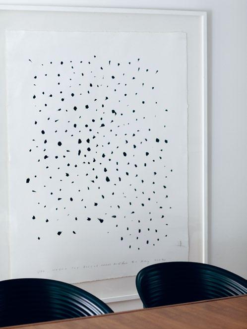
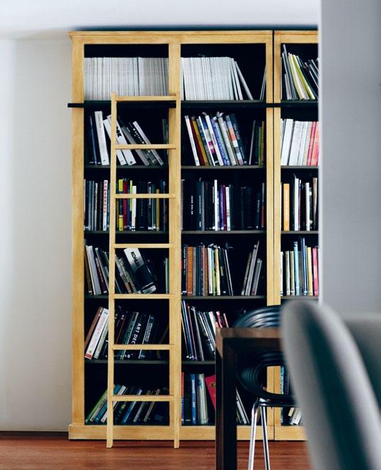
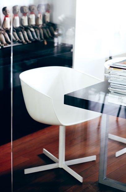

above | Angie’s choice of office furniture, Artwork And books provide An insight to her personAl tAstes And style. issue #15 habitusliving.com
there is a need to re-think design strategies. Angie’s approach is to “think vertical” in terms of how volumes can be stacked to create lofts and other interesting vertical spaces. It is also about the duality of spaces, as well as how furniture and products can be designed to double up. She has explored various options, some implemented, others still on the drawing board, from double-decker counter tops to movable fitments to wardrobes that can transform into writing desks.
Despite her workload of multi-residential projects, Angie manages to take on three to four private homes a year. These are mostly landed houses. Unlike those in the former category, which need to be duplicable and which cater to a profiled group of buyers, “These projects require an understanding of the individual homeowner’s lifestyle, how they live now and how they would like to live, in order to help them articulate their aspirations for their new home,” she explains.
She believes a designer’s role is to guide owners along and not impose her own design styles on them. When asked how much of the
end result is from her and how much from the client, Angie quips, “50:50.”
She draws inspiration from everything – international fairs, magazines, books and other condominium developments and show flats, and believes that one of the most effective methods is to talk to people. She says, “This is the best and most direct way to understand what people really want in their homes.”
As a continuing project, Angie is working on a public housing development under Singapore’s Design, Build and Sell Scheme*. She started by helping the developer design a survey comprising home-related questions to understand target buyers better.
She says, “Homeowners these days are very well-informed and they keep abreast of global trends. They are therefore able to inject more individuality into their own space and, as a result, more of their personality comes through. This is especially true of the younger generation, who know exactly who they are and what they want in their homes.”
Even developers, who tended to be more conservative in the past, are now becoming
2 . portrait # 89
Homeowners these days are very well-informed… This is especially true of the younger generation, who know exactly who they are and what they want in their homes.
AngE l E n A | DESIgn ER
* Under the Singapore Housing and Development Board’s (HDB) Design, Build and Sell Scheme (DBSS), developers tender for the land and enjoy flexibility in designing, pricing and selling the units but ownership eligibility conditions and restrictions on subsequent sale are similar to that of other HDB public housing.
The key to security is you

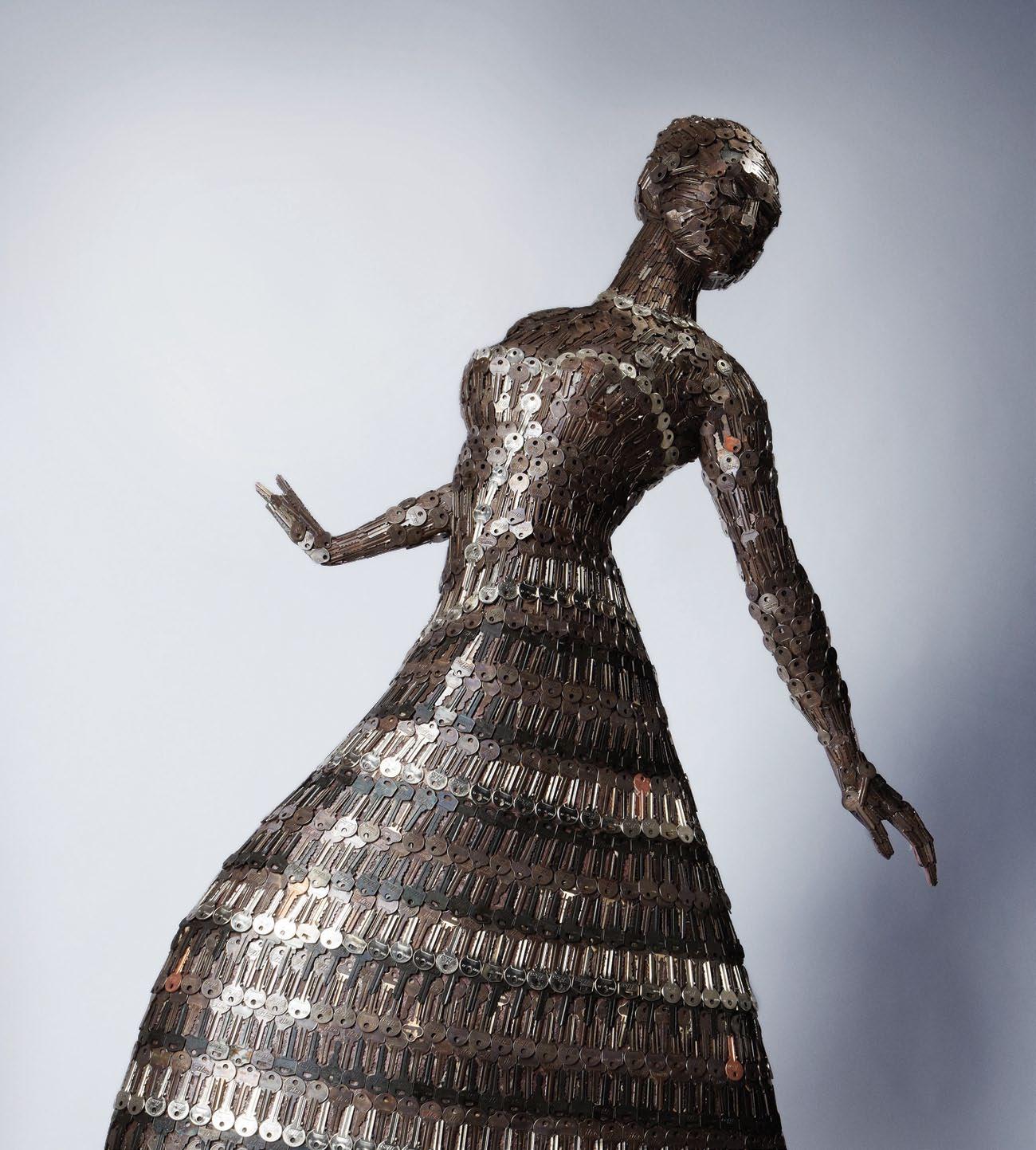
Introducing the new keyless E-Flash range from Kaba

At Kaba, we believe that everybody should be able to experience the convenience of keyless entry so we have created an electronic door lock just for you. Secure, reliable and simple to use, our E-Flash range will change the way you think about home security. Available in a proximity card version and a biometric (fingerprint) version, our E-Flash range takes electronic security out of the boardroom and into your home.

www.e-flash.com.au | 1300 00 KABA E-Flash 780 Biometric E-Flash 680 Proximity Card
What makes a house a home is when it allows you to indulge in the things that you love and, hence, reflects who you are. Angelen


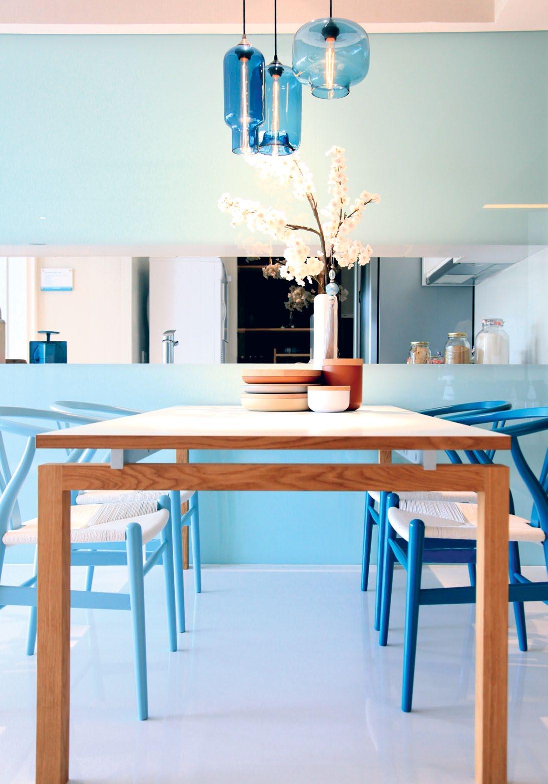
# 91 2 . portrait
A | designer
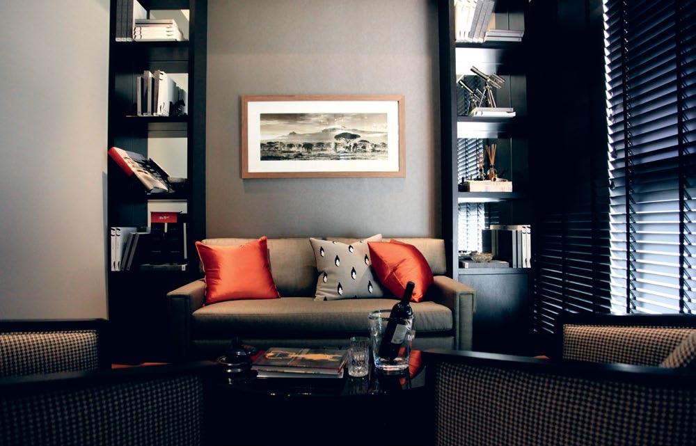
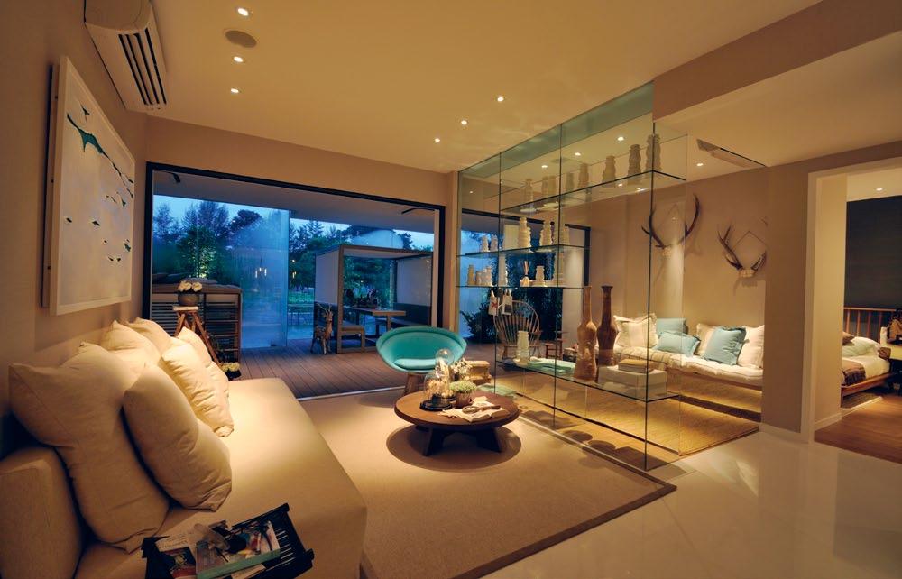
PREVIOUS | lakeside project – for angie, design has to be sensitive and sensible, with a commitment to originality, as in the lakeside project. TOP | luxus hill project – embracing the finer things in life as a representation of a person's desires. BOTTOM | lakeside project – inspired by the life aquatic, brilliant splashes of powder blue express the tranquility of the location. OPPOSITE | angie uses magazines as a source of inspiration. issue #15 habitusliving.com
more adventurous and experimental in terms of exploring new concepts, ideas and materials.
Her latest project is her own home. She acquired the existing old semi-detached house, which will make way for two houses in one. The split level allows for space on the first storey, which her mother will occupy, while her “other” house will be on the second and third storeys. Each can function independently, with its own set of living spaces, kitchens and bedrooms.
Architecturally, it will be a modern tropical house responding to its context, and is located adjacent to a nature reserve. It will allow Angie to indulge her culinary pursuits, complete with a “proper” kitchen and herb garden.
She says, “The practical requirements must first be addressed, so that one can live comfortably in it.
“What makes a house a home is when it allows you to indulge in the things that you love and, hence, reflects who you are.”
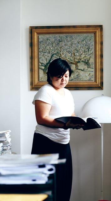
Untitled-3 1 15/12/11 9:29 AM
Design | index.com.sg
Index
2 . portrait # 93
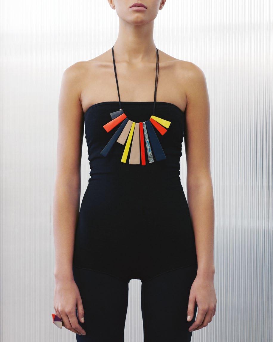
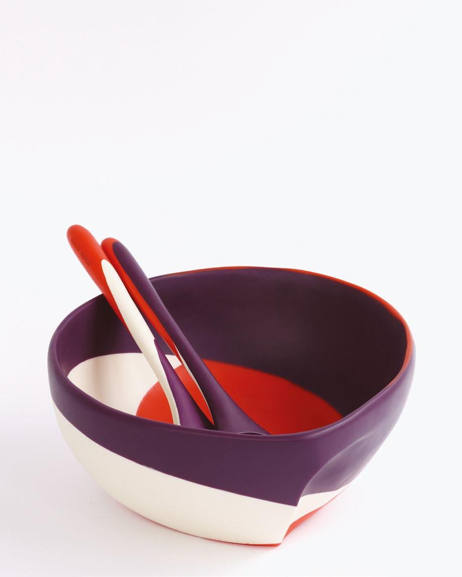
SYDNEY MELBOURNE BRISBANE NEW YORK www.dinosaurdesigns.com.au



at over $3,500 RRP SUBSCRIPTION OFFER
Subscribe and win a large Fire Pit and 5 Frankenstools from Robert Plum Valued
Enjoy your garden all year round. The versatile fire pit is an instant outdoor fire for the cooler months and a low rustic planter for summer, while the handy frankenstools in various Australian hardwoods can be used both indoors and out.
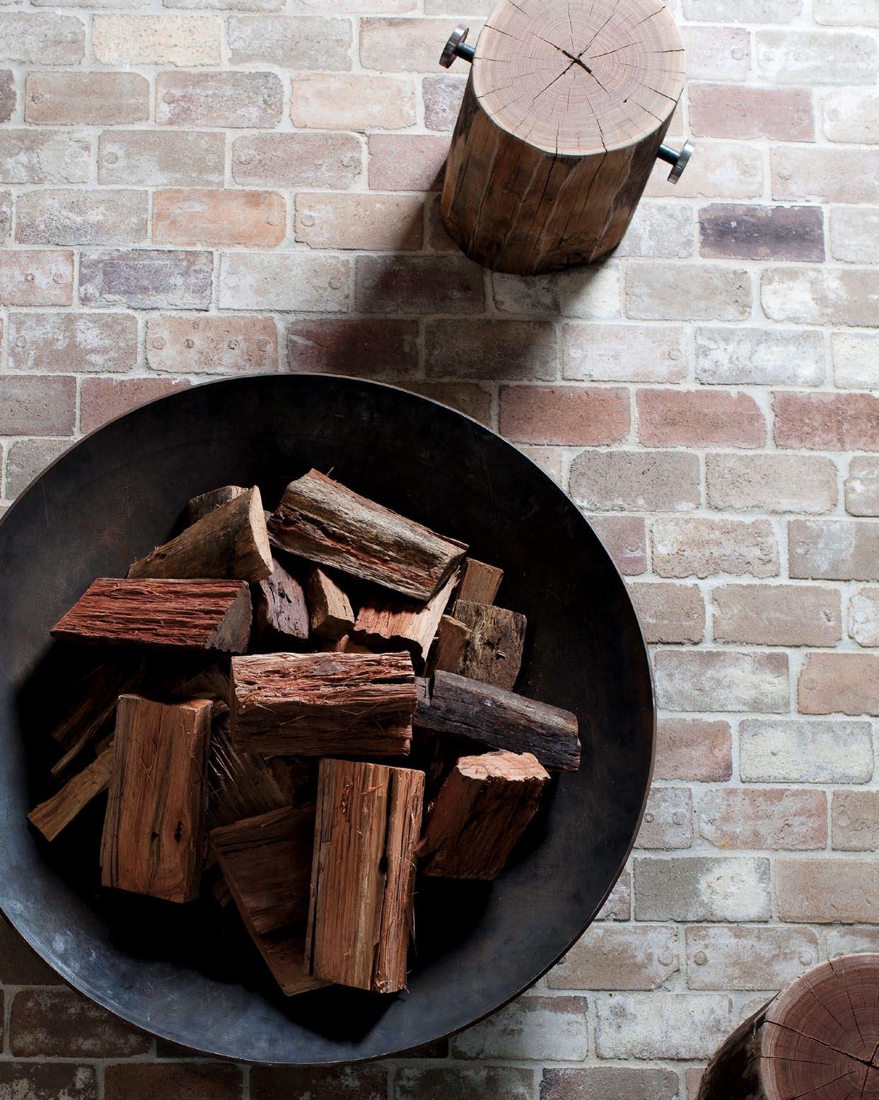
To enter, simply subscribe to Habitus magazine overleaf or enter online at habitusliving.com/subscribe.
Question: Tell us in 25 words or less which four people you would sit around your fire pit with. Good luck!
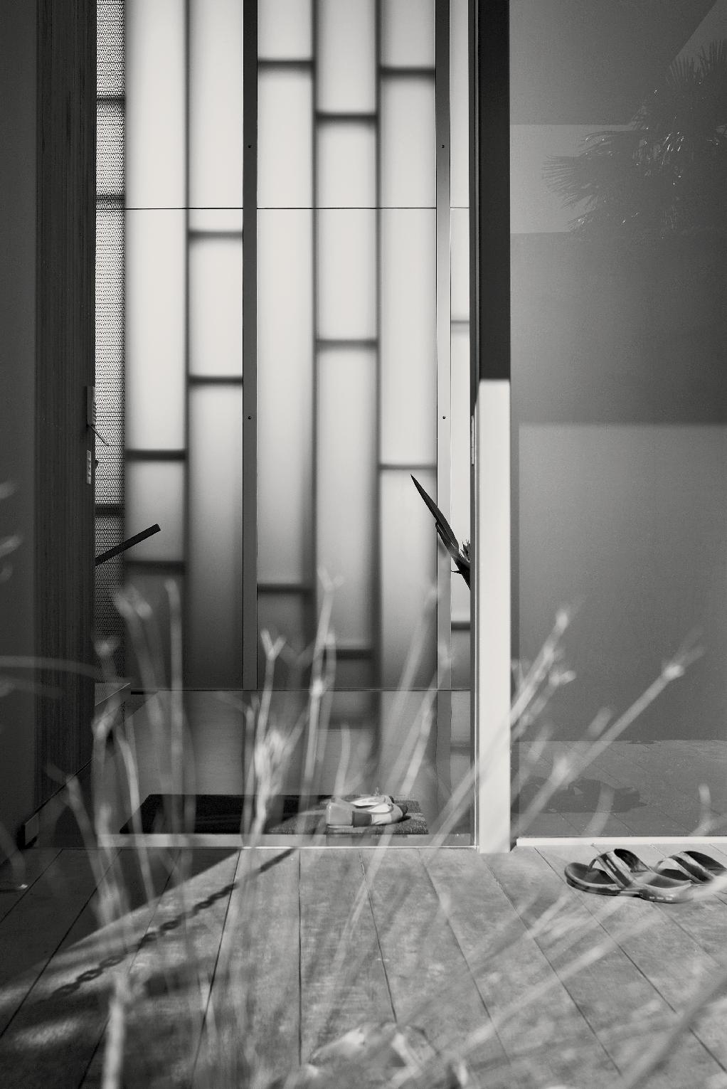
Every client has unique values, needs and wants, and a unique setting.
Andre A Bell | A rchitect – pAge #120
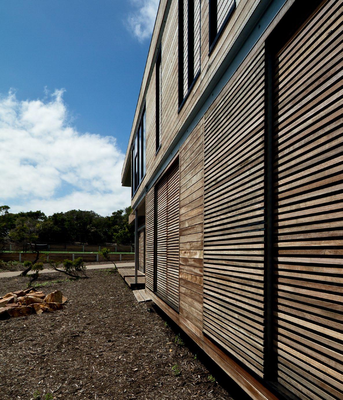
above | Timber baTTened sliding screen doors liTerally creaTe indoor/ouTdoor rooms during The warmer monThs. enclosing The bedrooms, including The main bedroom, The effecT aT nighT is like sleeping on a verandah. right | The garage’s concreTe wall has been lef T To age wiTh The weaTher. issue #15 habitusliving.com
Not just a Beach House
There is more than a hint of tropical living in this Mornington Peninsula house by architects eat, despite a very different climate. stePhen crafti savours its connections with the outdoors.
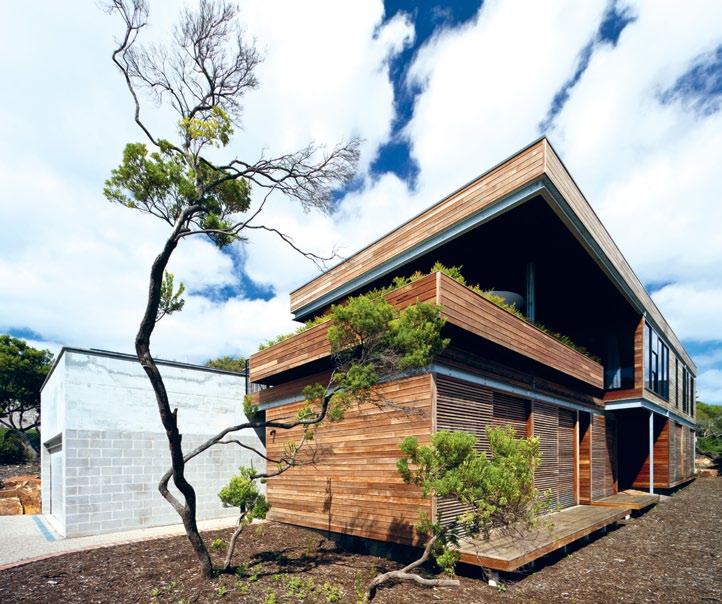

3 . on location # 99
text Stephen Crafti | photography Jame S Coombe
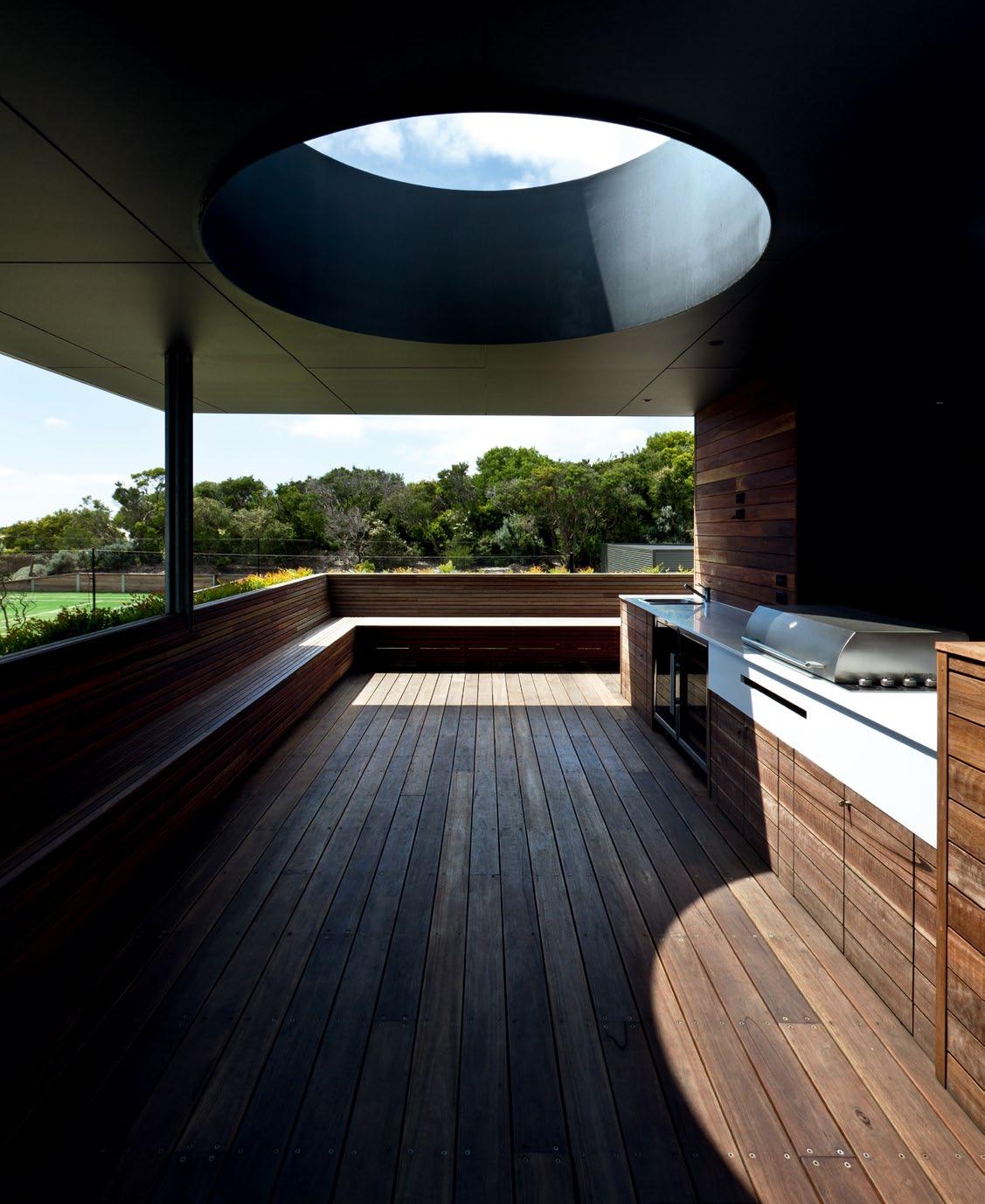
above | The ouTdoor Terrace on The firsT floor connecTs To The sky wiTh a circular open skylighT compleTe wiTh builT-in seaTing and sTaTe-of-The-arT cooking faciliTies, The Terrace was conceived for serious ouTdoor enTerTaining. opposite top | The dining area is designed for casual dining, wiTh a long Timber Table accommodaTing ex Tended family and friends. opposite bottom | archiTecT ’s skeTch showing elevaTion and floor plan. issue #15 habitusliving.com
Andrew and Kara Goode have spent a lot of time travelling in Asia, staying at resort-style hotels in countries such as Thailand and Cambodia. So, inspired by this, when they started thinking about building a beach house on a large parcel of land (2,500m2) at Portsea on Victoria’s Mornington Peninsula, they came to Architects EAT with more than a few ideas and photos. Albert Mo, a director of the practice, says, “They wanted a strong indoor/outdoor sensibility, well beyond the usual terrace with large sliding doors.
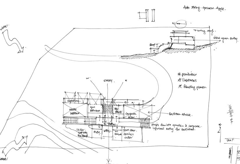
“Andrew and Kara wanted not just an outdoor shower, they literally wanted to open up the house completely.”
Perched on the crest of the site, above a winding driveway, the Portsea house appears initially to be relatively simple. Two storeys tall and completely clad in Spotted Gum, it is only when doors and shutters are opened that the home’s complexity is revealed. Double-skinned, with double-glazing and timber shutters, its rooms can be opened completely to capitalise on the prevailing winds and northern aspect. The five bedrooms on the ground floor, including the main bedroom, peel back layers to create a verandah effect. “If it was up to Andrew and Kara, the design would have been even more exposed to the elements. I had to remind them, on occasions, this was Portsea and not a resort in Thailand, with its tropical climate,” Mo says.
While the bedrooms are amply sized, at approximately nine metres square, they are more comparable with those found in inner-city apartments. “A beach house isn’t the place you spend time in bedrooms. It’s about being outside and enjoying what the coast has to offer,” Mo says.
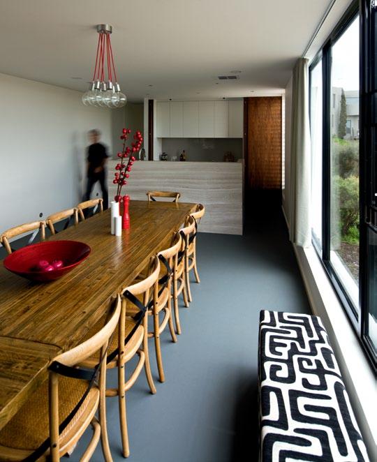
3 . on location # 101
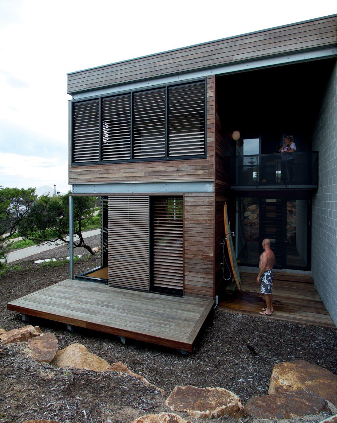
issue #15 habitusliving.com
above | rough-sawn timber planks lead into the entry. opposite left | at ground level, the design follows a central spine with bedrooms and bathrooms located to either side. slight changes in level further delineate spaces. opposite right | an ingenious screen/balustrade also provides storage for wine.
The main bedroom is relatively modest in its design. The ensuite, however, is considerably more lavish. As well as an Asian-style bath tub, the pathway to it is lined with white pebbles. “When the shutters and the glass doors are pulled back, you feel as though you’re bathing on a verandah,” Mo says.
The outdoors also spill into the entrance of the home. Raw and rustic materials are used all the way to the front door. Rough-sawn timber planks that function as steps to the entry, and stone boulders form a gully-like effect.
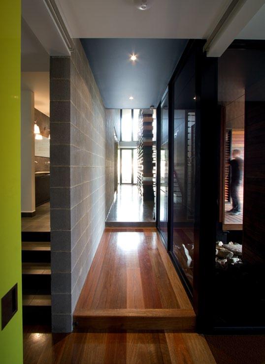
However, past the threshold, the interior is sleek. A concrete block spine wall extends through the centre of the ground level, enclosing a six-metre-high void. George Nelson pendant lights in the void create a welcoming effect, but it’s the five-metre-high wine-rack-cumbalustrade that is the real show-stopper. Made by Andrew, who operates a joinery business called Marant Industries, it’s perhaps not surprising to find this extraordinary bespoke wine rack/shelving unit in his own home. Blocks of steel, laminate and cork are interwoven with acrylic light boxes to form this centerpiece of the home. It’s an alluring feature.
“It’s even more animated at night when the boxes are illuminated,” Mo says.
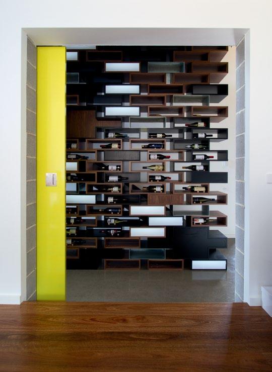
The outdoors also spill into the entrance of the home. Raw and rustic materials are used all the way to the front door.
3 . on location # 103
Architects EAT located the kitchen and living areas on the first floor where the natural light is stronger. As with the bedrooms, the kitchen’s scale is relatively modest. In it, a bank of joinery is screened by stained American Oak veneer doors, leaving the travertine-clad island bench appearing as a single object in the space. The architects were able to reduce the scale of the kitchen by including a separate, adjacent butler’s kitchen. Complete with cool room, it’s sophisticated for a beach house.
One of the most used areas of the Portsea house, referred to as the ‘Linear House’ (for its lineal arrangement of rooms), is a media/living room adjacent to the outdoor terrace. Complete with an acidic yellow-green sliding door, it is slightly lower than deck level.
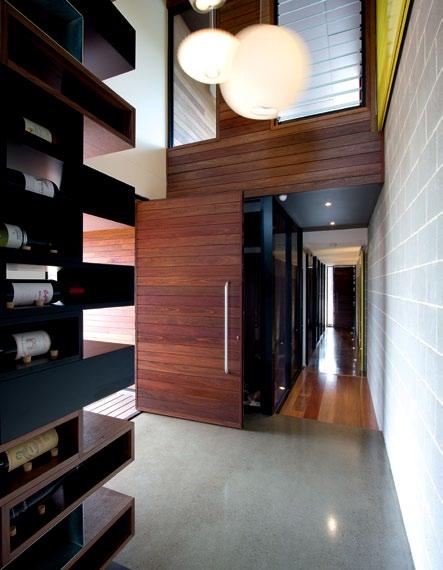
“I’ve always loved McGlashan and Everist’s Heide building, particularly the seating nook in front of the fireplace,” says Mo, who included a raised fireplace and broad bench-style seats to frame the media room. “Andrew calls it the ‘Man Cave’, but it’s used by everyone, family and friends,” Mo adds.
Andrew says, “I told Albert that I wanted a party house. We’re planning our wedding here, and we expect to regularly hold functions.” Being a surfer, he was also keen to be connected to the
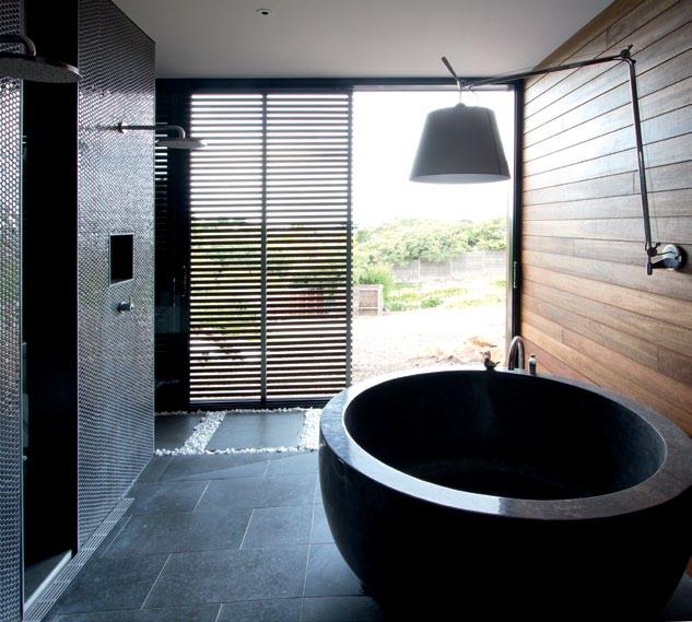
|
above left
pendant lights in the six metre-high void add interest and softness to the concrete block spine wall. above right | the ensuite to the main bedroom features timber-lined walls and a sliding timber battened screen to create a sense of bathing outdoors. opposite | floor plan.
When the shutters and the glass doors are pulled back, you feel as though you’re bathing on a verandah.
issue #15 habitusliving.com
MO | ArCHITECT
1 7 w o 2 8 r p 5 q u 3 9 t 6 e i 4 0 y ENTRY bE dRoom gu E sT bE dRoom ga R agE pla NT Room lau N dRY ground floor first floor wc dRY i Ng dE ck baT h Room bE d/sT udY waTER Ta N k wash-off a RE a masTER bE dRoom ENsui TE daY bE d pa NTRY ki T ch EN di N i Ng ENTERTai N m ENT dE ck bbq pool spa lou NgE void 1 2 2 3 4 5 6 8 7 9 0 q q e w y u i o p 7 7 r 21 21 22 22 23 23 24 24 24 r t 24 3 . on location # 105
outdoors as much as possible. “The beach is only a short walk from here, and its great having that outdoor shower on returning,” he adds.
On the property are also a full-scale tennis court, and a swimming pool above the garage. The couple also wanted a large outdoor entertaining area, and the first-floor terrace is where most of the entertaining takes place.
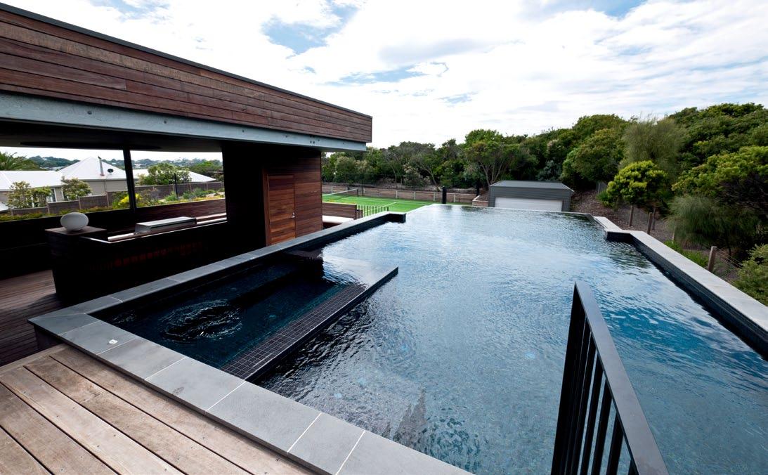
Although the house is complete, Andrew has suggested to Mo that the external wall enclosing the swimming pool should be rendered to give it that perfect finish. Till now, Mo has tried to persuade him to leave it raw and slightly worn. “This is a beach house. It should have that slightly worn look,” says Mo, who appreciates the way the Spotted Gum timber used to clad the house, is slowly turning a silvery grey.
This is a relatively large house, approximately 350m2. Although it’s generous in scale, many of the materials are relatively modest. Linoleum features on the kitchen and dining room floor, and window coverings, except for the timber shutters, were never an option.
“It’s not a city house. And it’s not a resort in Asia. It’s a house that hopefully connects to the site and all that it has to offer,” Mo says.
ARCHITECT Architects EAT
PROJECT TEAM Albert Mo, Eid Goh, James Coombe, Peter Knights, Shereen Tay, Gerhana Waty
BUILDER Mark Southwell
STRUCTURAL ENGINEER KH Engineering
BUILDING SURVEYOR Mike Neighbour
ESD CONSULTANT Sustainable Built Environment (SBE)
FURNITURE
All loose furniture from client. Fixed seats fabric upholstery are Chivasso Hot Madison Vol 3 and Pearler Natural from Unique Fabrics, Linolino Anthracite from Marco, and Florence Broadhurst The Cranes from Signature Prints.
LI ghTIN g
Wall lights are Tolomeo Mega Parete and Parete from Artemide, and Flos Glo from Euroluce. Pendants are George Nelson Saucer, Cigar and Ball from Studio
ARBORIST Arbor Co
LANDSCAPE MANAGEMENT SMEC
Architects EAT (61 3) 9824 0813 eatas.com.au
Italia, and Cluster from About Space. LV downlights and general fittings are from Gamma Illumination.
FINI shEs
Tiles and stones are bluestone, travertine, Calacatta marble and mosaics from World Trade Access. Marmoleum is Walton Uni colour cement from Forbo Flooring.
Cladding and floorboards are Spotted Gum from Woodform Architectural. Paint from Dulux. Timber veneer is American Walnut from George Fethers.
FIxEd & FITTEd
Sliding door system from Centor Architectural. Baths are circular black stone and white Corian, purchased from Ebay. Basin, mixers, spouts, shower heads and arms, toilet, and accessories are all from Reece. Laundry trough, sinks and sink mixers from Abey. Fireplace from Jetmaster.
box
drop
above | THE SwIMMING POOL IS LOCATED ABOVE THE GARAGE AND CONVENIENTLY ADJACENT TO THE OUTDOOR TERRACE issue #15 habitusliving.com
DESIRE

is not easy to understand: it’s complicated, if not a little misunderstood. On the surface it could seem like a trivial feeling, but it’s far more sophisticated. It’s a strong sense of longing, an irresistible pull. Which is why a Fisher & Paykel kitchen can not only satisfy the stomach, but the heart as well.



supacentamoorepark.com.au
Apartment alchemy
Architect, Juliana Chan describes her apartment in Brookvale Walk, Singapore, as, “a little hidden gem”. And Darlene Smyth agrees that she and her interior designer husband, triStan tan, have miraculously turned a sow’s ear into a silk purse.
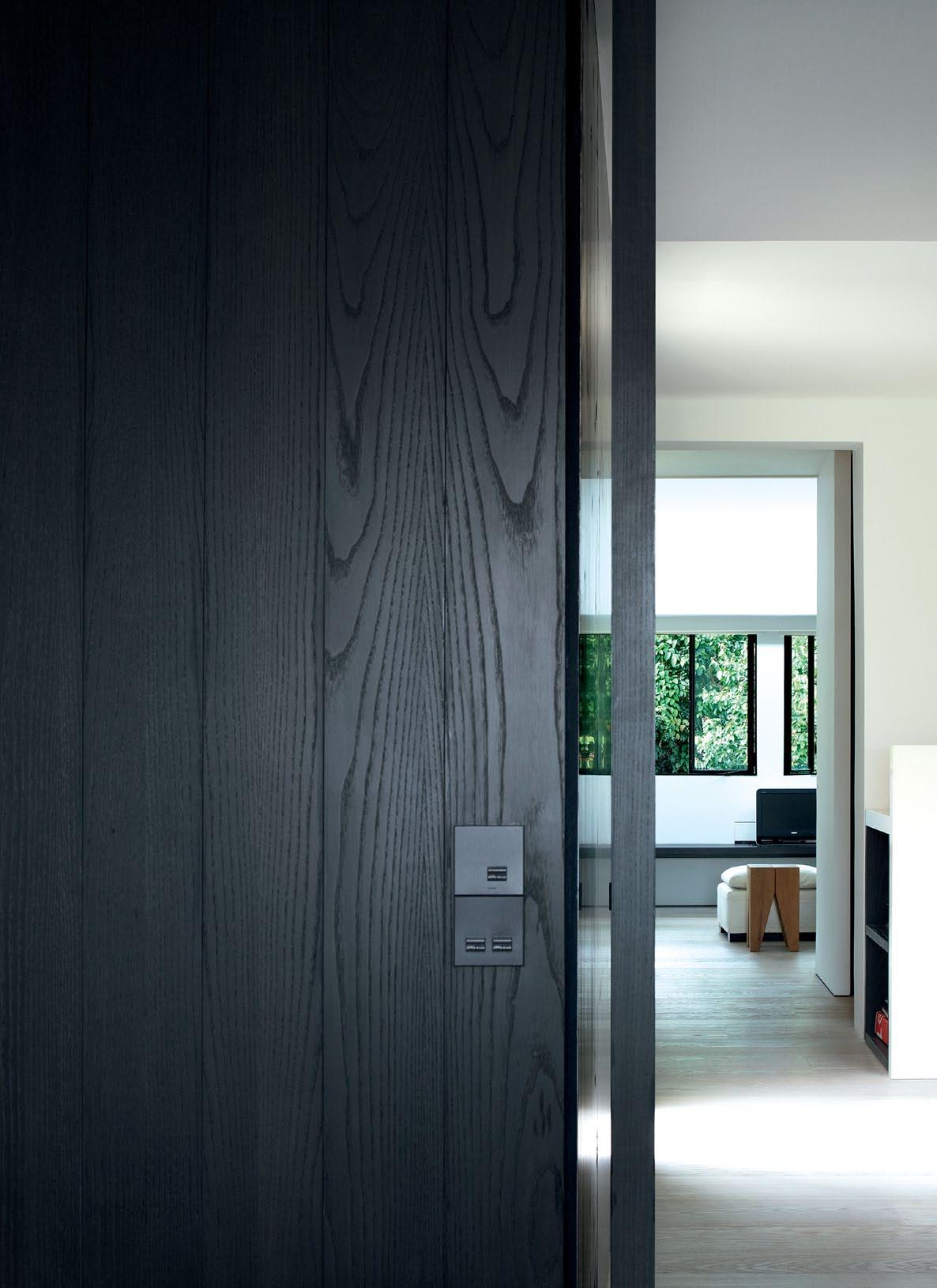
3 . on location # 109
text Darlene Smyth | photography rupert Singleton
PREVIOUS | the owners intentionally created a sense of texture to the interiors and an impression that the space had always been there. ab OVE | the main living space connects through a custom-designed bookshelf to a brightly lit study behind. OPPOSItE | a strip of mechanically operated windows at the top of the double volume living space peer out to the clouds above.
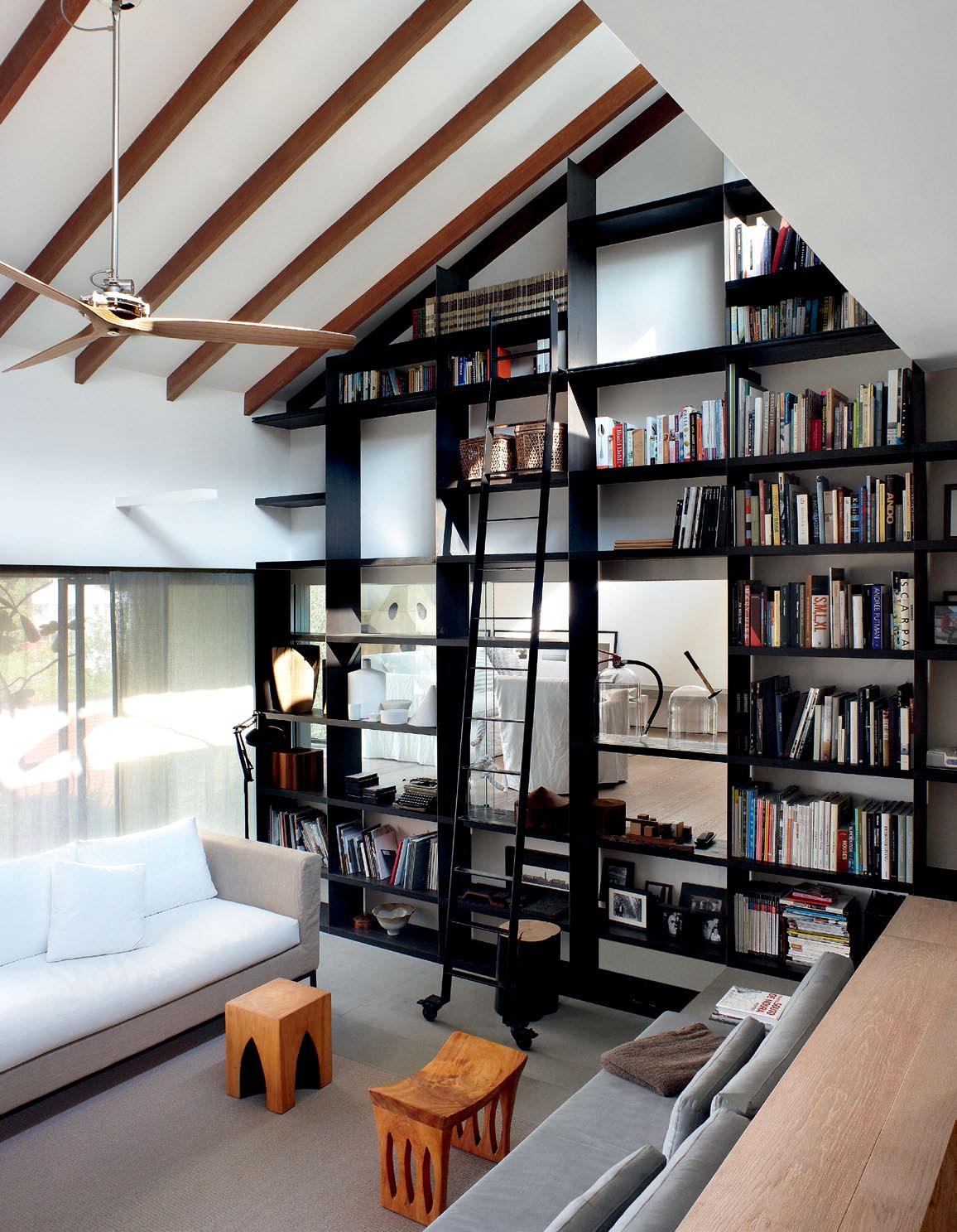
issue #15 habitusliving.com
Nestled into the outskirts of a tropical green reserve next to Singapore’s Maju Camp, Juliana Chan and Tristan Tan’s 150m 2 1980s walk-up apartment sits at the very end of a long, winding road that runs through a low-rise private residential area.
The recently married couple waited for one year for the unit to become available, but now feel their long wait was worthwhile, as their comprehensive makeover of the apartment has resulted in a lovely home.
Juliana and Tristan attribute their meeting to her employer of eight years, architect Ernesto Bedmar of Bedmar and Shi. Ernesto introduced her to Tristan, who at the time was running Singapore’s popular and stylish furniture shop, Cream.
Tristan, who now is engaged in his own interior design consultancy and furniture design, worked hand-in-hand with Juliana in the design of their new home. While she was more involved in its architectural layout and spatial design, he developed many of its details, tested out furniture designs and prototypes, and even custom-designed some of its light fittings. He explains, “We wanted to create a home that was not too crisp and perfect.”
The couple intentionally worked a sense of texture into the home’s interiors to create the impression the space had always been there and wasn’t something shiny and new glossed onto the old building structure.
The timeless feeling of their space is introduced as early as its front door, where the couple used dark, sandblasted timber veneer cut into panelled strips and inset with a weathered steel panel and door pull that is reminiscent of a classic Carlo Scarpa detail.
Entering the apartment, a flood of light and space greets the visitor. Its living area is illuminated from various directions with
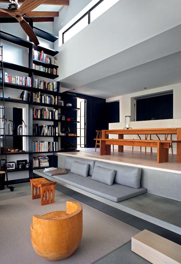
3 . on location # 111
The couple intentionally worked a sense of texture into the home's interiors to create the impression the space had always been there...
differing light qualities, drawing attention to the surrounding spaces that open onto the main living and dining rooms.
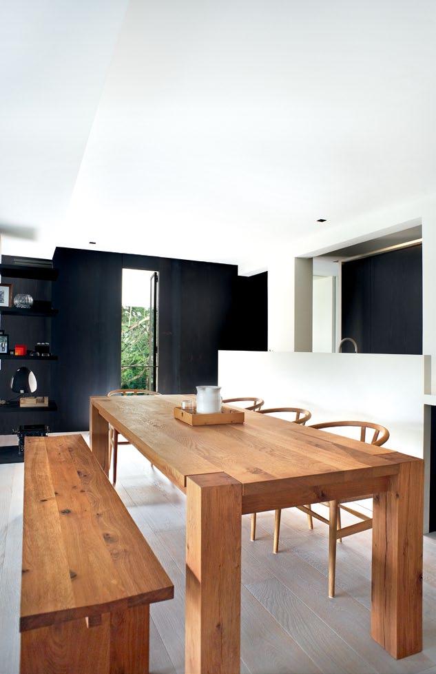
First, a wash of green light enters the living space from a long balcony that opens out to the lush tree tops which seem to reach out and touch the edges of the balcony. It is muted by fabric screens sliding in front of steel-framed windows. Counterbalancing this light from above is a strip of mechanically operated windows at the top of a double-volume sloping ceiling that looks out to the clouds above.
Finally, facing the main entrance across the living area is a custom-designed, double-storey open bookcase with narrow steel-plate vertical supports and thicker, dark timber horizontal shelves. This majestic unit divides the living room from the study beyond.
The latter is elevated above the living room by about a metre, to the same level as the connecting kitchen/dining area. This gives the living room the impression of being a cosy, sunken space. Indirect light from the study illuminates the living room through the screen of the open bookshelves.
One interesting spatial detail of the apartment lies in how the differing glazing types used interact with its spaces. For external glazing, the designers have taken advantage of the existing deep alcoves in the building’s structure to create an ‘in between’ space that separates the indoor from the outdoor. These windows are detailed with somewhat rustic, carefully rusted steel frames – a reference to traditional windows, which is supported by the use of antique locking and fixing ironmongery. In contrast, internal windows between interior spaces are large, ultra-modern frameless glass panels which tend visually to pull them together and create a sort of immediacy between them.
The main living, dining room and study are separated from the apartment’s more private zones by a linear kitchen with a massive compressed quartz bar counter that seems to anchor the house.
Juliana explains that having such an open and spacious kitchen has instilled in the couple a love of cooking and entertaining. Instead of tucking the kitchen away, as is often done in Singapore apartments, the kitchen is celebrated here as the hearth of the home.
ABOVE
|
the home-made quality of some of the furniture items adds to the timeless appeal of the apartment. Opp OsitE | the kitchen is celebrated as the hearth of the home, separating the more public spaces from the private areas.
A wash of green light enters the living space from a long balcony that opens out to the lush tree tops…
issue #15 habitusliving.com
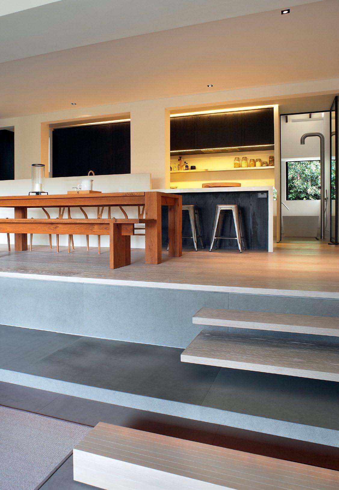
3 . on location # 113
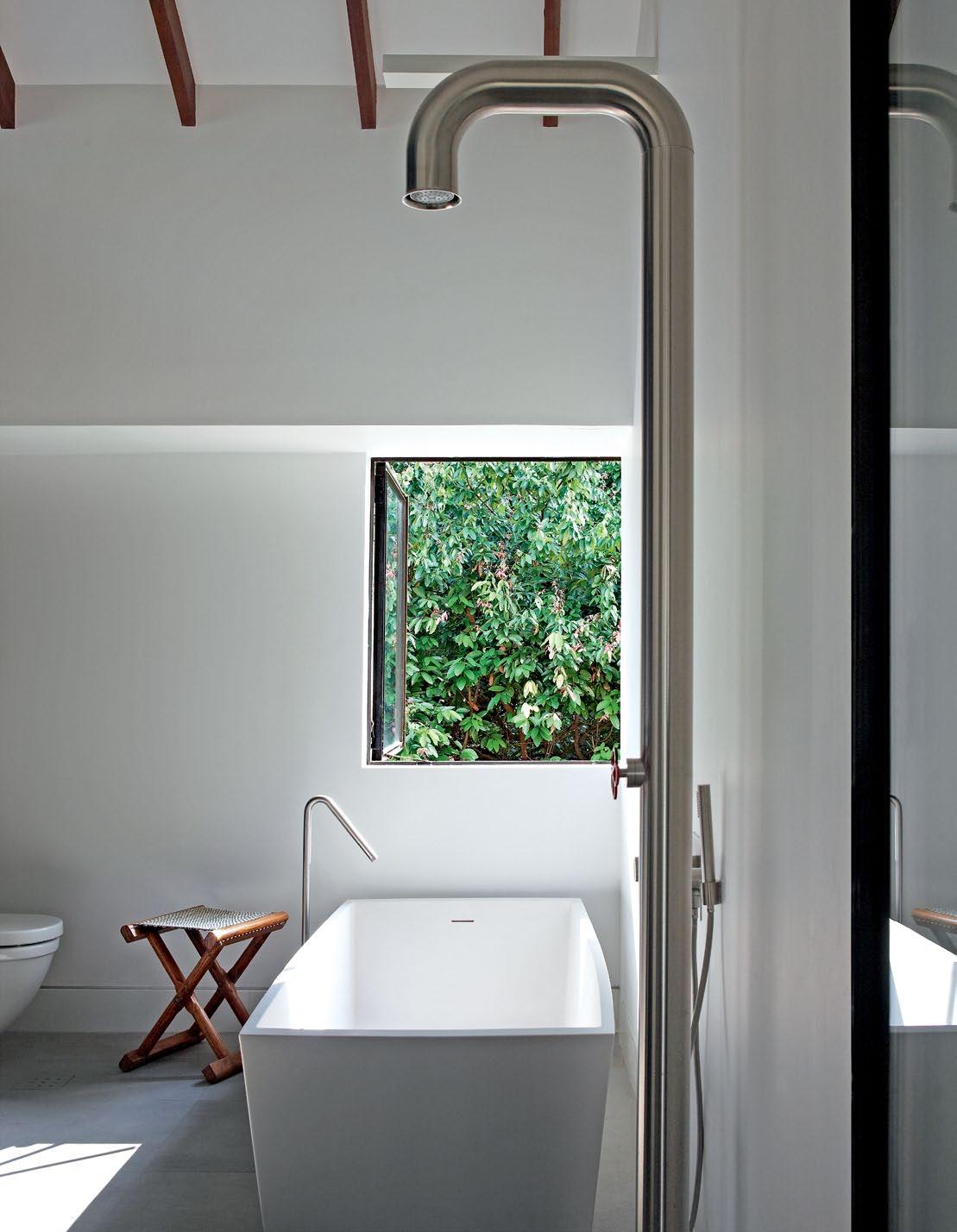
ABOVE | the master bathroom is designed as an internalised outdoor bathing area with views to the lush reserve at the rear. Opp OsitE | floor plan. issue #15 habitusliving.com
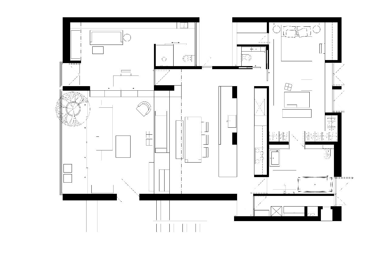
5 6 7 8 9 0 q e 1 2 3 4 ENTRY BALCONY GUEST BED/STUDY GUEST BATH LIVING ROOM DINING AREA KITCHEN POWDER ROOM 1 2 2 3 4 6 7 0 q e 9 8 5 STORE MASTER BEDROOM MASTER BATH YARD 3 . on location # 115
When we first moved in, we only had a few furniture items – the table, a built-in sofa and a bed. Later, about half the furniture pieces were custom-designed and the other half were from Tristan’s shop.
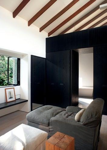
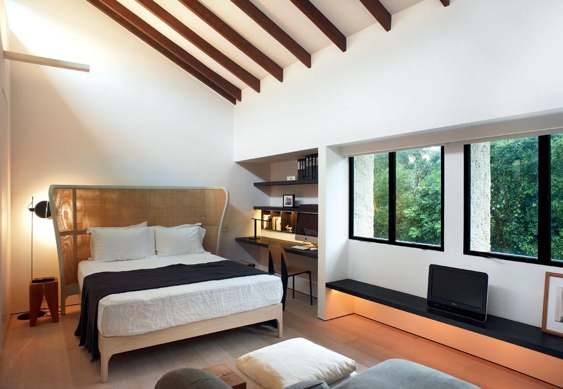
top and above | The masTer bedroom's brighT sloping ceiling wiTh exposed Timber raf Ters ouTlines a majesTic space wiTh eye level windows ThaT projecT ouT inTo The greenery beyond. opposite | hidden behind The dark wood kiTchen is The more privaTe area of The masTer bedroom suiTe.
issue #15 habitusliving.com
Juliana | resident and architect
All the clutter of the kitchen is neatly hidden and integrated into a comprehensive dark wood, full-height cabinet behind the bar counter. As with the rest of the apartment, every corner has been considered deeply and detailed carefully to accommodate the couple’s everyday movements and needs.
Hidden behind the kitchen is the private area of the master bedroom and bathroom. These spaces are reached through a small corridor along the side of the kitchen whose walls are clad in Corten steel panels. The somewhat darker area of the corridor introduces the visitor to a change in the apartment configuration between its open, public spaces and its more private zones.
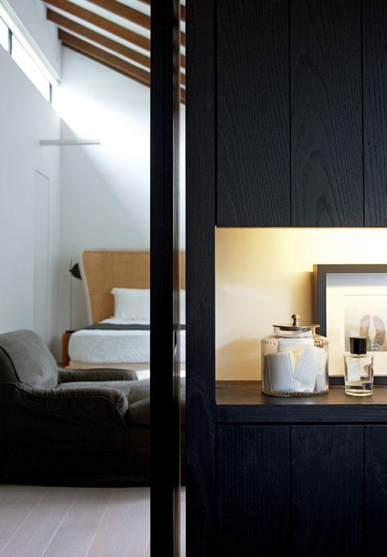
As with the living room, the master bedroom has a light-volume sloping ceiling with exposed timber rafters, outlining a majestic space with eye-level windows that project out into the greenery beyond.
Another tall dark wood cabinet with custom-designed black steel recessed handles separates the bedroom from the master bathroom. A ‘secret’ door hidden in the middle of the closet leads to the large bathroom beyond.
The bathroom is designed as a sort of internalised outdoor bathing area with its outlook to the lush reserve at the rear providing total privacy. A freestanding bath tub is positioned to allow views out through the window. Resembling an outdoor shower, a freestanding Boffi tubular shower tower has been used with no screens to enclose it, and sits in the middle of the floor, surrounded by a zerothreshold drain.
The couple wanted the furniture of the apartment to grow along with their inhabitation and appreciation of the space.
“When we first moved in, we only had a few furniture items – the table, a built-in sofa and a bed,” Juliana explains. “Later, about half the furniture pieces were custom-designed and the other half were from Tristan’s shop.”
The home-made quality of certain furniture items and some refurbished antique pieces all add to the timeless quality of the apartment.
Although the space is definitively modern, the couple’s use of textural detail and materials, as well as gestures toward the history of the building, reinforce the impression that each item in this apartment is meant to be there, and that the design belongs to its space.
ARCHITECTuRAl/InTERIoR dEsIgnERs
Juliana Chan, Tristan Tan
B uIldER Holden Tiling Construction
CARPEnTER Stema Furniture & Renovation
Juliana Chan Tristan Tan (65) 9863 0145 (65) 9762 4842 mynameisju@hotmail.com tristan-tan@live.com
FURNITURE Tables and stools throughout the apartment are from e15.
Carl Hansen & Son Hans Wegner Wishbone chairs available in Singapore through Space Asia Hub. Sofa bed from Gervasoni. Bed from Wooden Charme. All other furniture is custom designed and made, salvage and restored by Stema and Tangery Accents.
LI ghTIN g
All lighting is from Lightcraft.
FINI sh Es
Custom made steel framed glass doors and windows by DJ Engineering. Stone finishes and custom made washbasins by International Elements. Engineered Oak floor by Perswood.
FIxEd & FITTEd
Sanitary fittings and fans from Boffi. Appliances from Miele and Sub-Zero. Electrical switches by Lutron, available through Sunlight.
box
drop
3 . on location # 117
issue #15 habitusliving.com
singaPore aPartMent in focus
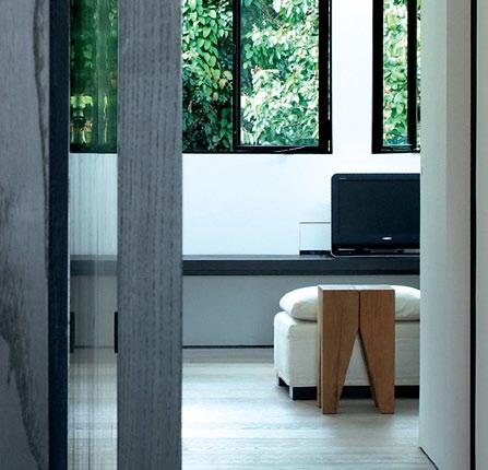
Juliana Chan and Tristan
Tan
designs. Juliana explains:
Juliana and Tristan’s choice of Lutron Rania light switches epitomises their desire for simplicity. “Lutron had his unadorned, understated switch that could blend into our walls.” The Boffi ceiling fans “are the most beautiful fans one can ever find”, they believe, creating cross ventilation that allows the couple to live without air-conditioning most of the time. Due to the tropical climate, “It’s impossible to have wide solid timber floorboards as they warp easily over time,” says Juliana. But the engineered Oak floorboards make this possible and “it actually feels like you’re walking on real wood.” The ST04 Backenzahn stools are scattered around the home and used as stools and side tables interchangeably. “The only difference is that the stool has a slight depression in the centre to sit on, whilst the side table is completely flat. So clever!” enthuses Juliana. The Ghost sofa bed with its slip over cover “creates a lightness to an otherwise rather bulky piece of furniture,” says Juliana. “We love how inviting it feels.”
PhiliPP Mainzer
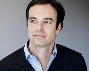
A native of Hamburg, Germany, Philipp Mainzer was educated in London and has worked in New York. Now based in Oberursel, Germany, Mainzer is the managing partner and creative director of furniture brand e15. Mainzer first studied product design at London’s Central St Martins College of Art and Design before undertaking an architecture degree at the Architectural Association. He established e15 with Florian Asche in 1995 and in just a few short years, the company has grown to be internationally recognised for is designs and collaborations with well-known designers. The ST04 Backenzahn stool is one of Mainzer’s first designs, now a modern design classic and collected by several museums. Mainzer has also been a member of German Design Council executive committee since 2009.
clockwise from left
Air ceiling fAn designed by g iulio g iAnturco for b offi, boffi.com.
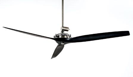
rAniA light switch from Lutron eLectronics, Lutron.com
g host 15 sofA bed designed by PAol A nAvone for gervasoni, gervasoni1882.com
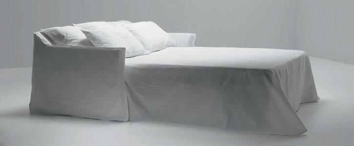
e ngineered oAk floorboArds from Perswood, Perswood.com
st04 bAckenz Ahn stool designed by Phili PP MAinzer for e15, e15.com
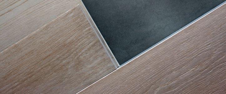
furnished their apartment with simple, subtle and honest
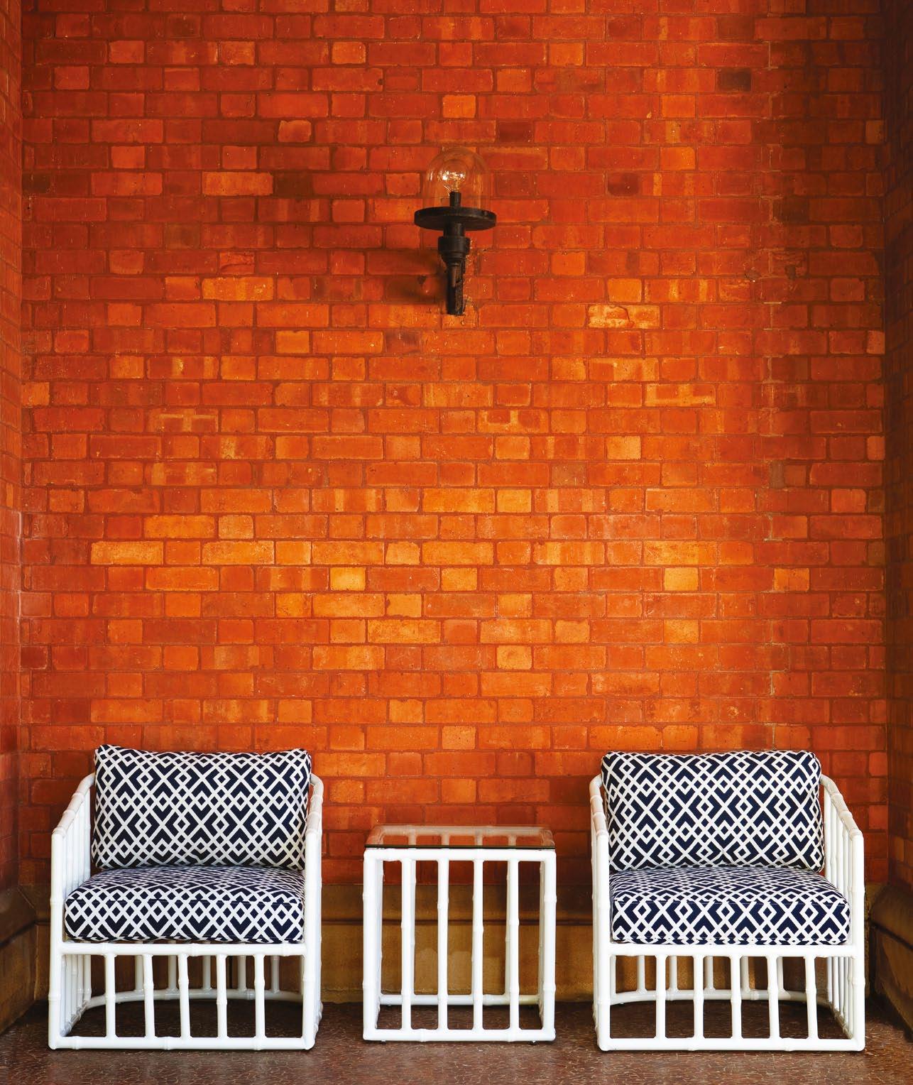
robertplumb.com.au | t: +61 2 9316 9066 | e: info@robertplumb.com.au retail showroom: 55 Cranbrook s t, b otany, nsw, 2019 ROBERT PLUMB, A COMBINATION OF STYLE + PRACTICALITY.
Down to earth
A large collection of mid-Century furniture and art informed the design for this AucklAnd house by Andrea Bell of Pete Bossley Architects AndreA stevens finds more than just earthy 1950s tones in this energy-efficient and sustainably built family home.
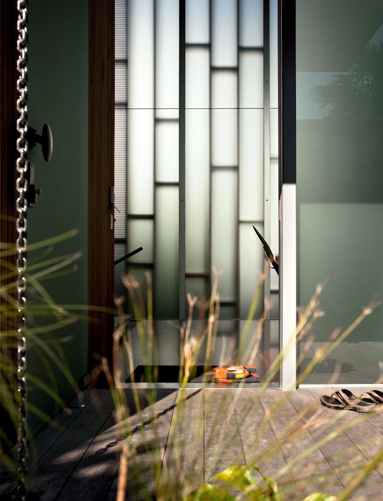
issue #15 habitusliving.com
text An Dre A StevenS | photogr A phy Simon Devitt
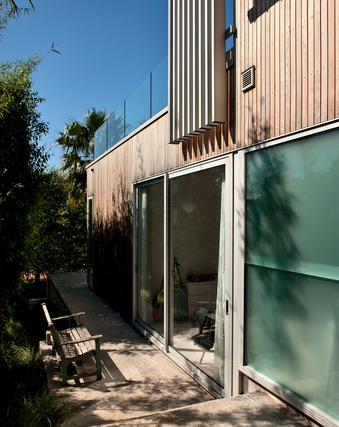
3 . on location # 121
opposite
| The glazed enTrance is paTTerned by shadows from ex Ternal Timber screens. above | narrow side yards are made usable wiTh Terraces and planT screening.
While Auckland Council is busy re-designing its sprawling suburban network to create a more compact and linked city, local architects and home owners are starting to explore what effect this might have on house design.
In the brief for their Herne Bay house, owners Denise Brown and Paul Vujcich said: “No garage.” It is the first house I have visited that takes such a strong stance, despite having sufficient space, and the benefits displayed to house, site and street are compelling.
“We lived in the original house for over 10 years without a garage, and I’ve never seen a garage that looks as nice as a house from the street,” Paul explains. “A car is just a car. I couldn’t care less if they sit out there on their own.” Work and school commitments mean the couple can’t dispense with their need for cars entirely, but on weekends they walk or use a scooter for short local trips.
By dispensing with a garage, they have freed up valuable land area for other uses, and enjoy an open street frontage. Other than a small parking platform for scooters, the front yard is fully planted, with a simple timber bridge leading to its glass-veiled entrance.
“The context is not suburban, but it’s not totally urban, either,” architect Andrea Bell says. “We responded to this by avoiding a fence around the edge of the site in order to create a more urban feeling and sense of generosity.”
The other surprising feature of this house is its compact design. It presents little bulk from the street, yet uses the site intensely by building along its length and turning narrow side yards into mini-courtyards. “We stepped and terraced down the site so that every bedroom had a connection with the outside at the lower level,” Bell explains. “And we used screens at the upper level to provide privacy for the main living spaces. This screening was important, as neighbours have terraces at the same level. The louvres not only create privacy and filter light, but also focus the house toward the north view.”
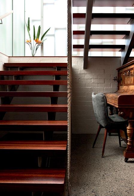
To maximise sun and outlook, Bell has inverted the typical city fringe colonial plan – the original house was disconnected from the yards and faced the street – by placing important rooms at the back, with laundry and ensuite tucked behind the street elevation.
Denise grew up in a Group Architects house (architecture icons in New Zealand), and holds vivid memories of plywood wall linings and the warmth and scale of early New Zealand modernism. The couple have always collected Australasian mid-Century furniture, art and ceramics, and had a large collection of paintings
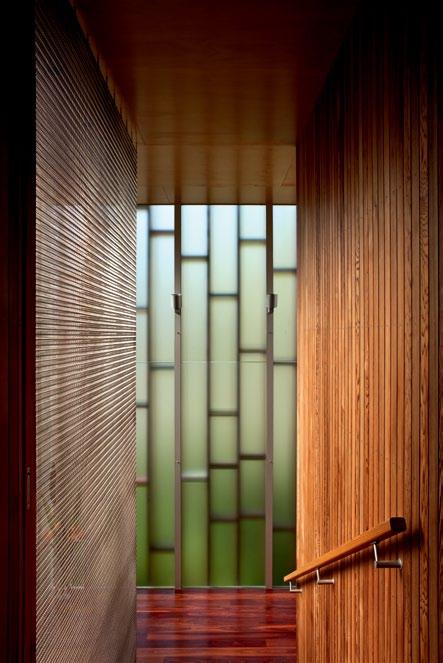
issue #15 habitusliving.com
top | Jarrah flooring, cedar wall lining and steel mesh are used in the main entry stair. above | the steel curtain balustrade keeps detailing minimal. opposite | the eastern corridor brings light and warmth to the bedrooms, and creates a gallery for paintings.
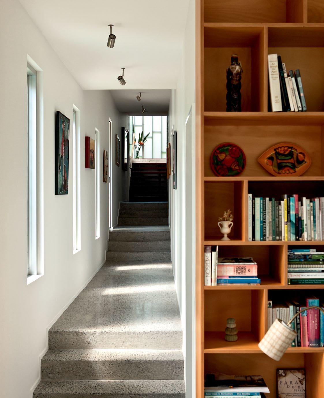
3 . on location # 123
by Denise’s father, artist Barry Brown. This passion was a major part of the brief, and Bell worked at many levels to create a home informed by key materials and colours, mixed with contemporary detailing and planning.
Concrete floors, bagged brick and vertical Cedar weatherboards became the foundation materials palette. Bell broke down scale through their placement and contrast, and by layering the skin with sliding doors and various types of louvres.
“The play with solid and light can be seen at the front, where masonry encloses their bedroom, against the soft glass screen of the entry – a lightbox at night animated by light and shadow,” she explains. “When you move around the building’s sides and the end, the exterior envelope becomes a lot more open. It was driven by the aesthetic of the bagged brick and the timber boarding, and about getting a balance.”
From the glass-screened entrance and stairwell, a half-flight of stairs leads up to the open plan living space. Kitchen and dining sit to either side and overlook a large, sunken lounge. Hoop Pine plywood, earthy 1950s colours, furniture and lighting, define the character.
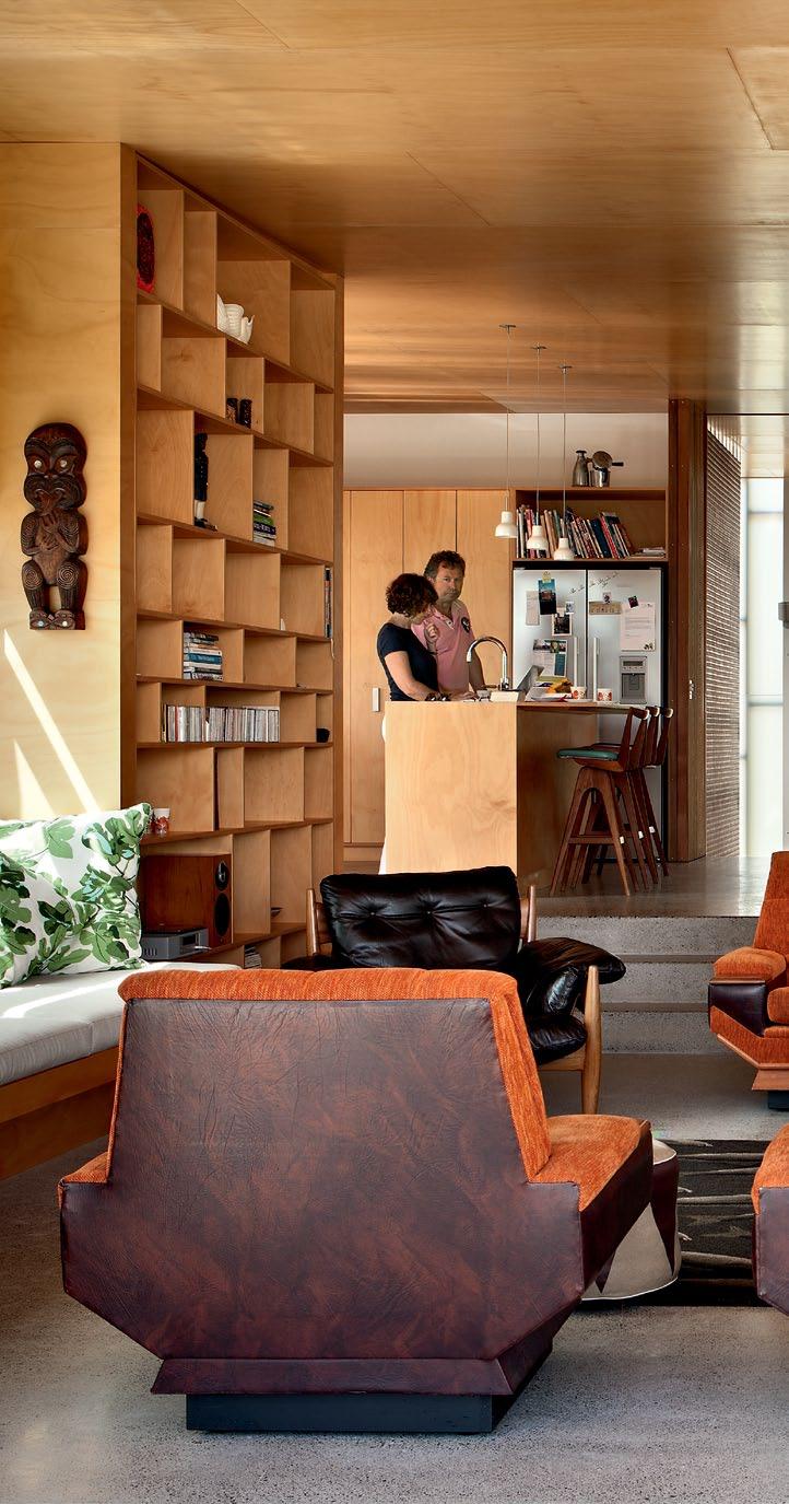
Paul and Denise didn’t want a television or fireplace – elements imposing too rigid a pull on furniture – freeing up the space for a circular arrangement, like a conversation pit.
A large built-in bookshelf and window seat along one side personalise the room, before it steps down onto a large deck to connect visually with the yard and pool below.
As a blended family with three teenagers, with“generally one, often three, and sometimes none” at home, Paul and Denise didn’t want the house to feel too big with just the two of them. The ground floor has four bedrooms and a second living room, which functions as a study for Denise. Its planning is extremely efficient, with a long central corridor to connect rooms and to bring the sun’s wamth in, and views of the garden and swimming pool. Just as the house steps in section, the plan also steps to provide north-facing windows to southern bedrooms.
Energy efficiency and sustainable material selection are implicit in the work of Pete Bossley Architects, but were looked at even more closely in this project on account of Paul’s work with his insulation company. He wanted
Kitchen and dining sit to either side and overlook a large, sunken lounge.
issue #15 habitusliving.com
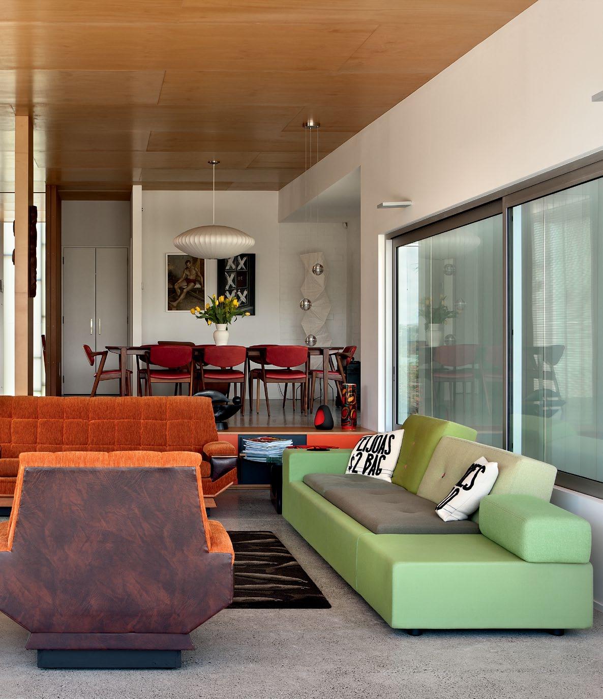
above | The owners’ passion for mid-cenTury arT furniTure and objecTs informed The design. arT works are ‘unTiTled’ (lef T ) and ‘crosses aT The sTaTion’ (righT ), boTh by barry brown, denise’s faTher. 3 . on location # 125
Planning is extremely efficient... to connect rooms and to bring in sun, and views of the garden and swimming pool.
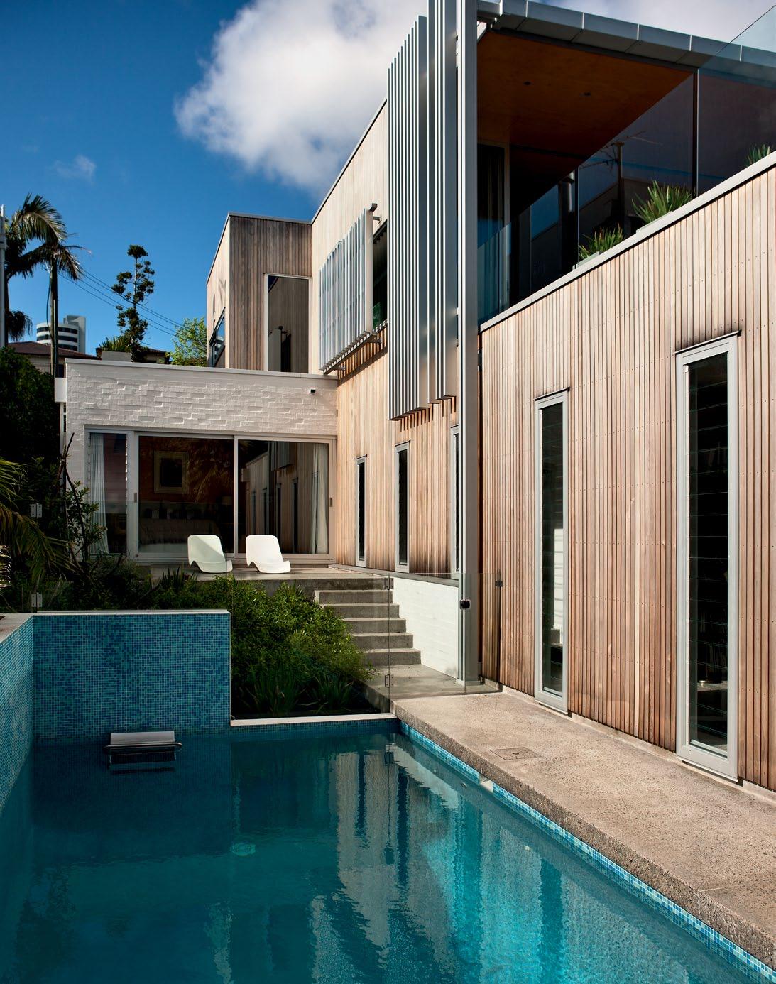
above | A stepped pl An, louvre screens And pool pl Acement optimise the site And sun. opposite | floor pl Ans. issue #15 habitusliving.com
UP 1 2 5 3 3 3 6 3 7 8 9 0 5 q t y p first floor ground floor 9 0 w q r e t GALLERY ENSUITE STORE ENTRY BRIDGE ENTRY POWDER ROOM DINING 1 2 5 3 6 4 7 LOBBY LAUNDRY BEDROOM TERRACE WARDROBE BATHROOM FAMILY LIVING POOL 8 u y u i o p KITCHEN LIVING DECK PLANTER ROOF PARKING DRIVEWAY 21 22 e w i o 21 4 4 4 4 22 3 . on location # 127
concrete floors and bagged brick for thermal mass throughout, with double-glazing and underfloor heating to keep the interior at an even temperature. Natural ventilation and overhangs are all that are needed for summer cooling, and polyester insulation made from recycled plastic bottles provides double the building code requirement. “It’s wonderful,” Paul says. “At night, you can stand in the kitchen and the concrete floor is warm underfoot from sun streaming through the window all day.”
The Bossley practice does not have a set style, but approaches each project as unique.
“Every client has unique values, needs and wants, and a unique setting,” Bell says. “It’s about taking those on board, and working with them to not just give them what they want, but also to take them beyond their initial expectations. We are very conscious that what we do has a real longevity to it, so it needs to be flexible and to adapt to how lives change.”
ARChITECT Pete Bossley Architects dEsIgN/PROJECT ARChITECT Andrea Bell
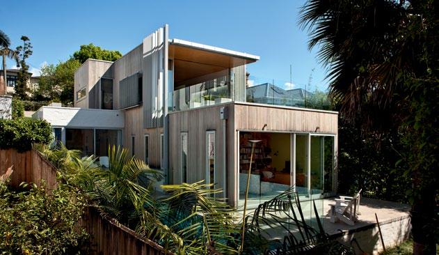
CONTRACTOR PSL Construction (Phil Leach)
sTRUCTURAL ENgINEER Day Consulting Engineers (Tony Day)
LANdsCAPER Behind the Garden Wall (Marg Thomson)
Pete Bossley Architects (64 9) 361 2201 bossleyarchitects.co.nz
FURNITURE
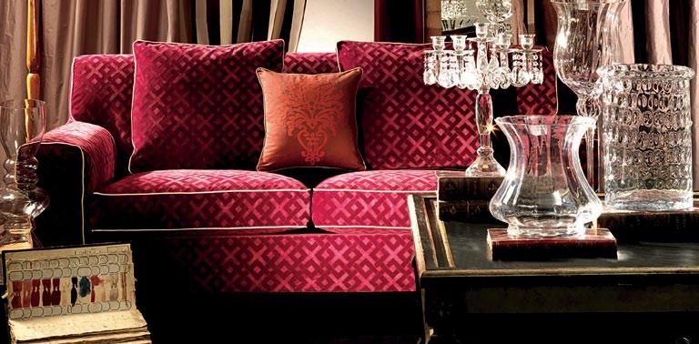
Sofa from second hand shop in Auckland. Polder sofa by Hella Jongerius available from Cité Furniture Solutions. Sheriff chair in Elm and brown leather by Sergio Rodrigues designed in 1962. Dining chairs and table in Roseweood by Kai Kristiansen sourced in Melbourne. Bar stools by T.H.Brown made in Adelaide and sourced in Sydney.
LIghTIN g General lighting from Modus. Noguchi floor lamp. George Nelson Saucer, Ball, Pear and Cigar pendants. Bocci pendant. Surfacemounted spotlight from Katalog. Recessed cabinet halogen from Häfele. &Tradition (formerly Unique Copenhagen) bulb pendant.
FINI shEs
Tiles from The Tile Warehouse. Brushed stainless steel benchtop. Hoop Pine marine-grade plywood cabinetry.
FIxEd & FITTEd
Sink, basin and laundry trough from Mercer Products. Corner carousel from Häfele. Fisher & Paykel cooktop, oven and dishwasher. Smeg rangehood. Bins from Kitchen King. Fixtures and tapware from Metrix. Kitchen accessories from LG Carder (now trading as Reece). Cabinet handles from Katalog. Drawer runners from Blum. Creda wardrobe heater from Rexel. Floor-mounted bath spout and mixer from Plumbline.
drop box
www.townandcountrystyle.com.au Distributed by Decortex – Fabrics – Sofa “Mito 1459 ” – Pillow “Morgana 1611” HAB15_Decortex_QP_Final.indd 1 18/01/12 4:49 PM above | ThE LONg NARROw hOUsE sTEP s d OwN ANd UP TO mA xImIsE ThE LONg sITE ANd ACCEss ThE hARb OUR vIE w. issue #15 habitusliving.com
Cosh Living represents leading international outdoor furniture brands, all synonymous with style, quality and comfort. The latest European trends in contemporary outdoor furniture are now available at your finger tips. Be Inspired.
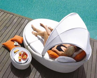
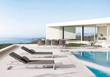
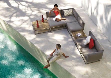
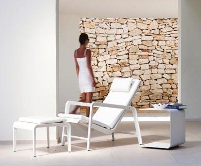
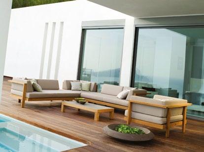
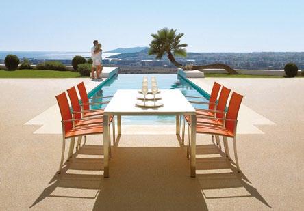
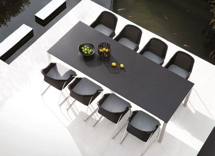
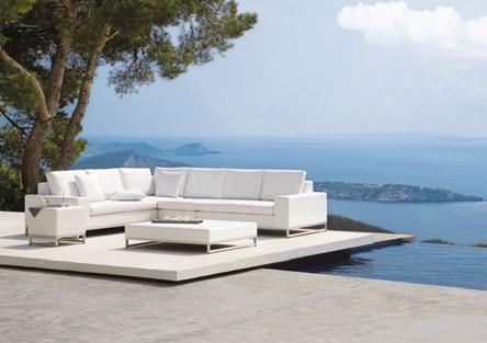
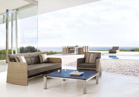
Melbourne 7-13 Rupert Street, Collingwood VIC 03 9281 1999 Sydney Level 1, Suite 38, 69 O’Riordan Street, Alexandria NSW 02 9317 3011 Brisbane 8 Wandoo Street, Fortitude Valley QLD 07 3666 0377 | www.coshliving.com.au coshliving
Designed for designers, Perrin & Rowe
Contemporary is a stunning collection of premium quality tapware and accessories. Original designs and engineering excellence come together to create beautiful and authentic products.
Introducing the Orbiq Kitchen Tap by Perrin & Rowe, of Mayfair, London.
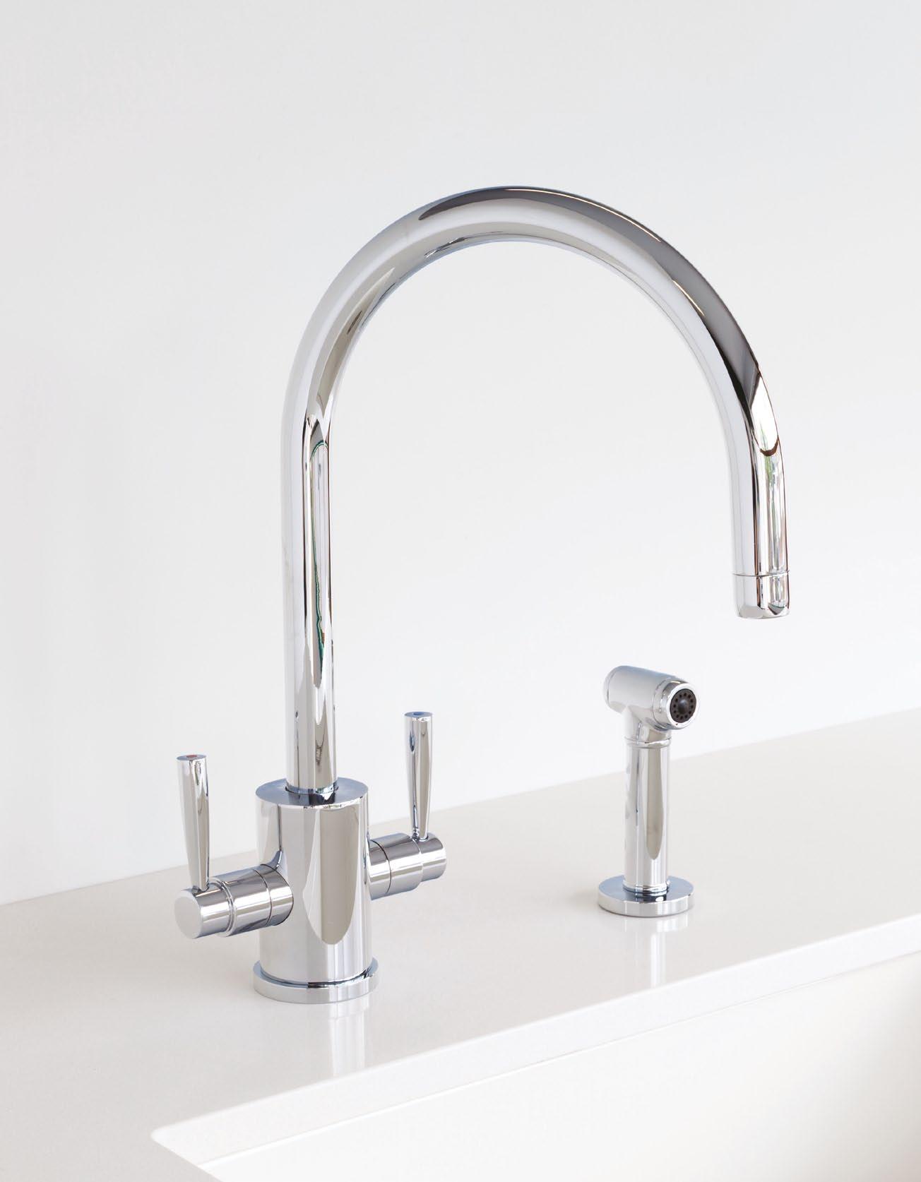
Make it now
With a baby on the way, the architect couple behind Anthony Gill Architects were motivated to maximise the space and amenity of an already tight and efficient apartment in sydney. JAne Burton tAylor tells us how they did it.
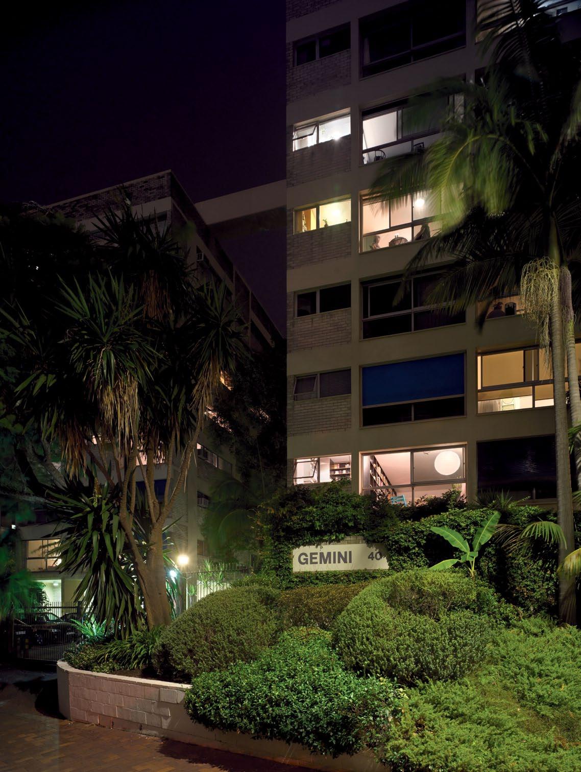
# 131 3 . on location
text Jane Burton taylor | photography peter Bennetts
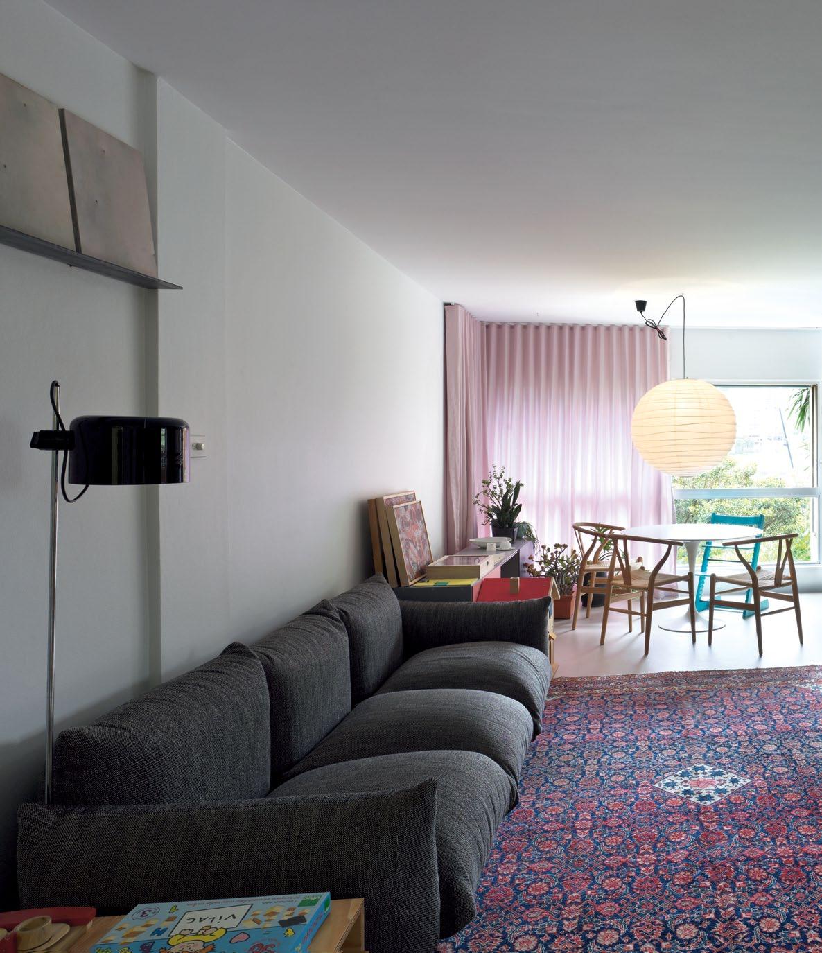
mcSpadden’ S
tO inStall
issue #15 habitusliving.com
previous
| One Of Harry Seidler’ S claSSic 1960’ S building S , a pair Of tOwerS called gemini in pOttS pOint. One building HaS One-bedrOOm unitS Only, tHe OtHer StudiOS and tHere i S a rOOftOp p OOl and cOmmunal area cOnnected by a bridge. above | in tHeir re-deSign, arcHitectS antHOny gill and SaraH
main interventiOn waS
a
central cabinetry wall Of HOOp pine ply.
After five years of living in a Harry Seidler apartment, architects Sarah McSpadden and Anthony Gill decided to make a change. Working on tight finances and a spatial budget of just 38m2, they added their own thoughtful layer to the design of the renowned master of lean, efficient planning.
Gill, who together with McSpadden heads up Anthony Gill Architects, says they had long been thinking about turning the apartment’s one north-facing bedroom with a harbour view into a home office, and doubling up its living and sleeping space. But it was when McSpadden fell pregnant that they were inspired to action and promptly drew up plans.
When the couple first bought the apartment, it had its original layout. There was an entry hall with joinery forming the wall to a bedroom. Two adjoining doors opened into bedroom and bathroom. The kitchen was in the north-west corner and was partially open to the living space.
“The kitchen was not original,” Gill remembers. “And although the bones of the entry were, it was covered in mirrors, so we didn’t feel we were taking out Harry.”
The couple’s re-design aimed to capitalise on the solid Seidler bones and, at the same time, meet their own specific family needs.
“The re-design partly stems from Seidler’s ideas about economy of space and scale,” says Gill. “In our building, he reduced the space down to what is essential. The building in Potts Point is made up of just one-bedroom units.
“This basic nature is then made rich through ideas about how people might inhabit the space differently,” he adds.
The couple’s brief for themselves was to create a bedroom for their daughter, Marigold, to increase living space and to redress the dearth of storage space. “It was a matter of re-configuring everything so we could do that,” Gill says.
They decided to keep the bathroom where it was. With this as a given starting point, they inserted a single piece of cabinetry running the length of the unit, with an opening into a now smaller north-facing bedroom and into the galley kitchen.
“It is a 600mm block of cabinetry that runs through the whole apartment,” Gill says. “It is like an insertion.”
To make room for their own sleeping space, Gill and McSpadden raised the floor level of
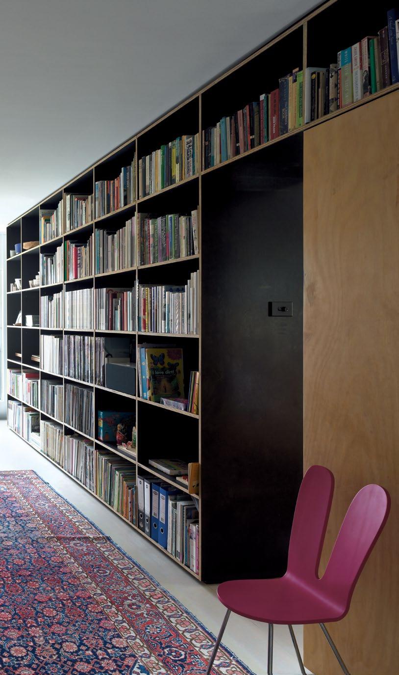
3 . on location # 133
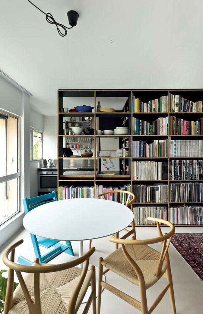
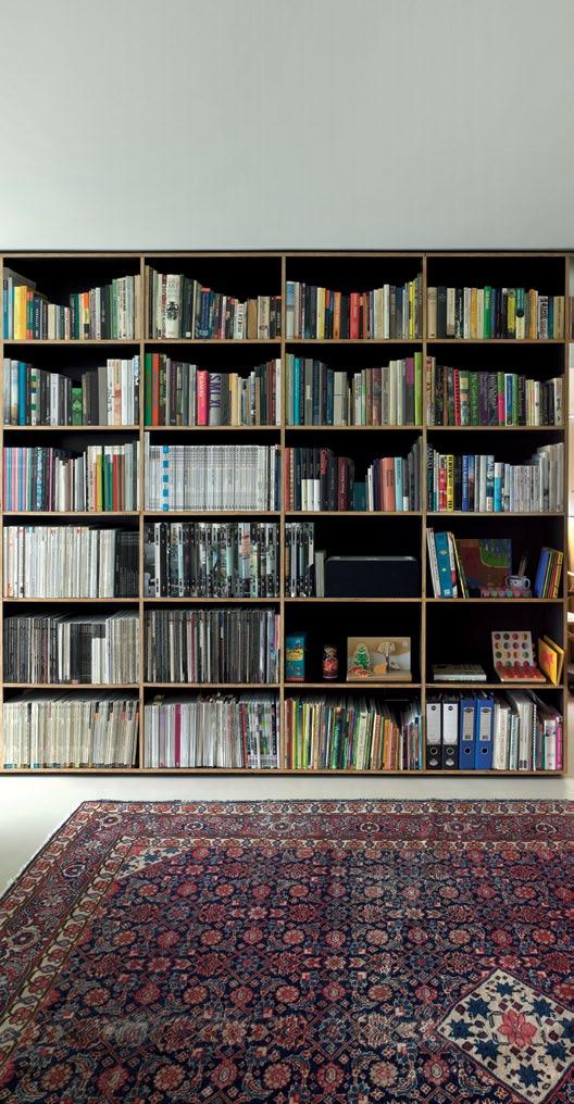
GILL | ARCHITECT And REsIdEnT issue #15 habitusliving.com
We thought, after our daughter goes to bed, it doesn’t matter if we pull our bed out into the living space.
their daughter’s bedroom and basically put their own bed in a large drawer.
The idea was that during the day their bed would slide under the raised floor in Marigold’s bedroom and sit flush with the new cabinetry wall, then at night when she went to bed, they would just pull it out.
“We lined up Marigold’s bed so ours would fit underneath,” Gill explains. “We doubled up her space during the day and we doubled up the living room space at night, so we could all sleep comfortably.
“We thought, after our daughter goes to bed, it doesn’t matter if we pull our bed out into the living space at night. It provides privacy for her as much as for us.”
In response to the different functions of the spaces in the diminutive apartment, the wall material has been changed. It is Hoop Pine ply, so a softer and warmer material is used at the eastern, bedroom end, and a black form ply in
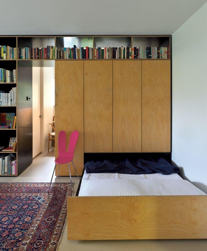

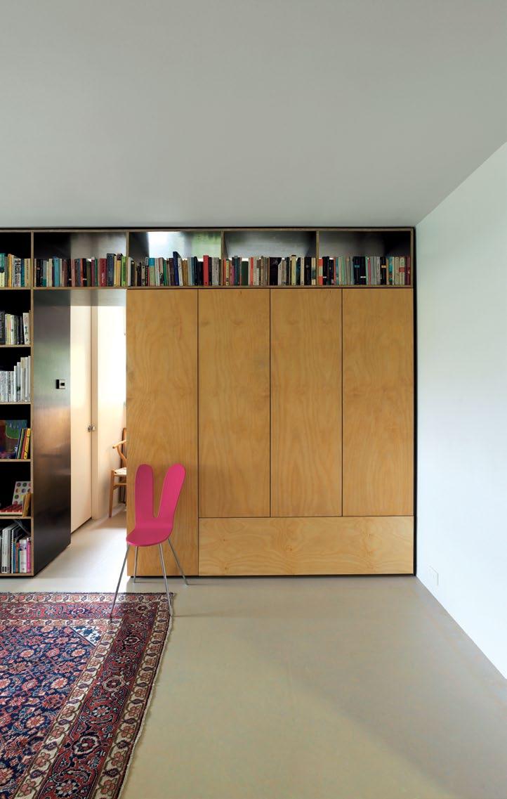
above | The new cabineTry wall serves To house The family's possessions and gives greaTer privacy To The sole convenTional bedroom and baThroom. iT also conceals a slide-ouT double bed, which converTs The living space inTo a second bedroom af Ter hours.
3 . on location # 135
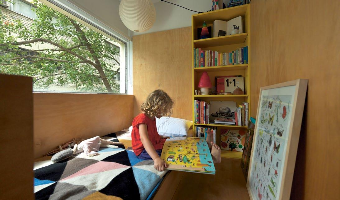
top | The raised floor level in Their daughTer’s room makes space for a deep drawer which holds Their own bed during The day. The oTher benefiTs of This design decision were giving Their daughTer a harbour view from bed and a playful cubby-like space as a bedroom. above | floor plan. 1 2 5 3 6 4 7 ENTRY livi Ng di N i Ng ki T ch EN baT h Room bE dRoom slidE -ou T bE d 1 7 2 3 4 5 6 issue #15 habitusliving.com
the main living space and kitchen, where open shelves are filled with the trappings of daily life.
“At this end, it is about storage and connecting to the bedroom,” Gill says, standing near the entry. “At the other end, it is about concealing the bathroom and the shelves are open. We like the idea of being open, of being surrounded by our things, books, records, the pantry...
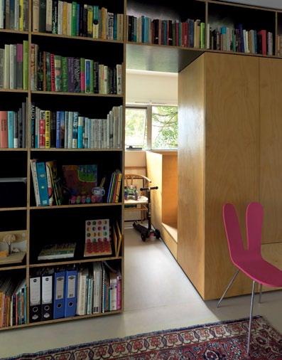
“Yes, it means a bit of dusting, but it is part of how we live. It is not filled with perfect little knick-knacks, it is about having the stuff you live with around you. It seems to soften the wall significantly.”
The wall of cabinetry varies in its permeability, which contributes to the living space feeling incrementally larger. It is partially open at either end: at the top adjoining the bedroom to let in northern light and at the western end, as open shelving to the kitchen, so you actually look into the space through pots and pans.
Gill and Mcspadden gave this kitchen an update too, moving the entry to the outer wall, so the cabinetry unit reads as one block, and installing stainless steel bench tops and a French-designed, Indian-made wall unit for drying dishes. They also added a blockout blind to supplement seidler’s original roller screen, to further cut hot western sun. “so, you can pull it down and open the window and that is as good as it gets,” Gill says.
In addition to this small but effective tweak, the couple installed a big pink curtain on an independent hanging system (as another way to subdue the strong late summer sun) and pulled out all the original oyster light fittings, replacing them with lamps and big hanging lights.
One of the surprises of the re-design is how adaptable it has proved for others. The couple moved out at Christmas, when Marigold started heading towards age five. The need for more space, a dog and a yearning to re-discover the benefits of conventional doors, led them to make another change. But they had no trouble finding a tenant.
above | The upper parT of The sTorage wall was lef T open aT The easTern end, allowing norThern lighT To spill Through inTo The living space.
We like the idea of being open, of being surrounded by our things, books, records, the pantry...
GILL | ARCHITECT And REsIdEnT
3 . on location # 137
“When we were thinking about renting it, we had the real estate agent who sold it to us around,” Gill recalls. “He said, ‘Do me a favour and put it back the way you found it’.”
Gill says they quickly realised they had the wrong real estate agent. In the end, word of mouth introduced them to a young Melbourne architect who is now happily ensconced in the elegantly re-worked apartment, and loves it as much as they did.
They tweaked the bedroom with the harbour view and inserted a double bed (it was designed specifically to fit one if needed), and the drawer which once housed the couple’s bed is now used for extra storage.
The couple’s re-design has successfully re-invented and re-invigorated the apartment not just for them, but for its future use. It was a change that was in part possible due to the quality of the Seidler original, Gill says.
“The structure of the building allowed us to make the changes easily and cheaply. So although the changes were significant in terms of the spaces created, it was simply swapping joinery for joinery.”
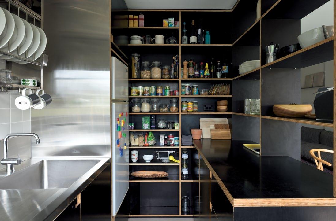
drop box
ARCHITECT And buIldER Anthony Gill Architects PRojECT TEAm Anthony Gill and Sarah McSpadden
Anthony Gill Architects (61 2) 8095 8744 gillarchitects.com.au
FURNITURE
Arflex
Morenco sofa from Format Furniture. Saarinen round antique dining table from Ken Neale 20 th Century Modern. Carl Hansen & Son Hans Wegner Wishbone chairs from Corporate Culture. Pink Rabbit Ear chair from SANAA.
LI ghTIN g Flos Castiglioni Parentesi lamp in kitchen and Oluce Joe Colombo Coupe floor lamp from Euroluce. Isamu Noguchi Akari pendant light in dining and daughter’s room from Unifor.
FINI sh Es Marmoleum flooring from Forbo Flooring. Form ply and Hoop Pine plywood custom joinery from Big River Timbers. Paint from Dulux. Custom curtains from Simple Studio.
FIxEd & FITTEd Vola tap from Candana. Tse & Tse dish drying rack from Space Furniture (no longer stocked).
above | THE CouPlE kEPT THE PAlETTE of THE kITCHEn EConomICAl And sImPlE usIng sTAInlEss sTEEl And bl ACk foRm Ply And AgAIn oPEnIng THE CAb InETRy wAll, buT THIs TImE AT bEnCH HEIgHT To ConnECT THE Room To THE lIvIng sPACE. THE y mAdE A dElIbERATE CHoICE To usE THE wARmER mATERIAl of HooP PInE Ply AT THE bEdRoom End of THE unIT And THEn THE CoolER foRm Ply In THE kITCHEn. issue #15 habitusliving.com
clockwise from top left Coupé floor lamp by Joe Colombo for oluce, oluce.com. available in australia from euroluce, euroluce.com.au
Vintage Saarinen dining table by eero Saarinen from Ken neale 20th century m odern. new production pieces manufactured by Knoll studio, Knoll.com. available in australia from dedece, dedece.com
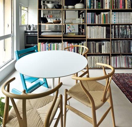
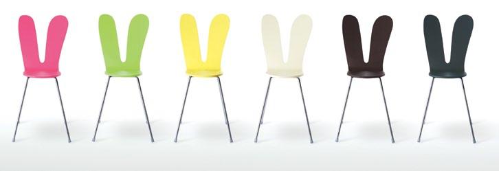
maren Co Sofa designed by mario maren Co for arflex, arflex.it available in australia from format furniture, formatfurniture. com.au
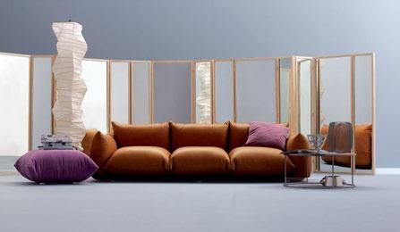
r abbit e ar C hair by Sanaa for nextmaruni, maruni.com. available in australia from seehosu, seehosu.com.au
d i S h d rying r aC k by tS e & tS e tse-tse.com
potts point in focus
Anthony Gill’s compact apartment doesn’t afford the luxury of space for a lot of furniture. Here, he tells Habitus about some essentials:
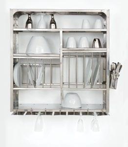
“It’s tricky living in a small space with a young child and no walls!” says Anthony. “Especially once they’ve gone to bed for the night. We needed good task lighting,” and the Coupé floor lamp is well suited for that. Size was also an all-important deciding factor when Anthony and wife Sarah chose the vintage Saarinen dining table. “It’s the perfect fit for our apartment and it’s classic and very beautiful.” The Dish Drying Rack from French designers Tse & Tse is another space-saving solution – “It’s a practical piece for such a tiny kitchen,” they agree, a beautiful, functional drying rack that doubles as storage. Plus, “Sarah loves Tse & Tse!” Not compromising on comfort, Anthony and Sarah chose the Marenco sofa made with just cushions and no visible structure. “It’s great for children and big enough for us to lounge on.” The Rabbit Ear chair was his daughter’s choice. “ Marigold fell in love with it and we couldn’t resist.”
sAnAA
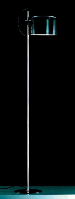
2010 Pritzker Prize winner, SANAA is made up of Japanese architecture duo Kazuyo Sejima and Ryue Nishizawa. Sejima was born in Ibaraki prefecture in 1956. She studied at Japan Women’s University and worked in the office of famed Japanese architect Toyo Ito, before establishing her own firm in 1987. In 2010, Sejima was appointed the first female Director of the 12 th Venice Architecture Biennale. Nishizawa, born in 1966, studied architecture at Yokohama National University and worked in Sejima’s firm as an employee before the two founded their collaborative studio SANAA (Sejima and Nishizawa and Associates) in 1995. Their work is known for their clean, modernist aesthetic, most notably the Museum of Contemporary Art in Kanazawa, which also features the Rabbit Ear chair, first launched at 100% Tokyo and manufactured by Maruni.
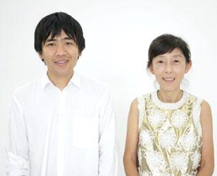
3 . on location # 139
wintonsteak.com


Create
Sydney (Main Showroom):

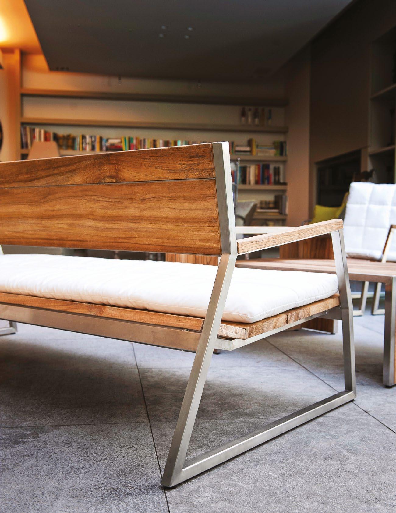
Shop G3, Home HQ North Shore
1 Frederick St
Artarmon 2064 (02) 9439 1600
Sydney: 17-19 Collins St
Alexandria 2015. (02) 9318 0138
Melbourne:
241 - 243 Johnston St
Fitzroy 3065. (03) 9416 2072
your very own outdoor sanctuary with Wintons Teak
Self-sufficient Satisfaction
Architect and artist Marr Grounds lives in a retreat fit for a king on the far south coast of nsW caroline BauM made the journey there to find a place where life, art and the landscape are indistinguishable.
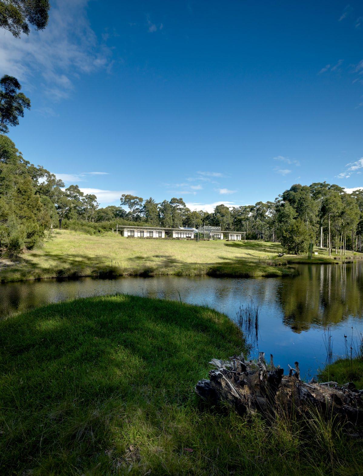
Tex T
| phoTography miChael n iCholSon # 141 3 . on location
Caroline Baum

issue #15 habitusliving.com
previous | grounds' sustainable sanctuary on the far south coast of nsW is a hidden retreat near MiMosa rocks. above | e xtensive raised beds and orchards designed by landscape architect sue barnsley alloW the land to groW all the fruit and vegetables Marr grounds needs, and More. “ i only buy Milk and cheese in bega,” he says.
To call Marr Grounds’ place at Mimosa Rocks on the south coast of NSW a ‘property’ does not do it justice. It’s more like a kingdom. Here, the artist rules supreme in solitary splendour. It’s not quite on the grand scale of German painter Anselm Kiefer’s place at Barjac in France, but it’s not far off. There’s the same uncompromising aesthetic, the same ambition of scale, with monumental pieces of sculpture planted in the landscape like beacons.
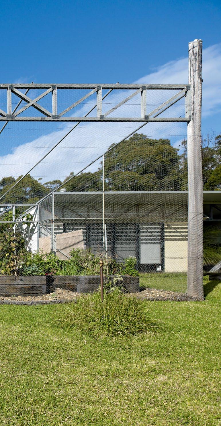
Charred, upended tree stumps stand sentinel in the Spotted Gum forest. Enigmatic structures, like gateways to a Japanese shrine, mark out the boundaries of the house and nearby studios. In a clearing, a houseboat floats in the tree canopy. On a slope overlooking a dam, which Grounds calls, “My Fred Williams hill,” the topography and neutral colours of the bush are punctuated with suspended glass panels reflecting sky, water, sunlight – surreal landmarks, signalling a mischievous, playful mind that refuses to conform.
Son of Sir Roy Grounds, the architect responsible for the National Gallery of Victoria and Hobart’s Wrest Point Casino, Grounds has always been something of a maverick. Not for him the traditional career path. More artist than architect, he trained at the College of Environmental Design in Berkeley, California, where he hung out with author Ken Kesey and poet Alan Ginsberg. He preferred making found object sculptures to academic study.
While his father was part of a celebrated practice with Robin Boyd and Frederick Romberg, Grounds junior admits, “I could not handle meetings or consensus. Drawings, clients, councils – they gave me the shits. Those guys were as patient as missionaries, and I
GROUNDS | ARCHITECT AND ARTIST
3 . on location # 143
Instead of teaching, I prefer to just live it.
am not." He adds, "I also felt uneasy about the elitism of architecture."
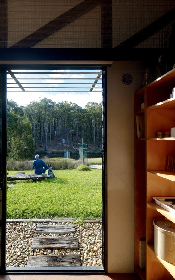
Teaching architecture at Sydney University in the 1970s, he encouraged students (including artist Imants Tillers and architect Alex Tzannes) to help international artist Christo wrap Little Bay for two weeks. “It changed their lives, the way the Dingo Fence changed mine,” Grounds says. “That experience of seeing the fence from the air, the only man-made structure on the blank canvas of the desert, was like a site plan of this house. It ran east-west and that is how I have oriented this house,” he says of the long, single-storey structure designed by Tone Wheeler, also one of his former students.
“Instead of teaching, I prefer to just live it,” says Grounds, who has become something of a recluse. Today, he shares the property, which he calls ‘Narra Bukulla’ (meaning Black Stump in the language of the local Tuin Aborigines) with his dog and a tenant.
Prying eyes are not welcome, and nor is sentiment. “I’m not going to open the place up to the public,” he says, “and I don’t care what happens to it when I’m gone. If my daughter, Marina, wants to sell it, that’s fine by me.”
Grounds was already highly familiar with this part of the country when he decided to build here. His father, together with his great friend, Ken Myer, owned a neighbouring block of 750 acres called ‘Penders’ near Tanja, overlooking the sublime Bithry inlet. He had built an eccentric barn-like retreat there that family and friends referred to as ‘the Teepee’. It still stands, in poor condition, blasted by coastal winds and vandalised by campers. Grounds and Myer donated the property to National Parks. Fifteen years ago, Grounds junior bought his own block of 40 hectares, gradually carving off bits for National Parks
I have always believed in ‘form follows function’ and I like a building to show its guts or bones and to let the materials speak for themselves.
issue #15 habitusliving.com
GROUNDS | ARCHITECT AND ARTIST
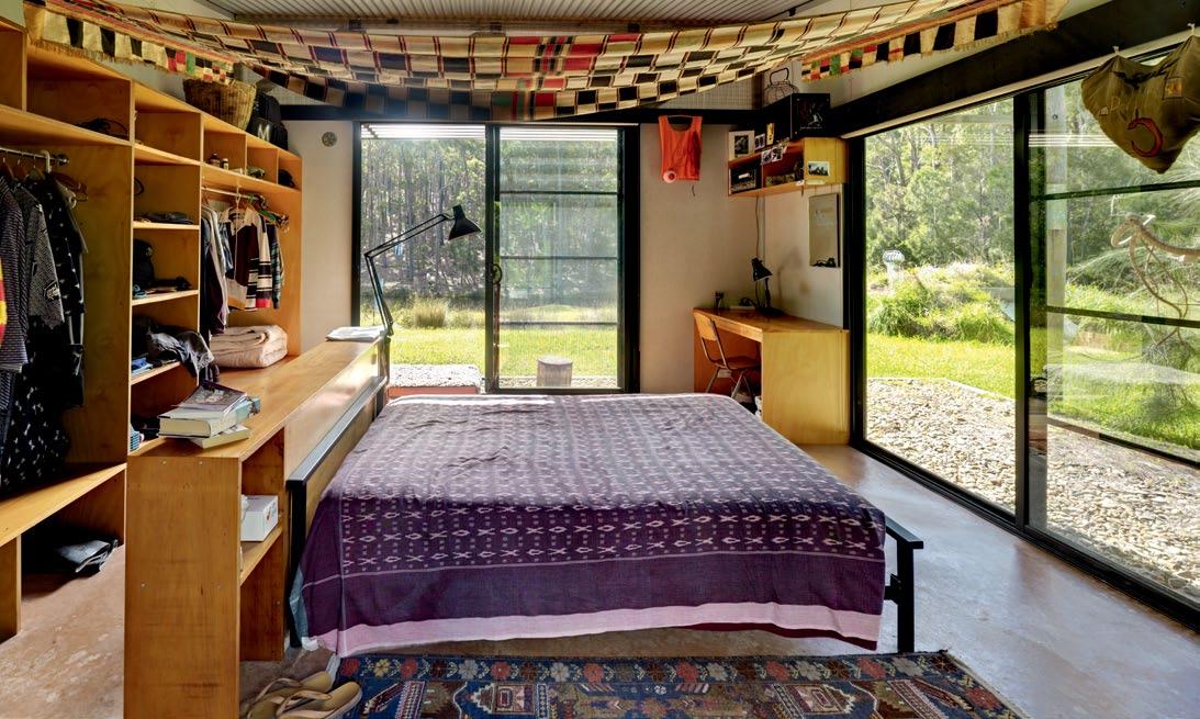
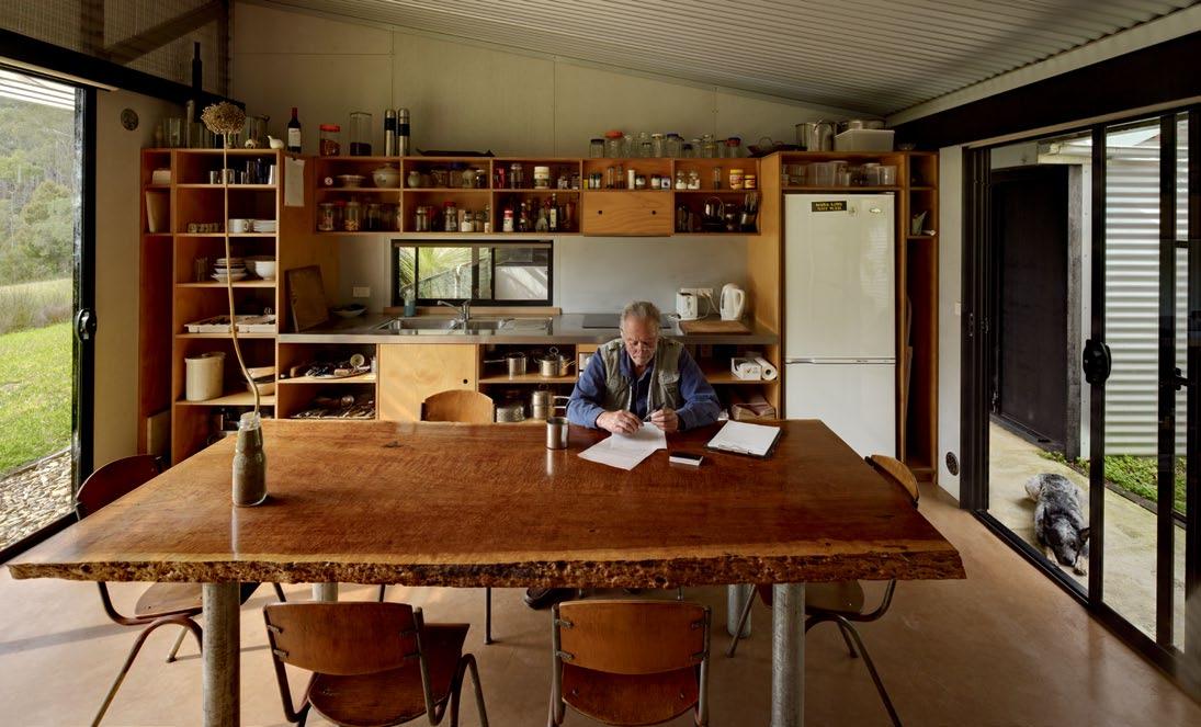
opposite | Functional simplicity deFines the space Grounds shares in splendid isolation with his blue heeler companion, Zac. top | the kitchen table is recycled river red G um. above | in the master bedroom, a kaF tan From Ghana becomes a canopy over the bed. other Fabrics recall travels to india. 3 . on location # 145
and Wildlife and keeping for himself what he calls the central pocket. The houseboat in the trees was a wedding present from his father. With no water on which to moor it, Grounds simply hoisted it to a mooring in the air. “My daughter loved it as a child and still likes to stay there,” he says.
Now 80 years old, he is a frugal man, his aesthetic one of functional simplicity. It is arte povera meets eco-minimalism, or, as he puts it, “poor man’s Murcutt”.
Grounds had wanted to create a prototype for low-cost housing, and says, “I have always believed in ‘form follows function’, and I like a building to show its guts or bones and to let the materials speak for themselves.
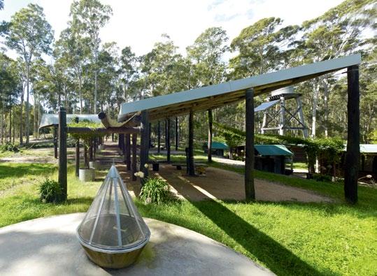
“Of course, it didn’t work out that way. The budget blew out because the moment you change things it becomes expensive. The project was collaborative, and it felt like we were playing, asking a series of ‘what ifs’, so I don’t regret it.
“Fibro is an honest material, I appreciate its patina, the colour is like a woman wearing too much make-up,” he says, speaking with the authority of a connoisseur.
The house consists of two identical wings, mirror-imaging each other out from a covered open air sitting room slung with a hammock and hung with an upside-down rowing scull and a sign that reads, ‘No UNDERstanding any time’. Roof angles maximise heat and solar energy capture and louvred windows on its northern façade keep the house well ventilated. “If I need more of a breeze in summer, I just open the doors on the other side,” says Grounds.
The Hoop Pine kitchen has the sleek lines of a ship’s galley and contains a broad table made from a slab of recycled Red Gum. Soft furnishings collected on trips to India and Asia add accents of colour, texture and the occasional mirrored sparkle.
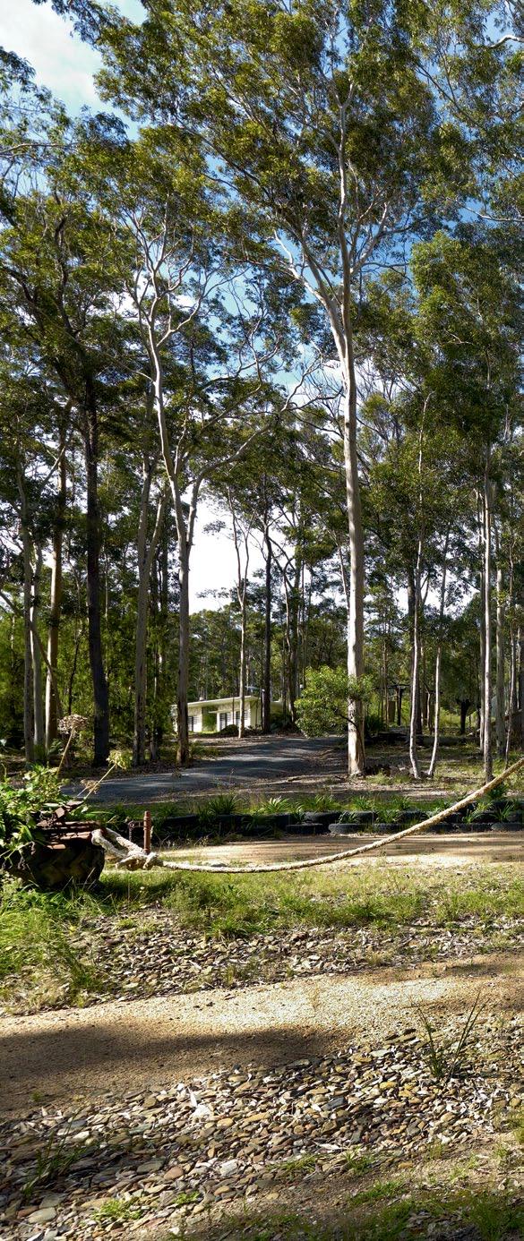
issue #15 habitusliving.com
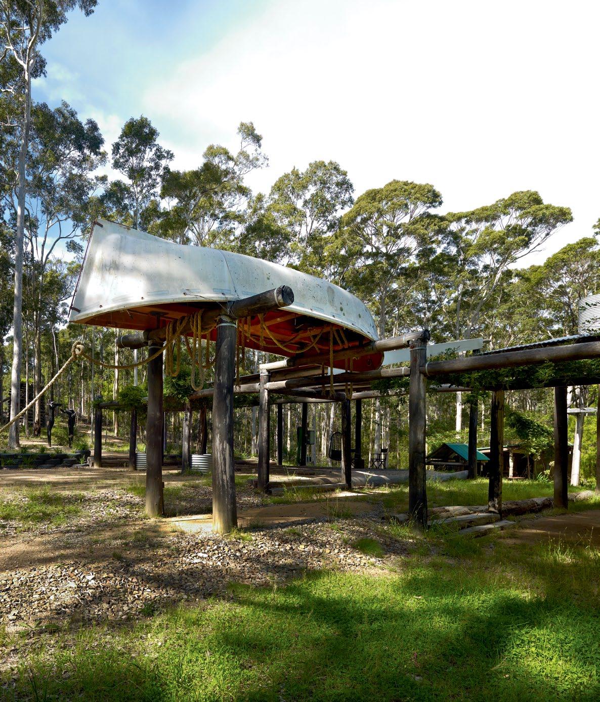
The
in a
3 . on location # 147
OPPOSITE | The space named 'The BroThel' has B een used for performances. VisiTing arTisTs, family and friends sTay in adjoining caB ins wiTh ouTdoor showers, open fires and cooking areas. ab OvE | a grounds signaTure image of an upTurned B oaT acTs as The gaTeway To ‘The BroThel’, cheekily named
To proVoke
local council
de
VelopmenT applicaTion.
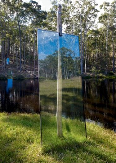
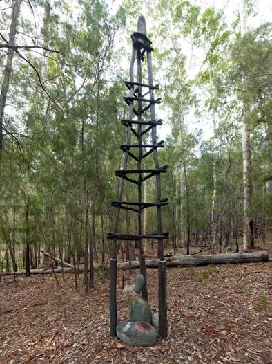
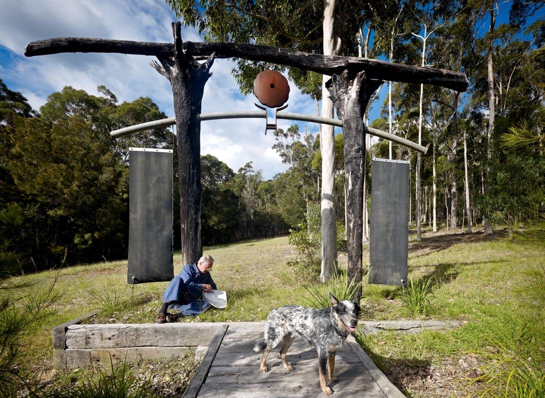
issue #15 habitusliving.com
top | A shinto shrine-inspired structure. above LeF t | one of seven gl Ass pAnels grounds pl Anted from the house through the l Ake And up the hill. above RIGHt | unnAmed sculptures dot the l AndscApe, including A smAll stone memoriAl to his fAther, Architect roy grounds, And close friends ken And yAsuko myer. opposIte | A wAve of br Anches woven by A locAl AmAteur Artist.
Just metres down a slope, two independent studios, provocatively nicknamed ‘The Brothel’ (to provoke the local council when a development application was submitted, and because one has a large mirror over the bed) function as guest accommodation for artists and writers who come here as a creative retreat.
“I also sometimes commission local emerging artists to make works on site,” Grounds says, pointing to the Wave Wall made of fallen sticks of Rose Gum by Peter Collins, the caretaker at Philip Cox’s nearby property. “I just showed him Hokusai’s famous wave, and he took it from there.”
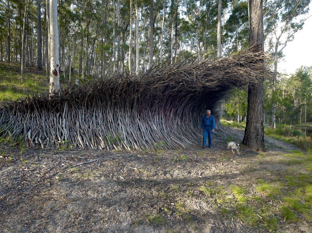
A hangar designated as a giant workshop is immaculate, and equipped with every conceivable tool, all neatly stored but untouched.
“I used to spend 40 hours a week making art, but I’ve lost interest,” he says with a wry smile. “Everything I did was site-specific to an extreme degree, I never imported any materials. I was making environmental art before anyone called it that,” he says, citing Andrew Goldsworthy and John Wolseley as two favourite artists.
Everything I did was site-specific to an extreme degree, I never imported any materials. I was making environmental art before anyone called it that.
3 . on location # 149
GROUNDS | ARCHITECT AND ARTIST
Today, his satisfaction comes from the self-sufficiency his edible garden allows. A netted orchard yields an abundance of apples, gathered in baskets Grounds fashioned from chicken wire and there are grapes, stone and citrus fruit, vegetables and herbs all within a few steps of the kitchen.
“The dam is man-made. I put it in for aesthetic reasons, but during the drought it meant I was not carting in water like my neighbours. There is also a perimeter bushfire sprinkler system and water tanks to collect rain off the roof. But the garden was almost as expensive as the house. I was not prepared for the poor soil, which was almost completely clay,” says Grounds, who enriched the humus over time and installed a drip-irrigation regulated system.
His only recent addition to the property, in recognition of its isolation and his advancing years, is a fireproof bunker. “Everyone should have one,” he says, demonstrating the sealed, bank vault-style door and oven temperature gauge which appeals to both his practicality and his sense of humour. “Six people can stay safe in here for an hour.”
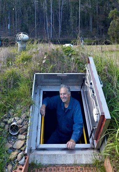
Among the towering gums, he points out a small clearing where he has erected what he calls, “a pre-emptive headstone,” not far from
a discreet, cairn-like pile of stones he built in memory of Ken and Yasuko Myer, killed in a plane crash. In defiance of his father’s disapproval of his habit of wearing thongs, he has hung a Gum tree with them – the first and lasting landmark on the threshold of his domain.
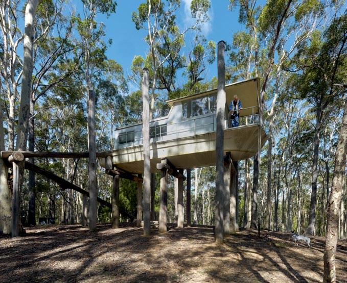
Many of his own influences remain opaque and unexamined. The Shinto shrine-like wooden structures? He shrugs. “I’m not fully conscious of the source of my ideas. But when I think back to my time in the Korean War – that’s three years, four months, eight days and seven hours – on missions picking up navy frogmen and ditched pilots (we had the highest fatality rate in the armed forces) – I remember taking leave in Japan at a place called the Fuji View Hotel, which had an archway that mesmerised me. I was not aware of that in making these structures, I just worked intuitively with my bulldozer, but the proportions were identical, all based on the golden mean,” Grounds says.
Now nearly a decade old, Narra Bukulla is the only house Grounds has ever designed, making it a unique monument to one man’s personality: honest, complex, contrary, irreverent and practical. Given the ravages of time, both he and it are wearing well.
issue #15 habitusliving.com
top LEF t | A wedding present from his fAther, grounds' dAughter still likes to stAy in the houseboAt hoisted into the trees. top RIGHt | the fireproof bunker, big enough for six, hAs An oven temper Ature gAuge, which Appe Als to grounds' sense of humour.
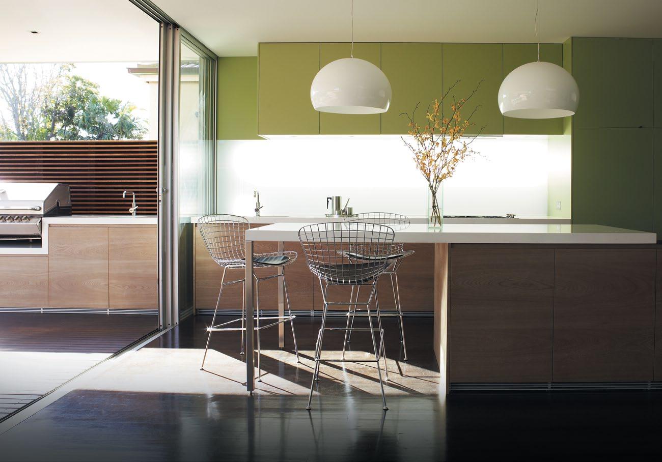


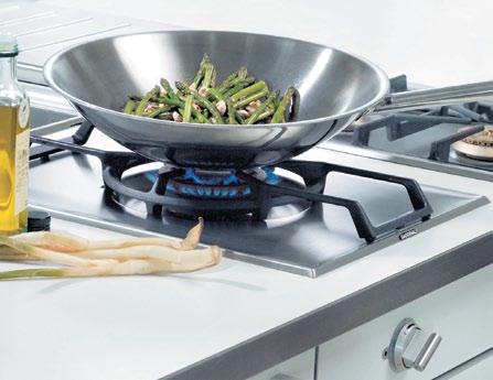

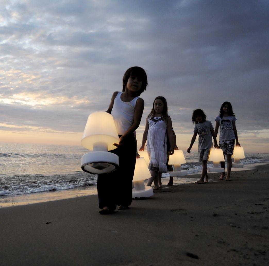
exclusive to
‘BLOOM’
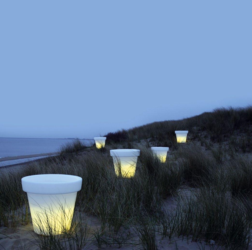
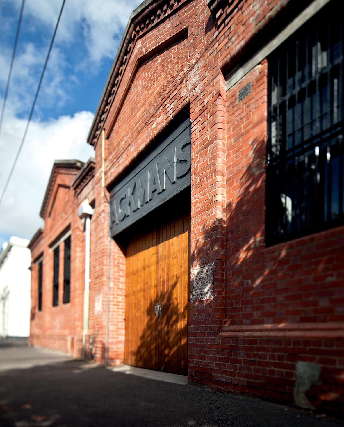
issue #15 habitusliving.com
In a Different Light
Looking to accommodate a growing family, architect Ilana KIster wanted urban rather than suburban. stephen CraftI thinks her made-over inner-suburban warehouse in Melbourne fits the bill perfectly.
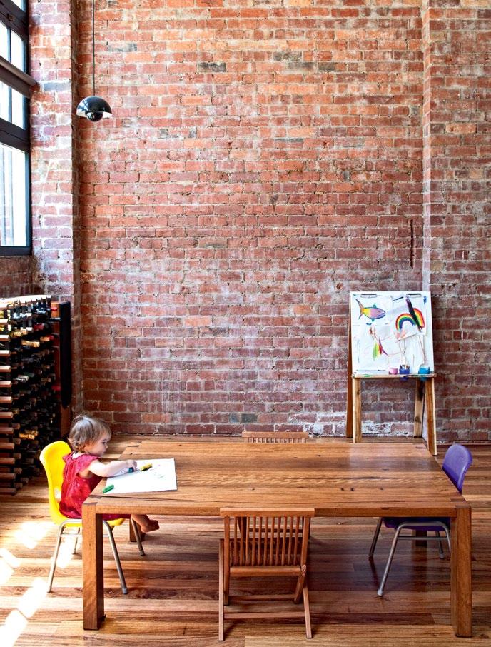
text Stephen Crafti | photography JuStin Bernhaut
3 . on location # 155
Architect, Ilana Kister and partner Eytan Mazza were living in a city apartment with their two young daughters, Jade and Emily. Although the Melbourne home was relatively spacious, newly born Emily was left with a corridor as her bedroom. “Her cot was on wheels,” says Kister, who knew it was time for the next move.
While the couple knew they needed more space, they were at odds about what they were looking for. Mazza was searching for a house with a garden. Kister preferred something urban, like an inner-city warehouse. Miraculously, a warehouse in Fitzroy came on the market, complete with generous back garden (on a site of just under 600m2). “It’s almost impossible to find both in the inner city,” says Kister, after spending nearly two years on the hunt.
The warehouse, in a wide, leafy street, was originally built at the turn of the last century. Used as a storeroom for a nearby supermarket, the red brick building was converted into a mechanic’s workshop in the 1920s. When Kister purchased the building, it had been used as offices since the mid-1980s.
“I loved the rawness of the space, as well as the generous volumes,” Kister says, pointing out the 4.5-metre ceiling height in the open plan kitchen and living area. “And Eytan could see a garden in the making. He’s in the process of building the girls a cubby house,” she adds.
The only major structural alteration made to the Fitzroy warehouse over this time was the addition of a mezzanine. The previous owners had also raised the floors to ensure unimpeded views to the street. Although this arrangement was ideal for employees, creating a home with privacy required a different response.
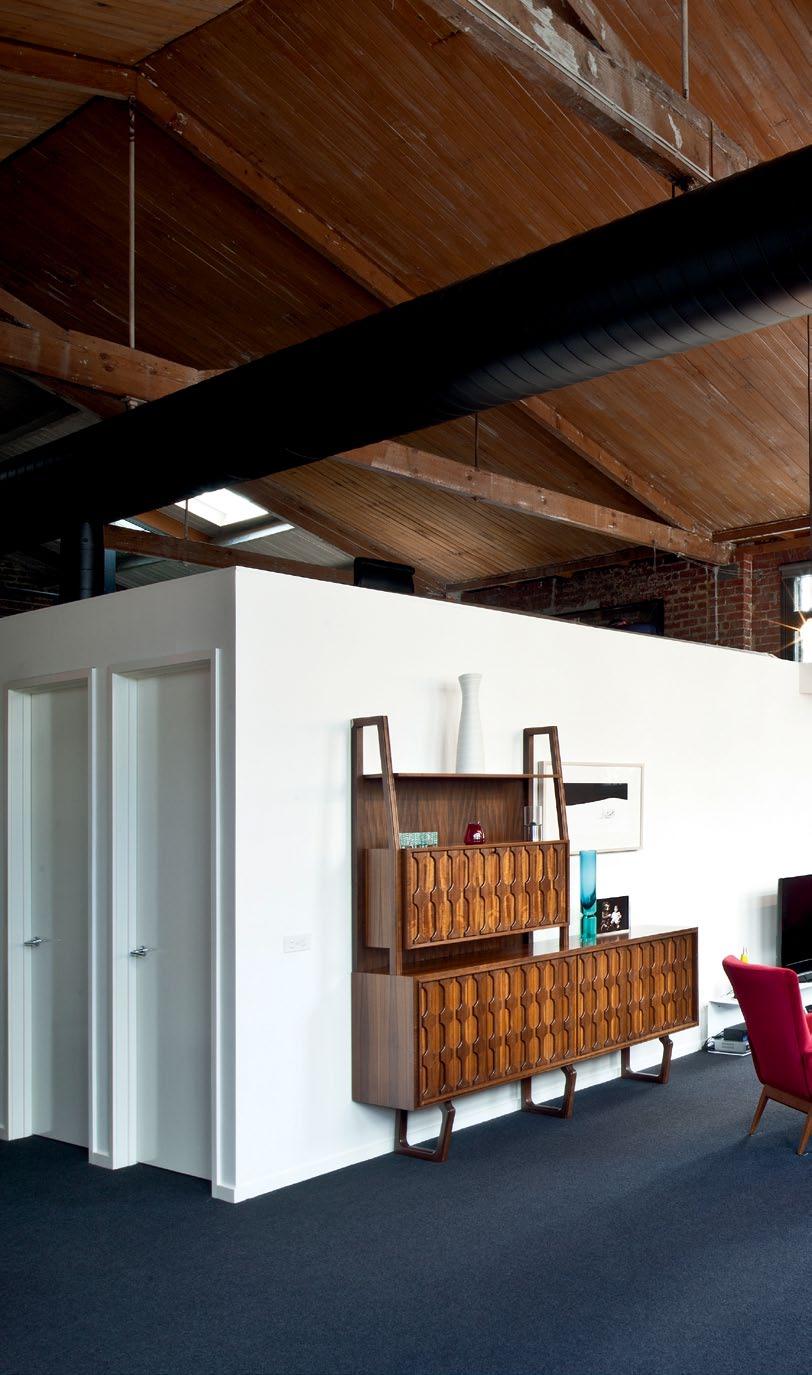
“One of the main changes we made was lowering all the floor levels. You can still see the trees from every room. But, you don’t feel like a goldfish in a glass bowl,” says Kister, who was still able to create different levels in the warehouse to delineate the spaces.
As well as the generous voids and spaces (the warehouse is 325m2 in area), the owners appreciate the rich textures in the building. Exposed timber beams and bluestone and red brick interior walls are highly valued. “People get used to plasterboard, but there’s something quite
issue #15 habitusliving.com
previous left | Once a mechanic’s wOrkshOp, the 1920’s wareh O use style was previO usly used as an Office. previous right | the building’s expOsed brick walls add a rustic finish tO the sleek, cOntemp Orary interiOr. Above | tO expOse the Original trusses and expOsed pipes, kister kept internal walls tO a minimum height. high-level wind Ows ensure privacy and tO add texture tO the living area, kister included p Ost-war classics, such as the sideb Oard (circa late 1960’s) frOm dariO ZO ureff.
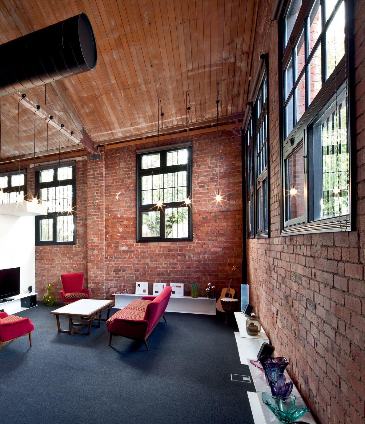
3 . on location # 157
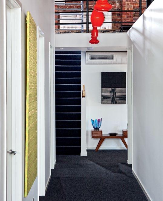
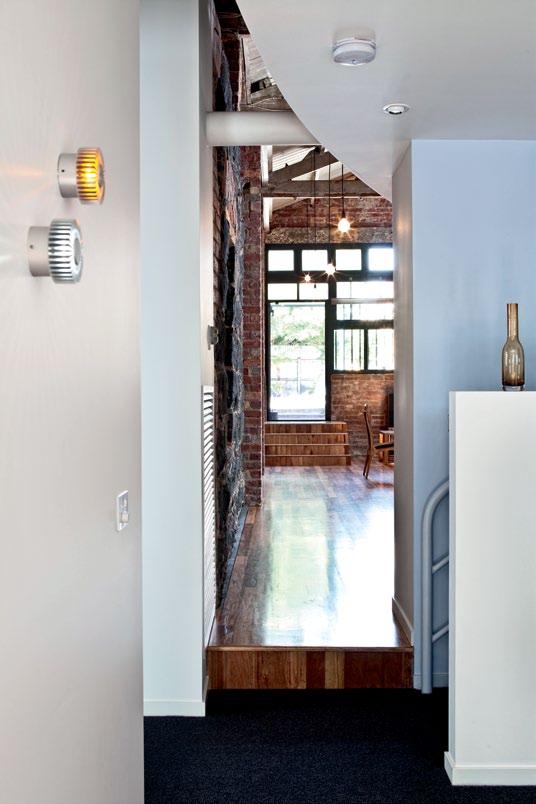
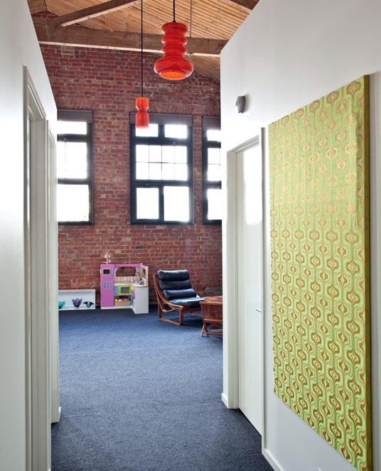
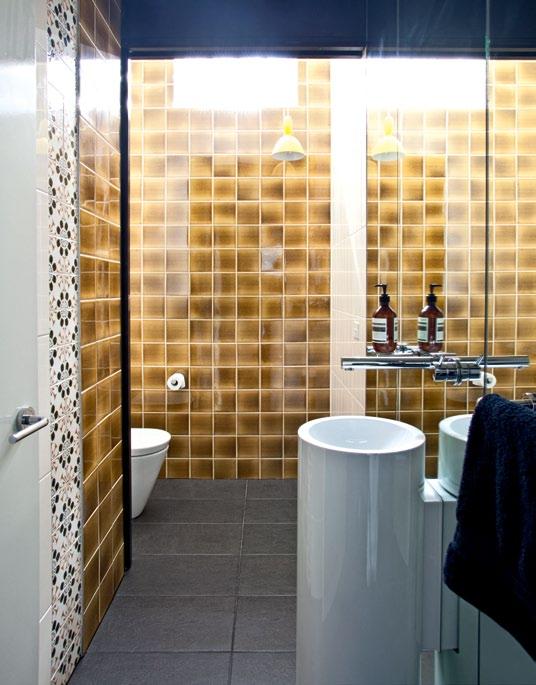
issue #15 habitusliving.com
top left and right | retro light fittings and vintage wallpapers in the corridors add a personal touch to the industrial aesthetic. bottom left | he main corridor receives natural light from the generous windows. bottom right | the bathrooms feature a combination of both contemporary and vintage finishes, such as tiles from the 1960’s and 70’s. opposite top | the walls of the children’s bedrooms are enlivened by wall graphics. opposite bottom | floor plan.
magical about these rough walls,” Kister says. On the downside, many required filling with mortar to eliminate draughts.
Kister’s client for this project was Mazza. And her parents also provided feedback on her initial schemes. “Initially, Eytan gave me this substantial wish list. I was able to oblige in most instances. But there were a few cutbacks,” Kister says, pointing out a cantilevered plaster beam in the living room, designed eventually to provide a landing for an additional stair to the mezzanine. “The budget also didn’t allow glass balustrades on the mezzanine,” adds Kister, who simply added steel wire to the original steel balustrades.
While Kister was keen to retain the open plan feel of the warehouse, she had to include two children’s bedrooms, a main bedroom, ensuite and walk-in robe, together with a second living area. The mezzanine space also had to be large enough for Kister’s office.
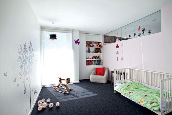
One of the largest spaces in the warehouse is the living area, loosely divided between a lounge for the parents and play area for the children.
On one side of the room is a beautifully crafted late 1960s sideboard by Dario Zoureff, together with one of his coffee tables. Murano glassware frames this space. The other side of the room is filled with toys, including a miniature toy car. “The room isn’t strictly divided between adults and children. We’re quite relaxed about the girls and their friends riding their bikes around the place. It’s far from precious,” Kister says.
One of the most challenging aspects for Kister was ensuring that ample natural light
KIsTEr | ArchITEcT AnD rEsIDEnT ENTRY coRR idoR bE dRoom livi Ng lau N dRY baT h Room powdER Room ki T ch EN/di N i Ng pa NTRY ENsui TE walk-i N-RobE masTER bE dRoom 1 2 5 3 6 4 7 8 9 q 0 e 4 3 3 1 e q 0 8 6 7 9 2 5 3 . on location # 159
The light is continually changing. It always makes you look at the spaces quite differently.
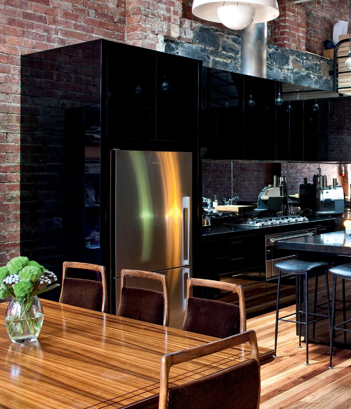
above
issue #15 habitusliving.com
| Black laminate joinery is juxtaposed with original red Brick walls to create an industrial aesthetic. e xposed light B ulB s add to the rawness of the warehouse.
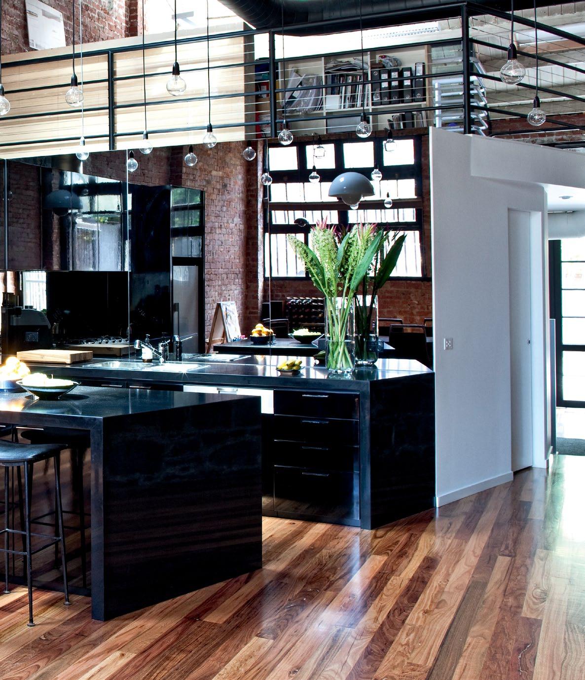
I loved the rawness of the space, as well as the generous volumes.
3 . on location # 161
kister | kister architects
entered the core of the building. Fortunately, she discovered a concealed highlight window in what’s now the powder room. Likewise, Jade’s bedroom lacked sufficient light. Kister created a highlight glass window between the two children’s bedrooms, borrowing light from Emily’s bedroom for her sister.
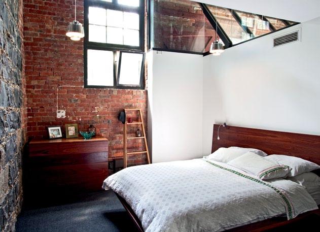
The kitchen also lacked sufficient light and required new skylights. To increase the light in the kitchen further, Kister included mirrored splashbacks and black stone benchtops. The 2-pac painted joinery also creates a lighter feel to the kitchen even though it is all black. “I didn’t want the kitchen to detract from the texture of the bluestone walls,” Kister says.
Although Kister has created a contemporary response to this fit-out, she has included elements from the past. Wall tiles in the powder room, for example, were found in the 1970s apartment of a friend who was renovating.
“I’ve always enjoyed re-working elements from the past. If it’s done selectively, it can create quite an interesting layer,” Kister says. She also enjoys seeing how spaces in the warehouse change with the light in the course of a day.
“The light is continually changing. It always makes you look at the spaces quite differently,” she adds.
drop box
ARCHITECT Kister Architects
DESIGN ARCHITECT Ilana Kister

BUILDING SURVEYOR Wilsmore Nelson Building Surveyors
BUILDER McGurgan Builders (Daryl McGurgan)
Kister Architects (61) 416 270 607 kisterachitects.com.au
FURNITURE
All furnishings by Dario Zoureff Furniture.
LI ghTIN g Light fittings from Great Dane. All other lighting is custom.
FINI sh Es
Stringybark timber flooring. Caesarstone benchtops. 2-pac finish to joinery. Grey and silver mirror splashbacks. Tiles from Urban Edge Ceramics and Classic Tiles.
FIxEd & FITTEd
Bathroom fittings from Reece. Kitchen appliances from Miele, Smeg and Qasair. Door hardware from Designer Doorware.
www.funkis.com
www.funkis.com
online store www.funkis.com
online store www.funkis.com
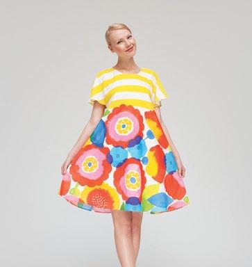
paddington store 202 oxford st
paddington store 202 oxford st strand arcade store 412-414 george st
strand arcade store 412-414 george st
Untitled-11 1 13/12/11 10:28 AM
issue #15 habitusliving.com
above | ExpOSED BLUESTONE wALLS ARE A fEATURE Of THE mAIN BEDROOm, AND TO INCREASE NATURAL LIGHT, KISTER INCLUDED HIGHLIGHT wINDOwS









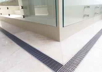


Between heaven and earth
In September 2010, Australia lost one of its finest architects, Bruce rickard. Before he passed away, Bruce took Paul McGillick to visit his last completed house at duffy’s forest outside Sydney, who found he was innovating right to the end.
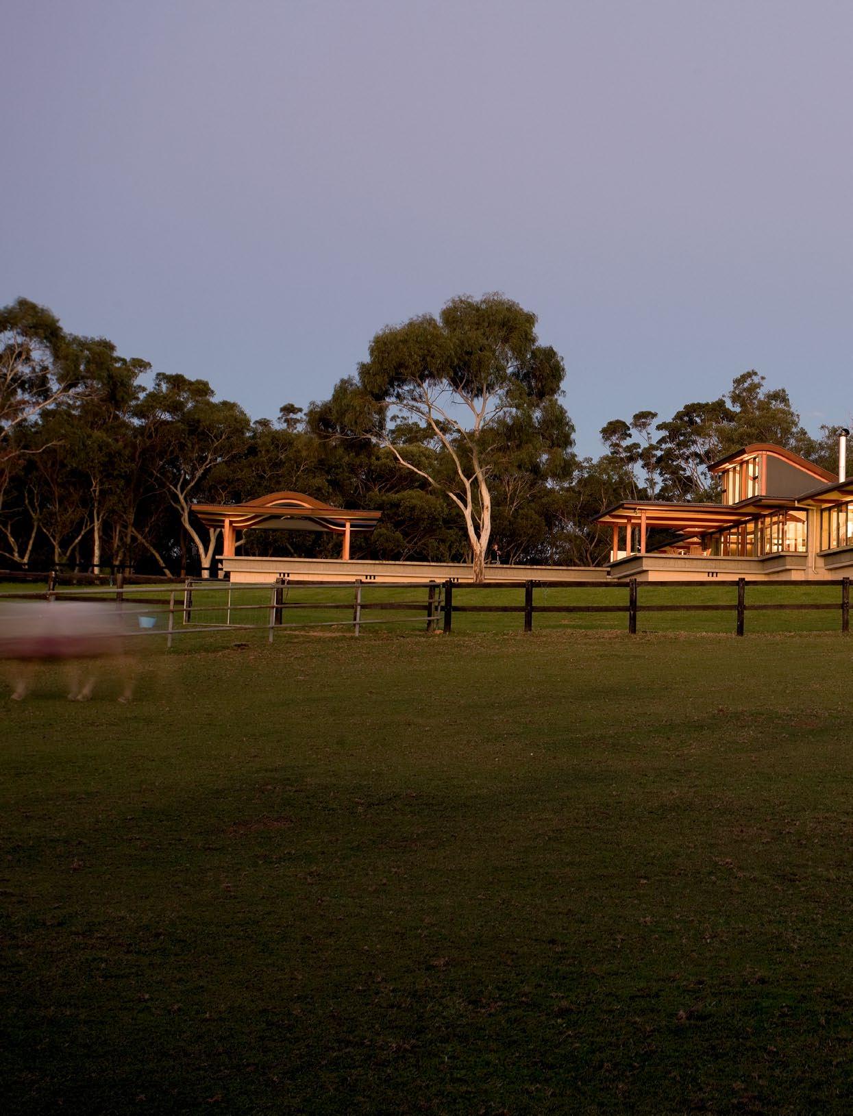
issue #15 habitusliving.com
text Paul McGillick | PhotoGra Phy a nthony Browell
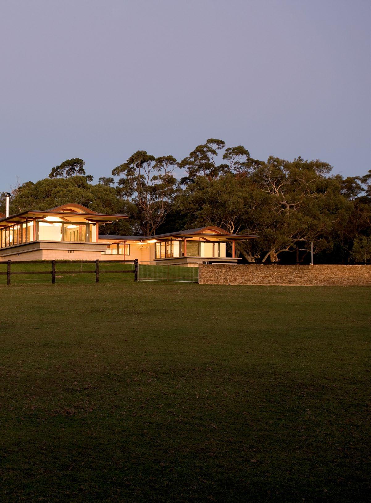
# 165 3 . on location
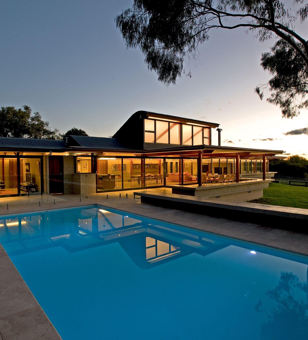
issue #15 habitusliving.com
previous | The house is basically an h-plan wiTh The cross-bar ThrusTing ouT To The norTh Through The living area Terrace and The swimming pool. above | seen from The swimming pool cabana, The openness of The house To The norTh becomes clear. opposite | looking pasT The masTer bedroom To The Terrace.
The name Bruce Rickard is inextricably linked with Sydney and its northern hinterland. This is not just because this is where he did most of his work, but also because his houses helped define the nature of this place – the distinctive east coast Australian landscape with its equally distinctive flora.
Bruce, of course, was a landscape architect as well as an architect. So, in retrospect, it seems only natural that he should bring the house and the landscape together. The influence of Frank Lloyd Wright was powerful, but significantly Bruce never imitated Wright. Instead, he absorbed key principles and applied them to a local context.
In particular, he applied them to Sydney’s upper North Shore – so much so that it could be said that he ‘discovered’ the North Shore, with its characteristic ridges and valleys and its sub-tropical vegetation, previously thought either unbuildable or an outpost altogether too wild for civilised living.
This is not to say that some significant domestic architecture had not already been seen on the upper North Shore. There were houses by John Horbury Hunt (late 19 th Century), William Hardy Wilson (early 20 th Century) and Harry Seidler (mid-20 th Century), but these either ignored the landscape or tried to tame it. Bruce, however, embraced it, and – in true Wrightian fashion –brought the landscape and interiors together in a celebration of refuge and prospect.
Like Wright, Bruce was inspired by Japanese domestic architecture with its flow of intimate spaces and its use of borrowed landscape. Similarly, he recognised the importance of texture, which was generated by layering and the use of local, natural materials as part of an overall sensory response to light, air, water and earth.
The end result of all of this was a sense of genuinely inhabiting a particular place – as distinct from the typical suburban Australian house, which seems to be simply a visitor, basically a tourist to the place in which it is situated. In short, Bruce Rickard designed homes, not houses.
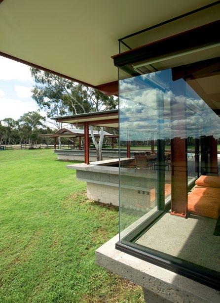
The clients for this house in Duffy’s Forest – a semi-rural area on Sydney’s north-eastern edge – had lived in Clareville, not all that far from Duffy’s Forest, and enjoyed horses. Buying this site would enable them to really enjoy their horses, but they needed to consider just what sort of house they should build there.
They had never built their own home before, so they embarked on some research, which led
3 . on location # 167
them to Bruce Rickard’s website and his house at Port Macquarie (known as the Marshall II house, it was published in Indesign #13, August 2003). “And we thought,” Jo says, “that’s the sort of thing we need. That would sit beautifully on this block – the horizontal look and the closeness to the land. It didn’t dominate, but was very impressive. We didn’t want to build something that looked out of keeping with the area. We didn’t want a huge, two-storey box.”
So, Andrew and Jo arranged to visit the Port Macquarie house and found that their instincts were right. They liked the way the roof of the expansive living/dining/kitchen area is lifted up to the north, drawing in natural light and celebrating its exposed steel trusses. They liked the connection with the outside and the way its tiled floor linked to the outside terrace. And they liked the simple blockwork walls.
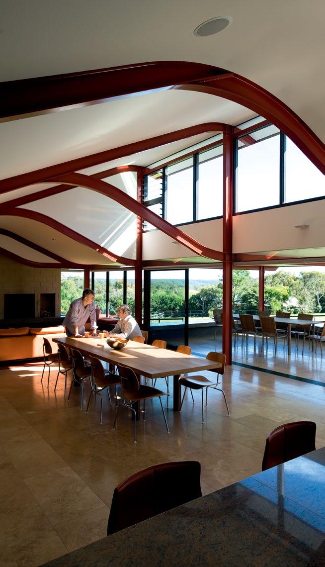
Hence, it is not surprising that there are many similarities between the two houses. But Duffy’s Forest would not be a Rickard house if it weren’t also very distinctive.
Viewed from the north, the house lies low. “There were no major excavations,” Andrew says. “It started at ground level. We didn’t cut into the ground or re-shape the ground.”
There is something temple-like about the house, albeit on a low scale – in the way the concrete slab seems to hover low to the ground, its curved roof profile and the symmetry of the two wings linked by a central arrival space whose curved roof flies above the roof line of the two wings.
The house has a simplicity to it, like it has been put together from a kit of parts – the slab, the defining edge of the concrete banquettes, the steel frame, the blockwork of its non-load
ABOVE | THE LIVING AREA OPENS ON TO THE TERRACE FOR ALFRESCO DINING. Opp OsitE tOp | THE SURGING, EARTH-COLOURED TRUSSES ALLOW FOR HIGHLIGHT WINDOWS TO DRAW NATURAL LIGHT INTO THE LIVING, DINING AND KITCHEN AREAS. Opp OsitE BOttOm | LOOKING TOWARDS THE MAIN ENTRY AND CORRIDOR SPINE.
There is something temple-like about the house, albeit on a low scale.
issue #15 habitusliving.com
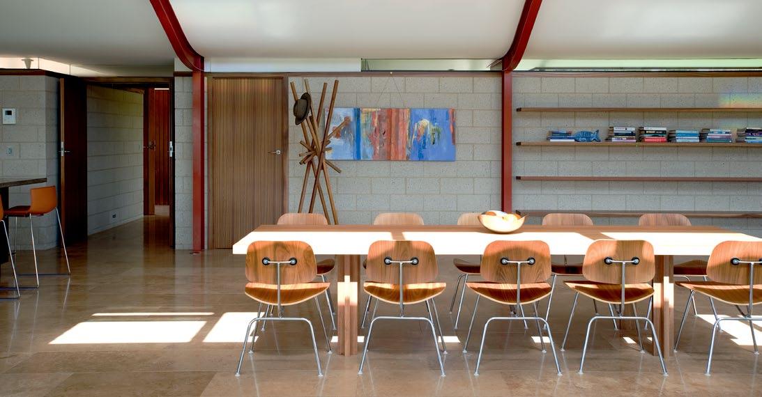
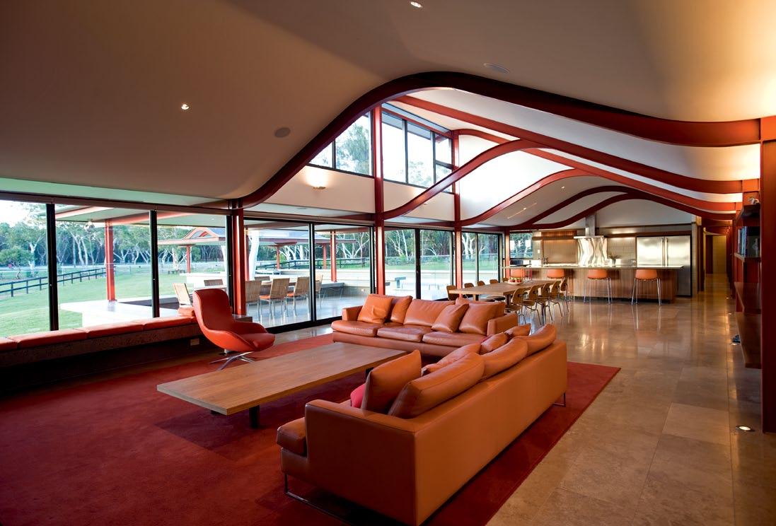
3 . on location # 169
above | floor plan. opposite | The masTer bedroom wiTh a T ypical bruce rickard concreTe banqueTTe ex Tending ouT To a Terrace. 1 0 1 o 6 4 u y t r i 3 2 3 3 4 5 6 7 8 9 0 q w 4 6 4 e 2 q 5 r 3 e 6 t 4 w 7 8 9 y u i o ENTRY STUDY TERR ac E bEDRoom RobE baT h Room livi Ng Di N i Ng ki T ch EN pa NTRY pool pool TERR ac E RU mpUS coURTYa RD ga R agE ca R poRT ST oRE woR k Spac E laUNDRY
issue #15 habitusliving.com
Both the form of the house and its plan have a ritual quality.
ARCHITECT Bruce Rickard + Associates
PRojECT ARCHITECTs Dominic Finlay-Jones and Tony Laurent
sTRu CTuRAl EngInEER Partridge Partners
InTERIoR DEsIgnER Sam Rickard
sITE FoREMAn Sam Thomas
Bruce Rickard + Associates (61 2) 8354 0646 brucerickard.com
Bedspread
table and coffee table designed by Bruce Rickard.
Dining chairs are Herman Miller Eames DCM from Living Edge. Bar stools are Arper Catifa 46 from Stylecraft. Outdoor table chairs are Ombra Teak and stainless steel from Eco Outdoor. Hat stand designed by Sam Rickard. Albert sofas from Jardan. Charles Wilson Heron chair from Woodmark.
LI ghTIN g Lighting from Tovo Lighting.
FINI sh Es
Interior linings from Intouch Interior Linings. Joinery from Dacora. Tiling from Santucci Tiling.
FIxEd & FITTEd
Charged water system Twin Tap from Whelan Industries.
Gutters Smartflo by Sankey Australia. Windows and sliding doors from Award
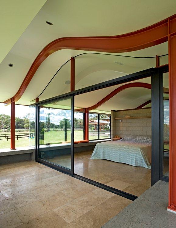
Architectural Aluminium. Home automation from Clipsal. Music system from Sonos. Pyrolytic oven, induction cooktop and laundry appliances all from Miele.
ART wo Rk
Painting in dining room by Robin Young.
bearing walls and the roof. And, indeed, there are key elements to the structure, planning and materials which it has in common with the Port Macquarie house – but in a more evolved form.
This begins with the arrival sequence –starting with the courtyard at the rear of the house, then through handsome double timber doors with a right-hand turn along the linking corridor of its H-plan, emerging into the grand reveal of the living/dining area and its panoramic views to the north.
Here, the great feature is the soaring, surging roof with its curved steel trusses (Port Macquarie’s trusses are straight). Because of the highlight windows, the roof seems to float above its steel support, generating a great sense of poise and equilibrium.
Jo confesses that one of the “challenging things” was when Bruce sent through the roof line: “We were worried it looked a bit like a speed hump or a Nissen hut.” But any reservations began to dissipate when the remarkable construction process began. In fact, the steel frame went up in one day and Jo comments that, “it looked like a whale hump”.
First, the concrete banquettes were poured on site before being added to the slab. Then the steel frame was bolted in, with the blockwork walls installed later.
The H-plan provides for two wings separated by a grass courtyard. This allows the northern sun to penetrate both wings. The southern wing contains the main office area, extending on the eastern side to a garage and workshop.
The northern wing houses the master bedroom at the western end, with living/ dining/kitchen in the centre and children’s bedrooms running down the eastern side –all linked at the rear by a corridor spine. The northern elevation steps back from the terrace and living/dining areas to provide privacy – but also reinforces the ceremonial quality of the dwelling when viewed from the north.
Both the form of the house and its plan (with its circulation pattern and dramatic arrival sequence leading from a low-level entry to the soaring living/dining space) have a ritual quality. Right to the end, Bruce remained inspired by his Japanese model and its connection to nature.
The transparency of the building, the way it touches the earth so “lightly”, the simplicity of its blockwork, even the “Carmen Miranda” colour for the steel which reflects the rich earth outside – all combine to make this a house which inhabits its place without ever dominating it.
This was Bruce’s last completed project. But Rickard & Associates continues the work, with new projects and completing projects already in train when Bruce died.
drop box
FURNITURE
from Missoni. Dining
3 . on location # 171
DUFFY’s FOREsT in focus
his house.
“Because of the large floor area,” says Andrew, “the furniture needed to be in proportion to fill the spaces.” The Albert sofa is one example, as are the Catifa 46 barstools – “elegant, yet substantial to complement the size of the island bench”. While the outdoor furniture from Eco Outdoor is “light but sturdy, functional and with a simple, elegant design.” Colours played a big part in adding warmth to the house. “We chose the Heron chair as a special piece because of its lines, and the colour of the leather blended well with the exposed steel,” says Andrew. As well, “The Italian fabric, classic prints and colours” of the Missoni bedspread is perfect for the bedroom. The painting by Sam’s mother and Bruce’s second wife, Robin Young , “has vibrant colours that complement the construction and materials in the house,” and Sam adds, “Her bold, abstract landscapes bring the outside in, as do Bruce’s houses.”
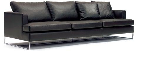
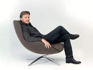
Charles Wilson is one of Australia’s most talented designers and winner of numerous accolades, including the Bombay Sapphire Design Discovery Award, Australian Design Award and Launch Pad New Designer of the Year. Wilson studied industrial design at the University of Technology Sydney and after graduating in 1991, he formed an experimental furniture workshop co-operative with fellow graduates. Today, he works principally in upholstered furniture. He debuted in the Australian design scene with the SW1 swivel chair for Norman + Quaine, now part of the permanent collection at Sydney’s Powerhouse Museum. Wilson has since received a number of commissions from furniture manufacturer, Woodmark, including the Heron chair. More recently, Wilson has worked with international manufacturers MENU and Paustian and is a founding permanent member of Broached Commissions, a design collective investigating a different period of Australian history with a limited edition collection of designs.
clockwise from top Ombra O utd OO r table from Eco o utdoor, Ecooutdoor.com (modEl has bEEn discontinuEd)
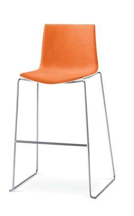
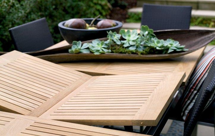
Catifa 46 barstOO l dEsignEd by lievO re, altherr, mO lina for arpEr, arpEr.com. availablE in australia from stylEcraft, stylEcraft.com.au
e mbrO idered bedspread from missoni homE missonihomE.it. availablE in australia from spEncE & lyda, spEncE andlyda.com.au
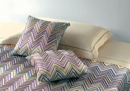
albert sO fa from Jardan, Jardan.com.au
Tin and Weeds by rO bin YO ung (charlEs wilson sE atEd on) h erO n Chair dEsignEd by Charles WilsO n charlEswilsondEsign.com, for woodmark, woodmark.com.au. availablE from ZEnith intEriors, ZEnithintEriors.com.au
Andrew Gunn sought the assistance of interior designer Sam Rickard (son of Bruce Rickard) when selecting the furniture for
issue #15 habitusliving.com
CHARLEs WILsON
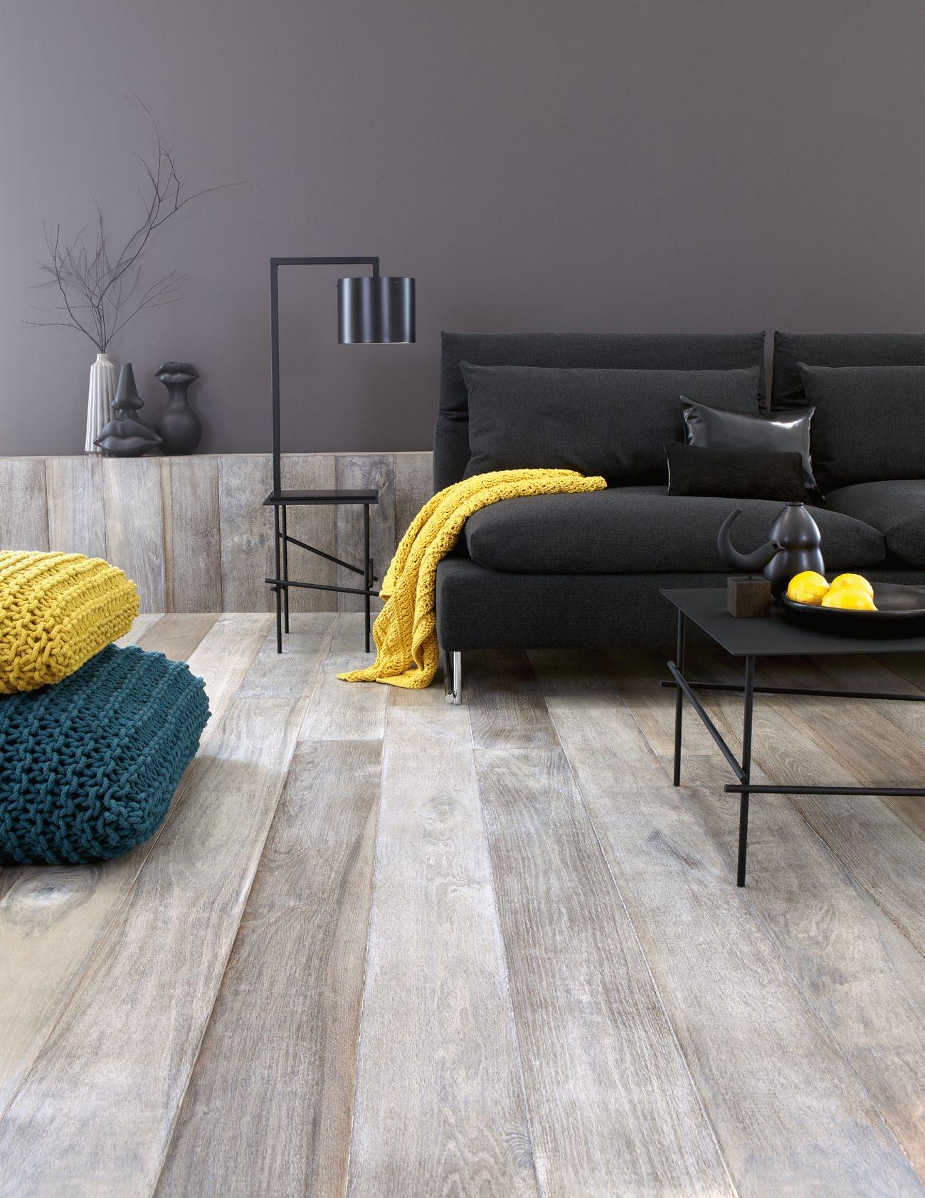


DESIGN IS BACK IN FASHION.
Discover the latest residential products in a festive design atmosphere, where design, fashion, art and culture collide.
See over 180 premium local and international design brands in one day throughout Fortitude Valley and the surrounding suburbs, or stay ‘Up Late in Design’ on James Street for the ultimate VIP retail experience. Plus join the Habitus Design Hunt – visit the website to fi nd out more!
SATURDAY 26 MAY 2012
Ace Stone + Tiles / Argent /
Armadillo / Arnold InOutDoor / Bisazza Australia / Blok Furniture
/ Bolon Tag floor: Interior / Boyd Blue / Café Culture / CDK Stone / Chairbiz / Coco
Centre / Comax / Corporate Culture / Cosh Living / Debetrek / Designer Rugs
ECC Lighting + Living / Eco Outdoor / Flash Photobition /Fuse Furniture / Haworth
Interiors / Inlite / Innerspace / Insitu / Instyle / InterfaceFLOR / Jardan / Living
OBJX / Macquarie Textiles / Mafi / Miele / Mokum Textiles / Reece Bathroom
Design / Sampford IXL / Silent Gliss /Smeg Australia / Space Furniture / Steelcase
Garden Furniture / Stylecraft / UCI / Viabizzuno / Viva Design / Warwick Fabrics
Appliances / Zenith Interiors / Zepel Fabrics / Zip Industries / Ace Stone + / Arnold InOutDoor / Bisazza Australia / Blok Furniture / Bolon Tag floor:
Café Culture / CDK Stone / Chairbiz / Coco Republic Design Centre / Comax
Cosh Living / Debetrek / Designer Rugs / Dexion / Earp Bros / ECC Lighting
Outdoor / Flash Photobition /Fuse Furniture / Haworth / Iken Commercial
Innerspace / Insitu / Instyle / InterfaceFLOR / Jardan / Living Edge / Luxxbox/OBJX
Macquarie Textiles / Mafi / Miele / Mokum Textiles / Reece Bathroom
Design / Sampford IXL / Silent Gliss /Smeg Australia / Space Furniture
Garden Furniture / Stylecraft / UCI / Viabizzuno / Viva Design / Warwick
Appliances / Zenith Interiors / Zepel Fabrics / Zip Industries / Ace Stone
Armadillo / Arnold InOutDoor / Bisazza Australia / Blok Furniture
Boyd Blue / Café Culture / CDK Stone / Chairbiz / Coco Republic
Corporate Culture / Cosh Living / Debetrek / Designer Rugs / Dexion
Lighting + Living / Eco Outdoor / Flash Photobition /Fuse Furniture
Commercial Interiors / Inlite / Innerspace / Insitu / Instyle / InterfaceFLOR
Living Edge / Luxxbox/OBJX / Macquarie Textiles / Mafi / Miele
Reece Bathroom Life / Rugs Carpet & Design / Sampford IXL / Australia / Space Furniture / Steelcase / Street and Garden Furniture
Viabizzuno / Viva Design / Warwick Fabrics / Winning Appliances
Zepel Fabrics / Zip Industries / Ace Stone + Tiles / Argent / InOutDoor / Bisazza Australia / Blok Furniture / Bolon Tag
Café Culture / CDK Stone / Chairbiz / Coco Republic Design
Corporate Culture / Cosh Living / Debetrek / Designer Rugs
ECC Lighting + Living / Eco Outdoor / Flash Ace Stone +
Haworth / Iken Commercial Interiors / Inlite / Innerspace
InterfaceFLOR / Jardan / Living Edge / Armadillo / Macquarie
Miele / Mokum Textiles / Reece Bathroom Life / Rugs
IXL / Silent Gliss /Arnold Outdoor / Space Furniture / Furniture / Stylecraft / UCI / Viabizzuno / Viva Design
Australia / Zenith Interiors / Zepel Fabrics / Zip Industries
Argent / Armadillo / Arnold InOutDoor / Blok / Blok
Interior / Boyd Blue / Café Culture / CDK Stone / Chairbiz
Design Centre / Comax / Corp Bolon / Debetrek / Earp Bros / ECC Lighting + Living / Eco Outdoor
Furniture / Haworth / Iken Commercial Interiors
Instyle / InterfaceFLOR / Jardan / Living Edge
Textiles / Mafi / Miele / Mokum Textiles / Reece
& Design / Sampford IXL / Silent Gliss /Smeg
Steelcase / Street and Garden Furniture / Stylecraft
Viva Design / Warwick Fabrics / Winning Appliances
Zepel Fabrics / Zip Industries / Ace Stone + Arnold InOutDoor / Bisazza Australia / Blok
Interior / Boyd Blue / Café Culture / CDK
Republic Design Centre / Comax / Corporate
Debetrek / Designer Rugs / Dexion / Earp
Eco Outdoor / Flash Photobition /Fuse Furniture
Commercial Interiors / Inlite / Innerspace
InterfaceFLOR / Jardan / Living Edge
Textiles / Mafi / Miele / Mokum Textiles
Carpet & Design / Sampford IXL / Silent Space Furniture / Steelcase / Street and / UCI / Viabizzuno / Viva Design / Appliances / Zenith Interiors / Zepel
Stone + Tiles / Argent / Armadillo
Australia / Blok Furniture / Bolon
Café Culture / CDK Stone / Chairbiz
Centre / Comax / Corporate Culture
Designer Rugs / Dexion / Earp
Eco Outdoor / Flash Photobition
Iken Commercial Interiors / Inlite
Instyle / InterfaceFLOR / Jardan
OBJX / Macquarie Textiles
Carpet & Design / Sampford
Smeg Australia / Space Furniture
BRISBANEINDESIGN.COM.AU BE A PART OF IT Event Partners Brisbane Indesign is supported by the Queensland Government through Arts Queensland and Creative Industries Unit, Department of Employment, Economic Development and Innovation. REGISTER ONLINE FOR FREE
Extended FamilyRemodelled
Traditional societies are changing rapidly. But the extended family remains strong, even if the physical character of their homes is evolving. Pirak anurakyawachon looks at a project by Thai architects, Tonkao Panin and Thanakarn MokasMiTh, in Bangkok which aims to reconcile tradition and modernity.
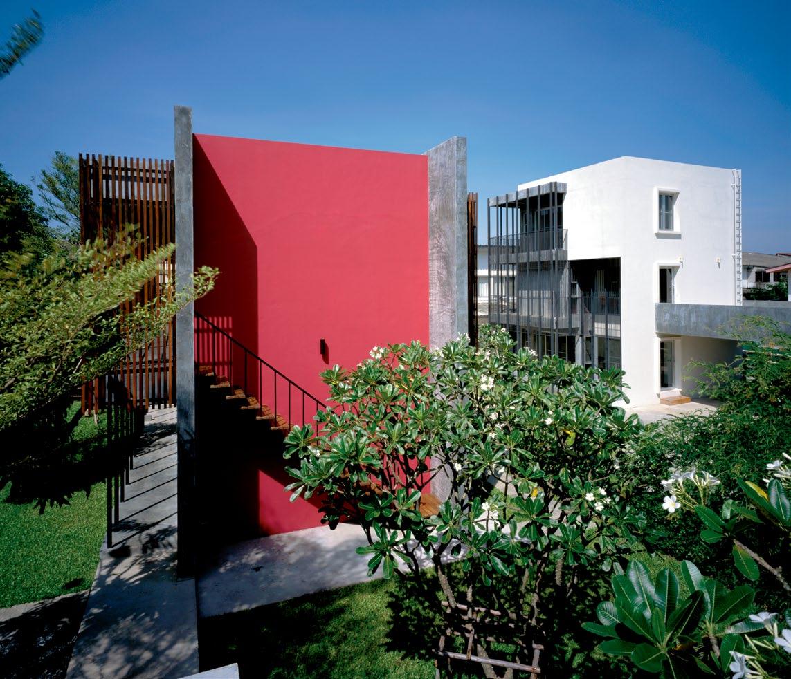
text PiR ak a nu R akyawachon | PhotogR a Phy sPaceshift studio 3 . on location # 175
The change from agricultural to industrial society has had a great influence on people’s way of life, and Thailand is no exception. This transformation has brought about a reduction in the size of most Thai families. Recent years have seen the emergence of small nuclear families, gradually replacing the large, extended families that we were once familiar with. But, as Einstein said, “Rejoice with your family in the beautiful land of life”. Hence, some of the younger generation still choose to stay in the same compound with their family. But how can they maintain privacy for their living space and modern way of life? Two Thai architects, Tonkao Panin and Thanakarn Mokasmith, might just have the answer.
The long and narrow alley of Phaholyathin 63 Street leads us to a big old plot of a family compound located in one of Bangkok’s highdensity residential areas. On this plot of 1,400 square metres, we can imagine twenty modern nuclear middle-class families living their lives in beautifully designed contemporary row houses. What we actually see are four different houses for four different generations of family members living individually, yet together, in this urban, modernised family compound.
Once located on the broad, open space of the family’s property were three ‘oldie’ wooden houses from the 1970s, embraced by lovely overshadowing greenery. But time has passed and children grew into adulthood with a desire to have their own lives and to live on their own. The compound became the conference room where all the members of the family met up before finally making the decision to re-model their beloved living space.

“Both houses are the first houses of the owners, Itthi Rommaneeyangkoon and Ruengake Wannapruek, who are cousins and best friends. They had lived in the extended family surrounded with relatives and rather limited private spaces. Although the old house took over a large area, most functional areas were communal. One day, one family member started a new family and wished to have their own personal space while still being able to maintain the warm togetherness of a big family. As a result of that, a large piece of land was divided properly among the family members”.
This is how Tonkao Panin and Thanakarn Mokasamith tell us how it all began. We can sense a strong connection between the two owners and the rest of the members of the family from the story they share with us. It is
issue #15 habitusliving.com
previous
| on the left, ItthI ’s house wIth Its magenta wall, polIshed concrete surface and long wooden laths. to the rIght, reungake’s house I s paInted warm whIte wIth black vertIcal steel laths. above | the laths are attached to the steel structure for sun protectIon. opposiTe Top | laths on the east and west façades also maIntaIn prIvacy. opposiTe boTTom | a small balcony runs along both sIdes of the second floor.
...four different generations living individually, yet together, in this urban, modernised family compound.
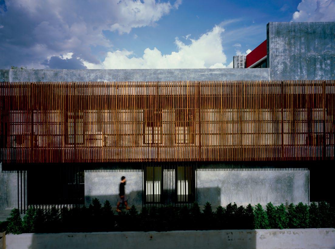
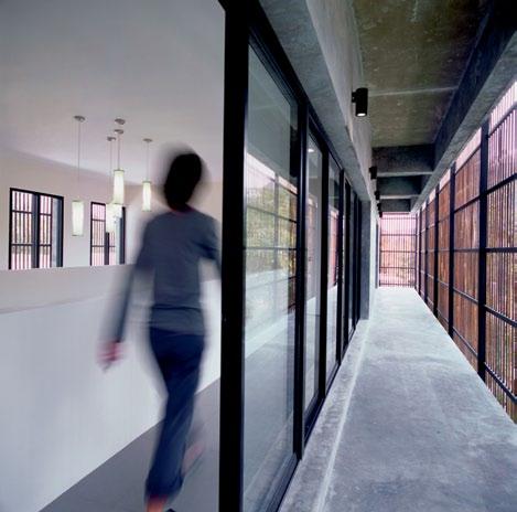
3 . on location # 177
Simplicity was a priority, inspired by the typical floor plan of the traditional Thai compound house...
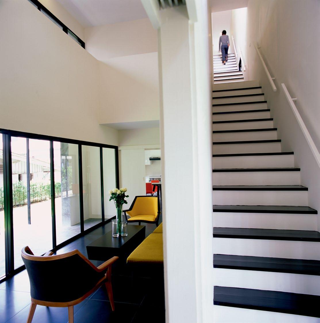
issue #15 habitusliving.com
the feeling of comfort and closeness that still co-exists with each individual’s enjoyment in their own private sanctuary.
The architects concentrated on the specific requirements of the inhabitants. Simplicity was a priority, inspired by the typical floor plan of the traditional Thai compound house, a common architectural feature found in most houses of Thai extended families. The allocation of this type of residence always begins with a big terrace or a court in the centre of the house, which is embraced by the rectangular floor plan of the master living unit. When an additional living space is needed, a smaller unit will be added on any available space around the court. This particular floor plan automatically turns the terrace into the family’s communal space. It is also common to have a lightweight structure in the centre of this area, functioning as an outdoor shelter that can accommodate visitors or hosting semi-outdoor activities, while still being able to maintain a sense of privacy for the dwellers with each separated unit.
“The living space of Itthi’s house,” explains Tonkao, “is specially designed for him and his mother. It’s bigger because we have to create
two guest rooms and two bedrooms to respond to the two dwellers’ generation gap. Reungake’s house is smaller because he lives alone, but we designed the space to be flexible and adaptable in case there are more family members in the future,” she adds.
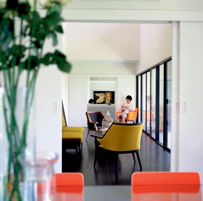
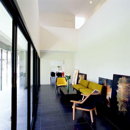
Another task for the designers was to ensure there was no back separating the houses. Surrounded by the houses of other relatives, and the neighbours’ houses located on the east, one of the houses is also the place where a grandmother of the family lives and she demanded that there be no fence which would obstruct the daily visit from her nephews. “We don’t like the houses to turn their backs on anyone. They should be open for everyday visits from every direction, because other family members always come and go to keep us company. It’s the way we live. We do need some privacy, but it doesn’t mean that we have to seclude ourselves from others,” says Itthi, the owner of the house.
From a distance, the façades function as the frontage for the two houses. The site plan drawing reveals the longitudinal one metrehigh fence, looking pretty much like a long flower
opposite | the vertical space of itthi's house enjoys chanGinG liGht and shadow throu Gh the day, addinG movement to the stillness and seclusion of the stairs. above left | livinG room seen from the dinin G room. above right | the Ground floor is desiGned to host a larGe communal area that offers accessibility and is a visually and physically spacious zone with the presence of a lot of Glass doors and windows.
3 . on location # 179
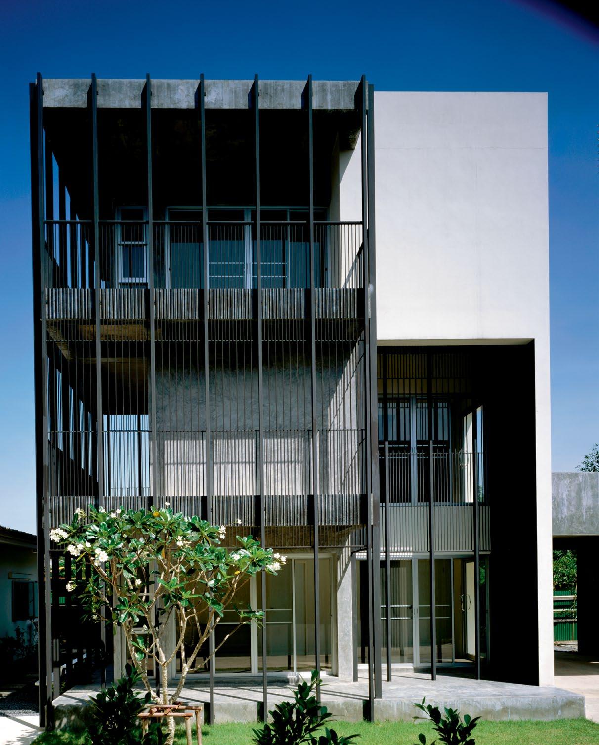
above | in Reungake’s house, The aRchiTecTs designed The laTh To be moRe adjoined wiTh The openings on The second and ThiRd flooR To cReaTe moRe closed and pRivaTe spaces, leaving The gRound flooR moRe open. opposite top | Reungake’s house is also designed fo R The family To live TogeTheR while sTill being able To mainTain TheiR own pRivaTe spaces. opposite bottom | sTudy Room on The ThiRd flooR issue #15 habitusliving.com
bed that also functions as the casual frontier between the houses of these two cousins. The public areas of Itthi’s house, such as the living room and dining room on the ground floor, are designed to be open, accessible and flexible for different types of functionality. The inhabitants of the two houses can walk through to the other side of each of their houses, passing the small gate to enter the other’s house. Such circulation creates direct access and interaction, while at the same time drawing the borderline between the two houses to subtly maintain privacy.
Distinctively different for its colours and materials, Itthi’s house can be seen from far away with its magenta wall, polished concrete surface, and the long wooden laths on the east and west façades that protect the house from direct sunlight. Reungake’s house is painted with a warm white colour and the black vertical steel laths provide additional privacy. The architects designed the lath to be more adjoined with the openings on the second and the third floors together with the presence of the house’s walls, resulting in more closed and private spaces for the upper floors of the house.
These architectural elements reflect the different characteristics of the inhabitants. Although Itthi is a computer engineer, while Reungake is a graphic designer, they share the same spatial articulation. The architects tried to keep the simple, long rectangular plans and work in orientation with the nature of the location. The ground floor of both houses is designed to host a large communal area that offers great accessibility and a visually and physically generous space with a lot of glass doors and windows. It reflects Itthi and Ruengake’s idea of living together while still maintaining their own private space.
The total of 550m 2 of functional area in Itthi’s house is designed especially for him and his mother, who need their own private space and a space where they can welcome visiting friends and relatives. The architects created a special entrance for Itthi that takes him directly to his bedroom on the second floor without having to walk pass his mother’s room located on the same floor. The living area on the
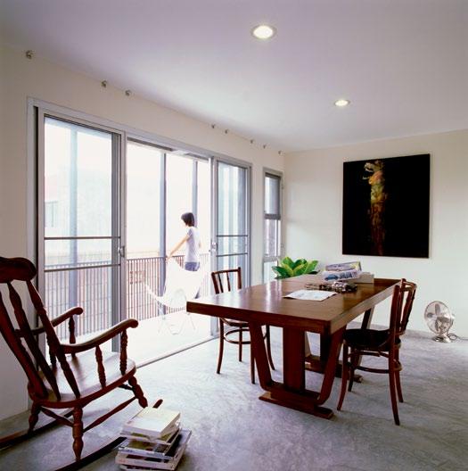
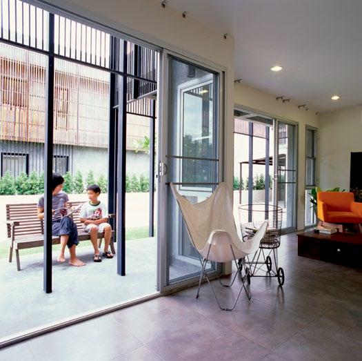
3 . on location # 181
The inhabitants of the two houses can walk through... to enter each other’s house. Such circulation creates direct access and interaction.
third floor is designed for Itthi’s friends to party and hang out, while his mother and her friends get the first floor area. The seemingly endless vertical space of the staircase welcomes the changing light and shadow of the day, adding movements to the stillness and seclusion of the stairs. The architects also designed a small balcony that runs along both sides of the second floor, while wooden laths, attached vertically to the steel structure, provide sun protection.
Reungake’s three-storey-house has a total functional area of 205m 2 . The vertical steel laths create an interesting rhythm that never compromises the functionality – namely, the provision of comfortable privacy for the house’s interior spaces such as the living area on the first floor, the bedroom on the second and the study room on the third floor.
The architects collaborated with Patama Roonrakwit and Washara Sonkeang of Community Architects for Shelter and Environments (CASE) in the construction. Patama and Washara were also the project’s contractors, building the cousins’ houses within a very affordable budget (US$350/m 2). Except for the white and magenta colours on the wall, other materials used in the project are simple, affordable and left to expose their true characteristics. In its way, this was an experimental project for Tonkao and Patama, pursuing a mission to re-model this warm, contemporary family compound.
drop box
Tonkao Panin (66 8) 6772 7777 tonkao.tanakarn@gmail.com
furniture
From Hawaii5-0 Bangkok.
finishes Lath Siamese Sal. Polished painted plaster on CMU brick wall.
Exterior stairs are painted Rosewood.
ArChiteCt Tonkao Panin and Tanakarn Mokkhasmita engineer Wacharin Lebkrut ConsultAnt & Builder CONCASE Thailand
itthi’s hOUsE
above | site pl An. issue #15 habitusliving.com
R EU ngak E’s hOUsE
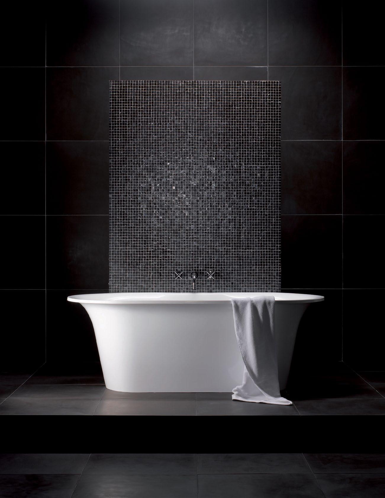
volcanic limestone baths Naturally desirable - surprisingly affordable. Discover it today at your approved dealer: Australia: 1300 737 779 • New Zealand: 09 573 0490 www.vandabaths.com Rich in volcanic limestone for a silky smooth feel that is naturally white, hand finished and backed by a twenty five year guarantee. Escape with the Monaco
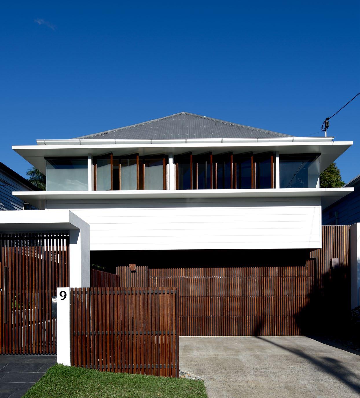
above |
issue #15 habitusliving.com
From the
street, the pre-war cottage reveals its makeover with several contemporary Features. opposite | the kitchen and living room joinery is spotted gum, which provides a warm contrast to the dark Floors, which are stained american oak.
The underside of things
Perhaps more than any other city in Austr AliA , BrisBAne developed its own house typology –the ‘Queenslander’ – to suit its tropical climate. Now, as JennA reed Burns discovers, architects like shAun lockyer are adapting it to the principles of modern living.
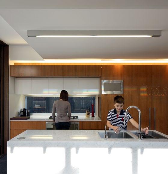

text Jenna Reed Bu R ns | photogR aphy scott Bu RRows 3 . on location # 185
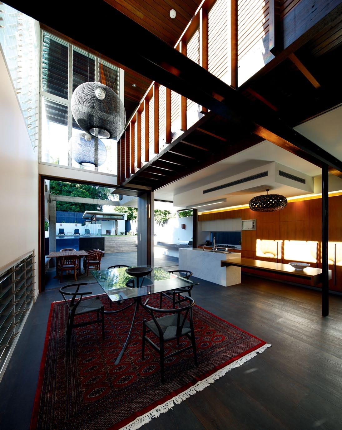
above and opposite top | The new T wo-sTorey ex Tension To The
comprises a free-flowing living and eaTing
on To The
garden. opposite bottom | above The kiTchen, accessed by a Timber walkway, is The new masTer suiTe. issue #15 habitusliving.com
coTTage
area opening
rear
The space under a traditional Queensland timber cottage – one that is propped up on stumps – is dark and cool. Sometimes, there is enough headroom to be able to hang the washing, store garden tools or just sit in the shade and soft breezes at the height of summer. Author David Malouf describes this undercroft space beautifully in his book 12 Edmonstone Street: “Down here is the underside of things: the great wedge of air on which the house floats, ever darkness; the stumps of a forest which the house, with its many rooms, forms the branches…”
It’s this sense of the cool undercroft that Brisbane architect Shaun Lockyer likes to capture, and one that his return client, Nick Barr, now values highly. Nick, a builder and property developer, has commissioned Shaun to design his last two houses. This one, his latest, in Brisbane’s New Farm, won’t be the last.
Like Nick’s first home only streets away, this renovated and extended cottage features a double-height void over a new rear living area, with a dark timber ceiling and floor planes that conjure up the underside of a traditional Queenslander.
“The thing I love about a dark ceiling in this climate is that it reduces glare,” Shaun says.
“The agent selling Nick’s first house said people wouldn’t ‘get’ black, but those who walked in didn’t see black; instead, they saw and felt cool. There was no glare, just a lovely sense of coolness… the kind of balance I was after.”
Nick approached Shaun to design his first home after working with him on a couple of speculative projects. His brief was simple: he wanted the worker’s cottage opened up to light and air. He asked for a double garage and to enter the house at ground level, not via the traditional flight of stairs up to the front verandah. He also wanted an open-plan living, dining and kitchen area at ground level, leading to the garden. Upstairs, the old cottage was converted into sleeping accommodation, with a new master bedroom wing built at the rear above the kitchen, reached via a timber-decked walkway overlooking the living and dining area.
In Shaun’s words, this house created “quite a stir” and is the reason why Shaun now has (at the time of writing) 11 current projects in the suburb, with four in one street.
Nick’s first house was featured in design publications and, when Nick decided to sell,
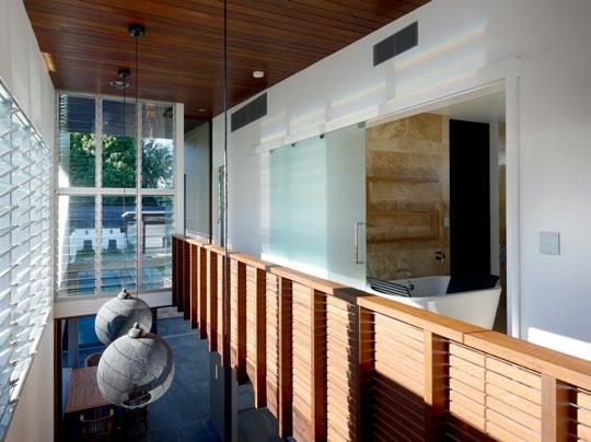
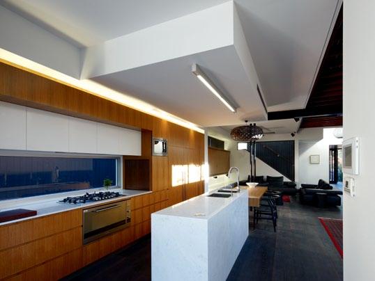
I would do this ten times again. It’s informal and suits the way we want to live and entertain.
3 . on location # 187
NIck | re SIDe NT AND BUILDer
it fetched an impressive price for the suburb. “The layout of the house was perfect,” Nick says, “so I said to Shaun, let’s do the same here, with a few slight changes so it isn’t too similar. Now, I find I live in the same part of the house as I used to. I open the back doors in the morning and can easily spend all day in the living area.”
However, like all good design projects, there is a continual process of refinement at play.
This new house, on a longer block, has an extra upstairs bathroom (an ensuite to the guest bedroom) and a separate living area, and downstairs a feature Nick and his partner, Angela Bozzi, adore — a built-in dining table extension to the kitchen island bench.
“I would do this 10 times again,” Nick enthuses, tapping the tabletop. “It’s informal and suits the way we want to live and entertain.”
Having worked together on many projects, architect and builder now share a shorthand language. “We’ve developed a pretty good relationship,” Nick says. “Shaun doesn’t overdocument the project and I can ring him at any time if I’m concerned about something. He’ll come down and we’ll sort it out right away.”
Shaun agrees that the relationship works well. “The lovely thing about a job like this is that Nick is the ideal client: he’s amenable to being challenged, and keen to challenge me. He
basically lets me make decisions, but he makes the final choices, so it’s a really nice process and gives me a lot of freedom.
“However, there is an enormous amount of trust at the same time. This house is a genuine outcome of us working together.”
Materials used outside, such as timber, also appear inside and interior features, such as the kitchen workbench, continue outside, blurring the boundaries. Frameless windows in the master bedroom form a balustrade that, when lowered, turns the room into a verandah. Such features are ideally suited to the sub-tropics, a point underscored by the glass-ended pool and stylish little pool house at the bottom of the garden.
“All of these elements are in part about the dialogue between indoor and outdoor. But some also celebrate that idea of undercroft,” Shaun says. “Walking under a Queenslander, you see the bearers and joists. Here, you look up and see the same timbers, so there is a continuity between the language that was here and the present. That’s where that idea of inhabiting the undercroft, as people might have originally done, endures.”
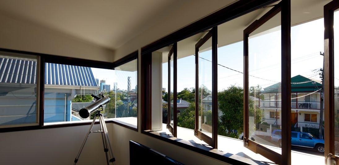
above | A glimpse of the city
is
Are A
|
living Are A
re
skyline
cAptured from the second living
upstAirs. opposite
the new free-flowing
opens onto the
Ar gArden, And is where owner nick BArr spends most of his time.
issue #15 habitusliving.com
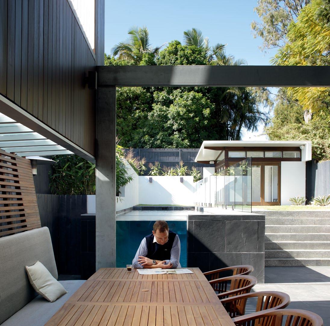
…there’s an enormous amount of trust at the same time. The house is a genuine outcome of us working together.
3 . on location # 189
lockyer | architect
All of these elements are in part about the dialogue between indoor and outdoor. But some also celebrate that idea of undercroft.
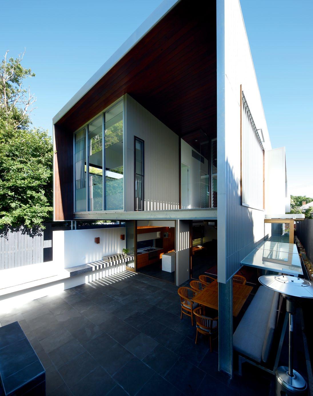
issue #15 habitusliving.com
lockyer | architect
opposite | The masTer bedroom and double-heighT void ex Tend ouT over The paved ouTdoor dining area. above | floor plan. first floor y i i p i o o i ground floor 3 5 e 1 2 3 4 5 6 7 8 9 0 q e w r ENTRY livi Ng Room di N i Ng Room ou T dooR di N i Ng pool baT hi Ng cou RT pool pavilioN plaY a RE a bbq a RE a ki T ch EN lau N dRY ga R agE powdER Room sTai R s baT h Room familY Room ENsui TE bE dRoom void walk-i N-RobE sT udY 21 w q r u r t 21 t y u � o p 1 2 0 9 4 8 6 7 u 3 . on location # 191
drop box
ARCHITECT Shaun Lockyer Architects
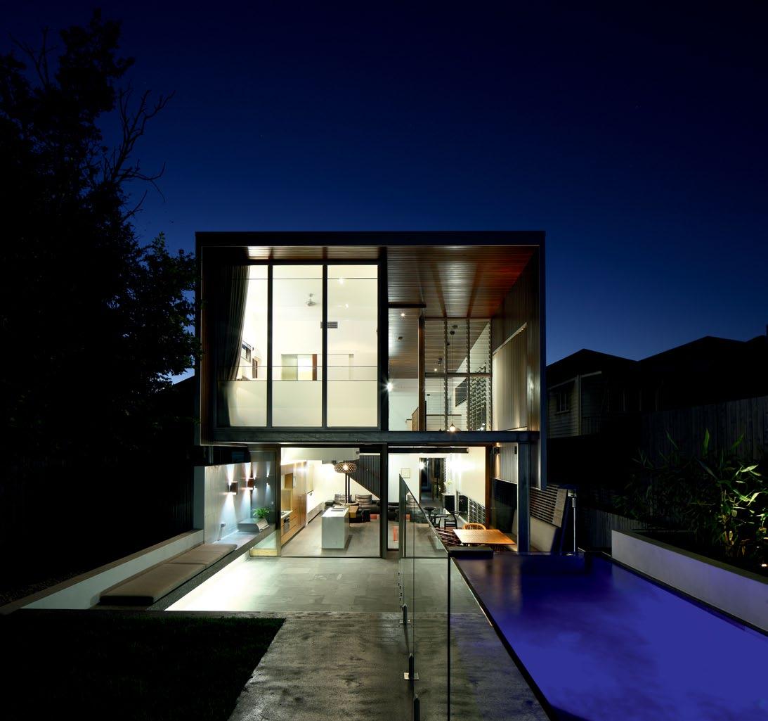
PROJECT TEAM Shaun Lockyer (Design Principal), Justin Boland (Architectural Technician), Corinne Bolton (Interiors)
STRUCTURAL ENGINEER
Westera Partners
GENERAL CONTRACTOR
Limitless Constructions
Shaun Lockyer Architects (61 7) 3257 7288 lockyerarchitects.com.au
LIGHTING
General lighting and David Trubridge Kina hanging lamp from Caribou. Concealed fluorescents from Light & Design Group. Surface mounted wall light from Small Australian Projects. Pool lights from The Pool Shop.
FINISHES
General glass and mirrors from G.James. Glass and pool balustrades from Network Glass. Stretcher bond blockwork wall from Boral. Fibre cement cladding and villaboard from James Hardie. Exterior timber cladding from
Urbanline. Polished concrete from Hanson. Wall and roof insulation from Bradford Insulation. Plasterboard from CSR. Metal sheet roofing from Bluescope Steel. Downpipes from Lysaght. Paint from Dulux. Carpet from Cavalier Bremworth. Benchtops and cabinets in Laminex. Polished marble benchtops from WK Marble and Granite. Timber flooring from Boral. Spotted Gum timber veneer joinery from Briggs Veneers. Tiles from Classic Ceramics. Exterior tiles from Eco Outdoor. Garden pebbles from DécoR Stone.
FIXED & FITTED
Ceiling and exhaust fans from Caribou. Smoke detector from Ideal Electrical. Drainage from ACO Polycrete. Hot water unit from Solahart. Water tanks from Action Tanks.
Door hardware from Designer Doorware. Joinery accessories from Häfele and Blum. Baths, Studio Bagno basins, Abey sink and mixer, Grohe basin outlet, mixers, bath spout and showerheads, Dorf wall tapset, Argent bath spout, Everhard laundry trough, Villeroy & Boch and Geberit toilet suites and
Rogerseller soap dispenser from Harvey Norman Commercial. Accessories from Barben. Cibo basin in powder room from Bretts Design. Clothes line from Hills. Floor wastes from Bretts Design and Stormtech. Shower screens from Stegbar. Outdoor shower from Rainware Outdoor Showers. Dura washing machine, Bosch cooktop, oven, microwave and dishwasher, Smeg rangehood, Fisher & Paykel fridge, Vintec wine fridge, Electrolux barbecue and InSinkErator from Harvey Norman Commercial.
above | A bANq UETTE b ENCH SHELTEREd by A TIMbER bATTENEd OvERHANG IS A CLE vER wAy TO b ORROw SPACE fROM THE SET-bACk AREA AS IT IS dEEMEd AN ARCHITECTURAL fEATURE
issue #15 habitusliving.com
Products shown: On wall
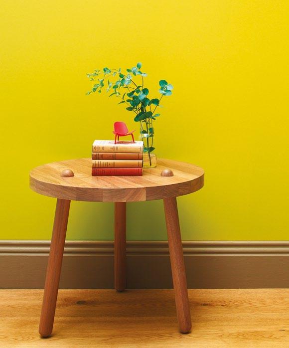







SCOPE BY LEFF AMSTERDAM to see what’s
TIME Untitled-4 1 15/12/11 9:37 AM Paint and s P ecialty finishes wall Pa P er wide board timber flooring for more information, details of stockists and to shop online visit www.porterspaints.com or call 1800 656 664.
new at
Eggshell Acrylic
Lime,
in Sweet
on skirting Eggshell Acrylic in Double Strength Drumbeat and Natural Brushed timber flooring.



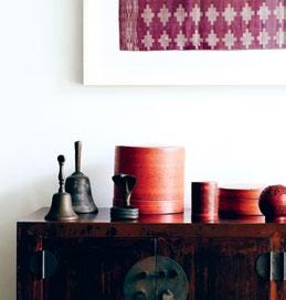
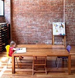
directory InSinkErator 192 insinkerator.com.au International Elements 117 intelements.com Intouch Interior Linings 171 intouchinteriors.com.au ISM Objects 42 ismobjects.com.au James Hardie 192 jameshardie.com.au Jetmaster 106 jetmaster.com.au Katalog 128 katalog.co.nz KE-ZU 44 kezu.com.au Ken Neale 20 th Century Modern 138 (61) 410 463 121 Kitchen King 128 hideawaybins.com.au Laminex 192 laminex.com.au Light & Design Group 192 ladgroup.com.au Lightcraft 117 lightcraft.com.my Living Edge 37, 40, 42, 171 livingedge.com.au Living Tiles 26 livingtiles.com.au Lutron 117 lutron.com Lysaght 192 lysaght.com Marco 106 marcofabrics.com.au Mark Tuckey 43 marktuckey.com.au Mercer Products 128 mercerproducts.co.nz Metrix 128 metrix.co.nz Miele 117, 162, 171 miele.com.au, miele.sg Missoni 171 missoni.com Modus 128 moduslighting.co.nz Nendo 41 nendo.jp Network Glass 192 networkglass.com.au Oliver Smith 37 oliversmith.com.au Oluce 138 oluce.com orson & blake 43 orsonandblake.com.au Perswood 117 perswood.com Piet Hein Eek 43 pietheineek.nl Planex 40 planex.com.au Plumbline 128 plumbline.co.nz Poliform 41 poliform.com.au Qasair 162 qasair.com.au Rainware Outdoor Showers 192 rainware.com.au Corian 106 casf.com.au Corporate Culture 30, 40, 42, 44, 138 corporateculture.com.au CSR 192 csr.com.au Dacora 171 (61 2) 9681 4663 David Trubridge 192 davidtrubridge.com DécoR Stone 192 decorstone.com.au dedece 44 dedece.com Designer Doorware 162, 192 designerdoorware.com.au Designer Rugs 38, 42 designerrugs.com.au DJ Engineering 117 (65) 6556 0150 Dorf 192 dorf.com.au Dulux 106, 138, 192 dulux.com.au e15 117 e15.com Eco Outdoor 171, 192 ecooutdoor.com.au Electrolux 192 electrolux.com.au Euroluce 38, 106, 138 euroluce.com.au Everstone 26 everstone.com.au Fisher & Paykel 128, 192 fisherpaykel.com.au Flos 138 flos.it Forbo Flooring 106, 138 forbo-flooring.com.au Format Furniture 138 formatfurniture.com Fujifilm 35 fujifilm.com.au FY2K 44 fy2k.com.au G.James 192 gjames.com.au Gamma Illumination 106 gammaillumination.com Geberit 192 geberit.com.au George Fethers 106 gfethers.com.au Gervasoni 117 gervasoni1882.com Great Dane 38, 162 greatdanefurniture.com Grohe 192 grohe.com Häfele 128, 192 hafele.com Hanson 192 hanson.com.au Harvey Norman Commercial 192 harveynormancommercial.com.au Herman Miller 171 hermanmiller.com Hills 192 hills.com.au Ideal Electrical 192 idealelectrical.com &Tradition 128 andtradition.com Abey 106, 192 abey.com.au About Space 106 aboutspace.net.au ACO Polycrete 192 acoaus.com.au Action Tanks 192 actiontanks.com.au Anibou 39 anibou.com.au Anna-Wili Highfield 43 annawilihighfield.com.au Arflex 138 arflex.it Argent 192 argentaust.com.au Arper 171 arper.com Artemide 39, 106 artemide.com.au Award Architectural Aluminium 171 awardaluminium.com.au Bang & Olufsen 38 bang-olufsen.com Barben 192 barben.com.au Big River Timbers 138 bigrivertimbers.com.au Blender Gallery 35 blender.com.au Bluescope Steel 192 bluescopesteel.com.au Blum 128, 192 blum.com Bocci 128 bocci.ca Boffi 117 boffi.com Boral 192 boral.com.au Bosch 192 bosch.com.au Bradford Insulation 192 bradfordinsulation.com.au Bretts Design 192 (61 7) 5451 1414 Briggs Veneers 192 briggs.com.au Caesarstone 162 caesarstone.com.au Candana 138 candana.com.au Caribou 192 caribou.com.au Carl Hansen & Son 117, 138 carlhansen.com Cavalier Bremworth 192 cavbrem.com.au Centor Architectural 106 centor.com.au Charles Wilson 171 charleswilsondesign.com Cite Furniture 128 cite.co.nz Classic Ceramics 192 classicceramics.com.au Classic Tiles 162 classictiles.net.au Clipsal 171 clipsal.com.au issue #15 habitusliving.com
The T eam aT Habitus magazine T hank our adverT isers for T heir supporT. use T he direcTory To see whaT page a specific adverT isemen T is on, and visiT T heir websiT e To learn abou T T he producTs and services T hey provide.
Habitus magazine is available at newsagents and bookstores across Australasia, South-East Asia, the USA, Canada, Europe, South America and the Middle East. Habitus is published quarterly in March, June, September and December. To subscribe securely online visit habitusliving.com/magazine or email subscriptions@indesign.com.au to subscribe or request a full list of locations where Habitus magazine is available.
Villeroy & Boch 192 villeroy-boch.com Vintec 192 vintec.com.au Vola 138 vola.com Waterford 38 waterfordwedgewood.com.au Whelan Industries 171 whelanindustries.com.au WK Marble & Granite 192 wk.com.au Wooden Charme 117 woodencharme.it Woodform Architectural 106 woodformarchitectural.com.au Woodmark 171 woodmark.com.au World Trade Access 106 tilesnflooring.com.au Zenith Interiors 172 zenithinteriors.com.au Zuster 30 zuster.com.au Reece 106,128, 162 reece.co.nz, reece.com.au Rexel 128 rexel.co.nz Riedel 30 riedel.com SANAA 138 sanaa.co.jp Sankey Australia 171 sankey.com.au Santucci Tiling 171 16 Stainsby Ave, Kings Langley, NSW SeehoSu 41 seehosu.com.au Signature Prints 106 signatureprints.com.au Simple Studio 138 simplestudio.com.au Small Australian Projects 192 sapfurniture.com Smeg 128, 162, 192 smeg.com.au Solahart 192 solahart.com.au Sonos 171 sonos.com Sony 35 sony.com.au Space Asia Hub 117 spacefurniture.com.sg Space Furniture 39–43 spacefurniture.com.au Stegbar 192 stegbar.com.au Stema 117 (65) 6382 3028 Stormtech 192 stormtech.com.au Studio Bagno 192 studiobagno.com.au Studio Italia 106 studioitalia.com.au Sub-Zero 117 subzero-wolf.com Sunlight 117 sunlightgroup.com Swiss Ball 39 swissball.com.au Tangery Accents 117 (65) 6734 8862 The Pool Shop 192 poolshop.com.au The Tile Warehouse 128 tilewarehouse.co.nz Top 3 by Design 30, 37, 40 top3.com.au Toyo Lighting 171 toyolighting.com.au Tse & Tse 138 tse-tse.com Ultimo Wine Centre 30 ultimowinecentre.com.au Unifor 138 unifor.it Unique Fabrics 106 uniquefabrics.com Urban Edge Ceramics 162 urbanedgeceramics.com.au Urbanline 192 urbanline.com.au Via Alley 35 viaalley.com
8 hotels 204 8hotels.com a bey 84 abey.com.au a nibou 16 anibou.com.au a rthur g 60 arthurg.com.au big a ss fans 203 bigassfans.com.au bloom 152–153 bloompot.com.au blum 82–83 blum.com brisbane i ndesign 174 brisbaneindesign.com.au caesarstone 21 caesarstone.com.au cdk stone 72 cdkstone.com.au c orradi 93 corradi.com.au c osh l iving 129 coshliving.com.au d esigner rugs 70–71 designerrugs.com.au d inosaur d esigns 94–95 dinosaurdesigns.com.au d omayne 12–13 domayne.com.au earp 79, 81 earp.com.au f isher & paykel 107 fisherpaykel.com.au f unkis 162 funkis.com gandia blasco 29 gandiablasco.com habitusliving.com 19 habitusliving.com i lve 69 ilve.com.au i nterstudio 193 interstudio.com.au k aba e-flash 90 eflash.com.au l iving e dge 6 livingedge.com.au moroso 31 hubfurniture.com.au parisi 32 parisi.com.au perrin & rowe 130 englishtapware.com.au poliform 196 poliform.com.au porcelanosa k itchens 22 porcelanosakitchens.com.au porter's o riginal paints 193 porterspaints.com p recision f looring 34 precisionflooring.com.au Quick step f loors 59 quick-step.com robert plumb 119 robertplumb.com.au rosenthal 2–3 rosenthalchina.com.au royal oak f loors 173 royaloakfloors.com.au sampford i X l 36 ixlappliances.com.au s ecret gardens of sydney 46 secretgardens.com.au silestone 4–5 silestone.com smeg a ppliances 14–15 smeg.com.au space f urniture ifc–1 spacefurniture.com stormtech 163 stormtech.com.au studio b ecker 209 studiobecker.com.au stylecraft obc stylecraft.com.au supa c enta moore park 108 supacentamoorepark.com.au Tile b outique 45 tileboutique.com.au Town & c ountry style 68, 128 townandcountrystyle.com.au Tsar 20 tsar.com.au v ictoria & a lbert 183 vandabaths.com w inning a ppliances 151 winningappliances.com.au w intons Teak 140 wintonsteak.com woven i mage 9 wovenimage.com z ip i ndustries 10–11 zipindustries.com
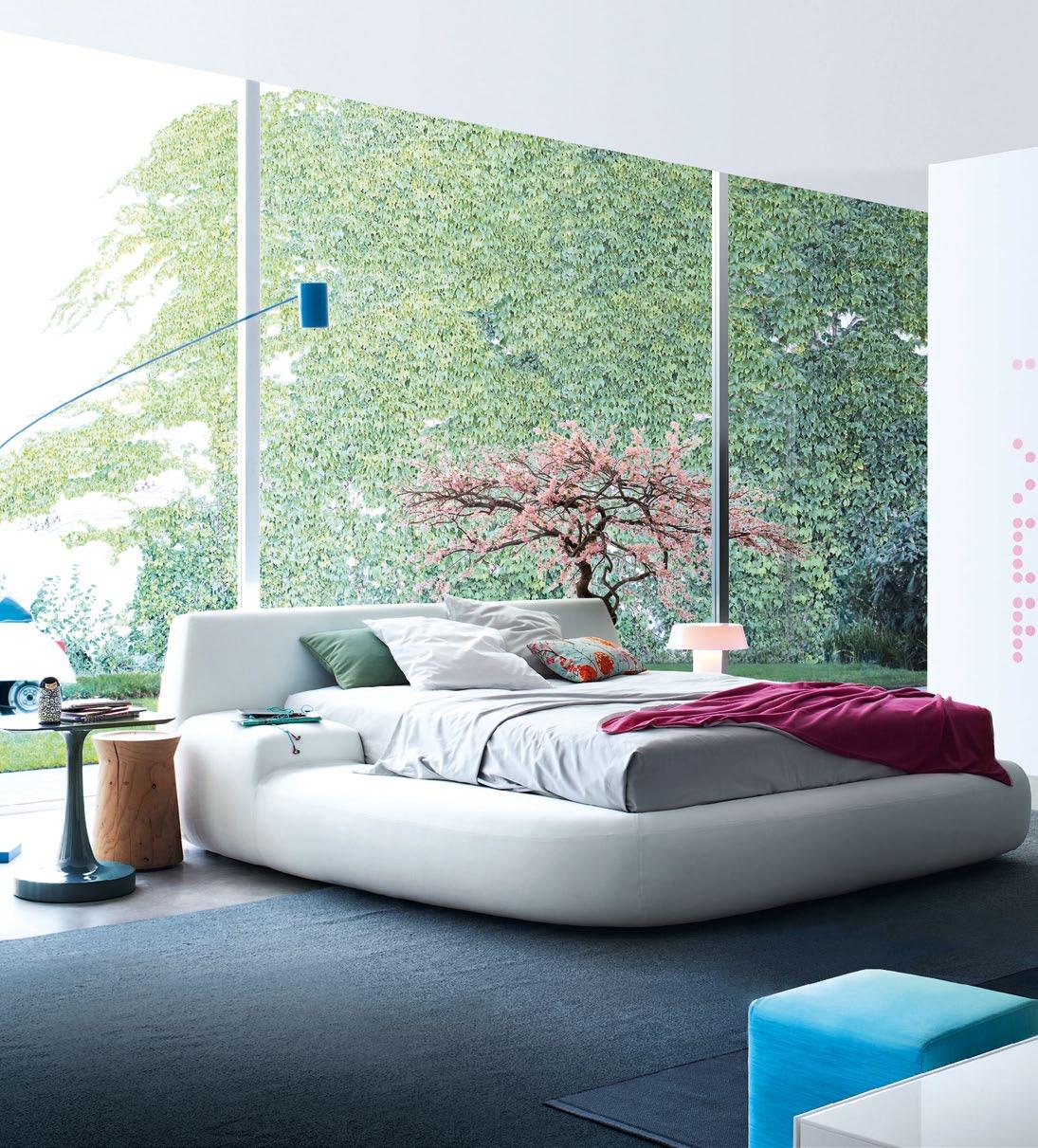
It ’s time for the suburb’ s coming of age.
page #205
Inside Puglia
The dream-like Puglia region and its Salento PeninSula coastline – the heel in the boot of Italy – is peppered with elegant towns, rich architecture, forts and varied and exotic history. Jane Burton taylor takes us on a tour of its sometimes arrestingly beautiful built environment, and to the other Gallipoli.
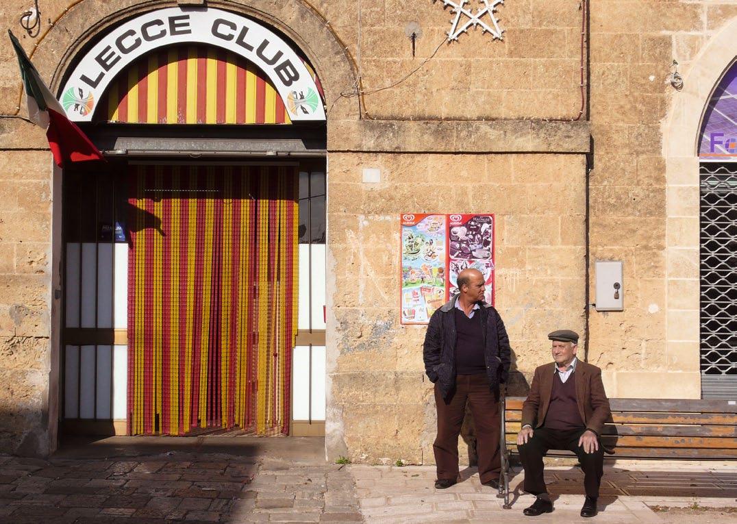
issue #15 habitusliving.com
ABOVE | T wo men sIT ouTsIde The Lecce cLub, named af Ter The reGIonaL caPITaL In souThern ITaLy, every Town has ITs socIaL cLub for men. Opp OsitE lEft | e asTer sees GaLLIP oLI hosTInG ProcessIons ThaT meander Throu Gh The sTreeTs of The oLd Town unTIL The smaLL hours. Opp OsitE cEntrE | a characTerIsTIc Pu GLIan baroque church In The hIsTorIc cenTre of nard Ò Opp OsitE right | a T yPIcaL narrow medIevaL sTreeT In The hearT of GaLLIP oLI
text & photography | Jane Burton taylor
Stop to ask for directions in southern Puglia and the locals will usually tell you, “Vai dritto! Sempre dritto.” “Go straight! Always straight.” But, it is rarely that simple. However, at least in Puglia, unlike many other parts of southern Italy, street signs do eventually appear.
Criss-crossing the Salento, the southernmost peninsula in Puglia – the heel in the boot of Italy – inevitably, you will get lost. Its roads draw you into its towns, rather than around them. Some say this labyrinth is a blessing.

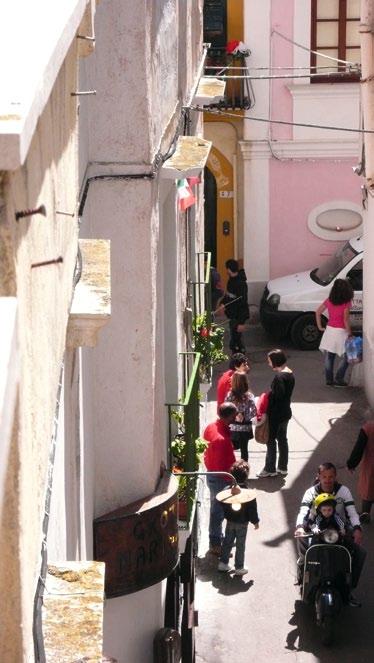
Poor infrastructure is one reason why mass tourism hasn’t taken hold in this sunny, olive grove-crowded peninsula. The exception comes in August-September, when Europeans, mainly Italians, migrate en masse to take in the sun in its rocky inlets and on the white sand beaches of the Salento’s Adriatic and Ionian coasts.
Our trip, heading south, begins with a few days in the historic centre of Lecce. Arrestingly beautiful, its streets are lined by grand palazzos, churches and administrative buildings, all built in the cool white local limestone and style known as ‘Barocco Leccese’.
Leaving Lecce is like coming out of a dream, as its grand scale is rarely repeated further south, where the architecture is generally more human in scale. Much is shaped by an era pre-dating the 16th and 17th Century Baroque, when the locals defended themselves against the Turks.
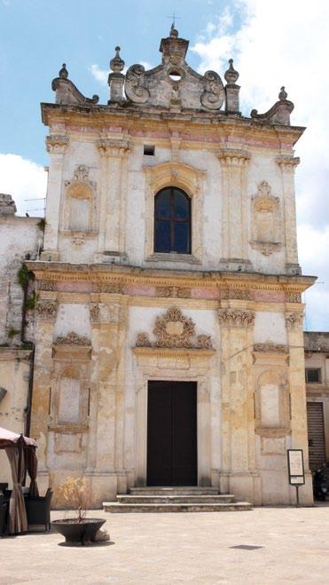
The coast is dotted with towers and towns with maze-like centres, fortified by castles. One, Otranto on the Adriatic coast is a classic “white town” with a substantial town wall and castle. Restored by local tradespeople in a UNESCOsponsored workshop run by Renzo Piano in 1979, the old town is a pretty maze of streets, most not wide enough for cars.
All roads here seem to lead to a 12th Century Norman cathedral, whose nave is filled by an enormous mosaic: the Tree of Life. Our guide explains that its mosaics – made by a monk named Pantaleone between 1163 and 1166 –were visual parables for a congregation whose members could not read.
Incredibly, the mosaics survived when the Turks invaded in 1480. Many residents did not, however, and 800 men were beheaded for not renouncing Christianity. One year later, the
4 . reportage # 199

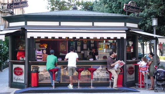
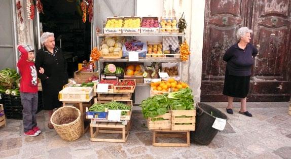
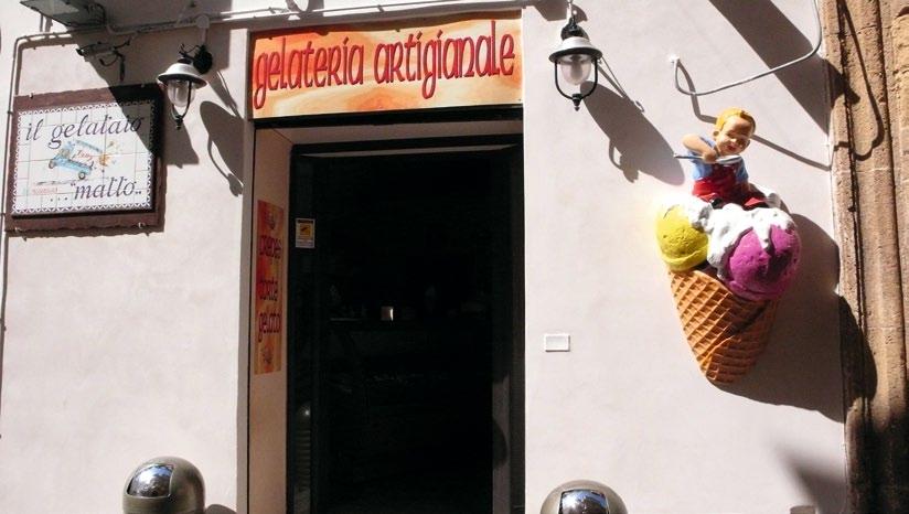
issue #15 habitusliving.com
clockwise from top left | An AntipAsto pl Ate with prosciutto And buffAlo mozz Arell A ; A serious selection of spices is on offer At the mArkets of most l Arger towns of the sAlento; A gel Ato bAr on the edge of the old town of lecce; A providore stAnds beside his Aged pecorino cheese in gAllipoli's wednesdAy mArkets; in gAllipoli, there is A vegetAble store on every second corner; coffee bAr on the edge of the old town of lecce.
Argonese arrived and stacked the skulls in a chapel. Unnervingly, they are still there.
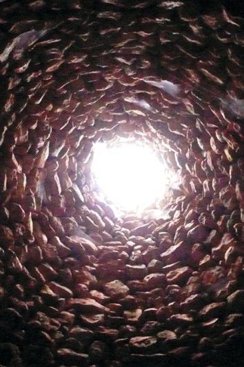
The road south of Otranto winds along a craggy coast. Initially, it is wild and forlorn, until you pass through a string of holiday towns whose culmination is Santa Maria di Leuca, on the tip of the peninsula, where wealthy pugliese have been holidaying for centuries.
The town’s waterfront street is typical of the eccentric aristocratic architecture seen in the Salento. Reputedly built by the new aristocracy as status symbols after the unification of Italy, its villas, no two the same, comprise a cacophony of styles and colours.
Cut inland anywhere along this coast, and you enter a world of red earth supporting mile after mile of olive groves. Here, in the countryside, can be found masserias, or fortified farmhouses, a curious aesthetic mix, often awkward due to their fortifications, and, like the villas, each is unique, while sharing elements such as towers and walled courtyards.
Many masserias have been converted into accommodation for tourists. One charming example is Masseria Gianferrante.
Standing on Gianferrante’s white tower and adjoining terrace, its owner explains, “This original tower is from 1300, and it was the second line of defence. The first was the tower at Torre Mozze [on the Ionian coast]. If they saw the Saracens, they would light a fire, and so it would go up the coast to Ugento.”
At Gianferrante, you can actually stay in the tower or more humble rural constructions of pajara, the Salento version of the trulli of northern Puglia. The trulli have pointy roofs because it snows up north, whereas in the Salento, they have stairs up the side leading to flat roofs, used for drying figs and tomatoes.
Driving cross-country, the country is rocky and you see stone pajaras. In the past, farmers would clear the fields and use the stones for walls and pajaras to house workers who would guard the olives during harvest.
Making our base in Masseria Gianferrante, the nearby Masseria Santa Lucia, just outside Alessano, and Masseria Uccio, near Tricase (a short drive from a magical swimming spot named Marina Serra), we explore the peninsula in day trips.
above LeFT | a typical pajara , though significantly grand in scale. these structures, built solely with stones collected from the fields, traditionally housed animals and, during the olive harvest, workers, who would watch over the harvest to protect it from thieves. above righT | the same pajara seen from inside, showing how the stones were laid carefully to create its conical shape and provide fresh air and a way of collecting water.
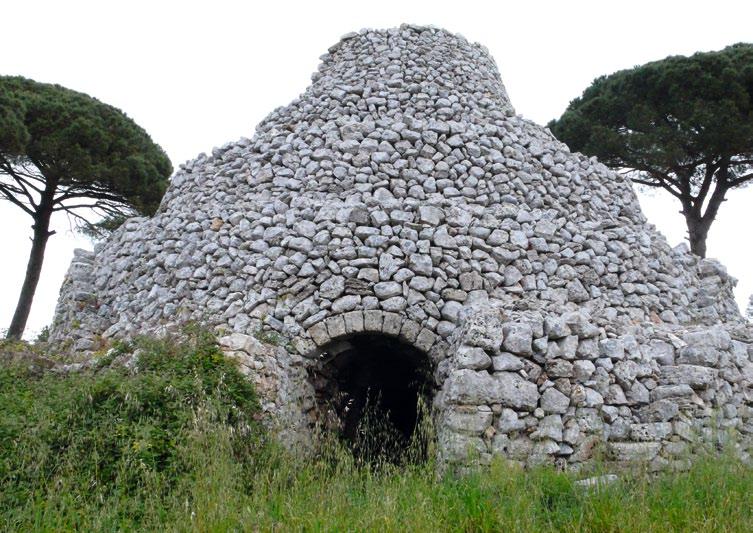
4 . reportage # 201
As in the rest of Italy, the Salento has its share of ugly cinder block buildings, but most towns have intact historical centres. The heart of the tiny town of Presicce (15 minutes from Gianferrante), for example, is like a scene from the movie, Cinema Paradiso, and the central piazza has an underground oil mill.
North, in Ugento, is a museum with finds from the Messapians, the tribe that inhabited the peninsula around 1000 BC, and the Greeks.
Nearby, in Racale, is an 11th Century monastery, now the bed-and-breakfast Palazzo Briganti, which has a restaurant for which locals queue. Further north again is Nardò, whose UNESCO-protected old town is a mini-Lecce. The nearby Galatone and Specchia also have bewitching historic centres.
Driving along the coast on the ‘superstrada’, arguably the peninsula’s most charismatic old town is announced by a brutal 1970s building. Perhaps it was someone’s idea of a contemporary torre, or tower, but it is at least the landmark signalling the exit to Gallipoli.
Our guide here tells us that (misinformed) Australians and New Zealanders regularly turn
up and ask where the cemetery for the ANZACs is, but this town, named by the Greeks as ‘beautiful city’, is, of course, not the Turkish city.
The old town of this Gallipoli is on an island whose tangle of narrow streets, including the one which runs anti-clockwise around its perimeter, is lined by humble whitewashed homes and grand palazzos built by the nobles of the different races who have ruled here over the centuries.
Gallipoli made its wealth in the 16th Century. When the Turks conquered the Greek island of Rhodes, Venice and Genoa were deprived of their source of lamp oil, the electricity of the day. The northerners planted Puglia with olive trees, and the region – and its key port of Gallipoli – boomed.
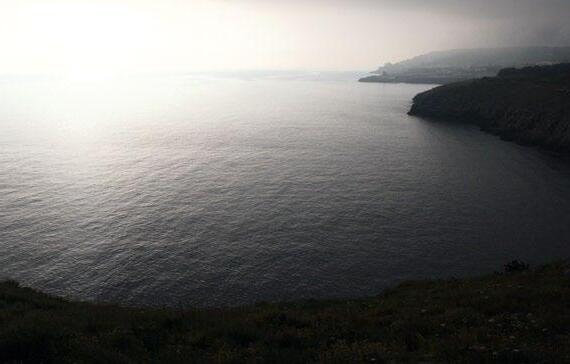

Today Gallipoli is a town of fishermen, who can be seen sitting and mending their nets on the sunny south side of the island each morning. Their families make up the local population of 30,000, which is said to swell to an uncomfortable 150,000 in summer.
You can stay in Gallipoli, as palazzos, such as the San Vicenzo, are now bed and breakfasts. Alternatively, you can drive to the centre of a nearby town such as Alessano, to sit and watch the relaxed rural passeggiata, sipping a granita made with lemons from the bar owners’ own trees.
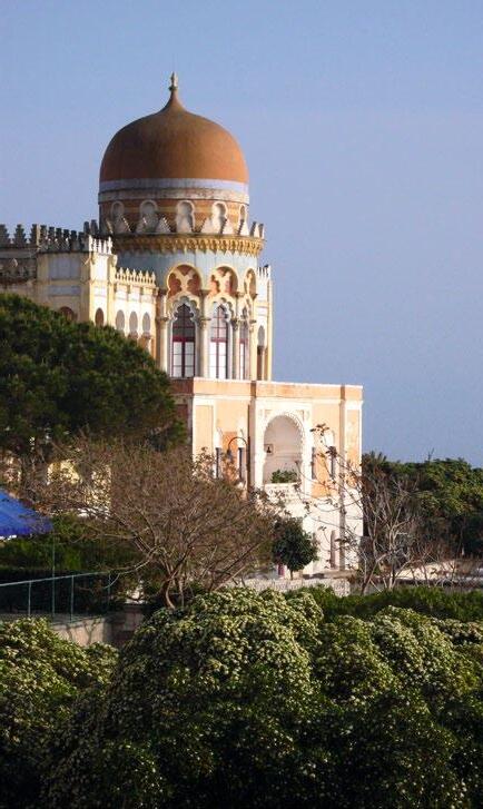
This is really the best thing about the Salento’s labyrinth of roads – they all ultimately lead to the simple local pleasures.
Qantas has daily flights to Frankfurt from every other Australian state capital, flying via Singapore. There are then connecting flights down to Rome and Brindisi. Alternatively, you can catch a train from Rome to Lecce, qantas.com.au
issue #15 habitusliving.com
On the
side O f the
LEFT | One Of the many amazing villas, this One in mOOrish style is in the cOastal tOwn Of santa cesarea terme. Top righT | the Old tOwn Of gallipOli is prOtected by a medieval castle fOrt. frOm here, ships Once sailed, taking lamp Oil tO what then was the knOwn wOrld. boTTom righT | the view frOm the cOast rOad
adriatic
salentO peninsula is O ften wild and frequently extraOrdinarily beautiful.
A Ceiling Fan That Actually Works.
BIG


Isis uses its immense size, aerodynamic aerofoils and uncompromised engineering to create a wall to wall breeze. In fact, this air moving machine does the work of 9 small ceiling fans while using just 1/3 of the energy.

BOLD
Although it’s whisper quiet, Isis makes a bold visual statement about a commitment to sustainable design. Unlike gear-driven fans, the e ect of Isis is seen and felt - not heard.
PROVEN
“Our project needed an energy-efficient cooling solution which accommodated a wide variety of occupancies and did not compromise the acoustic integrity of the hall. The Big Ass Fan not only looks great, but also aligned with all of these criteria in a cost-e ective manner.”
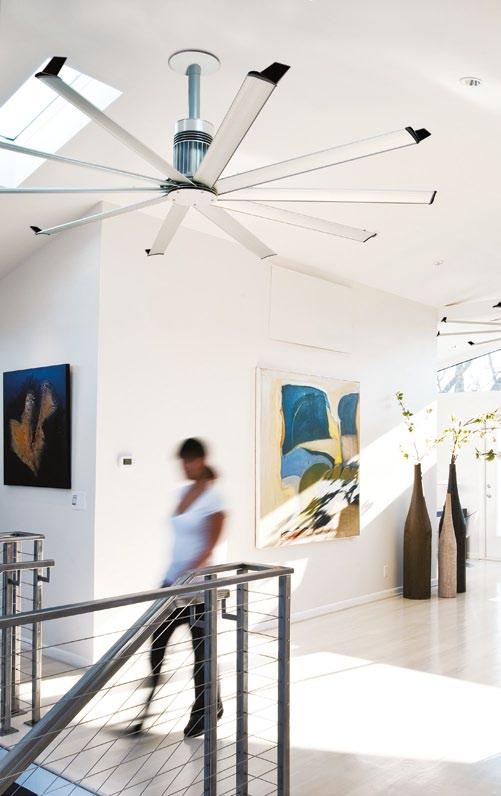 - Andrew Webb, Director WD Architects


SIS®
May be covered by one or more of the following U.S. Patents: 6,244,821; 6,589,016; 6,817,835; 6,939,108; 7,252,478; 7,284,960; D587,799; D607,988 and other patents pending. ©2012 Delta T Corporation dba the Big Ass Fan Company. All rights reserved. An ISO 9001:2008 certifi ed company (07) 5500 0690 | www.bigassfans.com.au


www.8 HOTELS . COM
SYDNEY | MELBOURNE | BRISBANE | CANBERRA | PERTH | PARIS | BALI
HomE : THE EvoLuTIoN of THE AusTr ALIAN DrEAm | Philip Cox, Philip Graus, Bob Meyer
Published by Jane Curry Publishing |
Distributed by Exisle Publishing
120pp, softcover, AUD$45 exislepublishing.com.au
forT y-sIx squArE mETrEs of LAND DoEs N ’T NormALLy BEComE
A HousE | Stuart Harrison
Published and distributed by Thames & Hudson
272pp, hardcover, AUD$70 thamesandhudson.com
IDEA Hous E : fuTurE TropICAL LIvING ToDAy | Jason Pomeroy
Published by Oro Editions
208pp, softcover, USD$35 oroeditions.com
Home Sweet Home
Home ownership is a universal aspiration. But in a world of finite resources the question becomes: what kind of home are we looking to own? LINDA CHENG looks at three books wrestling with the answers.
text linda cheng | photography one8one7

# 205 4 . reportage
Deep within the Australian consciousness lies the universal desire for the Great Australian Dream – the quarter acre block with a little cottage or bungalow and a white picket fence in a quiet suburban neighbourhood. Maybe the dream is not quite so twee for everyone but essentially, home ownership is, and has always been, the single biggest financial goal of everyone’s lives. As our population grows and the size of the average household shrinks, the demand for property is at risk of almost vanquishing the dream. We are so wedded to the idea of owning property that even our Government is willing to financially support the entire housing industry through high interest savings schemes and first home owners’ grants.
The suburb is where the majority of us choose to realise that dream. It’s getting more and more popular, its edges are expanding relentlessly into greenfields. Like a beloved baby of the family, our suburbs are showered in attention. It’s spoilt by the doting uncles and grandparents of state and federal governments, protected by NIMBY
neighbours. And because of this, it’s become the problem child that lacks discipline and hasn’t been taught about boundaries.
There’s a school of urbanists who are repulsed by the sight of the suburbs due to its banality, mediocrity and Stepford Wife-style conformity. This is what Robin Boyd called ‘The Australian Ugliness’, in his 1960 best-selling book of the same title. Half a century later, it seems very little has changed.


It’s not the suburb’s fault, this ugliness. Nor is it confined to Australia. The suburb, by definition, is the middle-of-the-road place between the urban (the city) and the rural, and it’s the same everywhere in the world. It’s the bulbous part of a bell-curve distribution of our housing stock. Conformity, or to put it another way, sameness, is perhaps unavoidable, but there’s absolutely no reason for the banal and mediocre. With good design, you can find endless ways to make the suburban dwelling a well-considered place to call home.
There are some stunning examples of good design in our suburbs. Forty-Six Square Metres

issue #15 habitusliving.com
by architect, writer and radio host Stuart Harrison rounds up 45 of the best Australian and New Zealand houses produced in recent years. The book chronicles these houses from smallest to largest in land area and compares them by the number of dwellings on the land, area per dwelling and average area per person. It’s an insightful look into the quality of space possible even on limited land size, but also and more importantly, it highlights the design innovations that make for quality of space rather than quantity.


Most of the houses featured in the book are situated in inner-city to inner-suburban locations. But this is largely irrelevant. The question being is “how much space [do] we need… as we enter a more resource-limited and energy-sensitive future?” – particularly land area. As the book shows, the smallest plot of land, Domenic Alvaro’s Small House in Surry Hills, Sydney (Habitus #12), can offer a luxurious amount of space (82.5m2 per person), while a site in Fremantle in Western Australia, the land area a little larger than the quarter acre block,
can accommodate no less than seven dwellings. Density offers limitless possibilities, despite the limits of land size, and this is the lesson that our ugly suburban sprawl should learn from.
As Stuart Harrison writes in his essay, “Every dwelling built within our cities is one saved on the outer suburban frontier”. And he goes on to point out that, “architects have a responsibility to demonstrate to clients that denser housing is rich with design opportunities and more sustainable than bigger housing”. However, given that only 2% of all building activity in this country involves the work of an architect, I’m afraid he could be preaching only to the faithful.
It’s the other 98% that’s making our suburbs ugly. I blame the developers who are continually erecting ever more supersized new housing developments on the suburban fringe in an ‘If you build it, they will come’ mentality. They take up our precious land resources, not to mention the extension in the infrastructure required to service those areas. But they’re attractive to the home-buyer because why would you pay through the nose for an infill site which you
4 . reportage # 207
would then have to renovate, when you can have your dream house surrounded by green pasture for half the price – if you know little to nothing about the astronomical maintenance costs due to poor solar orientation, poor choice of building materials and the cost of commuting.
The suburb is not the problem, if good design discipline is exercised. Home: The Evolution of the Australian Dream charts the history of good suburban development in Australia. It is ironic that this book is titled ‘The Evolution of the Australian Dream’, because by the authors’ own admission – “most Australians will continue to aspire to home ownership as the most important economic goal of their lives” – the Australian dream hasn’t evolved at all. Our housing stock and typology, however, has. In a context where “history tells us that new and innovative housing results from major cataclysms”, the authors look at various historical examples of well designed housing in our suburbs – Sydney’s Castlecrag by Walter Burley Griffin and Marion Mahony Griffin is one. Exquisitely illustrated with 50 original watercolours by Philip Cox, Home reminds us


of the good design heritage in our country and speculates what forms of housing we will have in the future to accommodate new influxes of people, all seeking the Australian Dream.


Good design is an imperative that has never been more prevalent than in today’s resourceconscious world. We’ve seen recently in the commercial building industry that developers have started to pay attention to the benefits of well-considered design, because of the follow-on financial benefits in premium rental prices. Will this trickle down into the housing market? One such project by Sime Darby Property in Malaysia is setting a precedent for what developers and volume builders around the world should be doing. In a collaboration with architects from Broadway Malyan, the group has built South-East Asia’s first carbon zero prototype house. Idea House is the story of its creation; inspired by the traditional Malay kampung house, its design evolved through microclimatic studies and other precedent studies of typology. It details a design process critical to the provision of sustainable
tropical living but also, a process of design investigation that could be adopted in any climate, at any scale, and in any culture all over the world.
The essential point that all three of these books make is the importance of design literacy. Being informed about what design choices you make and their consequences is critical to building better homes, suburbs and cities. Boyd made this point in The Australian Ugliness over 50 years ago. Unfortunately, his dream of a more design literate suburban dweller has largely gone unrealised and I wonder what scathing criticism he would have of our outlying suburbs today. But perhaps with all the focus on city building in everyone’s minds, from architects to politicians to economists, it’s time for the suburb’s coming of age, to grow up and take ownership of the ugliness it has become.
issue #15 habitusliving.com


52–54 Turner St, Redfern NSW 2016 Australia | T +61 2 9698 8870 | info @ studiobecker.com.au www.studiobecker.com.au Bespoke Kitchens & Architectural Joinery
Signature Style
The Zoe lounge by Verzelloni is distinguished by its superior comfort yet casual design. Its generous proportions and relaxed lines are the perfect combination of form and function.
At Stylecraft our signature is furniture of original design.

Featured | Zoe Lounge & Footstool by Lievore Altherr Molina Australia | www.stylecraft.com.au | 1300 306 960 Singapore | www.stylecraft.asia | +65 6511 9328


 Clockwise from top left: Generation II Petal Spoons in stainless steel by oliver smith, $230 each, oliver smith; Candelabra in silvered zinc with hidden magnetic fixing by c harles wilson for menu, $396, top 3 by d esign; Marc Newson Crockery Collection for noritake in b one c hina, $349 (20 piece set), l iving e dge.


 Clockwise from top left Herman Miller Aeron task chair, $1,400, Living Edge; Vitra Jasper stool in cork, $630, Space Furniture; Muuto Unfold pendant lamp, $262, Top 3 by Design; (photographs top to bottom) B&B Italia Lazy High Back chair designed by Patricia Urquiola, $1,915, Space Furniture; Magis
Steel Wood Armchair designed by Ronan & Erwan Bouroullec, $910, Corporate Culture; X-system shelving, from $2,500, Planex; B&B Italia Tufty Bed , $11,665, Space Furniture.


 ABOVE LEFT | EntrancE FoyEr to GanEndra art HousE sHowinG tHE commissionEd Celebrations table (canvas, Glass, rEcyclEd Hardwood) by dEnnis cHan and origins cHandEliEr (cEramic) by lilEnG wonG (pHoto by sEE KwonG cHonG). ABOVE RighT | sculpturEs by award winninG aborGinal artist, JErEmiaH b onson. OPPOSiTE | sHalini’s HomE is FillEd witH FavouritE Family pHoto GrapH s, tHE E arliEst datinG From tHE latE 1800’s.


 - Andrew Webb, Director WD Architects


