# 17
See how an Argentinian-born designer lives in his Brisbane apartment and how material and colour create inspiring spaces. Cultural collisions always stimulate creative ideas for living.

living in design october – december | 2012 AUD$15.95 | NZ$15.95 | USD$16.95 CDN$17.95 | GBP£9.00 | SGD$11.95
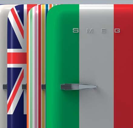
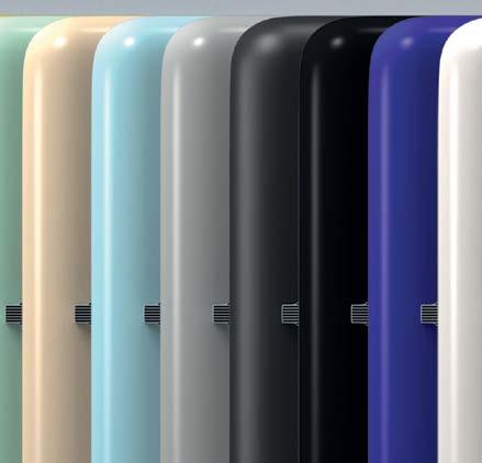
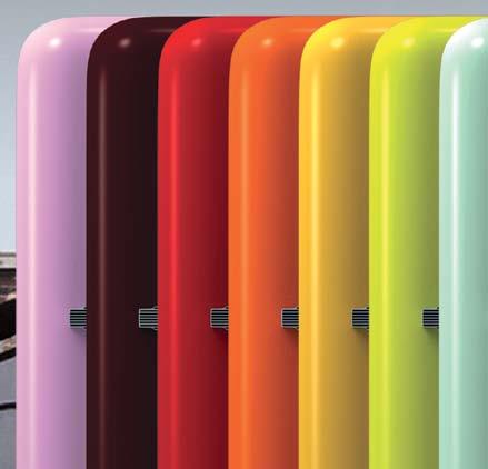
AVAILABLE IN 18 COLOURS & LIVERIES




SMA12487
SMEG FAB28 RETRO FRIDGES • AS COOL ON THE OUTSIDE AS THEY ARE ON THE INSIDE


smeg.com.au

FAB28 ABSOLUTELY FAB


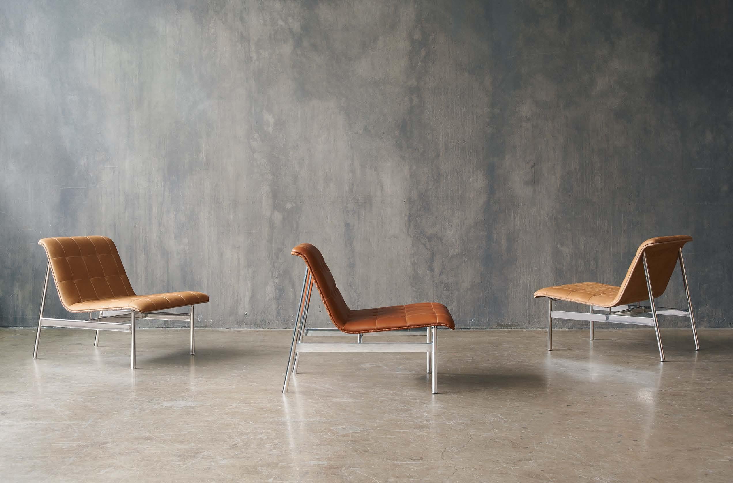

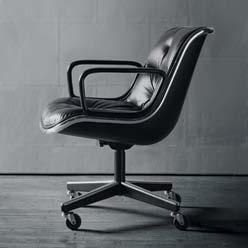
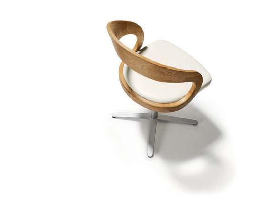
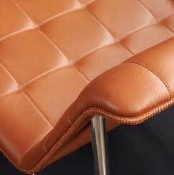 Charles Pollock Knoll Pollock chair, 1965 Detail of CP Lounge, 2012
Charles Pollock Knoll Pollock chair, 1965 Detail of CP Lounge, 2012
Charles Pollock Knoll Pollock chair, 1965 Detail of CP Lounge, 2012
“Designing using a continuous line leads you in one direction: toward simplicity. Your eyes follow the line around the perimeter of the chair and it appears to be floating in space; it is so simple.”
 CP.1 by Charles Pollock
www.kezu.com.au | 1300 724 174
hermanmiller.com.au

museums, homes and offices worldwide, and is still as wonderful to look at, and sit in, as ever.
George Nelson’s studio in the 1950s. Six decades on, it’s part of the permanent collection in
The Herman Miller Coconut Chair attests to the unique burst of creativity that issued from
2012
©Jonathan Zawada, Herman Miller Inc Coconut Chair Herman Miller Then x Ten Exhibition
Products in your home can be more than just beautiful and functional. They can inspire a whole new way of living, providing the means to express your personality and values.
26. dE SIgN NEWS
T he latest products sourced from the best brands across the globe.
37. SPRINg CLEANINg
T hese beautiful items make the act of cleaning a pleasure, not a chore.
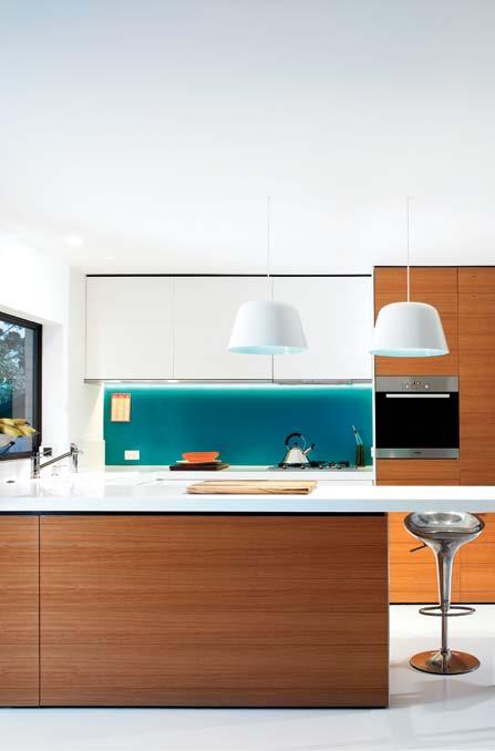

39. STATIONERY
d i sconnect with technology and get touchy feely with paper products.
41. CUTLERY
The sculptural qualities of cutlery turn them into works of art.
45. OUT d O OR dI NINg
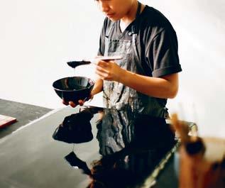
When we are exposed to different environments, new channels of creativity are opened up. Our people this issue cross geographical borders in search of inspiration for their particular crafts.
56. A LEX LOTERSZTAIN
He’s the Argentinian-born, Brisbanebased designer with plenty of personality. Peri Mooney drops in to Alex’s penthouse and discovers an interior that transforms his slick commercial aesthetic into a colourful and comfortable home.
71. dANIEL LATORRE CRUZ
While the UK is home to product designer, da niel Latorre Cruz, it’s in his homeland, the Philippines, that he finds his inspiration. Aya Maceda visits his studio and meets one of the new generation of creative visionaries.
79. SHAREEN JOEL
Venture outdoors to enjoy the good weather, some good food and the pleasure of good company. #45 #56
Melbourne designer, Shareen Joel, started out in a boy’s club – the design team of Ford. Now Alice Blackwood discovers she has created her own empire: an eponymous studio that delivers on industrial, interior and design strategy, and a brand new venture – a website that ‘shares’ design.
91. SATYEN dR A PAKHALE
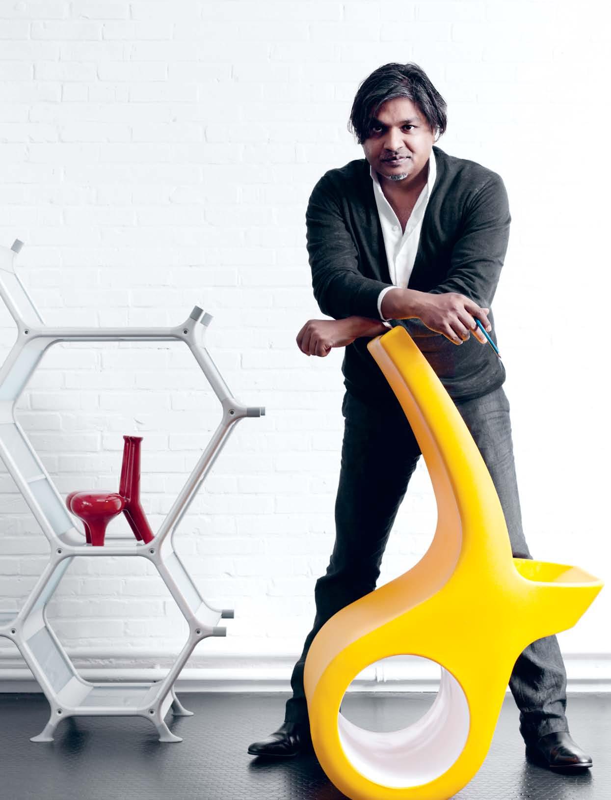
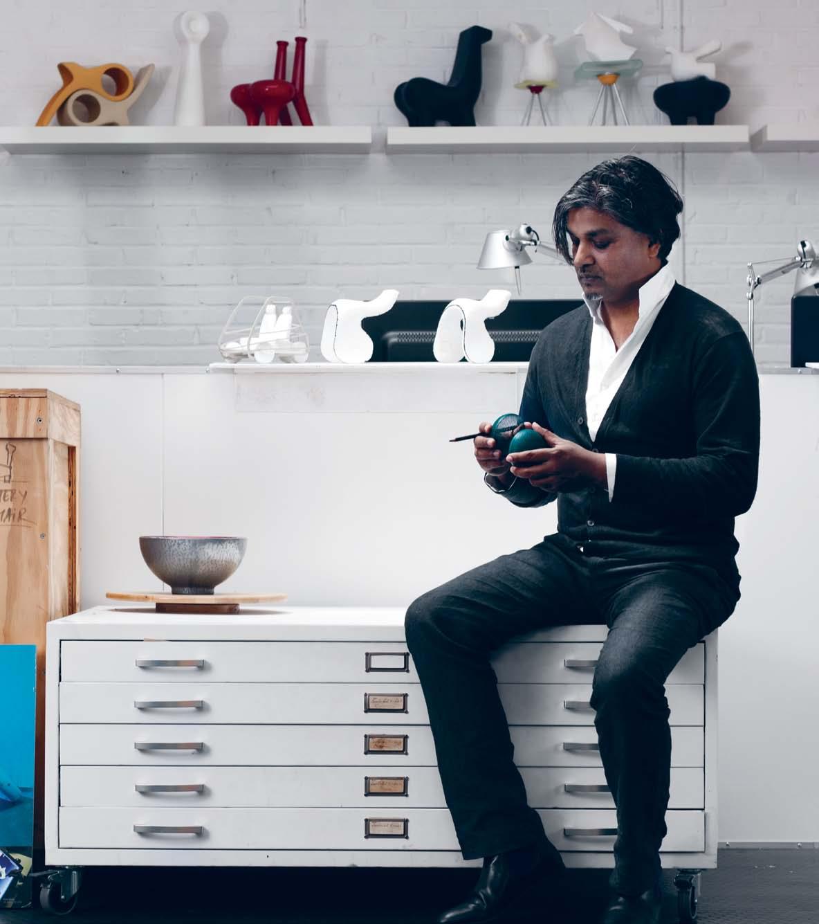
Where cultures collide is where creativity takes place, and designer Satyendra Pakhale is at the eye of the storm. From India to Switzerland and Amsterdam, Satyendra craves an intellectual and emotional connection with the tribe of humanity through his products and projects, as Nicky Lobo finds out.
habitus # 17
habitus # 17
Around the Region we see homes for individuals, couples, and families – both nuclear and extended –that allow them to live in their own unique ways.
98. YOUNg ST STU dIOS
A travelling, yoga-obsessed photographer puts down roots in a warehouse home that doubles as a photographic studio. Kath d olan visits the space designed by gr ant Filipoff in Melbourne.
109. R AN dWICK HOUSE
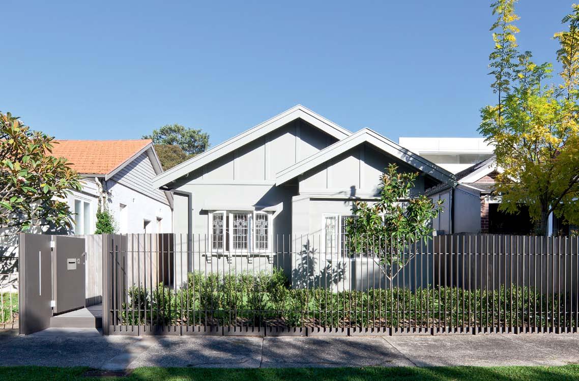
Suburban living at its best. Paul Mc gi llick visits a family home that has received a thoughtful and contemporary addition by Studio Internationale to a heritage-listed house in Sydney.
#137
122. L ONgL EY HOUSE
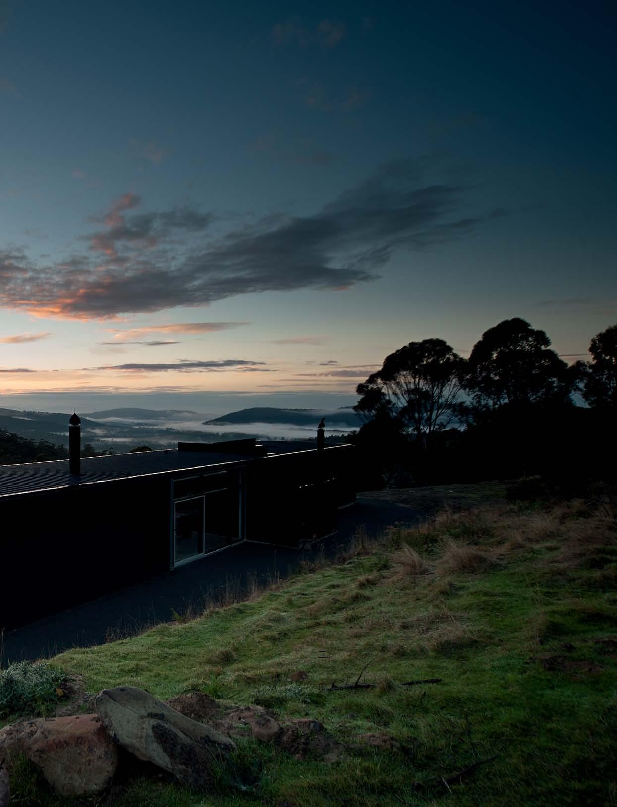
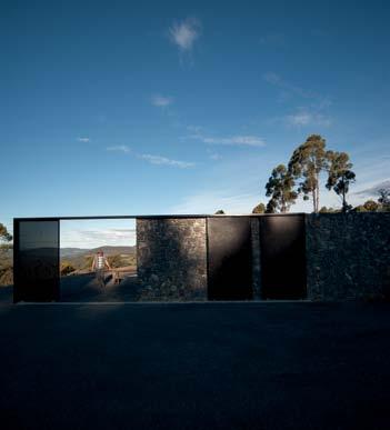
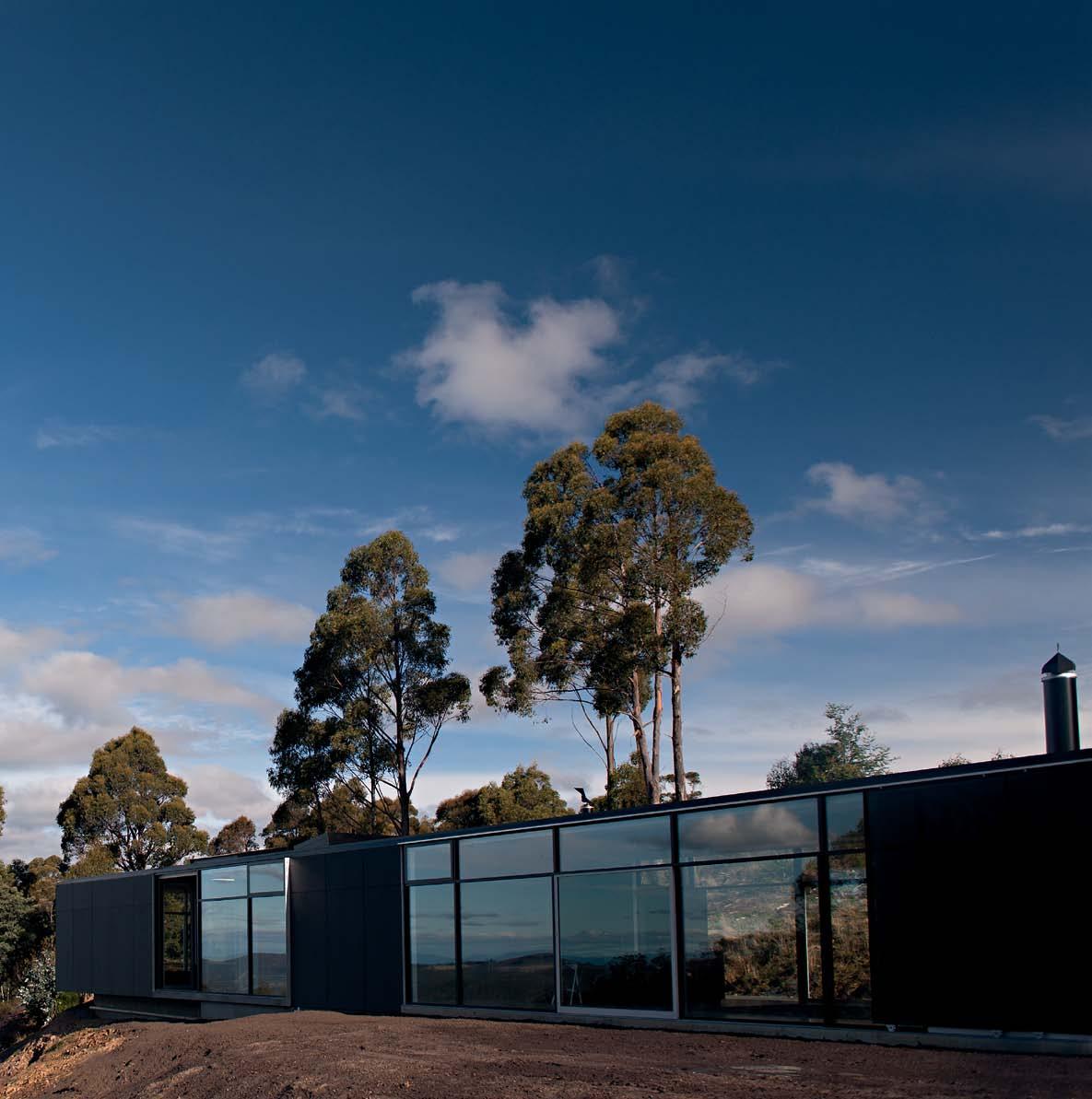
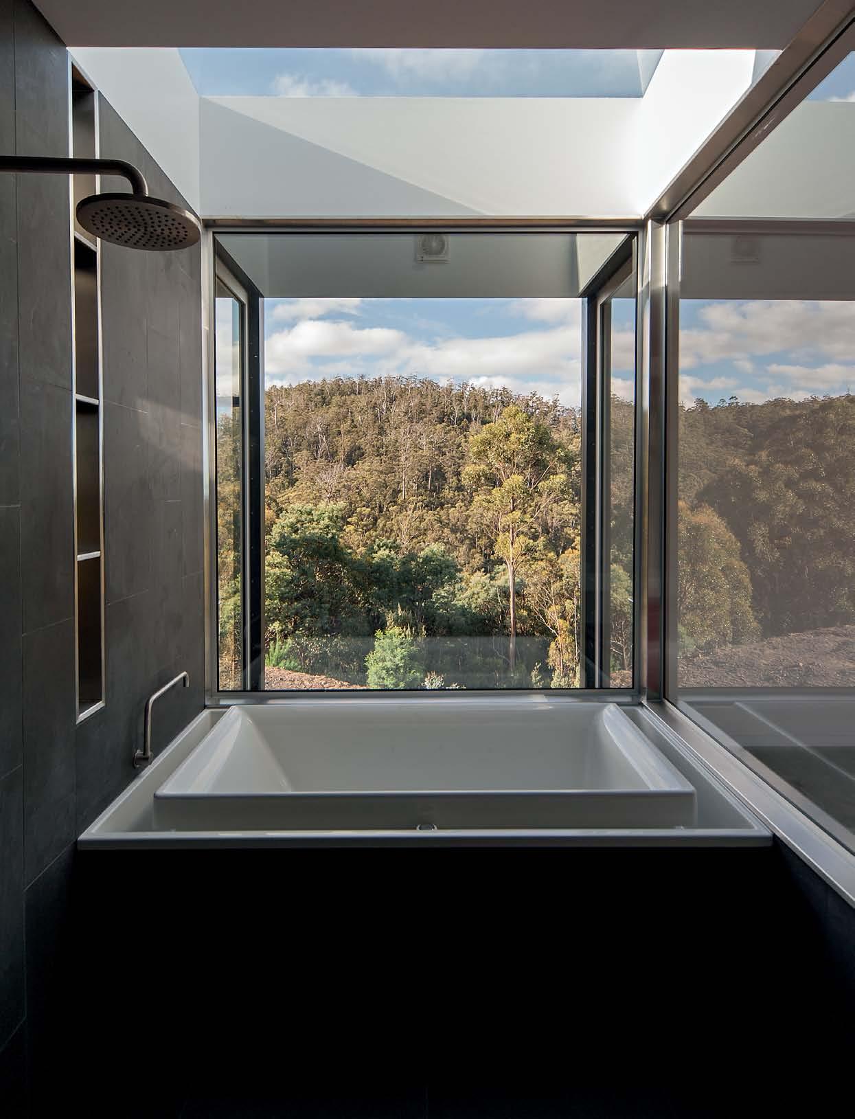
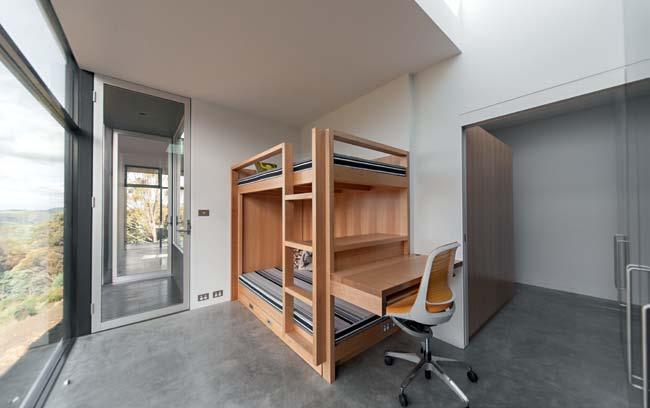
Tasmania’s landscape offers no end of views; the challenge is how best to capitalise on them. Jane Burton Taylor discovers a house by Room 11 that does just that.
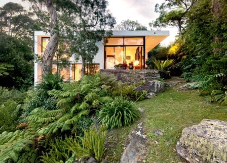
137. V INEYAR d HOUSE
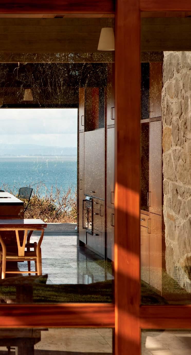
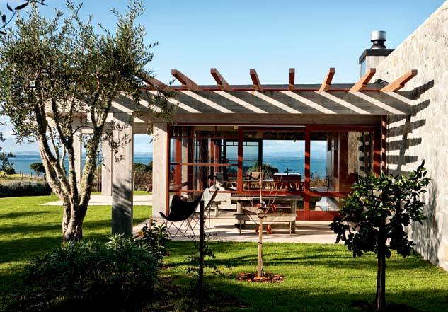
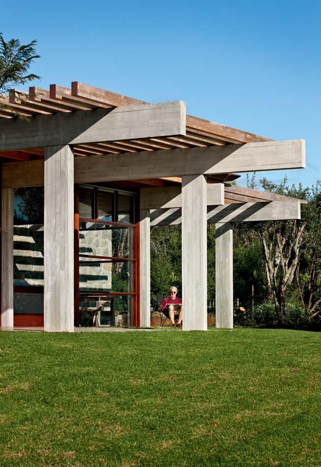
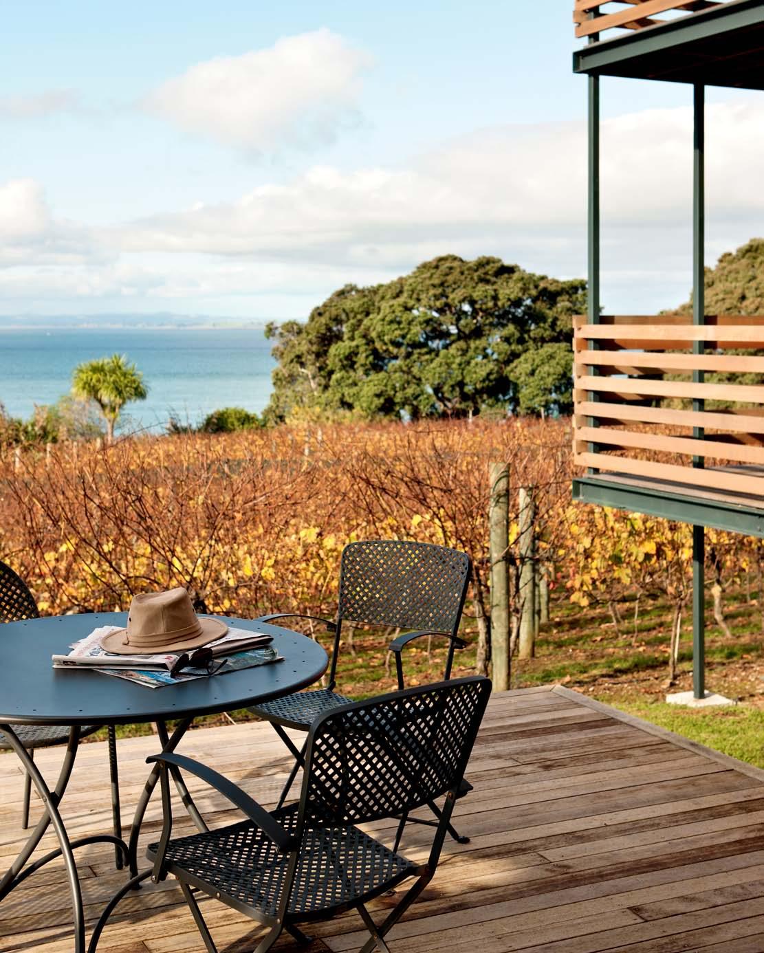
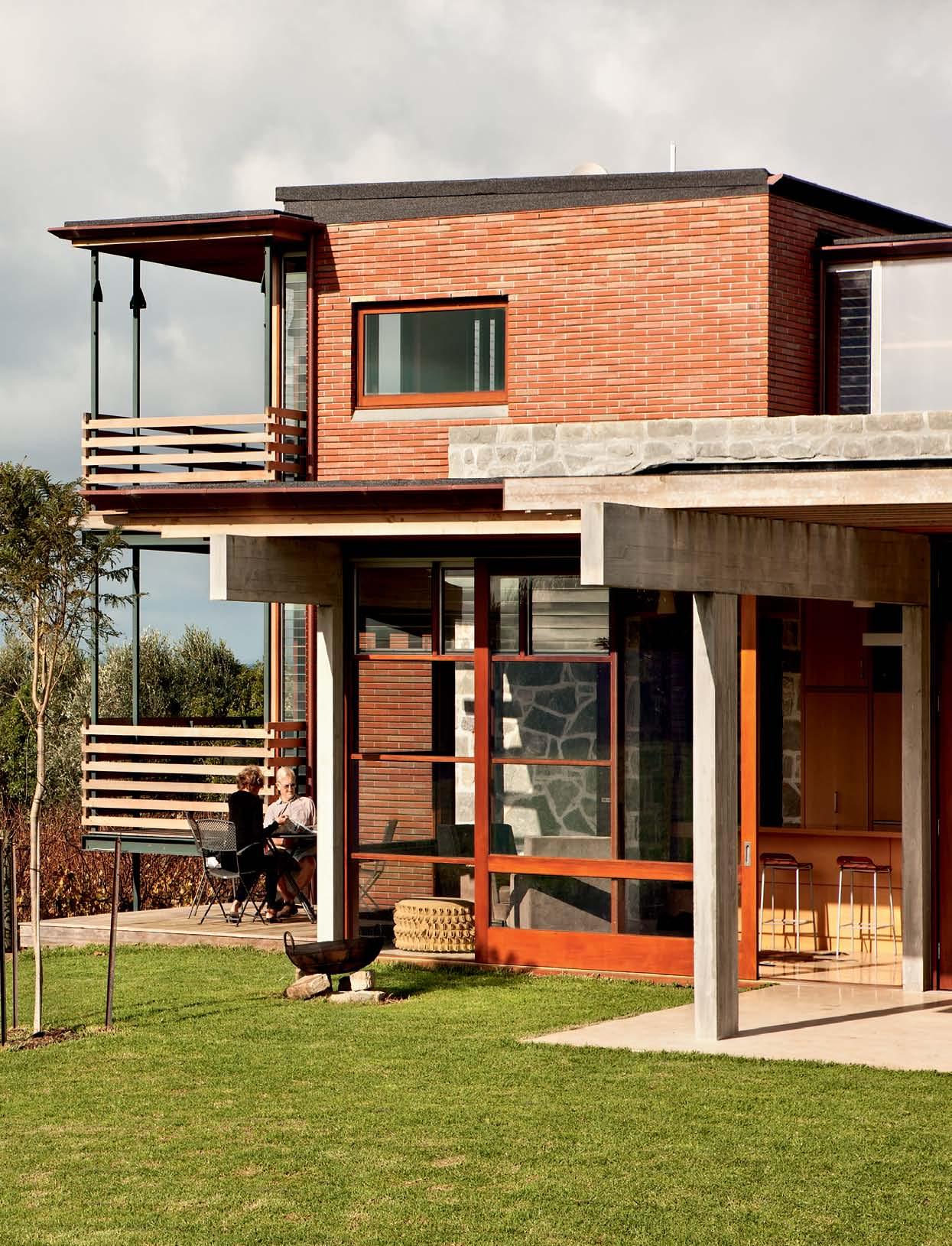
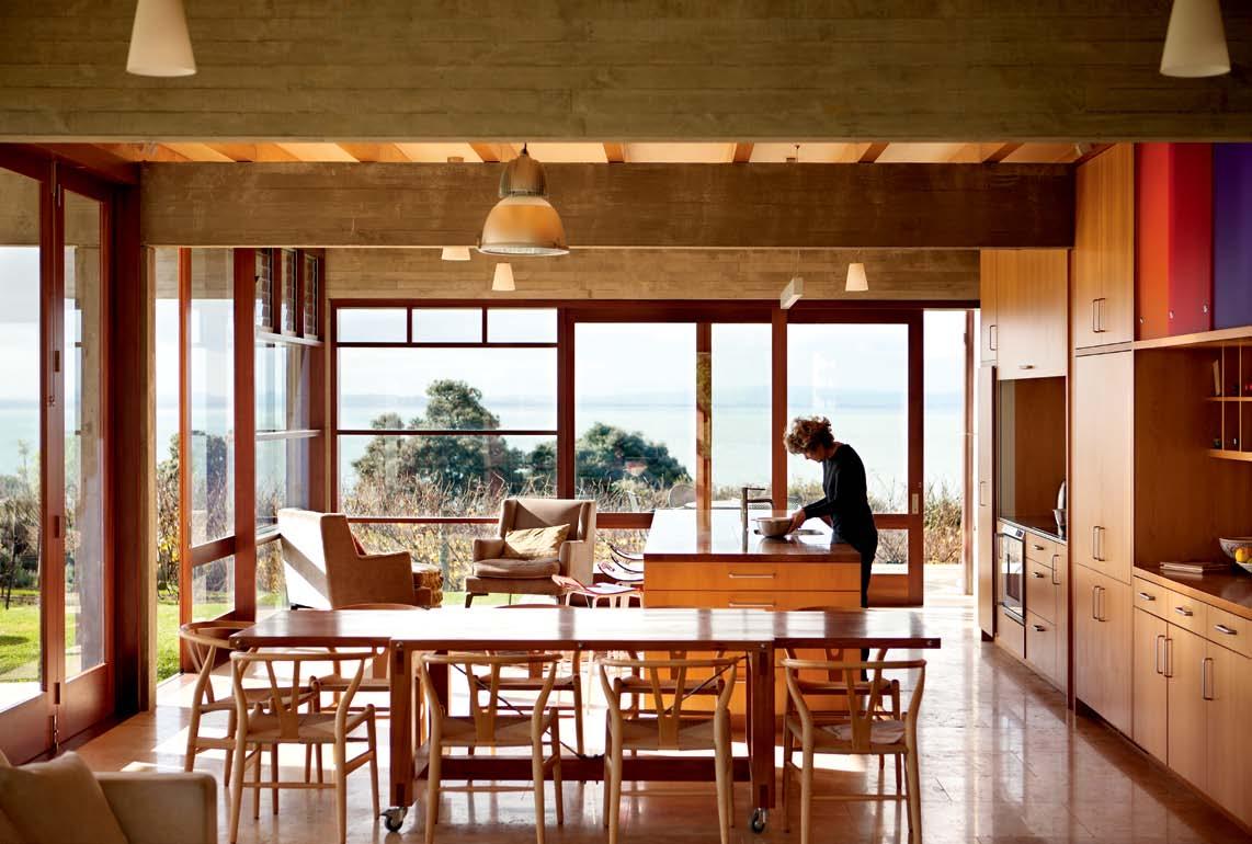
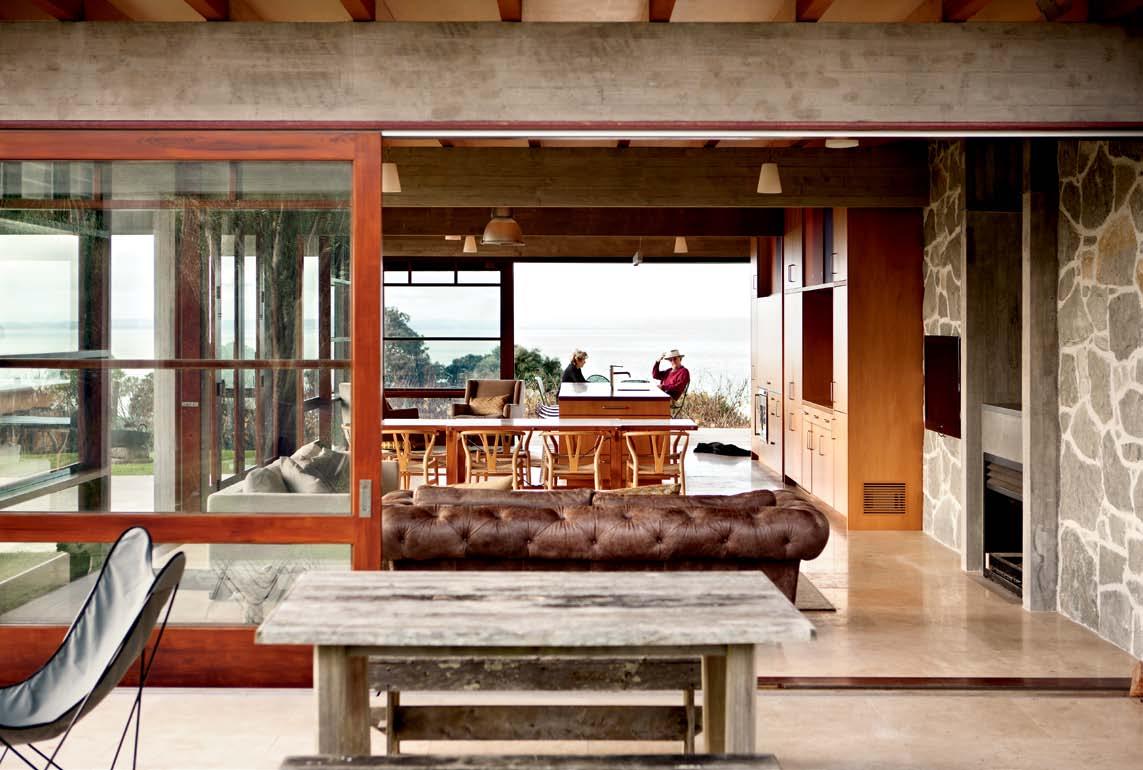
Marshall Cook looked to the peasant history of wine-making when designing this home on New Zealand's south-west coast of the North Island. Andrea Stevens finds a house that is modern, but retains a soft, rural feel thanks to its sensitive use of materials and space.
#153
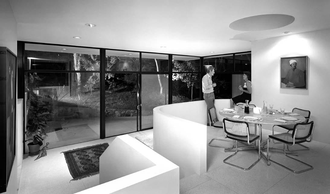
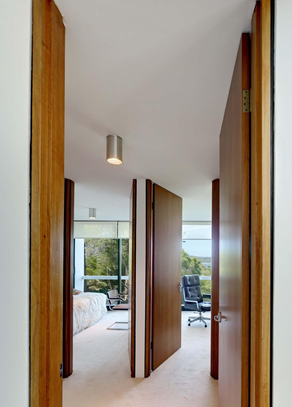
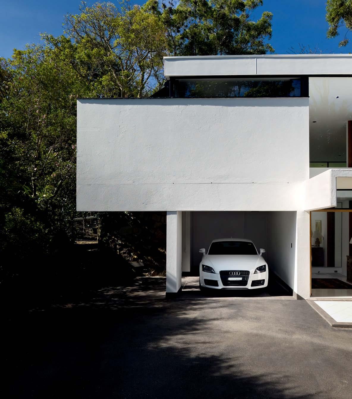
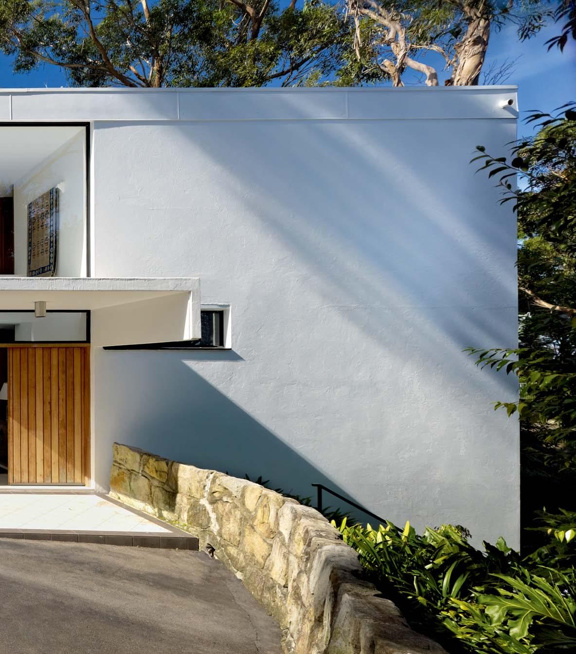
153. CASTLECRAg HOUSE
T he residents have been living in the Andre Porebski-designed for nearly 40 years. Stephen Crafti visits and learns they enjoy it just as much now, as ever before.
167. T-HOUSE
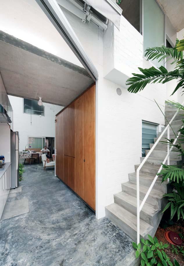
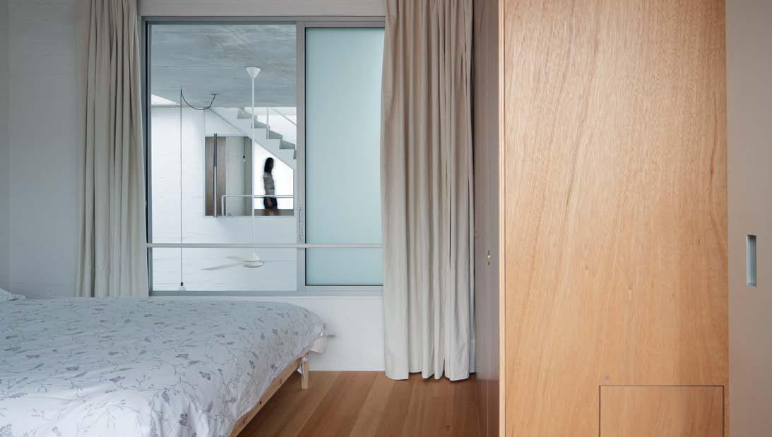
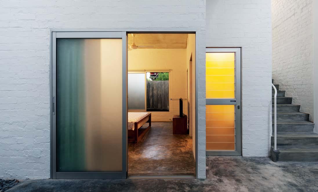
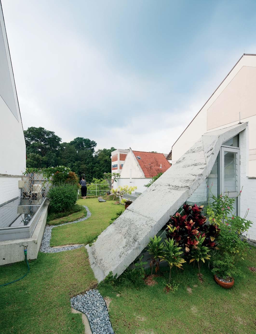
A home for an extended Singaporean family of green thumbs was the brief given to Ling Hao Architects. Narelle Yabuka finds a complex interplay of forms, light and air that is attractive to both residents and local fauna.

180. SH AKIN ’ STEVENS
Bold colour can be a brave decision in an interior. Matt gibson Architects have made it work beautifully in this award-winning home for a family in Melbourne, Annie Reid reports.
#196
We drop in to South Africa’s legislative capital and dwell on the merits and myths surrounding the word ‘icon’ in architectural terms.
196. CAPE TOWN
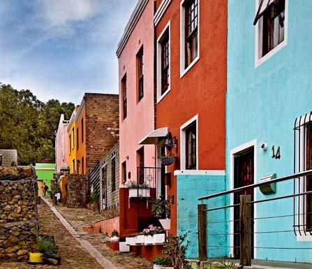
T his harbour city has established creative precincts and several design jewels in the lead up to its upcoming status as World de sign Capital for 2014. Elana Castle shows us around her hometown.
203. BOOK REVIEW
The idea of the ‘icon’ is discussed by Paul Mc gi llick through the lens of some recent books. What does it mean? Who decides what an icon is? And what is its value?
OUTDOOR&PASSDOOR SHOWROOMS ANTWERP BARCELONA DOETINCHEM ISTANBUL LISBOA LOS ANGELES MADRID MALLORCA MIAMI MILANO NEW YORK OORDEGHEM PORTO VALENCIA www.gandiablasco.com GANDIA BLASCO T. +34 902 530 302 info@gandiablasco.com Na Xemena design Ramón Esteve
Box design José A. Gandía-Blasco
Cristal


Australian Made



MOON LIGHT offers cl eardesignfor bathrooms
wi th an as su re ds en se of st yl e. Th er ec ti fi ed til es in 30 x9 0cmfor matare id ealfor modern horizontalt il in g arrangem ents an dl en dbathroom saspaci ou scharacter.
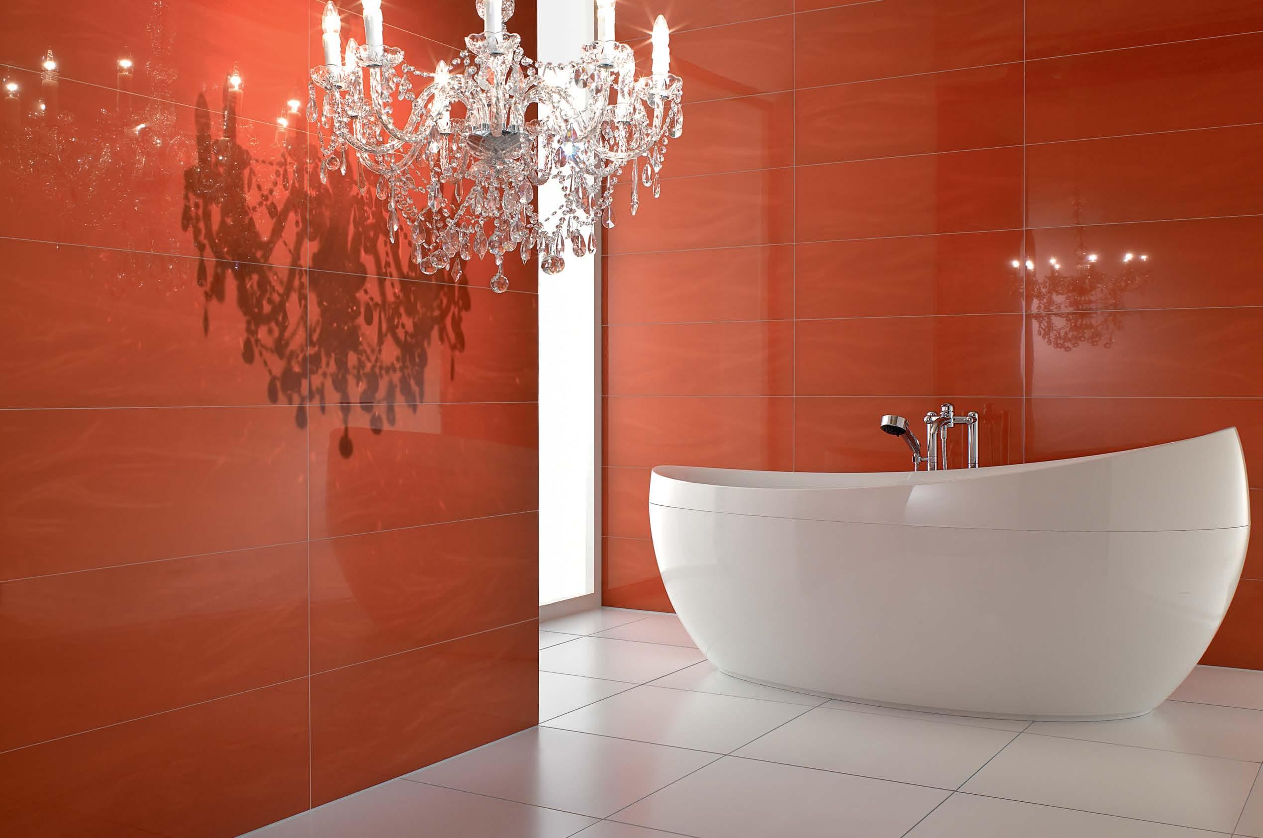
TI LESbyV IL LEROY&BOCH


BA TH RO OM DE SI GN CE NT RE •A LE XA NDR IA -84O ’RIO RD AN ST .028 33 97 10 3 •A UBURN -1 03 -1 23 PA RR AMA TT AR D. 0287 48 43 67 VI SI TO UR WE BS IT E-W WW .D OM AY NE .C OM .A U Domayne® stores areoperatedbyindependentfranchisees .Tapware andaccessoriesshownarenotincluded.
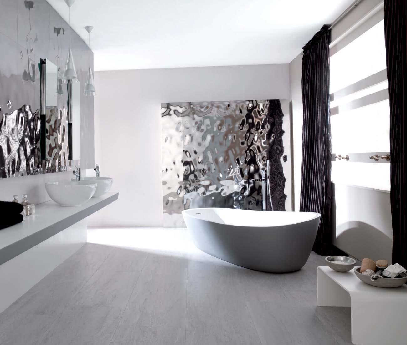


EB12 EB1 2205 www.earp.com.au Newcastle 4962 5500 Parry Street Newcastle Sydney 02 9410 3222 Pacific Highway Chatswood Melbourne 03 9328 8598 Abbotsford Street North Melbourne Sea Silver, new from Earp Bros. Also available in Gold and Blanco. soft, undulating reflections. stunning shine. SEA SILVER AS SEEN AT
the first word
Gated communities get a bad press. But there are gated communities and there are gated communities and it is worth looking at how they differ and whether or not they are all as inimical as their critics claim.
Firstly, gated communities are not new. They go all the way back to walled cities. In modern times, we could arguably see the famous Siedlungen of pre-War Berlin and Vienna as gated communities since they were substantially self-contained and the individual apartments accessed from a central courtyard which itself was accessed from the street through a portal.
Secondly, evaluating such communities turns around the degree to which they are either inclusive or exclusive. Historically, their origins have been exclusive –protecting the community from external threats. And that remains true today in cities where the crime rate effectively forces those who can afford it to take defensive measures.
With a gated community like Singapore’s Sentosa, the emphasis is also on exclusivity. It not only aims to keep the hoi poloi out, but any attempt to build community is purely tokenistic. The inevitable impression is that in this hugely expensive suburban precinct no one has the slightest idea of who their immediate neighbours are. In any case, many of the owners don’t even live there, simply using their houses as weekenders or party venues.
The Siedlungen, on the other hand, were certainly protective, but even more about community-building and affordable and innovative housing.
For a gated community to be more than defensively snobbish it needs to have a demographic and typological mix and to possess amenities which genuinely bring people together and build a sense of community. Perhaps the Mera Golf Estate outside Ipoh in Malaysia will become such a community. It has a mix of housing types with a scale of affordability while the golf club – which is literally in the centre of the estate – is a community hub because it is not just a golf club, but offers a shop, gym, yoga classes, café etc.
One scenario sees gated communities becoming more and more common as people get fed up with crime, anti-social behaviour and civil disturbance making their lives a misery. The opposing view – dating back at least as far as Jane Jacobs’ pioneering book, The Death and Life of Great American Cities (1961) – is that gated communities give a false sense of security and that community and security can be better achieved through open communities with “diversity, density and dynamism”.
Watch this space!
PAu L MCGiLL iCk | EDiTor
I recently had occasion to visit a number of gated and guarded communities in Malaysia and Singapore – the former is walled off with entry through a security gate, the latter is open with public roads, but with a security presence.
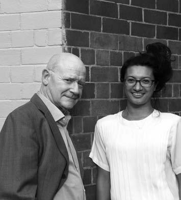
left | editor, paul mcgillick. riGht | deputy editor, nicky lobo.
habitus takes the conversation to our contributors, discovering their inspirations and design hunter journeys
ALEX CLAYTON |
YOUNG STREET STU diO S #98
Alexander Clayton discovered the joys of travel photography at age 22 during his travels to Singapore, Malaysia and Thailand. On returning to Australia, Alex worked as a photographic studio assistant in order to learn the craft. Alex lives in Fitzroy and is totally inspired by the way artists construct their identities around their artworks and their artworks around their personas; however a major influence for Alex is always returning back to Australia after travel.
KATH DOLAN | YOUNG STREET STU diO S #98
FLORIAN GROEHN | A LEX LOTERSZTA i N #56
B orn in Berlin and raised in West Germany in a town where people grow turnips, Florian spent most of his childhood exploring and creating, which is where his first love for arresting imagery developed. With equal love for light and shadow Florian developed a keen desire to absorb the mastery of a well-crafted image. Florian now lives in a warehouse in Alexandria and is constantly inspired by light and life in general. He loves nothing more than the feeling at the end of a successful shoot – alive and soulful.
AYA MACEDA |

dA N i E L LATORRE CRUZ #71
Fililpino-Australia architect Aya Maceda is a Senior Associate at Popov Bass Architects. She is passionate about design, travel and family, and regularly contributes to Habitus covering the contemporary design scene in the Philippines. After 10 years of practising in Sydney, Aya is currently in New York City for a year of postgraduate studies at Columbia University.
SHANNON MCGRATH | SHAREEN JOEL #79


funkis started in 1996 in Sydney’s iconic suburb of Bondi Beach. “I don’t think it would have worked otherwise,” Carina Enstrom Gibb believes. “In Bondi then, there were all the stylists, the film people and art directors who were a bit braver and liked the whole thing.” Quickly, and via these stylists and other influential creative people, Funkis prints, bags, clogs and homewares made their way into magazines. “I think because Swedish products are so graphic and photogenic, they loved borrowing it,” Carina says.
Shannon McGrath loves nothing more than being at her weekend country house with the family – surrounded by love, the outdoors and a feeling of peace with nature. d u ring the week you will find Shannon at her East Melbourne abode in Jolimont, a small suburb right next to Melbourne’s CBd, k nown for its beautiful parks. She lives there with her interior designer husband, Hamish, and daughter, Jos.
PERI MOONEY |
ALEX LOTERSZTA i N #56
Kath d olan is a freelance writer who first left school with dreams of becoming an interior designer until she realised her love for dog-eared sketchbooks and 6Bs did not translate to the design world of very sharp pencils and tracing paper. She soon switched to journalism and has since been happily asking designers and artists millions of questions ever since. Kath currently resides in Melbourne’s inner north with her family Graeme, Max and Zoe and looks forward to meal times and food – almost constantly.
Prior to Funkis, Carina was already sourcing vintage and antique pieces from Sweden – “we used to go to Sweden in the summer and ship them over” – but eventually decided to work with Swedish textile designers to create prints that would become cushions and lampshades, as well as being available in drops for furnishings. In addition, Carina began designing lighting, jewellery and clothing expressing the same bold, quirky aesthetic. But it wasn’t just about creating a ‘look’ – “when we made something it was always because I could imag
Peri Mooney lives in Sydney’s North Shore, which she describes as “the perfect distance from both buzz and peace”. She draws inspiration from “big life people, water and colour” with every encounter. Peri most looks forward to the excitement of new beginnings and her love for writing was found as an innate response to the beautifully designed objects that surrounded her.
ANNIE REID | SHAK i N STEVENS #180
TOM EPPERSON | dA N i E L LATORRE CRUZ #71

Tom Epperson, an American photographer who has been living in the Philippines for the past 27 years, where he lives with his wife Jenni and their two children, Aryanna and d ylan (and Jack Russell Blitz). Tom is particularly inspired by music, movies, surfing, architecture, family, wine, silence, open spaces and great chocolate cake. Tom looks forward to time away with his family, exhibitions, gigs and cook-ups on Sundays.

Annie Reid is a Melbourne-based writer, editor and author whose work has appeared in numerous national and international publications on architecture and design, with a particular interest in sustainable living. Annie neighbours a lawn bowls club in her eastern Melbourne suburb of Murrumbeena where she lives with her husband and two flourishing chilli plants. She is inspired by bold colour, curved walls and Eastern European chandeliers and fell in love with houses while playing in the nooks and crannies of her Aunty's big old beach home.

issue #21 habitus.com
JEREMY SAN |
T-HOUSE #167
Jeremy San lives in Singapore and is inspired by nature. He enjoys rummaging through rooms, ransacking houses and trespassing into buildings. Jeremy was trained in interior design 10 years ago and today you can find him photographing architecture all over the globe. i n t his issue Jeremy shot the T-House project, which sees him collaborate with writer, Narelle Yabuka, to tell the story of this unique Singapore house.
JONATHAN WHERR ET |
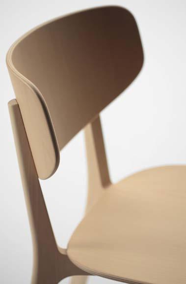

LONGLEY HOUSE #122
Jonathan studied Architecture at the University of Tasmania before deciding to switch career paths to photographing buildings rather than designing them. Based in Hobart, he shoots for a wide range of commercial and private clients. Jonathan is inspired by people, new projects and travel –he first fell in love with photography during his years spent living in Japan where the changing seasons saw Jonathan’s keen eye transfix on the finer details and colours. He most looks forward to time off with the family and quiet winter nights by the fire.
NARELLE YABUKA |


T-HOUSE #167
Singapore-based Australian Narelle Yabuka is a freelance writer and editor specialising in architecture and design. She has worked in the architectural publishing industry since 2002 in Singapore and Australia, and contributes to magazines in both countries. Narelle lives with her husband and their cat in Singapore and is inspired by the way things evolve organically in heavily regulated and thoroughly planned Singapore. She first fell in love with her craft as an architecture student in Perth where she enjoyed the challenge of the critical role of thoughtful writing in the communication of buildings and spaces that are far away.
Contact: Joyce Seeho +61 413 707 123
joyce@seehosu.com.au
 Lightwood by Jasper Morrison
Roundish by Naoto Fukasawa
STRAIGHT TO THE SOURCE
THE NEW DQ
The A&D inDus Try resource bringing you a fresh perspective
on your Desk october 2012
EDITORIAL DIRECTOR
Paul McGillick habitus@indesign.com.au
DEPUTY EDITOR
Nicky Lobo nicky@indesign.com.au
EDITORIAL ASSISTANT / PA TO EDITORIAL DIRECTOR
A licia Sciberras alicia@indesign.com.au
ART DIRECTION & ORIGINAL DE SIGN TEMPLATE one8one7.com
SENIOR DESIGNERS
E mma Warfield emma@indesign.com.au
Lauren Mickan lauren@indesign.com.au
DESIGNER
F rances Yeoland frances@indesign.com.au
J UNIOR DESIGNER
A lex Buccheri alex@indesign.com.au
ON LINE EDITOR Lorenzo Logi editor@habitusliving.com
CONTRIBUTING W R ITERS
Alice Blackwood, Jane Burton Taylor, Arnold Castle, Elana Castle, Stephen Crafti, Kath d olan, Aya Maceda, Peri Mooney, Annie Reid, Andrea Stevens, Narelle Yabuka
CONTRIBUTING PHOTOGRAPHERS
Kurt Arnold, Elana Castle, Alex Clayton, Simon d evitt, Max d upain, Tom Epperson, Noli Gabilo, Florian Groehn, Katherine Lu, Shannon McGrath, Michael Nicholson, Jeremy San, Joost Van Brug, Jonathan Wherrett
CONTRIBUTING SUB-EDITOR
Katrina Fox
COVER IMAGE
Alex Lotersztain (p.56)
Photography: Florian Groehn
CEO / PU BLISHER
R aj Nandan raj@indesign.com.au
OPERATIONS M A NAGER
A dele Troeger adele@indesign.com.au
PRODUCTION M ANAGER Shannon Smith shannon@indesign.com.au
A Dv ERTISING TR AFFIC / PA TO CEO Elizabeth davy-Hou elizabeth@indesign.com.au
FINANCIAL DIRECTOR K avita Lala kavita@indesign.com.au
BUSINESS MANAGER darya Churilina darya@indesign.com.au
ACCOUNTS
G abrielle Regan gabrielle@indesign.com.au
Jana Kralikova jana@indesign.com.au
ON LINE COM MUNICATIONS
R ish Raghu rish@indesign.com.au
Ramith Verdheneni ramith@indesign.com.au
Radu Enache radu@indesign.com.au
Gareth Parker gareth@indesign.com.au
Ev ENTS AND MARKETING
Kylie Turner kylie@indesign.com.au
Tegan Richardson tegan@indesign.com.au
Hannah Kurzke hannah@indesign.com.au
BUSINESS DE v ELOPMENT MANAGER
Marie Jakubowicz marie@indesign.com.au (61) 431 226 077
A Dv ERTISING ENqUIRIES Colleen Black colleen@indesign.com.au (61) 422 169 218
INDESIGN PUBLISHING Level 1, 50 Marshall St Surry Hills NSW 2010 (61 2) 9368 0150 | (61 2) 9368 0289 (fax) indesignlive.com
information about yourself. i f
may use the information to provide you with products or services we have. We may also provide this information to parties who provide the products or services on our behalf (such as fulfilment organisations). We do not sell your information to third parties under any circumstances, however, these parties may retain the information we provide for future activities of their own, including direct marketing. We may retain your information and use it to inform you of other promotions and publications from time to time. i f you would like to know what information i ndesign Group holds about you please contact Nilesh Nandan (61 2) 9368 0150, (61 2) 9368 0289 (fax), subscriptions@indesign.com.au, indesignlive.com. Habitus magazine is published under licence by i nde sign Group. iS SN 1836-0556
provide such information to us
issue #17 habitusliving.com Printed in Singapore. All rights reserved. No part of this publication may be reproduced, stored in a retrieval system, transmitted in any form or by any other means, electronic, mechanical, photocopying, recording or otherwise. While every effort has been made to ensure the accuracy of the information in this publication, the publishers assume no responsibility for errors or omissions or any consequences of reliance on this publication. The opinions expressed in this publication do not necessarily represent the views of the editor, the publisher or the publication. Contributions are submitted at the sender’s risk, and i ndesign Publishing cannot accept any loss or damage. Please retain duplicates of text and images. Habitus magazine is a wholly owned Australian publication, which is designed and published in Australia. Habitus is published quarterly and is available through subscription, at major newsagencies and bookshops throughout Australia, New Zealand, South-East Asia and the United States of America. This issue of Habitus magazine may contain offers or surveys which may
you to
require
provide
you
we
HAB17_New DQ_HPV 01.indd 1 10/07/12 4:12
PM






OFFICE + SHOWROOM 55 CRANBROOK ST BOTANY, NSW, 2019 P: +61 2 9316 9066 | F: +61 2 9316 9055
Foxy Armchair $750
Foxy 3 seater $1870
Foxy Coffee Table $735
Looking to the past while nodding to the future
design news – page #25
has never looked better.
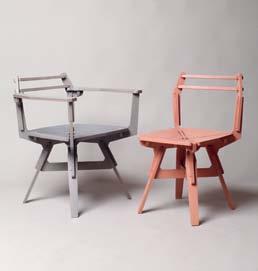
This light, whimsical series of plywood funiture titled STACK AND FRAME is pieced together like a puzzle resulting in an interesting paredback skeleton outline of a chair. The intricate design comes as a flat pack and is assembled with no need for glue, nails or screws. Designer Konstantin Achkov launched the design for the Sofia Design Week 2012 in Bulgaria and the series has been a hit, and it is no wonder –it is a daring, deconstructed addition to any living space. konstant-in.net

The absolute depiction of style and class in one timeless time piece – the latest offering from Jaeger-LeCoultre is a reinvention of their classic Day and Night model for the new collection, RENDEZ-VOUS. With over 180 years of heritage and experience, wearing a Jaegar-LeCoultre timepiece is like carrying the history of refined watchmaking with you on your wrist. The soft guilloché pattern imprinted on this ladies watch is set off by the embedded diamonds around the circumference of the face. Investing in a piece like this is for life, something that will become an heirloom and will last generations beyond.
jaeger-lecoultre.com

The new dining room range with a contemporary aesthetic that remains true to the natural material it is made from is available now from arthurG. Constructed from solid American Oak, the clean lines and tapered legs are versatile enough to be suited in any residential dining space. The generous size of the table makes it perfect for large families or for people who enjoy entertaining large groups. Tailor your seating to match the OAK TABLE – here pictured with the Harold dining chairs.
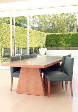
arthurg.com.au
The JUST ABOUT NOW sand timer is a collaboration between creative studio Laikingland and Dutch designer Maarten Baas. The Laikingland label focuses on the fundamental theme of movement and each year they develop kinetic objects to exhibit as part of the ‘With Movement’ initiative. The romantic notion of sand passing through the hourglass is marked with a delightful dong of the gong.
maartenbaas.com / laikingland.co.uk
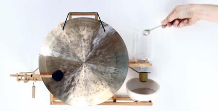
issue #17 habitusliving.com
There is nothing more satisfying than sitting down to a finely set table where particular attention has been paid to the accessories. And for people who care, you wouldn’t just place any old vinegar bottle on the table along with the supermarket salt and pepper. So if you have gone to the trouble of bringing out the linen tablecloth and fine crockery set, then make sure it is accompanied by these beautiful glassblown KINK vinegar bottles from the Jam Factory in Adelaide.
jamfactory.com.au
Born out of a cheeky response to the overcrowded furniture market and buyers’ inability to ‘digest’ the amount of new products that are available, the SAPORE DEI MOBILI – or Furniture Tasting kit – proposes a different way of encountering furniture and takes the form of food. The resulting sweets are Portugese egg-based pastries that redefine designer chairs, lounge chairs, credenzas and accessories – get baking and create your own edible living room.
saporedeimobili.com
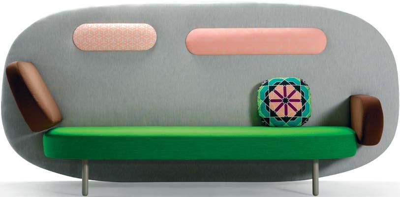
Why would you need anything else when this lounge-cum-room divider-cum-screen is such a feature? Designed by Karim Rashid, the FLOAT range for Spanish brand Sancal has modular arms and headrests that slot into the back piece. There is both a low and high back available, and each component (backrest, arms, seat, headrest) can be upholstered in a different fabric. The kaleidoscope cushions are in a material also designed by Rashid, called Cairo, adding to the playful, eccentric nature of this piece.
sancal.com / kezu.com.au


1 . lightbox # 27
Fed up with ugly cases and unstylish technology accessories, Amasia have finally answered our prayers with the K I NODAI i Phone and iPad stand. The mutiple iPad/iPhone holding stands are handcrafted from Hinoki wood and finished with a subtle limewash. The relationship of technology and wood is always a sophisticated and complementary mix – keep it natural with Amasia
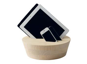
amasia.com.au
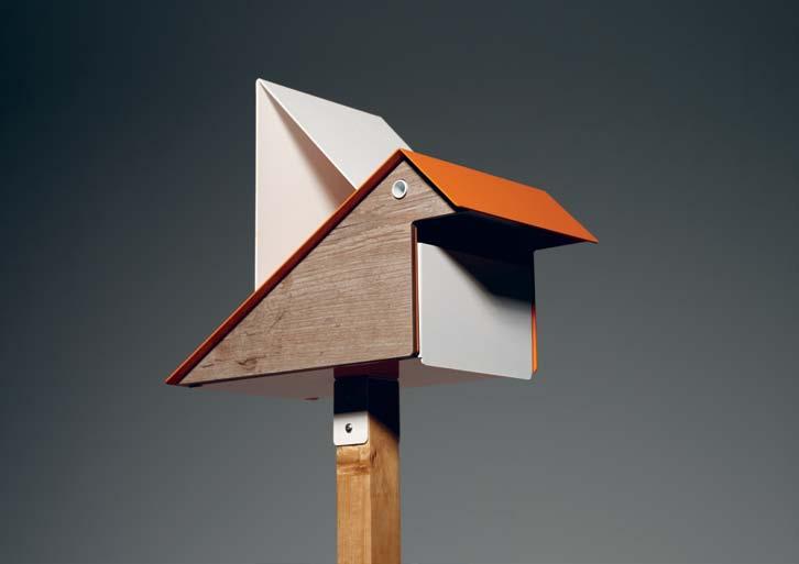
These days, it’s more likely bills than letters you receive in the snail mail. At least with the playful KOO KOO LETTERBOX by Playso in collaboration with Justin Hutchinson , the act of collecting the mail can still be fun. With a powdercoated zinc body in a range of colours, and compact laminate or weathered timber-look laminate side panels for outdoors, this little guy will be the talk of the neighbourhood. But it would also nest perfectly indoors – whether in your home as a message box or as the central point for internal office mail. Have a bit of fun!
playso.com.au
Los Angeles-based James Perse products are now available in Australia through a dedicated online store. The collection includes limited edition furniture such as lounge chairs, tables and beds for indoor/outdoor living. But there’s also plenty of fun stuff for those who live an active life, such as a paddle board, pool table, bicycle, ping pong table and this DOG BED in Teak with waterproof covering in Belgian linen.

jamesperse.com.au
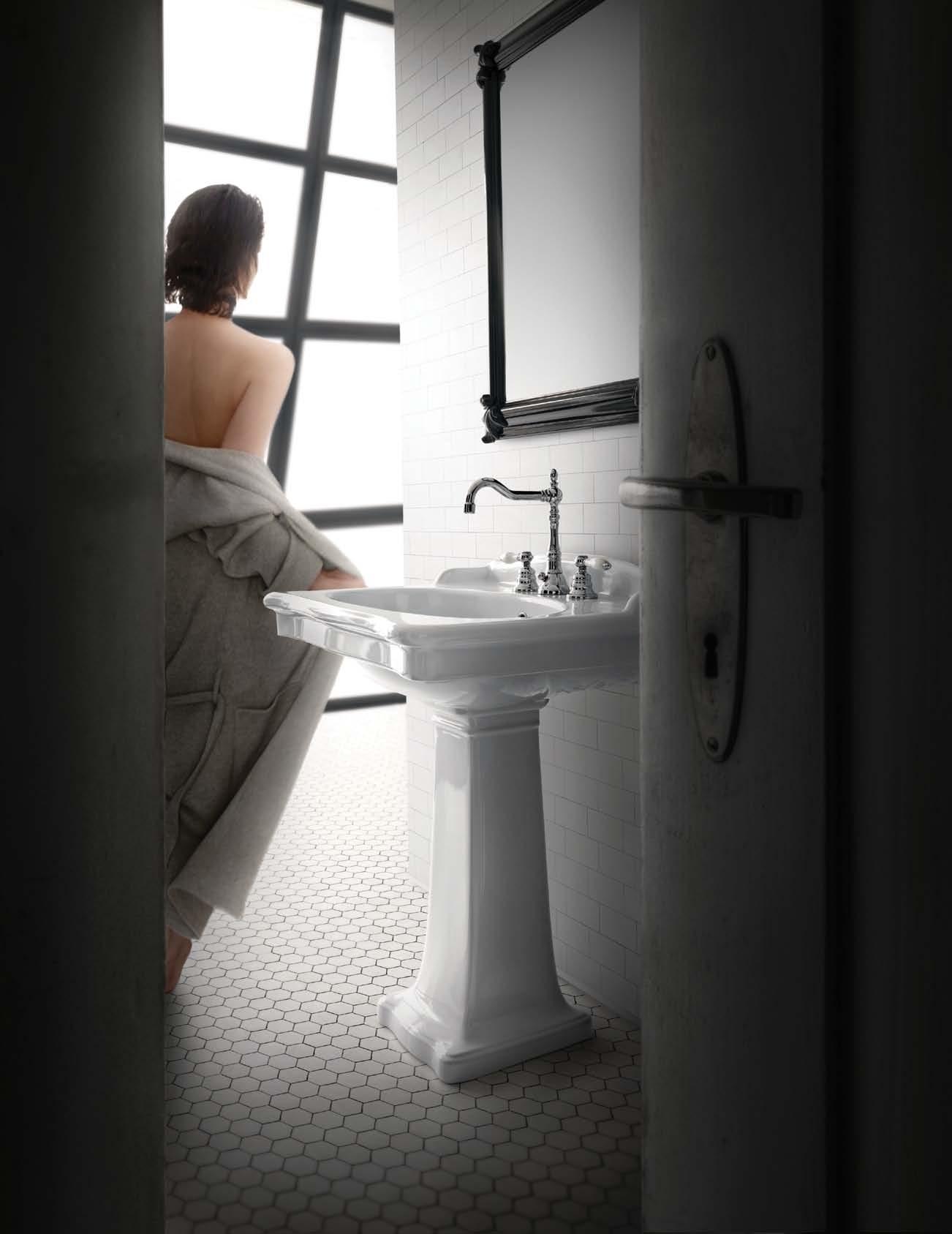
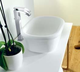
New technology – Systempool’s hallmark KRION® Stone solid surface material – combines with the classic form in the EPOQUE washbasin from Porcelanosa . Looking to the past while nodding to the future has never looked better for bathroom environments with a balanced aesthetic in mind.
porcelanosa.com / earp.com.au
It’s official – colour has made a comeback and the new BATLO tapware designed by Julio Iachetti for I.B. Rubinetterie is proof. Featuring red, blue and green powdercoated colour blocking, the taps have a brass top and intuitive connection between delivery control and the neck of the bottle for fluid opening and closing movement. The range is available in basin sets, wall sets and bath spouts in all three hues.
capdell.com / stylecraft.com.au

issue #17 habitusliving.com
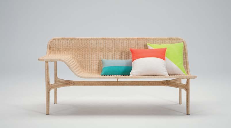
The RELATION
COLLECTION was recently released at the Milan Furniture Fair earlier this year by Japanese designer Hiroomi Tahara for Yamakawa Rattan . It is as philosophical as it is beautiful –referring to the fine metal tubes that create the unique structure and form without the need for molding, Tahara says, “This can be said about human society as well. I survive through life with the support from many people too.” In the case of this lounge, the surface is covered in woven rattan, the delicate texture of which accentuates the thin, elegant profile.
hiroomitahara.com / yamakawa-rattan.co.jp
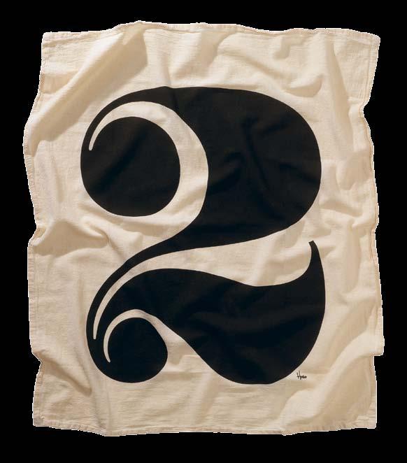
Typophiles can get lost in the intricacies of letters, numbers and symbols at home with the FLOUR SACK TOWELS in 100% cotton. The range is by type foundry, House Industries, font designers who have delved into homewares, blocks, prints, objects and clothing. They retain a sense of humour, saying of the towels, “we cannot guarantee visual harmony with non-standard substrates such as pickled Oak, kumquat Formica, illustrative wallpaper borders...”
houseind.com
It’s a return to a more simple time with this acoustic vinyl record player designed by graduate student Jón Helgi Hó lmgeirsson from the Icelandic Academy of the Arts. With an interest in music and a member of two bands based in Reykjavik, Holmgeirsson strips down audio technology with this flat-packed gramophone called JÓNÓFÓN that uses a paper cup and a paper horn to amplify sound from a vinyl record. The player itself is made of thin plywood that contains a simple electrical system powered by battery or connected to power supply. The horn consists of a thick paper needle, plastic film, steel wire and the paper cup which acts as the amplifier.
jonhelgiholmgeirs.com

1 . lightbox # 29
Simple, elegant and handmade in Australia by Craft Design Realisation , LUKA CABINET is a box itself that ticks plenty of boxes. The contemporary chamfered outer frame in black or white contrasts with the timber front in Spotted Gum (shown), Blakbutt, Walnut or Oak, with elegant handle detailing. A pull-out drawer and optional pocket drawer completes the package, and there are custom sizes and finishes available.
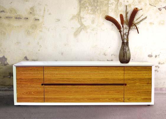
craftdesignrealisation.com
Arachnaphobes, be not afraid of this FLYING SPIDER
Designed by Turkish studio Autoban , and inspired by their iconic Spider Lamp, it dangles pendant style to light your interiors with a crown-mirrored 60-watt bulb. Available in stainless steel or gold-plated steel, it may follow in the arachnid footsteps of the Spider Lamp, which received first prize in the lighting category at the EDIDA Awards 2008 in Turkey.
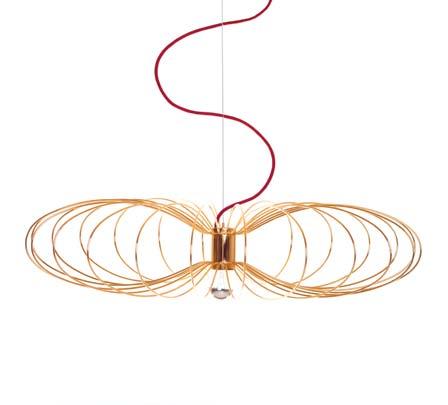
autoban.com / delaespada.com / spenceandlyda.com.au
Challenging the laws of gravity, the THIN-K table designed by Luciano Bertoncini is just 6 millimetres thick. Available in white, grey or black anodised aluminium and painted steel.

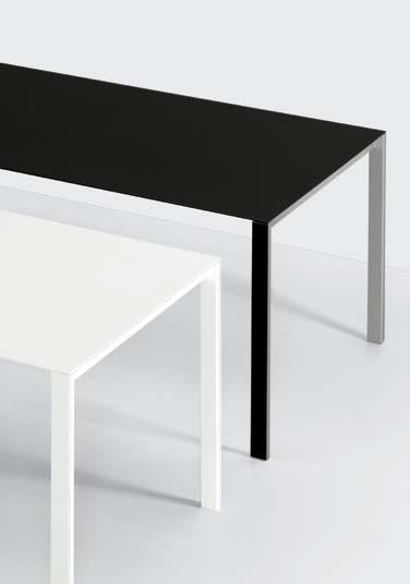
fanuli.com.au
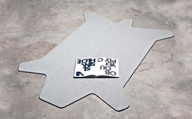
These CAR-PET rugs designed by Halfmann Mennickheim and developed in cooperation with a manufacturer of cars feature a more sophisticated, stylised form than traditional bearskins. In new wool and goats hair, the simple outline, functional colours and ridged edging convey the automotive origins of the range.
halfmann-mennickheim.de / utensil-shop.de
1 . lightbox # 31
issue #17 habitusliving.com
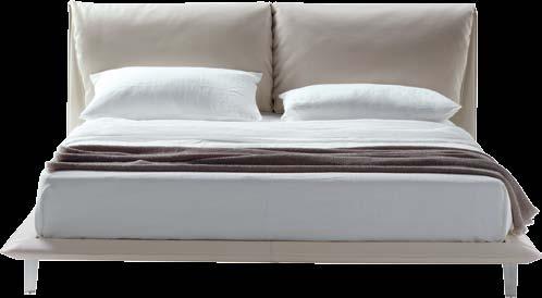
Two large, leather-covered headboard cushions are oversized versions of a sofa’s characteristic backrest, giving this bed a comfortable, luxurious feeling. JOHN JOHN ’s structure is in solid Beech and Poplar, with cushioning in polyurethane foam and goosedown, along with Pelle Frau® leather upholstery and aluminium feet.
poltronafrau.it / proof.com.sg / corporateculture.com.au
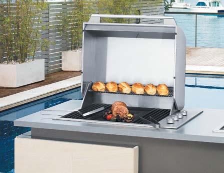
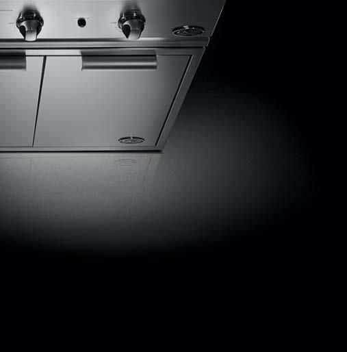
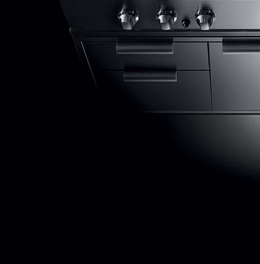
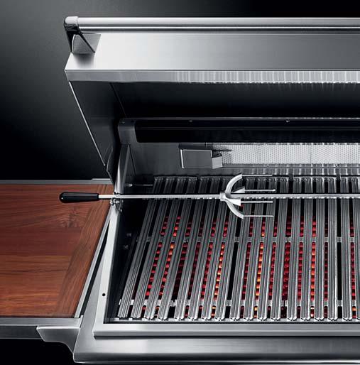
The DCS GRILL hails from California and is more than just a barbecue –the thick-walled precision-ported stainless steel burners create a flawless surface for grilling. Available in Australia from mid-November.

fisherandpaykel.com
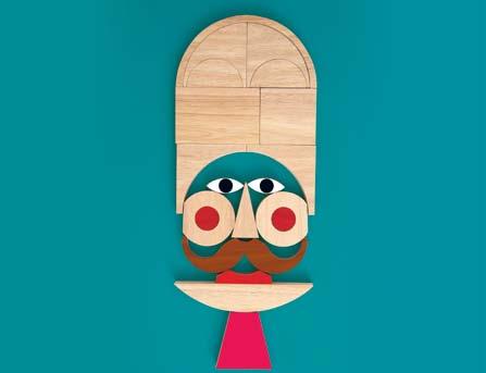
Children can get creative with these 25 wooden blocks called FACEMAKER. Literally thousands of unique and funny faces can be made with these combinations, and each piece is hand-printed and environmentally friendly, made of rubber wood.
wannekes.com
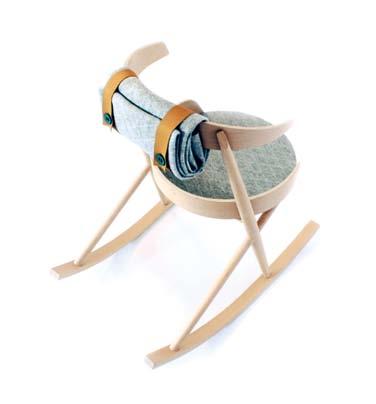
A contemporary take on the traditional rocking chair, HUMMINGBIRD designed in collaboration with Studio Agata Karolina is in Beech, lamb wool felt and leather.
danacannamdesign.com
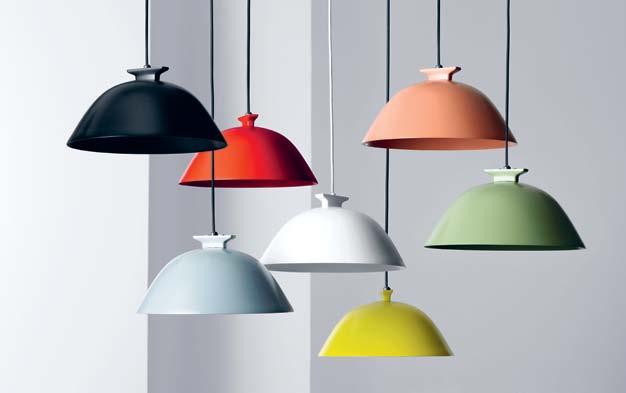
Swedish Design company, Wastberg presented their first range of pendants at this year’s Stockholm Furniture Fair, including this SEMPÉ version in a range of seven shade colours. With a dimmable LED each, the pendants can be used individually, hung in clusters or connected with a slim-line rail to make a custom fitting.
wastberg.com / euroluce.com.au
AD




























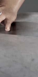








Get acquainted with the first actuator plate that can be installed completely flush with the wall. SIGMA60 from Geberit combines a timeless elegance with diecast zinc frame and flush buttons, with technical superiority. The SIGMA60 is compatible with the Sigma concealed cistern 75mm and Sigma Duofix version for wall-hung WC, where the flush buttons easily fold open and give easy access to the cistern for servicing.
geberit.com.au
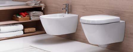
From bathroom specialists ex-t, the BOLD 1 cabinet is just as at home anywhere else in the house as well. Designed by Mist-o, the oversized circular handles become visual features on this otherwise simple form, giving the cabinet the reason for its name. In natural Oak veneered or lacquered wood and varnished aluminium.

ext.it / studiobagno.com.au
Perfect for placing your mobile phone, radio or beer on, the SKY DECK is designed by Torafu Architects, manufactured by Ishinomaki Laboratory and made in Canadian red Cedar by the people of Ishinomaki city. It hooks onto your handrails to extend your balcony into the city beyond.
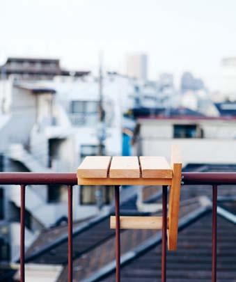
ishinomaki-lab.org
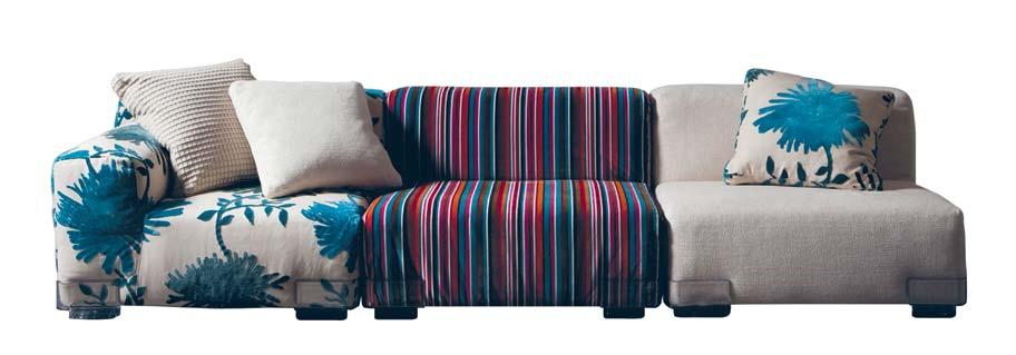
Limited edition and as soft as Kartell comes, the KENZO sofa in collaboration with the Japanese fashion, fragrance and skincare brand features their signature fabrics on the modular Plastics Duo Sofa, allowing you to mix and match as you please.
kenzo.com / kartell. com / spacefurniture.com.au /
issue #17 habitusliving.com

Everybody Needs a Secret Hideaway. Help us create yours. Garden design, build and maintain www.secretgardens.com.au

Cleanse, refresh and reinvigorate

1 . lightbox # 37
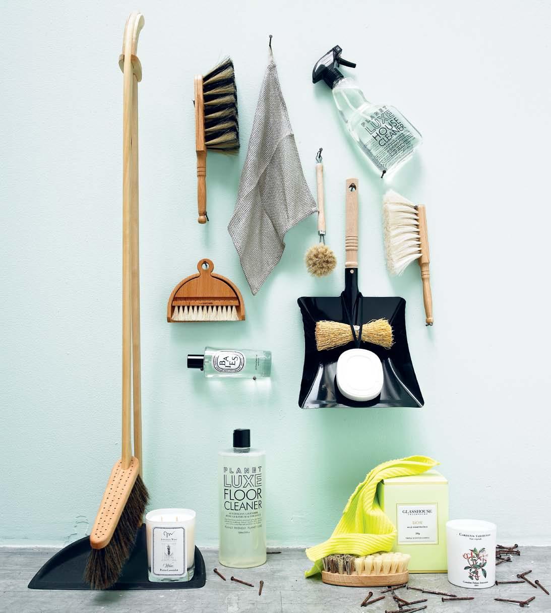
Clockwise from bottom left | Stand-up dustpan & broom by Iris Hantverk, $169, Funkis; handheld broom (part of set) Beechwood and horsehair, $45, I Ran the Wrong Way; Fog Linen work duster, $15, Shelf Life; House Clean spray by Planet Luxe $12.50, Koskela; goats hair broom , $25, Planet; black dustpan (part of set) with wooden handle $45 , I Ran the Wrong Way; round head dish brush , $12, Funkis; straw-washing whisk [on top of dustpan], $20, Funkis; Scented Oval by Diptique, $75, Mecca Cosmetica; dishwashing brush with wooden handle, $19, Funkis; Skye triple-scented candle $39.95, Glasshouse Fragrances; candle in Gardenia, $59, Carriére Fréres Industries; scrubbing brush , $15, Planet; dish cloth in fluoro green, $13, Funkis; Floor Cleaner by Planet Luxe, $15, Koskela; Diptyque Figuier room spray, $99, Mecca Cosmetica; Jonathan Ward candle in White, $65, Ecoluxe.
photography t i m r o binson | s tyling ali C i a s C b E r ras | art dir E C t ion on E 8 on E 7
New colours
New designs New inspiration


Introducing our newest, exclusive Classico collection designs. So however you want to express yourself, with Caesarstone you can.

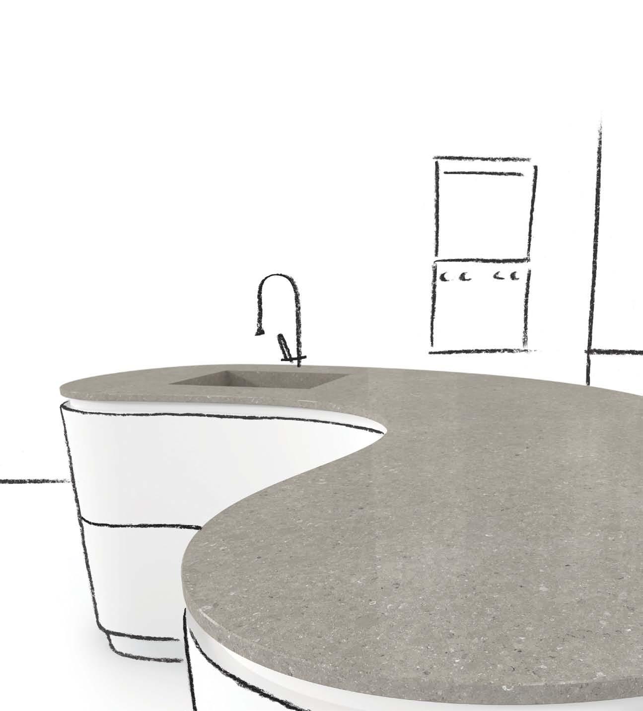
Cocoa Fudge ™ Wild Rice ™ Shitake ™ Creme Brulé ™ Ocean Foam ™ www.caesarstone.com.au 1300 119 119

1 . lightbox # 39
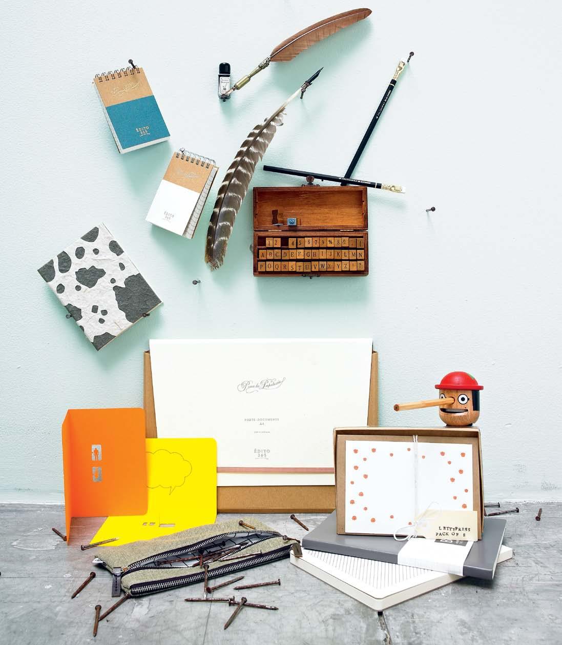
sealed, delivered...
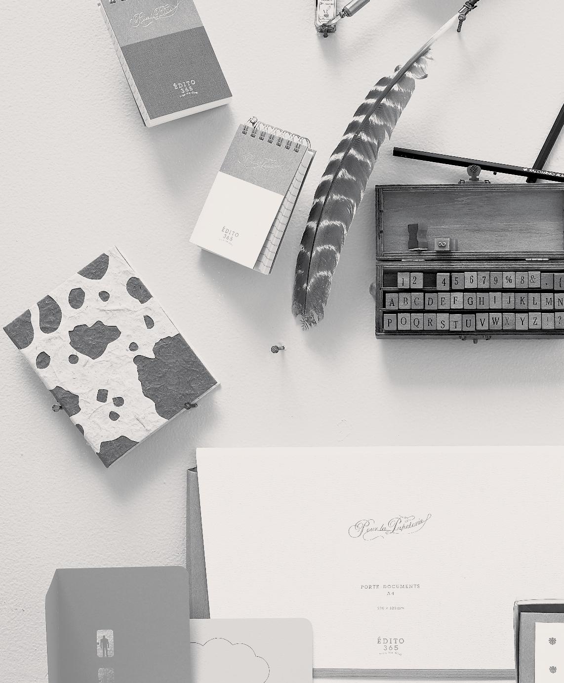
Clockwise from top left | Ruled ring memo in blue or white, ¥420, EDITO365; feather quill with ink pot $34.50, Paper2; feather quill in brown and cream $9.90, Paper2; Palomino Black Wings pencils, $4.95 each, Ariel; A–Z stamp set with wooden case, $44.95, Ariel; Honest boy Pinocchio pencil sharpner, $19.95, Ariel; letter & envelope set, $19.95, Paper2; A5 grey notebook in recycled leather, $19.95, kikki.K; Basics A5 notepad, $7.95, kikki.K; Basics canvas pencil case, $9.9 5, kikki.K; Architectural Model Series cards in yellow and orange, ¥552, Terada Mokei; A4 briefcase in white ¥1,575, EDITO365; patterned mini-journal in 100% recycled paper, $9.95, Poopoopaper.
Signed,
Seeing


is believing.
Award-winning design and functionality. Made in Italy for over 40 years. Exclusive to Abey Australia.
www.abey.com.au
Barazza.
– Barazza Velvet Oven
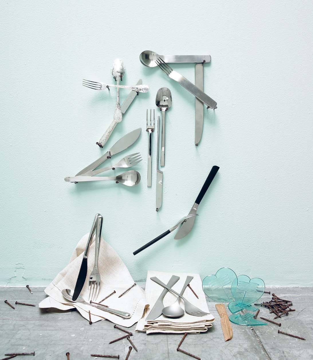
Fine cutlery for fine dining...

1 . lightbox # 41
Clockwise from top left | Marcel Wanders Garden of Eden seven-piece place setting, $900, Christofle; David Mellor Minimal range, (fork $30, knife $33, soup spoon $27), HUB; John Pawson When Objects Work set, (fork $29.95, knife $34.95, spoon $29.95), HUB; Black wooden handle four-piece place setting, $174, Sori Yanagi; Heart Parts fork, knife and spoon, $9.95 for box of 10, I Heart This; wooden knife, $8.50, Koskela; Zani & Zani Sabrina cutlery in matte steel, (fork $59.65, spoon $59.65, knife $75.60), HUB; linen napkins, $30 each, Planet; Piano cutlery, $979 for 24-piece setting, Anibou; Flat stainless steel cutlery four-piece setting, $73.50, Sori Yanagi.
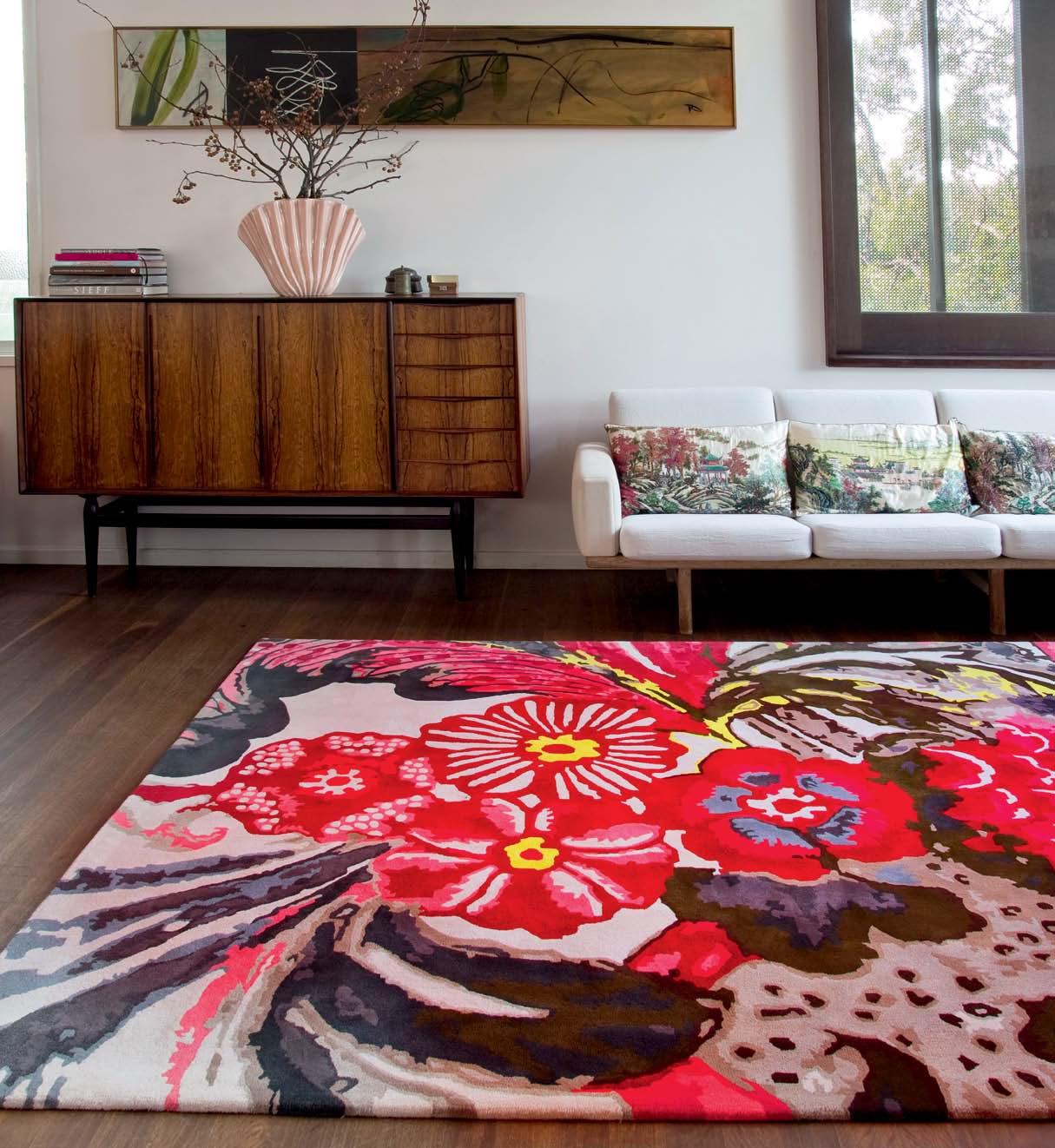
“ Something beautiful and cross-cultural... is transformed”
Floor talk #3
Easton Pearson
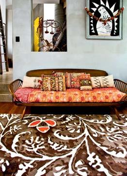
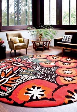
While rugs can be seen as artworks for the floor, fashion is often perceived to be faster moving and a little more transient. But Brisbane-based designers, Easton Pearson, have a longer view towards the garments they have been creating for nearly 15 years. Which is one of the reasons their ranges for Designer Rugs have worked so well. For this second collection, designers Pamela Easton and Lydia Pearson were “Inspired by the minute detail in 17th and 18th Century chintz prints, and the juxtaposition of this microcosm in macro scale”. This interpretation of culture and history is typical of Easton Pearson’s approach, and something which has great synergy with Designer Rugs, “where something beautiful and cross-cultural is referenced but transformed into a modern context,” say Pam and Lydia. Easton Pearson’s fashion collections are influenced simultaneously by art and various ethnic traditions, with acute attention given to the texture and detailing of every garment. While it clearly has a strong, well-defined aesthetic, the collaboration with Designer Rugs’ in-house team is invaluable in creating a successful product for the home. “Most [of the designers we collaborate with] are not used to working on such a large scale for interiors. Colour is also such an important part of a rug design,” explains Senior Designer, Lia Pielli. Her role in the process is to assist the translation of what works in fashion – on the body – into something that will work within room settings. These designer collections bring together fashion and interiors together in a way that is at once intelligent, interesting and inspiring. The Easton Pearson range expresses traditional floral motifs, brought to life by the fashion design duo, who say, “It was really refreshing to work in a new medium and scale.”

The Easton Pearson collection, available from Designer Rugs nationally, comprises eight sophisticated designs in a combination of New Zealand wool, silk and viscose.

Designer Rugs 1300 802 561 designerrugs.com.au

Designer Rugs x Habitus Promotion Continue the conversation | habitusliving.com/issue17/floortalk
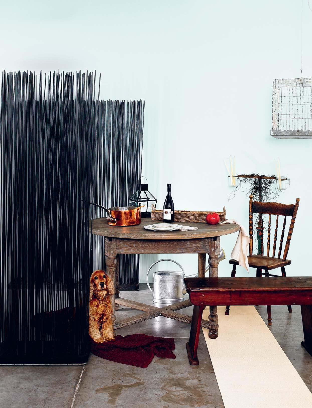
Romantic rustic
Clockwise from bottom right: Bolon BKB woven vinyl flooring in Sisal Plain Crème, $72/m 2 , The Andrews Group; Edwardian Bench C.1900, $450, Seasonal Concepts; red throw in 100% Stansborough wool, $175, Koskela; Pooch Bebe, cocker spaniel; Louis XV Westbury Extension Dining table in solid European Oak in Burnt Oak finish, $2,995, French Dressing; 19 th Century French copper pot with iron handle, $600, The Country Trader; Katherine brass lantern , $65, Garden Life; Riviera Maison rectangular basket with three sections in wicker, $59.95, French Dressing; McGuigans Pinot Noir 2011 , Adelaide Hills, $22.99; Wedgewood Patina Platinum bone China set in Hydrangea/ Rose/Chrysanthemum, $99.50 for 5-piece set, WWRD; linen napkins, $30 each, Planet; Burgot and Ball 9L watering can , $99, Garden Life; Australian spindle-back kitchen chair, $220, Seasonal Concepts; Victorian parrot stand , $260, Seasonal Concepts; Taper candles Australian-made in beeswax, $30 for set of 6, I Ran the Wrong Way; Cocky cage, $140, Seasonal Concepts.
All: Backdrop in ultra-flat acrylic in Glass, $41.50/1L, Porter’s Paint; Extremis Sticks screen designed by Teo & Kaiser in glass fibre rods and rubber base for outdoor use, $939, Corporate Culture; all artworks courtesy of the artist and James Dorahy Project Space.
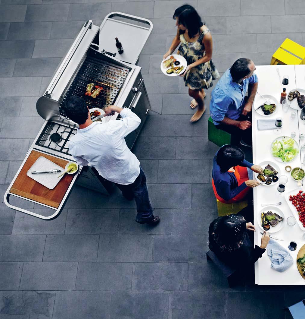
Dine with us
sharing a meal is one of most simple and pleasurable pastimes – better still if you can enjoy it outdoors. an intimate catch up with a loved one, casual barbecue with the family or themed party with friends, there are many ways to celebrate, whatever the occasion...
photography tim robinson | styling nicky lobo/one8one7 | art direction one8one7
1 . lightbox # 45
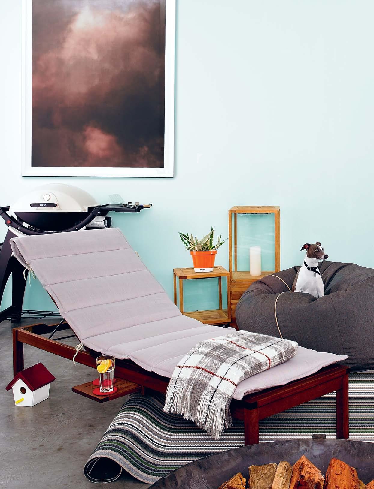
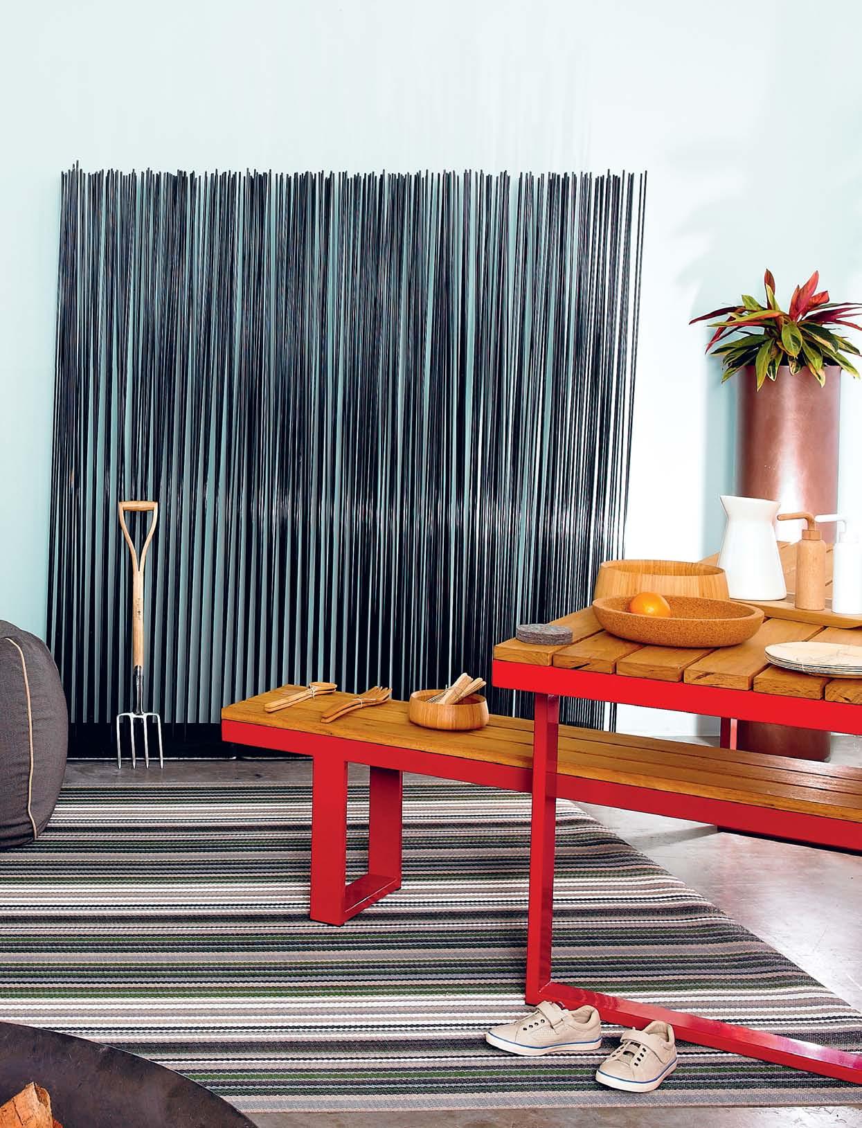
Modern bbq
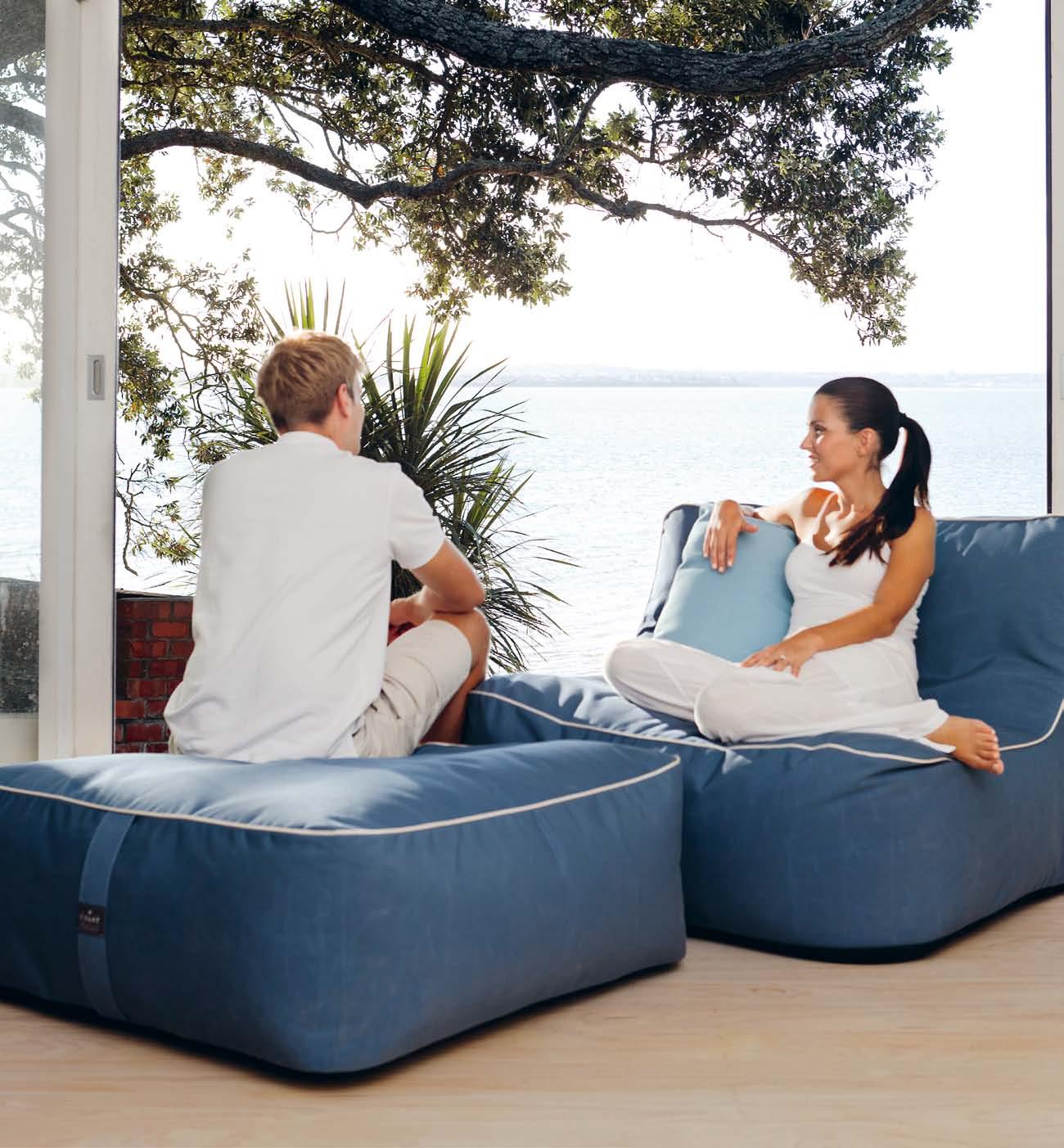
clockwise from top left: ‘ ni mbus in repose ’, 2012, Archival Pigment Print 88cm x 108cm by Alexander James; tr ibu teak lanterns large with base, $1,002, and large with no base, $501, Cosh Living; ceramic pa ntone plant pot , from $35, Terrace Outdoor; pooch Iggy, Italian greyhound; c oast beanbag , $505 for XL, Parterre; bu rgon and ba ll digging fork , $55, Koskela; i luka picnic set in red powdercoated steel frame and Blackbutt benches and table top, $8,700, Parterre; ba mbu oval salad servers, $20, spoon and fork salad servers, $20, small bamboo bowl , $35, disposable cutlery set , $20, large bamboo bowl , $98, low cork bowl , $80, and disposable plate set , $20, all from Shelf Life; felt coasters, $3.95 each, Hub; sas safras chopping board , $90, Planet;
perch de sign ch loe vessel , $90, Shelf Life; helgo salt and pepper mills in white and natural, $108, top3 by design; de ca stelli cohiba metal pot in bronze maistral finish, from $795, HG Gallery; bolon botanic woven vinyl flooring in Pyrus, $78/m 2 , The Andrews Group; pelotas persil ca mpers for kids, $175, Campers; brad f i re p it in 12mm mild steel, $1,490 for large, Robert Plumb; patio by ja mie d u rie ba nksia sunlounger in FSC-certified Eucalyptus timber with Balau oil finish and multi-position backrest, $218, Big W; tartan throw in 100% Stansborough wool, $385, Koskela; timber bird feeder, $65, Seasonal Concepts; Q220 weber, $399, and trolley, $179, BBQ Ranch; hackman bbQ ut ensils, $60, Anibou.
issue #17 habitusliving.com
1 . lightbox # 47
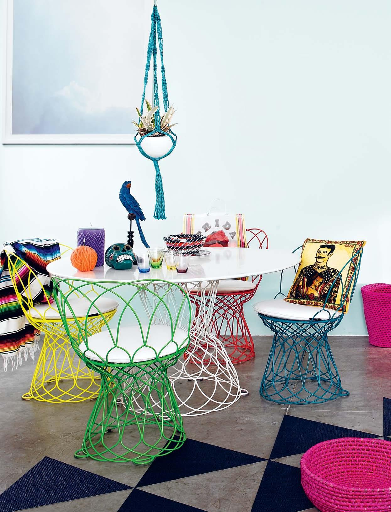
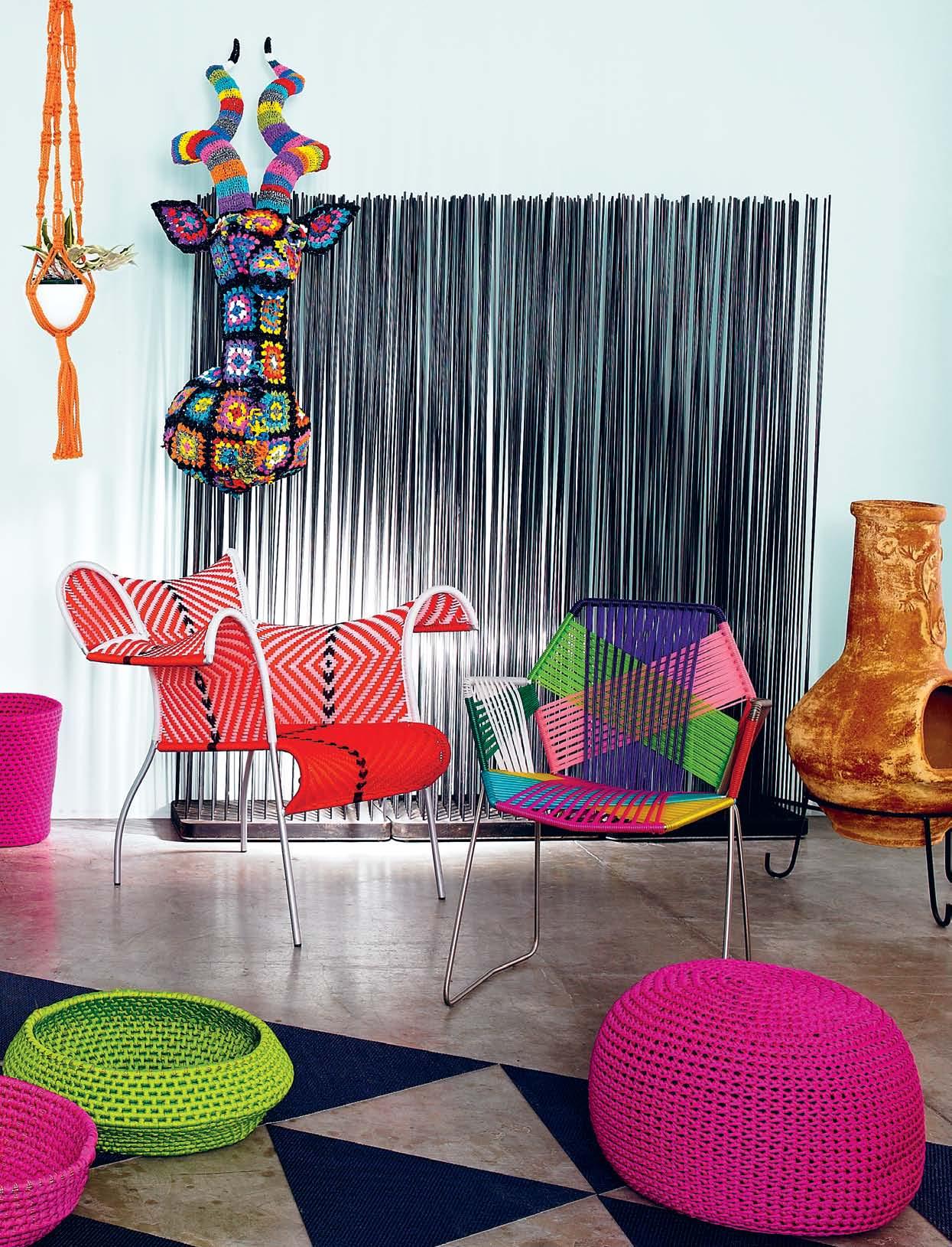
Mexican fiesta
clockwise from top left: ‘ i mperfect cu muli #3 ’, 2012, Archival Pigment Print 88cm x 108cm by Alexander James; handmade macramé planters, from $65, Terrace Outdoor; crochet Kudu head , $2,750, Garden Life; chapala ig uana clay chiminea , $199, Barbeques Galore; paola l enti p icot pouf hand crocheted with rope cord, $1,496, and h i mba handwoven baskets, from $530, dedece; tropicalia chair (right) by Patricia Urquiola in steel frame and woven polymer seat, $1,720, and moroso i biscus armchair (left) from M’Afrique collection in polished steel frame and woven polyethylene, $3,290, Hub; bolon now woven vinyl flooring in
Sapphire, $86/m 2 , The Andrews Group; retrouv’e table, from $2,400, and chairs, from $1,200 each, designed by Patricia Urquiola for EMU, Terrace Outdoor; cushion , $40, and f r ida Kahlo market bag , $25, Holy Kitsch; i nd woven recycled basket , $49 for small, m i ssoni home f utura plate, $377, and i r ide water tumblers by Richard Ginori, $299 for set of 6, Spence & Lyda; sa nta fe sk ull , $95, Holy Kitsch; p retty bi rdy pa rrot in blue, $75, Terrace Outdoor ; m i ssoni home g om itolo small candle (orange), $392 for set of 4, and chevron candle (purple), $332, Spence & Lyda; striped mexican t h row handloomed, $75, I Ran the Wrong Way.
issue #17 habitusliving.com
1 . lightbox # 49
issue #17 habitusliving.com
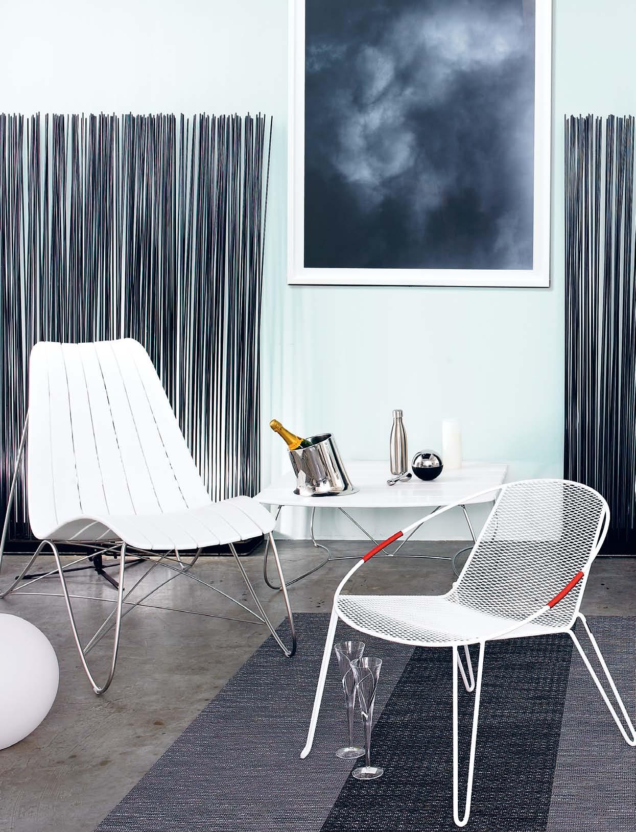
Cool, classy
clockwise from top left: ‘ i mperfect cu muli #2 ’, 2012, Archival Pigment Print 88cm x 108cm by Alexander James; ceramic hanging planters, from $69, Terrace Outdoor; ha rbour o utdoor p iano collection in white powdercoated aluminium frame with UV resistant high pressure compact laminate slats, bar table, $1,410, and bar stools, $350, Tecno; waterproof illuminated ball led lamp designed by Smart and Green in recyclable polyethylene shell with various light colours and intensities, $302 for large ball (right), and $300 for large flat ball (left), Café Culture; bolon a r tisan woven vinyl flooring in Coal and Slate, $80/m 2 , The Andrews Group; ga ndia blasco f lat lounger in thermo-lacquered aluminium and polyethylene with white vinyl outdoor cushion made in Spain, $6,050, Parterre; pooch Iggy, Italian greyhound; popsy clear black bowl in 8mm thick
acrylic, $75, Miyow and Barkley; w h ite di sh designed by Jason Hodges available in black, white or rust steel, $595, Eco Smart Fire; ag low chair, designed by Adam Goodrum in steel wire and mesh, $540, Tait; waterford si ren crystal stemware, $99.50 for a pair, WWRD; sifas Kolorado large coffee table, $1,724, and lounger, $1,856, Cosh Living; large melt edge p i llar ivory flameless candle in real wax, $24.95, Real Safe Candles; r i se n sh ine lemon squeezer, $75, swell 500m l water bottle in silver stainless steel, $49.95, and tantalo bottle opener in stainless steel and silicone designed by Karim Rashid for Magpie, $75, all from top3 by design; veuve cl icquot yel low l a bel , $89, Vintage Cellars; eros champagne bucket in stainless steel designed by Karim Rashid for Magpie, $264, top3 by design.

1 . lightbox # 51
issue #17 habitusliving.com
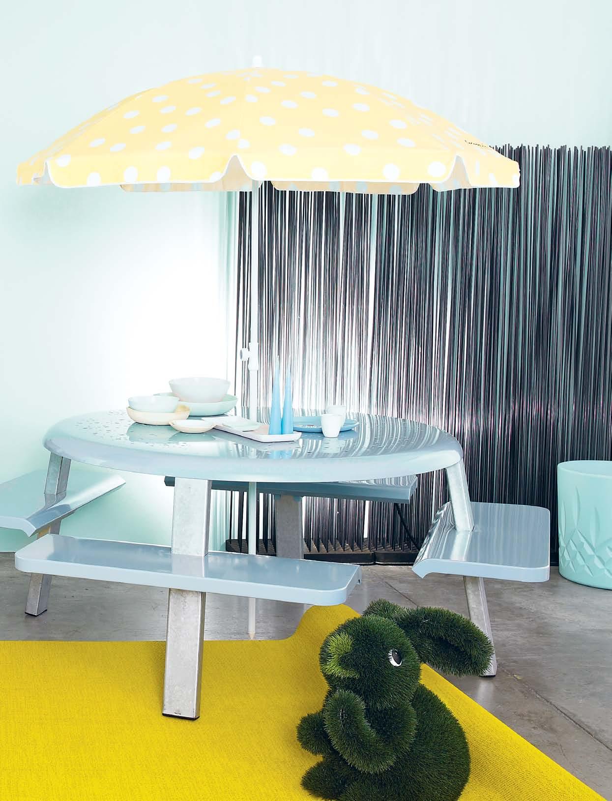
Palm springs, baby
clockwise from top left: ‘cu mulus at tacked by a contrary wi nd #2 ’, 2012, Archival Pigment Print 103cm x 130cm by Alexander James; da ffodil polka dot beach umbrella by Cocopani in 100% cotton canvas, $84, Zanui; 8ight unit in galvanised steel frame, powdercoated zinced steel panels, $6,710, Tait; pebble bowl large in pistachio, $125, f lared bowl large in pink, $125, pebble bowl medium in citrus, $61, noodle bowl cereal in white, $61, tray in pink, $119, l atte cups in white, $34, f lared dinner plate in duck egg, $44, Mud Australia; e ster & er ik paraffin-dipped candles with gloss finish, $13.50 for small, Funkis; K m stool in Crystal Sky by Keith Melbourne in UV stable, recycled polyethylene, $352, top3 by design; a stroturf
bunny, $295, Garden Life; b olon
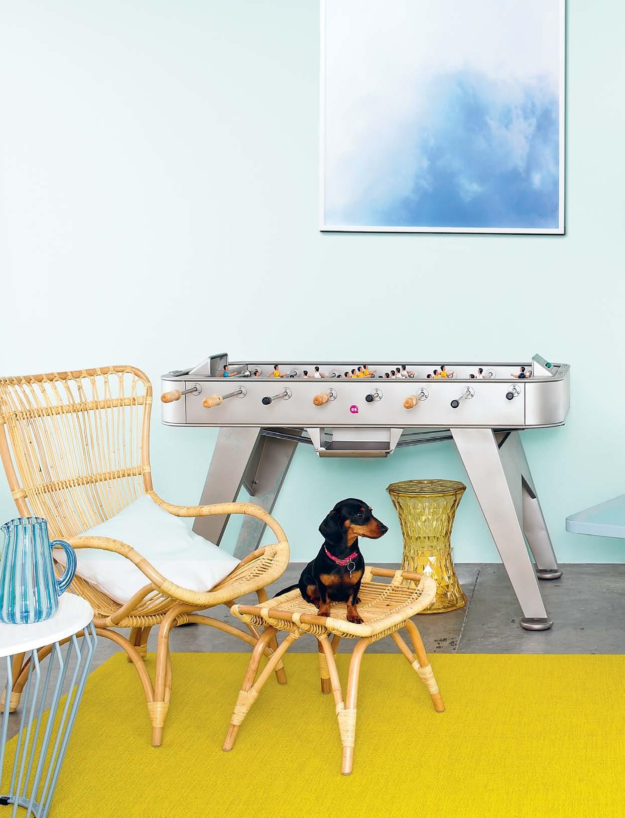
botanic woven vinyl flooring in Viva, $78/m 2 , The Andrews Group; ji l side table designed by Justin Hutchinson in powder blue zinc-plated steel wire frame and white compact laminate top, $1,050, Tait; e dols and el liot
a l i ba ba jug in blue handblown, cane-worked glass, $350, Object; sika o r iginals monet highback chair, $495, and monet footstool , $195, in natural rattan, Domo Collections; pooch Stella, Miniature dachshund; Kartell stone stool by Marcel Wanders in transparent yellow polycarbonate, $305, Space Furniture; rs ba rcelona rs2 foosball ta ble in stainless steel with drink holders and fully customisable team colours, $6,765, Kezu.
1 . lightbox # 53
any position. Experience perfection at www.aeg.com/au
the “genesis of the creative urge...”
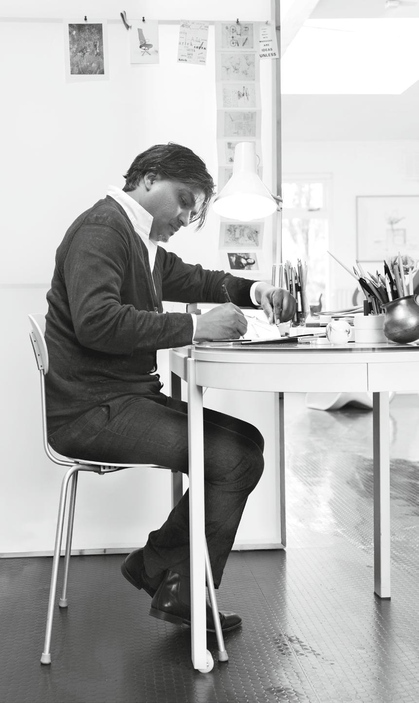
satyendra pakhale | designer – page #91
issue #17 habitusliving.com
Alex in Wonderland
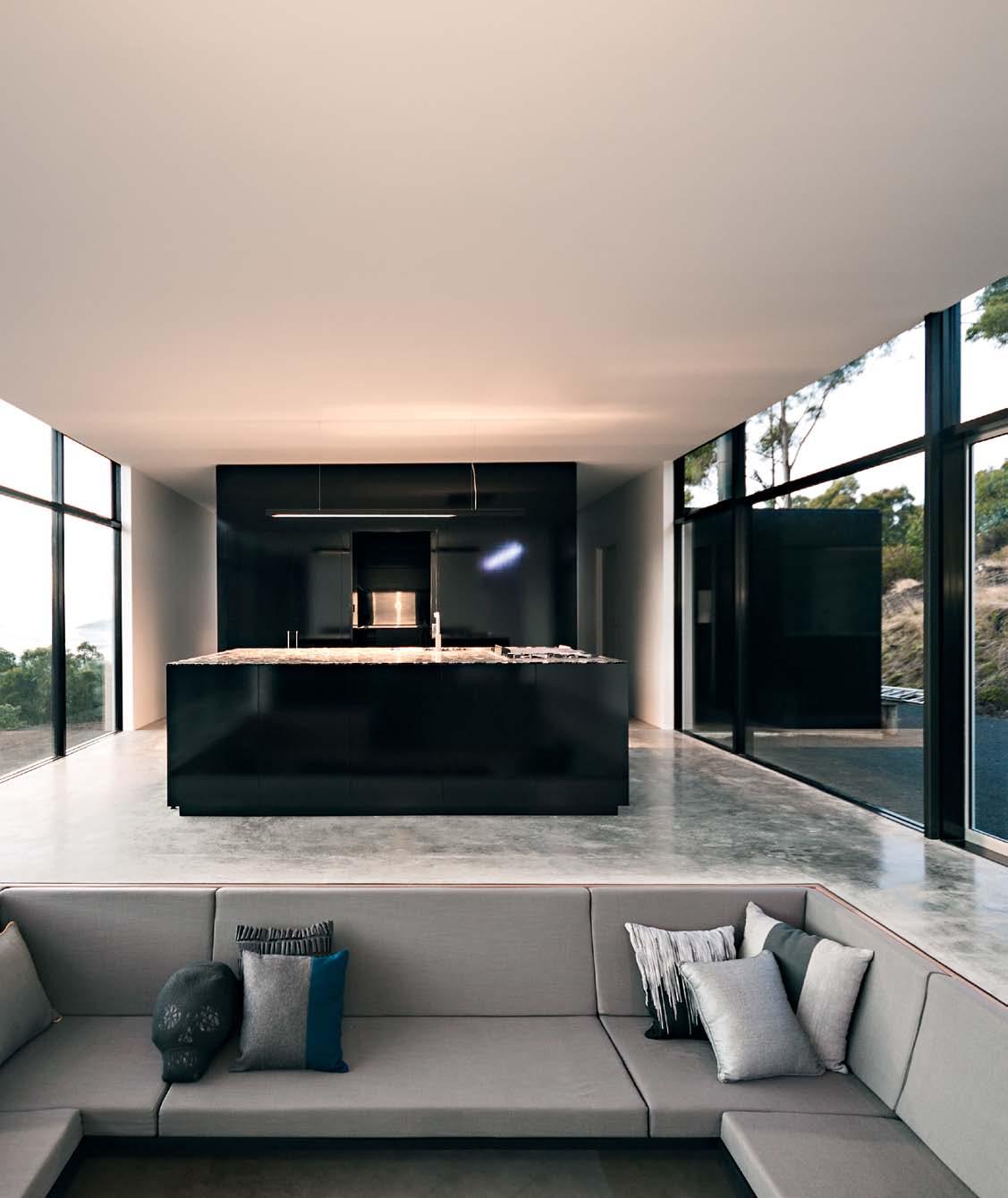
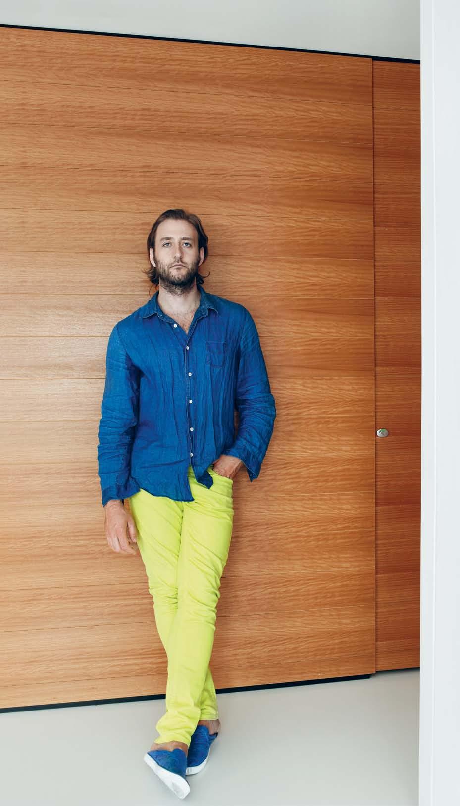
Perched on the top of Hig H gate Hill , designer aleX aNDeR lOteRSZtaiN incubates his ideas for the growing Brisbane design scene from his penthouse apartment. PeRi MOONeY discovers how he has taken his design experiences home.

2 . portrait # 57
Tex T Peri Mooney | PhoTogra Phy Florian groehn

issue #17 habitusliving.com
Chances are, if you don’t actually know Alexander Lotersztain, you’ve more than likely already been in, on or under one of his designs. From street furniture, public lighting, hotels and art galleries, Alex’s designs are diverse as they are many. In his 10 years as a fully fledged designer, he has been making busy in a big way.
An industrial design graduate from Queensland College of Art, Argentinianborn Alex is the director of Derlot, a design company based in Brisbane’s trendy West End. A major part of his repertoire is Derlot Editions, where he collaborates with a wide range of companies to art direct and design product from furniture, product, lighting and shelving all the way to the smallest of fittings.
Having notched up 10 years at Derlot last year and celebrating with an exhibition at the Gallery of Australian Design in Canberra, Alex knew “ from the age of 16 that I would be a designer”. This certainty is obvious in the tight form of his designs, due to an immediate understanding of the task at hand. It is this unyielding confidence,
followed with the breadth of his experience in the design industry, that made it possible for him to immediately visualise an outcome for his own home. The result is a penthouse apartment that reflects his design ideals, aspirations and lifestyle.
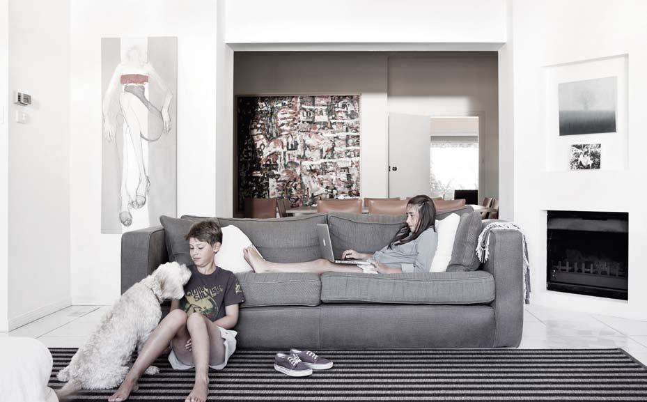
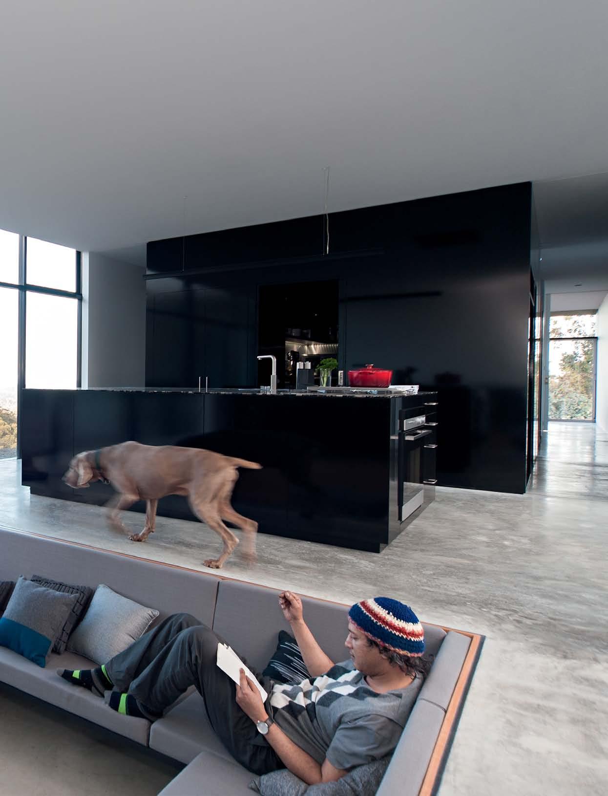
After an initial impressive introduction to the space, it is clear to see that function is holding hands with form. As good as it looks, practicality was Alex’s driving force, and as his own client he translated the commercial-grade products he is familiar working with into a softer style, more suitable for a home.
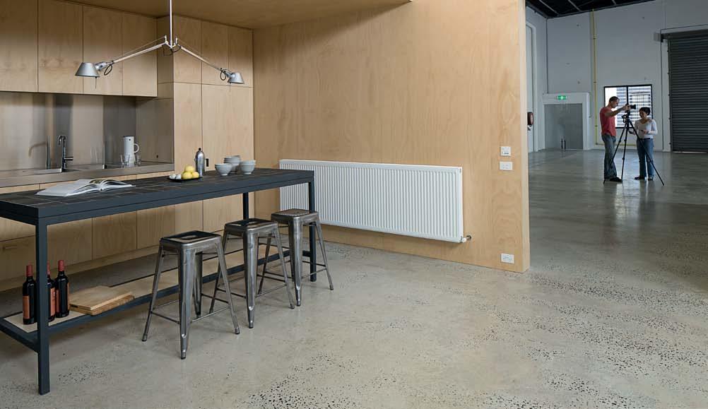
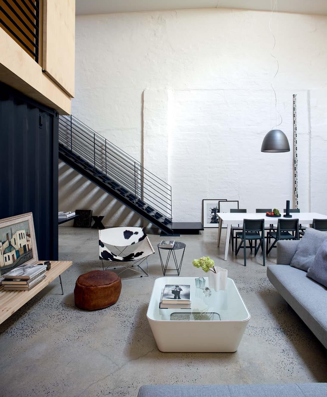
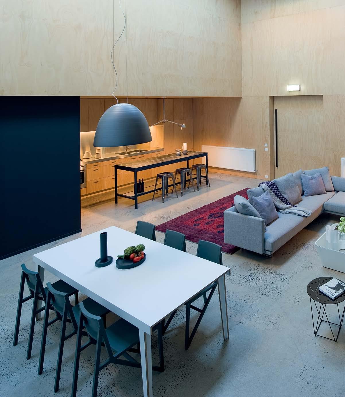
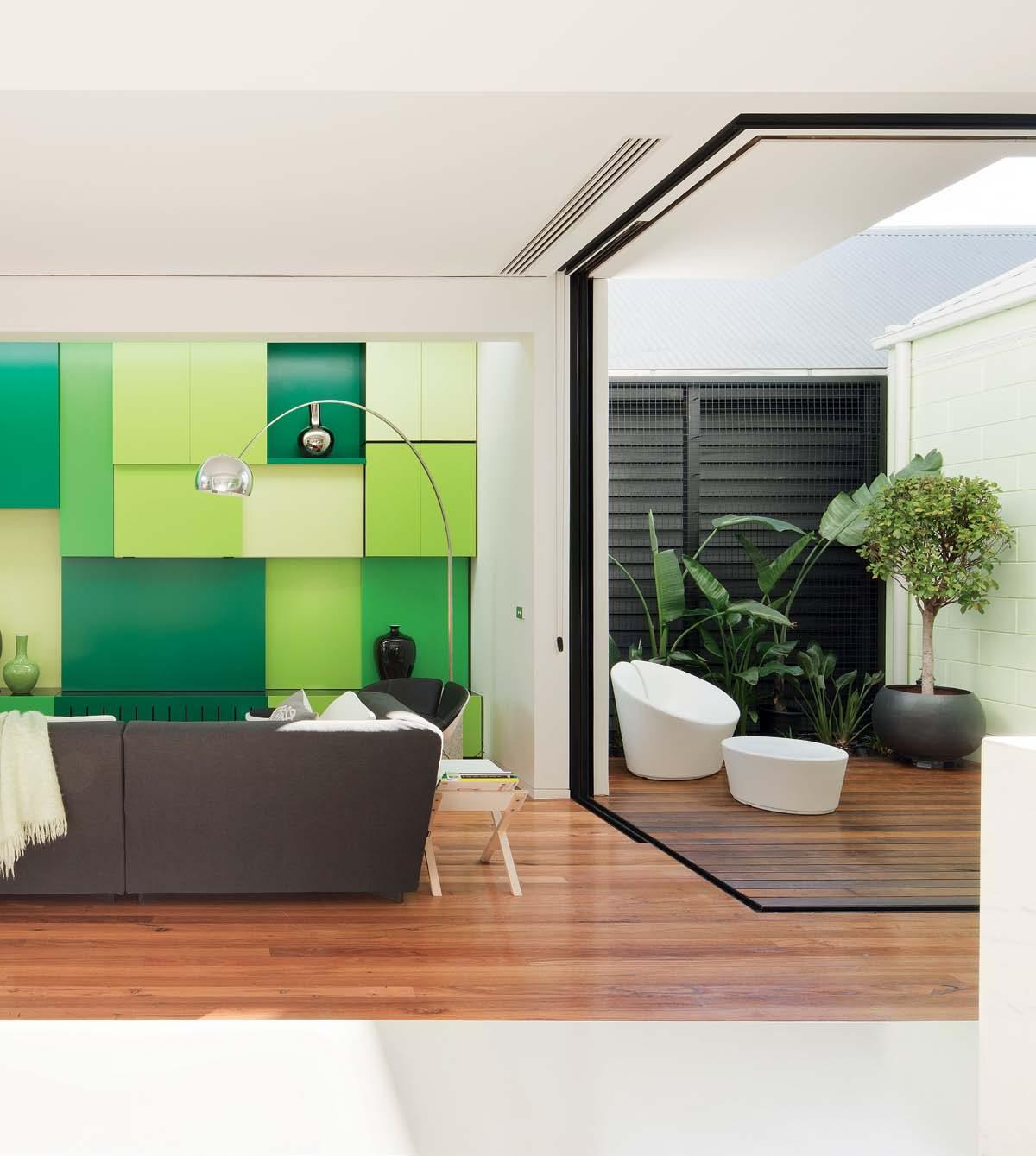
His first move was to rip everything out and open it up, including as many of the external walls as structurally possible. Skirting and cornices were ditched to create a clean canvas and maximum height – an ultra bold and seamless finish akin to Alex’s product style. The space became a haven of angles and strong connecting lines.
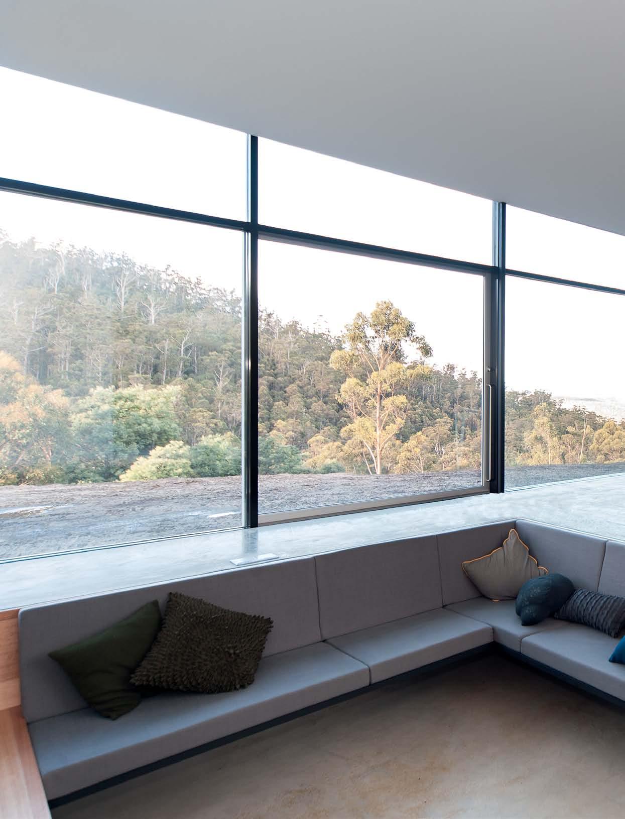
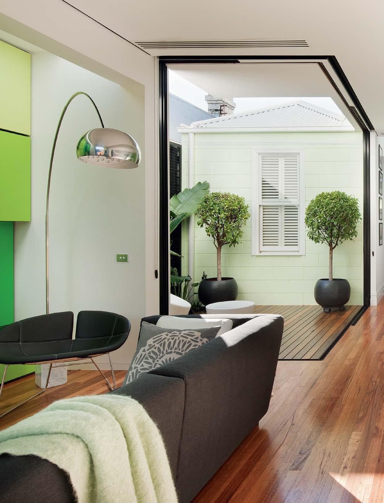
The floorplan is a series of open boxes that connect seamlessly. Both long sides of the penthouse completely open on to two separate balconies, which has the benefit of extending the floor plan as well as creating additional privacy.
Tradition has been thrown out of these expansive windows, and the classic dining room has been overruled. The Brisbane climate and the prime position at the top of the cliff allow Alex and his wife, Kyah, to eat on the balcony throughout the year. This versatile quality extends to every space; the whole penthouse is made up of modular components that can be added to, moved or deleted altogether, with minimal disruption.
Puzzle pieces of the most basic elements in shape and colour create an overall simple harmony as well as shout-outs of interest. In a statement to convention, rug artworks are hung on the floor; traditional flooring is used for wall panelling; and the colour scheme is literally turned on its side. Alex sees a product, material or finish for its basic components and potential use in unorthodox ways. He is experimental and fearless and, once he has a thought, is hell bent on realising it.
The monochromatic colour foundation emphasises the strong architectural lines and is the perfect base to frame product. Alex has dispersed iconic and individual chairs throughout the space. But they're not just
2 . portrait # 59
ALE x | DESIGn E r A n D r E SIDE n T previous | industrial and interior designer, alex lotersztain. opposite | Kitting out with modular comP onents decoratively and structurally allows flexiB ility to reconfigure, exPand or delete elements within each sPace.
The way I see interiors is the way I see products – how things work inside a box. All the elements need to work together and I need to find what is the most efficient way of operation.

issue #17 habitusliving.com

2 . portrait # 61
They are all my favourites. I have pieces by people that I admire and respect.
alex | designer and resident
issue #17 habitusliving.com
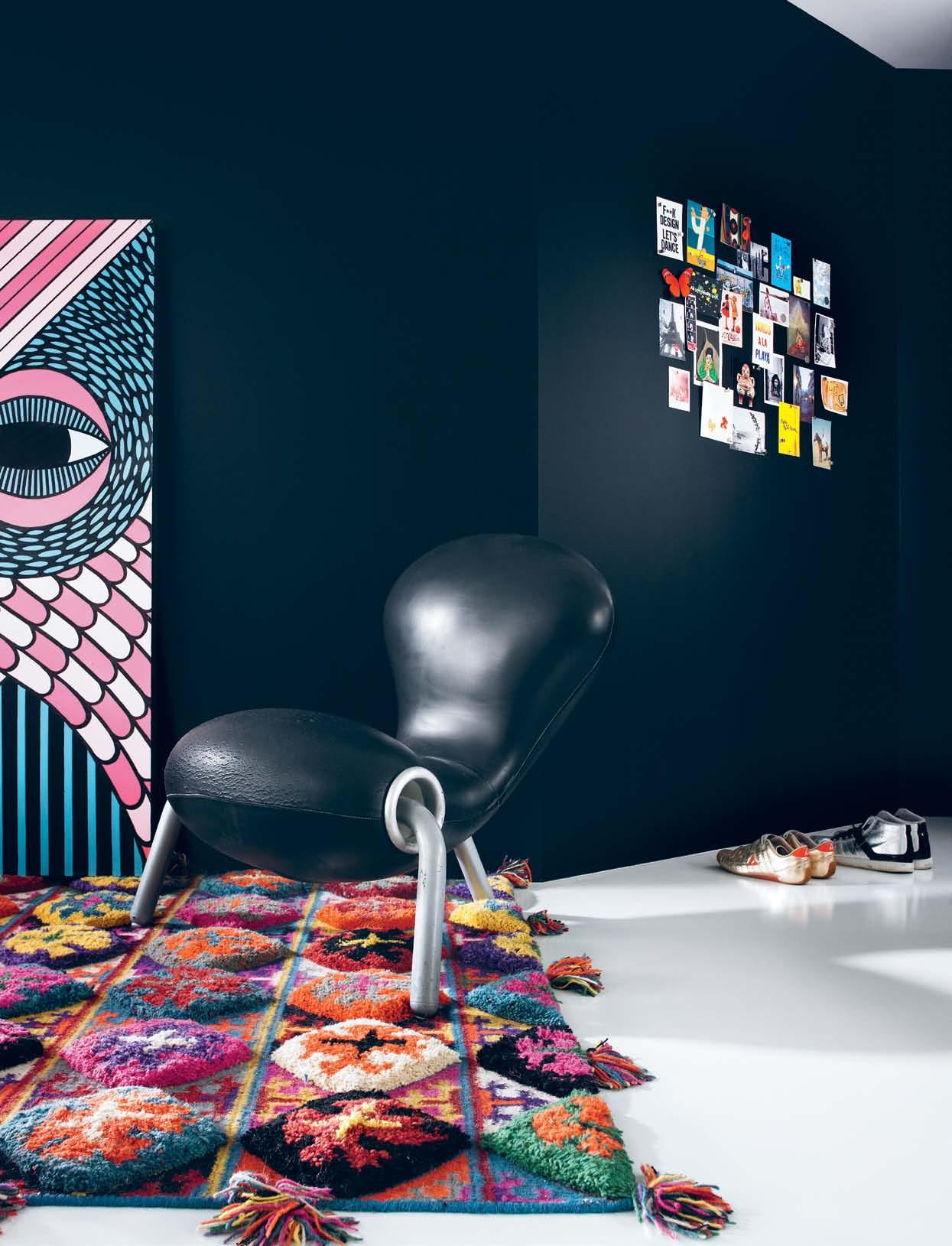
objects to be admired; every chair is valued for sitting in. Each product contributes its design value in both an aesthetic and functional way – a white leather Vitra chair is for reading, the B&B Fat Fat is for intimate family time, the Tufti Time lounge for lounging; only the lucky find Embryo chair is an art installation. The chairs are dispersed knowingly throughout each space in a way that is like a gallery exhibition, homage to the design greats that Alex admires. “They are all my favourites. I have pieces by people that I admire and respect... Patricia Urquiola, Stefano Giovanonni, Marc newson, and Jasper Morrison,” he says.
Scattered among the design greats are pieces designed by Alex. While it is easy to eye out a Derlot design, Alex is reluctant to label his style. “I don’t classify myself because at Derlot we work on a project basis – we are not known for one thing in particular,” he says. But rather, it seems, many things.
Alex’s unique blend of product design skills have given him an interesting approach to interior design. “The way I see interiors is the
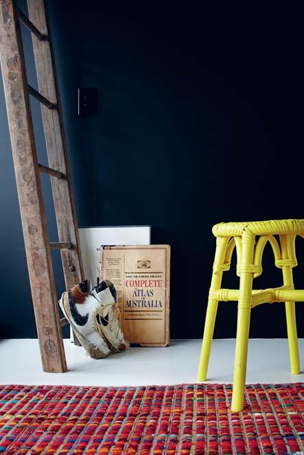
way I see products – how things work inside a box. All the elements need to work together and I need to find what is the most efficient way of operation.” Alex combines this method with his passion for diverse cultures and so the space in which he lives is still able to embody life and character.

Alex’s influences have come from travelling and experiencing different places, products, architecture, lifestyles and the approach other cultures take for innovative solutions to space issues. Being a modest 200 square metres , his own home was particularly inspired by a work trip to Japan and specifically the use of sliding doors – something that Alex believes is under utilised here.
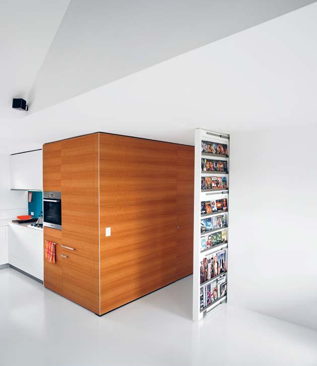
“To me, swinging doors are a waste of precious space. A well thought-out sliding door can be a room’s greatest asset,” he says. All but three doors are sliding on recessed track mounts. Each serves two purposes – allowing for a quiet transition between spaces and a continuous visual flow. As with his product designs, nothing feels disjointed or abrupt. There is softness
2 . portrait # 63 previous | scale is used to emPhasise drama and the Pitched ceilings and angled walls disPel symmetry and Boredom. opposite | collections of illustrations, rugs and chairs are a reminder and insPiration of alex’s travels. above left | structurally, a very simPle form, there are P o cKets of Personal installations to B e discovered gradually. above right | a B lown-uP series of alex and his wife, Kyah, in a Photo B o oth B reathes their Personality and quirK into the hallway.
Skirting and cornices were ditched to create a clean canvas and maximum height – an ultra bold and seamless finish akin to Alex’s product style.

issue #17 habitusliving.com
above | with function Paramount in the Kitchen, custom joinery and materials with strong lineal aesthetics are Ke y. the hidden dePth of mechanics maKe the finished form seem so simPle. opposite | moving walls and integrated doors douBle as cleverly concealed storage s Paces, and hide rooms, allowing seamless transitions and a clear visual flow.
to even the hardest of surfaces. With all of the concealed joinery in the doors, this has also allowed a luxury of space and the polished, simplistic feeling of his distinctive style.
One particular project that Alex borrowed many of his home elements from is the Limes Hotel he designed in Fortitude Valley, the first Australian member of the prestigious Design Hotels group. “If it stands up well in a hotel environment, it’s a sure thing for home life,” he believes. Like his own home, the hotel is efficiently planned on a small site, and has compact rooms. Alex’s designs create a perfect blend of drama and relaxation, and all items are stripped back to their essential core to encourage a feeling of uncomplicated space.

“I have taken the elements of all my experiences with clients and brought them to a home setting,” Alex comments about his home. “Most of it is about approaching ideas in a practical way – materials, joints, edgings; what will work best for everyday living.”
It is this understanding of people and place that sets Alex apart. While he is involved in projects at all corners of the design globe, the most shaping project for his holistic outlook on
2 . portrait # 65
Puzzle pieces of the most basic elements in shape and colour create an overall simple harmony as well as shout-outs of interest.
issue #17 habitusliving.com
2 . portrait # 67
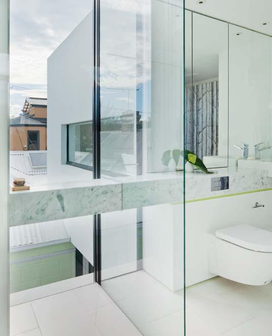
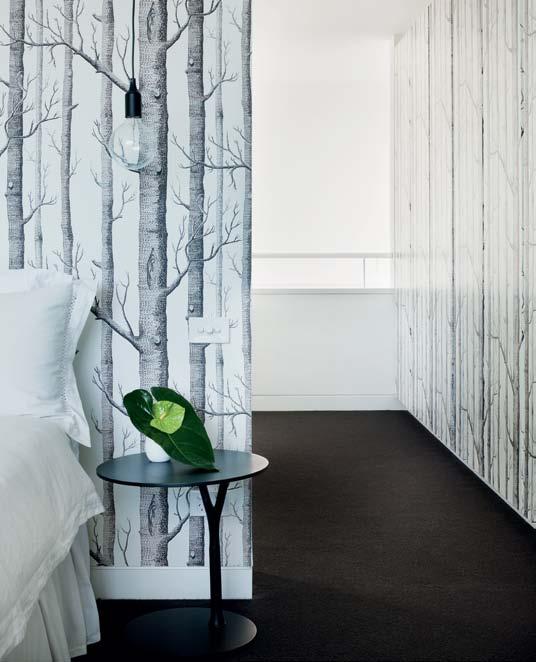
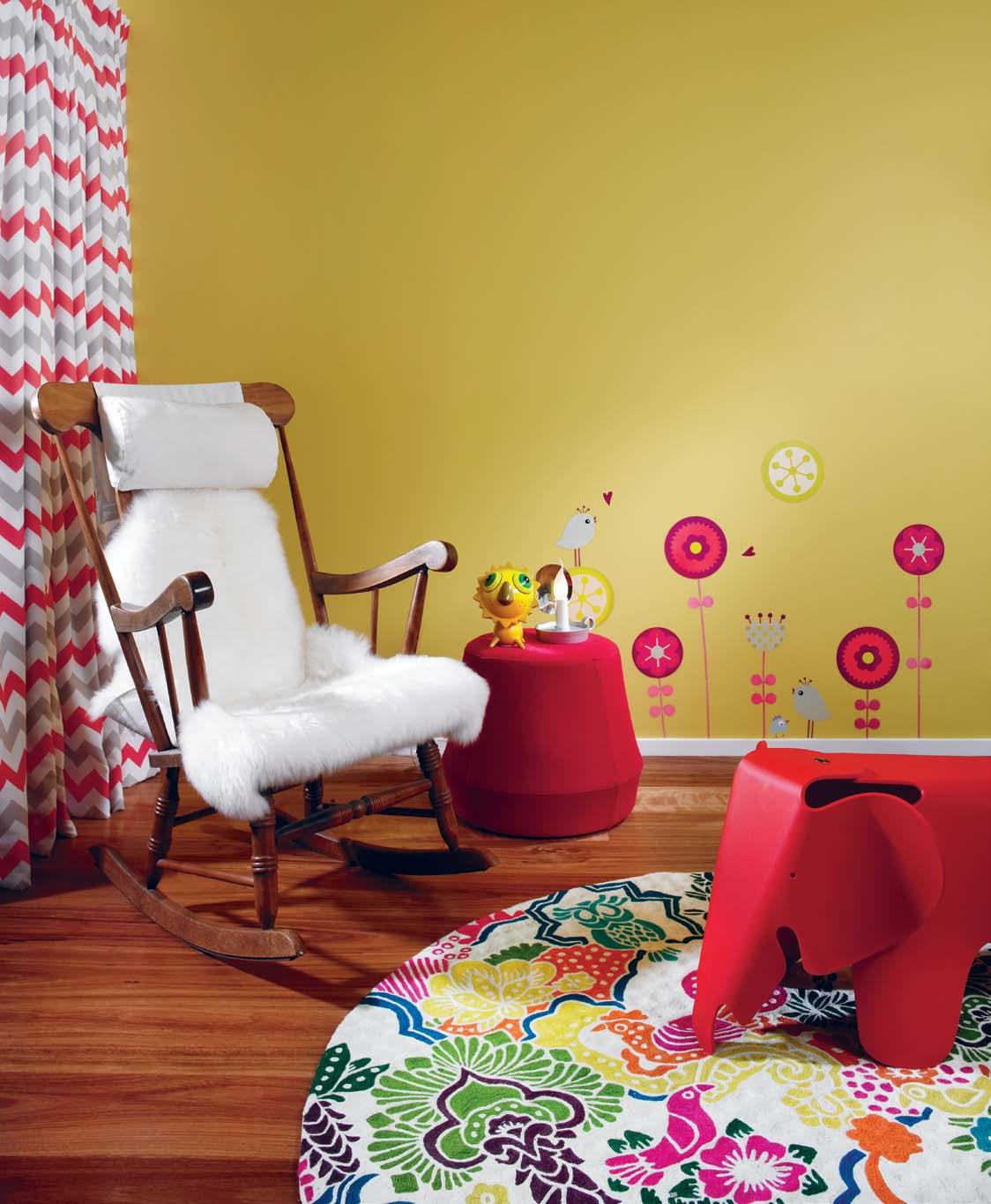
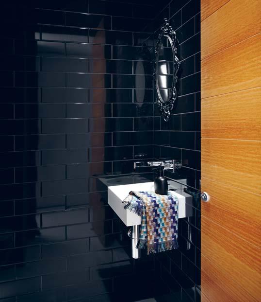
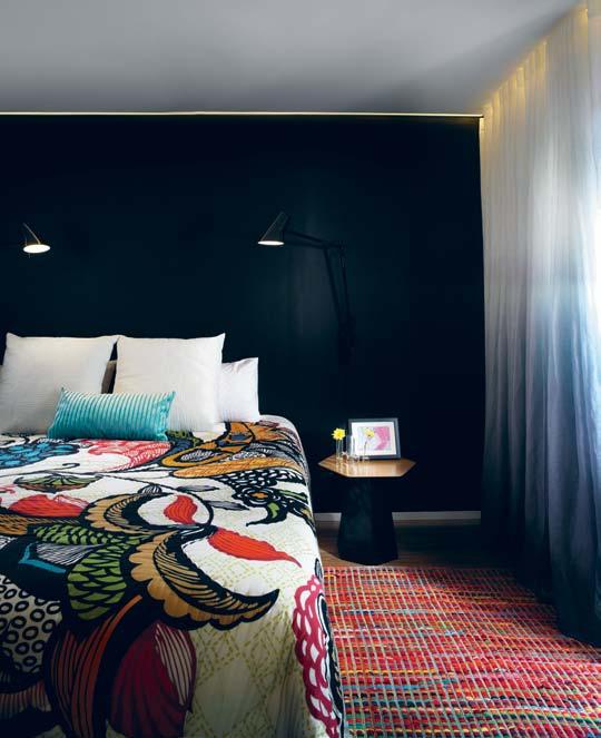
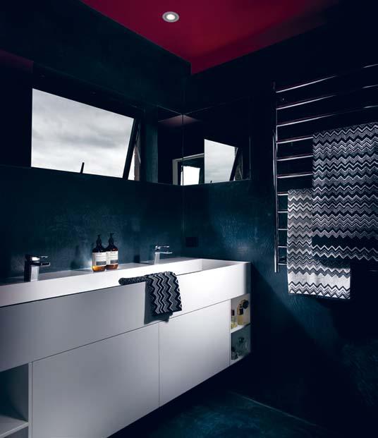
opposite | BaBy ri o’s room continues the com B ination of iconic, tradition and innovation. cu rved lines and round shaPes soften the vivacity of colour. above left | custom corian BenchtoP s with in-B uilt Basin allow for no joins and continue the strong lines with seamless finish into the main Bathroom. above right | led striP lighting undermounted in the ceiling shadow line comB ined with floaty custom dyed faBric curtains give the master B edroom an ethereal quality. below left and right | ancient B uffed fresco waterProofing techniques are executed to modern dramatic effect in the master ensuite.
design has been an ongoing relationship with a multinational company in Africa and Ecuador to develop corporate gift products. These collaborations began three years ago and are something he is still passionate about.

“You can really see how design can play a huge role in uplifting and empowering people with real solutions and perspectives,” he says. To immerse myself in those cultures has enriched me enormously and I hope some of this project has brought about positive change in their communities.
“It is incredible that such a large company like that is thinking in those ways. It gives you hope that the future is bright and responsible and the act of sharing is growing.”
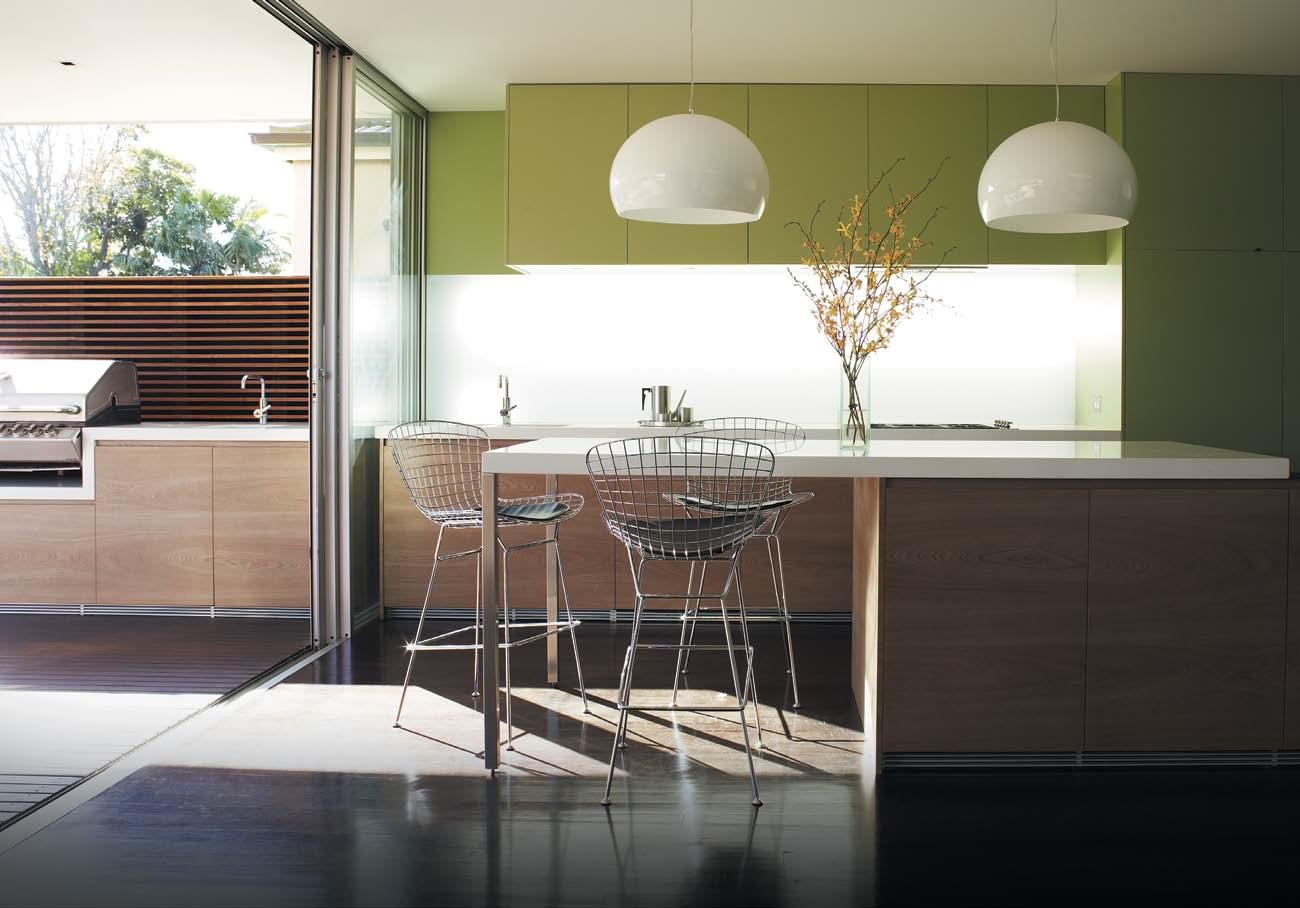
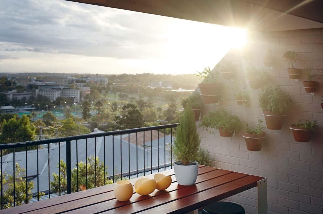
issue #17 habitusliving.com above | the whole aPartment oPens comPletely onto two Balconies, taKing advantage of natural cross-flow ventilation and amazing sunsets over the BrisBane river. below | a custom derlot grill Pl ate taKes uP virtually no floor sPace on the Balcony adjoining the Kitchen. Derlot | derlot.com habitusliving.com/issue17
HARBOUR OUTDOOR AVAILABLE AT SELECTED STORES. PH:+ 612 9666 5972 E: info@harbouroutdoor.com www.harbouroutdoor.com ® THE GREAT AUSTRALIAN LIFESTYLE .
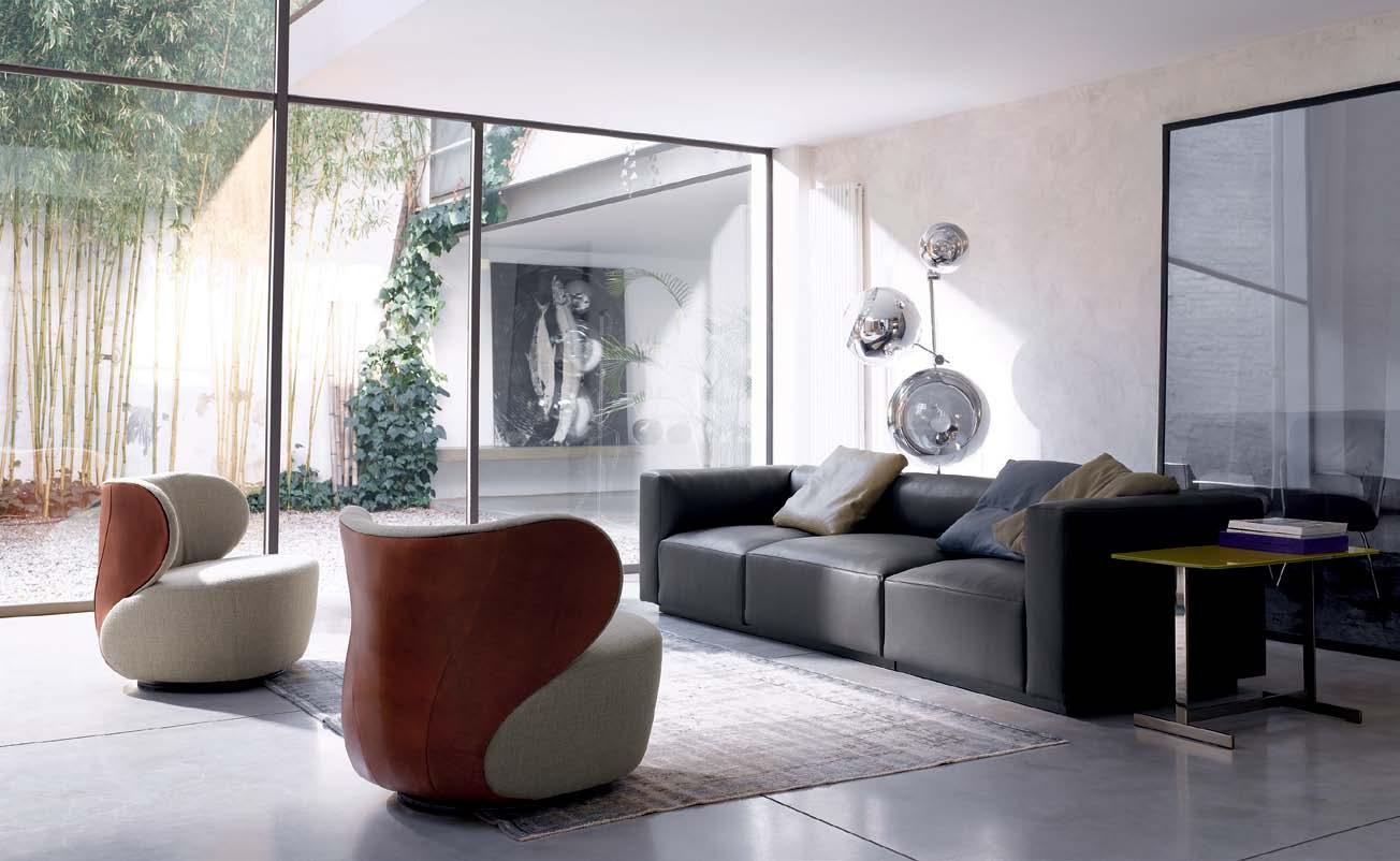
Bao. Spacious and round. It’s the curves that make Bao appealing on first sight. The swivelling armchair combines the materials: saddle leather on the back, fabric in the seat. Everything has its place. Bao – as familiar as a welcoming embrace. Design: EOOS.
Dealers in a ustralia:
Designcraft: Canberra
l iving e dge: Sydney, Melbourne, Brisbane, Perth
stylecraft: Sydney, Melbourne, Brisbane, Adelaide, Canberra, Perth
Bureau Office Furniture: Melbourne
Designfarm: Perth
Walter Kn O ll a ustralia:
T +61(0)8 81 82 39 25
info@walterknoll.com.au
www.walterknoll.de
An artisan for our time
Reports of an emerging colony of artisans in the PhiliPPines led AyA MAcedA to meet young British-Filipino designer-maker, dAniel lAtorre cruz. In the temperate terrain of Tagaytay, Latorre Cruz has set up a studio for a few months of the year as he splits his time between the UK and the Philippines.
 text AyA M AcedA | photogr A ph y t oM e pperson, Kurt Arnold, noli gA bilo
# 71 2 . portrait
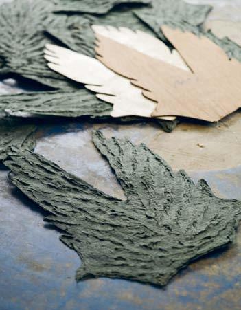
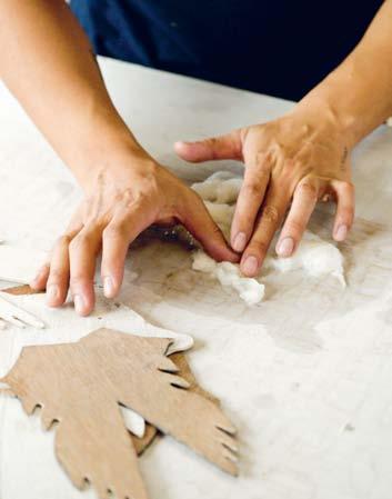
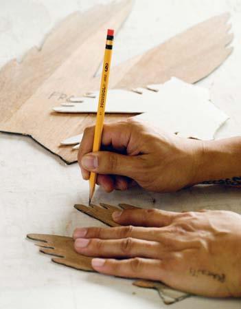
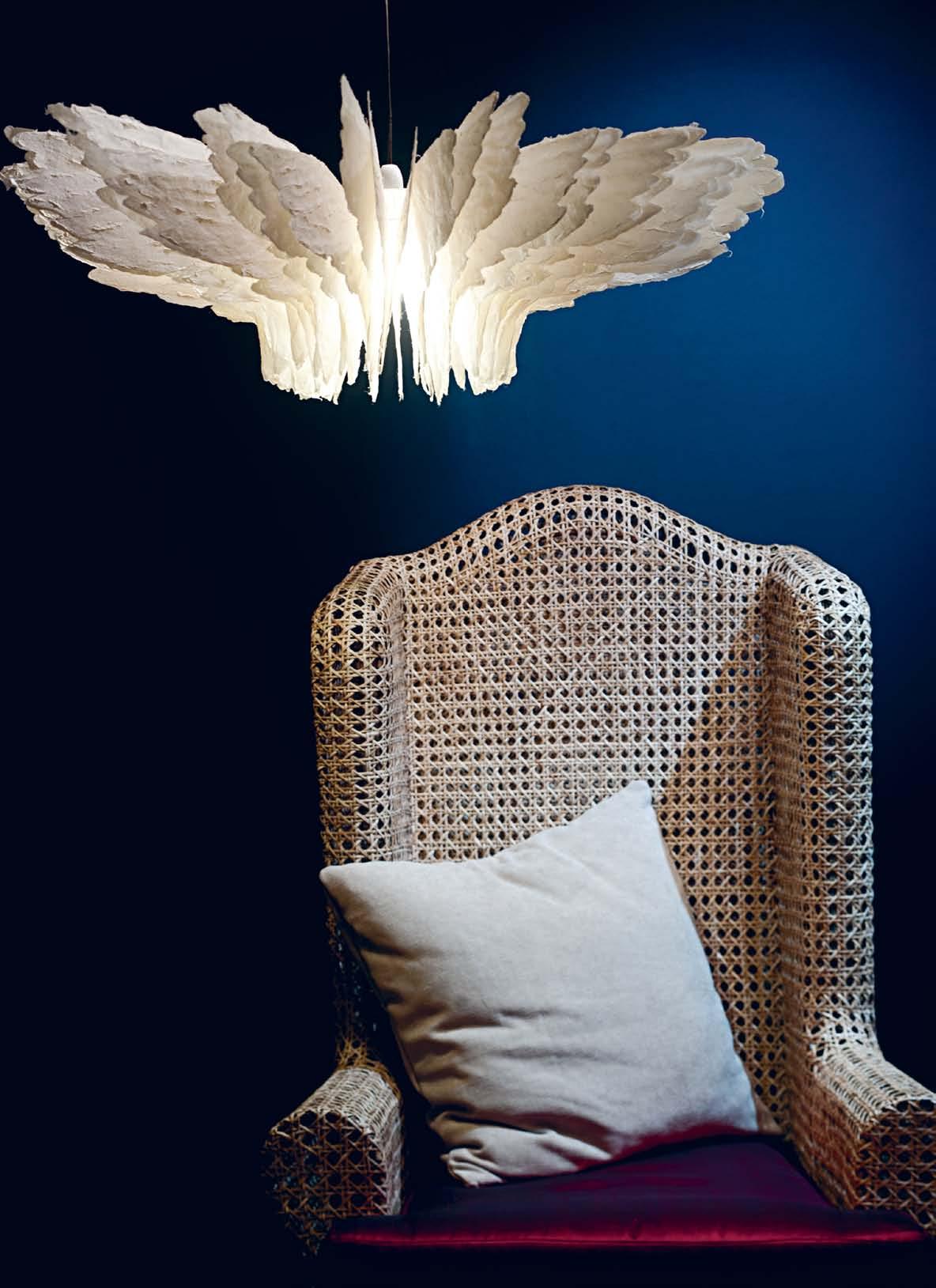
Daniel Latorre Cruz is only in the early stages of his career, but is already showing great promise with surface narratives that evoke emotions and explore the opulence of sustainable materials. He made his mark with the release of the Icarus lamp collection where he re-invents the myth of Icarus through fronds of handmade paper designed to represent wings that shimmer as they enfold light. Daniel expresses sensual darkness and ethereality as he suspends the Icarus of his imagination in the sky. With delicate forms he applies light and a process of shaping paper pulp with finger and thumb strokes to achieve depth and texture.
Daniel shows sensitivity in his use of naturally processed paper made from recycled agricultural waste materials of the mulberry tree. A deviation from today’s technology and mass production, his process attempts to define his line of artisan roots from the Philippines and establish ownership and interpretation working with raw paper.


His interesting transformation stems from many travels and influences from childhood. Born in the Philippines and raised in the English countryside of Lincolnshire from the age of 5, Daniel remembers his early years drawing and playing football amid fields of yellow rye and whistling forests. From a small countryside art school, he moved to High Wycombe in Buckinghamshire, a town outside London known for chair making, to study contemporary furniture design. Here
he learned from designers such as Matthew Hilton, Michael Marriott and Neil Austin as well as inconspicuous craftsmen who mentored and infused in him the value of being a designer aware of his time and the potential of design to create change.
Following a natural course, Daniel moved to East London as a hungry energetic artist looking to be stimulated by the buzz of city life. Here he created objects from accessible materials such as leather off-cuts, metals, local timbers and plastics. He experimented with polycarbonate to reinterpret paper planes in his Jetset functional wall art, and created origami unicorns with folded aluminium.
In between producing his own designs and prototypes, he worked as a model-maker under Hiro Takayanagi where he produced hand-cut detachable paper and card models for architect, John Pawson. From Pawson he absorbed attention to detail, minimalism and an understanding of surface, texture and the play of light. This experience formed his appreciation for working with handcrafted models rather than with those cut by machines. “They had more life,” he says, and this belief manifests in his independent work.
Later, he sought new paths and a deeper understanding of working with materials. Responding to the need for change and a drive to control his own creative direction, he took a leap of faith to return to his homeland – a place he refers to as ‘The Source’. In 2004, he re-connected with his roots and paid homage to his ancestry, photo-documenting the country

issue #17 habitusliving.com
previous | DanIeL In hIs home sTUDIo In Tagay Tay, PhILIPPInes. above | DanIeL’s PRo Cess oF hanD CR aF TIng The wIngs oF The ICaRUs L amP s opposite | The FInIsheD ICaRUs L amP

# 73 2 . portrait
...sensual darkness and ethereality as he suspends the Icarus of his imagination in the sky.

above | TaTaya (BoaT oF BaTanes) BenCh se aTIng In R aT Tan, DIsTRIBUTeD By oBR a CeB Uana.
issue #17 habitusliving.com
From Pawson he absorbed attention to detail, minimalism and an understanding of surface, texture and the play of light.
WIN a private dinner party hosted by Frank Camorra of MoVida *

and re-discovering the islands as a playground for creativity. He travelled extensively around the Northern Cordilleras of the Philppines scouring natural materials and to understand the culture and sustainable livelihood behind them. In the process, he learnt of a more organic approach that would be ingrained in his work and materials, opening his eyes to new creative possibilities.

In the Philippines, he also connected with like-minded young designers to form Epoch Collaboration, a collective with a goal of preserving the country’s heritage as artisans with a new vibrancy to Filipino contemporary design. “We are always learning as designers, bouncing ideas and drawing inspiration from each other. It has given me a broader understanding of design inspirations working with natural and sustainable materials,” says Daniel, who credits the influence of Epoch Collaboration to two of his most significant works, the Icarus and the 445 chair.
“I see chairs as the closest piece tangible enough to send a message across,” he says. The stackable 445 chair is handcrafted from a strong native palm abundant in the Cordilleras, and locally assembled through a traditional method of dowelled joints. The delicately proportioned chair contrasts the robust qualities of the timber used, which is flattened and smoothed to precision and waxed to enhance its exotic natural grain. With this chair he began his journey as an independent chair-maker and follows his passionate advocacy for localism in the fabrication of his products.

Daniel continues his path of discovery and experimentation in both the UK and the Philippines. The dichotomy of living and working in two countries gives him a wider perspective and an innovative direction to his work, although it also comes with manageable complexities.
Armed with youthful energy and idealism, he designs and collaborates around the clock in two time zones. For the freedom to work in this manner and the decision to take control of his path as designer, Daniel Latorre Cruz is one of the region’s exciting independent design-makers.
Daniel
above | The sTaCK aBLe 4 45 ChaIR below | shaD ow B IRDs LIghT PenDanT wITh B URI anD sTeeL RoDs DIsTRIBUTeD
issue #17 habitusliving.com
Latorre Cruz latorrecruz.com | epochcollaboration.com habitusliving.com/issue17
By haCIenDa CR aF Ts
Defining
Request detailed information or visit our sales partner.
ecc lighting + furniture


Brisbane 15 James Street, Fortitude Valley, Phone (07) 3100 8842, brisbane@ecc.com.au
Melbourne 99 Commercial Road, South Yarra, Phone (03) 9821 5300, melbourne@ecc.com.au
Sydney 17 Thurlow Street, Redfern, Phone (02) 9380 7922, reception@ecc.com.au
Perth Mr Smith, 154 Hay Street, Subiaco, Phone (08) 9388 3334, hello@mrsmith.com.au
Adelaide: Phone 0401 176 668
Hobart: Phone (03) 9821 5300
Head Office: Phone (02) 9460 6600
www.ecc.com.au
USM U. Schärer Söhne AG, 3110 Münsingen/Switzerland, Phone +41 31 720 72 72, info@usm.com


www.usm.com

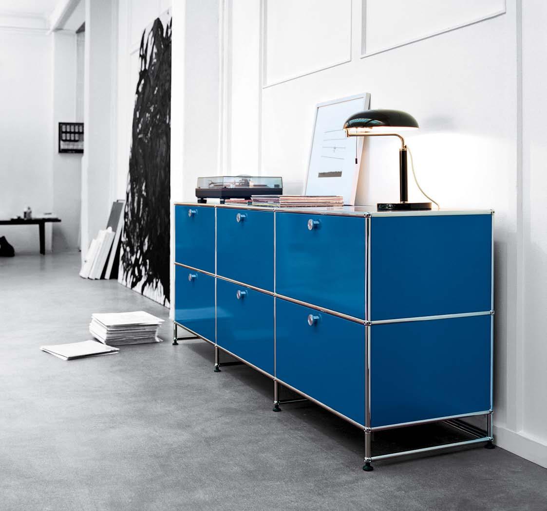
structure The potential of space increases with flexibility – USM builds the base for expansion.

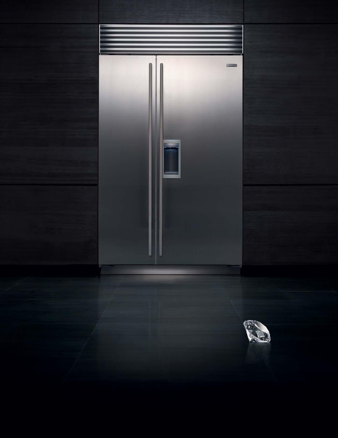
A SUB-ZERO IS JUST A REFRIGERATOR, LIKE A DIAMOND IS JUST A STONE Iconic design. Enduring quality. Superior performance For more information visit the Australian Distributor at: www.subzerowolf.com.au Or call: +61 3 9421 0232
Design journey
Director and designer Shareen Joel engages her love for industrial process with an eye for elegant furnishings. These two focii have become the seams that bind her professional life and Caulfield home into one. alice Blackwood visits.

2 . portrait # 79
Tex T alice blackwood | PhoTogra Phy shannon mcgraTh
industrial designer, interior architect, director, specifier, stylist, blogger, homemaker, mother, wife and dog-owner – a veritable cyclone of skills, activities and responsibilities: this is Shareen Joel.
Founder of Shareen Joel Design – a multidisciplinary studio well versed in interior architecture, product design and design strategy – Shareen has made it her life’s work to combine a myriad of influences, disciplines and active interests into her daily practise.
She studied industrial design at RMIT University 1988–1990 – and was one of the few women following this specialisation in what was, back then, an engineering degree. One of her first industrial design jobs was with global car manufacturing giant, Ford. Here she worked in the design of the interiors – a ‘pigeonhole’ applied to many young female designers in that period.

Still, the job served her well and saw her do stints in London and Detroit, where she developed a passion for chairs and “hardcore” manufacturing. “I started my obsession because I went on tours for Ford to the Herman Miller factories,” says Shareen. “I got really interested in Knoll and Herman Miller –brands from the mid-west, from that heart of manufacturing in America.”

issue #17 habitusliving.com
love To use every room in The house – parTiCularly The lounge wiTh iTs ‘ real open fireplaCe
previous
| shareen Joel wiTh her ChilDren, sasha anD niCholas, fill Their norTh CaulfielD home wiTh plenT y of life anD personaliT y left | s hareen’ s love for Chairs in all shapes anD sizes sTems from Time spenT in ameri Ca s miD -wesT ri G Ht | s hareen anD family

2 . portrait # 81

issue #17 habitusliving.com
...passion for fashion, soft furnishings, elegant finishing touches and highly functional design.
“That’s what inspired me when I was very young as a designer living in Detroit. Since then, I’ve been really into hard-core manufacturing and tried to soften it in a way that it’s more accessible to other people.”
Time spent at Ford saw Joel work on automotive interiors, exteriors and conceptual designs. “It was amazing to work in that manufacturing [environment] – it’s the best apprenticeship you can have,” she comments. “Because you’re accountable for your mistakes, you’re designing something that costs millions and millions of dollars. It has to last and it has to sell.”
This appreciation for mass production is tempered by Joel’s love of fashion and branding. “I’ve never separated fashion from automotive,” she says. “But at the time I didn’t know quite how to express that.”
In 1998, Shareen moved back to Australia to start her own homewares company and to take on a range of re-branding projects with leading fashion labels, Witchery, Country Road and Becton.

It was at this point that Joel brought her many activities under the single banner of Shareen Joel Designs, producing products for the likes of Zip, Clipsal, Lockwood and Sheridan, while also working with companies to fuse product and retail into a full brand

2 . portrait # 83
left | The sTuDy is shareD by The whole family. above | shareen prefers Cosy rooms for D ifferenT aCTiviTies – eaTing, Co oking, lounging – over open plan living sT yles below | shareen’s ‘look’ is Cl assi C ConTemporary anD warm – anD her family are righT aT home in This seT Ting.
experience. Residential projects also make up a large portion of her business – although the focus is always on interior architecture. “We don’t do that much furniture specifying or decorating. We do interior architecture and fittings and fixtures,” she explains.
So where does the fashion-focused homewares connoisseur fit into all of this? Joel is very much about good taste and elegant presentation. She lives in a pared back 1940s Art Deco home in North Caulfield, in Melbourne. Here, her bright personality enlivens each living space and she moves between them frequently, animating them with energised activity: chopping baby tomatoes while simultaneously brewing coffee in the kitchen, actively conversing while also lounging on a spacious sitting room couch, rounding the dog up in the front yard before comically chasing it through the doorways that connect dining with living with kitchen.
“I never liked open plan living,” says Joel. “I find it loses its warmth and intimacy. Here we


use every room in the house. We love an open fire – a real open fire! We love cooking. We’re at home a lot.”
The living spaces themselves are a tasteful curation of natural finishes – linens, leather, timber – and everyday comfort. “My look is classic, contemporary but warm. And we’ve noticed through Shareen Joel Design more and more of our clients are struggling to find designers who can give them that look; it doesn’t feel like a show piece and I don’t want my family to live in a showpiece.”
When asked to expand on her personal aesthetic as opposed to her professional approach, Joel simply states: “Look at Share Design.” Yet another facet of Joel’s work-lifedesign, Sharedesign.com (which she co-directs with Miranda Lansell) is a virtual decorators’ dream. “It’s less architecture and industrial design, it’s more decoration and furnishing,” explains Joel.
A website, resource and blog, Share Design taps into Joel’s passion for fashion, soft
issue #17 habitusliving.com
left | noT keen on aloof anD sT ylish show-homes, shareen sTrongly believes home is for ComforT anD everyDay living. riGHt | while Colourful anD playful, The ChilDren’s rooms To o are furnisheD wiTh iTems ThaT have a longeviT y in sT yle anD Design.
Moroso Spa
Cavalicco, Udine/Italy
T +39 0432 577111
e-mail: info@moroso.it
www.moroso.it
Moroso Available exclusively at hub furniture

lighting living
Melbourne 63
exhibition St Melbourne
T +61 3 9652 1222
Sydney 66–72
Reservoir St Surry Hills
T +61 2 9217 0700
www.hubfurniture.com.au
photo Alessandro Paderni / ad Designwork
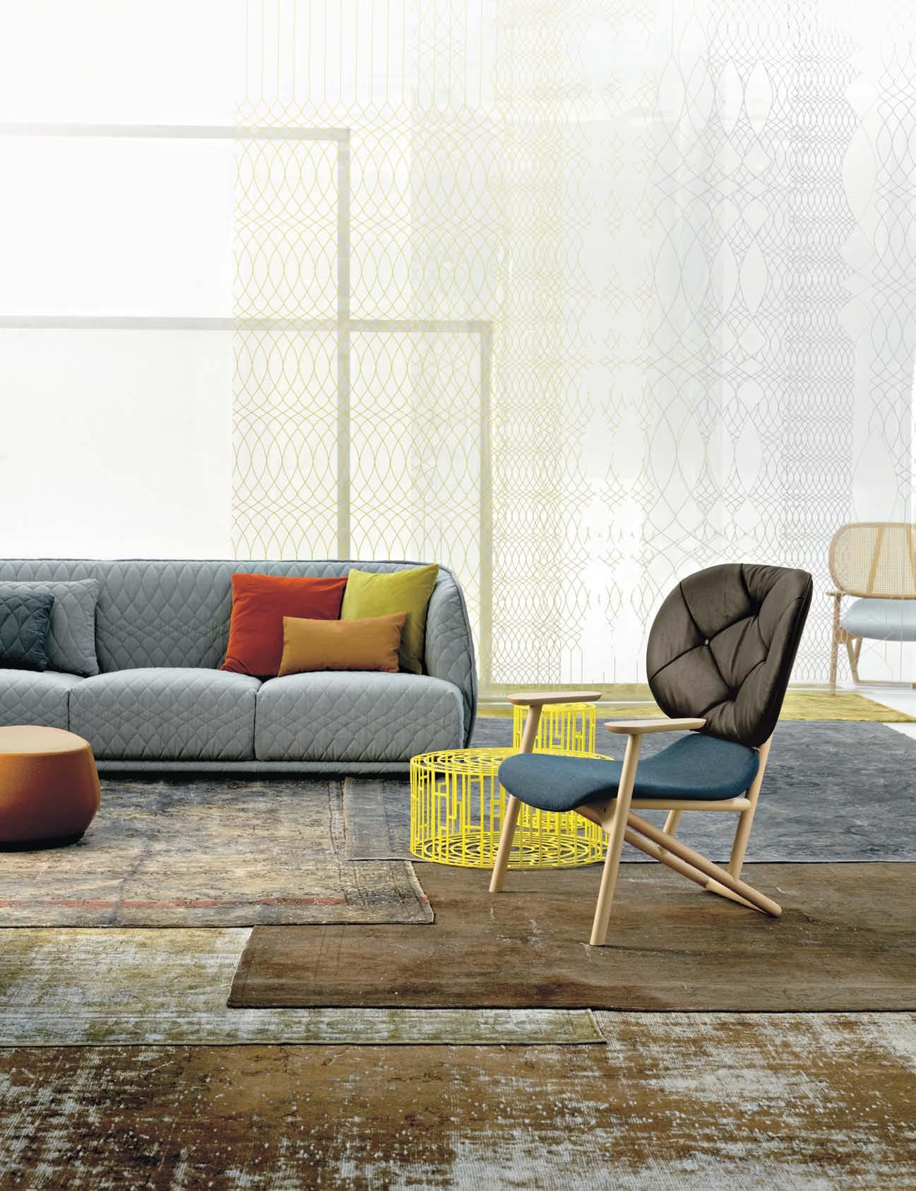
Klara armchair by Patricia Urquiola
Carpet reloaded for Moroso
Kub table by Nendo
Redondo sofa by Patricia Urquiola
furnishings, elegant finishing touches and highly functional design. And also manages to encompass that ever-underlying passion for mass production. “I particularly don’t love driving around and finding one cushion for one house. I’ve always liked mass production. Rather than do it for one project, I’d prefer to do it for the masses and make design available for the masses.” Which Share Design achieves through weekly e-newsletters, and a very accessible website.
Joel’s own home interiors are on Share Design for all to see, and she breaks down her living spaces product-by-product, brand-bybrand, for her online followers, so they too can ‘get the look’.
Work is life is design, and everything you find on Share Design, or in Joel’s own home is “only what I would specify. It’s a specific style. Having a specific style and curation is what people really want,” says Joel.

One final note on personal taste and her North Caulfield home: “One thing I noticed at the Milan Furniture Fair this year, it’s all about bringing back the classics and reviving old traditions.
“Everything I have in this house, I’ve been collecting over many years” – here she points out a set of Cassina Cab chairs and a La Barca table. “There’s nothing I would ever want to throw away. I’d rather hand it down to generations – to me that’s sustainability.”
This, too, is reflected through Share Design. “One of the criteria for Share Design is, everything we upload we’d want as much in 10 years as we would today. My aesthetic on Share Design is how I live at home. Don’t you think it’s time for someone to do that sort of thing?”
issue #17 habitusliving.com
above | insiDe To o uT shareen’s 1940’s arT DeCo home. Shareen
shareenjoel.com habitusliving.com/issue17
Joel Design |
There’s nothing I would ever want to throw away. I’d rather hand it down to generations...
SHAREEN | DESIgN ER AND RESIDENT
Your invitation to view...
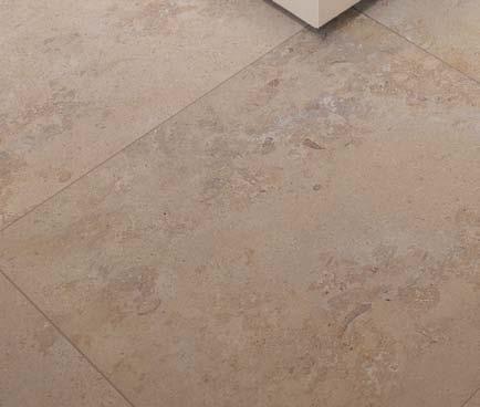
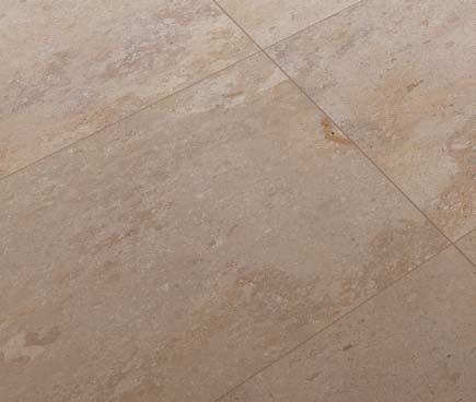
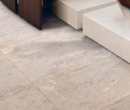
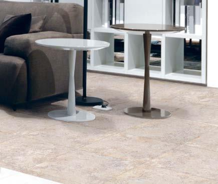
New to the Tile Boutique collection is the UNIKA range. Inspired by nature and faithfully simulating natural stone, Unika is manufactured using the latest in digital ink technology. Each tile is unique and has the same textured veins and colour variations as the real thing!


See it for yourself at your nearest Tile Boutique showroom.


33 stores nationwide www.tileboutique.com.au
Quality & craftsmanship
There is an aesthetic that celebrates seamless perfection in furniture, where uniformity of dimension, finish and overall look are achieved through mechanical processes. But this isn’t for everybody. The handcrafted look appeals to those of us who place importance on the individual character of our interiors, and our furniture.

Creating pieces with timber has this very effect. The natural markings give warmth and unique personality, even while pieces might be identical in dimension and design. This slight variation has the dual effect of telling a story of the material’s origin, and giving us the feeling that we have something that no one else does.
As well as its use of solid wood, e15 is known for its progressive design featuring high-grade materials that are brought to life
with innovative, handcrafted production methods. Founded in London in 1995, the products are manufactured by artisans and craftsman in Germany, the heart of European timber manufacturing. Here, details are paramount in creating quality and character.
The Madame Lillie table, for example, has a table top in European Oak or Walnut, which features the end grain of the timber with its distinctive annual rings. Similarly, timber becomes a feature in the Backenzahn stool. Designed in 1996, four solid pieces of timber provide visual interest as the angular tapering legs while a slightly concave treatment to the seat provides comfort.
This attention to detail and traditional approach to making extends to other materials as well. The Habibi side table in polished
brass, copper and stainless steel is spun and polished completely by hand. The untreated finish oxidises over time to create a beautiful and unique patina.
Working with international designers such as Philipp Mainzer, Stefan Diez and Arik Levy ensures e15 continue to produce contemporary designs, which have received numerous accolades since the company’s beginnings. Awardwinning designs don’t always translate into homes, but e15’s range combines modern forms with timeless materials and quality, making it completely liveable in a multitude of residential and commercial interiors.
issue #17 habitusliving.com
There is something about handmade furniture that can never be replicated or manufactured by machinery.


Living Edge | (61 2) 9640 5600 | livingedge.com.au opposite | leo seating. above | habibi side table. below | arie open shelving.


Human designs
Satyendra Pakhale is fascinated by cultures. nicky lobo gets an insight into how they have shaped this Indianborn designer’s humanist philosophy.

2 . portrait # 91
text Nicky Lobo | pHotograpH y Joost va N brug (portraits)

issue #17 habitusliving.com
satyendra Pakhale’s culture obsession is not surprising. Born in India, where he gained a degree in Engineering and Master of Design, Satyendra also studied Advanced Product Design at Art Centre in Switzerland before setting up in Amsterdam in 1998. The eponymous practice, Satyendra Pakhale, works across a diverse range of projects including industrial design, communication, exhibition and architecture, collaborating with impressive clients such as Alessi, Alcantara, Cappellini, Magis, Moroso, Offecct and Tubes.
Although he travels often to India to work on specific projects, Satyendra has a refreshing take on an obvious assumption: that his heritage influences his creative work. “The simplistic answer is that wherever you grow up, that place cultivates and shapes your foundation. I am Indian, I grew up Indian, but I’m also very open and looking at the world in a refreshing way. I find [nationality and Nationalism] a bit of an outdated way of looking at the world,” he shares.
Satyendra, the person, is quite considered. He is incredibly disciplined in communication,
and linguistics comes up in conversation more than once. He builds on thoughts incrementally, developing them like one of his products – “I spend tremendous time working on materials and experimenting with several forms to come out with a consistent vocabulary, almost a grammar” (yet another linguistic reference).
After his studies and a stint with Philips Design in the early 1990s, Satyendra travelled to a remote area of India to work with local tribes. It might seem a backwards move given his successful jump into a major global company, but he wanted to understand the “genesis of the creative urge in human beings,” without the constructs of marketing or industry – an exploration into the very essence of design.

While a lifelong study into different cultures shows they each have a unique approach to making things, Satyendra believes human expression is universal, in a design sense as well as in a wider cultural sense. He points out that with music, “sometimes you don’t understand the lyrics, you don’t know the language, but you respond to it,”.
Humanism is Satyendra’s philosophy. He references filmmakers Akira Kuwusawa
previous | Satyendra
S FI S
ed on lImIted edItIon For gallery gaBrIelle ammann. opposite | add on radIator For tuBeS radIatorI In dIe- CaSt alumInIum wIth P owder Coated SurFaCe above | B m. horSe ChaIr In Bronze wIth SanBl aSted FInISh lImIted edItIon For gallery
ammann.
Pakhale wIth hI
h ChaIr Fo r CaPPellInI alInata ShelvIn g SyStem F o r erretI and mInI Flower oFFerIn g ChaIr Fo r Bo Sa BaS
gaBrIelle
2 . portrait # 93
in Japan and Satay Jiteray in India, who “deal with local issues but ended up having a universal appeal.” You get the feeling that’s exactly what he tries to achieve through his projects, whether it be a piece of furniture, a fitting, or a display.

The highly recognised Fish Chair for Cappellini, for example, and the limited edition B.M Horse Chair both have iconic forms that invite the user to touch with their sensorial qualities, evoking emotion and a “totemic memory”. Complementing this belief in universal expression, Satyendra also urges a cultivation of “our own way of doing things, a diversity, just like biodiversity. That’s crucial for our development as humanity”.
With projects spanning designing, consulting, exhibiting, judging and lecturing, home for Satyendra is a refuge, "almost like a cocoon”. When asked what his favourite piece at home is, he wryly suggests “the bed”.
Satyendra’s creative mission – or lack of – is just as simple. He wants to “continue to create from object to architecture and beyond in an utmost human manner.” A very basic, yet noble quest in today's celebrity world of design.
There is a delicate balance in Satyendra's creative approach between pragmatic and philosophical, functional and experiential. But along with these conscious constructions, emotion or instinct is a strong driving force –“It should feel right,” he believes. After years of study and practise, perhaps that time spent with the tribal craftsman has been the most intrinsic experience to Satyendra’s ongoing, and very human, design journey.
Satyendra Pakhale | satyendra-pakhale.com habitusliving.com/issue17
Satyendra believes human expression is universal, in a design sense as well as in a wider cultural sense.
issue #17 habitusliving.com

above | Satyendra ContemPl ateS an e xPerImental model oF new materIal. In the Foreground IS the unIq ue PrototyPe oF the CeramIC Pottery ChaIr on the ShelF BehInd are maquetteS oF hIS moSt reCo gnISed deSIgn S 2 . portrait # 95


christina markham | architect – page #109
minimal needs, maximal comfort.

issue #17 habitusliving.com
Open and shut case
Travel photographer, ALEX CLAYTON , once lived for nearly two decades in a tiny ‘box’ in Bangkok. k ATh dOLAN discovers that boxes within boxes became a central theme of his minimalist renovation of on an old dog food factory in the backstreets of FiTzrOY with his collaborator, interior designer friend, G r ANT FiLiPOFF from BATEs smArT.

3 . on location # 99
Tex T K aT h D olan | PhoT o gra Phy a l ex Clay T on
There’s no bed in Alex Clayton’s bedroom. In fact there’s nothing in the elevated plywood box he beds down in each night except a large opening, via sliding doors, offering wonderful sightlines through his vast warehouse home and photographic studio and, on the back wall opposite, a recessed shelf holding a yoga mat and bolster. Surely he doesn’t sleep on those, I wonder, aghast.


The ascetic photographer seems wryly amused by my reaction, which is apparently typical of first-time visitors. He opens a concealed cupboard to reveal a futon, which he rolls out at night and stows away each morning before practicing yoga and beginning his day.
“I went to Japan quite a few years ago and when you go into the traditional tea houses… there’s just a tea table on the tatami mats,” Alex says. “At night, when you come back from walking around, your futon’s rolled out. I really like that idea of changing a space from one thing to another.”
Alex’s female friends chide him for his lack of pot plants and knick knacks. There’s no art or photography on the walls, and his idea of travel souvenirs after 18 years abroad are a guitar, some books, camera equipment and a safe. Luckily, when it came time to collaborate
issue #17 habitusliving.com

3 . on location # 101 PREVIOUS | The re-fiT was liTerally B u ilT around a B l ack shipping conTa iner (aT lef T ) u sed To s ecurely sTo re phoTo graphic equipmenT collecTed on alex’s Tr avels. OPPOSITE ab OVE | a huge sliding TimB er door separaTing sTu dio-for-hire from privaTe residence can B e closed off for privacy and seclusion. OPPOSITE b ElOw | or The door can Be opened up To allow alex To parTicipaTe in phoTo shooTs ab OVE | concreTe floors, hydronic heaTing, good venTi laTi on and B i g-a s s fans keep Th e dou B le-heighT void remarka B ly comforTa B le.

issue #17 habitusliving.com
F ILL I poF F | A rCHIT eCT
What I tried to do is just keep the different types of materials to a minimum. We had the existing concrete floors and the container, and just went from there, introducing the plywood and that was pretty much it.
on a home base and work space in which he would feel happy to spend most of his time (the former nomad now travels just once a year) he had a designer friend who understood his minimalist, utilitarian aesthetic.

Grant Filipoff, an Associate Director at Bates Smart Architects, first met Clayton in 1996 when both were working in South-ea st Asia. o ver the years they have lived, travelled and discussed art and design together often. When Clayton moved to Melbourne three years ago to study Fine Art at r M IT, he was staying at Filipoff’s own converted Fitzroy warehouse when the pair found an ideal site close by for Alex. The 455 square metre former factory was located in a mixed-use zone full of old warehouses and offered the space, volume and inner-city buzz Alex sought.
With a soaring ceiling that’s 6.4 metres high at its apex, a central roller door for drive-in deliveries, and massive, high-based L e D lights, the site had plenty of useful features. Twothirds of the space was dedicated to Young Street Studios, whose minimal needs included secure storage for photographic equipment and
props, a warm little change room and bathroom for models, and highly adaptable lighting. With two years’ experience working as a builder’s labourer for his brother-in-law, Alex relished the practicality of undertaking demolition and grunt work himself.
Taking their cue from the industrial interior, the pair elected simply to strip and polish the pre-cast concrete floor, replace windows and fibreglass shutters on the west-facing façade with large louvres for ventilation, and install black insulation across the massive pitched roofline. Additional L e D l ights will eventually be supplemented by a mounted lighting system for exhibitions. The change room was placed on top of a bathroom ‘box’ below.
The remaining third of the original warehouse became Alex’s residence. The client describes his ‘brief’ to Filipoff as a year of conversations about his needs: space for yoga, books and a desk, and the ability to open or close both house and studio at will. Alex trusted his friend’s design style enough to leave the details to him. “There was quite a bit of faith,” Filipoff concedes. “What I tried to do

3 . on location # 103
lEF T | The plywood kiTchen nook was cusTom designed To accommodaTe alex’s Tall frame ab OVE | wiTh iTs minimalisT B oxes-wiThin-Boxes Theme, alex’s designer sTep-faTher duBB ed his home ‘ The recTangular cuB oid’.
is just keep the different types of materials to a minimum. We had the existing concrete floors and the container, and just went from there, introducing the plywood and that was pretty much it.”
The house is comprised of a massive, barn-like sliding door separating studio and residence, ply-lined walls, living and dining areas in a central void, a more intimate kitchen nook, and a custom, double-height laminated ply bookcase and desk in one corner. This sits beneath a black steel staircase and screen-style ‘bridge’ leading to the plywood bedroom/yoga ‘box’, which is mounted on a recessed black shipping container.

The latter symbolises Alex’s years of travel and serves several functions: a strong base for the closeable bedroom box, a store room for camera equipment (with a doorway facing the studio), and space alongside for props. It’s an idiosyncratic and practical gesture around which the entire design was quite literally built, and it suits both owner and brief to a tee.
After eight months in the home base he has craved for years, Alex clearly feels comfortable. on a physical level that’s due in part to the way the potentially cavernous space has been transformed into smaller volumes that function efficiently year-round thanks to loads of thermal mass, operable skylights, louvres, an aptly named Big Ass ceiling fan, and large hydronic heating panels.
on a more personal level, Alex’s home allows its naturally solitary owner to choose when and how he interacts with his surroundings. Depending on his mood Clayton can throw off the blackout material from the skylights and open the roller door to the street life of Fitzroy, slide open the studio door to watch a photo shoot, or retreat entirely. “The studio [works] like my front yard, the living space is the inner sanctum, and [the bedroom/yoga room] is the inner, inner sanctum,” he says. “There is an element of containment... where you’ve got layers of entry. You’re closing yourself off a little bit from the outside world, I suppose, creating a separate environment where you’ve got more control over what comes in and what goes out.” habitusliving.com/issue17
issue #17 habitusliving.com
Alex describes his ‘brief’ to Filipoff as a year of conversations about his needs: space for yoga, books and a desk...
first floor
ground floor
drop box
inTerior designer
Grant Filipoff
documenTaTion Ben Nicholas
B uilder Lexicon Gulf
sTrucTural engineer
Brock Consulting
Grant Filipoff
(61) 400 139 526
FURNITURE
Generally throughout all furniture from Living e dge. Sofa, armchair and side table from Walter Knoll. Dining table and chairs, coffee table, clothes stand and desk chair from e s tablished & Sons.
e a mes bedside tables and plywood chair by Herman Miller, Living e dge. Stools are Tolix from Thonet.
LIGHTING r a staf downlights generally throughout by Artemide.
Tolemeo suspended light in Kitchen, Trikalias wall light in Bathroom, Tolemeo Fareto wall light and Square wallmounted uplight in Bedroom,
r y 5 t
1 2 5
3 6
Nur Halo suspended light in Living r o om and Teti wall-mounted light in Change r o om, all from Artemide. Desk lamp and floor lamps by e s tablished & Sons from Living e dge.
FINISHES
Ceilings in Kitchen and Bedroom are Hoop p i ne plywood by Intergrain from Boral pl ywood, plasterboard in Living r o om and Change r o om, and marine-grade Hoop p i ne plywood ceiling by Intergrain from Boral pl ywood in Bathrooms.
Flooring is Marine SS
Interior AC Hoop p i ne plywood by Intergrain from
2
w 6 0 1 e
5 6 7 e 8 q 9 0
4 3
4 7 8 9 q 0 e w r t y
BOOKSHELF STUDY
DINING
LAUNDRY BATHROOM KITCHEN
STAIR
BRIDGE
BEDROOM
CHANGE ROOM
VOID
Boral pl ywood in Bedroom and Change r o om, and polished concrete in Living r o om, Kitchen, Bathroom and Studio. Bridge custom made aluminium grating powdercoated dark grey from Webforge Flooring. Glass door and side panel in ground floor Bathroom from Décorpattern glazing. Walls are in Dulux Vivid White low sheen acrylic in Living, Studio and Change r o om, Bristol o nyx r i ng Low sheen acrylic in Studio and on Change r o om feature wall and door. Kitchen island bench finished in Dulux Micaceous Iron o x ide in Natural Grey and joinery
finished in Slate tiles from e d ward Slate and Stone.
Wall tiles in Bathroom are
Johnson in white from Tile
Lab and Futuro Grafife floor tiles from Classic Ceramics. Stair treads and desk timber is American oa k crown-cut.
FIXED & FITTED
A e G c ook top oven, Qasair rangehood, Miele dishwashing machine, and Fisher & paykel refrigerator from Michael’s of Brighton, kitchen mixer taps from r ogerseller, oven and cooktop from Smeg, dishdrawer from Fisher & paykel, and Franke kitchen sink from Cass Bros. Washbasin, bottle trap,
mixer, toilet suite and shower all from r ogerseller, towel rail and toilet roll holder from Barben Industries, bath from Cass Bros., toilets and ground floor Bathroom basin from Caroma and second floor Bathroom basin from r e ece. Sliding door hardware in Kitchen and Bedroom from Barben Industries. Hinged door and side panel push/ pull handle in Bathroom from Skyrange e ng ineering. In Change r o om, lever door handle from Dorma, tapware from r eece, stainless steel floor boxes from CDS Cable Duct Systems.
3 . on location # 105
STUDIO ENTRY LIVING
SHIPPING CONTAINER STORAGE
YOuNG sTrEET sTudiOs in focus
Alex Clayton worked closely with Grant Filipoff to navigate a space that works as both an artist’s studio and home.
“The Tolemeo lamp by Artemide was chosen for the look and the way it complements the slate bench. The slate bench itself is a really important feature because all my social interaction in the space happens here. The bench was purpose-designed by Grant and I really love the contrast between the two surfaces. Also the dimensions were changed such that the bench became wider and a little shorter once we could see how the space was working. The ply finishes play a major role in setting the feel of the space and the multiple bookshelves are definitely a major feature. The Big Ass Fan in the main space was both a big investment, but an essential addition to the space – it is almost completely silent and it can also be used in winter to circulate the warm air back down from the high ceiling . The kitchen appliance I use the most is the A eG gas cook top and the basin mixer is also a great addition – stainless steel and very easy to clean.”
Michele De Lucchi has not only contributed to the design world in a big way but is most famous for his designed lamps and furniture. In 1987 De Lucchi designed the Tolomeo lamp series for Italian brand Artemide along with his friend and designer Giancarlo Fassina –the lamp was hugely successful and still remains so today. De Lucchi’s professional work has always gone side-by-side with a personal exploration of architecture, design, technology and crafts. After the huge success of the Tolomeo lamp, De Lucchi founded p roduzione p r ivata, a small scale company where products were realised using artisan techniques and crafts. Since 2004 De Lucchi has been working on sculptures of little wooden houses using a chain saw to create the ‘essentiality’ of the architectural style.

ClO CK wISE FROM lEFT
TOLOMEO designed By M ich ELE


d E Lu cchi & giancarLO fassina for arTemide, arTemide.com.au
pLywO O d marine- gr ade pine plywood from B or al plywood, B or al.com.au
isis cEiLin g fan from B ig ass fans, B igassfans.com.au

kiTch En b Ench purpose-designed By g ranT filipoff, s L aTE Ti LE s from edwards slaTe & sTo ne, edwardsTi les.com.au

single conTrol fukasawa M ixEr d esigned By n aOTO f ukasawa for fanTini fro m ro gerseller, rogerseller.com.au

issue #17 habitusliving.com
miChELE dE LuCChi
perfect floor paint


THIS IS NOT A BBQ


IT’S A GRILL


In fact its a professional outdoor kitchen. Hailing from Huntington Beach California, the spiritual home of US outdoor cooking, DCS invented and perfected the art of grilling. Each commercial grade DCS grill has been meticulously engineered to deliver intense heat, precise control and staggering build quality to far exceed any mere BBQ. Piqued your appetite? Visit dcsgrills.com.au


Touches of sweet harmony
Bringing the old and the new together is both a challenge and an opportunity. Paul McGillick looks at a conservation house in the sydney suburb of Randwick where studio i nternationale has forged an elegant solution.

3 . on location # 109
text Paul McGillick |
PhotoGr a Phy k atherine lu
The clients had seen a house in Clovelly designed by Rita Qasabian and Christina Markham of Studio Internationale which was up for sale. They loved the house, but not the location. So, they rang and asked whether, if they found the right place, Rita and Christina would do something for them. “We had some wonderful communication,” Christina recalls, “and when I got off the phone I said to Rita, ‘We have to work with these people – they’re really lovely’.”
Almost two years passed, during which time the clients had found a bungalow in North Randwick, close to Centennial Park. They had been living in it for a year and now had a second young child. They were open to any suggestions, mindful that the bungalow was in a conservation area which meant that any additions had to be consistent with the existing streetscape. It was also clear that any new work would need to be an addition to the rear because it was a long, narrow rectangular site. This way the pitched roof of the existing bungalow would screen any rear addition from the street.
Christina observes that an architect often learns more about their clients from what they don’t say, rather than what they do say. In this case, she infers that her clients preferred quality over quantity, “and we wanted it to be an expression of that”. She also observes that they are very calm people and like harmony.


issue #17 habitusliving.com
Christina observes that an architect often learns more about their clients from what they don’t say, rather than what they do say.

3 . on location # 111
PREVIOUS | the Re aR of the addition showing the mezzanine. OPPOSITE ab OVE | the house entRy OPPOSITE b ElOw | the guillotine windows cRe ate a BReezeway. ab OVE | the living/dining/kitchen space.
Having been to the house and met the clients, I would also suggest that their Chinese descent generates this ethos. We take our shoes off at the entry where they had originally wanted a water feature with koi. Although this didn’t make the budget cut at the end, there is instead a small, tranquil, welcoming courtyard garden whose pebbles, bamboo and large totemic stone immediately conjure a Buddhist mood of harmony.
Rita comments that bungalows are typically “rather heavy buildings” and not well-articulated, “so we knew we had to create something lighter, finer”.
Eventually, the brief resolved into a renovation of the front portion of the existing house and the addition of an open plan living/ dining/kitchen along with a pool and what turned out to be an extremely discreet garage. Driving the design was the aim to clearly separate the public from the private, and the parents’ domain from the children’s.
Hence, the existing bungalow (consisting of three bedrooms and a sunroom) has become the children’s domain. The existing internal structure and pressed metal ceilings are retained, but otherwise the bungalow has been totally renovated with the addition of new wet areas.
This ‘private’ area is linked by the glass entry space to the expansive volume of the ‘public’ area. This, in turn, is screened off from the new private spaces upstairs in the addition by a long joinery wall which hides the stairs until you reach the threshold to the rear garden.

Embedded in the planning is a strategy of surprise. Entry to the house is now down a side path to the unexpected glazed place of arrival with its tranquil garden. Then a left turn throws up an even more exhilarating surprise with the grand living/dining space and its uninterrupted prospect out to the garden.
This space is drenched in western light. The reason only becomes apparent when we reach the fully glazed, double-height sliding doors because the upper level – a sitting room and entertainment space – is set back as a mezzanine, creating a beautiful volume dramatised by a full-height curtain which can be drawn across.
This is indeed a highly refined house and crucial to this refinement is Studio Internationale’s use of the Swiss-made Vitrocsa glazing system for the two enormous guillotine windows at the entry end and the enormous sliding glass doors leading out to the garden.
With this system the glass itself is the supporting structure, while the sleek 17mm
issue #17 habitusliving.com ab OVE | douBle-height dRop cuRtains supplement motoRised B linds and
additional natuR al light into the
exteRnal louvRes as a sun scReen. RIghT | the set Back mezzanine allows
house.
The windows draw in northern light and create a breezeway, while the sliding doors create an uninterrupted connection to the outside garden.

3 . on location # 113

issue #17 habitusliving.com
3 . on location # 115
opposite | The sTaircase To The upper level comes as a surprise, Tu cked away behind The kiTchen joinery. above | Floor plans 5 6 7 8 9 0 q w e r t y u i o p 1 2 3 4 entry dining side garden lounge terrace lawn carport garage pool pool deck kitchen garden bedroom sunroom entry gate hallway bathroom laundry study roof master bedroom parent’s retreat 1 12 13 13 12 13 15 2 3 4 11 5 6 7 9 8 10 17 18 14 ground floor 20 23 22 22 20 17 21 21 20 19 first floor 16
...it is a common refinement which harmonises the old house and the new
frames simply act as a sealing element. The windows draw in northern light and create a breezeway, while the sliding doors create an uninterrupted connection to the outside garden.

Facing west, the afternoon sun is addressed by a louvred roof which covers the ‘outdoor room’ of the extended living area. This highly functional element also provides an external expression of the aesthetic found inside the house. Supporting this is the equally refined motorised blind which provides added protection from the western sun.

To me, this whole project is a definition of architectural refinement – namely, a harmony of structure, finishes, detailing, furnishings and fittings. And it is a common refinement which harmonises the old house and the new, rather than any attempt to re-invent and extend the aesthetic of the original Californian bungalow style. The interplay of finishes and light – both natural light and the Louis Poulsen pendants – lends a mood of gentle informality to the addition, while the contrast of light and dark between the old and the new wings seems absolutely right. After all, the best marriages are between opposites, creating a harmony which like-on-like can never really achieve. This house, indeed, embodies Shakespeare’s “touches of sweet harmony”.
habitusliving.com/issue17
issue #17 habitusliving.com
ab OVE | the home office. bElOw | masteR BathRo om and view thRo ugh to adults’ sitting Ro om. OPPOSITE | the existing fRont of the house.
drop box
aRchitect & inteRioR design Studio Internationale
pRo ject diRectoR Christina Markham
pRo ject team Christina Markham, Rita Qasabian, Jeremy Unger and Julia Heazlewood
B uildeR Aqupa
stRu ctuR al engineeR Partridge Partners
suRveyoR Project Surveyors
geotechnical & waste wateR consultant
Martens & Associates
landscape designeR studio internationale
landscape contR actoR Yates Garden Design

joineR Crafty Kabinets
Studio Internationale (61 2) 9380 9844
studiointernationale.com
fuRnituRe
E ntry Cappellini Fronzoni 64 chair from Corporate Culture. In Lounge, Cappellini Superoblong modular sofa, Fritz Hansen Egg Chair and stool (limited edition) and Fritz Hansen Swan Chair all from Corporate Culture. Moroso Fjord Small FootStools from Hub Furniture, Linen rug from Robyn Cosgrove and small artworks by Pam Tippett from Australian Galleries. In Dining Room, Flexform Jiff dining table from Space Furniture, Eames moulded Plastic chairs from Living Edge, Society platter from Ondene.
First floor Lounge room
B&B Italia Charles sofa from Space Furniture, Eames lounge chair and ottoman from Living Edge. Society linen from Ondene, small artworks by Pam Tippett from Australian Galleries.
Bathroom, Society linen from Ondene. Outdoor deck, Paola Lenti chairs and coffee table from dedece.
lighting
At the front gate, exterior wall-recessed LED lights from Light Project. Throughout side garden, external in ground GEA LED outdoor lights from Light Project. External Kreon Mini Rokko Square wallrecessed downlights from dedece. Internally, Kreon recessed downlights from dedece, Yamagiwa Mayuhana suspended pendant light from Euroluce, Lzf Nut suspension pendant in Ash White and in orange both from Ke-Zu.
In Bathroom, Intralux Slite concealed strip lighting from JSB. In dining room, Louis Poulsen PH 5 pendant light from Targetti, concealed LED strip lighting from Light Project. In Kitchen, concealed strip lighting from JSB. In stairwell, feature DAB Micro decorative pendant from Light Project. In stairwell and landing, Kreon down in line recessed downlight from dedece.
In Study, concealed strip lighting from JSB. In Pool,
submersible pool lights from Light Project.
finishes
G enerally throughout, all external steel is finished in steel primer with Dulux Protective Coatings. Timber decking from Nash Timbers. Roofing membrane from Ardex Australia. Rainwater head from Lysaght Gold Distributor. Windows and doors finished in Vitrocsa natural anodised aluminium. Solid doors and hatches coated in Murobond PURE aqua satin. All glazing finished by Viridian New World Glass and Graphic glass Sydney. All insulation and sarking by Sisalation and Autex. Interior wall lining and ceilings in Gyprock from Gyprock Trade Centre. All stairs, ladders and walkways by Attic Ladders.
Vetricolour Bisazza Glass mosaic tiles from Academy Tiles. External feature stonewall tiles from Bisanna Tiles. Internal wall-to-wall floor carpet covering from International Floorcoverings,
all underlay from Bridgestone Australia. Timber flooring from Nash Timbers and sanding and finishing from Synteko. General interior walls coated in Murobond PURE wall flat, ceiling and low sheen paint. External rendered walls coated in Murobond PURE and Grain paint.
fixed & fitted Bespoke drop curtains in Living area from Simple Studio. In Master Bathroom, Apaiser Small Haven freestanding bath, Vola T12 bath sprout, Apaiser Sanctum bench-mounted washbasin, and strap robe hooks all from Rogerseller. Vola 050A ceiling mounted head shower, Vola handle 19 with built in mixer, Vola 171 hand shower, all from Rogerseller. Miele integrated dishwasher, Miele 4 zone induction cooktop, Miele fan plus oven, Fisher & Paykel integrated fridge and freezer from Winning Appliances and E series wall-mounted panel heaters from Nobo.
3 . on location # 117
randwick house in focus

The residents have selected simple and refined pieces to compliment their home. Here they discuss their favourite pieces and what makes them work:
A feature of the home is the large windows and sliding glass system from Victrocsa that was chosen to maximise sun light throughout the home and that also allowed a seamless connection from our living space to the outdoors. The Vitrocsa glazing systems offer such possibilities and we love its minimal and refined design which conveys visual lightness and adds a very different dimension within our internal living space. In the bathroom the oval shaped Apaiser bath was chosen as we preferred to contrast the square dimensions in the bathroom and the simple organic contours give a relaxed look with elegance. It is also functional with its compact form that fits well within our required dimensions. Again, functionality is key and of the Paola Lenti outdoor set was a drawcard and was obviously mainly chosen for its elegance, light weight and comfort. For the finishing touches we found this wonderful platter from Ondene and love its generous proportion, beautiful texture and the tone of clay work. In the bedroom we chose the small artwork on the bedside table for its focus on an everyday object with simplicity and clarity. Its pared back composition imbues a sense of calm which ties in with the tone in the bedroom.
clO ckwISE fROm TOP baia’ sunlounges designed By paola lenti availaBle at dedece, dedece.com

small haven bath with Base By apaiseR apaiseR com

ceramic handmade s h ell plate designed By rina menardi availaBle at ondene, ondene.com

s liding glass sYstem with hidden tR acks and fR ames – swiss-designed and availaBle fRom victRo csa austR alia, victRocsa.com.au
artwork entitled ‘ B oneB ox’ By pam tippett RespResented By austR alian galleRies, austR aliangalleRies.com.au

Italian designer Paola Lenti started her textile-based company specialising in the production of indoor and outdoor furniture and rugs in 1994, and since this time has been creating unique pieces from durable, signature materials. The company remains one of the few independent family owned companies in the Italian furniture industry and often works in partnership with technical companies from automotive and medical fields to produce innovative textiles. These materials are then reinterpreted for use in furniture, such as in the Baia Sunlounge

issue #17 habitusliving.com
Paola lenti


Finally… a system that ticks all the boxes. aBillity world leading technology desiraBillity smart dispenser options installaBillity smallest underbench unit size sustainaBillity leading energy efficiency reliaBillity Australian made quality XL LeveredXT Touch XT Remote www.billi.com.au INSTANT BOILING AND CHILLED WATER SYSTEMS NOW WITH UNPRECEDENTED TAP OPTIONS
Subscribe and win a 36” DCS
Freestanding Outdoor Grill from Fisher & Paykel


Valued at $9,048 RRP

Start your engines with California’s finest high power grills – this is not just a barbecue, but a highly-tuned system for commercial-grade cooking. Due to be launched in November, the DCS Outdoor Grill range o ers power with 304 grade stainless steel burners fired by ceramic rods for searing perfection across the entire surface, as well as convenience with integrated motorised rotisserie and an e icient, patented grease management system for ease of cleaning.
To enter, simply SUBSCRIBE to HABITUS magazine online at habitusliving.com/subscribe.

QUESTION : Tell us in 25 words or less what you would be cooking up on your DCS Freestanding Outdoor Grill?

MAGAZINE
*Model shown is 48”
Between the lines


Behind the scenes


Like us on Facebook Download from the App Store
Bespoke stories online, curated for Design Hunters. Intimate, candid conversations with inspirational creative personalities Stay up to date with places, events and products in between issues of the magazine ONLINE

issue #17 habitusliving.com
Nothing to declare
Living in southern Tasmania’s climate throws up challenges as much as its beautiful landscape offers opportunities. Jane BurTon Taylor visits an imaginative house by room 11 archiTecTs which gets it right on both counts.

3 . on location # 123
Tex T Jane BurTon Taylor | phoTography JonaTh an WherreTT

issue #17 habitusliving.com previous | A
Ad
A
AordinAry
| bAiLe y
Ayed
Lo
A n keeping c Le A r v iew Li nes
A
d cre Ating A centr A L services pod A n d A pL Ay fu L
sitting A re A in the Living room. opposite | th e kitchen is L A n d is re A LLy A piece of furniture, with oven, dishwA s her A n d dr Aw ers for ALL the dA i Ly tr A ppings integr Ated within it.
bLuestone wALL runs
jAcent to the sLope, cre Ating
western courtyArd And Anchoring the house in its extr
site. above
pL
with the
ng, thin pL
down both sides of the house,
n
sunken
the house sits tidily in the hillside. It is unobtrusive, lean and modern. Its black linear form fits its site like a missing rectilineal piece slotted into a puzzle. Its long side looks to a mountain to the north, its most easterly private domain faces toward a valley running down to the Derwent.
Though some serendipity was involved in the home’s realisation, the sense that it belongs to its site is no accident. The architect who designed the house, Thomas Bailey of Hobartbased Room 11, takes his responsibility to such classic Tasmanian locations very seriously.
“We are affecting a beautiful environment and I believe engaging in that process is a moral and professional obligation,” he says. “It is something we have to acknowledge... and that has to be weighed up. Is this change a positive act? This part of our role... it should be better.”
Similarly, Thomas’s clients have a sense of wonder, appreciation and even obligation to the land in this part of the world. Like many contemporary Tasmanians, they were not born here, but migrated a few years ago and began searching for a potential sweet spot in which to settle.
“Our first year in Tassie was renting, just understanding [the place],” one of the owners says. “We put the word out to our neighbours and, serendipitously, they let us know about this property.”
There was a small, near-derelict cottage on the land and the couple made it habitable. It afforded them the chance to live on and get to know the site through the four seasons – in particular, to learn about the winter sun, critical in this characteristically chilly southern location, just half an hour’s drive

3 . on location # 125
...a retreat in an exceptionally beautiful landscape, tailor-made for daily life.

issue #17 habitusliving.com

3 . on location # 127
into the mountains above Hobart. “Our initial brief was really broad,” the owner recalls. “We had been living here in a much smaller house than we have been used to, and it gave us the opportunity to look at what was superfluous.”
So their initial brief was for a compact home, just two bedrooms, and the site was largely predetermined by an existing step or platform in the hillside. “There was a flat piece of land picked out,” Bailey says. “It was clearly the best fit and that is exactly where the house is.”
“On the crown of the hill [behind] is our neighbour’s building,” the owner says. “It’s an early 1970s to 1980s architect-designed house. Our is more stealthy, more hidden, with its back into the hill. It doesn’t have to declare its presence.” In fact, walking down the driveway, the house only comes into sight as you reach the crest of the hill. It is long and thin, tucked back into the slope at the rear and spilling out on to a north-western courtyard, which is anchored by a hand-built wall of bluestone and a massive steel portal. “This is the grounding element for the house,” Bailey says, “It runs perpendicular to the valley.”
Visiting the just-finished home with Bailey, I got the impression he is as much in love with its materials as its design. He talks admiringly about the bluestone, sourced from a local quarry, the 2.1 square metre modules of sliding perforated aluminium screens, and the massive sheets of glazing that form the northern facade. “This house is much more crafted than a lot of our other projects,” he says.
The screens layer and temper the paredback rigour of the house. At the western end of the home, one screen rolls out to fill the entry portal, defining what will be outdoor entertaining space. Internally, the screens shift permeability and potential responses to changes in weather and time of day.
“The screens roll right along the front of the house,” says Bailey. “They frame the slope of the hill and they make the view a little more abstract, which helps you read [it] in form [rather] than in detail. They double as a fly screen if you need one and, at night, give a sense of enclosure.”
Walking into the home through the formal front door, a centrally located mud room which

issue #17 habitusliving.com previous | the sunken bench se Ating provides A different perspective on the LAndscApe above | Architect’s rendering. opposite | fLoor pL An
We are effecting a beautiful environment and I believe engaging in that process is a moral and professional obligation.
...walking down the driveway, the house only comes into sight as you reach the crest of the hill.
3 . on location # 129
MUD ROOM ENTRY EXTERIOR DINING DINING LOUNGE PIT KITCHEN ISLAND WC LAUNDRY/PANTRY STUDY BUNKS DRESSING ROOM DECK plan
34589 0 q wre e 7 6 2 1 BATHROOM MASTER BED 1 2 3 4 5 6 7 8 9 0 q e w r
also houses the hydronic heating that runs hot water through the slab, you enter into the main living area. This central space has a modest kitchen and seductive sunken sitting area around a double-sided fire.
Breaking the conventional ground plane sends a strong psychological and physical cue to unwind. The pit was part of the owners’ brief, Bailey says, but he likes the way it tweaks the conventional volume of the house, a pursuit he and his colleagues at Room 11 like to explore.
“I always like the idea that the building is a vessel for us to engage with the given, particularly with the beautiful aspects of the site,” he says. “We have the sky [for example], which is great to look at. By sitting lower, it gives you a greater appreciation of the sky and the rolling profile of the hill.”


Another given was a primordial-looking piece of stone chosen by the clients for the square island benchtop in the kitchen. “It’s a conglomerate of sea-washed stone. It’s an extraordinary one-off piece,” Bailey explains. “We changed an entire colour scheme to fit in with it.”
The stone inspired a monochrome palette. This worked especially well for the pod of pantry and laundry, behind the kitchen. Here, they used a hand-painted vintage-car-
issue #17 habitusliving.com above | the western end wALL hAs A portAL with ALuminium screens which cAn be opened to extend the courtyArd. right | m ost of the northern wALL of the home is gL A zed, with mAs sive perfor Ated ALuminium s Liding screens thAt cAn be roLLed ALong to Any point to temper Light or mood.

3 . on location # 131
We are affecting a beautiful environment and I believe engaging in that process is a moral and professional obligation.

B A ILEY | ARCHITECT
style paint finish, highlighting the concealed nature of the space. “We have kept with the logic of it as a dark storage space and made it fun,” Thomas says. “We have exaggerated its essential character.”
This pod and the central living space are book-ended by the dining room, which opens to the north-west, and the private domain of study-cum-guest room and main bedroom.


“All the spaces look toward north and you arrive at the penultimate space and that is the only space that looks towards the water,” Bailey says. “Suddenly we blank the two sides and look towards the east and you locate yourself in the landscape.”
This is arguably the most charismatic room in the house (though the fire pit and the bathroom which also looks north via floor to ceiling glass tie second). The blanking of two walls – so your attention is drawn through glass doors to a small deck and beyond to long view down to the Derwent – make it feel like a private, very privileged retreat.
In fact, this is ultimately what the house is: a retreat in an exceptionally beautiful landscape, tailor-made for daily life.
The impression seems shared by the owners and the architect, who all say they have worked happily and collaboratively to create the minimal, highly crafted home. Bailey says it all in a passing comment: “I designed it three years ago, so I can look at it objectively. It has a really nice silence to it.”
3 . on location # 133
opposite | the focus of the ensuite is A bAth with A cLe Ar view out to the wiLderness opposite. above | the mAin bedroom is pAred bAck (there is A fuLL wALk-in wArdbrobe next door), And visuALLy connected to the ensuite viA fixed gL A zing to mAintAin the view up to cAthedr AL ro ck. below | A guest room with bunks And fuLLy wired-up home office ALLows the coupLe the fLe xibiLity of being AbLe to work from home.
habitusliving.com/issue17
drop box
furniture By owner
Lighting Casa monde. finishes
C SR ExpressWall cladding. Dulux Weathermax exterior paint, Dulux wash & wear 101 White on White interior
paint from Watkins Morgan Painting Service. Joinery in Japan black gloss from Watkins Morgan Painting Service. Ashford Formula concrete flooring from Maintenance Systems.
fixed & fitted By owner.
Architect Room 11
Room 11 Architects (61 3) 6234 2847
project Architect Thomas Bailey structur AL engineer Aldanmark b uiLder Davis and Dobson Builders
room11.com.au
In the main living area, the sunken lounge is a prominent feature and since it is used so often the upholstery needed to be durable but still elegant. We chose the Apollo fabric in Rhode Island from Warwick fabric for its versatility and resilience – the fabric has a great texture and is ideal for our dog ‘Gatsby’ to rest here with no residue. The Oceania sink by Franke was a great choice because it has multiple inserts and generous capacity, allowing for extra large stockpots and the multiple inserts make for easy rinsing and stacking. The other great kitchen feature is the Ilve gas cooktop, we required a minimum five burner and an easy cleaning cook surface – this cooktop ticks both these boxes. The Bonaldo ‘Squaring’ bed was a great choice for a luxurious sleep, it is low and generous with plenty of room to spread out.
Clo CK wise FroM top leF t xlp90f flushline gas cooktop with fuLL-size tepAnyAki pL Ate from iLve, iLve.com. Au


d iego u ph olsteRY to sunken Lo unge, 70% viscose, 30% Linen, in coLo ur smoke, wArwick.com. Au

q ueen squaRing bed designed by giuseppe Viganò for bonALd o. AvAiL AbLe in Austr ALiA from cAfe cuLture, cAfecuLture.com. Au

j etmasteR open wood xlR maRtin fiReplace jetmAster.com. Au AvAiL AbLe from heffernAns he Ating, heffernAnshe Ating.com. Au oceania sink from fr Anke, fr Anke.com

Italian industrial designer of furnishing products for the home, Giuseppe Viganò built his name and design studio around quality pieces designed to directly appeal to the buyer’s needs. Giuseppe’s initial experience as a salesman-interior decorator for some of Italy’s finest design companies has provided him with a sense of public demands and, as a result, has given him the knowledge and intuition to understand exactly what design connoisseurs want. The Giuseppe Viganò studio is also known for collaborating with major design companies, and the very popular Squaring Bed Series for Bonaldo has continued to be a top seller since its initial release because of the versatility the product offers the market in shape, size and colour.

issue #17 habitusliving.com
longley house in focus
giuseppe viganò
of ten a difficult feat to match manmade with the beauty of nature – residents Arin and Jara take us through some of their favourite pieces that fill the space of this beautiful Tasmanian sanctuary:


9 Almeida Crescent, South Yarra, Victoria. Telephone: (03) 9826 3611 www.royaloakfloors.com.au Genius begins from the floor up…
American Oak in Mink Grey


Serving the purpose
New Zealand architect Marshall Cook has created a house for all seasons at a vineyard on awhitu Peninsula andrea stevens visits the seaside retreat, and finds an earthy rural house tuned to its context.

Tex T ANDR e A STe V eNS | phoTogRA phy SIMoN De V ITT

issue #17 habitusliving.com
Marshall Cook’s latest design is an evolution of his thesis for a uniquely New Zealand building type: light timber framing of the Pacific contrasted with the European masonry tradition. These apparent polarities find their fit in functional and environmental responses: public versus private, and solar mass with its attendant openness to the outdoors. He marries abstract ideas with everyday needs in a house that tells a story about its place, purpose and inhabitants.
Locally sourced brick and limestone form the solid elements, and glass and timber joinery create lightness and visual connections with the site. The material selection not only tells a regional story, but also references the current use of the site – viticulture – by using materials from its traditional building type.
“Growing grapes and making wine was originally a peasant activity, and to a certain extent, stone and brick are peasant materials,” explains Cook. “In this case it is a modern house, but we’ve taken a gentle approach by using traditional, conservative materials. The end result is still a new house full of the latest gear, but it’s not sitting there like a piece of highly polished urban or suburban construction. To me, it has a nice rural pitch to it.”
Rustic materials make it feel well established, despite being less than a year old. The red brick echoes the colour of the cane and the raw limestone of the local hills, giving it a sense of belonging. However, in most other respects it is a bold, contemporary house with very sophisticated planning and construction.
The owners, Wendy and Dave Hendl, friends of the architect, found the land twelve years ago when they were looking for a quiet hideaway. Awhitu Peninsula is west coast and south, the exact opposite coast and compass direction for a typical Auckland beach retreat. “The road north had become so congested we

previous | A gl A Zed liNk Acts As eNtry ANd At oNce sepAr Ates ANd coNNects privAte spAce from public spAce. above | the coNservAtory-style liviNg spAce exteNds iNto the yArd ANd towArd the hArbour view. 3 . on location # 139
didn’t want to have to battle it,” says Dave. The peninsula – a giant sand bank between the Manukau Harbour and the Tasman Ocean –is a mere hour-and-a-half from the CBD and offered the peace and quiet they sought. The local township has a small convenience store and mechanic, with the nearest town half-anhour’s drive at Waiuku.
When they discovered the site, the vines were well established and there was a small re-located 1960s house, which they have kept for wine tasting and extra accommodation. The seasonal rhythm that grape tending and harvesting offered was a huge attraction. “There is something very satisfying about growing and nurturing grapes,” says Wendy. “We are very active, and this gives us a great excuse to be outdoors.” It is now their permanent home and they work with winemaker, Shayne Cox, to produce their boutique Awhitu Wines label.
Cook’s approach was all about the land and its seasonal and diurnal change in activity. “The passage of the sun through the cardinal points of the compass affects the mood of the site,” explains Cook, “and human response to the rhythms of nature acted as a guide for making decisions about the house layout.”
Set on axis with the vines, to the east is the expanse of the Manukau Harbour, a large body of water separating the peninsula from Auckland. Above sea cliffs, the land has a commanding position and Cook has built up to two storeys to capture the prospect. He has placed the main bedroom on the top floor to provide some privacy when the house is full at harvest time. Two self-contained bedrooms sit beneath, also at a slight elevation for views over the vines to the sea. The bedroom tower is clad


issue #17 habitusliving.com

opposite above | lArge off-form coNcrete posts ANd be Am s support l Arge roof spANs ANd step outside to co NNect with the site. opposite below | the structure North of the mAs sive limesto Ne wAll echoes the opeN pAcific-style of co NstructioN above | co ok hAs cre Ated three e AsterN decks to cApture the suNrise ANd hArbour view. 3 . on location # 141

wendy | resident
issue #17 habitusliving.com
There is something very satisfying about growing and nurturing grapes. We are very active, and this gives us a great excuse to be outdoors.

3 . on location # 143
in red brick providing comfort and solidity to the most private of spaces.
The bedrooms are linked by a large double-storey stairwell clad in translucent polycarbonate, and with an insulation value higher than glass, it creates a warm luminous anteroom, a space that doubles as a gear store for the day-stay grape pickers.
Offset from the bedroom stack is a massive limestone wall. At four metres high and 18 metres long, it divides the site between north and south, public and private, open and enclosed, and anchors the whole composition. Cars are parked to its south as it leads the way to the main entry, shielding the living space from cold southerly winds.
On its northern side is an oasis: a large sheltered living room that extends to a grassed area studded with fruit trees. The room – with its travertine floor, limestone wall and concrete posts and beams – feels as much outdoors as it does indoors: a conservatory with a solid roof. Where the travertine extends outside, its solar mass creates a micro-climate into the evening. Timber joinery and beams soften all the stone with their warmth and colour.

previous | the house provides opportuNities for both retre At ANd prospect. above | weNdy works At the kitcheN beNch Amidst the wArm hoNe y toNes of timber ANd tr AvertiNe opposite | three liviNg ZoNes cAN be seeN l Ayered here, from the westerN courtyArd through the liviNg spAce to the e AsterN deck. issue #17 habitusliving.com
…in summer and they open the doors and move out according to where the wind isn’t – they use the house like a big tent.

COOk | ARCHITECT
3 . on location # 145


AN
issue #17 habitusliving.com
above left | t wiN wAll polycArbo NAte cl Ad s the bedroom stAirwell for light, privAcy ANd wArmth. above right | A cl Aw-foot bAth ANd m osAi c floor tiles provide detAil ANd texture iN AN otherwise miNimAl bAthroom. below | timber veNeered wAll liNiN g s, doors ANd b uilt-iN cAb iNetry cre Ate wArmth iN the mAiN bedroom. opposite | floor pl
s
entry L OU nGe dininG K i t CH e n L AU n dry wC BAt H Be drO OM stA i rwe L L dr essinG M A ster Be drO OM e ns U i te 1 2 5 3 6 4 7 8 9 q 0 e
floor
floor 3 . on location # 147 23 4 1 5 6 9 7 8 8 7 q 0 9 e
ground
first
This space is open to the east, north and west and to the climate’s many moods: rain, sunshine and sea fog create ever-changing character. The kitchen lies at its eastern end and the fire and lounge at its western end, where the massive limestone wall extends outside to create a sheltered courtyard. The materiality of the space is strong and that sense of establishment that Cook worked on the outside is also apparent inside. Materials are purposely robust to stand up to the wear such an environment throws at it. Sandy feet, kids and dogs are welcome in this unpretentious and practical space.
“They haven’t felt the need to do what I thought they would – to plant a perimeter that limits the outlook,” says Cook. “They also haven’t put curtains up and now don’t feel inclined to. It is still quite warm up until 8:30pm at night in summer and they open the doors and move out according to where the wind isn’t – they use the house like a big tent.”
Stylist: Maree Wilding www.interiorproductions.com.au


Photography: Rebecca Rocks www.rebeccarocks.com.au
Hollywood Lounge Chair: Angelucci www.angleucci.net.au
drop box
Architects Cook Sargisson & Pirie Architects
desigN Architect Marshall Cook
pro Ject Architect Kimberly Browne
builder N.J. Leitch Builders
tiler Stonescapes
eNgiNeer John Allen
Cook Sargisson & Pirie Architects (64 9) 520 3089 cooksargisson.co.nz
Furniture
Generally throughout, internal cabinetry from Laustens

Cabinetmakers. In ensuite
Bathroom, vanity designed by Marshall Cook. In k itchen, cabinetry in Pale Rimu timber veneer and solid timber island bench, stainless steel workbench and island counter with custom insert sink. Bontempi Casa Open counter stools from David Shaw, custom dining table by Marshall Cook and manufactured by Graham Hall, Hans Wegner Wishbone dining chairs.
Li G Htin G In k itchen, Slot Blade silver anodised fitting over island bench from Aesthetics Lighting
Fini S HeS
G enerally throughout, handmade roman bricks from Verita Tiles and Ngaruawahia, all Stonework from Stone Creations. In ensuite, floor is Travertino 30x30 mosaics by P Romane
Lucido, wall is H Oriental White Gloss 600x300 tiles from SCE Stone and Design. Breezeway Altair glass louvres, vanity top
finished in Travertine Classic Light honed and unfilled from SCE Stone and Design. In kitchen, floor tiling and bench work splashback in Travertine Classic light 610x610x12.5mm from SCE Stone and Design and acrylic feature panels in Plexiglass Satinice from PSP.
FiXeD & FitteD
In ensuite, refurbished cast iron bath tub by owner. Paini Cox shower mixer small faceplate, Shower Slide and Nozzle
Nikles Techno slide shower, Duravit counter top vanity basin 500x280, Paini Cox basin mixer, Duravit Duraplus toilet suite and Fineline Bathroom
Aus heated towel rail all from Metrix. In k itchen, cabinet handles E10009 stainless steel handles from k atalog and tap is Paini Cox Single Lever kitchen mixer from Metrix. Bosch dishwasher integrated into cabinetry. Gaggenau oven, Miele rangehood, Bosch convection microwave, warmer draw and induction hob, Liebherr Twin refrigerator/freezer integrated with cabinetry.
above | light from the stAirwell illumiNAtes this wArdrobe spAce through colourful perspex gl A ZiNg
Textiles | Wallpaper Interior Productions www.interiorproductions.com.au info@interiorproductions.com.au T + 61 3 9818 1208 Exclusively available at 603 Burwood Road Hawthorn VIC 3122 HAB17_PaperHangings_QP.indd 1 13/07/12 2:59 PM habitusliving.com/issue17 issue #17 habitusliving.com
NEW INDOOR COLLECTION
Cosh has built a significant reputation for supply of stylish, comfortable outdoor furniture and now is proud to launch the new indoor range. Specialising in dining, sofa and occasional furniture, enhance your home with style, now for indoor and outdoor.

The latest European trends in contemporary furniture are now available at your finger tips. Be Inspired.


Melbourne 7-13 Rupert Street, Collingwood VIC 03 9281 1999 Sydney Indoor Level 1, Suite 14, 69 O’Riordan Street, Alexandria NSW 02 9317 3011 Sydney Outdoor Level 1, Suite 38, 69 O’Riordan Street, Alexandria NSW 02 9317 3011 Brisbane 8 Wandoo Street, Fortitude Valley QLD 07 3666 0377 | www.coshliving.com.au coshliving


If you love your ceiling fan, ignore this ad.

You obsessed over every bit of furniture, floor option and window treatment. But when it came to the ceiling fan, you just went with . . .“whatever.”

Haiku® takes “whatever” out of the equation, exceeding expectations you didn’t know you had.
In a class of its own
Haiku looks different because it is different, with revolutionary technology hiding inside the seamless fit and finish at its center. The sleek look conceals Sensorless Drive Technology™ that delivers an 80% improvement in efficiency over conventional ceiling fan motors. Confirmed by ENERGY STAR® as the most efficient ceiling fan, Haiku also won the prestigious international red dot award, a prominent seal indicating quality design.
Don’t call them blades
Haiku’s patent-pending Thin Sheet™ aerofoils span five feet and feature an aerodynamic profile, resulting in smooth, silent airflow (in fact, it’s also the quietest fan in the world—at all speeds). Haiku aerofoils are made of Moso bamboo, a sustainable resource with the tensile strength of steel that renews itself every five years. After multiple quality inspections and a seven-pass, solvent-free finish to highlight the natural grain, five thin

sheets of bamboo are bonded in a hot forming press, then cut and sanded by hand to create aerofoils that meet the strictest quality standards. Each aerofoil is then individually fitted as technicians confirm the perfect balance of every fan.
Stealth operation
Haiku’s sophisticated control features include Sleep, Timer, Reverse, and variable speed settings, including the exclusive Whoosh™ mode to simulate natural airflow. This is the one fan you’ll dare turn all the way to high—its unique core and 13-step hand-balancing process mean it will never rattle or wobble. Ever.
Quirky name. Serious fans.
We don’t make ceiling fans. We make precision machines. After a decade of engineering high-performance industrial air movement products, we heard your request: to make a home fan worthy of being called a Big Ass Fan.® Here it is. And it’s the most efficient. The quietest. The most sustainable.
If you love your fan, move along. If you don’t love your fan, leave it for us. Call (07) 5500 0690 to start your affair today.
haikufan.com/ haBiTuS
(07) 5500 0690
©2012 Delta T Corporation dba the Big Ass Fan Company. All rights reserved.
Ledino
Powerful, crisp and clean
Turn your living space into a gallery space with the world’s first fully LED indoor lighting range.
Minimalist and elegant. Simple yet versatile. The Philips Ledino range will inject a natural sense of purity and beauty into your home. With linear designs and integrated LED light sources, the Ledino range is ideal for the sophisticated kitchen, dining area, living room or bedroom.
You’ll enjoy natural white light, to give your interior a beautiful diffused white accent. With energy efficient light sources that last up to 20 years, you’ll rarely change a light bulb again. Time to feel right at home with the future.
For more information contact us on 1300 304 404. www.philips.com.au/lighting


06/12/1
Chrome Ceiling Luminaire, 3 x 7.5w, 69088/11

3 . on location # 153
YVONNE AND BARRY MALEY discovered a great site in SYDNEY’ S cAStLEcR Ag, then a great architect. StE ph E N cRAfti finds a 1973 gem by ANDRE pOREBSKi
Sculptured spaces
text Stephen Crafti | photography MiCh ael n iCholSon (Colour), Max Dupain (blaCk & w hite)

Located at the end of a cul de sac in Sydney’s Castlecrag is this crisp white house designed by architect, Andre Porebski, in 1973. With impressive views over Sailors Bay, its neighbours include a house by architects Walter Burley Griffin and one by Harry Seidler. For the owners, Yvonne (Yon) and Barry Maley, the house has been a wonderful family home. “We moved to Sydney [from Canberra] in 1971 to take up new jobs. At that stage Barry and I were looking for a site to build a new home,” says Yon.
As an assistant for House & Garden magazine in the 1950s, she was familiar with Castlecrag. “One of our features was on the Griffin homes, including the one next to us,” says Yon, who recalls visiting it with her camera. When the couple re-visited the locale almost two decades later, they noticed a ‘for sale’ sign on the compact site. With a large boulder embedded in the middle of the entrance, it wasn’t surprising that only a few were interested.
With an editor’s eye and knowledge of the area, the Maleys purchased the land before approaching an architect. They had seen the Ryan House at Kurraba Point, designed by Porebski in 1967 – Barry simply knocked on the owner’s door to enquire who the architect was. “We met with Andre. He understood what we were looking for and from there we had many fruitful dialogues,” says Yon. The Maleys’ brief was for a “contemporary home, nothing fussy,” with framed views over Sailors Bay and the adjacent nature reserve, and generous light.
“One of the main challenges in this design was how to make a relatively modest house

3 . on location # 155
previous | the house enjoys panoramic views over sydney harbour. opposiTe | over the entry, the bridge-like walkway on the first level connects the main bedroom to the study. above | the double-height entry’s feature window frames the outside eucalypts.
The Maleys’ brief was for a “contemporary home, nothing fussy”...

issue #17 habitusliving.com

3 . on location # 157
feel spacious. There were height restrictions,” recalls Porebski. Just as important was the need not to overshadow the Griffin house at the end of the driveway. “I didn’t want the two houses to compete for attention,” says Porebski, so he included space for generous planting to separate the two homes.
Porebski produced three schemes for the site, the final being the one implemented. “The two other schemes were more complicated; not as cube-like, rather broken up into separate wings,” he says. The more pared-back chosen design featured a dramatic double-height void over the entrance. “There’s a sense of compression as well as release with the changing ceiling heights. But you only need to walk up a few steps to see the entire form,” he explains.
At ground level are two bedrooms for the owners’ two boys (since moved out), a shared bathroom and laundry. Below the bedrooms is a large storage area. “It was a great house for raising children, even though it’s quite modest by today’s standards,” says Yon. The scale is increased by the double-height space in the entrance and the north-east terraces connected by picture windows and doors. “You can create an endless number of rooms, but most people only regularly use two or three rooms,” says Porebski. The same rationale applied to bathrooms, with the bathroom adjacent to the main bedroom also used as a guest powder room.
On the first floor of the Castlecrag house is the main bedroom, dressing area and bathroom on one side of the passage. And on the other side is a study/television area, now one of the most used parts of the house.
One of the most striking features of Porebski’s design is a raised circular ‘pod’ that forms a dining area within the open plan living area. A circular skylight directly above the dining table accentuates this feature.

issue #17 habitusliving.com
previous |
|
the clean lines of the house form a creative contrast with the natural landscape. above | the outdoor terraces link the garden to the living areas. opposiTe
original photos by max dupain taken in the 1970’s when the house was completed.
One of the most striking features of Porebski’s design is a raised circular ‘pod’ that forms a dining area within the open plan living area.


3 . on location # 159

There’s a sense of compression as well as release with the changing ceiling heights.
POREBSKI | ARCHITECT
3 . on location # 161 entry forecourt entry with void over bathroom bedroom terrace laundry stair living room dining room dressing room study kitchen eating 1 2 5 3 6 7 8 9 q 0 e w
opposiTe | floor to ceiling timber doors add to the abstract composition. above | floor plan s and sections. 4 44 5 5 3 7 6 2 4 7 w eq0 5 5 9 8 sections 1
floor
first floor
ground

issue #17 habitusliving.com above | front-on, the house is a composition of abstract forms.

3 . on location # 163
drop box
architect Andre Porebski
project team Andre Porebski structural engineer Smith, de Kantzow & Wholohan
Andre Porebski + Associates Architects
(61 2) 9310 1234 porebskiarchitects.com.au
FURNITURE
Existing.
LIGHTING
A mixture of recessed and ceiling mounted downlights made in Australia – no record of supplier.
FINISHES
Floor is white glazed tiles in Living, Dining, Kitchen, passage areas and terraces, carpeted in Bedrooms and Study. Internal walls are all white-painted set plaster, external walls are white rendered. All ceiling surfaces are plasterboard.
External stone wall made of stone sourced from site. Windows are black anodised aluminium supplied by Micos Aluminium. Internal doors and frames are Tasmanian Oak frames with shadowline detail for architraves (doors had no head piece, allowing them to run full height to the ceiling). Brownbuilt metal deck roof, eaves are white painted fibre cement lining.
FIXED & FITTED
Original door handles. Bathware and kitchen appliances have been replaced by residents.
“A rectangular-shaped dining area would have been far more intrusive to the open plan spaces. And Yon and Barry already had a round dining table, so this seemed more appropriate,” says Porebski. Although modest in scale, the dining area was always large enough to accommodate family gatherings.
“We just put up a trestle top on the dining table. No one complains, even when there are 14 of us around the table,” says Yon, who with Barry, also enjoys entertaining friends and family on the terrace. “Where would you get views like this?” asks Yon, who recalls Porebski called her ‘view crazy’ at the time of their briefing. “You really need to be here when the moon appears through the heads. It’s magical,” she says.
Porebski’s design was praised by writer Eva Buhrich, who wrote a newspaper article at the time, reflecting on architecture in 1973. Her favourites for that year were the Sydney Opera House and a number of individual homes, including the Castlecrag house.


“Nothing spectacular has happened in home building, except for these projects,” Porebski was delighted to read in Buhrich’s review. But he also acknowledges the architects who helped pave the way at the time, including the project homes of Pettit + Sevitt and Ken Woolley, together with the bespoke homes of Harry Seidler. “People started looking at architecture in a new way. It was design, rather than the size of a house, that made people question what they wanted to live in,” says Porebski.
The most important critics, of course, are the Maleys, who enjoy living in Porebski’s ‘sculptured’ spaces. “Andre was great to work with. He knew where we were coming from and we still catch up with him socially a few times each year,” adds Yon.
habitusliving.com/issue17
issue #17 habitusliving.com HAB17_EcoSmart_QP.indd 1 11/07/12 10:25 AM
above | max dupain’s black and white photos captured perfectly the modernist aesthetic.

www.cdrfurniture.com +61 2 9310 1175 HAND MADE FURNITURE Customise our range or design your own furniture 35 Lachlan St, Waterloo Sydney 2017 Mon - Sun 10:00 - 5:30

In an urban garden
True to the eclectic character of this precinct of low-rise terrace houses, singapore architect, Ling Hao, has transformed one of them into a distinctive home for an extended family. nareLLe Yabuka discovers a house in, around and below a garden.

3 . on location # 167
text Narelle Yabuka | photograph Y Jerem Y Sa N
In a city as heavily layered with urban planting as Singapore, you might expect to meet a lot of gardening enthusiasts. Actually, says architect, Ling Hao, “a lot of people here like to look at gardens, but they don’t dare to get their hands dirty”.

He found a notable exception in one of his clients – a manager from the software design industry whose passion for plants sees him scouring the island’s nurseries for uncommon species and specimens with butterflyattracting qualities. Hao refers to him as someone “quite different” – a description that is equally applicable to his willingness to try out design ideas for his home that many of his compatriots might admire in publications, but leave on the page.
The architect-client working relationship proved to be a fortuitous meeting of minds. “I’d read about Hao’s work in some magazines,” says the client, “and I thought he had a unique perspective on things.” So when Hao proposed a terrace house that would be permanently ‘open’ and alive with vegetation and weather, the client (although surprised) “kept an open mind”.
As it turns out, the recently married client, his wife (a doctor), and members of the extended family (his pilot brother and retired father, who is also a gardening enthusiast) are not the only residents of the house. “I’ve photographed a lot of creatures in and around the house,” says the client of his first year there. “Birds, a few types of butterflies, a pretty big lizard, and a nice species of orange dragonfly.” The house has become something of a stopping point for fauna as they travel to and from the forest surrounding the nearby Peirce Reservoir, which the 50-year-old terraced housing estate sits alongside.
T
e
issue #17 habitusliving.com
prevIo us | PuncTuaTed by T wo skylighTs and a minimal sTaircase enclosure, The roof garden is a mediTaTive oasis in a dense suburban esTaTe above | be yond The mesh fronT gaTe Th e full dePTh o f Th e cenTr al aTrium is revealed. oppos Ite | i n s
Pi
red by sTo ries from Th e area’s older residenTs abou
iTs f ormer
characTer, Th
owner soughT a modesT flaT- roofed home.
Clearly, many types of relationships are fostered by [the] porosity –spatial, contextual, interpersonal, aural, and even temporal.

2 . on location # 169

above | The lower PorTions of The aTrium’s side walls have been Preserved from The home ThaT formerly sTo od on The siTe opposIte | The modesT y of The archiTecTure has been carried over inTo The furnishings. The vegeTaTion is a chief focal P oinT of This indoor-ouTd oor house. issue #17 habitusliving.com
Like an environment within the larger surrounding eco-system, the garden-themed house doesn’t merely sit among plants, but also beneath and around them. An expansive roof garden sits atop this modest two-storey, flat-roofed home. It is edged on its two long sides by piston-operated, hinged skylights that cast sunlight on to a double-volume living atrium while expelling hot air from it. Beneath them, creepers (planted in garden beds inside the living area) are making their way up the brick walls.

At the rear, vines dangle down beside a bedroom window from the roof garden. A palm garden provides a visual buffer to an external staircase – the only means of access to the rear bedroom. Two other bedrooms are stacked at the front of the house, where an internal staircase leads to the roof garden. Each of the bedrooms has frosted glazing that can be opened to the living area. “We can call down from the upstairs bedrooms if we hear someone laughing at the TV and ask, ‘Hey what are you watching?’” says the client.
The true extent of the home’s porosity is found at the front and rear facades. Gates of gridded steel mesh provide mere indications of thresholds between the interior and the exterior gardens. The house is non-sealable and unable to be air-conditioned (with the exception of the bedrooms). Privacy and security is provided by an aluminium wall and gate that shield the front garden from the street.
Aluminium was chosen for all doors, whether internal or external. “In this house,” explains Hao, “there’s no clear differentiation between what’s inside and outside. Aluminium lasts much longer than timber in the outdoors.
In this house there’s no clear differentiation between what’s inside and outside.
H Ao
ITEcT 3 . on location # 171
| ARcH
We used it throughout for a continuous palette.” It is joined by white-painted brick walls, cement flooring, and plywood cabinetry to form an indoor and outdoor material palette that has had some neighbours asking when construction would be completed. “This house is a little unconventional by most people’s standards,” reflects the client.

Style and materials aside, the porosity of the house is particularly unusual for a city that tends to prefer the guaranteed climatic comfort that can only come via mechanical means. The flow of air through the house is, naturally, considerable. And given the sunken position of the first level (which sits about 1.5 metres lower than the road), the living space generally feels cool.
clearly, many types of relationships are fostered by this porosity – spatial, contextual, interpersonal, aural, and even temporal. And not surprisingly, the configuration has radically changed the daily living experience of the client and his family, who formerly dwelled in one of Singapore’s ubiquitous Housing and Development Board (HDB) flats – “a little cubicle in the sky” in the client’s words.
“We’re much more aware of what’s happening outside than we were in the flat,” says the client. “We can hear birds and insects in the morning, and dogs barking. We know if the neighbours have insomnia! We have more insight into what’s around us. We’ve also learned to be more sensitive to the environment. We can tell when it’s going to rain by the change in the air. It’s a different way of living compared to how it was in the walled-up, air-conditioned flat.” And comparable electricity bills have been a pleasant surprise. “Even though the house is
I was keen to create a house where, even though it’s small, you could have quite a lot of different types of movement and experiences.
issue #17 habitusliving.com
H Ao | ARcH ITEcT


oppos Ite | This P o rous abode brings new meaning To The Term ‘o Pen kiTchen’. The wall beside The ex Ternal rear sTaircase is Pu ncTuaTed by an inTernal cabine T ’ s ProTruded shell. above | variable degrees of sPaTial connecTedness and Privacy can be exPerienced in The bedrooms, where The simPle maTerial PaleT Te conTinues. below | in The evenings, The bedrooms’ frosTed glazing gives Them a lanTern-like qualiT y as They sof Tly illuminaTe The aTrium. 3 . on location # 173
carporch garden entrance bedrooms shower powder room stairs garden court kitchen laundry palm garden void roof garden 1 2 3 4 5 6 7 8 9 0 q e section view roof terrace e first floor 5 3 3 q 6 6 ground floor 6 9 8 3 7 3 2 54 0 6 1 issue #17 habitusliving.com

opposIte | floor Pl an. above | creePers have begun To make Their way uP The Te x Tured concreTe of The sTaircase shelTer. The foresT canoPy can be seen beyond. 3 . on location # 175
…the garden-themed house doesn’t merely sit among plants, but also beneath and around them.
larger, the bills are about the same as they were for the flat. It’s quite an energy-efficient house,” he explains.
“I was keen,” says Hao, “to create a house where, even though it’s small, you could have quite a lot of different types of movement and experiences. People can enjoy their own space in the bedrooms, which are quite small in proportional terms. But there are lots of places where people can bump into each other.”
“A lot of the ideas used in this house are things that I grew up with in Malaysia,” Hao continues. “This kind of openness used to be really common in houses. But in the 1980s and ’90s, homes got bigger and the technology incorporated into them changed. Actually, this climate presents so many opportunities for thinking about the ways people can live.
“It’s a house that you can’t help but engage with,” Hao says. And for the garden-loving members of the family, the increased sensitivity to sound, the movement of the sun, changes in wind and temperature, and other natural processes find a meditative culmination in the act of gardening. “The garden is constantly changing,” says the client, “and gardening is a never-ending process.” It’s one that will continue to ground the house in its fauna-rich context while it ties the gardeners to their little place in the world.
drop box
archiTecT Ling Hao
Pro JecT Te am Ling Hao, Yap Shan Ming, Lim Zhi Rui and Chan Hui Min
builder Kian Huat Decoration Construction
sTrucTural engineer KH Consultants
quanTiT y surveyor Construction Cost Surveyors
PlanTing By owner
Linghao Architects (65) 9845 1568 linghaoarchitects.com
habitusliving.com/issue17
above | The floor slab and ceiling are one and The same, enhancing The imPression of cohesive


furniTure
A ll loose furniture has been sourced from second-hand furniture stores or previously owned. All fixed furniture was made and installed by Kian Huat Decoration c on struction.
fixed & fiT Ted
Sanitarywares are Toto Avante wall hung Wcs f rom Fullsun Marketing.

HAB17_Boots_QP.indd 1 12/07/12 9:18 AM
sPace – even in The baThrooms.
issue #17 habitusliving.com


NEW BOOK IN STORES SEPT/OCT

Made in Australia by Condari Pty Ltd in Ringwood 3134 Tel: +61 3 9482 7088 | sales @qasair.com.au | www.condari.com.au
A work of art


issue #17 habitusliving.com
Throw of the dice
Reinventing a 19 th Century cottage for a modern family of five gave architect, Matt Gibson, quite a challenge. But, as annie Reid discovered, his clients, Sarah Carlisle and Thornton McCamish, have ended up with a colourful but respectful neighbour in a former working-class suburb of Melbou Rne .


3 . on location # 181
A ph y Sh A n non Mc gRAt h
text Annie Reid | photogR
The couple love their gritty neighbourhood in Melbourne’s Richmond, with its cheek-by-jowl houses, cool-as-cult cafés and the iconic Melbourne Cricket Ground just a stone’s throw away.
They like further afield places too –Thornton’s parents had a country orchard, while Sarah grew up in leafy Elwood and Kooyong. “I’ve got a real thing for trees,” she laughs. “And if you can’t have big trees, then you can at least have the colour.”
For their family of five, including children Gracie (10), Jonah (8) and Hugh (5), the couple wanted to re-jig the existing building without increasing the footprint, yet connect to and create more ‘green’ space and light.
Local architect, Matt Gibson, started developing a clear formal idea inspired by the board game Monopoly. On an envelope, he drew three white cubes resembling dice that had been thrown. The cubes land randomly on top of each other next to a green Victorian house, as might occur in the board game.

“It was all about these cubes with large, open glass ends,” Gibson says. It was also about attempting a bit of adventure, as he does with all of his projects. “I don’t think we’ve used colour as strongly before, and colour was a real driver for the project.”
The first cube comprises the new kitchen and adjoining intimate dining area, the second features the lounge, and the third is the upstairs main bedroom, ensuite and study area. Sliding glass walls at each cube end open to the rear backyard and deck, while an existing central courtyard was enlarged to allow more light into the interiors.
Structural tolerances mean the cubes don’t touch and materials run flush continuously through thresholds to create a seamless look. Anything non-cubed is recessive; thick glass
issue #17 habitusliving.com

3 . on location # 183 PREVIOUS LEFT | The exiSTing houSe iS a Be auTifully ReSToRed weaTheRB oaRd CoT Tage. PREVIOUS RIGHT | gReen ColouR aCCenTS aRe uSed ThRo ughouT To enliVen The whiTe inTeRi o R S. ABOVE | Th e C o lou Rful STo R age J o ineRy dou B leS a S a deC o R aTiV e SC u lPT u R a l eleM enT flan K ed By a Ti M B eR- d eC K ed inTeRn al C o u RT yaRd a nd Th e ex TeRn al deC K

issue #17 habitusliving.com

3 . on location # 185
SA RAH | RESI dE n T
I’ve got a real thing for trees. And if you can’t have big trees, then you can at least have the colour.


issue #17 habitusliving.com PREVIOUS | SaR ah waS iniTially adViSed againST CalaCaT Ta MaRB le foR The KiTChen, B uT now loVeS The way iT RenewS iTSelf ’. ABOVE LEFT | PReSenTed aS a glaS S B ox, The enSuiTe iS VoyeuRiSTiC wiTh ViewS To The STReeT ABOVE RIGHT | Cole & SonS wallPaPeR ConCe alS full-heighT RoBeS in The Main BedRo oM , and CRe aTeS a ‘ wheRe The wild Thing S aRe’ looK BELOw | a gReen CaViT y d ooR SePaR aTeS The liVing SPaCe fRoM The hallway, and PeeRS inTo one of The ChildRen’ S BedRo oMS
walls disappear into the cubes and recycled timber floors extend into the backyard. The vertical stair chasm and central courtyard also separate the old and new structures.
“We really wanted the old and new structures to be true to their time, so it’s about storytelling as you move through the building,” Gibson says. “But we had to work hard to make it all happen, and there were a number of times we had to shorten and massage the plans.”
Protected by a heritage overlay, the Victorian front section provides a visual connection to the streetscape. Gibson cleverly re-worked two of the four rooms here: the original dining room is now a bathroom, while a bedroom has become a sitting room. For now, this extra living space houses the couple’s family and travel treasures, but could be a fourth bedroom down the track. The remaining two rooms are the kids’ bedrooms.
“If you open the front door, you expect a Victorian interior with compartments and doors. But there are no doors; everything is completely flowing and open. You move through the spaces rather than in and out of them,” says Gibson.
Inspired by Stanley Kubrick’s film, 2001: A Space Odyssey, the colour scheme is not just designed for colour’s sake, but does a lot of other things. “It has a nod to sci-fi with crisp white, black and the green highlight,” says Gibson.
The exterior and landscape green spaces become the focus, through the lens of the white cubes. An apple tree – in homage to the beloved orchard – and wild salvia can be seen through
the hallway at the front, while a rich ivy-draped wall and the leafy backyard provide green views at the rear. As a result, the colour not only brings the surrounding greenery inside, it also dissolves the barriers of enclosure.
It becomes part of the interior, too, via joinery. Sarah’s favourite are multi-panelled cabinets in the lounge, in varying shades of green, which can be slid along or pulled out to store Thornton’s books, Cds a nd the television. There are two more green panels in the kitchen, concealing the fridge and freezer, which Sarah has accessorised with a matching KitchenAid. Finally, sliding into the cavity beneath the staircase, is a custom-made Häfele pantry.
“It’s just a really smart kitchen and, because we do a lot of cooking, it makes life easier,” Sarah says. A weekly habit has become inviting friends over for ‘Sunday night tea’, and sending the kids off upstairs or to the front to watch a dV d
It wasn’t until the upper level was built that they realised they had great views, and a chance to connect with the amenity beyond the walls of the house. Sarah loves looking out to an old factory from the main bedroom, and the Melbourne Cricket Ground from the study desk. Conversely, a glass box ensuite offers a hint of voyeurism for passer-bys. “I also love the view of Richmond’s rooftops,” Sarah says. “It’s just beautiful here at night.”
While they could have stretched the upstairs plan into two rooms, they didn’t need the space. They also didn’t want to upset the neighbours, despite not receiving any objections. “It’s
3 . on location # 187
It has a nod to sci-fi with crisp white, black and the green highlight colour.
GIBSOn | ARCHITECT

3 . on location # 189 OPPOSITE | gReen aT The fRonT and whiTe fRoM The BaCK The ShaKin’ STe VenS houSe CeleBR aTeS SToRy Telling fRoM e VeRy angle. ABOVE | flooR Pl anS ground floor first floor verandah main entry bedroom courtyard 1 2 3 4 living external deck dining kitchen 6 5 8 7 pantry/fridge laundry bathroom library/bedroom 0 9 e q master bedroom built in robe en suite study r w y t 6 5 tw y r 9 qe 2 0 4331 8 7
much nicer to live harmoniously in the neighbourhood,” she says. “Matt did push our boundaries a little bit, and we challenged ourselves with the colour, but it makes the street more interesting.”
While the house has many ecologically sustainable development principles, including thermal mass, low-embodied energy and a rainwater tank system, the house delivers at a macro level too. By borrowing from within and beyond their walls, the family can stay put for years to come and avoid using up planet resources and transport time. “This is the real ‘sustainability’ – a model for space that can sustain user types,” says Gibson.
The neighbourhood knows the house by its green door, – which was inspired by Welsh singer, Shakin’ Stevens and his hit song ‘Green door’. Two nearby houses have been ‘tizzed up’ since the renovation 18 months ago, and the family is often stopped for a chat en route to their local haunt, the Rowena Parade Corner Store. “It has turned into something really vibrant and full of life, and it is totally ‘us’,” Sarah laughs. habitusliving.com/issue17
drop box
aRChiTeCT Matt Gibson
Architecture + Design
PRo JeCT TeaM Matt Gibson, Huw Wellard, Erica Tsuda, Weian Lim, James Juricevich, Kailun Chua and Carolin Arndt
B uildeRS Four Walls
STRu CTuR al ConSulTanT Don Moore & Associates
CiVil ConSulTanT HardRock Geotechnical landSCaPe ConSulTanT Matthew Shaw
Matt Gibson Architecture + Design (61 3) 9419 6677 mattgibson.com.au

FURNITURE
In Kitchen/ d i ning Meizai Siver Platter, Which table from Zuster, Wishbone chairs and Block stool with Walnut seat and steel legs from Poliform, and Woods wallpaper from Cole & Son. In Living, Soho Sofa with high arm from Poliform, Meizai black sculptural piece, green vase and black ceramic urn. In Living and Master Bedroom Fjord chair designed by Patricia Urquiola for Moroso.
LIGHTING
In d i ning, Flos Arco Lamp designed by Achille and Pier Giacomo Castiglione, david Trubridge pendant and Flax Horizontal pendant from Tongue + Groove. In Children’s Bedroom Mattias Stahlbom pendant in black. In Bathroom, Mattias Stahlbom E27 pendants in green.
FINISHES
Exterior in d u lux natural Youth semi gloss, trim details in d u lux Antique White USA and front door in d u lux Savoy high gloss. In Kitchen, full-height cabinet fronts and
island bench insert panels in d u lux Refreshed 2-pac polyurethane satin finish with black laminate shadow lines. Back bench cupboard fronts in white satin laminate with Abet Laminati Sei 441 green laminate shadow lines. Overhead cupboards and rear side of island cabinetry in white satin laminate with green laminate shadowlines.
Calacatta marble benches throughout kitchen. In Bathroom, door fronts in white Tesrol vinyl wrap satin with Abet Laminati Sei 441 laminate shadowlines and Carrara vanities.
In Entertainment area, cabinet unit with various d u lux 2-pac finishes: Paw Paw, Spandex Green, Wicked Green, Citrus d e light. In Study and on handrail d u lux Vivid White 2-pac polyurethane satin finish. Also in Study, desk has green laminate shadowlines and side panel.
Rear Lawn is Ideal Grass Summer 50mm variegated pile synthetic grass.
FIXED & FITTED
KitchenAid mixer in green and Vola 1 kitchen mixer tap in green.
issue #17 habitusliving.com
ABOVE
| glaS S on The SideS of eaCh CuBe’ Ma xiMiSe lighT and CRe aTe SighTlineS fRoM one le Vel To The oTheR
GIRADO table and chairs from TEAM 7 Austria
The integrated inserts are concealed by the bevelled profile of the extendable girado table. Thanks to the convenient 2soft mechanism, the girado table can be extended by 50, 60 or 100 cm, depending on shape and size. The tabletop comes in seven types of wood. The insert is available in natural wood as well as glossy or matte coloured glass.


All girado chairs are optionally available with wooden or upholstered leather backrest. Seven types of wood are available for the version in natural wood. The leather for backrest and seat comes in a choice of 21 colours.
The girado chair with star base won the red dot design award. The star base is made of chrome-plated steel – with gloss or matte finish
only avaliable from POPCORN interiors www.team7.at | www.popcorninteriors.com.au 504 Bridge Road | Richmond VIC 3121 | t - +61 3 9421 1000 | e - richmond@popcorninteriors.com.au Trading Hours (AEST) Monday 10am - 5pm | Tue&Wed by appointment | Thursday 10am - 5pm | Friday 10am - 5pm Saturday 11am - 5pm | Sunday 12pm - 5pm ** public holidays closed


issue #17
Katalog 14 8 katalog.co.nz KE-ZU 52, 117 kezu.com.au Kikki K 39 kikki-k.com Kitchen Aid 190 kitchenaid.com Koskela 37, 41, 45, 46 koskela.com.au Kreon 1 17 kreon.com Laustens Cabinetmakers 148 (64 9) 274 6631 Living Edge 10 5 livingedge.com.au Lysaght Gold Distributor 1 17 lysaght.com Maintenance Systems 133 maintenancesystems.com.au Marshall Cook 148 cooksargisson.co.nz Mattias Stahlbom 190 scandinaviandesigncenter.com McGuigans Wine 45 mcguiganwines.com.au Mecca Cosmetica 37 meccacosmetica.com.au Meizai 190 meizai.com.au Metrix 14 8 metrix.com Michael’s of Brighton 10 5 michaelsappliancecentre.com.au Miele 10 5, 117, 149 miele.com.au Miyow and Barkley 5 1 miyowandbarkley.com Moroso 1 17, 190 moroso.com Mud Australia 52 mudaustralia.com Murabond 1 17 murabond.com.au Nash Timbers 1 17 nashtimbers.com.au Ngaruawahia 148 ngaruawahia.com Nobo 1 17 nobo.com.au Object Gallery 52 object.com.au Ondene 1 17 ondene.com Travertino 148 travertino.it Paini Cox 148 paini.com Pam Tippett 1 17 australiangalleries.com.au Paola Lenti 1 17 paolalenti.it Paper2 39 paper2.com.au Parterre 4 6, 51 parterre.com.au Patricia Urquiola 190 patriciaurquiola.com Planet 41, 45, 46 planetfurniture.com.au Plasterboard 10 5 gyprock.com.au Poliform 190 poliform.com.au Cosh Living 4 6, 51 coshliving.com.au CSR Express Wall 134 csr.com.au David Shaw 149 davidshaw.com.au David Trubridge 190 davidtrubridge.com Dedece 4 8, 117 dedece.com Domo Collections 52 domo.com.au Dulux 10 6, 134 dulux.com.au Duravit 14 8 duravit.com.au Eames 10 5 eamesgallery.com Eco Smart Fire 5 1 ecosmartfire.com Ecoluxe 37 ecoluxe.com.au EDITO365 39 edito365.com Edward Slate and Stone 10 5 edwardstiles.com.au Established & Sons 10 5 establishedandsons.com Euroluce 1 17 euroluce.com.au Fineline 148 fineline.com.au Fisher & Paykel 10 5 fisherpaykel.com.au Franke 134 franke.com French Dressing 45 frenchdressing.com.au Fritz Hansen 1 17 fritzhansen.com Funkis 37, 52 funkis.com Gaggenau 14 8 gaggenau.com Garden Life 45, 48, 52 gardenlife.com.au Giuseppe Vigano 134 giuseppevigano.it Glasshouse Fragrances 37 glasshousefragrances.com Great Dane 148 greatdanefurniture.com Gyprock Trade Centre 1 17 gyprock.com.au Great Dane 148 greatdanefurniture.com Heffernan’s Domestic Heating 134 heffernansheating.com.au Herman Miller 10 5, 117 hermanmiller.com.au HG Gallery 4 6 hgfurnituresolutions.com.au Holy Kitsch 4 8 holykitsch.com.au HUB Furniture 41,46, 48, 117 hubfurniture.com.au Ilve 134 ilve.com.au International Floorcoverings 1 17 interfloors.net I Ran the Wrong Way 37, 45, 48 iranthewrongway.com JSB 1 17 jsblighting.com.au Abet Laminati 190 abetlaminati.com Academy Tiles 1 17 academytiles.com.au AEG 105 aegaustralia.com.au Aesthetics Lighting 148 aesthetics.co.nz Alexander James 4 6, 48, 50, 52 alexjames.com.au Anibou 41, 46 anibou.com.au Apasier 1 17 apaiser.com.au Arco Lamp 190 arcofloorlamp.com Ardex Australia 1 17 ardexaustralia.com Ariel 39 arielbooks.com.au Artemide 10 6 artemide.com.au Attic Ladders 1 17 atticladders.com.au Australian Galleries 1 17, 118 australiangalleries.com.au Autex 1 17 autex.com.au Balraj Khanna 164 balrajkhanna.co.uk Barben Industries 10 5 barben.com.au Barbeques Galore 4 8 barbequesgalore.com.au BBQ Ranch 4 6 (61 2) 96973120 Beacon Lighting 134 beaconlighting.com.au BIG W 4 6 bigw.com.au Bisanna tiles 1 17 bisanna.com.au Bisazza 1 17 bisazza.it Bonaldo 134 bonaldo.it Bontempi Casa 148 bontempi.it Boral Plywood 10 5, 106 boral.com.au Bosch 14 8 bosch.com.au Breuer 16 4 marcelbreuer.org Bridgestone Australia 1 17 bridgestone.com.au Bristol 10 5 bristol.com.au Calacatta 190 calacatta.com Camper 4 6 camper.com Carriere Freres Industries 37 carrierefreres.com Casa Monde 133 casamonde.com.au Christofle 41 christofle.com Classic Ceramics 10 5 classicceramics.com.au Cole & Son 190 cole-and-son.com Corporate Culture 1 17 corporateculture.com.au directory
habitusliving.com
The T e am aT Habitus magazine T h ank our adverT isers for T h eir supporT. use T h e direcTory To see whaT page a specific adverT isemen T is on, and visiT T h eir websiT e To l earn abou T T h e producTs a nd services T h ey provide.
Habitus magazine is available at newsagents and bookstores across Australasia, South-East Asia, the USA, Canada, Europe, South America and the Middle East. Habitus is published quarterly in March, June, September and December. To subscribe securely online visit habitusliving.com/magazine or email subscriptions@indesign.com.au to subscribe or request a full list of locations where Habitus magazine is available.
Habitus magazine is available at newsagents and bookstores across Australasia, South-East Asia, the USA, Canada, Europe, South America and the Middle East. Habitus is published quarterly in March, June, September and December. To subscribe securely online visit habitusliving.com/magazine or email subscriptions@indesign.com.au to subscribe or request a full list of locations where Habitus magazine is available. Webforge Flooring 105 webforge.com.au Winning Appliances 1 17 winningappliances.com.au WWRD 45, 51 wwrd.com.au Zanui 52 zanui.com.au Zuster 19 0 zuster.com.au Poopoopaper 39 poopoopaper.com Prograss 190 prograss.com.au Qasair 10 5 qasair.com.au Real Safe Candles 5 1 flamelesscandles.com.au Robert Plumb 4 6 robertplumb.com.au Robyn Cosgrove 1 17 robyncosgroverugs.com.au Rogerseller 10 5, 117 rogerseller.com.au SCE Stone and Design 148 scestoneanddesign.co.nz Seasonal Concepts 45, 46 seasonalconcepts.com.au Shelf Life 37, 46 shelflife.com.au Simple Studio 1 17 simplestudio.com.au Sissalation 1 17 sisalation.com Skyrange 10 5 skyrange.com.au Space Furniture 52, 117 spacefurniture.com.au Spence & Lyda 4 8 spenceandlyda.com.au Stone Creations Ltd 148 stonecreations.com.au Synteko 1 17 synteko.com.au Tait 5 1, 52 tait.biz Targetti 1 17 targetti.com Tecno 5 1 tecno.com.au Terada Mokei 39 teradamokei.jp Terrace Outdoor 4 6, 48, 51 terraceoutdoorliving.com.au The Andrews Group 45, 46, 48, 51, 52 theandrewsgroup.com.au The Country Trader 45 thecountrytrader.com.au Thonet 10 5 thonet.com.au Tile Lab 10 5 (61 3) 9686 2055 Tolix 10 5 tolix.fr Tongue & Groove 190 tongueandgroove.com.au Top3 by Design 4 6, 51, 52 top3.com.au Verita Tiles 148 (64) 7 8248498 Vintage Cellars 5 1 vintagecellars.com.au Viridian 10 5, 117 viridianglass.com Vitrocsa 1 17
Vola 1 17,
Walter Knoll 10 5 walterknoll.com.au Warwick Fabrics 134 warwick.com.au
Morgan Painting Service 133 watkinsmorgan.com.au
vitrocsa.com.au
190 vola.com
Watkins
a
4 0 abey.com.au a eg a ppliances 5 4 aegaustralia.com.au a n ibou 2 2–23 anibou.com.au big a s s fa ns 151 bigassfans.com.au bi lli 1 19 billi.com.au blum 4 4 blum.com caesarstone 38 caesarstone.com.au cavalier bremworth 3 6 cavbrem.com.au cdk st one 2 07 cdkstone.com.au c h ristopher b o ots 176 christopherboots.com c oast new z e aland 2 02 coastnewzealand.com c o sh l iving 149 coshliving.com.au cr aft d e sign re alisation 165 craftdesignrealisation.com d e signer rugs 42–43 designerrugs.com.au d omayne 14–15 domayne.com.au d Q magazine 2 0 designquarterly.com.au ea rp 16 Earp.com.au ecc 7 7 ecc.com.au e co smart f i re 164 ecosmartfire.com fa rage 201 farage.com.au f i sher & paykel 108 fisherpaykel.com.au ga ndia blasco 9 ga ndiablasco.com ha rbour o ut door 69 harbouroutdoor.com herman m i ller 6 hermanmiller.com.au h p 136 hp.com.au i lve 33 ilve.com.au i nterior p r oductions 148 interiorproductions.com.au k e -zu 4– 5 kezu.com.au l iving e dge 8 8–89 livingedge.com.au moroso 85 hubfurniture.com.au pa risi 2 1 parisi.com.au perrin & rowe 166 englishtapware.com.au ph illips l ighting 152 lighting.philips.com.au porcelanosa k itchens 75 porcelanosastudio.com.au porter's o r iginal pa ints 107 porterspaints.com p r ecision f lo oring 9 0 precisionflooring.com.au Quick st ep f loors 150 quick-step.com robert plumb 2 4 robertplumb.com.au rollingstone l a ndscapes 177 rollingstonelandscapes.com ro senthal c h ina 1 2–13 rosenthalchina.com.au royal oa k f loors 135 royaloakfloors.com.au saturday in d e sign si ngapore 178–179 saturdayindesign.com.sg s e cret ga rdens of sydney 3 5 secretgardens.com.au s e eho su 19 s eehosu.com.au silestone 2–3 silestone.com smeg i fc–1 smeg.com.au space f ur niture 3 0 spacefurniture.com st udio b e cker 2 09–i bc st udiobecker.com.au st ylecraft obc st ylecraft.com.au sub z ero 78 subzerowolf.com.au su rface a sia 194 surfaceasiamag.com Team 7 191 popcorninteriors.com.au Tile b outique 87 tileboutique.com.au wa lter k noll 70 walterknoll.de w i nning a ppliances 9 6 winningappliances.com.au z ip i ndustries 10–11 zipindustries.com
b ey


Be in the Know. The inside word on Asia’s design, culture and style innovators . Taiwan on Top The Island sTaTe lInes Up as a FUTUre desIgn CapITal Plus: asIan desIgners dom InaTe In mI lan, arT hK sells oUT and h ermÈs and sC global marry aT The marq In sIngapore 10 surfaceasiamag.com Digital version available at: For advertising enquiries, please email to: advertise@surfaceasiamag.com. For subscription enquiries please go to surfaceasiamag.com/subscribe or email to subscribe@surfaceasiamag.com. SurfaceAsiaMag@SurfaceAsia
reason and feeling, old and new, East and West.

book review – page #203
Cape of Good Design
Much more than sandy beaches and staggering vistas, Cape Town has emerged as an influential and dynamic design hub. elana CasTle re-visits her home town.

issue #17 habitusliving.com
ABOVE | A sweeping AeriAl pAnor AMA of TAble MounTAin, signAl Hill, CApe Town HArbour And THe reCenTly CoMpleTed green p oinT sTAdiuM Opp OsitE lEf t | A Cobbled sTreeT in b o -K A Ap Opp OsitE cEntrE | An up- CyCled TrunK CHAir AT reCre ATe Opp OsitE right | THe ne w yorK , lof T-sT yle inTerior of loAding bAy text e l ana Castle and arnold C a stle | photography e l ana Castle
perfectly poised at the foot of the African continent, framed by a famous flat-topped mountain and oceanic waters on all sides, Cape Town benefits from one of the most dramatic geographic locations in the world. However, this is not a city that rests on its photogenic laurels. Since the advent of democracy in 1994, the city has been committed to a process of economic, social and physical rebuilding. While there is still a marked difference between the haves and havenots, urban initiatives and positive sentiment is sweeping the country. Paired with a rich history and diverse population, a strong design ethic has emerged, bringing a South African entrepreneurial spirit to the fore. The city was given an extra boost when it was recently voted World Design Capital for 2014. Many of the events planned for this prestigious project will be centred around three design districts, which provide a rich insight into the city’s heritage and ongoing transformation.
CITY CENTRE a N d K LOOF STREET
The inner city is the architectural heart of Cape Town. Many of its Cape Dutch, Victorian and Modernist Brutalist-era buildings reflect its immigrant, colonial and political history. By the 1990s, however, the inner city was in decline and it is only in the past decade that it has witnessed a resurgence, resulting in restoration work, new construction and an increase in sidewalk cafés, shops and galleries. The district is roughly defined by Strand Street on one end, buzzy Kloof Street precinct on the
other and the historic Company Gardens, a leafy sanctuary which is also home to the local parliamentary buildings and The National Art Gallery, the grand dame of the city’s art scene. However, most of the action is located in the city nucleus, where other artworks and artefacts can be viewed at the Association for Visual Arts, one of Cape Town’s oldest contemporary art galleries and the Gold of Africa Museum, which boasts a unique collection of gold artefacts. In contrast, the city’s freshest design offerings are evident in the crop of furniture, fashion and lifestyle stores that reflect the new wave of homegrown talent. Liam Mooney, is a furniture store stocked with the eponymous designer’s range of South Africanmanufactured furniture and lighting. Textile designer, Heather Moore, has also established a city presence at Skinny Laminx, where she stocks her beautifully illustrated fabrics and accessories. The owners of Imagenius, are equally passionate about South African design and their emporium is filled with a range of locally designed and made pieces. A mix of avante garde and eclectic fashion has always had a presence in the city – particularly in the epicentre of Long Street – with designers such as Kirsty Bannerman and Marian Park-Ross of Mungo & Jemima and Doreen Southwood of Me Me Me leading the way.
The Kloof Street precinct is defined by lowrise cottage-style shopfronts, boutiques and good food options. Salon 91 is a boutique-style gallery exhibiting the work of contemporary South African artists. Klooftique, is known for meticulously crafted, bespoke furniture,


4 . reportage # 197
Loft Living, is a treasure trove of lifestyle wares and Mr & Mrs Lifestyle & Design, is an eclectic emporium, inspired by the owners’ worldwide travels.

For food and dining options with design flair, choose from over 50 gourmet burgers at funky hotspot Royale Eatery, indulge in the freshest Cape Town-style lunch fare at Manna Epicure or relax in a Liam Mooney-designed interior at the recently opened Clarke’s Bar and Dining Room.
WOOdSTOCK
Woodstock is one of Cape Town’s oldest suburbs. Its signature Victorian architecture, mountain views, small-scale manufacturing hub and a diverse population combine to create an eclectic and creative city suburb. In the past few years, there has been a boost to re-energise some of its tired and dilapidated buildings, many of which have been converted into ateliers, shops and cafés.

A catalyst for much of the renewed interest in the suburb was the establishment of The Old Biscuit Mill, a restored series of grain silos populated with shops, galleries, studios
and delis, which include Abode, Casamento, Clementina, Heartworks, Mű and Me, Quirky Me, Saucisse and celebrated chef, Luke Dale Robert’s, Test Kitchen. The topranking destination in the mill, however, is the Neighbourgoods Market, a communityoriented, fresh food and small goods market, housed in an old Victorian warehouse. On weekends, Capetownians flock here to sample gourmet delicacies, browse a well-curated selection of local homewares and socialise at communal wooden tables.
As a result of the new surge in visitor traffic, a number of smaller, neighbouring stores have also made Woodstock their home. Two notable examples include Recreate, a downright quirky store that features Katie Thompson’s inventive, up-cycled furniture and accessories and Vamp which sells mid-century furniture and vintage collectables. The foodie scene logically followed suit and the area has benefitted from impressive newcomers like The Kitchen and Superette. The former offers wholesome, rustic food by chef Karen Dudley. The establishment hit the headlines when it played host to Michelle Obama, who made a


issue #17 habitusliving.com
ABOVE | wo odsTo CK HoT-spoT supereTTe BElOw lEft | rose Corner CAfÉ in b o -K A Ap BElOw cEntrE | THe unique ColleCTion of journAls, wriTing iMpleMenTs booKs And ArT AT sel AH BElOw right | He ATHer Mo ore's sKinny lAMinx.
special appearance there last year. Superette is the cool café in the ’ hood, serving sustainably sourced dishes in an art-installation style setting. The café is another success story from the team behind Whatiftheworld, a nearby gallery that also plays an active role in the development of innovative South African art. Art lovers should also visit the Stevenson Gallery, a well-established exhibition and publication house that exhibits the work of local and international artists.
The Woodstock Foundry is the most recent addition to the suburb’s creative scene. A sensitively refurbished semi-industrial building, it is now home to a range of studios and retail spaces. Tenants include stationery and mini-gallery space Selah, home-wares store O.live, jewellery boutique Dear Rae, The Lobby Hair Shop, Opus and Lost is a Place Too.
Finally, don’t leave the area without snagging a piece of furniture from one of South Africa’s most celebrated designers. Pedersen + Lennard sell modern furniture bearing South African and Scandinavian design aesthetics from their showroom while Gregor Jenkin’s pieces are both industrial and metaphorical. A local design star, his work has been sold in prestigious emporiums and galleries across the world. Finish your visit by arranging a visit to Heath Nash, the internationally-recognised creative who put designer recycling on the map in South Africa.
dE WaT ERK a N T & BO-K a a P De Waterkant has emerged as Cape Town’s fashionable live and shop precinct. The area's rise in popularity was spurred on by the restoration of many of its 18th Century

cottages into stylish guest houses. Add cobbled, tree-lined streets, spectacular views across Table Bay and the Cape Quarter shopping village, and you have one of the city’s most charming neighbourhoods.
The area has a distinctly European feel and it’s no surprise that you can purchase apparel and homewares to match. Le Atelje sells highend fashion and accessories juxtaposed with an eclectic mix of antiques and reclaimed treasures, Wunders is a good option for quality, locally-made furniture and Le Petite Tarte is regularly touted as the best spot in the area for French-inspired gourmet pastries and breakfasts.
However, there is plenty of home-grown design and art to ensure that the area remains grounded. African emporium Africa Nova, established furniture store Pierre Cronje, and Township are also located in the Cape Quarter. The latter produces locally-made 100% cotton clothing, the fabrics of which are inspired by the textures and colours of reclaimed materials used to decorate makeshift shanties in the townships. Locals looking for trade-oriented design advice, head to the nearby Freeworld Design Centre which also houses a library, exhibition space, restaurant and newsstand.

While retail does take centre stage, there is no shortage of places to savour a skinny cappuccino in the company of like-minded, laid back Capetownians. Loading Bay, is a trendy, double-volume space that houses a cafe and mezzanine-level clothing store. It competes with neighbouring hub Origin, for the best coffee in the city. Tea-lovers have their own sanctuary in the form of Nigiro, which brews the freshest and most flavoursome teas.

4 . reportage # 199
ABOVE lEf t | THe so uTH AfriCAn nATionAl gAllery on g overnMenT Avenue. ABOVE cEntrE | CloTHing And ACCessories AT TownsHip bouTique. AB OVE right | An eCleCTiC Mix of furniTure, dÉCor And jewellery AT Abode/q uirK y Me in THe old b isCuiT Mill CoMplex.
A short uphill stroll towards Wale Street on the lower slopes of Signal Hill will bring you to Bo-Kaap, the spiritual home of the Cape’s Muslim community. Aside from its historical and cultural significance, the area is well known for its semi-detached houses, boldly sporting colour-blocking well before it became a world-wide trend. The area is also experiencing something of a resurgence, with the addition of new cafés, studios and shops. One of the area’s institutions is Monkeybiz, a non-profit initiative that empowers and employs disadvantaged women in Cape Town. The store sells beaded artworks which are also exported globally and the profits are invested back into the community.
A relative and popular newcomer is Haas Coffee Collective and the associated Haas Design collective which offer rare and exotic coffee blends as well as hand-made accessories and art. However, if you fancy sampling some of the local Malay cuisine, look no further than Noon Gun Tearoom and Restaurant, an informal, family-style restaurant that serves traditional dishes in a converted house with picture-postcard views. habitusliving.com/issue17
For accommodation within easy reach of the city’s design districts and designer credentials, check into one of these establishments:


Upper Eastside Hotel (uppereastsidehotel.co.za)
Daddy Long Legs Hotel / The Grand Daddy (daddylonglegs.co.za / granddaddy.co.za)
15 On Orange (africanpridehotels.com/15onorange)
Kensington Place (kensingtonplace.co.za)
Dutch Manor Antique Hotel (dutchmanor.co.za)
Village & Life – De Waterkant (villageandlife.com/de_waterkant.html)
issue #17 habitusliving.com ABOVE |
AT A
reCyCled wood fr AMes
roAdside sTore diAg onAlly ACross froM wo odsTo CK ’s old b isCuiT Mill. BE lOw
|
Cl ArKe’s bAr And dining ro oM (pHoTo gr ApHy by AlexiA websTer).
the of ART CUSTOM TAILORING
With any aspect of expression, whether it be the home you live in or the garments you wear, a true understanding of personal style wins over following the latest ‘trends’, every time. And like shaping the interior of your home, bespoke tailoring gives you complete control, and the best result for a unique, timeless look and feel.
Rather than buying off the rack, true bespoke tailoring is a journey. The initial consultation is where styling is discussed – fit, colours, materials and details such as lining, buttons, buttonholes, lapels and cuffs – “the customer is part of the whole process,” shares Joe Farage of Sydneybased sartorial company, Farage. At this first appointment, detailed measurements are also taken to maximise comfort whether stationary or mobile. The second fitting allows for further tweaks to the design and the third part of the experience should be the final perfect fit.
While the true origins of the gentleman’s suit lie in England, the master tailors of


Italy are responsible for the development of the craft of tailoring. The best suiting fabric has always been pure wool and today, the merino variety is recognised as the finest raw material. Grown in Australia and woven in Italy, the fabric is fashioned by Farage tailors in Australia and New Zealand to become custom, elegant garments that complement the character of the wearer.

It’s more than a business for Joe Farage, it’s a passion – “the art of making something that looks like it was created just for you makes the biggest difference,” he says. Farage now offers an unrivalled bespoke experience with the luxury to choose from a wide range of styles and customisation options to every detail down to handcrafted seams, precisely stitched lapels and the perfectly curved collar. It’s no wonder Joe believes, “Once you go made to measure, you never go back.”
Farage. farage.com.au


104 Quay Street, Britomart, Auckland · Freephone 1800 197 172 Shop Online www.coastnewzealand.com.au · Delivery Australia wide A TRUELY MODULAR INDOOR/ OUTDOOR COLLECTION The collection includes a lounger, chair and ottoman ISLA COLLECTION ENDURING COMFORT, TIMELESS STYLE
ANDO – COMPLETE WORKS | Philip Jodidio

Published by Taschen
Distributed by Fuse Group Australia
660pp hardcover AUD$46.29 fusegroupaustralia.com
INCOMPLETE URBANISM: A CRITICAL URBAN STRATEGY FOR EMERGING ECONOMIES | William S.W. Lim
Published and distributed by World Scientific
144pp hardcover US$80 worldscibooks.com
70/80/90 ICONIC AUSTRALIAN HOUSES: THREE DECADES OF DOMESTIC ARCHITECTURE | Karen McCartney
Published and distributed by Murdoch Books
256pp hardcover AUD$79.99 murdochbooks.com.au
Beyond icons
TOOLS FOR LIVING: A SOURCEBOOK OF ICONIC DESIGNS FOR THE HOME | Charlotte and Peter Fiell
Published by Fiell
Distributed by Peribo
768pp, softcover AUD$69.95 peribo.com.au
text Paul mcgillick | Photogra Ph y l au ren mickan & emma warfield
4 . reportage # 203
The word ‘iconic’ is often thrown about like a frisbee. Could it be an example of what the Americans call ‘trash language’? PAUL MCGILLICK looks at the use of the word through the prism of four new books.
When I use a word,” Humpty Dumpty said, in rather a scornful tone, “it means just what I choose it to mean – neither more nor less.”
– Through the Looking Glass, Lewis Carroll.
Having spent 20 years practising linguistics at the University of Sydney, I am here to tell you that Humpty Dumpty knows what he is talking about. A word’s meaning is highly contextual – try looking up a word like ‘head’ in the dictionary and you will see what I mean. Dictionaries can only give a provisional meaning to any word.
Still, they can be useful. I looked up ‘icon’ in the Oxford English Dictionary. Apart from being a Byzantine devotional painting on wood, an icon is here defined as “a person or thing regarded as a representative symbol or as worthy of veneration”.
My agenda here is to look at whether words like ‘icon’ and ‘iconic’ have any value. Do they actually communicate anything when we talk about architecture and design or are they simply ways to avoid thinking something through?
Let’s start with Tadao Ando and Taschen’s monumental Complete Works (published in 2004). It is literally monumental, weighing in at 4.9 kilos and measuring 40 x 30 cms. But it is
also impressively comprehensive: 36 projects; features with a complete list of projects as an appendix; introductory essay and write-off summaries in three languages; competitions; biography; bibliography; and images and drawings on a scale that helps communicate the experience of the buildings.


The author, Philip Jodidio, does not use the word ‘icon’, which is not surprising, since his deeply considered text is anything but hagiographic – although he does allow himself to suggest that Ando may be the world’s finest living architect.
Near the end of the book, there is a featured quote from Ando: “In architecture, there is a part that is the result of logical reasoning and a part that is created through the senses. There is always a point where they clash. I don’t think architecture can be created without that collision.”
It strikes me that Ando’s work is generated by collisions – reason and feeling, old and new, East and West, materiality and space, the spiritual and the profane, the landscape and built form. But it is the resolution of these seeming opposites that gives Ando’s work its characteristic quality – equilibrium. It is, for example, significant (as Jodidio points out) that Ando’s buildings invariably have a processional organisation. In other words, a journey.
issue #17 habitusliving.com
“
While this presents as a physical journey, the awakening triggered by the inspired mix of space, light and materials quickly turns it into a spiritual journey. The building, then, embodies our experience of the journey through life, but stripped of the false starts, the patchwork of insight, the errors and the endless veils which need to be pulled aside. For me, the best analogue is music – say, the great choral works of Bach, Victoria and de Lassus – where the long journey and all its conflicts is finally resolved in perfect equilibrium or harmony.
So, the title of Jodidio’s essay, ‘The Simplicity of Perfection’ is apt, as is the underlying theme that contemporary architecture is in crisis, struggling to find a role for itself and to be truly of its time. Contemporary architecture may well reflect its time – through its materialism – but does it address the needs of the time in the context of out-of-control urbanisation and declining quality of life?
Ando’s masterful use of materials – and we can include elements of the physical context as part of his restricted range of materials – becomes a means to de-materialise the world. Materiality becomes a way to overcome materialism.

But we are of this world and Ando suggests we cannot deny that. Hence, the uplifting
sense of equilibrium – of being a part of the contemporary material world, but experiencing it within the aura of the past and the spiritual. Does that make Ando an object of veneration? No. But it may make his buildings objects of veneration and, hence, potential icons.
Another person concerned with designing a built environment with integrity – which is to say, right for the history, culture and needs of a particular place, is Singapore architect and author, William S.W. Lim. Jiat-Hwee Chang wrote a profile of Lim in Habitus #5 (2009) and comments that in the mid-1970s, Lim (already prominent in shaping modern Singapore) “began to become disenchanted with Modernism, especially its complicity with corporate capitalism” and quotes Lim as saying that he became interested in “sociopolitical Post-Modernism”, but not “kitschy architectural Post-Modernism”.

Jiat-Hwee describes Lim as a public intellectual whose architectural practice (he retired from practice in 2002) was, since the 1970s, balanced by political engagement, prolific writing, editing and publishing, along with general advocacy and organising intellectual exchange (as with the establishment of the Architectural Association Asia).

4 . reportage # 205
Is William Lim an icon? Once again, one can’t help feeling that the word is tainted and that using it to describe William Lim is almost disrespectful.
In his most recent book, Incomplete Urbanism, Lim argues that an emerging new global order focused on Asia brings with it huge problems which need unique and local solutions. He notes that in emerging economies “major cities are confronted by explosive urbanisation with high density and high land cost in urban cores”. But the new built environment has failed to address these issues, instead imposing an order transposed from elsewhere – namely, the western financial centres. “The generic architecture in these cities,” he says, “has mostly produced imitations, buildings of outdated aestheticism, sham localism and senseless hybrid-stylised facades. High-rise ‘gated’ living has become the norm for the better-off, ruthlessly eliminating the traditional lifestyles of living in complex, less regulated, low-rise urban environments.”
Lim does, in fact, talk about architectural ‘iconicity’. He points out that there are two kinds of icon. The first is one which has acquired that status over time, representing shared values and community pride (eg. Central Park in New York, the Ramblas in Barcelona, the Eiffel Tower etc.). The other
sort – possibly inspired by Gehry’s Bilbao museum – is, however, contrived. This is what we call ‘signature architecture’ leading to “fake iconicity”, which Lim sees simply as another capitalist strategy reducing the complicit architects to the role of court jester.
Lim draws on Richard Sennett’s notions of the closed and open city, which in turn owe a lot to Jane Jacobs who famously argued for diversity and low levels of regulation and prescription in urban planning. Pointing to the characteristic plurality of most Asian societies, Lim is arguing that an “incomplete urbanism” is more appropriate in those cities. His vision of a low-to-medium-rise city is not only more sustainable (he quotes Ken Yeang as saying that the high-rise tower is ”one of the most un-ecological of all building types”), but also more responsive to new ways of working in which we will increasingly “act locally and think globally”.
Lim’s theory of incomplete urbanism allows for a continuing process of evolution shaped by the people who are using the environment and he identifies its three main characteristics as “indeterminacy, inconsistency and changeability”.


Perhaps like Lim’s new cities, true icons are also the result of accretion and evolution – rather like Lim himself, which makes him, well, an icon.

issue #17 habitusliving.com

Karen McCartney’s new book looks at three decades of ‘iconic’ houses in Australia and follows on from her previous book on iconic Australian houses from 50/60/70. This new book has the same strengths as her previous book – an astute selection of houses, an informed but accessible commentary, excellent photography and the half-dozen highlight details at the end of each chapter.
McCartney does not go into what makes each house ‘iconic’, but a case could be made for each house as a ‘representative symbol’. This is because most of the architects are ‘iconic’ Australian architects who have distilled something characteristic about Australia or particular parts of Australia. Hence, we have Richard Leplastrier’s Palm House, Glenn Murcutt’s Kempsey House, Gabriel Poole’s Gartner House, Andresen O’Gorman’s Mooloomba House and Ken Woolley’s Palm Beach House – all rural or, at least, nonsuburban houses which could not belong anywhere else.
The more urban or suburban houses –John Wardle’s home, the Donovan Hill D House, Durbach Block’s Droga Apartment, for example – seem equally of their place. All of which suggests that Australia’s best residential architects are highly attuned to place.
Iconic? Well, yes.
Finally, what about ‘iconic designs for the home’? It is titled Tools for Living and subtitled ‘a sourcebook’. Basically, these are classic modern designs (the earliest being 1928) and they are divided into programmatic themes – kitchenware, tableware, furniture, lighting, bathroom etc. A beautifully presented book with a single image and very brief backgrounder for each product, it is comprehensive enough to make fascinating reading – or, more accurately, skimming. Perhaps it would be more accurate to call these classic designs, rather than iconic, because they have stood the test of time and remain as beautiful and as functional as when they were first produced (although many date from the past 20 years).


So, do I feel any more comfortable using the word ‘iconic’? Not really. I think it needs a little R&R before it can be used meaningfully again. Which is a good thing because we will all have to work a bit harder to decide what we really want to say about architecture and design before finding the right word to say it.

issue #17 habitusliving.com

Bespoke Kitchens & Architectural Joinery 52–54 Turner St, Redfern NSW 2016 Australia T +61 2 9698 8870 info @ studiobecker.com.au www.studiobecker.com.au

Featured | Loop, Catifa 80 & Eolo Collections by Lievore Altherr Molina for Arper - www.arper.com Australia 1300 303 286 Singapore +65 6511 9328 www.stylecraft.com.au


 Charles Pollock Knoll Pollock chair, 1965 Detail of CP Lounge, 2012
Charles Pollock Knoll Pollock chair, 1965 Detail of CP Lounge, 2012
Charles Pollock Knoll Pollock chair, 1965 Detail of CP Lounge, 2012
 CP.1 by Charles Pollock


 Lightwood by Jasper Morrison
Roundish by Naoto Fukasawa


 text AyA M AcedA | photogr A ph y t oM e pperson, Kurt Arnold, noli gA bilo
