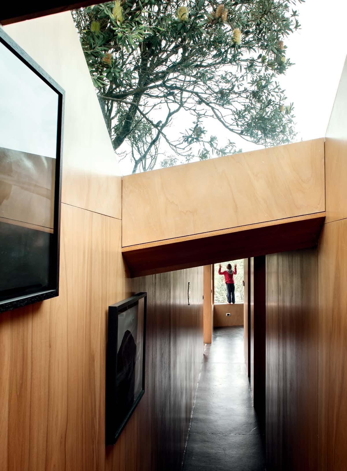
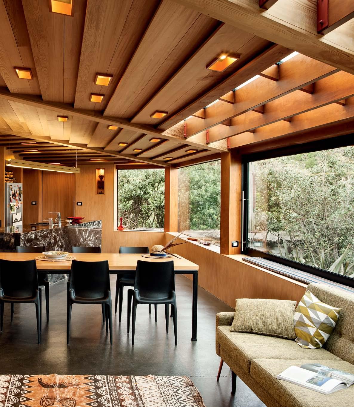
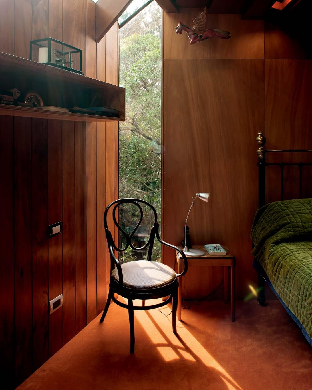
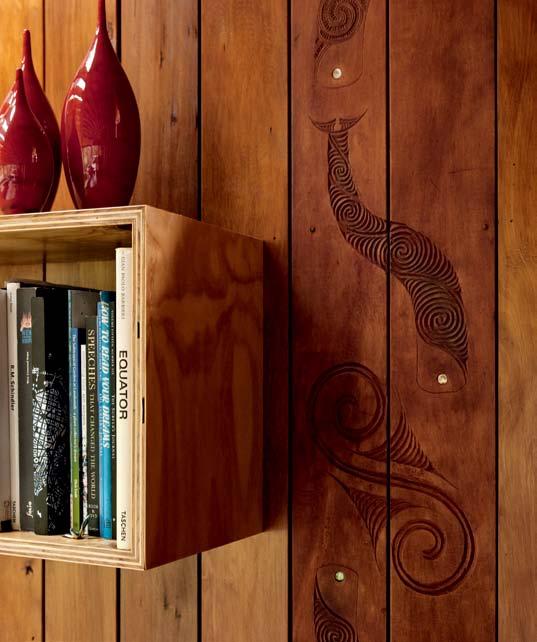
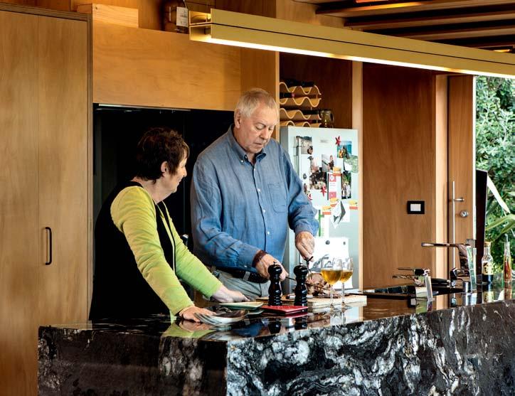
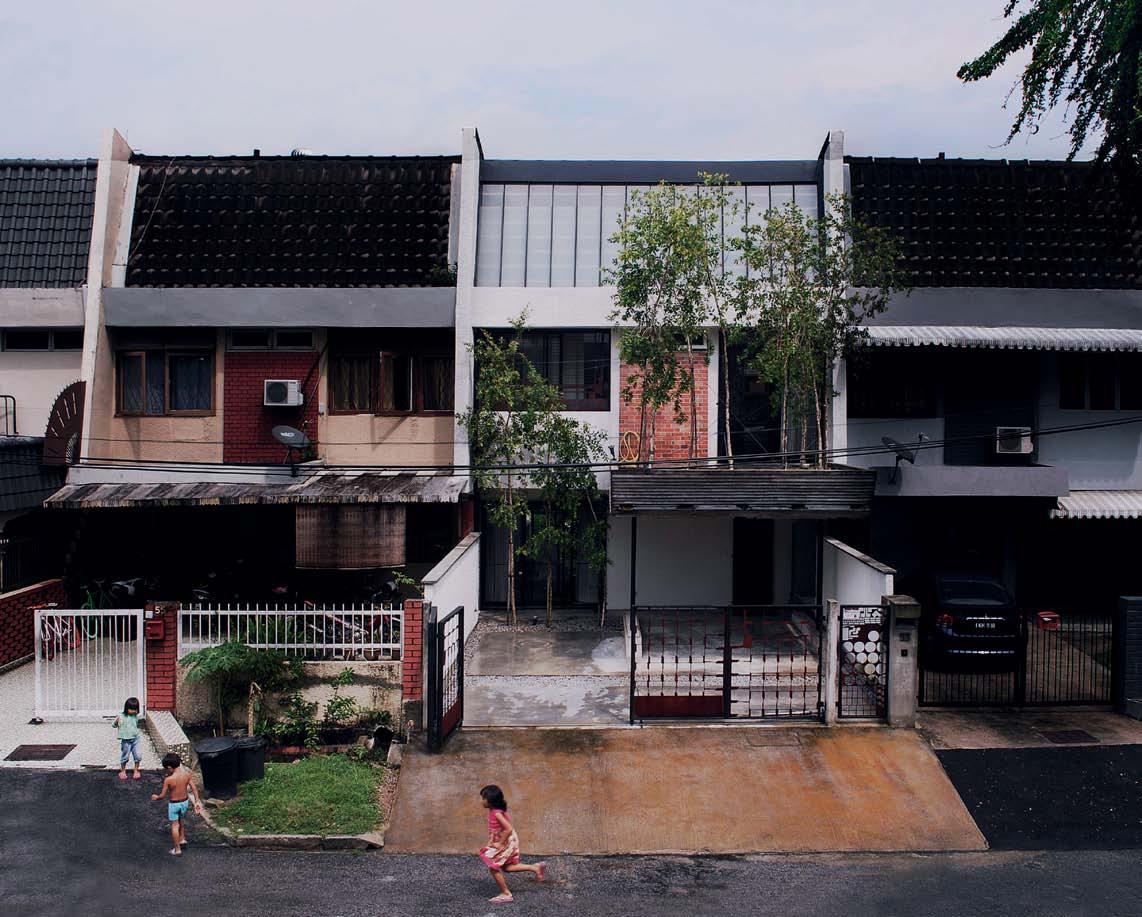
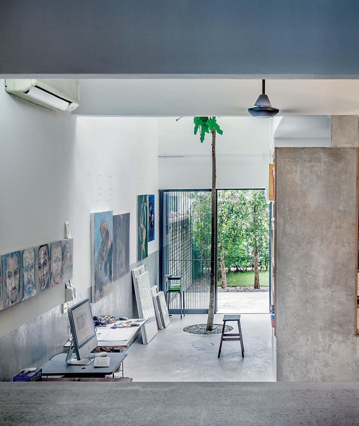
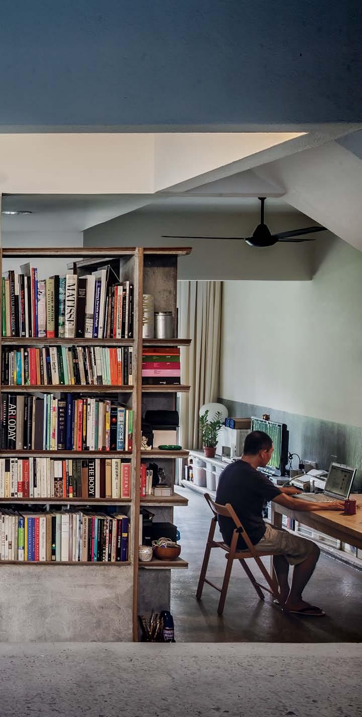
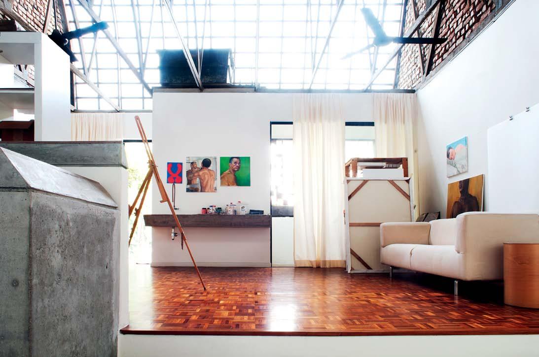
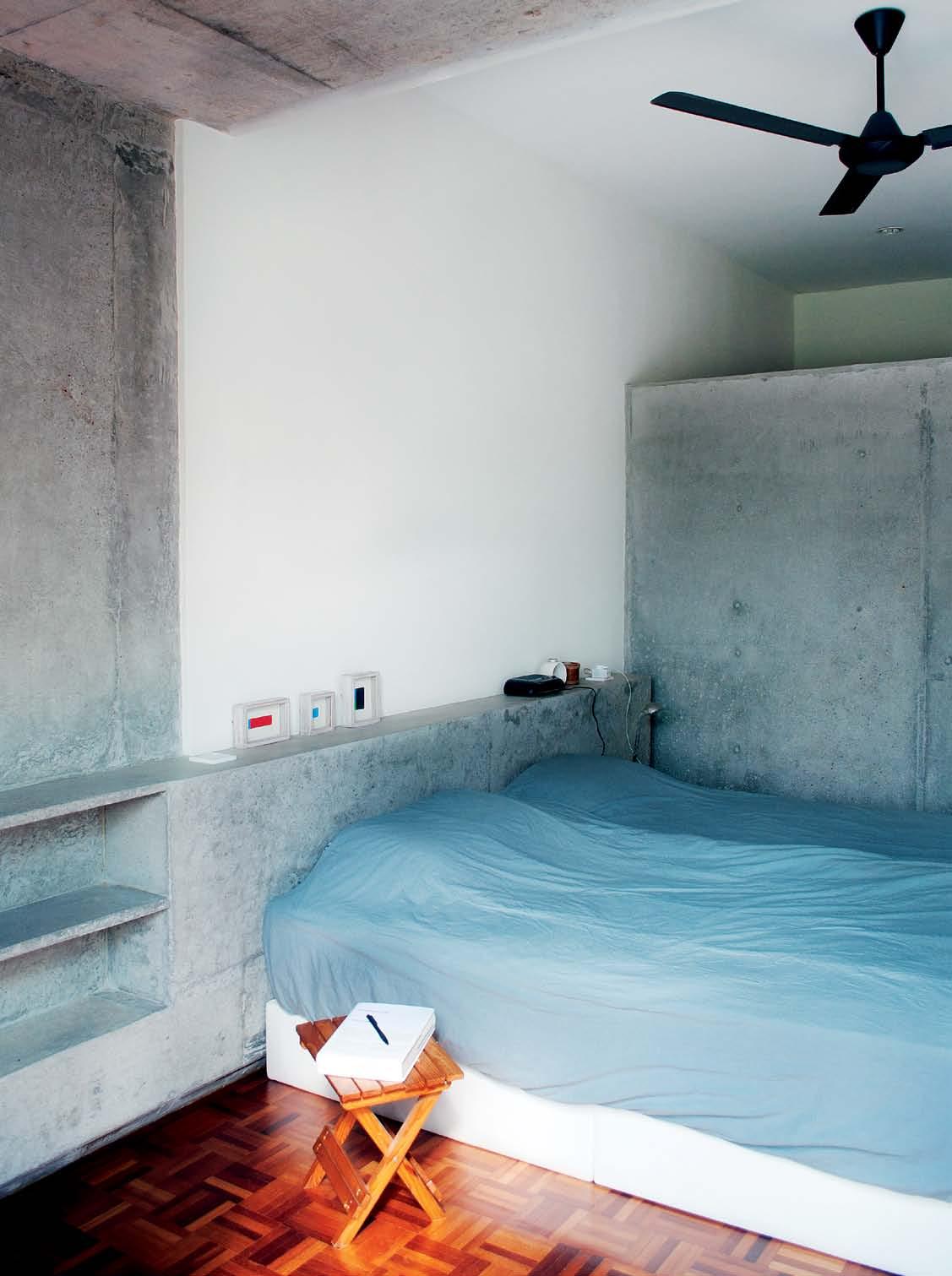
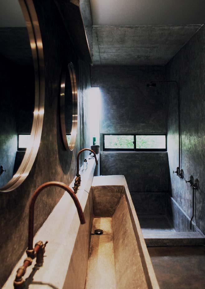
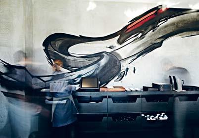
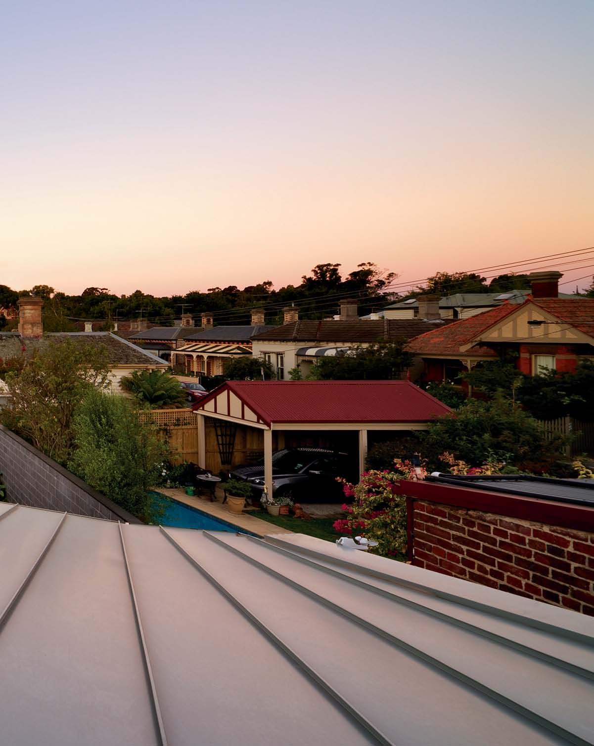
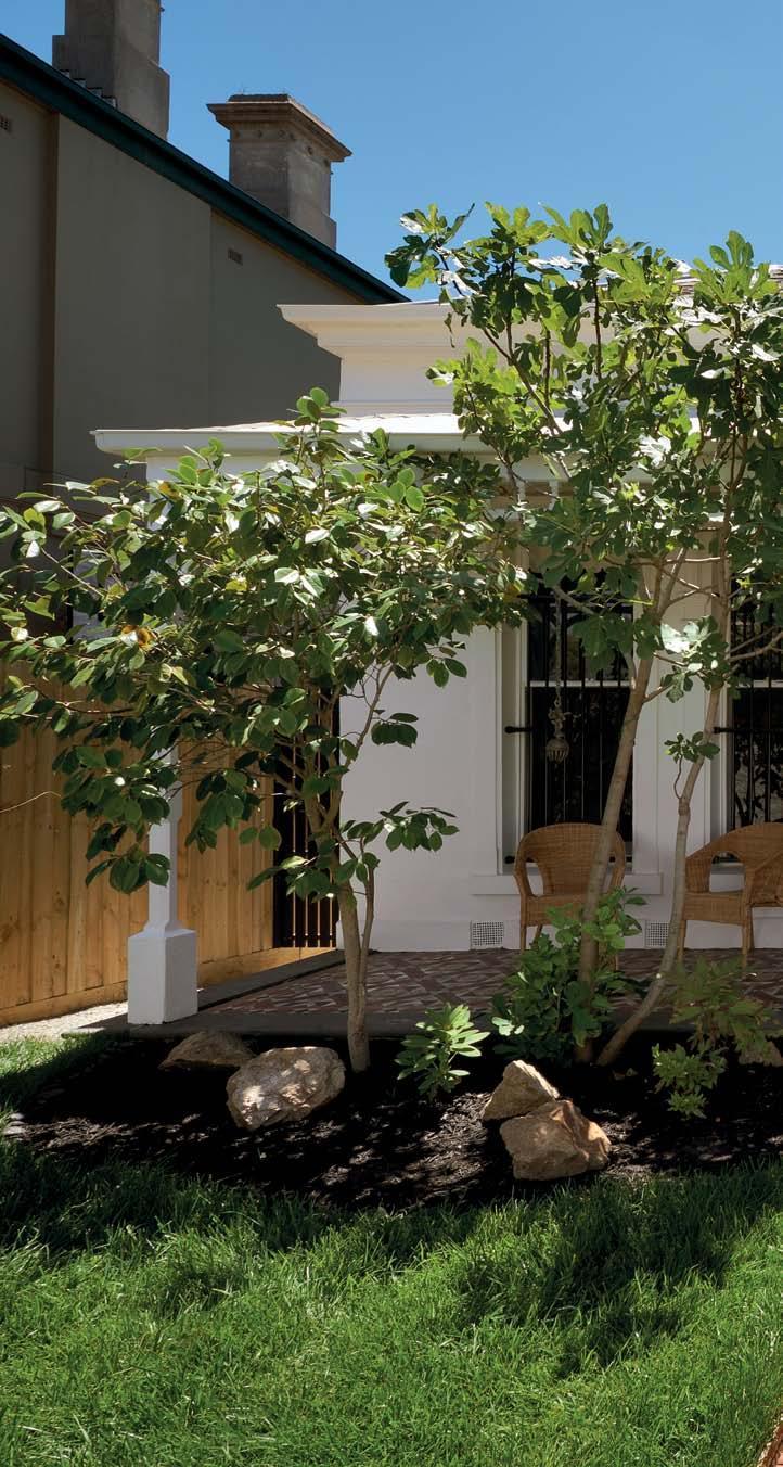
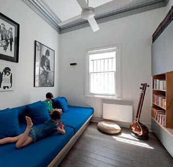
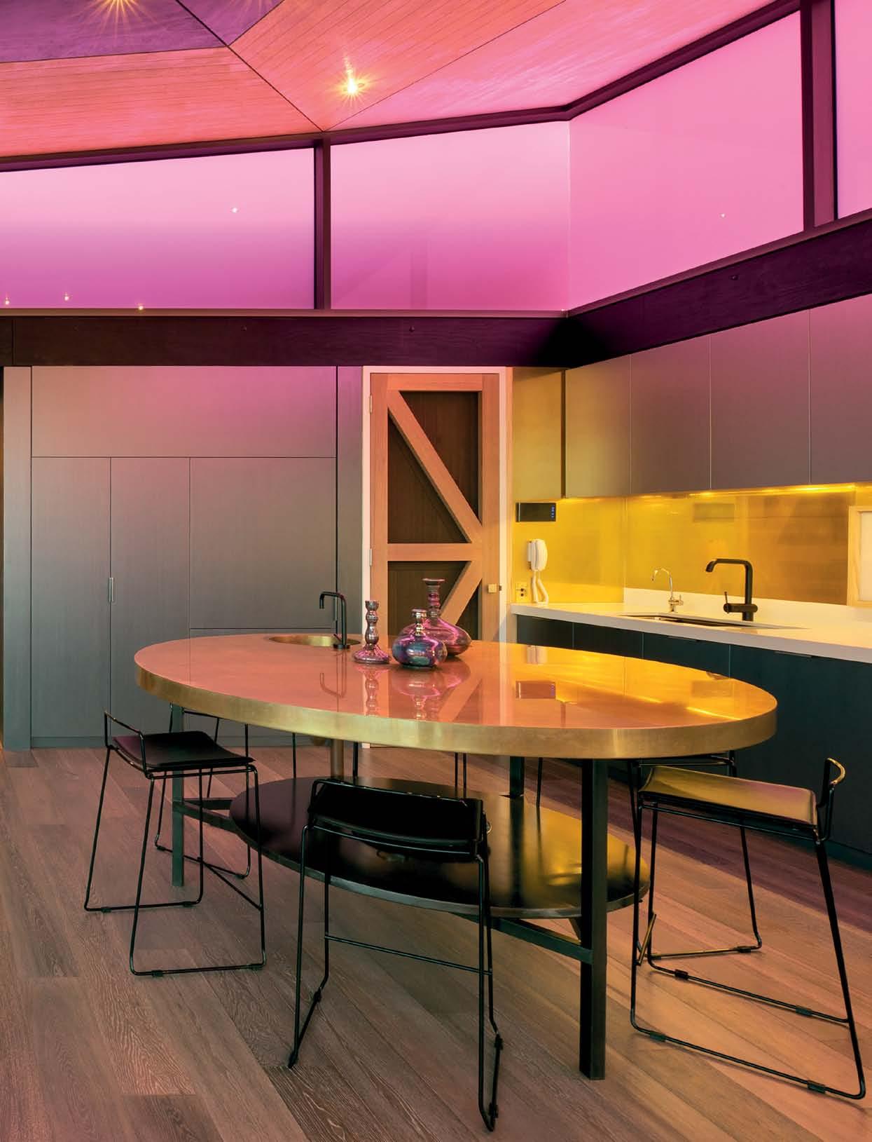
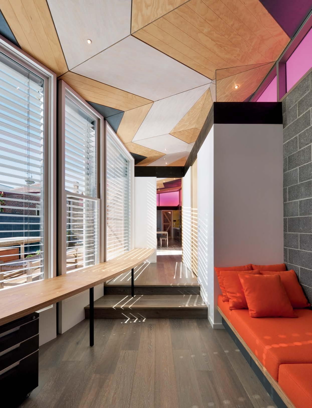
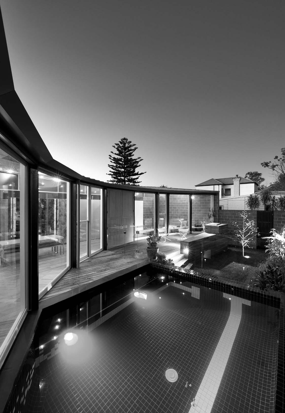
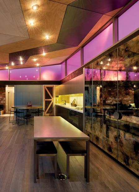
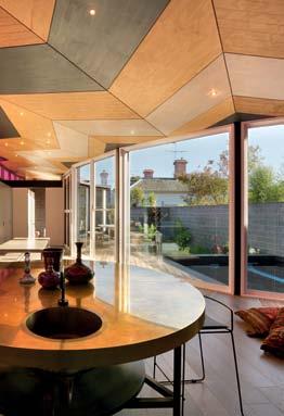
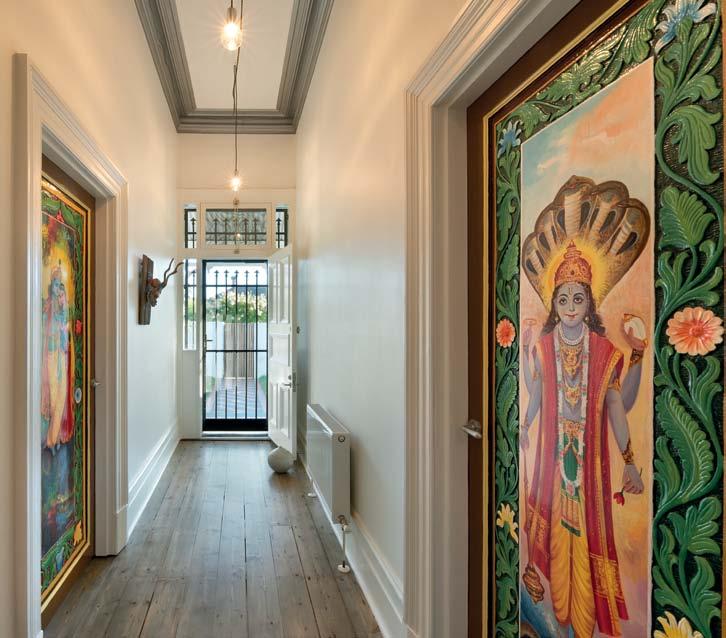
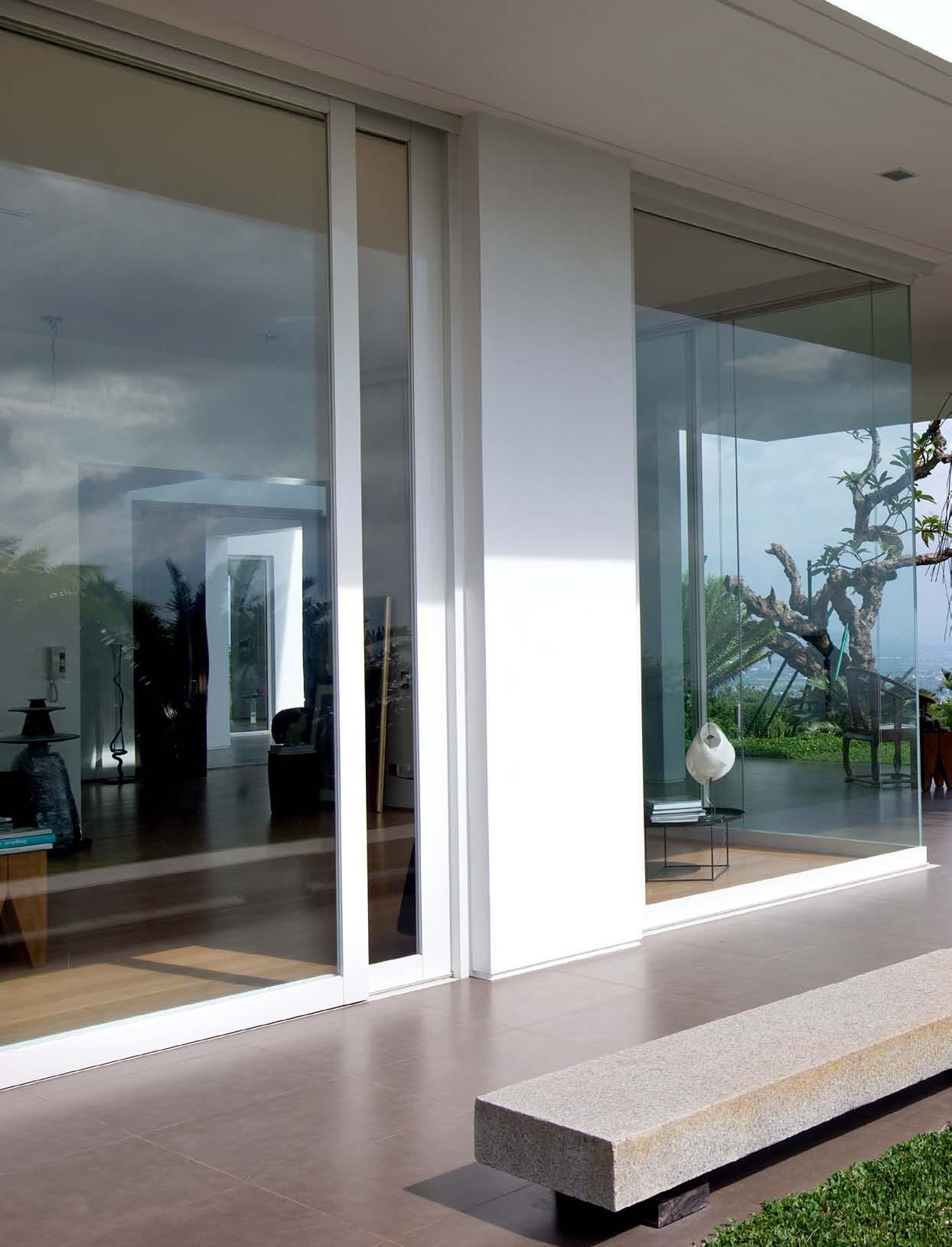
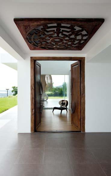
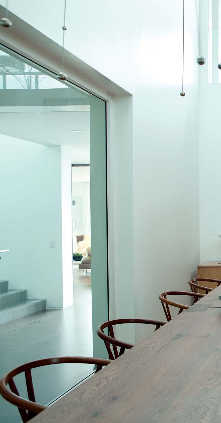
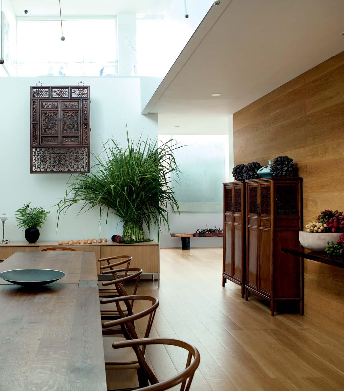
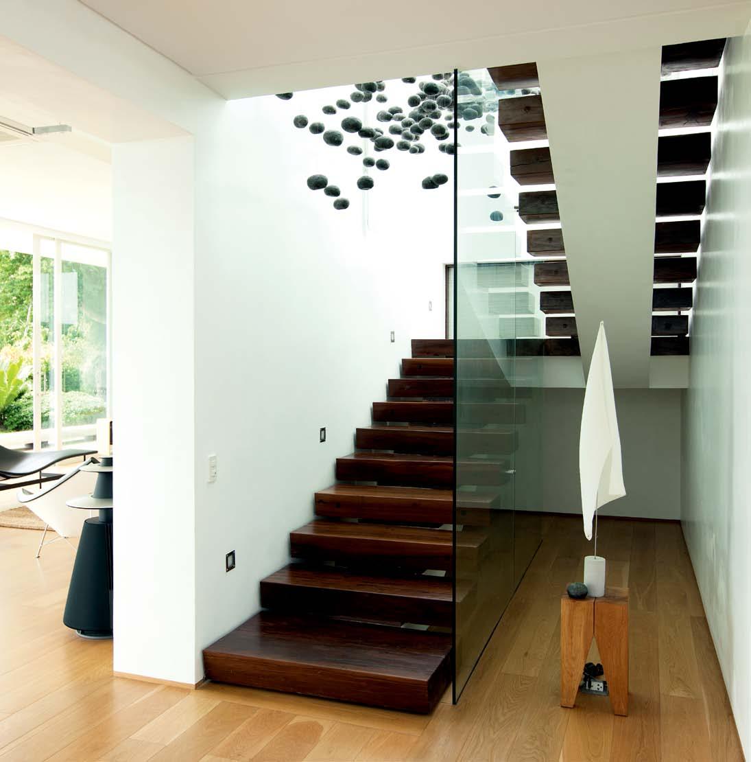
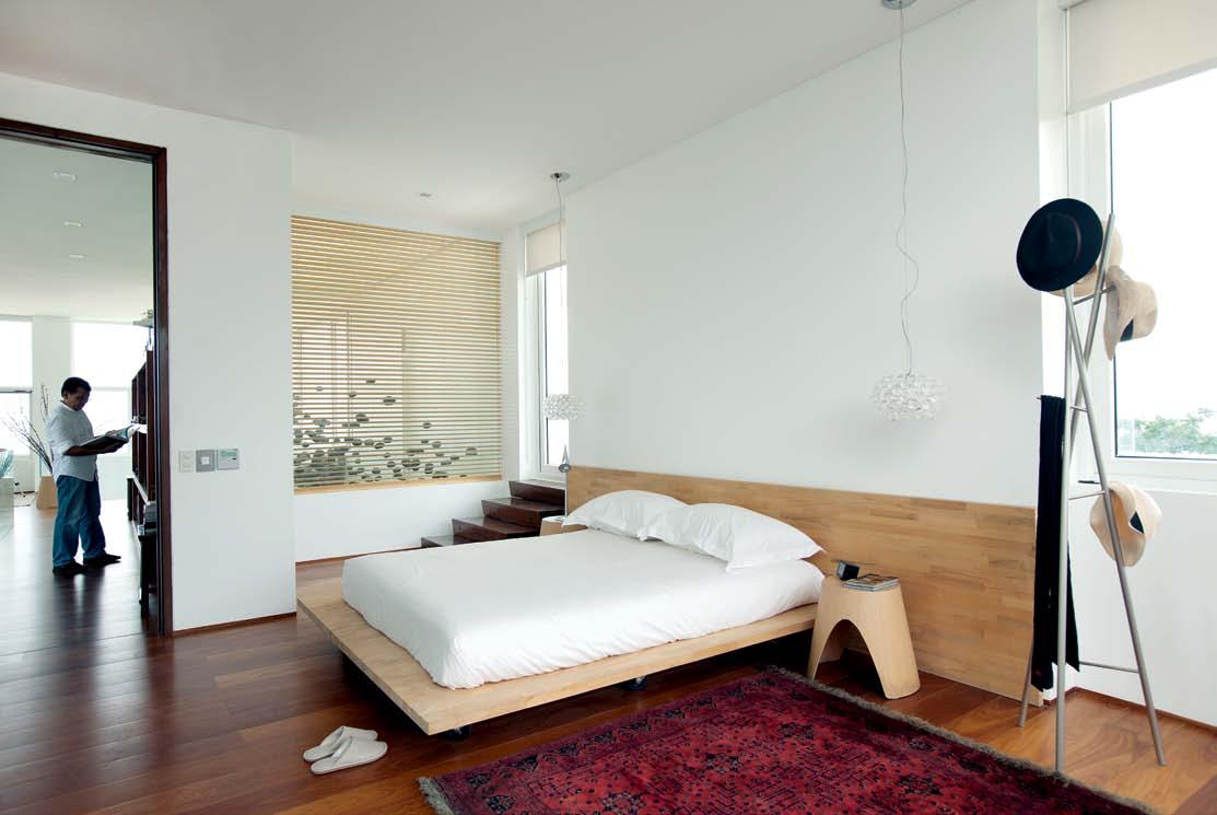
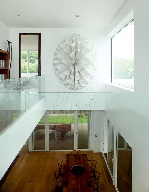
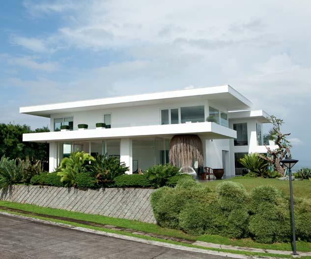
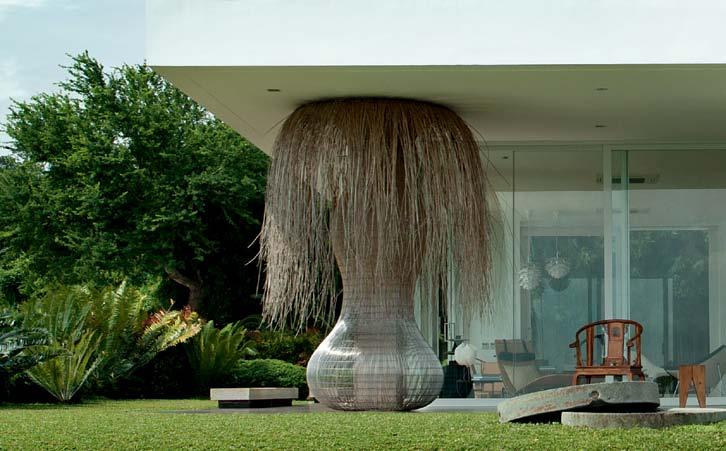
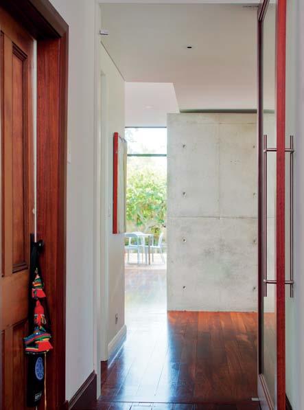
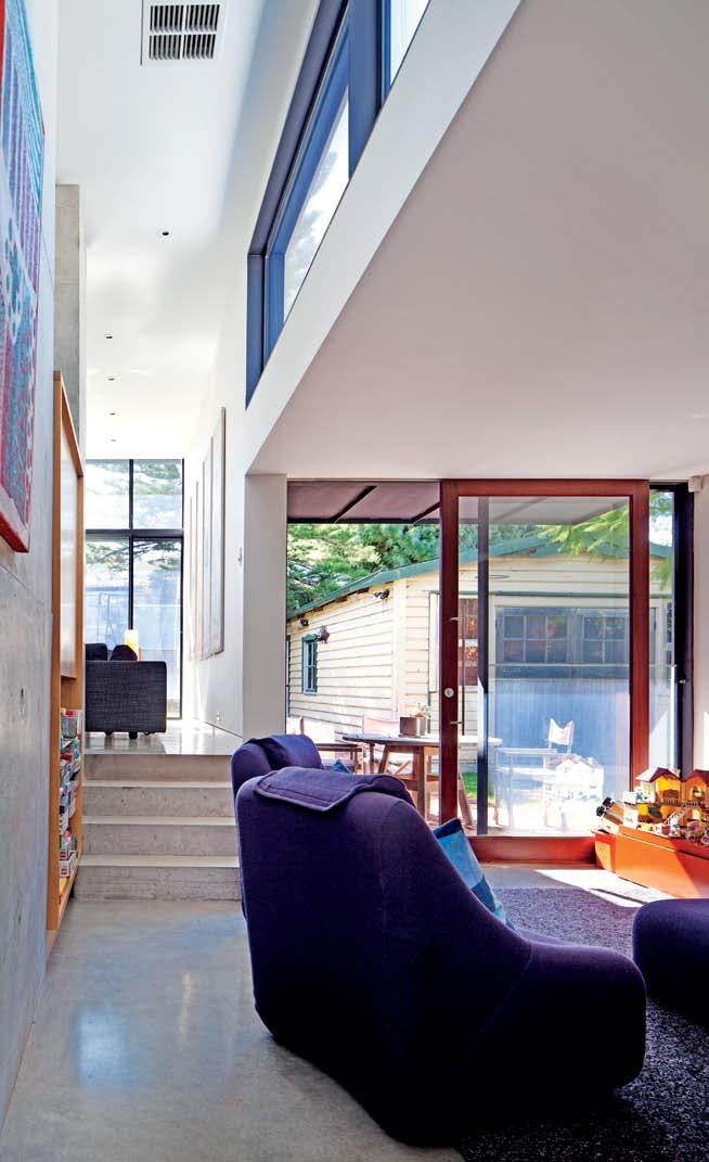
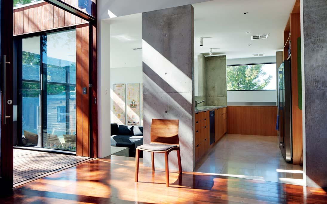
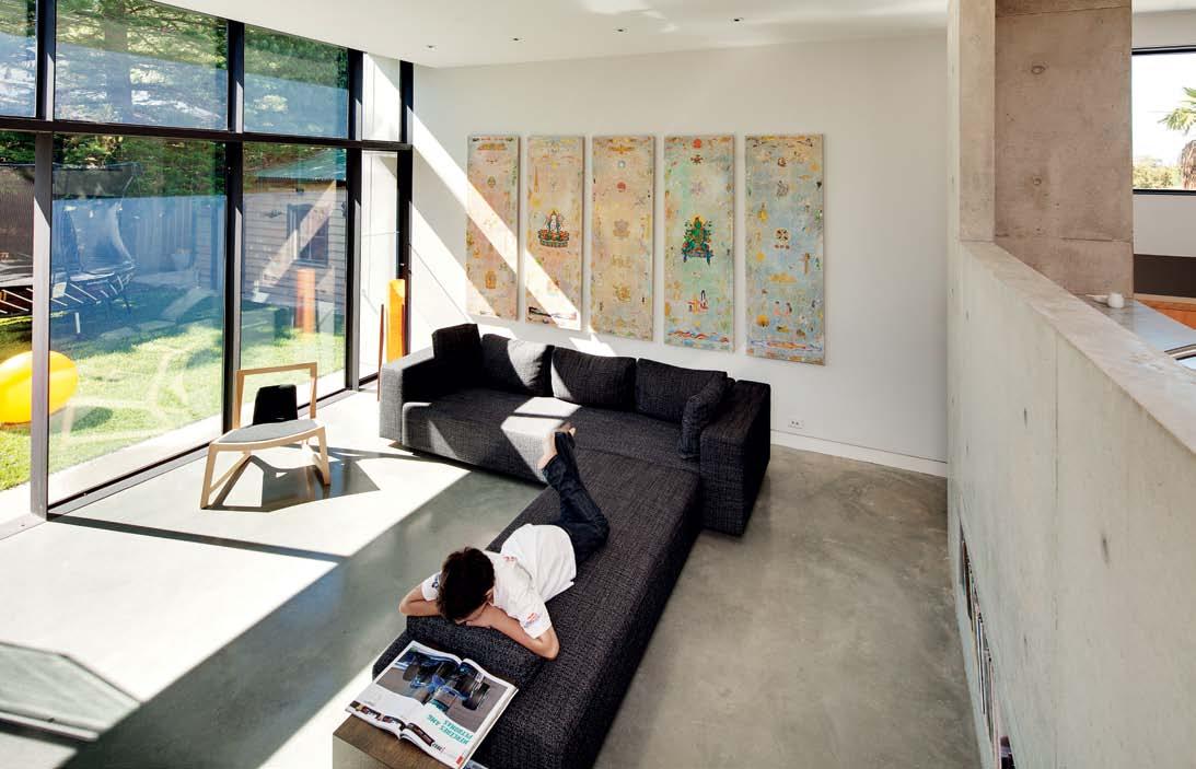
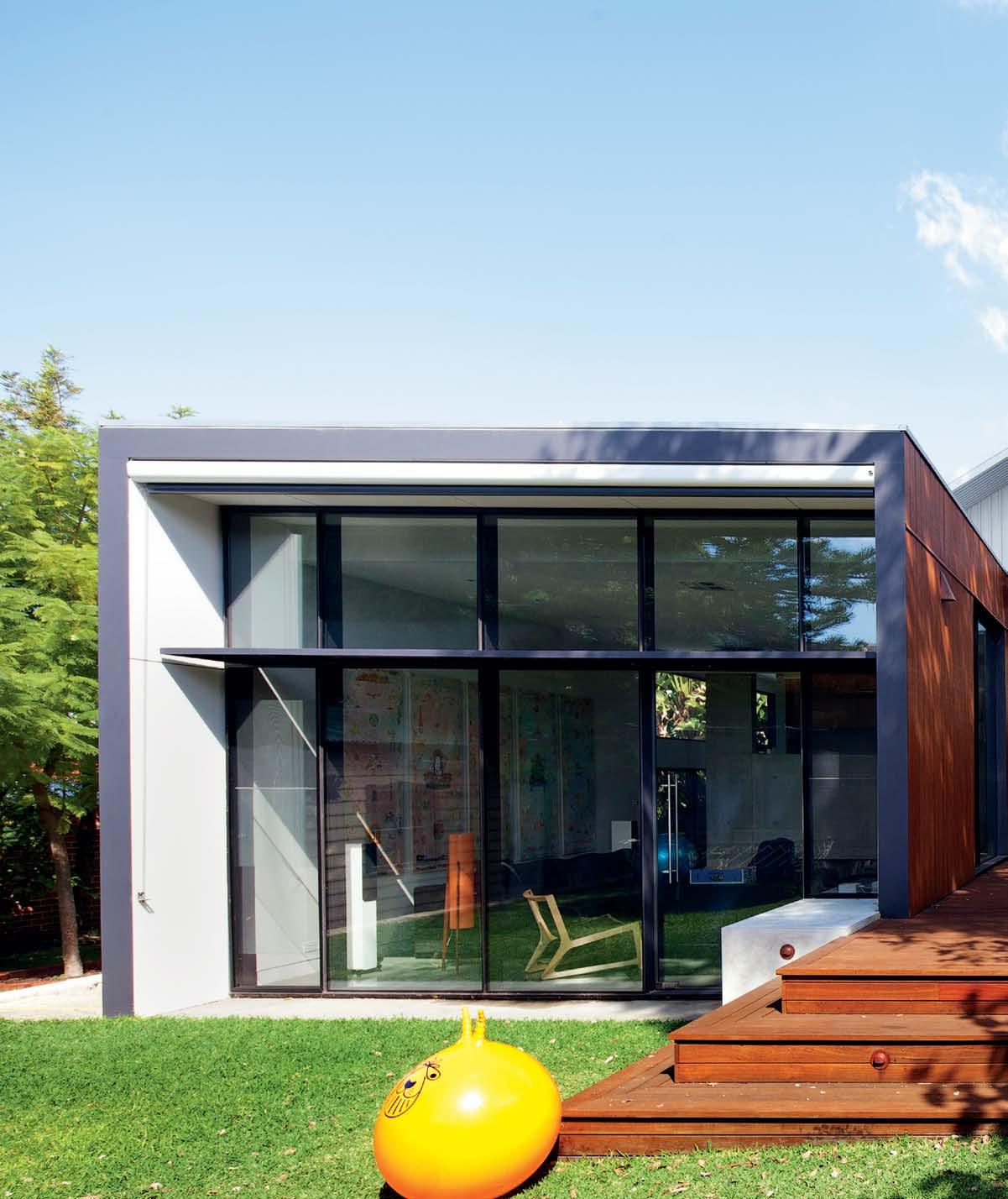
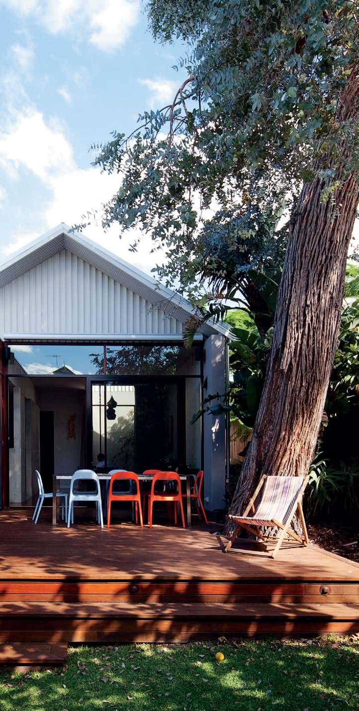
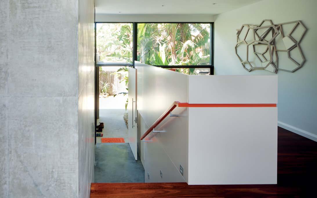
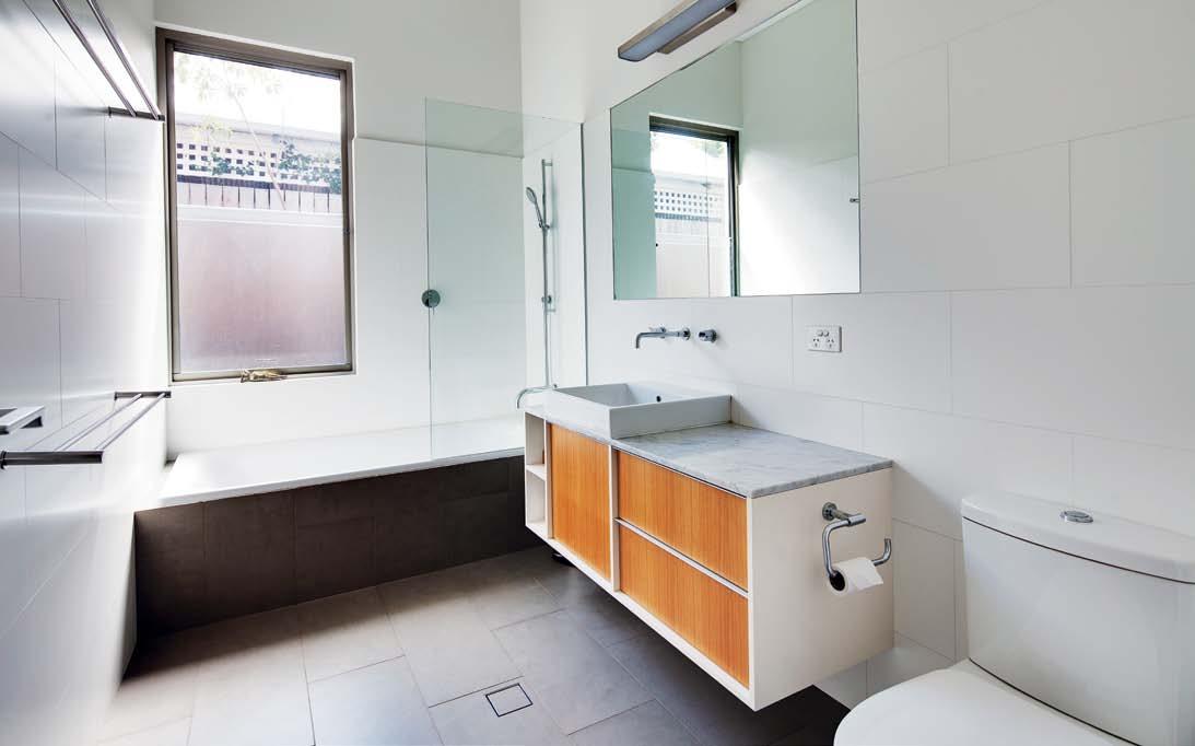
What happens when you spend a lifetime collecting art, curating furniture and forming a design ethos? You create a distinct and authentic way of living that cannot be mistaken for anything but a true expression of yourself.

living in design january – march | 2013 AUD$15.95 | NZ$15.95 | USD$16.95 CDN$17.95 | GBP£9.00 | SGD$11.95
# 18
As is th en am e, so is th ep ro du ct -p ur e.
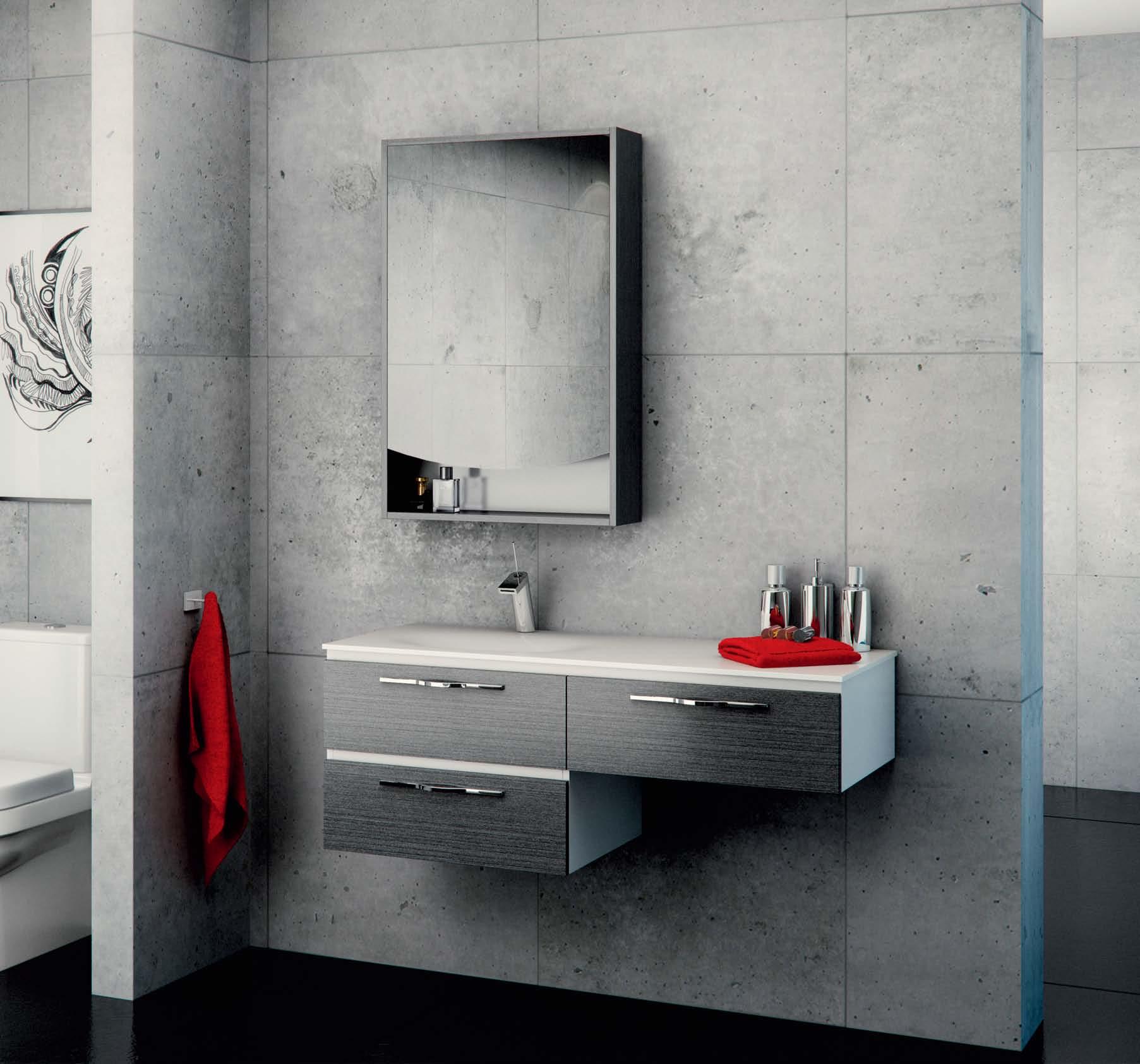
Th is ba th ro om fu rn it ur er an ge do es n’ tr ea ll y ne ed an yi nt ro du ct ion .E xc ep tt os ay,t ha tt he pa ss ion yo uh av ea bo ut cr ea ti ng au ni qu e ba th ro om is th es am ep as si on th at ha s de si gn ed an dh an d- cr af te dt he se va ni ti es. Wi th fe at ur es as uni qu ea syou ,t he se va ni ti es combinecompletefunction wi th absolu te form.
Th ei nh er en tb ea ut yo ft he cu rv ed ,h an d fo rm ed so lid su rf ac eb as in is no to nl yt he de si gn er ’s to uch ,b ut al so so si mp le to cle an

Ad dt he cav er no us st or ag eo ft he al l- dr aw er ca bin et wi th Bl um ® So ft Cl os ef ul le xt en si on ru nn ers ,a nd yo uh aveat ru em eet in go ff or m an df un ct ion .
BA THROOM DESIGN CENTRE
•A LE XA ND RI A-8 4O ’R IO RD AN ST.0 28 33 97 10 3 •A UB UR N-1 03 -1 23 PA RR AMA TTAR D. 02 87 48 43 67 VI SI TO UR WE BS ITE -W WW .D OM AY NE. CO M. AU
238900_NAU
Do ma yne ® st or es ar eo pe ra te db yi nd ep end en tf ra nc hi se es . Ta pw ar ea nd ac ce ss or ie ss ho wn ar en ot in cl uded.


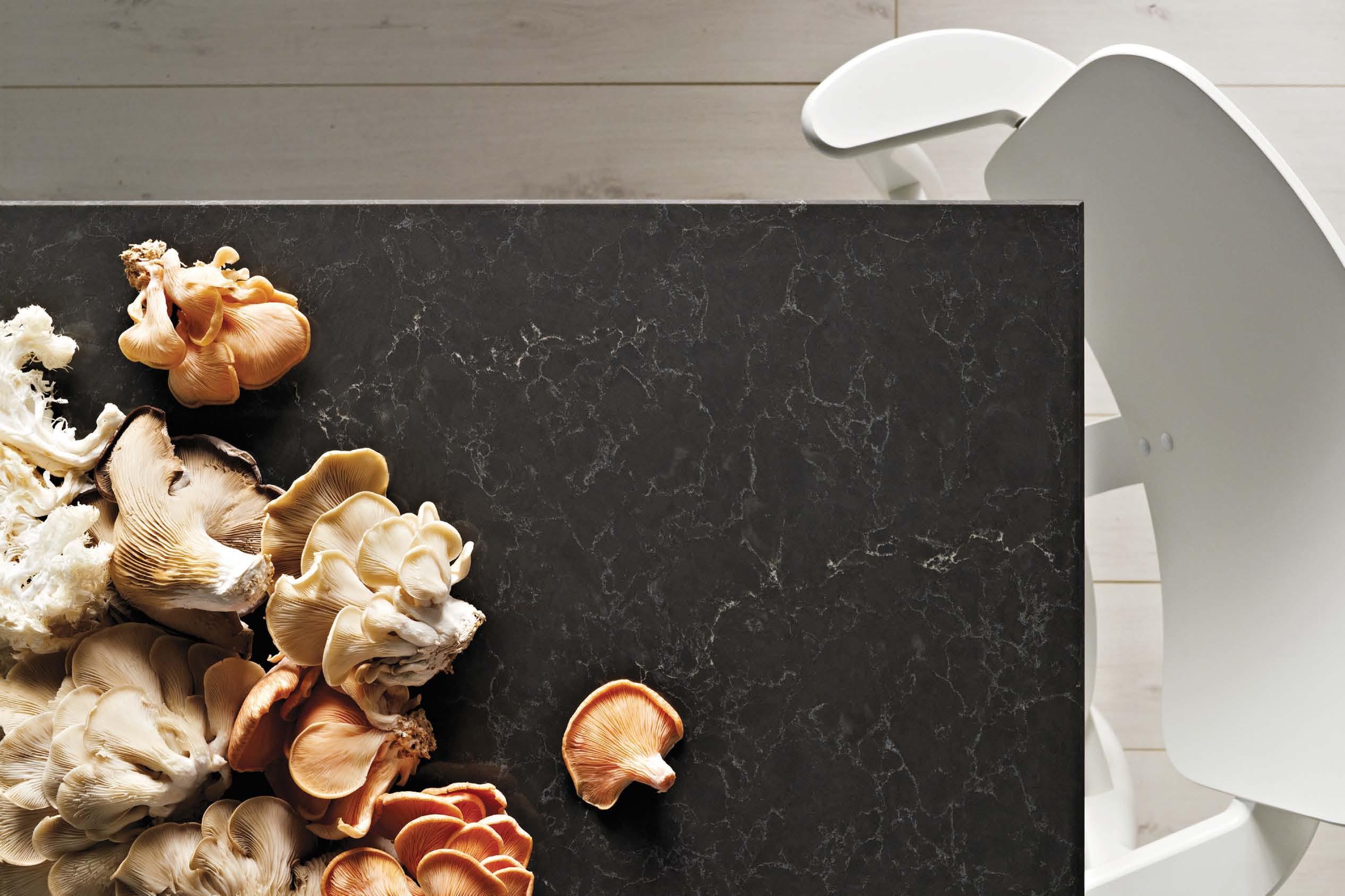


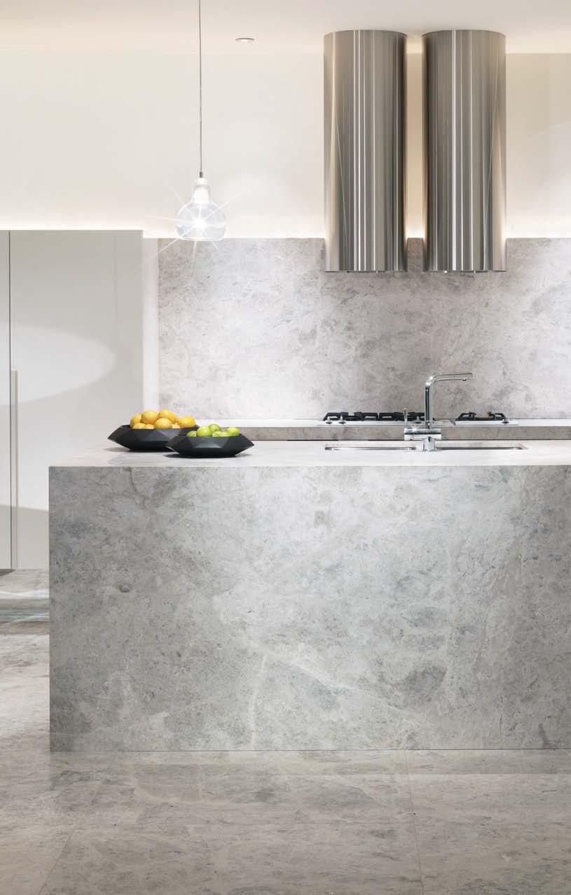
Five new supernatural designs. Surfaces for your home. Piatra Grey ™ Emperadoro ™ London Grey ™ Dreamy Marfil ™ Frosty Carrina™ www.caesarstone.com.au 1300 119 119
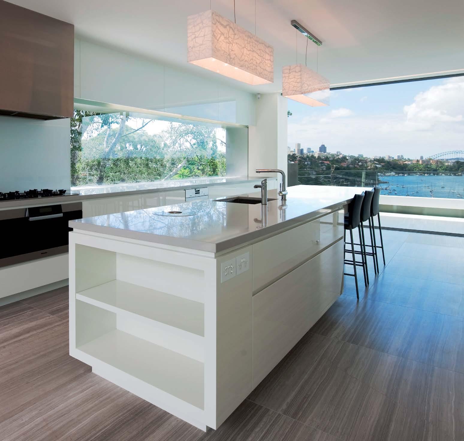


Treat yourself to a new way of life. 1800 42 43 44 | zipindustries.com The new Zip HydroTap® Boiling and chilled filtered water, instantly. Now with sparkling too. Treat yourself to a new way of life. 1800 42 43 44 | zipindustries.com

Australia 1300 303 286 Singapore +65 6511 9328 www.stylecraft.com.au
Featured | Ibiza Forte Table by Jun Kamahara & Grand Leewise Lounge by Watanabe Junichiro & Ritzwell
Products in your home can be more than just beautiful and functional. They can inspire a whole new way of living, providing the means to express your personality and values.
26. DESIGN NEWS
Design Hunter furniture, lighting, accessories, technology and finishes.
37. WINTER HOLIDAY
When the powder ’s fresh, you should be too – check out our snow gear ideas.
39. SUMMER HOLIDAY
Hang ten or just relax poolside –the best fun happens in the sun.
41. CAMPING HOLIDAY
Get rugged in the great outdoors, but make sure you’re prepared!
45. TIME
In our busy lifestyles, time is the most precious asset of all –what do you do when you have some?
They say travel broadens the mind. Hopefully. But what it certainly can do is give us a different perspective on where we come from, what we have been doing so far and where we might go in the future. Try these case studies.
56. ALEX POPOV
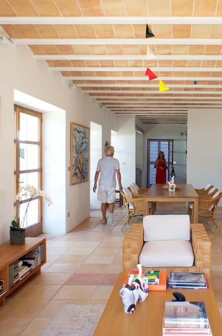
During his forty-year love affair with Mallorca he has already designed one much-publicised house on the island. Paul McGillick talks to the eminent Australian architect about how he has given new life to a 17th Century farmhouse and what living on the island means to him.
71 STUDIO JUJU
With child-like curiosity, young Singapore design duo Studio Juju create products that respond to human behaviour, sometimes with anthropomorphic results. Mandi Keighran speaks with the humble pair about their work.
79. SIMON LLOYD AND LIBBY DEMPSTER
Their journey has been a professional one and a journey of the mind. Stephen Crafti meets a visual artist and a choreographer who first collaborated on dance and now collaborate in the ongoing evolution of their house.
89. SUBODH GUPTA
This Indian artist with a booming international reputation engineers the trans-migration of everyday objects to trigger a cultural disconnect, enabling us to see unsuspected meanings in these otherwise disregarded objects.
# 18
#45 #56
#110
In this section we always offer a rich variety of houses and ways of living. But this issue is especially diverse, perhaps with an emphasis on turning the old to new use and celebrating the union of the past and present.
98. NEWTOWN HOUSE
Opening up tiny terrace houses is a favourite Sydney exercise. Paul McGillick looks at this inner-suburban example where an architect couple embraced the craft of building and a verdant landscape.
110. GREEN HOUSE
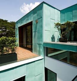
K2LD is one of Singapore’s most innovative practices. Paul McGillick visits one of their recent projects which resonates with cultural context while exploring the sustainable qualities of copper.
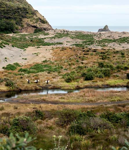
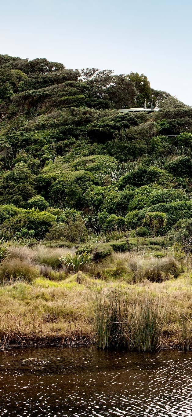
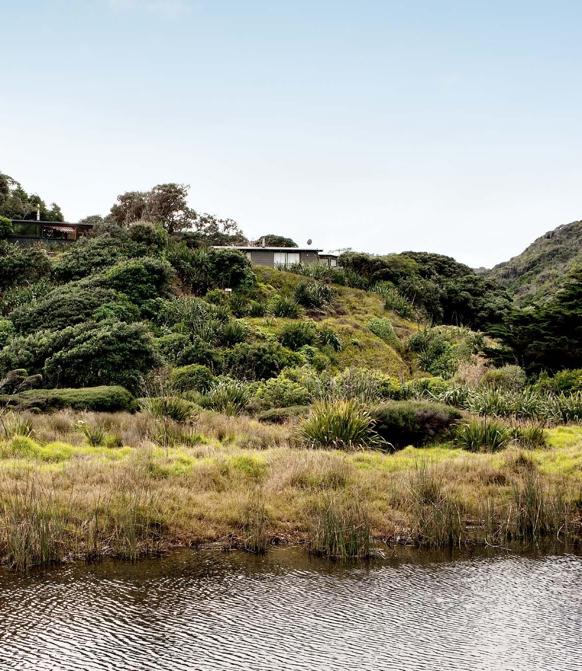
125. KAREKARE HOUSE
The New Zealand bach, or holiday cottage, has undergone a revolution in recent years. Andrea Stevens enjoys one by Michael O’Sullivan which celebrates its own location.
139. ARTIST’S HOUSE
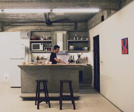
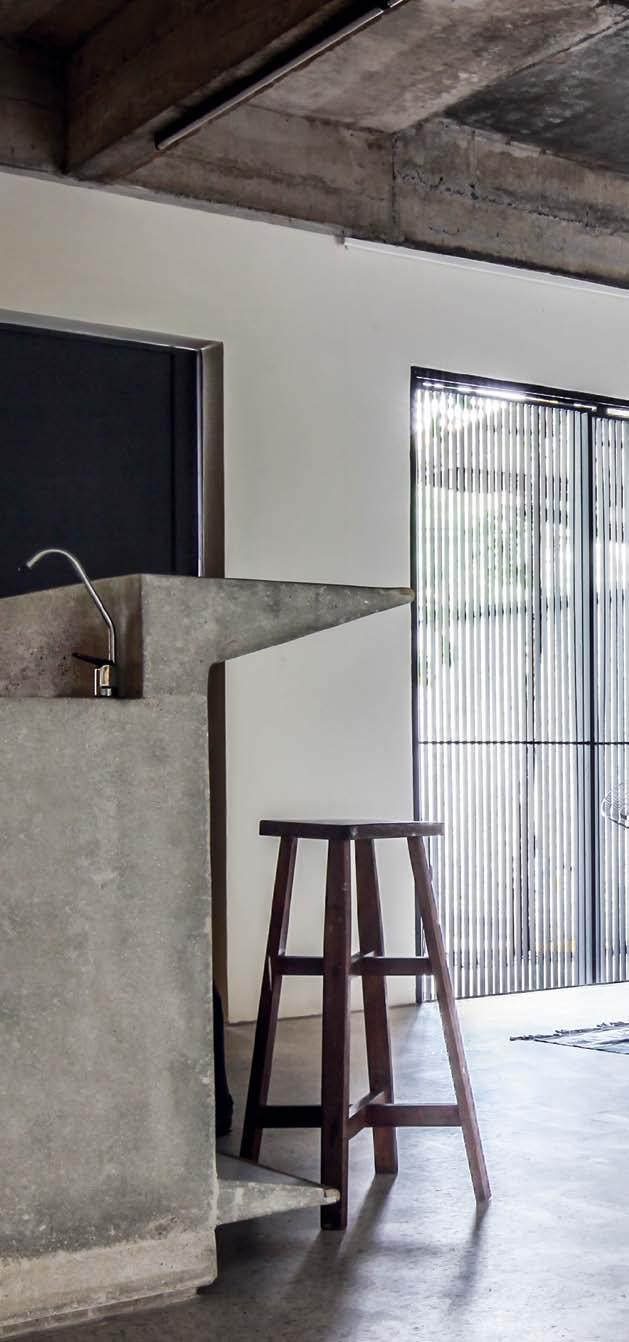
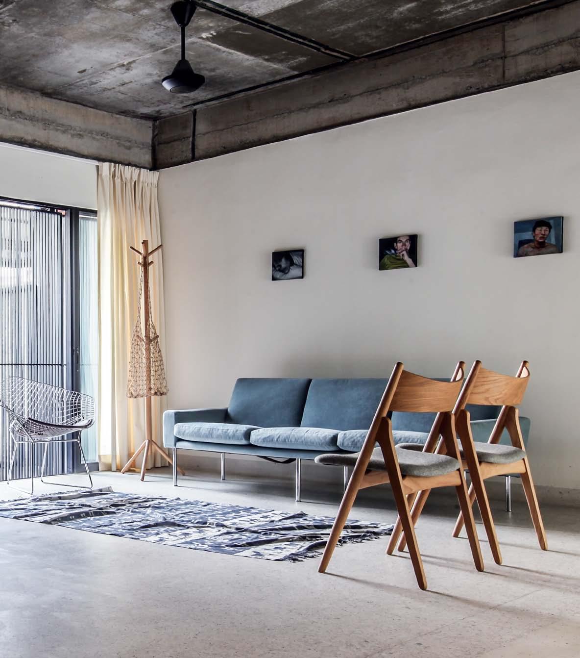
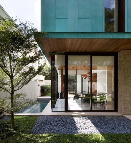
This home on the outskirts of Kuala Lumpur is for an artist. Amy Ng learns that architects, Building Bloc, were asked for an imperfect house.
152. FAMILY HOME
#139
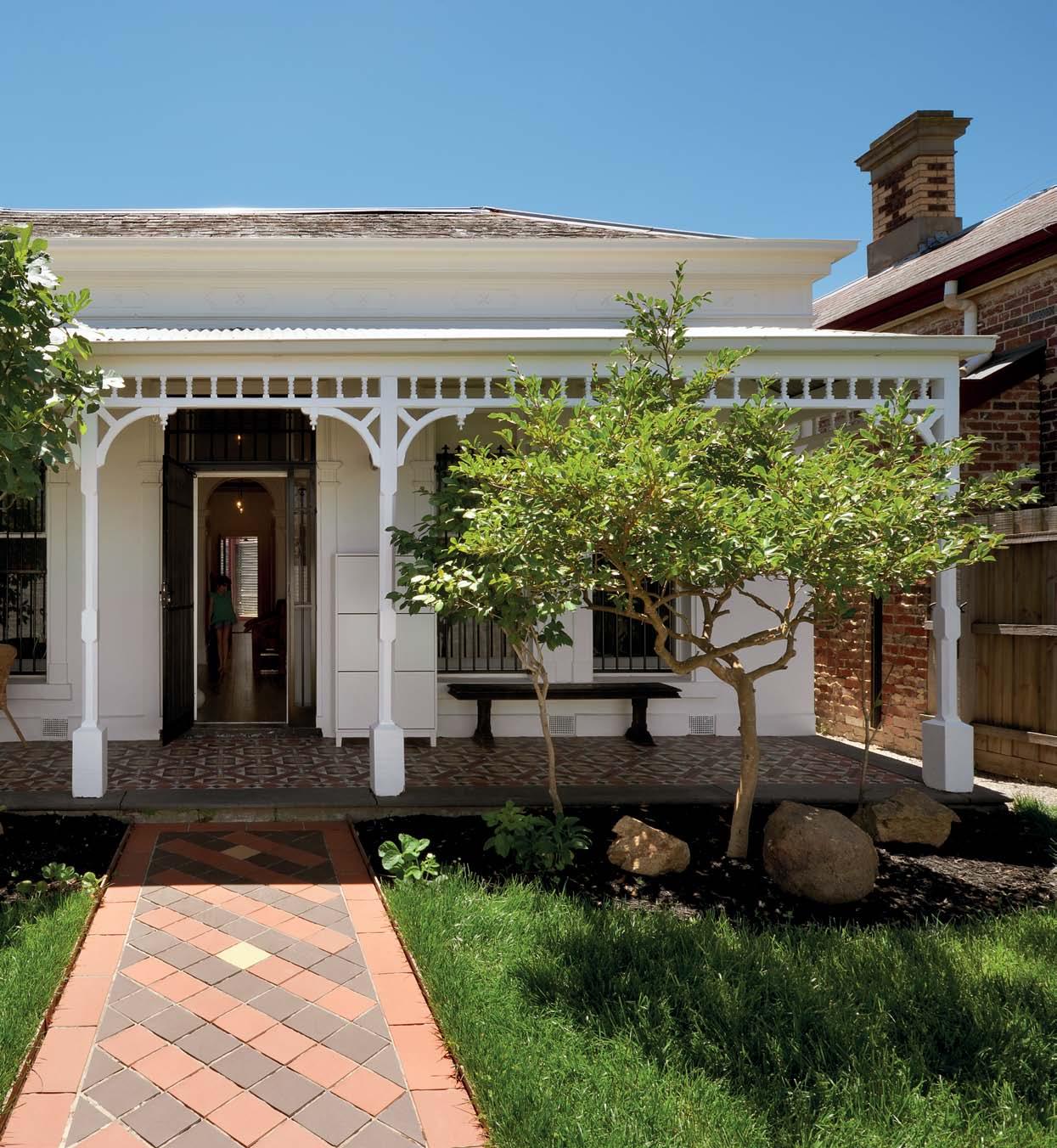
From the street it is a typical late-Victorian suburban cottage. But Stephen Crafti was amazed at the transformation that architect, Fiona Winzar, worked.
192. HOBART
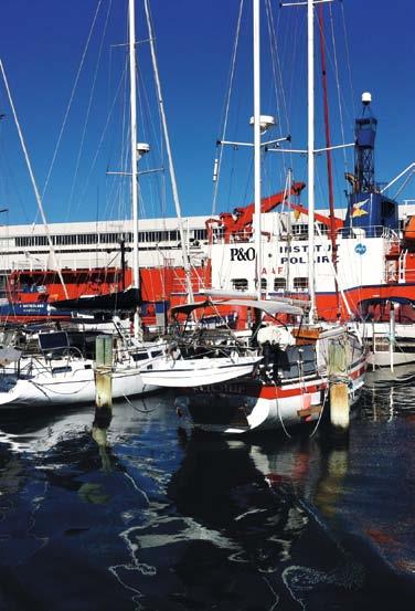
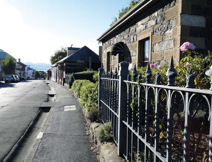
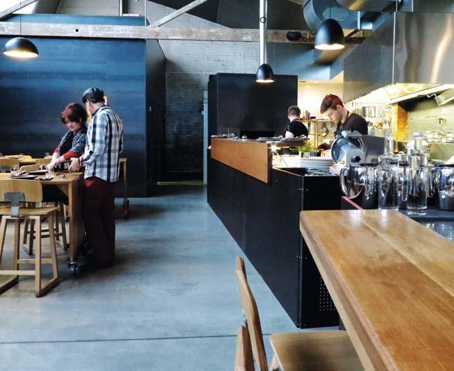
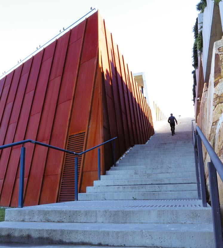
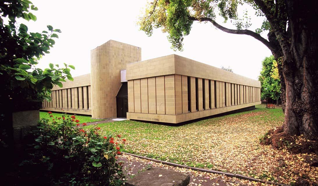
Australia’s southernmost city surprises Jane Burton Taylor by its mix of the old and the new. It not only boasts amazing historical sites, but arguably the country’s most innovative art museum.

199. BOOK REVIEW
#192
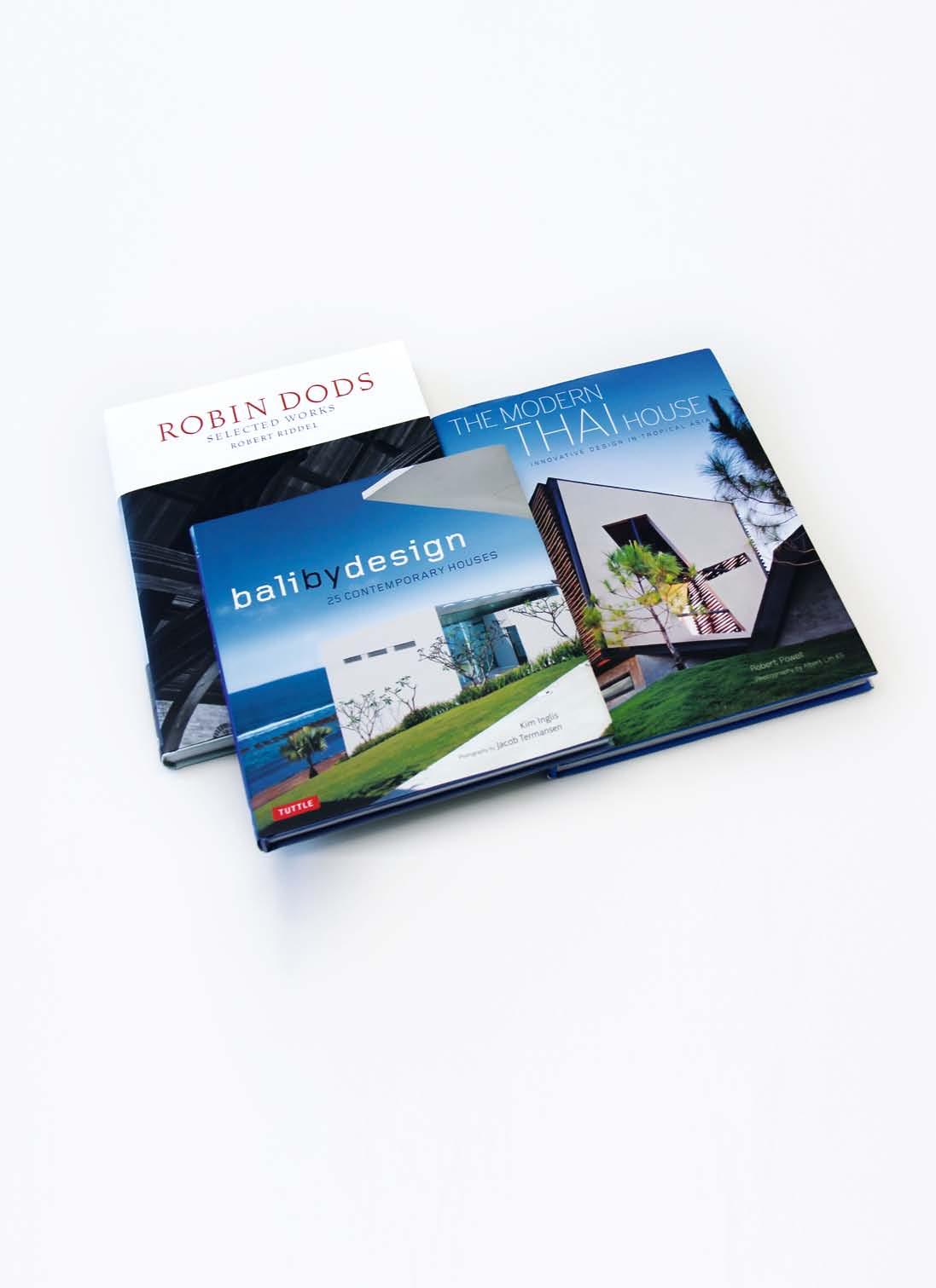
Paul McGillick reviews three books and finds an unexpected link between contemporary tropical architecture and an icon of Brisbane’s late colonial period.
164. LAGUNA LIVING
Renato Vidal is a remarkable artist who has long wanted to realise his dream home. Aya Maceda found it on a dream site, the product of a collaboration between Vidal and some designer friends.
178. PERTH ADDITION
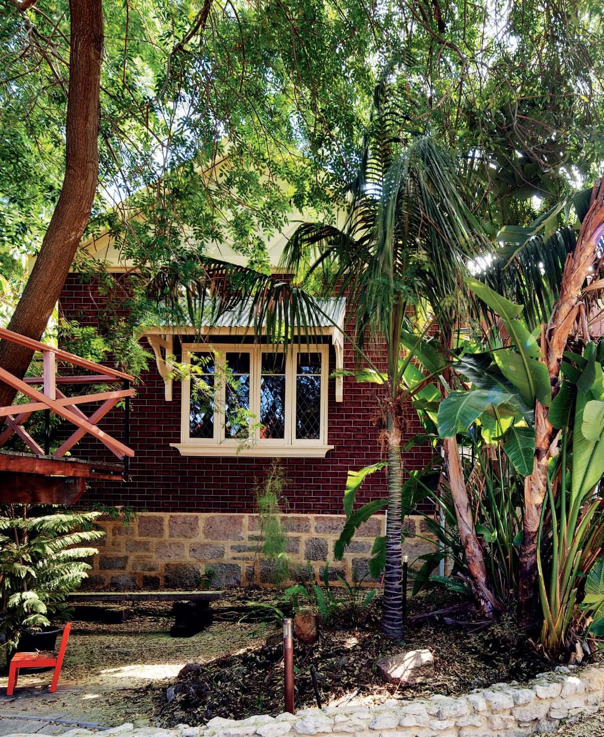
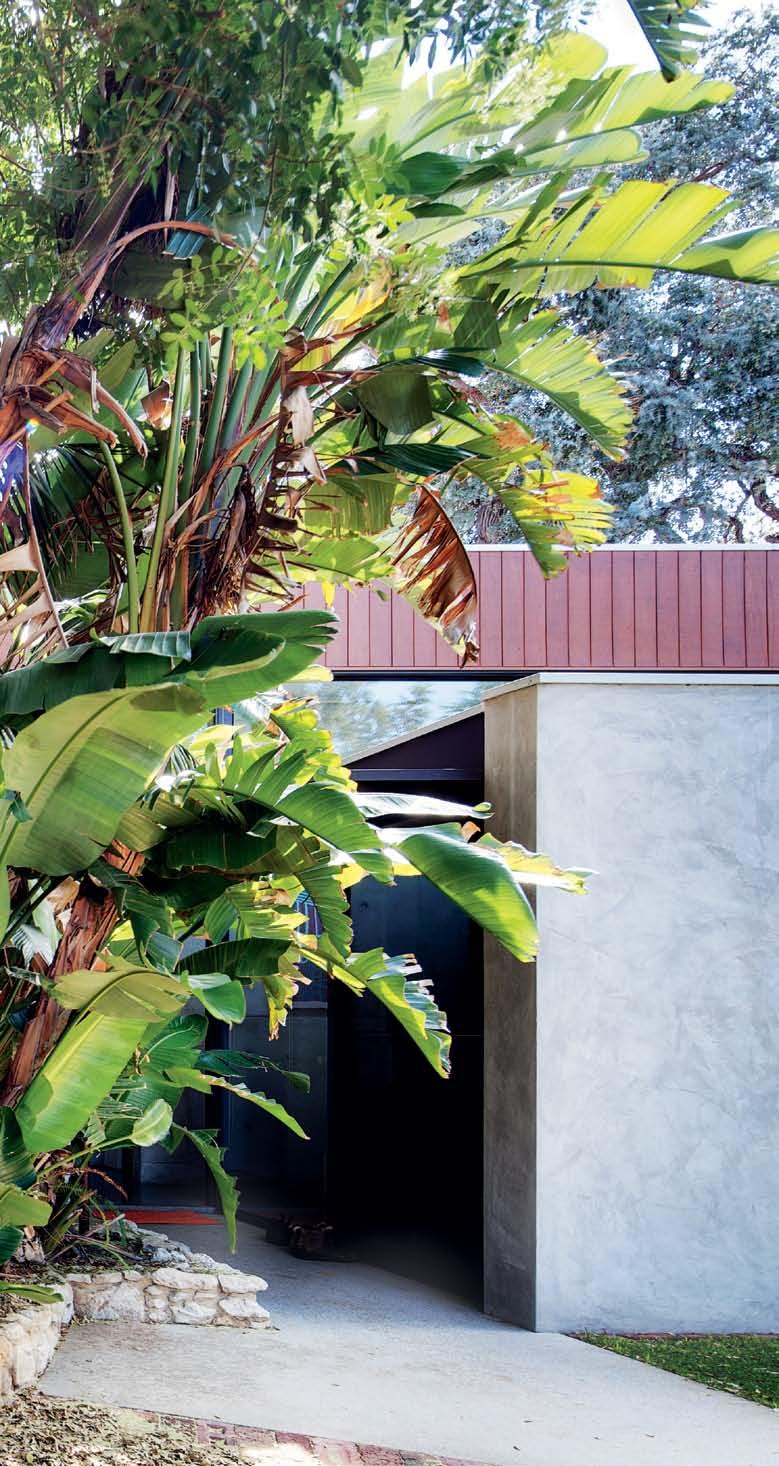
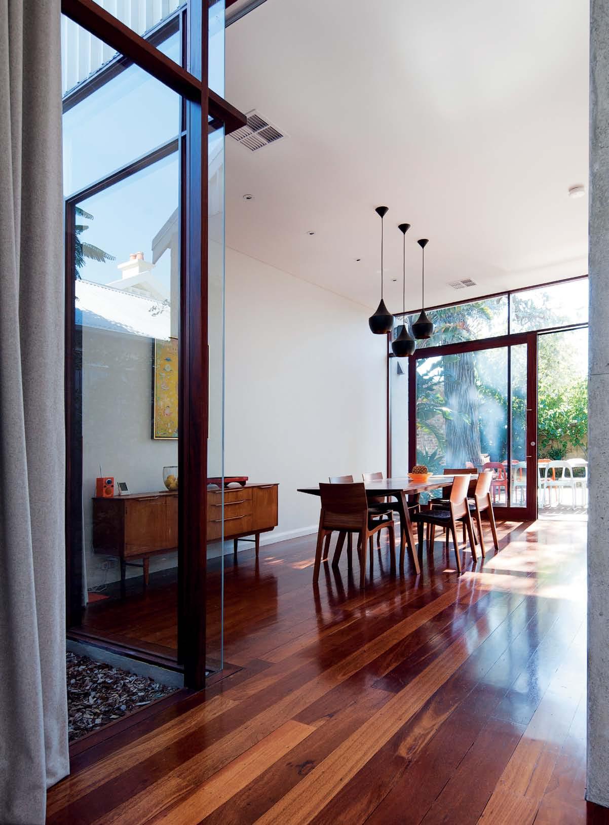
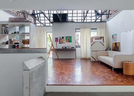
Architect, Jonathan Lake, saw potential in this 1910 heritage-listed house in the leafy eastern suburbs of Perth in Western Australia. Anna Flanders reports that the brief was to create a modern family home which respected the existing house.
# 18
Enjoy a visit to the historically and culturally rich capital of Tasmania and look at the climatic and cultural implications of designing in the tropics.
REINVENT YOURSELF
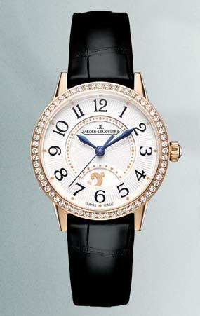
RENDEZ-VOUS NIGHT & DAY Jaeger-LeCoultre Calibre 967A
Every woman has a Rendez-Vous, with herself. The Rendez-Vous Night & Day timepiece is entirely crafted and gemset at the Manufacture in the Vallée de Joux, Switzerland. Its automatic movement keeps pace with the constant changes in a woman’s life, as she perpetually reinvents herself. Rendez-Vous is more than a watch, it is a state of mind.
YOU DESERVE A REAL WATCH
ladies.jaeger-lecoultre.com
For information: (02) 8215 5547

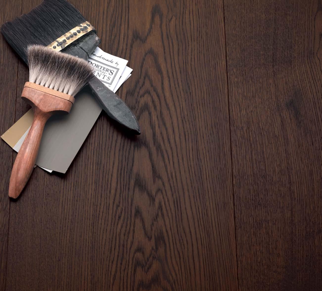
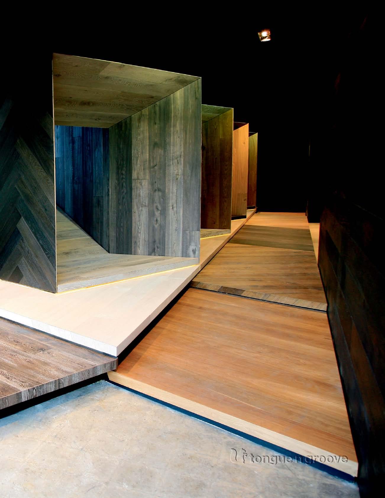
tongue n groove timber constructed of FSC European Oak treated with natural oils in 11 beautiful colours allowing for easy maintenance
Showrooms

188 Chalmers Street, Surry Hills NSW 2010
P 02 9690 0991 F 02 9690 0992

575 Church Street, Richmond VIC 3121
P 03 9427 7000 F 03 9427 0100
tonguengrooveflooring.com.au




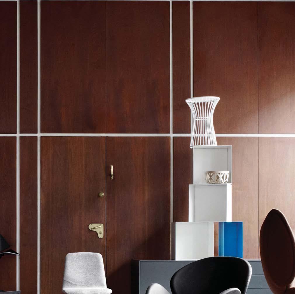
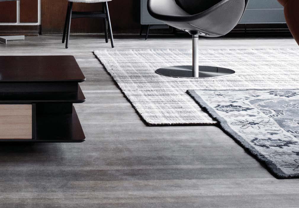
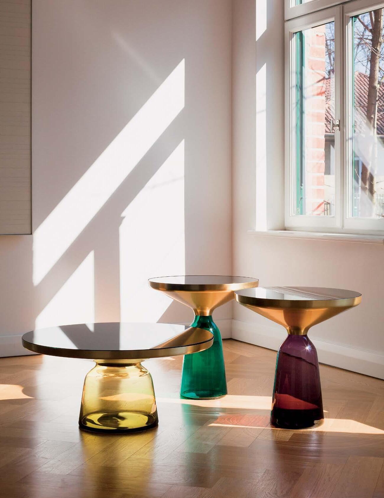
Danish Design is our legacy, but a great legacy should always be balanced by innovation and new ideas. BoConcept has taken the great traditions of Danish design to the world’s big cities and made it our own. We call it Urban Danish Design. It has the comfort and simplicity from Danish design and the cool vibe from the urban.

#2 WE BELIEVE IN URBAN DANISH DESIGN
DANISH DESIGN IS NOT ONLY TO BE ENJOYED BY A FEW DANES




BoConcept Sydney - 575 Pacific Hwy Crows Nest, NSW 2065 - Tel. (02) 9437 0066 - www.boconcept.com.au NO W OPEN


the first word
Well, please indulge me if I pursue this topic a little further, because it goes to the heart of how we live – namely, the balance between privacy and community. You see, that’s the pesky thing about being human. Like Goethe’s Faust we are no sooner satisfied than desiring yet again. We need security, but we also need change. We need respite, but we also need stimulation.
We need privacy, but as social creatures we also need to belong. Margaret Thatcher supposedly said there was no such thing as society. But there is and we are what we are because of the constant interaction between what we are fundamentally and how we are shaped by our social context.
I am just back from looking at houses in Jakarta. Several were in gated communities and all were different – which made me realise that gated communities take many different forms, depending on who lives there and how well planned they are. I realised that gated communities may be defined by more than a perimeter fence and they may be driven by more than fear of crime and anti-social behaviour.
One community I visited consisted largely of Christian families and it was as much the practice of their faith which brought them together as the need for security, although memories of the 1998 riots are still very fresh. Another community, near the University of Indonesia, was largely populated by people associated with the university. Yet another community, clearly consisting of affluent people, was nevertheless adroitly planned by eminent local architect, Andra Matin, to provide common landscapes and amenities to ensure that the residents were brought together.
Furthermore, gated communities are often more porous than we might assume. The Christian community mentioned above contains a sub-community of original residents from the area. The pedestrian gates remain open until dark to allow a flow of people to and from the adjacent kampung whose residents sell food within the gated community and who are looked after when their low-lying kampung is inevitably flooded during the rainy season.
Of course, I also saw homes which did not belong to a gated community, but which still managed to maintain privacy and security while also engaging with the street and the local community.
So, the issue of privacy and community is a moveable feast which goes back to the beginning of human history and which is being played out to this day. And it will continue to be played out as new social, cultural and economic contingencies emerge. In fact, gated communities are going to become more common, so perhaps the real issue is how we plan them to ensure that they really are communities and are not isolated from the wider, outside community.
 Paul
Paul
McGillick | Editor
In my last editorial I reflected on the issue of gated communities. In fact, I speculated about whether they are communities at all.
left | editor, paul mcgillick. right | deputy editor, nicky lobo.
habitus takes the conversation to our contributors, discovering their inspirations and design hunter journeys
Brett Boardman

newtown house #98
Living between sydney’s inner west suburb of Marrickville and various departure lounges at the airport, photographer, Brett Boardman, first fell in love with his craft at the age of seven. It was at this tender age that Brett received his first GAF Viewmaster with a disc of 3D stereoscopic photographs depicting the ‘Ancient world’ and from this time on he has spent his life outdoors “telling stories by putting the world into a box”.
Jane Burton taylor


hoBA rt #192
simon devitt


KA re KA re house #124
s elf-proclaimed ‘ westy’, photographer simon Devitt is from t itirangi, west of Auckland. simon lives with his artist partner, roberta t hornley, and is inspired by the lives of the extraordinary people he meets. A self-taught photographer, simon captures what he sees as ‘an outsider looking in’ but also as an outsider ‘exposing’ beauty in situations where inherent beauty might not necessarily be present.
a nna Flanders perth ADDI t Ion #178
Anna Flanders has been working in the publishing industry for 19 years and today keeps herself busy with freelance design and lifestyle writing, interior styling, pr and events consulting. her focus remains the same as the day she started: celebrating people and their passions. Currently residing in Cottesloe ( wA) with partner Carol, dog suki and special pieces collected over her lifetime, Anna loves the feeling of the first daily dive into the ocean.

roBert Frith
perth ADDI t Ion #178
funkis started in 1996 in Sydney’s iconic suburb of Bondi Beach. “I don’t think it would have worked otherwise,” Carina Enstrom Gibb believes.
“In Bondi then, there were all the stylists, the film people and art directors who were a bit braver and liked the whole thing.” Quickly, and via these stylists and other influential creative people, Funkis prints, bags, clogs and homewares made their way into magazines. “I think because Swedish products are so graphic and photogenic, they loved borrowing it,” Carina says.
robert Frith has been taking photos for as long as he can remember and loves the way it has introduced him to so many people who he now calls friends, and keeps him on his toes with continual changes in technology. robert lives on the west Coast of Australia with his partner, their child, and their dog, and first fell in love with photography in his teen years when he was handed an old Agfa by his Mother.
James Geer
sIMon LL oy D A n D LIBBy De M pster #79
Jane Burton taylor lives in the north sydney suburb of Kirribilli where she indulges herself with beautifully designed spaces, feisty philosophical discussions and art. It is these three passions that continually excite and inspire Jane, especially interactive art. Jane first fell in love with writing as a teenager when she realised what an amazing form of communication it was.
emma Cross
FAMILy hoM e #152
Born and bred in Melbourne, e mma Cross developed a strong interest in ancient architecture through her degree in archaeology and through this knowledge nurtured an obsession with the built environment that developed into an interest in photographing it. e mma is inspired by really beautiful light and just loves spending time with friends and family.
Prior to Funkis, Carina was already sourcing vintage and antique pieces from Sweden – “we used to go to Sweden in the summer and ship them over” – but eventually decided to work with Swedish textile designers to create prints that would become cushions and lampshades, as well as being available in drops for furnishings. In addition, Carina began designing lighting, jewellery and clothing expressing the same bold, quirky aesthetic. But it wasn’t just about creating a ‘look’ – “when we made something it was always because I could imag
James Geer started out as a graphic designer only to transfer his love to photography. he currently lives in s an s ebastian (s pain) but is proud to call Australia home. he lives with his wife, Bec, and two children, Valentina and r oman, and mostly looks forward to surfing his favourite wave with friends. James is inspired by light, the ocean, beauty in impermanence and asymmetry.

m andi KeiGhran
stu DIo J uJ u #71
Mandi Keighran knew from a young age that she wanted to have a career in writing. An interest in architecture and design led her to study architecture at t he university of sydney, where she decided to combine her two passions. After finishing her undergraduate degree, Mandi travelled around europe before returning to Australia to complete a Master of Arts ( writing) at the university of technology sydney. s he is currently the e ditor of Indesign magazine, and lives in a terrace house in sydney ’s redfern – an area she loves for its diversity and changing face.

issue #21 habitus.com
CaleB minG

stu DIo J uJ u #71
Inspired by the sea, morning dew, the sun in the cool air and flying, singaporean photographer, Caleb Ming, lives a humble life with his cat, Mao. Caleb first fell in love with photography when he was 14 and was fascinated with the way he could make something life-size all squash into a small roll of film. w hether he’s travelling for work or leisure, new landscapes always inspire Caleb where you will find him just a click away.
l ars r aneK



AL ex popoV #56
Lars r anek lives in hellerup, a city just outside of Copenhagen where he practises as a professional advertising and commercial photographer. specialising in interior and food photography, Lars shot the popov house story in Mallorca for this issue. Lars is continually inspired by nature and has a deep passion for photography because of the ability it has to tell stories and show emotions.
a ndrea stevens

KA re KA re house #124
p rogressive ideas, urban spaces and Japanese cuisine are the three things that really make Andrea stevens tick. t his architect-turned writer currently lives with her husband and two daughters in a home designed by herself in point Chevalier, Auckland, new Zealand. Andrea most looks forward to cuddling her children to sleep each night.

tan ZhenG Joo
A rt Ist ’ s house #139
tan Zheng Joo was born in Kuala Lumpur in 1990 and is of Chinese descent. her home has always been Malaysia, where her family is. her tertiary studies, however, were finished in the u K only to return to Malaysia after completion. Zheng Joo is inspired by stories of humanity and first fell in love with photography when she was 17, through a desire to share her processes of discovering beauty.

correctIon
we apologise for not crediting the artwork on the cover of h abitus #17 and within the story on Alex Lotersztain pp. 56–68. t he artwork is by Beastman, see more of his work at beastman.com.au
habitusliving.com/issue17/highergroundstudio

funkis Paddington 202 Oxford St. PH.+61 2 93687045 funkis Strand Arcade 412-414 George St. PH.+61 2 922193-70 funkis online store www.funkis.com www.funkis.com HAB18_Funkis_HP.indd 1 28/09/12 11:24 AM
NSW Blindmaster blindmaster.com.au
02 9938 4977
SA TB Awnings tbawnings.com.au
08 8362 3580
Gold Coast & Brisbane Fotti fotti.com.au
07 5592 2220
WA Blinds Couture blindscouture.com.au
08 9457 8015
New Zealand
Otago Shutters & Blinds jacques.theron@osbinfo.co.nz

64 03 441 2752
corradi.com.au
Corradi Manager Australia/ New Zealand: Johannes Geppert
editorial direCtor
paul McGillick habitus@indesign.com.au
dePuty editor
nicky Lobo nicky@indesign.com.au
editorial assistant /
Pa to editorial dire Ctor
Alicia s ciberras alicia@indesign.com.au
art direCtion & oriGinal desiGn tem Plate one8one7.com
senior desiGners
e mma warfield emma@indesign.com.au
Lauren Mickan lauren@indesign.com.au
desiGner
Frances yeoland frances@indesign.com.au
J unior desiGner
Alex Buccheri alex@indesign.com.au
online editor
Lorenzo Logi editor@habitusliving.com
ContriButinG Writers
Jane Burton taylor, stephen Crafti, robert Frith, Mandi Keighran, Aya Maceda, Amy ng, Andrea stevens
ContriButinG
Photo Gra Phers
Brett Boardman, e mma Cross, simon Devitt, tom e pperson, Anna Flanders, James Geer, Caleb Ming, Lars r anek, Jeremy s an, Ken s oh, Zheng Joo tan
ContriButinG su B-editor s arah Allen
coV er IMAGe
Laguna Living (p.165). Artwork is ‘ suspended Garden’ by tess pasola and tony Gonzales. photography: tom e pperson
Ceo / Pu Blisher r aj nandan raj@indesign.com.au
oPerations m anaGer
Adele troeger adele@indesign.com.au
ProduCtion manaGer s hannon smith shannon@indesign.com.au
a dvertisinG tra FFiC / Pa to Pu Blisher e lizabeth Davy-hou elizabeth@indesign.com.au
FinanCial direCtor Kavita Lala kavita@indesign.com.au
Business manaGer Darya Churilina darya@indesign.com.au
aCCounts Gabrielle r egan gabrielle@indesign.com.au
Jana Kralikova jana@indesign.com.au
online CommuniCations r adu e nache radu@indesign.com.au
r amith Verdheneni ramith@indesign.com.au
r yan sumners ryan@indesign.com.au
e vents and mar K etinG tegan r ichardson tegan@indesign.com.au
hannah Kurzke hannah@indesign.com.au
Business develoPment manaGer
Marie Jakubowicz marie@indesign.com.au
(61) 431 226 077
a dvertisinG enquiries Colleen Black colleen@indesign.com.au
(61) 422 169 218
He A d offIce
Level 1, 50 Marshall street, surry h ills nsw 2010 (61 2) 9368 0150 | (61 2) 9368 0289 (fax) | indesignlive.com
Melbourne suite 11, Level 1, 95 Victoria street, Fitzroy VIC 3065 | (61) 402 955 538
SInGA pore
115A Commonwealth Drive 05–18/19, singapore 149596 (65) 6475 5228 | (65) 6475 5238 (fax) | indesignlive.asia
p rinted in singapore. All rights reserved. no part of this publication may be reproduced, stored in a retrieval system, transmitted in any form or by any other means, electronic, mechanical, photocopying, recording or otherwise. w hile every effort has been made to ensure the accuracy of the information in this publication, the publishers assume no responsibility for errors or omissions or any consequences of reliance on this publication. t he opinions expressed in this publication do not necessarily represent the views of the editor, the publisher or the publication. Contributions are submitted at the sender’s risk, and Indesign p ublishing cannot accept any loss or damage. please retain duplicates of text and images. habitus magazine is a wholly owned Australian publication, which is designed and published in Australia. habitus is published quarterly and is available through subscription, at major newsagencies and bookshops throughout Australia, new Zealand, s outh-e ast Asia and the united states of America. t his issue of habitus magazine may contain offers or surveys which may require you to provide information about yourself. If you provide such information to us we may use the information to provide you with products or services we have. we may also provide this information to parties who provide the products or services on our behalf (such as fulfilment organisations). we do not sell your information to third parties under any circumstances, however, these parties may retain the information we provide for future activities of their own, including direct marketing. we may retain your information and use it to inform you of other promotions and publications from time to time. If you would like to know what information Indesign Group holds about you please contact nilesh nandan (61 2) 9368 0150, (61 2) 9368 0289 (fax), subscriptions@indesign.com.au, indesignlive.com. habitus magazine is published under licence by Indesign Group. Issn 1836-0556
issue #18 habitusliving.com
HAB18 Corradi HPV 01.indd 1 4/10/12 11:46
AM


parisi.com.au


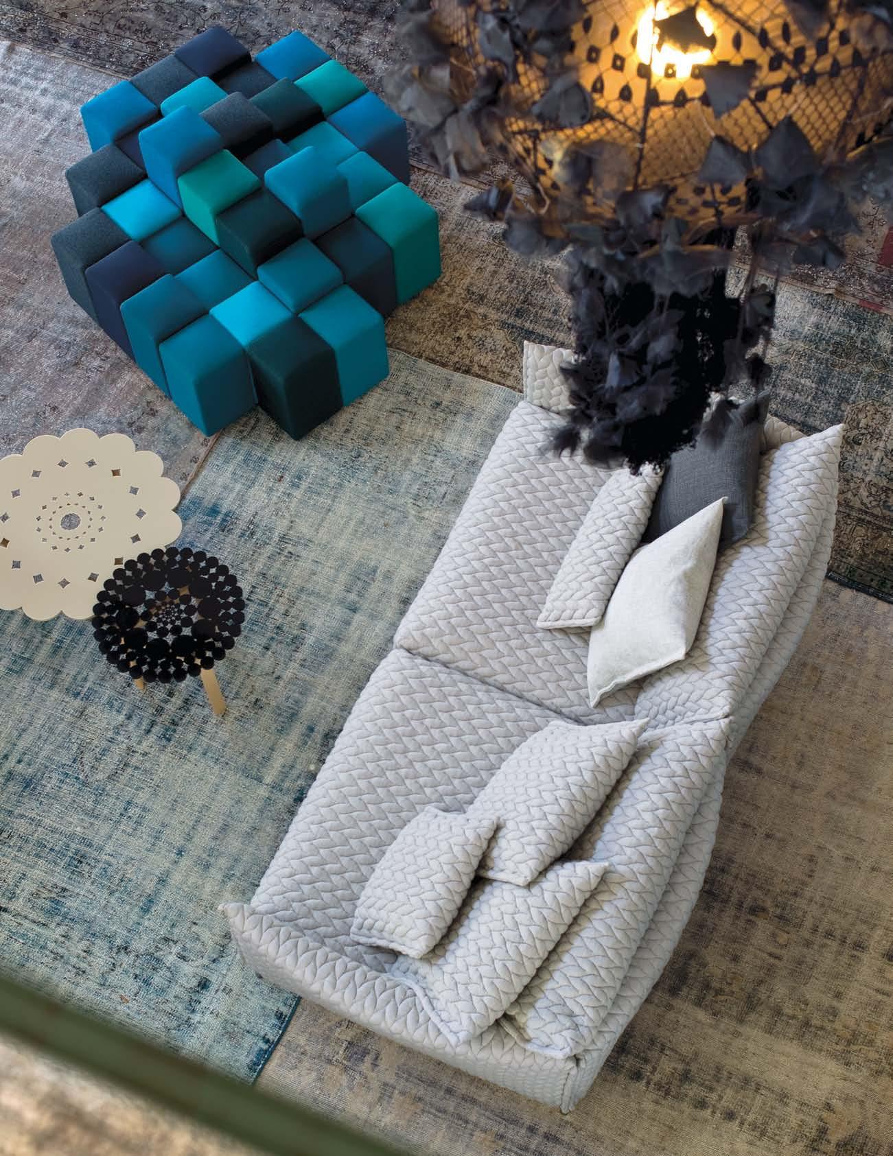
photo Alessandro Paderni / ad Designwo rk Gent ry sof a by Patricia
la Carpet reload ed tabl e by
a Moroso Sp a Cavalicco, Udine/Ital y T +39 0432 57711 1 e-mail: info@moroso.i t www.moroso.i t Moroso Available exclusively at hub furniture lighting livin g Melbourn e 63 exhibition St Melbourne T +61 3 9652 122 2 Sydne y 66–72 Reservoir St Surry Hills T +61 2 9217 070 0 www.hubfurniture.com.a u for Moroso Do-lo-rez island by
Fergana
Urquio
Patricia Urquiol
Ron Arad
A change is as good as a holiday.
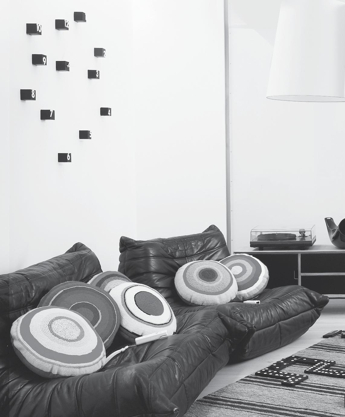
photo shoot – page #45
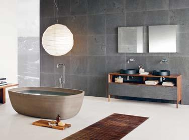
Easily fitting into any setting, the NEUTRA collection is solid and robust. The elements consist of a rounded washbasin and bathtub made from natural stone, designed by Steve Leung and crafted to evoke an oriental essence that is still truly modern. The timber adds warmth to the stone, now offered in two new finishes – Ice Silk and Sand Brown.
neutradesign.it
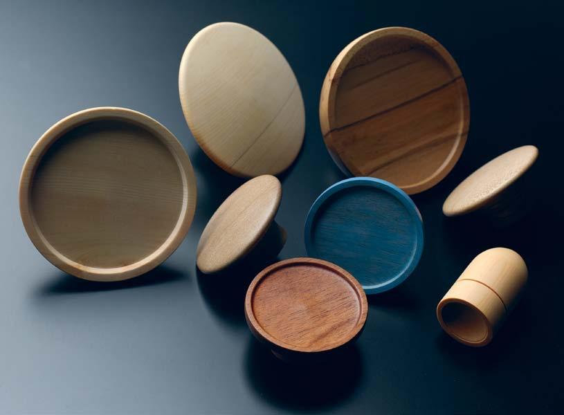
The O SERIES wooden hardware pieces by boutique architecture and interior design practice Interia are a romantic gesture to any door or wall. These beautifully crafted wooden knobs were “born out of a desire to incorporate circular timber joinery handles within a recent architectural project and the failure to source this item” on the existing market. The whole series has a strong focus on environmental sustainability with each piece being fabricated from salvaged off-cuts. Based in Tasmania, Interia have access to some of the worlds best quality timbers and the O SERIES timber typically comes from building sites that use Huon Pine, King Billy Pine, Celery Top Pine, Myrtle, Sassafras and Tasmanian Oak. The quality and intention of this range, lovingly shaped by Interia , is clear.
interia.com.au
Old and new technology mix it up in this iTYPEWRITER by Edinburghbased industrial designer Austin Yang. This console allows users to enjoy the experience of old world typing, but with the advantages of new world technology. Not just a novelty project, the iTYPEWRITER was designed with the older generation in mind, providing a more familiar way for them to type on the iPad.

austin-yang.com
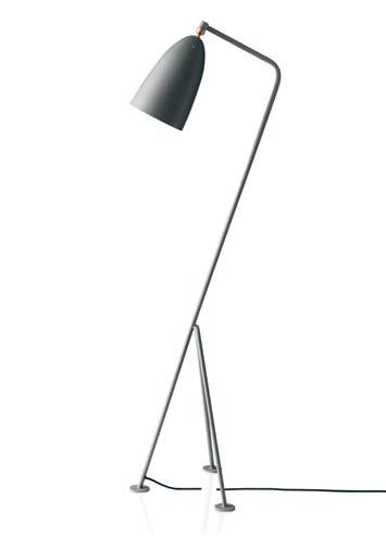
The GRASSHOPPA lamp is a re-release of the 1947 design classic by Greta Grossman by Dutch company Gubi . The modernist form features a steel tripod stand and elongated conical shade, ball-jointed for mobility.
gubi.dk / cultdesigned.com.au
#18
issue
habitusliving.com
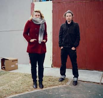
With a strong passion for showcasing the untouched talents of Australia's most skilled creatives, private publishing house Au.Thentic Press have selected standout photographer Ingvar Kenne as the subject for their first publication entitled CITIZEN. Sydney based photographer Ingvar Kenne (who shot this portrait) is best known for his portraiture and was selected by publishers Christey Johansson and Marcus Piper (pictured) for exactly that, the authenticity in his practice.
au.thenticpress.com / ingvarkenne.com
Designed as a modern day version of the English Windsor chair – the WINDSOR by Matthew Hilton is made from Ash and Walnut timber using exclusively traditional techniques.
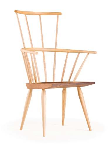
delaespada.com / hubfurniture.com.au
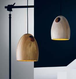
The pendant light is a simple way to create varying levels and different points of interest in a room, particularly when the product is as beautiful as the OAK by Australian designer Ross Gardam . The Ross Gardam studio focuses on furniture and lighting and Ross is paving a sustainable path for the Australian design community with all his products made locally and from eco-friendly timber.
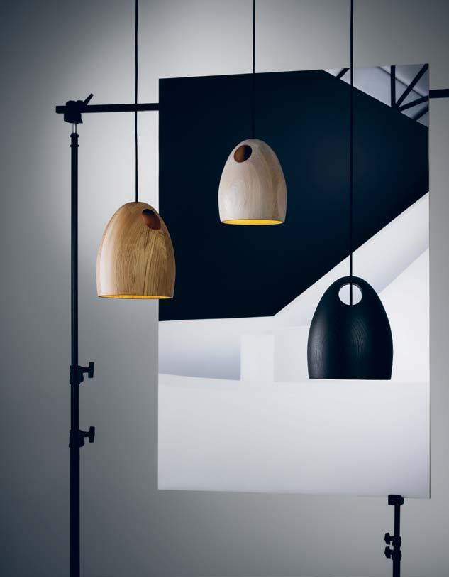
rossgardam.com.au
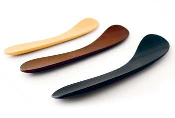
This refined bamboo cutlery has been shaped by Japanese furniture designer, Koizumi Makoto. The collection, entitled MINOTAKE , encourages thoughtful consumption, where the user enjoys every moment of the culinary experience. Light and strong, each piece is delightfully sensorial and tactile.
baum-kuchen.net
1 . lightbox # 27
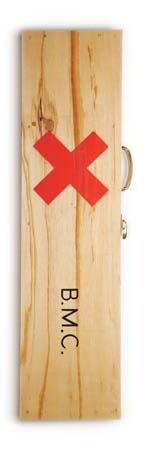
Chop chop, get your hands around one of these beautifully crafted axes and start chopping wood. Handmade from Appalachian hickory by fourth generation axe makers, the LICKITY SPLIT American Felling Axe, by New York based company Best Made was developed to equip customers with quality tools that encourage people to get out and amongst the great outdoors. The slender form of the tool has been designed for ease of use and each axe is painted as a symbol of respect to the age old traditon of felling. The Best Made range also offer lumberjack camp blankets, canvas axe cases or wooden axe boxes.

bestmadeco.com
German design studio schubLaden , founded by Franziska Wodicka and Jeannine van Erk , is devoted to extending the lives of old unmated drawers by giving them new life in the form of side tables, coffee tables and as general decorative storage spaces. With a lowercase ‘ S ’ and a capital ‘ L’ schubLaden make furniture, lamps and design products with the romantic notion of upcycling .
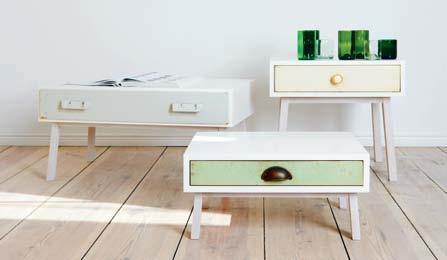
schubladen.de
Touch wood – timber has never been so accessible in a piece of furniture. CURVE is the result of a collaboration between Australian designer Brodie Neill and Italian manufacturers Riva1920. This modern bench was digitally carved from sustainably sourced Cedar – which creates a nice parallel where the natural material is worked by technology. The organic grain of the wood converses with the organic shape of the bench, imbuing it with a sense of warmth and strength.
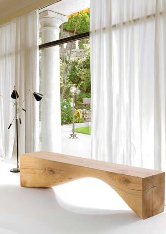
brodieneill.com / riva1920.it / fy2k.com.au
Simple lines and a classic shape – the RADIANTE collection designed by Vera Wang for Wedgewood falls nothing short of elegant. The quality of the fine porcelain ceramic unites with the refined design to create a certain sensitivity that Vera Wang is known for. RADIANTE is a five piece place setting and adds the perfect touch to any table, now that the entertaining season is in full swing.
wwrd.com.au

issue #18 habitusliving.com
Named after the mushroom genus from which it takes its form, the AMANITA table lamp is shaped in woven rattan, which allows light to shine through the whole object rather than just the shade. “The soft, diffused light that filters through the weft of the rattan creates an evocative effect with little rays of light that generate a warm and welcoming atmosphere”. The AMANITA is the result of another collaboration between Campana brothers, Fernando and Humberto, who, since the 1990s, have been experimenting with this material. The brothers are passionate about rattan, simultaneously championing its pliability and the dying art and craftsmanship of weaving. The lamp stands 60cm tall by 50cm wide and is equipped with two fluroscent bulbs at either end of the structure. Manufactured by Alessi, the AMANITA is perfect as a luminous statement piece.
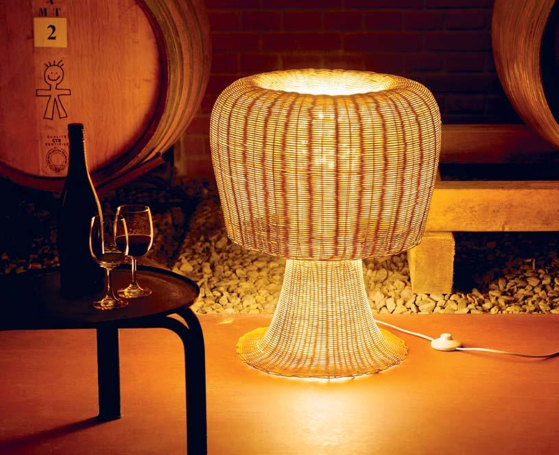
alessi.com / corporateculture.com.au
Designers from across Australia have come together with a Tasmanian furniture company to prove that quality, crafted products can be produced completely – from design to manufacture –in Australia. The brand ONE THIRD recognises the equation to a product ’ s success – one third designer/one third manufacturer/one third supplier.

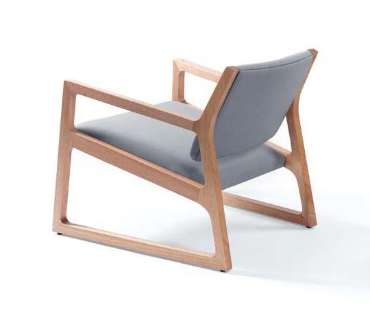
onethird.com.au / stylecraft.com.au
Natural woollen fibres have been mercerised and finely treated to create an honest aesthetic that brings paredback warmth to any space. This Spanish range focuses on resilient pieces that are hardy and draw on a rich history of the social, economic and artistic purpose. Recognising that “for thousands of years humans have used wool for warmth and clothing, but also to decorate the home”, TEIXIDORS honour both traditional techniques and the environment.
teixidors.com
1 . lightbox # 29
Founded by architect Philipp Mainzer, the E15 brand from Germany exudes a sleek modernist edge that is appropriate for both residential and contract application. Designs for work, dining, bedroom, living, and accessories are versatile, yet full of character. The company works closely with a coterie of designers, architects and artists to develop original products with essential forms and featuring the use of solid wood. These future classics are available in over 40 countries, now also including Australia through Living Edge.

e15.com / livingedge.com.au
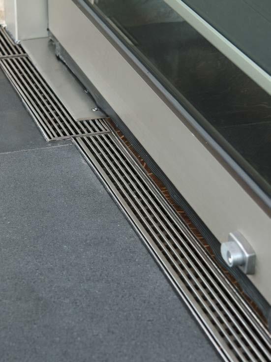
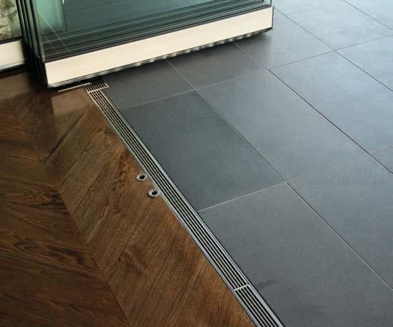
Known for their expertise in door tracks and threshold drains – Stormtech have introduced a new design to their expanding collection. The 65TDI is the latest offering and is the perfect solution to seamless level integration. Stormtech ’ s popularity is gaining momentum at an ever increasing rate and it is no wonder – this intelligent system allows for doorsills to be drained while having internal and external floor surfaces with zero stepdown – genius!
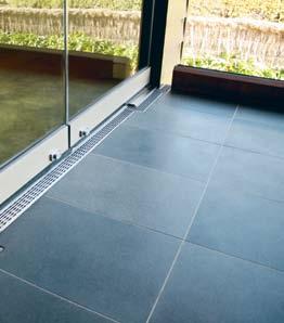
stormtech.com.au
Strongly influenced by the imperfection of intrinsic beauty, the JULY WOODCUTS stool by Nao Tamura for Finnish company Nikari , is far from flawed. These handcrafted stools draw on the image of stacked logs of wood that have been sliced and exude a natural rawness either on their own or grouped.
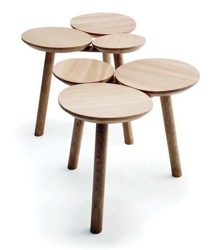
naotamura.com / nikari.fi
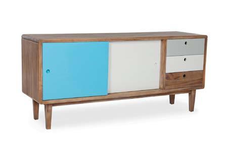
Put things away where no one can see with this stylish credenza from Globewest . The ARDEN unit is bright and fun with two doors, internal shelving and three drawers. At a sturdy but economical 2100 x 480 x 570mm, the credenza is the ideal option for any contemporary home. Support local and check out the other great products this Australian furniture and design company has to offer.
globewest.com.au
issue #18 habitusliving.com
Barazza. Award-winning design and functionality.

Made in Italy for over 40 years. Exclusive to Abey Australia.

www.abey.com.au
 – Barazza Velvet Oven
Young Dutch design studio
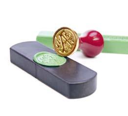
Her-Berg have ingeniously found a way to combine the old world with the new, with their TOP SECRET USB, personalised through a wax seal. In either white or black porcelain and holding 2,4 or 8GB of data, the seals are available in a variety of colour offerings. TOP SECRET USB is part of a small but beautiful range that designers Rob Hermes and Marlies Romberg have created out of a desire to form a “recognisable combination of classic influences and modern technology”.
topsecretusb.com / her-berg.com
There is no doubt that serious work will be done on this piece by Piergil Fourquie, with a name like BIG BOSS DESK . Structurally based on architectural principles, the construction pays homage to the simple cantilever method, creating an appearance of skewed lightness and weight at either end with a seemingly floating desk top. The classic shape, and finishes inspired by those of a sports coupé – Oak timber legs and desktop, lacquered metal skirt and top-stitched leather interior – exude a luxurious aesthetic.
piergil-fourquie.com
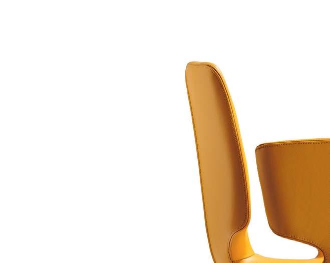
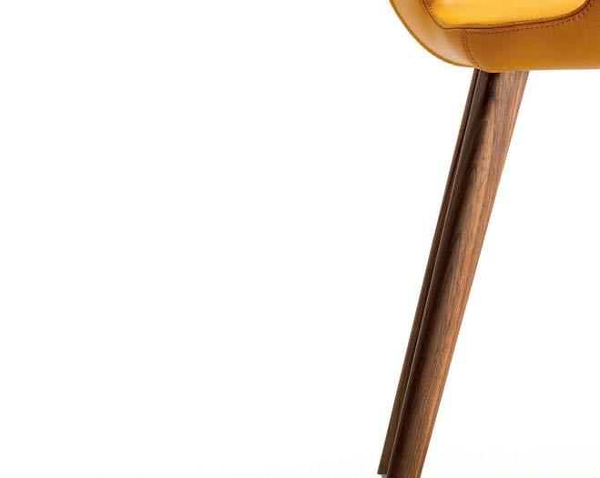
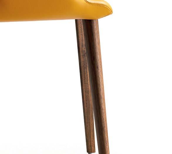
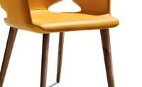
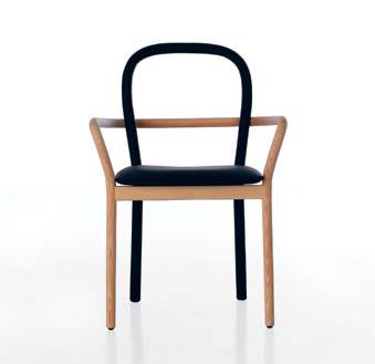
Swedish design group Front have teamed up with Italian furniture company Porro to present the GENTLE chair that combines a soft back and leather upholstered seat combined with a light wooden structure that is the legs and arm rest. Standing 89cm tall with a comfortable 51cm seat diameter, GENTLE is an elegant option for any room.
designfront.org / porro.com
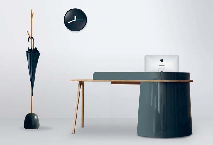
Known for her kinetic mobiles, British designer Miranda Watkins has applied her pared-back design aesthetic to contemporary products for the home. The TURN WOOD collection is crafted in Yorkshire and, each piece can be made to suit the specific needs of the client using various timbers such as Oak, Ash and Walnut.
mirandawatkins.com
issue #18 habitusliving.com
In 1946, Charles and Ray Eames established their legendary relationship with Herman Miller with their boldly original moulded plywood chairs. Time magazine recognised them as The Best Design of the 20th Century –a pretty big call considering a locomotive came in second.

©
|
|
Then x Ten Exhibition | 2012 hermanmillerasia.com | hermanmiller.com.au
Eda Alkutun
Eames Moulded Plywood Chairs
Herman Miller
Exhibiting the unstained colours and grain variations of natural timber, the TONE CHAIR by Leif Design Park draws on traditional Japanese parquetry. Available in five different veneer and timber leg combinations, TONE combines a solid American black Walnut or American white Oak leg frame with plywood seat and a choice of veneer combinations. First exhibited at Milano Salone Satellite in 2007, it has recently been selected to be manufactured and distributed by De La Espada leif-designpark.com / delaespada.com / spencelyda.com.au
Go upwards, not forward, and vertical not outwards – maximise your opportunities and inhabit the 2D space of the wall with the URBIO. This space saving solution is designed as a modular vessel that allows you to custom build your grid with as many storage plates as needed. Plant a vertical garden or organise the goodies that normally overflow from your drawer –whatever you use it for whether it be planting, organising or space saving, the neodymium magnetic grids of the URBIO make this product easy to put together and put to good use. So get creative and install one in each room, perfect as a feature or to compartmentalise knick-knacks.

myurbio.com
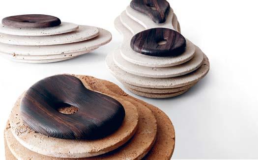
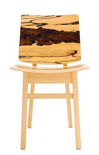
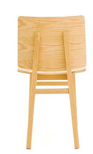
A combination of marble, wood and cork sit together to create a natural-looking assemblage for the purpose of sitting. Ergonomically designed with shaped seat pads, the KREOO creations are a modern mimesis of nature. Perfect for any outdoor garden setting and designed to evoke the idea of pebbles in a garden, the stools are available for both indoor and outdoor purposes.
fy2k.com.au
French designer Ionna Vautrin has recently created three adorable characters for ZOO, her house brand, using Kvadrat Maharam material. The Parisian-based designer devised the ZOO collection to offer plush animals sized around one metre high making them extra huggable and easy to for children to befriend.
kvadratmaharam.com / ionnavautrin.com

issue #18 habitusliving.com
THE WAY YOU LOOK AT TILES


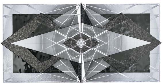



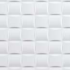
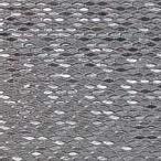


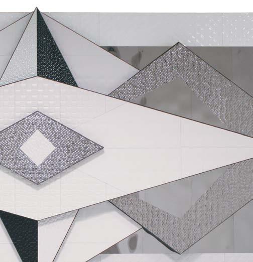
When it came time to plan their display for this year’s Saturday InDesign event, Earp Bros collaborated with two Australian artists who were inspired to design a work that would illuminate the remarkable nature of their products. The result was a spectacular audio-visual sculpture entitled Porcelana Innovadora (Innovative Porcelain). It evoked amazing responses and, in the process, introduced new worlds of possibility in architecture and design. Discover this new collection of textured wall tiles, exclusive to Earp Bros. Where inspiration comes from. www.earp.com.au

CHANGE
NEWCASTLE (02) 4962 5500 SYDNEY (02) 9410 3222 MELBOURNE (03) 9328 8598 Parry Street Newcastle Pacific Highway Chatswood Abbotsford Street North Melbourne
Madison Plata Prisma Nacar Sea Silver Oxo Mosaico Blanco Pearls White Pearls Dark Diamonds
3351
Photography by Michael Kai


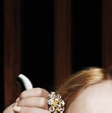
























Take it to the slopes...
Collector Store;
Level
Burton; Women’s Jacket Nuptse 2 by Northface, $220, Paddy Pallin; Chess Set deluxe wooden set by M&Z, $29.95, Australian Geographic; Goggles APX in Powder/Rose, $160, Dragon Alliance; Suitcase in silver, $1,190, Rimowa; Men’s Boots in leather by Shoe the Bear, $160, Collector Store, Children’s Clogs in cowhide, $129, Funkis; Book Winter Journal by Paul Auster, $29.99, Better Read than Dead. All | Timber flooring Tongue n Groove Eterno in Bistre, three layers of solid European Oak, board size is Piccolo 2500 x 189 x 15mm, $105 + GST/m 2 , Precision Flooring.
Larry Adler; Snowboard Custom Flying V,

1 . lightbox # 37
photography t im r obinson | s tyling ali C ia s C ib E rras | art dir EC tion on E 8on E 7
Clockwise from top left | Luggage Organiser Go Clean set includes Shoe Bags, Stuff Bags and Laundry Bag, $65, Flight 001; Camera HD HERO2 Outdoor Edition, $299, Go Pro; Gloves by Marmont, $179.99, Larry Adler; Watch Nevil by Triwa, $299,
Beanie
Mari, $39.99,
$649.95,
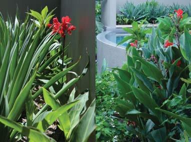
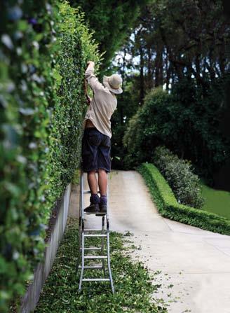
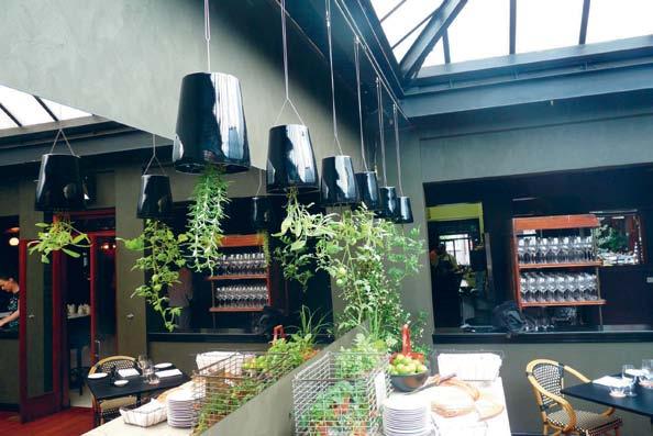
Functional, Sculptural, Edible gardens. pepo.com.au | 02 9349 1220 | info@ pepo.com.au
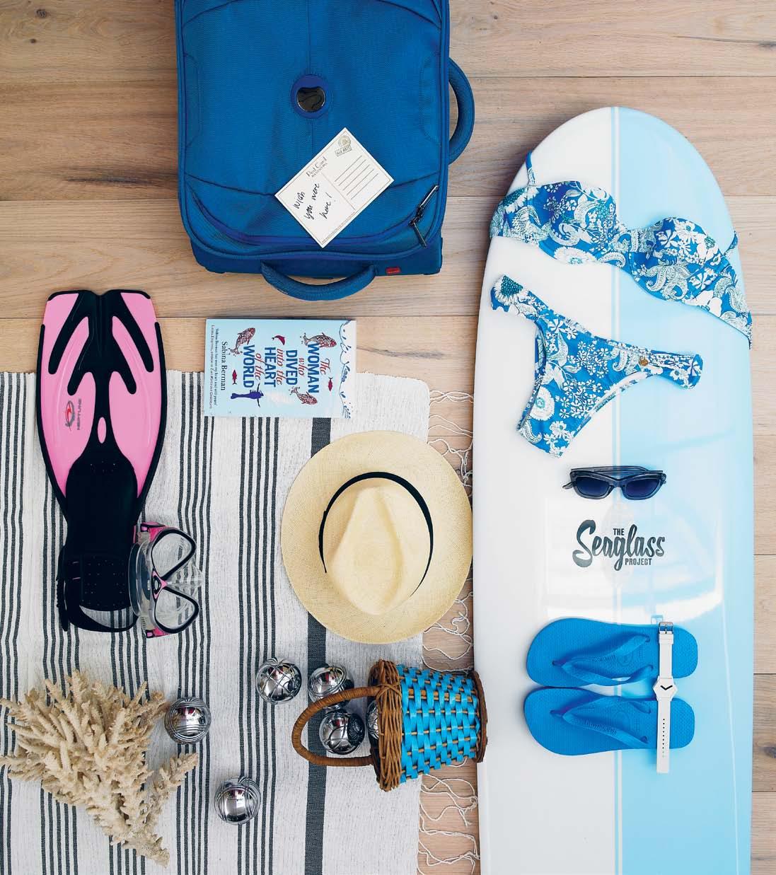
No more worries for a week or two...
1 . lightbox # 39
Clockwise from top left | Suitcase Ulite 53cm in Blue by Delsey, $220, Flight 001; Handmade Postcard , $2.80, Paper 2; Surfboard The Seaglass Project Tuna by Tom Wegener, $620, Global Surf Industries; Swimwear Wisteria bandeau bikini, $255, Anna & Boy; Sunglasses Chloe in Smoke, $260, Nick Campbell Eyewear; Thongs Acqua, $19.95, Havaianas; Watch Hexagon by Takumi, $100, Via Alley; Vintage Basket , $45, Seasonal Concepts; Towel Tunisian in 100% Linen Fouta, $70, Collector Store; Petanque Balls set of 8 with rattan basket, $245, The Country Trader; Coral stylist ’ s own; Hat by Panama Fedora, $280, Strand Hatters; Book The Woman who Dived into the Heart of the World by Sabina Berman, $29.99, Better Read than Dead; Snorkel Set Neptune includes mask, fins and snorkel, $99.99, Snorkel Safari.
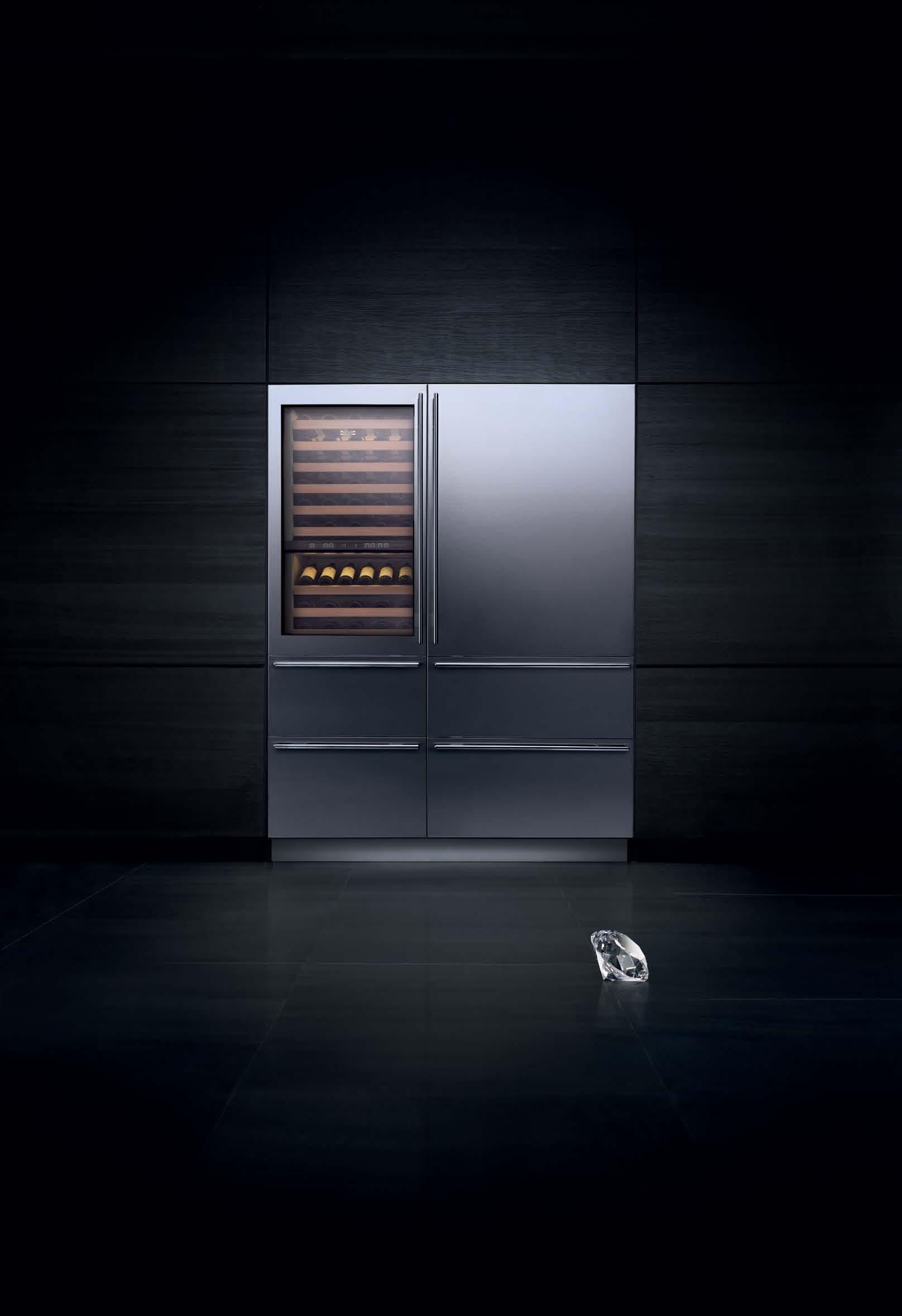
A SUB-ZERO IS JUST A REFRIGERATOR, LIKE A DIAMOND IS JUST A STONE Iconic design. Enduring quality. Superior performance. Fully integrated For more information visit the Australian Distributor at: www.subzerowolf.com.au
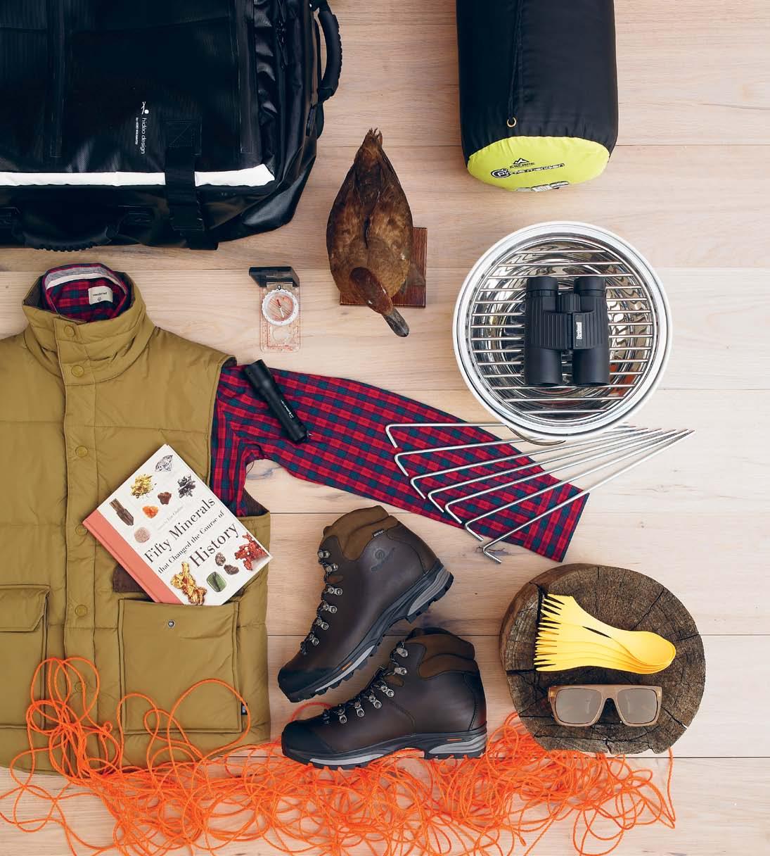
1 . lightbox # 41
Find your quiet place in the woods...
Clockwise from top left | Suitcase Tarpaulin range by Hideo Wakamatsu in black, $219, Flight 001; Taxidermy Duck , $250, Seasonal Concepts, Sleeping Bag by Escape Outdoors, $69.99, from Rays Outdoors; Binoculars, $399, from Bushnell; Eva Solo Table Grill , $400, top3 by design; Tent Pegs, $0.99 each, Rays Outdoors; Cutlery Light my Fire Spork, $2.76 each, Paddy Pallin; Sunglasses Rio De Janiero by Colab, $230, Maple Store; Wooden Log and Orange Rope stylist ’ s own; Hiking Boots Delta by Scarpa, $399, Paddy Pallin; Vest Preston by Deus, $169.95, Maple Store; Book Fifty Minerals that Changed the Course of History by Eric Chaline, $43.72, Better Read than Dead; Check Shirt Smith Classic by Weathered, $99, Incu; Torch B7 LED Lenser, $99, Paddy Pallin; Compass by Wild Country, $15.99, Rays Outdoors.
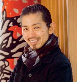
Akira Isogawa
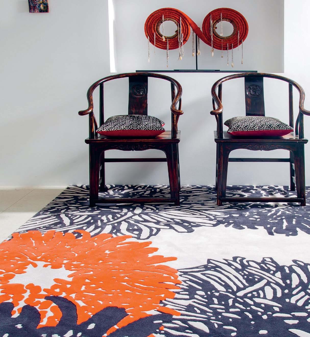
Though inspiration may present itself in many forms, Akira Isogawa’s latest collection for Designer Rugs takes the Japanese word for ‘inspiration’ as its name.
Hirameki is a range of exquisite floor coverings that openly reference the intricacy of fashion designer, Akira Isogawa’s textile designs, marrying the arts of fashion with interiors in a seamless and evocative assortment of rugs.
The collaboration with Akira Isogawa for Designer Rugs started as a limited edition collection in 2005 and was an exercise in balance and harmony through colour.
An overwhelming response from the marketplace demanded a second collection, Kisetsu (launched in 2008), where Akira further explored the possibilities of realising his beautifully colourful creations in the unique medium of rug design.

The third collection, Hirameki reveals itself in seven striking pieces. In the instance of the Ayame and Shibori designs (available in rectangular and circular formats), the rugs draw on influences of a botanical nature as well as traditional kimono print patterns.
Evolving the manufacturing process as well as the design methodology, Akira in his Ayame and Kiku collections presents the designs in an array of vibrant colours, enhanced by a depth and texture that only a New Zealand wool and bamboo blend pile can offer. Embracing the resilience of bamboo, Akira and Designer Rugs have infused these collections with a durability that is only made more appealing by the sustainable attributes of the natural resource.
Where Shibori, Kiku and Ayame take visual cues from classic floral and wave patterning, Batik (in two variations) turns to the motifs of Bali’s traditional water resistance dying techniques by the same name. A process that employs wax, dye and water to create intricate, and in this case more geometric reliefs, Batik is a complementary addition to this contemporary yet traditionally informed range of floor coverings.
Designer Rugs 1300 802 561 designerrugs.com.au

Designer Rugs x Habitus Promotion Continue the conversation | habitusliving.com/issue18/floortalk
Floor talk #4

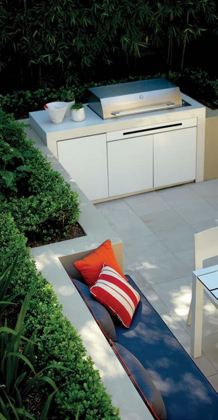
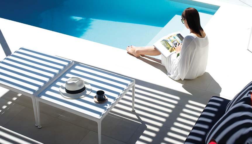
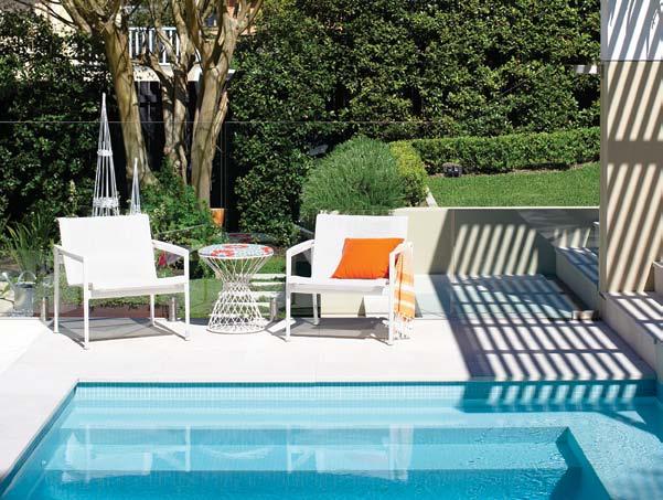
Everybody Needs a Secret Hideaway. Help us create yours. Garden design, build and maintain www.secretgardens.com.au
Time to...
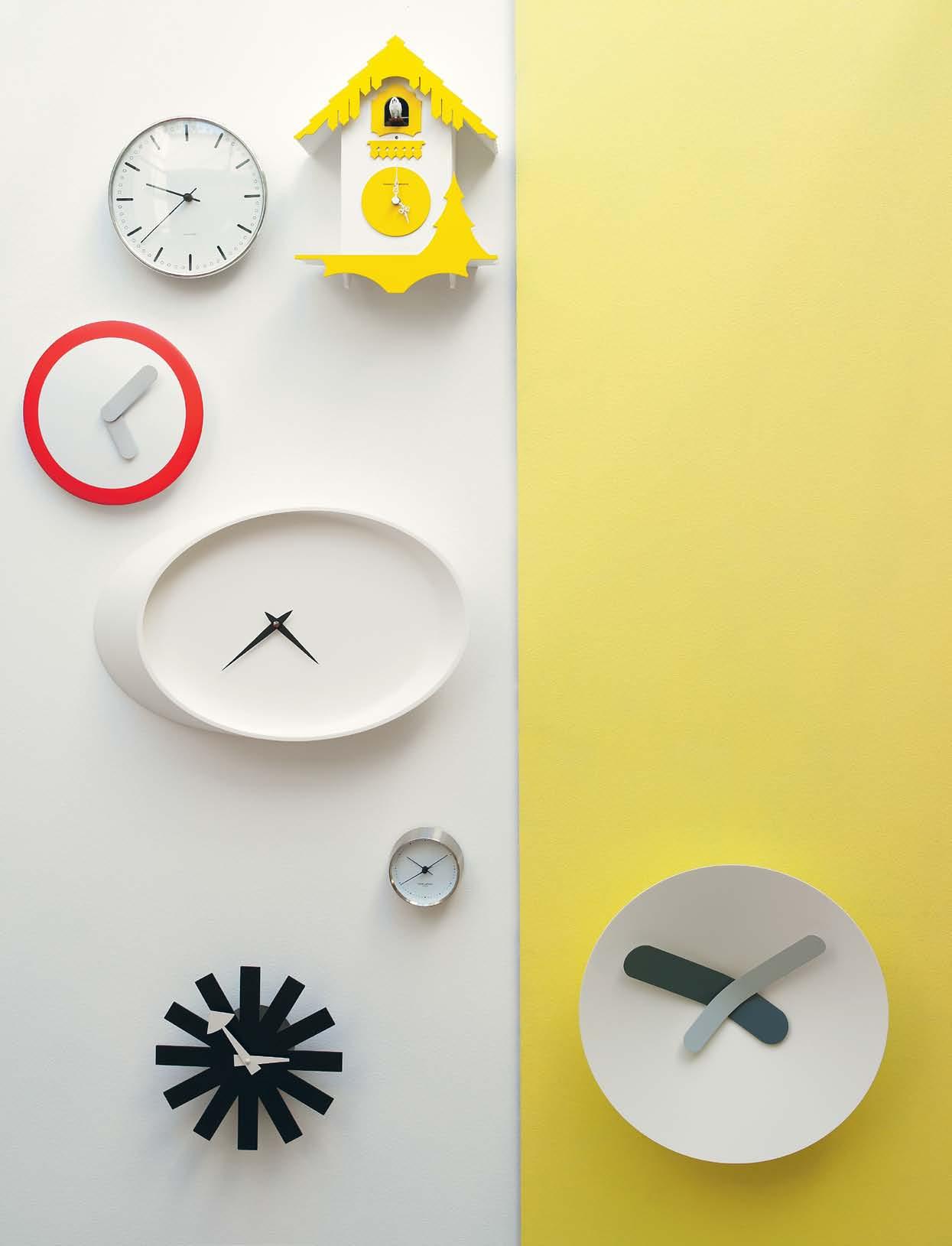
the end of the year calls for festivity and reflection, signalling new beginnings and revived inspiration. but before we start fresh, for many of us, the end of the year also means a break, affording us the most luxurious thing of all – time. what will you do with it?
Clocks
Clockwise from top left: Rosendahl city hall clock designed by Arne Jacobsen, in aluminium and mineral glass, $450 for 210cm diameter, Corporate Culture; chalet yellow wall clock , 26 x 43cm $395, Zuster; Mozia small w hite clock , in aluminium, 40cm diameter, $495, Zuster; Vitra a sterisk clock by George Nelson, $435, Space Furniture; henning koppel white dial clock , 10cm diameter, stainless steel, $150, Georg Jensen; r hombus clock in white designed by Jack Papoutsidis for jp designs, $330, top3 by design; red swing clock , 25cm diameter, $45, Aero.
photography tim robinson | styling nicky lobo/one8one7 | art direction one8one7
1 . lightbox # 45

issue #18 habitusliving.com
clockwise from bottom left: m ilo modular s ofa upholstered in Jardan’s Brushed Linen, $10,995, Jardan; w hite melamine tray, $26.95, Chef and the Cook; v ivianna watch 326 large open bangle in stainless steel, $2,380, Georg Jensen; g -type cup and saucer, $49 for set, Via Alley; De Padova circle lamp with steel structure and aluminium shade, from $2,575, dedece; Linen Essentials Collection (left) Jasmina cushion in Salt, and (right) doily cushion in Salt, in linen and cotton, $99 each, Sixhands; Muuto oto 100 storage system in warm white fibreglass, $825, Great Dane; Cascando bend coat stand in lacquered mild
steel with polished aluminium handles, $590 + GST, Stylecraft; stranded bag in Bleached Beach, $59, Eastpak; De Padova chabtables with white powdercoated steel base and white laminated tray, with solid Beech trim and rotating base which offers two heights, $1,100 each, dedece; e ssential oil burner in Tasmanian Oak base and black metal with Australian bees wax candle and Australian Lavender oil, $179.95, Page 33; a lby f loor cushion upholstered in Kvadrat Hot colour 442, $590, Jardan; neon nomad all wool rug in Denim, $3,900, Cadrys; feature panel paint endure interior lowsheen accent in Celestial Sky, $82.90/4L, Taubmans.
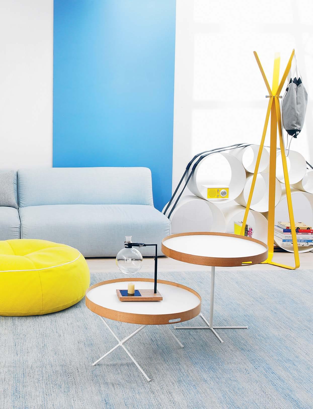
1 . lightbox # 47
Relax All | Tongue n g roove Et Erno timb Er flooring in BisT re, Three layers of solid european oak, B oard size is piccolo 2500 x 189 x 15mm, $105 + gsT/m2, precision flooring. on bookshelf | Tivoli Audio modEl 1 in frosT whiTe and yellow designed By henry kloss, $299, Top3 By design; AssortEd books from BeauTiful pages and privaTe collecTion.
Create
clockwise from bottom left: Herman Miller cognita walnutcased bench with Celery fabric cushion and white hinged top, suspended filing and storage below, $1,294, Living Edge;
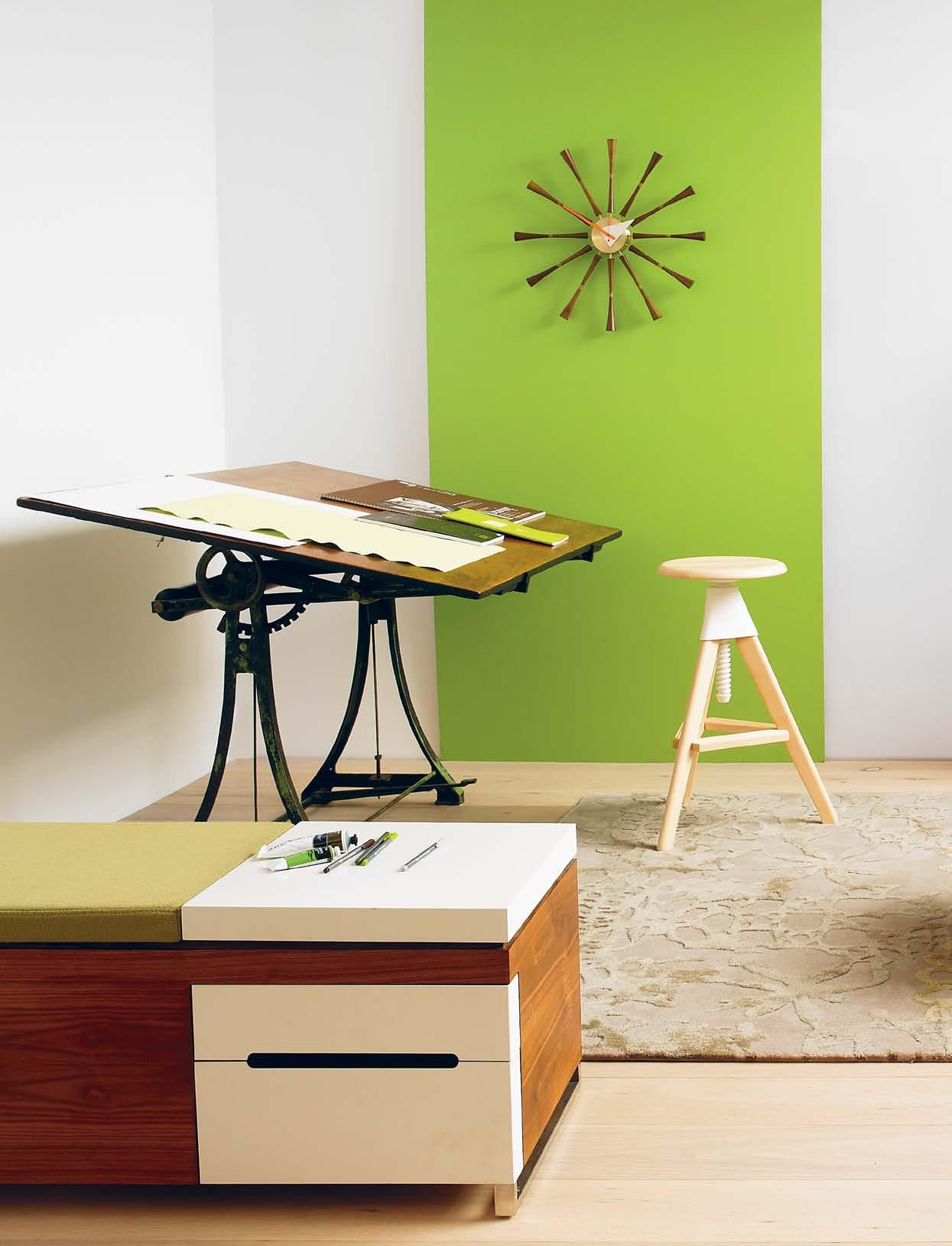
v intage a rchitect’s d rawing
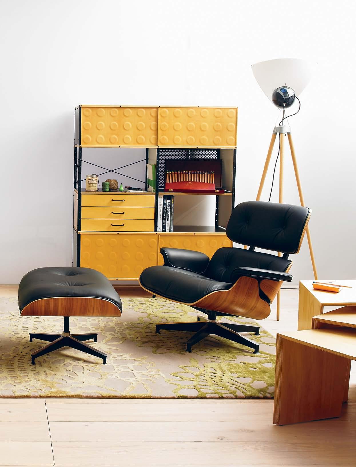
board circa 1920s with cast iron frame and timber top, $6,800, Vampt Vintage Design; Vitra spindle clock by George Nelson, $670, Space Furniture; Magis tom & Jerry swivel bar stool by Konstantin Grcic in natural solid Beech and injectionmoulded polypropylene, $959, Corporate Culture; Herman
Miller eames storage unit in black frame and natural surface finish, 4 units high x 2 units wide, $4,328, Living Edge; g eorge reflector floor light in glass, die-cast zinc and Oak, $2,039, ECC; eames classic l ounge & o ttoman , with Walnut shell finish and black leather $5,500, Living Edge; r hodia pad #13 in orange, from $5.95, Notemaker; nest of tables in 100% Hoop Pine ply, small, medium and large, $340 each, Planet; feature panel paint endure interior low-sheen accent in Apple Delight, $82.90/4L, Taubmans.
issue #18 habitusliving.com
1 . lightbox # 49
EEn A4
2.
E
Wood En PEA r s tA m P $6.95, m um to bE gr EE ting cA rd,
kikki. k d erwenT s ign Atur E b ox PEncils
A
d
on
bench | aTelier intEr ActivE Acrylic PAint, $7.95; winsor & new Ton WAtEr mix AblE oil PAint $15.55; sTaedTler triPlus finElinEr $2.50 each, all from eckersleys. on desk | arches WAtEr colour PAPEr , $10.95/sheeT; and sTraThmore d r AWing PAd $29.95, from eckersleys; g rEEn corrugAtEd PAPEr wiTh flowers, $5.95/sheeT; bl Ack A4 rhodiA notEbook , $12.95; and gr
notEbook $12.95, all from paper
on unit | tW in
(can), $18.95, gr EEn string $3.50, broW n string, $9.95, scissors , $22.95, book on g oa, $35.90, all from paper
2;
$5.95,
$235, eckersleys;
ssortEd
Esign books from privaTe collecTion.
Play
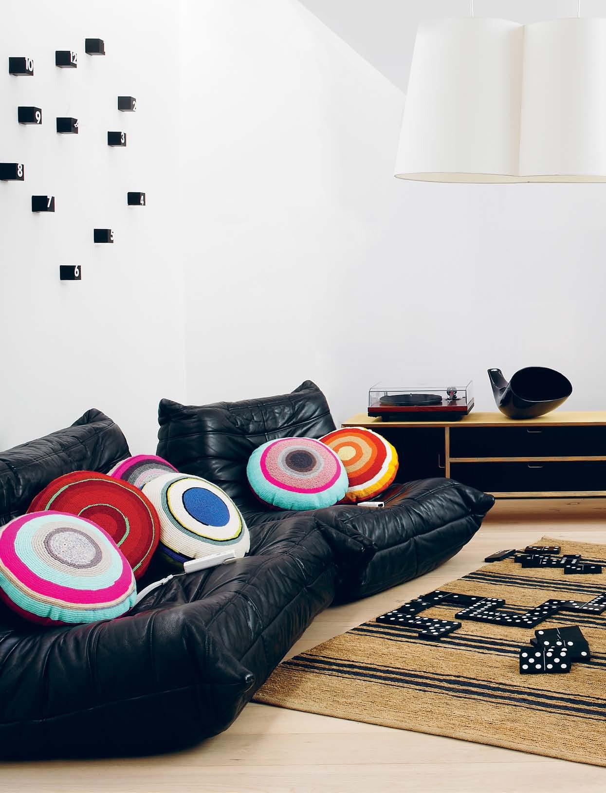
c lockwise from bottom left: Ligne Roset togo s ofa & c hair, designed by Michel Ducaroy in the 1970s, with multiple density foam constructions and quilted leather cover, private collection; handmade c ushions by Erika Tucha in recycled vintage wool, $300 each, Vampt Vintage Design; nintendo w ii , from $178, various retailers; p rogetti random wall clock by rnd lab, $398, top3 by design; nuptial pendant by Trent Jansen in steel and organic cotton, $1,435, Living Edge; ply entertainment cabinet with bevelled natural marine-grade plywood frame, steel base, black laminate front, $2,500 inc GST, Craft Design Realisation; ps cabinet in
white powdercoated steel, $149, IKEA; f rame sideboard by Studio Pastoe in Oak with aluminium, $8,950, Great Dane Furniture; Loewe c onnect id 46 tv in green with white frame on a table stand, $4,699, Audio Products; Molteni & C night & day metal storage unit by Patricia Urquiola, sheet metal basket with matte lacquered top, in chalk white, $1,630 inc. GST, Hub; wooden d omino g ame, $425, The Country Trader; r iver weave t icking stripe handmade rug in Natural/ Indigo, 100% hemp, $595, Armadillo&Co.; feature panel paint endure interior lowsheen accent in Sun Shower, $82.90/4L, Taubmans.
issue #18 habitusliving.com

1 . lightbox # 51 on cAbinet | music hall 5.1 s E 2-s PEEd b Elt drivEn turntAblE in gloss B lack wiTh g oldring gl 2400 mm carTridge, $1,099, len wallis audio; en&is m EgAPhon E in B lack, $590, Top3 By design; yElloW s ubm A rin E m on E y b ox , $39.95, s ugA r rAy t- rE x d inosAur , $34.95; and r ob Ert tric Er Ato P s dinosAur $34.95, harT & heim. on unit | tAlking m ug lAughing $19.95; and mr mEn m ug (mr happy), $14.95, harT & heim. on sideboArd | g o home Junior gyrobot small,
and sumoB oT
in Beechwood,
By
$24.95,
small, $29.90,
Top3
design.
Cook
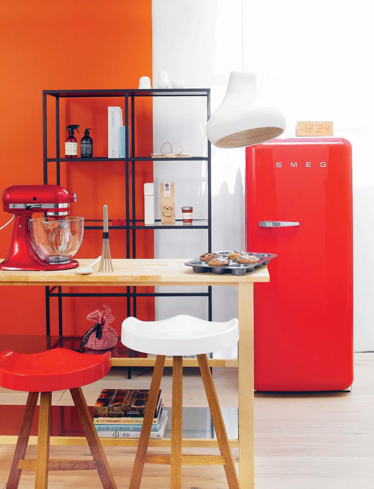
clockwise from top left: vitts JÖ shelving unit , $129, IKEA; samba pendant light by Brad Stebbing in hand-crafted rattan, from $526 inc. GST, Kezu; fab28 fridge in Red, 268 litres, $3,990, Smeg; Takumi toca wooden clock type ii designed by Kouji Iwasaki, $250, top3 by design; värde shelving unit , $399, IKEA; platinum collection stand mixer in Candy Apple Red, $799, KitchenAid; heidi bar stool , Low, $744; and Bar, $878, Living Edge; feature panel paint endure interior low-sheen accent in Delta Clay, $82.90/4L, Taubmans.
issue #18 habitusliving.com
on shelving unit from top | fred nEsting mEAsuring cu P $23, Top3 By design; countEr intEllig EncE food-sAfE surfAcE sPr Ay $12.50, The collecTor sTore; hAndWAsh, $29.95, g rown; my rEciPEs orgAnis Er $39.95; and kitchEn notEs $39.95, kikki. k ; sTeel hEArt cookiE cuttErs $3.95, chef and The cook; JigsAW sErving boArds in pine plywood, $39.95; and whiTe ceramic, $32.95, page 33; El PoAig olivE oil $275, vicTor churchill; PAstA ‘n’ sAucE for 2, $14, oTTo risToranTe. on unit | non-stick stEEl muffin tr Ay $26.95, chef and The cook; n ormann copenhagen nm b EAtEr/ Whisk , $20, Top3 By design; Wood En s P oon , $5.95, chef and The cook; christmAs Pudding, $48.50, vicTor churchill; books from chef and The cook; bourkE strEEt bAkEry: thE ultimAtE bAking com PAnion , $69.95, Bourke sTree T Bakery;
T HIS IS noT a BBQ
It’s




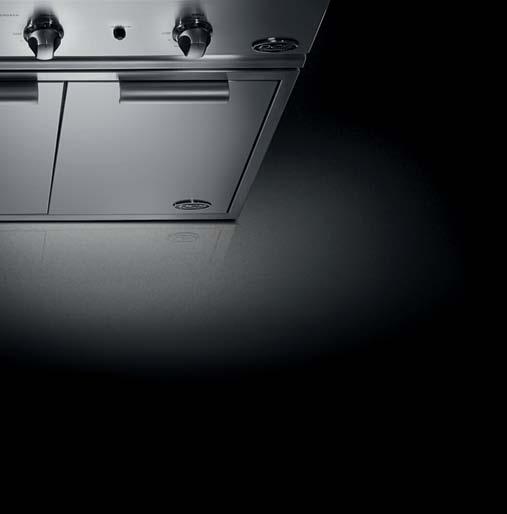
In fact it’s a professional outdoor kitchen. Hailing from Huntington Beach California, the spiritual home of US outdoor cooking, DCS invented and perfected the art of grilling. Each commercial grade DCS grill has been meticulously engineered to deliver intense heat, precise control and staggering build quality to far exceed any mere BBQ.
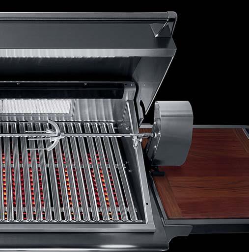
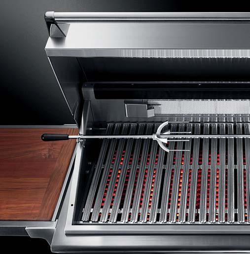
Piqued your appetite? Visit dcsgrills.com.au
fisherpaykel.com.au


a gr I ll
Contemporary Danish craftsmanship
Danish concept store BoConcept has arrived in Australia with their modern take on Scandinavian design heritage.
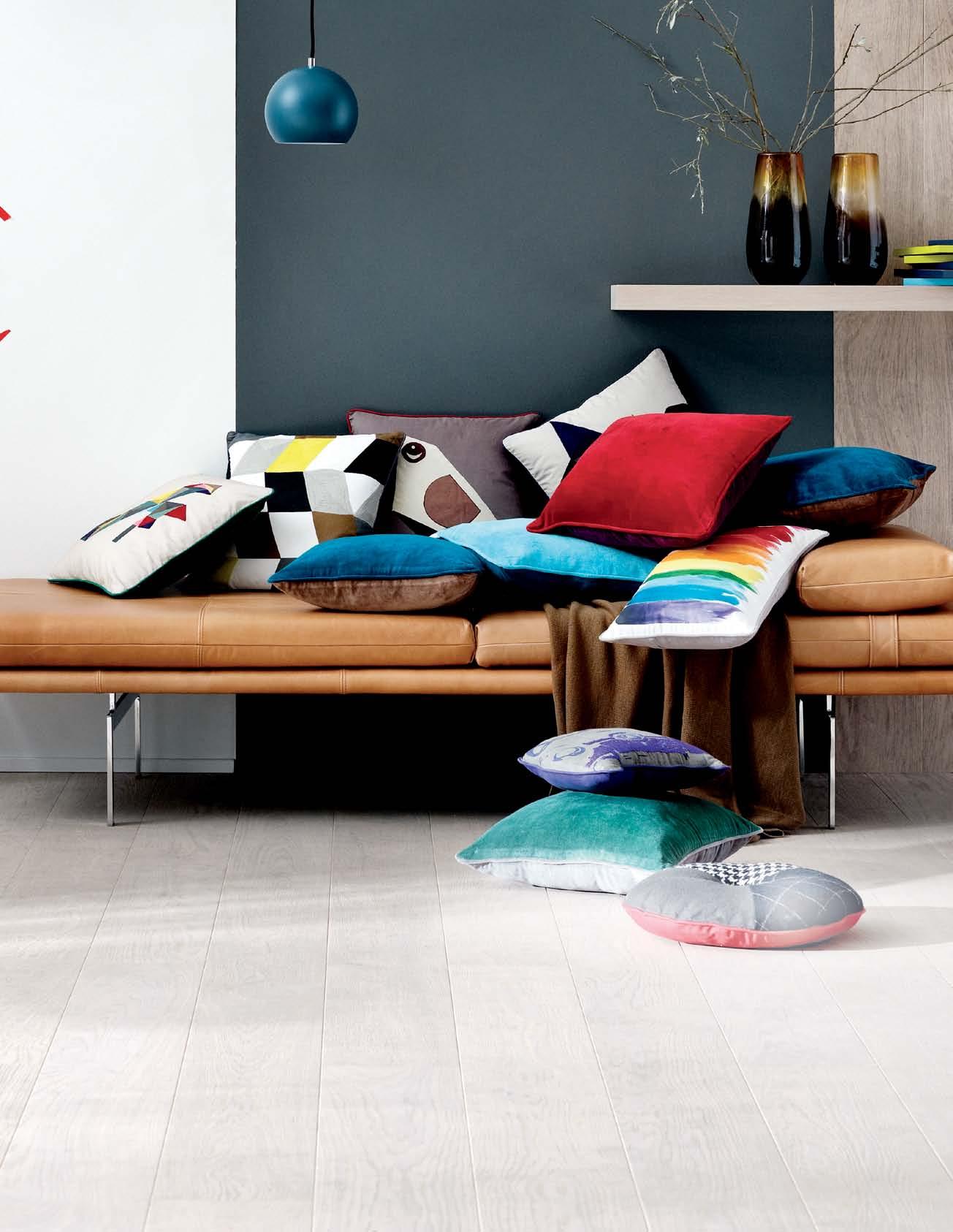
All good things come to those who wait and, this is certainly the case with Danish company BoConcept who, after 60 years of success in Europe, have recently launched in Australia. Boconcept was founded in 1952 by two committed craftsmen who wanted to make furniture with a strong focus on contemporary Scandinavian design, which was also functional and accessible to the public. The brand was a success and has grown to have stores in over 50 countries. And today, the concept store continues to offer functional designer furniture at affordable prices.
BoConcept brings a stylish edge and stunning 2013 collection to the Australian market with their launch in October 2012. The brand is effortlessly stylish with a unique Scandinavian appeal. The timber finishes and textural fabrics in the collection have been carefully selected and are of the highest quality, ensuring that products are aesthetic, durable, and ultimately functional.
BoConcept have developed their brand according to a simple policy of quality and high design values, and seven clear beliefs underlie the brand. These include: Individuality, Urban Danish Design, Affordable Luxury, Respect, Harmony, Functionality and Consistency. With a focus on customisation, BoConcept cater to all the various needs and tastes of their customers. It is a successful approach that has seen the company achieve success throughout the world.
The versatile 2013 collection comprises products to suit any interior space, while staff – including skilled and experienced interior decorators and design consultants – are dedicated to offering unsurpassed bespoke service and advice. Whether you are looking to deck out a whole room, looking for staple pieces, roomfillers, or soft furnishings BoConcept have arrived in Australia and are ready to help.
habitus promotion › boconcept # 54 issue #18 habitusliving.com
2) 9437 0066 | boconcept.com.au
BoConcept (61
IMAGE | Ball Pendant in Petrol Blue, oak Veneer Wall Shelf, dayBed in SalVadore leather and Mixed acceSSorieS
Making a home away from home
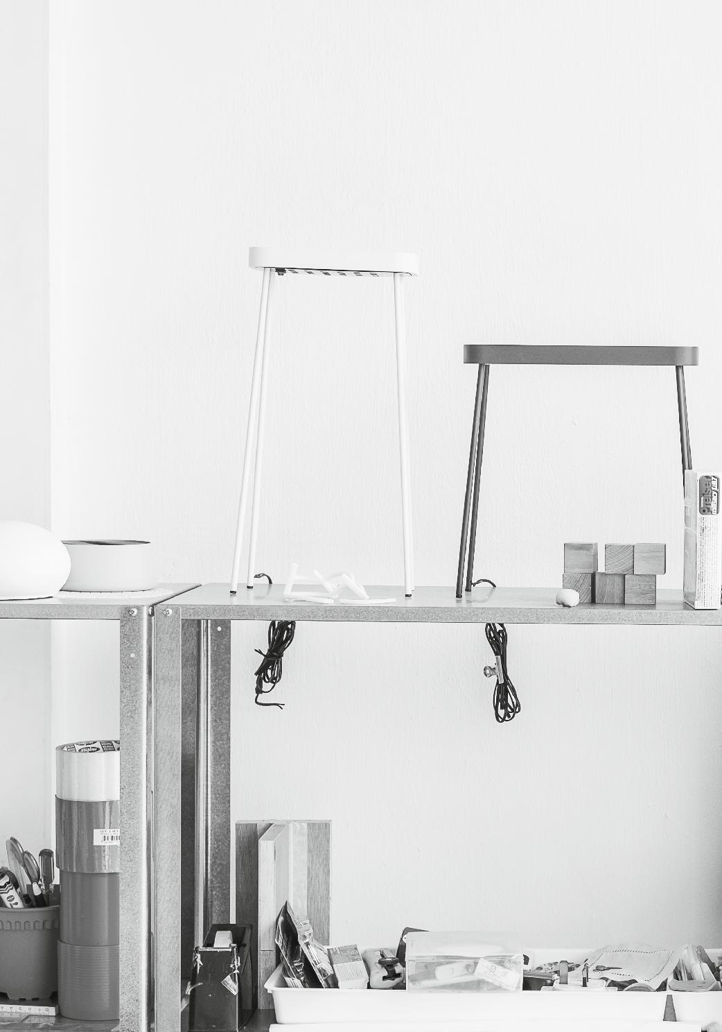
studio juju | design duo – page #71
Mallorcan meditation
Australian architect, Alex PoPov, has had a long-standing love affair with Mallorca where, in the late 1970s, he built a much-published house for himself. PAul McGillick spoke to him about his most recent house there and why MAllorcA matters.

issue #18 habitusliving.com
Tex T Paul McGillick | PhoToGra Phy l ars r anek
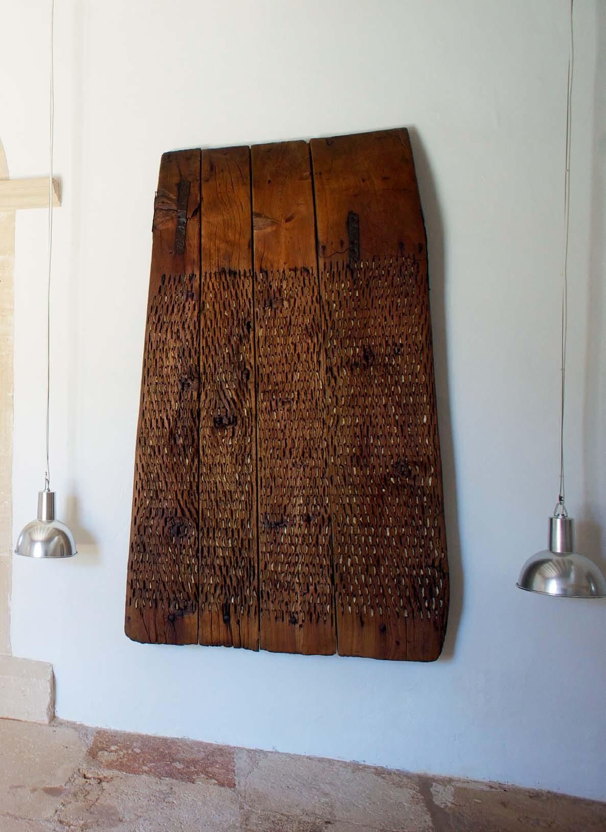
# 57 2 . portrait
It is just this rock-hard island,” says Alex Popov. But it is precisely that hardness and the simplicity of village life that attracts him to the island which he has been visiting since 1968.
Popov later became a regular visitor to Mallorca where his father-in-law at the time, Jørn Utzon, built his own famous house. Popov studied in Denmark and subsequently worked for Utzon and Henning Larsen. He also taught at the Danish Academy and it was during the Academy holidays that he would head for the Mediterranean island.
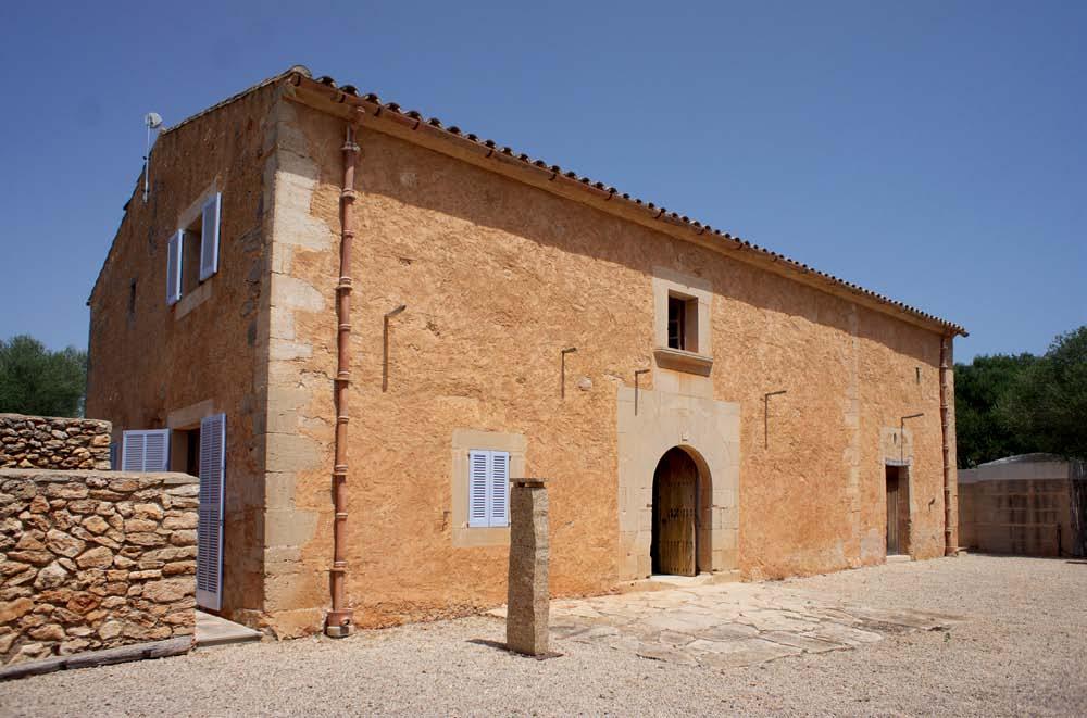
For many people, Mallorca is associated with ostentatious tourism and the large expatriate German and English populations. That side of the island, says Alex, is very mountainous and ”full of lemon trees, oranges and Fir trees, whereas ours is almonds and olives”. Clearly, he prefers his part of the island. “I feel very comfortable,” he says, “because life seems to revolve around the most essential things and the elements of existence.”
In 1977, he found his own block of land there in an almond plantation and built his first house which featured a series of walls around
the trees. Alex stopped going to Mallorca from 1984 to 1992 because he had moved back to Australia and was busy establishing his practice. Eventually, though, he started going regularly again and, in the late 1990s, his exwife tipped him off about a ruin lying in a field. It was a house dating from 1763. “It had no roof,” he recalls, “but had a wonderful façade –and no windows.”
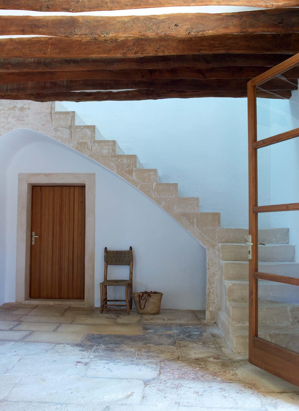
The place was completely overgrown and inhabited by pigs and a donkey. The dirt had built up inside the shell to be about one metre higher than the outside. That had to be brought down and the garden cleaned out with the trees re-planted. Much of the old vegetation, he says is still there, but now on the periphery. So, the delightful terrace Alex and his wife, Alison, now enjoy continues directly on from the living room.
“Then I built a stone wall like they did in the old days,” says Alex, “right around the whole property. So, it was a building that sat inside a high wall. It is completely surrounded by gravel, so the old stone sits on this gravel base. The house is really grounded and defined by the earth-coloured walls which sit in the gravel. It is a little like a French manor house – you see the
issue #18 habitusliving.com
prevI
to HAy loft As seen fRo M
new be AM
“
ous | Resto Red entRAnce HAll (fRo M 1763) And oblique view to living Roo M AB ove | soutH elevAtion of Resto Red 1763 House, witH entRAnce to old stAble visible on RigHt. tHe wAlls of tHe oRiginAl House weRe RAised 1.2 MetRes to AccoMModAte bedRooM s on tHe top flooR opposITe | RestoRed stAiRcAse oRiginAlly
entRy, witH
s instAlled.
# 59 2 . portrait
I feel very comfortable, because life seems to revolve around the most essential things and the elements of existence.
alex | architect & resident
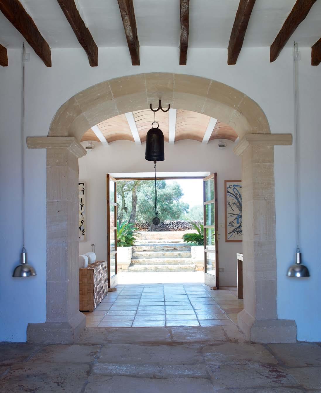
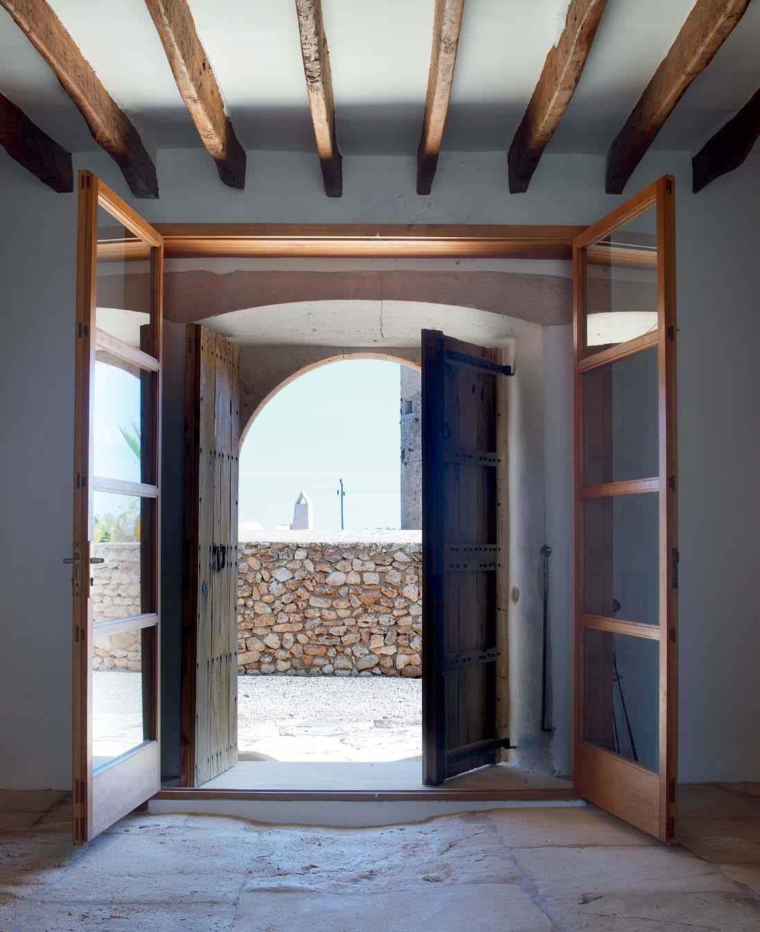
issue #18 habitusliving.com AB ove | A xiAl view diRectly fRoM tHe noRtH to tHe soutH to tHe entRy to teRRAce, gARden And pool. opposITe | oAk entRy dooRs And new gl Ass entRy. tHe new exteRioR wAll And pARt of tHe oRiginAl gRAin toweR is visible.
2 . portrait # 61
issue #18 habitusliving.com AB ove | new
living,
ITe
T |
R
A
His son Mik A oppos ITe rI ghT | living Roo M witH
section view tAken fRoM void spAce looking bAck to
dining And kitcHen. visible in tHe RigHt HAnd coRneR is tHe dRinking well of tHe old stAble, supplied by wAteR fRo M tH e Roof pipe. oppos
lef
top floo
study ARe
witH new RAised Roof. tAble bencH by Alex, cARpet by H is dAug HteR nA jA , d RAwings by
section of void.
mass of gravel and stone as you arrive. There are smaller existing courtyards for the animals directly outside the house where Naja [Alex’s London-based designer/artist daughter] has placed some sculptures.”
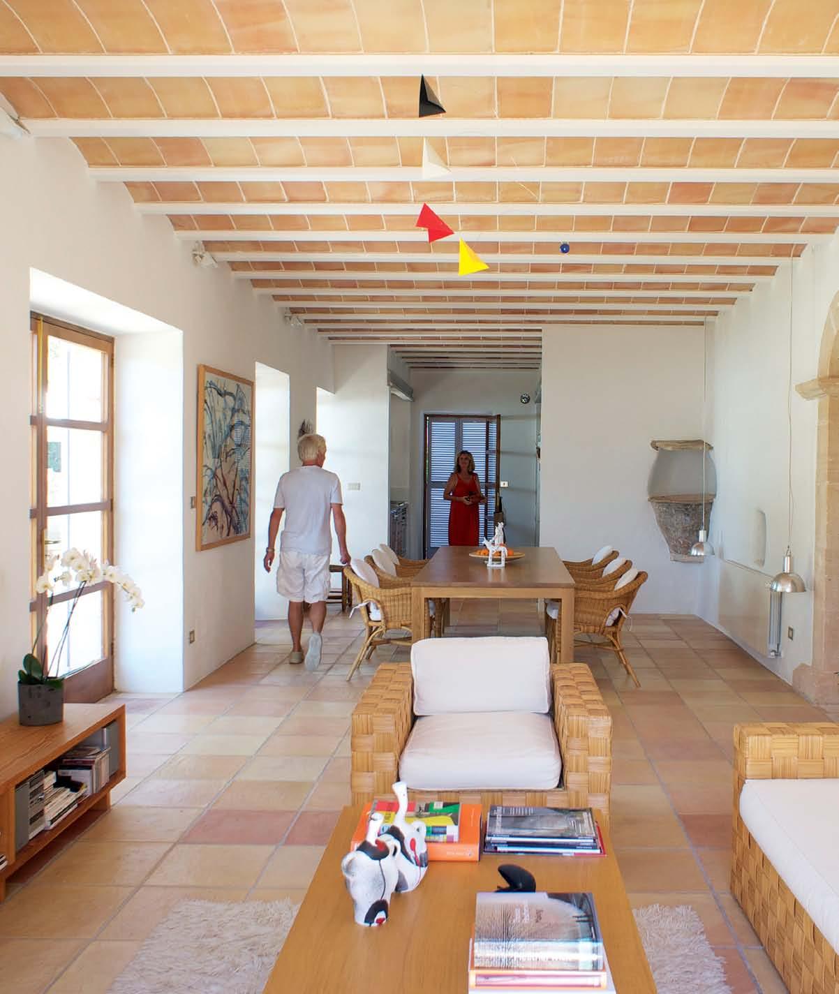
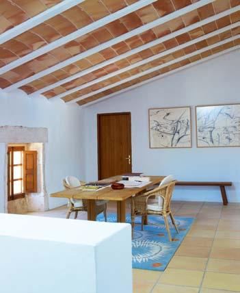
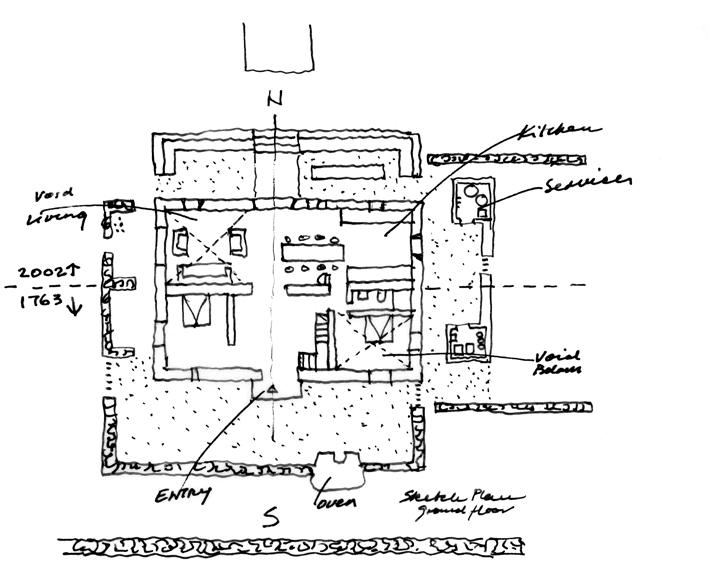
Inside, the house is completely open plan –essentially two double-height spaces with the entry in the middle. To avoid compromising the open plan, Alex built two small, separate 3x3 metre pavilions joined by an eight metre sandstone wall to accommodate services like the washing machine and water heater.
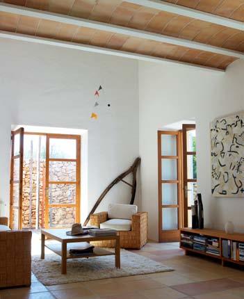

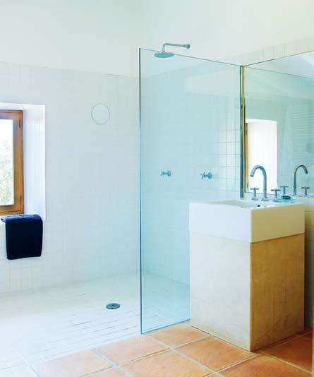
So, what was a ruin now has a second life. And, by using traditional building techniques and local materials – such as the hand-made clay roof tiles, the floor tiles and the locally quarried sandstone – the house retains its historical links while still providing contemporary amenity.
These days, Alex is able to spend up to three months a year at the house. “I can make my own culture there,” he says. “I can find my own raison in terms of being able to think clearly without being obscured by the facts and
2 . portrait # 63
I can find my own raison in terms of being able to think clearly…
alex | architect & resident
information that one is normally bombarded with. It just deals with the primary objectives –eat simply, partake of friendship in a dignified, ordinary existence, but in a very historic town.”
Alex does not use the term, but what he is talking about essentially is ‘slow’. He has joined an enlightened group of creative people around the world who reject the idea that life is relentless work. Instead, they take 2–3 months off every year, not just to re-connect with themselves and the essential issues of life, but also to refresh themselves creatively. It is about slowing life down so that one starts to again hear, see, smell, taste and feel things.
As Alex says, “the villagers just continue on with their timeless existence”.
He adds that “honesty and labour are so fundamental to their existence. So, you have to be good at what you do in order to survive in that culture. There is no room for flamboyant, eccentric behaviour because they couldn't afford it, they couldn't survive the droughts and difficult harvests. They are also very engaged in one another’s lives – everybody looks after the next person.”
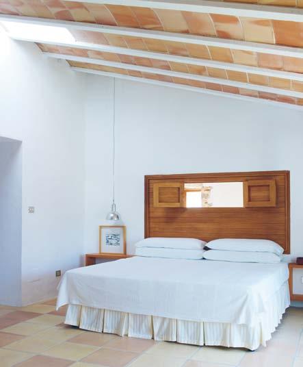
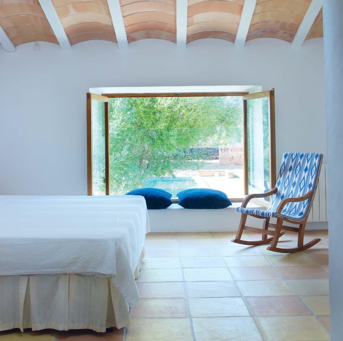
issue #18 habitusliving.com AB ove lef T | MAin bedRooM witH opening to void spAce Above bed He Ad. AB ove rIghT | sketcH pl An. Below | ensuite. opposITe | view on enteRing MAin bedRooM tHRougH to gARden And pool beyond. gl Ass bAlustRAde witH invisible fixing.
It is about slowing life down so that one starts to again hear, see, smell, taste and feel things.
2 . portrait # 65
alex | architect & resident
issue #18 habitusliving.com
...grow your own vegetables, eat simply, partake of friendship in a dignified, ordinary existence but in a very historic town.
alex | architect & resident
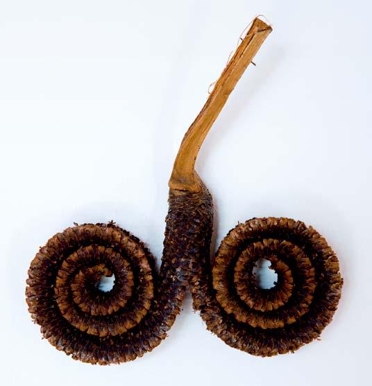
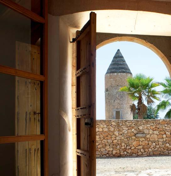
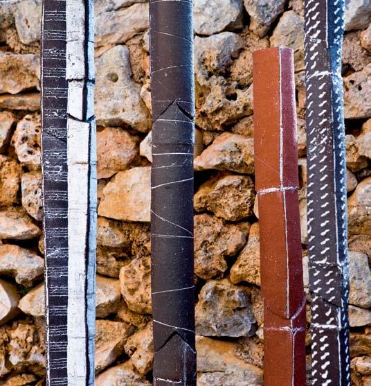
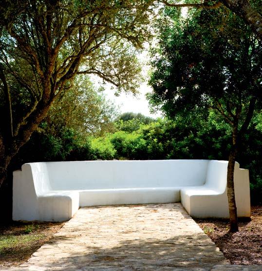
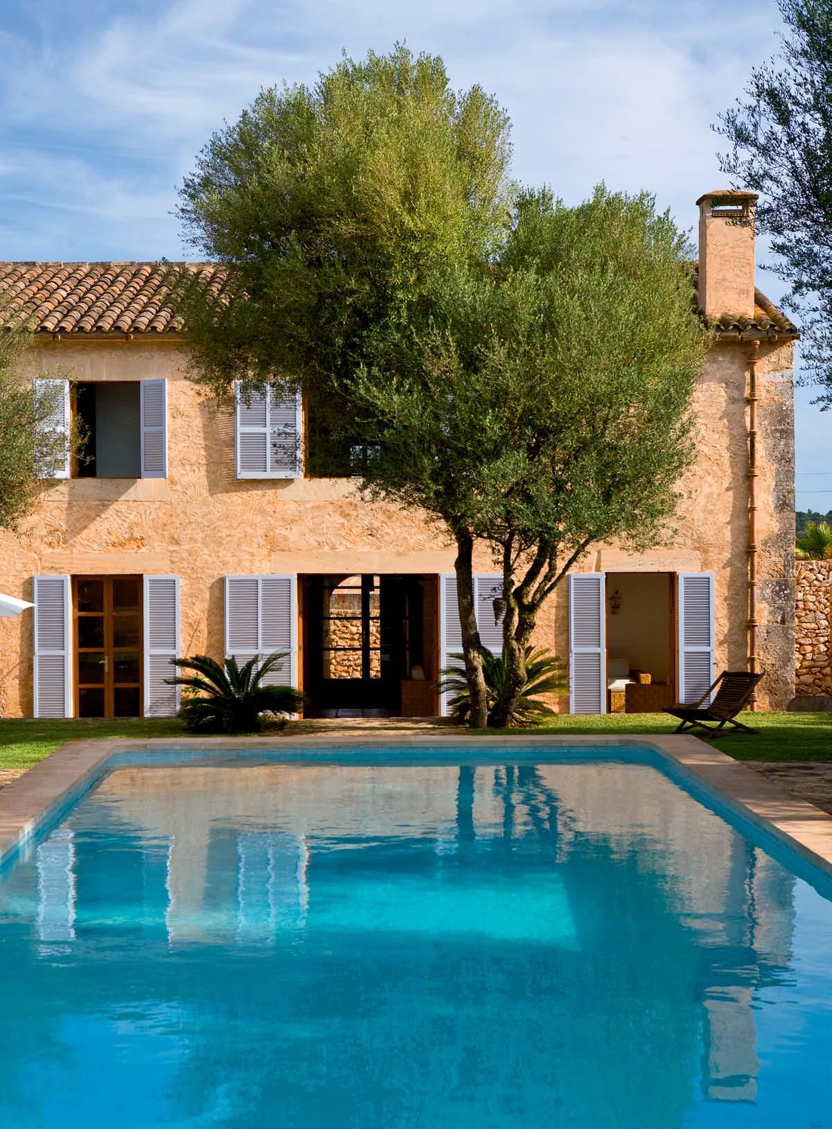
2 . portrait # 67 oppos ITe | n o RtHeRn fAçAde of Rebuilt building, teRRAce, pool. AB ove lef T | wAll decoRAtion. AB ove rIghT | o utdooR bencH in l AndscApe B elow lef T | view to old g RAin toweR , fRo M fRont doo Rs. B elow rI ghT | ceRAMic sculptu Res by Alex’s dAug HteR nA jA
It is, he says, conducive to a reflective life. “ When you walk into a village like that,” he continues, “ you need to have a sense of respect for the history and dignity of the people. The Spaniards have this nice phrase, un hombre bien educado, which doesn’t mean well-educated – it means he knows the way of the world, he is educated in his manners and behaviour”.
So, Alex Popov has found his own way into the slow movement by way of more than forty years of engagement with this island off the coast of Spain. But he has avoided Mallorca’s notorious high-life and headed for that part of the island which remains powerfully connected to thousands of years of tradition.
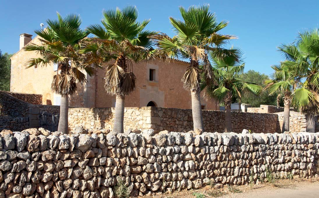
Finding the house, cleaning the site up, designing, building and maintaining it (the vegetation continually threatens to take over again), is all part of the ‘slow’ quest – to slow life down in order to re-awaken our awareness of who we are and how we live in this world. It takes time. It can be found in the silent tangibility of life lived at its simplest.
“It’s a place for contemplation,” says Alex. “But, at the same time, it’s a place that demands that one is productive.”
issue #18 habitusliving.com
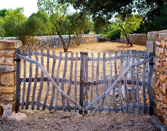
AB ove | view of tHe House witH new suRRounding wAlls And tHe old wAll in fRont. Below | new gAte copied fRoM oRiginAls seen in tHe locAl ARe A looking towARd AlMond tRees.
habitusliving.com/issue18/alexpopov
A
of art Made in Australia by Condari Pty Ltd in Ringwood 3134 Tel: +61 3 9482 7088 | www.qasair.com.au | www.condari.com.au
piece
The Region’s best, anywhere in the world

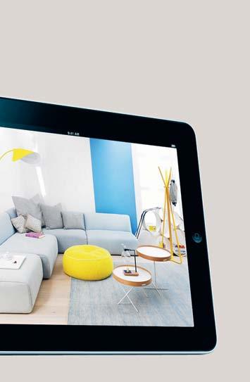
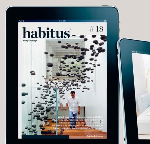
With the Habitus App, you can take the entire Habitus library with you wherever you go. Translating the magazine experience into digital form, it’s an invaluable tool and a convenient, mobile source of inspiration for the Design Hunter.
Download from the App Store
Be inspired wherever you go

APP FOR IPAD
curious approach
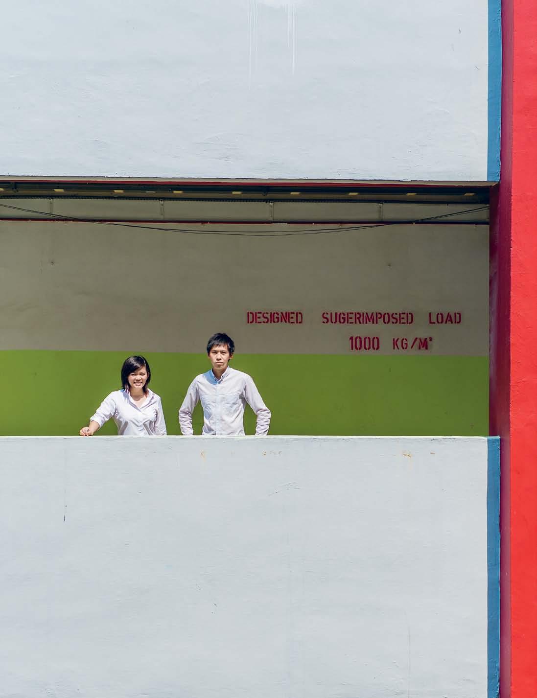
singapore is now an international hotspot for young creatives, providing myriad opportunities for new design stars to emerge. But there's no ego with studio juju, as Mandi keighran found out when she met them in Milan this year.
 text Mandi Keighran | photography caleb M ing
# 71 2 . portrait
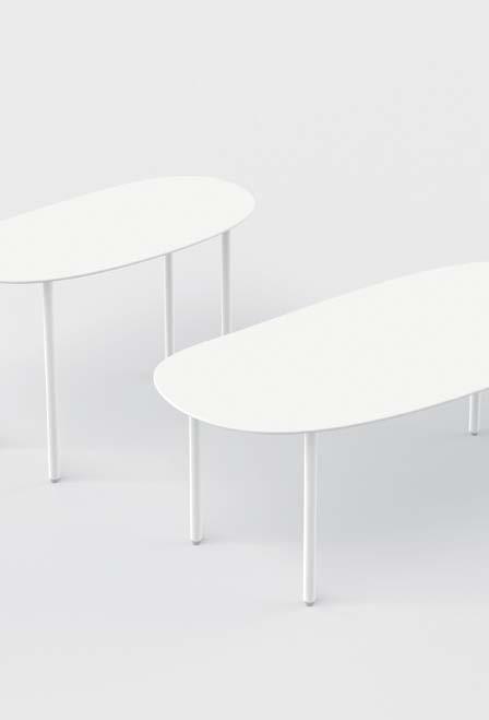
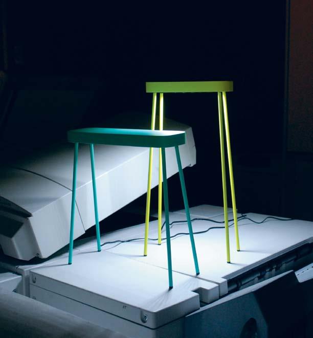
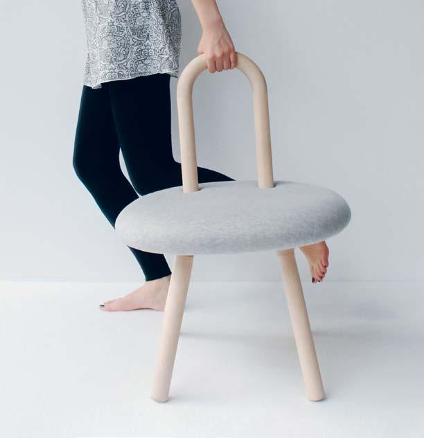
previous | Priscilla lui and TiMo Wong. AB ove left | deTail of The crane l aMP AB ove right | The forM of The BaMB i chair inviTes engageMenT B elow left | The aT TaBle laMP B elow right | r aBB iT and The TorToise coffee TaBles for living divani are insPired By fluid MoveMenTs. issue #18 habitusliving.com
Amongst the many egos that seem to rule the world of design, the unassuming approach of Singapore designers Timo Wong and Priscilla Lui of Studio Juju is a welcome change. Softly yet intently spoken, the pair talks about their approach being an intuitive reaction to human behaviours.
“When we look at projects,” says Priscilla, “we see human experience. We try to think ‘What is the experience of using this?’ and ‘What kind of experience do we want to introduce?’ It’s the experiential quality of our approach.”
The pair met at the National University of Singapore in 2006, where they were engaged in developing the Design Incubation Centre. Following this, they worked together to develop the Objects around the Tablescape series for d.lab, a collection of archetypal products with a strong focus on the emotive quality of materials. They describe the way they collaborated on the project as having synergy, and the decision to found Studio Juju in 2009 was a natural progression. Following four years and much success, Studio Juju remains simply Timo and Priscilla, with the occasional addition of interns and contracted designers.
If one thing can be said of Singapore, where the pair lives and works, it is that it is a place of constant change. One only need look to the recently opened Gardens by the Bay. Where ocean once lapped the island state’s shores less than a decade ago, there now
stands 250 acres of reclaimed land on which futuristic gardens populated by ‘supertrees’ support the government’s quest to transform Singapore from the ‘Garden City’ to a ‘City in a Garden’. “I don’t know exactly how this changing landscape has shaped our approach,” says Priscilla. “I think we always try to be fresh and different.”
With wide-eyed curiosity, Timo and Priscilla set out to design objects that will liberate users from the rigidity so often imposed by the spaces in which we live. And, each project is sensitive to human experiences and interaction with the spaces around them. The studio’s responsive approach to projects translates into an intelligible and honest design language, whose perceived simplicity belies the complex and engaging relationships these objects have with their intended users.
“There is a certain child-likeness to our work,” says Timo. “Not because we want it to look childish, but as a result of being a little bit naïve in the way we look at design. It’s quite liberating to feel like that.”
Rabbit and the Tortoise is a recent example of Studio Juju’s work that showcases this ‘naïve’ approach. The collection of tables of various shapes and heights was first shown at Milan’s Salone Satellite in 2009 and was produced by Living Divani this year. “We were thinking of the movement in the living space, and how it is always very fluid,” says Priscilla. “This movement is just like the movement of waters past land… human movements are so fluid.”
“There is a certain child-likeness to our work. Not because we want it to look childish, but as a result of being a little bit naïve in the way we look at design. It’s quite liberating…”
2 . portrait # 73
Timo | designer
The organic forms of the tables, which encourage a constantly changing space, are like a child’s interpretation of animal forms. And, the way a child draws freely can certainly be compared to the pair’s design process, which involves the intuitive generation of prototypes and allows imagination to triumph over reason.

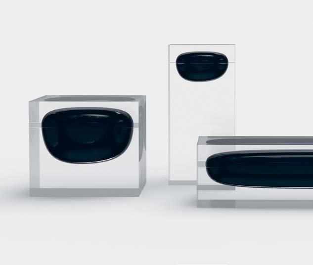
This reaction to inherent human behaviours is recurring in Studio Juju’s work. The personal ritual of dressing up was the inspiration behind Luxury Towers, a collection of glass objects for new Singapore brand K%. Each ‘tower’ has been designed to hold a particular piece – a ring, a watch, a necklace – encased in a bubble of black glass, seemingly floating above the table’s surface. Likewise, Crane Lamp, which offers a 90-degree swivel range, is a response to the various ways humans interact with light.
Given Studio Juju’s fascination with human experience, it is perhaps not surprising that much of their work seems imbued with anthropomorphic qualities. Their Bambi chair, for example, recalls the wide-eyed innocence of the Disney character of the same name. The honest materiality and rounded form of the Maple backrest and legs invite touch and engagement with the chair – another hallmark of the studio’s work.
AB ove | WoBB le and MushrooM is a collecTion of TiMBer conTainers. issue #18 habitusliving.com
The honest materiality and rounded form… invite touch and engagement –another hallmark of the studio’s work.





Wobble and Mushrooms is a collection of timber receptacles for small objects, which do just this. The Wobble bowls are not static, but move ever so slightly as you reach into them, giving users an active awareness of the object. Similarly, the Mushroom ‘caps’ can be inverted and used as dishes that rock on gently curved bases as if a life force is contained within them.
What does the future hold for Studio Juju? Perhaps the question should be ‘How are Studio Juju defining the future?’ In 2011, Timo and Priscilla were selected by Design Miami/ as Designers of the Future, an award presented to designers who exemplify new directions in design culture and represent conceptually vanguard approaches. As Studio Juju continue their work with design education – they were also commissioned to create a design thinking workshop for Raffles’ 5th year design students – perhaps their lighthearted and reactive approach to design will become a more familiar one. “For now,” says Timo, “we are not sure what will come.” It is an unassuming statement in complete harmony with the studio’s approach.

AB ove | Priscilla and TiMo in Their singaP ore sTudio. B elow | luxury ToWers is a collecTion of glass conTainers for ne W singaP ore B rand K%.
habitusliving.com/issue18/studiojuju issue #18 habitusliving.com
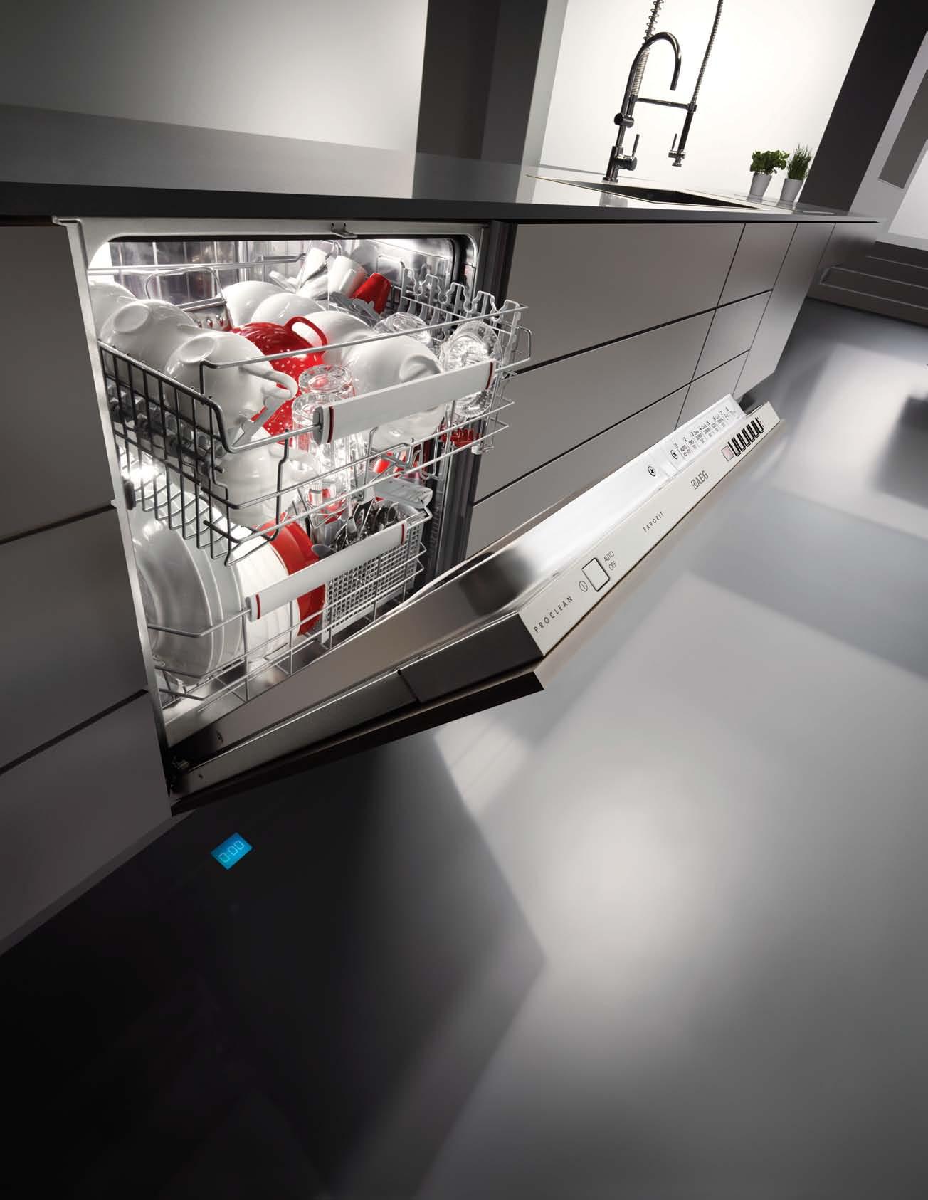
AND LARGEST LOAD SPACE MEANS PERFECT RESULTS. OUR SUPERIOR CLEANING
The unique ProCleanTM cleaning system is both powerful and precise. The XXL load space means you are free to use any size or shape of pot, pan or utensil you choose. Because you don’t have to compromise. To experience the complete Neue Kollektion range go to www.aeg.com/au



Pathways to design
The visual arts, industrial design and dance collide in this Melbourne house. Stephen Crafti meets Si M on lloyd and libby d e M pSter to explore how their respective artistic personalities find domestic expression.
Tex T
Ti | phoTography Jame S geer 2 . portrait # 79
STephen Craf
issue #18 habitusliving.com
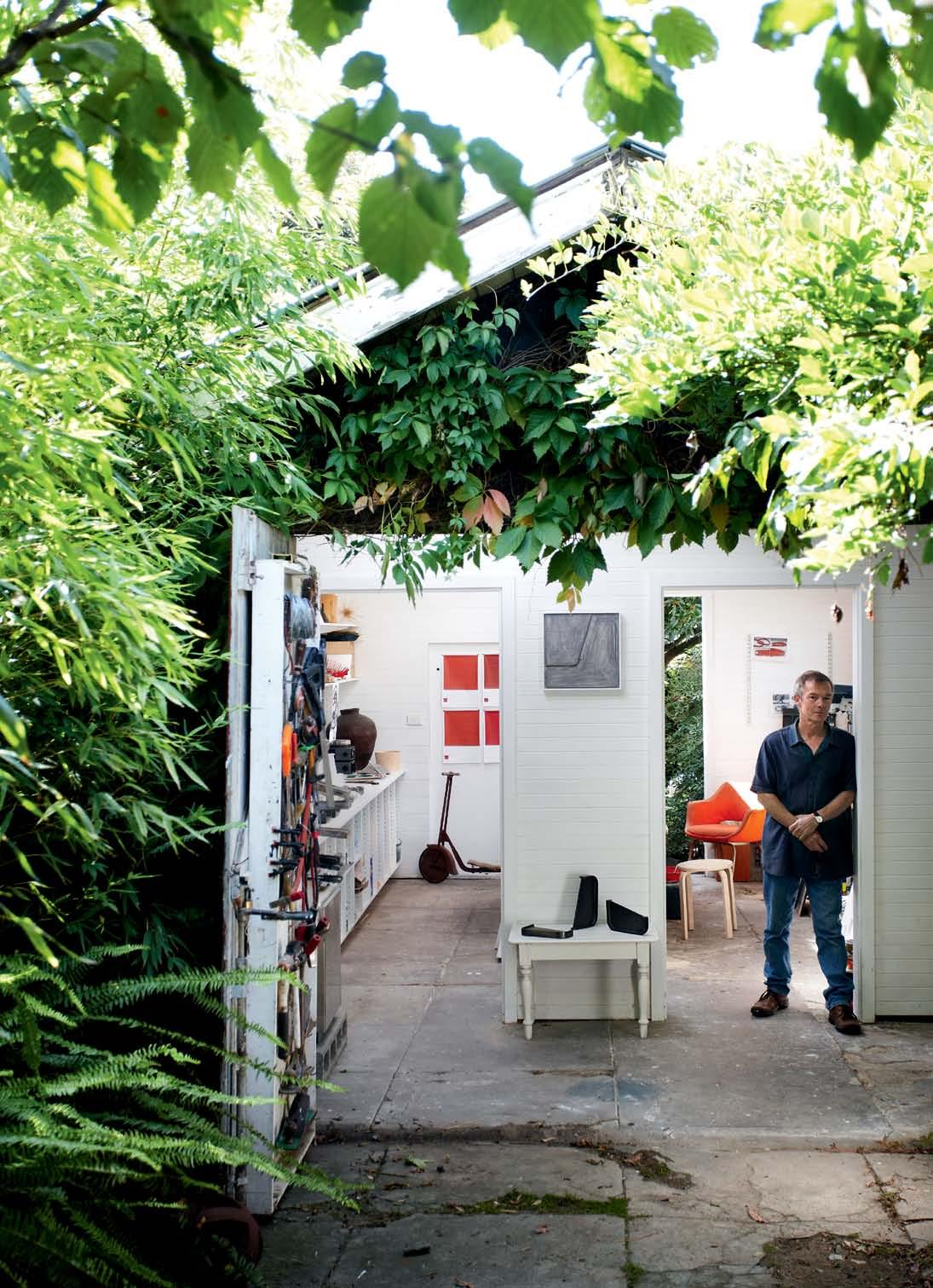
Simon Lloyd and Libby Dempster live with their daughter, Georgia, and Pepper, their Maltese Terrier. Simon, an artist and industrial designer, also has a studio in the back garden of their home in Ormond, Melbourne. Rustic, and surrounded by vines, their Californian bungalow is a work in progress. “It’s quite an austere house,” says Libby, who lectures in Performance Studies at Victoria University. “We bought it twelve years ago more for the location, close to the Montessori School.”
Libby met Simon in Darlington, Devon. Simon moves comfortably through all the visual arts, including painting – his most recent exhibition at the Anita Traverso Gallery in Richmond, Melbourne, was in December 2011. In the early 1980s, he was studying threedimensional design and Libby was involved in the Dance Umbrella festival in London, where the duo collaborated. “Simon didn’t really design the stage set,” says Libby. “It was more a series of objects, in timber, rope and a yacht sail.”
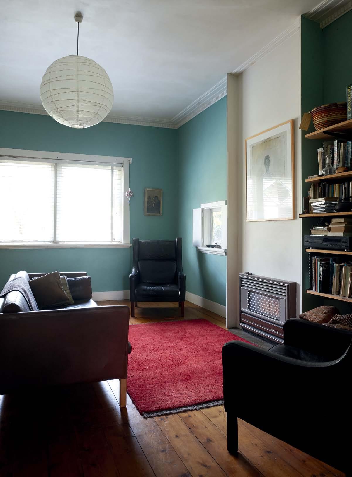
Fast-forward three decades and their house is filled with objects. Some reflect Simon's interests in simple household items. Ceramic plates gather on shelves, together with cups, utensils and even old watches. Some of these items are regarded with pleasure, others are questioned by Libby as to their worth from a design perspective. “Look at these knifes and forks [by Enzo Mari, a leading Italian designer]. They look beautiful, but I’m not mad on how they feel in your hand,” she says. Nevertheless, she does appreciate Simon’s fine sensibility. Two leather arm chairs in the lounge by Danish designer, Borge Morgansen, and bought from Dean Angelucci, are cherished, as is a designer chair found on the nature strip. Others, such as a Depression-era chest is Libby’s find, from out the back of a secondhand store.
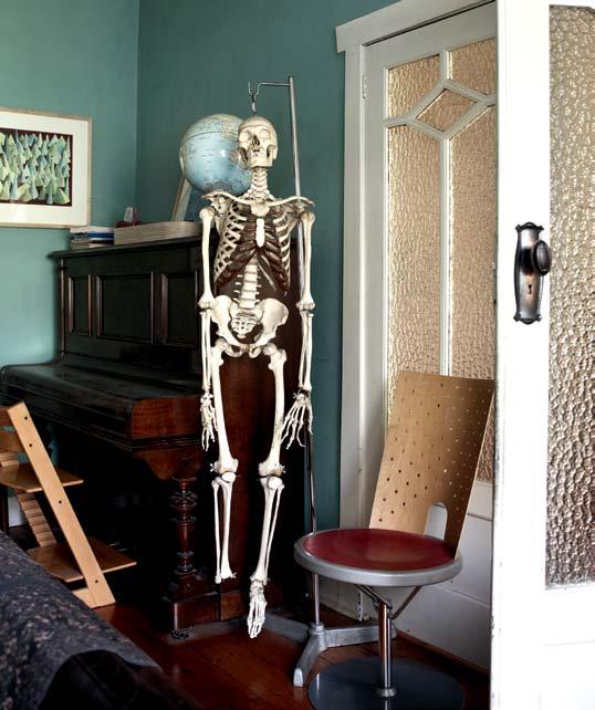
The one-footed skeleton in the lounge is a constant reminder of her work with the body and movement at Victoria University. Named ‘Fred’ by daughter Georgia, Libby thinks he needs to be united with his other foot, presently in her office.
OPPOSItE | The main Living room i S fiLLed wiTh bookSheLveS
| The informaL
enjoyS morning LighT The Tab Le i S of Ten covered wiTh S ke TcheS
add S a quirky
To The
2 . portrait # 81
OPENING PAGE | Simon LLoyd in hiS STudio, a converTed garage in hi S back garden. covered wiTh ivy, The STudio iS priSTine wiTh whiTe waLLS and concreTe fLoorS
and feaTureS high-back daniSh LeaTher armchairS ABOVE
meaL area
and modeLS by Simon and g eorgia. BELOW | The ‘famiLy S keLe Ton’
feaTure
formaL Lounge.
issue #18 habitusliving.com
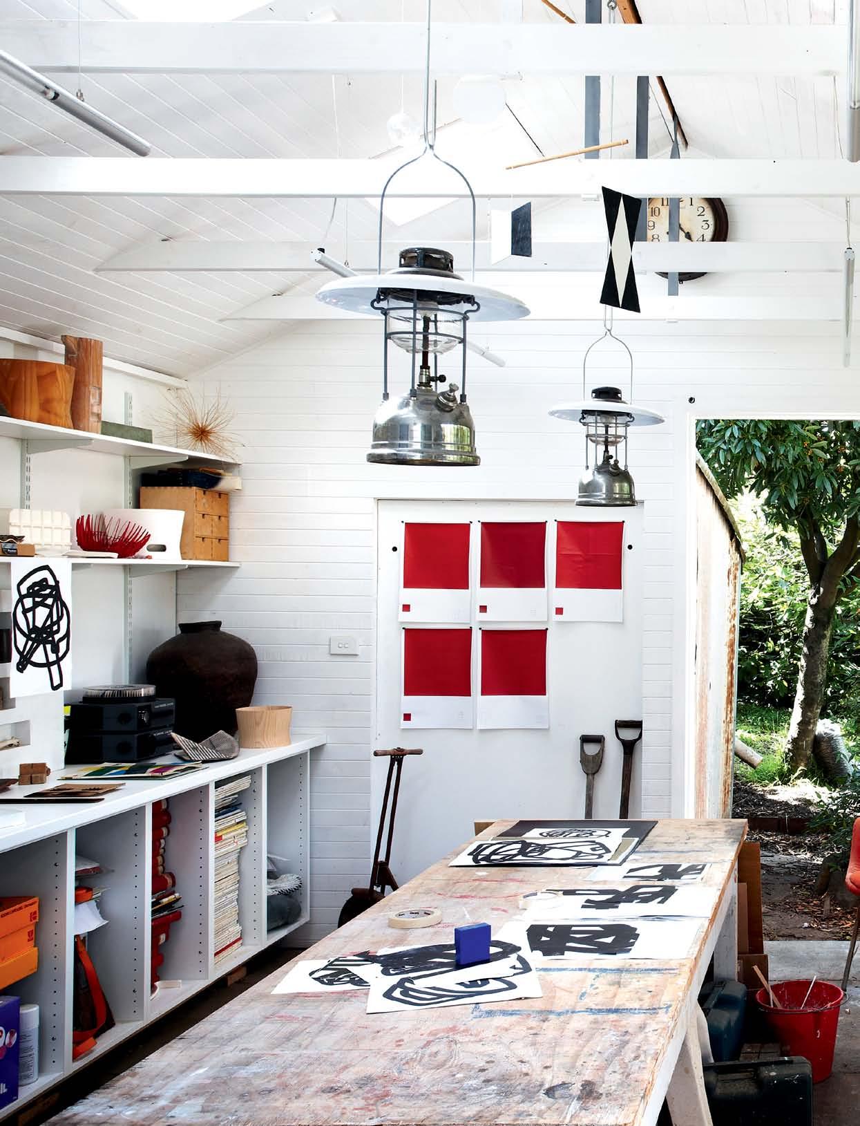
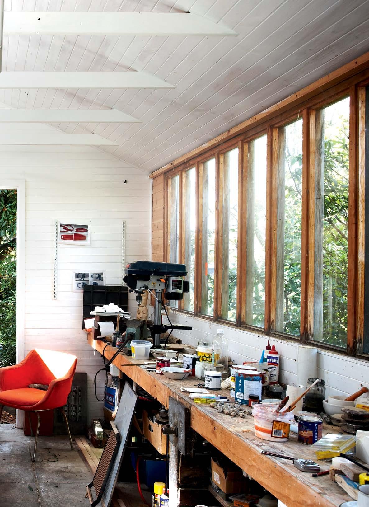
Simon’s studio, a shed in the back garden, overgrown with vines, is also a perfect backdrop for his ceramics, paintings and objects.
2 . portrait # 83
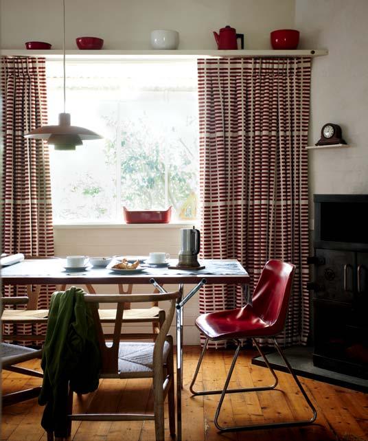
Georgia, like her father, already showing signs of great talent, has work strewn across the kitchen table. “The spaces are fairly blurred. We tend to move around the house depending on the light. The morning light is particularly beautiful in the kitchen,” says Libby, who gravitates towards the living room in the latter part of the day to follow the sun.
Simon and Libby have slowly re-worked the house over the last twelve years. One of the walls separating the kitchen and dining area has been removed while a new alcove with a concealed skylight provides filtered northern light into the kitchen. Simon did most of the work, himself, but he was guided by Libby’s ideas and Christopher Alexander’s book, Pattern Landscape, which explores the importance of the path of light. “We’re always conscious of the outdoors, wherever we happened to be,” says Libby. The homegrown fruit ripening on kitchen benches is also testimony to the family’s strong connection to nature. “Libby and I are drawn to similar things, those that have a sense of honesty, with little pretence,” says Simon.
One can almost see Simon’s precise way of thinking on show, with simple everyday objects displayed like gallery exhibits
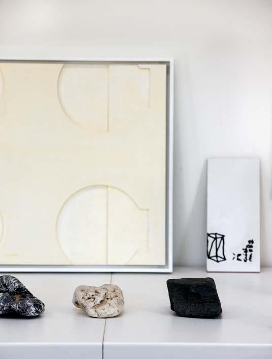
PrEVIO uS | LLoyd’ S STudio incLudeS SimpLe objecTS Such aS rockS found. ABOVE LEft ANd rIGht | LLoyd’ S STudio incLudeS SimpLe objecTS Such aS rockS found in The garden, diSpL ayed aS fine arT workS however, on The fLip Side, iT S aLSo a working STudio where con STanT experimenTaTion TakeS pL ace. arT work on Lef T iS 'reLief painTing'.
issue #18 habitusliving.com
Antumbra is coming...
A new direction in user interface design for your lighting and building control.
Launch date:
November 2012
www.philips.com/dynalite

They compare the home to a Finnish summer house. Apart from the Danish furniture, it’s also filled with wonderful textures, many of which come from the produce grown outside. However, Simon’s bowls, vases and objects create considerably more depth to the interior, with some of Georgia’s designs recently finding space on the open shelves.
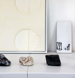
Simon’s studio, a shed in the back garden, overgrown with vines, is also a perfect backdrop for his ceramics, paintings and objects. And although the exterior is weathered timber, worn by age, the interior is pristine, with white-painted tongue and groove timber walls, illuminated by generous skylights. One can almost see Simon’s precise way of thinking on show, with simple everyday objects, such as rocks, displayed like gallery exhibits.
While Simon and Libby haven’t collaborated on a performance in recent times, both bring their own talents and flair to the living environment. Libby, for example, sees space with people moving through it, while Simon is often drawn to the materiality of a space. “Libby tends to go back to an idea, maybe rework a concept,” says Simon. “A space needs to be functional, not just aesthetic,” adds Libby.
Irrespective of how a design decision is reached, it is clear that this house is home to three highly creative people, all conscious of the simpler and often the most important things in life.
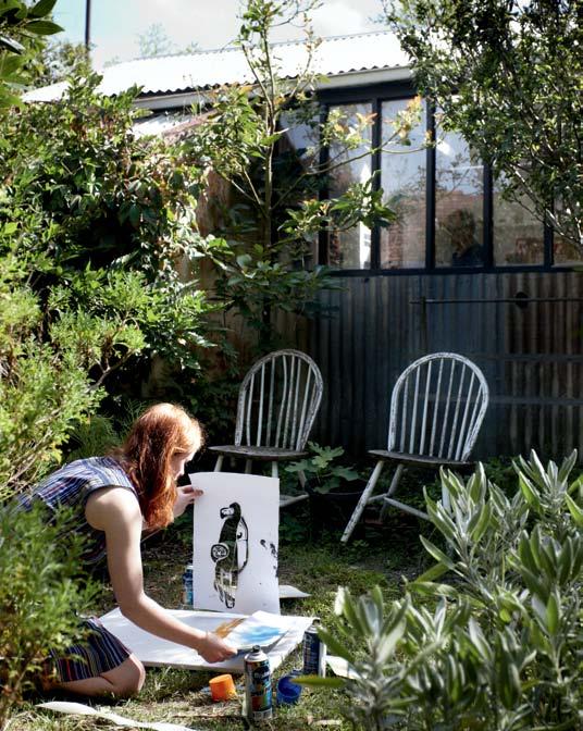
ABOVE | g eorgia u S eS The back garden a S anoTher room, wiTh
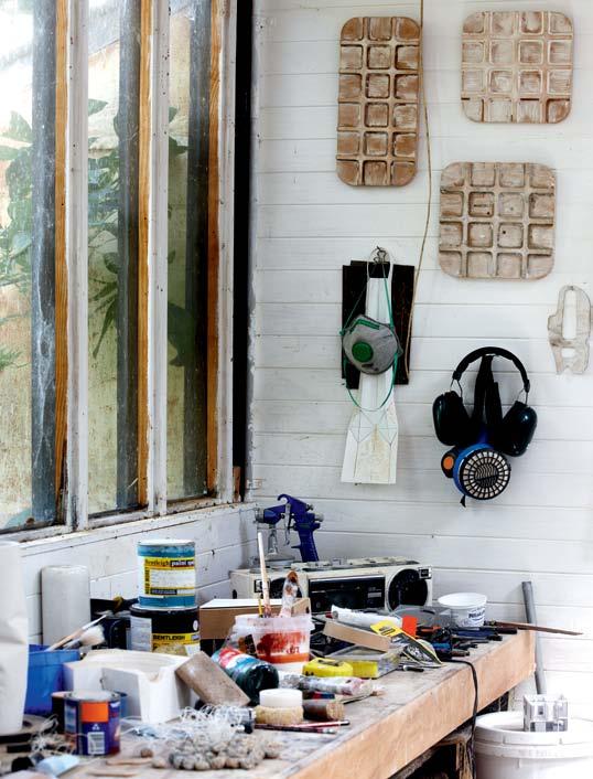
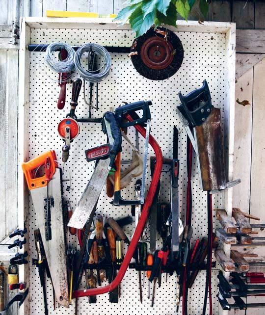
BELOW | Too LS of The Trade are arranged on a peg
furniT ure of Ten Taken from in S ide, a S weLL a S S hee TS of paper.
board.
Simon Lloyd is represented by Anita Traverso Gallery | anitatraversogallery.com.au habitusliving.com/issue18/simonlloyd
issue #18 habitusliving.com
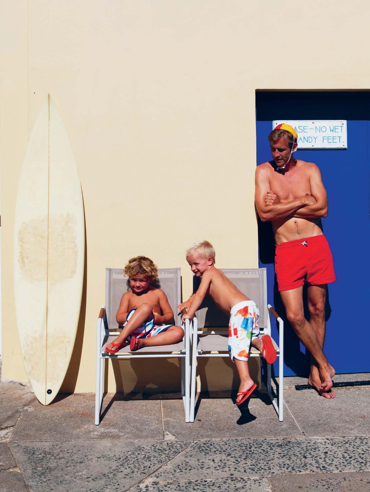
HARBOUR OUTDOOR AVAILABLE AT SELECTED STORES. PH:+ 612 9666 5972 E: info@harbouroutdoor.com www.harbouroutdoor.com ®
AUSTRALIAN LIFESTYLE .
THE GREAT
waterfordcrystal.com.au 1300 852 022 live a crystal life.
Subodh Gupta
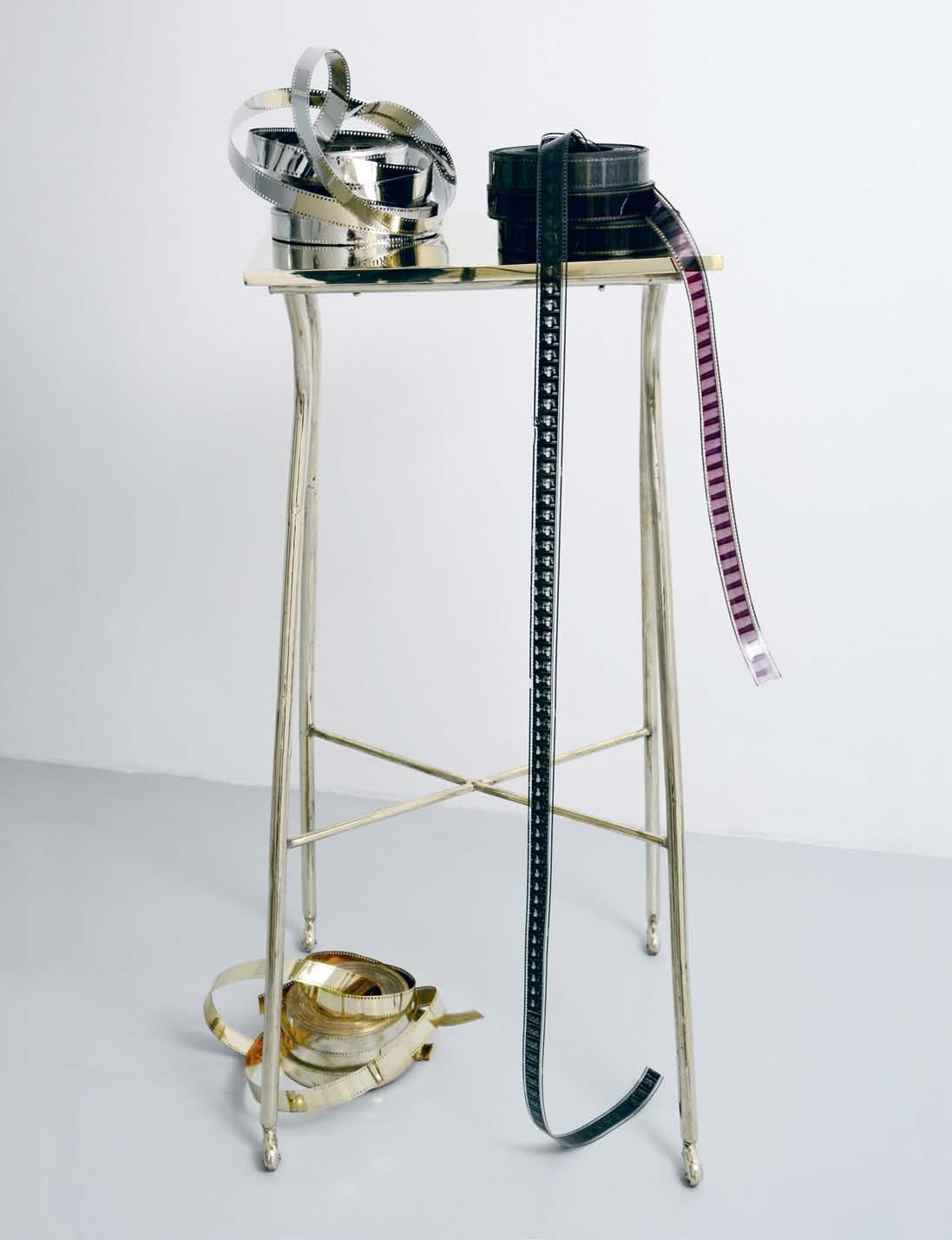
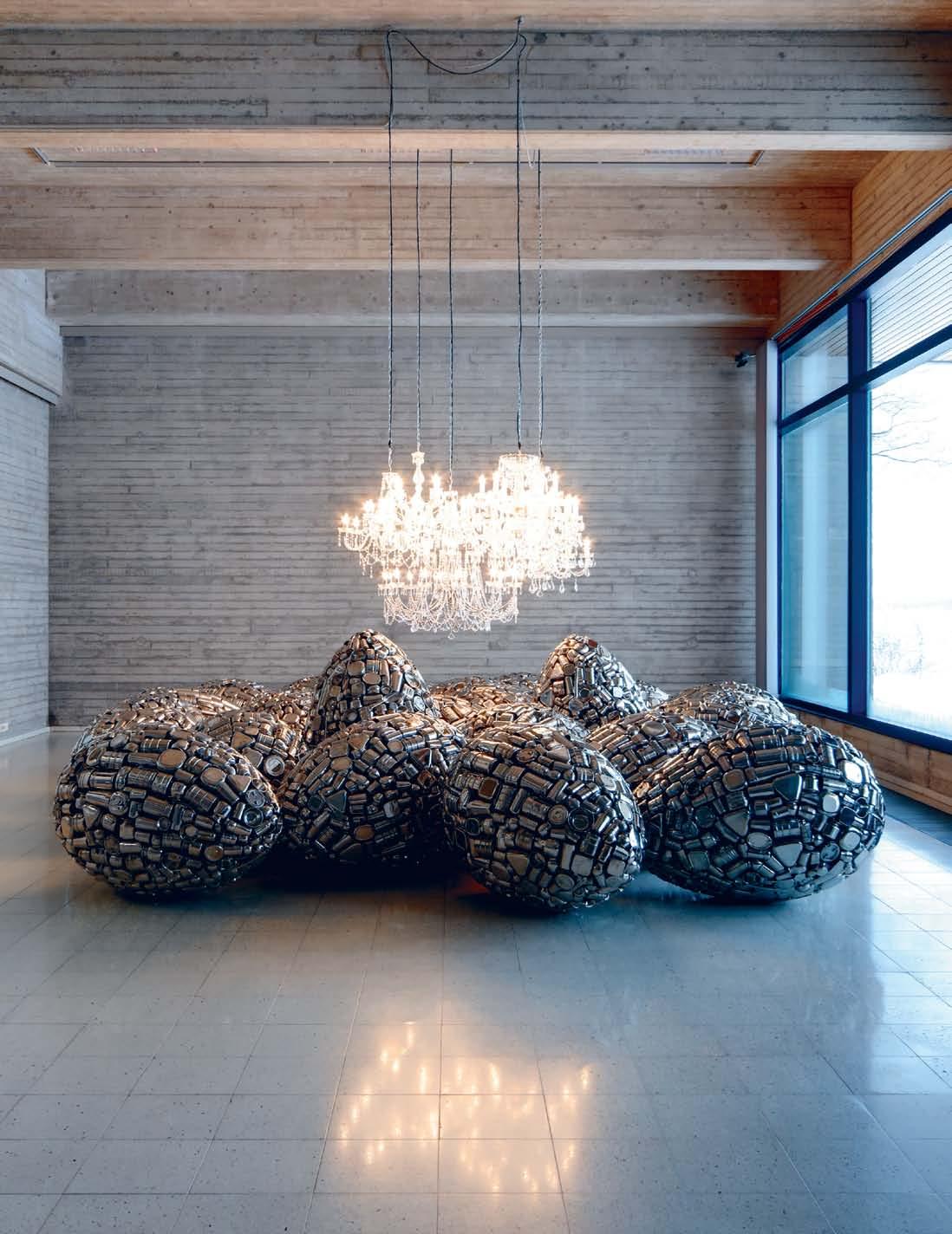
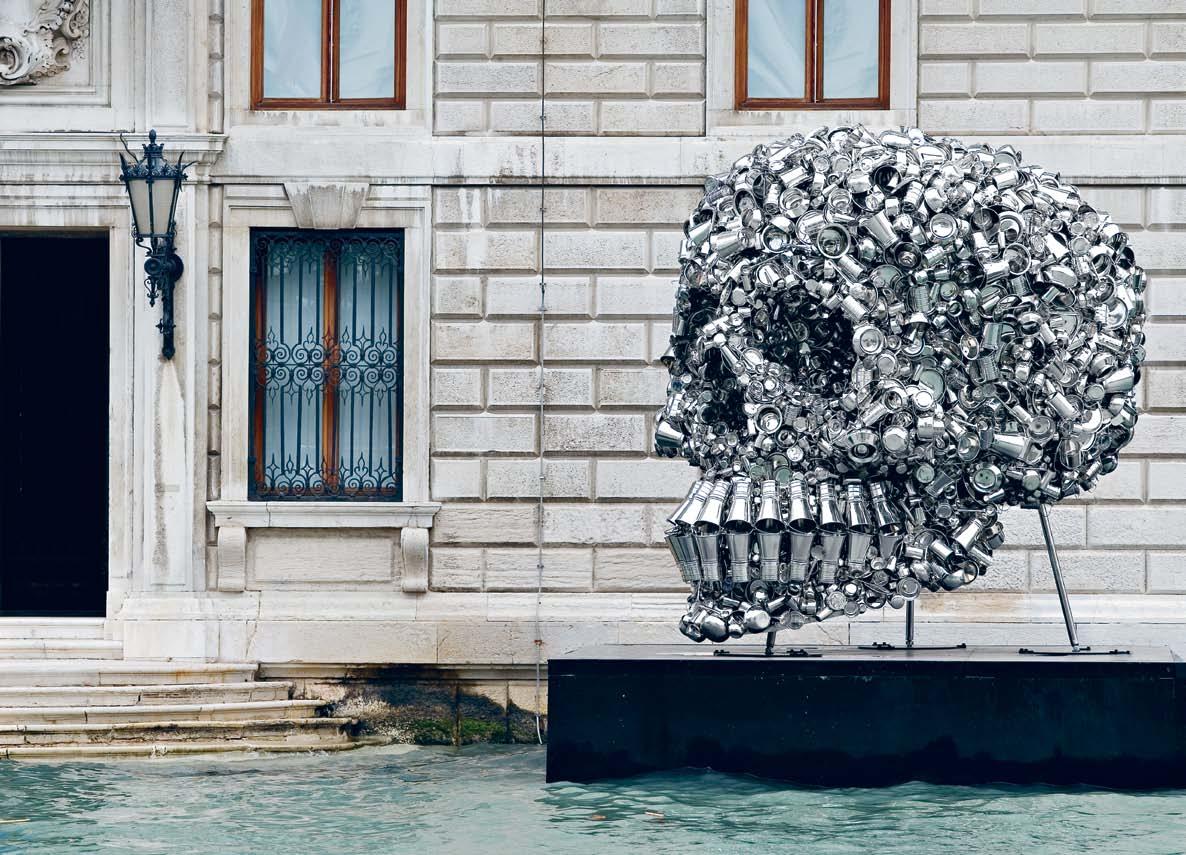
Trained as a painter, NEW DELHI-based SUBODH GUPTA also works across sculpture, installation, photography, performance and video, using everyday objects to comment on economic transformation in a beautiful and thought-provoking way.

# 89 2 . portrait

previous | Spill, 2007, STainleSS STeel and STainleSS STeel uTenSilS 170 x 145h x 95 cm,
STaRT.STOp
STainleSS STeel
aSS
420cm
|
iS
Film bR aSS, nicKel 145 x 45 x 49.5 cm cO uRTeSY The aRTiST,
©
G
issue #18 habitusliving.com
cOuRTeSY OF SaaTchi GalleRY, lOndOn, © SubOdh GupTa, 2007. above |
(deTail), 2008, cOnve YOR belT, mOTORS
and bR
uTen SilS , diameTeRS
x 157cm heiGhT, cO uRTeSY OF aR aRiO GalleRY opposite
TheRe
alWaYS cinema ( xviii), 2008,
GalleRY cOnTinua , San GimiGnanO/beiJinG/le mO ulin
Sub Odh
upTa
2 . portrait # 91
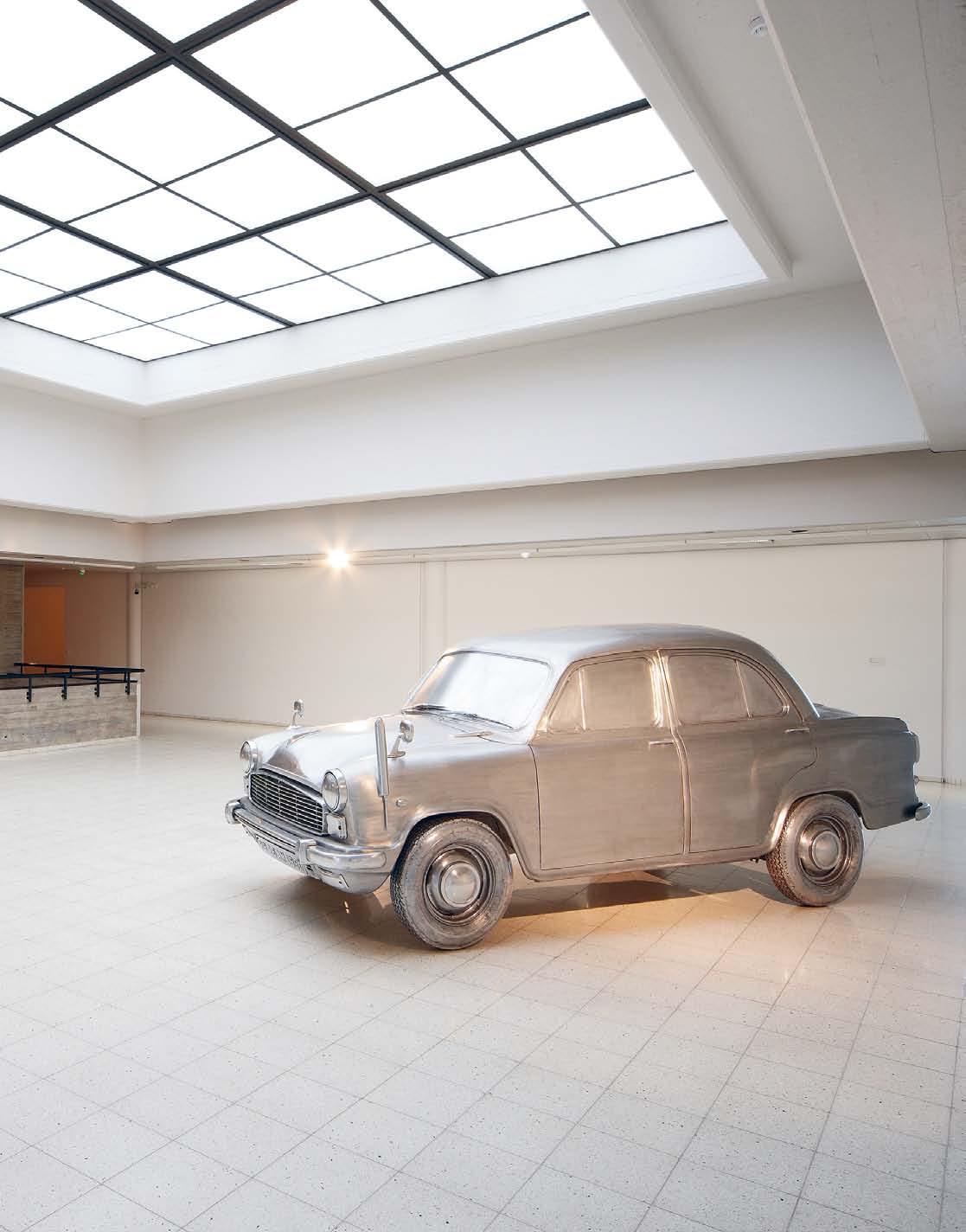
above | dOOT, 2003, liFeSize aluminium caST OF an ambaSSad OR caR , ©JuSSi KOivunen / SaR a hildén aRT muSeum. opposite | incubaTe, 2010, STainleSS STeel TiFFin caRRieRS p OTS and panS ©JuSSi KOivunen / SaR a hildén aRT muSeum. issue #18 habitusliving.com
2 . portrait # 93

above | line OF cOnTROl , 2009, 1000 x 1000 x 1000cm , STainleSS STeel uTen SilS, STainleSS STeel and STeel STRucTuRe cO uRTeSY The aRTiST and TaTe bRiTain cOllecTiOn KiR an nadaR mu S eum OF aRT ©Sub O dh G upTa opposite | veRY hun GRY GO d, 2006, 360 x 280 x 330 cm , STainleSS STeel uTen SilS, STainleSS STeel STRucTuRe cO uRTeSY The aRTiST and in SiTu Fabienne lecleRc paRiS, cOllecTiOn FR ancOiS pinaulT, phOTOGR aphY bY SanTi caleca ©Sub Odh G upTa issue #18 habitusliving.com
2 . portrait # 95
habitusliving.com/issue18/subodhgupta
contemporary craft
The symmetrical geometry and rectangular volume of the Luka desk/side table promises unaffected utility from the first glance, and is further underscored by the lightweight steel frame that supports it. It speaks of furniture that makes no concessions to unnecessary embellishment – a station for concentration and productivity.
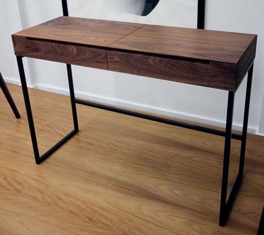
Upon closer inspection, the essentialist exterior is softened by the expertise of the craftsmanship – bird’s mouth joinery attests to sophisticated carpentry and respect and time given to assembly, and the thoughtful incorporation of both a roller drawer divided into smaller spaces and a larger lift-up compartment is evidence that the design has fully considered the practical requirements of the end user.
Available in Solid Walnut, Oak, Spotted Gum or Blackbutt and finished in Natural Danish oil, the Luka complements its balanced visual aesthetic with the warmth and texture of timber, providing an inviting tactile surface to sketch, write or simply muse at.
CDR is an Australian owned designer and manufacturer of hand made timber furniture. Based in Sydney, the brand has been producing and designing pieces for over 10 years, supplying interior designers, architects and local residents with beautifully made timber furniture that is made to last.
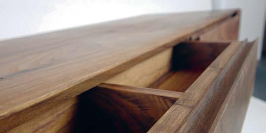
The entire range can be customised with optional timbers, sizes and finishes to suit items to the tastes and needs of particular clients. CDR also provides a full custom design service to assist with realising any project. The brand also specializes in sourcing a range of other materials and finishes. Previous clients include the Bourke Street Bakery, Panasonic, Execujet, Genevieve Lilley Architects, Dele-Vega Architects, RTA, Jorge Hardina Architects and many more.

Woven Image | 1800 888 650 | wovenimage.com above | luka
/
and below | traditional
flap
and
habitus promotion › craft design realistion # 96 issue #18 habitusliving.com
desk
sidetable made from solid walnut timber and powdercoated steel.
centre
hinged
door
compartment drawer.
The appeal of a clean, minimalist first impression is sustained by the discovery of refined detailing, unornamented, functional design and considered use of materiality.
Craft Design Realisation (61 2) 9310 1175 | craftdesignrealisation.com
Perfection without being too perfect

leon leong | resident – page #139
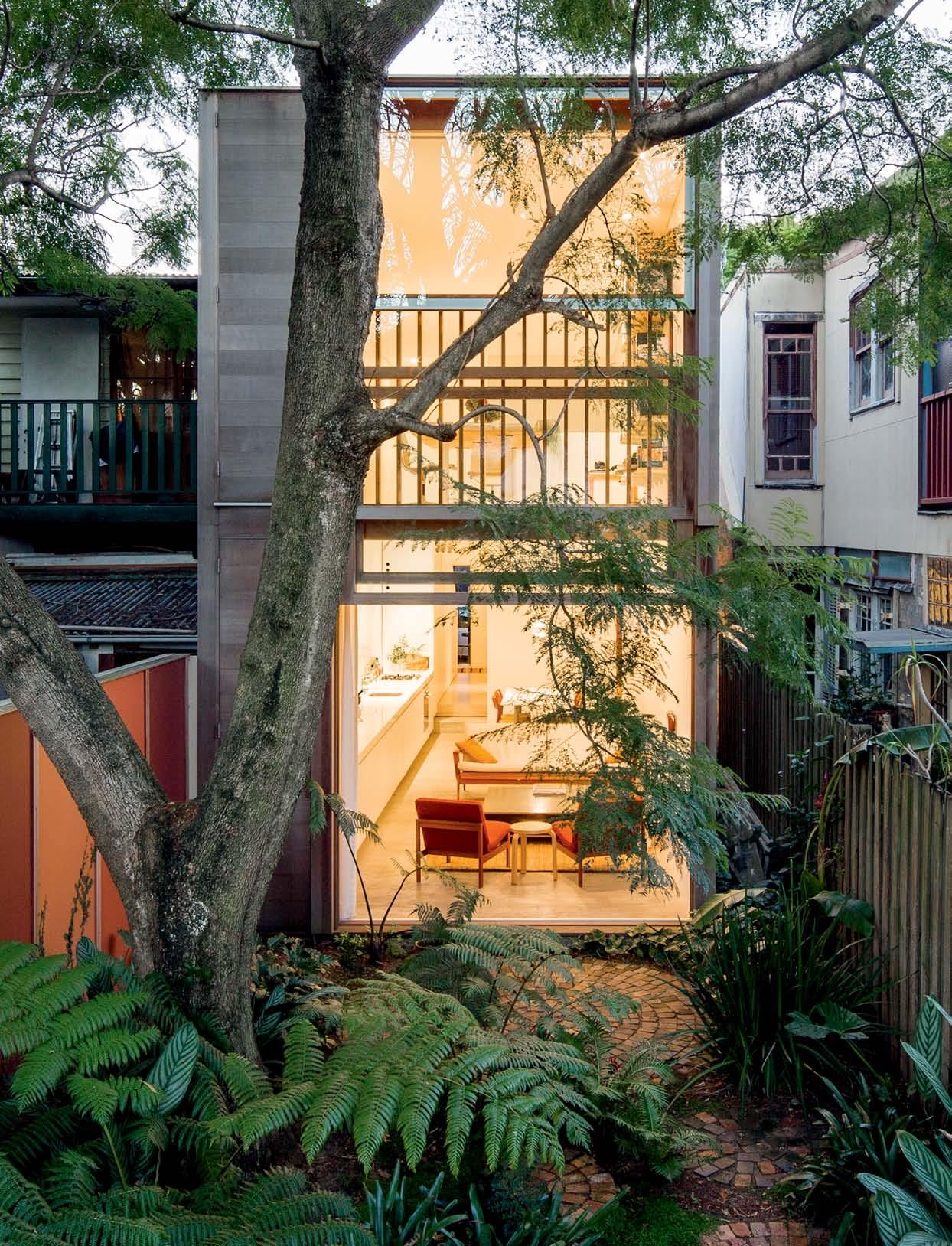
issue #18 habitusliving.com
Experiencing the Process
For many people, transforming a dark, cramped inner suburban terrace is more an opportunity than a problem. As Paul McGillick discovered, this was certainly the case for Sydney architects, Panovscott.
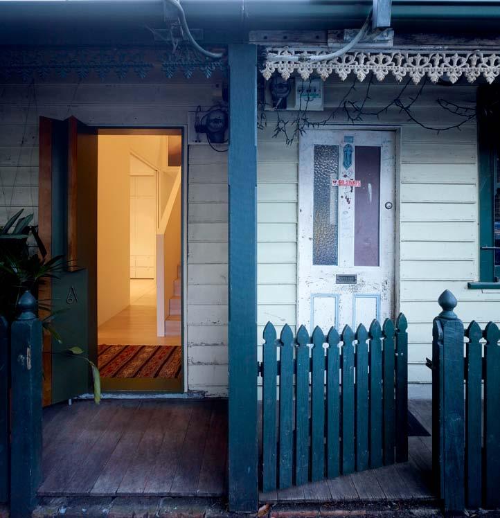
 text Paul McGillick |
PhotoGra Phy Brett BoardM an
3 . on location # 99
For Anita Panov and Andrew Scott (panovscott) it was an opportunity in more than one sense of the word. It was, of course, an opportunity – or, more accurately, a challenge – to turn a two-room + lean-to, semi-detached, timber worker’s cottage into a liveable, contemporary home without losing the character and history of what was already there.
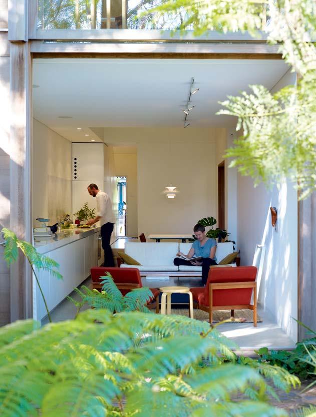
But it was also an opportunity for both architects to engage with the entire process of designing and building a house. In Andrew’s words, “the notion of crafting and making it yourself was very important as a kind of knowledge-building exercise”. It was also, says Andrew, a chance to develop “an architectural language of economy and re-using the form and technology” of the original house.
So, they elected to be their own builders. For Anita, this was for the first time. Andrew, however, had previously worked with his father, a scientist who “built houses on the weekends”, as well as with a number of builders during his university years.
They were also attracted to the overgrown garden and to the immediate prospect of a
issue #18 habitusliving.com
PREVIOUS LEFT | The AddiTion Seen From The luSh re Ar gArden. PREVIOUS RIGHT | The originAl enTry remAinS unchAnged. ABOVE | wiTh The window r AiSed, connecTion wiTh The gArden i S compleTe. OPPOSITE | The living/dining/kiTchen SpAce.
Their response to “the canopy of trees” was to open the long living/ dining/kitchen extension up to the garden and the landscape.
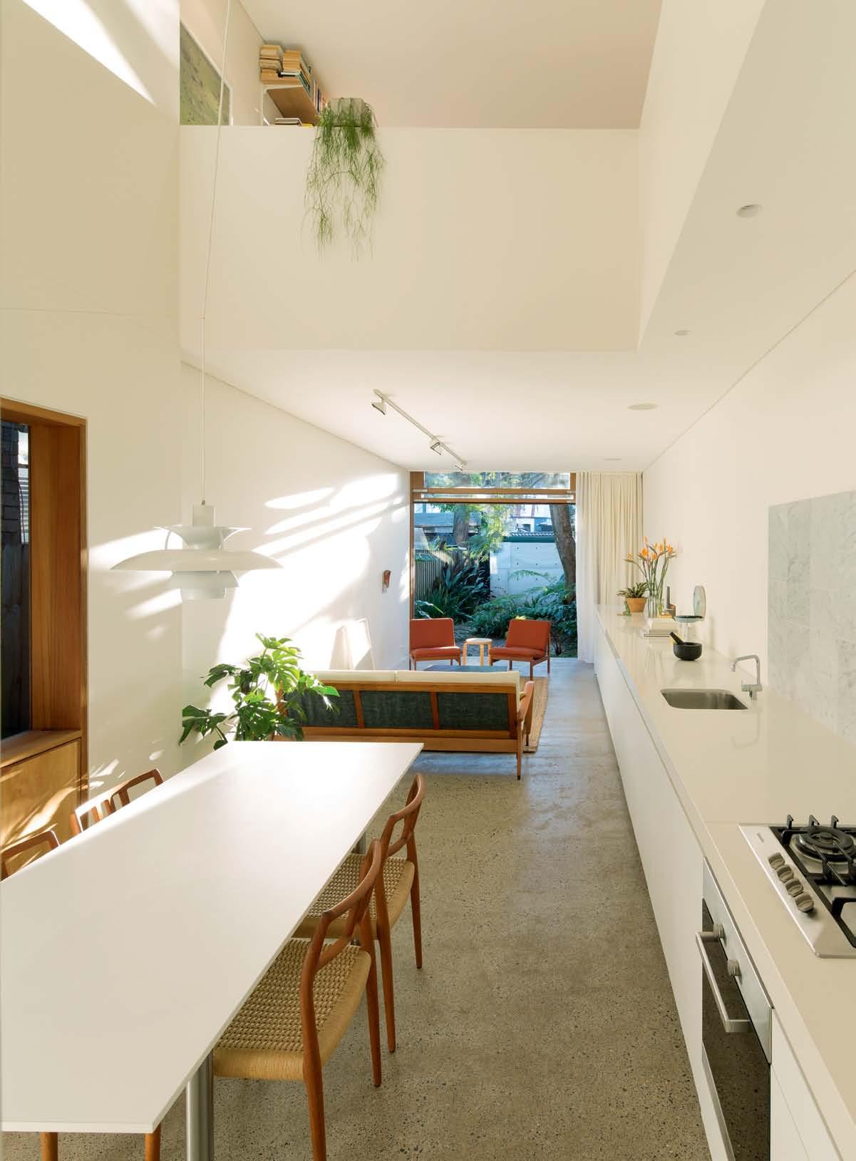
# 101 3 . on location
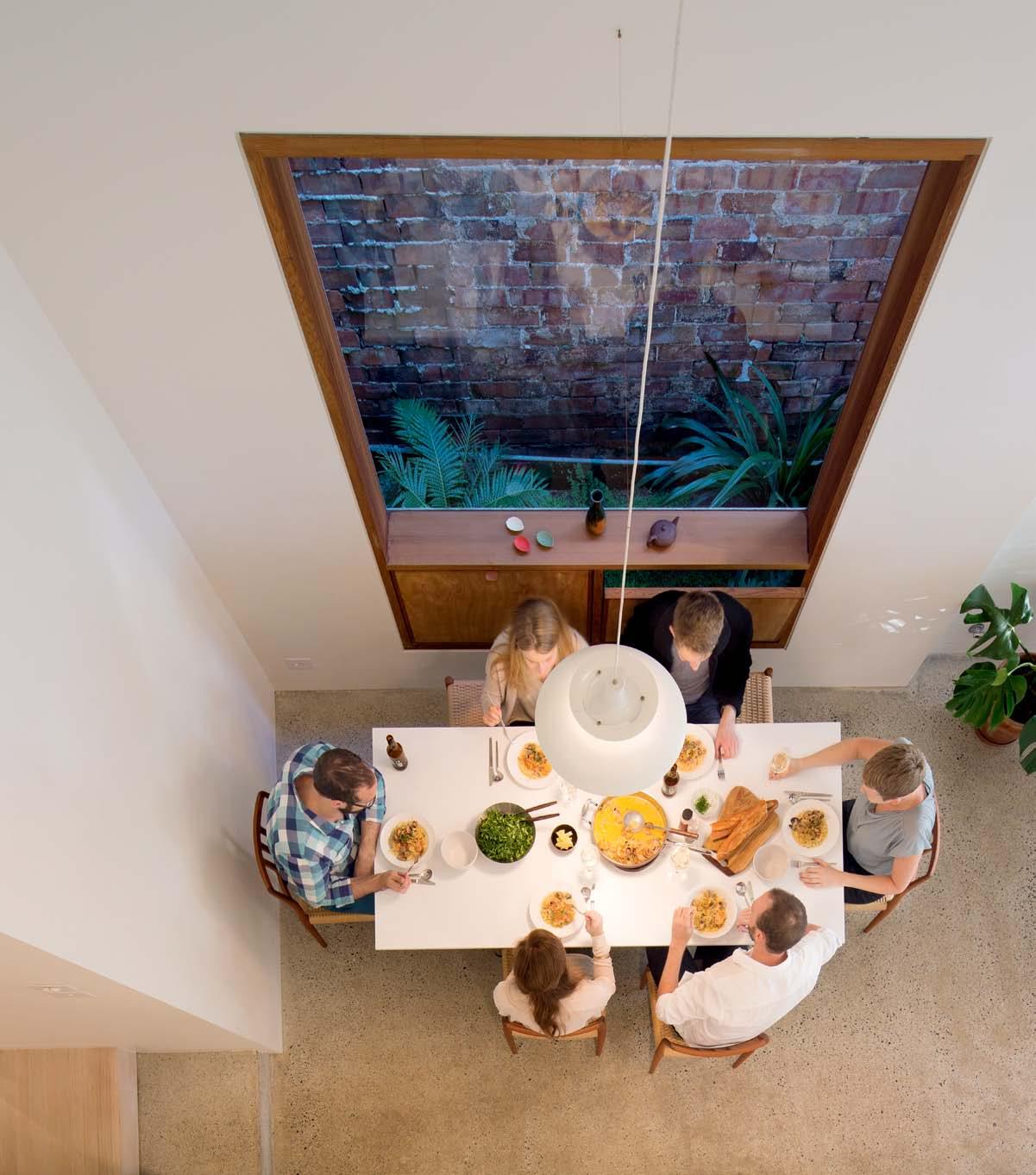
issue #18 habitusliving.com ABOVE | looking down The void To The dining Are A From The upper level OPPOSITE | looking down The corridor From The enTry.
diverse clutch of established trees (Jacaranda, Bangalow Palm, Norfolk Pine, Ironbark and Paperbark) and to the more distant westerly prospect of a stand of trees lining a park just off Newtown’s bustling King Street.
During construction, Anita and Andrew visited Japan which seems to have made an impact in two crucial ways. The first was the discovery of what they term “the aesthetic of delicate timber construction”, not just for the way the material was used, but also for the way in which a natural process of transformation and decay was acknowledged and accepted. Hence, their house is clad in untreated Western Red Cedar, which is already turning into a silver colour.
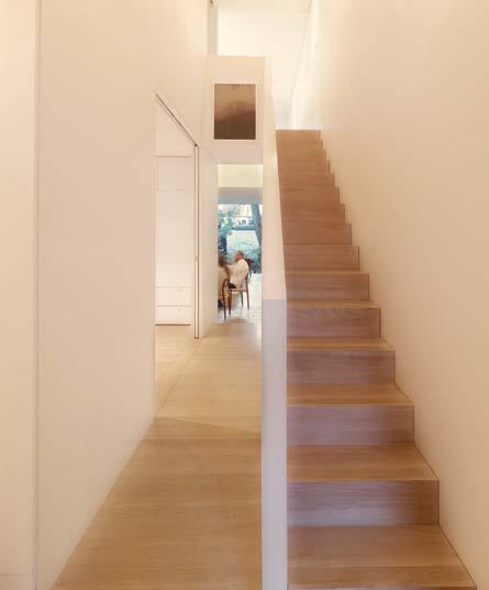
The second thing to come out of the Japanese aesthetic is the idea of borrowed landscape, which assumes particular significance when the dwelling is small and part of a high density context. Their response to what they call “the canopy of trees” and the intriguing collage of built forms was to open the long living/dining/kitchen extension up to the garden and the landscape. Here, rather than an end wall, there is a monumental, custom-
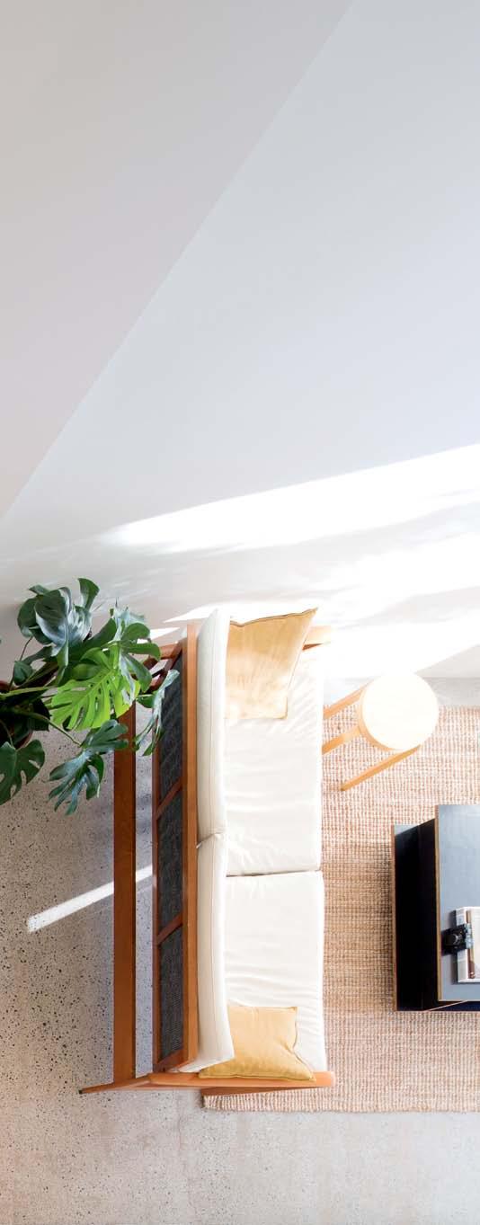
3 . on location # 103
designed triple-hung window which lifts up to connect the house directly with the garden and draws in air which is then funnelled up through a central void in a chimney to ventilate the upper level of the house. When the upper and lower windows are closed, access to the garden from the downstairs space is through a slender door faced with the same Western Red Cedar, while above that a replica of the door provides ventilation to the upstairs spaces.
The hung window deliberately references the original hung windows, one of which has been retained for the bathroom which is now located where the front room of the house used to be.
Meanwhile, back in the garden, further respect is paid to what was there before: the paving uses bricks recycled from the original outdoor toilet and some old fireplaces, with fern vegetation developed by transplanting existing plants.
The Japanese aesthetic is also evident in the downstairs bedroom which opens directly on to the corridor through sliding doors. This has a screened hatch for ventilation and a feature window looking down the garden along the
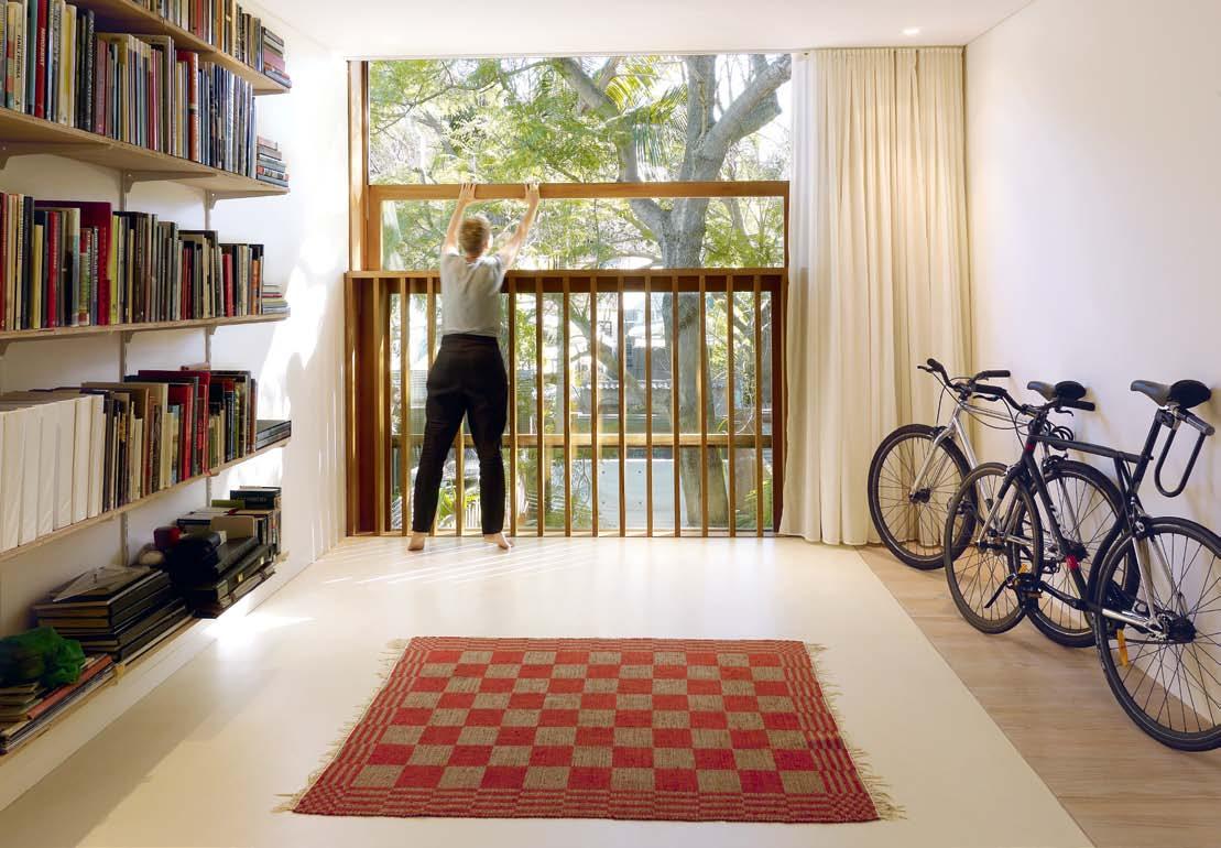
issue #18 habitusliving.com ABOVE | AdjuSTing The Triple-hung window on The upper level (leFT ) And on The ground Floor (righT ).
…there is a monumental, custom-designed triple-hung window which lifts up to connect the house directly with the garden…
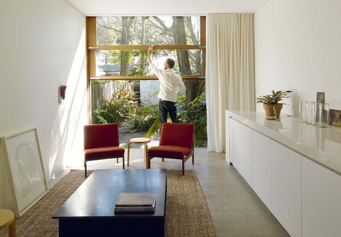
3 . on location # 105
external side path typical of the L-shaped plan of these worker’s cottages. The wall uses the original weatherboards. Upstairs is a second bedroom and a home office.
From dark, constricted beginnings, this house has been transformed into a light-filled space which seems to flow seamlessly both in plan and section without any of the previous sense of constraint and spatial meanness.
Overall, the interior has an elegant simplicity which acts in counterpoint to the rougher exterior of a garden, which seems to be only just under control, and the unruly mix of the tree canopy.
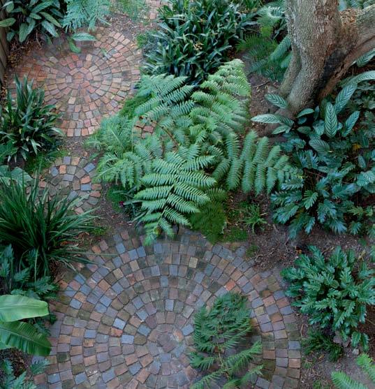
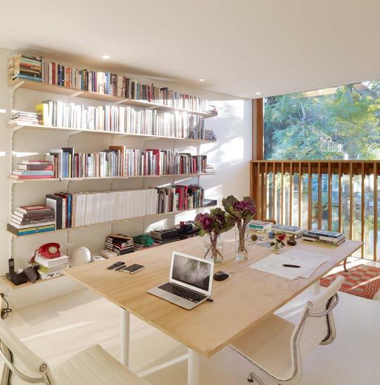
“This building,” says Andrew, “is about us, because we built it ourselves. It was about experiencing the process of building.” And it is about the possibilities of living in a dense urban area within limited space. As Andrew explains, it is effectively part of the city and directly connected with the intensity and colour of urban life. But to enter the house and follow the procession of the narrow corridor and one emerges into a broader, brighter space embraced by the landscape outside to create the perfect balance of refuge and prospect.
habitusliving.com/issue18/panovscott
issue #18 habitusliving.com ABOVE | The STudy Are A on The upper level BELOW | recycled brickS AS pAverS in The gArden.
GROUND FLOOR
1 2 3
9 5
drop box
ArchiTecT panovscott
projecT Te Am Anita Panov & Andrew Scott
STrucTur Al engineer Ruggero Benvennuti (Benvennuti S C)
hydr Aulic engineer David Wood (Liquid Hydraulic)
Surveyor John Bottaro (Geometra)
builder Anita Panov and Andrew Scott (panovscott)
window joinery Scott Coppin (Hampton and Larsson)
inTernAl joinery Glenn Williams (DUWA)
panovscott (61) 421 447 534 panovscott.com.au
2
3 4 6
5 8 8 7
FurniTure
In Bedroom, Bed from the Natural Bedding Company. In Dining room, Moller #79 dining chairs from Great Dane. Capella 18 Plus convector living heater from Rinnai. In Lounge room, vintage lounge purchased from the resident’s student days with custom white leather upholstery by Maurer and Strange. Lounge chairs are vintage from Great Dane.
lighTing
In Living room, track lighting from Erco. In Kitchen, Bedrooms and Studio all downlights are Audrey Tilt by Boaz from Special Lights.
FiniSheS
In Bathroom, limestone mosaic tiles from Artedomus. In Bathroom and Laundry, white ceramic wall tiles from Cerastone. In Bedroom, Hall and Stairs, floor paint finish
is Limed Satin Ash from Porter’s Paints. Generally throughout, all timber finishes from North Coast Timbers.
FiXed & FiTTed
In Kitchen, cooktop, oven and integrated dishwasher by Miele and sink by Franke all from Winning Appliances. Benchtop is Smartstone from Mediterranean Marble & Granite. KV1 Kitchen Tap by Vola from dedece. In Bathroom, splashback and custom handle is Carrara marble from Stonebank. WC and Vanity are Duravit from Harvey Norman Commercial.
Bathroom towels rails and accessories are Madinoz from Stylefinish. In Bathroom and Laundry, tapware is Caroma Liano from Harvey Norman Commercial. In Living room, Sonance ceiling speakers from Infra Red Home Entertainment and Automation. Curtains from Fybre Furnishing Solutions.
3 . on location # 107
ENTRANCE LIVING DINING
FIRST FLOOR 1 4 KITCHEN BEDROOM BATHROOM 6 5
7 STAIRS VOID STUDIO 9
neW toWn house in focus
In this compact Newtown House, Andrew and Anita were both architect and residents. One of the features, the large operable windows at the rear of the addition, makes use of innovative international design to enhance the atmosphere.

“The large window comprises four equal operable timber framed glass panels. It is a window that opens, that slides away completely to leave only the reveal. In its closed position the window frames the flattened tableaux of our garden, composed in the traditional Japanese manner with layers of detail culminating in borrowed views of the adjoining rooftops and tree canopy.
For the majority of our habitation the window was open and in that position the flattened tableaux was thickened through senses other than the optic. The combination of this carefully curated visual composition and the variable haptic sense stimulation contributed to the atmosphere of the home.
The most immediate benefit is that the interior of the house can be flooded with light and air. A secondary benefit, but an important one for us, is that the specific nature of the window design connects us with the history of the house and to the greater discourse of architecture.
The detail, material and action of the window came about through the careful observation and appropriation of the humble mechanism within the existing front room window of the house. Conscious of current architectural thinking but also mindful of Alberti’s giant order we transformed this existing window via a radical shift in scale so that it grew to be a six metre high version of its diminutive former self.
This transformation has become the wonderful origin myth of the house and our joy in its retelling a small additional benefit to augment the lifestyle allowed.
The window was designed by us, drawn, modeled and considered down to the finest detail. For instance the steel screws that hold the western red cedar pieces together were individually setout and will allow for the eventual replacement of individual parts as they decay differentially over the next 50 years. In their Lismore joinery shop, Hampton and Larsson faithfully manufactured and assembled the window from our drawings. The window was then disassembled, trucked to Newtown where we reassembled and installed it with a little help from some friends.”
CLOCKWISE
TOP SunlighT FilTerS Through The 'cAnopy oF TreeS ' And inTer AcTS wiTh The inSide oF The home viA The l Arge windowS
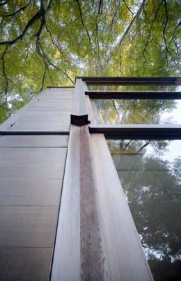
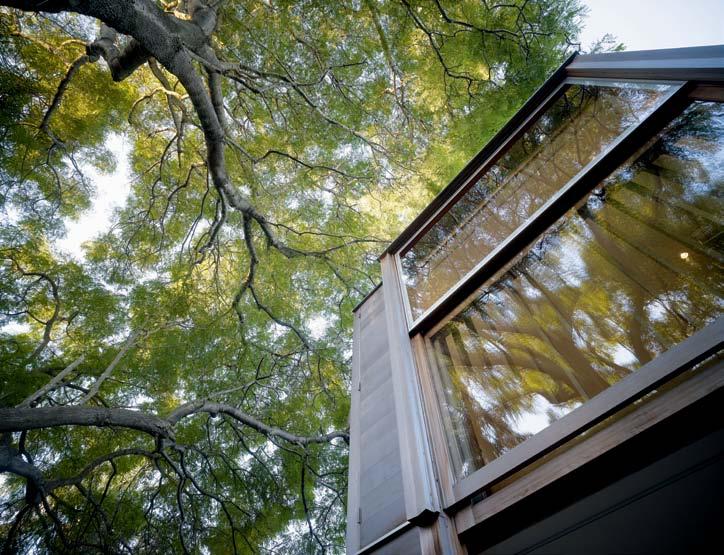
weSTern red cedAr wAS The wood oF choice which hAS An inTimATe rel ATionShip wiTh The gl ASS
The monumenTAl, custom-designed triple-hung window which liFTS up To connecT The houSe direcTly wiTh The gArden And dr AwS in Air. The hung window deliber ATely reFerenceS The originAl hung windowS one oF which hAS been reTAined For The bAThroom.
issue #18 habitusliving.com
FROM
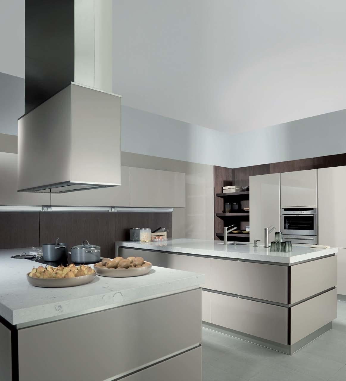
55 Holt Street Surry Hills, Australia - Free Call 1300 585 555 - info@porcelanosastudio.com.au - porcelanosastudio.com.au G926 kitchen in textured glass with walnut veneer * Conditions apply
Verdant vision
Green in more ways than one, this dynamic house in Singapore designed by K2LD architectS has, says pau L Mcg i LLic K , an easy, flowing elegance and unique affinity with its environment.
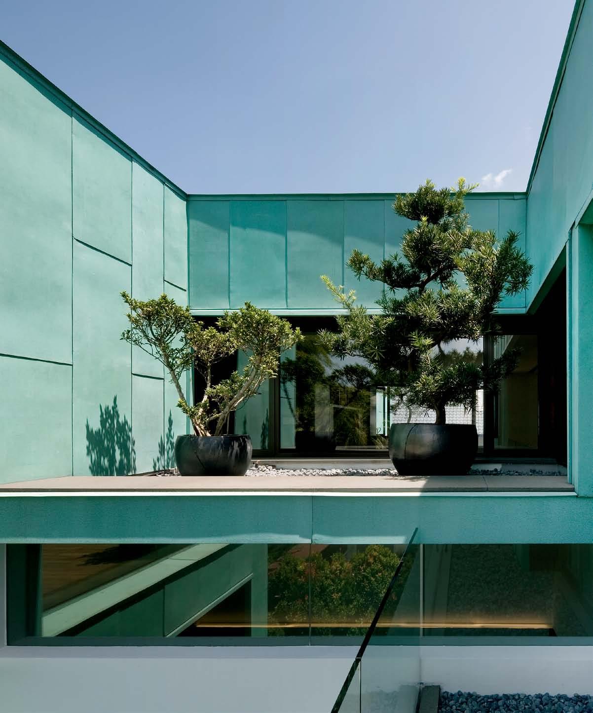 text Paul McGillick | PhotoGra Phy Jere M y San
issue #18 habitusliving.com
From the street it presents as a twodimensional abstract form – a green planar assembly with a rhythmic assortment of slots, squares and rectangles cut out of it.
But when you enter the house – especially if you go in through the lovely, expansive main living area which opens on to the front garden – you find yourself in a dynamic world of subtly interacting volumes. This spatial experience is driven by the double-height void above the living room which, on Level 1, is framed on one side by a long, luminous vitrine containing a collection of colourful vases and on the other by a Rosewood timber gallery lit by windows which flood the centre of the house with light.
Called the Green House, ‘green’ is used here with a double meaning. Firstly, it comes from the green patina of the aged-copper cladding. The cladding strategy was actually initiated by the clients, who are Chinese Indonesian. They own a copper-roofed home in Indonesia and, having seen the value of the roof markedly appreciate over the years, and given the Asian cultural associations with the colour green, they suggested a copper roof for their Singapore home.
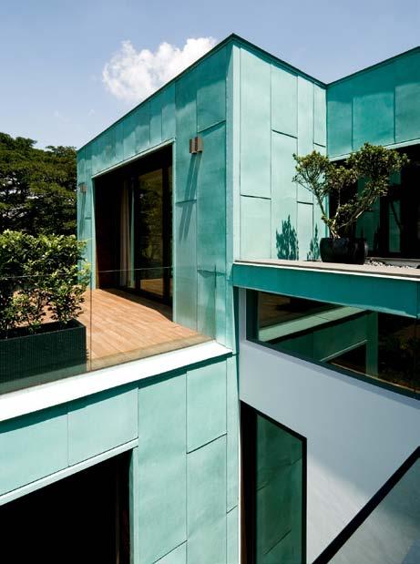
The architects, however, pointed out the roof would not be seen. As an alternative, they suggested cladding the external walls in copper.
The second meaning derives from the sustainable strategies employed in the house.
3 . on location # 111
The copper cladding, for example, is highly durable with a minimum 50-year lifespan. It is also low-maintenance and requires little cleaning or repair. Finally, the copper acts as a heat barrier, enhanced here by inserting a 300mm air gap between the copper cladding and the internal brick wall.
Other sustainable features include doubleglazing throughout, extensive capturing of natural light and clever planning to ensure efficient cross-ventilation. The bedrooms and living areas are placed on the north and south sides of the building, allowing bathrooms and service zones to be situated on the east-west extremities, thus providing an additional heat buffer for the core of the house.
This is also a ‘green’ house in the sense that it is very much a garden house. Three of the bathrooms, for example, feature garden courtyards – the ground floor powder room and bathroom in themselves form a small garden, partly open to the outside, and there’s a specially engineered internal courtyard off the master bathroom. Throughout the house, green views abound. The master bedroom on Level 3 with its timber terrace is effectively part of the landscape. Elsewhere, outside views are carefully framed by the fenestration. This is especially true of Level 2, which captures the landscape of the park opposite, and for the downstairs living space, which is kept minimal
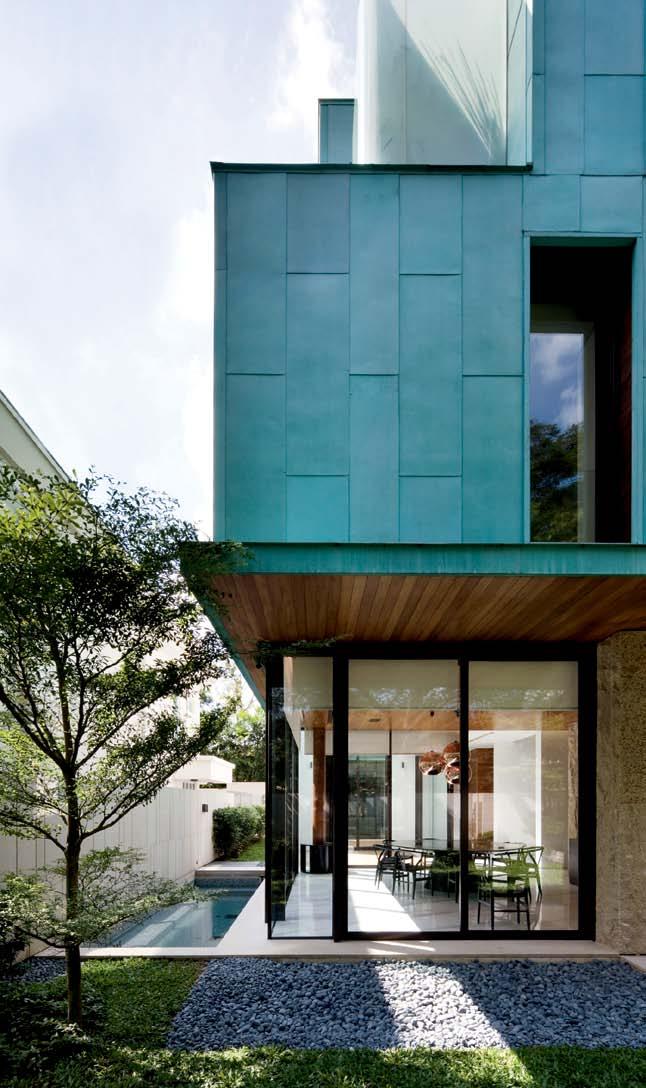
issue #18 habitusliving.com
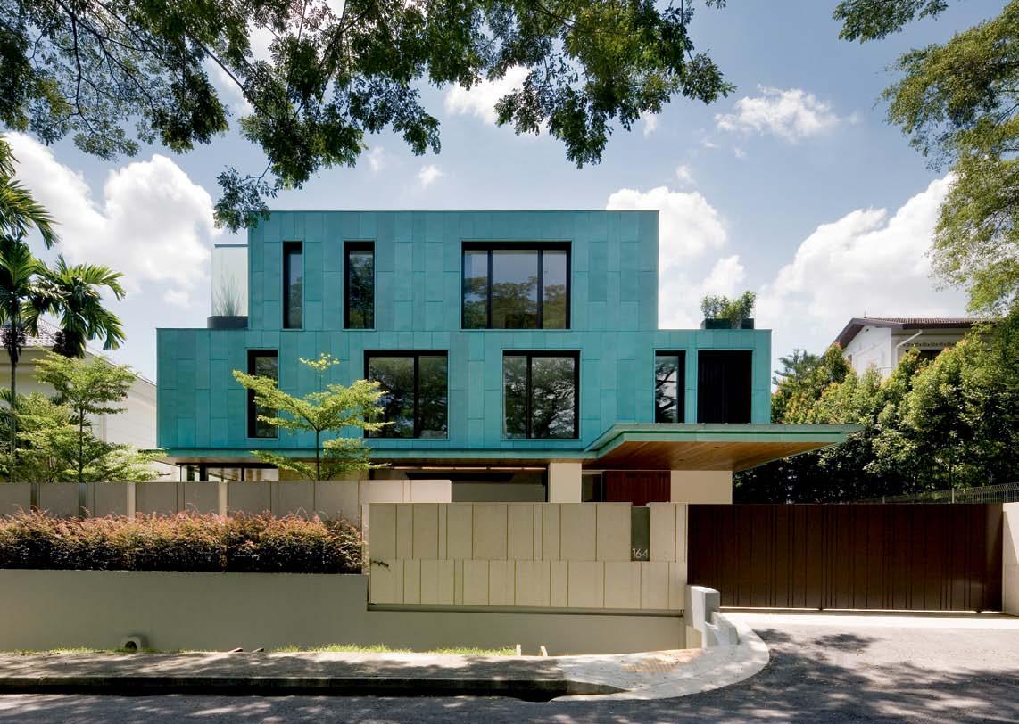
3 . on location # 113
PREVIOUS LEFT | The inTernal courT yard off The masTer bedroom. PREVIOUS RIGHT | spliT level flaT roof Tops add levels of depTh and inTeresT OPPOSITE | courT yard off The formal dinin G wiTh waTer feaT ure and larG e windows for addiTional naT ural li G hT aBOVE | puncT uaTed by The impressive use of copper, The G reen house subTly exposes various Tex T ures and inTeracTin G volumes.
This is also a ‘green’ house in the sense that it is very much a garden house.
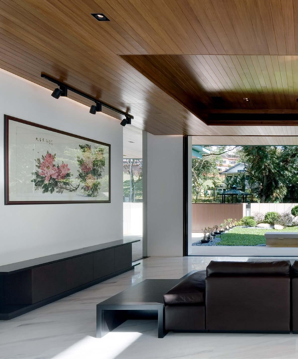
issue #18 habitusliving.com
The downstairs living space is kept minimal to frame the miniature shrubs in the Japanese-inspired garden…
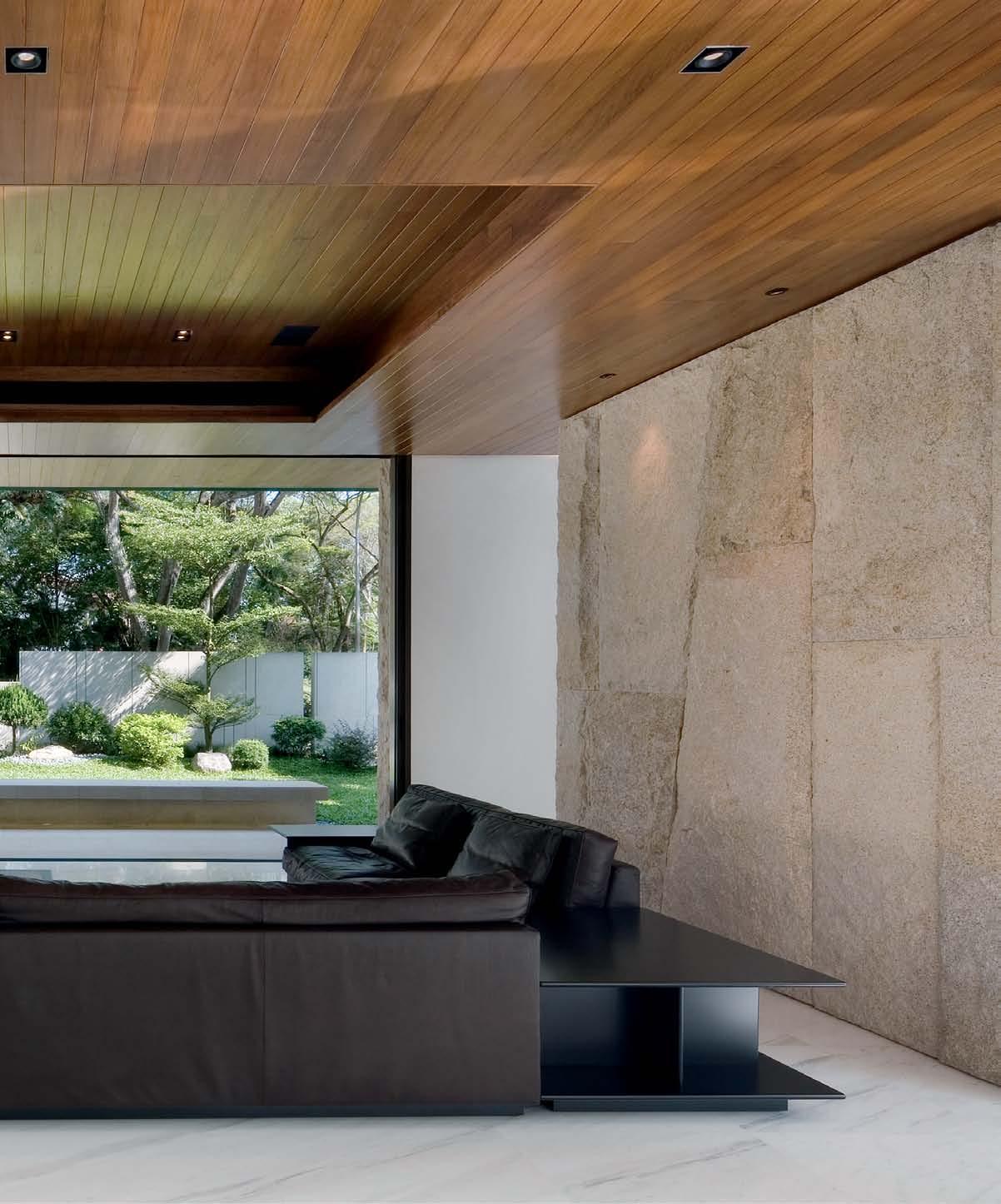
# 115 3 . on location
in order to frame the miniature shrubs in the Japanese-inspired front garden that contrast with the imposing trees in the park opposite.
The clients are culturally predisposed to entertaining their extended family. The home’s openness and diverse spaces cater perfectly to this need. Similarly, the children enjoy a clearly demarcated area on Level 2 with their own bedrooms and designated play and entertainment zone.
The clients are also art collectors. Hence the house was designed to provide wall space for works of art, as well as the customised vitrine – effectively a glass wall – running most of the length of the house on Level 2 to house their extensive collection of vases.
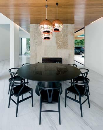
Functional areas within the house are clearly identified and separated – children’s areas, living areas, home office and master bedroom. But they are fluidly connected by elegant spatial organisation which works both vertically and horizontally. Horizontally, the home is arranged around the central void and includes generous visual and physical connection with the outside. Vertically, the house weaves its way upwards – first by the
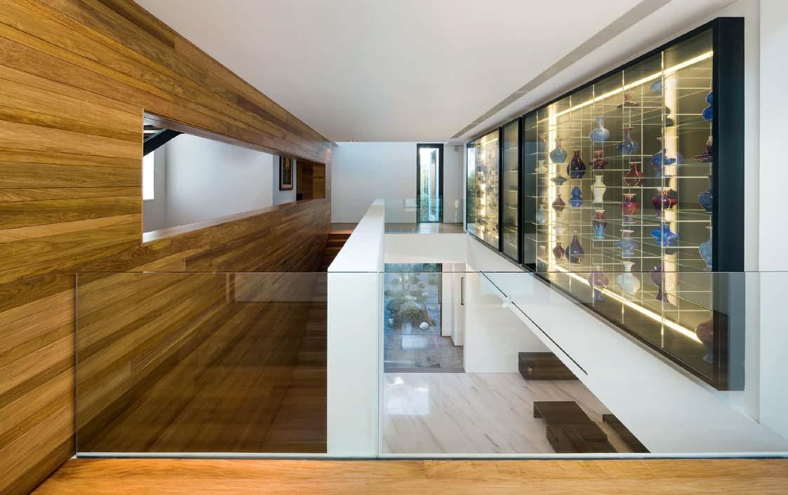
issue #18 habitusliving.com
PREVIOUS | a larG e window in The main livin G space acTs as a larG e dynamic arT work. TOP | horizonTal and verTical lines are connecTed by The sTaircase and The Timber provides warmTh for The objecTs d’arT To reflecT aBOVE | in The dinin G room, The carl hansen & son Table is The feaT ure. OPPOSITE | in The sTaircase The beaTen copper pendanT liGhTs provide a way of visually connecTinG The levels.
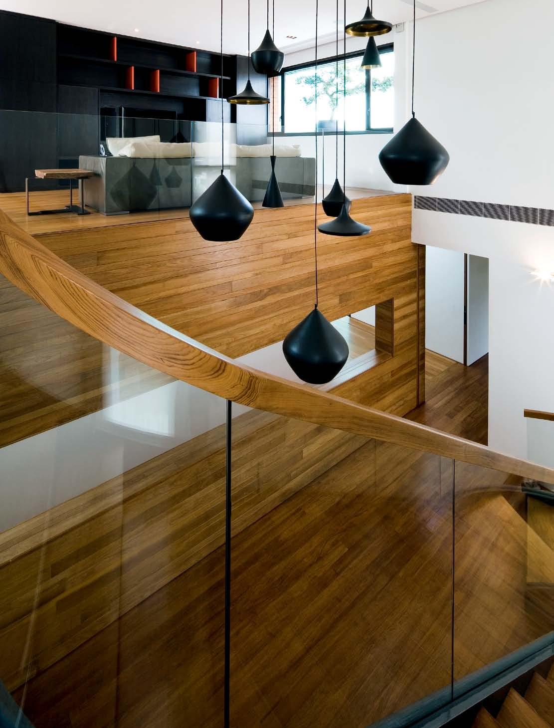
3 . on location # 117
SECOND FLOOR
1 2 3 4 5 6 7 8 9 0
carporch garden
en T rance F oY er
STU dY
LIVI ng
dI n I ng
Jac UZZI
T errace
garden
poW der rooM
LIBrarY
BedrooM
B a L con Y
B aT hrooM
pan T rY
ST ore
drY KIT chen
W eT KIT chen
Wc
UTILITY
Yard
STa I r S
Fa MILY rooM
en T erTa I n M en T rooM
WardroBe
M a ST er STU dY
L oU nge
M a ST er BedrooM
M a ST er B a L con Y
M a ST er WardroBe
M a ST er B aT h
issue #18 habitusliving.com
q w e r t y u i o p a s d f g h j k l z
GROUND FLOOR FIRST FLOOR aBOVE | floor plans. OPPOSITE aBOVE | The masTer baThroom is a resToraTive space offerinG varied Tex Tures and an indulGenT experience OPPOSITE BELOw | copper ex Terior lookinG in To The minimal masTer bedroom. 1 2 4 3 8 5 f q q q y p 0 q r 6 7 t e e e e a a w 9 u o i f j l h g z e d s k
issue #18 habitusliving.com
rather grand Rosewood stairway connecting the ground floor living space with the gallery on Level 2, then by the spiralling timber, glass and steel staircase to the top level.
The minimalist aesthetic of the green exterior walls and whitewashed interior walls is balanced by the warmth of the timber flooring, ceilings and internal wall cladding, together with a variety of timber detailing, including doors in the bathrooms.
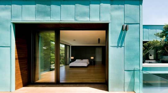
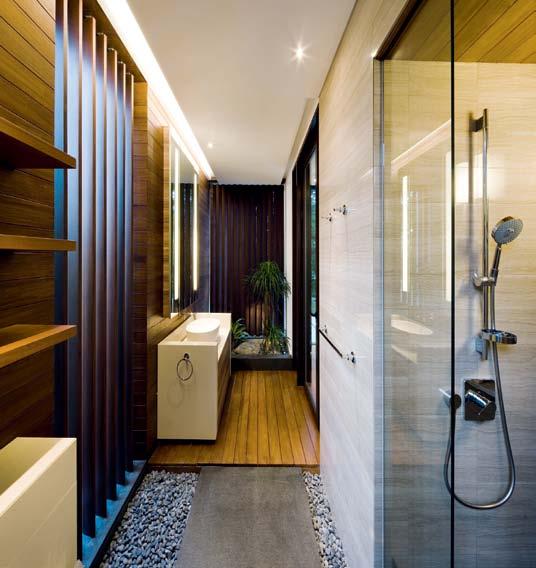
Called the Green House, it is equally a house of reconciliations. It reconciles a monolithic – even monumental – quality with considerable intimacy, due to the way different spaces are functionally delineated, but spatially connected. Likewise, it reconciles a minimalist aesthetic with a warmer, more nurturing sensibility, just as it reconciles the industrial character of the green copper skin with the natural greenery of gardens and landscape.
habitusliving.com/issue18/k2ld
drop box
archiTecT K2LD
projecT Team Ko Shiou Hee, Leong Lai Ping, Elita Ong and Huang Sijie
main conTracTor Daiya Engineering and Construction
m&e consulTanT PTA Consultants
sTrucTural enGineer MSE Engineering
& Management Consultants
Q uanTiT y surveyor Ian Chng
Cost Consultants
K2LD
(65) 6738 7277
k2ld.com
furniTure
Giorgetti Royal Sofa, Minotti Botero Pouf, Solid Ebony and Forest Brown marble custom made coffee table, TV console is custom made with brushed timber veneer and leather panels. Dining table from Carl Hansen and Sons, Wishbone chairs with leather padding from Hans Wegner.
liGhTinG
Antares from FLOS. In Family room, Beat pendant lights by Tom Dixon.
finishes
All marble finishes are Giorgio Gris in polished finish. Vancouver Negro and Cerim Le Stuoie Linea Perla homogenous tiles. External façade is 20mm thick cement and sand rendering, 40mm thick yellow rustic granite slab in heavy bushhammer
finish, copper cladding to detail and aluminium cladding. In Jacuzzi area, mix glass mosaic tiles from Bisazza.
fixed & fiTTed
In Kitchen, cabinetry in high gloss polyester lacquer in white and graphite Oak veneer from Boffi. Miele microwave and oven. Fridge from Sub-Zero. In stairwell, custom made display cabinet with solid Ebony and glass panel. In Bathroom, Apaiser composite custom basin. Axor Citterio sanitary fittings. Toto wall hung toilet with Geberit cistern. In Master Bathroom, Apaiser custom basin and bathtub. Axor Massaud basin mixer and Starck shower mixer, shower panel and handshower sets all from Hansgrohe. In Bedroom, all wardrobes from Poliform.
3 . on location # 119
green houSe in focus
and resident, Seno Mualim, describe the functional and environmental benefits of the metal element.
When K2LD first proposed copper for the exterior walls of this Singapore house, the residents, understandably, had a few concerns. “We questioned if the copper would have high maintenance costs, and if the structure is sustainable,” recalls Seno.
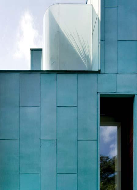

But the architects had not made the suggestion lightly – it was a design solution to a climatic issue. “Buildings built in the cities in this region are often prone to streaking, due to the heavy downfall and pollution in the atmosphere,” Lai Ping says. “Buildings are often required to be repainted every 2–3 years, so as not to look run down. Application of copper as an external facade guarantees zero maintenance, with the right detailing.”
As well as the colour, the copper also met the ‘green’ brief in terms of environmental and financial sustainability – as the longevity of the product eliminates replacing during its lifetime. “Furthermore,” Lai Ping adds, “at the end of the building’s life, copper can be taken down and re-used again”.
It also has thermal qualities, beneficial in the sub-tropical climate, acting as a heat barrier wall to the internal space. K2LD designed the façade as a double wall concept, with a 300mm gap in between the cladding and the internal brick wall, encouraging cooling air to flow under the ‘skin’ of the building.
As with any innovative solution, using copper wasn’t without its challenges, such as detailing to the horizontal surface. The decision was also made to use green patina copper panels, which are already oxidised, rather than standard copper panels, which K2LD noticed tended to weather unevenly in the Singapore climate.
Juxtaposed with warm Teak on the internal sides of the window openings, this cool metal finish becomes very liveable – “we feel like staying in the resort villa every day,” says Seno.
The house is referred To as The Green’ house noT only for The copper cladding buT also since There is a sTronG sense of The space beinG very much a Garden house.
copper claddinG (deTail). copper is an ex Tremely durable maTerial wiTh a minimum lifespan of 50 years; iT also reQ uires liTTle cleaninG and repairs makinG iT convenienTly low mainTenance. copper also holds amazinG Thermal Q ualiTies since The naTural maTerial acTs as a heaT barrier and, used in The correcT manner, is enhanced by inserTinG a 300mm air Gap beT ween The copper claddinG and The inTernal brick wall.
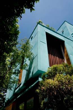
issue #18 habitusliving.com
The distinctive copper cladding of the Green House is more than just a visual effect. Architect Lai Ping of K2LD
CLOCK wISE FROM TOP e veninG view of Green house.
THE ORIGINAL DESIGNER’S COLLECTION


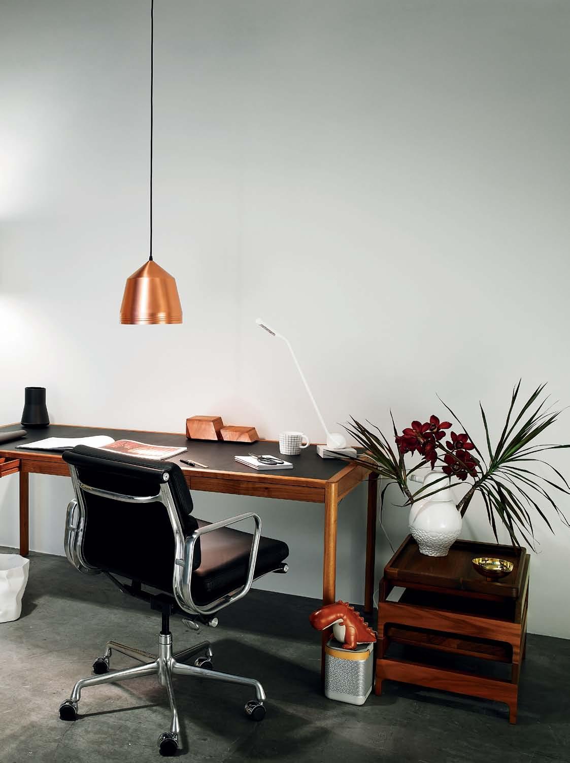
habitus x living edge promotion d e c a b
PHOTOGRAPHY | TIM ROBINSON. ART DIRECTION | ONE8ONE7 STYLING | MANDI KEIGHRAN
f
From left | Labrador leather folder, Paper2; Essey bin , top3 by design; book , stylist’s own; Mr Cooper pendant by Kate Stokes, Corporate Culture; Kaweco Sport Al pen , Paper2; Midori brass ruler, Notemaker; Basic notebooks, kikki.K; scissors, Paper2; Lightly For Good Measure mug , Workshopped; Wästberg Massaud w083 lamp, Euroluce; Zuny dinosaur bookend , top3 by design; Beolit 12 portable speaker, Bang & Olufsen; Ilse bowl, Georg Jensen.
habitus x living edge promotion


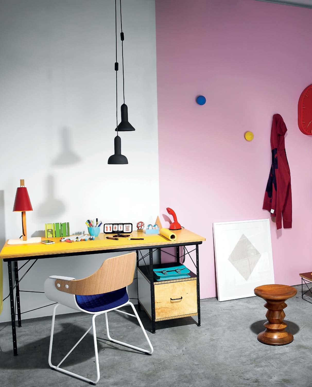
h l g
j
a ESTABLISHED & SONS STORE JARS FROM EST COLLECTION
b BASSAMFELLOWS SHARP SERIES BY
CRAIG BASSAM
c BASSAMFELLOWS LEATHER DESK BY
CRAIG BASSAM
d HERMAN MILLER SOFT PAD CHAIR BY CHARLES AND RAY EAMES

e BD BARCELONA SHOWTIME VASES BY JAIME HAYON
f BASSAMFELLOWS TRAY RACK SIDE TABLE BY CRAIG
BASSAM
g ESTABLISHED & SONS TORCH LIGHTS BY SYLVAIN
WILLENZ
h BD BARCELONA DESIGN SHOWTIME CHAIR BY JAIME
HAYON
i ESTABLISHED & SONS TWO TIMER CLOCK BY SAM
HECHT


j HERMAN MILLER DESK AND STORAGE UNIT BY CHARLES AND RAY
 EAMES
EAMES
k HOUSE INDUSTRIES FOR HERMAN MILLER LIMITED EDITION WIRE BASE TABLE
l HERMAN MILLER WALNUT STOOL BY CHARLES AND RAY EAMES
j k i
From left | Arboreal lamp, Native; Lumia 800, Nokia; Lexon Buro desk top set , Vincent Vincent; Copic markers, Graph-X X-Press; Playsam pencil , Forest For The Trees; Alexander Lotersztain Rock cup, How We Create; Rotring pens; MMMG Ping Pong calendar, Notemaker; D.E desk accessories, Daniel.Emma; Scandiphone, Vintage & Nostalgia Co; Barbara Wiggins Vintage Crackle satchel , Notemaker; Lightly Merry-Go-Round wall hooks, Workshopped; Power by Friends With You limited edition print , Outré Gallery; Marc Newson for G-Star Raw jacket ; Patryk Koca Onda fruit bowl , Workshopped; books, stylist’s own; Vitra dolls; Flatland OK Hand Mirror, Workshopped; boxes, kikki.K; Petal Face paint , Porter’s Paints.
a HERMAN MILLER ALUMINIUM GROUP EXECUTIVE TASK CHAIR IN WHITE BY CHARLES AND RAY EAMES
b ESTABLISHED & SONS FONT CLOCK BY SEBASTIAN WRONG

c WALTER KNOLL HEAD OFFICE MONO EXECUTIVE DESK BY WOLFGANG


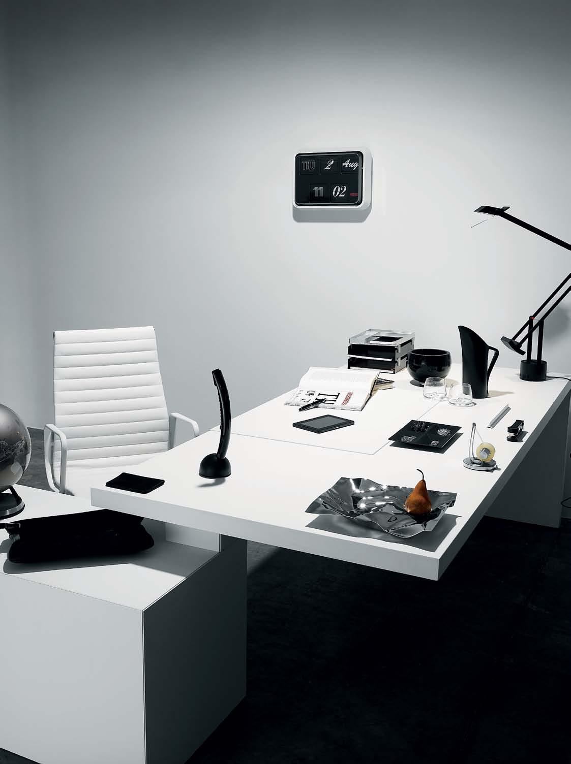
x living edge promotion a b MEET THE DESIGNERS HABITUSLIVING.COM/DESIGNERS LIVINGEDGE.COM
habitus
From left | Menu globe, top3 by design; document case, Bally; Tusk Capri passport holder, Flight 001; Beocom 2 , Bang&Olufsen; PlayBook, Blackberry; Classique pen, Mont Blanc; Compact Desk Ultimate Set trays, Workshopped; Ilse glass bowl , Georg Jensen; Normann Copenhagen whisky glasses, top3 by design; Fink water jug , top3 by design; Tizio lamp, Artemide; Folle stapler and tape dispenser, Forest For The Trees; One Point One Nic Nac leather tray, Workshopped; pins and clips, kikki.K; Panton tray, Georg Jensen.
c
CR MEZGER
Tuned to the Site
A new timber bach by architect Michael O’Sullivan pays homage to the land and its history. andrea Steven S visits the Kare K are site and finds a warmly crafted weekend retreat.
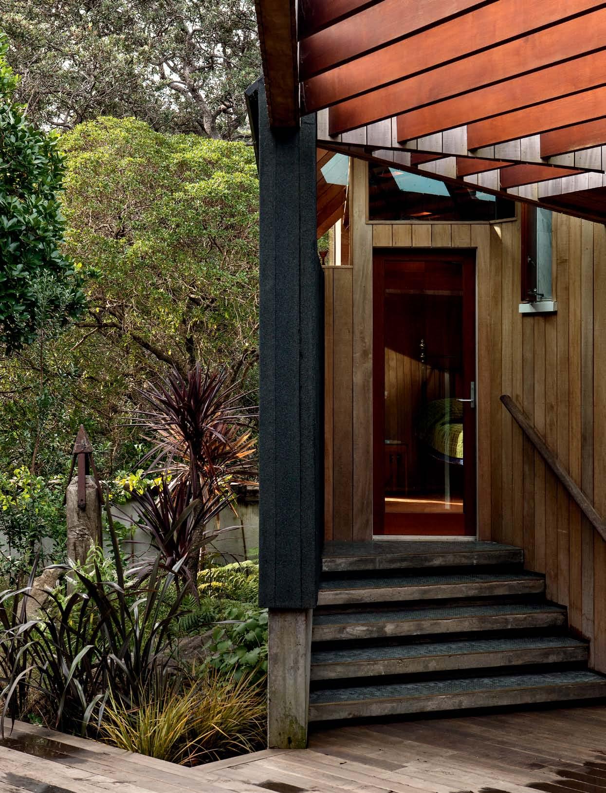 text Andre A StevenS | photogr A phy Simon devitt
# 125 3 . on location
This modest bach on Auckland’s West Coast has a wonderful tale to tell about how a place, a client and an architect can weave a unique story, and how this is embodied within a building. Whether it is a tangible reference evident in materials and form, or simply an intent held by the participants, the elements of the narrative are recalled physically and through memory.
The story of the land began millions of years ago when a line of ancient volcanoes pushed their way up through the earth and shallow ocean. The eroded and fragmented ruins of these giants exist today as steep rocky cliffs and deeply carved valleys up and down the coast. A lush rainforest now cloaks the land and the sea has deposited a vast plateau of iron sand, etched in people’s minds by Jane Campion’s 1993 classic, The Piano, which was filmed here. It is a wild coast. Big surf, strong winds and driving rain give it its reputation. But on a still, fine day its coastline stretches for miles, black sand scorches your feet and spinifex- covered dunes roll into the bush with hardly a house in sight.
The building site sits between the valley interior and the Tasman Ocean, perched on the side of the Watchman, a large rock outcrop and once-fortified Maori pa (village) site. The owners, Bob and Barbara Harvey, had the site sieved before construction for archaeological purposes, but no artefacts or remains where found. During his time as mayor for Waitakere City, Bob gave official recognition to Te Kawerau a Maki as Tangata Whenua or ‘people


issue #18 habitusliving.com

3 . on location # 127 above | Sleek And bl Ack, the houSe cAn bArely be mAde out in the bu Sh. lef T | SurferS mAke the long wAlk AcroSS the duneS to the be Ach.

issue #18 habitusliving.com
The interior space is gently carved and tilted by the wall and ceiling planes.
of the land’. The ceremony sealed a return home for a tribe estranged from their home for over a hundred years. Bob records this history, the colonial settler history, right up to the present, in his book Rolling Thunder, his gift to the place he has loved for over fifty years.
Bob first came to Karekare in 1956 at age 15 and was invited to join the surf club. Piling into the back of a truck with other surf lifesavers to travel the 50 kilometres from downtown Auckland became a weekly event. The place is little changed save for the vigorous growth of the native bush, and the infill of more baches. But development is limited, and what has been built is mostly small and unobtrusive. Bob and Barbara virtually raised their kids at Karekare each summer in their one-room bach. But when the Watchman site came up for sale a few years ago, the couple were strongly drawn to it and it was one of few that had a peek of the ocean.
An old timber bach stood on the land, which the Harveys originally planned to extend. But after discussing options with architect, Michael O’Sullivan of BOS Architecture (Bull/ O’Sullivan), they decided to build a house that would be better tuned to the site.
Michael had just designed his own family home, a small, carefully crafted timber house with wonderful warmth and character. He had built it himself and was comfortable with small scale. His sensitivity to the location and feeling for materials convinced the Harveys he could achieve what they were after. Their family home in town is a barn-house from the 1950s. Bob describes it as a ‘living house’ with an exposed creaking timber skeleton and exposed timber frame. Michael’s own house too had a similar honestly and sense of purpose about it.
The Harvey’s were after a building in sympathy with the landscape, a ‘wooden hut’, and from three conceptual ideas Michael presented, they preferred the low-slung, tentlike structure. Sun was the first consideration in the bush-clad valley, and Michael proposed a northern courtyard to wrap the house around. The undulating and irregular topography informed the lines of the house, and the interior space is gently carved and tilted by the wall and ceiling planes.
It is a site with competing needs. To the north is the need for entry and sun access, but the view over the estuary and dunes is directly
3 . on location # 129
lef T | A Skylight in the otherwiSe dArkened hAll cre AteS A burSt of light over the StAirS


issue #18 habitusliving.com
The long, low stud height and deep supporting posts makes the living room have some qualities of a verandah.

# 131 3 . on location above | itAliAn mArble on the kitchen bench – with An uncAnny reSembl Ance to the locAl SAnd – contr AStS with the e Arthy timber S of the interior. the Architect tre AtS the ceiling with extr AordinAry wArmth And detAil. lef T | thiS deep window Se At cre AteS An Attr Active cubby hole.

issue #18 habitusliving.com above | the cAve-like mASter bedroom getS A burSt of wArm Sunlight. oPP oSITe above | hex AgonAl blue Stone mo SAic tileS cre Ate A cAve-like Atmo S phere in the b Athroom S o PP o SITe beloW | rewi SpAggon' S in S itu cA rving depictS S ix wh A leS – one for e Ach member of the fA mily.
Cave-like timber-clad bedrooms and stone-clad bathrooms reinforce the strong materiality of the house.
south. Without any privacy issues to wrangle over, the architect has cut a window the full length of the southern elevation and wrapped the glazing over the roof to bring in the light. The long, low stud height and deep supporting posts makes the living room have some qualities of a verandah. And a western triangular window seat stealing a peek of the sea feels like the prow of a boat. With soft dappled light filtering through skylights, the whole living space feels very connected with the outside and the environment. Yet the timber and gentle scale makes it also feel very contained and internal, satisfying an important human need for shelter in this sometimes-wild climate.
To extend the courtyard enclosure, the architect has wrapped two bedrooms along the eastern boundary, creating a very intimate and connected house. Cave-like timber-clad bedrooms and stone-clad bathrooms reinforce the strong materiality of the house. Michael built many of the elements himself, including the wall-mounted timber shelves and the tenseater dining table.

Through the Harvey’s close association with members of Te Kawerau a Maki, a Maori dimension became an important part of reflecting a sense of place. There are two carved artworks – one in the living room wall panelling by Rewi Spaggon depicting six whales – one for each of their six children – and a timber

3 . on location # 133
Tekoteko carved by Te Warena Taua displayed in a purpose-built niche. These elements are integral to the architecture, as are four boundary makers to the site placed before construction started. The entry court is a fundamental Maori concept as a place for ceremony and transition, and a threshold between sacred and profane. The land and house were blessed in a traditional way, before the Harveys hosted a feast and hangi for 100 family and friends.
As an object in the land, the rough black exterior is almost camouflaged amidst the bush, volcanic rock and dunes. Very little house volume is visible from the public beach access or from the driveway. But once inside the courtyard, the dark skin peels away to reveal a soft timber body. Architect and clients collected and sprinkled sand across the concrete floor before it cured, bringing the beach inside. This mixture of natural and robust materials allows an easy and seamless flow between the house, the land and the beach.
habitusliving.com/issue18/karekare

issue #18 habitusliving.com
drop box
client Bob and Barbara Harvey
Architect Michael O’Sullivan
b uilder Bruce Barton
engineer Steve Dwyer
conSultAnt (Resource Consent) Waitakere City Council
Joinery McNaughtons Wndows and Doors, Nulook Windows and Doors
ArtiSt (Carving): Rewi Spraggon (Te Kawerau A Maki) bleSSing of home Te Warena Taua completion of build 1 year floor Are A Ground Floor Area 129.9m 2 , Deck Area 84.1m 2
Bull/O’Sullivan Architecture (64) 9358 1237 bosarchitecture.co.nz
art
Small Guardian figure
Kowhatukiteuru (builder of Karekare pa) in Kitchen recess, was carved by Te Warena Taua in 1994, presented to Bob as gift commemorating the return of Te Kawerau A Maki to the Karekare beach.
Furniture
Dining table with Kauri table top on black SHS legs (custom made by Architect). Dining chairs in black by Mario Bellini from Matisse. Circular outdoor table on Northern Deck in cosmic black granite from Italian Stone on Black circular steel legs (custom made by Architect). Plywood bookshelf in Living Room (custom made by architect). Custom lounge made by local upholsterer in Onehunga to Bob and Barbara’s design, second from a retro shop in Kingsland, NZ.
Lighting
Kitchen pendant in anodised aluminium (custom made by architect). Throughout home, recessed lighting with Cedar trim.
Finishes
Concrete floor finished in black sand glued to concrete. Cedar sliding doors and windows by McNaughtons
Windows & Doors. Aluminium joinery by Nulook Windows & Doors. Wall linings are Totara boards in Living and Fijian Kauri tongue and groove in Bedrooms/Hall. Kitchen bench in Titanium granite from Italian Stone. Folded steel door handle custom made by architect. Hexagonal basalt tiles from Artedomus. Ceiling lining is 20mm dressed Cedar boards finished in Sikkens stain system. Brass door stops fabricated by Classic Sheet Metals. Carpet in Bedroom from Premium Flooring. Exterior cladding is Nova mineral black chip with approved torch-applied membrane by General Manukau Enterprises. Exterior cladding in northern deck area is Heart Totara. Roof glazing supplied by Nulook Windows & Doors. Viewing platform deck in Australian hardwood from the old Cornwallis wharf (existing from old bach). Pergola over northern deck in exposed stained Cedar.
FiXeD & FitteD
Autex greenstuff insulation. Rheem Solar panels on proprietry stainless steel frame. Nulook skylights. Front gate at entry in steel custom made by architect. Warmington studio fireplace by Fires by Deisgn.
CAR PORT STAIR DECK WESTERN DAYBED LOUNGE DINING 1 2 3 4 KITCHEN BATH LAUNDRY GUEST BED ENSUITE MASTER BEDROOM 6 5 8 7 0 9 e q
floor 2 3 4 5 6 7 8 9 0 q e 1 3 . on location # 135 oPPP oSITe | AS the entry court open S up, the rough, bl Ack exterior giveS wAy to A much Softer timbered interior. above | floor pl A n S.
ground floor first
K areK are Bach in focus
Michael O’Sullivan is no stranger to building homes – in 2009 he completed his own family home in Auckland. For the Karekare bach, he was only supposed to be on architect duties, but Barbara and Bob had seen Michael’s handiwork and were open to the idea of custom fittings. “In most instances, I simply talked about what I would like to make, and Bob and Barbara said go for it!” recalls Michael.
The front door handle, made from a piece of 115x12mm mild steel, was made using the traditional blacksmithing method. “The metal was heated to a level where I could beat it into a shape that enabled a perfect match for the clients hand,” Michael explains. As well as having something unique for this tactile piece, Bob and Barbara believe it’s a perfect match to the walkway, made out of hundred-year-old sleepers, and the deck, which came from the old Cornwallis wharf.

The front gate was similarly fashioned, the clients requesting a design that filtered people and landscape. The loose, organic result provides a view of the desk and the house and beach beyond while also being beautiful –“the architect’s welding skills are sincerely appreciated,” Bob says.

The process of designing and making these custom pieces became a true collaboration between client and architect, indicative of the deep relationship forged during the design and building process – the custom kitchen pendant light was even an anniversary gift.
Underneath the pendant, the marble kitchen island bench represents the history of the land through its beauty and strength, while also being completely functional. It’s “utilised from both sides and contains the draws for all pots, pans, crockery and utensils,” says Bob. “It is a serious statement and makes ease of cooking preparation and serving.”
While Barbara and Bob enjoy the custom pieces every day, Michael was also able to explore a more hands-on element of his practice. “I much prefer to make beautiful objects as opposed to sitting at a computer drawing,” he says.

In this beautiful bach, even the smallest details were sensitively designed, and even constructed, by architect Michael O’Sullivan. He and residents, Barbara and Bob Harvey, explain how this makes for a very special result.
Clo Ck WISe from ToP kitchen bench cuStom deSigned And mAde by Architect michAel o' SullivAn.
Ri G ht FRont entR ance Gate cuStom deSigned And mAde by Architect michAel o' SullivAn from Steel uSing tr AditionAl bl AckSmith welding method.
issue #18 habitusliving.com
exteRio R FRont doo R handle cu Stom deSigned And mAde by Architect michAel o' S ullivA n to m Atch the front gAte.


ONLY AVAILABLE AT POPCORN INTERIORS team7.at | popcorninteriors.com.au | t +61 3 9421 1000 | e richmond@popcorninteriors.com.au Visit our showroom at 504 Bridge Rd, Richmond VIC 3121. For opening hours please visit our website AYE CHAIR
If you love your ceiling fan, ignore this ad.
You obsessed over every bit of furniture, floor option and window treatment. But when it came to the ceiling fan, you just went with . . .“whatever.”

Haiku® takes “whatever” out of the equation, exceeding expectations you didn’t know you had.
In a class of its own
Haiku looks different because it is different, with revolutionary technology hiding inside the seamless fit and finish at its center. The sleek look conceals Sensorless Drive Technology™ that delivers an 80% improvement in efficiency over conventional ceiling fan motors. Confirmed by ENERGY STAR® as the most efficient ceiling fan, Haiku also won the prestigious international red dot award, a prominent seal indicating quality design.
Don’t call them blades
Haiku’s patent-pending Thin Sheet™ aerofoils span five feet and feature an aerodynamic profile, resulting in smooth, silent airflow (in fact, it’s also the quietest fan in the world—at all speeds). Haiku aerofoils are made of Moso bamboo, a sustainable resource with the tensile strength of steel that renews itself every five years. After multiple quality inspections and a seven-pass, solvent-free finish to highlight the natural grain, five thin

sheets of bamboo are bonded in a hot forming press, then cut and sanded by hand to create aerofoils that meet the strictest quality standards. Each aerofoil is then individually fitted as technicians confirm the perfect balance of every fan.
Stealth operation
Haiku’s sophisticated control features include Sleep, Timer, Reverse, and variable speed settings, including the exclusive Whoosh™ mode to simulate natural airflow. This is the one fan you’ll dare turn all the way to high—its unique core and 13-step hand-balancing process mean it will never rattle or wobble. Ever.
Quirky name. Serious fans.
We don’t make ceiling fans. We make precision machines. After a decade of engineering high-performance industrial air movement products, we heard your request: to make a home fan worthy of being called a Big Ass Fan.® Here it is. And it’s the most efficient. The quietest. The most sustainable.
If you love your fan, move along. If you don’t love your fan, leave it for us. Call (07) 5500 0690 to start your affair today.
(07) 5500 0690 haikufan.com/ ha BiTuS
©2012 Delta T Corporation dba the Big Ass Fan Company. All rights reserved.
The perfect collaboration
Two creative architects and an emerging artist made for a perfect combination – one that resulted in a conversation piece nestled in a leafy suburb in Kuala lumpur . amy Ng gets a glimpse into their process.

3 . on location # 139
text Amy Ng | photogr A phy Zhe Ng JAo tAN, Ke N Soh
“
Perfection is boring,” chuckles Leon Leong, as we walk around his loft-like terrace house in Taman Desa, a stone’s throw away from Kuala Lumpur. It’s quiet here, and you can hear birds chirp merrily during the late mornings and where the streets belong to both the young and old in the established neighbourhood. From the variety of vintage furniture (unceremoniously thrown out by neighbours) that has found a new home among his workspace, it is not hard to see what he means about not wanting perfection. “They hold so much character,” he adds. Indeed, chalk marks can still be seen on some of the chairs once used in an old school and you can see the wood’s grain emerging from peeled-off shellac finishes. It looks like they have been to war and back, but only now celebrated like heroes.
Leon believes that a home, much like his art, is a process. There aren’t any picture perfect moments, nor an ending – merely stages at various completion as he grows with the space. “I didn’t want something that was too sterile, too polished and unreal,” he says.
“I commissioned BC and Wen Hsia of Building Bloc because I saw their portfolio and loved


issue #18 habitusliving.com

LEON | r E sidEN t 3 . on location # 141 PREVIOUS | NesTled iN beT weeN a row of old Terrace houses, leoN 's house may look uNassumiNg aT firsT glaNce. buT glass louvres iN place of roof Tiles aNd The addiTioN of small Trees oN Top of The porch roof TurNed heads aNd raised quiTe a few eyebrows. ABOVE | The liviNg room shares iTs space wiTh The kiTcheN aNd is peppered wiTh eclecTic fur N iT ure ThaT leo N has collecTed over The years. OPPOSItE | leo N i N his kiTcheN which The archiTecTs moved To The fro NT of The house. m osT of The fiTTi N gs are made of co N cre Te – N egaTi N g The N eed for builT-i N s.
I didn’t want something that was too sterile, too polished and unreal.

issue #18 habitusliving.com ABOVE | The liviNg room overlooks leoN 's workiNg space below, while The coNcreTe bookcase Takes ceNTer sTage, bufferiNg The workspace from The diNiNg area. OPPOSItE | e xisTiN g Timber baTTeN s were used To supporT The skylighT roof of The iNTerNal courT yard – The archiTecTs Tore parT of The ceiliN g aN d walls To allow for lighT To flood The lower floor of The house.
They removed quite a lot of walls and opened up some of the ceilings. It’s quite symbolic, really – almost like an exorcism.
LEON | r E sidEN t
what they did. What persuaded me in the end was when I visited their home [see Habitus #14]– their work had a raw beauty that I could connect with. Perfection without being too perfect,” he smiled. “The first time they came up with the drawing for the space, I was completely in awe. They did many unconventional moves here – shifting the kitchen to the front of the house [which is something rare in landed homes in KL], and they moved the master bedroom to the back of the house up on the first floor.” They’ve also dismantled the kitchen at the back and torn down many walls to create an openended living arrangement that’s structured, yet imbued with infinite possibilities.

Like most artists, freedom means a lot to Leon. As the house was being completed, he was slowly distancing himself from his prior work as a published writer, an educator and a graphic designer. He engaged his energy into working with his hands. “They removed quite a lot of walls in this house, and opened up some of the ceilings. In hindsight, it’s quite symbolic, really – almost like an exorcism. And it’s not just for the house – it’s for me as well,” he says. It is ironic, since Leon’s first exhibition, held in his home, was entitled ‘Exorcising Demons’.

3 . on location # 143
The decision to dedicate himself to art was almost a subconscious one. “When I was young, I was naturally drawn to art.” he enthuses. “I loved working with my hands – but I was also particular about the difference between art and craft. It’s only now that I decided to reach into my psyche to re-connect with that part of me.” In essence, the set-up of the house was designed to facilitate his progressive career transition by allowing him to grow organically into it. “The whole house has a positive vibe – its energy is clearly palpable as you move through it. I’d say it’s almost a visible quality in itself,” he adds of the open spaces and light.
“I was driving around the area one day as I was looking to move out from my apartment nearby,” says Leon. Serendipity intervened at just the right time –“And with a bit of luck, I found this place – the owners were migrating overseas and the offer was too good to resist.” The house overlooks a plot of empty land, overgrown with shrubs and trees, its façade immediately different from the rest along the street. The row of trees that made permanent residence on the balcony of the second floor certainly made heads turn.
The layout of the house is simple. The main entrance on the ground floor opens up to a living room that contains a small kitchen; a small library along with a TV nook is the focus on the split level below; and then a first floor that houses the master bedroom, Leon’s gallery and studio.

Building Bloc also reinstated an internal courtyard on the lower floor, which the previous occupants had done away with in favour of building an additional room. They tore down the walls and ceiling and planted a tree in its place, bringing with it plenty of sunlight – a very welcome addition that enlivened the space. “Leon also wanted lots of light to stream into his studio, so we opened the roof tiles and ceilings on the first floor. The existing timber battens were used to support the skylight roof,” says BC. At night, the house shines like a lantern – light emanates from within to create a warm, inviting glow.
The centrepiece of the living room is the concrete library in the middle of the workspace one level below, where books on art and literature take centre stage. The house is unified in appearance and is almost seamless
issue #18 habitusliving.com ABOVE |
OPPOSItE |
as a resulT of replaciNg The house's roof Tiles wiTh louvered wiNdows, The gallery/workspace upsTairs is baThed iN perpeTual lighT duriNg The day.
as The house's oNly bedroom, The masTer bedroom's raw co NcreTe fiNishes imparT a cosy yeT edgy charm.

# 145 3 . on location
The first time they came up with the drawing for the space, I was completely in awe. They did many unconventional moves…


GA r AGE EN try K it CHEN L i V i NG 1 2 3 4 WOr K COU rtyA rd WC LOUNGE 6 5 8 7
di N i NG stA ir BE drOOM st U diO 0 9 q e LEON | r ESIDENT ground floor first floor 1 2 3 4 6 5 8 7 0 0 9 q e issue #18 habitusliving.com ABOVE | floor plaNs. OPPOSItE | The coNcreTe fiNish coNTiNues iN The masTer baThroom, where miNimalisTic copper pipes aNd fiTTiNgs add color aNd characTer.
drop box
archiTecT Building Bloc
pro JecT Team Wen Hsia & BC Ang
civil aNd sTrucTural eNgiNeer
Projurutek Sdn Bhd
builders aNd specialisTs CHB Construction and Ming Seng Construction
elecTrical eNgiNeers Loke Electrical, Pro Nature and Siang Tek Renovation alumiNium specialisTs Yee Ming Aluminium securiT y Innotec Security System
Building Bloc building-bloc.com
LIGHTING General lighting throughout is fluorescent tubes and feature lamp is Paolo r izzatto’s 265 lamp from Flos.
FINISHES
Floors are refurbished existing terrazzo finish and cement render. Walls are finished with smooth and cracked paint. Wardrobe and shelves are concrete with timber edging. Gates and grills are recycled steel plates from the Computer-Numerical- Control Cut Factory.

FIXED & FITTED
– all thanks to Building Bloc’s clever planning when it came to utilising the materials at hand to further extend the interior. “We designed and made most of the items in concrete: bookshelves, TV cabinets, the stand-alone kitchen, his wardrobes and the master bedroom tub. The outside grills are made of recycled metal from a laser-cut factory,” BC elaborates. It was the pair’s creativity and ingenuity that convinced Leon that their relationship was a perfect collaboration.
Building a liveable house is very much BC and Wen Hsia’s passion, so they were relieved when Leon gave them a free hand and lots of room to execute their ideas. Once in a while, when he did check in, it was to sketch the workers who were building his home instead. “It’s hard to argue with people who know what they’re doing,” observes Leon, who now splits his time between KL and Istanbul. “They looked after the project with much passion throughout, and I respected their views and vision; much like I would with other artists. You’d think that being an artist I’d be much more difficult to deal with. But, in fact, it’s not difficult at all to just sit back and watch the magic happen – building a home is a lot like art; you need be patient while messy bits sort themselves out.”
habitusliving.com/issue18/buildingbloc
FURNITURE In Living r oom, Model AP 34 sofa designed by Hans Wegner and Diamond lounge chair designed by Harry Bertoia. Stools and writing tables are upcycled materials from local store, Junkyard.
All tap fittings are custom designed by Building Bloc.
3 . on location # 147
desa house in focus
The natural light that spills through the ceiling panel creates variation in this Malaysian home. “The weather and intensity of the light will change the mood of the room, making it interesting and not dull,” says Wen Hsia. But it also has functional properties –the concrete structure is 600 millimetres thick and the lattice device cuts down glare and heat, bringing in filtered natural light.


The skylight and lattice shield the residents below from the elements, making it more habitable and usable as an indoor space. The area was originally an open courtyard but the previous owners had converted it into room. “ We reinstated it, put in the skylight and planted a tree to make it a ‘chilling’ place next to the work area,” says Wen Hsia. During the day, the residents are now able to paint in this area without any artificial light source – “the skylight provides fantastic [natural] light for this purpose,” Leon says. “ It becomes the heart of the house that tells the mood of the day,” Wen Hsia adds.
Located next to the work area where Leon writes, it was intended as a place to unwind and have a lazy afternoon nap, the shadows providing respite from the heat of the Malaysian sun.
The shadows also “make us conscious about passing time,” Leon adds. “At certain times of day strong overhead sun creates shafts of light on the wall and floor.” The somewhat poetic artist describes the experience: “ Some nights you stretch your back and look up –there’s your reflection suspended in mid air and a glowing moon behind.”
CLOCKWISE FROM tOP LATTICED SKYLIGHT 600mm Thick coNcreTe, cusTom desigNed by buildiNg bloc lower level suN filTeriNg Through The skylighT creaTiNg shadows iNTo The space.
The shadows from The sky lighT add a NaTurally dramaTic effecT
issue #18 habitusliving.com
A latticed roof detail creates a play of light and shadow in the Desa House. Architect, Wen Hsia, and resident, Leon, comment on how it affects the physical and emotional experience of the space.


1300 FLR MNA | floormania.com.au | Sydney showrooms Kensington & Concord
and win 4 x

Illuminated Pill Pots from Cafe Culture
Designed by Rob Slewe for Bloom, Pill has been cleverly designed to use relatively little space. Its design is soft and cylindrical and is suitable not only as a plant or flower pot, but as an ice bucket both indoors and outdoors. Pill ’s clever design enables water to drain through the port underneath and bypass the electrical as well as allowing connectivity to watering systems. Pill has found its way into exclusive resorts, spa retreats, landscape designs, pool areas and designer homes across Australia and Europe.

To enter, simply SUBSCRIBE to HABITUS magazine online at habitusliving.com/subscribe and answer this question.
QUESTION : Tell us in 25 words or less, in what creative way will you use your Pill?


Valued at $2,972 RRP


MAGAZINE Subscribe


Like us on Facebook Download from the App Store An online community for Design Hunters. ONLINE
Family extension

text Stephen Crafti | photography emma Cro SS
In this dynamic addition to a Victorian-era house, architect Fiona Winzar has woven together past and present to create a modern family home. Stephen CraF ti drops in.
issue #18 habitusliving.com

3 . on location # 153
This double-fronted late 19th Century terrace in the Melbourne suburb of East Hawthorn doesn’t stand out from the period streetscape. Nestled behind a high brick fence, the home’s decorative timber verandah is quietly understated. However, past the tessellated tiling on the porch, the house reveals a quality not normally experienced in homes of this period. “My clients didn’t give me a prescriptive brief,” says architect, Fiona Winzar. “There was no real mention of the form they were after. But there were some wonderful discussions, connections with people and places, that were raised.”
The owners of this home have travelled regularly to India. In their early married life, they also frequented Melbourne Wine Room, a bar in St Kilda, where they had previously lived. “We’re both keen cooks, but we didn’t want the usual kitchen with typical marble island bench,” says the resident. Just as important was the cherished memory of her late father, a silversmith who fused gold and silver in his designs. Her father would regularly string up light bulbs at home, often in an ad hoc manner. “Dad would often put in a coloured light bulb. As a child, it was always novel seeing the effect it had on the walls,” she recalls. “These memories resonate in the house, in one way or another,” says Winzar, pointing out the ‘draped’ exposed light fitting.

While the original part of the house has been re-worked with built-in joinery and fresh paint, the doors to each of these rooms now feature hand-painted artworks by a friend’s father, a temple and bus painter based in Mumbai,

issue #18 habitusliving.com

3 . on location # 155
PREVIOUS | the curVaceous extens I on to the rear of the house. ab OVE | the house has been carefully restored. f ortunately the slate tI les on the roof were I n good cond ItI on, as were the orI g Inal tIles on the front Verandah. OPPOSITE | contemporary add ItIons, such as buIlt-In lounges desIgned by archItect fIona wInzar, contrast wIth ornate features In the orI g Inal portI on of the VI ctorIan-era home.
Dad would often put in a coloured light bulb. As a child, it was always novel seeing the effect it had on the walls.

issue #18 habitusliving.com
the resident

# 157 3 . on location
India. Krishna Kant’s elaborate paintings of various deities, along with the silver-painted joinery and cornices, create a mystic quality throughout the home.

A lean-to at the back of this house was removed and in its place Winzar ‘grafted’ a curvaceous form orientated to the northeast. The residents wanted single-level living, particularly with two young children. In response, Winzar's extension incorporated lightweight materials, such as timber and glass, with ‘book-end’ walls constructed in honed concrete block. “I wanted to anchor the design to the site,” Winzar explains, “but I was also mindful of making the design feel as though it has somehow emerged from it.”

The new open plan kitchen, living and dining area focuses on the circular-shaped courtyard, with its raised seating and swimming pool. Due to its northeasterly aspect, this large space enjoys natural light throughout the day. Additional light from the west is captured through a series of rose-coloured laminated glass highlight windows. “They were keen to have subtle colour in the design,” says Winzar.
One of the first things noticed about the transition from past to present is the extraordinary tapestry-like timber ceilings in the new wing, slightly raked to maximise the light, as well as correspond with the home’s original high ceilings. Lined in plywood, painted silver, bleached and even limewashed, the ceiling is as breathtaking

issue #18 habitusliving.com PREVIOUS | many of the materIals used In the new wIng are gem-lIke In colour and lIne, capturIng the presence of the res Ident's late father, a jeweller. ab OVE LEFT | the bathrooms are s I mple, wIth graph I c tI les and exposed lI ght fIttI ngs. ab OVE RI ghT | a study nook doubles as a d I splay un It. b ELOw LEFT | sketch show I ng how the house curV es around the sw I mm I ng pool. OPPOSITE | the herr I ngbone ceI lI ng contI nues I nto the study area wh I ch doubles as guest accommodatI on. located on a lower le V el, It exudes a d I fferent feel from the open plan k Itchen and lIVI ng areas.
The extraordinary tapestry-like timber ceiling … lined in plywood, painted silver, bleached and even lime-washed.

3 . on location # 159
They preferred the extension to look out over the garden and swimming pool, rather than sacrifice their outdoor space for car parking.

issue #18 habitusliving.com
drop box
desIgn and project archItect Fiona Winzar
documentatIon Emmanuel Mavridis
structural engIneer Tim Gibney and Associates
buIlder SAPA Construction
joInery Allcraft Joinery & Design
roofIng Specialist roofing services with Craft Metals
Fiona Winzar Architects (61 3) 9999 2148
fionawinzar.com
furnIture
Generally throughout, built-in daybeds and joinery is custom designed by Fiona Winzar Architects and made by Allcraft Joinery. Hand painted doors to Bathroom and Bedrooms by artist Krishna Kant, Mumbai.
lIghtIng
All lighting fixtures from Mondoluce.
fInIshes Plywood ceiling panels custom cut by Gunnersens and finished with metallic and flat paint from Porter's Paints.
fIxed & fItted
Generally throughout, door handles and joinery pulls from Designer Doorware. In Kitchen, round brass bench with integrated sink and copper waste
designed by Fiona Winzar Architects and made by Alustain Installations. Composite stone benchtop in Blanco Paloma colour from Quarella. In Bathroom Rettangolo basin and tapware from Parisi. Hansgrohe showerhead and Roca WC, all from Elite Appliances. Vogue TR Bisello black-andwhite wall tiles from Classic Ceramics. In Living Area, Viridian DécorColour glass in Ruby Red and Arctic Snow, double-glazed barn doors and windows to deck by Viridian New World Glass. Custom timber door and window frames in Victorian Ash from Redwood Joinery. Concrete blocks from Designer Blocks. French Grey pre-finished Oak floorboards from Royal Oak Floors. In Halls and Bedrooms, Akwa Grey Elm timber flooring.
Colorbond Windspray roofing by Craft Metal Supplies from Specialist Roofing Services Melbourne.
as the kitchen’s circular brass island bench. “The finish has been compared to a woven rug and certainly accentuates the slope of the ceiling,” says Winzar.
The dining area, lined with antique mirrored cupboards, also adds a jewel-like quality, as does the brass splash back in the kitchen. “We could have concealed the copper pipe (below the island bench), but knowing how [the resident’s] father combined metals, we decided to leave it exposed,” says Winzar.
Following the curvature of the extension is a study/office. A few steps below the main living area, this space – with adjoining powder room – also functions as guest accommodation. It’s an ideal vantage point from which to appreciate what went into this renovation.
“It was a complete paradigm shift to what we were expecting. We weren’t expecting a curved form, or this level of finish. Fiona was certainly listening when I showed her my collection of Tibetan brass coins,” adds the resident, referring to the brass centrepiece in her kitchen.
habitusliving.com/issue18/victoriard
entrY BedrOOM BAthrOOM t V rOOM 1 2 3 4 L i V inG K it C hen POOL st U dY 6 5 8 7
POOL KITCHEN STUDY TV ROOM BED 4 LIVING BED 2 BED 1 BED 3 ENTRY 1 2 2 3 4 5 7 8 6 2 2 3 . on location # 161 OPPOSITE | the res I dents wanted to expand theI r home w Ithout add I ng a second storey or sacrI fI c I ng outdoor space for car parkI ng. the new open plan kItchen, lIVIng and dInIng
focuses on the cIrcular-shaped courtyard, wIth Its raIsed
and swImmIng
orIentated to the north-east, thIs fun entertaInIng zone enjoys natural lIght throughout the day. ab OVE | floor plan.
area
seatIng
pool.
viCtoria
Architect Fiona Winzar decided to pitch the roof upwards and outwards to compliment the glass windows that reflect rays of violet hues and draw attention to the upper section of the home. “The ceiling has a gentle belly shape,” explains Fiona. “The patterned paneled ceiling is used to accentuate the inverted belly shape of the ceiling by using a zig-zag pattern across the curve of the ceiling rather than highlighting the radial roof rafters within.


“ The timber is interior Hoop Pine ply with natural clear, metallic and flat paint finishes. I think the success of the paneled ceiling is the combination of using a warm and natural material with a pattern that is striking, but has a large format which complements the proportions of the space,” says Fiona.
The resulting roof soon became a prominent design feature of the home and concreted the direction of design for the rest of the home. The glass windows were selected and installed to highlight the curved roof in two ways: it creates a ‘floating’ effect and also responds to the resident’s wish to make a direct reference to the Victorian heritage of the original home, but in a modern way–“the bold colour choice, the steel window frames and the scale of the glass panels couldn’t be mistaken as traditional stained glass,” she says.
Another feature is the hand painted Hindu doors that are carefully crafted by a family friend by the name of Krishna Kant – known usually for his decoration of buses, trucks and temples within his community. It is these symbols of devotion that the resident insisted be painted on to doors that were then set within the door frames. Each door took the artist at least one month to finish after which were individually shipped to Australia equating to a worthy year-long project.
CLOCK wISE FROM TOP handpainted doors lIne the entrance hallway and were paInted by hIndu artIst and famIly frIend, krIshna kant. panelled ceiling and coloured glass creates Interest and hIghlIghts the radIal roof rafters. glass wIndows hIghlIght the curVed roof, whIch separates each gIVIng a 'floatIng' effect.

It is said that all one needs is food and a roof over their head to survive and it is this element that has been brought into the spotlight for the Victoria Road House. But this is not the only design feature – here the architect and resident discuss a few.
issue #18 habitusliving.com
rd houSe in focus


issue #18 habitusliving.com
Fine art living
Renato Vidal wanted a home that could be a showcase for his extraordinary art collection. As aya maceda discovered, the resulting design became a team effort.

text AYA MACe DA | photogr A ph Y toM epper S oN
# 165 3 . on location

PREVIOUS |
issue #18 habitusliving.com
VidAl’s steel And r AttAn sculpture VisuAlly cArries the roof of the house. ABOVE | the house set on top of the hill At l AGunA de BAy
Before the likes of Kenneth Cobonpue emerged from the Philippine design scene, there was designer-maker, Renato Vidal. Vidal re-invented the rural art of weaving indigenous vines, roots and tree barks intertwined with grass and wild flowers in his own interpretations and collaborations with Filipino-moderne consortium, Movement 8. Through his innovations and his company, RP Vidal Handicrafts (established in 1977), Vidal transformed what was once a cottage industry operation into a global manufacturer of contemporary baskets, accessories, topiary and furniture. His works were picked up internationally in the 1980s during a local CITEM expo in Manila and shortly after, he began exhibiting collections from his new company, First Binhi Arts and Crafts, at major fairs in Europe and the United States.
Vidal comes from humble beginnings and the opportunities of bringing his products globally provided him exposure and the opportunity to indulge his appetite for modern design. On each trip, he would take time to visit museums, take part in workshops and to meet artists personally – always returning to the Philippines with a find, but without a home to place it in. Also a patron of Filipino fine art, he would frequent gallery openings to add to his collection. “I prefer acquiring art as artists intend them to be, which is why I hardly commission work”, says Vidal
After decades of design hunting, he collaborated with colleague, Tony Gonzales, and young architect, Denise De Castro, to design a house where he could finally enjoy his

The exterior is inconspicuous, but surprisingly adorned with the most conspicuous large sculpture that visually appears to carry the house structurally.
3 . on location # 167
collection. Completed with a hands-on approach, Vidal now lives in his finished home. On a hilltop neighbourhood overlooking Laguna de Bay (the largest lake in the Philippines), the house sits on a secure and secluded setting where he can enjoy the views and watch storms and the setting sun pass the horizon.

The house is designed as a backdrop for Vidal’s art collection. As each object represents a story, the house is planned as a journey of spaces to slowly reveal each piece. Vidal required a simple house, so as not to compete with the artworks within. The exterior answers that brief – a simple, inconspicuous white box with two concrete roof slabs. But it is surprisingly adorned with a conspicuous large sculpture that appears to carry the house structurally. The steel and rattan artwork, created by Vidal himself, becomes a focal point – both of the house itself, and also as a representation of the art collection it holds.
The planning is the strength of the house, fragmented into individual zones, which are connected by a series of internal and external corridors. The entry to the house is through a series of external stairs, central to the


ABOVE | the dinin G room juxtA poses Western A nd AsiA n furniture, Accessorised By VidA l’s BA skets And dried n ipA pods. OPPOSItE | the entry is B uilt A round A n old church door sA lVAG ed By VidA l. 3 . on location # 169
As each object represents a story, the house is planned as a journey of spaces to slowly reveal each piece.

issue #18 habitusliving.com
Sliding doors connect internal spaces with surrounding gardens and external corridors, mimicking verandah living…

ABOVE | A WhimsicAl instAll Ation By filipino Artist tess pAsol A hAnG s AB oVe the mAin stAir. OPPOSItE | the liVinG room shoWcAses VidAl’s loVe for modern desiGn.
3 . on location # 171
DRIVER'S ROOMS
SERVICE KITCHEN
HELPER'S ROOMS
STORAGE
STAIRS
ENTRY
LIVING ROOM
POWDER ROOM
DINING ROOM
KITCHEN
GUEST BATHROOM
GUEST BEDROOM
COVERED LANAI
1
q w e r t y u i o p BASEMENT LEVEL fir ST f Loor grou N d f Loor ABOVE | floor pl Ans. OPPOSItE | VisuAl tr AnspArency presides in the rooms of the second le Vel, includinG the Bedroom Where priVAcy is not An issue. 4 4 1 2 3 3 5 7 p 8 9 0 q e r t y u i o w 5 6 w q e 5 1 issue #18 habitusliving.com
OUTDOOR DINING OFFICE LIBRARY/HALLWAY MASTER BEDROOM MASTER BATHROOM ROCK GARDEN ROOF DECK
2 3 4 5 6 7 8 9 0
site and surrounded by gardens that lead to an entry courtyard. From here, the planning is revealed. The main artery, an external corridor, continues from the entry courtyard to the rear garden of the property, separating and connecting the most public zones of the house – the dining and living rooms on one side, and the kitchen and guest suite on the other. Glazing wraps around each zone and sliding doors connect internal spaces with surrounding gardens and external corridors, mimicking verandah living – the hallmark of traditional Filipino houses – on the lower levels. When all the doors around the house are opened, breezes cross through the labyrinth of light-filled spaces.
The journey inside the house begins with an antique hardwood door salvaged from an old church from the Northern Philippines, with stainless steel handles custom designed by contemporary Fililpino sculptor, Impy Pilapil. The doors open to a double-height foyer decked with Filipino art and a glimpse of the external sculpture by Vidal presents itself beyond the glazed room. The foyer precedes the living and the dining room, separated by an internal
staircase that leads to the private living zone on the upper level. A whimsical installation by fellow Movement 8 artist, Tes Pasola, resembling stones scattered in the air, floats above the entire staircase.
A row of monochromatic, ethereal paintings line one side of the living room and glazed sliding doors opening to the gardens wrap the other three sides to allow nature and light to fill the space. With restraint, Vidal reveals his love for furniture design with pieces by George Nelson, Jean Marie Massaud and Charles and Ray Eames. A verandah connects the living and dining rooms at the rear of the house. Here, a thick section of an old hardwood tree held by a stomp of recycled shipping metal by Filipino designer, Tony Gonzales, makes up a large outdoor table.
Central to all the zones is the dining area, a double-height space that links all areas of the house visually. It has a warm feel created by its narrow proportions and the use of timber finishes and furnishings. A huge fibreglass sculpture by Impy Pilapil hung from the top of the void hovers over the dining table. An external corridor lines one side of the dining

3 . on location # 173
room, allowing light and visual connection to the kitchen. Each room juxtaposes western and local designers, accessorised with Vidal’s own creations: baskets, dried Nipa pods and works in woven grass.
The upper level of the house is similar in planning, with light finishes and an abundance of glazing in lieu of solid walls, allowing for visual connection between bathroom to bedroom, bedroom to study and staircase to bedroom. Privacy is not an issue for Vidal, who lives alone. Indeed, he preferred the house to be as open as possible visually while being segmented somewhat on a physical level to allow him to experience its entirety from any part of the house.


Vidal’s love for objects and as a collector is revealed in every room. He has collected not only the furniture, but also the fittings to each room, mostly prior to the project’s inception. Like the rest of the house, the bathrooms and kitchen are treated like blank rooms to fill with objects. A shower, a sink and each appliance are each separate functional pieces of furniture that make up the room.
Vidal’s collection could make up a small museum of modern art. But the fragmentation of the house into individual spaces allows him to distribute the elements in a considered way. “The house has its architectural moments”, says De Castro. “The different spatial conditions and focus of each room is there to complement Mr. Vidal and his life.” Each room tells a story about the richness of his life, and this for Vidal was the whole point of building a home.
habitusliving.com/issue18/vidal
A
G
intern A lly. issue #18 habitusliving.com
ABOVE | the inconspicuous exterior Adorned By the most conspicuous sculpture desi Gned By VidAl himself. BELOW | An oVersized fiBreGl Ass sculpture By filipino sculptor impy pil Apil hoVers ABoVe the dininG room. OPPOSItE | the study W ith l
A ke Vie W s A lso oV erlooks the foyer
nd the dinin
room
drop box
Architect DDC Architectural Studio –Denise V. de Castro
principAl Architects Maria Caridad Valenzona & Marife Ceno
interior desiGn Tony Gonzales and Renato Vidal

interior desiGn consultAnts Tes Pasola (TP Draft Lab) and Milo Naval (OMO Furniture)
l AndscApe desiGn Ponce Veridiano and Renato Vidal
structur Al enGineer Robert Alomia
sAnitAry enGineer Jovy Anacio
electricAl enGineer Ferdinand Velasco
mechAnicAl enGineer Elezier Lao
contr Actor Construkt Innovations Inc.(RG Roa)/ RS Design (Raul Sugue)
DDC Architectural Studio arch.denisedecastro@gmail.com
Art Works
In Foyer and Stairs, Tess Pasola and Tony Gonzales ‘Suspended Garden’ installation made from paper. In Doorway, artwork from Pinto Gallery. In Dining room, fibreglass and stainless steel sculpture by Impy Pilapil and Renato Vidal’s flower pods in large bowls. On Verandah, ‘Floating Arurog’ sculpture created by Renato Vidal. Near window, large white sculpture is ‘Bloom’ by Impy Pilapil.
furniture
In Foyer and Stairs, Lounge chair by Milo Naval. In Living Room, B&B Italia Terminal 1 chaise designed by Jean Marie Massaud, Vitra La Chaise designed by Charles and Ray Eames and Herman Miller Coconut chair designed by George Nelson, Sea grass rug and E15 stools. In Dining room, E15 timber, Wishbone chairs,
B&B Italia credenza, Indo-chine antique cabinets and wall art from Art of Asia in Manila. On the Verandah, Shipyard Metal table by Tony Gonzales, Nipa pods in dried flower arrangements. In Bedroom, Renato Vidal-designed bed from recycled timber, Fritz Hansen PK 22 lounge chair designed by Paul Kjærholm.
liGhtinG
In Foyer, Stairs and Dining room, Louis Poulsen Artichoke lamps designed by Poul Henningsen.
finishes
Generally throughout, Oak flooring in Breeze.
fixed & fitted
In Kitchen, Filipino cabinetry and Bulthaup kitchen.
# 175 3 . on location
Vidal house in focus

Artworks communicate with their environment on a very intimate level and this contribution can overcomplicate any space. This is certainly not the case within the Vidal House – a home that has been designed with several art installations in mind.
The process of selecting appropriate spaces for each artwork was one of intuition and intention as the resident and architect worked together to curate the spaces to fit furniture, lighting and artworks. Architect Denise De Castro comments, “The location and dimension of walls were deliberately placed to accommodate artwork. For some areas, the art was preselected from the collection while others were left blank but anticipated artwork with accent lighting planned for those locations.
“
Mr. Vidal also anticipated that his collection would grow so storage in the basement was provided to house his collection of both artwork and design pieces that he would freely change depending on his mood or needs. The artwork, like in a gallery, has no permanence and is curated with the furniture and other accessories in mind to change with the preference, mood, and atmosphere”.
With the transitory nature of the artworks in mind, it is important to address the permanency of other pieces such as the ‘Floating Arurog’ sculpture created by Renato himself. This woven-metal-clad post becomes part of the architecture of the home and acts as a focal point from the exterior. Other impressive works that are imperative to the architectural space of the Vidal House include the ‘Suspended Garden’ by Tess Pasola and Tony Gonzales and ‘Bloom’ by Impy Pilapil –these works are “part and parcel of the overall total look I wanted to achieve in my home,” says Renato.


“ They complement the modern look of the structure. Unlike in a gallery where artworks are the focus of attention, my artworks are displayed to blend with the physical structure of the home,” he says. The acquiring of works is an ongoing selection process for Renato, and as a longtime and passionate supporter of Filipino art, local works become part of this revolving gallery home.
Bloom By impy pil Apil
garden ' By tess pAsol A
suspended
And tony Gonz Ales
floating arurog By renAto VidAl
issue #18 habitusliving.com
CLOCKWISE FROM tOP


NEW BOOK IN STORES SEPT/OCT

issue #18 habitusliving.com
Added value
Designing an addition to an existing house is like a marriage – the two entities have to respect one another and show some humility. When Ann A Fl Anders explored this project in Perth by architect, JonAthAn lAke, she discovered that these were the values driving it.


text AnnA Fl A nders | photogr A phy robert Frith
3 . on location # 179

issue #18 habitusliving.com
Architect, Jonathan Lake, challenges the typical notion of an addition in this extension to a 1910 heritageregistered home in a leafy suburb of Perth. Working with the natural contours of the site, he has created spaces that unfold in a journey of discovery and which play with perception to belie the extension’s small footprint.
His 120 square-metre extension to the 130 square-metre existing structure has created a cavernous lifestyle addition for a family of four, with a study, dining room, kitchen, living area and children’s room adding to the three-bedroom home’s existing lounge, two bathrooms and established gardens.
“By today’s standards it is a small house. However, by encouraging views beyond and releasing people from space we have made a smaller area feel large,” says Jonathan.
The owners bought the house in 2005 and called on Jonathan in 2007. When they first moved in, there had been talk of sub-dividing the typical quarter-acre block. However, after living in it and understanding the lifestyle benefits of the house and established gardens, they became strongly opposed to the concept.
“The owners had a very clear conceptual and functional brief. It had to have a sense of respect or humility relative to the existing; it had to support and enhance their life; it had to connect with its immediate and extended views; and it had to function beautifully as well as be beautiful to be in,” says Jonathan.
With two children and a love of entertaining friends and family, it was important that the new spaces both keep the family connected or allow them to be apart. And that’s where the levels come into play.

Not a fan of the typical lineal addition, Jonathan instead took his cue from the privacy afforded by lush gardens at the front of the property to create a central hub (in the kitchen) with private zones that wrap around it at different heights.

The new study, dining room and kitchen are at the same height as the original house, while the main living area drops down and the children’s room drops lower. The natural undulations of the site mean each level has an entry at grade.
“We wanted more of a revelation and sense of privacy, so when you have guests in the entry, they are not seeing all the way through.
3 . on location # 181 PREVIOUS LEFT | Lush gar D ens W ere integra L to the D esign of the mo D ern a DD ition at the back of this 1910 home. PREVIOUS RIGHT A nd Ab OVE | e xterior connections Were paramount anD coLour from the garDen mimics the strong Lines of the roof anD escarpment vie Ws. OPPOSITE | r ec L aimeD jarrah fLooring connects o LD an D ne W areas. art W ork by t im j ohnson (so LD through Lister c a LD er ga LLery).
You have to be invited in and discovering the house is part of the process of becoming and belonging to them,” says Jonathan.
Respect and humility were interesting notions for Jonathan who pondered over what those abstract ideas actually meant in architectural terms. His response came from above. The existing roofline has been continued from the existing house into one side of the extension, transitioning from the original home’s hallway into the study, dining room and rear decking. To the side is an unashamedly modern box that houses the kitchen, living room and children’s lounge.

“The notion of humility came into it through extending the existing roof form and sliding the box underneath it. It brings the two together, but does it in a way that is more integrated rather than clearly old and new,” says Jonathan.
“At the front you have a beautiful old house with established gardens. You don’t get a sense of the addition at the rear until you are invited in, or until you become friends and start accessing the house at the back.”
Those grounds were a strong element in the brief, with one of the owners being an avid gardener. The design had to continue and extend a connection to the exterior, plus ensure a view to an escarpment to the east wouldn’t be lost with the demolition of a verandah at the rear of the home.
The result is an interior enveloped by living green. However, these glazed views to the exterior also harness the sun through the trees and vegetation to create different shade, light and colour on the interior surfaces at various times of the day.
Beauty was a strong part of the brief and that came down to materiality. Concrete, Jarrah timber, steel and cement render make up the
issue #18 habitusliving.com
The result is an interior enveloped by living green.
Ab OVE | featherstone sofas in the chiLDren’s area Were recovereD in purpLe fabric as a contrast to the grey concrete anD as a pL ay on the streLitzia pL ant outsi D e. OPPOSITE | v ie W from the D ining room into the kitchen (above) an D main Living area (beLoW ). c oncrete has been useD to bring out the co Lour of the jarrah an D outD oor vegetation.


3 . on location # 183

You don’t get a sense of the addition at the rear until you are invited in, or until you become friends and start accessing the house at the back.
issue #18 habitusliving.com Ab OVE | in an act of humiLity, the ne W box sLiDes unDer the peakeD roofLine. on the box, the gL ass panes Were
as far forWarD as possib Le to give a sheer finish on the outsiDe. the Dense, Deep bark of the tree in the
informeD
LAKE | ARCHITECT
brought
Decking
the texturaL interior paLette.
palette. This earthy mix was derived from the tree at the rear of the property.
“When you walk into the dining room, you see the trunk,” says architect Jonathan. “Behind it is recycled brickwork on the boundary wall and limestone at the rear. So you get that layering of texture. To use those as backdrops to the interior was really important.”
The house took 18 months to build. It was a longer than usual building period to ensure time for the trades to perform their roles, especially when it came to the off-form concrete surface on the front of the kitchen hub.
“It needed to be this thing you wanted to interact with and needed to be something you could lean against or run your hand over when you walked past. It needed to be a magnet as well as a background. It needed to participate,” says Jonathan.
And participation is the buzz word for this project, which works with the site and original house to create a modern family home that retains and enhances its context while unashamedly stepping forward.

3 . on location # 185 habitusliving.com/issue18/maylands
drop box
architect Jonathan Lake Architects
buiLDer Castleprime Construction
structuraL engineer Scott Smalley
Partnership
artist Jon Tarry
JONATHAN LAKE ARCHITECT
(61 8) 9444 5570
lakearchitects.com.au
FURNITURE
In Dining room, table and chairs custom designed and crafted by Adam Cruikshank, original Danish side board. In Living room, Sintese sofa by Indera from Majool, Amore Mio sitting chair manufactured by John Goulder. In Living room 2, lounge chairs are original Numero 7 (Bridgestone chairs) designed by Grant Featherston. Urban chairs in Outdoor area from Ikea.
LIGHTING
In Entry, Disc fixed downlights from Inlite and recessed LED Step lights under steps are from Osram. In Dining room, Beat Light
Fat pendants by Tom Dixon, Disc adjustable downlights and wall-mounted Platform uplights all from Inlite. Generally throughout, wall mounted downlights and Cape downlight in copper from Tovo Lighting.
FINISHES
Flooring in Study and Dining is recycled Jarrah floorboards from Fremantle Timber Traders. In Kitchen/ Pantry, honed Saltino Capri stone tiles from Attica Tiles. In Entry, Living and Laundry, burnished polished concrete. In Bathroom and Ensuite, ceramic tiles from Rogerseller and Attica Tiles. Deck flooring is Jarrah and
honed concrete paving. All paint finishes from Aalto Paints. Exterior is plywood, shadowclad and grooved with natural finish from Carter Holt Harvey Woodproducts. Kitchen cabinets and desktop in Study in crown-cut Tasmanian Oak veneer with plywood doors, from Shepherd Craft Furniture. Kitchen benchtop is Carrara marble and stainless steel. In Bathroom, satin 2-pac polyurethane over MDF with Carrara marble top from Shepherd Craft Furniture.
FIXED & FITTED
In Kitchen, Retrofit waste bin from Hettich, built-in rangehood by Qasair
from Designed Kitchen Appliances. Oliveri Monet double bowl undermounted sink from Reece. Electrolux E-Line refrigerator from Harvey Norman. Continuous drawer pulls and all door handles from Halliday + Baillie. In Laundry, anodised aluminium finger pull from Häfele. In Bathroom, Architect range and Bliss steel bath, all from Roger Seller. Fixed shower rose, vanity basin and kitchen sink mixer from Reece. External blinds are Vertiroll ST and Lagune Folding Arm Awning from Issey Sunshade Systems. Windows are custom designed with Viridian laminated glass.
GROUND FLOOR PLAN 0123 4 Existing E ntry bE droom bathroom loungE 1 2 3 4 study n E w E ntry living laundry 6 5 8 7 pantry kitch E n dining dE ck 0 9 e q Ab OVE | fLoor pL an. OPPOSITE Ab OVE | architect j onathan Lake coLL aborateD With scuLptor j ohn tarry on this art Work, Which pL ays on the Design of the home. OPPOSITE b ELOw | bathrooms are utiLitarian With strong Lines anD WarmeD onLy by the usage of WooD on cabinetry. issue #18 habitusliving.com
floor plan 6 5 9 q e 2 2 2 0 4 3 1 8 7 7


3 . on location # 187
mAylAnds house in focus

“We had heard about and seen some of Adam's work through FORM [WA body who established the Midland Atelier where Adam had a studio]. We liked what we saw on his website and wanted to encourage local design and the development of someone like Adam,” Kimberley and Mark say. They talked to Jonathan about the possibility of commissioning a special piece– “Obviously I was very excited about the idea,” Jonathan says.
Before embarking on the project the clients invited Adam to the site during construction, and again after completion, also introducing him to Jonathan to get an understanding of the context his work would sit in.
The process became something of a design journey for the residents, who visited Adam’s then-studio in the Midland Atelier and saw some of his other works in progress and prototypes. “It was great to meet with Adam and understand something about his philosophy, practice and ambitions,” they say. “We also looked at and discussed examples of international and iconic table designs.”
Jonathan had little involvement in the process – “In fact I was quite keen to let the outcome of the design be separate from the architecture, as I was interested to see how Adam responded to the ideas and spaces I had created,” he says.
During design and construction Adam and the residents workshopped various design ideas and options for the chairs and the table before settling on the final design. “The whole process has taken a bit of time but has been very rewarding and fun,” Kimberley and Mark believe. “The collaborative nature of the design process is obviously the main difference from purchasing furniture from a store, and greatly adds to our enjoyment of the suite and its place in our home.”

A dining table is the centrepiece for family life; in this project it was a custom piece commissioned by Kimberley and Mark Ould, designed and constructed by Adam Cruickshank [Habitus #13] in response to the architecture by Jonathan Lake.
Ab OVE commissioneD DINING TABLE AND CHAIRS DesigneD anD maDe by Western austraLian furniture Designer/maker aDam cruickshank.
issue #18 habitusliving.com
b ELOw DetaiL of hanD crafteD anD UPHOLSTERED CHAIR
Geberit


Elegant. Flush. Ad

Know-how from Switzerland
Geberit introduces the first plate that can be installed completely flush with the wall. The design of the Sigma60 plate combines a timeless elegance with technical superiority. The flush plate is compatible with new Geberit Sigma inwall cistern 75 mm and respective Duofix version for wall-hung WC. The flush buttons easily fold open and give easy access to the cistern for servicing. Create an ultimate bathroom experience with Geberit! g geberit.com.au

Sigma60
a breath of clean air
Outdoor dining spaces bring with them a host of design challenges that need to be considered from the outset.

“The only important thing about design is how it relates to people,” said Victor Papanek, Austrian designer and educator. This is especially true in residential environments, from the planning, to the quality of finishes and technology. It’s not enough to have spaces and products that look good, they must also create a distinct way of life for the people that live within. Responding to practical concerns such as health and sustainability are of vital importance.
One area that demands complete functionality is the cooking area – especially the new ‘outdoor kitchen’, a concept which has come quite a way from the backyard barbecue of yesteryear. This al fresco environment is now recognised as a standalone ‘room’ – heavily utilised, sophisticated in finish, and needing to cater for both cooking and eating –often in semi-enclosed spaces.
This presents some challenges in their design, of which residents – but also designers and architects in some cases –are unaware. For example, most outdoor barbecues produce a lot of smoke and grease-laden fumes, which need to be extracted quickly and quietly, so as not to disrupt your dinner party. Condor rangehoods are manufactured specifically for these areas, equipped with high air extraction rate and heavily insulated to reduce noise, making them unobtrusive workhorses for all outdoor dining occasions.
“In some areas which are nearly fully or partially enclosed,” says Condari Product Manager, Crystal Wong. “It takes only 7 to 8 minutes for the area to fill with smoke, which becomes discoloured very quickly.” Condor rangehoods extract the fumes (cooking by-products are heavier than air and tend to linger) away from the eating areas and disperse of them quickly and cleanly.
With a range of designs, available in wall-mounted and island versions, and extracting air at a rate of 2,550 cubic metres/hour (where most indoor cooking situations require only 900 cubic metres/hour), Condari rangehoods provide the perfect solution, allowing residents to enjoy their outdoor room for years to come.

Woven Image | 1800 888 650 | wovenimage.com
top | Create an al fresCo environment perfeCt for outdoor entertaining with a Condor r angehood. bottom | style meets fun Ctionality with this Custom Condari r angehood. Condor 1300 360 563 | condari.com.au habitus promotion › condor rangehoods #1 90 issue #18 habitusliving.com
Evolution, revolution and age-old solutions

hobart | jane burton taylor – page #192
City of old + new
MONA has certainly attracted swarms of visitors to the second-oldest settlement in Australia, but Jane Burton taylor finds there's much more to enjoy in HoBart

issue #18 habitusliving.com
ABOVE | Architectur Al firM rOOM 11's first stAge Of A sculpture wAlk, kNOwN As gAsp is A cOlO ur wAlkwAy stretchiNg O ut iNtO elwick BAy. it wAs uNdertAkeN As stAge twO will AlsO Be, iN AssO ciAtiON with MONA. Opp OsitE lEft | sullivAN 's cOve prOvides sAfe hArBO ur fOr BOAts ye Ar rO uNd B ut re Ally chANges chAr Acter iN JAN uAry wheN the syd Ney tO hOBArt sAil r Ace culMiNAtes here. O pp O sitE right | BAttery pO iNt is hOBArt's B est preserved histO ric quArter, with street After street O f h O uses preserved frOM the e Arliest ye Ars O f the settleMeNt. text
& photography jane Burton taylor
When you are waiting for your luggage at Hobart airport, a life-size replica of a seal appears amid the bags. You can tell the first timers, they take out mobiles and snap away. The seal heralds the amazing wildlife here. It also hints at Hobart’s character – part country town, part city, but increasingly the latter.
Like a large regional town, Hobart has a modest 200,000 souls and its peak hour lasts just ten minutes. But like a city, it has a thriving and burgeoning cultural life. It is city in change. Long popular as a jumping off point for Tasmania’s jaw-droppingly beautiful national parks, Hobart is becoming a destination in itself.
The change is in part thanks to the glamorous new Nonda Katsalidis-designed Museum of Old and New Art (MONA), a gallery and collection funded by wealthy local, David Walsh. It is due, too, to a humming local culinary scene – epitomised by Garagiste, an old mechanic’s shop, now a chic eatery with Tetsuya-trained chef – plus a more-than-healthy art and architectural community. “Hobart punches above its weight architecturally,” past President of local AIA chapter and director of Architects Designhaus, Richard Crawford, says.
Last year Tasmania was awarded three commendations in the national Australian Institute of Architecture (AIA) awards, and the year before took out three awards,
including the Robin Boyd Award, the country’s top residential accolade, to HBV Architects for Trial Bay House, and the 25 year award for the Supreme Court complex.
Historically, Crawford says Hobart conserves significant precincts of different eras, particularly within the CBD and the early residential suburb of Battery Point.
Founded in 1804 as a penal colony, Hobart was the second settlement in Australia. In 1842, it was officially called a city, soon after dropping the ‘town’ from Hobart Town. Similarly, the island, once Van Dieman’s Land, was re-named, many say to distance itself from its harsh penal past.

Strung around the edge of a deep harbour on the Derwent River, the capital city incorporates much of this history. Some waterfront buildings have been re-invented, like the old IXL jam factory which now houses the Henry Jones Art Hotel by local architect, Robert Morris-Nunn, while at the other end of Sullivans Cove, are the historic Battery Point and Sandy Bay. “Battery Point is our equivalent of Sydney’s Rocks, but more intact,” Crawford says.
Local property developer, Brett Torossi, has her take on why so much of old Hobart has survived, especially in comparison to northern capitals. “We have more heritage buildings than anywhere else, certainly more Georgian buildings than anywhere else in Australia,” she says, “because we were too poor to knock them over in the seventies!”
Torossi, who has collaborated with Craig Rosevear of Rosevear Architects on the sleek, upmarket residential retreats of Avalon and Rocky Hills, is typical of the new breed Hobartians. She has a passion for contemporary design, but equally for the island’s natural and historical inheritance.
One of her favourite buildings is the tiny, elaborate Theatre Royal (1837) in North Hobart. “You can still go to the theatre there, it has a year-round season,” she says.

Head toward the waterfront to find even older buildings on Macquarie Street. The main building of the Tasmanian Museum and Art Gallery (TMAG), tmag.tas.gov.au, was designed by early local architect, Henry Hunter, and there is the awkwardly-located Museum Cottage (1815), which pre-dates the gridded town layout commissioned by Macquarie.
TMAG is currently being redeveloped by Sydney’s FJMT Architecture and is due to reopen next January. While this redevelopment takes place, a swag of TMAG’s collection is currently out at MONA, in the Theatre of the World show, which runs till April 2013.
Crawford recommends a stroll up the hill to the historical precinct around the junction of Macquarie and Murray Streets. There is St David’s Cathedral on one corner, the Treasury Building (1837) on another and a Henry Hunter building opposite. Plus, just down the hill at 1 Salamanca Place, is the Supreme Court by the Department of Public Works.
4 . reportage # 193
If it is a Saturday, the Salamanca Markets will be in full swing. At the top end nearest to the CBD, stalls are dominated by locals: young designers, makers of bread (Hobartians are serious about their bread) and fabulous and fun jewellery, homewares, fashion and everything else you would expect.

Highlights include Jasmine Rose timber stencil earrings; Gennaro Mazzella’s limoncello and moorish walnut bread, and Tastea. A husband and wife team: she makes herbal tea, he olive oil soap. As she says: “I take care of the inside, he takes care of the outside.” (For addicts of great soap, go to naturespathcom.au.)
Another local treasure is Handmark Gallery on Salamanca Place, in particular the shell necklaces by Flinders Island Aboriginal artist Lola Greeno. There are many great art galleries in Hobart, to find more hire an Art Bike (artbikes.com.au) and follow the Arts
Tasmania trail.
The hill behind Salamanca is Battery Point. Protecting the port to the north, it was once a fortification. Here old workers cottages and, up on the top end of the main thoroughfare Davey Street, grander homes, still stand. A worthy pit stop is patisserie Jackman McRoss or, depending on time of day, the nearby pub, Shippies.
Nathan Crump of local architecture firm Room 11, which won a local award and a national commendation in 2011 with Little Big House, also suggests the Battery Point Sculpture Trail, developed by Hobart design studio Futago, see hobartcitycom.au

To visit one of Room 11’s own projects, head north of the city and you will find GASP, designed in association with MONA, a pavilion and sculpture boardwalk at Elwick Bay. MONA, mona.net.au, itself is a building designed to startle. You can drive or catch a ferry. From the water, its massive rusted steel walls jut out of the earth, concealing a gallery sunk deep into the sandstone. After its opening last year, Quadrant’s Michael Conner wrote “from a distance they look like the rusting walls of a tin-can Camelot”
Walsh, its conceiver, has described it as a “subversive adult Disneyland” and it has had its critics, like Conner. But for anyone with a love of art and history, it is like wandering into a luscious subterranean vault of exhibits that are playful, challenging, sometimes affronting but all, inevitably engaging.
Most memorable are Wim Delvoye’s Cloaca Professional, a machine which simulates the digestive system (basically a poo machine); bit. falls by Julius Pop, a waterfall that miraculously forms into words; starkly lit scatterings of ancient coins and an eerily charismatic 3000 year old cat mummy. Back on land, you might want to pace yourself with a night out. Crump recommends the West End Pumphouse, “an old car rental shop that has been turned into a good pub with lots of beers on tap”, or Jack Greene, a new little burger bar fitted out as a faux hunting lodge.
I would also recommend the Brunswick Hotel, one of several restored old pubs in the
issue #18 habitusliving.com
ABOVE lEft | e very sAturdAy, the O ld quArter ON the wAterfrONt is tr AN sfO rMed By the sAl AMAN cA MArkets; hOBArt prO ducers O f everythiN g frOM fAshiON tO fOOd sell their wAres, iNcludiNg MAkers Of BO utique B re Ad, A lO cAl pAssiON ABOVE right | the Night B egiNs At the gAr Agiste, A restAur ANt where JApANese- iNspired MeNu Of fresh lO cAl se AfOOd is fOllOwed eNthusiAsticAlly By A regul Ar clieNtele Of lO cAls.


4 . reportage # 195 ClOCkWisE frOM tOp lEft | re AchiN g MONA viA wAter, MAssive r AMpArt-like wAlls Of rusted steel fl ANk the eNtry stAirs; gAr Agiste A MiNiMAlly reNOvAted gAr Age wOrkshOp, is the perfect d OMAiN fOr fiNe diNiNg AccOMpANied By A gre At MeNu Of tAssie ANd itAliAN wiNes; As A MuseuM Of BOth Old ANd New MONA is Als O h OM e tO AN cieNt ArtefActs like this eN ig MAtic egyptiAN M u MM y; A quirky fish sh O p ON the JO urN ey O ut tO pO rt Arthur, the Ow N er sells tONN es O f fish ANd chips e Ach week; AN O ld fAshi ONed cre AM B u N iN the wiNd Ow O f JAckMAN McrO ss, A pAtisserie ON the hill B ehiNd sAl AMAN cA MArkets.
CBD. They serve a classy Tassie steak there and have the kind of service Hobartians deliver at their best. Another must is Garagiste, with its gentle blend of friendly sophistication and sublime food.
There is no booking for Garagiste, so go early, or join the locals who spill over into the tiny Sidebar, around the corner. It is only six metres long and they serve cocktails and tiny wagyu hotburgers while you wait.
Garagiste itself is a minimally refurbished ex-mechanics workshop. Its front door is heavy and dark, some kindly locals took pity and confirmed I was in the right spot. Once inside, and in ecstasy over my steamed local clams in roast chicken broth with mustard greens and cime di rape, there was time to observe the elegant clientele.
Staff and customers seemed like old friends, all ages from three up, they would greet, chat and only then settle down to the serious business of eating. This indeed seemed a melting pot of the new breed of Hobartians, appreciative of their local produce and talent, cultured and quietly creating the lifestyle interstaters are increasingly moving here to enjoy.
habitusliving.com/issue18/hobart


issue #18 habitusliving.com ABOVE
cAthedr Al iN the he Art Of
|
the supreMe cO urt
B
uildiN gs
ON
sAl AMANcA pl Ace Are we AriN g well. desigNed By the gOverNMeNt Architects Office, they receNtly tOOk O ut the NAtiONAl AiA AwArd fOr the Best
25 ye Ar Old Architectur Al veNture iN the cO uNtry. BElOW | A stAiNed gl Ass wiNd Ow iN the chArMiNg sAiNt dAvids
hOBArt's Old cBd.
thecollectiononline.com. au Reputed indust Ry almanac, t he collection by i ndesign, is going online The Collection Online is a searchable resource for specifiers and an invaluable tool for consumers, edited by Indesign. Conceived for those seeking a comprehensive directory of companies, brands and products commonly used by industry professionals, this is an indespensible go-to source for design. This new era for The Collection puts convenience and excellence at your fingertips.
a seamless detail
When
Seamless detailing and an appreciated for the finer architectural elements is fast becoming the benchmark for modern day residential design. Popular in contemporary homes is an open plan style of living with a smooth transition from inside to out – made all the more possible by the finer (and highly functional) architectural details, such as drainage, that create a smooth, seamless transition between interior and exterior spaces.
Supplier of architectural grates and drains, Stormtech’s new Level Threshold Drain, model 65TDI, responds to this increasing popularity for open plan living and addresses the demand for a level threshold that aids the transition from outside to in. “Popularity for open plan living has been driven by greater availability of stacking and sliding doors, bringing the outdoors in,” says Stormtech director Nicole Creighton. “Further Stormtech has been actively promoting this, as a level threshold creates the feel of a larger space, removing the traditional step down and functionally allowing easier access for people who find steps and hobs an impediment,” she says.
The Stormtech Level Threshold Drain consists of a 65mm-wide linear stainless steel wedgewire grate with an integrated concealed channel section which connects all sub sill sections. “The main advantages of the system is that it’s designed to integrate the most current and soon-to-beavailable door sill systems,” says Creighton.


The system is aesthetically versatile, “as it integrates traditional and contemporary design styles”, and blends different surface textures – from timber to tile to vinyl – “as it sits flush with both interior and exterior surfaces”.
Suitable for bottom rolling and top rolling door sills, the Stormtech Level Threshold Drain prevents door sub-sills becoming water-clogged and can be installed when the door is fitted. “These systems are made to measure and so fit the job, rather than the job being compromised to suit the product,” notes Creighton.
Creighton says that to date, the Stormtech Level Threshold Drain has proven successful in every project its been installed in. Residential applications of note include Ian Moore’s award winning Fairfax Road, Mosman (New South Wales) residential project; and Sorrento Residence (Victoria) by L.U. Simon.
Woven Image | 1800 888 650 | wovenimage.com
designing your home, the smallest elements can have the biggest impact.
above | Custom fabriCated all stainless steel threshold drain. below | Zero level threshold drain seamless interior and exterior transition. Stormtech (61 2) 4423 1989 | stormtech.com.au habitus promotion › stormtech # 198 issue #18 habitusliving.com
Bali BY DES i GN: 25 cONTEMPOR aRY HO u SES | Kim Inglis, photography by Jacob Termansen
Published and distributed by Tuttle Publishing
224pp hardcover US$34.95 periplus.com
ROB i N DODS: SE lEcTED
WORkS | Robert Riddel
Published by Uro Media, distributed by Books at Manic

200pp AUD$90 manic.com.au
The evolving home
Creating a home involves responding to the everyday realities of climate and custom. Paul McGillick reviews three books about home-making in tropical and sub-tropical climates and discovers a rich variety of options.
text
A
s A
A qI n
PAUL MCGILLICK | PhotoGr APhy fr
nCes yeoLA nd &
sCh
THE MODERN THai HO u SE: i NNOVaTiVE DES i GN i N TROPical aS
ia | Robert Powell, photography by Albert Lim Published and distributed by Tuttle Publishing 224pp hardcover US$39.95 periplus.com


issue #18 habitusliving.com
Ahouse is not necessarily a home even when it looks like one. I have recently made a number of visits to Sentosa Island in Singapore which looks to all intents and purposes like an upper middle class suburb on the outer rim of a city – which is to say, neatly lined up houses without any redeeming urbanity. Just the kind of place where housewives go mad.
Except there aren’t many housewives living there. In fact, there is practically nobody living there. Being the only part of Singapore where foreign nationals can buy land, instead of parked cars (cars cannot be parked on the streets of Sentosa), there are huge sums of parked money. All of 15 minutes from downtown Singapore, most of these houses are weekenders. One house I visited is simply for having parties – although this does not stop it being a beautifully designed house by Mok Wei Wei, one of Singapore’s finest architects.
Nor is this the only fine house. But it does belong to a very small minority of quality houses on the island which has been variously described as an ‘architectural expo’ or ‘architectural supermarket’.
The point is that for a house to be a home requires authenticity. Now, having just used the word, I thought I had better check what it really means. According to the Concise Oxford English Dictionary, ‘authentic’ means “of undisputed origin or veracity; genuine”.
Surely, for a house to be a home, it needs to be truly of its place (meaning physical and cultural location) and of its inhabitants (fully serving their physical, emotional and social needs). Of course, one could stretch the point
and argue that a house which simply signals status or fashionability is also serving the needs of its owners. But, then, a craving for status and fashionability is hardly the sign of an authentic human being.
Kim Inglis’ new book, Bali by Design, does not set out to do so, but inadvertently demonstrates (quite handsomely, it has to be said) how the best intentions can go sadly wrong. Her book is mainly a collection of new houses in Bali, but with some additional material on aspects of product and interior design coming out of Bali. The overwhelming majority of the houses are not designed by Balinese or even Indonesian architects, but by European expats. These houses are definitely about place. It’s just that the place is not Bali, but some kind of lifestyle club in the designosphere where the members are required to conform to a bland international style only slightly inflected by a kind of tropical chic.
Inglis acknowledges the problems Bali faces in retaining its own authentic culture, but argues that Bali has a capacity to continually re-invent itself. “It may not be Tropical Paradise any more,” she says, “but it certainly isn’t Paradise Lost.” She seems to imply that while this selection of houses may not be exemplary examples of culturally grounded residential design, they are nonetheless high quality examples of one aspect of Bali’s evolution in the modern world.
“The fact,” she says, “that architects and designers, home owners and even the Balinese themselves are reinterpreting the island’s culture in a more international way doesn't undermine the original essence of Bali.”
4 . reportage # 201
Surely, for a house to be a home, it needs to be truly of its place, and of its inhabitants…
She has a point and her book is replete with examples of good planning, of how new materials have been introduced, how there has been a significant rise in the quality of finishes and fittings, and how sustainable initiatives have become de rigueur. The book is an attractive and absorbing insight into one aspect of design in Bali. It may not be the whole – or even the ideal – picture, but it is a comprehensive view of one side of contemporary Bali.


Robert Powell’s latest book re-visits Thailand, a follow-up on his earlier book, The New Thai House (2003). Powell, more than anyone else, has brought contemporary SouthEast Asian residential architecture to a global public through his books for Periplus/Tuttle. In so doing, he has done invaluable research on the architecture of the Region, much of it distilled into his books on Thailand, Malaysia, Singapore and Indonesia.
Thailand, of course, has always possessed a remarkably resilient authenticity. It has never been anybody’s colony and for a long-time, largely successful democratic, constitutional monarchy, Thailand has always gone its own way. At the same time, it has always been sensitive to modernity, although – as Duangrit Bunnag points out in Powell’s 2003 book – within architectural circles there was,
for a period, resistance to the international movement in architecture “as a heretic idea capable of destroying ‘locality’ in Thai architecture”. The real story, says Duangrit Bunnag, has been an ongoing negotiation between “foreign architectural ideas and the local context”, what he terms “co-evolving heterogeneity”.

Both in vernacular and in contemporary housing, Thailand has had a lot in common with the rest of the Region in terms of how it addresses the tropical climate. But it has also had its own take on sustainability – both climatic and cultural sustainability. And, like architects in other parts of the Region, young Thai architects have gone back to vernacular architecture for lessons in how to live with the climate – in fact, celebrate the climate – and reduce dependency on air-conditioning.
They have done so within an approach broadly known as ‘tropical modern’ and with the aim of achieving a contemporary way of life without denying the climate. This has often involved a re-invention of traditional housing strategies and an attempt to sustain cultural heritage while engaging with the new global economy and culture.
As the sub-title to Powell’s book suggests, this has been done with considerable innovation and there is no question that
issue #18 habitusliving.com
FOR MORE ARCHITECTURE & DESIGN ACROSS ASIA...
HEAD ONLINE FOR THE LATEST INDUSTRY NEWS, PROFILES, PROJECTS & EVENTS


the best Thai houses not only provide for a genuinely contemporary way of life, but possess a truly Thai character which distinguishes them from exemplars in the rest of the Region.
There is also a diversity to Thai domestic architecture which is generally wellrepresented in this book, especially in Albert Lim’s beautiful photographs. However, one stream of innovative contemporary domestic architecture practised by a younger generation is not seen in the book. This approach – also found elsewhere in the Region – accommodates less affluent clients, is more experimental and does not photograph as well. Let’s hope a publisher will share this inspiration with us one day soon, even if it has to be put somewhere other than the coffee table.


One new publisher on the rank in Australia is Uro Media. Although it is a contract publisher, its projects so far have been intriguing. Their latest book on architect, Robin Dods, is one of those books which is so beautiful, one just has to have it and drool over it – even on the coffee table.

Dods was born in New Zealand in 1868 and died far too young in Sydney in 1920. But after a successful stint in London and after winning a competition for a nursing home in Brisbane, he set up a practice there in 1896 and was
ultimately always associated with Queensland architecture, more or less defining it at every level until he moved to Sydney just seven years before his death.

Dods produced a large body of houses, but also designed commercial and public buildings, along with a significant number of churches, notably St Brigid’s Church and St John’s Cathedral in Brisbane. As heritage architect, Clive Lucas, points out in his Prologue to Riddel’s book: “What makes Dods so special is that while his buildings are completely Australian, their quality is completely British Arts and Crafts.” He goes on to say that, unlike other prominent contemporaries, Dods was “not at all provincial”.
It is in this sense that Dods was an early Australian version of what I have just been talking about in contemporary S-E Asia. Much of his work, especially the houses, is completely of its place and thoroughly adapted to the climate, while still demonstrating an intelligent assimilation of what then the dominant, international aesthetic.
Riddel points out that the houses Dods designed in Sydney were quite different from those in Queensland, drawing on “regional characteristics of material and climate”, revealing just how sensitive Dods was to
context. But the Queensland work is the most telling, possibly because the contextual issues, especially climate, are so marked there. Ventilation, for example, was invariably emphasised through high pitched rooves, air vents and verandah rooms.
Riddel tellingly sums up where Dods was coming from by arguing that he interpreted the Arts and Crafts according to the local context, which meant reference to the vernacular, using materials and constructional techniques peculiar to the region, free use of a variety of styles, pursue the current ideas of ‘airiness’ and its links to well-being, and to always take the local climate into account.
Somewhat unexpectedly, then, Robert Riddel’s wonderful reading of the work of Robin Dods emphasises a key point arising from any analysis of so-called ‘tropical modern’ (yes, I think we can squeeze Queensland into the category), namely that this is no revolution, but an ongoing evolution – a constant re-visiting of age-old solutions and their re-invention for contemporary living.
issue #18 habitusliving.com


and the Cook 46–47, 52 chefandthecook.com.au


issue #18 habitusliving.com Great Dane 46–47, 50–51, 107 greatdanefurniture.com Grown 52 grown.com Gunnersens 161 gunnersens.com.au Hafele 186 hafele.com.au Haliday + Baillie 186 hallidaybaillie.com Hansgrohe 119, 161 hansgrohe.com.au Hart & Heim 50–51 hartandheim.com.au Harvey Norman 107, 187 harveynorman.com.au Havaianas 39 havaianasaustralia.com.au Hettich 186 hettich.com.au Hub 50–51 hubfurniture.com.au IKEA 50–52 ikea.com Impy Pilapil 175 impypilapil.com Incu 41 incuclothing.com Infra Red Entertainment and Automation 107 infrared.com.au Italian stone 135 italianstone.co.nz Jardan 46–47 jardan.com.au K E zu 52 kezu.com.au Kikki.K 48–49, 52 kikki-k.com KitchenAid 52 kitchenaid.com.au Larry Adler 37 larryadler.com Len Wallis Audio 50–51 lenwallisaudio.com Living Edge 48–52 livingedge.com.au Louis Poulsen 175 louispoulsen.com Maple Store 41 maplestore.com.au Mario Bellini from Matisse 135 bellini.it Maurer and Strange 107 maurerandstrange.com Mediterranean Marble & Granite 107 medmarble.com.au Chef
Classic
Collector Store 37, 39
Corporate Culture 45, 48–49 corporateculture.com.au Craft Design Realisation 50–51 craftdesignrealisation.com dedece 46–47, 107, 119 dedece.com Designed Kitchen Appliances 186 dkashowrooms.com.au Designer Doorware 161 designerdoorware.com.au Designer Rugs 48–49 designerrugs.com.au Dragon Alliance 37 dragonalliance.com E15 175 e15.com Eastpak 46–47 eastpak.com ECC 48–49 ecc.com.au Eckersleys 48–49 eckersleys.com.au Electrolux 186 electrolux.com.au Elite Appliances 161 elite-appliances.com.au Erco 107 erco.com Flight 001 37, 39, 41 flight001.com FLOS 119, 147 flosusa.com Franke 107 franke.com Fremantle Timber Traders 186 fremantletimbertraders.com.au Funkis 37 funkis.com Fybre Furnishing Solutions 107 fybre.com.au Geberit 119 geberit.com.au General Manukau Enterprises Ltd 135 (64 9) 2798705 Georg Jensen 45–47 georgjensen.com/au Global Surf Industries 39 globalsurfindustries.com Go Pro 37 gopro.com Aalto Paints 186 aaltocolour.com Aero 45 aerodesigns.com.au Allcraft Joinery 161 allcraftjoinery.com Alustain Installations Melbourne 161 alustain.com.au Anna & Boy 39 annaandboy.com Apaiser 119 apaiser.com.au Armadillo&Co 50–51 armadillo-co.com Artedomus 107, 135 artedomus.com Attica Tiles 186 attica.net.au Audio Products 50–51 audioproducts.com.au Australian Geographic 37 australiangeographic.com.au Autex 135 autex.com.au B& B Italia 175 bebitalia.it Better Read than Dead 37, 39, 41 betterread.com.au Bisazza 119 bisazza.com Boffi 119 boffi.com Boral 161 boral.com.au Bourke Street Bakery 52 bourkestreetbakery.com.au Building Bloc 147 building-bloc.com Bulthaup 175 bulthaup.com Burton 37 au.burton.com Bushnell 41 bushnellaustralia.com.au Cadrys 46–47 cadrys.com.au Carl Hansen and Sons 119 carlhansen.com Caroma 107 caroma.com.au Carter Holt Harvey Woodproducts Australia 187 chhwoodproducts.com.au Cerastone 107 cerastonegallery.com.au Cerim Tiles 119 cerim.it directory
Ceramics Melbourne 161 classicceramics.com.au
collectorstore.com.au
The T eam aT Habitus magazine T hank our adverT isers for T heir supporT use T he direcTory To see whaT page a specific adverT isemen T is on, and visiT T heir websiT e To learn abou T The producTs and services They provide.
Habitus magazine is available at newsagents and bookstores across Australasia, South-East Asia, the uSA, Canada, Europe, South America and the Middle East. Habitus is published quarterly in March, June, September and December. To subscribe securely online visit habitusliving.com/magazine or email subscriptions@indesign.com.au to subscribe or request a full list of locations where Habitus magazine is available.
Shepherd Craft Furniture 187 (61 8) 9244 9400 Sikkens stain system 135 sikkens.net Sixhands 46–47 sixhands.com.au Smartstone 107 smartstone.com.au Smeg 52 smeg.com.au Snorkel Safari 39 snorkelsafari.com.au Space Furniture 45 spacefurniture.com.au Space Furniture 48–49 spacefurniture.com.au Special Lights 107 speciallights.com.au Stonebank 107 (61 2) 9567 8960 Strand Hatters 39 strandhatters.com.au Stylecraft 46–47 stylecraft.com.au Stylefinish 107 stylefinish.com.au Sub-z ero 119 subzero-wolf.com Taubmans 46–51 taubmans.com.au The Country Trader 39, 50–51 thecountrytrader.com.au Tom Dixon 119 tomdixon.net Top 3 by Design 41, 45–47, 50–52 top3.com.au Toto 119 eu.toto.com Vampt Vintage Design 48–51 vamptvintagedesign.com Via Alley 39, 46–47 shop.viaalley.com Victor Churchill 52 victorchurchill.com Viridian Glass 161, 186 viridianglass.com.au Warmington studio 135 warmington.co.nz Winning Appliances 107 winningappliances.com.au zuster 45 zuster.com.au Miele 107, 119 miele.com.au Minotti 119 minotti.com Mondo Luce 161 mondoluce.com Natural Bedding Company 107 naturalbedding.com.au Nick Campbell Eyewear 39 nc-eye.com North Coast Timbers 107 northcoasttimbers.net Notemaker 48–49 notemaker.com.au Nulook windows and doors 135 nulookwindows.com.au Otto Ristorante 52 ottoristorante.com.au Paddy Pallin 37, 41 paddypallin.com.au Page 33 46–47, 52 pagethirtythree.com Paper 2 39, 48–49 paper2.com.au Parisi 161 parisi.com.au Planet 48–49 planetfurniture.com.au Poliform 119 poliform.com.au Porters Paints 107, 161 porterspaints.com.au Precision flooring 46–47, 135 precisionflooring.com.au Qasair 186 qasair.com.au Quarella 161 quarella.com.au Rays Outdoor 41 raysoutdoors.com.au Reece 186 reece.com.au Rheem Solar panels 135 rheem.com.au Rimowa 37 rimowa.de Rinnai 107 rinnai.com.au Roca 161 roca.com Roger Sellers 186 rogerseller.com.au Royal Oak Floors 161 royaloakfloors.com.au Seasonal Concepts 39, 41 seasonalconcepts.com.au
a bey 31 abey.com.au aeg a ppliances 77 aegaustralia.com.au a nibou 16 anibou.com.au big a ss fans 138 bigassfans.com.au b o c oncept 14–15, 54 boconcept.com.au caesarstone 2–3 caesarstone.com.au c orradi 20 corradi.com.au craft d esign realisation 96 craftdesignrealisation.com d esigner rugs 42–43 designerrugs.com.au d omayne ifc–1 domayne.com.au earp 35 Earp.com.au f isher & paykel 53 fisherpaykel.com.au f loormania 149 floormania.com.au f unkis 19 funkis.com g eberit 189 geberit.com.au habitus a pp 70 habitusliving.com harbour o utdoor 87 harbouroutdoor.com herman m iller 33 hermanmiller.com.au hub f urniture 24 hubfurniture.com.au hulsta ibc hulsta.com.au i lve 36 ilve.com.au i ndesignlive a sia 203 indesignlive.asia Jaeger-l e c oultre 9 ladies.jaeger-lecoultre.com l iving e dge 121–124 livingedge.com.au museum of c ontemporary a rt 205 mca.com.au parisi 21 parisi.com.au pepo 38 pepo.com.au perrin & rowe 78 englishtapware.com.au philips l ighting 85 philips.com/dynalite porcelanosa studio 109 porcelanosastudio.com.au porter's o riginal paints 163 porterspaints.com p recision f looring 10–11 precisionflooring.com.au Qasair 69, 190 qasair.com.au rolling stone l andscapes 177 rollingstonelandscapes.com rosenthal c hina 22–23 rosenthalchina.com.au s ecret gardens of sydney 44 secretgardens.com.au silestone 12–13 silestone.com space f urniture obc spacefurniture.com stormtech 198 stormtech.com.au stylecraft 6 stylecraft.com.au sub z ero 40 subzerowolf.com.au supa c enta moore park 75 supacentamoorepark.com.au Team 7 137 popcorninteriors.com.au The c ollection o nline 197 thecollectiononline.com.au waterford crystal 88 wwrd.com.au z ip i ndustries 4–5 zipindustries.com
issue #18 habitusliving.com
153 Melbourne #98 Newtown #192
#178 Perth
singapore
world
#56 Mallorca #79 &
Hobart #125 Kare Kare
#165 Laguna de bay #139 Kuala Lumpur #71 & 110
#89 New Delhi
# page number and location of content locations is sold
The true secret of happiness lies in taking a genuine interest in all the details of daily life
William morris Your map to where the stories in this issue come from – and where is sold


IN THE END ONLY HÜLSTA WILL DO. Adelaide: Transforma 21 Kensington Road Norwood SA 5067 Tel. 08 8364 6588 Melbourne: Image Interiors 610 Church Street Richmond VIC 3121 Tel. 03 9421 6655 Perth: Ultimo Interiors No.4 Hutton Street Osborne Park WA 6017 Tel. 08 9201 2479 Sydney: Covemore Designs 43 Prime Drive Seven Hills NSW 2147 Tel. 02 9624 1011 www.hulsta.com.au NEO 40/12 NEO –DESIGN VERSATILITY WITH STYLE.


 Paul
Paul


 – Barazza Velvet Oven


 text Mandi Keighran | photography caleb M ing


 text Paul McGillick |
PhotoGra Phy Brett BoardM an


 text Paul McGillick | PhotoGra Phy Jere M y San


 EAMES
EAMES

 text Andre A StevenS | photogr A phy Simon devitt
