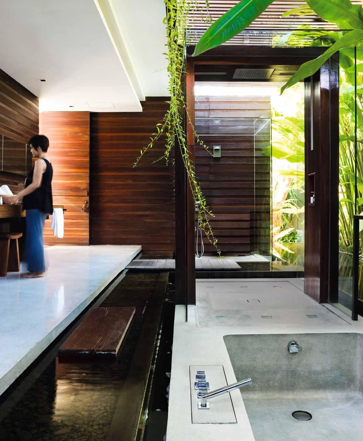
Indulge your passions at home. A world within a world in Sydney. Making a silk purse out of a sow’s ear in Singapore. Pamper yourself sustainably. And going troppo in New Zealand.
living in design april – june | 2013 AUD$15.95 | NZ$15.95 | USD$16.95 CDN$17.99 | GBP£9.00 | SGD$11.95
# 19
Why not enjoy summer days in the outdoors with our Sushi Outdoor Table and Rest Chairs. The Table is available as extension or fixed top in a selection of sizes and colours with aluminium frame and alucompact top while the Rest Chairs offer comfort, durability and sleek lines. Both are highly stable and UV/impact resistant and exclusive to Fanuli.
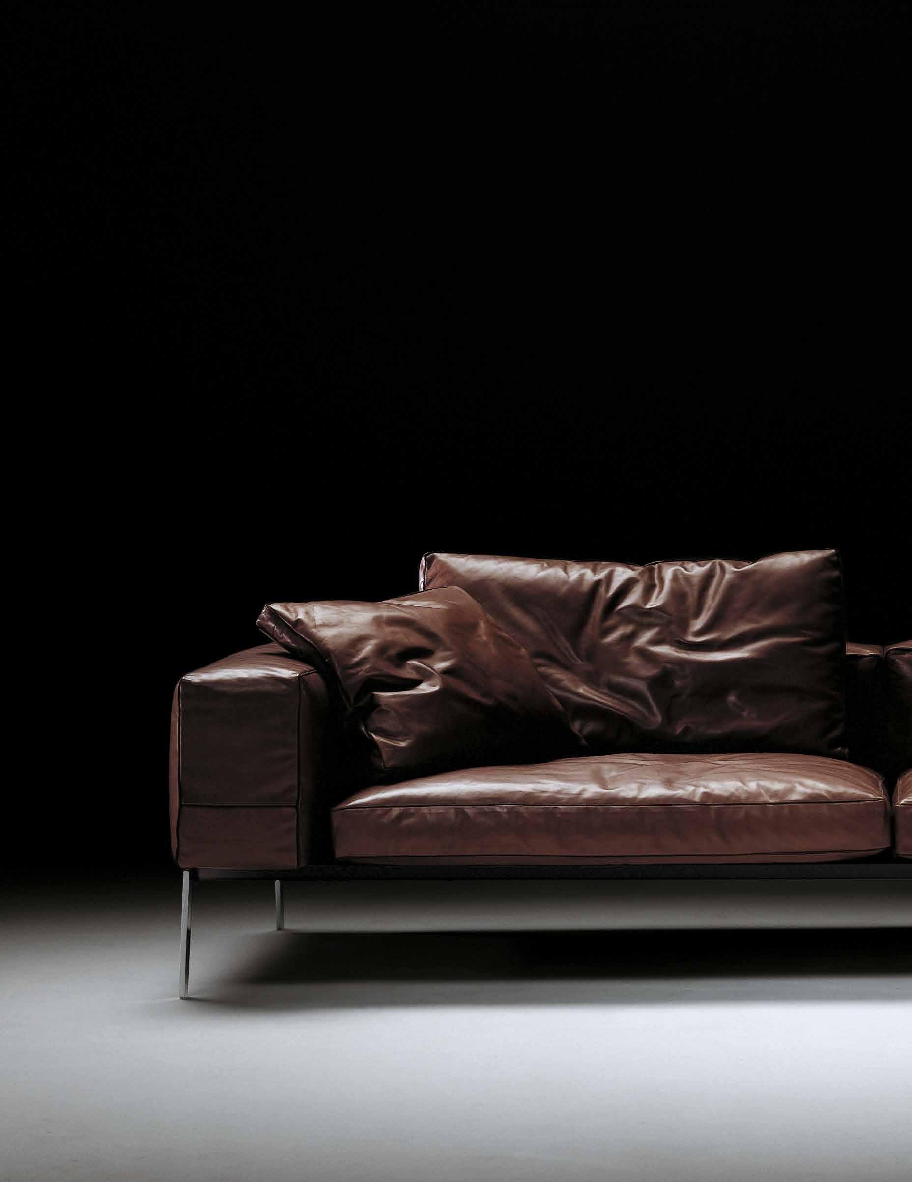
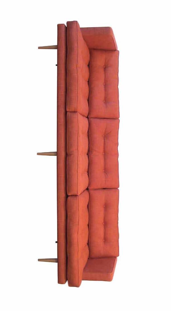
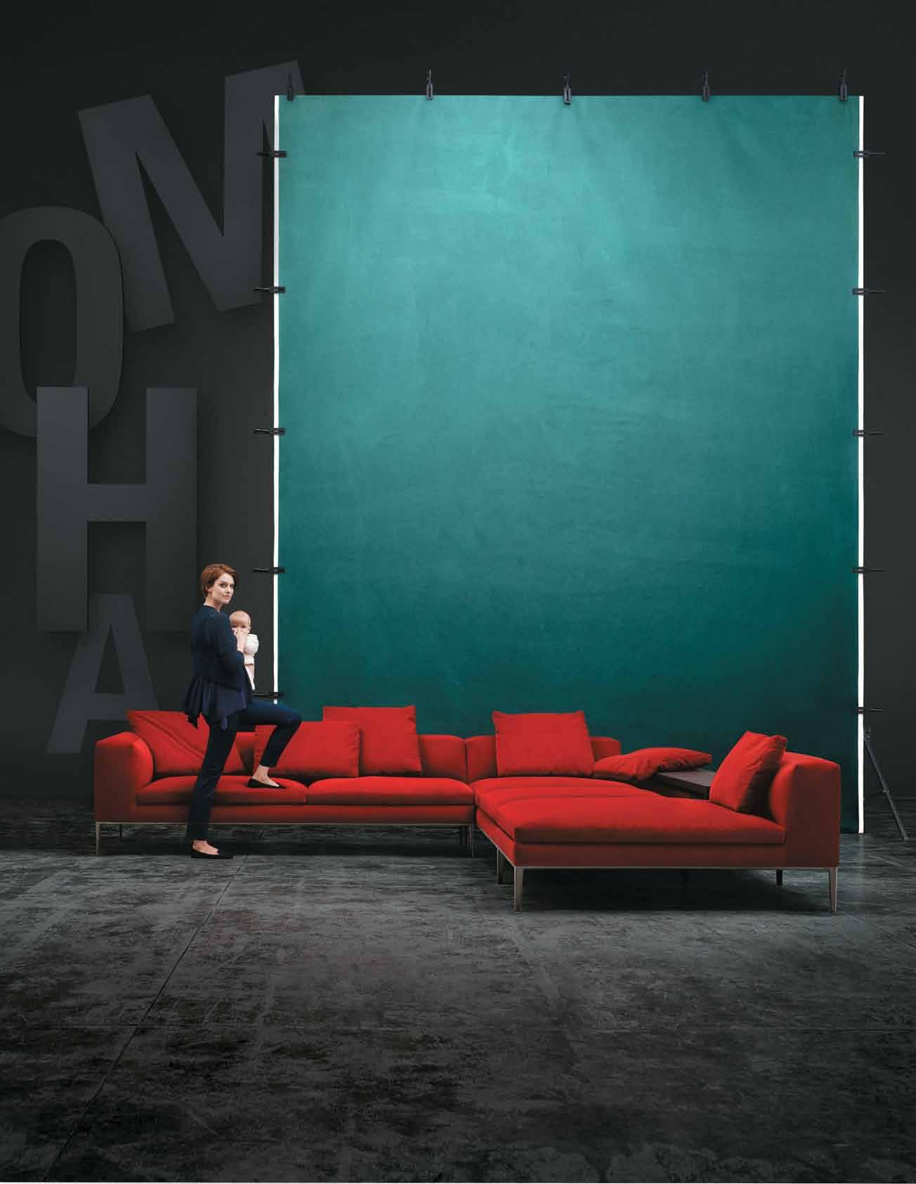
Introducing the Lifesteel sofa by Flexform.
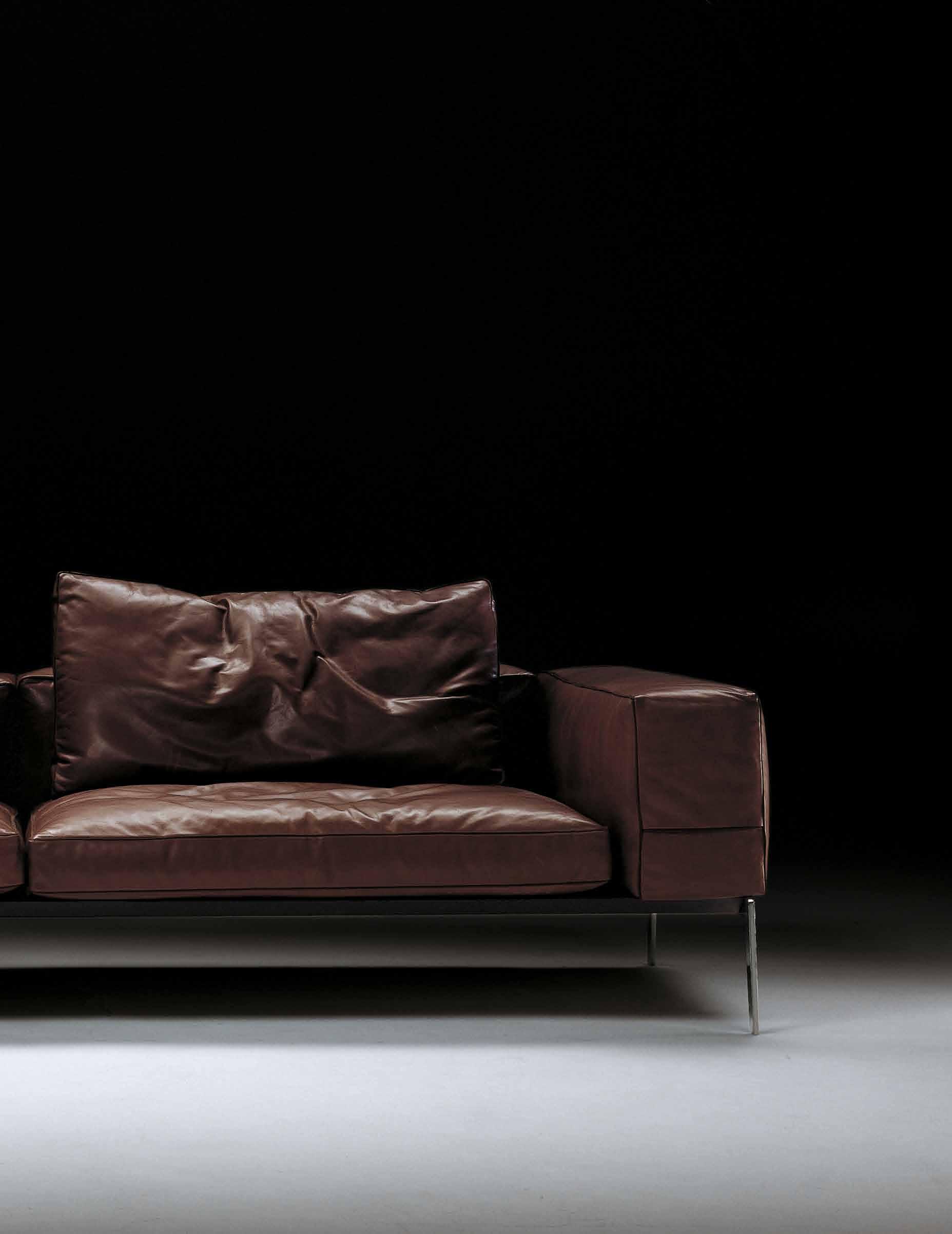
Designed by Antonio Citterio, the Lifesteel Sofa is the epitome of comfort and style. Available exclusively at Fanuli, its clean, relaxed lines add elegance and adaptability to every setting. Flexform is one of the world’s most sought after and renowned furniture brands. It’s a perfect fit with Fanuli, where you’ll find a range of worldclass soft furnishings, imaginative tables, bookcases and storage solutions for the home and contract interiors.
Made in Italy.
Sushi Outdoor Extendable Table and Rest Chair
Hand made in Italy
ITALIAN & AUSTRALIAN FURNITURE EST. 1976 I 269 Military Road, Cremorne, NSW I Tel (02) 9908 2660 I fanuli.com Melbourne Destination 3000 (03) 9029 3220 I Brisbane Commercial Images (07) 3844 9100 I Perth Innerspace (08) 9322 6664 I Hobart Featherston Interiors (03) 6234 6177


BA THROOM DESIGN CENTRE


st or es ar eo pe ra te db yi nd ep end en tf ra nc hi se es
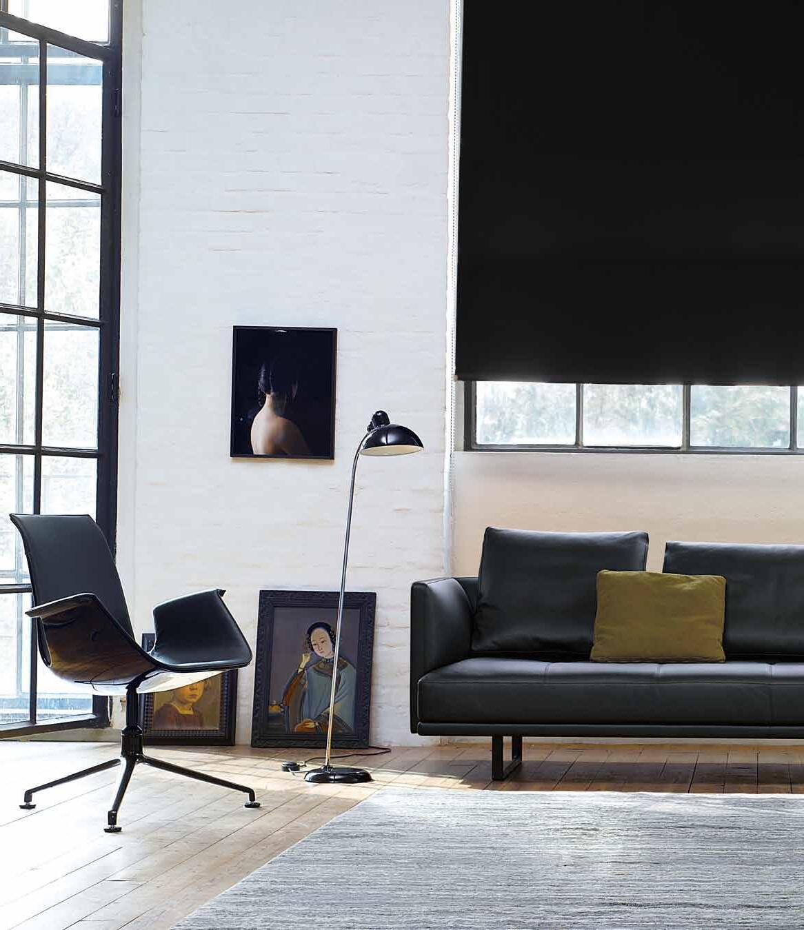
Another reason to visit your nearest Living Edge showroom. Find us online at livingedge.com.au or call 1300 132 154. Furniture for life. FK CHAIR Fabricius & Kastholm, 1969/2010 An icon of minimalism in design. PRIME TIME SOFA EOOS, 2010 A study in classic comfort and understated opulence.
We don’t surround ourselves with ‘things’. We surround ourselves with ideas which have texture and meaning. Here are a few choice items that we’ve collected for you.
24. dESIGN NE wS
d esign Hunter furniture, lighting, accessories, technology and finishes.
35. TAPS
Tap in to products for the bathroom –you ’ ll clean up in no time.
37. HAN dLES
Get a grip on one of the most overlooked items in the home.
39. S w ITCHES
w hen it comes to cover plates, you need to be switched on.
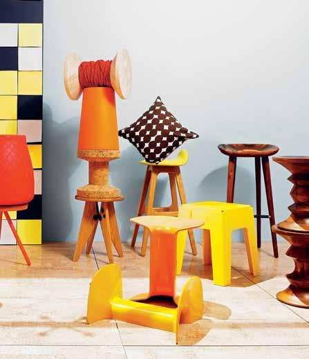
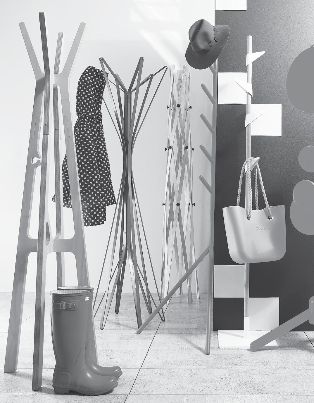
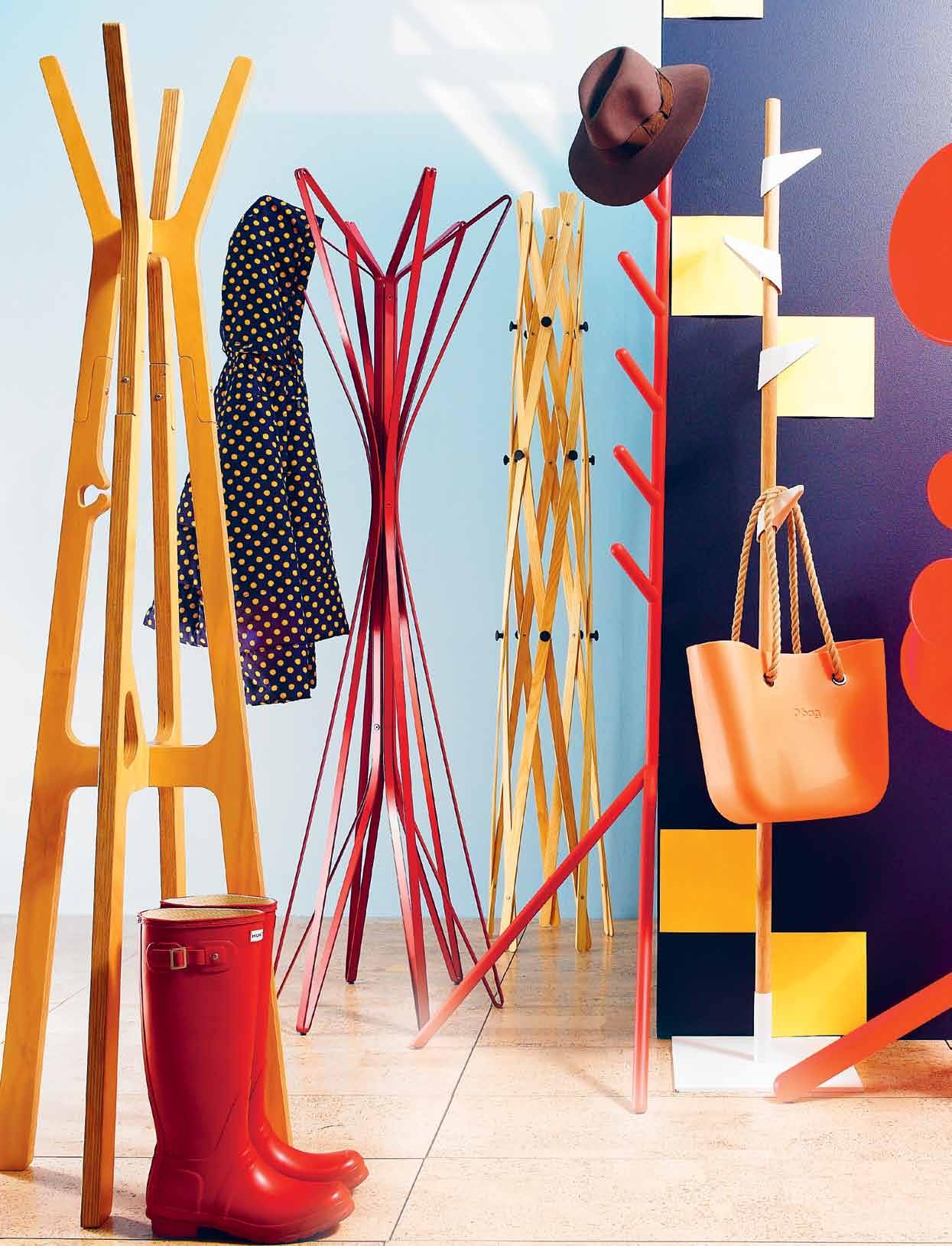
43. AUTUMN Stools, tables, lights and coat racks are falling all around us in the warm, crisp tones of autumn.
Creative people have many sources of inspiration –and many places of inspiration. It’s the coming together of these that make for a unique view of the world, which in turn inspires unique ways of expressing them.
54. MIKA NISHIMURA
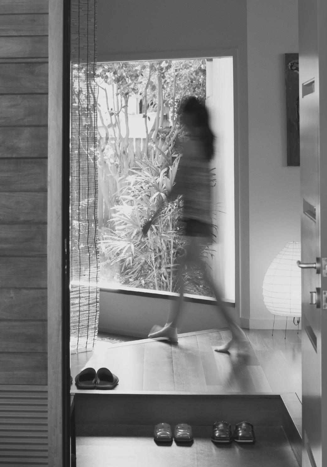
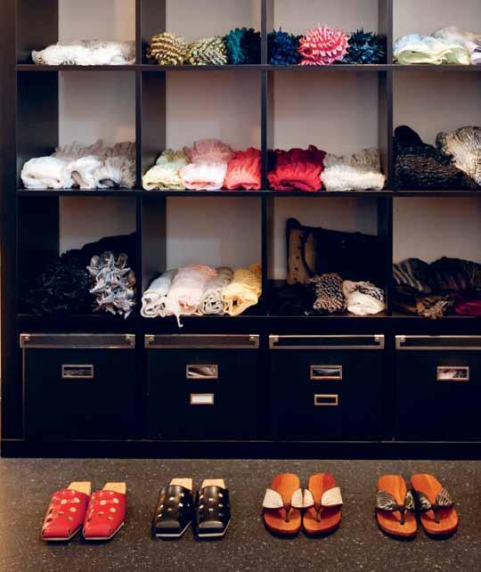
Mika imports beautiful scarves, lights and sandals from her homeland, Japan. She has also imported some very Japanese ways of living in her own home in Sydney ’s North Shore. Paul McGillick visits the recent addition by Kausar Hukumchand and Sarita Chand.

69. VITO SELMA
He represents the next generation of Philippine design, the children of traditional furniture manufacturing families. His method is to use old materials in new ways, working with local storytellers to literally bring tales to life. Aya Maceda meets the humble, and very creative, Vito Selma.
77. LAURA HERNE
A love of luxury and simplicity, a childhood in Sydney ’s Northern Beaches and years of living in Asia have come together in Qi Activated, a company that creates sustainable products for the home.
89.
Based in New Zealand, Lonnie ’ s Ngai Tahu, Samoan and European descent are all expressed in some way through her art, particularly her installation work, which we take a look at here.
# 19
LONNIE HUTCHINSON
#54
#43
#128
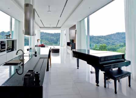
They’re not just good looking, although they are that as well. The homes we explore combine design solutions and cultural considerations, imbued with the personality of the people that reside within them.
98. INNER HOUSE
A demountable structure within a church becomes home for a family in Sydney. Paul McGillick visits the ingenious insertion by Bates Smart and marvels at the spatial solution.
113. PAHI HOUSE
within the bush of the Pahi Peninsula on New Zealand ’s north island, a weekend retreat is nestled amongst the Kanuka trees. Andrea Stevens discovers how Scarlet Architects have created a warm interior that is light-filled during the day, and glows like a beacon at night.
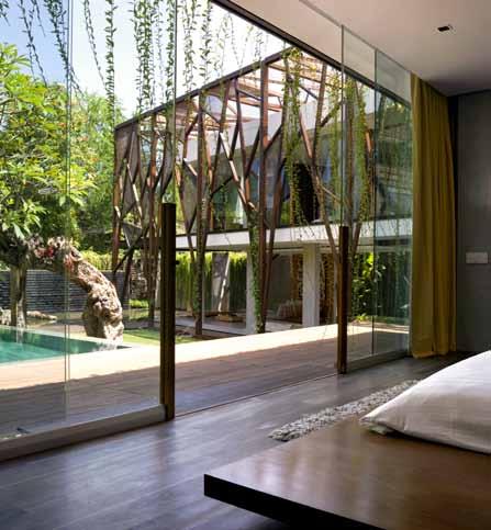
128. NUGROHO HOUSE
Andra Matin has crafted a special home in Seminyak, Bali, for a special client who has an unusual hobby –collecting antique timber. Kerstin Rose visits the house, completely open on the ground floor, which allows the owner to indulge in his other passion – gardening.
145. CHURCH ST HOUSE
#167
widely recognised as the heart of the home, the kitchen has always been important in an Italian family. Piero Gesualdi designed one for his sister in their family home, which is based on their father ’s workshop. Stephen Crafti finds an elegant result.
155. SINGAPORE APARTMENT
w here space is at a premium, innovative solutions are bound to be found. Jonathan Poh was inspired to use more than a few in his own apartment in Singapore. Narelle Yabuka says the outcome achieves a delicate balance between creativity and adherence to Singapore ’s welldocumented housing regulations.
167. HOUSE 484
Monumental and on a cliffside site outside Kuala Lumpur – this could be an architect ’s nightmare, but d esign Collective Architects approached the brief with panache. Jaz Sidhu visits the stunning results.
#182
It’s a whirlwhind design and architecture adventure –Portugal’s capital, Singapore’s tropics and back to your own home as we visit the humble bathroom.

182.
Elana
198.
Nicky
# 19
LISBON
Castle drops in on this richly layered city – a historical, musical and culinary experience.
191. BOOK REVIE w
Nicky Lobo goes beneath the surface of bathroom design, looking at three recent titles on the subject.
MONT TIMAH
Lobo reports on this awardwinning residential development in Singapore by CSYA.
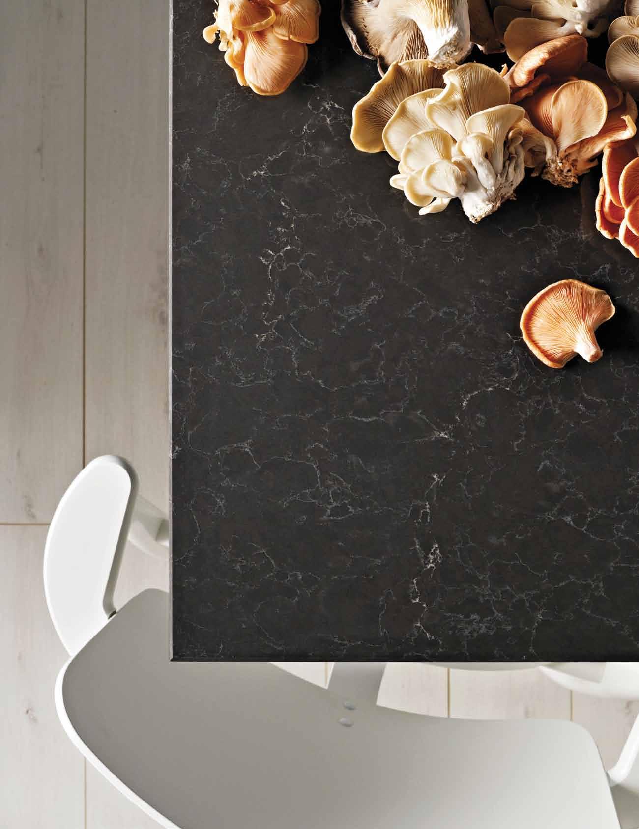


Piatra Grey ™ Emperadoro ™ London Grey ™ Dreamy Marfil ™ Frosty Carrina™ www.caesarstone.com.au 1300 119 119 Five new supernatural designs. Surfaces for your home.




The
chilled
Now with sparkling water too.
Now with sparkling water too.
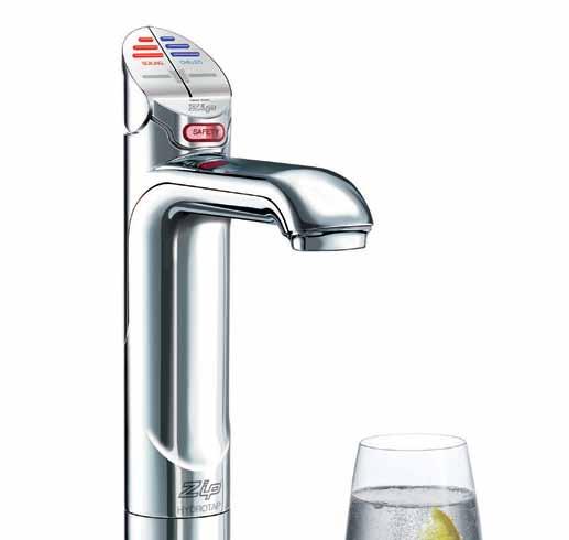
For tea, coffee, soup and all cooking plus chilled filtered drinks.

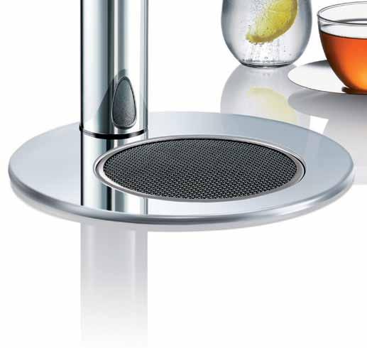

For coffee, soup all plus chilled filtered

zipindustries.com
HydroTap
The new Zip
® Boiling and filtered water, instantly.
Zip HydroTap Boiling filtered instantly.
1800 42 43 44 |


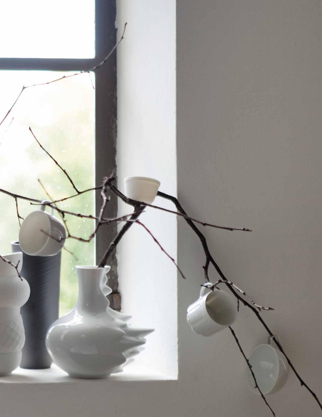
“Toys and games are the preludes to serious ideas”, said Charles Eames, and the Hang-It-All is a clear example. Designed by Charles and Ray in 1953, after nearly a decade of designing toys and children’s furniture, the Hang-It-All imbued the everyday coat rack with characteristic invention and playfulness.

| hermanmiller.com.au | hermanmillerasia.com
© Craig & Karl | Eames Hang-It-All | Herman Miller Then x Ten Exhibition
the first word
Ihave to say, the things I saw, the people I met and the knowledge I gained was enormously rewarding and, at the same time, humbling. Along the way I started to think about the opposition of materiality and materialism, especially in regard to residential architecture. Materiality, of course, is one of the outstanding features of contemporary residential architecture in South-East Asia and New Zealand – meaning a strong interest in the expressiveness of materials, especially local and natural materials, exemplified in this issue by the Pahi House (p.113) and, in an urban context, by the Inner House (p.98).
This makes for a very grounded architecture, rooted in the culture, the climate and in the local habitat. It is, in short, an architecture embodying the genius loci –the spirit of the place in which and for which it is made. It is at once a response to place, and an expression of the people who live here, what they believe and what matters to them.
In other words, the material reality of the immediate context – the natural world, the materials from which the house is built and how those materials are used and shaped – actually serves to take the people who live in that place beyond the material world and closer to what might be called the spiritual world.
So, if this is materiality, then what is materialism in architecture?
Materialism is a preoccupation with material reality for its own sake. For me, it is a two-dimensional view of the world, in contrast to materiality which is threedimensional. Typically, a ‘materialistic’ house will treat materials according to the impression they make, rather than celebrating their inherent qualities and the relationships they generate with the world around us. Materialistic design is a triumph of style over substance.
Style is about making an impression, but good design – like good art – is about creating a rich relationship between the thing and the people who use it. This is certainly true of a house – check out what Jonathan Poh manages to do with a very ordinary HDB apartment in Singapore on p.155. Yet, a house can be a wonderful home and be ‘badly designed’. This is not to say that good and bad design are simply a matter of opinion, but simply to emphasise that the ultimate value of that house has more to do with what we have invested in it than with any prescription for ‘good design’.
And that is simply another way of saying that what we see as ‘good design’ can be very subject to fashion without us even realising it. The trick is to penetrate beneath the surface and make the connection between who we are and the materials we need to sustain that understanding of who we are.
We see the role of Habitus as contributing to a conversation about these issues. With that in mind we would like you to share your thoughts on Habitus with your fellow readers as we launch a reader’s page in our next issue. Write to us at conversation@habitusmagazine.com and tell us what you think.
Paul McGillick | Editor

In the last issue I alluded to my travels researching a new book on sustainable houses in South-East Asia – using the term ‘sustainable’ to include environmental, social and cultural sustainability.
left | deputy editor, nicky lobo. rIght | editor, paul mcgillick.
habitus takes the conversation to our contributors, discovering their inspirations and design hunter journeys
ANTHONY BROWELL ARTIKA INTERNATIONAL #54
In this issue, Sydney-based photographer, Anthony Browell captures the heart and soul of Artika International. Anthony lives in one of Sydney’s most beautiful suburbs – Elizabeth Bay– with his wife Jan, two dogs and a cat. He loves Sydney for its quirky people and the unexpected things he comes across everyday.
NIKKI BUSUTTIL
LAURA HERNE #77
RICHARD GLOVER INNER HOUSE #98
Richard Glover is a documentary photographer of architecture and the built environment and is based between Sydney and London. He works with leading architects, designers and publishers and his work has been exhibited at several international galleries and held in prestigious collections such as the Barbican Centre and Tate Modern in London, and Art Gallery of New South Wales. Richard is most inspired by good people and first fell in love with photography in his early twenties. He looks forward to “ that beer at the end of the day ” – rightfully deserved with the quality of images he produces.


JAN GONZALES v ITO SELMA #69
In the province of Cebu in the Phillipines, photographer Jan Gonzales resides with his wife, Ivy, and 14-month-old daughter, Casey Lauren. Inspired by light and how these particles combine to create pictures, Jan plays with it, and it's opposite – shadow – to define his subject matter. He is in awe of technology and loves the way modern technology can push photographers even further. In 2013 Jan looks forward to shooting conceptual portraits and “building conversation without words”.
funkis started in 1996 in Sydney’s iconic suburb of Bondi Beach. “I don’t think it would have worked otherwise,” Carina Enstrom Gibb believes.
SZE MING HOUSE 484 #167
“In Bondi then, there were all the stylists, the film people and art directors who were a bit braver and liked the whole thing.” Quickly, and via these stylists and other influential creative people, Funkis prints, bags, clogs and homewares made their way into magazines. “I think because Swedish products are so graphic and photogenic, they loved borrowing it,” Carina says.
Based in Bangkok, writer Nikki Busuttil brings the residential architecture scene in Thailand to life with her words. Nikki is not home much due to the nature of her work and this is the life she loves. Inspired by beautiful places, people, intriguing objects, active lifestyles, innovative design and creative thought, Nikki first fell in love with documenting this through words at the age of five. For Nikki, 2013 is an exciting year, and she most looks forward to new discoveries, challenges and her daily 20km run.
DARREN CH’NG HOUSE 484 #167


Darren Ch’ng lives in Petaling Jaya in Malaysia with his wife Edana and two children, Ashley aged 8 and CJ aged 2. Inspired by nature and the fascinating contrast it has with the built environment, Darren loves all things retro, ranging from music to cars. In 2007, Darren was reintroduced to photography with the purchase of a DSLR which saw a hobby turn into a career. After meeting his current colleagues, the birth and expansion of his company, Creative Clicks, now sees them travelling the Region to record commercial, residential and personal projects.

Prior to Funkis, Carina was already sourcing vintage and antique pieces from Sweden – “we used to go to Sweden in the summer and ship them over” – but eventually decided to work with Swedish textile designers to create prints that would become cushions and lampshades, as well as being available in drops for furnishings. In addition, Carina began designing lighting, jewellery and clothing expressing the same bold, quirky aesthetic. But it wasn’t just about creating a ‘look’ – “when we made something it was always because I could imag
With a background in IT, Sze Ming is an unlikely candidate to produce such beautiful photographs. Now, a full-time photographer, Sze lives in Kuala Lumpur with his wife, Allison, and five-year-old daughter, Carissa. Inspired by human interaction and capturing raw emotions, Sze loves to take portraits but also documents several architectural projects in the region. Since a family holiday to the United Kingdom and Paris at a very young age, Sze has been obsessed with taking his camera everywhere. Whether it is his preferred digital camera today or his original Kodak Ektra 200 Pocket Instamatic, he is completely committed to capturing ‘the shot’.
KERSTIN ROSE


NUGROHO HOUSE #128
A regular contributor to Habitus magazine, Kerstin Rose has been travelling the world for many years with a keen interest in “ how other people live ”. Beginning her writing career at the tender age of 15, she has written many travel guides and is always most inspired when in the bustling creative hub of Berlin. Living in the very north of Germany in Hamburg, Kerstin resides with her daughter, Greta, with whom she loves spending time with. Right now, she cannot wait until Greta comes home from a study exchange in Chicago so they can chat mindlessly and catch up – like all close mothers and daughters do.
issue #21 habitus.com
JAZ SIDHU

HOUSE 484 #167
Jasmeet Sidhu is a practising architect/ interior designer based in Kuala Lumpur, Malaysia; he also dabbles in writing for various regional magazines. He is a keen contributor to the design profession and is often invited to present professional development lectures as well as contribute to local design schools as an external reviewer. Jaz lives with his family in Malaysia and is inspired by the energy of young designers. He first fell in love with architecture at school, looking up at the ‘big’ buildings.
KENERF SIM

SINGAPORE APARTMENT #155
Kenerf Sim believes a well-captured image encompasses a dance of balance between light, subject and surrounding. Growing up enthralled by the pictures of Richard Avedon and Irving Penn, he discovered his love for photography when his father gave him a camera and made him the official photographer during their family holidays. Imbued with an innate wanderlust, Kenerf is happiest behind his camera in a foreign land. Kenerf lives in Singapore with his parents and partner, and is inspired by nature, fashion and the beauty in every day life.
JULIE WAJS
CHURCH ST HOUSE #145
With two abodes, one dotted on the coast of Melbourne’s Mornington Pensinsula and the other in the bustle of its CBD, Julie Wajs really has the best of both worlds in terms of residences. Living with her partner, Rob, Julie loves life, travel and people. Her passion for photography began at the age of ten when her brother set up a small darkroom in her family laundry. Inquisitive Julie soon became obsessed with watching images magically appear on paper under the red lights and her passion continues to shine today.

BRIDGET WEBBER
LONNIE HUTCHINSON #89
Bridget Webber was born in Auckland, New Zealand in 1974. After living and working in New York for 12 years, Bridget has recently relocated back to Auckland with her German husband (also a photographer) and a backyard full of bees. The Bauhaus period, Japanese photographer Hiroshi Sugimoto, gardening and travel immensely inspire Bridget and this year she is most looking forward to her upcoming work trip to India. Bridget was introduced to the world of photography by her father at the age of thirteen – she remembers being by the magic of standing over a developing tray watching the image appear


funkis Paddington 202 oxford st .paddington PH.+61 2 93687045
funkis The Strand Arcade 412-414 george st. Sydney PH.+61 2 92219370

funkis online store www.funkis.com

C M Y CM MY CY CMY K Habitus#19_2.pdf 1 14/12/12 8:54 AM HAB19_Funkis_HP.indd 1 17/12/12 11:01 AM
• Bespoke lounge ranges

EDITORIAL DIRECTOR
Paul McGillick habitus@indesign.com.au
DEPUTY EDITOR
Nicky Lobo nicky@indesign.com.au
EDITORIAL ASSISTANT / PA TO EDITORIAL DIRECTOR
Alicia Sciberras alicia@indesign.com.au
ART DIRECTION & ORIGINAL DESIGN TEMPLATE one8one7.com
SENIOR DESIGNER
Emma Warfield emma@indesign.com.au
DESIGNER
Frances Yeoland frances@indesign.com.au
JUNIOR DESIGNER
Alex Buccheri alex@indesign.com.au
DESIGN INTERN
Rollo Hardy design@indesign.com.au
CONTRIBUTING DESIGNER
Michelle Byrnes
ONLINE EDITOR
Lorenzo Logi editor@habitusliving.com
CONTRIBUTING W RITERS
Nikki Busuttil, Elana Castle, Stephen Crafti, Aya Maceda, Kerstin Rose, Jaz Sidhu, Andrea Stevens, Narelle Yabuka
CONTRIBUTING PHOTOGRAPHERS
Anthony Browell, Creative Clix + Sky Pix, Simon Devitt, Richard Glover, Jan Gonzales, Aaron Pocock, Jonathan Poh, Owen Ragget, Tim Robinson, Christian Schaulin, Kenerf Sim, Julie Wajs, Bridget Webber
CONTRIBUTING SUB-EDITOR
Nigel Bartlett
COVER IMAGE
Nugroho House (p.128) Photography: Christian Schaulin
HEA d OffICE
CEO / PUBLISHER Raj Nandan raj@indesign.com.au
OPERATIONS M ANAGER Adele Troeger adele@indesign.com.au
PRODUCTION M ANAGER
Sophie Mead sophie@indesign.com.au
A DVERTISING TRAFFIC / PA TO PUBLISHER
Elizabeth Davy-Hou liz@indesign.com.au
FINANCIAL DIRECTOR
Kavita Lala kavita@indesign.com.au
BUSINESS MANAGER
Darya Churilina darya@indesign.com.au
ACCOUNTS
Gabrielle Regan gabrielle@indesign.com.au
ONLINE COMMUNICATIONS
Radu Enache radu@indesign.com.au Ramith verdheneni ramith@indesign.com.au
Ryan Sumners ryan@indesign.com.au
Jesse Cai jesse@indesign.com.au
E VENTS AND MARKETING
Tegan Richardson tegan@indesign.com.au Hannah Kurzke hannah@indesign.com.au
BUSINESS DEVELOPMENT MANAGER
Marie Jakubowicz marie@indesign.com.au (61) 431 226 077
A DVERTISING ENqUIRIES
Colleen Black colleen@indesign.com.au (61) 422 169 218
Level 1, 50 Marshall Street, Surry Hills NSW 2010
(61 2) 9368 0150 | (61 2) 9368 0289 (fax) | indesignlive.com
MElbOu R n E Suite 11, Level 1, 95 victoria Street, Fitzroy v IC 3065 | (61) 402 955 538 SInGA pORE
115A Commonwealth Drive 05–18/19, Singapore 149596
(65) 6475 5228 | (65) 6475 5238 (fax) | indesignlive.asia
any loss
damage. Please retain duplicates of text and images. Habitus magazine
Indesign Publishing
a wholly owned Australian publication,
designed
published in Australia. Habitus is published quarterly and is available through subscription, at major newsagencies and bookshops throughout Australia, New Zealand, South-East Asia and the United States of America. This issue of Habitus magazine may contain offers or surveys which may require you to provide information about yourself. If you provide such information to us we may use the information to provide you with products or services we have. We may also provide this information to parties who provide the products or services on our behalf (such as fulfilment organisations). We do not sell your information to third parties under any circumstances, however, these parties may retain the information we provide for future activities of their own, including direct marketing. We may retain your information and use it to inform you of other promotions and publications from time to time. If you would like to know what information Indesign Group holds about you please contact Nilesh Nandan (61 2) 9368 0150, (61 2) 9368 0289 (fax), subscriptions@indesign.com.au, indesignlive.com. Habitus magazine is published under licence by Indesign Group. ISSN 1836-0556
issue #19 habitusliving.com Printed in Singapore. All rights reserved. No part of this publication may be reproduced, stored in a retrieval system, transmitted in any form or by any other means, electronic, mechanical, photocopying, recording or otherwise. While every effort has been made to ensure the accuracy of the information in this publication, the publishers assume no responsibility for errors or omissions or any consequences of reliance on this publication. The opinions expressed in this publication do not necessarily represent the views of the editor, the publisher or the
Contributions are
at the
and
publication.
submitted
sender’s risk,
cannot accept
or
is
which is
and
• Vintage 20th Century design
Australia
delivery
Bespoke
Century
Worldwide delivery
HAB19_Angelucci_HP.indd 1 23/01/13 1:56 PM
• Regular shipments from Europe • Homewares •
wide
Ph. 03 9415 8001 HOLLYWOOD Sofa Range –made to order
lounge ranges Vintage 20th
design
113 Smith St Fitzroy • 03 9415 8001 • www.angelucci.net.au

parisi.com.au
Your home becomes a gallery of you
Australian designer Ross Gardam has produced yet another beautiful lighting solution with, GLAZE , understated in form and handcrafted in slip-cast stoneware by Joanne Maggs & Sarah Winter. Available in a range of glazes and custom on request.

rossgardam.com.au
The TY D.I.Y. EDITION shower curtain is made in breathable plastic that is less likely to attract mould and mildew like ordinary vinyl shower curtains. Non-toxic, recyclable and ethically produced by American brand Grain , a permanent marker allows you to personalise your shower curtain with an illustration.

teixidors.com
MIXOLOGY is the term for preparing cocktails and selecting the ingredients that are combined to create the dream beverage. Waterford have cleverly applied this term to their new range of crystal glass wear. Designed for mixing and matching pieces as you please, this range encourages you to pair colours, mix patterns and combine shapes, all with the luxurious weight of quality cut crystal.
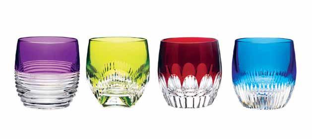
wwrd.com.au
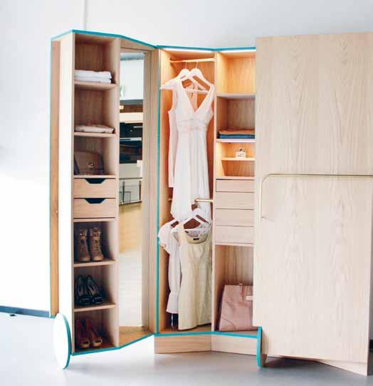
Wardrobe organisation – or lack of – is one of the most common domestic faux-pas. Often used as an ‘out-of-sight-out-of-mind ’ type of storage, the purpose of the space is often overlooked and clothing at the back can be forgotten. With this in mind, designer Ho Sun Ching re-focuses the purpose of the closet and brings a solution in the form of a stand alone WALK-IN CLOSET. This beautifully designed wardrobe attracted abundant attention at the 2012 Dutch Design Week and is now in production stages.
hosunching.com
issue #19
habitusliving.com
The CANEVAS collection designed by Charlotte Lancelot draws on the traditional craft of cross stitch, bringing it into epic proportions by increasing stitch sizes and opening up the pattern. The ususally tight holes and intricate needlework is increased and the holes enlargened to emphasise the dynamic, decorative and graphic texture. Lancelot ’s designs are conceptually playful and the designer bases all of her products around the idea that objects can change the world. The bold, colour-injected rugs and soft furnishings of the CANEVAS collection were designed by Lancelot for the Maison & Objet exhibition in 2012. The entire collection includes a modular pouffe, soft pouffe, cushions and rugs in three vibrant designs –Flowers Colores, Abstract Rosa and Abstract Verde, made from 100% new wool and filled with polyurethane foam rubber.

gan-rugs.com / parterre.com.au
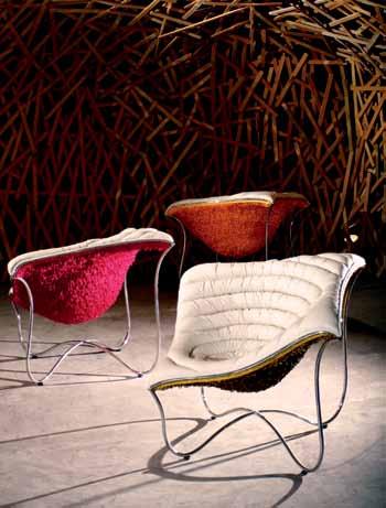
French furniture company Moustache have produced the BOLD chair based on the idea of an old school chair that has had its seat and back removed, and the structural metal rods emphasised to a much grander scale. These rods have been covered in foam and long, removable stockings provide the upholstery, which means the playful chair can quickly change colour – there are six available in the range.

moustache.fr/ jamesdawsoninteriors.com
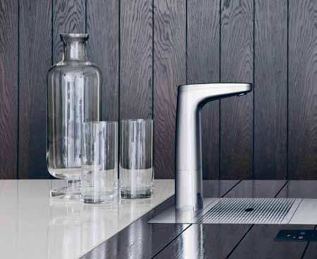
Clean, sophisticated and minimalist are three words that come to mind for the new tap styles from Australian company Billi. The LEVERED, TOUCH and REMOTE (pictured) taps are offered in a variety of finishes including black, brushed and chrome finish, but the REMOTE is the most impressive with lever free operation panel to make sure you have instant boiling and chilled water in one simple movement.
billi.com.au
1 . lightbox # 25
Introducing Wilkhahn’s first range of lounge furniture, ASIENTA . The cube-like shape of the lounge cups the body with a stylish support structure upholstered in hard-wearing textiles or leather and bright chromium-plated, polished matte or coated options for the metal finishes. The ASIENTA features wave springs and the range comprises a three-seater sofa, single armchair and bench.
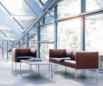
wilkhahn.com

The DIAMOND WOODS coffee tables and stools by Tesler Mendelovitch exude the quality of handmade pieces, the range playing with geometry, scale and texture. The Tel Aviv-based design duo Tesler Mendelovitch are known for experimenting with textile designs, in this instance manipulating a new flexible timber that was designed specifically for the project and thereby creating a faceted surface. Supported by an interior timber structure, the exterior facets are both geometric and dynamic, their creation a testament to the evolving technological nature of furniture design. Available in four different timber species – African Walnut, American Walnut, Amboyna or Birch – the DIAMOND WOODS stools and tables are truly a precious stone to be uncovered.
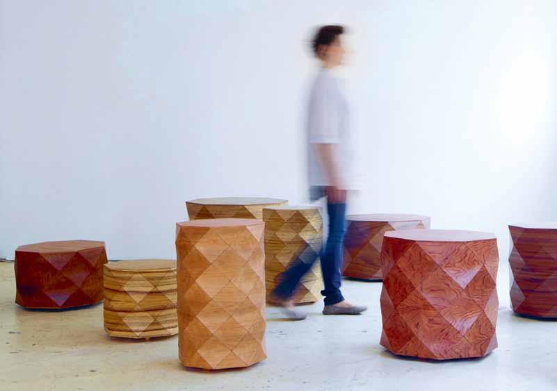
talentsdesign.com
The TEEMA MINI serving set from Finnish design brand Iittala is a versatile collection that offers combinations of regular shapes. Oven, microwave and dishwasher safe, these dishes can go from preparing to cooking, then to the table, followed by a clean in the dishwasher. Originally produced in 1952 and designed by Heikki Orvola and Kaj Franck , this three piece serving set comes in three colours – turquoise, terracotta and white. And why stop here? There is an entire Teema collection available.
We love a striking print and it is what Marimekko does best. Their latest SPRING COLLECTION offers their well-known patterns and natural textures reworked in contemporary shapes and colours.
marimekko.com
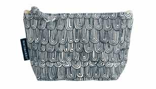
anibou.com.au
iittala.com /
issue #19 habitusliving.com
The Swiss ball as we know it has been repurposed by Texan artist Magda Sayeg to offer a more domesticated appeal. Originally designed as a ball to aid in physical therapy, athletic training and exercise, this KNITTED YOGA BALL becomes a soft furnishing for any living space. Made from upcycled rugs and throws, choose from a variety of colours and use the balls as dining chairs while you watch the television or office chair, to improve posture.
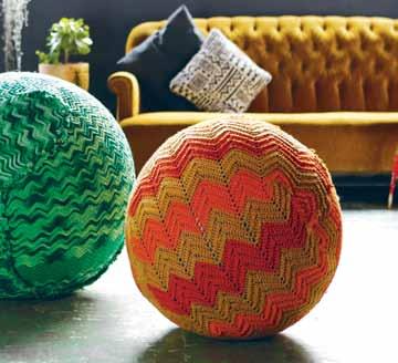
magdasayeg.com / pagethirtythree.com
puntmobles.com
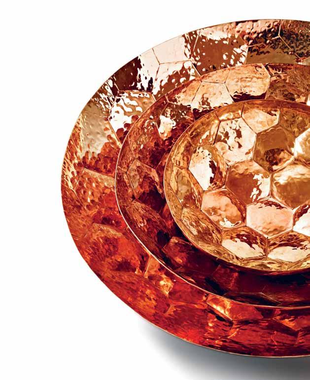
Reminiscent of the copper serving bowls found in India, these new bowls form part of Tom Dixon’s latest ECLECTIC range. The HEX COLLECTION is handmade, with hexagonal patterns hammered on to solid copper. Available in small, medium and large sizes or as a champagne bucket, each product is sealed with a food-safe clear lacquer which means they are both functional and an ideal statement piece for the centre of the dinner table.
tomdixon.net/dedece.com
TRIVET – the fancy word for coaster – is the latest offering from Normann Copenhagen. But, designed by Australian, Adam Goodrum , this TRIVET is not just any coaster. “ My wish was to design a sculptural trivet... Just like a puzzle where the pieces must be fitted together correctly to create the whole picture,” says Goodrum. Made from Oak and measuring 18x20x3cm, protect your table from heat in a decorative way.

normann-copenhagen.com
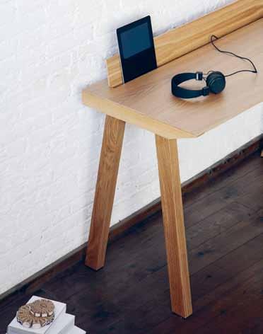 Keeping a clean workspace is key to keeping a clear and focused mindset. Made from Oak and Walnut the ERNEST desk by Spanish company Punt is the perfect solution for any small space. The desktop opens to house your tablet, computer and stationery.
1 . lightbox # 27
The new PELT chair by UK designer Benjamin Hubert exemplifies his simple, effective approach. The 8mm plywood shell is a curved form of a t-shirt, attached to the solid Ash timber frame. The seat curves into the legs in seamless integration of form, blending the two finishes into a cohesive whole. Launched during the 2012 London Design Festival, this stackable dining chair is Hubert ’s latest for Spanish manufacturing brand De La Espada Playful in form and thoughtful in concept, PELT is a surefire future design classic.
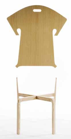
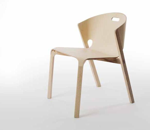
benjaminhubert.co.uk/ delaespada.com / greatdanefurniture.com
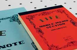
Write it down and you ’ ll make it happen. So many things slip through our short-term memory, and jotting it down is even more important with today ’s busy lifestyle. Inspire yourself with poems and quotes, write down your shopping and ‘ to do ’ lists – but keep it all in one central location. Feel the difference of writing on quality paper – not just regular carbon. Handmade in Japan since 1946, the Life NOBLE MEMO PADS are made from the highest quality Japanese paper and the binding allows them to open flat. Life stationery also produce beautiful Air Mail Sets, Stenographer books and Typewriter Paper for the traditional at heart.
notemaker.com
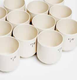
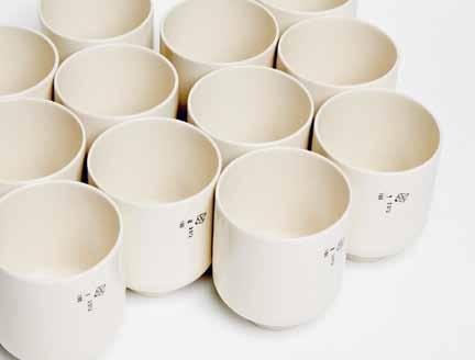
There really is nothing quite like the feeling of home and this is exactly the emotion Faye Toogood aims to evoke with her new ceramic series, CUPPA/BATCH . Pared back and multifunctional, this vessel is cast in fine English creamware and made in small production runs of 150, editioned with the traditional ceramic makers run numbers emblazoned on the side.
fayetoogood.com
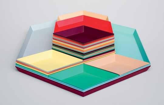
Inspired by some of the worlds most energising market places the HAY MARKET series of 70 products offer a great selection that complements their furniture collection and will work in every part of the home. Introduce some colour into any space whether as a functional storage item in the kitchen, bathroom, bedroom, playrooom, office, or simply as decoration. Danish brand HAY created the series for fun – and it ’s just that.
hay.dk / cultdesigned.com.au
issue #19 habitusliving.com
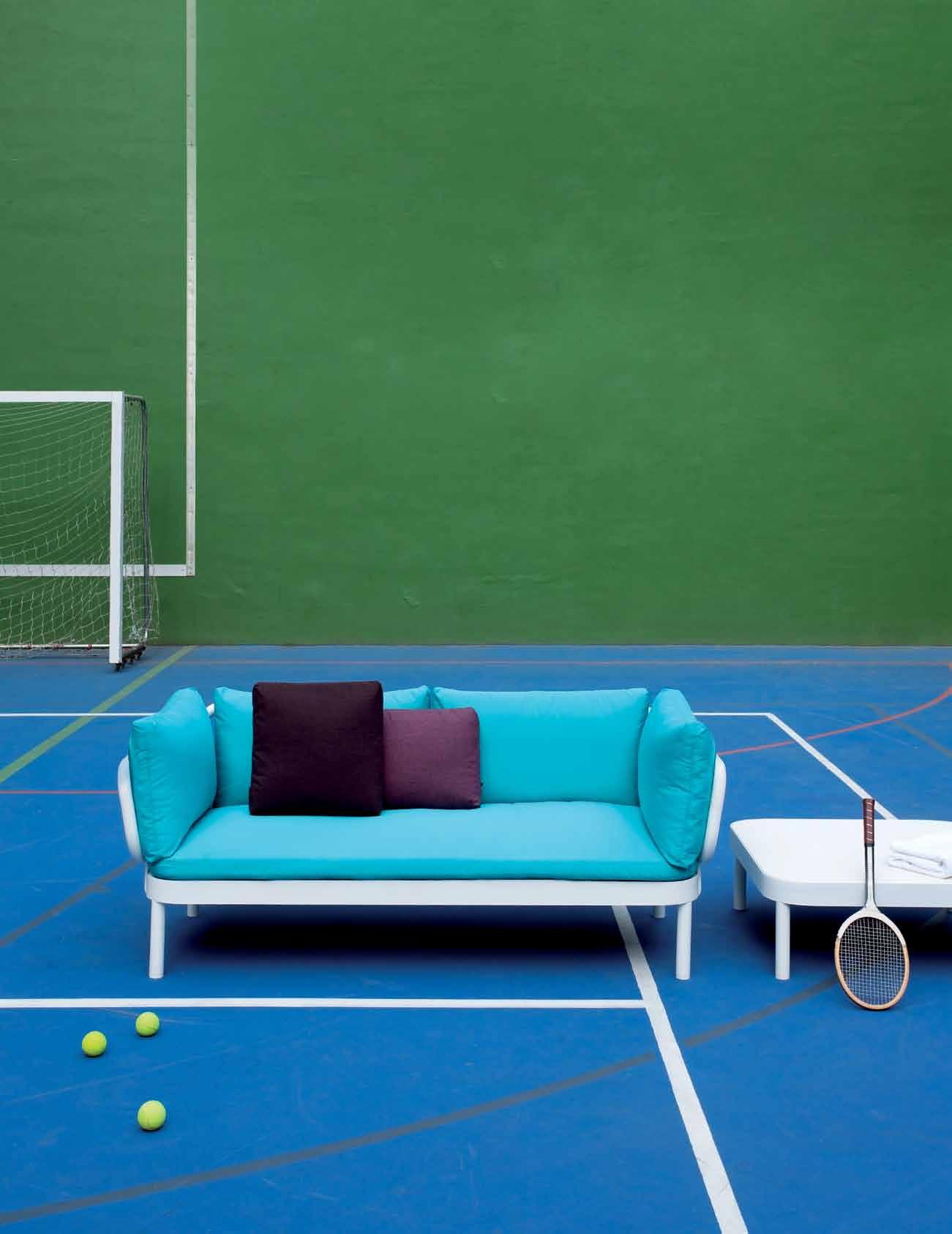
TROPEZ design Stefan Diez www.gandiablasco.com ANTWERP BARCELONA DOETINCHEM HONG KONG ISTANBUL LISBOA LOS ANGELES MADRID MIAMI MILANO NEW YORK OORDEGHEM PORTO
Experience divine luxury with textiles that awaken the senses and exude quality in the form of linen, velvet and cashmere.

‘ Relaxed Decadence ’ is the look and feel of the latest range from BOYAC textiles. The new collection designed by Bernie de Le Cuona offers intriguing textures and rich colours that draw inspiration from various cultures around the world. Effortlessly cool with an ethnic twist, the de Le Cuona range is individually distinct in eccentric sheers and knitted styles.
boyac.com.au
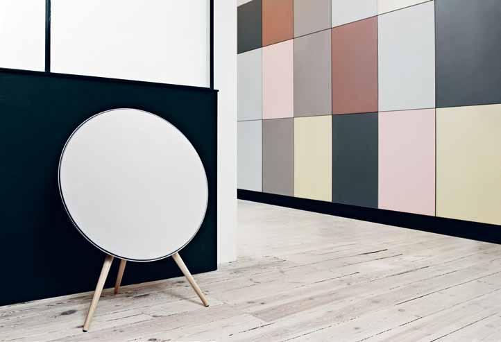
With internet streaming, music has never been so accessible, and there is no better way to enjoy your beats than with the latest offering from Danish company Bang & Olufsen . The A9 BEOPLAY simply needs to be plugged in, linked to a bluetooth device such as a phone, tablet or music streamer and the music begins to flow. This piece is artfully designed, with five extra fabric colours available other than standard white, and leg timber options in Beech, Oak and Teak – an elegant sculpture that can be freestanding, or wall hung with a bracket.
beoplay.com/ bang-olufsen.com
Wallpaper is back in fashion – or did it never go out? British design studio, Baines and Fricker is only in its second year of business after launching at 100% Design in 2011. But designs like the CACTUS are sure to keep them busy. Digitally printed in the UK on 180gsm paper and sold as 10 metres rolls with a width of 52cm.
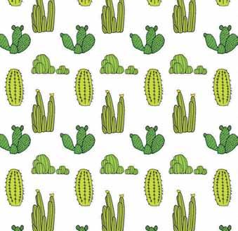
bainesandfricker.net
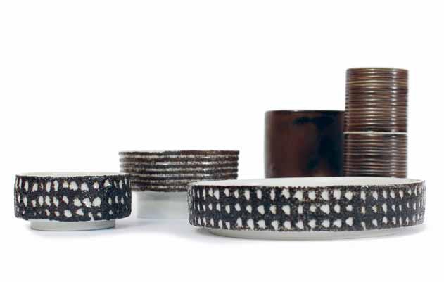
Designed by FUNKIS in collaboration with The Bridge Room , one of Sydney ’ s premier restaurants, these precious ceramics pepper the fine dining experience with a pared-back sensitivity. The Bridge Room collection comprises a coaster, salt dish, candle holder, vase, toothpick holder and condiment dish in earthy tones to complement the ceramic texture.
funkis.com
issue #19 habitusliving.com


Cersaie 2012
Patricia Urquiola strikes again with AZULEJ, her porcelain stoneware range for Mutina . Digital printing has been put to the test with these highly decorative designs, whose harmonious tones allow them to sit together despite their busy patterns. Geometric, floral and directional graphics are made cohesive in Urquiola’s practised hands.
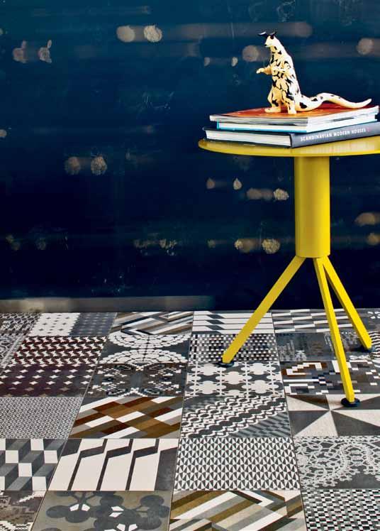
mutina.it
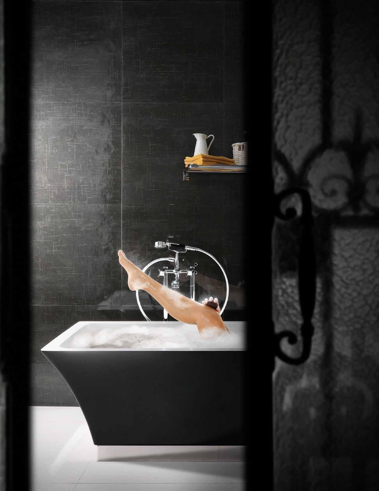
Commanding attention, the PRESIDENT mono-block bathtub features geometrical bas-relief texturing and neo-classical details reminiscent of presidential dwellings. The material is the newly developed White Tec, exclusive to Devon & Devon , which delivers hightech performance and compliance with stringent environmental standards. Part of the appeal of White Tec is the unique pigmentation process, which means the tub is available in cream as well as white, while a series of decorative marble panels can be integrated to further enhance the classic design. PRESIDENT is available in corner or centre wall versions.
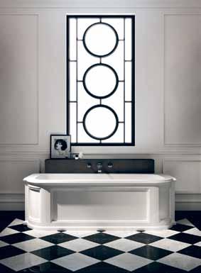
devon-devon. com / studiobagno.com
Systempool presents a new range of shower trays called LAND in high quality resin – slip resistant, available in five colours and two textures. The trays, which simulate the look and feel of natural stone, can be made to measure.

info@porcelanosastudio.com.au
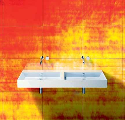
The PREMIUM range of sinkware by Catalano has doubled in nature and in versatility. The new double-sink version is perfect for a his-and-her arrangement, and is available, like the original range, in wall-hung, semi-inset and lay-on configurations, with the option for an integrated towel rail.
catalano.it / rogerseller.com
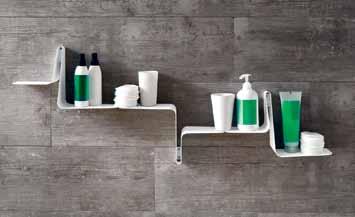
This easy-to-install, versatile shelf from the TULIP range comes in pieces so that you can create your own customised wall designs. The range from Arblu comes in scratchresistant varnished metal.
arblu.it / easybath.com.au
issue #19 habitusliving.com
We scour the biggest bathroom and tile fair in the world for the latest and greatest beautiful products

133 Victoria Rd, Rozelle NSW 2039 | 02 9818 0000 | livingtiles.com.au Designed by Viva, an innovative concrete inspired glazed porcelain series. Ideal for contemporary and rustic settings, available in three natural colours Grigio Cemento, Bianco Calce, Nero Carbone. Sizes: 600x600mm, 200x1200mm & 600x1200mm in Wet, Work & Texture. Made in Italy & exclusively available through Living Tiles. Suitable for: wall & floor interior, exterior residential & commercial applications.
Statale9

A SUB-ZERO IS JUST A REFRIGERATOR, LIKE A DIAMOND IS JUST A STONE
For more information visit the Australian Distributor at: www.subzerowolf.com.au
Iconic design. Enduring quality. Superior performance
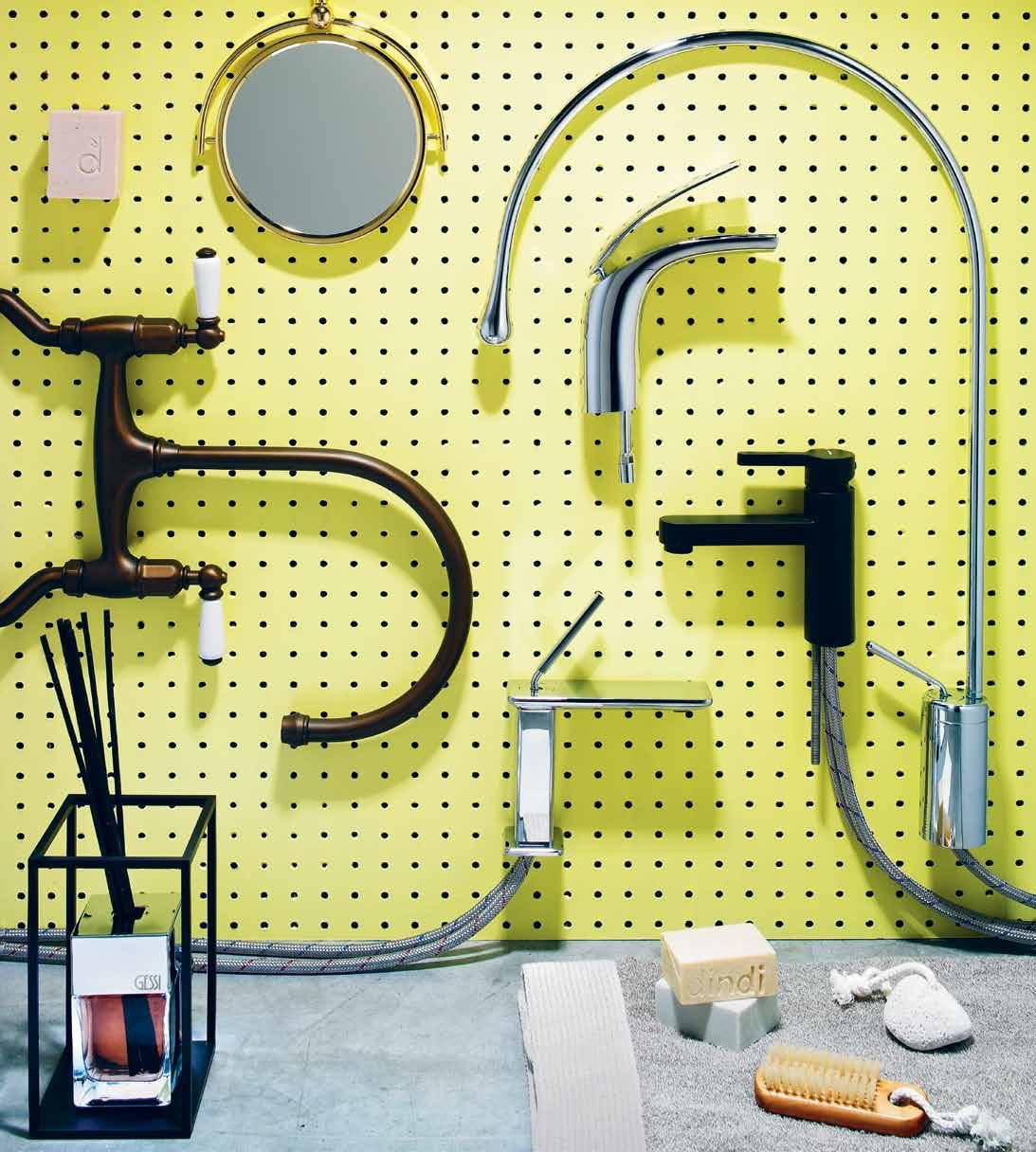

Tap in to
photography t im r obinson | s tyling ali C ia s C ib E rras | art dir EC tion on E 8on E 7
the latest...
1 . lightbox # 35
Clockwise from top left | Dindi chunky soap in Rosalina, $6.50, Koskela; Wall mounted vanity mirror with 1.5 magnification in Gold, $834, The English Tapware Company; Gessi Goccia basin mixer with spout, $935, Abey; Aria cascade basin mixer, $790, Weberit; Ergo basin mixer in matte black, $459, Parisi; Terry bathroom mat in raw natural 100% linen, $99, Koskela; Hamman pumice stone with rope, $10, Koskela; Verona nail brush with rope, $13, Koskela; Dindi chunky soaps in Nerolina and Lemon Myrtle, $6.50 each, Koskela; Gessi iSpa bathroom mixer, $726, Abey; Gessi Marinefiorita home fragrance in medium size, $314.60, Abey; Ionian two hole bench mounted mixer with porcelain levers in English Bronze, $1,134, The English Tapware company; Pegboard (throughout), $48/1.8x1.2m panel, Danias Timber; Paint (throughout) Eggshell Acrylic in Sugarland, $95.10/4 litres, Porter ’s Paint.

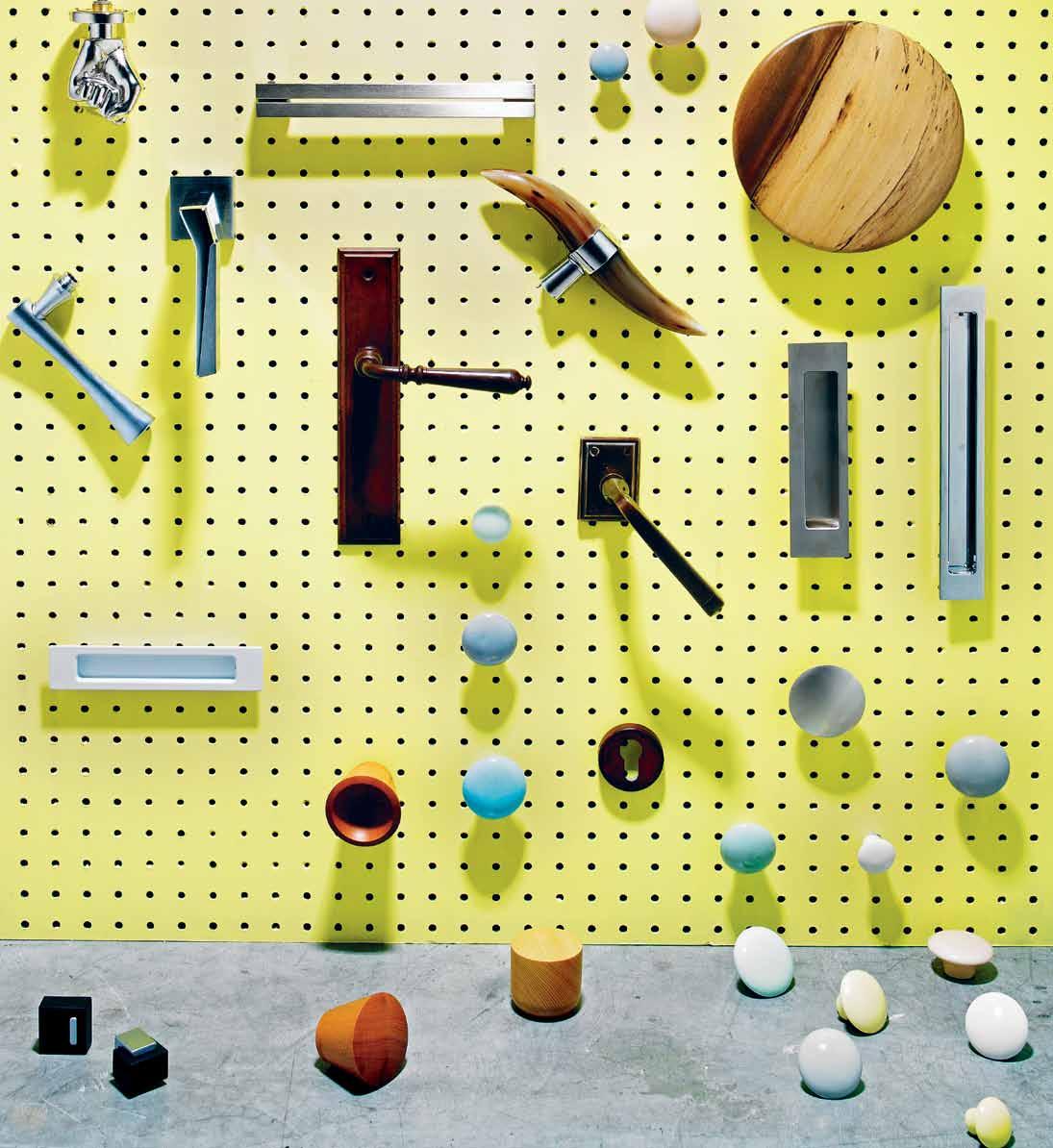
a handle on the situation...
Lever handles (L–R) Fluke by Karim Rashid, $320, Parisi; Cubic on square, $425, Parisi; Brionne Manoir on Castillac backplate, $286.47, Mother of Pearl; Camargue on Castillac backplate, $397.25, Mother of Pearl. Finger pulls (L–R) Flush pull 170mm in white, $55.50, Halliday + Baillie; Wide-lip 170mm flush pull for hinged/bi-fold doors, $89.25 each, Halliday + Baillie; Flush pull 250mm in Mirror Chrome, $62.80 each, Halliday + Baillie. Door pulls (L–R) Chrome-plated aluminium double bar handle in matte, $15.78, Hafele; Cowhorn cabinet pull, $186, Mother of Pearl. Knobs (L–R) Fersa Handknob set, $1,016.60, Mother of Pearl; Their Hang-Up wooden knob, $59, Interia; His Hang-Up wooden knob, $59, Interia; Her Hang-Up wooden knob, $59, Interia; Zinc alloy furniture knob, $2.97, Hafele. Scattered throughout TILT Porcelain handles in pastel colours by Anne Black, S$16, M$17, L$18, Elevate Design. Accessories (L–R) Floor mount door stops, $17.85 each, Halliday + Baillie; Brionne marine escutcheon, $ 51.30, Mother of Pearl.
1 . lightbox # 37
tongue n groove timber constructed of FSC European Oak treated with natural oils in 11 beautiful colours allowing for easy maintenance
Showrooms

188 Chalmers Street, Surry Hills NSW 2010
P 02 9690 0991 F 02 9690 0992

575 Church Street, Richmond VIC 3121
P 03 9427 7000 F 03 9427 0100
tonguengrooveflooring.com.au
Flick a switch and light up the room...

Clockwise from bottom right | Excel 1 Gang Light Switch in white, $8.31, HPM Le Grand; Light switch stickers, $12.95/packet, Hostile Bacon; Orange flexible cable 3 Core OD Flex 1.5mm Olex Nexans Company, $2.60/m, Bunnings; Ambience LED bulb, $72.95, Philips ; Strato Single Power Outlet with Black Magic Surround, $ 69.99, Clipsal; Modena 3 Gang Switch with Platinum Surround, $59.80, Clipsal; Strato 3 Gang Switch with Tawny Linewood Surround, $88.80, Clipsal; Modena 1 Gang Switch with Gunmetal Surround, $42.10, Clipsal; Horizontal standard size switch, $8.31 HPM Le Grand; Light switch stickers, $12.95/packet, Hostile Bacon; Single pendant lamp in copper with 4m long black woven flex and plug, $135, Koskela; Saturn OneTouch electronic switch in Ocean Mist, $155.55, Clipsal; Saturn OneTouch electronic switch in Pure White, $155.55, Clipsal.
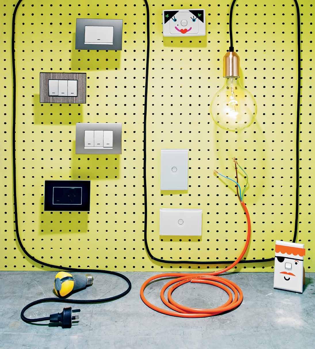
1 . lightbox # 39

above | PHOTOGRAPH: TIM ROBINSON issue #19 habitusliving.com
Zip – 66 years of design innovation.
With a swathe of patents awarded and more coming almost every year Zip is leagues ahead of its competition and provides a uniquely functional and attractive suite of products.
The launch of Zip HydroTap Sparkling in September 2012 has maintained the brand’s reputation for innovation and created a convenient and safe product for households seeking an integrated boiling, chilled, filtered and sparkling water solution.
66 years after the company’s birth as a humble sink and bath heater manufacturer, executive chairman and owner of Zip Michael Crouch and group director George Crouch reflect on what makes Zip so successful.
What products does Zip Industries design and manufacture in Australia?
MC: A little more than 30 years ago Zip originated instant boiling water systems as we know them today, storing water at boiling point, ready for instant use. We set out to make what nobody else made, certainly in Australia. Then, to our joy, we found out a few years later that there was nothing else like it in the world. The Zip factory in Sydney now makes more than 50 types of instant boiling water heater, catering for every kind of kitchen.
How large is your market today?
MC: Zip exports its Australian-designed and Australian-made Zip instant boiling water systems to more than 60 countries, making it a world leader in instant boiling water technology.
I don’t think there’s anybody around the world that makes an instant boiling water heater the way we make it. Not one that can maintain water within one degree of boiling point as Zip can.
How important has your choice of product category been to your success?
GC: You have to be innovative. When Zip
started 66 years ago it specialised in hot water systems for showers and baths, but everyone made them. In shifting focus from hot water to boiling water, Zip found a way to dominate a special new product category by applying constant innovation.
How important has design and innovation been to the success of Zip?
MC: My definition of innovation is that there is always a better way. The whole history of the company has been about innovation. Zip engineers have found new and better ways to control water temperature, control water flow, improve user safety, improve energy efficiency and simplify manufacture.
What are the other key drivers of success for Zip?
MC: Passion drives everything. You have to have the belief that you are going to do it.
GC: I think that passion is driven from the top. Michael’s drive, determination and leadership filters down through the company.
1947 – Zip established to manufacture sink and bath heaters
1962 – Company acquired by current owner, Michael Crouch
1975 – First on-wall instant boiling water system introduced 1980 – Zip Miniboil on-wall instant boiling water for home kitchens
1984 – Zip Miniboil wins Australian Design Award 1993 – Zip Hydroboil on-wall instant boiling water for work kitchens
1996 – Zip HydroTap under-bench instant boiling water launched 2004 – Zip HydroTap redesigned, wins Australian Design Mark

2007 – Zip launches electronic controls for superior efficiency
2012 – Zip HydroTap introduces sparkling chilled filtered water
Passion, the tireless pursuit of improvement and a commitment to client service have made Zip a huge success across the world.
Zip Industries 1800 638 633 | zipindustries.com
Zip Highlights # 41 habitus promotion › zip industries
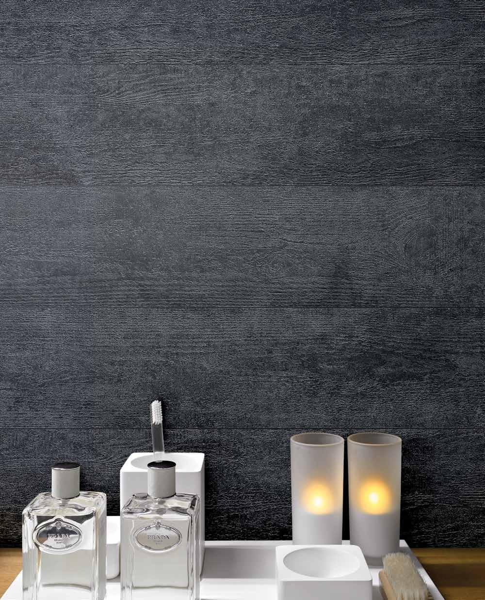
Design harvest...
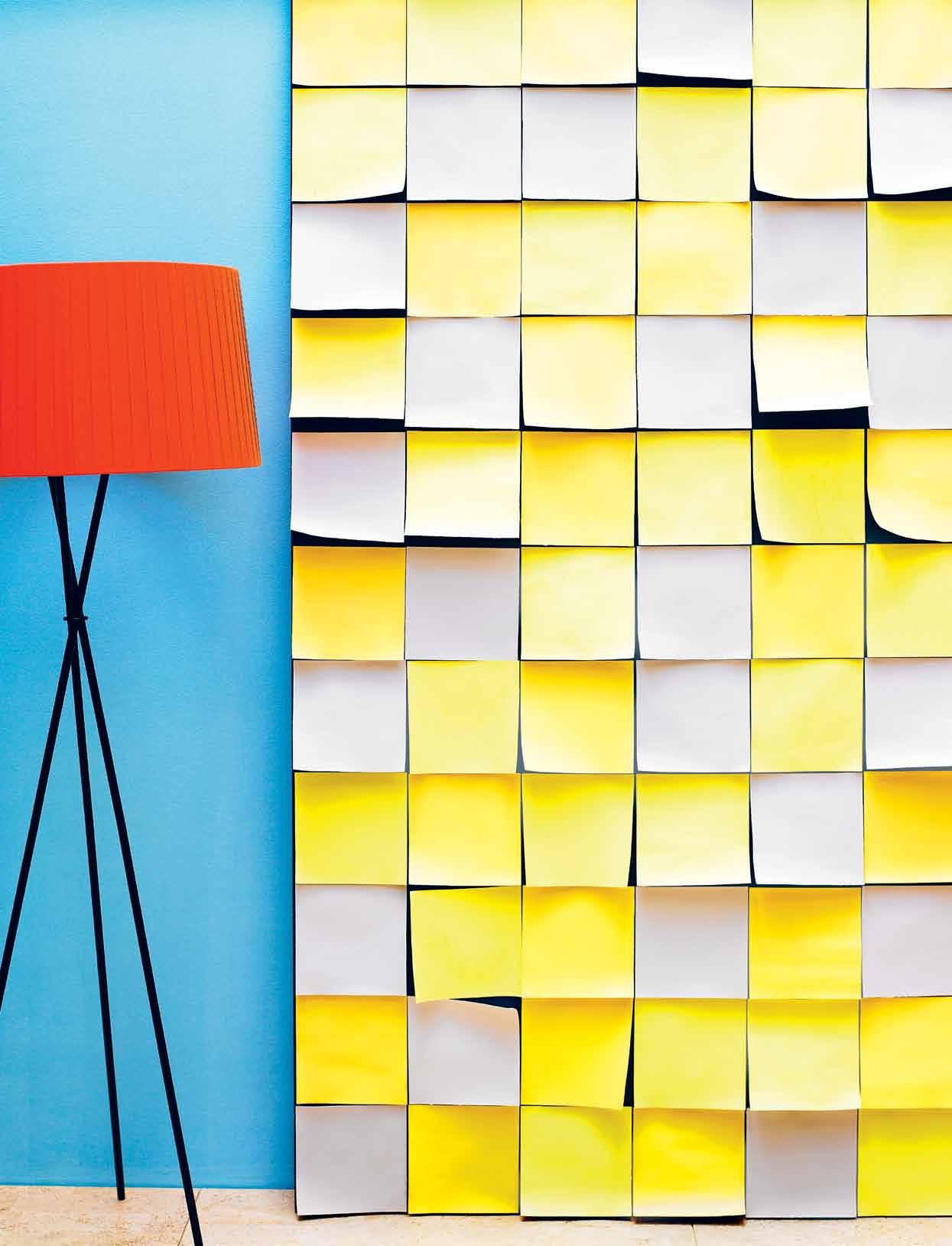
a multitude of furniture and lighting falls into our collective creative consciousness throughout the year. now is the time to sift through and separate the wheat from the chaff. h ere is our selection of the very best stools, table, lighting and coat racks.
Colour
eggshell acrylic paint Beach Club on wall, Obsidian on panel, and Snapdragon, Half Strength Wood Smoke and Sugarland on swatches, $41.30/litre, Porter’s Paints. s anta & c ole t ripode lamp, $995, ECC Lighting+Furniture.
habitusliving.com/issue19/photoshoot
photography tim robinson | styling nicky lobo/one8one7 | art direction one8one7
1 . lightbox # 43
issue #19 habitusliving.com
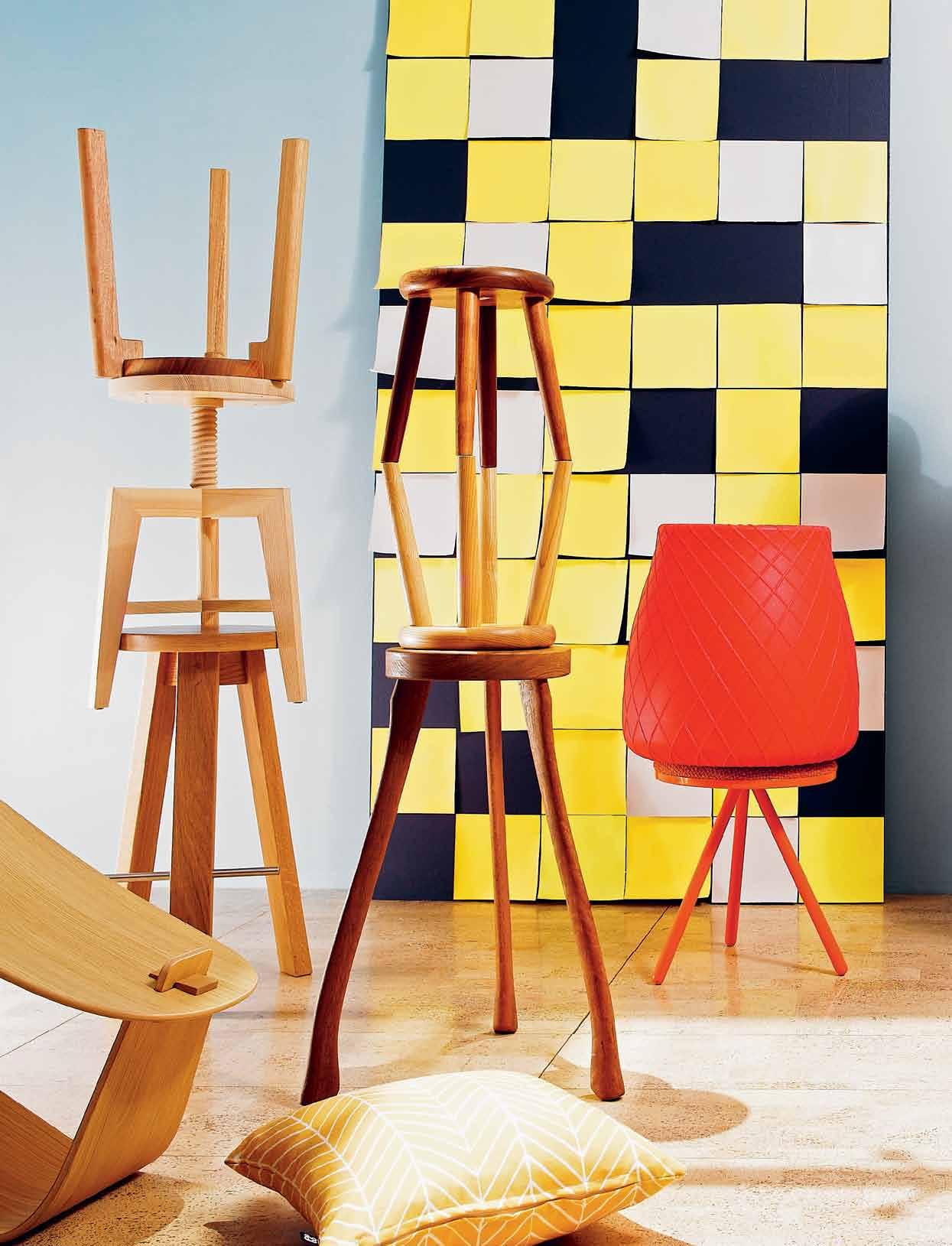
Perch
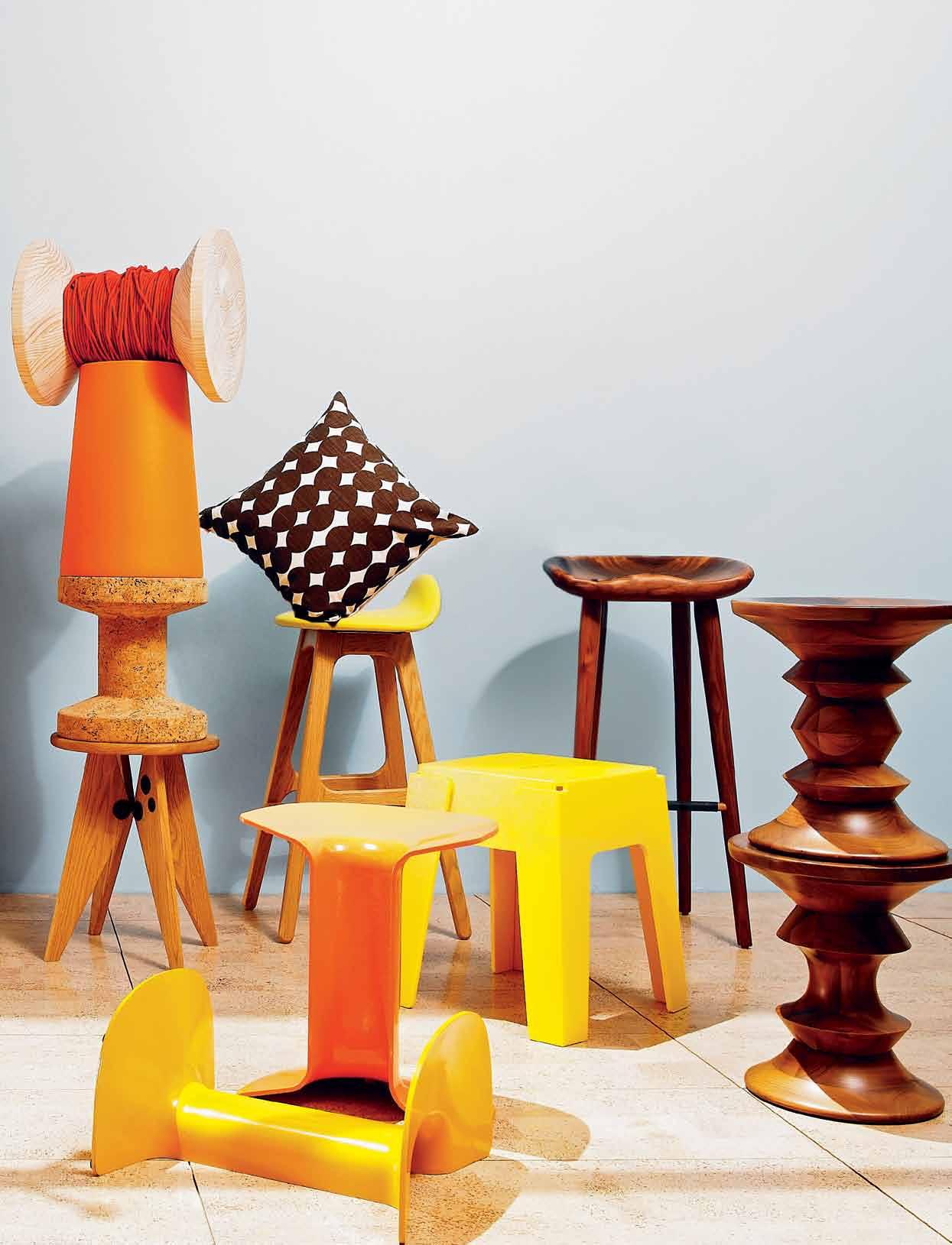
l eft to right: massproductions harry stool low in solid Beech, $710, Spence & Lyda; one t hird tom barstool , $658+GST, Stylecraft (bottom); m int l ight l iving screw stool by Janis Rauza in European Ash, $758, Own World (middle); one t hird solid low bar stool , $495+GST, Stylecraft (top); crossing cushion in Sulphur, $110, Emily Ziz Style Studio; realax stool by Tim Collins in Tallowood, $715, Hub (bottom); udder stools in solid Oak and Walnut, $600, Spence & Lyda (middle and top); l iving divani bolle stool by Nathan Yong in orange, $900, Space Furniture (bottom); panier stool/table by Helen Kontouris in red, $300, Space Furniture (top); g - star r aw for v itra tabouret solvay stool in natural Oak, $1,125, Space
(bottom); v itra cork family stool by Jasper Morrison, $670, Space Furniture (second from bottom); moooi c ontainer stool by Marcel Wanders in orange, $265, Space Furniture (second from top); nook side table by Henry Sgourakis in raw radiate Pine and red cord, $695, Arthur G (top); serif by Adam Goodrum in orange and yellow cast aluminium, $295, Space Furniture; f indahls eric buch bar stool in Dandelion Yellow and Oak, $795, Great Dane; pebble cushion in Smudge, $81, Emily Ziz Style Studio; butter stool by Nick Karlovasitis and Sarah Gibson in 100% recycled plastic, $319, DesignByThem; bassam fellows tractor bar stool in solid Walnut, $1,565, Living Edge; eames walnut stools, $1,070 Living Edge.
1 . lightbox # 45

issue #19 habitusliving.com
Place
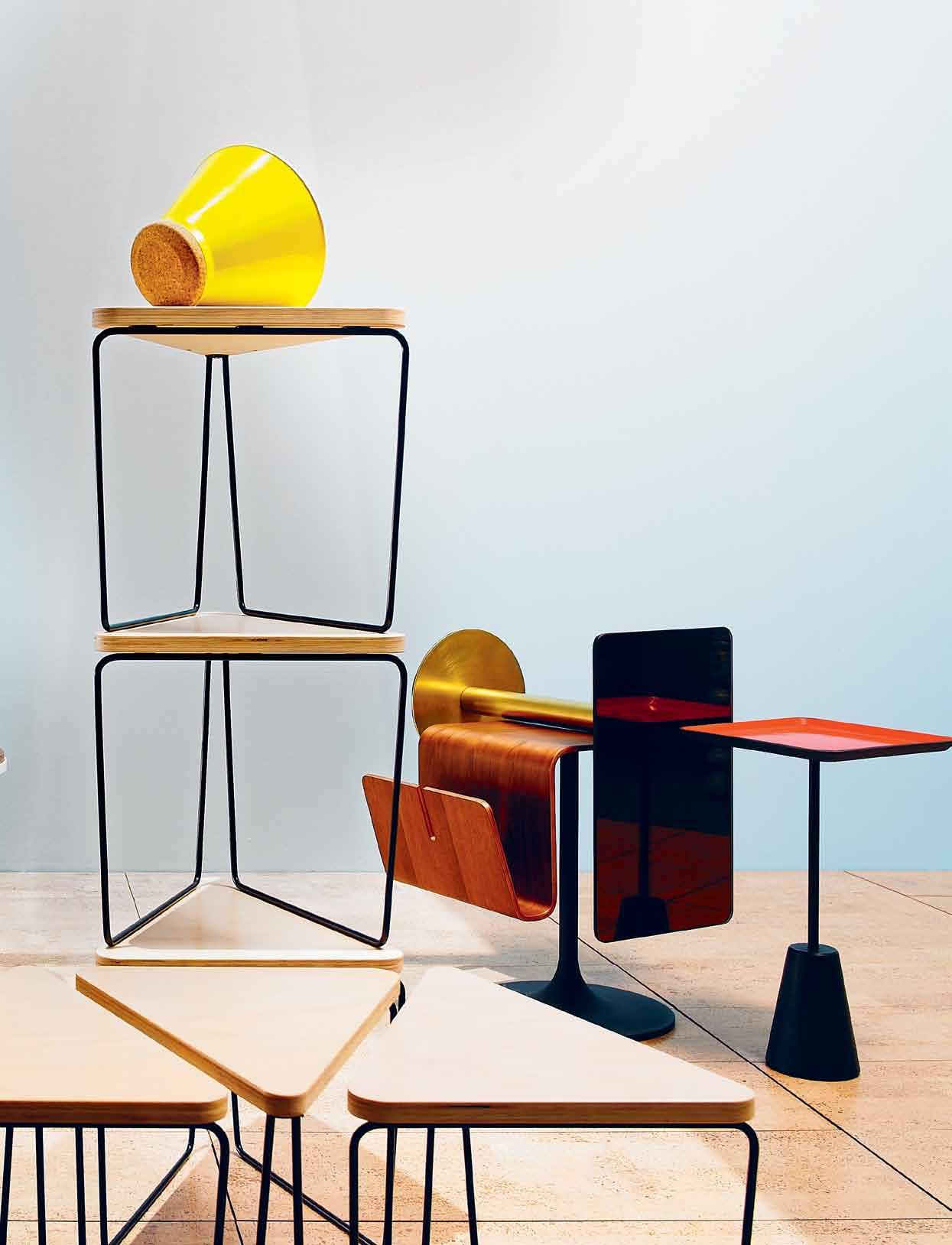
l eft to right: giorgetti d ual low coffee table with Ebony tray, $3,105, Space Furniture; porcelain teapot by Vanessa Lucas in bone white, $330, Planet Furniture; l owe sticks table in Oak, private collection (bottom); k ristalia degree stool by Patrick Nourget in polypropylene and cork, $980, Fanuli Furniture (middle); v itra metal side table by Ronan and Erwan Bouroullec in red, $945, Space Furniture (top); cattelan italia peyote side table by Piero De Longhi in White, $950, Milano Furniture; t he forty nine studio reversible clutch made of vintage Hmong baby carrier with Australian calf skin leather, $160, Eastern Weft (atop); lunar
side tables in Teak and white powdercoat, $295 (small), $345 (large), Terrace Outdoor Living (bottom); ida table by Tubert Yule in timber and yellow, from $568.70, Café Culture (middle and top); f ractal table by Nick Karlovasitis and Sarah Gibson in Hoop Pine, $550 for set of 2, DesignByThem (grouping and stacked); e stablished & sons store in yellow glazed ceramic and cork, $90, Living Edge (top); occo side table with magazine holder in Walnut veneer, $497, Bo Concepts; tom dixon f lash table in mirrored brass and brassplated steel, $560, dedece; tom dixon spot table with cast iron base and red square enamelled top, $198, dedece.
1 . lightbox # 47
Illuminate
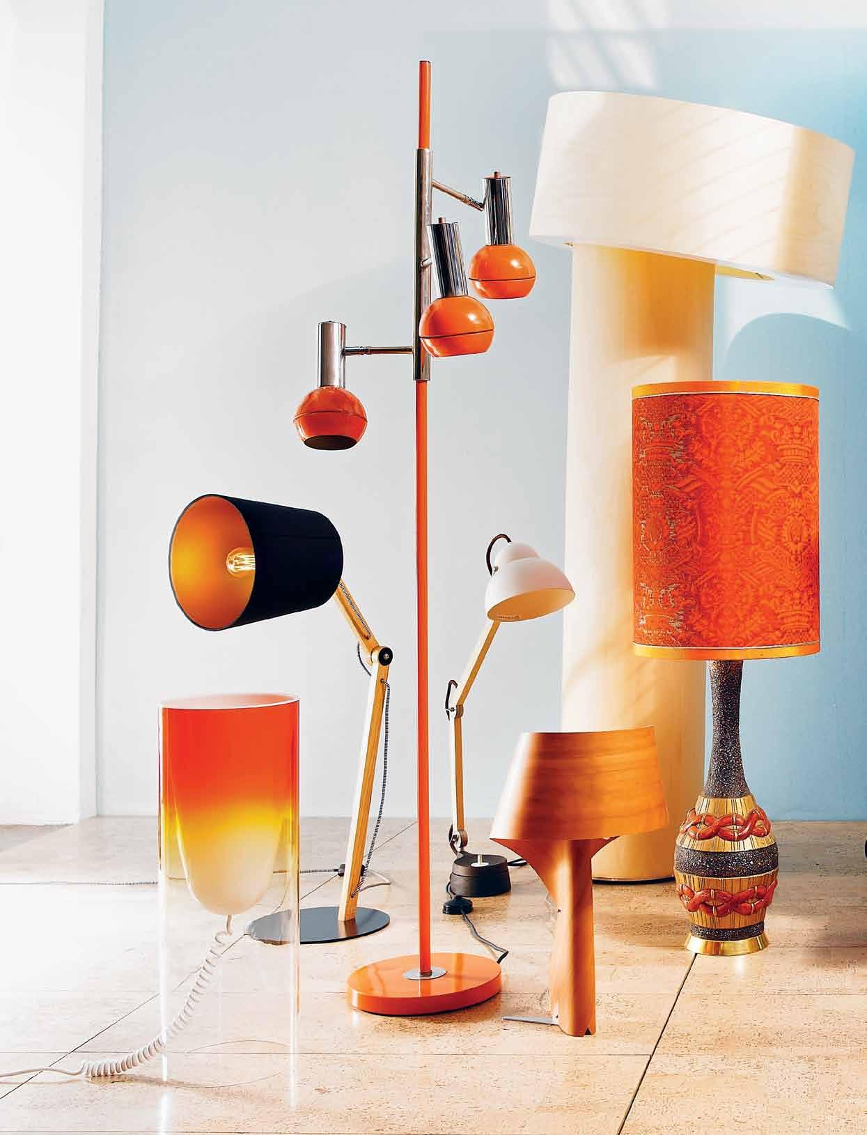
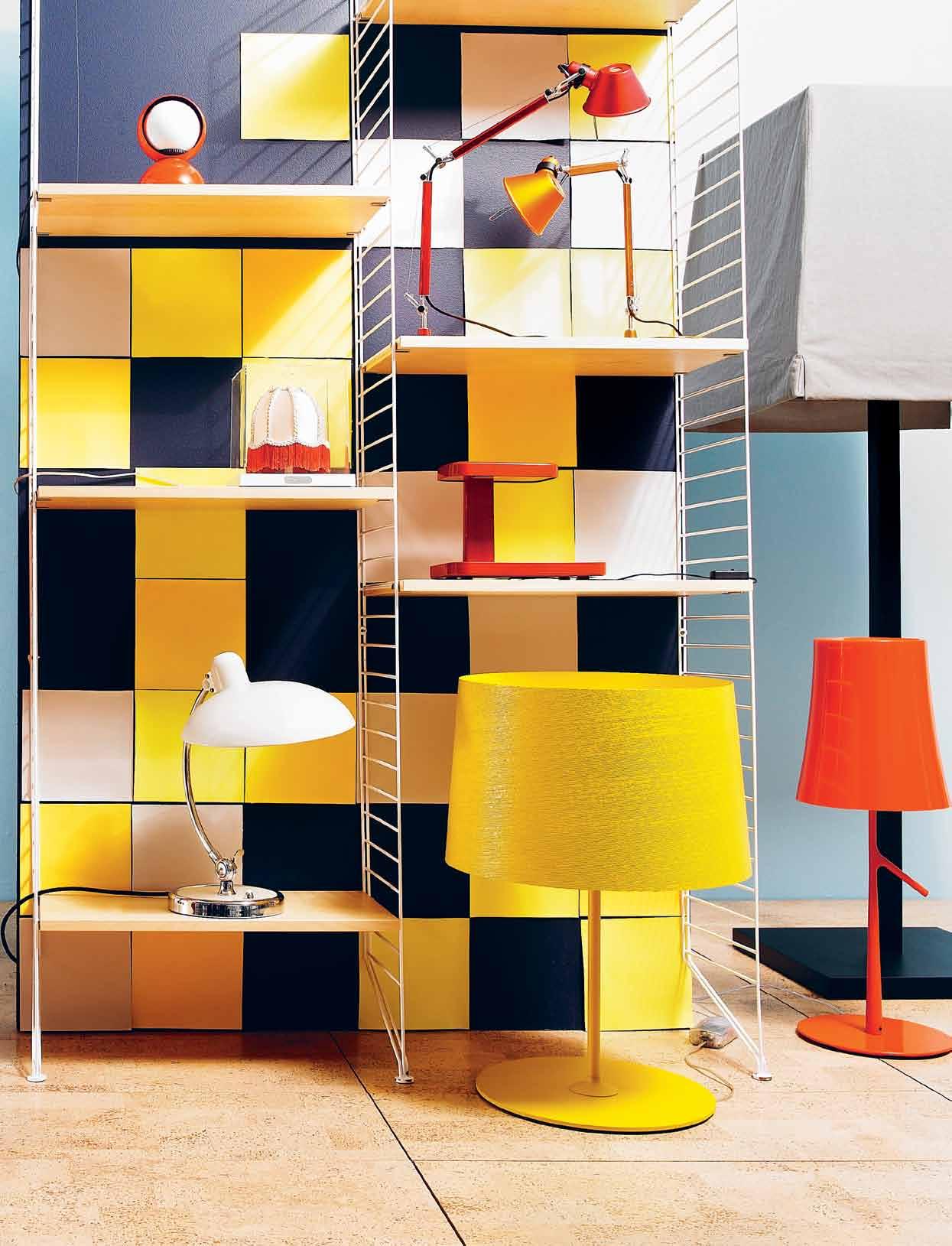
l eft to right: k artell toobee table lamp in transparent red, $330, Space Furniture; g eorgette lamp in black, by Stuart Williams, $770, Workshopped; v intage floor lamp in enamel and chrome, $895, Vampt Vintage Design; wastberg studio i lse lamp in Beech, $777, Euroluce; l zf a ir table lamp by Ray Power in Cherry Polywood®, $701.80, Kezu; l zf t ilt floor lamp by Victor Carrasco in Bolivar Polywood®, $4,743.20, Kezu; ceramic table lamp with shade, $295, Vampt Vintage Design; string shelving system by Nisse Strinning in white and Birch, $1,740 for 3 x panels and 3 packs of shelves, Great Dane.
o n shelf (left): f ritz hansen
k aiser idell luxus table lamp by Christian Dell, $1,119, Corporate Culture (bottom); f los m ini teca renaissance cupola shade, $227, Euroluce (middle); e clisse table lamp in orange, $211, Artemide (top).
o n shelf (right): foscarini
t wiggy X l lamp in yellow, $1,175, Space Furniture (bottom); f los p iani by Rowan and Erwan Bouroullec in red, $382, Euroluce (middle); tolomeo m icro table lamp in red and orange, $337 each, Artemide (top); foscarini birdie lamp in orange by Ludovica and Roberto Palomba, $500, Space Furniture; casamilano a bat Jour lamp by Paola Navone, $2,354, FY2K.
issue #19 habitusliving.com
1 . lightbox # 49
Hang
issue #19 habitusliving.com
l eft to right: derlot plantation coat stand , $670+GST, Stylecraft; hunters o riginal tall classic gumboots in Red, $165, The Iconic; o rigo jacket from the Pallo Coats collection by Mika Piirainen, $645, Marimekko; Zanotta a ster clothes stand by Alessandro Dubini in red, $605, Space Furniture; e stablished & sons hang in natural waxed Ash, $546, Living Edge; metro hall stand in matte red lacquer, $269, Bo Concepts; a kubra adventurer in Regency Fawn, $189.95, Strand Hatters; cascando bamboo coat stand , $648+GST, Stylecraft; f ullspot shopping o bag by Emanuele Magenta in Orange silicone with rope handle, $119.80, Fullspot; tom dixon peg coat stand in fluoro, $792, dedece.
Seeing is believing.

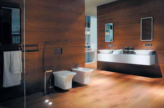
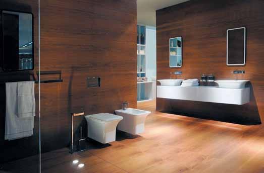
Gessi. The iSpa Bathroom Collection is inspired by an idea of extreme customisation of the modern bathroom. Spanning from taps, accessories, wellness systems, ceramic-ware and a first for Gessi with a bathtub and toilet, Gessi lead the way in design and innovation. Exclusive to Abey Australia.
– Gessi iSpa Bathroom Collection


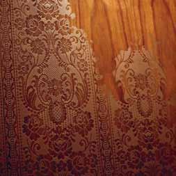
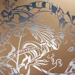

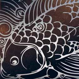
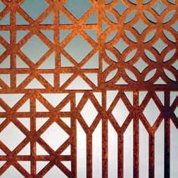





Bringing diverse worlds together
New life for old forms
For Mika NishiMura, life and work exemplify the comfortable cohabitation of two cultures. Paul McGillick reveals how her company, artika iNterNatioNal, celebrates the contemporary reinvention of traditional Japanese crafts.

issue #19 habitusliving.com
Tex T Paul McGillick | PhoToGra Phy a n Thony Browell

2 . portrait # 55
Ihave known Mika Nishimura ever since we worked together on SBS TV’s arts show, Imagine, during the mid-1990s.
What strikes me about Mika is the way she always seems to have a clear vision of what she wants to do. At the same time, though, she seems to be able to regularly re-invent herself.
Having a clear sense of direction usually goes hand-in-hand with determination –and this Mika has in spades. What results is the theme of this story – Mika’s fascinating business importing quality Japanese personal and household accessories, bringing up two superbly educated and fluently bi-lingual children and, with her husband, Peter, and architects Kausar Hukumchand and Sarita Chand, driving the most intriguing addition to a house you are ever likely to see.
Mika says that she has a “mission to link contemporary design and the finest Japanese craftsmanship”. That sounds straightforward, but there is back-story to this.
Mika grew up in Kyoto as part of a family which produced yuzen-zome (a 17th Century dyeing process) kimono textiles. Witnessing
the decline of this craft is one thing currently motivating her. “I also remember,” she says, “seeing my uncle weaving obi in Nishijin style in a corner of his small, wooden house and being amazed by how he created such complex and stunning motifs out of so many coloured threads, all by hand. Looking back, it is intriguing that such visual memories of textiles, colours, craftsmanship and space have become an important part of my life today.”
Mika’s connection with Australia began in the cooking section of the Maruzen bookstore in Kyoto. It was here that she met her future husband, Peter, who was quick enough to start a conversation about what seemed to be a shared interest. There is some irony here because, 25 years later, their young daughter, Aya, was to appear as a contestant on Australia’s Junior MasterChef television show in 2011.
It says a lot about Mika that, with matrimony on the horizon, she went to Australia by herself leaving Peter behind, because she needed to meet his family and experience Australia as an individual, not as “a little Japanese person who walks behind an Australian man – I didn’t want to come to Australia as Peter’s girlfriend
issue #19 habitusliving.com
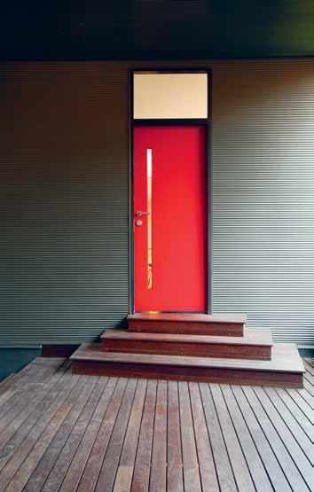
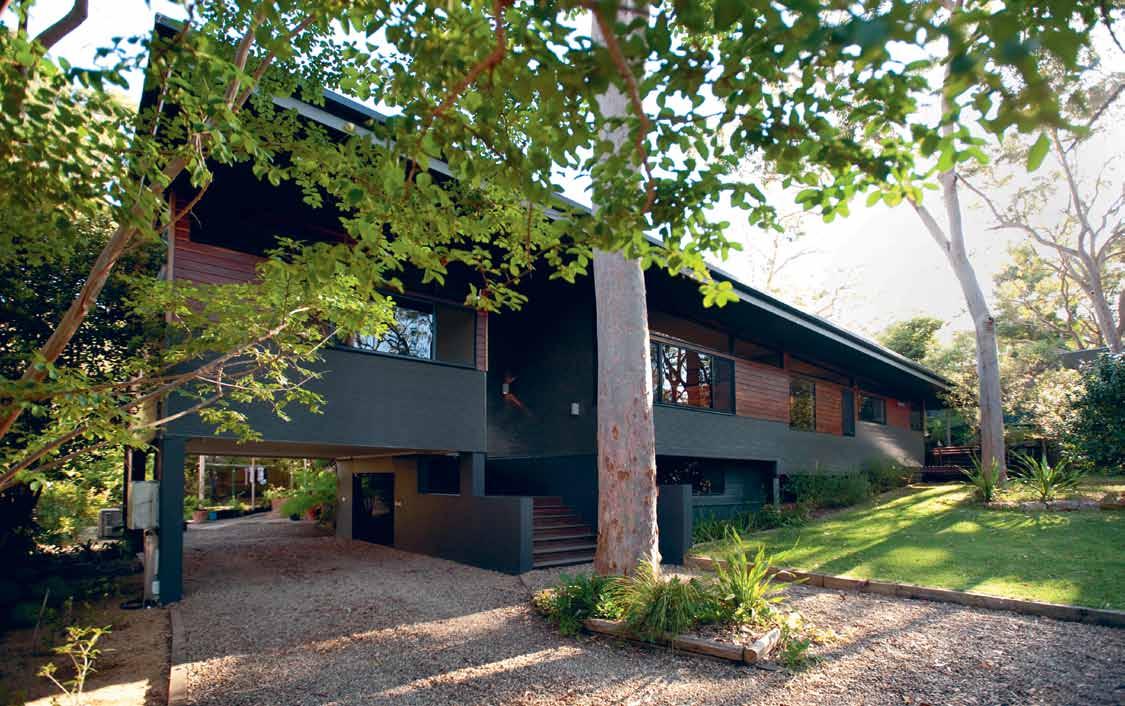
prevI ous | Mika NishiM ura. AB ove | The red door To Mika’s sTudio/o FFice. opposITe AB ove | The New pavilioN wiTh iTs TiMber eNTry sTeps. opposITe B elow | The TiMber-decked eNTry courT showiNg The J uNcTioN oF old aNd New.

2 . portrait # 57

issue #19 habitusliving.com
...the windows come down to our eye level sitting on the floor. And, by raising the floor of the Japanese living room from the Western dining room, the eye levels of people who sit at both tables are the same.

2 . portrait # 59
mika | resident
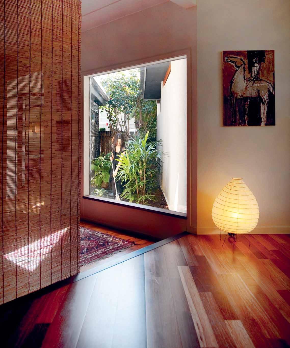
prevIous | Mika aNd aya iN The ‘JapaNese rooM ’ wiTh The sudare bliNds as rooM dividers. AB ove | a gardeN courT is gliMpsed iN The TraNsiTioN beT weeN The New aNd The old house. opposITe | k yogi deTail.
house
has a very Japanese sequence of arrival. issue #19 habitusliving.com
...the
now
or Peter’s wife”. It was after this that she quit her much-loved job with an airline in Osaka and migrated to Australia. Here she qualified as a teacher and, in the process, got to teach in schools as diverse as Geelong Grammar School and an Aboriginal school in Papunya. Seeing an ad for a traineeship at SBS TV she applied, successfully, and then got a fulltime position with SBS, working on Imagine, which pioneered cross-cultural television arts coverage in Australia.
As a result of her television work, she met many Australian creatives. But, she adds, “one thing that became clear to me was their lack of access to fine craftsmanship to turn their ideas into products in Australia”.
She left SBS in 2005, setting up her business, Artika International, straight away, beginning with supplying kyogi (paper-thin sheets of Japanese Red Pine, originally used for Buddhist scriptures or for wrapping food) as place mats to celebrity chef, Tetsuya Wakuda, in Sydney.

Her next client was the equally celebrated fashion designer, Akira Isogawa. She supplied him with kimono textiles and shibori (a Japanese tie-dyed textile dating back to the 8 th Century) scarves for his 2006 Spring/ Summer collection. Mika then started

Japanese-born chef, Tetsuya wakuda, is based in Sydney where his eponymous restaurant was established in 1989. his approach of combining the Japanese philosophy of natural, seasonal flavours with classical French techniques has won him international acclaim and a permanent spot in the culinary heart of Sydney-siders. here ‘Tets’, as his friends know him, shares the story of his collaboration with Mika and a rtika international.
“I knew Mika from her previous job, she wanted to do something inspired by where she came from in Japan, Kyoto,” Tetsuya remembers. Having done the same thing, successfully, “I encouraged her to bring the culture and product to Australia,” he says.
In 2005, Tetsuya was able to offer more than moral support, with a commission for his restaurant. “We asked to do something wooden, thinly sliced kyogi. We needed it and Mika knew where to get it.” She selected Japanese red Pine “as it has subtly beautiful grain and fragrance”, Mika says of the timber which comes from Nagano in the Japan Alps and is processed in Nara.
The results confirmed Tetsuya’s belief in her abilities. “The products bring quality and authenticity of Japan, especially from Kyoto,” he said. This authenticity is something he feels passionately about, and his aim “to be conscious of quality and a particular attitude towards cooking, something I had while growing up that came from my background.”
tetsuya’s | tetsuyas.com
2 . portrait # 61
supplying shibori scarves from Kyoto to boutiques in Australia and the US.
It was about this time that she and Peter realised that their 1950s cottage in verdant Turramurra on Sydney’s upper North Shore was no longer adequate for the growing family. So, naturally, she spoke to neighbours, architects Kausar Hukumchand and Sarita Chand (whose own extraordinary house was published in Habitus #6), about an extension which would incorporate a number of Japanese elements, including the traditional unity of landscape and house.
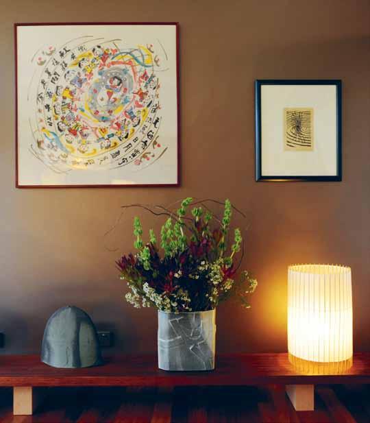
Kausar and Sarita suggested a new pavilion across the front of the old house which, true to their strong sustainable principles, would not involve any demolition of the existing house and which would also reflect the traditional structures of the Japanese workshops Mika was now dealing with in Kyoto where the workshop/studio is co-located with the house. Hence, the house now has a very Japanese sequence of arrival – up a set of Ironbark timber steps to a floating deck with views through to the lush garden beyond. This entry court separates the house from Mika’s office/ studio, each entered through its own red door.
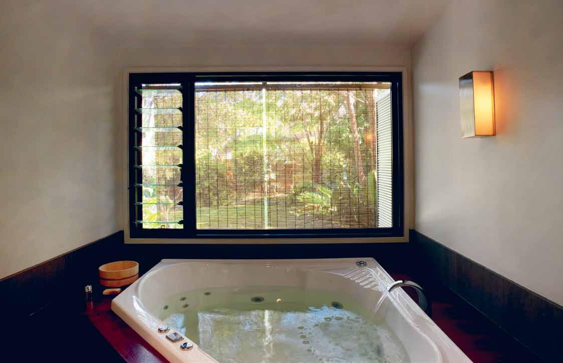
Inside, the old and the new merge imperceptibly to form an enticing – and very Japanese – narrative with horizontal and vertical slot windows offering glimpses into garden courts. For Mika the pièce de résistance is the Japanese-style bathroom and spa with its feature window on to the garden, with sudare blinds (made of horizontal slats of wood, bamboo, or natural material) for privacy if required. “It’s a place for relaxation and socialisation,” says Mika, “when families
AB ove | producT saMples iN Mika’s sTudio. oppos ITe | The JapaN ese baThroo M
A mission to link contemporary design and the finest Japanese craftsmanship.
issue #19 habitusliving.com
mika | resident
Born in kyoto, where Mika also hails from, a kira isogawa moved to australia in 1986, integrating inspiration from his homeland into his fashion design studies at the Sydney institute of Technology. he has since become one of a ustralia’s most celebrated designers, garnering international recognition for his collections, and having won a number of accolades and appreciation in the arts community. a kira retells the story of his collaboration with Mika.

They first met when Mika interviewed Akira for a show she was working on at SBS. Around the same time, she had sourced Japanese facial blotting paper, used in the fashion and cosmetics industries. “We had it in our store
for a while,” remembers Akira. He asked her to source some wooden sandals – also for his store – and later, some shibori fabric and other kimono fabric for his 2006 collection.
All the products Mika sourced are made in Japan, mainly Kyoto but sometimes other towns or cities. “There are still artisans,” Akira says, “They follow traditional methods of making things.”
An mutual respect for the other’s abilities has been the basis of this ongoing friendship. In 2011, Mika visited Akira at his studio and brought him some homemade bento. A shibori scarf she pulled out of her bag became the inspiration for the costumes for Akira’s costume designs for the Romeo & Juliet production by Sydney Dance Company.
“Traditionally, we share the same cultural background,” Akira says. “Without verbally communicating too much we both have a sensitivity… a clear understanding of the traditional Japanese aesthetic.” a kira | akira.com.au
2 . portrait # 63
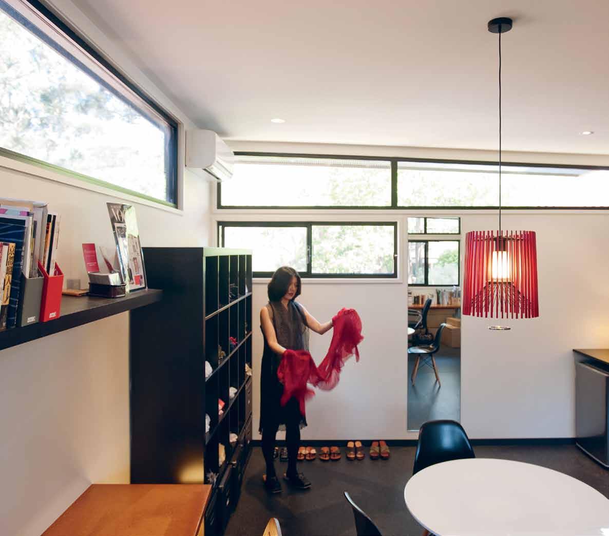
...such visual memories of textiles, colours, craftsmanship and space have become an important part of my life today.
issue #19 habitusliving.com
mika | resident
bathe together. Unlike the Western concept of an ensuite, I like the idea of going to a separate wing for relaxation as you do in the hot spring resorts in Japan.”
Basically, the private domain is now located in the old house, with public areas in the addition. It is worth noting here that the new bathroom is really a semi-public space. Not only can the family bathe together, but Mika has been known to insist that visitors also enjoy the experience. Within the new addition, as well as the galley kitchen and formal dining room, there is now another ‘Japanese’ dining/ living area, slightly elevated above the formal Western dining room. Mika had owned four sudare blinds, brought from Kyoto more than 23 years ago, but had no immediate use for them. So, she asked Kausar to design the width of the room to match the combined width of the blinds, thus finally giving them a home.
“Whenever I sat on the floor at our low Japanese dining table in other Australian houses we have lived in,” says Mika, “I felt uncomfortable because the eye level was lower than most windows. But in our newly built living room, the windows come down to our eye level sitting on the floor. And, by raising the floor of the Japanese living room from the Western dining room, the eye levels of people who sit at both tables are the same.”
I have been to Mika and Peter’s house many times and I still don’t quite understand how it all fits together. And this is a good thing because it is testimony to how spatially intriguing this
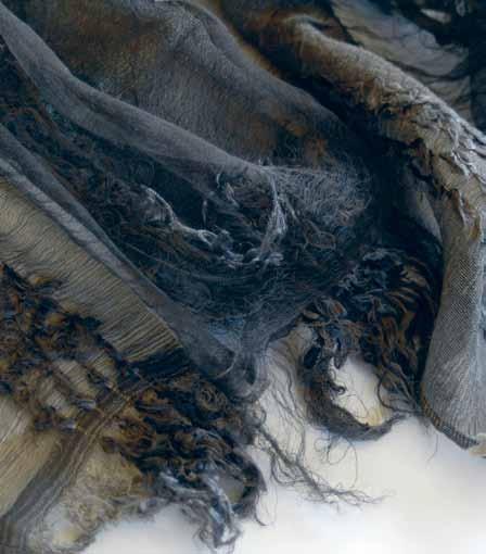


opposITe | Mika iN her sTudio wiTh a shibori scarF AB ove | haNdcraFTed shibori scarF FroM k yoTo. B elow | NaTural-dyed woveN scarF FroM k yoTo.
2 . portrait # 65
house is. One space seems to spring out of another, while the old (Western) house merges imperceptibly with the new (Japanese) house.
This cross-cultural dance is reflected in the artwork around the house. A print by Aboriginal artist, Lin Onus (Mika made a highly regarded TV documentary on Onus, whose cross-cultural vision has inspired her ever since) hangs next to a silk painting by the former chief monk of Todaiji temple in Kyoto. There is a Hiroe Swen ceramic vase next to a ceramic by Australian artist, Gillian Broinowski. A bird sculpture by Melville Island artist, Leon Puruntatameri was brought back from an SBS filming field trip and now stands in front of one Artika International's own Hiyoshiya floor lamps. “To me,” she says, “there seems to be some kind of dialogue between these objects and the design of our house, and I feel at peace.”
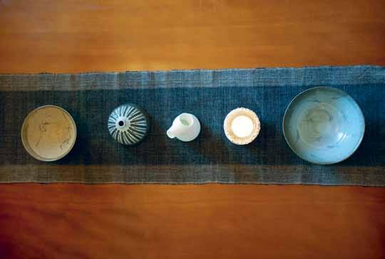
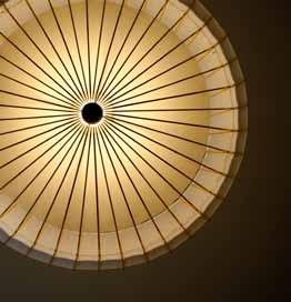
The Hiyoshiya lights in the house (and which she is importing to Australia) exemplify Mika’s commitment to sustaining traditional crafts (especially from Kyoto) by adapting them to contemporary uses. Hiyoshiya has been manufacturing traditional umbrellas in Kyoto since the late Edo period (16001868). With a limited market these days for paper umbrellas, the umbrellas have been reinvented as pendant lights and floor lamps, exploiting the structure and the beautiful patterns of the split bamboo bones.
Mika aims to eventually put together an exhibition of such ‘reincarnated’ craft objects and textiles from Kyoto, explaining their background and complemented by a video installation and photography, with traditional forms of the craft put beside the contemporary versions. And, knowing Mika as I do, this will inevitably happen as night follows day.

AB ove | deTails oF liFe iN Mika’s hoMe, iNcludiNg (ceNTre) a hiyoshiya laMp seeN FroM below. habitusliving.com/issue19/artika issue #19 habitusliving.com
Introducing the BCN stool.
The sleek and contemporary BCN stool has been styled with obvious curves for a completely ergonomic design. With its innovative use of materials the BCN is extremely resistant to heat, cleaning solvents, and general wear. This sturdiness is only accentuated by the fact that the seat component is constructed from a single piece of special PBT with a solid steel frame or turned wood legs.

Available in 4 colours, 3 heights or adjustable gas lift pedestal.
Made in Italy.
Why not enjoy summer days in the outdoors with our Sushi Outdoor Table and Rest Chairs. The Table is available as extension or fixed top in a selection of sizes and colours with aluminium frame and alucompact top while the Rest Chairs offer comfort, durability and sleek lines. Both are highly stable and UV/impact resistant and exclusive to Fanuli.
Sushi Outdoor Extendable Table and Rest Chair Hand made in Italy
ITALIAN & AUSTRALIAN FURNITURE EST. 1976 I 269 Military Road, Cremorne, NSW I Tel (02) 9908 2660 I fanuli.com Melbourne Destination 3000 (03) 9029 3220 I Brisbane Commercial Images (07) 3844 9100 I Perth Innerspace (08) 9322 6664 I Hobart Featherston Interiors (03) 6234 6177
CONTRACT 0498 990 029
SYDNEY 02 9362 4736
MELBOURNE 03 9818 1403
NATIONWIDE 1300 01 61 81
Sydney showroom ~ now open
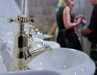
We welcome you all to visit 170 Queen Street, Woollahra, Sydney. Our new Sydney boutique is a refreshing design collaboration with the studio of Hecker Guthrie. This beautiful new showroom now acts as a hub for local designers and clients.

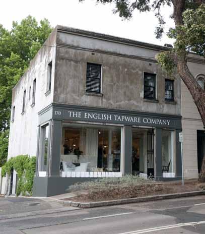
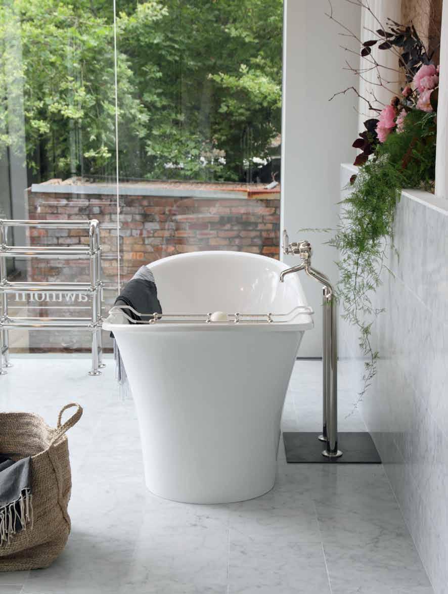
Hecker Guthrie was appointed for their vision and passion for authenticity, quality and craftsmanship. Understanding the importance of an engaging and informative retail space they created an environment that reflects a high level of quality and refinement to portray the essence of our exclusive brands.
Simple storytelling
Confirming the Phili PP ines as one of the world’s most original creative hubs is designer, Vito s elma aya m aceda sees his products telling crosscultural stories and epitomising the new wave of Filipino creatives renewing traditional crafts for the modern world.
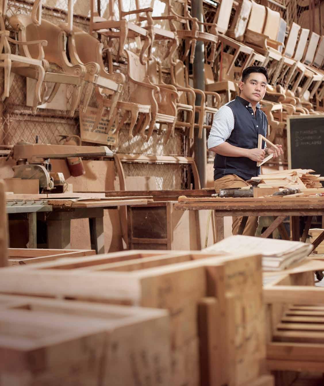
text AyA M AcedA | photogr A phy JA n g onz A les (portr A its)
# 69 2 . portrait
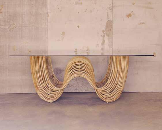
During the high velocity of the recent Manila FAME furniture exhibition, I had an encounter with an exquisite table. I was intrigued by the movement of the piece, and the simplicity wrought out of its very complexity. Here, the functional, usually hidden, dowel is upturned to become the sculptural base of the table. And it is the base, rather than the top, that is the table’s focal point. Exposed and lengthened, the timber dowels are delicately held together by a series of twisted timber frames. The logical but fluid arrangement achieves a texture similar to that of a rope. The piece is artfully crafted to perfection and imbued with a Scandinavian quality.
It was one of those rare moments – like finding a painting that truly inspires and that one just has to bring home without considering price or size. I immediately felt the need to know who the designer was, where he came from, how he acquired the sensibility to create such an object. When I met the young Filipino behind the Geo table, my conversations with him about his environment, family, travels and explorations would piece together how his creations are birthed.
Vito Selma grew up in Cebu City in the 1980s when the Philippine furniture export business
was at its peak. Cebu was the manufacturing hub of the region and was dubbed ‘the Milan of Asia’. His family ran a thriving furniture manufacturing business, specialising in traditional furniture. They ran two factories that were the young Vito’s childhood playgrounds, places where he discovered the joys of working with off-cut materials – such as the dowels that he would later use as feature elements in his own work. He had the luxury of experimenting and testing his creative ideas many times over, and his early exposure to the business and to local craftsmanship would be the foundations of his work.
Vito grew up visiting local and international design shows where his family participated, which gave him a view of the possibilities of design. Here, he encountered the works of another Filipino designer, Debbie Palao, and was seduced by her understanding of bamboo, and the extraordinary ways she used it in her own work. Inspired and charged with the desire to go beyond production and to engage in design, Vito joined workshops run by Kenneth Cobonpue and Debbie Palao herself through the Designer’s Guild of the Philippines. Under their mentorship, Selma produced his first collection, Uzima, for which he won Best Product at the Cebu International Furniture & Furnishings Exhibition 2004.
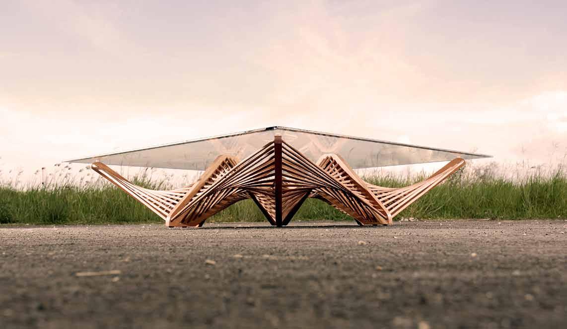
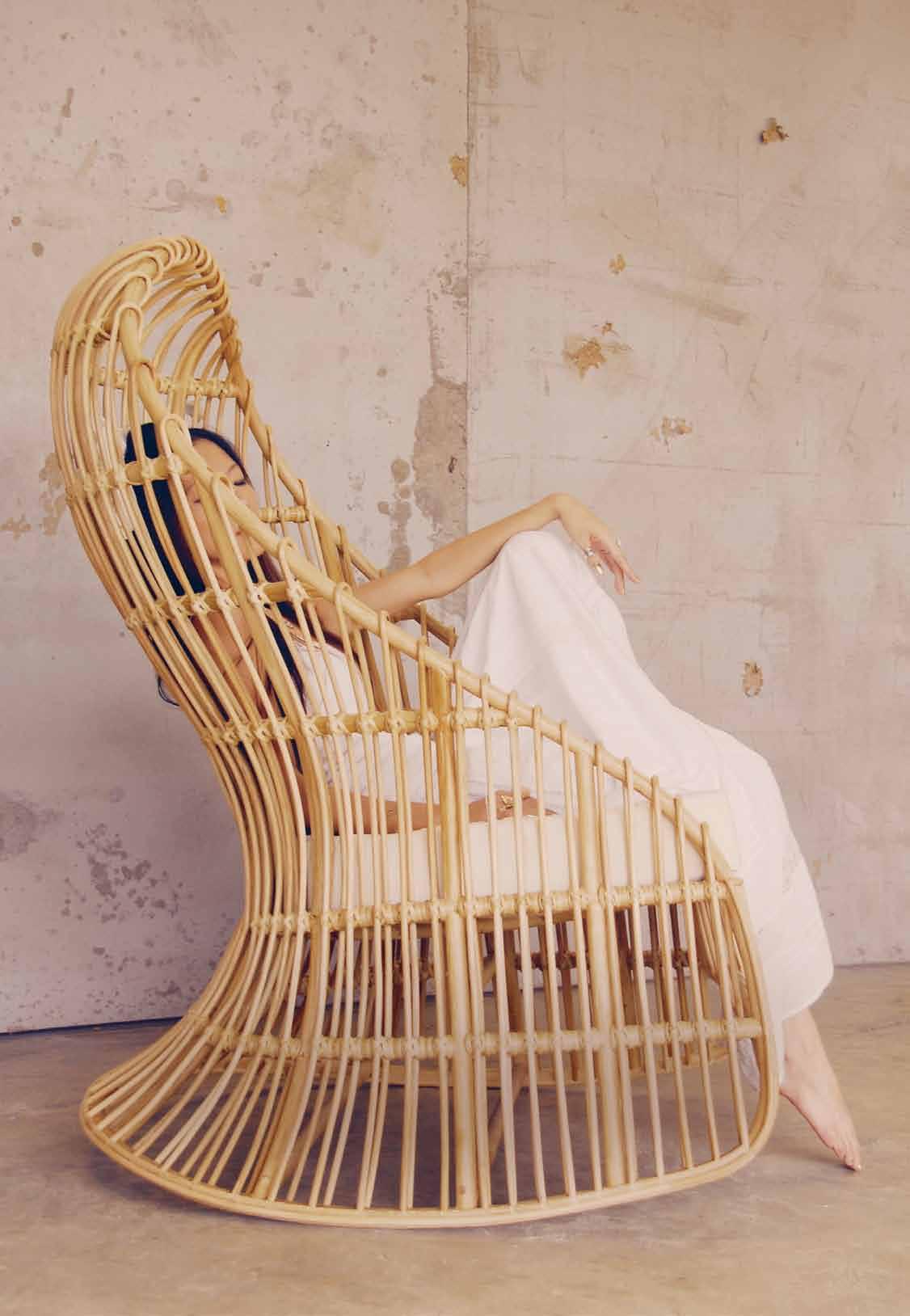
previous | Vito in his Family’s
produ Ces
Furniture,
Create his inVentions. above | Geo taBle with its Feature Base whiCh won Best produ Ct at CeB u X Furniture s how 2008. opposite | the
take on the traditional Filipino ro CkinG Chair. issue #19 habitusliving.com
FaCtory, whiCh
traditional
where he now
delilah ro CkinG Chair, Vito's
I love their understanding of keeping things natural, architectural, yet simple.
2 . portrait # 71
Vito | designer
After obtaining a Masters in Industrial Design from the Scuola Politecnica di Design in Milan, Vito also trained under Rafaella Maniarotti, working on projects for Alessi. Seeking a different perspective, he then interned for George de Haast, a prominent South African interior designer who taught him the values of space, balance, and bringing nature into space. Vito travelled extensively and was very much inspired by Scandinavian and Japanese aesthetics – which is now evident in his own work. “I love their understanding of keeping things natural, architectural, yet simple,” he says.
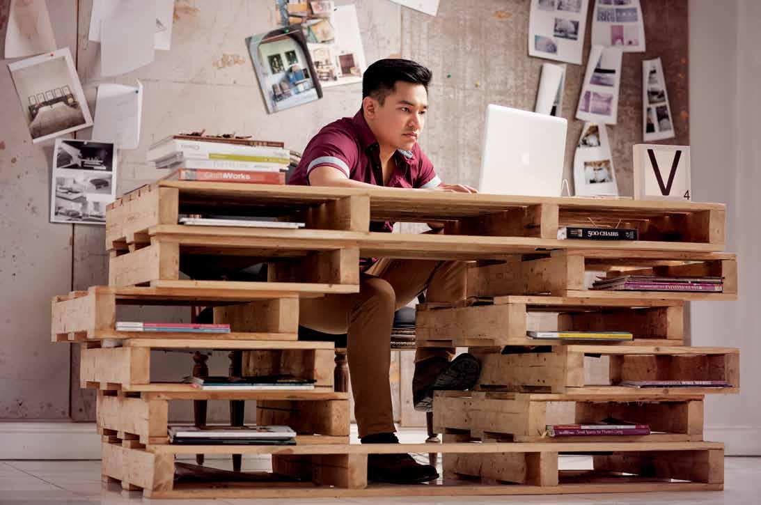
To Vito, simplicity itself is the most complex design. He travels to investigate and be inspired, but goes home to Cebu to realise the work. “Every person, country and market wants different things. It is up to me to translate all the information and create a piece that can cross cultures,” he says. This results in appealing designs that challenge the cultural norm of visual clutter and noise, instead exploring the naked qualities of timber through its grain, texture and fluid form. He hardly uses colour, as he believes that colour is in itself a strong language that carries with it meaning from culture to culture.
above | Vito in the work Corner oF his FaCtory – while make-shiF t, the desk still has a sense oF Beauty in its lines, BalanCed with raw timBer. below | the paisley lounGe Chair, with the Form and Caress oF a woman. issue #19 habitusliving.com
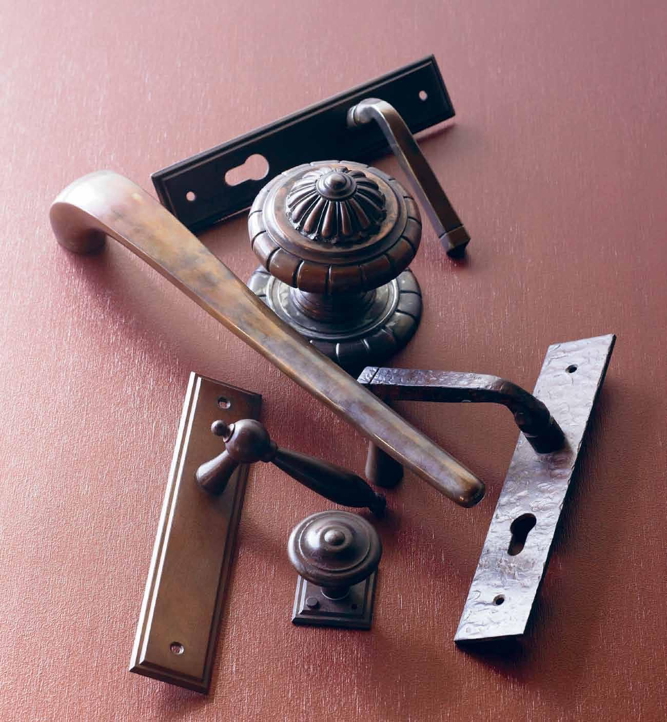 Aged copper, brass & waxed rust finishes Chant New Zealand, Brionne France & Fersa Argentina
Vito’s body of work is a culmination of lessons learned from exploring material, understanding needs and having a sense of responsibility to his community. “The world doesn’t need any more furniture than what it already has,” he says. “What I try to produce is something different, an alternative to the chair or table you already have in your home… threedimensional objects with stories. It could be stories of travel, of the forest it comes from, or the stories of the lives of the people behind the hands that produce them. I am just trying to offer a different chair.”
Some of his collections are birthed from working with communities where traditional crafts are dying. Vito has made it a goal to revive their craft in new forms. Each of his collections expresses a different inquiry and tells a story – literally. He collaborates with local storytellers in Cebu to develop an idea for a collection to an actual tale that re-informs the details of his work.
For example, the collection called Baud (the local term for ‘wave’) captures the endless motion of the open water – a tribute to the ocean that keeps his island city home in its undulating embrace. Then there is the Paisley chair, inspired by the warmth and form of a woman and which had the aim to express both visually and ergonomically the comfort of being held by a woman. The story behind this particular chair reads:
“There she would sit, by the breakwater, brown shoulders curving in the sun; white frills of a hiked-up Sunday dress gathered at the knees, a wide-brimmed hat falling in soft folds over her face. A silhouette against the rising sun that would recur always in what I'd do…” (Kae
Batiquin).
Vito Selma’s work shows artistry and a quality that demonstrates a real understanding of material and assembly. Through him, we get a glimpse of what is happening collectively in the Philippines – its transformation into a design hub in Asia through young hands with a strong manufacturing backbone, reviving local craftsmanship.
Vito s elma | vitoselma.com habitusliving.com/issue19/vitoselma
It could be stories of travel, of the forest it comes from, or the stories of the lives of the people behind the hands that produce them.
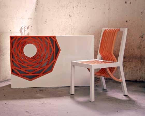
above | hanako Console, inspired By a GeometriC Flower, and arata dininG Chair, whiCh utilises studied erG onomiC s For ComFort, without usinG Cushions. below | the Baud ColleCtion, a triB ute to the o Cean that has kept selma’s home City in its emBraCe. issue #19 habitusliving.com
Vito | designer
IT IS SAD WHEN YOU FEEL UNCOMFORTABLE IN A BEAUTIFUL CHAIR
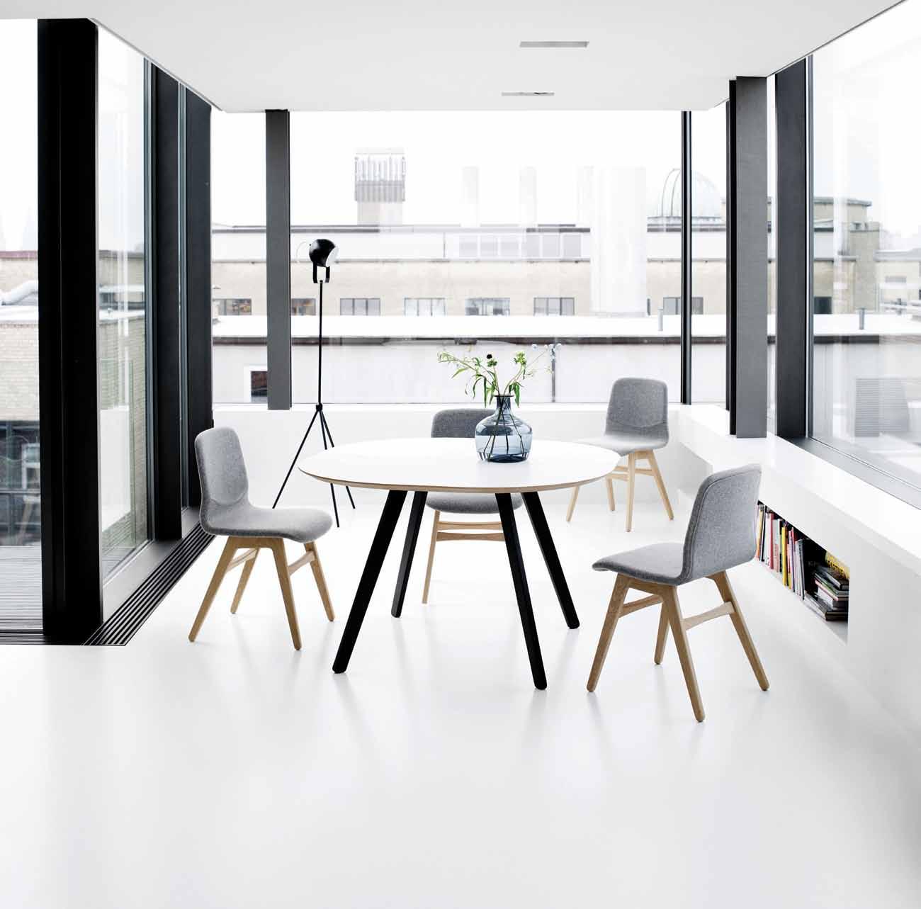
If a good looking sofa kills your back; if a fabric is too delicate to be used; if a design is so fancy, that you can’t figure it out - it does not work. BoConcept design will not only look great, but work in your everyday life too. Our designers think about you, and not themselves so our designs look sharp, but you will never cut yourself.

 #6 WE BELIEVE IN FUNCTIONALITY
BoConcept Sydney - 575 Pacific Hwy Crows Nest, NSW 2065 - Tel. (02) 9437 0066 - www.boconcept.com.au
Occa Dining Table London Dining Chair
KARIM FOR ALLOY






of unique, high quality
A
collection
solid
metal tiles designed by Karim Rashid exclusively for ALLOY.
Level 1/ 46a Euston Road Alexandria NSW 02 9565 2422 www.alloydesign.com.au
Pictured: The Ubiquity tile in Brushed Stainless Steel
Sustainable luxury
Laura Herne builds bridges – once between her clients and their markets, now connecting THaiLand and Australia, and luxurious body care and respect for the environment. nikki BusuTTiL profiles a woman who is all embodied energy and who won’t compromise on quality.
# 77 2 . portrait
Tex T Nikki BusuTTil | PhoTogra Phy oweN r aggeT
Half-Thai/half-Australian, born and raised in the Northern Beaches of Sydney, where a portion of her heart remains, a 30-something Laura Herne lives, works, loves and creates out of Bangkok.
Passionate CEO of Qi Activated, a bespoke natural products company, and co-owner of a boutique PR agency, together with her husband, Paul Fernout, Laura devotes her time to giving back to the planet through the range of Qi products, which embody the ethos of ‘mindful luxury’. Since the company was founded in 2010, Laura has pioneered a new wave of forward thinkers who believe embracing sustainability no longer means sacrificing luxury. “We have to live in tune with nature, and be mindful,” she says. “I am not willing to compromise on this or on quality, which my clients truly appreciate with Qi Activated products.”
Growing up by the ocean, Laura lived a typical beachside Aussie experience. “I boogieboarded from the age of six, we had backyard barbecues and had friends over every weekend. I enjoyed that very wonderful, natural healthy Australian lifestyle as a young child,” remembers Laura. Not so typical, however, was her exotic heritage and the family’s progressive
household. Laura had an early introduction to green concerns, at a time when such matters were not at the forefront of the average Australian’s mind. Her father, Chris Herne, would prove to be a major influence on her business with his pioneering vision and rawfood ways: “We had solar panels on our house in Avalon, which back then was a big deal. We always recycled, we had compost bins in the backyard and were careful about light bulb usage.” Later, her father was the first person to bring solar energy to Thailand, as an agent of an Australian solar panel system.
Although her parents embraced this way of life, they were far from hippies. “My parents were very professional people – in fact they were both corporate business people and very entrepreneurial.” Her British-Australian father graduated with a legal and economics degree, and pursued his career as a lawyer. Nowadays, he is a qualified naturopath and was instrumental in the co-founding of Qi Activated. Laura’s Thai mother, a Buddhist and now retired, was previously an accountant and also one of the first to introduce Thai restaurants to Sydney, such as The Montien, Thip Thai and Thai Boran during the 1980s. This all meant that Laura had a privileged and
inspiring upbringing. “I was very fortunate. We lived in an incredibly beautiful area, in a beautiful home and travelled frequently. Both of my parents have always been intrigued by great design and I got to experience culture and design in varied forms around the globe. This had a massive impact on my curiosity.”
Her parents collaboratively instilled a strong sense of environmental, personal and social responsibility in young Laura, while simultaneously nurturing an affinity for design and the finer things in life. Both Laura and her husband are Reiki masters and are interested in frequency healing, but have also managed to create a successful PR firm, Outlaurs. “I’m less involved in that business now, but through it I met such amazing people, who in an organic way were eager to actively help me succeed with my natural products business.”
Laura’s own personal journey to the present has been as colourful and enriching as her childhood. Shortly after graduation from a PR and communications degree, Laura was blessed with Felix, her son, currently a law student in Australia. “It was a crazy time in my life,” she recounts. The relationship with his father was short-lived and then, in a whirlwind and through family connections, she
issue #19 habitusliving.com

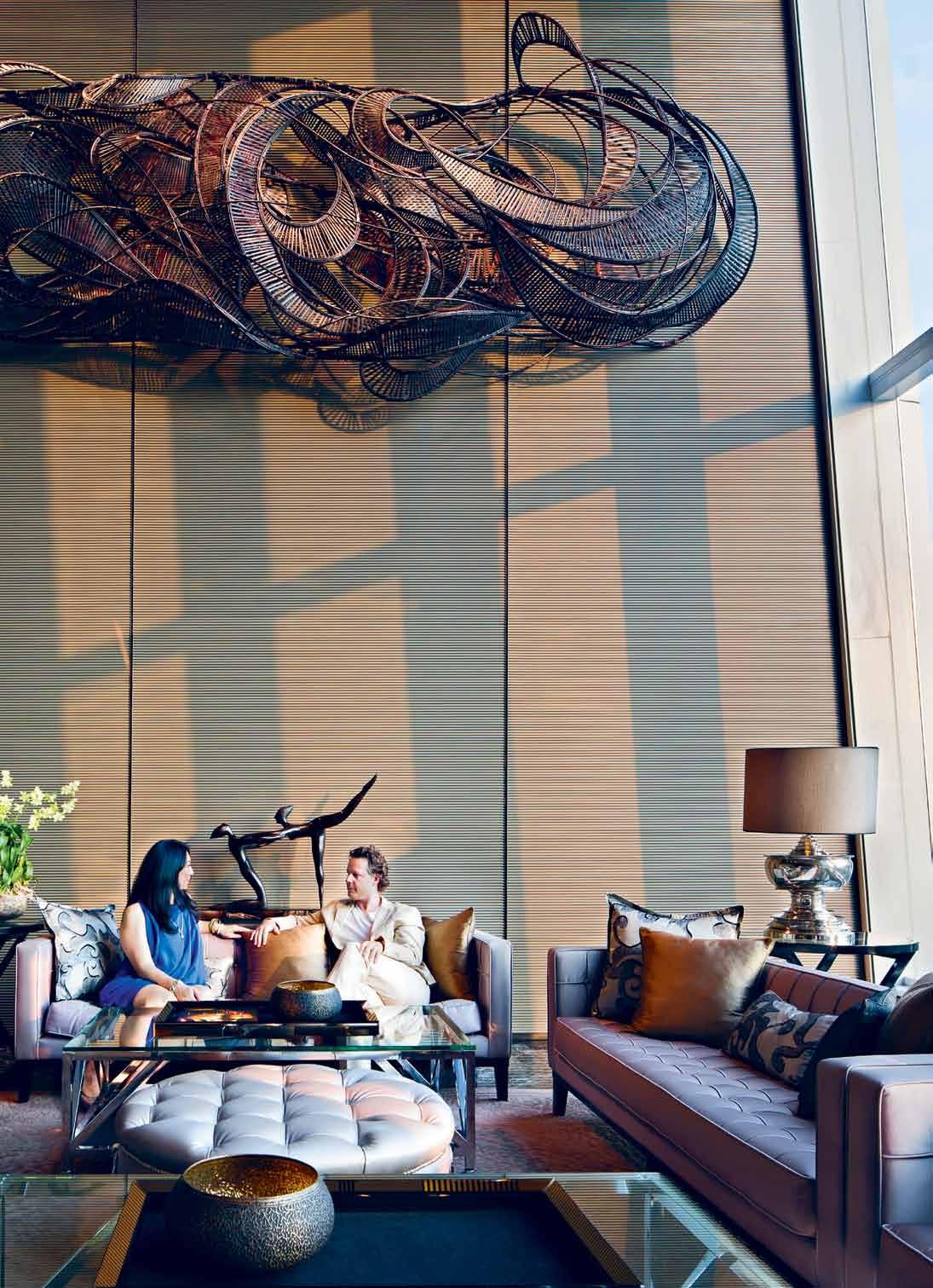
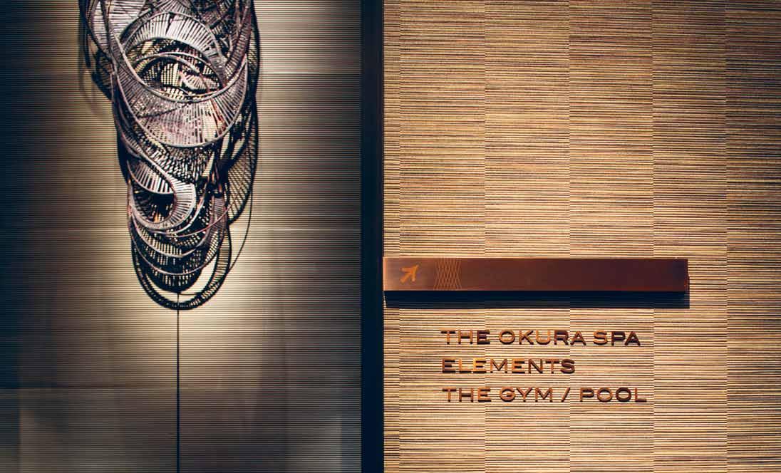
OPENING PAGE | L Aur A And her husbAnd/business pArtner, pAuL reLA x in one of their fAvourite spots – the Lobby Lounge of the okur A prestige h oteL bAngkok. ABOVE | When L Aur A mAnAges to find some doWntime ALone, she induLges in pAmpering spA tre Atments, but With her hectic LifestyLe, those spA visits tend to be fe W And fAr bet Ween. OPPO s ItE | the entr Ance to the o kur A prestige bAngkok's Leisure fAciLities is decor Ated With nAtur AL mAteriALs And e Arth tones. 2 . portrait # 79
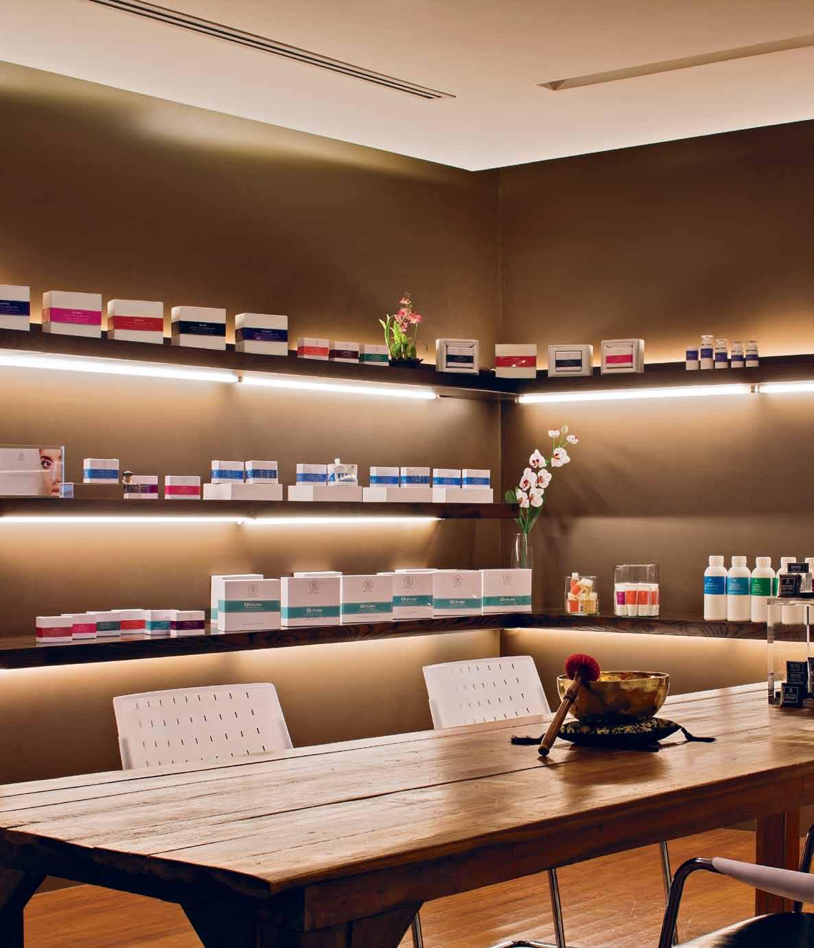
ABOVE | the Qi ActivAted shoWroom is A tr AnQ uiL meeting And entertAining spAce, Where the impressive coLLection of nAtur AL products deveLoped Within the LAst t Wo And A hALf ye Ars is proudLy dispLAyed, With simpLe yet be AutifuL And sustAinAbLe design. issue #19 habitusliving.com
went from organising wine events in Margaret River (in south-west Western Australia) to working for her mother’s family’s construction company based in Hong Kong “working on huge infrastructure projects in Asia”, she explains. During this time, Laura acquired vast marketing and public relations experience and made contact with extraordinary people. “Living and working in Asia presents you with opportunities far exceeding your years and introduces you to people you may ordinarily never access” –like the group of DNA scientists she did some marketing for after a chance encounter. Of travelling, living and working between such places as Hong Kong, Singapore, Bangkok and New York, Laura says, “It’s wonderfully random. Plus, you have the affordable benefit of nannies, maids and drivers, which was very seductive for a luxury-loving single mother. This is why I’ve made it my home.”
The stars aligned in a remarkable way for the birth of Qi Activated: a long-time interest in natural alternative therapies; the creation of a phytotherapy candle as a promotional gift for an Outlaurs client; a conversation with her semi-retired father (who was already growing organic vegetables, plants and herbs, and distilling essential oils on his land in northern Thailand) about creating natural products together. A frustration at the lack of highquality, natural homecare and personal care products in Thailand was brought to the fore
during an enlightening trip to London with her best friend in 2009 where she was exposed to a variety of luxurious, yet organic, products on the market. “I’m a big fan of the beautiful shops in places like London, selling pampering natural alternatives, whether toothpaste or tea, face creams or edible goodies.”
The time was right.
“I wanted to create a platform where I’m not preaching to like-minded people, but rather providing what I call a natural product system. Using the ingredients and opportunities available in Asia, I combine them with the concepts and quality available in the western societies,” Laura explains. Starting on laundry detergent and washing-up liquid, over the last 36 months, Laura and her partners have achieved a natural homecare range, bespoke hotel guestroom amenities, babycare products, organic teas and coffees, and a signature range of coconut and castile face and body soap bars – all 100% natural, and all for the alternative-luxury lifestylers. Her father is responsible for R&D and collaborating closely with clients: “We draw inspiration from life and the very best of nature, with all of its benefits, to provide solutions people can truly use and enjoy, without compromise. We want things to be simple, yet beautiful and high quality, for on and in the body, as well as in our environment.”
Laura has, in effect, designed a solution to mesh the worlds of natural and luxury, which

Living and working in Asia presents you with opportunities far exceeding your years and introduces you to people you may ordinarily never access.
2 . portrait # 81
Laura | CEO
conventionally would have seemed at odds. “I appreciate luxury, yet don’t think it should literally cost the Earth,” she quips. In her quiet moments, you might find Laura relaxing in the Okura Prestige Bangkok lounge, on the beach in Ko Phan Ngan, or contemplating her good fortune in the surrounds of a botanical garden or one of the hidden shrines in Thailand, perhaps sporting a vintage Lanvin Kentucky totebag and a pair of cotton Thai fisherman trousers, an involuntary expression of her need for simple luxury and natural goodness.
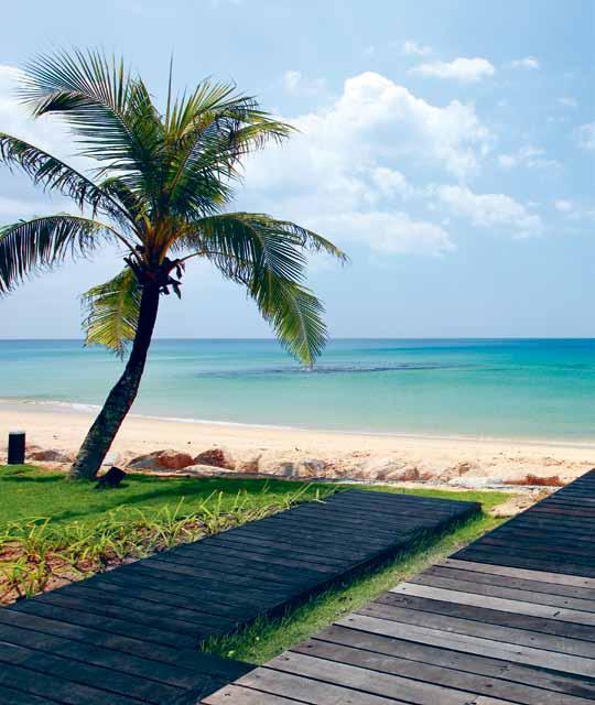
Favourite places
laura has spent time in diverse places across australia and a sia. here, she shares some of her favourite spots in her current hometown, Bangkok, which shows her characteristic appreciation for both luxury and simplicity.
AlmetA
Since 1992, artisans have handcrafted premium silk in Almeta’s workshop in the North-East of Thailand, combining traditional Thai hand weaving methods with contemporary colours and designs. Their embroidery techniques, integrating natural materials such as seashells or peacock’s hair with silk-weaving, create a new dimension for the Thai silk industry. With shared principles of fair trade and the promotion of Thai artisanship, Laura selected this handcrafted product to be the packaging for the Qi Activated Pure Baby range. almeta.com
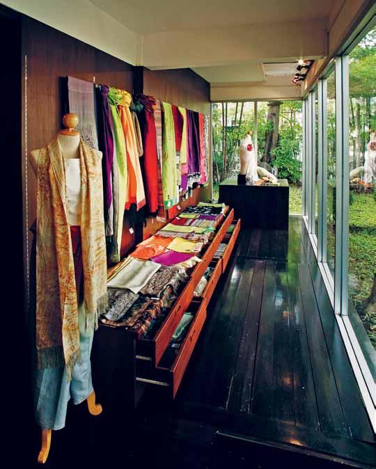
Be Aches
Laura credits growing up on Sydney’s northern beaches as a major influence on her later life and the founding of a natural products company. “It was truly a wonderful way to grow up, amazing and gorgeous environment and wonderful local people,” she says. Now, she continues to get inspiration from the beaches in Thailand, including Phuket, Koh Samui and Ko Phang Ngan, and some of her clients have resorts where Laura is able to relax away from the city.
ABOVE | ALmetA's Luxurious shoW room in s ukhumvit (o pposite g r A nd m i LLenium h oteL ). BElOw | vie W of the be Ach from the LeeLAvA dee restAur A nt At mA ikh Ao d re A m resort – phuket.
issue #19 habitusliving.com
urvaceous

Modena switches and sockets


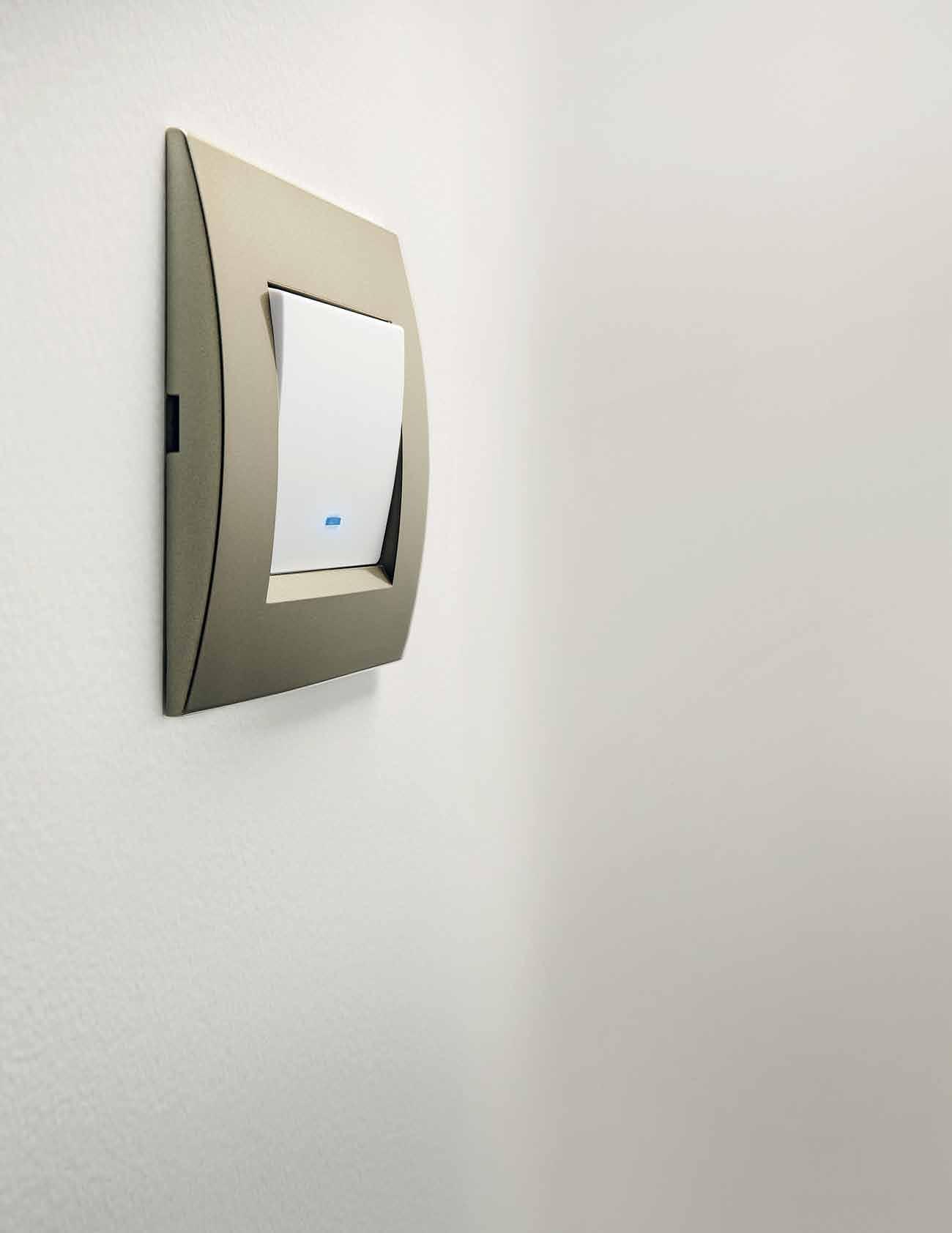
C
With classic European styling, a sophisticated curved finish and blue LED indicators, the Modena range of switches from Clipsal by Schneider Electric are a statement of style. For more information and to see the entire Modena range visit clipsal.com/habitus © 2013 Schneider Electric. All Rights Reserved. CLIPCOM25838
t he Dome
The Dome and its restaurants offer some of the best culinary experiences in Bangkok: Mediterranean, Modern, Asian and Indian, converging on the top few floors of the towering Lebua, the renowned 5-star luxury hotel in the heart of the city. Featuring two of the toprated rooftop bars, the entire complex is geared for well-heeled, well-dressed professionals or high-spending holidaymakers who are looking for an upmarket Bangkok experience; indeed, the views of Bangkok below are irresistible. Laura calls it: “Bangkok’s international acclaimed rooftop bar – where ‘uber-luxury’ is standard. And of course one of the directors of Qi Activated Mindful Luxury designed it!” lebua.com
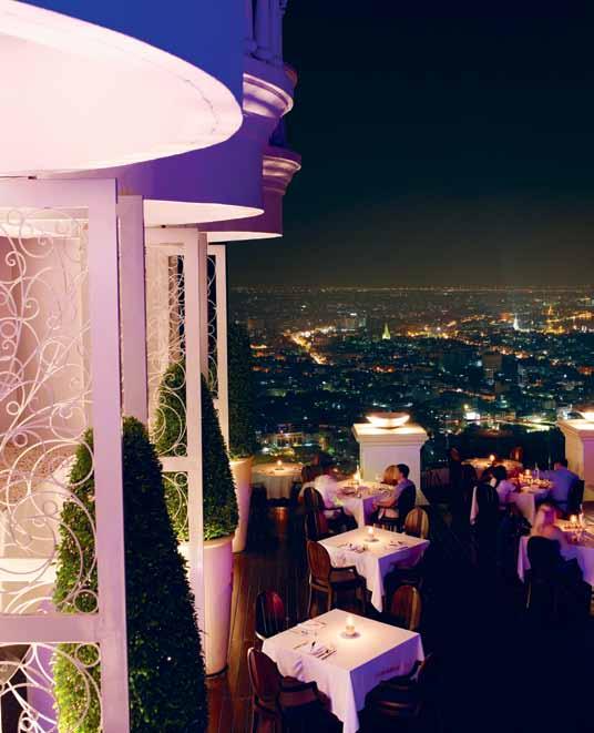
t h A i t emples
Bangkok is known for its numerous temples, places that Laura appreciates in her busy day. She says they “Provide communities a systematic approach to real life happiness through realisation, practice, understanding and compassion. My favourite place to energise by putting things back into prospective. Not to mention the meticulous architecture.” The temple pictured is Wat Pathum Wanaram, a royal temple built on the site of Sra Pathum
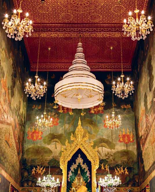
lEft | vie Ws from the 52nd
At
J
RIGHt |
fLoor
breeZe restAur Ant
ust one of the venues in bAngkok ' s 5-stAr LebuA hoteL. breeZe speciALises in AsiAn dining
interior of pAthum WAnAr Am buddhist tempLe, LocAted in the pAthum WAn district of bAngkok.
We draw inspiration from life and the very best of nature...
issue #19 habitusliving.com
Laura | CEO
Big LittL E Broth Er
Until now, if one had wanted Australia’s most stylish and most popular French Door refrigerator, one would have had to accept it at the rather large 900mm width.
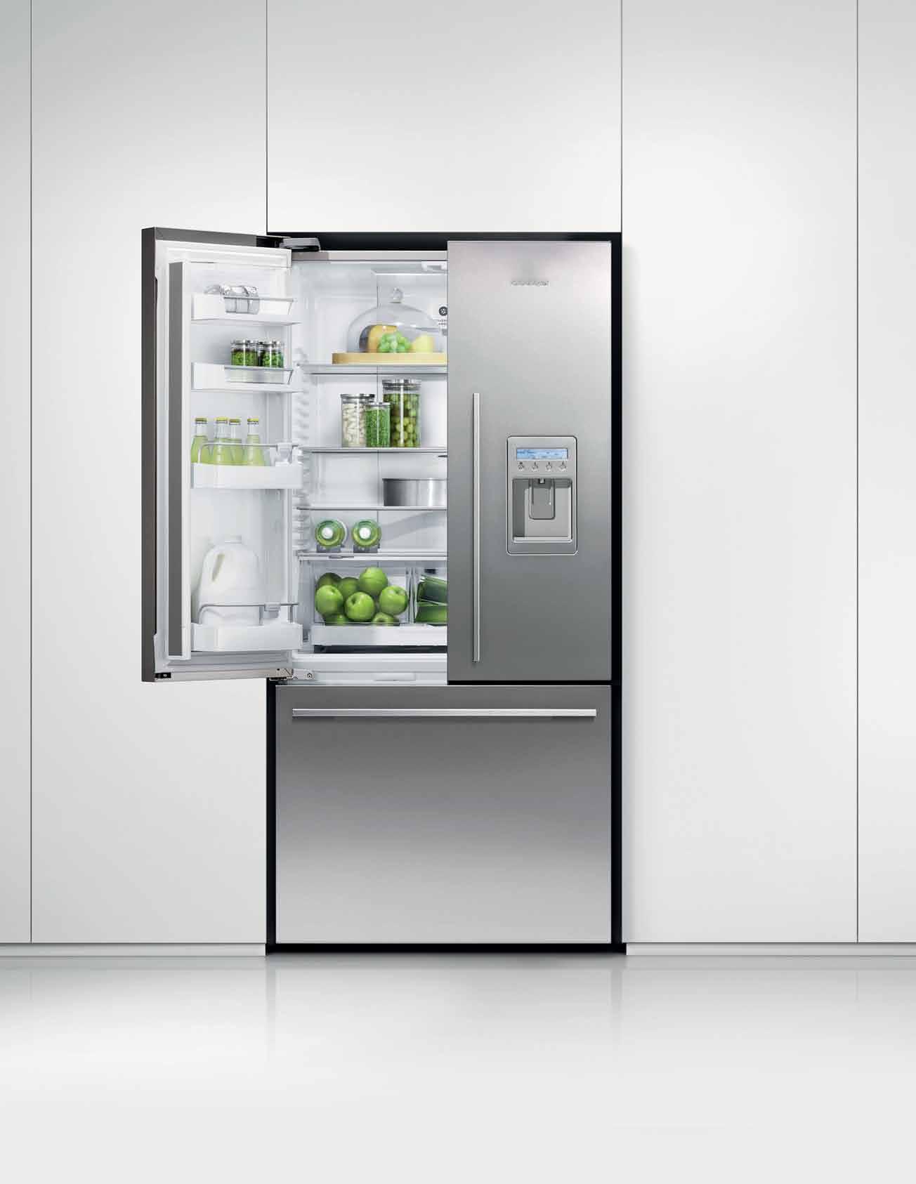
Well, we shrunk it. And created the 790mm wide Fisher & Paykel French Door.
All the best bits from its larger brother in an even more convenient size.
Problem solved.
fisherpaykel.com.au 790mm
Palance, a residence of King Rama IV. In 1857 the kind ordered the building of the temple in honor of Queen Thepsirintra, naming it Pathum Wanaram, ‘the temple of lotus pond’.
We Do G A llery
This striking space combines art exhibitions with interior design and fashion products. Established by interior designer Francisco Polo and architect, Markus Herchet, the two have years of experience under their belt in the design arena and have now joined forces to create an adventurous retail formula where the offerings include furniture, objects and fashion items. This exciting hub intentionally blurs the distinctions between production and craft, and between industry and art. We Do gallery carries a cool range of handpicked items by the savvy duo, including Qi Activated face and body bars. Laura says, they “bring infinite style and European sensibilities. Our products seamlessly fit in their minimalistic approach.”
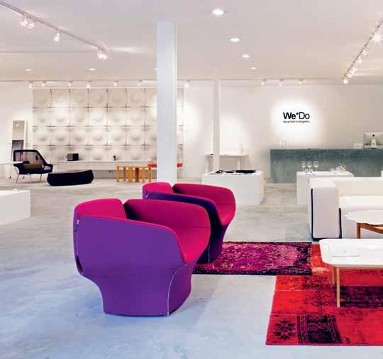
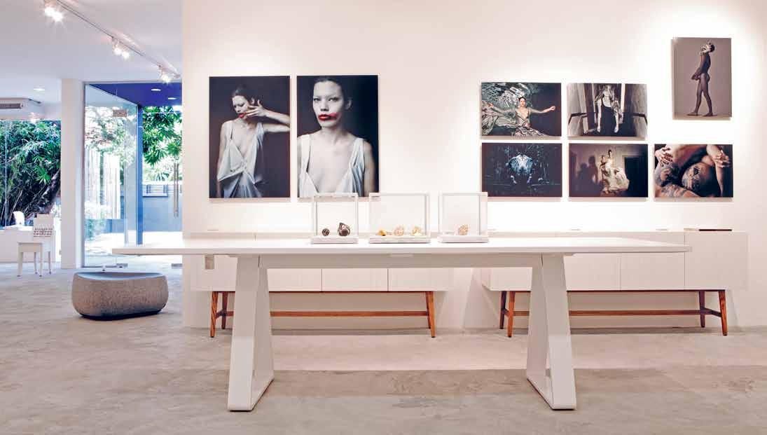
wedo-gallery.com
Qi Activated | qiactivated.com habitusliving.com/issue19/qiactivated
ABOVE | We do gALLery combines retAiL And Architecture And design services With Art exhibition – A one-stop-shop for ALL things cre Ative.
issue #19 habitusliving.com
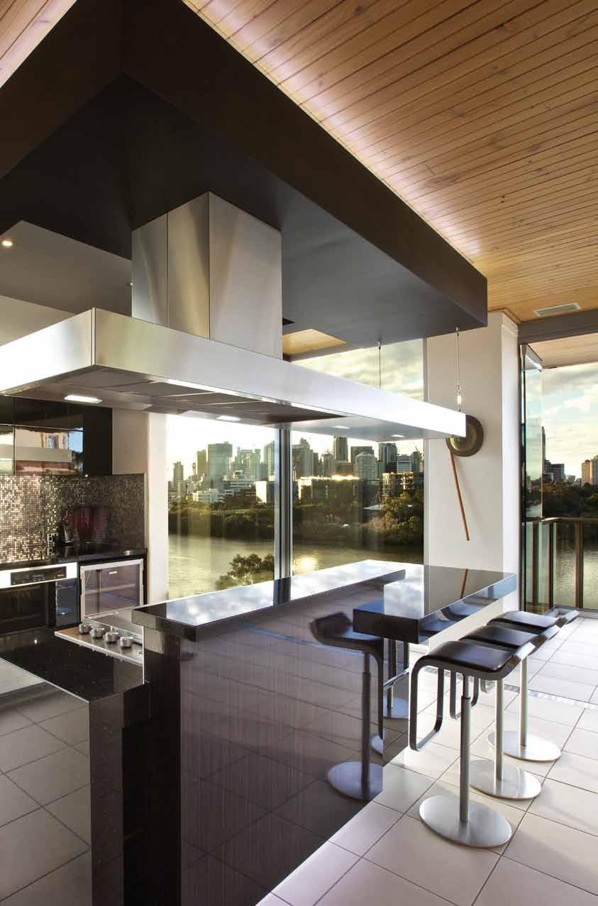
Made in Australia by Condari Pty Ltd in Ringwood 3134 Tel: +61 3 9482 7088 www.qasair.com.au | www.condari.com.au | sales@qasair.com.au A work of art Find Qasair Rangehoods on Facebook


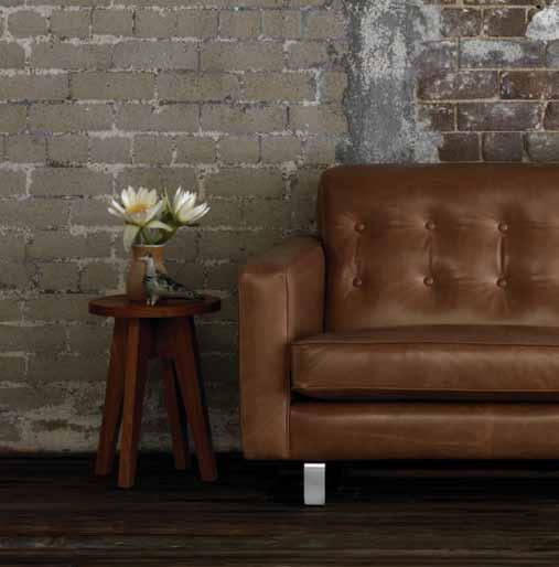
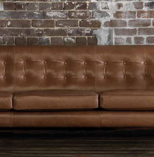



Arthur G Furniture Australian Designed, Australian Manufactured Melbourne Showroom - 618 Church St Richmond 3121 - Tel. (03) 9429 6696 Sydney Showroom - Shop 1/8 Hill St Surry Hills 2010 - Tel. (02) 9332 1488 Perth Showroom - 207 Stirling Hwy Claremont 6010 - Tel. (08) 9286 1433 Manhattan Sofa featured - www.arthurg.com.au
Lonnie Hutchinson
Influenced by contemporary art, advertising, hip hop, graffiti art and popular culture, Lonnie HutcHinson explores the juxtaposition of negative and positive elements which form the basis of Maori and PoLynesian art forms and aesthetics.
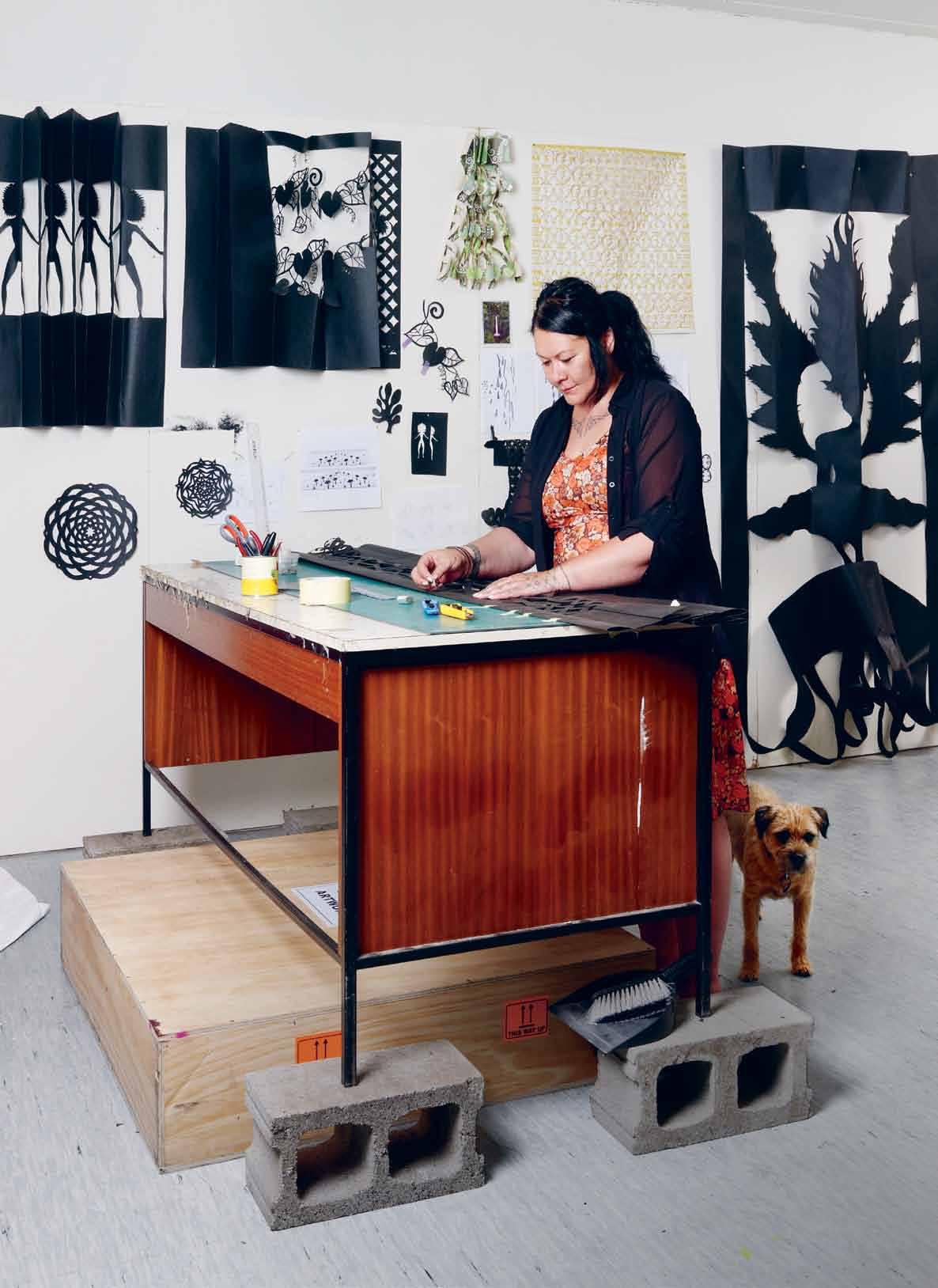
# 89 2 . portrait
Portrait Bridget WeBBer
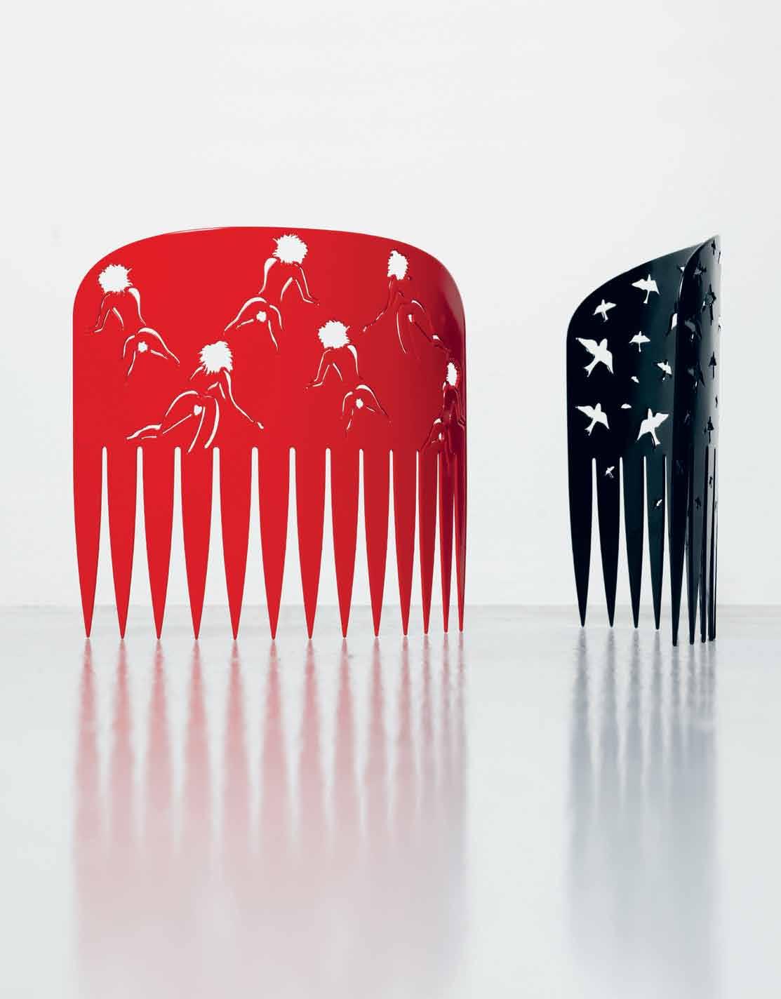
previous | LONNIE hutch IN s ON wO rkIN g ON a pub LI c cO mmI ss ION prO p O saL IN hEr stud IO LO catEd IN aN INdustrIaL cO mpLE x IN mt aLb Ert, cENtraL auckL aNd. LONNIE I s usuaLLy accOmpaNIEd by tIpI , hEr bOrdEr tErrIEr. above | cOmb (rEd) & cOmb (bL ack), 2009, 980mm x 1200mm, stEEL aNd autOmOtIvE paINt, phOtO crEdIt: schwErE wEbbEr. opposite | sI sta gIrL (dEtaIL ), 2004, varIabLE dImEN sIONs, b uILdEr's papEr aNd mEtaL pINs, cOLLEctION Of thE artIst, phOtO crEdIt: LIghtwOrkx phOtO graphy. issue #19 habitusliving.com

# 91 2 . portrait
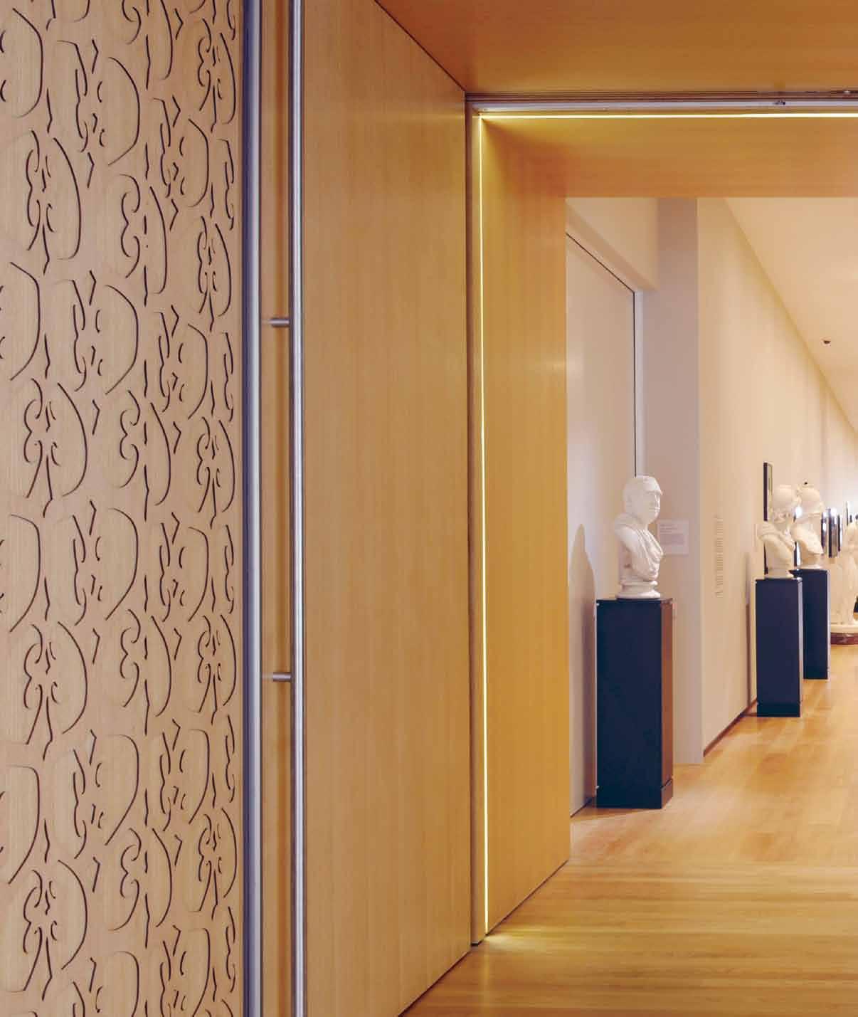
above | hONOa kI tE hONO tawhItI ( tO b E cONNEctEd tO aN aN cIENt past), 2011, amErI caN whItE Oak, 12 pErmaNENt wO rks fO r 6 thrEsh OLds cO mmI ss IONEd by thE auckL aNd art gaLLEry – pIcturEd Is LE vEL 1: tupu tE maramataNga (LEt uNdErstaNdINg grOw), varIabLE dImEN sIONs, auckL aNd art gaLLEry cOLLEctION phOtO crEdIt: auckL aNd art gaLLEry tOI O tamakI issue #19 habitusliving.com

# 93 2 . portrait

above | mILk aNd hONEy, 2012, Each wOrk mEasurEs 3000mm x 1200mm, buILdEr's papEr, mEtaL EyELEts aNd mEtaL pINs, cOLLEctION: chartwELL trust, phOtO crEdIt: JENNIfEr frENch. opposite | mILk aNd hONE y (dE taIL ). habitusliving.com/issue19/lonnie issue #19 habitusliving.com
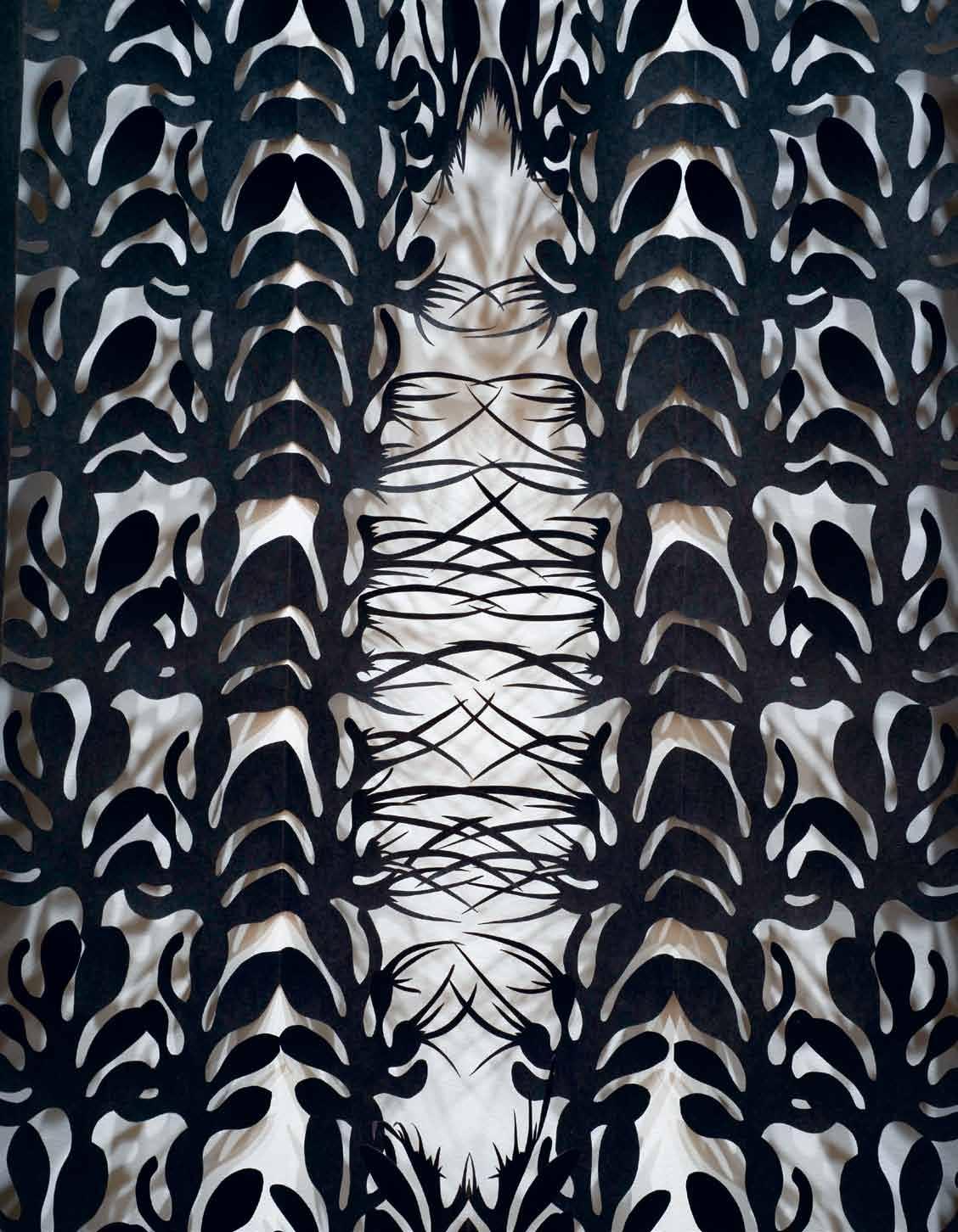
# 95 2 . portrait
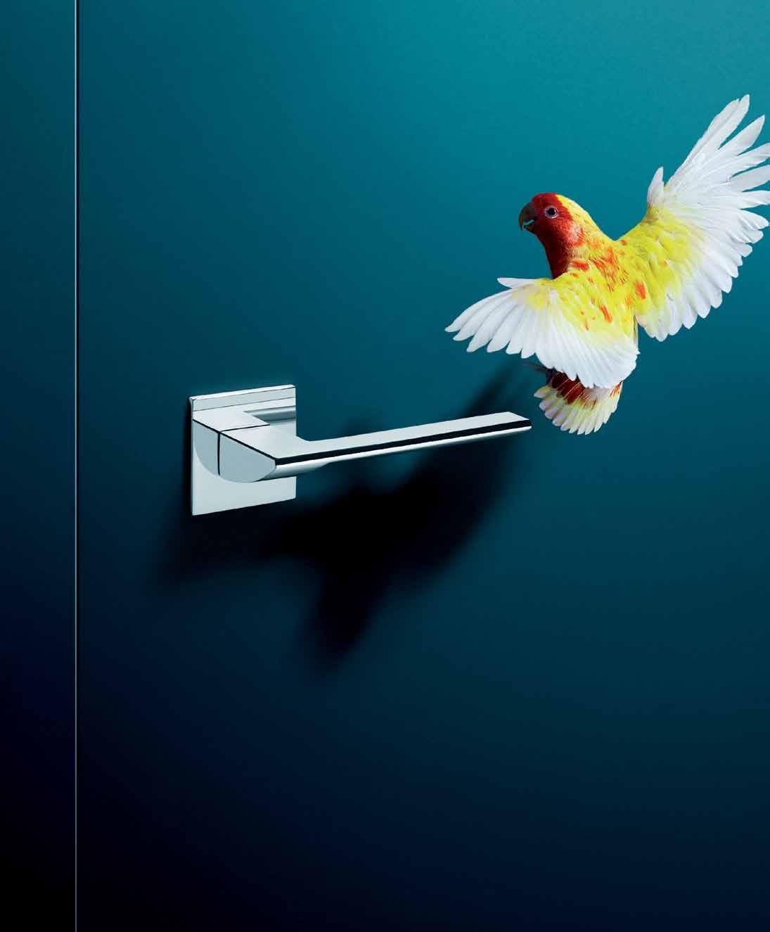


Olivari of Italy - celebrating 100 years of excellence SuperInox A finish that just won’t tarnish and it’s guaranteed for 30 years The only solution for all ocean front projects large or small Contact Bellevue Imports for your NEW 2013 Olivari catalogue eMail: info@bellevueimports.com.au | Ph: 03 9571 5666 design, taken by the hand www.bellevueimports.com.au
Euclide design by Nicola Novelletto design by Dominique Perrault Link design by Piero Lissoni
Agapornis Roseicollis
that Olivari has been producing entirely in Italy for 100 years.
Trend
, designed by Studio Olivari, one of the door handles
Conceive of a unique place to live, with purpose
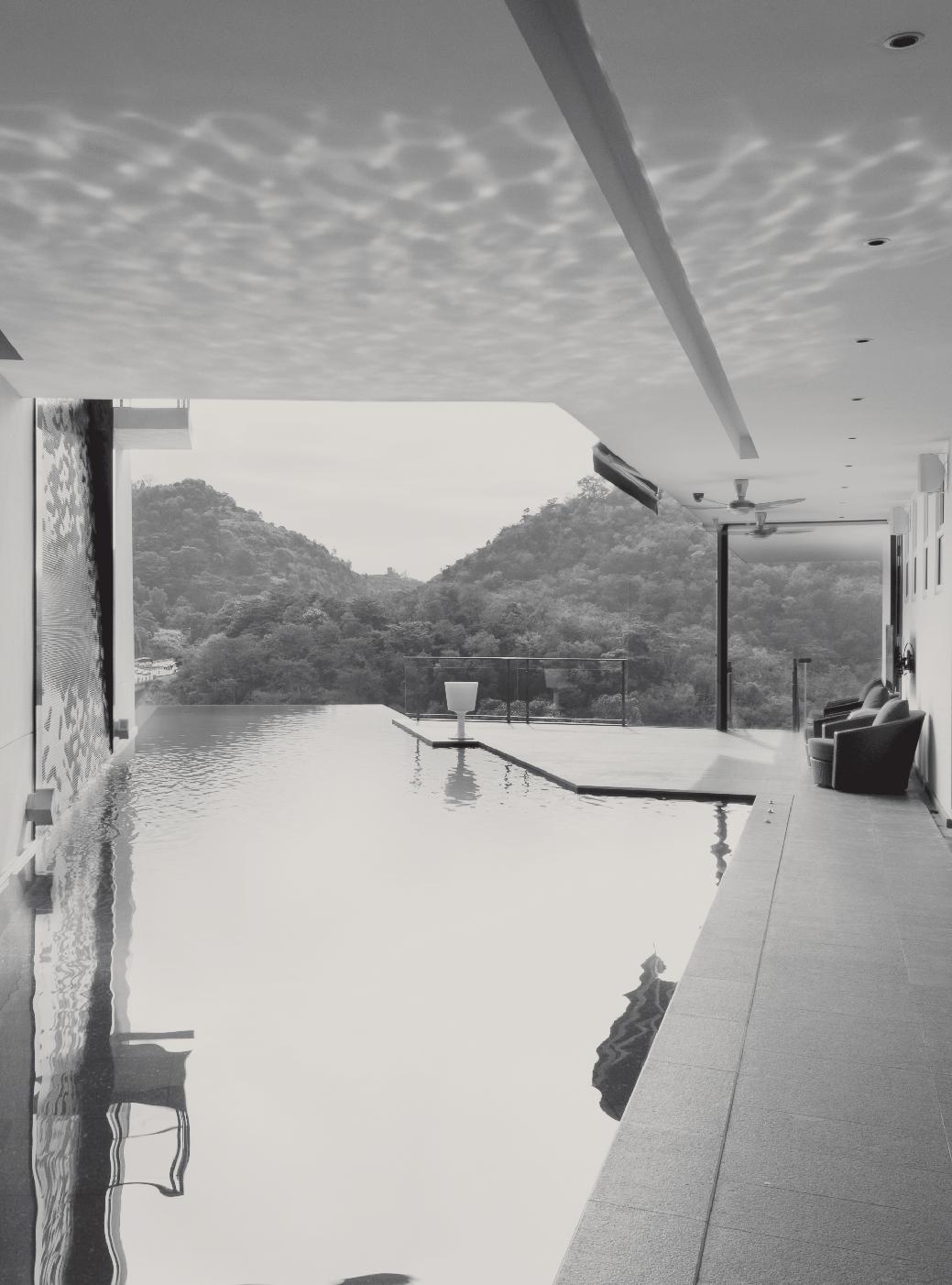
World within a world
Preservation or conservation? The question is key to what we do with heritage buildings. As SIMON SWANEY explains to PAUL McGILLI c K , it was central to BATES SMART’s approach to this iconic inner suburban church in SYdNEY.
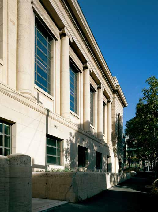
issue #19 habitusliving.com
text Paul McGillick | Photo Gra Phy r ichard Glover
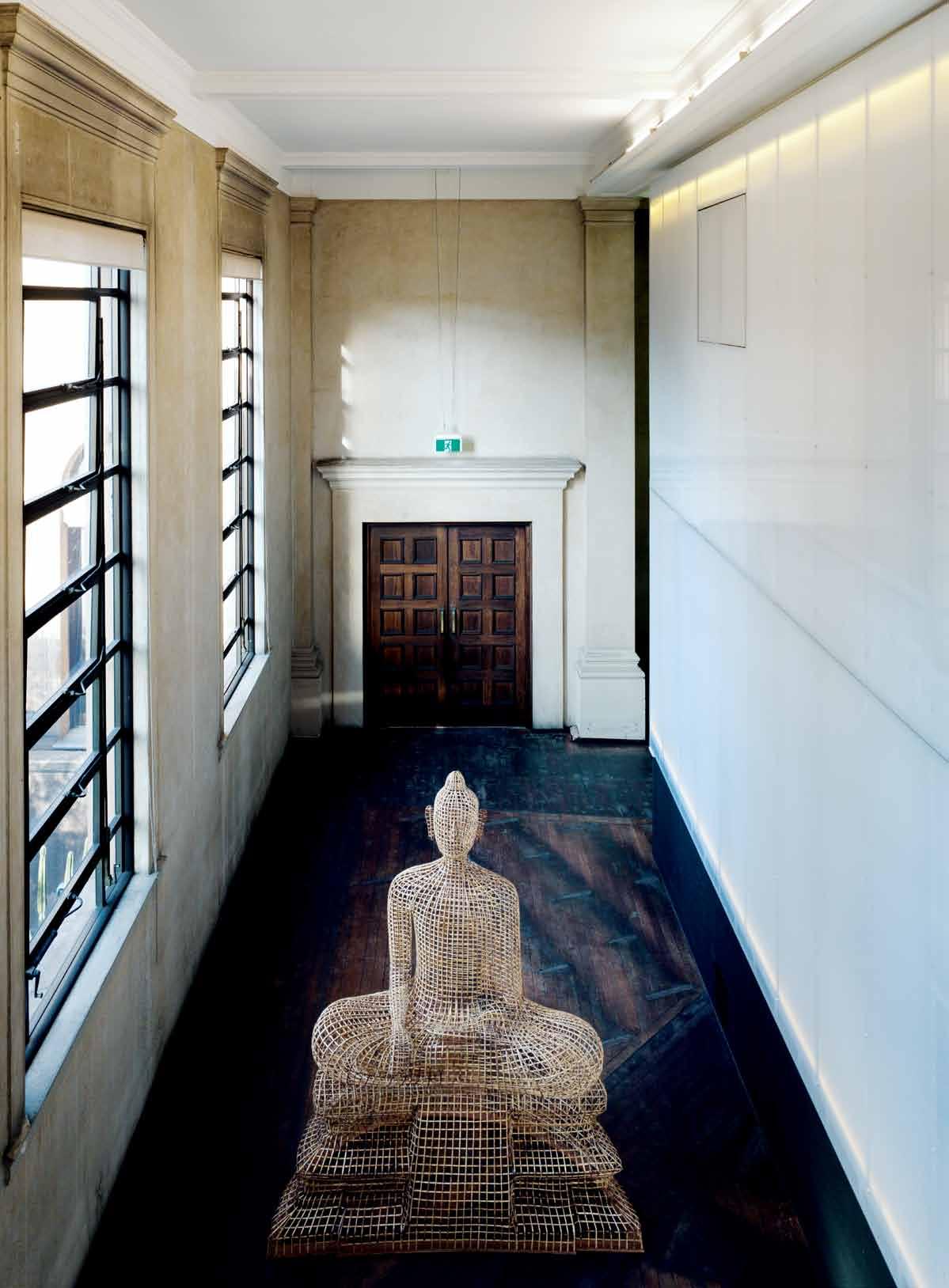
3 . on location # 99
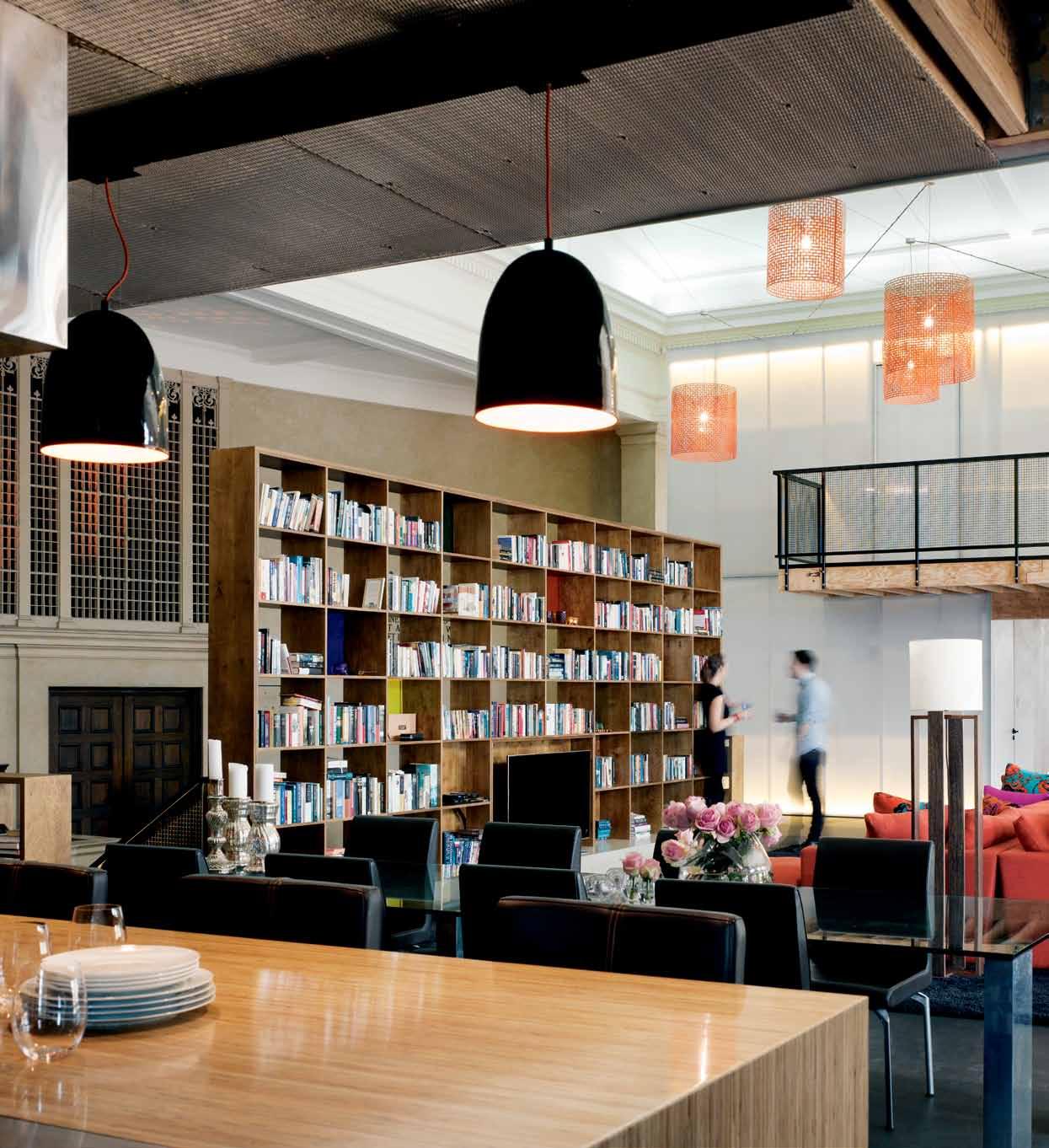
issue #19 habitusliving.com
previous left | A cl AssicAl gr AviTAs chAr AcTerises The building from The sTreeT previous right | enTry hAll fe ATures Seated Buddha (2011) by soPhe AP Pich, in r ATTAn, bAmboo, wire And Plywood. above | looking from The kiTchen, The living Pod floATs Above The originAl floor, wiTh The orgAn Are A jusT visible To The lef T The blue PAinTing is Guraki Marri Bulpuldjidji Goonyah by lin onus. opposite | PersPecTive skeTch showing cle Arly how The P od ‘floATs’ inside The building.
this is a story about cultural sustainability – finding new use for an old building with great heritage value and, as a result, generating cultural renewal.
The building in question is the First Church of Christ, Scientist (the religion was founded in 1879 by Mary Baker Eddy), a neo-Classical landmark in Darlinghurst built in 1927 and designed by Samuel George Thorp (of Peddle Thorp & Walker).
Architects, Bates Smart, had looked at the building as a possible studio location, but it was in a residential zone, so director Simon Swaney brought it to the attention of the man who eventually became the client. Initially, the client also had ideas which would have been non-compliant, so Simon suggested building a residential ‘pod’ within the space – a reversible, demountable structure which would not compromise the building’s heritage status. At first, this was to be a temporary solution. Instead, there is now a six-bedroom, fivebathroom house built inside the former church.

The building has a basement (partially below street level) which was once the Sunday school, and the client (an investor and philanthropist with a special interest in art) still has ambitions to use this as a business incubator. The main space above, previously the church auditorium, soars to a height of 12 metres and was once filled with pews. Most of these have been stored downstairs, but some have been retained and

3 . on location # 101
clustered to the side of the living space, around the organ – famous in its day – so that concerts can be held. In this way, the client is able to maintain a degree of public access to what is otherwise a family home.

Within the main space, the architects have built a lightweight structure which sits on top of the original, slightly raked, timber floor. This is the dining and living area and it is bookended by two translucent, two-storey cubes which contain the bedrooms, bathrooms and the seriously serious kitchen (tempura plate, deep fryer, cooktop and seating for a dozen people) to accommodate the client’s passion for cooking and entertaining. The lightweight structure was manufactured off-site and then assembled on-site (it took just 14 weeks to build) and can be completely unscrewed and taken away. It uses fairly raw, contemporary materials (for example, ply linings that brace the structure), which is a deliberate strategy to contrast with the original building. In this way, the integrity of the building is maintained, with old and new complementing one another.
“There is,” says Simon, “some integrity in the idea that the new structure is demountable. It hasn’t taken anything away from the original building. It sits on the floor. There’s no penetration through the roof. The kitchen exhaust, for example, has an ultra-violet hood which enables you to duct it down through the floor – it treats things with ultra-violet light, so it doesn’t condense. The fireplace runs on ethanol, so it doesn’t need a flue.”
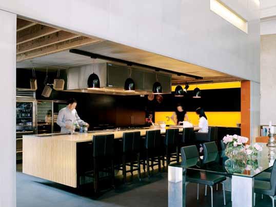
issue #19 habitusliving.com

above | The norThern Tr AnslucenT box conTAins The kiTchen on The ground floor wiTh The mAsTer bedroom on The floor Above. The lighT weighT sTrucTure Took jusT 14 weeks To build. iT wAs firsT mAnufAcTured off-siTe, before being Assembled on-siTe. 3 . on location # 103
Some [of the pews] have been retained and clustered around the organ – so that concerts can be held.
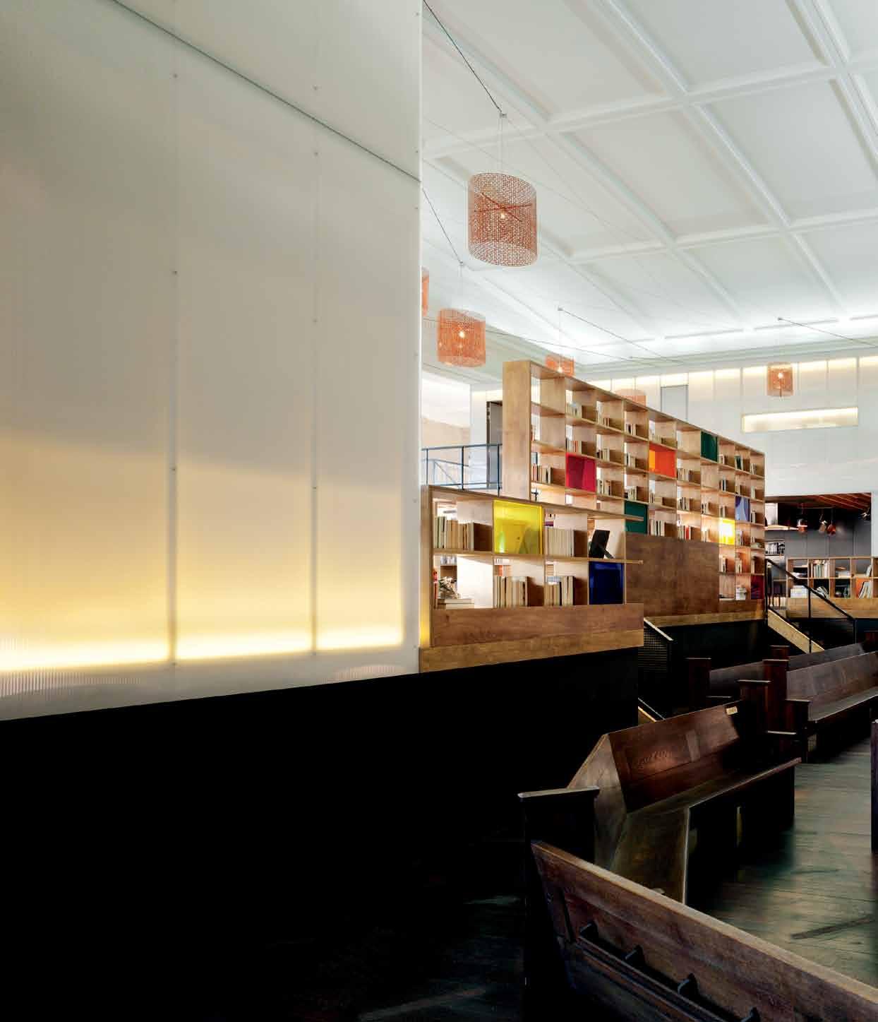
issue #19 habitusliving.com
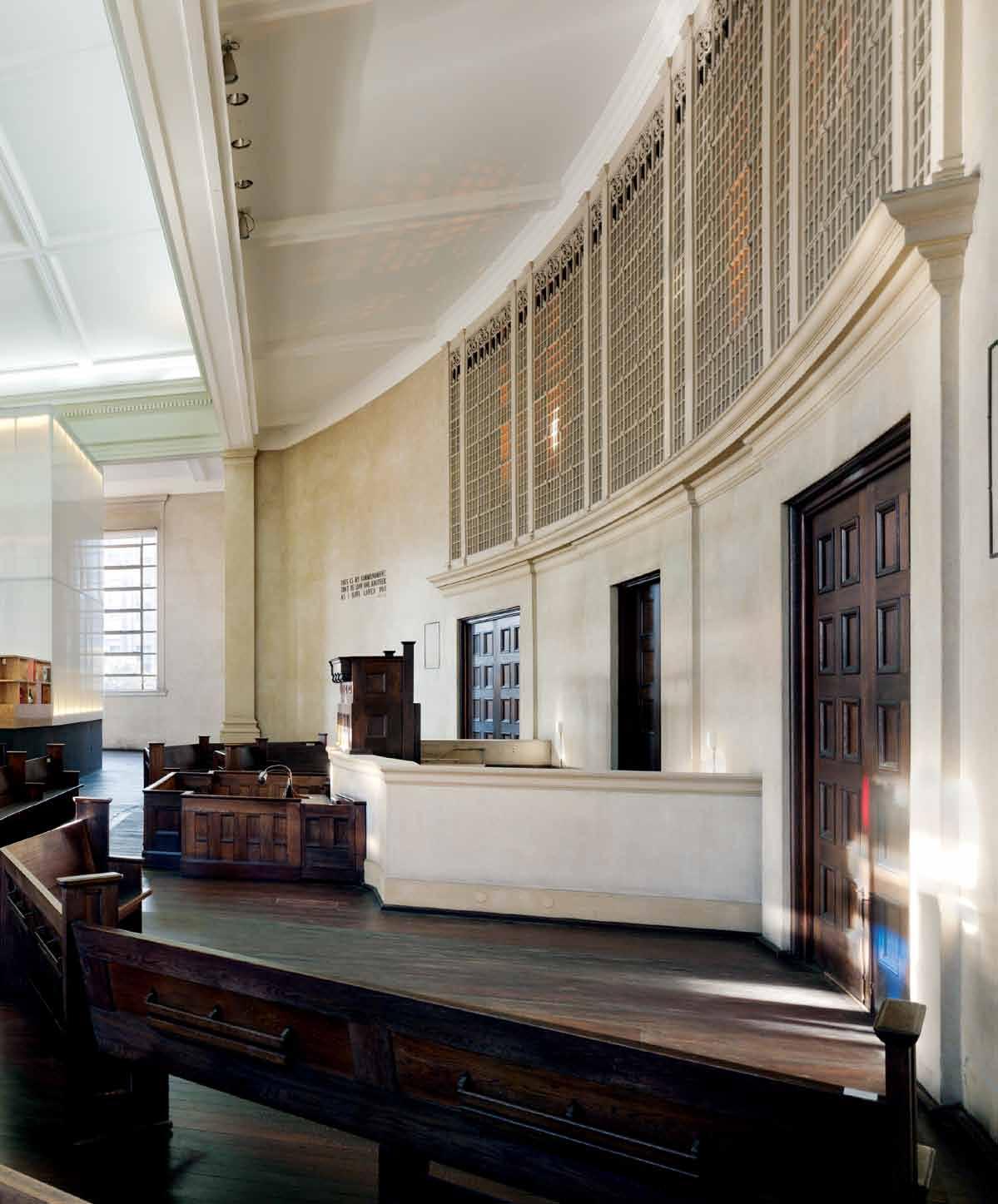
3 . on location # 105
entry kitchen living bed bath garden l aundry study gym 1 2 3 4 5 6 7 8 9 5 6 4 4
2 3 1 1 7 fI r ST floor 4 5 4 4 9 8 4 issue #19 habitusliving.com
Ground floor
The somewhat raw quality to the central floating space contrasts with the private domain. The central space is dramatic, but the bedrooms are appropriately intimate, with softer, more refined finishes. Simon calls them sanctuaries. The master bedroom exemplifies this – it’s more highly finished, with carefully considered joinery.
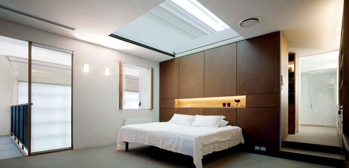
If there is an agenda to maintain some degree of public access, there is also an interesting semi-public aspect to balance the private. It is very much a family home. But with three daughters, the client was also keen to sustain an extended family life by providing space for his daughters’ friends to visit and stay over. There are, for example, two bedrooms with two lots of double bunks capable of accommodating up to 12 children. “What he is really doing,” says Simon, “is ensuring that there is a solid base for his family and that, no matter what age they are, there is a place they can bring their friends to.” As an extension to this agenda, there are four digital screens in the kitchen which allow viewers to scroll through 4,500 photographs of family life.
As it happens, I grew up in this area. We lived nearby in Clapton Place and I vividly recall the church as a mysterious and imposing structure, temple-like in its neo-Classical expression. And I would wonder what went on inside.
previous | The orgAn Are A wiTh recycled Pews. opposite | floor Pl Ans. above | The mAsTer bedroom is more highly finished ThAn The living Are As, wiTh cArefully considered joinery. below | e AsT wesT secTion showing The inserTion of The living Pod inTo The originAl church building 3 . on location # 107
This ambience has not escaped Bates Smart, who have created an intriguing sequence of arrival. The entry is not through the original grand portico on Liverpool Street, but via a minor door around the corner in Forbes Street. Once inside, we ascend the stairs to the upper level where we meet a seated Buddha (a 2011 sculpture by Sopheap Pich), bathed in northern light – the previously opaque windows have been re-glazed in clear glass to draw maximum light into what was once a dark space and to enjoy views which extend to Sydney’s iconic Harbour Bridge.
From here, the house gradually reveals itself, climaxing with the drama of the auditorium space. It is replete with internal prospect and enticement which refreshes the eye as it is taken from one space to another and from one level to another. As Simon points out, even when we are finally in the living room, there is still another space beyond, the small bamboo garden. It is, he says, “a constant series of unfolding experiences”.
The Inner House has won the following awards: Australian Institute of Architects National Award for Interior Architecture (2012), the Master Builders’ Association (NSW) award for Adaptive Re-Use over $2 million (2012), the Australian Institute of Architects (NSW) Single House Award (Residential Architecture, 2012).
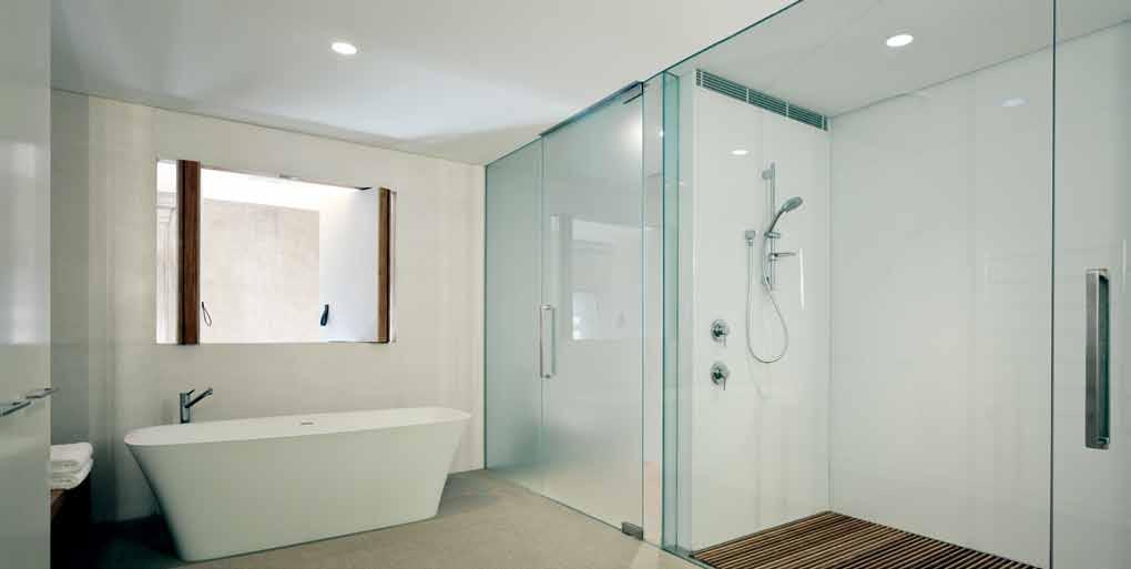
above | The mAsTer bAThroom. opposite | o ne of The children’s bedrooms shows The use of sof Ter, more refined finishes To cre ATe A more inTimATe sPAce.
SIMOn | A rCHITECT
habitusliving.com/issue19/innerhouse
issue #19 habitusliving.com
It is a constant series of unfolding experiences.
ArchiTecT Bates Smart
ProjecT Te Am Simon Swaney, Charmaine Pang, Anna Ancher, Allan Lamb, Tommy Sutanto, Adrian Veale, Mary Omar, Lee Zheng
Pl Anning consulTAnT Steven Layman Consulting
heriTAge ArchiTecT GBA Heritage
Q uAnTiT y surveyor MBM
lighTing designer The Flaming Beacon building surveyor Denny Linker & Co
PrivATe cerTifier Steve Watson & Partners sTrucTur Al engineer Partridge Partners
hydr Aulic engineer SPP Group
mechAnicAl /elecTricAl engineer Cardno ITC
l AndscAPe ArchiTecT Taylor Brammer
Landscape Architects
bAsix consulTAnT Efficient Living
consTrucTion clienT rePresenTATive Julie Rosenberg
he Ad conTr AcTor Arcon Australia
joiner Fisher Fitouts
elecTricAl Bonn Electrics
l AndscAPing Balcony Gardens flooring Bruce Bros Floor Coverings
BATES SMART (61 2) 8354 5100 batessmart.com.au
FURNITURE
In Living, Bosko modular sofa from Jardan. In Kitchen, DAB Orange pendant light from Light Project.
LIGHTING
In Living Area, Crisscross pendant lights by Bernabei Freeman from ISM Objects. Tank floor lamp from Planet.
FINISHES
In Living Area, Lexan
Thermoclear multiwall sheet polycarbonate wall cladding from Ampelite. Everroll Classic Mons rubber flooring by regupol. In Kitchen, colour-backed glass splashback in Skittle from DecoGlaze. Opal Series cladding in Mandarin from Marblo. Island top is Solid Veneer Lumber in European Pine by Eco-Core from Global Ventures Australia. Black laminate joinery in Flint finish from Laminex. Stairwell is finished in Stage clear-PEP acrylic flooring by Design Composite from All Plastics. In Master Bedroom, Botanic collection woven-vinyl flooring by Bolon from The Andrews
Group, leather bedhead (framing by joiner) finished in Contemporary Leathers Verona pure aniline leather in nutmeg from Instyle. Internal plywood wall cladding in White Birch Multiply by Eco-Core from Global Ventures Australia.

FIXED & FITTED
In Kitchen, Minimalist square gooseneck sink mixer by Methven from Harvey norman Commercial. PrO 48 refrigerator/freezer with glass door from Sub-Zero.
Two-temperature Vintec wine fridge with glass door from Harvey norman Commercial. Convection microwave and E-Series double oven both from Multyflex. In Master Ensuite, Carmen DadoQuartz freestanding bath by Dado Australia from Mico Design. Vivid floor-mounted bath mixer by Phoenix Tapware from Harvey norman Commercial. Minimalist shower mixer by Methven from Harvey norman Commercial. Amio five-function rail shower by Methven from Harvey norman Commercial.
drop box 3 . on location # 109
Mary Omar is an Associate Interior Designer at Bates Smart with seven years of experience in the industry. Here she discusses the standout design features from the Inner House project.


There are two underlying concepts for the interiors of Inner House. Firstly, it was important to source locally designed and produced pieces wherever possible. Secondly, the client’s affinity for vibrant colours prompted the use of colour bursts to offer a sense of fun and playfulness. “The Criss Cross Pendant Lights are a prime example of this,” says Mary, and “the lantern-like pendants were selected to provide a more intimate feel within the sheer volume of the double-height space”. The Bosko Sofa from Jardan again reinforces colour and its generous proportions offer “the opportunity to break up the expanse of black floor and provide a focal point for the entertaining area,” as Mary describes.
The Tank floor lamp by Planet Furniture for the living area was selected “for its elegant residential feel, it adds a lovely softness to the space,” says Mary. She worked closely with ross, owner of Planet Furniture, to get just the right timber stain on the frame of the lamps to echo the finish of existing large-scale carved solid timber doors in the church.
The Bolon Botanic Flooring provides a durable textured finish to the bedrooms without the traditional look of carpet, while the natural tones in the Bolon flooring acts as a neutral backdrop for the bedroom furnishings; it is also something easy to remove which fits in with the demountable approach.
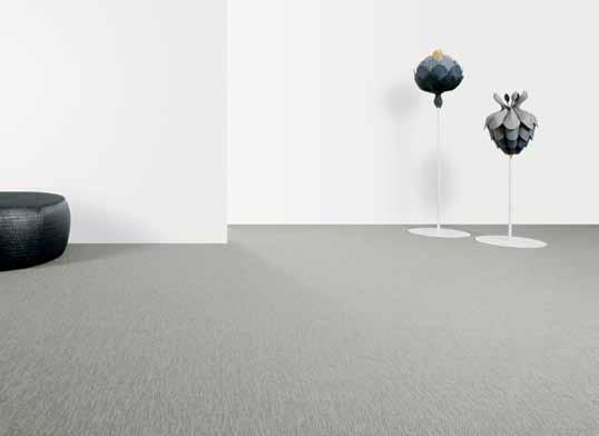
As the client has a penchant for cooking and entertaining they had requested a wine fridge; Bates Smart proposed a Vintec model for its glass-fronted stainless steel design, to blend in with other integrated appliances.
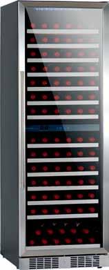
Two ‘sunken’ timber-decking spaces were proposed as additional recreational spaces for the client’s daughters and their friends to hang out in, and as fun concept for both adults and children the air hockey table was introduced to provide a focus for the space.
Clo Ckwise from top left flooring botanic cilia by bolon from The A ndrews grou P TheAndrewsgrouP.com. Au / bolon.com. Au
Wine cabinet 166-boTTle d uA l-Zo n e from vinTec, AusTr A liA vinTec.com. Au (main image) large criss cross pendant lights in gloss or A nge from ism objecTs, ismobjecTs.com. Au
(main image) air hockeY table 7 fooT ufo from A ll TA ble s P orTs, A llTA bles P orTs.com. Au
tank floor lamps from Pl A ne T furniT ure, Pl A ne TfurniT ure.com. Au

bosco lo unge from jA rdA n, jA rdA n.com. Au
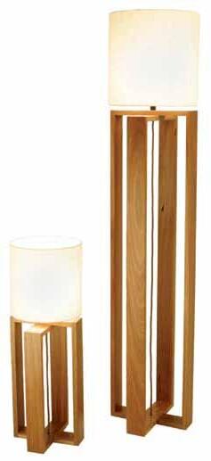
INNER HOUSE in focus
issue #19 habitusliving.com
Feed your design obsession this August as Sydney Indesign® 2013 takes over the city for three days of the best local, regional and international design. Immerse yourself in creativity as showrooms put out their best and latest, with product launches, special guests and installations.
Visit our sydneyindesign.com.au or follow us on facebook, twitter and instagram for news and updates.
Sydney Indesign® 2013 – the design hunting ground.



SYDNEYINDESIGN.COM.AU FACEBOOK.COM/SYDNEYINDESIGN TWITTER.COM/SYDNEYINDESIGN INSTAGRAM.COM/SYDNEYINDESIGN

BROUGHT TO YOU BY
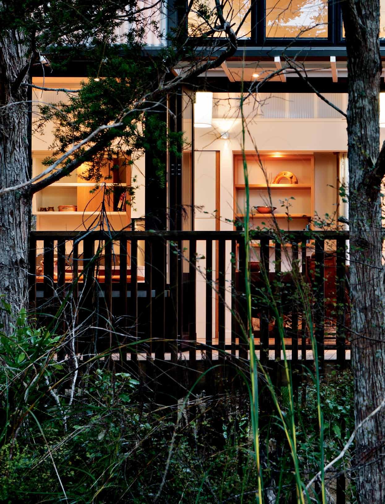
issue #19 habitusliving.com
Towards the light
This compact weekend retreat on New Zealand’s Pahi Peninsula expresses a subtle presence through its gentle vernacular. a ndrea s tevens speaks to s carlet architects about building in the bush and how they have maximised light and warmth.
 text Andre A StevenS | photogr A phy Simon devitt
3 . on location # 113
When architects Jane Aimer and Mike Dowsett first visited the site for this large, bush-clad property, it was on a dull, wet day. The grey sky and the damp and dripping foliage provoked an immediate design response – to make this retreat as lightfilled and warm as possible. “It feeds on as much light as it can possibly get during the day,” says Jane, “and at night it glows like a beacon in the wilderness.”
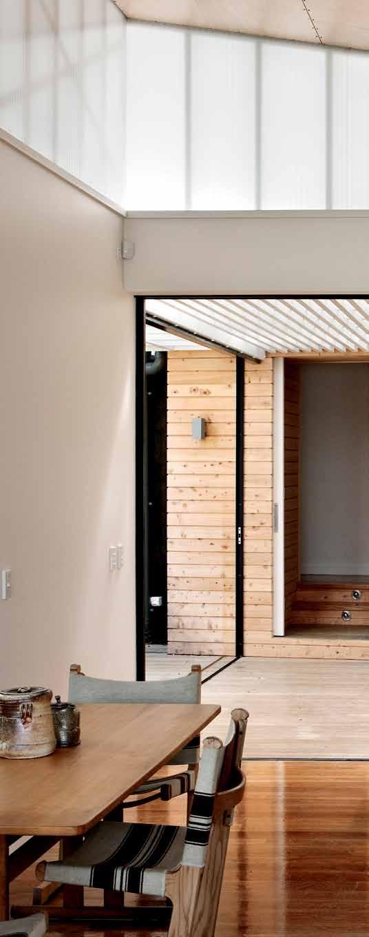
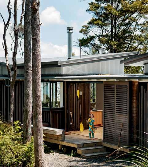
The building’s materials and detailing give it a strong sense of place and, from some angles, it is hard to determine what is house and what is bush. Black cladding and window joinery camouflage the retreat among the black trunks of the native Kanuka, and fine timber detailing echoes the structure of the surrounding trees. It is a compact and discreet structure that reflects the character of the site and minimises its presence along the harbour edge.
The owners have a long-standing relationship with the North Island’s West Coast. Penny Hansen spent childhood holidays at their family bach on Kawhia Harbour. “It was the closest thing to camping,” she recalls. “We’ve always loved harbours, with their constantly changing light and colour of the water.” The couple first visited the Pahi Peninsula in the early 1990s, but it wasn’t until their children had grown up and left home that they seriously considered undertaking a project such as this.
issue #19 habitusliving.com
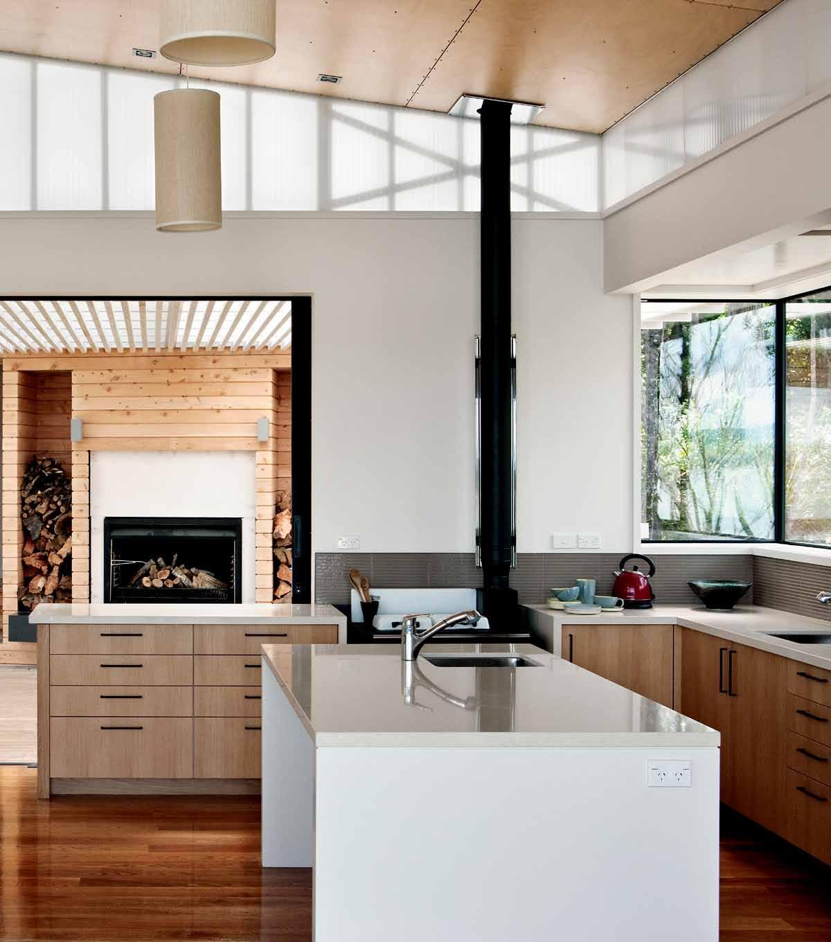
previous | Black-sTai N ed T im B er a N d B lack joi N ery echo T he ma N uka T ru N ks To B leN d house a N d B ush. above | Tra N sluceNT wall claddi N g creaT es a cleresTory separaTiNg The roof from iTs Base aNd leTTiNg iN as much lighT as possiBle. opposite | slidiNg shuTTers provide access aNd wiNd coNTrol To The iNTerNal courT yard. 3 . on location # 115
Designed for warmth and light, the house is split into two long, slender buildings
– one for living and one for sleeping...
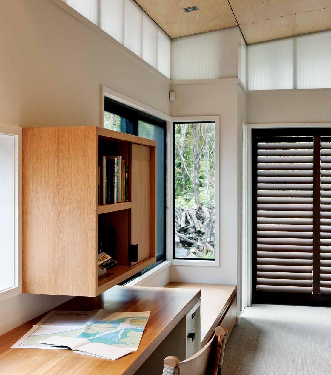
issue #19 habitusliving.com
They discovered the large bush site 10 years ago and have since planted a small orchard and hundreds of natives, and have covenanted the bush to protect it for the future. “There’s a very vigorous local community on the peninsula which really attracted us. There’s the annual A&P show and a regatta that’s been going for over a century. So, when we built the house we didn’t want it to be at all imposing. It had to be part of the bush and it was important to us that we made as little impact on the site as possible.”
They located the orchard near the site entrance for the sun and planted heritage fruit tree varieties once common to the upper North Island. Quinces, crab apples, peaches and pears flourish in the sub-tropical climate, and Penny had the kitchen specially designed to accommodate the processing and preserving of fruit. She uses a refurbished wood-burning stove for the jam and jelly-making, and this also provides an additional source of heat during the cooler months.
Designed for warmth and light, the house is split into two long, slender buildings – one for living and one for sleeping – connected by a sheltered internal courtyard. The living pavilion points west, taking in the view, and runs across the contour. As the land falls away to the water’s edge, the living room is left perched among the treetops. The sleeping pavilion, by contrast, rests behind it, nestled in the bush. It is cranked beyond 90 degrees in relation to the living volume to fit between existing trees and to allow as much northern light as possible to reach the living decks.
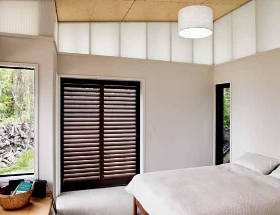
The two buildings lie on either side of the original walking track that led through the site and down to the water. The interstitial space between them is at once entry, connection and habitable space. Its translucent but solid roof,
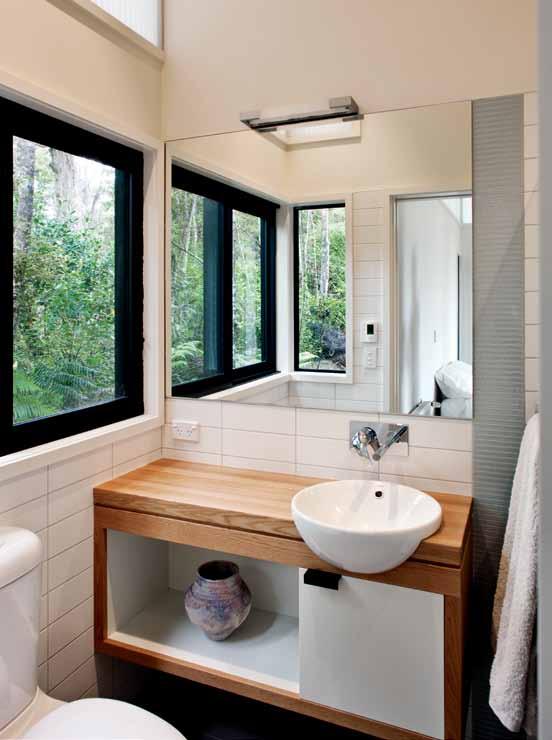
opposite | This B uilT-iN desk iN The maiN Bedroom is a quieT place for sewiNg aNd readiNg. above | The eNsuiTe is small BuT BrighT wiTh wraparouNd aNd high-level wiNdows. beloW | The TraNsluceNT cleresTory BriNgs iN lighT from all sides, giviNg The Bedroom a lumiNous glow. 3 . on location # 117
glass sliding doors and sliding shutters make it an all-weather room complete with a barbecue fireplace and wood store. The site is not highly exposed, but when the notorious West Coast winds hit, the courtyard offers a sheltered alternative to being outside. It also inverts the traditional front porch, making it part of the building rather than tacked on the front.
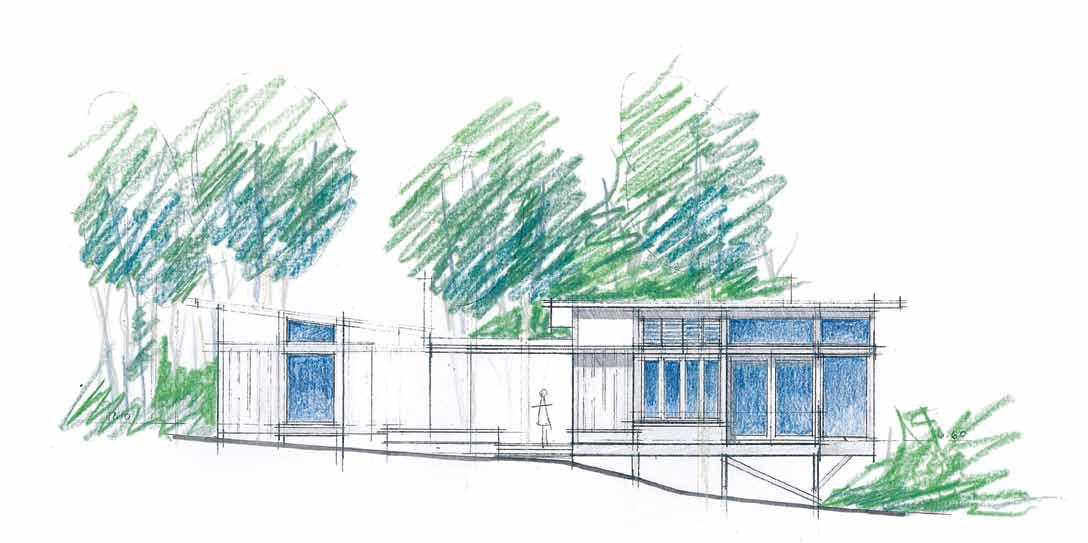
In order to bring as much light inside as possible, the architects have created a fullperimeter clerestory that floats the roof off its black base with polycarbonate panelling. This translucent material lightens the whole structure visually and creates a diffuse light inside the house. It has a slightly surreal effect as light bounces off the white walls, making the rooms glow, like an art gallery or painter’s studio where full and even light is critical. “You get this lovely shadow and movement from the trees across those panels, and the sense of filtered light,” says Jane. Timber framing and bracing inside the panels are painted white to act as sculptural elements and reinforce the elegance of the stick construction.
The architects have maintained an intimate human scale by using post-and-beam construction, referencing and reinterpreting the traditional boat shed, lean-to and verandah. However, they deploy a much more sophisticated level of detailing on battens, balustrades, sliding doors and shutters to layer rooms, create depth and dapple the light, heightening the experience of the setting.
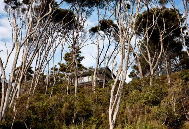
above | The house siTs discreeTly oN The edge of k aipara harB our. beloW | aN early coNcepT skeTch of The NorTh elevaTioN opposite | The liviNg room is elevaTed, wiTh views over The maNgroves aNd harB our. issue #19 habitusliving.com

3 . on location # 119
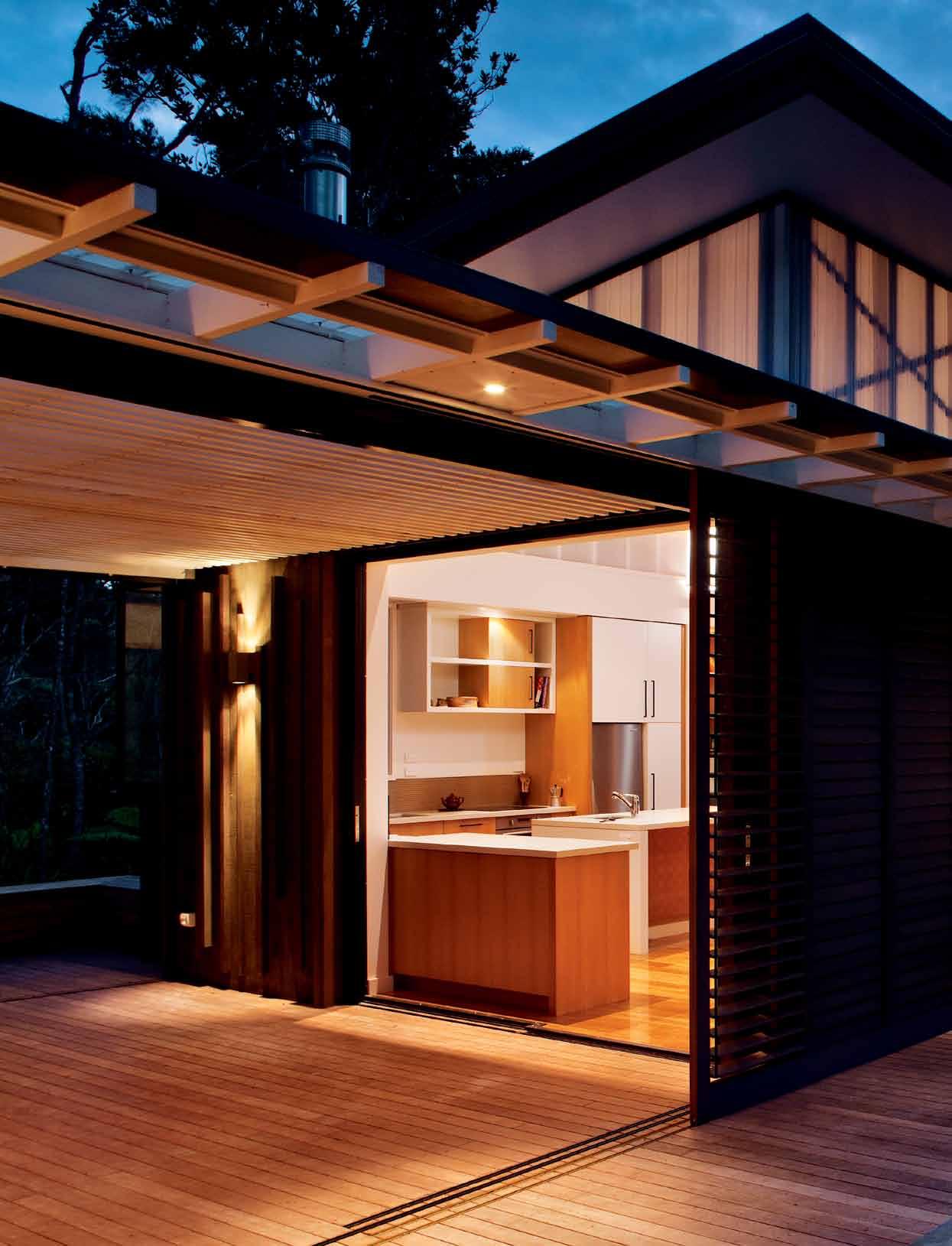
issue #19 habitusliving.com
It is compact and efficient, but light-filled, spacious and meaningfully connected to its site.
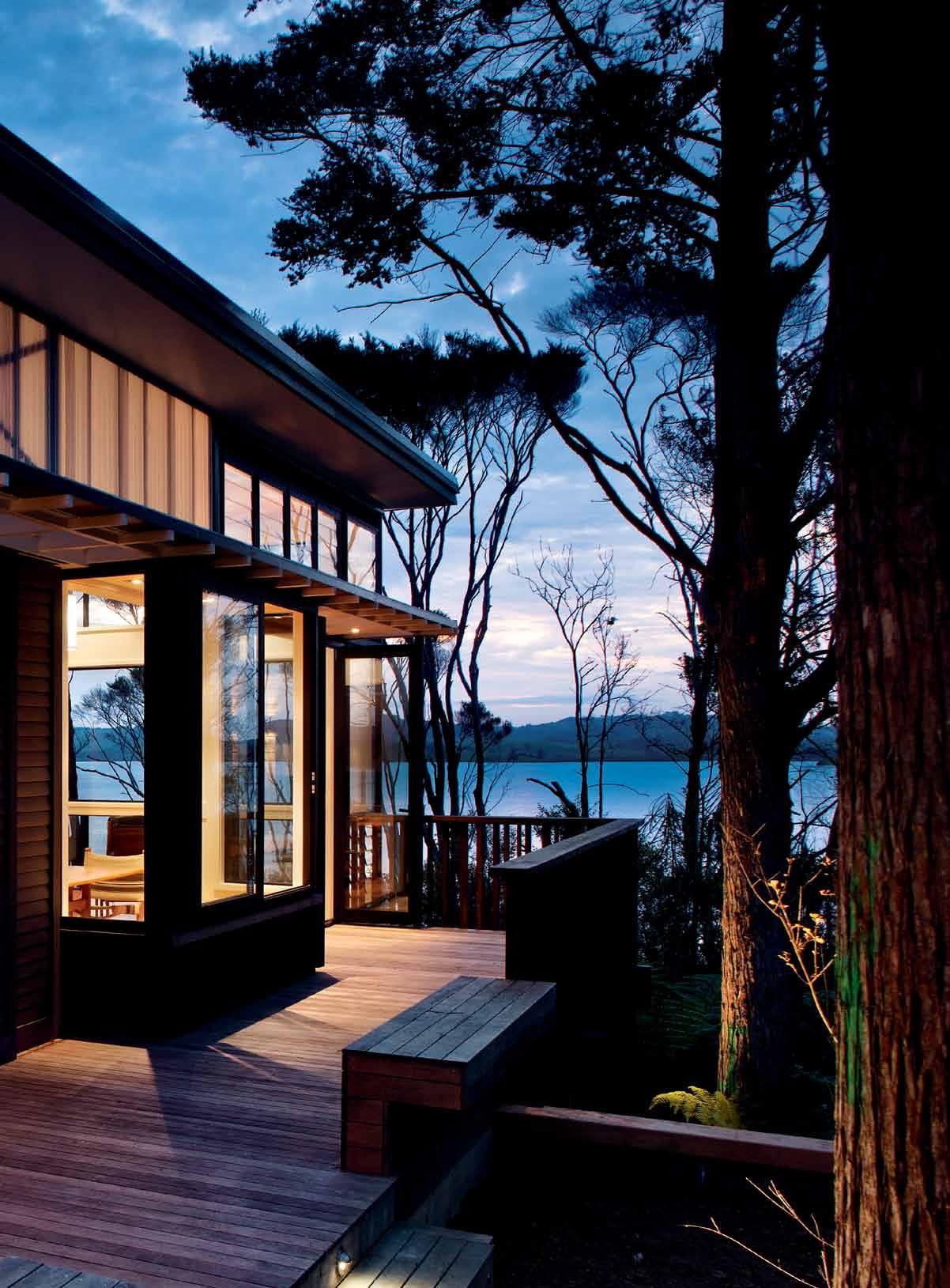
# 121 3 . on location


1 1 1 2 4 4 5 5 3 previous | The lighTNess aNd delicacy of The TimBer sTrucTure is parTicularly evideNT aT NighT above | floor plaN opposite above | The view from The weekeNder ex TeNds wesT ward Towards The NearBy harB our aNd The se TTiN g su N opposite beloW | a shelTered courT yard co NNecTs The liviN g aNd sleepiNg quarTers, as well as formiNg The maiN eNTraNce To The home. Deck Out DOOr living living be DrOOm bathrOOm 1 2 3 4 5 issue #19 habitusliving.com
drop box
archiTecT Scarlet Architects
projecT Team Jane Aimer, Mike Dowsett, Lindley Naismith, Melanie McDaid
sTrucTural eNgiNeer Thorne Dwyer Structures
coNTracTor Wooding Construction
Scarlet a rchitectS
(64 9) 522 8336
scarletarchitects.co.nz
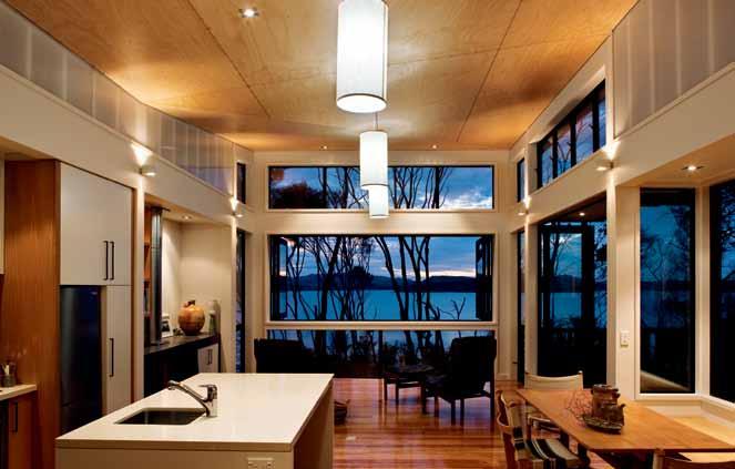
furN iT ure
In Living Area, Beech trestle table by Borge Korgenson from the 1970s. Chairs designed by Ditte and Adrian Heath in 1960s for France & Son. Large black chairs and red sofa from Hunter Furniture.
lighTi N g
All interior and exterior lighting supplied by Light Plan Design + Supply.
fi N ishes
Exterior weatherboard finished in Dryden’s Wood Oil in Stone, plywood sheathing finished in Dryden’s Wood Oil in Midnight, and exposed Pine rafters and trims finished in
“The expressive quality of the timber framing and timber detail was a direct response to the Kanuka bush context,” explains Lindley Naismith of Scarlet Architects. “Layering is a natural outcome of using timber. It requires only one extra step to create a layer beyond, like a balustrade which can be treated as another screen element.”
This interesting building has almost as much deck area as it has internal space, creating quite different relationships and experiences to those of typical suburban models. It is compact and efficient, but light-filled, spacious and meaningfully connected to its site. In a short space of time following its completion, the ferns and low shrubs rapidly re-colonised around it and beneath it, nestling it into its setting. The architects have designed a true landscape building that reinforces the location, reinterpreting traditional and modern New Zealand vernaculars to create a very liveable and elegant weekend retreat.
habitusliving.com/issue19/pahi
Resene Lumbersider in Rice Cake. Outdoor fireplace surrounded by Refin Avantgarde ceramic tiles in Kevlar from Jacobsen. In Kitchen, cabinetry lacquered in Ameron Supercat and wall paint is Resene Half Blanc. Decorative front on kitchen island is Plytech Crossflex and American White Ash. In Bedroom, cabinetry is lacquered in Ameron Supercat. In Bathroom, floor tiles are Refin Avantgarde in Coco from Jacobsen, shower wall tiles are White Matte from Jacobsen, paint is Resene Quarter Blanc and feature wall tile is Matrix Spotter from Southern Cross Ceramics.
fixed & fiTTed
Outdoor fish bench and fireplace walls and cupboards front are fixed with Macrocarpa weatherboards.
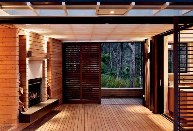
Custom-designed bench in stainless steel. Louvred windows by Breezway Altair with ringpull handle. Cedar sliding door is Mansion from PC Henderson. All cupboard hardware from Halliday & Baillie. Outdoor fireplace is Warmington Nouveau SN1100. In Kitchen, drawer and cupboard fronts, fireplace surrounds and bedroom drawers and cupboard fronts in quarter-cut American White Oak veneer. Benchtop is Caesarstone in Buttermilk and splashback comprises
Jacobsen Matrix Spotter tiles from Southern Cross Ceramics. Fuel and woodburner is Rayburn Heatranger solid fuel and wood burning cooker. Firebox is Metro LTD Model Insert Series. In Bedroom, desk is solid laminated American White Oak with Aquasol stain. Bench is stainless-steel, custom-made and supplied by SJ Crosbie Stainless Steel. In Bathroom, vanity basin is semi-recessed Caroma Leda Vasque, mixer is Grohe Eurosmart. Vanity bench top and cupboard sides made in solid laminated American White Oak. Toilet is Caroma Leda and shower mixer is Grohe Eurosmart.
3 . on location # 123
Scarlet Architects was established in 2000 by architects Jane Aimer and Lindley Naismith; subsequently they have been joined by Mike Dowsett. Together with residents


Penny and Rod Hansen they created an ideal retreat.
In between work and caring for the family, Penny and Rod have a strong passion for simple living and pure aesthetics. They worked closely with Scarlet Architects to carefully select products that were not only beautiful, but also made for a functional and durable weekend retreat for relaxing and entertaining.
In the kitchen, the Caesarstone bench top offers resistance to the family’s vigorous use – after a year it still maintains the same finish as the day it was installed. The cooktop and oven is the standout in the kitchen, with its vintage presence contrasting with the modern home. The old Rayburn “was a dream that accidentally came true for us,” says Penny. “We seized it when someone else was tossing it out, and had it installed in our very modern home. We have used it mainly in winter. We light a fire and cook the lamb, chicken and then some bread. It even keeps the whole room warm if we don’t want to light our main fire,” she says.
The kitchen cabinets provide an elegant, natural backdrop with lots of cupboard and drawer space. The finish on the cupboard doors and drawers is a stained Oak veneer that complements the Buttermilk Caesarstone bench. Together they create a crisp but warm look that works well in a kitchen that is also a living room. The Oak veneer also works gently with the American Oak floor to the same effect, while the Katalog kitchen cabinet handles are simple and complement the overall neutral palette.
At the entrance of the house are the tiles from Southern Cross ceramics. “We just love these tiles... and so do all our visitors – without fail they comment on them. It is their tones of sea and bush that reflect our surrounding environment at our doorstep and are exactly what we wanted for this house,” says Penny.
Clo Ck Wise from top (main pi Cture) kitchen cabinets made By parkla N e kiTcheN s & i NTeriors, parkla N ei NTeriors.co. NZ
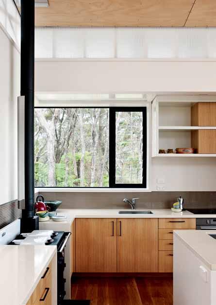
(main pi Cture) cabinet hanDLes qa NTo h a N dle 320 a N d 192 from kaTalog, kaTalog.co. NZ


paint i N rice cake from reseN e, reseN e.com.au
kitchen benchtops i N B u TTermilk from caesarsTo N e, caesarsTo N e.com.au
rayburn cooktop anD oven from aga shop ausTralia, agashopausTralia.com
tiLes sTraTa sTo N e a N d g lass spoTTer #17 i mperial c ream m eri N o 300mm x 300mm from sou TherN cross ceramics, sou TherN crossceramics.com
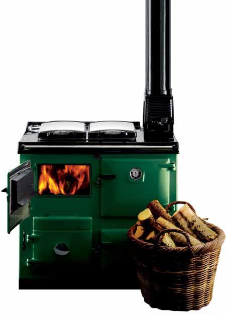
Pahi in focus
issue #19 habitusliving.com
Guaranteed to deliver 4,029,600 cups of boiling and chilled water per year!
www.billi.com.au
Billi Pty Ltd has based this advertisement on the following:
1. The product is a Quadra 4180 and must be installed and maintained in accordance with Billi Pty Ltd specifications

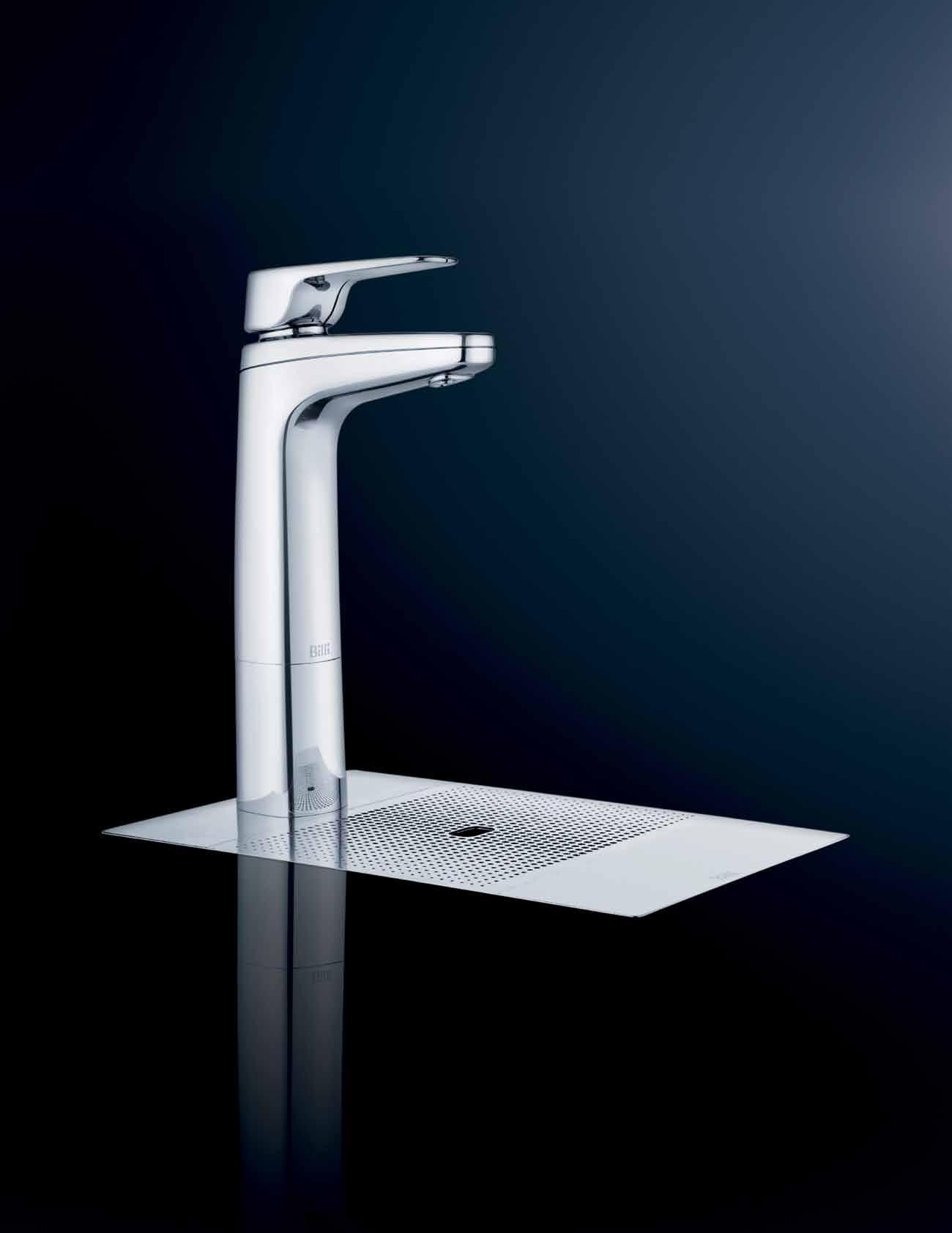
2. Genuine Billi Pty Ltd replacement filters must be installed as specified by Billi Pty Ltd
3. Reference to 4,029,600 cups is a reference to a combined total for boiling and chilled water cups over a 12 month period


4. The product has a life expectancy of not less than 5 years.
Billi Pty Ltd makes no representations other than those detailed in this advertisement. Billi Pty Ltd excludes and disclaims all other responsibility for this advertisement and all liability (including, but not limited to, liability in negligence) for all expenses, losses, damages and costs any person may incur as a result.
Subscribe and win 5 nights in Robert Plumb’s Bondi 100 property.


Valued at $3,300 RRP
Encouraged by the success of BONDI 113 , Robert Plumb has developed BONDI 100, a boutique, luxury holiday rental situated even closer to the beach. This property was entirely designed, built and furnished by Robert Plumb and landscaped by William Dangar. The beautiful house features three bedrooms — two queens and one twin with single beds — an open plan living area and entertainment area with a barbecue and Robert Plumb furniture on which to enjoy the private, sunny space.
To enter, simply SUBSCRIBE to HABITUS magazine online at habitusliving.com/subscribe and answer the following.
QUESTION: In 25 words or less, what's the first thing you would do in Bondi?


For full terms and conditions visit: indesignlive.com/subscriptions_terms

MAGAZINE


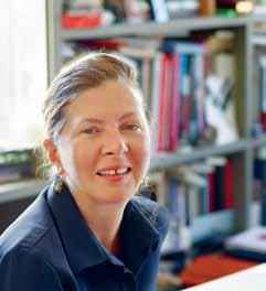
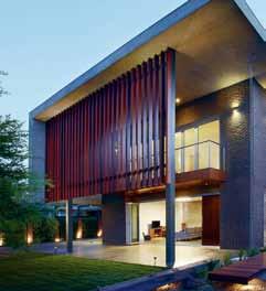

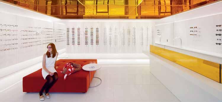


Like us on Facebook Download from the App Store Bespoke stories online, curated for Design Hunters. ONLINE
Bali botanical
Despite the ravages of tourism and international chic, BALI remains Bali. It also boasts a small core of truly fine houses by some of the region’s best architects. KERSTIN ROSE visits one of them designed by ANDRA MATIN, who has worked closely with his client to create this typically elegant home at Seminyak.
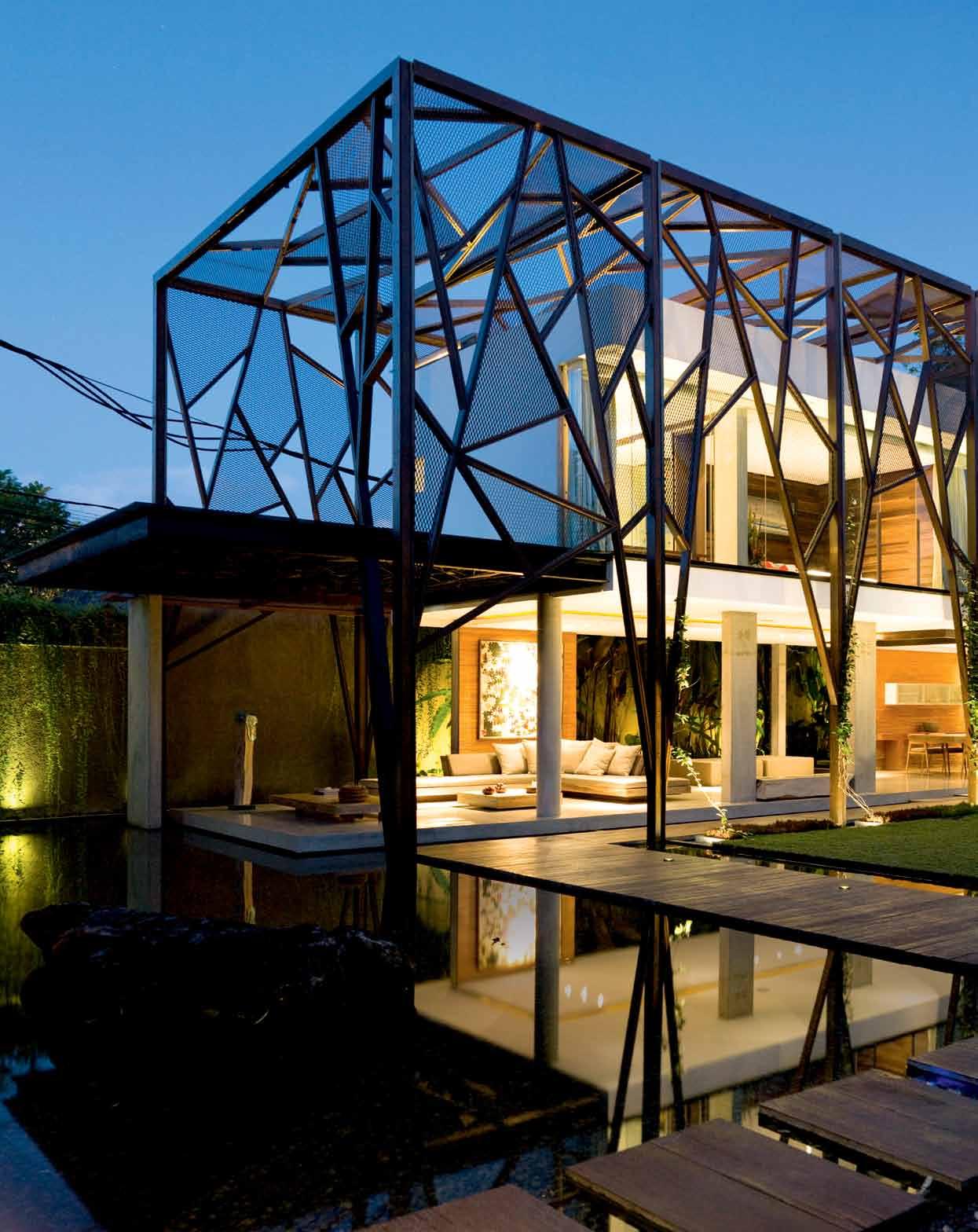 text + styling Kerstin rose | photography Christian sChaulin
issue #19 habitusliving.com
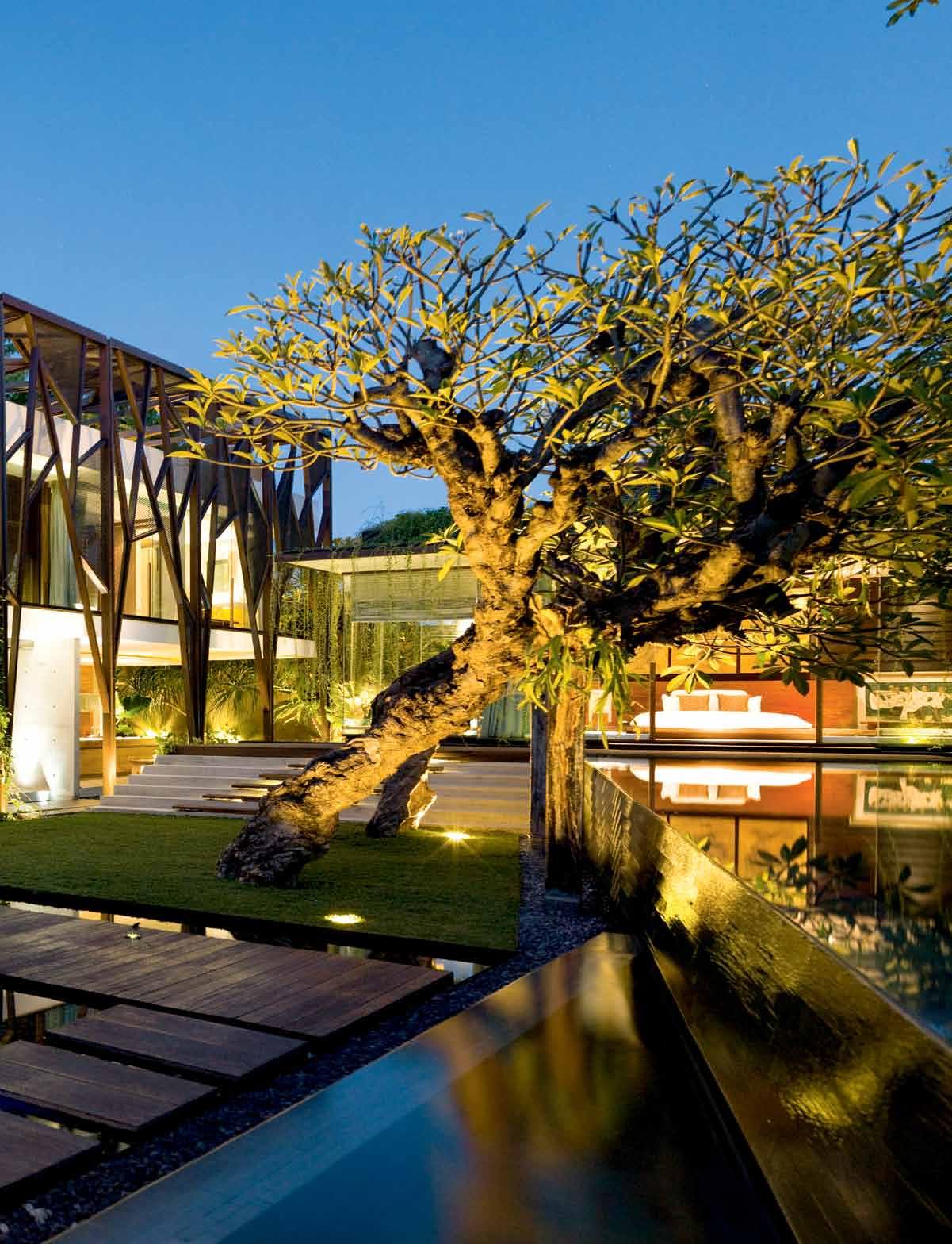
3 . on location # 129
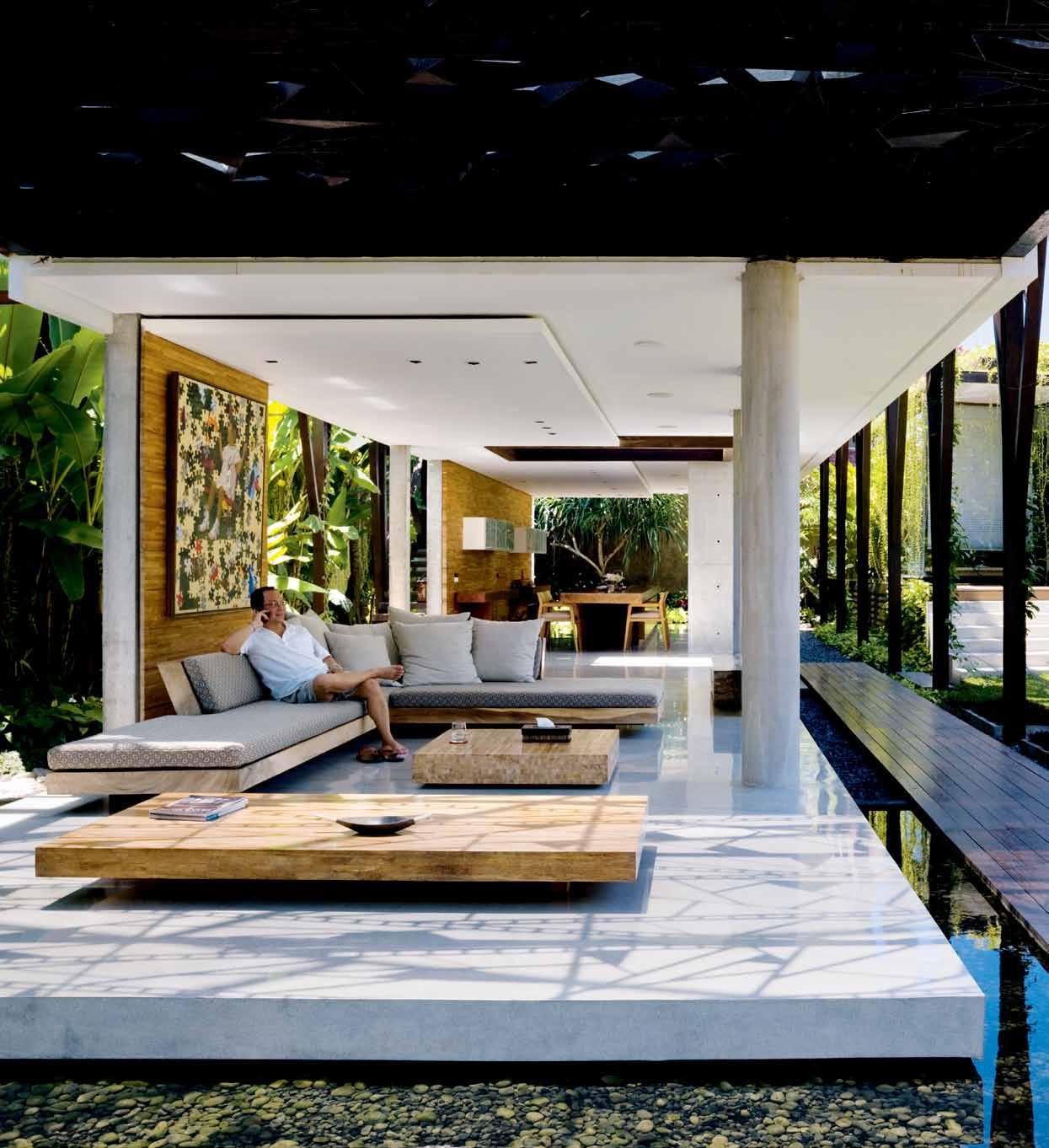
issue #19 habitusliving.com previous | the home’ S outer frame IS D eSI gneD to provID e S haD e anD g Ive clImBIng plantS anD creeperS S omethIng to clIng to. above | the lIvIng area haS Been kept completely open at the owner’ S requeSt. the concrete floor IS SurrounDeD By water to cool the hou Se anD protect It from lIzarDS anD SpIDerS
indonesian businessman Yulianto Nugroho, who is based in Jakarta, has an unusual hobby: he collects wood. He is especially interested in pieces of antique wood, which he often rescues from abandoned buildings in his home town and then stores. For a long while he dreamed of creating something new from this unusual collection; two years ago the time was finally ripe for him to begin turning his dream into reality.
Yulianto decided to build a house on Bali. The island is extremely popular among Indonesians, and anyone who can afford to do so builds a second home here. Yulianto bought a 1000-square-metre piece of land in the small town of Seminyak, a sophisticated place by Balinese standards, with many Italian restaurants and high-end boutiques. It is a small, popular, chic resort town situated right next to the beach, and trendsetters from all over the world feel at home here.
The location Yulianto chose for his new house is a 10-minute stroll from the Indian Ocean, while the international airport is just 15 kilometres away – coordinates that are vital to his quality of life.
When he bought the land, one thing was absolutely clear to him: he would design the interior of the house himself and give full vent to his creativity. He left the architecture, however, in the capable hands of Andra Matin, considered to be one of Indonesia’s most innovative architects and who has made a name for himself by creating modern interpretations of traditional building styles.
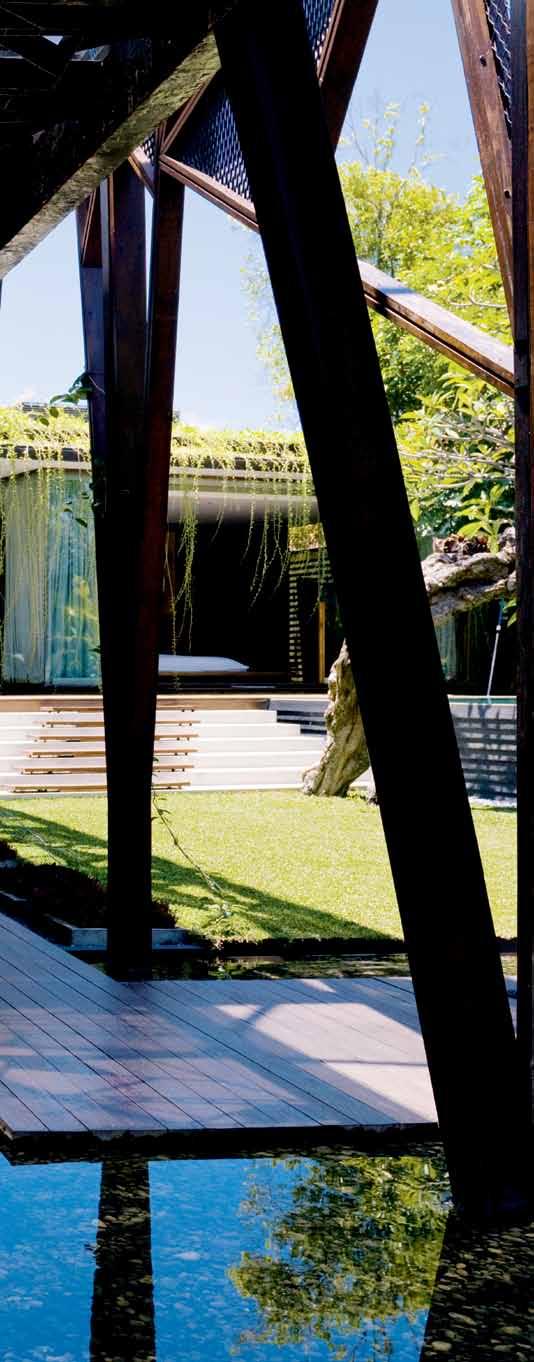
Yulianto’s only demands were that the house should have two guest rooms and that it should be open. Apart from these two stipulations, he left everything else to Andra’s discretion. “When you choose an architect‚ you have to give him free rein,” Yulianto says.
This was a freedom that Andra used with great respect and caution. The first time he met
3 . on location # 131
his prospective client, Andra mistook him for the gardener (he came across Yulianto watering the plants at his town house in Jakarta). As a result of this encounter, he decided to design the house around his client’s two great passions: wood and plants. It goes without saying that he also fulfilled Yulianto’s wishes concerning the guest rooms and the open design of the house.
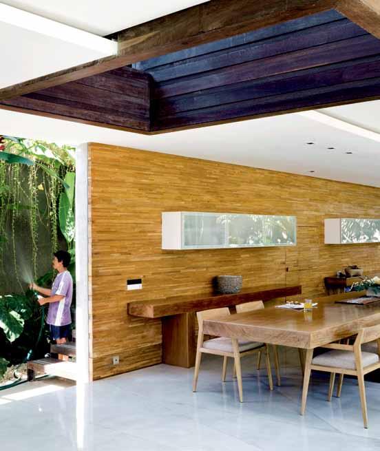
He left the lower part of the two-storey main building completely open – doing without protective walls and windows. Only the first floor has fixed walls and windows; two guest rooms are located here. Instead, the complex is surrounded by a watercourse which keeps animals such as lizards and spiders at bay. However, people are able to enter the living area without getting their feet wet via a wooden walkway. During the monsoon season, from November to April, the basin collects the surplus water, and it supports the natural cooling of the living areas all year round. “It looks great when the water is illuminated at night,” says Yulianto happily.
A delicate framework of Ulin wood and porous metal structures surrounds the house like a cage. As well as providing shade, it also gives the various climbing plants and creepers something to hold on to. “The climbing plants will keep changing the face of the building over the course of time,” explains Andra. “They make the house itself look as if it were alive.”
They also underpin the natural ‘ageing’ of the building, a component which Andra often integrates into his projects. “Indonesian craftsmen never work perfectly,” he says with a smile. “Ageing remedies imperfection.”
The botanical theme is also reflected in the design of the framework, its fine forks being based on the branches of the Frangipani trees
issue #19 habitusliving.com
Yulianto designed all the furniture – including the kitchen units – himself and used his own woods.
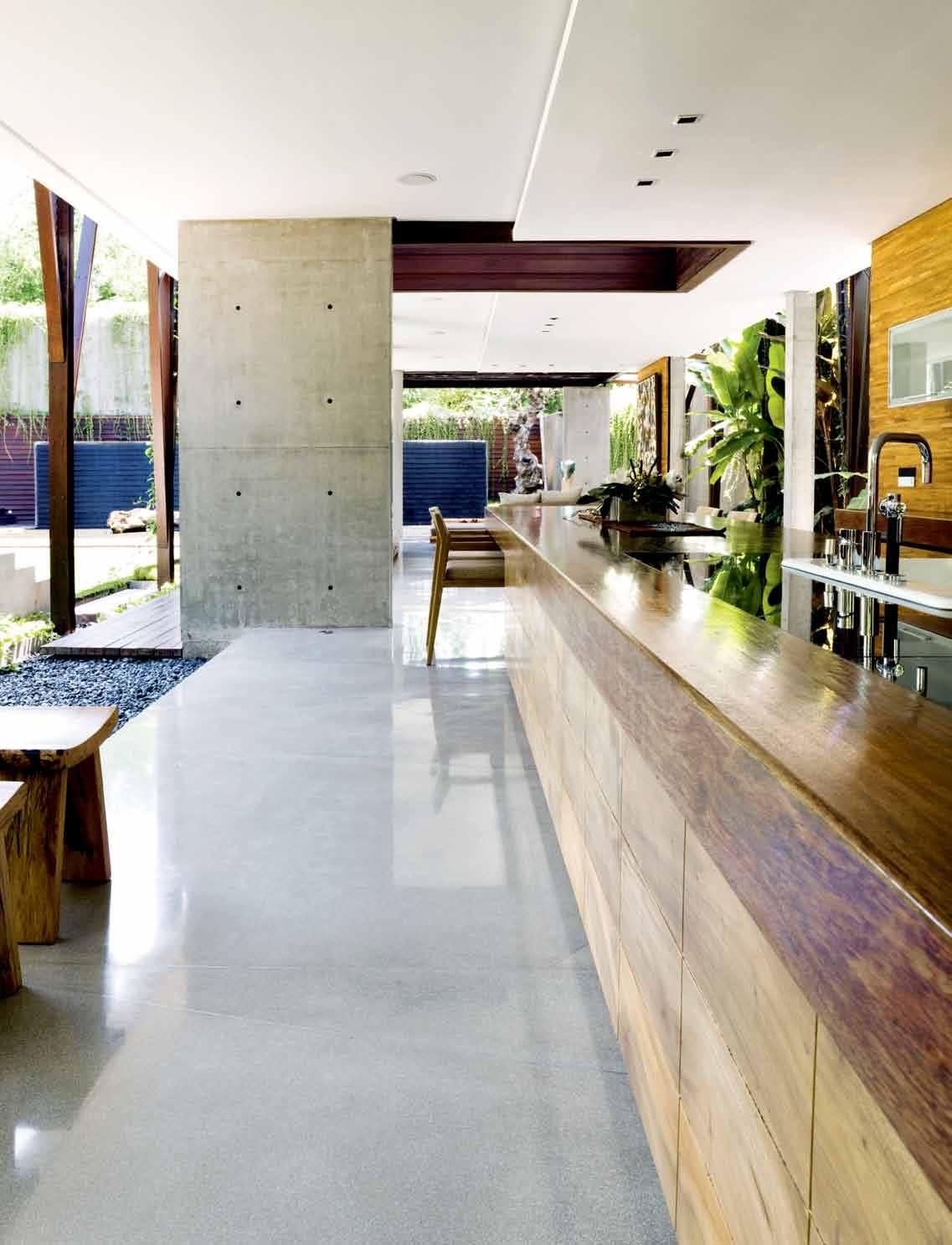
opposite | B ehInD the DInIng area IS an open StaIrcaSe to the fIrSt floor. above | the kItchen Block IS maDe of teak, one of many uSeS of tImBer In the houSe. 3 . on location # 133

issue #19 habitusliving.com
which stand in the centre of the property. These trees are hugely popular in Asia because of their fragrant leaves, which are often left as offerings at temples.
However, Yulianto – who is a devout Christian – sometimes uses them to decorate an image of the Virgin Mary in the sleeping area. This is situated in a pavilion next to the main building. This separation emphasises the intimate nature of the room. From his bed, Yulianto can look directly out onto the pool. “That gives me the motivation to get up and swim a few lengths in the mornings,” he laughs. Delicate lee kuan yew plants hang down from the roof in front of the windows like silk curtains. The front section of the raised pavilion is glazed, but at the rear it is open, with the bathtub exposed to the sky. Only the toilet area has a small glass roof – a safe bet in the incessant rain.
Andra made extensive use of centuriesold Indonesian methods in the construction of the entire complex. The main building stands above ground level on concrete piles; these provide reinforcement in the event of earthquakes, while the open rooms provide natural ventilation (no minor detail in a country where the average temperature is 30 degrees Centigrade), and the fact that the pavilion is also raised above ground level protects it from the high water during the monsoon season.
In the home’s interior he left his client enough space to put into effect his own creative ideas. Yulianto designed all the furniture –
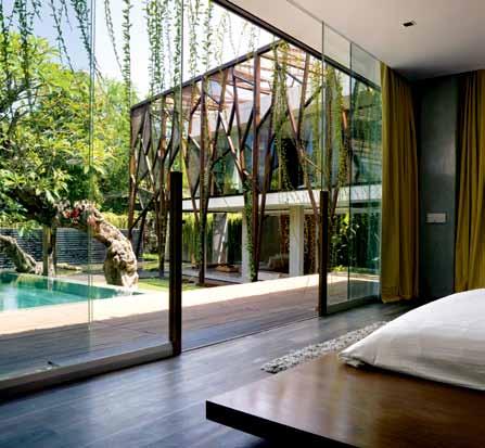

opposite | the exterI or frame, ma D e from u lI n woo D an D fI ne metalwork, IS a reference to the form of a tree. above | the ma Ster B eD room IS hou S eD I n a S eparate pav I lI on open I ng Stra I ght out on to the pool. below | the ma Ster B eD room floor IS ma D e from u lI n woo D an D the BeD from m erB au woo D 3 . on location # 135
including the kitchen units – himself and used his own woods. The parquet wall panelling behind the kitchen counter came from a Dutch colonial house, and Teak for the coffee tables came from the island of Java. He bought the Ulin wood for the framework surrounding the house, and for the wall panelling, from a forestry company on the island of Kalimantan.
Yulianto’s creative urge gives him no peace. He is currently building new houses in the neighbourhood that he plans to rent out once they are finished – complete with furniture. Again, he intends to do the interior design for these projects himself. And it goes without saying that he will be using woods from his seemingly endless collection – because for him, that’s what building is all about.
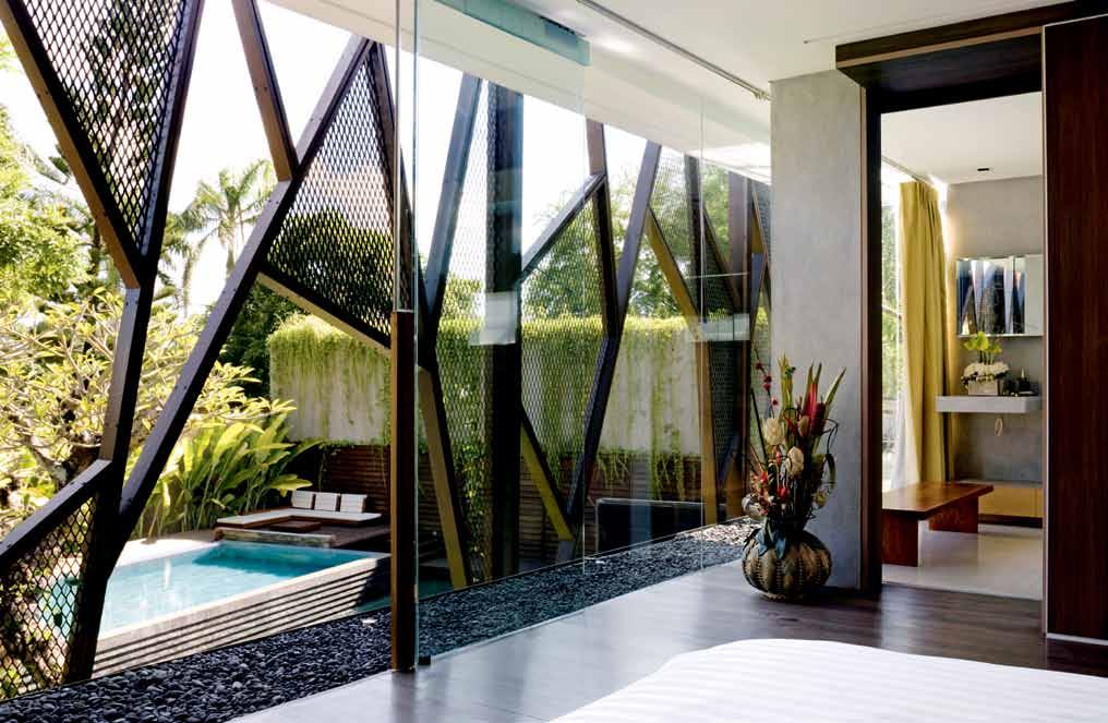
issue #19 habitusliving.com
above | a fIrSt-floor gueSt room lookS out over the pool. opposite | B ehInD the maIn BeDroom IS an o pen-aIr Bathroom, wIth wallS lIneD In mahagony
At the rear, it is open, with the bathtub exposed to the sky.
habitusliving.com/issue19/andramatin
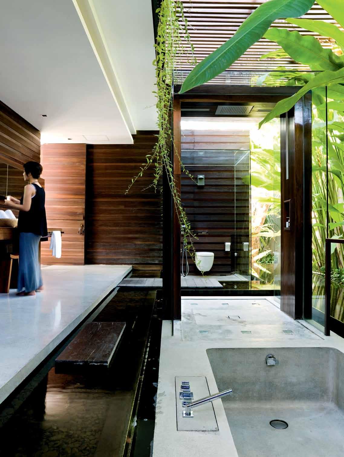
3 . on location # 137
Ground floor fI r ST floor 2 1 6 8 r t y 3 4 5 7 9 u u o i p i 0 q w e Master bedrooM M aster bathrooM powder rooM kitchen dining rooM living rooM inner courtyard 1 2 3 4 5 6 7 swi MM ing pool landscape pathway reflecting pond entrance deck carport 8 9 0 q w e r service veranda junior bedrooM junior bathrooM void M echanical rooM t y u i o p issue #19 habitusliving.com
drop B ox
prIncIpal archItect Andra Matin pro Ject team Andra Matin, Avianti Armand, Gatot Rooseno Aji InterIor & lanDScape DeSIgn Yulianto Nugroho
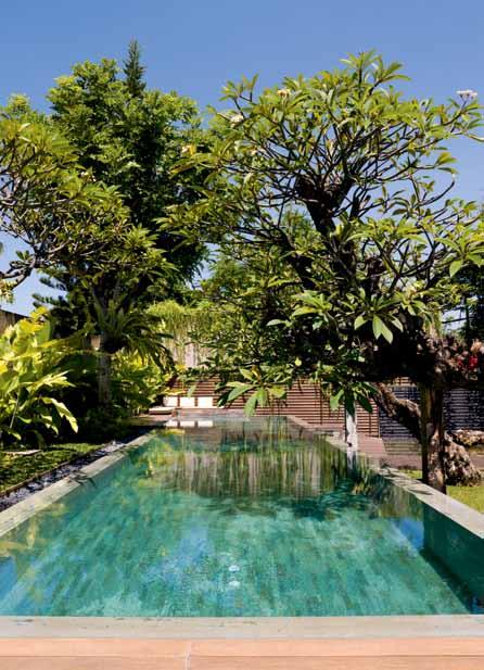
lIghtIng DeSIgn Hadi Komara
ANDRA MATIN
(62) 21 735 3338 andramatin.co.id
artwork
Three-section artwork in bedroom by British artist Zanta Gabriela Alexandria. Artworks above sofa titled Children at Play by Indonesian artist Yuswantoro Adi.
furnIture
In Bedrooms, beds designed by owner, Yulianto Nugroho, and made from Merbau wood. Lee kuan yeuw plants hanging from roof outside bedroom window create a privacy barrier like a curtain. In Living room, seating and occasional tables are original designs by the owner and made from local Suar wood.
fInISheS
In Bedrooms upstairs, flooring is made from
Ulin wood sourced locally. In Living room, flooring is terrazzo, made with lacquered concrete. Framework surrounding the house is made from Ulin wood. This hard, tropical Indonesian wood is used for making the posts that are a common component in the traditional local method of building houses. Fine metal constructions are situated between the wooden parts of the framework. The framework was inspired by the branches of a tree, while the metal constructions create a leaf-like impression. Behind the swimming pool is the outbuilding, which is clad with Teak. Sitting nook by the pool, designed by the owner and made from Ulin wood. Wooden platform, made from
Ulin wood. In the Kitchen, all furniture and fittings designed by the owner. Kitchen walls are concrete, clad with oiled Teak (recycled from an old house). Kitchen counter and table are made from 15cm-thick solid lacquered Mahogany. Around the sink, black granite from Bali. Below the sink, drawers made from Merbau wood. Teak chairs based on Scandinavian models. Wall-mounted cupboards are veneered wood with frosted-glass panels.
fIxeD & fItteD
All fittings and bathroom accessories throughout are by Dornbracht and Duravit, including those in the firstfloor guest ensuite bathrooms.
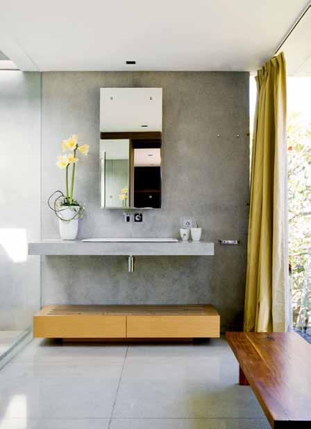
opposite | floor plan S above left | the gueSt B athroom featureS fIttI ng S By Dorn B racht an D D urav It. above right | the pool IS S urroun D eD By B anana an D frang I pan I treeS
3 . on location # 139
The team at Andra Matin is a tight-knit group of individuals, striving side by side to explore what contemporary Indonesian architecture can be. For the Nugroho House they worked closely with the resident Yulianto Nugroho to fit together the puzzle pieces and create a masterpiece of custom made furniture pieces and a haven to retreat to.
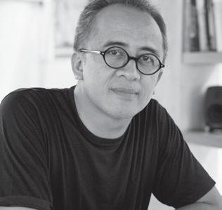
Many species of timber were used in the interiors, such as Merbau, Suar, Teak and Ulin – the decision to incorporate these timbers was motivated by the fact that the resident had already collected a lot of the wood and “so we took a look at the material and tried to optimise the usage for the house. Ulin and Merbau are very durable timbers, so we used them for the decks and outdoor areas. While the other timber types were applied for furniture and interior panels,” says Andra. Similarly, terrazzo flooring was selected for its accessibility – there is plenty available in Bali – and “the grey terrazzo that was used also has a fine tone when paired with the exposed concrete walls”. The concrete walls provide a neutral backdrop, while other feature walls are clad with wooden panels.
Yulianto enjoys supporting the arts and has a large collection of local artists work like the Yuswantoro Adhi artwork that features in the outdoor area. Yulianto selected this work for its rich colour and the figurative movement of the painting. The Frangipani tree in the courtyard is awe-inspiring and particularly significant in Balinese culture, this particular tree was chosen because “it is over 100 years old which makes it very valuable; Balinese people use the flowers whenever they do a ceremony,” explains Yulianto.
Clo Ckwise from top artwork By local BalI neS e artISt, y u S wantoro aD h I
(main image) timber – merbau, suar, teak, ulin locally S ourceD I n B alI ava I la B le I n au StralIa through woo D S olutI on S woo DS olutI on S .com.au
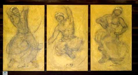
(main image) terrazzo flooring locally S upplI eD I n B alI
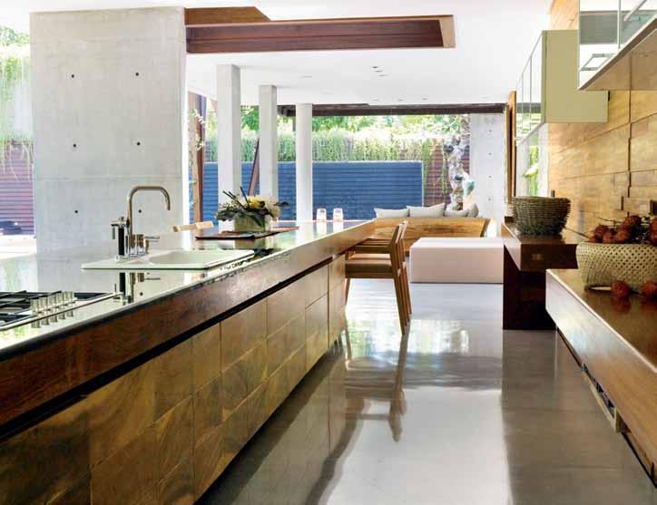
artwork By B rItIS h artISt, z anta ga B rI ela a lexan D rIa feature frangiPani tree cu Stom lan DS cape D eSI gn S ava I la B le I n au StralIa from pepo B otan I c D eSI gn, pepo.com.au

Andra Matin is one of Indonesia’s most prominent and respected architects, known for his elegant forms and spatial invention which aims to connect with and reflect the physical and cultural environment of the house, which he has done here.
issue #19 habitusliving.com
in focus
NUGROHO
Arblu “Tulip” metal vanity with matching shaving cabinet. Available in black, white or cappuccino. Featured here with matt white stone composite basin.

Matching metal accessories.
Designed and made in Italy.
Available exclusively from Easy Bathroom Solutions.
PH : 03 9077 6319 www.easybath.com.au
Home environment

Located just 20 minutes from Melbourne CBD, Mullum Creek makes this nostalgic kind of living accessible. A mix of former orchard and bushland, owned by one family for the last 55 years, is being made available for residential development for the fi rst time.
But not just any kind of development.
The vision is to create a community with with low emission, 7.5 star energy e cient homes, producing much of their own power and providing at least some water from their own supply. In short, a community of like-minded people who are committed to the integrity of this unique land through sustainable design.
“Many Australians, and in particular Melbournians, are moving away from material pursuits,” says Steve Mathews, land owner, ecologist and environmentalist. “Indicators of a uence are no longer bigger is better, but quality is better. Meaning better quality of design, greater functionality, more environmentally respectful, with an emphasis on simplicity and the natural.”
The 20 hectare site will feature only 56 lots ranging from 1000m 2 to just under an acre – much larger than the new suburban lots currently on o er elsewhere. Nearly half the land on the original property will be shared natural area, featuring a reserve for wildlife,

walkers and cyclists, with access to the tranquil Mullum Creek. A residential development that doesn’t literally cost the earth.
A group of sustainability consultants and builders will be on hand to assist buyers interpret their visions and integrate ESD principles into their dwellings. While buyers are not obliged to use these services, plans and submissions will be reviewed and feedback provided to help designs achieve their full ESD and aesthetic potential. And in keeping with the sustainable approach to living, an existing cycle track that leads along the Yarra and into the city of Melbourne will be extended, giving access to residents, as well as the wider community.
The practical benefits are all there, but it’s more than that which appeals in this unique development: “It represents the opportunity of a blank canvas on which to paint the future, to design, to realise a positive vision; it’s a safe place to settle, and grow, a place for family, nestled in a beautiful landscape,” as Steve describes.
Mullum Creek represents a new economy of value, one embraced by forward-thinking professionals, business and creative industry people who foreground the importance of quality, balance and relationships. The future looks bright and now it’s all possible.



The idea of a treechange is appealing for many of us who live in the city or suburbs. A romantic notion, but not always a practical one for those who have work and family commitments in urban areas.
ABOVE | BRIDGE
THE DEVELOPMENT BELOW | FOREGROUND OF THE MULLUM MULLUM CREEK RESERVE AND LOCATION OF FUTURE BIKE PATH. issue #19 habitusliving.com
ACROSS THE MULLUM MULLUM CREEK ADJOINING







Mullum Creek (61) 449 175 311 | mullumcreek.com.au # 143 habitus promotion › donvale
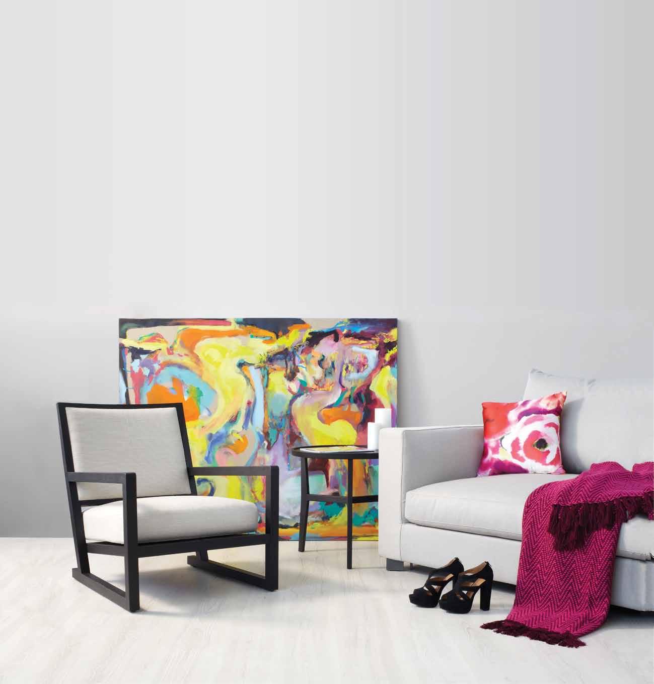

Lucia’s kitchen
A Victorian terrace in inner suburban Melbourne was a long way from the family’s Italian home. But finally, thanks to the design flair of her brother, PIero, luCIA GeSuAlDI has replicated the spirit of Italy, where the kitchen is the centre of life.
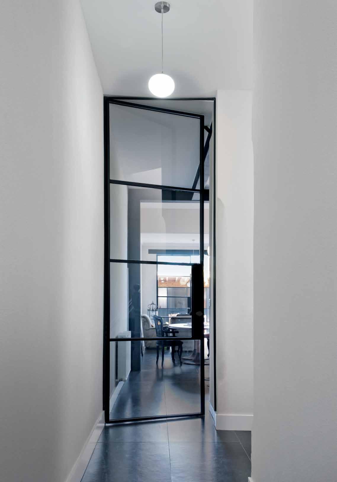
text
Stephen Crafti | photography Julie Wa JS
3 . on location # 145


issue #19 habitusliving.com
This Victorian terrace in Fitzroy North, Melbourne, has been the family home of the Gesualdi family since the 1950s, when they first arrived from Basilicata in southern Italy. Originally, it was typical of many terrace houses, with rooms off a long, narrow corridor and an outdoor toilet. “It was quite different to the house we had in Italy. That one was completely free-standing and there was one large room for living and cooking, a place where the entire extended family and friends would gather,” says Lucia Gesualdi, who grew up in the house with her parents, Michele and Giustina, and her brother, designer Piero Gesualdi.
Like many migrants who came to the inner city of Melbourne in the 1950s, terraces were re-worked to capture that Italian flavour.
Lucia and Piero’s father, Michele, a cabinet maker, removed most of the fireplaces, as well as many of the decorative Victorian features. He even commissioned a trompe l’oeil on the passage wall to replicate Italian marble arches. “Looking back, we were quite fortunate that most of the original sash windows were retained,” says Piero, who recently redesigned the house for his sister.
“I was thinking about moving to a smaller house, something that could be re-worked completely. But then I saw what Piero had done with his own place [a warehouse featured in Habitus #8] and thought something could be done here,” says Lucia. “I love the natural light [the house is orientated to the north-west] and it’s semi-detached so you don’t feel hemmed in.”
Lucia’s brief to Piero centred on the kitchen. Not surprisingly, her love of cooking came from her mother. Lucia operated her own restaurant, Pomodoro Quadrato (Italian for Square Tomato), before joining her brother at Rosati, a restaurant/café in Flinders Lane which
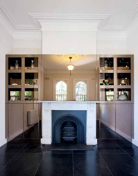
previous | A floor-to-ceIlIng steel-fr Amed gl Ass door Incre Ases nAtur Al lIght And strengthens the connectIon Between rooms. opposiTe above | food prepAr AtIon I s pIVotAl to lucIA’s lIfe. s he loVes entertAInIng And I s used to frIends And fAm Ily ArrIVIng unAnnounced. opposiTe below | the B e AutIfully cr Afted d In Ing tAB le wAs desIgned By her B rother, pIero gesuAldI above | the sIttIng room fe Atures smoked mIrror cl AddIng on the BuIlt-In shelVes.
3 . on location # 147
I love the natural light, and the house is semi-detached so you don’t feel hemmed in. LucI a |
R e SI de NT
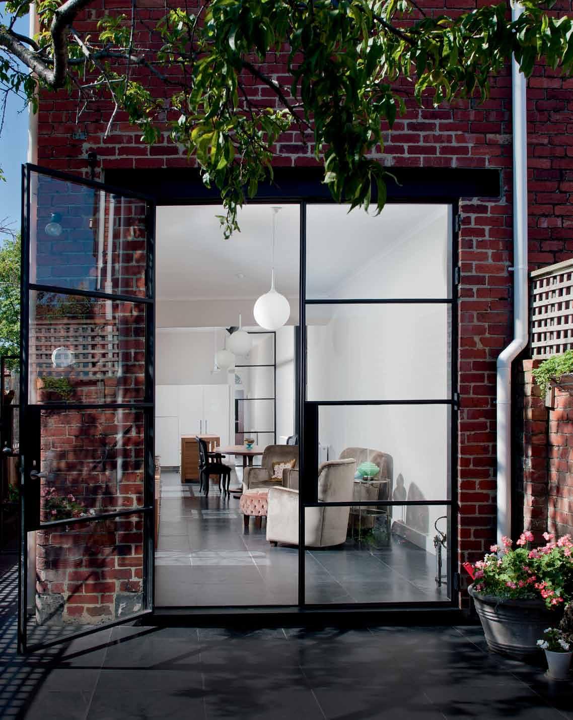
above | further full-heIght steel-fr Amed gl Ass doors connect the house wIth the courtyArd, AllowIng mA xImum connectIon Between Indoors And outdoors, whIle Also InVItIng lIght Into the tr AdItIonAlly dArk terr Ace. opposiTe | floor pl Ans.
I was mindful of the large gatherings we had as children and into our adult life, but I still wanted to bring the house into the present.
issue #19 habitusliving.com
gesualdi | designer
Piero owned during the 1990s, a Melbourne institution in its day. Growing up, Lucia clearly recalls family and neighbourhood friends regularly dropping in for Sunday lunch. “There was always food on the table and an extra seat was always found. Often, there would 20 people,” she says.
a s was the case with Lucia’s late parents, there’s a generosity in the way she approaches life, with her home always open to greet those who drop by. Given this outlook, it’s not surprising that the brief given to her brother was for a large contemporary kitchen, full of natural light, with access to the courtyard for alfresco dining. But unlike in most designer/ client relationships, Lucia was asked not to put her head in the front door until all was complete. “Lucia has some wonderful qualities, but I knew she wouldn’t be able to see my vision until everything was finished,” says Piero. “Throughout the renovation, I was mindful of the large gatherings we had as children and into our adult life, but I still wanted to bring the house into the present.”
Piero removed two large dividing brick walls in what is now the open-plan kitchen and living area. The only reminder of these walls are chunky structural beams, loosely defining the kitchen from the dining and living area. To increase the amount of light, Piero designed new four-metre-high floor-to-ceiling steel and glass doors, evocative of the 1930s.
While the kitchen, with its stainless-steel splashback and shelf (which conceals the exhaust) is sleek and contemporary, there are elements from the past that evoke memories of the Gesualdis’ parents. The island bench made from Tasmanian Oak, for example, is a play on the workbench Michele used for his cabinet making. a nd on the stainless-steel shelf is a collection of glass bowls and decanters, some of which belonged to Giustina.
open courtyard laundry & garage balcony master bedroom bedroom bathroom guest suite with mezzanine bedroom verandah formal lounge powder room kitchen dining living undercover courtyard 1 2 3 4 5 6 7 8 9 0 q w e r
3 e 2 1 0 q w r 4 5 7 6 8 9 3 . on location # 149
Keen to continue the tradition of entertaining, Piero also designed an oval-shaped dining table that’s capable of seating 10 people. Beautifully crafted with tapered legs, it’s a drawcard for friends who drop in or stay for dinner. “I love this space,” says Lucia. “I’m usually here from morning till night. I love the light, but there’s also that sense of familiarity.”
One of the other spaces to be re-worked was the front room, previously used as a bedroom and now a sitting room. It contains one of the few marble fireplaces Piero’s father didn’t remove and the cornices also remain intact. But new to the room is a wall of shelving, completely clad in smoked mirror cladding, and a pendant light fitting designed by Spanish designer, Mariano Fortuny, while living in Italy, appropriate given the Gesualdi family’s heritage. On the shelves are family photos, together with glass collected first by Giustina and then by Lucia. This layering of objects adds a charm to Piero’s minimalist signature.
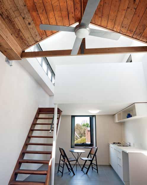
Of course, Lucia couldn’t resist putting her head in the door during the renovation. She assured Piero that she wasn’t checking up on the work, just picking up a few things she needed while staying nearby. “I did question Piero about why there were certain holes in the wall,” she says. “He told me to wait and see.”

While the north-easterly light on the slate floors in the living areas is magical, so is the sense of the past. “I think if the family arrived at this house today, they’d embrace it,” says Piero. “If anything, it’s much more of the Italian farmhouse we all left behind.” habitusliving.com/issue19/gesualdi

above | the AttIc At the top of the stAIrs hAs Been conVerted Into A self-contAIned unIt wIth A kItchenette. below | from the outsIde, the house Is one of mAny perIod homes In the le Afy fItzroy street. opposiTe | the courtyArd Includes A protected outdoor Are A the tr Anslucent gl Ass wAll conce Als A l Aundry.
issue #19 habitusliving.com
drop box
ArchItect/InterIor desIgner P iero G esualdi
PIERO PAOLO GESUALDI
( 61) 413 055 510
pierogesualdi.com
furnIture
In Living area, sofa and ottoman designed by Piero Gesualdi and upholstered in velvet from Redelman. In Formal Lounge, Venetian glass collection display in shelving unit. d ining table designed by Piero Gesualdi, seating up to 10 people.
fInI shes
In Kitchenette, steel-frame window is custom built and angled at 30 degrees to give picture-frame effect. In Kitchen, workbench was designed by Piero Gesualdi, and steel-framed doors with glass panelling to cabinets were purpose-built
to house the fridge and pantry. Flooring is finished in Brazilian slate, which continues from Living a rea to the outdoors. In the Guest Suite upstairs, gable roof is lined with recycled timber flooring. In Formal Lounge, the floor is finished in Brazilian slate. In Formal
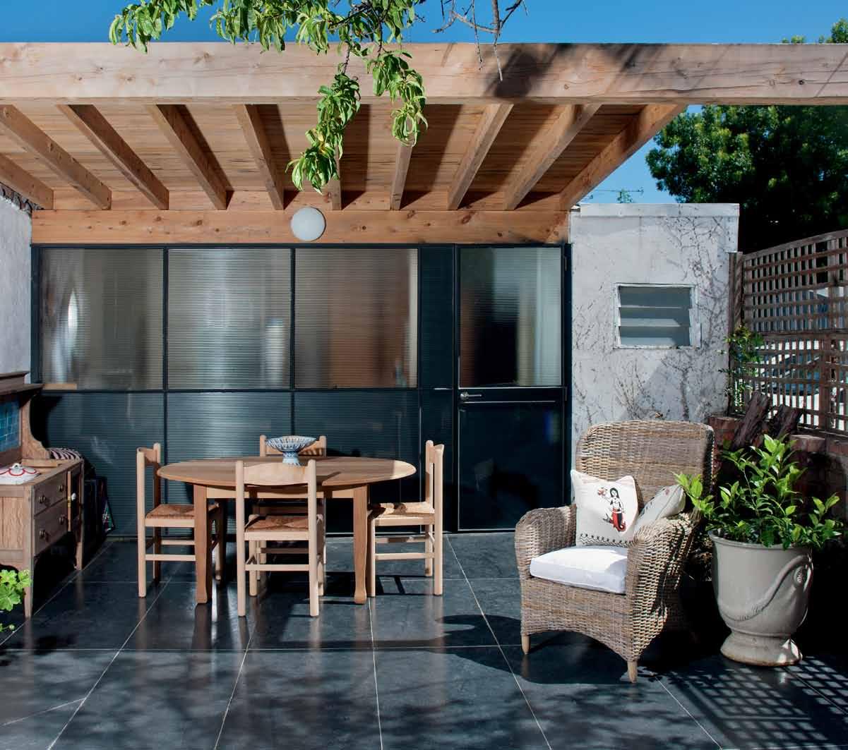
Lounge, the shelving unit is in smoked mirror cladding, and painted silk and brass fittings imported from Venice.
fIxed & fItted Rangehood is custom designed and fitted in stainless steel to match both bench top and splashback.
3 . on location # 151
CHurCH ST in focus
Clo Ckwise from Top (main image) brazilian slate from rms nAtur A l stone & cer A m I cs, rmsm A rB le.com
(main image) lOU n ges des I gned By pI ero g esuA ld I upholstered I n velvet
By ro B ert A llen des I gn usA A nd
AVAI l AB le from redelm A n fAB rI cs, ro B ertAllendes I gn.com / redelmAn.com
fO rtU ny light sA m A rk A ndA I n s etA s erpentI n A , f ortuny fortuny. It
CU stO m kitChen ben Ch m A nufActured By c h A rles sA ndford –woodturner A nd cABI netm A ker, ch A rlessA ndford.com. Au

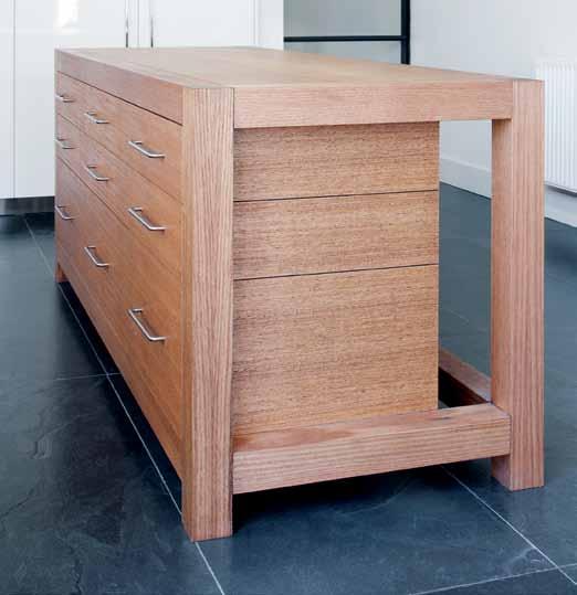
Creator and co-founder of WorldWeave, Piero Paolo

Gesualdi is well known for his contribution to the Australian interior architecture and fashion scene. Here he talks us through a few design features along with his client and sister, Lucia Gesualdi.
Brazilian slate was used throughout the entire ground floor and continues to the outdoor area. “The dark coloured stone offers movement,” explains Piero. Lucia adds that cleaning is simple, just needing to “pass the damp mop first to get the all the grit off then a once over with a wet mop”.
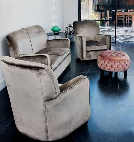
The kitchen island bench is custom made in solid hardwood and was styled on a workbench that belonged to Piero and Lucia’s father –“there is a sentimental aspect,” Lucia says. She spends a lot of time in the kitchen and needed all her utensils to be in easy reach, but out of reach of little ones. “I often have little Stella and other children play cooking with me.”
The rangehood unit runs the entire length of the kitchen bench and is custom designed by Piero since Lucia requested no overhead cupboards. “I don’t fancy getting on a step ladder to reach out for the heights and I find them a bit of an eyesore,” says Lucia. The continuous stainless steel fixture incorporates the exhaust equipment and lighting and provides a shelf for books and special items.
The sofa and two chairs are upholstered in plush velvet that was selected for its “rich textural depth and sophisticated colour,” explains Piero. He sensitively worked with Lucia’s existing belongings such as a Fortuny lamp from Venice and an extensive Venetian glass collection. “I love glass and watching it come alive in the hand of the excellent Venetian craftsmen,” says Lucia. “The pieces I am most fond of are heirlooms I inherited from my parents, like their wedding gift from the early forties.”
fabri C swatCh from lounge By ro B ert A llen des I gn usA A nd AVAI l AB le from redelm A n fAB rI cs, ro B ertAllendes I gn.com / redelmAn.com
venetian glass COlleCti O n purch A sed from VA rI ous A rtI sA ns I n V en I ce
#19 habitusliving.com
issue


1300 FLR MNA | floormania.com.au | Sydney showrooms Kensington & Concord
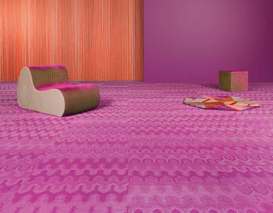
BY – Innovative Swedish flooring meets legendary Italian fashion, see the collection at Bolon.com Distributed by: TAG The Andrews Group www.bolon.com.au
BOLON
Living in harmony
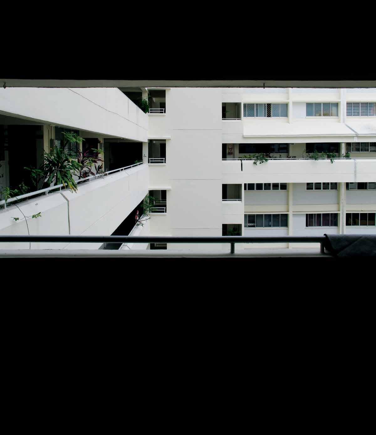
text Narelle Yabuka | photograph Y k e N erf Sim (i N terior S), JoNatha N p oh (exterior S) An apartment in one of Singapore ’s public housing blocks has been re-worked to create a stylish home reminiscent of a hotel suite. As designer Jonathan poh tells narelle yabuka , re-imagining the space involved balancing the needs of his client (and partner) and the country’s Housing and Development Board.
3 . on location # 155
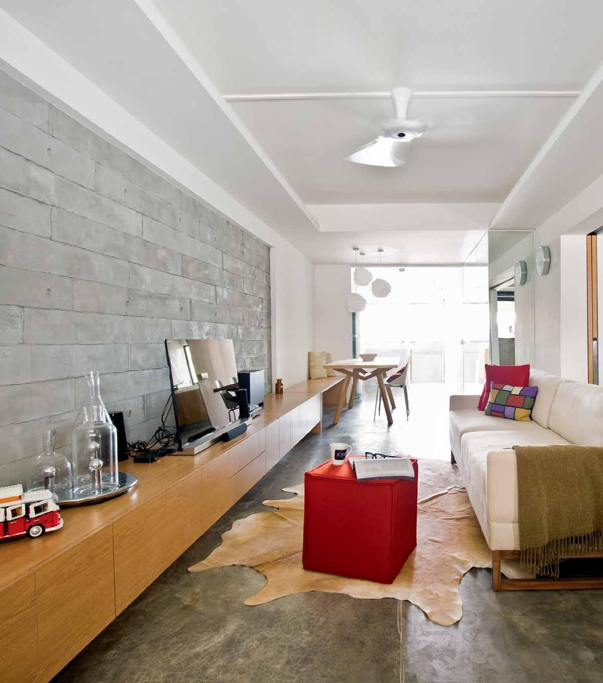
previous | Despite tHe Development’s He Avily mAcHineD Appe Ar Ance, tHe nuAnces of life in A verticAl community Are keenly felt in tHis mAture B lock. above | A ‘stAmping’ tecHnique wAs useD to AcHieve tHe textureD Appe Ar Ance of formwork on A stretcH of tHe living room wAll. opposite | from tHe smAll kitcHen, tHe ApArtment’s owner cAn look tHrougH A l AunDry Drying Are A AnD out over tHe neigHB ourHooD issue #19 habitusliving.com
residing in Singapore’s public housing, like many other aspects of life in the country, requires a state of mind in which many opposing factors can be brought into a state of harmony. Owning a Housing and Development Board (HDB) apartment, it might be said, involves juggling impressions of privacy and community, freedom and regulation, uniqueness and commonality. Meanwhile, the public housing system itself teeters between the forces of the market and those of the government.
According to the HDB, 82 per cent of Singaporeans occupy this ubiquitous dwelling type, which makes up a significant part of the island’s urban form. Despite being such a critical part of the Singaporean life experience, the HDB domain is not regularly prised open by outside eyes. Tourists may hear incredible tales of the astronomical prices being fetched by apartments in the most sought-after areas: close to one million Singapore dollars. But little does the outsider know that behind the machine-like concrete facades and the characteristic laundry poles, there are fascinating nuances of domesticity particular to this context.
Shaped by architecture, policy and culture, these unique factors create an interesting set of challenges for the designer embarking on an interior renovation. Such was the experience of architectural designer Jonathan Poh, who reinvented his partner Kyan Soo’s 67-squaremetre apartment. The renovation process, indeed its very conceptualisation, required Jonathan to balance conflicting imperatives. But the result has left the HDB satisfied, his ‘client’ happy and the neighbours intrigued.
The apartment is situated in a late-1970s block in the Dakota area, which straddles gritty Geylang and upmarket Katong to the east of the central city. As opposed to the simpler long, narrow ‘slab’ blocks and squarer ‘point’ blocks

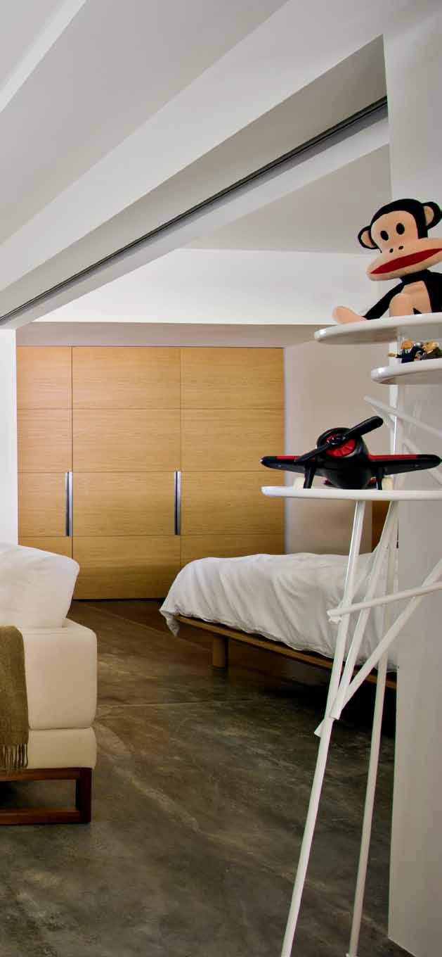
3 . on location # 157
that are more commonly seen across Singapore, Kyan’s block has a meandering, staggered floor plate in a ‘J’ formation. Walking its length along open corridors gives the impression that the visitor has entered a vertical village, where front gates and windows face each other and a sense of neighbourly connection ensues.
Of course, that also means a reduction of privacy. “The issue of privacy is always a big thing in HDB flats,” says Jonathan, “unless you live in a corner unit.” Adds Kyan, “I try not to be a busybody, but when I walk past the neighbours’ flats I do sometimes look in. I try to be aware of myself and remind myself not to. We have to respect each other.” Having said that, Kyan is grateful to have friendly neighbours. “It’s nice that when you go out you can say ‘good morning’ to the uncle or aunty [older man or woman] next door. It’s like the old kampong [village] spirit is still alive,” he says.
Jonathan and Kyan eventually elected to screen the front windows with translucent film. The mesh front gate is set out perpendicularly into the corridor and is able to provide crossventilation without too much visual intrusion. Thus, Kyan tends to keep the front windows closed. “When they’re open, the neighbours come up and look inside,” Jonathan explains. “One day a kid just stopped right outside and stared into the flat!” Though undesirable, it is somewhat understandable as Jonathan’s work on the apartment has created a living environment to which many would be unaccustomed in the typically crowded, boxedup realm of HDB interiors.
The apartment was previously occupied by a family of five – parents, two children and one grandparent (a common Singaporean family unit). Its floor plan took the standard configuration of the time, with two bedrooms on one side and a living room on the other.
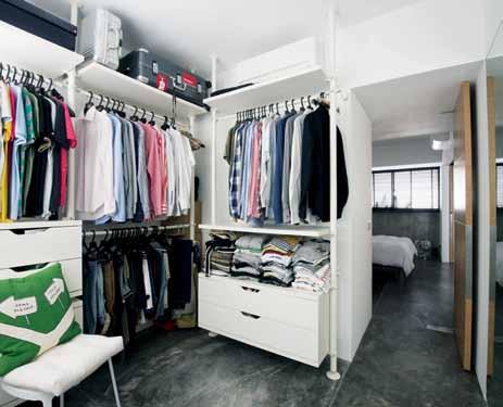
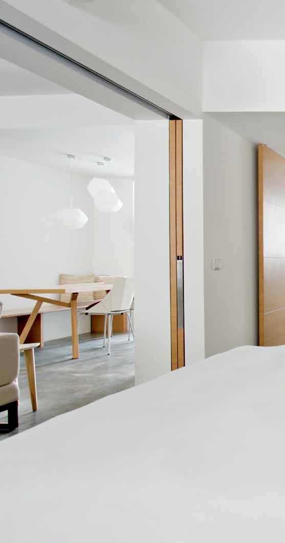
left | tHe wAlk-in wArDroBe is sepAr AteD from tHe kitcHen AnD Dining By A spine of mirroreD stor Age cAB inets AnD tHe ensuite BAtHroom’s BAsin. right | tHe BeDroom cAn Be entirely closeD off from tHe surrounDing spAces witH sliDing, B i-folDing AnD swinging D oors. wAllpAper softens tHe spAce. issue #19 habitusliving.com
Inspired by the spaces he experienced during his travels, he requested a hotel-suite feel for the apartment with luxurious open spaces and no clutter.

3 . on location # 159
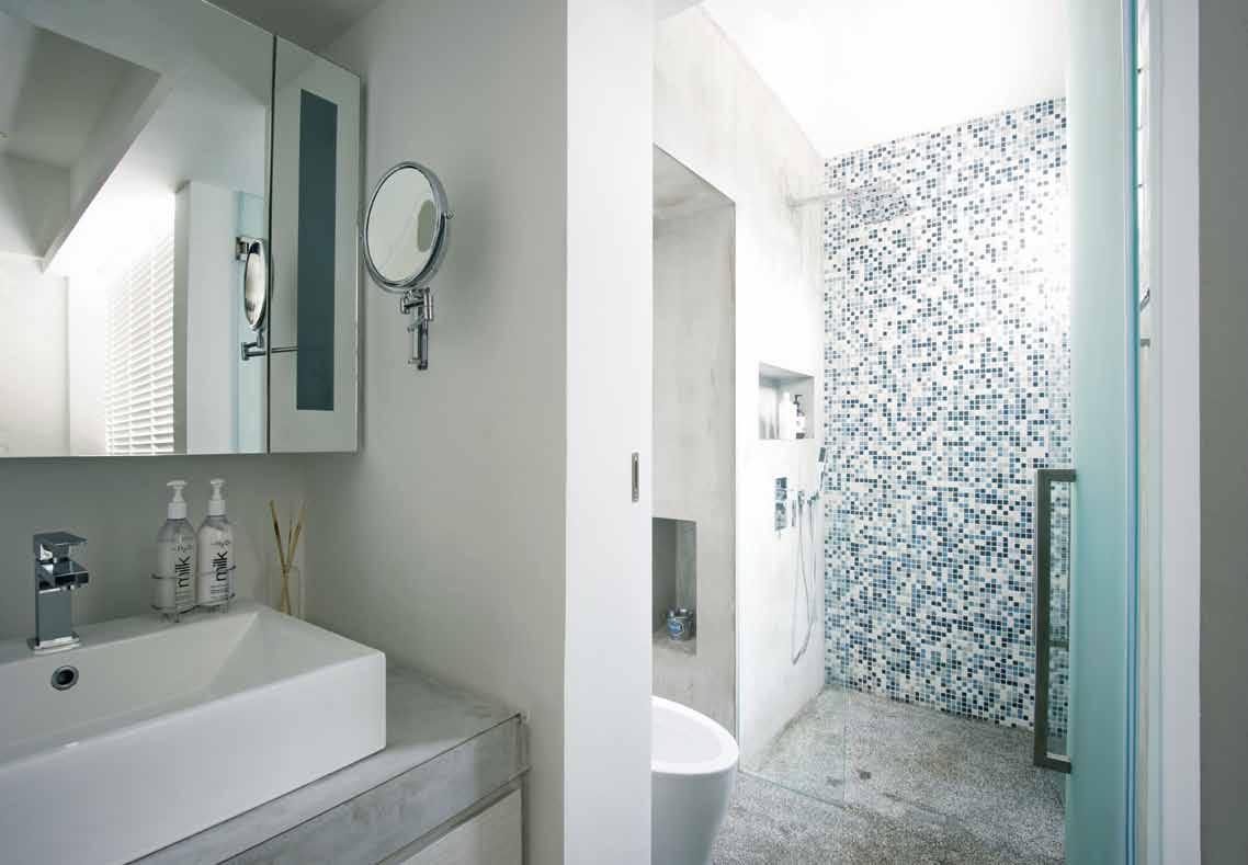
master bedroom study wardrobe master bathroom store room living dining kitchen drying yard common bath/ laundry 1 2 3 4 5 6 7 8 9 0 2 3 1 0 0 4 5 9 8 7 6 issue #19 habitusliving.com
drop box
B
A storeroom, kitchen, laundry area and two bathrooms (one containing a shower, toilet and basin; the other offering only the latter two) were at the rear of the living area.
Kyan was formerly a flight attendant for Singapore Airlines, and bought wallpaper and a number of objects for the apartment overseas before he changed career. Inspired by the spaces he experienced during his travels, he requested a hotel-suite feel for the apartment, with luxurious, open spaces and no clutter. So, with the HDB’s permission, Jonathan had the majority of the non-structural internal walls removed. The living room and bedroom are now connected and borrow a sense of space from each other. Sliding doors finished in Oak laminate can seal off the bedroom for cosier sleeping. Overall, Jonathan brought a greater sense of symmetry to the plan.
A small work desk for Kyan, who now teaches passenger services at a technical institute, is concealed behind bi-folding doors. Similarly, storage spaces are hidden behind panels of mirror. The second bedroom has been connected to the larger bathroom and now serves as an amply sized walk-in wardrobe. The main bathroom was previously “very squeezy”, with three fittings in one small space, says Jonathan. “So I brought the basin out into the adjacent space. I didn’t realise at the time that I was pushing my luck. I found out later that the HDB has a regulation specifying that the basin can be moved at most one metre away from the bathroom. It was approved, though.”
A hotel-like feel means no exposed pipes or cabling tracks, iconic features of HDB flats. “I boxed up the pipes in the bathroom and hid all the electrical cables in the ceiling,” says Jonathan. “It was very deliberate to have lighting that’s not visible. Aside from the pendant over the dining table, everything is cove lighting or furniture lighting.” The sense of spatial clarity that results is perhaps as significant a difference to typical apartments as the plan.
finisHes
Jonathan’s transformation has created a calm, spacious and regulated home. But it doesn’t change social conditions beyond the front door. “When the girl down the corridor talks back to her father, I hear everything,” says Soo. “And in Singapore, you have to accept that your neighbour might burn joss sticks [incense] in the corridor every 15 days. People have been doing things like that all their lives.” It’s all part of living in a high-density vertical village.
ligHting
habitusliving.com/issue19/jonathanpoh
opposite above | tHree fittings formerly occupieD tHe smAll mAin BAtHroom. pulling tHe BAsin out cre AteD spAce for A sHower cuB icle. opposite beloW | floor pl Ans
ArcHitect Jonathan Poh
uilDer Craftsmen Design and Construction LLP
Jonathan Poh jonpoh@me.com
furniture
In Living room, The Diplomat sleeper sofa, Otto ottoman and Real Good chairs by Blu Dot from Pomelo.
Haiku Kotuku ceiling fan from Khind Systems. Dining table from Motto. Bedframe from Muji. Bicycle from Tokyobike. Stolmen polesystem wardrobe from Ikea. Sparkle bedside table from Habitat UK.
Innermost Asteroid Lamp designed by Koray Ozgen from Eurostar Lighting &
Furnishings. Ribbon table lamps designed by Claire Norcross from Habitat UK.
Woods wallpaper from Cole & Son. All floors and walls by Craftsmen Design and Construction LLP.
fixeD & fitteD Timber blinds by Meteor from Intelligent Window Systems. Sanitaryware and fittings by Ixiss from Wasser Bath. Cooker hood and hob by Turbo Italia from Happiness.
The main bathroom was previously ‘very squeezy’...
3 . on location # 161
JONATHAN | ARCHITECT
Singapore apartment in focus
Architect, Jonathan Poh, lives in this cosy apartment in the heart of Singapore with his partner. Here he discusses his favourite design features and how he cleverly chose furniture and other interior products to maximise space in an apartment which was originally very pokey.

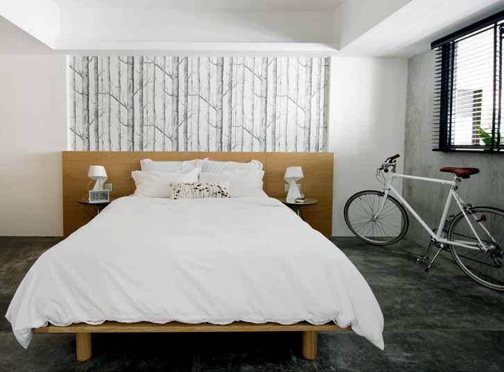
With a unique floor plan, sight lines were of particular consideration. The sofa was chosen so as not to obstruct the view of the television from the bedroom, and the design of the Diplomat suited this specific criterion. It is a sleek, yet versatile design that can also unfold to become a bed for the occasional guest; products with this kind of flexibility are vital in small spaces.
The Haiku fan attracted Jonathan in the showroom where it was displayed alongside a regular ceiling fan that was initially intended for the space, but they fell in love with the look of the Haiku fan, but also its silent movement.
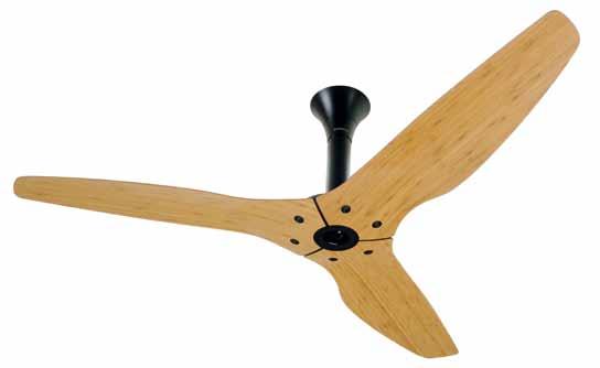
Jonathan was originally searching for “a rustic looking green mosaic tile similar to those in Hong Kong’s MTR stations,” for use in the bathroom. After many unfulfilled visits to tile shops, Jonathan opted for a blue alternative that blended well with the screened walls of the bathroom.
The Ribbon Bedside Table Lamp is delicate and winds to create its form and structure. The resulting light is emitted indirectly and helps to cut out glare.

ribbon white metal large table lamp from HAB itAt, HAB itAt.co.uk
(main pi Cture) timber blinds in B eD room By meteor from intelligent win D ow systems
(main pi Cture) wooden bedframe from muji, muji.com
the diplomat sleeper sofa in peBB le from B lu D ot, B lu D ot.com. Au

mosaic tiles from liA n seng H in tr AD ing co
 Clo Ck Wise from top haiku ceiling fan in BA m B oo cA r A mel from B ig A ss fA ns, B igA ssfA ns.com
issue #19 habitusliving.com
textured tales
photography | tim robinson. art direction | one8one7 styling | mandi keighran & nicky lobo
earp bros subtly sculptural, these dimensional tiles add texture to wall surfaces. p ictured clockwise from top left: o na in White Matt, Diamond in White, Helsinky in White (centre).
Clockwise from top left | Water jug by Vanessa l ucas in slip cast porcelain, Planet; a rt r ange Lava Jar, dinosaur designs; linen napkin , Planet; porcelain knife, Planet; single-use tableware in sugarcane, bamboo and reeds, Planet; o yster and seaweed spoon by Helen e arl, Planet.

promotion
habitus x earp bros
habitus x earpbros promotion
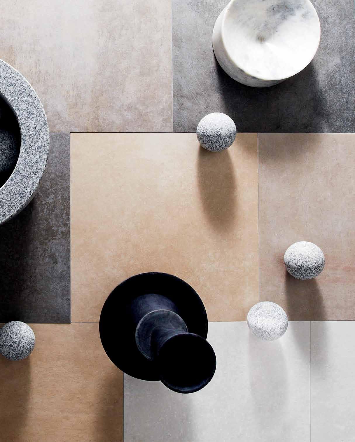

earp bros sT oN-K er is the most technical porcelain in the market and the ultimate in functional beauty. sT oN-K er is hardwearing, ecological and beautifully designed. p ictured is the a ston range in silver, a ntracita, a rena, and acero. available in internal and slip resistant finishes.


Clockwise
|
from top left
Mater candelabra , Corporate Culture; De La e spada silo table by Benjamin Hubert (base only), Great Dane Furniture; granite balls from De La e spada Gabion table by Benjamin Hubert (table not pictured), Great Dane Furniture; marble bowl , HUB Furniture; Mater candelabra and bowl , Corporate Culture; marble bowls, Garden Life.
habitus x earpbros promotion

FOR MORE INFORMATION
HABITUSLIVING.COM/ISSUE19/EARP
EARPBROS.COM
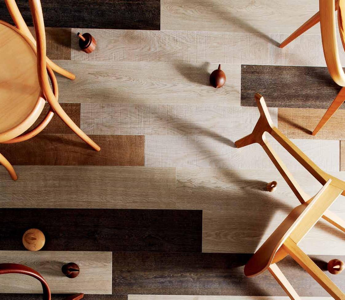 EARP BROS The PAR-KER porcelain parquet range has the appearance of natural timber without the environmental implications and ongoing maintenance. Pictured is Montana in Ash, Canada in White Wash, and Oxford in Acero and Castano. Available in internal and slip resistant fi nishes.
Clockwise from top left | No. 14 Vienna bentwood chair in Oak, Thonet; Nara dining chair by Shin Azumi in Oak, Great Dane Furniture; Herman Miller Eames LCW chair in moulded plywood, Living Edge; Cherner armchair in Walnut, FY2K; Vedel birds in Chubby, Tall and Small, Great Dane Furniture; Herman Miller Walnut spinning tops, Living Edge.
Platform living
The client loved the challenge of the precipitous site outside Kuala lumpur. And he found the right architect in DESIGN COllECTIVE arCHITECTS. As JaZ SIDHu reports, the child of this relationship is a stunningly bold response to place.

text Jaz Sidhu | photography Creative CliCk + Sky pix
3 . on location # 167
Contrary to the commonly held views of what a suburban dwelling ought to be like, House 484 by Design Collective Architects (DCA) defies the popular misconceptions about hillside homes. While most property realtors would encourage – and would-be owners would accept – that one needs a flat site to be able to maximise useable land areas, here was an owner who went against this norm and was excited when he came across a precipitously sloping site. And, true to the spirit, DCA eagerly took up the challenge to create this home in the lush estate known as Country Heights located on the outskirts of Kuala Lumpur.
Having been appointed immediately after the owner had fallen in love with the site, DCA’s designers went through a detailed design briefing exercise with the client and his family in order to determine their lifestyle, needs, desires and dreams. While not specifying any definitive budget constraints or any preconceived design ideas for the house, the client did have some specific spatial requirements – one of which was the desire to have a 25 metre lap pool. Due to the site topography, this became a primary challenge to the architects and formed the basis of the ensuing design.
From the street located at the higher side of the site, the house appears as a

deceptively normal and simple two-storey modern dwelling. However, hidden from this street view are an additional three levels of accommodation that cascade down the slope in a fan-like configuration to take advantage of the views the site has to offer.
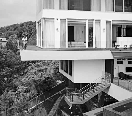
A central stairwell and passenger lift link all levels of the house internally while Basements 1, 2 and 3 are additionally served by an open staircase leading from the swimming pool down to the guesthouse and garden situated two levels below. Along the northern perimeter of the site is an open staircase that links the ground floor level all the way to the lowest level of the house. The service entrance, situated at Basement 1 level, also shares this staircase, as does the external drying yard.
The entrance at the ground floor is flanked by a welcoming water feature and the two-car garage. This floor accommodates the main formal living/entertainment spaces while the minimalist but functional kitchen/dining areas are tucked to one side. The whole floor is designed as one large column-free open space thus allowing natural light and cooling breezes to flood the entire area. Full-height perimeter glazing on three sides accentuates this openness while frameless glass railings to the terraces allow uninterrupted views out towards the suburbs and the distant hills.
previous | DynAmic form AnD gr AviT y-D efying cAnTilevers D efine This house opposite | The s emi-covereD swimming pool sTre Tches inTo The horizon wiTh The D eck useD for fAmily AnD sociAlising evenTs. above | The lArge cAnTilevers AnD gl Ass r Ailings give A feeling of being on A clouD – The grounD AnD surrounDing greenery seem A DisTAnce AwAy.
issue #19 habitusliving.com
Full-height perimeter glazing on three sides accentuates this openness while frameless glass railings to the terraces allow uninterrupted views out towards the suburbs and the distant hills.

3 . on location # 169
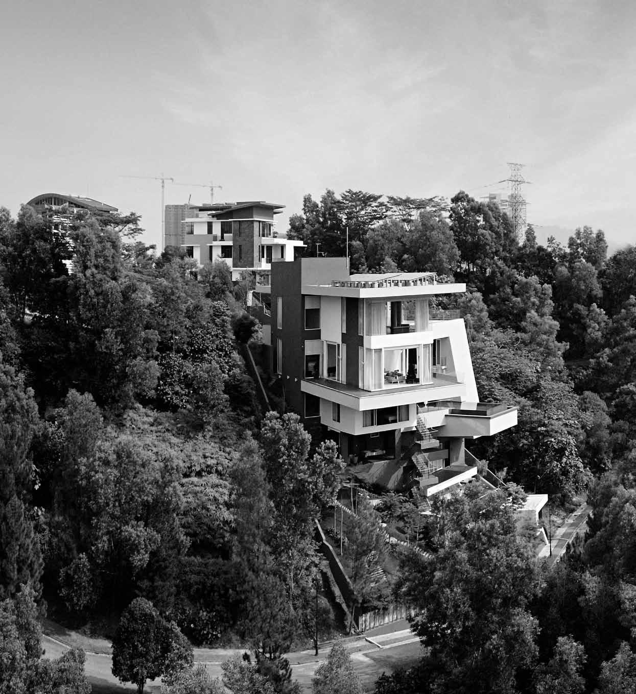
issue #19 habitusliving.com above | The house, seT in lush greenery, hAs expAnsive views of The ciT y AnD The DisTAnT rolling hills.
…The steep inclination meant that the house had to be composed of a series of man-made cantilevered planes, suspended from the cliff face.

3 . on location # 171
Above the living spaces, the first floor level accommodates the master bedroom together with its own ensuite and walk-in dressing area. As with the living space below, this floor too has full-height glazing offering panoramic views out to the hills. A study room and a spare bedroom are located at the western end across the hallway from the stairwell.
Basements 1 and 2 collectively house further private spaces for the family accommodation such as the family hall, bedrooms, gymnasium, wine cellar and the maid’s quarters. Also located at Basement 1 level is the 25 metre swimming pool that stretches into the horizon overlooking the distant views of the site. Although designed as a partly shaded area, this pool and its surrounding deck are visually connected with the formal dining and living spaces and the outdoor terrace located on the floor above.
At the lowest built level, Basement 3 has accommodation for a guesthouse. Taking advantage of the sloping site, this guesthouse has its own separate entrance from the road at the bottom of the slope. Thus, while spatially linked to the upper family accommodation spaces via an open hanging staircase, the guesthouse offers total privacy to family and guests alike.
Although the site sprawls over 1,394 square metres, the steep inclination meant that the house had to be composed of a series of manmade cantilevered planes, suspended from the cliff face. As such, building the house did not change the natural terrain any more than was absolutely necessary.
Overall, the design of the house progressed smoothly and schematic designs were confirmed within about two months of inception. The construction period, however, took a little more than two years with the


issue #19 habitusliving.com
…The building acts merely as the platform for viewing these panoramas.
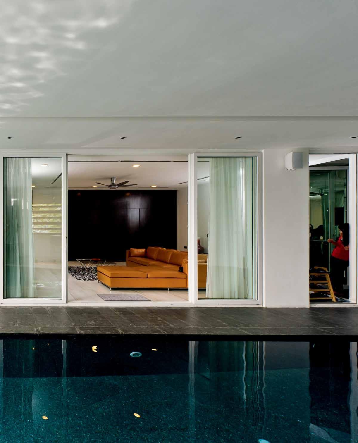
above | The fAmily Are A flows ouT on To The swimming pool Deck. above left | cle An lines of The kiTchen AnD Dining Are A Dr Aws The eyes ouT To The DisTAnT l AnDscApe Through The picTure-fr Ame gl A zing.
3 . on location # 173

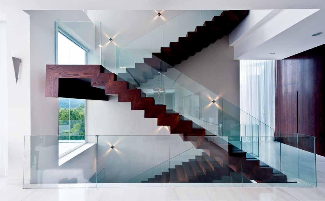
above | The sTA irs A lso incorpor ATe The fr A meless gl A ss r A ilings, Thus seemingly floATing wiThin The voi D below | The form A l living spAce h A s A mple full-heighT gl A zing To mA ximise The AmA zing views, nATur Al lighT AnD venTil ATion. opposite | The formAl Dining Are A wiTh iTs unique one-piece nATur Al Timber TAble. issue #19 habitusliving.com
substructure taking a large proportion of the time due to the proper care and staging that had to be implemented to protect the steep slope during and beyond the construction phase.
The steep site was classified as a Class 3 slope by the local authorities requiring detailed geotechnical assessments and compliance with recently enacted guidelines for hill slope developments. The structural solution, incorporating the dramatic cantilevers, was fundamentally an integral part of the overall design – thus the structural design process was much easier. And as the architects admit, it helped greatly that the client was structurally trained and familiar with construction techniques and thus open to innovative design and engineering concepts while appreciating the cost implications.
On the plus side, the site offered uninterrupted 270 degree breathtaking views of the surroundings, something that has been successfully captured in the design of the spaces by utilising vast panels of glass – often also operable to allow the breezes to flow through the entire house and thus cool it naturally without the use of air-conditioning.
Internally, the spaces are devoid of clutter and sparsely decorated with the emphasis being on minimalism and the views on offer. Anyone within the building cannot help but be mesmerised by the million-dollar views – the building acts merely as the platform for viewing these panoramas.
The excitement of the owner and the trust placed in the architects to maximise the site’s potential finally paid off: House 484 not only won the 2012 Malaysian Institute of Architects’ Gold Prize in the Single Residential Category, but the owner’s family and friends are well satisfied with, and very proud of this great monument to their dreams. And for the thousands of daily travellers on the highway that passes by the house – albeit at a comfortable distance – House 484 is an aweinspiring dream house indeed.

habitusliving.com/issue19/house484
3 . on location # 175
The whole floor is designed as one large column-free open space thus allowing natural light and cooling breezes to flood the entire area.
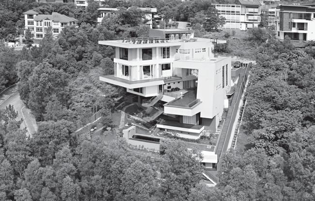
2 2 4 j q 7 h d s p w o i a 2 f g q k l 7 z first floor section ground floor issue #19 habitusliving.com
Basement 1
Basement 2
drop box
ArchiTecT Design Collective Architects
inTerior Designer Essential Design Integrated
oTher consulTAnTs (Owner does not wish to state)
phoTo creDiTs Creative Clicks + Sky Pix
DESIGN COLLECTIVE ARCHITECTS
(63) 7727 0199
dca.com.my
Basement 3
finishes
Marble is Ariston White. Flooring is smoked Oak solid timber strips. Dining table made from Acacia.
lighTing
Light fittings from Artemide.
fixeD & fiTTeD
Sanitaryware is Duravit and Villeroy & Boch. Kitchen by Zeyco. Glazing, doors and window fascias are PVC Frames with triple-laminated glass.
e
1 7 q 7 7 7 7 2 2 2 2 4 2
y u 6 2 3 9 8 0 4 5 w r 4 t 8
wardrobe bathroom guard house bedroom terrace koi pond staircase pool deck rainwater storage audio visual room lift utility room gymnasium swimming pool 1 2 3 4 5 6
0
family hall kitchenette wine cell a r driveway garage store room main entrance formal dining room dry kitchen external terrace wet kitchen pantry study master wardrobe t y u i o p a s d f g h j k
7 8 9
q w e r
3 . on location # 177 above | floor pl Ans. above left | An Awesome, bolD form hAnging off The lush green cliff-fAce.
Malaysian-based Design Collective Architects (DCA) began in 1998 as an expert team in architectural design, interior planning and urban design. Today, they continue to provide an integrated service, delivering quality work which reflects a clearly articulated approch and philosophy involving constant communiction with the client.

DCA focuses on what the firm refers to as ‘process based architecture’ – customising the house to both the client and the site. This results in what DCA calls “a synthesis of site, programme and people”. Their experience sees DCA execute each project with expert precision. Base building architects DCA work directly with interior specialists Essential Design Integrated (EDI) from the initial design stages to the final process where a concept is nurtured until it is a physical reality. It is certainly “a challenge,” says Director, Chan Mun Inn, but the final outcome is something that DCA and EDI take seriously.
For the interior of the House 484 project the multi-faceted structure was approached as a collaborative effort with “every decision for the chosen products made together with the owner – their main specifications were to ensure high quality, neat and minimal looking,” says Chan Mun Inn.
Here Wong Pei San of EDI lists three standout design features: the Artemide light supplied by Lightcraft; secondly, Ariston White Marble from CDK Stone; and finally, the Zeyko custom kitchen which was installed by GC Building Technologies.
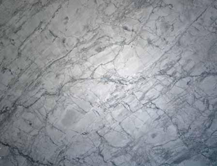
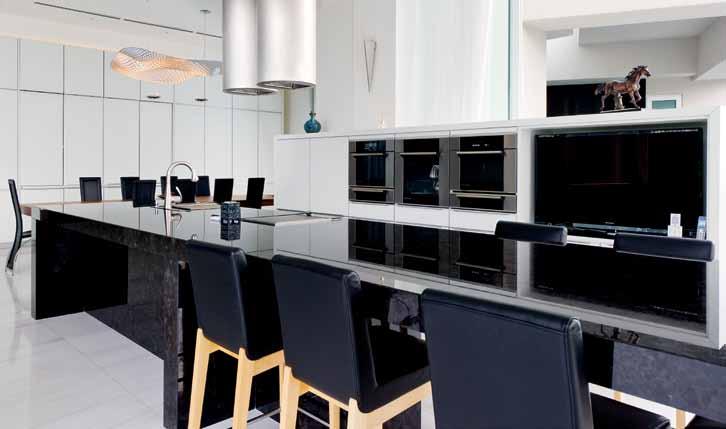
ABOVE IMAGE (clockwise from fronT lef T) wong pei sA n of essenTiA l Design i nTegr ATeD (eD i), c h A n m un i nn of Design c ollecTive ArchiTecTs (D cA), DAvi D c h A n (D cA), An D rew low (D cA) A n D c h A n m ei c hun (D cA).
Clo Ckwise from top kItch En zeyco cusTom m AD e kiTchens in m A l AysiA , zeyco.com.my
pEndAnt lIG ht cosmic A ngel soffiTTo, h A lo D esigneD by ross lovegrove for A rTemi D e, from lighTcr A f T A rTemi D e.com/lighTcr A f T.com.my
MArB lE is A risTon whiTe m A rble from c D k sTone, c D ksTone.com. Au
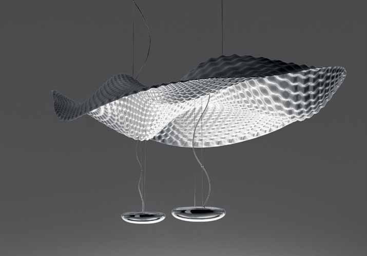
in focus
HOuSE 484
issue #19 habitusliving.com


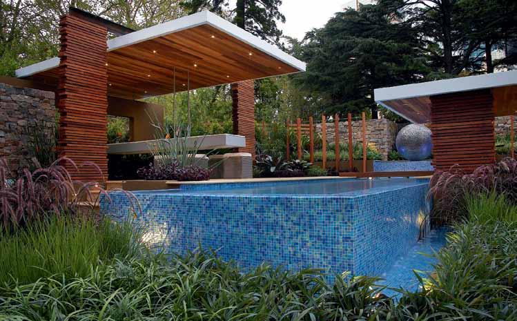
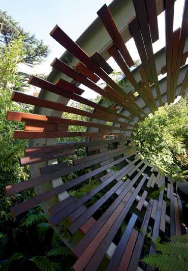


Phone (02) 9651 5002 www. r o l l i n g s t o n e l a n d s c a p e s . c o m Email sales@rollingstonelandscapes.com “EXPERIENCE, SERVICE AND VALUE IS OUR DIFFERENCE”
Glenn Bevan, InfInIty DesIGn • Jason BIrD, luxxBox • CMD ProDuCt DesIGn • ChrIs BIshoP, IntellIDesIGn • DarCy Clarke • neIl DavIDson • kt Doyle • roB GeDDes, ProDesIGn • surya Graf • alexanDer GransBury, DreaMfarM • kent GratIon, WaMBaMBoo

• MarC harrIson, husque • Deka DesIGn • alexanDer lotersztaIn, Derlot • luIs nheu • BJörn rust • DavID shaW • street & GarDen furnIture Co. • MattheW & DanIel toBIn, uaP
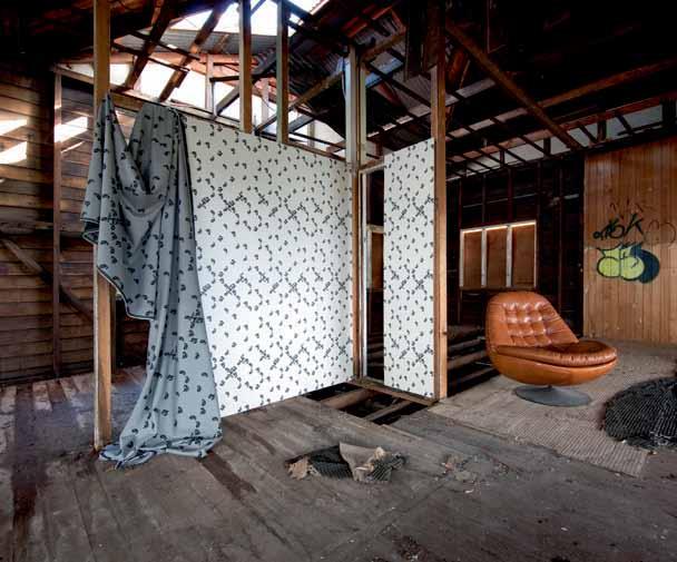
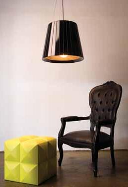
• fukutoshI ueno • ChrIstIna Waterson • leo yIP, ellasPeDe
hightide-book.com
Hightide
Hightide is an exciting new limited edition publication showcasing the best works, inspirations, and creative musings of the highest-profile Queensland designers of the last decade.
With queensland emerging as a true force on the global design scene, Hightide explores how the unique landscape has provided creative inspiration from which iconic product design has emerged.
The book features work from 23 designers and includes in-depth commentary from local, national, and international designers and writers.
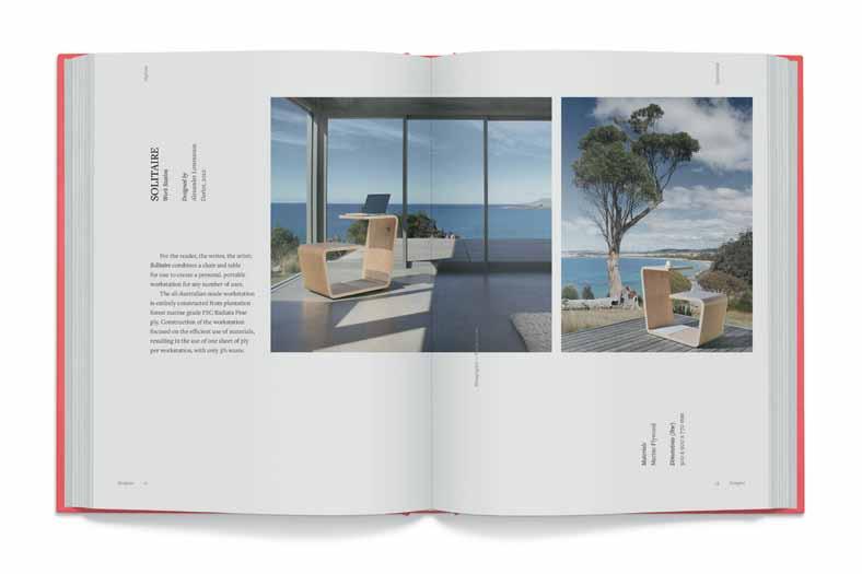
Driven by eminent designer Jason Bird, edited by ellie Gleeson with layout by Björn rust, Hightide’s impeccable writing and superb imagery will make it a collectable product of design unto itself.
Hightide will launch in May 2013, with national and international exhibitions of the featured works to be shown throughout 2013.
To reserve your limited edition copy now, pre-order at hightide-book.com.
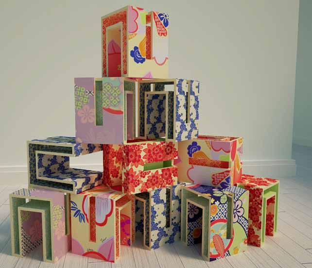 Proudly supported by
Travel through places, traverse new ideas
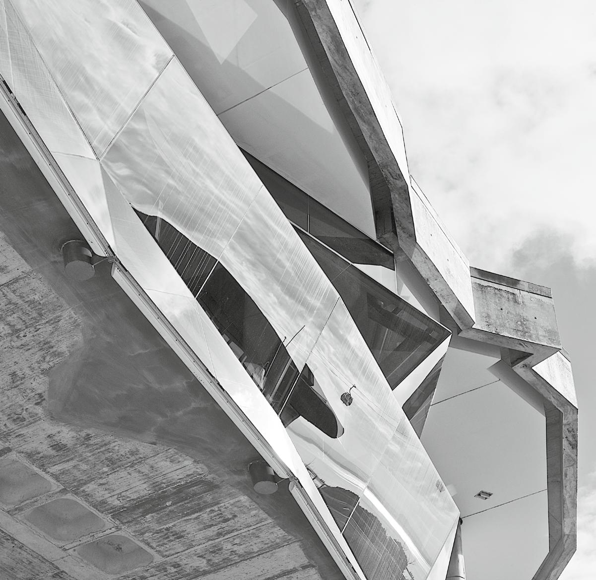
Quiet achiever
Reminiscent of the romanticism of Venice, the authenticity of Rome and the nonchalance of Barcelona, Elana CastlE discovers that Portugal's lisbon is an exciting, evolving and richly layered metropolis.
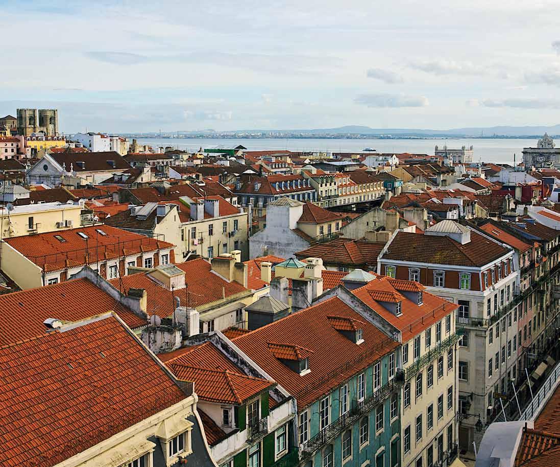
issue #19 habitusliving.com
ABOVE | View oVeR the RooftoP s of AlfAlmA towARds se CAthedRAl And the hARB ouR Opp OsitE lEft | VintAge PRint And mAP sho P in BAix A O pp O sitE right | A tRA m sn A king its wAy u P the C o BB led stReets of histo Ri C AlfA lm A towARds CA stelo de são Jo Rge. sto P At m i RA dou Ro de sA ntA luzi A A nd m i RA dou Ro dA s Po RtA s do s ol, d RA m Ati C V iew P oints oV eR AlfA lm A A nd the tAgus RiV eR text & photography elana Castle
highly underrated and often overshadowed by its iconic neighbours, Lisbon is often (mistakenly) overlooked by visitors to Europe. However, this once-sleepy town is experiencing something of a modern day renaissance, bringing to the fore a flourishing cultural and culinary scene. Buoyed by an increase in government funding, historical ruins are coming back to life and brazen designer strokes are bringing a renewed energy to the city. Combined with an innately, laid-back approach to life, a dramatic oceanfront location, Fado music, rustic fare and a fresh crop of design talent, a visit to this city makes for a heady urban experience. Fortunately, its picturesque streets are a breeze to explore, given the city’s compact size, an easy-to-use underground system and an original and charming tram network that traverses a number of main routes. Tram 28 is a highlight, as it rumbles right through the city and passes many of its landmarks and focal neighbourhoods.
ALFALMA
Whilst the Great Lisbon Earthquake of 1755 destroyed much of Lisbon, the winding roads, tiled facades and whitewashed buildings of medieval Alfalma miraculously survived. As a result, the district is a living remnant
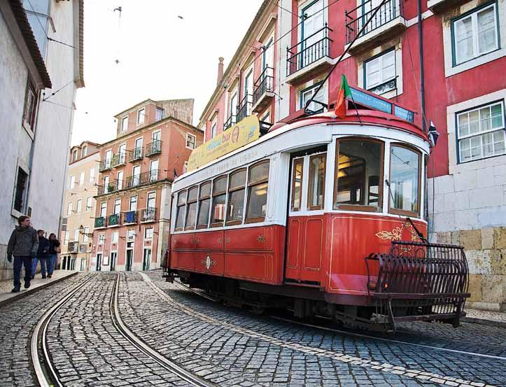
of the city’s original communities as well as its ancient Moorish, Roman and Visigoth history. The district is also home to three historical landmarks – Lisbon’s cathedral (The Se), Igreja de Santa Engracia and most prominently, the 6th century Castelo de São Jorge, a thickly-walled fortress with panoramic views, that stakes its claim high above the city. Whilst the adjacent establishments are somewhat preoccupied with satisfying the tourist appetite for trinkets and collectables, it’s worth visiting Feira da Ladra, an openair, bi-weekly flea market on Campo de Santa Clara. Alfalma is also known for its tascas, intimate cafes, which offer traditional fare like bacalhau (grilled cod), seafood rice and bottles of vinho verde (Portuguese green wine). Locals recommend A Baiuca, a tiny, authentic, family-run restaurant, well known for its live performances of Fado, melancholic journeys into the Portuguese soul. Alfalma has also seen some significantly modern development, particularly the waterfront near Santa Apolónia Station. In addition to a range of design stores and restaurants, the area is becoming increasingly well known for its nightlife. Even actor John Malkovich is in on the action, as co-owner of Lux, one of Lisbon’s hippest and coolest locations, where things only get going well after midnight.
Stay: Palacio Belmonte ( palaciobelmonte.com)
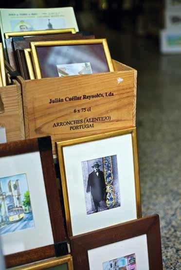
4 . reportage # 183

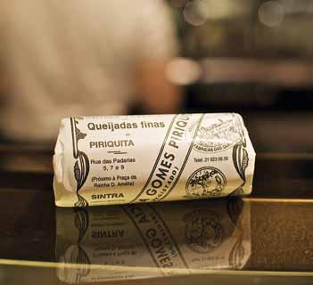
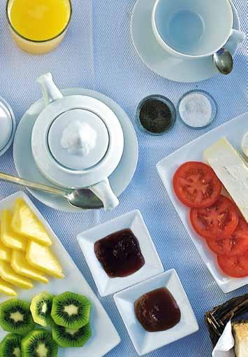
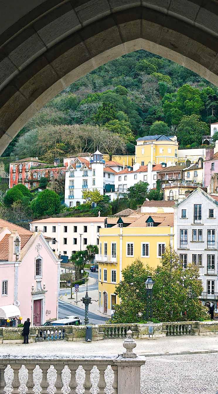
issue #19 habitusliving.com clO ckwisE frOm lEft | A Vignette of sintRA's mAin histoRiC CentRe fRom the steP s of the nAtionAl PAl ACe; A tRAdemARk quiJAdA At CAfe A PiRiquitA in sintRA the foReCouRt of A BRAsileiRA CAfe. the stAtue is of feRnAndo PessoA A PoRtuguese P oet who wAs one of the CAfe's most fAmous PAtRons; B Re AkfAst At PAl ACio Belmonte, An histoRiC B outique hotel in AlfAlmA O pp O sitE lEft | ele VAdo R de sAntA JustA in BAix A lis B on's n eo- g othi C AnsweR to the eiffel toweR (it wA s designed By R Aoul de m esnieR du PonsARd who wAs An APPRenti Ce to g ustAVe eiffel). O pp O sitE right | tRAditionAl soAP s At A VidA Po RtugeusA in ChiAdo.
BAIXA
Dilapidated and monumental, Baixa is a neighbourhood of contrasts, yet one of Lisbon’s most striking. Whilst the Art Deco shopfronts, elaborate pastelarias and street traders bring a special charm to the area, the neighbourhood is defined by its many neo-Classical buildings (including those in dire need of restoration) and two grand urban gestures – Praça do Comércio, a public square and Arco da Rua Augusta, a triumphal arch which frames the main shopping thoroughfare. Baixa is also the new home of MUDE, Lisbon’s design and fashion museum, a tribute to global design greats and a representation of the city’s emerging creative scene. The museum’s intentionally raw shell forms a backdrop to a permanent collection of design objects, haute couture and temporary exhibits. Before leaving, stop at Lisbon’s oldest confectionary, Confeitaria Nacional, for speciality pastries.
CHIADO
Chiado, a touch westwards, is a refined, boutique-rich area which centres around shopping thoroughfare Rue Garrett, Armazens
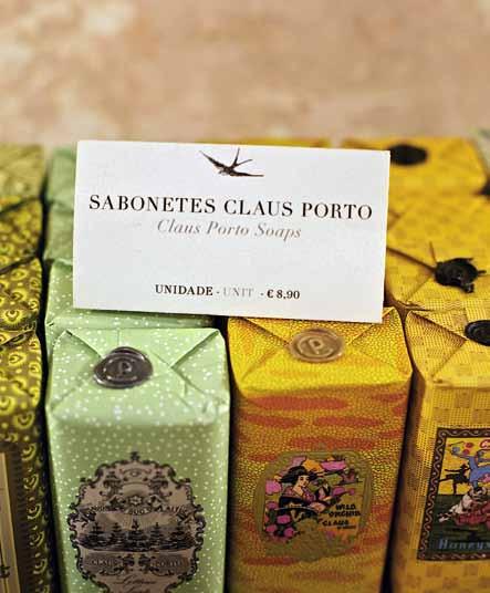
Do Chiado mall and cafe A Brasileiro, the historical stamping ground of Lisbon intellectuals. The area has risen from the
ashes so to speak, after a fire destroyed many of its buildings in the late eighties. The transformation is remarkable and it has become a popular social and shopping hub. Retail highlights include gourmet food products and vintage-style wares at Casa Pereira and A Vida Portugeusa and the buttersoft leather gloves from custom glove-makers Luvaria Ulisses. But the area’s crowning glory is the historic Elevador de Santa Justa which offers 360 degree views. Foodies shouldn’t look past Cantinho de Avillez, celebrated chef José de Avillez’s contemporary bistro.
Stay: Hotel do Chiado (hoteldochiado.com)
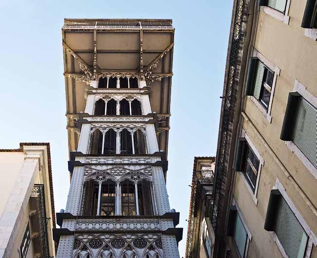
BAIRRO ALTO
Continuing westwards, you’ll find yourself perfectly placed to explore the 16th Century working class, bohemian neighbourhood of Bairro Alto. The area is known for its intimate, graffitied – and often inconveniently camouflaged – bars and Fado houses. Primarily a night-time haunt, one gets the distinct feeling that the area is evolving, the smattering of avant garde boutiques and art galleries a sign of things to come. As expected, food options abound, the most notable of which are the tavern Antigo 1 de Maio, 100 Maneiras and Flores at the Bairro Alto Hotel. Savour an
4 . reportage # 185
after-dinner cocktail at the hotel’s rooftop bar and then hit A Tasca do Chico, A Capela or Xarafix after dark, to listen to some of the city’s best local musicians. Alternatively, head to Cais do Sodré, historically the “other side of the tracks” and more recently the product of a radical makeover. Its music venues, clubs and restaurants are said to rival Bairro Alto.
Stay: Bairro Alto Hotel (bairroaltohotel.com)
PARque DAS NAçõe S
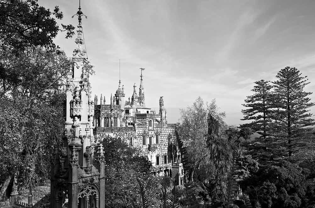
When Lisbon hosted Expo ’98, it embarked on a complete re-development of the northeastern portion of the city, collaborating with some of the world’s most innovative architects and urban planners. As a result, the area boasts some of the boldest architecture and urban planning in Lisbon. It is easily reached by metro, which conveniently stops at the striking Santiago Calatrava-designed Oriente Station. Area highlights include a state-of-theart Oceanarium, water gardens, a riverfront marina, the International Fair Complex, a viewing tower and a cable car which provides an elevated perspective of the site. Design-lovers will spend most of their time inspecting Alvaro Siza’s architectural masterpiece, the Pavilion of Portugal, a true feat of engineering.
BeL éM
A mere thirty minutes from the inner city, Belém is a powerful, visual display of Portugal’s power and wealth during the Age of Discovery. It was from here that many of the world’s greatest sea-faring adventurers, including Bartolomeu Dias, Ferdinand Magellan and Vasco Da Gama, set sail. While the Maritime Museum provides a rich insight into this period, the area is more famously known for Jerónimos Monastery. A UNESCO World Heritage Site, and architectural jewel in the crown, the monastery was built to commemorate da Gama’s epic journey. Additional treasures include the Coach Museum, Belém Tower and Berardo Collection Museum. A fitting way to end your visit is to indulge in Pastéis de Belém, the Holy Grail of Portuguese desserts, at the Azulejos-tiled Antiga Confeitaria de Belém. On your return, visit LX Factory, a designer’s hub set within a disused factory in Alcântara. Although a business address for creatives, it also includes Ler Devagar Bookshop, the MAG Kiosk and a number of cafes. Further on, you’ll find the Santos Design, Lisbon’s design school and a design store precinct.
issue #19 habitusliving.com
ABOVE | the PAl ACe At q uintA dA RegAleiRA estAte in sintRA the ARChiteCtuRe RefleCts A hyBRid of RomAn, RenAissAnCe, mAnueline And g othiC styles. O pp O sitE ABOVE | the Red doo R le Ading to the fRont Cou RtyARd of PAl ACio Belmonte, B uilt Along o RiginAl RomAn And m oo Rish fo Rtifi CAtions thAt su RRound CAstelo de são Jo Rge. O pp O sitE BElOw | A Vignette of the JeRonimos m onAsteRy in Belém.
DAY TRIP – sI n TRA
Lord Byron couldn’t have summed it up better when he said Sintra is a “glorious Eden”. A UNESCO World Heritage Site and lush hilly village, dotted with fairytale palaces, majestic vistas, private mansions and quality museums, it is a mere 45-minute train journey from Lisbon.

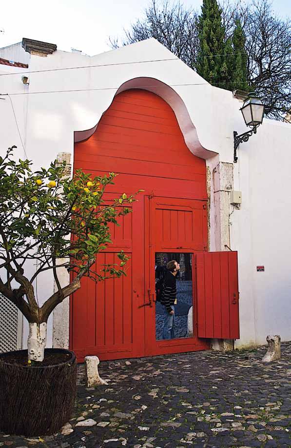
Do:
Palácio Nacional de Sintra
Palácio da Pena
Quinta da Regaleira
Moor’s Castle
eat:
Traditional delicacies Queijadas de Sintra and Travesseiros at Casa Piriquita
Modern fusion fare at GSpot Gastronomia
stay:
Palácio de Seteais
Lawrence’s Hotel
4 . reportage # 187
Q&A WITH A LOCAL
Jose Avillez is a Portuguese Michelin-starred chef, who has trained and worked with the likes of culinary greats Ferran Adrià and Alain Ducasse. His two restaurants in Lisbon, Cantinho De Avillez and Belcanto, are amongst the most popular in the city.
My favourite traditional dish . . .
Bacalhau à Brás (a traditional dish of salted cod, onions, fried potatoes and scrambled eggs).
t he best place for a lazy brunch . . .
Quinoa in Chiado or Boulangerie by Stef in Baixa.
your favourite market? Mercado da Ribeira.
Best budget buy . . .
Ventresca tuna and Portuguese sardines in olive oil and smoked mackerel fillets at Conserveira de Lisboa.
lisbon’s best kept secret . . .

Manteigaria Silva, a store that takes you back in time and sells all sorts of tasty Portuguese products. Terrace and bar, Clube Ferroviário which has wonderful river views.
avoid . . .
Fado clubs and restaurants fronted by waiters asking you to come in.
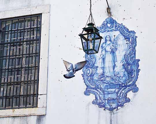
Don’t leave lisbon without . . .
Relaxing at a Lisbon terrace café and enjoying the panoramic views. Don’t miss Belvedere of San Pedro de Alcantara.
a ny other tips?
Cervejaria Ramiro for a taste of the best fish and seafood. For Fado, Clube de Fado.
I love lisbon because. . .
We have beauty, history, culture, wonderful views, nice people, good weather, fantastic food and a magical light and atmosphere.
habitusliving.com/issue19/lisbon
issue #19 habitusliving.com ABOVE
| one of lisB on's histoRiC tRAms. BElOw | A tyPiCAl AzuleJ os (tRAditionAl, PAinted PoRtuguese tile) nARRAtiVe.
Silestone expands its universe of colours
Silestone, the world leader in quartz surfaces, has introduced two new colours to its Nebula Series – Vortium and Dinux.
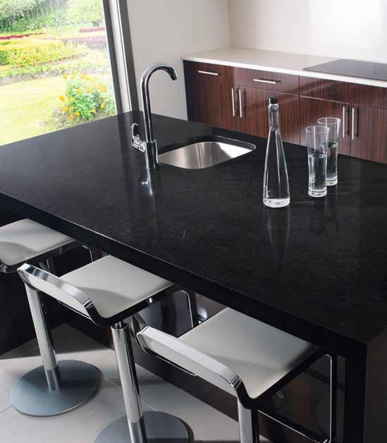
These innovative additions are inspired by the hues of space and give architects, designers and homeowners even more choice in colour, depth and pattern for kitchen and bath surfaces.
The Nebula range offers a fresh, organic look to any kitchen or bathroom, where the deep, astral colours evoke celestial phenomena.
Vortium’s light cream with dark veins and semitransparent flecks provides a perfect balance between texture and restraint, ideal for classically appointed spaces rich in light and warm decoration.
Darker, bolder Dinux references the majesty of a night sky populated by infinite stars and galaxies. Sleekly elegant, it pairs beautifully with minimal, modern aesthetics.
The Nebula Series uses innovative technology to offer these striking combinations that feature strong colours and express the inherent beauty of natural stone, while also providing the exclusive benefits of Silestone natural quartz. Like all Silestone surfaces, Vortium and Dinux have extraordinary physical-mechanical characteristics, including resistance to impacts and scratching as well as a unique bacteriostatic property that improves the surface’s hygiene.
With captivating beauty, deep base colours and mesmerising patterns, Silestone’s Nebula range is ideal for decorating any kitchen or bathroom, where the sky is no longer the limit.
Woven Image | 1800 888 650 | wovenimage.com
above | VORTIUM FROM SIleSTOne’ S ne W neb Ula SeRIeS e XUDeS a ClaSSIC CHaRM. below | CO nTeMPOR aRY an D ReSO nanT: DI n UX FROM S IleSTO ne’S n eb U la S eRIeS
(02) 8707 2500 | www.silestone.com/oceania habitus promotion › silestone #190 issue #19 habitusliving.com
Silestone
by TeNeues 224pp softcover US$12.95 teneues.com
Published by Braun, distributed in Australia by Thames & Hudson 272pp hardcover AUD$90 braun-publishing.com

Published by Beta-Plus, distributed in Australia by Peribo
232pp AUD$79.99 betaplus.be
Beyond bathroom
It's the most important room in the home, nicky lobo says, although it's often overlooked. With a close look at the idea, along with an analysis of three recently published books, you may be convinced.
# 191 4 . reportage text nicky lobo | photography emma warfield
bATHRoo M DES i G n Nicholas Uphaus Published
bATH & SPA Chris van Uffelen
THE 100 b EST bATHRoo MS
Photography by Jo Pauwels
More than in any other room in the house, surfaces are important in the bathroom. And they are there for a good reason; hard surfaces in the bathroom minimise the potential of bacteria breeding.
But underneath these hard surfaces is a plethora of cultural and historical significance. The bathroom is more than just a utilitarian space – it contains the lofty possibilities of our development, in a physical, emotional and social sense.
In our time, the technology of the bathroom has leapt ahead. Where ceramic tiles have been the traditional solution to the bacteria challenge, they now offer increased protection, actively rejecting germs. At a recent forum on bathroom design I attended, the next evolution of products was discussed: surfaces that sense the temperature and adjust accordingly, toilets that analyse urine and determine deficiencies or sickness, and surfaces that self-clean and self-repair. It sounds futuristic, but the technology is being developed now – and will have a huge impact on the way we live, perhaps even on how long we live.
From the physiological perspective, the senses are an important factor in bathroom design. It is the last room in the home that is
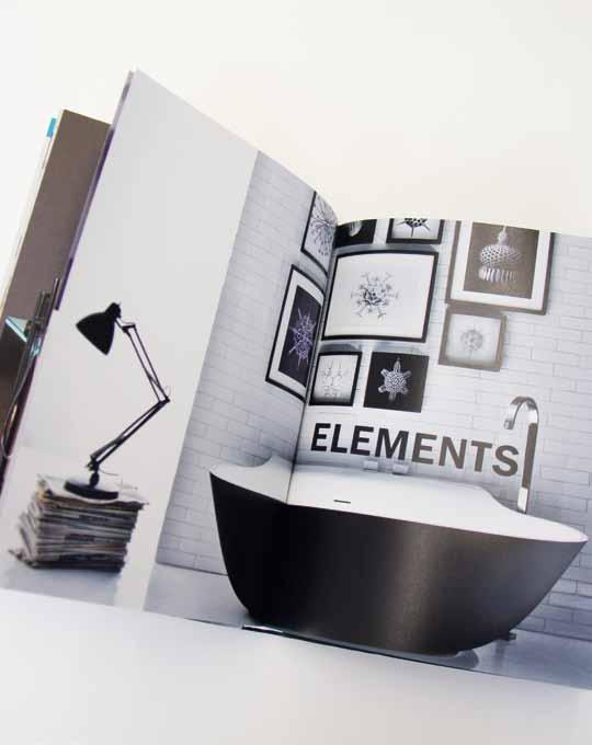
completely hard – which also means cold and loud. Heated elements address the temperature issue, while soft flushes address the noise issue. However, there is still a lot more to be done, especially in terms of noise reduction strategies with the increase in high-density living.
Beyond the physical, the bathroom is now being seen as crucial to our mental and emotional well-being. “If I want to be alone, some place I can write, I can read, I can pray, I can cry, I can do whatever I want – I go to the bathroom,” says multi-award-winning singer and songwriter, Alicia Keys. This is something we can all relate to. Whether at home, work, or in public spaces, the bathroom offers momentary refuge in times of emergency.
The bathroom is the last oasis of calm – the only room where you can truly switch off and unplug (for now). It is the ultimate space for relaxation and revival – even more so than the bedroom, with its inherent link to water and bathing. Matt Riley, director of Tonic Architecture in Queensland explains that increasingly he is being asked to “use many techniques to make the act of bathing an event or a method of escape.”
One thing is for certain – bathing has been embraced by many cultures, who understand not just the hygienic, but also the psychological
issue #19 habitusliving.com
DYNAMIC SPACE
DYNAMIC SPACE, ideas from Blum for practical kitchens, will change the way you move around your kitchen well into the future. DYNAMIC SPACE is the clever way to make the most of your space, improve access to your kitchen items and enhance ergonomics.
Experience the value of DYNAMIC SPACE in your kitchen design by making an appointment with a Blum showroom consultant on 1800 179 186. www.blum.com

and emotional benefits. The Greeks integrated bathing into their gymnasia. The ancient Romans took part in social and bathing rituals at their public baths, where they also conducted business. In ancient Turkish and Japanese cultures, the act of bathing had religious purposes – even now it retains powerful cultural social significance.
Today, the baton has been handed to South-East Asia where the tropical climate encourages opening the bathroom up to the elements. In these moist environments, fresh air is important in minimising mould, resulting in bathrooms that are either partially or not at all enclosed.
Outdoor bathing, or bringing the outdoors into the bathroom, “is a way of creating drama and enhancing the escapism” of bathing, says Riley. Extensive use of glass and the viewframing technique seen in the Astrid Hill project by K2LD (Habitus #1) exemplifies what can result with a considered approach to bathroom design. The range, economy and ready supply of stone and tile finishes also plays a part in the dominance of South-East Asia in this area.
The social impact of bathroom design is considerable. For one thing, the residential bathroom, especially in Australia, is becoming a living space. Mika Nishimura’s home in this issue (p.54) is one example where the
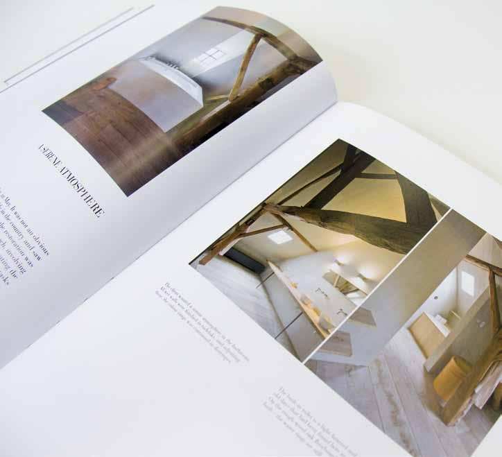

Japanese-style bath is used as a family space. In complete contrast to the idea of the bathroom as the ultimate private oasis, this direction of design sees the bathroom as a communal space between partners, or even families. Furthermore, as an environment where grooming takes place, it helps us prepare for our daily social interactions.
In an economic sense, customisation, flexibility and mobility are key concerns. People strive to give every room in their home personality – especially in apartments. The issue of customisation is already being addressed, with bathroom furniture that has multiple colour options (perfect for multiresidential situations), and will only increase in variety in the future.
The ability to retro-fit and re-configure leads to the idea of the ‘floating bathroom’ – one where all elements can be moved according to need or taste. Traditional fixed plumbing is the one thing in the way, but economic benefits will no doubt prompt innovative solutions even to this challenge.
As well as money, another key element is to save energy – particularly water in droughtaffected Australia. As such, we are leading the way in designing and providing access to fittings that provide economic flow rates, while still feeling generous in pressure. The key to all of these environmental or sustainable products is
communication. For the benefits to be realised, they need to be easy to use and understand, with clear labelling and categorisation. Electronic integration, such as digital thermostats and timers, also assist in the minimising of energy.
Given the huge shift in bathroom design, it is surprising that the available literature does not reflect its complexity. Recent titles on bathroom design still focus on what they look like, rather what they do or signify.
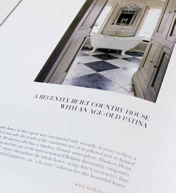
Bathroom Design published by teNeues is seemingly configured in a logical way, the contents dividing the book into sections called Style, Brands, Materials, Elements and Custom. However, the introduction to each hints at evolution with no real detail and the images are not captioned – making it more of an inspiration book rather than a usable resource. Confusingly, there is a listing of architecture and design companies at the end – but no way to tell which project belonged to which. The interesting thing about this title is that all the contained text is published in five languages – English, German, French, Spanish and Italian – but the reason for doing so is unclear.
The 100 Best Bathrooms has no introduction or foreword, jumping straight into the contents, which is actually just a listing of project names with no sign as to a logical progression. Whether the projects are arranged by country, style or in some other fashion is difficult to say.
issue #19 habitusliving.com













The production values of this title are high, with good quality stock and a jacket cover, however the design lets it down. There are three or four basic templates that are used for each ‘story’ or project – which is quite limiting in expressing the photography and the unique elements of each. Where this title does stack up is in its extended captions for each project, describing some of the details and referencing some of the products – making it a slightly more functional book if you are actually designing a bathroom.
Bath and Spa has a somewhat more thorough approach. A preface by architect Sibylle Kramer alludes to new directions in water related design and the bathroom as living space idea. And it does provide some specific trend forecasts – the “combination of traditional and new materials” “move away from straight edges” and “increase in bathroom furniture”.
The content is of a high standard, sourcing projects from Europe, the US, Asia and South America and studios include Jean Nouvel, Karim Rashid and Singapore’s Ong & Ong (see Habitus #8). Most are built projects, with at least one example of a temporary bathroom (Yucca Crater in California p.78) and one concept (Floating Gardens by Studio Annee Holtrop with Patrick Blanc due for completion in 2015 p.39). The project descriptions are
thoughtfully written, referring to the concept and particular design elements.
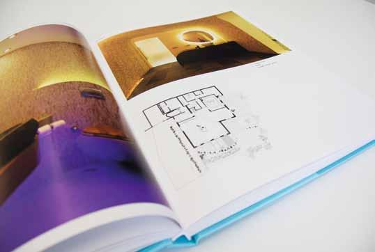

One thing to note is that the content includes, as indicated in the title, both bathrooms (residential, hospitality, public) and spas – which is where a lot of the Asian content comes into play. Plans and elevations are included, as well as sketches where appropriate – always a nice touch. And photography includes other areas of the project, which helps the reader get an understanding of the bathroom’s context.
The design approach of this book seems to be aimed at showcasing the content and not confining it to an arbitrary, pre-determined layout – revolutionary! The chapters are poetically titled 0, 4, 37 and 100 degrees –the temperatures that relate consecutively to freezing, chilling, the human body and boiling. But, beyond the charm of the strategy, it is unclear as to how the projects are divided.
The majority of the available books reflect a trend which focuses on fashion, how things look and what’s on the surface. Maybe for some, this is enough. But I want to get right inside and know what all the pictures mean. I want to get beneath the surface, understand the history, explore the cultural context and consider the wider implications of each thing I do – even if it is just going to the bathroom. Is that too much to ask?
issue #19 habitusliving.com
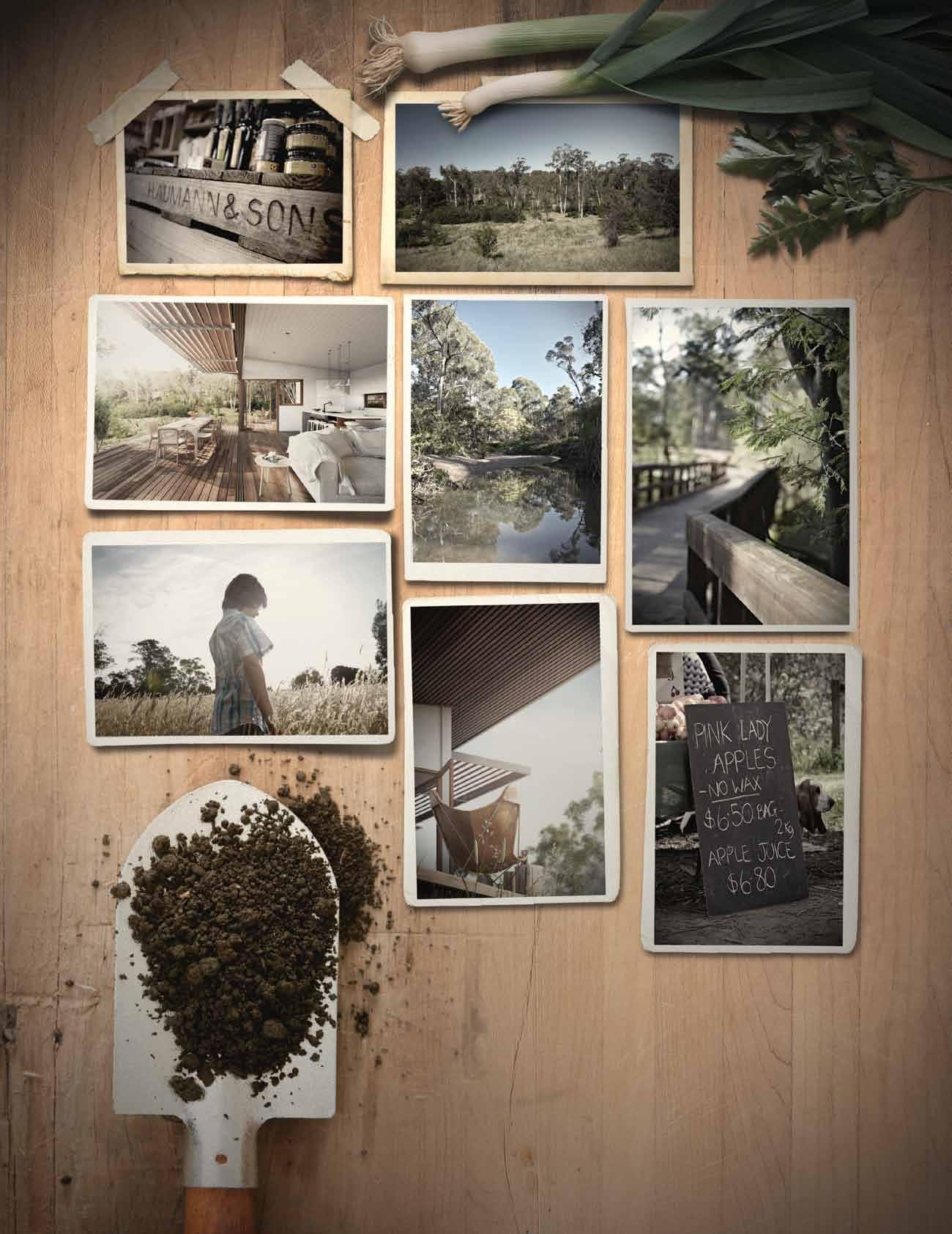


There are places you remember. Coming soon – Mullum Creek. A new, inspiring environmentally sustainable lifestyle, design aesthetic and community. Located only 20km from the city of Melbourne, in the heart of Donvale. Lots from 1000m2 – 3500m2 Register your interest now. www.mullumcreek.com.au
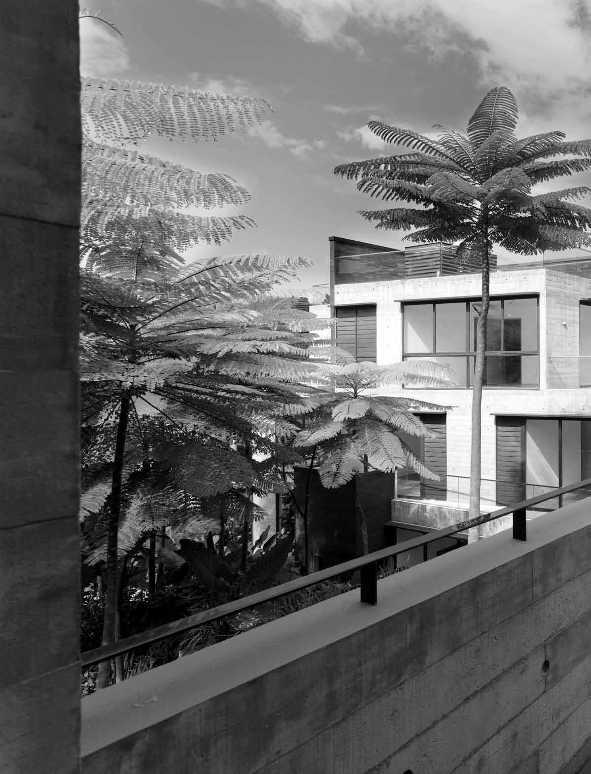
issue #19 habitusliving.com
Clustered concept
Multi-residential design is too often about winners and losers. But Sonny Chan ’s firm CSya shows how to achieve equity and amenity with this development in Singapore.
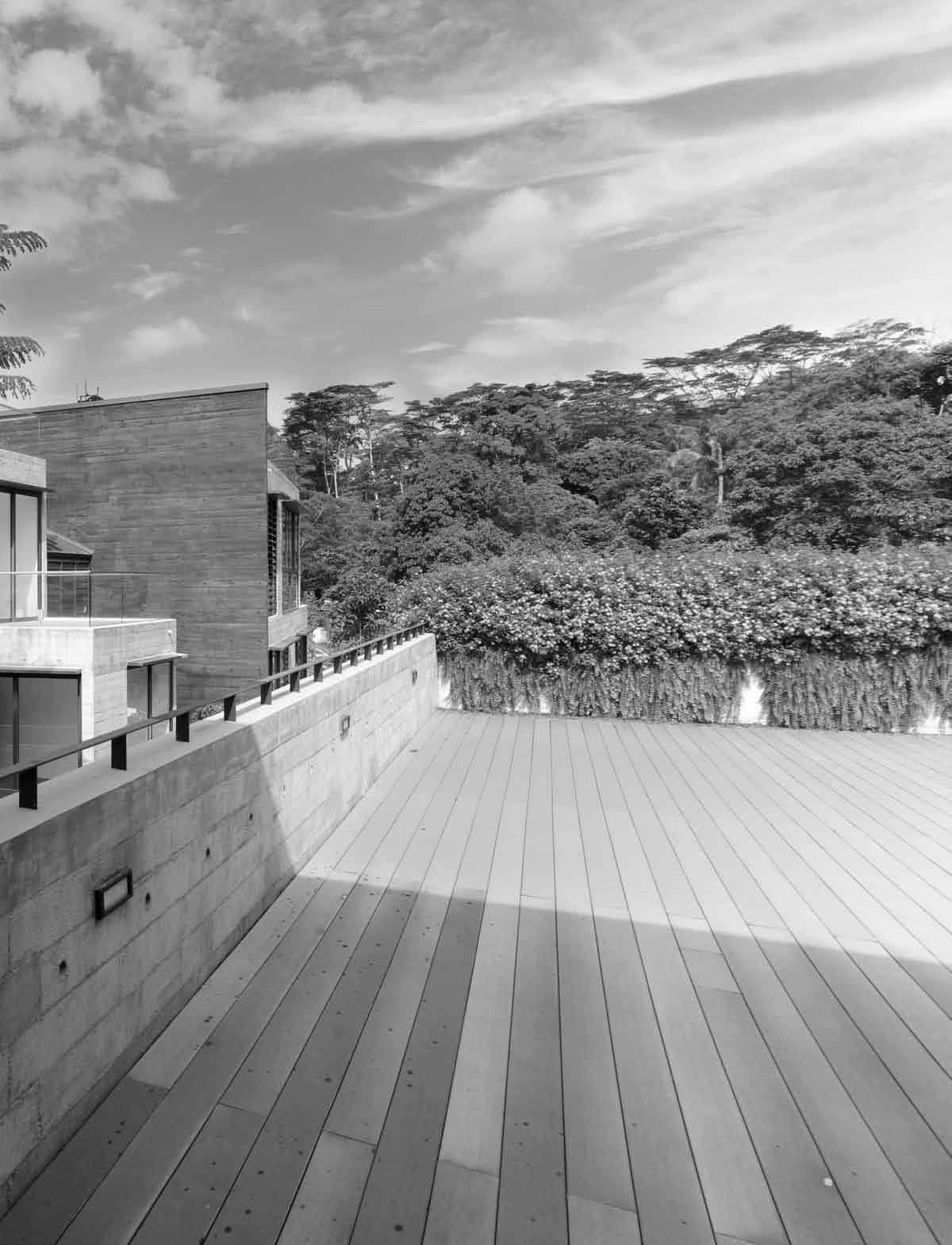
text Nicky Lobo | photography a aroN p ocock
4 . reportage # 199
Multi-residential developments are already a dominant feature of the Region’s urban landscape – particularly in populous South-East Asian cities such as Singapore. And it’s here that some of the best models are being designed and built.
Mont Timah is a case in point. There are a number of factors in its success. Firstly, a new multi-residential housing typology introduced by the Urban Redevelopment Authority in 1993 “provided a platform to experiment with residential morphology,” says Project Architect, Sonny Chan of CSYA. Secondly, the strata title arrangement allowed for relaxed setbacks, a quite different approach to traditional residential developments. Instead of being simply a money-making exercise, Mont Timah is designed for the benefit of the future residents – in both an individual and community sense.
The vision was to “create an alternative typology in landed housing which distinguishes from the traditional bungalow, semidetached developments – a first of its kind in Singapore,” as Chan describes. Mont Timah

explores a ‘cluster’ formation: four identical units arranged in a pinwheel fashion around a structural lift core and central circulation zone. The pinwheel allows the periphery to be maximised and enjoyed by all, while the fanned arrangement of the units allows varied vantage points between blocks and throughout the site.
For the residents, the pinwheel means that the amenities – views, light and floor space – are shared out equally. And, rather than homogeneous, stacked boxes, these interlocking forms provide spatial variety and visual interest, appealing not just to residents, but also the neighbouring community.
This new cluster typology gives the units all the benefits of a ‘landed’ house – a private enclosed ground floor space with water feature, lawn and timber deck, and direct access to landscaped areas and circulation zones. Open corners and the resulting generous penetration of light are further benefits, contrasting with the traditional terrace/shophouse model –linear in arrangement with long, narrow forms and little natural light.
Besides the pinwheel arrangement, the other unique element of Mont Timah is the
issue #19 habitusliving.com

master plan
4 . reportage # 201 opening
The pinwheel allows the periphery to be maximised and enjoyed by all.
page | Mont tiMah's expansive roof deck encourages connection with the landscape and adjacent reserve. above | the cluster typology, the first of its kind in singapore, shares out the a M enities equally. below | site plan.
second floor
third floor
basement
issue #19 habitusliving.com above | floor plans. opposite | one of the strategies in this developMent was generous fenestrations to MaxiMise views.
first
floor
emphasis on living within nature. Inspired by its proximity to Bukit Timah nature reserve, one of the first forest reserves established in Singapore, the sustainable focus is realised in a number of ways. The landscape concept – luscious, abundant foliage – merges with the dense, undisturbed vegetation of reserve. Articulated forms and generous fenestrations maximise the view of adjacent forests, with a rooftop platform providing the ultimate lookout. And potentially harsh off-form concrete is softened by the organic imprint of Pine formwork.
Security and privacy of the development is addressed by its positioning on the site, which cascades from the main road to a natural drop along the south/east sides, elevating the development above the forested area. The only seeming disadvantage is to do with climatic orientation; the multi-direction of the quad cluster exposes some west-facing units to the afternoon sun, but even this has been minimised by a tight arrangement.
Mont Timah has received international acclaim, not surprising given its unique approach, benefits to the inhabitants and
 roof
roof
4 . reportage # 203

issue #19 habitusliving.com above | the coMMunal spaces provide access to landscaped areas and views. opposite | the Mont tiMah developMent is designed for the B enefit of the individual residents as well as the coMMunity as a whole
...the interlocking forms provide spatial variety and visual interest, appealing not just to residents, but also the neighbouring community.
drop box
architect Chan Sau Yan Associates
project teaM Robert M Costello, Juliana Teo, Baet Yeok Hoon, Pang Hui Chin, Law Li Peng, Kimberly Toh, Ng Shu Fen, Ewan Wong, Jonathan Poh, Hashia Hashim and Chan Sau Yan Sonny
civil and structural engineer Web Structures
Mechanical and electrical engineer
Bescon Consulting Engineers
quantity surveyor WT Partnership
green Market consultant G-Energy Global
B uilder GTMS Construction
CHAN SAU YAN ASSOCIATES (65) 6324 3128
csya.com
finishes
In Living, Dining and all Bedrooms, flooring is Brazilian Teak. In Master Bathroom, Bath 2 & 3 & Powder Room, walls are finished in silver travertine marble, plaster and paint.
Floors are silver travertine marble. Vanity counter is solid surface top with mirror
and vanity cabinet. In Dry & Wet Kitchen and Yard, walls are finished in plaster and paint with black granite splashback. Flooring is finished in a grey homogenous tile. Bath
1 walls are white porcelain mosaic tiles. Balconies, Basement Terrace & Roof Terrace finished with grey
homogenous tiles and composite timber and landscaping.

fixed and fitted
In Dry Kitchen, 4-zone electric glass ceramic hob, super slimline hood, built-in oven, side-by-side fridgefreezer all from Bosch, and Franke jumbo sink. In Wet Kitchen, double gas hob and super slimline hood both from Bosch and square sink from Franke. Stel sink mixers from Bandini. Kitchen cabinet doors finished in Oak laminate with black granite top. In Master Bathroom, Glass Pop tub. Stel wall mount bath/shower mixer, handshower hose and holder and Giob shower mixer, shower elbow, hose, handshower, holder, Round overhead rain shower with ceiling arm and all bathroom accessories from Bandini, toilet from Kohler, Corian double basin with integrated shelf. Airconditioning is ducted from Mitsubishi. Solar heating system from Beasley and audio video intercom system is from Aiphone.
sustainable features. It is sustainable not just in its connection to nature, but also as a living environment that has the ability to retain its quality over a long period of time.
CSYA’s response to the Mont Timah brief is highly considered, their impressive residential development portfolio providing just the right experience. But this project took its share of patience and collaboration – both of which they see as positive. A 16-year-long gestation period due to economic turbulence “gave us the opportunity to alter, hone and work at this singular design idea that remained largely true to the initial concept, even as design team members came and went,” says Chan. “It was unfortunate at that instant, but in hindsight, it gave us more time”. In addition, he says the building team was an important part of the process, “challenging the norm and constantly pushing for innovative ways to achieve our design intent”. Like so many successful projects, the construction process was collaborative rather than prescriptive.
The ideal result is that Mont Timah will influence other housing projects in Asia and elsewhere, projects where “developers give equal opportunities to the local architecture fraternity to bring about innovation and good design,” hopes Chan. But for all the critical acclaim, the ultimate test lies with the future inhabitants, and their experience of living in Mont Timah and within its lush surrounds day by day.
The Mont Timah project won the Gold Award for Overseas category at the PAM Awards 2012, the Design Award at 12th SIA Architectural Design Award 2012 and was shortlisted for the World Architectural Festival 2011 award, Housing Category.
habitusliving.com/issue19/monttimah
4 . reportage # 205


issue #19 habitusliving.com Halliday & Baillie 37, 123 hallidaybaillie.com Harvey Norman Commercial 109 harveynormancommercial.com.au Hostile Bacon 39 hostilebacon.com.au HPM Le Grand 39 hpmlegrand.com.au Hub 44–45 hubfurniture.com.au Hunter Furniture 123 furniture.co.nz Hunter Boots 50 hunter-boot.com Ikea 161 ikea.com Instyle 109 instyle.com.au Interia 37 interia.com.au ISM Objects 109–110 ismobjects.com.au Janis Rauza 44–45 scandinaviandesign.com Jardan 109 jardan.com.au Kartell 48–49 kartell.it Katalog 124 katalog.co.nz KE-ZU 48–49 kezu.com.au Khind Systems 161 khind-systems.com Koskela 35 koskela.com.au Laminex 109 laminex.com.au Light Plan Design + Supply 123 lightplan.co.nz Light Project 109 lightproject.com.au Living Edge 44–45, 46–47, 50 livingedge.com.au Macrocarpa Weatherboards 123 nzwood.co.nz Marblo 109 marblo.com.au Marcel Wanders 44–45 marcelwanders.com Marimekko 50 marimekko.com Meteor 161–162 meteorshades.com dedece 46–47, 50 dedece.com Derlot 50 derlot.com Design Composite 109 design-composite.com DesignByThem 44–45, 46–47 designbythem.com Dornbracht 139 dornbracht.com Dryden’s Wood Oil 123 woodoil.co.nz Duravit 139 duravit.com.au Eastern Weft 46–47 easternweft.com ECC Lighting + Furniture 43 ecc.com.au Eco-Core 109 ecocore.com.au Elevate Design 37 elevateinteriors.com Emily Ziz Style Studio 44–45 emilyziz.com Euroluce 48–49 euroluce.com.au Fanuli Furniture 46–47 fanuli.com.au Flos 48–49 flos.com Fortuny 152 fortunyshop.com Foscarini 48–49 foscarini.com Fullspot 50 fullspot.com.au FY2K 48–49 fy2k.com.au Gessi 35 gessi.it Giorgetti 46–47 giorgetti-spa.it Global Ventures Australia 109 ecocore.com.au Great Dane 44–45, 48–49 greatdanefurniture.com Grohe 123 grohe.com Habitat UK 161–162 habitat.co.uk Häfele 37 hafele.com.au Haiku Fans 161 haikufan.com Abey 35 abey.com.au Adam Goodrum 44–45 adamgoodrum.com All Plastics 109 allplastics.com.au All Table Sports 110 alltablesports.com.au Ampelite 109 ampelite.com.au Aquasol 123 aquasol.com.au Artemide 48–49, 177–178 artemide.com.au Arthur G 44–45 arthurg.com.au BassamFellows 44–45 bassamfellows.com Big Ass Fans 162 bigassfans.com Blu Dot 161–162 bludot.com Bo Concepts 46–47, 50 boconcept.com.au Bolon 109–110 bolon.com.au Breezway Altair 123 breezway.com.au Bunnings 39 bunnings.com.au Caesarstone 123–124 caesarstone.com.au Café Culture 46–47 cafeculture.com.au Caroma 123 caroma.com.au CDK Stone 178 cdkstone.com.au Charles Sandford Cabinetmaker 152 charlessandford.com.au Clipsal 39 clipsal.com.au Cole & Son 161 cole-and-son.com Corporate Culture 48–49 corporateculture.com.au Craftsmen Design and Construction LLP 161 craftsmanhomes.com.au Dado Australia 109 dadoaustralia.com.au Danias Timber 35 (61 2) 9564 1378 DecoGlaze 109 decoglaze.com.au directory
The T eam aT Habitus magazine T hank our adverT isers for T heir supporT use T he direcTory To see whaT page a specific adverT isemen T is on, and visiT T heir websiT e To learn abou T The producTs and services They provide.
Habitus magazine is available at newsagents and bookstores across Australasia, South-East Asia, the USA, Canada, Europe, South America and the Middle East. Habitus is published quarterly in March, June, September and December. To subscribe securely online visit habitusliving.com/magazine or email subscriptions@indesign.com.au to subscribe or request a full list of locations where Habitus magazine is available.
SJ Crosbie Stainless Steel 123 crosbiestainless.co.nz Southern Cross Ceramics 123–124 southerncrossceramics.com Space Furniture 44–45, 48–49, 50 spacefurniture.com.au Spence & Lyda 44–45 spenceandlyda.com.au Strand Hatters 50 strandhatters.com.au Stylecraft 44–45, 50 stylecraft.com.au Sub-Zero Fridges 109 subzero-wolf.com Terrace Outdoor Living 46-47 terraceoutdoorliving.com.au The AGA Shop Australia 124 agashopaustralia.com The Andrews Group 109, 110 theandrewsgroup.com.au The English Tapware Company 35 englishtapware.com.au The Iconic 50 theiconic.com.au Tokyo Bike 161–162 tokyobike.com.au Tom Dixon 46–47, 50 tomdixon.net Turbo Italia 161 turbo-italia.com Vampt Vintage Design 48–49 vamptvintagedesign.com Vanessa Lucas 46–47 vanessalucas.com Villeroy & Boch 177 villeroy-boch.com Vintec 109–110 vintec.com.au Vitra 44–45 vitra.com Warmington Nouveau 123 warmington.co.nz Wasser Bath 161 wasserbath.com Weberit 35 weberit.de Wood Solutions Design and Build 140 woodsolutions.com.au Workshopped 48–49 workshopped.com.au Zeyco 178–177 zeyco.com.my Methven 109 methven.com Metro Fires 124 metrofires.co.nz Milano Furniture 46–47 milanofurniture.com.au Mico Design 109 mico.com.au Mother of Pearl and Sons Trading 37 motherofpearl.com Motto 161 motto.com.sg Muji 161–162 muji.com Multyflex 109 multyflex.com.au Olex Nexans Company 39 olex.com.au Own World 44–45 ownworld.com.au Parklane Kitchens & Interiors Ltd 124 parklaneinteriors.co.nz Parisi 35, 37 parisi.com.au PC Henderson 123 pchenderson.com.au Pepo Botanic Design 140 pepo.com.au Philips 39 philips.com.au Phoenix Tapware 109 phoenixtapware.com.au Planet Furniture 46–47, 109 planetfurniture.com.au Plytech 123 plytech.co.nz Pomelo 161 pomelo.com.sg Porter’s Paints 35, 43 porterspaints.com.au Redelman Fabric 151, 152 redelman.com Refin Avantgarde Ceramic Tiles 123 refin-ceramic-tiles.com Regupol 109 regupol.com.au Resene 123, 124 resene.com.au Robert Allen Design USA 152 robertallendesign.com Ronan and Erwan Bouroullec 46–47 bouroullec.com
a bey 51 abey.com.au a lloy Tiles 76 alloydesign.com.au a ngelucci 20 angelucci.net.au a nibou 10–11 anibou.com.au a rthur g f urniture 88 arthurg.com.au a xolotl 52 axolotl.com.au billi 125 billi.com.au blum 193 blum.com.au b o c oncept 75 boconcept.com.au b olon 154 bolon.com.au caesarstone 9 caesarstone.com.au clipsal 83 clipsal.com d omayne 04-05 domayne.com.au earp 163, 166 earp.com.au easy bath 141 easybath.com.au e verstone 42 everstone.com.au fanuli ifc , 67 fanuli.com f isher & paykel 85 fisherpaykel.com.au f loormania 149 floormania.com.au f unkis 19 funkis.com gandia blasco 29 gandiablasco.com herman m iller 16 hermanmiller.com.au h ightide 180 hightide-book.com.au i lve 31 ilve.com.au ke -zu 209 kezu.com.au l avish Tails 189 lavishtails.com.au l iving e dge 6 livingedge.com.au l iving Tiles 33 livingtiles.com.au mother of pearl & s ons 73 motherofpearl.com mullum creek 142–143, 197 mullumcreek.com.au olivari 96 bellevueimports.com.au parisi 21 parisi.com.au pepo 36 pepo.com.au p recision f looring 38 precisionflooring.com.au Qasair 87 qasair.com.au rollingstone l andscapes 179 rollingstonelandscapes.com rosenthal c hina 14–15 rosenthalchina.com.au silestone 02–03, 190 silestone.com space f urniture 22 spacefurniture.com stylecraft obc stylecraft.com.au sub z ero 34 subzerowolf.com.au supa c enta moore park 195 supacentamoorepark.com.au sydney indesign 111 sydneyindesign.com.au Temple & webster 144 templeandwebster.com.au/habitus The english Tapware c ompany 68 englishtapware.com.au z ip i ndustries 12–13, 40–41 zipindustries.com
#77 bangkok
#69 Cebu
#167 Kuala Lumpur
#155 singapore #128 s eminyak
#54 t urramurra
#98 s ydney
#145 Melbourne
#113 Pahi Peninsula
#89 New Zealand
Aldo vAn Eyck
issue #19 habitusliving.com
world
Architecture must facilitate man’s homecoming.
# page number and location of content locations is sold
your map to where the stories in this issue come from – and where is sold


Featured | Team Collection by Lievore Altherr Molina - www.arper.com Australia 1300 303 286 Singapore +65 6511 9328 www.stylecraft.com.au


 Keeping a clean workspace is key to keeping a clear and focused mindset. Made from Oak and Walnut the ERNEST desk by Spanish company Punt is the perfect solution for any small space. The desktop opens to house your tablet, computer and stationery.


 Aged copper, brass & waxed rust finishes Chant New Zealand, Brionne France & Fersa Argentina


 #6 WE BELIEVE IN FUNCTIONALITY


 text Andre A StevenS | photogr A phy Simon devitt


 text + styling Kerstin rose | photography Christian sChaulin


 Clo Ck Wise from top haiku ceiling fan in BA m B oo cA r A mel from B ig A ss fA ns, B igA ssfA ns.com


 EARP BROS The PAR-KER porcelain parquet range has the appearance of natural timber without the environmental implications and ongoing maintenance. Pictured is Montana in Ash, Canada in White Wash, and Oxford in Acero and Castano. Available in internal and slip resistant fi nishes.
Clockwise from top left | No. 14 Vienna bentwood chair in Oak, Thonet; Nara dining chair by Shin Azumi in Oak, Great Dane Furniture; Herman Miller Eames LCW chair in moulded plywood, Living Edge; Cherner armchair in Walnut, FY2K; Vedel birds in Chubby, Tall and Small, Great Dane Furniture; Herman Miller Walnut spinning tops, Living Edge.


 Proudly supported by


 roof
roof
