Nothing funny about modernism. Sri Lankan idyll. Six degrees of separation in Sydney, place matters in Singapore. And the goods on Jakarta and Barcelona.


Nothing funny about modernism. Sri Lankan idyll. Six degrees of separation in Sydney, place matters in Singapore. And the goods on Jakarta and Barcelona.




That’s what I tell people on my blog. That is Authentic life


(Blogger and Architect)


Each element that surrounds us contributes to build our reality. the existence that defines who you are.
Silestone® lets you express character and emotion through your kitchen and bathroom. The only benchtop with bacteriostatic protection, and available in varied and exclusive textures. Live the authentic life, live your life with Silestone®.
surrounds contributes that bacteriostatic varied exclusive Silestone®.












Defy conventional wisdom. Seek out new ideas and bold concepts that break the rules, then redefine them. Introducing the all new CLS Shooting Brake, a reflection of your own passion to be one step ahead. With its powerful stance and taut sculptured surfaces, the Shooting Brake’s classic coupé proportions and practical estate-like load space breaks new ground, for those willing to chance it. Experience the unconventional at www.mercedes-benz.com.au/shootingbrake


/MercedesBenzAU
















#43
The way we furnish and decorate our home is surely a reflection of who we are. But our design landscape changes as we change, giving texture to the home, but also to our evolving lives.
26. DESIGN NEWS
Discover the latest products from around the globe.
37. COFFEE
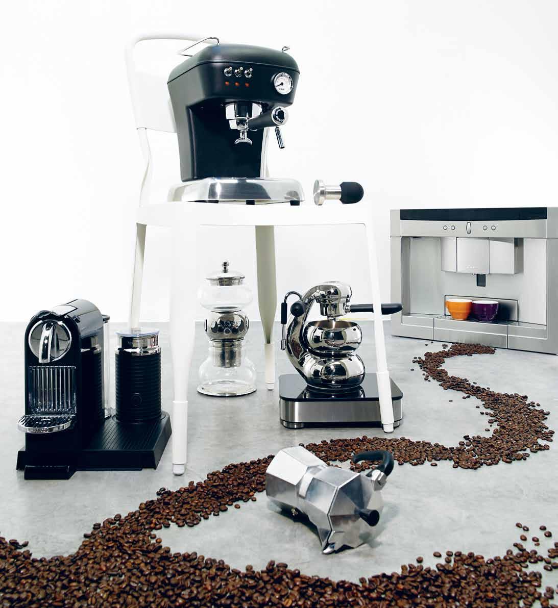
Get your shot in style with these chic new coffee machines.
39. RUGS
The right floor texture is crucial to the balance of the room.
41. HEATING
When it comes to winter, you want to make sure you’ve got the coolest heater on the block.
43. HOME GROWN
Sometimes it’s the people you least expect that surprise you the most. In this issue we find people from all walks of life who intrigue us with their special take on house, home and everything inside.
54. TIM ROSS
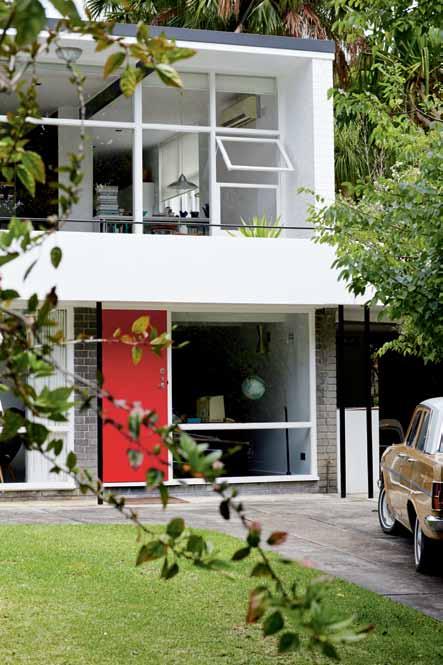
There is much more to this Australian comedian than first meets the eye. With a passion for mid-Century furniture and pieces, Nicky Lobo discovers that his Modernist house is a place full of contradictions.
69. THE GOODS DEPT•
They are bringing the best of international and Indonesian design together in two chic Jakarta locations. Nikita Notowidigdo meets the team behind this visionary project.
75. PHILIP GOAD
Professor of Architecture at Melbourne University and probably Australia’s leading authority on 20 th Century residential architecture, Stephen Crafti discovers that Philip Goad’s passion is anything but academic.
The grass is greenest here. Designer furniture and finishes sourced locally. #54
87.
Born in Manila in the Philippines, Olivia D’Aboville specialises in tapestry and textile structures, adapting their techniques to create woven works of art that are unique in form and function.
#161
The home is where the heart is, a very personal space. Habitus specialises in revealing this. But in this issue we have uncovered a really unique cluster of homes, each reflecting the character of their owners.
98. TORQUAY HOUSE
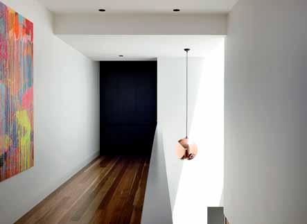
It is two minutes walk from a fabulous beach, but with limited views. What to do? Annie Reid checks out Jerry Wolveridge’s innovative solution.
113. JOO CHIAT HOUSE
Singapore is about making the most of what you’ve got, be it space or heritage. Chu Lik Ren visits Chang Yong Ter’s latest project where he has created an inner city retreat nestled within a restored heritage shop, engineering a seamless flow between old and new.
130. SIX-DEGREES OF SEPARATION
Overlooking a classic Sydney seaside bay, Luigi Rosselli combines his distinctive organic style with some bold innovation. Paul McGillick gets an inside look.
149. APARTMENT X
Creating a home perfect for generational family living is not easy with an apartment. But Andrea Stevens thinks that Adam Mercer has got it right with this Auckland block of three apartments, combining privacy and community.
#98
161. GALLE HOUSE
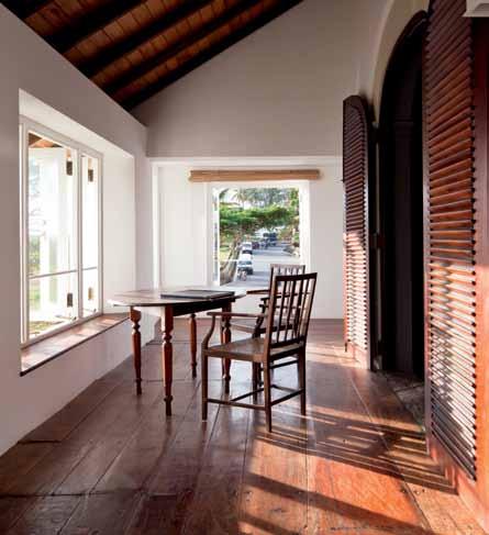
A holiday home with a twist. Justin Hill and Simon Cundy have reinvigorated a colonial townhouse in the Sri Lankan city of Galle, to create an inspired hoilday home for themselves. Jennifer Henricus relishes this elegant reinvention of a gracious home
#176
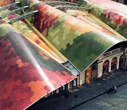
Beyond the tapas and sangria, there’s a whole new design world to uncover in Barcelona, and a whole history of ‘light’ to read on the way there.
176. BARCELONA
Kerstin Rose explores a city we all know – and finds a new layer of architectural and culinary delight.
185. BOOK REVIEW
André Tammes ventures into the light, looking at four books that illuminate architecture’s relationship with this unique source.

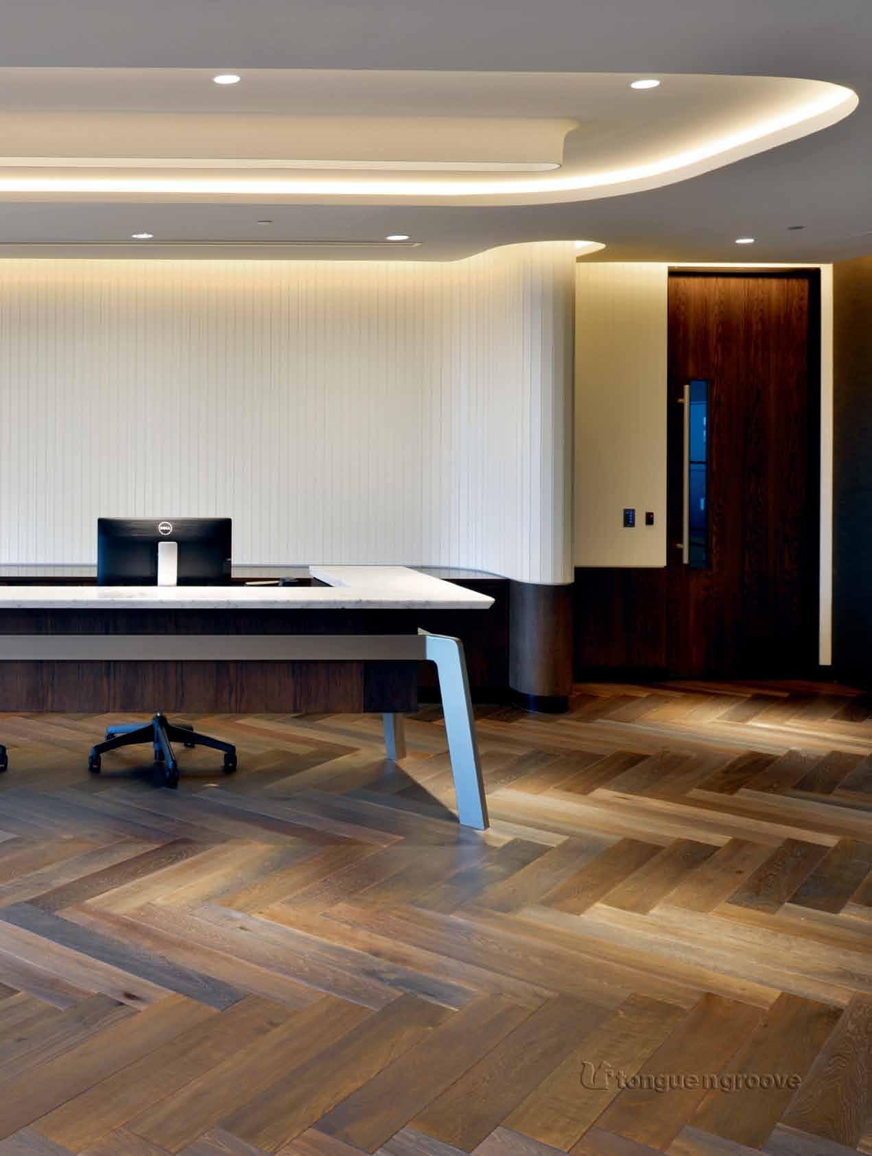
tongue n groove timber constructed of FSC
European Oak treated with natural oils in 11 beautiful colours allowing for easy maintenance

Showrooms
188 Chalmers Street, Surry Hills NSW 2010
P 02 9699 1131 F 02 9690 0920
575 Church Street, Richmond VIC 3121
P 03 9427 7000 F 03 9427 0100

tonguengrooveflooring.com.au





“

Zip HydroTap® delivers filtered water instantly,


boiling, chilled and sparkling
Zip HydroTap® Boiling, chilled and sparkling filtered water, instantly. Every drop is filtered for crystal clear and great tasting water.
Zip HydroTap® Boiling, chilled and sparkling filtered water, instantly. Every drop is filtered for crystal clear and great tasting water.
1800 42 43 44 | www.zipindustries.com
1800 42 43 44 | www.zipindustries.com

 Global award-winning Australian designer and world-wide.
Global award-winning Australian designer and Zip HydroTap® world-wide.
Jamie Durie Ambassador for
through beautiful design.
For me it’s the world’s best kept secret.”


Design’ is a word over-used, loosely used and generally flakey. For example, ‘design’ is often used as a synonym for fashion. And it frequently implies something approved by a faceless clergy of black-shirted imams –something which, once unquestioningly embraced, will guarantee membership of a celestial elite. Never mind whether the emperor is wearing any clothes because no one will dare say so.
But design is a process. The products which result are like artefacts left behind. Hopefully, though, they are useful artefacts because that is what design is meant to be: useful.
Maybe that line on our masthead should read ‘Living by Design’. This suggests – to use a word currently gaining more and more currency – mindfulness. In other words, instead of stumbling through life taking things as they come, we (as individuals and as communities) need to be mindful, making informed decisions as to where we go and how we get there. Living by design is to live with intention, with purpose and with an awareness of what is around us.
What this suggests is that design is fundamentally a future-oriented process, a way of actualising a vision for the future. Read Tony Fry’s Design Futuring: Sustainability, Ethics and New Practice (UNSW, 2009) for a heavy-hitting exploration of this idea. Another way of putting it is to say that design is the link between creativity and innovation. But whatever definition we come up with, design is about living in the world.
Now that I think about it, Habitus is really about those people who live by design. Not just the architects and designers, but all those people who aspire to add value in their lives, who take control of how they live and who value quality of life.

And just as design is a process, the products which result are not – despite our lazy assumptions – fixed in time, either. They may be artefacts left behind, but like any other artefact they continue to evolve. For those who live by design, living with those products is a relationship and a form of stewardship. Physically and contextually, the artefacts of design continue to evolve. And in an era of growing awareness of sustainability, these things of quality should always be of this world.
More or less everything in this magazine is about this process, but in this issue I especially recommend you look at Tim Ross’s love affair with all things Modern, the exciting new venture in Jakarta which is The Goods Dept•, Justin Hill and Simon Cundy’s loving make-over of a house in Galle and Luigi Rosselli’s remarkable response to a dramatic seaside site in Sydney.
Paul McGillick | EDitor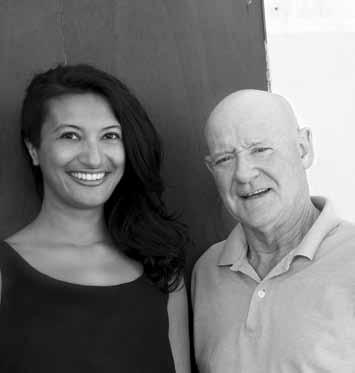
On our masthead we have the phrase ‘Living in Design’. Far be it for me, as the editor, to ask what this means. But you, as a reader can – and you should. Because the word ‘design’ is a slippery customer.
# 19
The idea of winners and losers is so true when it comes to apartment living. Whilst perceptions have changed in Australian cities with dense living more embraced, they are still viewed as second class homes in some quarters. Of course the beautiful Mt Timah Singapore development is clearly a winner. It brought back for me the pleasure of first entering Bruce Eeles’ Newington apartments in 2000, an Australian example where an alternative apartment typology was born. Of course the real challenge of designing and planning for medium density housing is how we encourage the advantages of house and backyard through sustainable built forms and maximise the benefits of our climate in our 21 st century cities. More challenging still, how do we do this as an architectural and planning community for the lower end of market?
CaroLiNE BUtLEr-BoWDoN SYDNEY LIVING MUSEUMS, NSWI am often stunned at the prices for custom furniture and artworks. While I can appreciate the time, skill and design process involved, it is still hard to fathom the end cost. However, I may just have been won over. The articles featuring Vito Selma and Lonnie Hutchinson and their stunning creations made me think in terms of investment, not cost. The way in which both designers have transformed traditional and quite ‘heavy’ materials of wood and metal into intricate yet functional art is amazing, and the fact that they’ve both referenced a rich cultural history in their contemporary designs gives the product an immediate sense of soul. As an aside, I found it amusing that both designers had such utilitarian work desks! Thanks for sharing that in the photos.
Thank you for the story ‘Sustainable Luxury’ in the last issue of Habitus. I love stories that provide insight into incorporating a sustainable sensibility within different walks of life. I believe it important to see that sustainable products and design don’t have to impact quality or a lifestyle of luxury. Laura Herne’s lifestyle certainly doesn’t embody the tired ‘hippy’ tag, as being eco-embracing/conscious often can. It’s not about becoming a ‘sustainability guru’ but rather making different choices: often, what we say ‘no’ to has just as great an impact as what we say ‘yes’ to. Old, unwanted items from their renovation can be such a positive move towards achieving a decent level of sustainability. It’s a designer’s responsibility, these days, to create beautiful spaces and products with an eco-sensitivity in our design approach, albeit whatever level of market they’re in. I’d love to see an increase in exposure of sustainable luxury interiors that go beyond the purpose of merely ticking the sustainability box.
Erika ForstEr W HITE D OOR DESIGN , NSW
I enjoyed the house in New Zealand by Scarlet Architects, featured in ‘Towards the Light’ last issue. I am constantly amazed by the quality of work coming out of that beautiful country, especially considering the population. No doubt it helps that the locations are inspiring beyond imagination but I can’t help wondering if this is somewhat to do with the willingness for the extraordinary from the clients as well. Is there something Australian architects want to say to their clients?... Along the lines of ‘give us a go’, perhaps.
k
imBEr Ly Joh Ns READER, NSW Ly Da SPENCE & LYDA , NSWFioNa
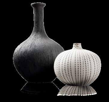
Each published response this issue received a vase from the Lindform range from Funkis, and a 1-year subscription to Habitus. Send in your responses to our stories this issue at conversation@habitusmagazine.com
SIX DEGREES OF SEPARATION #130
Although thinking about buying a dog, Justin Alexander lives by himself in Sydney’s eastern suburb of Paddington. After realising that beautiful images can bring joy to people, Justin finally decided that he was not suited to his former law profession. Although he loves his craft, Justin is one day looking forward to going on holiday without his camera: “I want to be able to enjoy the view,” says Justin, “without seeing it through a viewfinder.”
SIX DEGREES OF SEPARATION #130
Jennifer henricus

GALLE HOUSE #161
Jennifer Henricus lives in Colombo, Sri Lanka with her husband, architect Madhura Prematilleke and their extremely lazy Labrador, River. With a love of travelling, friends and home-cooked meals, Jennifer is at her happiest when sharing Colombo’s serendipitous secrets. Passionate about unearthing Colombo’s evolving vibrant art, architecture and design scenes, Jennifer has after many years of travelling, finally returned to her hometown in Sri Lanka.

PAul K A dA rism A n
THE GOODS DEP T• #69
Sharing a house with friends, Paul Kadarisman lives in his hometown of Jakarta, Indonesia. After his first solo exhibition at the Japan Foundation in Jakarta in 2003, Paul knew that he was on the right path. Inspired by his city and its environment, Paul is interested in capturing the daily life of its inhabitants, and the urban culture they interact with. Paul plans to make a short film in 2013.
AnGus mA rtin
GALLE HOUSE #161
Funkis started in 1996 in Sydney’s iconic suburb of Bondi Beach. “I don’t think it would have worked otherwise,” Carina Enstrom Gibb believes.
“In Bondi then, there were all the stylists, the film people and art directors who were a bit braver and liked the whole thing.” Quickly, and via these stylists and other influential creative people, Funkis prints, bags, clogs and homewares made their way into magazines. “I think because Swedish products are so graphic and photogenic, they loved borrowing it,” Carina says.
Interested in the future of Australian residential architecture, Edward Birch can’t wait to see what the next generation of architects and designers will produce. After working with acclaimed architect Luigi Rosselli for eight years, Edward has a unique understanding of an architect’s passion for the exciting and the beautiful, and their search for conceptual harmony. Living in Sydney’s Surry Hills, Edward is perfectly positioned to witness what new design forms will emerge.
r
Angus Martin’s love of photographing our manmade environment began during a trip to Bilbao, Spain when he was in his early twenties. Inspired by “great light on good design”, Angus has since sought to refine his craft. As the “proverbial kid in a lolly shop”, Angus one day dreams of being given carte blanche to photograph a special piece of architecture on his own.
n iK itA notowidiGdo
THE GOODS DEP T• #69
“I’m inspired by the beautiful little things in life,” says Nikita Notowidigdo, “like the smell of rain in the afternoon.” Born and raised in Jakarta, Indonesia, Nikita lives in a converted warehouse in Camperdown, Sydney, but still pays a visit to home once a year. Passionate about sharing Indonesia’s design culture, Nikita wants to capture the amazing talents of people worldwide, and hopes to make everyone’s “heart sing all the time.”
Prior to Funkis, Carina was already sourcing vintage and antique pieces from Sweden – “we used to go to Sweden in the summer and ship them over” – but eventually decided to work with Swedish textile designers to create prints that would become cushions and lampshades, as well as being available in drops for furnishings. In addition, Carina began designing lighting, jewellery and clothing expressing the same bold, quirky aesthetic. But it wasn’t just about creating a ‘look’ – “when we made something it was always because I could imag
SIX DEGREES OF SEPARATION #130
Photographer Richard Glover is based between Sydney and London, where he completes work for leading architects and designers. His exhibiting work is held in galleries and collections such as the Art Gallery of NSW and the Tate Modern. He is currently working on an interactive publishing venture that specialises in creating architecture books for iPad.


ne A l oshim A
OLIVIA D ’ABOVILLE #87
Residing in Manila with his wife, two sons, two Siamese cats and a crazy Jack Russell, Neal Oshima leads a busy and full life. Currently fascinated by the process of fermentation with cheese, wine and kimchi, Neal initially began as a fashion and advertising photographer, working with big brands such as Pepsi and Coca-Cola. Now, Neal has turned his attention to editorial work, and always looks forward to photographing a place he has never seen before.

Annie r eid
TORqUAy HOUSE #99
After tapping the keys of her grandfather’s old typewriter as a child, Annie Reid immediately knew she wanted to be a writer. Based in Melbourne, Annie has written numerous pieces on design and architecture, and everything in between. Interested in people who make a living through creative endeavours, and inspired by the continual rejuvenation of her vegetable garden, Annie loves escaping to the coast of Point Lonsdale where she continues to climb over rocks like she has for many years.

chu liK r en

JOO CHIAT HOUSE #113
A registered Singaporean architect, Chu Lik Ren set up his own practice in 2010. Having worked on a diverse range of architectural projects, both in the public and private sectors, Lik Ren loves all things architecture: its history, its evolution and its future. As a part-time teacher at the National University of Singapore, Lik Ren is passionate about sharing his love for design with the next generation. Living with his wife, Lini, son Zach and daughter Victoria, Lik Ren looks forward to one day building his own family house.
Andre tA mmes


B OOK REVIEW #185
Based in Sydney, Andre Tammes splits his time between Neutral Bay and Balmain with his partner and Welsh Springer Spaniel. Inspired by thought, discipline and the imagination, Andre is interested in all things creative – architecture, theatre, painting, music and even cooking. And after more than 50 years of working in the design industry, Andre is still as passionate about his craft as ever.
cory

T IM ROSS #54
At the age of 14, Cory White received a camera from his father. The rest is simply history. And after taking his camera to his school swimming carnival, Cory only cemented what he already knew – his love of photography. Inspired by his daughter’s smile, and his wife’s limitless positivity and energy, Cory is passionate about capturing our great outdoors and the unique people within it.
In Habitus #19 on page #27 we neglected to mention that Punt Mobles products are available through Mobilia. For more information: mobilia.com.au
Cosh Living specialize in designer contemporary furniture for indoor and out.
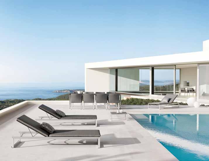
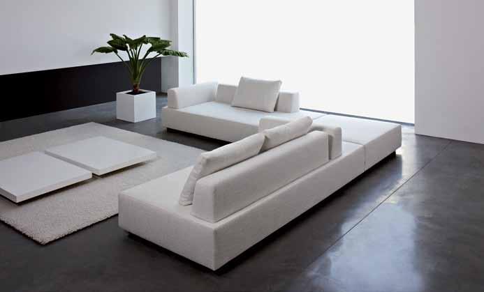
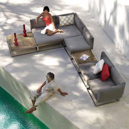
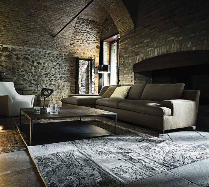
Experience beautiful furniture from leading worldwide brands, all meticulously selected for Australian taste, style and comfort.
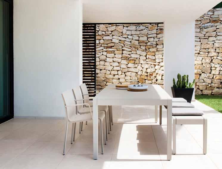


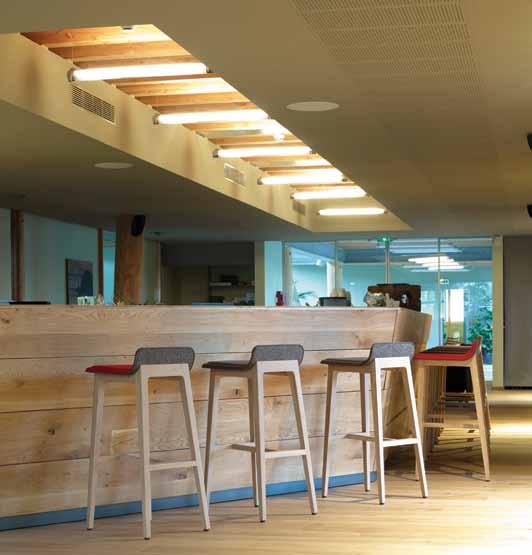

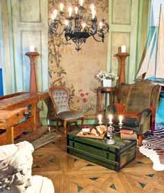
Antique Floors



www.antiquefloors.com.au
Bespoke handcrafted floors. Wide Board European Oak, Recycled timber and custom made parquetry. We invite you to visit our large showroom designed to show the floors in many different settings.
editori A l director
Paul McGillick habitus@indesign.com.au
dePuty editor
Nicky Lobo nicky@indesign.com.au
editori A l A ssistA nt Philippa Daly philippa@indesign.com.au
A rt direction & oriGinA l desiGn tem Pl Ate one8one7.com
senior desiGner
Emma Warfield emma@indesign.com.au
desiGners
Frances yeoland frances@indesign.com.au
Alex Buccheri alex@indesign.com.au
J unior desiGner
Rollo Hardy rollo@indesign.com.au
online editor
Lorenzo Logi editor@habitusliving.com
contriButinG w riters
Chu Lik Ren, Stephen Crafti, Jennifer Henricus, Nikita Notowidigdo, Annie Reid, Kerstin Rose, Andrea Stevens, André Tammes
contriButinG
Photo Gr APhers
Justin Alexander, Edward Birch, Simon Devitt, James Geer, Richard Glover, Paul Kadarisman, Albert Lim, Angus Martin, Neal Oshima, Tim Robinson, Christian Schaulin, Shooting Gallery Asia, Derek Swalwell, Cory White
contriButinG su B-editor
Nigel Bartlett
COVER IMAGE
Tim Ross (p.54)
Photography: Cory White
HEA d OffICE
ceo / Pu Blisher
Raj Nandan raj@indesign.com.au
oPer Ations mA nAGer
Adele Troeger adele@indesign.com.au
Production mA nAGer Sophie Mead sophie@indesign.com.au
AdvertisinG tr A ffic / PA to Pu Blisher
Elizabeth Davy-Hou liz@indesign.com.au
finA nci A l director
Kavita Lala kavita@indesign.com.au
Business m A nAGer Darya Churilina darya@indesign.com.au
Accounts
Gabrielle Regan gabrielle@indesign.com.au
Sharon Stander sharon@indesign.com.au
online communicAtions Radu Enache radu@indesign.com.au
Ramith Verdheneni ramith@indesign.com.au
Ryan Sumners ryan@indesign.com.au
Jesse Cai jesse@indesign.com.au
e vents A nd m A r K etinG Tegan Richardson tegan@indesign.com.au
Angela Boustred angie@indesign.com.au
Business develoPment
m A nAGer
Marie Jakubowicz marie@indesign.com.au
(61) 431 226 077
AdvertisinG enquiries
Colleen Black colleen@indesign.com.au
(61) 422 169 218
Level 1, 50 Marshall Street, Surry Hills NSW 2010
(61 2) 9368 0150 | (61 2) 9368 0289 (fax) | indesignlive.com
MElbOu RNE Suite 11, Level 1, 95 Victoria Street, Fitzroy VIC 3065 | (61) 402 955 538
SINGA pORE
4 Leng Kee Road, #06–08 SIS Building, Singapore 159088 (65) 6475 5228 | (65) 6475 5238 (fax) | indesignlive.asia
Showroom Opening Hours: Tues to Fri 10 – 6pm Sat & Sun 10 – 2pm
73 Beattie St Balmain, NSW 2041 02 9810 8838 info@antiquefloors.com.au
publisher
the publication. Contributions
submitted
the sender’s risk, and Indesign Publishing cannot accept any loss or damage. Please retain duplicates of text and images. Habitus magazine is a wholly owned Australian publication, which is designed and published in Australia. Habitus is published quarterly and is available through subscription, at major newsagencies and bookshops throughout Australia, New Zealand, South-East Asia and the United States of America. This issue of Habitus magazine may contain offers or surveys which may require you to provide information about yourself. If you provide such information to us we may use the information to provide you with products or services we have. We may also provide this information to parties who provide the products or services on our behalf (such as fulfilment organisations). We do not sell your information to third parties under any circumstances, however, these parties may retain the information we provide for future activities of their own, including direct marketing. We may retain your information and use it to inform you of other promotions and publications from time to time. If you would like to know what information Indesign Group holds about you please contact Nilesh Nandan (61 2) 9368 0150, (61 2) 9368 0289 (fax), subscriptions@indesign.com.au, indesignlive.com. Habitus magazine is published under licence by Indesign Group. ISSN 1836-0556


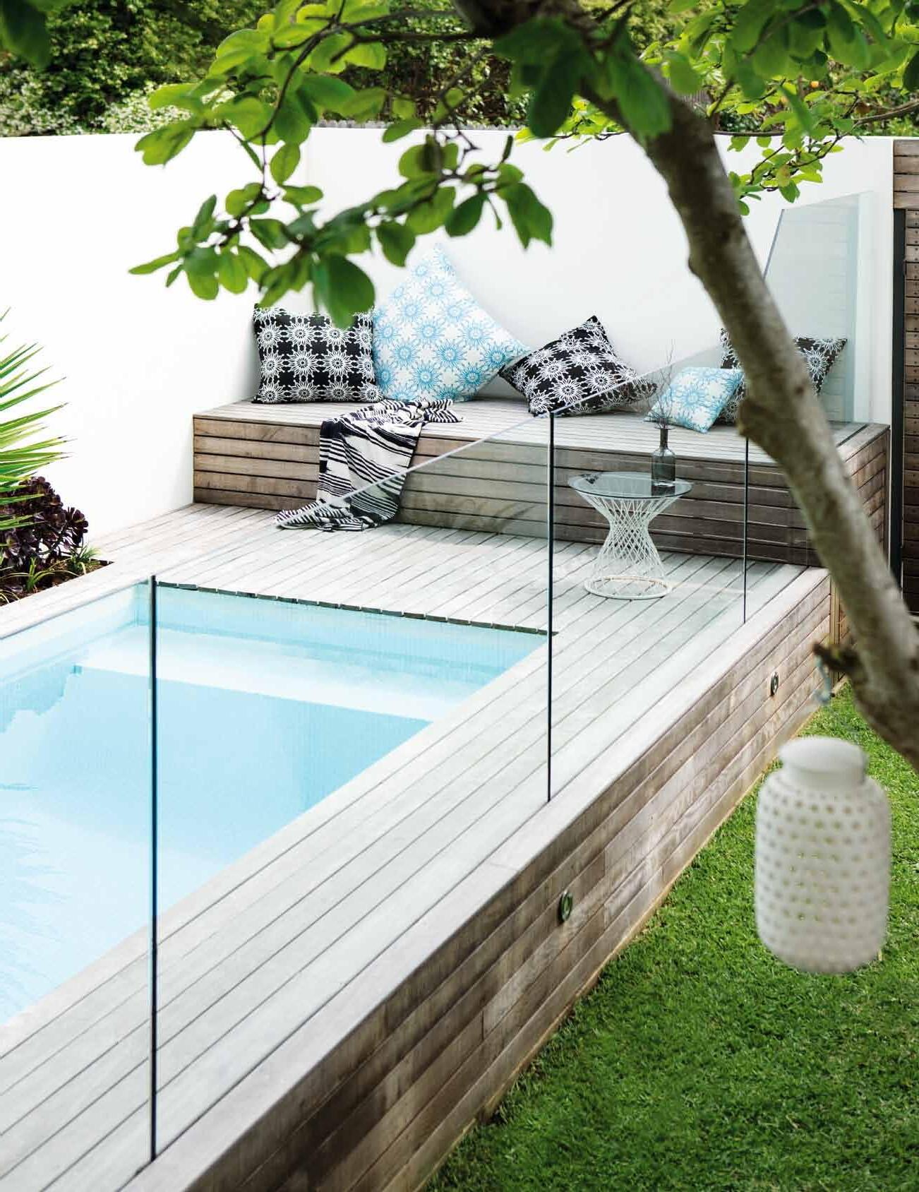

Marcel Wanders’ CYBORG chair for Italian design house Magis uses wicker in highly unexpected ways. Combining this traditional material with plastic, Wanders has developed a unique and innovative aesthetic with two of our most familiar textures. With its natural wicker back and polycarbonate frame, the CYBORG chair combines old and new technologies in a fresh and original manner, both complementing and enriching its surroundings. Described by The New York Times as “the lady Gaga of the design world,” Wanders only continues to inspire.

marcelwanders.com / magisdesign.com / corporateculture.com.au
With a new typology for storage units, INMOTION by Kristalia represents 3D innovation. Making visual and functional use of both the side and front section, this design is unique in its interplay of wall panelling, cabinets and shelves, making this storage unit exclusive every time.

kristalia.com / fanuli.com.au
This new hand-knotted BAXTER silk rug from Nepal is a testament to Designer Rugs’ skilled craftsmanship. Featuring subtle tones to convey the variation of textures seen throughout our natural landscape, its detailed composition is a true mark of unique expertise and great design.
designerrugs.com.au
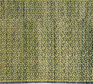
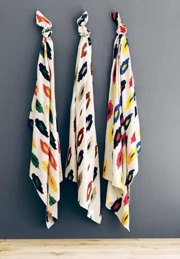
Inspired by the indigenous peoples of the Americas, this collection of AMERINDIA woven fabrics by Osborne & Little goes back to native design. With stylised lozenges spaced vertically on natural linen, this North American contemporary style provides an intriguing geometric pattern that will heighten any space.
osborneandlittle.com
WATN BLECH solves the problem of sagging shelf boards, instead using it as its principle. Bernhard Osann for Moormann has created a design that capitalises on this handicap. The slim metal sheet that supports your shelf provocatively hangs loose at your wall, but no need to be concerned – stability is guaranteed.
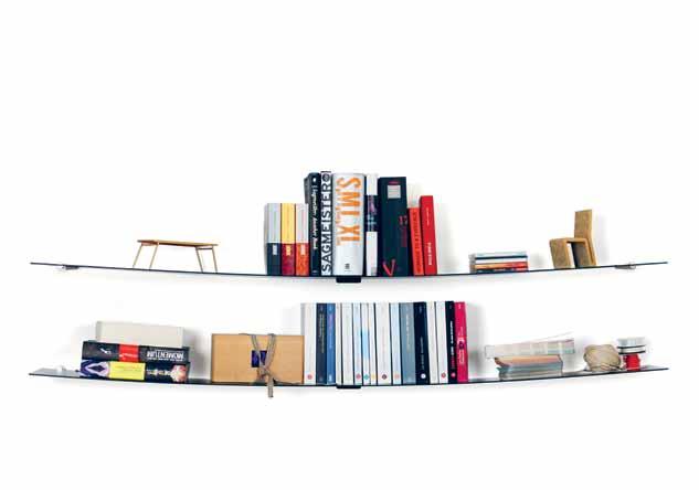
moormann.de / smow.com.au
The new PIATOONE basin range from Parisi is a design of pure aesthetics. With architectural minimalism in mind, this bench basin will instantly add a bold focal point to your bathroom. With a sleek reinterpretation on this bathroom necessity, Parisi have made a basin that is both functional in purpose and striking in design.
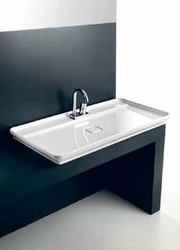
parisi.com.au
Noritake has introduced a clever take on a timeless piece. With a unique textured finish, the BOB DUNE tableware series takes contemporary entertaining back to refined elegance. In a choice of either black or white, this new collection is sure to add style and grace to any modern dinner party.
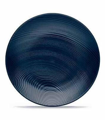
noritake.com.au
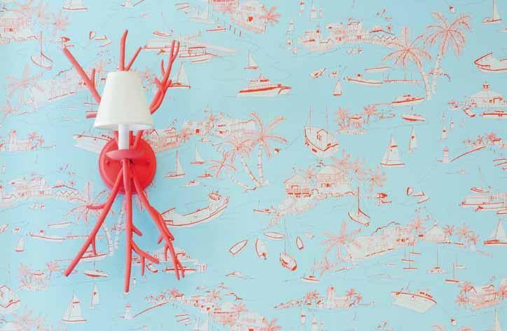
Art and the casual charm of the Bahamas come together in this latest range of wallpaper from Melbourne interior finishes house Boyac . Not since the 1960s has wallpaper been in such high demand. Used to accentuate a feature wall, or to simply add texture and colour, wallpaper has come back into fashion in a big way. And with designs like this BAHAMAS range, it is easy to see why. However this wallpaper may be used, it is a wonderfully expressive way to decorate any interior.
boyac.com.au
issue
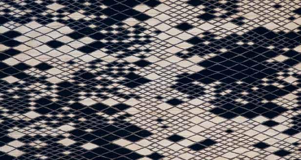
The latest design for Spanish design house nanimarquina , is a highly tonal take on their traditional LOSANGES rug, the exploration of the traditional Persian rug by prolific French designer brothers Ronan and Erwan Bouroullec . The original range launched in 2011 combined 13 colours in a complex interplay of geometrical rhombus shapes skillfully hand-woven by Northern Pakistani craftsmen. LOSANGES II explores the same pattern in a more subdued and confined colour palette, with equally striking results. Spun by hand, no two rugs are ever the same: each design is unique in its slight texture and colour variation.
bouroullec.com / nanimarquina.com / kezu.com.au
Australian company Alloy have proven that tiles don’t have to be boring. Their new SUBWAY range in high quality metal finishes evoke New York’s big city charm in a thoroughly modern way.

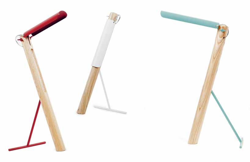
With its unique silhouette and striking colours, TUCA-TUCA exudes a spirit of playfulness and cheek, with a dash of humour. This warm LED light is expertly styled by Milan-based designer Elia Mangia for rising Singapore brand Foundry, and uses the natural wood surface of its stem to gently reflect light around the room. The lighting element itself is positioned in the wood beam, allowing the lampshade to close gently when not in use, a movement that imitates that of a jackknife’s blade. Unique in form and quirky in its inspiration, Mangia has created a desk lamp that not only brings light and life to its surroundings, but also fun to the words and work it illuminates.
eliamangia.com / foundrycollection.com / interstudio.com.au
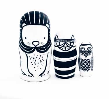
A lion, a cat and an owl – an unlikely match. But Wee Gallery has shown that these Russianmade NESTING DOLLS were always meant to be together. A modern update to a traditional children’s toy, these mamushka figures are beautifully painted in a classic black and white finish, which make them a great display even as you get older. Packaged one inside the other, these timeless figurines are the perfect gift, for children big or small.
weegallery.com / wannekes.com
The importance lies in the detail. And this concretebased mirror globe from Swedish brand NUD Collection has detail in excess. Creating a stunning contrast between textures, the mirror globe creates ambience through a small pool of soft reflected light.
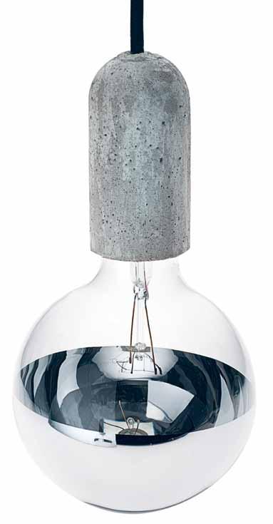
nudcollection.com / surrounding.com.au / greatdanefurniture.com
The PASCAL bedframe embodies true craftmanship and quality, fully upholstered and available with contrast stitching. This new release from Jesse is almost too good to be limited to the bedroom alone. Functional and fresh in form, this modern bedframe is carefully streamlined in design, and simple in refinement.
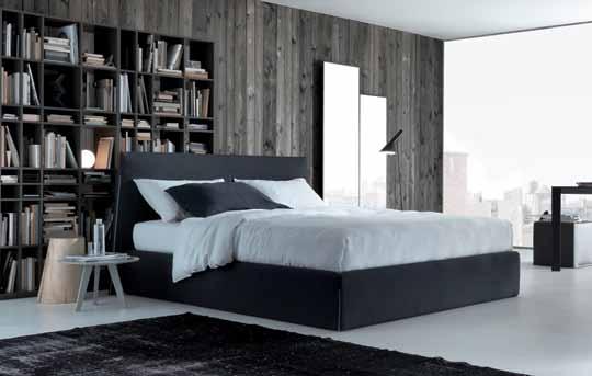
jesse.it / fanuli.com.au
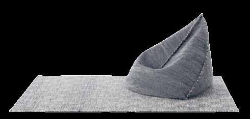
A simple and elegant design, this stylish GAN BEAN BAG by Hector Serrano for Gandia Blasco is a musthave for those pizza and movie nights. Stylish yet relaxed, this is one cool customer.
hectorserrano.com / gandiablasco.com / parterre.com.au
Inspired by 18 th Century architectural detailing, Wedgewood ’s latest ASHLAR range is distinctly geometric in form. Made from elegant white bone china, ASHLAR is not only fine tableware, it is also an exquisite collection of art. Founded in 1759 by ‘ the father of English potters’, Josiah Wedgewood I, the company has long remained among England’s finest design brands. With this new collection, Wedgewood has transformed an old art form into a modern classic.
wwrd.com .au

The new TRI-ANGLES range by Papier Tigre is a design must have for your office space. Made from recycled paper, this hanging stationery artwork is both stylish as it is functional. A clever way to clear your desk of those annoying messy accessories, TRI-ANGLES is a modern creative solution to the old pencil case.
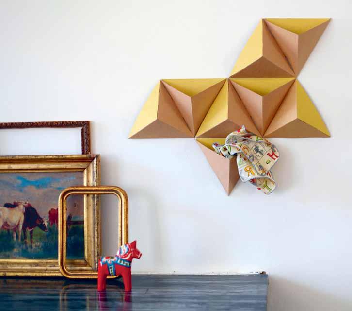
papiertigre.fr / notemaker.com
The limited edition MAHARAM POLDER SOFA is an outstanding example of Hella Jongerius ’ unique talent for design and textiles. Dressing her iconic sofa in warm and earthly shades, Jongerius has created a new design of differing colours and materials. “I try to combine finds from the archives with contemporary patterns and techniques,” says Jongerius. Re-creating a modern classic with expert handicraft and knowledge, Jongerius has certainly given this sofa a new lease on life.
jongeriuslab.com / kvadratmaharam.com
With a degree in Architecture, Melbourne-based designer Rosanna Ceravolo creates pieces unique to the design world. Representing the culmination of her study into texture, function and aesthetic, her designs transcend the simple role of furniture to become engaging pieces with their own personalities.
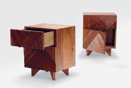
rosannaceravolo.com
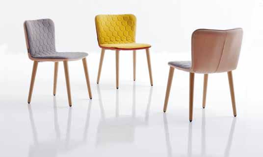
Jose Manuel Ferrero ’s new TEA range for Sancal is the result of reclaiming aesthetic pleasure perceived by sight and touch. A seating collection inspired by teatime, Ferrero has combined textures and materials to create a delicate range that is fit for even the Queen. Elegant and refined, this accessory is even more delicious than scones.
sancal.com / kezu.com.au

Warm minimalism – the understated style synonymous with Scandinavians – inspires the latest range designed by Dane Cecilie Manz MINUSCULE is uncomplicated yet sophisticated, suitable for any occasion.
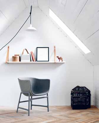
ceciliemanz.com / fritzhansen.com / corporateculture.com.au
Sydney-based Everstone has risen to extraordinary heights. And their latest release is testament to why. ISPRING is a unique collection of circular glass and stone mosaics that will make any room glimmer. In a range of colours and finishes, this is a beautiful accessory for both in and outdoors.

everstone.com.au
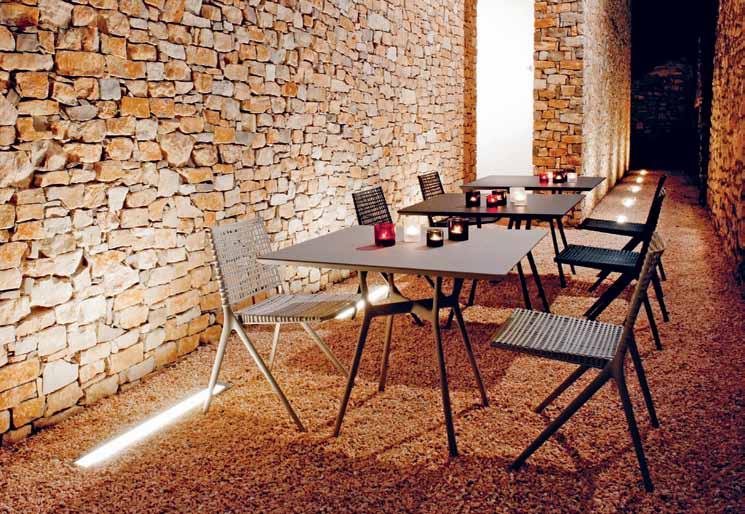
Inspired by tree branches, the new BRANCH by Tribu collection is both fluid and organic. But behind its care-free appearance lies a highly sophisticated and well-constructed form. Designed by Lievore Altherr Molina , the aluminum cast frame is easy to maintain, recyclable and optimally weather-resistant, making this a design that will last forever.
tribu.com / coshliving.com.au
Dien Dekker ’ s BASKET is an innovative project that was inspired by the unique craft of basket weaving. In a series of archetypical objects, BASKET is made from custom textiles and prints that make this piece oneof-a-kind.
dienkedekker.com

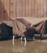
You have to protect your furniture, and with Kettal’s latest release, you can do it in style. Resisting water, oil and dirt, this cover is a must-have if you want to keep your designer furniture looking ship-shape. This is an important accessory not to be forgotten.
kettal.com / dedece.com
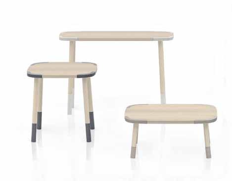
Caesarstone has continued its latest collaboration with world-renowned Japanese design studio, Nendo. Their new STONE-EDGE table collection consists of seven wooden tables, all embellished with corner and leg details. The application of Caesarstone finishes to this staple is inspiring.
caesarstone.com
A chair is generally not an object you would associate with wearing a bikini. But Berlin-based designer Werner Aisslinger has decided that these two opposites are a match made in heaven. Aisslinger’s BIKINI WOOD dining and swivel chairs for Moroso come in a variety of bold colour gradients that would set any beach alight.

aisslinger.de / moroso.com / hubfurniture.com.au
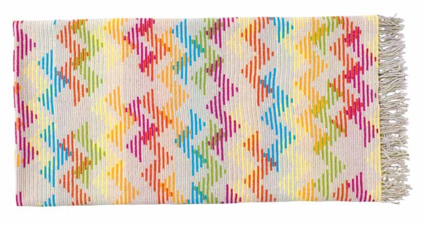
Missoni is the word at the moment. Their ONOFRIO throw maintains all the style and grace of their classic approach but uses new colours and abstract patterns to add statement. Luxuriously soft to touch, ONOFRIO is made in Italy, Missoni’s headquarters, and has fringing at both ends. This is a beautiful piece that will add punch to any room. Established in 1953 in the town of Varese, Missoni has grown into a worldwide household name. Initially recognised for knitwear designs, they has proven that their style can transcend time.
missoni.com / spenceandlyda.com
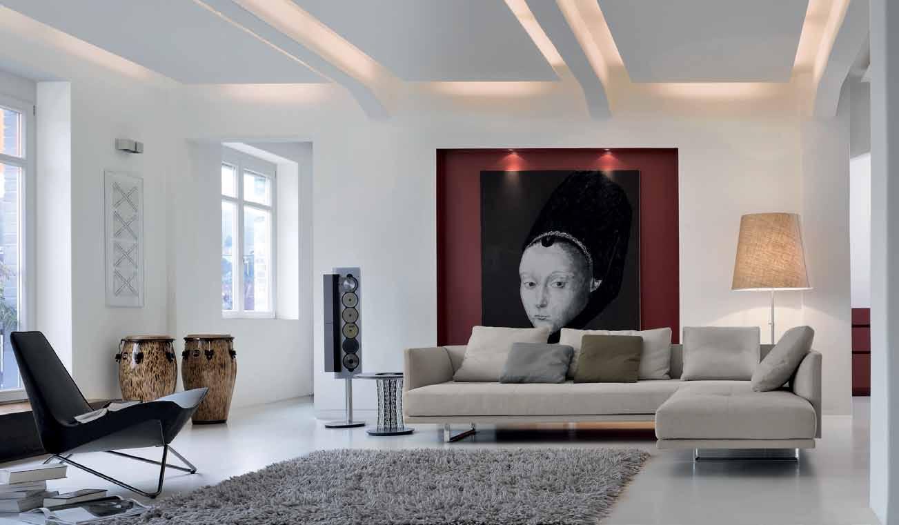
Prime t ime. Design: EOOS. Classic comfort created effortlessly. Both lightweight and opulent to look at, spacious upholstery seems as if it is floating. Understatement with lasting value. With just two easy steps the recamiere can be swivelled, transforming the sofa into an island of relaxation.
Dealers in a ustralia
Designcraft: Canberra
Living Edge: Sydney, Melbourne, Brisbane, Perth
Designfarm: Perth
Walter Knoll a ustralia
T +61(0)8 81823925
info@walterknoll.com.au
www.walterknoll.de



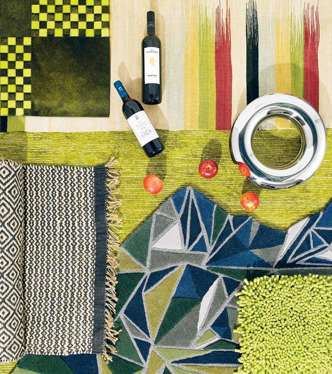
Anti-clockwise from bottom left | Graphi Jute rug , 70x240cm, $176, WorldWeave; In Perpetuum angular rug , with various cut and loop piles (custom sizing and colouring available), $2,600, Tappeti; Jamaica rug made by Nick Radford Rugs, New Zealand, hand-tufted and custom designed, Carpet Design Centre; Weaver rug in Lime hand-knotted silk/wool, $4,818 for 2x3m (available in custom sizes), Designer Rugs; Mazandaran Kilim by Edelgrund, 170x215cm, $3,200, Cadrys Contemporary; Pompadour rug from Norki in French cow hide, hand-stitched in France to various patterns in custom colours and sizes, $3,400 for 180x240cm, Carpet Design Centre; Fruit Loop by Lisa Vincitorio in mirror polished stainless steel, $369, Alessi; 2010 Mentor Cabernet , $42, Peter Lehmann; 2007 Marqués de Vargas Reserva Blend , $84.95, Untapped Wines.

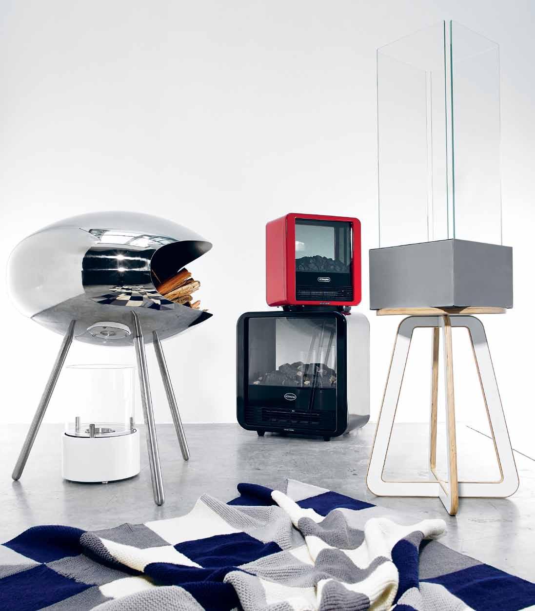 From left | Cocoon Fires Chiminea by Federico Otero in 316 Marine grade stainless steel in a mirror finish, $3,600, Top3 By Design; EZDF210W white cylinder decorative table top fire place in high quality stainless steel with a stylish gloss white finish, $129, Black & Stone; Mini cube in red, 1.5kW portable electric fire, $129.95, Dimplex; Cube in black, 2kW portable electric fire, $249.95, Dimplex; London bioethanol fireplace, 1.9 hour burning time, $229, Designer Fires; KFive Ply Candy X stool by Martin Moeller in white laminated Birch plywood, $397 KFive; Jac + Jack Checkerboard Throw Merino Mix Ivory Grey Marle $499, Jac + Jack.
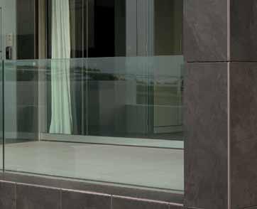
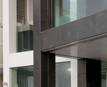
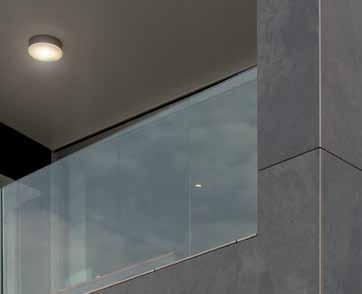
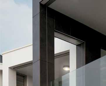
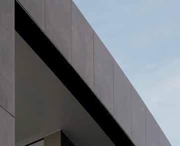
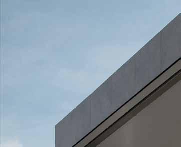
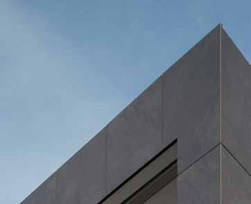
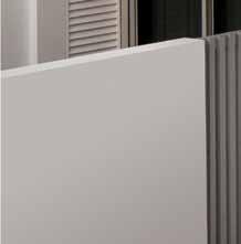
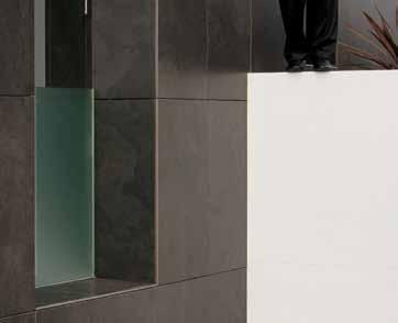
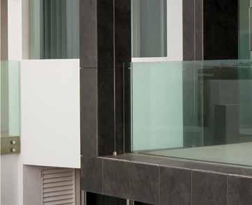
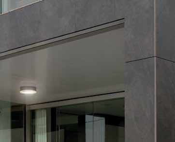
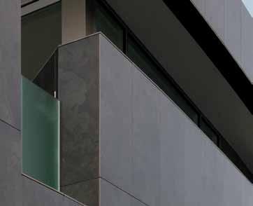
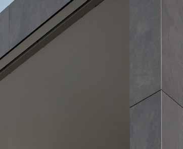
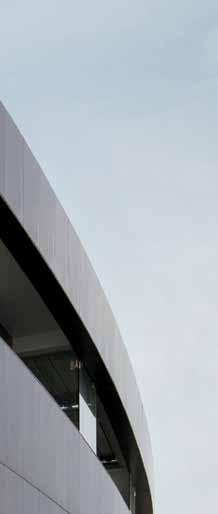
The tiles wrapping this home create a dramatic aesthetic presence while providing an innovative ventilation system which uses natural air-flow to shape the environment inside. Truly inspiring design.

NEWCASTLE 02 4962 5500 Parry Street Newcastle West SYDNEY 02 9410 3222 Pacific Highway Chatswood
MELBOURNE 03 9328 8598


Abbotsford Street North Melbourne
www.earp.com.au
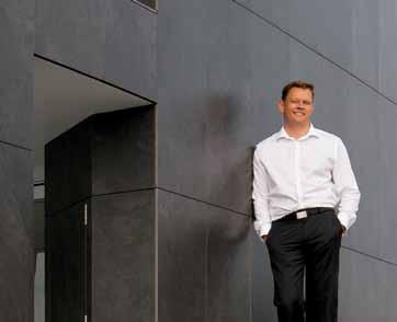
These tiles allowed me to deliver a bespoke solution for the client, offering a unique facade and superior comfort inside the building.



 Jon Webber - Webber Architects
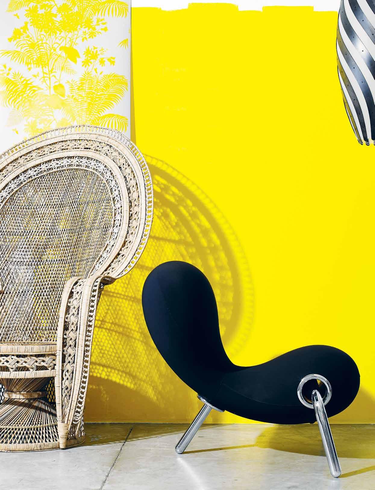
stop press! many of the freshest and most imaginative products for the home now come from our part of the world. we sample some of the best from floor to wall.
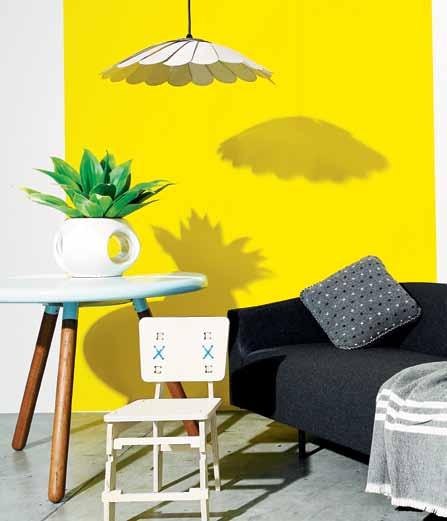
Big Yellow Taxi low sheen acrylic (throughout), $44.50/litre, Porter’s Paints. From left: shadow f loral wallpaper by Florence Broadhurst in FBW-RF27 yellow/white, $350/10-metre roll, Signature Prints; buri lounge chair by Vito Selma in natural buri palm, $1,374, Globe West; embryo chair by Marc Newson for Cappellini, $6,461.40, Corporate Culture; bounce pendant by David Trubridge in stained Hoop Pine plywood and frosted polycarbonate, $1,423, Mondo Luce.
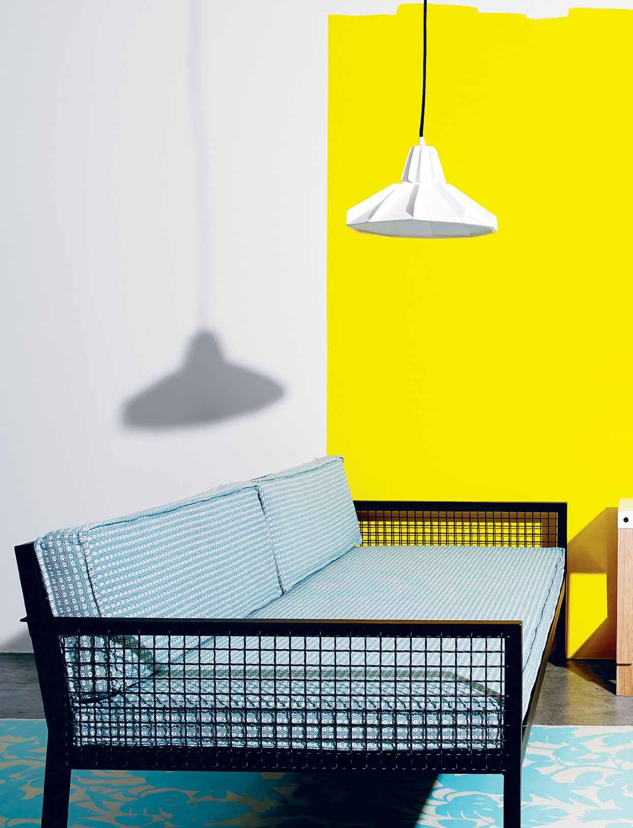
c ockatoos wallpaper (on floor) by Florence Broadhurst in FBW-RF07 blue/white, $350/10-metre roll, Signature Prints; breeze sofa in dark bronze and Mokum Picnic fabric, $3,420, Tait; foundry l oppa light by Florian Hauswirth in paper, $200, Interstudio; Derlot Editions f it modular shelving in Tasmanian Oak frame with natural stain and shelves in powdercoat, $2,236, Stylecraft; (on shelving) briggs tea set by Trent Jansen in slip-cast porcelain, bull kelp, wallaby pelt, copper and brass, $5,000, Broached Commissions; pebble platters in concrete by Sarah Long &company, $85
for small, $95 for large, Design Hunter; Jamjar handmade at Jam Factory by Deb Jones, Tom Miams and Brian Parkes in glass, Blackwood and cork, $250 each, Workshopped; faceture handmade vases by Phil Cuttance in waterbased resin, $250 for small, $350 for tall, The Minimalist; various f lorence broadhurst wallpaper rolls, Signature Prints; (on ground) wooden m ilk c rate designed by Ryan Hanrahan and Bianca Riggio, in raw finish plywood, $189, Page Thirty Three; b ootcut stackable stools by Chris Hardy in natural oil or stained black plywood, $563, Cafe Culture.

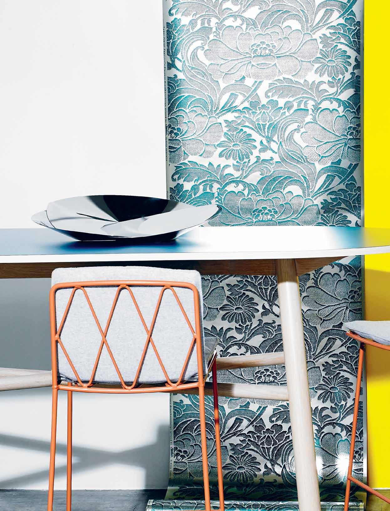
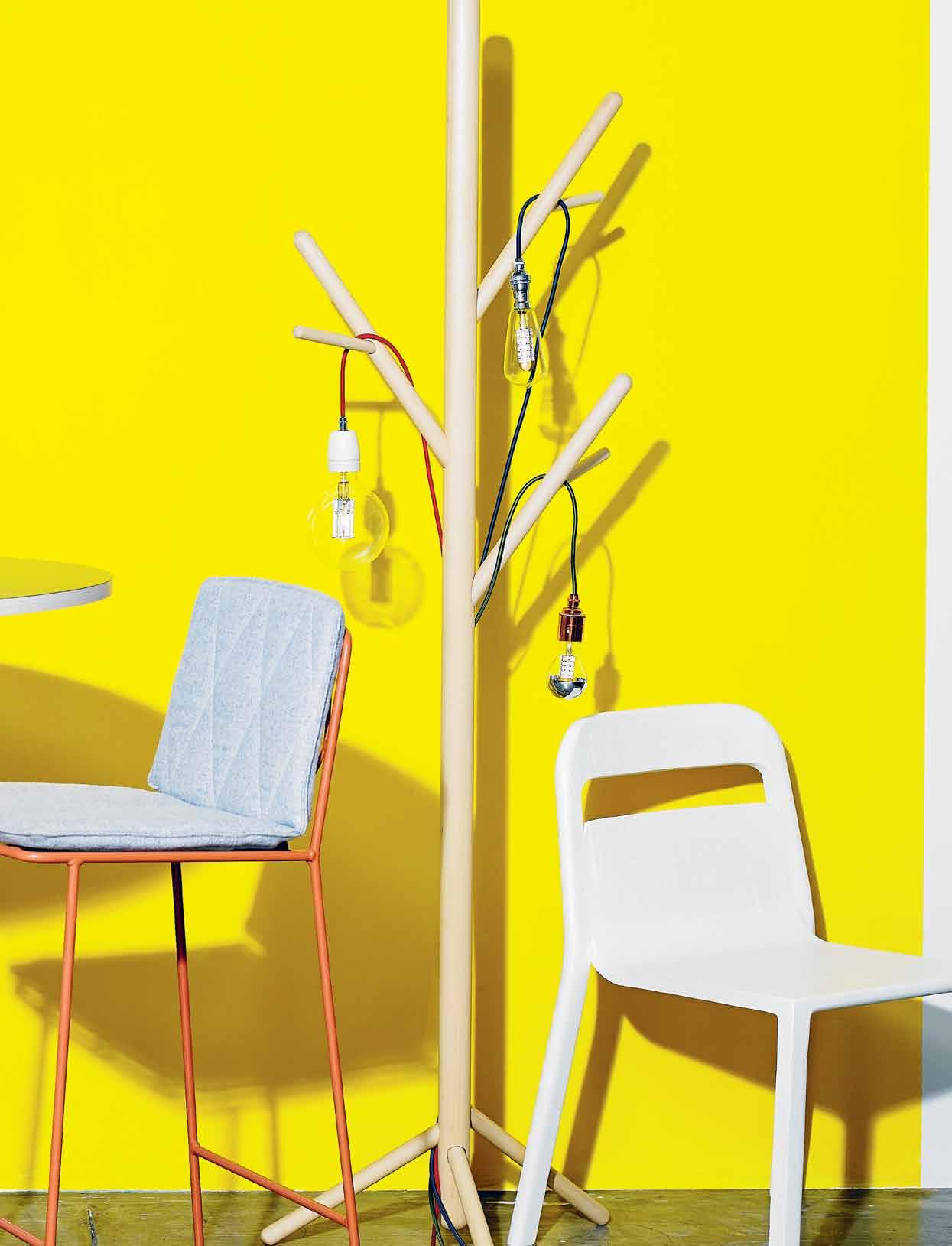
t udor f loral wallpaper by Florence Broadhurst FBW-FL06 in green/metallic, $350/10-metre roll, Signature Prints; (from left) Kyo bar table with Laminex top in Hydra mesh, American Oak base with chalk finish, POA, Jardan; s eb bar stool in steel powdercoated in Clay Pot and Jardan Felt Lilac, POA, Jardan; a lessi resonance centrepiece by Abi Alice in welded steel, $399, GCV; stem tree coat stand designed by Nicholas Karlovasitis and Sarah Gibson in Rock Maple timber, $945, DesignByThem; sole trader pendants, featuring new LED lamps, with fabric braided cable and your choice of lamp holder finish and lamp, $214.50 each, Volker Haug; hollywood stackable chair by Ben McCarthy in solid American Oak and plywood, $485, Go Home (also available from Stylecraft).
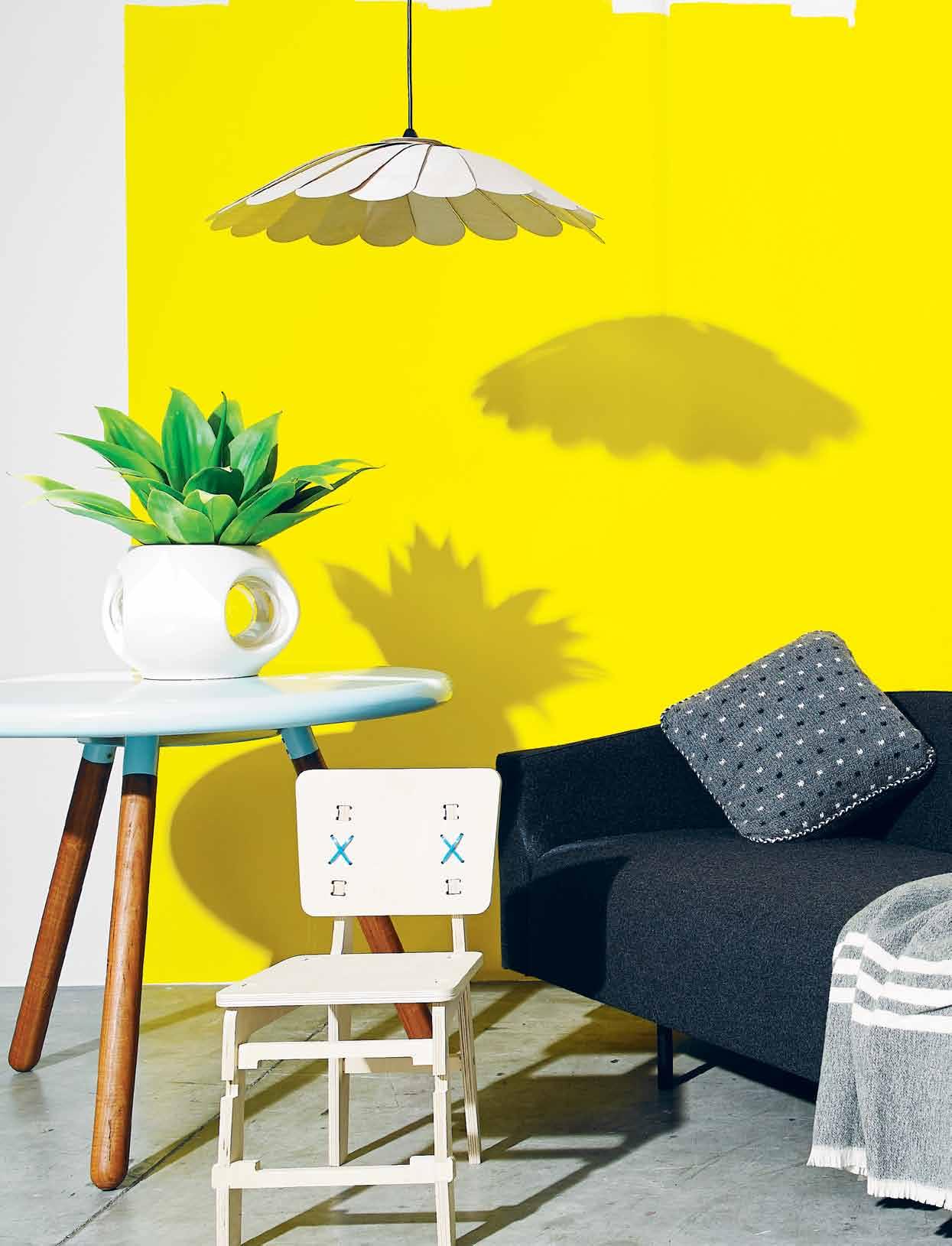
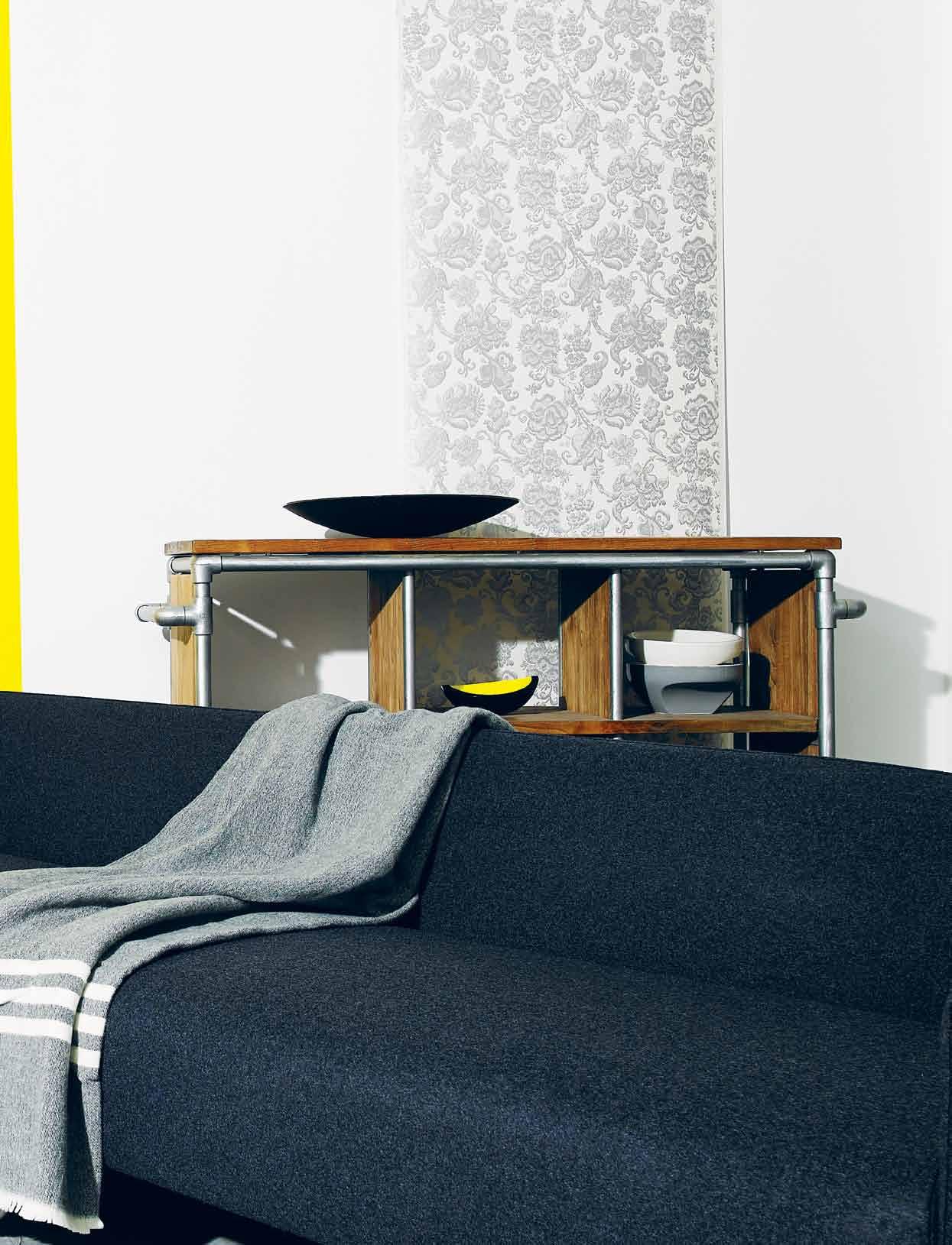
Ingram Tapestry wallpaper by Florence Broadhurst in FBW-FL29 silver/white, $350/10-metre roll, Signature Prints; (from left) Life Space Journey Spun dining table by Justin Lamont in spun steel and reclaimed Australian hardwood legs, $1,940 for 1180mm diameter, Insitu; 1984 Fishbowl designed by Danny Cheung in porcelain, with domed lenses, $469, Workshopped; Yello Diva 2-3 Junior chair by CK Goff in sheet Birch plywood and coloured nylon cable tiles, $169, Insitu; Yellow Diva Fandeck light by David Walley in natural Birch plywood with anodised spun aluminium hub, $167, Insitu; Blue lounge by Keith Melbourne in environmentally certified
timber and foam, upholstered in fabric or leather with mild steel base, $5,000, Stylecraft; Polka Dot cushion in charcoal, ivory and black $199, Jac + Jack; Bendigo Blanket loom woven in 100% New Zealand, $299, Coast; dbodhi Tubeline Collection book rack in 100% FSC recycled Teak wood and galvanised pipes, $1,999, Mezai; Alessi Cohncave bowl designed by Susan Cohn in pierced steel and black/grey epoxy resins, $299, GCV; Husque bowl by Marc Harrison in recycled macadamia nut shell with yellow glaze, $171, Object: Australian Design Centre; Y bowls by Jennifer Byrne &company in glazed porcelain assorted colours, POA, &Company.
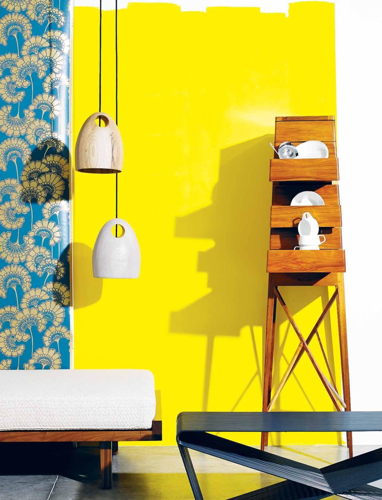
Japanese f loral wallpaper by Florence Broadhurst in FBWCO07 green/gold, $350/10-metre roll, Signature Prints; (from left) newline day bed designed by Fiona Lyda in American Walnut frame and Missoni Home Ontario #21 Fabric, $4,258, Spence & Lyda; o ak lights by Ross Gardam, handcrafted in solid FSC Oak in natural finish, $895, Ross Gardam; steel table by Nathan Goldsworthy for indoor and outdoor use, $1,192, Corporate Culture; broached c ommission tall b oy by Charles Wilson in handcrafted Blackwood finished in French polish, $15,000 (limited edition of eight), Broached Commissions; (in tall boy) a lessi s coop egg cup by Helen Kontouris in mirror polished stainless steel, $59, GCV. noritake dinnerware by Marc Newson, $349 for 20-piece set, Living Edge.
for more regional design visit habitusliving.com/issue20/regionaldesign
Made in Italy and designed by Antonio Citterio, Evergreen is now available exclusively at Fanuli Furniture.
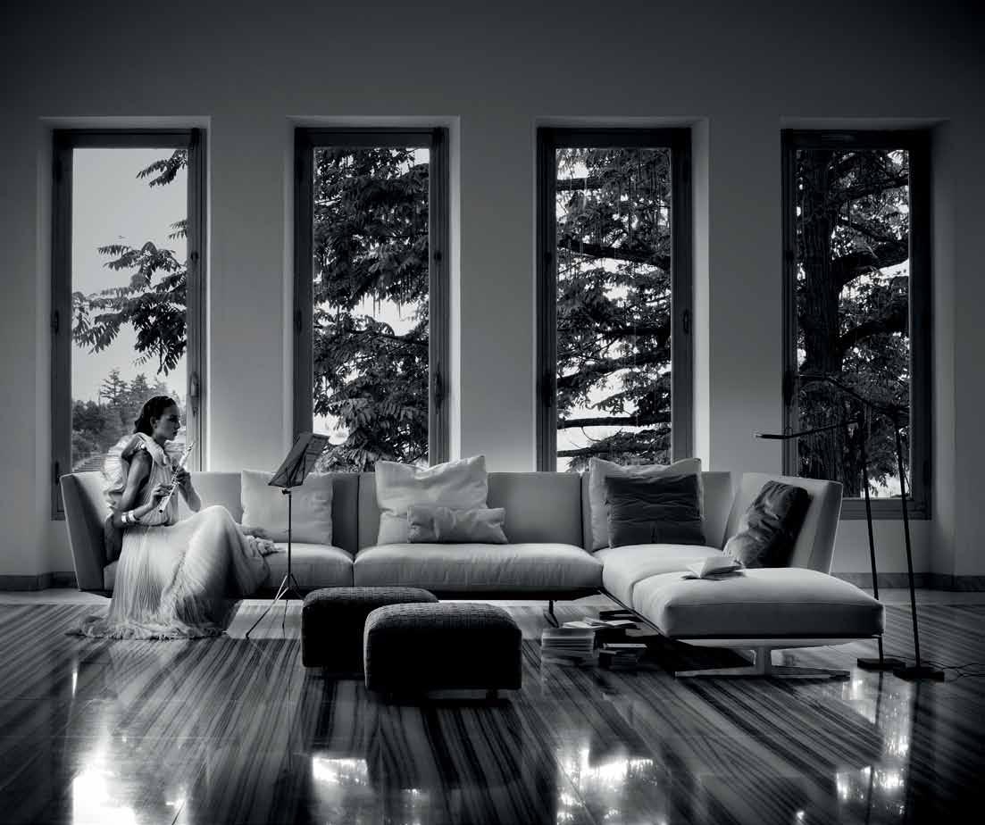
The contemporary design of the Evergreen sofa adds a quiet luxury to your living space. Its subtle elegance and relaxed comfort will be enjoyed for a lifetime.
Sushi Outdoor Extendable Table and Rest Chair Hand made in Italy
The extensive FLEXFORM collection, including refined lounges, bold armchairs, ottomans, functional tables, rugs, bookcases and storage is ideal in any stylish home or interior. FLEXFORM’s strength of design and craftsmanship continues to be one of the world’s most sought after and renowned furniture brands around the world.
Why not enjoy summer days in the outdoors with our Sushi Outdoor Table and Rest Chairs. The Table is available as extension or fixed top in a selection of sizes and colours with aluminium frame and alucompact top while the Rest Chairs offer comfort, durability and sleek lines. Both are highly stable and UV/impact resistant and exclusive to Fanuli.

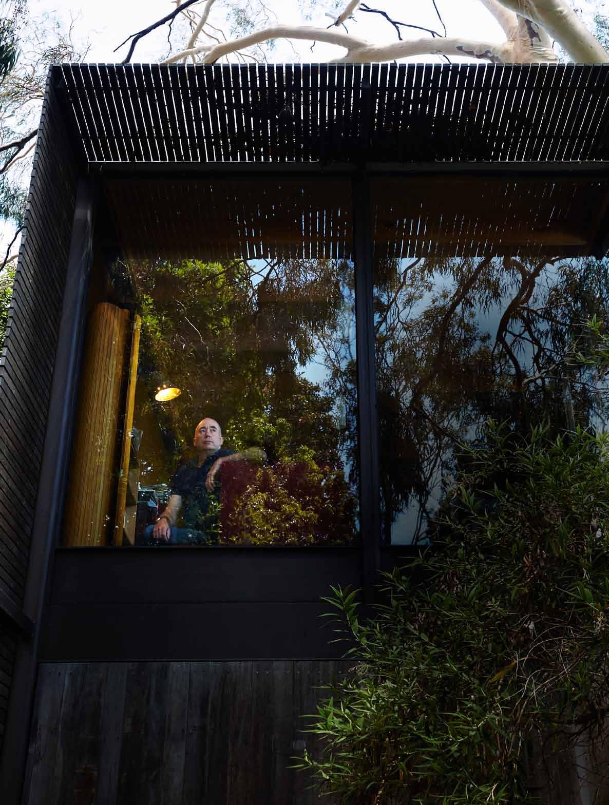
We heard that radio funny man, Tim Ross, has a passion for all things mode RnisT. So nicky Lobo paid a visit to his home and discovered that this passion for 'Rosso' includes the house, the furnishings and the decorations.

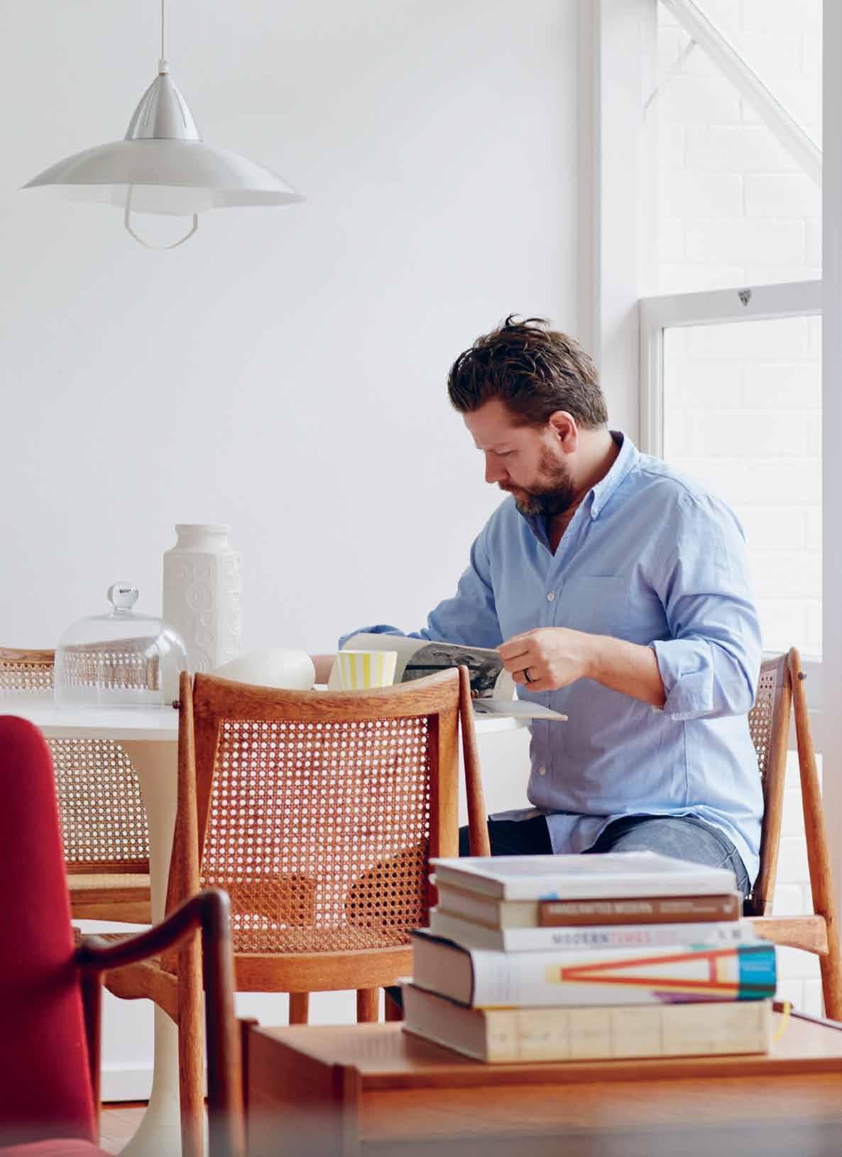
Tim Ross is an anomaly. He’s a comedian with a love of design and architecture. Actually, I don’t know that many comedians so there could be more, but it was still a surprise to learn that ‘Rosso’ is an avid collector of mid-Century furniture and objects, which he showcases in his Modernist home.
For those who don’t know him, Tim Ross is a Melbourne-born comedian, radio host and television presenter, who became a household name as one half of comic duo ‘Merrick and Rosso’, with co-comedian Merrick Watts in the late-1990s. Their medium was radio, starting as guest presenters on the drive-time program on Triple J in 1998 and then moving to the breakfast shift on the newly launched Nova 96.9 in 2001.
In 2009, Tim left the show, re-joining breakfast radio with Mix 106.5 with co-host Claire Hooper and recently was appointed drive presenter across the Mix network, moving to the more palatable afternoon time slot.
During his time in the public eye, Tim has been a presenter on television (such as on Merrick and Rosso Unplanned on the Nine
Network). He’s also had a musical background, opening the V music festival in Melbourne and Sydney in 2009 as frontman for comedy band Black Rose.
All in all, a good-looking resume for someone in the entertainment industry. So where does the design and architecture thing come from? A couple of places. Firstly, his dad, John Ross, owned an antique stall at the Tyabb Packing House in Victoria (still does) and “was always bringing home interesting things”. Secondly, Tim grew up in suburban Melbourne – Mt. Eliza to be exact, where some innovative project houses were being built during his childhood years.
Tim was always attracted to Modernist architecture. In particular, he remembers being fascinated by the house in Jacques Tati’s 1958 film, Mon Oncle. What young Tim didn’t realise was that the film was essentially anti-Modernist; the director was attacking Le Corbusier’s view on the modernisation of France. “But that house, a big white box, is what I ended up buying,” he says.
It is a period of architecture and design that holds attraction for many people. “There ’ s something about that desire of the time for a
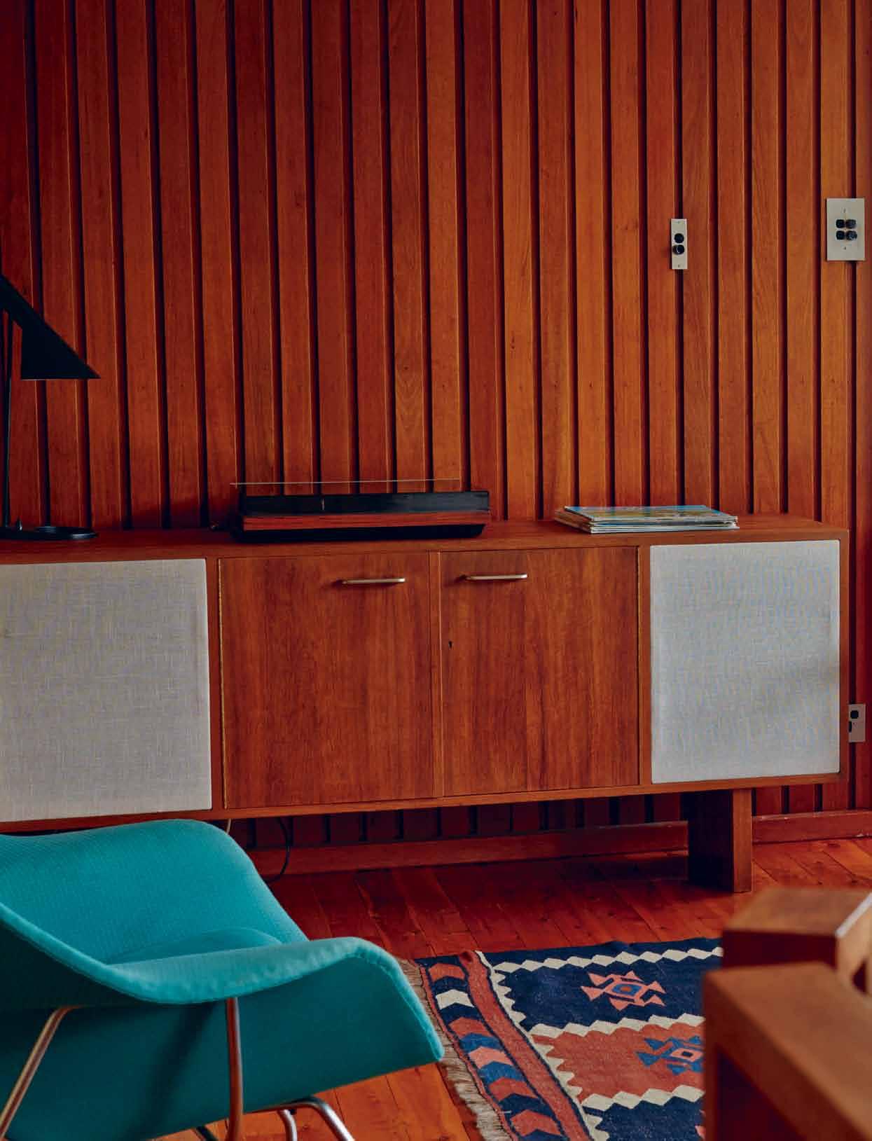
A credenza against the timber feature wall has been retrofitted to contain speakers...


new way of living,” suggests Tim. “There was that hope for the future and the feeling we could live in a different way.”
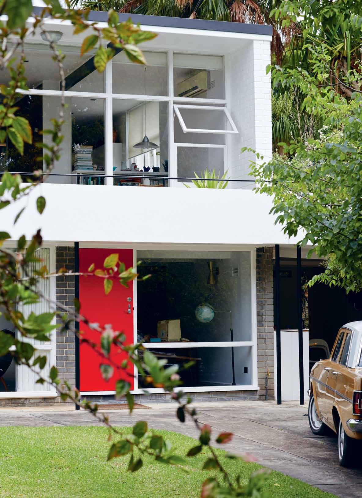
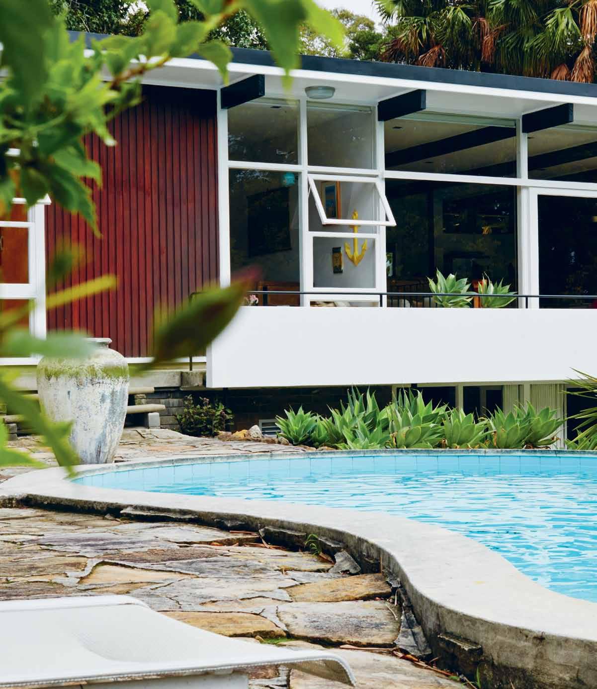
As we chat in the 1959 Bill Baker-designed house in Hunters Hill that he, wife Michelle, and 2-year-old Bugsy, call home, it occurs to me how agreeable the scale of Modernist interiors are. From the outside, it is all horizontal lines and an impressive expanse of glass. But on the inside, the rooms are intimate and liveable, simply by the nature of everything (and everyone) being smaller half a century ago. It is quite different to some contemporary open plan houses that can feel overwhelming and cavernous on a bad day. This house snuggles you.
Like many Modernist homes, the ground floor is not the main living area. The entry is adjacent to the garage (which Tim converted into a ‘downstairs’ spare room and study) and up on the second floor is where the actual living takes place.
Modest in size, an informal dining cove, living room and two bedrooms line up along the front of the house, Tim and Michelle’s bedroom opening directly on to the pool
It is quite different to contemporary open plan houses that can feel overwhelming and cavernous...
(which is about to get a necessary upgrade of a safety fence). A spare bedroom, the bathroom, a tiny laundry, formal dining room and kitchen make up the length of the back.
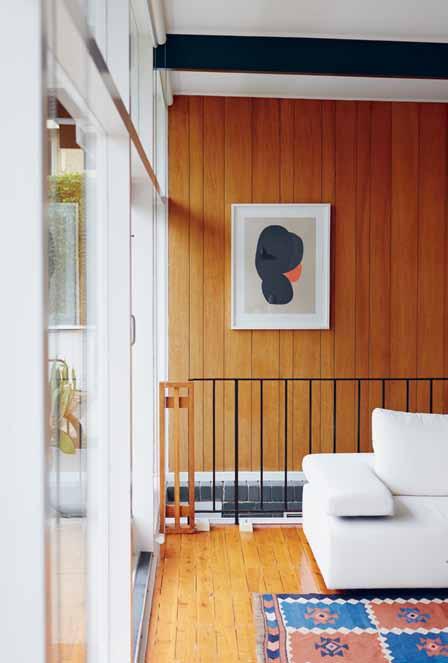
The materials, too, offer warmth and texture to balance the glazed façade. Flooring is a mixture of slate downstairs, timber upstairs, linoleum in the kitchen and carpet in the upstairs spare room, which was built as the main bedroom except Tim and Michelle prefer the light and views from their smaller, north facing room. Walls are simple white plasterboard, except along the stairway, which is timber veneer, and a wonderful timber batten feature wall in the living room.
A 1200mm high sandstone wall between the dining and living room provides visual texture, a way to demarcate the space while maintaining visual access, and a natural ledge to drop your keys, wallet, phone and other paraphernalia. “Most people would come in here and they’d knock the stone wall out,” Tim says, “but as a divider there’s something really nice about it. You can perch on it, put things on it. When someone’s here and someone’s there,” he says pointing to the dining and the lounge room, “you can have different conversations going on.”
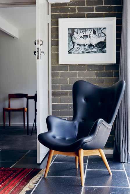
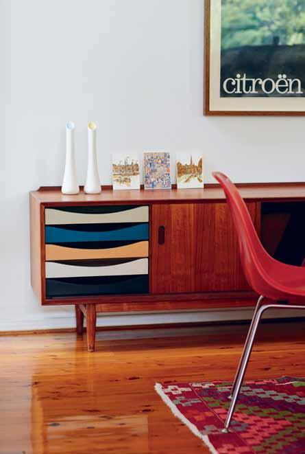
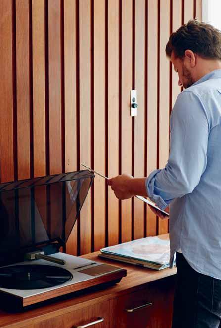
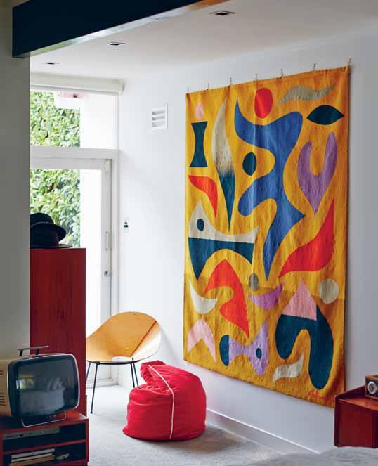
Another thing Tim really likes about his place is that it is “a nice home for the furniture”. And there are some seriously great pieces he’s collected over the years. A credenza against the timber feature wall has been retrofitted to contain speakers, and two vintage armchairs dominate the living area – including Tim’s favourite, a red Finn Juhl design. But “I love that sideboard,” he says, pointing to an Arne Vodder multi-coloured drawer credenza in the dining room that he bought himself for his 30 th birthday. “I’ve managed to only put one red wine stain on it in 13 years. It’s been in every room in the house and I’ve never stopped loving it. It always works.”
The set of fibreglass Eames dining chairs were decided on as a colourful solution to balance the amount of timber in the place. “They’ve become quite ubiquitous, but I don’t care because people who only love them now will move on and love something else that’s a replica,” Tim says. “I’ll still love them for what they are. It’s not about fashion; they’re about beauty and practicality.”
They are certainly a great choice with a young family – Bugsy is playing around them as we speak about the challenges of bringing a toddler up in a late-1950s home. “Kids were
The materials, too, offer warmth and texture to balance the glazed façade.

the same back in the era of when they built this house, but there’s no pool fence or front fence, there’s sheer drops to concrete [in the backyard],” says Michelle. “I wonder how they raised kids back then? They just did,” she smiles and shrugs.
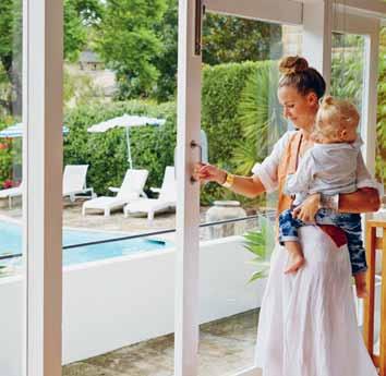

The only other challenge with a 1950s house is the lack of storage. “They had less stuff!” Michelle believes, “but we actually built out our storage, which is a bit silly.” Tim interjects, “I got rid of our linen closet to make a bigger bathroom. I didn’t think it was important”. It sounds like a contentious issue, but a goodnatured one.
There haven’t been very many other changes though, besides the downstairs garage conversion, replacing aluminium windows with timber and the splashes of colour on various doors. The house is well positioned and with the full glazing, “You very rarely have to put a light on anywhere in the house during the day, even in the middle of winter,” Tim says. “There’s a privacy aspect, you forget that from the street everyone can see you walking around nude. I think the neighbours have got used to it,” he quips.
The glass box house is somewhat of a surprise in Hunters Hill, with its traditional sandstone buildings. “I didn’t know the suburb,” admits Tim. “I fell in love with the house, I would have bought this house anywhere. Finding places like this, this close to the city, is pretty rare.” But pretty important too, with his responsibilities at the radio station.
Recently, Tim has been bringing his two passions – comedy and architecture –together, in a stand-up series called ‘Man About the House’. It’s his own concept, which invites small audiences into historic or iconic houses around Australia. The first one, “a leap of faith by the Historic Houses Trust,” as Tim describes, took place in February 2012 at Rose Seidler house in Wahroonga. There’s been another edition at that location since then, as well as at a Robin Boyd house in Melbourne, an Esmond Dorney house in Hobart, a Donner house in Auckland and Neutra VDL house. And there’s research going into further locations, potentially more in the US.
Coincidentally, Bill Baker, the architect of Tim’s house, also combined his two passions back in the 1950s. Officially Stanley George Lister Baker, he trained as both a pilot and an architect before becoming a flying instructor for the RAAF during World War II. After the war, he completed his architecture studies and became a pilot with Qantas, which took him on regular trips to the United States where he became influenced architecturally by Californian suburban modernism, using its ideals in his own designs in Sydney and Melbourne. So his piloting experience helped shape his architectural approach.
Bill might have been considered an anomaly in his time as well. But many creative people cross-pollinate their passions and inspirations. It ’s how they keep things fresh, drawing new connections and engaging different communities.
This is where Tim just might become crucial: in spreading the architecture and design dialogue beyond the professional industry. He’s getting new audiences to historical architecture sites, asking them to think about their importance, and re-contextualising their relevance. Anyone bringing more people to the conversation is all right in my book.
Plus, he’s pretty funny.
Tim Ross | timross.com.au
Learn more about Rosso’ s ‘ Man About the House ’ series. habitusliving.com/issue20/timross








www.morticeandtenon.com
716 High Street, Armadale VIC 3143, (03) 9421 1191
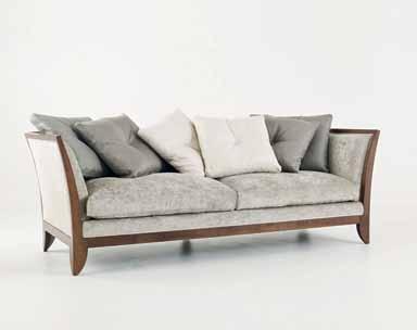
Mortice & Tenon produces bespoke furniture to order and architectural joinery to specification. Collaborating with some of Australia’s renowned architects and designers, Mortice & Tenon’s unique craftsmanship can be found in some of Australia’s most beautiful homes, corporate and commercial environments.
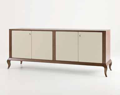
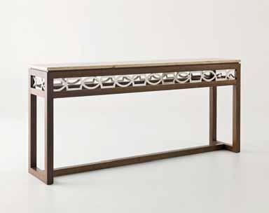
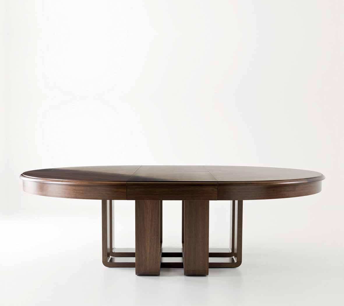 Furniture and architectural joinery designed and manufactured in Australia.
When you think of Indones I a , you think beaches, temples and resorts – not contemporary product design. But the members of one creative team are doing their bit to change that perception. nI k Ita n otow I d I gdo has the goods on t he g oods d ept•.
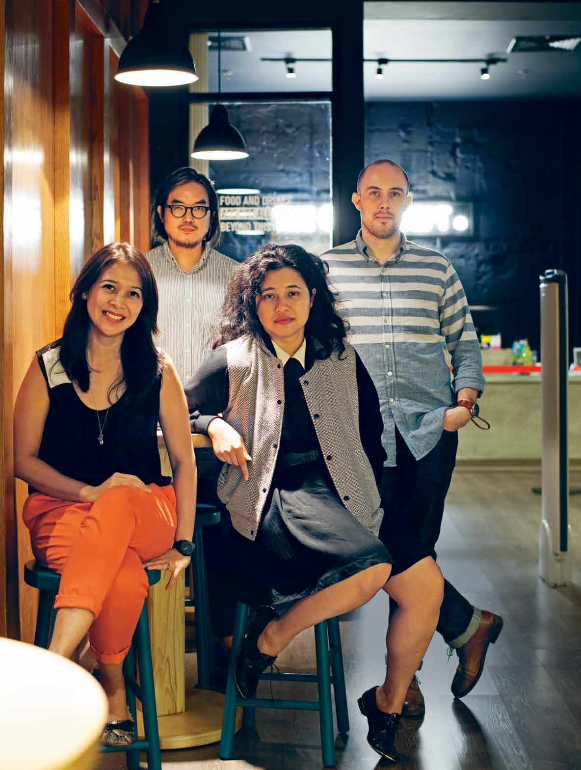 text Nikita Notowidigdo | photography paul k adarisma N
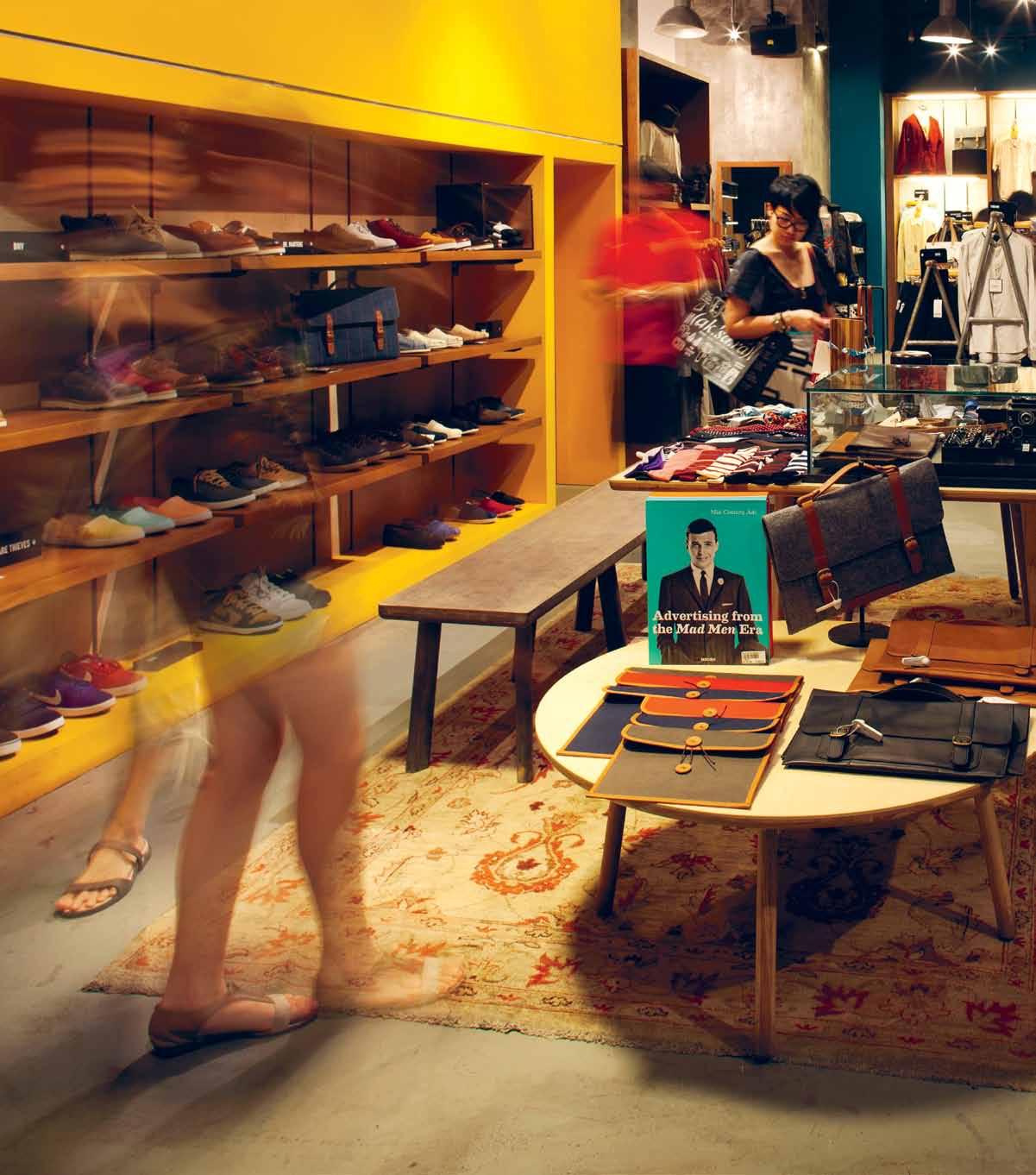
Young independent designers have always been faced with a big challenge: how to expose their products and introduce them to the world. For Indonesian designers, it’s even more difficult, because Jakarta – a city with some of the world’s worst traffic jams – has numerous shopping malls, but all they seem to offer are international brands. At least that’s how it was before The Goods Dept•.
“Some young Indonesian independent designers started creating ready-to-wear products on a very small scale,” says Cynthia Wirjono, one of the founders. “They were doing transactions via Facebook, or simply by word of mouth.”
This inspired the formation of a creative team of five. Cynthia, with experience in fashion buying and a background in graphic design, and her husband Chris Kerrigan, a photography and art curator originally from Chicago, are one part of the team. Cynthia’s brother, Anton Wirjono, who owns a music events company, and his wife, Eldalia, who has a finance background, are another. Product, furniture and interior designer Leonard Theosabrata completes the group.
The team came together initially for a popup exhibition that was part of Nike’s 08-08-08 global campaign. Anton’s company organised the event, Cynthia and Chris curated an

exhibition of video art, and Leonard came on board to design the event space. Following this first joint project, they decided to continue working together. “We all have an interest in art, design, fashion, music and architecture,” says Chris. “We have different specialities, but they all revolve around a similar lifestyle.”
In 2009, they introduced the Brightspot Market, a weekend pop-up event in a mall –“a market of all things cool”. Starting with 25 booths of both local and international designers, the event attracted more than 5,000 visitors and was considered a huge success. The team continued hosting the market a few times a year, and it grew quickly to house 130 booths with more than 75,000 visitors at the ninth Brightspot in February this year.
“When we realised that people really responded positively to the Brightspot Market, we wanted to continue the idea and give local brands a permanent spotlight,” says Chris. The team started working on this concept after the second market, a project that was to be much more than just a permanent retail front. “We wanted to run it as a multi-functional space, from catering for an artist’s exhibition to music events,” says Eldalia. “It’s not just a shop. We wanted to create a whole experience.”
They found a temporary space in a mall in North Jakarta. Leonard took ownership of designing the space, creating a look that

suited the limited budget and addressed its temporary function. He describes the process not as interior design, but “more of a semipermanent exhibition where nothing sticks, and [we wanted to have] a base into which you can keep adding things, while keeping in mind the idea of creating a look that eventually becomes your signature.”
In 2011, The Goods Dept• finally opened its doors. Offering a unique and multidimensional retail environment, The Goods Dept• has quickly become a hub for quirky fashion and lifestyle products from young independent Indonesian designers – many of whom took part in the early Brightspot Markets – and a selection of international brands including Ksubi, Naked & Famous Denim, Nike and Vans.
This alignment of local and international brands was part of the concept from the beginning. “We want Indonesian products to have a global appeal,” says Chris. Part of the team’s strategy is to use complementary displays, giving the local products global cred and adding uniqueness to the mainstream international products. Cynthia says, “You want to see someone wearing Nudie jeans paired with an Indonesian handmade T-shirt.
We don’t want to be selling only Indonesian products. We want to make it cool.”
The retail aim is to have variety across the categories of product, which means the team have to strategically select what they need in the store. This leads them to particular local designers, whom they meet with to discuss their concept and products. “We always look for value for money, the uniqueness of their design and the consistency,” explains Cynthia. “We pick by item, so we don’t necessarily showcase everything in a designer’s collection. They may have only one out of 50 products that suits this store and hence we will pick only the one item.”
The Goods Dept• moved to a new – and permanent – location in a mall in Jakarta CBD last year, and also opened a second, bigger branch in another prime mall in South Jakarta early this year. “The new stores are different,” Leonard says. “They’re far more mature and we want to show progress from the previous store.” Being much larger, the new spaces have much more to offer, while still capturing the same language. Raw. Ever-changing. Dynamic.
Meanwhile, Brightspot Market is still going strong. It serves a different purpose for the vendors; if someone wants to launch their
newest collection, they would most likely do it at the market. “By having both Brightspot Market and The Goods Dept•, we’re giving all the young local designers a great opportunity to grow a healthy business, and a lot of them are doing really well,” Cynthia says.
What is next for The Goods Dept•? The team are now developing a web store, which will start locally but hopefully expand internationally. They are also planning to open more stores outside Jakarta – but still within Indonesia – with a long-term plan of opening further stores globally.
In the span of a few years, Cynthia, Anton, Eldalia, Chris and Leonard have grown their idea of catering for local designers to become the front-runner for new fashion and style in Indonesia. And in doing so they have brought young Indonesian designers to a level far beyond their expectations.

It’s not just a shop. We wanted to create a whole experience.
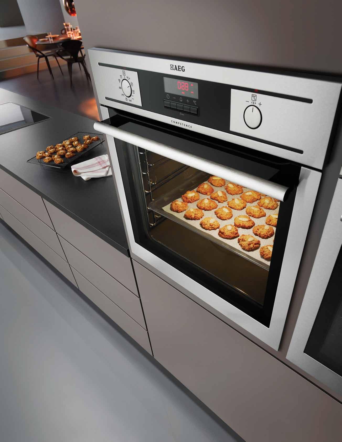
any position. Experience perfection at www.aeg.com/au
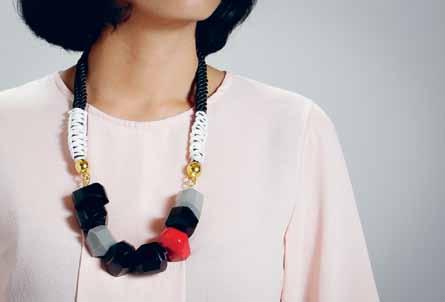
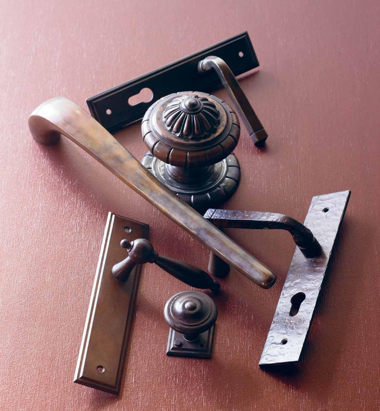 Aged copper, brass & waxed rust finishes Chant New Zealand, Brionne France & Fersa Argentina
Old bones of historic houses are often dressed with modern trimmings. But Phili P Goad has taken a curatorial approach with the Eric Nicholls design that he lives in. Ste Phen Crafti visits.
 text Stephen Crafti | photography Jame S geer
architect, academic and writer, Philip Goad, still recalls a phone call he received in 2000 from the Art Deco and Modernism Society. The voice on the other end was insistent he should see a house that just came on the market. “I think the words were, ‘you should look at this house before it’s demolished’,” says Goad, Professor of Architecture at Melbourne University and one of Australia’s most prominent writers and critics of 20 th Century buildings. After inspecting the Hawthorn house, he could easily identify it as the work of architect, Eric Nicholls, who worked in the office of Walter Burley Griffin and Marion Mahony Griffin. Designed in 1929, the house featured the hallmarks of the practice: ground hugging, spatial surprises and distinctive tent-like ceilings. On the day of the auction, “It was packed with architects and students. It’s such a rarity to find a Nicholls house, one of only a handful,” Philip explains.
While the Nicholls house was architecturally intriguing with wide eaves and 51 concrete columns, its poor condition would have put off most buyers. The eaves were almost collapsing under their own weight (a later addition, they were made from asphalt), with water coming through the ceiling. The carpet, which had centimetres of felt below,
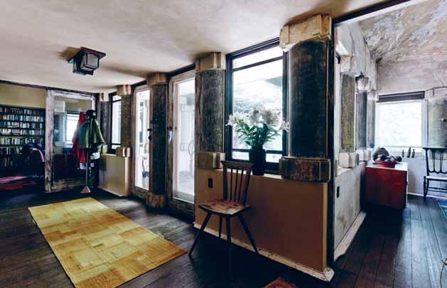
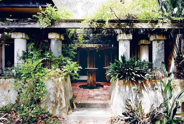
Stains from the water damage have been left, creating the effects of a fresco that stops you in your tracks. And cracks in the walls simply add to the patina.
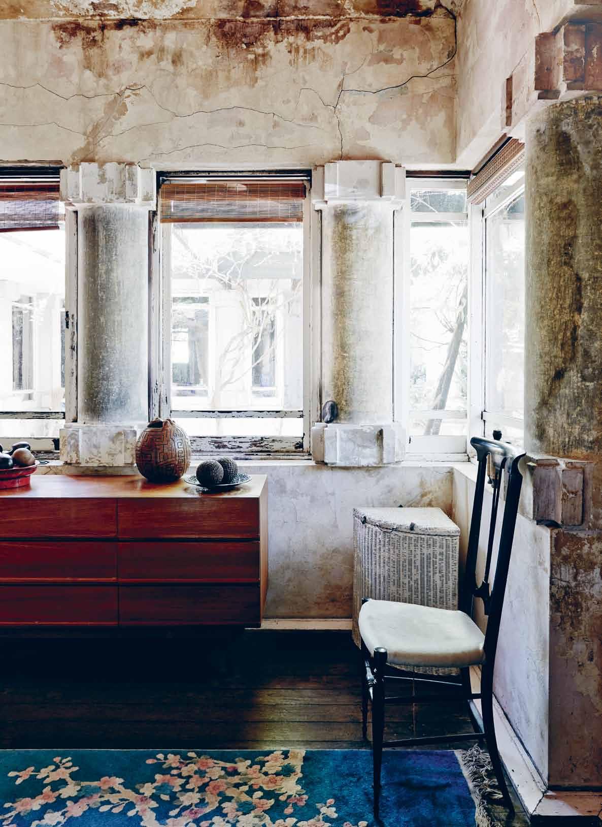
The capitals added by Nicholls give the interior an Art Deco quality.
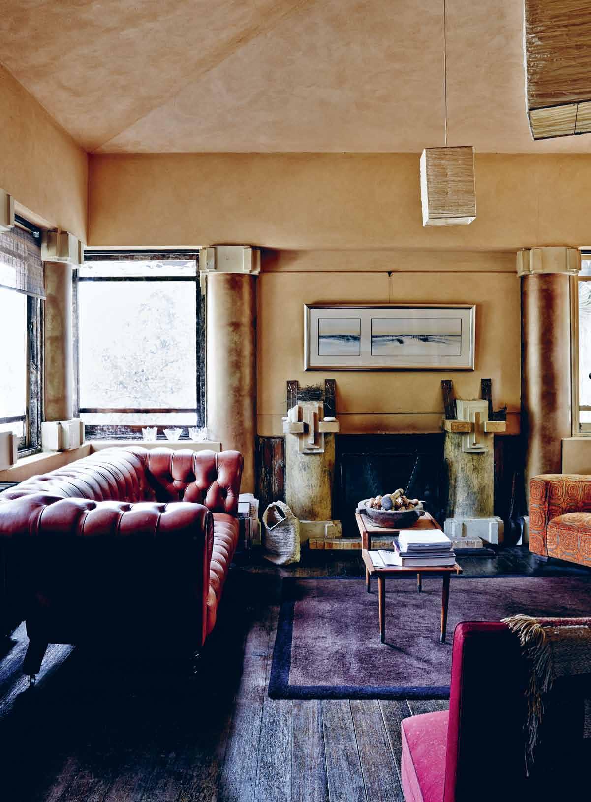
absorbed some of the water, adding to the dank interior. But none of this deterred Philip who could see the great bones of the house. Philip, his partner Anna Johnston and their three children, Hugh, Beattie and Ollie, lived in the house for a couple of years before venturing on any work. “From the outset, we saw this house as ‘pleasing decay’,” says Philip, who says it’s still a ‘work in progress’.
New kitchen and bathrooms are high on most people’s renovation list. But Philip approached his home like a curator, removing layers of paint and carefully restoring the place. One of the most effective ways of reversing the damp was removing the carpets and installing hydronic heating. The asphalt eaves were replaced with rubber and the concrete tiles on the roof were repaired. Little steps such as removing peeling wallpapers and returning the walls to the original sand render also changed the feel of the house.
Irrespective of the condition, Nicholls’ design is one out of the box. The front door, located beyond an internal courtyard, opens to a compressed hallway with low ceilings. “When you walk into the lounge and dining
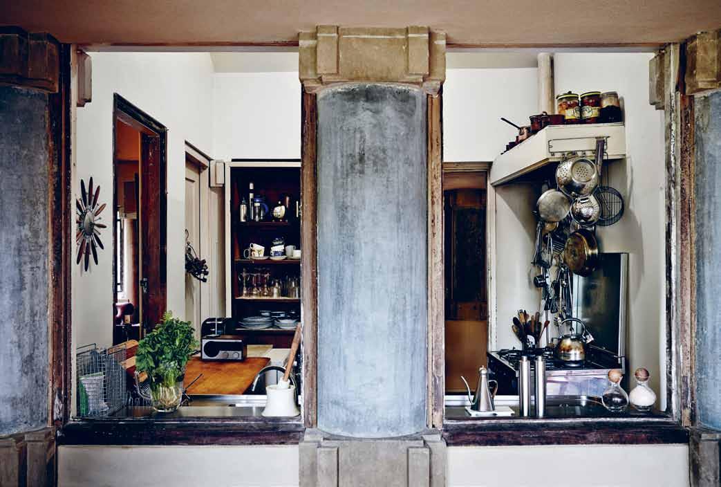
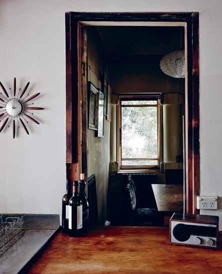
area, with their tent-like ceilings, you start to appreciate the spatial qualities, as well as the detailing,” says Philip. The fireplace in the formal lounge is simply flanked by two of the 51 concrete columns throughout the home, originally sewer pipes manufactured by Humes. The capitals added by Nicholls give the interior an Art Deco quality. The dining area, although compact, shows that functionality was as important to Nicholls as aesthetics, with a servery accessible from both dining room and the kitchen.
The kitchen has changed little over 12 years since the family moved in. The old Kookaburra stove (no longer working) was replaced and stainless steel bench tops were fashioned in the original design. A compact kitchen by today’s standards, it still follows the triangular arrangement of contemporary kitchens with the placement of stove, sink and bench. “This kitchen was designed to minimise [the need for] movement. It’s still practical,” says Philip. Practical, yet traditional – in addition to the original servery, there is a ‘butler’s pantry’ with room for the fridge and food supplies, converted from the original laundry.
The most significant change to Nicholls’ design has been the addition of a new pavilion leading from the kitchen. Once an enclosed verandah, this steel and glass wing echoes the tent-like rooms in the original home. Floor-to-ceiling glass windows in this pavilion also provide a contrast to Nicholls’ design, which features smaller casement windows levelled at window boxes. “Anna and I were originally looking for a 1950s Modernist house, with large picture windows. This extension provides the light of that period while still being compatible to the original design,” says Philip.
Philip was also keen to furnish the home slowly, as suitable pieces of furniture were found. A couple of club-style armchairs show age on the armrests. Used by the cat as a scratching pole, the threadbare fabric adds to the room’s patina. A 19 th Century Chesterfield looks as though much time has been spent in front of the open fire, as do the patchwork rugs, made from old flour sacks.
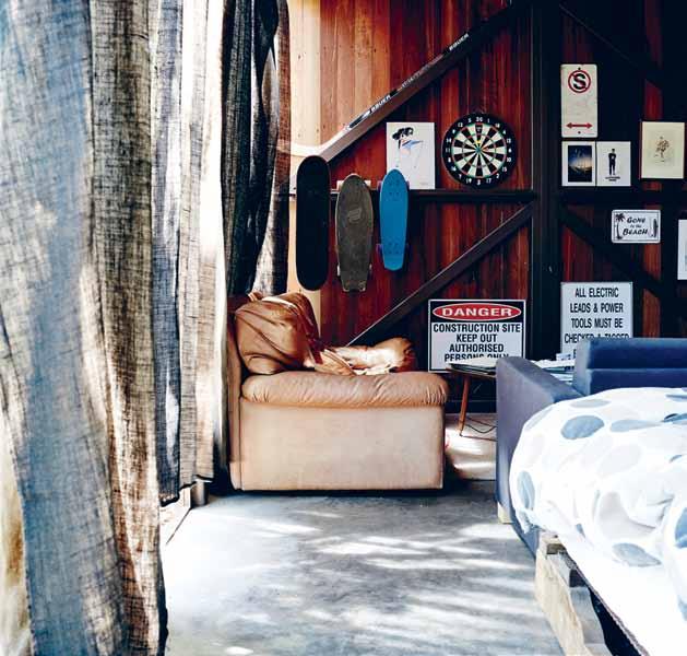
One of the most extraordinary rooms in the house is the main bedroom. Orientated to the north and the front courtyard, this bedroom features a dramatic pitched ceiling. An 18 th
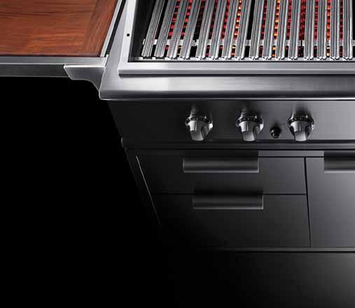
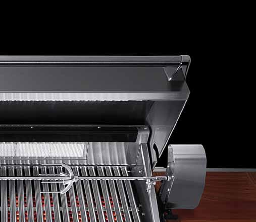
t h I s I s not a BBQ
It’s


In fact it’s a professional outdoor kitchen. Hailing from Huntington Beach California, the spiritual home of US outdoor cooking, DCS invented and perfected the art of grilling. Each commercial grade DCS grill has been meticulously engineered to deliver intense heat, precise control and staggering build quality to far exceed any mere BBQ.





Anna and I were originally looking for a 1950s Modernist house with large picture windows. This extension provides the light of that period while still being compatible to the original design.

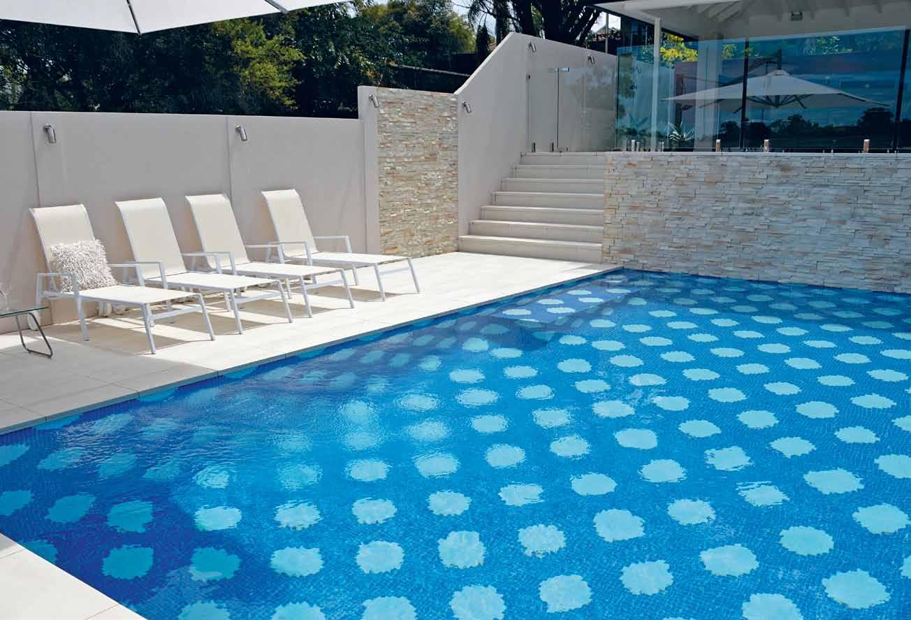
A versatile and durable Spanish glass mosaic range
Togama glass mosaics from Spain comprise 99 per cent pure recycled window float glass and 1 per cent pigments. The product is available in a flat surface finish or an anti-slip finish which contains elements of quartz. Use of the most advanced polyurethane dot-backing system promotes improved planarity and ease of installation. Togama mosaics are ideal for curved or flat surfaces in small or large areas. The 25mm tesserae are assembled on a 333 x 333mm sheet. Areas of application include: pools, spas, bathroom walls & floors, water features and other wet areas.
Century wardrobe occupies a nook originally designed for the bed. And family photos are beautifully suspended from the picture rails, cleverly devised by an indent in the wall. Stains from the water damage have been left, creating the effect of a fresco that stops you in your tracks. And cracks in the walls simply add to the patina. “It’s important to see a how a place ages. Buildings are continually shifting and a few cracks are just part of that process,” Philip believes.
He has recently completed the latest addition to the house. Framed by a majestic eucalypt is a two storey free-standing structure made of steel, glass and rendered brick. Inspired by legendary architects, Guilford Bell and Robin Boyd, this building includes Bell’s symmetry and classicism together with Boyd’s artistry for shading the afternoon western sunlight. At ground level is eldest child Hugh’s bedroom and bathroom. And on the first floor is Philip’s study, offering impressive city views.
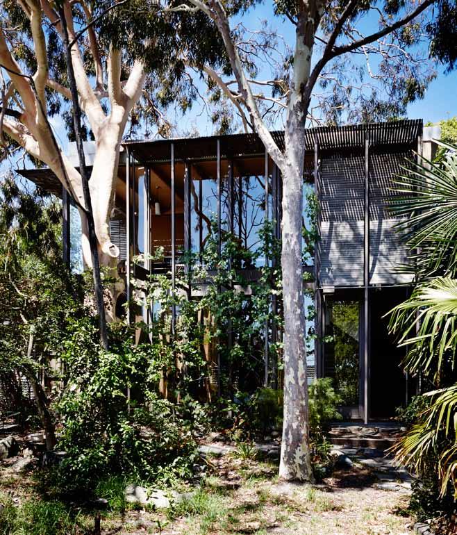
Where others would have made surfaces ‘good’, Philip and Anna have celebrated the history of their home. Cracks and eroded plaster appear in most of the rooms in the original part of the house, be they bedrooms, bathrooms or formal living areas. But there’s also a belief that the house is continually evolving, while still retaining elements down to the original light fittings and the Bakelite light switches. “When you look at Nicholls’ design,” says Philip – as he has the pleasure of doing often – “you start to realise how inventive he was and how contemporary his work really is”.
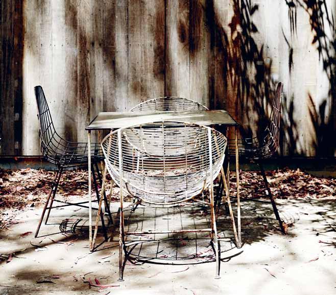 Goad | p.goad@unimelb.edu.au
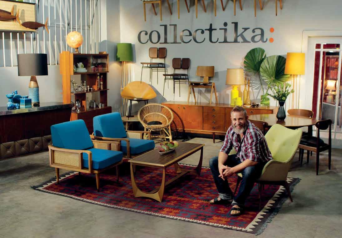
Collectika is passionate about beautiful and original design. With a love for vintage, retro and mid-20th century decor, Collectika have sourced a range of unique and inspirational treasures from around the world. “We love all kinds of items that were crafted at a time when artisans still held the secrets to making beautiful things” - that’s the Collectika way. With iconic brands such as Parker and Eames - their collection is indeed beautiful. Collectika trades in furniture, lighting, vintage fabrics, wallpaper and eclectic period pieces. Collectika’s stock is carefully restored to the highest standards, complimenting the most modern of homes.

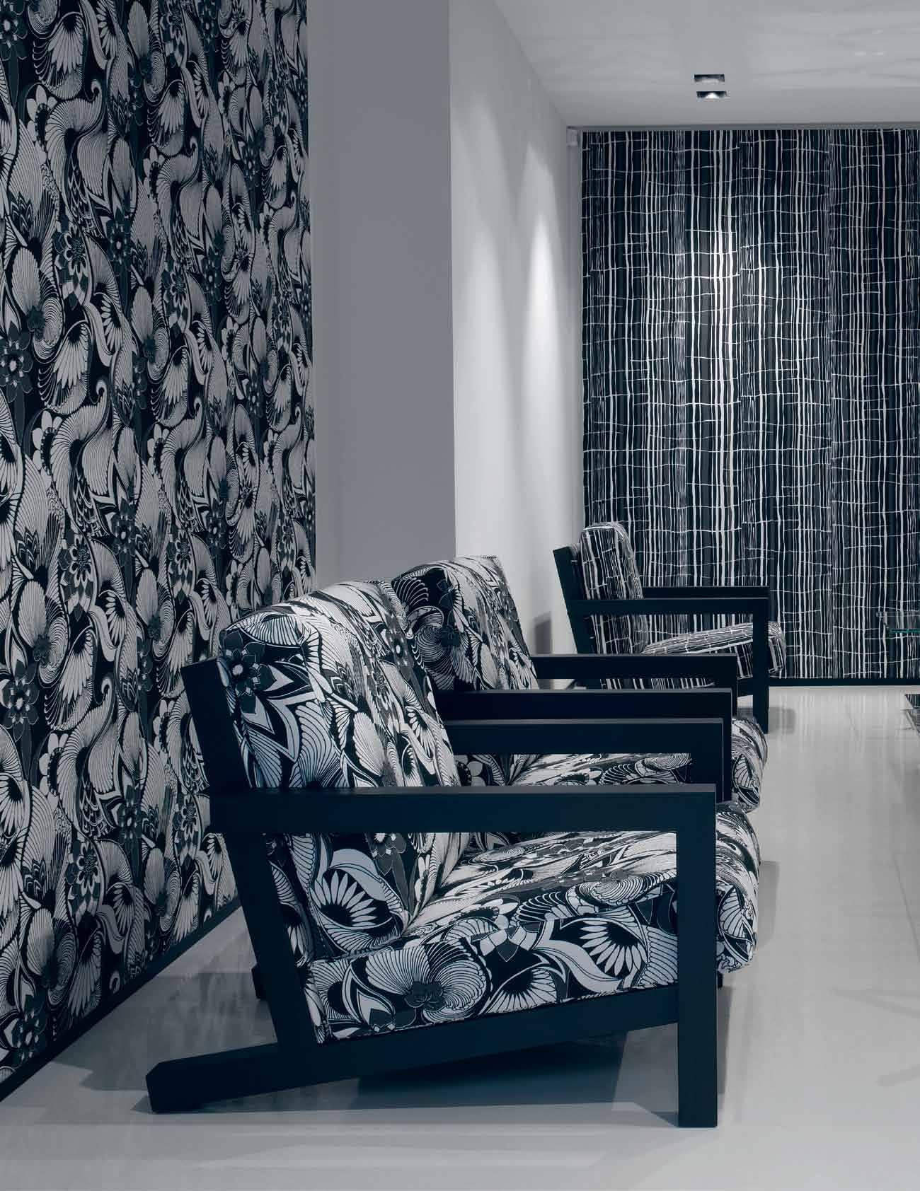


Specialising in tapestry and textile structures, young French-Filipino artist olivia d'aboville manipulates ordinary mass-produced objects to question our society and lifestyle, and its impact on the environment.




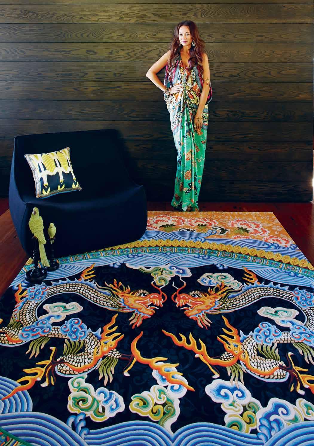
Designer Rugs have once again proven why they are one of Australia’s leading rug companies. Having already collaborated with high profile Australian designers such as Akira Isogawa, Alex Perry and Catherine Martin, Designer Rugs has a long history of inspiring unique creative designs, complementing the aesthetics of residential homes and commercial spaces throughout the world with their exceptional quality. And their latest collaboration is certainly no different.
The release of CAMILLA signals one of Designer Rugs’ most ambitious collections to date. By transforming kaftan queen Camilla Franks’ colourful, handmade, graphic prints into exclusive and innovative handmade floor rugs, Designer Rugs have completely reinvented Camilla’s synonymous aesthetic, bringing her recognisable tropical prints to new audiences and new spaces in ways that were previously un-imagined.
Already a household name worldwide, Camilla Franks’ iconic kaftans have been worn by the biggest of Hollywood stars, Beyoncé and Oprah to name but a few. And while Camilla’s signature colourful graphic prints and freeflowing designs are the core focus of her individuality and popularity, this latest project shows that CAMILLA is much more than simple fashion talk.
“For me, CAMILLA has always been a lifestyle brand,” she says, “and, after many years developing and perfecting my fashion line, I wanted to expand on CAMILLA world.” Now, in this collaboration, Camilla’s captivating story can extend beyond the kaftan.
“It has been a huge process,” Camilla adds, “but I am so thrilled to now be partnering with Designer Rugs and launching my rug collection.” Encapsulating the independent spirits of iconic cultural muses, the designs Verushka, Talitha Getty, and Jade Jagger will bring a bold and detailed palette to any interior space.
The collection expands on Camilla’s 2012 fashion GYPSET range that took inspiration from all things exotic and bohemian. The unique collection of Endless Summer, Formentera, Island Song, Hydra, Tang and Qin form an ecclectic yet elegant range that is rich in both colour and creation, with each rug meticulously hand-made to size. From deep reds to vibrant blues, there is a story and a palette to suit any personality and any space. Exuding an air of strength, power and restraint, much like the ideas, people and cultures they represent, the CAMILLA range will provide a playful yet sophisticated finish to a variety of interiors. A highly unique and innovative take on the humble rug, this design brings spaces alive in ways truly inspiring.
The famous writer and politcian, Norman Vincent Peale once said “imagination is the true magic carpet.” But with their latest collaboration, it seems that Designer Rugs have caught imagination in the rug itself.
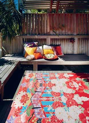
With their latest release, Designer Rugs have brought interior spaces alive in colour, proving there is no limit to the imagination.
Lama, designed by Gio Ponti, one of the door handles that Olivari has been producing 100% in Italy for over 100 years. The Olivari Lama is now part of the 2013 projetc range


Olivari of Italy - celebrating over 100 years of excellence

SuperInox Satin and SuperInox Brass
A finish guaranteed not to tarnish or tea stain in sea air for 30 years. Olivari; the only solution for all ocean front projects large or small




Contact Bellevue for your NEW 2013 Olivari catalogue
eMail: info@bellevueimports.com.au | Ph: 03 9571 5666
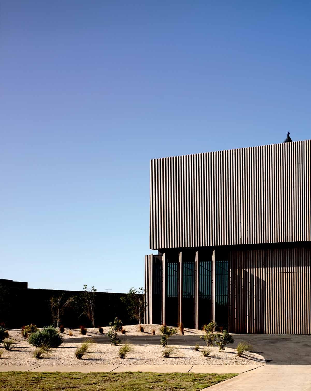
A beachfront home calls for expansive glass and verandah living. Or does it? WOLVERIDGE ARCHITECTS challenges the norms with a house that’s very much focussed on the interior.
Life in Torquay is a relaxed affair. The home of Victoria’s legendary Bells Beach attracts generations of sunseekers, who love the open water and pay daily homage to its rolling surf. Here, the prized real estate is on The Esplanade, a long, windy promenade offering large, balconied houses separated from the beach itself by a wide strip of grassland and paths.
So when architect Jerry Wolveridge, director of Wolveridge Architects, was presented with an atypical block by his clients, Scott and Becca Henderson, he decided to challenge traditions of coastal design and the built form.

Located off The Esplanade in a small line of houses, the block faces coastal sand dunes to the south, and The Sands Resort and golf course to the north. The clients wanted views of both, but not the east and west vistas of their neighbour’s properties. While the block lacks beach views, it makes up for this in proximity, unlike most Torquay properties, whose owners have to drive to the water. “The greatest attraction for us was that we could throw a couple of towels in a bag, walk outside and it takes two minutes to get to that beautiful beach,” Becca says.
The design framework was the client’s brief. They wanted enough accommodation for family
and friends to stay over, a touch of luxury, low maintenance, a pool, sundeck and privacy.
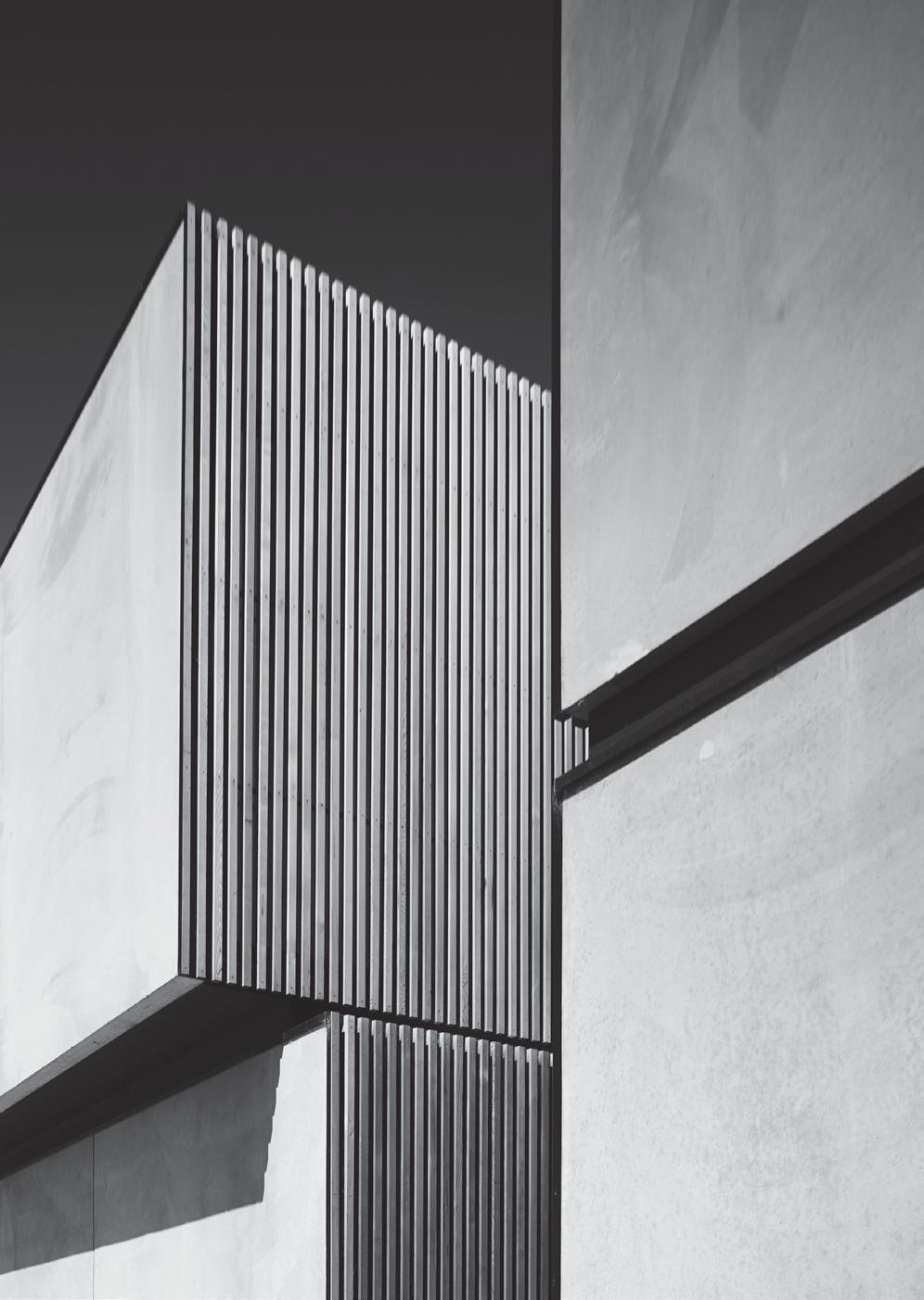
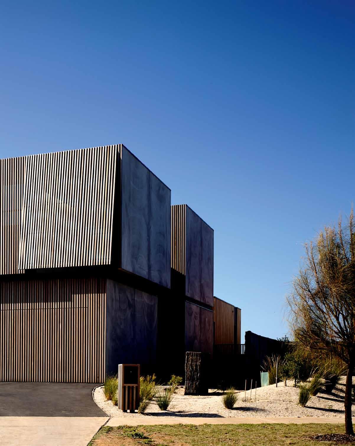
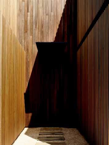
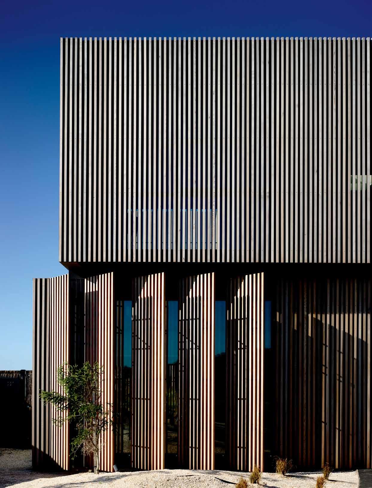
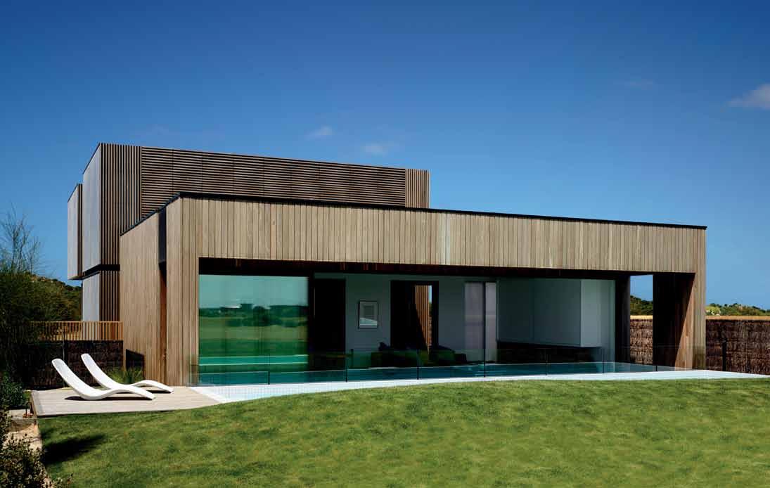
The house is set back from its allotment and expressed as a series of five robust containers that neatly stack on top of each other. Most noticeably, it is completely encased by Western Cedar wood battens. From the street, the curious, box-like form presents as something of a mystery. The front door appears to be hidden, there are seemingly few windows and little opportunity to take in the views. “There’s no real clear notion about how it works or conforms to typical residential design,” Wolveridge says.
The boxes are also exactly the same in dimension: “How are we going to articulate them to create a sense of delicacy, control and fine detail?” he asks. The timber battens go some way aesthetically in responding to this, but it is the connections and spaces between the containers that are most critical.
Large concrete panels affixed to each end of the containers add protection, with the most visible panel at the front cantilevered over the container below it. The most complex aspect of the entire project is this cantilevered element, which also entails the most weight and engineering. The result is a complex structural frame that appears seemingly simple. “But
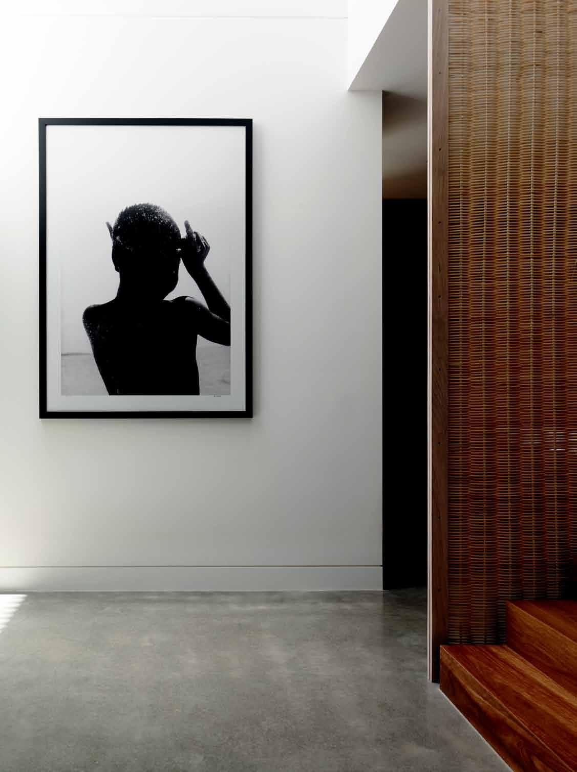
A wicker screen anchors the home’s natural theme, complemented by Spotted Gum timber stairs.
The summer room is fresh, open and bright. It features the polished concrete floors used throughout the ground level.
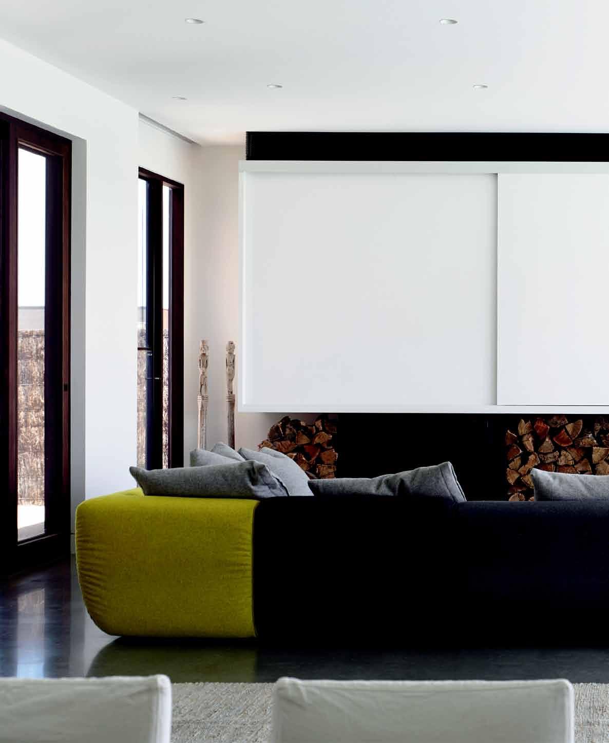
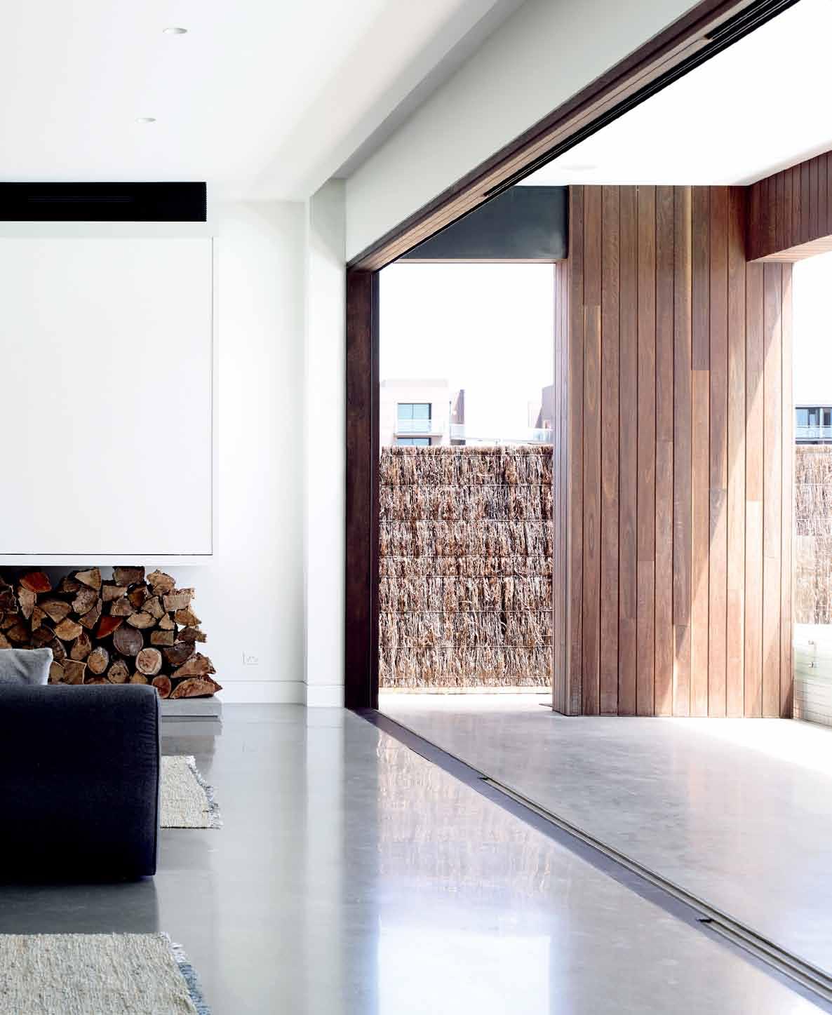

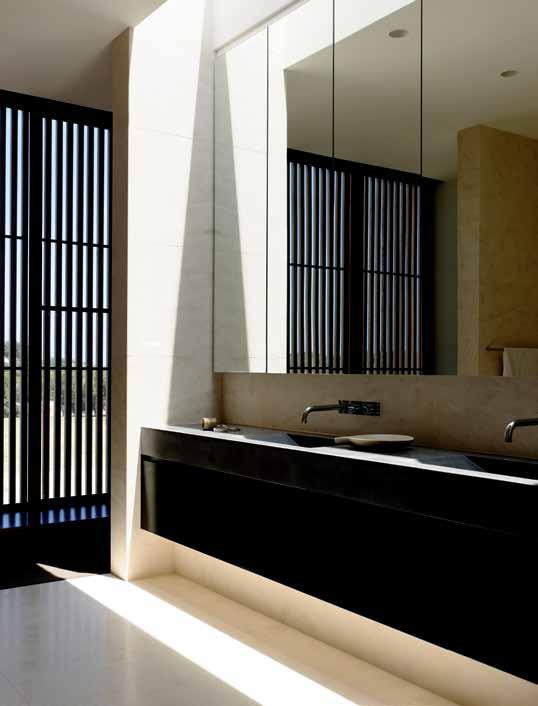
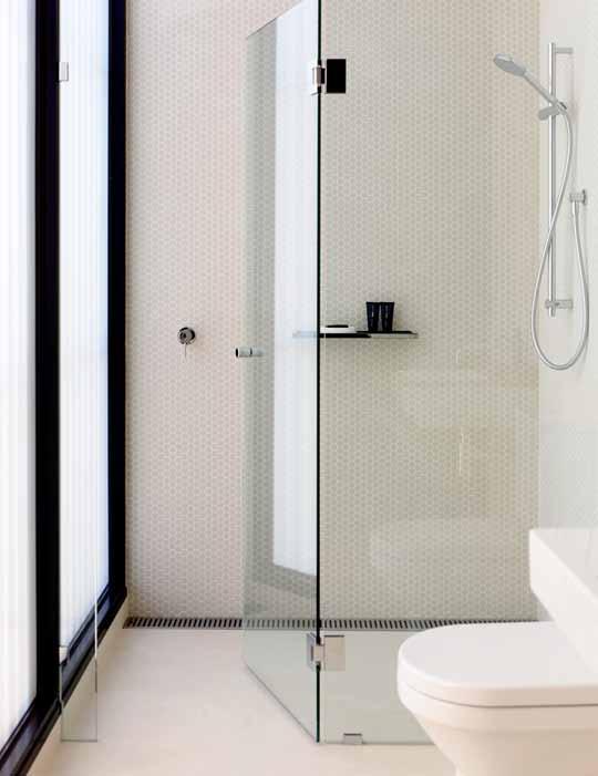

I can tell you it wasn’t,” Wolveridge says with a laugh. The front door is set in between two containers on either side, and these exude a strong scent of Cedar. “The Cedar battens will silver and grey off as time goes on. They have a lightness to offset the concrete and also act as a filter for the occupants,” Wolveridge says.
Once inside, the key design brief was for two main living areas: a large, summer room at the back, and a small, winter room at the front. The front living area is moody and low key, with an open fireplace and concrete panel expressed internally. The battens can be opened up for extra light, and the subdued space is best reserved as a retreat for the colder months.
In a strong departure from typical openplan design, the kitchen is its own space rather than part of a living zone. Tucked neatly behind a wicker-encased stair, its long, marble island bench is flanked by sleek cabinetry and concrete benches, finished with mellow tones and a little shimmer that bounces around the natural light. At one end it faces battens that can be opened to filter the light, and at the other is a small, outdoor barbecue area with views into the back room. “I think it’s sensational how the kitchen has evolved into this separate space,” Wolveridge says.
We built it for us and for our friends and family. If we have lots of guests down for weekends, they have their own bathrooms, which is perfect.
Becca agrees. “When we had people here all through summer it flowed and just worked beautifully,” she says.
At the rear, the summer room is the largest space in the house. For lounging and dining, this vast, 13-metre-long room is fresh, open and bright; it features the polished concrete floors used throughout the ground level, and has lush views over the golf course. At one end, a large, white sliding screen conceals shelving and a wall-hung television. Beneath this, chunky logs of wood frame a Jetmaster fireplace for added warmth. At the other end, a large painting of a bull, by the owners’ friend dave Bowers, overlooks the eight-seater dining room table.
Connecting the entire space are full-width, full-height stacker doors, which slide all the way back to reveal a covered terrace. This partially shields the lap pool, and there’s space outside for relaxing on the sun deck and lawns. Errant golf balls landing in the swimming pool are not uncommon, but Wolveridge lowered the rear boundary and built up a protective lawn mound to heighten privacy.
Smack bang in the centre of the house, the staircase is the true core of the building. Its wicker screen anchors the home’s natural theme, complemented by Spotted Gum
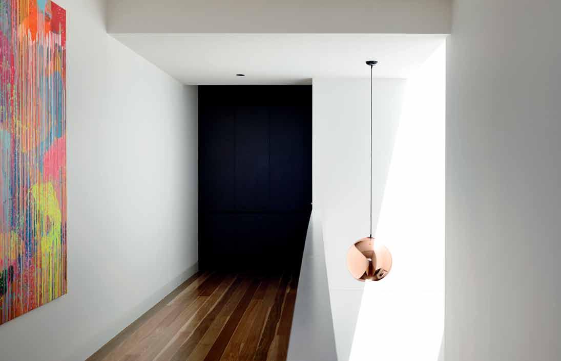
timber stairs. There’s another piece of local art decorating the hallway upstairs; a bright, neon painting by Rowena Martinich, which the Hendersons commissioned especially for the space. “Rather than just buying a piece because you like it, getting to know the person behind it is great fun too,” Becca says.
The floor plan here is also non-traditional. Both bedrooms contain their own ensuite bathrooms. “We built it for us and for our friends and family. If we have lots of guests down for weekends, they have their own bathrooms, which is perfect,” Becca says.
The main bedroom has walk-in robes and an ensuite bathroom that sits within its own container. With a full-width, concrete dual vanity, limestone tiling and built-in bath, the ensuite is the most opulent room in the house, while the bedroom’s strong, structural timber ledge precedes floor-to-ceiling windows facing the sand dunes. downstairs, a study enables both clients to work, while other touches include fitting the garage with a laundry, masses of seamless storage, and a handy powder room.
Standing once again in the foyer, it’s the small details that add delicacy to the house’s robust design and allow the building to come alive. There are no windows facing east or
drOp b Ox
ArchiTecT Wolveridge Architects
prO jecT Te Am Jerry Wolveridge, Sina Petzold, Tjeerd van der Vliet, Courtney Gibbs
b uilder And cOnsTrucTiOn mAnAger
John Walker Master Builders
sTrucTur Al/civil engineer Don Moore & Associates
lAndscApe cOnsulTAnT Heather Vincent Landscapes
cOsT cOnsulTAnT VPL Builders Services
b uilding surveyOr Nepean Building Permits
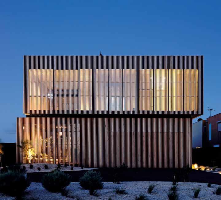
(61 3) 9486 9882 wolveridge.com.au
ARTWORK
Painting in hallway by Rowena Martinich. Photography at entrance by Peter McChonie. ‘The Bull’ painting in living room by david Bowers. Tree of Life sculpture, anonymous.
FURNITURE
Milo modular lounge, Jardan. B&B Italia marble coffee table. Recycled hardwood table, Mark Tuckey. Jack chair with loose linen cover, Jardan. Leather rug, S&R Gifts & Homewares. Timber stools, Freedom. Accademia Vela outdoor chairs designed by Studio Hannes Wettsetin, Space Furniture. Knoll 1966 outdoor dining table designed by Richard Schultz, Space Furniture. Timber ladder to library unit, Häfele.
LIGHTING
Flos Easy Kap washers and downlights, Euroluce. Pendant lights, wall lights and external lights by builder
FINISHES
Spotted Gum decking and flooring, Timber Zoo, with various stains, Cutek. Concrete floor with special finish, Alternative Surfaces. Carpet
west, but rather skylights and strategically placed windows that celebrate the light and space rather than enclose it. This enables the occupants to feel safe and allows for good times at any time of the year. “While it appears somewhat austere, this building really does feel like a home,” Wolveridge says. “And that’s a really important consideration.”
It’s not difficult to understand why a community that enshrines living outdoors may take umbrage to the design of this house, but that’s because most people haven’t stepped inside. And whether the subsequent use of timber battens on nearby houses is flattery or coincidence, there’s no doubt the house has been the subject of much discussion since its completion in 2012.
For the Hendersons, this radically designed building is simply their place to call home.
by d on Currie Carpets and Victoria Carpets. Geisha limestone and Soul neve floor tiles to ensuites, Classic Ceramics. Limestone wall tile to ensuite, Perini Tiles, LAM Progetto Blend nero wall tile to ensuite shower, Plastral, and Hectagon mosaic tiles, Classic Ceramics. Wicker wall, Camberwell Cane. Cosmos mirror to kitchen splashback, Outline. Various laminates, Laminex. Various paints, dulux. Elba/Luminosa marble to bench top, Artedomus.
FIXED & FITTED
Glide-up garage door, Airport d oors. Various fittings, Häfele. Pull-out drawers to robes, Wilson & Bradley. Horizon fireplace, Jetmaster. Metal mesh fireplace curtain, Screens & Fireplaces Australia. WC, basin tap, bath, shower, and bathroom accessories, Rogerseller. Concrete benchtops and basins, Boyd Alternatives. Aqua d ux shower channel, Reece. Exhaust fan, Fantech. Cooktop, oven, dishwasher and rangehood, Miele. Refrigerator, Fisher & Paykel. Electrolux integrated barbecue, Elite Appliances. door furniture, designer doorware. Slimline switches, Clipsal. Slimline grill, Holyoake.
Challenging the traditional norms of coastal living and design, architect Jerry

Wolveridge and owner Rebecca
Henderson handpicked unique internal finishes to make this Torquay House anything but your ordinary beach side shack.
“The clients were very clear that the building interior should be sophisticated and timeless,” says Jerry Wolveridge of Wolveridge Architects. The use of natural Elba stone marble used throughout the kitchen provided a warm and friendly quality, but still maintained the refined and elegant look the Hendersons desired. “I was determined to stay away from grey and white tones,” says owner Rebecca Henderson of the Elba bench tops. “We wanted a warmer tone marble, with creams and chocolates tones,” continues Henderson, “so it would work with the chocolate cabinetry in the kitchen.”
The Jack dining chair was found on display at Mark Tuckey’s showroom in Collingwood, and provides a modern, cosmopolitan ‘beach’ feel. “I still wanted a ‘beachy’ relaxed dining chair,” says Henderson, “and I was very attracted by the fact that the covers could be removed and washed, the linen is very versatile.” Similarly, the Vela outdoor chair was chosen for its robust, comfortable and weatherresistant design, practical for coastal living.
As to the rest of the furniture, Henderson hand-picked every piece herself. “Becca made the furniture selections independently,” says Wolveridge, “I love what she’s selected.” Perhaps the most unique of all the pieces is the Wicker Wall that Henderson found in a d anish interior design book. “I was desperate to have this feature to complement the natural beach surrounds of the house,” Henderson says of the Wicker Wall, “I thought it was very important to introduce a new material that would complement the timber, concrete and marble in the kitchen.” The wicker also serves as a unique material for the light to flicker through at night. “It is perfect,” Henderson concludes, “it is one of the most loved features in the house.”
horizon lowline inbuilt fireplace wiTh bl Ack fA sciA frO m je Tm A sTer, je Tm A sTer.c O m. Au
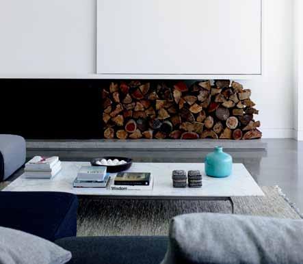

vela velina chair by sT udi O h A nnes we TTsTein f O r AccA demi A frO m spAce furniT ure, spAcefurniT ure.c O m. Au
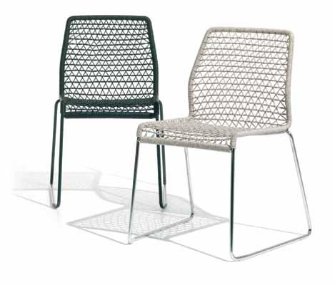
elba marble TO benchTO p frO m A rTed O mus, A rTed O mus.c O m. Au

Lecco wall system Fly Arm Chair - both available in a range of custom options
WE BELIEVE IN CUSTOMISATION
Leave the task of keeping your things organised with a multifunctional storage system that surrounds you with the things you love and hide the stuff you don’t want to see. Customise your wall system with different shelving sizes, drawers, glass, coloured or wooden fronts, drop down or sliding doors. Storing doesn’t have to be boring. Design your perfect wall unit online at www.boconcept.com.au
Design your wall unit online now boconcept.com.au
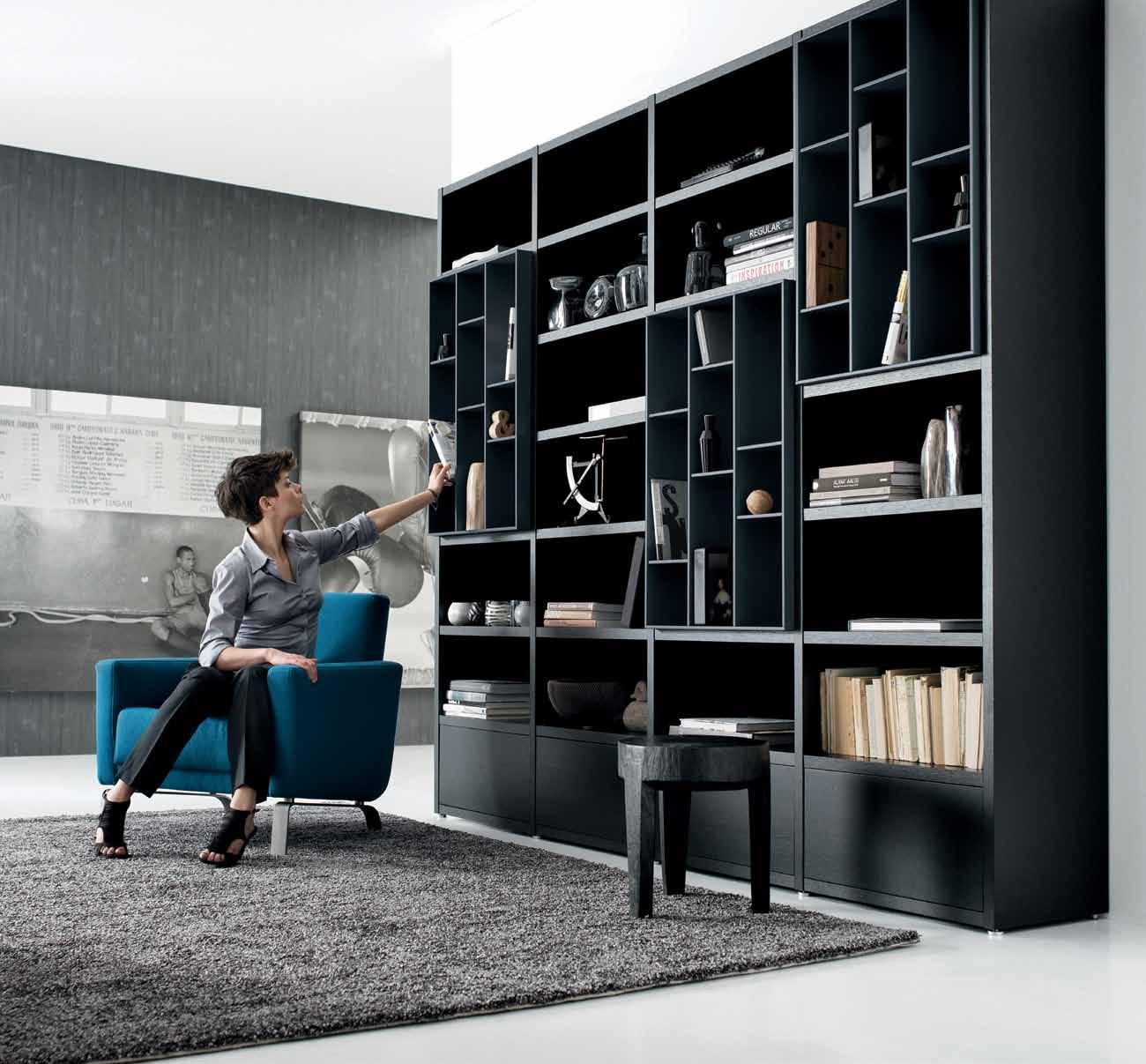

The best architects take their role seriously – to challenge, question and re-position the norms. Chang Yong Ter builds on heritage and juxtaposes this approach with entirely new ideas in one fell swoop. Chu Lik r en investigates.
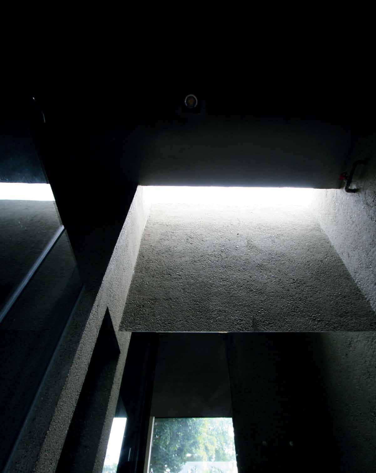

The Joo Chiat Road area in the south-eastern part of Singapore is known for its colourful and ornate shophouses built in the 1920s and 1930s. Re-development in this ‘secondary settlement’ area is governed by stricter building regulations, but has seen its share of gentrification, with the shophouses traded and retrofitted to serve the needs of the day.
In 2003, architect Chang Yong Ter of CHANG Architects was approached to collaborate with two young owners and an architect friend to co-design and oversee the retrofitting of No. 137 Joo Chiat Place. The owners were Yang Yeo, a creative director of an ad agency, and his wife Ching Ian. They had both grown up in the area and are fond of its Straits-born Chinese heritage. No. 137 was completed in 2005 to acclaim and publicity.

Shortly after completion, the house was sold, and in 2006, the owners acquired what was the longest plot of land on the road, six doors away at No. 125, 55-metres long and 6-metres wide. The front half was a built-up, inter-terrace shophouse that had to be conserved, while the back lot was vacant, concreted land subjected to new boundary line set-back controls should it be built upon. Again, the owners collaborated with Yong Ter to retrofit the new property.
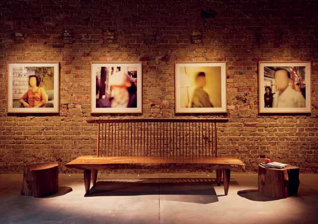
Like his contemporaries, Randy Chan and Ling Hao, Yong Ter was a protégé of Tang Guan Bee, one of Singapore’s pioneering rule-bending, avant-garde architect-artists whose works are strongly concept-driven, where the design of the parts are often subjugated under a dominant architectural idea and where artistic licence is often invoked to jolt the senses against the conventional. For example, in the 1990s, Tang’s office (where Yong Ter once worked) was a retrofitted shophouse in Chinatown, the façade of which Tang had painted black in opposition to the rest of the harmonious, complementary, pastel-coloured streetscape. This partsubversive approach to design has not been lost on Yong Ter, and indeed, in his best known work to date, the Jalan Elok house of 2008 (featured in Habitus #04), all notions of terrace house living were radically and spectacularly revised. For the design of No. 125 then, the clients and the architect shared a common view that architecture should articulate untested ideas and inspire new ways to experience an old building. Hence, one of the initial ideas Yong
Ter explored was to have an extension wing that was completely detached from the old shophouse, consisting of two floors enclosed by movable facades and roofs that slid into one another like a telescope. This would give the new wing a constantly changeable character that a restored shophouse could never have, and create a poignant dialogue between old and new. Although this idea was later discarded and the annexe scaled down to a single fixed storey, remnants of this initial idea can still be discerned. As built, the annexe is still completely disconnected to the old house, and a collection of boxes of various heights are staggered together, hovering above the ground and seemingly growing and recessing into each other. These boxes house the secondary bedrooms with ensuite toilets and the spaces are tightly controlled and defined.
The brief for the old shophouse, however, was to be as flexible and adaptable as possible for various uses. Here, the immutable components such as staircase, toilets, kitchen and storage areas (and how they are compacted,
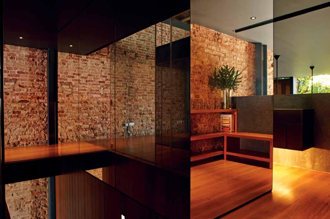
The clients and the architect shared a common view that architecture should... inspire new ways to experience an old building.
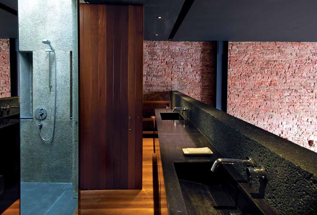

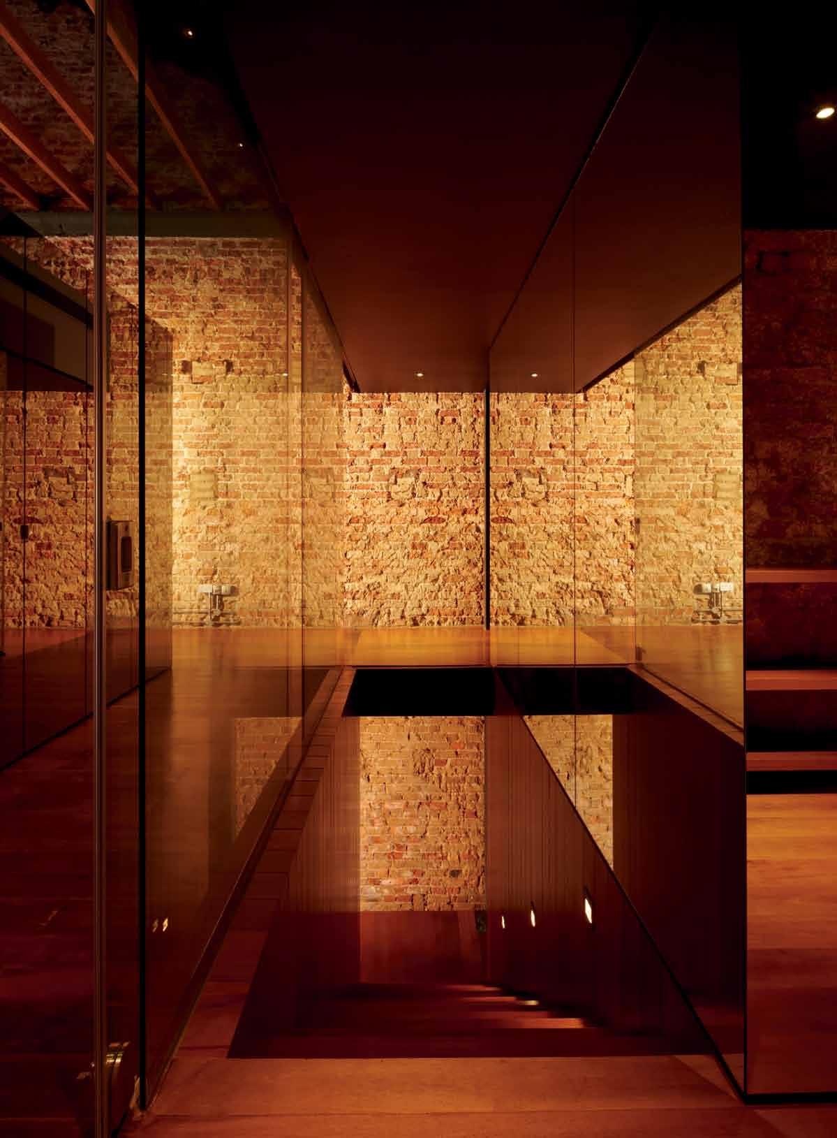
...uncluttered walls, stripped and jet-sprayed to expose the raw bricks beneath...
dressed and placed in its historic shell) were of greater importance. As Yong Ter puts it, “Can the house survive under the different hands of the different owners?” This was a real concern, given that during the design stage, the owners had ideas of first letting it out (as they had then relocated to Shanghai), using it as a gallery and later, of housing them on their return.
Under such flux and longish gestation period (the design period stretched from 2006 to 2009), the design elements that Yong Ter focussed on were the essential modern conveniences that would serve the house. These are gathered as a cluster of rooms at the heart of the conserved shophouse, away from the existing party walls so that they form a decisive barrier between the public zone in front and the private ‘back’ areas. Upstairs, all cabinets and shelves were similarly designed with free-standing furniture that would not be docked against the party walls. These uncluttered walls, stripped and jet-sprayed to expose the raw bricks beneath, would form the grand gesture of two parallel transparent strips that extend right through the length of the shophouse, passing through the full-height glass walls at the back facade and on to the
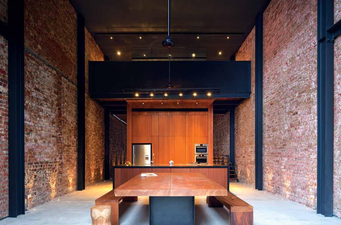
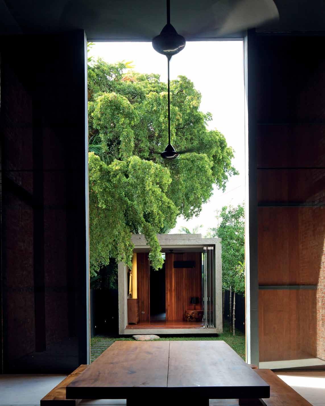
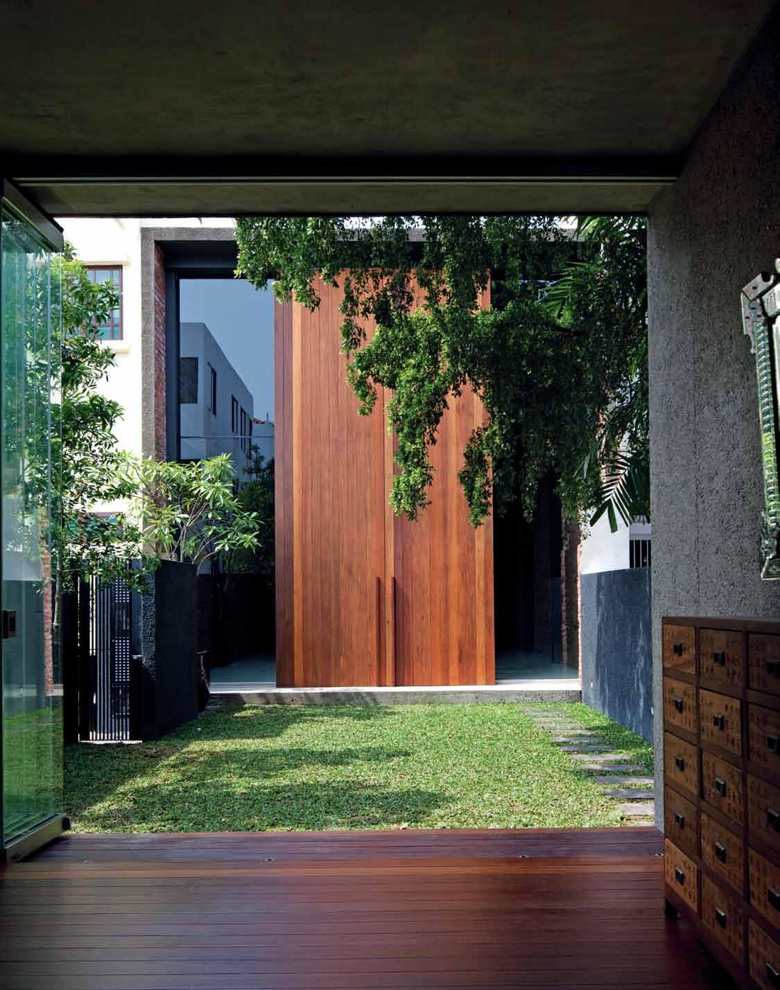
...dim passages alternate with uninterrupted views of nature...
green strips beyond, courtesy of the setback requirements for the annexe wing. Standing next to the party wall in front, one’s vista goes all the way down to the back gate behind. For this visual continuity, a short flight of stairs abutting the party wall is made as light and porous as possible.
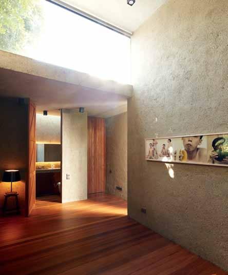
Aesthetically, the big idea at No. 125 seems to be the emphatic delineation of opposites and the deliberate and often jarring but masterful use of contrast in scale, colour and materials to drive home the difference between the old and the new. Hence, a sheltered five-foot walkway in the front is contrasted with no shelter between the old and new buildings; the intimate, human-scaled door in front is set against oversized back doors; sleek metallic surfaces are juxtaposed with raw, exposed bricks; dim passages alternate with uninterrupted views of nature; and the unexpected, almost alien new architecture of stone-aggregate walls crouch behind the stately elegance of the elderly front.
Significantly, the house has now been sold to a different owner for a handsome return, and will soon be subjected to just the kind of tests that Yong Ter has anticipated. I visited the house on a rainy day, and enjoyed walking from the old threshold to the new annexe wing without the aid of an umbrella, but wondered if the purity of this design will be appreciated by the new owner, or is a new sheltered linkway forthcoming? If so, the massive 7-metre-high timber sliding doors is a forbidding presence to connect to, and one can surmise that this had been one of Yong Ter’s strategy to resist unwanted alterations. “Singapore is a tropical city, so it’s good to walk in the rain once in a while to experience it,” Yong Ter believes.
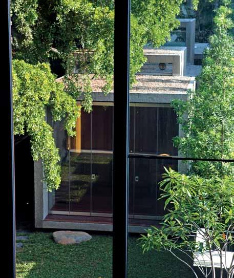
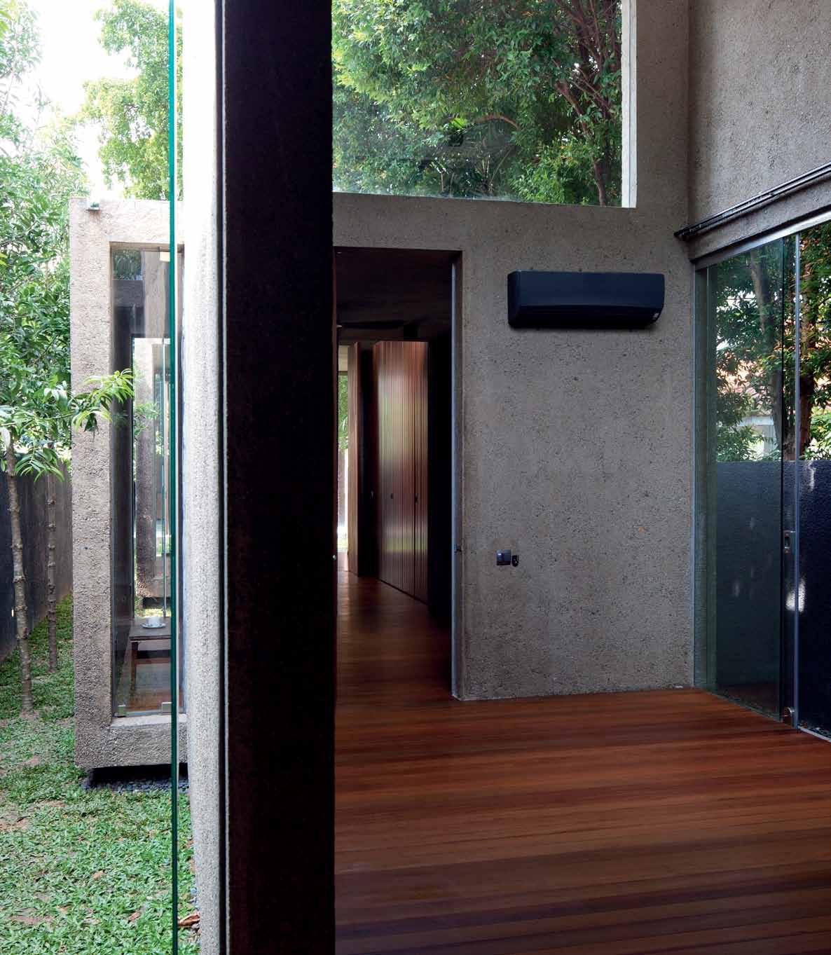 opposiTe above | The bedrooms of The aNNexe wiNg are NaTurally liT aNd veNTilaTed wiTh cleresTory aNd louvred wiNdows. opposiTe below | sTaggered box forms of The aNN exe wiN g as viewed from The upper floor of The old shophouse. above | The archiTecTure of The aNN exe wiN g mixes cool sTo N e-aggregaTe walls wiTh
Nevertheless, as with other prize-winning projects designed by Yong Ter, the house is testament to a heroic realisation of a singular vision. Almost in homage to his one-time mentor, the facade treatment at No. 125 also raises the question of what constitutes meaningful conservation. Instead of a new coat of paint, as was done for No. 137, the existing paint in No. 125 has been scraped off to expose the earlier layers, forming an aged, flaky facade in stark contrast to its neighbours. The original stencilled markings on the front pillar reading ‘Lucky Book Store’ has been retained, giving one an instant connection to the legacy of the building (I’m reminded here of graffiti by Russian soldiers that Norman Foster preserved in the Reichstag).
The unfinished look of No. 125 created unease with the officer in charge of granting the occupation permit for the building. The fear was that the general public would protest against its unkempt look. The permit was eventually issued with a condition that addressed the public’s concern, if that arises at all. So far, it has not.
archiTecT CHANG Architects
projecT archiTecT Chang Yong Ter
b uilder S.K.Goh (Allegiance Construction)
civil & sTrucTural eNgiNeer Tiong Hoo Tuong, Kevin Lim (City-Tech Associates)
l aNdscape coNTracTor Chua Chor Ko (Greenscape)
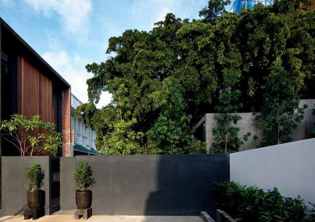
carpeNTer Ben The (East Interior)
ToTal floor area 301.36m 2
CHANG ArCH ite Cts
(65) 6271 8016 changarch.com
ARTWORK
Photography throughout residence by various artists, including Singaporean artist/ photographer based in New York, John Clang.
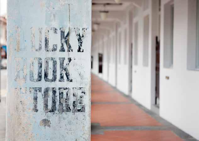
FURNITURE
Loose furniture from Zia Concept.
LIGHTING
Lighting by Speclitez Enterprise.
FINISHES
Flooring is Balau planks. Internal and external walls in the new annexe wing are washed
stone aggregate. Blinds are RB Solaris, from Alzoe. Curtains are from Sweet Home Curtain & Trading.
FIXED & FITTED
Ceiling fans are from KDK & Elmark. Air conditioning system is from LG.
Sanitaryware is by Toto, from W. Atelier. Kitchen faucets and sink are from Bretz & Co. Bathroom accessories are from Homewerkz. In Kitchen, Fisher & Paykel fridge and Bosch Pyrolitic cleaning built-in oven are from Eldric Marketing.
CHANG Architects focus on creating innovative and exciting designs – evolving unique characteristics of each project to suit both the client and the site. It is a synthesis that understands the various elements of a project, including the client’s needs and aspirations, to “set the path for a meaningful design.” Their outcome: the most appropriate form.
For the interior of the Joo Chiat project, the structure was approached as a collaborative effort between the old and new elements of the build. “Simply charming” speaks Yang Yeo of the existing brickwork, “this is one of the appealing qualities of living in an old shop house, something not quite possible for a new house.” The varieties in these old brick structures were intentionally left exposed by Yong Ter to reveal their beauty and charm, a characteristic contrasted by the stark modern lighting in the living room.
Specially fabricated by the main contractor to tailor-fit the adjustable light fittings, the tracks were “intended for the client’s flexible lighting needs,” says Yong Ter, “specifically to illuminate the owner’s collection of artworks.” The table lamps from Shanghai “are just sufficient enough to illuminate the dining table,” continues Yong Ter, “and do not affect the overall lighting ambience of the space.”
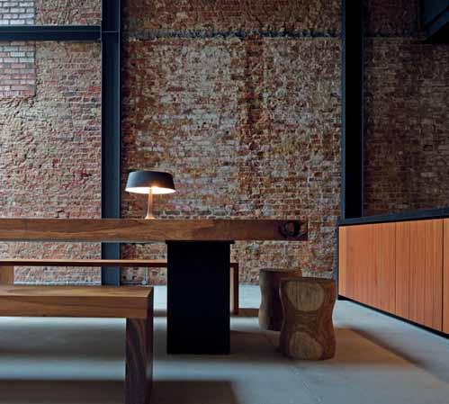
Similarly the RB Solaris blinds at the rear of the house, also serve to control the natural light entering the house. Adding to the “rustic feel of the house”, these blinds were selected by the owners for their creative “fabric colour and texture,” says Yang Yeo. Mounted where the clerestory daylights are, these Solaris Blinds also serve an important function: “they black out the internal spaces,” continues Yang Yeo, “for sleeping during the day.”
FR
Wall-MountE


oVE



With a common passion to challenge the conventional, owners Yang Yeo and Ching Ian collaborated with renowned Singaporean architect, Chang Yong Ter, to create a home that breaks all the boundaries.Clo Ckwise from Top lef T dining stools by Zia c o N cepT ZiacoNcepT.com idg E by fisher & paykel, fisherpaykel.com.au d Bath Roo M taps by ToTo, asia.ToTo.com n pyroly Tic clea N i N g by b osch, bosch-home.com.au
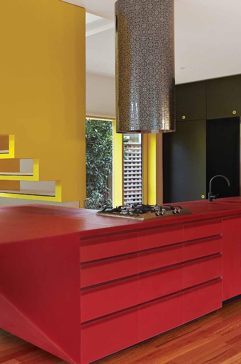


Welcome to the next generation built-in ovens by Fisher & Paykel. Designed specifically for Australasian cooking styles, this is a truly innovative oven design. With a class-leading 90 litre capacity (30 percent more than traditional European ovens), high performance and 11 oven functions including pyrolytic self cleaning and the new unique 'Vent Bake' function – which o ers the ability to control the removal of moisture from the baking or roasting environment for optimum cooking results – the PYROLYTIC OVEN is both functional as it is stylish.
Finished in premium black reflective glass and stainless steel, this oven's sleek lines and design detail will complement any kitchen aesthetic.

To enter, simply SUBSCRIBE to HABITUS magazine online at habitusliving.com/subscribe and answer the following.
QUESTION: Tell us in 25 words or less, what's your favourite recipe to cook & why?
For full terms and conditions visit: indesignlive.com/subscriptions_terms



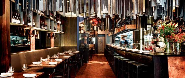
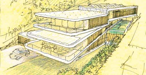
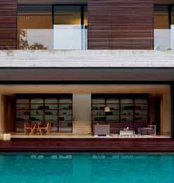

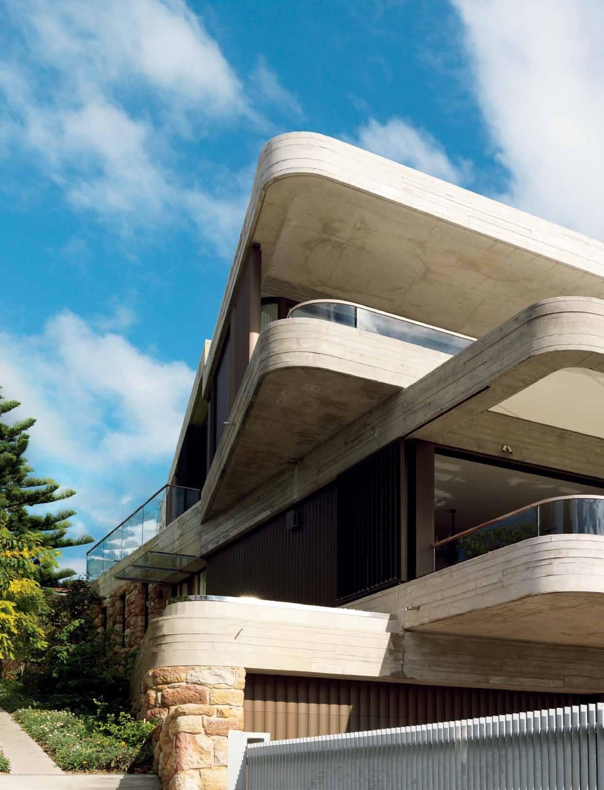
Luigi Rosse LLi ’s houses are known for their curving sensuality and use of natural materials. PauL McgiLLick visits a seaside house that signals a new direction.
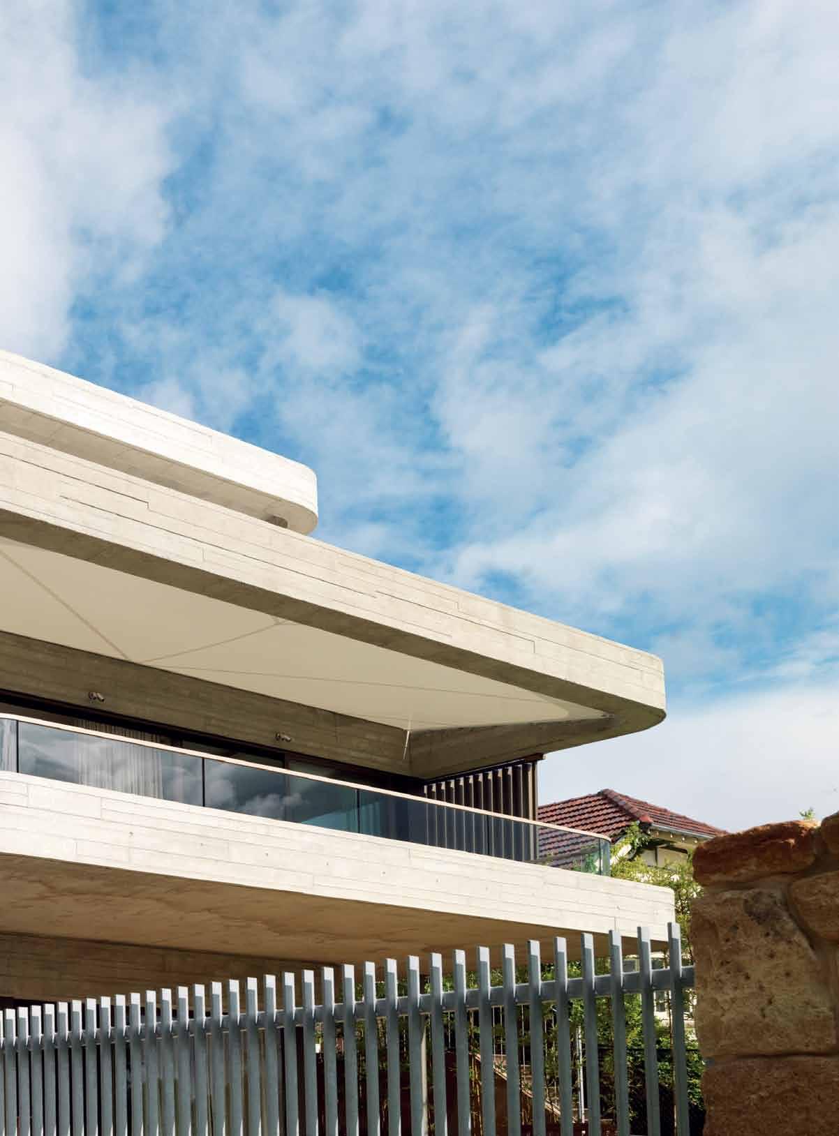
The architect, Luigi Rosselli, calls this house ‘Six Degrees of Separation’. But, let’s be clear about one thing – the name has nothing to do with the theory that any two people in the world can be connected by a chain of no more than five intermediaries. Rather it has to do with the fact that Rosselli has designed the house so that each of its three levels is alternately offset from the boundary by six degrees.
This ‘faceting’ is a response to the site. The house is set on a steep incline with spectacular views over a bay and the Pacific Ocean to the north and south. The offsetting optimises views from each level of the house. At the same time, it serves to maximise the landscaped area in front of the ‘basement’ because it skews the garage towards the public laneway which runs up alongside the house – a tactic which also eases entry to the garage from the laneway.
In fact, the laneway itself (which runs all the way up to the street above) is an interesting player in this drama. It is a space shared between pedestrians and vehicles entering and leaving the house. In exchange for this access, the house has given land to the laneway enabling it to be widened, while landscape architect, Vladimir Sitta from Terragram, took time out from his work within the house boundaries (which, apart from the landscaping, included an integrated clothesline and customised dog kennel and birdcage) to craft some special character for the laneway.
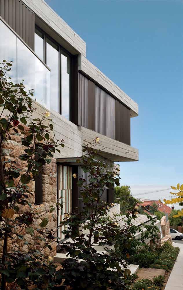

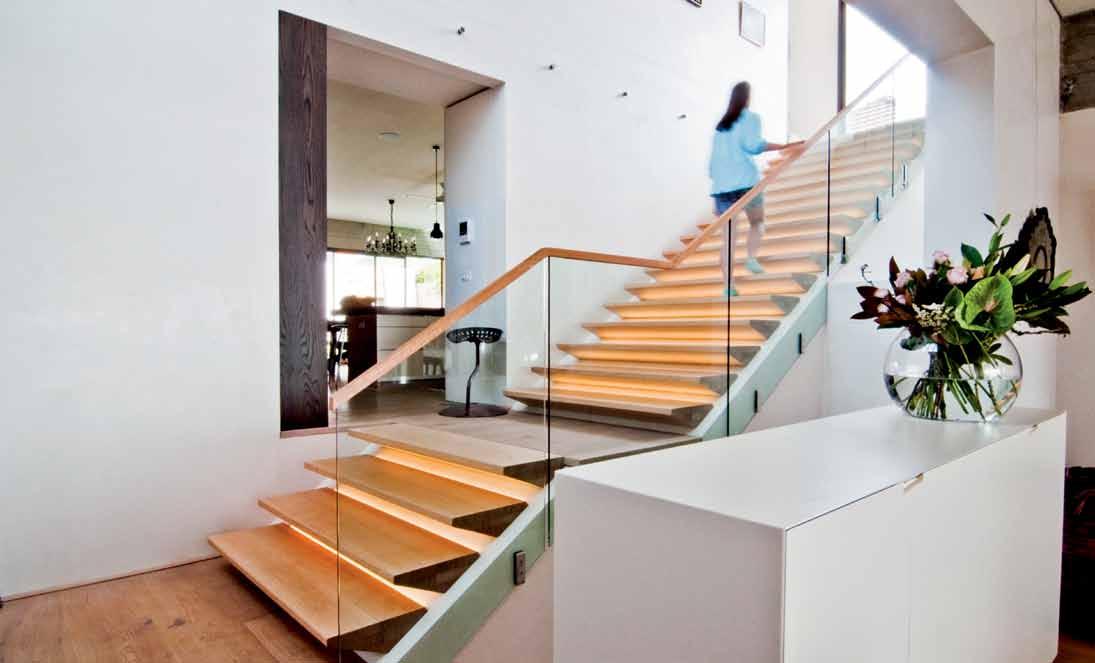
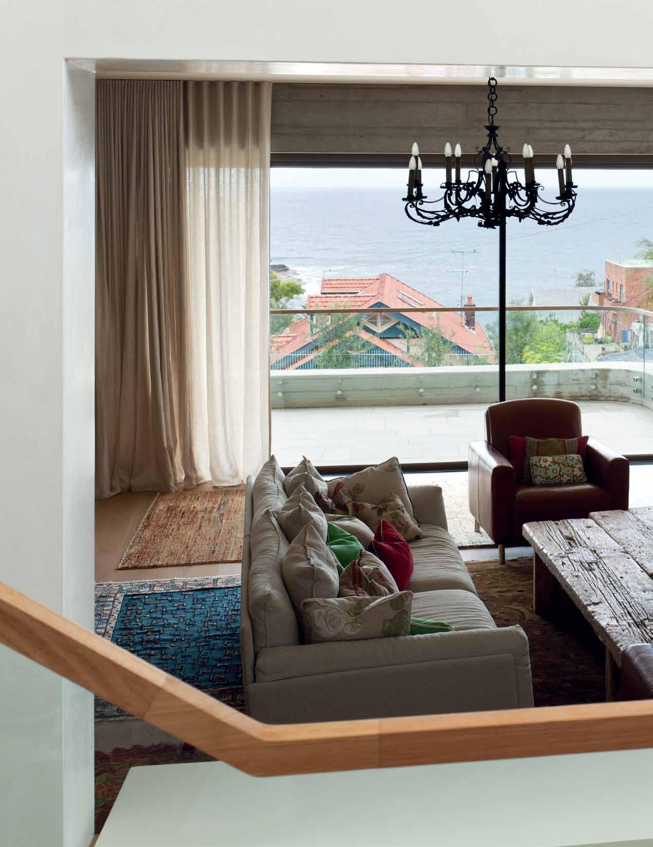
The clients requested a low maintenance house. The idea was also to create a house which connected with the outside.
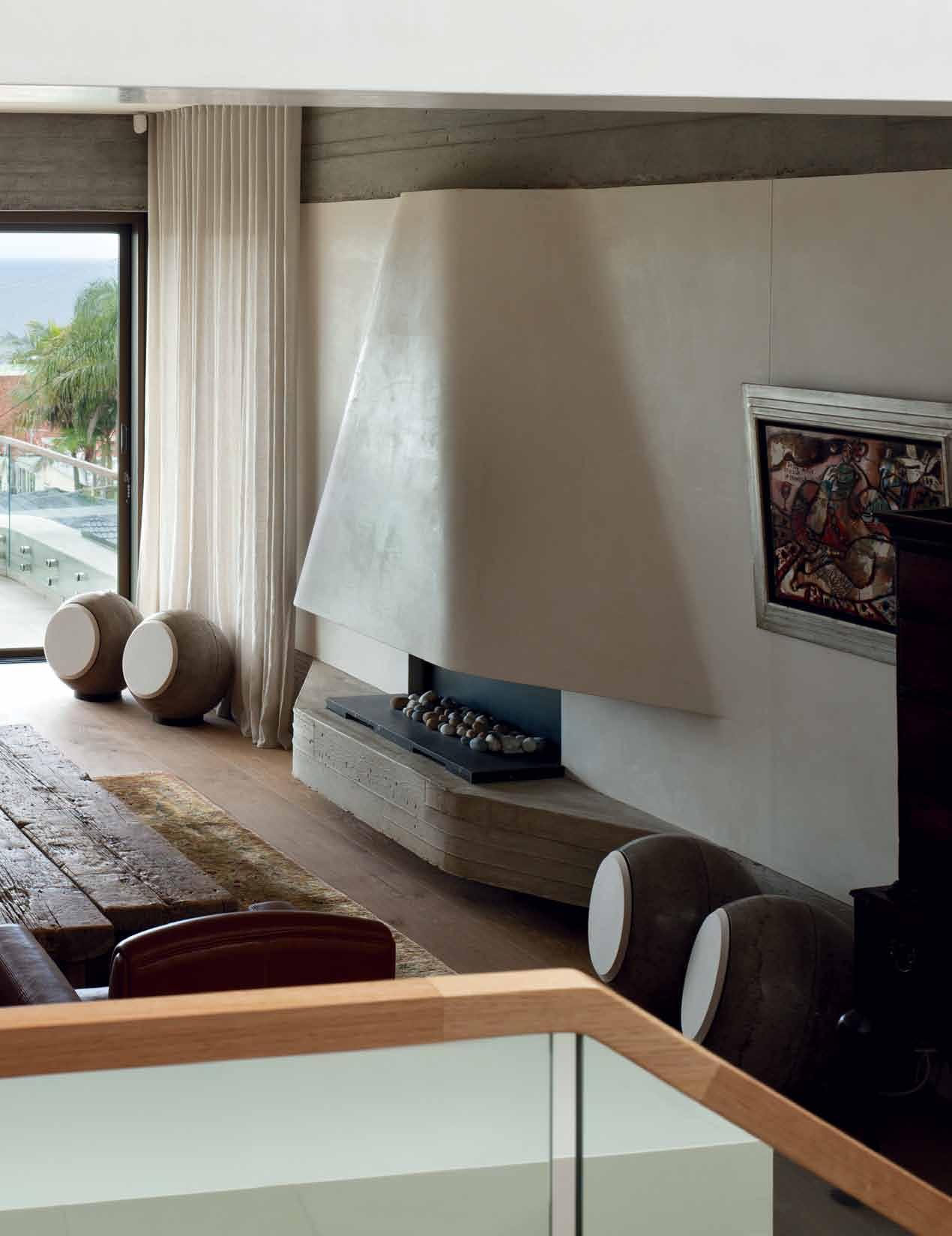
Indeed, the landscaping and the palette of materials together play a crucial role. Sitta’s plantings in the laneway, along with his use of stone, connect with the front garden of edible plants and trees (olives, citrus, vegetables and herbs) and the sculptural sandstone retaining walls at the front and back. This connection between the public and the private domains is supported by the use of timber cladding and salvaged timber for the idiosyncratic entry door which suggest a historical link to the house which previously stood on the site.
But back to the house. The use of off-form concrete slabs and edge beams is a first for Rosselli, and enables the protective cantilevers and the dynamic thrusting towards the view – even if the curvilinear form, the custommade ellipsoid aluminium louvres and hint of nautical shapes are the Rosselli we already know. Still, the faceting of the building is a radical move, breaking up the mass of the building. In so doing, it challenges the ‘house as a box’ typology. As Rosselli points out, if you just do a box, you have to think how you get in and out of the box and how you shade the
windows (an important issue here given the exposure of this house).
“All my previous work,” says Rosselli, “I used traditional materials like bricks, sandstone and timber – but the brick would have been rendered and painted. So, it was more sculptural, like Le Corbusier, looking at the shapes under the light rather than the material. Whereas this house is more about exposing the raw, muscular materials, exposing the structure.”

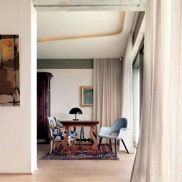
The six-degree offsetting provides shading while also drawing in light to all parts of the house. It also brings in fresh air throughout ensuring that the house does not need airconditioning. The swimming pool, for example, enjoys northern sunlight as a result of the faceting, with the added benefit of providing cool air to the adjacent kitchen/dining area.
Entering the house and standing in the vestibule at the foot of the stairwell another narrative suggests itself – namely, that the external form of the building is an expression of the internal planning where the double-height stairway acts as a pivot with the spaces forming a dynamic pinwheel around it. Likewise, the stairway makes its own contribution to
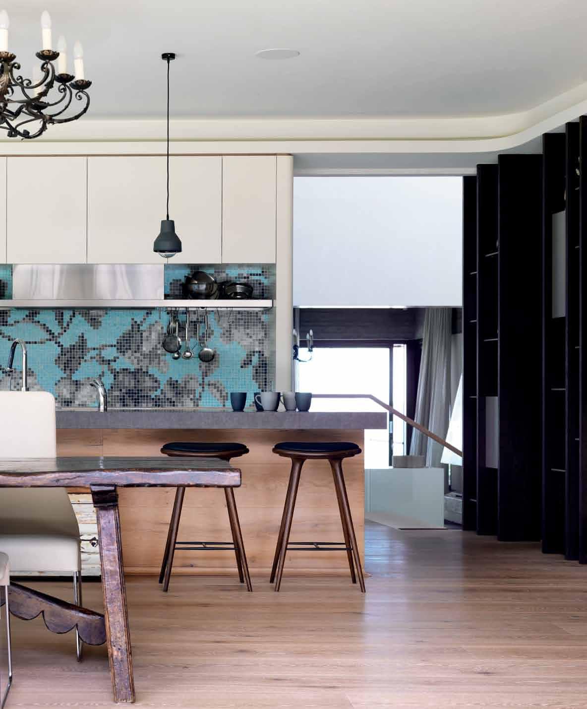
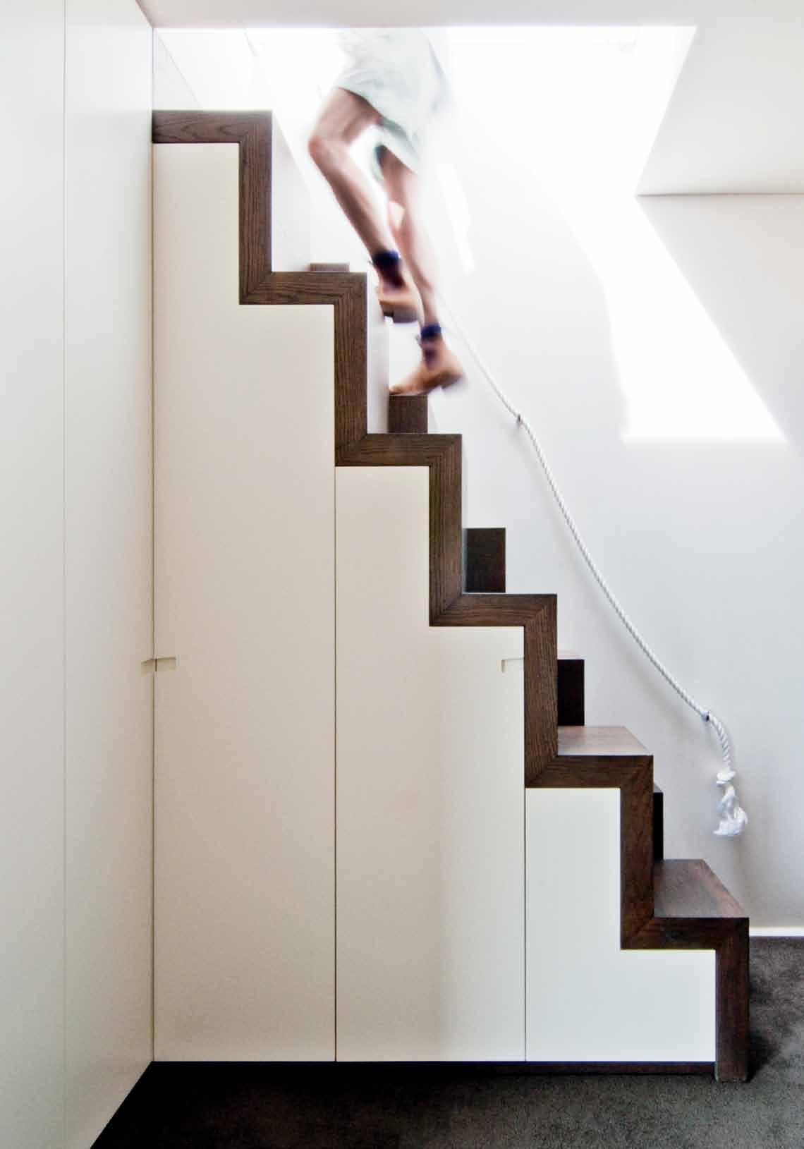
the natural ventilation of the house, because windows in the stairwell are electrically operated to create a chimney effect to draw in fresh air and expel warm air at the top.
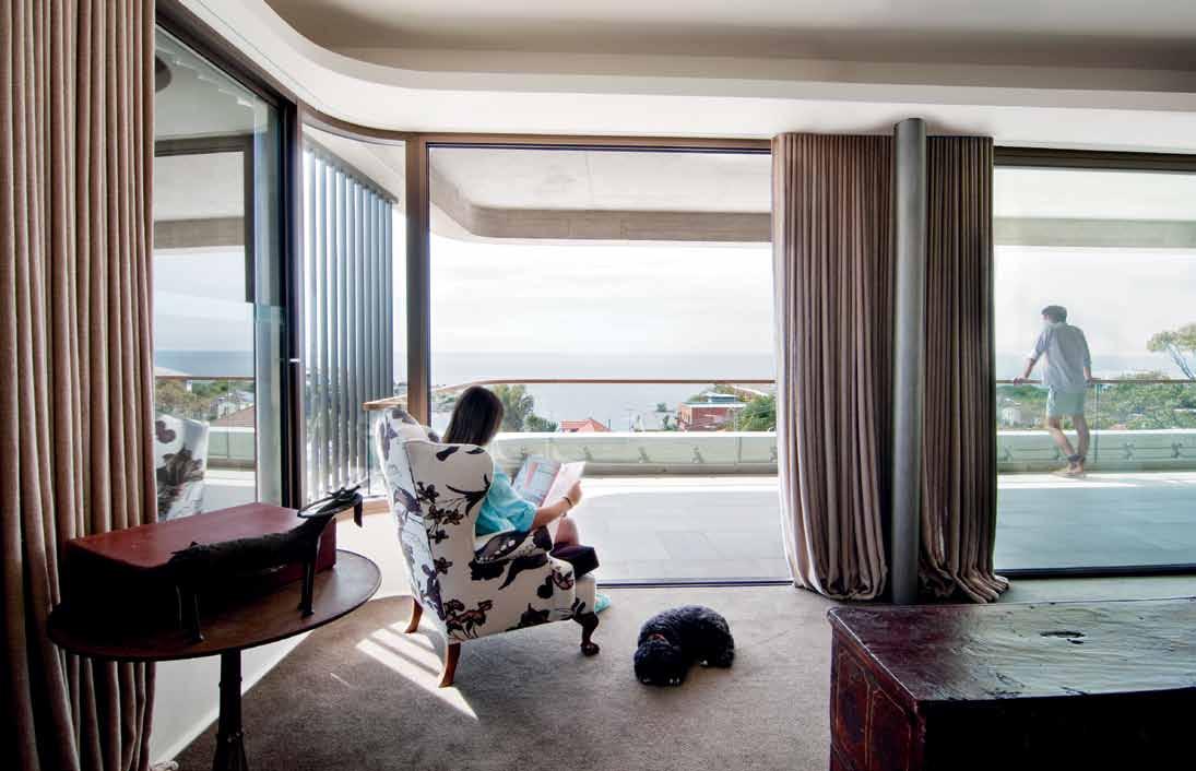
The house is over three levels (not including the roof which is accessed by some Rossellian ‘Japanese’ steps). The basement, which opens onto the front garden, contains a spare bedroom and bathroom, a cellar and provides a home for the family chickens. The ground floor is accessed from further up the lane. From the vestibule a right turn begins the pinwheel experience leading us in a loop through the living room, through sliding doors to the library (a quiet room for reading and for music), then past the powder room and the pool outside, up some steps and into the dining/ kitchen space. Alternatively, one can step up from the vestibule and turn left directly into the dining/kitchen space.
The clients had requested a lowmaintenance house – hence the off-form concrete, specially milled aluminium cladding and robust finishes. The idea was also to create a house which connected with the outside. So

architect Luigi Rosselli Architects

design architect Luigi Rosselli
project architect Corrado Palleschi
interior designer Alexandra Donohoe for Luigi Rosselli
interior decorator Alexandra Donohoe for Decus
l andscape architect Terragram
b uilder Moulds Construction
j oiner Corelli Joinery
structural & hydraulic engineer Rooney & Bye
b uilt area 445m 2
LUIGI ROSSELLI ARCHITECTS
(61 2) 9281 1498
luigirosselli.com
FURNITURE
In Living Room, lounge is Arflex Faubourg from Poliform. Weathered Elm bench coffee tables from The Country Trader. Cassina Utrecht occasional chairs and PP Mobler PP124 rocking chair, from Corporate Culture. Moroso Fjord ottoman from Hub Furniture. Vitra Cite side chair from Space Furniture. In Library, existing tall boy, desk and rug. Existing chairs upholstered in Brunschwig & Fils Teapots fabric. Vitra Organic chair, from Space Furniture. In Bedroom, B&B Italia Febo bed, from Space Furniture. Society bedding, by Ondene. Maxalto Amphora bedside table, from Space Furniture.
every room – bar two – accesses the outside, while the house overall is highly transparent. There was also agreement between clients and architect to make the house as green as possible – no air-con, a 4.2 kW photovoltaic array, large rainwater tanks, solar hot water and pool heating, broad eaves, natural ventilation and optimisation of thermal mass.
For those who can afford the locations, Sydney is a city of views, especially water views. If it is on the coast, then it is also about harnessing sea breezes to minimise airconditioning. The challenge is how to do this imaginatively and effectively. Anyone familiar with the domestic architecture of Sydney’s seaside suburbs will know how inadequately Sydney’s architects and developers have generally addressed these challenges. But this house by Luigi Rosselli is an emphatic statement about what is possible, not just with landscape and climate, but also with the context of the existing built environment.
Learn about the art of hand drawing with Luigi at habitusliving.com/issue20/sixdegrees
LIGHTING
Existing pendant and wall sconces refurbished by Berczi Copper. Lighting throughout by Tangent Lights. In Library, Mater Dome table lamp from Corporate Culture.
FINISHES
Engineered Oak timber flooring by Mafi. Off-form concrete by builder. In Living Room, Contemporary rug by Cadrys. In Kitchen, patterned mosaic tiles by Bisazza.
FIXED & FITTED
Sanitary fittings by Rogerseller. Appliances by Miele and Liebherr. Rangehood by Qasair. Cooktop and sink by Barazza.
drop box“It was Luigi’s idea,” says owner Anna Buch of the use of Mafi timber flooring, “and we did not hesitate when he made the suggestion.” Like many of the materials in this house, Luigi often led the way when it came to sourcing unique finishes, a course that was always wholeheartedly embraced by the residents. “What we had in mind for our house was a feeling of longevity, timelessness and simplicity,” continues Anna, “the idea of an ageing process leading to a patina or reflecting a story is highlighted with this floor choice.”
Looking for a product that would work with both old and new pieces of furniture and artwork, the Mafi timber flooring was chosen for the warmth and simplicity it reflected, allowing it to complement all forms and styles of furniture. But this was a new choice for Luigi. “It was one of the first times that we used European Oak,” he says. “We selected it for its essential closeness to what natural timber looks and feels like.”
Luigi enjoys exploring new concepts and loves, and this is all too well reflected in his choice of Carlo Dal Bianco mosaic tiles. “I have always been fascinated by the East meets West, as in these Bisazza mosaic tiles,” says Luigi. With an 18th Century decorative motif on a Japanese sky blue and white colour palette, these tiles were the perfect choice to complement the elegant timber flooring. “I love them as much now as I did when I first saw them two years ago,” says Anna. And just as she had requested for her flooring, the mosaics offer a timeless and considered feel: “like art,” Anna explains, “I find them an interesting addition to the house, especially when most of the house relies on texture and form.”
nayoma rug lo unge from tH e vintage collection in wool and viscose, 200x300cm from cadrys, cadrys.com.au
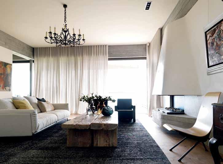
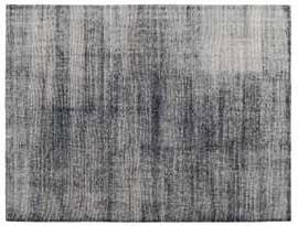
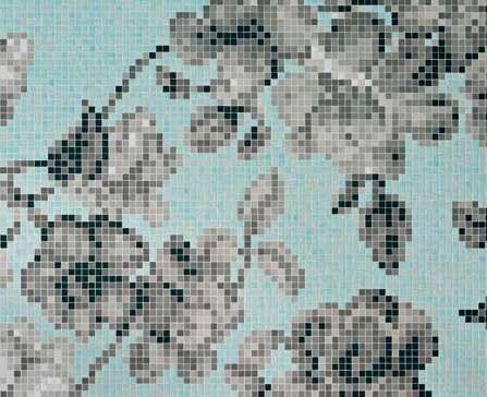
(MaiN iMaGe)
WeatH ere D e lm coffee table the country trader thecountrytrader com au
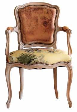
mafi oaK clear Wi D e plan K brus H e D natural oil 75000x300x19mm from mafi mafi com au
nou rouz upH olstery by brochier from boyac, boyac.com.au

Usually known for his use of traditional materials, Luigi Rosselli took a small side-step in this Sydney project, choosing innovative textures that aimed to expose the raw structure of the house itself.(Clo CK wise FroM Top leFT) Hanami a zzurro glass mosaic pattern design by carlo dal b ianco, bisa ZZ a bisa ZZ a com
habitus x mini promotion
Quality, functionality and innovation are what we seek out in the spaces we live in, the products we use, and our preferred modes of transport.

With its distinctive angled roof, the new MINI PaceMaN represents ‘a new slant on design’, and here we admire some of its features as it takes centre stage in an edgy warehouse apartment…
Clothing and sunglasses, i ncu; Watch , Mondaine.
photography | tim robinson. styling | emma warfield & frances yeoland production | nicky lobo. model | sten pittet Boldly individual The exterior design faithfully embodies the established Mini design language, whilst also establishing the Paceman’s unique elements. d rive window-down, not to be seen, but to experience more fully.l ounge in CoM forT The elegant interior styling and generous proportions of the Paceman provides an environment for ultimate relaxation and enjoyment. a nd with four individual seats, you can invite your friends over too.
font Clock by Sebastian Wrong for e stablished & Sons, Living e dge; Stout , Tall and Wide Beat l ights by Tom Dixon, dedece; William sofa by Damian Williamson for Zanotta, Space Furniture; Chevron and i rregular Stripe cushions, Jac + Jack; Simplice Xilos round table by a ntonio citterio for Maxalto, Space Furniture; Store assorted jars by e stablished & Sons, Living e dge; Sciangai folding clothes stand by De pas, D’Urbino, Lomazzi for Zanotta, Space Furniture; nudie Jeans recycled rug , nudie Jeans; Clothing and shoes , i ncu.
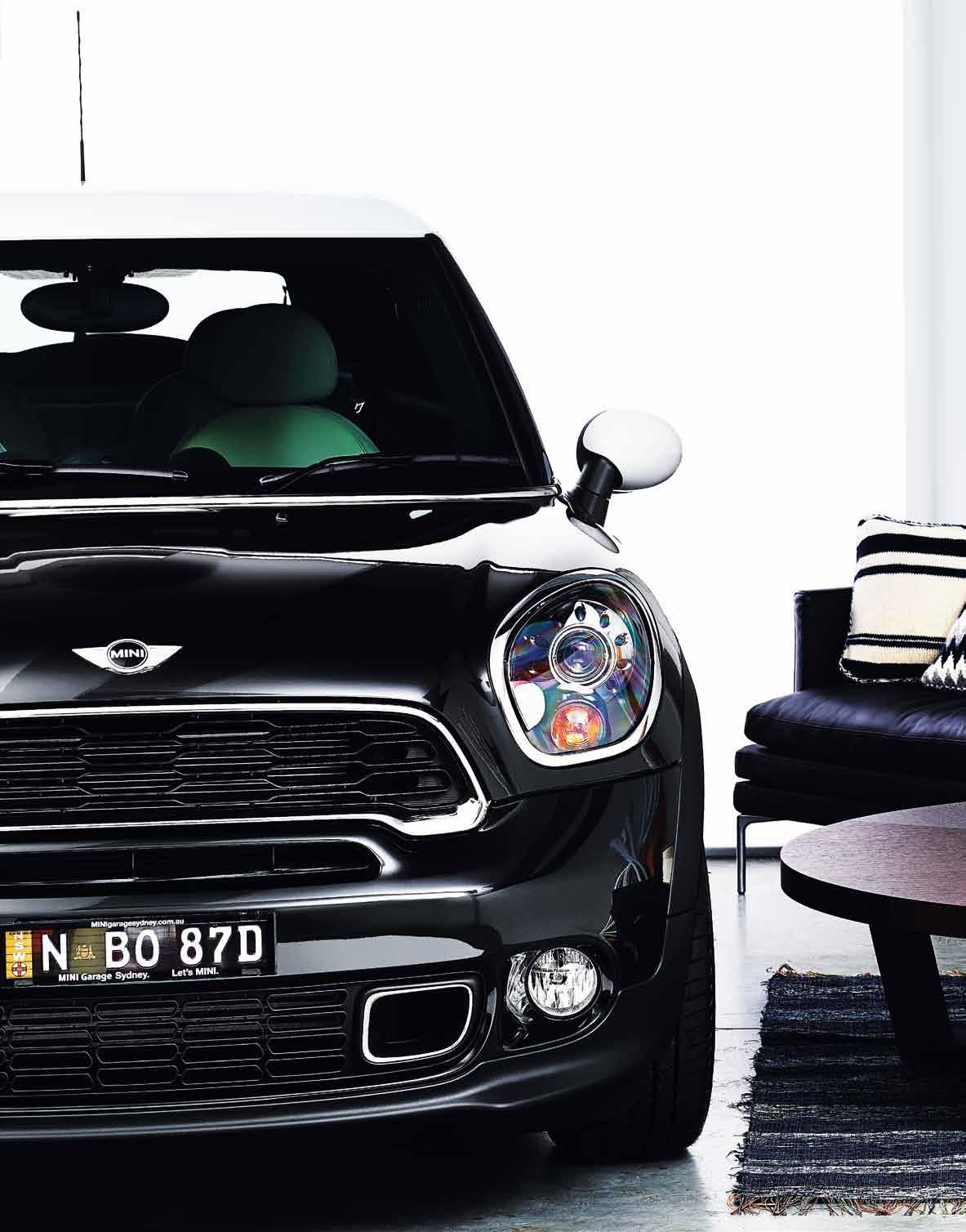
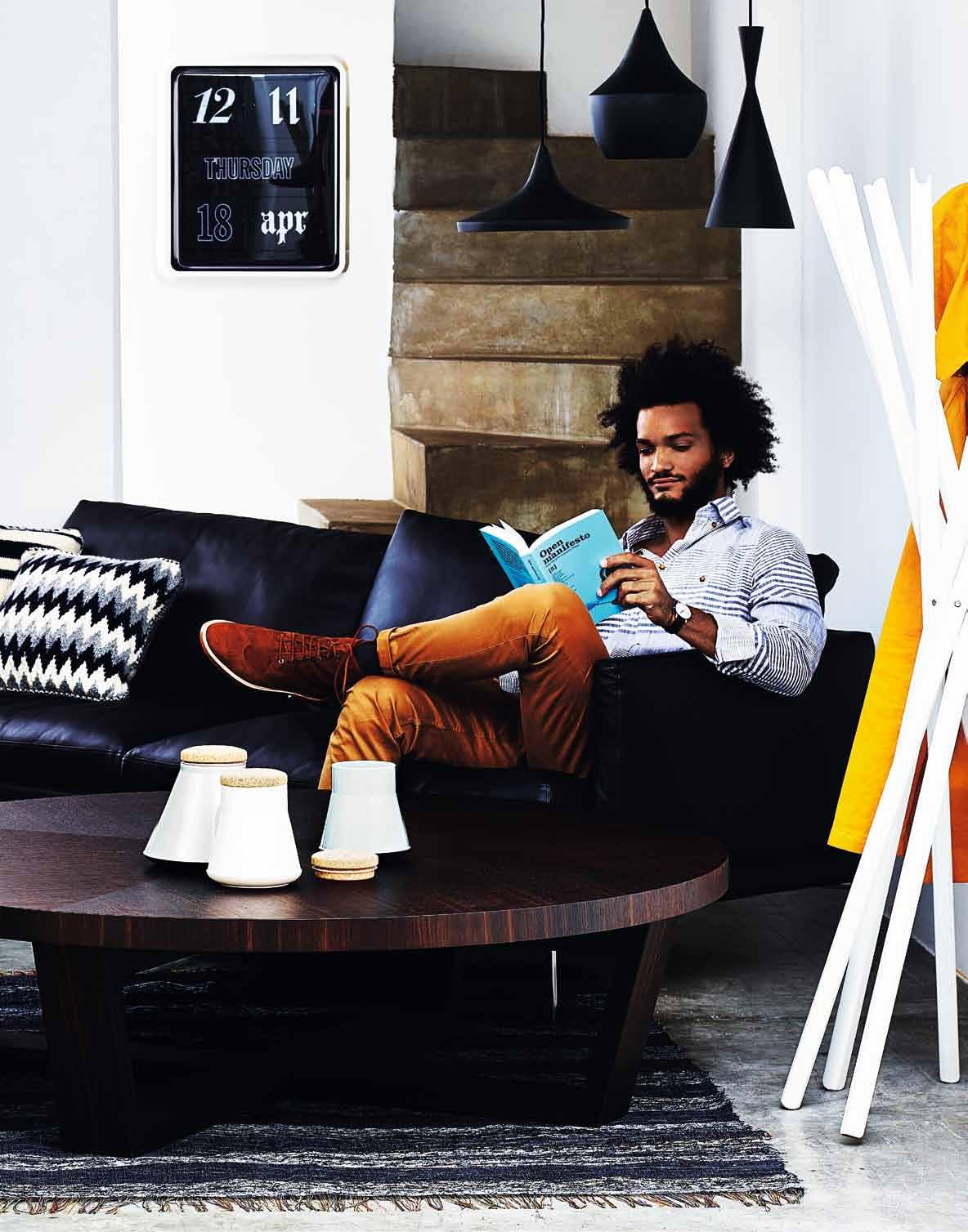
a ne W Slan T a coupé-style roof swoops towards the rear, with distinctive contours that define the sophisticated, yet powerful profile. f rom dynamic front end to the eye-catching feature horizontal taillights – a first for Mini – it seduces the eye.
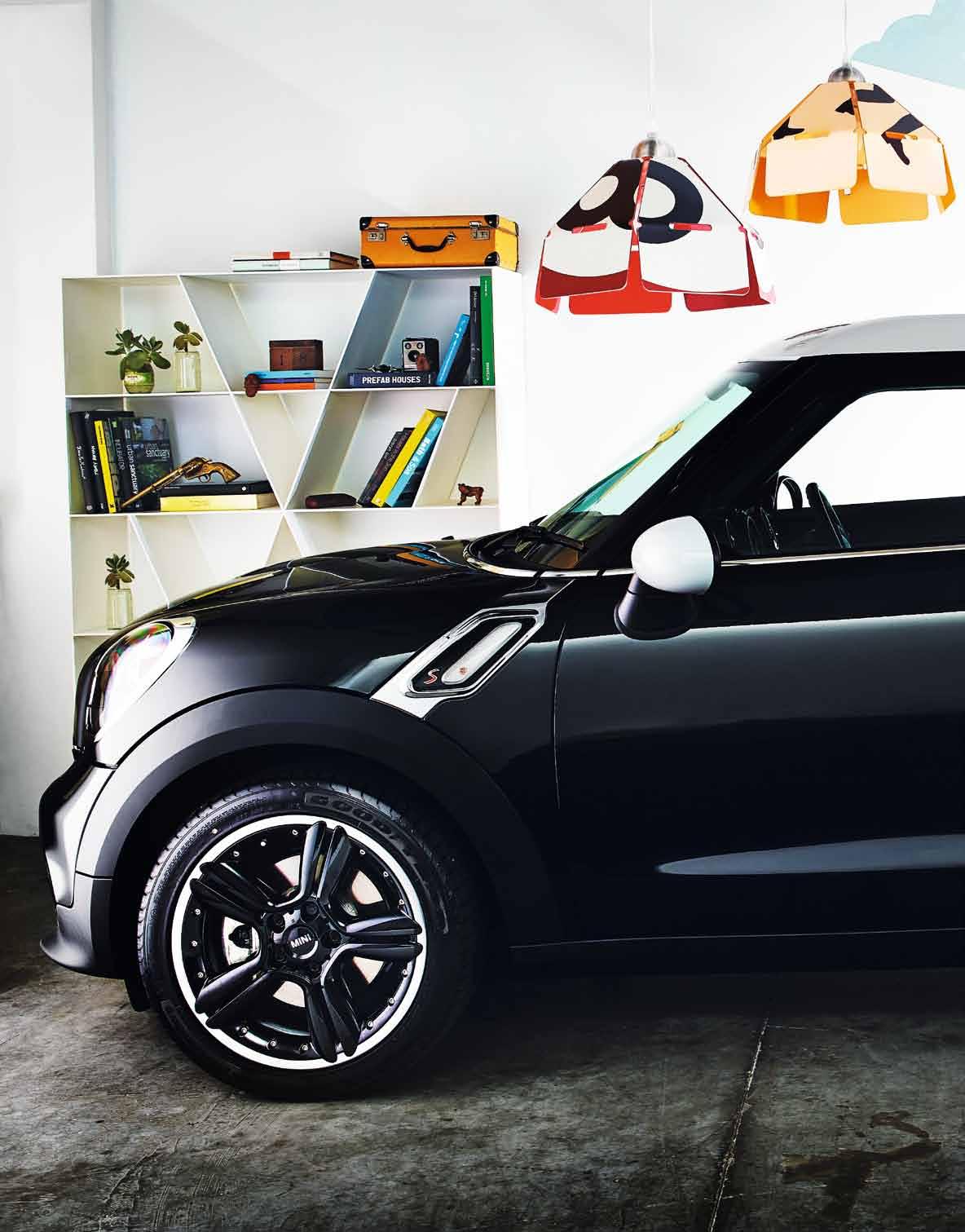 Shelf X bookcase by naoto Fukasawa for B&B italia, Space Furniture; accessories by stylists; sculptures by Max Berry; Speed pendant lights by Brett c oelho, Workshopped; Clothing , shoes and bag , incu; Mural by Frances Yeoland.

ou T door The Paceman is not just good-looking. The cutting-edge chassis and powerfully efficient drivetrain underpin its agility. it’s a new model, with a new go-kart feeling – built for fun.
We love a ‘new slant on design’ at habitusliving.com/issue20/minipaceman.
 Clothing by i ncu; Koo Koo letterbox by Justin Hutchinson for playso, Tait Furniture; gardenwall , Tait; Hose wheel and hose, Tait; a ssorted plants by Silk Flora.
This apartment shows how one couple successfully made the move from the suburbs to the city in one of New Zeala N d ’s fastest growing centres. aN drea Steve NS meets architect, a dam m ercer , to discuss this social, yet private building.
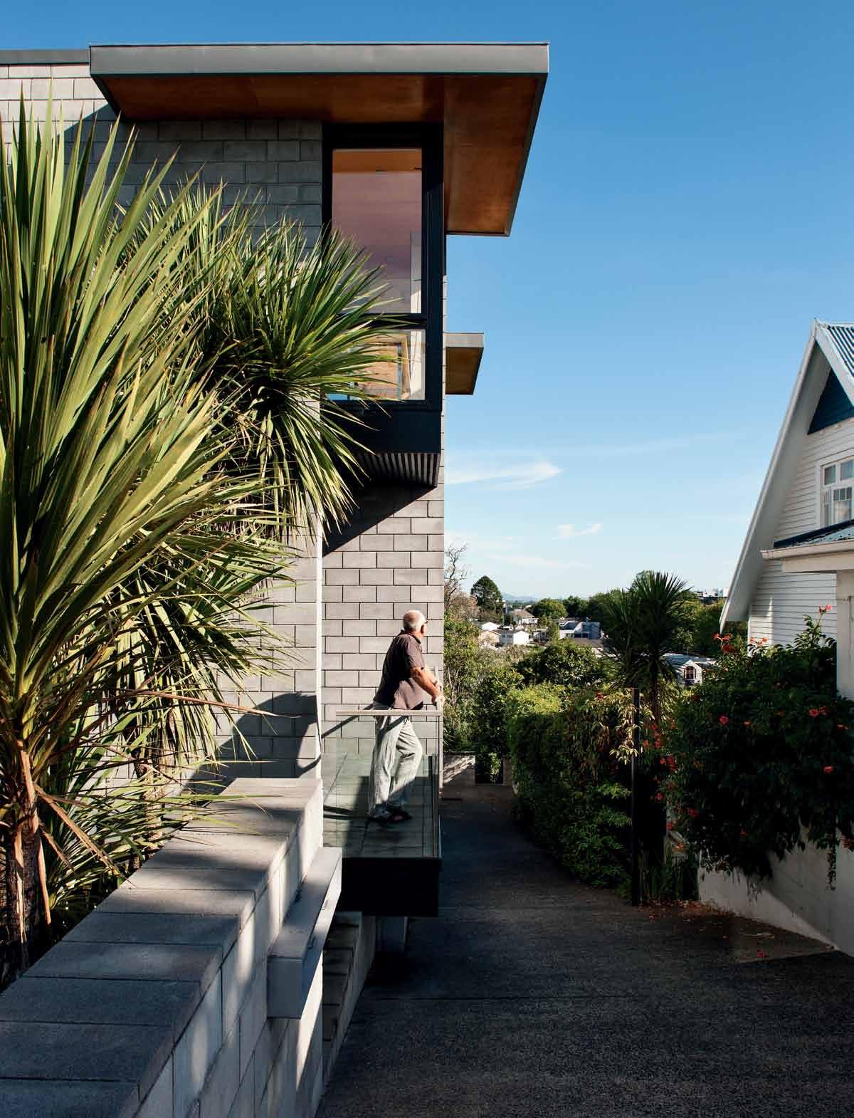 text Andre A StevenS | photogr A phy Simon devitt
After 30 years in a Jack Manningdesigned house in suburban Hamilton on the North Island, a different lifestyle beckoned for Pam and Stuart Bayes. Defying the New Zealand dream of retreating to the coast, the couple preferred to remain close to family, friends and work, and moved right into town.
They owned a residential site bordering the CBD which had just been rezoned as highdensity. They had bought the land off architect Adam Mercer, who said to get in touch if they ever wanted to develop the cottage. But when they did meet up, the briefing process uncovered a whole different project.

“Initially they wanted a large house to be able to accommodate family and friends,” recalls Mercer. “But with the new high density zoning, we discussed building a series of apartments, to provide the space they needed, but to provide more flexibility than one house could offer.”
The resulting three apartments can be rented out, host guests from overseas, be used for extended family or sold individually at any time. “It gave them options,” says Mercer. The couple live in the top unit on the street: Apartment X – numbered idiosyncratically to

reflect the innovative nature of the whole project. And two smaller apartments are stacked down the slope, on the city boundary.
“We looked at other apartments in town, but they didn’t have the space we were after, especially outdoor space,” says Pam. “We wanted a house so that grandchildren would come, and would love to come.” They needed a social house to accommodate extended family and their wide circle of friends.
The city location immediately created easy access, but it also brought restrictions in terms of privacy and security, which the architect has responded to through clever assembly and materials. He has mediated between the commercial buildings along the northern boundary – which the apartments overlook – and the stately residential buildings on the other three.
Mercer has managed these opposing characters through careful use of scale, but in most other respects has created a bold vision for the future, in a city with little precedent for this building type. “We wanted something to meet our personal needs,” explains Pam, “but we also wanted something unique that would be of value to the city. Suitable for where it is and usable for a myriad of purposes.”
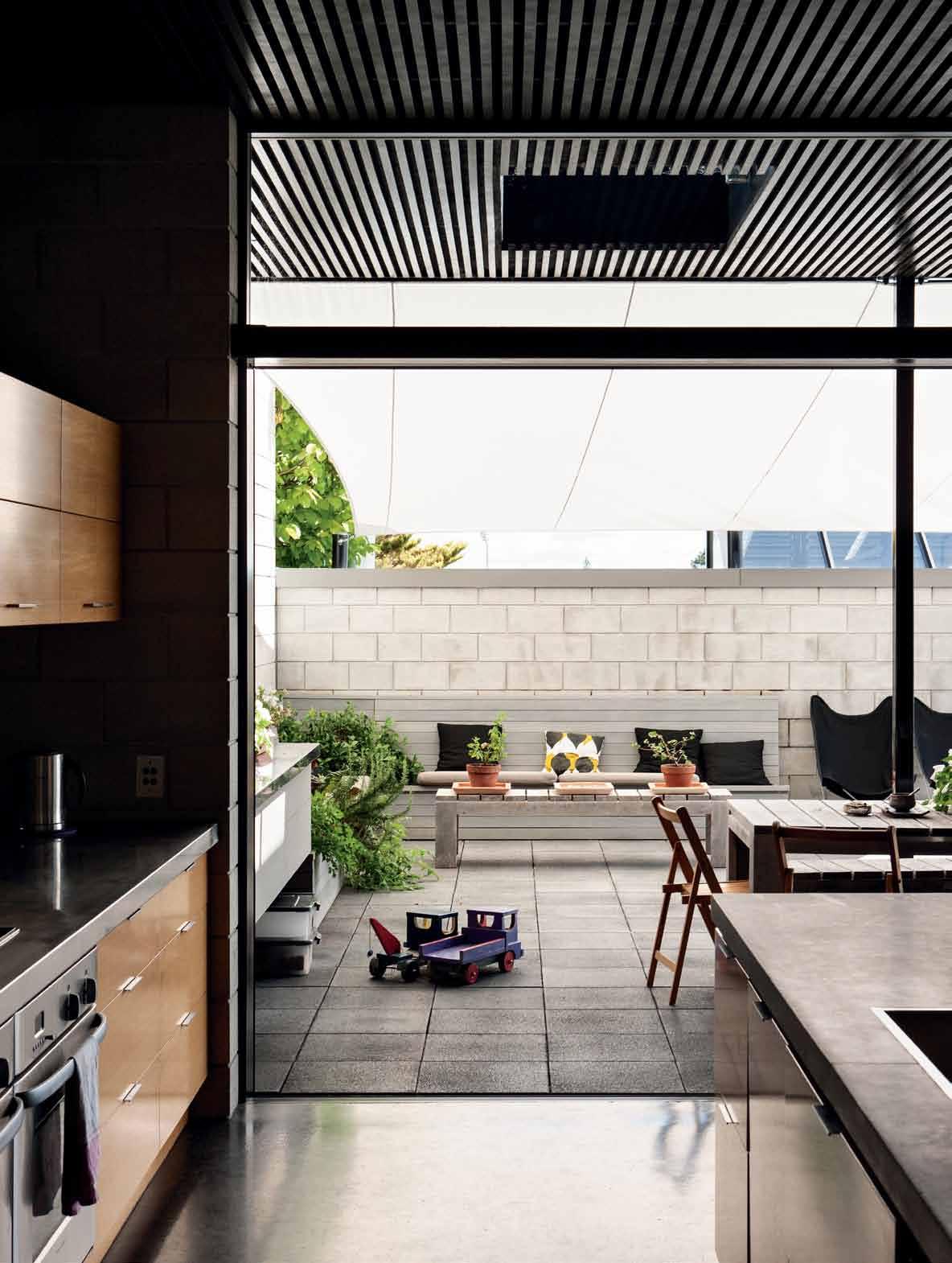

The architect has addressed these multiple influences by using industrial materials and construction but tuned it to the surrounding houses by keeping it low-rise. The three apartments use the site much more intensively than the current residential pattern. But the building doesn’t go to the maximum allowable height, some 20 metres, so the neighbours immediately saw its value and it was approved via a compulsory planning consent.
“The neighbours understood that if we built all the way down one boundary with a solid wall, it gave them a wall on which to grow ivy,” explains the architect, “a nice urban edge to their backyards, not this no-man’s land of weeds and poorly maintained trees in the gap between houses. It has been a successful urbanising of a city site.”
Raw concrete block was used for its economy, low maintenance and familiar human scale. But it also adds a wonderful texture and foil for plants, art and timber fittings. It is this combination of hard and soft, rough and smooth that makes the apartment feel more crafted and less industrial.
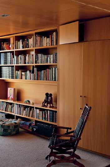
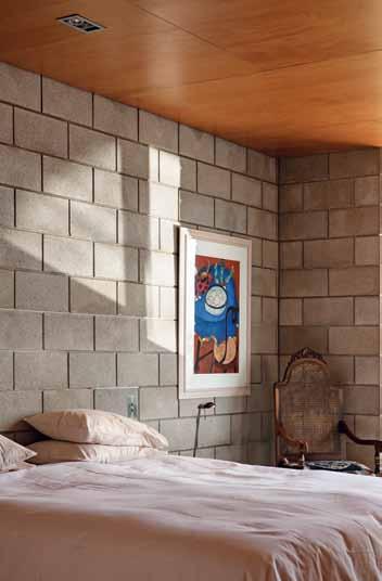
The first indication that this is something unique is the eight-metre high, almost fullwidth, windowless concrete block street elevation. The council asked the architect to punch some windows in it, but it was designed as a 400mm thick Trombe wall for a three-storey high stairwell-cum-ventilation stack. The solid wall also created privacy and security to the street, which faces south and is overlooked by a tall apartment building.
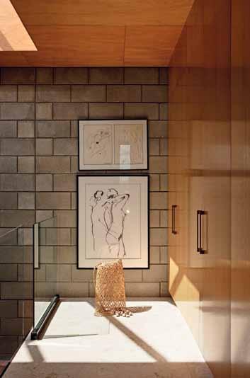
Thedrama of the vertical stairwell is revealed
...top-lit to reveal
their texture and character.
Council retracted the window requirement once the landscape strategy was explained – the wall is set back seven metres from the street, and the yard well planted with a bridge through the bush as entry. At night, uplights create beautiful foliage patterns on the block wall. A roof canopy and suspended glass bathroom above the main entry signal the habitation within.

Once inside, the drama of the vertical stairwell is revealed. Glass balustrades, floating stair treads and the soaring block wall are toplit to reveal their texture and character. Despite its hard industrial materials, the control of volume and scale make it an elegant space. This opens up to an enormous living space and concrete courtyard where the high ceiling continues outside beyond the glass to shelter part of the courtyard.
The passive solar strategy is evident everywhere. The canopy depth allows sun to reach the back wall in winter, but it doesn’t touch the floor in summer. Cooling is achieved by opening the door to the basement garage where the cool air is drawn into the stairwell as hot air is vented through skylights.
In a country where the main building product is timber, this apartment offers quite a different experience. It is subtly lit as the grey blockwork absorbs light as much as it reflects it. And a well-designed acoustic ceiling in the
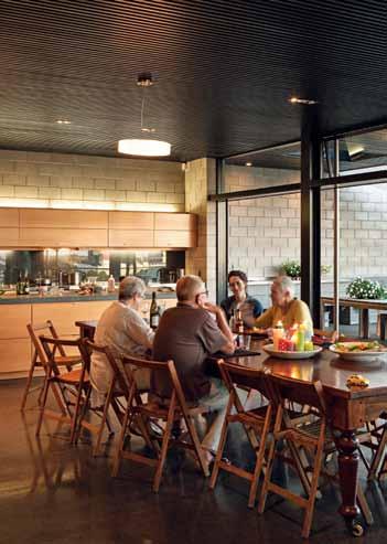
Despite its hard industrial materials, the control of volume and scale make it an elegant space.
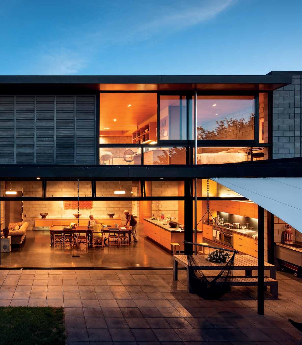
drop box
archiTecT Mercer and Mercer Architects
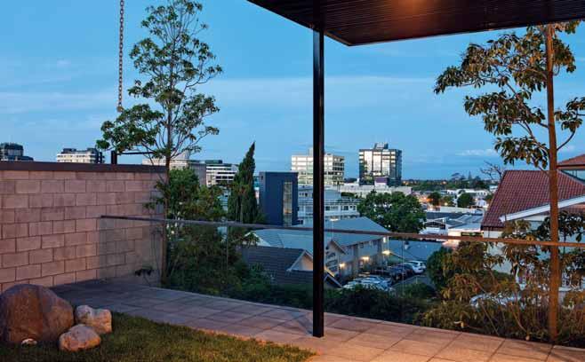
projecT Team Adam Mercer, Richard Andrews, Benjamin Daly, Rebecca Walker
b uilder Livingstones
sTrucTural Andy Wilton, David Lau (Wilton Joubert)
hydraulic Ian Todd (I&L)
acousTic Fadia Sami (S&T)
fire Michael Dixon (S&T)
mechanical Dave Fullbrook
Mercer and Mercer (64 9) 520 5302 mercerandmercer.co.nz
living space provides a very subdued ambience. “It’s a very calm space, there’s no creaking of floor boards or timber beams.” says the architect. “The comfort comes from its scale and solidity, not plush finishes.” The concrete has the added advantage that it is indestructible to toddlers. Sand pits, paddling pools, bikes and water sprinklers are all called into action in the courtyard to entertain the grandchildren.
This generous accommodation for family continues on level two with a row of rooms of equal size. At present two are bedrooms, one an office and one a walk-in wardrobe. The novel thing is they are all open to a long indoor balcony. This effectively creates one large space partitioned with fin walls. Each room can be screened using large cavity sliders. The device creates options for when grandkids stay the night so they can be kept close when young or rooms can be screened when they’re older.
“Family is really important,” says Pam. “Right now when the grandchildren are little we want to establish those relationships and Adam has provided for that brilliantly.”
arT work
In Dining room, ‘One Hundred’ fabric artwork by Christine Pattullo; two pottery bowls by Louise Kittleson. In Bedroom, ‘Candelabra’ is by A. Kemp.
In Stairwell, artworks are by Caroline Andrews; on the floor is a woven Maori Kete from The Source, Coromandel. In the office, ‘Talking People’ sculpture by Wailin Elliott. Candle holder sculpture on outside bench by Uli Christopherson.
furniT ure
Lounge from David Shaw. 14-seater Rimu table sourced from a century-old house, ex-UK scout hall chairs from Thames Trading Post.
Outdoor table and stools are Inlet from Danske Mobler. Butterfly chairs from Reininks Wrought Iron in Auckland. Bedroom and office chairs, including rocking chair, are family heirlooms. Alvar Aalto stools in kitchen. Hammocks from Hammock World.
lighTing
In Dining Room, circle pendant light from Lighting Direct; there are also four rectangular recessed lights with 35W halogens.
finishes
In Kitchen, Oak veneer joinery by Colourform Joinery. Benchtops made of stainless steel and solid Oak.
Island benchtops in Pietra del Cardoso stone from Absola Stone, and Rocksolid Granit in Sabbio D’oro. Flooring is coloured concrete. Wall paneling in Oak veneer. Ceiling panels in Kauri veneer.
fixed & fiTTed
Internal joinery hardware by Blum. Tapware and shower mixers by Paini Pixel. Fridge and freezer by Fisher & Paykel. Ovens by Bosch and Fisher & Paykel. Rangehood by Gaggenau. Microwave by Panasonic. Dishwasher by Asko. Hydrotherapy bath by Kohler. Toilet suites by Duravit Starck. Laundry tub by Franke. Cubo heated towel rails by DCS.
Mercer and Mercer Architects was established in 1959 by architect Dick Mercer; the firm is now run by his son Adam. Along with residents Pam and Stuart Bayes, he created the perfect inner-city family apartment.
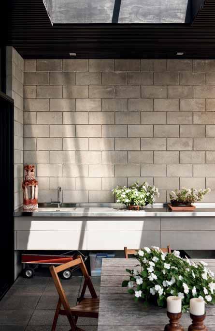

With a brood of young grandchildren, Pam and Stuart Bayes have established a strong sense of family. Working closely with Mercer Architects they carefully selected pieces that were both tactile and durable to withstand the curiosity of little children.
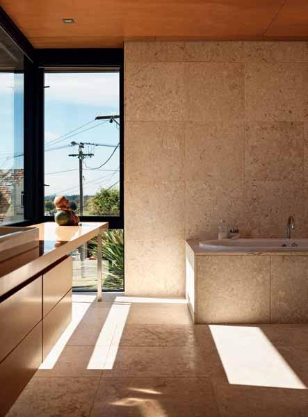
The Designsource fossil tiles in the bathrooms were all about the oddities that the stone produced, both in aesthetic and touch, that would entrance the imagination of their grandchildren. “They love looking for the fossils in the stone,” says Pam, “there are corals, oyster shells, mussel shells and small ancient fish to be found – the tiles are wonderful to live with.” And after all that touching, the tiles still maintain the same finish as the day they were installed. Soft and non-slippery, they create the perfect texture for the childrens ’ bath time.
Similarly, the aluminium glazed skylights by Regal Joinery Hamilton in the living room were chosen for the unique shapes and shadows they cast across the stone as the sun sets. “The shadows that fall across the walls and floor from the skylights are always changing and interesting,” continues Pam, “but they also serve as our cooling system.” By drawing cold air from the garage through the downstairs part of the house, heat from the concrete blocks is redirected during the day but trapped and released throughout the night, ensuring that the house is constantly regulated.
“Our design philosophy revolves around the practical, physical performance of materials,” speaks architect Adam Mercer. And nowhere is this more apparent than in the Colourform Joinery Hamilton Oak doors. These were selected to provide warmth and connection to the outdoors, but also as a material that could “withstand a home of hard knocks,” says Adam, and “the wear and tear of a family environment where children are encouraged to play and explore.”
clockwise from top left perspex writing board single piece of perspex fixed To wall and used as family measuring board
blockwork
200 series sTandard blockwork in sTre Tcher bond paTTern from firTh and holcim, holcim.co.nz
fossil stone
600 x 600 x 20mm Thick fossil sTone from design source, designsource.co.nz
american oak veneer rown-cu T and solid clashed by colourform joinery hamilTon wiTh clear lacquer gloss 20%.
joinery handles by kaTalog, kaTalog.co.nz
DYNAMIC SPACE, ideas from Blum for practical kitchens, will change the way you move around your kitchen well into the future. DYNAMIC SPACE is the clever way to make the most of your space, improve access to your kitchen items and enhance ergonomics.

Experience the value of DYNAMIC SPACE in your kitchen design by making an appointment with a Blum showroom consultant on 1800 179 186.
www.blum.com

Some of the theatre of its location in Galle in Sri Lanka has been re-enacted inside this colonial townhouse. JE nni FE r HE nri CUS visits the idyllic holiday home that Singapore-based architects, J UStin Hi LL and Simon C U ndy, have created for their families and friends.
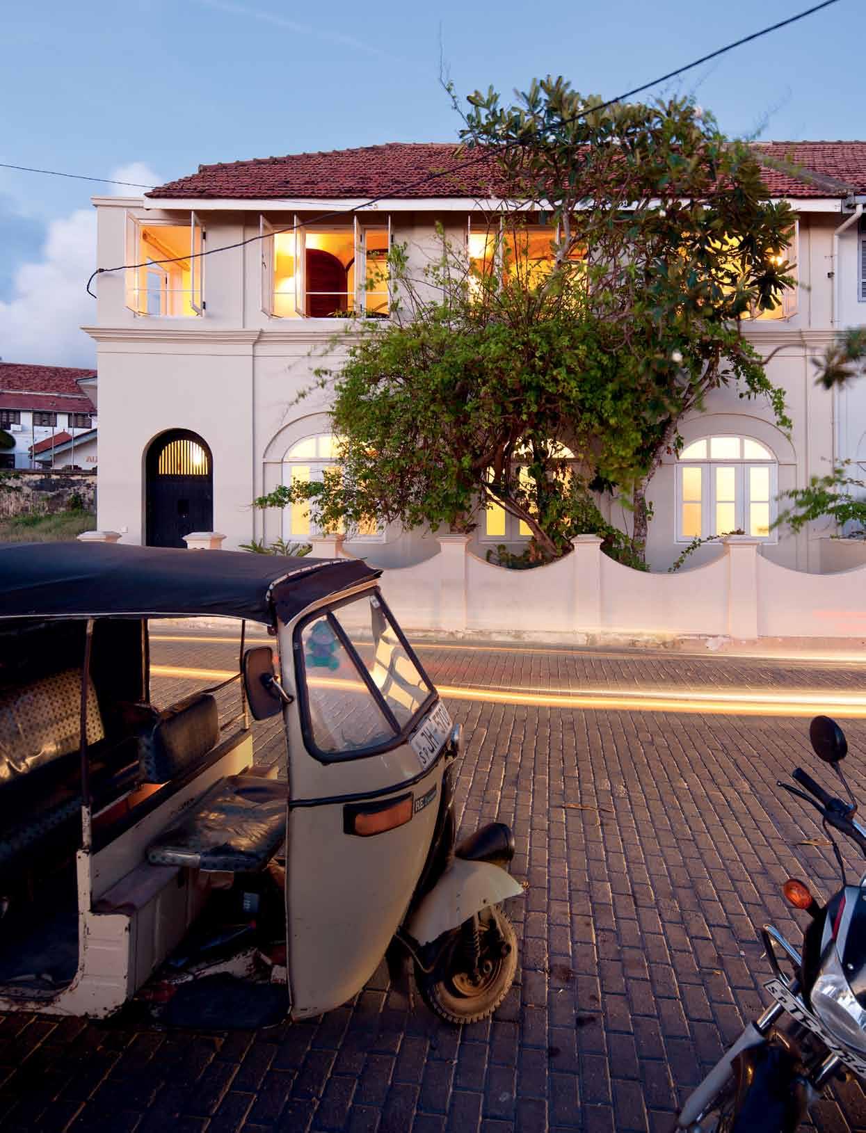 text Jennifer Henricus | pHotograpH y a ngus Martin
Abalcony seat in the theatre of Galle life” is how Australian architect, Justin Hill, describes his favourite spot in the retreat that he and fellow architect, Simon Cundy, created for themselves as a holiday house in the historic Galle Fort in Sri Lanka. The theatrical appeals to Justin particularly, since he wears a parttime hat as a theatre set designer.

The spot he is describing is on the upper floor patio, at an old breakfast table placed at the windows of this 1820s colonial period townhouse. The windows frame views of the grassy embankment, the western ramparts of the 17th Century Dutch Fort and the Indian Ocean as a backdrop. This is indeed an idyllic spot to people-watch – or catch sunsets, dramatic thunderstorms, glorious full moons or the distant light show of hundreds of fishing boats –“real Asia,” as Justin describes it. It is a far cry from the commercial world of Singapore where they both work as directors at Kerry Hill Architects (KHA).
Simon and Justin are old friends, from the time they were undergraduate students in Adelaide, and are now workmates. They were both looking for a holiday home in Sri Lanka
and when this house came on the market they decided to buy it together and convert it into a shared holiday home, somewhere to spend time there whenever they can get away from work.
Initially the house was a typical long Galle street-house with an inner, thick-walled, twostorey core (living, dining and kitchen spaces on the ground floor; bedrooms on the upper floor) and open verandahs at front and rear. Somewhere in its history the original house got divided into two, and verandahs were enclosed to become a patio space. In a renovation in the late 1990s Australian architect, Bruce Fell-Smith, reversed the layout, moving living spaces to the upper floor and bedrooms to the ground floor. He wrapped new verandahs around the end of the house and added a new wing at the rear, creating a courtyard, which became the site for a plunge pool – a focal place in the house and a welcome addition in the humid, tropical climate.
In the 18 months since they bought it, Justin and Simon have personalised the spaces, quietly stamping their dual imprint throughout. The canvas they worked on was not unfamiliar: In 2004, KHA leased the house from the previous owner as a base for architects working
A tall black screen wall creates a dramatic backdrop for a wire bonsai tree sculpture.
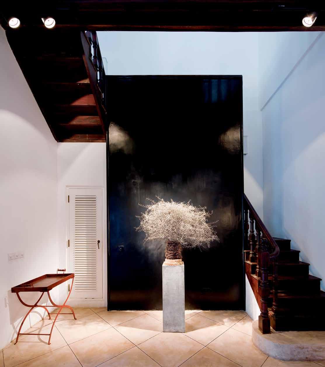
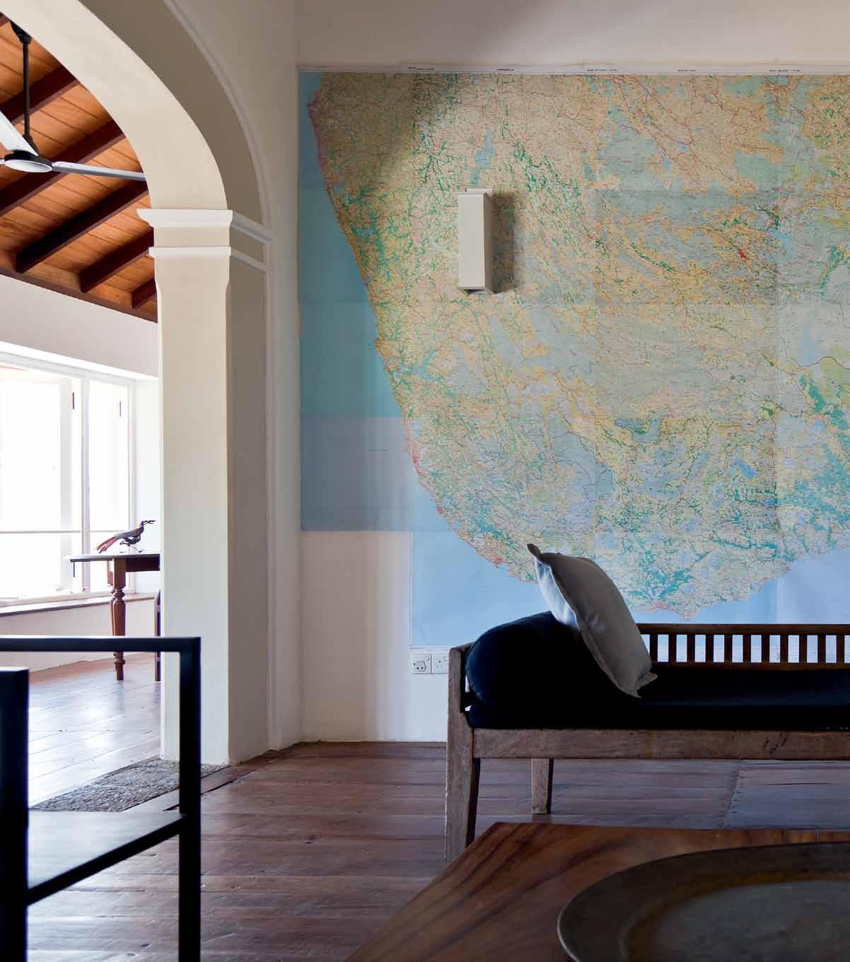
I have always loved maps and this is special, a sort of celebration of peace in Sri Lanka
on two Aman Resorts’ projects in Sri Lanka –Amangalla and Amanwella. Justin and Simon visited Sri Lanka and the house often, mostly for memorable parties (including fireworks on the ramparts viewed from the patio windows). In 2005 (post-tsunami), Justin rented the house for a couple of years as a base for a charitable trust he helped set up.
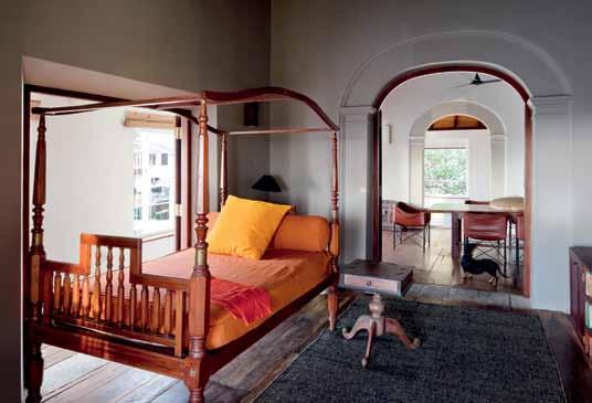
So, when they bought it in 2011, the house seemed a bit like a handsome old friend who had fallen on bad times and in desperate need of a leg-up in life. Everything was a bit of a mess, recalls Justin: “rotting ceilings, damp walls, unattractive bathrooms, flaky polyurethane paint on the 200-year-old floor boards and no entrance door.” An open metal grille gate invited the monsoon in and banished privacy.
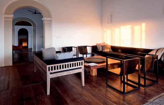
During the renovation they found an old timber door, which they had extended, painted black, and fitted with a massive lock and storybook-like gigantic brass key. Now at the entrance, newly paved cobbled street meets square granite pavers derived from the traditional granite stone used by villagers to grind sun-dried chillies, the basis of the fire in Sri Lankan curries. White bougainvillea competes with frangipani on the façade, which
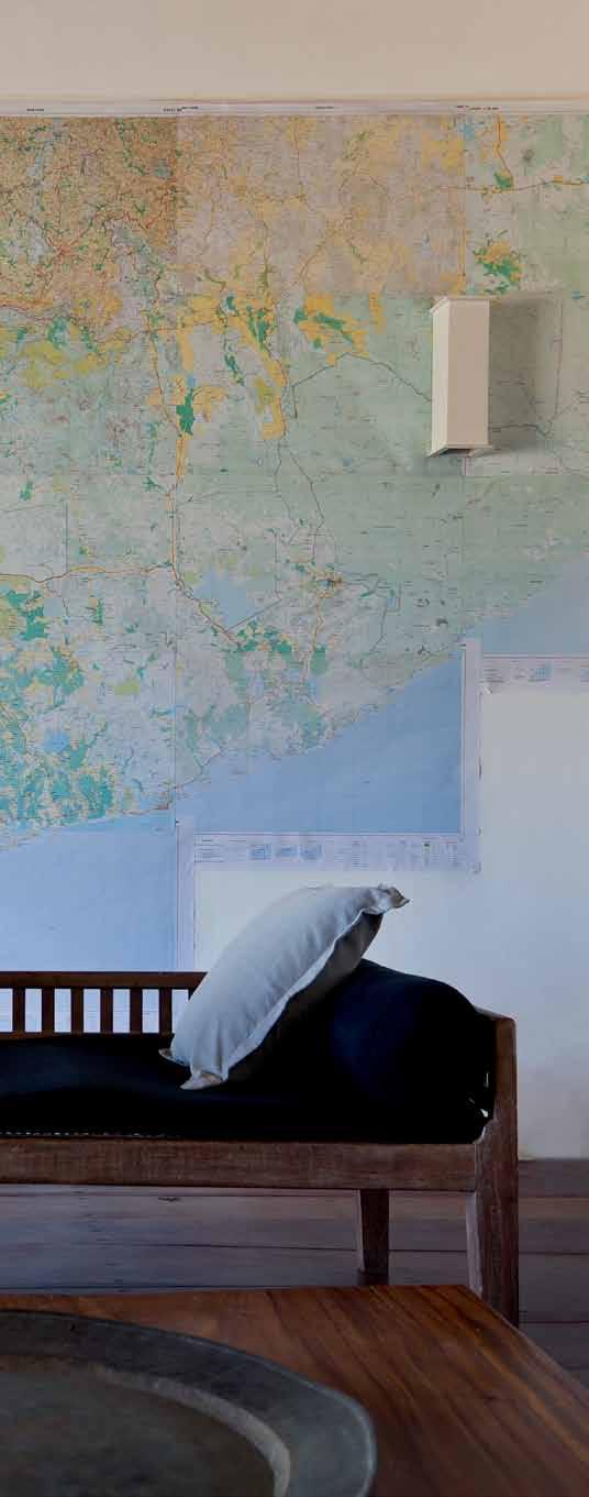
regrettably, due to successive renovations, does not indicate the true age of the house.
The entrance door opens onto a long corridor made welcoming by pale polished cement floors, white louvred windows and an old church bench stretching most of its length. At the far end, sunlight dances off a visible sliver of pool, beckoning the visitor in.
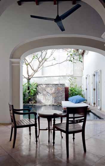
Justin’s experience as a theatre set designer makes an instant impact in the entrance lobby: a tall black screen wall creates a dramatic backdrop for a wire bonsai tree sculpture from local sculptor, Prageeth Manohansa. Tall, dark wood louvred doors (a bit out of sync because they lack the patina of the rest of the house) lead off to two bedrooms on the west-side, while two others open to a pool terrace and lead to an East bedroom overlooking the pool. An old daybed filled with bright cushions completes the set in the entrance lobby.
Theatre aside, the ground floor spaces have a distinct yin-yang feel, articulating the individual preferences of their residents. Simon prefers to have dark night-time spaces so the west bedrooms are cave-like: dark wood ceilings, deep olive green walls, dark furniture including a large four poster bed. The bathrooms by contrast are made more bright and light by replacing the louvred windows with glass. “I love the dark, cool retreat of the

At the far end, sunlight dances off a visible sliver of pool, beckoning the visitor in ...
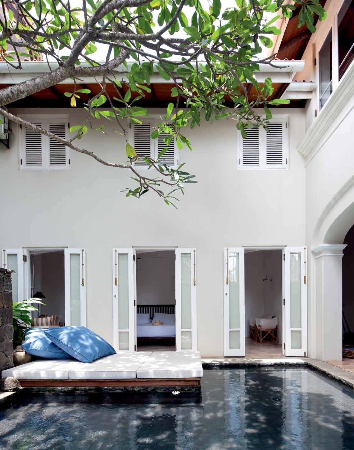
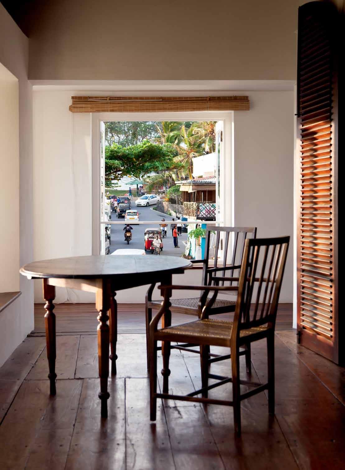
(west) bedrooms and the contrast of the bright lofty bathrooms,” asserts Simon.
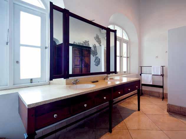
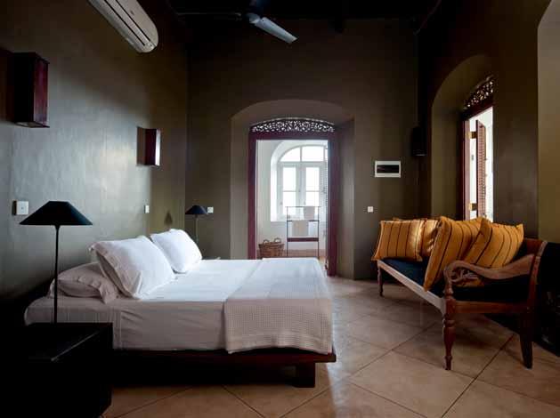
The East room is Justin’s and has a different mood. “I did not like the [original] dark crumbly, wooden ceiling and the arched windows,” he says, “so I pulled off the ceiling, exposed the structure, painted it white, took away the arches, and put in tall slim glass doors that open to the pool.” The result is a calm inviting space in white and pale tones, with a long narrow bathroom running its northern length.
In the upper floor living spaces, the old wooden floor is clearly the winner. It was painstakingly hand-sanded to expose the impressive 200-year-old planks, some quite misshapen but fitted together cleverly, to form what looks like a giant jigsaw puzzle. A single row of granite stone pavers fill the gaps left by absent walls – memory of things past.
The living room is bright and airy with a collection of contemporary furniture. Its main wall was carefully papered by Justin with a series of ordnance maps: “‘Sri Lanka from the waist down’, is how our friend describes his house-warming gift. I have always loved maps and this is special, a sort of celebration of peace in Sri Lanka – previously they were not available for security reasons. The maps have got up to Colombo and hopefully will get to Kandy during my next long holiday.”
Next door is the library, made cosy by a woven jute rug from a local designer. Walking
through it you come to the patio and dining room. The dining room with the long table and bucket leather chairs is great for dinner parties, but lacks aspect during the day. A giant bird sculpted from old bicycle forks by Prageeth preens on the dining room patio while bunches of frangipani clamour for attention from the east patio windows.
The concrete pool was initially uninviting, recalls Justin. They trawled shops, found large silvery green tiles that they had sawn into small squares, which when laid, successfully changed the aspect of the pool. The addition of a sun bed constructed from old railway sleepers and made comfy with thick mattresses and gigantic cushions ensured its place as favourite latemorning and early afternoon spot.
Overall, they say, the transformation was smooth and great fun. For Simon, working with local craftspeople in Sri Lanka was the most rewarding aspect of the conversion. “It gave us a great opportunity to design and have whatever we needed made here.”
It is now a comfy, well-appointed tropical retreat that carries their dual styles with ease; with the addition of more of their art, books and knick-knacks it will only grow in charm.
The home can be rented for short-term stays, visit rampartsvilla.com to enquire.
architectS Simon Cundy & Justin Hill b uilder Amila de Silve (Sereka Engineering)
Kerry h ill a rchitects (65) 6323 5400 kerryhillarchitects.com
Take a tour of design destinations around Galle at habitusliving.com/issue20/galle
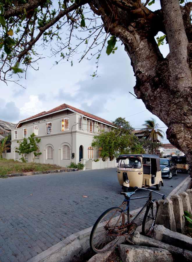
a rtwork
Bird and bonsai bush sculptures by Prageeth Manohansa, Saskia Fernando Gallery.
furniture
All furniture locally sourced. In Living Room, black chairs designed by Jacob Pringiers, A+ Furniture and More.
Antique furniture and custom pieces from Southern Antiques & Reproduction.
li G htin G
Track lighting from Singapore.
fini S heS
Local handloom cotton from Barefoot and Paradise Road. In library, jute rug by Kalaya.
As both architect and owner, Justin Hill knew exactly what he wanted in his Sri Lankan home. Passionate about local materials and design, Hill chose unique pieces that would reinvigorate this historic house.

“There is a wealth of good design in Sri Lanka,” says Hill. “It was important that our items came from here, even though they may be different to what we are normally used to.” With a desire to produce a house that reflected the unique world around it, Hill pursued the use of local design wherever he could in the Galle House.

The coloured cottons from Barefoot in Colombo, used throughout the bedrooms, provide a uniquely Sri Lankan finish, in both design and construction. Hand woven locally by the Barefoot artisans and needlewomen, these textiles are both visually stimulating and expertly crafted. With their geometric designs inspired by the landscapes of Sri Lanka, these cottons are the perfect reflection of Hill’s aim.
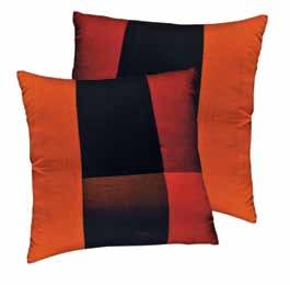
Similarly, the bird sculpture by Sri Lankan artist Prageeth Manohansa appealed to Hill through its use of locally recycled products. “It is made from bicycle forks welded together,” says Hill, “and a pair of scissors for the beak.” Its sensitivity of movement transforms the space around it, and speaks to a uniquely Sri Lankan art movement. “We have three pieces by Prageeth in the house,” continues Hill, “we also have a pot made from wheel hubs and barbed wire, and a small crow in the upstairs library.”
This passion for rare pieces continues throughout, with the black chairs from the living room custom made by friend and local, Jacob Pringiers. This Belgium-born designer created refined and modern chairs that complements nicely the eclectic Sri Lankan objects. “We particularly wanted some contemporary furniture, hence Jacob’s chairs,” explains Hill, “as we thought the house should not be laden with antiques.”
With pieces old and new, local and creative, Hill has created the perfect Sri Lankan retreat. “I wanted it to be comfortable, and a good place for a holiday,” Hill speaks, “that is, after all, relaxed.”
Clo Ckwise from top ICI Oak Barrel paI nt fI n I sh azkonobel.com
CO lO ured COttO n uph O lstery from barefoot Store owned by barbara San S oni (habitu S #15), barefootceylon.com
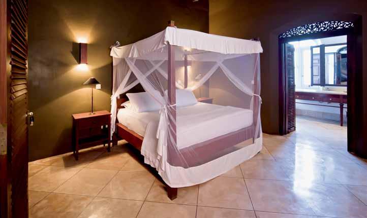
Wse03 C haIr deS i G ned by Jacob prin G ier S paradi S e upholStered in teak fini S h Jacobprin G ier S .com / Sa S kiafernando Gallery.com
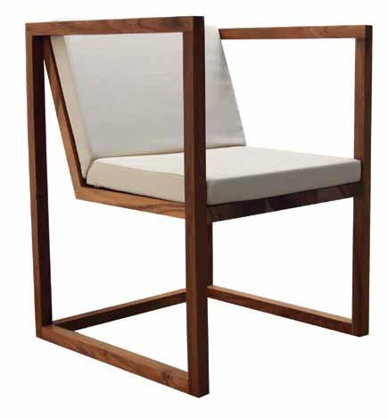
C e I lI ng fans exi Stin G fan S Sanded back by the builder and S pray painted in black auto paint
jute rug 2-colour J ute weave cu Stom S ize to fit the Study, from kalaya in colombo

Guaranteed to deliver 4,029,600 cups of boiling and chilled water per year!
www.billi.com.au
Billi Pty Ltd has based this advertisement on the following:
1. The product is a Quadra 4180 and must be installed and maintained in accordance with Billi Pty Ltd specifications


2. Genuine Billi Pty Ltd replacement filters must be installed as specified by Billi Pty Ltd
3. Reference to 4,029,600 cups is a reference to a combined total for boiling and chilled water cups over a 12 month period


4. The product has a life expectancy of not less than 5 years.
Billi Pty Ltd makes no representations other than those detailed in this advertisement. Billi Pty Ltd excludes and disclaims all other responsibility for this advertisement and all liability (including, but not limited to, liability in negligence) for all expenses, losses, damages and costs any person may incur as a result.
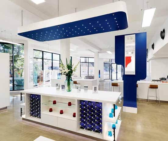
From its establishment in Brisbane back in 1986, Lincoln Sentry has evolved, grown and expanded to become one of Australia’s leading suppliers and distributors of hardware and components to the cabinet and furniture making industry, the window, door and glazing industries and the niche industrial tape and insulation markets.
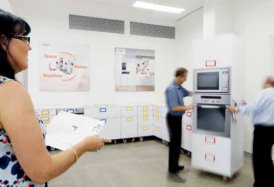
Being successful in such a wide variety of fields is all about having the right range to suit current and future trends. What they offer is simple - the best selection of quality products in 26 locations around Australia - underpinned by expert knowledge and advice.
This integrated approach results in the company’s unique ability to bring together multiple elements required by cabinet makers, furniture makers, glaziers, fabricators, designers, builders and renovators to provide a single source of reference, specification and supply for all types of residential and commercial projects. It’s an offer unmatched by any single competitor.
Discover new innovations at the Lincoln Sentry Alexandria Showroom today

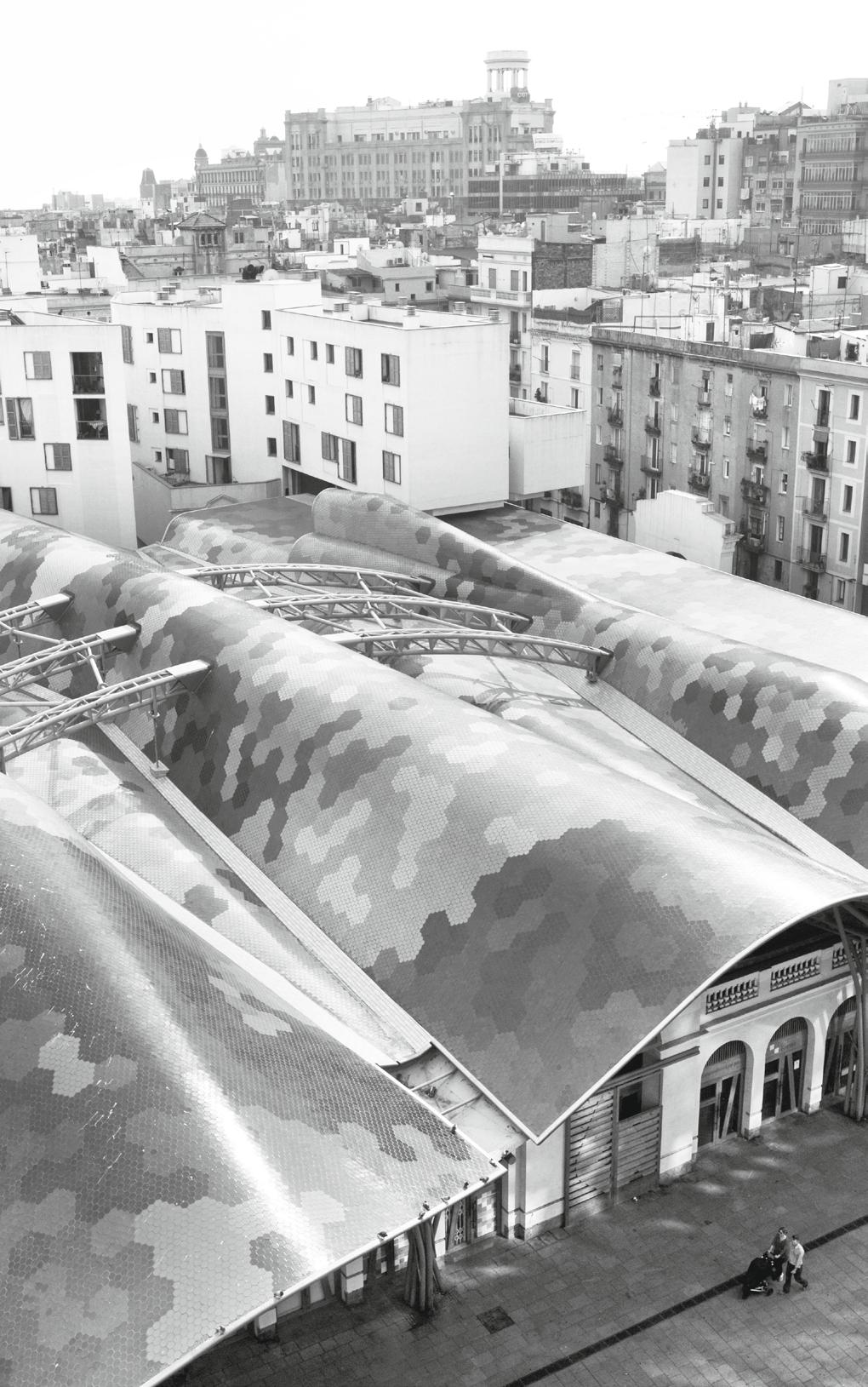
We know it has great beaches, architecture and food, but where to start in the second-largest city in SPAIN ? KERSTIN ROSE gives us a few hints.
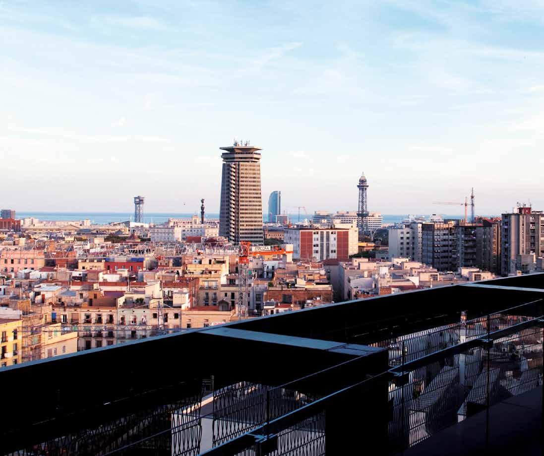
Maybe it seems an obvious thing to say, but for a trip to Barcelona you absolutely must pack a swimsuit, sun cream and a pair of thongs. For what could be nicer after a day out sightseeing than to jump into the sea or doze off on the beach? And in Barcelona that’s no problem from April and, if you’re lucky, right into November. The sea is right on your doorstep and the sky is nearly always blue.
The best way to work up a pre-swim sweat is to experience Barcelona on foot. Almost the entire Gothic Quarter (Barri Gòtic) is pedestrianised. And only on foot do you see all the beautiful elements that are so typical of Barcelona. For example, the narrow alleyways with their splendid facades, some of which date back to the 14th Century. Or the traditional markets, which are sometimes hidden behind inconspicuous gateways. It’s only once you’ve passed through these entrances that you suddenly realise the true extent of the huge halls full of stalls selling fish, vegetables and sausages.
One of the most beautiful of these indoor markets is Santa Caterina, which could almost be classed as one of Barcelona’s landmarks. The building, with its distinctive multicoloured corrugated roof, was designed by the internationally renowned Barcelona architects Miralles Tagliabue. The indoor market links La Ribera, the west end of Barcelona’s historic city
centre, with El Born, its chic east end, which is home to the Picasso Museum. If exploring the market makes you feel hungry, try the restaurant Cuines Santa Caterina next door. Almost every ingredient used in its open-plan kitchen comes from the market stalls. Another market in Barri Gòtic, is the venerable, loud and crowded La Boqueria, take care: its entrances on Carrer Jerusalem or the Ramblas are easy to miss).
Modern life co-exists cheek-by-jowl with centuries-old buildings. Architecture and design have become hugely important in Barcelona since 1992, when the city hosted the Olympic Games. The ‘new Barcelona’ rose up along the seafront. Artists and architects from all around the world were involved, designing new hotels and a marina and reshaping the seaside promenade. Canadian-born architect Frank Gehry created an outsized titanium fish, which is now considered to be the city’s emblem. German artist Rebecca Horn made a steel sculpture which resembles the fishermen’s huts that used to stand here. And Miralles Tagliabue were also responsible for the Parc de la Diagonal Mar, which recreates the aesthetic of Antoni Gaudí, (1852-1926), the city’s great master builder, through playful, abstract forms and ceramic tiles.
A short walk will take you from old city districts such as Barri Gòtic, La Ribera and El Raval to the city beaches and the seaside promenade. If you don’t feel like walking,

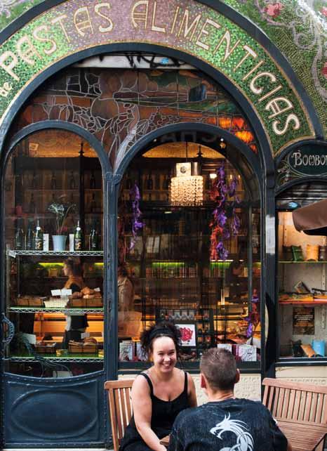

travelling by cab in Spain is inexpensive, or you can take a bus or use the metro underground.
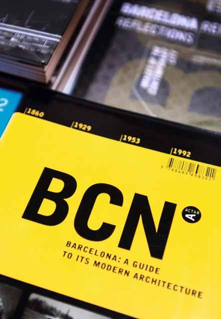
When you book a hotel, such as the Barceló Raval, there’s no need to include breakfast; instead, eat at one of the many fantastic bars. For example, at Escribà you will find cakes that are more like pieces of art. At this traditional patisserie, which dates back to 1906, you can order pretty much anything: a wedding cake, a cake in the form of a cuddly toy, or even a lifesized replica of your house made out of pastry. The art of confectionery is very popular in this vibrant city. It’s definitely worth stopping by to take a look at the unusual works that are created here, and visitors can also enjoy more conventional cakes and pastries made with cream and fruit, in beautiful Art Nouveau surroundings or outdoors on the terrace.
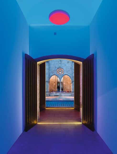
Just as artistic, but better suited for buying as a gift, is the chocolate of Enric Rovira. He puts his chocolate creations on display as if they are exhibits in a museum. He makes replicas of places such as Manhattan or uses moulds to recreate Barcelona’s architectural highlights from liquid chocolate. He produces ranges such as ‘Parfum’, in which individual blocks of chocolate are infused with flavours such as jasmine or rose. He learnt his trade in the traditional manner in his parents’ chocolate business and finds inspiration for his creations on his travels.
Of course, the city offers a range of food experiences, including the very popular Barcelona Reykjavik bakery, where you can watch baker David Nelson at work. Even if you don’t want to buy bread, pay a visit and take a photo. And entering the Sans & Sans tea shop in the Gothic Quarter is like walking into a highclass jewellery store. For three generations now, more than 300 blends of tea have been sold here, as well as all sorts of tea-making accessories.
The people of Barcelona are highly skilled when it comes to offering their wares, whether those are food or objects, in an aesthetically attractive way. And they’re blessed by having the city’s wonderful old buildings to act as a splendid backdrop. One of these buildings is home to the bookstore La Central del Raval
This lovely shop, with its antique floorboards and vaulted ceiling, offers a large selection of art, design and architecture books on two floors. Customers can browse in the cosy reading corner and then relax in the store’s own café. Another beautiful building houses the great design retailer Vinçon. This colonnaded store is situated on the magnificent Passeig de Gràcia in a former townhouse that dates back to 1899. It is set out like a private home, with living and dining areas, but here visitors can buy anything they lay their eyes on: chairs, lamps and whatever they might need for their office, kitchen or bedrooms.
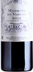

From the Andes to the Pyrenean Mountains, our exclusive range of over 400 wines from Spain, Argentina, Chile and Uruguay all hail from small, boutique wineries, whose love and passion for viticulture and winemaking is revealed in the quality of their wines.

Explore our full range of wines at www.untappedwines.com







The terrace offers a view of the rear side of the Gaudí House. As well as being a design store, La Sala Vinçon also plays host to a diverse programme of exhibitions on the subjects of graphic and industrial design.
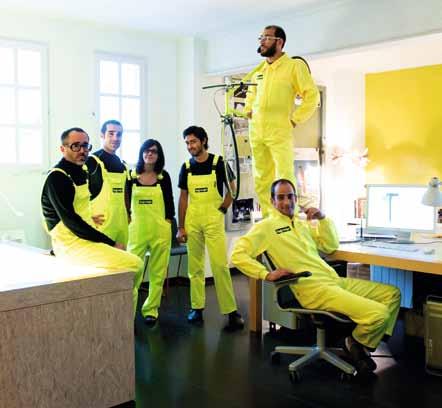
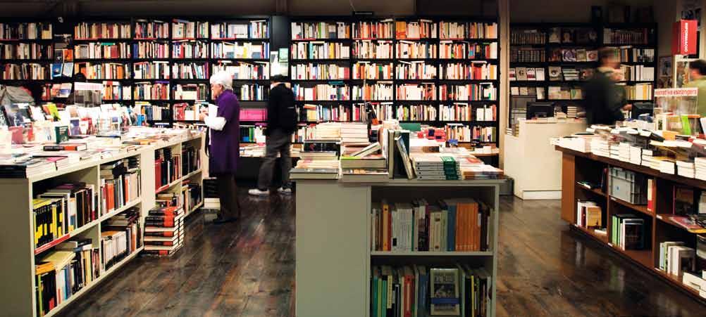
There are many sights worth seeing in Barcelona. One of the most impressive is La Catedral de la Santa Creu i Santa Eulàlia. It’s an imposing building nestled between residential buildings in the middle of the Gothic Quarter. Of particular beauty are the characteristic archways of this architectural style and the colonnade. Just behind the cathedral is a quiet, pretty square with a dark history. Situated off the usual tourist path, the square is surrounded by Gothic houses and the church. During the Spanish Civil War (1936-39) dissidents were lined up against the church wall and executed by firing squads on General Francisco Franco’s orders. The resulting bullet holes in the wall have been left in place as a monument to those who died here. More recently, the square was used as a location in Woody Allen’s film Vicky Cristina Barcelona (2008).
In the same area you will find the Sant Augustí, a former convent that’s now a cultural centre. It’s open to the public and can be accessed via a ‘light space’, a glowing, colourful work of art created by American artist James Turrell. The entrance can be reached from Carrer del Comerç 36.
After all this sightseeing you’re sure to be hungry again. Don’t miss the lovely tapas bar Inopia. Just looking at the extensive selection
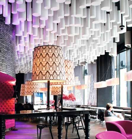


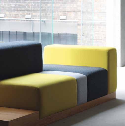
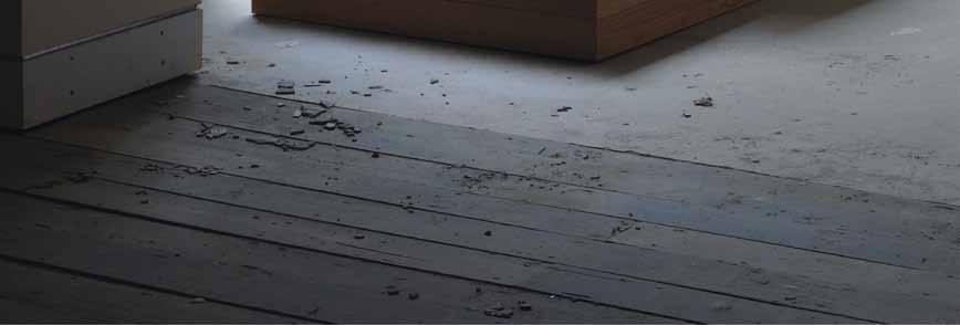



For restaurants and bars with a designer edge, have a drink at one of these establishments:
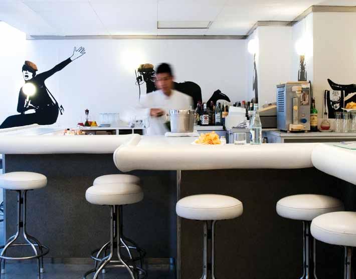
Cuines Santa Caterina cuinessantacaterina.com

Escriba escriba.es
Enric Rovira enricrovira
La Central Del Raval lacentral.com
Barcelona Reykjavik barcelonareykjavik.com
Sans & Sans sansisans-finetea.com
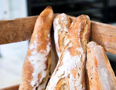
Flash Flash flashflashbarcelona.com
Bestial grupotragaluz.com
Inopia (34) 934 245 231
of wonderful tapas – which are prepared right in front of the guests – is enough to make your mouth water. The bar itself has been fitted out in a mixture of industrial design and traditional Spanish tiled décor, embellished with pots of herbs and hanging sausages. Or if you like to taste the very traditional tortilla (omelette made with potatoes), go to Flash Flash, where you will find a range of 50 different styles.
Time for relaxing. Anyone longing for open green spaces in Barcelona will have to walk some distance in order to find them, as trees and grassy areas are a rarity in the city. The Jardín de la Ciudadela, which contains many small structures and fountains, was designed in the 19th Century. One of its most beautiful features is the Umbracle hothouse, which was opened for the world exhibition in 1888; its name means “shadow house”.
From the park, it’s just a few hundred metres to the water. Take a stroll down there and visit the Bestial restaurant. It has a dream location at San Sebastián beach, where you’ll also be able to see Gehry’s gigantic fish sculpture. On the menu are Italian specialities and pizza from the brick oven, and it’s always worth dropping in to enjoy a sundowner or aperitif while admiring the view of the sea from the wooden terrace.

Being a world leader in bathroom and plumbing technology means some of our best ideas are hidden away forever. No ugly plumbing or cistern to be seen anywhere! Enjoy more space, more style.
→ www.geberit.com.au
Geberit inwall cistern: more space, sleek design
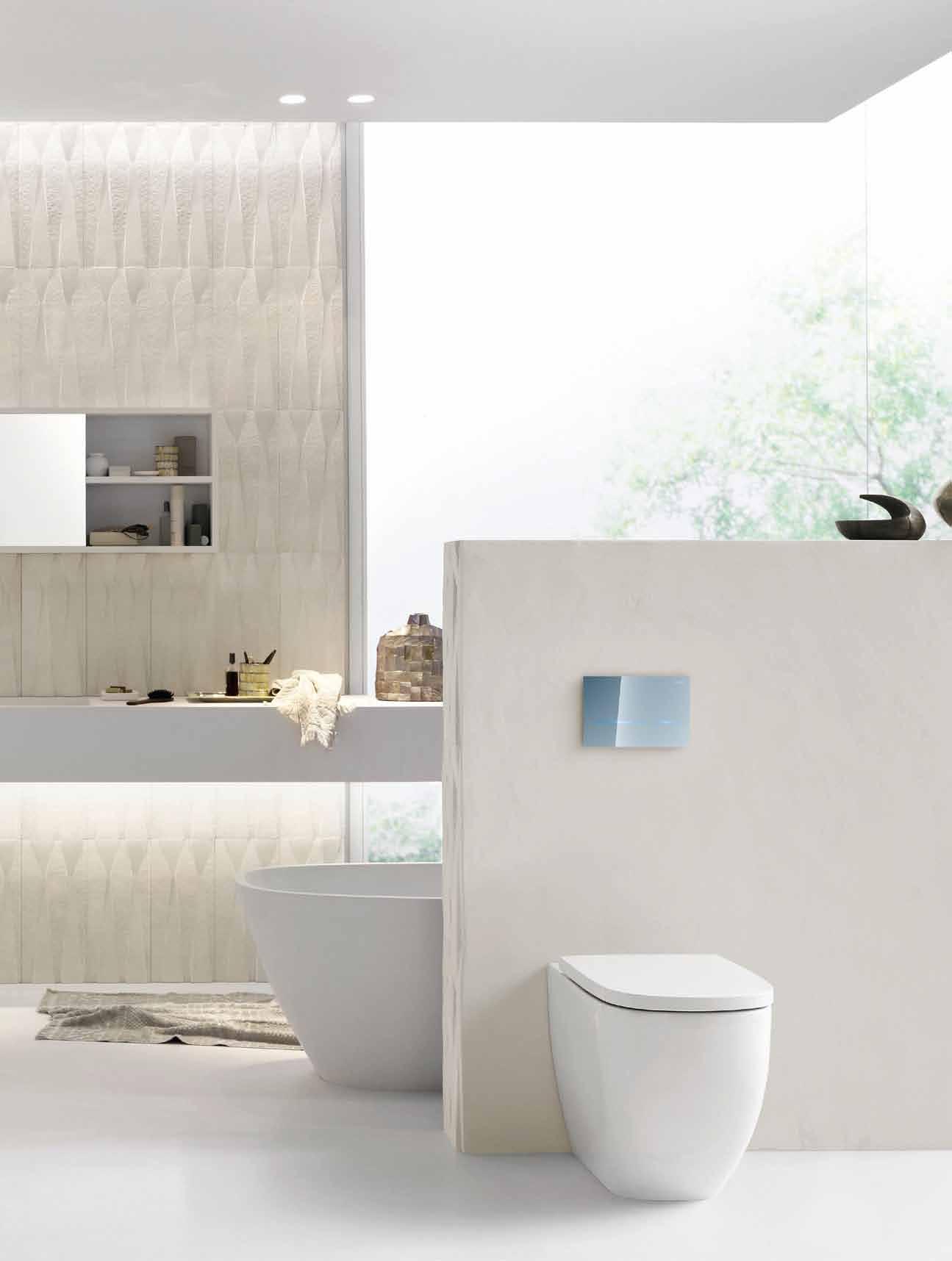
Edited by V. Laganier & J. van der Pol
Published by Birkhauser 415pp hardcover US$34.95 degruyter.com
lux: lAm
Edited by R. Klanten, K. Bolhöfer & S. Ehmann
Published by Die Gestalten Verlag, 320pp hardcover AUD$45.78 gestalten.com
Published by Routledge 246pp softcover AUD$47 routledge.com
As André TAmmes comments in this review of four books, “lighting is a vast ocean”. In fact, he says, it could be seen as a vast ocean of emotion, because light has been an eternal mystery which we ironically tend to take for granted.
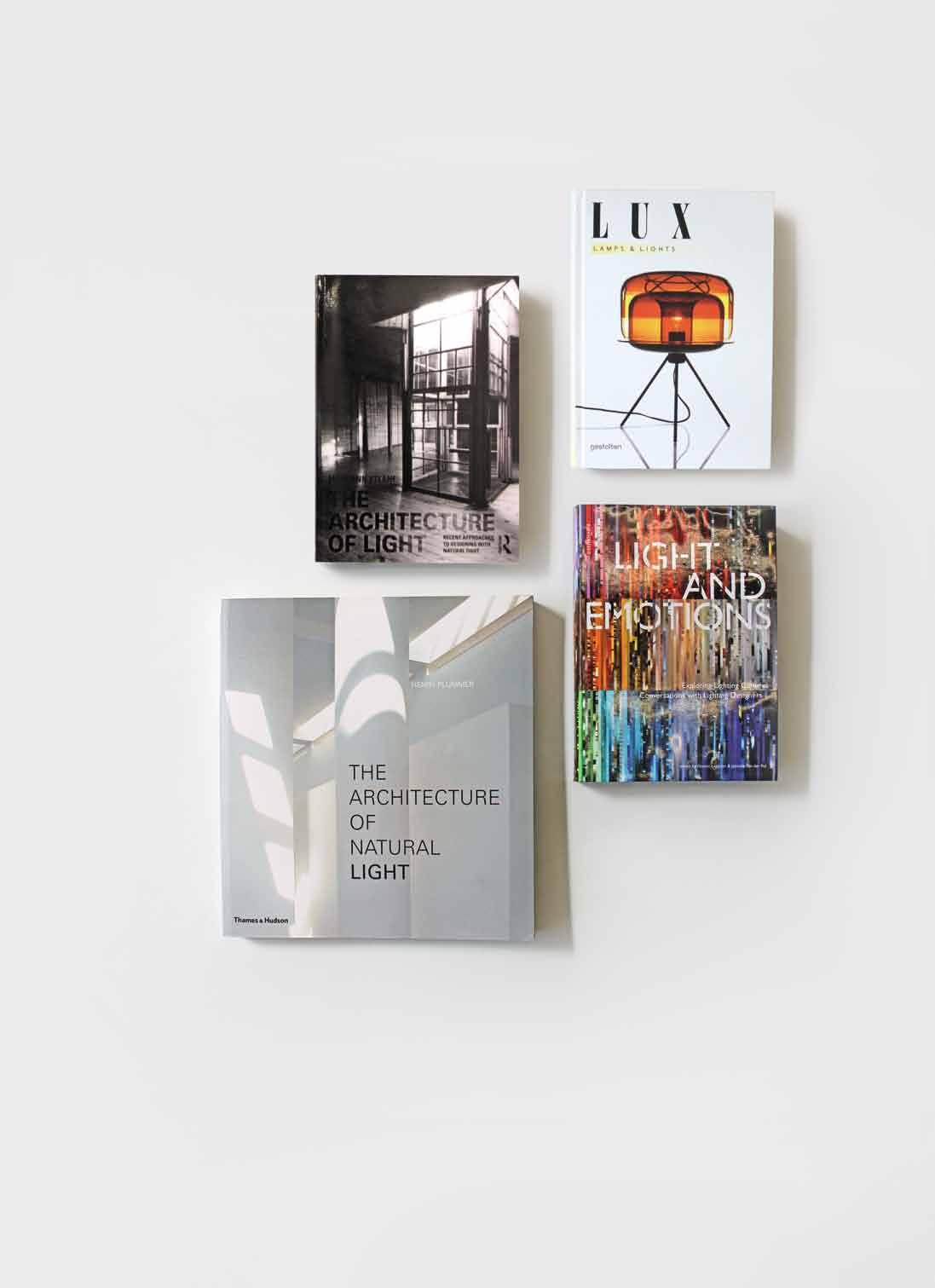
Light unlocks such an extraordinary range of thought that both writers and readers risk being overwhelmed by the limitless nature of the subject. Paradoxes abound; light doesn’t become apparent to the eye until it is reflected from a surface – it is of itself invisible and yet, without it, our world would not only be invisible, but non-existent. Its ubiquity has historically led to an under-realisation of its value and influence in shaping perception of the physical elements of life. We tend to overlook light because we only experience the manifestation of its presence or absence. However, observers as far back as Francis Bacon (1561-1626) were conscious of light itself: “The beholding of the light is itself a more excellent and a fairer thing than all the uses of it”. This quotation opens Henry Plummer’s The Architecture of Natural Light and establishes a common thread across the four books under review – namely the evocation of emotion by light.
Despite the reality that there is only one form of visible light, regardless of source, it is the case that books on the subject generally address light as either ‘natural’ and ‘daylight’

or ‘artificial’ (which should, more precisely, be referred to as ‘electric’ light). This selection of books follows form with two, of a similar title but very differing approaches, dealing with natural light in buildings and two with multiple aspects of electric lighting and its design. Between them, this selection provides an inspiring spectrum of the thinking and practice which guides our luminous world.
The books represent a relatively recent growth in the awareness of light as a ‘designable’ subject, particularly with regard to artificial lighting in the architectural arena. It is interesting to question what has propelled this growth which, arguably, started in the 1950s with the work of the American lighting designer, Richard Kelly. The short answer is the continuing demand by architects that the subject should no longer be limited to a sterile substitution of absent or inadequate levels of natural light as was, and still is, offered by many building services engineers. Additionally, the requirement to save energy has resulted in an ever more discerning use of electric light and greater use of natural light. Finally, and perhaps most potently, the last decade has

seen a sea-change in lighting technology, largely brought about by the development of the Lighting Emitting Diode (LED) into a truly usable source of white light which forms the centrepiece of a new paradigm – that of electronic or ‘sold state’ electric lighting.
Mary Ann Steane in The Architecture of Light mourns the displacement of natural light in favour of electrically generated light: “On the one hand, electricity has enabled the working day to be 24/7, and cities to be safe, to handle traffic, as well as to be neon-fantasies of capitalist buying and selling; on the other hand we have grown accustomed to viewing the satellite night view of the planet as marked with a luminous cancer of consumption that threatens human life itself.” Her engaging treatise examines the words which have defined selected architects’ thinking about natural light and how these translate into practice. Subjects range from detailed descriptions and analysis of Corbusier’s defining work La Chapelle de Ronchamp (in a chapter entitled ‘Speaking of light, speaking with light’) to a fascinating chapter dealing with the unique aspects (sun angle and intensity) of Australian natural
light, associated heat and a summary history of the architectural response. This culminates in a review of the work of Queensland based architect, Gabriel Poole and, specifically, how he enables and distributes natural light in the home he designed for himself (Poole House, Eumondi). This provides an inspiring example of architecture which is not only responsive to its environment, but also illustrates how successfully natural light can be admitted to, and modulated within, a residential interior in Australia. Whilst Steane’s book is driven from an academic stance, it makes compelling reading because it places light, and its use, in a wider cultural context which considers global location, design pragmatics, the overall visual environment and the intrinsic relationship between architecture and light.
It is, perhaps, not coincidental that the relatively recent enlargement and refinement of lighting technology has been paralleled by the emergence of conscious emotion as a response to the images and ‘light-scapes’ which lighting designers create. Whilst architects throughout the ages frequently worked with natural light to induce a particular emotional
response, early and even current, use of electric light concentrates largely on the pragmatic replacement of natural light, where this is either absent or inadequate. This frequently results in static and visually sterile outcomes, often consisting of excessive and unnecessary levels of electric lighting, provided at high levels of uniformity and with no account being taken of the human requirement for visual stimulus.
Light and Emotions is a timely publication which explores the work of forty-seven experienced lighting designers and thought leaders from twelve countries in Asia, Europe the Americas. The works, both interior and exterior, deal exclusively with electric light. The book’s copious colour illustrations are not its only value; the conversations with the designers provide a unique insight into why they choose to work with light, how they do so and what they believe the benefit of their creativity is to the built environment and the people who occupy it. Those who seek to understand what is ‘designable’ about lighting should read this book; it marks the passing of an irreversible milestone which acknowledges that the use of electric light can and should
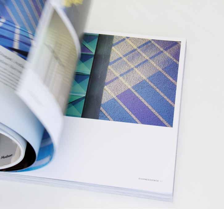

be about recognising human visual needs, providing for these in a myriad of differing ways and, in the process, creating delight, surprise and a framework for perception.
A particularly useful aspect of this book lies in its identification of the variables in lighting design; a full section is dedicated to brightness, colour and direction and the contrast and dynamics which can be assigned to each of these. This amounts to a ‘pattern book’ which illustrates so much of what can be seen in the lit environment but the design of which is so rarely identified or understood.
The only, minor, disappointment in Steane’s book on natural light – where all illustrations are in black and white – is more than compensated for in Henry Plummer’s The Architecture of Natural Light . Out of 465 illustrations 408 are in colour, making this into a superb reference source for those who seek informed inspiration based on a review of a wide range of contemporary buildings and the way in which natural light has not only illuminated these, but has been used as a key component in their architecture. The works are categorised by
the manner in which light has been used as a design tool, with the following intriguing words providing a heading to each group: Evanescence; Procession; Veils of Glass; Atomization; Canalization; Atmospheric Silence; Luminescence. Inevitably, much emphasis is placed on the illustration of window placement and design as well as other less conventional ways in which architects ‘leak’ sun and overcast daylight into their interiors. Although the intrinsic dynamic of natural light cannot be experienced, several of the studies compensate with multiple images photographed at differing times of day. In total, the work of 36 international architects is used to exemplify the use of natural light as an agent of form and a medium of the numinous. Plummer is a well established, and great, observer of light; the texts which preface each of the seven sections of this book are a true delight to read.
In general, there can be confusion about the distinction of lighting design and the design of lights, light fittings or fixtures. There is also a requirement to distinguish between technical lighting ‘instruments’, such as recessed
downlighters or wall-washers, and ‘decorative’ or expressive light fittings.
Lux – Lamps & Lights is a compendium of the latter. This is 288 pages of fun; a celebration of ingenuity and the unprecedented, in the form of numerous light-forms, light emitting sculptures and apparently conventional fittings, but all with a twist. If you are looking for off the wall (in many cases literally) fittings, systems or icons which are also capable of producing working quantities of light, then look no further. A fully detailed reference for every fitting is provided.
Lighting is a vast ocean. This set of four books comprises essential navigation in the form of highly informed and inviting reading which has creativity and visual emotion at its heart.
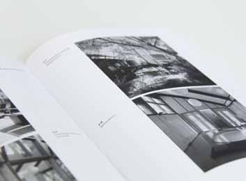
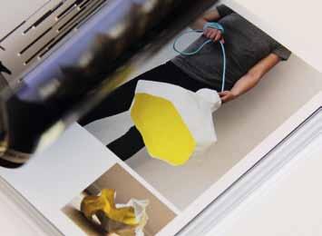







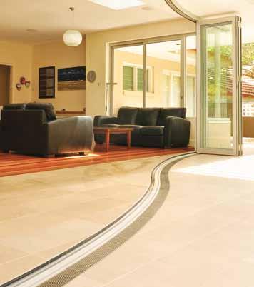



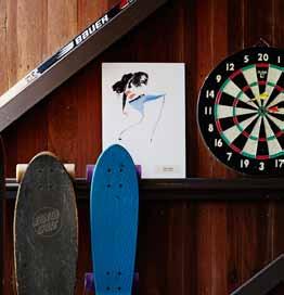
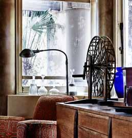
The T eam aT Habitus magazine T hank our adverT isers for T heir supporT use T he direcTory To see whaT page a specific adverT isemen T is on, and visiT T heir websiT e To learn abou T The producTs and services They provide.
Habitus magazine is available at newsagents and bookstores across Australasia, South-East Asia, the USA, Canada, Europe, South America and the Middle East. Habitus is published quarterly in March, June, September and December. To subscribe securely online visit habitusliving.com/magazine or email subscriptions@indesign.com.au to subscribe or request a full list of locations where Habitus magazine is available.
your map to where the stories in this issue come from – and where is sold
#161 Galle
#113 singapore
#69 Jakarta
#54 & #130 s ydney
#75 Melbourne
#98 torquay
#149 auckland
lloyd wrightThe architect must be a prophet... a prophet in the true sense of the term.
Frank
Crafted with a unique blend of Alpaca wool. Using 100% undyed fibre; as nature intended.
velieris.com

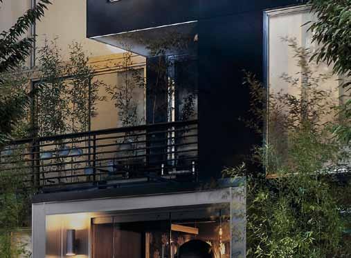
It’s a man but it’s not a Countryman. It’s a Sports Activity Coupé but it’s not the Coupé. It’s the all new Paceman. The latest MINI that puts a new slant on things. A new slant on style. A new slant on design. A new slant on MINI. With deliberately daring design and the freethinking, freestyling freedom to be whomever you wish to be, organise a test drive today at your MINI Garage. MINIPaceman.com.au


