# 22
living in design
Industrial repurpose, with purpose. A master chef and his kitchen. The dark side of timber. Slow architecture. Textile dynasty. The great outdoors.


THE ART OF OUTDOOR LIVING


Industrial repurpose, with purpose. A master chef and his kitchen. The dark side of timber. Slow architecture. Textile dynasty. The great outdoors.


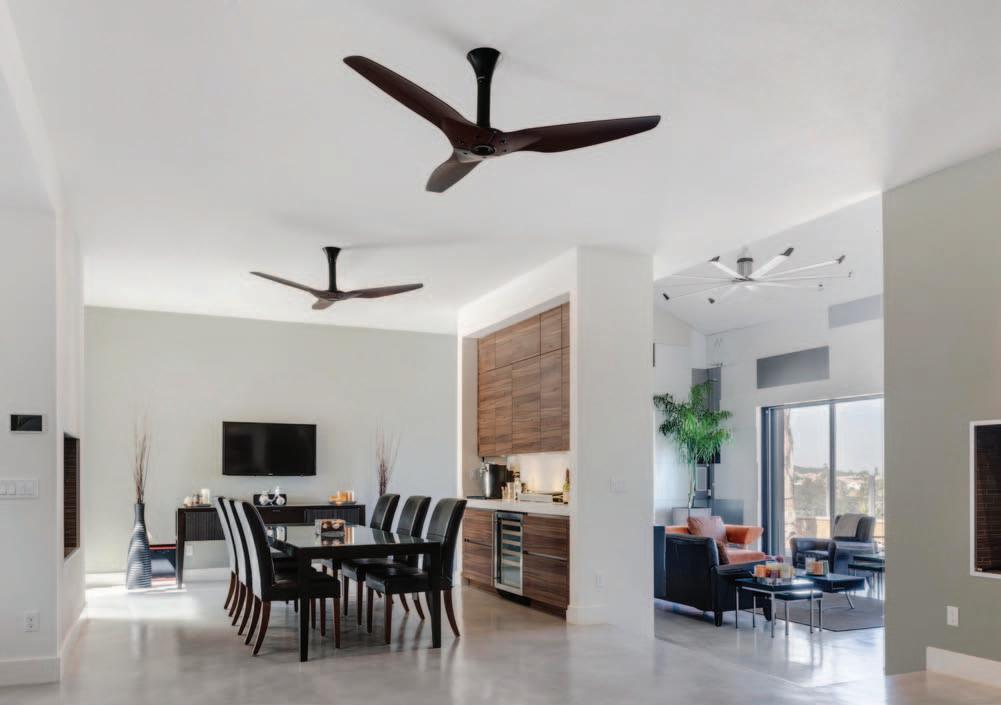


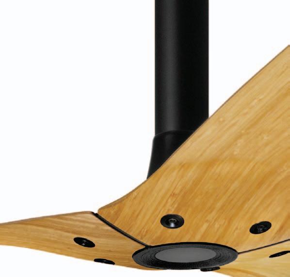
Winner of 19 international design awards, the 1.5-metre Haiku® ceiling fan is everything you expect from a Big Ass Fan®, designed specifically for your home. Haiku integrates a silent, powerful motor with aerodynamic aerofoils, crafted and balanced by hand to ensure perfect performance at all seven speeds. Without the wobble. Guaranteed. Together, Haiku’s features result in the world’s most efficient ceiling fan—verified by ENERGY STAR®.
Need a ceiling fan as refined as the rest of your design?



Visit haikufan.com.au to build the perfect Haiku. (07 ) 3292 0156 | HAIKUFAN.COM.AU

“Haiku is flawless. It is the perfect fit in our modern home. Haiku’s aesthetics, combined with its extraordinary features, make it the only ceiling fan we would consider.”
- Mark P.
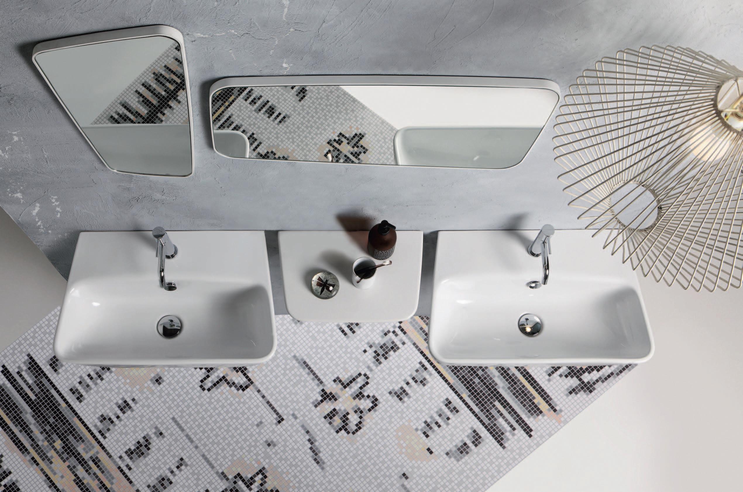

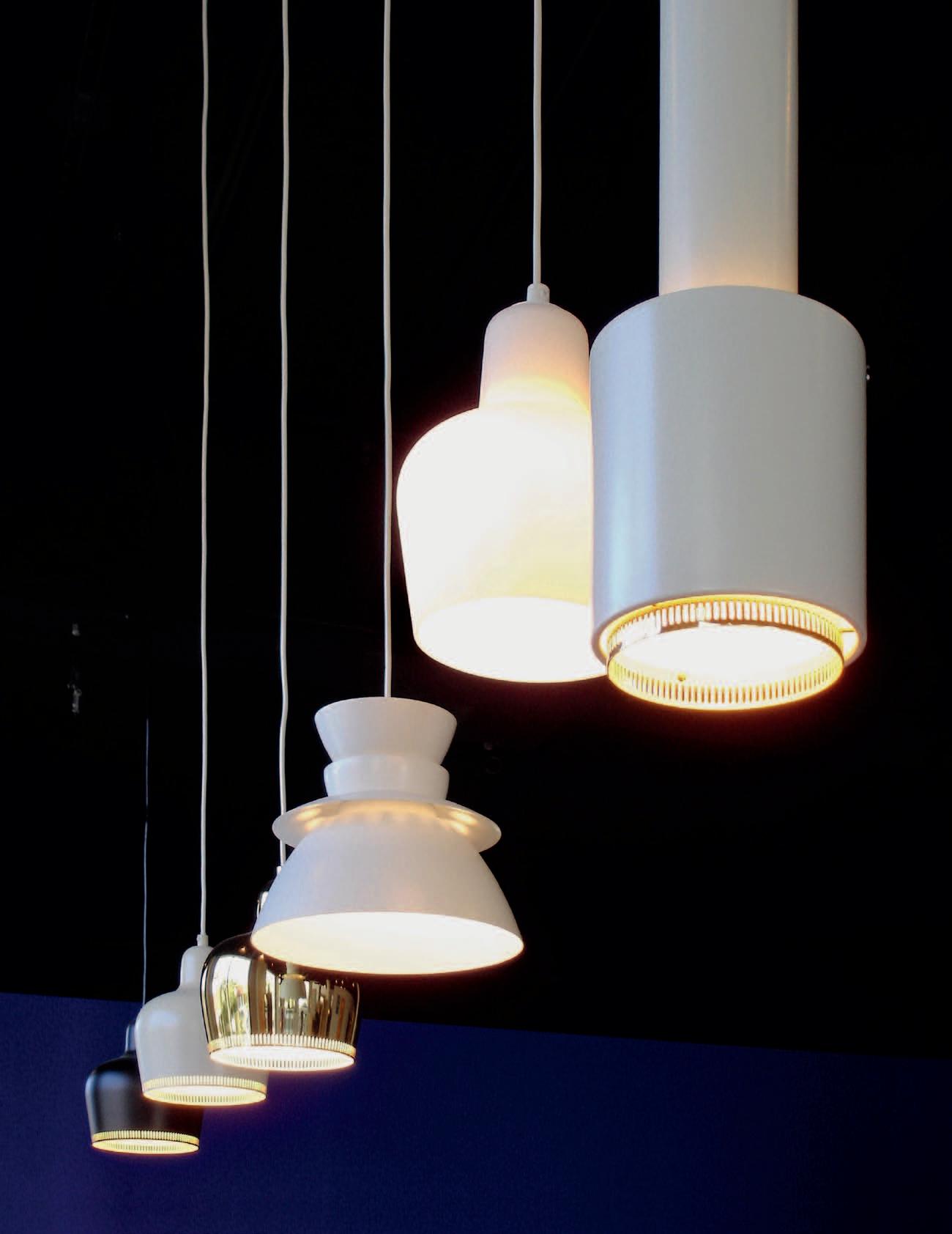


What are products if not a physical manifestation of our values? Iconic forms, narrative concepts and symbolic materials combine to make products with meaning.
24. DESIGN NEWS
C heck out the latest and greatest contributions to the world of design.
35. RESHOOT
One concept, three ways. Inspired by the tribal, we create totem forms using ceramics, lights and cushions. Their delicate and fragile texture belies the strength of the silhouettes they create.
41. COOL & CALM
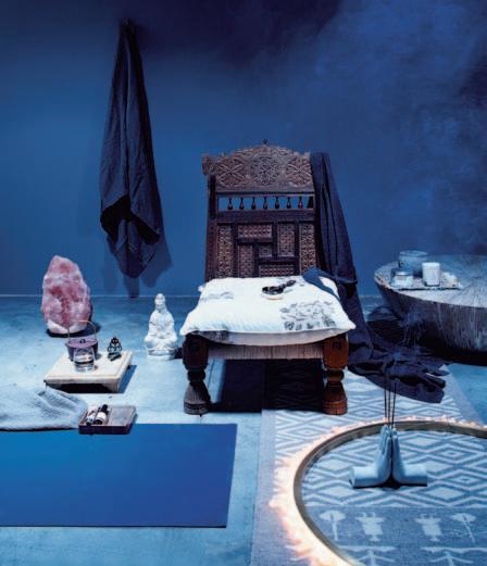
The best way to end the year is to spend some time on the three ‘ R ’ s: relax, rejuvenate and restore.
51. H ABITUS PAVILION
We explore the fascinating links between creative people and where and how they live. From a master chef in Sydney through to left-of-field product designers in Bangkok, it's a creative smorgasbord.
58. 56thSTUDIO
In the riotous mix of Bangkok, 56thStudio get their inspiration from the city. Nicky Lobo reports that the ethnic melting pot with its mix of tradition and the modern, craft and the manufactured, gives the designers the raw materials for products with an edge of social commentary.
67. ENTANG WIHARSO
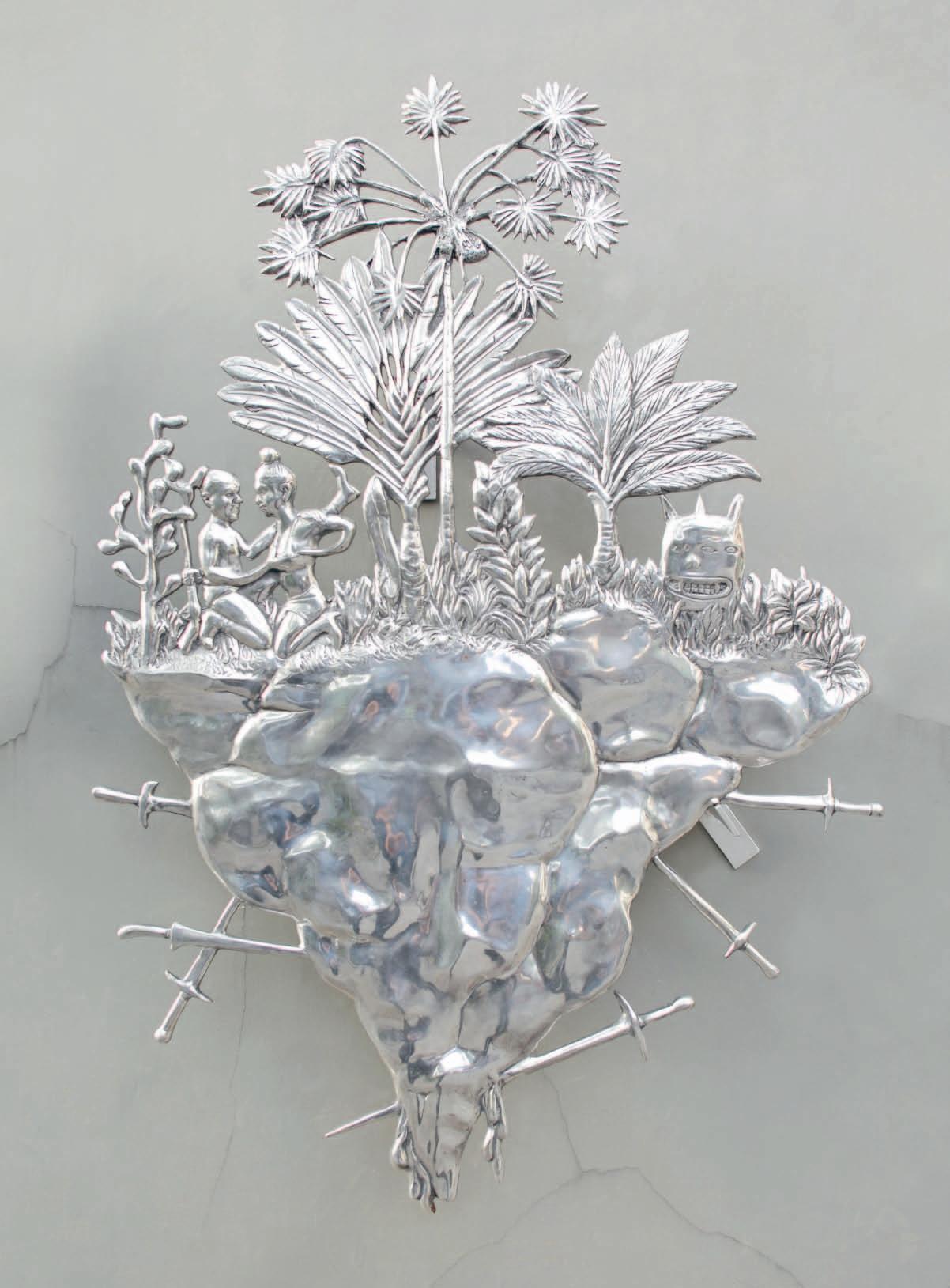
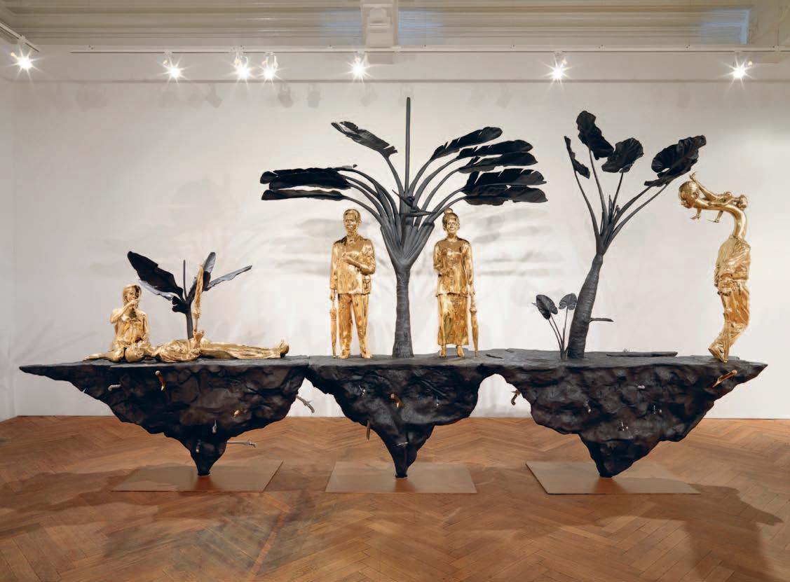
Yogyakarta-based painter and sculptor, Entang Wiharso, lives in one of the most diverse countries in the world. He is remarkable both for the range of materials he uses and for the bold exploration of the political and social implications of his country’s ethnic, cultural and religious mix.
75. ROSS STEVENS
We give you the background on the inaugural Habitus Pavilion at Sydney Indesign 2013. #75
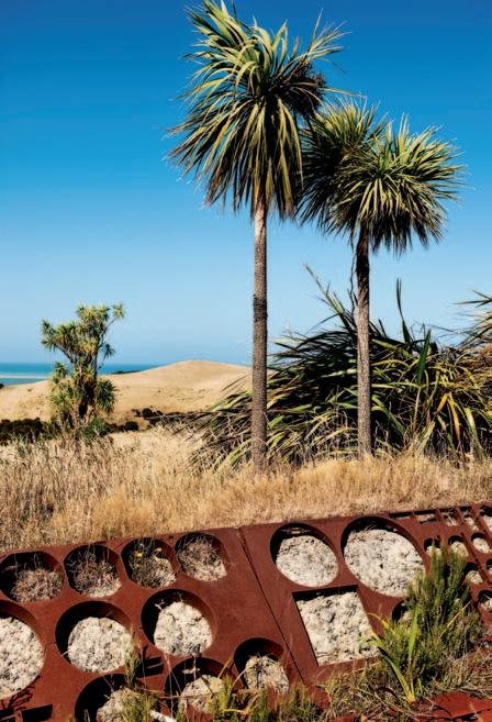
He is a master, says Andrea Stevens, at repurposing refuse. Industrial designer, lecturer and builder, Ross Stevens, lives 90 minutes from Wellington in his dazzling own home, a model of upcycling.
87. M ARK BEST
Mark Best, of Marque restaurant in Sydney, consistently takes out top honours in the Australian food business with his cuisine, notable for its innovative approach. Paul McGillick met up with him in his equally innovative apartment in a converted woolstore warehouse.
#154
Once again we survey the way architects and their clients respond to the unique character of where they live, and to the special needs of their homes.
98. LONGFORD HOUSE
Set in an idyllic landscape near Launceston in Tasmania, this is a house which celebrates its location, especially a 120 year-old Oak tree. At the same time, observes Paul McGillick, its designer, Sarah Foletta has played with Palladian proportions and the idea of the French ferme
112. KENCANA HOUSE
Part of a gated community in Jakarta, Indonesia, this house designed by Budi Pradono – with heaps of input from his totally engaged clients – grapples with the opposition of privacy and community. The result, says Paul McGillick, is a wondrously layered experience of refuge and prospect.
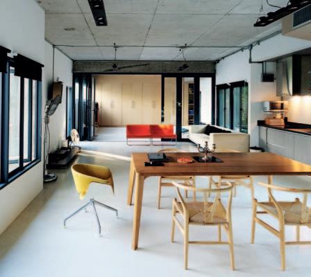
129. JAMBEROO HOUSE
#98
Set in beautiful countryside south of Sydney, this house designed by Casey Brown Architecture is very much of its place, responding to existing farm buildings and to local materials. And, says Philip Drew, it is also a study in tonal contrast, intrigued, in a very non-Australian way, with the dark side of a very Australian material.
143. MARIMEKKO-INSPIRED HOUSE
No, it’s not in Scandinavia. It’s in Perth, Western Australia, and it gets its name from the design of a custom privacy screen. But the real back story, says Anna Flanders, is about architect, Ariane Prevost ’ s principles of Slow Architecture.
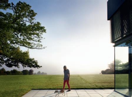
154. WONDERWALL HOUSE
On the outskirts of Chiang Mai, this house, designed by Situation Based Office, is a response to its site and existing buildings. Aroon Puritat says it is also an experiment in reconciling Lanna architecture with contemporary practice.
#179
We have something of an emphasis on the outdoors in this edition of Reportage, surveying ideas for outdoor living and reviewing books on landscape and garden design. And, for a dash of colour, we profile textile company, Maharam.
166. OUTDOOR LIVING
Summer has arrived in the southern hemisphere, so we look at ways to make the most of outdoor living.
179. FAMILY STORY
Stephen Lacey looks at innovative textile company, New York-based Maharam.
185. BOOK REVIEW
How we plan our landscapes is essential to our identity, Tempe Macgowan reveals in a review of three recent books.
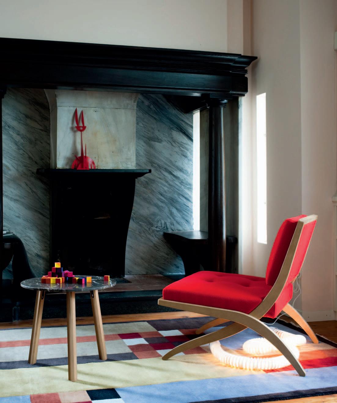


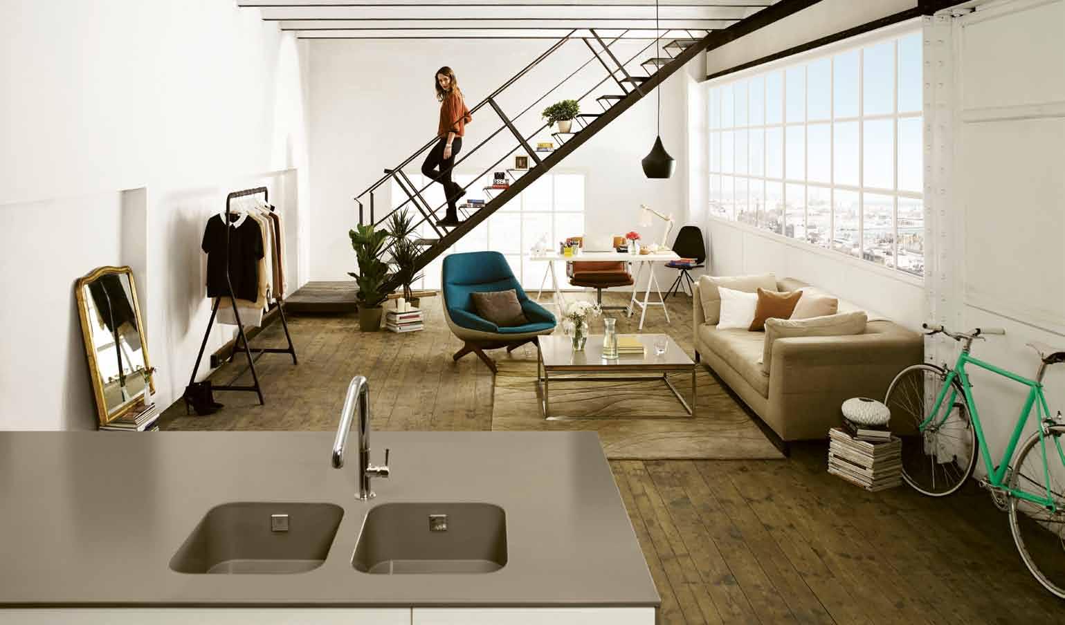


Each element that surrounds us contributes to build our reality. That’s the authentic existence, the existence that defines who you are.
Silestone® lets you express character and emotion through your kitchen and bathroom. The only benchtop with bacteriostatic protection, and available in varied and exclusive textures.
surrounds contributes authentic that bacteriostatic varied exclusive Silestone®.
Live the authentic life, live your life with Silestone®.
and fashion, the in in what is
“I love architecture and fashion, but the authentic things are in the houses we live, in the clothes real people wear. That’s what I tell people on my blog. That is Authentic life.”
Macarena Gea (Blogger and Architect)


 Benchtop UNSUI / INTEGRITY Sink / SUEDE Exclusive Texture


Every
The world’s most advanced drinking water system.


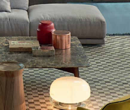
wALL sYsTem FROM $9,490 desIgn CR&S POLiFORM

PArIs-seouL sofA FROM $15,500 desIgn jean-MaRie MaSSaud

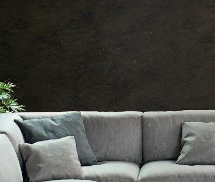

PArIs-seouL smALL TAbLe FROM $4,975 desIgn jean-MaRie MaSSaud

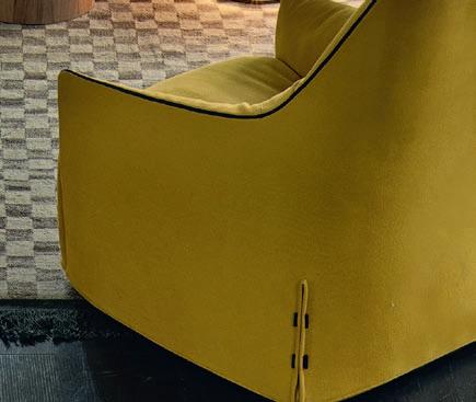
sAnTA monIcA Lounge ArmchAIr FROM $4,590 desIgn jean-MaRie MaSSaud
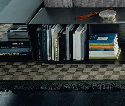
bIgger coffee TAbLe $5,395 desIgn CaRLO COLOMbO
dAmA coffee TAbLe $1,885 desIgn CR&S POLiFORM
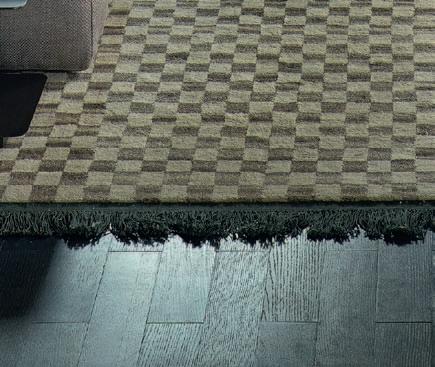
TrAces de dAmIer rug FROM $4,565 desIgn CC-taPiS




It strikes me that this is a great metaphor for design, both product and architectural. Deep down we have the everyday needs which drive design – if you like, the structures of thought and emotion typical of different societies. These structures then get expressed at the surface level – the visible level – in the form of unique designs which reflect the personality of the designer and the cultural character of individual communities.
In these days of instantaneous global communication, regional design can be strongly inflected by the dominating aesthetic of the great metropolitan centres. It is easy to fall into the trap of thinking that you haven’t made it unless you have made it in London or New York.

The irony of this is the fact that mainstream design (including architecture) has been so often shaped and inspired by regional traditions, Scandinavian design being an outstanding example. Of course, it has always been to some extent a two-way traffic flow. After all, the provinces always want to feel up-to-date. But this is more a question of fashion, and good design has nothing to do with being fashionable.
On the one hand, regional and vernacular design can often serve to refresh mainstream design. On the other hand, designers in regional contexts may consciously react against mainstream design and seek authenticity and immediacy in local materials and traditional forms and practices. In this issue of Habitus, this motivation is illustrated in completely different ways by Ross Stevens in New Zealand, 56thStudio in Bangkok and Rob Brown with the house he designed at Jamberoo, south of Sydney.
But then we also feature houses from Tasmania, Jakarta, Chiang Mai and Perth, each of them engaged in a robust and productive conversation between a mainstream Modernist agenda and a local context and tradition.


The cross-cultural conversation is at its most generative (to borrow another Chomskyism) when the interlocutors are on an equal footing. That’s when things really become creative. To extend the metaphor a little further: the more diverse the genetic ingredients, the healthier the offspring. Which is why Habitus throws the spotlight on South-East Asia and Australasia – because this is where we think some of the most exciting design in the world is currently being practised.
 Paul
| Editor
McGillick
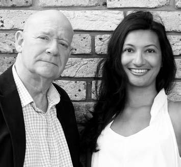
Before he became a political activist, Noam Chomsky was a linguist who radically re-framed the way we looked at language. For example, he dug deeper into the mystery of language by demonstrating how it was species specific. But one of his more suggestive, if less convincing, ideas was to describe language as having a deep structure and a surface structure.left | editor, paul mcgillick. rIght | deputy editor, nicky lobo.
I fi rst met Alistair when we were in an exhibition together in 2003 at Object Gallery. His approach was already well developed and it has been like watching a story unfold to see it evolve over the years. The way he works volume and movement into beguiling, shifting forms seems startling and yet curiously easy and self-evident –something we have been striving for in our own work for years. Your story (page #77) gets to the heart of his world. It ’s important to know from where and how such a singular voice emerges. In the end, it will be the work of outsider individuals like him, carving out their own fascinating worlds, that lead us to somewhere new.
Stefanie flaubert DESIGNER /A RTIST, KORBAN/ FL AUBERT
I feel more connected than ever to the people who inhabit the spaces we design. What makes them tick? How does the space make them feel? What ’s their favourite part? What have they brought to it? In magazines, it ’s often hard to see the personality of someone in their space through increasingly heavy styling and endless over detailing, so it was refreshing to see the home of artist, Sydney Ball (page #54), and get a glimpse into his world. Functional, utilitarian, human, real. A home and workplace housing so many precious pieces, but one that is anything but precious itself. Years of accumulated objet that you know wasn’t just brought in for the shoot, each with a story. Maybe it ’s just the drudgery of the 9-5 work day, the repetitious daily commute or the endless meetings that ’s fogging my view. I look at his house and studio in the bush and realise he doesn’t have to put up with any of that monotony. How lovely.
matthew She argold DESIGNERHaving lived for the last three years in an inner-city terrace, I found the story on the Glebe terrace (by Michael Bechara, page #125) particularly interesting. The fusion of the modern timber panelling with the original bricks works nicely. And I also found the recessed timber wall with minimalist built-in storage for the open living space an intriguing and innovative solution. I particularly love when original heritage features are retained as much as possible (let ’s face it: these elements add so much character) – but I have to say that the double-height open living space blew me away. The skylights and full-height glass doors create such harmony with the outdoor environment, and this combined with the integration of old and new give the space a surprisingly grand and open feeling.
Simon byrne S R EADERAs a new reader, I am impressed with the quality of the publication, and of the selected works. Your recent focus on some great Modernist designs –the article on Westmere in Auckland (page #98) for example – shows the strength of this approach. As a young designer just beginning my own practice, however, I would love to see more focus on the built works of architects and designers who are at the beginning of their careers – particularly as a way of introducing a critique of this Modernist trend. Although I’m not keen to see more faceted digital-esque facades, perhaps there is the possibility of charting the progress of the youngest in our profession to see what kinds of ideas Habitus might be publishing in the next 20 years.
andrew daly
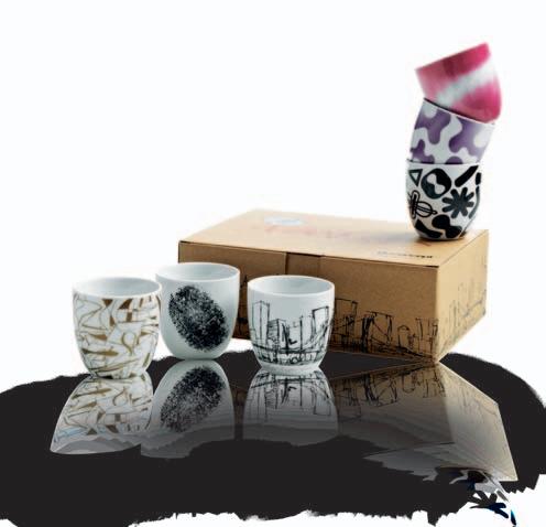
Each response receives 4 x collector ’s Ottawa cups by Karim Rashid from BoConcept, and a 1-year subscription to Habitus. Send in your responses to our stories this issue at conversation@habitusmagazine.com


AngeliTA BoneTTi

m arimekko-i NSPir e D houSe #143
Growing up on the beautiful surrounds of Lake m a ggiore, it aly, a n gelita has always been inspired by e u rope’s art and design scenes. a f ter graduating in a r t and mu ltimedia Communication from the Brera a c ademy of Beautiful a r ts in m i lan, a n gelita worked for many international magazines and brands. Now living in Perth, her dream is to “buy a new eco and sustainable house by the beach, and to make it beautiful.”
SiMon deviTT
ro S S St eve NS #75
Simon Devitt is a photographer based in auckland, New Zealand. tr avelling extensively to photograph work in both a u stralia and further afield, his pictures have featured in numerous books. Collaborating with a ndrea Stevens in 2011 to create their book, Summer Houses, Devitt is a man of many talents, also lecturing in Photography of a r chitecture at the un iversity of a uckland.


John doughT y


h a Bi tuS Pavi L ioN #51
John has been a practising commercial photographer since 1982. i n the beginning it was a love of processing film, slides and printing black and white photos that kept him shooting. a family man at heart, his focus is on the detail of the job. h i s expertise includes action sports, boardrooms and a long list of products from computers to wine bottles, and everything in between. a keen eye for detail, spacial lines and a thorough understanding of light, his photos have depth beyond the obvious.
Philip Drew is an architectural historian and author. Currently, Philip is researching, with noted photographer a nthony Browell, a pictorial biography of Sydney, Fragments: Intimate Sydney, consisting of close-up images of city architecture that tell its story as part of an open art gallery. he s ays about the Jamberoo house, “What i enjoyed most was the unique collection of farm buildings that form a small museum in their own right and the way that r o b Brown succeeded in making the new house the natural climax of this group.”

A nnA Fl A ndeR S
m arimekko-i NSPir e D houS e #143 “ i n spiration comes from people, performance, textiles, cultures and new trends,” says a n na, “ i love finding old stories that can be seen in spaces, places and design or architectural pieces.” a n na, and her pooch Suki, live in a studio apartment in Perth’s, Fremantle, and they are only a three-minute walk from the beach. But most of all, a n na just loves good conversation, and lots of laughter.
STePhen l ACey
Fa mi Ly Br a N D #179
Stephen has a m a sters degree in e n glish from Sydney un iversity. he has also published three novels, and has been short listed for the Commonwealth Writer’s Prize. h i s feature articles on design and architecture have appeared in numerous national and international publications. With a keen eye for design, he lives in a warehouse apartment in a n nandale, boasting an extensive collection of indigenous art and k i vi tealights.
TeMPe M ACg oWA n B o ok revie W #185
tempe has been writing for design magazines since the mid-1980s when a colleague in London encouraged her to write about the competition for the Par de la vi llette. a f ter the exhilaration of interviewing and working on this piece, she hasn’t stopped writing, including a stint for the Sydney morning herald on gardens and writing her book, Transforming Uncommon Ground: the gardens of Vladimir Sitta. She also worked on the redevelopment of hyde Park South. But, most of all, she loves to walk her dogs in Sydney ’s Centennial Park.


WoN De rWa L L houSe #154 a r oon loves to talk about all things art and architectural, a love that no doubt began during his time at the Department of a r chitecture at Silpakorn un iversity. Writing for magazines such as Art4D, and t hailand’s Wallpaper, a roon is also an important member of the Land Foundation project, which seeks to cultivate a place, or land, of and for social engagement.
L oNGFor D houSe #98
Sharrin is an architectural and environmental photographer who loves collaborating on exciting projects. r e siding in Sydney’s famous Bondi Beach, with her fiancé, writer tom Parker, and their trusty Jack r u ssell terrier, Sharrin is constantly inspired by life, light, form and colour. She first fell in love with photography at nine, when her parents gave her a ‘magic’ little camera. a nd since then, has only continued to love her craft, and to capture beautiful images from around the world.
ST uA RT SCoTT

m ark Be St #87
a f ter 18 years of the hustle and bustle in Sydney's i n ner West, Stuart now lives a stones throw away from avalon Beach. a nd living with seven females, Stuart’s life is definitely full. Between his partner m i ndy, her daughter Georgia, their Springer Spaniel Frankie, four chickens, and five children aged between 14-25 who come and go, it is surprising that Stuart gets any time to follow his passion – photography.
SooPA koR n SR iSA k ul
WoN De rWa L L houSe #154
a f ter graduating with an architectural degree, Soopakorn decided that his love for this design field was best found through photography. Capturing experiences and encouraging contemplation, Soopakorn’s photographs are both personal and intimate, revealing insights and depths that only an observer can see.

A n dR e A STe venS
ro S S St eve NS #75
a f ter a ten-year stint as an architect, a ndrea moved into digital media and architectural publishing, where she now mixes an interesting and full career with raising her two children. Living in an old-fashioned peninsula suburb in a uckland, New Zealand, a ndrea is always inspired by eccentricity and fresh ideas – it was her friend ’s experimental house that first sparked her passion for design and architecture. “Food prepared with care,” says a ndrea, “that is what i most look forward to.” From an architect, to an architectural writer, a ndrea loves this field.


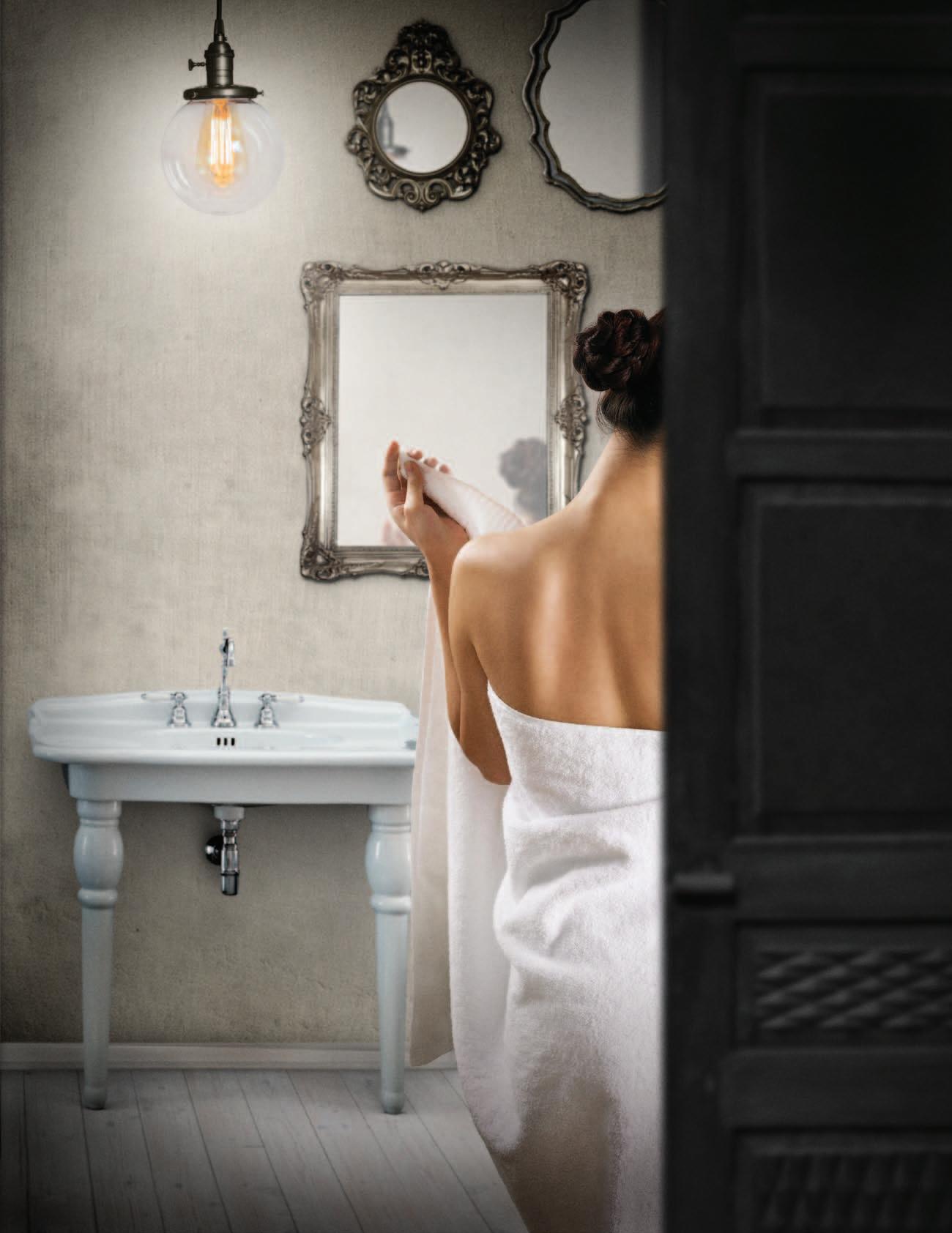
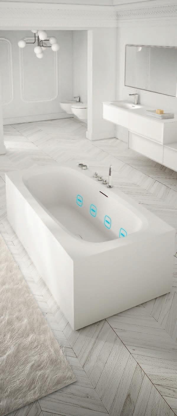
Hydroline, the invisible massage. Discover Teuco’s know-how affording superior efficiency while replacing classic jets with minimal slits. Available on bathtubs in Duralight® the beguiling smooth material. Now also available on acrylic tubs.
MADE
ediToR i A l diR eCToR Paul mc Gillick habitus@indesign.com.au
dePuT y ediToR Nicky Lobo nicky@indesign.com.au
ediToR i A l ASSiSTA n T Philippa Daly philippa@indesign.com.au
oR iginA l de Sign TeM Pl ATe one8one7.com
SenioR de SigneR F rances yeoland frances@indesign.com.au
de SigneR a lex Buccheri alex@indesign.com.au
J u nioR de SigneR rollo ha rdy rollo@indesign.com.au
J u nioR de SigneR & AdveRTiSing TR AFFiC
Natalie Lau natalie@indesign.com.au
Con TR iBuTing de SigneR m ichelle Byrnes
on line ediToR
Lorenzo Logi editor@habitusliving.com
Con TR iBuTing W R iTeR S
P hilip Drew, a n na Flanders, Stephen Lacey, te mpe m a cgowan, a r oon Puritat, a n drea Stevens
Con TR iBuTing
PhoTogR APheR S Patrick Bingham-h a ll, Jason Busch, a n gelita Bonetti, Simon Devitt, a l bert Lim, Sharrin r e es, a t irojt r ot ratanawalee, Stuart Scott, Piyawut Srisakul, Nicholas Watt, Brent Winstone
COVER IMAGE
Sustainable Decadence (page #75)
Photography: Simon Devitt
Ceo / Pu BliSh eR r aj Nandan raj@indesign.com.au
oPeR ATionS M A nAgeR a dele tr oeger adele@indesign.com.au
PRoduCTion M A nAgeR S ophie me ad sophie@indesign.com.au
Su BSCR iPTionS / PA To Pu BliSh eR e l izabeth Davy-hou liz@indesign.com.au
FinA nCi A l diR eCToR k avita Lala kavita@indesign.com.au
BuSine S S MA nAgeR Da rya Churilina darya@indesign.com.au
ACCoun TS G abrielle r egan gabrielle@indesign.com.au vi via Felice vivia@indesign.com.au
on line CoMM u niCATionS r adu e n ache radu@indesign.com.au r a mith ver dheneni ramith@indesign.com.au
r yan Sumners ryan@indesign.com.au
Jesse Cai jesse@indesign.com.au
e v en TS A n d MAR k eTing te gan r ichardson tegan@indesign.com.au
a ngela Boustred angie@indesign.com.au
BuSine S S develoPM en T MA nAgeR ma rie Jakubowicz marie@indesign.com.au
(61) 431 226 077
AdveRTiSing enquiR ie S Colleen Black colleen@indesign.com.au
(61) 422 169 218
HE AD OFFICE
L evel 1, 50 ma rshall Street, Surry h i lls NSW 2010 (61 2) 9368 0150 | (61 2) 9368 0289 (fax) | indesignlive.com
MEl bOUR n E Suite 11, Level 1, 95 victoria Street, Fitzroy viC 3 065 | (61) 402 955 538
SInGA pORE
4 L eng ke e road, #06–08 Si S B uilding, Singapore 159088 (65) 6475 5228 | (65) 6475 5238 (fax) | indesignlive.asia
HOnG KOnG un it 12, 21st Floor, Wayson Commercial Building, 28 Connaught r oad West, Sheung Wan, hong kong | indesignlive.hk
publisher
the publication.
submitted
sender’s risk, and i ndesign Publishing cannot accept any loss or damage. Please retain duplicates of text and images. ha bitus magazine
a wholly owned au stralian publication, which
designed and published in au stralia. ha bitus is published quarterly and is available through subscription, at major newsagencies and bookshops throughout au stralia, New Zealand, South-e a st a sia and the un ited States of a merica. t h is issue of ha bitus magazine may contain offers or surveys which may require you to provide information about yourself. i f you provide such information to us we may use the information to provide you with products or services we have. We may also provide this information to parties who provide the products or services on our behalf (such as fulfilment organisations). We do not sell your information to third parties under any circumstances, however, these parties may retain the information we provide for future activities of their own, including direct marketing. We may retain your information and use it to inform you of other promotions and publications from time to time. i f you would like to know what information i ndesign media a sia Pacific holds about you please contact Nilesh Nandan (61 2) 9368 0150, (61 2) 9368 0289 (fax), subscriptions@indesign.com.au, indesignlive.com. ha bitus magazine is published under licence by i nde sign media a sia Pacific. iS SN 1836-0556
Teuco asked beauty to conceal power.
The result is Hydroline.
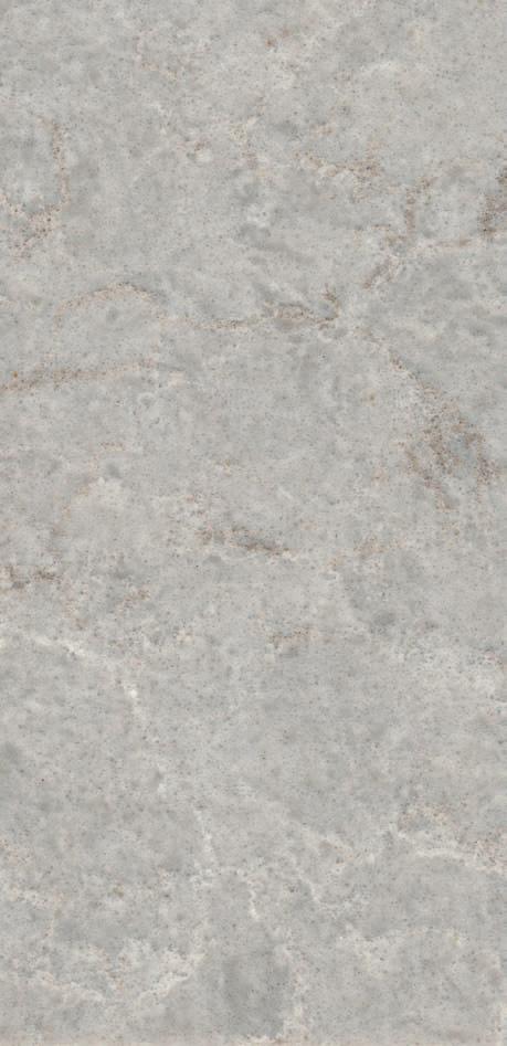
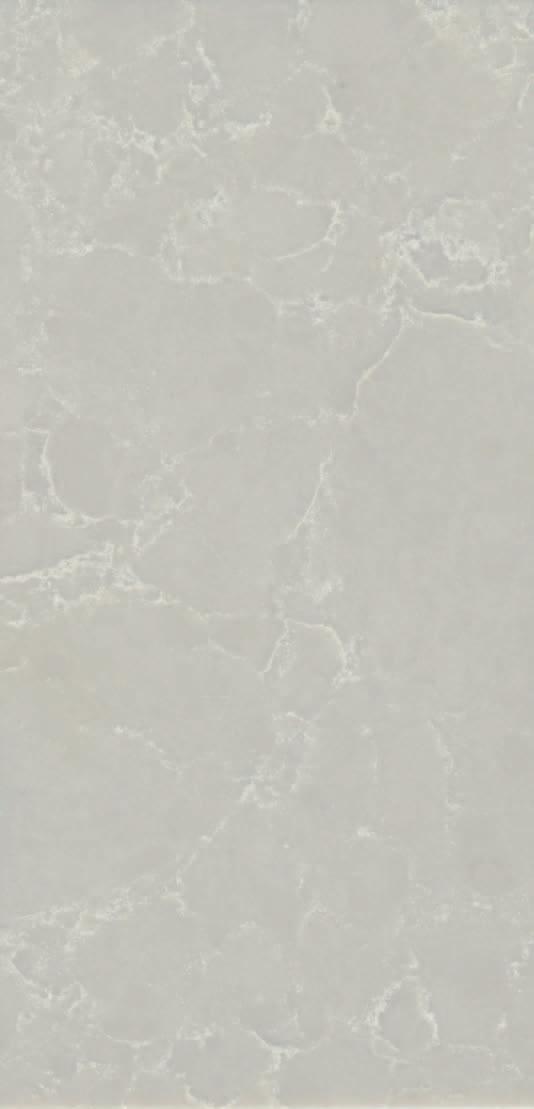
 Aged copper, brass & waxed rust finishes Chant New Zealand, Brionne France & Fersa Argentina
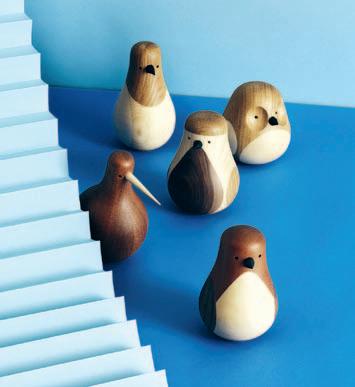
The RE-TURNED collection, from European house Discipline , takes an often ignored material, left over wood, and elevates it into a piece of beautifully crafted design. A 100% recycled item, the collection by Norwegian designer Lars Beller Fjetland is the perfect piece for someone with a big heart for Mother Nature. And Fjetland ’s latest design celebrates even the smallest of nature’s creatures in style and beauty.
discipline.eu / stylecraft.com.au
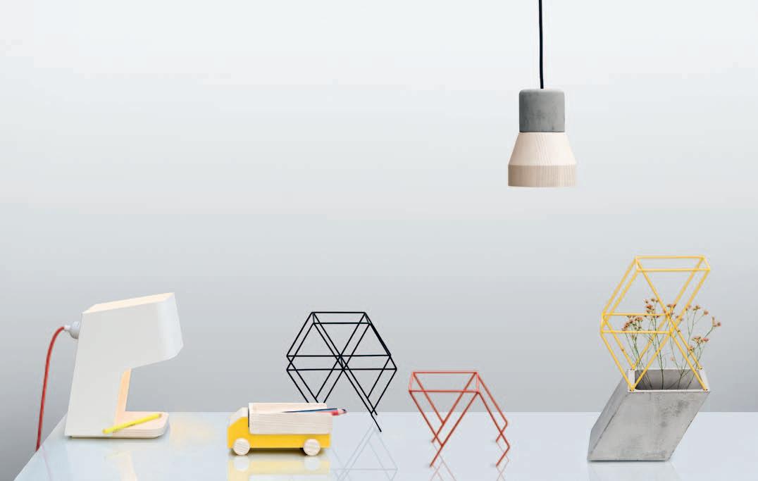
Observing the specific details in the simplest everyday actions was how the WORKAHOLIC collection by Thai design house, THINKK Studio, was first born. With a collection that includes lamps made from concrete and wood, concrete vases with wire frames, and little wooden trucks to hold your pens and paper clips, THINKK ’s new collection has even the busiest of workers covered. “This is a collection of little desk organisers that allow us to have fun,” say THINKK ’s designers, Decha Archjananun and Ploypan Theerachai . “It also helps to recharge and refresh our imaginations, as if we were young again.”
thinkk-studio.com
The English Tapware Company launches their new BLACK collection, encompassing Perrin & Rowe’s traditional kitchen and bathroom collections. BLACK offers lustrous black ceramic detailing, ensuring that any kitchen or bathroom has that sleek, discerning edge. Classical design does not go out of date. Rather, its timeless elegance will for long sit comfortably alongside a wide range of architectural styles. And BLACK will certainly add sophistication to any space.
englishtapware.com.au

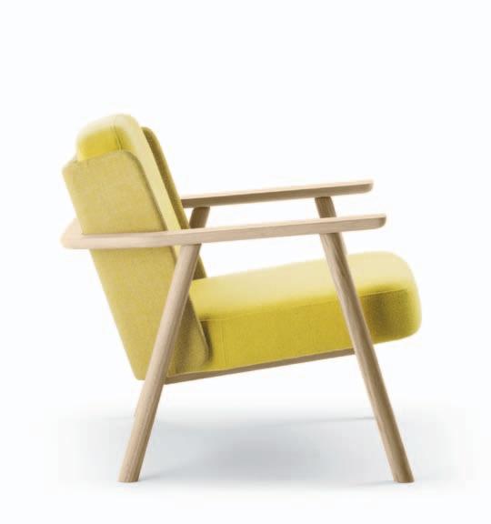
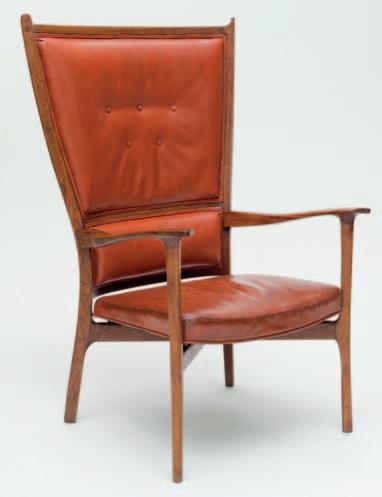
In Basque, LASAI means quiet, calm and peaceful. And peaceful is exactly what this chair produced by Alki is all about. Bold in form, its large solid Oak structure exudes an air of refined sophistication; its manner; composed tranquillity. Designed by Jean Louis Iratzoki , LASAI seeks only to reveal its true character – a simple chair of exceptional quality, crafted by a group of people who share a humble vision to work and live in the beautiful Basque country. Years of work have allowed Alki to produce pieces that represent an age-long commitment to tradition, culture and know-how. Started from a small town near Biarritz, Alki’s collection defines contemporary, while speaking the language of harmony, texture and the senses. LASAI is simply the next piece in their honest and treasured history.
alki.fr / coshliving.com.au
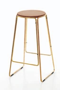
A simple design with a luxury finish, the brass SMED stool combines industrial chic and opulence to commend any modern space. A classic collaboration between Great Dane Furniture and OX Design Denmark, the SMED stool took 12 months of discussions, samples, proportion and material testing. But the result is a truly beautiful and authentic piece. Classic yet contemporary, this is a unique and sophisticated piece for any and every interior.
greatdanecontract.com
Poliform welcomes French rug brand CC-Tapis to their collection. Created in 2001 by the Maison Chamszadeh , known in France for over 40 years for their commitment to traditional carpet making, CC-Tapis takes ancient craftsmanship and artisan know-how to create fresh, new and engaging designs for the contemporary home. Their rugs – hand woven with a Tibetan knot upon a cotton weave and loomed with wool, silk or hemp –present as a beautiful addition to any modern interior.
cc-tapis.com / poliform.it / spacefurniture.com

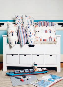
North Shore Interiors’ Linda Delaney recently launched the NSI HOUSE OF DESIGN, a unique range of bespoke cushions, the BEACH HOUSE BOYS just one of the many collections. Each cushion is 100% cotton and beautifully detailed with a splash of colour, making it the perfect addition to any little child’s bedroom or playroom. “Kids love cushions,” says Delaney, “whether it is just for cuddling, resting upon to daydream or snuggling into as they read their favourite books.”
nsinteriors.com.au
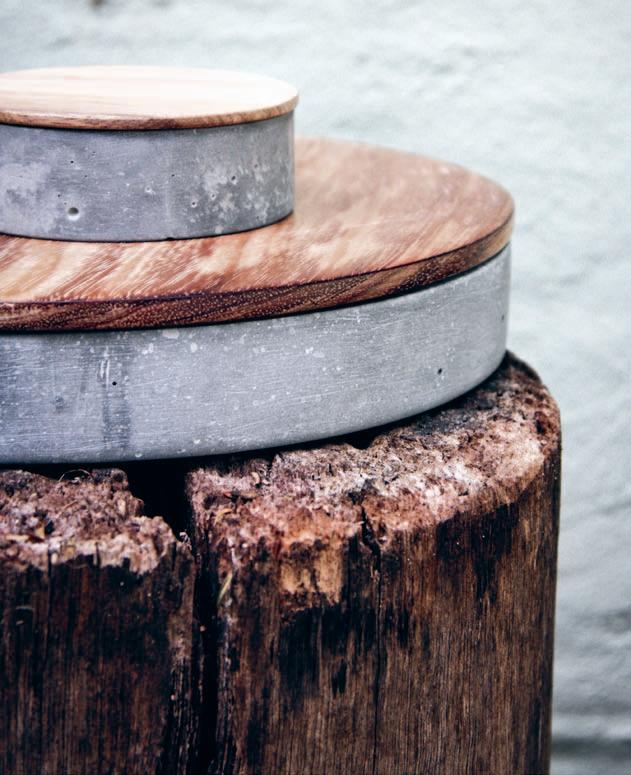
“With every approach, I try and create work that has life,” says Kenny Yong Soo Son of Studiokyss. “I try to create work that has the potential to exist in this world.” With a background in jewellery and metalcraft, the Sydney-based designer hopes to interact physically and emotionally with his users through his objects. Combining robust, textured materials with minimalist restraint, his CONCRETE CONTAINERS engage on all levels. “I believe there are too many ‘lifeless’ objects in this world – there must be a reason to be part of this world.”
cargocollective.com/kyss
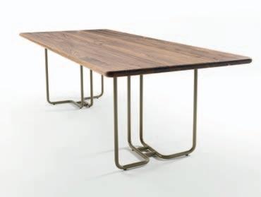
Riva 1920 believes in spare form and function. And their latest release, in collaboration with Jamie Durie, is once again testament to their passion for sophisticated design. Durie’s TUBULAR TABLE juxtaposes the unique elements of the wood with the modern aesthetic of the integrating powdercoated metal in ways that are truly beautiful.
riva1920.it / fanuli.com.au
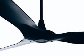
Retaining all the core elements of their original HAIKU award-winning design, Big Ass Fans now release their new, and bigger, fan which features a neodymium magnet motor and larger aerofoils. Fashioned from aircraft-grade paint, HAIKU 2.1 offers paramount durability, efficiency and style. And consuming only 60W of power, HAIKU is the most energy-efficient fan in the world, delivering twice the airflow of a standard ceiling fan at only half the weight.
bigassfans.com
Ink & Spindle’s work is inspired by a love for Australia’s native flora & fauna. To designers Lara Cameron and Tegan Rose , one of the most important aspects to their creations is sustainability. Their desire to live, work and create in an ethical and sustainable manner has always influenced Ink & Spindle, from their materials to the production process.
inkandspindle.com.au
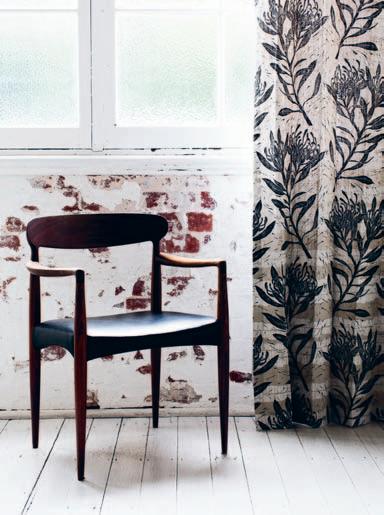
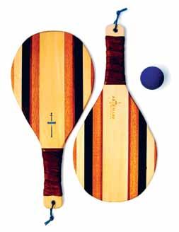
Exclusively designed for Bespoke Global , these handcrafted beach ping pong racquets are designed with a stunning array of domestic and sustainably sourced exotic woods. As the world’s leader in luxury artisan products, Bespoke Global ensures exceptional craftsmanship. So, what are you waiting for? While away an afternoon and kick up some sand with these Californian beauties.
bespokeglobal.com
MARBELOUS WOOD – REFRACTION reinterprets the classic wooden floor with an explosion of colour. In this project by Pernille Snedker Hansen , both the form of the parquet floor and the applied pattern are inspired by the refraction of light through a prism, a graduating colour scale from one colour to the next. Its highly organic yet graphic patterning creates an optical experience as your feet move across the floor, while the transparent marbling pattern merges with the wood. snedkerstudio.dk

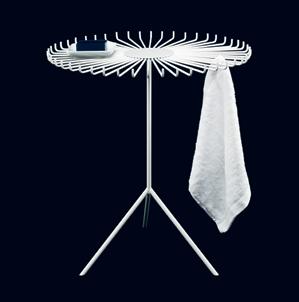
DRY TABLE by UK-based designer, Alex Bradley, can be used as a normal table and a drying rack. A spacesaving table, DRY TABLE is designed to be used both indoors and out. The table’s steel rods replace traditional table surfaces to one where you can hang items or dry washing. Highly aesthetic, Bradley has created a table that cleverly offers both design and functionality.
alexbradleydesign.co.uk
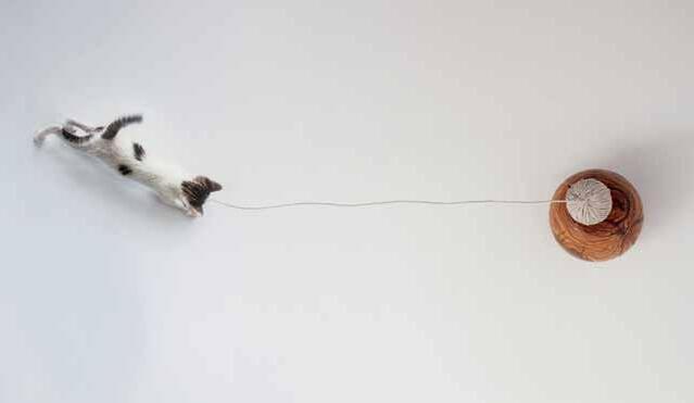
CLUC, by Barcelona designer, Laia Fuste , is an object collection designed for cats, which not only considers their psychology, perception and morphology, but also their shared life with us humans. Fuste has created unique objects that belong to not only us, but also to our furry friends. “We sleep with them, play with them, travel with them, and take care of them,” says Fuste, “we can also now learn from them.”
cargocollective.com/laiafuste
WORKBENCH is the result of a combination between two traditional craft materials: wicker and clay. Through an experimental research approach, Alberto Fabbian and Paola Amabile have created a product that reinterprets the technical possibilities of both materials, creating new languages and forms previously unimagined. The collection of objects was also made in collaboration with Antoniazzi&Piovesana and Ceramiche Vicentine
albertofabbian.com
/ cargocollective.com/amabilepaola
Melbourne-based Stephanie Ng uses a combination of colour, form and texture to make the ordinary special. Her signature: a personal feel to finished products, as portrayed through her latest product range, LUNA LANA Creating products that retain their functional edge, she also believes in design for emotion, designs that move people.
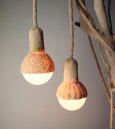
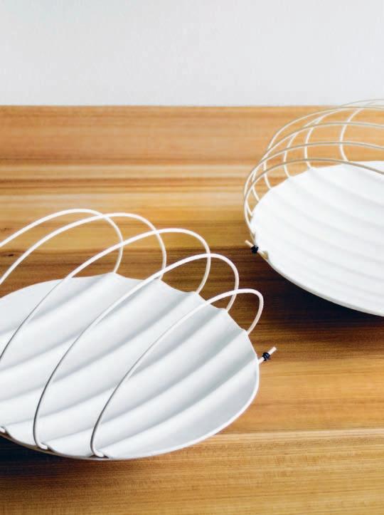
stephaniengdesign.com
“We design things that exploit the raw and rudimentary outline of the object,” says Singaporean designer, Jaren Goh . “A chair should look like a chair and nothing else.” The WANG CHAIR , from Munkii , is a sleek, sexy lounger designed from a combination of cleverly positioned tripod steel frames and Oak laminated seating.
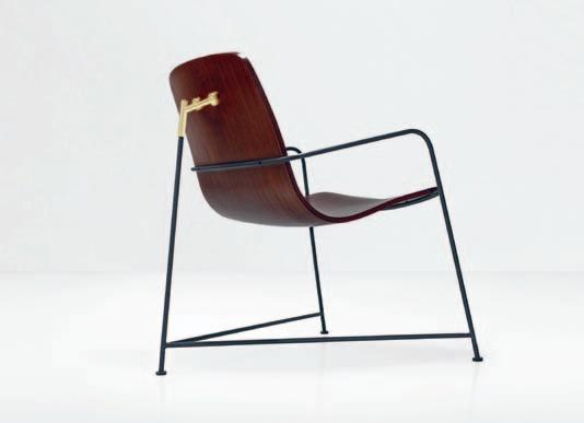
munkii.com.sg
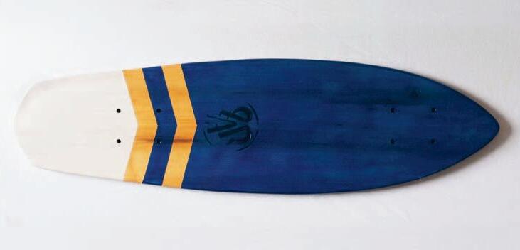
Based on the Californian spirit of original ‘cruiser’ skateboards, HANDMADE WITH LOVE , by French company La Planche à Roues is a new collection that adopts a similar style. Offering an alternative mode of transport to move around the city, the skateboard has undergone a constant evolution in design. These handmade skateboards are cut from solid pieces of Oak, Ash or Pine timber and customised with an engraved logo and geometrically painted shapes. Traditional craft with a contemporary edge, these skateboards are certainly unique, commenting as much on design as the original ‘hipster’ culture that invented them.
facebook.com/LaPlancheARoues



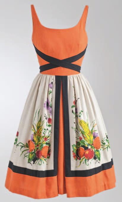
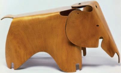
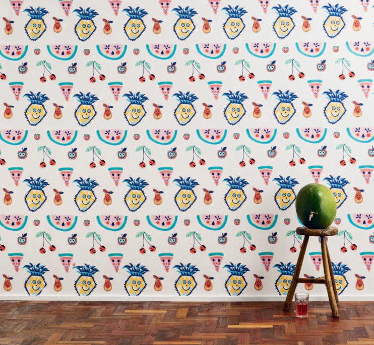
Utilising her love of textas and pens, Melbournian Jane Reiseger creates semi-abstract images and playful line works. Drawing inspiration from her surroundings, as well as her young son, Reiseger’s latest project brings her unique talent into everyday homes, with a range of wallpaper designs produced in collaboration with The Wall Sticker Company. SUPER FRESH SUNNY WALLS features nine different designs, all featuring Reiseger ’s hand-drawn fruit characters. janereiseger.com / thewallstickercompany.com.au
GLASSWOOD : where glass and wood complement each other. In this project, Hamburg-based designer Alexa Lixfeld experiments with textures and colours through her collection of handmade and mouth blown vases.
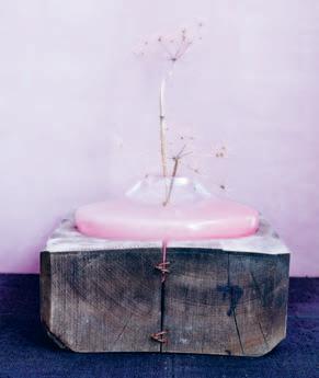
alexalixfeld.com
Dinosaur Design’s MODERN TRIBAL range plays with ideas around the meaning of ‘tribes’, and the perennial need for humans to belong. With its juxtaposition of colour and shape, Louise Olsen and Stephen Ormandy have created distinctly modern pieces that hint at the ancient. Bold block-shaped vases contrast with soft rounded shapes punctuated with holes, and strong primary colours work in harmony with earthy neutral tones.
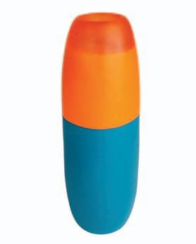
dinosaurdesigns.com.au
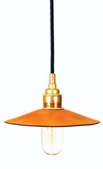
HIDE is a series of moulded leather pendant lights designed by Ben Wahrlich for Melbourne studio, AN/AESTHETIC. The pendant lights offer a unique marriage of vintage charm and contemporary design, by incorporating both modern and traditional production techniques.
anaestheticdesign.com
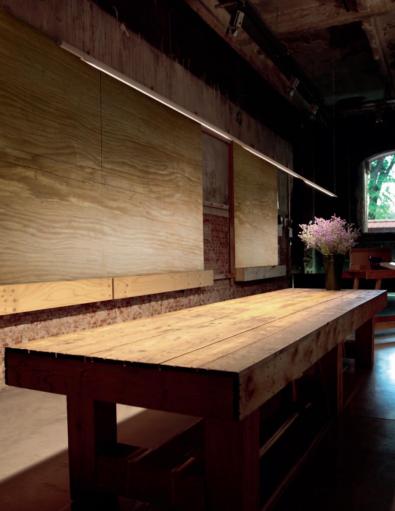
Made in Ratio has been forged with a desire to take ideas from inception to production. Embracing experimental processes, and working alongside some of the finest craftspeople in Europe, their products are imbued with the spirit of innovation. COWRIE , by Australian designer Brodie Neill , is inspired by the concave lines of sea shells. The curvilinear forms are the result of extensive research, utilising an innovative process, which bridges the handmade with the digital.
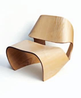
brodieneill.com / madeinratio.com
“I was lucky enough to collaborate with local shibori artist Vic Pemberton on these hand dyed indigo cotton rope vessels,” says Australian designer, Gemma Patford . Bridging the gap between hand-made charm and modern style, Patford and Pemberton’ s COTTON ROPE VESSELS are the perfect addition to any contemporary home.
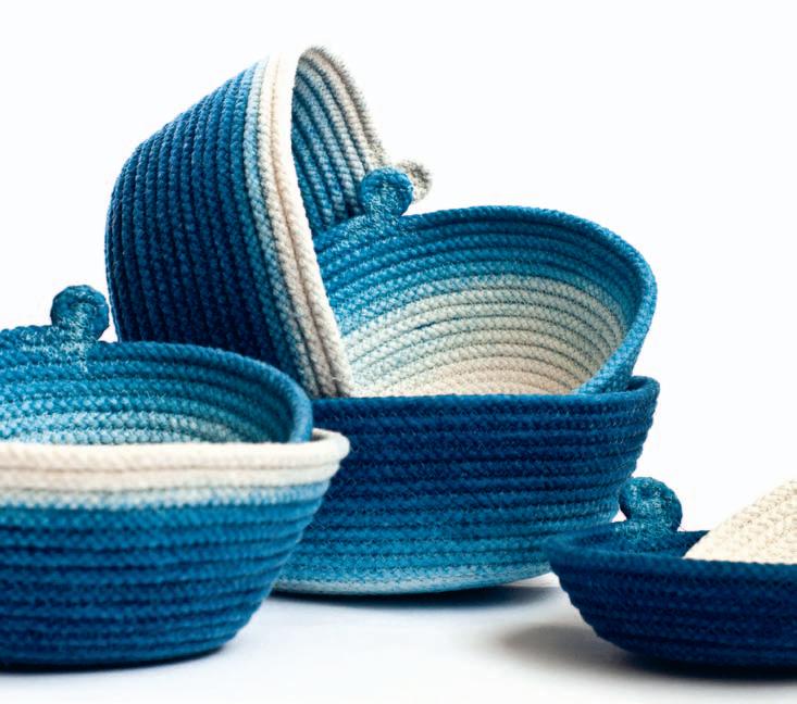
gemmapatford.com
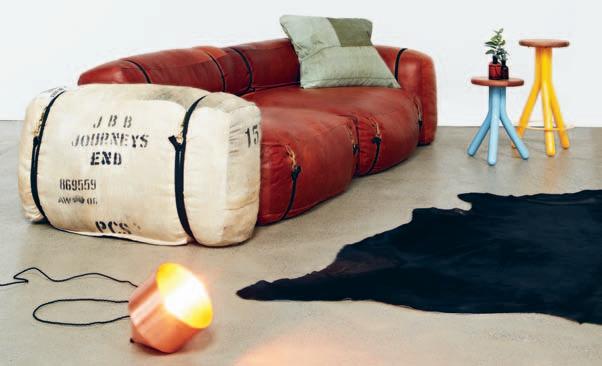
LifeSpaceJourney is a niche design and manufacturing practice located in Melbourne ’s inner west. Their latest release, THE SHEARER takes the simplicity of a wool bale and combines it with practical strapping to create form and structure, whilst adding detailing reminiscent of vintage sports car upholstery. Made from premium custom tanned leather and custom quilted duck down, THE SHEARER is designed for comfort with a robust character that remains true to its simple origins.
lifespacejourney.com
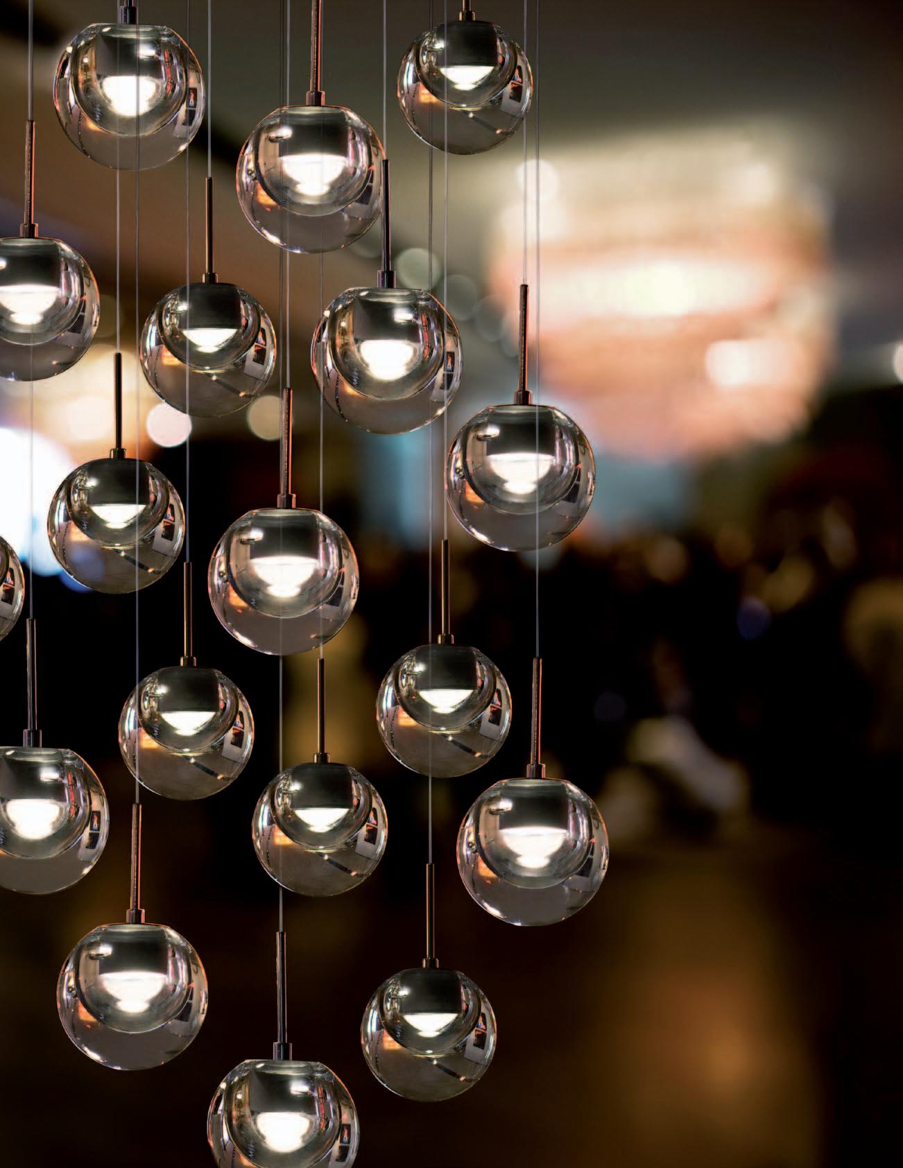
Passionate about quality, creativity and lifestyle, Sydney-based furniture studio Christelh releases HOVER . Inspired by the round windows of a passenger ship, this beautiful pendant light is a celebration of classic materials, modern processes and future design possibilities. This design demonstrates a simple and modest aesthetic.
christelh.com

Introducing the Pleasure sofa by FLEXFORM.
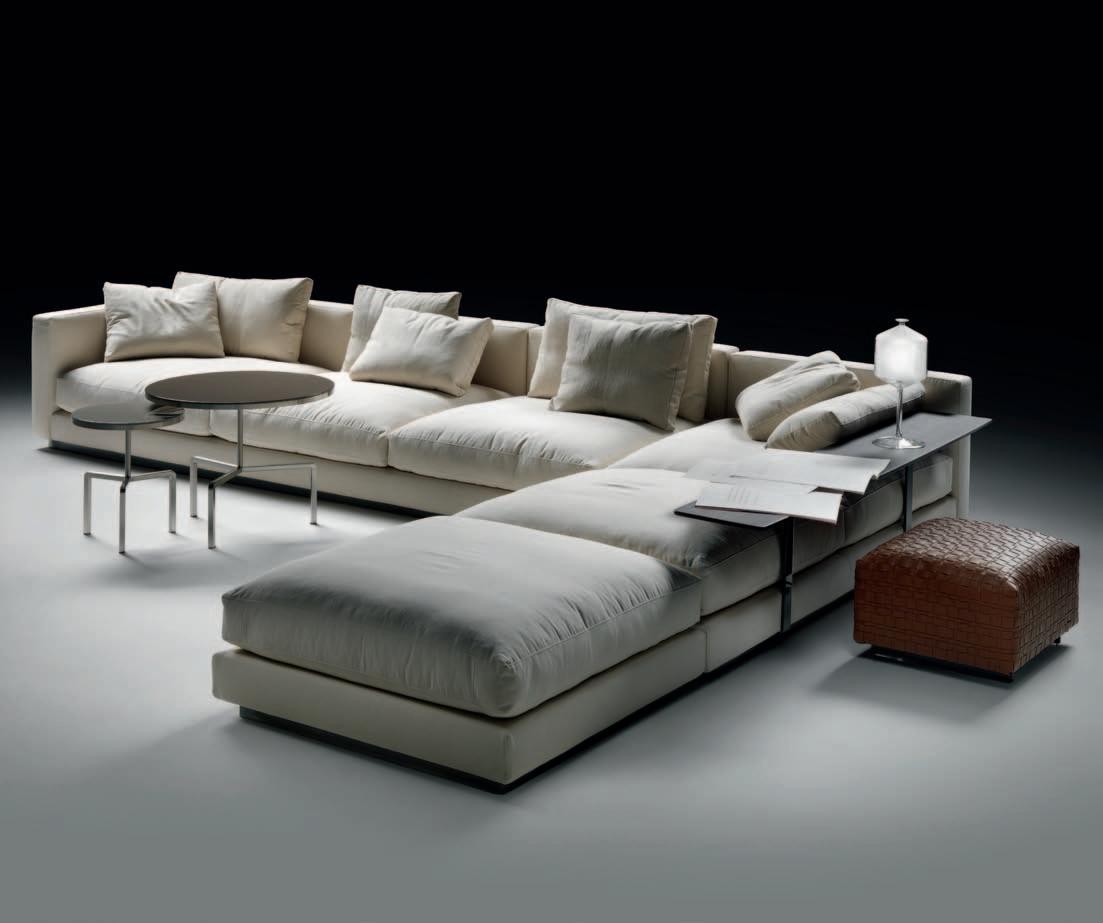
Designed by Antonio Citterio, the Pleasure Sofa is the epitome of comfort and style. Available exclusively at Fanuli, its clean, relaxed lines add elegance and adaptability to every setting.
Flexform is one of the world’s most sought after and renowned furniture brands. It’s a perfect fit with Fanuli, where you’ll find a range of world-class soft furnishings, imaginative tables, bookcases and storage solutions for the home and contract interiors.
Made in Italy.
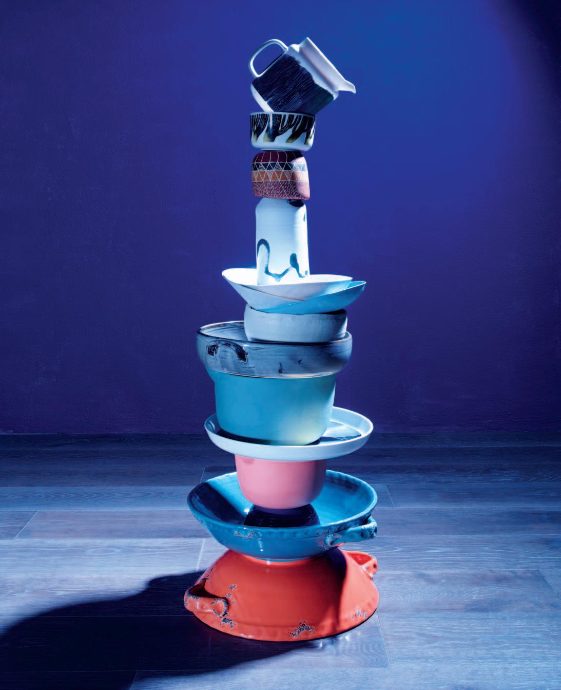
From top | Weather Diary Collection jug $95, Bowl $37, both from Marimekko; Elcho Island bowl by Mavis Djuramalwuy Yunupingu, $310, Koskela; Davidoff large brushwork porcelain vase, $44, Planet Furniture; Three stacked organic pasta bowls by Craig Pearce, $55, Workshopped; handmade white ceramic bowl, $80, Judy Sciberras; Robert Gordon x Living Edge bowl , $55, Living Edge; large mixing bowl in bottle, $145, MUD Australia; Weather Diary Collection salad platter, $125, Marimekko; small mixing bowl in orange, $114, MUD Australia; cereal bowl in blue, $16, Orson and Blake; Isadora Corfu serving bowl in blue and orange, $189 each, Citta Design; (on wall throughout) Eggshell Acrylic in Ming Dynasty, $43.20/L, Porter’s Paints; (on floor throughout) wooden floorboards in hornblende, Techtonic Flooring.
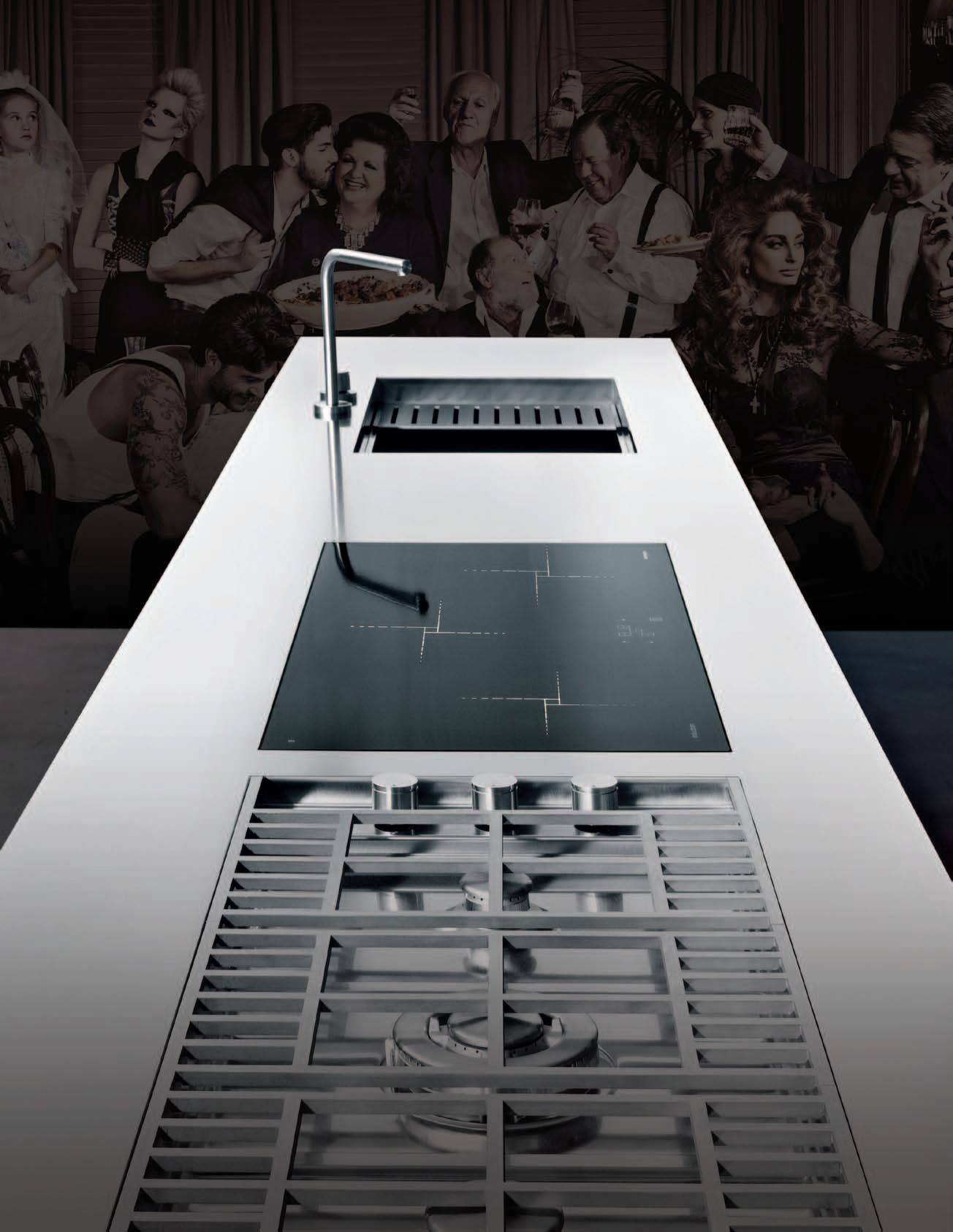
Barazza is award-winning design and functionality. Made in Italy for over 40 years. Barazza’s Made to Measure offers a unique ability to seamlessly incorporate cooktops, sinks and accessories into a stainless steel benchtop. It gives the designer the ultimate freedom to create a functional piece for the kitchen, which boasts an unrivalled minimalist elegance. Exclusive to Abey Australia. – Barazza Made to Measure
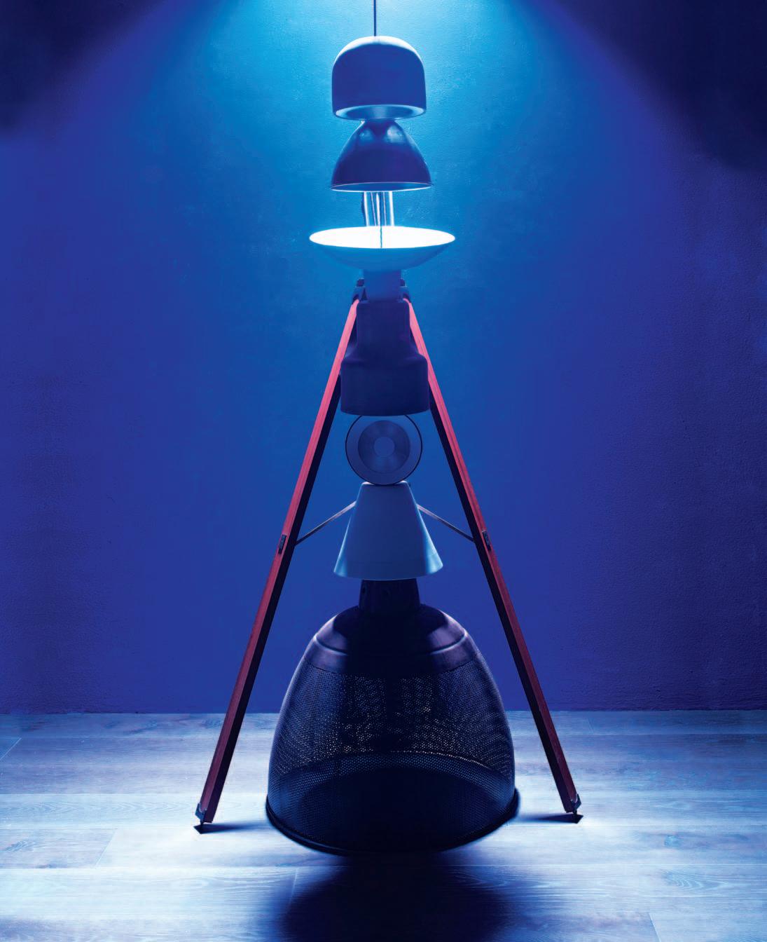


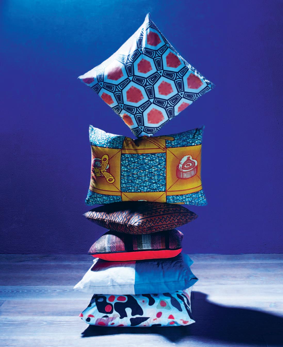 From top | Grecian tile cushion , $130, Rouse Philips; Dutch wax print cotton cushion , $149, Planet Furniture; Jaunt to Jaipur Zig Zig cushion , $99.95, The New Punjab; Trekken hand woven cushion , $280, Marijke Arkley; dipped cushion in teal, $49.95, Southwood Home; Coburn cushion , $130, Rouse Philips.
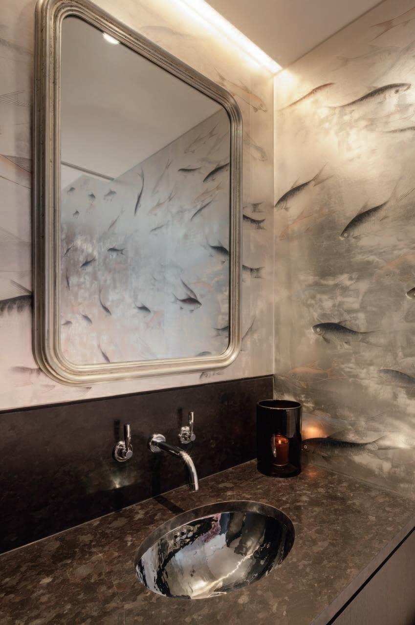
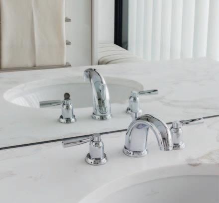

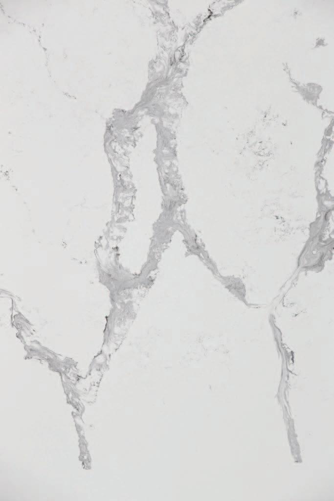
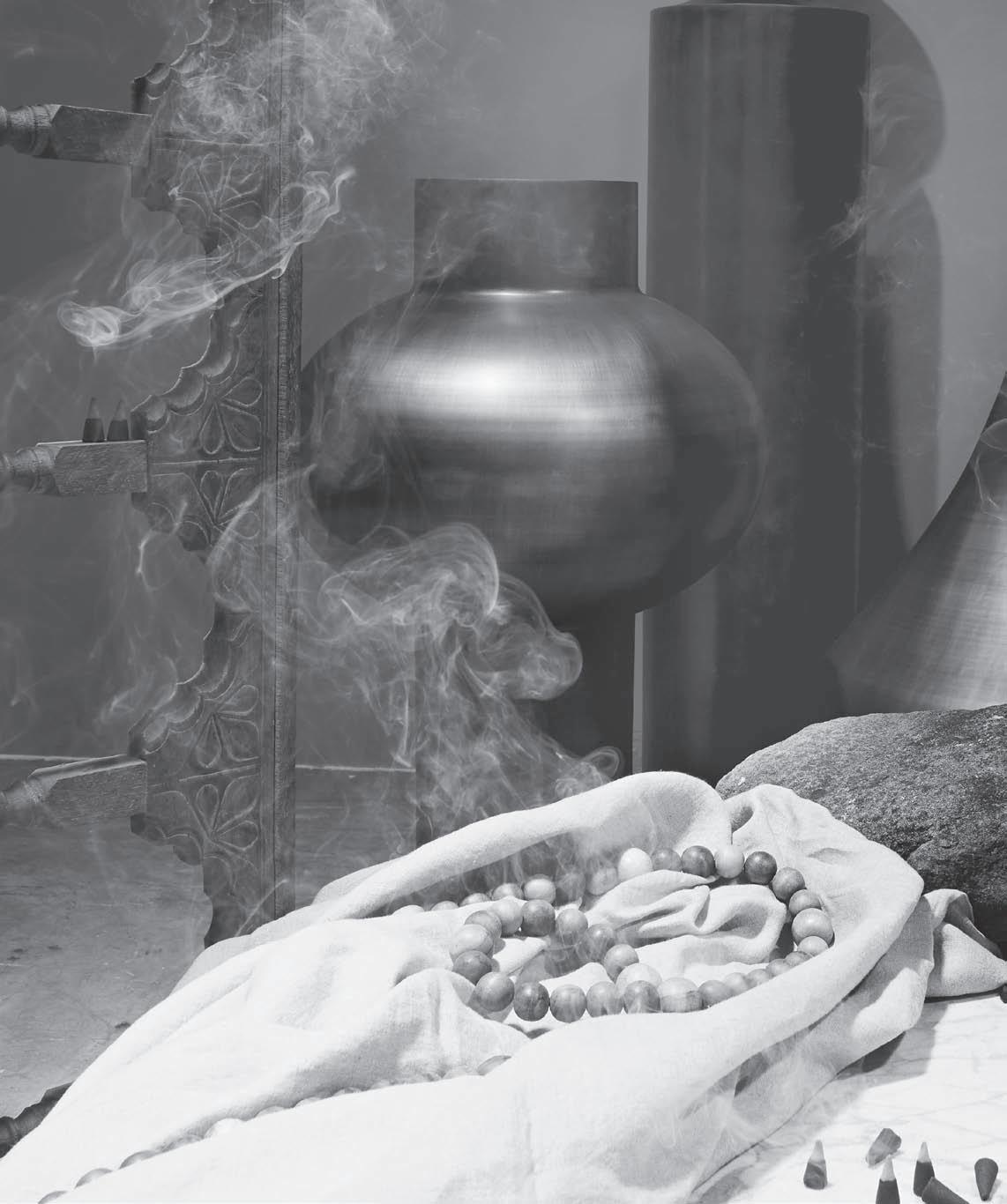
Eggshell Acrylic in shell grey (on wall, throughout), $43.20/L, Porter’s Paints; Beat vessels by Tom Dixon: Tall, $1,342, Drop $1,683, Top $1,144, dedece; Vintage Indian wall window panels , $150 each, The R.E.A.L. Store; Iron Lace marble in honed finish, $250/m 2 , Gitani Stone; limited edition Traditional Sources incense burner, $80, Nadia Hernandez; Rock from Gosford Quarries; linen duvet cover, $530, Ecoluxe; wooden rosary, $95 , The R.E.A.L. Store.
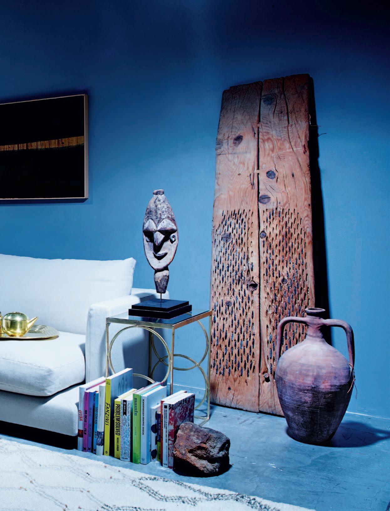
Marrying pri M i tive with the conte M p orary, our primal instincts coM bine to create dark, cool spaces t hat proMo te a sense of calming energy and reinvigoration – a retreat froM t hose hot su M M e r days.


Clockwise from top left | C2 FAT copper light , $462, Workshopped; wide width linen sheer by C&C Milano, POA, South Pacific Fabrics; calligraphy on washi paper by Naoaki Sakamoto, $1,950, Small Spaces; Turkish wheat thresher, $550, and Turkish oil urn , $330, The R.E.A.L. Store; Beni Ouarain carpet (Morocco c.1930), $4,900, Jason Mowen; Deco circle side table in antique brass, $610 (nest), Globe West; Wina post finial statue (Papua New Guinea c.1940), $1,950, Jason Mowen; books throughout , POA, Beautiful Pages; Long Island modular lounge upholstered in linen, $16,790, Fanuli Furniture;
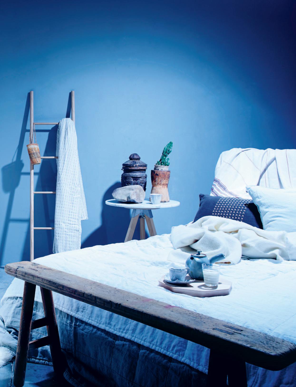
Tom Dixon gold tray, $220, tea pot , $253 and caddy, $88, dedece; silk and linen throw cushions , $149 each, Planet Furniture; Iron Lace marble in honed finish $250/m 2 , Gitani Stone; Metallix bricks in bronze, $1,547/1000 bricks, Austral; beeswax candles , $25-29, Planet Furniture; brass dish oil lamp , $55, Mulbury; Chinese water trough , $480, The R.E.A.L. Store; oranges and cumquats supplied by Crinis Fruit Tarrawanna; cashmere blanket queen size in wheat, $990, and Society RAW bedcover in natural, $765, Ondene.
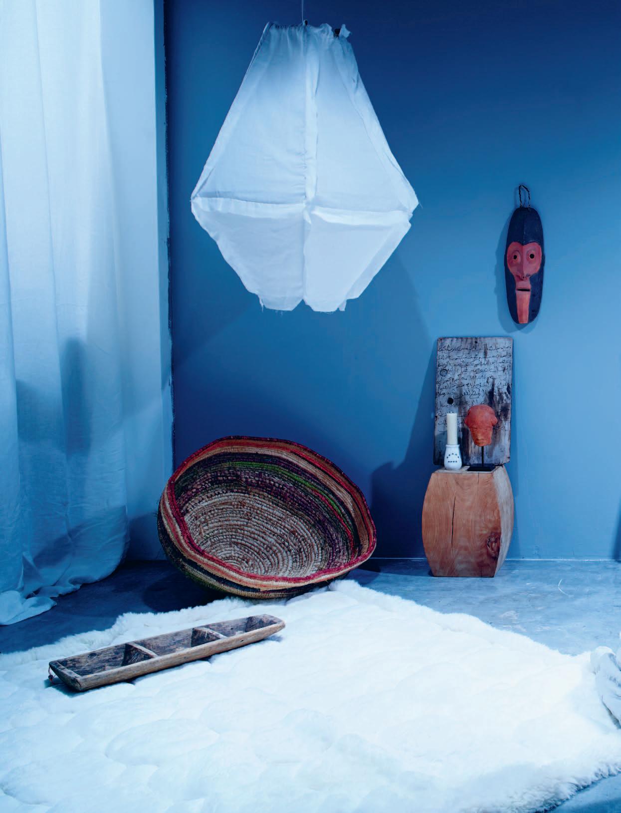
c lockwise from left | wide width linen sheer from C&C Milano, POA, South Pacific Fabrics; Cumulus large pendant light , $485, Planet Furniture; Lui wooden stool by Tribu, $1,490, Cosh Living; Chinese ceramic cup , $50, The R.E.A.L. Store; beeswax candle , $25, Planet Furniture; Nok head sculpture on stand (Nigeria), $750, antique Koranic tablet (Morocco c.1900), $600, and hanging mask (Papua New Guinea c.1970), $750, all from Jason Mowen; American Oak ladder by Chris Colwell, $275, Small Spaces; woven dilly bag by Rosemary Mumunini,
$250, Koskela; linen duvet cover (hanging), $420, Ecoluxe; Henry Wilson marble top table , $1,775, Corporate Culture; vintage Turkish spice grinder, $240, The R.E.A.L. Store; rock from Gosford Quarries; wooden Indian grinder (w/out grinder), $285, The R.E.A.L. Store; blue stripe ceramic soba cup by Keiko Matsui, $40, Small Spaces; Leila queen size bed , $4,003, Jardan; rustic linen throw with red (over bedhead), $250, and linen cushion with string cross stitch, $180, both from Ecoluxe; Society REM cushion in bianco, $138, woollen bed blanket in
bianco, $550, Society REM quilt in bianco (and underneath) in sable, $845 each, all from Ondene; Kakuda Maple tray by Oji Masanori, $155, ceramic tea pot by Hilary Jones, $110, ceramic cup and saucer by Alison Fraser, $45, all from Small Spaces; Iittala glass tumbler, $29 (set of 2), Anibou; wooden scholars stool , $295, The R.E.A.L. Store; pure alpaca rug in white, $799, The Latin Store; Turkish pinat dough riser tray, $270, The R.E.A.L. Store; large Tjanpi basket , $1,320, Koskela.
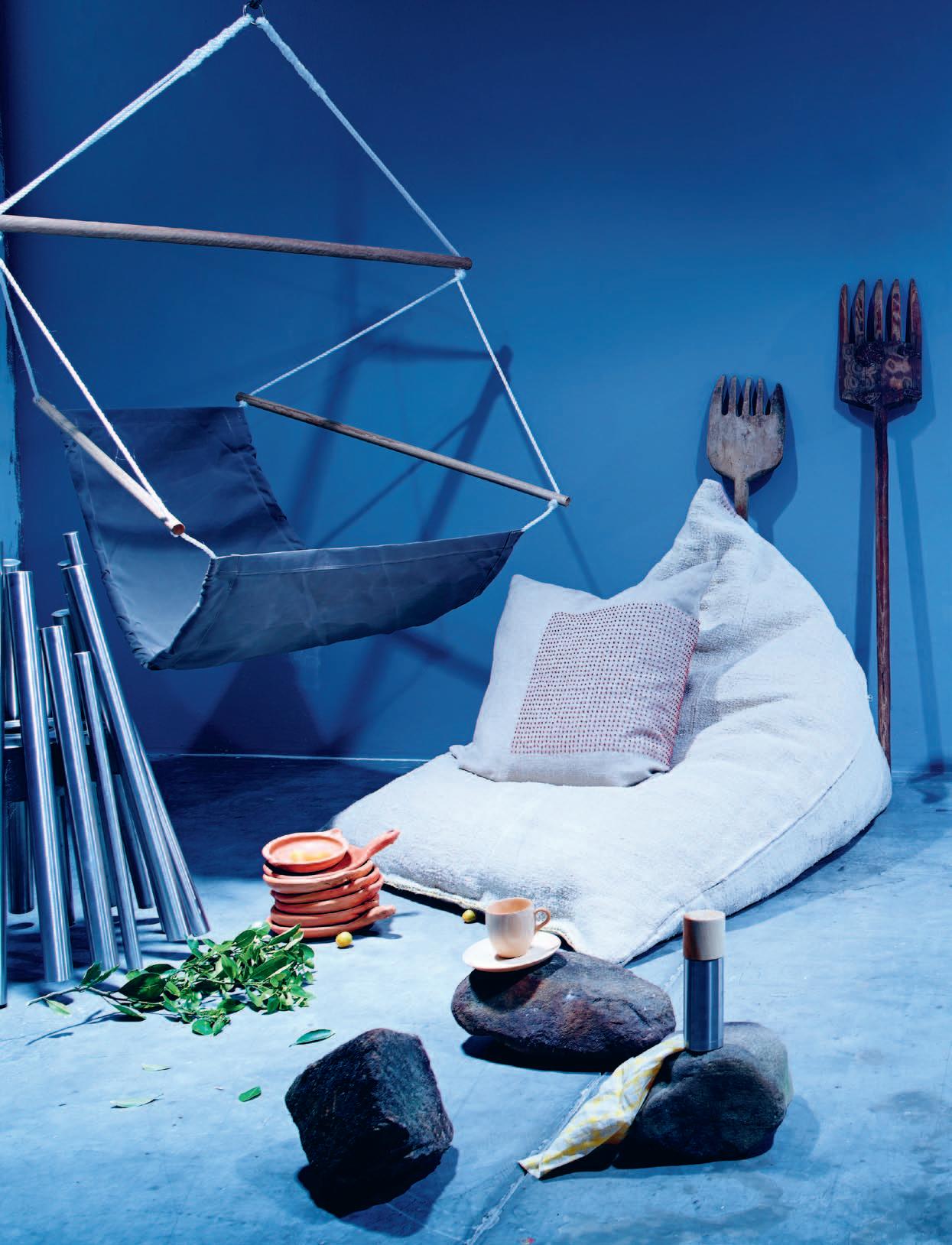
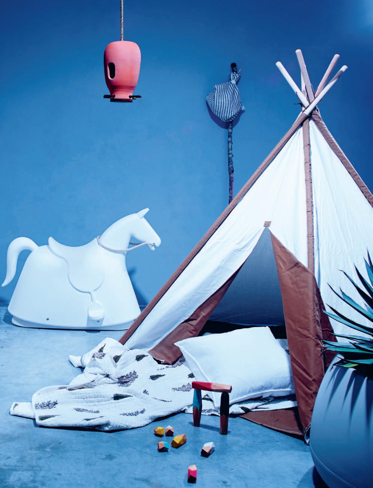
c lockwise from top left | hanging chair, $145, Swingz and Thingz; linen cushion with red seed beads, $230, Ecoluxe; hemp and wool bean bag , $750, Koskela; Turkish garden harvesting forks , $240 each, The R.E.A.L. Store; Magis Rocky rocking horse by Marc Newson in white, $1,683, Corporate Culture; birdhouse in natural terracotta, $310, Abalos; FOG linen tea towel (sack on stick), $18, Mr Kitly; teepee , $250, Lightly; agave ocahui 330mm, $225, Garden Life; Sahara 3 pot in warm grey by Gandia Blasco, $525, Parterre; Treehorn balance blocks , $55, State of Green; Society REM cushion in bianco, $138, Ondene; white tree block print quilt , $200, Shakiraaz; rocks from Gosford Quarries; thermos bottle , $148, FOG linen yellow plaid kitchen cloth , $10, and CARA mug cup , $75, all from Mr Kitly; selection of Tangier dishes , $25-45, Jason Mowen; cumquats supplied by Crinis Fruit Market Tarrawanna; EcoSmart Fire Stix heater, $1,595, Cosh Living.
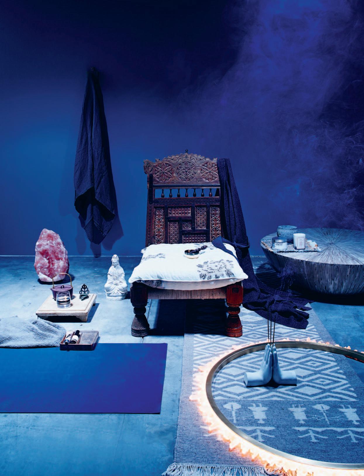
c lockwise from top left | wooden Oak wall hook , $30, Small Spaces; Society Lipe bath towel in fumo (hanging and on ground), $175 set, Ondene; Indian macrame chair, $700, and cushion , $125, The R.E.A.L. Store; gold metal singing bowl with wooden hitter stick, $32, Anjian Australia; cashmere robe in charcoal (draped on chair), $550, Ondene; Carillo Zen table , $2,398, Nicoya Furniture; New Friends weaving , POA, Mr Kitly; marble mortar, $60, The R.E.A.L. Store; Lilla Bruket bath salts , $36, Funkis; Jonathan Ward candle , $65, Ecoluxe; natural wool floor runner, $700, Planet Furniture; Christopher Boots
Prometheus III pendant light , $4,950, Inlite; prayer hands , $33, Mulbury; JADE yoga mat , $70, E.M.P. Industrial Australasia; Vide Poche in gunmetal bronze, $250, Henry Wilson; Reverence hand balm , $29, and deodorant , $35, Aesop; antique marble tray with feet, $270, The R.E.A.L. Store; Premio tumbler glass , $19.50, Citta Design; Zisha teapot by Neri & Hu, $165, SeehoSu; brass dish oil lamp , $55, Mulbury; meditating Quan Yin statue in ivory finish, $150, Anijan Australia; Himalayan salt lamp , $59, Natures Energy.
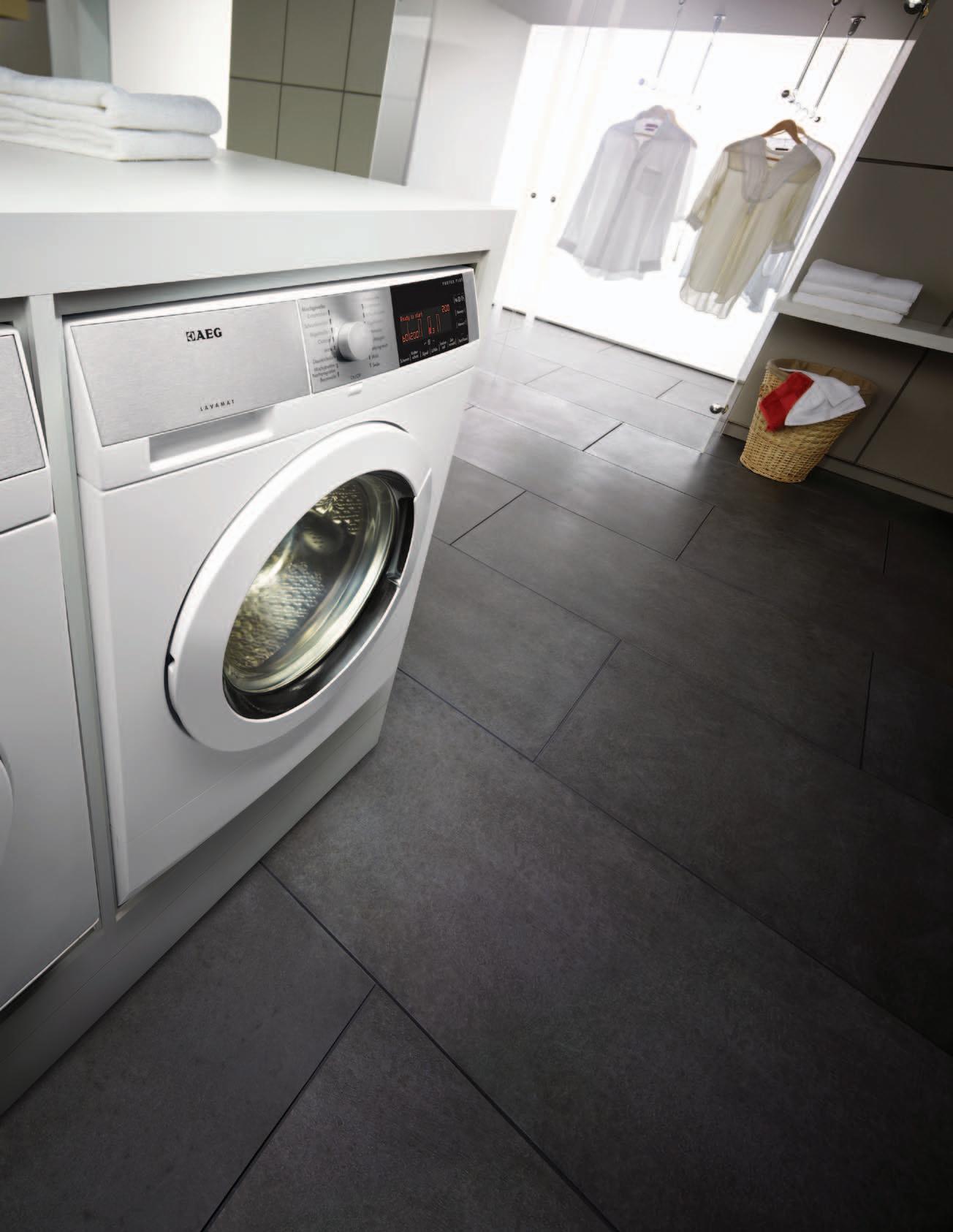
Our top of the range washing machines hold features that are so gentle on your clothes, they actually make them last longer and are extra gentle even for woollens and silks. OptiSense ensures that clothes are never overwashed, the ultra gentle XXL Soft Drum allows for bigger loads and the Direct Spray feature ensures even distribution of water spray which dissolves even the toughest stains. See why we are endorsed by the prestigious Woolmark at www.aeg.com/au
(European model shown)

tongue n groove timber constructed of FSC European Oak treated with natural oils in 15 beautiful colours allowing for easy maintenance
Showrooms
Shop 2 188 Chalmers Street, Surry Hills NSW 2010
P 02 9699 1131 F 02 9690 0929
575 Church Street, Richmond VIC 3121
P 03 9427 7000 F 03 9427 0100
tonguengrooveflooring.com.au
What is Habitus as an experience? This question was presented to the creative studios involved in the Habitus Pavilion for The Project at sy dney i ndesign 2013 .
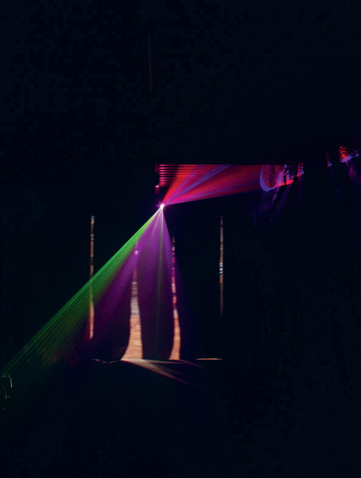
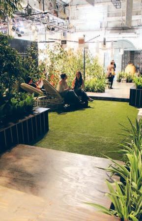
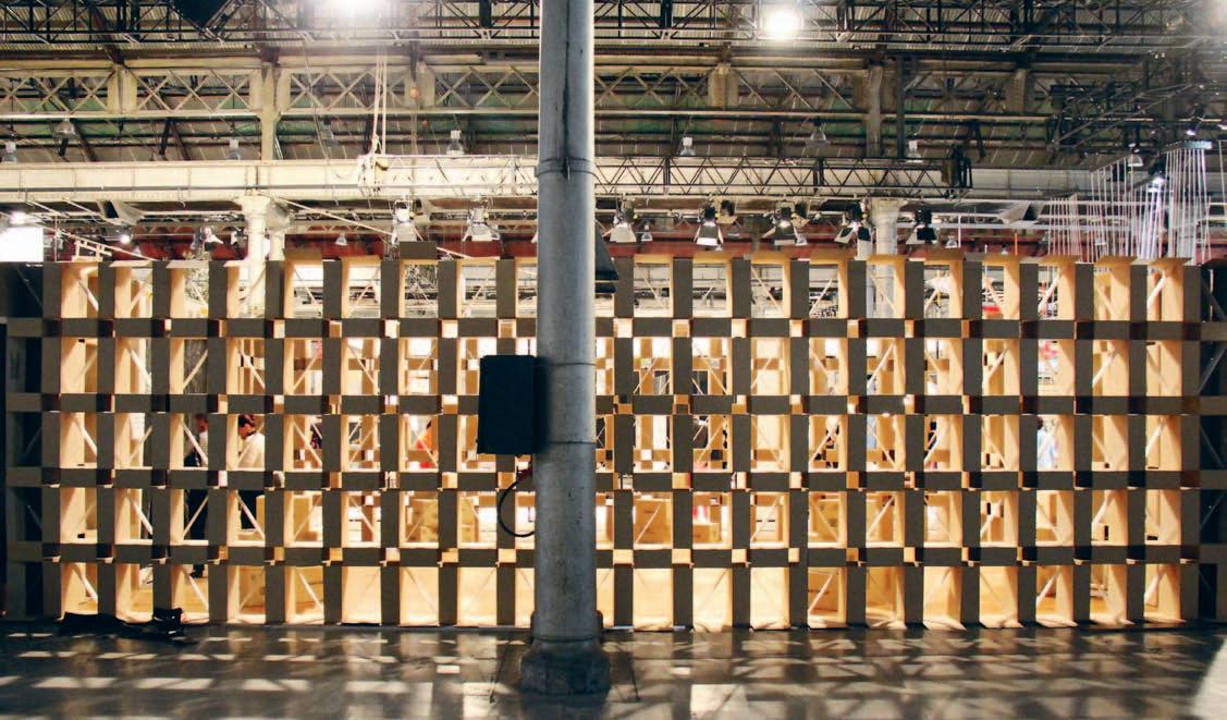
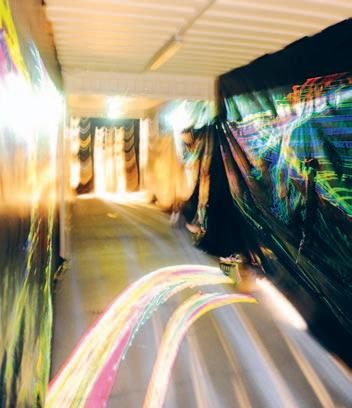

The Project is a collaborative creative exercise that draws together players in the design community (in this case, Habitus magazine) with design professionals to create installations for Sydney Indesign. This event attracts thousands of industry members and designinterested consumers – so the level of quality and visual engagement aims high. This year, The Project asked participating companies and brands to explore the keyword ‘Process’.
Habitus was initially given 100 square metres in the Galleria exhibition space at Australian Technology Park. There were a number of considerations for the project. Firstly, it was the first time the brand had a dedicated space. Secondly, as one of the organisers – being part of the Indesign Media brand – it was important that the space set the benchmark in terms of creativity. Thirdly, being a magazine and a website, rather than a commercial and/ or residential product supplier (who were the majority of the other exhibitors) there was quite a different intention, personality and feel required for the space.
Habitus aimed to use the space to communicate the print and digital components of the brand, and explore the notion of home with its signature appeal – which is intelligent, immersive and creative.
Habitus first approached loopcreative, who have an impressive track record in producing engaging hospitality design with a strong focus on interaction. They introduced lighting designers, lo-fi, to bring their expertise to the space. When the opportunity arose for the project to triple in size and scope, the team conceptualised a garden oasis and brought on Landart to work their magic. Finally, Promena building and construction management came on board to help the project come together.
The initial concept from loopcreative took inspiration from pavilions at La Biennale di Venezia. They proposed a steel structure that referenced the construction element of residential design, which was to be covered in sheets of folded white paper, representing the
unwritten pages of the magazine. loopcreative wanted to create “a residential concept with links to the elements that make up the magazine, translated into a built form,” as Rod Facheaux explains. “We could have done mock-up rooms of home interiors,” he continues, “ but we didn’t think that’s what Habitus is about.” From lofi’s perspective the key goals of the space were “identification, information, entertainment, experience,” says Greg Dunk, and a lighting scheme was devised to provide this.
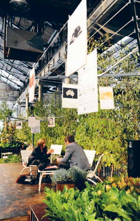
The biggest challenge was a massive increase in the size of the space midway through the project. Wanting to give this extra space a purpose that related to the brand, and to the reader, the ‘Habitus Home’ exhibition was born. Readers and artists featured in the magazine were asked to submit artworks (both visual and text-based) that represented their idea of home. The Habitus team curated the entries to be displayed in a garden exhibition, fixed with pegs onto Hills Hoist clotheslines, a nostalgic and domestic element of many Australian homes and an icon of Australian design.
Another major challenge, as with any project, were time and budget constraints –made more intense with the extra space that was taken on, and the strict schedule, which only allowed two days for installation and one day for breakdown.
The 450-square metre pavilion was divided into four key areas: a shipping container representing the digital arm of the brand; an
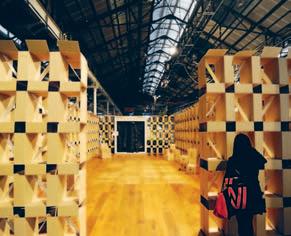
area to relate back to the original pavilion concept; a bar area and the garden exhibition. The container included a laser projection and smoke machine – an immersive experience which invited visitors to begin the intriguing journey through the space. The steel pavilion became a cardboard box structure due to budget restraints and a potential sponsor falling through. Although this amendment to the design was not as originally planned, the team took it on as a challenge and saw it in a positive light. It still bore a relation to the construction element of residential architecture, whilst also relating to the paper element of the magazine itself. Ironically, it was also a complete interpretation of the keyword, ‘Process’ as the design was revised multiple times on site to best make use of the available materials while providing a sound support.
This space opened up to the bar area, which marked the beginning of the garden exhibition. “We wanted to create a soft and inviting space that would encourage guests of the exhibition to meander and explore, to sit and meet with other business or colleagues,” says Matt Leacy of Landart. “Habitus magazine has always seemed to explore an alternate route to the common, more everyday, version of design,” Matt continues. “It beats to its own drum and doesn’t mind showcasing something a little left of field.” With the native and exotic planting – some over five metres tall – throughout the industrial space, “the plants gave the feeling that they were reclaiming the building… it was quite surreal in appearance.”
Creative partners Landart Landscapes, loopcreative, LO-FI Design and Engineering, Promena Projects

Product partners Advance Audio, Alpine Nurseries, Antique Floors, Barco, Classiqe, Garden Life, HG, Hills, Royal Wolf, Wats on Tap Exhibition Partners Archi-Ninja, KW Doggett, Olsen Irwin Gallery, SOS Print + Media

Design has many functions in our society. There are practical considerations – to provide the spaces, products and accessories required to live our daily lives as efficiently and pleasantly as possible. There is the motivation to explore the new frontiers of technology in the aim to continue moving ever forward. But another concern is sustainability.
Although most often used these days in an environmental sense, design also plays an important role in cultural sustainability. For all the benefits of globalisation – the blurring of boundaries between continents, language and economies – there is a real risk of cultural homogeneity, the potential that we develop into a single, dominant society with no variation. As with genetics, diversity is key to our cultural development, and so the need to preserve traditional crafts of various geographical areas is widely recognised.
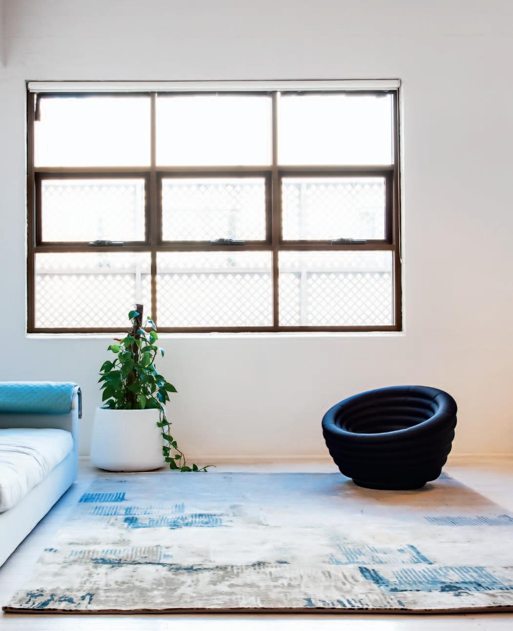
Designer Rugs offers six ranges that celebrate the art of Tibetan knot weaving. This ancient technique is unique, using a rod to assist the warp and weft yarns in the construction of the rug. The knots are hand-tied over a rod, and as each row is completed, the pile is cut and the rod slipped out. Once the rug is finished and applied with hand shearing or carving, the resulting surface is full of interest, depth and variation. Not only does this technique achieve a beautiful finish, but also has a more dense, luxurious and durable quality than is possible with machine weaving.
Designs can take up to 16-18 weeks to manufacture, due to the intricacy of the construction method. But, far from being seen as negative, this approach accords perfectly with the popular Slow movement. A reaction against our fast-paced lives, this movement thrives on slower, more conscious action and behavior. It means that, contrary to a hyperinstant mentality, waiting a bit longer for a special piece is not only completely bearable, but also provides time to fully anticipate and appreciate the finished product.
Designer Rugs’ Mystique, Wool and Silk and Contemporary Hand Knot ranges from the In-House collections are crafted in Nepal using New Zealand and Tibetan wool with pure
silk highlights. They are available in stock sizes (200x300cm and 240x300cm), or can be fully customised. This enables you to be involved in the conceptualising of each individual piece, becoming part of the creative process and ensuring the finished product is perfectly suited to your interior.
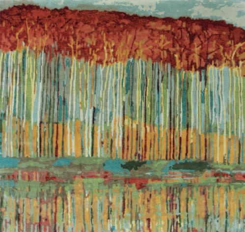
As well, the Designer Collaborations with Catherine Martin (Deco), Caroline Baum (Sand Script) and Bernabeifreeman feature the same artisanal Tibetan hand-knot technique. These highly sought-after designs are created by some of Australia’s best-known and regarded personalities from the design and arts communities, bringing their expertise and insight together with the centuries-old wisdom of an ancient society.
In many ways, the world of Tibetan knotting is far removed from our every day lives. But it is the values that it represents – quality, a slower pace, complexity and texture – that we are craving. And by appreciating items like these, and incorporating them into our living environments, we choose to invite these values in and affirm their benefits.
Rejecting the ready-made convenience of mass-produced products, Tibetan hand-knotted rugs urge us to slow down and appreciate an ancient craft.

Bangkok is an intriguing melting pot of culture and industry, craft and mass manufacture, tradition and humour.
nicky LoBo t alks to 56thStudio, who use a dash of all of these in their socially aware furniture and products.
There are many quirky design studios in Thailand (see the story on Propaganda in Habitus #01 for a good example). With an antiestablishment approach, their skill has been to utilise design as a tool to comment on social and political issues. Although often done in a humorous, non-offensive way, sometimes it means their products are only shown outside of the country. “We cannot exhibit them here in Thailand if we still want our heads on our shoulders,” jokes Saran Yen Panya of 56thStudio.
He’s referring in particular to the studio’s new lounge titled Faith-inc, which responds to a recent scandal about a Thai monk who was found spending donation money on personal items, amongst a host of more serious allegations. The lounge aims to criticise traditional institutions which are revered in Thailand, such as religion, the government and monarchy – and so was displayed in Berlin during the Illustrative Festival in September, rather than their home country.
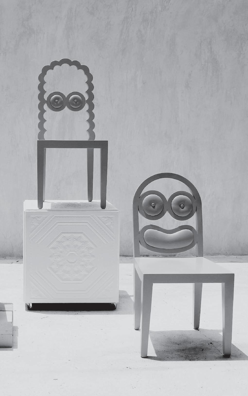
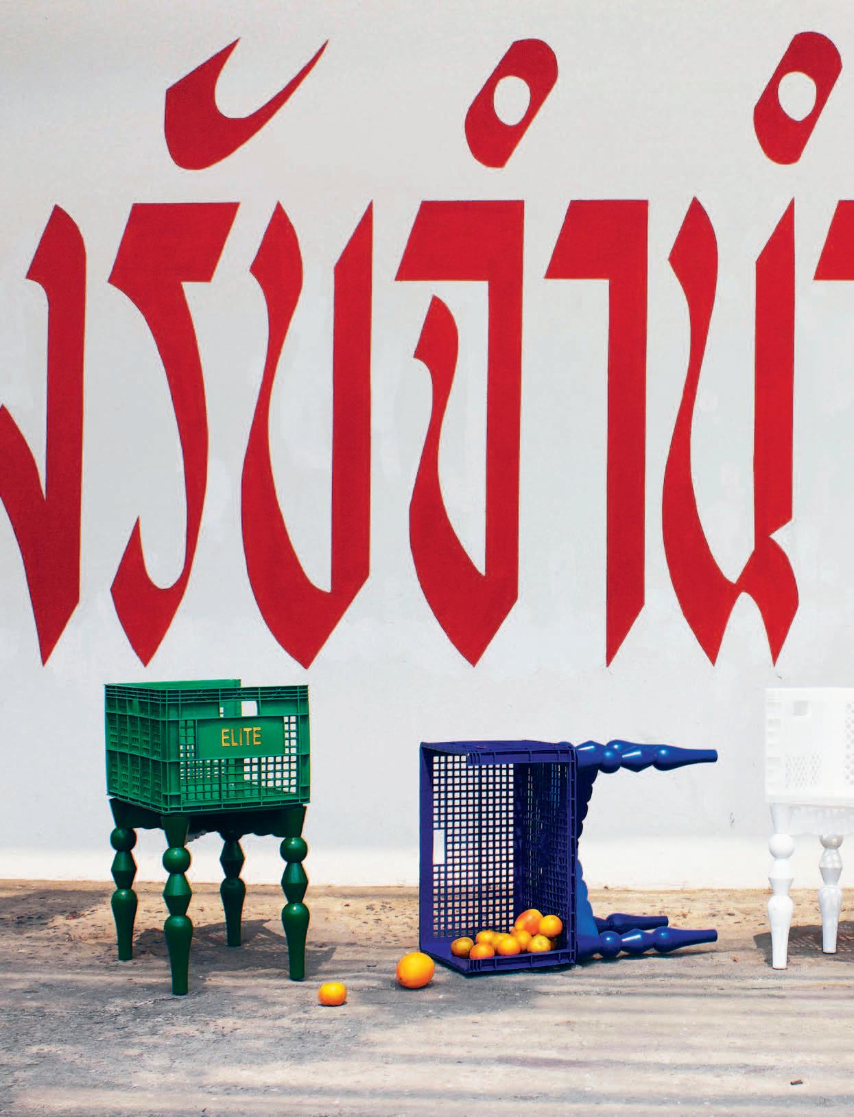
Some of 56thStudio’s designs are more lighthearted, yet still comment on serious issues, such as the Cheap Ass Elites chair. It combines a low symbol – plastic – with a high symbol – a traditionally expensive form – making a statement about the nature of social class distinctions, and portraying the designers’ view that “Looking up to those who

own those expensive chairs is just as stupid as looking down to those with plastic chairs.”
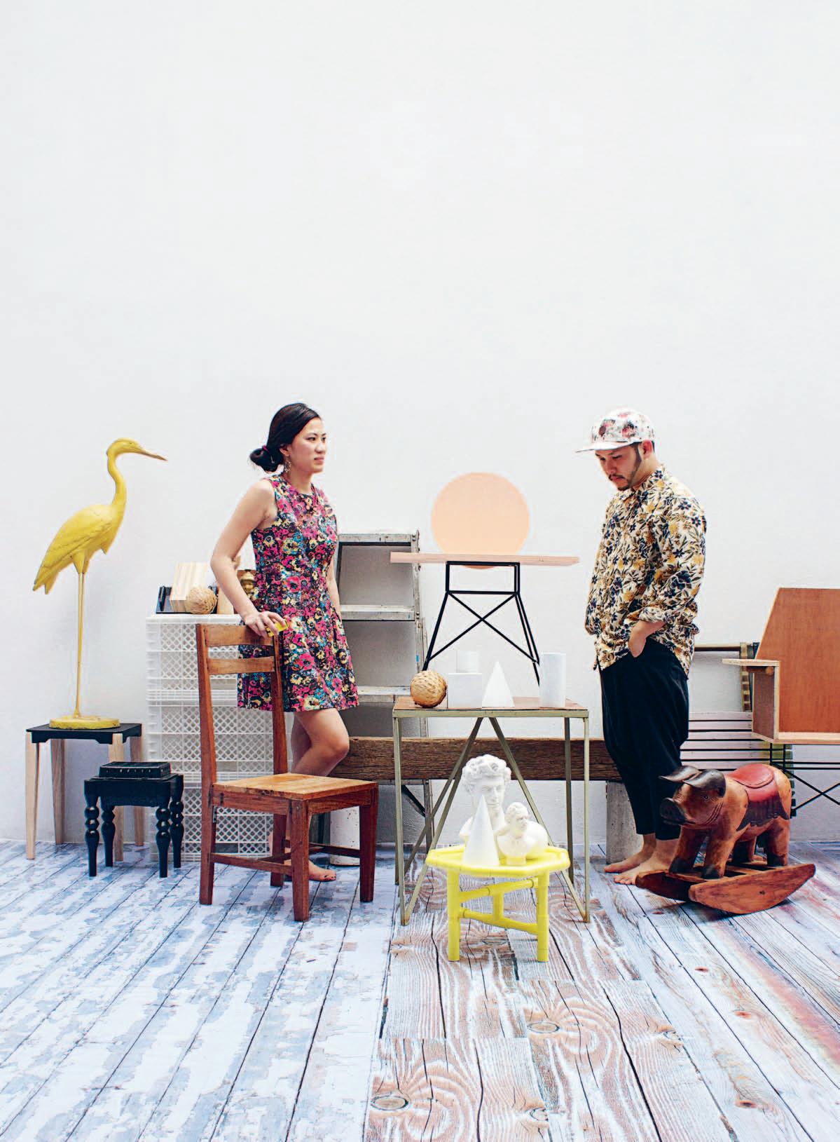
Whether funny or serious, most of the studio’s products begin as casual conversations between Saran and his studio partner, Napawan Tuangkitkul. The two met during their undergraduate study at Chulalongkorn University in Bangkok where they both “found the craft of designing architecture strictly boring.” Since then, they’ve become close friends and studio partners, although they both have other projects on the go as well –Napawan runs a family business in textile and wall decoration, and Saran also works as an art director for several companies, as well as teaching himself the important art of cocktail design (“It’s very similar to the craft of design,” he says, “not every recipe works on the first batch.”)
The source of continual inspiration for 56thStudio is “conversation as a two-way communication that, in our case, leads to fruitful arguments, discussions or even healthy quarrels,” comments Saran. “Our process always starts from having something to say, and being very desperate to deliver the message, yet not knowing what it’s going to end up as,” he adds.
They believe every object can be a tool for communication – not just a functional object or decoration. For Saran and Napawan, ‘Form follows Story’ is the complete package.
“It’s like dating a super pretty guy/girl with brains, profound thoughts and a complicated, self-made background” is Saran’s analogy. In other words, it’s design with narrative and a certain purpose.
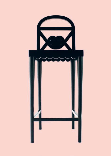
It has now been two years that the duo has been working under the moniker 56thStudio – bestowed on them by a fortune-teller – and they have already attracted international attention. Cheap Ass Elites was showcased in the Konstfack University (Sweden) exhibition titled ‘ d e sign for a Liquid Society’ in Spazio r o ssana Orlandi this year, arguably the most creative of the satellite spaces that make up Salone Internazionale del Mobile. They have also exhibited in Italy, Paris, and most recently, Berlin.
Their international appeal may be partly due to the fact that Saran and Napawan call their products ‘neo-ethnic’, taking on a variety of influences and histories, which resonates with so many people today. “growing up in Bangkok, a city with a big clash of different cultures, we are naturally influenced by things that were meticulously done in the past, the contrast of prestigious heritages, vernacular design languages, exotic crafts and street cultures,” Saran shares. “Updating these topics and introducing them to new audiences and younger generations gives us great pleasure.”
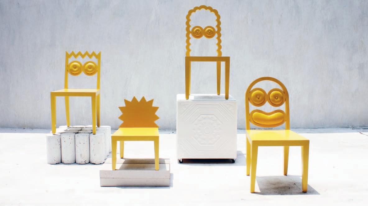
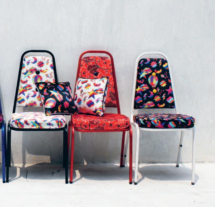
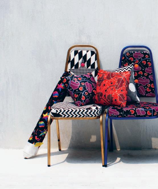 above lef T | supermodel naomi from the caricature as range of chairs, available in a variety of colours and timber finishes. above righT | the caricature as series. below lef T | bad romance chairs, displaying the happy marriage between “ super ugly chairs... and our quirky prints ”. below righT | koon print screen printed portrait on gold wrapping paper “ that is commonly found in a tacky craft store”.
Our process always starts from having something to say, and being very desperate to deliver that message
SA r A N | dESIgN E r
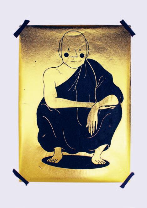
“People seem to respond to it better than acting as serious academic activists,” says Saran of the studio’s habit of commenting on serious taboos in whimsical or humorous ways. But there’s still a lot of work to be done in their opinion. They believe that the Thai creative industry needs proper regulation to make the most of the talent that is already there, otherwise individuals run the risk of remaining undiscovered if they are not connected to the inner circle or ‘creative mafia’. “My favourite Thai illustrator is now living in the north and making a living by being a barista instead,” rues Saran.
It is clear that talent and vision is to be found in Thailand – in abundance. Like the best of their Asian, Australasian, European and American contemporaries, they practise design as a form not just of artistic expression, but also social and cultural expression. But the Thai industry needs to be unified for it to make a real impact. In the meantime, 56thStudio will continue to tell their stories so long as there are “issues which give us the itch to say something back to society,” Saran says. And they needn’t worry – we’ll be listening.
56thStudio | 56thstudio.com

Hear more from 56thStudio at habitusliving.com/issue22/56thstudio
SPEAKERS INCLUDE: JUHANI PALLASMAA


SPEAKERS
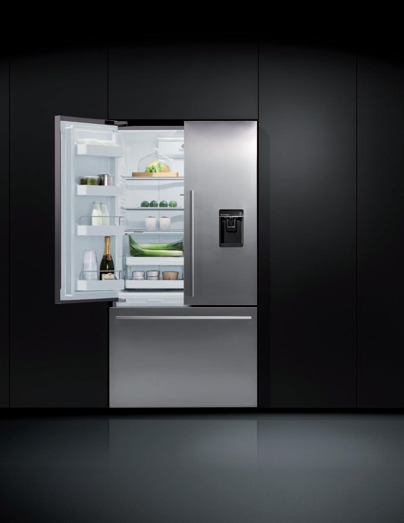
Your fridge is never alone. It stands centre stage in your kitchen. That’s why we’ve designed it to fit your life and match the full range of Fisher & Paykel kitchen appliances. Introducing the new range of ActiveSmart™ fridges with SmartTouch Control Panel and Ultra Slim Water Dispenser.
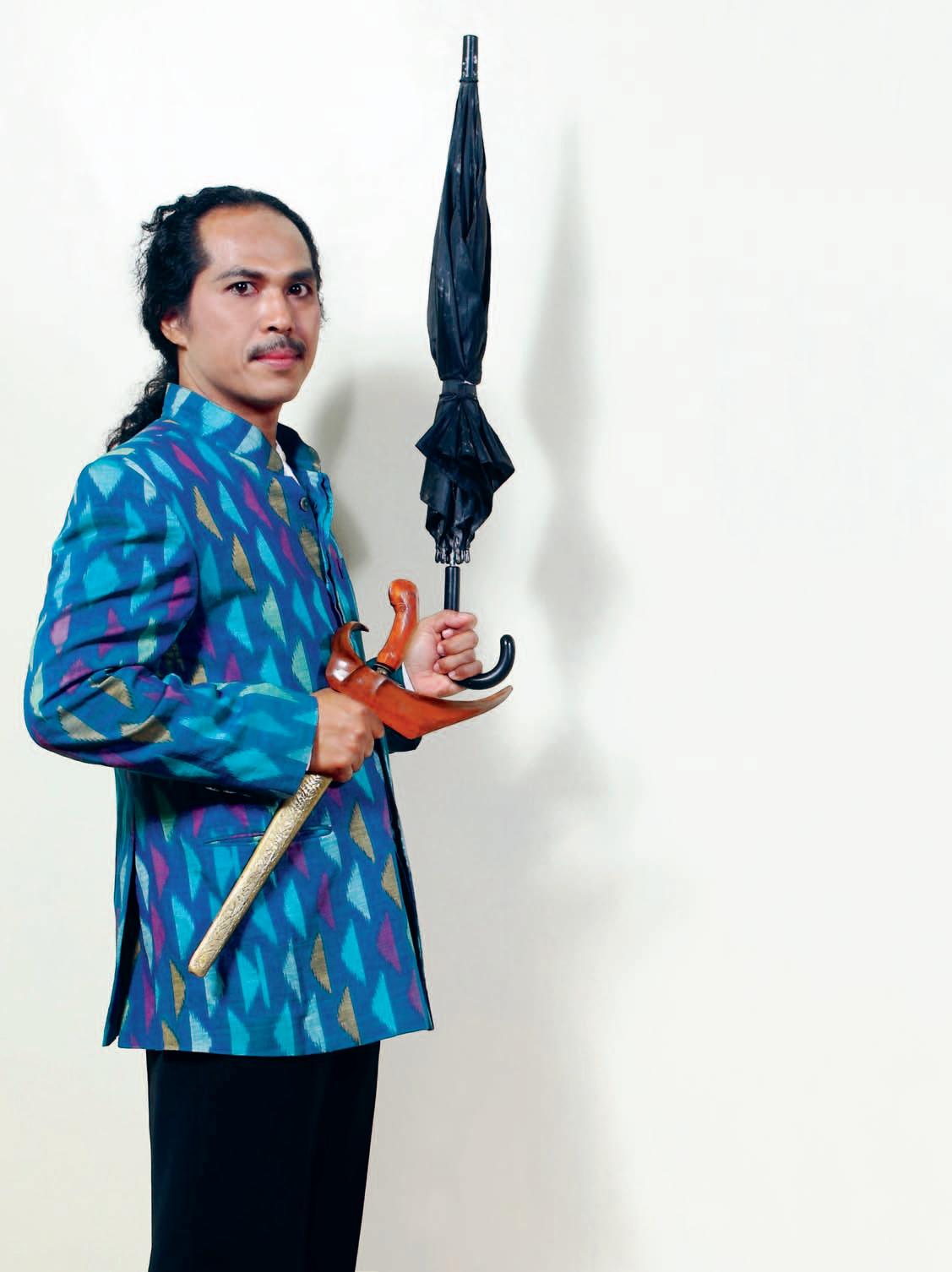
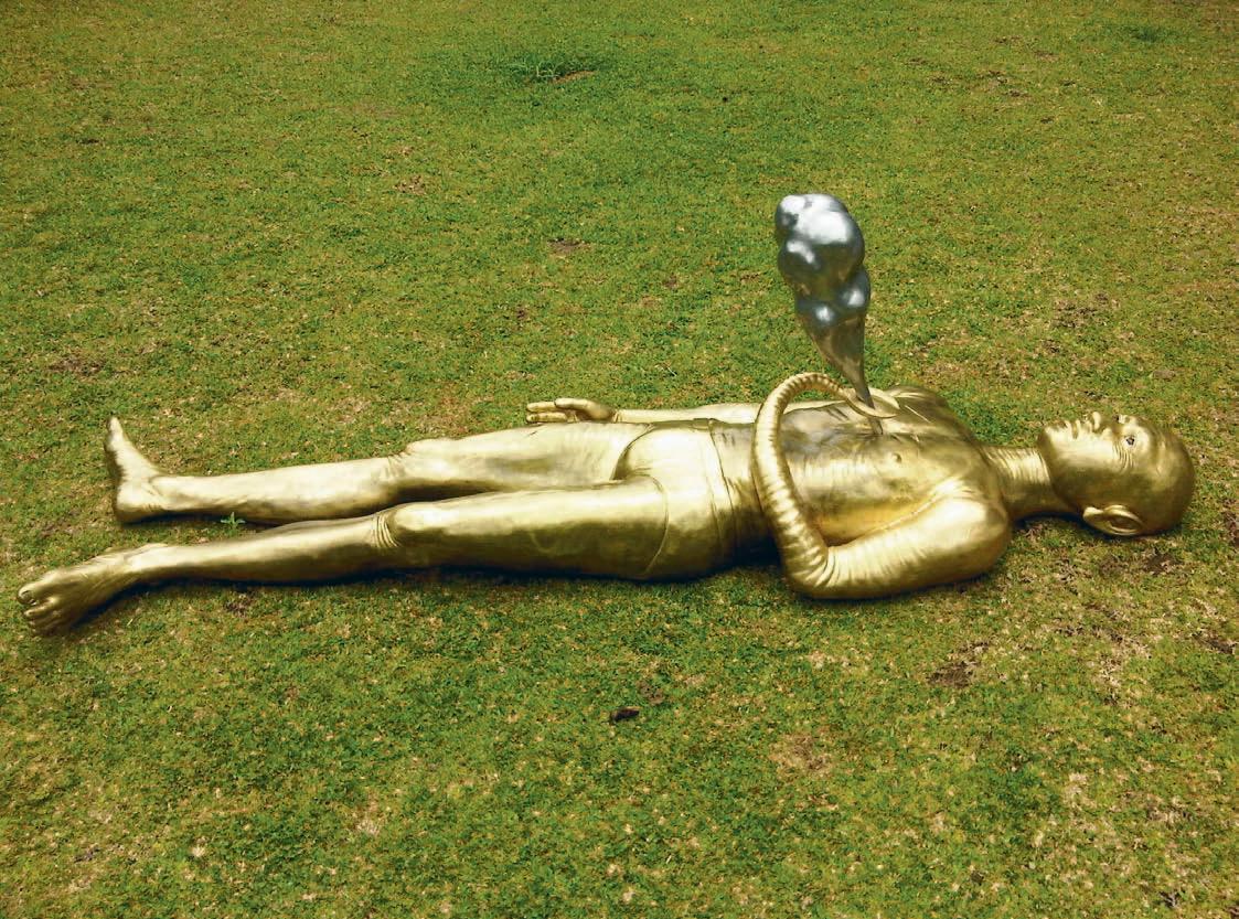
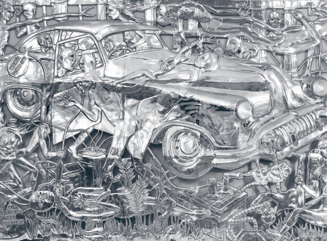
Drawn to the dark side of human life, ENTANG WIHARSO’s art explores prevailing sociopolitical mores in his home country, Indonesia. To ENTANG, creating is a way of understanding the human condition – and human problems like love, hate, fanaticism, religion, and ideology.


New ZealaNd industrial designer Ross steveNs has never let scale deter him. Whether it’s designing screws, amplifiers or houses, he will put his hand to it. aN d R e a s teve N s speaks to a designer who artfully blends high tech and low tech.

it is hard to keep up with Ross Stevens. The industrial designer, university lecturer and house builder has dozens of projects on the go, from making his own windmillpowered spa pool to futurist proposals in 3D printing. He has become a master at repurposing industrial refuse to his own ends as well as fabricating tessellated forms from the latest ABS plastics to define a visual and emotional language. From low tech to high tech, from design to making, he is a true chameleon.
His latest project is a new wing on his house in the Wairarapa, about an hour and a half’s drive over the Rimutaka Range from Wellington. It is a remote place, and a world away from Glasgow and Paris where he and his German wife Petra met, and where his career took off. But not so surprising for a boy who grew up on Napier Hill. “I love New Zealand, I am one of those classic Kiwis that only fits here,” he says.
It has been a fascinating career path and one that has tested his resolve and ingenuity as he found himself hurled from ‘big budget’ projects in Europe (where the sky was the limit), back to ‘no budget’ projects in Wellington, where there was literally no budget. But it seems to be just this situation that he and so many New Zealander’s face that creates a country of inventors who punch well above their weight internationally. “I also think it’s because we are a bit naïve,” says Ross, “and we need to be protective of that, we don’t want to lose it.”
He found his calling in an engine reconditioner’s workshop of all places. Fed up with school by age 14, he spent more and more time “making stupid things” with lathes and spray guns. “The engineer who ran the workshop was semi-retired so he didn’t really mind having me there, I think he just enjoyed my enthusiasm,” Ross says. With a lot of technical knowledge and craft skills on board he got into the only industrial design school in the country at the time, Wellington Polytechnic. He was one of four graduates in 1986 and landed a job at Fisher & Paykel before a travel award jettisoned him off to Europe and eventually into Philippe Starck’s studio. The years in Paris were extraordinary, and Starck’s studio in the early nineties… well there was just no better place on earth as far as the then-26 year old New Zealander was concerned. By the time he left he had codesigned the Thomson Zeo television with Starck, and he continued working on concept designs for him when back in Wellington.
“It was woeful coming home,” he says. “ In my first local job they suggested I spray-paint MDF silver because they couldn’t afford anodised aluminium”. He started teaching industrial design at Victoria University in Wellington and found his professional feet again, designing high-end audio products and his own architecture projects. He built a container house for his family on the oddest site imaginable in Owhiro Bay. Now a Wellington
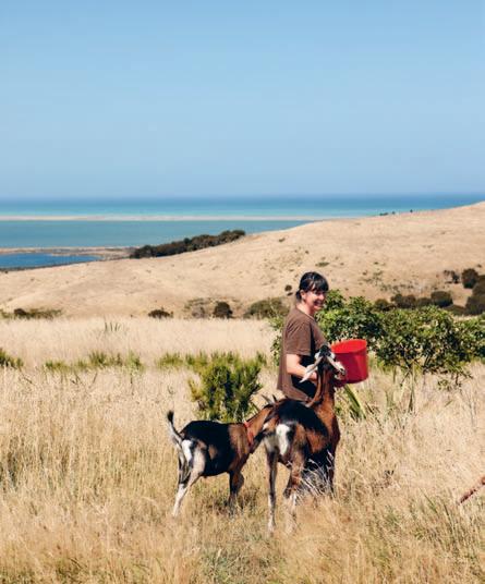
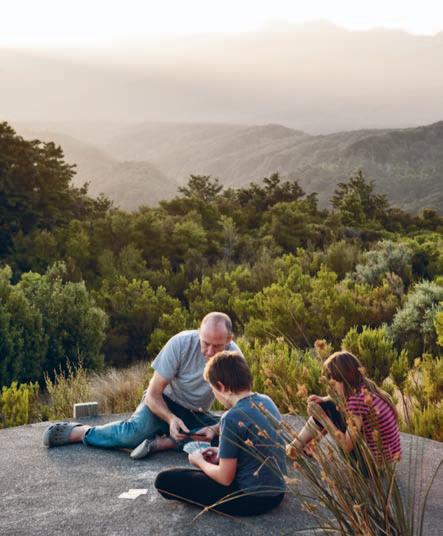
previous | Ross tRi ms the tops of the mac Ro caRpa sleepeR s W h ose laRg e scale visually buttResses the house against the pRe vailing Wi nds. above left | the family live in the Remote Wai R aRapa su RRo unded by RegeneR ating bush and faRm land. above right | Ross and his Wife petR a keep mountain goats. opposite | RaW timbeR Rusting steel and stone gR avel looks completely at home amongst the gR asslands and mountainous landscape.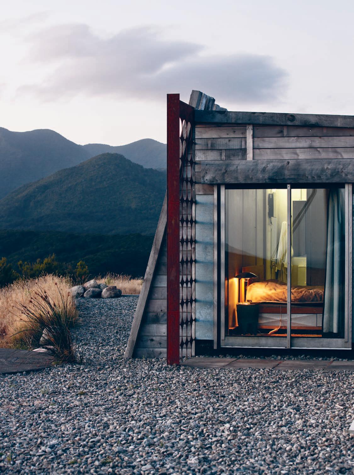

It is what you would expect from an industrial designer making architecture.
| designer & residen T
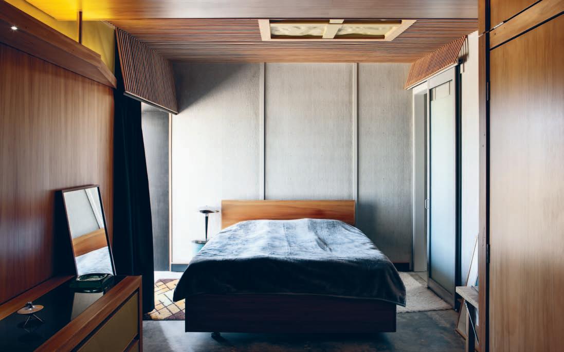
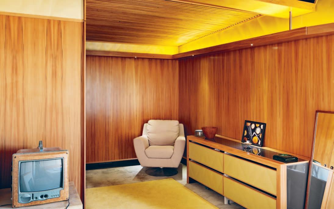
icon, the three stacked containers sit against a rock cliff on a three metre-wide strip of land. He built it himself on weekends out of industrial leftovers to worldwide acclaim. “It is what you would expect from an industrial designer making architecture,” he reflects.
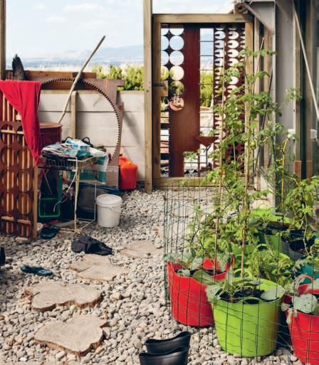
Ross sees this type of upcycling as one path to sustainable decadence and has taken the concept even further in this house in the Wairarapa. “If I start with something that people think has no value at all, and at the end of it they go ‘wow, I never understood it had that value’, then that’s really cool. So I am constantly looking for things that someone doesn’t have a use for, but that I have.”
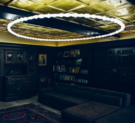
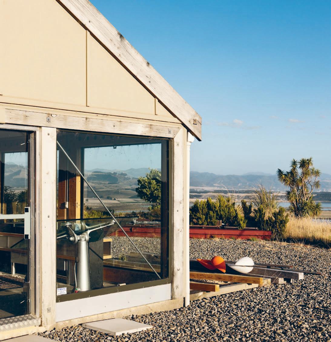
The house site is a small plateau in the foothills of the Rimutaka Range overlooking a lake, the plains and the sea. Ross built his workshop out there about 16 years ago, but eventually he and his family moved out and he now commutes into Wellington for work. He has just completed the next wing of the house, adding bedrooms and a lounge, and eventually there will be a third and fourth wing to seal in a protective courtyard from the legendary Cook Strait winds.
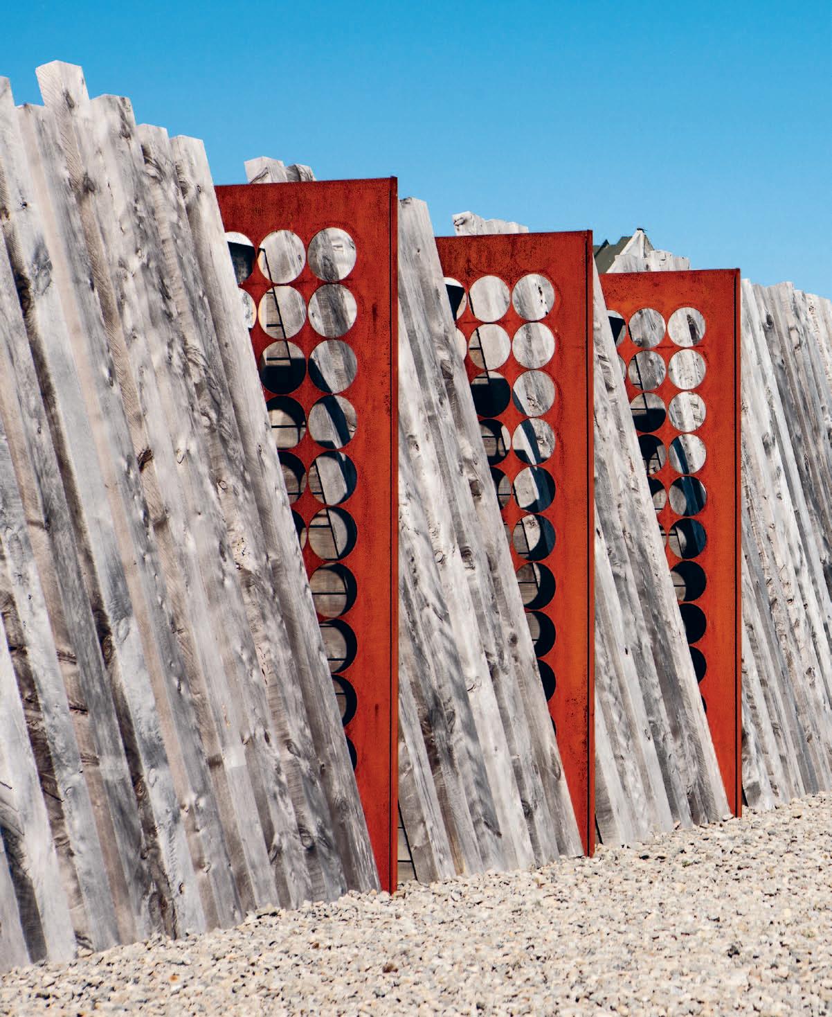
Almost every material and product in the house has been upcycled, from the insulated sandwich panel structure, to the Rimu veneer door skins (used here for wall lining) to the wiring. “I can’t be picky because I just take what people don’t want, so it is a compromise each time,” explains Ross. “Sometimes it’s not quite what I would have wanted, but other times I get these incredible results I would never have thought of.” The rusting steel sheet with cut-out holes is a great example where the leftover materials of someone else’s process take on a new life within a different context.
Ross’ design responds to the big landscape and intense winds – rated for winds up to 200 kilometres an hour, it hunkers down and leans away from the prevailing gales. He has used over-sized macrocarpa sleepers to cover the insulated panel, ground it and camouflage it
previous | s o uth of the house and facing the pRe vailing Wind is a sculptu R al savonious Roto R Windmill, Which heats the spa. opposite above | in the main bed Ro om a photog R aph by pe tR a alsbach-stevens sits on the c Redenza Ross built. th e th omson zeo television is designed by ph ilippe staRc k. opposite beloW | compRessed sheet, timbeR dooR skins and Recycled Rimu battens cReate Rich colouRs and textuRes. above | the laRge ciRculaR light in the lounge is designed by Ross and his colleague beRnaRd guy in an expeRiment With 3 d pRinting.I start with something that people think has no value at all...
ross | designer & residen T
in the site, and designed the interior almost cave-like as a retreat from the immensity of the environment. “I was really interested in the way it sat on the land,” he says, “but also the way a building can house people with really complex histories and complex dreams for the future. It was hard because I didn’t know the answers going into it.”
The key space inside is the lounge, where the couple keep their treasures and heirlooms, called ‘the room of ancestors’, an idea inherited from the Māori wharenui/meeting house. Ross started with four inherited objects: two large pieces of German furniture that once belonged to Petra’s grandparents, and two paintings in gilt frames painted by Petra’s great-greatgrandfather. They provoked Ross to paint the walls black to bring out the depth of the old timber and contrast with the gilt. It is a remarkable room not least for the colour, but in the variety of detail and the panelled ceiling – tessellated champagne-coloured plastic pressed with the topography of the surrounding landscape. “I am really interested in the idea of sustainable decadence,” says Ross, “and digital decoration allows me to create that with very little material.”
The way he has reconfigured salvaged materials often bares little resemblance to their original use. Most things require a second take, and even then their origins are hard to pinpoint. Compressed sheet is fixed up back-tofront so you see a textured surface; ABS plastic is pressed into a triangulated pattern and used as room cladding; ceramic tiles from the dump are inlaid into a recycled Rimu credenza; and three-millimetre MDF is laser cut into stars and flowers in the children’s bedroom ceiling. There are no off-the-shelf results, because he has a myriad of craft options available to him, from handmade to digital.
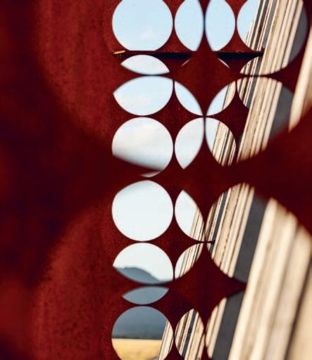
For more images of Ross and his home visit habitusliving.com/issue22/rossstevens
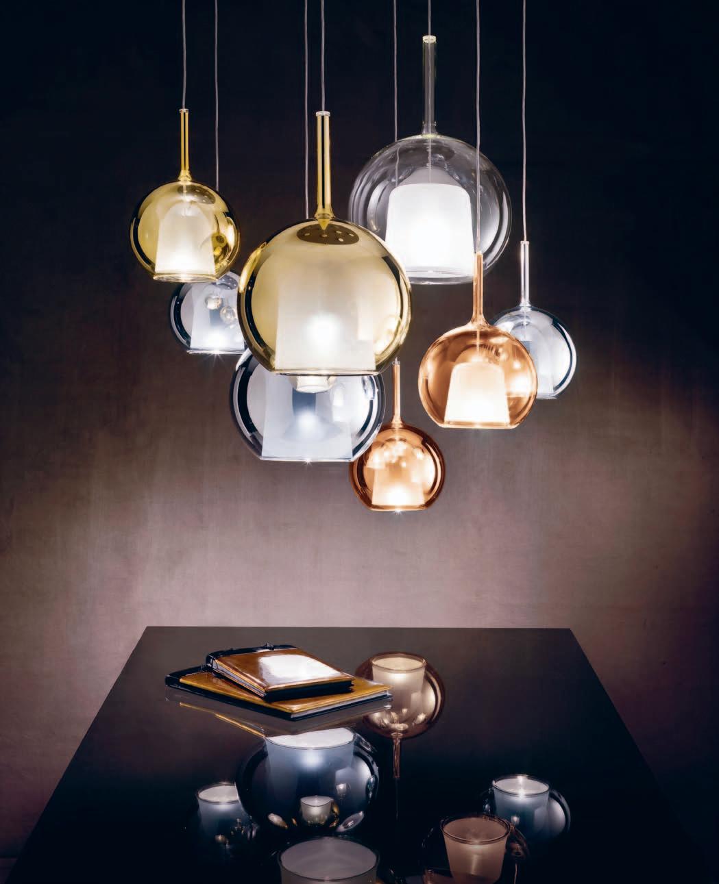
But lighting is a technically difficult yet astonishing medium that requires a mastery of a varied and continually evolving discipline. Truly good lighting is a subconscious emotion that needs to be in context with its surrounding, implementing design far beyond concerns of visibility and horizontal foot-candles. Only then, can lighting be a truly integral part of a whole.
And at Classiclite, great lighting is not just a job, it is a passion. Founded in 2003 by Sam Carpinteri, Classiclite’s designs fuse the architectural with the formal, the aesthetic with the functional, to create forms that provide the perfect mix of light and design. This is in fact a knowledge that has been 35 years in making: with years of experience in the technical industry, Sam has brought a new dimension to lighting and lighting application. Initially starting as an outdoor and cabinet based lighting product retailer, Classiclite is now the Australian distributor for the exclusive European brands Penta and Ole. And as an independent lighting design company, Classiclite is able to apply their knowledge, respect and passion to each and every project.
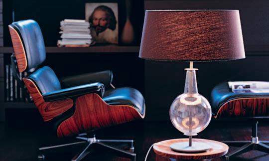
This is a passion that has extended throughout the Classiclite family, with Sam’s daughter, Jessica, joining the company in 2007. Bringing with her a modern and creative flair, together they now work at maintaining a strong personal customer focus, but, lighting quality has, and always will be their main priority. In every design, Classiclite always tries to improve the visual perception and understanding of the environment, to use light as an expressive and poetical tool. Lighting is a subtle design tool, that when, done well, will bring to life even the most mundane of design schemes. And, as Classiclite says, “light is a matter of balance – between atmosphere and functionality.” At ClassicLite, they work together with architects, interior designers, developers and home
owners to help deliver an exceptional result on each project, every time.
You can feel this growing experience of Classiclite in its rich collection of lights that merge material with different characteristics. The result is living light - lights that create a new space to live, lights that model themselves according to their different needs. With products ranging from the technical to one-off Murano glass pendants, Classiclite has every one of these needs covered.

Light is integral to life. It can stir emotion, set a mood, create atmosphere, and offer direction and guidance.

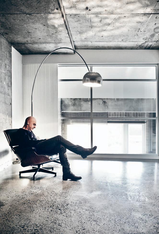
He is one of Australia’s finest and most innovative chefs. And after visiting his Sydney home, PAUL McGILLI c K suspects that this apartment, elegantly re-worked by JULIUS BOKOR , is a perfect reflection of the man and his cuisine.
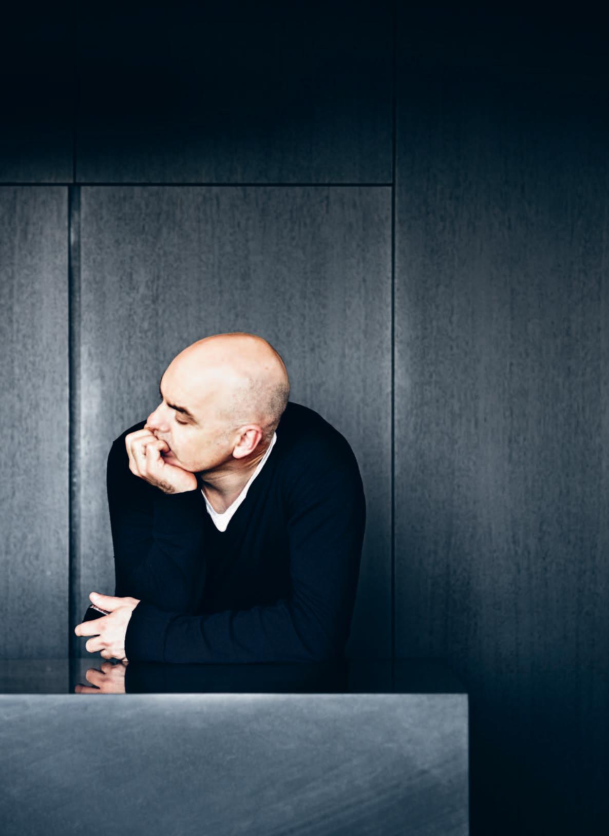
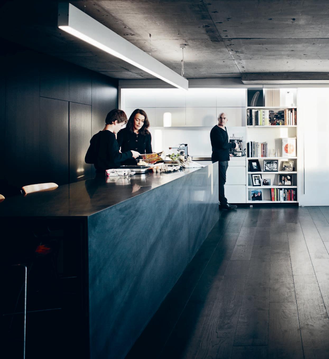
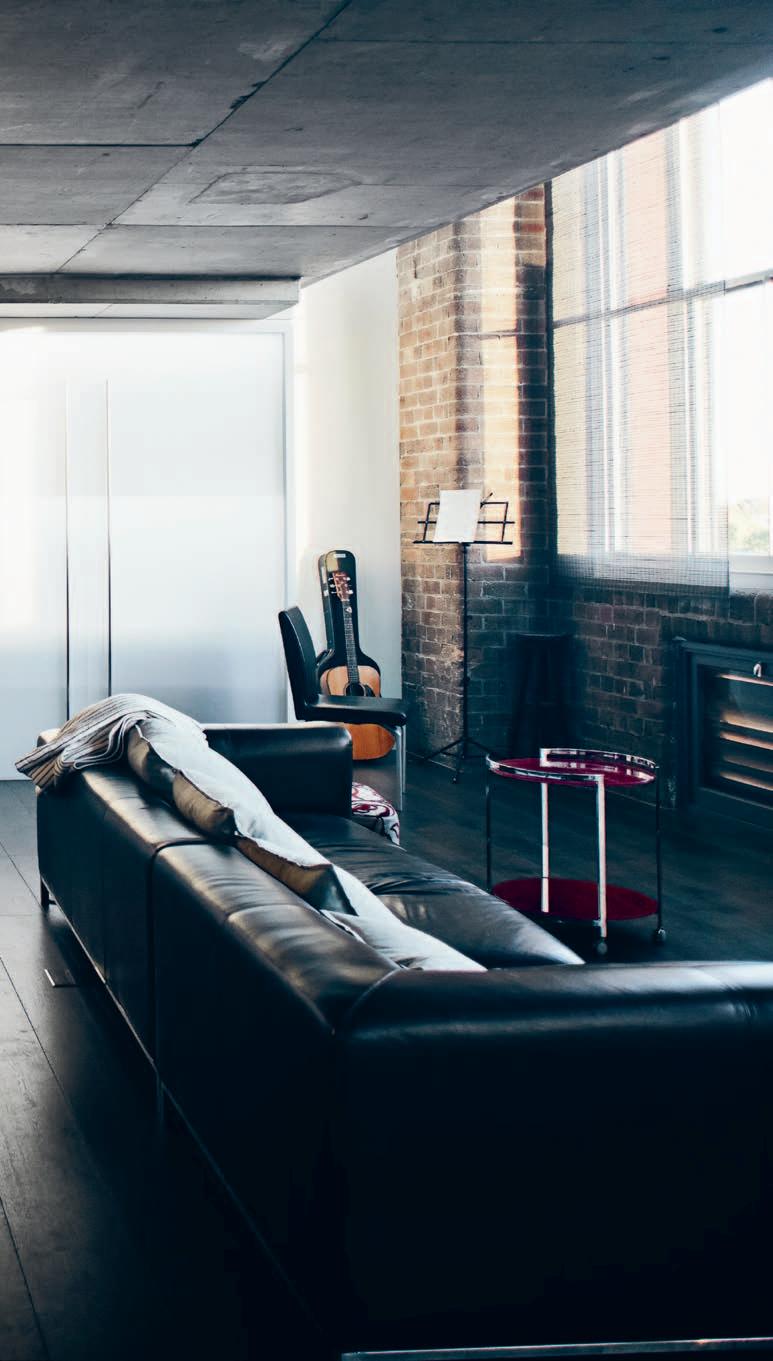
every home has a story. But the innercity apartment home of leading chef Mark Best, seems to resonate with a host of stories.
A food critic reviewing Mark’s new restaurant – Pei Modern – in Melbourne in 2012, noted his commitment to “flavours with an edge and a difference.” It could well be a description of the man himself. And it explains a lot about Mark’s distinctive apartment.
There is nothing formulaic about this apartment. But, then, there is nothing formulaic about Mark Best. First, his back story: he began his working life as an electrician on the goldfields of Western Australia, only beginning a four-year apprenticeship as a chef in 1990 at the Macleay Street Bistro in Sydney’s Kings Cross at the age of 25. In his fourth year as an apprentice he won the Josephine Pignolet Award for Best Up and Coming Chef in NSW. After stints in France and the UK, he and his wife Valerie returned to Australia to open Marque restaurant in Sydney’s Surry Hills in 1999, which has continued to accumulate awards since then at a steady rate.
Another story is the building. The Goldsborough Mort building on the edge of the Sydney CBD overlooking Darling Harbour was built in 1883 as a woolstore. Then, as Sydney Harbour transitioned from being a working harbour, the building was converted into apartments in 1995. Like so many adaptive reuse projects, the romance of the building did not fully translate into optimum living spaces,
although it did boast a much-admired roof garden (by landscape architects 360° headed up by Daniel Baffsky, see Habitus #01).
Architect Julius Bokor thinks that the roof garden may have been initially what attracted his client and friend to the building. Ask Mark and he says, “We liked the infrastructure of the building,” and that he liked the original design of the apartment which he and Valerie bought around seven years ago.
The reality, though, was that the apartment was dark and claustrophobic. “You couldn’t see out of the bedroom … bad vibes,” says Bokor. The trigger for the make-over came when Mark and his wife Valerie acquired the onebedroom flat next door. “Although we couldn’t really afford it,” says Mark, “we didn’t want just anyone moving in next door. So, we picked it up and rented it out. Originally, we were just going to knock the wall down – which we did initially – but then the different coloured floors, the doubling up of kitchens, and so on [didn’t work], so eventually we bit the bullet.”
The result – rather like Mark’s cuisine – is an intriguing mix of innovation and conservation where the end product was driven by the process rather than any prescribed solution. In what he calls a “meeting of minds” it was agreed to simply strip the place back to its industrial origins and see what was there –given that the original conversion had imposed layers (like gyprock walls, ceiling and cladding) which obscured the character of the building.
So, a two-bedroom apartment has been joined to a one-bedroom apartment with the entry to the one-bedroom apartment now the laundry/powder room and the remnant concrete walls acting as room dividers, making it, says Bokor, “a more complex space.”
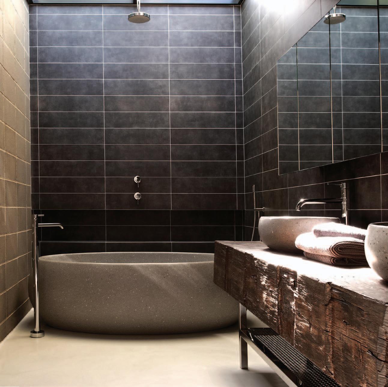
The stripping back included a polished concrete floor on the upper level where the floor inserted during the 1995 conversion was stripped back to “what was there,” making a virtue of the flaws to add texture and depth. The original fenestration has been restored along with the original air vents under the windows along the western wall, which had been gyprocked over. Similarly, the brickwork along the inside western wall had been painted over. This, too, has been stripped back allowing the texture of the bricks to add to the material character of the space.
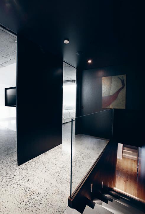
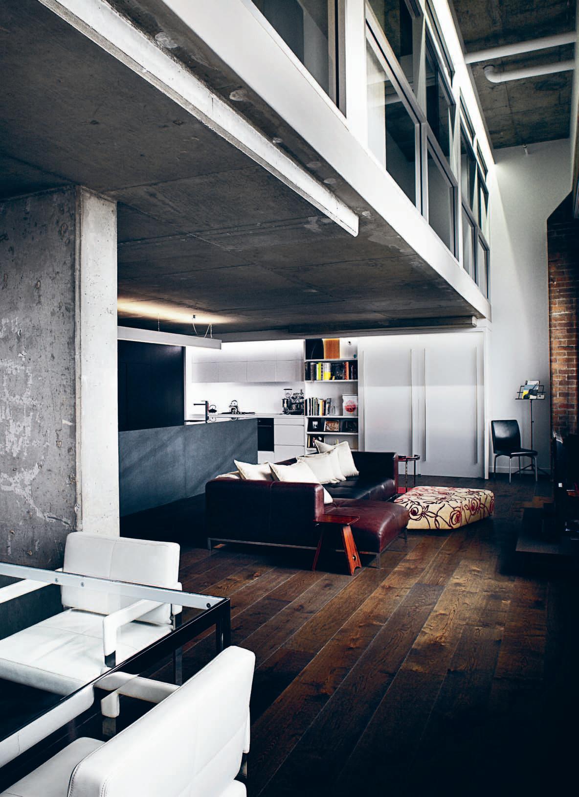
The result...is an intriguing mix of innovation and conservation.
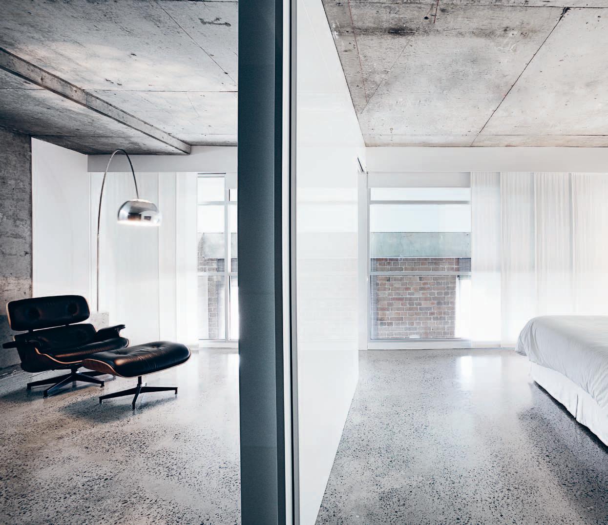
brown box which, when you open it up, is all white.
The agenda had been to optimise space and maximise light. There is now a sense of continuous space, but punctuated by partial walls to create the nooks and crannies apartments so rarely have. The mezzanine level helps spread western light through the apartment, but is now helped by a raised ceiling and continuous strip lighting which creates the illusion of more light coming in from the outside.

Stairs (the treads are concrete made in an oven) at the entry go up in opposite directions – to the right to the son’s room, to the left to the master bedroom and a sitting/television room, all connected by a gallery. Julius describes the upstairs as having a Japanese aesthetic – “a brown box which, when you open it up, is all white.” The Japanese aesthetic is enhanced by the Smoked Oak veneer and the way everything slides away to optimise space and to keep things simple and elegant.
Space and light optimisation is also served by a variety of strategies, such as the mirror at the end of the entry vestibule to the bathroom. No room is ever fully enclosed, thus allowing the western light to penetrate as thoroughly through the floorplate as possible.
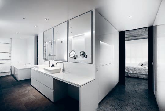
In fact, the amount of space is remarkable. The joinery in the superbly comprehensive kitchen, for example, not only has the function of concealing (pantry, fridge etc.), but also offering ample storage. Similarly, the surprisingly large walk-in robe, described by Mark as a “girl’s dream wardrobe.”
All of this generates yet another story – the spatial narrative of the apartment. As we know, it is hard to make an apartment uniquely one’s own, just as it is hard to find an apartment which offers the richness of spatial experience human beings seem hardwired to need. But this one, while it certainly maximises the amount of space and light, manages never to fully reveal itself. Instead, it offers a surprising number of journeys, each one tantalisingly flagged by visual fragments of the space beyond, and signalling yet another way of inhabiting this particular home.
Speaking of the make-over, Mark says “that it has completely transformed the feeling of well-being, which is the most important thing for me.” This is a home which clearly works for this family of three. At the same time, though, one suspects that in some impossibly subtle way it totally embodies Mark Best, the man and his food.
b okor architecture + interiors | bokor.com.au
Marque | marquerestaurant.com.au
Meet Mark at habitusliving.com/issue22/markbest
formfunctionstyle.com.au

A garden is one of the most important areas of any home. It’s an extension of who you are, your lifestyle, family and friends. More importantly it’s a space where you can go to simply relax. My name is Chris Slaughter and it’s my passion to create your ideal escape.
To give you an idea of the gardens I have created for other clients please visit scenicbluedesign.com.au and click ‘Escape’ to view my portfolio.
If you would like to make an enquiry call me direct on 0405 663 222 or visit scenicbluedesign.com.au for more inspiration.
Kind regards
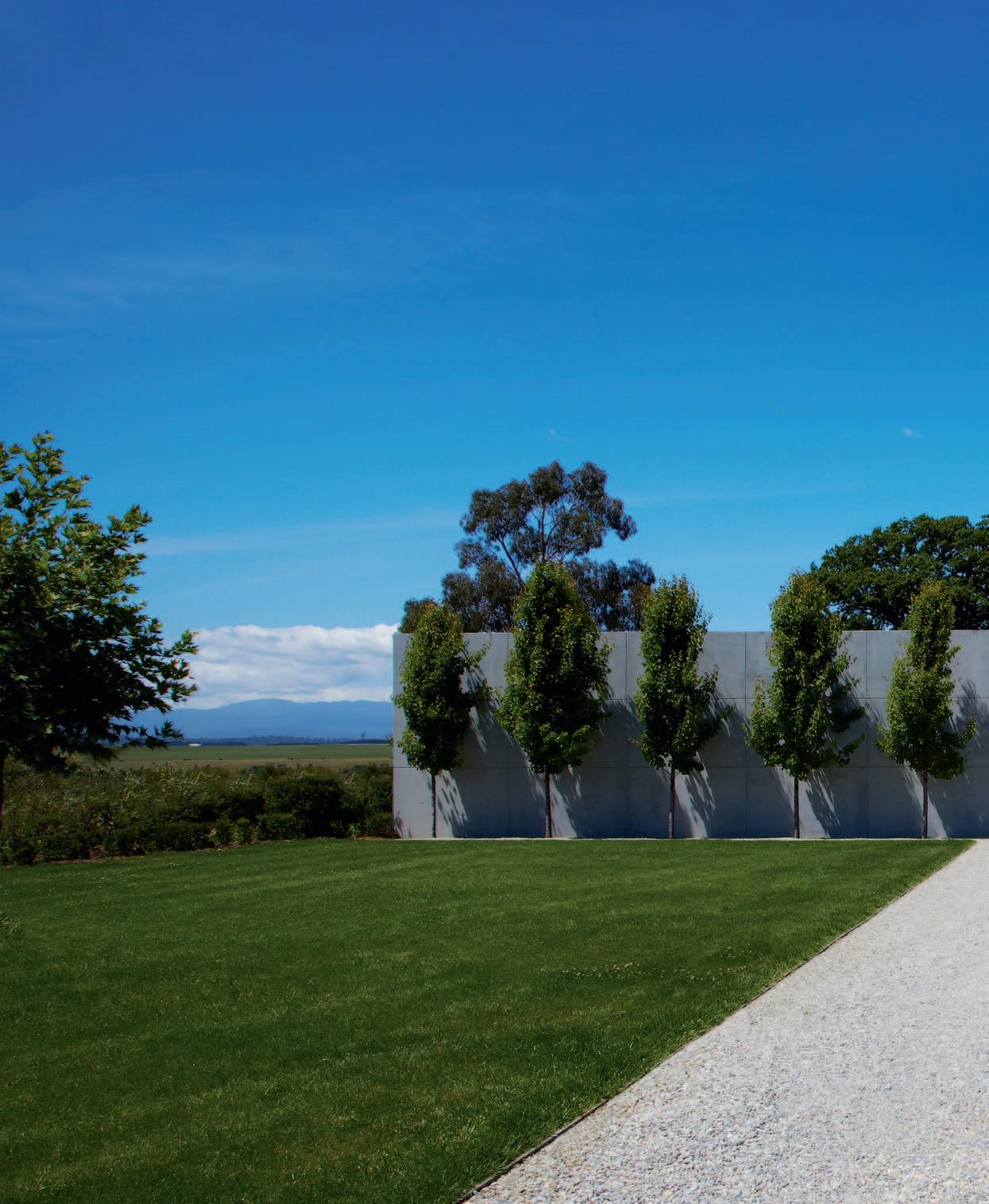
Sensational and varied landscape is what TASMANIA is famous for. Designer, SARAH FOLETTA, celebrates this with a house which, says PAUL MCGILLICK, seems part of a rural idyll.
 text Paul McGillick | Photo Gr a Ph y Sharrin r ee S
tasmania, its landscape and its early buildings have been likened to many places, but usually England. There is good reason for this. Whether it is the Theatre Royal or Battery Point in Hobart or indeed any of the many colonial buildings across the island, Tasmania is a museum of Georgian architecture mixed with the picturesque, whitewashed maritime cottage typology found along the coast of England… or Scandinavia, or the Low Countries. As for the landscape, surely it is straight out of Constable…or Turner, or Friedrich.
But the French ferme? Well, why not? The French maritime explorers charted Tasmania long before the English, a history honoured by the many place names such as Freycinet, D’Entrecasteaux, Bruny, Forestier, Recherche, Huon, Naturaliste etc. In fact, the inspiration for this house at Longford in Tasmania did come from France in the form of photographs taken by the designer’s mother – not of a farm, though, but of an urban setting.
Nonetheless, I’m sticking with ferme. After all, in French the word is cognate with ‘closed’ or ‘enclosed’. Hence, the idea of a cluster of
buildings around a courtyard entered through a portal of some kind after a lengthy arrival sequence. The space around the farm, the enclosure and the single point of entry were originally defensive strategies protecting the farm community from outside threats.
Here at Longford, the long driveway, the ordered olive trees down the edge of the property and the equally ordered enfilade of ornamental Chanticleer pear trees fronting what present as two walls framing an entry into a forecourt to the house irresistibly conjure up the image of a ferme, even a modest chateau. But this is no defensive strategy, more an aesthetic gesture. Indeed, once one has navigated through this house, far from being enclosed, the house on its rear, northern side opens up to the magnificent view of the floodplain and the Ben Lomond plateau in the distance.
In fact, the property (6,000 square metres) was zoned for farming and it took three years to have it re-zoned residential – and the flood plain was crucial because it means the house can never be built out. If ever there was a house in a landscape, this is it.
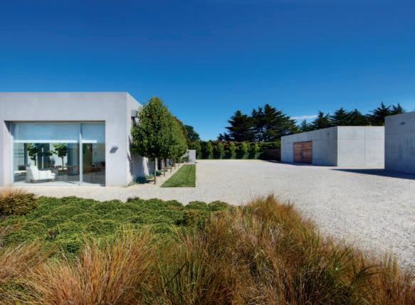
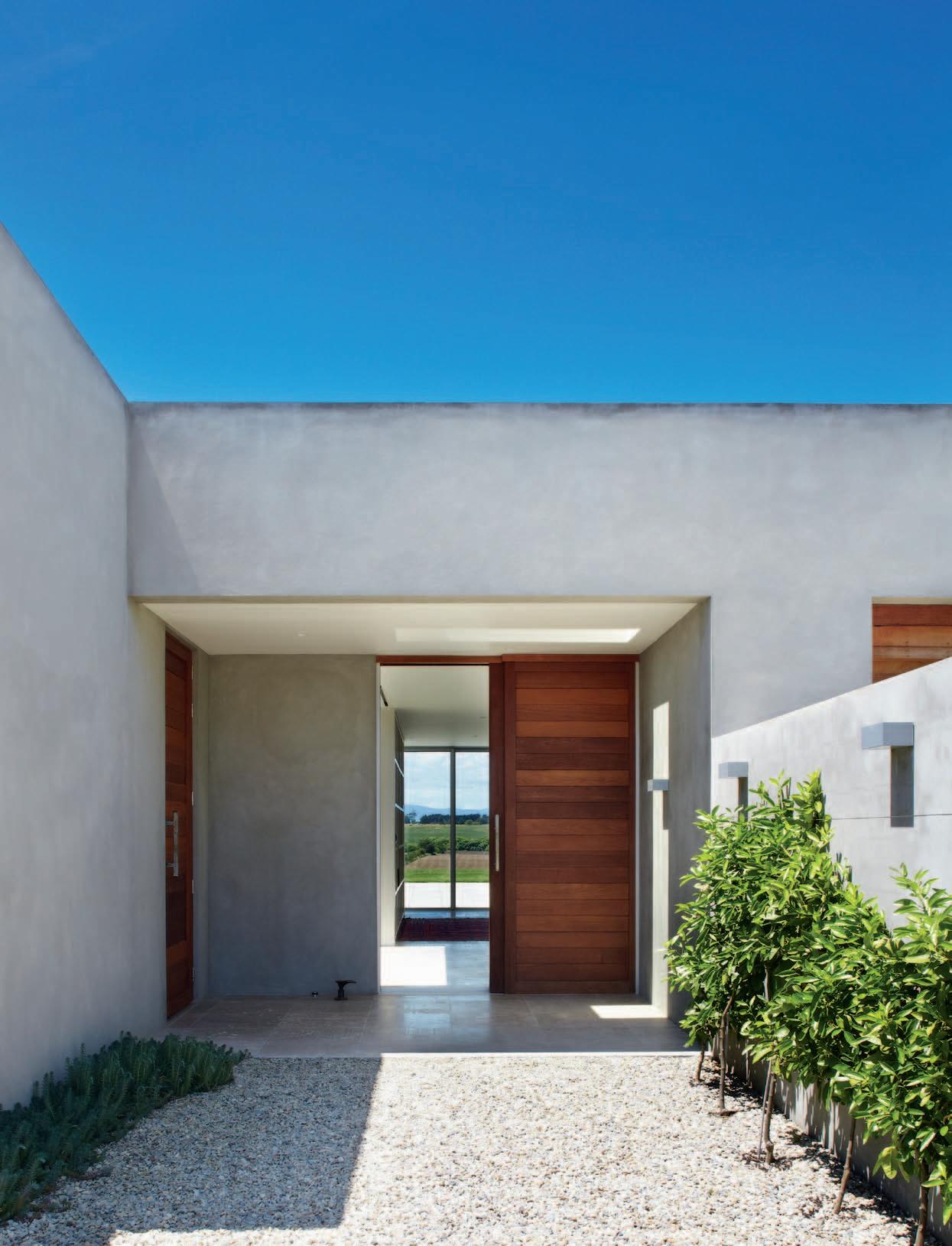
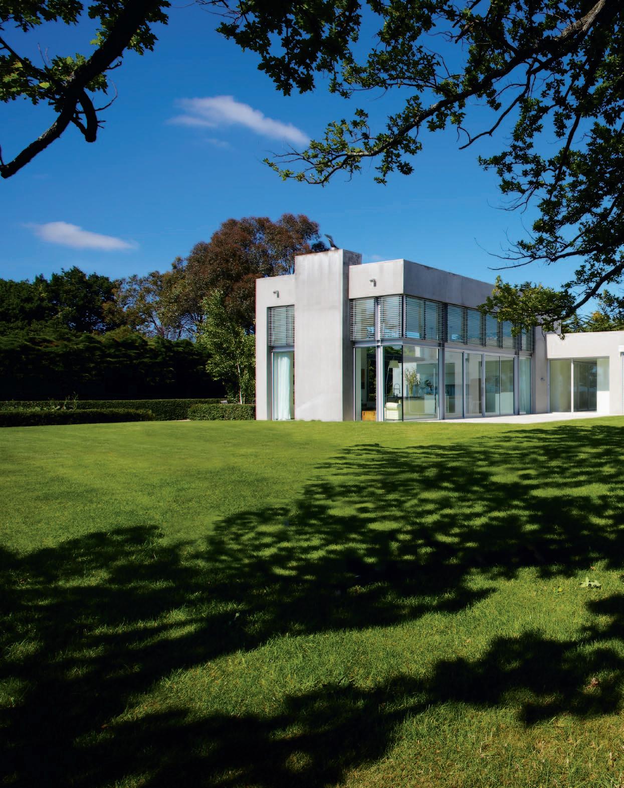
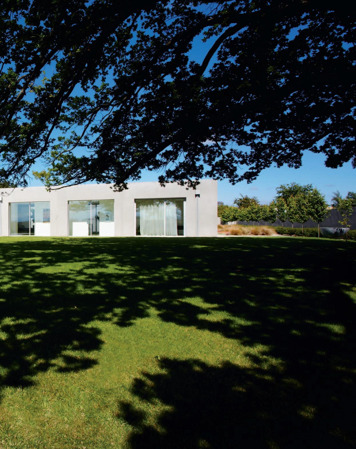
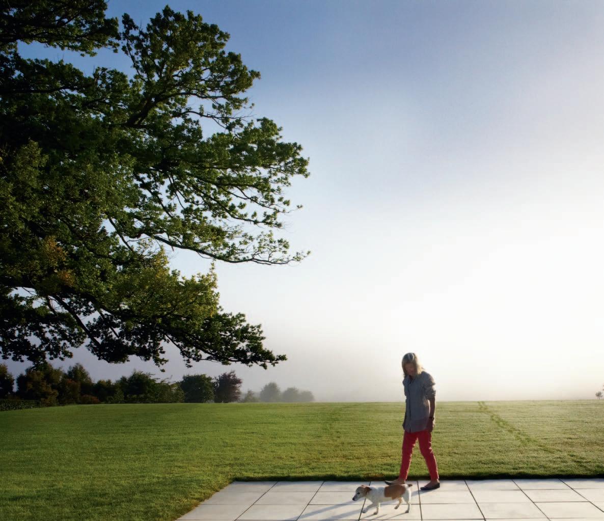
The vista seems to recede in a series of planes.
The brief from Sarah Foletta’s mother and stepfather was for a family home, “one which they could live in now, retire in, not have to move.” So, no steps, single-level planning and everything easily accessible. It consists of three (potentially four if one of the studies is converted) bedrooms with a guest wing which is self-contained.
Otherwise, the brief called for a ‘modern house’, lots of light and lots of space – and lots of transparency, both for natural light, but also to breathe in the landscape.
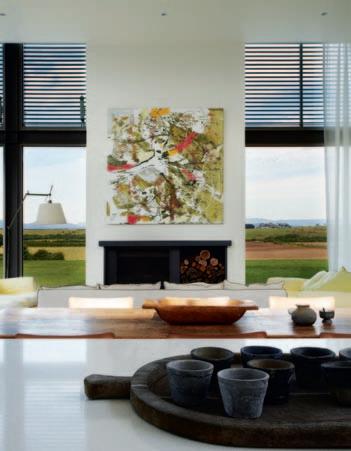
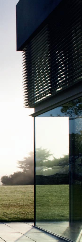
The house is very much a journey – and like all good journeys there are surprises, unexpected deviations, revelations and a destination. Sarah Foletta describes the inspiration behind the design as “Palladian, but modified”, in the sense that initially the house seems very symmetrical on approach down the driveway, but after passing through the portal formed by two pre-cast concrete storage sheds or out-buildings (not two walls as they first appear), through the gravelled courtyard and into the building, the house becomes a journey – and the whole point of journeys is that they are rarely symmetrical. But if everything appears
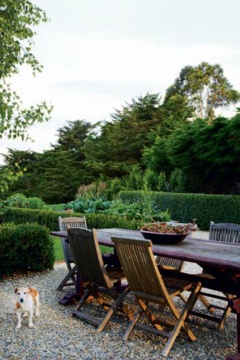
symmetrical, it is, says Sarah, “because it is so calm and everything is balanced.”
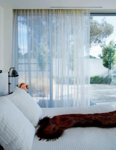
One way of looking at this journey is to see it as a transition from one world to another. To take up the English landscape sensibility again, it is a journey from an ordered, manicured rural utopia (the southern approach to the house) to the untamed, epic landscape of Turner as we look out across the east-west panorama of the plains and mountains. Then throw in a dash of Constable because the L-shape of the rear of the building is driven by the awesome 120 yearold Oak tree with its 38-metre span. This, says Sarah, is about “wrapping your hands around the tree.”
It is a journey of controlled revelation. Entering the house we pass by an internal courtyard to the left, home to a clutch of Crabapple trees. Next comes the guest wing which looks both on to this courtyard and out to the northern views and the Oak tree. Or turn right to the master bedroom with the doubleheight, fully glazed living/dining/kitchen pavilion as the leading edge of the L-shape.
But as I look out from the house and across the flood plain to Ben Lomond, I find my comparisons shift from Turner and Constable
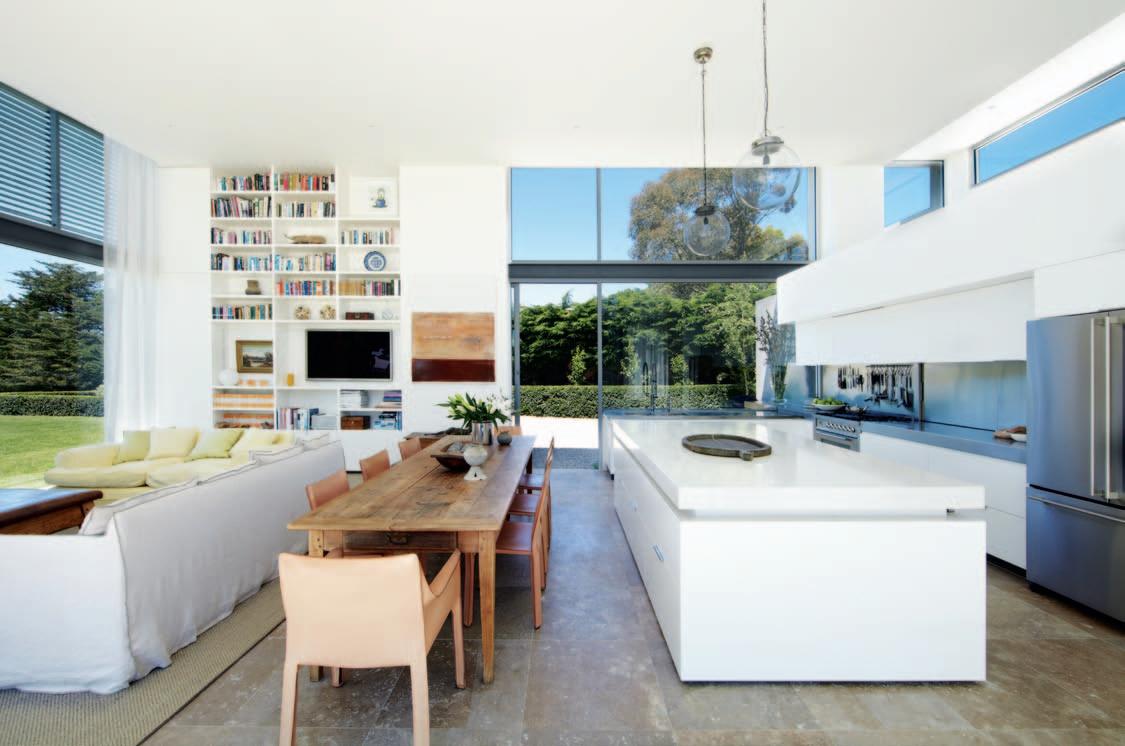
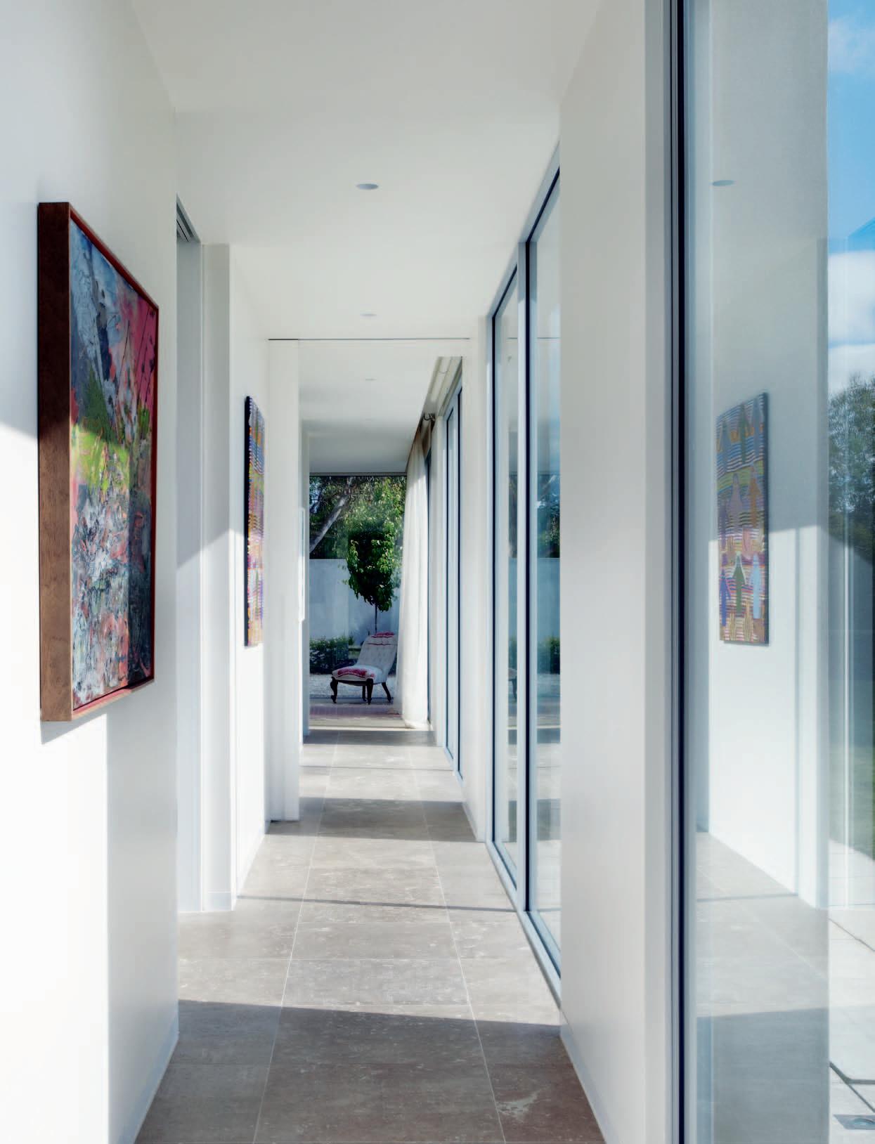
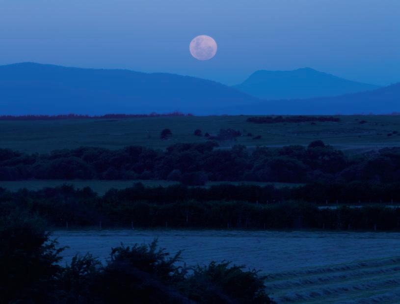
to traditional Dutch landscape painting. It is because of the way the vista seems to recede in a series of planes. The trigger for this is the ‘ha-ha’ wall. Here the lawn suddenly stops – the sheer drop is a wall, but acts as a fence for the cattle – and a totally new plane begins – to be followed by another and another.
One of the many pleasures of this house is the way it resonates with so many metaphors. But for me the dominant one is that of a rural idyll – or, more precisely, the rural idyll. Here is a completely modern house, albeit with classical overtones. But it merges with a landscape ranging from the carefully manicured to the untamed, which inevitably conjures up a host of residual visual memories from the storehouse of Western landscape painting.
The word which comes to mind is sublime, how in art or religious passion we lose our individual identity and become part of the universe. In art, this does not necessarily mean a huge picture (check out the miniature Constable cloud paintings at London's V&A), but here I think it does. Look out on this landscape and lose yourself.
drop box
DeSigner Sarah Foletta Design
builDer Adrian De Angelis
Structural engineer Bullock
Consulting
Joiner Kilpatrick’s Joinery
lanDScape DeSigner Peter Fudge Gardens
S a R a H foletta de SIGN
(61) 421 042 299
sarahfolettadesign.com
furniture In Living Room, Gervasoni Ghost sofa from Anibou, Gym Bench coffee table from Capocchi, and existing Cassina Cab chairs. Outdoor setting from Jati, Viccarbe stool from Hub Furniture. In Entry, antique hall table from Winton Cottage. Other existing antique furniture.
lighting
Lighting throughout by Case Monde, bedside lights from Ici Et La, Tolomeo Mega Terra lamp
by Artemide, existing antique lighting throughout.
fi ni S heS
Toscano Roman Render in Ross by Toscano. Natural anodised aluminium windows and doors by GP Glass Supplies, and Merbau shutters and doors. Natural anodised aluminium louvres by JWI.
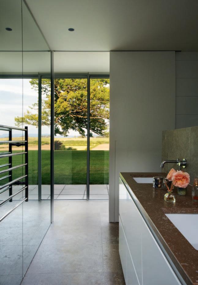
Generally throughout, Natural White paint finish by Haymes, pre-cast concrete by Duggans, Bella linen curtains in Winter White by Mokum, and existing chairs are re-upholstered in vintage linen.
fixeD an D fitteD I n Kitchen, refrigerator by Jenn-Air, oven by Ilve, and Qasair rangehood, all from Elite Appliances. Jado sink mixer by Mary Noall. In Bathroom, fittings by Mary Noall and Rogerseller.
Honed and filled travertine stone floor tiles in Noce by Aeria Country Floors, Tuscan Shabha Sisal by International Floorcoverings.(Clo Ck wise from top left)
tasmanian oak doors cu Stom D eS i gneD by b u ilD er, (61 3) 6340 1817
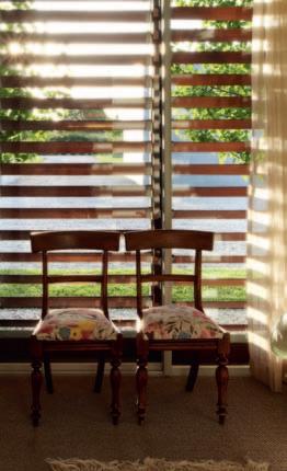
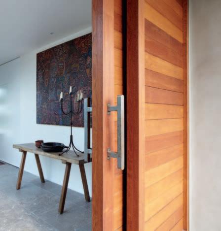
ExtE rior wood E n shuttE rs in merbau, cu Stom D eS i gneD by builD er, (61 3) 6340 1817
ghost sofa from an ibou, anibou.com.au
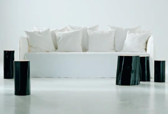
tolom Eo m Ega tE rra lamp D eS i gn eD by michele D e lucchi & giancarlo faS S i na, from artemi D e artemi D e .com.au
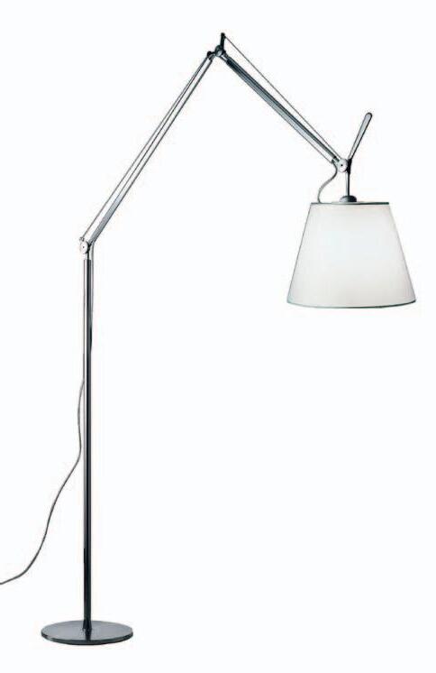
Contemporary, with a strong sense of classical elegance, is how Sarah Foletta describes her practice. With a focus on clean sweeping lines, uncluttered spaces, and unique designs, Foletta is passionate about ensuring she interprets her clients’ attitudes towards a work/life balance.

“The most important moment in the conception of a building is the understanding of the way people move around a space,” says Foletta, “how they share a space, and how this space can influence their emotions.”
In designing the Bunker House, Foletta created an environment that assists in nurturing the creation of a space that is totally cohesive to the client’s needs whilst ensuring functionality. This approach is fundamental to both the success of the Bunker House, and Foletta’s design studio.
Throughout the house, all pieces maintain a common element: namely, they were chosen for their ability to both enhance and complement the space around them. “The Tolomeo lamp gives off a subtle ambient glow at night-time,” says Foletta, “ but it still has the architectural element of wires, which marry in with the exposed columns and beams of the house.” The Merbau shutters work in a similar way, “giving the building life,” as Foletta says. “Timber always softens hard surfaces and the louvred components add texture to a very simple building.” The use of timber is continued throughout the house, creating a seamless flow between the exterior elements, and the unique pieces within.
And, as Foletta points out, this integrative conversation continues inside. “The Ghost Sofa’s soft linen slip cover gives off a more traditional aesthetic, allowing it to tie in with the antiques.”
716 High Street, Armadale VIC 3143, (03) 9421 1191

www.morticeandtenon.com
Mortice & Tenon produces bespoke and contract furniture to order and architectural joinery to specification. Collaborating with some of Australia’s renowned architects and designers, Mortice & Tenon’s unique craftsmanship can be found in some of Australia’s most beautiful homes, corporate and commercial environments.

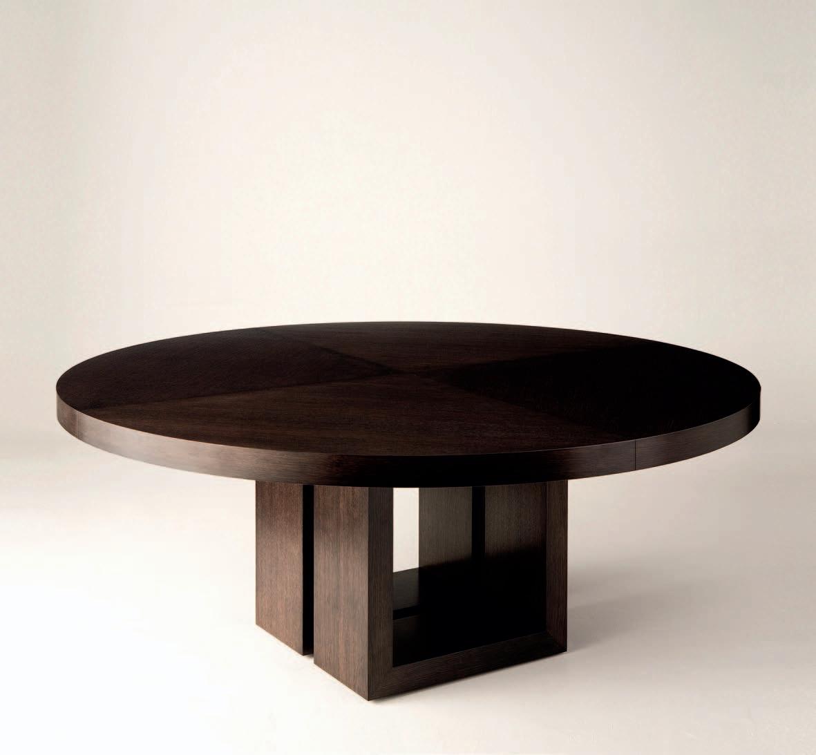 Australian Manufactured, Designer Furniture & Architectural Joinery
DeUnie Dining Table designed by Ljiljana Gazevic
Radii Extension Table Pedestal Table HiRise Dining Table
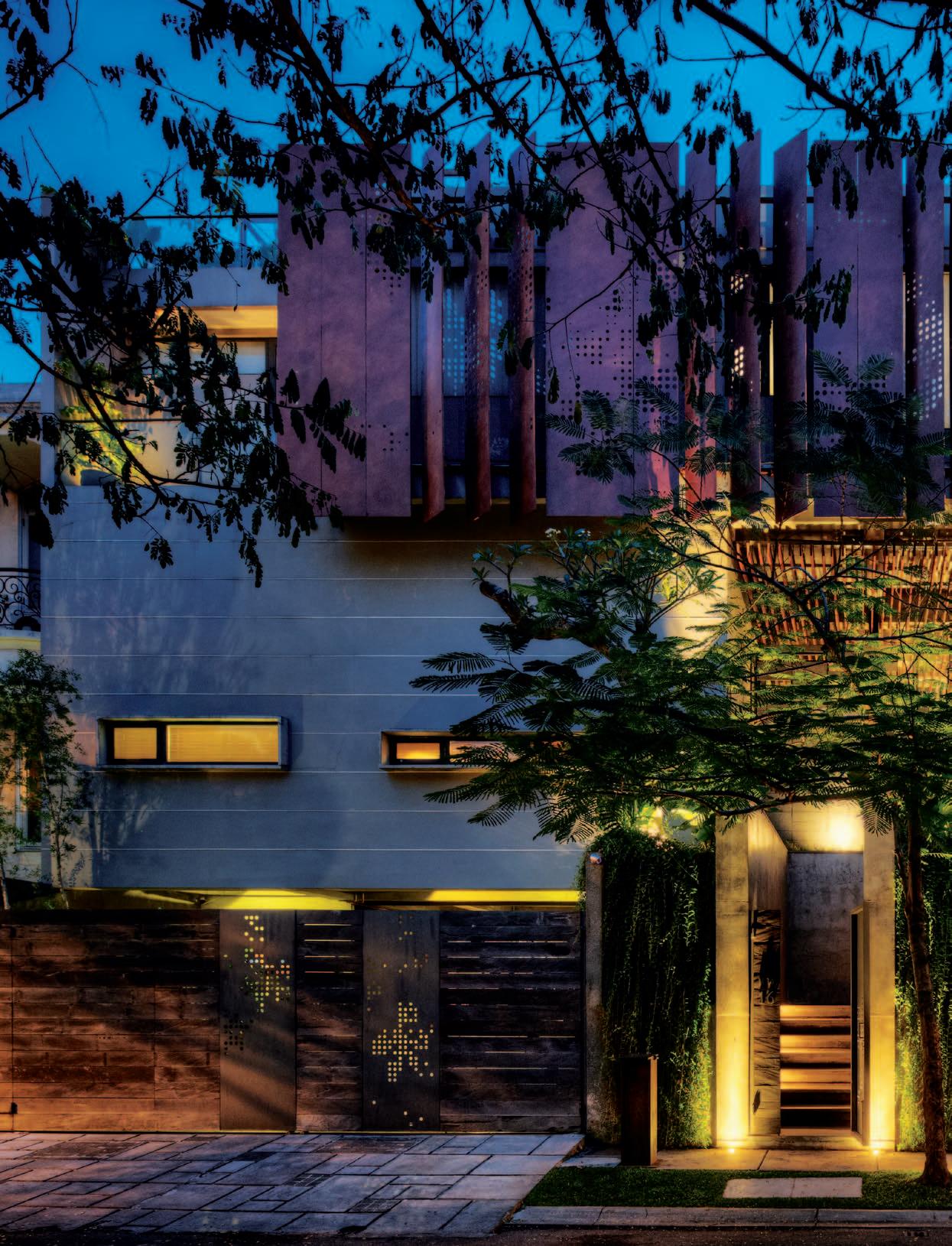
Among Indonesia’s younger cohort of imaginative and innovative architects, BUDI PRADONO is particularly prominent. PAUL McGILLIcK visits a JAK ARtA house of his which has benefited from a close collaboration with the clients.
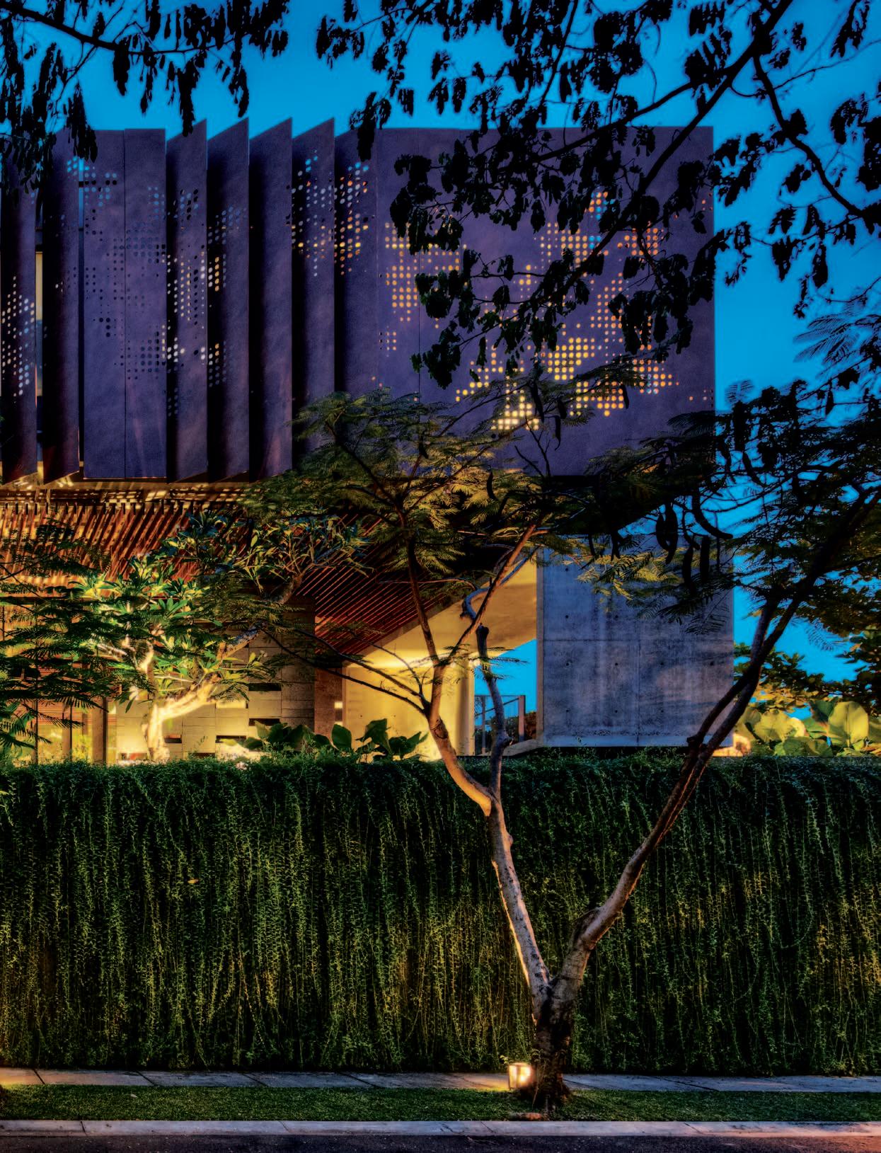 text Paul McGillick | PhotoGr a Phy Masano k awana
It is said that good architecture needs a good client. The question is: what constitutes a good client? For some architects a good client is one with an open cheque book. For others a good client is one who stays out of the way.
But often the best clients are engaged –they know what they want, they insist on being part of the process and they contribute to the outcome. They can be difficult, of course. But then there’s no gain without pain.
I don’t think the client for the Kencana House in Jakarta was difficult, but he was certainly engaged, providing the architect, Budi Pradono, with a detailed written brief beginning with a quote from Louis Kahn: “Architecture is the thoughtful making of space.” There follows a dot-point description, ‘Who are we?’, a detailed site plan indicating issues to which the house needed to respond, the character of the ‘dream house’, general and specific wish lists, an example of the kind of house he was looking for and a detailed programme for a three-storey house complete with roof garden.
The starting point was the over-arching issue of privacy and community. The house is in a gated community, but with a considerable degree of porosity, especially in regard to a neighbouring kampong whose residents can come and go through a gate which is only locked at night. The residents of the gated community
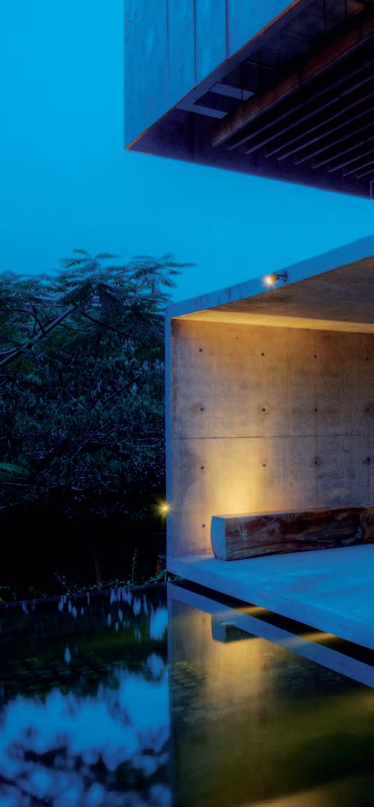
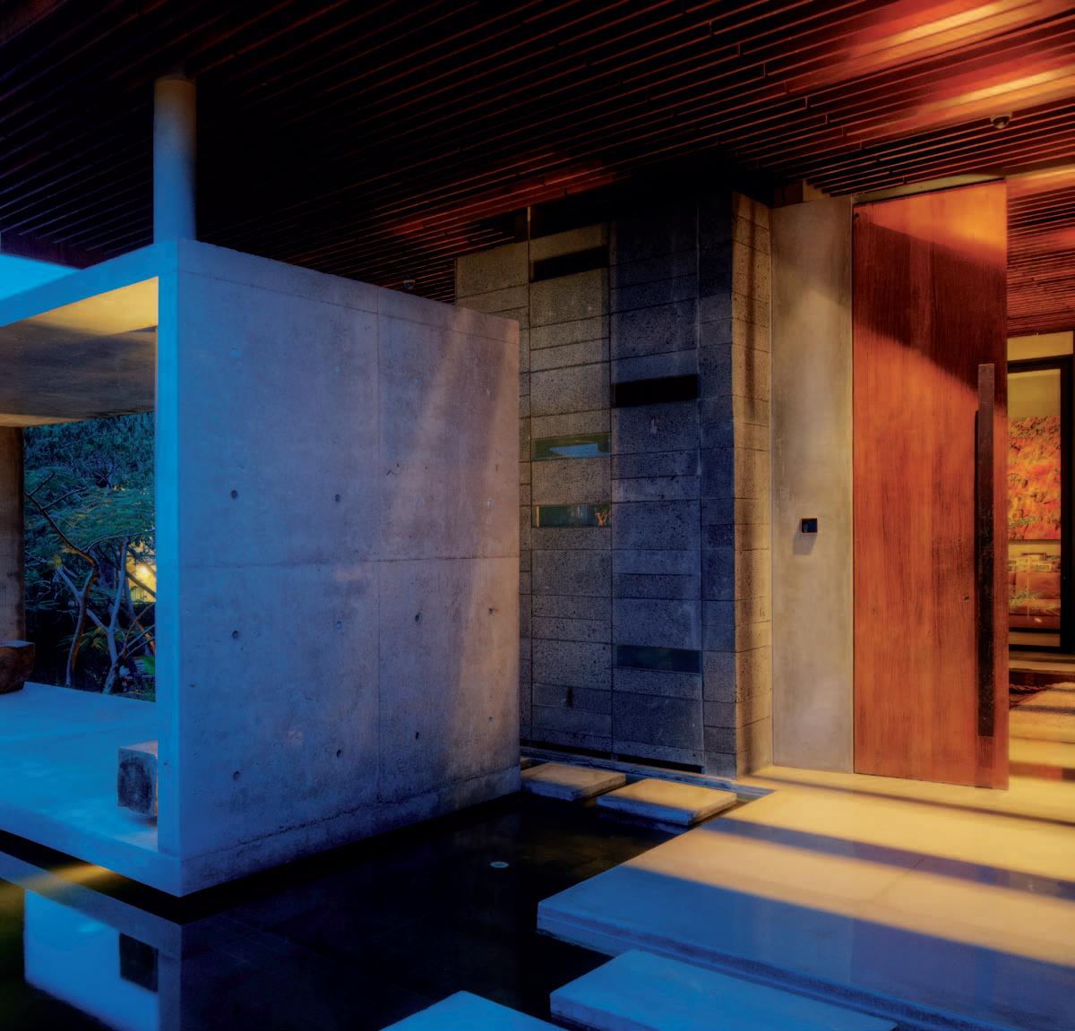
We approach the house itself over a timber walkway into the soaring internal courtyard.
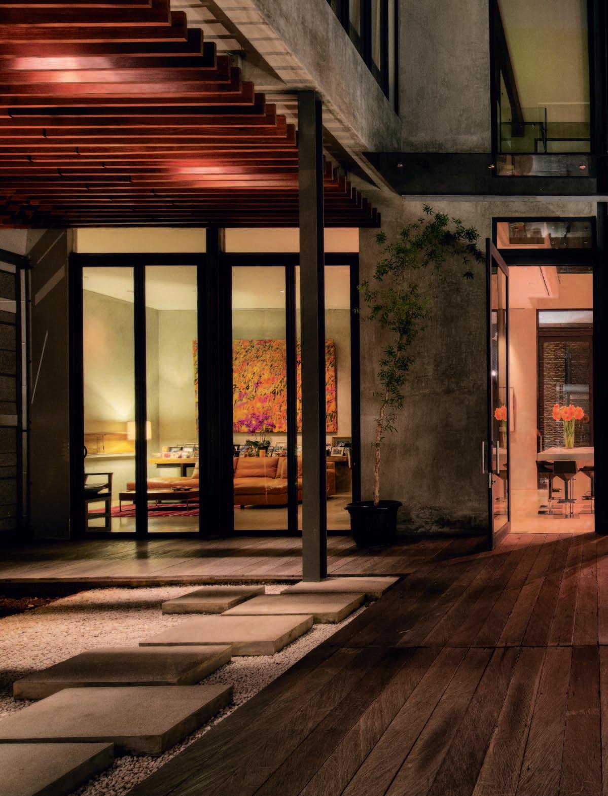
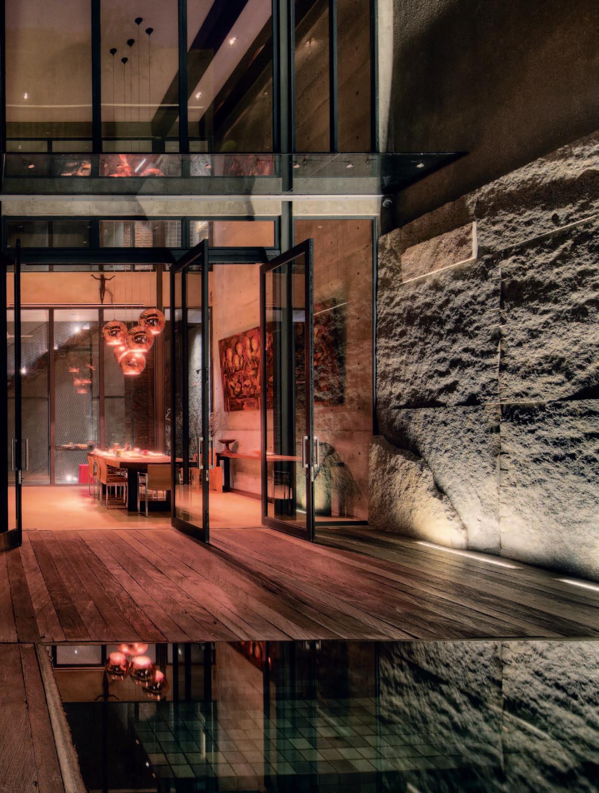
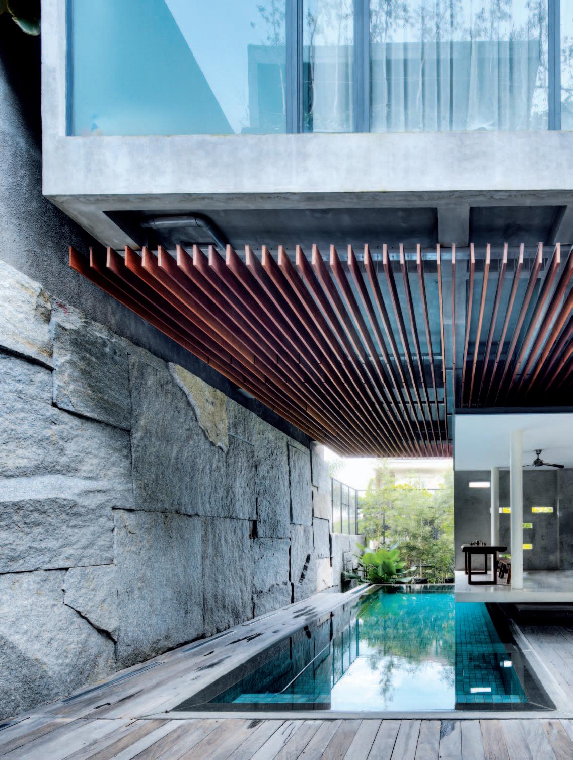
are predominantly Christian, although there is a residual group of residents pre-dating the establishment of the gated community.
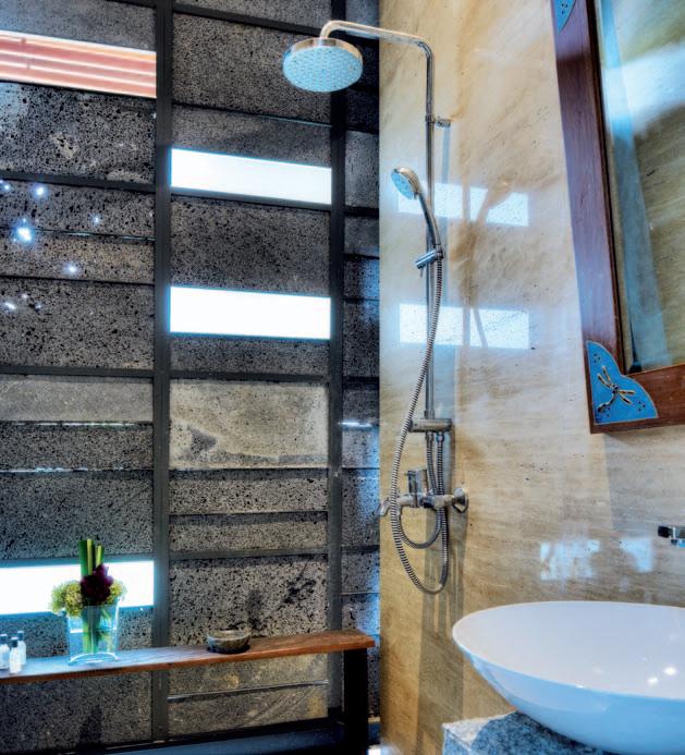
Most gated communities are affluent to a greater or lesser extent and typically are communities only in so far as there is a shared, protected location. s o this one is unusual in that a majority of the residents share a common faith. This faith emphasises charity as a virtue, hence there is a commitment to provide support as needed to the less affluent residents of the gated community, in addition to the neighbouring kampong.
However, like the owners of the Kencana House, most residents are Christian and memories of the appalling anti-Chinese and anti-Christian riots in May 1998 are still very strong. During these riots homes were systematically invaded, attended by looting and apparently organised gang rapes and murders. As a result, security remains a major issue for ethnic minorities.
so, with this house, the challenge of reconciling privacy and community is arguably greater than elsewhere in s outh-ea st Asia where gated and guarded communities are common. The clients wanted a house which took advantage of its corner site with its views, light and breezes. They wanted a house which would be a part of the community, but which would also be secure, protected from the noisy intersection outside and which was, to an important extent, self-contained – creating its own world, a mix of the urban and the natural.
It is very much an exercise in refuge and prospect. It is a refuge from the outside world,
but it also provides prospect. The prospect in this case is to the outside – through the patterned metal screen and louvres, through selective view corridors and above all from the rooftop garden, which Budi Pradono refers to as a ‘sky garden’.
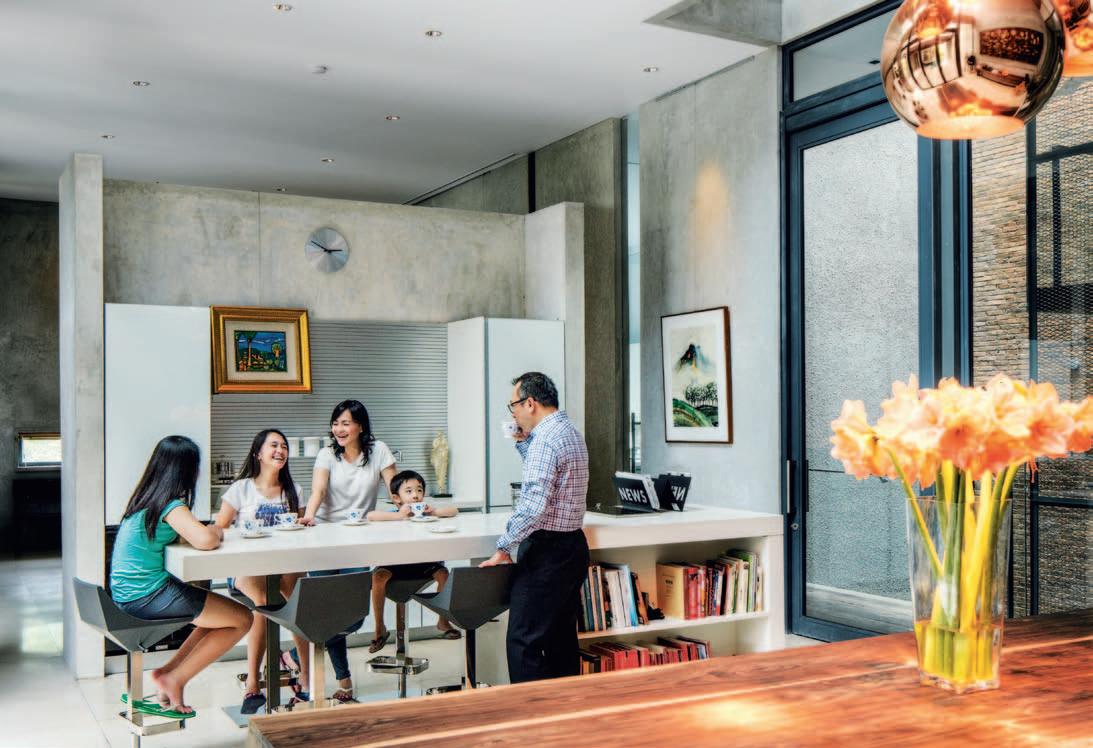
But there is also some astonishing internal prospect which begins at the end of an extended arrival sequence. This sequence starts in the street where the house rises up, more like a temple than a fortress, with its high, green street wall and the perforated, patterned screen of louvres on the second level. Passing through the perforated, patterned steel gate, up a flight of steps, over floating concrete pavers and past a floating concrete cabana, the visitor eventually arrives at the double timber-doored entry. once inside, we approach the house itself over a timber walkway into the soaring internal courtyard, flanked on one side by the swimming pool and a massive granite wall with the living, dining and kitchen spaces entering directly on to a timber deck inflected by gardens, water features and a pivoting, panelled metal screen providing privacy from the street as well as aesthetic texture.
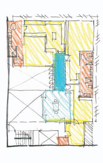
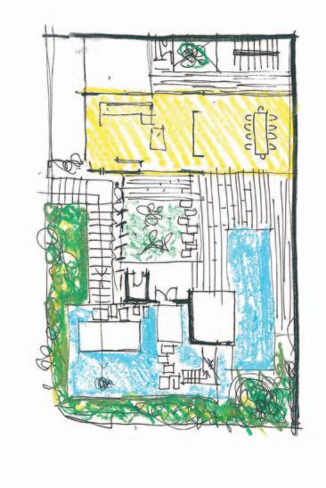
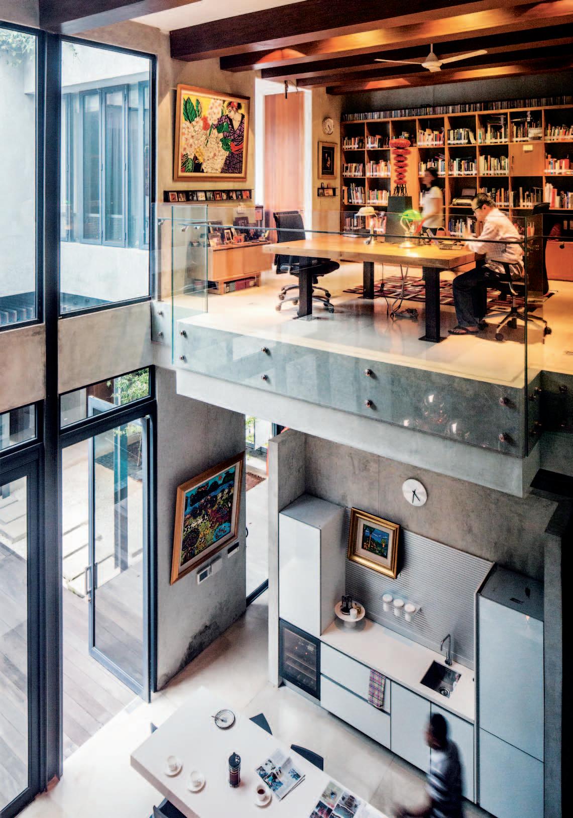
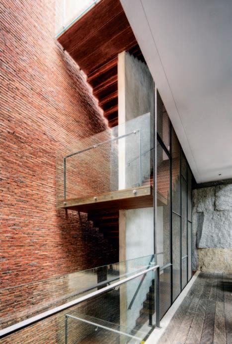
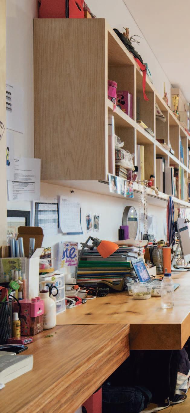
Secure, protected from the noisy intersection outside and...self-contained – creating its own world, a mix of the urban and the natural.
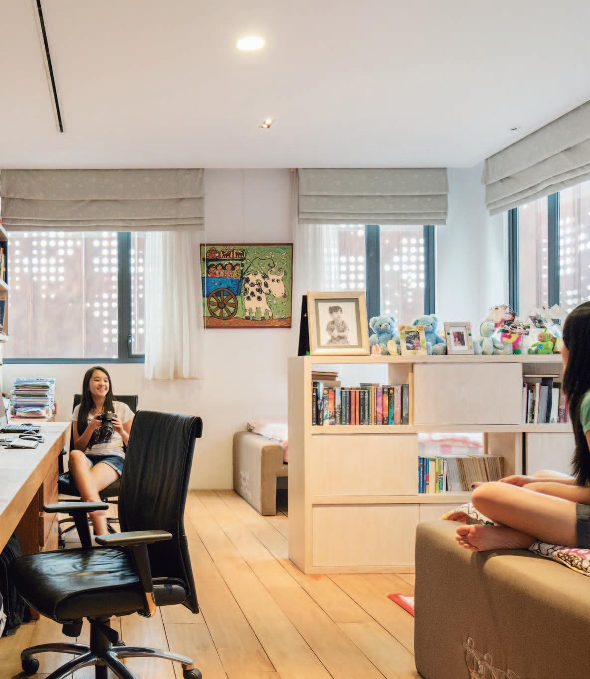
drop box
ArchItect Budi Pradono Architects pro Ject teAm Budi Pradono, Adhi Wibowo, Stephanie Monieca, Anton Suyono, Rizki Maulid Supratman, Elbery Chayadi, Maria Olivia Sohuat, Nora Zimmerman, Yega Adhi Sakti, Silmi Cahya Pradin, Denaldo Armusadi, Nikita Notowidigdo, Amanda Nazar buIlder Mego Wahono and Fauzan Ngadiyatno lIghtIng SSA Lighting model mAker Daryanto contr Actor Mego Wahono, Mega Sarana InterIor contr Actor Stella Mobili, Ambiente, Lunate, Cellini pro Ject mAnAgement Prayitno
Management, Gunawan structur Al engIneer P.T. Toyo Cahya Engineering consultAnt engIneer P.T. Metrik Tata Sarana
BUDI PRADONO ARCHITECTS
(62 21) 737 0367 budipradono.com
This soaring prospect is repeated twice inside the house – initially where the glowing, open space of the library floats out above the pantry (kitchen) and dining space below, and then beyond that in the secure area of the house where the enclosed glass and steel mesh stairwell leads up to the private areas of the house.
In the clients’ outline of what their ‘dream house’ would embody they speak of ‘space, calmness and serenity’ combined with being environmentally responsible while also communicating a sense of luxury. They speak of being able to relax and “feel the essence of a long-lasting summer place that is entirely in tune with the surroundings, a place that responds to your emotions and sense of wellbeing.” In other words, good feng shui – hence, the mix of metal, water, fire, stone and wood.
Budi Pradono has provided all this with an ensemble of inter-connected spaces and a rich counterpoint of materials. The clients themselves – they are art collectors, and the lady of the house is a florist – have added to the textural richness of the house which successfully resolves the polarity of community and privacy, not just as an urban player, but domestically as well with enticing communal areas where the family can gather along with visitors and yet still retreat to their own private places.
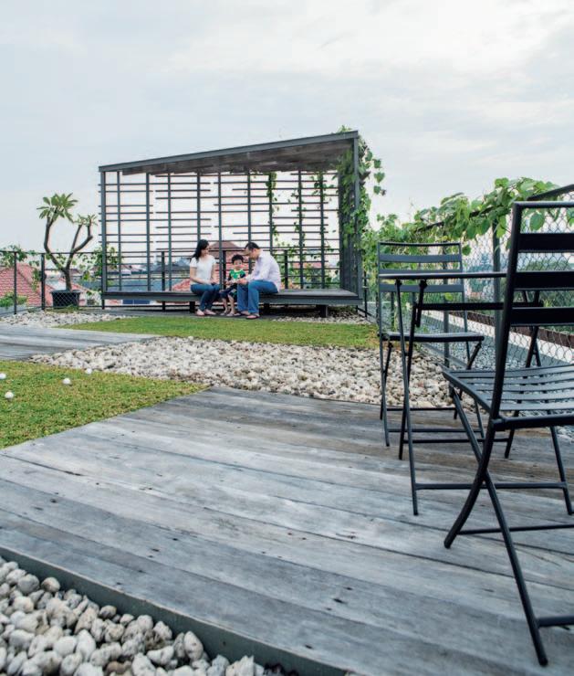
Art In Dining room, Last Supper by Faizal and Crucifix, flying Jesus by Teguh o stentrik. In Living room, Sunrise and Starry Starry Night by Agus ‘baqul’ Purnomo. At reflecting pool, Dream of Mother statue by Teguh ostentrik. In Corridor, Voice of Angels statue by Dolorosa si naga.
fu rn It ure
I n Living Room, Poltrona Frau sofa, coffee table from Bo Concept, custom-made frame steel credenza with solid Pine table top, and an Indian Rosewood/sonokeling wood TV table. stools by Calligaris. In Dining room, custom-made steel frame dining table with solid Indian wood designed by owner. Dining chairs by Cassina.
lI g htI n g
Copper shade pendant lights by Tom Dixon.
fI n I s hes s econdary skin cutting iron by DLM, finished in rustic style paint from Porters. Indoor private
areas and outdoor flooring are solid Teak and u l in woods. All marble finishes are pietra serena, statuario and travertine marble. Iron mesh and steel wall finishes made by su mber Baja. Floors are in handmade terrazzo.
fIXed & fIt ted
Bathrooms and powder rooms are furnished with combination of Villeroy & Boch sanitaryware, Apaiser custom made basins and bathtubs and Alape sinks. Fittings are the combination of Dornbracht and Hansgrohe. In Kitchen, stella Mobili cabinets with De Dietrich stove, Blanco sink, Miele food/plate warmer and oven. Refrigerator by Liebherr. In Pantry Area, schiffini designed pantry kitchen with Liebherr refrigerator and Miele wine cooler. Pantry table with customised Caesarstone. Water tiller system from P.T. Contract engineering Berjaya, sound systems from Bose, curtain wall system from Toso, a ir conditioning units by P. T. neksusindo, and aluminium frames supplied by Aluplus.
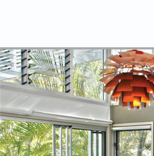

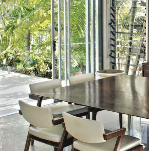
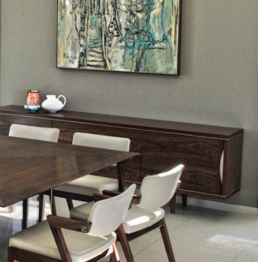






VALUED AT $943 EACH RRP

SUPPLIED BY KE-ZU
Designing with light is not simply about lighting alone, it also involves creating mood, highlighting architecture and creating exceptional environments. Designed free from excesses, and with pure geometrics, SLIM system’s timeless form will complement any and every space.
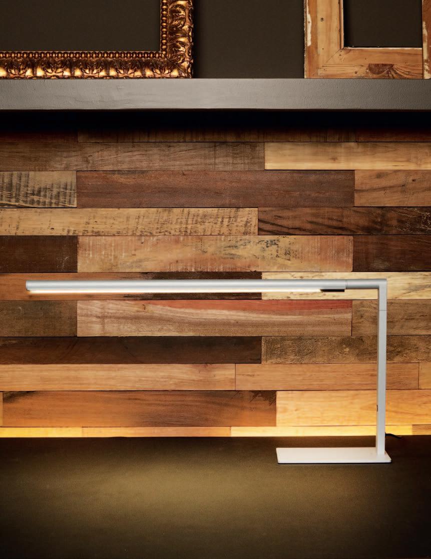
With its technological innovation and high lighting performance, SLIM can be applied to a wide range of light fittings, providing the greatest variety of e ective, innovative solutions to light spaces and working areas. SLIM is available in white, aluminium or graphite. To enter, simply SUBSCRIBE to HABITUS magazine at habitusliving.com/subscribe and answer the following.
QUESTION: Tell us in 25 words or less, what you think is the most important element in lighting design?
For full terms and conditions visit: indesignlive.com/subscriptions_terms

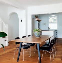
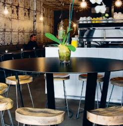
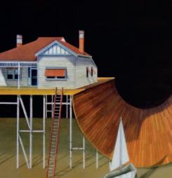

Introducing the next generation 60cm Built-in Oven, reinvented from the inside out with an extraordinary 77 litres of usable capacity and unique ActiveVent™ technology – an ingenious oven system that maintains heat and controls moisture levels for the perfect roast every time.

Perhaps it is the intense white nature of it, but Australian houses rarely play with light. PHILIP DREW visits a new CASEY BROWN house south of SYDNEY which does just that by exploiting the tone of Australian Blackbutt.
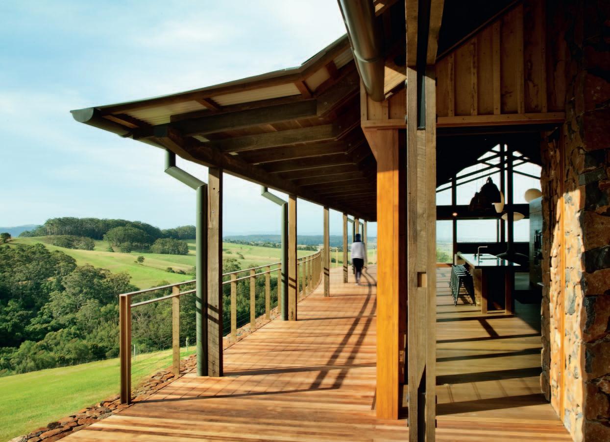
Alvar Aalto once said: “by ingenious gradation from light to dark the space is given plasticity”. We are conditioned to follow light and shun the dark. Electric illumination freed humanity from darkness. Modern architecture promoted white as the accepted colour — outside and especially inside. Le Corbusier proclaimed it in his 1937 book of drawings, When the Cathedrals were White
The Jamberoo house is about darkness, dark hardwood, not a blond look. Australian hardwood has a dark shadowy character and a mellow richness that retreats from the camera lens. In this project, hardwood is used throughout. The outside is clad in 128mm wide vertical Blackbutt with cover battens left in its natural state which repeats the construction of the nearby 19 th Century barn. We are accustomed to high tones for floors, illuminated by large areas of glass – essential to our contemporary image of the good life. It requires a writer of great subtlety such as Jun’ichirō Tanizaki (in his 1977 book, In Praise of Shadows) to encapsulate this different essence: “The beauty of a Japanese room depends on a variation of shadows, heavy shadows against light shadows – it has nothing else.”
Australia supplies a quite different palette of materials. Our hardwoods are dark, mellow, and rich, so their textures possess a dense heaviness – a very different character to northern European and Scandinavian or American timbers. It is time architects took
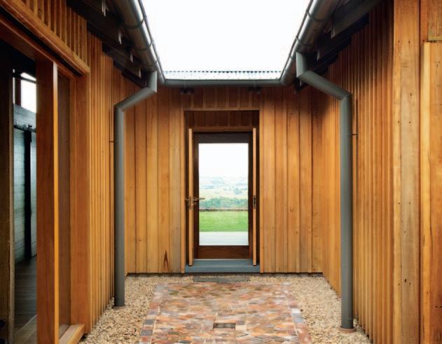
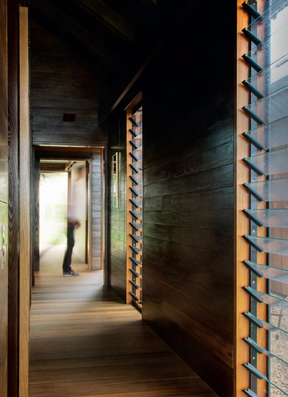
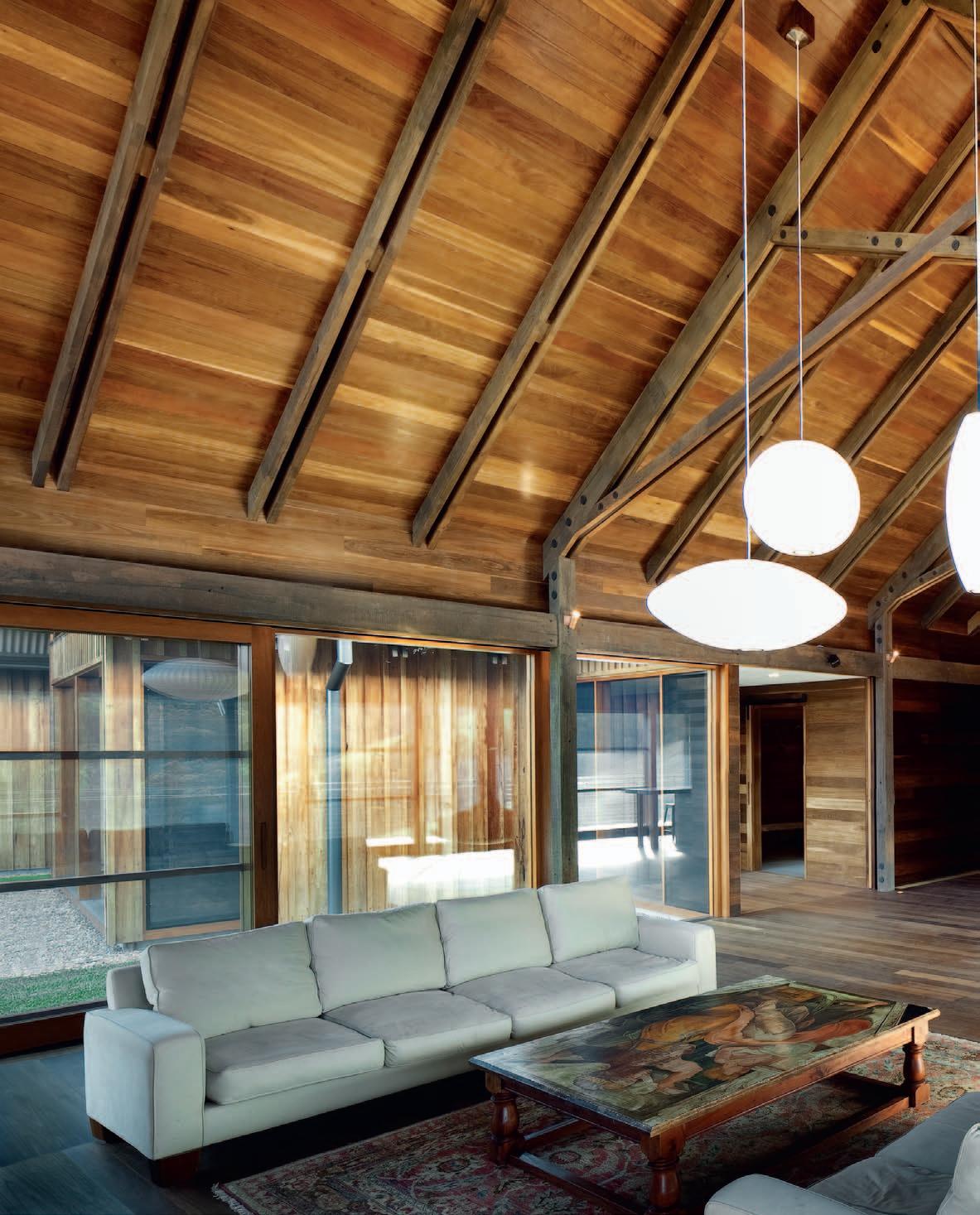
The living room with its encircling verandah is one large space not unlike a medieval tithe barn...
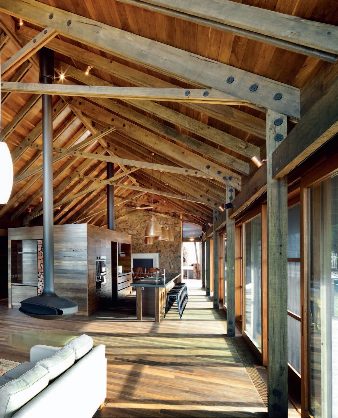
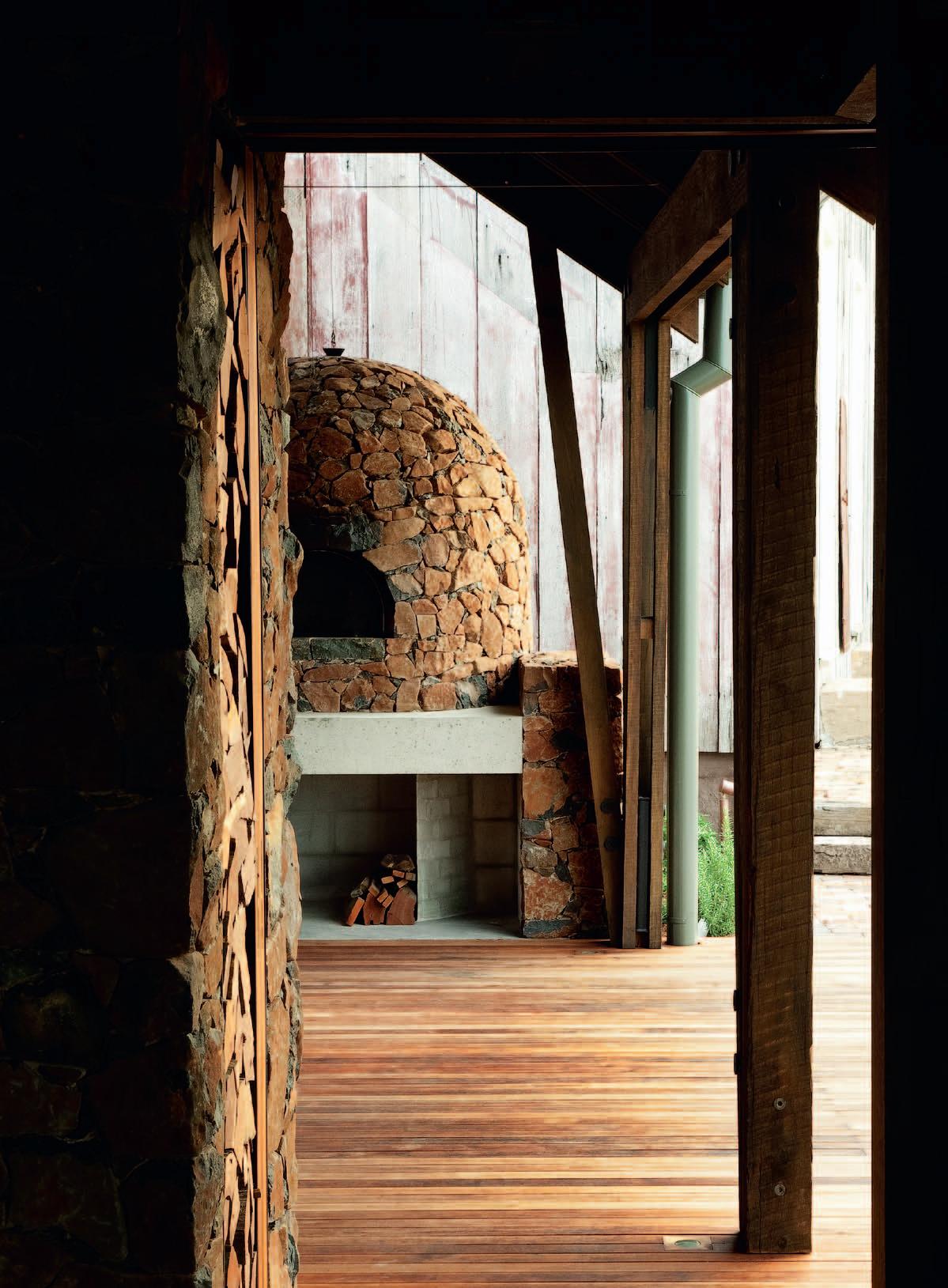
note and adjusted their visual approach to reflect this. This new house at Jamberoo by Casey Brown Architecture (CBA) does just that. Its tonal range is set by the roasted Blackbutt internal lining and floor, a process that darkens with age, coated in a natural oil. The result is darkly sombre, almost Japanese in the darkness of the timber. Hence, indirect light and the layering of shadows lend a special charm to the interior all on their own.
The shift of architectural key to the dark side is so unexpected it creates difficulties for the photographer’s camera which lives for light and struggles to capture the new language of layered shadow. The resultant aesthetic is the opposite of Greek marble sculpted for sunlight. It takes on a hidden dimension. One is reminded instead of the great Indonesian Buddhist temple of Borobudur, impossible to photograph because of its black volcanic stone.
The house completes a varied collection of farm buildings comprising a simple slab barn behind the house, planting shed, existing covered dairy and conservatory with pool, and two existing 19 th Century cottages. Three linked pavilions on the north corner frame the group around an ancient Moreton Bay Fig tree. A curved stone retaining wall edge unites the three pavilions at the site’s steepest point, thereby leaving the main living space to make the most of distant views to rolling verdant hillsides and the distant Tasman Sea. The landscape is typical of the Illawarra escarpment with its scatterings of ancient Cabbage Palms – an old landscape now in terms of settlement, Pacific with its wildness tamed and softened by more than a century of human intervention.
Although occupied by a couple, it also serves as a focus of random family get-togethers. On such occasions, it teems with relatives and friends and becomes a social gathering and meeting place with a warm convivial atmosphere, indoors and outdoors. The living room with its encircling verandah is one large space not unlike a medieval tithe barn with the kitchen and pantry inserted as elegant isolated boxes. The space extends into an open covered barbecue area that is climaxed by a round Portuguese pizza oven.
This main pavilion is attached by a gallery to two smaller pavilions. The gaps between each pavilion create visual escapes, interludes along the way that reveal glimpses of distant scenery. The second and smallest pavilion contains a bedroom overlooking the inner court which is dominated by the spreading Moreton Bay Fig, an aged giant, with a matching study/ library. The bathroom in the third pavilion is illuminated by a periscope-like window with mirror set at 45° to preserve privacy. It is a charming device that highlights what it is that is so pervasive and intrinsic to CBA, a resounding focus on perfect detailing serving a larger vision of domestic comfort and ease of living attuned to an Australian style.
The pitched corrugated galvanised iron roofs are lined inside with roasted Blackbutt. From the side, light is reflected from the shaded verandah, the living room spins upwards and merges into a graded darkness. Auxiliary struts that stiffen and support the roof thrust into this enveloping shadowy void. You could be looking up inside the underside the hull of an upturned boat – the impression is much the same.
The result is darkly sombre, almost Japanese in the darkness of the timber.
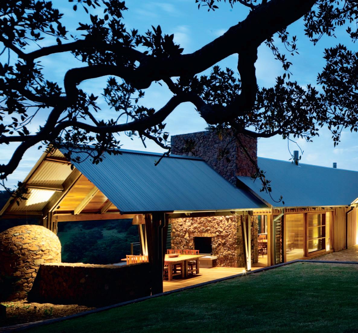
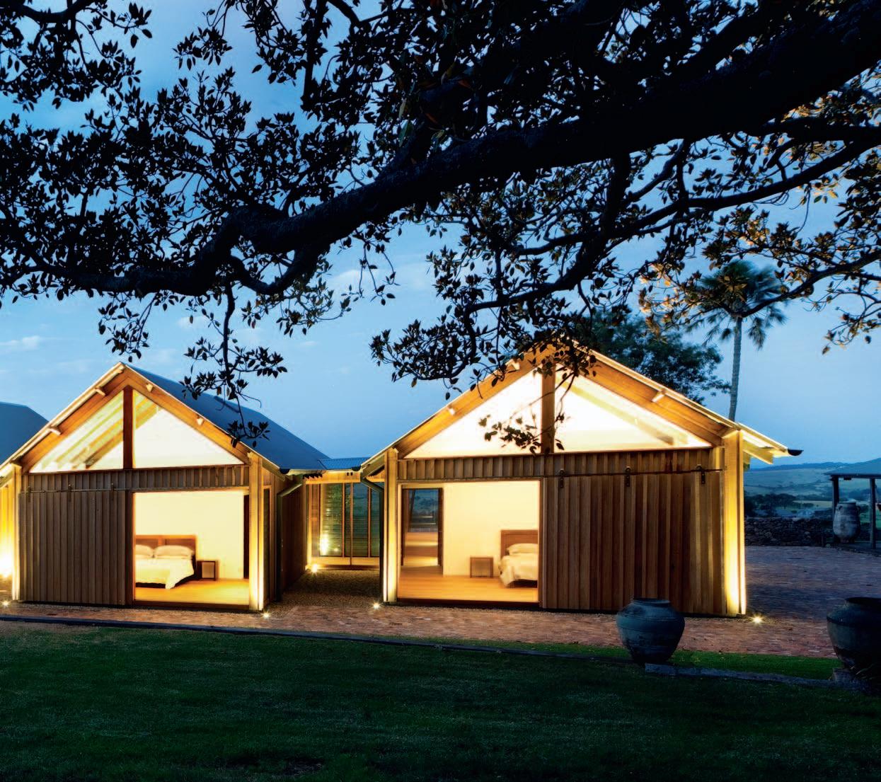
MAIN ENTRY
PANTRY/SCULLERY
KITCHEN
DINING
FIREPLACE
OUTDOOR DINING
PIZZA OVEN
LIVING
DECK
POWDER ROOM
LAUNDRY
GUEST ENSUITE
GUEST BED
STUDY
SECONDARY ENTRY
MASTER ENSUITE
MASTER ROBE
MASTER BED
COURTYARD
MAIN PAVILION
STUDY/ GUEST PAVILION
MASTER BEDROOM/ GUEST PAVILION
EXISTING COTTAGE
CARPORT
DRIVE
CONSERVATORY
POOL
EXISTING CONVERTED
DAIRY
AVIARY
PLANTING SHED
BARN
IN GROUND WATER TANK
TENNIS COURT
ARcHitect Casey Brown Architecture
desiGn ARcHitect Rob Brown
PRo Ject ARcHitect Antje Mahler
stRUctURAl enGineeR Ken Murtagh
BUildeR John Fielding
foReMAn Stephen O’Ryan
Pl AnneR Lance Doyle
HydR AUlic enGineeR JCL
Development Solutions
QUAntity sURveyoR Richard Cohen
Casey Brown a rCh ite Ct ure
(61 2) 9360 7977
caseybrown.com.au
fURnitURe Study shelving unit, Living room media unit, Kitchen joinery, Master Robe joinery, and Teak entry seats and beds designed by Casey Brown and made by Mark Watson. In Kitchen, Tolix stools from Thonet.
liGHtinG
Exterior wall lighting cape by Tovo Lighting. Internally and externally, in-floor Panorama Port Douglas uplights by Tovo Lighting. In Kitchen, hanging copper dome pendant by Bisque. In Living area Nelson Bubble lamps. In Bedroom, Tolomeo Parete lamp from Artemide
A Gyrofocus firehood is suspended above the dark timber floor and casts its reflection; above it, air fans by Boffi (designer Giulio Gianturco) gently push the air. Nearby, large Marc Tovo lights give a focus and lift and draw the eyes upwards into the ceiling space.
The landscape dominates – as it should. Stone walls, in keeping with the curving stone bridge approach across a small creek, supply a firm base, and push up from the verdant hillside. The material palette is restrained: rust red stone walls, thick grey Blackbutt board-andbattens outside and inside and for the timber floor. The internal doors are roasted Cambian Oak with Blackbutt for the external doors. This is the formal keynote of the architecture, restrained simplicity, an aesthetic that accepts and celebrates the character of Australian hardwood as a space definer that at first glance might appear primitive, yet is enduring and durable. Light grips such materials and reveals a surprising richness and depth. Above all, its peculiar texture and tactile feel, its dense heaviness, toughness and warmth can be found nowhere else.

finisHes Roofing from Colorbond. All timber by Harper Timbers, including Merbau decking, Blackbutt cladding, recycled Spotted Gum and Grey Ironbark structure and roasted Blackbutt internal linings and flooring. Flooring is coated in Bona Naturale Base, and Bona Naturale 2-Component. Doors and windows are by Woodhill Timber Windows and Joinery. Stone tiles are Fontain Bleu by Nefiko in antique and honed finish. Brass handrail and air conditioning grilles are by Active Metal. Paint finishes throughout are from Dulux.
fixed & fitted
Generally throughout, blinds by Silent Gliss. Kitchen cabinetry handles 6106-12/320 by Pitella. Door handles by Jean Nouvel, supplied by D-Line. Suspended fireplace is Gyrofocus by Focus. In Kitchen, Miele ovens, cooktop and integrated dishwasher, Qasair rangehood, Liebherr integrated fridge, sink by Oliveri and mixer is KWC
Ono Squareline. In Bathrooms, Vero basins by Duravit, Scala bath mixer by Sussex, and City Plus showerhead by Brodware. Toilets are Subway by Villeroy and Boch. Bath is Moloko by Dado.
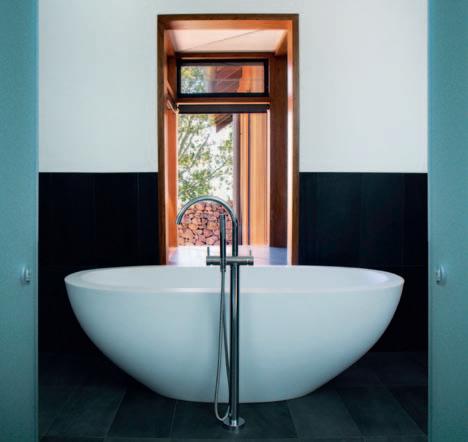
Casey Brown Architects create lasting architecture of unpretentious functionalism. A collaborative practice, Caroline Casey and Robert Brown work together to ensure every project reflects the character of its owners and the landscape around it.
Using natural materials and expressed structures, Casey Brown Architects are devoted to creating contemporary architecture through an organic understanding of a building’s climate and intended lifestyle. This sensibility of place derives from their years of work on historical buildings, and understanding of how a project’s design relates to history. This nonprescriptive approach takes every client, site and brief as something one-off and special. And the Jamberoo House is true to their vision. Choosing furniture and fittings that work with, and enhance the interior of the house, Rob Brown has created a space that is functional as well as beautiful. “Warmly toned large-scale lights,” he says of the copper dome pendant lights from Bisque, “match the copper accents of other light fittings and fixtures throughout the house.”
This continuity of theme and feel is continued throughout, even to the smallest of appliances. The door handles, designed by Jean Nouvel and supplied by D-Line, “utilise timber, which works with the timber of the walls and doors in the house – the texture also makes them warm and comfortable in the hand”. The beds, designed by Casey Brown Architects, also match the timbers used throughout. “They are designed to be rugged, practical furniture,” says Brown, “and they work with the rural character of the house.”
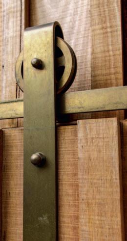
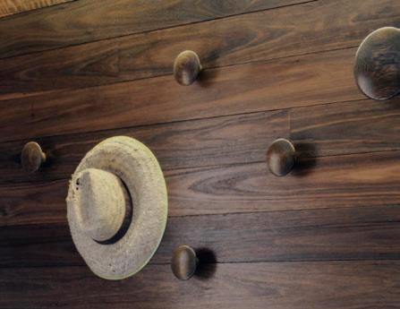
And character is what the Jamberoo house is all about. To Casey Brown Architects, successfully realising a project means much more than just designing the bricks and mortar. It is about creating a home.
(clO ckwISE FROM TOP lEFT) COPPER DO m E PENDANt LIg Ht fRo M
B is Q U e, B i s Q U einteRio R s .co M AU
BARN - S t Y LE ROLLERS cU sto M
MAd e By dAvid w i lliAM s At Active M e tAlwo Rk systeM s ActiveM e tAl.co M AU

tOLIx StOOL fRo M tH on et, tH on et.co M AU
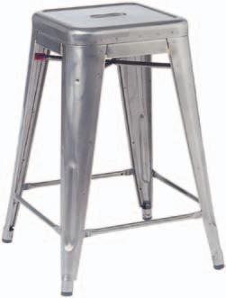
j E AN NO uvEL HANDLES fRo M d-line, dline.coM
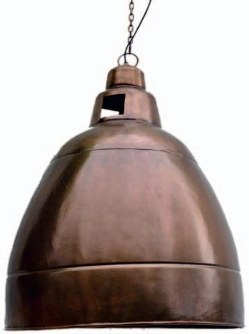
RECYCLED BRIC kS fRo M tHe BRick Pit, tH eB Ri ck Pit.co M AU
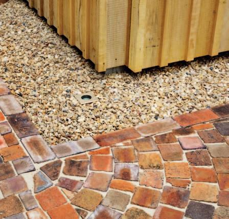

Architecture and design are much more than physical environments and technological development. When successful, they are sites of discussion, debate and cultural development.
Take Sydney’s iconic Opera House for example. The striking concept by Jørn Utzon, plucked from a pile of discarded competition entries, was the catalyst for unprecedented and ongoing engagement between government, public, practitioners, and the built environment.

Firstly, it represented a bold move by the government – commissioning Utzon as the sole architect. The project also inspired revolutionary materials and techniques – the distinctive shell design demanding remarkable engineering feats – and the highest level of collaboration between internationally renowned parties (Ove Arup & Partners and the Hornibrook Group, for example). But, just as important was the level of public engagement with the project – the project stimulated criticism, street demonstrations and, eventually, Utzon’s resignation.
‘The House’, as it is affectionately known, is world heritage listed for its “architectural form and structural design”. However, the spirit of innovation and debate it inspired should also be applauded.
It’s this spirit that will be revived in the 4th International Utzon Symposium held 7-9 March 2014, led by University of New South Wales (UNSW) Built Environment in
collaboration with the Jørn Utzon Research Network (JURN), the Utzon Research Center (URC), the University of Portsmouth, UK, and Aalborg University, Denmark. Held at UNSW’s Sydney CBD campus and the site of Utzon’s most controversial creation – the Sydney Opera House –the Symposium aims to “promote debate about the role of cultural production within urban contexts, encourage dialogue across cultural, political and economic boundaries; and contribute to the current thinking in academia and practice regarding the tensions and synergies between cultural production, politics, economy and the city.”
Encouraging leading international academics, practitioners, students and interested members of the public, the Symposium asks ‘What would Utzon do now?’ The inter-disciplinary approach will reflect Utzon’s diverse influences, and will explore advances in design, architecture and urban environments around the themes of Architecture, City Making and Political Economy.
Three prestigious keynote speakers have been confirmed: Finnish architect, lecturer and author Juhani Pallasmaa; Colombia University’s Marc Holliday Associate Professor of Real Estate Development and Director of its Center for Urban Real Estate (CURE), Vishaan Chakrabarti; and Founder and Principle Architect of Chendu-based Jiakun Architects, Liu Jiakun.
As we enter another era of architectural innovation and debate, the question: ‘What would Utzon do now?’, is on everyone’s minds.
The Slow Movement has permeated every part of modern life, including food, travel, fashion and sex. ANNA FLANDERS meets architect, ARIANE PREVOST, who took a slow approach to architecture in her own home in PERTH .
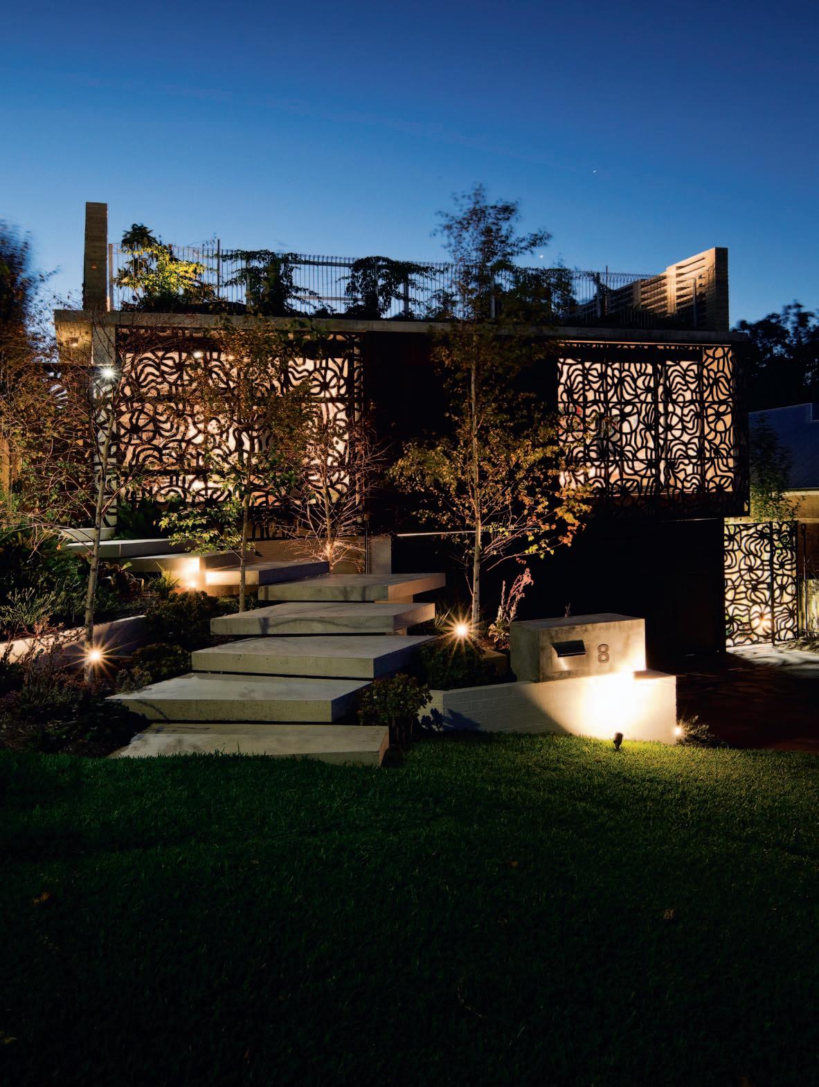
Perth architect, Ariane Prevost, looks over her back catalogue of work and states: “I can’t do this anymore.” It’s not that she’s not happy with her work. On the contrary, she is behind some of the most beautiful and prestigious homes in Western Australia. It is more about her personal evolution as an architect, a change in philosophy that has seen her embrace her own brand of Slow Architecture.
The Marimekko-inspired house is the first Ariane has designed using this philosophy. It’s also her own home and a space for five grown adults – herself, her husband and three children. It employs all the usual architectural considerations – site, client brief, budget, orientation and materiality. But where this is traditionally signed off prior to building, Slow Architecture calls for a fluid approach from start to end. “The design process is so much fun and it is the joy of the profession,” says Ariane. “But why does it have to happen before you start the build? Isn’t it part of the journey? That’s where my Slow Architecture comes in.”
“While bound by brief, desired outcome, budget and time frame, Slow Architecture is about enjoying the process,” she says. “It means all parties contributing to the design have an opportunity to allow different ideas to manifest over time.”
Ironically, the Slow Architecture process enabled her home to be built within 17 months, under the expected 22-month timeframe, as it encourages ready adaptation to circumstance. Ariane utilised on-site mistakes and leftover materials, seizing opportunities and capitalising on accidental beauty.
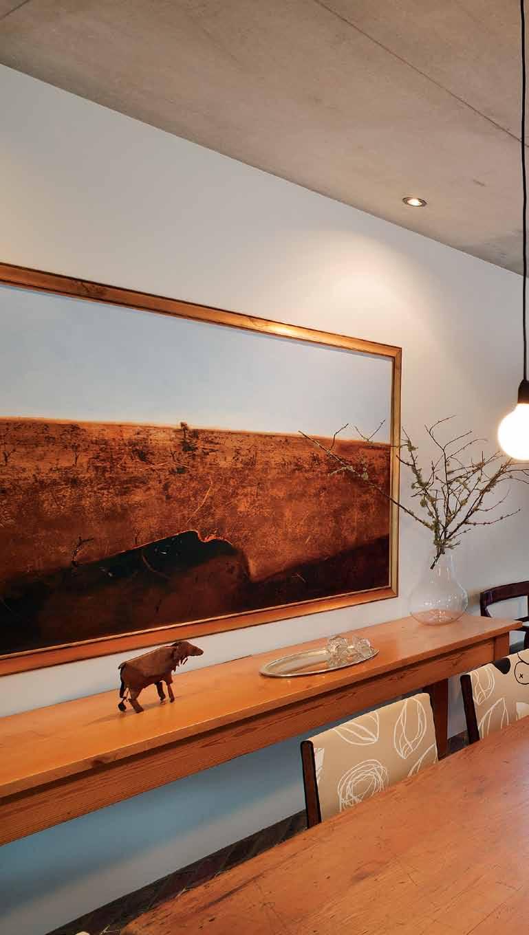
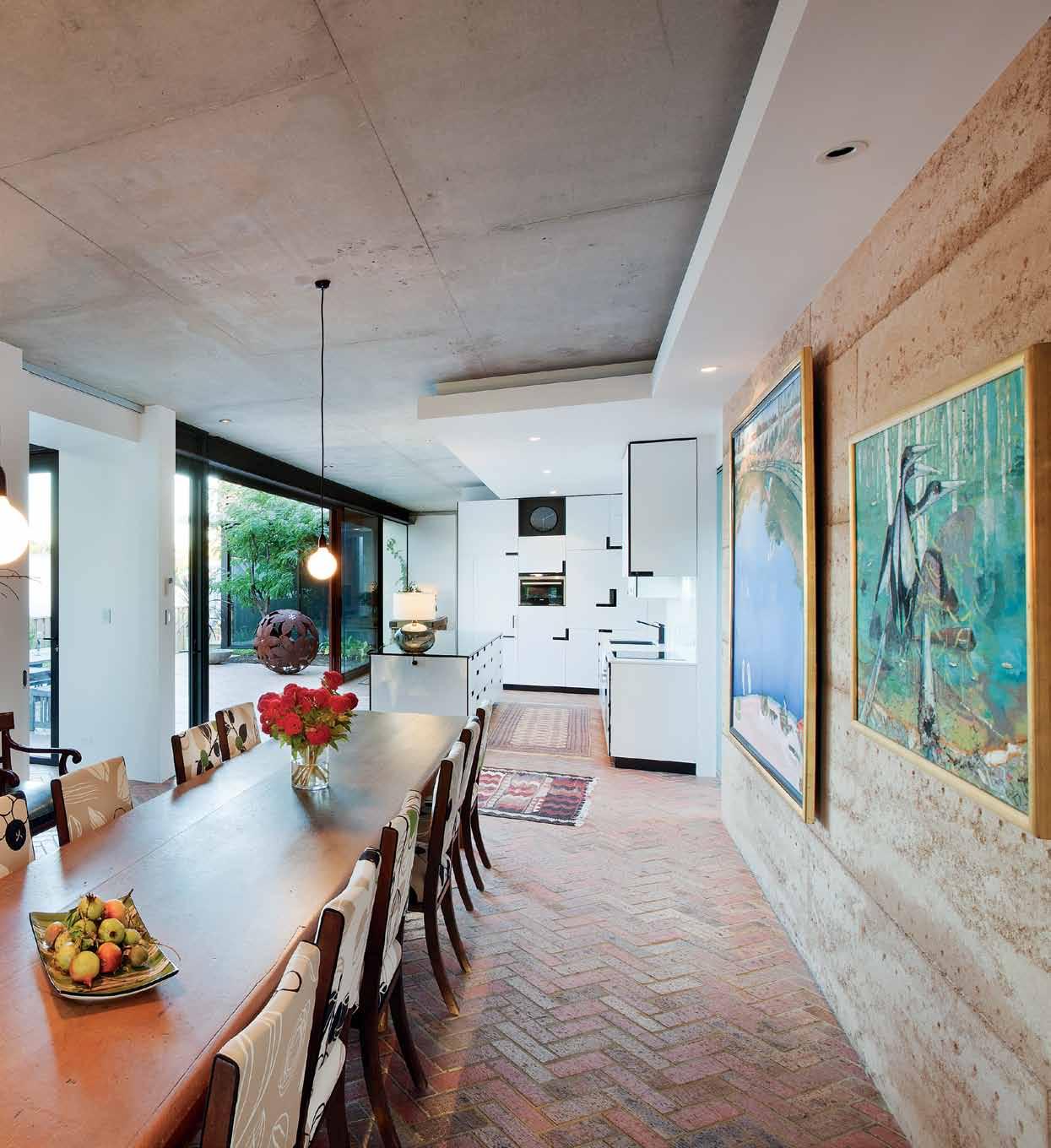
Raw elements of concrete, brick, wood, rammed earth and steel ground the interior.
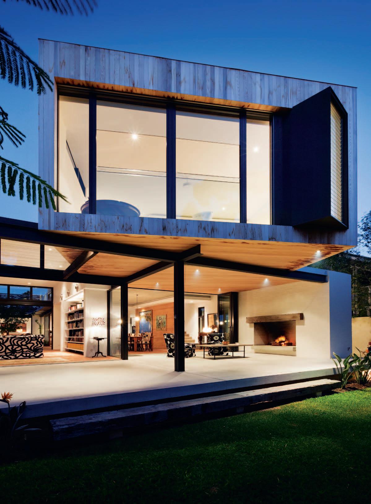
For example, she let nature decide the colour of the rammed earth wall, mixing leftover dirt and waiting to see what the formwork would reveal. “ We left the result up to fate and knew we’d just live with whatever we got. It was perfect in all its imperfection,” she says . This flexible and creative approach saw the Marimekko-inspired house completed under time and under budget – taking out two national design awards in the process.
While much of the design was finalised on site as the building progressed, Ariane had a clear plan for the structure and layout, taking into account strategies for dealing with the challenging solid limestone site. Firstly, she put down sand, which enabled the placing of services without the need for hard digging. The site falls over three metres from back to front; she took advantage of the undulation to capture the famous Fremantle Doctor (Perth’s strong daily south-westerly wind that cools the city). She then staggered the two storeys of the house to shield the courtyard and extensive roof-top deck with garden. “A roof is expensive and takes up height,” says Ariane, “so I always design a flat roof so that you can use it without forfeiting the space.”
At the front, a garage sits at ground level with a separate living area and three bedrooms/bathrooms above for the adult
children. The centre of the house is a main entrance, a kitchen (with combined laundry and scullery behind) and central courtyard (with sliding doors that delineate the kitchen and outdoors when open).
The back of the house is made up of the dining area off the kitchen and the living area to the right of the dining zone. Here, ceilings are 3.9 metres in height with soaring bifold doors at each end that interconnect the dining space with the rear outdoor terrace, and the living area to both the rear terrace and central courtyard.
The second storey above the dining and living rooms contains a large bedroom, bathroom (with outdoor shower) and livingcum-study area for Ariane and her husband. The roof deck can be accessed from here or via stairs in the central courtyard.
The home has been designed so that spaces can evolve and flex for the private, social and changing demands of a family of five adults. It blurs the boundaries between house and garden. It connects to councilowned parkland visually – through glazing –and sometimes physically – when the doublegarage-sized rear gate is opened, allowing parties to spill from the backyard and into the parkland.
At the front, an impressive steel screen gives the house its name, with the Marimekko
Joonas design cut-out providing ventilation, a sense of privacy and intrigue that acts as a kind of brise-soleil. “The Marimekko pattern was to represent femininity in a masculine material,” explains Ariane. “It created drama. I wanted it to say: I am a different house, I do not have a front door and a pitched roof – find my entry,” she says.
The sense of intrigue continues beyond the screen. Stairs in geometric shapes –another of Ariane’s loves – lead visitors to the main entry, covered by branches and flanked by greenery that intentionally makes the visitor duck and weave.
Following the path, a private world of greenery and glimpses of the home unfold. Turning a final corner on the path, an oversized floor-to-ceiling door confirms your arrival at the house. The door opens to raw brick floors, faded oriental rugs and floor-toceiling glazed walls with views to the central courtyard and garden beyond.
The home has a comfort and familiarity about it. There is a sense of being sheltered, but not shielded, from the world. Raw elements of concrete, brick, wood, rammed earth and steel ground the interior. The earth wall grandly soars in the main living areas, while bold lines lend a sharp design edge.
“I put in a black and white spectrum to contract the raw material structure

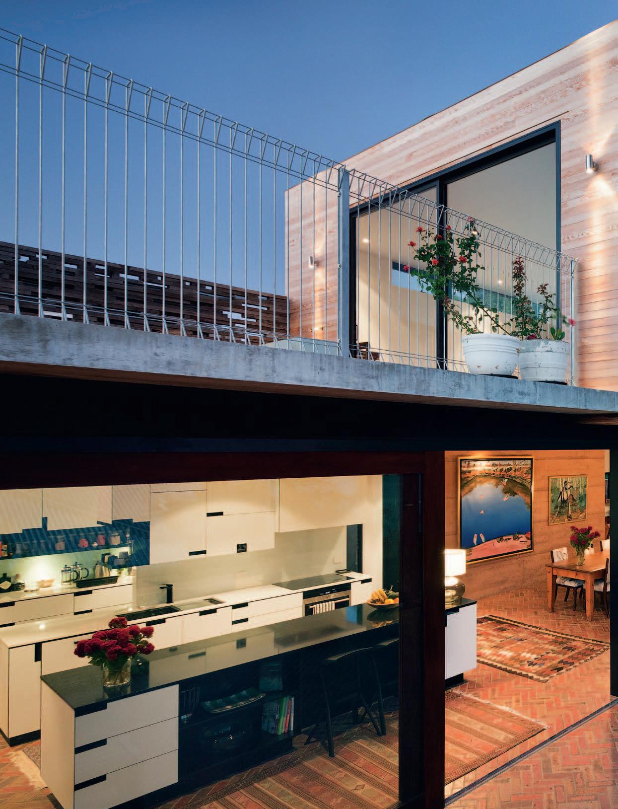
While bound by brief, desired outcome, budget and time frame, Slow Architecture is about enjoying the process.
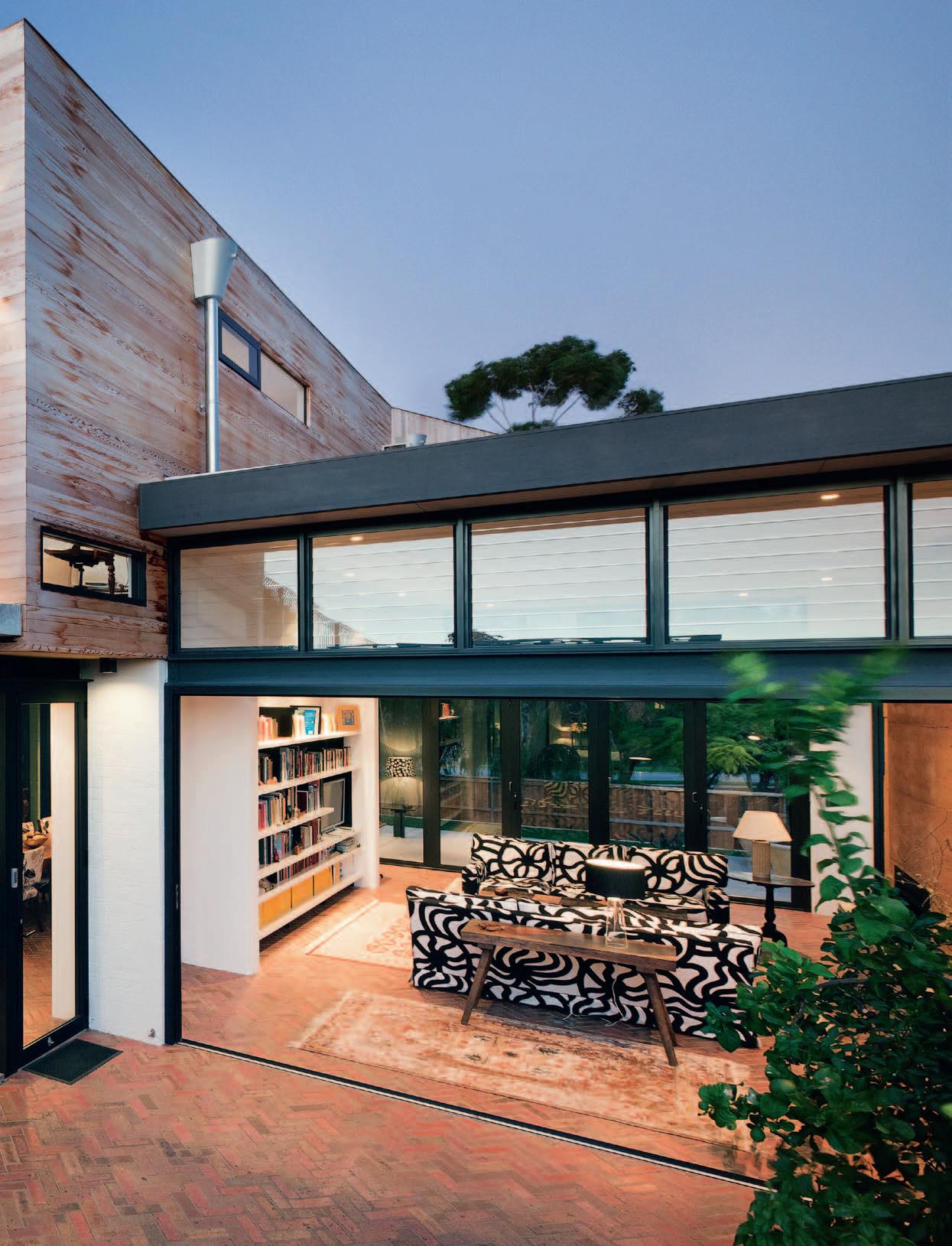
– [which made it] sharp, cut, edgy and intentional. natural materials were allowed to be imperfect – imperfect bricks were laid, imperfect bumps and warps were retained,” says Ariane.
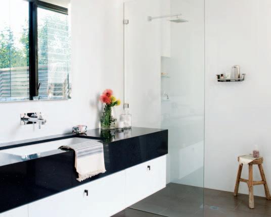
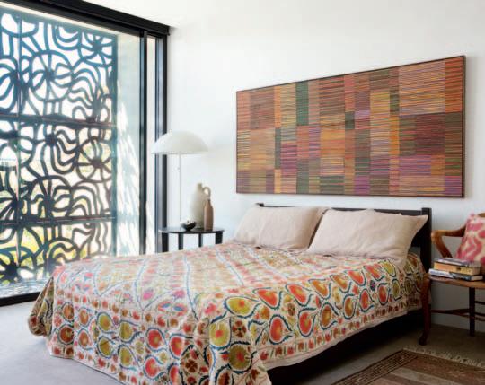
Ariane’s Slow Architecture principles also bring in contextual and emotivedriven design and materials. She believes in carrying furniture and art from your past to provide a sense of who you are and where you have come from. Her grandfather’s wingbacked chairs are now in a striking Ikea fabric, while old family sofas are recovered in a Marimekko print. An old table once used to slaughter pigs is now a beautiful console, while oriental rugs picked up on travels are scattered throughout the home. “ e verything in this house is something collected from my past lives and houses. I can’t understand how people can throw out pieces when they move house,” she says.
Feelings, nature, a sense of self, comfort and familiarity are all themes in Ariane’s design. In this structure, she melded slick contemporary design with imperfect rawness and family history. And while site, climate, budget and people defined the brief, she embraced an artistic approach. Ariane manipulated and evolved ideas and was inspired by materials onsite or unexpected mistakes that became beautiful elements: her Slow Architecture philosophy at work.
drop box
ArchiTecT Ariane Prevost Architect building conSulTAnT Trojan Construction
engineering conSulTAnT Fozdar
elecTricAl CLS Electrical pluMbing Fred Green Plumbing
ARIANE PREVOST ARCHITECT
(61) 411 592 187
ariane@arianeprevost.com.au
FURNITURE All furniture either custom designed by Ariane Prevost or inherited by owners.
LIGHTING All lighting supplied by Radiant Lighting.
FINISHES Generally throughout, carpets by MT c a rpentry and glass finishes by Allwest Glass. In Kitchen, splashback by c o lourback Glass and
Bone White & Midnight Rendezvous e s sastone bench top by Laminex. In Living room, sliding screens with translucent glazing from Hafele and herringbone brick flooring from Daniel Robertson. Other brick flooring from R & P Aguilera Tiling. e x ternal timber façade in Western Red c e dar.
FIXED & FITTED
In Kitchen, oven, stove, microwave and dishwasher
from Siemens. Fridge by Liebherr, twin sink by Franke, tap by Liscio, trough by c a roma and Iron c e ntre by Hafele. Generally throughout, compact laminate in Polar White and black melamine cabinets by Laminex and Franke c a binets. Gas fire by Jetmaster, air conditioning installed by Austramech and hardware from Architectural Design Hardware.
In response to Mies van der Rohe’s claim that ‘Less is More’, the ‘More for Less’ approach is conceived on the notion that simplicity brings enjoyment. Intended to resist the nonessential, architecture should, in this form, be a sensory experience to be savoured. And APA seeks to provide a true synthesis of art, sculpture and architecture.
In the Marimekko House, APA was inspired by a gradual manifestation of ideas to find the perfect equilibrium between family life and design. “The design is underpinned by simple family rituals, and a genuine commitment towards honest choices concerning the principle focus – to achieve more from less for a unique outcome,” says architect and resident Ariane Prevost. A series of unexpected journeys and materials help to achieve this aim: entry through an oversized pivot door, for instance, immediately accesses the heart of domesticity and showcases the outside world within.
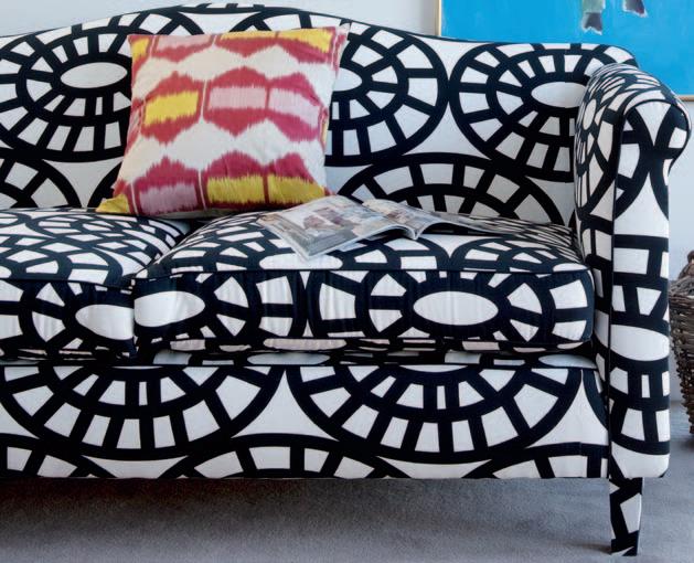
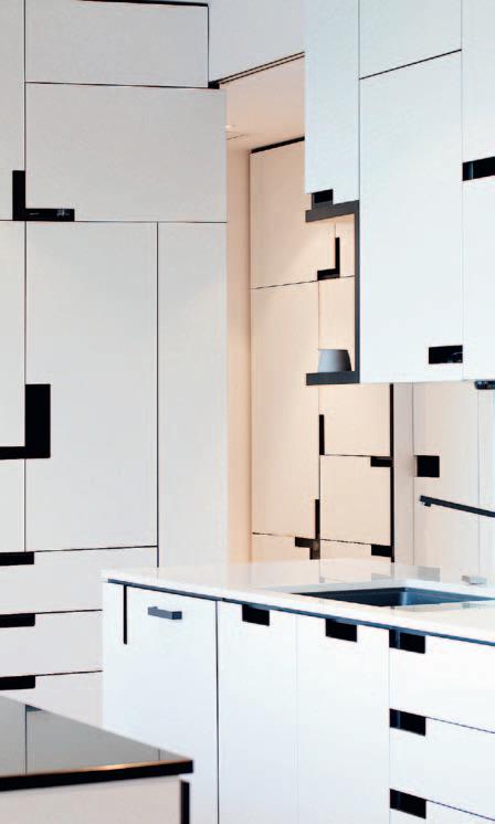

“The defining organic character is achieved through uncontrived material alchemy,” continues Prevost, “natural, raw and unfinished industrial materials are combined with un-precious high-tech counterpoints for striking contrast.” The Laminex e ssa Stone benchtop is one example, offering the enduring appeal of up to 95% natural quartz in a sophisticated palette of designs. Similarly, the Daniel Robertson brick herringbone floors, both inside and out, ensures flexibility of function and frame in a pleasurable and intimate connection. The use of interest and excitement in all materials was conceived for maintenance-free advantages and capitalises on passive energy properties to provide the necessary comfort all year round.
(clockwise FroM toP leF t) bone white essastone fro M l AM inex, l AM in ex.co M Au
s in k fro M fr An ke, fr An ke.co M Family so Fa recovered in marimekko Fabric fro M MAri M ekko, MAriM ekko.co M

Ariane Prevost Architect (APA) is a renewed practice, reformed to propagate slow Architecture. With a ‘More for le ss’ attitude, APA strives for modesty in living culture.
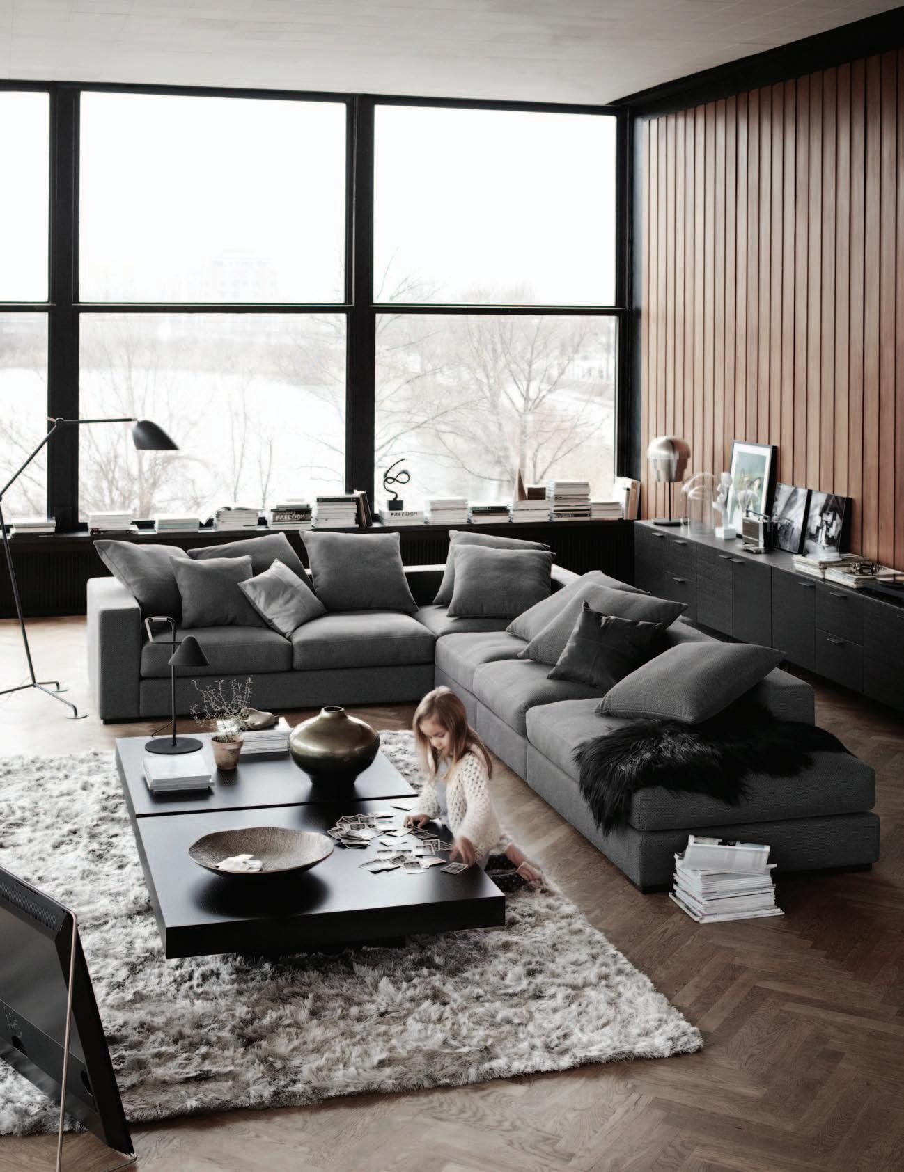


This house on the picturesque outskirts of CHIANG MAI in Thailand by architects, SITUATION BASED OFFICE , is, says AROON PURITAT, a sophisticated exercise in blending traditional practice with a contemporary approach and materials.
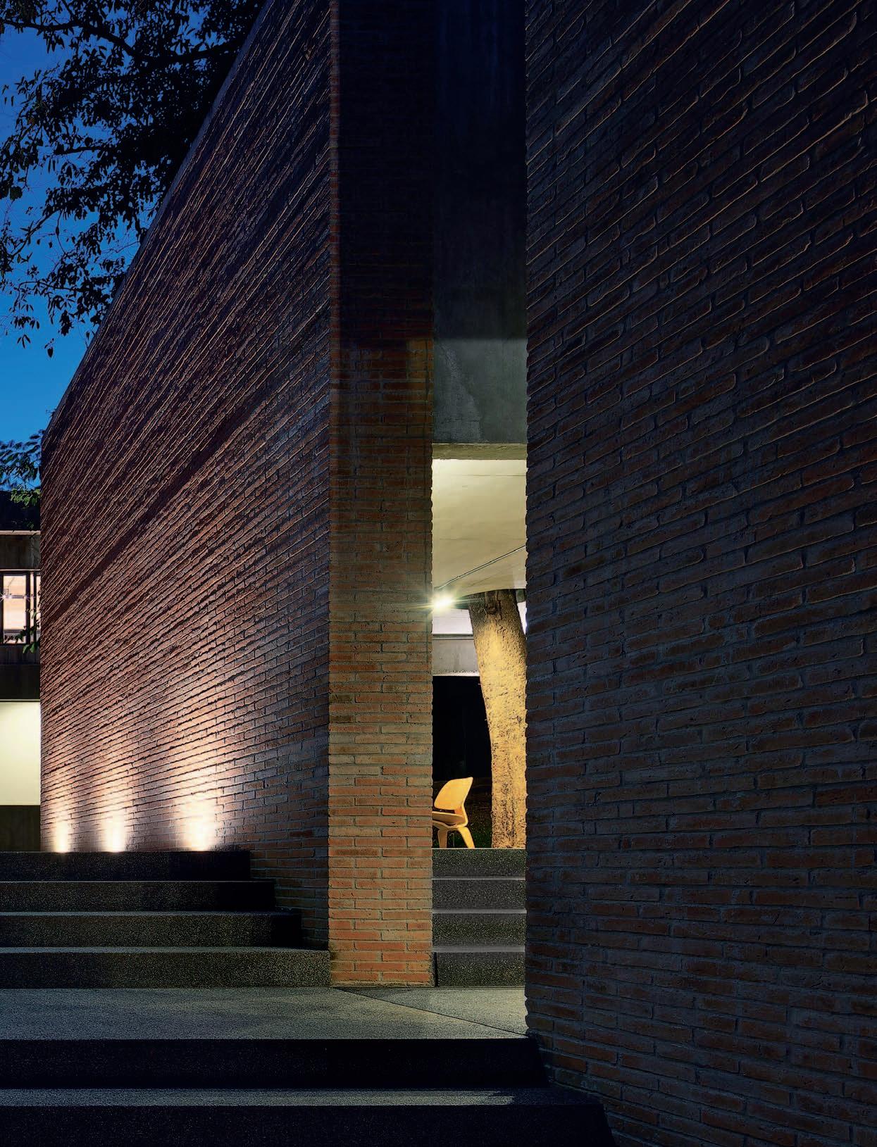
Narong Othavorn, principal architect and founder of SO (Situation Based Office), was commissioned to design this house located at the foot of the majestic Doi Suthep mountain, in the Ram Poeng district, a quiet neighborhood to the south-west of Chiang Mai. Apart from local residents, the area also hosts many beautifully designed vacation houses, owned mostly by foreigners and Bangkok natives. Other houses belong to professors from Chiang Mai University, artists, and NGO workers. Not surprisingly, with such great diversity in the owners’ backgrounds, residential buildings in this area vary in both style and design, from small wooden houses to unique-looking concrete buildings, along with Lanna-style architecture combining vernacular features (like the roof structure) with contemporary design.
“Chiang Mai is best suited for a city slicker who also wishes to live close to nature,” says the owner about her reasons for buying land in Chiang Mai. “And, Wat Ram Poeng is this village surrounded by big trees even though it is situated in the city”. At the time it was bought, the land hosted six old houses. Initially, the owner had the idea of turning them into a small hostel, while using a newly constructed building as her own residence and the hostel’s clubhouse. “After I had a chance to see SO’s design portfolio, I asked them to work on the project almost immediately. I told them what I like and don’t like, just to give them some ideas to work with. As for the architecture, I left everything to them.”
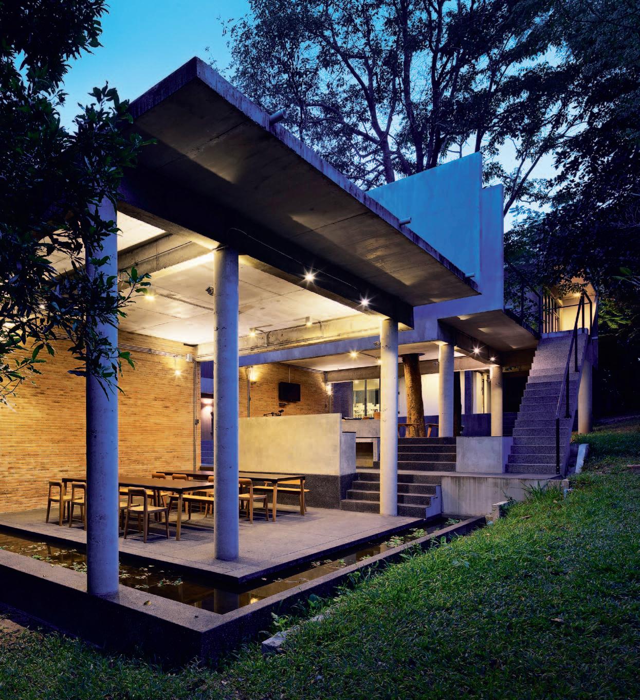
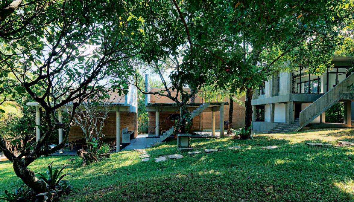
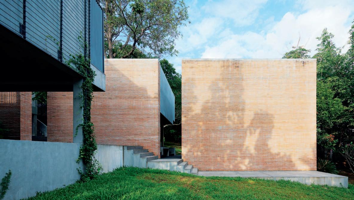
Wat Ram Poeng is this village surrounded by big trees even though it is situated in the city.
Narong has been a regular visitor to Chiang Mai since 2003 when he was overseeing the design and construction of a wine showroom. His love for Chiang Mai grew after he had a chance to really live in the city for a period of time. “I like Chiang Mai because the time seems to pass slower. In a day, I can do so many things. You can’t do that when you’re in Bangkok.”
Narong worked on the project with an interior architect from his company, Veerachai Chaimongkol. “My interest revolves around the sequence of spaces, offering the users different spatial experiences,” says Narong, commenting on the main concept of the house. The first sketches and models depict a series of boxshaped buildings of different sizes, situated along different levels of the slope of the land. The design was revised several times before it was finalised. In the end, the architects divided the architectural program to host three unique-looking buildings. After the design was completed, Narong had to travel between Chiang Mai and Bangkok a number of times to oversee the construction with Tachanop Banchongrak, a local contractor with an architectural background, who helped with the on-site supervision.
The key architectural feature of the project is a massive 6-metre-tall wall situated in the middle of the site along the north-south axis of the land. The wall is also identified as the main axis of the floor plan, and used to divide
and connect different spaces of the house, as well as create the sequence of spaces according to the levels of the land. The geometric form of the building looks clean and simple. The 6-metre-tall brick wall separates the space into two sides. The left side hosts a gabled-shaped concrete structure with an elevated floor. The building is situated 90 degrees to the wall on the highest part of the property. The stairs and dark grey washed sandstone walkway crawl their way up the sloped property.
Behind the brick wall on the right side of the property is the public area. This hosts a living space and an open kitchen, which are located on different levels of the land. The elevated floor of the building signifies the spatial manipulation commonly found in vernacular architecture of tropical regions. Walking up the stairs, one encounters two brick walls, partially overlapping. The walkway to the left leads to the fitness room situated under the building’s elevated floor. The walkway to the right guides us to the exposed concrete staircase adjacent to the building, which leads up to the second floor where the white living room, a dressing room, and a small food preparation area form a sequence, divided by folding glass doors with greyish aluminium frames. Next to the living space is a small staircase that leads down to the bedroom, while a personal pool, situated in the middle of the building, is hidden from public access. The gable-shaped building seen earlier
at the front of the house is actually the building that hosts the bedroom area constructed from exposed concrete. A series of L-shaped steel fences defines the walkway and surrounds the pool area for greater sense of privacy. “What I like about this house is the privacy of the residence on the second floor that still allows the users to monitor most of the compound from upstairs,” says the owner who has now lived in the house for some time.
Over the past decade, the region’s vernacular architecture has had a strong influence on residential design in Chiang Mai, expressed stylistically through different details and compositions such as the elevated floor, the open high-pitched roof, or the exotic crafting of carved wood found in interiors. At the same time, we have also grown familiar with the sight of exposed concrete structures or box-shaped buildings, which are uniquely contemporary. From the 1960s onwards, Modernist architectural creations have blossomed in Thailand. Some of the most distinctive examples are the creations of one of Thailand’s first Modernists, Professor Ruangsak Kantaputra, the protégé of the
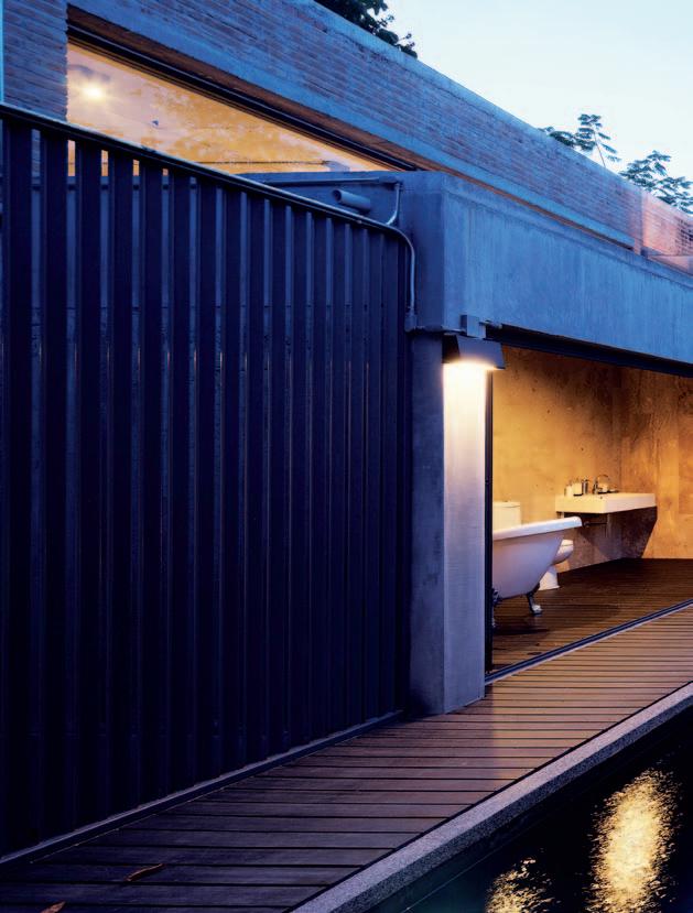
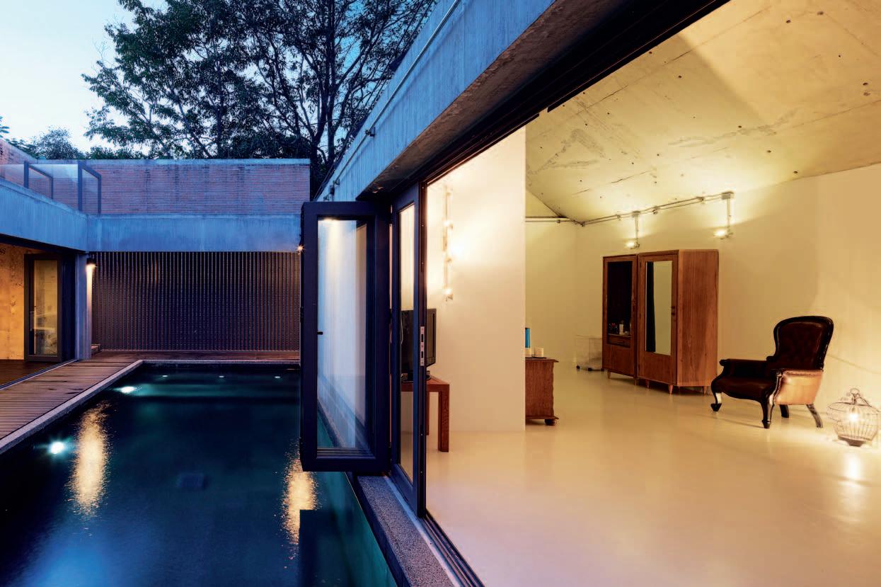
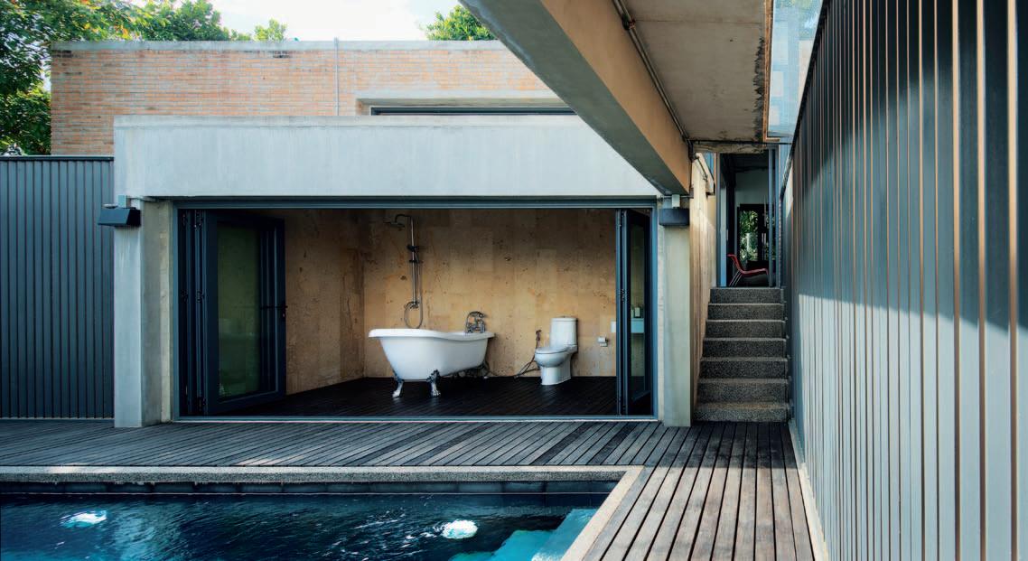
legendary Mies van der Rohe. Following that, and up until today, the popularity of Lanna architecture and traditional Thai architecture has become widespread in Chiang Mai’s contemporary architecture.
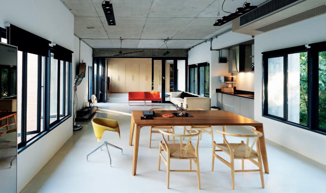
Narong has an interesting take on the influence of vernacular architecture and Lanna myths: “I put more focus on the design process of the architecture and the surrounding context of the work, so style is only just a part of the visible finished outcome. If you want to borrow something from the architecture of the past, you need to have greater understanding in the history and the program in order to use it right. To me, using it at the right time and the right places is a more important issue.”
Narong’s answer seems to partially reflect why architecture in Thailand has stopped evolving. The continuity seems to have been disrupted because emphasis has been placed on architecture reflecting intense nationalism and localism – stylistic elements – rather than allowing the process and context to authentically direct the design.
drop box
OWNER & RESIDENTarchiTecT Situation Based Office principal archiTecT Narong Othavorn assisTanT designer Veerachai Chaimongkol conTracTor Tachanop Banchongrak
Situation Ba Se d of fice absoluts@mac.com facebook.com/situ.based
furniTure Loose furniture items from OGGI Living.
lighTing Light fixtures from Lamptitude.
finishes Bricks from the Paradorn and Chiang Mai regions
in Thailand. All marble and concrete works throughout are completed by local craftsmen within Chiang Mai.
fiXed & fiT Ted Aluminum doors and windows are supplied by Siam Bauxite.
What I like about this house is the privacy of the residence...
As the original inventer of linear drainage systems, Stormtech continues to innovate, working closely with architects and designers to create another world first in architechtural grates.



The new MND Series, is a collaboration with internationally renowned designer, Marc Newson. This latest addition to the Stormtech range, features Newson’s signature tessellated hexagonal design, and is available in five distinct finishes. Manufactured in Australia from marine grade stainless steel, Stormtech systems bring the perfect balance of style and durability to both indoor and outdoor areas. View our complete range of drainage solutions and product applications on our website, or call for more information.












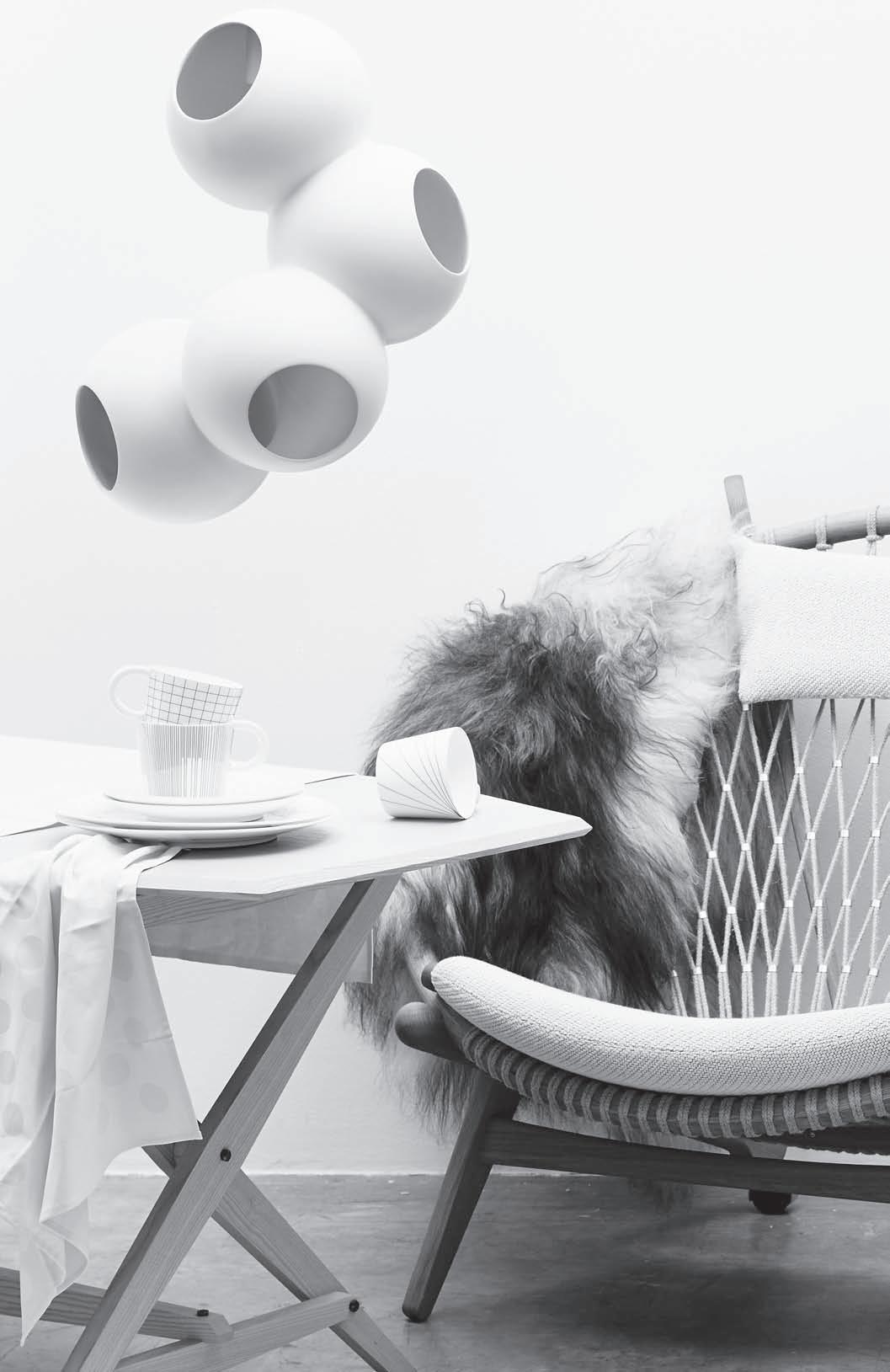
The enclosure of an outdoor space began as early as 10,000 BC. Beginning in West Asia, and later spreading westwards towards mainland Europe, garden-making and design has long been a unique and important architectural discipline. But just like all forms of design, the face of this space has only continued to change.
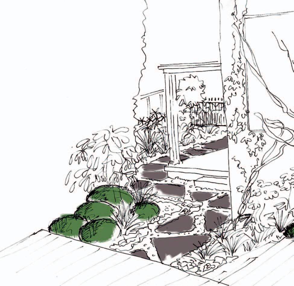
The soul cannot thrive in the absence of a garden”, wrote the famous Irish poet Thomas Moore. Although the design of the garden space has evolved over time, reflecting the changing needs and technologies of our time, the fundamental importance of the garden in our lives remains the same: a space of tranquility, a space for refuge, and a space for your own thoughts and private moments. Despite the ever-increasing pressures of urbanisation and density, the garden remains a pivotal part of any homeowner’s dream.
From Ptolemy’s famous ancient gardens in Alexandria, to the Modernist interpretations of Frank Lloyd Wright, the garden has always been a source of inspiration and place-making throughout history. But as cities grow larger, garden design now needs to include innovative spatial design, in increasingly non-traditional settings.
In this section of Habitus a particular way of living, and prove that serenity can be found in even the most unconventional designs and spaces.
LANDSCAPE DESIGNER Xanthe White Design

DESIGN TEAM Xanthe White, Zoe Carafice
ARCHITECT Glamuzina Paterson
The design of this garden and house in Mount Eden, New Zealand, was carefully integrated, with the development of the garden beginning before the build; so the relationship between landscape designer and architect was paramount. While initial architectural plans were drafted, the majority of the landscape design work was done on site. For instance, the gardenias were established over a two-year period, with the clients doing most of the planting.
A ll the stone was locally sourced with much of it quarried from the sloping site. The house is sited on a lava flow and excavation was required to create space for the garage – it was a great opportunity to utilise the quarried stone as a simple but beautiful building material, and as a feature throughout.
The general principle of the design was to create clean and functional living spaces that contrast with the naturally formed landscape. The entry is quite rugged and austere, with primarily native plant material, in strong contrast to the lush and enveloping tropical garden at the back. This change of mood is quite deliberate and creates a strong delineation between the public space and the back garden where privacy is paramount.
I believe naturally styled gardens require repetition and a degree of simplicity; these elements are brought to life by strong architecture. In this project, plants form a minimal structure, while the rock elements unite the multi-level spaces and allow them to flow.
Xanthe White Design
(64 9) 300 7135
xwd.co.nz
For me, an ideal landscape displays contrast between the architectural elements and the form of the garden; I'm not inclined to create gardens that attempt architecture. Rather, landscape design is seen as an opportunity to create spaces that can ’t be achieved in architecture.
DESIGN TEAM Aaron Paterson, Dominic Glamuzina FINISHES Basalt tiles in main courtyard and pool side. Bombay stone around studio and kids courtyard, sourced from a local farm. Stone walling and feature rocks all quarried from the site before construction of the house.DESIGN Pepo Botanic Design
DESIGN TEAM Nicola Cameron, Eve Valensise, Simon Lloyd
CONSTRUCTION TEAM James Perkin, Mathieu Estables
EXTERNAL CONSULTANTS Mark Pizzol, Mark McClelland
PHOTOGRAPHY Brent Winstone
Pe P o B otanic Design
(61 2) 9349 1220 pepo.com.au
FURNITURE
Tio table and chairs from Spence and Lyda. Mirror from Rivas Design.
FINISHES
Concrete stepping stone path by Pizzol Designer Concrete.
LIGHTING
Barcoo stainless steel adjustable wall spot light, Snowy stainless steel down ight, LED stainless steel in-ground light, Omnyx II LED brushed chrome in-ground light, Accento 5 LED brass spike light, Minex LED stainless steel recessed step light.
FIXED & FITTED
Clothes line by Pepo.
A series of small, awkward triangular spaces has been transformed into a usable outdoor area in this Paddington garden. Entertaining and dining outdoors is now possible within this artistic outdoor atmosphere which features individually crafted polished concrete pads, a copper sculpture and mounds of planting.

The shape of this block presented the street with an unorthodox combination of house and garden. The house is a semi, attached only on its southern boundary, and does not have a traditional front and back garden. Instead, it has a series of ‘triangular’ outdoor areas that run adjacent to the northern side of the house.
The absence of a right angle in the building footprint and boundary line, a lack of natural light, and the series of small disjointed triangular outdoor spaces were a challenge, but eventually became the inspiration for the finished design elements. The key idea that came from this was a path that would take its users from the street frontage directly into the outdoor
areas linking the spaces together. The path provided the opportunity for an interesting design solution whilst having the secondary function of dictating the program of the surrounding spaces.
The path is made up of a series of individually formed insitu polished concrete pads that guide you through an open garage/ function area, an entertaining space and a clothes drying and cooking nook. Branching off from the path are small areas of planting and sculpture that respond to the site’s odd triangular shape, lack of sun and architectural layout.
The entertaining and dining area dissects the garden path and is an extension of the internal lounge room. This is a timber platform raised above the garden level, allowing you to look down and over mounds of surrounding planting. A free-form copper sculpture ‘grows’ from one of these mounds connecting the entertaining area with the lower levels of planting.
Overlooking the picturesque Rozelle Bay and Black Wattle Bay, the extensive outdoor areas of this Sydney penthouse were void of greenery and interest and, as a consequence, were underutilised. The original developer had installed an extensive water garden that wrapped around the entire perimeter of the lower terrace, which was proving to be too much maintenance for our clients.
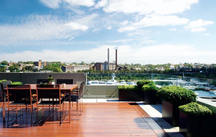
Apart from this, there were two raised planters whose plants were tired and neglected. Our client wanted to increase the garden element and create furnished areas that would ensure the terraces were properly utilised. Low maintenance was paramount to the clients ’ brief so it was decided that the future concept would not include the water garden. This was removed and replaced with sandstone paving wrapping around the deck and enabling the user to approach the balustrade.
The planters are not overdone, the placement strategic. Rows of rounded lightweight planters create a simple yet classic appeal against the lines of the building and city backdrop. Customised steel planters in a carbon colour are arranged in random heights to take on a more sculptural feel and to reflect the city skyline.
The preferred plant palette focused on foliage only, preferring the subtle tones of greens and greys to provide contrast and interest, all with the aim of an uncluttered view to beyond. The conditions at this height are challenging. With direct sun all day and the exposure to winds, irrigation delivered discretely to each planter keeps the plants at their optimum.
The result is a simple space where every item was not without purpose, movement is unimpeded and there is a freshness you would expect from a garden space.
Matthew CantwellGARDEN DESIGN Secret Gardens
LEAD DESIGNER Mathew Cantwell
PHOTOGRAPHER Nicholas Watt
sec R et ga RDe ns (61 2) 9314 5333 secretgardens.com.au
FURNITURE
Square planter boxes designed by Secret Gardens and constructed of 4mm thick sheet stainless steel and finished in Carbon colour from Axolotl. Rounds planters by Quatro Design and Robert Plumb, all furniture from Royal Botania.
LIGHTING
Lights in stainless steel by Hunza.
FIXED & FITTED
Built in bench custom designed by Secret Gardens and finished in stainless steel and Cedar. Barbecue from Electrolux with cantilevered stainless steel unit custom designed by Secret Gardens.
…landscape design is an opportunity to create spaces that can't be achieved in architecture
Doing things simply and without fuss: that is the underlying philosophy of the Sekeping project. This project in Malaysia was all about imagining new possibilities of building on difficult terrain. We wanted to extend the influence of our projects beyond their physical boundaries, and to make them contribute to a wider neighbourhood. This project was primarily to demonstrate that we can build and live harmoniously with the land, that we can build on very steep forested land without the need to destroy it all. If we treat the land gently, the land will, in turn, take care of us.
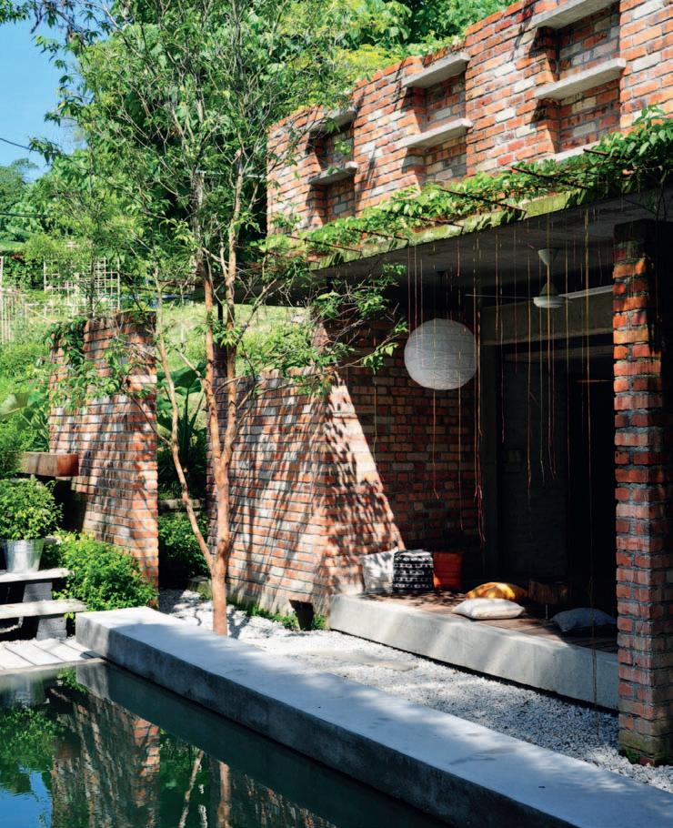
Nature is more than just green forests, rocks, mountains, wild animals and clear waters. Nature has extended itself into our cities, in the form of our built environment, streetscapes and even stray dogs. All these, and more, have influenced me in one way or another – I just see where they take me, I really have no preconceived ideas. I also have no preferred construction materials, I just use whatever is appropriate at the time of construction. I prefer to use local materials and handmade household accessories for the sinks, taps, showers, clothes hangers and so on to help extend our craft tradition. More and more I am finding inspiration in ordinary people’s lives and the environment they live in.
Ng Sek SanDESIGN Seksan Design
PRINCIPAL DESIGNER Ng Sek San
se ksan Design (603) 2282 4611 seksan.com
FURNITURE
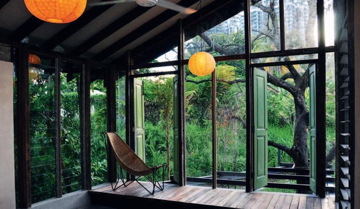 All furniture either custom made by Seksan Design, or bought from flea markets.
The owner of this house on the East Coast of Singapore mainly wanted external blank walls. Talks then progressed to fixed screens and a centre courtyard for light and air. These summed up, for them, the tangible facets of an ideal home, a protective enclosure of solitude.
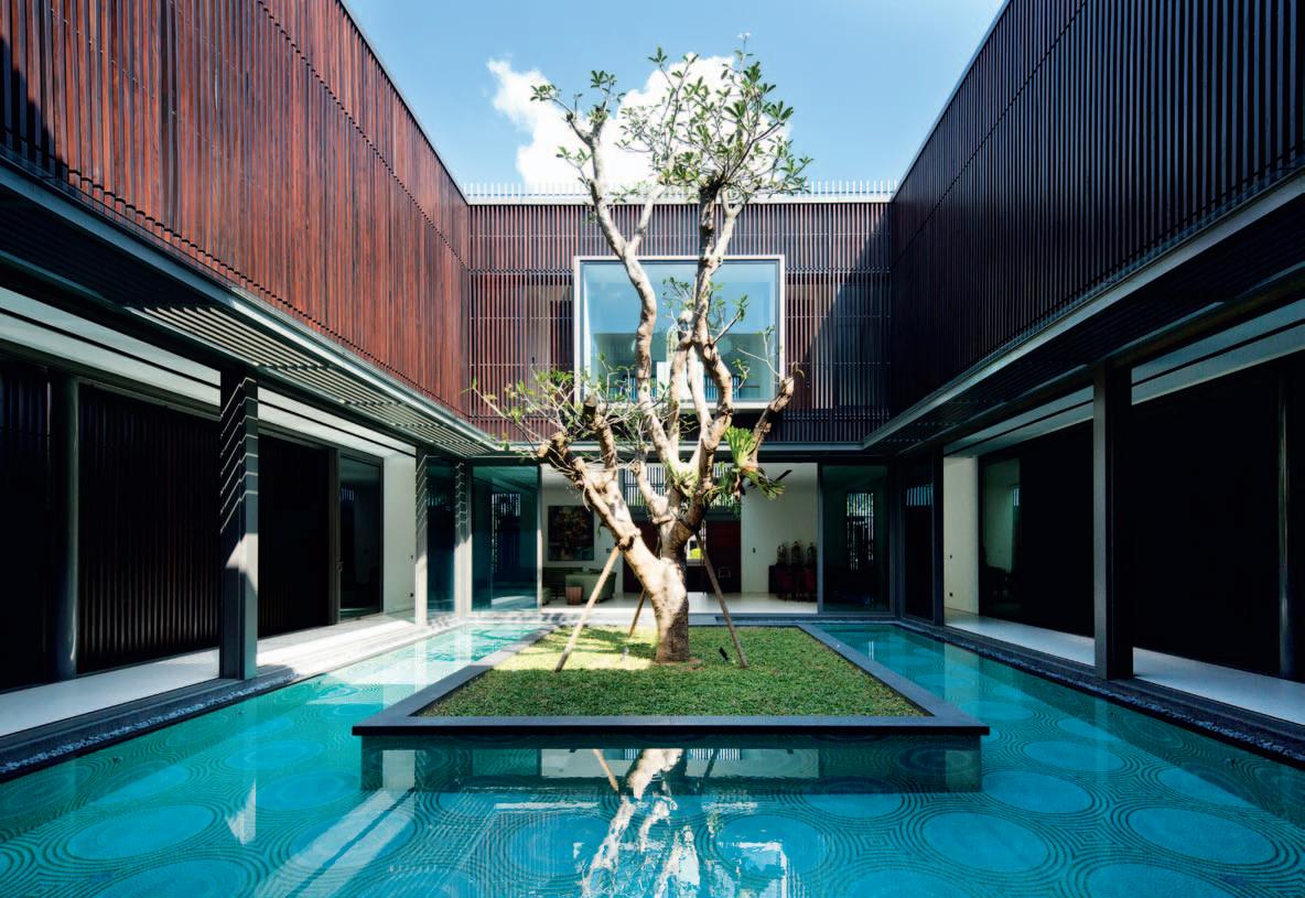
Introversion has a negative connotation in a culture where being social and outgoing are prized above all else. But what is withdrawal to some is energising for those who thrive on selfreflection and contemplation; life is found within. This fortitude and strength is visually given expression by a one hundredyear old Frangipani tree literally found within the house, centred in a large grassed courtyard surrounded with water. The tree was given a new lease of
life, after being rescued from a Holland Road site slated for a new development.
True to the owners’ requirements, the facade is entirely sealed off in most areas, and veiled by fixed timber screening in others. The purity of intention to internalise results in a purity of architectural elevation on three sides; there is no yard, opening, back of house, but a pebbled path between a rhythmic timber screen and a lush wall of Polyalthias. Visually, the aesthetics exclude both physically and psychologically, but the timber screens along the periphery of the first storey allow breezes to comb through, refreshing the sheltered corridors and living spaces. The central court encourages this, acting as both a light and
airwell. Throughout the day, as the environment changes, the breezes shift, the house breathes. The only area where the timber screens can be opened is between the second storey master bedroom and the court. Motors silently fold the screens away, linking the court to the bedroom.
The central air- and lightwell is key to the experience and enjoyment of the house through the day. As the light shifts, different walls and passages are literally seen in a different light, shade or shadow. The centennial tree awakes, basks, and rests; and the surrounding spaces share that experience. The aesthetic encounter is intensified perhaps because there are no distractions from the world outside. Even the world outside is acquired as the sky above is framed by the court
WallfloW eR aRchitectu R e + Design (65) 6297 6883 wallflower.com.sg
and forms part of the spatial composition. The elemental reduction of sky above, water surrounding an island of grass below, all axially centred by the stolid tree distils for the owners what life can and should be; a re-focus on the basics being pure, simple, and celebrated.
ARCHITECT Wallflower Architecture + Design DESIGN TEAM Robin Tan, Cecil Chee, Sean Zheng, Shirley Tan & Eileen Kok PHOTOGRAPHER Albert LimWith the existing pool taking up half of the back yard, the design intent of this Sydney home was to create an entertaining/dining space that connected with the pool area – the owners love to cook and entertain. We wanted to create the illusion that there was no real divide between the two areas.
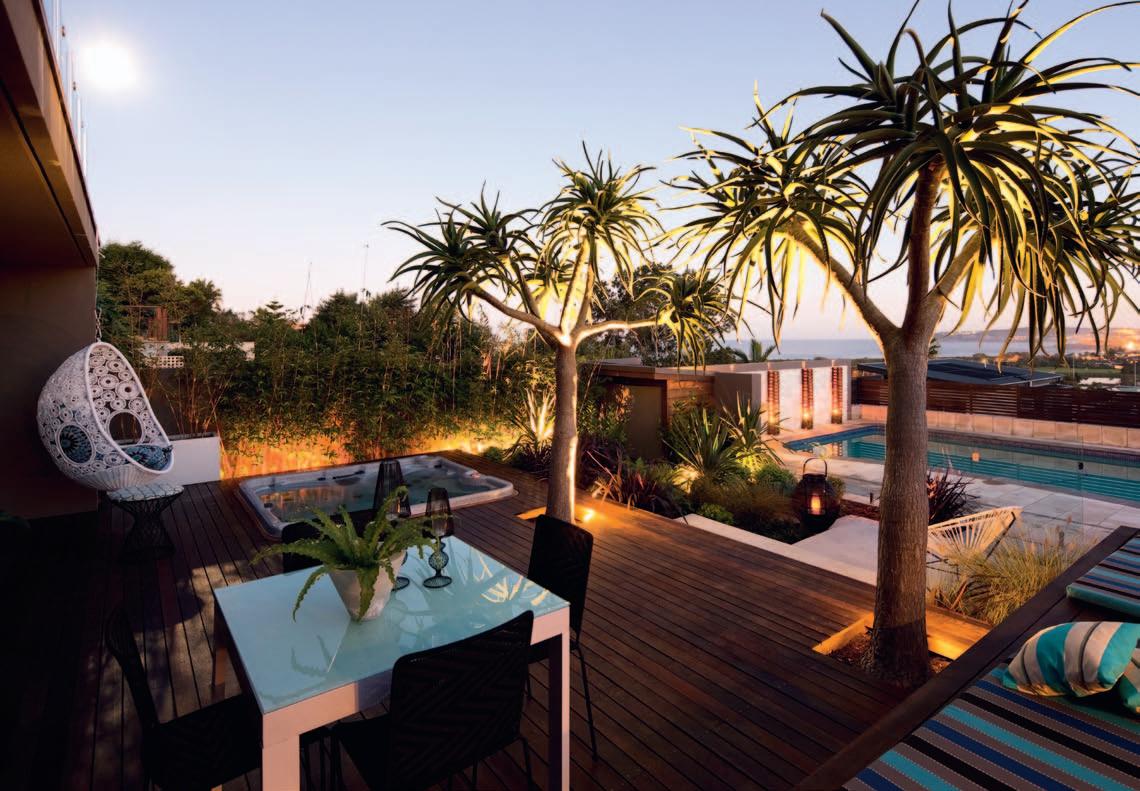
T he bespoke floating bench seat was designed to border the kitchen area and create seating space without boxing in or dividing the area. This floating/elevated seating area allows for a complete visual outlook, which maintains the open feel of the house and garden. There was also an existing spa that we relocated and sunk into the main deck – we wanted it to disappear, and become a part of the space, rather than apart from it.
Sustainable Spotted Gum was used for all the timber elements in this project, as a way to bring the larger, predominantly masonry house back to earth. Two large Aloe trees frame the entrance off and onto the deck. These were carefully selected to provide scale to the height of the house, without blocking the views from the upstairs balconies. These trees are also extremely hardy and suited to a coastal position, such as this one. They also enhance the subtle Palm Springs note that the landscape sometimes takes on.
Matt LeacyLANDSCAPE DESIGNER Landart
Landscapes
DESIGN TEAM Matt Leacy, Justen Hess
CONSTRUCTION MANAGER Mike Steven
PHOTOGRAPHY Jason Busch
lan Da Rt lan D s ca Pe s (61 2) 9958 0462 landart.com.au
FINISHES
Sustainable Spotted Gum timber used for all external timber elements. Bespoke bench top made from Hanex.
FIXED & FITTED
Outdoor cooking area includes Electrolux BBQ and Wildcat pizza oven.
...nature is more than just green forests, rocks, mountains and clear waters.


Far from being a one-trick pony, cult by corporate culture offers the most complete and delectable selection of furniture, lighting and objects for the home. Their classic and contemporary ranges are more than fit to fit out any living environment, indoor to outdoor.
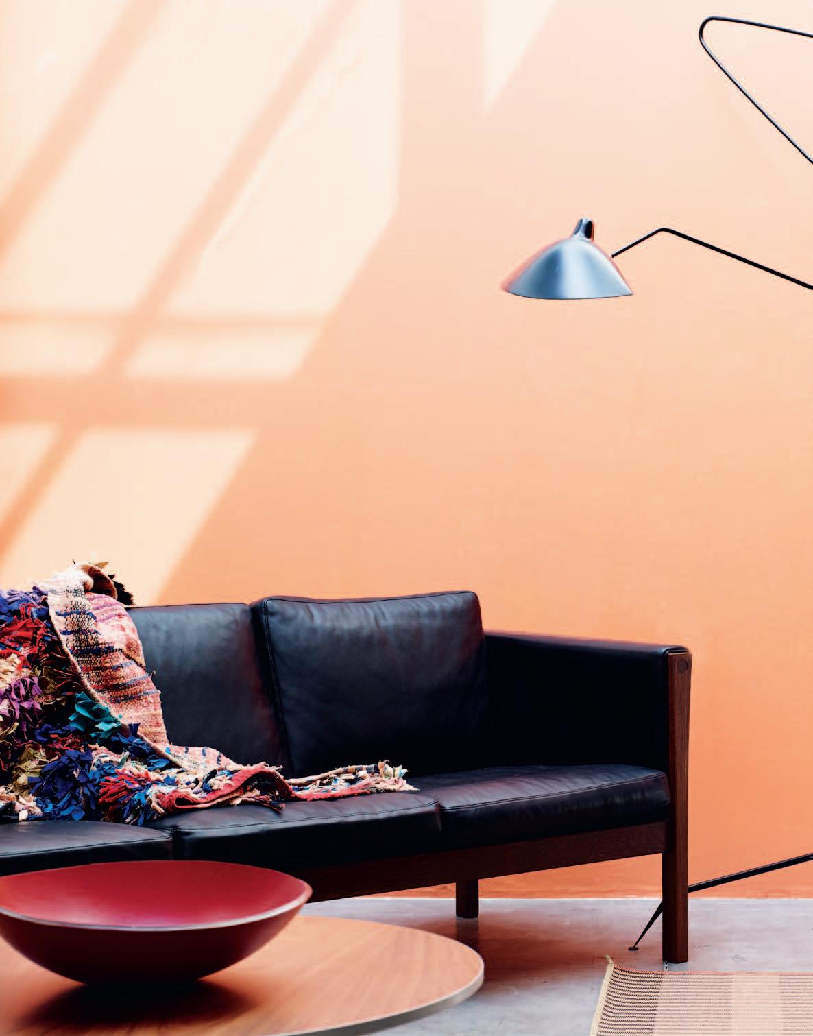 photography | tim robinson. styling | alicia sciberras. art Di rection | frances yeolan D.
habitus x corporate culture promotion
From left to right: ch 163 s ofa in leather designed by Hans J Wegner in 1965 for Carl Hansen & Sons. b oucherouite vintage rug by Hay. a J pedestal coffee table in Walnut designed by Arne Jacobsen in 1968 for Fritz Hansen. atelier bowl in leather by Poltrona Frau. t wo ways rug in orange coated paper designed by Merete Erbou Laurent for Hay. l a mpadaire 3-arm floor lamp in black designed by Serge Mouille in 1950. c or ona chair with wooden base designed by Poul M. Volther in 1961 for Erik Jorgensen. ad net rectangulaire mirror designed by Jacques Adnet for Gubi.
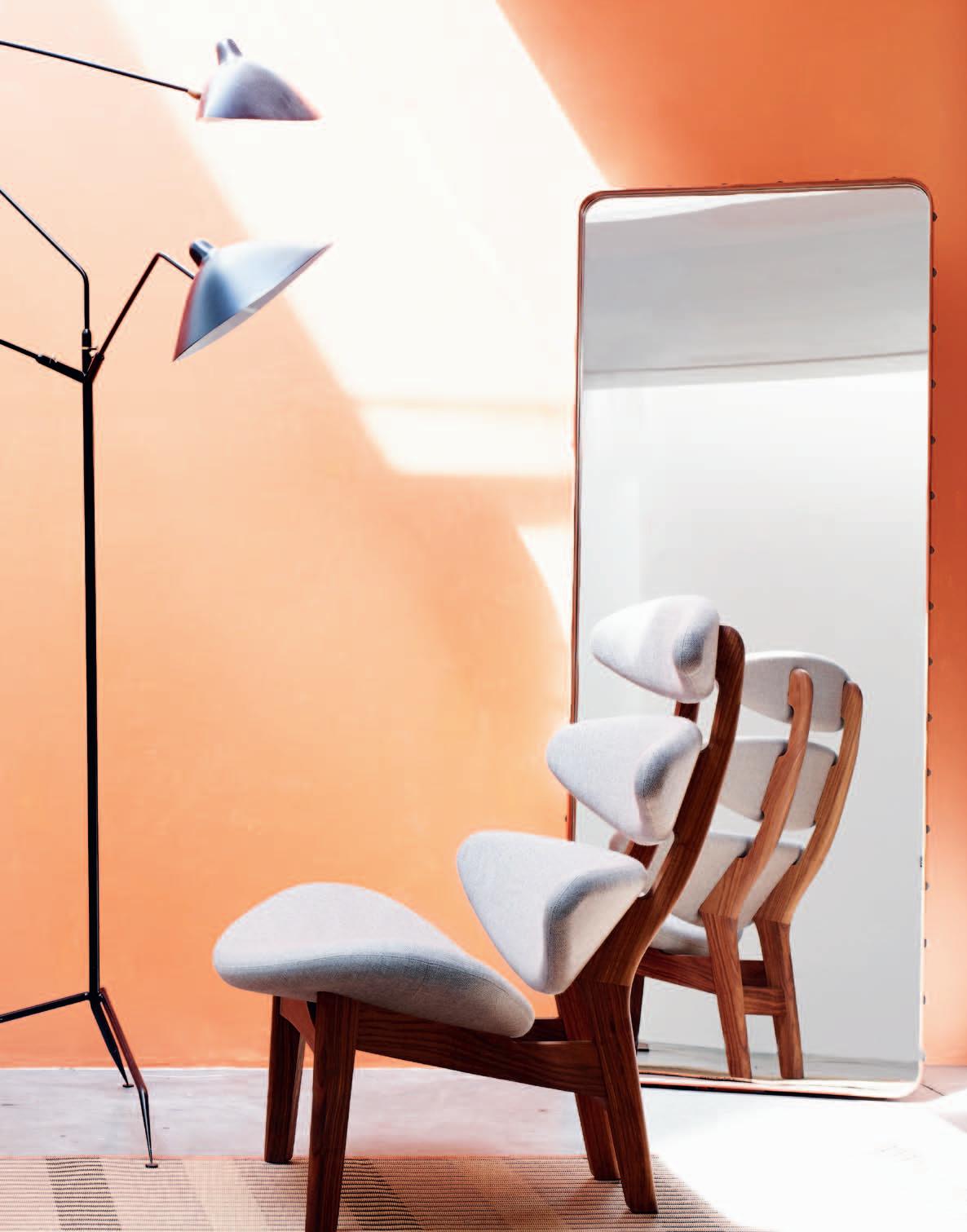
From left to right: cavaletto table in Ash designed by Franco Albini in 1950 for Cassina. napkin Dot and tablecloth Dot in cotton jacquard designed by Scholten & Baijing for Hay. craze collection plates in fine bone china designed by Emma Langridge for Lightly. for good measure cups designed by Cindy-Lee Davies and Paul Williamson for Lightly. progetto ogetto ceramic pendant light designed by Marre Moerel for Cappellini. circle chair in Oak designed by Hans J Wegner in 1986 for PP Mobler. icelandic sheepskin in grey by Objecta. paper ca rpet in pink, 100% paper designed by Scholten & Baijing for Hay. superoblong 3-seat sofa in grey designed by Jasper Morrison for Cappellini. beijing basket in rattan by Hay. blanket by Cappellini. insula coffee table in white by Erik Jorgensen. Wooden tray in Oak with clear lacquer by Hay. Wooden foot in Samak wood by Hay. coloured glassware designed by Scholten and Baijings for Hay. bl 4 floor lamp in white by Robert Dudley Best in 1932 for Gubi.
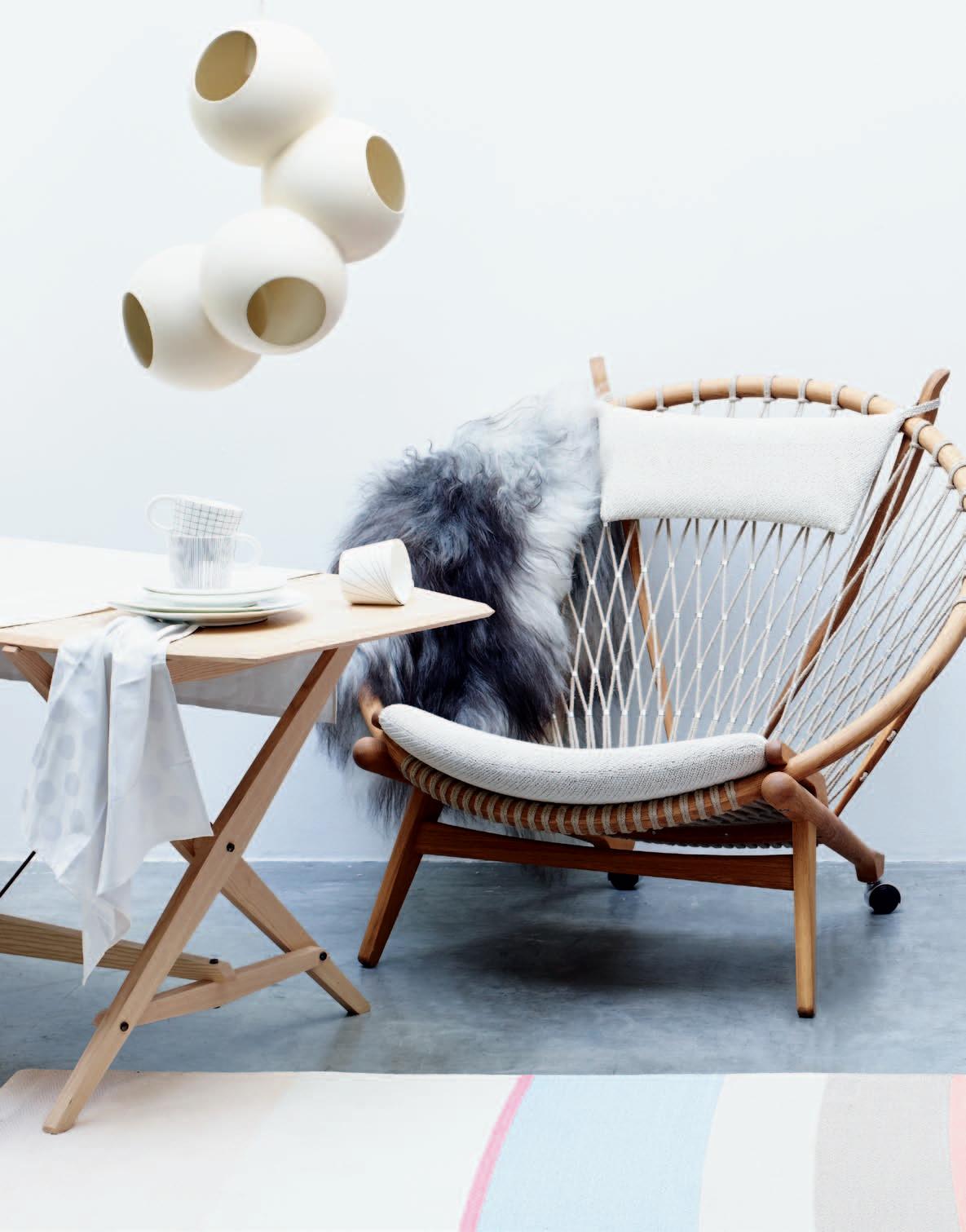
f i nd out more about c u lt’s ranges at habitusliving.com/issue22/cult
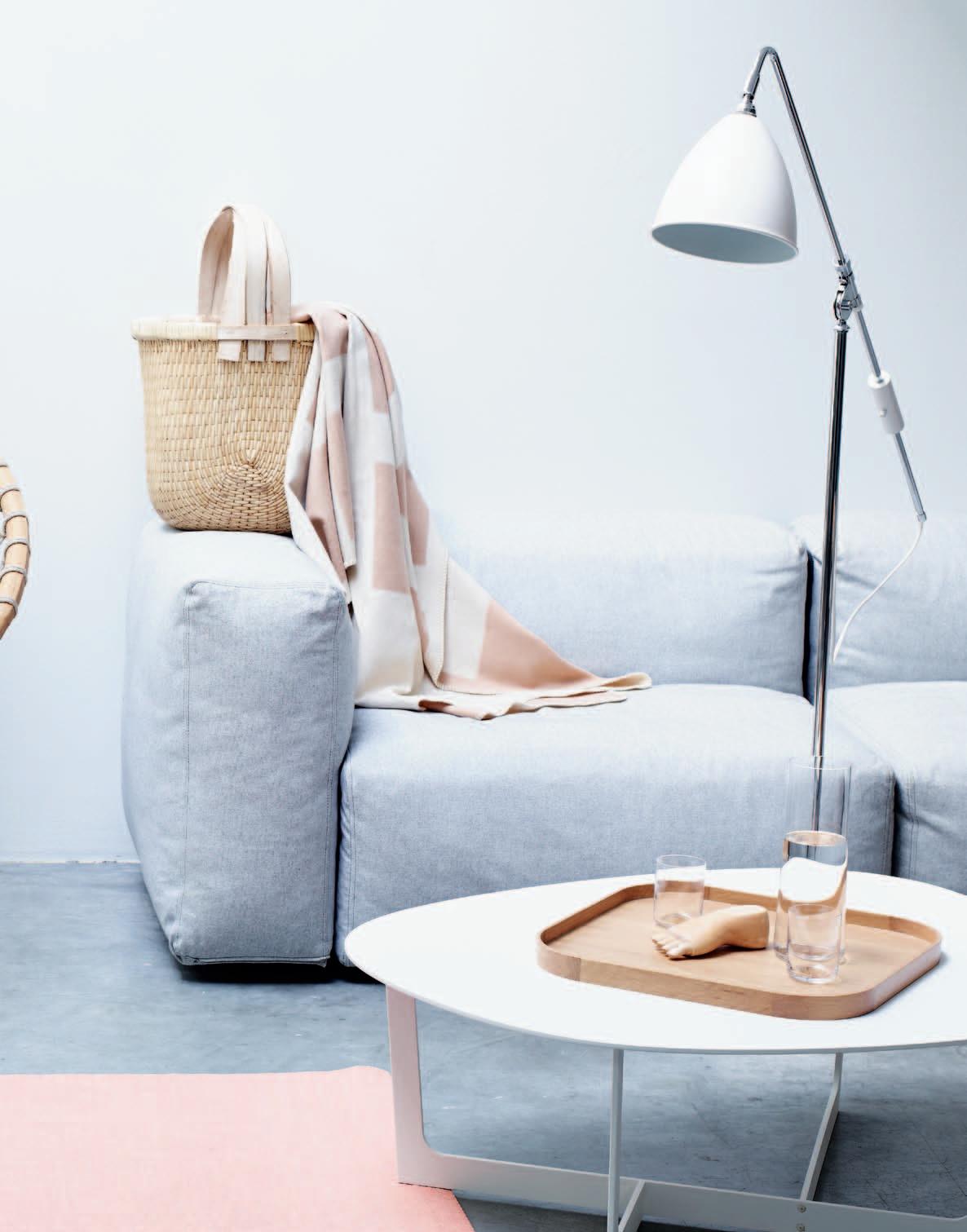
funkis the strand arcade
412-414 george st. sydney
PH.+61 2 92219370


funkis paddington
202 oxford st. paddington
PH.+61 2 93687045
funkis online store


www.funkis.com


vegetable dyed leather bags
swedish design made in sweden

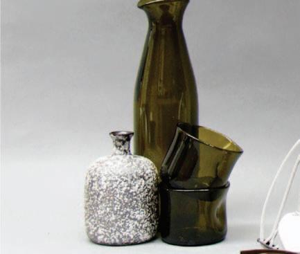


Family companies can be flexible and quick to make decisions. But managing the succession from one generation to another can be tricky. STEPHEN LACEY spoke to Michael Maharam about the challenges of taking over the reins of distinguished N E w York-based textile company, MAHA r A M.
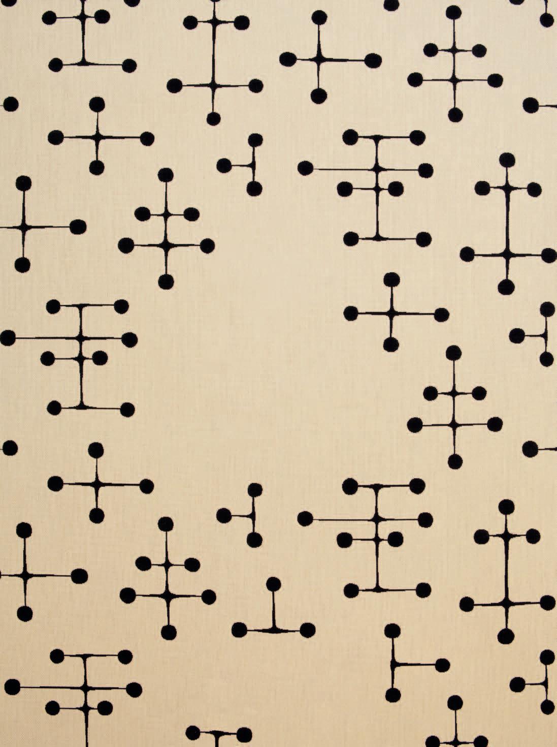

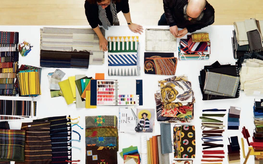
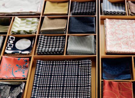

taking over the reins of the family textile business was initially a struggle for Michael Maharam. “I didn’t want to work for the family business, I was individualistic and I didn’t like the idea of working with my father –we didn’t get along,” Maharam admits. “I grew up like a lot of suburban kids, all I wanted to do was escape.”
Yet, despite his earlier reservations, Maharam has headed up the fourth-generation family business for the past 16 years. Things didn’t always run smoothly though. On finishing university he went west to California and “had a go” at working in the company offices there.
“I didn’t like it and I resented it, largely because we had uninteresting products and there was no particular culture outside of a sales culture and that didn’t appeal to me,” he says. “But I was interested in business and I was interested in the way things looked and those were the places I ultimately gravitated.”
The company was founded by Maharam’s great grandfather, a Russian immigrant, who had a modest enterprise in New York selling remnants. Following the advent of ‘talkies’ in the 1920s, he branched out with textiles used for sound baffling in theatres. His eldest son was also attracted to the idea of show business and encouraged his three brothers to join him, creating theatrical textiles for costumes and set design.
Right from the start the company was at the cutting edge of textile technology. “My grandfather sent my father away to textile engineering school,” says Maharam. “By the time he graduated in the late 1950s, there seemed to be a rising demand for textiles with technical characteristic, in terms of durability and flame retardants.
a rchitects began to measure these things and building codes were beginning to become more stringent; so my father went into the business of textiles measured for performance.” This business was largely based around relationships, price, service, value and inventory. “That’s what business was all about in the 60s and 70s. It wasn’t until the 80s that the idea of design and marketing became a prominent theme,” Maharam says. He and his younger brother Stephen took the reins in 1997, following a rocky succession where the company lost focus and began to languish. “The first thing we did was discard all of the products that felt forced to us and started to focus on themes that felt good,” he says. One of the first changes Maharam made was to reissue a collection of textiles designed by some of the great designers of the 20 th Century, including Charles and Ray ea mes, Verner Panton and a lexander Girard. With a product line in place that Maharam could be proud of, the company looked at grooming the business model itself, running it like an immaculate Swiss enterprise. a n i n-house graphic design group was formed to provide a consistency of aesthetics. a lso, one interior design team was enlisted to design all the offices and showrooms; a very eu ropean approach to doing things. On average the company introduces around 50 to 60 new products every year. For residential interiors, Michael says, “ Philosophically, we offer a counterpoint to the predominately decorative approach.” For example, “ When we decided to develop a collection of textiles woven of noble fibres including camel, cashmere and horsehair, we avoided embellishment, allowing the materials to express their inherent beauty.” Maharam says creating new patterns is time
The first thing we did was discard all of the products that felt forced to us and started to focus on themes that felt good.
The company’s textiles are equally appealing for residential and commercial interiors. Michael Maharam introduces some of the key designers and their signature style.
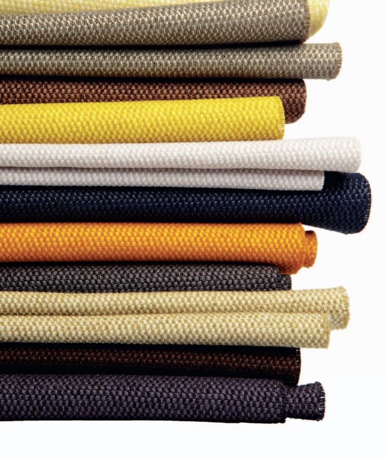

“Our collaborations are intended to introduce a fresh perspective to the world of textiles, and for that reason have widespread appeal. Typically evolving over several years, these projects allow for deep creative exploration and critical thinking, often with innovative end results. For over a decade, we’ve worked closely with the Dutch industrial designer, Hella Jongerius, who’s known for her unique ability to fuse artisanal techniques with mass production. With Maharam, she has explored concepts such as random order and three dimensionality in textiles, always with her trademark sensitivity to tactility and the interrelationship of colour and light. The British fashion designer Paul Smith has combined his adherence to the highest standards of craftsmanship with a flair for eccentric detail in an ongoing series of stripes. These vividly coloured, mainly wool textiles can provide the focal point of a room or they can serve to tie all the interior elements together. In addition to these two examples, we continually work with a small, select group of collaborators. In the past year alone, we introduced new non-woven materials by the German industrial designer Konstantin Grcic as well as highly detailed jacquard textiles by the Dutch husband-and-wife team of Studio Job.
Maharam is also dedicated to preserving design history. Through our Textiles of the Twentieth Century collection, we’ve re-editioned the work of a n ni a lbers, a lexander Girard, Charles and Ray ea mes, and Gio Ponti, among others. The enduring popularity of these designs, both in homes and commercial spaces, is a testament to the longevity of their creators’ visions.”
consuming, because it has to be interesting texturally and dimensionally. “The idea of a textile is to take a pattern and to bring dimension to it through weaves and yarn.” Never content to rest on its laurels, the company is currently working on a series of bags, collaborating with Jasper Morrison and others.
a nd what of the future? “We’re not interested in getting big, we’re interested in going deep,” he says. “I’d like to think we can focus on being interesting and having high quality. We like to be fine. That’s what we focus on. a lot of world economies exist based on the idea of dispose and replace,” says Maharam. “My idea is make good things, take care of them and pass them along. That’s environmentalism.”
*Maharam was sold to Herman Miller earlier this year for a reported $US156 million. Michael and Stephen Maharam will stay on for the next two years during the management transition.
Maharam | maharam.com

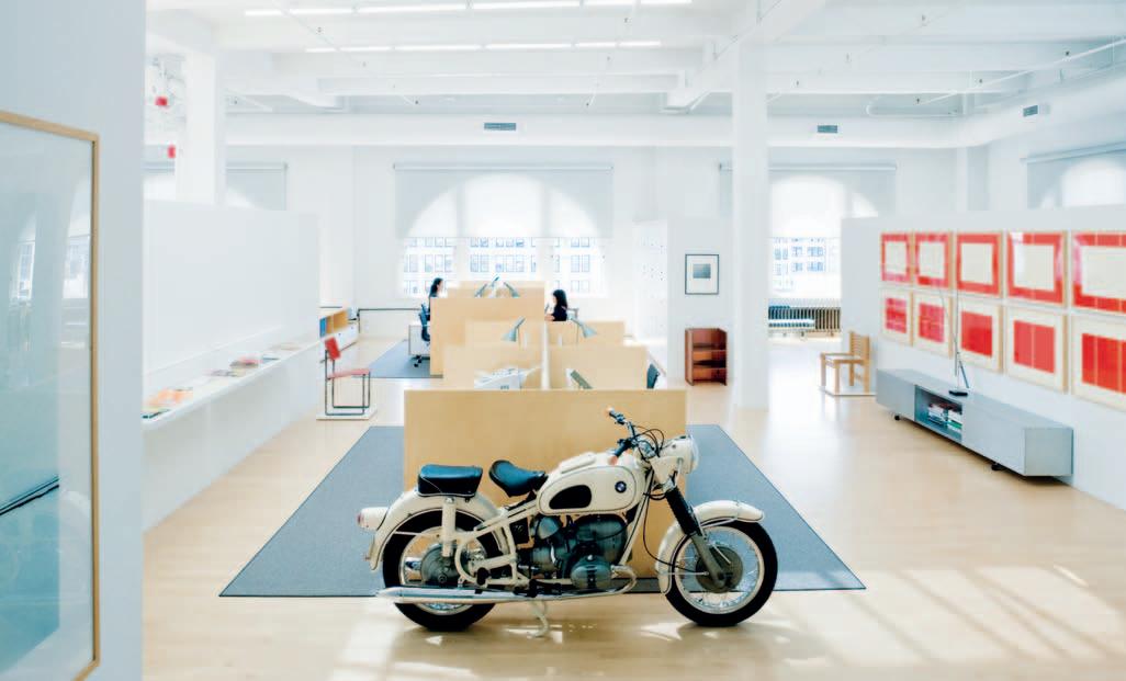
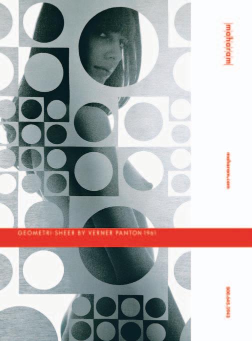
HELIOS: LED LIGHT WITH DIRECT AND INDIRECT RADIANT CHARACTERISTICS.


What goes up, must come down. This is the principle that the HELIOS LED light embodies in a surprising and equally simple manner. Through patented prism technology, its exceptionally flat, innovative light head allows for both upward and downward directed light for individually configurable lighting situations: Direct light for the immediate surroundings and at the same time harmonious ambient light through indirect ceiling illumination. Even when not illuminated the HELIOS design creates a noticeable visual impact: When switched off the circular reflector prism is transparent and most surprisingly visibly invisible.

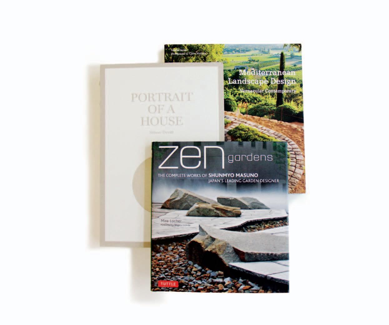
Open a book about gardens and landscapes and enter a different reality. Delve below the surface, though, and discover what the author’s or collaborators’ real intentions are and then those places can take on quite different meanings. The refuge that we seek through the calming effects of viewing and exploring places through the pages of a book can alleviate some of the impacts of globalisation and modernity that are two preeminent forces in today’s world. These places and their spirit, or genius loci , underpin and drive trends in the design of our homes and landscapes. Appreciating the ideas behind globalisation and regionalism (which is concerned with place) provides a framework to view landscapes and places in alternate ways.
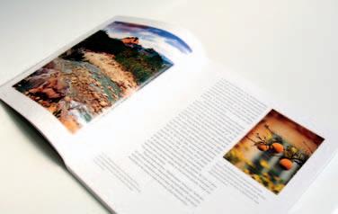
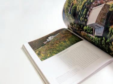

In architectural historian, Joseph Rykwert’s view, globalisation is “the most powerful of the economic forces operating in the city of the present and the immediate future.” It has resulted in the concentration of economics in major world cities of such scale as London, New York and Tokyo and then even more populous cities, like Mexico City, with over twenty million people.
The dichotomy between the perceived homogeneity of globalisation/modernism and the distinctiveness of regionalism has been a persistent one since the end of the
19 th Century. Modernity – the metropolis brought on with globalisation – was seen as a threat to the physical and other distinct characteristics of a place or region. The tabula rasa or blank slate approach of early 20 th Century Modernism has resulted in place being disturbed or erased permanently in many locations. Even prior to that, the process of industrialisation was having similar effects. In the latter part of the 20 th Century, the moderation of Modernism and the value of emphasising natural and cultural resources has allowed for both to benefit from each other. This is evident in the way that when value is placed on the importance of a region – its distinctive characteristics, products and the vernacular – that, in turn, has an effect on the economic forces of globalisation.
At the local level, the re-discovery of the ancient Roman protector of the spirit of the place, genius loci, is credited to the 18 th Century English poet, Alexander Pope. The story goes that he encouraged Lord Burlington with his gardening through a poem in which he wrote, “Consult the genius of the place in all.” A s contemporary American landscape architect, Mark Treib, points out it was “ a means of rooting landscape design in a particular locale” although “a garden was not a universal concept to be applied uninflected on all sites.”
This principle has since evolved into a founding principle of contemporary landscape architecture and design. The interest in place and genius loci underlies three books whose subjects are located in different parts of the globe. They demonstrate how place is as relevant in this era of globalisation in such diverse places as Japan, New Zealand and the Mediterranean.
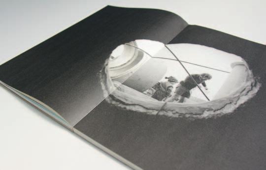
Closed to the outside world until 1854, Japan encapsulates genius loci in so many ways. Mira Locher’s Zen Gardens, the Complete Works of Shunmyo Masuno, Japan’s Leading Garden Designer is a study of the art of a practitioner steeped in place. Shunmyo Masuno is a Zen Buddhist and garden designer. In the foreword, Shigeru Uchida, who is also one of Japan’s leading designers (product and interior), describes the foundations of Masuno’s work and the Japanese manner of designing. This approach comes from a fundamentally different viewpoint to that of western designers.
“Object as precedent” or “relationship as precedent” is how Uchida describes the difference between Western and Japanese cultures’ way of considering subjects in design themes and the directions that they
can take. For the Japanese, meaning comes from the relationship between one object and another and it is the designer who creates that meaning by placing the objects where they are. The Japanese garden “displays a design logic which is intimately bound up with the genius loci of the Japanese landscape – in other words, with the essence of the country as it appears to the human imagination.” Masuno’s projects, primarily gardens in Japan and some international ones, place that relationship first.
With the Zen garden, Locher gives a summary of the development of the Zen garden and how it is reflected in Masuno’s work. “Whether designing a traditional garden, a modern garden, or a garden overseas, creating Zen gardens that allow people to reflect on how to live their lives well every day is Shunmyo Masuno’s goal.” The selection of projects in this book shows in a very practical way how he achieves this goal.
The book has sections covering Traditional Gardens, Modern Gardens, Gardens Outside Japan, all augmented with his sensitive plans, the design and construction process of the traditional garden and a dialogue with Masuno and Locher and
glossary. This holistic approach to the book assists with realising Masuno’s goals and philosophy to the reader. Masuno’s modern and international gardens are not nostalgic in any way; they capture the essence of place through the most minimalist interventions and the greatest precision.
Another architect’s sensitivity towards place is represented through the lenses of New Zealand photographer and regular Habitus contributor, Simon Devitt. Athfield Architects, located in Wellington, is an award-winning New Zealand architectural practice, and Devitt’s book, Portrait of a House , represents their most unique and important project. It is Ian ‘Ath’ Athfield’s own home and studio, a project that has been ongoing for almost 50 years.
The book is rare amongst books today for its tactile reminder of how precious a book can be and how much time is put in to creating it. It was done in collaboration with graphic designer, Arch MacDonnell of Inhouse Design (see Habitus #16 for a look at Arch’s home). They have artfully created a blend of architectural photographs, intimate portraits of family members, paintings, letters, recipes, diaries, cross-sections
and archival plans, and Devitt’s collection of photographs taken over a long period.
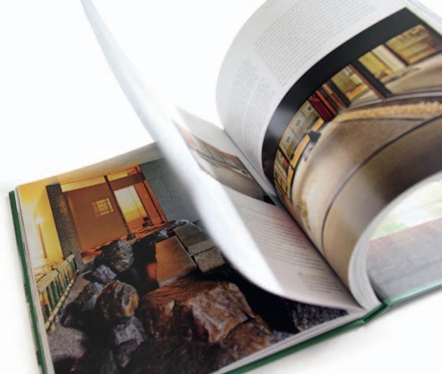
“A building concentrates history in one spot,” says Devitt and the layering of visual and written memories has achieved a tangible feeling of this rare and special place, which Athfield started work on in the 1960s. As Andrew Hoyem, one of America’s leading letterpress printers, says about such books, “The approach runs contrary to mainstream trends in today’s literary marketplace … it rests on the value of precision: the physicality of the book as an object and the startling originality of the craftsman’s eye.”
Devitt explores the ‘village on the hill’ –Athfield’s architectural experiment that he started in 1965 on the Khandallah hillside in Wellington. It started as a home and doubled as the studio from 1968, and is now a full complex with six apartments on the property and more in planning. It is full of contradictions; it combines both Modernist principles and a vernacular approach at the same time; it is reminiscent of a rambling Greek hillside village and it is also a contrasting response to its New Zealand suburban context.
By contrast, Louisa Jones looks at place from a regional scale. Mediterranean Landscape Design: Vernacular Contemporar y has captivating photographs by Clive Nichols.
Jones guides the reader on a personal journey armed with a series of questions that could be the subject of a PhD. For example, she enjoins us with “The Mediterranean experience poses the urgent question: what is the role of human beings in nature?” Since the 1960s, designers and planners have been posing and addressing exactly that question, notably Ian McHarg through his ground-breaking book, Design with Nature
But Jones is writing from a comparative literature background. Her academic background necessarily brings an alternative perspective on the landscape that has its own agenda. She has developed a framework drawing on two recognised areas of landscape theory relating to place and genius loci, firstly that of reading the landscape and secondly, sustainability. The book’s structure is based on the analysis of different man-made and natural landscape types, illustrating her vernacular contemporary style.
Jones may have found a niche in the lecture circuit for her Mediterranean garden passion, but her otherwise well-reasoned, albeit not new, argument about place is obfuscated by her personal piques. The tone of the book is prone to being moralistic and judgemental which can be a deterrent if the reader does delve beyond the beautiful images. For example, she pits the Romantic against the
Scientist by saying, “The pathetic fallacy dear to the Romantics – the imaginative projection of the artist’s personality on to nature, ostensibly worshipped, but in fact serving mainly as a stimulus for selfexploration – is very much alive in our time.” Then later, “most of the artists present value the Mediterranean not because of the old sirens of primitivism, decadence and decay, but because it allows them to explore the human presence in nature as symbiosis rather than conflict.”
On delving below the surface of regionalism and place through these quite different books, its significance is reinforced. Locher and Devitt tell stories that are rooted in their regions, even though the work of the designers can be transported elsewhere through the forces of globalisation, whilst still retaining their essential characteristics. Jones by contrast is challenging the reader to take another look at her passion and the bigger role it plays in the debate about man versus nature if you go so far as to read the text. ‘A picture is worth a thousand words’ is still the best way of describing such works –which is what they all do.
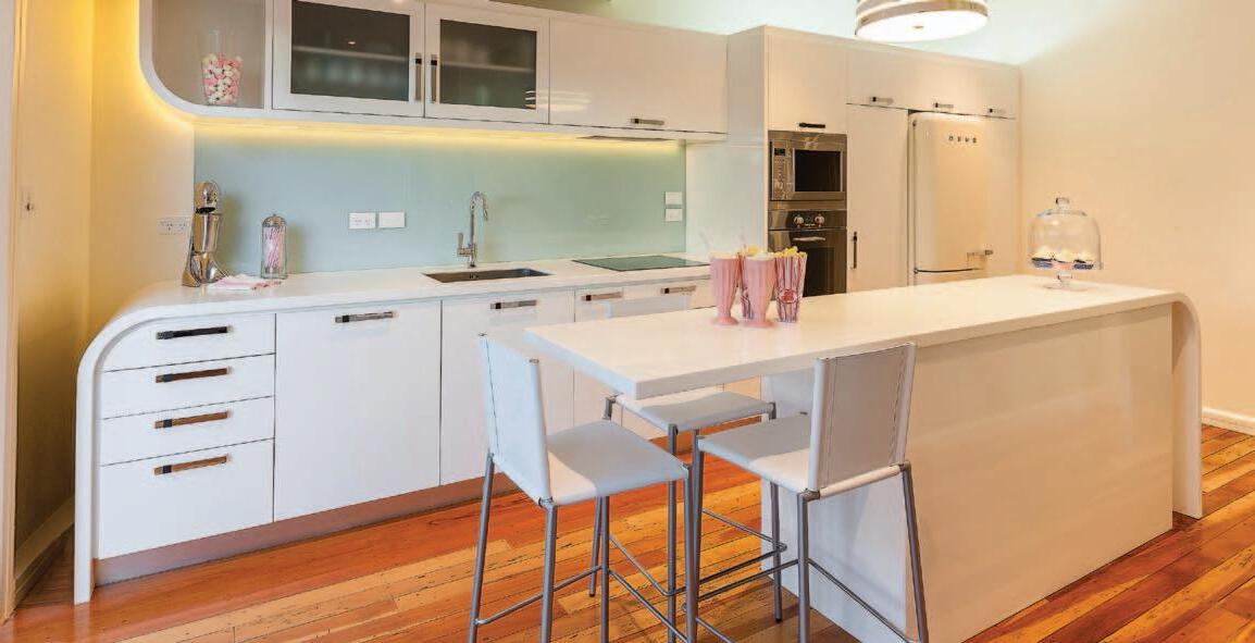

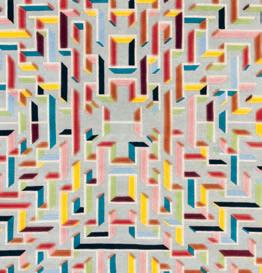
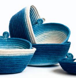
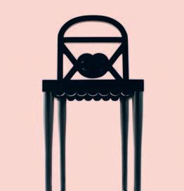
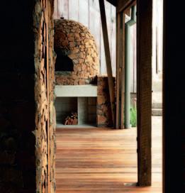

The T e am aT Habitus magazine T h ank our adverT isers for T h eir supporT use T h e direcTory To see whaT page a specific adverT isemen T is on, and visiT T h eir websiT e To learn abou T Th e producTs a nd services Th ey provide.
Habitus magazine is available at newsagents and bookstores across Australasia, South-East Asia, the USA, Canada, Europe, South America and the Middle East. Habitus is published quarterly in March, June, September and December. To subscribe securely online visit habitusliving.com/magazine or email subscriptions@indesign.com.au to subscribe or request a full list of locations where Habitus magazine is available.
Your map to where the stories in this issue come from – and where is sold
#154 Chiang Mai
#58 bangkok
#67 Yogyakarta
#112 Jakarta
#143 Perth
The world is a book, and those who do not travel read only one page
#171 singapore
#129 Jamberoo
#87 s ydney
#98 Longford
#166 auckland
#75 Wairarapa
AUGUSTINE OF HIPPO
Looking to fill a void, redecorate or just find that perfect piece? You’re sure to find it in our first Australian store. Featuring thousands of contemporary, quality furniture and homeware items that we have hand picked from around the globe. Our collection boasts the rare, the unusual and the beautiful displayed in inspirational room settings. You can also enjoy fresh and seasonal meals from our chic fusion bistro to make sure there’s no void left empty. Now open at 200 Gipps Street, Abbotsford, Melbourne.
