Space-making in Singapore. Apartment living. Andra Matin in Jakarta. Storage solutions. Why not play a little?

JULY – SEPTEMBER | 2014 AUD$16.95 | NZ$16.95 | USD$17.95 CDN$18.95 | GBP£9.90 | SGD$11.95
living in design # 24
269 Military Road, Cremorne | Tel 02 9908 2660 | fanuli.com Melbourne Nice Home (03) 9419 4455
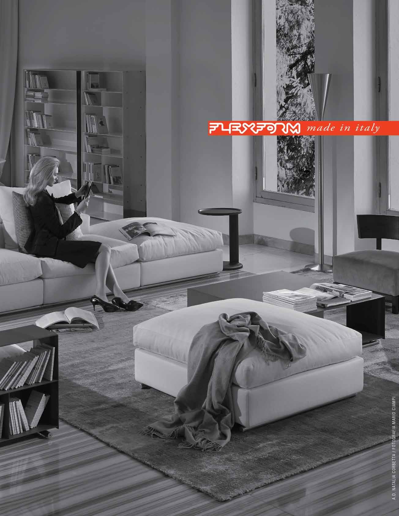
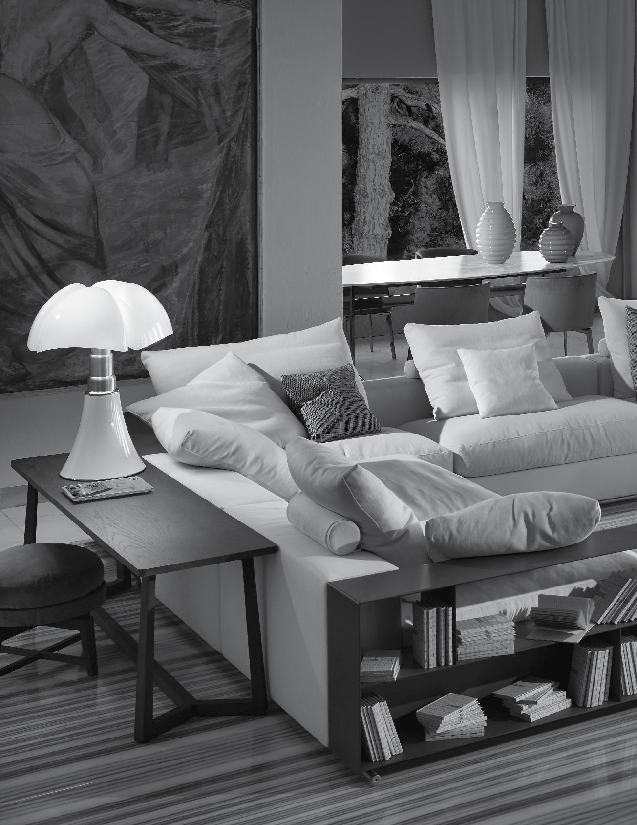
Presenting one of our favourites at Fanuli, the Groundpiece sofa by Flexform
Designed by Antonio Citterio, the Groundpiece sofa is the epitome of comfort and style. Available exclusively at Fanuli its clean, relaxed lines add elegance and adaptability to every setting.

Flexform is one of the world’s most sought after and renowned furniture brands. It’s a perfect fit with Fanuli, where you’ll find a range of world-class soft furnishing, imaginative tables, bookcases and storage solutions for the home and contrat interiors.
Made in Italy.

ITALIAN & AUSTRALIAN FURNITURE EST. 1976
IlBagnoAlessi One (sanitary ware, bath tubs, shower enclosure and furniture) is produced and distributed by Laufen Bathrooms under License of Alessi Spa Italy
IlBagnoAlessi One (sanitary ware, bath tubs, shower enclosure and furniture) is produced and distributed by Laufen Bathrooms under License of Alessi Spa Italy
HEART MADE. HAND FINISHED.
HEART MADE. HAND FINISHED.
LAUFEN bathrooms are created with Swiss precision and high quality demands. Combined with the love for detail, exceptional bathroom concepts come to life:
LAUFEN bathrooms are created with Swiss precision and high quality demands. Combined with the love for detail, exceptional bathroom concepts come to life:


ILBAGNOALESSI One, design by Stefano Giovannoni
ILBAGNOALESSI One, design by Stefano Giovannoni










www.silestone.com Ask for an authentic Silestone® Benchtop. Activate your warranty on our website. BACTERIOSTATIC PROTECTION 15 YEARS WARRANTY facebook SilestoneAustralia twitter Silestone_AU Activate BACTERIOSTATIC 15 facebook SilestoneAustralia twitter Silestone_AU www.silestone.com Ask for an authentic Silestone® Benchtop. Activate your warranty on our website. BACTERIOSTATIC PROTECTION 15 YEARS WARRANTY facebook SilestoneAustralia twitter Silestone_AU THE ORIGINAL Ask PROTECTION YEARS WARRANTY
Australia 1300 306 960 Singapore +65 6511 9328 www.stylecraft.com.au Supporting Australian Design & Manufacturing
Featured
|
Tailored Lounge & Tables by Ross Gardam
Just to whet your appetite for what ’s to come: our selection of the latest products, all designed to help make the compleat home.
24. DESIGN NEWS
Sit on it, shower under it, light up your life, store your knick-knacks – here are some suggestions.
35. RESHOOT
Tap into a whole new world of bathing, tap your way across the floor and tap the possibilities of where to put all those little things.
41. PLAY TIME
Homo ludens – humanity and play. Time to lighten up and get a sense of play into our everyday domestic life.
50. THAI PARADOX
Campbell Drake discusses three recently released books which survey the complexity of Thai architecture.
We have re-organised ourselves... Meet the makers, inspiring movers and shakers across the region and engage with a cast of creative personalities.
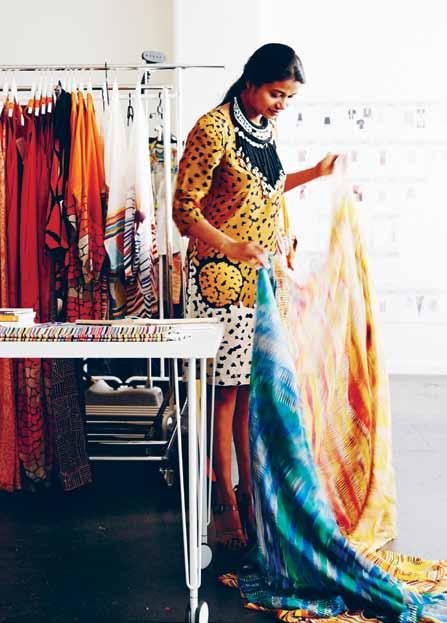
58. ROOPA PEMMARAJU
How migration lit the torch of creativity. Alice Blackwood meets an Indian fashion designer who found her mojo in Melbourne and in the richness of Aboriginal art.
69. SOPHEAP PICH
Going home again meant a vocational awakening for this Cambodian artist. As Michael Young discovers, he has transformed the artistic landscape of his homeland.

79. ASIAN DESIGN CENTURY?
The cultural vibrancy of the Asia Pacific is driving a wave of quality design and local manufacture, as Nicky Lobo reports.
87. MICHELE CHOW
Interior designer turned manufacturer. Linda Cheng meets a dynamic entrepreneur who brings Malaysia, Thailand and Australia together in her brand Dessein.
96. LUNUGANGA
He changed the face of South-East Asian architecture. Andrew Pfeiffer re-visits the Sri Lankan home of Geoffrey Bawa and savours one of the great gardens of the world.
# 24
#58 #24
#139
Placemaking is what distinguishes the residential architecture of the Asia Pacific. Delight in the rich variety of these projects from India, Indonesia, Singapore, Melbourne and Perth.
114. KHOPOLI HOUSE
This house by Spasm Design, perched on an exposed knob of rock with panoramic views transcends the limits of form, says Jagan Shah, and makes the monsoon a dramatic experience while generating an intimate connection with the landscape.
128. HUNTER STREET APARTMENT
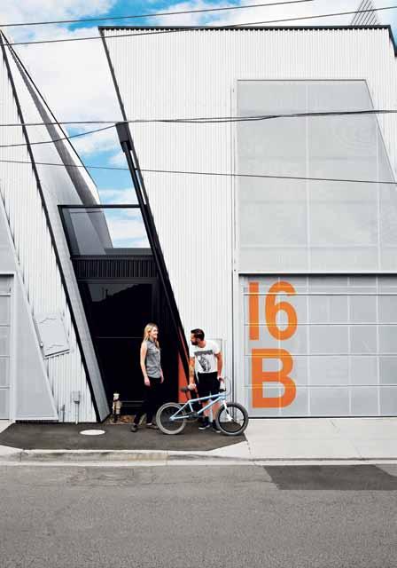
It may look like a warehouse, but this cluster of three units by ODR Architects is a lot more subtle. Mark Scruby explores its spatial and urban strategies, providing a rich environment for those inside and added amenity for those outside.
139. JAKARTA HOUSE
Prominent Indonesian architect, Andra Matin, has built a house for himself and his family which, says Nikita Notowidigdo, recovers both his childhood and another way of building.
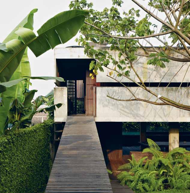
153. HOUSE AT CLOVER
One way to beat the high cost of land in Singapore is to adapt an existing house. Luo Jingmei looks at how The Carpenter’s Workshop have optimised space in this confined inter-terrace.
163. 4-ROOM HOUSE
Architects, Adrian Iredale, and his wife, Caroline Di Costa have, says Carly Barrett, a passion for alterations and additions. This found an outlet with their own home in Perth.
181. COMPARTMENT LIVING
It used to be only the megalopolises of the world, but now space is at a premium wherever you live. Habitus does a scan of the issues and solutions to living with limited space.
#128
# 24



BA THROOM DESIGN CENTRE •A LE XA ND RI A-8 4O ’R IO RD AN ST.0 28 33 97 10 3 •A UB UR N-1 03 -1 23 PA RR AMATTAR D. 02 87 48 43 67 VI SI TO UR WE BS IT E-W WW .D OM AY NE .C OM .A U Do ma yne ® st or es ar eo pe ra te db yi nd ep ende nt fr anc hi se es .2 66141_ NA U


Zip HydroTap. The world’s most advanced drinking water appliance. Z0710


www.zipindustries.com | 1800 42 43 44 Zip HydroTap® Zip HydroTap® All-In-One Boiling | Chilled | Sparkling | Filtered Instantly | Hot + Cold | | |
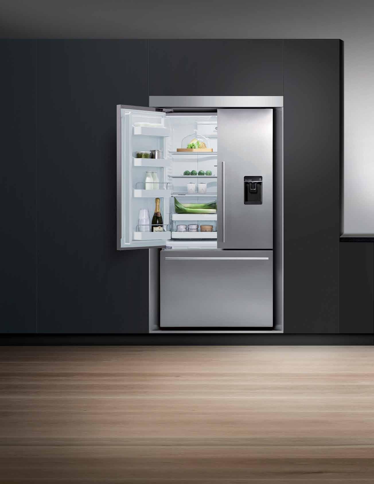
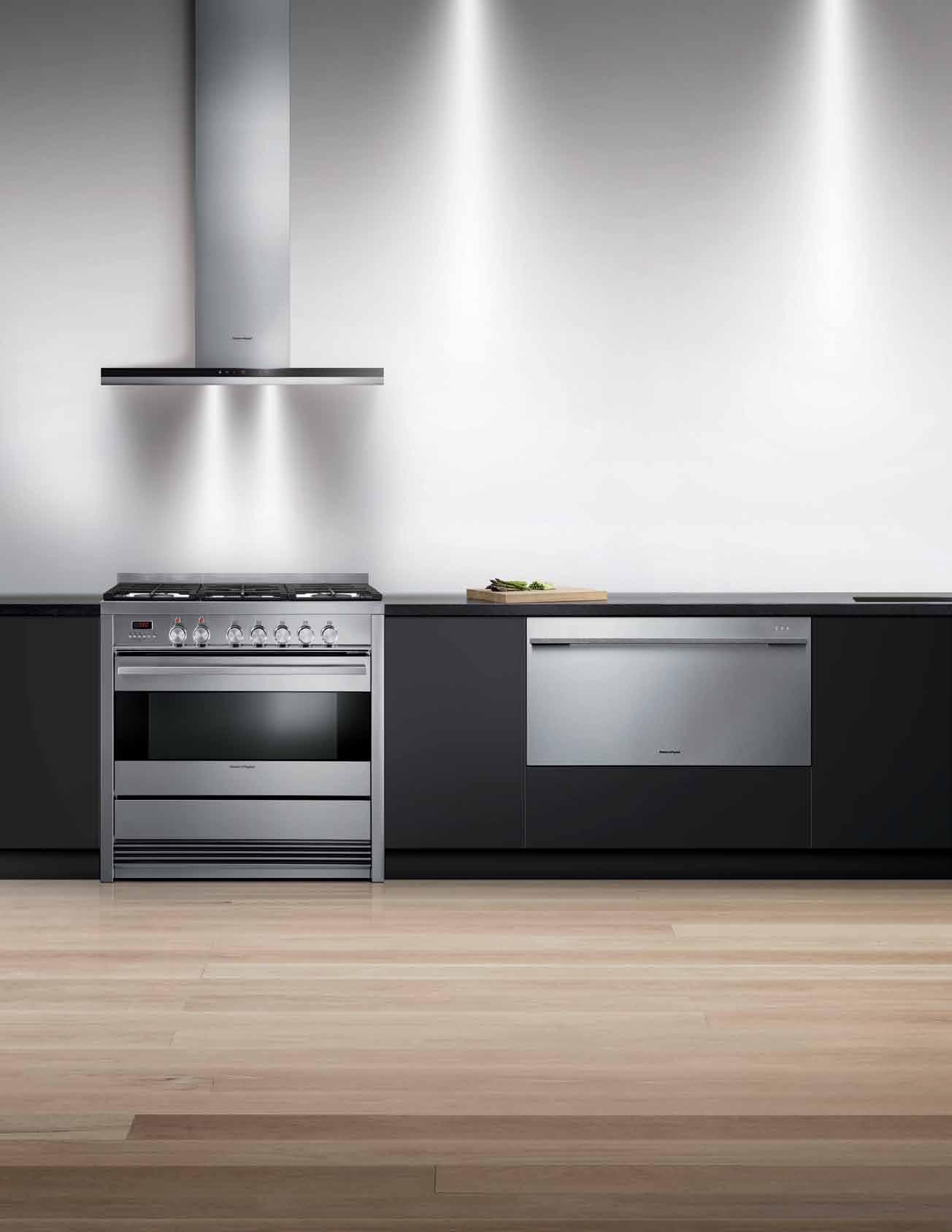
Your dream kitchen
d esigned to match

Few kitchen brands offer high performance products that visually match. The truth is looks do matter. That’s why we have reinvented our full kitchen family to create an aesthetic style across all appliances. With the same handle, black glass and stainless steel finish, the Fisher & Paykel kitchen family is engineered to perform and designed to match.

6506_FPG

the first word
Architects’ own houses are invariably fascinating because they are an opportunity to play with ideas which are highly personal – and which no client would, or should, ever accede to. It was Baudelaire who said that artistic creation had its origins in the storehouse of childhood memories and impressions. “Genius,” he said, “is nothing more nor less than childhood recaptured at will.”
Andra Matin’s house is very much about making connections back to his childhood – in other words, aiming to create the continuities which make our lives meaningful.
But Matin’s project also highlights another aspect of the continuity agenda, and one which is very prominent in Indonesia – namely, cultural continuity, especially as it is embodied in traditional building practices and materials. After all, the home is a lot more than simply a shelter. It is packed with symbolic significance, an emblem of our private and communal values. This is most obvious in traditional – or vernacular – dwellings which were built long before the profession of architecture existed and continue to be built without the need of an architect. Existing building typologies are here not so much replicated as constantly re-invented within a spontaneous, organic process – just as every hand-made tribal rug is both a token of a type, yet completely unique.
Hence, Matin’s project was largely pursued without formal drawings. Instead, communication of the design intent was conducted informally, on site, in conversation with the builder. The result is a house which connects back to its cultural heritage, not just in its finished form, but also in its very process of development and construction.
Once again I am led back to the Habitus mission – to reveal how people from the Asia Pacific region marry a way of life with their design decisions. Actually, as Andra Matin’s project implies, the word ‘design’ seems quite feeble in the face of the immense richness with which create our lives.
Paul McGillick | Editor
Rummaging around in the contents of this issue looking for a starting point to my quarterly sermon (aka editorial), I did not need to look far –Andra Matin’s own house in Jakarta.
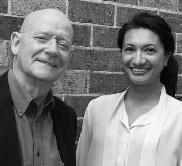
left | editor, paul mcgillick. right | deputy editor, nicky lobo.
habitus takes the conversation to our contributors, discovering their inspirations and design hunter™ journeys
Carly Barrett
4-room house #163
Carly is an award-winning architect and director of project 857 and +design in Western Australia. Though she is currently working and living in Perth, Carly grew up in Darwin, and has worked in key areas across the country including sydney and melbourne. Taking up residence in a town she describes as “a bit of a local ‘archi-hub’”, Carly lives with her partner stephen (also an architect) and their resident fluffball miniature poodle. For Carly, “The joy of making something from nothing is one of the most rewarding aspects of the design industry.”


linda Cheng
miChele ChoW #87
melbourne-based l inda Cheng decided to pursue architecture, “somewhere between building l ego cities and paddle-pop stick houses and craning my neck at the city skyline while riding the tram to school”. s omehow, she has ended up in architecture publishing and media and looks forward to “Being old and grumpy, knitting, baking and writing angry letters to the editor on the sorry state of contemporary politics.”

CampBell drake

T h A i PA r AD ox #50
Campbell first fell in love with architecture after visiting the Chapelle Notre Dame du haut as a child. he is now is a multi-disciplinary practitioner who challenges interpretations of conventional design. After extensive studies, he co-founded design and consultancy studio regional Associates in 2010; he is also a member of artists collective Contemporary site i nvestigations, and lectures at rmi T university.


Christine FranCis

miChele ChoW #87
i n love with all things design-related, Christine Francis is a passionate photographer based in melbourne. s he finds inspiration in prints and old black and white slides of her family, in which she finds “a beautiful softness and depth”. After completing a Bachelor of Visual Communication (Photography & Digital i maging), Christine’s keen eye for design is constantly in search of learning experiences in her growing photography practice specialising in interiors and architecture.
a rmelle h a BiB
hu NT er sTreeT APA rT me NT #128 “ i spent many years travelling throughout Australia, Asia and europe,” says Armelle, “and i turned to photography to capture the incredible things around me. since then it’s become a real passion as well as a career”. l iving in melbourne with her partner, Bruno, and rescue dog Akuna Brown, she focuses on interiors, food and people using natural lighting and uncomplicated compositions to document moments that are both captivating and candid.
Benja h arney
Pl Ay T ime #41
A tried-and-true sydney local, paper engineer Benja harney shares his home and studio with friends, plants and his paper creations. it was 2004 when Benja first fell in love with the humble medium, and it wasn’t long before his inspiration jumped from paper to “the big city, its urban texture, and the people who inhabit it.” residing in sydney’s eastern suburbs, Benja’s weekly highlight is his Japanese class on monday nights – now launching into his second year he is, self-admittedly, “totally hooked.”
h erds oF Birds
T h A i PA r AD ox #50
matt Canning (AKA herds of Birds) is an illustrator and designer from s outhampton, u K. Preferring graphic pens above all other media, matt creates heavily textured works with an often whimsical nature. Vintage in aesthetic, animals often feature in his work, and themes of modernity and man’s relationship with nature are recurring ones. matt lives with his wife, kids, the dog and “ e rr… several cats.”
see Chee k eong
house AT CloV er #153
Born in malaysia, s ee Chee Keong was a graphic designer who took the opportunity to help a travelling friend and found his passion in architectural photography. it was from here that he grew to establish his own interior and architectural photography practice. Now living in singapore, inspired by his wife and two young children, he hopes to publish a book on interiors and architecture.

n ikita notowidigdo
JAKA rTA house #139
Now residing in sydney after studying architecture, Nikita looks forward to her annual visit to her place of birth, Jakarta, i ndonesia. Although captivated by sydney’s lifestyle, she finds ways to “share the architecture, art and design of i ndonesia with the rest of the world,” as she says. Always inspired and amused by the little things around her, her creative thoughts are immersed in her work at BVN Donovan h ill.
l ina s okChalina
soPhe AP PiCh #69
l ina is an international photographer and artist living in Cambodia. h is experimental photography addresses a variety of social, cultural, economic and environmental changes happening locally as a result of globalisation. After undertaking an apprenticeship with French photographer, stephane Janan, he kept studying on his own to develop skills in documentary and conceptual photography.

m artin w estlake

JAKA rTA house #139
“ i first fell in love with photography in 1970 whilst living in Nigeria. Carrying a camera gave me a way to meet local people and get immersed in local cultures,” says martin. Now living in Jakarta with his i ndonesian wife and kids, his creativity is sparked by all things of that culture, especially when captured under the light of dawn.
seBastian ZaChariah

K hoP oli house #114
l iving in Bombay, i ndia (as he would like to remember it) or mumbai (as it has been re-christened), photographer s ebastian Zachariah has a self-confessed ‘never say die’ attitude. s ebastian shares his home with his wife, two dogs, his father and teenage nephew. i nspired by good design, efficiency and honesty, though not exactly in that order, s ebastian most looks forward to “enriching experiences”.

CORRECTION
i n Habitus #23 we did not credit the wonderful design by m inosa of the bathroom featuring Corian on page 177. o ur sincere apologies for this. s ee more from m inosa Design at minosadesign.com

We also incorrectly spelled the surname of Korakot srivikorn, our sincere apologies for this. And rather than being a Chairwoman of the board, Korakot is Director at Gaysorn Group as well as head of marketing & communications for the group.

BATHROOM CULTURE. W | www.wetdesign.com.au P | 1300 WETDESIGN E | info@wetdesign.com.au Hab24_WetDesign_HPV_use.indd 2 30/04/14 5:36 PM
editorial direCtor
Paul mcGillick habitus@indesign.com.au
depUty editor
Nicky l obo nicky@indesign.com.au
editorial assistant
Philippa Daly philippa@indesign.com.au
original design template one8one7.com
senior designer
Frances yeoland frances@indesign.com.au
designer
Alex Buccheri alex@indesign.com.au
j U nior designer
rollo hardy rollo@indesign.com.au
j U nior designer & advertising tra FFiC Kelsie Barley kelsie@indesign.com.au
ContriBUting designer Giuseppe s antamaria
online editor l orenzo l ogi editor@habitusliving.com
editor al intern l ara smetannikov
ContriBUting w riters
Carly Barrett, Alice Blackwood, l inda Cheng, Carmpbell Drake, l uo Jingmei, Nikita Notowidigdo, Andrew Pfeiffer, m ark s cruby, Jagan s hah, s ophia Watson, m ichael young
ContriBUting
photographers
Peter Clarke, Tom Ferguson, Christine Francis, James Geer, Armelle h abib, Trevor mein, s ee Chee Keong, Tim r obinson, l ina s okchalina, m artin Westlake, s ebastian Zachariah
ContriBUting stylist
Amanda Talbot
ContriBUting illUstrator herds of Birds
Ceo / pUBlisher
r aj Nandan raj@indesign.com.au
pa to pUBlisher
e lizabeth Davy-hou liz@indesign.com.au
operations direCtor Adele Troeger adele@indesign.com.au
prodUCtion m anager s ophie mead sophie@indesign.com.au
FinanCial direCtor Kavita l ala kavita@indesign.com.au
aCCoU nts
Gabrielle r egan gabrielle@indesign.com.au
Vivia Felice vivia@indesign.com.au
online Comm U niCations r adu e nache radu@indesign.com.au
r amith Verdheneni ramith@indesign.com.au
r yan sumners ryan@indesign.com.au
Nimish s hrestha nimish@indesign.com.au
e vents and marketing Tegan s chwarz tegan@indesign.com.au
Angela Boustred angie@indesign.com.au
sales direCtor
marie Jakubowicz marie@indesign.com.au
(61) 431 226 077
BUsiness development manager
Colleen Black colleen@indesign.com.au
(61) 422 169 218
Cover image
Play time (page #41)
Photography: Tim robinson
HE ad OffICE
l evel 1, 50 marshall street, surry h ills Ns W 2010 (61 2) 9368 0150 | (61 2) 9368 0289 (fax) | indesign.com.au

MElbOu RNE suite 11, l evel 1, 95 Victoria street, Fitzroy V iC 3065 | (61) 402 955 538
SINgapORE
4 l eng Kee road, #06–08 sis Building, singapore 159088 (65) 6475 5228 | (65) 6475 5238 (fax) | indesignlive.sg
HONg KONg unit 12, 21st Floor, Wayson Commercial Building, 28 Connaught r oad West, s heung Wan, hong Kong | indesignlive.hk
quarterly and is available through subscription, at major newsagencies and bookshops throughout Australia, New Zealand, s outh-e ast Asia and the united states of America. This issue of habitus magazine may contain offers or surveys which may require you to provide information about yourself. i f you provide such information to us we may use the information to provide you with products or services we have. We may also provide this information to parties who provide the products or services on our behalf (such as fulfilment organisations). We do not sell your information to third parties under any circumstances, however, these parties may retain the information we provide for future activities of their own, including direct marketing. We may retain your information and use it to inform you of other promotions and publications from time to time. i f you would like to know what information i ndesign media Asia Pacific holds about you please contact Nilesh Nandan (61 2) 9368 0150, (61 2) 9368 0289 (fax), info@indesign.com.au. habitus magazine is published under licence by i ndesign media Asia Pacific. issN 1836-0556
issue #24 habitusliving.com outline collection Carlo Colombo design MADE IN ITALY www.teuco.com Teuco asked beauty to conceal power. The result is Hydroline. Hydroline, the invisible massage. Discover Teuco’s know-how affording superior efficiency while replacing classic jets with minimal slits. Available on bathtubs in Duralight® the beguiling smooth material. Now also available on acrylic tubs. 70-13-Habitus half vert_90,7x226,75.indd 1 26/09/13 10.19 www.delsa.com.au HAB22_Delsa_HPV.indd 1 10/10/13 4:16 PM Printed in singapore. All rights reserved. No part of this publication may be reproduced, stored in a retrieval system, transmitted in any form or by any other means, electronic, mechanical, photocopying, recording or otherwise. While every effort has been made to ensure the accuracy of the information in this publication, the publishers assume no responsibility for errors or omissions or any consequences of reliance on this publication. The opinions expressed in this publication do not necessarily represent the views of the editor, the publisher or the publication. Contributions are submitted at the sender’s risk, and i ndesign media Asia Pacific cannot accept any loss or damage. Please retain duplicates of text and images. habitus magazine is a wholly owned Australian publication, which is designed and published in Australia. habitus is published
An Everyday Masterpiece The beauty of art; the quality of Caesarstone New Calacatta Nuvo™ www.caesarstone.com.au
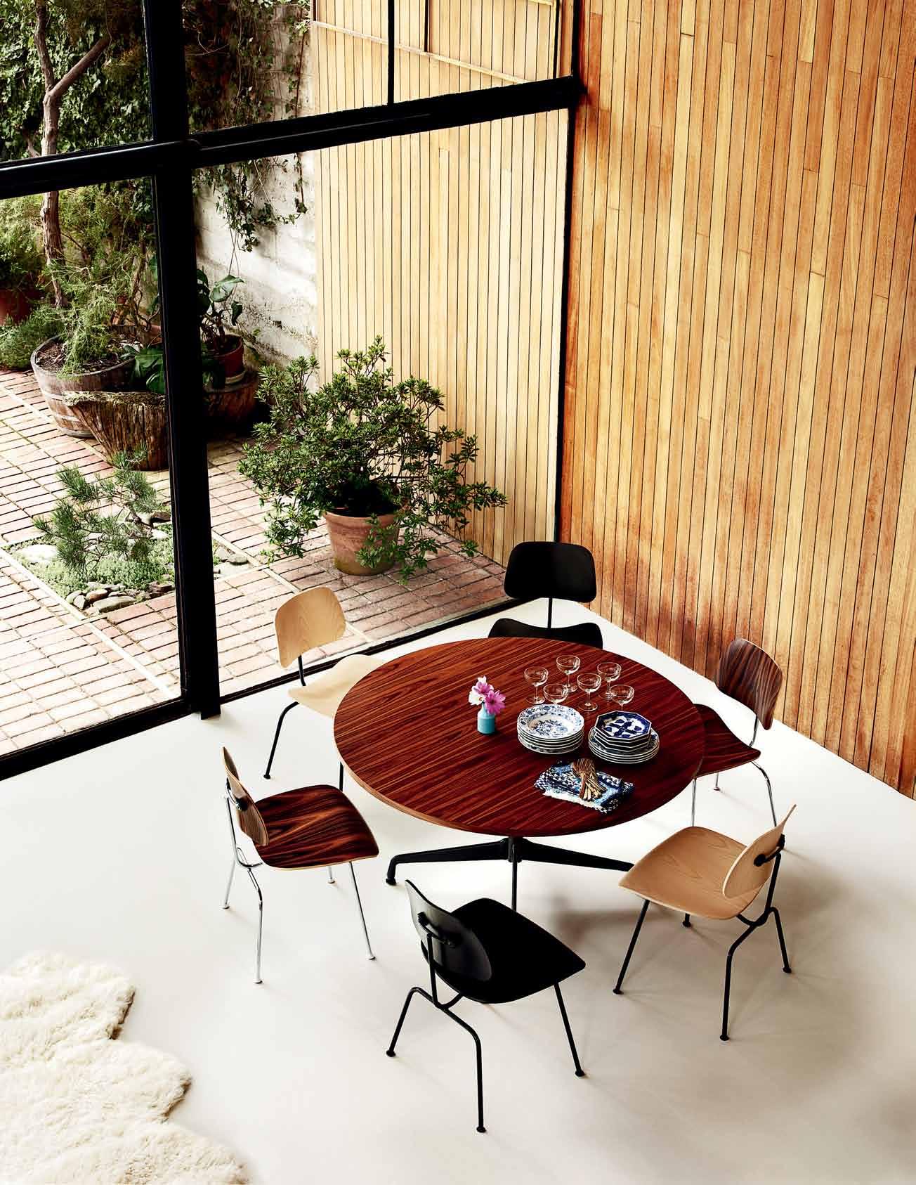
The Eames® Moulded Plywood Chairs are made to fit the contours of the body, so sitting on this icon of modern design feels good. By moulding thin sheets of lightweight veneer into gently curved shapes, Charles and Ray Eames managed to give a hard material a soft appearance and establish the foundation for modern furniture design.
hermanmiller.com.au
hermanmillerasia.com |
Herman Miller Eames® Moulded Plywood Chairs; Herman Miller Eames® Table Segmented Base.
We’ve got everything covered

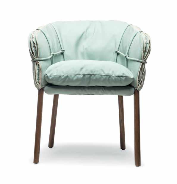
The PARCHMENT armchair is the latest from multi award-winning Filipino furniture designer, Kenneth Cobonpue , for his eponymous brand. Composed of steel and Maple, the simplicity of the structure gives way to the intricate details of knotted cord and folded cushioning, creating a piece of balance and visual texture. His cultural approach – integrating local materials and handmade processes – has made Conbonpue synonymous with Filipino design.
kennethcobonpue.com / kezu.com.au
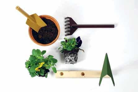
If this doesn’t inspire a green thumb, then nothing will. Designed by Giulio Iacchetti , ORTE is a set of three gardening tools in polished metal. The set comes with a wooden base where the items can be stored away after use – no excuses for leaving them out. In a powdercoat finish, the natural colour palette of green and browns with the timber base will sit unobtrusively in your outdoor environment. A hoe, a rake and a shovel walk into a garden bar...
giulioiacchetti.com / internoitaliano.com
Global leaders in innovative bathroom design, Kohler, have unveiled the new MOXIE showerhead. This internationally award-winning Bluetooth-enabled showerhead streams music and podcasts straight into the shower stall, with no distortion of sound. Magnetically attached and corrosion resistant, the music keeps playing so you can revitalise both physically and sonically.
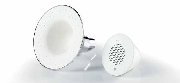
au.kohler.com
The SIGMA50 flushplate from Geberit is refreshed with a new design by Christoph Behling , TAG Heur’s lead designer. The seamless exterior adds an air of timelessness to any bathroom.
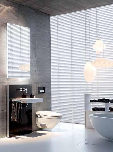
christophbehlingdesign.com / geberit.com.au
issue #24 habitusliving.com
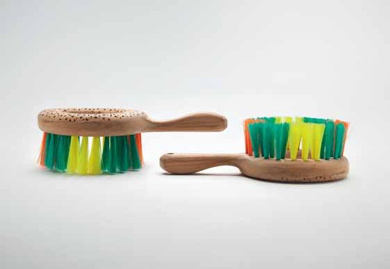
The new MUTLI BRUSH from Field Experiments was created as part of a collaborative research and development project to challenge the traditional concept of the souvenir. During a three-month long stay in a local farming community in Ubud, Bali, the trio of designers explored a range of creative techniques as they learnt from the local craftspeople, eventually creating a diverse collection of handmade souvenirs infused with the essence and vivacity of Bali.
field-experiments.com
With an irresistible 1970s shape, the VALENTINE lounge collection invites you to sit back and completely chill out. Designed by Marzia and Leonardo Dainelli for Italian brand, Saba , the range is informal in the classiest way, cultivating comfort and convenience. Pre-shaped polystyrene is covered with polyurethane foam, creating both lightness and strength. With completely removable covers, VALENTINE is suitable for outdoor use.
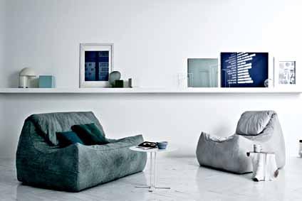
sabaitalia.it / cafecultureinsitu.com.au
“After nearly ten years in the industry, working almost exclusively via computer, I found myself missing the process of creating something by hand,” says graphic designer-turned ceramic artist Kim Wallace. The EBB TIDE collection in warm autumn hues is some of her handiwork, inspired by the natural surrounds of the Sunshine Coast hinterland.
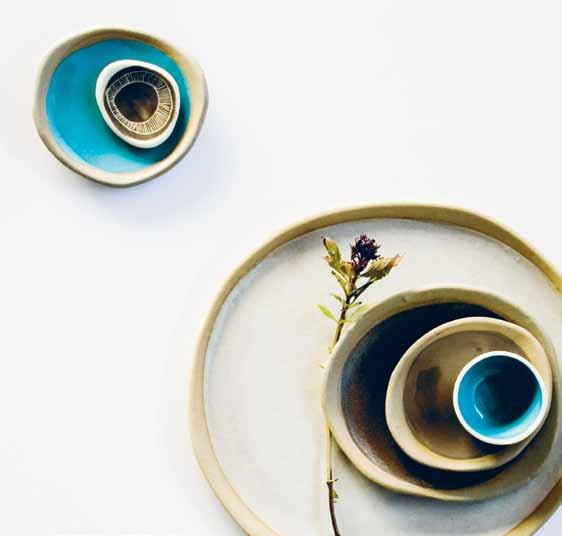
kwceramics.com.au
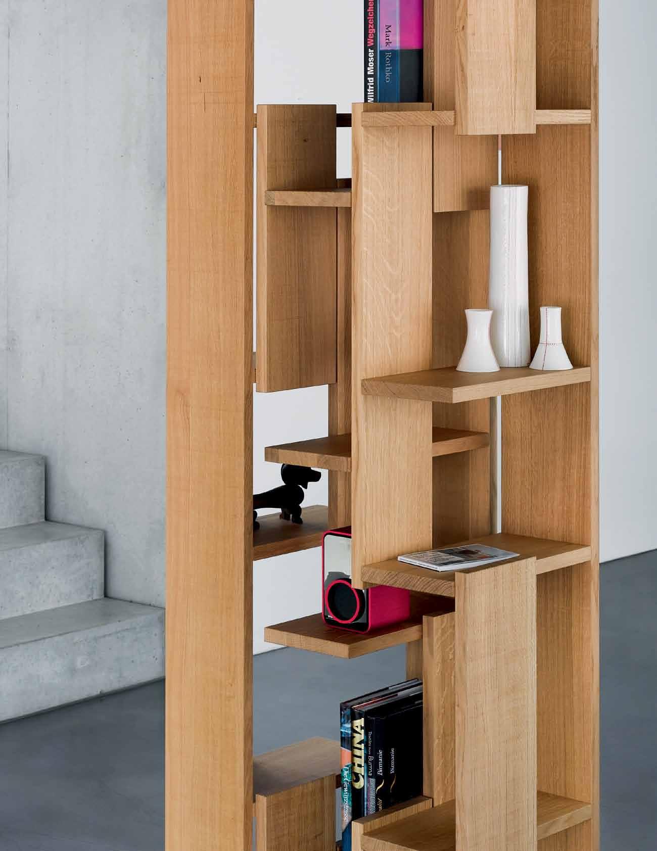
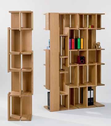
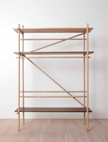
Conceived by Berlin-based Korean designer Lee Sanghyeok , USEFUL SHELF is influenced by scaffolding structures and classic Danish furniture. The minimalist approach and elegant proportions of the USEFUL LIVING collection is expressed in Oak – a classic Danish timber – with custom brass joints and wood-smoked shelves in this piece enhancing the refined aesthetic.
leesanghyeok.com
1 . lightbox # 25
From the Japanese interior and industrial design studio, Nendo, is the CONTRAST RULER , a transparent acrylic ruler with markings that fade from black to white, making it highly versatile for use on both light and dark surfaces. As part of the Marks collection, the range seeks a minimalist approach to bring out the individual character of each product. As a design company, Nendo have designed showrooms for the likes of Hermes and Puma, and provided stylish products for Louis Vuitton, Haagen Dazs and Baccarat.
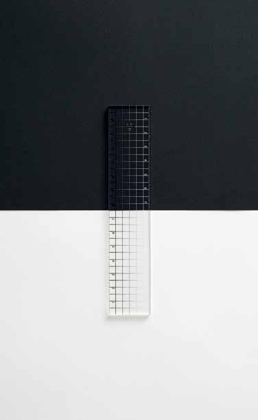
nendo.jp
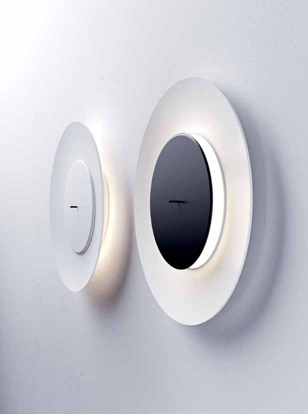
LUNAIRE from French designer Ferreol Babin is wall lighting which creates an effect similar to an eclipse. Its structure consists of a large, concave aluminium diffuser housing a smaller front disc containing the light source. The flexible adjustment of the rod on the front exterior allows for the subtle changes of mood in the environment, showcasing Babin’s characteristic design approach with its aspect of expression and emotion.
ferreolbabin.fr
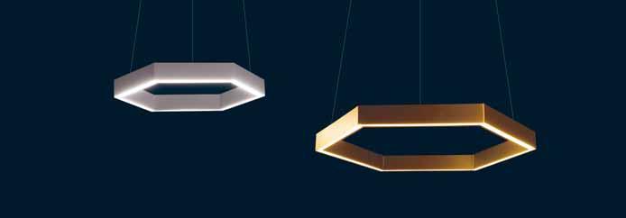
HEX750 BRASS lighting is the prestigious new addition to the Geometric series by New Zealand design and manufacturing company, Resident Studio. Continuing from a previous technological breakthrough, the structure is made from layers of aluminium, iron and electroplated brass. Completed in clear lacquer and the attachment of the 24 volt LED lighting strip, the HEX750 BRASS series is a decorative and practical alternative to modern lighting.
resident.co.nz
issue #24 habitusliving.com
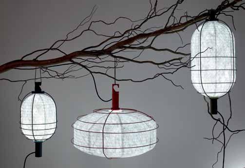
As luminous as the moon itself, the IN & OUT suspension lamps from Parisian lighting brand Forestier are the perfect addition to your outdoor setting. Designed by another Paris-based great, the prolific Arik Levy, the IN & OUT series is complemented by his other lamp designs for the company. Referencing the delicate materials and form of Chinese paper lanterns, the range is is available in black, blue, green and red, to provide a proper pop for your next garden party.
ariklevy.fr / forestier.fr / kezu.com.au
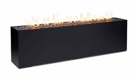
The FIRELONG fire platform by Paloform fuses industry and alchemy in its simplicity of design and materials. Embodying honesty and functionality, FIRELONG, from the Robata series is a long, tall format that can be used as a feature fire as well as an outdoor space divider. At over two metres long and 61 centimetres high, this statement piece is available in either Corten or powdercoated steel – Ontariobased Paloform believe in coaxing beauty from humble materials and in the handmade. As residents in some of the coldest weather to be experienced, they are more than qualified to produce these highly effective fires.
paloform.com
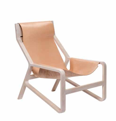
The TORO lounge chair by Bludot is a sleek leather sling encased in a solid Beech wood frame. The clever, yet simple form and construction encourages the focus to remain on the materials. While as striking as the animal that inspires its name, we’re willing to wager that this suspended seat experience will be a much more comfortable and calm ride.
bludot.com.au
They’re not traditionally the most exciting bit of design for the home, but who says house numbers can’t be fun? Young Australian designers Andrew Southwood-Jones and Alexander Kashin have created this playful set. NUMERAL (CONCRETE) is hand-cast in fine-grade concrete, but this serious material is given a comic lift with the bulging proportions of each digit, entering a new dimension.
workshopped.com.au

1 . lightbox # 27
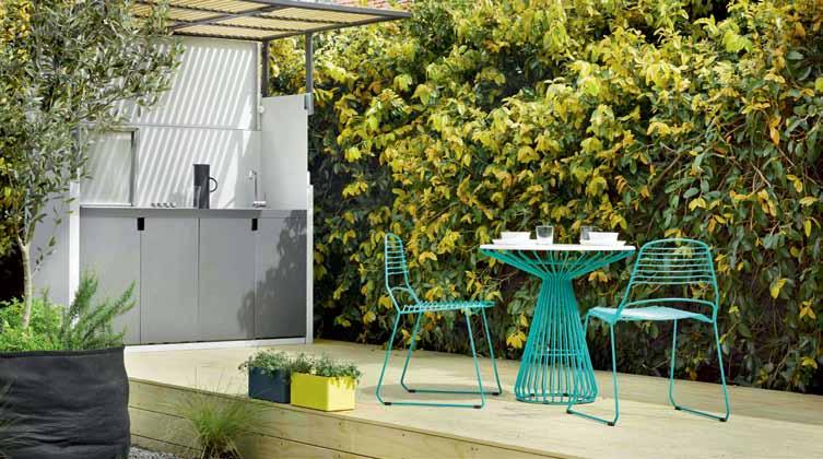
The TILT OUTDOOR
KITCHEN is more than just a cooktop; the timber front of this humble box tilts upwards up to become a 2.2-metre-high awning that forms its own undercover cooking environment. Enclosed, the Accoya timber battens provide an elegant screen, and opened, they reveal an integrated Electrolux cook-top, Häfele sink, Rogerseller tap and integrated LED lighting. A wonderful transforming design by Justin Hutchinson/Urban Commons, this hardy piece of equipment is designed to weather even the extremes of the Australian sun.
justinhutchinson.com / madebytait.com.au
Swedish family-owned rug company Henzel Studio has invited leading contemporary artists to translate their own work onto a rug format for the HENZEL STUDIO COLLABORATIONS. All designs are handmade in Nepal and feature 12 select designs by artists such as Austrian fashion designer Helmut Lang and German artist Robert Knoke. Pictured is the creation from Belgian trio, Leo Gabin . This abstract piece in black, white, bright yellow, and hints of red, green and beige is a deceitfully simple design. Gabin steps away from traditional, romanticised art to create works which inspire the imagination.

byhenzel.com
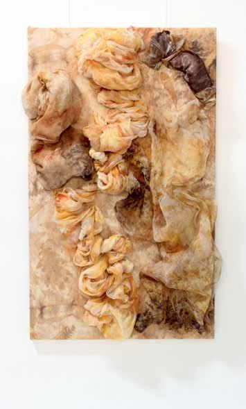
The developing collection from Sydney-based design studio Fibrecraft presents the new CASCADE collection of three-dimensional wall hangings. With a palette of natural cloth, the creative process transforms naturally dyed weaves and fibres into soft or rigid contrasting forms. In its completed state, the wall hanging exudes a modern and naturalist air.
fibrecraft.com.au
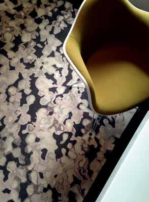
Swedish-born Australian designer Anna-Carin has a reputation for infusing her residential, retail, hospitality and commercial projects with a distinct Scandinavian character. In her first collection with Designer Rugs, she presents an eponymous range of handmade rugs in pure New Zealand wool, created through the revered technical craft of traditional Nepalese handknotting. Each creation in the ANNA-CARIN COLLECTION is an abstraction capturing a childhood memory of Sweden.
annacarindesign.com.au / designerrugs.com.au
issue #24 habitusliving.com
THE ORIGINAL REMASTERED.
You can’t go past an original. That’s why we’ve kept the essence of a good thing and made it even better. Yep, the all new MINI has arrived and it’s bigger and better than ever. With new engines, new technologies, a new centre console, new LED ring headlights, new head-up display, new parking assist and new safety features, the new MINI is all new. It is the original remastered after all. See what all the fuss is about at MINI.com.au





THE NEW MINI. THE NEW ORIGINAL.


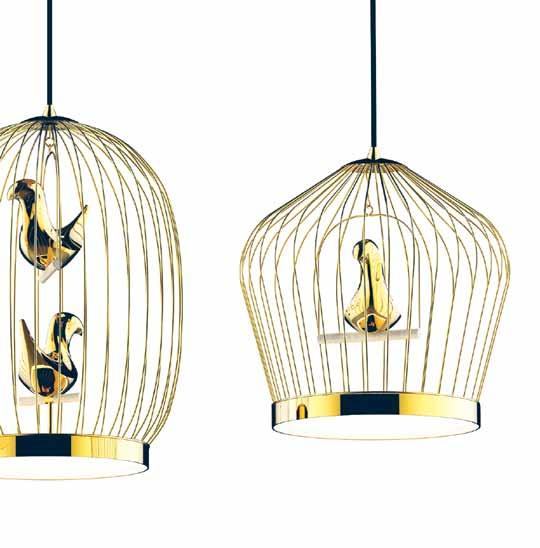
TWEETIE is a lamp system designed by Jake Phipps for Italianbased furniture design and manufacturing company Casamania , in collaboration with Bosa . These suspended symbols of Old-World etiquette are made of handmade ceramic birds encased in a metal rod frame, both of which are available in black or 24-carat gold plating. Framed in the base by double polycarbonate shielding is the LED lighting fixture which illuminates and throws gilded shade.
jakephipps.com / casamania.it / cafecultureinsitu.com.au
Austere and stylish lighting from OLIO OBJECTS is affordable yet aesthetically sophisticated in design. Georgina Lewis, the young Australian designer behind Olio, believes in products which are created responsibly and may be enjoyed on more than one level.

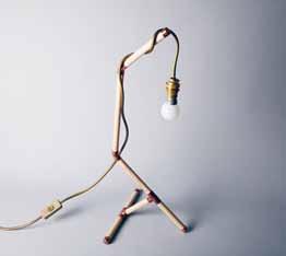
olioobjects.com
Australian innovators of linear drain systems, Stormtech , herald the new GreenTag certified Slimline series , the first in architectural gates and drains to be GreenTag certified. The system now allows you to channel water efficiently and smartly while also considering environmental impact.
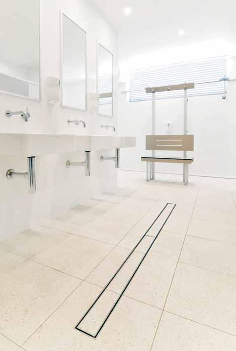
stormtech.com.au
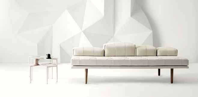
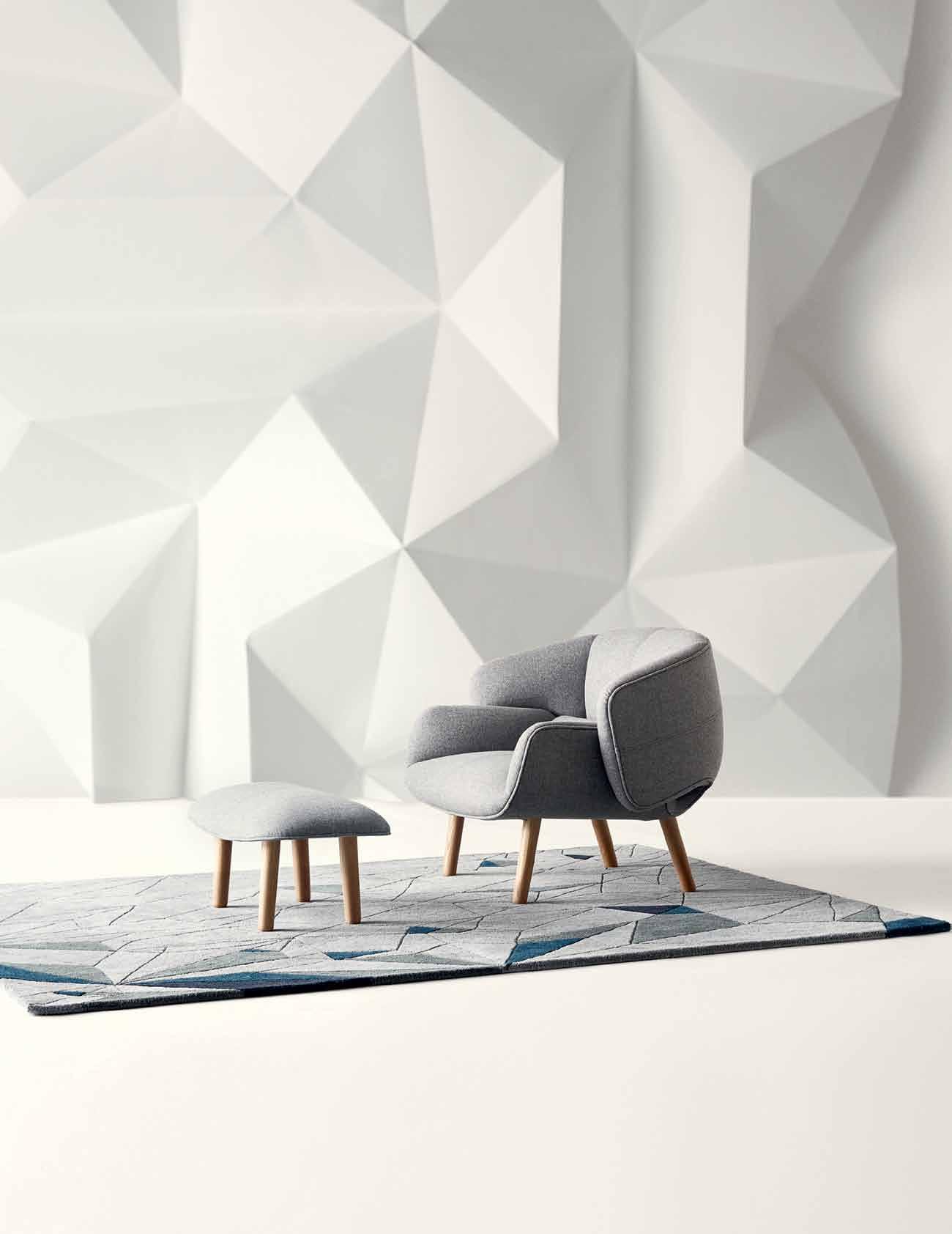
The union between Danish interior label BoConcept and renowned Japanese design studio Nendo present the FUSION collection. Combining Danish practicality and the minimalist aspects of Japanese aesthetics, the partnership has resulted in this range of expressive furniture emphasising simplicity and functionality. Available to be upholstered in either fabric or leather, the FUSION sofa blends and borrows elements from both cultures to exude balance and symmetry within the environment.
nendo.jp / boconcept.com.au
issue #24 habitusliving.com










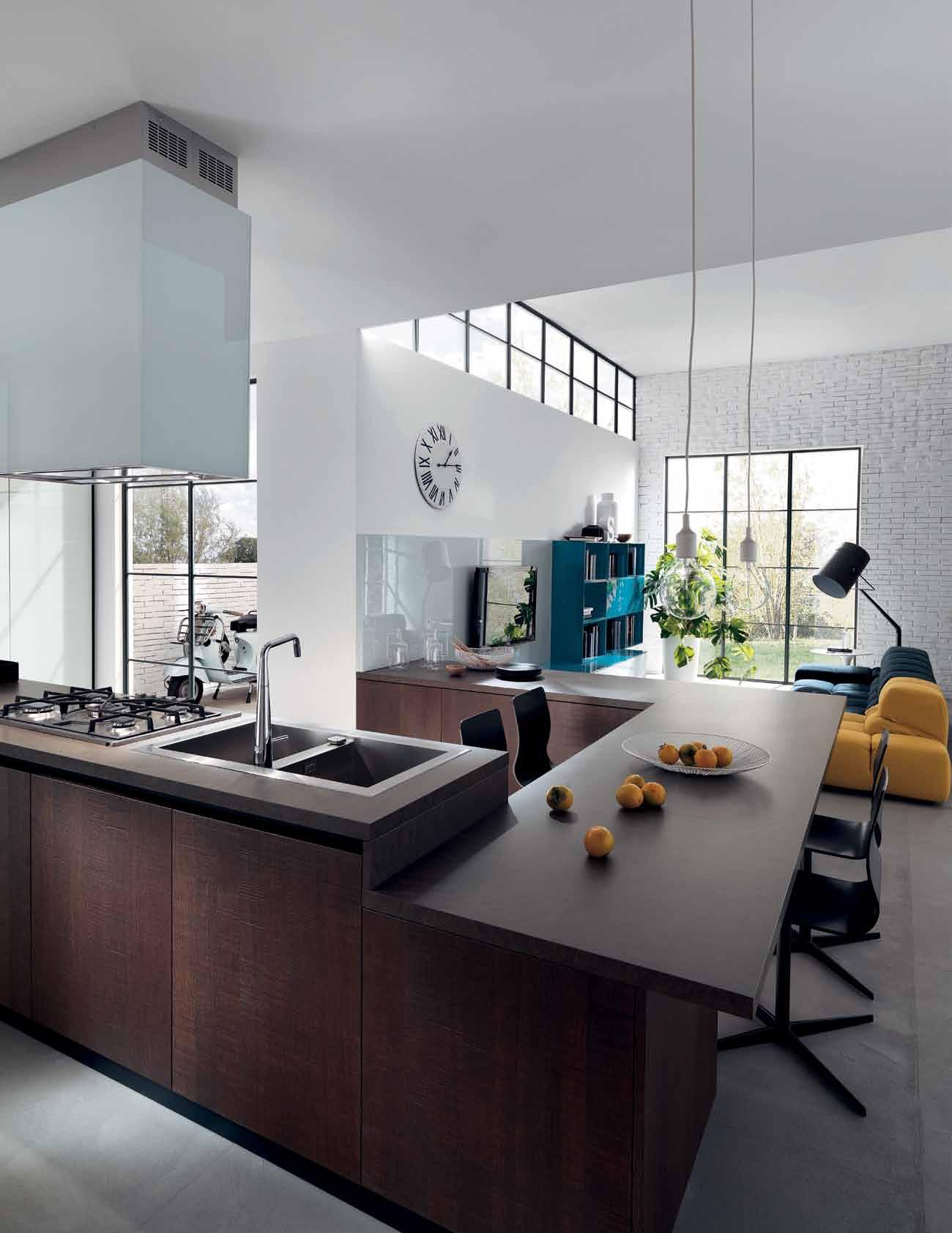
LIBERAMENTE design Vuesse Scavolini S.p.A. Italy +39 0721443333 contact@scavolini.com www.scavolini.com System of Quality Management UNI EN ISO 9001 - System of Environmental Management UNI EN ISO 14001 - System of Health & Safety Management OHSAS 18001
FONT design Castiglia Associati
water
V100
SCAVOLINI STORE MELBOURNE 363-365 Bridge Road, 3121 Melbourne VIC - Tel. (03) 9939-5882 - info@melbourne.scavolinistore.net ACCENTO HOME 256 Stirling Highway, Claremont 6010 Perth W.A. - Tel. (08) 9385-4575 - showroom@scavclaremont.com.au
Scavolini uses only idroleb panels for its kitchens carcases: a
repellent
panel with the lowest formaldehyde content presently available in the world.
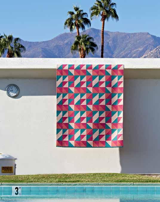
Hand-woven rugs by Australian company Armadillo & Co combine geometric patterns and striking, contrasting colours to create pieces which are vibrant and emphatic. Spending most of their time working in India, Armadillo & Co implement fair trade and the use of local organic materials to create designs with passion and inspiration from the local culture.
armadillo-co.com
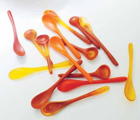
Louise Olsen and Stephen Ormandy behind Dinosaur Designs present a diversion from natural colour palettes in their exploration of the color red as part of the 2014 RED COLLECTION. Amongst their creations is a unique array of spoons in matte yellows and oranges, as well as a new tortoiseshell mix in which they combine vibrant reds and earthy shades. In melding certain colours, contrasting shades were complemented with hints of peach and cream and accents of gold, bringing out the individuality of each spoon.
dinosaurdesigns.com.au
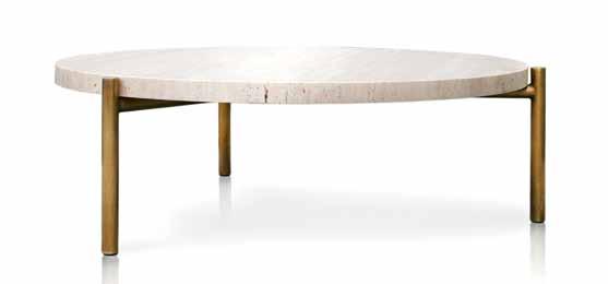
The TRAVETINE TABLE from Surry Hills-based Spence and Lyda is designed to add a fresh perspective to the living experience by creating products which are simple yet striking. The polished brass and stone give a classy aesthetic to the table’s functional and versatile purpose, keeping to the philosophy of designing to bring out “everything you want” in a room.
spenceandlyda.com.au
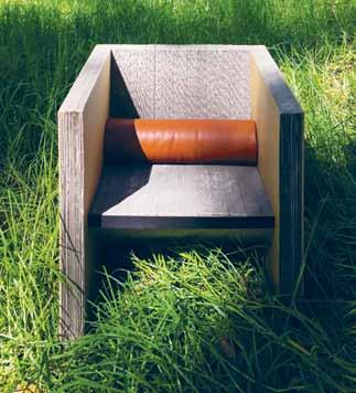
Sydney-based Peruvian architect Luis Gomez conveys his interest in cardboard into furniture design to create unique pieces straying from traditional timber framing. Meaning ‘layers’ in Spanish, the CAPAS chair is composed of several layers of cardboard mimicking the appearance of wood-grain.
capasfurniture.com
AD
issue #24 habitusliving.com
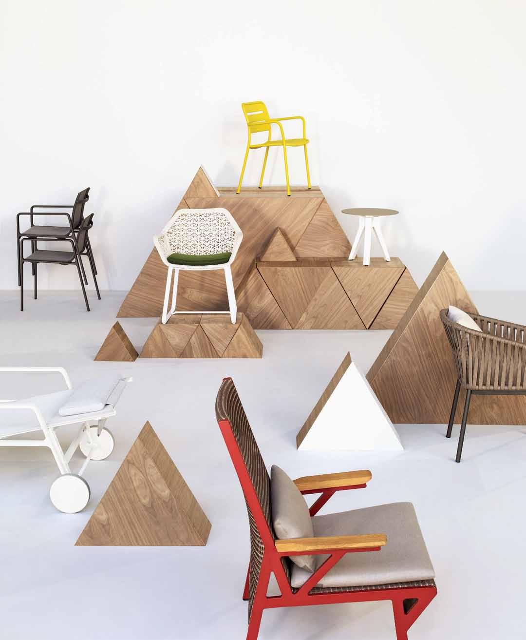
outdoor furniture www.kettal.com 1 / 248 Stirling Hwy Claremont, Perth Western Australia 6010. T. (08) 9284 55 99. info@mobilia.com.au WWW.MOBILIA.COM.AU
Made in Italy

WALL SYSTEM FROM $9,490 DESIGN CR&S POLIFORM
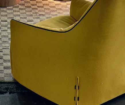
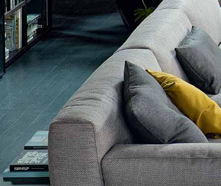
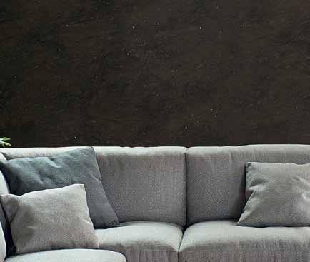
PARIS-SEOUL SOFA FROM $17,525 DESIGN JEAN-MARIE MASSAUD

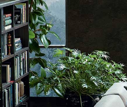
PARIS-SEOUL SMALL TABLE FROM $1,465 DESIGN JEAN-MARIE MASSAUD
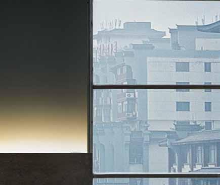
SANTA MONICA LOUNGE ARMCHAIR FROM $4,995 DESIGN JEAN-MARIE MASSAUD
BIGGER COFFEE TABLE $5,875 DESIGN CARLO COLOMBO
DAMA COFFEE TABLE FROM $2,055 DESIGN CR&S POLIFORM
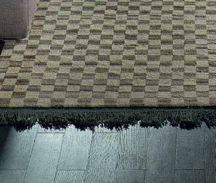
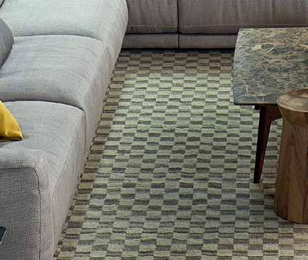
TRACES DE DAMIER RUG FROM $4,565 DESIGN CC-TAPIS



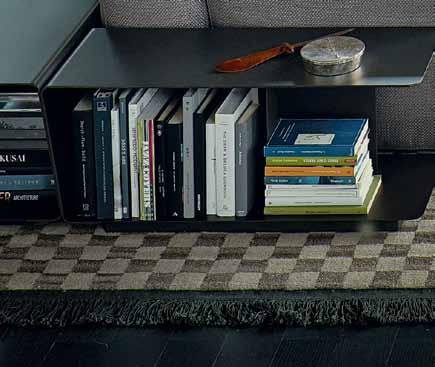

ITALY’S FINEST KITCHENS, WARDROBES, FURNITURE AND WALL SYSTEMS ARE AVAILABLE EXCLUSIVELY FROM SYDNEY LEVEL 1, 84 O’RIORDAN STREET ALEXANDRIA T 02 8339 7570 MELBOURNE 650 CHURCH STREET RICHMOND T 03 8420 0800 POLIFORM.COM.AU
|
|
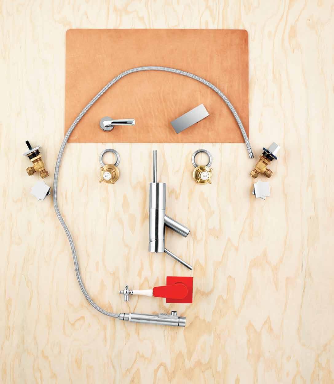
photography t im r obinson | s tyling nicky lobo | art direction frances yeoland
1 . lightbox # 35
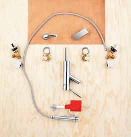
Face and nose
Schonner Pull Out, $1,894.04 , a2f australia/Candana/Mary Noall. Mouth
Ram Yeva square shower/bath mixer in Red, $256, Reece. Ears | Quadro wall top assembly handle $106.70 each, Parisi. Eyes | (left) Perrin & Rowe crosshead tap in satin brass, $644 inc. GST for pair; (right) Perrin & Rowe crosshead tap in polished brass, $644 inc. GST for pair, from The English Tapware Company. Eyebrows | (left) CURVA tapware lever, $77, Parisi; (right) BLADE square design lever, $95, Parisi. Hair | small Leather Desk Mat in Natural Tan saddle leather, $88, Henry Wilson.
tongue n
timber constructed of FSC European Oak treated with natural oils in 15 beautiful colours allowing for easy maintenance Showrooms Shop 2 188 Chalmers Street, Surry Hills NSW 2010 P 02 9699 1131 F 02 9690 0929 575 Church Street, Richmond VIC 3121 P 03 9427 7000 F 03 9427 0100 tonguengrooveflooring.com.au
groove
1 . lightbox # 37
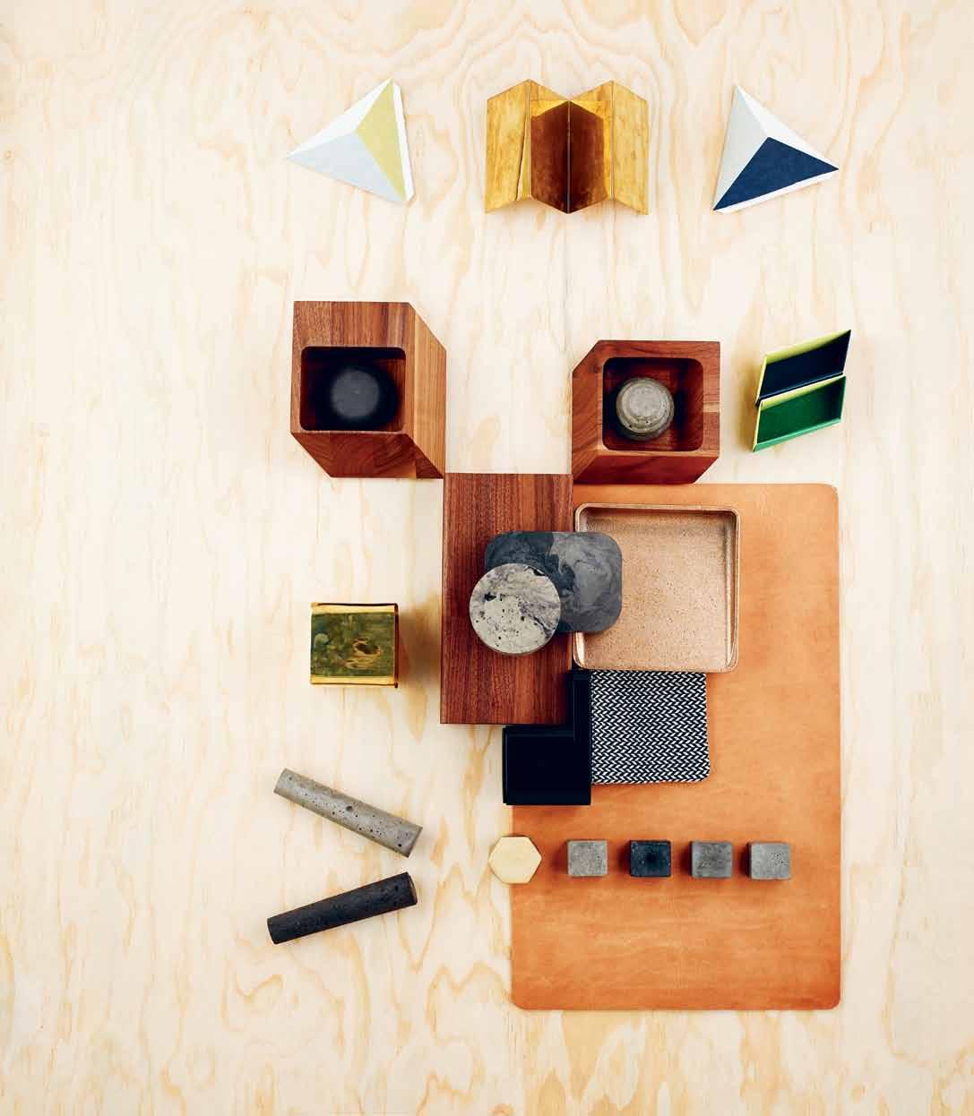
Eyebrows | Les Tri-angles wall boxes from Papier Tigre in 100% recycled paper, $54.95, available through Notemaker. Hair | Kala letter stand, $49.95, Country Road. Ears | Les Indendantes organisers in recycled paper, seventhirtyam. Eyes | (left) Sharp Box Tall, $295; (right) Sharp Box Short , $260, both in solid Walnut by BassamFellows, Living Edge. Pupils | Custom-made concrete sculptures, from $50, Tin&Ed. Nose | (clockwise from top left) Soft Box Long in solid Walnut by BassamFellows, $215, Living Edge; Vide-poche tray in rumble polished Gunmetal Bronze, $330, Henry Wilson; Remy large pencil case, $24.95, Country Road; Formwork pencil cup holder by Sam Hecht and Kim Colin, Herman Miller; custom-made concrete sculptures, from $50, Tin&Ed. Cheek | Kala pen holder, $39.95, Country Road. Mouth | Custom-made concrete sculptures, from $50, Tin&Ed. Face | small Leather Desk Mat in Natural Tan saddle leather, $88, Henry Wilson.
Fine Bohemian glass making takes contemporary form in the Lasvit Design Lighting Collection. Coupled with the honest materiality of e15, this is pure European design at its best. Now available in Australia exclusively at Living Edge.
livingedge.com.au
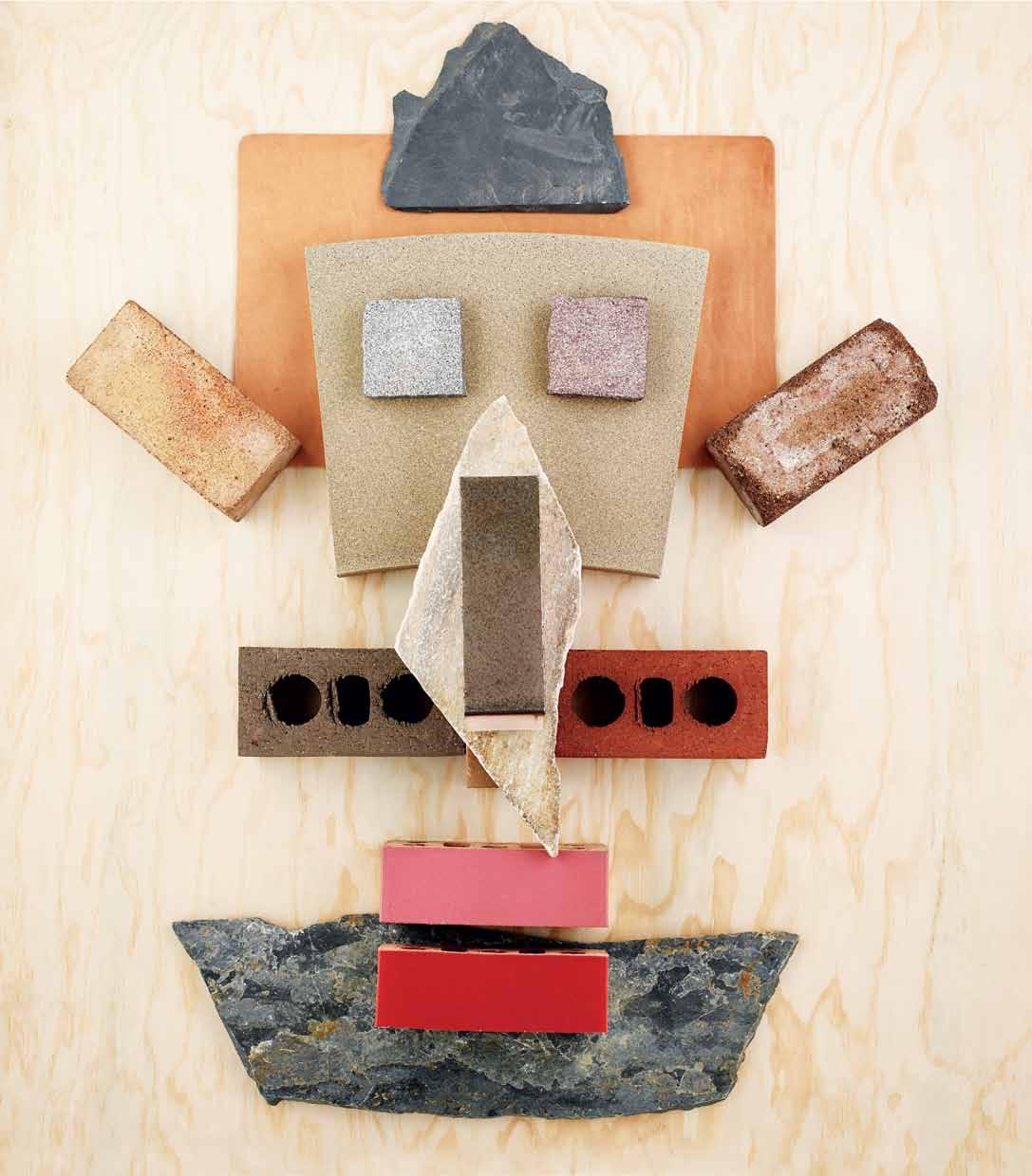
Hat | Black slate flagstone, $50.25/sqm, Bellstone. Head | large Leather Desk Mat in Natural Tan saddle leather, $198, Henry Wilson. Face | arcSTONE curved square-edge coping with etch texture in Botanical, from $75/sqm, STONE Outdoors. Eyes | (left) Buffalo granite cobblestone, from $85/sqm, Eco Outdoor; (right) Tawny granite cobblestone from $97/sqm, Eco Outdoor. Ears | recycled dry pressed solid brick , POA, The Brick Pit. Nose | (underneath) Sofala random, $53.50/sqm (inc GST), Bellstone; (on top) Urban Metal metallic glazed brick in Silver Spark , POA, PGH Bricks & Pavers. Cheeks | Escura Smooth bricks in Choc Tan (left) and Victorian Red (right), POA, Boral. Chin | Sofala random, $53.50/sqm (inc. GST), Bellstone. Mouth | fully glazed bricks from the Vibrant collection in Paris (top) and Watermelon (below), POA, PGH Bricks & Pavers.
1 . lightbox # 39


Play time
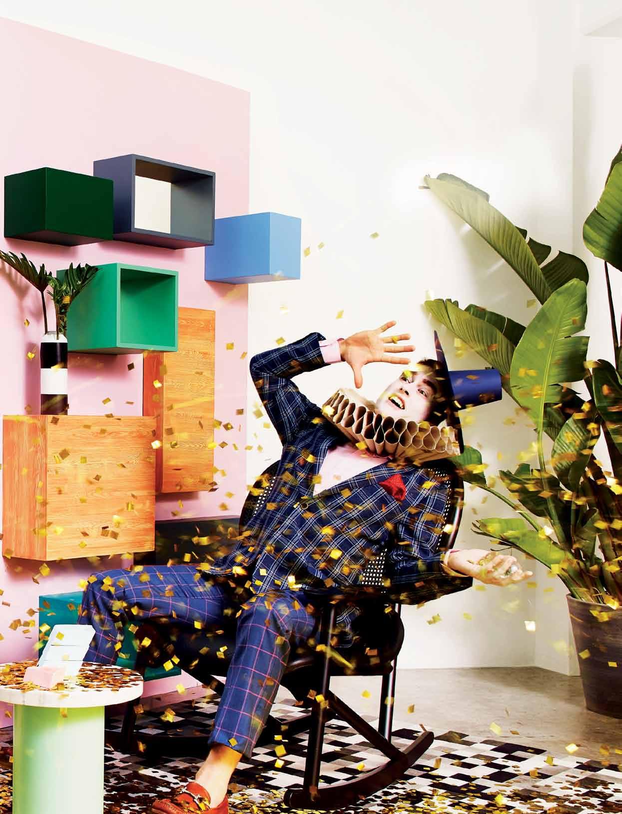
most people stop playing as soon as they grow up, or if there are no children in the house. but it ’ s a crucial part of being happy, says author and stylist a manda talbot. so find ways to introduce some fun back into your interiors.
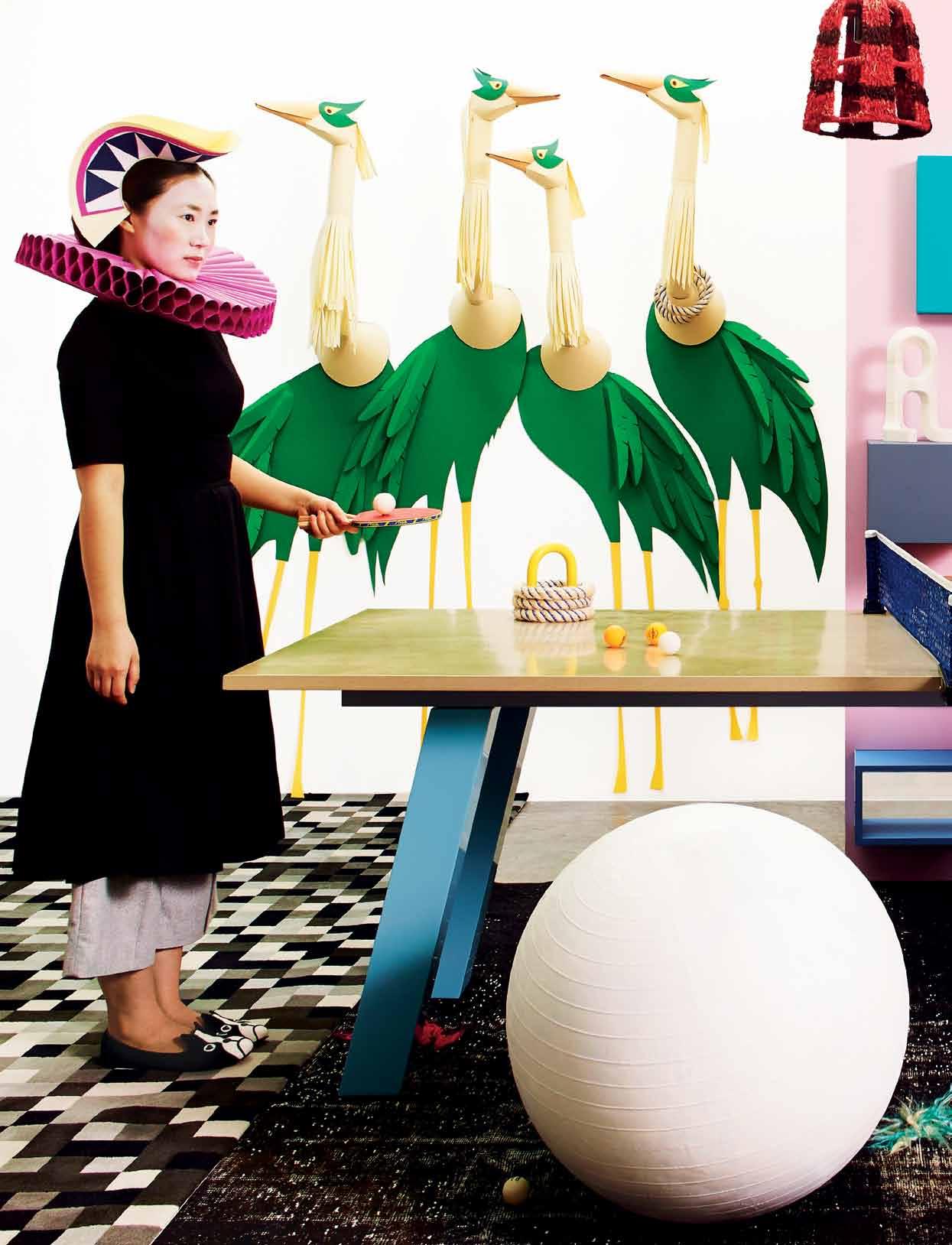
Clockwise from top left: Strelitzia Nicolai plant , $425, Garden Life; curved slide in charcoal, from $900, Fibreglass4Leisure; Ruby wears paper hat and neckpiece custom made and designed by Benja Harney, custom cropped top by Shilo Engelbrecht, POA, Shilo, Annike pant in grey, $170, and Kosut shoe stripe, $260, both by Alpha60, Alphaville; giant mirror hand by Tim Fleming, $625, Workshopped; Objects outdoor lamp , Kettal, $4,400, Dedece; custom dots stylist ’ s own Cloud sofa by Marcel Wanders, Moooi, $12,620, Space Furniture; Lead Light heart cushion , $159, and Starry Night cushion , $129, both by One Another; Monte handwoven floor rug by Pampa, $4,180, Koskela; side and coffee Cloud tables , small $350, large $700, by Murray Thomas; Loop trivet in yellow by Daniel & Emma, $70, Tait; Top Score quoits (part of set including base not pictured), $85, Koskela; stationery container with resin/ acrylic balls by Daniel & Emma, Tait, $99; ceramic slab cup and saucers by Dawn Vachon, $80 each, Koskela; Coco Flip Puku ottoman in pink and grey by Kate Stokes, $764.50, Corporate Culture; Fritz Hansen Ro easy chair in light pink by Jaime Hayon, $4,111.80, Corporate Culture.
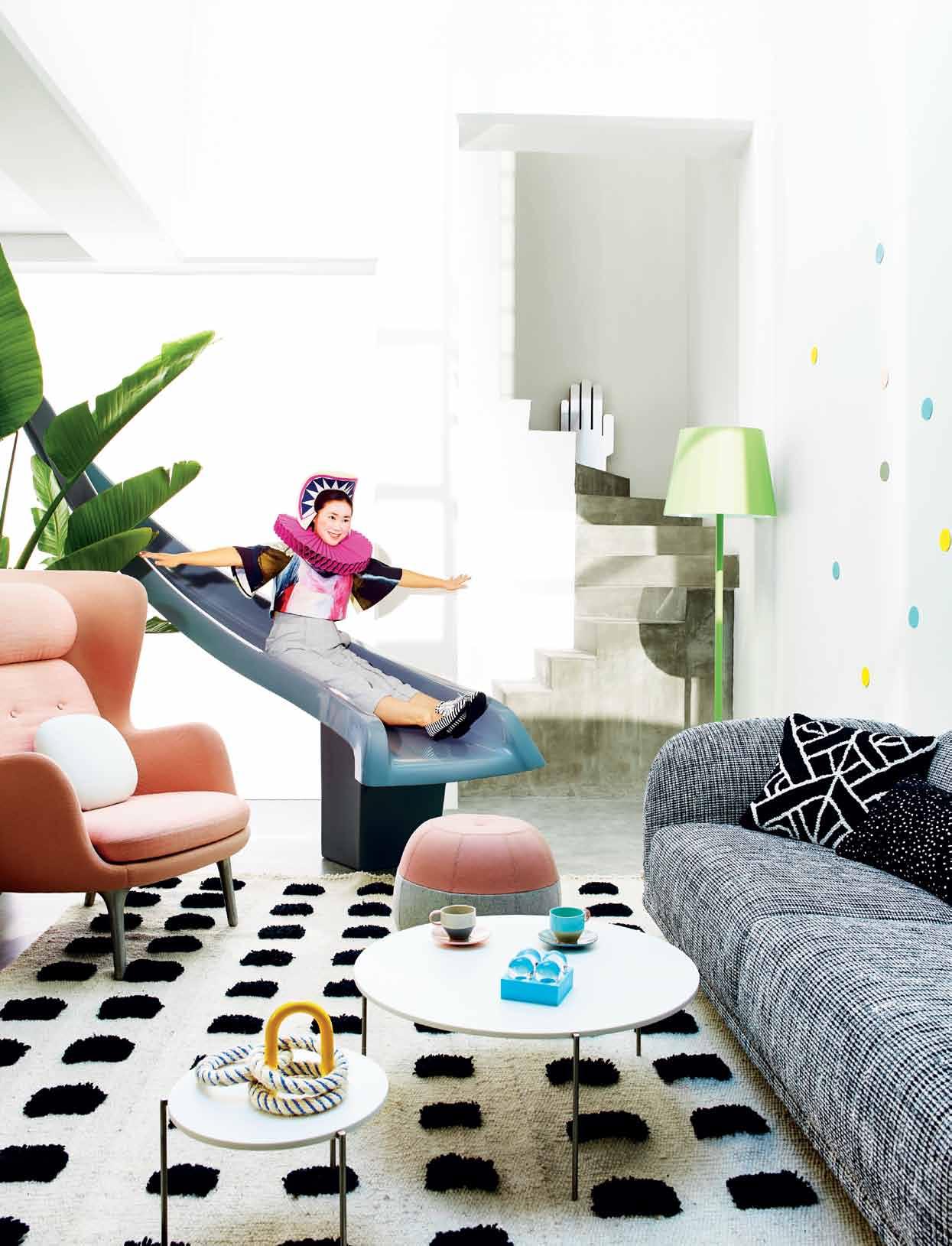 Photogra Phy tim robinson. art direction & styling amanda talbot. styling assistance nikki davey. art direction assistance frances yeoland. h air & makeuP frankie PiPer.
1 . lightbox # 41
issue #24 habitusliving.com
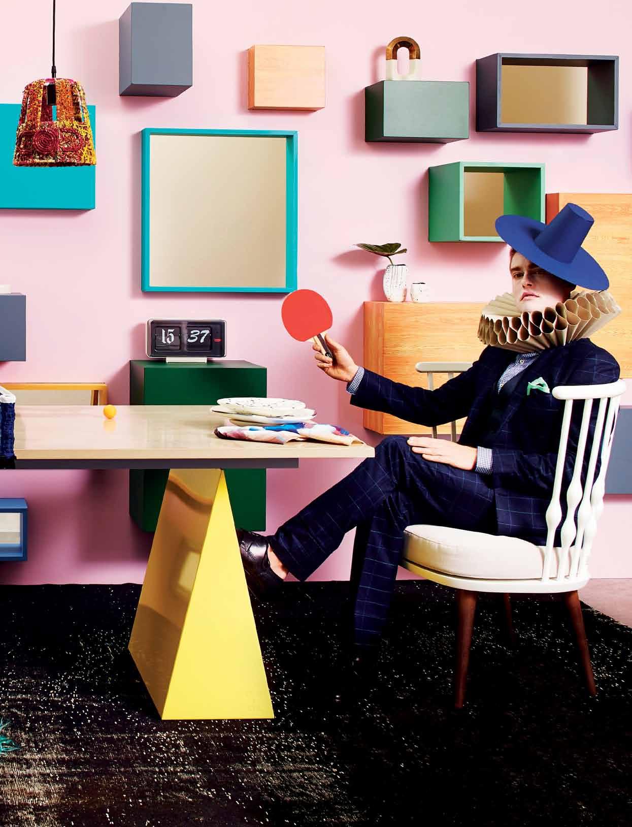
Clockwise from centre left: Fizz rug in Jet by Teresa Ceberek, $2,424, Tsar, ; Ruby wears Annike pant as before, Alphaville, Mollie dress in black by Alpha60, $260, Alphaville, and paper neckpiece, headpiece as before; birds custom designed and made by Benja Harney; table tennis bats, balls and net supplied by Aussie Table Tennis; quoits as before; Tjanpi pendant lights, Tili Wiru, from $420, Koskela; Dusty pink wall and joinery made by Rosemonts; wall paint in Frozen Frappe, Dulux; wall joinery paint in Riviera Sea, Government Green & Signature, Dulux; ‘ Digital Organic Mineral’ sculptures by Stephen Ormandy, in marble $3,300, and in
marble & bronze $2,750, Olsen Irwin; Established & Sons Font clock , $1,255, Living Edge, Volcanic vase in two tone, $144, Dinosaur Designs; Earth vase in two tone, Dinosaur Designs, $97; Morgan wears paper hat and neckpiece as before, Berrimal navy suit , $89, Gimondi navy shirt , $99.95, Vitale green pocket square, $39.95, and Hotham navy waistcoat , $250, all from M.J. Bale; large Temple plates in two tone by Dinosaur Designs, $132; Älv napkin , $50, Shilo; Andreu World Nub lounge chair by Patricia Urquiola, from $2,253, Kezu; Leon overdyed vintage kotosh rug , , $4,800, Koskela. Pick ‘N’ Mix table with parallelogram and triangle leg option, $4,290, Tait.
1 . lightbox # 43

issue #24 habitusliving.com
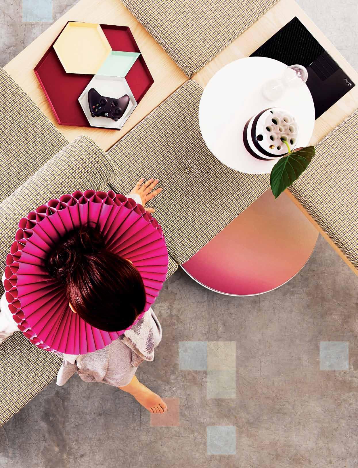
A9 Nordic Sky speaker in Dusk, $2,690, Bang & Olufsen; Ruby wears pink paper neckpiece as before, Adana knit dress, $240, and Adele cardi grey, $299, both by Alpha60, Alphaville; Temple plates as before; Parti napkin from set of four, $225, Ondene.
1 . lightbox # 45
Clockwise from centre left: Tacchini Galleria modular bench system , $22,585, Stylecraft; Morgan wears blue paper hat and neckpiece as before, Dickson light blue cotton jacket , $499, and light blue cotton trouser, $179, and Gimondi sky shirt , $99.95, all from M.J. Bale; Hay Kaleido trays by Clara Von Zweigbergk, from $27.50, Corporate Culture; Xbox One console, $599, Microsoft; hour glass sculpture, $39, BoConcept; round lotus seed vase from the Art range in black and white, $257, Dinosaur Designs; BeoPlay
issue #24 habitusliving.com
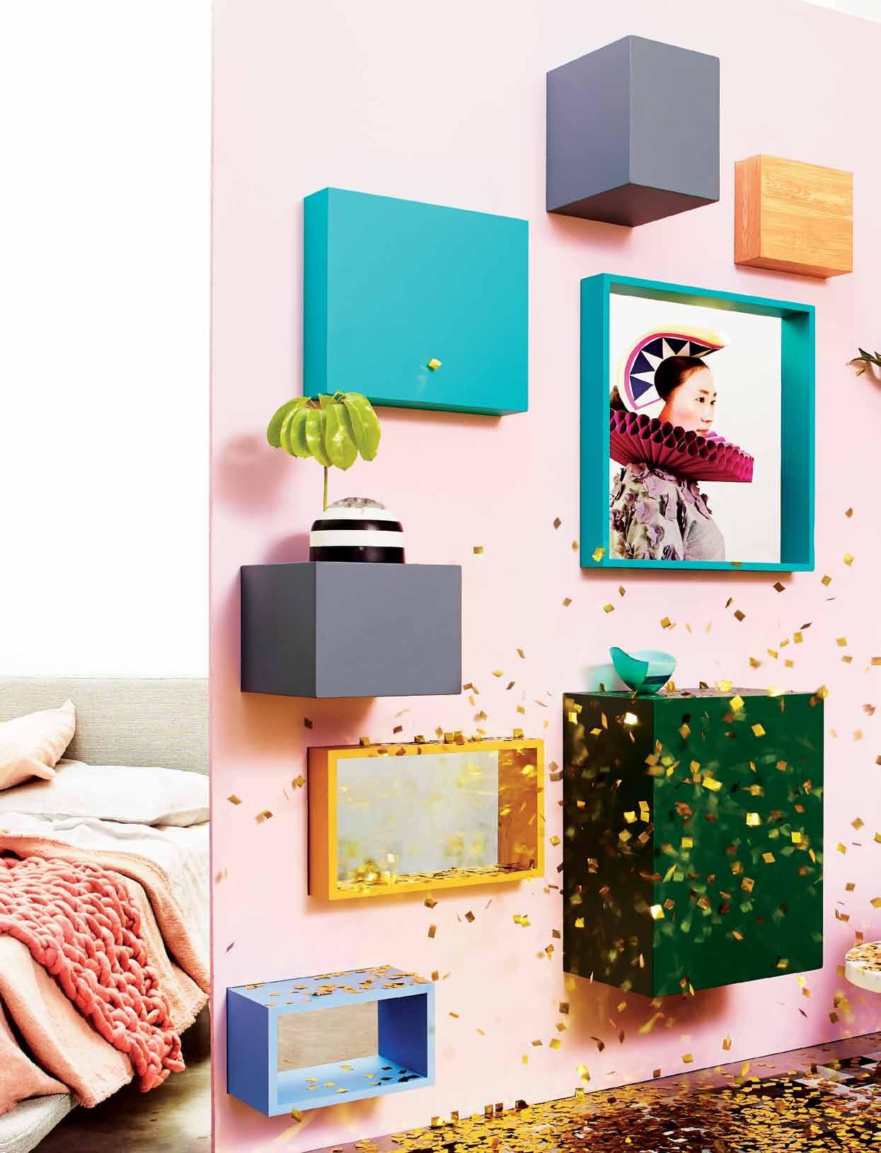
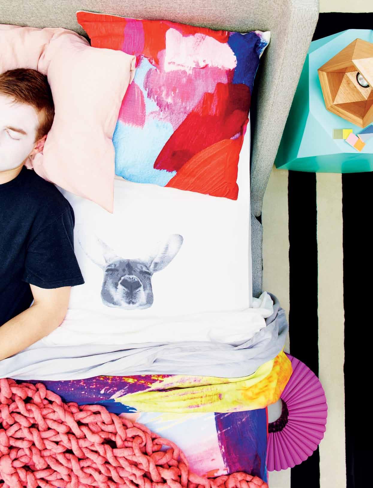
Clockwise from bottom left: Nook queen bed in chalk, $2,229, Bludot; Dusty pink handknitted throw custom made by Jackie Fink, Little Dandelion; Nor blanket in pink, $395, and Kash pillowcase as part of set, $315, both from Ondene; Dusty pink wall and joinery made by Rosemonts; round lotus seed vase from the Art range, as before; medium cloud bowl , $85, Dinosaur Designs; Ruby wears hat and neckpiece as before, and Nelly sweater by Alpha60, $180, Alphaville; tall lotus seed vase from the Art range in black and
white, $311, Dinosaur Designs; Morgan wears Cooma navy trousers, part of a suit, $995, Bremer navy blazer, $499, Citte red pocket square, $39.95, and Parkvale pink shirt , $129.95, all from M.J. Bale; Strelitzia Nicolai plant , as before; Eco pot , $110, Garden Life; Fizz rug , as before; confetti supplied by Newtone Entertainment, POA; E15 Enoke side table by Phillip Mainzer, $1,263, Living Edge; Tesselate square ceramic pieces in blue by Hayden Youlley, $42 each; Tesselate triangle in pink by Hayden Youlley, $32.
1 . lightbox # 47
Clockwise from top left: Nook queen bed , as before; Kash pillowcase, as before; Älvdalen cushion by Shilo Engelbrecht, $200, Shilo; Helmi solid timber block stool in stained aqua, $1,250, Koskela; Buoy light , POA, Flotsam/Jetsam; Hay Pieces n Play by Lee Storm, $96.80, Corporate Culture; Maze rug in Noir by Julia Gentil, Tsar, $2,424; Kosut shoe stripe, as before; Pink neckpiece, as before; Dusty pink hand-knitted throw, as before; Ström cloth by Shilo Engelbrecht, $600, Shilo; linen flat sheet in Dove Grey, from $140, and linen flat sheet in white, from $160, both from InBed; Sleeping Kangaroo fitted sheet , custom printed by Frankie & Swiss, POA.
to
issue #24 habitusliving.com
hear from a manda about why play is so important, visit. habitusliving.com/issue24/play
SMALL MOMENTS IN BIG CITY LIFE
www.boconcept.com.au
Open 7 days
575 Pacific Hwy Crows Nest Tel. (02) 9437 0066
admin@boconcept.com.au

your 164 page catalogue now *order online or give us a call
presents the Fusion collection by
Request
BoConcept
issue #24 habitusliving.com
The paradox of Thai architecture
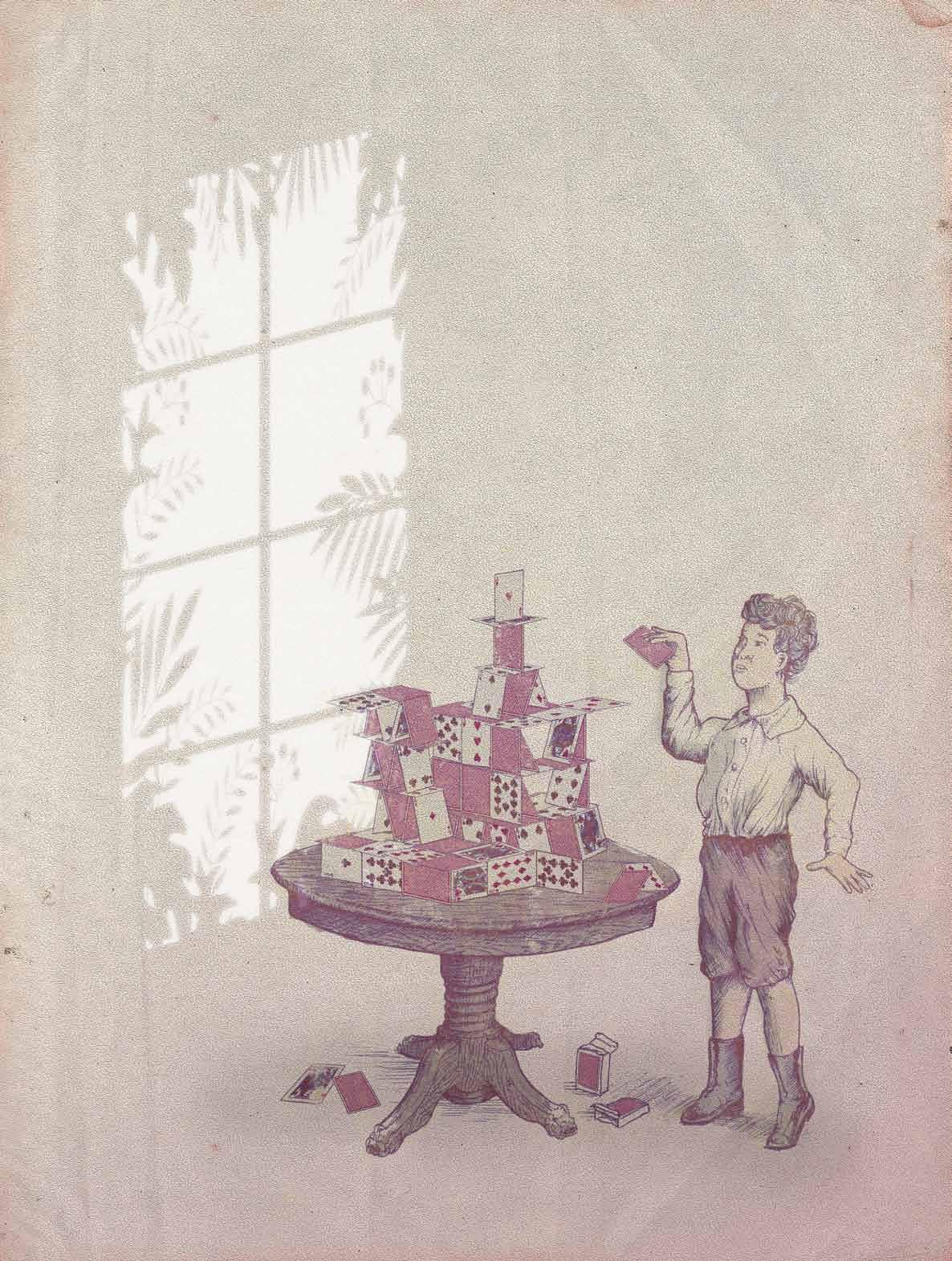
Thailand is a nation of complex traditions and multiple influences. How to describe its residential architecture then, as a physical representation of its history, politics, culture and of its citizens’ way of life? One book might struggle, but three goes some way towards painting the picture. Campbell drake takes a look.
Tex T Campbell Drake | illusTraTion Her D s of bir D s
1 . lightbox # 51
Afew months back, I found myself transiting through Bangkok’s Suvarnabhumi Airport and whilst admittedly sleep deprived from a long haul flight from Europe, I mistakenly thought I was some 1,500km away at Changi Airport in Singapore. Commonplace in today’s globalised world, experiencing spatial disorientation of this nature is symptomatic of what anthropologist Marc Augé refers to as a ‘non-place’, in which the built environment has been stripped of cultural reference and no longer holds enough significance with which to orient oneself. An attempt to reduce such a phenomenon in the face of pervasive global markets has brought about renewed interest and a demand for regional specificity within contemporary design practice. Such sentiments are echoed within the influential essay, ‘Towards a Critical Regionalism: six points for an architecture of resistance’, in which Paul Ricoeur writes: “There is the paradox: how to become modern and return to sources: how to revive a dormant civilization and take part in universal civilization.”
Considering this paradox against three recent publications about architecture in Thailand, at one end of the spectrum we have a comprehensive historical survey titled Architecture of Thailand: a guide to traditional and contemporary forms. This publication is traditional both in its format and content and true to its intended use, the book is presented as a guide, for both Thai and foreign audiences.
Drawing on an extensive list of researchers and academic advisors, the guide presents a wealth of expertise that is well organised and accessible, and free of disciplinary jargon.
The book is premised upon the assertion that Thai architecture has not one, but three traditions: that of the everyday (residential), the ceremonial (temples and palaces) and finally “immigrant, foreign and modern architecture ” Adopting these three categories as a structuring device, the guide takes on the appearance of an encyclopedia with each of the typologies articulated via chapters of architectural elements clearly explained with complementary photographs and clear illustrations.
It is interesting to note within the context of a traditional publication, the author’s willingness to expand notions of that which constitutes architectural ‘tradition’ to include foreign influence. Referencing Thailand’s ability to make the “best of being situated at a geographic and cultural cross roads”, the guide presents a series of impressive historical examples of “western style palaces and mansions”, demonstrating a fluid, temporal definition of ‘tradition’ in an architectural context.
Extending these expansive definitions of foreign-influenced tradition, the final chapter provides an overview of contemporary Thai architecture under the title of ‘Thai Architectural Forms Today’. Whilst this chapter is a useful reference for identifying examples in which traditional architectural elements have been adopted within
contemporary contexts, the emphasis on ‘neo-traditional’ architecture as exemplary of contemporary architecture suggests a limited comprehension of the dynamic, progressive and sophisticated architecture and design community operating in Thailand today.
Demonstrative of a more up-to-date representation of ‘Thai architectural forms today’, is a collection of 30 residential projects published by Li-Zenn under the title of Small Medium Houses. Grouped under a rather loose introductory narrative of “examples of mixing theory with practice”, this book brings into focus the last decade of contemporary residential architecture in Thailand.
Undoubtedly inspired by SMLXL, the epic collection of OMA’s (Office for Metropolitan Architecture) architectural works by Rem Koolhaus and Bruce Mau, each of the 30 houses presented within Small Medium Houses is organised according to size from smallest to largest. Whilst a definitive curatorial thread extending beyond the national context is elusive, the book offers an alluring diversity of residential projects from understated studio apartments to warehouse conversions, and elegant mountain retreats to exuberant Bangkok mansions.
In the light of a renewed call for regionalism within contemporary architectural practice, we notice two distinct fields of thought represented within the 30 selected projects. The first field of thought echoes a growing international voice in which “traditional architecture still plays a meaningful role” in contemporary practice and that “fluent architects are abstracting traditional forms and concepts, reinterpreting forms imaginatively while respecting the past”. The smaller of the projects such as 1/30 Deekwa House and 3/30 Modern Antique House best exemplify this position, as these projects celebrate contemporary adaptations of traditional materials, forms and urban contexts.
The second field of thought, most prevalent in the larger of the selected houses, is a return to high modernism. These houses contain no trace of vernacular or traditional reference, instead celebrating universal minimalism expressed through an industrialised material palette of concrete, steel and glass. This modernist position is no better illustrated by the rather curious 10/30 MRL Lake House which represents an homage to the godfathers of high modernism – Mies Van Der Rohe and Philip Johnson – manifest in an abstracted
These projects celebrate contemporary adaptations of traditional materials, forms and urban contexts.
issue #24 habitusliving.com
combination of Mies’ Farnsworth House meets Johnson’s Glass House.
Despite an abundance of sometimeschallenging typographical and grammatical errors, this book provides a succinct survey of recent Thai residential architecture by this practice that is a valuable reference for touching upon the undercurrent of Thailand’s architectural zeitgeist.
Projecting forwards, towards to new futuristic possibilities, Vetere Architecture Studio Laboratory’s (VaSLab) self-published monograph titled Narrative, Metaphor and Architecture: A decade of metamorphosing ideas into built form, 10 experiments in architecture by VaSLab, exemplifies the future potential of architecture in Thailand. Self-defining ‘Vetere’ as “the termination of intersection of lines or curves”, VaSLab are aptly named, as central to their practice is an exploration of bending, wrapping and warping, through a digitised manipulation of form and space. Each of the 10 projects included in this publication is expertly presented with a balanced combination of generative sketches, professional photographs, technical design drawings and a dense written explanation of the design thinking behind each project.
Framing the publication are two wellconstructed essays under the theme of ‘Critical Architecture’. Written by Tonkao Panin, these essays foreground the inseparability of VaSLab’s architectural thinking and making relative to theory and practice. In the light of the commercial and aesthetic emphasis of VaSLab’s work, it is challenging to follow the author’s reference to ethics and social praxis. However, the writing does provide significant insight into the relational intentions of VaSLab’s urban exploration in which “strategic changes might create new readings of the old, or open the way to new potentialities within an interaction of new and old”.
Rather than thinking of the ‘old’ in terms of adaptations of traditional architectural elements to be incorporated within the building fabric, VaSLab’s buildings are attentively positioned in jarring juxtaposition to the surrounding urban landscape. Subscribing to the performative theatricality of architecture within a field of urban relations, VaSLab explore themes such as alienation and transposition. Panin writes, “They are at a distance to us in that their historical context becomes essential for us to understand them.” Demonstrating a counter-argument to contemporary architectural practice as
outlined in Small Medium Houses, VaSLab renounce architectural tradition, in favour of establishing contrasting relations in direct opposition to the vernacular.
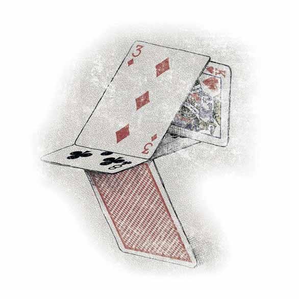
With each of the buildings presented in this volume, it is clear that VaSLab’s computergenerated aesthetic is inspired by the works of Morphosis and Zaha Hadid. Whilst the digital community of practice in which VaSLab are operating has been criticised as being obsessively form-driven and lacking urban consideration, the works presented in Narrative, Metaphor and Architecture are anything but self-referential, instead expertly choreographed and reliant upon specific relationships to the surrounding built environment.
Whether looking back to the origins of architectural tradition in Architecture of Thailand, projecting forwards to a new digital age in Narrative, Metaphor and Architecture, or celebrating a renewed sense of regionalism within the contemporary architecture of Small Medium Houses, each of these books denotes a healthy plurality of architectural exploration within the vibrant and progressive architectural community of Thailand. Defiant of stripping the built environment of cultural reference, these books signify the dynamic and innovative design culture of Thailand that, whilst respectful of tradition, firmly grasps “the potential of architectural design to draw from the past and present towards the future”.
arChiTeCTure of Thailand: a guide To TradiTional and ConTemporary forms
Nithi Sthapitanonda and Brain Mertens
Published by Editions Didier Millet 256pp softcover, AUD$35 edmbooks.com
narraTive, meTaphors, and arChiTeCTure. a deCade of meTamorphosing ideas inTo builT form, 10 experimenTs in arChiTeCTure by vaslab
VaSLab
Published by Corporation 4d 176pp softcover, USD$30 art4d.com
small medium houses
Robert Dalziel, Sheila Qureshi
Published by Li-Zenn Publishing Limited 320pp softcover, THB 1,500 li-zenn.com
1 . lightbox # 53
CROWN GROUP
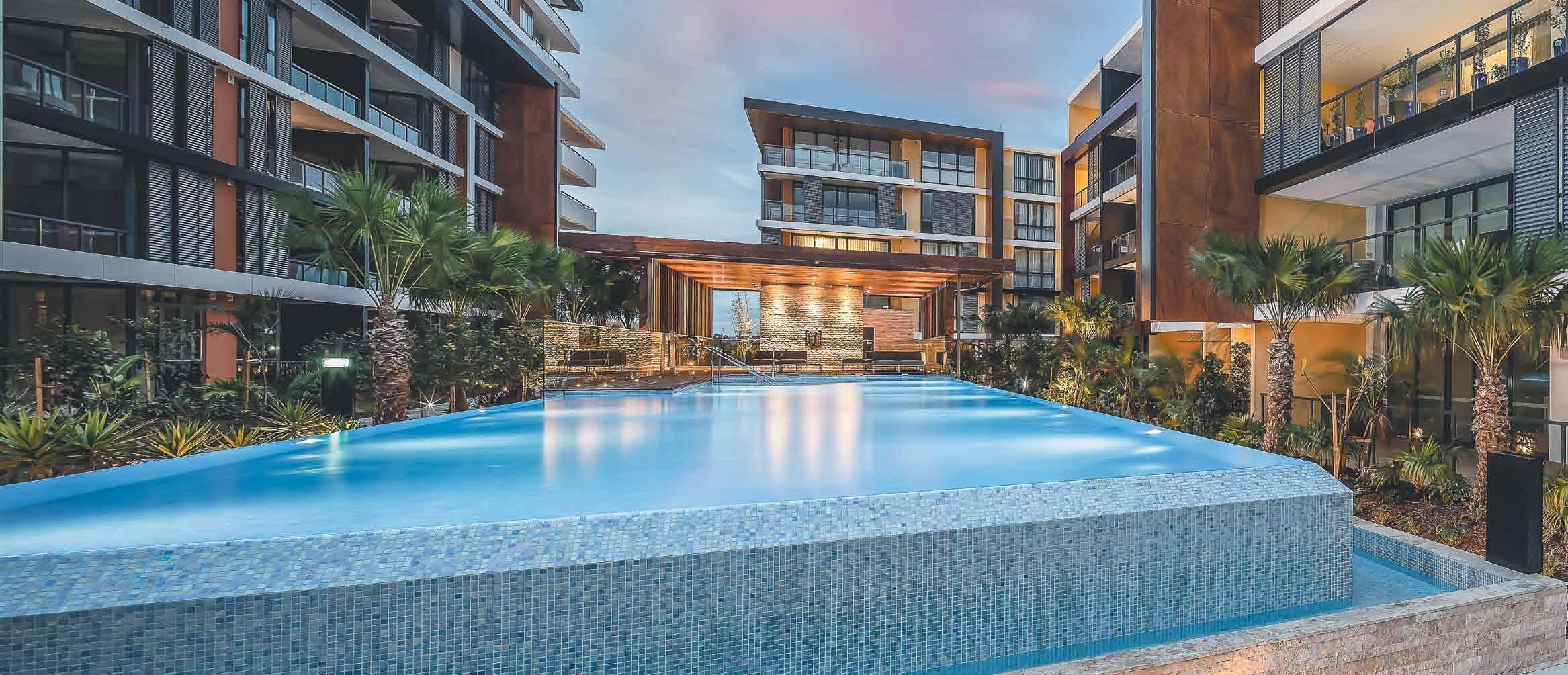


Satin brass is the latest addition to The English Tapware Company stable of products. The brassware is left uncoated, celebrating the warm and tactile raw brass which is hand buffed to a satin finish.



As a living finish, the surfaces respond to the environment, developing a rustic honesty without losing any functionality. The appeal of brass tapware and fittings as an organic element in kitchens and
bathrooms is the very process of aging; paradoxically the resulting patina gives a beautiful and ageless look. Brass has endured for centuries and in its updated forms will continue to enchant for years to come.

AD
The makers of meaning
Cross-cultural love affair
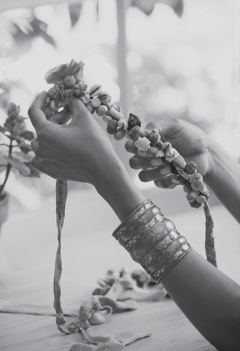
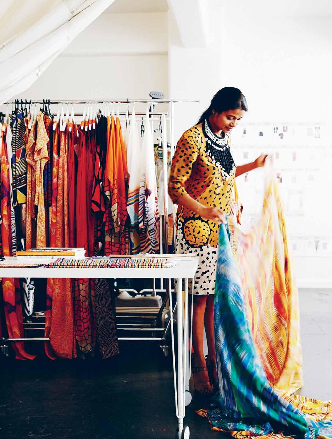
Six years ago, fashion designer Roopa pemmaR aju couldn’t have known that moving from IndIa to austR alIa would inspire a colourful, creative and cultural awakening that would change her life. alIce Blackwood looks into this crosscultural journey of discovery.
text Alice Bl Ackwood | Photogr APhy JA mes geer
issue #24 habitusliving.com
2 . portrait # 59
issue #24 habitusliving.com
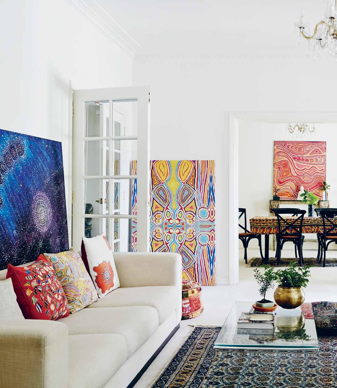
previous | More a retreat than a ho M e Studio, roopa’ S living S paceS are a harM oniou S blend of cultural a SS ociation S art: Snake Vine Dreaming (acrylic on linen) by liddy napanangka Walker. Above | roopa’ S ho Mage to the arti StS With Who M S he WorkS lieS in the reverent incorporation of aboriginal art Work into her ho M e S paceS pictured left to right: Se V en Si Ster S Dreaming (acrylic on linen) by alMa n ungurrayl g raniteS Yellow an D orange art Work by Judy WatS on; Snake Vine Dreaming (acrylic on linen) by liddy napanangka Walker.
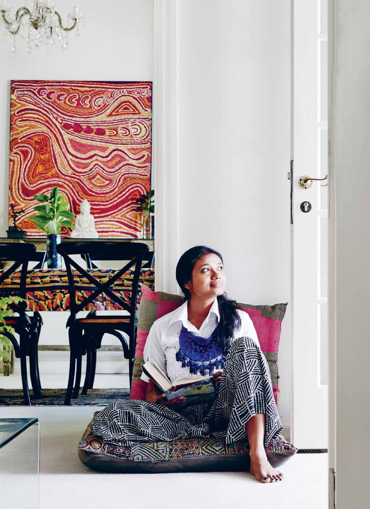
As a native Indian living in Australia, the threads of Roopa Pemmaraju’s former existence hold fast: family, religion and the habits of tradition. Yet her new life as an inner-city dweller is embellished with discoveries of Australian-Asian cuisine, art galleries and the local fashion industry. And there are finer details there, too – colour made brilliant by the bright Australian sun, and the honest, authentic spirit of the land, brought into focus through her collaborations with various Australian Aboriginal artists.
When Roopa settled in Melbourne with her husband, she was drawn to the city’s crosshatch of creative disciplines – tangible even to a foreign visitor. She resisted Sydney’s alluring bay-side lifestyle and its fabulous gallery circuit, instead opting for the gritty layer-cake of artists’ studios in the Nicholas Building in Melbourne’s CBD, and the leafy retreat of her home in Toorak.
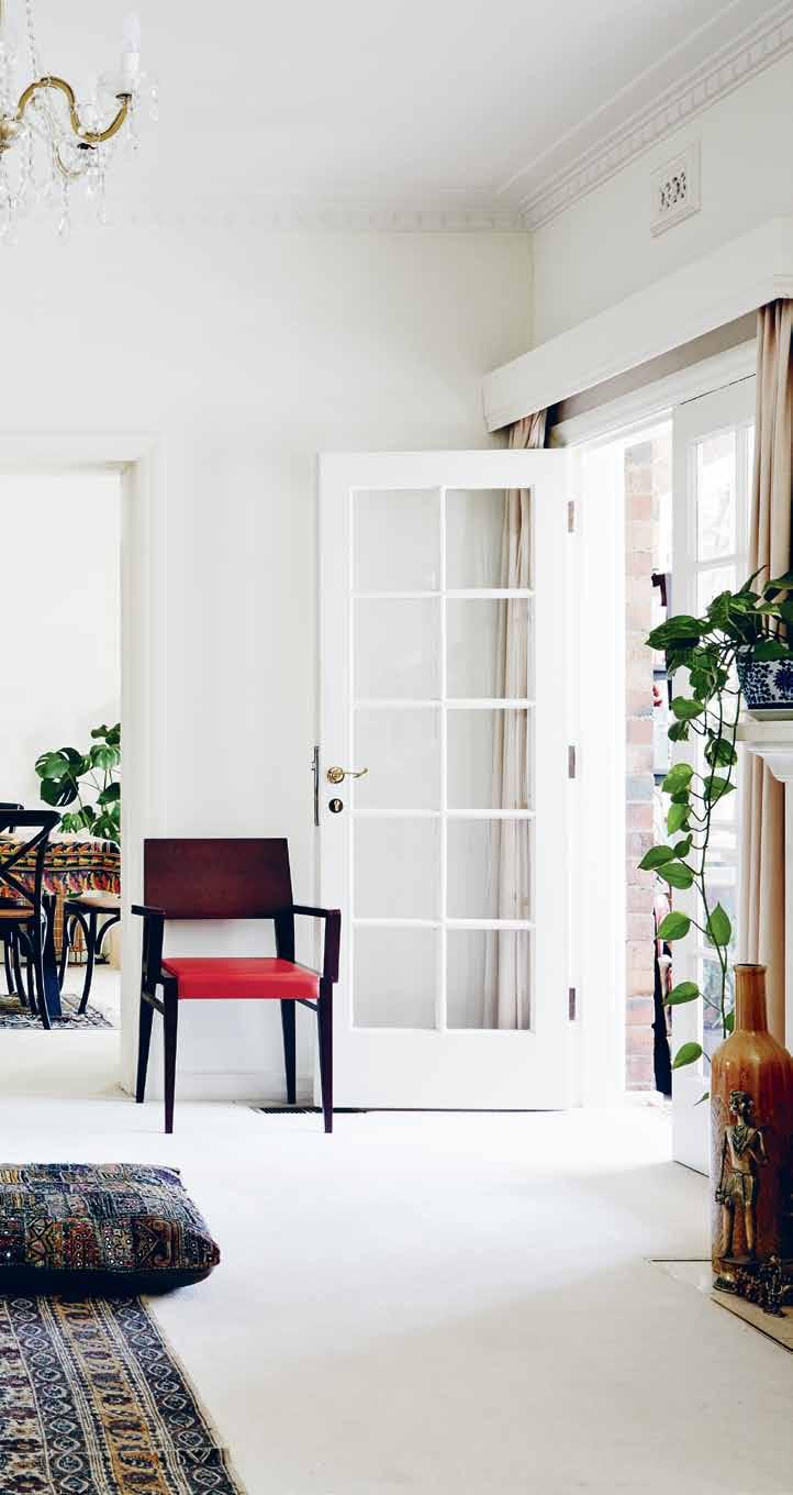
It is here that she has flourished, building a decidedly different life for herself within the charmingly Old English confines of her ground-level apartment in a classic Tudor-style home, designed by the late architect, Robert Hamilton, whose vision for charming red brick façades and picturesque gardens lives on, almost 100 years later, in a polite and pretty sort of way.
Hamilton himself was renowned for his inter-war Tudor Revival style of architecture (hugely popular during the 1930s); his trademark Old English approach still present within the Toorak and South Yarra areas. Yet like Roopa, Hamilton had lived beyond this clipped and cultivated façade. He, too, had spent time in India, as assistant to the government architect in Bombay in the early 1920s.
It seems fitting, then, that Roopa has adapted the rather proper lines of her living quarters to reflect something of her Indian background and own artistic spirit. And it shines through, the graceful planes of her home’s interiors
# 61 2 . portrait
layered with colourful Indian textiles – handpainted carpets and finely woven fabrics that decorate her bedroom and living room furniture. A small space for worship, cosied into a corner of her dining room emphasises the strength of her Hindu faith. Yet, a statue of Buddha, peaceful in repose, takes pride of place on a floating shelf. These symbols of faith are unexpectedly interrupted by another ancient tradition in a series of bright, patterned Aboriginal art prints. The combination of rich colour and organic patterning draw together uniquely common elements of two completely different ethnicities – Australian and Indian. It is this new frame of reference that has become Roopa’s new journey.
“I never even knew I’d be coming to Australia, it just happened,” says Roopa, who moved with her husband and his job. For Roopa to shift her entire life ‘down under’ was, in some respects, a leap of faith. “My background is Hindu. It’s a religion that is quite conservative, very religious, secluded, and you’re closely bound by your family,” she explains.
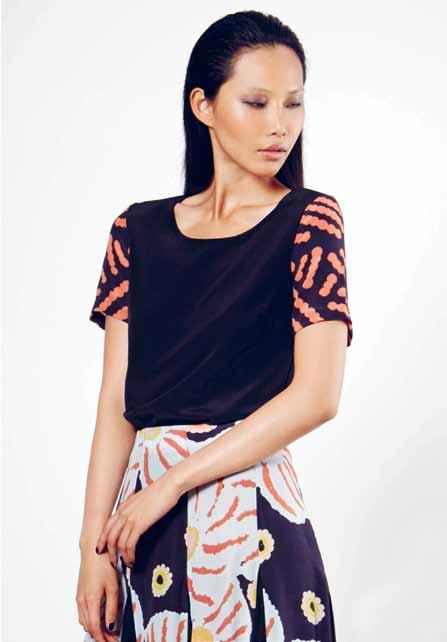
“For me it was akin to moving my entire life overseas. I never knew that I’d be working with Indigenous Australian communities, or that I’d be somewhere I really loved to be, or that I’d create something” – a fashion brand, named after Roopa herself, which is defined by its intensely beautiful, authentic and original
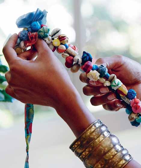
Aboriginal art prints, reproduced onto textiles which are custom produced in India.
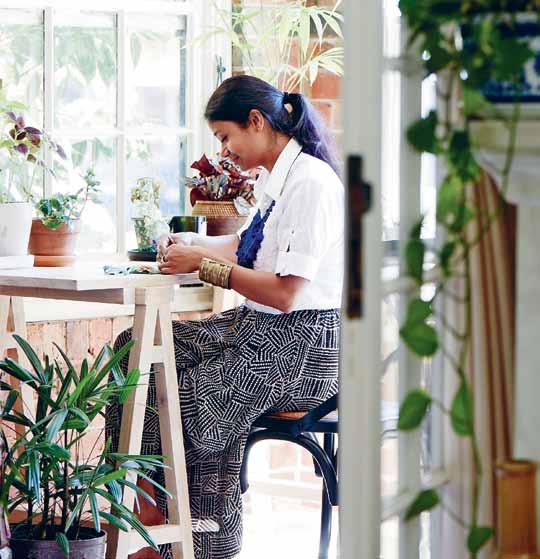
The very act of discovery, Roopa’s love for colour, her fine arts background, her knowledge of commercial fashion from her previous life in India, and her traveller’s curiosity – have all converged into a single point of focus. A focus which has surprised, shocked and even angered members of the fashion industry, yet caught the undivided attention of a rapidly growing consumer segment.
“I love colour. When I look at any colour or any artwork, I want to see it again, explore it more, understand it better,” says Roopa. “It’s surprising that Indian art (from certain areas of India) has a strong connection with Aboriginal art. But it’s there and it’s very strong. We use the same earthy tones and [in our homes and on our clothes] we use very similar tones.”
Coming from a country where “everyone can do everything”, Roopa felt limited by the exclusive nature and highly specialised services of the local rag trade. She couldn’t find the quality of work or diversity of skill which she might stumble across on any corner of her home town. She missed that ability to walk into her mother’s wardrobe and pick out a favourite sari or cloth, which could be replicated within a matter of hours. And she missed the quality of produce – pure cottons and pure silks, each finely woven.
issue #24 habitusliving.com
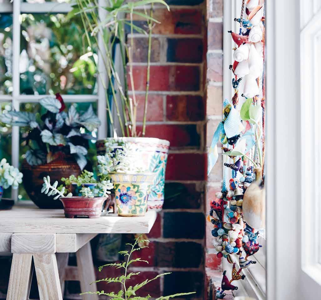
S ly M otivating part of her deS ign proceSS A bove | “ i love our big WindoWS With S o M uch light co M ing through it MakeS the Whole day vibrant and lively,” roopa SayS
opposite left | roopa’ S ho M e Studio S itS to the front of the hou S e, flooded With natural light and overlooking a central S hared courtyard. opposite right | Mo St of the fabric S roopa WorkS With are Made in india. “ i need to have My fabric SWatcheS and deS ign S around M e,” S he co MM entS : a S o M etiM eS M eSSy but gloriou
2 . portrait # 63
Roopa has adapted the rather proper lines of her living quarters to reflect something of her Indian background and own artistic spirit.
issue #24 habitusliving.com
It seemed natural then that her mother should become her manufacturing manager, starting a production house in Bangalore. Roopa would direct the conception and creation of her collections from Australia, with her design partner Sudhir Swain running the business across the two countries.

Falling in love with Aboriginal art became an integral part of settling into Australian life. However, developing relationships with those artists and their communities was not as easy. “Initially [the artists and community leaders] were quite worried that if I was taking their prints to India to manufacture, I might be trying to reproduce or copy their work. I really had to do some convincing that my intention was to safeguard their artwork and safeguard the collection I was intending on producing,” Roopa explains. “Studying and researching, I’ve come to understand what’s given Aboriginal artists so much distrust for foreigners. It’s so difficult for them to just say yes. But I am 100 per cent with them on protecting their work.”
It goes beyond a good business relationship; there is something spiritual between Roopa and her collaborators. Their shared respect for the earth and the elements has brought them closer together, and a trickle of what started as seven art works (sent to Roopa as jpeg images) has flooded into tens-of-thousands of images.
Roopa is spoilt for choice, curating her collections around a selection of these artworks, designing the cut of each garment to display each artwork at its best, and in a way that is respectful to the artist’s wishes. Refreshingly, she says, “I’m not one for working with the trends”.
opposite |
A bove |
M
collection). below | lucky top and lucky circle Skirt featuring art Work
inpa
located in the n ichola S b uilding in Melbourne’ S cbd roopa’ S Studio i S filled With colourful garM entS and SWatheS of vibrant, eye catching printS
petra Sleeve top With art Work by petra naM piJ inpa MarS hall, and lucky circle Skirt featuring art Work by lucky naM piJ inpa ( autu
n Winter 2014
by lucky naM piJ
( autu M n Winter 2014 collection).
This is what I need, too: the realness, the inspiration, the organic nature of each of these artworks.
2 . portrait # 65
roopa | designer
Understanding the concept behind each artwork is integral to Roopa’s creative process. “Like an artist has a skin name, there’s also their community and their inspiration behind each of their artworks, and a reason behind the use of certain colours. These are the things I have to play around with when I create my collections.
“If I gave the artists the restriction of darker winter colours and summery pastel shades, I wouldn’t get [the quality of work I’m receiving now]. This is something organic, produced from their own inspiration. And this is what I need, too: the realness, the inspiration, the organic nature of each of these artworks.
“And my buyers like me working with bright colour. They know Aboriginal art is ethnic but modern and that’s what I want to bring into the collection every season.”
Roopa’s own Australian cultural awakening has now come to encompass that of her collaborating artists. “I’m so happy for that. I didn’t expect it, but it has happened.”
In the time she has been in Australia, she has penetrated certain communities and areas of the fashion and retail markets that not many locals have yet managed to do. But for Roopa it is as natural as seeing and breathing. “The deep blues, the earthy tones, and in India all the pinks and textures... they come to me, I know where and how I have to place them.
“And in my spaces, too, I want to bring in both to see them again and again. I want to live with them and understand the texture, see the colour and placement.
“You can’t always ‘see’ or imagine if a red and purple will go together well, or a green and blue. But I don’t have that sort of limitation, I’ve already seen it, the artists have already done that and do it naturally.”
Caught in a love affair between tradition, culture and colour, Roopa seems to be living her dream. “Many designers go to India for inspiration. For me it was the reverse – I was inspired in Australia.”
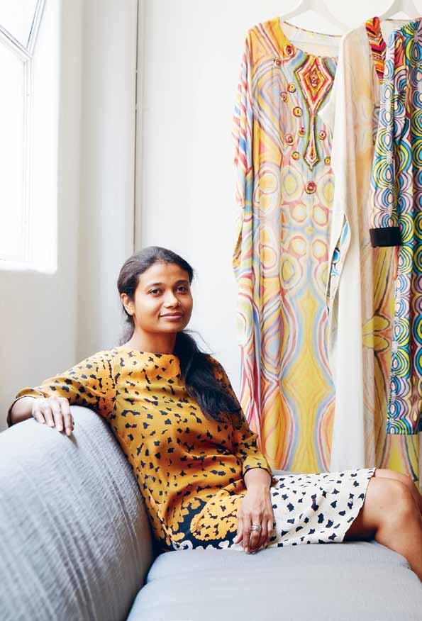
A bove | roopa’ S practice and her conviction are driven by a Strong paSS ion for the arti StS With Who M S he collaborateS . “ i ’ve fallen in love With aboriginal art, i ’ve fallen in love With the co MM unitieS and the arti StS – that’ S pretty M uch What i intend to do,” S he SayS roopa pemmaraju | roopapemmaraju.com issue #24 habitusliving.com
The only rangehoods that sanitise the air.
Pure Air Factory
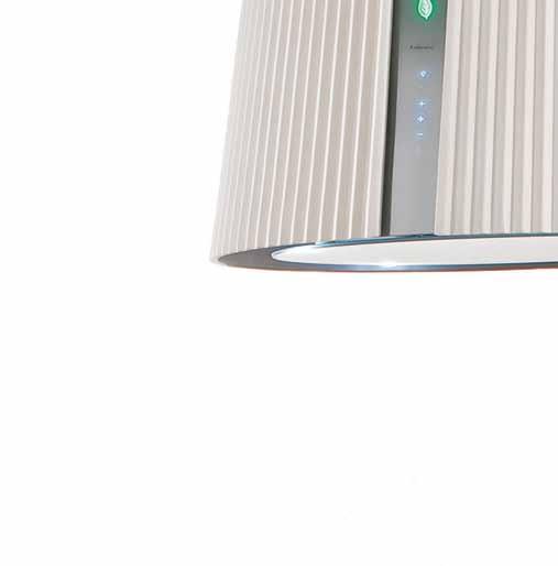
Falmec. The innovative E.ion® System technology applied to the new collection of rangehoods from Falmec, not only reduces odours, but also restores the ionic balance for an optimal healthy living environment. Specialised laboratories certify the efficiency of the E.ion® System technology, declaring an odour reduction of over 70%. Exclusive to Abey Australia.
– Falmec E.ion® System.






return to home
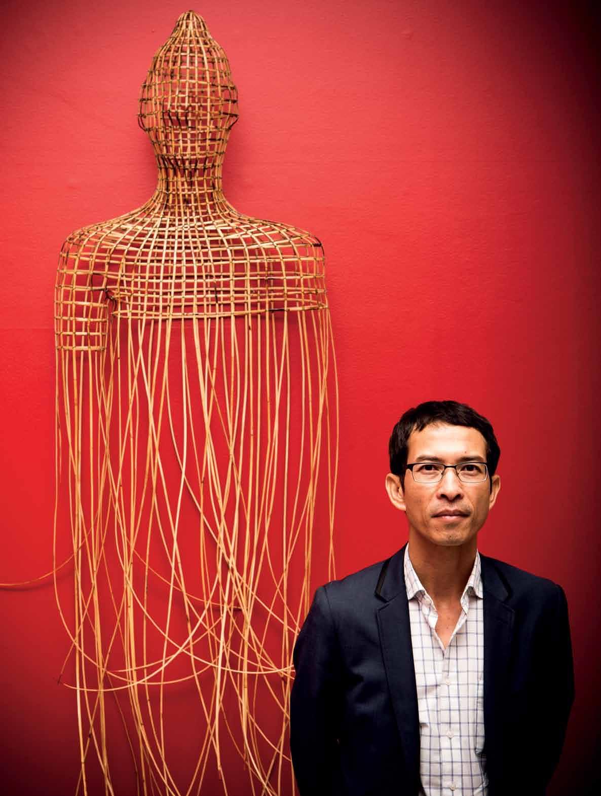
After growing up in AmericA, it wasn’t until returning to his homeland that cAmbodiAn artist SopheAp pich transformed into the evocative sculptural artist he is now. Michael Young explores the journey.
 Tex T Michael Young | PhoTogra Ph Y lina sokchalina & breTT boardM an
# 69 2 . portrait
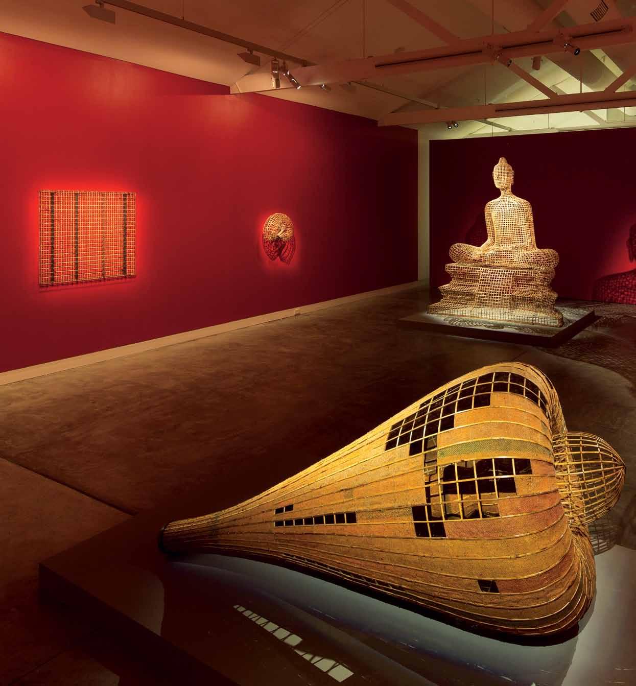
PREVIOUS | Sophe Ap pich StAnd S beS ideS ‘ b uddhA’ fro M 1979 S erieS (2009), r AttAn, wire, dY e, At SherMAn conteM por ArY Art f oundAtion exhibition , ‘ collection+ Sophe Ap pich ’ ab OVE | foreground – pich’ S MAchine fro M 1979 ’ S erieS (2009), bAM boo, r AttAn, wire, burl Ap, dY e; bAckground – Se Ated b uddhA’ (2011), r AttAn, bAM boo, wire, plY wood. ‘ MAchine ’ echoeS the di S cArded pl Ane engineS pich encountered in the cAM bodiAn l And S cApe AS A reS ult of wAr. issue #24 habitusliving.com
On a recent visit to Australia, the young, internationally acclaimed Cambodian artist, Sopheap Pich, found himself outside Eckersley’s art store in Sydney’s Oxford Street. Through the window of the store he had just spotted a roll of coarse unprimed canvas several metres long by 185 centimetres wide. “You just can’t get canvas like that in Cambodia,” he says. He went inside and bought it.
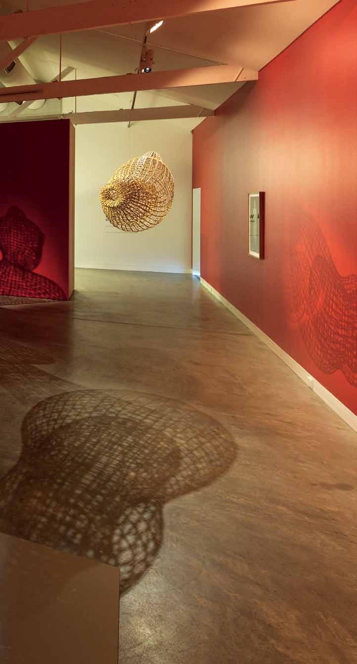
Significantly, Pich has not used canvas in his art practice since 2002 when, at the age of 30, he returned to Cambodia from America where he was educated and took a conceptual leap from painting to making large-scale, three-dimensional sculptures from bamboo, rattan and burlap – materials that were then cheaply and readily available and which have now become his signature medium. These early sculptures would mimic the shapes of objects that haunted his memory of a childhood spent in Cambodia; fish traps, discarded aircraft engines, military ordnance and body parts encountered in the landscape.
Born in 1970, Pich’s first eight years of life were spent living in Cambodia under the genocidal regime of Pol Pot’s Khmer Rouge. Pot ruled by terror; executions and torture were commonplace, intellectuals were massacred, schools, hospitals and factories closed, private property confiscated, and money abolished as Pot pursued a demonic vision of an agrarian communist utopia. Talking to Pich now about his childhood is a harrowing experience. He becomes visibly agitated as he recalls family dislocation, a brief stay in a Khmer Rouge camp and the omnipresence of death. “I talk about it only because you ask me,” he says.
The invasion of Cambodia by Vietnam in 1979 pushed the Khmer Rouge back into the jungles bordering Thailand and Pich’s family settled in “downtown Battambang” in north-western Cambodia. But it was far from serene – the spectre of Pot’s atrocities was commonplace. “There was an abandoned temple where I saw blood stains on the walls,” he remembers. Such memories resurface in his art-making process, like in his wall-hung Buddha sculpture from 2009. In this seemingly peaceful work, Pich dipped the ends of the loose hanging bamboo in red dye as a poignant reference to the bloodstains.
2 . portrait # 71
Eventually Pich’s family escaped to Thailand, spending four years in refugee camps before moving to the Philippines where Pich attended school for the first time. It was, he says, his first real taste of freedom. Then, in 1984, the family was re-located to America, where he experienced the culture shock of being transplanted into a completely alien environment. “Everything was so different; the language, the clothes, the society.”
But he settled in, and was educated at the University of Massachusetts – his father wanted him to be a doctor – and then at the School of the Art Institute of Chicago where he majored in art. Post-graduate years were dogged by poverty in Boston. Then in 2002 he was driving and became lost. “I called a friend to tell her I was lost,” he recalls. “She said, ‘You know why you are lost?’ I said, no. She said, ‘It is because you should be in Cambodia’.”
“I bought a ticket and two weeks later flew to Phnom Penh and immediately fell in love with a country trying to rebuild itself, a country where nothing that could be defined as ‘contemporary art’ remained,” he said.
Across the street from where he was living was a shop selling cheap rattan and bamboo, and with this, he soon made his first sculpture by tying together the coarse materials with metal wire. Resembling a set of lungs, ‘Silence’ was to be his first free-flowing biomorphic sculptural project.
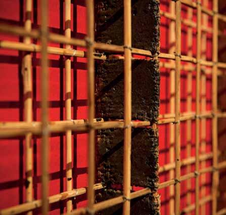
By 2005, Pich had rejected completely the limitations of painting and was grappling fulltime with large-scale sculptures that resonated with childhood memories. The process was, and remains, slow and as a consequence he relies on several studio assistants to prepare the materials. The grasses and bamboo must be split, shaved and cleaned before being ‘cured’ and made pliable by boiling in diesel fuel in
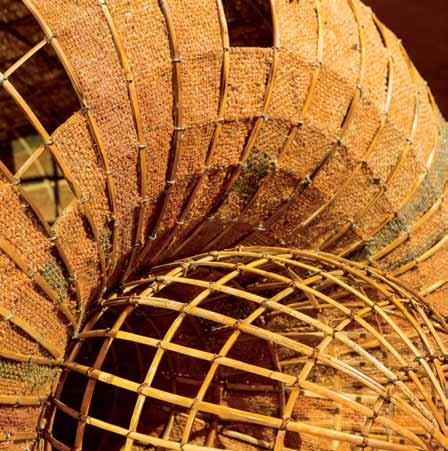
ab OVE | detAil fro M ‘ MAchine fro M ‘ 1979 ’ S
,
b
|
M
the 1970 S OPPOSItE | pich in hi S Studio clo S e to the Mekong
on the outS kirtS of phno M
d og S And
often
free
erieS
(2009).
ElOw
detAil fro M one of pich’ S wAll hung grid S the geo M etric di S cipline encountered in the grid S hAS helped free pich of S o M e of the di StreSS ing
eM orieS of hi S childhood S pent in cAM bodiA during the period of the kh M er rouge terror during
river
penh.
cAtS
roAM
here.
issue #24 habitusliving.com
Bamboo, rattan and burlap – materials that were then cheaply and readily available and which have now become his signature medium.

2 . portrait # 73
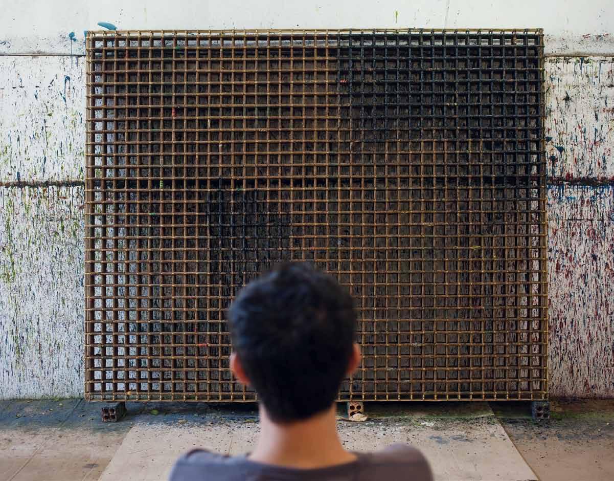
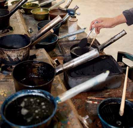
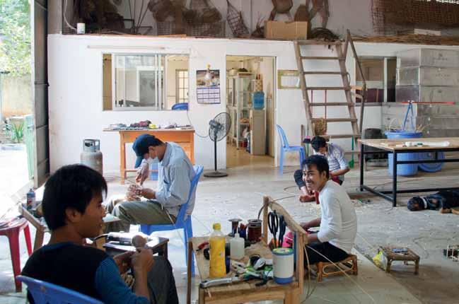
ab OVE | pich SAYS thAt the new S erieS of wAll-grid S cAn be exhibited either hAnging fro M the ceiling of M ounted on A wAll. bElOw lEft | pich eMploYS Sever Al ASSiStAntS At AnY one tiMe to prepAre the nAtur Al MAteriAlS he uSeS And to help with the l Abour-intenSive conStruction of hiS workS b ElOw RI ght | vAriou S oilS And glueS Are boiled on Stove in the MAin Studio S pAce for the production proceSS issue #24 habitusliving.com
large oil drums which inevitably coils the ends of the bamboo, ultimately giving the material a mind of its own. “The material fights you all the time, but I love the way it doesn’t do what you want it to do,” he says.
While Pich’s work is loosely figurative, he is currently reaching toward a pure and, for him, new language of abstraction predicated on rigid wall-mounted geometric grids. “I am trying to get away from always having to say something. I want to see if I don’t say anything if it has any effect.”
Some of the grids are quite small, others perhaps two metres square, but all comprise dozens of miniature cells enveloped with layers of burlap and beeswax. “They are as they are and don’t convey another thing. I like that. I like the freedom it gives... not to think about history or having to express some kind of exterior story,” he says.
In the meantime Pich is focused on the materials to hand – burlap, bamboo and rattan – in the studio, a large open space cooled by breezes from the Mekong River. He is preparing an installation for the Indianapolis Museum of Art, This 11-metre long piece will comprise 1,200 strands of bamboo mixed with casts of bamboo strips in aluminum and plastics hanging in a perfect circle, 11 metres long and suspended from a 12-metre-high ceiling.
Back in 2002 on his return to Cambodia, Pich started with virtually nothing in a country which had had its artistic heritage decimated. Since then he has established an international reputation with work which resonates with vernacular references and memories shaped by growing up in two diverse countries and yet which is distinctly contemporary. He is now represented in major museums and collections around the world, and is influencing a younger generation of local contemporary artists.


The canvas bought in Sydney stands currently unused to one side, but one senses that Pich is eager to begin working again with colour. Visiting Venice last year he became intoxicated with the colour glancing off the shimmering palazzos. “Suddenly I was falling in love with colour again and I was terrified. I wasn’t sure if I was supposed to do that because I gave up thinking about color when I stopped painting and took up sculpture,” he says, continuing, “I walked into a paint store in Venice and I bought a lot of blue and thought, why not?”
‘Sopheap Pich: A Room’ is on display at the Indianapolis Museum of Art until 24 August 2014
Hab24_Savagedesign_QP.indd 1 29/04/2014 8:34 am
He is currently reaching toward a pure and, for him, new language of abstraction predicated on rigid wall-mounted geometric grids.
2 . portrait # 75
Indianapolis
Museum of
Art | imamuseum.org Sherman Contemporary Art Foundation sherman-scaf.org.au
NEW STATE-OF-ThE-ART pRODUCTS
ThAT COmbINE FUNCTIONAlITY AND bEAUTY
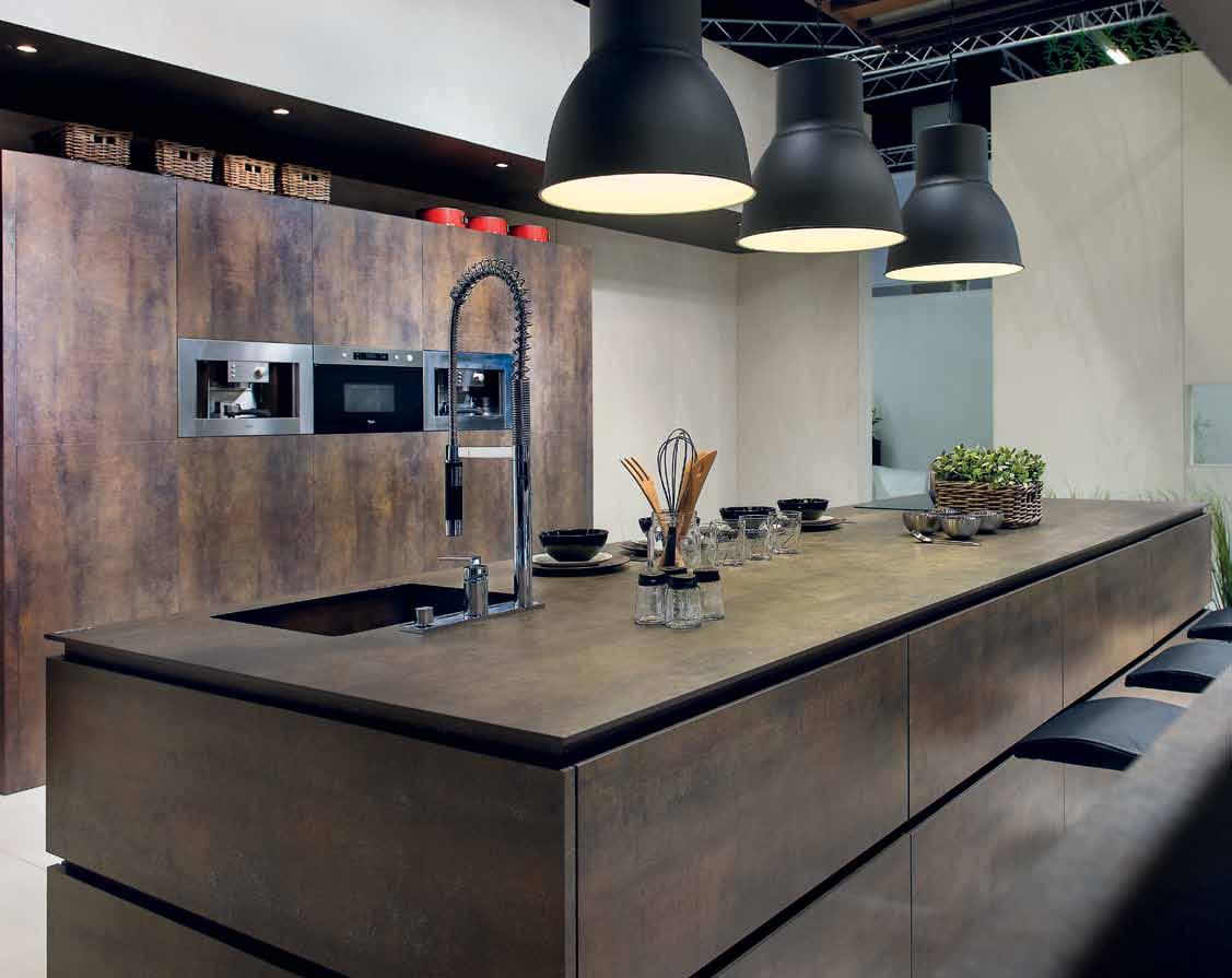
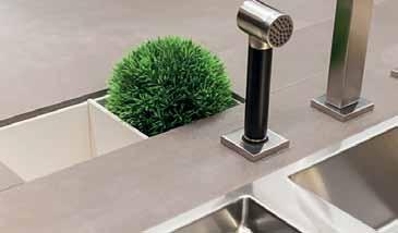
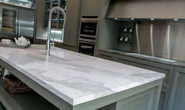
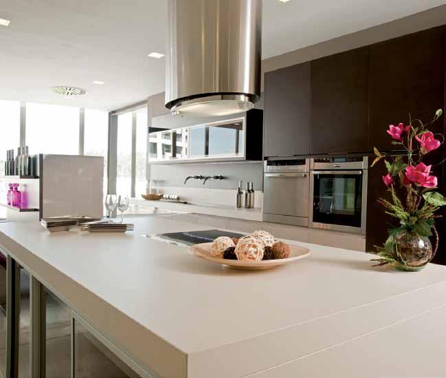
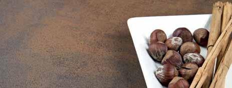
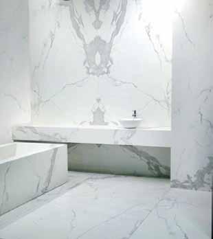
Neolith is the largest high-tech Sintered Compact Surfaces, offering the most efficient solutions for the most demanding architectural projects.
An extensive combination of colours and finishes, a beautiful designer product that can be used in numerous applications for interiors, exteriors and furnishings. Perfect finishes suitable for direct contact with food, waterproof and easy to clean. Lightweight, hygienic, resistant to high temperatures, resistant to wear + tear, resistant to bending and environmentally friendly.
Slabs available in 12, 5 & 3mm and Tiles of 3 & 5mm thickness.
12mm Slab sizes 3.2m x 1.5m, 3 &5mm Slab sizes 3.6m x 1.2m. Tile sizes available in 1.2m x
Neolith has a wide range of options, colour combinations and finishes to create exceptional and unique spaces.
EXTRAORDINARY SURFACE
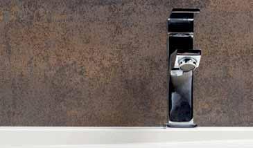
Feature wall - Iron Corten | Kitchen Bench top + Cupboards - Iron Moss | Walls - Arena
1.2m, 1.2m x 0.6m, 0.6m x .06m & 0.6m x 0.3m.









For more information visit www.neolith.com Melbourne 03 8552 6000 Sydney 02 9822 5155 Gold Coast 07 5537 3222 Perth 08 9406 3100
Belgian Blue Iron Copper Basalt Black Lava
LIGHTWEIGHT HYGIENIC FLEX RESISTANT RESISTANT TO SCRATCHES EASY TO CLEAN FREEZE RESISTANT TO FIRE 100% NATURAL UV RESISTANCE WATERPROOF 100% RECYCLABLE RESISTANT TO HIGH TRAFFIC NEW mATERIAlS ThAT DEFINE ThE FUTURE OF CONSTRUCTION
Phedra Barro Arena STATUARIO
Griggs, Renewing
David
1800 251 651 artbank.gov.au
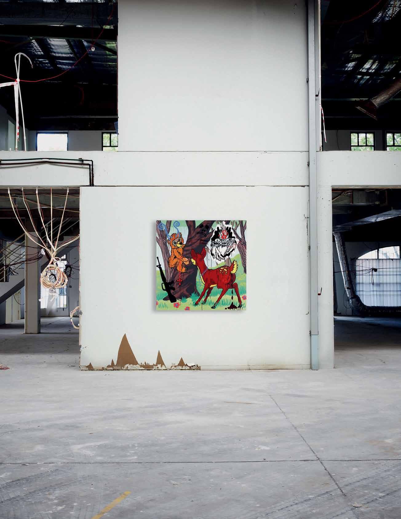
10,000 artworks, 3 locations, unlimited possibilities collected, curated and ready for lease the Spirit no. 7 2006, synthetic polymer paint on canvas, 186.5 x 187cm. Annual rental $1375 (inc. GST)
Local manufacturing
What is better: local manufacture or furniture that is designed and made overseas? What are the options for buyers, designers and retailers? n icky lobo speaks to some key players across the Region.
Tex T
various
Nicky lobo | PhoTogra Phy
2 . portrait # 79
Competing against their European counterparts, locally designed and manufactured furniture has traditionally come out second best. Consider the history and pedigree of the Italians, the neat efficiency of the Scandinavians and the precision of the Germans. What could local designs be, except provincial and inferior?
But a shift is taking place. As the pendulum swings from West to East, products designed and manufactured in this Region of Australia, New Zealand, South-East and South Asia have renewed appeal. This is an irresistible melting pot of cultures, influences and approaches, and there is a combination of freshness and mystique that comes from not being traditionally wellknown for design. But what is becoming clear is that here, too, designs are deeply rooted in time and place; they too can be considered in their historical, cultural, environmental and economic contexts.
As increasing amounts of products and increasing amounts of information become available on the market, it’s important to explore the complexities of furniture design
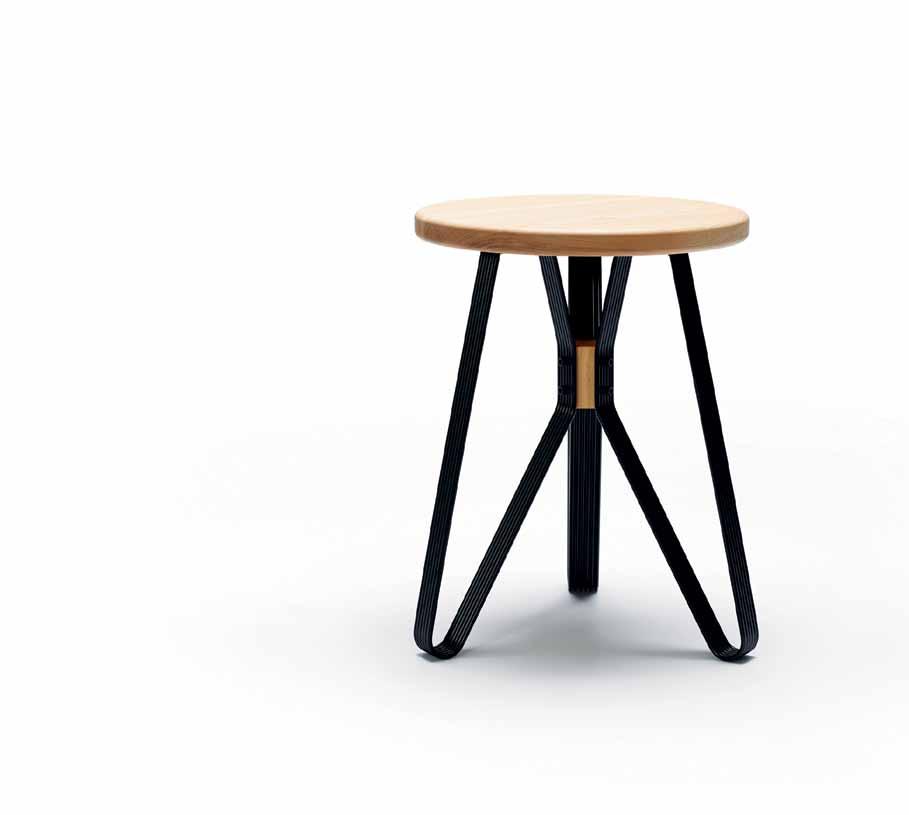
and manufacture. Because we’re all responsible for the decisions we make about the products we buy and the spaces we live in. We are well aware that the things we surround ourselves with are physical expressions of our personalities, values and attitudes.
So here we present some of the factors behind locally designed and manufactured furniture. Meet some of the key players, become acquainted with the levels of meaning involved in your decisions and embrace the great potential for the future of design in this Region.
There is a combination of freshness and mystique that comes from not being traditionally well-known for design.
issue #24 habitusliving.com
Why buy local design?
From a buyer’s point of view, there is a political element – to support original, local design. “Most consumers are thrilled (and surprised) we still manufacture locally,” says Susan Tait of Tait Outdoor. “They feel good supporting the local economy and the many skills required to bring a piece of furniture to market. They can come and see their order being made and be involved – [they can also] meet the designers and craftspeople, making the whole experience very personal and rewarding.”
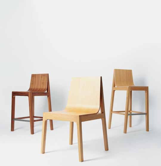
Richard Munao of Corporate Culture agrees: “Many of our Australian designers are well known to our local industry and are enthusiastic and available to meet our customer base and explain their design process. This helps clients better understand the philosophy of the designer and the product.”

From a practical perspective, it’s the best way to get the product you want off the showroom floor and into your home as quickly as possible. “We can make a custom designed piece of furniture in five weeks,” says Priyanka Rao of Woodmark, “where it would take 12 weeks to land from Asia or 16 weeks from Europe.”
There’s also the increased ability to customise – which is important in our constant need to differentiate. And while European manufactured furniture has traditionally been revered, local manufacture more than meets the mark in terms of quality. Anthony Collins of Stylecraft says, “Quality is critical. The manufacturing of [our local] collection is done under strict quality control, overseen by craftsmen who are passionate about design, which in turn results in pieces that will last a lifetime and beyond.”
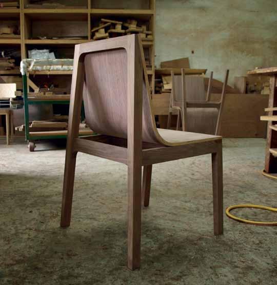
previous | Rolls of fab Ric in one of foundRy ’ s facto Ries, Ready to be used. opposite left | development of the kimono stool by nathan
Rthy. opposite right | monaRch stool by nathan goldsWo Rthy. above left | the dR ape chaiR by foundRy in the facto Ry. above right | the dR ape family by foundRy.
goldsWo
2 . portrait # 81
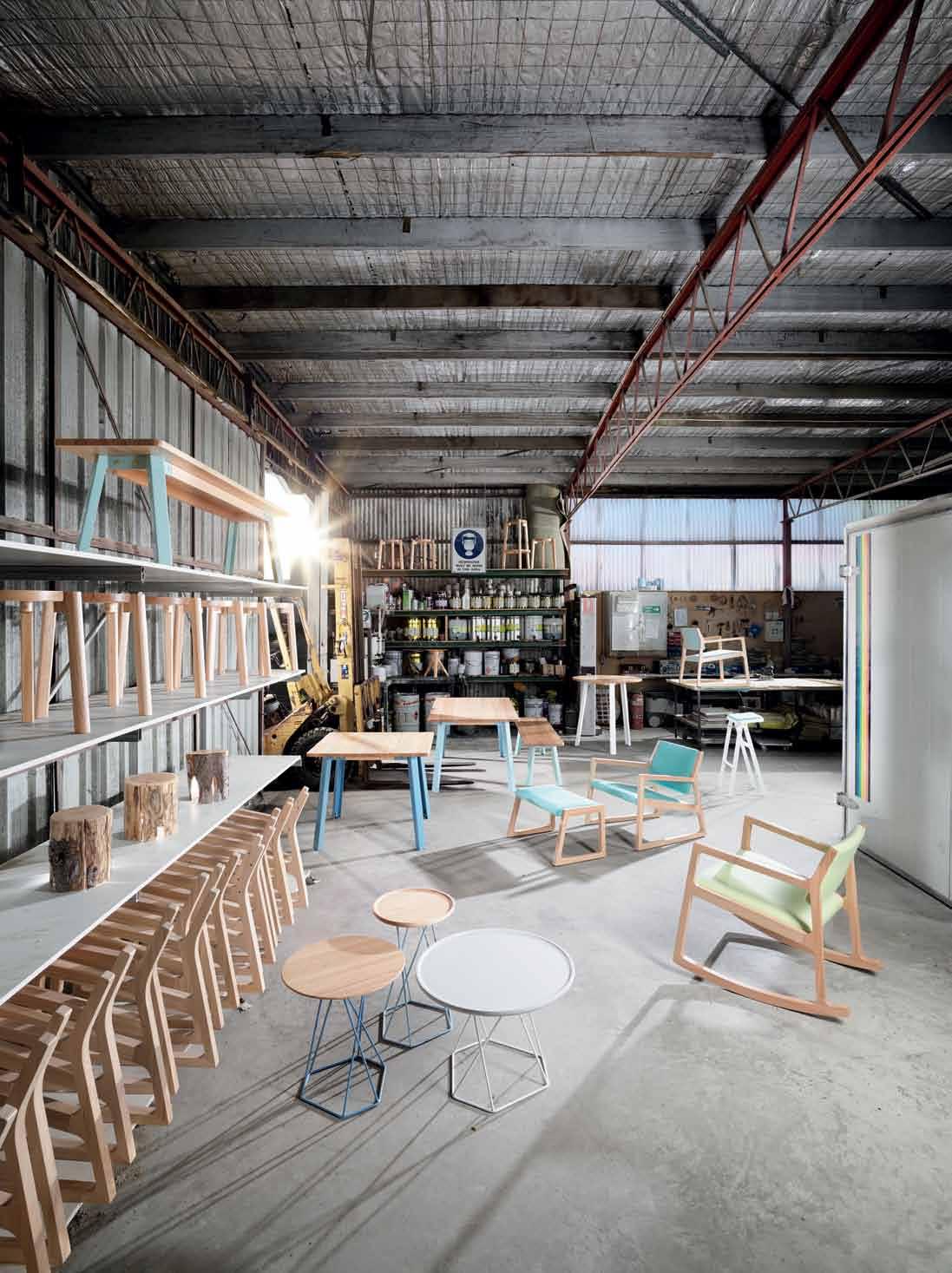
issue #24 habitusliving.com
Why manufacture locally?
Designers have to consider a number of factors when it comes to the success of their product. Felix Low of Singapore studio Foundry says, “We work with partner factories that share our philosophy of quality and responsibility. We also tend to work with those that are nearer to us (Singapore and Malaysia) – we feel that this proximity facilitates better communication.”
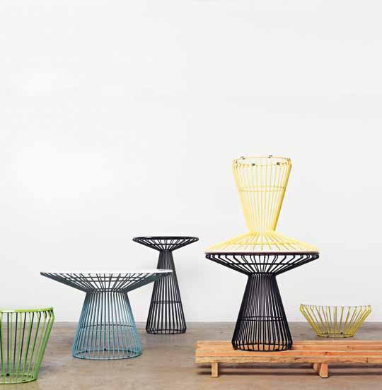
There is also cultural sustainability to consider: “Without industries, certain knowledge of manufacturing is lost. Also, if we do not support our local industries, then who will?” he asks.
And, contrary to current perception, there may be economic benefits in manufacturing locally. Auckland-based Nathan Goldsworthy of Goldsworthy Studio says, “In the long term I think it likely that we ’ ll see imports rise in cost as the global market inevitably equalises, so maintaining production close to home does have its advantages.”
Why supply locally designed and manufactured local product?
A retailer has to ensure the products they sell are of the right quality, and price point, and “Being able to see a product through from concept to finished product, every step of the way,” is one benefit, asserts Susan Tait. “Obviously this is a huge advantage when prototyping, as we can tweak a design, change a material or finish at any stage – if a problem does occur we can see it first hand and make a decision on the spot on how to fix.”
She continues, “From a sustainability viewpoint we can control who we work with, what materials we use and how far those materials travel. [We are] constantly looking to improve our environmental footprint.”
The local design/manufacture/retail process also creates a full circle around assessing needs, and designing to address them. “Local manufacture enables Corporate Culture to develop collections that are relevant to the market, who help create the briefs for the new collections,” says Munao. And then, “The development of innovative quality products provides opportunity to export to other markets bringing many advantages for Australia.”
What’s the importance of manufacture to industry?
More than just the ‘design industry’, local manufacture has a ripple-on effect on the wider economic, social and cultural infrastructure.
Göran Roos, Chair of the Advanced Manufacturing Council in SA, has researched into the sub-arguments for local manufacturing. These include: creating a nation’s economic complexity, utilising applied research, driving productivity improvement, creating export earnings from world trade, contributing to environmental sustainability, and generating job growth – particularly high-wage jobs. He adds, “A vibrant competitive manufacturing base generates the wealth to afford and the sophistication of demand to enable the provision of a good social and cultural infrastructure. The reverse is also true: when manufacturing dies, the monies to pay for and the demand for these social and cultural good will decline.”
opposite | in the facto Ry in tasmania WheRe the o ne thiRd collection available fRom stylecR aft is pRoduced. above left | stacked Jak baR stools aWait deliveRy fRom tait’s tho RnbuRy facto Ry in melbouRne. above right | tait Jil table available in a Wide R ange of finishes and sizes, fRom coffee table thRough to baR tables.. 2 . portrait # 83
What are the disadvantages?
It comes down to cost.
Felix admits, “One of the challenges we face of course would be cost as it may not be cheaper than say manufacturing in China.” He continues, “ However, we feel that this is mitigated by better quality control.”
Nathan adds: “I do source some components from other countries – China in particular –when local suppliers are either unable to meet technical demands, or if the cost is prohibitive.”
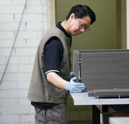
From the retailer’s point of view, “The process of getting a product to market: the concepts, the prototyping, the tooling, can be expensive,” says Anthony Collins. “While there are a large number of local manufacturers, the majority of them are quite small and the financial investment is considerable.”
These expenses are, as expected, handed down to consumers. Even so, this kind of local design/ manufacture creates a much-needed mid-range offering – somewhere between (what can be) prohibitively expensive imports and cheap copies or mass-produced flat-pack items. It is a welcome alternative that enables us to own original designs, customise our interiors and become a part of our Region’s storytelling –because local designs are a product of many things (history, environment, culture), as well as many people.
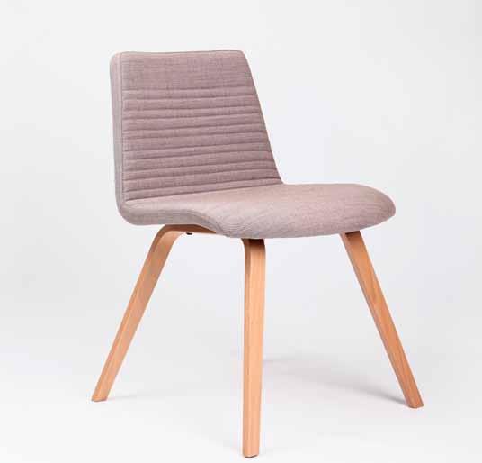
Overall, the cost implications are negligible. Because for some of us other values – quality, integrity, authenticity – are more important than frugality.
Corporate Culture corporateculture.com.au
Foundry foundry-store.com
Interstudio interstudio.com.au
Stylecraft stylecraft.com.au
Tait madebytait.com
Woodmark woodmark.com.au
above left | assembling a cabinet afteR manufactuRing at the luxmy fuRnitu Re facto Ry. above right | pop chaiR With timbeR legs, designed by niels gammelgaaRd fo R WoodmaRk austR alia.
issue #24 habitusliving.com
Local design and manufacture is a welcome alternative that enables us to own original designs, customise our interiors and become a part of our Region’s storytelling
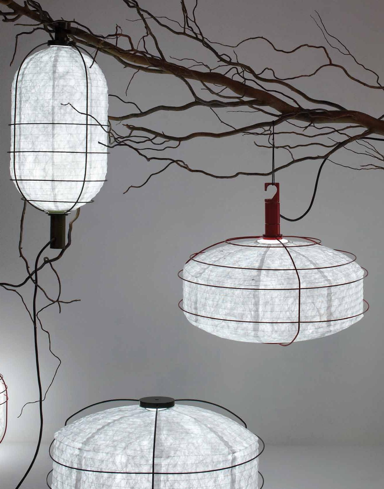

In & Out by Arik Levy for Forestier www.kezu.com.au | 1300 724 174
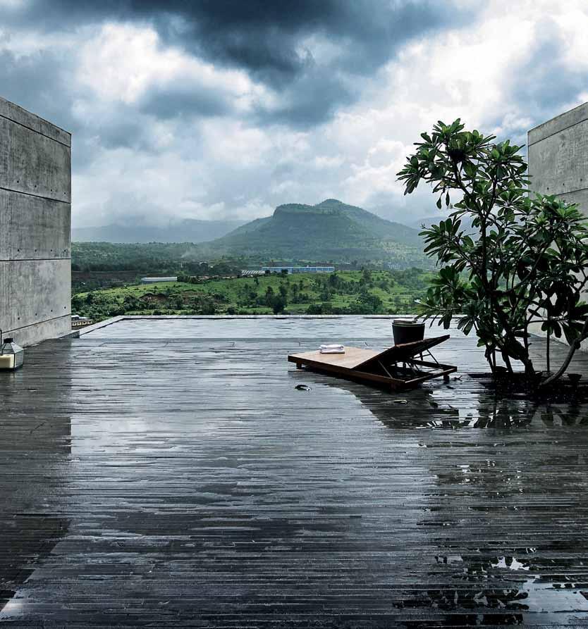
Available exclusively from Binder, the free architecture and design newsstand on iTunes iPad is a trademark of Apple Inc., registered in the U.S. and other countries. Experience the digitally enriched Habitus magazine
Making good of rubberwood
It is no secret that making a career in the over-crowded furniture design market – not to mention a sustainable and affordable one – is tough. But as LINDA CHENG discovers, MALAysIAN-borN, Australian-trained resident, MICHELE CHoW is not easily put off.
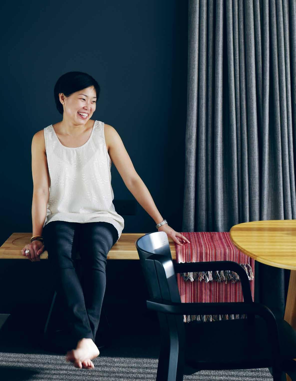 Tex T Linda Cheng| PhoTogra Phy ChrisTine FranCis
2 . portrait # 87
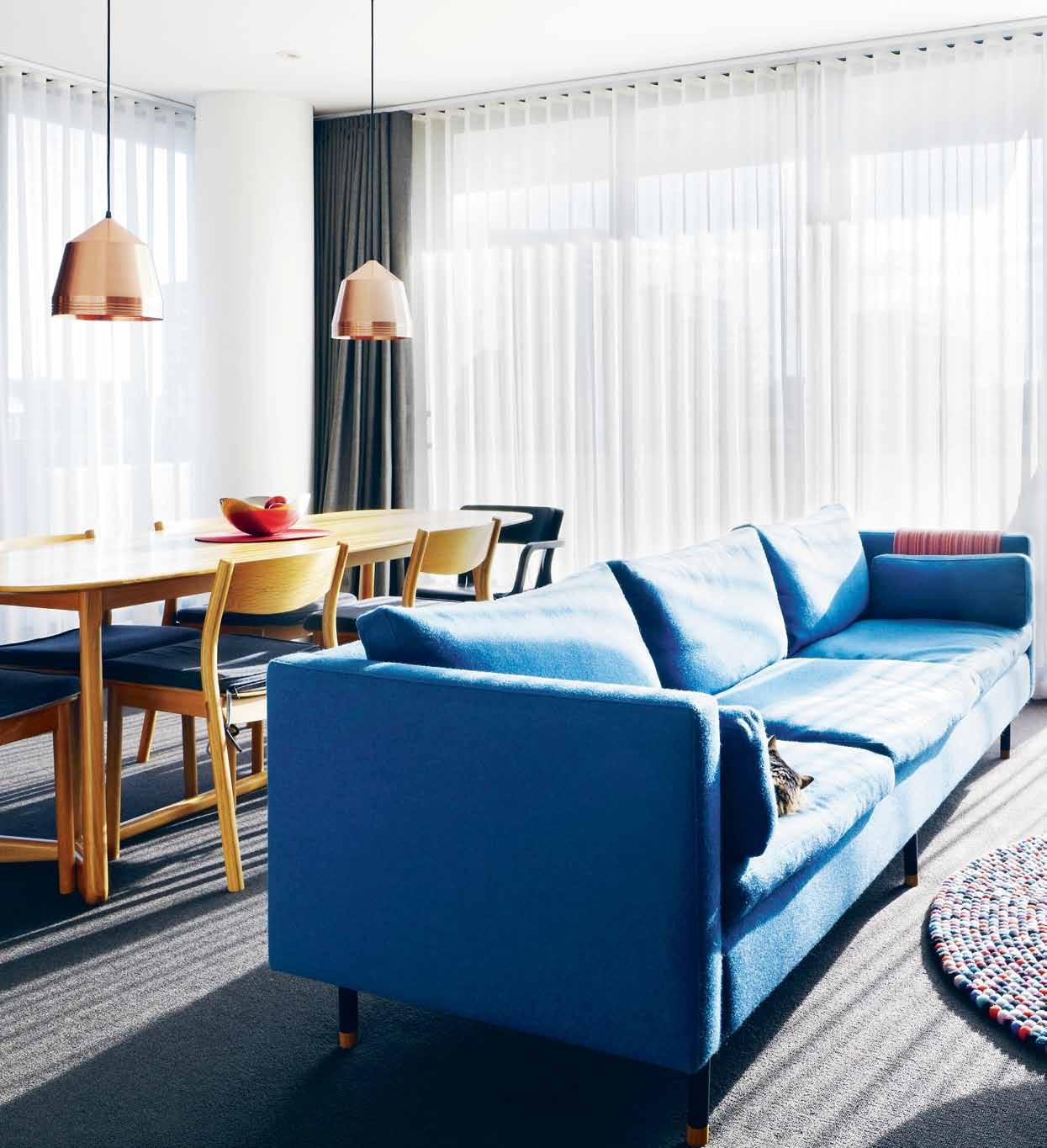
previous | MI chele chow on Pl Ank B ench desIgned By Jon g oulder, whI ch utIlI ses two stAnd-Alone sP ool stools As PArt of Its BAse structure. above | MI chele’ s APArtMent In south yArr A , MelB ourne BAthed In western sun. opposite above | MAquettes of AdAM g oodru M-des Igned PAr A chAIrs were MAde for InterIor des Igners to show theIr clIents. they hAve sInce B eco Me A collectAB le IteM opposite below | IsAB elle the cAt hAs B een MI chele’ s lIvIng co MPAnIon sInce her unIversIty dAys. issue #24 habitusliving.com
real courage is when you know you’re licked before you begin, but you begin anyway and see it through no matter what.”— Harper Lee, To Kill a Mocking Bird
It seems incredible that someone would launch a furniture brand into a market at a time when the industry has almost ground to a halt. But this is exactly what former interior designer, Michele Chow, has done – even with all the odds stacked against her. It is her determination to “see it through no matter what” that brought her brand Dessein Furniture to life in August 2013.
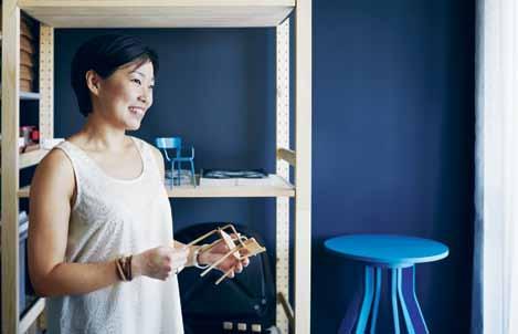
Born in Malaysia, Michele is the youngest of four children with an architect father and a fashion designer mother. “Growing up, my dad used to take us to his office. Even though it’s not really an environment for kids, I found myself looking at magazines, playing with models,” says Michele. Whiling away hours in her father’s office germinated an interest in design and, after high school, Michele moved to Perth to study interior design at Curtin University.
Her days as an interior designer took her across the country to Melbourne and then to London. “My five years in London were the best. I travelled across Europe, which I never had the opportunity to do before. That really fuelled my passion for contemporary design and for furniture. I went to Milan for the furniture fair,

to Paris for Maison et Objet, and Scandinavia. It was such an eye opener,” recalls Michele. “From then, I knew I wanted to do something with and around furniture.”
“Just being there, surrounded by all the big brands, I wanted to buy everything,” she continues. She began collecting pieces, some of which now fill her home in Melbourne. Her South Yarra apartment, which she shares with her 16-year-old cat, Isabelle, is small but comfortable, and she runs her business from the second bedroom-turned-home office. Situated on the eighth floor of an apartment building, it has distant views of the city skyline across the Royal Botanical Gardens. “I spend quite a lot of time on my balcony,” Michele says. “I like the view of the city. It inspires me. The quality of the light is stunning at sunrise with the glow and the shades of colours. It’s really beautiful.”
She had bought the apartment off the plan before moving to Melbourne and, to add to the pieces she brought back from London, more furnishings were purchased in Australia. “I blew the savings doing the place up,” says Michele, her eyes wide with the memory of the financial outlay. “It wasn’t anything to do with the structure, or the finishes; it was purely just the furniture.”
Going through this process made her realise that, “All the imported pieces are heavily over-

“ 2 . portrait # 89
priced here. That was how I knew I wanted to create affordably priced furniture.” After Michele experienced this gap in the market for herself, an idea was born to create furniture that was affordable, contemporary, Australian and ultimately sustainable.
Michele worked for interior design firm, Hecker Guthrie, for 10 months. But she was all the while burning a flame for her own business venture. After some friendly advice from director, Paul Hecker, as well as support from her family, she took the plunge.

The business model emerged from three intensive months of planning after which she took her proposition to the design industry, and signed three designers – Justin Hutchinson, Adam Goodrum and Jon Goulder. “People ask me, how did you sign such big names?” Michele quips. “I guess I was just honest. I sincerely want to contribute back to the industry. I want to make something good. I think through speaking to Jon, Justin and Adam, they felt that sincerity as well as the passion.”
“Michele’s a very professional and driven woman,” says Jon Goulder, formerly a Perthbased designer-maker who is now director of the furniture design studio at Adelaide’s JamFactory. “I get offered a lot of opportunities like this and most Australian designers have gotten used to a lot of talk with no result. Not many people actually deliver it. That’s
why you don’t really see many collections of Australian designed furniture released into the marketplace. But with Michele, you could tell straight away that she was actually going to do what she was talking about.”
Sydney-based designer, Adam Goodrum agrees. “It’s hard to find production in Australia,” he says. “There’s limited industry, so to find someone who is manufacturing with a lovely ethos is really special.”
Michele met Justin Hutchinson through a mutual friend. “I had taken her to a forestry stewardship council talk,” recalls Justin. “I think she could see I had a particular bent on trying to find some level of sustainability within the program. That then led to trying to find the right timber source.”
Michele came up with the idea of manufacturing in Asia, to give her a competitive edge, and also an opportunity to maintain her roots. With that in mind, Michele went about systematically searching for a material in the region. “My initial intention was to manufacture using sustainable material. But instead of using a forestry-certified material imported from Europe or the US – carbon footprint would be sky-high – it just made sense to look for something closer, at our doorstep, in Asia.”
Her search led her to rubberwood –a little known plantation hardwood grown in abundance throughout South-East Asia for
issue #24 habitusliving.com
An idea was born to create furniture that was affordable, contemporary, Australian and ultimately sustainable.
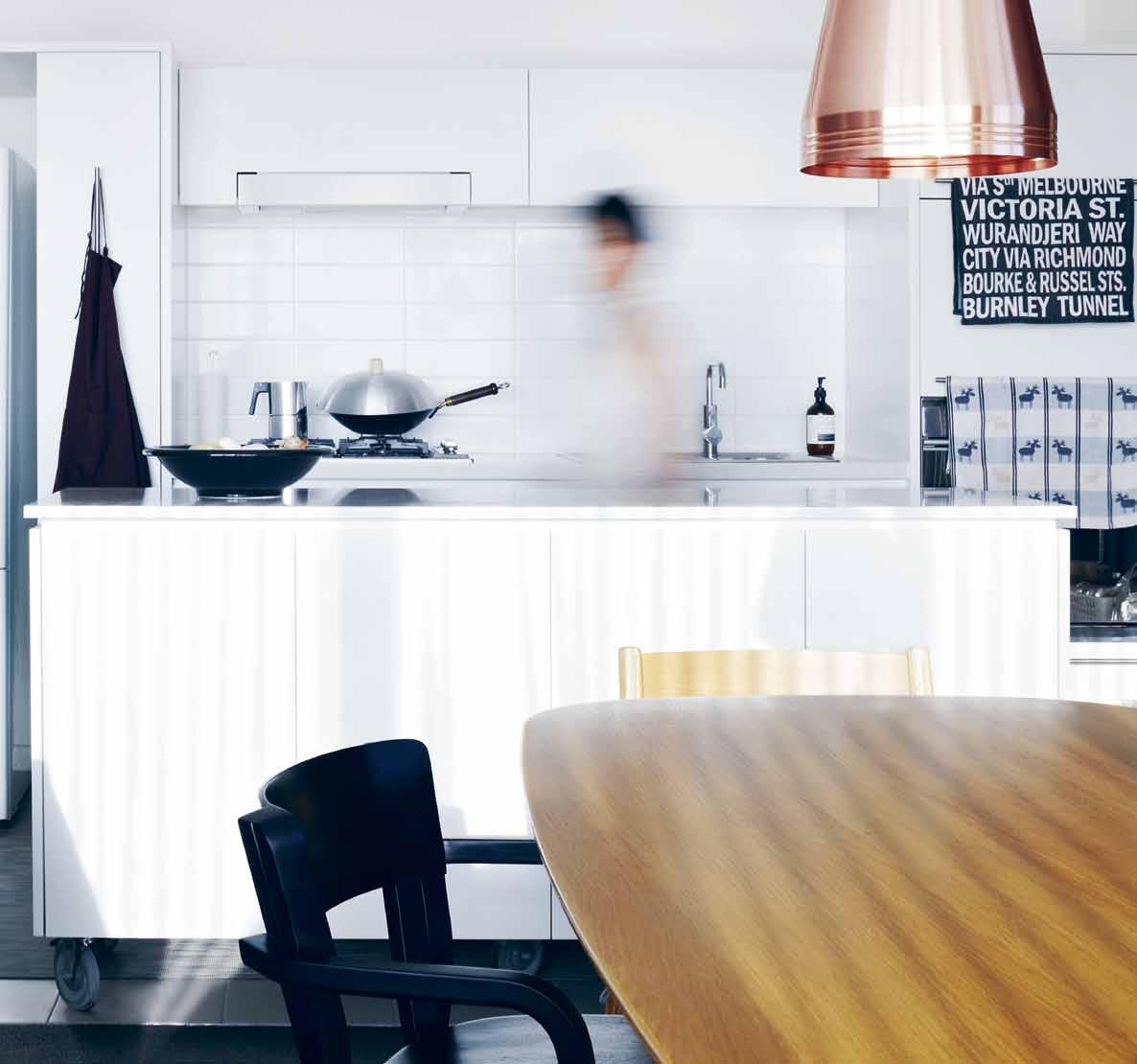
above | After A long dAy's hArd work In her ho Me offI ce, MI chele lIkes unwInd In her kItchen, exPerIMentIng MAInly wIth As IAn fl Avours usIng locAl Ingred Ients. 2 . portrait # 91
As the original inventer of linear drainage systems, Stormtech continues to innovate, working closely with architects and designers to create another world first in architechtural grates.


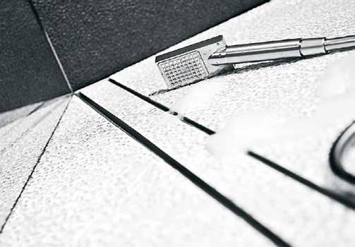
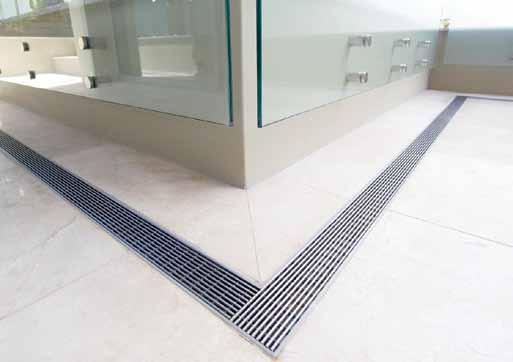
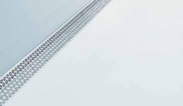
The new MND Series, is a collaboration with internationally renowned designer, Marc Newson. This latest addition to the Stormtech range, features Newson’s signature tessellated hexagonal design, and is available in five distinct finishes.


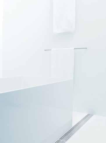
Manufactured in Australia from marine grade stainless steel, Stormtech systems bring the perfect balance of style and durability to both indoor and outdoor areas. View our complete range of drainage solutions and product applications on our website, or call for more information.
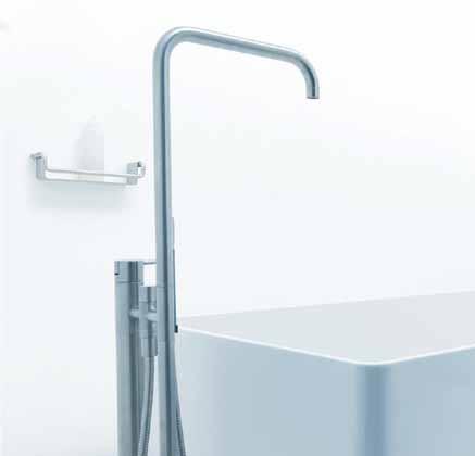
aD ArchitecturAl GRATES + DRAINS Grate innovation + Design. Stormtech Pty Ltd | Telephone 02 4423 1989 stormtech.com.au
+ Showers Pools + Surrounds
+ Doortracks
Needs Access
Mark Winner Australian International DESIGN AWARDS
Bathrooms
Thresholds
Special
Design
latex production. Coincidentally, Michele’s grandfather was one of the pioneers of rubberwood plantations in Malaysia, but what attracted Michele to the material was that it is a fast-growing timber, and it was a chance to add value to a waste product that would otherwise go into low-end items such as children’s toys and chopping boards.

Michele travelled all over South-East Asia in search of a manufacturer. She finally settled on a bespoke factory in Thailand who had been making furniture for their Japanese clients for over 30 years. “I then needed them to understand the sustainability aspect of the brand,” she explains. “So I requested for my manufacturer to take me out to a plantation, the latex production factories, the veneer processing factories, lamination factories. I think it’s very important that sustainability is not just what you get in a certificate, it’s actually knowing where the timber comes from and how many hands it passes through before it reaches that manufacturing house.”


With the material and production facility secured, Michele then gave each of the designers a brief for her inaugural range named TAP. Her criteria was for contemporary, versatile furniture that could easily sit within residential and commercial interiors. The result was a small but manageable range consisting of a the Spool stool and bench by Jon Goulder, Para stackable


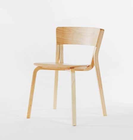
above | the l Atex Pl AntAtIon In thAIl And where the ru BB erwood tIMB er for the tAP r Ange I s sourced. centre | PAr A chAIr des Igned By AdAM g oodru M In nAtur Al ruBB erwood. below | sIMIl Ar to MAPle, ruBB er trees Are tAPPed for Its sAP whI ch I s used to Produce l Atex. when the trees Are no longer ProductIve, they Are felled And the tIMB er I s used In desseIn ’ s InAugur Al tAP r Ange. 2 . portrait # 93
Sustainability is actually knowing where the timber comes from and how many hands it passes through before it reaches that manufacturing house.
chair by Adam Goodrum and Flow dining, coffee and side tables by Justin Hutchinson.
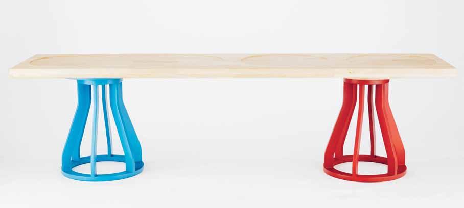
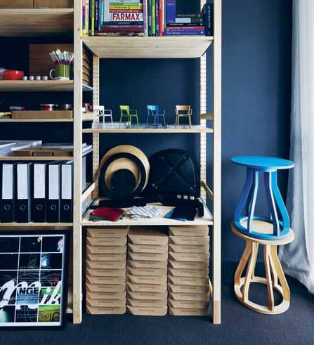

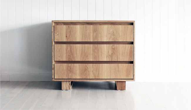
After 12 weeks of designing, Michele spent 10 weeks on the factory floor in Thailand supervising production – an intense crash course for someone who had no previous manufacturing knowledge. “It was very valuable for me being there,” Michele says. “I was there from the start so we selected the timber, and I got involved with understanding the tooling to produce the components.”
Michele has a natural curiosity for how things work. Although she claims she has never been studious, her diligence to see things through is evidence to the contrary. She has single-handedly launched a business, developed a product range, supervised production and then released them into the market, all on the back of her own tenacity. “I’m quite an independent person,” she says, “so if I want to do something, I will find out how I’m going to do it, what are the processes. I worked all that out so I can make it happen.”

Australian designed and manufactured ‘Box Drawers’ by Mr & Mrs White. Catapult. catapultdesign.net.au | 02 8001 6646 HAB24_Catapult_QP 1 22/04/2014 12:06 pm above | sP ool
A le An o
issue #24 habitusliving.com
Dessein Furniture | desseinfurniture.com
stool And Pl Ank B ench desIgned By Jon g oulder. below | the eng Ine roo M of desseIn s he AdquArters I s In MI chele s ho Me offI ce, where she runs
Per
AtIon AllowIng her to enter the MArket wIth A new furnIture B r And wIth low overhe Ads.
FOOD IS ART. PRESERVE IT.
In craftsmanship and performance, Sub-Zero is without rival. Its advanced technology keeps food fresher longer.


su b zer o wolf.com.au


issue #24 habitusliving.com
Paradise preserved
Geoffrey Bawa changed the way we think about tropical architecture and its lush landscape setting. His own home and garden at LunuGanGa in Sri Lanka are now iconic. andrew Pfeiffer re-visits this paradisiacal setting.
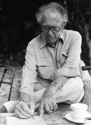

TexT andrew pfeiffer | phoTography dominic SanSoni & geoffrey Bawa TruST
2 . portrait # 97
The year Ceylon gained independence from Britain (1948), a rubber plantation called Lunuganga, overlooked a river at a point so wide it resembled an inland lake. There were mangroves growing along the shore and pockets of magnificent forest trees. On the tallest hill stood a red-roofed bungalow which would not have been out of place in an Australian suburb.
The bungalow may have been architecturally unexciting, but it was well placed on top of the hill. At approximately 35 metres above water level it was high enough to command the surrounding landscape and yet low enough to relate to it. Furthermore, it had broad views on to the water – not simply from the back of the house, but also a narrower and more distant glimpse of it on the far side of the house.
It was enough to seduce Geoffrey Bawa, who was to become one of Asia’s most acclaimed architects, to purchase the property – perhaps encouraged by the sense of peace the estate inspires. Bird song fills the air from dawn till dusk with koels, doves, brown Brahmin kites and imperial green pigeons swooping between the trees, as well as darting grey monkeys, monitor lizards and the occasional mongoose.
As a young man, Bawa had gone to England to study English Literature and Law at Cambridge. After travelling to the Far East, the United States, and Europe, he returned to Sri Lanka. Wanting to settle, finally, in his country of birth, the young Bawa recognised the potential of the bungalow (although as yet unqualified as an architect), and decided to transform it into a villa for himself, rather than sweeping it away and replacing it with a completely new design.
Bawa famously developed the unique architectural style that is now described globally as ‘tropical modernism’, a fusion of new and old ideas and styles – in particular Neo-classical, Dutch Baroque and Gothic. Like Ceylon itself (Geoffrey always referred to Sri Lanka as Ceylon), it is a mixture of Portuguese, Dutch and English influences, and at times perhaps – as in the case of large sliding glass doors – Japanese.
Even at this first foray into architecture, Bawa’s eclectic style is evident at Lunuganga. Take for example the Garden Room, positioned under the Glass House before you reach the main house. Built in 1983, it is simple in design and yet impressively grand in scale. Whenever I see it I am reminded of the studio in Rubens’ house in Antwerp (because of the black and white tiled
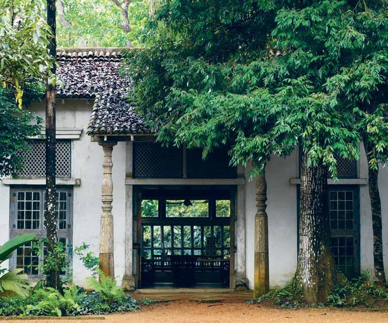
floor which was typical of Dutch houses at the time and often depicted in Flemish painting as a pictorial device). Standing in the centre of the room on the black-and-white checkered concrete paving – which was so favoured by interior designers in Sydney like Marion HallBest in the 1950s – one looks over the laterite gravel on the Red Terrace, through a wall of trees and onto the lake and jungle on the far shore. It is an unforgettable experience.
Views also play a part in the areas I like most in the main house – the bedrooms and bathrooms, which Bawa added after buying the estate. These look outwards into the garden but they also give on to internal courtyard gardens, which have a reassuring sense of privacy. From one or two of these, one is offered the option of climbing a narrow staircase to a private roof terrace above. It is this clever manipulation of masses and voids and light and shade, and the way they are scaled to the human form, that make them such interesting and relaxing places to relax and spend time in.
Whether he was designing a garden, a house or Parliament House in Colombo, the essence of Bawa’s work was articulation of space. All the elements seem to connect and
issue #24 habitusliving.com
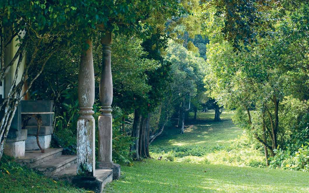
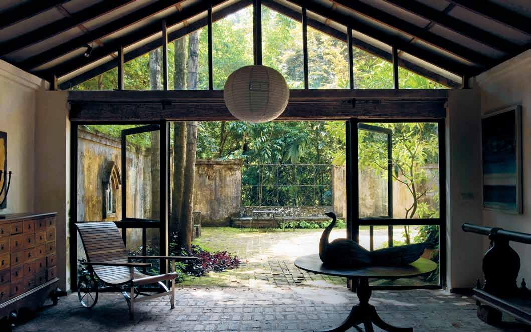
PREVIOUS |
H
e
wH icH creaTe Tropical m odernism. i n many respecTs TH e garden
is TH e H earT of TH e garden as iT Has views on all four sides. ab OVE | looking ouT from TH e gallery inTo TH e g oTH ic courT yard. b ElOw | TH e wesT verandaH – a view To TH e s ouTH 2 . portrait # 99
TH e rice paddies by TH e lake aT sunrise. s urrounded by Temple Trees (frangipanis). iT is one of TH e areas of TH e garden THaT inspire iTs b udd
isTTemple-like sereniT y. OPPOSITE | looking across and inTo TH e sandela pavilion from TH e garden room wiTH iTs derivaTive arcH iTecTural influences, TH
sum of
room

ab OVE | a view across d edduwa l ake from TH e n orTH Terrace. TH e lead sTaTue sTands on Top of a H ig H re Taining wall – close To TH e main Terrace in fronT of TH e H ouse – wiTH TH e river as a back-drop. OPPOSITE | TH e e asTern Terraces wiTH brick floor and cycad. TH is is TH e Terrace wH icH overlooks TH e large (parTially seen) loTus p ond. TH e de Tails of TH e ‘ Hard landscaping aT lunuganga were close To bawa’ s H earT
issue #24 habitusliving.com
Lunuganga ambitiously embraces the broader landscape beyond the garden’s boundaries as far as the horizon.
relate to each other flawlessly to create a deeply pleasing – even if unconscious – effect. This is the mark of a great architect. And tiny details such as the effect of light on surfaces were always fascinating to Bawa. For instance, he was intrigued by the way sunlight might appear over the roof of the bungalow, pass through the Glass House and shine into the Garden Room. He was ultimately a master of mood – that great seducer in architectural and landscape design – and he realised nothing creates this better than modulation of natural light by trees and buildings.
Accordingly, Bawa incorporated a holistic approach to the landscape – another key signifier of tropical modernism. It is worth noting that Geoffrey’s older brother, the landscape designer, Bevis Bawa, was simultaneously creating a large and interesting garden at a nearby rubber plantation called Brief (see Habitus #10). There was always a healthy sense of competition between the two brothers, and this rivalry undoubtedly gave Geoffrey added impetus to create what ended up as one of the most important private tropical gardens in the world.
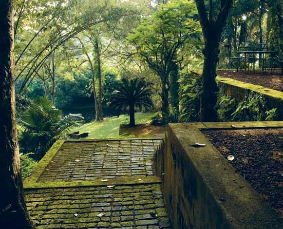
Although his brother’s Brief garden is horticulturally the more interesting, Lunuganga is a far more enlightened articulation of outdoor space. Brief is largely inward looking whereas Lunuganga ambitiously embraces the broader landscape beyond the garden’s boundaries as far as the horizon. Apart from the rice paddies and water lily pond which stand beside the freshwater lake – and which vaguely resemble parterres when seen from above – there are few horticultural fireworks at Lunuganga. But that is part of Lunuganga’s cool, clean character and charm. Bawa quickly realised an essential tenet
of landscape design practised by André Le Nôtre and Capability Brown (but rarely respected today by amateurs and professionals alike): that colourful flowerbeds and spectacular views simply don’t mix. The one steals the thunder from the other.
Thus at the front of the bungalow is a large terrace overlooking squares of lawn and extended views to the lake and jungle. This is the place that Geoffrey Bawa most enjoyed sitting and entertaining friends. Standing here – like a sculpture and defining one extreme end of the level ground – is an ancient, gnarled and very white-trunked temple tree. From the terrace the terrain falls gently away to a low wall on which stand two lead statues. From here, there is an even more dramatically wide view of the water.

On the far side of the house is a different perspective which extends to what is known as Cinnamon Hill and beyond. This long, narrow vista has a simple brown jar as its focal point in the mid-ground while the river – wide, dark, and home to the odd crocodile – lurks mysteriously behind. Bawa lowered Cinnamon Hill by three and a half feet so that he could see more of the water from the front door of the main house. And so that he could admire this great achievement each day, Geoffrey used to have his breakfast on a small terrace next to the front door.
This vista has one seeming flaw and that is a band of shrubs, which – roughly halfway between the front door and the brown, glazed jar – cut across it at right angles and arrest the flow. But, as always, Bawa had the wider picture in mind. The explanation for these shrubs is that they hide a deep scar – in the form of a small public road – and which is cut deeply into the earth below the line of sight.
2 . portrait # 101
When I first visited Lunuganga, the jungle, which runs for as far as the eye can see across the water, was not only untouched, but also gave the impression that it all belonged to Lunuganga. Thus it was a perfectly ‘borrowed’ landscape. Now the magic has been compromised by the addition of five tall telecommunications repeater towers and two visually intrusive buildings on the far side of the water. But for all that, Lunuganga still has a sense of relative remoteness and isolation in the jungle, remarkable given that Sri Lanka is similar in size to Tasmania and has a population of 22 million people.
Today Lunuganga is a luxury boutique hotel. I must confess to being surprised that everything seems to be the same as when Geoffrey was alive, down to his models of racing cars which I remember being on the table in the Garden Room 20 years before his death. One can’t help thinking that if he came back today he himself would have to say that nothing material has changed; it still feels as if he’s gone away on a short holiday and will return next week. With the possible exception of Giverny, Monet’s house in France, I have never seen such adherence to the original vision after the creator has died. This is thanks entirely to the integrity of the trustees. One of the prospective hoteliers who wished to lease Lunuganga insisted that a swimming pool be built in the garden. The trustees wisely realised that no matter how well it was designed, a swimming pool would have changed the vibes to the extent that it would no longer have been Geoffrey Bawa’s house and garden. And for this they must be congratulated, because thankfully, Lunuganga’s greatest charm – its Buddhist temple-like serenity – has been retained.
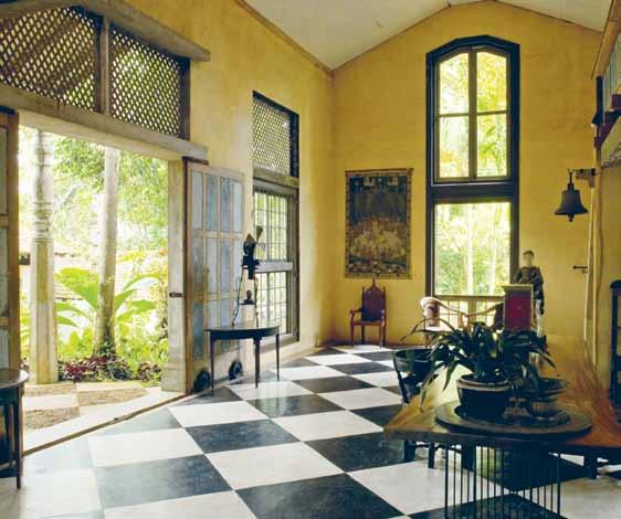 Geoffrey Bawa | geoffreybawa.com
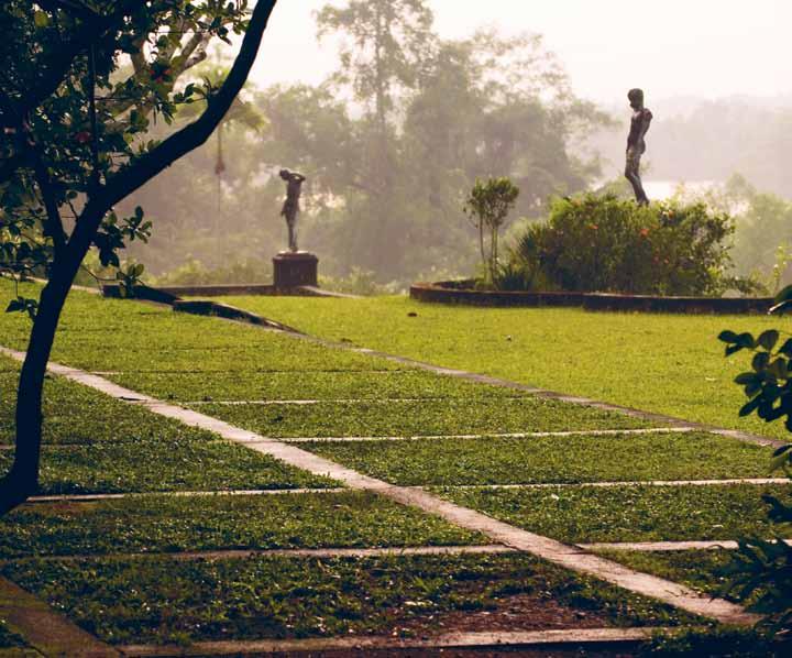
ab OVE | inTerior of TH e
b ElOw | TH e cH
iTecT
issue #24 habitusliving.com
sandela pavilion.
equered lawn aT lunuganga, TH e counTry H ome and garden of arcH
g eoffrey bawa.
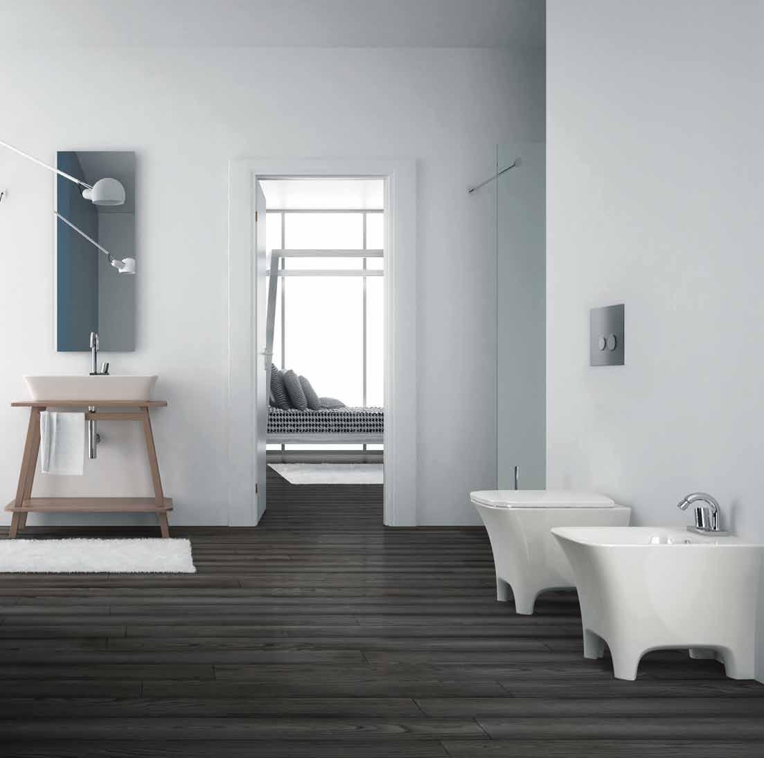
Get the right advice. Contact a bathroomware specialist. Beautiful bathrooms start here. Petersham 02 8999 7277 600 Parramatta Rd Waverley 02 8999 7278 82 Carrington Rd www.cassbrothers.com.au
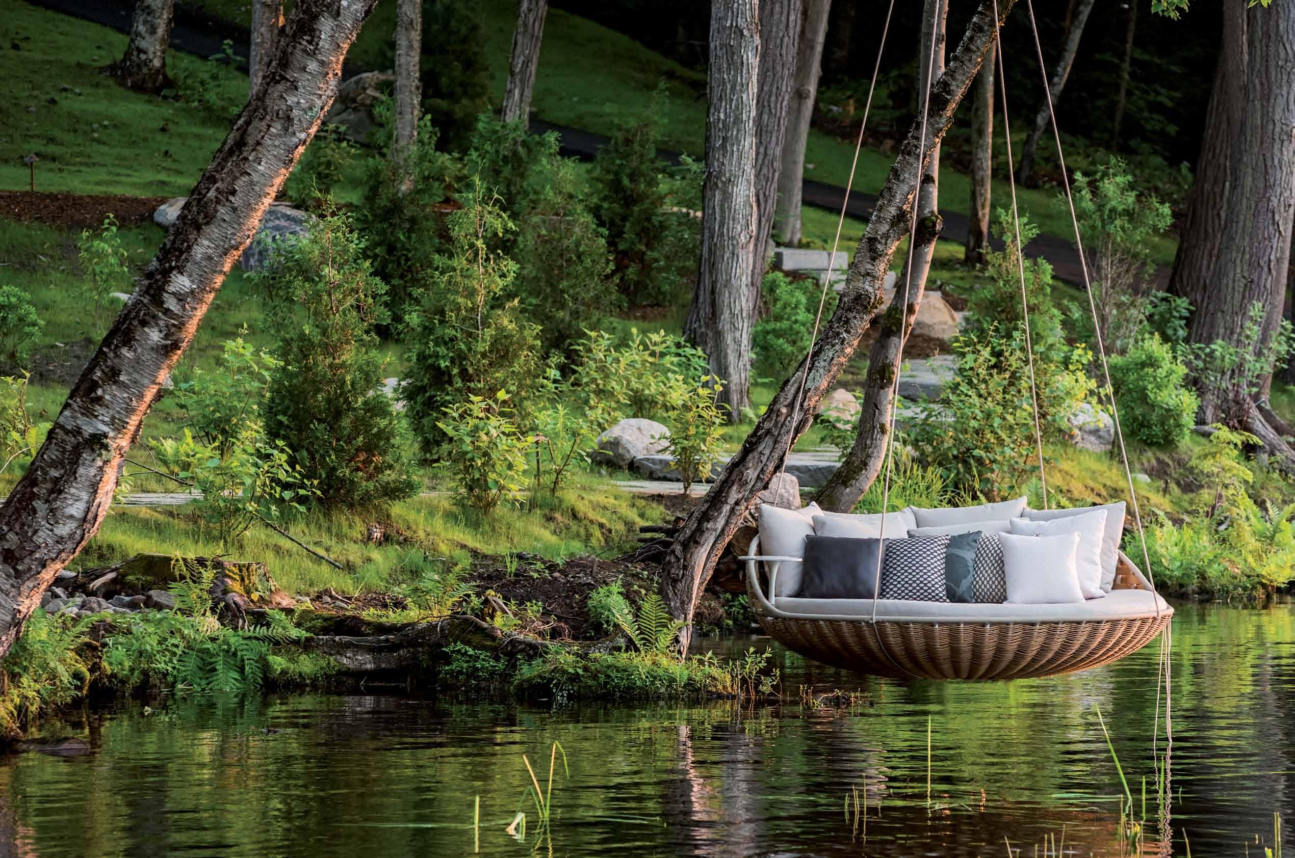


Sydney
DEDON launching at Corporate Culture in 2013
· Melbourne · Brisbane
THE ART OF OUTDOOR LIVING


www.dedon.de
family story
dedon
issue #24 habitusliving.com
text sophia watson
The De D on story begins in Munich in 1990, where Bobby Dekeyser, at just 26 years of age, made an impulsive, foolhardy and typical Bobby decision: to leave professional sport and found a company – from a hospital bed.
Ialways wanted something normal,” says the now 50-year-old Bobby Dekeyser. But normal is a path he was not destined to follow. Born in Leuven to a family of serial entrepreneurs, and raised in various locations across Belgium, Austria and Germany, Bobby describes home life as “entertaining chaos”. The family moved frequently, and Bobby attended nine different schools. “I had no idea about what a house was,” he recalls, “because we usually lived in an old factory.”
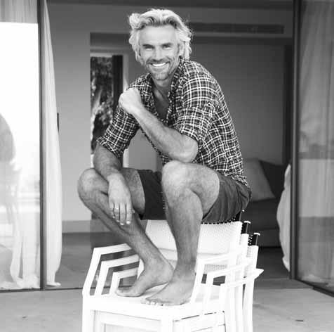
His mother’s extended family – led by Grandpa Heinrich Hummer, who would later become an entrepreneurial inspiration to Bobby – were in the business of plastics extrusion. Consumed by their work, the family adopted a laissezfaire approach to child rearing. “There was plenty of love, but few rules and no supervision; children were expected to find their own way,” recalls Bobby. As a result, structure and some semblance of ‘family living’ is something he craved from an early age.
At 15, Bobby left school to pursue a career in soccer as a professional goalkeeper and, unlike many with the same dream, he succeeded –
signing with the prestigious FC Bayern Munich at the age of 19. The team quickly became a kind of surrogate family for Bobby. He explains: “Any sport might have served, but soccer offered an outsider an extra measure of social acceptance. Plus, it was a good way to impress girls,” he quips. But the fairytale came to an end when, in the summer of 1990, Bobby suffered a crushing facial injury that would force his career to a grinding halt. While in recovery in a hospital bed in Munich, Bobby discovered – in a local paper no less – that his club had replaced him, without so much as a phone call. Angry and unfulfilled, he used his time in hospital to reflect on the direction his life was taking. Bobby decided he was ready for a new adventure. And so it was that at 26, he founded Dedon, right there in the hospital. It began, as he himself readily admits, not with a plan to make outdoor furniture, but with the vision of “A warm, friendly environment where people enjoyed creating beautiful things together. I wasn’t thinking about being a big business success. I just wanted to have fun with family and friends.” It may sound like a rather unconventional reason for starting a business, but then Bobby has always been rather unconventional.
After a couple of false starts, a vision emerged of creating furniture for an outdoor living room. First, Bobby and his uncle, Seppi
“ # 107 2 . portrait
Hummer, engineer and family expert in plastics extrusion, created an ingenious synthetic fibre. It was supple yet strong, natural in appearance yet completely resilient to the elements. When they had developed it to his satisfaction, Bobby went so far as to copyright the formula.
The next piece of the puzzle fell into place when Bobby attended a furniture exhibition in Cologne and happened upon the exquisitely woven furniture exhibited by Manny Climaco, an entrepreneur from Cebu in the Philippines. “What if,” Bobby wondered, “the same weavers who created these pieces were to use Dedon fibre instead of traditional rattan?” Six days later, Bobby was on a plane to the Philippines, a 47-kilogram roll of fibre slung over his shoulder, determined to find out.
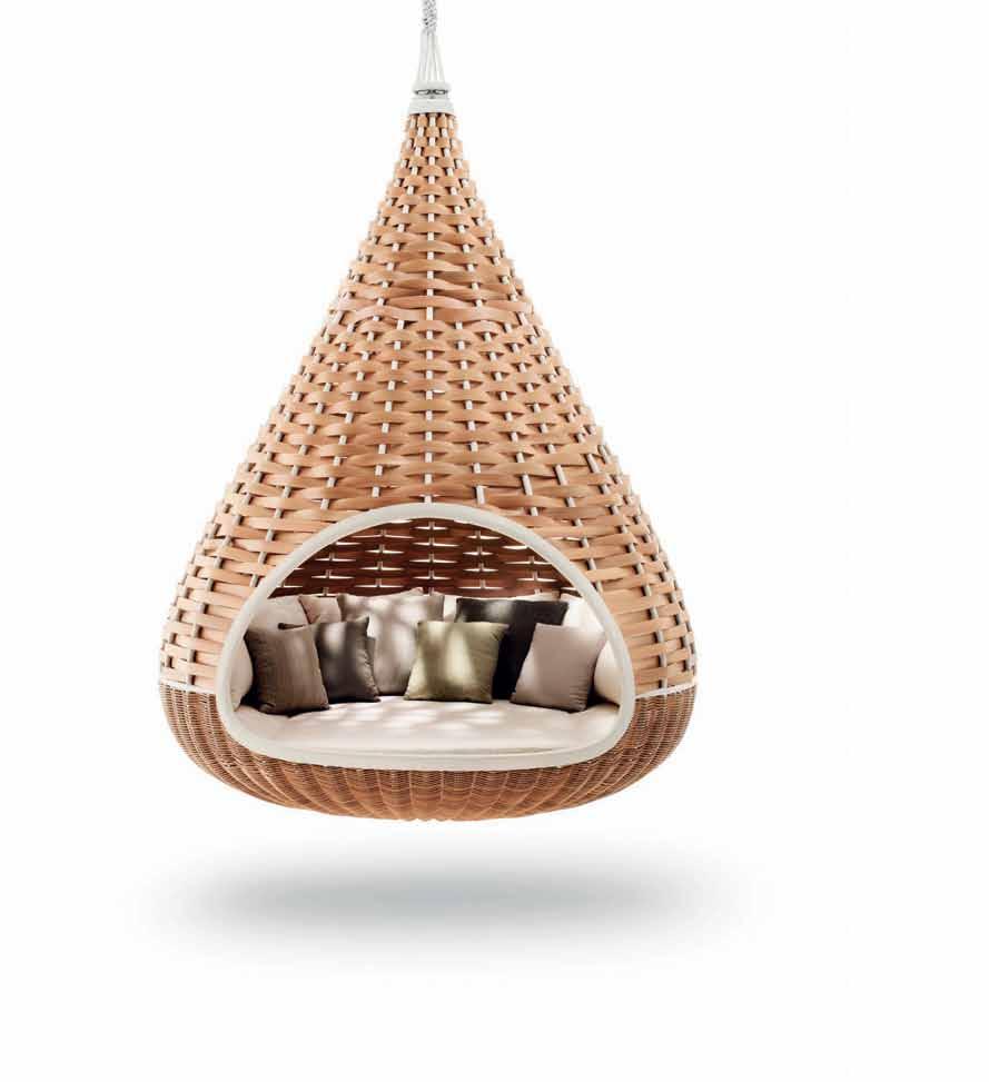
Convinced that his new idea held promise, Bobby then relocated his entire family to Cebu, where, for six straight months they lived and worked to bring Dedon to life. When the Dekeysers finally returned to Germany, Dedon was a furniture company.
In 1997, after a number of catastrophes with the rattan frames of the furniture, Bobby switched to hand-moulded aluminium frames, which have become characteristic of the brand today. Shortly after, he met designer Richard Frinier – the ‘king of outdoor furniture’, as he is widely known, and still a close friend – who set Bobby on a course toward high-end contemporary design. It was also during these years that Bobby’s sister, Sonja, took on marketing responsibilities, developing the brand image that would put Dedon in a league of its own.
It was also in these years that Hervé Lampert first came into the picture. A self-described farm-boy from Alsace-Lorraine, Hervé was doing an internship at the plastics factory in France where Bobby was extruding Dedon fibre. The two hit it off immediately, and before long, Bobby had convinced the 20-year-old to join him on the Dedon journey.
In 2000, fed up working with the sloppy practices of suppliers in other parts of the Asia Pacific, Bobby and Hervé took matters into their own hands. They established a factory of Dedon’s own in Cebu in the Philippines, the place where the very first Dedon chair had been manufactured back in 1993. Bobby had found the unique culture he was searching for, and here he established the manufacturing headquarters as well as a private luxury island resort for Dedon on Siargo Island.
For Bobby and Dedon, the Region perfectly captures the essence of the brand. Bobby explains: “We have always loved travelling in Asia and working with the wonderful people
prevIous | bobby dekeyser on stacked PL ay hand-woven chairs by PhiLiPPe starck. above | nestrest by by danieL Pouzet and Fred Frety. opposIte above | weaver hands opposIte below | weaver chair . “ unique in the industry, we do everything ourseLves at dedon ” says bobby, “ From Fibre deveLoPment to deLivery oF the FinaL Product.”
issue #24 habitusliving.com
An ingenious synthetic fibre... supple yet strong, natural in appearance, yet completely resilient to the elements.
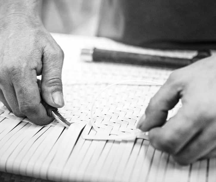
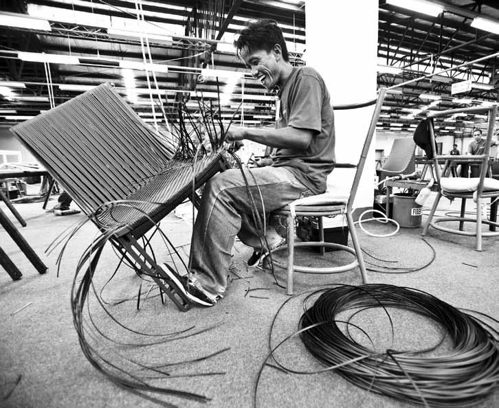
# 109 2 . portrait
there, therefore we decided to invest in Hong Kong and the Philippines as well as Indonesia, in terms of showrooms and production facilities and of course our Dedon Island resort. We love the Asian mentality and the creativity and culture.”
More than just a hotel, Dedon Island is a kind of a laboratory for Bobby – an “outdoor living lab for bringing our barefoot dreams to life,” as he describes it. Every experiment brings the brand that much closer to achieving their vision of a truly sustainable live-in paradise – a place to retreat, rejuvenate and return to the world in a barefoot state of mind.

The Yin Yang collection is good example of how Dedon has injected some South-East Asian flavour into this vision. The concept demonstrates a strong tie to eastern spirituality, and the overall function and aesthetic is typical of traditional ways of ‘family-style’ eastern living. Another of Dedon’s signature pieces, the Nestrest (designed in collaboration with Dedon designers Daniel Pouzet and Fred Frety), exemplifies Bobby’s original intention. The hanging lounger is an unusual meeting place and sanctuary – which can be traced back to Bobby’s penchant for “creating atmospheres.”
The global character of the brand, however, is
in no small part attributed to Bobby himself, who is “constantly travelling around the world, usually up to 10 different countries a month. Although it is extremely interesting and exciting, it also takes a lot of discipline and energy to stay balanced,” says Bobby. No one quite sums up Bobby Dekeyser as well as the man himself. In his 2014 autobiography with Stefan Kruecken titled Not For Sale!, he states: “My story has taken a rather strange and in some places even mad curse – it reveals a life path that should actually be impossible based on school performance and the normal rules of economics. If I had listened to my teachers, financial advisers, and many other doubters and complainers, my story may never have existed.” Now in its 24th year, Dedon is available in over 80 countries worldwide, and has gone from a staff of three to 3,000. But as proud as he is of all that the company has accomplished, he is prouder still of how they accomplished it –as family and friends, with respect and love and trust, always celebrating life and living. That, to Bobby, is the real Dedon story.
Dedon is available in Australia through Corporate Culture | corporateculture.com.au

above left | LeaF
|
by Frank Ligthart. above rI ght
swingrest with canoPy by danieL Pouzet.
issue #24 habitusliving.com
The award-winning design, quality craftsmanship and unprecedented performance of a Big Ass Fan® are always in style.

Hidden behind a seamless fit and finish, Haiku’s revolutionary motor features Whoosh®, a proprietary algorithm that simulates a natural breeze to keep you feeling up to 40% cooler*.
This Big Ass Fan is recognized by Popular Science as the world’s quietest ceiling fan and rated by ENERGY STAR® as the world’s most energy efficient. With 16 unique brightness settings and a digital dimmer, Haiku’s patent-pending LED module delivers 80% greater efficiency than traditional bulbs over a lifespan of 50,000 hours.
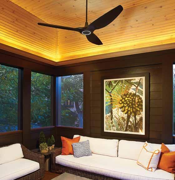
Visit


BIGASSFANS.COM.AU 07 3292 0156
You’ll
You like the way it looks.
love the way it feels.
bigassfans.com.au/o er and use promo code IDH614 to receive a free Haiku® info kit. *Human thermal sensation to air movement frequency, Yizai Xia, Rongyi Zhao and Weiquan Xu (2000)
Maruni Collection
by Naoto Fukasawa & Jasper Morrison seehosu.com.au


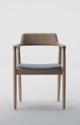
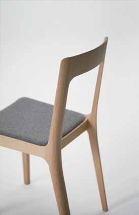
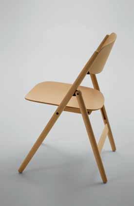

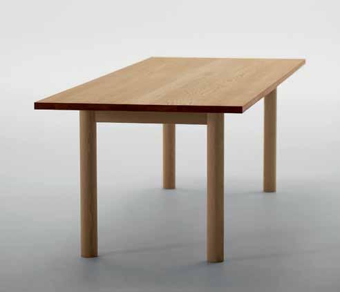
info@seehosu.com.au
+61 413 610 790
Studio Seeho Su opening hours:
Monday – Wednesday by appointment
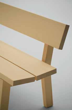
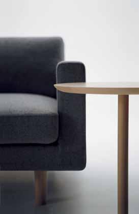
Thursday – Friday 10am to 5pm
Saturday 10:30 – 4pm
Sunday Closed
Design as a process
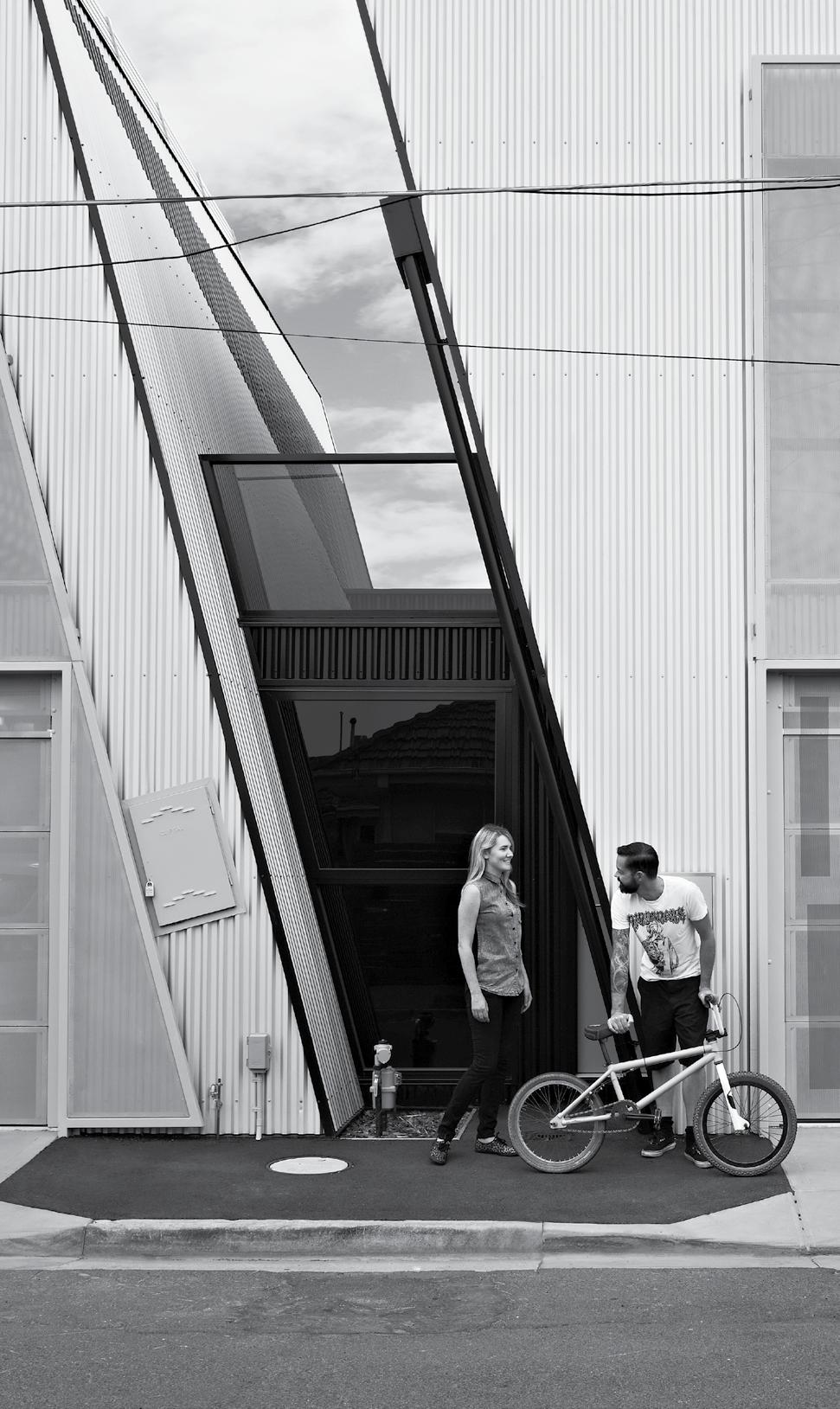
Monsoon drama
An architect’s vision is not enough to make an outstanding project – they also need clients with a vision. SpaSm DeSign found such a client, enabling them to create this masterpiece in Khopoli
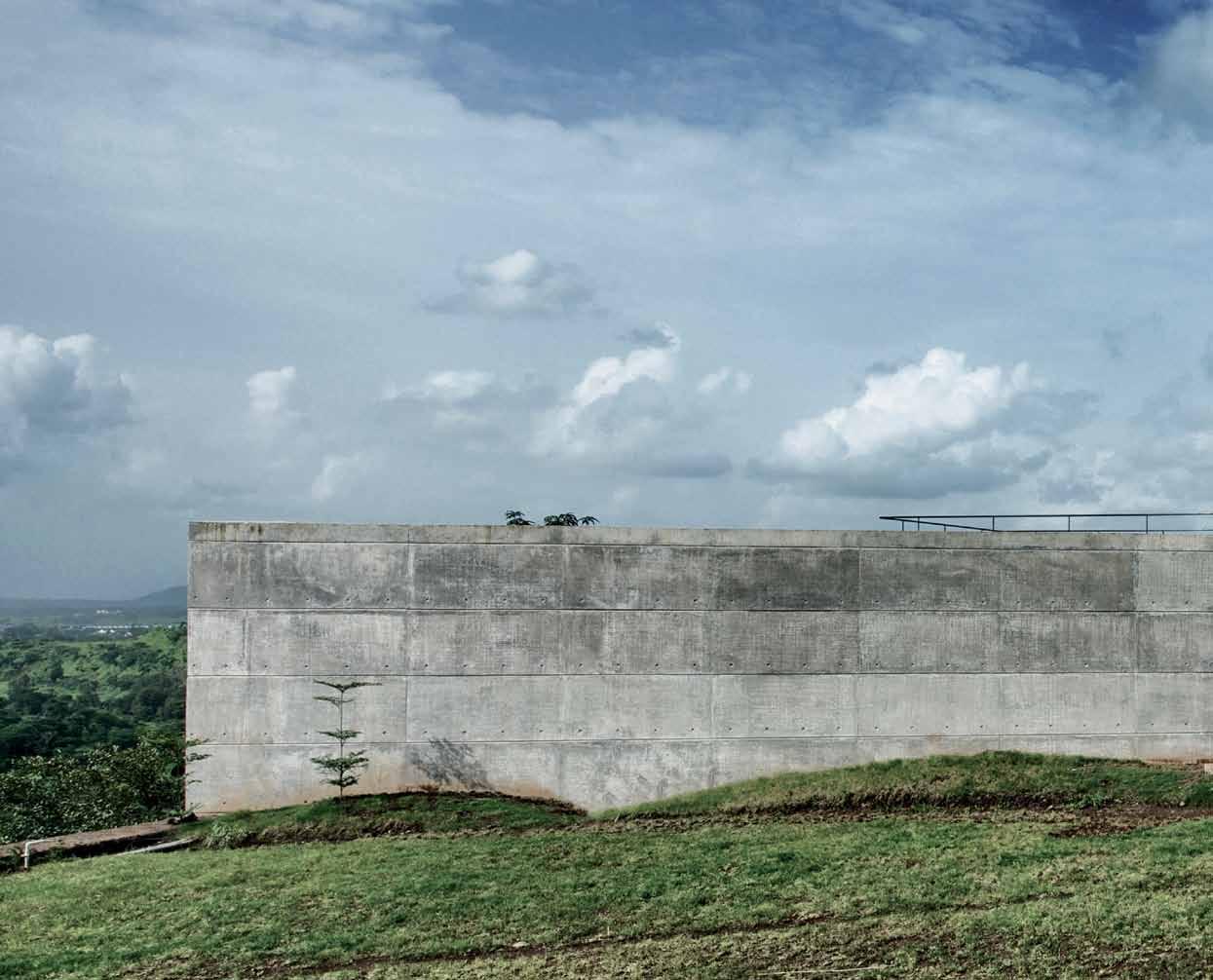 Tex T Jagan Shah | PhoTogra Phy Seba STian Zachariah
issue #24 habitusliving.com
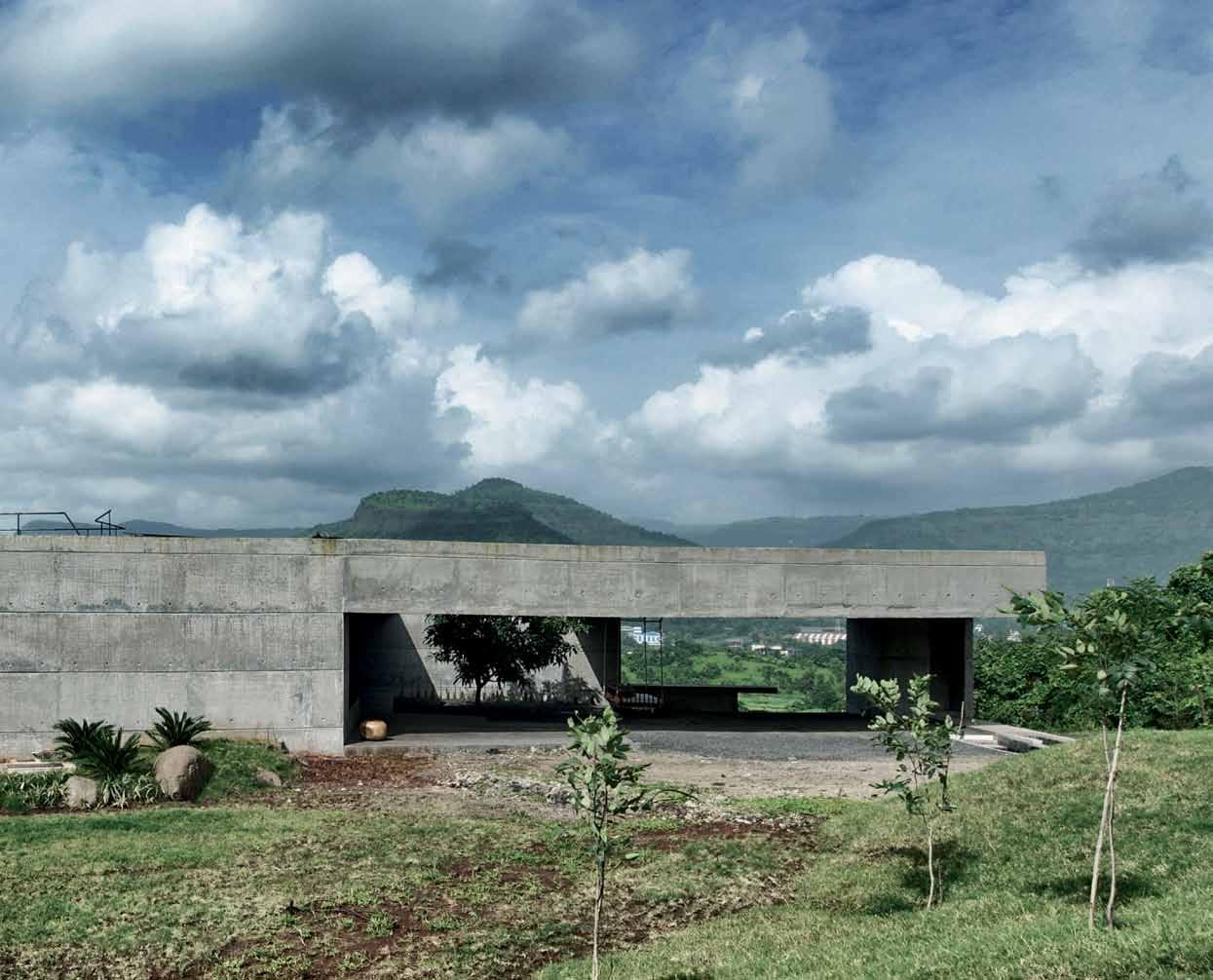
3 . on location # 115
If there is a difference between drama and theatrics, it is definitely revealed on this wind-swept hilltop. While theatrics is self-consciousness wrought large, a mix of frantic gesticulation and grand posturing (quite the metaphor for much of contemporary architecture in India), drama is more about gradually discovered truths, from the drawing of a curtain to a climax and a denouement. So it is with this house, which at first sight seems designed to ward off the visitor with a blank façade and plain flat rooves, only to reveal on closer inspection that the blank façade is sliced open to create a grand welcoming entrance under a cantilevered roof, a surreal space with fingers of stone paving vanishing into the ground, two pools as if for ablution, a mango tree and a suspended seat evoking the traditional reception rooms of houses in Western India.
Khopoli is a spot where the rain-laden clouds of the South-West monsoon fly in from the Arabian Sea and crash into the Sahyadri mountains. The ferocious beauty of this phenomenon has inspired the Indian sensibility
for centuries, so it is no surprise that when Rajiv and Varsha Sethi wanted a weekend home to escape the madness of Mumbai, they chose a site where poetry and painting and familial bonding are more likely preoccupations than profit and loss. As real estate developers, they knew many architects, but chose to discuss the idea with Sanjeev Panjabi and Sangeeta Merchant, who had designed and built the Brick Kiln House for their close family members some years ago. For the principals of Spasm Design, it was a chance to rejuvenate a concept they had developed for an early client but never realised. When the noted architectwriter, Gautam Bhatia, curated an exhibition of unbuilt works in 2001, they had submitted the design with the title ‘The House That Jack Didn’t Build’. Close to a decade after the idea was conceived, they found a site befitting of the intent and a client who shared the vision.
The tempestuous monsoon was everywhere the day the Sethis showed the site to the architects. With the wind snatching the umbrellas from their hands and the rain drenching their bodies, they could sense that
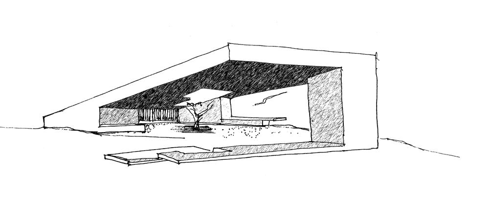
issue #24 habitusliving.com
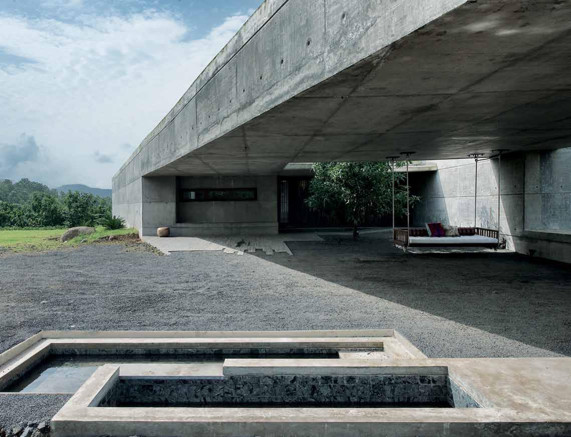
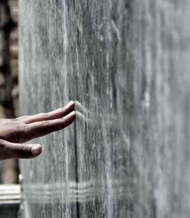
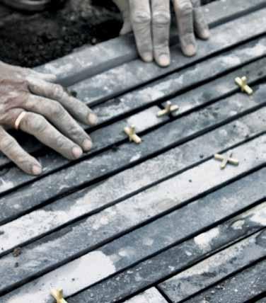
prevI ous | The shArp lines of The mAn-mAde ArTifice Are A minimAl juncTion be T ween green e ArTh And monsoon blue sky. above | The bruTe concre Te house is one wiTh The l AndscApe while The suspended se AT be Tr Ays humAn occupATion And inviTes hAbiTATion. below | The evidence of cr Af TsmAnship is everywhere, As if The ArchiTecTure is born from iT: l Aying sTone sTrips wiTh regul Ar 1/4 inch gAps using spAcers (lef T ), pouring concre Te in me TAl shee T formwork To cre ATe A rock-like surfAce ThAT fiTs comforTAbly inTo nATure (cenTre), or fiTTing sTone sl Abs Toge Ther by hAnd (righT ). 3 . on location # 117
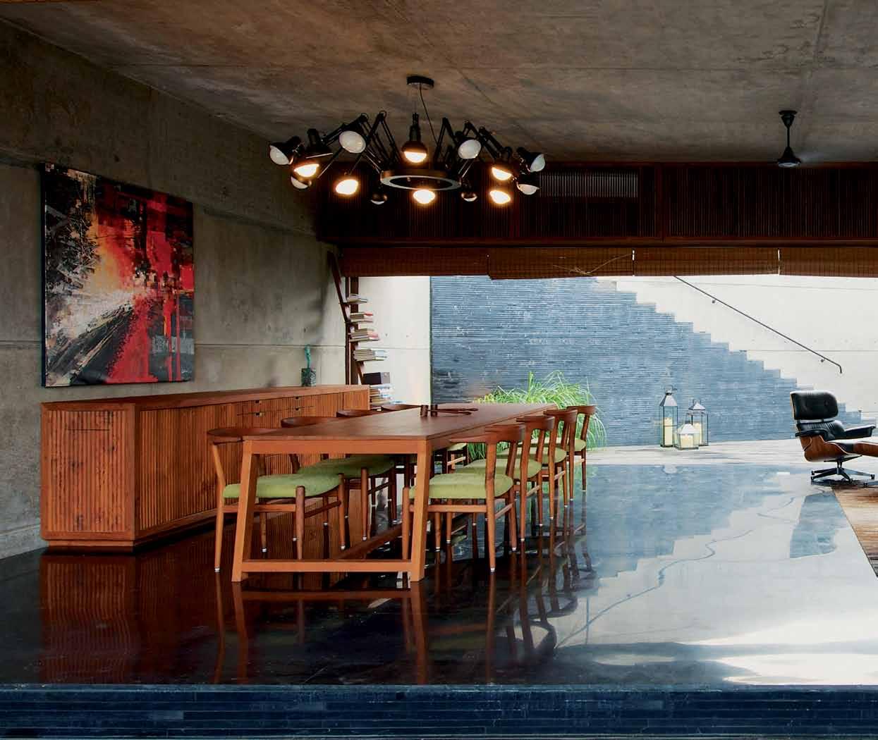
issue #24 habitusliving.com
Intensity becomes their guiding light and honesty their pathway.
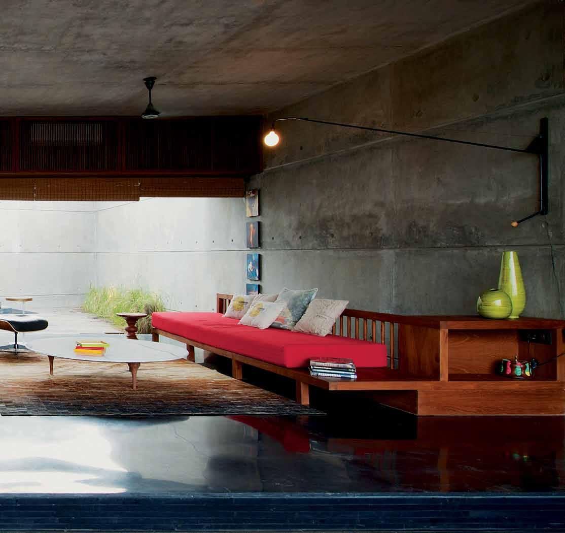
3 . on location # 119
this was the setting for a unique experience, an opportunity to demonstrate the sheer power of architecture. Sanjeev had first understood this power when studying Fatehpur Sikri – India’s Acropolis – where “a deep dependence on local skill, material, climate and way of life” created a splendid setting for the Mughal emperor Akbar. He articulated this insight in an aphorism: “To sense what the Architecture orchestrates hence is the sheer Power of his majesty – in your mind remove the building and you begin to understand.” As if the presence of the building vanishes when the experience takes over.
Spasm Design has posted, along with other ‘leanings’ that they identify in their travelogue/manifesto, an image from an event by the Argentinian performance art troupe, De La Guarda, whose shows, now banned, are visceral experiences sans any dogma. As Sanjeev puts it, the chance exposure to De La Guarda on a random New York outing “left us with this feeling… to be as pretense-free, primal and direct as possible.” Thus intensity becomes their guiding light and honesty their pathway. They declare on their website: ‘Design is
honest, advertising is a lie’! For those who seek honesty, the design strategy follows cold logic, whereas the materials and tectonic make the architecture human. The energy is contained by architecture.
And so, on one acre of flatland where the wind and rain had washed away the topsoil and exposed the rock, where only a few hardy mango trees had taken root, they placed a minimal diagram, an orthogonal composition of linear planes containing spaces in careful proportion. They oriented this diagram perfectly to the north, where the ground fell away to magnificent hills and valleys. Because the house required a huge retaining wall on the north, the architects sensibly stacked three floors – the lowest containing utilities, the middle containing a guest bedroom and the top the house proper – as if to rationalise the cost of such a wall. Because it required rooms to be oriented to the views on north and west, the house is approached from the south, where a rough pathway meanders down a slope to the southeast corner, there to make the arriver turn sideways and enter the house from the east.
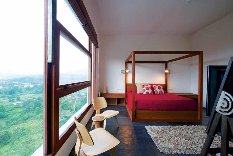
prevI ous | The whimsicAlly Arr Anged equipmenT of domesTic life As if
here
in
l AndscApe. above | The owners were mighT y ple Ased wiTh The ArchiTecT 's invenTion of A counTerweighT window ThAT opens so compleTely ThAT iT AlmosT disAppe Ars. oppos Ite | in A single flighT The occupAnTs cAn rise To A lookouT poinT where The building becomes e ArTh And There is sky All Around.
broughT
by nomAds, finding comforT
An unforgiving
issue #24 habitusliving.com
A grand flight of stairs leads to a rooftop deck from where the view is unfettered.
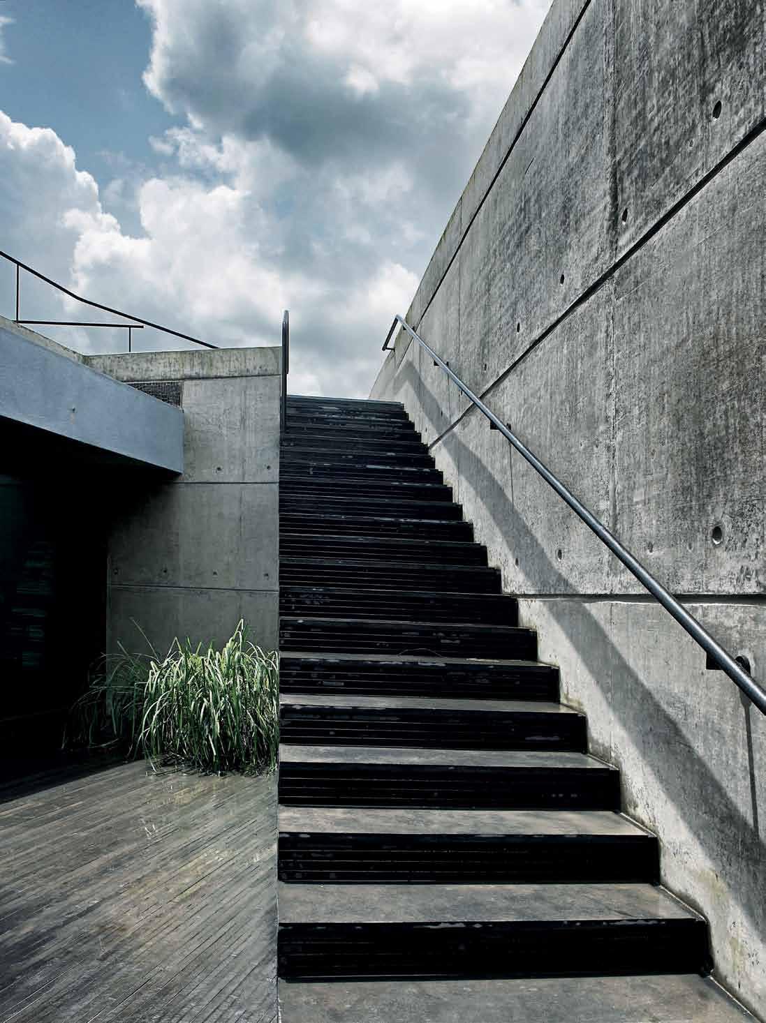
3 . on location # 121
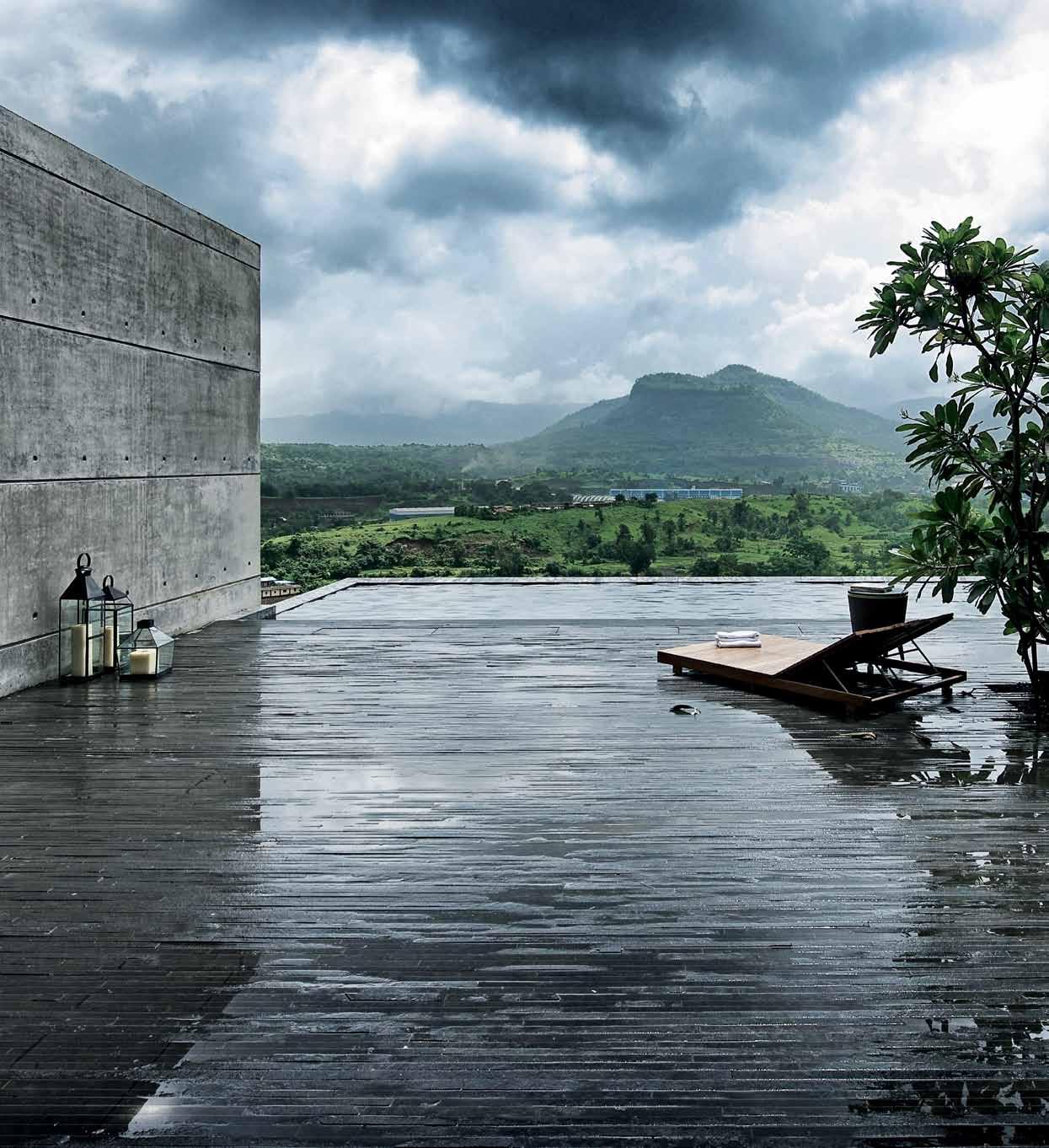
above | A surre Al composiTion cApTures wATer in iTs elemenT, infusing The dArk clouds Above, drenching The pAvemenT below And overflowing The infiniT y pool beyond. oppos Ite above | obje T And Tree, selecTed Af Ter much deliber ATion, Are cArefully locATed wiThin The Ample spAce As if To disTorT iTs scAle And Te Ase ouT iTs purpose. issue #24 habitusliving.com
Through slatted entrance doors, a vestibule leads to the raison d’être of the house: a living, dining and everything space, partly covered, partly not. In peak of summer, it can be a room protected from 40-degree heat by concrete walls, the foam insulated roof and thick wooden partitions. In the monsoon, it extends into courtyards on south and north, with the wooden partitions disappearing into imperceptible pockets in the walls. The entire thrust of the space is toward the sublime vista on the north. While the perimeter wall encloses the southern end, a grand flight of stairs leads to a rooftop deck from where the view is unfettered. It is in such spaces that architecture helps us transcend the limits of form, where meaning overrides necessity. The architects seem to have directed Le Corbusier’s definition of the house as ‘a machine for living’ to a specialised purpose: the house as a machine for experiencing the monsoon! What else can one call this assemblage of floors, walls, enclosures and voids, all directed at bringing the residents into closer communion with nature? And the Corbusier analogy even prevails beyond the mechanistic metaphor.
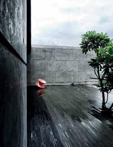
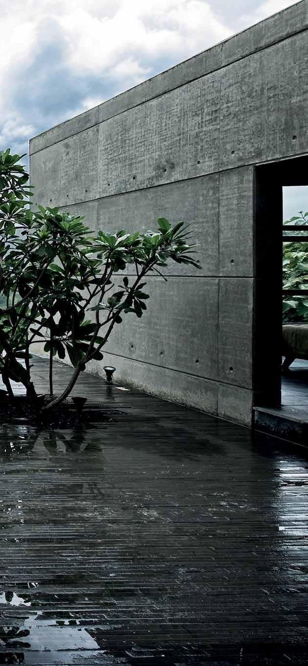
3 . on location # 123
The vista-watching courtyard is a similar device to the periscope on the roof of Corbusier’s Beistegui Penthouse, from where the residents and their bohemian guests could view the architectural splendour of central Paris.
But this is no mere tribute to Corbusier. Spasm Design has a unique style that prevails in all their works: logical ‘servant and served’ space planning that would please Louis Kahn (with some whimsy – for example, “we like to enter spaces a certain way”) and a calm reflection on materials and tectonic expression that would make Carlo Scarpa proud. Honesty imparts a certain confidence, which allows the clients to participate in the design. It was the Sethis ’ son who enthusiastically pushed for the basalt-dust concrete – the architects had perfected the technique in the Aon HQ project in Tanzania in 2006 – and it was Mrs Sethi who assisted the architects in purchasing the furniture. How else would the architects have received the supreme testimonial from Mrs Sethi: “You gave us what we really needed, not what we wanted.”
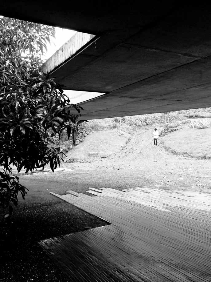
above | The finely sTriATed pAving AT The enTr Ance ‘ reflecTs ’ The cAnTilevered roof, AccenTuATes iTs ouT wArd ThrusT And signAls, AT The very ouTse T The diAlecTics ThAT pervAde The house. oppos Ite | floor pl Ans And secTion.
issue #24 habitusliving.com
The design strategy follows cold logic, whereas the materials and tectonic make the architecture human.
lower floor SeCTIoN ENTRY FOYER POWDER ROOM KITCHEN UTILITY DINING LIVING COURT Ya RD B aTH ROOM BEDROOM POOL M a STER BEDROOM M a STER TOILET SERVa NT ’ S TOILET GUEST BEDROOM GUEST B aTHROOM 1 2 3 4 5 6 7 8 9 0 q w e r t 7 r 6 3 1 2 q w e 7 4 8 8 9 GroUND floor 9 0 t 5 3 . on location # 125
drop box
ArchiTecT SPASM Design Architects
design TeAm Sangeeta Merchant, Mansoor
Kudalkar, Gauri Satam, Lekha Gupta, Sanjeev Panjabi
conTr AcTor IMPEX Engineers
consTrucTion TeAm Hatim Bhai Saifee, Huzefa Saifee, Murtuza Rangoonwala
engineer Rajeev Shah & Associates
plumbing Vinod Menon
l AndscApe consulTAnT A.Y. Retiwala
pool consulTAnT Evergreen Water Technologies
SPASM DESIGN ARCHITECTS
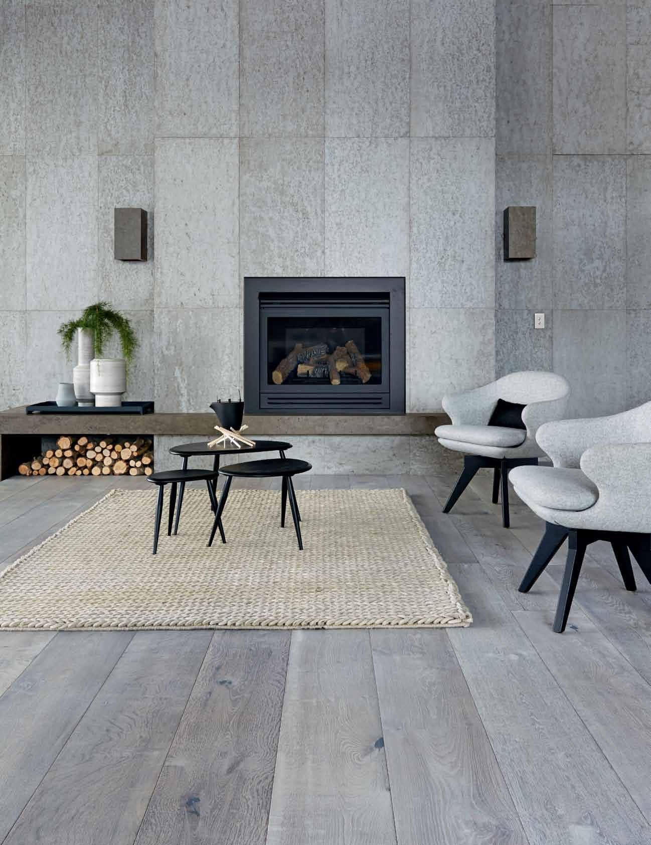
(91) 22 2673 5862
spasmindia.com
furniT ure
Generally throughout, custom made furniture from N.C Mistry.
lighTing
Generally throughout, lighting by Philips and Nathan Rhodes Design.
finishes
Ambuja cement used throughout, with feature walls finished in Harish Besonia terrazzo tiles.
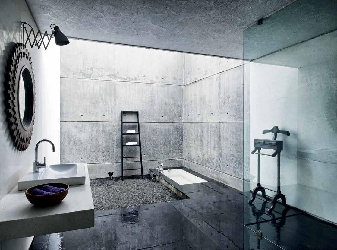
fiXed & fiTTed
In Kitchen, appliances and hardware from Häfele and Hettich, and tapware from Jaquar.
above | eAch objecT is so cArefully chosen And precisely pl Aced ThAT The inTimATe privAcy of A bAThroom is enhAnced To The level of A spAce for mediTATion.
issue #24 habitusliving.com


Industrial inventions
A shed, a factory, or a house? This intriguing design by ODR ARchitects maximises space, creates amenity, and also adds to the urban landscape of its gritty inner-city neighbourhood in VictORiA. MARk scRuby pays a visit.
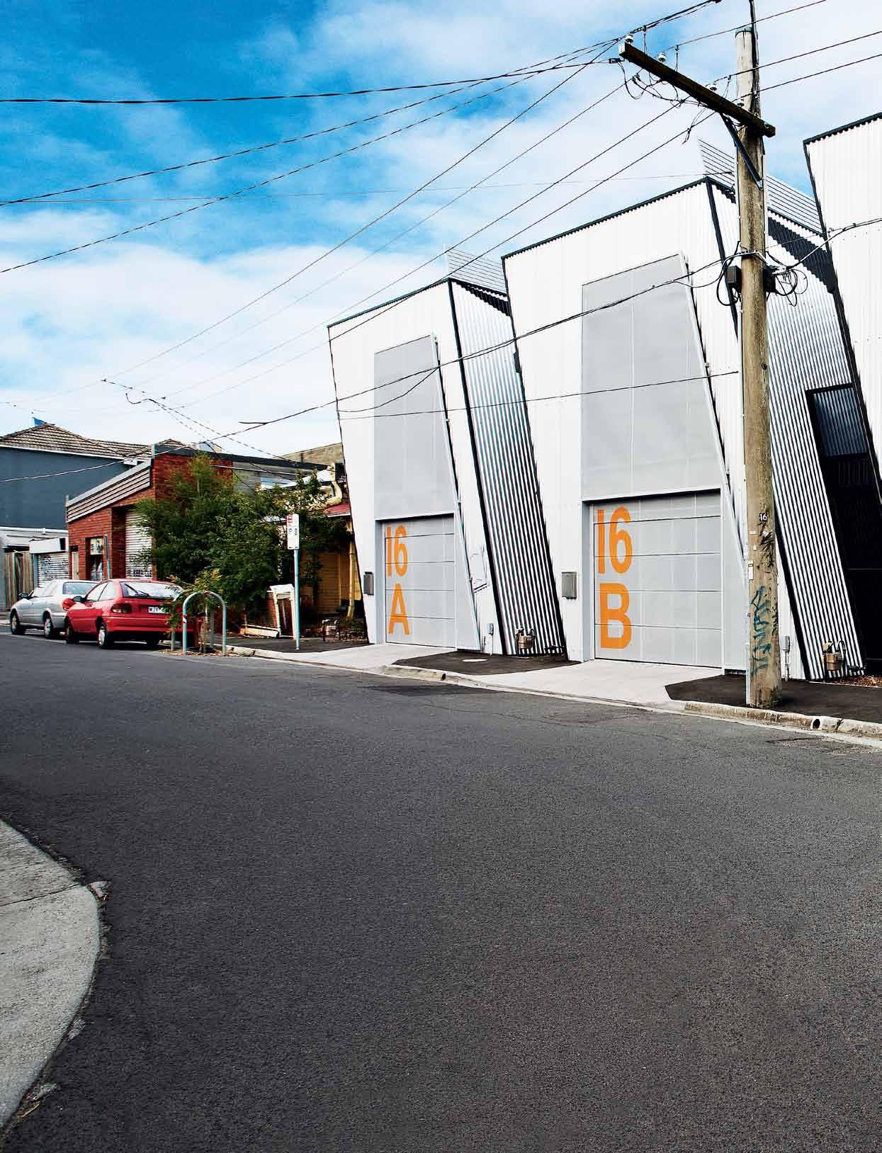
Tex T Mark Scruby | PhoTogra Phy a r M elle h abib
issue #24 habitusliving.com
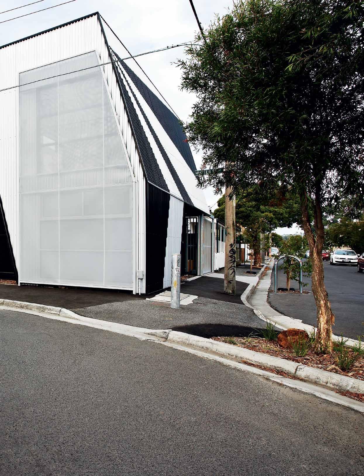
3 . on location # 129
let’s do away with euphemisms. Let’s call a spade a spade. The patch of Victoria’s Abbotsford near the corner of Nicholson and Johnston streets is an architectural mishmash. A couple of rickety looking terrace houses here, a recently renovated cottage there; over the road, some cream bricks have been piled together to form a block of flats; two doors down, a small sign on a large garage advertises a business with an ambiguous name. A few decades back, the pub around the corner was a filming location for The Sullivans, and we wonder how much has changed in the years since then.
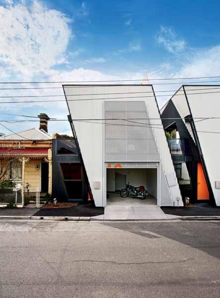
If there is an overarching character to the place, apart from architectural diversity (there’s the euphemism!), it’s of a hard-edged inner-urban landscape. There aren’t many trees, and not much superfluous detail – just straight lines hewn from brick, concrete, steel and asphalt. And still there’s something intriguing about it, a sense of generations of crowded human occupation marked on the landscape in a harsh geometry of homes and factories and roads, like a Jeffrey Smart painting come to life.
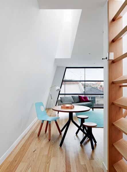
One particularly idiosyncratic intersection, where two roads charge towards each other and then swing away through 90 degrees to form an unconsummated X, is so unlikely that it seems to have been conceived by Smart himself, not for reasons of town planning or traffic control, but for its pleasing geometry. And it’s here that we find a development of three new homes, designed by John Mercuri and Steven McKellar of ODR Architects.

previous | ThAnks
|
ATed
Views
The
T
l Argely To iTs ArTfully composed geome Try, The building does noT impose iTself on The sTree TscApe. above | Viewed from The sTree T The uniTs cAn be re Ad AlmosT A s indiViduAl buildings. below | numerous roof windows And lighT wells mAke for A surprisingly brighT inTerior. opposite
d uring The dAy, perfor
me TAl screens shield The inTerior while preserVing ouT wArd
oVer
sTree
issue #24 habitusliving.com
ODR’s clever programming wrings every bit of amenity it can out of a tiny footprint.
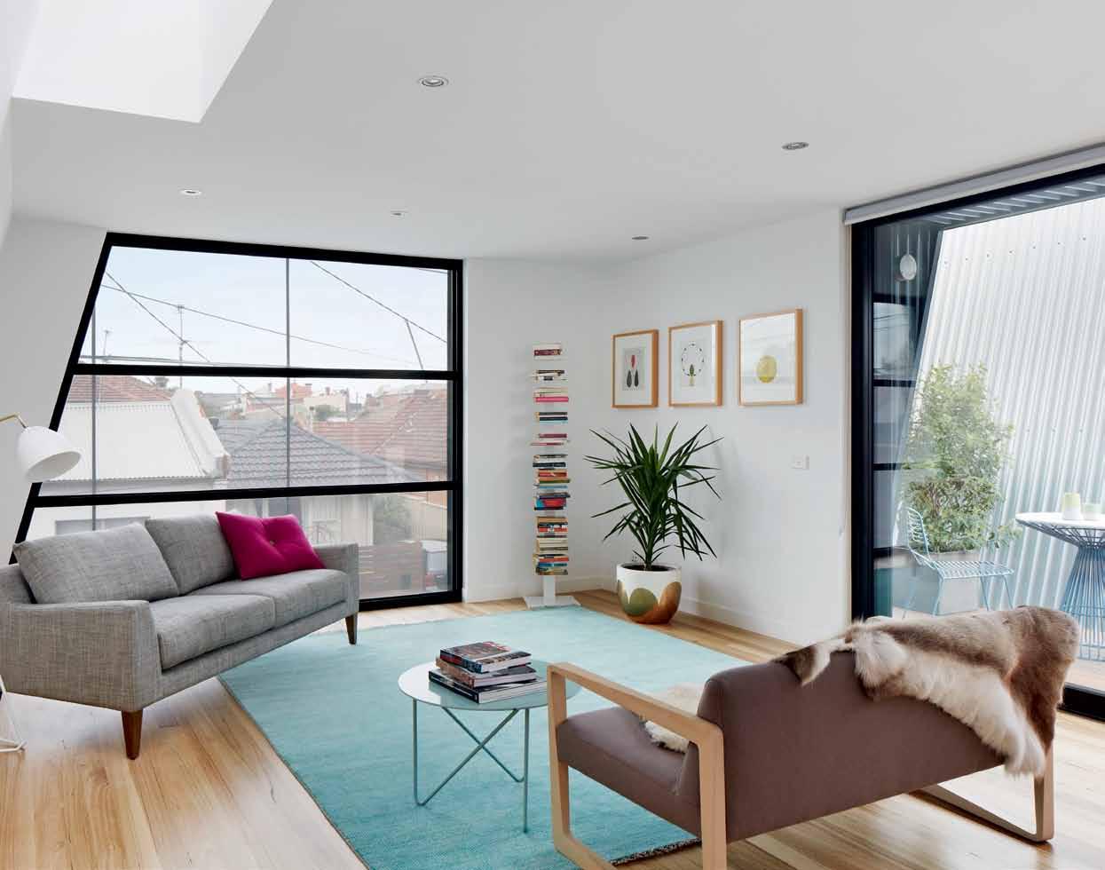
3 . on location # 131
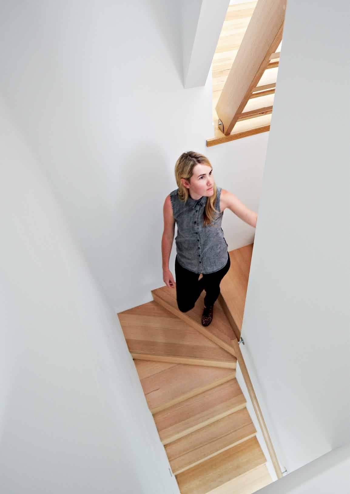
issue #24 habitusliving.com
The references to Jeffrey Smart are no accident, of course. Mercuri and McKellar name-check the late Australian painter as an influence on their design here, and the connection is easy to see. Their building rises up from the pavement like some stylised sawtooth-roofed factory, or perhaps three steel sheds imbued with an italicised energy, almost more graphical than architectural. Oversized sans serif street numbers reminiscent of warehouses or airports have been painted on to the garage entries in safety orange, and an angular black pattern painted onto the southern elevation makes an explicit link with the repeated chevrons of a nearby traffic sign. Like many of Smart’s paintings, this development reads like a composition of simple shapes, rendered with minimal detail, seemingly hiding nothing from the viewer.
But ODR’s work here isn’t entirely ‘honest’, for this is a residential development masquerading as a shed! And it’s not necessarily a new idea, playing off the forms and materiality of light industry with residential amenity. But, as with most creative endeavours, what really matters is the execution. The success of this project, and the value it adds to the streetscape, comes from the deft balance of the familiar with the unexpected. We know this combination of standing seam steel cladding, aluminium screens and bold lettering, but not with these angles, not in this form. We recognise the rhythm of medium-density residential projects, marked out by front doors and garage openings, but we don’t see obvious balconies
or windows. Can we see someone moving behind that mesh screen, or is it a trick of the light? No passer-by will mistake this for a new warehouse, but they will have questions and they will be intrigued.
Perhaps surprisingly, given the seemingly random approach to architecture in the area, a few locals did ask some questions, and prickly ones. The project was almost derailed by objectors. One point in the architects’ favour, however, was the consistency of the building’s scale with several nearby buildings. Yes, it towers almost menacingly over a neighbouring worker’s cottage, but a few doors down the street, a workshop rises to almost exactly the same height, as do a block of flats on the opposite corner and several commercial premises closer to Johnston Street. Stepping back and considering the context, we see that it’s not only this materiality but also this scale that is a part of the local Abbotsford mix.
Inside the building, ODR’s clever programming wrings every bit of amenity it can out of a tiny footprint. The three units are separated by voids that bring natural light and fresh air down into otherwise land-locked ground floor bedrooms; on the upper level, the voids provide space for small balconies. A central closed stairway rises up through the floor plan, creating physical separation between clearly zoned kitchen areas and small, open living areas.
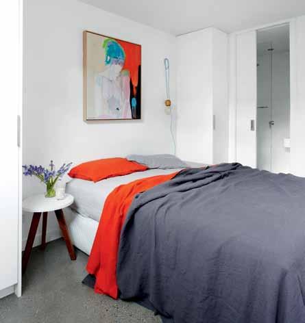
Up another level again, individual roof terraces offer 360 º views over the surrounding streets, and beyond. The terraces are accessed via loft ladders, and the climb is well worth it.
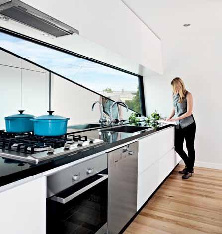
opposite | The sTAirwAy in The middle uniT winds iTs wAy up To The firsT floor liVing Are A above left | The oblique geome Try of The building is conTinued in A nArrow sloT window AboVe The kiTchen benchTops. above right | The neuTr Al colour pAle TTe pl Aces gre ATer emphAsis on The ouTlook And Allows for indiViduAl expression Through furnishings And decor ATion.
3 . on location # 133
drop box
ArchiTecT ODR Architects
pro JecT TeAm John Mercuri, Steven McKellar engineer Robert Brotchie & Associates
Town pl Anner Eddie Zagami
builder Lexicon Gulf
ODR ARCHITECTS (61 3) 9387 8619 o-d-r.com.au
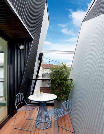
ArT work
In Living Area, David Band artworks and ‘Tears Behind the Sunnies’ by Ali McNabney Stevens.
finishes
Generally throughout, skirting timber finishes in gloss enamel paint from Rondo and Dulux, plasterboards from Gyprock, external doors and windows supplied by Capral and Viridian. In Bathrooms, wall tiles from Classic Ceramics and frameless glass panel shower screen from Pilkington. In Living Room, Victorian Ash timber flooring
As it turns out, architectural mishmash viewed from above proves to be quite captivating –a fading patchwork of terracotta and tin in all directions. Distant landmarks like the Collingwood Town Hall, CBD skyscrapers and the Dandenong Ranges complete the urban panorama on offer.
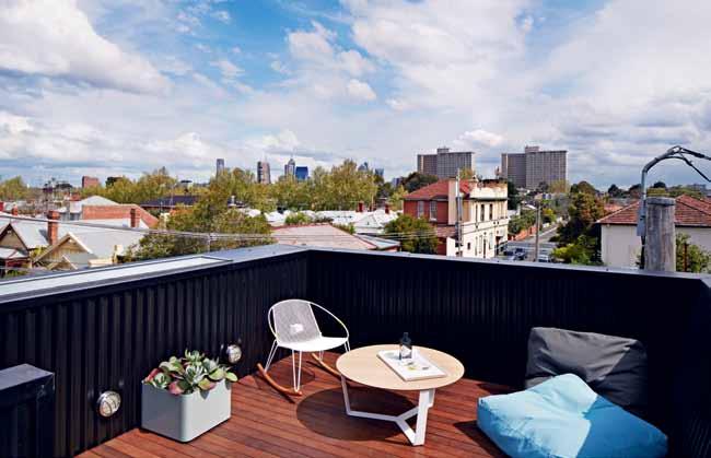
Walking through these units, from streetlevel entrance to private skydeck, it quickly becomes apparent how different they are to the warehouses and garages they mimic. In place of a cavernous interior volume, we find a matrix of interlocking indoor and outdoor spaces. The units are small but never feel confined, and almost every room looks through into another space, providing a glimpse of something beyond the immediate four walls.
The complexity of the interior is only hinted at from the street, by the thin slots that separate each unit, and by the perforated aluminium screens to the first-floor windows. Mesh screens are a feature of ODR’s work, deployed for their ability to shield interiors during the day and glow like lanterns at night. As the sun goes down and the lights come up, they give passers-by a mediated snapshot of the life within. It’s a welcome throwback to a time before our obsession with privacy and seclusion, when living spaces weren’t secreted in backyards, and it shows another way that this development gives something back to the neighbourhood.
But inevitably the sun rises, the screens become walls again and the facade closes in, a mute silvery-grey backdrop to an innerurban vignette of footpaths, traffic barriers and parked cars. The orange street numbers loom large, and we wait for a lone figure to walk into view, to stop and stare, caught in a moment of life imitating art.
by Boral. External walls finished in metal sheets from BlueScope Steel, galvanised steel garage door from Airport Doors, and external perforated metal screen from Locker Group.
furniTure
In Living Areas, rug from Halcyon Lakes, Reindeer hide from Great Dane and pot from Pop & Scott. Other furniture from Insitu, Jardan, Aero, Lifespace Journey and Tait. In Bedroom, linen from Bedouin Societe, side table from Fenton & Fenton.
lighTing
In Bedroom, pendant light from Empirical Style. General lighting from Lighting Electrical Distributors.
fixed & fiTTed
Door hardware from Design Doorware and Industrial Expression, with Hafele joinery pulls. In Kitchen, mixer from Rogerseller and rangehood from Qasair. In Bathrooms, shower mixer from Bathe & Launder, shower head from Mary Noall, shower wand from Reece and bath from Bathmaster.
issue #24 habitusliving.com
SECTION GROUND flOOR opposite above | The simple Timber-cl Ad roof decks cATer To An enViAble urbAn lifesT yle. opposite below | bAlconies proVide AddiTionAl ouTdoor spAces And bring lighT And Air inTo The firsT-floor inTeriors. above | floor pl Ans And secTion of The middle ApArTmenT 1 2 3 6 9 8 0 q 3 4 4 5 5 GARAGE ENTRY BATHROOM OUTDOOR COURTYARD BEDROOM STAIRS LAUNDRY DINING LIVING VOID KIT C HEN 1 2 3 4
6
9 0 q fIRST flOOR ROOf TERR aCE 6 7 3 . on location # 135
5
7 8
Of Diverse Research (ODR) is a practice that seeks to derive a range of architectural responses to each project in a specific manner. Their investigations into architecture are concerned with the conditions of the social, political, cultural and environmental and how these ideologies may affect any architectural outcome.

This thread and hope stems from a desire within a project for there to exist some relevance of a pure formal tectonic response. And their Hunter St apartments certainly offer many responses; to their environment, existing urban landscape and from its neighbours.
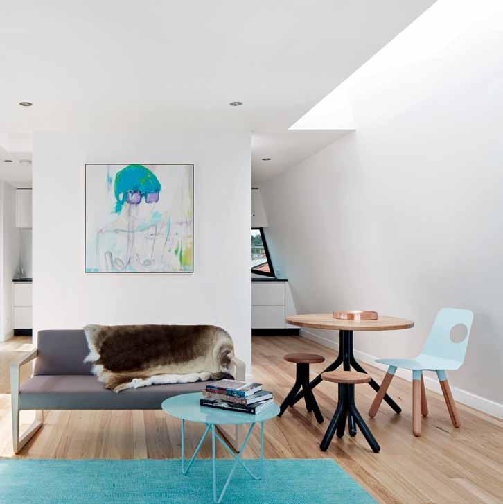
The expected with the unexpected is how you could describe the exteriors of these buildings. But inside, simplicity is key, where products have been chosen with minimalism in mind. It is clear that ODR’s choice of materials not only consider the physical qualities of the building, but also look deeply into the spiritual dimensions of the project, revealing the abstract and unique qualities of the build.
The Classic Ceramic Tiles embodies this message of simplicity; “They enhance the clean lines and minimal bathrooms,” says architect John Mercuri. Their basic geometric forms without decoration, simple materials and repetition of structure represent a sense of order paramount to the essential quality of these interiors. And with a modest rectangular shape, they also serve to further complement the interior space with its landscape outside. “It works well as a contrast to everyday objects,” explains Mercuri of the Empirical Style pendant light, “it also provides a flexible placement for the lamp.” And just like the Reindeer hide from Great Dane, which “gives a softness and organic form to the space”, all products also work in harmony not just with the site but also with its residents. For it is in the end, a home.
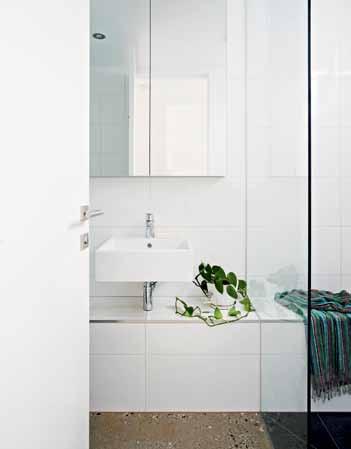
huNteR stReet in focus
Clo Ckwise from top reindeer hide AVAil Able from g re AT dAne, gre ATdAneconTr AcT.com oTher furniTure from insiTu, JArdAn, Aero, lifespAce J ourney And TAiT
issue #24 habitusliving.com
wall tiles from cl Assic cer Amics cl Assiccer Amics.com. Au
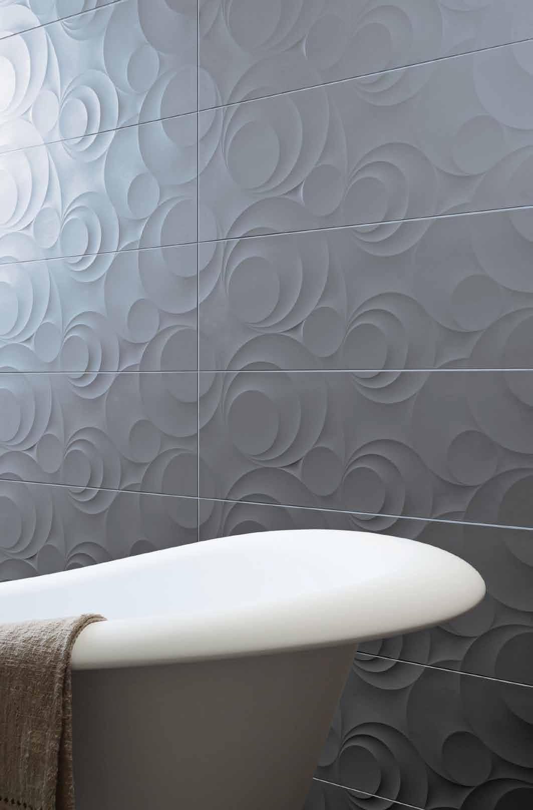


Dedicate your weekend to design.
Enjoy a weekend immersed in Australia’s leading design showrooms and creative pop-up spaces transformed by conceptual installations, product launches, international guests, topical industry seminars, emerging designer showcases, workshops, demonstrations, networking drinks and more.
Register for free at melbourneindesign.com.au


The Event
22–23 Aug 2014
melbourneindesign.com.au facebook.com/melbourneindesign twitter @melb_indesign instagram @melbourneindesign Fashion Partner Diamond Sponsor Media Partner Strategic Partners Gold Sponsor In association with Brought to you by The Project Major Sponsor
The secret garden
Architect, Andr A MAtin, is known for his sensitivity to spatial interaction, light and shadow, water and materiality. His own home in JAk ArtA reveals all this and, as nikitA notowidigdo discovered, a surprising sense of play.

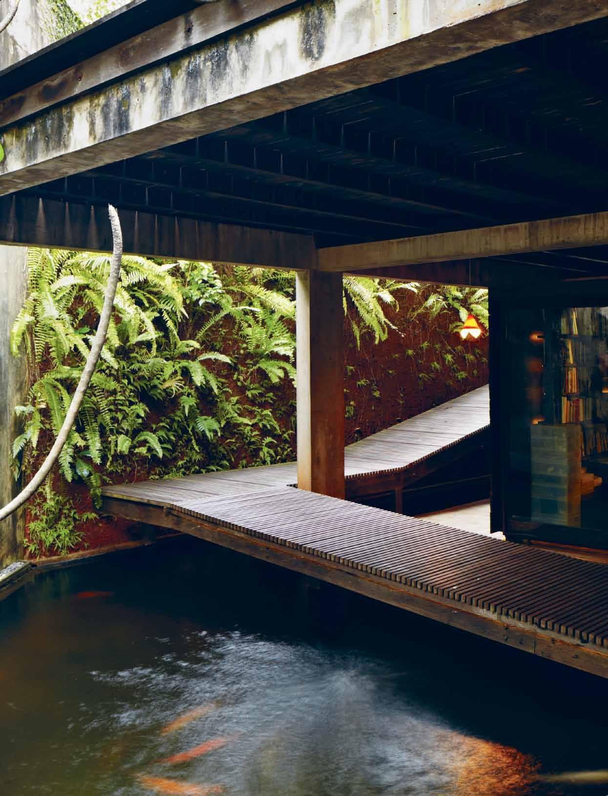
text nikita notowidigdo | photography martin westlake
# 139 3 . on location
Agroup of swaying palm trees and a timber gate hide the house, a concrete box cut in half by a thin floating horizontal line. On the far right, a wall of lush Thunbergia (flowering plants) hangs in dialogue with the trees. This arboreal entry is a small clue to the secret garden inside.
Enter the house, and there is a timber bench in front of a cupboard lined with strips of Ulin wood. Experience a refined custom of Indonesian culture: you sit on the bench, take your shoes off and put on a pair of house slippers from the cupboard. Now you are ready to come inside.
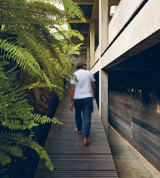
It is a different world in here, like entering the quiet of a temple from a busy street. A fish pond welcomes you with the calming sound of falling water. An elongated timber ramp (with no balustrades to disturb the simplicity) teases you up the path. Keep walking along the ramp and there it is: the garden.
This is the house of Andra Matin, one of Indonesia’s most prominent architects, known for his sophisticated forms and play of spatial experiences, together with his aim to connect with the physical environment, and through that, the cultural environment.
Andra was born in Bandung – the second largest metropolitan city in Indonesia after Jakarta – and has has spent time in both

issue #24 habitusliving.com
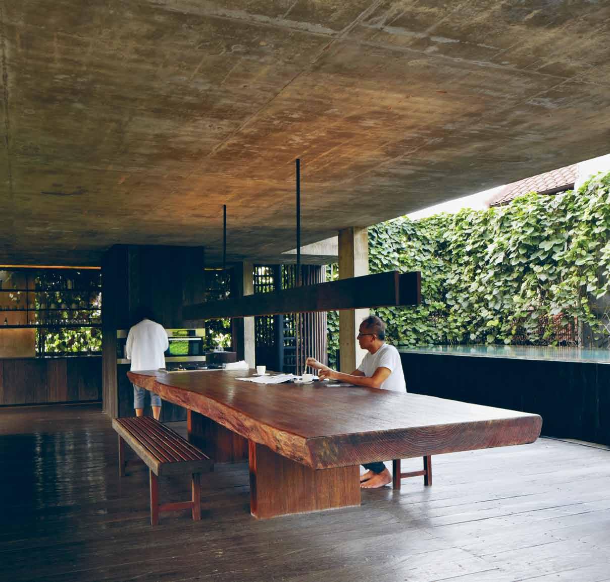
previous | A timber r Amp At tHe ground level entry bookended by tHe libr Ary And fisH pond. opposite | Andr A mAtin wAlking Along tH e r Amp, up on tH e first floor le Ading to tH e gArden. A bove | tH e dining spAce – H ousing tH e five-metre-long dining tAble And ‘ tH e utility box 3 . on location # 141
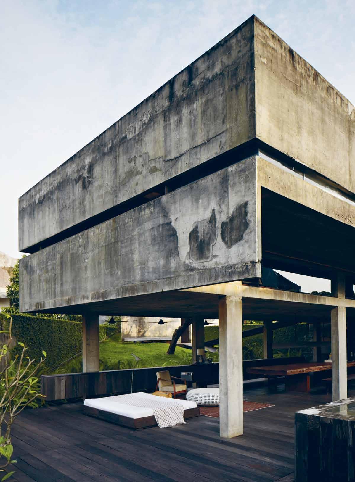
issue #24 habitusliving.com
cities, living at his grandfather’s house in Bandung during the week and visiting Jakarta on the weekends. he studied at Universitas Parahyangan Bandung, then moved to Jakarta in 1994 after he got married. h is first house, sitting in front of a public park and around the corner from his then-studio, was a rental in the midst of a gated community in Bintaro.
Andra immediately fell in love with the neighbourhood and so enjoyed it that he bought some land in the same vicinity in 2007. “I wanted to have our own park in the centre of the house,” says Andra. Now an area dotted with architecture studios, the area has a serene surrounding – a perfect break from the hustle and bustle of Jakarta’s c Bd.
Andra took a rather unusual approach in the luxurious five-year design-and-build period. he claims there were no drawings involved during the first 80% of the design and construction phase. “No one in the studio had any idea of what the floor plans looked like –they were all in my head,” says Andra. he would go to site with his builder, Alex, and manually mark where things would go.
The house is over three floors – plus the rooftop – and predominantly consists of just two main materials: exposed concrete and Ulin wood. The latter was especially chosen for its strength and resistance to termites, a common enemy to anything timber in Jakarta.
The ground floor where you enter through the shoe-ritual space is also home for the car
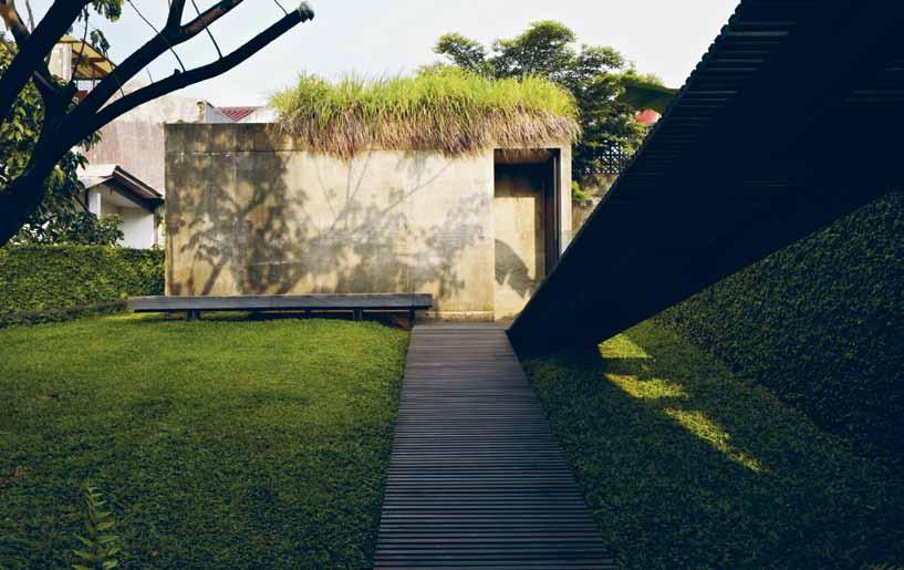
opposite | tHe living spAce, opening up to tHe swimming pool And tHe secret gArden. A bove | tH e r Amp le Ading to tH e mAster bedroom, A concrete pAvilion topped witH lemongr Ass. A N dr A | A rch ITEcT & rE sI dENT
No one in the studio had any idea of what the floor plans looked like –they were all in my head.
3 . on location # 143
park, a service area, a small prayer room and a floating concrete box holding the library. Next to the library stands a unique feature: an eight-metre-long timber box clad with metal wire, housing the family’s nine cats.
Walking along the ramp up to the first floor, the tropical smell of grass and trees floats up from the expansive garden with seemingly endless walls of plants surrounding a r ain tree. If the aim was to recreate the feeling of his old neighbourhood in his own house, Andra has done more than that. To describe it as a tranquil space would be an understatement, for anyone in there would have forgotten they were in the middle of a frantic and polluted metropolitan city.
The rest of this level is occupied by the living and dining space. Bookended by low-height floating cupboards, the space entirely opens up to a swimming pool and the Thunbergia wall on one side and the garden on another. A fivemetre-long solid wood dining table stands in the middle of the space, supported by a timber structure from the ground level and completed with a stove attached at the end of the table. An elegantly enclosed structure Andra calls “the utility box” sits nearby, holding all the services, kitchen utilities and a coffee machine. “We’re big fans of coffee,” explains Andra, “ so my wife d ite, our three kids and I spend our mornings here.”
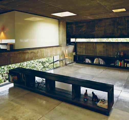
Keep following the ramp half a level up and it leads to a humble concrete pavilion across the garden. This is the master bedroom. Its roof is planted with lemongrass “To reduce

Above |
tHe tHree
A
A
e
ildren
s living spAce. opposite | tH e swimming pool floAts A side tH e wAll covered in tH
Anyone would have forgotten they were in the middle of a frantic and polluted metropolitan city.
one of
pieces of joinery in tHe cHildren ’ s living spAce, sHAred informAlly. tHe joinery divides tHe spAce for e AcH cHild And Also provides
step up to tHe tree H ouses ’ wHicH contAin tHeir beds. living spAce. below | tAke
peek of tH e swimming pool below from tH
cH
’
unbergiA pl Ants.
issue #24 habitusliving.com
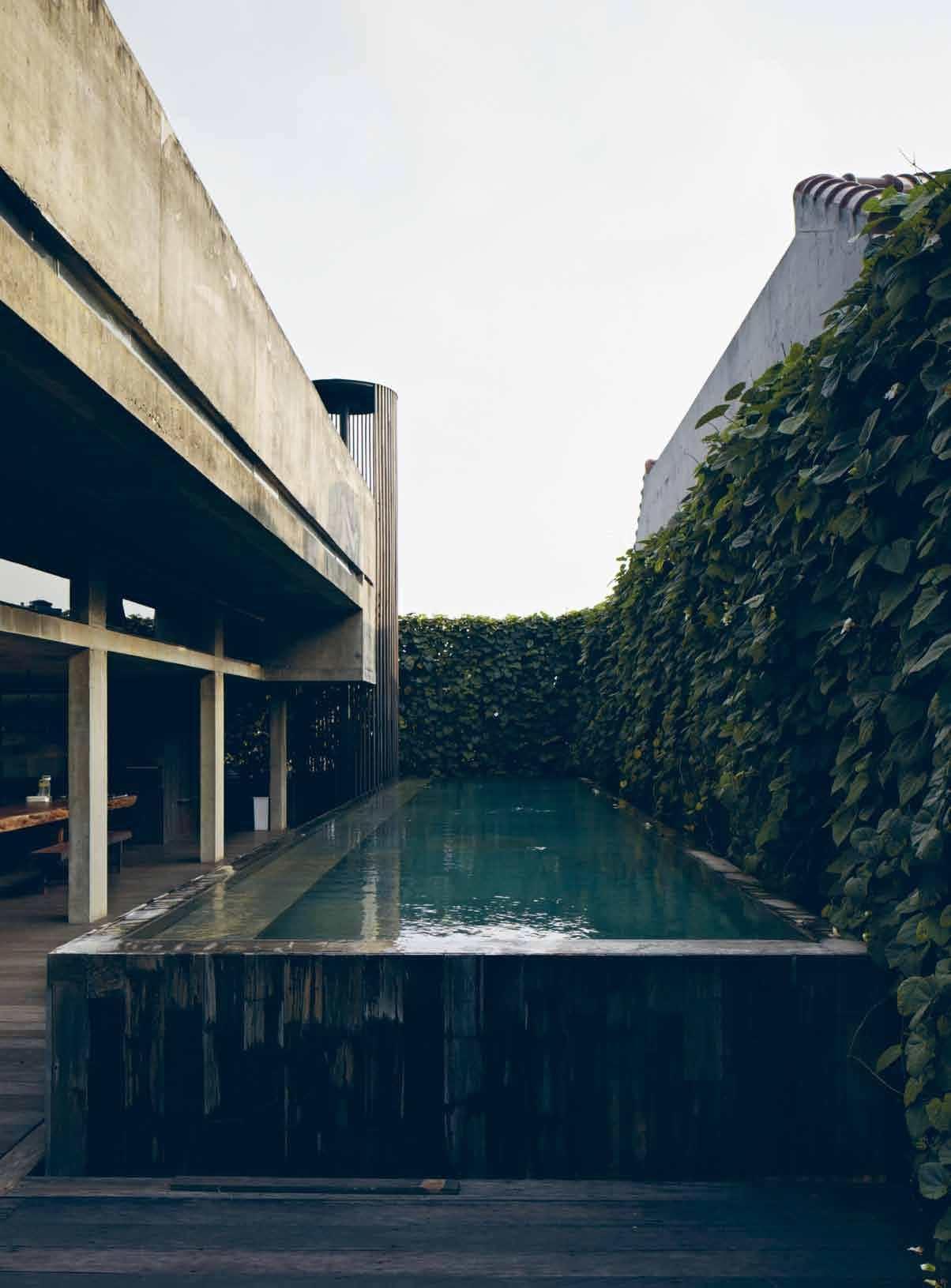
3 . on location # 145
GrounD Floor Secon D Floor Fir St Floor rooF top 1 2 3 4 5 6 GaraGe Library prayer room powder room maid toi L et maid room 7 8 9 0 q w master bathroom G arden mechanica L & e L ectrica L pL ant pond ramp pantry e r t y u i dininG room L ivinG room swimminG pooL stairs master bedroom corridor bathroom chi L d bedroom roof G arden pond o p a s w e r t u y q q 1 2 6 9 0 0 5 3 q 8 8 y y y y 4 7 i o p p p q a s s issue #24 habitusliving.com
Jakarta’s unkind heat”, and Andra added a delightful touch by hanging a Japanese-style transparent umbrella on the door handle, “For rainy days,” he explains with a smile.
The pavilion encloses a space just big enough for a bed on the garden level and dramatic timber spiral stairs to a softly lit bathroom below on the ground floor, perfectly lit by two triangular skylights on each corner of the space.
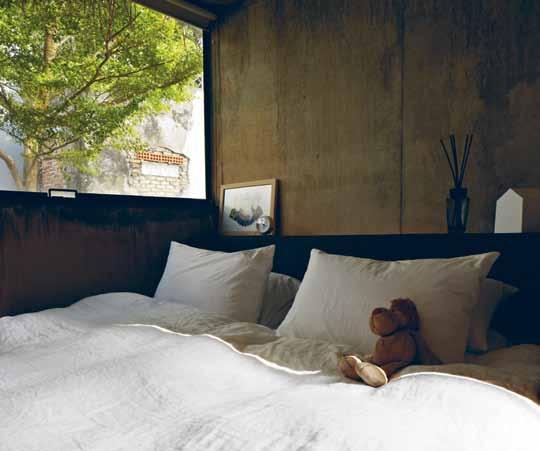
coming out of the pavilion, the ramp comes back across the garden and up to another level on top of the living room. designed for ditra, his 15-year-old daughter, and d ian and Andi, his 13-year-old twin sons, Andra found inspiration in his own childhood memories to create a sophisticated version of a playground, with elements of surprise and intrigue. “I used to play ‘ house ’ using a few chairs turned upside down covered with a piece of cloth,” Andra remembers fondly. “ It was fun and I still remember those moments – I want my kids to have that too,” he says.
The level is introduced by a ‘tunnel’ – a dark narrow walkway with only one thin line on one side to visually connect to the surroundings. A door at the end leads into a big ‘cave’ –a shared living space with low windows looking down to the pool, square skylights and hanging plants draping down into the space. While it is informally separated by three low pieces of joinery, there is also the option of creating further privacy by closing off a section with a pivoting mirror wall.

opposite | floor pl Ans. A bove | tH e mAster bedroom ensuite is softly lit by two triAngle skylig Hts opening up to tH e sky. below | mAster bedroom.
3 . on location # 147
Andra is known for his aim to connect with the physical environment, and through that, the cultural environment.
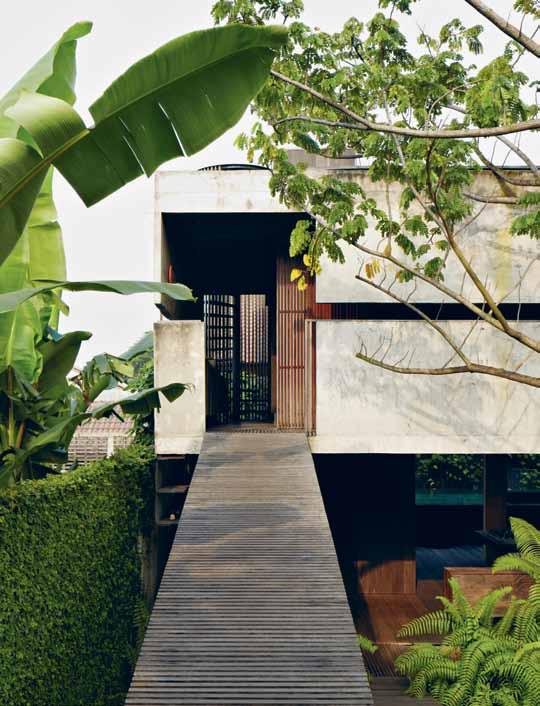

A bove | r Amp le Ading up to tH e cH ildren ’ s pl Ayground. opposite | tH e rooftop HA s A wAter fe Ature And skylig Hts puncH ing down to tH e cH ildren ’ s living spAce. issue #24 habitusliving.com
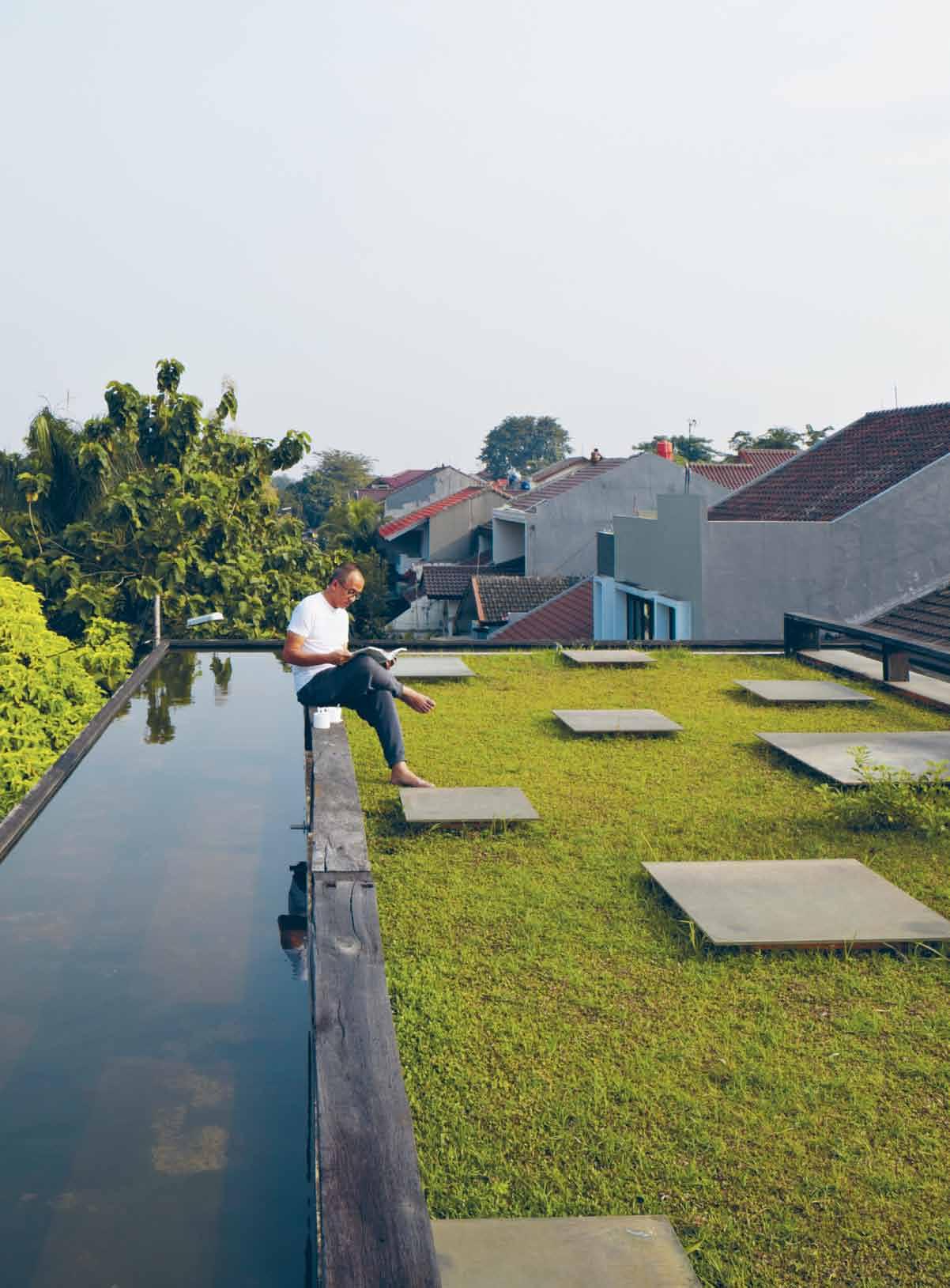
3 . on location # 149
The joinery also acts as the steps to three ‘tree houses’ – elevated air-conditioned capsule-hotel-like spaces containing just a single bed, and a study space in front of each one. The ‘tree houses’ are lined with white laminate, contrasting with the unpolished Ulin wood and rough exposed concrete occupying the rest of the house. d espite loving the playground-like space now, the children initially asked, “‘ dad, don’t you have money to paint the walls? We’re embarrassed to bring our friends here!” Andra laughs.
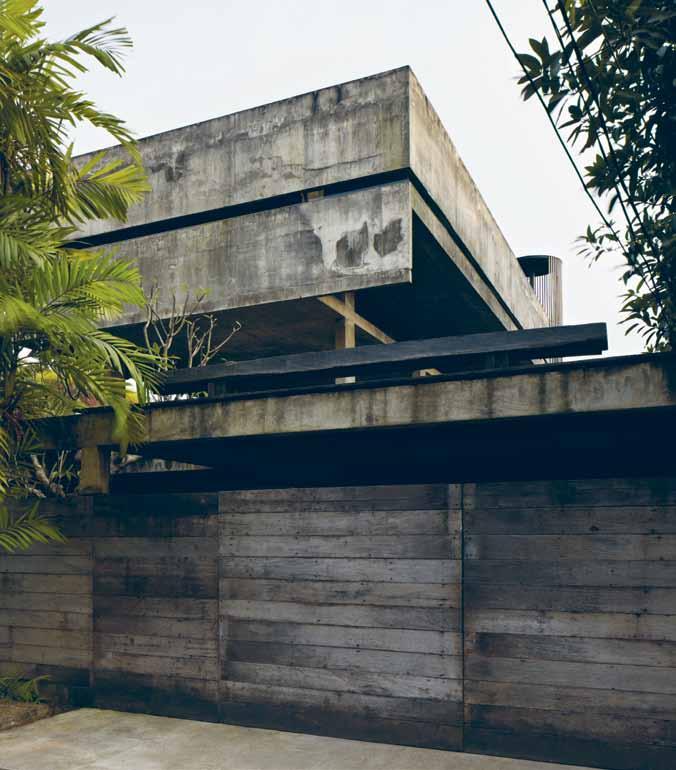
The ramp ends here. Walk down and look back. The playground. The pavilion. The secret garden. The open living and dining. The floating library. The cat house. Back at the start of the ramp. sit on the bench, take your house slippers off and put your shoes on. The journey is complete.
The house is called r umah 32. r umah translates as ‘house’ in Indonesian, and 32 was simply the house number, but there is another childhood memory linked here. “When I lived at my grandfather’s in Bandung, the house number was also 32. It feels like the most appropriate name,” says Andra. This seemingly simple box of concrete is packed with elegance, play and memories, a journey for Andra too. he concludes, “ r umah 32 is my secret garden – the place where I left home and came back home to.”
drop box
ArcHitect a ndra matin a rchitects principAl ArcHitect a ndra matin project teAm a sep tatang interior design a ndra matin, d ite matin gener Al contActor a lex Gandung
ANDRA MATIN ARCHITECTS
(62) 21 735 3338 andramatin.com
Artwork
In Master Bedroom, ‘Photo of Atlantik’ by Yori Antar. In Library, ‘Architecture Lego’ artwork.
furniture
In dining Area, dining table custom made by owner’s carpenter and lounge chair from owner’s private collection. coffee table from Alvin T and side table from MUJI. In Master Bedroom, wardrobe storage organiser from MUJI. In Activities Area, piano made by Yamaha.
ligHting
In dining Area, hanging lamp custom made by owner’s carpenter from used Ulin wood and iron pipe, Louis Poulsen AJ Floor lamp,
and Maison Martin Mangiela Line 13 light. In Master Bedroom, standing lamp from IKEA and reading lamp from MUJI. In children’s Bedroom, LIPAT bamboo hanging lamp shade from FA sA, and Alvin T standing lamp.
finisHes
Generally throughout, wall and flooring finishes are reconditioned Ulin wood and exposed concrete. All tableware and linen from MUJI.
fixed & fitted
In Bathroom, sanitary ware from Vola, Alape, TOTO, d uravit and dornbracht. In Kitchen, appliances from Miele and Teka.
A bove | tH e Arbore Al entry provides A smAll clue to tH e secret gArden inside.
issue #24 habitusliving.com
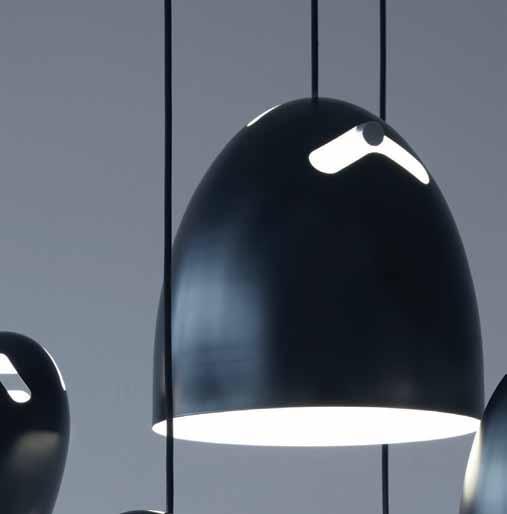


T 1300 438 609 | E sales@radiantlighting.com.au | W radiantlighting.com.au BELL BY +
funkis paddington: 202 oxford st. paddington
funkis the strand arcade: 412-414 george st. Sydney

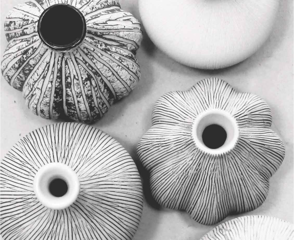
funkis online store:




www.funkis.com


Modest appeal


Inter-terrace houses in Singapore often follow a cookie-cutter template of more-is-more. Luo
Jingmei visits a house by The CarpenTer’ S WorkShop that eschews the superfluous for sensitive proportions and modest living.
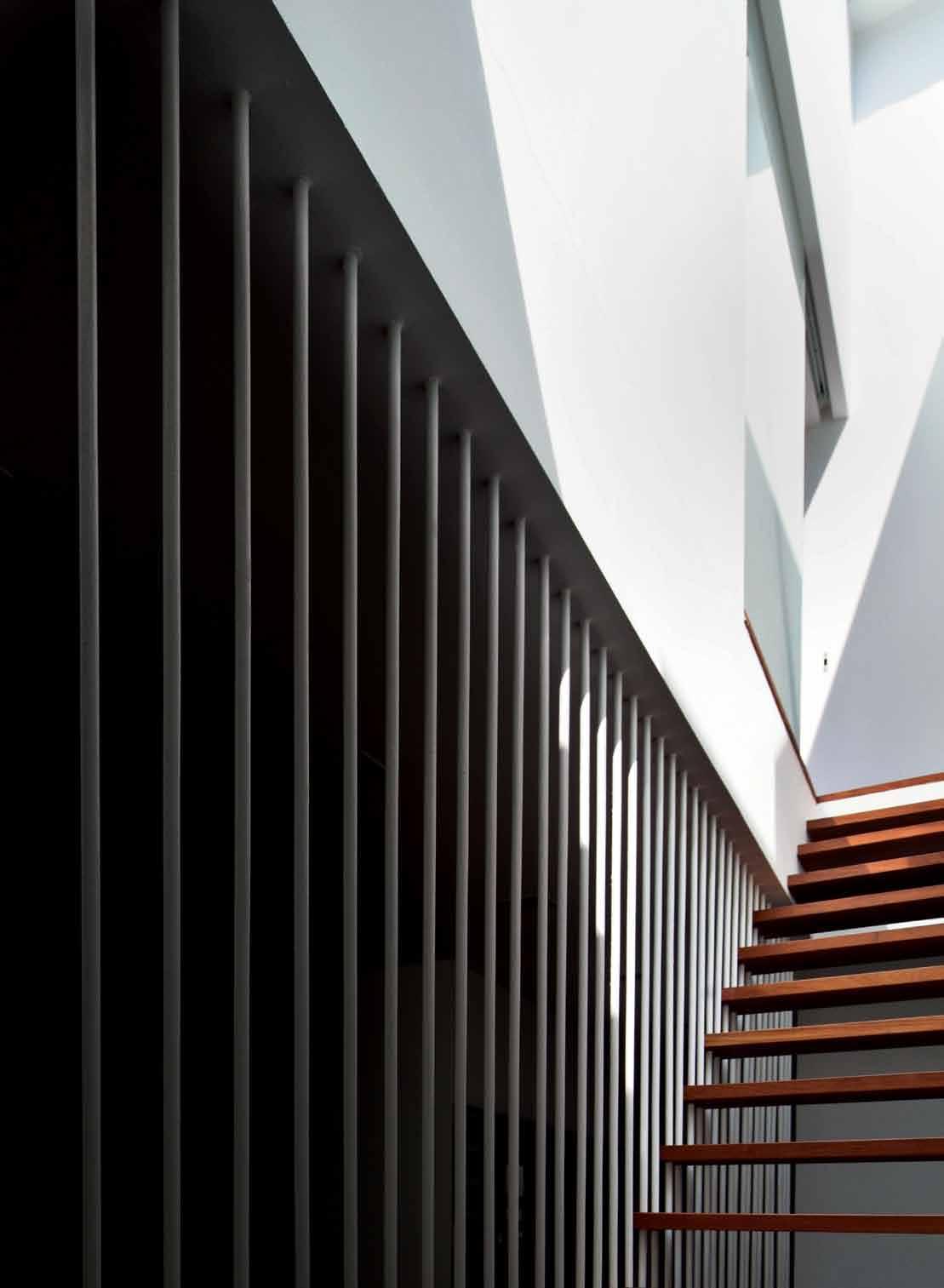
Tex T Luo Jingmei | PhoTogra Phy See
Chee Keong
3 . on location # 153
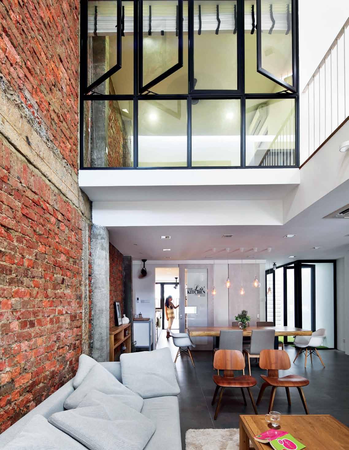
issue #24 habitusliving.com
Due to rising land costs, new owners of landed homes in Singapore are often in favour of demolishing existing structures to build houses that maximise the land at all costs. The result: four- or five-storey ‘monster houses’ that dwarf their older, more modestly sized neighbours, which proves especially unsightly when it comes to inter-terrace housing due to their close proximity.
But this house, designed by The Carpenter’s Workshop, is an anomaly in this residential landscape. The A&A (Addition and Alteration) treatment to this inter-terrace unit doesn’t scream superlatives (bigger, more, etc.). Rather, it is designed to be ‘just right’ – both in terms of proportion, and also in meeting the owners’ needs.
“We believe in carving out spaces that are unique,” says Victor Ting, who founded and helms the six-staff interior design studio. “A unique space doesn’t equate to a lot of built-in; more important is who the owners are and what kind of spaces they want to live in. It’s a more people-centric approach.”
Relatively costly land prices in this tranquil leafy neighbourhood – near to prestigious schools and not too far from the city – serve as a barrier to entry for new landowners, so change is slower in coming to this particular area. The two-storey height restriction also means there is no chance of overwhelming ‘monster houses’. But even with developmental restrictions, there is still a possibility for houses to be designed without grace and control.
Here, the designer, as well as the owners, had no qualms about exercising restraint in order to create an uplifting living experience. It helped that the owners’ brief was fairly simple and straightforward – four rooms and high ceilings – and they gave Victor a free hand for most of the design.
The original 40-year-old, two-storey structure was a replica of many of its existing neighbours – small in scale and charming in appearance with 1970s wrought-iron decorative doors and window grilles and mosaic tile flooring, but unwelcoming with dark, chopped-up and labyrinthine interiors.
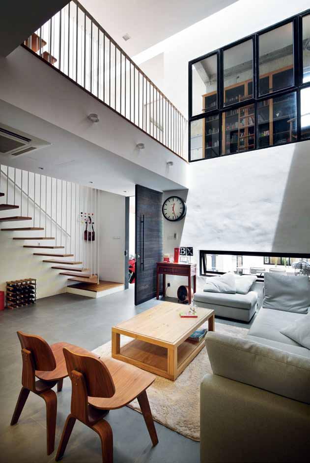 previous | THE BALUSTRADE AND STAIRCASE DESIGN ALLOWS POROSITY OF LIGHT AND VIEWS. opposite | FULL-LENGTH GLASS WINDOWS ENABLE CONTIN U OUS VIEWS FROM THE BABY’S ROOM DOWN INTO THE LIVING AREA. above | THE STUDY ROOM INTERNAL WINDOWS ECHO THAT OF THE BABY ROOM OPPOSITE AND ENCOURAGE MORE COMMUNICATION AMONG FAMILY MEMBERS.
3 . on location # 155
To gain more space, Victor extended the back walls outwards such that a generous powder room, maid’s bathroom and longer dry kitchen could be created on the first storey, and a larger master bedroom and additional master bathroom added on the second. In addition, an ingenious decision to retain and wall up an existing, L-shaped balcony at the front results in a useful study area.
Meanwhile, the internal section was entirely transformed. In contrast to the segmented nature of the original layout, it is now open and airy. Shifting the formerly centrally located staircase to the side and removing two bedrooms on the second storey carved out a delightful double-volume space for the living area. The former staircase landing became a third room (now the bedroom for a new addition to the family) while the new attic level hosts a family room and a balcony that faces the verdant foliage of the park in front of the house.
Victor points out that some of the design decisions, while deliberate in crafting meaningful spaces, were also quite logical.
To keep to the A&A status, the square footage could not be increased by more than fifty per cent. The owners were open to a reconstruction but this would mean that after extending the
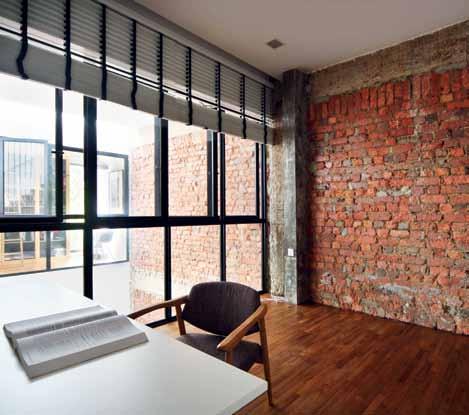
house towards the back, they would have to forego the front balcony – effectively paying more without gaining much more space. Giving up the two second-storey bedrooms to gain a double-volume living space, yet retaining the front and gaining space behind, was a win-win solution.
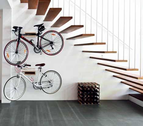
“We like to create interesting spaces that interact,” Victor says, pointing out a bridge-like passageway floating above the living area that now connects the study and sleeping areas. Internal full-length windows, as well as the staircase, designed as a lightweight structure with slim metal bars as handrails, add to the porosity. In effect, the interiors stretch both vertically and horizontally – a rarity for such housing types. “The clients are able to better enjoy the spaces rather than just having a [large] number of rooms they might not need and might eventually just lock up,” says Victor.
This is a strategy the owners agreed with wholeheartedly. It suits their open and communicative lifestyle. “In an earlier concept, the bedroom was bigger. But we only go there to sleep, so we wanted more communal areas,” says the client. “We are often in the living area, reading magazines, chilling with a nice breeze coming through. And when friends come over,
left | THE
THE
BECOMES A
|
HAS NOW BEEN CONVERTED INTO A ROOM FOR THE BABY HAS SUFFICIENT NATURAL LIGHTING THROUGHOUT THE DAY. opposite | THE BALUSTRADE S
METAL PROFILES COUNTERBALANCES THE HEAVIER MASONRY AND CONCRETE WORK.
OPEN SPACE BELOW
STAIRCASE
DISPLAY-CUM-STORAGE AREA FOR THE OWNERS’ PARAPHERNALIA. right
THE GUESTROOM, WHICH
SLIM
issue #24 habitusliving.com
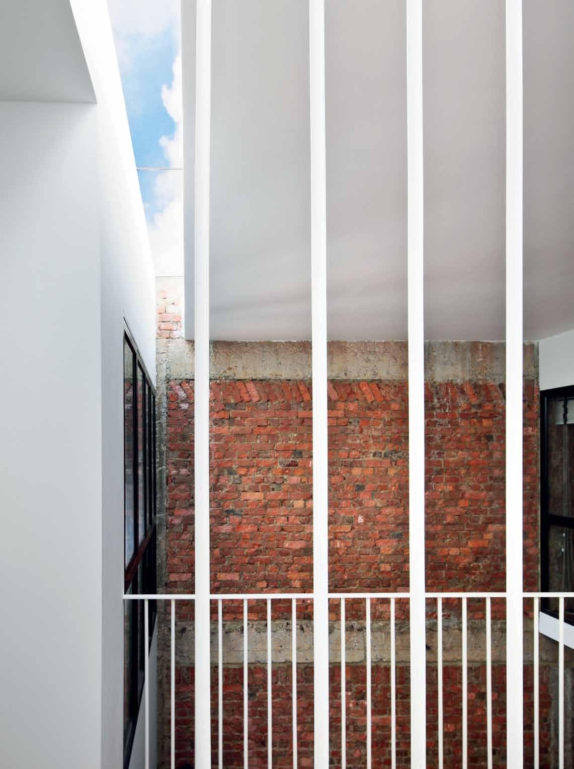
3 . on location # 157
carport living area dining kitchen store 1 2 3 4 5 first floor secoND floor Attic Pl AN helper s room helper’s bathroom powder room patio stairs 6 7 8 9 0 study void guest room master bedroom walk-in closet q w e r t toilet & bathroom balcony family hall y u i 1 2 q 0 0 0 y y w w w r t e u i w 3 4 4 y 5 6 7 9 8 issue #24 habitusliving.com
we can talk to them while we’re in the kitchen,” the cooking enthusiast says, pointing out the fluid transition from the living and dining areas to the kitchen through the length of the house.
The lofty ambience is also aided by revealing the underside of the pitched roof on the upper storeys and skylights that flood the interior with light. Other simple, but effective gestures, such as a linear courtyard between the dining area and powder room, into which master bedroom on the second storey and the attic bathroom look down into, channel light and breeze from top to bottom.
The abundance of natural illumination means the owners need not switch on the lights during the day. And while there is plenty of light, it is also very much controlled. Skylights are carved out as slivers and located mainly in transitional spaces so that light is indirect and heat gain minimal.
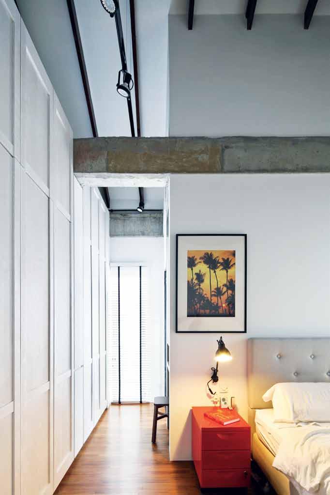
This sensitive way of mitigating the tropical weather is in contrast to the ‘monster houses’ that incorporate as many full-length windows as possible, only to have curtains drawn throughout the day. Here, window openings are carefully placed not only to let in an appropriate amount of natural light and ventilation, but also to take care of privacy.
For instance, rather than conventional full- or half-length windows, the façade is punctuated with a composition of slits. From outside, they create a fortress-like appearance. But from inside, they introduce picture-frame views of green and azure, and can be opened
opposite | FLOOR PLANS above | IN THE MASTER BEDROOM, JOINERY AND FURNISHINGS ARE KEPT NEUTRAL, LENDING THE HOME A COSY AND CALMING ATMOSPHERE.
3 . on location # 159
Here, window openings are carefully placed not only to let in an appropriate amount of natural light and ventilation, but also to take care of privacy.
throughout the day without the worry of prying eyes, especially now that the house’s design attracts curious passers-by who stand and stare for long periods.
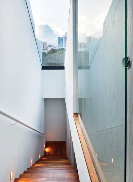
Like the clear-cut planning, Victor has opted for an unembellished material palette, signalled from the entry with a gate of black metal mesh and driftwood-colour timber infill. This aesthetic was chosen not just for its wellweathering qualities, but also with a less-ismore attitude.
“There are many ways of dressing up walls. This is just one of the ways, to follow through from using concrete outside,” Victor says, referring to the russet surfaces whose exposed brick textures are played up by light streaming in. Again, practicality played a part. “The original walls’ condition wasn’t very good and plastering up the [defects] would increase cost. So better to remove the [existing] surfaces and expose them this way,” he explains.
This approach continues into the furnishings and finishes: a grey solid surface counter and light-coloured timber laminate cabinetry in the dry kitchen; black and white blinds covering the windows neatly. This lends the home a calm and genteel mien – thoroughly suited for the arrival of a little one. There are also enough bare walls for the owners to storecum-display their outdoor hobby equipment, such as bicycles and motorbike paraphernalia.
Rather than building a house from scratch, Victor maintains that it is A&A projects such as this – weaving new possibilities from the old and the unpredictable but charming chanced encounters formed out of material and space – that get him excited. In this case, he has designed a house to be ‘just right’, but created a series of experiences that go beyond that.
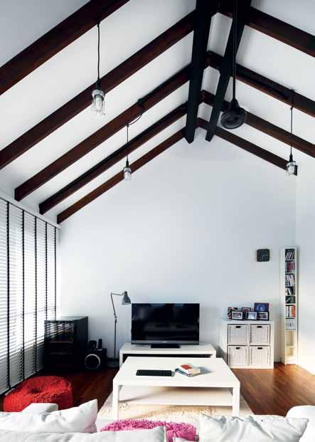
|
above
SKYLIGHTS ARE KEPT MINIMAL AND TO TRANSITORY SPACES TO MINIMISE EXPOSURE TO THE TROPICAL HEAT AND GLARE. below | THE PITCHED CEILING OF THE ATTIC, WHICH CAN LATER BE CONVERTED INTO A FOURTH BEDROOM IF NECESSARY, CONTINUES THE LOFTY FEEL OF THE HOME. opposite | WITH AN UNBLOCKED VIEW OF THE PARK OPPOSITE, THE ATTIC TERRACE IS ONE OF THE OWNERS’ FAVOURITE SPACES TO UNWIND.
issue #24 habitusliving.com
drop box
DESIGNER t he c arpenter’s workshop PROJECT TEAM victor t ing, t ina l ee STRUCTURAL ENGINEER pk p roject c onsultants
THE CARPENTER’S woR k SHoP (65) 63467 555 thecarpenter.com.sg
FURNITURE
In Living Areas, sofa from Massimo, coffee table from White Wood, dining table from XTRA and arm chair from Commune. In Master Bedroom, bed frame from IKEA. Outdoor furniture from IKEA.
LIGHTING
In Dining Area, Deco globe deluxe bulb. In Passageway, weatherproof ship’s wall glass light.
FINISHES
In Living Areas, floors are finished in Saloni stone. In Bedrooms and Passageway, floors are solid Teak wood.
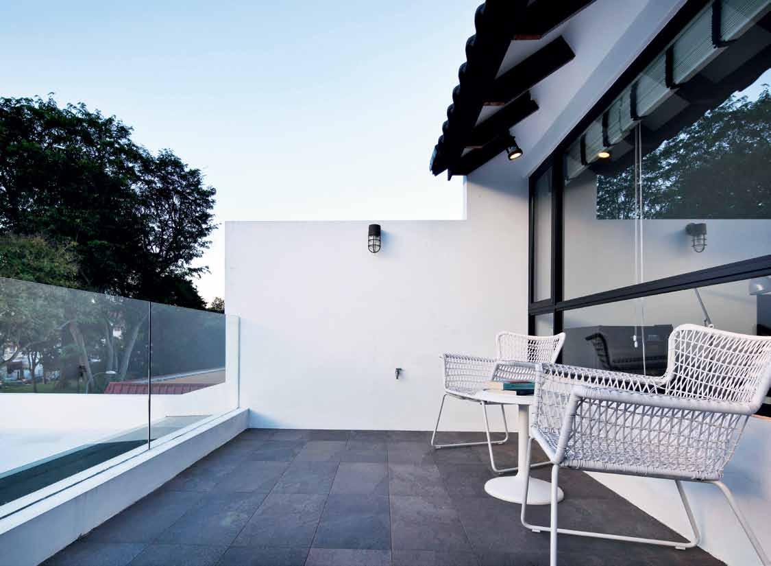
In Common Bathrooms, floors and walls are finished in Nal Grey prima tiles, and in Master Bathroom, walls in granite finish.
FIXED & FITTED
In Bathrooms, tapware by Grohe and Hansgrohe, and basins by Duravit and Catalano. WC unit by Duravit. In Kitchen, stove and oven from De Dietrich. Generally throughout, fans from Matthews Fan Company.
3 . on location # 161
Designing Iconic Houses
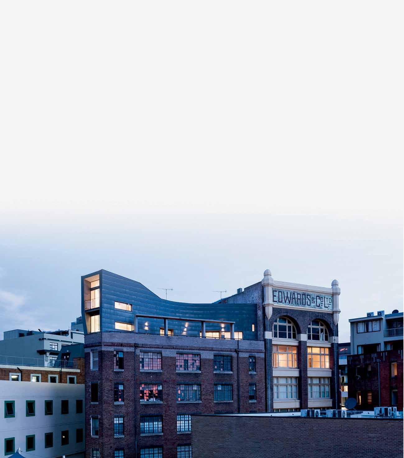
Designing and building an iconic home can only be achieved through the collaboration of a dynamic team who share an inspired creative goal.
Hear from renowned architects Peter Stutchbury and Neil Durbach, and award-winning builder and joiner Jeffrey Broadfield, led by Karen McCartney.
Sunday 27 June 2:30-4:30pm Museum of Sydney $35 (General Admission) includes entry to the museum, book signing and refreshments. Bookings essential.
sydneylivingmuseums.com.au/homes
#SLMhomes
Conversation across time

There is something about good design that transcends style, form and even time. It not only tells you a story, but also leaves you with one to impart. Carly Barrett visits the Perth home of architect, adrian iredale, of iredale Pederson hook and Caroline di Costa, which radiates that special something.
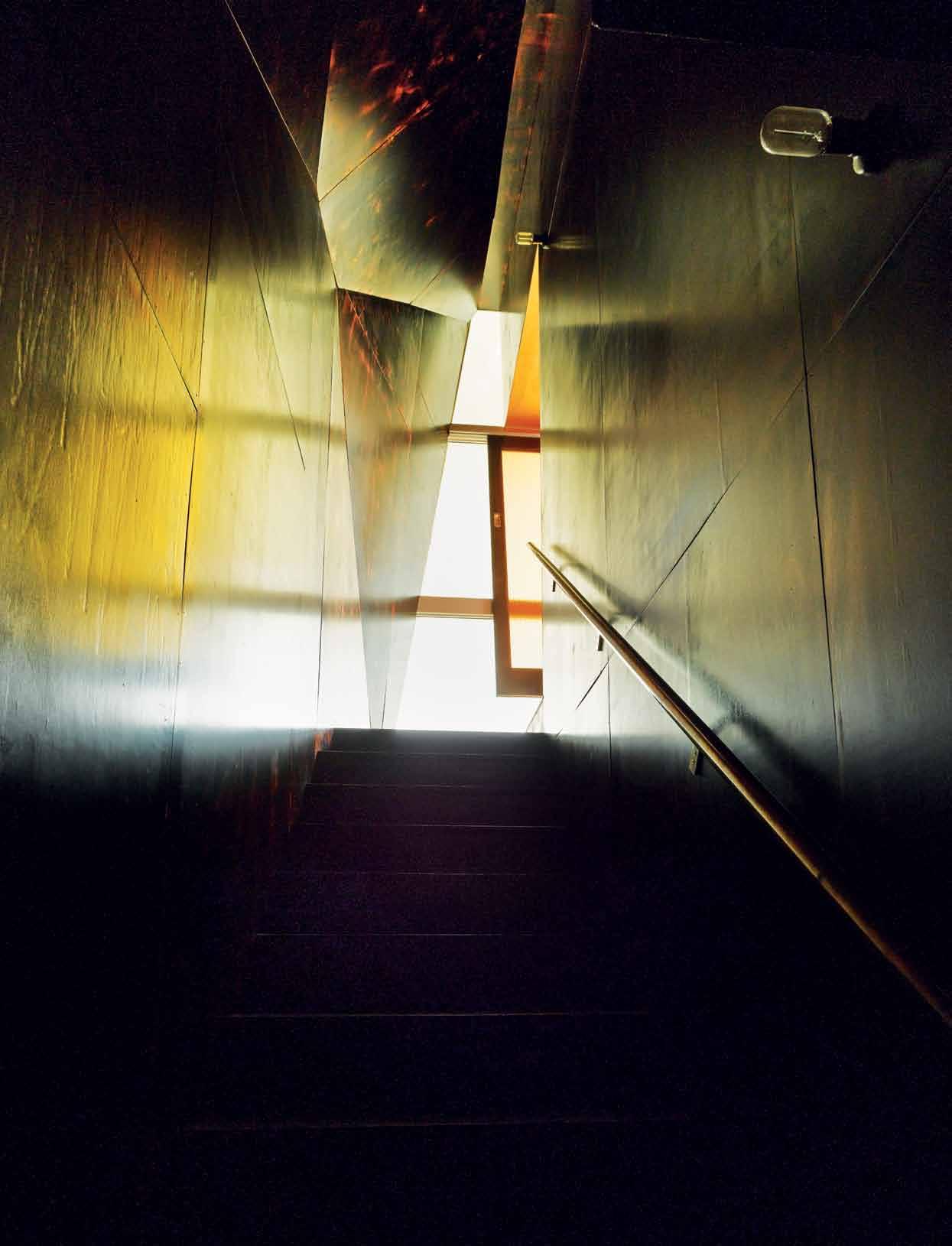
| photography peter Bennetts
text Carly Barrett
# 163 3 . on location
this house is home to Adrian Iredale (from the Perth studio of architecture practice, Iredale Pederson Hook) and his wife Caroline Di Costa (of Caroline Di Costa Architect), who live there with their two young children. Alterations and additions have been a passion for both architects – the opportunity to engage with existing structures has a sense of intimacy about it, a conversation between the original architect and the new one. But Adrian and Caroline have also been sensitive to the context – the street appearance remains almost untouched – a silent figure, a backdrop; and the rear is the extrovert –complex and challenging.
Adrian and Caroline are of a highly ethical nature, and their professional projects have a tendency to give back to their broader environment. This attitude towards community engagement is also seen in their own home. The front fence provides the first touchpoint for interaction, with mosaic-tiled seating inserted for neighbours and owners to sit together, chat and take in the beautiful tree-lined street. It is reminiscent of a bygone era when the front garden was a meeting place rather than a boundary, and when neighbours were friends rather than strangers. Through the front garden, a timber deck envelops an existing tree, becoming something of a stage set that plays host to a warm concert of people, landscape, fragment, shadow, play and of course architecture.
In the relatively modest 1935 Queen Anne Federation-style bungalow, proportions and existing layout provided the cues for the modifications. A sloping floor on the upper level is the former roof, barge scrolls (previously part of the roof decoration) are now on the front wall. The original roof tiles create a musical score along the boundary, and the chimney is re-allocated as a water collector.
But the home also responds to some of the aesthetics in a subtle way – design decisions were often influenced by the very act of peeling back the layers, heightening the sense of discovery within the process. The colour palettes and a number of surfaces are retained but modernised. Existing tiling is retained in the kitchen and second bathroom, but new cabinetry, fixtures and fittings are a practical insertion. Decorative elements like the front leadlight windows are abstracted and used in different areas – the front fence adjacent to the front door, the back fence, the interior of a second bedroom. Layered paint finishes in eastern facing bedrooms map light and shadow in their patina and original kitsch 1970s tiling in the kitchen takes the old and reinterprets it through the familiar memory and experience. Fixtures and fittings collected over time from relatives meld into the existing fabric as the home’s own story evolves.
The house is governed by four primary spatial ideas: the room to the interior, garden, horizon and sky. The interior rooms –bedrooms, bathroom and lounge – explore the

previous | A conceAled sTAIrcAse leAds you To The upper level ex TensIon. above | InTernAl wAlls Are used To cur ATe The couple’s Immense ArT collecTIon. opposite | le corbusIer’s modul Ar mAn mAkes An AppeAr Ance on The exIsTIng pAInTed wAll.
issue #24 habitusliving.com
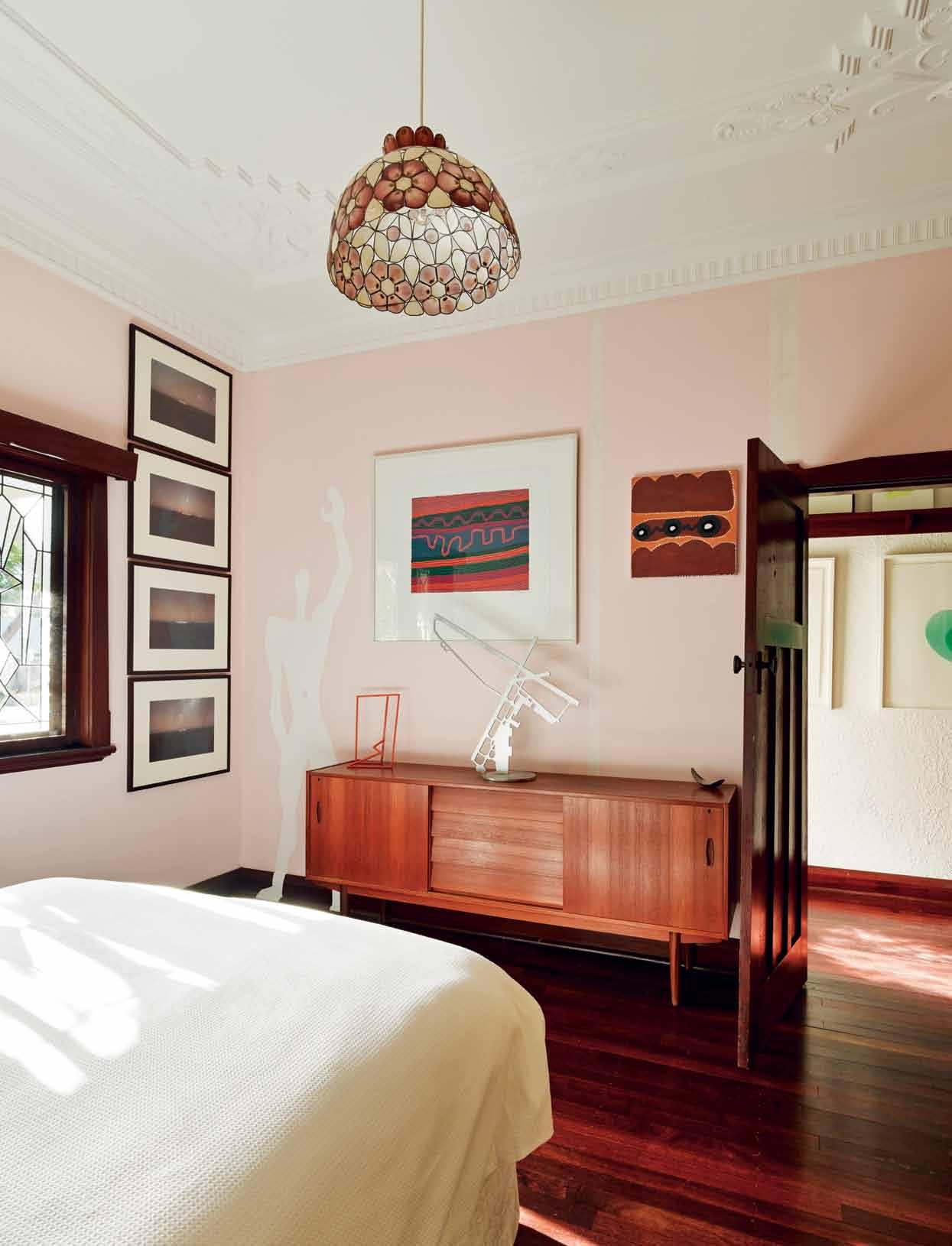
3 . on location # 165
A halo of love poems wraps around this space and at night a cross of light abstracted by polycarbonate awakens.
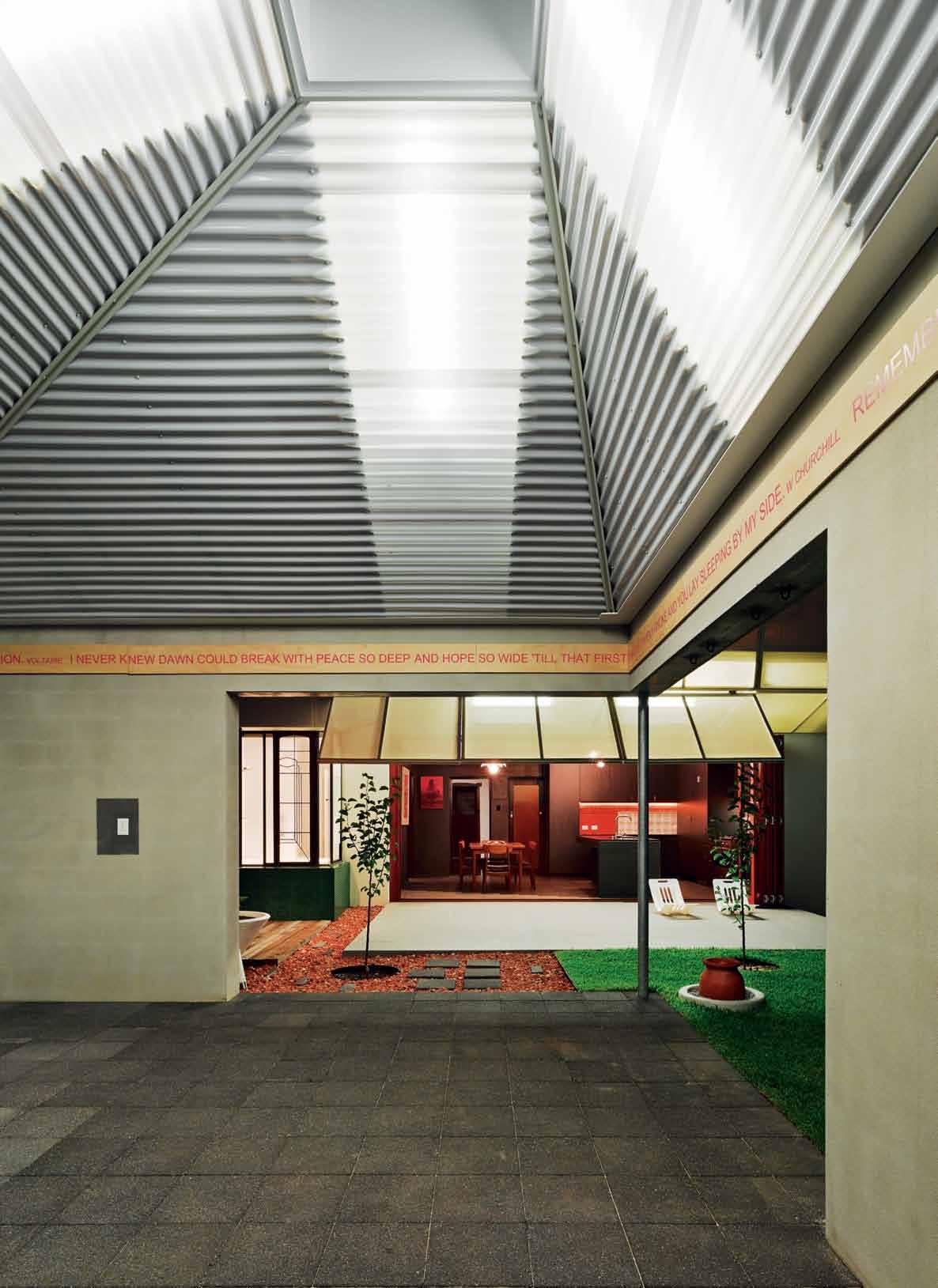
issue #24 habitusliving.com
layers left by previous owners, showcasing the art of knowing what to keep, reveal, and remove.
The garden rooms – dining and kitchen and new bathroom – focus attention to the exterior on the ground level and engage visually with the earth. A series of folding screens layer the engagement, and the back of the kitchen opens up to allow more natural light and physical access to the back garden.
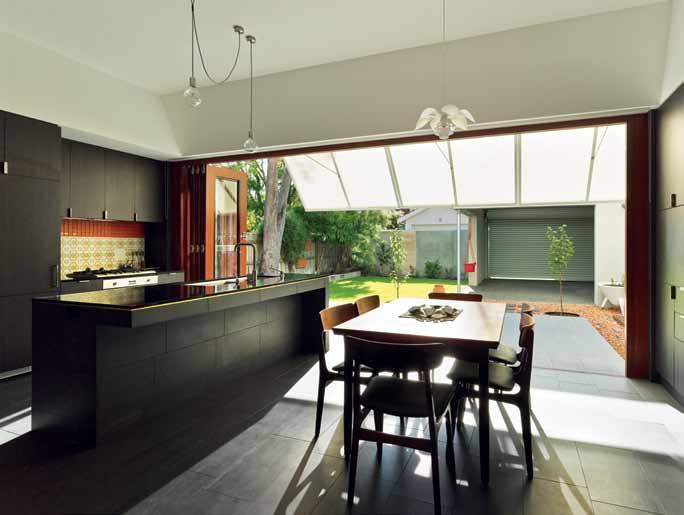
The ‘room to the sky ’ – a multi-purpose exterior structure that is separate to the house – creates a vertical spatial experience. A halo of love poems wraps around this space and at night a cross of light abstracted by the polycarbonate roof awakens.
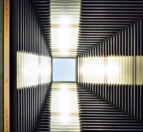
Upstairs, the ‘room to the horizon’ – library and living space – filters the suburban rooftops. The interior becomes one folded space formed through a play on the one-point perspective and operable screens create a direct view framing the horizon, releasing the interior volume. Here, on a chimney, a past tenant has hand-painted a proclamation: ‘I love Linda’.
With Perth’s considerable sun exposure, the inherited east and west facing facades were potentially troublesome. But with clever planning and the use of some oldschool technology, Casa31 becomes a study in sustainable design. The upper level extension facing the west is cooled with a modernised ‘Coolgardie Safe’, a contraption named after the regional West Australian town where it was developed. Originally made with a timber frame, mesh, galvanised trays and a hessian sack, at Casa31 it has been reinterpreted into a timber-framed operable screen with a dripfeed water reticulation system that acts as a lo-fi refrigeration system. Aside from the functional aspect, it forms a dynamic rear (and public) elevation to the home, transforming throughout hours, days and seasons.
opposite | The room To The
I
below | lIghT fIlTers down The
over An
sky
s surrounded by poe Try from The couple’s wedd Ing. above | The kITchen opens on To The bAckyArd.
soffIT
ouTdoor d InIng spAce.
3 . on location # 167
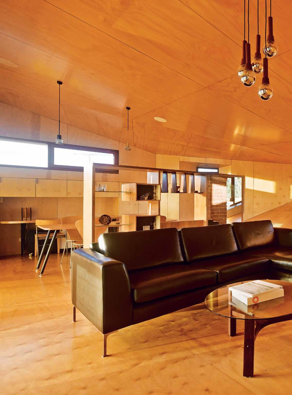
issue #24 habitusliving.com
The interior becomes one folded space formed through a play on the one-point perspective and operable screens create a direct view framing the horizon.
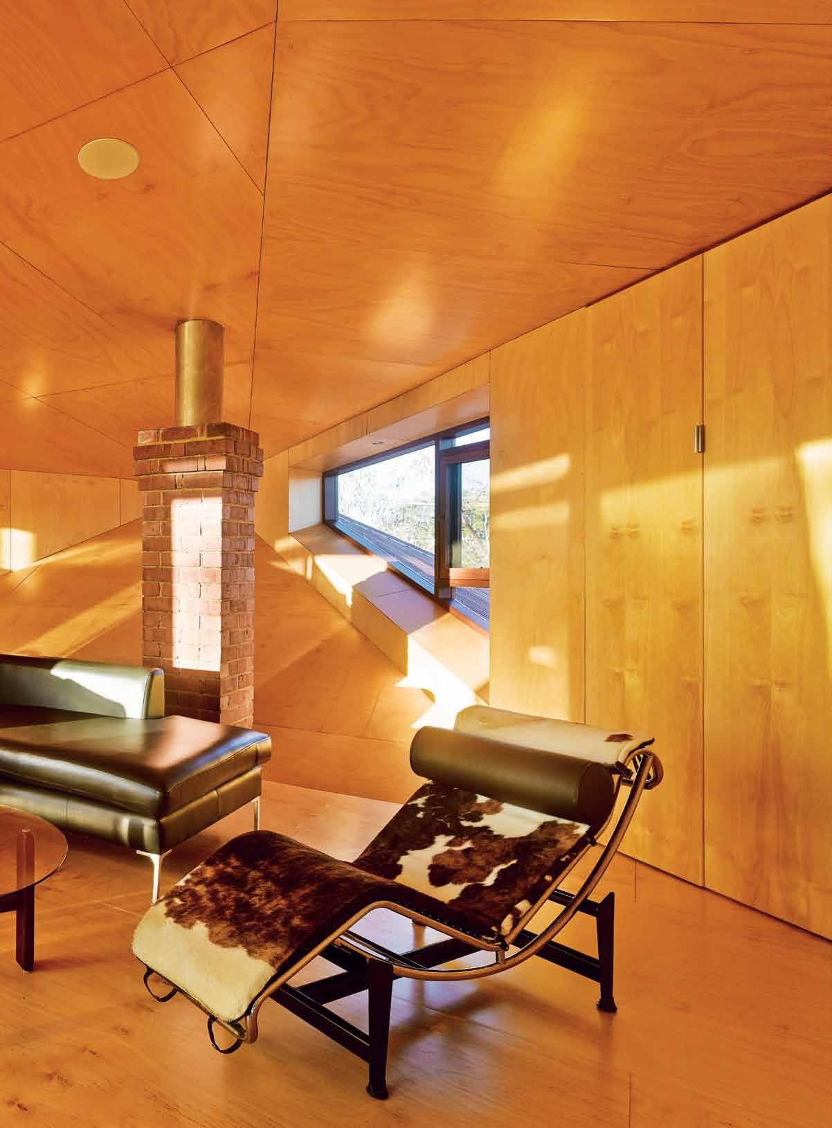
3 . on location # 169
GROUND FLOOR previous | The lounge And sTudy Are A fe ATure An IwAn IwAnoff bookcAse rescued from demolITI on. above | floor pl Ans. opposite | A Tr Ans ITI onAl zone fr Ames The enTr Ance In The fIrsT floor lounge. 1 2 2 2 6 9 0 5 3 q 8 4 Fi R st F LOOR 7 Entry BE droom V E randah LoungE 1 2 3 4 dI n I ng k I tch E n t E rrac E mu Lt I-purposE 5 6 7 8 study LIVI ng B a L cony 9 0 q issue #24 habitusliving.com
Similarly, stairways are used not just seen as transitional zones in a functional sense, but also in a metaphoric sense. Linking the ground and upper floors is a space of deep sensory delight, an architectural palette cleanser. Here the eyes and nose are overpowered by the burnt and waxed plywood walls and amber light cast by a family relic at the top: their nan’s 1950s sliding door. In the kitchen, a secret stair propels the concept of journey into the enchanted. Concealed within the cabinetry one ascends through a darkly quixotic folded form only to turn into a light and expansive one shielded by the Coolgardie Safe.
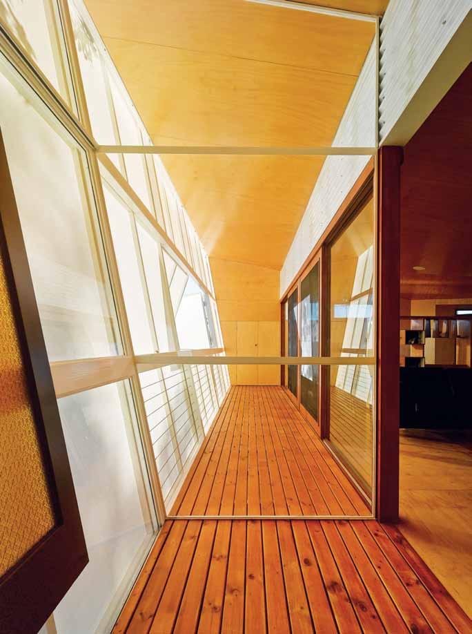
Casa31 not only resonates as a sensory essay on composition, time and texture, it is also a home that is playful, romantic and cleverly thought out. Utilitarian aspects become opportunities for recurrent themes of light and shadow to be integrated into storage systems. A downstairs combined bathroom/laundry opens onto the backyard to become the ultimate retreat. A Brunelleschi-inspired perspectival study in timber cladding effectively serves as a playground for Adrian and Caroline’s children. Casa31 has thoughtfully catered for the pragmatics of a functional abode, yet there is a sense of poetry delicately weaved into a spatial tapestry that becomes understood through journey and experience.
This home represents a personal and professional journey that goes well beyond the four years of the project. Casa31 re-interprets the role of memory, tradition and social and cultural value in a rich spatial experience that is simultaneously familiar yet unfamiliar. The architecture preserves and reinterprets the past, history is layered but never erased, fragments of the past continually remind that the residents are only another layer in the rich and unfolding history of this place.
Every day is a different experience, one that is tender, unexpected, personal and embedded with history. The design enables the family to grow and evolve in a sequence of spaces that encourage engagement with each other and the dwelling; it offers new ways of understanding and exploring family relationships and an understanding of space. This house is simultaneously a memorial, playground, place of celebration, stage set, place of community interaction, and most importantly ‘home’.
Utilitarian aspects become opportunities for recurrent themes of light and shadow.
3 . on location # 171
drop box
desIgner c aroline d i c osta a rchitect and Iredale pedersen hook a rchitects pro JecT TeAm a drian Iredale, c aroline d i c osta, Finn pedersen, martyn hook, Brett m itchell, sinan p irie, matthew Fletcher buIlder hugo homes
sTrucTur Al engIneer terpkos Engineering
IREDALE PEDERSEN HOOK
ARCHITECTS
(61) 412 391 925
iredalepedersenhook.com
furn ITure
Generally throughout, furniture from Angelucci 20 th Century Melbourne. In Dining, circa 1960s Danisk table in Teak with Tom Kovac Inox Super Star 6 serving candy bowl for Alessi, and Findahls Mobelfabrik chairs in Teak. In Lounge, circa 1950s Danish sideboard with Niche centrepiece by Zaha Hadid for Alessi, Eames 1954 compact sofa, circa 1960s WA Jarrah coffee table with Clear Vase by Alvar Aalto (1936) for Iittala and Tjuntjuntjarra community carved wooden Tinka lizard. In Open Living, Iwan Iwanoff cabinet rescued from Guthrie residence, LC4 Chaise Lounge by Le Corbusier, Pierre Jeanneret and Charlotte Perriand (1928) in pony hide,
manufactured under license by Cassina. Custom table designed by Adrian Iredale and Caroline Di Costa in Hoop Pine plywood made left over from interior lining and legs in recycled steel balustrade. Series 7 chairs by Arne Jacobsen for Fritz Hansen (1955) from Table & Chair. Circa 1970s West Australian hardwood coffee table with glass top.
lIghTIng
In Kitchen, Create 1 pendant in chrome, Beacon Lighting, and Hans Scharoun and Gunter Symmank 1959 light fitting available from Mawa Design, Germany. In Living restored Danish light fitting and Iwan Iwanoff light fitting
f nI shes
Bricks and pavers from Midland Brick and Boral, tiles from Original Ceramics, plywood from Cullity’s Trade One, sunscreen fabric from Jaylon Industries, plasterboard and wall insulation from Australian Gypsum Industries, roof finishes from BlueScope and Kingspan, and paint from Dulux.
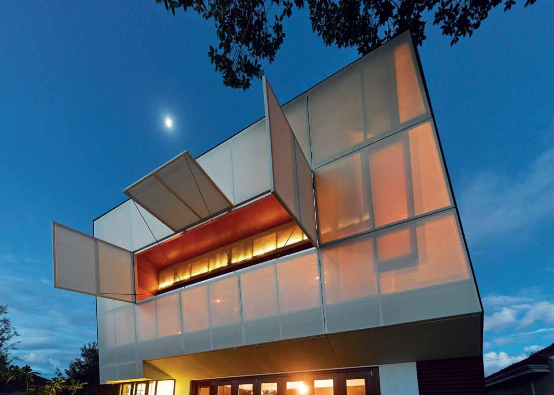
f xed & fITTed
Generally throughout, cabinets from Laminex, plumbing from GWA Bathrooms and Kitchens, rangehood from Qasair, air conditioning from Eden Air.
above | The oper Able screen bAsed on The coolgArd Ie sAfe becomes An ImATed AT n I ghT by AcTIvITIes wITh In. issue #24 habitusliving.com
Adrian Iredale of Iredale
Pedersen Hook and Caroline Di Costa have created their home to be as individual and eclectic as the history of the house. In keeping, each finish, furniture and accessory within seeks to embody a design response of innovation and delight.
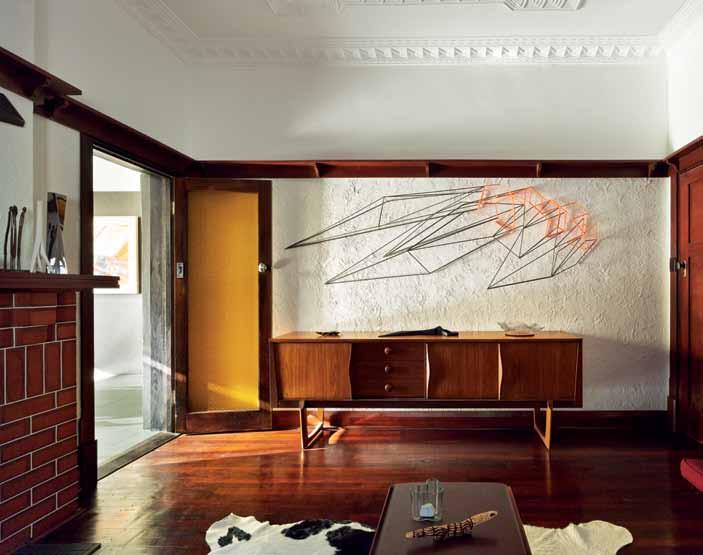

The architecture of Adrian’s firm is drawn from a landscape dominated by horizon. The work shares an understanding of an edge condition that is described by remote locations, incredible sites and the centre of the peripheral. Similarly, in the Casa31 project, the Australian environment has operated as an inspiration and counterpoint for the interior finishes. “We wanted to create a sense of ‘ lightness ’, of hovering above the surrounding rooftops and a focus on the horizon,” Adrian says, referring to the extensive use of plywood. “We wanted to create a place to dream and contemplate.” In what he calls their ‘room to the horizon’, the Hoop Pine plywood from Cullity Trade One is certainly the main feature; a finish that ensures the space remains versatile and light. “The stair is lined with the same plywood but it was burnt, washed, brushed and waxed, it acts as our architectural palette cleanser,” he adds. Along with the furniture are smaller items that are just as important in the collection of memory and experience. “ The Zaha Hadid vase sits on the reflective kitchen bench usually filled with colourful Banksias [native WA flowers],” says Adrian. “ Its twisting and polished surface reflects and abstracts the garden.” And the Alvar Aalto vase was bought when visiting Aalto’s Finlandia Hall in Helsinki in 1999. “A fragment of the original failed Bianca Carrara Marble facade sits inside the vase; this fragment was from an exhibition that formed a series of steel cages filled with 650m 2 of the failed marble cladding. It sits on the rescued Iwan Iwanoff cabinet as a humble reminder of our fallibility.”
Clo Ckwise from top circa 1950 s Danish siD eboarD Angelucc I 20 Th cenTury, Angelucc I .ne T Au
fritz hansen series 7 chair AvAIl Able from TAble & chAIr TAble AndchAIrcompAny.com. Au
niche centrepiece by zaha haDiD for Aless I Aless I .com

clear Vase by alVar a alto (1936) for IITTAl A AvAIl Able from An Ibou IITTAl A .com / An Ibou.com. Au
Casa 31 in focus
3 . on location # 173
LIGHT DRAWINGS
CURVE: CREATIVE LIGHTING CONCEPTS WITHOUT THE ROUGH EDGES.
Space-defining. Whether used on their own or in combination with standardized, linear system components, the three models of the CURVE profile arc allow users to create new lighting concepts with a variety of shapes and visual effects – without sharp edges or angles. CURVE makes it possible to „draw“ figures such as circles, waves, or rectangles with rounded corners on the ceiling. The profile arcs can match the contours of the architecture in a unique way, making them well-suited for structures with a need for lighting that both is pleasing and unusual.

SEE THE LIGHT WWW.XAL.COM SPACE LIGHTING PTY LTD I LJ25, 39 Jones Street I Ultimo, NSW 2007 I T: +61.28036.2000 I F: +61.28036.2099 I info@spacelighting.com.au I www.spacelighting.com.au
handmade luxury, under foot
Handmade rugs are honoured in these collections by DESIGNER RUGS, reinvigorated by fresh perspectives in startling colours, textures and patterns. We put craftsmanship on a pedestal and weave a web of rug intrigue.
photography | tim robinson. styling | n icky lobo. art Dir Ection | francE s y Eolan D.
process every designer rugs piece is made with the touch of a human hand, whether through the hand-knot or handtuft processes. t his dedication to the time-honoured craft ensures that each rug is unique, and that the ancient skills associated with rug making are passed down through the generations.
Unearthed by hare + Klein for designer rugs.
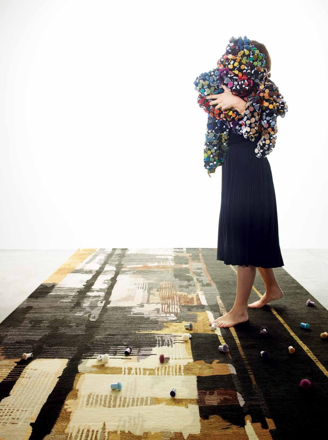 habitus x designer rugs promotion
habitus x designer rugs promotion

colour & pattern using the finest yarns and techniques enables the production of sophisticated patterns that are defined through an extensive spectrum of colours. achieving diverse aesthetic expressions – from directional and angular to highly decorative patterns, to subtle tonal variation – all are celebrated in designer rugs’ dynamic range.
Clockwise from right to left: nest by a nna-Carin, forsa Collection. a rrow feathers by In-house designers, Saffron Collection. storm by a nna-Carin, forsa Collection. swept by hare + Klein. horizon by In-house designers, Contemporary hand Knots. night bird by Catherine martin. a pplique by Bernabei freeman. majesty by In-house designers, Contemporary hand Knots. Westchester by Catherine martin, deco Collection. Wild berry by a nna-Carin, forsa Collection. Qin by Camilla. batik by a kira Isogawa, hirameki Collection. memory by hare + Klein.
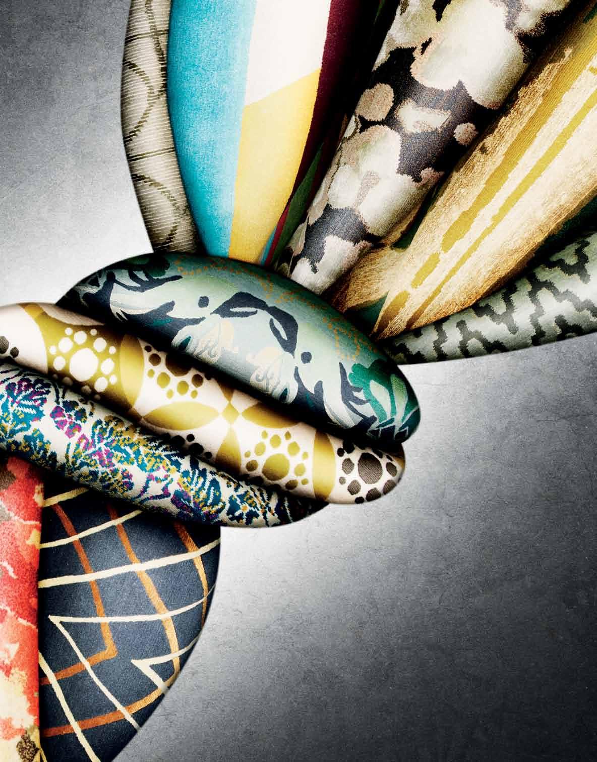
habitus x designer rugs promotion
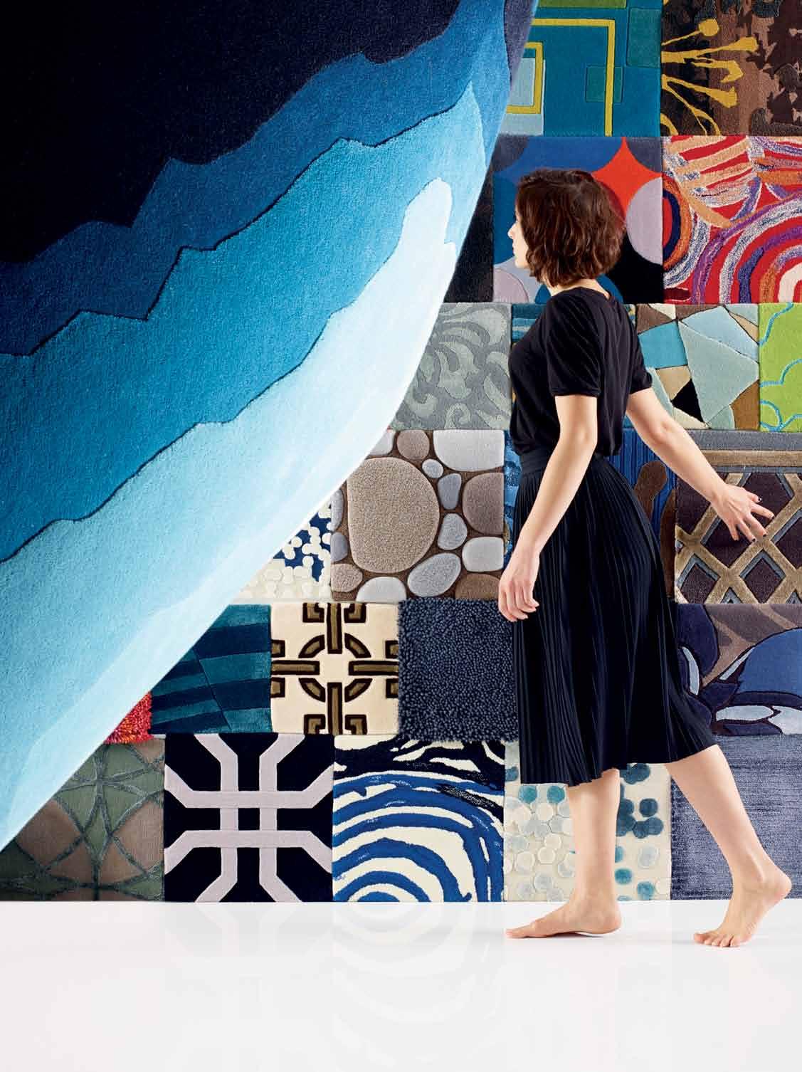
textures & custom
Wool, silk, hemp and bamboo are just some of the natural materials featured in these ‘artworks for the floor’. Work with these fine materials and d esigner rugs’ in-house design team to bring your unique vision to life.
m ineral by Bleux (foreground). a ssorted custom and collection (square samples).
s ee behind the scenes of this photo shoot at habitusliving.com/issue24/designerrugs
Designer Rugs | designerrugs.com.au
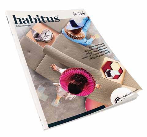
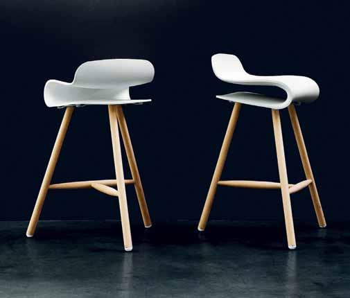
To enter, simply subscribe to Habitus at habitusliving.com/subscription, and answer the following: Question: Tell us in 25 words or less, What activities suit stools rather than chairs? Subscribe to magazine And you could win a pair of Fanuli stools by Harry & Camila, valued at $2000 Offer ends 24 SEP 2014 Already a subscriber? Simply extend your subscription for your chance to win. Receive 4 issues for only $49 This sturdy design with solid wood legs and slim line profile blends seamlessly into any contemporary setting.
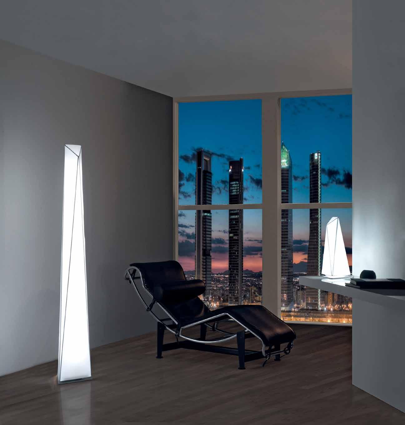
classiclite.com.au
Compartment living
Space, more than ever, is at a premium, urging us to find interesting and clever living solutions. We take note of some SPACE-SAVING DESIGN DEVICES favoured Region, find inspiration in products that create space, rather than just take it up, and discuss the increasing need for

SPACE PLANNING
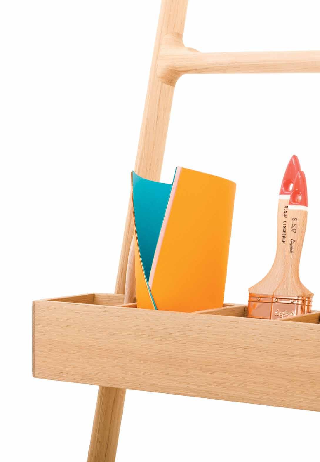
# 181 3 . on location
issue #24 habitusliving.com
Hidden under the stairs
Located near the golf course on Victoria’s stunning Thirteenth Beach, this house, built in brick, bunkers into the surrounding dunes, which serve to protect it from the strong coastal winds. The house is solid and sheltered; the masonry walls encircle and enclose, providing privacy and curated views to the golf course. The entry slips between two soaring walls into a double-height space, the void carrying through the living zone and giving the house a heightened sense of light and space within its contained footprint.
Inside, on one side of the stairwell we have elongated the first four treads to create a small reading nook. This acts to open up the entry area to the views, and stops both the stair and hallway from feeling enclosed. By elongating these few stairs it also designates the space as an individual area. Under the stairwell lies a bookshelf facing into the reading nook. The other side of the reading nook is bounded by the pantry wall, which curves around into the entry hallway creating a strong sculptural element within the living area.
On the opposite side of the stair (which is a bedroom hallway), there is built-in storage, with lift-up lids and a daybed or display shelf above. And perching above the stair is a small study nook that cantilevers into the void space over the stair. We refer to this as the ‘Eagles Eyrie’ as it allows views into the living area, out to the street and over the spectacular golf course outside.
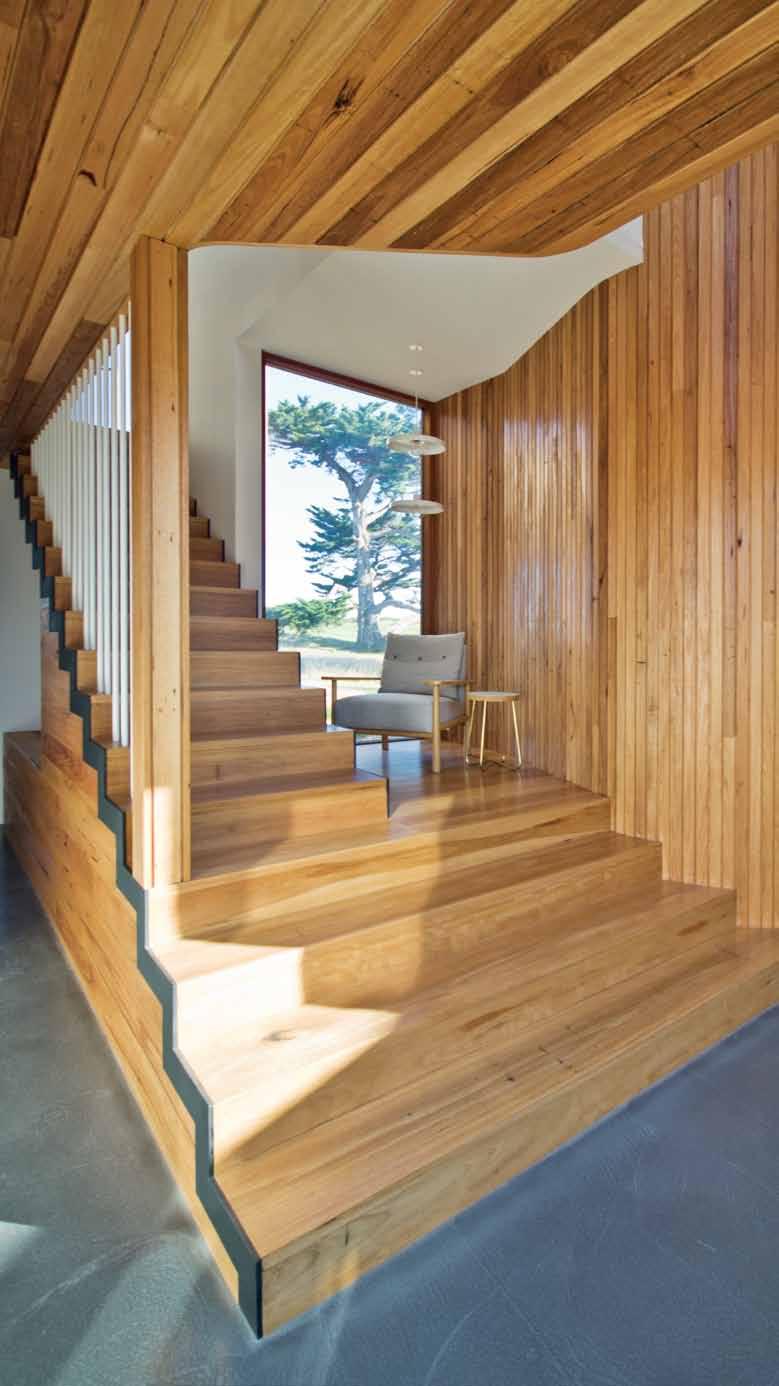
Overall, this stair area is an important junction point within the house, that works hard to provide a variety of both breakout and storage spaces.
Kate Fitzpatrick
ARchitect Auhaus Architecture
PROJect teAM Kate Fitzpatrick, Benjamin Stibbard
PhOtOGRAPhY Trevor Mein
AUHAUS ARCHITECTURE
(61) 5254 3335 auhaus-arch.com
FURNitURe
LiGhtiNG
FiNi S heS Generally
In Reading Nook, Archie chair and Enzo sofa from Jardan, Cross Stool side table from Douglas & Bec.
Disk pendant light from Toss B.
throughout, floors finished in Ecoflor concrete, timber Blackbutt floorboards with Silvertop Ash lining boards.
Baan moom
Space is always at a premium in Bangkok; it is almost instinct which tells you every project must take full advantage of its site. And so with this house for a family of five, all functions are packed and stacked over three storeys. These functional usage rooms include a master bedroom with bathroom, two smaller bedrooms also with bathrooms, a living/dining space, a working room, an open kitchen, a Thai kitchen and a lap pool.
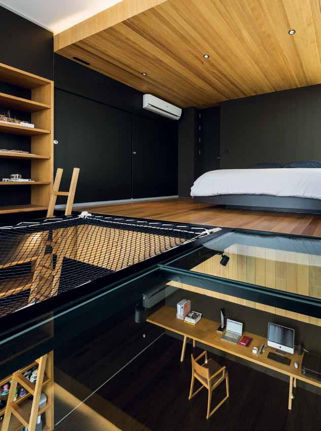
Two main characteristics define this house: the ‘stairs hall’ and floor ‘corners’. The ‘stairs hall’ consists of a triangular staircase, a triangular skylight on the rooftop and an internal void that connects to every room. The skylight provides important natural light throughout the stairs hall and even for the living space on the first floor, the internal void provides ventilation for each room, while the stairs hall itself acts as the main vertical circulation for this house. The ‘stairs hall’ is certainly a very important feature in the house.
Equally important however, and perhaps even more interesting, is the house’s ‘corners’. There are in fact two types of corners in this house – ‘individual’ and ‘shared’ corners for both privacy and sharing. Individual corners form bedrooms and reflect the character of each family member. Shared corners become open spaces connected to the stairs hall on each floor, and offer space
for different family functions or storage. These corners ensure that all space in the house is used effectively, and that no space is left over. The shared corner on the first floor in fact becomes an extension of the living space, while the corners of the second floor and terrace ensure flow is maintained up to the rooftop.
Integrated Field
DeSiGN
iNteRiOR DeSiGNeR
Porntida Kruapat & IF
LANDScAPe ARchitect
Kirin Tanglertpanya & IF
StRUctURAL eNGiNeeR
Piyapong Suwanmaneechot
SYSteM eNGiNeeR Mongkol
Pichayakittisin
MAiN cONtRActOR
SPC Technocons Co. Ltd.
In TE gRATE d F IE ld Co (66) 2294 4984 integratedfield.com
FiNi S heS
Main materials are steel door frames, insulated glass and fishnet.
IF (Integrated Field Co.)
# 183 3 . on location
Wonder box
The brief for this project in Sengkang West Avenue, Singapore was clear: to reinvent a new space that achieves openness, versatility and organised storage with striking design aesthetics in a small apartment. And so, focusing on simplicity and functional elegance, I created a large structural focal point – the ‘Wonder Box’. The Wonder Box is a holistic concept, that involves all elements of interior design.
The vision was to create an iconic structure that sits in the centre of the flat to meet the family’s needs and provide convenience to their daily activities. Taking into account the natural light, ventilation and flow of human traffic meant that the existing space had to be manipulated to maximise the living and storage areas. Measuring nine metres in length, 2.4 metres in width and at 1.9 metre height, the floating Wonder Box is suspended and stretches from the kitchen to the sleeping zone, ensuring a visual continuity throughout the home. The box, which forms the flat’s core, conceals the bomb shelter, air-conditioning ledge, and two bathrooms while still providing plenty of storage for the family.
It also contains the owners’ and their child’s wardrobe, TV and AV equipment cabinets and dining wares for the kitchen zone. Its glossy laminate finishing reflects the surroundings, achieving a spacious visual effect, making the apartment appear larger than it is. Tube lighting is installed underneath to illuminate and show off the Box’s elegance at night. The original walls for the three bedrooms were also removed to free up the space along the passageway. Six panels of large sliding doors, doubling as privacy screens, outline the sleeping zones, and also control the openness of space, light
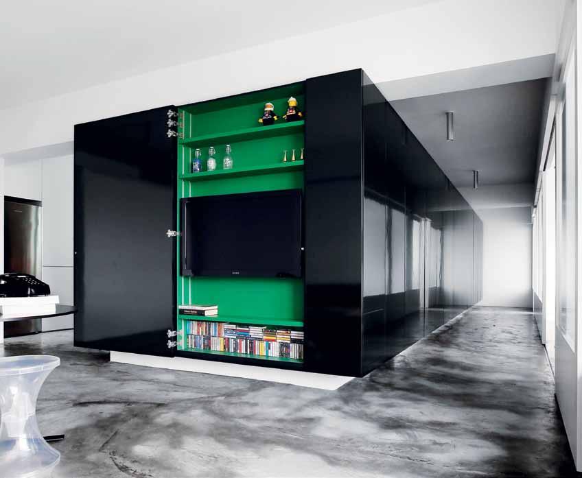
and wind. Primary materials used include natural cement screed, glossy laminate and satin stainless steel finish.
New HDB flats in Singapore today almost totally confine people in their homes, affecting their quality of life and preventing higher interactivity. Living spaces are getting smaller; we can’t even fit in large furniture like a proper dining table set without feeling the squeeze. We need to make space more innovative. How can we make a 900 square foot flat work as if it were 9,000 square feet of living space? Through ‘Wonder Box’ I hope to inspire everyone to think about improving the urban livable area in Singapore. My philosophy is to design existing space to make HDB flats suitable for the modern family, as well as improving the quality of human relationships.
William Chan
DeSiGN Spacedge Designs
cONtRActOR U Lee Furniture & Decoration
SPACE dgE dESIgnS
(65) 6438 3770 spacedge.com
FURNitURe
Tam Tam Pop stool from Branex Design, Eames DSR Eiffel chair from Vitra, small silver table from Edra, Puppy black chair from Magis, Boom pouf from Metalmobil. Detachable sofa, dining table and bed are custom designed and made.
LiGhtiNG Tube ceiling surface light from Lightcraft with all hidden lighting fittings are basic fluorescents.
FiNiSheS
Wonder box in black glossy laminate from EDL and coloured melamine plywood from Moscan Building Materials. In Kitchen, counter in satin stainless steel and solid surface worktop from Corian. Custom designed sliding door system in polyurethane spray and sandblasted glass, natural cement render floor, accent red mosaic from Bisazza, paint from Dulux and roller blinds from Meteor Shades.
FiXeD & FitteD
Appliances from Brandt.
issue #24 habitusliving.com
Countryside space
It was the American architect Marion Mahony Griffin who stated: “A tiny house, like a tiny temple, can be a perfect work of art.” Her statement has greatly influenced our design for a new home-office pavilion in the Southern Highlands of NSW. Situated alongside two existing pavilions on a remote rural property three hours drive south of Sydney, this design, while surrounded by hectares of land, is built with a relatively small footprint. Three freestanding pavilions contain the functions of sleeping, living and working – reflecting a harmonious life balance. The pavilions are loosely arranged at the base of a natural amphitheatre formed by the towering sandstone cliffs of the Barragorang Valley. The clients were an academic couple who spend their weekends relaxing in isolation on their rural property. A sense of quiet contemplation is created in a new studio by encircling its interiors with a large bookshelf, as if to immerse the space in a thick wallpaper of books that shield it from the outside world. The shelves are built from a select grade of Birch plywood that provide great strength to prevent sagging whilst finishing the front edges of the shelves by revealing all the layers of honeycomb-like timber laminates.
bE nn & PE nn A ARCHITECTS

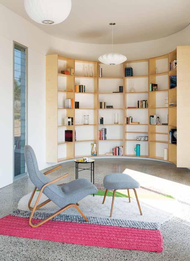
(61) 415 712 996
bennandpenna.com
Andrew Benn
ARchitect Benn & Penna Architects PROJect teAM Andrew Benn, Alice Benn, Thomas Benn PhOtOGRAPheR Tom Ferguson
3 . on location # 185
As if to immerse the space in a thick wallpaper of books that shield it from the outside world. ANDREW | ARCh ITECT
Tucked in the corner
This family home located in Thornbury, an inner northern suburb of Victoria, belongs to a suburb full of early 20 th Century houses; a federation aesthetic that I have always loved. And as both architect and resident, I was passionate that the character of this nearly 100-year old house would remain intact – we also did not want to change the local streetscape. Rather we sought only to build a contemporary renovation that suited the needs of our growing family.
While the space required a basic open plan design, we didn't want to create just a simple open box, instead we sought to design spaces with defined areas of functionality. The north-facing design encompasses the kitchen as the hub, which also incorporates a large island bench and a dining area that receives a large amount of natural light. We situated the living area to the east, which is protected from the sun. This area includes a playroom for our small children, which also houses a recessed fish tank in the wall surrounded by storage cupboards. We designed the rear of the home to include passive solar design; we wanted to block out the summer sun while letting in the winter sun, allowing us to heat up the polished concrete slab, and release heat into the home when needed most in winter. The windows are double glazed with low-e glass. The walls and ceiling are also constructed from the highest r-value insulation possible. The exterior was clad in solid timber Spotted Gum vertical planking that softens the sharp angles of the house’s rear and keeps within our palette of natural materials. We wanted to showcase how a home can be solar passive in a functional sense, and also be visually appealing.
Mathew Duignan
m ESH dESIgn PRoj ECTS
(61) 400 438 295
meshdesignprojects.com.au
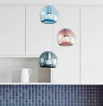
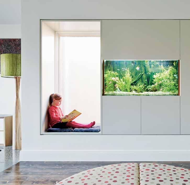 DeSiGN Mesh Design Projects BUiLDeR Form2
PhOtOGRAPheR Peter Clarke
issue #24 habitusliving.com
While the space required a basic open plan design, we didn’t want to create just a simple open box.
Open on either side, the SH05 ARIE is both storage and room divider. With no connections and seamless docking points, there are a multitude of combinations for the shelving, with two height variations, as well as elegant corner solutions possible. SH05 ARIE is available in solid waxed European Oak or white powdercoat finish.

e15.com / livingedge.com.au
Flexibility is key to good storage and this handy bag is both tote and backpack. From design brand Qwstion , the main compartment is shielded by a cover flap, but can be quickly accessed by a side zip. In 100% cotton canvas with vegetable-tanned leather trims, seatbelt nylon straps transform the way you carry the TOTE .

A hidden iPhone pocket and zip pocket complete the functionality.
qwstion.com / belance.com.au
Created from the inside out by Brazilian architect Isay Weinfeld, the DOMINO unit comprises a smart array of modules for all your office paraphernalia – from printer and binder to waste bin and even pencils. Elegantly finished in Walnut, Santos Palisander or Ebony, the exterior is beautifully detailed with mitred corners.

hermanmiller.com.au
A sculptural piece in solid Oak, the TILT LADDER is a multifunctional solution for a variety of spaces. Renowned for drawing inspiration from objects met in everyday life, Discipline designers SmithMatthias have re-imagined the humble ladder with additional accessories in a shelf, hook and tray. Not only can it hold items, but TILT LADDER also acts as a display unit and coat rack.

smithmatthias.com / discipline.eu / stylecraft.com.au
Described as ‘Nature in a bag’, BACSAC is a lightweight, flexible and user-friendly pot developed by a designer and two landscapers for your gardening goods, from flowers and plants to herbs. In 100% recyclable doublewalled geotextile this container combines the softness of a textile with a hardy nature that can withstand air, soil and water and their threats – frost and sun damage. Being permeable, it lets the soil breathe, the water pass through and limits evaporation, while also being tear- and traction-resistant.
bacsac.fr

# 187 3 . on location
Man’s (smaller) castle
embracing small spaces requires maximising functionality in clever ways. PhILIPPA DALy investigates how PLANNING and STORAGE are key to exploiting space, when every square metre counts.
If it’s not already there (some 80% of Singapore’s population live in apartments), the shift to apartment living is moving at a rapid pace. Estimates show that over the next decade more than half of all new Australian residences built in NSW alone will be apartments. With an ageing population wanting to live in smaller homes closer to amenities, and less interest from Generation Y in buying stand-alone homes, it seems that the ‘Great Australian Dream’ has taken a somewhat sidewards step.
Internationally, the concept of apartment living isn’t new, but it is only just beginning to reach fever pitch in Australia. With about two-thirds of Australia’s 22.8 million people living in the nation’s eight capitals, cities have historically expanded out, rather than up, to accommodate the growing population.

Today, however, over 13.6% of occupied dwellings are flats, meaning more than one million Australians are now sharing buildings with other residents. Compared to Singapore the ratio is relatively small; but whether motivated by soaring property and energy costs, smaller families or the desire to live more simply or closer to the urban centres, many Australian homeowners are abandoning the quarter acre block in favour of apartment living.
“As price points rise, apartments are getting smaller and smaller,” says Tim Campbell, Group Development Director of housing developer
Crown Group, “meaning modern apartment design is becoming even more challenging.” Luckily, the ‘feeling’ of space can be created –even if the physical space is modest – through design strategies such as connectivity, openness and flexibility.
What has emerged as a key consideration is no longer simply square footage, but how space is divided, where “efficient planning is key to using any apartment’s ‘full’ space,” as Campbell explains. The ubiquity of open plan apartment designs saturating the market is testament to the success of this solution. “You want to avoid long and deep apartments,” continues Campbell, “and reducing circulation space is also imperative.”
Architects and designers utilise particular design techniques to increase the feeling of space while packing more into less – appliance companies too have come to the party with dish-, freezer-, and fridge-draws that enclose modern amenities into ever smaller spaces. Also notable in the market is an increased implementation of extensive built-in joinery units, used to tie spaces together and dissolve traditional divisions of spaces and activities. “Clever joinery design can maximise storage while concealing services, or hiding a laundry,” says Campbell; a continual line of joinery can allow space to flow, while transitory spaces such as corridors can also provide effective and
efficient room for cupboards. “If everything has a place, clutter and mess can be minimised,” Campbell adds.
But key to any design is flexibility – a quality that transcends the numeric reality of small spaces and density. Many of Crown Group’s recent projects have responded to the market push for externally located storage, contained either within car park areas or even on balconies. “Within our Top Ryde City Living and Viva by Crown projects we have incorporated flexible areas of living. The way people use space within their home is evolving all the time, so it’s important for us as developers to respond to this shifting lifestyle,” adds Campbell.
We all live differently to the next person, but with our living spaces only continuing to reduce in area, it is clear that good storage is essential. “More space is a very Australian idea,” says Campbell, “but more storage is definitely worldwide. We all have belongings and we all want more storage than what we’ve probably got,” he continues. Allowing us to downsize and de-clutter, effective storage and design planning are valuable tools that can give the visual and sensory illusion that a space is larger than it actually is.
Crown group | crowngroup.com.au
above | ViVA BY cROWN , RYD e. issue #24 habitusliving.com
ONE TEAM DESIGNING BUILDING SUSTAINING
Landart Landscapes – one team delivering a holistic approach to the design, build and maintenance of creative and functional outdoor spaces. From pools, to outdoor kitchens and designer gardens, let Landart change the way you live.


LANDART.COM.AU Stay Connected
INFO@LANDART.COM.AU


issue #24 habitusliving.com Frankie & Swiss 48 frankieandswiss.com.au Fritz Hansen 172 fritzhansen.com Garden Life 41, 47 gardenlife.com.au Geberit 24 geberit.com.au Great Dane Contract 134, 136 greatdanecontract.com Grohe 161 grohe.com GWA Bathrooms & Kitchens 172 gwabathroomsandkitchens.com.au Gyprock 134 gyprock.com.au Häfele 126, 134 hafele.com.au Halcyon Lake Carpets 134 halcyonlake.com Hansgrohe 161 hansgrohe.com.au Hayden Youlley 47 haydenyoulley.com Henry Wilson 35, 37, 39 henrywilson.com.au Herman Miller 37, 181 hermanmiller.com.au Hettich 126 hettich.com.au Iittala 172, 173 iittala.com Ikea 150, 161 ikea.com InBed 48 inbedstore.com Industrial Expression 134 industrialexpression.com Internoitaliano 24 internoitaliano.com Interstudio 84 interstudio.com.au Jaquar 126 jaquar.com Jardan 134, 136, 176 jardan.com.au Jaylon Industries 172 jaylon.com.au Kettal 41 kettal.com Kezu 24, 27, 43 kezu.com.au Kingspan Insulation 172 kingspaninsulation.com.au Kohler 24 au.kohler.com Koskela 41, 43, 48 koskela.com.au KW Ceramics 25 kwceramics.com.au Laminex 172 laminex.com.au Lee Sanghyeok 25 leesanghyeok.com LifeSpaceJourney 134, 136 lifespacejourney.com Cassina 172 cassina.com Catalano 161 catalano.it Classic Ceramics 134 classicceramics.com.au Commune 161 thecommunelife.com Corian 178 casf.com.au Corporate Culture 41, 44, 48, 84, 110 corporateculture.com.au Country Road 37 countryroad.com.au Cullity’s Trade One 172 cullitystradeone.com.au De Dietrich 161 dedietrich.com.au Dedece 41 dedece.com Design Doorware 134 designerdoorware.com.au Designer Rugs 28 designerrugs.com.au Dessein 87–94 desseinfurniture.com Dinosaur De signs 32, 43, 44, 47 dinosaurdesigns.com.au Dornbracht 150 dornbracht.com Douglas & Bec 176 douglasandbec.co.nz Dulux 43, 134, 172, 178 dulux.com.au Duravit 150, 161 duravit.com.au Eco Outdoor 39 ecooutdoor.com.au Ecoflor 176 ecoflor.com.au EDL 178 edleuro.com Edra 178 edra.com Empirical Style 134 empiricalstyle.com E nglish Tapware Company 35 englishtapware.com.au FASA 150 fasa-works.com Fenton & Fenton 134 fentonandfenton.com.au Ferreol Babin 26 ferreolbabin.fr Fibrecraft 28 fibrecraft.com.au Fibreglass4Leisure 41 fibreglass4leisure.com.au Field Experiments 25 field-experiments.com Findahls 172 findahls.dk Flotsam / Jetsam 48 flotsamjetsam.com Foundry 84 foundry-store.com A2F Australia 35 a2faustralia.com.au Aero 134, 136 aerodesigns.com.au Airport Doors 134 airportdoors.com.au Alape 150 alape.com Alessi 172, 173 alessi.com Alphaville 41, 43, 44, 47, 48 alpha60.com.au Alvin T 150 alvin-t.com Angelucci 20 th Century 172, 173 angelucci.net.au Anibou 173 anibou.com.au Armadillo & Co 32 armadillo-co.com Aussie Table Tennis 43 aussietabletennis.com Australian Gypsum Industries 172 agiaus.com Bacsac 181 bacsac.fr Bang & Olufsen 44 bang-olufsen.com Bathe 134 bathe.net.au Bathmaster 134 (61 3) 9304 2716 Beacon Lighting 172 beaconlighting.com.au Bedouin Societe 134 bedouinsociete.com Belance 181 belance.com.au Bellstone 39 bellstone.com.au Benja Harney 41, 43, 44, 47, 48 paperform.wordpress.com Bisazza 178 bisazza.com Bludot 27, 47, 48 bludot.com.au BlueScope Steel 134, 172 bluescopesteel.com.au BoConcept 30, 44 boconcept.com Boral 39, 134, 172 boral.com.au Brandt 178 brandt.com.sg Branex Design 178 branexdesign.com By Henzel 28 byhenzel.com Café Culture + Insitu 25, 30, 134, 136 cafecultureinsitu.com.au Candana 35 candana.com.au Capas Furniture 32 capasfurniture.com Capral 134 capral.com.au directory
The T eam aT Habitus magazine T hank our adverT isers for T heir supporT use T he direcTory To see whaT page a specific adverT isemen T is on, and visiT T heir websiT e To learn abou T The producTs and services They provide.
Habitus magazine is available at newsagents and bookstores across Australasia, South-East Asia, the USA, Canada, Europe, South America and the Middle East. Habitus is published quarterly in March, June, September and December. To subscribe securely online visit habitusliving.com/magazine or email subscriptions@indesign.com.au to subscribe or request a full list of locations where Habitus magazine is available.
Pilkington 134 pilkington.com Pop & Scott 134 popandscott.com Qasair 134, 172 qasair.com.au Reece 35, 134 reece.com.au Resident NZ 26 resident.co.nz Rogerseller 134 rogerseller.com.au Rondo 134 rondo.com.au Rosemonts 43, 47 rosemonts.com.au Seventhirtyam 37 seventhirtyam.com Shilo 41, 43, 48 shilo.net.au Space Furniture 41 spacefurniture.com.au Spence & Lyda 32 spenceandlyda.com.au Stone Outdoors 39 stoneoutdoors.com.au Stormtech 30 stormtech.com.au Stylecraft 44, 84, 181 stylecraft.com.au Table & Chair 172, 173 tableandchaircompany.com.au Tait 28, 41, 84, 134, 136 madebytait.com.au Teka 150 teka.com The Brick Pit 39 thebrickpit.com.au Tin&Ed 37 tinanded.com.au Toss B 176 tossb.com Toto 150 totousa.com Tsar 43, 47, 48 tsar.com.au Viridian 134 viridianglass.com Vitra 178 vitra.com Vola 150 vola.com Whitewoods 161 whitewoodsliving.com Woodmark 84 woodmark.com.au Workshopped 27, 41 workshopped.com.au XTRA 161 xtra.com.sg Yamaha 150 yamaha.com Lightcraft 178 lightcraft.com.sg Lighting Electrical Distributors 134 lighting-electrical.com.au Little Dandelion 47, 48 littledandelion.com Living Edge 37, 43, 47, 181 livingedge.com.au Locker Group 134 locker.com.au Louis Poulsen 150 louispoulsen.com M.J. Bale 43, 44, 47 mjbale.com Magis 178 magisdesign.com Mary Noall 35, 134 marynoall.com.au Massimmo 161 massimmo.com Matthews Fan Company 161 matthewsfanco.com Mawa Design 172 mawa-design.de Metalmobil 178 metalmobil.it Meteor Shades 178 meteorshades.com Microsoft 44 microsoft.com Midland Brick 172 midlandbrick.com.au Miele 150 miele.com.au Moscan Building Materials 178 (65) 6481 2011 Muji 150 muji.eu Murray Thomas 41 murraythomas.com Nathan Rhodes Design 126 nathanrhodesdesign.com Nendo 26 nendo.jp Newtone Entertainment 47 newtoneentertainment.com.au Notemaker 37 notemaker.com.au Olio Objects 30 olioobjects.com Olsen Irwin 43 timolsengallery.com Ondene 44, 47, 48 ondene.com.au One Another 41 oneanother.com.au Original Ceramics 172 originalceramics.com.au Paloform 27 paloform.com Parisi 35 parisi.com.au PGH Bricks & Pavers 39 pghbricks.com.au Philips 126 philips.com.au
a bey 68 abey.com.au a nibou 9 anibou.com.au a rtbank 78 artbank.gov.au big a ss fans 111 bigassfans.com.au b o c oncept 49 boconcept.com.au binder 86 binderapp.com.au caesarstone 21 caesarstone.com.au caroma Tip i n caroma.com.au cass brothers 103 cassbrothers.com.au catapult d esign 94 catapultdesign.net.au cdk stone 76–77 cdkstone.com.au/neolith classicl ite 180 classiclite.com.au crown group 54–55 crowngroup.com.au c orporate c ulture 104–105 corporateculture.com.au d elsa 20 delsa.com.au d omayne 10–11 domayneonline.com.au english Tapware c ompany 56 englishtapware.com.au e verstone 137 everstone.com fanuli ifc–1 fanuli.com f isher& paykel 14–15 fisherpaykel.com.au f unkis 152 funkis.com gandia blasco 67 gandiablasco.com herman m iller 22 hermanmiller.com.au i nstyle 40 instyle.com.au kettal 33 kettal.com ke -zu 85 kezu.com.au l andart 189 landart.com.au l aufen 2–3 laufen.com l iving e dge 38 livingedge.com.au melbourne i ndesign 138 melbourneindesign.com.au m ini 29 mini.com.au multyflex 95 multyflex.com.au parisi 16 parisi.com.au poliform 34 poliform.com.au r adiant l ighting 151 radiantlighting.com.au royal oak f loors 127 royaloakfloors.com.au savage d esign 75 savagedesign.com.au s cavolini 31 scavolini.com s eeho su 112 seehosu.com.au silestone 4–5 silestone.com smeg obc smeg.com.au space f urniture ibc spacefurniture.com space l ighting 174 spacelighting.com.au stormtech 92 stormtech.com.au stylecraft 6 stylecraft.com.au sydney l iving museums 162 sydneylivingmuseums.com.au Tongue n groove 36 tonguengroove.com.au wet d esign 19 wetdesign.com.au z ip 12–13 zipindustries.com
your map to where the stories in this issue come from – and where is sold
issue #24 habitusliving.com
#163 Perth
#69 Cambodia
#50 t hailand #114 Khopoli
world
Architecture should speak of its time and place, but yearn for timelessness.
frank gehry
# page number and location of content locations is sold
#58 Melbourne
#139 Jakarta
#96 sri Lanka
Dr. Trevor Leong, Oncologist
Each room of our home is individual so we can retreat to find our own space. It is an oasis. One of our favourite pieces of furniture is the Bend sofa.
I know my daughter Sarah likes it because it’s bouncy but for me it’s unique. It’s functional and casual and reflects the way we live. spacefurniture.com/alifeindividual

A Life Individual
classic
THE SMEG CLASSIC • WHILE FASHIONS MAY COME AND GO, STYLE REMAINS ETERNAL


SMA14652
smeg.com.au


 Photogra Phy tim robinson. art direction & styling amanda talbot. styling assistance nikki davey. art direction assistance frances yeoland. h air & makeuP frankie PiPer.


 Tex T Michael Young | PhoTogra Ph Y lina sokchalina & breTT boardM an


 Tex T Linda Cheng| PhoTogra Phy ChrisTine FranCis


 Geoffrey Bawa | geoffreybawa.com


 Tex T Jagan Shah | PhoTogra Phy Seba STian Zachariah


 previous | THE BALUSTRADE AND STAIRCASE DESIGN ALLOWS POROSITY OF LIGHT AND VIEWS. opposite | FULL-LENGTH GLASS WINDOWS ENABLE CONTIN U OUS VIEWS FROM THE BABY’S ROOM DOWN INTO THE LIVING AREA. above | THE STUDY ROOM INTERNAL WINDOWS ECHO THAT OF THE BABY ROOM OPPOSITE AND ENCOURAGE MORE COMMUNICATION AMONG FAMILY MEMBERS.


 habitus x designer rugs promotion


 DeSiGN Mesh Design Projects BUiLDeR Form2
PhOtOGRAPheR Peter Clarke
