






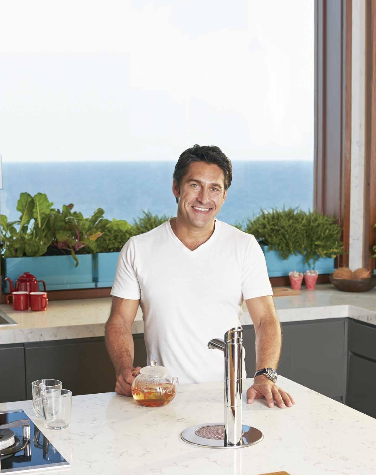
Boiling | Chilled | Sparkling | Filtered | Instantly When only the best is good enough for your family
The Zip HydroTap G4 saves time, energy
MICRON 0.2
Sparkling… on tap.
Only Zip HydroTap provides Sparkling plus Boiling and Chilled filtered drinking water on tap. The whole family will enjoy the instant convenience of filtered drinking water any way they prefer it. No more waiting for the kettle to boil. No need to buy, carry, chill and dispose of bottled water.

Tastier and healthier. Enjoy crystal-clear, great tasting filtered drinking water. The integrated new Zip 0.2 micron filtration system removes dirt and contaminants up to 25x better. Even the taste and odour of chlorine is removed, but fluoride is retained.
Environmentally friendly. Intelligent design coupled with new technology creates a low energy air-cooled ventilation system with superior performance and better environmental responsibility. The G4 is now even more energy efficient. Unlike water-cooled systems, the Zip HydroTap doesn’t waste water.
Reputation and reliability. Since its introduction over 10 years ago, Zip HydroTap has earned a reputation for unparalleled quality. The new G4 is so reliable that we’ve confidently extended our warranty to 5 years*. Supported by the largest national company-owned installation and service team in our industry, you will enjoy peace of mind when you choose Zip HydroTap G4.
All the best Zip HydroTap features combined with innovative new technology.
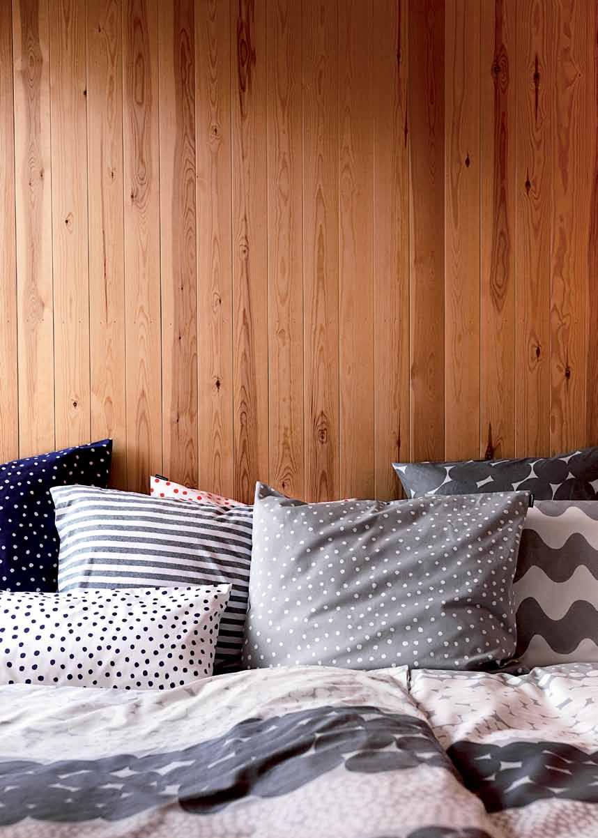
We explore that intangible world where there is more than a touch of nostalgia, hints of memory and reflection on things achieved.
26. DESIGN NEWS
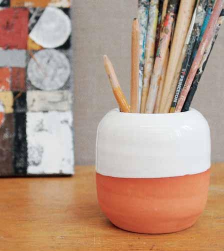
Products of timber, ceramic, textile, metal and stone offer an integrated tactile experience in the home.
34. RESHOOT
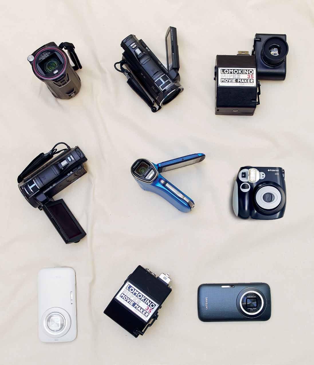
Inspired by ‘memory’, we look at devices to record them, mirrors that reflect them and fabrics for the outdoors, where many are made.
41. MEMORY
The senses and place play a crucial part in the creation and retrieval of memories through the stages of life
50. ART OF THE MONOGRAPH
Guy Allenby reviews four of the latest monographs and asks: promotional, self-serving or educational?
Some personal stories about those who make things, those who make it happen and those who make new lives for themselves – and of course where they live and work.
56. BRIAN PARKES
The current chapter in this story takes place at Adelaide’s Jam Factory and in a rural oasis south of the city. Leanne Amodeo meets a man who has helped change the face of Australian design.
69. IF I WERE A CARPENTER
Mark and William Hedley catch up with Vachira ‘Nott’ Tongrow, the man who trained in London and came home to celebrate the native timbers and furniture craft of Thailand.
79. SHANE THOMPSON
Twenty years ago he moved to a rural paradise near Brisbane. Paul McGillick profiles a man who took the next logical step – to leave a big architecture practice and start over again.
90. MULTI-RESIDENTIAL LIVING
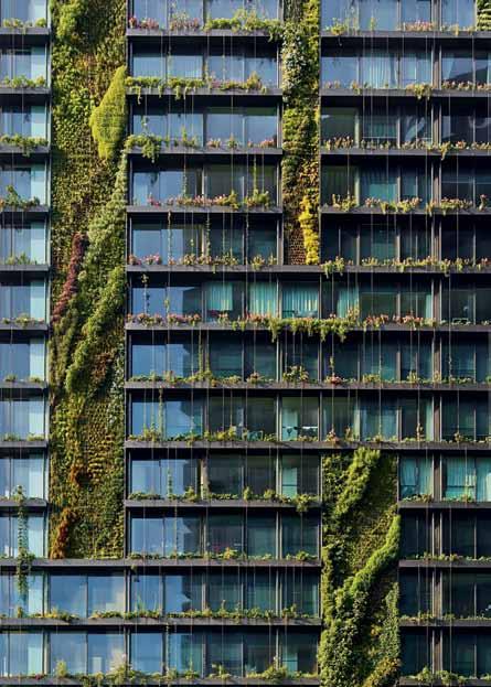
More people are moving into multiresidential developments. Guy Allenby looks at how apartment towers can become a home.
96. FAMILY BRAND: FABER-CASTELL
It is a family company that has been going for 250 years, famous for coloured pencils, but also diversifying into quality pens, even wine. Alice Blackwood asks how they have been able to re-invent themselves so many times over the years.
#152
We don’t usually do themes, but there could be one here – how to make the most of what you’ve got and turn a sow’s ear into a silk purse.
114. BLACKPOOL HOUSE
It is a difficult and constrained site on an island, but Andrea Stevens reveals how this one-bedroom retreat by Glamuzina Paterson Architects becomes a world unto itself.
129. 3X9 HOUSE
This house in Vietnam’s Ho Cho Minh City by a21 studio not only overcomes its humble 27-square-metre size, but, says Nga Hoang, also becomes a quiet green oasis in the middle of what is sometimes an urban nightmare.
140. PARK HOUSE
If you manage to score a riverside site, you want to make the most of it. Stephen Todd visits one on the banks of the Yarra in Melbourne by Leeton Pointon which does just that.
152. PALMYRA HOUSE
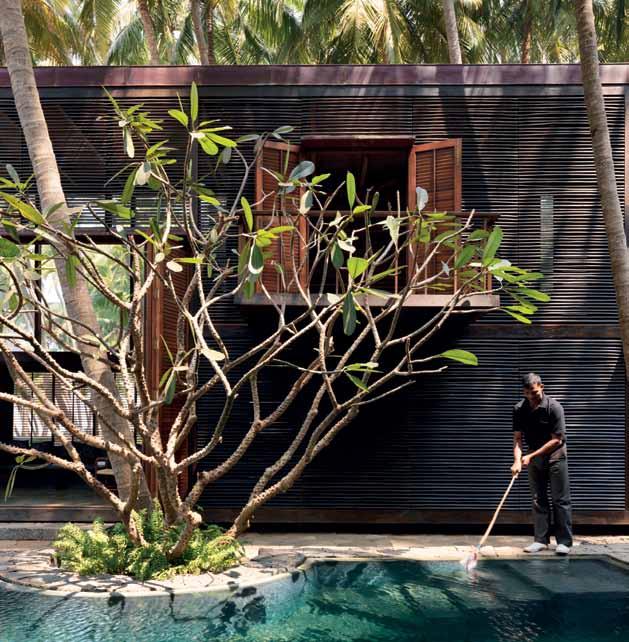
It is a tough journey to this house south of Mumbai in India by Studio Mumbai. But Kerstin Rose says it is all worth it to enjoy this simple but elegant home hidden amidst the palms.
167. CLAREMONT HOUSE APARTMENT
Once a chocolate distribution warehouse, it is now a family home. Nicky Lobo discovers how this innercity space was adapted to a new use by Tanner Kibble Denton Architects.

177. SPECIAL: FLOORING
If you are a devotee of the mindfulness movement you will know how important it is to be aware of how we touch the ground. We look at how quality flooring can make a difference.
#167



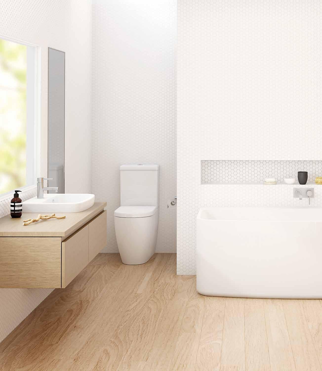

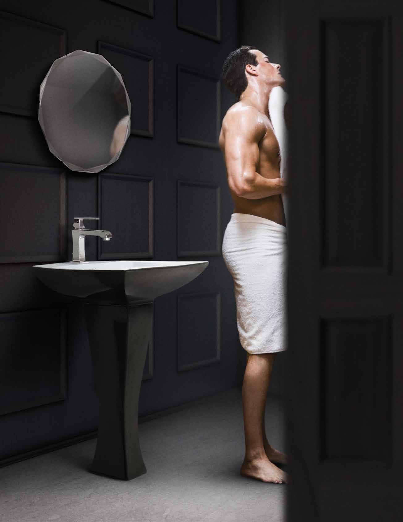
Australian bathroomware brand Caroma continues to inspire with the new Urbane collection. Designed with functionality and form in mind, Urbane combines contemporary Australian style with trusted Caroma quality.

Discover more at specify.caroma.com.au - a new website for industry professionals

It is one of the most important books ever written because it reveals how stories are – to use modern terminology – hard-wired into the human brain. They won’t admit it, but every Hollywood scriptwriter ultimately depends on Propp for their craft.
You don’t have to dig down very far into the sub-text to notice that Habitus is very much about story-telling. Sometimes, the story is directly personal, as when we profile creative people from around the Region. At other times it is more indirect as we look at how people’s homes tell their story – and provide the means for further story-telling as families grow and evolve in their homes.
We have quite a bit of both in this issue, but I am particularly pleased with our Portraits because each of the individuals has taken their own unique trajectory. In fact, each has a constantly evolving story almost to the point of discovering what they want to be as they go.

Vachira Tongrow in Bangkok represents a fascinating, almost underground, movement in the Region. In this global age of apparent universal conformity, there are more and more creative people exploring the applicability of traditional cultures to contemporary living, whether it be architecture, product design or the clothes we wear. In this respect, keep an eye open for Habitus #26 when we profile Kenneth Cobonpue, designer extraordinaire from the Philippines.
Brian Parkes in Adelaide has gradually discovered his role as a facilitator, while Shane Thompson in Brisbane has married a way of life with his re-birth as an architect. Meanwhile, in Germany, the legendary Faber-Castell, maker of those wonderful colour pencils, is a family company which is committed to permanent renewal and a clear set of values. Each of these people contribute to a local culture as well as to a regional culture and enrich our way of life.
I hope you enjoy this latest issue of Habitus.

PAUL MCGILLICK | EDITOR
In 1928, the Russian scholar, Vladimir Propp published Morphology of the Folk Tale, a study of how folk stories are structured.LEFT | EDITOR, PAUL MCGILLICK. RIGHT | DEPUTY EDITOR, NICKY LOBO.
Once a commercial lawyer, now a commercial photographer, Justin didn’t so much as ‘fall in love’ with photography, but found it to be “the right fit”. With a home in Paddington – yet to accommodate the dog he’s been threatening to get – Justin is close to the ocean, harbour, city and public spaces he loves. As well enjoying the urban lifestyle, Justin is a traveller by heart – though not as keen on air travel, saying “In the case of flying, whoever said ‘it’s the journey that matters and not the destination’ got it completely wrong!”
GUY ALLENBY

MULTI-RESIDENTIAL LIVING #90
Residing in the bohemian burrow of Sydney’s Glebe with his wife and two sons, Guy Allenby has been a writer all his working life. Recently, Guy has been enjoying watching the One Central Park project “rise out of the ground”. His story on apartment developments gave him “a perfect excuse to get inside and have a look around.”
LEANNE AMODEO

BRIAN PARKES #56
Leanne is a freelance writer, editor and media consultant who writes on design, architecture and visual art for a number of Australian and international publications. Former editor of Monument and (inside) magazines, she has always wanted to be a writer and is inspired by people she meets and places she visits. As well as spending time with friends and family, Leanne is happy when a lazy Sunday morning rolls around, or when Hay launches a new collection.
SAM HARTNETT BLACKPOOL HOUSE #114
If he wasn’t behind a camera, Sam would “just stare at the wall” – or so he says. For someone inspired by so much – James Turrell’s Roden crater, Donald Judd’s apartment in NY, the black and white photographs of Bill Culbert, falling water, Hiroshi Sugimoto’s Colours of Shadow, Jeffs Koons’ Equilibrium, and his family – among much more, it seems unlikely Sam would last long without doing something creative. From his ‘rumpty’ apartment above a shop in Grey Lynn, where he lives with his wife Beth, son Wilson, and “in about a week a new addition of a baby girl, Hazel”, the Auckland-based photographer specialises in the creative areas of art gallery and architectural documentation.


MARK HEDLEY


IF I WERE A CARPENTER #69
Mark was drawn to art and design from a young age – “when I became aware that I could realise with my own hands the ideas I had for a variety of useful ‘design ’ projects”. Living between Thailand and Australia, his work explores “the relationship between ‘exotic ’, imported timbers, and ‘indigenous ’, exported timbers”. A subject he ’s long been hooked on, the travel he does around Thailand, Laos and Vietnam, he says, constantly reaffirms “that initial remarkable experience in Istanbul – where the East meets the West and that meeting expressed in art, culture, design and architecture”.
NGA HOANG

3X9 HOUSE #129
Nga was “bitten by the storytelling bug at an early age”. Born in Hanoi and currently living in the central Old Quarter in the Vietnamese capital, Nga’s knack and love for story reaches back to the exotic tales her tailor-grandfather used to tell her. Now it ’s the city she lives in with its rich history, energy and vibrancy that inspires her on a daily basis. Nga has had her work published in numerous international titles including International Traveller, BBC Good Food, Cuisine and Voyeur.
JAMES KNOWLER
BRIAN PARKES #56
James Knowler is a freelance photographer who lives in Kensington, Adelaide, with his girlfriend and dog, Sir Watson. While a lover of all art, it was his high school teacher who gave him a camera that started him on a photographic career path. “I love art but can’t paint or draw,” he says, so “the camera was perfect!” It is the contemporary use of texture, functional lifestyle spaces and references to an owner’s personality that really interest James, so it’s no wonder he specialises in interior photography. And, if it’s not an interior space he’s exploring, it’s place full stop. Any kind of travel makes him happy, “just as long as I see new things”.
KERSTIN ROSE

PALMYRA HOUSE #152
With a home base in Germany, where she was born, Kerstin lives with her partner and daughter, but frequently travels the world with a team of photographers as a journalist and producer. After doing a series about people such as monks, punks, fishermen and circus workers in their private places/homes Kerstin knew she was interested in how people live, coming to find the design and interior scene most compelling. For Kerstin, it’s the living, breathing people, nature and objects that inspire her, but also the “things which one time had a use and are now useless” – the “lost places, abandoned houses, ruins and former industrial architecture”.
TOBY SCOTT


SHANE THOMPSON #79
With two shaggy dogs, Murray and Elvis, Toby lives in Clayfield, Brisbane. When he starting focusing purely on the things he wanted to shoot, Toby was hooked on photography and has come to make interiors, architecture and lifestyle his specialties. His work has appeared in Monocle, Houses, Real Living and Est Magazine. But that’s just the beginning; Toby looks forward to a “long and rewarding career”.
STEPHEN TODD
PARK HOUSE #140
Right now, Stephen is inspired by poet laureate Seamus Heaney reading his own translation of Beowulf. Each week, he looks forward to the New Yorker, and it was in grade three when he became Library Monitor that drew Stephen to a journalistic career. Living between Sydney and Melbourne, with his American Staffordshire terrier, Hector, Stephen contributes essays on art, architecture and fashion to a number of publications. His work has appeared in titles such as The New York Times, The Guardian, Le Monde , Blueprint and Vogue USA
CORRECTION:
In Habitus #24 we neglected to credit stylist Julia Green of Greenhouse Interiors for her wonderful work on ODR’s Hunter Street project. We apologise for this oversight.
See more of Julia’s work at greenhouseinteriors.com.au
3D VISUALISER
ACCOUNT MANAGER
ADMINISTRATION
AGENT/DISTRIBUTOR
FIND
BLOGGER
BUSINESS DEVELOPMENT
CAD DESIGNER
CAMPAIGN MANAGEMENT
CUSTOMER SERVICE
DESIGN MANAGER
DESIGNERS
EDITOR
EVENTS CO-ORDINATOR
GRAPHIC DESIGNER
INDUSTRIAL DESIGNER
INTERIOR DESIGNER
LECTURER
LIGHTING SALES
PERFECT
MEDIA ExECUTIVE
NATIONAL SALES MANAGER
OPERATIONS MANAGER
PA / SALES SUPPORT
PHP DEVELOPER
PR ACCOUNT MANAGER
PRODUCTION MANAGER
PROJECT MANAGER
SPECIFICATION
RETAIL INTERIOR DESIGNER
SALES
SHOwROOM MANAGER
SHOwROOM SALES CONSULTANT
STATE MANAGER
STUDIO LEADER
TECHNICAL OFFICER
wAYFINDING DESIGNER
wEB DESIGNER / DEVELOPER
ARCHITECTURE
DESIGN
INTERIORS
MEDIA
AGENCY
ADVERTISING
RETAIL COMMERCIAL
FURNITURE
LIGHTING
TEx TILES
YOUR RESIDENTIAL ARCHITECTURE
DESIGN
INTERIORS
MEDIA
AGENCY
PUBLISHING
RETAIL COMMERCIAL
FURNITURE
LIGHTING
TEx TILES
PRODUCT
RESIDENTIAL
JOB
EDITORIAL DIRECTOR
Paul McGillick habitus@indesign.com.au
DEPUTY EDITOR –PRINT & ONLINE
Nicky Lobo nicky@indesign.com.au
EDITORIAL ASSISTANTS –PRINT & ONLINE
Tess Ritchie tess@indesign.com.au
Anna Guerrero anna@indesign.com.au
ORIGINAL DESIGN TEMPLATE one8one7.com
SENIOR DESIGNER
Alex Buccheri alex@indesign.com.au
JUNIOR DESIGNER
James McLaughlin james@indesign.com.au
JUNIOR DESIGNER & ADVERTISING TRAFFIC Kelsie Barley kelsie@indesign.com.au
CONTRIBUTING DESIGNER
Emma Duval
CONTRIBUTING WRITERS
Guy Allenby, Leanne Amodeo, Alice Blackwood, Mark Hedley, William Hedley, Nga Hoang, Kerstin Rose, Andrea Stevens, Stephen Todd
CONTRIBUTING
PHOTOGRAPHERS
Justin Alexander, Peter Bennetts, Simon Devitt , Christopher Frederick Jones, Sam Hartnett, Mark Hedley, James Knowler, Hiroyuki Oki, Tim Robinson, Lachlan Rowe, Christian Schaulin, Derek Swalwell,Toby Scott
CONTRIBUTING STYLIST
Amanda Talbot
CONTRIBUTING ILLUSTRATOR Herds of Birds
CEO / PUBLISHER
Raj Nandan raj@indesign.com.au
PA TO PUBLISHER
Elizabeth Davy-Hou liz@indesign.com.au
OPERATIONS DIRECTOR
Adele Troeger adele@indesign.com.au
PRODUCTION MANAGER
Sophie Mead sophie@indesign.com.au
FINANCIAL DIRECTOR
Kavita Lala kavita@indesign.com.au
ACCOUNTS
Gabrielle Regan gabrielle@indesign.com.au
Vivia Felice vivia@indesign.com.au
ONLINE COMMUNICATIONS
Radu Enache radu@indesign.com.au
Ramith Verdheneni ramith@indesign.com.au
Ryan Sumners ryan@indesign.com.au
EVENTS & MARKETING
Tegan Schwarz tegan@indesign.com.au
Angela Boustred angie@indesign.com.au
Aniqa Mannan aniqa@indesign.com.au
SALES DIRECTOR
Marie Jakubowicz marie@indesign.com.au
(61) 431 226 077
BUSINESS DEVELOPMENT MANAGER
Colleen Black colleen@indesign.com.au
(61) 422 169 218
COVER IMAGE
Memory shoot (p.41)
Concept & styling by Amanda Talbot
Photography by Tim Robinson
HEAD OFFICE Level 1, 50 Marshall Street, Surry Hills NSW 2010 (61 2) 9368 0150 | (61 2) 9368 0289 (fax) | indesign.com.au
MELBOURNE Suite 11, Level 1, 95 Victoria Street, Fitzroy VIC 3065 | (61) 402 955 538
SINGAPORE
4 Leng Kee Road, #06–08 SIS Building, Singapore 159088 (65) 6475 5228 | (65) 6475 5238 (fax) | indesignlive.sg
HONG KONG
Unit 12, 21st Floor, Wayson Commercial Building, 28 Connaught Road West, Sheung Wan, Hong Kong | indesignlive.hk
PRODUCT
and the United States of America. This issue of Habitus magazine may contain offers or surveys which may require you to provide information about yourself. If you provide such information to us we may use the information to provide you with products or services we have. We may also provide this information to parties who provide the products or services on our behalf (such as fulfilment organisations). We do not sell your information to third parties under any circumstances, however, these parties may retain the information we provide for future activities of their own, including direct marketing. We may retain your information and use it to inform you of other promotions and publications from time to time. If you would like to know what information Indesign Media Asia Pacific holds about you please contact Nilesh Nandan (61 2) 9368 0150, (61 2) 9368 0289 (fax), info@indesign.com.au. Habitus magazine is published under licence by Indesign Media Asia Pacific. ISSN 1836-0556
DISCOVER MILAN 2014

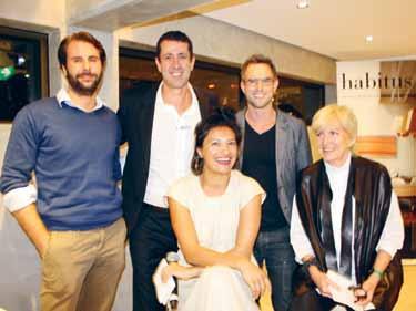
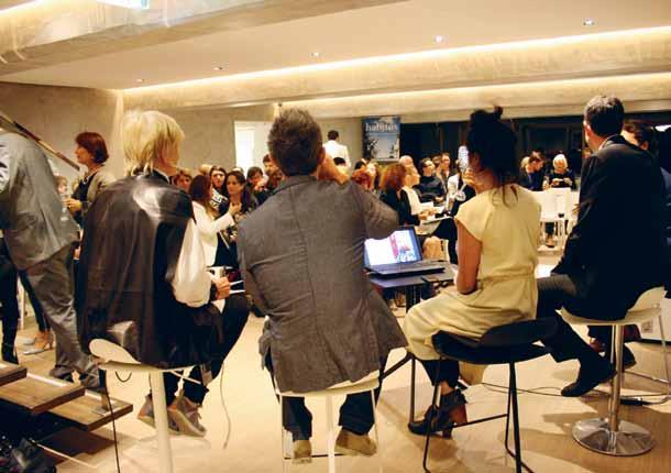
Habitus Deputy Editor Nicky Lobo hosted a panel discussion exploring the themes in colour, form and texture from this year’s Salone del Mobile Internazionale del Milano. Award-winning interior designer Meryl Hare, industrial designer David Knott and Indesign’s Lorenzo Logi shared their experiences, along with Sandro Fanuli of Fanuli Furniture, where the event took place.
See images from the event at habitusliving.com/issue 25/fanuli
AT THE ENGLISH TAPWARE COMPANY
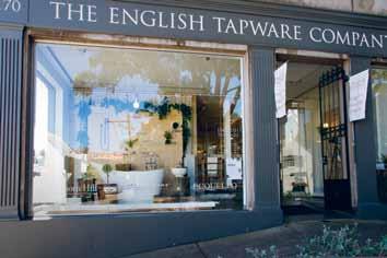
Habitus was selected by the premium tapware specialist to display their range in a creative way and to put the Habitus spin on the presentation. The creative team put forward the Habitus Botanical Museum of English Tapware.

Turn to page 98-99 for more and see the installation live at habitusliving.com/issue25/etc


The first Australian review of the kitchen and bathroom elements of the Milan fair took place in Cosentino’s Alexandria showroom. Guests were treated to an Italian-inspired evening, with discussion of design directions for finishes, cabinetry and appliances for these crucial areas of the home.
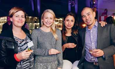

See images from the event at habitusliving.com/issue25/cosentino

A community of Design Hunters joined us for conversation, discussion and debate on colour, texture, form, and more.

MOORMAN KLOPSTOCK , designed by Daniel Kern, is a table of multiple personalities – 12 in fact. With a sophisticated click and snap system, the natural Ash legs can be positioned into 12 styles, both symmetrical and nonsymmetrical, depending on your mood. Unlike the standard table, this one will bend and change to suit any situation, a change in taste, in size of family, or in the height and number of your chairs. Plus, with a choice between white or anthracite melamine, black Ash or white Fir for the top, as well as two base heights, KLOPSTOCK is especially accommodating to the individual.

moormann.de / smow.com.au
Developed in conjunction with How We Create, Marz Designs ’ BRIGHT BEADS pendant lights tell the designer/manufacturer tale. On launching at Sydney Indesign last year, the turned beads of FSC certified American Oak and Walnut, Smoked Ash and Rock Maple were made on site to show the exact process that lies behind each beautifully handcrafted light.
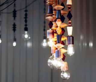
marzdesigns.com
This textured pouf and footrest call out to be fallen into and onto. The curvaceous forms of the inviting SLUMBER range by Aleksandra Gaca are made in a three-dimensional elastic fabric which take on the form of your body when you sit on them, and spring back to their original shape once you’ve had enough. Available in 12 soft, natural colours of luscious kid mohair, SLUMBER is the stuff of design dreams.

casalis.be
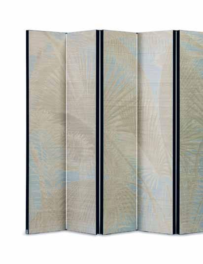
The EXCEPTION decorative screen is true to the Armani/Casa project, contemporary yet traditional. It features their Exclusive Wallcoverings Collection, presented in collaboration with Jannelli&Volpi.
jannellievolpi.it / armanicasa.com
At the heart of the COLOUR light is minimalism, theatricality and architecture. The piece, which is part of the e15 lighting collection introduced at Salone del Mobile this year, steps outside convention and strips design back to basic forms: two panes of coloured glass – in pink and blue – and a circular white diffuser. The Norwegian designers behind COLOUR , Daniel Rybakken and Andreas Engesvik , have created a light that blurs the line between lighting and sculpture. Simple in form, and needing only a wall to lean on, the moon-like luminaire also crosses into the realm of play, inviting us to make various compositions and in turn, cast different patterns and shapes of light and shadow – much like the changing light of the natural Nordic sceneries it is inspired by.
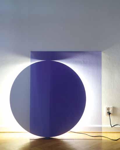
andreasengesvik.no / danielrybakken.com / e15.com / livingedge.com.au
The TAFFETA CHAIR by Indonesian designer Alvin Tjitrowirjo is inspired by the traditional crafts of his homeland, adding the archipelago’s cultural stories to the Dutch brand’s collection. The range, which also includes a sofa, is light and bright, but don’t let that fool you – the concept behind the collection incorporates a much deeper story. The designs, using a woven coloured rattan construction, interpret the decorated sacred places that house important celebratory occasions in Indonesia. Doing so, Tjitrowirjo brings “objects of veneration into the space we honour the most with our presence and traditions: our home,” through design. The oversized scale, floral textiles and pastel colours of TAFFETA add the element of playfulness that moooi is known for.
alvin-t.com / moooi.com / spacefurniture.com.au

LOOM TOWELS really are hand loomed. The Melbourne-based company is driven by a belief in “quality over quantity and design over trend,” and their practise is proof; not made in factories with the associated waste and pollution, rather, each towel is individually loomed by two small communities in Turkey and the mathematical process takes days (around eight for a large one). With each towel part of a limited series, using 100% GOTS certified organic cotton coloured with botanic and vegetable dyes, the design is always evolving – focusing on functionality, durability, sustainability and aesthetics – rather than the latest trend.
loomtowels.com

Invited to interpret PAPERWEIGHT, paper artists Bianca Chang and Benja Harney have each created a shade, collaborating with fellow-Sydney-based designer Henry Wilson Chang ’s delicate-looking design (pictured) with neat folds and mathematic precision, is quite different from Harney ’s – as they should be – but both have the same alluring quality that comes from the contrast between precious and everyday materials. Bronze and paper never looked so good – one texture informing the other.
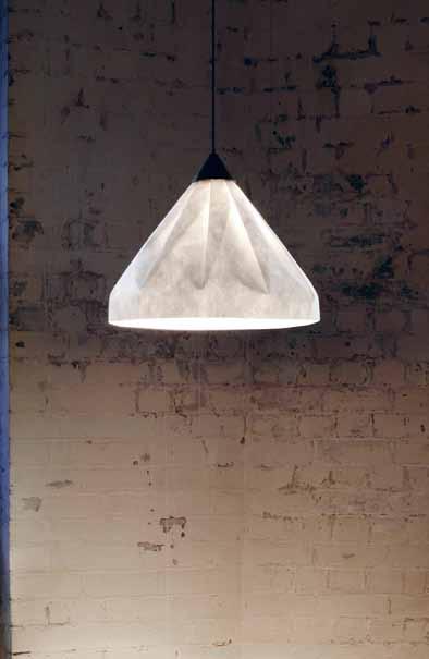
biancachang.com / paperform.wordpress.com / henrywilson.com.au/
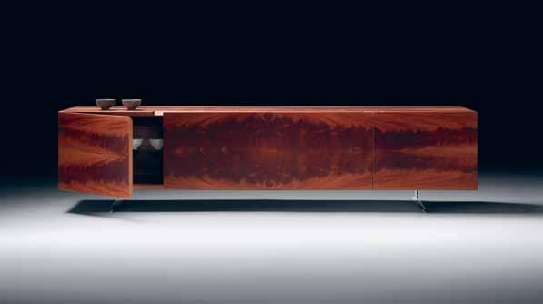
In true Flexform style, the PIUMA range celebrates local manufacturing and keeps to simple, pure designs. Featuring a series of cabinets in three different heights, (shown is the low credenza version), the range which launched at Salone Internazionale del Mobile in Milan earlier this year, brings back Mahogany in all its glory. The simple form with flush surfaces and only a simple cut for the cabinet door, lends itself perfectly to the strong grain and rich red colour of the timber – which in the particular cabinet seen here, creates a marble-like effect. In his careful design, Antonio Citterio has really let the exquisite wood speak for itself, selecting glass for the internal shelves and aluminium for the feet of the piece, so as not to detract from the feature Mahogany finish.
antoniocitterioandpartners.it / flexform.it / fanuli.com.au
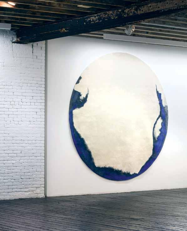
Tai Ping ’s latest collection, CHROMA , is inspired by painting techniques and “gestural sponteneity”. The 15-piece collection of rugs and carpets, all handmade, could easily pass as art themselves. CRITERION I is no different, with a deep inky blue being the star of the design. Mimicking the process of dipping paper into saturated colour, the rich colour – thanks to the matte wool and flax-blended fibres it’s soaked into – looks as if it would stain to the touch.
taipingcarpets.com
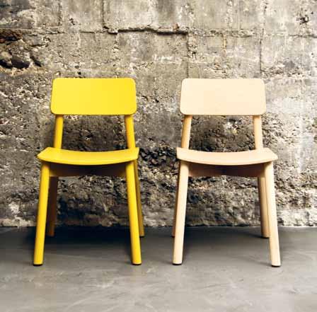
Family-run Studio Segers takes a rational approach to design. The MINE CHAIR , part of the MINE COLLECTION designed for Z-Creation s by De Zetel, Belgium furniture makers since 1924, is a great example. Made from European Oak, the chair weaves together their commitment to ergonomics, functionality, construction, sustainability and design. Now available through Meizai.
studiosegers.be / dezetel.be / meizai.com.au
“Dedicated explorer of form and function”, Lars Beller Fjetland has made a table that nods to ancient times but goes much further than aesthetic. The MAYA table, designed for Discipline , is made of two elementary materials – wood and stone – and uses one of the oldest of joinery techniques. The table comes in a choice of pietra serena and travertino navona for its top, both which complement its natural Bay Oak frame. MAYA is simple, sturdy and naturally tactile; basic in the most beautiful way.

beller.no / discipline.eu / stylecraft.com.au
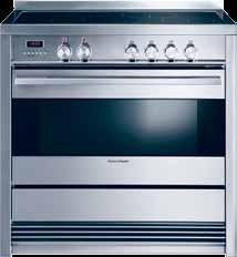
Freestanding cookers have the special quality of creating a homely feel. Fisher and Paykel’s new 90cm FREESTANDING COOKER models do just that – and with all the extra functions of fan bake, defrost and rotisserie, and the choice of gas or induction, even Pyrolytic cleaning. This is one flexible oven.
fisherpaykel.com
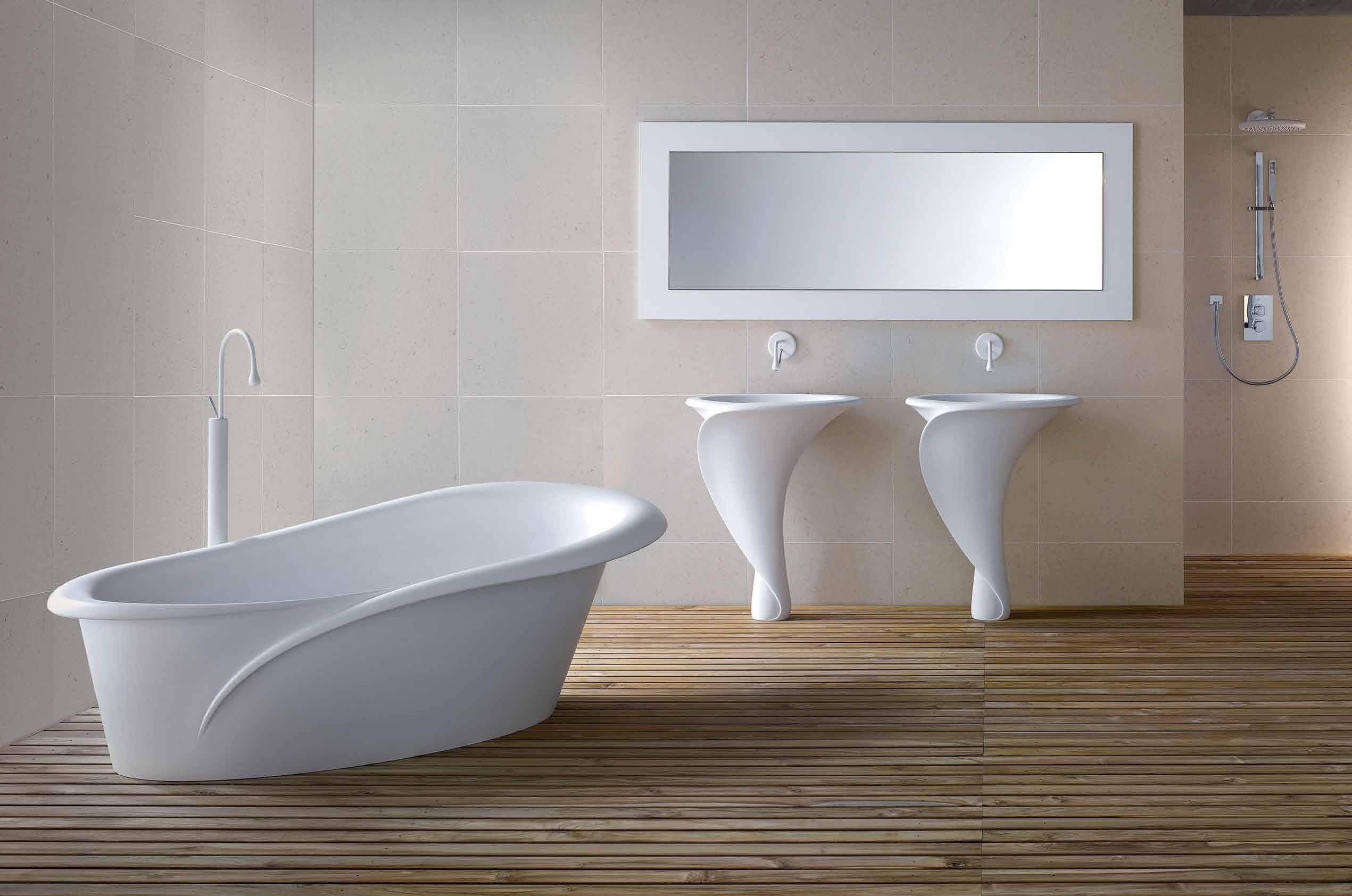
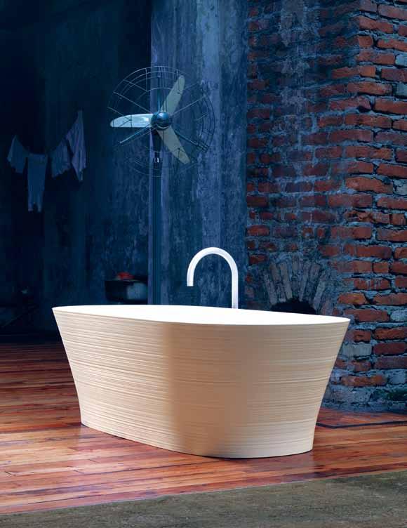
The delicacy of Falper ’s HANDMADE collection is almost unfathomable. Their feminine forms and the dainty finish is made possible through a careful blending of tradition and 3D technoogy. Designed by Michael Schmidt , the collection of bathtubs, basins and shelves – both freestanding and wallmounted – are made through a process where matte Ceramilux is used as a ceramic, and handcrafted using a lathe. The freestanding bath, pictured here, shows the unique and pretty texture, an effect similar to that of natural stone, left by this method. Who knew something so magical could happen in a lab...
falper.it / rogerseller.com.au
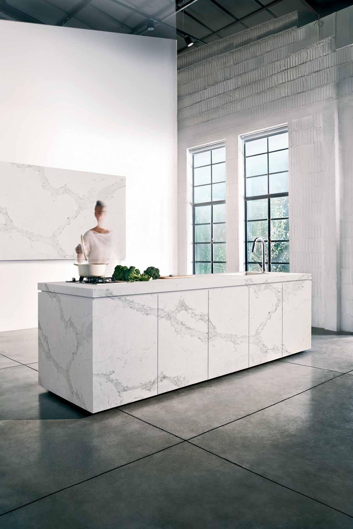
SLEEK CONCRETE knows balance; it has the look and feel of fine concrete but the durability of quartz. Modern and industrial, soft to the touch and easy to maintain, Ceasarstone ’s new product ticks many boxes and, in turn, is highly relevant to the most hardworking residential spaces.
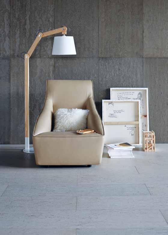

caesarstone.com.au
Mixing the ancient traditions and craft of hand embroidery with today’s cuts and fabrics is central to Megan Park ’s designs – as it is in her HOME 2014 collection. As well as the signature use of embroidery, print and mismatched patchwork, the range has a strong Tuscan influence – you can see the rich colours and textures of the Italian landscape in the cushion below.
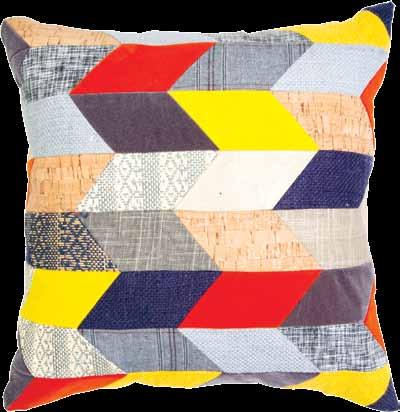
meganpark.com.au
It’s the irregularities and character of polished concrete that makes it so attractive, and it is this aesthetic feature that Royal Oak Floors ’ new CONCREATE range pays homage to. The wall, ceiling and flooring panel system is finished to a standard that replicates the organic look of real concrete, with the added bonus of coming pre-finished, oiled, polished and ready for installation. As well as being strong, soft, with excellent in-built acoustic and thermal properties, they’re environmentally sound.
royaloakfloors.com.au
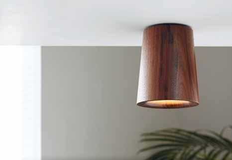
Terence Woodgate ’s new eponymous lighting company launches with SOLID, a collection of pendants and downlights in pure geometric forms and made from natural materials. Solid carrara and nero marquina marble, Oak and Walnut – seen here – are some of the materials used in the range, all which benefit from the lights’ pared-down design. But it’s not only an effective form that Woodgate has created – the design of SOLID has been developed closely with LED specialists Megaman, so that it produces little heat and low glare, with high performance and longevity. “I have always been considered obsessive in the way I design,” says Woodgate. “Now I have the opportunity to influence every single aspect of the final product. It is fueled by a desire to make the whole experience more pertinent and beautiful.”
terencewoodgate.com
Confronted by solid hard Maple as a starting point, Mathias Hahn made RUNCIBLE: a family of wooden kitchen utensils. The hardwood, traditionally used for this kind of product, informed the kitchen range and inspired a focus on their origins. RUNCIBLE is then based on the most essential utensials and the ones with the most versatility. Taking that idea further, the designs are simplified even moreso, calling on the one who uses them for interpretation. “Even though each single piece represents a familiar archetype, these are not limited to one specific task,” he says. “They are rather blanks that stand for a type of application but allow for individual use.”
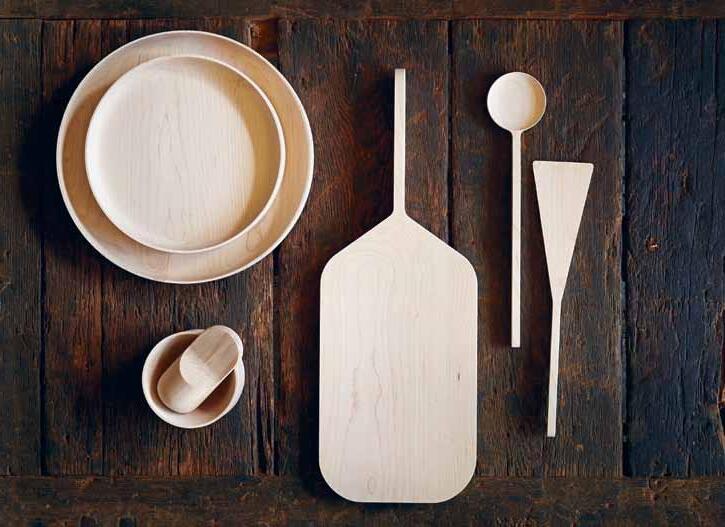
mathiashahn.com
With a factory founded in 1951 by two brothers Uno and Östen Kristiansson, there is over 60 years of experience and tradition at Rubn Lighting . The MILLER FLOOR LAMP, by Nicolas Hoflin , the designer and maker behind the brand , is made with the same care –rigorous attention to detail, functionality and aesthetics, and each tiny piece manufactured by hand. Part of the wider MILLER range of floor and table lamps, the tall and sophisticated lamp comes in four finishes, various combinations of matte black, white and brass. While definitely rooted in traditional Danish and Swedish design, the sleek lamp will slot into a contemporary space easily.
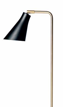
rubn.se / fredishere.com.au
ROXI KINKY, RESI and RUDI are part of range that are “not merely furniture for dogs but rather a living space for these four-legged urban dwellers”. The sweet little nooks, by rosi + rufus, certainly bring designer living to the inner-city canine. High-quality, sustainable materials, local production and the highest standard of design is just some of what make these dog spaces on par with larger, human-specific furniture.
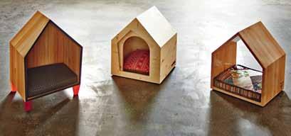
Made with a tessellated combination of moulded recycled paper and ceramic parts, WALLPAPERING is a three-dimensional wall covering. Dear Human, the masterminds who created this sculpture-like product, look at interior space as a whole and use the entire wall as a canvas –encouraging us to seek out the forgotten corners and ‘nothing’ areas usually skimmed over. Interestingly, the paper ‘tiles’ are made using a method similar to ceramic industrial processes: the paper material is pressed into moulds, which after releasing air pressure, produce the compressed tiles –hard as a board – which are then decorated.

dearhuman.ca
rosirufus.de / suzzuu.com
Oliver Maclatchy loves timber. During a common tinkering session one night he made a wooden spout – after searching with no luck for one that day. It was then he decided to create Wood Melbourne and launch a range of reclaimed timber spouts. ISLA WOOD SPOUT, and sister KIRI , are the first of their kind in Australia, and each go through a 12-step process, by hand, in Oliver’s workshop, making every one unique, and of the highest quality.
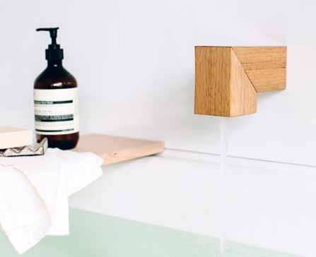
woodmelbourne.com
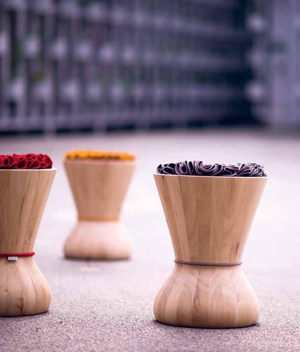
Rather than a stool that passes as art, SWITHY is first a sculpture, second a side table or stool. Either way round you look at it though, this sinuous object, designed by TS Studio, is a treat for the eyes. Its incredibly smooth finish, body-like bends and rich colour of the burel – a traditional Portuguese fabric made from wool – makes it appealing both as art and furniture. Using Hornbeam wood to balance the textile, each one is handmade, and so, always a little different to the next. Adding to the sense of human form in these sculptures/stools, is the perfect imperfection you get from “the human hand that worked it and of Nature by the variations of the wood which composes it”.
twosix.pt
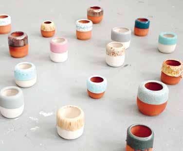
If your desk is lacking the texture, warmth or feeling of an art studio, PEN is for you. These hand-thrown holders, designed by Anders Arhoj & Louise Gaarmann, come in a huge range of glossy, fun, texture-laden glazes, making them perfect for giving your office some character. With each one unique to itself, there’s the especially fun part of choosing one or two – or maybe an entire collection...
arhoj.com
kish.ph / globewest.com.au
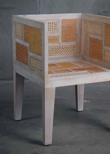
The BASILISA CHAIR , like all Ito Kish pieces, tells a story. The kiln-dried Mahogany and rattan chair is delicate and modern, using an intricate weave called solihiya, from the Philippine archipelago, along with elements of contemporary design.




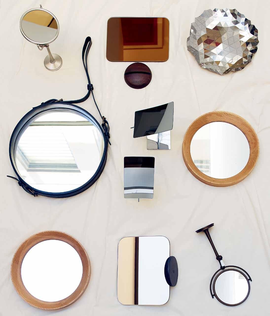
Objects of reflection | Top row left to right: Perrin & Rowe freestanding vanity mirror in English Bronze, $839, The English Tapware Company; Gridy Me mirror in Oak with copper tone on one side, $199.95, Candana; Exhibeo tableware designed by Michael O’Donovan and Keith Orchard in polished stainless steel, $296, Workshopped. Middle row left to right: GUBI Adnet mirror with leather strap designed by Jacques Adnet, from $1,190, Cult; Milli rectangle freestanding mirrors, $80 each, Reece; round veladrome mirror designed by Sean Dix in American White Oak, $275, Obodo. Bottom row left to right: round veladrome mirror, as before; Gridy Me mirror, as before; Perrin & Rowe freestanding vanity mirror in Pewter, $742, The English Tapware Company.




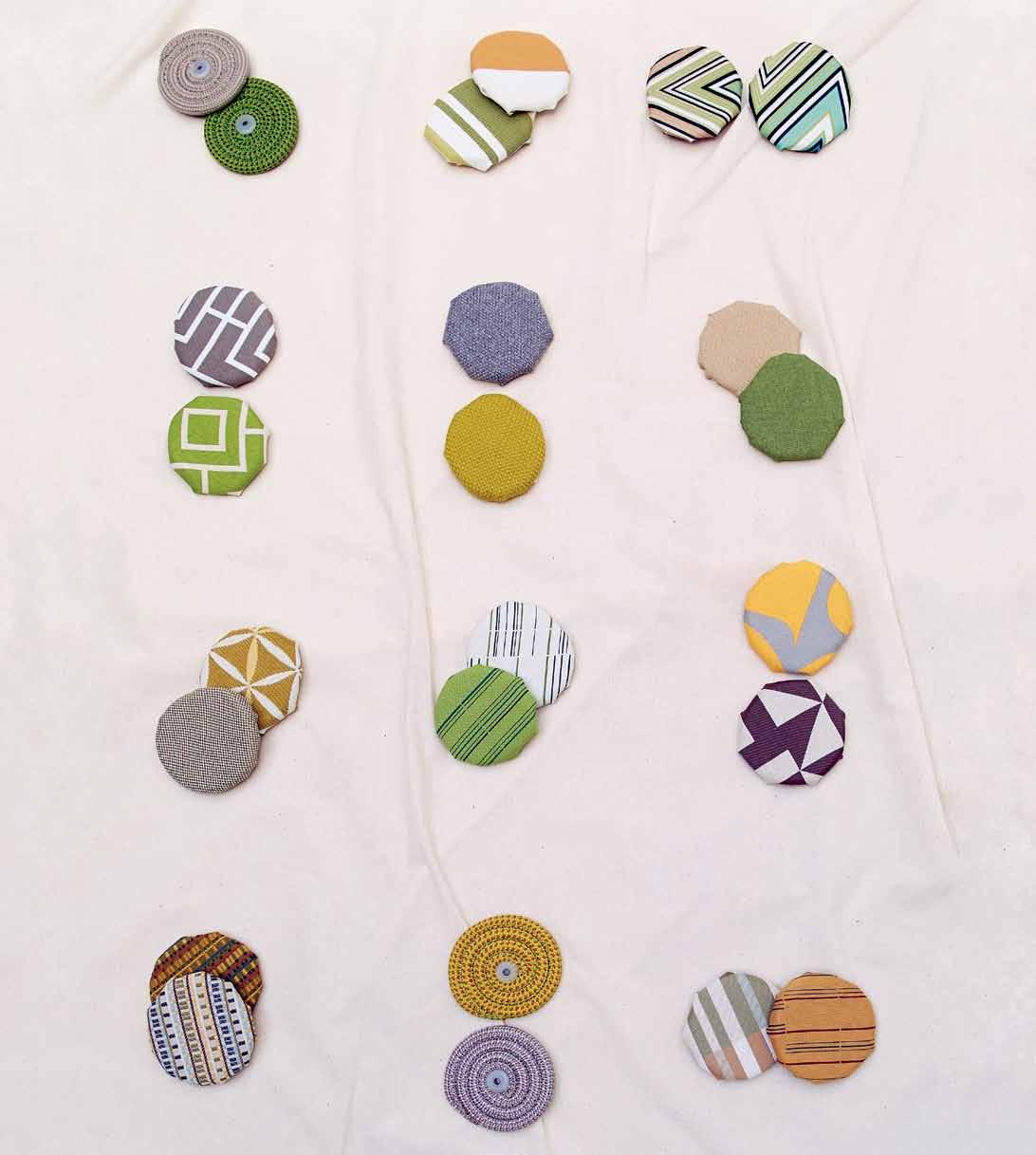
Outdoor dreaming | Top row left to right: T136 (left) and T2813 (right) rope cord colour samples for Paola Lenti collection, Dedece; Perennials Boathouse Stripe in Herb Garden (left), $275/m, and Perrenials Big Stripe in Sunny (right), $255/m, South Pacific Fabrics; Missoni Kew, $293/m, Spence & Lyda. Second row left to right: Bondi Stone (above) and Bondi Lime (below), both $46/m + GST, Warwick Fabrics; Kvadrat Jumper 1 (above) and Jumper 2 (below), both from $212.30/lineal metre, Kvadrat Maharam; Buzz vinyl in Timer (above) and About (below), both POA, Instyle. Third row left to right: Mokum Maroc Outdoor Frangipani in Chartreuse (above) and Zellij in Chartreuse (below), POA, James Dunlop Textiles; Maharam Octave in Crisp (above) and Spry (below), both from $210/lineal metre, Kvadrat Maharam; Maharam Mister in Enliven (top), from $210/lineal metre, and Regatta in Drift (below), $215.60/lineal metre, Kvadrat Maharam. Bottom row left to right: Maharam Sequence in Rattan (top) and Driftwood (below), both $181.50/lineal metre, Kvadrat Maharam; T0503 (top) and T0837 (below) rope cord colour samples as before; Maharam Octave in Beacon (left), as before, and Rule in Sandbar (right), $215.60/lineal metre, Kvadrat Maharam.

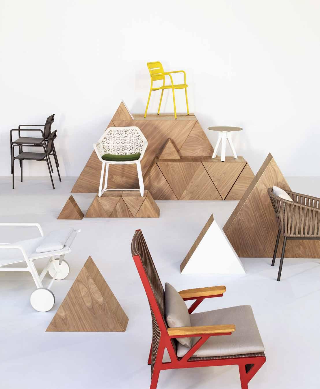
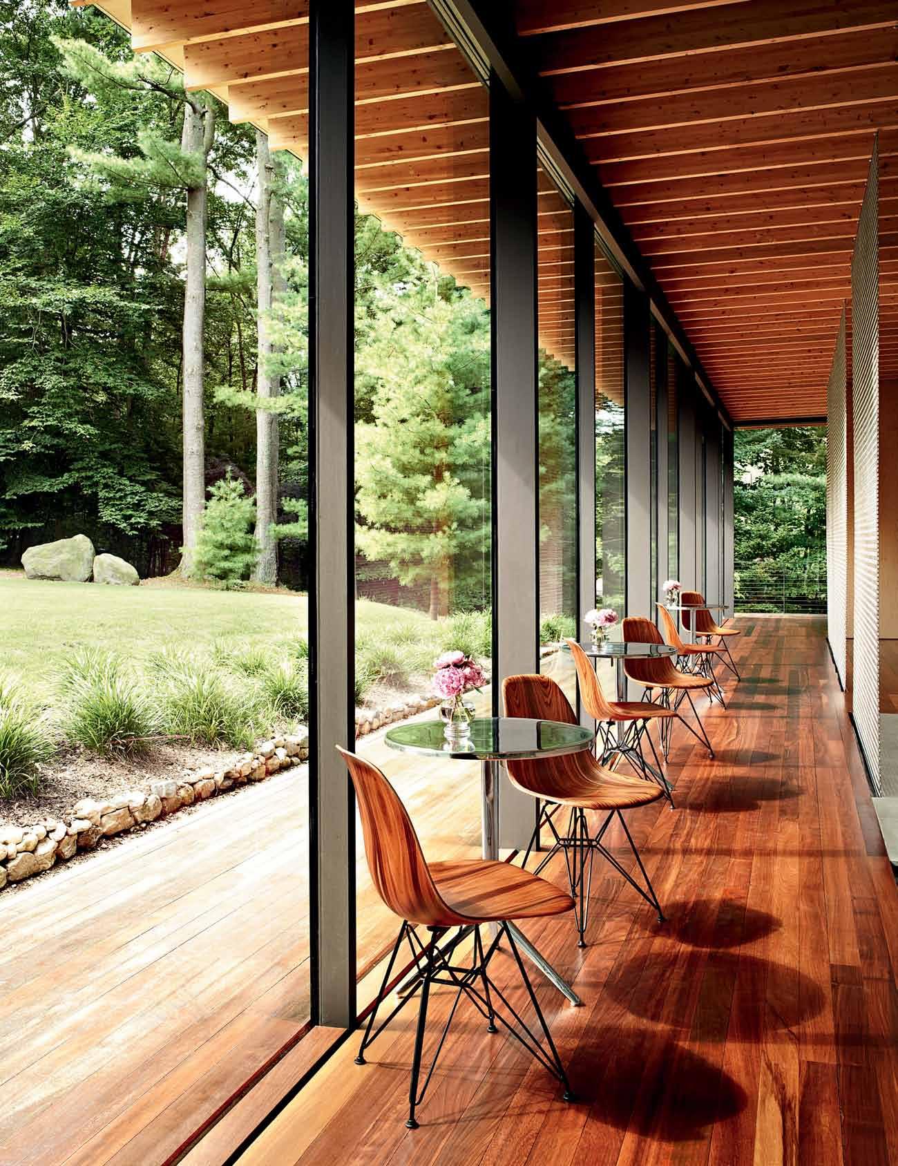
True to the organic shapes and sleek lines of the original, the Herman Miller Eames® Moulded Wood Chair uses proprietary 3-D veneer manufacturing technology to complete the designers’ decades-long endeavour. The honesty of moulded wood brings new expression to the classic Charles and Ray Eames design.
hermanmillerasia.com
hermanmiller.com.au
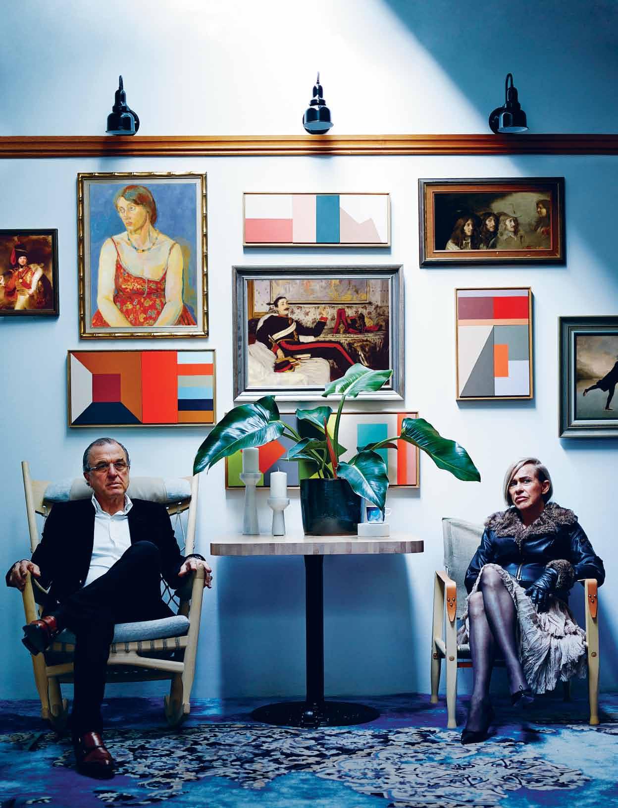
Clockwise from left: assorted canvas portraits printed by Surface View, POA, The Selvedge Group; assorted vintage frames, POA, Funktion Picture Framing; acrylic on Birch panel artworks by Louise Tuckwell (clockwise from left) State of Longing, $1,200; Climb Every Mountain, $1,100; Non Zero $950; Horizon Flux $1,800, Damien Minton Gallery; vintage Maple architrave, from $7.50/metre, Heritage Building Centre; floral canvas print , printed by Surface View, POA, The Selvedge Group; barn wall lights in black, $135 each, About Space; Carl Hansen & Son Safari chair in light Ash designed by Kaare Klint, $1,465, Cult; Cappellini Mondo rug designed by Lorenzo Damiani, from $7,500, Cult; Tom Dixon roll base table with Birch table top, $1,177, Dedece; stone candle holders, $256, Dedece; stone grinder used upside down as coaster, $154, Dedece; Sääpaiväkirja (Weather Diary) coffee mug , $27, Marimekko Sydney; philodendron plant , $45, Poho; blue pot , $45, Poho; PP Møbler rocking chair in Ash designed by Hans J. Wegner, $9,566, Cult; Ted and Catharina wear their own fashion
HOW DO MEMORIES GET MADE? INEXTRICABLY LINKED TO THE SENSES, AUTHOR AND STYLIST AMANDA TALBOT SAYS, MEMORIES CAN BE BROUGHT SUDDENLY AND SHARPLY INTO FOCUS WITH A SMELL, A TEXTURE, A SOUND. THROUGH THE STAGES OF LIFE, WE ARE IN AN ONGOING PROCESS OF MEMORY-MAKING.

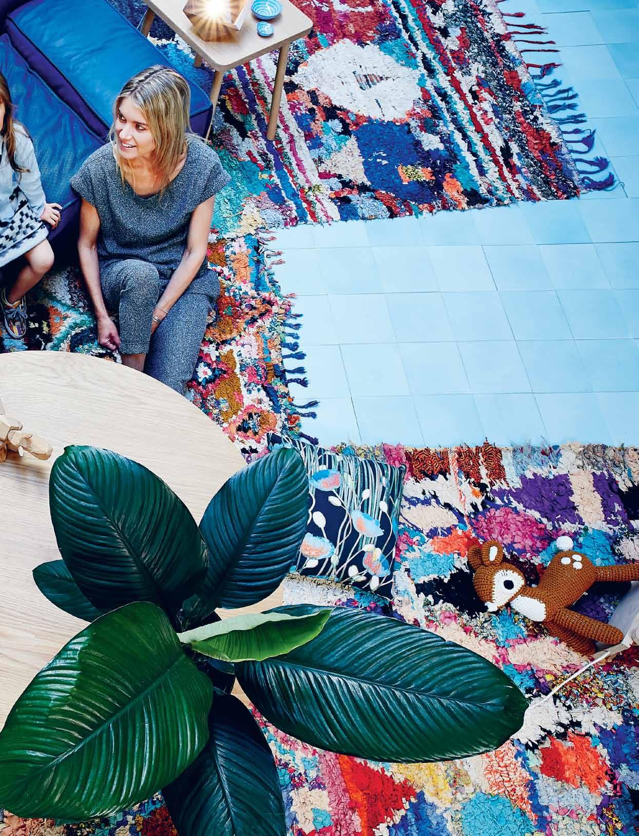
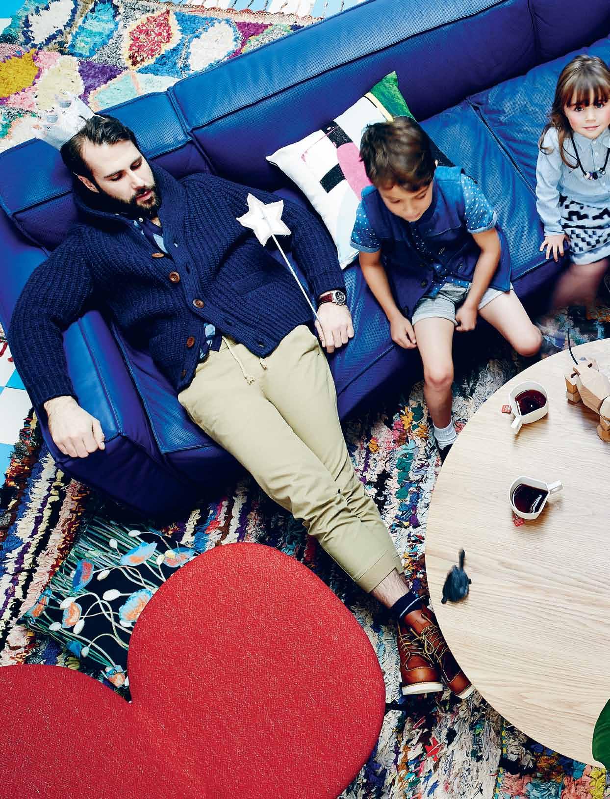 Clockwise left to right: assorted vintage Boucherouite rugs, from $750, Jason Mowen; Swedese Boxplay sofa in blue leather designed by Claesson Koivisto Rune, $14, 300, Fred International; Encaustic concrete tiles in sky blue, blanco and breeze, POA, Di Lorenzo; Dad wears Three Over One and Our Legacy from Meanwhile, P.A.M from Perks and Mini and Liberty glitter crown , $21.95, Kido; Vattenblank pillow, $79, Marimekko; Jesse and Lili wear fashion and shoes from Kido; Accute Rope 5 neckpiece, $75, courtesy of the artist and Pieces of Eight; Liberty glitter wand ,
$16.95, Kido; Mum wears Weathered from Incu; rectangular side table in American Oak designed by Chris Colwell, $595, Small Spaces; blue ceramic bowls in mini and medium by Sereno Horton, from $29, Funkis; small Buoy light in Walnut, $380, FLOTSAM/JETSAM; Sebra crochet deer pull-alone, $199, Kido; Poppies V01 Cushions, $95, Rouse Phillips; Sphathiphyllum ‘Sensation’ plant , $55, Poho; cross-base coffee table, $1,850, Mark Tuckey; faceted wood-grain ceramic coffee mug, $38, Shop U; Areaware Simus The Rhino, $190, Kido; Tacchini Kelly Easy chair in red, $3,421, Stylecraft.
What we seek, at the deepest level, is inwardly to resemble, rather than physically to possess, the objects and places that touch us through their beauty.
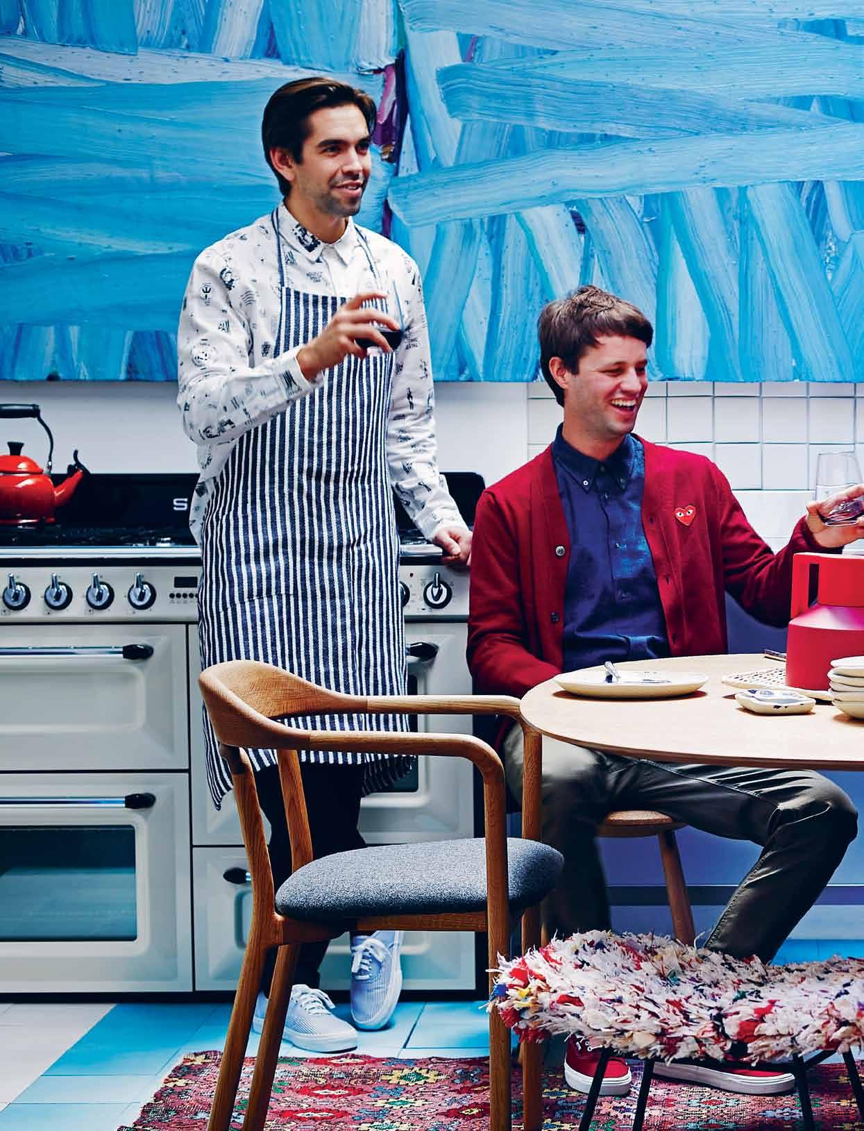
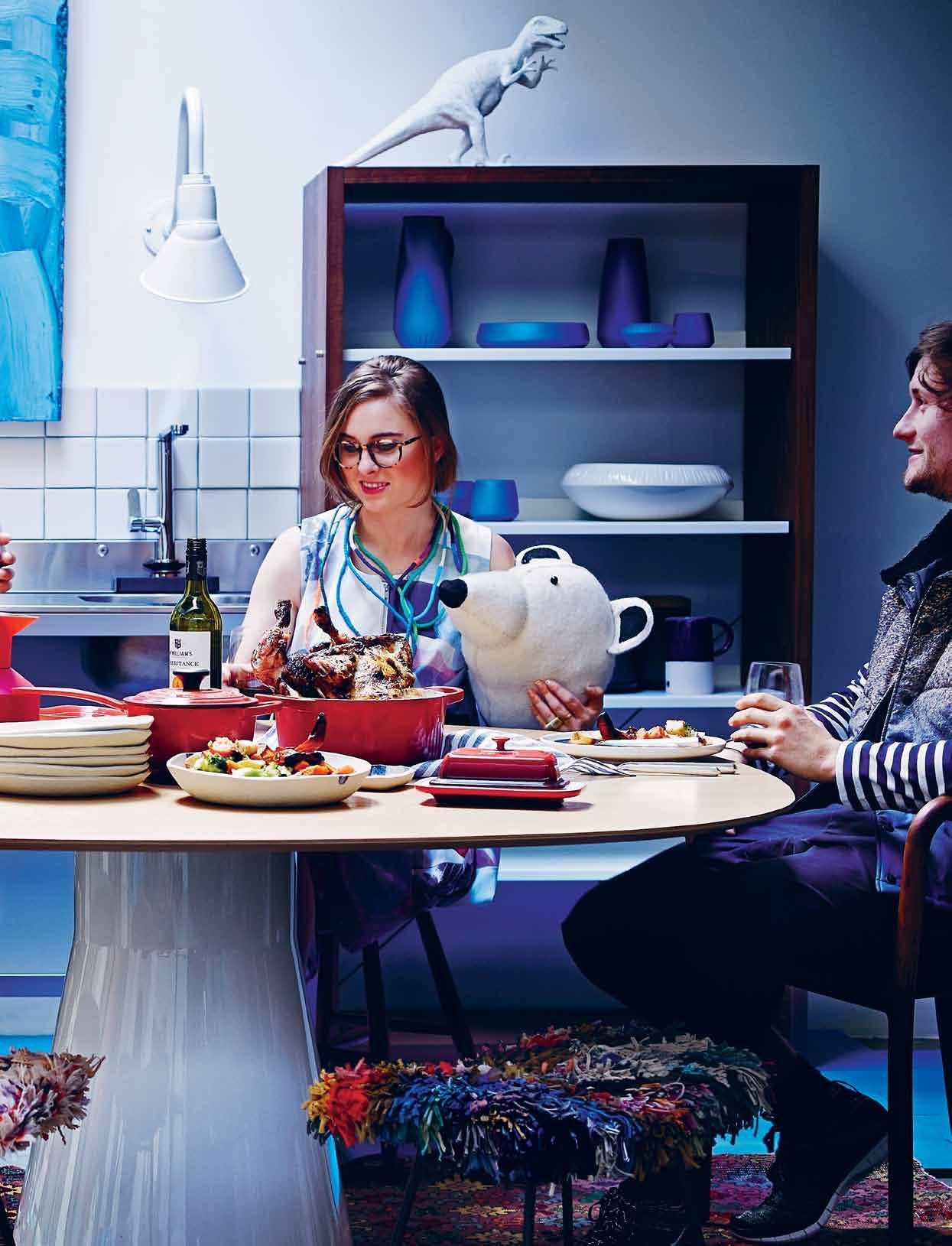
Clockwise from left : tiles as before; freestanding Victoria oven in cream, $7,990, Smeg; Le Creuset signature red tea kettle,$175, Williams-Sonoma; Coastal Walk Blue oil on polyester artwork by Steven Harney, $30,000, Liverpool Street Gallery; Cumacotto tiles as splashback in bianco, POA, Di Lorenzo; white wall light , $354, Universal Lighting; Udden single bowl sink with legs in stainless steel, $259, Ikea; Gessi Emporio kitchen mixer in chrome, $616, Abey; D3 bookcase in Walnut, $849, Bludot; Porcelain Bear indigo and white porcelain ceramics, from $34, Jardan; Dinosaur, stylist ’ s own; blue and white jugs sold as set of two, $175, Meanwhile;
Andreu World Reverse table with elliptic Oak top by Piergiorgio Cazzaniga, from $3,978, Kezu; Fog Linen blue and white striped tea towel , $25, Meanwhile; Diamonte 5-piece cutlery set in stainless steel, $58, Pottery Barn; Scott Zwiesel stemless red wine glasses, $10 each, Pottery Barn; Le Creuset stoneware in signature red: butter dish, $35, 3.3L Dutch oven, $430, 1.4L saucepan, $330, Williams-Sonoma; Mountain Range small rectangular dish , $32, Flip Flop Slip pasta plates stacked, $49 each, and serving bowl , $110, The Fortynine Studio; Normann Copenhagen Geo Thermos in red by Nicholi Wigg Hansen, $360, Top3; Discipline Drifted low stools, $1,140.30,
Stylecraft; Rag Rug stools designed by Don Cameron for Hotel Hotel, POA, Don Cameron; De La Espada Duet armchair by Neri & Hu, $2,355, Kezu; vintage Anatolian rug , $3,480, Koskela; Al wears P.A.M. from Perks and Mini; Fog Linen and Vans from Meanwhile; and Weathered from Incu; Will wears Kenzo, Commes Des Garcon and Weathered from Incu; Nikki wears P.A.M from Perks and Mini: extra long binding Faraday neckpiece, POA, courtesy of the artist and Pieces of Eight; holding Maileg polar bear felt animal head , $174, Kido; James wears Commes des Garcon, Vanishing Elephant , Acne and Nike Sportswear from Incu.
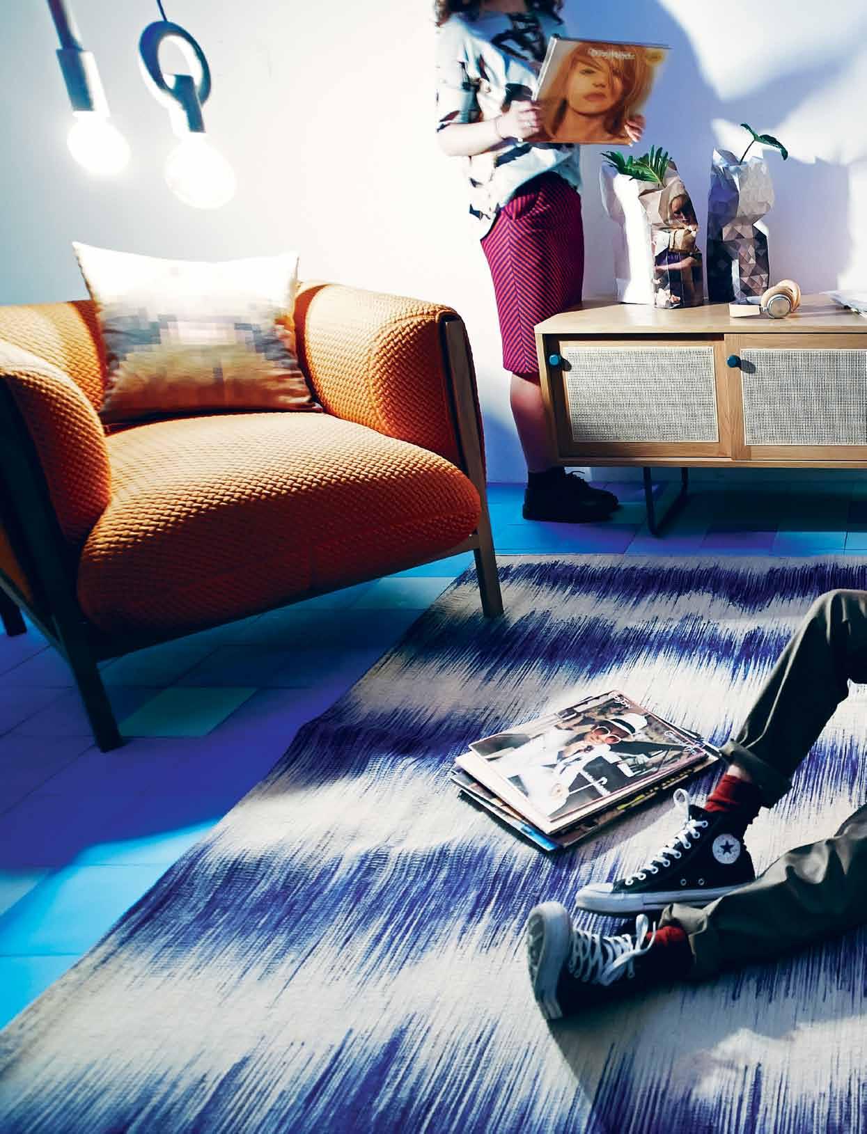
Clockwise from left: Loom armchair in orange and Walnut designed by Adam Goodrum, $4,681, Cult; Gigi pillow, $79, Bludot; I-O-N pendant lights , I from $295, and O from $395, Porcelain Bear; tiles as before; Gemma wears P.A.M from Perks and Mini and Kate Sylvester ; Iluka sideboard , $4,106, Jardan; Vermeer Milkmaid, Grey Gradient & White paper vases by Pepe Heykoop, from $29, Space Furniture; B&O Play H6 headphone in tan leather, $549, Bang & Olufsen; Rega RP1 turntable , $550, TITLE Store ; Roseate Spoonbill, Ajama Ajaja mural by JJ Audobon printed on to Birch ply by Surface View, $499, The
Selvedge Group; Rubn Lighting Nomad floor lamp in red metal, $1,199, Fred International; Zanotta Ink coffee table with red varnish by Des Emilio Nanna, $1,495, Space Furniture; plant as before; blue pot , $45, Poho; Ficus Lyrata plant , $220, Poho; crackle pot , $80, Poho; Fat Tulip armchair in blue upholstery designed by Adam Goodrum, $4,075, Cult; Contemporary Kilim rug , $1,900, Koskela; Arcade Xavrapue Rasta Maxi cushion in Polvere wool, $1,429, Space; Seamus wears Weathered from Incu and P.A.M from Perks and Mini; socks and shoes are models ’ own; records are stylist ’ s own.

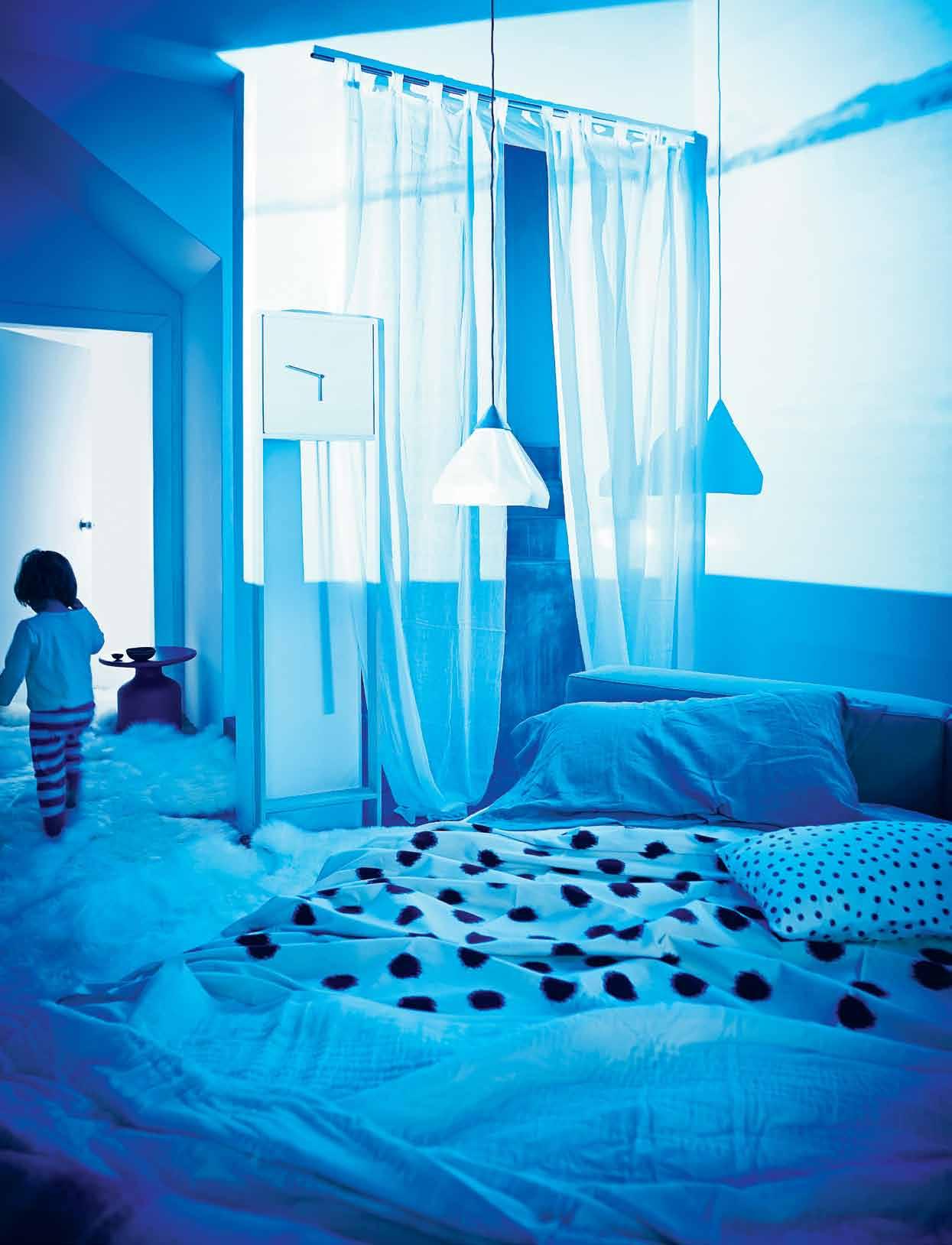
Clockwise from left: layered white sheepskins, $169+GST, NSW Leather Co; Cappellini Mini bottle coffee table in matte blue designed by Barber Osgerby, $2,482.70, Cult; ceramic dishes by Serena Horton, mini $29, extra large $75, Funkis; Grandson clock designed by Rowan Wagner, from $1,650, Rowan Wagner; linen plantation curtains in white, $175 each, Elements I Love; Paperweight pendant light, a collaboration between paper artist Bianca Chang and Henry Wilson, from $585, Henry Wilson; Cassina Mex Bed designed by Piero Lissoni,from $10,328, Cult; Poltrona Frau Coordinati pillow cases, from $847, Cult; Societe linen sheets in white/bianco, fitted $430, flat $480, Ondene; Dalmatian Ikat handwoven cotton tablecloth in Indigo spots, from $155, Sally Campbell; UTO cushion in Spots, $47, Marimekko; handstitched ivory white quilt , $295, Sally Campbell; mohair throw in grey stripe, $220, Jardan; pyjamas are model’ s own.
To see behind the scenes of this photo shoot visit habitusliving.com/issue25/memory
www.boconcept.com.au
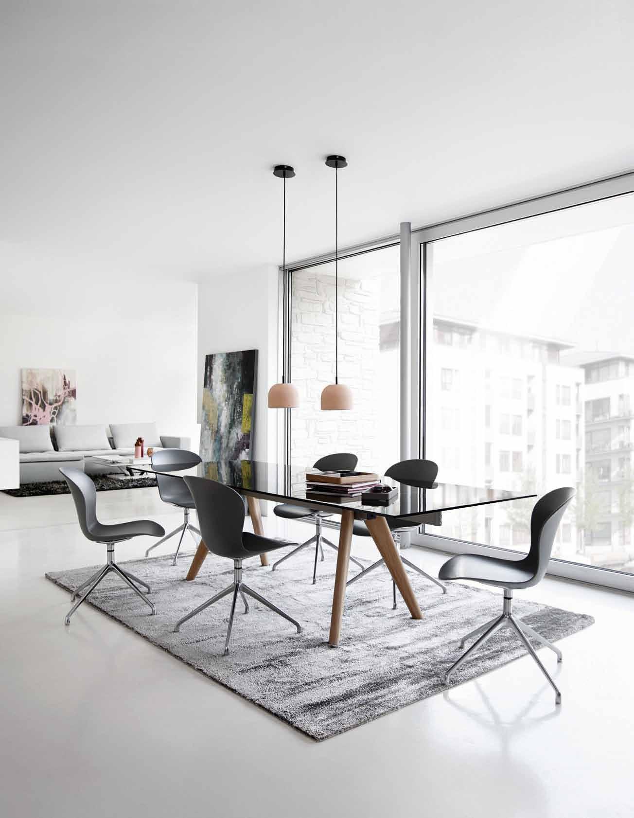
Open 7 days
575 Pacific Hwy Crows Nest Tel. (02) 9437 0066
admin@boconcept.com.au
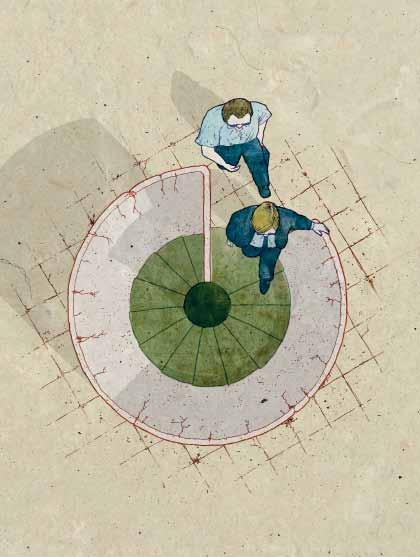
They’re a specific type of book, whether self-serving, promotional or educational. GUY ALLENBY explores what a monograph is, and what it could be.
HOUSES: DENTON
CORKER MARSHALL
Haig Beck and Jackie Cooper
Birkhauser Verlag
164pp hardcover, $83.50
HARRY SEIDLER LIFEWORK
Vladimir Belogolovsky
Rizzoli/Random House Australia 300pp hardcover, $110
HARE + KLEIN: TEXTURE, COLOUR, COMFORT
David Clark and Meryl Hare
Thames & Hudson 304pp hardcover, $60
RAFIQ AZAM: ARCHITECTURE FOR GREEN LIVING
Rosa Maria Falvo (ed)
Skira Editore 328pp hardcover, $120
Anoted Australian architect once made a surprising admission to me. He revealed that when he thinks of his past buildings, he doesn’t usually have a three-dimensional image of the actual design in his mind’s eye – he ‘sees’ particular perspectives that his photographer has taken.
It’s a small thing but an extraordinary glimpse into the architect’s psyche, because it underlines how deeply the most striking images of a façade, details or spaces – forever frozen in two dimensions – can come to define a building.
This is not an altogether surprising revelation, however, when you consider that the capture and publishing of buildings by any one of a handful of anointed ‘name’ architectural photographers represents a very important validation amongst peers for most architects and interior designers. It’s also a marketing necessity, of course and, from this anecdote it seems that it can even come to occupy a defining place in their consciousness.
Houses: Denton Corker Marshall (Birkhäuser) is an attractive book filled with just such evocative, and possibly defining, imagery. It is a handsome record of the best images taken of six houses as “land art” that tells us little or nothing about how they are lived in – as opposed to a discursive and notional concept of human habitation.
There are not, as you would expect, human beings in any of the shots (three blurred passers-by outside one is as close as you get). These are houses, rather than homes after all, and – as noted British architecture critic, Deyan Sudjic, tellingly (ironically?) chooses to write in the foreword: to “discuss a house only from the point of view of architectural discourse ... is to miss the essential truths about a house”.
Sudjic goes on to mention that Dr Edith Farnsworth, who commissioned Mies van der Rohe’s much admired Farnsworth House, expressed her discomfort in an interview in House Beautiful magazine about a kitchen that made her feel “on show, and as if she had to hide her waste bin”. Sudjic goes on to say that, “without the perspective that comes from understanding how a house is occupied, the essential nature of architecture is lost”.
Denton Corker Marshall, as the text agrees, subscribe to “Mies’ conception of the interior of the house as ‘emptied field’”. It tells us very little apart from showing the houses ’ sculptural place in the landscape and the play of natural light on heroic form, clever geometry and minimal volumes. On that score, it succeeds beautifully.
There are many valid and various reasons for architects and publishers to collect images and text about the exteriors and interiors of buildings of one firm in a monograph. The cliché of the lesser architectural monograph is that it’s little more than a thick promotional brochure, funded or subsidised by the firm themselves, and/or filled with lifeless, sycophantic or quasi-learned text that few but other architects actually read.
Not that who has funded the work necessarily has critical bearing on the work. Great monographs have been entirely selffunded and terrible monographs have been 100 per cent paid for by a publisher. In recent years some critics have suggested that the form is endangered for reasons of cost and/or credibility.
In truth, the fate of the monograph, even the most self-serving among them, is probably more reasonably linked with the fate of the very book itself. Even as publishers stop producing other forms of books, monographs will likely live on.
And that is because design professionals will inevitably, and increasingly, foot more or all of the bill for them because it is felt that not until the images of their buildings are collected in a book (as opposed to appearing in any number of digital forums) as a representation of the oeuvre of a firm, or following a particular theme or type, that the work has not been captured and understood in – literally – the best possible light.
In short, it always has been and always will be, primarily about the pictures. That said, truly great monographs genuinely strive to be something more.
Rafiq Azam: Architecture for Green Living, seems to have just such an ambition and has been beautifully put together. With a foreword by architect Kerry Hill and essays by Kazi Khaleed Ashraf and Philip Goad and an interview by Syed Mansoorul Islam, the text is a worthy foil to photographs that tell a lucid
It always has been and always will be, primarily about the pictures. That said, truly great monographs genuinely strive to be something more.
story about both the buildings and their context. Azam’s own watercolours, as impressionistic introductions to the homes, are a wonderful inclusion and lend the book a lyrical dimension.
Kerry Hill has a great regard for the work of the internationally acclaimed architect from Bangladesh and for the powerful understanding of the very particular environment it displays. “Glass and greenery, not solid walls, separate the private from the public realm,” writes Hill. “Rafiq Azam’s buildings do not hide their function from public view, they belong to their place … Rafiq Azam,” he says, “is an architect of the soil of Bangladesh.”
Azam introduces each of his works simply and revealingly and the carefully chosen images – in concert with the watercolours – give an understanding of Azam and his work in their circumstance. Most of the work is residential: single luxury homes, affordable multi-unit to luxury multi-unit.
By showing how it is possible to weave a narrative about a body of architecture –with images and text that are intelligent, approachable and instructive – it is a fine monograph indeed. Eight years in the making, the “monograph may seem like a simple anthology”, writes Azam in his foreword. The result is a “mirror of my thoughts and dreams over the years, which I humbly share with others”.
Harry Seidler, on the other hand, may have been gifted, prolific and cultured, but nobody would ever say he was a humble man nor ‘of the soil’ of Australia. An Austrian by birth, who
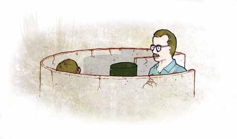
arrived in Australia as an adult via Britain, Canada, Brazil and the United States, his was an international view.
Seidler was also a relentless pursuer of excellence and – as Penelope Seidler, his wife of 47 years is quoted in Harry Seidler Lifework by Vladimir Belogolovsky (Rizzoli) as saying –he was “very articulate about what he wanted to do in the world. He said, ‘I’m going to build cities ’. I’d never encountered anyone like this before, and I could see that he was going to let nothing stand in his way.”
It’s hard to imagine an Australian writing a monograph that’s quite such a glowing tribute to Seidler. Humility and the common touch are two of the necessary attributes of an Australian hero, so it is some surprise that the man who once described himself as “the torchbearer of modern architecture” ever found a place in the heart of mainstream Australia, despite his considerable achievements.
Harry Seidler Lifework is a tribute by someone from elsewhere who has come late to Seidler’s work. Belogolovsky, self-confessed fan of Seidler has, with the support of Penelope Seidler, produced a book that seeks to record and to recognise Seidler’s place in the pantheon of world-class architects by means of charting his best works and gathering together some of the considerable acclaim he received during his life and after his death.
Included are tributes from some of the giants of 20 th Century architecture, including one by Oscar Neimeyer, one by British-American historian, Kenneth Frampton, and another from British architectural superstar, Norman Foster.
For a complete change of pace to a book about serious architecture, Hare + Klein: Texture Colour Comfort by David Clark and Meryl Hare (Thames & Hudson) is – as its title suggests – a book about the elements of a house that soften it, humanise it and make it a home. It’s a monograph of a different kind to the other three, but it is a monograph – an idealised look at a collection of buildings by a single firm – nonetheless.
Hare + Klein is a successful and awardwinning Sydney-based interior design practice – Meryl Hare its principal – and David Clark is an ex-editor of Vogue Living magazine. Together they have produced a very attractive tome packed with inspiration.
Hare + Klein’s self-professed design philosophy is that the firm’s signature is not strong. “I hope what we do is all about the client,” writes Hare. On the evidence of the homes featured in the book, this does indeed seem to be the case. From beach houses to a stone villa on Sydney Harbour; from a country estate to Federation house on Sydney’s lower north shore, it is a book brimming with elegant decorative and design ideas that reflect different styles.
The common thread in the homes is texture, subtle splashes of strong colour and an air of comfort, which – when you are talking about a home to actually be lived in – surely has to beat an “emptied field” every time.


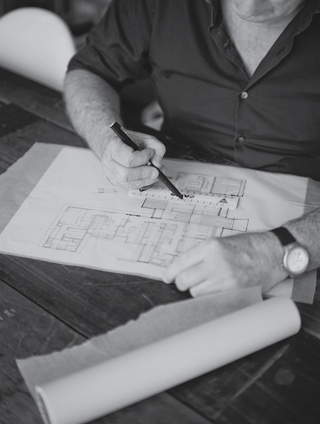
It is not just the business of design that keeps BRIAN PARKES enthralled, but the stories of the people behind it and how these get told through the things they create. LEANNE AMODEO visits the director of ADELAIDE ’s Jam Factory at his home south of the city to hear his story.

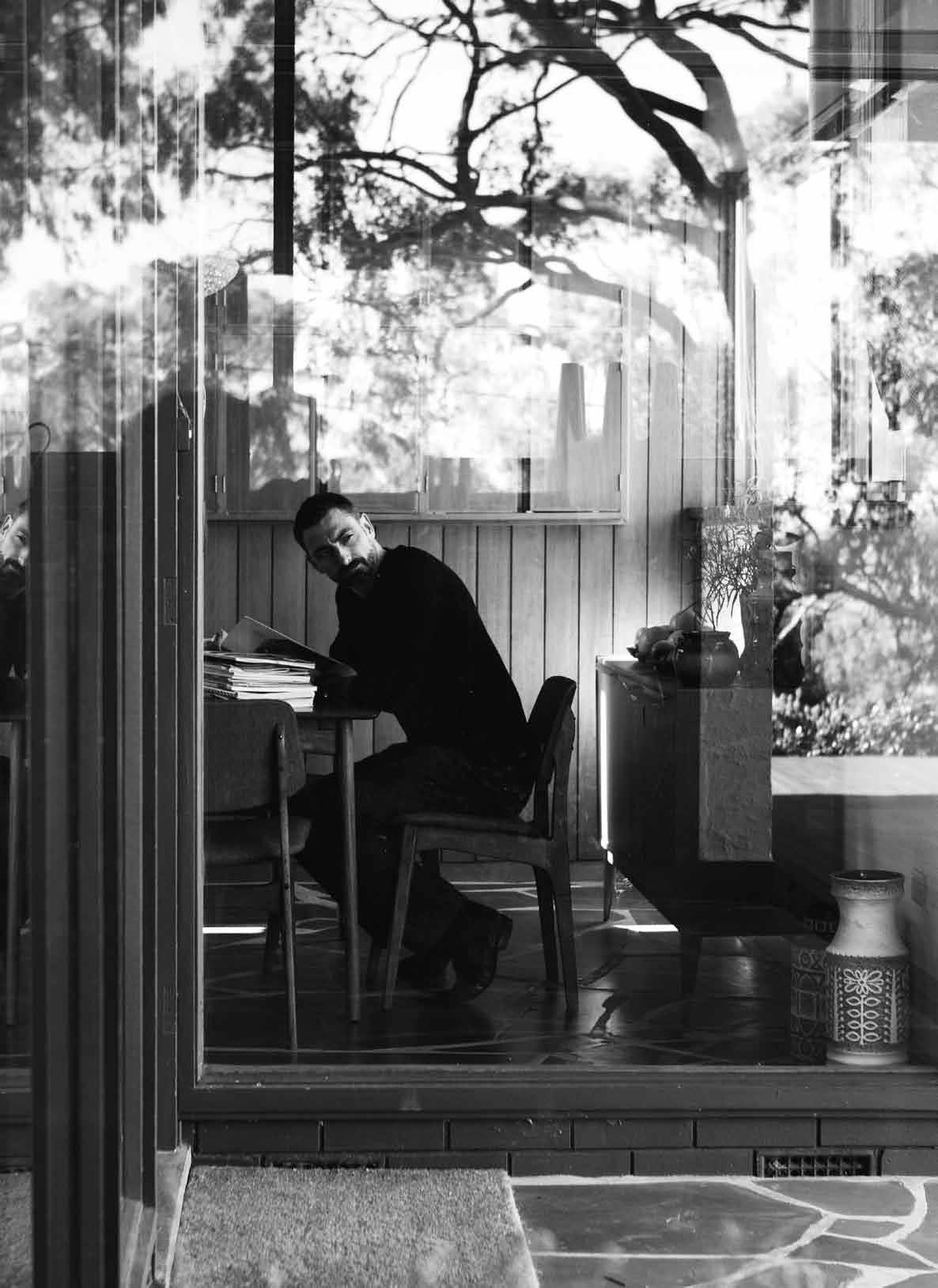
Brian Parkes has worn many hats during the course of his career –such is the hybrid nature of his professional identity. Curator, writer and administrator – this list only begins to describe the current director of the Jam Factory, the Adelaide-based, notfor-profit organisation that is a centre for design developing, manufacturing, retailing and advocating the very best craftsmanship. Brian himself is also a committed advocate of Australian design, tenacious agitator, influential speaker and respected mentor. It comes as some surprise then to discover he also has a degree in sculpture and for a time was considered an emerging artist of note.
The young boy who grew up in a small country town outside of Launceston moved out of home at 17 to study at the Tasmanian School of Art in the University of Tasmania. The move probably had more to do with a teenager yearning for freedom than a desire to actually make art. Nonetheless, this is what Parkes did for 10 years following graduation. During the 1990s he was featured in some notable group exhibitions and was even awarded a two-month residency at the prestigious Cité Internationale des Arts in Paris.

But it wasn’t long before Brian’s career took a different trajectory. “I think my attention span was very short and my interest in my own work was hard to sustain,” he reflects. “I was interested in so many other things.” The curatorial stream of his installation-based art practice started to take precedence and his growing passion found an outlet in his first ‘real job’ running Entrepot, the art supply shop on the Tasmanian School of Art campus, from 1991 until 1995.
It had a small display gallery and Brian transformed it into a curated exhibition space, programming most of the 12 shows a year himself. He also opened a bookshop on the premises soon after taking up the position and began stocking art and design books previously unavailable in Hobart. His natural flair for retail management caught the attention of the National Gallery of Australia in Canberra and he soon moved there to run their shop.
The new job was a baptism by fire (although he was allowed two months’ leave to undertake the residency in Paris during 1996), and he quickly learnt a thing or two about commercial business. “The side door sometimes opens all sorts of new opportunities,” he ponders. “So, there I was, a young person in my mid-20s and
I ended up one of 12 senior managers at the National Gallery of Australia. I got to work with a lot of artists and designers developing product for the shop and it was through this avenue that I was able to gain access to a whole bunch of things that have since influenced me.”
Moving to Sydney in the late 90s to take up the position of Manager of Merchandising and Retail Operations at the Museum of Contemporary Art allowed Parkes to extend his commercial acumen. It also meant he worked alongside Steve Pozel with whom he forged a strong working relationship. So much so, that when Pozel left to take up the Director’s position at Object: Australian Design Centre, Parkes followed soon after.
It was in his role as Object’s Assistant Director that Parkes sealed his reputation, while curating the hugely successful Freestyle: New Australian Design for Living exhibition. “There was a moment in the mid-2000s when it seemed the design industry in Australia was beginning to mature and I was in the right place at the right time to somehow package it up to show the world,” he says.
The exhibition’s two-year research period allowed Parkes to travel around Australia visiting the studios of some 80 designers and
makers. Only 40 made the final cut, but Parkes is appreciative of the experience to this day. “It gave me the most comprehensive overview of what was happening in the independent design sector in Australia of anybody at the time and that was extraordinary,” he recalls. “I think Freestyle contributed to amplifying the momentum for a lot of those practitioners.”
Parkes was asked to write for Phaidon’s 2007 &fork publication on the back of the exhibition and he smiles glowingly at the memory: “When I was selling books in Hobart in the early 90s, if I could have imagined that I would one day write for Phaidon Press…” But it wasn’t only professional kudos that Parkes received, he also made an enormous number of friendships, many of which he has taken with him following his departure from Object in 2010 after 10 hugely rewarding years.
Accepting the position running the Jam Factory meant moving to Adelaide and both Parkes and his wife, graphic designer Imogen Landau, relished the opportunity. “We didn’t realise how much compromise we were living with in Sydney,” he says. “Working in the non-for-profit arts and design sector means I don’t have a lot of wealth, but we live like rock stars here in Adelaide, and our house costs
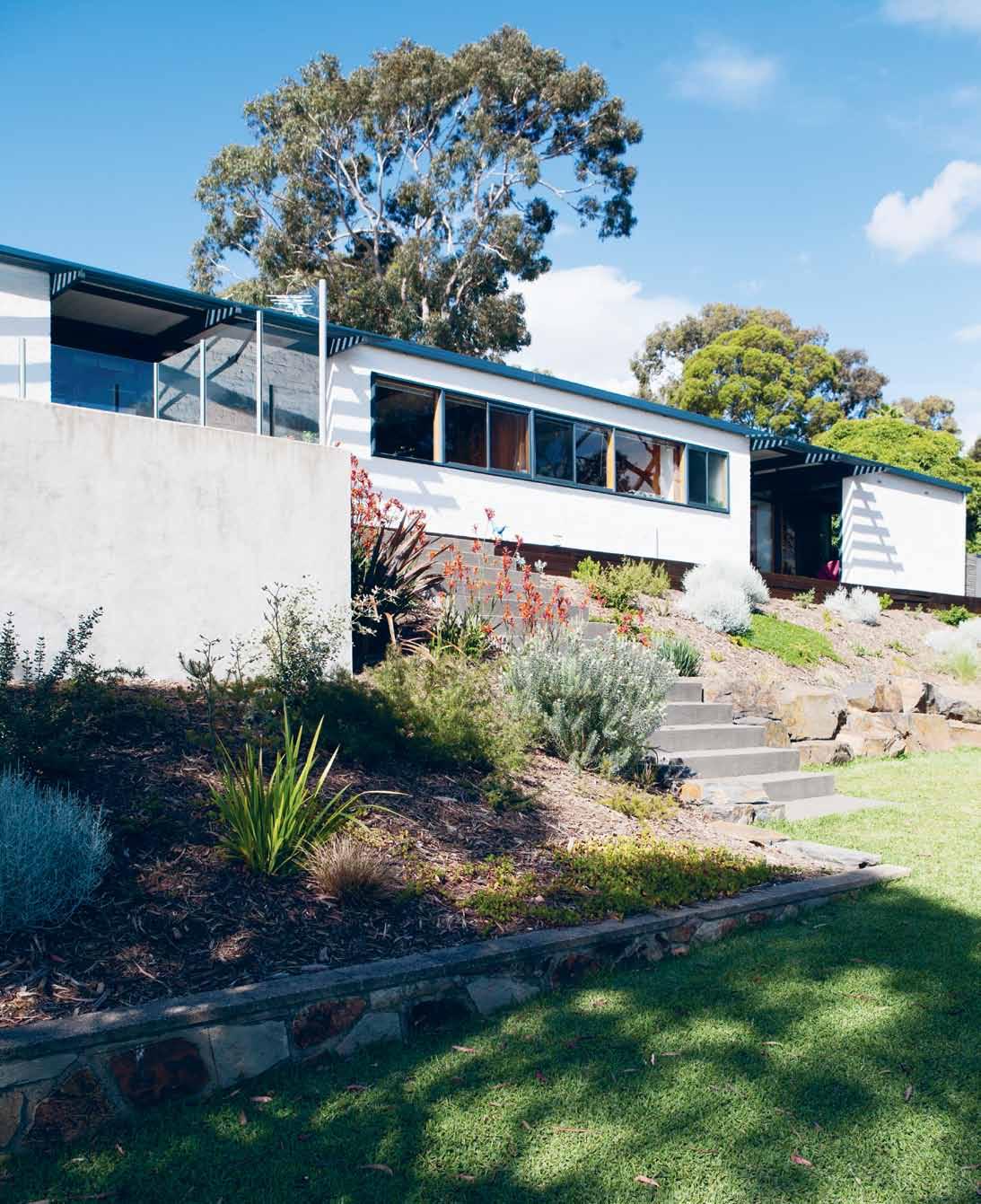
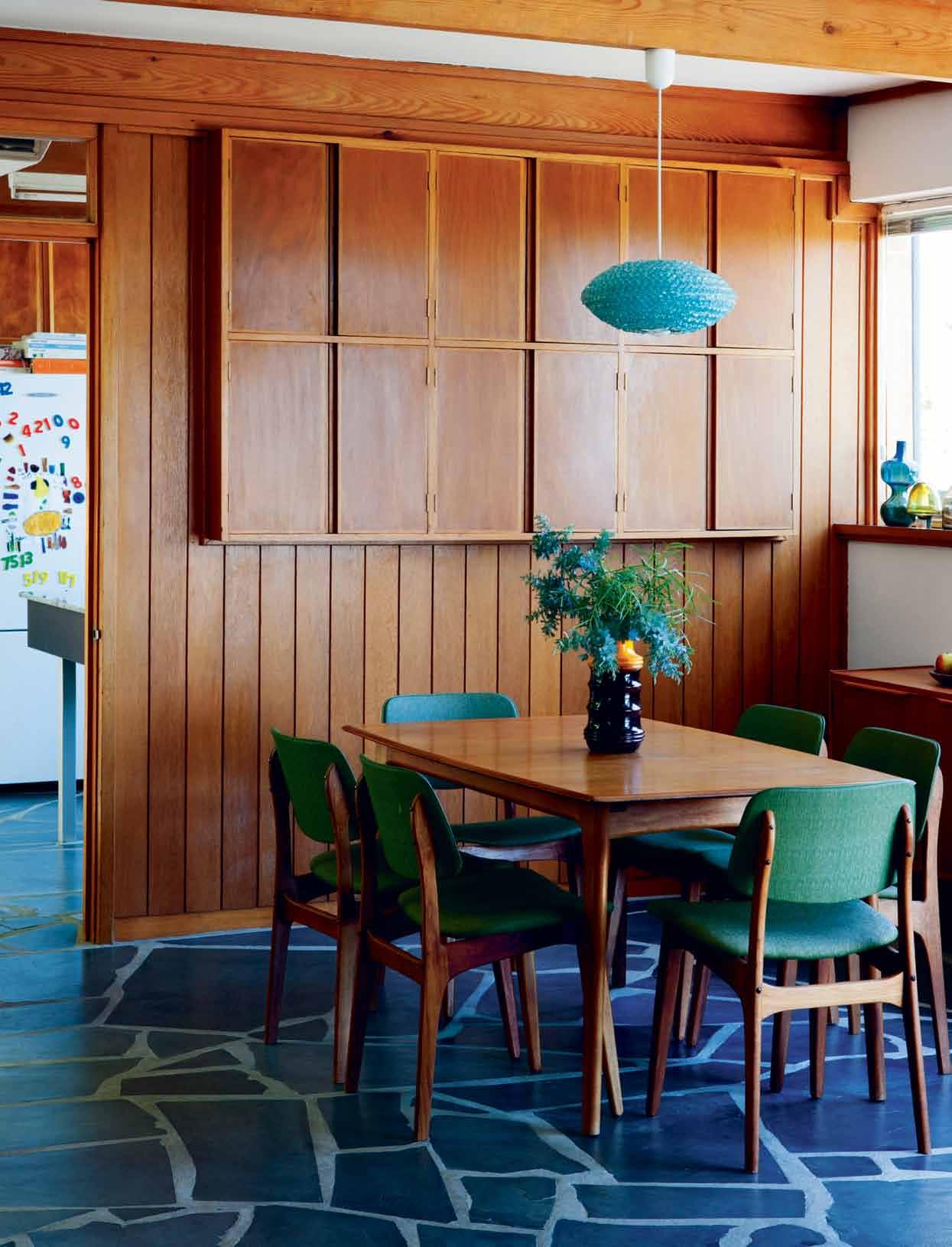
The line between indoor and outdoor space is blurred here and this lends the home’s Modernist form a decidedly inviting aesthetic.

We were incredibly fortunate that the people who lived here before us were committed to the idea of restoring it to its original condition, rather than renovating it.
BRIAN | RESIDENT

The house is decorated with an array of objects and decorative art, including ceramics and woven baskets, both of which Parkes collects.

less than our two-bedroom apartment back in Surry Hills is worth.”

Parkes and Landau couldn’t believe their luck when their offer on the first house they looked at was accepted. The three-bedroom Modernist home was designed by local architect John S. Chappel and built in 1960 on a generous 1,380 square metre sloping site in leafy Bellevue Heights. From the driveway the house reads as a hard-edged rectangular prism, but the entry from the garage into the central courtyard is about as grand a reveal as any.
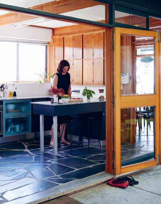
“We were incredibly fortunate that the people who lived here before us were committed to the idea of restoring it to its original condition, rather than renovating it,” explains Parkes. The interior’s warm timber detailing complements the rich grey of the slate floors, while the singleplane windows wrap the building, heightening its incredibly appealing angularity.
But it is the glass-walled courtyard that really reveals the character of the house. The line between indoor and outdoor space is blurred which ends the home’s Modernist form a decidedly inviting aesthetic. It also serves as an ‘divide’ between the childrens’ bedrooms and play area in the west wing, and the master bedroom, study and living areas in the east wing.
Not surprisingly the house is decorated with an array of objects and decorative art, including ceramics and woven baskets, both of which Parkes collects. “Imogen and I especially have an interest in collecting mid-Century and 1970s ceramics and glass from secondhand shops,” says Parkes. “And we’ll happily put something that cost $2 from the op shop down the road next to something that cost $200 from the Jam Factory’s shop.”
Aboriginal art and objects from the Central Desert, Tiwi Islands and Arnhem Land fills the east wing, although Parkes does not necessarily consider himself a collector of the genre. “It’s just that I fall in love with things when I’m travelling,” he says. “All the Aboriginal art in the home comes from trips I’ve made to indigenous communities since the mid-90s, and most of the time I’ve been lucky enough to meet the artist who made it, which has been lovely.”
He is also particularly fond of Noblett furniture and has a total of six pieces from the South Australian brand in the house, including the credenza and dining room table. “We bought a few pieces before we moved in,” recalls Parkes. “And it just so happens that they work beautifully in this house.” The timber collection nicely
complements the in-built timber furniture in the kitchen, dining room and bedrooms.
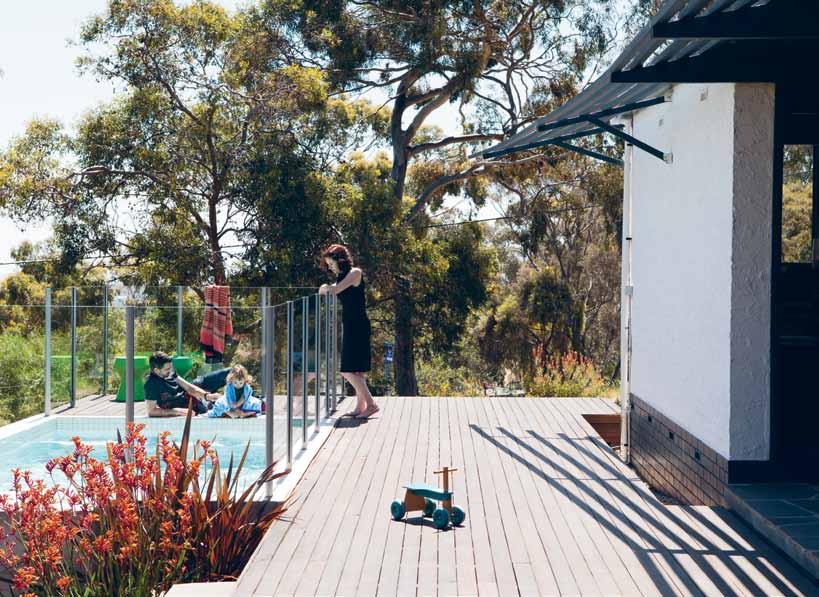
On the rare occasions Parkes has time to relax he does so with a glass of wine on the south-east deck, where the view looking down the hill over the Gum trees and Flinders University is breathtaking. In his current role at the Jam Factory he is determined to make the organisation a globally significant place to train in the areas of glass, ceramics, furniture and metal. In the four years he has been there he has already made major changes that have attracted a lot of attention, including the recent appointment of Jon Goulder as head of the furniture studio and opening a satellite facility in the Barossa Valley.
“I’m more excited than I’ve ever been about what I can do for this sector that I care so deeply about,” says Parkes. “Increasingly the things I’ve got the most pleasure from and what I’m focusing my energy on is enabling others to excel at what they do.” Although success has defined Parkes’ practice, it is this spirit of generosity that characterises everything he does. No doubt it will continue to do so.
Jam Factory | jamfactory.com.au
See a past exhibition from the Jam Factory at habitusliving.com/issue25/jamfactory
On the south-east deck, the view looking down the hill over the Gum trees and Flinders University is breathtaking
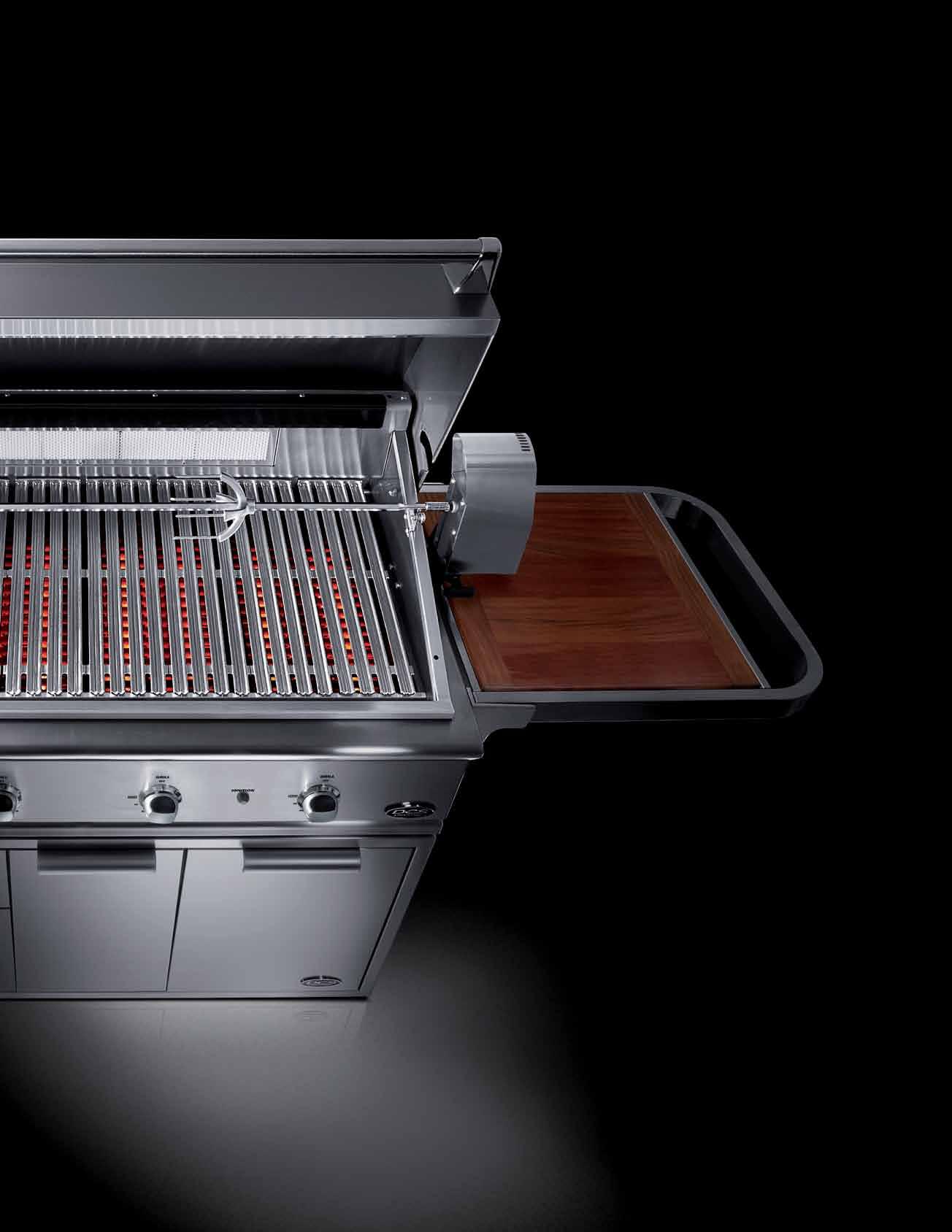
Fisher & Paykel DC s Grills have pioneered a new category in high performance outdoor cooking. they are designed around the idea of a complete professional outdoor kitchen – the heart of which is the grill. the DCs range is built to deliver the functionality demanded by any professional chef - performance, simplicity and durability. i n terms of performance DC s is unparalleled in delivering high heat, low heat and easy cleanability. a rare medium? We think so.
tongue n groove timber constructed of FSC European Oak treated with natural oils in 15 beautiful colours allowing for easy maintenance
Showrooms
Shop 2 188 Chalmers Street, Surry Hills NSW 2010
P 02 9699 1131 F 02 9690 0929
575 Church Street, Richmond VIC 3121
P 03 9427 7000 F 03 9427 0100
tonguengrooveflooring.com.au

A love for native Thai timbers inspired VACHIRA 'NOTT' TONGROW to explore the beauty of recycled timber, from underdressed to fully-dressed, sometimes in the same piece. MARK & WILLIAM HEDLEY meet Nott, who ponders the question: If I were a carpenter…

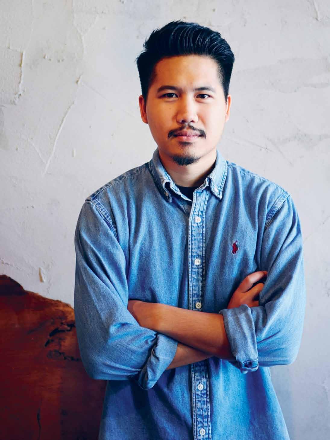

If I Were A Carpenter is the studio and showroom of Vachira Tongrow, known to his friends and family as Nott. It can be found in a lively precinct of Bangkok – that great city which lacks neither population nor a rich creative spirit. Nott’s attractive showroom exhibits his latest creations of furniture, lamps and other homewares.
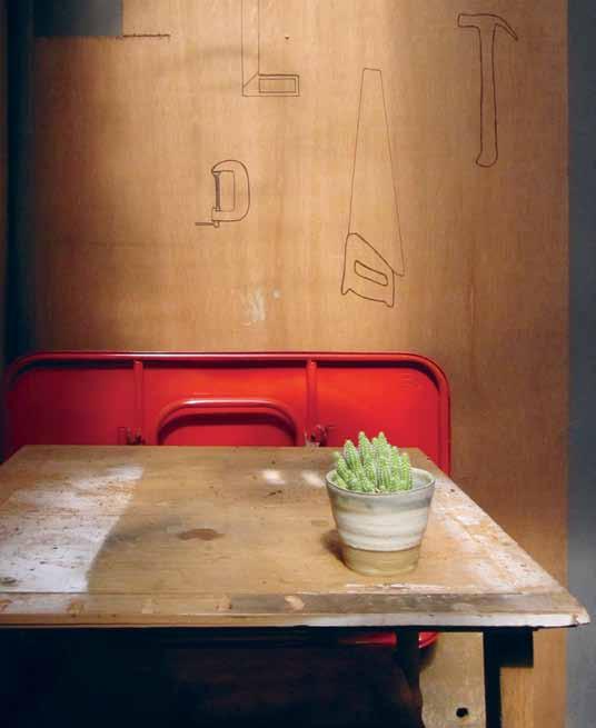
Nott grew up in the northern Thailand city of Nong Khai, and from there it was to Laos where his family operated a furniture store. It was here in the store that illustrated furniture catalogues inspired his early interest in design. He experimented with his own, sometimes fanciful, drawings for furniture, deciding to pursue an education in design. He went to Chelsea College of Art and Design in London, completing his formal training in graphic design and also “ becoming very interested in texture,” Nott recalls.
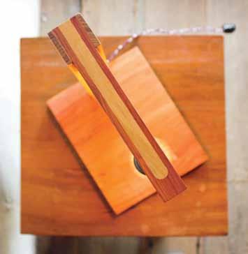
While at Chelsea, Nott was exposed to industrial design through helping friends construct 3D build projects. “After I had a chance to work in a wood workshop I became more familiar with the materials and the tools,” Nott says. “I loved making things with wood, it helped me to stay creative.” During this time, Nott revived his childhood interest in furniture design, and discovered a love for the nature and character of wood, and how it can be worked.
After completing his studies, Nott spent two years travelling throughout Thailand familiarising himself with native Thai timbers and their unique qualities. He worked in a number of workshops where he studied local furniture styles and acquired the various skills associated with furniture making. In setting up his own studio, Nott was particularly keen to emulate the craftsmanship he had witnessed on his travels around Thailand. “I love exploring reclaimed lumber yards as the timbers mainly came from old Thai houses which reminds me of my childhood home,” Nott reminisces.
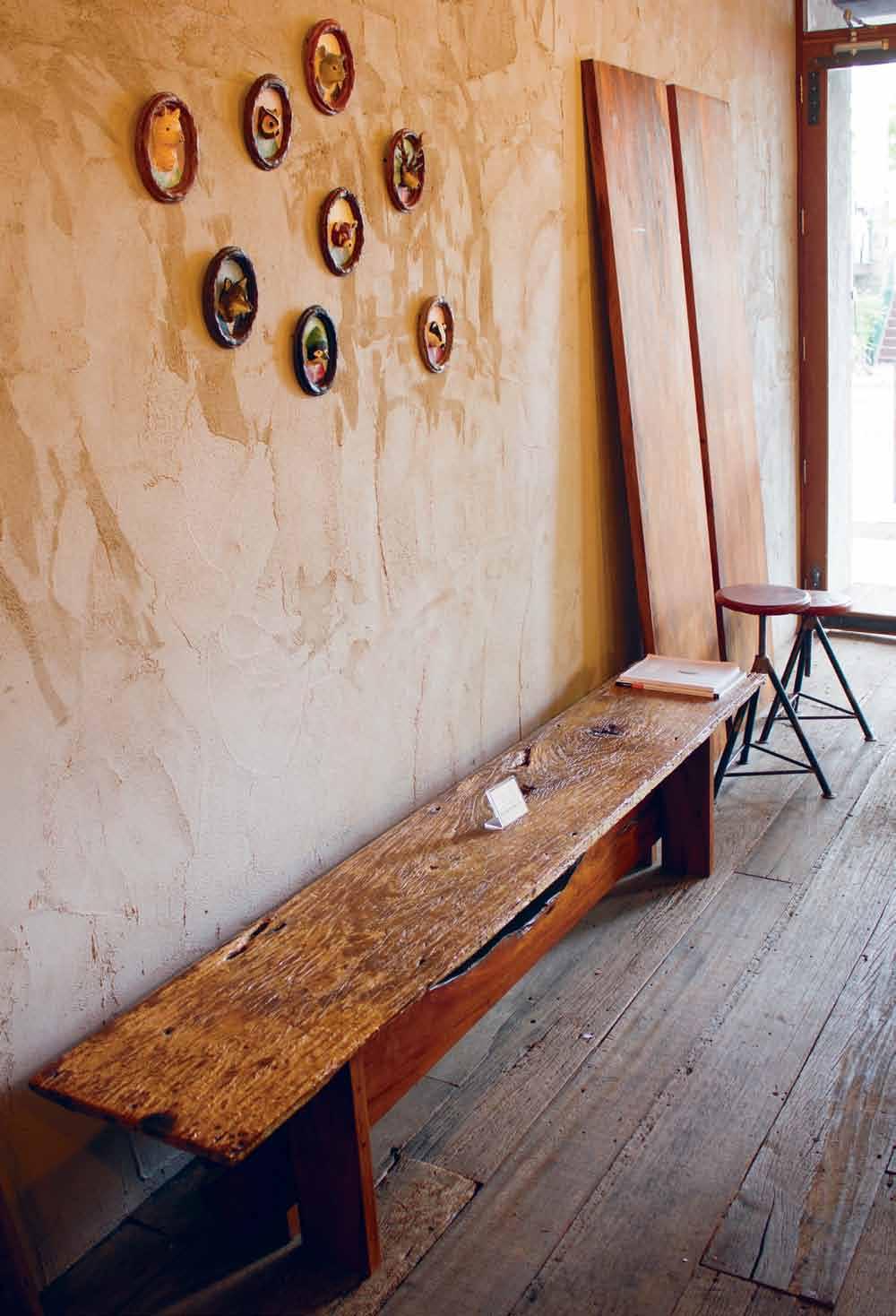
“By looking at old beams and floorboards, I came up with new ideas for my furniture –it gives a me a sense of nostalgia.”
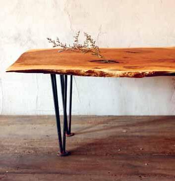
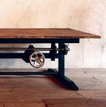
Nott opened If I Were A Carpenter in February 2013, with a selection of tables, chairs, stools, and smaller hand-crafted domestic objects of a very practical nature. Nott uses only recycled timber – “I love the imperfection of the reclaimed wood and I’m always inspired making things out of it. I’m also interested in the story of where the wood came from, and what it used to be in the first place,” he says.
What is striking about his own designs are the ways in which the timber is allowed to reveal itself in very different ways. Sometimes a surface has been stripped back to reveal the grain, the heart beneath; on other occasions the surface is preserved, evidencing the caressing hand of weather and time, or even their ravages.
Often, these different approaches to treating the timber are combined in the same piece: carefully dressed timber with a lustre or glow proclaiming its rebirth, combined with rough-sawn or very lightly worked recycled timber proudly displaying a patina. Adding to the complexity, Nott’s creations often come with metal components which strike an industrial pose, proclaiming strength. But they are often mechanisms which have a practical function – for instance, the ability to elevate or lower a tabletop. And occasionally they are there to dispense a little whimsy – you may find small pieces of metal inserted into the timber itself, carefully shaped and finished, creating points of interest.
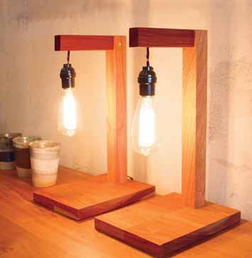
Metal and timber combine in smaller items also, for example the wonderful table lamp which emanates light produced by an Edison bulb hanging bare from a timber arm supported by a timber post, inset in a timber slab of a base. The lamp says dramatically, “I am a lamp”, and then goes on to evoke all sorts of other objects and operations – a carpenter’s square, a copy stand, a post for a sign. Coloured, twisted electrical wires connect the prosaic black socket to the black plug in a deft touch. It is a simple, sturdy piece, but the Edison lamp softens and evokes something more mysterious once that slender bulb is lit.
From time to time, If I Were A Carpenter invites other creative enterprises – artists, designers and musicians – to present work in the showroom, with Nott’s furniture as stage, backdrop and inspiration. Recently, paper sculptures and shadow lamps by Teaspoon Studio (paper-craft artist Pimm Chongcharoen) floated in the space and graced both the raw and smooth, the dark and lustrous. This particular collaboration, a hand-made exploration of paper, wood and mixed media called ‘A Forest’, was part of the Hotel Art Fair in Bangkok. This site-specific installation focusing on sculptures and ornaments created an experience inspired by nature, the landscape and wilderness dreams, amongst furniture that is acutely balanced between the industrial and the domestic, the found and the shaped.
Nott ’s characteristic aesthetic combining the designed and the ready-made has attracted
I’m interested in the story of where the wood came from, and what it used to be in the first place
considerable attention and resulted in being commissioned for other projects that are part of the vibrant local style culture, with furniture, lamps and other more fanciful objects. An invitation to design and fit out a new café has been Nott’s most ambitious project to date. Roots Café in the Bangkok suburb of Ekkamai illustrates what can be achieved when using what is at hand – recycled materials combined with strong design values –to furnish and create a space that is invitingly informal, almost accidental. The timber bar with polished dark top, and alternating distressed and dressed boards for sides, harbours a row of stools that don’t shrink from their function with their steel hooped skirt legs and rounded Makha seats atop threaded steel shafts. This is another example of Nott’s characteristic combination of textures: the raw, the simmering and the cooked, explored through interior design. Who knows where this approach may take him next?

If I Were A Carpenter facebook.com/ifiwereacarpenter

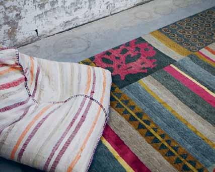
Some of the world’s greatest products have come about through collaborations between designers and manufacturers: Eames and Herman Miller, Starck and Kartell, Sapper and Artemide, to name a few.
Only time will tell whether Meryl Hare’s recent collaboration with Designer Rugs has also yielded a collection of classics. All indications are that it will.
The Hare + Klein studio is no stranger to Designer Rugs, having worked with them over the past 20 years and commissioning many custom pieces. So when Hare approached Yosi Tal, Designer Rugs Managing Director, and suggested they create a signature collection together, it seemed a natural evolution. “We were enormously honoured and excited to be asked,” says Tal. “I’ve always regarded Meryl as one of this country’s most innovative interior designers.”
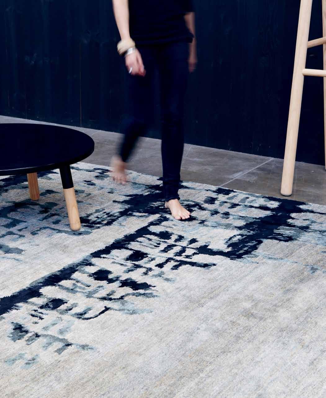
Hare decided to enlist her team of eight to each come up with a selection of designs. The criteria were that the design had to be based on texture, using a combination of hemp, wool and silk. “Texture has always been a bit of a Hare + Klein trademark,” Hare explains. “I believe that texture adds layers to an interior.”
Hare says she opted for Nepalese weavers from Kathmandu, experts at the traditional abrash technique. This is where the weavers take the Tibetan wool and hand-dye it in small vats. The abrash results in interesting colour variations, creating more intimate and complex characteristics. “Sometimes the colour is not exactly what you’d expect it to be; there’s a certain amount of serendipity involved,” Hare says.
As for the form of the designs themselves, Hare says she left this up to her team to decide. “Of course we all found it very difficult, because we generally design to a brief.”
Also of interest to Hare was the way the younger designers worked electronically, while the ‘more mature’ members of the team stuck with old-school methods of pen and paper. “I went home and started painting with watercolours,” says Hare. “Another of my colleagues drew an outline and coloured it in with pastels.”
The initial creative output from the studio resulted in more than 60 designs. These were eventually whittled down to just seven by the crew from Designer Rugs, with the assistance of design guru David Clark.
The whole ‘judging’ process was done anonymously. In the end, two of the seven designs were Hare’s. Then it was up to Designer Rugs’ senior designer Lia Pielli to take the designs and interpret them so they could actually be made.
“The ability to interpret a designer’s rather loose sketch is one of Designer Rugs’ great strengths,” Hare says. “We were all extremely pleased with the results.”
And so she should be. The seven rugs in the collection are all linked by their innovative use of texture, and based on incomplete abstract forms. The colourways are quite subtle, almost autumnal, with shimmers of gold and pink.
“In the end it took nine months from the initial painting to the finished rug, so it’s a little like having a baby only not as painful,” Hare laughs. “Matter of fact, I absolutely loved it.”
The Hare + Klein collection is available in a variety of sizes and can also be custom sized and coloured. Because each piece is specifically made to order, delivery time is approximately 16–18 weeks.








After 27 years with a big international architecture firm, SHANE THOMPSON decided it was time to move on. PAUL MCGILLICK profiles an architect who has returned to his architectural roots – and in a very special place.


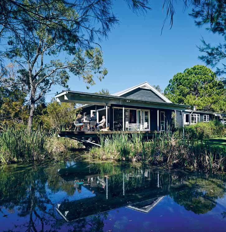
Idyllic is probably the word for it and yet, on good day, it is a mere 20 minutes drive from the Brisbane CBD. This is where Shane Thompson and his wife, Sally, live and work. This is a little piece of rural paradise where Shane can work at his own pace and Sally can raise and train her horses. Having discovered a simple three-bedroom weatherboard cottage at the end of a dead-end street, they have lived here now for 20 years. Four years ago, Shane found a small, old church nearby which was slated for demolition to make way for a shopping centre. “I made this silly offer,” he says, “which was accepted and we put it here.” This became an addition to the original house and contains a kitchenette, a bathroom and Shane’s studio. It is here that Shane now runs his small 8-person practice.
“I was increasingly wanting to do work from home because I was finding it difficult to get the isolation or the concentration I needed, particularly for design work,” Shane recalls. He had been
a principal at BVN (now BVN Donovan Hill) for 24 years, when he realised he needed to make the change more formally. “Ultimately, it was a decision about lifestyle,” he says. “”It was a decision about being able to pursue more individual things … a decision to spend less time on aeroplanes, less time in airports, less time in meetings and less time on big projects.”
Significantly, the decision came at the time BVN was involved in designing the Athletes’ Village for the London Olympic Games where Shane had been responsible for setting up the office to run the project. Although it was a “fantastic opportunity”, the constant travel began to tell. The idea of working in a small office, complete engagement with just one project and less involvement with a host of other things suggested another way of life, another way of working.
So, in 2011, he took three months off and went to the United States where Sally had been accepted into an international training facility in
Florida. “I just painted, travelled and chilled out. I went to the gym, got thinner,” Shane recalls. “Sally was training six days a week, 10 hours a day, so I was effectively house-husband, tucked away in a funny little corner of the world.”
While there, he decided to start up an independent practice, but did not yet know what kind. They were staying in a small onebedroom flat attached to a horse barn at the time. It was on the kitchen table that he wrote submissions for two competitions. One was for the master planning of Brisbane Airport. He did not win, but he did get a “consolation prize”, a $15 million building for the ‘third terminal’ at the airport catering for the large charter aviation market in Queensland.

“I scrambled pretty quickly when I got back and had only one staff member who I had taken with me from BVN, a very good young architect, Bill Elliott. We both had laptops and some yellow trace – and you don’t need much more. Bill was making models at home and we were working from home”.
Numbers have grown, but things remain very casual. It could hardly be otherwise –given the arcadian surroundings, the birds, the wildlife, the waterhen on the pond. Shane says he just likes the idea of throwing on a T-shirt and a pair of shorts, and basically doing things his way – and doing the things he wants to do, ranging from large projects in Malaysia and Papua New Guinea to quality houses in Queensland and Sydney.
“I decided against writing a business plan,” says Shane. “I wanted to go freestyle. It’s a bit
Shane says he just likes the idea of throwing on a T-shirt and a pair of shorts, and basically doing things his way...


There is something about being in those natural landscapes that puts you in touch with yourself.


like going for a surf. You don’t know what waves you’re going to get, but let’s catch them and make the most of it. If we’re enjoying ourselves, we’ll keep doing it. If not, we’ll change.” Similarly, they have not done any marketing. All the jobs have come through word of mouth and just letting people know that they had started the practice. “If you have been around over 30 years like I have,” quips Shane, “then you would hope that a few things would come to your door.”
Shane gains inspiration from two sources –art and the landscape of his native Queensland. “I have always found the bush and the beach to be important touchstones. There is something about being in those natural landscapes that puts you in touch with yourself in a way which is more difficult in the city.”
Shane Thompson’s architecture is very much about place-making and responding to context. Part of that context is natural, but an important part is also cultural.
“The cultural condition of a place is important to me,” he says. “I’ve probably learned a lot through my interest in visual art. Sally and I have been collectors ever since we have been together – over 30 years. We have a significant collection and when we travel we spend most of our time in museums and galleries.”
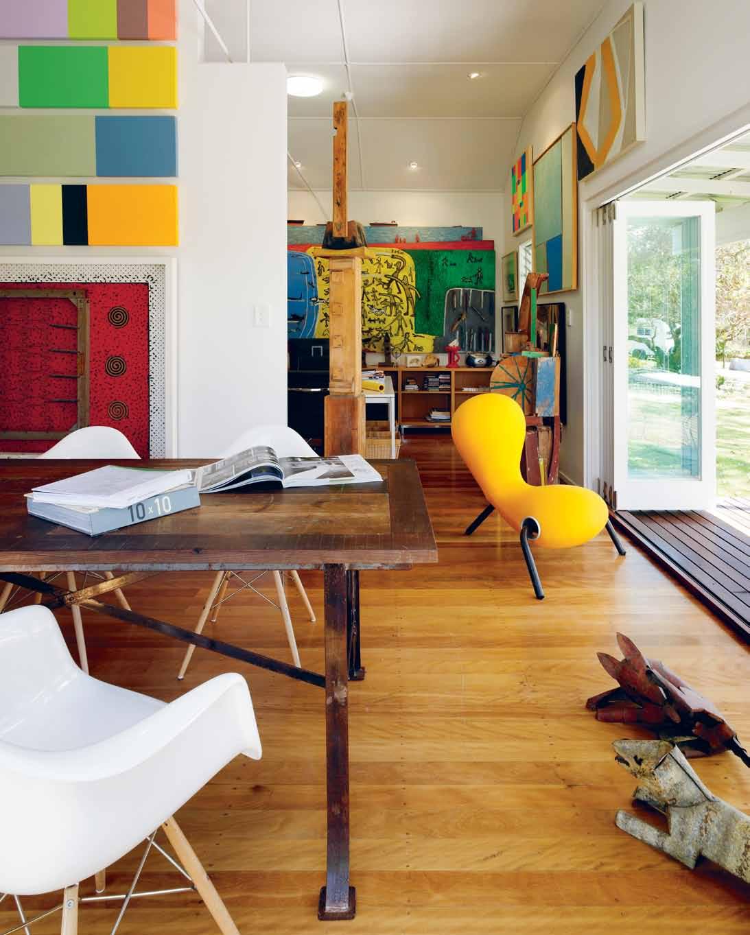
He says he has about 150 works on display at any given time, with the rest of his 400-work collection stored on-site in a large shed. As for himself, he paints “quietly on the side”, but has learned a lot about materials from his personal involvement as an artist.
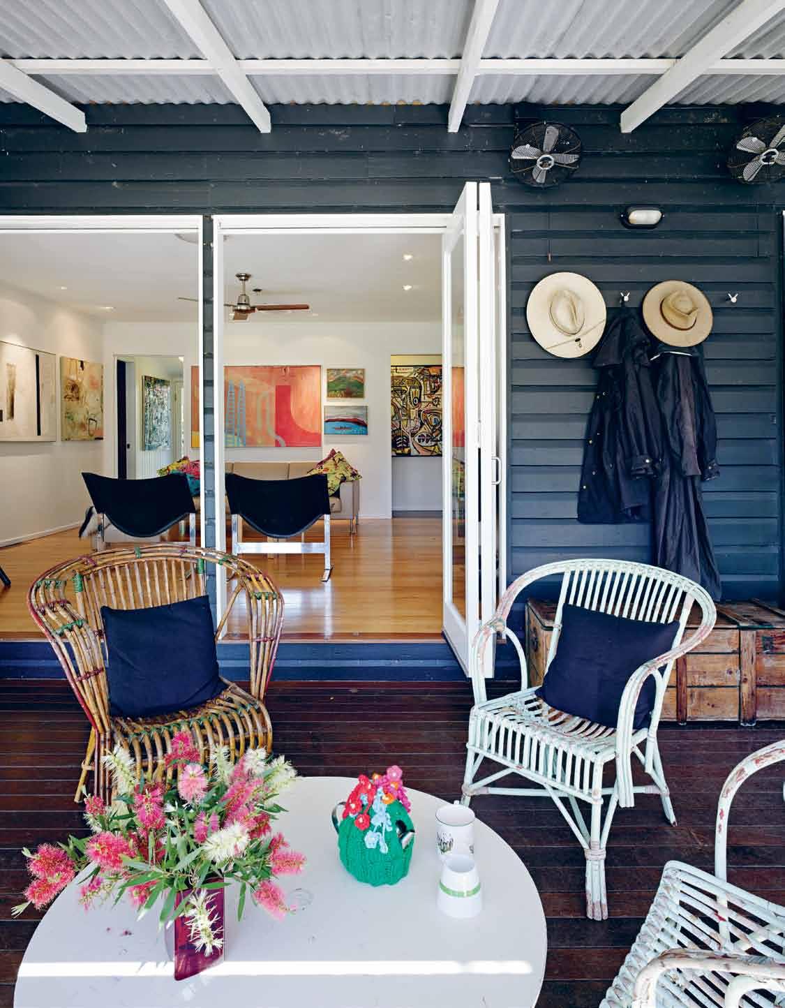
At the end of the working day, Shane simply walks through a door from the studio to the house. A long, deep verandah offers the irresistible opportunity to simply sit and look out over the landscape. Behind the verandah is a sitting room to one side and Sally’s office on the other. This space then steps up to the kitchen/dining area and the main living room which, like the rest of the house, is effectively a
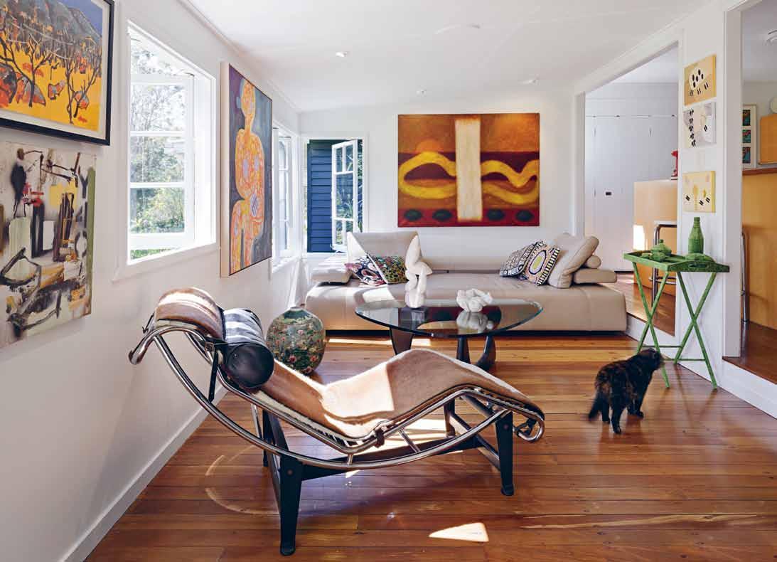
gallery for the paintings and sculptures Shane and Sally have collected over the years.
The simplicity of the house supports the simplicity of lifestyle they were seeking when they moved to Chandler. But it also reflects Shane’s sense of place, because this simple cottage is very much of its place, in its own way embodying the kind of local and regional history which is felt rather than studied.
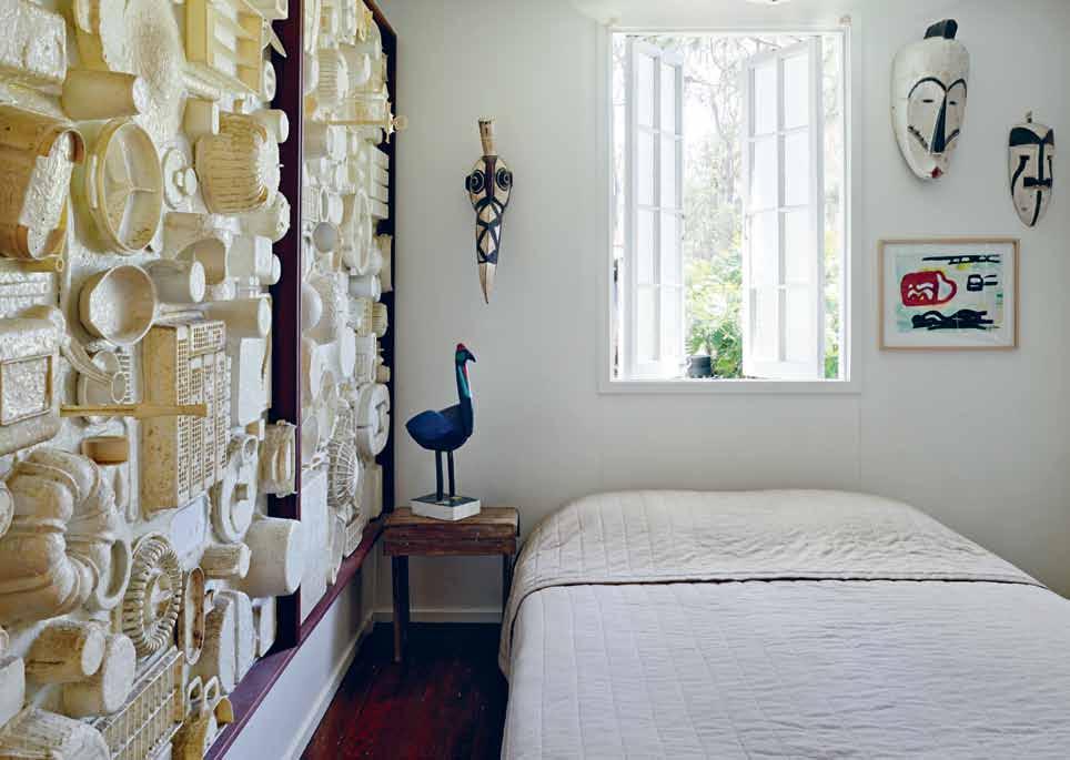
Engagement is probably the best word to describe the way Shane Thompson lives and works. It is an engagement with the natural world and with the way we respond to the natural world through our cultural activities. It is an engagement facilitated by where and how he lives which gives him the space and opportunity that city life and working in a large, pressurised practice would not.
Shane Thompson Architects | shanethompson.com.auThis simple cottage is very much of its place, in its own way embodying the kind of local and regional history which is felt rather than studied.
Neolith is the largest high-tech Sintered Compact Surfaces, offering the most efficient solutions for the most demanding architectural projects.


An extensive combination of colours and finishes, a beautiful designer product that can be used in numerous applications for interiors, exteriors and furnishings. Perfect finishes suitable for direct contact with food, waterproof and easy to clean. Lightweight, hygienic, resistant to high temperatures, resistant to wear + tear, resistant to bending and environmentally friendly. slabs available in 12, 5 & 3mm and tiles of 3 & 5mm thickness.

12mm slab sizes 3.2m x 1.5m, 3 &5 mm slab sizes 3.6m x 1.2m. tile sizes available in 1.2m x 1.2m, 1.2m x 0.6m, 0.6m x 0.6m & 0.6m x 0.3m.
Neolith has a wide range of options, colour combinations and finishes to create exceptional and unique spaces.
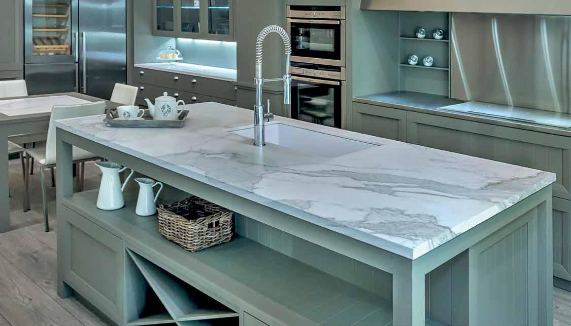

The indoor/outdoor relationship, communal spaces, landscaping and greenery and, increasingly, vertical gardens, are becoming crucial elements in creating quality environments for high-rise living across the Region. GUY ALLENBY reports.
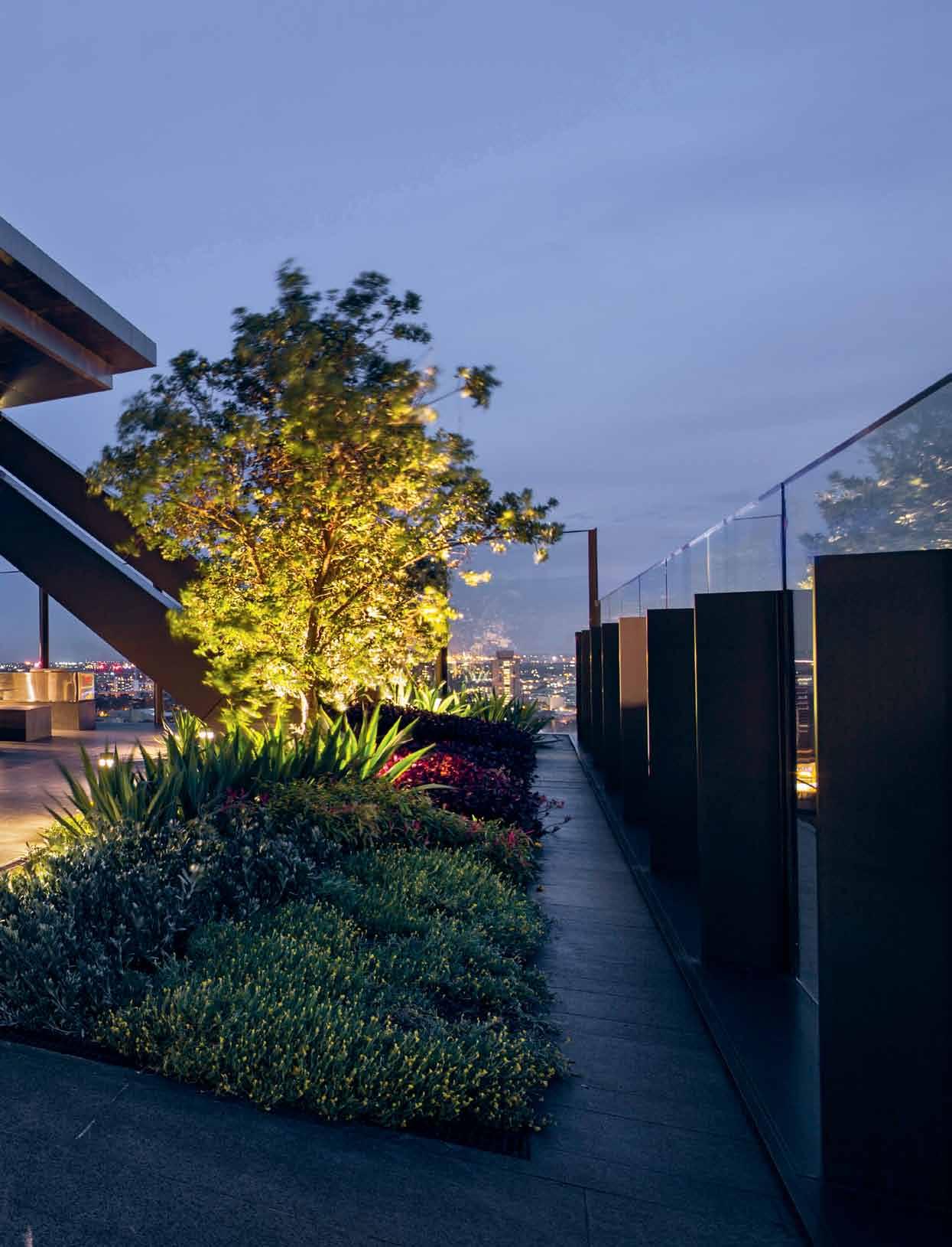
As an easy symbol of the big shifts now happening in the living patterns, design and the very fabric of many of our cities, Sydney’s One Central Park is ideal. For 150 years the western gateway to Sydney city was a massive brewery, taking up nearly six hectares of prime inner-urban land. Today it’s a mixed-use vertical neighbourhood under construction – with two towers in the recently completed stage one by French architect, Jean Nouvel and PTW architects, and with greenery by sky garden designer, Patrick Blanc, cascading from the facades.
One Central Park, with its vertical gardens and its cantilevered heliostat which throws reflected sunshine down into a shopping centre below, was recently ranked the fifth best skyscraper of the year by real estate data mining company Emporis, behind The Shard in London at number one.
Elsewhere in our Region, massive-scale multi-unit developments have mushroomed to meet the ever-increasing demand in our crowded cities. Take new behemoth The Minton in Singapore where 18 tower blocks have sprouted in a single development in suburban Serangoon.
The development has on-site outdoor amenities for its residents called Fun World, Wellness World and Tranquil World – sounding like sets in some high-density re-boot of the movie The Truman Show
Or at The Oliv, also in Singapore, which is a 12-storey luxury condominium tower that has made the most of planning controls that encourage vertical landscape and communal space in the sky. Meanwhile, back in Sydney’s suburban Ryde, a series of seven apartment blocks, housing 653 apartments all linked by a central garden space, has been built atop the local mall. The final apartment building, Viva by Crown, completes the community. Buyers have responded well to the rooftop central courtyard as well as being just a lift-ride away from a selection of over 250 stores.
As a taste of some of the most recent residential apartment developments built in the Region, they reveal that expectations of what an attractive development should offer in terms of amenities, landscaping and the indoor/outdoor relationship is shifting. It also points to the fact that you can’t get these innovations right without a strong collaboration between the developer and a team of talented architects and designers.

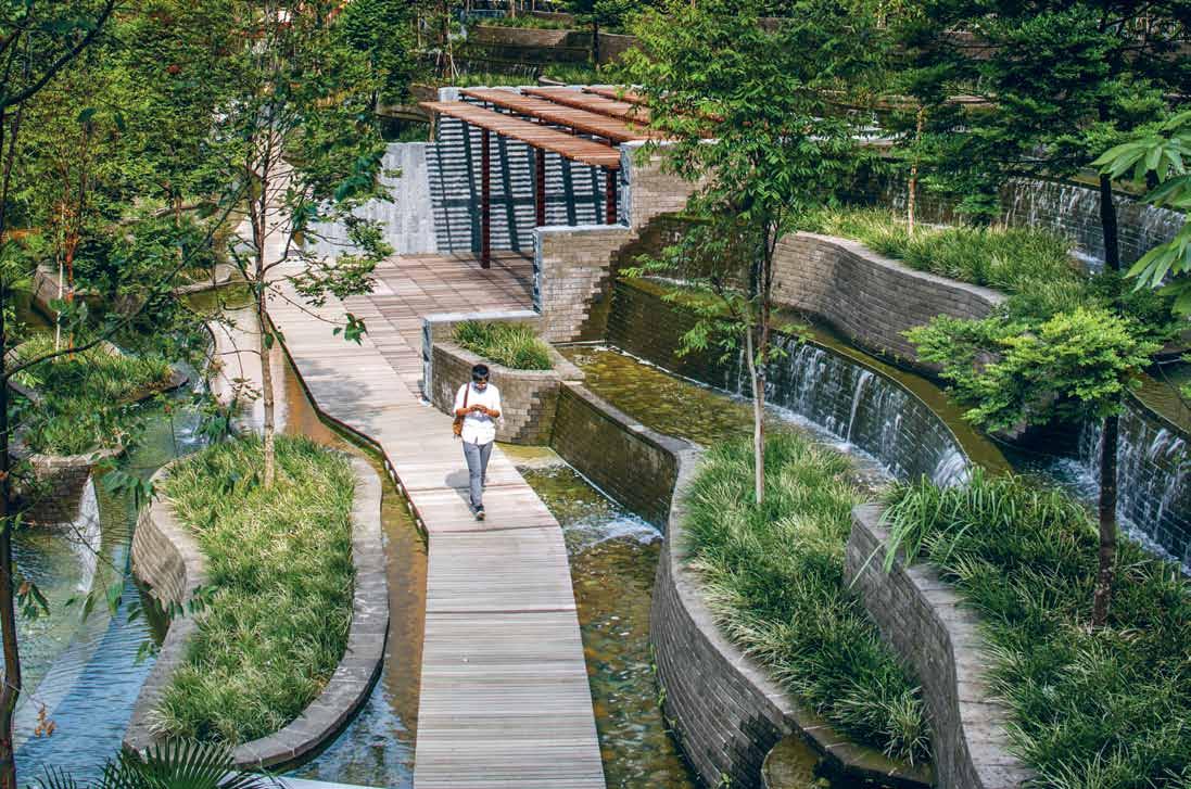
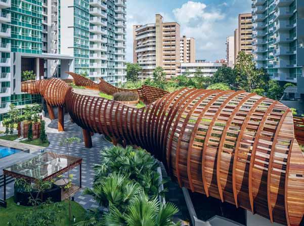
Not so very long ago, a sophisticated development had a pool, a gym and couple of decent restaurants or cafes on the ground floor. Amenities like this (and more) remain crucial but developments like One Central Park and The Oliv have taken a plant-led point of difference and included a costly and innovative use of greenery in the total design.
At The Oliv, designed by W Architects and developed by the TG Group of Companies, there are two apartments per floor, each sharing a sky terrace – a large double-height deck planted with tropical foliage. “The large balcony and the planter spaces gives The Oliv the look of lush greenery both on the façade and from within each unit,” says Ong Kai Hian, of the TG Group of Companies. “Although it does increase the cost of construction, it also created an immeasurable value to our discerning buyers.”
At Sydney’s One Central Park, developed by Frasers Property Australia and Sekisui House Australia, France’s landscaping superstar, Patrick Blanc, was brought in to add le mur vegetal, or plant wall(s). There are 1,200 square metres of these vertical gardens together with seven
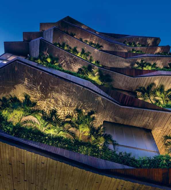
lineal kilometres of planter boxes. “On a commercial level it comes at a cost and many might balk at that,” says Paul Lowe, Frasers Director of Sales, of the development’s design and landscaping innovations. “You could see it as an erosion of the true profitability. But the cost of not doing it is a lot more.” In a highly competitive market, innovative design such as this can deliver a profitable point of difference.
Viva by Crown, by architect Robertson + Marks with interiors by Koichi Takada Architects, is the last stage in a development above a shopping centre in Sydney’s Top Ryde. It was conceived as a “raised urban village” by its developers, Crown International Holdings Group and its architect-trained CEO Iwan Sunito. The roof features an extensive garden, with a playground, swimming pool, libraries, music rooms, theatrettes, spa, sauna and viewing platform.
“The developer’s mindset has changed over time,” says Tim Campbell, Crown Group’s Development Director, “and these sorts of facilities were seen as a cost or a burden on the strata. But these days, residents are willing to pay for those facilities because they want a resortstyle lifestyle. They want to come home and
have a space outside their apartment that feels a part of their home.” And, importantly, residents are now willing to pay for the right balance of amenities, landscaping and communal space.
“We believe that good design coincides with our commercial interest,” agrees Ong Kai Han, “and it is both the architect’s and the developer’s responsibility to deliver that.” Singapore’s URA planning guidelines are very strict, but through a “constant interaction and discussion with our architect we managed to tread closely within the confines of the planning directives,” he says. In Singapore, planning controls encourage vertical landscape and the provision of communal space in high-rise development. At The Oliv, the cleverness has been in blurring the line between the private and the communal. The homes have two apartments per floor and the communal sky garden shared by the two has been designed in such as way as to feel private to each.
At One Central Park Paul Lowe says that an important part of the concept of the vertical greenery was to create the sense that “your apartment extends beyond your four walls.”
The vertical community is a work-in-progress and always a collaborative affair.
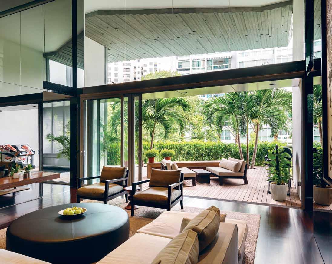
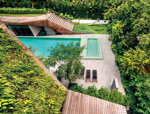
At The Minton this extension has been delivered in resort-style facilities. Perhaps because it is in the suburbs – and not above a major shopping centre like Viva, or part of an inner-city community like One Central Park Sydney – they’ve gone all out on a themepark-like approach. The Minton boasts ‘ Fun World ’, a space that takes in a children’s water playground, badminton dome, pool and clubhouse, games rooms, karaoke room and children’s playground; ‘ Wellness World ’ with a golf chipping green, heated pool, croquet lawn, gym and spa; and ‘ Tranquil World ’ , which features a lily pond, waterfall, library with outdoor reading deck and a botanical garden. It mightn’t be everyone’s cup of tea but it’s another contemporary definition of the vertical neighbourhood.
Success: when developers, architects and designers work nicely together
“We are redefining what a vertical landscape and a vertical community looks like,” says Paul Lowe. “And the people who are best positioned for that are developers and the architects and designers they bring into the fold.”

“A
good apartment design is imperative in the market these days,” adds Tim Campbell. “There is a lot of competition out there, so it’s important to do a well thought-out apartment layout, but also offer services and facilities that really make the place feel like home.”
An apartment is, in essence, nothing more than a box in the sky – and it depends on quality of space, light, finishes, its links to the immediate and to the greater outdoors (both vertical landscaping and available communal space) to generate a liveable sense of place, connection and community. If these things are lacking, then a buyer will look elsewhere.
“I guess it’s safe to say that with the right blend of indoor/outdoor spaces,” says Ong Kai Han, “buyers have more options of ways to engage with the city – and if demand increases – developers would have to sway towards meeting it.”
The vertical community is a work-inprogress and always a collaborative affair, and the best people to expand the possibilities are the best available design professionals.
To hear more about the impact of planning regulations on the quality of residential developments visit habitusliving.com/issue25/multires
Central Park Sydney centralparksydney.com
The Minton theminton-condo.com
The Oliv theoliv.net
Viva by Crown vivabycrown.com.au
Central Park’s finest penthouses, now completed
Winner of Best Tall Building in Australasia (CTBUH)
Winner of Top 5 Buildings in the World Award (Emporis)
Sky at One Central Park takes refined city living to another level. Jean Nouvel’s verdant tower reaches for the stars and at its pinnacle is Sky, a boutique collection of penthouses and sub-penthouses rising above the cantilevered Sky Garden which defines the iconic profile of One Central Park.
Exclusive Sky Garden terrace with jacuzzi | 24/7 Concierge | Private street address | Priority lift access
Make an appointment to step into the sky at Central Park. We’re sure you’ll agree, luxury on this level can only be experienced first hand.
Inspection by appointment only
Contact 1300 857 057 or
Nicola Ericson 0410 433 445
Emlyn Walters 0405 606 025
Central Park Sales Centre
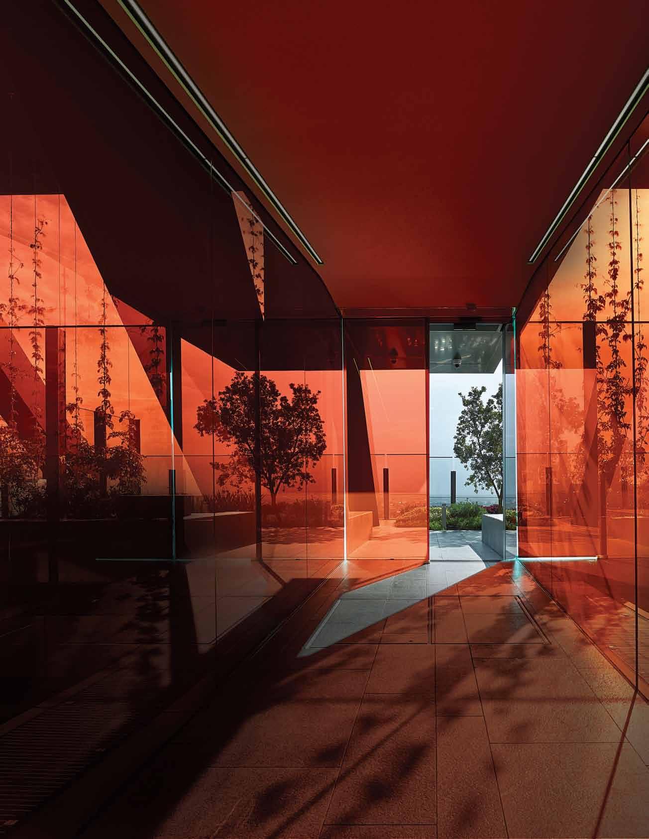
Central Park Ave (corner Carlton St), Chippendale
centralparksydney.com/live/sky
The English Tapware Company (TETC) subscribes to the idea that the windows are the eyes to the soul of their business. Their new window space project means the Woollahra showroom in Sydney is not just a design location, but also a creative space, a gallery and a showcase of creative collaborations.
“It’s a community based project,” says Anna Rees, Digital Marketing Manager of the company. “It’s about engaging designers, making them feel at home here, that they can come in and talk about new concepts with us, helping to launch new products.”
The project asks creatives – from designers and artists to stylists – to create a styled scene in their front window. Having worked informally on the concept for 12 months prior, TETC officially launched The Window Project in April 2014, collaborating with Habitus for the occasion. Set with the brief to
display TETC range in a creative way, and to put the Design Hunter ‘spin’ on the presentation, the Habitus team created the Habitus Botanical Museum of English Tapware:
Habitus invites you to take a closer look at these fine specimens of English Tapware – see them flourish in their natural habitat and learn about their characteristics. Habitus encourages a deeper awareness of the products we choose to surround ourselves with every day. In taking this botanic museum approach to presenting The English Tapware Company’s products, we aim to inform, delight, and arouse your curiosity.
The visual concept displayed a selection of feature pieces including a bath, basin, shower, mirrors, shelves, and of course – taps. Vinyl graphics acted as the scientific annotations to educate the viewer, while greenery completed the botanic feel, adding the characteristic Habitus element of landscaping.

As well as enabling collaboration with members of the Sydney creative community, The Window Project offers multiple levels of engagement for the team at ETC, from passers-by to existing clients that come into the showroom on a regular basis.
“We’re a design based business. Even though we provide a product to the design community, we enjoy design ourselves. Having the window is our opportunity to work with other people and put together original design that our visitors fall in love with. It shows a bit of creativity, which is what we do,” says Stephen Marshall, Managing Director.
Visit the website to see the gallery of past installations or to download a proposal.
See a time-lapse video and hear more about the installation of the Habitus Botanical Museum of English Tapware at habitusliving.com/issue25/etc
Being part of the Design Hunter community is about much more than the provision of products, or even good service, from The English Tapware Company’s point of view.


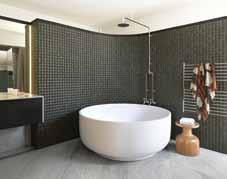

Quality pencils or collector pens, Faber-Castell is probably the brand which springs first to mind. Alice Blackwood profiles a family dynasty which continually re-invents itself.
There is something magical and liberating about putting pencil to paper. Yes, it’s a little messy and often lacks the neat controlled lines and curves that a computer might achieve. Yet, when hand and eye come together, a creative chemistry is sparked, and the spontaneity and sense of fun that comes with this can be powerful.
The richness of that experience is quite important, particularly to a company such as Faber-Castell, which has been trading in pencil production and the pleasure of drawing for over 250 years. From a humble low-tech tool to global empire, it may seem like smart business, but Faber-Castell represents so much more than this. It is a family dynasty, founded in the year of 1761 by German cabinetmaker, Kaspar Faber, which stretches across eight generations of family members committed to the same cause.
It is this generational vision and a strong commitment to core values that has seen the company grow from a single German-based pencil factory into a flourishing global trade. In
fact, says Count Andreas (Andy) von FaberCastell, Managing Director for Asia Pacific, Faber-Castell’s hand-hewn empire is currently growing at a rate of over 300 million pencils, per year.
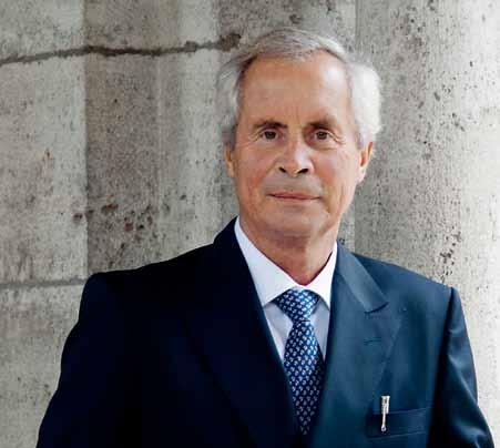
A culture of innovation has empowered Faber-Castell to shape the evolution of the pencil – from design to production and even the experience of drawing and writing. From the finest of details: “Faber-Castell was the company that invented the grading of pencils,” says Count Andy. “It was also [among] the first seven brands to be registered in the United States … to put a name on its product and became known as a brand.” The company has infused generations of Faber-Castells with the drive to innovate, benchmark and pioneer the pencil.
This legacy of innovation has continued to thrive with beautifully simple inventions such as the hexagonal pencil, conceived in 1839 to stop the nuisance of rolling. And more recently the Grip 2001, featuring an ergonomically designed and patented ‘grip’ zone of raised dots.
“The pencil is an incredible low-tech tool,” reflects Count Andy. “The unfortunate thing is that pencils have become a commodity.”
Rejecting this attitude towards the massproducible and expendable, Faber-Castell distinguishes its pencils as being a performance device, a “good tool” for fun and creativity. “A good quality Faber-Castell pencil, for example,


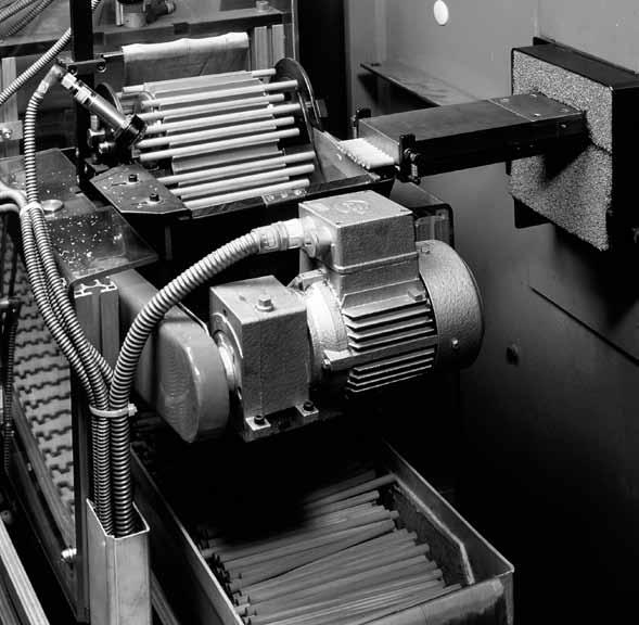

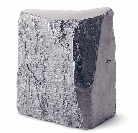
can write up to 80 kilometres,” says Count Andy. “And if you take one of our Castell 9000s and go to the highest building in Sydney and throw it over the edge, the lead inside won’t break [on impact].”
In today’s era of global business and rapidly shifting consumer needs, most companies strive for fast-moving flexibility. It is something which Faber-Castell can easily achieve, thanks to its family ownership. “We’re far more flexible with far fewer stakeholders,” says Count Andy. “We can make decisions a lot faster and adapt quickly.” However, building and developing the brand is approached with a much longer term vision in mind. “In a family company we can think over generations. Most of my activities [for example] are about setting foundations for the next generation.”
Count Andy links back to the registering of the brand (in 1839) by his grandfather A.W. Faber – an action which would secure the company for generations to come. Almost 150 years later the family would make another investment in the future, establishing a FSCcertified (Forest Stewardship Council) pine forest in Brazil. It was a major undertaking, made possible by the fact of Faber-Castell being family owned, rather than controlled by shareholders. And it reinforces the company’s commitment to social responsibility, sustainability and self-sufficiency.
Diversification, too, has been important to their continued growth. “During my father’s time we were the largest slide-ruler manufacturer in the world,” says Count Andy. “If you don’t know what a slide-ruler is, it’s the instrument used before they invented the calculator! So [as you can see] we have to adjust all the time. We’re always searching and looking [for new areas of development].”
By the late 1970s Faber-Castell had already established factories in countries within South America, Europe, Asia and the Asia Pacific. Joining the company in 1992, Count Andy’s focus was clearly on the Asia Pacific, a region that promises great growth and development opportunities – if you’re willing to put in the work. “Unfortunately, the dream of being a managing director, sitting like the [comfortable layer of] fat atop the soup is long over. You have to be totally integrated, involved in every process of product development and manufacturing.” It’s a process that Count Andy revels in, that moment when a new product is ready, conjuring something of the child in him.
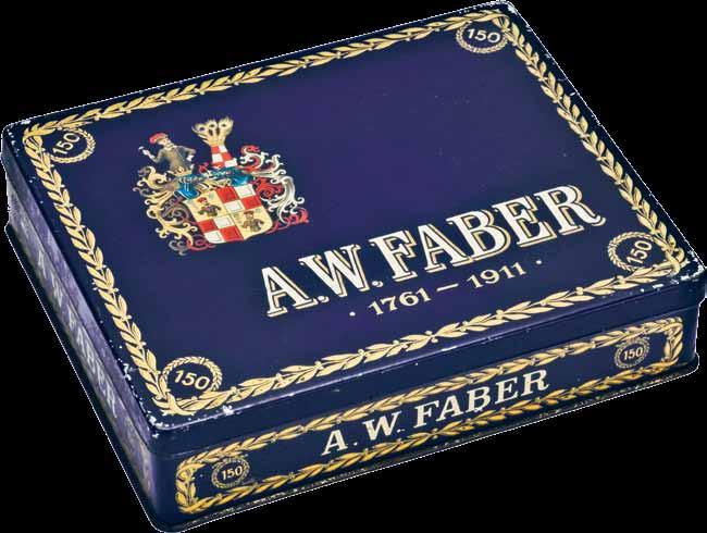
You have to be totally integrated, involved in every process of product development and manufacturing.
“I am always very excited getting a new product and testing their performance.”
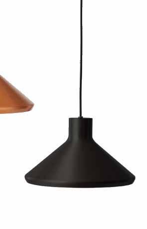
Once pencil or pen is in hand, Faber-Castell’s work is completed. Well, almost. “Our biggest challenge is the time people spend using our products,” says Count Andy. As such, FaberCastell invests much of its marketing into exploring pencil usage – finding out just how fun it really is, and peeling back the more techniquedriven layers of drawing and learning. “It’s about the pleasure of using,” he says. “I wish the whole industry would wake up to that, and not just sell cheap, nasty products.”
Among Faber-Castell’s most popular products are its coloured pencils, produced in a rainbow of beautiful hues with thick lead – and a “nice colour lay-down” says Count Andy of

the quality of lead on paper. There’s pride in Count Andy’s voice as he describes the importance of drawing as part of one’s childhood development. “When you write something down, it’s pretty much proven that your retention is about 80 per cent higher,” he notes. On a more emotional level, a coloured pencil and piece of paper can dispel a bad mood and open the mind to creative thinking. “It’s the magic between hand and brain,” says Count Andy. And that’s why a Faber-Castell is a companion, for life.

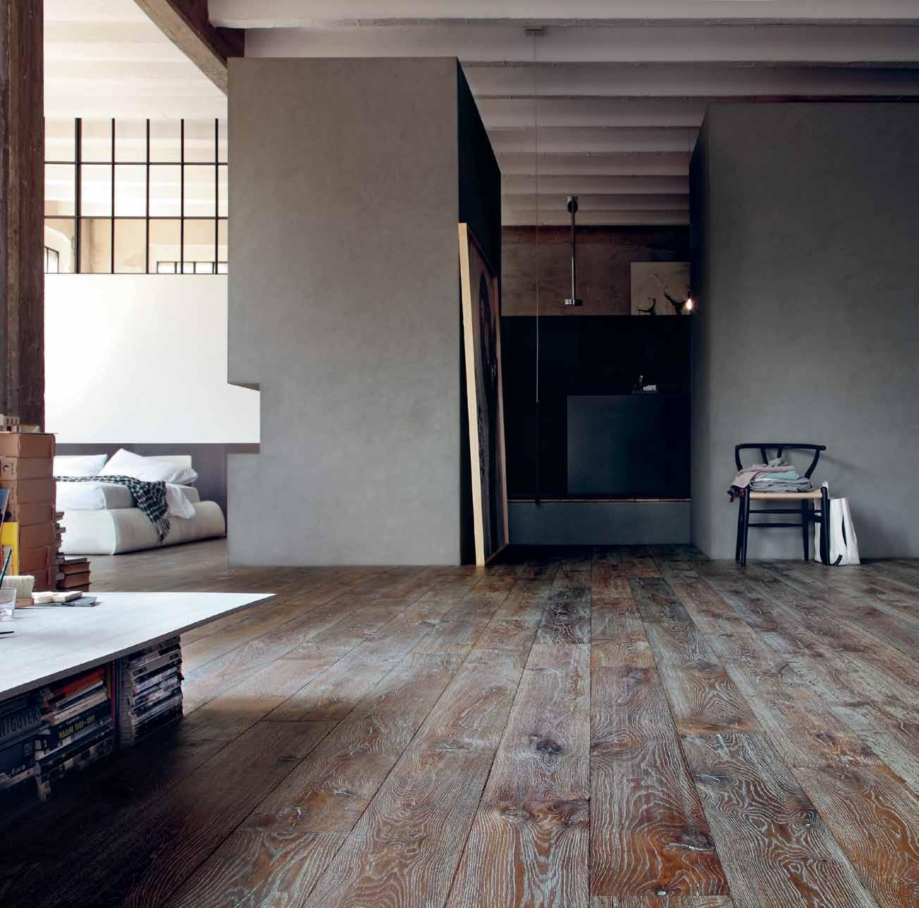


Inspired by nature, ABEY’s kitchen and bathroom ranges evoke the organic forms of the land, air and sea, as do their functions. Here, they become sculptural objects in our playful, dream-like landscape.
Solid and still, the earth element alludes to mountains, rocks and pebbles, shaped over time by physical forces to become their most perfect form. Smooth as stone, absorbing the light and allowing the other elements to wash over it, this basin provides a strong design foundation to create a bathroom with natural elegance.

Air
Uplifting and spacious, the air element purifies. Effortless, efficient, and more silent than ever before, this rangehood functions as the lungs of the kitchen, extracting impure odours from the air to deliver a better quality environment for the home. Light in form and hushed by nature, breathe a sigh of relief.
Falmec Eion Spring extractor in white with perimeter extraction, touch control + leaf sensor, automatic purification function, neon lighting and removable and washable grease filter, removable. Available in white or black gloss.

Water
Flowing lines are a liquid legacy; channelling, transporting and movement are the functions of this element. Connecting the end user to the source, these kitchen and bathroom mixers provide us with H20 – not just inspired by, but also containing the element of, water.
Background and foreground: Gessi Goccia basin mixer with spout. Also available in brushed chrome, white & black finishes.
Middle ground: Gessi Via manzoni high basin mixer in chrome finish.
See behind the scenes of this photo shoot at habitusliving.com/issue25/abey
Abey | abey.com.au
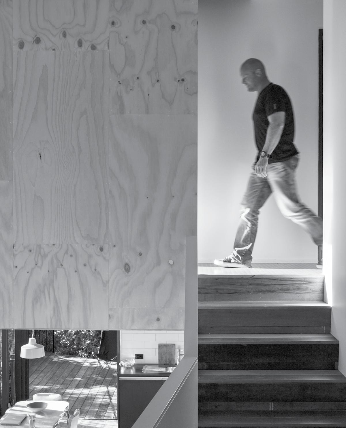
This one-bedroom house by GLAMUZINA PATERSON ARCHITECTS in WAIHEKE
ISLANDstretches up through the New Zealand bush to catch the sun. ANDREA STEVENS visits the island retreat and finds a sophisticated yet rustic solution to a difficult site.

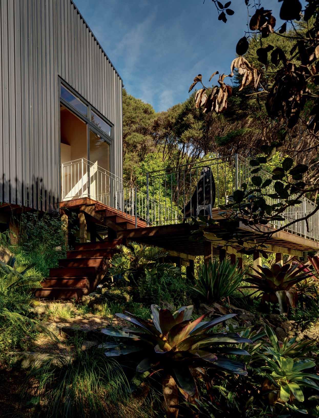
Waiheke Island, a 40-minute ferry ride from downtown Auckland, is a languid place peppered with small timber houses, weekenders and a few swanky mansions along the coast. Farms have largely given way to swathes of grape vines and olive trees, housing, or simply been reclaimed by the bush. This hilly landscape, relatively close to town, attracts the urban worker for weekends away – the background to this small house project.
The owners of this fairly typical Waiheke site – long, narrow, steep and cloaked in bush – approached the practice Glamuzina Paterson to design ‘a house that was at home in the tree canopy’. The bush is protected, and only a small area of it could be cleared to build. The trees therefore remain a strong element of the architecture of the site, and create a vertical axis contrasting to the land’s diagonal one. The architects have addressed both axes here, by going up and stepping down.
These tensions are reflected in the design in numerous ways, but most obviously in its height. Conceived of as a tower, the building is tall and slender, reaching for the light like a
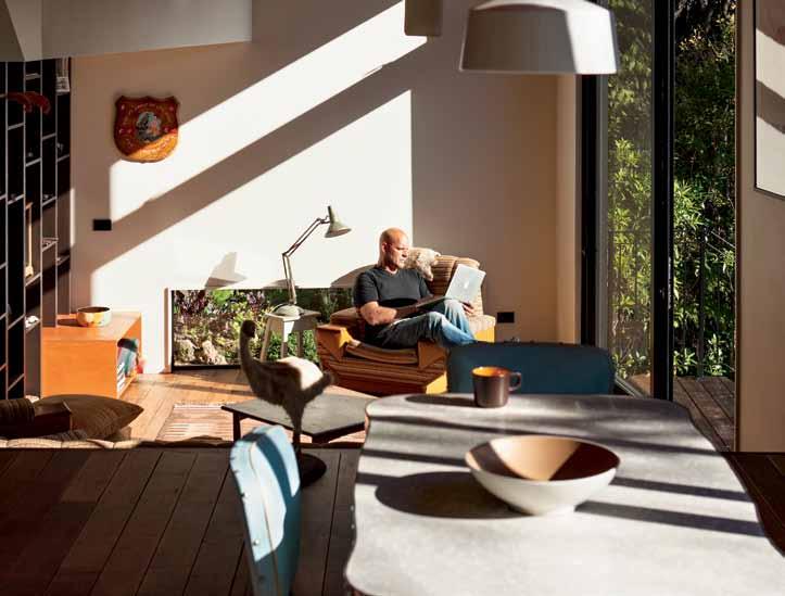
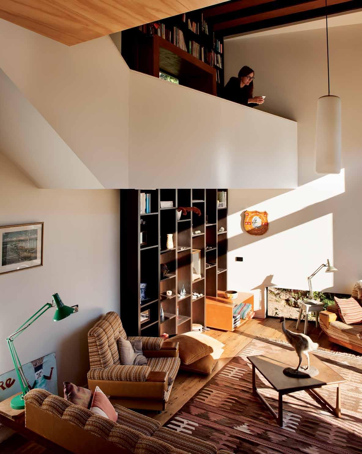
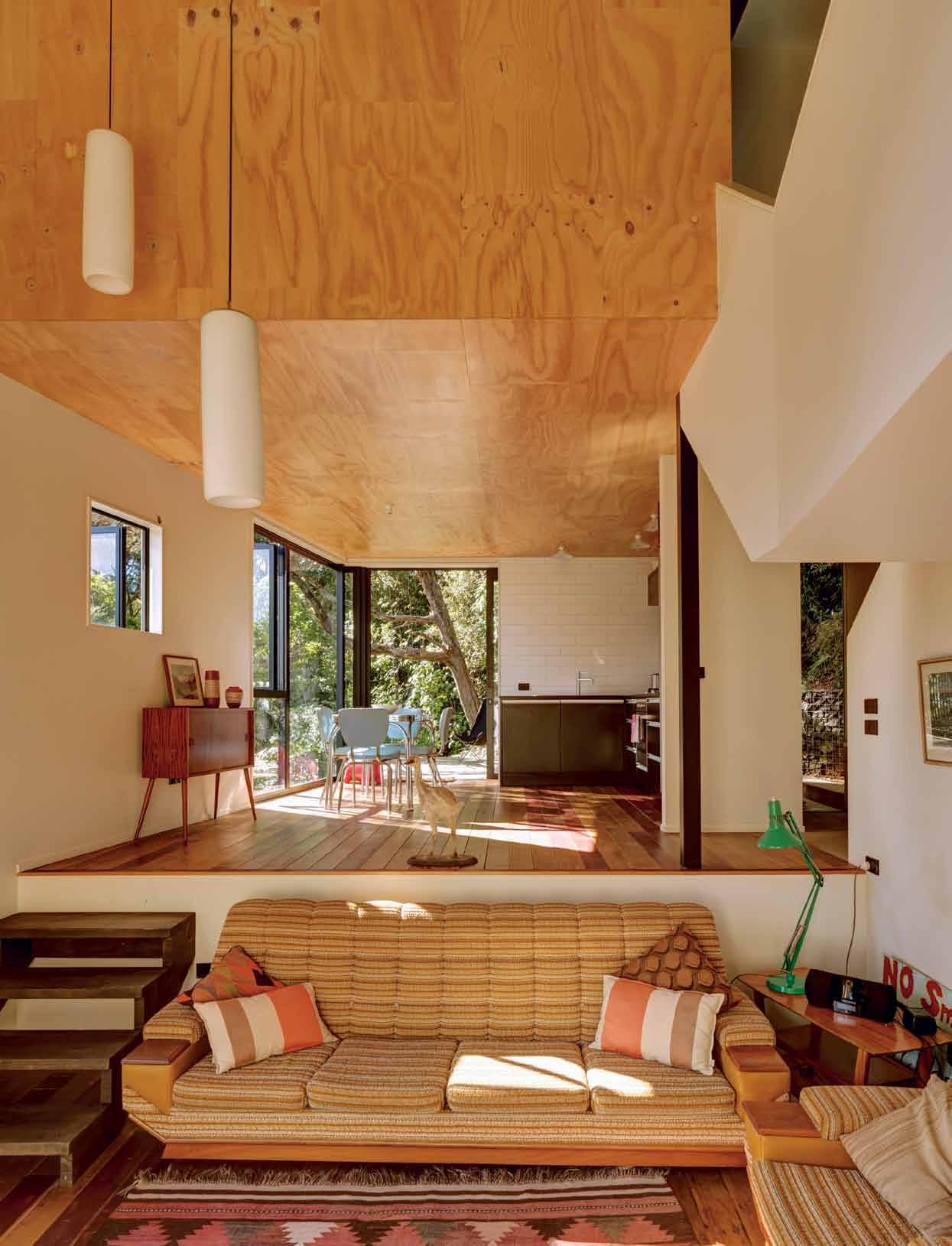
sapling of the forest floor. Openings are cut into the tower like lookouts, and the plan cuts away to allow for existing trees. The exterior is mute, a dark steel box that absorbs the light, echoing the black of the Kanuka trunks. It’s been kept deliberately simple to manage the budget, but it also connects to the country’s heritage of, what David Mitchell coined, ‘The Elegant Shed’. It is a structure of utility and resilience; practical, not decorative, economic, and not boastful.

To reach the house, cars must be left on the roadside. Steps are cut into the bank and navigate their way down through the bush to arrive at an understated entry porch. New Zealanders are fairly used to arriving by the back door, so I felt immediately at home. The compression of this entry sequence is carried a small way into the house as well, until the soaring living space is revealed. It starts a metre down from the main floor level, and rises up to almost two storeys in height. A tall northern window draws the winter sun deep inside, warming the room. “The volume accentuates the verticality of the site,” say the architects, “and allows differing spatial parti –from intimate to vast.”
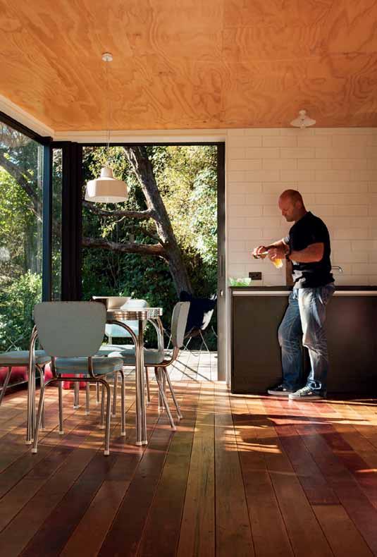
It is a structure of utility and resilience; practical, not decorative, economic, and not boastful.

Black steel cladding and joinery make the building recessive within the bush-clad site.
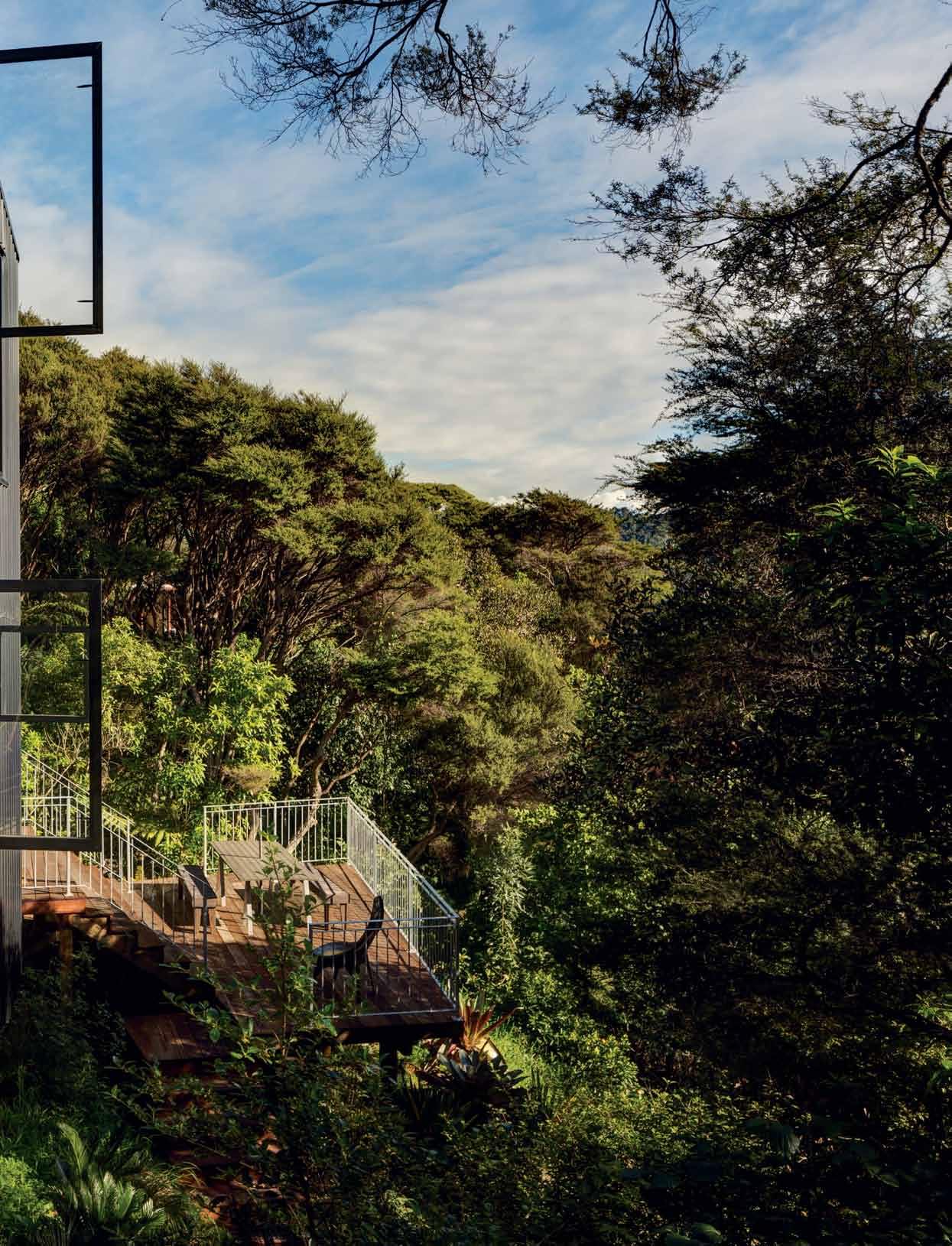

This double-height space is the anchor and connector for all rooms. The combined kitchen and dining look over it, and a mezzanine library and stair activate it with their geometry. Its back wall has a floor-to-ceiling built-in library, where the timber structure of the house forms the ribs that house the books; they then fold and cross the void ceiling to connect the two surfaces. The whole space has the sophistication of a Corbusier studio apartment, but with enough rustic timber details to remind you this is a building in and of New Zealand.

Having such a prominent library element really celebrates the function of this weekend retreat. It has replaced the fireplace as the heart of the house, and reinforced by a strong presence and reflection in the ceiling plane. It is a visual and practical expression of the programme, which supports and encourages holiday relaxation. There is no wifi and no desk other than the dining table. This is a place to switch off. Lounging is encouraged by both a built-in window seat on the library mezzanine, and the sunken lounge that provides for seating along three walls. These built-in elements,
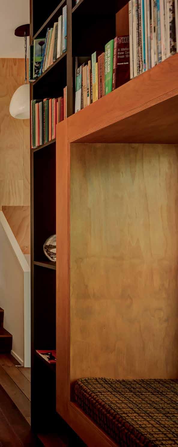
changes in level and materials are all subtle clues about how to inhabit this place.
Amidst the pure white geometries of the stair and library mezzanine, there is a fair amount of timber too, and a lot of it recycled. Plywood lines the bedroom wall and wraps below to form the kitchen ceiling, and old Totara boards have been re-laid throughout the ground floor. The floor is oiled and boards are not perfectly flush, recalling an archetypal shearing shed; a more functional way of living.
Leading off from the ground floor living areas are two external decks: one to the northeast from the kitchen, and one to the northwest from the lounge. The kitchen deck makes an intimate niche with the bush. The lounge deck steps down and out on to a platform that explores the scale and dimensions of the steep site. The tower concept is reinforced by this experience and by the dining room window: its large pane reveals a dramatic view of the bush, and shows just how high you are above the forest floor.
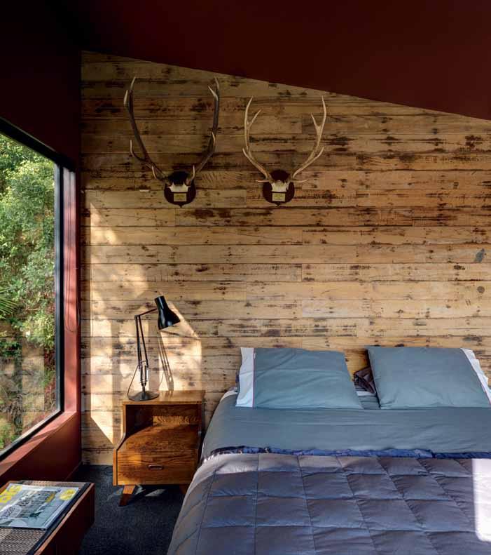
These built-in elements, changes in level and materials are all subtle clues about how to inhabit this place.
PRINCIPAL ARCHITECT
Glamuzina Paterson Architects
PROJECT TEAM Dominic Glamuzina and Aaron Paterson
CONTRACTOR Kevin Glamuzina
STRUCTURAL ENGINEER
Thorne Dwyer Structures
GLAMUZINA PATERSON ARCHITECTS
(64 9) 303 0255
gp-a.co.nz
FURNITURE
Client supplied.
LIGHTING
Client supplied.
FINISHES
Generally throughout, internal walls are Ecoply, stained Meranti plywood and plasterboard ceiling, all from GIB, with paints and varnishes from Resene. Recycled Tawa flooring and Pirelli rubber flooring from Activa. Generally throughout, Dimondek 300 steel cladding and Trimdek steel roofing, all from Dimond.
FIXED & FITTED
Skylights by Velux.
At the very top of the tower there is a private attic of sorts that fits neatly in above the entry corridor and kitchen-dining room. Here you find the bedroom and the bathroom. The bedroom is a veritable crow’s nest with a large picture window and recycled timber feature wall. It is the only room with carpet, and is painted in a deep brick red. The adjacent bathroom is cave-like, with colours and materials that echo the native bush.
In a country where the main structural material is timber, and most house budgets do not stretch to exotic materials, New Zealand architects have made crafting of interior and exterior house skins into an art form. Surface play that defines volume, function and character, has been used to great effect in this small holiday house. The architects have crafted vernacular materials so that their juxtaposition creates something unexpected. The angled plan, chiselled roofline and interior gymnastics make something extraordinary from the ordinary.
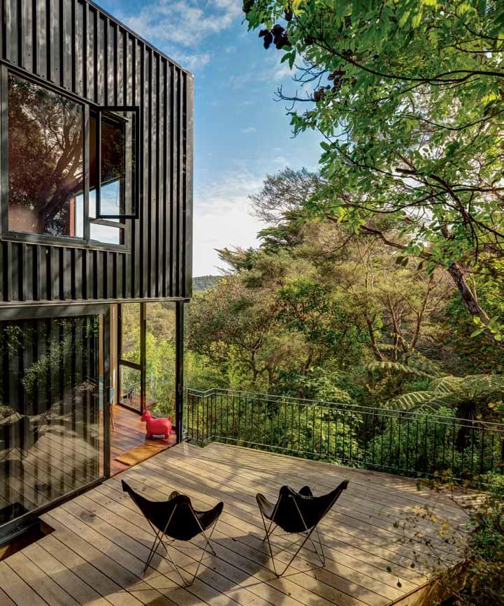


Clever design by A21 STUDIO and six painstaking months of construction have transformed a cramped shoebox ‘tube house’ in HO CHI MINH CITY into an urban oasis of nature, reports NGA HOANG.

The 3x9 House, a recent renovation of a 27-square-metre house by a21 studio, is modelled after one of their earlier projects, A21 House. This earlier project – a two-storey, sun-dappled structure hidden in an unassuming lane in Binh Thanh District – is home to a21 studio’s principal architect Hiep Nguyen and his family, and also workplace to four employees. The home/studio arrangement was envisioned as a way to overcome the reality of nightmarish traffic congestion, clouds of exhaust fumes and seas of mask-clad people that form daily life in fast-paced Ho Chi Minh City.
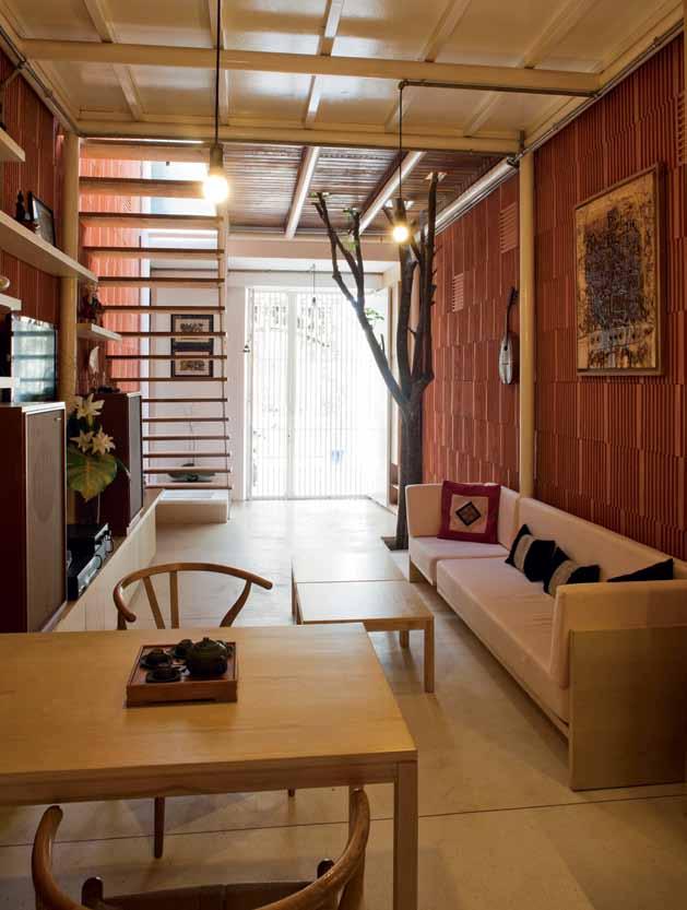
The poetic inspiration for the design was the architect ’s first impression: “Standing in this small and cramped space, instead of thinking of green, environmentally sustainable or ecoarchitecture … a wild cage, capturing nature, in which sunlight, wind, rain water, and trees define human activities.”
It set the tone for a project closely connected to nature, which ended up attracting their next
 PREVIOUS | TUCKED DOWN A RESIDENTIAL ALLEYWAY, THE RENOVATED 3X9 HOUSE TAKES URBAN HOUSING TO THE NEXT LEVEL WITH AN ECO-HOME CONCEPT. ABOVE | THE GROUND FLOOR HAS A MINIMALIST AND CLEAN LOOK WITH NO DIVIDE BETWEEN LIVING ROOM AND KITCHEN. BELOW | THE EXTERIOR IS DISTINCTIVELY MADE OUT OF VERTICAL WOOD LOUVRES WITH GAPS THAT ALLOW THE AIR TO FLOW. OPPOSITE | THE TREE ACTS AS A CONNECTOR BETWEEN GROUND FLOOR AND UPPER FLOOR.
An innovative, eco-friendly masterpiece in which the man-made and the natural cohabit peacefully.
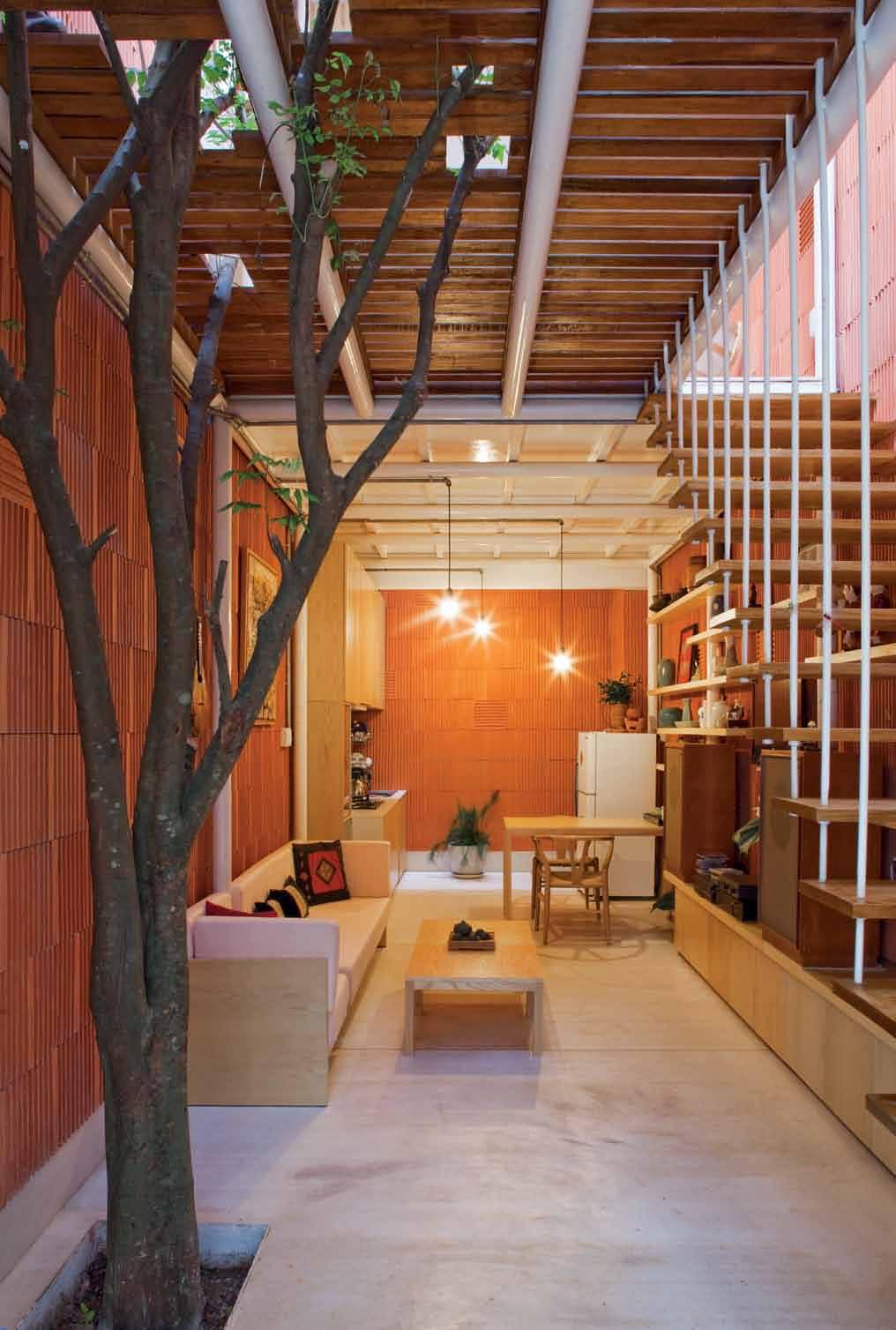
client: a single woman working for an inkproducing company, who loved the natural aesthetic of the A21 House. Hoping to give her own pocket-sized house an eco-makeover as quickly as possible and at the lowest possible cost, she approached a21 studio through a mutual acquaintance.
Tucked down a narrow residential alleyway off Nguyen Thien Thuat St in Binh Thanh District, the 3-metre-wide and 9-metre-deep house is almost completely hidden behind a cell-like facade constructed out of vertical wood louvres, with a few potted plants scrambling out. Behind the facade, however, lurks an innovative, eco-friendly masterpiece in which human and nature cohabit peacefully under one roof.
In general format, the 3x9 House very much conforms to the Vietnamese ‘tube house’ tradition of long and thin. But in the interior, the small footprint opens up to reveal a lightfilled space. “In Vietnam, most houses are

traditionally built with dividers to separate rooms. And a staircase slap bang in the middle [usually] blocks the air flow and makes it unpleasant to live in,” explains a21 studio architect, Toan Nghiem. Stepping through the entrance of the 3x9 House, however, you are ushered into a long, narrow room with a shared living and dining. The architects have also shifted the typical placement of the staircase, locating it on one of the side walls, so that the unified space – though compact – feels larger than it actually is.
Similarly, on the upper levels, all room dividers have been knocked down to create a single open space that incorporates bedroom, courtyard and bathroom. Corrugated iron roofing has been ditched in favour of a large operable skylight in the transparent roof, which allows light to pour into the house. “As I lie in bed, I can just switch off my mind and marvel at the clouds and the moon. Life is just as good as it gets,” the homeowner says delightedly.
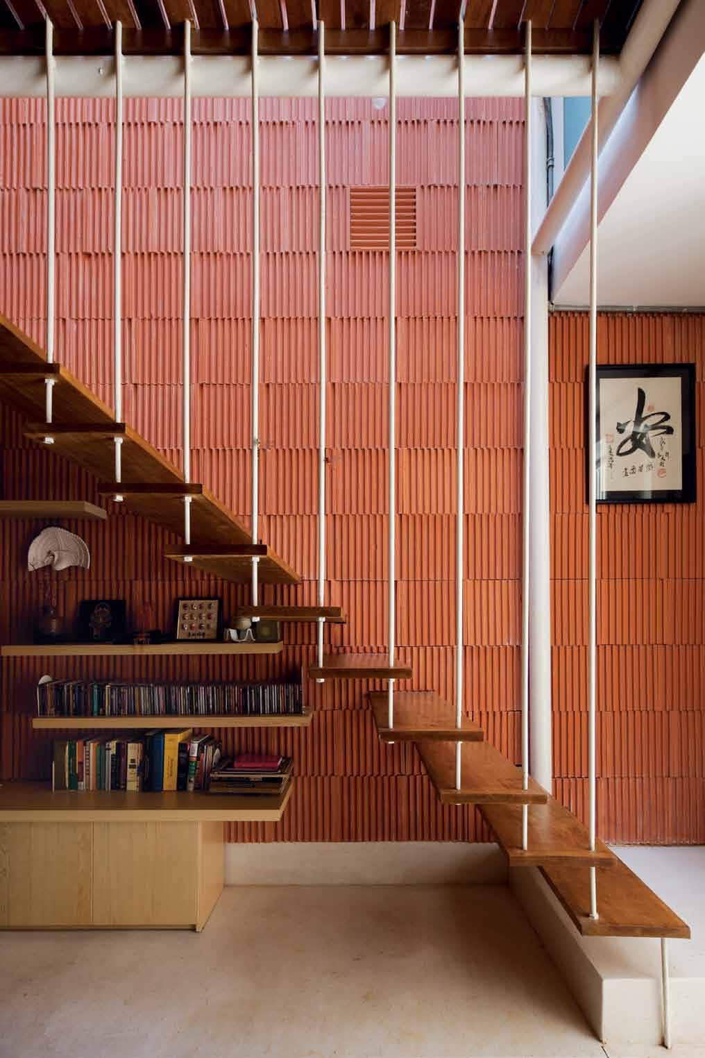
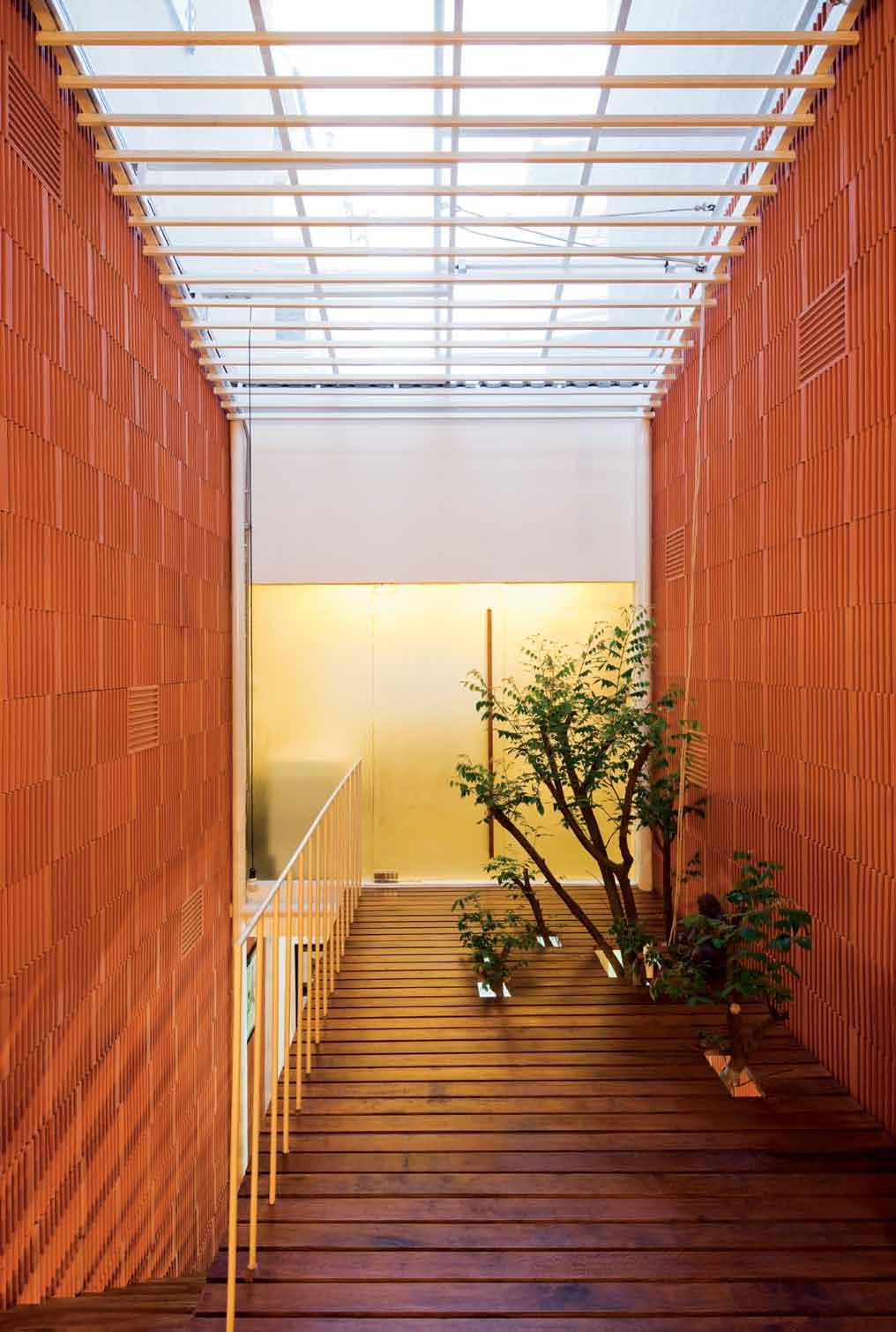
A use of mixed materials – painted steel, polished concrete floors, walls made of upturned brickwork and wood abounding – results in a textured, contemporary look. The concise palette also serves a unifying function, with the simple materials effortlessly complementing, rather than competing, with each other and cluttering the space.
An arboreal feature of the house has been transported directly from the earlier A21 House: a slatted floor/ceiling which allows a tree to extend through the storeys as a vertical connection. In the 3x9 House, the ceiling on the ground floor, also the floor of the upstairs courtyard area, is cleverly made from wooden planks with strategically placed gaps and cut-outs. These allow light to come streaming down, but also, allow a tree to grow uninterrupted from ground level to the upper floor. This contributes to softening the boxy appearance of the house; what emerges is a tropical zen for the inhabitant.

A garden has less to do with the size and more to do with the feel.
| ARCHITECT
“The idea is to create a garden within a house. People often think of big houses when they think of a garden or courtyard. But we want to prove that you can still have a patch of green in a small house without taking up too much space,” Nghiem says. “A garden has less to do with the size and more to do with the feel.”
The upper floor is reached via a wooden staircase furnished with steel reinforcement railings. In a city where buildings develop at a dizzying speed and no space is to be wasted, architects need to take advantage of every available inch of space wherever possible. In this case, a bookshelf sits cocooned right under the staircase, providing a lovely reading nook for the homeowner.
On the upper level, the bedroom is placed at one end of the floor plan whilst the bathroom, complete with a mosaic wall of colourful tile work, is at the other. They are connected by the tree which sprouts straight out of the floor.
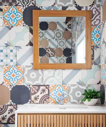
On the whole, every corner of the house is arranged to receive as much natural sunlight

and shade as possible and bounce light through the entire house. “I love driving home at noon and walking into the house just to bathe in the sun. It’s sunny yet breezy – a rarity for houses in Ho Chi Minh City, ” the homeowner enthuses.
The 3x9 House is a perfect example of bringing nature inside to create an illusion of space in limited surroundings, and a master class in how to get the most out of a small property on a tight budget. There is a particular emphasis on functionality, yet compared to similar-sized properties, it gives an illusion of space and light that is often missing from the new buildings that are lost in the alleyways of Ho Chi Minh City. “I feel different every time I walk into the house. Sometimes I feel like I am living in a villa whilst at other times I feel like I am stepping into a spacious garden,” the homeowner says smiling.
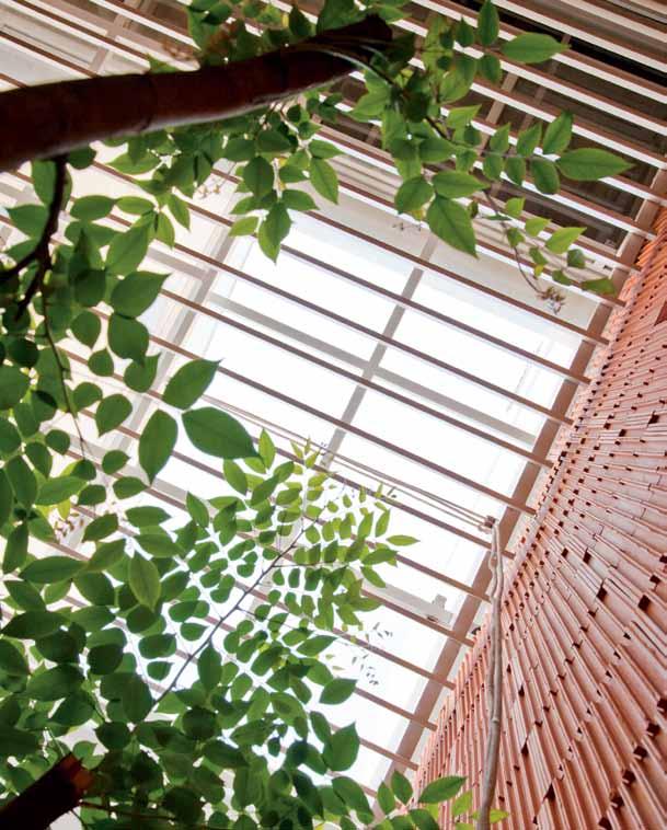
DROP BOX
PRINCIPAL ARCHITECT a21 studio
PROJECT TEAM Hiêp Hòa Nguyên, Nho’n Quí Nguyên CONSTRUCTION 68 Construction
A21 STUDIO (84 8) 38411603 a21studio.com.vn
FURNITURE
Generally throughout, locally sourced furniture.
FIXED & FITTED
Generally throughout, bricks, steels, wood and granitoid structure.
The 3x9 House is a perfect example of bringing nature inside to create an illusion of space.
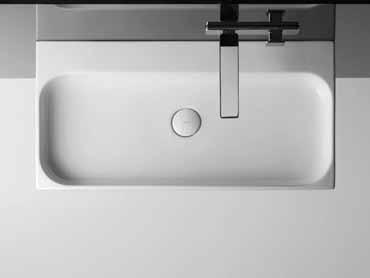
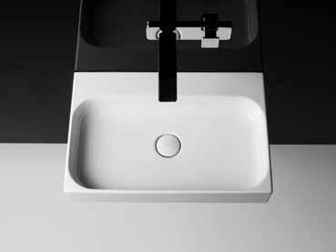
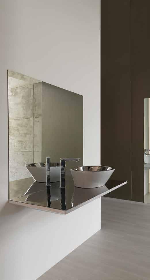

Quietly distinguishing itself from its neighbours, a house in MELBOURNE by LEETON POINTON embraces its riverbank setting, casually tumbling down the slope to connect with the riverside park. STEPHEN TODD visits.

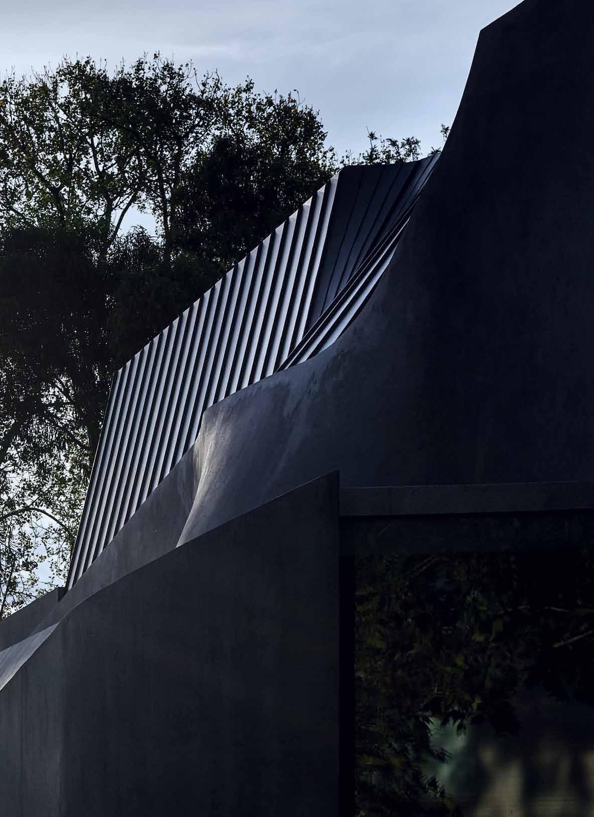

Melbourne was founded on the relative flatlands at the mouth of the Yarra River, the subtle undulations of its flood plain creating an allusive topography. This Hawthorn home designed by architects Leeton Pointon incarnates that topography, its three-level elevation gently rambling down the incline from streetside to lush riverbank park. The brief was to privilege the landscape, to maximise the property’s parkside setting and open it up to the elements whilst creating a private living environment. Seen from the street, the angular, raw cement structure intrigues, its zinc-roofed setbacks creating fluid movement amidst a stoic row of Edwardian houses and walk-up apartment blocks.
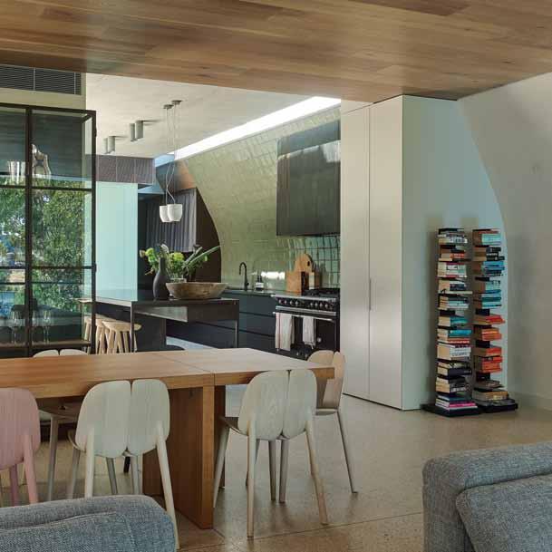
Once beyond the heavy, solid Oak door, a private world opens up. An enfilade of free spaces, the ground (central) floor is anchored by a vaulted stairwell that hints at the floors above and below. Soaring, it is a complex set of irregular planes that fracture light as it filters through various off-form niches and windows.
A travertine entry area opens seamlessly to a casual kitchen prep and eating zone; a cemented courtyard to the parallel north wall

A cemented courtyard to the parallel north wall is softened by the variegated greens of a lush vertical garden that reinforces the sense of pleasant insularity.

is softened by the variegated greens of a lush vertical garden that reinforces the sense of pleasant insularity. Seemingly impenetrable, this cement structure with a view to sky and to river beyond, is opulently self-contained.
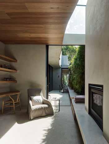
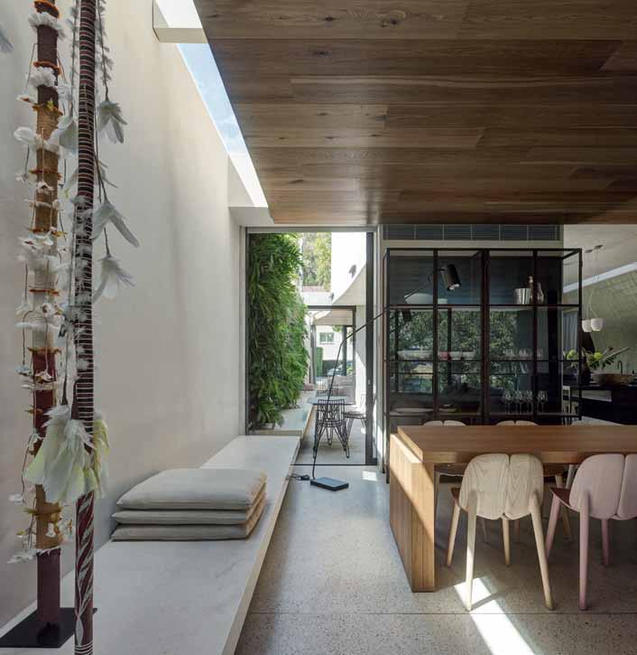
Opposite the garden courtyard, the island prep and eating bar is a perfect conversational area in a house that is clearly geared to entertaining. To the other side of the hefty brushed steel bar, the open kitchen stretches along the vertically curved south wall, its handmade soft green Spanish tiles a subtle echo of the vertical courtyard garden opposite. Pantry shelves are concealed behind textured linen curtains rather than cabinetry; the bank of exhaust fans is housed in a sculptural, burnished steel canopy. Taken along with satiny Indian granite worktops and silky blonde wood seating, the kitchen is an essay in the potential sensuality of texture and finish in the modern home.
In fact, the entire Park House, while decidedly modern in allure seems somehow to speak to an idiomatic design ethic. “We certainly weren’t looking to create yet another Miesian box,” says Michael Leeton, who along with his wife Kate Pointon is principal of Leeton Pointon. “So much of this house was about the different people who came together to work on it.” People like master builder, Len Bogatin of LB Assoicates, who was able to take the architects’ somewhat eccentric vision and bring it to life. “Len’s attention to detail is the stuff of legend – the hang of the kitchen tiles alone could have done any other builder’s head in,” laughs Leeton. Other people like Alison Pye of Alison Pye Interiors, who was responsible for much of the quietly sculptural furnishings, and some of the soft fittings. Or Andrew Laidlaw, landscape architect at Melbourne’s Royal Botanic Gardens, who was responsible for the highly nuanced plantings of native flora
in the long back garden, the rocky front grotto and the two cantilevered upper level terraces. (To Laidlaw, especially, credit must be given for planting three previously-believed extinct Wollemi pines in the front ‘gorge’ garden.)

The site itself is 638 square metres, distributed across a long, deep block. The house’s footprint is 160 square metres at basement level, the north side being flush to the neighbouring property, a narrow dividing pathway to the south side. This means that the East-West axis is predominant – the sunken gully garden below street level at the front provides independent access to the modular downstairs level, and the planted swimming pool and garden continues the sightline all the way down to the meandering Yarra River. On the top floor, the master suite features a plate- glass window to street and again the sightthrough is spectacular – via thick, remotecontrolled linen curtains that automatically seal off the sleeping pod, the eye is led forward by a full wall of serpentine cabinetry that conceals wardrobes, storage and utility areas. Sand-blasted glass separates wet rooms, but a freestanding resin bathtub holds pride of place in the sitting area; from the tub, a view across the water garden once again leads the eye to the tree line of established Eucalypts and Poplars. From a certain angle the planted rooftop garden blends in seamlessly with the native vegetation beyond: a vegetal infinity pool.
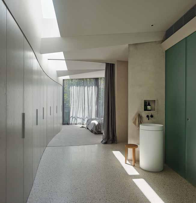 LEFT | THE PRIVATE WATER GARDEN CANTILEVERS OFF THE TOP FLOOR MASTER BEDROOM, THE OVOID CANOPY ADDING DYNAMIC MOVEMENT. RIGHT | A LUSH ALPACA VELIERIS CARPET FROM DON CURRIE CARPETS MAKES FOR LUXURY UNDERFOOT IN THE BEDROOM; LIMED OAK CUSTOM JOINERY DESIGNED BY LEETON POINTON. OPPOSITE | THE ABSTRACT GEOMETRY OF THE TOP
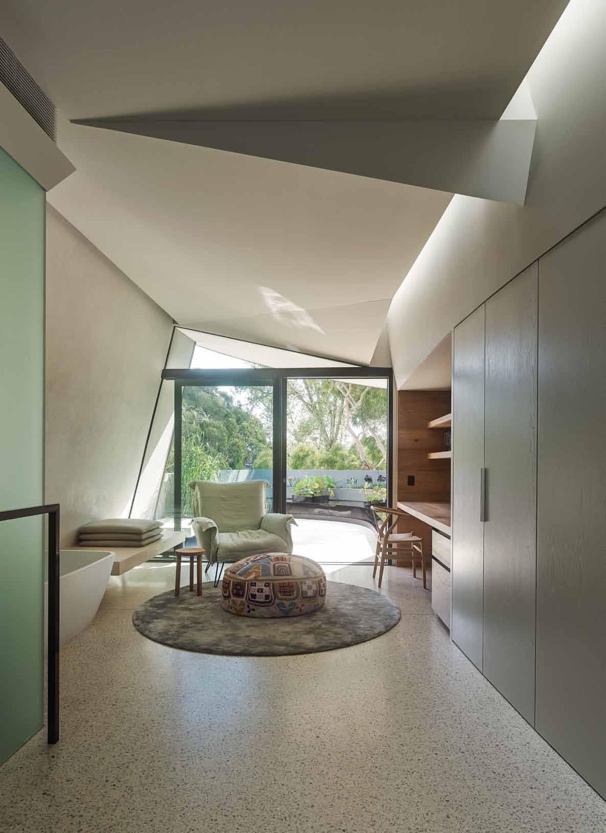
ARCHITECT Leeton Pointon Architects
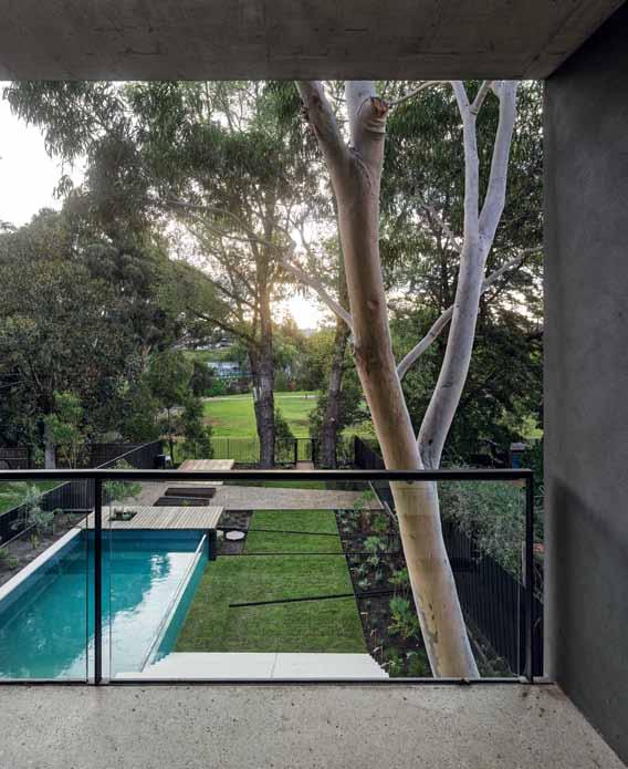
PRINCIPAL ARCHITECT Michael Leeton
PROJECT TEAM Kate Pointon, Allison Pye, Tracy Bufe, Tony Mussen
INTERIOR DESIGN Allison Pye Interiors
BUILDING SURVEYOR BSGM
CIVIL CONSULTANT Clive Steele Partners
HYDRAULIC CONSULTANT ZNT Partnership
LANDSCAPE CONSULTANT Laidlaw & Laidlaw Design
MECHANICAL CONSULTANT Multitech
STRUCTURAL CONSULTANT Clive Steele
Partners
ESD Third Skin, Greensphere Consulting
GEOTECHNICAL Hardrock Geotechnical
SURVEYOR Existing Conditions Survey
LEETON POINTON ARCHITECTS
(61 3) 8598 9300
leetonpointon.com
ARTWORK
In Entry, Hanging Poles from Vivienne Anderson Gallery. In Living Room, Family of Baumbirr – Morning Star Poles by Gali Yalkarriwuy Gurruwiwi. In Bedroom, Yukuwa earth pigment works by Djirrirra Wunungumurra.
FURNITURE
In Kitchen, Bassam Fellows
Tractor stools from Living Edge, Bar stools from Timbertrip. In Dining, table from Format Furniture. In Entry, Muuto The Dots wooden coat hooks and Carl Hansen + Son stool from Cult. In Sitting area, armchair and table from Space Furniture. In Living, e15 extension table and e15 Alex side table from Format Furniture, Mattiazzi Osso chairs from District 246, Cassina sofa from Cult, Khyber rug from Behruz Studio, Hairy Hepsi rug from Loom Rugs and cushions by Camm Upholstery, glass and steel cabinet by Leeton Pointon, built by Planera.
“We were primarily concerned with creating a house that displays an honesty of materiality,” says Leeton. “The external cement is left raw, the zinc roofing will patina with age – we imagine the exterior as it settles into itself in five, 10 years time.” Interior materials, too, are incorporated with thought to the tactile pleasure they provide now and the way they will mature. The solid Oak-panelled ceiling in the main living area, for instance, shall darken and mottle with age. Elsewhere, raw cement slabs are hung as ceilings and walls, their irregular surfaces set to variously shift with time. And one can imagine that terrazzo floor settling, even fissuring as the years go by – like one of those incredibly elegant Milanese apartments. The elaborately planted garden, of course, is designed with future generations in mind.
Right now, those future generations are housed at basement level, a luxuriously selfcontained living/entertaining/sleeping area that is a far cry from the basement den of old. With a clear view to street level at the front and to garden, pool, park and river to the rear, the modular space is more flexible than the majority of single-dwelling apartments. Carpeted in lush, deep brown wool, at this level, one is terre-à-terre with the river plain itself, rooted as it were in the history and the future of the site.
In Basement Living, sofa from Domo Collection, bean bags from Hub Furniture and Space, rug from Don Currie Carpets, desk stools from Interstudio. In Bedroom, Knoll Studio Eero Saarinen side table from Dedece, Maxalto Crono sofa and side table from Space Furniture, bed from Westin Hotel. In Bathroom, Danskina floor rug and Moroso armchair, both from Hub Furniture. In Courtyard, built-in bench seat in limestone from Signorino, designed by Leeton Pointon and built by LBA, Massproductions table and chairs from Luke Furniture, Hanging chair from Dedece, side table from Mark Tuckey.
LIGHTING
In Entry, Groppi Q concrete box with orange cord from Euroluce Lighting. In Kitchen, Produzione Privata Canova marble pendant lights from Format Furniture and Artemide ceiling lights. In Sitting area, Flos Lamp from Euroluce. In Basement Living,
lamps from Gineico. In Living, spHaus lamp from Format Furniture. In Bedroom, Louis Poulsen AJ Floor lamp from Living Edge.
FINISHES
Flooring throughout is polished concrete, staircase balustrade is spray-painted steel plate, steel handrail is recessed into wall with concealed LED lights. In Kitchen, rangehood with burnished steel shroud by Planera, handmade Spanish tiles on curved splashback from Stonetile Ind, honed granite island bench from CDK Stone, sheer linen curtains by Clearview Sun Control. In Sitting Room, carpet from Don Currie Carpets. In Living Room, ceiling in white smoked floorboards from Royal Oak Floors. In Bedroom, marmorino plaster walls, linen by Altamira. In Courtyard, wall garden from Fytogreen.
Architects Leeton Pointon aim to explore the poetic potential of architecture. Here, in the Park House, finishes and furniture were selected to enhance the gentle, understated curves of the overall design approach.
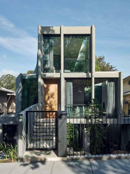
In this project, inspired by the park surrounds, concrete and greenery combine to beautiful effect on the ground floor. “There is an honesty to polished concrete that we love,” say Leeton Pointon. “We specified a light concrete base with a mix of natural toned aggregates to work with the soft plastered concrete walls and natural timber ceiling. Brass strips are inlaid into the concrete which add another level of detail to the finish.”
Of the green wall they say, “It creates an oasis of this internal courtyard and also provides a wonderful sense of depth to both the internal and external spaces”. The peaceful effect is felt throughout the space, as the courtyard was placed so that it could be seen from all rooms on this level.
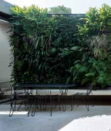
In the kitchen and dining area, the Canova lights by Artemide, “work well with the concrete ceiling and their understated simplicity doesn’t overpower the space”. And the Mattiazzi Osso chairs allow for individuality and playfulness: “The natural pastel colours are soft and subtle. In a house full of all boys we thought Mum should have her own pink one whilst Dad got the dark charcoal one,” the team explains.
The simple form of the Zuri bath complements the elemental aesthetic of the bathroom, where the architects and interior designers have aimed to strip the design back to its essential parts. And, “the finish is soft and chalky which adds a lovely textural quality.”
So, it is not just the finishes and the furniture, but also the finish of the furniture, that creates the atmosphere in this project.
CLOCKWISE FROM TOP LEFT PRODUZIONE PRIVATA CANOVA SUSPENSION LAMP BY MICHELE DI LUCCHI IN CARRARA MARBLE, FORMAT FURNITURE, FORMATFURNITURE.COM.
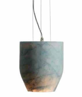
GREEN WALL , FYTOGREEN.COM.AU
OMVIVO MONO SOLID SURFACE (WHITE) FREESTANDING BASIN MARY NOALL, OMVIVO.COM / MARYNOALL.COM.AU
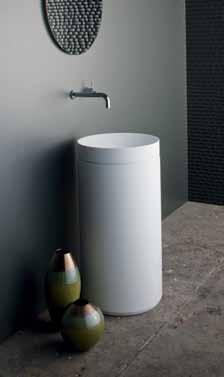
MATTIAZZI OSSO CHAIRS BY RONAN & ERWAN BOUROULLEC, DISTRICT 246, DISTRICT246.COM.AU
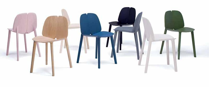
POLISHED CONCRETE FLOOR AND STAIRCASE

A natural finish for a charming patina.
astrawalker.com.au
TAPWARE
SANITARYWARE

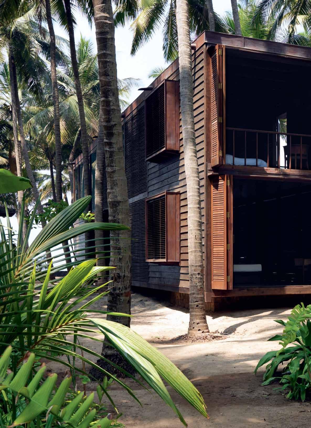
Not everyone is suited to the kind of architecture that STUDIO MUMBAI is known for. But KERSTIN ROSE reports that eventually, this house south of Mumbai in INDIA found an owner who responded to the way of living that it gently suggests.
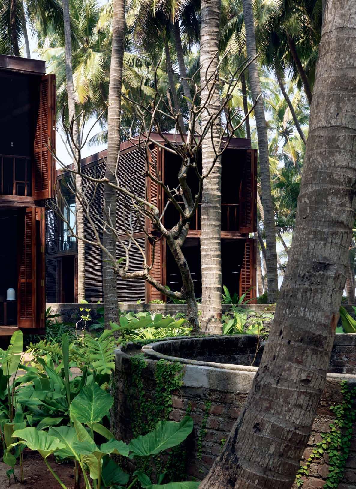
Who would have thought it?
Paradise is located about 150 kilometres to the south of Mumbai, on the outskirts of a dusty Indian village. And getting there is tricky. After the first part of the journey – a one-hour ferry crossing from the port of Mumbai, a bustling metropolis with 15 million inhabitants – the real ‘fun’ begins: a car journey along narrow roads and mud tracks that zigzag precariously from village to village. Drivers familiar with this route are masters of the art of swerving to avoid cows, dogs, rickshaw drivers and pedestrians, while at the same time not hitting any of the traders who sit haunched by the roadside, selling sacrifices to Hindu deities and all kinds of vegetables spread out on colourful blankets.
The paradise at the end of the journey is private and accessible by invitation only. It begins behind a three-metre-wide wooden gate that gives no indication of the size of the estate concealed behind it. A huge plot of land (estimated 5,000 square metres) opens out
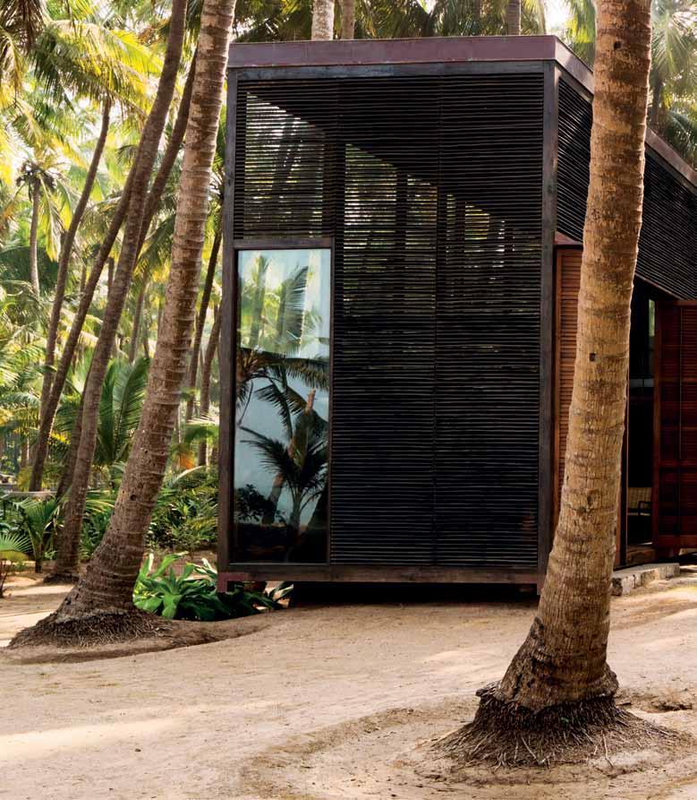
Not a single one of the hundreds of palm trees that grow in this green grove was felled to provide wood for the construction of this house.
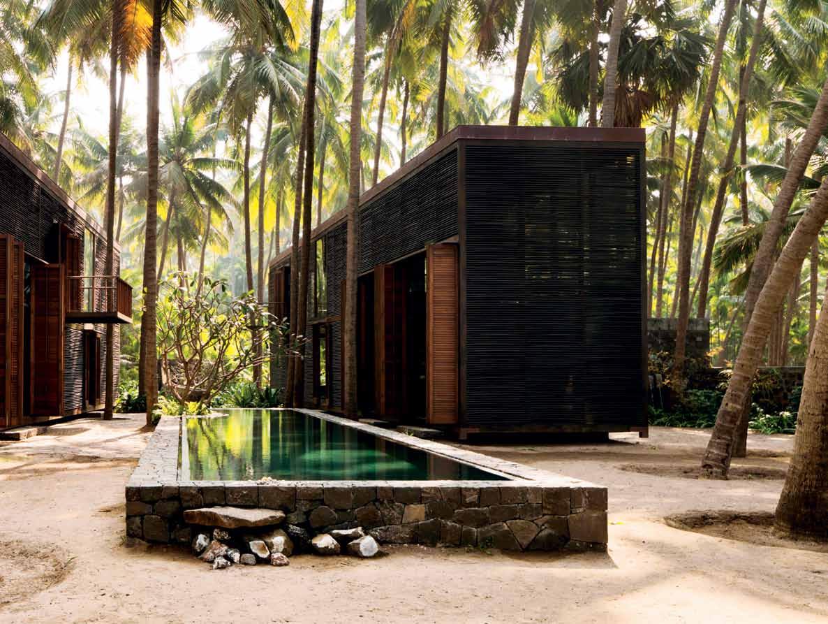
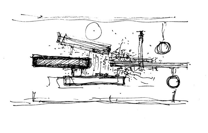
like a fan towards the Arabian Sea. Not a single one of the hundreds of palm trees that grow in this green grove was felled to provide wood for the construction of this house: the Palmyra House. The idea for the house stemmed from the Indian architect, Bijoy Jain. It consists of two boxes that face each other like the sides of a triangle and which face on to a central pool of dark grey natural stone. This configuration is reminiscent of the cube structures built by contemporary Western architects –which is no surprise really. After studying in the USA, Bijoy Jain honed his craft at the side of American architectural icon, Richard Meier, before returning home to India and starting up his own practice, Studio Mumbai, which is now famous for a cross-over style that combines Eastern and Western influences.
Instead of employing glass, steel and concrete in the construction of his creations, he much prefers to use local woods and basalt with empty spaces between them. Walls made of non-adjustable wooden slats allow the seaair to flow through the buildings night and day.
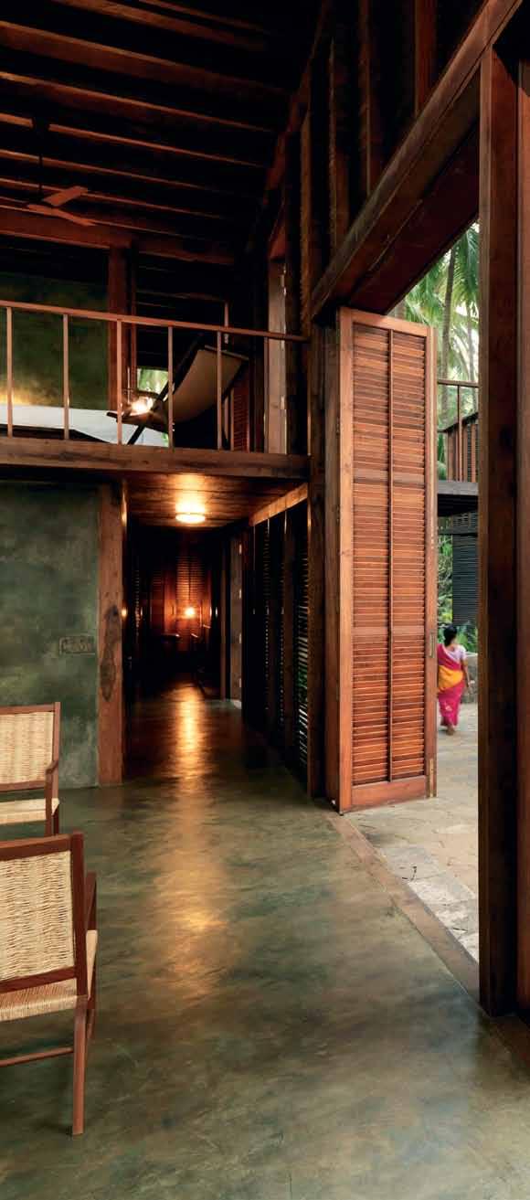

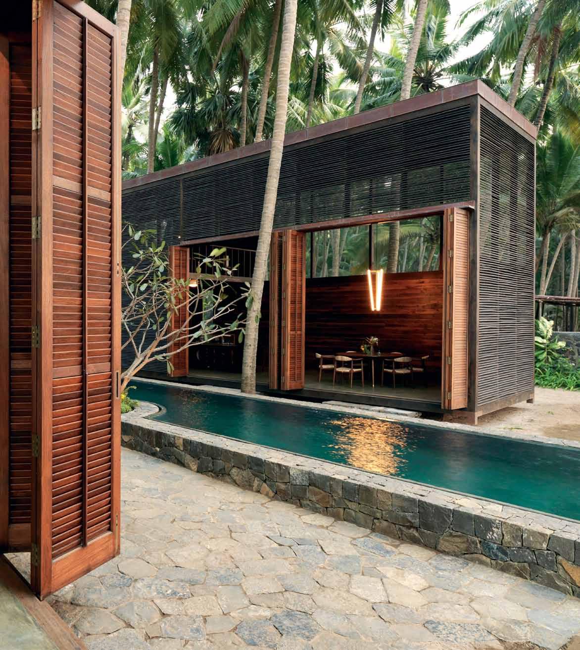
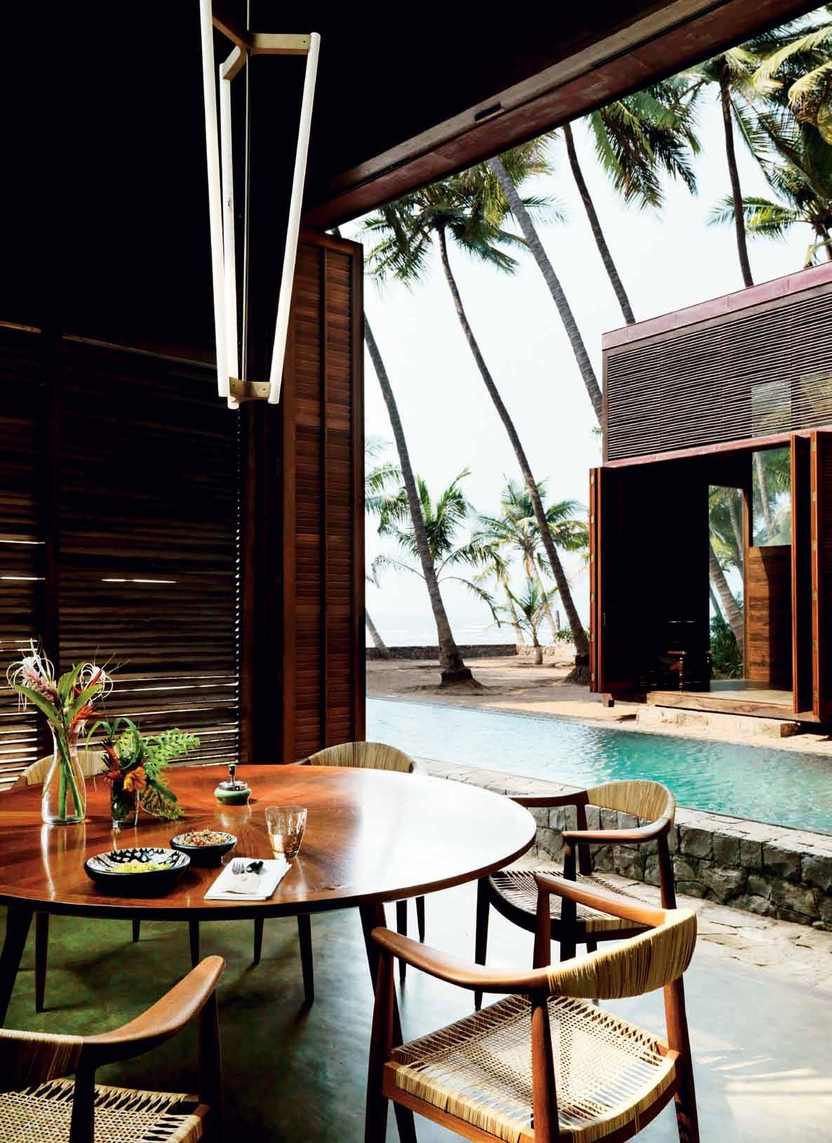
At an average annual temperature of about 27 degrees Celsius this is no problem. There is, however, no view of the sea. Jain doesn’t attach any importance to it. Panoramas bore him and he finds the sea during the monsoon season too unsettling. “Instead of looking outward, one should look inward, concentrate on the things close at hand,” is how the master explains his philosophy. In all the buildings he designs, he guides the occupants’ eyes by rarely placing windows, viewing slits or light shafts at eye level. In the Palmyra House, he has granted the owners two possibilities for catching a glimpse of the sea: sideways from the bed in the master bedroom and from two chairs at the dining table. The central focal points, however, remain within the house itself. The inner-facing sides of the two buildings can be opened by means of folding doors, allowing one to look from the living area across the pool to the dining room, and vice versa.
Having a good view doesn’t automatically make one insightful, in Bijoy Jain’s view. He educates his clients and wants to sharpen their

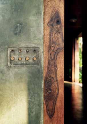
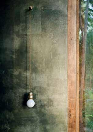

...Possibilities for catching a glimpse of the sea: sideways from the bed in the master bedroom and from two chairs at the dining table.
The roofless shower cabinet on the first floor grows audaciously out of a cube and the water flows through wooden floor slats directly into the garden and waters the plants.

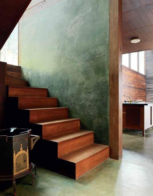

senses – and that includes teaching them how to protect the natural world around them and use scarce resources sparingly. Airconditioning? No way! He designs his houses in such a way that the air flows naturally through them. Showers? But of course! The roofless shower cabinet on the first floor grows audaciously out of a cube and the water flows through wooden floor slats directly into the garden and waters the plants. The walls of the property are made of basalt and also serve as waterways that transport water from the estate’s four wells and irrigate the trees. And the palm trees don’t just serve as decoration: every coconut is harvested and either eaten in the house or sold.
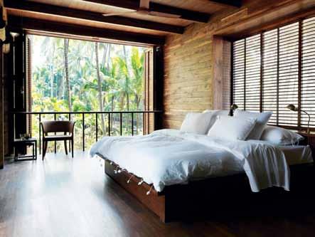
All of this means a lot of work. The ‘canal system’ has to be checked and maintained every day and the cubes have to be cleaned of dust several times a month – a job performed using specially made over-sized eco-dusters made of branches, leaves and fibres. Eventually, all of this got too much for the client who commissioned Jain to design the house.
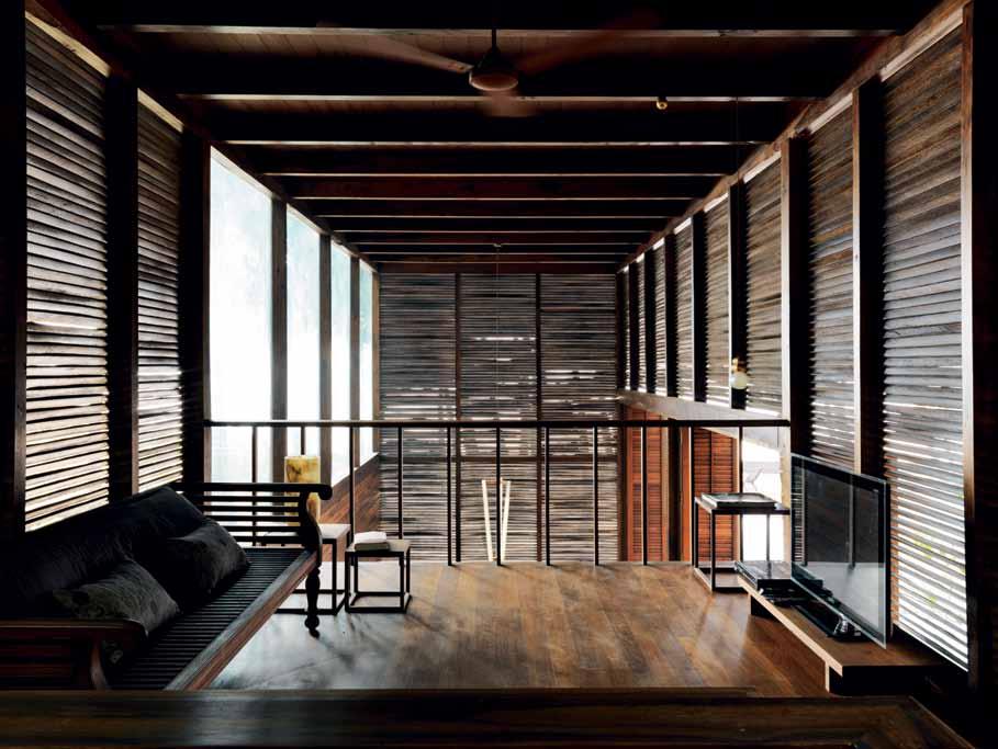
He didn’t like the controlled views, nor did he love nature as much as Bijoy Jain. He began to neglect the property and it fell into disrepair. But Jain finally managed to convince him to sell the place. The new owner is a friend of the architect who is very familiar with his way of thinking. He even shares the master’s taste in interior design. Everything here –seating and bedroom furniture, tables and kitchen, doorknobs and toilet seats – were all designed by one person: Bijoy Jain, who has his own workshops and employs carpenters, metalworkers and painters. An army of servants keep the estate in tip-top condition.
Occasionally, the busy new owner – a car manufacturer from Mumbai – visits his estate. And when he does, the paradise he encounters astonishes him anew. Far away from the smog and crowds, from the chaos and stench of the big city, he and his family enjoy the quiet, the fresh breeze, and the silvery light in the palm grove.
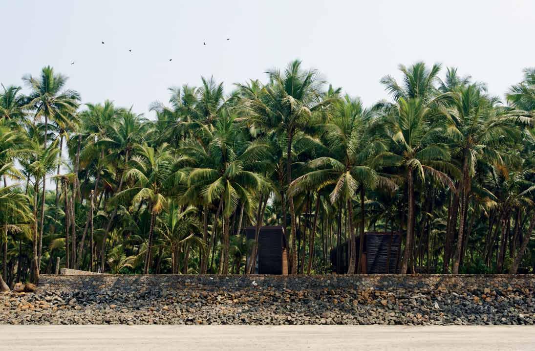
See another project by Studio Mumbai at habitusliving.com/issue25/studiomumbai
ARCHITECT Studio Mumbai
PRINCIPAL ARCHITECT Bijoy Jain
PROJECT TEAM Leevaram Sutar, Roy Katz, Mangesh Mhatre, Samuel Barclay
STUDIO MUMBAI
(91 2) 2 65 777 560 studiomumbai.com
FURNITURE
All
FINISHES
Floors
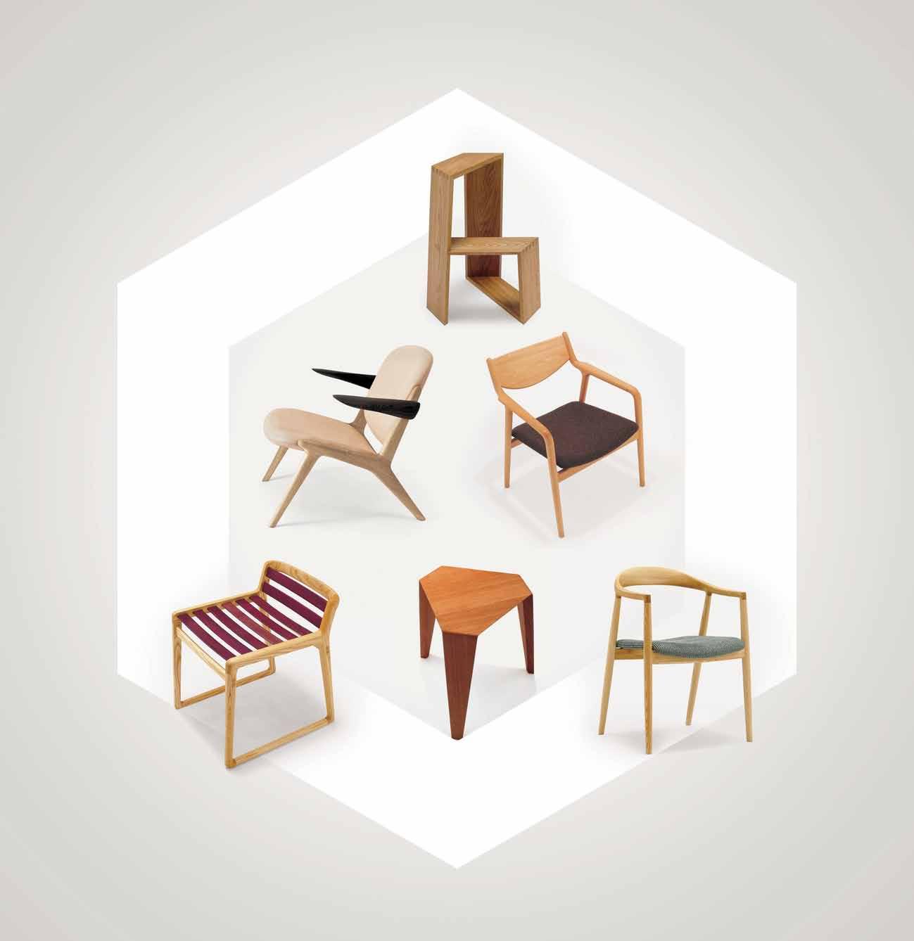
In craftsmanship and performance, Sub-Zero is without rival. Its advanced technology keeps food fresher longer.
su b zer o wolf.com.au
Adaptive re-use can be tricky, particularly when the heritage authorities are involved. But TKDA has transformed this commercial building in Sydney with a chocolate-coated past into an elegant apartment for family living.
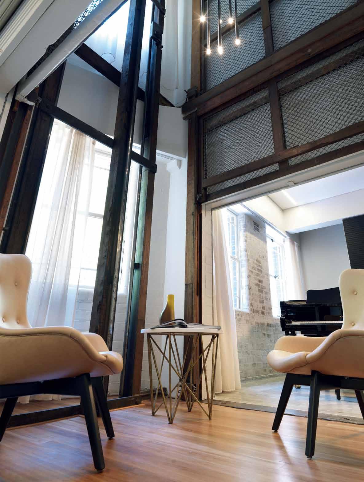

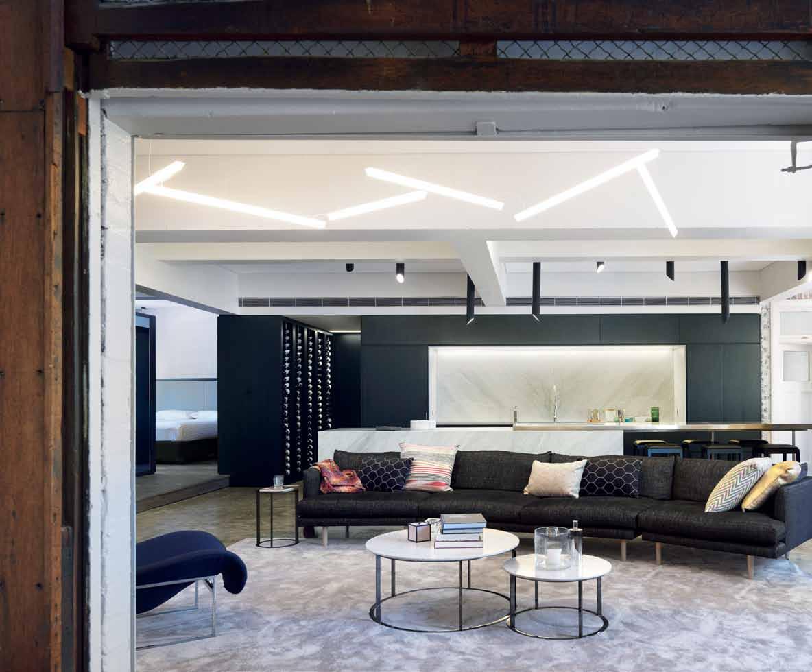
Having a former commercial life, the building does not have a typical form...
Nestled in Sydney’s historic Rocks precinct is a building with a past. It was built in 1924 as the Sydney depot for Cadbury Fry and Pascall, who had the honour of being the official supplier of chocolate to the armed forces during World War II. The warehouse was used to facilitate distribution due its close proximity to the wharves, but was not an actual chocolate factory, which would have been even more romantic.
After a reincarnation as the site of an exporting company and most recently of auction house, Lawson-Menzies, Claremont House (as it is now known, referring to the location of the original Cadbury factory in Tasmania), is now undergoing a mixed-use development redesign. This comprises the construction of a new two-storey residential rooftop addition and the internal refurbishment of two previously commercial floors below for boutique apartments, both designed by Tanner Kibble Denton Architects (TKDA). Each of the lower floors is split into two apartments, so there are four in total.
This is where our story begins.
You may wonder what the point of sharing all that history is –but that’s just what TKDA have set out to do in their design. Experienced in adaptive re-use projects, the firm, led by Practice Director Jocelyn Jackson, has adeptly transformed the space, while embracing the past in its new visual identity.
Of course, the visual identity was not the only consideration. The building’s heritage status meant that the planning and approvals process was fairly lengthy (about three years), and sometimes challenging. Every little detail of the new work had to be approved by the Heritage Branch of The Department of Planning NSW. “It seemed such a long road,” says developer Paul Bettar of Cumberland Developments, who purchased the 99-year lease on this government-owned building from the Sydney Harbour Foreshore Authority (SHFA) with the intention to rent out the four apartments.
But he persevered, finding that the rigorous approvals process encouraged the best out of the design and also paved the way for a seamless on-site period of only four months. “On completion we look back and think [the process] was worthy,” says Paul, who became so enamoured that he and his wife decided to live in one of the apartments with their two children. “The process maintained the integrity of the building,” he explains. “There’s history there.”
Having a former commercial life, the building does not have a typical form, rather it is “long and thin with no parallel walls – they splay out this way, that way and the other way,” Jackson explains. Morever, the building has an original fire stair at each end, rather than the more usual location in the middle of the floorplate. So the spatial planning approach


called for the floorplate to be split down the middle, with a new lift inserted, as well as a party wall.
This one party wall divides the floor into two apartments, and is the only introduced wall on each floor of the residential development. The rest of the zones in the apartment interiors are created with inserted pods – none of which touch the fabric of the building on the walls or ceiling. “We always took the approach that we didn’t want to upset the building,” says Jackson. The only intervention was to take off some of the original toppings, “to create extra space below the timber floor where all the services are lying on top of the slab – plumbing, air-conditioning”. Even the electric conduits are surface-mounted. “I didn’t get it at first,” laughs Paul, reflecting on the industrial look. “But then I asked myself: why am I fighting it when they’re the experts? In the end, I listened and just did it, and it’s blended in.”

Services are concealed under a raised timber platform that delineates the interior into living and private spaces. Structural columns going through the middle of the apartment loosely reinforce the simple zoning, which also considers natural light penetration through the windows. Big windows on the eastern side shed light into the living space, while the western side, with smaller windows, is an appropriate site for the bedrooms and bathroom pods.
The rest is cleverly simple. The custom pods, built in lightweight stud construction bounded by timber joinery units on both sides, have allowed for a family of four to downsize comfortably from a 5-bedroom house. Doors in the pods slide into and out of walls to connect or close off the private spaces from the public. Concealed appliances in the kitchen mean the joinery is visually seamless, keeping the focus on the family activity in the living zone.
It’s not all industrial concrete and original masonry walls though. The dining area on the raised platform provides a subtle sense of occasion, and the concealed bathrooms are a luxurious surprise. There are televisions in every room, and surround sound and air conditioning are integrated throughout the space. Because the apartments were being built to attract a particular level of resident, “there’s a level of expectation,” Paul says.
There are unique elements throughout the project which would attract this type of
resident. For example, the original goods lift. Now redundant, this remnant goods lift shaft is retained for two levels with its original features displayed on level 2 (Paul’s apartment) as an informal sitting area. “It’s a great little alcove between the entry and the actual coming in,” says Paul. “You might have a coffee here in the morning when you get the sun in.”

Paul is in the unique position of developer and resident, and feels this has provided huge insights which he will now carry over into future projects. Previously used to building compact one-bedroom and studio apartments, he now has a greater appreciation of the need for storage and for the type of client that would live in an inner-city residence like this.
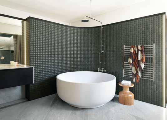

The Bettars are aware that they’re part of the shift towards a greater number of families living in the city. “People view the outside as their backyard,” Paul smiles. And the large windows on the eastern side afford a surprisingly arboreal view of Sydney. ”You wouldn’t think you could get a view like that in the city,” he says. “And it’s just as lovely when it’s raining; cosy and beautiful.” Perfect with a Cadbury’s hot chocolate perhaps, inspired –like the design itself – by the building’s past.
DROP BOX
ARCHITECT Tanner Kibble Denton Architects
PROJECT DIRECTOR – DESIGN Jocelyn Jackson
DESIGN TEAM Emma Wingad, Mary Mitry and Marta Eyles
BUILDING CONTRACTOR Solid Property Group
HYDRAULIC ENGINEER ITM Design
MECHANICAL ENGINEER Orion
MECHANICAL SERVICES CONSULTANT
CONTRACTOR NSJ
ELECTRICAL ENGINEER/ CONTRACTOR
Metrospec Electrical
TANNER KIBBLE DENTON ARCHITECTS (61 2) 9281 4399 tkda.com.au

FURNITURE
In Living area B&B Italia Mera coffee table, Frank low tables and Mart relax chair from Space Furniture. Nook lounge, Kelly armchairs, Alby ottoman, Japhy dining table, Bandy stool and Maggie dining chairs from Jardan. Oly George side table from Coco Republic, Lloyd armchairs and Cage side table from Stylecraft. Jade bar stools by Zuster, When Objects Work marble Coupe cone and Marsotta Pina fruitbowl from HUB. Rhapsody rug by Catherine Martin from Designer Rugs, and various Missoni cushions and throw rugs from Spence & Lyda. Other cushions from Emily Ziz Style Studio and various accessories from Planet Furniture, Fred International, and Dinosaur Designs.
LIGHTING
In Living, Fortuny Studio 76 tripod lamp. In Dining, Vibia Skan pendants by Lievore Altherr Molina. In Kitchen Vibia Halo Lineal pendants, and in Bedroom Oligo Grace pendant all from Koda Lighting, as well as all other surface mounted fittings.
FINISHES
Generally throughout, original concrete slab polished and original masonry walls stripped back, sealed and finished in Dulux Ghosting quarter paint. Even Raveena veneer to joinery from Eveneer. Antique Walnut timber floors by Floorwood. Madoka mosaic ensuite tiles from Artedomus. In Kitchen and Bathrooms, calacatta marble throughout.
FIXED & FITTED
In Bathrooms, freestanding bathtub from Apaiser, Olde English sanitaryware, Icon and Icon+ tapware and accessories, all from Astra Walker. In Kitchens, sinks from Oliveri, Gaggenau cooking appliances and Sirius Hob rangehood from Harvey Norman Commercial. Audiovisual by Do Audio Visual. Joinery by Ryde Joinery. Plastering by Zyplast Corporation.
Tanner Kibble Denton
Architects (TKDA) is a multidisciplinary practice with experience in architecture, urban and interior design, strategic planning and adaptive reuse. This last was put to good use turning this warehouse into a series of boutique apartments.
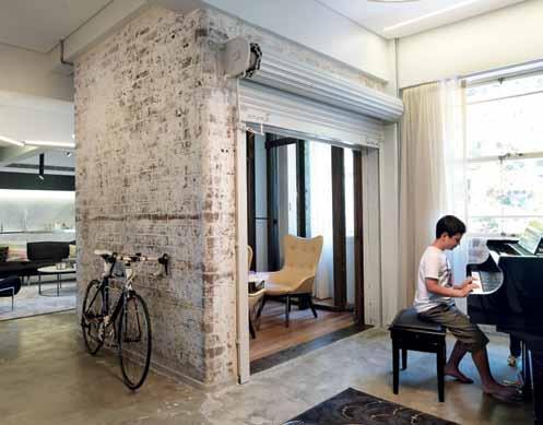
Headed up by Practice Director, Jocelyn Jackson, the team at TKDA sought to embrace the character of the original building, while making it a functional and unique living space for the new residents. “Retaining the character and history of the original building was critical to the success of these apartments,” they believe, where “the new is contrasted and enhanced by the richness of the masonry walls, which expose the building’s past uses.”
In the open warehouse, the insertion of pods were a strategy to create zones. “The subtle and playful feature pendants were also used to help define these zones,” TKDA explain. “The ability to customise the number and placement of Halo Lineal pendants ensured they perfectly filled the living area.”
Feature elements such as the B&B Italia Frank side tables create a sense of sophisticated and stylish modern living suitable to the project; and the Madoka mosaic tiles in the bathroom worked perfectly on the curved walls of the bathroom pod, with their concave form.
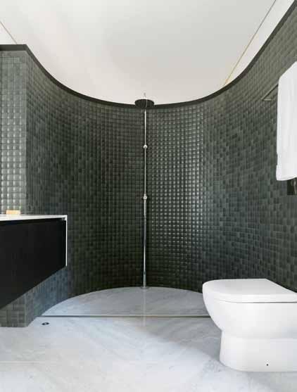
“The movement created by the tiles and their interaction with light creates a stunning, textural back drop for the calacatta marble slab bathroom floors,” explain TKDA. Within the industrial interior finishes, the Nantes cushions and Husky throw “offer a sophisticated touch of colour to the otherwise neutral interior palette,” say TKDA. “The luxury and timelessness of Claremont House Apartments are matched perfectly by these Missoni products,” with all elements coming together in a cohesive aesthetic characteristic of the practice.
CLOCKWISE FROM TOP LEFT MISSONI HOME NANTES CUSHION SPENCE & LYDA, MISSONI.IT / SPENCEANDLYDA.COM.AU

MADOKA MOSAIC TILE ARTEDOMUS, ARTEDOMUS.COM
ORIGINAL BRICK WALL
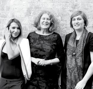
B&B ITALIA FRANK LOW TABLE BY ANTONIO CITTERIO, SPACE FURNITURE, BEBITALIA.IT / SPACEFURNITURE.COM.AU
VIBIA HALO LINEAL PENDANTS KODA LIGHTING, VIBIA.COM / KODALIGHTING.COM.AU

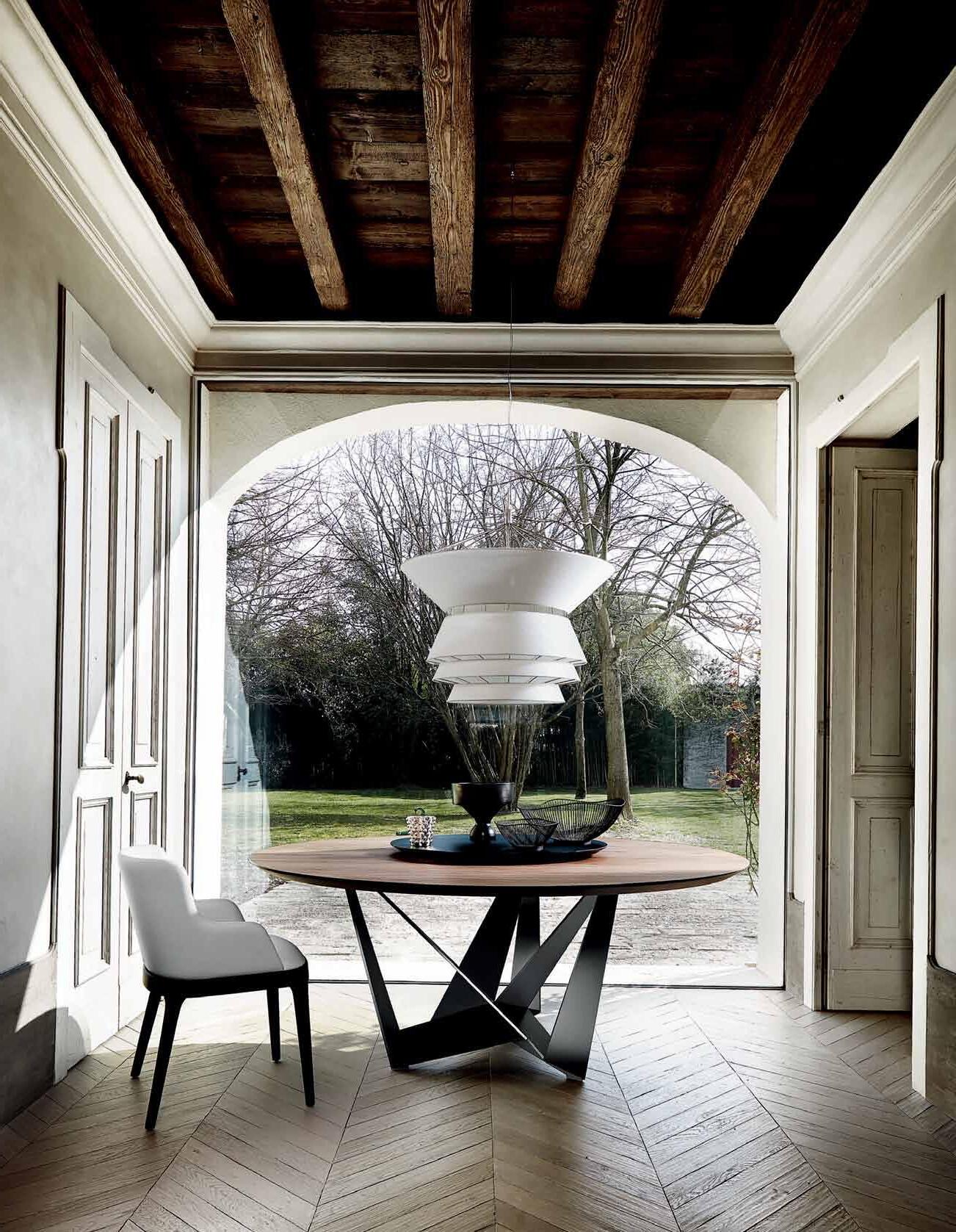
Well-designed interiors consider materials and products right down to the smallest detail. Without functional, thoughtful fixtures and fittings a design loses its integrity. On the other hand, well-designed, quality finishes and products make good design great.
Stormtech has been at the forefront of drainage innovations for residential environments for over a quarter of a century, ensuring the finer details and functioning of a building are taken care of. Adequate drainage plays an integral role in the entire building system – and its proper implementation and selection is crucial.
Successful drainage solutions call for the consideration of key design elements. In the bathroom, we are heavily influenced by the way drainage might be incorporated into an existing layout, or by waterproofing requirements. Properties located close to a surf beach will require extra precautions, such as electro-polishing to avoid corrosion of stainless steel grates.
For outdoor projects, access to existing plumbing and drainage systems is crucial to placement of drainage, whereas new building sites having the advantage of allowing
for systems to be located beneficially from the outset. For balcony installations, the depth of profile allowance within balcony spaces and flow rates of the drainage system must be considered.
Precise placement of the linear drain is also crucial to its efficiency. Linear systems are uniquely designed to sit parallel to walls or access points, and flush against the floor to ensure maximum surface coverage and superior drainage.
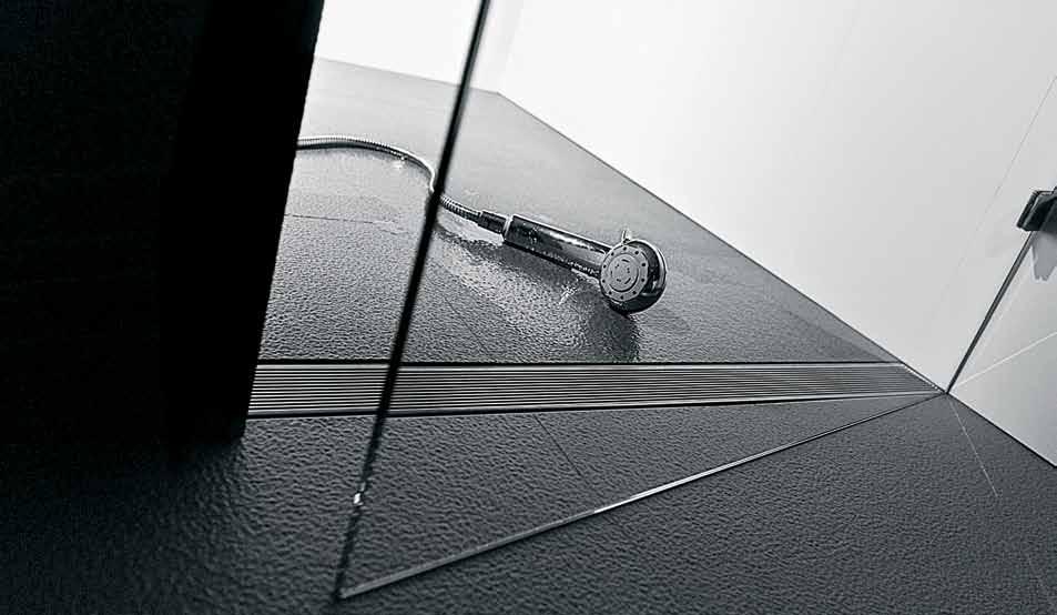
One of the most respected drainage manufacturers and suppliers in Australia, Stormtech is committed to delivering the highest quality drainage solutions. Their range includes linear drains, tile insert drains, square drains, threshold drains and vinyl clamps, as well as special assemblies and slot drains for landscaping applications. And their skilled specialists are well-equipped to provide bespoke solutions for your custom designs.
All Stormtech products are certified WaterMarked and have US UPC and Canadian CSA approval; with a proud commitment to eco-friendly design, they offer the only linear drainage product in the world with Global GreenTag certification.
On an emotional level, the design choices we make represent our personality and values; on a functional level, great design choices makes our lives better.
Flooring has always been a vital aesthetic component of the interior design scheme. Now, with TECHNOLOGY on the move, ANNA GUERRERO discovers how PRACTICAL and SUSTAINABLE considerations have been added to the narrative, defining a new chapeter in contemporary flooring.
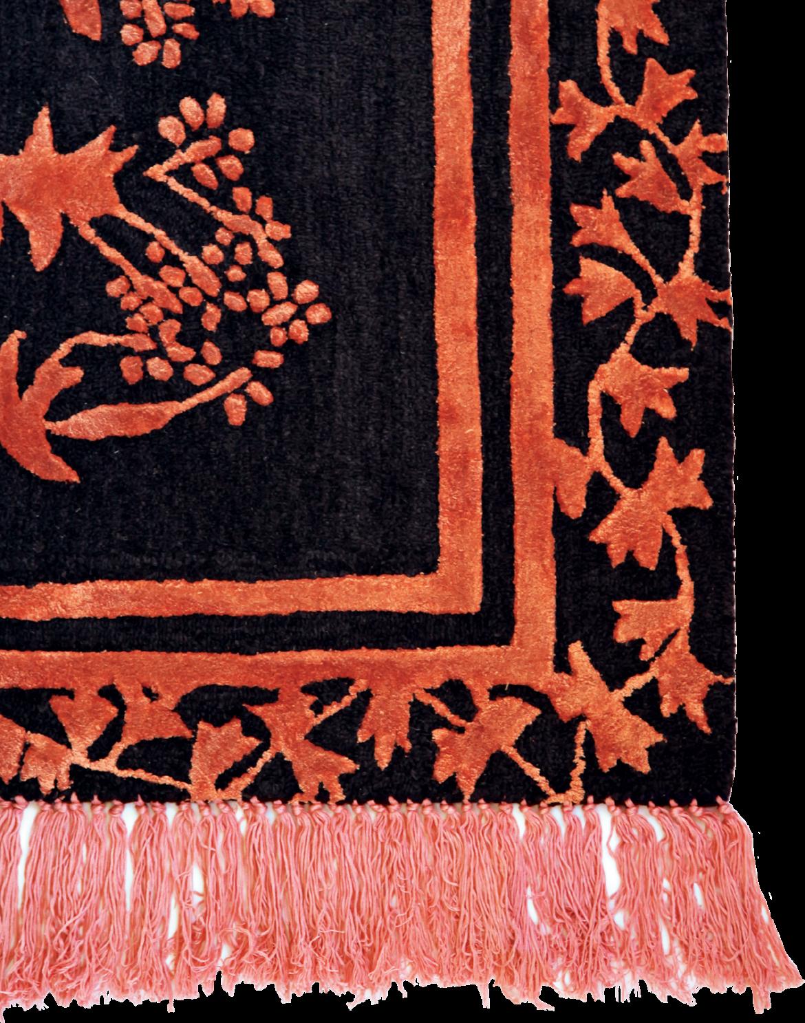
The floor is where the building greets your feet, where we make a marked separation between the outer world and the inner world,” explains architect, Carol Marra, director of Marra + Yeh. “Throughout Asia this is acknowledged by people having to remove their shoes before stepping inside.” Marra describes an appreciation of flooring that goes beyond its function as a surface finish, but also creates a symbolic, as well as physical, foundation for all building projects.
In tune with this idea is the concern that as well as being durable, floors must also be pleasant to walk on. Traditionally this function was largely fulfilled through aesthetics, seen historically through the likes of decorated floor tiles and timber floor boards, but in light of new technologies this standard has become increasingly more complex.
“As we face up to a world of diminishing resources, flooring products have incorporated recycled materials, engineered timber and bamboo,” explains Marra. “Coatings have also developed to be hard-wearing but low in toxicity.”
Other environmental considerations include the need for thermal mass in particular areas, whether in-floor heating is present, and the acoustic impacts between floors.
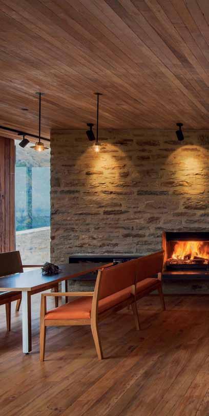
Another challenge that exists for architects and designers is to filter through the plethora of imported materials and select those that respond to specific regional climates. “It’s imperative that
architects consider what materials are available locally and how they are sourced,” says Marra, drawing on her experience working across Australia and Malaysia. “For example we tend to work with local timbers because we know they are less likely to swell and shrink with the climate and thus prevent long-term problems.”
In collaboration with these environmental concerns, the role of flooring within the overall interior scheme remains vital. “The floor of an interior is the fundamental ‘canvas’ upon which the other finishes and colours are layered, so it is important aesthetically as well as practically,“ says Meryl Hare, principal of Hare + Klein. “The floor also gets the most wear and tear of all interior finishes, so it is worth selecting the best you can afford in your preferred flooring material.”
Hare points to natural materials, such as timber, stone, bamboo and concrete as her personal favourites, and suggests careful consideration of their application. “A combination of timber and stone can be used together to visually break up large areas or link interior and exterior floors,” she says.
With this advice in mind, quality, technology and aesthetics come together to create a new framework that is paving the way for successful contemporary flooring.
For more flooring ideas visit habitusliving.com/issue25/flooring
Wanaka House is located in an ecological and environmentally sustainable subdivision known as Emerald Bluffs on the west side of Lake Wanaka. The house is carefully nestled into a site on the edge of a hillside and within highly protected native vegetation. The land is zoned ‘Outstanding Landscape’ requiring the most onerous planning application.
On top of the sustainable aspects of the site, the client required the highest standards of mitigating operational energy use within the house. An Emerald Bluffs site-specific rating tool has been developed by the owner and the house scored 80 out of a maximum of 99. Sustainable initiatives include: use of local native sustainable timbers for all internal lining (no plasterboard), locally sourced schist, low-e glass, high insulation, high thermal mass to roof, floor and walls, low energy-use lighting, high-efficiency heat hump heating, solar PV and water heating, wetback water heating, onsite storm water and sewage management, locally sourced water and more.
The house is benched into the schist rock geology of the sloping site. We have therefore sought to create a tilted stone base that ‘drives’ out of the ground in a way that is reminiscent of the local rocky Central Otago landscape. This establishes ‘new landscape’ that we have placed a glass and timber pavilion upon, which houses the majority of the living and sleeping functions. The entry sequence invites you into the ‘subterranean’ zone past an Inglenook fireplace and then up a staircase to the main living level. A 180 degree route leads you though the social kitchen and dining zone to the living room overlooking the tree tops to the northern aspect of the lake.
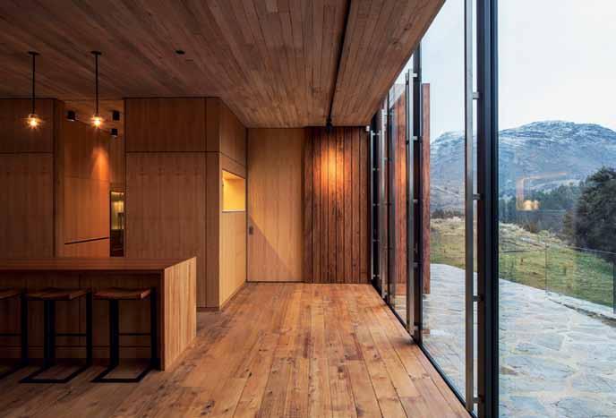
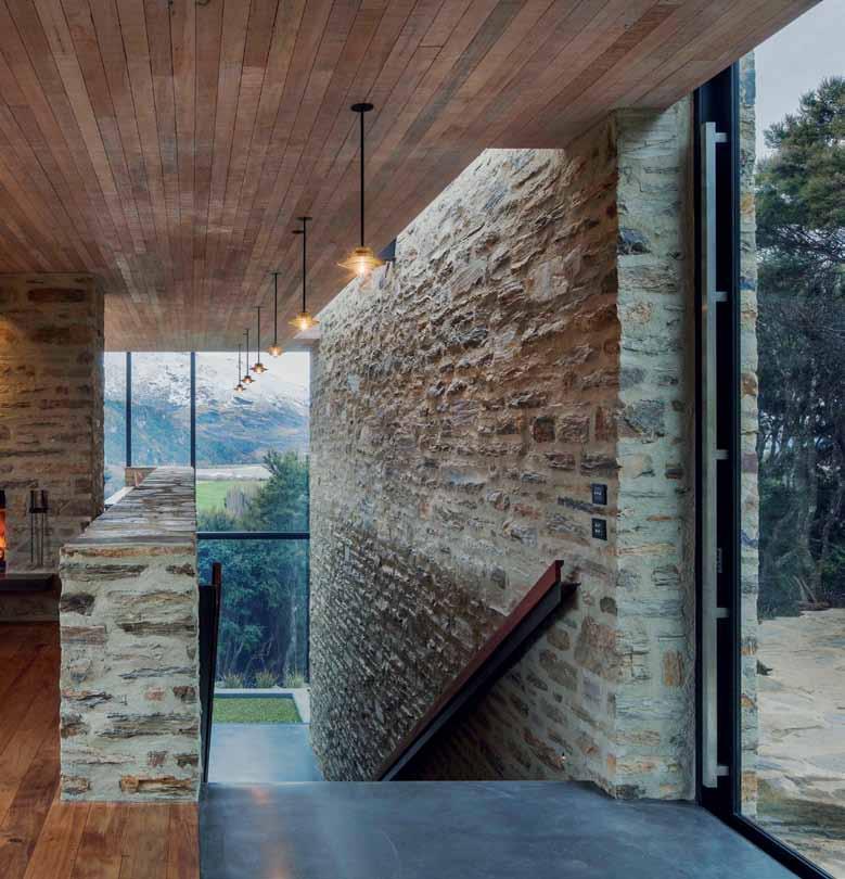
STRUCTURAL, CIVIL ENGINEER Harris Foster Consulting
ENVIRONMENTAL, MECHANICAL, ELECTRICAL ENGINEER eCubed Building Workshop
RTA STUDIO
(64) 9360 3313 rtastudio.co.nz
RTA Studio ARCHITECT RTA studio FINISHESFalmec. The innovative E.ion® System technology applied to the new collection of rangehoods from Falmec, not only reduces odours, but also restores the ionic balance for an optimal healthy living environment. Specialised laboratories certify the efficiency of the E.ion® System technology, declaring an odour reduction of over 70%.
– Falmec E.ion® System.
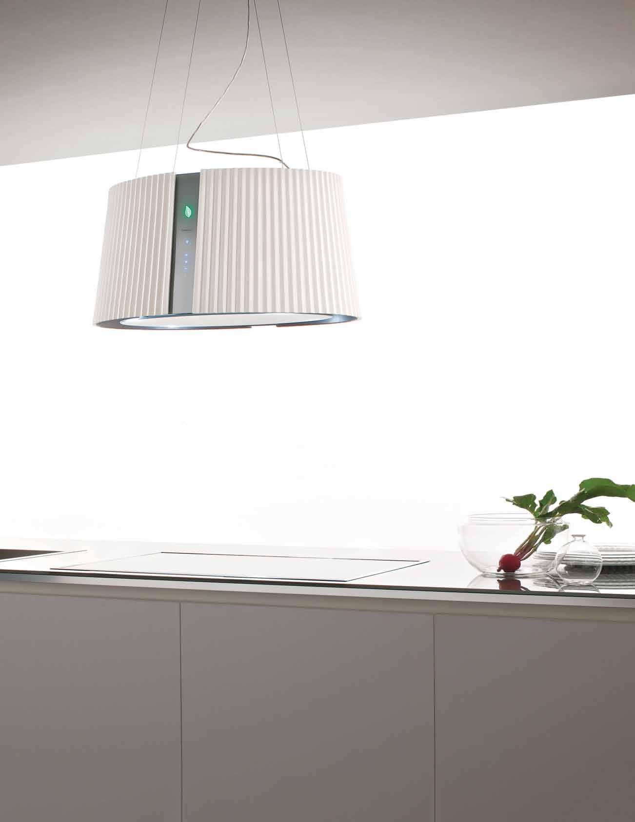

The floor is the base of any space. The color, texture, pattern and size of the flooring material thus has a huge impact on the ambience of the space.
The two examples here – the swimming pool and the bathroom – use two different approaches to the choice of the flooring. For the swimming pool, the idea is to contrast, to stand out. The blue of the pool is inviting, evocative, brilliant and strong. On the other hand, for the bathroom, the color tones are all complementary, it is about harmony, matching with the timber screen and the floor. What stands out here is the planting at the balcony.
The main living space on the first storey uses a polished epoxy screed finish. Originally the client wanted a polished concrete finish but we choose this as it had a finer quality and the colour was more in keeping with the rest of the scheme. The timber deck and external screen uses a treated acetylated timber (radiata Pine) called Accoya wood. This type of timber has a very low moisture content and
thus was dimensionally stable, an important consideration for such a intricate design. The swimming pool uses blue glass mosaic tiles to add color and as a strong contrast to the more natural and muted grey granite and timber color. The bedrooms have Brazilian Teak which was selected as the colour matches closely with the Accoya timber. The attic bathroom (shown in the image) has a lovely golden glass mosaic walls with a matching homogenous tile floor.
For the rest of the design, a finely detailed, intricately patterned screen envelopes the side facade and main gate of this semi-detached house in Singapore. Located on a tight site alongside a busy road, privacy was a main consideration. The screen is designed to have different densities at various heights to maximise privacy yet allowing views out. The screen also serves to shade this facade from the morning sun.
ARCHITECT HYLA Architects PROJECT TEAM Han Loke Kwang, Watinee Raojduang

STRUCTURAL ENGINEER GNG Consultants (Li Ming)

MAIN CONTRACTOR V-Tech Construction (Lua Seng Teck)
PHOTOGRAPHER Derek Swalwell
HYLA ARCHITECTS (65) 63242488 hyla.com.sg
FINISHES
In Pool, Hokkaido HK-04 gloss from Equinox. In Bathroom, Less White SQ homogenous tile from Rice Fields, Bisazza Marilyn tiles from Sinbor and Reece Cenere Nat SQ homogenous tile from Rice Fields.
Sydney August 2015
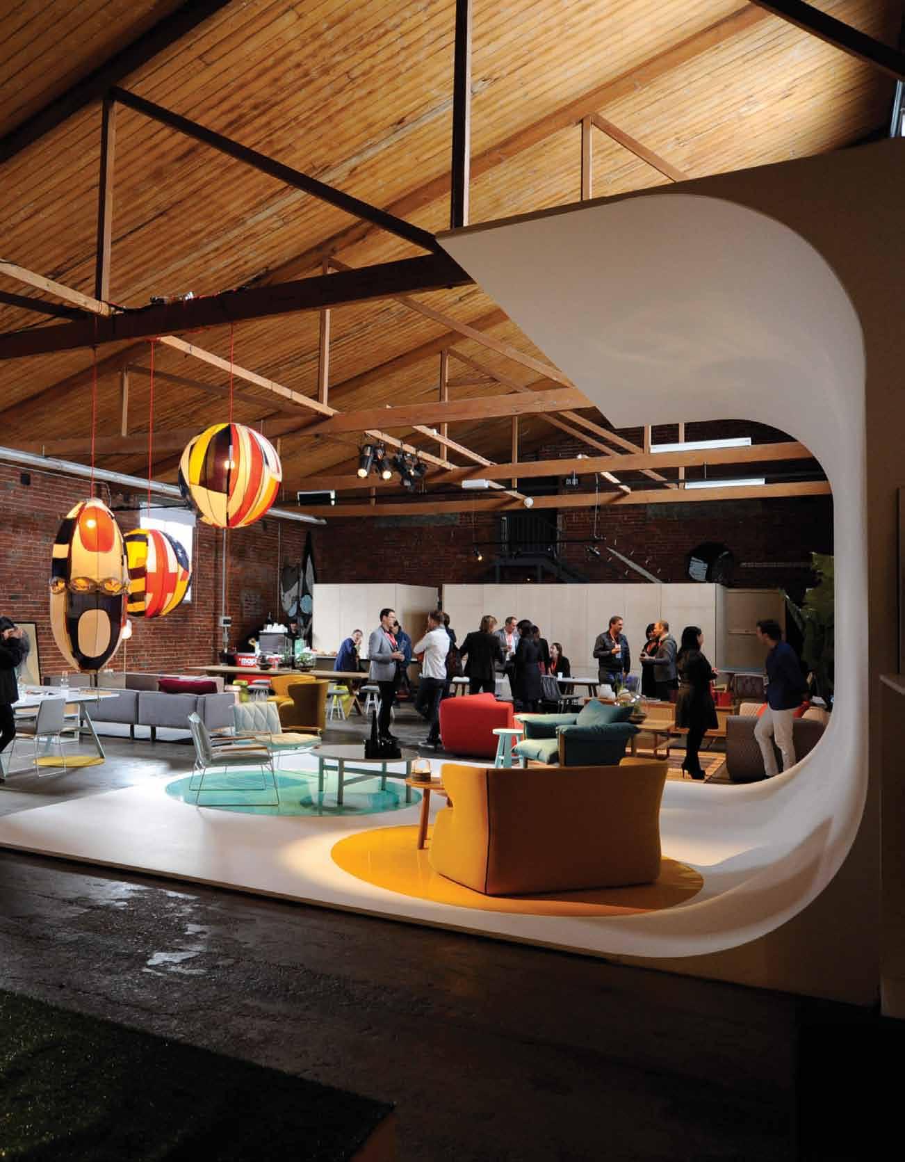
Hong Kong November 2015
Melbourne August 2016
Singapore October 2016
Brisbane returning soon
In my opinion, flooring is probably one of the most important materials in any space because that is usually the most contact a human being has with a space. So, first and foremost, the floor has to texturally feel good and true to its materiality at the feet’s touch. The colour and pattern of the floor is considered secondarily depending on the intention and context of the space.
The ground floor in this project is polished concrete and on the first floor is Merbau timber floor strips. Polished concrete was chosen because of its appearance of homogeneity that suits the theme of the client’s relationship to Chinese antiques, while upstairs a timber floor was used to add an element of warmth to the bedroom and TV area.
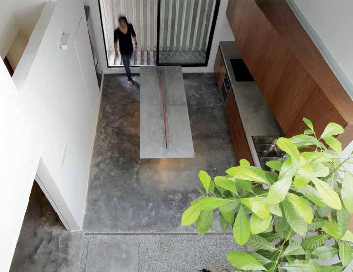
For the main project, a supposedly simple renovation to a 1.5 storey mid-terrace house for a mother and daughter developed into an extensive one complete with intricate details inspired by the client’s openness to ideas. Upon entry, the red ‘monster’ door is a dominant feature of the frontage and pays homage to large Chinese temple doors. The ground floor main living areas have an open linear arrangement from the front to the rear of the house. Parts of the architecture are made minimal to allow the owner’s extensive collection of Chinese antiques to feature.
The central courtyard was introduced to inter-connect the spaces and to provide light. The living room was lifted to have a visual expansion with the first floor. Above the living room, one can enjoy the view of the surrounding forests and hills in a secret rooftop garden.
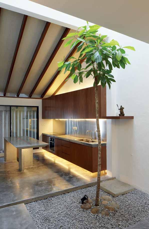
FABIAN TAN ARCHITECT
(60) 12 974 9511
fabian-tan.com
Fabian Tan DESIGN AND ARCHITECTURE Fabian Tan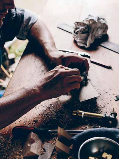


Australia has the largest houses in the world. There are few topographical constraints to force homes to have a small footprint. This is unfortunate as many of the best homes around the world are modest in size and maximise what precious outdoor space there is.
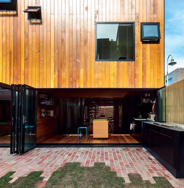
Instead, we go wide and low. We pancake our homes. We eat up our outdoor space. Often people move to the suburbs under the false logic that they will have an abundance of open space and room for kids to play. However, the enormous size of houses now makes this a convenient myth rather than a true outcome. This can result in car dependence and children’s isolation from a rich and diverse urban community.
These neighbouring terrace homes are owned by two generations of one family. Both houses were in need of repair and update. HOUSE House is a single building that extends both homes. They are separate homes within one architecture. The new structure runs north/south while the original houses run east/west. With HOUSE House we deliberately went vertical. We stacked spaces three levels high. As part of this, we maximised the backyard on a small site.
The yard is lawn and recycled brick. We’ve tried to blur the line between hard and soft landscaping rather then constructing a hard edge that separates the garden.
Internally, the flooring defines and separates the original house and the new house. The original Baltic Pine floor has been re-finished, while the new floor in the kitchen is Victorian Ash. Separating the new and the old is a lightwell. Here we have large sheets of hardwood plywood which runs along the floor and up the wall.
The key to making a modest-sized home flourish is to provide a number of spaces with various personalities. The active family/living spaces don’t need to be large, yet they must have loose boundaries. It creates a vibrant way of life that sprawl and car dependence could never achieve.
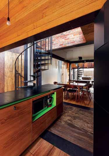
DESIGN
PROJECT
PHOTOGRAPHER
ANDREW MAYNARD ARCHITECTS (61 3) 94815110 maynardarchitects.com
FINISHES
Andrew Maynard ARCHITECT Andrew Maynard Architects Andrew Maynard TEAM Andrew Maynard, Mark Austin, Michael Ong Peter Bennetts
ARCHITECT mrtn Architects
INTERIOR DESIGN
Antony Martin
PROJECT TEAM
Antony Martin, Steve Jones
MRTN ARCHITECTS
(61 3) 9329 4145
MRTN.com.au
On the fringe of Melbourne’s inner suburbs, this new family home sits in an established residential street of Victorian villas and Californian bungalows. From the footpath, the Fairfield Hacienda with its angled roof fits into the landscape of single-level homes, effortlessly picking up the street’s original pattern of hipped and gabled roof forms
The design of the house was conceived of in two parts, base and roof. The grey concrete block base is hollowed out to form the courtyard and living spaces; punched openings create the impression of windows. The roof, a warm Cedar folded plane, floats above, not connecting to the solid base below. A clear juxtaposition of material and form is created between the two parts.
Flooring is a very important element to us in the way we design and conceive of a space. The barefoot experience is always carefully considered as well as the aesthetic, acoustic and thermal qualities of the selected flooring.
In the Fairfield Hacienda the flooring begins with the granitic sand pathways that lead up to the house; they have a pleasing crunch underfoot and seamlessly bleed into the garden beds. The front courtyard is paved with Porphyry in a random pattern. Used on petrol station forecourts throughout Italy, it is an excellent stain-resistant paving. The warm red and tan colouring also makes a tonal connection to the Cedar ceiling inside.
The main living spaces are burnished concrete. Unlike honed concrete, burnished floors possess a beautiful varied surface that appears ages old and warmer in appearance. In the bedrooms carpet was selected. For the parents’ bedroom and study pinkish/ coral-coloured carpet creates a lushness that contrasts with the harder surfaces found in the living spaces. In these spaces, the pinky coral carpet reflects a pink hued light onto the surrounding white walls during the day. The carpet enlivens the space and creates an almost ethereal effect.

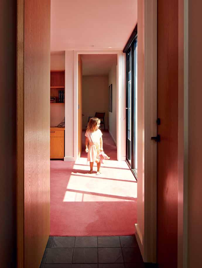
The Fairfield Hacienda was planned as a long-term family home for the owners. The clients are a family with three young children. They don’t anticipate a time that they will move houses. The house was designed to grow with the family as they established themselves in the community and as the children grow older and more independent.
Antony MartinDurable, versatile, easy to install and care for, vinyl is a practical flooring option – now for the design conscious. Advances in technology open vinyl up to endless colour, shape and weave options, and mean they no longer need to be made with toxic materials. Bolon ’s new environmentally responsible range SILENCE , inspired by the Swedish environment, is a perfect example.
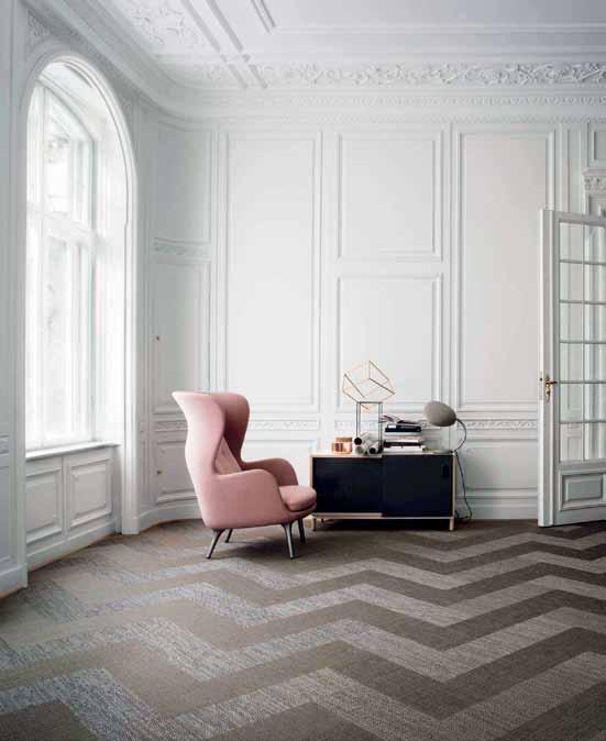
bolon.com.au
Tiles have been used – for their decorative element and hard-wearing properties – over centuries, to cover walls, roofs, floors and even tables and smaller objects. With glazes of all colours, tiles can be decorated in literally endless ways, matched or mismatched to create a unique space. These

TILES by Bespoke Tile & Stone, suitable for indoors and outdoors, have the charm of a chalky matte finish and a subtle patina that develops with time, imbuing a space with the tangible feel of wellbeing. In a variety of lively patterns, colours and shapes, the tiles encourage creativity.
earp.com.au
Some might say timber is the King of flooring material. Its natural tones and organic irregularities create a friendly, warm feel. In an environmentally conscious climate, reclaimed timber flooring is on the rise and rise. Colonial Trading Company have joined the movement, sourcing old timber from dilapidated warehouses and kampong village houses of Malaysia, and using them in collaboration with a range of designers and artisans.

colonialtrading.com.au
Another product coveted for its natural patterning is marble, luxurious-looking with enough movement to give it character. Available in various tones that make it versatile, marble can be used in many types of dwellings, as well as rooms. Skheme’s ARIANA range of tiles are a silver grey marble, with natural variation. The soft tone allows for both a soft neutral or sharp contrasting palette, depending on whether you choose to pair with white or black.
skheme.com
Rugs are the flooring option that create the most warmth. Not only does a rug make a space cosy but can act as a feature of art. Made from various materials from synthetics to wool, they range hugely in feel and look. UNO, from NODI Rugs, is hand made in India, with a wool base and viscose detailing.
nodirugs.com





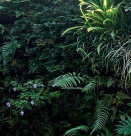

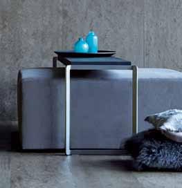
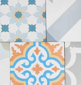

THE TEAM AT HABITUS MAGAZINE THANK OUR ADVERTISERS FOR THEIR SUPPORT. USE THE DIRECTORY TO SEE WHAT PAGE A SPECIFIC ADVERTISEMENT IS ON, AND VISIT THEIR WEBSITE TO LEARN ABOUT THE PRODUCTS AND SERVICES THEY PROVIDE.
Habitus magazine is available at newsagents and bookstores across Australasia, South-East Asia, the USA, Canada, Europe, South America and the Middle East. Habitus is published quarterly in March, June, September and December. To subscribe securely online visit habitusliving.com/magazine or email subscriptions@indesign.com.au to subscribe or request a full list of locations where Habitus magazine is available.
Your map to where the stories in this issue come from where is available
ALAIN DE BOTTONWe need a home in the psychological sense as much as we need one in the physical.#56 Adelaide #129 Ho Chi Minh City #114 Waiheke Island
