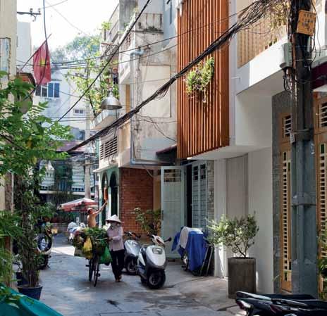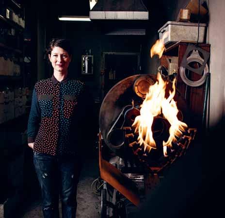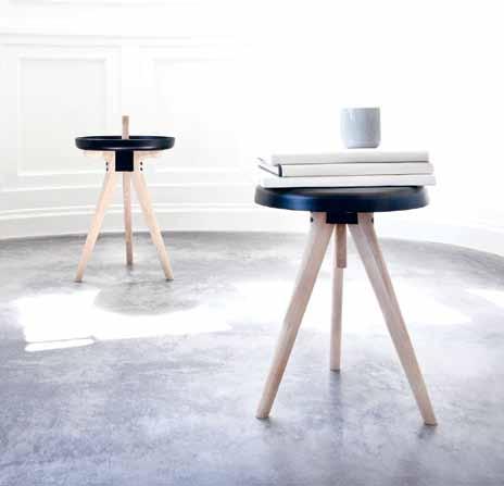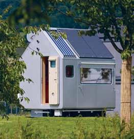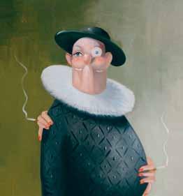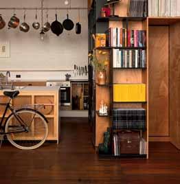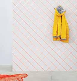
april – june | 2015 AUD$16.95 | NZ$16.95 | USD$17.95 CDN$18.95 | GBP£9.90 | SGD$11.95 living in design # 27 Misschu: tuckshop matron, fine art patron. efficiency & flexibility –creative solutions for left over spaces.
Leading bathroom solutions



With specialist advice, and the latest in design and innovation, we are proud to offer comprehensive bathroom solutions for both residential and commercial projects.
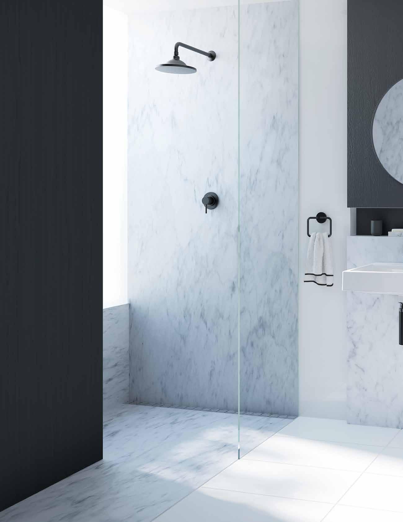
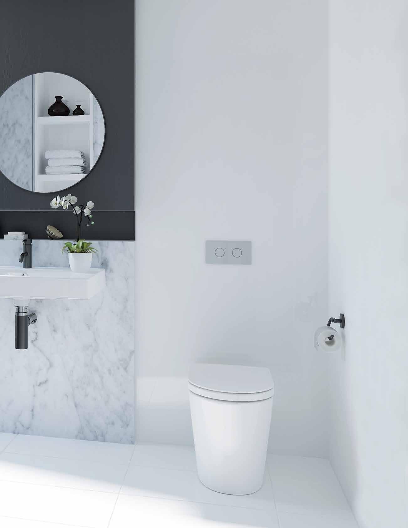
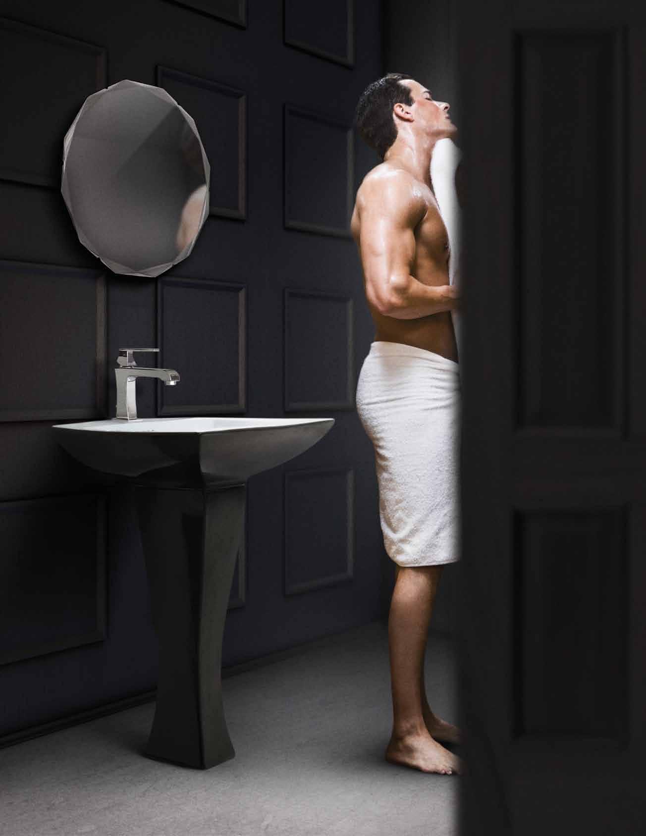
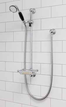
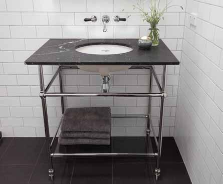
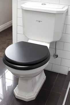
The Liano collection embraces the latest trends in design. The toilet boasts a thin edge toilet seat for a sleek look. The collection is matched with on-trend matte black tapware and accessories making a bold statement in any bathroom.
Be inspired at specify.caroma.com.au our website for industry professionals.
Design Trends
Adding Colour: Black is the new chrome
Keep it sharp and symmetrical
Thin edge, sleek toilet seat
specify.caroma.com.au
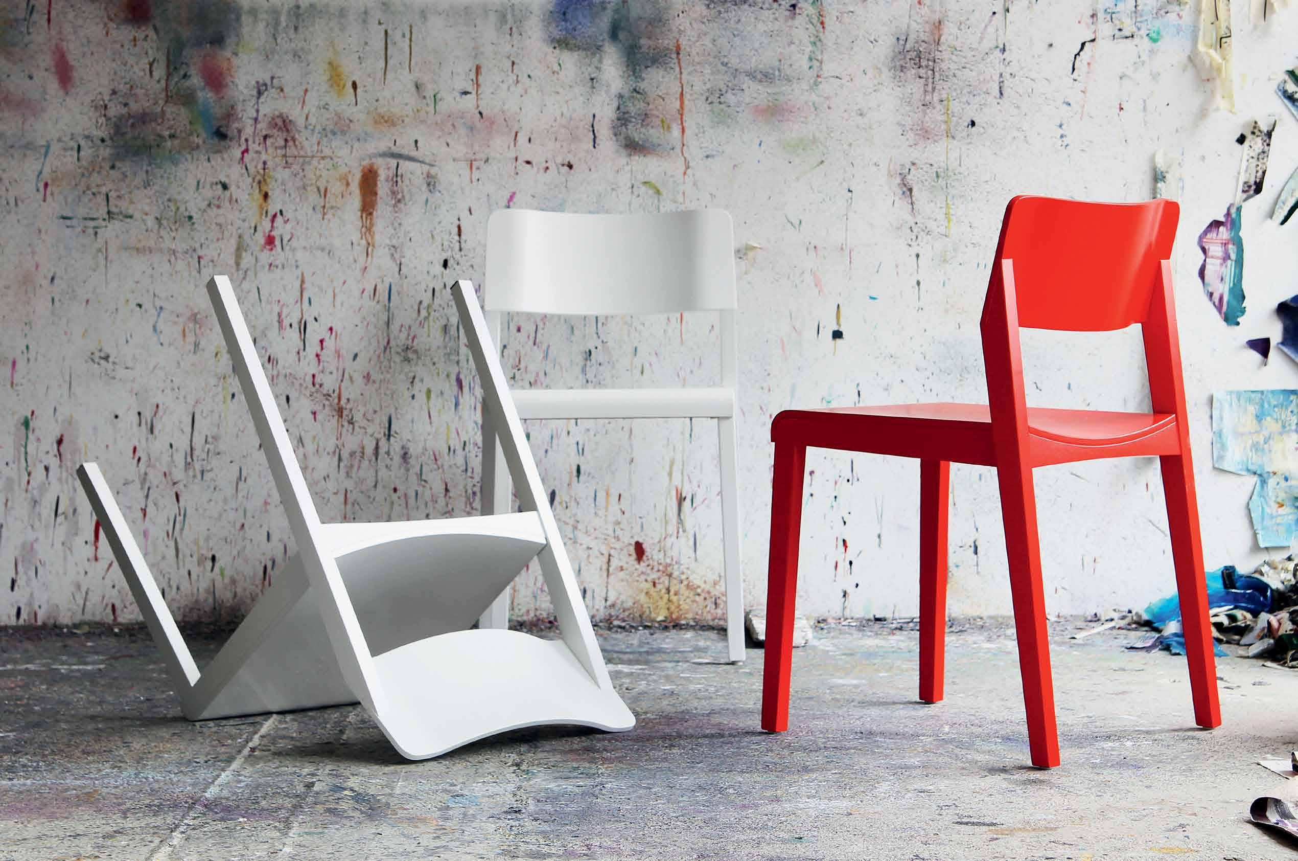


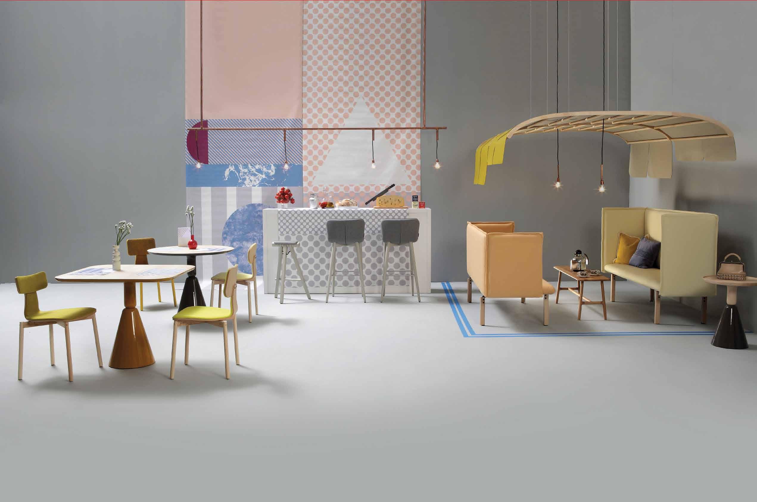


Available at www.kezu.com.au | 1300 724 174
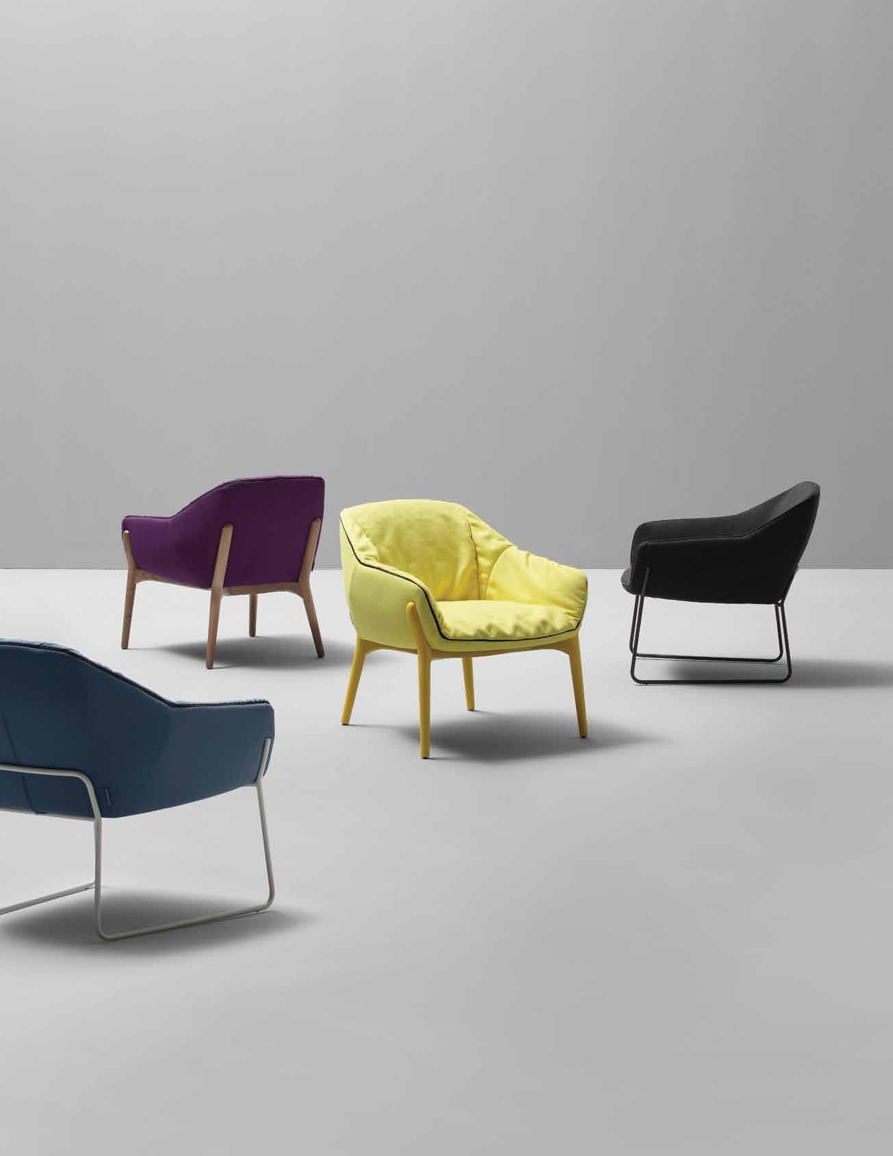
ARFLEX IS AVAILABLE EXCLUSIVELYFROM POLIFORM
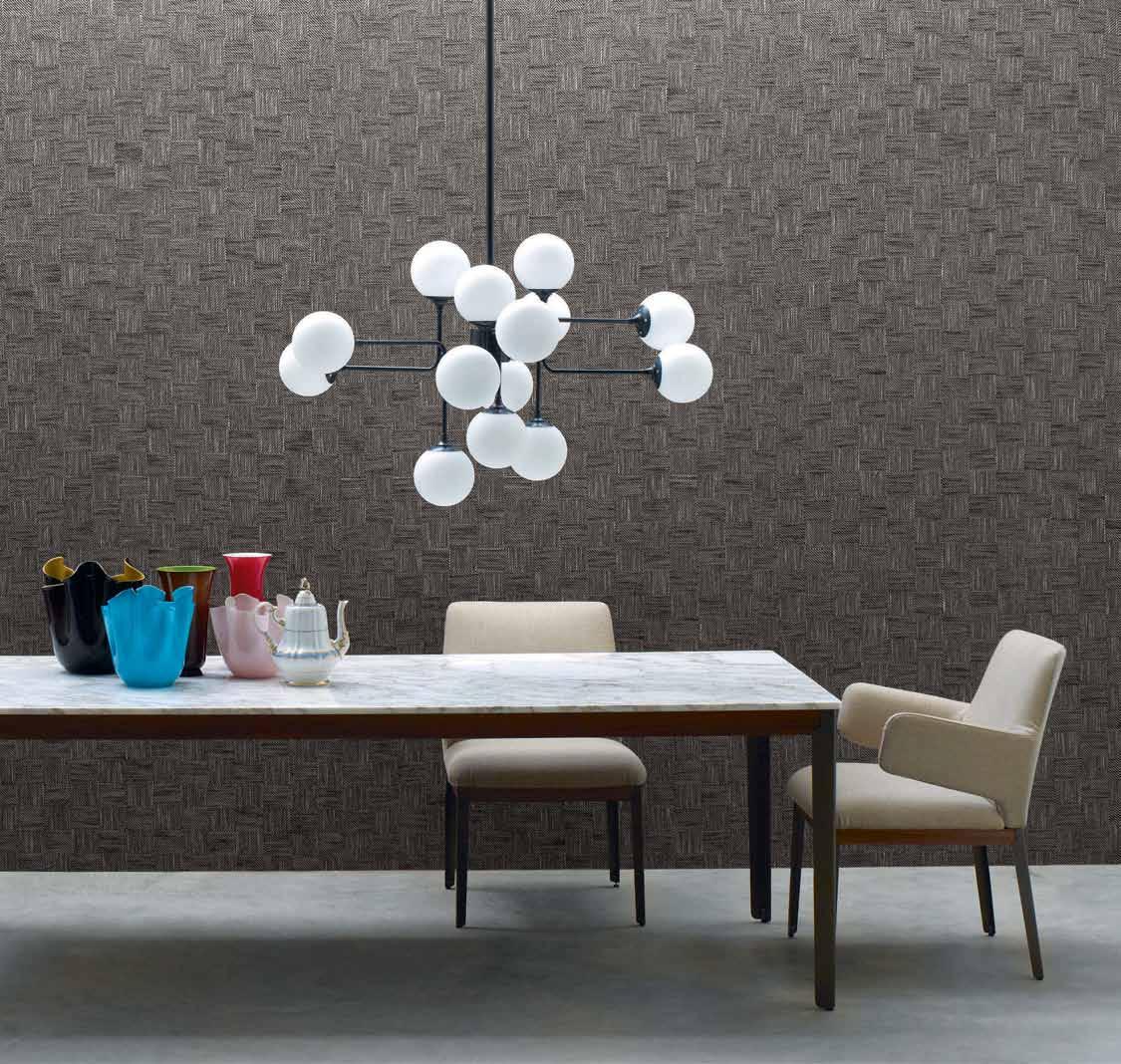
SYDNEY LEVEL 1, 84 O’RIORDAN STREET ALEXANDRIA T028339 7570
MELBOURNE 650 CHURCH STREET RICHMOND T038420 0800 POLIFORM.COM.AU ARFLEX.COM
Arflex Hug table, Hug chair
Things are just things unless there is a story and a meaning behind them. We take a deeper look at design products and ideas, to find their true value.
26. DESIGN NEWS
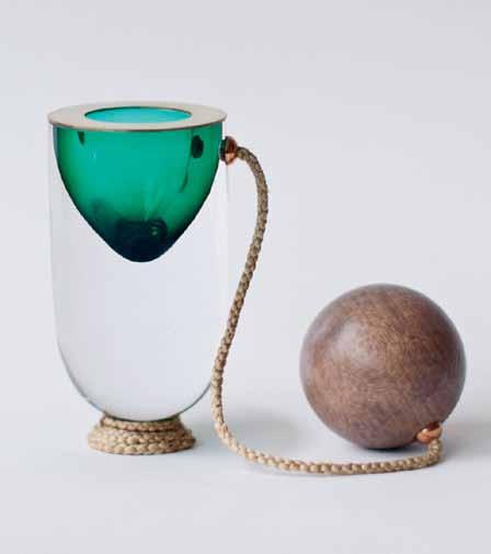
Discover products that prompt the imagination, provide a sense of luxury, surprise us with humour and stop us in our tracks with their pure simplicity.
34. BOOKS
Do design, art and architecture have a place in a discussion about happiness and wellbeing? Nicky Lobo looks at three recent books that take a philosophical view of these creative disciplines.
Determination will take a person far, but first there must be strength of purpose and a steadfast belief in the creative mission. Our Design Hunters possess all three.
42. MATTHIAS ARNDT
Matthias Arndt has been an ardent supporter of South-East Asian art since becoming acquainted with it during the days at his ARNDT Berlin gallery. Narelle Yabuka visits the Interlace development in Singapore, a new icon, where Matthias now lives with his family, adjacent to his new ARNDT gallery at Gillman Barracks.

53. NAHJI CHU
Her misschu brand took the Sydney food scene by storm in 2007, quickly followed by Melbourne and London. The direction of the business may change, but a constant for Nahji Chu is the importance of art and design in the expression of her identity, both at home and at work. Nicky Lobo visits Nahji ’s Kings Cross home and hears about her creative mission to reposition our perception of ‘Vietnamese’ and ‘refugee’
67. IWAN SUNITO
Residential developments have increased in both quantity and quality as city populations continue to rise. Indonesian-born, Australian-educated Iwan Sunito, founder and CEO of Crown Group, opens up to Paul McGillick about the unique approach that has seen Crown’s impressive rise in the housing market.
# 27
#57 #32
Efficiency & flexibility
78. SMALL HOUSES
In a discussion of sustainability, living within a smaller physical footprint is an essential component. What are some design-led examples of small housing and who is responsible for them? Stephen Todd charts some of the best examples.
88. DESIGN NEWS
Storage, multi-purpose, modular, and sustainable ideas for the living room, bathroom, kitchen, bedroom and studio help us to become more efficient and flexible.
97. HOME OF THE FUTURE
#85
All our projects this issue explore efficiency & flexibility. Some are small, some sustainable, and some future-proofed to minimise waste.
114. CRABTREE RESIDENCE
The third architect-designed home for this couple is intended to be their last. Misho + Associates have designed a home in Tasmania that braves the elements, and the future.
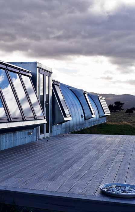
127. WELLINGTON APARTMENT
It ’s not so much a piece of fine architecture as it is a live-in work of art. Ben Daly of Palace Electric took a completely handmade approach to this tiny home, with great results.

137. NAMLY HOUSE
A classic concern for multigenerational living is dealt with in an innovative way, in this Singapore home designed by Chang Architects.
149. LEFT OVER SPACE HOUSE
They bought the smallest, cheapest home in the suburb and took 10 years to renovate it themselves, while also living in it. The reward for architects Casey and Rebekah Vallance is a beautiful home, and a World Architecture Festival award.
169. VILLA GRIS
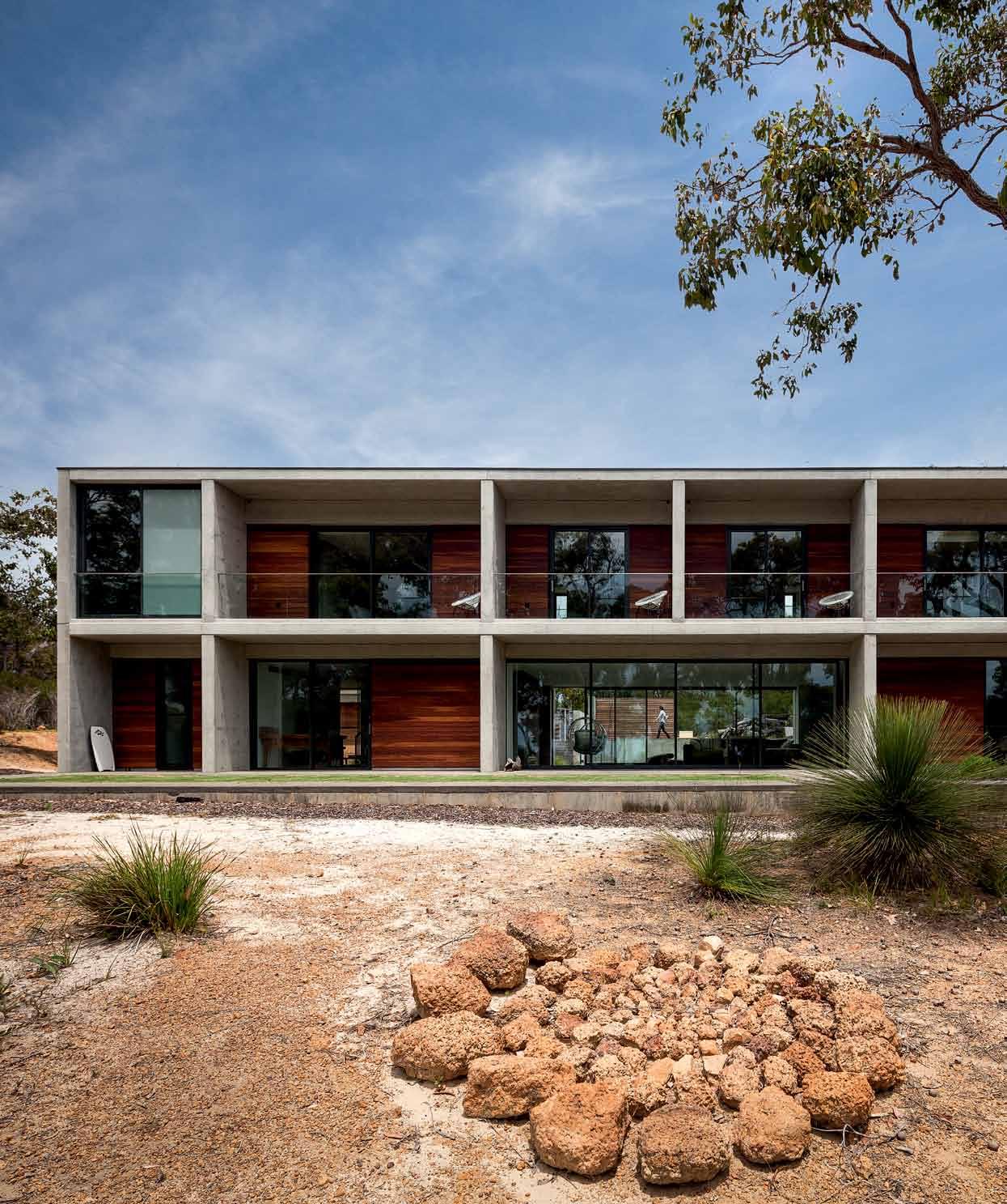
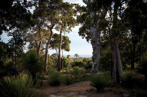
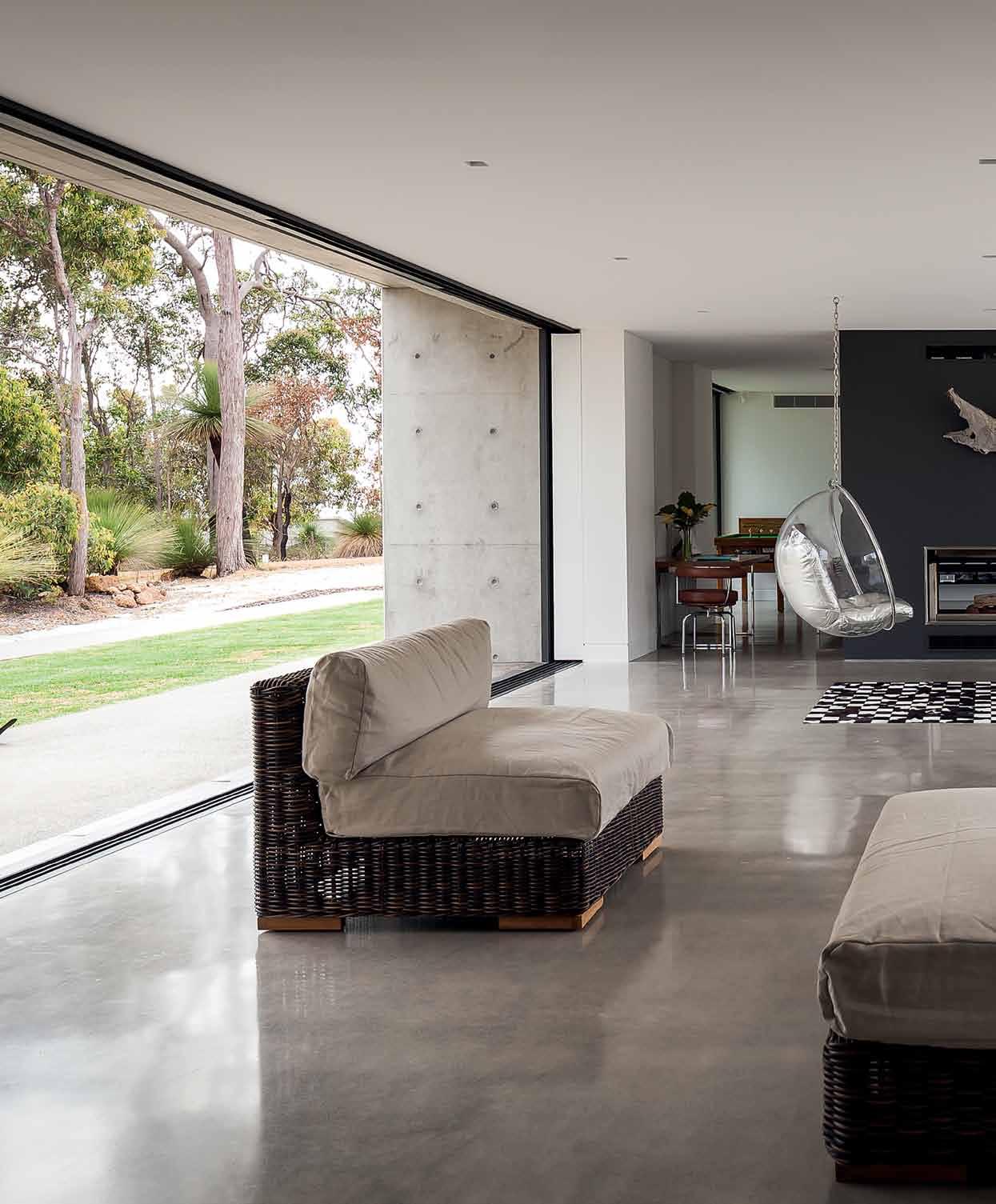
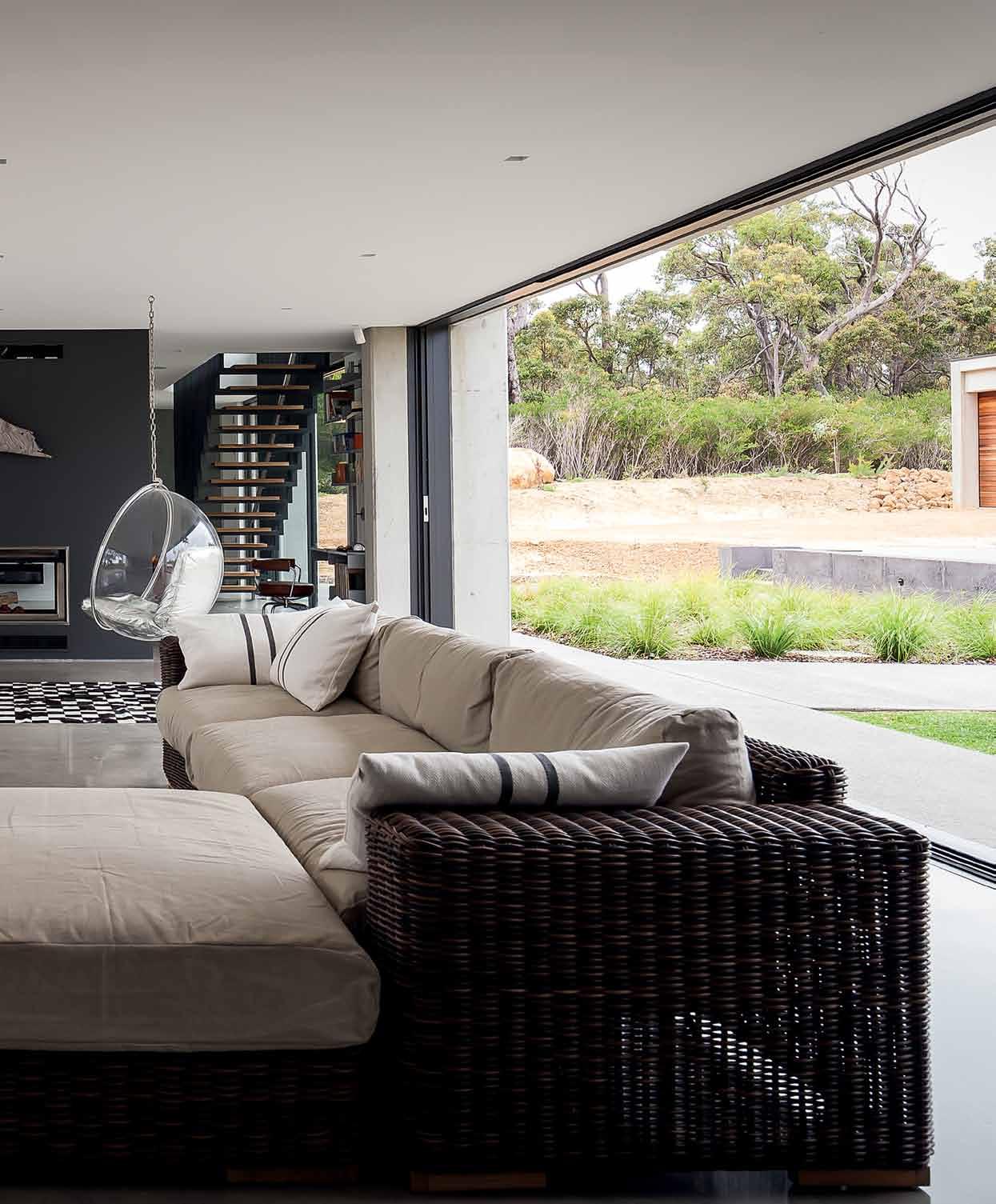
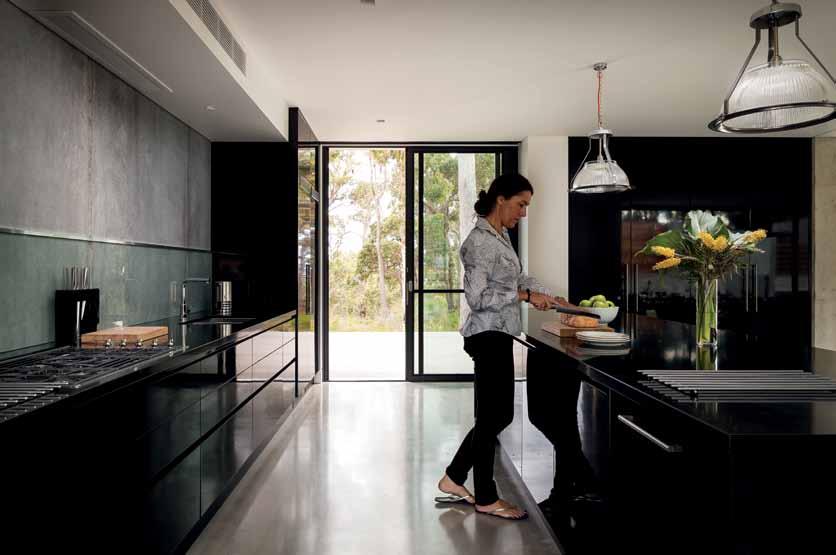
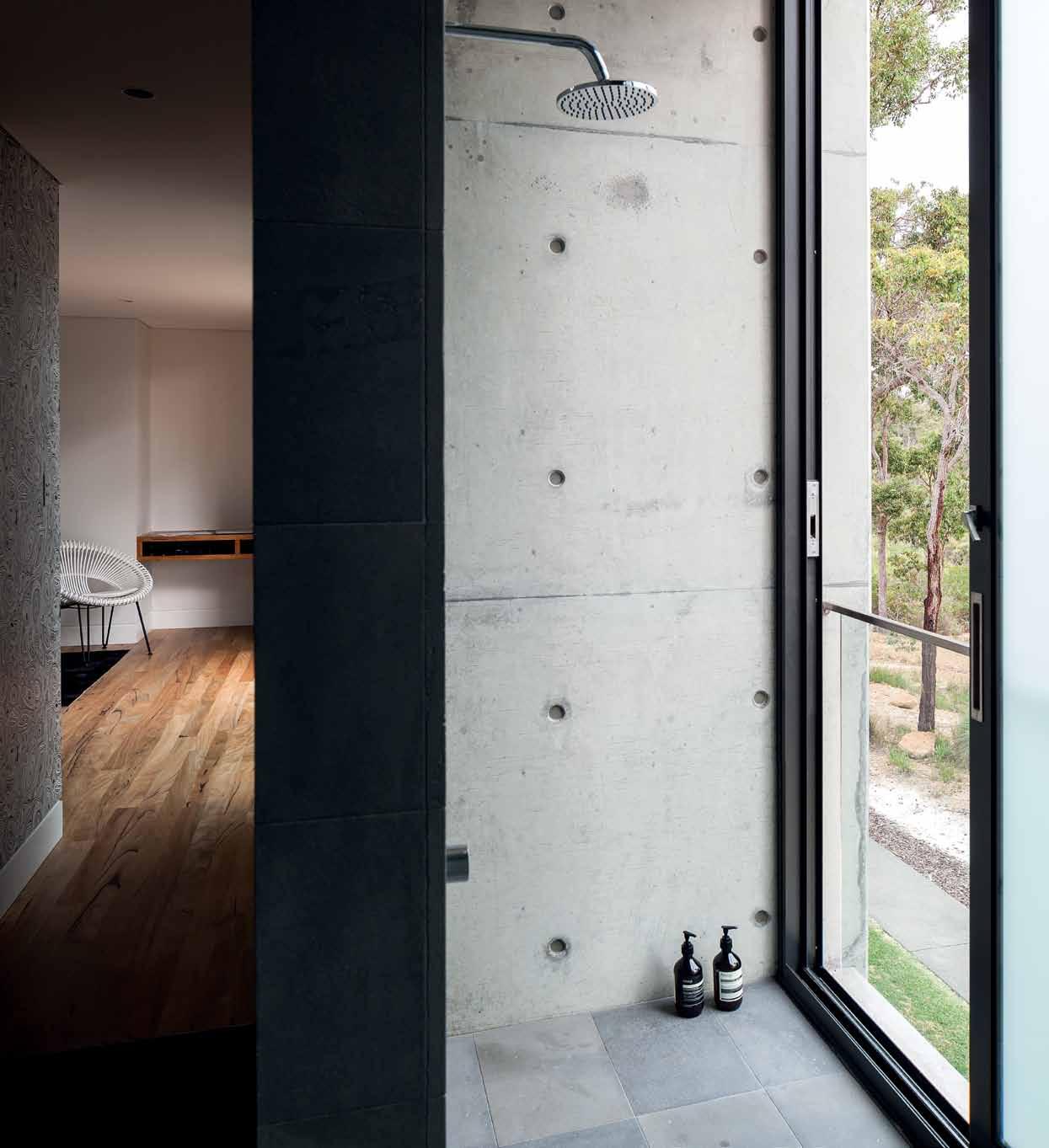
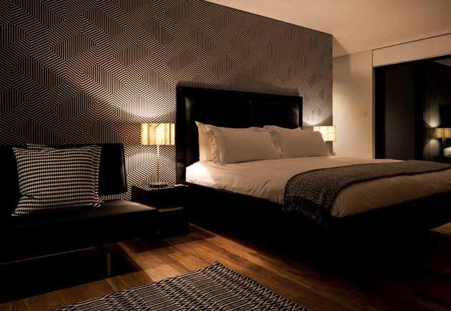
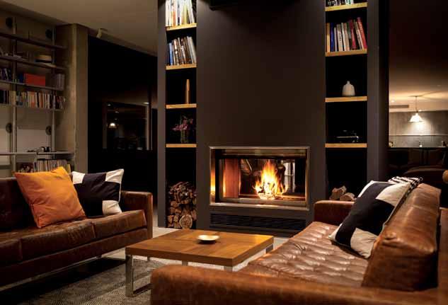
It could be a large house, or a boutique hotel. Studio Evans Lane have created a flexible home near Margaret River in Western Australia that makes the most of both its vistas: the ocean and the bush.
181. BOAT HOUSE
How will we translate the modern idea of conscious living into the future? A collection of concepts reveals a refreshingly human source of inspiration. #118
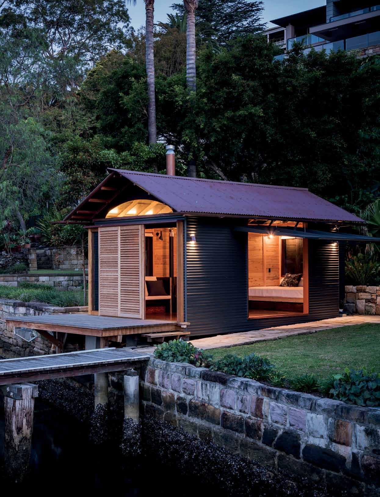
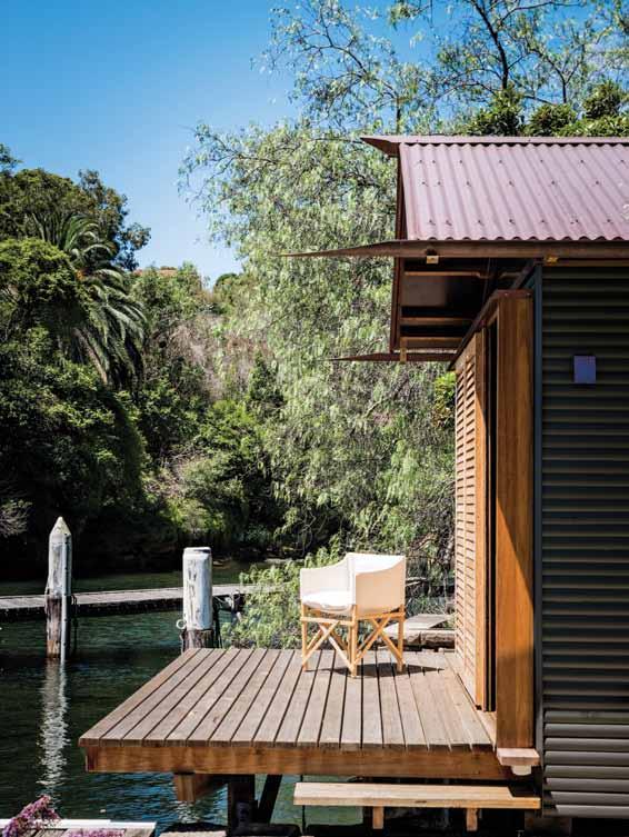
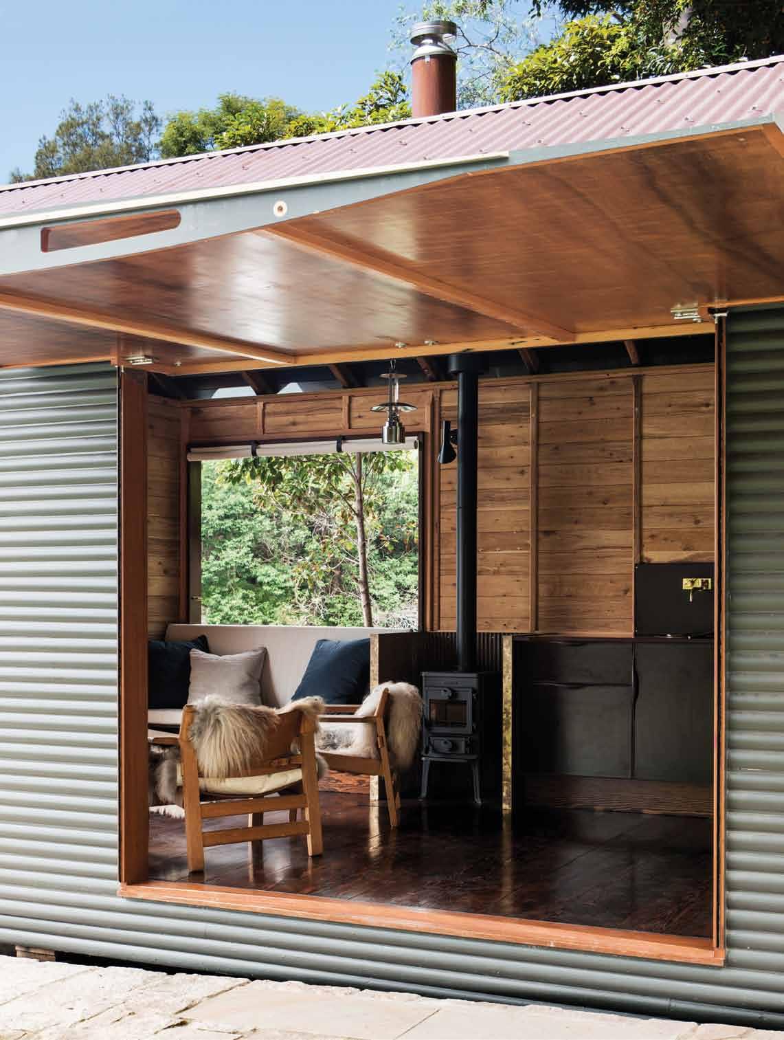
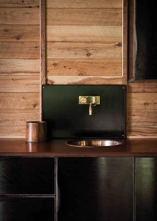
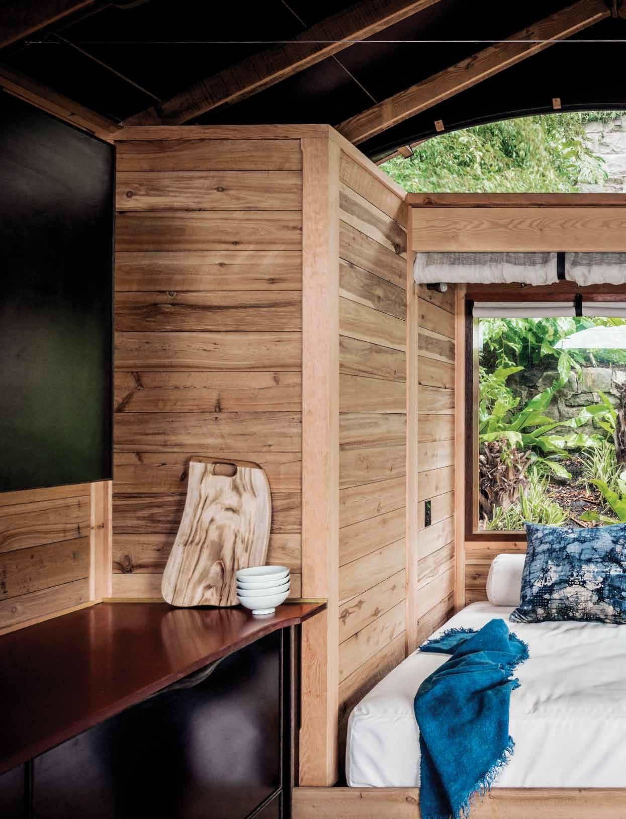
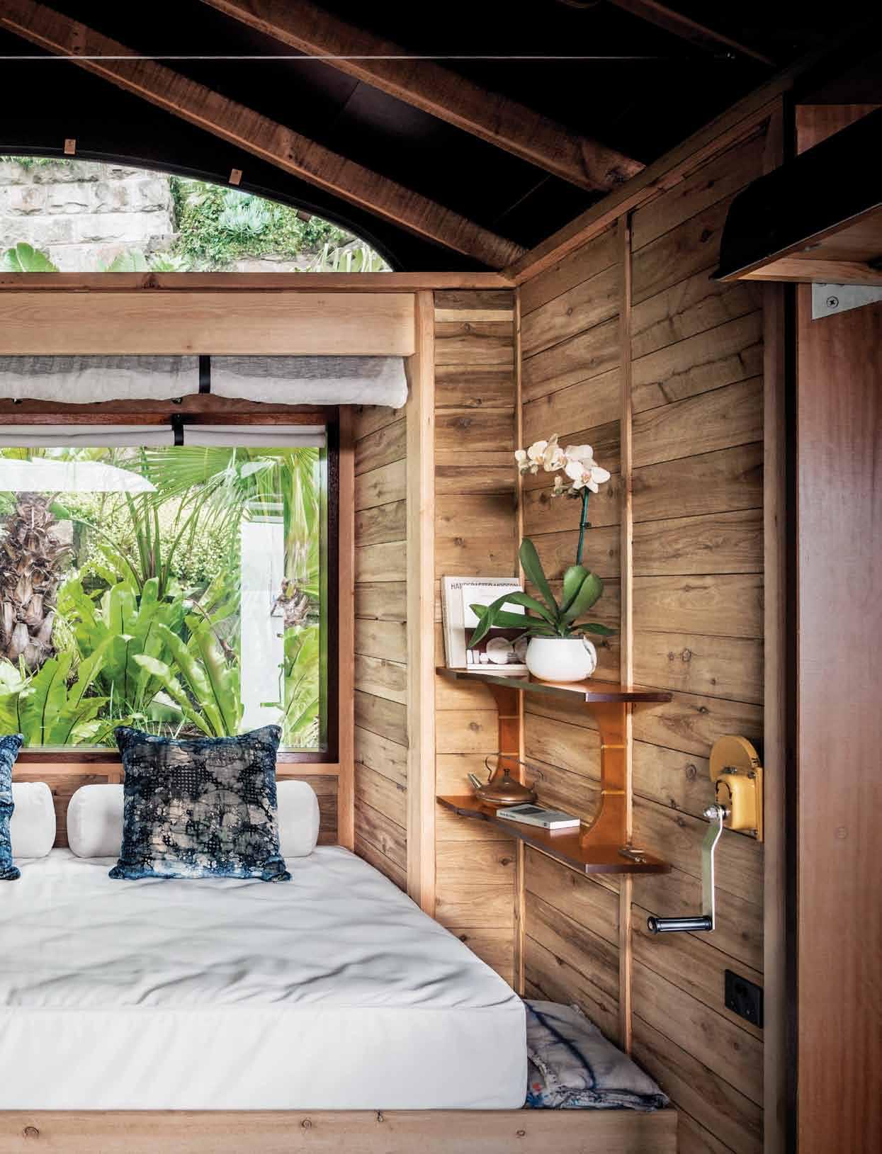
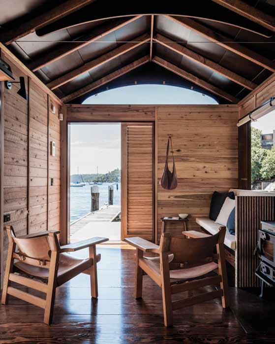
It may just be a simple, secondary structure to the main family home in Mosman, but this tiny boat house by John Bohane and Jonathan Temple with interiors by Sarah Davison, has been treated as elegantly as a fine sailboat charting the seas.
# 27


•A LE XA ND RI A-8 4O ’R IO RD AN ST.0 28 33 97 10 3 •A UB UR N-1 03 -1 23 PA RR AMA TTAR D. 02 87 48 43 67 VI SI TO UR WE BS IT E-W WW .D OM AY NE .C OM .A U Do ma yne
BA THROOM DESIGN CENTRE
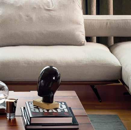


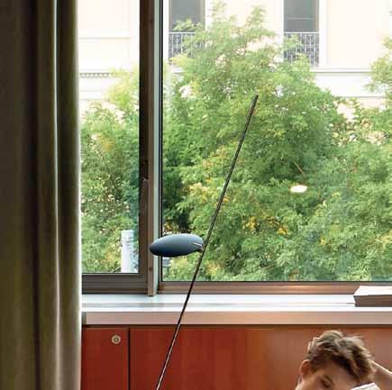
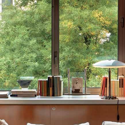

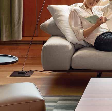






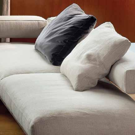
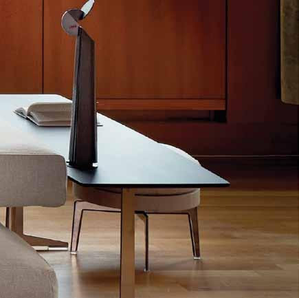



SYDNEY 269 MILITARY ROAD CREMORNE T 02 9908 2660 MELBOURN E 681 Ch A p EL S TREET S O u T h Y ARRA T 03 9826 8777 fanuli.com Wing Sofa Design by Antonio Citterio. New 2015 Collection.
 COSENTINO CITY CENTRE : Unit 30 69-73 O’Riordan Street / CP: NSW 2015, Alexandria / infoaustralia@cosentino.com
F SilestoneAustralia T @Silestone_AU W youtube.com/CosentinoTV
AURA
NATURAL Collection UNLIMITED
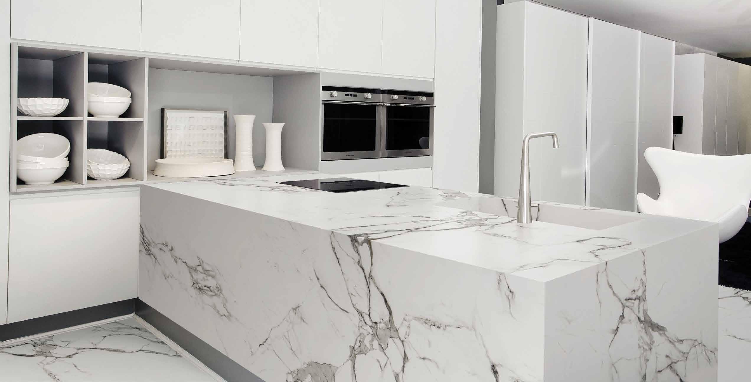
WHAT IS DEKTON® UNLIMITED ?

Dekton Unlimited is a sophisticated mix of raw materials including glass, last generation ceramic tiles and quartz surfaces.
Imagine a benchtop without restrictions, without limits. Dekton has been created without limits, it has an unlimited resistance, an unlimited design. You can use it for interior kitchens and even for exterior kitchens or terraces. With Dekton you can do everything you want, there are no limits.
WHAT MAKES IT SO UNLIMITED?
• Suitable For Exterior Application (Uv Resistant)
WWW.DEKTON.COM
• Large Format Slabs - XXL
• Maximum Resistance to Scratch And Stains
And
Low
• Maximum Resistance to Fire
Heat •
Water Absorption




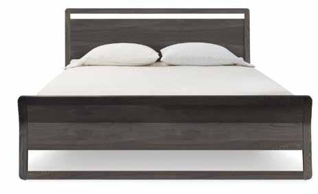
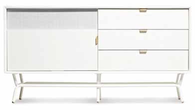
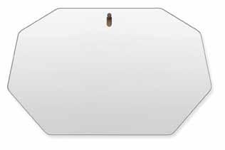


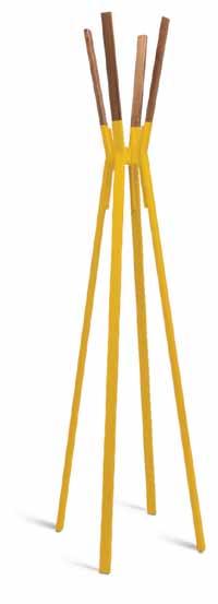
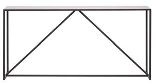
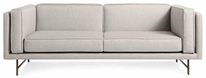
AD BLU DOT | SYDNEY | 26/69 O’RIORDAN STREET, ALEXANDRIA NSW 2015 | (02) 9313 5400 | BLUDOT.COM.AU
the first word
Deciding what is important and deleting the extraneous bits is often the first step towards a more conscious way of living. Whether in relation to getting somewhere, completing a task or using a budget, efficiency is paramount. It not only saves time, money and energy but for me, it also produces a deeply pleasurable emotion – satisfaction.
Being flexible and adaptable is another major goal. “The measure of intelligence is the ability to change,” Einstein said. The whole premise of natural selection and survival is founded on this ability. Nahji Chu, who features as our cover story (p.53), knows this better than anyone. Her restaurant business, misschu, is currently going through some major administration changes that may set lesser people back – but Nahji is as adaptable as a Swiss army knife and will find a way to turn this into an advantage. We applaud her tenacity and flexibility, all the more as we discover her passion for and patronage of the arts and design community.

This issue we explore ways to live in more efficient and flexible ways through design and architecture. Materials, building processes, future-proofing, left over spaces – all are examples that we can learn from. Particularly inspiring are the concepts within the Future of the Home feature (p. 97), which we’ve collected from various thought-leaders, artists, architects and designers. They explore issues of climate, rising population, space saving, creation of communities, waste – all legitimate and necessary concerns for us and for future generations.
I should say that the underlying theme is sustainability –but I hesitate to use the word, here at this frothy end of the greenwash wave. Although it’s easy to feel fatigued about the whole eco crusade, it’s imperative that we find ways to discuss and implement strategies for the future. Exploring tangential themes such as efficiency and flexibility has encouraged new life into somewhat tired conversations.
We will be taking the exploration of our themes online for each issue, so join us on habitusliving.com for more. There is so much wonderful content unearthed in our research for each issue that we can’t fit onto these pages. We’re grateful to have the infinite space on our website to give it all due exposure.
In this first part of the year, I’ve been thinking about strategies for living. As the world continues to get faster, there is a greater need to slow down, focus and streamline.
Nicky Lobo | Editor
habitus takes the conversation to our contributors, discovering their inspirations and design hunter™ journeys
IWAN BAAN

SMALL HOUSES #78
“A camera is like a secret code in a many ways,” says Dutch photographer Iwan Baan. “ When you have a camera in your hands, it can open a lot of doors to places and people that one would otherwise never get a chance to explore. It can be a very intimate thing,” he continues. Iwan collaborates with some of the world ’s foremost architects including Rem Koolhaas, Herzog & de Meuron, SANAA, Morphosis, Frank Gehry, Toyo Ito, Steven Holl and Zaha Hadid.
GIOVANNA DUNMALL
VILLA GRIS #169
Giovanna Dunmall is a freelance writer based in London. She writes about architecture, design and the arts for publications in the UK, US, Canada, Australia and Hong Kong. Perhaps even more than a totally new building Giovanna finds refurbishments of old buildings fascinating, “ Especially if they have been given striking new contemporary insertions that reference the old building sensitively but audaciously,” she says
SAM HARTNETT
WELLINGTON APARTMENT #127
Photographer Sam Hartnett says architecture and design for him is “about the story behind the object, the maker and the materials. Once you have a unique thing you wonder why everything is not made that way. It ’s a much more satisfying way to interact with things, and it starts conversations.” Since he has never been able to sit still, Sam is grateful that photography gives him the opportunity to be in a different location everyday, with different people.
ZUZANA KOVAR & NICHOLAS SKEPPER
LEFT OVER SPACE HOUSE #149
Brisbane-based architects and directors of their own practice called ZUZANA&NICHOLAS architects, this duo sustain an active involvement in learning and writing about, as well as teaching architecture. “ Writing about architecture and design is rewarding as it allows us to access inspiring buildings and to hold a dialogue with the architects through the review process,” they say. Zuzana holds a PhD in Architecture and Nick is a current doctoral candidate at RMIT.


PAUL MCGILLICK
NAMLY HOUSE #137
Writing about architecture and design has taken former Habitus Editor, Paul McGillick, to some amazing places. Lots of his time is spent in South-East Asia looking at some of the best residential architecture in the world. “ It almost makes me want to live in the tropics,” he says, “except my skin grows mushrooms in a humid climate.” For Paul, architecture and design is not about fashion. It’s about how we live in the world.
CATRIONA MCLEOD

CRABTREE RESIDENCE #114
Dr. Catriona McLeod has a broad view of the word ‘design’. “I love the way consciousness of the design process suffuses all aspects of my life,” she says: “From sipping a cup of tea while watching the sun rise over my messily-planned vegetable garden, to picking and arranging flowers in a favourite vase, to arranging words in my head and on a page, to planning the design of my own, tiny, shack of recyclables.” With a PhD in green design and as a former lecturer at the University of Tasmania, Catriona now consults, edits and writes from her beach-shack base.
HENRY OLIVER
WELLINGTON APARTMENT #127
A freelance writer based in Auckland, Henry is a regular contributor to magazines and also cowrote the book Art of the Band T-Shirt with his wife. In former lives, he used to be a musician, a bar proprietor, and an intellectual property lawyer. Henry loves architecture’s ability to change your world on a micro level – “ how you feel in a particular space ” – and a macro level –“ how you interact with the environment/town/ city you are in.”


ROB PALMER


NAHJI CHU #53
For Rob, Bondi-based photographer, photo shoots are more than just a job – they provide welcome inspiration. “ There’s definitely a different sort of connection you have with people when you’re pointing a camera at them,” he says. “ It’s like your relationship has just been fast-tracked – you often have the privilege of getting an intimate insight into someone’s life. I often walk out pumped for new projects and concepts after hearing about someone else’s.” Rob loves both the aesthetic and functional aspects of design.
SCOTT SHIRLEY

VILLA GRIS #169
Architectural photographer Scott Shirley loves finding great moments in space through perspective, light and timing; collaborating with clients to discover their wants and needs; and delighting. “ I want to find the stories within each project and help them breathe, giving my clients volume,” he says, adding, “ Photographing projects also gives my kids a break from Dad jokes.”
DARREN SOH


MATTHIAS ARNDT #42
Darren has been an architectural photographer for 10 years. When not shooting for a client, he is off chasing down a vernacular or obscure modernist structure in his home city of Singapore in order to photograph it before it gets obliterated in the name of urban renewal. He takes the responsibility of being a photographer seriously, “ So I always try to make an image that best shows a structure rather than an image that shows the structure at its best.”
STEPHEN TODD
SMALL HOUSES #78
Sydney-based writer Stephen Todd is passionate about commentating on good design and architecture and delighted in writing the feature on quality small housing across Europe and Japan. “ The idea of small homes intrigues as much as it worries me,” he says. “ It could so easily be derouted by a hippy contingent; the design world needs to really step up to the base.”

REBECCA TOH
MATTHIAS ARNDT #42
Rebecca Toh is a commercial and editorial photographer who is hugely influenced by the ability of a film to tell moving, layered stories, and thus works to inject this sense of the cinematic into the images she creates for clients across multiple industries and cities. Most of her work revolves around spaces, people, emotions and light. Based in Singapore, she is nevertheless always on the road. “ The fact that human beings have the ability to create something new and beautiful out of nothing but a bunch of raw materials and human ingenuity amazes me anew everyday,” she says. “ That is what I love about design.”
PETER WHYTE CRABTREE RESIDENCE #114
Based in Hobart, Peter has spent the last three decades documenting the best of Tasmania’s spectacular places, people and produce. “ With a gestation period that can span years, I am astounded by how any architectural concept survives the complex and cumbersome design, construction and political process,” he says. “ I love that good architecture still emerges – spontaneous and original.”
Untitled-4 1 13/01/2015 9:51 am
Editor Nicky Lobo nicky@indesign.com.au
assistant Editor –on Lin E
Tess Ritchie tess@indesign.com.au
origina L dE sign tEmpL atE one8one7.com
Cr E ati VE dir ECtor Christopher Holt hello@holtdesign.com.au
sEnior dE sign Er Michelle Byrnes
dE sign Er
James McLaughlin james@indesign.com.au
m Edia & prodUCtion Coordinator

Tina Fluerty tina@indesign.com.au
ContribUting dE sign Er
Charlotte Matters
ContribUting WritErs
Giovanna Dunmall, David Harrison, Zuzana Kovar, Paul McGillick, Catriona McLeod, Henry Oliver, Nicholas Skepper, Stephen Todd, Narelle Yabuka
ContribUting
photograph Ers
Iwan Baan, Steve Back, Sharyn
Cairns, Samuel Hartnett, Christopher Frederick Jones, Albert Lim, Takumi
Ota, Rob Palmer, Lars Petter Pettersen, Scott Shirley, Rebecca Toh, Michael Wee, Peter Whyte
ContribUting iLLUstrators
Herds of Birds, Charlie Hart
CEo / pU bLish Er
Raj Nandan raj@indesign.com.au
pa to pU bLish Er
Elizabeth Davy-Hou liz@indesign.com.au
prodUCtion m anagEr
Sophie Mead sophie@indesign.com.au
FinanCia L dir ECtor
Kavita Lala kavita@indesign.com.au
aCCoU nts
Gabrielle Regan gabrielle@indesign.com.au
Vivia Felice vivia@indesign.com.au
on Lin E Comm U niCations
Radu Enache radu@indesign.com.au
Ryan Sumners ryan@indesign.com.au
E VEnts & mark Eting
Tegan Schwarz tegan@indesign.com.au
Angela Boustred angie@indesign.com.au
sa LE s dir ECtor
Marie Jakubowicz
marie@indesign.com.au
(61) 431 226 077
bUsin E ss dEVELopm Ent managEr
Colleen Black colleen@indesign.com.au
(61) 422 169 218
CoVEr imagE
Nahji Chu (p.53)
Photography by Rob Palmer
Head Office
Level 1, 50 Marshall Street, Surry Hills NSW 2010 (61 2) 9368 0150 | (61 2) 9368 0289 (fax) | indesign.com.au
MelbOurne
Suite 11, Level 1, 95 Victoria Street, Fitzroy VIC 3065 | (61) 402 955 538
SingapOre
4 Leng Kee Road, #06–08 SIS Building, Singapore 159088 (65) 6475 5228 | (65) 6475 5238 (fax) | indesignlive.sg
HOng KOng
Unit 12, 21st Floor, Wayson Commercial Building, 28 Connaught Road West, Sheung Wan, Hong Kong | indesignlive.hk
published
Australia.
is published
and is available through subscription, at
throughout Australia, New Zealand, South-East Asia and the United States of America. This
Habitus
may contain
or surveys which may require you to provide information about yourself. If you provide such information to us we may use the information to provide you with products or services we have. We may also provide this information to parties who provide the products or services on our behalf (such as fulfilment organisations). We do not sell your information to third parties under any circumstances, however, these parties may retain the information we provide for future activities of their own, including direct marketing. We may retain your information and use it to inform you of other promotions and publications from time to time. If you would like to know what information Indesign Media Asia Pacific holds about you please contact Nilesh Nandan (61 2) 9368 0150, (61 2) 9368 0289 (fax), info@indesign.com.au. Habitus magazine is published under licence by Indesign Media Asia Pacific. ISSN 1836-0556
issue #27 habitusliving.com Available exclusively from Apato SPLINTER BY nendo Untitled-6 1 27/01/2015 2:15 pm Printed in Singapore. All rights reserved. No part of this publication may be reproduced, stored in a retrieval system, transmitted in any form or by any other means, electronic, mechanical, photocopying, recording or otherwise. While every effort has been made to ensure the accuracy of the information in this publication, the publishers assume no responsibility for errors or omissions or any consequences of reliance on this publication. The opinions expressed in this publication do not necessarily represent the views of the editor, the publisher or the publication. Contributions are submitted at the sender’s risk, and
Media Asia Pacific cannot
loss or damage. Please retain duplicates of text and images.
magazine
publication, which is
and
Indesign
accept any
Habitus
is a wholly owned Australian
designed
in
Habitus
quarterly
major newsagencies and bookshops
issue of
magazine
offers


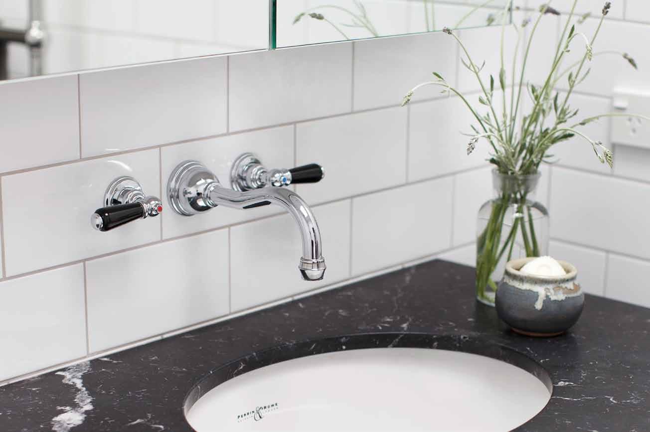

THE ENGLISH TAPWARE COMPANY SYDNEY: 02 9362 4736 • MELBOURNE: 03 9818 1403 • www.englishtapware.com.au FREECALL AUSTRALIA WIDE: 1300 01 61 81 • NEW ZEALAND: In Residence 09 309 3023 • www.inres.co.nz
A fresh perspective on design
Big personality
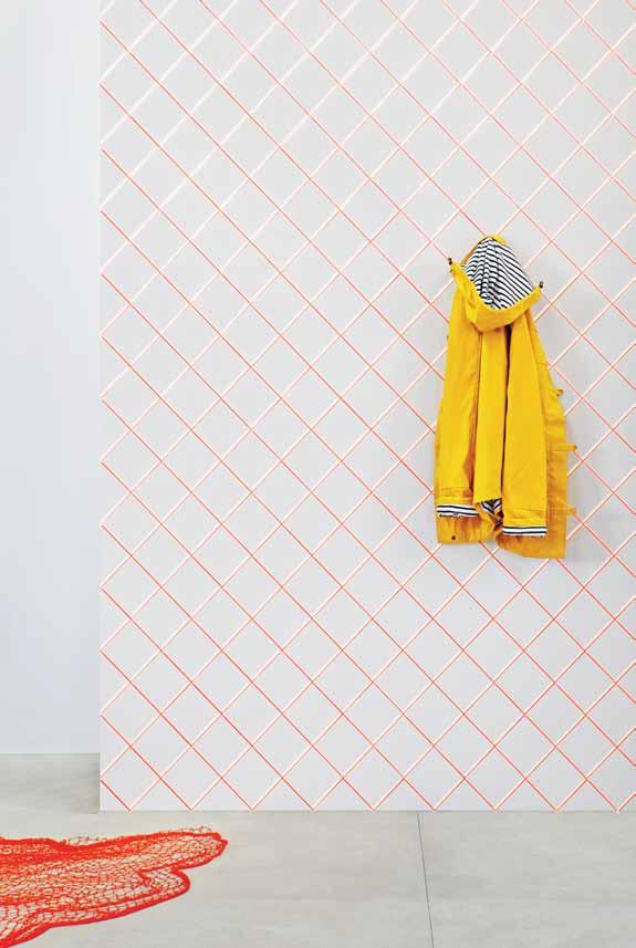
Inspired by fish scales and their reflective shine, SCALES brings the conventional ceramic tile to life. The rear side is bright and the front side smooth and white. When the tiles come together a vibrating pattern – much like that of fish scales rippling under water – appears. With a neon, 80s-inspired palette and the opportunity for endless compositions, MUT design studio ’s SCALES is about creativity and imagination.
mutdesign.com / beaumont-tiles.com.au
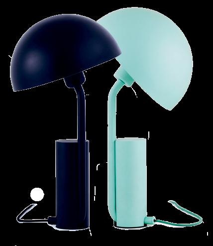
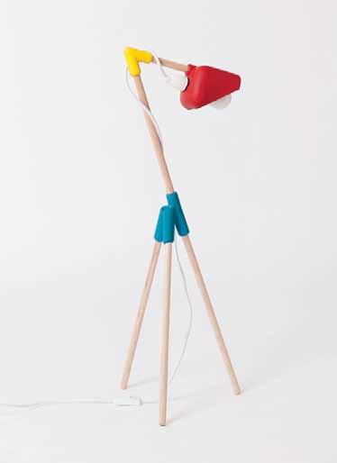
German design duo KaschKasch have created CAP, a rather cute table lamp with an over-sized shade. It ’s no wonder this lamp is appealing though, drawing its main inspiration from an Italian/Japanese cartoon character called Calimero – a charming little chicken with an eggshell for a hat. Perfect.
normann-copenhagen.com
UPJ is for kids. A smaller version of UP5_6, an unrivalled icon of Italian design, the design is equally as comfortable and just as playful. It ’s bold colour, striking pattern and jestful form will undoubtedly brighten up a child ’ s room.
bebitalia.com / spacefurniture.com.au

issue #27 habitusliving.com
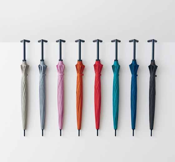
STAY-BRELLA is the independent umbrella. Rather than precariously resting against a wall, this colourful little guy stands (and hangs) all on his own, through the clever bisected angled design of its handle. Available in eight different colours for every mood, with a strap that ensures safe hang time on your arm, STAY-BRELLA also has a surface coating that reduces UV rays by 90 per cent.
nendo.jp
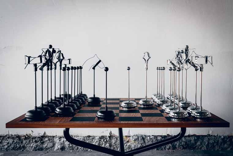
CHECKMATE , by ChristelH , is a modern reinterpretation of the classic game of chess. Rather than standard and mass-manufactured, each piece is handcrafted individually from ready made lightweight metal components – inspired by the art of re-purposing found objects. As such, the quirky little objects invite us to engage our sense of touch, intellect and play.
christelh.com
MR DOWEL JONES has quickly become a design favourite since its launch in 2013. Now this playful piece charms even more with the components available in a suite of primary colours. Your handsome guy can be in a combination of red, yellow, blue or black.
catapultdesign.net.au
1 . lightbox # 27
The simple life
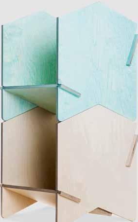
Taking its name from the interlocking pattern first seen in ancient Greece, the CHEVRON SHELF is a celebration of simplicity and versatility. Requiring no tools for assemblage, four pieces of precision milled birch plywood interlock seamlessly together to create a unit, which can be stacked one upon another – if you so choose; the size and colour is up to you.
nomi.com.au
An ode to the warmth and beauty of natural timber, About Space ’ s LED-NATIVE 2BY4 SUSPENSION LIGHT keeps it simple. Fashioned from Tasmanian oak, the light comes in classic rectangular or round profiles, is custom made, and finished with natural beeswax or walnut stain.
aboutspace.net.au
Part of an entire bedroom collection inspired by designer Bec Doyle ’s love for a “ life-long family possession, a mahogany Queen Anne dressing table ” , BED HEAD is deceptively simple. Extremely well considered, the classic half moon-shaped bed head is made from American ash with traditional techniques, and is designed to last a lifetime – and well into future generations.

douglasandbec.com
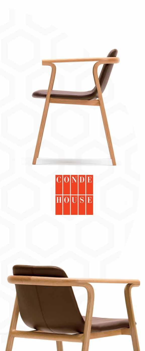
A collaboration between Conde House and Nendo, the elegant SPLINTER CHAIR is created by no ordinary means. A testament to Conde House’s production technology and craftsmanship, the design is made by dividing pieces of wood and peeling them away. And it ’s that level of care that gives this piece of furniture its slender and delicate appearance.

condehouse.com /nendo.jp / apato.com.au

issue #27 habitusliving.com
Made with two hands, one piece at a time, Exit Eight Six ’ s TONY STOOL is genuine handcraft. Starting with a solid American oak seat that is finished with wax from locally reared bees, the stool comes into being upon its solid powder-coated steel frame.
exiteightysix.com
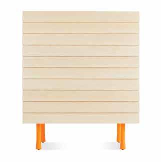
A simple form complemented by a simple decorative detail – overlapping timber drawer fronts gives the LAP TALL DRESSER its name. In a whitewashed maple finish and four soft-close drawers, a hint of charisma is introduced in the leg finish – three options are available.
bludot.com.au
Subtle in tone, the VARJO RUG embodies movement. Through the layering of multiple layers, a dynamic herringbone pattern arises. An effect is created that subtly mimics a shadow – which is its name, in Finnish.

muuto.com
For the environmentalist, the vegan and the music enthusiast: discover AUDEZE LCD-2 BAMBOO headphones. Carefully designed with all these concerns in mind, the bamboo headphones are leather free and, importantly, create excellent sound quality.
busisoft.com.au

1 . lightbox # 29
Lap of luxury
Indispensable in any luxuriating activity worth its salt, floor cushions are the foundation for carefree lounging, lazing and reclining. Temperature Design ’s superb contribution to this model of seating is highly customisable and Australian-made, fuelling hope for the homegrown epicurean community.

temperaturedesign.com.au
The bath is a symbol of luxury, something the CONTURA , part of Caroma ’ s Contura Collection, takes seriously. Its curvaceous form, elegant lines and superb functionality makes this bath the embodiment of luxury – perfect for an indulgent soak.

caroma.com.au
Some forms just exude elegance, like this one. The gentle curve that sweeps through the body of the MIO sofa makes our eyes melt, just a little. Then there ’s the material. A frame in pine and poplar plywood, satin-finish brass feet, and the choice of leather for the seat, if you wish.
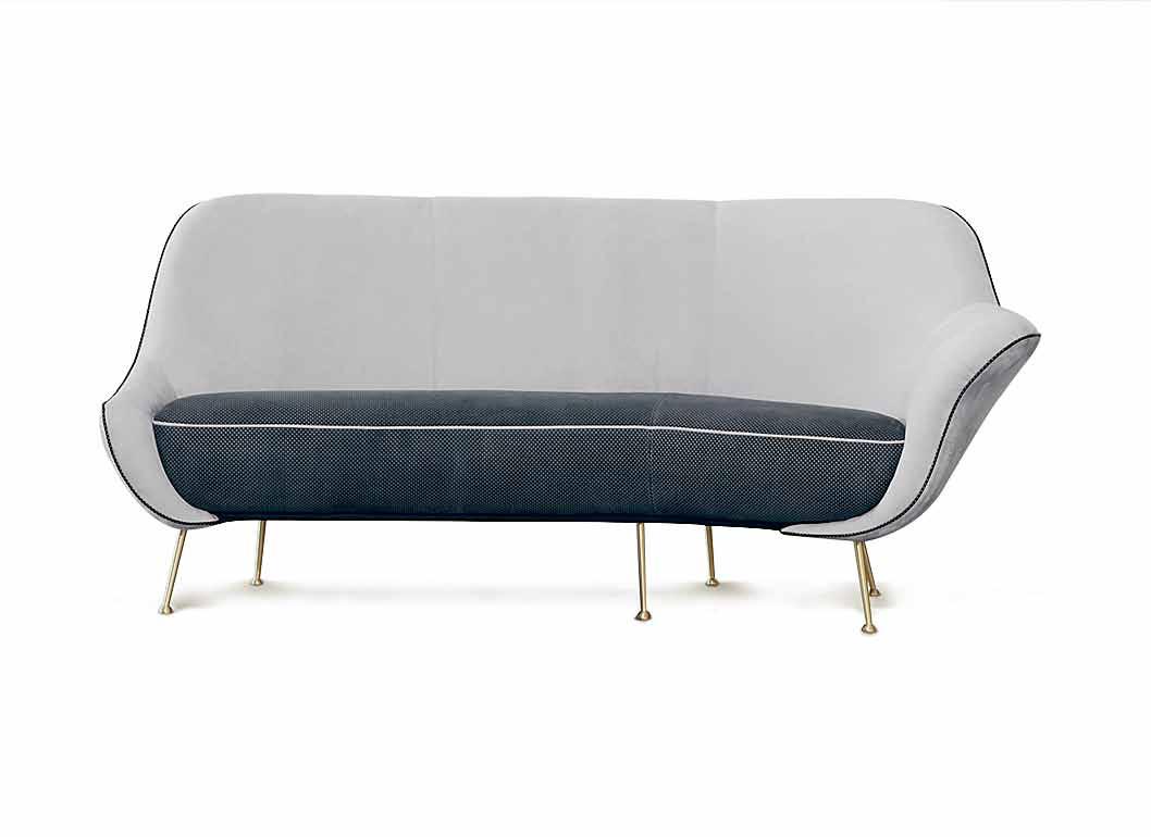
baxtershop.com.au
There is always potential to make dining an elegant experience. When the table itself has class, like the COLONNA DINING TABLE by Rosanna Ceravolo Design , it ’s much easier. Here, brushed brass columns pierce a solid American oak timber top and gently curved corners create both a sense of elegance and a cohesive aesthetic. Simply beautiful.
rosannaceravolo.com / criteriacollection.com.au
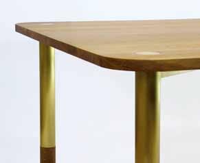
issue #27 habitusliving.com
Through the coloured looking glass: Dan Hockings and COPPER MOON (pictured) hanging mirror shows you life in a new hue. Hand detailing, metal, mirror and leather fuse to create a piece rich in material variety and textural interest – an intriguing and functional addition to any vertical surface.
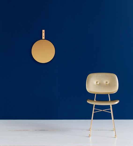
spacefurniture.com.au
Few things say luxury like fancy cutlery –and Maximilian Löw ’s hand-cast BRASS EDGED CUTLERY range combines the visual opulence of lustre and form with the exquisite tactility of buffed metal. Extensively prototyped to ensure function, Löw has succeeded in combining fluid curves with modern edges in a uniquely indulgent set of eating implements.

maxloew.com
allows true exploration into the depths of your favourite drop whether you like it neat, on the rocks or in a cocktail. Through rigorous development Denver & Liely have created a glass that captures the sensory pleasure of taste and smell associated with a traditional whisky snifter, combined with a classic form of wide base and tapered body.

PIPER ’s soft colouring takes its inspiration from the gum tree and the process of glassblowing. The transparency of the glass offsets the metallic strength of the brass stem, creating an elegant balance. Hand blown in Melbourne and available in three organic styles.
jardan.com.au

1 . lightbox # 31
Imaginarium
In our busy lives we often need reminding to relax. Aptly inspired by the visualisation of time, DAILY POETRY – a series of tactile objects – does just that. Physically alluring, the objects pull us into a little daydream, some healthy contemplation amidst our digital world.
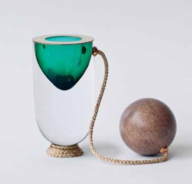
ingridhulskamp.com
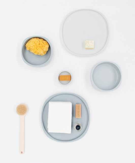
The foundation of FADE , a collection of vessels and furniture for the bathroom, is bathing – more specifically, the ritual and metaphor of the washing process. Taking cues from both Eastern and Western perspectives of ‘ the object ’, the collection as a whole, presented in shifting tones, encourages us to consider bathing as ceremony and nature as a transformative element.
johnastbury.com / kyuhyungcho.com
Phil Cuttance ’ s AURORA POT makes momentary beauty permanent. The lid of each pot is embellished by dropping a single drop of polish onto water, capturing the oil slick effect, and, placed on the top – we can enjoy the light play every day.
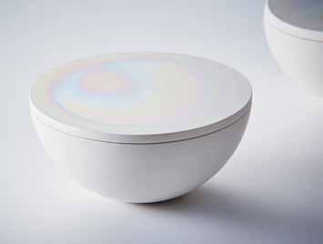
philcuttance.com
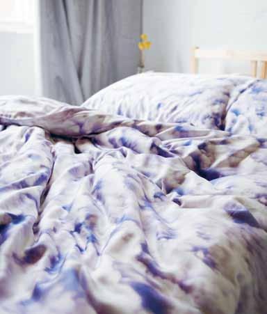
It will be a breeze to nod off with the CLOUDLAND range of bed linen. This collaboration between Melbourne-based fashion label Limedrop and sustainable lifestyle brand Etitude features eco-friendly certified-organic bamboo lyocell fabric.
limedrop.com.au
issue #27 habitusliving.com

An Everyday Masterpiece The beauty of art; the quality of Caesarstone New Calacatta Nuvo™ www.caesarstone.com.au

issue #27 habitusliving.com
The meaning of creativity
What is the purpose of design, art and creativity? They make life more beautiful and can help us to function more efficiently. But do they have any impact on the way we see ourselves, the world, and our place in it? Three recent titles argue yes – design and art can be used in beneficial ways, as ‘tools’ to better ourselves, and our lives.

1 . lightbox # 35
Tex T Nicky Lobo | iLLusTraTioN Herds of birds
Vince Frost of Frost*collective has launched his second book (following Sorry Trees published in 2006) after more than 25 years in the graphic design industry. Part biography, part self-help, Design Your Life is a reflection of lessons learned during Frost’s professional career, which he has translated to a broader life philosophy. He hopes to both “bring value” and “inspire you to work better at living better” through this book, a personal narrative interspersed with quotes from design luminaries, typographic mottos and interviews with contemporary successes such as Justin Hemmes of Merivale, and Scott Dadich, Editorin-Chief of Wired magazine.
Taking stock of his hugely successful business and past projects and clients (which include Qantas, Deutsche Bank and City of Sydney), Frost proposes 15 principles, which apply to both career and home life. At times the messages are confusing. At one point we are told to ‘avoid mistakes’; on the following page is a ‘Design by Failure’ principle, which begins with a Samuel Beckett quote: ‘Try again. Fail again. Fail better’. Then, Frost admits he ‘doesn’t believe in failure’. Finally, we are told to embrace failure.
The biographical component feels sincere and not overly self-flagellating or self-congratulating. But otherwise, creative quotes are interesting and thought-provoking – there are some real gems, for example, “a stroke and a dot creates the universe” as a description of the question mark. The typography is expressive and playful, but distracting at times. The interviews offer insight into the
business approach and work ethos of the industry personalities. What sets them apart from standard interviews – and reveals Frost’s own beliefs – is a line of questioning that relates to positivity, mindfulness, presence and collaboration. He asks: “How much of your design process is driven by intuition?”, “What about designing your wellbeing?”, “How important is it to have a positive attitude?”, and “How important is it to be present?”
While many of the principles are more applicable to those in creative industries, the fifth principle, ‘Design Your Space’, is relevant to all. “Your home is a blank canvas,” Frost writes. “Use colours that bring calm and joy.”
Stylist, trend forecaster, consultant and fellow second-time author Amanda Talbot agrees. Following on from her first title, Rethink: the way you live (2012), her new release, entitled Happy, explores the idea that design in the home can positively impact your mental health. As a practiced creator of spaces – as well as styling for high-profile photo shoots, Talbot has recently completed a major, award-winning overhaul of a Merivale venue on Sydney’s Coogee Beach – she enumerates the design tools available to all of us in our own homes.
Beginning with a quote from Aristotle’s Ethics: “Happiness is the meaning and the purpose of life, the whole aim and the end of human existence”, this title is a self-researched, multifaceted study of how happiness can be achieved through consideration of the home environment. The premise is, then, that design can play a role in people’s happiness. According to Talbot, it can “provoke confidence, empa-
thy, security, pride, creativity and motivation”. She points out that design and architecture have traditionally been discussed in pragmatic, functional terms. ‘Design’ and ‘happiness’ as words have not in the past been used together – this is a new juxtaposition of ideas that brings design into the realm of emotion. This shift can be seen through language, Talbot notes. “Architects and designers are starting to use terms like ‘soulful’, ‘emotional’, ‘creative’, ‘beautiful’, ‘heartfelt’ and ‘joyful’ to describe their designs,” she says – and Happy begins to unpack this new linguistic paradigm.
Fourteen ideas (colour, memories, humour, play, etcetera), all available for our personal manipulation, are explored within their own chapter. Each contains Talbot’s researched opinion (she conducted her own Happy Poll during the planning stages of the book), quotes, beautiful original interior shots and vignettes by Josef S. Rosemann, and an ‘agenda’. For example the chapter on ‘Order’ includes sub-categories: decisions or habits?; swap bad habits for good ones; help your home to help you; are you stuck in a rut?; making lists; everything in its place; organising small spaces; and rituals.
Talbot takes a psychological and physiological approach to the discussion, and a warm, conversational tone. She persuades us that emotions, feelings and moods can be created by the design of interiors; they are not just for decorative effect. There are some ‘rules’ to the use of design elements. But, she points out, there are always exceptions and there is always the personal element to consider. She urges an explorative approach to our own spaces – and thus the pursuit of meaning and our own happiness.
The layout is beautiful and quirky, with a range of graphic devices and layers of typographic hierarchy, all interspersed with moments of breathtaking beauty and boldness in the imagery. I found the smaller images slightly frustrating, considering the quality and style of the photography. I would have preferred to see all these images big and bold, rather than an apologetic few centimetres across.
Talbot integrates references as far-ranging as Oxford University’s Happiness Survey, Ikea’s Play Report and the Reversible Destiny Foundation, which aims to create retirement homes that reduced the process of ageing. It is a fascinating insight into the spectrum of her own influences and I was compelled many times to look up a particular subject, architect or project reference as I was reading. Talbot
issue #27 habitusliving.com
gives us a new way to consider interiors – she describes playfulness as healthy, home as autobiography, and colour as therapy.
This last topic is explored deeply in Alain de Botton’s book in collaboration with John Armstrong, titled Art as Therapy. Popular philosopher de Botton has been a regular commentator on architecture – Architecture of Happiness published in 2006 inspired the Royal Institute of British Architects to make him an honorary fellow of the Institute, in recognition of his services to architecture.

In this new title he continues with his intention to reveal a particular topic – in this case art – to a mainstream audience. De Botton argues that art is currently presented for, and by, the intellectual elite, rendering it almost useless to the majority of the population.
To discuss it in more useful ways, says Botton, art needs to be “taught, sold and presented … with a purpose of defined, plain terms.” He wants us to re-frame art as a tool. It “has the power to extend our capacities beyond those that nature has originally endowed us with,” he says. “Art compensates us for certain inborn weaknesses, in this case of the mind rather than the body, weaknesses that we can refer to as psychological frailties”.
De Botton suggests seven functions of art: remembering, hope, sorrow, re-balancing, self-understanding, growth and appreciation. His fondness for architecture and design finds expression again numerous times in this title.
Mies van der Rohe’s Farnsworth House is presented as an architectural antidote to a frantic work lifestyle; he references the Mediterranean travels of Corbusier and the resulting influence on his architecture, Niemeyer’s Casa de Canoas (1953) as a model of sensuality and Murcutt’s architecture as a political statement of Australian identity.
De Botton discusses the display and classification of art as being problematic. The design of museums creates an environment by which art is made academic, historical and categorical – thus unhelpful to the masses. “Devotion to academic categories gets in the way of creating and sustaining emotional wonder and insight,” he says, which in his eyes is the primary purpose.
There needs to be intellectual rigour in the way we discuss creative disciplines such as art, design and architecture. However, in order for them to remain relevant, and remain sustainable for those that work and live within them, there must be a level of accessibility for the wider population. In de Botton’s view, this accessibility is via an emotional understanding of art. In Talbot’s case, it is in the universal pursuit of happiness through the design of our own homes, and for Frost, it is by applying the principles of design to our lives. These thought leaders and practitioners suggest we can balance the intellectual and the emotional discussions in a way that provokes and stimulates. I happen to agree.
Art As ther Apy
Alain de Botton and John Armstrong Phaidon 240pp, hardcover, $45 phaidon.com
Design your Life
Vince Frost
Penguin 240pp hardcover, $49.99 penguin.com.au
hAppy
Amanda Talbot
Murdoch Books 338pp, hardcover $69.99 murdochbooks.com.au
The premise is, then, that design can play a role in people’s happiness.
1 . lightbox # 37
classic
THE SMEG CLASSIC • WHILE FASHIONS MAY COME AND GO, STYLE REMAINS ETERNAL

SMA14699


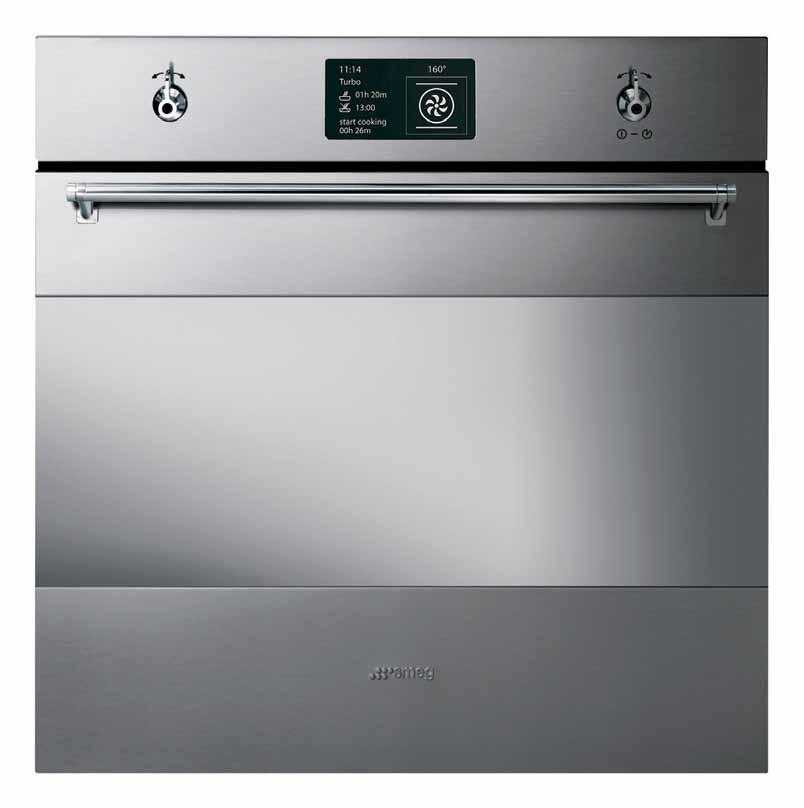
smeg.com.au

Stories of self and others
Art in space
German gallerist MaTThias arndT has made it his mission to familiarise the West with the world of contemporary South East Asian art. Now, with a gallery and a new home in singapore, he and his Australian wife Tiffany Wood are familiarising themselves with the new world of stacked, highdensity living at The Interlace. narelle Yabuka visited the compound for a chat about art and architecture.
Tex T
Narelle Yabuka | PhoTogra Ph Y r ebecca Toh
issue #27 habitusliving.com
# 43 2 . portrait

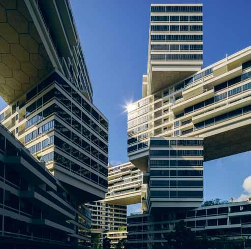
PREVIOUS | m ATTh IAS A rN dT B ESI d E pAINTINGS By I N do NESIAN ArIN dWI h A rTANTo Su NAryo AN d FI lI pIN o mA rIA TANIG uch I , 18Th c ENT ury c h INESE urNS A cASEd FIG urE By FI lI pIN o mIG u El Aqu I lIz AN AN d A 19Th c ENT ury FI lI pIN o STAT u E ab OVE | Th E S culpT urE Th AT IS Th E I NTErl Ac E F orm S Th E BAckdrop To A ll SI d ES o F A B rIG hT BAlco N y. OPPOSItE | Th E opEN STrucT urE o F Th E I NTErl Ac E com BINEd WITh ITS h I llSI d E locATI o N , rES ulTS IN G ood B rEE zES rEAch ING E v Ery B lock. issue #27 habitusliving.com
People have been known to go to great lengths to quell their curiosity about The Interlace – the surreal web of 31 hexagonally stacked apartment blocks in Singapore designed by Ole Scheeren, a former partner at architectural practice, OMA. There are tales of architects feigning interest in apartment rentals just to gain entrance to the secured compound. Such is the desire to judge for oneself the degree of success with which this fearless approach to high-density housing and communal space translates to comfortable living.
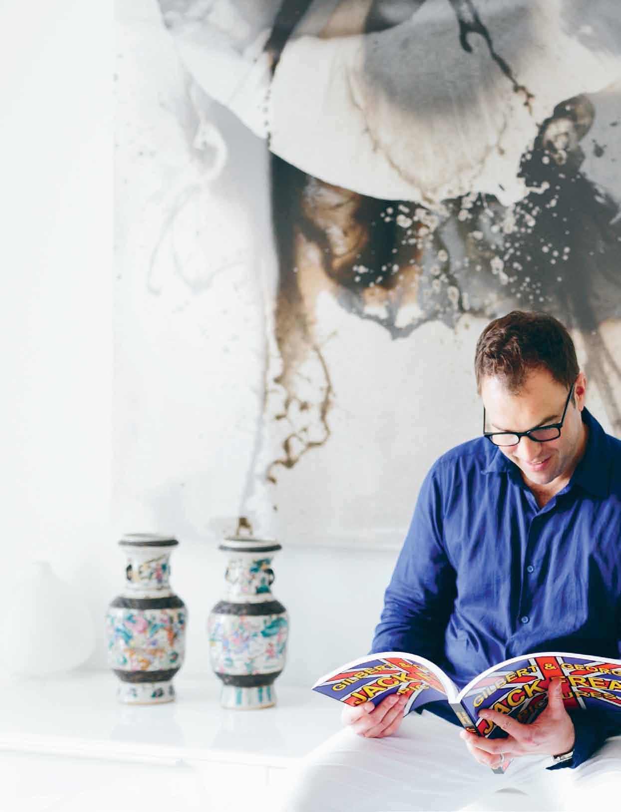
My own ticket to enter came in the form of Matthias Arndt – the German-born and Singapore-based gallerist, art collector and dealer who now calls The Interlace home with his family. Our arrival at the security gate marked the end of a brief walk through the leafy grounds of the adjacent Gillman Barracks contemporary arts cluster on the opposite side of Depot Road. There, in early 2013, Matthias opened a sister space to his well-established Berlin gallery ARNDT.
Navigating through the resort-like grounds of The Interlace to Matthias’ block – through landscaped plazas, beneath and beside hovering
apartment blocks, and past pools, barbecue stations, play hills and recreational rooms – it strikes me that we have entered a networked village. It is a three-dimensional matrix of spaces, vistas, and community life. The difference to the sedate (and sparsely populated) single-blocks-in-a-field model of the colonial-era barracks on the hillside next door is stark.
“The transition from the green hill with the colonial structures to this is funny,” says Matthias of his home environs. “It’s both extremes, but together it’s very beautiful.” We reach the apartment where Matthias’ Australian wife, Tiffany Wood, concurs. “I wouldn’t ordinarily choose to live in a development like this. It’s massive! But I think it’s part of living somewhere like Singapore,” she says. “It sits very nicely with Gillman; it just makes sense that it’s here.” And with at least one other gallery director residing in the property, the pair feels that they are part of a growing local arts community.
The couple made the move to Singapore with their young son in mid-2013 after several years in Melbourne, prior to which they lived in Berlin. After opening ARNDT at Gillman, the decision to relocate to Singapore was a given.

2 . portrait # 45
“If I work with Asian art, I must be here more often,” Matthias acknowledges. His interest in contemporary South-East Asian art – which, he says, was relatively unknown in Europe until recently – was driven by sheer curiosity. “I came to one of the first editions of Art Stage,” he says. “I had no reference. I didn’t know any of the [South-East Asian] artists, but I could see the substance and quality of their work. So I visited more and eventually held a group show in Berlin titled Asia Looking South.”
That 2011 show included the work of FX Harsono, Eko Nugroho, Ugo Untoro, Agus Suwage and Entang Wiharso of Indonesia; Geraldine Javier of the Philippines; Natee Utarit of Thailand; and Vertical Submarine of Singapore. Then came solo shows with these artists, and more travel – particularly to the Philippines. Says Matthias, “I was really taken by the energy of the art.”
While ARNDT’s earliest buyers of SouthEast Asian art were mostly from the region, currently more than 50 per cent of sales are to international buyers. “That was my promise to the artists and audiences,” says Matthias. “The idea was indeed to offer an international audience and build awareness in the West –including the Pacific. We’ve done a lot of business in Australia.”
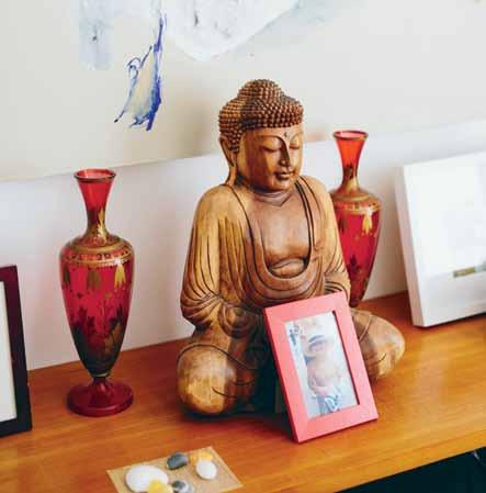
“Us being here has generated so much work that there’s an overflow, so I help Matthias with certain projects,” says Tiffany, who has a solid background in the art auction business and currently undertakes consultative art-related projects independently. She spent more than 20 years working for Sotheby’s in London and New York, as well as for Marianne Boesky Gallery in New York and auction house Phillips de Pury in New York, London and Berlin.

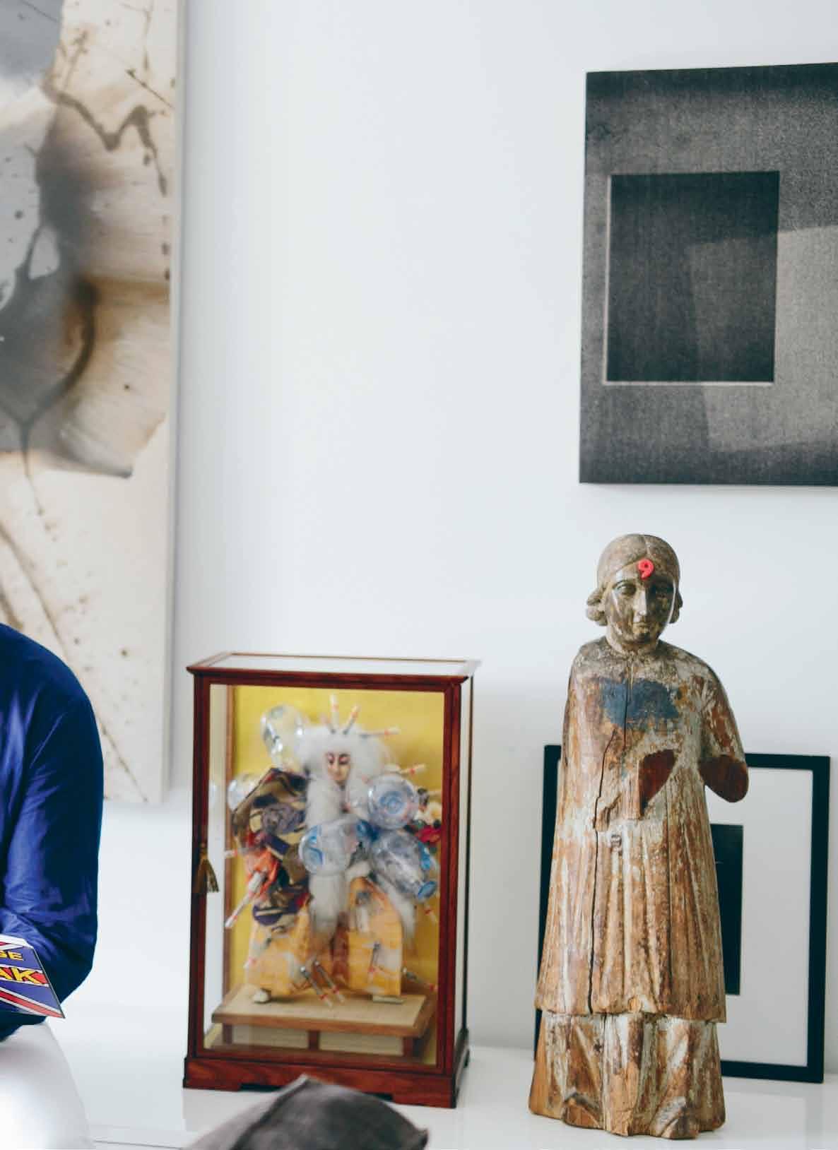
ab OVE | ArTWorkS By mA rIA TANIG uch I AN d rod El TA pAyA (B oTh FI lI pIN o) co NTrIB u TE To Th E EclEcTI c IS m o F Th E lIv ING room. b ElOw | A N EA rly 20Th c ENT ury Buddh A STAT u E From Th AI l AN d E x ErTS A cA lm ING INFlu EN c E ov Er o NE o F Th E BEdroom S OPPOSItE | A l A rGE A rTWork By rod El TA pAyA rEFErEN c ES AN oTh Er World BESI d E AN EEro SAA rINEN TulI p d INING SET Au STr A lIAN dAv I d Noo NAN S Work h ANGS IN Th E corrI dor.
issue #27 habitusliving.com
His interest in contemporary South-East Asian art was driven by sheer curiosity
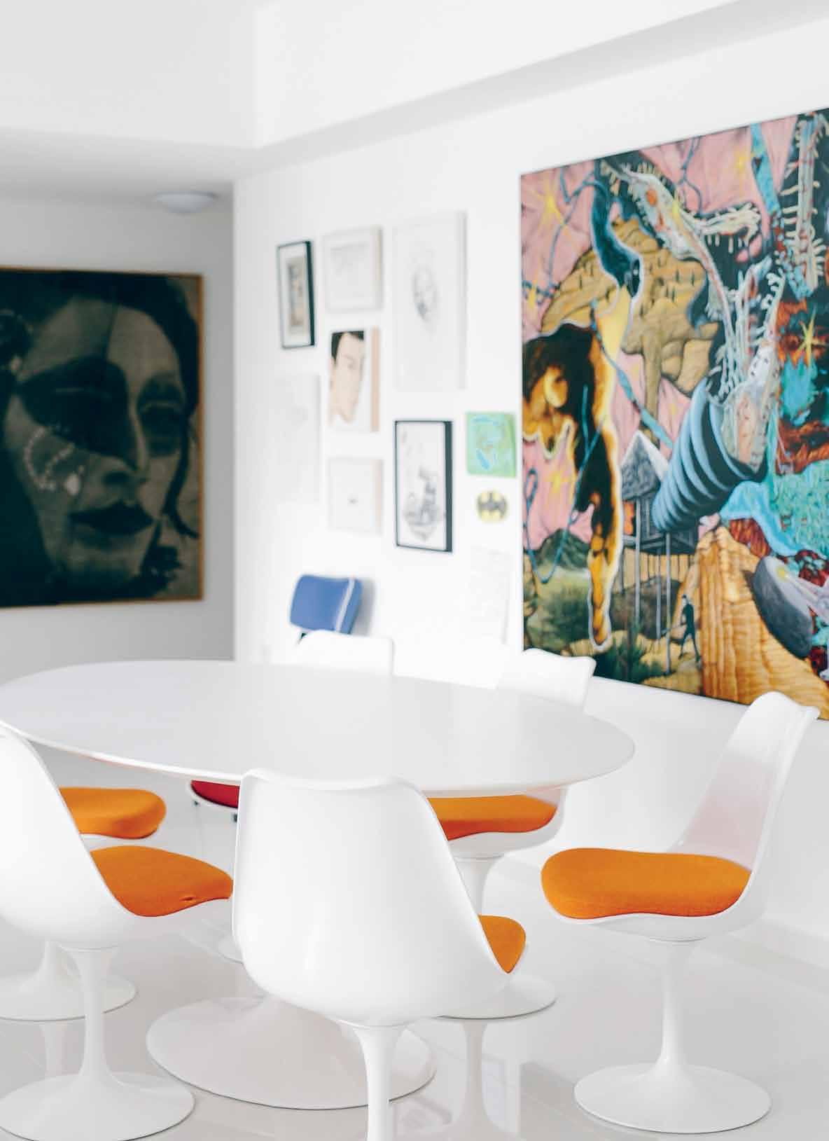
2 . portrait # 47


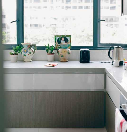
ab OVE | T Wo 1960' S- Er A A rmch AI r S AN d A complEm ENTING co FFEE TAB lE WErE produc Ed IN I N do NESIA b ElOw | A 1950' S- Er A upholSTErEd ch AI r From I N do NESIA AccompANIES A clu STEr o F S m A ll ArTWorkS By mI ro S l Av TI chý, N Edko Sol A kov, AyA uEk AWA d ou G l AS kolk, STEph AN BA lk EN hol, dENNIS Scholl AN d Th E couplE S S o N OPPOSItE | Th E FAm I ly IS rEm IN d Ed o F Th EI r prESEN c E IN A h IG h-rISE rESI d ENTIA l NETWork By Th E v IEW From Th E k ITch EN issue #27 habitusliving.com
With that experience she and Matthias are building ARNDT Art Agency as a complementary activity to the gallery. The agency will provide both management and advisory services. “I think this is an even more important contribution to Asia,” says Matthias. “It’s needed in Singapore,” adds Tiffany. A rear lounge space in the gallery will soon become the agency’s office.
So, perhaps, the pair will spend less time at home, where there has been an ongoing process of adjustment to the small Interlace apartment interior. “The rooms are not as generous as they could be,” says Matthias. “It’s this pragmatism that rules. But from everything I’ve seen in Singapore, nowhere is any more generous. Even some of our wealthiest clients here complain that their ceilings are too low when we show them two-by-three-metre paintings.”
Given the size of the space, much of the family’s collection of 20 th Century furniture classics is still in storage, and some of it has been sent back to Berlin. “The climate here is also too hard on it. We’re not hard-core airconditioning people,” says Matthias. They have managed, however, to incorporate some hardy pieces by Eames and Eero Saarinen alongside modern Indonesian pieces.
Even more intriguing is the collection of artworks with which they choose to live. It represents a fusion of eras and cultures –
2 . portrait # 49
The collection of artworks with which they choose to live represents a fusion of eras and cultures.
Alfredo and Isabel Aquilizan (Brisbane-based Filipinos), Rodel Tapaya (Filipino), Arin Dwihartanto Sunaryo (Indonesian), George Condo (American) and Man Ray (American). It is, in a way, an apt reflection of their own experiences of cultural collage, and of ‘new’ worlds – geographic, artistic and architectural.
Sitting in the living room and looking out over other blocks and through them to puzzle pieces of sky, I have the opportunity to contemplate whether that sense of community I experienced downstairs infiltrates the private domain in a negative way.
“Does it feel like a petri dish?” I ask Matthias.
“No, and that’s to my surprise.” He assures me, “There is a lot of privacy. You don’t actually look into people’s homes because they are far enough away. And with the hexagonal arrangement, nobody looks directly at you, so you don’t feel exposed.”
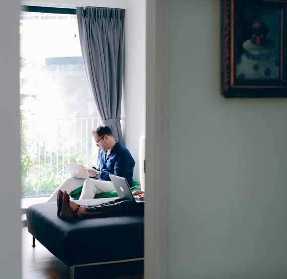
I take his word for it and make my way out through the lively, woven ground-level plazas, pools and gardens, through the security gate and to the divisive and heavily trafficked street. It crosses my mind that if only there could be a strong urban connection between The Interlace and Gillman Barracks, these two divergent species of spaces and forms might begin to coexist in an even more fascinating and potential-laden manner.
See works from some of the artists ARNDT represents at habitusliving.com/issue27/arndt
ARNDT | arndtberlin.com

ab OVE | AB ov E A cABINET d ESIGNEd By c h A rlES AN d rAy E A m ES h ANGS A pAINTING By Am ErI cAN ArTIST G EorGE c o N do AN d dr AWINGS By mATTh IAS AN d TIFFAN y’ S S o N b ElOw | Work AN d lIFE ArE Fu SEd F or mATTh IAS AN d TIFFAN y, AN d Th E NEA rBy GA llEry IS v Ery much AN E x TENSI o N o F hom E issue #27 habitusliving.com


Shower Pleasure. www.hansgrohe.com.au TRP HAN0076
Sydney Indesign 13-15 August 2015
Creative. Interactive. Inspiring. Prepare for a dynamic design encounter with your favourite furniture brands, creative thought leaders, and the best in Australian and international design. Registrations for attendance open soon.
sydneyindesign.com.au Facebook: /indesigntheevent Twitter: @indesigntheevent Instagram: @indesigntheevent
In association with Brought to you by Diamond Sponsor Gold Sponsors Strategic Partners Event Partner Fashion Partner Media Partners
rice paper artist
In today’s popular culture, food is often talked about in artistic terms: styling, presentation, creative ingredients, and revolutionary methodologies. But Sydney-based nahji Chu of misschu is taking this one step further, using her entire food business as an artistic medium.

“
Tex T Nicky Lobo | PhoTogra Phy rob Pa Lmer
# 53 2 . portrait
previous | nahjI
In
BehInD Is a
Is a coMMIssIoneD artwork By
issue #27 habitusliving.com
chu
her offIce, wIth Blue staffy george. artworks (left) HUBERT SITHNEY anD BUCKING BLACK DOG ; (rIght ) LIFE BUOY all By lInDe IVIMey. PaPer artwork
collaBoraton
Between
geoffrey nees anD kano hollaMBy AB ove | nahjI In her kItchen at her aPartMent just uP staIrs froM the offIce. In
the foregrounD
lucy Mcrae
simultaneously political and creative, Nahji Chu, of the eponymous misschu chain, is not just a supplier of fresh, healthy Vietnamese food. She sees the brand as a vehicle to tell her story, and an opportunity to change people’s perceptions of ‘Vietnamese’ and ‘refugee’.
“For most of my twenties I wanted to be an artist,” Nahji says. “Either a performing artist, a filmmaker or a visual artist. It took me a long time to realise that all of my creative energy and capacity could be expressed through hospitality.” It is an unusual art medium, but by placing her own identity – “one that has survived trauma and racism at the forefront of a commercial venture”, Nahji hopes that “the superficial labels that still hang from many minority groups in Australia start to fall away”.
The business began as a simple catering service. The self-professed ‘queen of rice paper rolls’ initially supplied cafés. In 2009 she decided to open a commercial kitchen in Darlinghurst to sell direct to the public through a hole in the wall. The ‘tuckshop’ concept exploded, attracting hordes of schoolgirls and local office workers alike, looking for fast, fresh, delicious and healthy food.

The flagship Darlinghurst store quickly expanded to a site at the Sydney Opera House in 2010 (no longer there), Exhibition Street in Melbourne and Bondi Beach in 2011, Sydney CBD and South Yarra in 2012, and London, Manly and David Jones Sydney food court in 2013. This represents Nahji’s bold business goal for a misschu restaurant in all major global cities, including Tokyo, New York, Paris and even in her homeland.
The plan, however, is not aimed at world domination simply for the sake of it, nor for the stockpiling of money. It’s about “showing how the Vietnamese diaspora spread throughout the world, through food,” Nahji says. This political aim is inextricably tied to the misschu persona. The branding was defined in a genius stroke, using Nahji’s original refugee papers as the primary graphic element. Having her face
# 55 2 . portrait


CLo
UNTITLED
issue #27 habitusliving.com
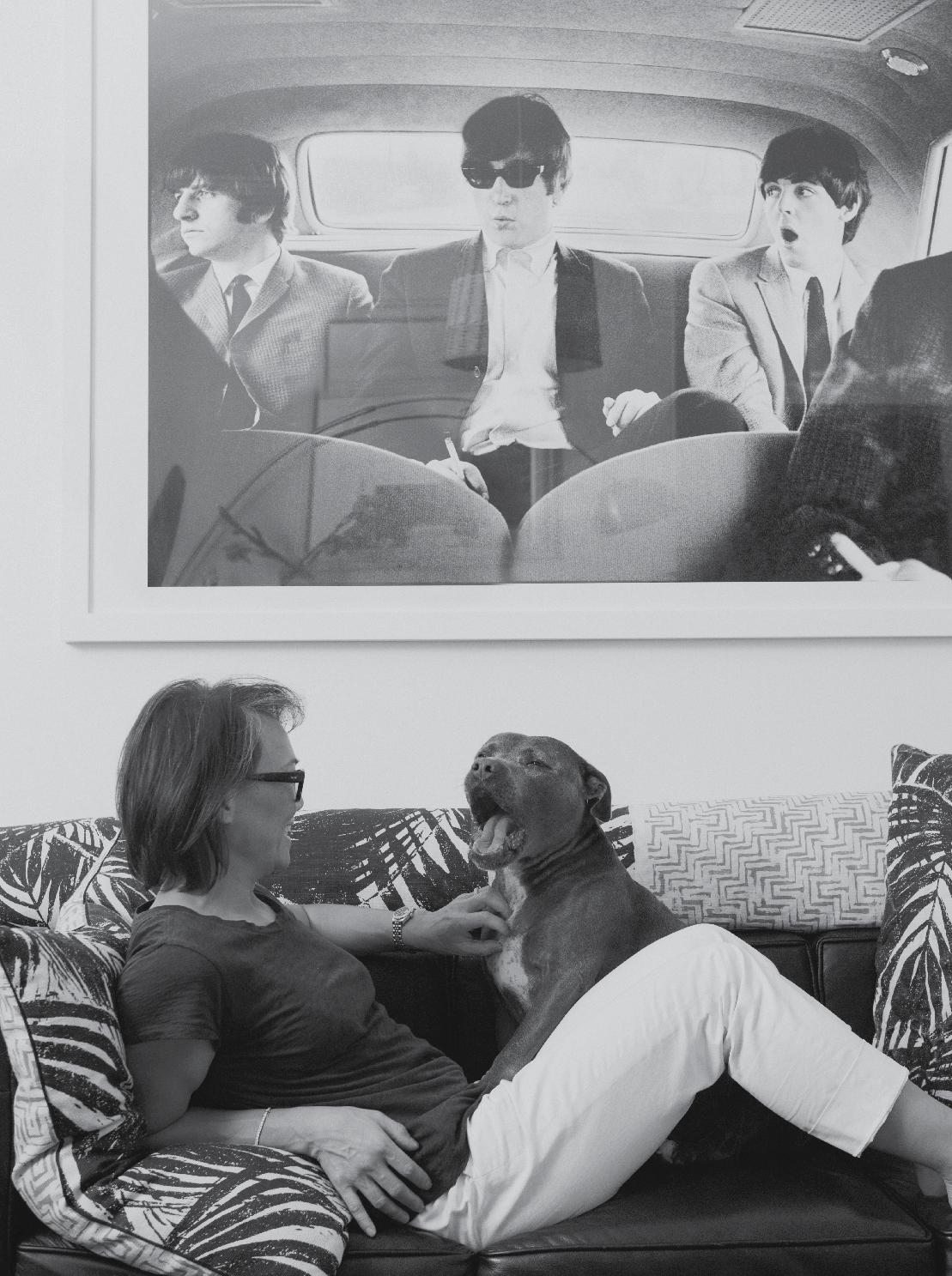
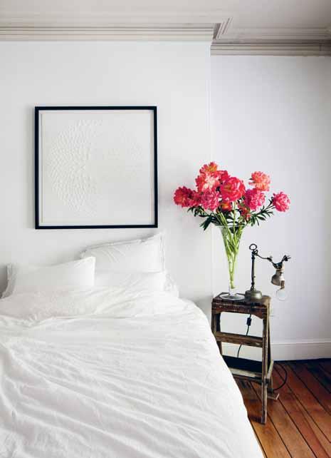
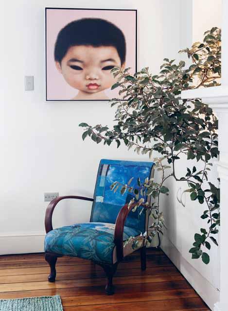
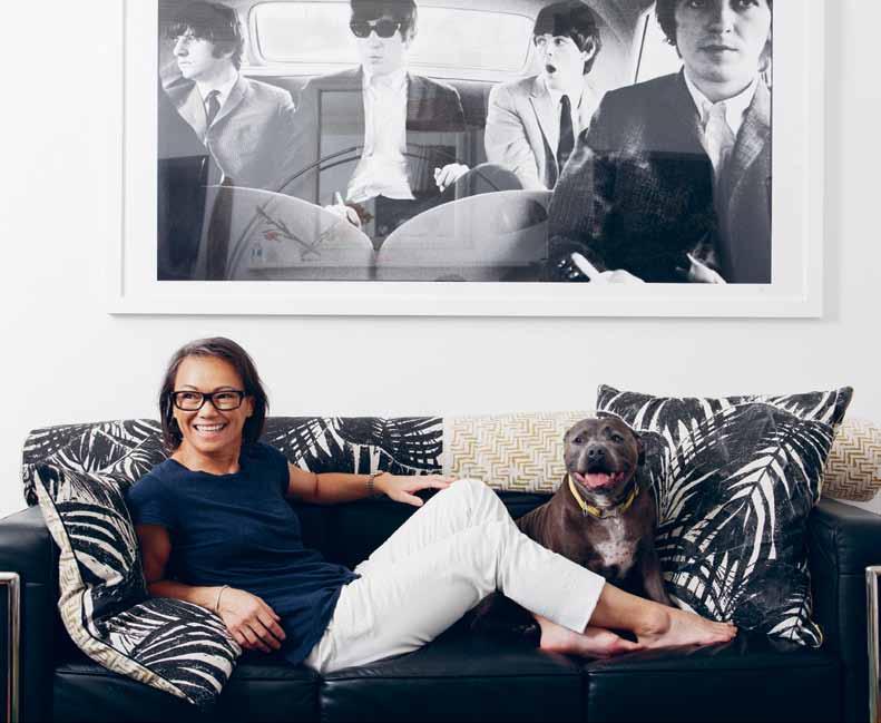
CKWise FroM Top LeFT | the BeDrooM Is a calM sanctuary; the lounge rooM features an lc 2 lounge By le corBusIer wIth cushIons By cloth , Beatles PhotograPhy froM 1964: serIes 13/60 By curt gunther, founD DrIftwooD, anD PrIckly laMP By lucy Mcrae froM BroacheD colonIal coMMIssIons 2011; artworks By roBert DIckerson (aBoVe) anD charles BlackMan (Below ); VIntage chaIr re-uPholstereD In cloth faBrIc , wIth
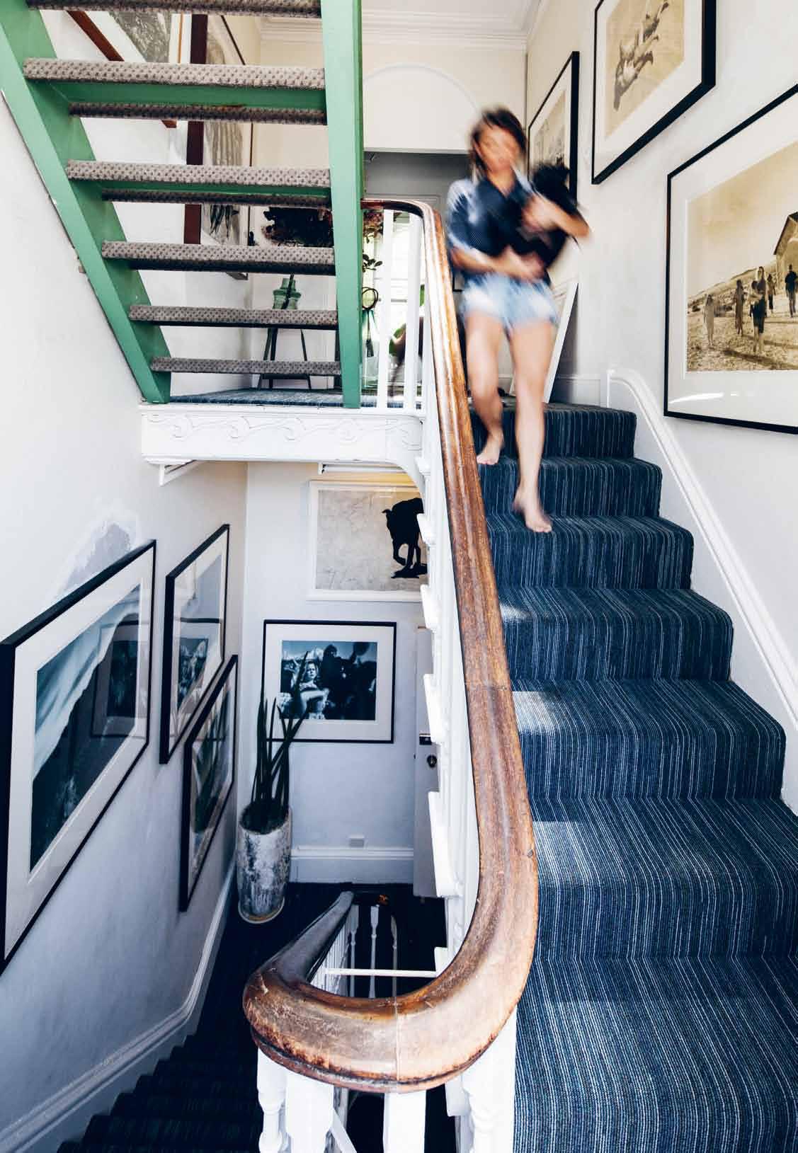
By Poh lIng yeow aBoVe opposiTe | the staIrcase Between the MIsschu offIce anD nahjI’ s aPartMent currently serVes as a gallery for a tracey Moffat t PhotograPhIc collectIon
Art is a tool for breaking down habits of thinking, of looking at life in a new way
# 57 2 . portrait
nahji | founder & resident
issue #27 habitusliving.com
nahji | founder & resident
plastered over everything, from the storefronts to the wait staff’s aprons was not the point. Rather, it reminded people that her family were refugees, and that immigrants have played –and continue to play – an important role in Australia’s history, culture and economy.
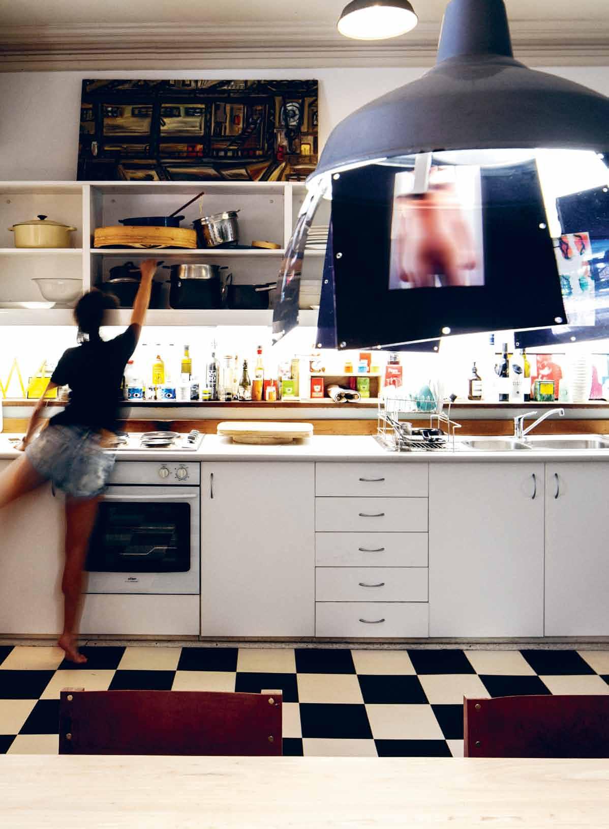
Creatively, Nahji has been intimately involved in every detail of the brand’s presentation – down to her handwriting the chalkboard menu in each of the stores. The aesthetic of the eateries has maintained a simple tuckshop appeal – lightweight stools or crates, small tables, shuttlecock lights (often handmade by Nahji), lots of timber and metal. Even ordering is done by marking your selections with a pencil on a piece of paper –just like writing your tuckshop lunch order on a brown paper bag at school.
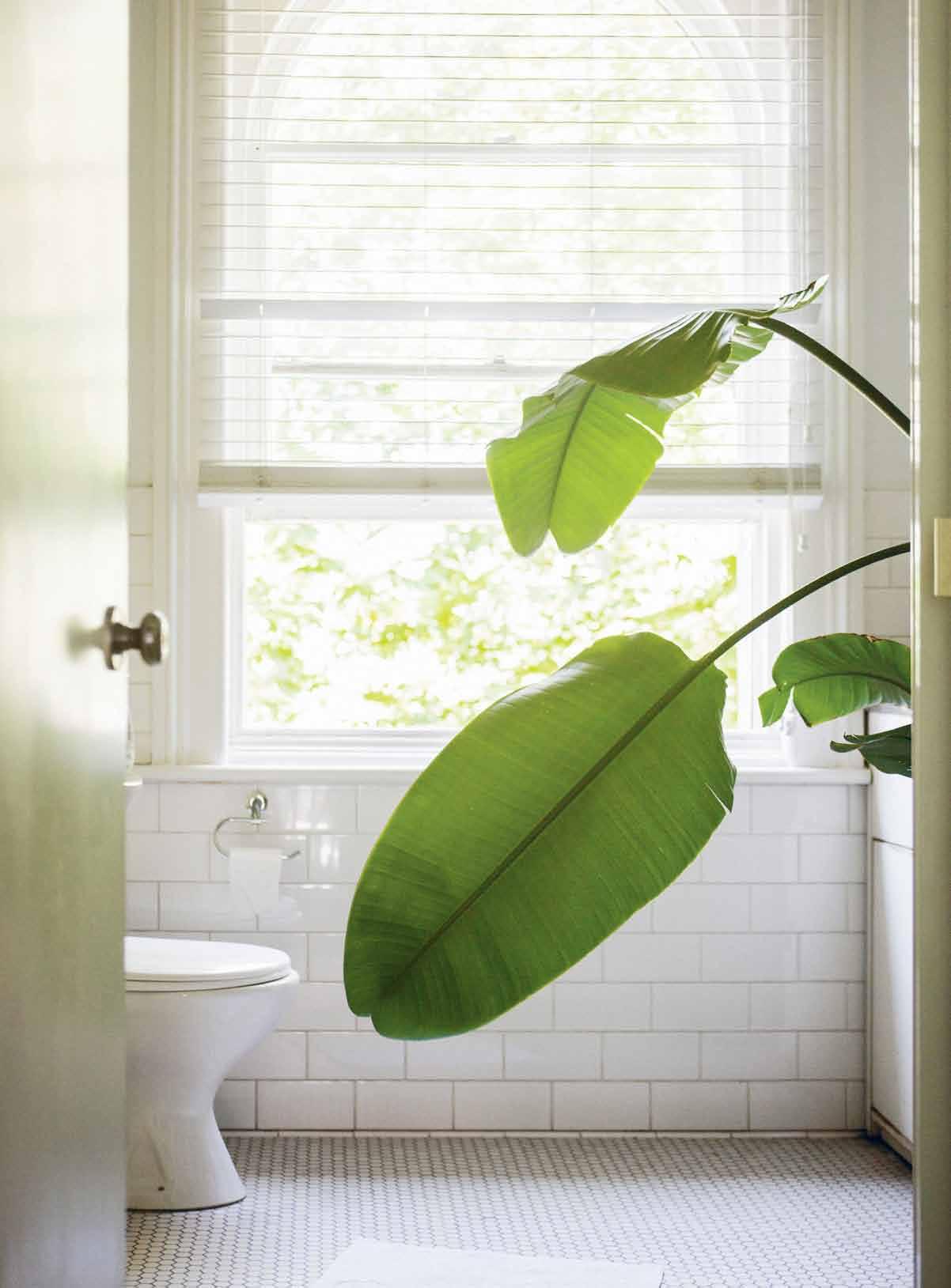
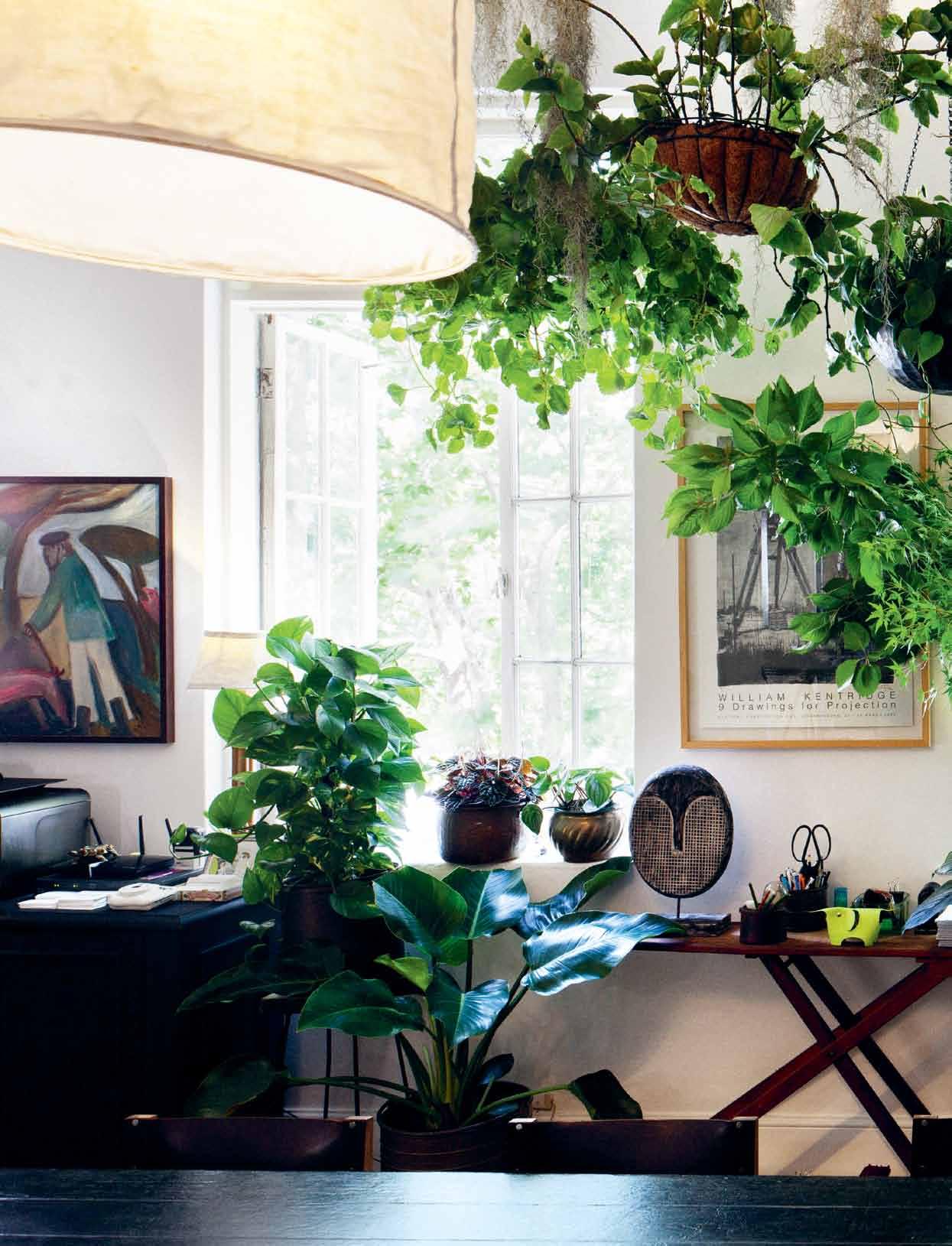
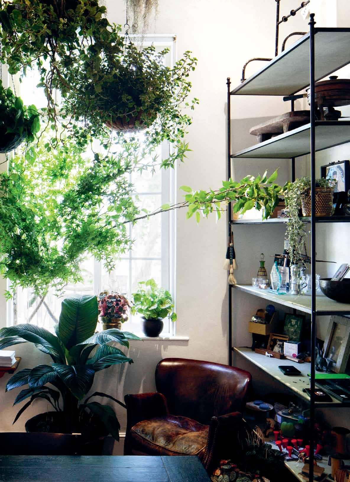
Like her business, Nahji’s home and head office is a combination of her heritage, political views and passion for art. The office is where she and her assistant Celeste direct the business –everything from new restaurants and orders through to human resources and media opportunities, and where they eat misschu for lunch five days a week. It has an undeniably tropical atmosphere, filled with artefacts and art and laden with hanging plants, re-created every couple of months by florist Simone Gooch of Fjura.
The buzz of living directly above her office, in the middle of Sydney’s notorious Kings Cross, “allows me to inhabit the misschu experience most of the time,” she says. “Living an urban life is important to me,” she continues. “There is nothing more disturbing than the quietitude of the suburbs – because it is not real quiet, not like the country. It is the quiet
of people collectively not making a noise.” It seems Nahji lives on the border of many things – of Vietnam and Australia, but also of music, tourism and art – all of which serve to extend and strengthen the misschu experience. Her brand has morphed into various iterations – misschunes (music playlists) which are played on ‘chusdays’, missguided tours of Vietnam, Betty Chu (the waterside venue on Elizabeth Bay Marina). Even Nahji’s handsome blue staffy George is nicknamed George Chuney (after George Clooney). Nahji’s instinct for marketing verges on brilliant, spurred on by a network of collaborators and supporters including misschu creative strategist Lou Weis, who is also founder of the Broached Commissions project. “My network is so important,” she believes, “and I maintain a weekly dialogue and engagement with this intimate creative circle.”
It was through Weis that Nahji was introduced to the work of Australian artist Lucy McRae, whose Prickly Lamp was part of the Broached Colonial project in 2011. Nahji purchased this piece (along with one of Trent Jansen’s Briggs Family Tea Service sets), and has since commissioned two misschu projects from Lucy. One is a series of photographs clipped to a lamp in the eat-in kitchen of her apartment. Another is a food-based film piece titled Make Your Maker which explores the notion that food and the body are inseparable, and incorporates misschu rice papers.
Nahji originally wanted to be a filmmaker, (and she has also tried her hand as an actor, fashion designer, journalist and seamstress). Through fellow filmmaker and old friend Rebecca McLean she was introduced to Australian artist Tracey Moffatt, who
opposiTe | nahjI ’s seconD -floor aPartMent enjoys a surPrIsIngly leafy outlook, B elyIng the grItty nature of the kIngs cross streets B elow.
The buzz of living directly above her office, in the middle of Sydney’s notorious Kings Cross, “allows me to inhabit the misschu experience ”
# 59 2 . portrait
issue #27 habitusliving.com
It has an undeniably tropical atmosphere, filled with artefacts and art, and laden with hanging plants
# 61 2 . portrait
expressed a love for misschu. “I was so honoured that one of Australia’s all-time great artists loved my food,” Nahji says. They developed a friendship, and as well as purchasing some of Moffatt’s earlier works, Nahji invested in the entire Up in the Sky (2009) collection. These 27 works, which currently adorn the stairwell between the misschu office and Nahji’s home, will soon be bequeathed jointly by Nahji and Moffatt to the Art Gallery of South Australia. This gesture is important to Nahji as a linking element between the indigenous people of Australia and the refugees the nation has received.
She takes the role of art very seriously. “More than the fact that I love the aesthetics and politics present in the art I collect, I also love being able to support artists,” she says. “To be able to buy work I genuinely love, commission new works by artists I respect, and feed into the sustainability of the arts community, is an honour and a privilege.”
There is a personal level to Nahji’s art passion. She believes that “knowing yourself is one of the struggles and privileges of a conscious life. Art is a tool for breaking down habits of thinking, of looking at life in a new way,” she says. On a deeper political level, Nahji believes “What I buy, commission and create myself changes the stereotype of the Vietnamese woman as someone submissive, quiet and ghettoised to a marginal culture in a Western land. My relationship to art makes
previous | nahjI
workIng
In
so effort Is Put In regularly to Make It a BeautIful sPace, anD change the enVIronMent
a
By
et
laMP
PhotograPhy
issue #27 habitusliving.com
Knowing yourself is one of the struggles and privileges of a conscious life
nahji | founder & resident
anD her assIstant celeste sPenD Most of theIr
hours
thIs rooM
occasIonally. on the Day of the shoot, nahjI haD
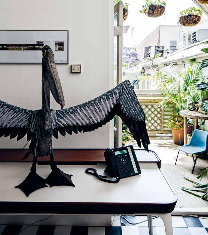
wallPaPer PrInt of a Photo she took at ParIs aIrPort BeIng PasteD uP AB ove LeFT | a PelIcan artwork By InDIana jaMes alIghts on a herMan MIller aIrIa Desk. the Balcony oVerlooks a Bar Below. AB ove righT | PIeces such as the antIQ ue leather arMchaIr restoreD
IcI
la
MaDe froM orIgInal MIller trIPoD, kano hollaMBy lIght anD MIsschu PaPer lantern shaDe anD
By toM raMsay Make the offIce sPace hoMely.
MARIMEKKO SYDNEY FLAGSHIP 66 King Street Sydney, 2000 Phone 02 9299 0372 MARIMEKKO CHAPEL STREET 576 Chapel Street, South Yarra, 3141, Phone 03 9804 7213 MARIMEKKO EMPORIUM Shop 143, Emporium, Lonsdale Street, Melbourne, 3000, Phone 03 9663 1695 www.marimekko.com
a public declaration of an engagement with the highest cultural dialogues in Australia.”

Currently misschu’s newest Balmain store is half built: the misschu quest for domination marches on. Nahji’s approach could be seen as militant but underneath it is an artist’s simple wish to prompt consideration of the complexity of life. “To understand the society we must first be at peace with the cross cultures that exist within ourselves,” Nahji says. “Greek Australian, Vietnamese Australian, Jewish Australian … all have to reconcile the pushes and pulls of their dual identities. Doing so will deliver a more civilised and nuanced discussion of identity.” Yes, she’s out to change the world, one rice paper roll at a time.
At the time of going to print, news of misschu going into administration was released. We believe Nahji’s story is a wonderful and important one to share and wish her all the best. We are sure Nahji will find a way to continue creating and telling her own story, and that of the Vietnamese refugees in Australia.
misschu | misschu.com.au
• 184 Chalmers Street Surry Hills NSW 2010 • Ph: 02 9212 6747 • Website: www.spenceandlyda.com.au • THE NEW PARADIGM IN OUTDOOR LIGHTING Lampe Gras XL In & Out Series HAB27_QP_Spence Lyda 1 19/01/2015 2:31 pm
AB ove | nahjI wIth her BeloVeD george on the lc2 le corBusIer lounge, Beneath a curt gunther PhotograPh of the Beatles.
issue #27 habitusliving.com

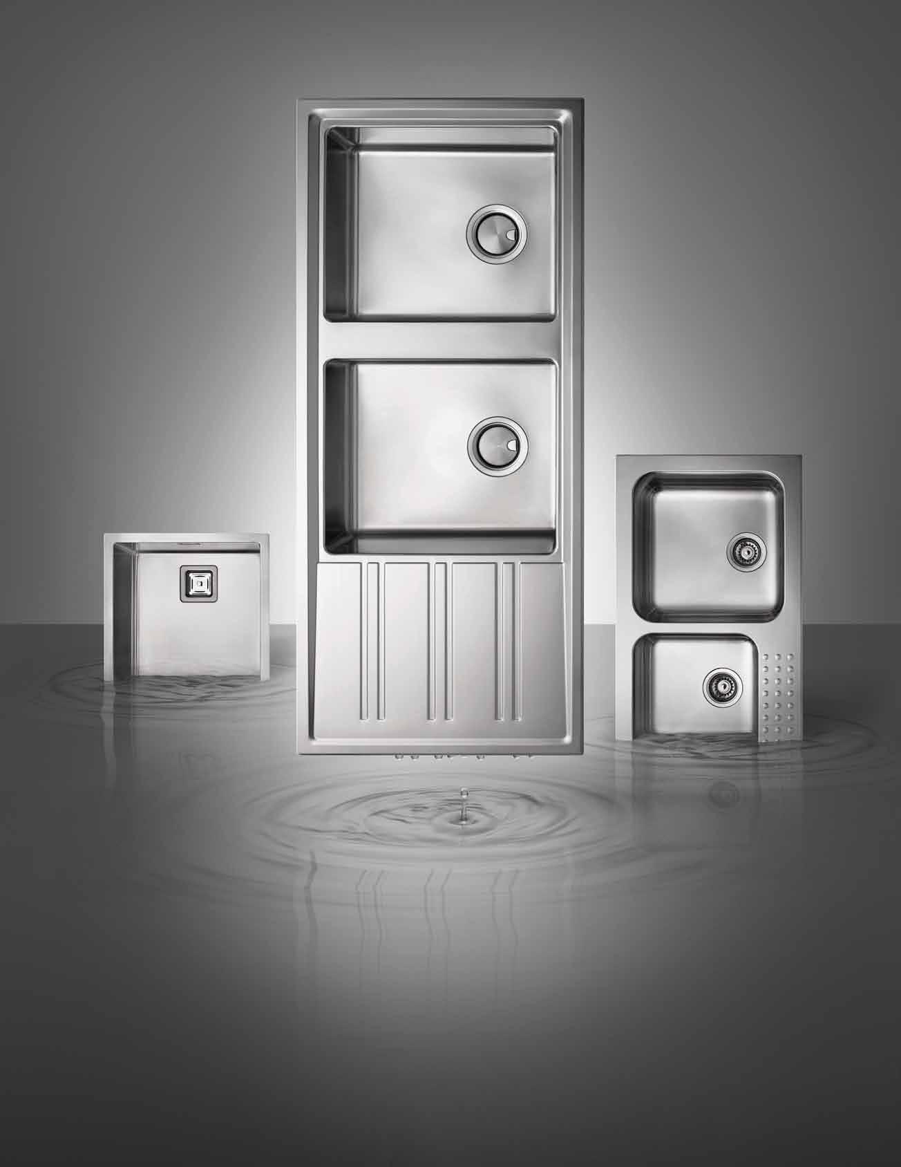
www.abey.com.au Abey Australia’s diverse range of sinks provides you with a selection from around the world. Visit an Abey Selection Gallery to browse the range. Barazza Cubo Single Bowl – Barazza 1 & 3/4 Bowl – Barazza Easy200 Double Bowl SINK DIFFERENTLY. VICTORIA Selection Gallery 208 York St South Melbourne Ph: 03 8696 4000 NEW SOUTH WALES Selection Gallery 1E Danks St Waterloo Ph: 02 8572 8500 QUEENSLAND Selection Gallery 94 Petrie Tce Brisbane Ph: 07 3369 4777 *OPENING SOON* WESTERN AUSTRALIA Selection Gallery 12 Sundercombe St Osborne Park Ph: 08 9446 8255
slow is fast
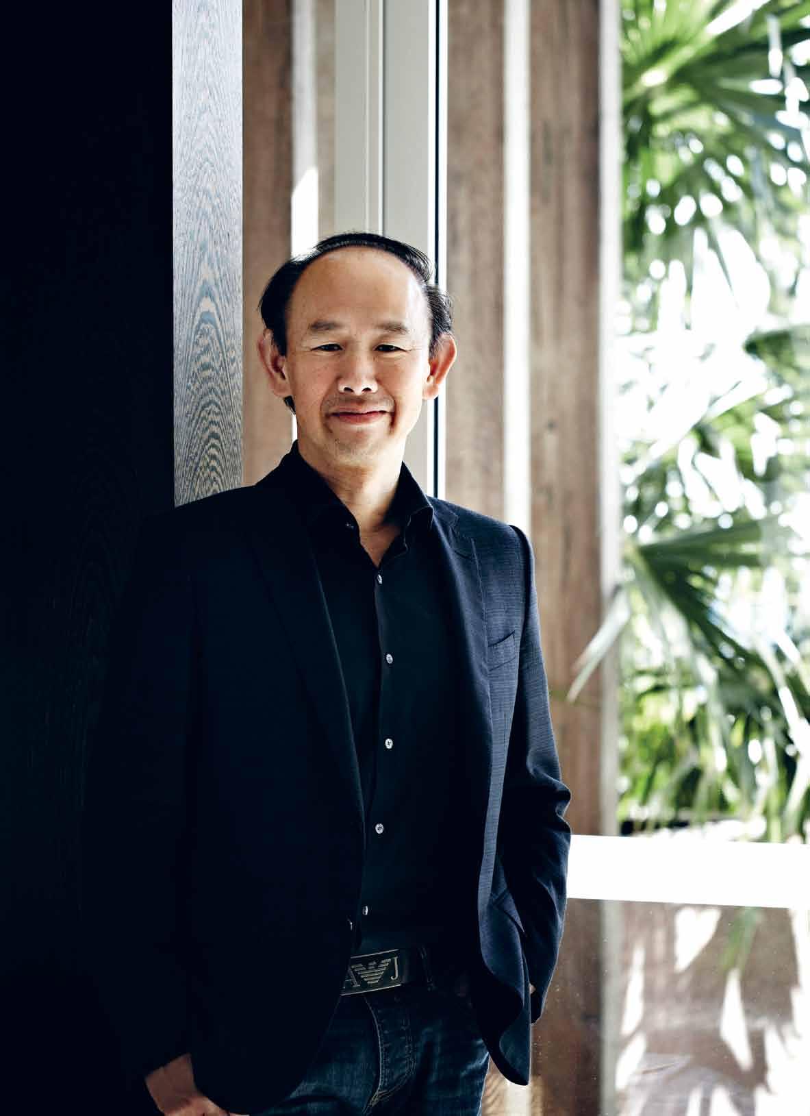
IWAN SUNITO’s Crown Group has turned multi-residential living into a whole new experience. PAUL MCGILLICK meets the man whose journey took him from KALIMANTAN, Indonesia, to SYDNEY and whose vision has re-invented apartment living.
Tex T
| PhoToGra Phy various
Paul McGillick
# 67 2 . portrait
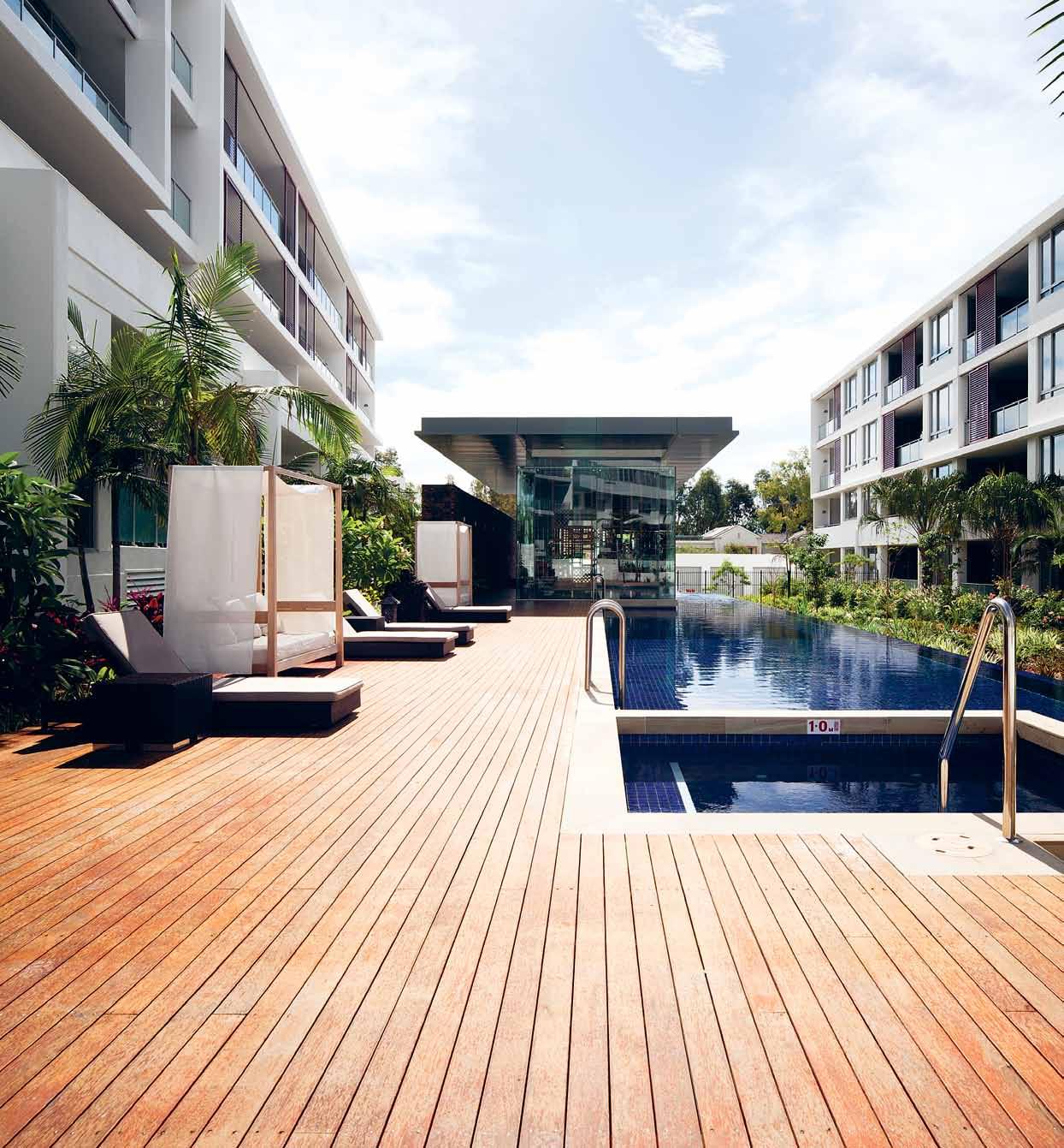
PREVIOUS | Iwan sun Ito, C eo of C rown G roup. photo G raphy by s haryn CaI rns. ab OVE | new I n Gton projeCt by C rown G roup. photo G raphy by steve baC k. issue #27 habitusliving.com
“
Slow is the new fast,” quips Iwan Sunito who heads up the Crown Group, one of Australia’s fastest growing, most prestigious and imaginative residential developers.
Dapper, quick to laugh, but clearly very focused, Sunito is only half-joking because ‘slow is fast’ goes to the heart of his phenomenally successful business model.
But there must be more to this successful model than mere efficiency – perhaps Sunito’s Indonesian background might have something to do with it, especially with those lush water gardens which feature in Crown projects.
“The garden, the water,” muses Sunito. “Yeah, that’s really Asian culture. In fact, that’s the way I was brought up. I was born in Surabaya, but brought up in Borneo. And my house was on the water … sometimes in the water, because it’s flooded every two or three years.”
Sunito gives the impression that he is not the kind of person to dwell on the past or get too sentimental. In fact, he is at pains to appear very pragmatic and even jokes about the importance of profit margins. But with some prompting, he does talk a little about how growing up in Indonesia may have shaped his vision today.
“That was interesting,” he says, reflecting on his childhood, “because at the back of the house was jungle, with the river in front. We swam in the river. Those elements of water, the sense of wind rustling in the leaves, are a part of the upbringing. Somehow, just naturally, I’m inclined to that.”
His father was a paper and plywood trader, but pressed to explain how he ended up training to be an architect, he talks about his grandfather. “He made all this Chinese antique furniture in Surabaya, in Mura where I was born. Some of these beautiful antiques had these pockets of shelving within shelving –like boxes within boxes.”
It was the perfection and complexity of this furniture that attracted Sunito. Even now, he says, his friends comment on two things – his love of drawing and the beautifully crafted woodwork that he did when he was younger. In fact, it was this talent for drawing which persuaded him to study architecture at the University of New South Wales (UNSW).
“Little did I know,” he laughs, “that architecture is not just drawing. My first year was such a nightmare I almost failed.”
But he was committed and gradually he began to understand that, as well as drawing, it was the ‘why’ behind architecture that matters. What makes a building a building.
“I was actually frustrated,” he says, “until I discovered that you have to understand why you do things before you start doing them. That was a breakthrough for me.” From his fourth year on, Sunito gained distinctions, culminating in winning the Eric Daniels Award for Best Residential Design, graduating in Architecture and later completing a Master of Construction Project Management, the latter while working three days a week for Philip Cox who had ‘poached’ him after he had won the award.
After practising as a residential architect, Sunito was drawn to development and established Crown in 1996 with two partners, Paul Sathio (an engineer who remains a partner) and Anthony San, a real estate agent. This blend of expertise flagged the vertical integration – or one-stop shop – model which now characterises the company and which underpins its phenomenal success since a somewhat unsteady beginning with a development in Bondi which endured a 40 per cent cost blow-out. But, says Sunito, “the time was right [because] it was 1996 when Hong Kong people were panicking because of China’s takeover. So, a lot of them came to Sydney and we sold 80 per cent before we even dug a hole.”
2 . portrait # 69
Fire and alchemy
Creating the products that bring a fire to life.
There is nothing more powerful than the elements. Fire, in particular, holds an irresistible attraction to the gaze, and sitting around a campfire instantly evokes a sense of intrigue, of passion and of the tribal nature of life.
AK47 Space understands the allure of this sensation. Based in Lecco, Italy, they believe that “creating a setting for fire springs from the desire to offer a man a single element that enhances both space and pleasure”.
For them, an outdoor fireplace is a nest in which to seek refuge. The eccentric dance of the flames is, over time, replaced by the silent burning of embers, an ancient and comforting process. AK47 Space aim to design and produce outdoor fireplaces and accessories that take inspiration from industrial materials, in unconventional ways.
The latest designs include clean-edged angular models with handsome rust finishes and styles that cleverly combine modern and rustic, which also have built-in storage – as elegant as they are practical.
Accessories include standalone towers for timber
storage, contemporary receptacles reminiscent of crumpled paper bags, eye-catching magazine holders, rustic chainlike clothing hangers, elegant steel bookcases and even coffee tables.
Shunning the obvious, venturing into new areas of design and continually questioning, AK47 Space re-invent industrial chic to encompass an aesthetic anchored on research and innovation. Designer, Ivano Losa says, “I love materials in all its forms, even the poorest ones, and I try to enhance it by creating objects that lie between art and design”.
AK47 Space has an aim to qualify simple objects, to enhance and characterise them with the quest for a particular process, innovative use of materials and attention to detail.
In this way, they remain relevant, passion-inducing and stimulating – much like the fire their products complement. Custom builds are also available for a truly unique piece to suit your environment or landscape.
habitus promotion › AK47 #70 issue #27 habitusliving.com
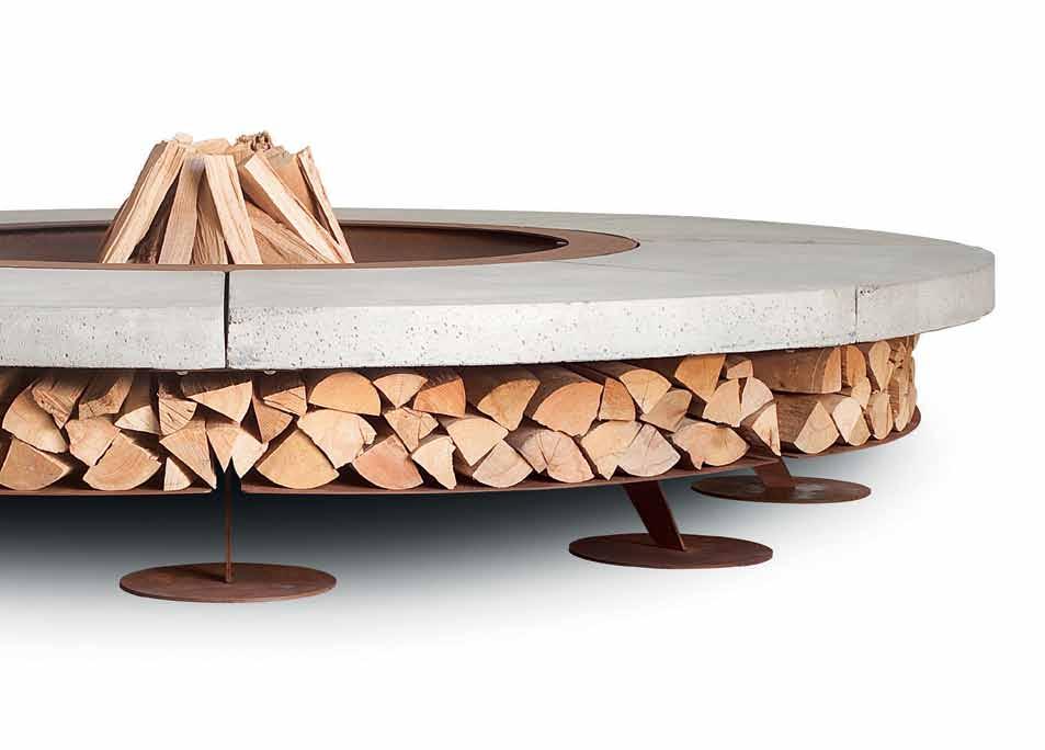
Above | The Ak47 ‘ ercole’ is A wood ouTdoor firepl Ace wiTh A be Aring sTrucTure of sTeel And A circul Ar concreTe se ATing Are A AK47 Space +61 416 929 156 | ak47.com.au
In the beginning, Sunito did the design himself – a valuable lesson, he says, “in understanding how to reduce any space wastage”. This is the slow part: getting the basics right. Finding the right location, getting the design right because “design is the front face of the company” and being serious about a ‘zero defects’ policy. There is no such building, of course, but Crown’s policy is to fix defects fast and fix them well.
Then there are the demographics. Who is going to buy into this building? What are they looking for? What kind of added value can be provided which will allow Crown to achieve its aim of providing the very best, but at a competitive value. “People,” says Sunito, “don’t buy into a building just because of value. They buy because there is a sense of prestige, a sense of ego, a sense of pride. They say ‘I want to tell people that I live in this building’. For us that is long term.”
And long term is slow. But fast? That’s where the vertical integration comes in. Crown does the lot – design, building, marketing and after-sales service. This enables the company to move very fast, in contrast to bigger and more mono-cultural companies which can be slow. Decision-making at Crown is flat and individual divisions have their own authority, while having its own building capacity makes Crown highly price competitive.
Finally, this is a company which is growing fast and expanding from its Sydney base interstate and off-shore with offices now in Malaysia, Indonesia, China and Singapore. But Sunito sees this as a constant learning process and about understanding where the company fits in. But, “it’s not just about growth. It’s about being better first,” he says. “Bigger will come.”
One of the features of any Crown building is the way it offers added value – amenity which compensates for not living in a freestanding house with all its space and garden. But this was all part of the learning process. When they built Gallery in Parramatta in
ab OVE | v Iva by C rown apartment lIv I n G photo G raphy by s haryn CaI rns.
I was frustrated, until I discovered that you have to understand why you do things before you start doing them.
2 . portrait # 71
iwan | a RCH i TECT
2009 they were ahead of the times: a not-yet fashionable location where people did not want to live in apartments. Finding it hard to sell the apartments and, says Sunito, “out of desperation”, they said: “Okay, let’s take three or four units out of the development, create this massive foyer with water flowing from the outside to the inside, creating an experience. Let’s create this library, this common room, a bigger gymnasium. Let’s create this sense of an instant garden instead of a tiny, puny garden.” The result? They sold 90 per cent on completion. Quality design, says Sunito, changes the way people behave. They take ownership of the building. By way of illustration Sunito points out the replica Balinese antiques which are a feature of Gallery – still there and valued by the residents. Gallery proved to be a model which was further developed in sensational fashion in the Viva by Crown project, completed in 2014. This consists of seven low-rise buildings blending residential, commercial and retail. The 645 apartments actually sit on top of the Top Ryde shopping centre covering an unbelievable six hectares with a lush garden, 35-metre heated outdoor pool, a meditation platform, gazebos, library, common room and music room with a grand piano.
Sunito says that $10-12 million was spent on Viva amenities “because we thought the building can sustain it and to make it Crown brand”. Re-sale values testify to how desirable Viva is as a residential address: 1-bedroom units have appreciated from $350,000 to $700,000.
Each Crown development is unique, taking into account the location and the demographic. Hence, three new developments – Skye in North Sydney, the Clarence Street CBD development and the futuristic Green Square complex, all featuring the outstanding architect, Koichi Takada – have their own character and set out to contribute to the quality of their urban context.
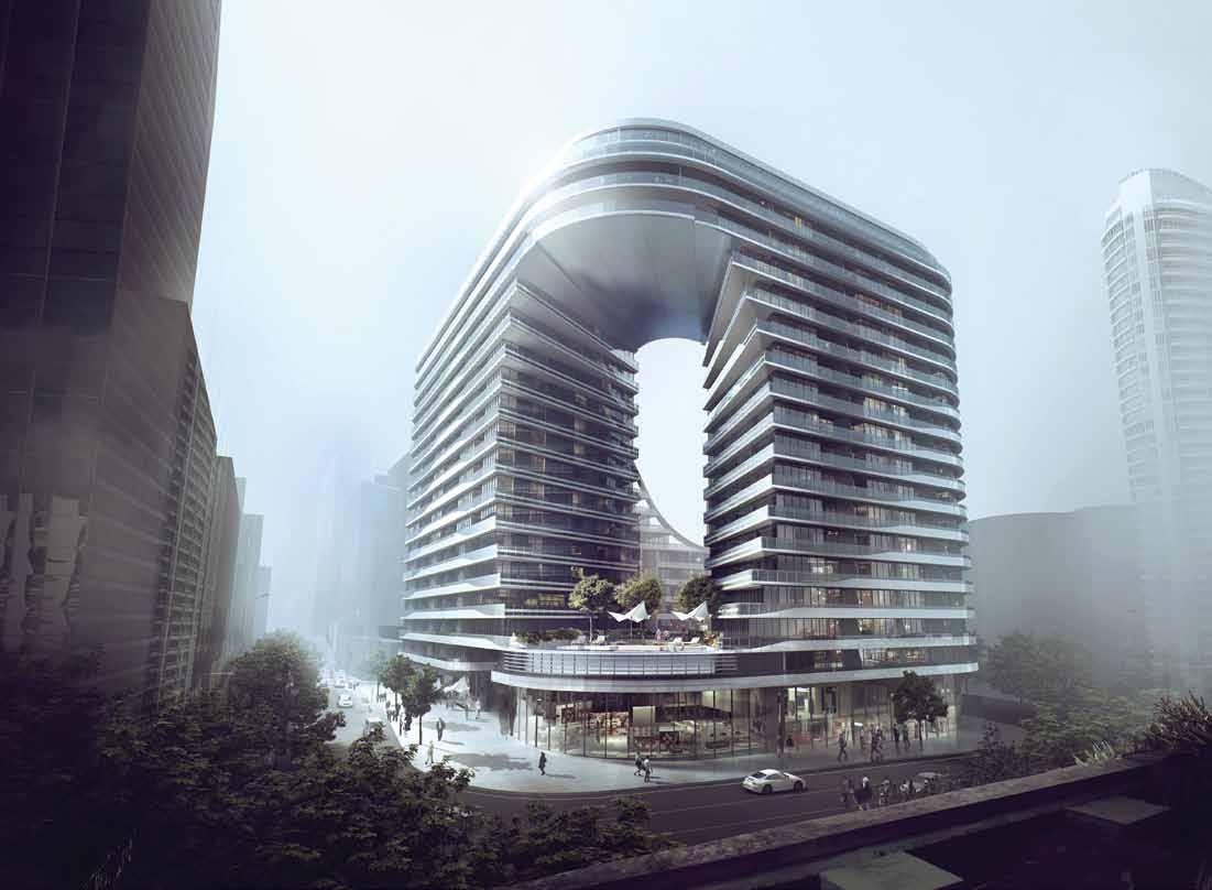
What Crown has brought to multiresidential living in Sydney is something already well-established in South-East Asia –namely, the sense of space, light, air, greenery and community usually associated with living in a landed house.
For this Sunito has been inspired by the great tropical resort hotels where, he says, you feel that “you don’t need to go out any more, you’ve arrived at a sanctuary, an oasis”. Resort living in an apartment block.
ab OVE | artI st's I mpress I on of G reen square C on C ept by ko IC h I takada arC h IteCts. C ourtesy of Crown Group.
issue #27 habitusliving.com
Crown Group | crowngroup.com.au
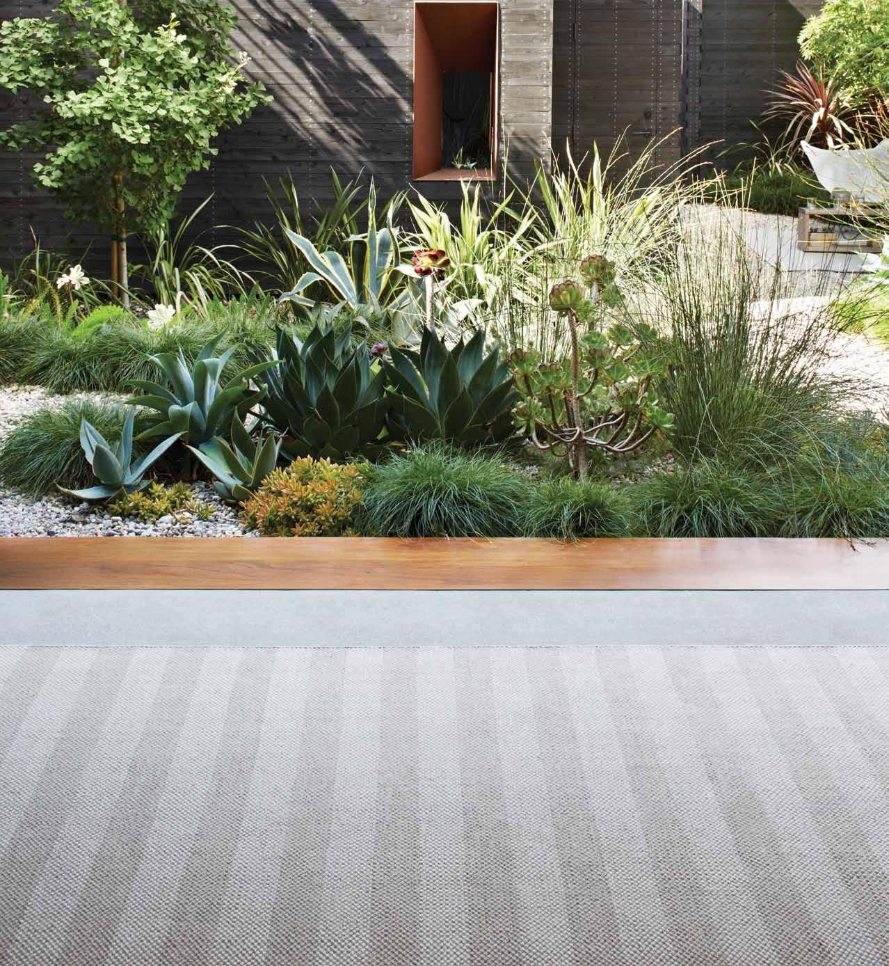
Armadillo&Co is embracing the elements with our new range of Indoor Outdoor rugs. Inspired by nature and our love for outdoor living, this new collection of durable and versatile rugs is made to withstand exterior environments.
To find out more about all of our collections visit us at: www.armadillo-co.com
–
–
–
Young St Fitzroy
Sydney Showroom Suite 305, Level 3 19A Boundary St Rushcutters Bay NSW 2011 Australia by appointment only
Melbourne Showroom 72
VIC 3065 Australia by appointment only
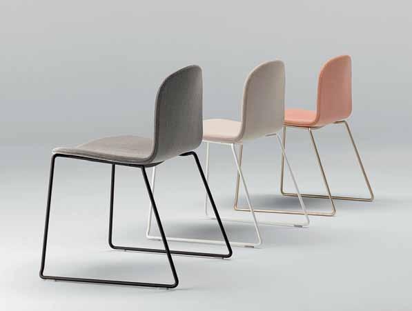
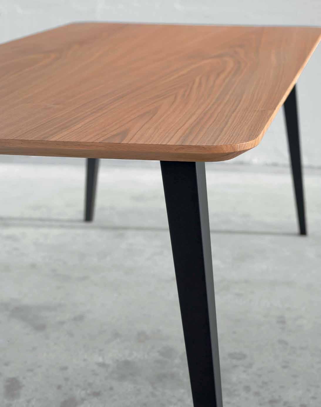
4 x Bob XL sled chairs upholstered in Series A 'Mink' fabric with epoxy black legs and 1 x Bob dining table with oak veneer top and black lacquered legs. Made in Spain by Ondarreta, available exclusively at AJAR.
Designer: Nadia Arratibel Chair: 520w x 540d x 780h seat: 470h (mm)
1600w x 900d x 750h (mm)
$5,000
living in design # 25 Make a lifetime of Design Hunter memories Homes in the sky. Small spaces, big ideas Touch the floor lightly. living in design # 26 Sink into the Art of Lounging. Find quiet The marriage of salt and copper PAYMENT METHOD Cheque / money order AUD$ Charge my credit card AUD$ Name on Card Card Type Card Number Expiry Date Signature IT’S EASY TO ORDER Fill in your response below, overleaf or subscribe securely online at habitusliving.com/subscribe. FOR A GIFT – RECIPIENT DETAILS: FOR MYSELF PLEASE SELECT BELOW : Mrs/Ms/Miss/Mr First Name Surname Address State Postcode Country Email Phone Mrs/Ms/Miss/Mr First Name Surname Address State Postcode Country Email Phone ONLINE: habitusliving.com/subscribe PHONE: (61 2) 9368 0150 MAIL TO: EMAIL: subscriptions@indesign.com.au FAX: (61 2) 9368 0289 Indesign Media Asia Pacific Level 1, 50 Marshall Street, Surry Hills NSW 2010 TELL US IN 25 WORDS OR LESS WHICH THREE CREATIvE PEOPLE WOULD YOU IN vITE TO DINE WITH YOU ON THIS SETTING AND WHY? AUSTRALIA INTERNATIONAL (AUD$) 12 ISSUES SAvE 8 ISSUES SAvE 4 ISSUES SAvE 12 ISSUES SAvE 8 ISSUES SAvE 4 ISSUES INDESIGN $155 $43 $105 $27 $55 $11 $240 $39 $200 $21 $110 DQ $70 $44 $50 $26 $25 $13 $140 $10 $100 $5 $50 HABITUS $132 $47.40 $93 $26.60 $49 $10.80 $240 $30 $180 $10 $90 THE COLLECTION vol. 2 Australia $29.90 (1 ISSUE) International $49.95 (1 ISSUE)
Table:
Valued at over
Subscribe to Habitus magazine Win this Spanish-designed dining set from AJAR


Efficiency & flexibility
—
It ’s not enough for our homes to be beautiful. They must also represent conscious living.
How can we address our modern concerns about living sustainably and ethically, through the spaces we inhabit and the products within them?
Being considerate of space- and energy-usage is one strategy. Another is to employ design strategies and products that are adaptable for different situations, which provides assurance that we are minimising our part in the creation of unnecessary waste.
Be inspired by exemplars of the small home typology, as Stephen Todd takes us on a global tour of tiny spaces. Discover a selection of products that will help you store efficiently, are multi-purpose, modular or sustainable, for the various areas of your home. Finally, peer into the looking glass at architectural models of future living, where efficiency and flexibility will become even more paramount. How will our homes, communities and suburbs work – individually and together?
# 77
Small houses
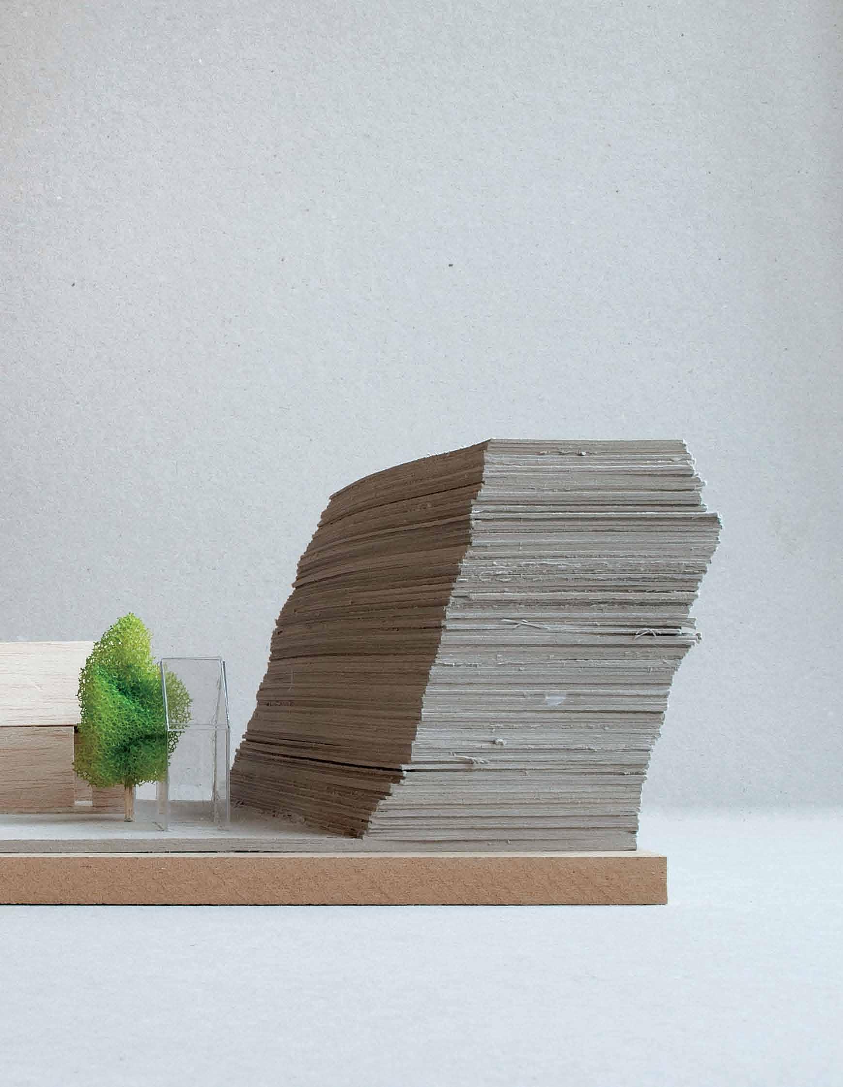
When considering efficient principles, the adage that ‘good things come in small packages’ holds true. As we rediscover an appreciation of less is more, small houses are making a comeback. Japan and northern europe provide some excellent examples of how to create modest, yet rich, design and architecture in which to dwell. stephen todd gets into the big world of small homes.
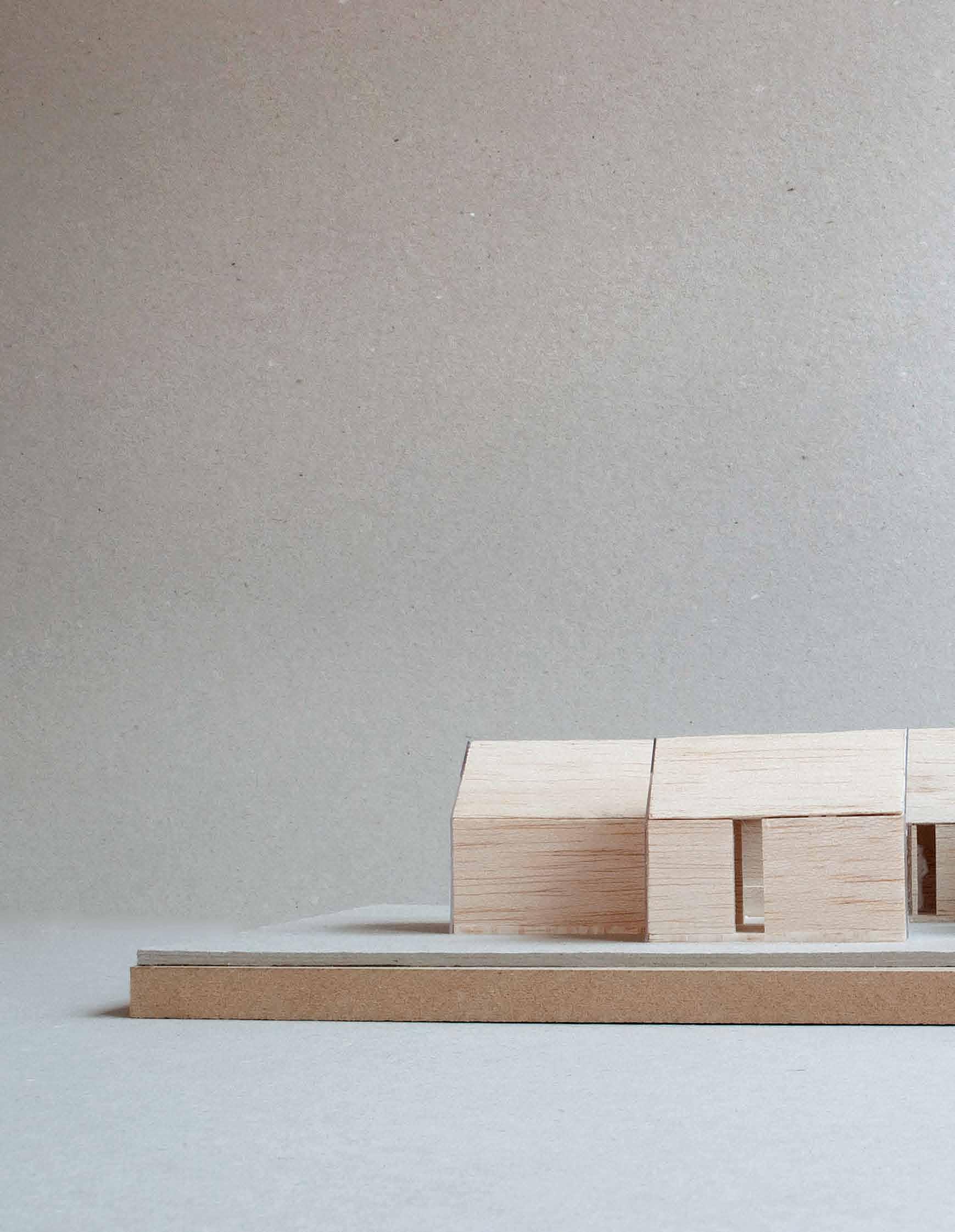
Tex T sTephen Todd | phoTographY various habitus #27
efficiency & flexibility # 79
The frenzy around small houses right now is like that of Bilbo Baggins as he runs off after Gandalf in Lord of the Rings, screaming, “I’m going on an adventure!” And a lot of what is on offer is not such a stretch from the rustic, barrel-shaped wagon the hobbits would amble about in; shingles, clapboard siding, dormer windows, lead lighting and the like. If ornament is a crime, for the most part ‘tiny houses’ should be illegal.
Don’t get me wrong, I am totally in favour of the quest for alternative housing; to shrink one’s footprint, create a new sense of community and counter the obsession with big being always better – are all very good things. What I object to is the quaintification of an otherwise legitimate lifestyle choice through the kind of cutesy mobile homes on offer. While they seem to have captured the popular imagination, in the end they’re simply creating a new type of trailer trash.
For credible small housing we’d do better to look to Tokyo, one of the world’s most populous cities as we know, but also one where housing is seen as something mutable, often being demolished and replaced every few decades. This means that Japanese architects and clients are willing to experiment with what little space they have.
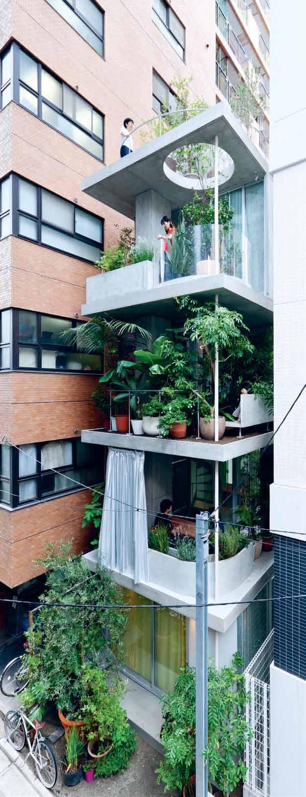
Architects like Ryue Nishizawa of SANAA, whose Garden House is four stories of concrete slabs stacked as elegantly, and apparently lightly, as bento boxes. Embellished with lush terrace plantings, it also acts as a vertical garden for neighbourhood enjoyment. Or his collaboration with fellow SANAA architect, Kazuyo Sejima on the Moriyama House, a flexible network of 10 cuboids of one- to three-storeys, between 16 and 30 square metres each, several occupied by the owner, others rented out individually. A new kind of urban community.
Japanese innovation is applied not just formally, but also structurally. To gain precious space, Unemori Architects’ Small House makes use of 70-millimetre planks that double as floors and ceilings over several storeys. A compact spiral staircase links all floors. The Moriyama House uses 6-millimetre steel load-bearing walls that enable maximum window size and therefore optimum light
habitus #27
Japanese architects and clients are willing to experiment with what little space they have.
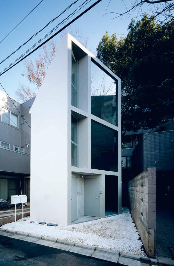
# 81 efficiency & flexibility
previous | early conceptual model of the micro cluster housing design and its relation to the characteristic cliff on the site in Vestfold, n orway, by reuilf r amstad architects. photography by l ars petter pettersen. opposiTe | garden house by ryue n ishizawa of sanaa. photography by iwan baan. above | 63.02º by schemata architects in nakano, tokyo. photography by takumi ota.
penetration, passive heating and cooling. The façade of Jo Nagasaka and Schemata’s 63.02º House is inclined to that angle to create an oblique view off its hyper-narrow site and out over the neighbours’ front garden, planted with cherry trees. It sure beats a hobbit hole.
Norway has a tradition of small, rustic cabins called køiene – low-fi camping huts that really do look like hobbit holes, and perhaps that’s why Norwegians don’t feel drawn to them for contemporary housing. Køiene have been of influence, nonetheless, in the elegant Micro Cluster complex of Oslo’s Reiulf Ramstad Architects. Gathered in a lush rural setting in Vestfold, Norway, the three separate volumes are gathered as a community just like traditional køiene, but their unembellished exteriors and soaring, pitched roof lines make the reductive statement, ‘house’. Transparent at front and back, at night the luminous boxes resemble transparent Monopoly tokens.
Renzo Piano’s prototype small home also looks like a Monopoly piece, and is not far off in scale. It’s a 2.5-metre wide, 3-metre long, 3.5-metre high (that is, 26.25 cubed metre) house he developed for Vitra. The aluminium-clad wooden structure, Piano said at the time of unveiling in 2013, is the incarnation of a dream he had as a student in the 1960s, “a dream of freedom, of self-moderation”. He called it the Diogene, after the Greek philosopher and founder of the Cynics who, to prove his disdain for worldly chattels, slept in a barrel in the public marketplace. Diogene’s barrel
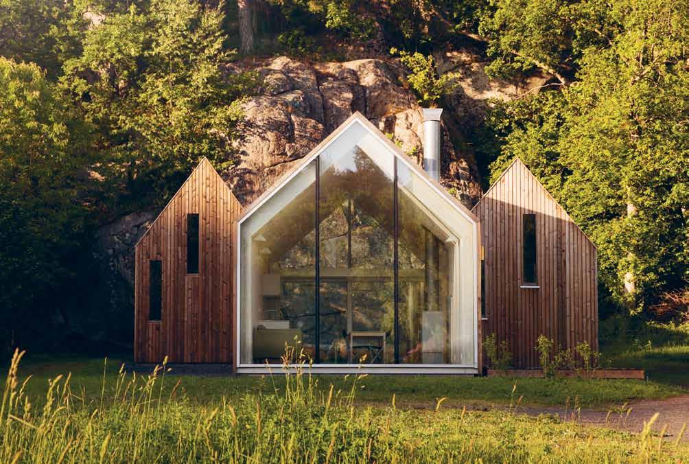 above | frontal View of the main facade of gable-ended structures of the micro cluster homes by reiulf r amstad architects, with the characteristic hill and the surroundings as seen from the south-west. photography by l ars petter pettersen.
# 83 efficiency & flexibility
The three separate volumes are gathered as a community.
Original hoteliers, influential designers, and a curated collection of 279 independent hotels worldwide





Take a journey inside each of our 279 boldly conceived independent hotels. Plus, new this year, discover the 10 brave and creative visionaries who make up the Design Hotels™ Architecture & Design Infl uencers List—the creative spirits behind the world’s most expressive properties.
More than a collection of hotels, Design Hotels™ is about thought-provoking design and architecture. Embrace cultural authenticity.

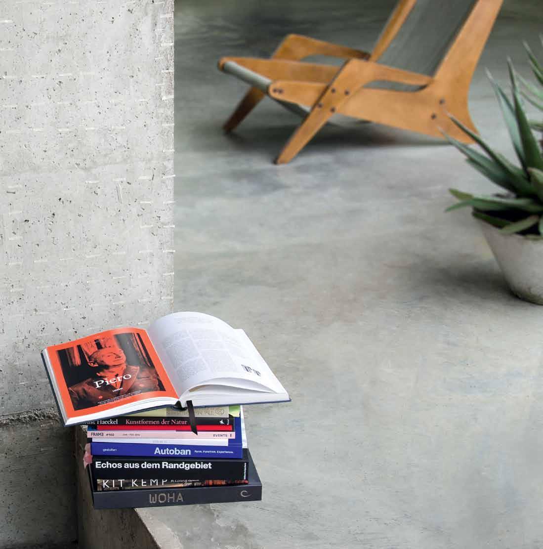
Now available: designhotels.com /shop


Featuring 279 handpicked Design Hotels and behind-the-scenes stories of the brought them to life. Take an inside journey to each of our boldly across the globe. More than collection of ries. Experience the cultural authenticity and the Design Hotels community. Meet the brave and creative visionaries who and Design Influencers List 2015 Discover some of the most influential design spaces around the world today. Celebrate this stories and images. »The go-to reference tool for design concious travelers« Seyhan Özdemir & Sefer Çağlar
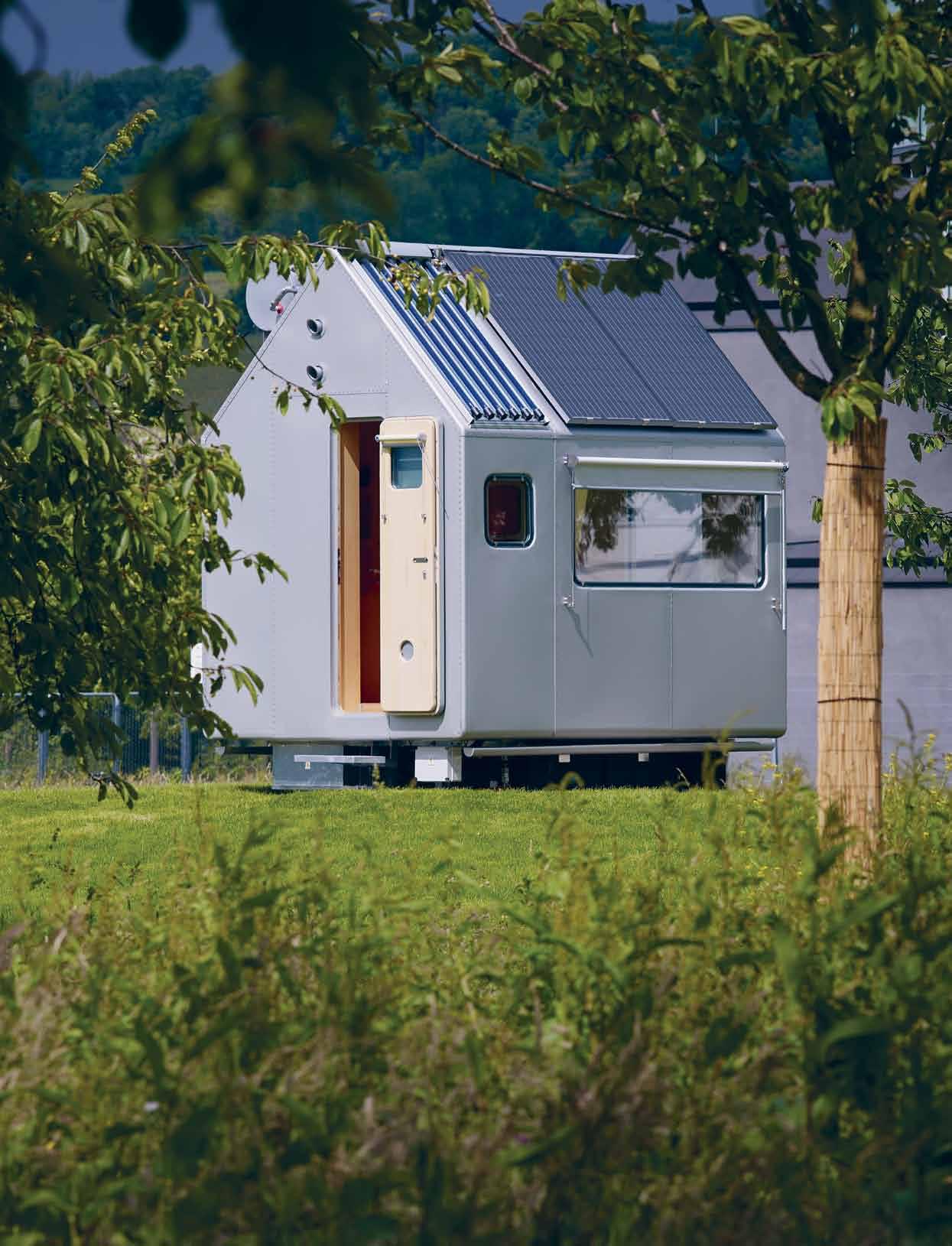
efficiency & flexibility # 85
The home is an exemplary essay in sustainability.
Reiulf Ramstad Architects reiulframstadarchitects.com
Ryue Nishizawa ryuenishizawa.com
SANAA sanaa.co.jp
Schemata Architects schemata.jp
Unemori Architects unemori-archi.com
habitus #27
did not have wheels, and neither does Piano’s house – it is trucked onto site where it is installed upon a pre-selected, pile-driven cement base. The home is an exemplary essay in sustainability – a system of photovoltaic cells, solar panels, rainwater tank, bio-toilet, triple glazing, insulation (it can comfortably withstand temperatures of -23º to +40.50º) – it is designed to enable a viable lifestyle off the grid. The pale wood interior is tactile, the joinery impeccable, the living and ablution zones decorously divided by a simply screen; a side window above the desk/dining table and another large aperture in the roof allow maximum exposure to the outside and doors at each end, when open, allow the landscape to enter the home.
The small house, Piano says, is an idea that has always intrigued him. “Because it’s kind of a primitive idea. It’s the idea of basic shelter– the minimum living shelter you need as a human being, then you can go and make many places for collective activity. Civic places, places for people to enjoy music, to enjoy university, to enjoy education, a civic centre. You can do many, many things; but it sticks, this idea somewhere, this one different image– it’s called silence.”
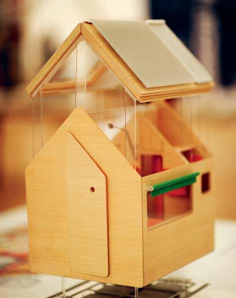
Not the frenzy to escape from, then. But the very zen of being present.
For more small homes inspiration visit habitusliving.com/issue27/smallhomes
It ’s the idea of basic shelter –the minimum living shelter you need as a human being.
previous and above | diogene, an
V itra international.
aluminium-clad cabin designed by renzo piano and rpbw for Vitra, installed in w eil am rhein, g ermany. photography courtesy of
Renzo Piano Building Workshop rpbw.com
Architect
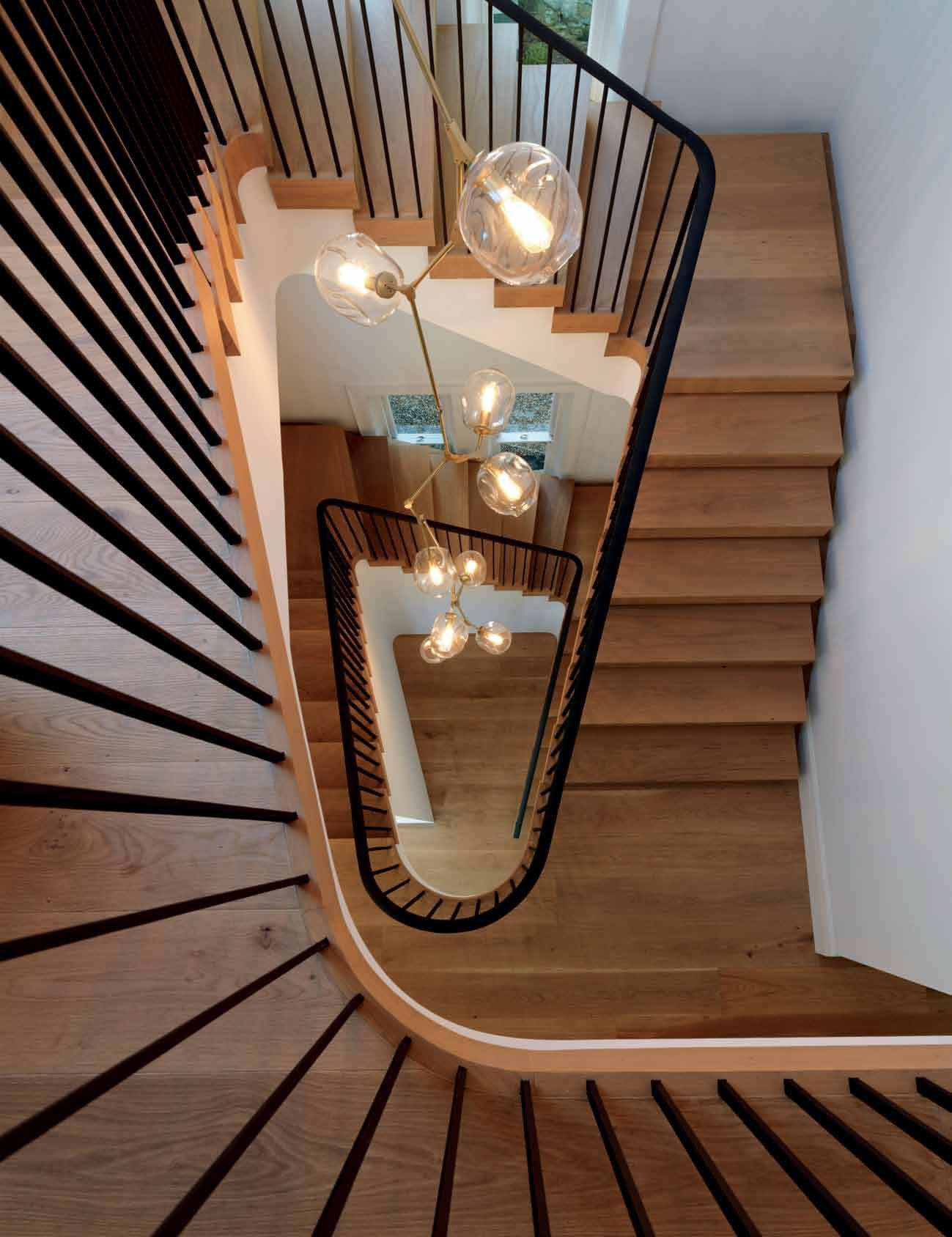
Showrooms Shop 2 188 Chalmers Street, Surry Hills NSW 2010 P 02 9699 1131 F 02 9690 0929 575 Church Street, Richmond VIC 3121 P 03 9427 7000 F 03 9427 0100 tonguengrooveflooring.com.au
Luigi Roselli
Living & dining
RÚNA , meaning whisper, advice or secret in Old Norse, conceals four drawers and two secret compartments. In a world with a never-ending flow of information, transparency, and public identity, we need somewhere for the private things we don’t want to ‘share ’ or have ‘ liked ’ The smoked oak finish mimics the poetic Nordic forest at dusk, while the drawers fit all the items for the diverse activities that take place on the modern dining table.
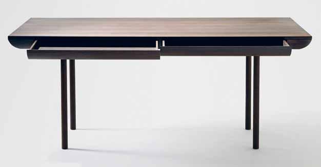
isabelahm.dk
Three-dimensional structure and the ability to stretch are the common threads of FEBRIK ’s knitted textile range. Colour is another hallmark of the Netherlandsbased brand, specifically encouraging combinations between different designs, or combinations of distinctive fabrics in the same hue within one design.

febrik.com / de-jonge.com.au
Berlin-based start up Kimidori exclusively re-uses pallet timber in their range. The 45 SERIES emphasises the former working nature of the material, arranging the boards in 45- and 90-degree geometry, inspired by traditional timber work in northern and eastern Europe.
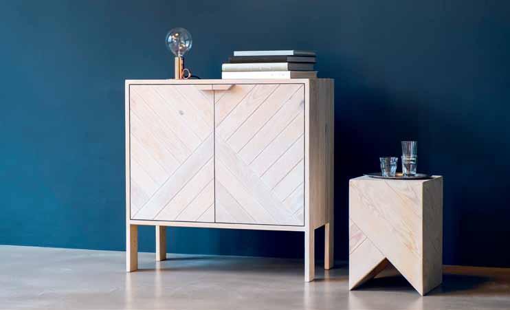
danielbecker.eu / kimidori.de
New Sydney brand Addition Design offers simple, accessible (all items retail for under AUD$60) and functional pieces for the home and studio. Using a simple clamping mechanism, the HANG HOOK can be used to store headphones, hats, bags and totes off the side of your table or desk, suitable for a thickness of 25 millimetres. All of the timber and concrete products are 100 per cent Australian made.
additiondesign.com.au
habitus #27
Now available in Australia is the EMPATIA TABLE LAMP. The high-performance LED-based light source controls output to provide maximum yield, directing light toward the glass diffuser via a transparent pipe. Available in three power and size configurations, each lamp is handmade by a master glassblower.
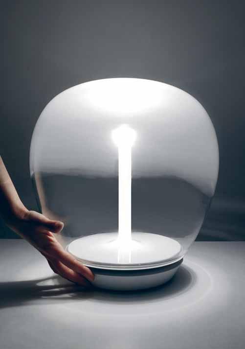
artemide.com.au
This beautiful concrete product, suitable for wall, floor and ceiling applications, is 100 per cent biodegradable, and made primarily of minerals such as magnesium oxide and cement, mixed and pressed with natural fibres and layers of recycled textiles. CONCREATE is available in handy prefinished panels that are quick and easy to install, suitable for new construction or retro-fitting, available in three classy colours.
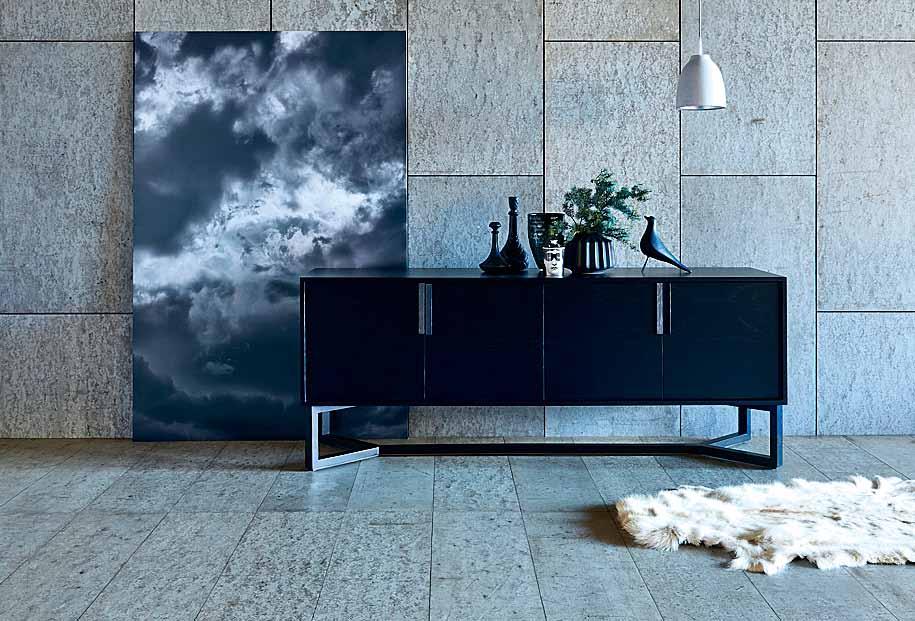
royaloakfloors.com.au
The HAIKU fan houses advanced technology that has scooped it over 25 international design awards. Some features are direct current, permanent magnetics and ultra efficient airfoils which make it 80 per cent more efficient than conventional ceiling fans. Another is the SenseME capability that cuts utility costs year-round.
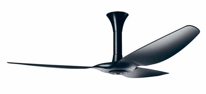
Designed by Torafu Architects , the S-SHELF (pictured) is comfortably at home in small spaces such as hallways, bathrooms and terraces. Its neat, slender form – just 35 centimetres wide and under 25 centimetres deep – stands along the wall without interrupting. Made in red cedar like its big sister, the even more miniscule SS-SHELF is less than 15 centimetres deep.
apato.com.au
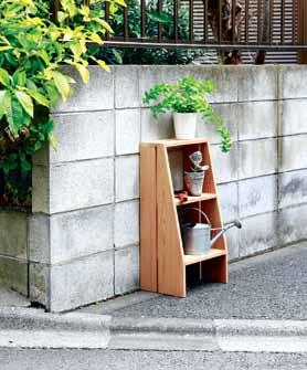
efficiency & flexibility # 89
In the kitchen
This new wireless system is set to revolutionise lighting in our homes. HUE allows you to play with tone, contrast, white light and a spectrum of colour to create your ideal lighting mood, all from your smart device. Up to 50 lights can be controlled from the one unit –all you need to do is install the bulbs and download the app. From disco party to sunrise-simulating technology, all at your fingertips.

meethue.com / philips.com.au
The FNP kitchen provides a flexible alternative to this otherwise fixed area. Diverse modules can be used as either bridging elements between fixed cabinetry or freestanding, while all accessories can be mounted without tools. Available in various widths and heights in birch plywood.
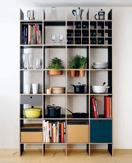
moormann.de / smow.com.au
Described as ‘unlimited’, DEKTON is an all-in-one solution for floors, walls, joinery and even exterior. This sophisticated mix of raw materials such as glass, last generation ceramic tiles and quartz surfaces enables the efficient creation of a cohesive aesthetic throughout the home. In large format slabs, with maximum resistance to scratching, stains, fire and heat, it ticks all the boxes.
dekton.com
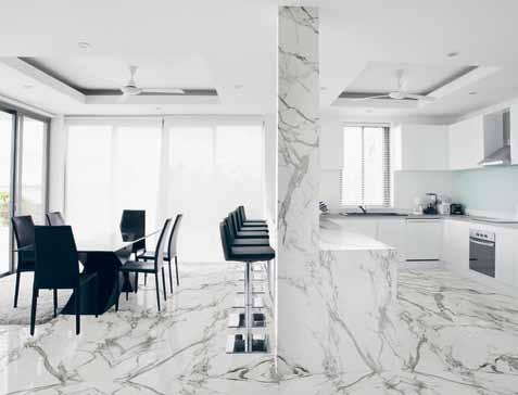
habitus #27
Recently recognised by red dot award as ‘Product of the Year’, the ADORA SLQ WP washing machine achieves an impressive 5-Star energy rating when using a combination of normal power and world-first heat pump technology. The ADORA also offers functions such as WetClean – an alternative to dry cleaning, Steam Anti-Crease –to replace the need for ironing, and a world-exclusive Anti-Mite program for sensitive skin types.

vzug.com
With mechanical joints – so no toxic glues – 100 per cent recyclable and reusable materials, and made with their entire life-cycle in mind, Valcucine have been designing and manufacturing kitchens for 30 years. The NEW LOGICA SYSTEM goes a step further. As a result of painstaking research into the use of traditional kitchens, this system places your essential ingredients within easy reach, thereby improving human interaction with our kitchen environments.
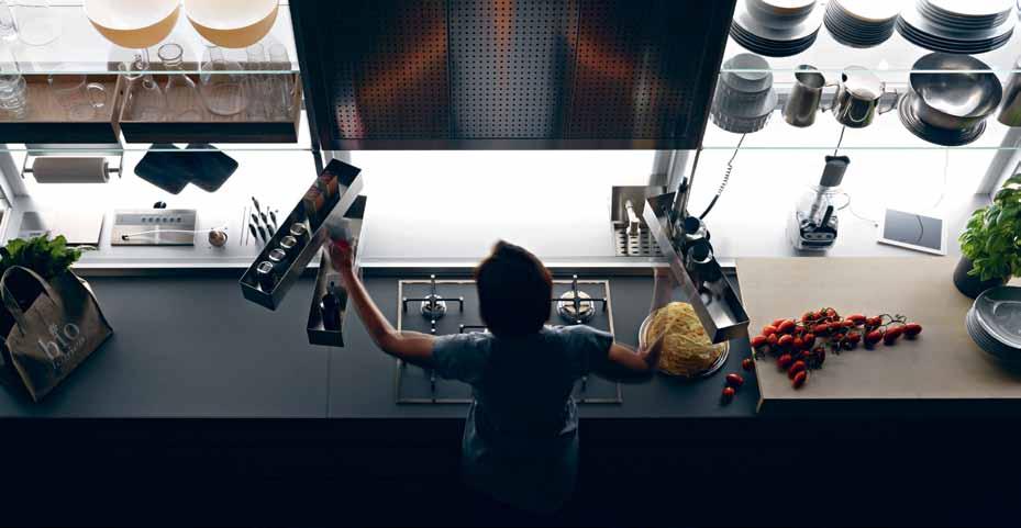
valcucine.com / rogerseller.com.au
Putting things away has never been more appealing. Attractive storage encourages regular tidying, so you ’ ll be compelled to clean with the BEND BASKETS . Inspired by baskets used in small villages to collect crops, these galvanised solid steel baskets are 100 per cent recyclable and available in a range of colours.
ownworld.com.au
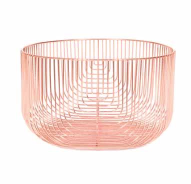
efficiency & flexibility # 91
Bedroom / studio
You can be quite the professional from your home office, especially with drawer organisers like the ORGA-LINE by Blum . High quality dividing systems can make your day, so they don ’t break your work flow. High-quality stainless steel containers and dividers provide clear visibility and easy access to all contents. The best thing? The system adapts to the dimensions of any drawer. blum.com / lincolnsentry.com.au
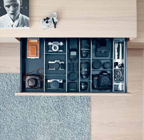
Get more out of your existing furniture footprint with this clever design for under the bed by Italian designed and made brand Plywood . TRUNDLE DRAWER designed by Paolo Cogiliati is the ultimate in encouraging children to pack away, storing toys, games, sheets, blankets,or even a junior mattress (sold separately). Sized to fit under any of the three beds on offer from Plywood, the TRUNDLE DRAWER is made from European birch ply and hand-finished, plus flatpacked for easy transport, with no metal components. plyroom.com.au
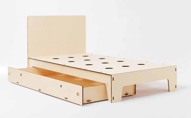
Featuring six arms that pivot out to form hooks, SIGNS COAT STAND by Karimoku New Standard is both playful and useful. Magnets within the central post hold the hooks in a vertical position when not in use. Crafted from maple timber.


karimoku-newstandard.jp / stylecraft.com.au
Delicious accessories by e15 have arrived in Australia, bearing the same quality and personality as the brand ’s furniture. The whimsical HAUS PAPERWEIGHTS in solid oak or brass are available in four different building shapes.
e15.com / livingedge.com.au
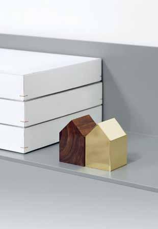
habitus #27
CSYS is an LED lamp that marries the latest technology with sleek design, and also addresses environmental concerns. Inspired by construction cranes, the lamp utilises a copper pipe to conduct heat away from the light source, ensuring greater longevity and brightness from the highintensity LEDs. CSYS includes a touch-sensitive dimmer with light level memory.
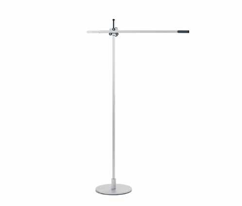
poliform.com.au
Enjoy the .ORG DESKSCAPE SYSTEM
Each module is constructed of solid wood, cork, metal and crafted in small batches in the USA. Finished with natural Danish oil, you may like to oil it regularly to extend its beauty.
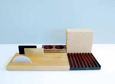
ladiesandgentlemenstudio.com / douglasandbec.com
After more than 40 years, new additions to the Kartell in Tavola range appear on the scene. Working with both chefs and designers, the pieces embody the chef ’s commitment to perfection. Pictured is Patricia Urquiola’s JELLIES FAMILY, an articulated line of plates, trays, glasses, bowls and carafes in vibrantly coloured polycarbonate.

kartell.com / spacefurniture.com.au
A modular and lightweight shelf system, BACKPACK WARDROBE has up to six wooden shelves, variable in their position. Adjust them as you please using a unique belt strap fixture, easily mounted to the wall – along with a bar and clips for bookends. Infinite possibilities!
fifti-fifti.net
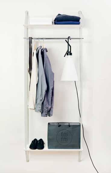
efficiency & flexibility # 93
habitus
Bathroom
Seamless and sophisticated, XETIS is the latest in Kaldewei ’ s offering of enamelled floor-level shower surfaces. This latest model includes an integrated wall outlet, with drainage discreetly hidden in the wall. A highly minimal solution, XETIS is available in 13 colours.
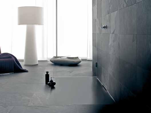
Being both washbasin and watercloset gives this revolutionary product by Roca its name: W + W. Saving water and space in one clever L-shaped design, the system filters the waste water from the basin and re-uses it in the discharge of the cistern. Now every drop of water counts for two in this fusion of design sophistication and love for the planet.
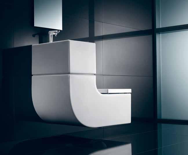
au.roca.com
A svelte form means the VIVID SLIMLINE SIDE LEVER SINK MIXER takes up just the right amount of space. The squareline outlet contrasts with the elegant cylindrical body, and the solid brass mixer can swivel at the outlet for easy use in the kitchen.
phoenixtapware.com.au
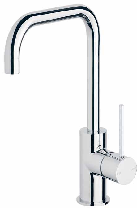
kaldewei.com / bathe.net.au #27
The details make the design, and the new SHELF TOWEL HOLDER and HANGER in the IlBagnoAlessi One range are at once sculptural, elegant and functional –providing the highest level of sophisticated convenience in the shower.
au.laufen.com / reece.com.au
SEASCAPE has both beauty and environmental credentials – Fibonacci Stone is the only terrazzo stone supplier to achieve a 100 per cent Green Star rating from the Green Building Council of Australia. The subtle blue composition is an understated, yet colourful tonal palette.
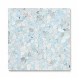
fibonaccistone.com.au
hansgrohe.com.au
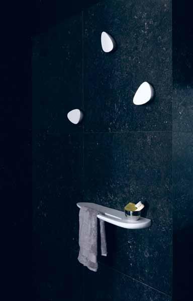

Graceful and playful, the BELLANTONIO ROTATING DRAWERS offer storage wherever you need it. Hidden castors allow the unit to glide across your floors easily with a light push of the finger.
plyroom.com.au
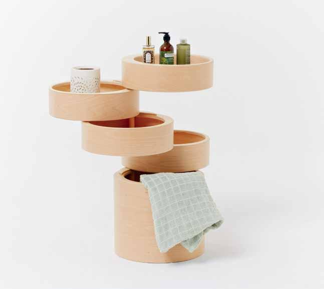
efficiency & flexibility # 95
Out now.
Products, projects, people & ideas to inspire your own home.
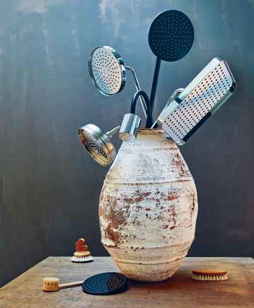
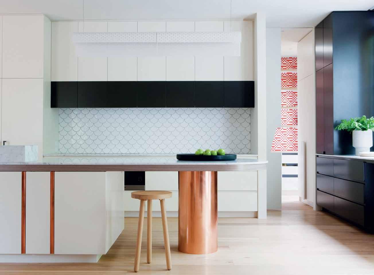
special issue –kitchen & bathroom living in design The social kitchen Bathrooms for wellness Design solutions for your home: create rooms to nourish and cleanse.
habitus special issue –kitchen & bathroom
First-ever
Home of the future
Looking into the future, there is an even greater need for flexible, sustainable and thoughtful living solutions that address issues of climate, environmental erosion, population density and the cost of living. Many responses to these concerns take cues from the most energy-efficient and artistic piece of architecture and engineering known to us – the human body.
Whether inspired by structures such as the skeleton, cells and permeable membranes, or processes such as decay and circulation, there are many lessons in our own bodily architecture that relate to efficiency and flexibility. Although diverse in approach and presentation, these contemporary visions of ‘future living’ all represent biomimicry in some way, questioning and blurring the line between nature and architecture.
For more information on all the concepts visit habitusliving.com/issue27/homefuture
efficiency & flexibility # 97
Cells
Within a boundary of thin apartment buildings, individual and attached houses huddle against the cold. They are scatter-sited creating a residual network of small parks and intimate pedestrian public spaces, giving residents a sense of ownership, pride and identity. Houses accommodate changing family types, flexible in the internal planning. There are attached studios for elderly parents, teenage children, separated parents, or for working from home. Inside, spaces for living are void spaces made between bits of program – flexible in use, their character is super-spacious, light-filled and quasi-external. In between houses, the residual spaces create pocket parks and intimate pedestrian squares.
ProjECT Make me a Home ArChiTECT Tribe Studio Architects
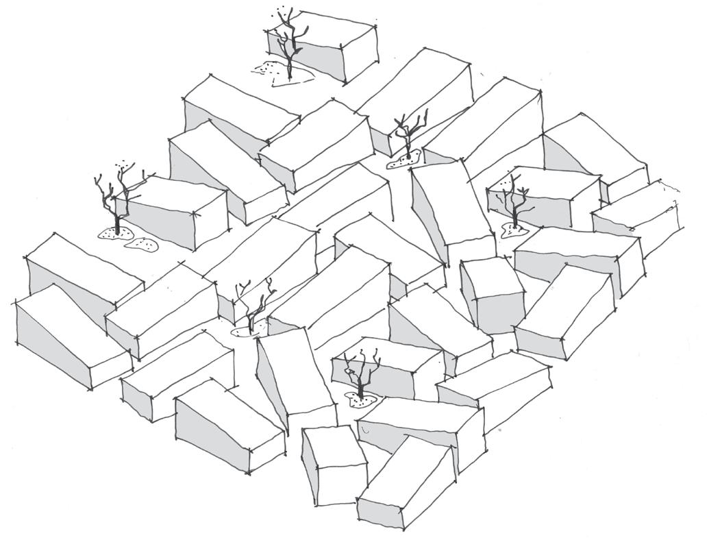
Tribe sT udio archi T ecTs
(61 2) 9211 3211 tribestudio.com.au
habitus #27
Growth
The future doesn’t lie in the invention of something new but rather in the reinvention of the old.
With Chair Farm, Werner Aisslinger presents one of his most forward-thinking ideas. How can you plant products in plantations? Man designs the furniture, nature then takes over the implementation, as plants grow in a hollow frame in the shape of a chair. Fantasy? Aisslinger already sees the next step: plants which without any additional assistance form to the shape of a piece of furniture because it has been engineered into the plant’s DNA.
ProjECT Chair Farm
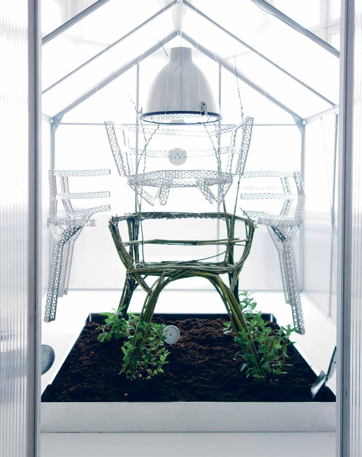
ArChiTECT Werner Aisslinger for Vitra
sT udio aisslinger (49) 30 315 05 400 aisslinger.de
# 99 efficiency & flexibility
Circulation
The Ribbon House reconceives a fence as a device that intensifies the appealing qualities of a typical suburban home such as family autonomy, security, privacy and a connection to nature. A bricolage ribbon wall wraps three pavilions linked by an indoor/outdoor platform that accommodates the kitchen, living and dining rooms. This ribbon wall defines small courtyards and play spaces that surround the house.
Offsetting the fence line well within the boundary creates the potential for a new in-between space – a kind of privatelyowned public space. New common spaces, play spaces, shared micro farms, dog paths and community gardens proliferate through the suburban fabric creating a network of green spaces occupied by an ecology of local fauna and flora and activated by the community and residents.
ProjECT Ribbon House for 27 Smith St competition by Sydney Living Museums
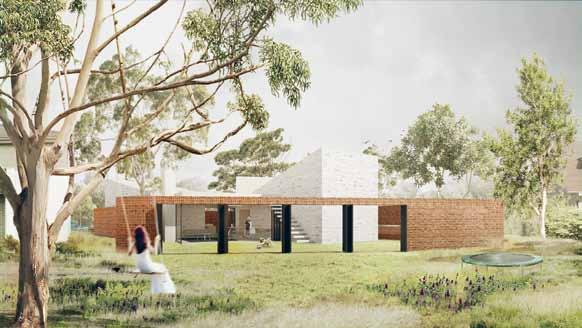
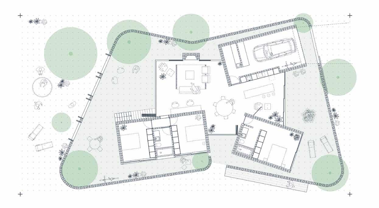
ArChiTECTS Alberto Quizon & Jerome Cateaeux a lberT o quizon albertoquizon.info
J eroM e caT eu X jmcateaux@gmail.com
habitus #27
Your design. The right grate selection, with Stormtech. Match the perfect drain to your requirements with Stormtech’s superb range of linear, designer drainage systems.
Manufactured in Australia from marine grade stainless steel, Stormtech systems bring the perfect balance of style, durability and sustainability to both indoor and outdoor environments.


View our complete selection of drainage systems and product applications on the Stormtech website, or call for more details.
Phone 1300 653 403

Website stormtech.com.au
ARCHITECTURAL GRATES + DRAINS
Bathrooms + Showers
Pools + Surrounds
Thresholds + Doortracks


Special Needs Access

A grate selection for a grate match.
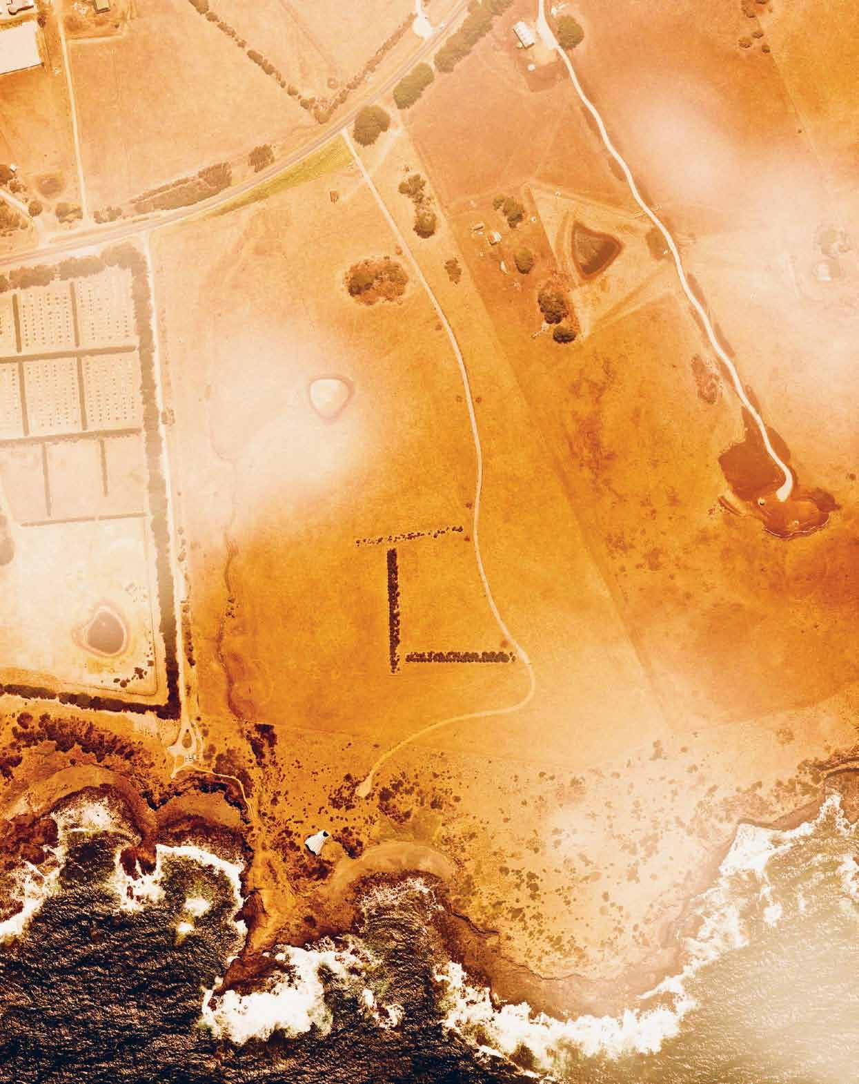
habitus #27
Lungs
In 2030, climate change has affected Australia’s environment so dramatically that the interior desert now meets the south-east Australian coastline. Average temperatures have increased, the sea level has risen and rainfall has dropped. Many animal and plant species are now extinct. The island continent is in terminal drought. In this context, the challenge is how to survive the environment. Blowhouse, a speculative residential proposition, is a ‘life support unit’ located on Australia’s southern coastline.
The Blowhouse project is a kind of lung. Strong prevailing winds blow across its curved skin, raising and lowering it. In effect, the building is breathing. Solenoids attached on the underside of the roof transform the energy produced by the roof’s movement into static electricity. Streamlining also supplies air to linear wind turbines. Photovoltaic cells on the rear louvres generate energy from solar radiation.
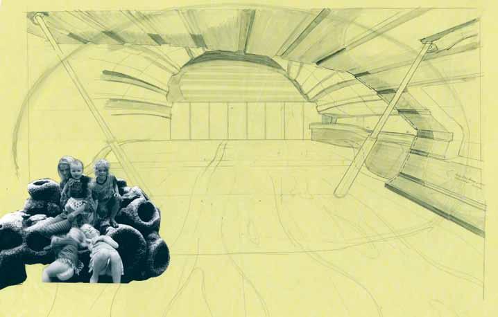
Conceived as a modular type, habitants could repeat the Blowhouse around coastal locations. The profile simulates the aerodynamic and phototropic growth patterns of indigenous scrub that nestles into crevices along the coast. The window ‘water bags’, inspired by succulent plants that survive in these conditions, thermally insulate the Blowhouse.
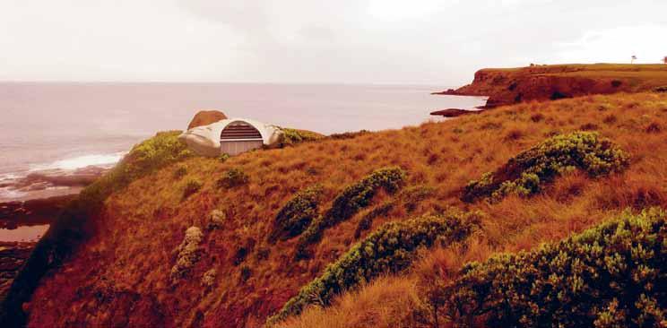
Flutes on the shell harvest water, which then flows into an internal glass water tank located in the kitchen ‘bridge’. The water temperature remains at around 21 degrees, and ambiently assists in maintaining the internal air temperature at this level. A heating element sourced from the photovoltaic panels keeps the water temperature warm during the cooler months.
The bioengineered Blowhouse is an energy neutral life support unit that utilises the environment’s kinetic potential.
ProjECT Blowhouse ArChiTECT Paul Morgan Architects
paul Morgan archi T ecTs (61 3) 9605 4100
paulmorganarchitects.com
# 103 efficiency & flexibility
Spine
Barcode Room is a concept studio apartment composed of walls that double as furniture, and move freely from side to side, permitting the resident to customise the size of space to fit a variety of uses. Incorporating functional elements such as removable storage and furniture into these walls allows for more of the floor area to be used by the inhabitant and guests, thus creating a flexible space where one is able to both comfortably live and entertain a varying number of guests quite easily.
Each wall incorporates a combination of 12 types of components – to make a living bar, kitchen bar or sleeping bar. The options for composition and position of these bars allows the user to create unique barcodes for their life.
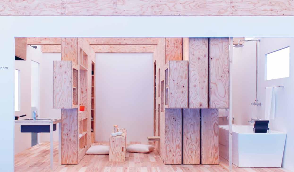
Additionally, as different furniture is unfolded or pulled out of the walls, windows of open space
are created, connecting both sides of the wall with large, temporary openings. This gives the appearance of an enlarged floor area, lending the space a dynamic, changeable quality, while also creating a sense of added connectivity. By utilising only a ceiling rail to guide movement and wheels below to allow it, this versatile system can be installed not only into new studio apartments, but into existing apartments as well.
With continued development of these bars, customers can choose what type of bar they desire so that they can freely change the size of space within their room. Furthermore, if components within the walls can also be customised in terms of size and location as well as the size of the walls themselves, then customers can daily redefine the space in which they live, play, and work.
ProjECT Barcode Room
ArChiTECT Studio 01
sT udio 01 (81) 50 3637 5404 blog.studiozeroichi.com
habitus #27
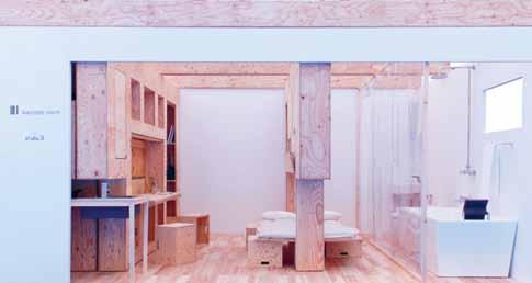
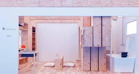
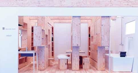
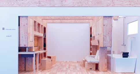
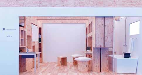
# 105 efficiency & flexibility
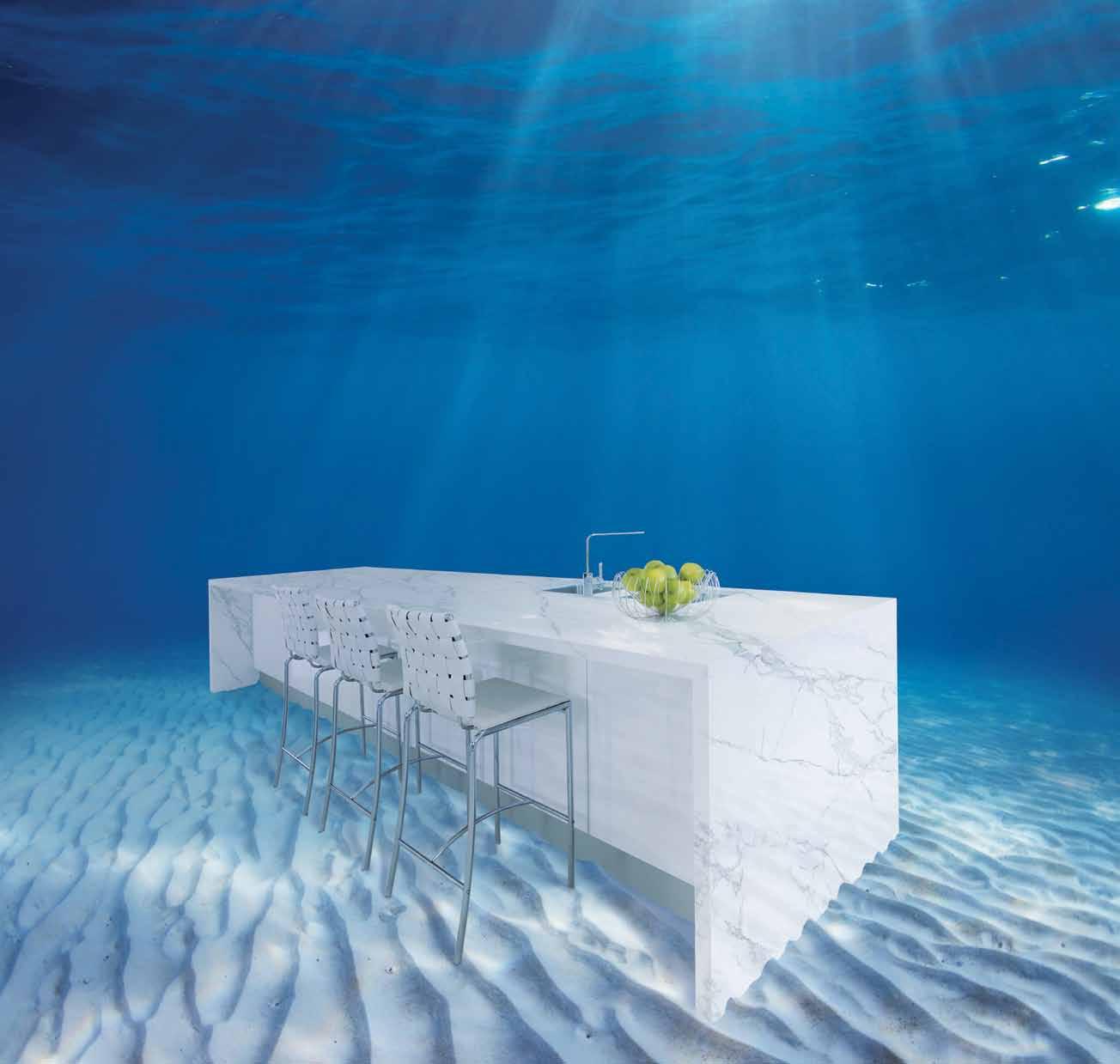
A 100% WATERPROOF SURFACE FROM NATURAL MATERIALS ANYTHING’S POSSIBLE WITH NEOLITH Melbourne 4-6 Freighter Rd, Moorabbin 03 8552 6000 Forged using the finest raw materials and industrial technology, NEOLITH is waterproof, scratch resistant, heat resistant, lightweight and eco-friendly. Available in an extensive range of natural pigments and perfect finishes, and all in the largest, high-tech sintered slabs in the world. NEOLITH is one extraordinary surface. Melbourne Showroom 597 Church St, Richmond 03 8552 6090 Sydney 20 Yulong Cl, Moorebank 02 9822 5155 Sydney Showroom 40-42 O’Riordan St, Alexandria 02 9822 5910 Gold Coast 26 Wrights Pl, Labrador 07 5537 3222 Featured surface: Neolith Estatuario Perth 30 Darlot Rd, Landsdale 08 9406 3100 W www.cdkstone.com.au E info@cdkstone.com.au @cdkstone
Skeleton
The biggest cost in projects is structure. Two major factors contribute to this – labour and materials. Pallet racking, a highly engineered and efficient structure, is incredibly affordable and looks great. It doesn’t require a ute full of tools, nor a lot of man hours to assemble.
You can then clad, insulate and line the building efficiently with one material – such as composite styrene panels. Colorbond either side of 250 millimetres worth of high-performance hard insulation provides all the benefits of water proofing, internal lining, good looks and incredible insulation quality –and it also has its own structural spanning capabilities.
Simply pin composite styrene panels to the pallet racking structure and you have completed walls and roofing instantaneously. Efficiency equals affordability.
ProjECT Pallet Racking House
ArChiTECT Andrew Maynard Architects
andrew M aynard archi T ecTs
(61 3) 9481 5110 maynardarchitects.com
# 107 efficiency & flexibility
Nervous system
Following the destruction of the 2011 earthquakes, the city of Christchurch in New Zealand has undergone vast and rapid transformation. With close to 1,000 of its buildings irrevocably damaged, the city centre has been rendered largely unusable. In its absence, peripheral suburbs assume a new role within the urban structure – as smaller, dispersed nerve centres absorbing the activity of the former CBD.

How can architecture critically respond to this emerging polycentric condition? A New Agora reconfigures an existing village green in a maritime suburb as a new centre: catering for a veritable mix of public, private and sub-centre activities. This concept draws on an archetypal pavilion/ grandstand structure, integrated with a more informal architectural language. Here ideas about live-work and public-private in ever closer proximity are tested and enacted through the architecture’s spatio-formal character. Two ‘housing pavilions’ occupy the site, each with inhabitable terraces, a dense mixture of spatial conditions, a live-work chasm and an expansive public porch.
ProjECT A New Agora

ArChiTECT Grace Mills
grace Mills
(64) 2 7710 4379
cargocollective.com/gracemillsisarchitecting
CBD HarewooD New BrigH toN Li N wooD wooL stoN sH ir L ey Pa Pa N ui aDDi NgtoN s um N er Hor NBy habitus #27
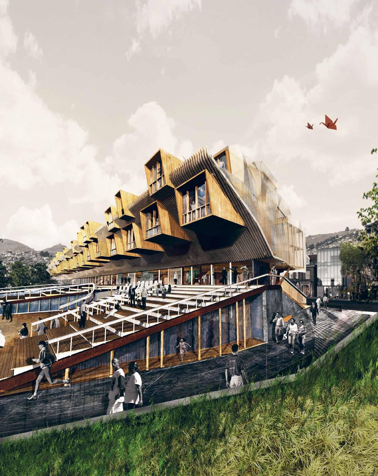
# 109 efficiency & flexibility
Decay
On a mile-long strip of land in the Quebec backwoods, architect/artist Richard Greaves began to build structures made from household refuse: bits of broken computers, sports equipment, clothing, washing machines, cookers, and so on, bound together with string or wire.
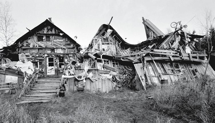
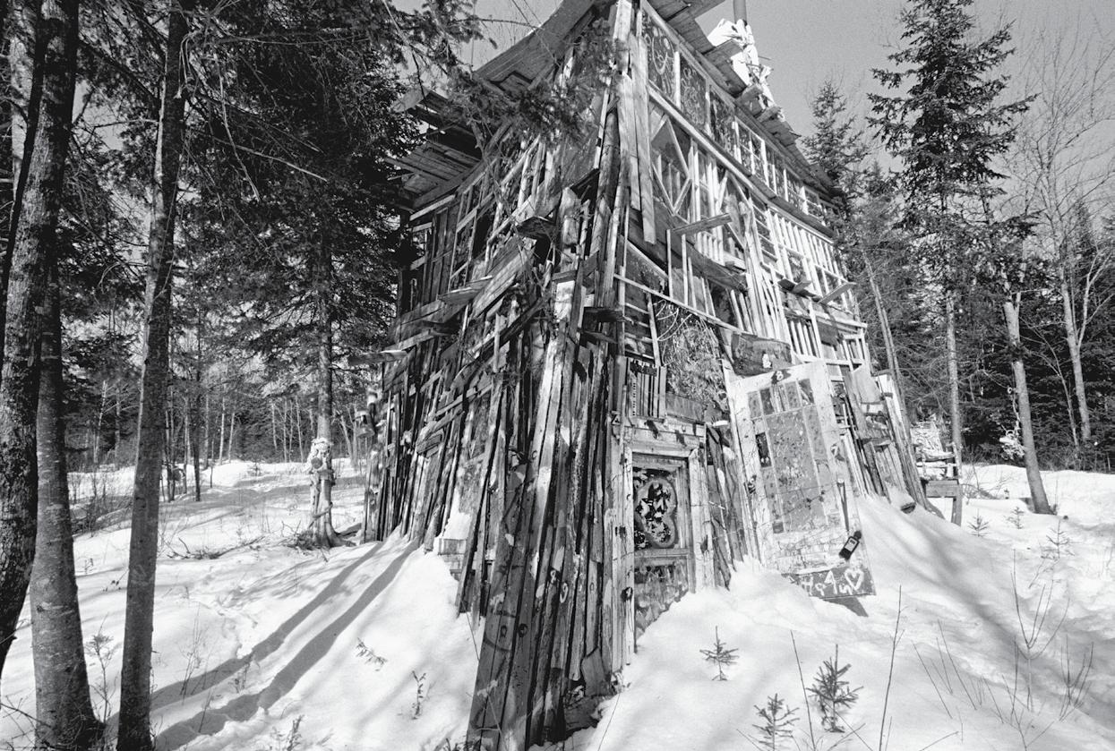
Like houses of cards, these structures defy the laws of gravity. Celebrating asymmetry and banishing the right angle, Greaves borrows his architectural forms from nature rather than pure mathematics. At one point, in the mid-2000s, there were 10 separate buildings and another 10 shelters on Greaves’ land. By 2009, he had fled, abandoning his remarkable constructions to the entropic forces of weather and decay. Today, most have returned to the earth.
Greaves sees his own body and the material world as existing within a single continuity. He explained his beliefs in a handwritten note, attached to the wall: “I really liked old objects and observing them – objects that had been used, objects eroded by the force of time and inhumane histories. I think of myself as no different.”
ProjECT Anarchitecture
ArTi ST Richard Greaves
re F erences
artbrut.ch / jonathangriffin.org
habitus #27
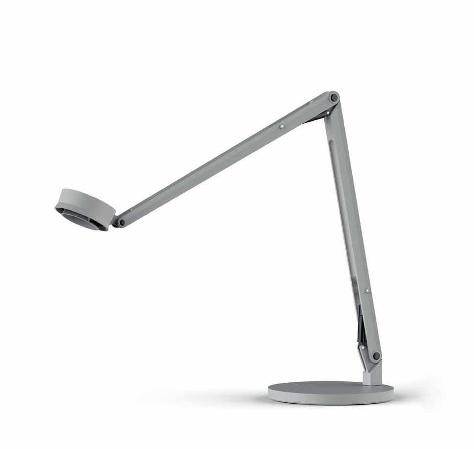
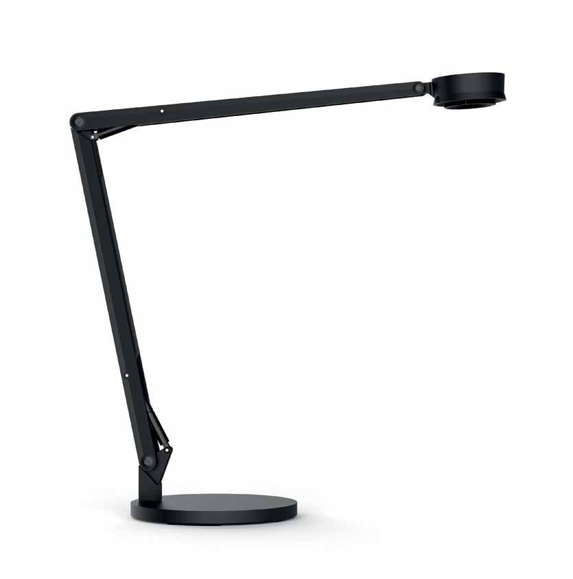
Visdanfo Pty Ltd Level 1, 7A, 30-32 Barcoo Street, Roseville, NSW 2069 visdanfo.com.au sale@visdanfo.com.au P (02) 8213 2838 F (02) 9882 6548 LED Table Lamp
AD
Introducing AJAR
Like paella, a design offering needs to be made up of just the right ingredients to be successful. AJAR directors Andrew Boddington (interior designer), Josep Vallhonrat (Spanish born and trained architect) and Richard Fanale (interior designer), were the perfect combination to launch AJAR in 2012.
The company has a unique flavor, with a collection of Spanish furniture, joinery, lighting and homewares from over 15 brands, curated especially for Australian interiors. With the majority of products new to Australian shores, their collection is emphatically contemporary and original in design.
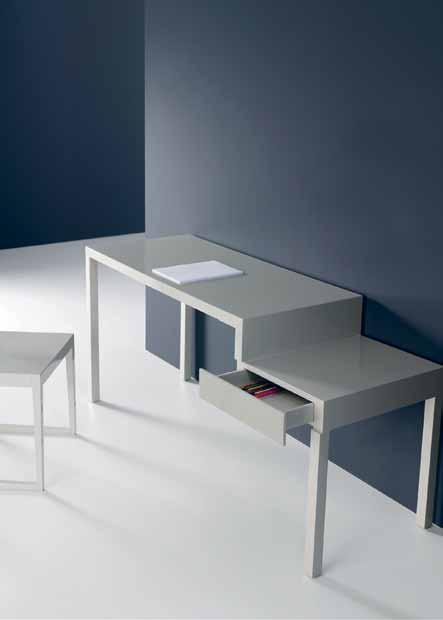
Taking inspiration from the definition of AJAR (which is also an acronym of the letters of the directors’ first names), “The underlying philosophy is to be open to new design and ideas,” explains Vallhonrat.
Indeed, the directors identified the Australian marketplace as eager for something fresh, and knew that Spanish product could fill the gap. The AJAR team has visited many of the Spanish design houses that they represent and “This enables us to pass on design stories directly from the makers as well as the manufacturing
techniques behind each piece,” says Boddington.
And while Australia has been smitten with Italian and Nordic design for some time, the Australian market is embracing the Latin flamboyance and quirky, playful quality that characterises the AJAR collection. “We are finding that the Australian community recognise the detailing, the design of the product and the quality manufacturing,” says Vallhonrat.
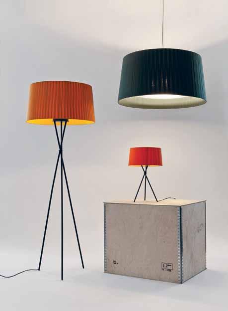
“Quite particular to the Iberian Peninsula,” says Fanale, “is the centuries of traditions of manufacturing and handicrafts. Contemporary designers use that knowledge to create new products that re-interpret old designs or features – to make something fresh.” For clients who are familiar with some of these Spanish brands on offer, the dream of being able to specify the modular and customisable product for projects with ease of access is now a reality.
The level of service provided by AJAR, like the carefully procured collection, is unique. In-store design advice and on-site familiarision throughout the process means that each project is tended to carefully, much like the perfect paella simmering on the stove.
habitus promotion › AJAR #112 issue #27 habitusliving.com
Above | AJAR’s pl Ayful collection includes the tRipode lighting RAnge And step console desk, AJAR ajar.com.au
Enjoy a delicious mix of Spanish design pieces, served up tapas-style for the Design Hunter.
Enter the design dimension
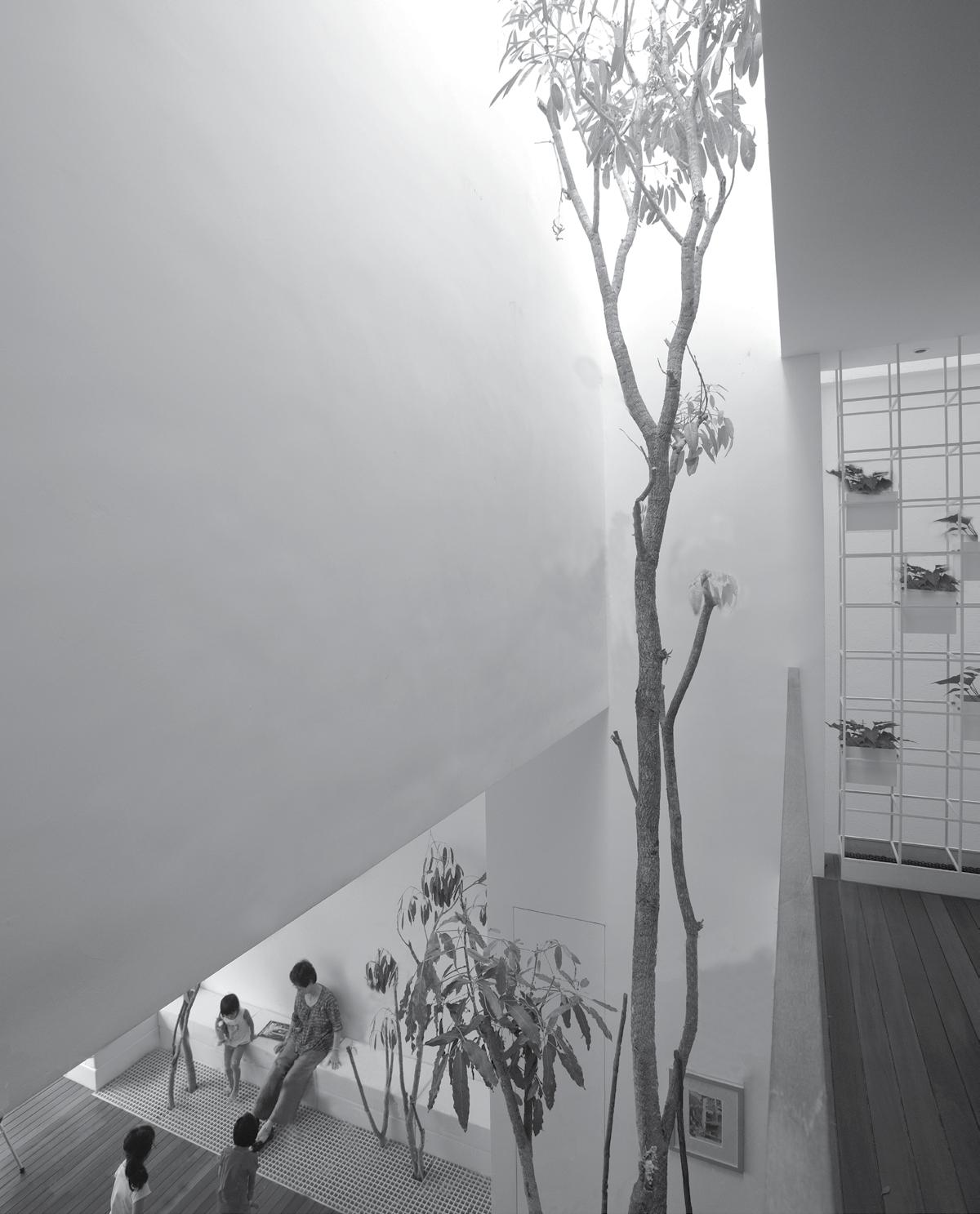
Ageing in place
The future-proofed Crabtree House was created by architect MISHO VASILJEVICH for a couple who are determined to live the rest of their days out comfortably and sustainably in Tasmania's HUON VALLEY
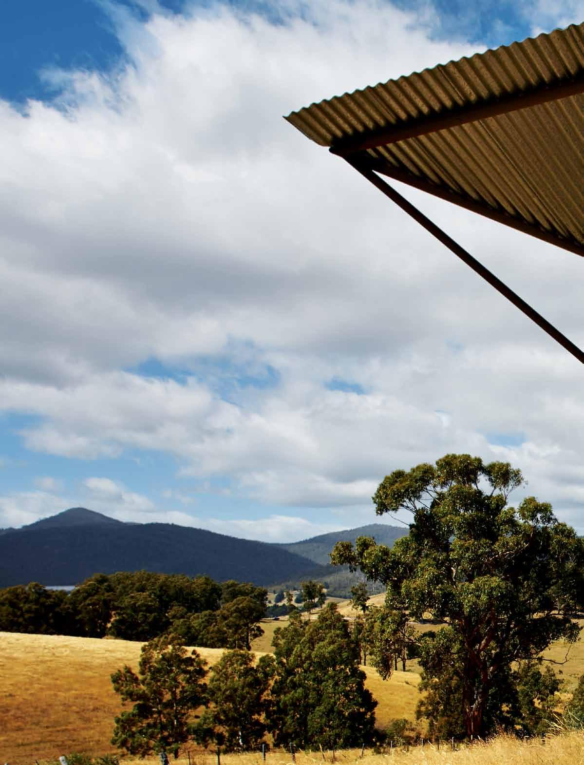 text Catriona MCLeod | photography peter Whyte
issue #27 habitusliving.com

# 115 3 . on location
On a ridge, high above the eucalypts, apple orchards and snow-fed streams of the Huon Valley in Tasmania, is a silver box crafted by architect Misho Vasiljevich. Keith and Jenny, a microbiologist and botanist, required three things of their new, and last, home: sensitive future-proofing, opportunities to display Jenny’s diverse collections of artefacts and, a warm, wind-resistant shelter in which to undertake ongoing research projects.
This ridge in winter is windswept and cold, and in summer, sunbaked, windy and dry. The curved galvanised metal roof is aerodynamically tipped on the northwest to resist uplift and reduce lee side turbulence. The narrow building hugs the ridge, east to west, allowing for views from north to south through banks of double glazed windows.
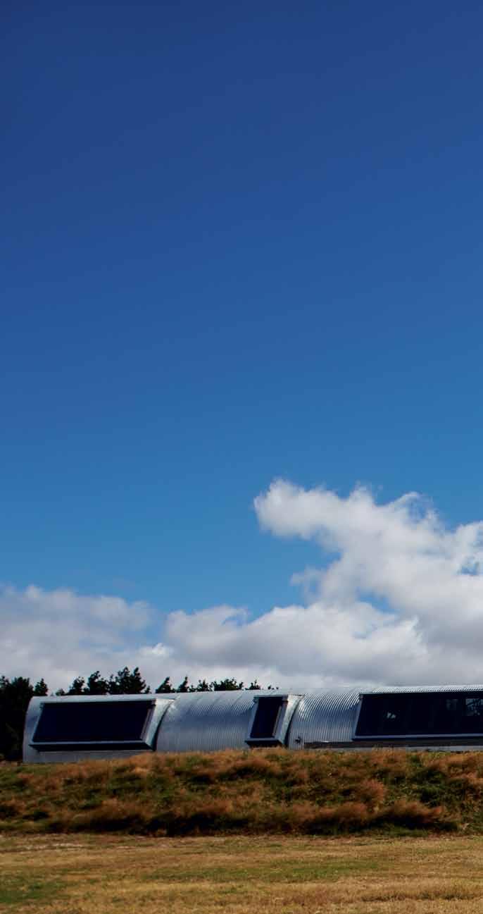
A typical day would see the two waking in their respective bedrooms. Keith’s looks over the long valley to the south where eagles ride the thermals. Jenny’s room faces a small garden inside a curved Corten steel blade, one of six that shelter pockets of delicate flora along the hot northern wall. While Keith’s view is expansive and outward, floating with the birds, Jenny’s is inward and calm. Bathrooms too are separate. Keith’s is wide and unadorned to accommodate a (future) wheelchair. Jenny’s bathing sanctuary is elegant, almost Japanese, and protected from the sun by another Corten blade that encloses ferns and orchids.
At the other end of the silver box is Jenny’s private study. Reduced light protects precious plant specimens, and neatly laid out on a long,
issue #27 habitusliving.com
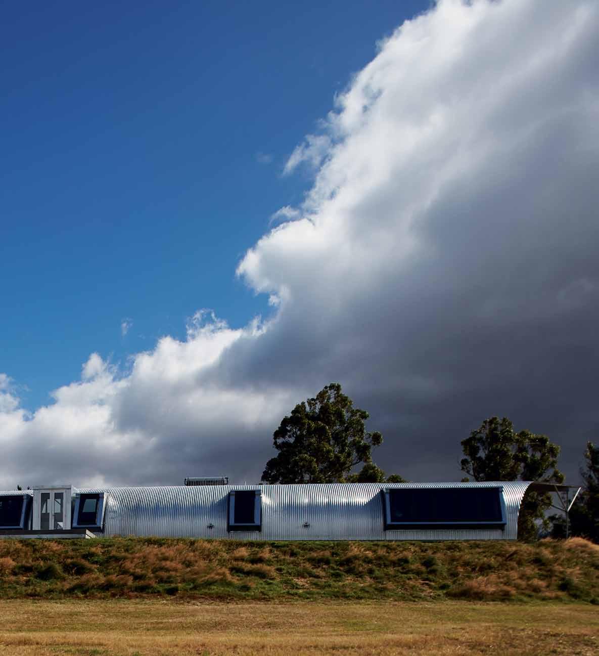
previOus | THe norTHwesT Corner of THe
Tipped
THe arCHiTeCT’s
AbOve | THe Curved
meTal
flows down To beCome THe
3 . on location # 117
aerodynamiCally
roof is based on
observaTion of airplane design.
galvanized
roof
souTHern, wind-baTTered wall.
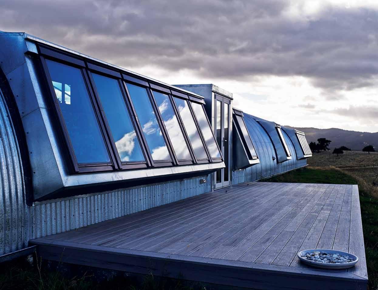
A b Ove | d eep window bays provide proTeCTed inTernal nooks for waTCH ing birds soaring on TH e TH ermals above TH e valley. O pp O site A b Ove | wH eelCH air-wide H allways aT eaCH end of TH e residen C e demonsTraTe fu T ure-proofing. belOw | k eiTH ’s wide and unadorned baTH room anTi C ipaTes CH anges in H is mobiliT y and aCC ess. issue #27 habitusliving.com
wide workbench is a fascinating tableau of seed necklaces, masks, fossils, shells, pods, notes and photographs, microscope and computer. She is currently mapping the endemic flora of the Huon Valley, in addition to managing local Landcare projects. Her re-vegetation planting of endemic species around the house is ongoing, but she and Keith acknowledge the house itself has already “settled in” to the landscape of tussock grasses.
Keith, a passionate cook, prepares most meals. Rather than being enclosed, his reading area is beside the broad stone kitchen bench, the communal work surface for cooking, laying out maps and drying plant specimens. Produce from local farmers markets can be unloaded and prepared here for meals, or put away in the storage in the large larder. This space is wheelchair-wide, as are all storage areas, and shelves are built for easy access.
Keith and Jenny relocated from Adelaide to escape the increasingly hot summers. A family member already lived in the Huon Valley and encouraged their move to the more temperate climate; however, with that climate comes the need for heating. Keith was explicit in his request for an alternative to the ubiquitous wood stove and Jenny was steadfast in her aim to minimise the house’s running costs.
Both criteria are achieved with strategies such as an evacuated solar tube hot water system, passive solar design and cross ventilation, thermally broken aluminium double-glazed windows, Brightgreen LED lights throughout, 19 double-glazed argonfilled Velux windows and hydronic underfloor heating only in the hallway and main living areas. “I am astounded”, says Jenny, “by how little the house costs to heat and cool. It’s
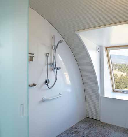
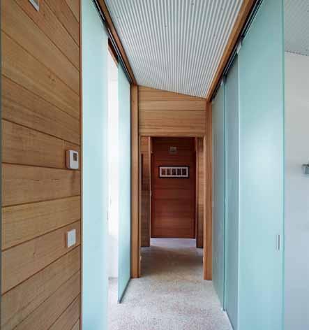
3 . on location # 119
Ageing and frail residents have a right to stay in a home to which they have become accustomed, and for whom it has been specifically designed or retrofitted.
a constant, comfortable temperature, and it is a pleasure walking on the warm terrazzo living room floor on a winter morning, while gazing over the frost-covered fields.”

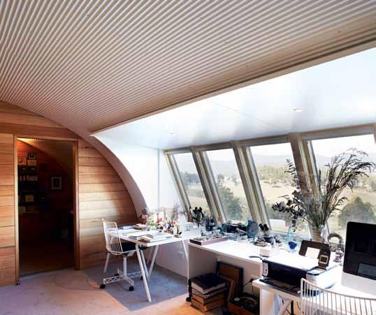
“As happy as pigs in mud”, is how they describe living here. “They were ideal clients," says architect Misho Vasiljevich. “This was their third architect-designed house. Keith had thoroughly researched future proofing and ‘ageing in place’. He also made clear they weren’t moving again … they wanted to die in this house”. As sober as this sounds, Keith and Jenny emphasise this is a house for “living in the now” and they often host family and friends, and throw impromptu dinner parties.
‘Ageing in place’ advocates residents of lowcare homes remain within that home, even when their needs have been assessed as highcare. Ageing and frail residents have a right to stay in a home to which they have become accustomed, and for whom, as in this case, it has been specifically designed or retrofitted. All aspects of the Crabtree house are designed for changing mobility and ability; for example, it is on one level and can be easily cleaned, all bathrooms and hallways accommodate wheelchairs, and the gutters on the southern side are at knee height for ease of leaf removal.
Keith walks around the vegetables thriving in soil-filled, recycled timber apple boxes, the height of which reduces the need for bending and encourages good drainage. All water is taken off the adjoining shed roof and stored in three 10,000 litre tanks. The (deliberate) use of lead lining around the windows in the main house precludes the use of this water for drinking; however, even this rainwater
issue #27 habitusliving.com

O pp O site | Jenny’s lig HT-filled sT udy C onTains a small, darker anTeroom for sToring deli CaTe planT samples and pH oTograpH s. A b Ove | TH e living area is TH e dividing/C ommunal spaC e; To TH e easT are TH e owners’ privaTe rooms and To TH e wesT TH e sT udy and guesT areas. 3 . on location # 121
PLAN SectioN ENTRY DINING KITCHEN PANTRY WET ROOM 1 2 3 4 5 BATHROOM WALK-IN-ROBE BEDROOM ACCESSIBLE TOILET ACCESSIBLE SHOWER 6 7 8 9 0 LAUNDRY LOUNGE/LIVING GUEST TOILET PHOTO STORAGE STUDY q w e r t GUEST BEDROOM GREY/BLACK WATER RECYCLING SYSTEM COURTYARD CORTEN BLADES GARAGE y u i o p WATER TANKS VEGETABLE GARDEN a s 1 t 2 r w y o o o o a a a p i u 0 9 q e 3 8 8 4 7 7 6 s 5 issue #27 habitusliving.com
The Corten blades create warm microclimates for plants but also exclude the wind, which greatly reduces watering requirements.
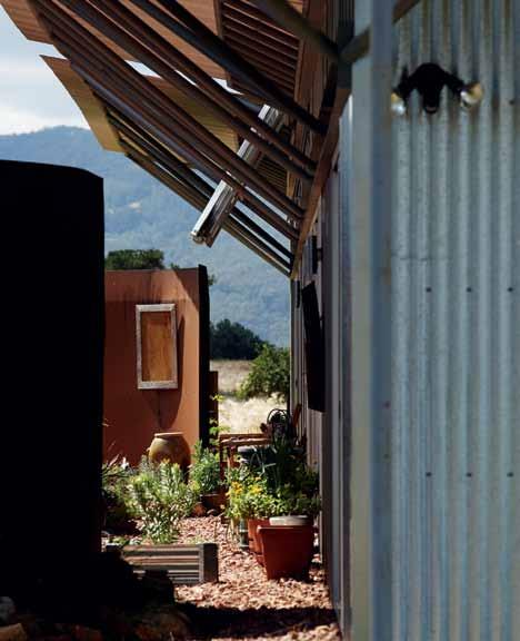
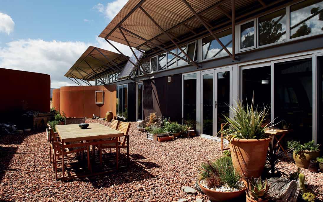
O pp O site | floor plan and seCTion. Ab Ove | Curved CorTen sTeel blades s H elTer TH e ou Tdoor spaC es from wind and en C lose small gardens. belOw | TH e evaC uaTed solar T ube H oT waTer sysTem is angled for maximum solar gain over TH e main enTry.
3 . on location # 123
is collected in the small dam and filtered by reeds. Frequent testing shows lead levels are extremely low and the dam supports a wide variety of wildlife.
An Envirocycle system treats grey and black water for watering swathes of newly planted endemic plant species. The Corten blades create warm microclimates for plants but also exclude the wind, which greatly reduces watering requirements.
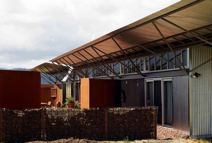
Suddenly, Keith turns to point to the nearest Corten blade, protecting the tomato plants. “Do you know why the top of each one is a sharp edge and not flat?” he asks. “So the little birds, the wrens and swallows, can grip it. I love how their droppings splatter down the rust-red of the steel … which artist does that remind you of?
“Yes”, he laughs, “we’ve got a Fred Williams series in our own backyard!”
This is a house of daily pleasures and small rituals: cups of tea in the sun at the rear of the house while the wind batters the southern face, or watering the garden while wrens flutter around Keith and Jenny’s feet . The silver box provides the opportunity to live in close contact with, but protected from, the harshest natural elements; nestled into the ridge, up with the eagles, into the future.
drop box
arCHiTeCT Misho + Associates
proJeCT arCHiTeCTs Misho Vasiljevich, Jo Hitti
inTerior designer Misho Vasiljevich
sTruCTural engineers Matthew Webster (Aldanmark)
environmenTal ConsulTanT
Dr. John Paul Cummings (Geo-Environmental Solutions)
building surveyor David Morey (Pitt & Sherry)
builder Arnie Woolley
sTeel fabriCaTors Crisp Bros/ Hayward
solar/ HydroniC HeaTing HydroSol
eleCTriCal Robbie Griggs Electrical
ConCreTe polisHing Artisan
Concrete Polishing
Misho + Associ Ates (61) 411 875 696 misho.com.au
ligHTing
LED lights throughout from Brightgreen.
furniTure
All previously owned by client.
finisHes
Polished and sealed concrete containing hand-spread terrazzo/marble chips. Galvanised 8mm metal roofing from Bluescope Steel. Corten blades to roof. Plantation grown hardwood stud and timber frames and plantation grown Tasmanian oak wall linings supplied direct from Glen Huon sawmill. 600 x 300 white tiles from Rossetto Tiles. Lysaght Min-Orb lining for the ceilings in white. Caesarstone benchtops.
fixed & fiTTed
Hydronic underfloor heating in hallway and main living areas and Greenland Evacuated Solar Tube Hot water supplied by HydroSol. High star rating washing machine (front loading) and appliances by Bosch and Miele. Smart 3/4L Caroma toilets throughout, supplied by Reece. Double glazed windows from Glass Supplies Tasmania. Roof windows from Velux Australia. Three 10,000 litre water tanks and Envirocycle® water treatment system.
A b Ove | a varie T y of solid and porous s C reens s H ield TH e ou Tdoor spaC es from TH e prevalenT and CHangeable winds. issue #27 habitusliving.com
Hidden secrets of beautiful bathrooms
Being a world leader in concealed cistern technology means some of our best ideas are hidden away forever. No ugly plumbing or cistern to be seen anywhere! Enjoy more space, more style, with Geberit concealed cisterns.
Download 3D BIM files from → geberit.com.au/bim-library
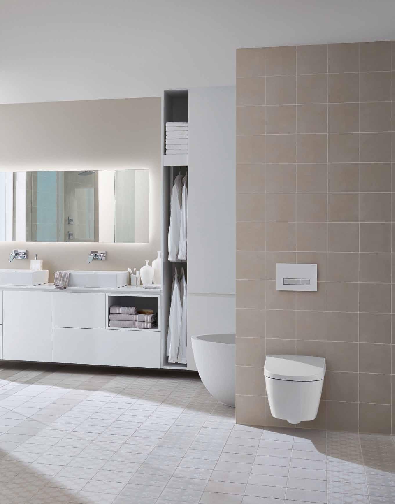
Geberit concealed toilet cisterns
DIRECTING DESIGN INDUSTRY PROFESSIONALS TO THE RIGHT JOBS IN AUSTRALIA AND ACROSS ASIA
DIRECTING DESIGN INDUSTRY PROFESSIONALS TO THE RIGHT JOBS IN AUSTRALIA AND ACROSS ASIA
careersindesign.com.au
careersindesign.com.au
3D VISUALISER
3D VISUALISER
ACCOUNT MANAGER
ACCOUNT MANAGER
ADMINISTRATION
ADMINISTRATION
AGENT/DISTRIBUTOR
AGENT/DISTRIBUTOR
FIND
FIND
BLOGGER
BLOGGER
BUSINESS DEVELOPMENT
BUSINESS DEVELOPMENT
CAD DESIGNER
CAD DESIGNER
CAMPAIGN MANAGEMENT
CAMPAIGN MANAGEMENT
CUSTOMER SERVICE
CUSTOMER SERVICE
DESIGN MANAGER
DESIGN MANAGER
DESIGNERS
DESIGNERS EDITOR
EDITOR
EVENTS CO-ORDINATOR
EVENTS CO-ORDINATOR
GRAPHIC DESIGNER
GRAPHIC DESIGNER
INDUSTRIAL DESIGNER
INDUSTRIAL DESIGNER
INTERIOR DESIGNER
INTERIOR DESIGNER
LECTURER
LECTURER
LIGHTING SALES
LIGHTING SALES
PERFECT
PERFECT
MEDIA ExECUTIVE
MEDIA ExECUTIVE
NATIONAL SALES MANAGER
NATIONAL SALES MANAGER
OPERATIONS MANAGER
OPERATIONS MANAGER
PA / SALES SUPPORT
PA / SALES SUPPORT
PHP DEVELOPER
PHP DEVELOPER
PR ACCOUNT MANAGER
PR ACCOUNT MANAGER
PRODUCTION MANAGER
PRODUCTION MANAGER
PROJECT MANAGER
PROJECT MANAGER
SPECIFICATION
SPECIFICATION
RETAIL INTERIOR DESIGNER
RETAIL INTERIOR DESIGNER SALES
SALES
SHOwROOM MANAGER
SHOwROOM MANAGER
SHOwROOM SALES CONSULTANT
SHOwROOM SALES CONSULTANT
STATE MANAGER
STATE MANAGER
STUDIO LEADER
STUDIO LEADER
TECHNICAL OFFICER
TECHNICAL OFFICER
wAYFINDING DESIGNER
wAYFINDING DESIGNER
wEB DESIGNER / DEVELOPER
wEB DESIGNER / DEVELOPER
ARCHITECTURE
ARCHITECTURE
DESIGN
DESIGN
INTERIORS
INTERIORS
MEDIA
MEDIA
AGENCY
AGENCY
ADVERTISING
ADVERTISING
RETAIL COMMERCIAL FURNITURE
RETAIL COMMERCIAL FURNITURE
LIGHTING
LIGHTING
TEx TILES
TEx TILES
YOUR RESIDENTIAL ARCHITECTURE
YOUR RESIDENTIAL ARCHITECTURE
DESIGN
DESIGN
INTERIORS
INTERIORS
MEDIA
MEDIA
AGENCY
AGENCY
PUBLISHING
PUBLISHING
RETAIL
COMMERCIAL
RETAIL COMMERCIAL FURNITURE
FURNITURE
LIGHTING
LIGHTING
TEx TILES
TEx TILES
PRODUCT RESIDENTIAL JOB
PRODUCT RESIDENTIAL JOB
EDUCATION
EDUCATION
DESIGN INTERIORS
DESIGN INTERIORS
MEDIA ADVERTISING
MEDIA ADVERTISING
RETAIL COMMERCIAL FURNITURE
RETAIL COMMERCIAL FURNITURE
LIGHTING
LIGHTING
TEx TILES
TEx TILES
PRODUCT
PRODUCT
Home maker
When architect BEN DALY and his wife moved to WELLINGTON , it was an opportunity for Daly to immerse himself in the design and construction of a major artwork – their 66-square-metre apartment.
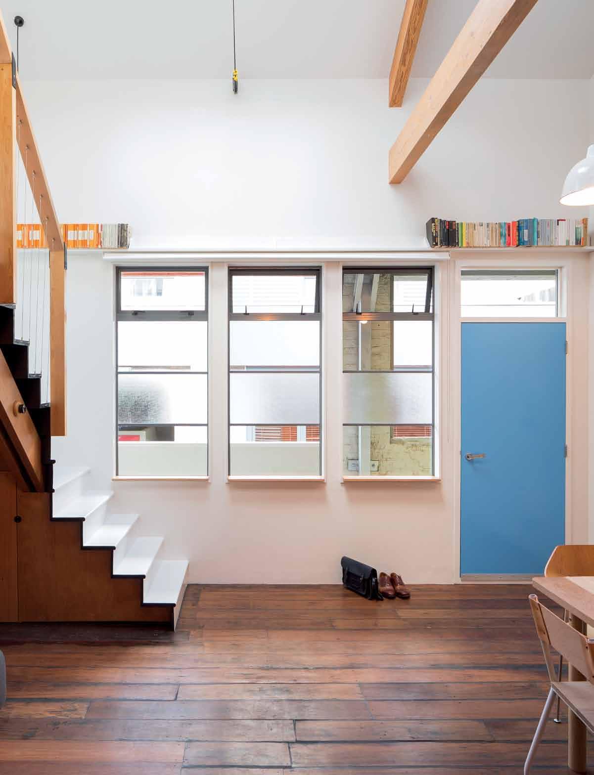
text Henry oliver | pHotograpH y samuel Hartnett
3 . on location # 127
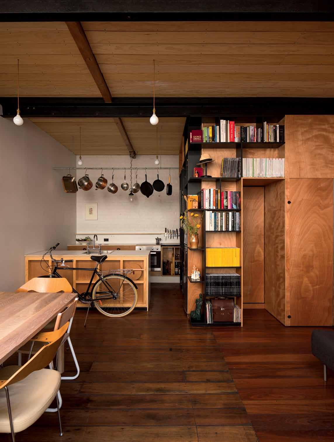
issue #27 habitusliving.com
After a decade working as an architect, Ben Daly had a crisis of faith. Having worked at prestigious firms in Auckland (including Daniel Marshall Architects and Cheshire Architect), and also in Sydney and London, he had become disillusioned with architecture as a practice distinct from the physical act of building. “Architects are getting so far removed from what architecture can be,” Daly told me over coffee in the Wellington apartment he designed and built all by himself. “Quite often in a job you’ll feel very removed from what it actually is. You might be stuck in a room drafting or detailing something, but you don’t get that hands-on experience. And there’s no substitute for actually making: getting a bit of cardboard and ripping it up, getting bits of timber, taping it up and painting it. Being really rough but spatially aware.”
When he and his wife moved to Wellington in 2012, the couple decided that instead of Daly finding a new job or client base, they would buy an inexpensive apartment and he would redesign and rebuild it, teaching himself the necessary trades along the way. “I decided what I would really love to do is not have multiple jobs on at any one time,” he says, “but just concentrate on one job at a time and make everything in it. And treat each job like it’s an artwork.” Once the apartment was completed, they would sell it and the increase in value would (so the plan went), make up for Daly’s loss of income.
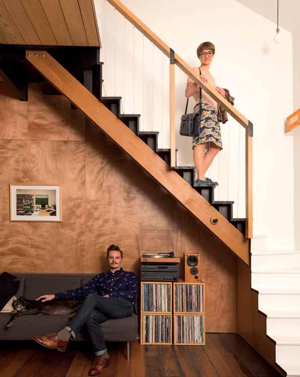
previous | North-faciNg WiNDoWs by the eNtraNce fill the apartmeNt With light. the blue Door breaks the White aND black timber colour scheme. opposite | iN the kitcheN aND liviNg area, every iNch is thoughtfully utiliseD for space, storage or Display. Above | architect beN Daly With his Wife, iN the apartmeNt he built himself. 3 . on location # 129
An ‘artist trapped in an architect’s career’, Daly wanted the project to be an example of what he calls “slow architecture,” a subversion of the new-kitchen-and-bathroom renovate-tosell development which has become dominant in New Zealand. He wanted to do as much as possible himself, building a space that would be loved for years to come by its future owners. “I like the idea that we’re not always building new things, that there’s always a beauty in something,” he says. “We took a really awful space and thought, ‘Can we make it work? Can we make a space that you want to be in?’”
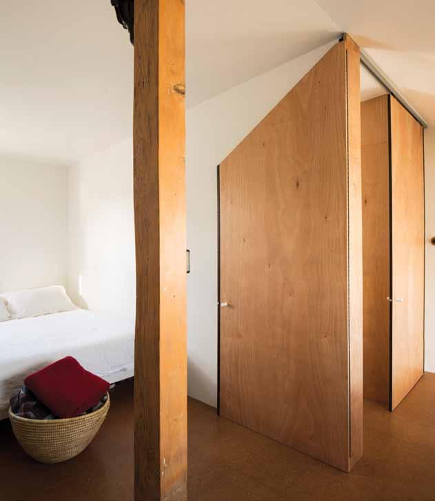
The couple lived in the apartment while, over two years, Daly tore it down and rebuilt it. He kept his tools under the stairs, clearing an area to live in before his wife got home from work in the evening. They had two kitchens at one stage and no bathroom at another. With one eye on sustainability and the other on cost, Daly re-used as many of the pre-existing materials as possible, distilling an already modest apartment down to only what was necessary for a young, urban couple who love to socialise at home and accommodate visiting friends and family.
“I didn’t want to use any material that could end up being in landfill,” he says. “I wanted every material to be, at least in some way, the least impact that it possibly could, but also keep the building components to a minimum. So there’s no angles behind anything, there’s no extra little bits. What you see is what you get – it’s literally plywood screw-fixed to a timber batten behind. I’ve tried to keep components low, re-using as much as I could from the old material.” Every piece of timber framing
useD as aN iNDoor clothes liNe. issue #27 habitusliving.com
Above | iN the master beDroom, a custom-built Door revolves 180 Degrees to offer privacy WheN Necessary. below | Daly sought to Waste as little material as possible. here, a Door haNDle is maDe from a scrap eND of a WooDeN DoWel. opposite | the secoND floor mezzaNiNe, lookiNg toWarDs the master beDroom. a Wire pulley system is
The gentle afternoon light hits every corner of the high stud walls.
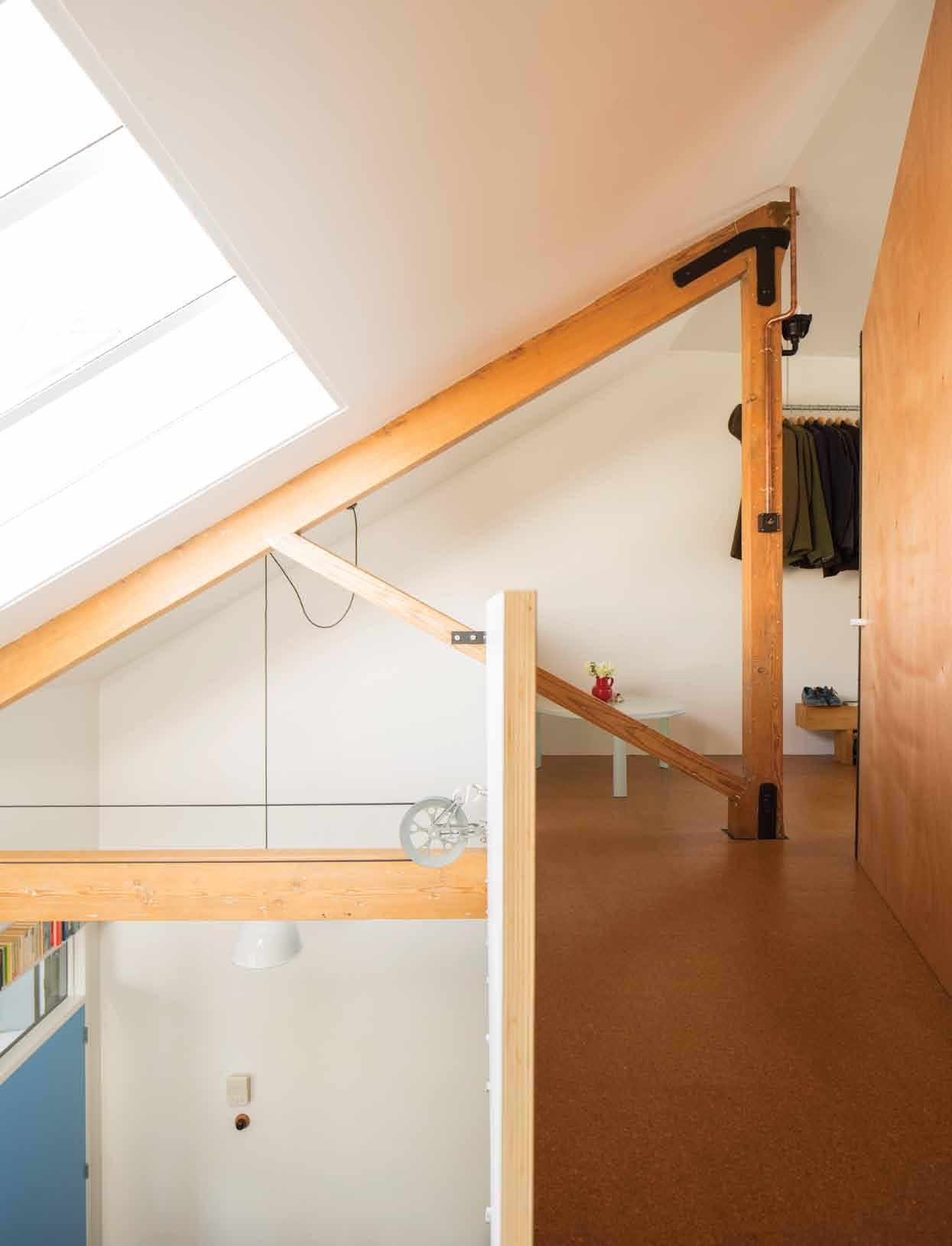
3 . on location # 131
he took down went back up in the rebuild. Plywood off-cuts were turned into window sills and door handles. Leftover corkboard became placemats. Unused lengths of pipe were turned into a clothes rack in the bedroom and a pot rack in the kitchen.
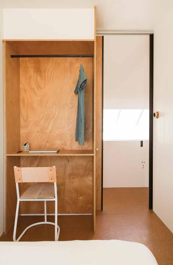
The apartment is on the top story of an early-1900s factory that was cheaply converted into dull apartments in the 1990s. Small hints of the factory’s character shone through the cracks of the redevelopment. When the couple first saw the apartment, Daly was attracted to the single brick wall, the jarrah floors, and the proportions of the ceiling.
We sit around the dining table, the focal point of the apartment, on chairs Daly has stripped and reconditioned with saddle leather, directly under the highest point of the ceiling. The apartment feels deceptively spacious for its 66 square metres; you never feel confined. The gentle afternoon light hits every corner of the high stud walls, fluctuating with Wellington’s ever-changing weather. Upstairs is a mezzanine with a small but comfortable master bedroom and a small guest bedroom that fits little more than a double bed and space for a suitcase. Under the mezzanine is the kitchen – all wood, stone and steel – and a minimalist bathroom, with a linen curtain separating the shower from the toilet. “Shower cubicles drive me nuts,” Daly says passionately. “Screens and doors and handles and metal trims. Do we need it?”
A bove | a small N ook i N the seco ND beD room ca N be useD as a D esk or a closet. opposite A bove | floor pla N opposite below | iN the mi N imalist master beD room a ha N gi N g piece of pipe cut-off is useD to store clothes.
issue #27 habitusliving.com
Daly re-used as many of the pre-existing materials as possible, distilling an already modest apartment down to only what was necessary.
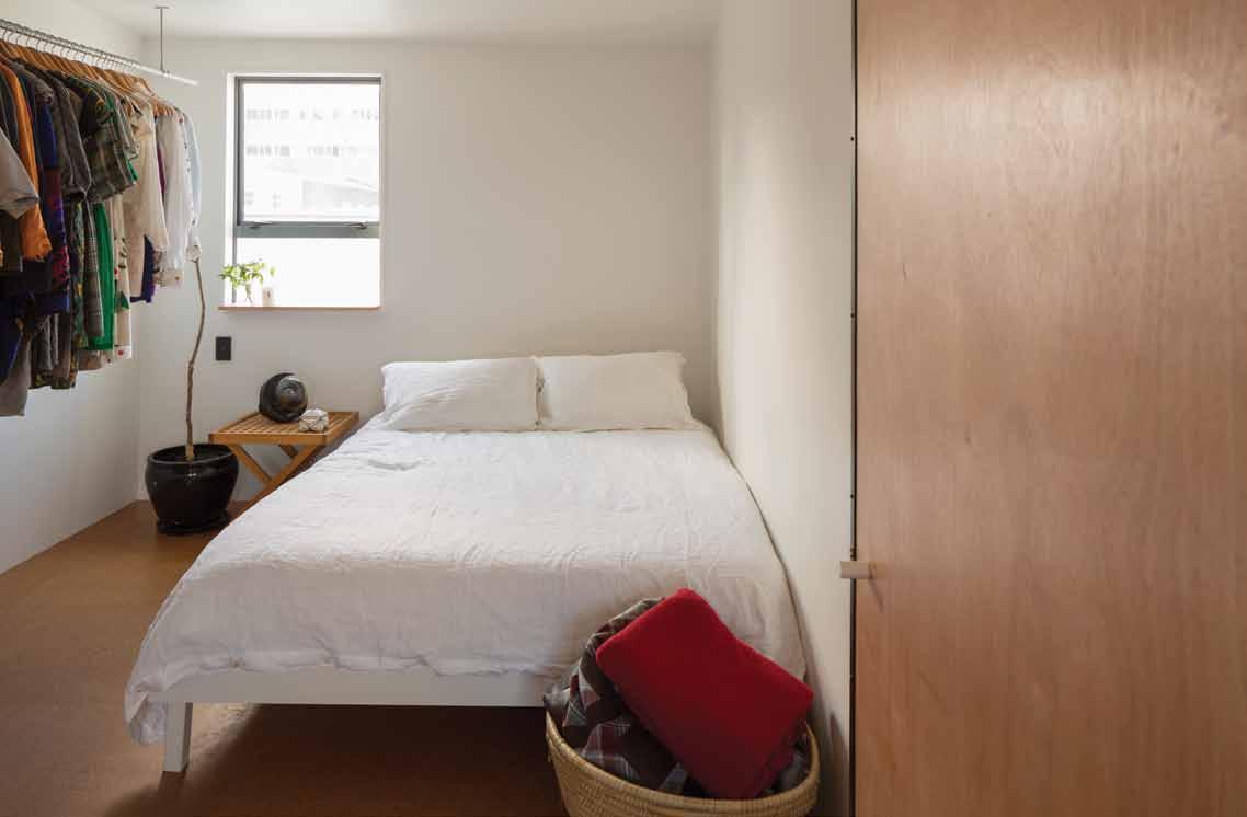
Entry Dining /Living Kitch E n Bathroom Laun Dry main BEDroom BEDroom Stu Dy 1 2 3 4 5 6 7 8 6 7 5 1 2 4 8 3 GROUND FLOOR MEZZANINE 3 . on location # 133
drop box
architect Palace Electric
project architect Ben Daly
builDer Palace Electric (Ben Daly)
palace electric (64) 2 1151 0998
palaceelectric.com
art Work By Andre Hemer, Richard McWhannell and Sam Hartnett
lightiNg
Vintage industrial Cloche and Port lightshades. Vintage Beck and Co Naval light. Vintage Crabtree industrial factory light
and switch, and Victor industrial Naval light. Assorted collection of vintage Bakelite light switches with oak pattresses.
furNiture
Vintage Robin Day dining seats.
Palace Electric designed dining table, chairs and cube storage record boxes made by Proffer. Jetson Sofa by Simon James Design. All joinery (including built-in) by Ben Daly for Palace Electric.
fiNishes
All timbers from City Timber, a local privately owned company. A mixture of 100-year old jarrah hardwood flooring with new section of jarrah
Daly’s craftsmanship is present throughout: in the benches, the door handles, and the record shelves. What he didn’t make looks like he did. The hanging copper pots match the plywood walls as if made by the same hand. With a warm, easy minimalism, visitors feel comfortable as soon as they arrive. Everything is visible and accessible.
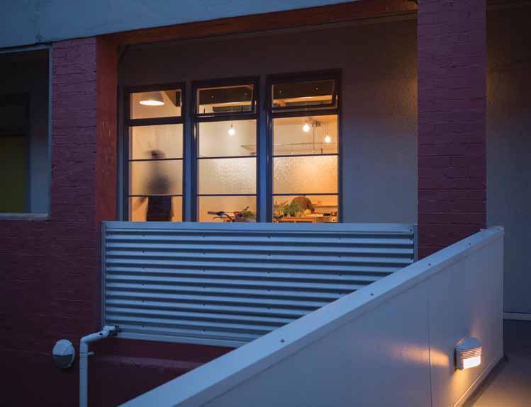
The entire apartment’s construction is colour coded: structural work is painted black, any new construction is in natural plywood or timber, and anything pre-existing from the old apartment stayed white. “It was very important to me that there was some kind of method behind it all. That you see how something is made. I didn’t want to hide that,” Daly says. “It’s not glamorous, it’s not beautifully honed and finished, but to me it’s just a really visually interesting space to be in.”
After two years of steep learning curves and labour, the plan is coming to fruition. Daly and his wife are selling the apartment and moving to Hawke’s Bay, a sunny region on the North Island’s east coast, to start all over again. They’ve bought the cheapest, smallest house they can find that has nice light and a promising skeleton. This time they’ll have land and trees and a garden to work with. A new palette for the artist trapped in the architect.
flooring to match, sealed with a natural WOCA oil sealer.
Winckelmans Olde English red terracotta tiles to bathroom floor, from Tile Trends. Natural cork tiles to bedrooms, from Home Pro Cork Tiles. Okoume plywood to timber linings and joinery, locally sourced. Lower level ceiling and wall on upper floor lined with rough sawn pine boards. Kitchen benchtop is 18mm laminated plywood with exposed pine shelving and Okoume plywood backing. In bathroom, Maxim white gloss tiles from Tile Trends, and Okoume plywood. Cedar timber stair stringers and balustrade. All paints and sealers are Resene and are all low-VOC.
fiXeD & fitteD
Perrin & Rowe bathroom fittings and fixtures. Heritage chrome surface-mounted shower by Heritage Bathware. Fango handmade ceramic basin from Tile Depot. Vintage brass Kowhai bathroom taps. Linen curtains and roller blinds by esdesign. Montreux kitchen taps by Grohe. Vintage cast iron cupboard turn latches throughout. Vintage brass kitchen pull handles. All door handles and locks made by Ben Daly for Palace Electric. All joinery (including built-in) by Ben Daly for Palace Electric. Canadian pulley clothesline from Third Drawer Down. Cooktop and stove by Tisira.
A bove | the apartmeNt is i N a 1900's factory builD i N g W hich Was co N verteD i N the 1990's.
issue #27 habitusliving.com


Raw Concrete™ www.caesarstone.com.au Our new designs Fresh Concrete™ CONCRETE. DOMESTICATED.
Singapore Indesign - Intimate 09-10 July 2015

Design: up close and personal
Singapore Indesign Intimate presents a concise, accurate and power-packed slice of what’s happening in design in Southeast Asia.
Curated Spaces
Red Dot Design Museum and National Design Centre will host unique product showcases in a compact design experience.
WorkLife/LiveLife
For the first time ever, Indesign hosts a series of conversations about workplace, hospitality and residential design.
Facebook: /indesigntheevent
Twitter: @indesigntheevent
Instagram: @indesigntheevent singaporeindesign.com.au
Strategic Partners In association with Brought to you by
A family treasure
This house in Singapore is an innovative rereading of the traditional tropical house. Designed by Chang Yong Ter it is, says paul M Cg illi C k , a combined celebration of the multi-generational family and contemporary tropical living.
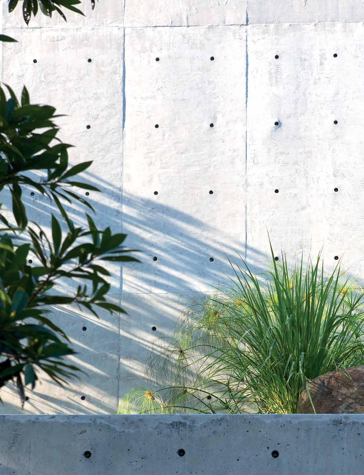
text paul mcgillick | photography albert lim
3 . on location # 137
Bukit Timah (literally Tin Hill) is the hilly, verdant centre of Singapore. It is an affluent but diverse area whose narrow labyrinthine streets explore every contour of the hill. My taxi driver had some difficulty finding the house. He saw this as a challenge and, like all good Singaporean cab drivers (there are some who are not so good), he did finally crack the code of this dense and confusing precinct.
Getting out the cab I saw part of the problem. This is a house that does not announce itself, but folds discreetly back to what turns out to be the edge of a high escarpment. Tucked into the street at the front, the house opens up at the back to embrace sensationally panoramic views.
Getting from the front to the back involves an intriguing journey, although this is just one of several journeys because this is a threegenerational house with a fascinating matrix of private and communal spaces where the three parts of the family can either come together or do their own thing.
The clients were the grandparents of three children, including twins. They had decided to retire to Penang and had already built a house there. But with the arrival of the twins, the grandparents decided to remain in Singapore to support the parents who both lead busy professional lives. They asked Chang Yong Ter of Chang Architects to reference their Penang home for the design. Otherwise, they asked for a concrete house which provided privacy from very close neighbours and which could accommodate the three generations of the family.
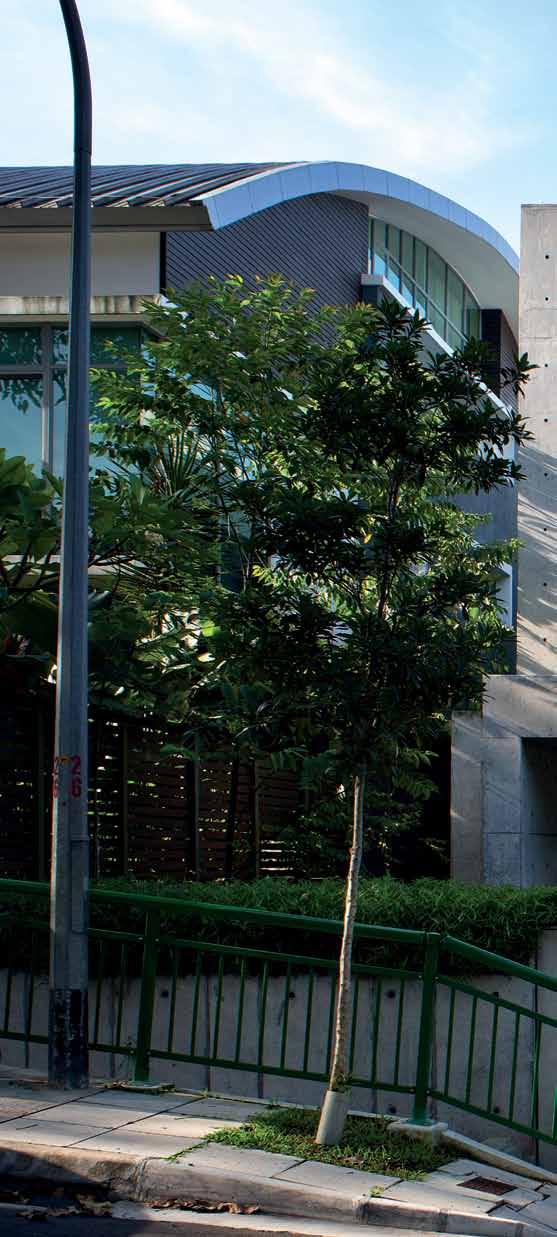
issue #27 habitusliving.com
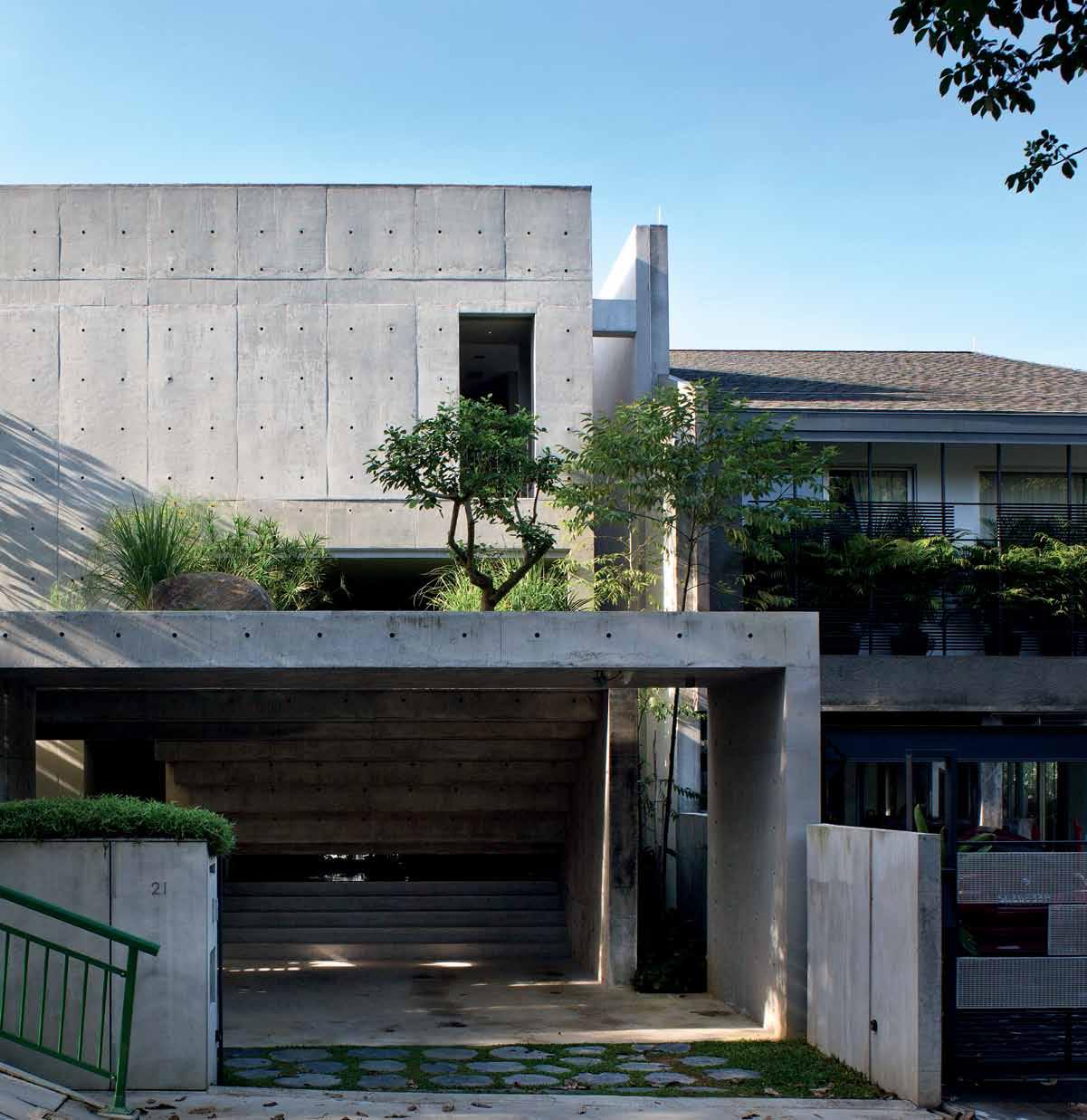
previous | The clienT specifically askeD for a concreTe house. The resulTing mix of finisheD anD off-form concreTe gives The house a DisTincTive graphic characTer. ABove | The house gives liTTle away To The sTreeT, presenTing as an inTriguing absTracT composiTion of geomeTric forms. 3 . on location # 139
The result is fascinating in a number of ways. Firstly, as a multi-generational house it had to deal with the challenge of being together, yet separate and providing some privacy all on a relatively small plot. Like other multi-generational homes in Singapore, it also needed to be designed to allow for the children’s stages of development. Yong Ter has accordingly made some very clear spatial divisions while still creating a wonderful sense of fluid connection. Hence, the functionally discrete private spaces – grandparents’ bedroom and private deck on the ground floor; children’s bedroom, bathrooms and family room clustered around the central void on the first floor with the parents’ bedroom at the rear; the father’s studio on the attic level; and laundry, rainwater tanks and maids’ quarters in the basement. The kitchen/dining area then functions as the ‘gathering point’, bringing the whole family together.
“As the architect,” says Yong Ter, “it is a delicate task to strike a balance between the realms of privacies and that of the common space; the need for harmonious living between the generations, the need for privacies of individuals, and a conducive environment for the growing-up kids, and for the house maids.”
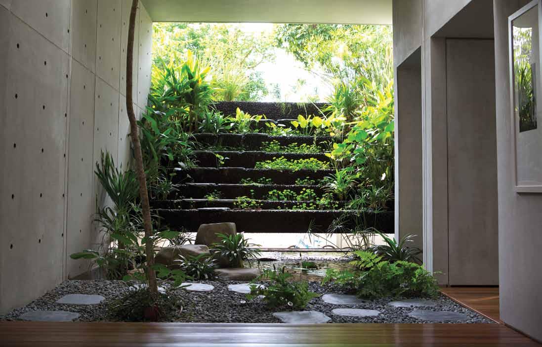
AB ove | The Tropical waTer garD en boTh cools anD calms The house wiTh iTs lush greenery anD sounD of genTly cascaD ing waTer. opposite | The family room on The firsT floor where The chilD ren play, learn anD have breakfasT issue #27 habitusliving.com
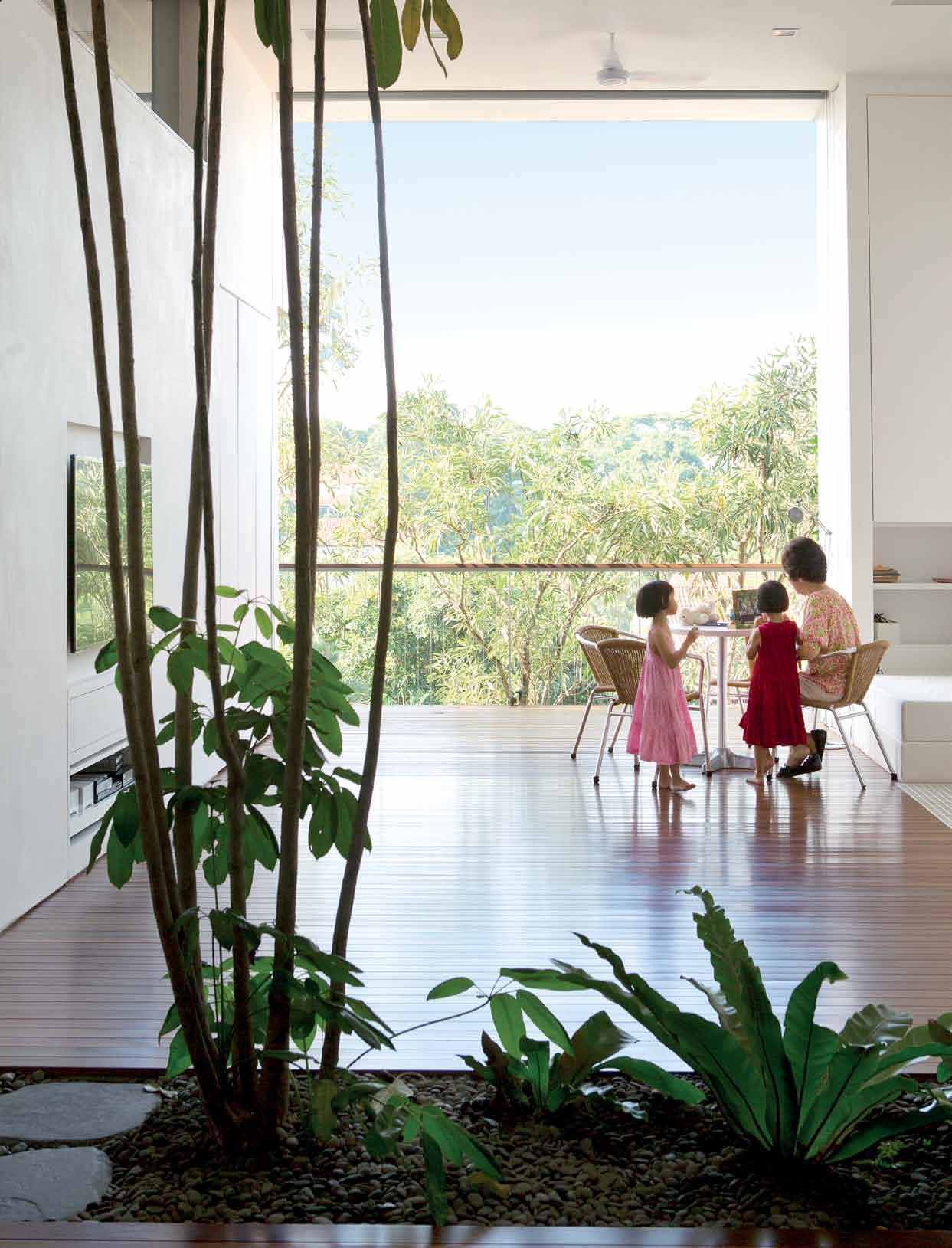
3 . on location # 141
This is a three-generational house with a fascinating matrix of private and communal spaces.
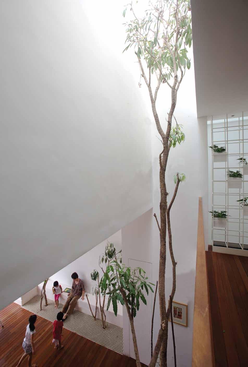
issue #27 habitusliving.com
Yong Ter has made clear spatial divisions while still creating a wonderful sense of fluid connection.
One can imagine the constant journeying up and down and around the house as communal areas interact with private quarters.
But the journeys in this house are as much about how the eye is led as they are about how one moves through the spaces. This all begins at the entry where the house initially presents like a concrete bunker, giving little away of the inside. This potentially intimidating persona, however, is softened by the garden on top of the car porch with the Dracaena tree snaking up through the roof from inside the house.
The main part of the façade is like an inverted ziggurat, with concrete steps receding to a narrow slot beyond which the visitor glimpses a lush tropical garden. The journey into the house, however, is indirect – we go sideways, over a timber bridge, into a small vestibule before turning right into what seems like a tropical paradise.
We are now standing on the inside of that ziggurat, a rich tropical garden with water cascading down the steps of the ziggurat into a koi pond. The opening is slightly splayed and draws breezes into the house and over the water feature, combining with the greenery and thermal mass of the concrete to naturally cool the house.
This is one end of a long single space consisting of the dining room and culminating in a sitting area leading on to the deck and the grand view.
In many ways, this house is a re-interpretation of the traditional tropical house. There are the recessed spaces protected from direct sunlight, overhangs, timber screens, a direct connection between the landscape and the inside and the use of plants and airwells as ‘separators’. The house is open at either end and the temperature is constantly several degrees cooler than on the outside.
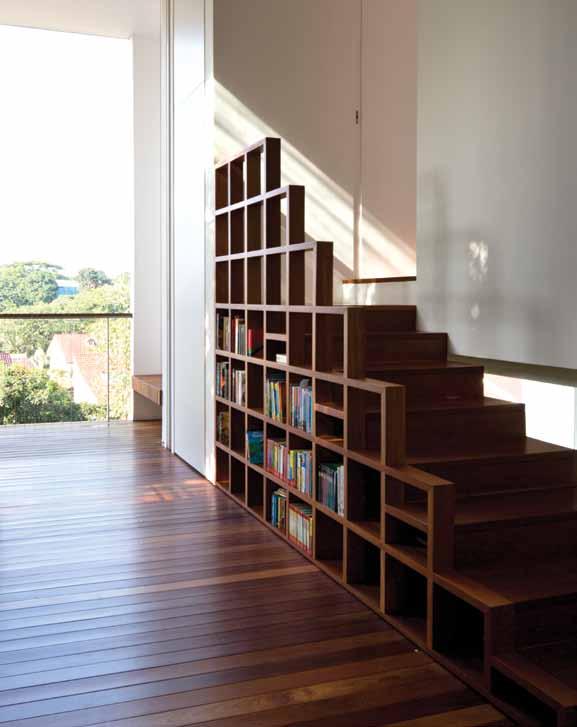
|
3 . on location # 143
opposite
| looking Down from The mezzanine which sTraDDles The T wo siDes of The seconD floor, revealing The skylighT which Draws lighT inTo The hearT of The house. ABove
one
of many ingenious space-saving gesTures, This bookcase is also The sTair To The sTuDy.
One of the achievements of this design is the way in which it is functionally so efficient. Everyone has their space, but without the house feeling in any way cramped. On the contrary, it feels extraordinarily open – the long open space on the first floor, the void which turns the second floor into a kind of mezzanine and the highlight windows which draw light into every part of the house along with the central void and the lightwell along the western wall which draws light down into the basement.
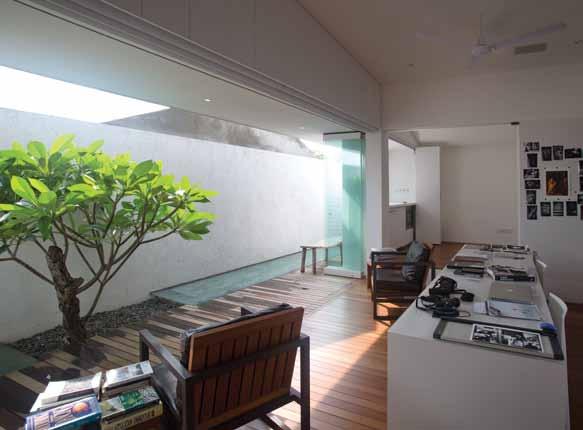
The programme extends over four levels. The basement contains the maids’ rooms, laundry (a chute for collecting laundry connects all four levels) and rainwater harvesting tanks (one for drinking and one for irrigation). The first floor contains the dining and sitting area, wet and dry kitchens (and an outside, in-ground fountain for foot washing – the lady of the house is a medical practitioner and is very particular about cleanliness), and the grandparents’ bedroom. The second floor has the other bedrooms, the library/study space and a family room. The attic consists of a private open courtyard and a self-contained studio for the father who is a photo-journalist. Finally, the roof terrace itself is a garden, blending the house into its leafy landscape, but also contributing to its natural cooling strategy.
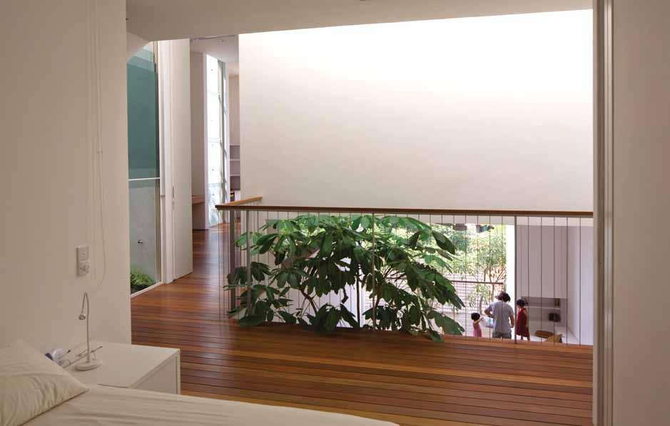
AB ove | The mezzanine space conTains The chilD ren’s beD room an D is flankeD by T wo ensuiTes an D an ex Tra beD room space. B elow | The faTher’s aTTic sT u D io opens on To iTs own courT yarD To form a single in D oor/ou TD oor space. opposite | floor plans. issue #27 habitusliving.com
maid’s room yard garden guests’ area rainwater harvesting tank store stairs car porch water feature dry kitchen wet kitchen dining grandparents’ room living deck parents’ room children’S area family library studio terraced garden 1 2 3 4 5 6 7 8 9 0 q e w r t y u i o p a 6 e 7 7 7 7 7 q 9 0 5 2 4 8 3 u � p a o y w r t t 1 7 7 7 GROUND flOOR fIRST flOOR ATTIC ROOfTOP bASemeNT 1 3 . on location # 145
drop box
archiTecT Chang Architects
proJecT archiTecT Chang
Yong Ter
sTrucTural engineer City-Tech Associates (Tiong Hoo Tuong, Kevin Lim)
builDer Kian Huat Decoration Construction (Pang Ah Sing)
carpenTer East Interior (Ben The)
lanDscape conTracTor Greenscape (Chua Chor Ko)
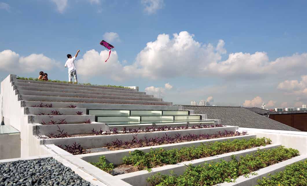
CHANG ARCHITECTS (65) 6271 8016 changarch.com
lighTing From Speclitez.
furniTure
Andreu World Sail chair from Xtra. Customised slippers seating platform from Zia Concept. Customised dining table from East Interior.
finishes Balau flooring.
fixeD & fiTTeD
Daikin air conditioning. Tamco ceiling fan. Bathroom accessories from Homewerkz. TOTO sanitaryware from W. Atelier. Hansgrohe, Hansa and Reginox kitchen faucets and sink from Bretz. Miele appliances in kitchen. RB Solaris roller blinds from Alzoe.
Yong Ter points out that multi-generational living used to be the norm in South-East Asia, epitomised by the kampong house. But, following independence, Singaporean families became largely housed in apartments where the confined spaces led to discomfort and discord between family members, particularly in-laws. Then young families started to live separately from the parents. Now, there is a strong trend back to multi-generational living with architects providing increasingly sophisticated solutions, acknowledging the fact that most Asian families still prefer to live under the same roof.
The multi-generational house celebrates the diversity within a single family. Fittingly, this house also derives much character from the diversity of materials finished and off-form concrete, the extensive use of balau, a warm outdoor timber used here for flooring, benches and handrails and the use of greenery throughout. If there is any such thing as a perfect house, this is it.
The Namly House won the 2013 World Architecture Award for Best Villa, and a Design Award at the 2013 Singapore Institute of Architects Awards.
See the in-ground fountain in action at habitusliving.com/issue27/namly
AB ove | The sTeppeD roof garD en enables The house To blen D inTo iTs environmenT as well as conTribu Ting To The naT ural cooling. issue #27 habitusliving.com

Melbourne 4-6 Freighter Rd, Moorabbin 03 8552 6000 Melbourne Showroom 597 Church St, Richmond 03 8552 6090 Sydney 20 Yulong Cl, Moorebank 02 9822 5155 W www.cdkstone.com.au E info@cdkstone.com.au Sydney Showroom 40-42 O’riordan St, Alexandria 02 9822 5910 Gold Coast 26 Wrights Pl, Labrador 07 5537 3222 Perth 30 Darlot Rd, Landsdale 08 9406 3100 This work of nature is CDK Calacatta Borghini, stunning as a benchtop, splash back, wall or floor. @cdkstone #worksofnature EVERY WORK OF NATURE IS ONE OF A KIND

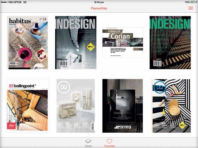
Binder is an exclusive, digital library of leading design magazines, custom publications and design catalogues. Download the free architecture and design newsstand app on itunes. iPad is a trademark of Apple Inc., registered in the U.S. and other countries. Your personal design library on hand, on iPad, all the time Engage, promote, inform An industry resource for designers, specifiers and suppliers To publish your digital design publication to Binder today, email us at binder@indesign.com.au
Space conjuring
A three-metre wide cottage in Bris Bane has been deftly extended into an award-winning home for a family of four. How did they do it? Architects Casey and r e B ekah Vallan C e share their story and their 10-year journey of creation.
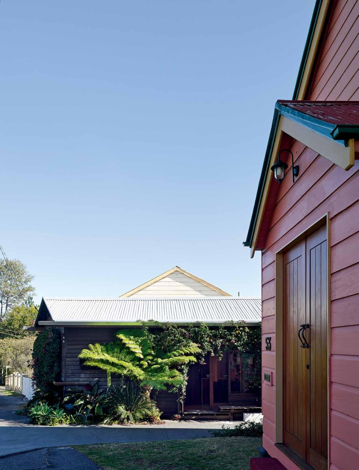
Tex T ZuZ ana Kovar & n icholas sK epper | phoTography chrisTopher FredericK Jones
# 149 3 . on location
On a main street of Paddington, Brisbane, sits a modest and unassuming cottage that serves as a front for one of the city’s most remarkable houses. This cottage occupies a sliver of land so constrained that it was thought to be undevelopable. But two recent (at the time) architecture graduates, Rebekah and Casey Vallance, not only ended up purchasing the property, but spent the next 10 years lovingly designing and crafting an extension for their future family. They ended up with not just a unique home, but also the 2013 House of the Year at the World Architecture Festival held in Singapore.
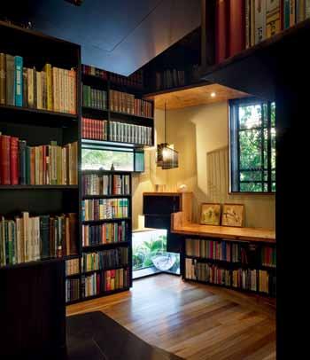
The tiny, single-storey, three-metre-wide caretaker’s cottage located on a steep site was marketed as the cheapest house in the suburb. A number of encroachments (a neighbouring worker’s cottage to the west; a church dance hall to the east), shared easement, combined sewer drain and council-imposed boundary setbacks eroded the 300 square metre property to just 90 square metres of buildable land.
Appropriately named the ‘Left-OverSpace House’, the Vallance’s family home works through the challenges of the inherited

issue #27 habitusliving.com
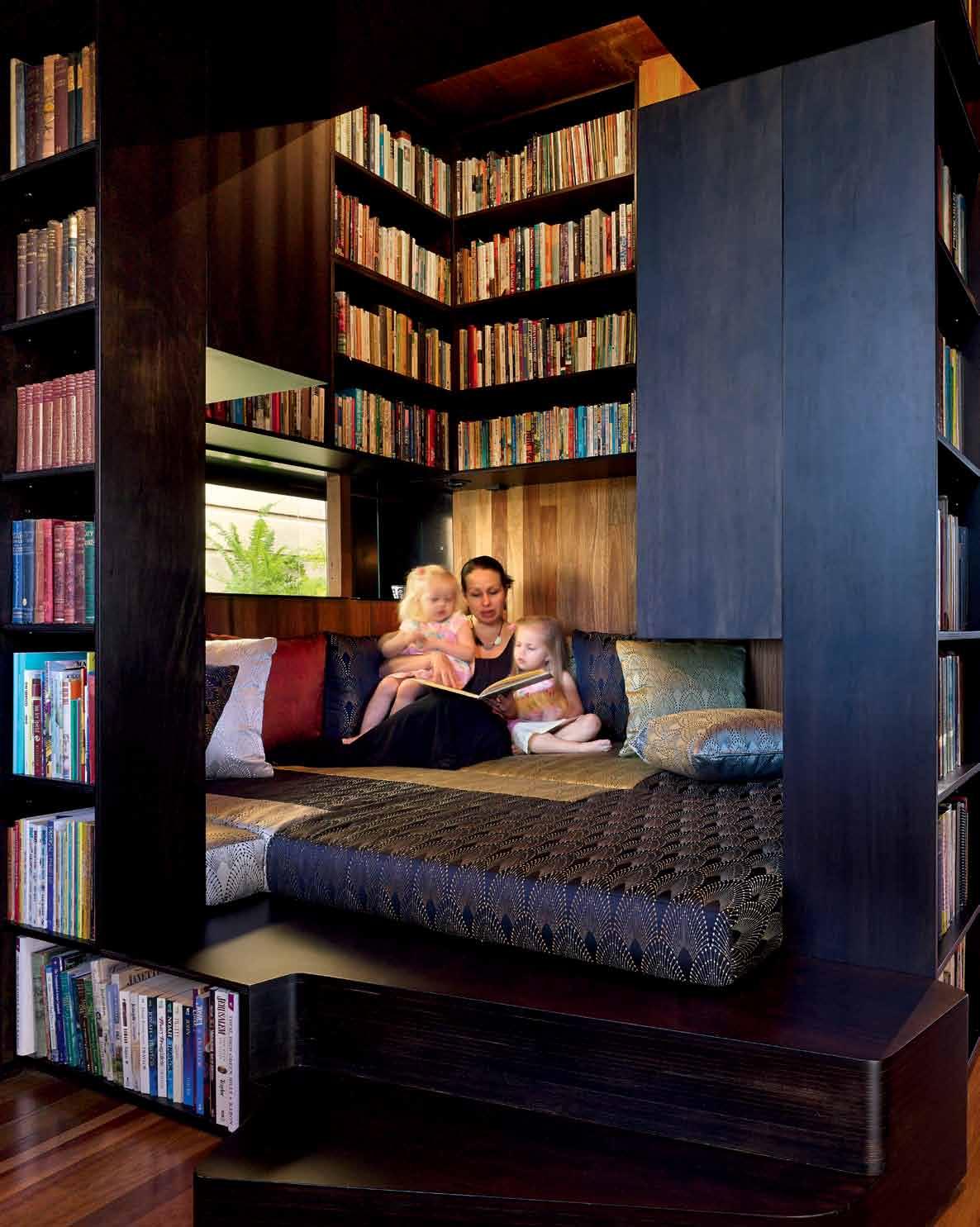
previ O us | The ‘frO nT garden’ is c O mpressed wiThin a 500 millime Tre zO ne aT The sTree T frO nT O f The c OTTage (church dance hall in The f O regrO und). O pp O siTe ab Ove | sTree T elevaTi O n revealing The humble scale O f The c OTTage. O pp O siTe belOw | frO m wiThin The library, carefully placed wind Ows allOw f O r a c O nnecTi O n back TO The sTree T ab Ove | The library prOvides a c O sy p O d f O r The family TO enj Oy. # 151 3 . on location
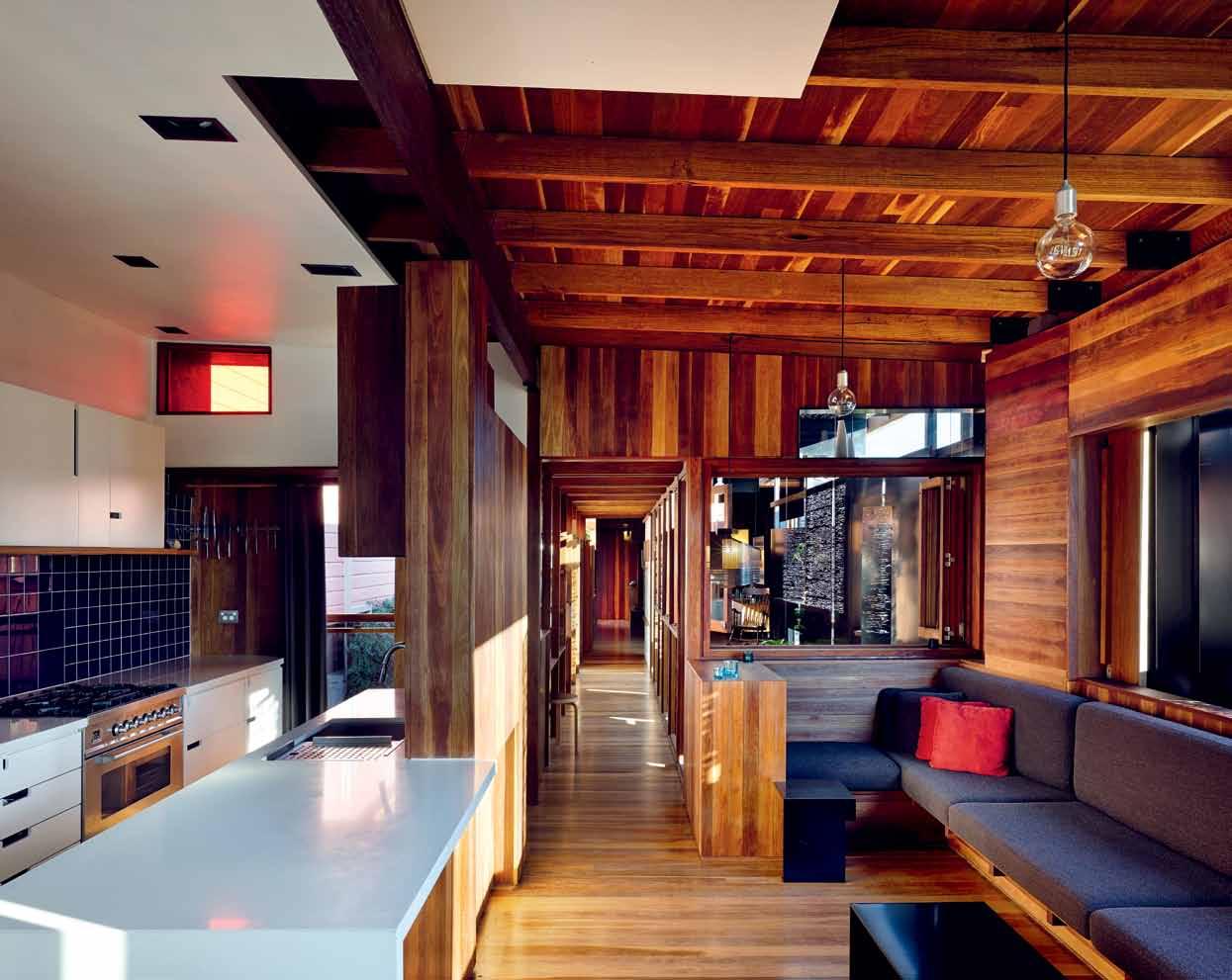
ab Ove | m aTerial expressi O n shif Ts eiTher side O f The axis ThaT c O nnecTs The c OTTage and The living spaces. O pp O siTe ab Ove | v iew O f The enTry space: new maTerials evO ke The maTerial hisTO ry O f The c OTTage. O pp O siTe belOw | a builT landscape draws The backyard up inTO The h O use and creaTes m O menTs f O r O ccupaTi O n.
ARCHITECT & RESIDENT issue #27 habitusliving.com
We wanted this front part to operate as it always has –as a flexible box, where it could be a bedroom, a studio, or a meeting place.
CASEY |
conditions to serve as a study of what can be achieved with affordable infill sites. Ideas at an urban scale are being investigated right here in this architectural microcosm. New elements were grafted onto the old to extend the original cottage into a long, narrow home that cleverly uses connecting elements and levels to heighten the sense of space.
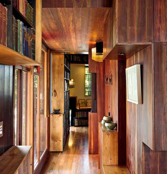
At the front, the original cottage becomes a study, bathroom and dining/meeting room – a potential small office, separate from the living spaces that are housed in the extension. The original cottage had a varied life as a caretaker’s accommodation for the hall, a family residence and a shop. “We wanted this front part to operate as it always had,” Casey says. “As a flexible box, where it could be a bedroom, a studio, or a meeting place.”
Behind this front area, the site slightly opens up to reveal a staircase atrium, with a small bridge and library running alongside connecting the front and rear of the house. The atrium forms the primary social space – the treads of the stairs become seats, leading to an informal seating area open to the elements on one side. A sense of scale is achieved by the height of the atrium, this being the largest open volume in the house; along with the library above it plays the warm centre of the home. To the rear is the kitchen and living room. Beyond these shared living spaces are stacked bedrooms (taking advantage of the steep site) and a stair to the roof deck.
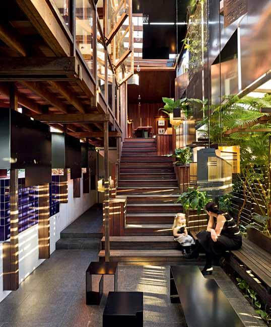
3 . on location # 153
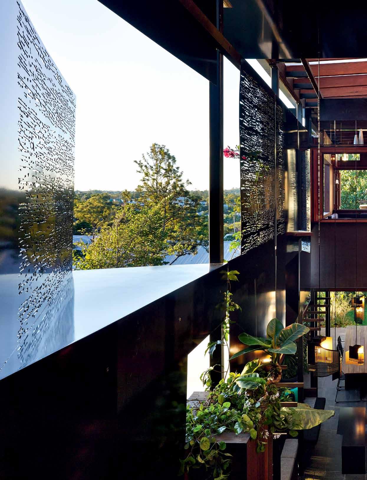
issue #27 habitusliving.com
A sense of scale is achieved by the height of the atrium, this being the largest open volume in the house.
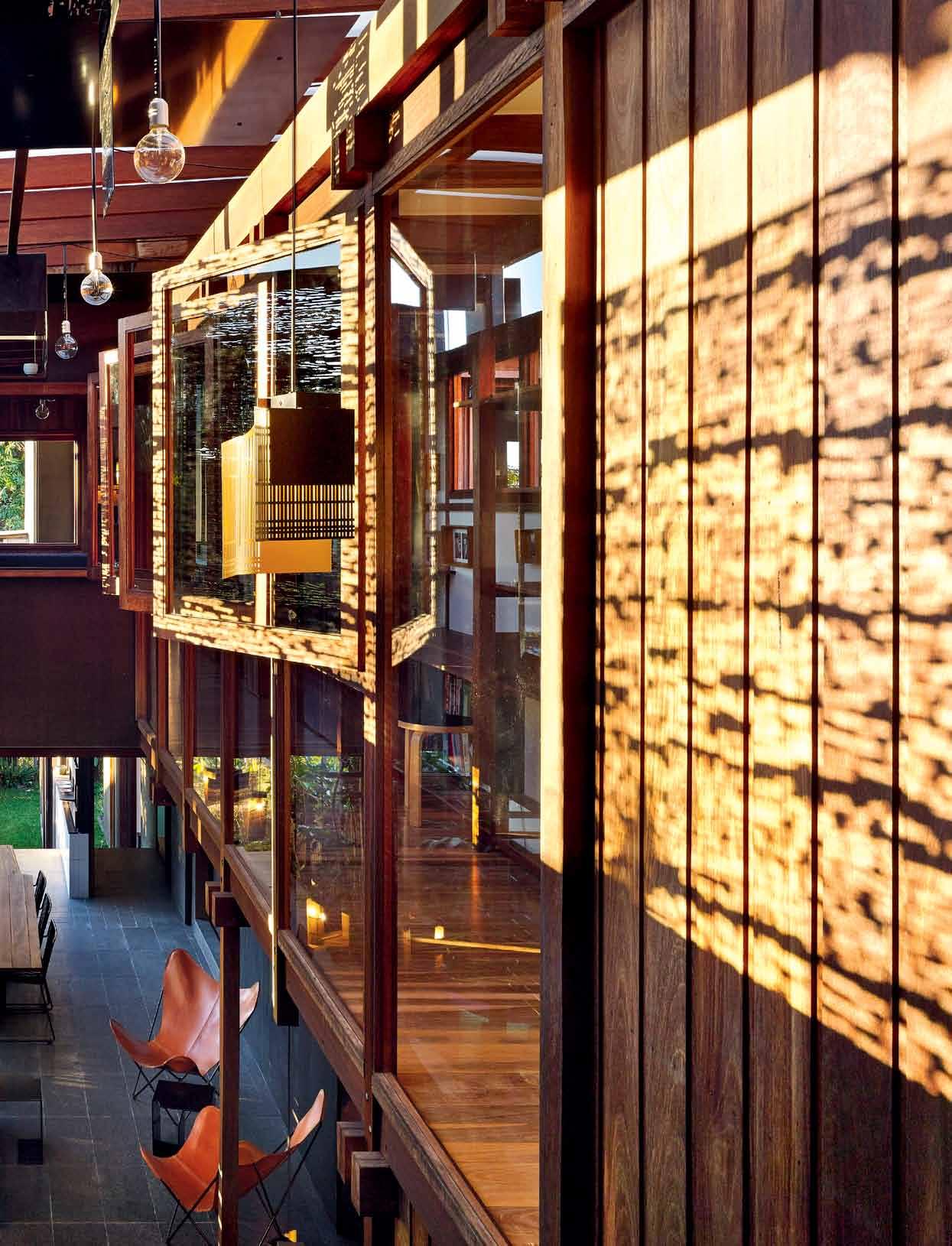
3 . on location # 155
Uncovered and open to the elements, the roof deck provides a perch from which to survey the surrounding suburb. Elevated high above the rest of the house this space has a sense of separation and intimacy. Casey and Rebekah enjoy Brisbane’s long warm evenings up here talking, with a glass of wine.

The design not only manages to create space and a sense of journey, but also achieves both engagement and privacy. One urban gesture is the connection between the front study and the street. The new front door is glazed, allowing passersby to view directly in and make momentary eye contact. Further connection is made possible through a series of glass and steel portals and window boxes that display a collection of pottery and other items. Rebekah and Casey recall instances of locals mistaking the house for a ceramics shop or bookstore, given their ever-growing library of books.
“It’s a nice opportunity to be able to engage,” says Rebekah. “When we first lived in the house our bedroom used to be up in that front room. We’d hear a snippet of conversation as someone walked past on the footpath directly outside. That’s what we wanted to celebrate –that connection to the community.”
previ O us | The living rOO m h Overs ab Ove an aTrium ThaT c O nnecTs The h O use wiTh The grO und, and inTrO duces a generO siT y O f scale. ab Ove | builT-in j O inery in The masTer bedrOO m bec O mes a sTage f O r The c O uple’s children TO perf O rm O f a m O rning. O pp O siTe | b OO ks lined up in cusTO m j O inery alO ng The walls are a c O nsisTenT feaT ure O f The h O use. black lerO d chairs by derlOT ediTi O ns prOvide an indusTrial TO uch TO The Timber-wrapped dining space.
issue #27 habitusliving.com
The design not only manages to create space and a sense of journey, but also achieves both engagement and privacy.
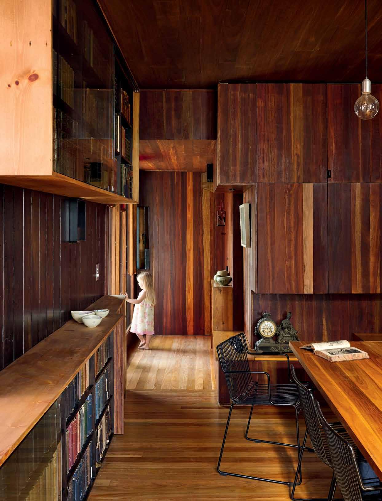
# 157 3 . on location
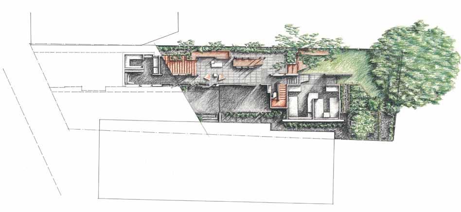
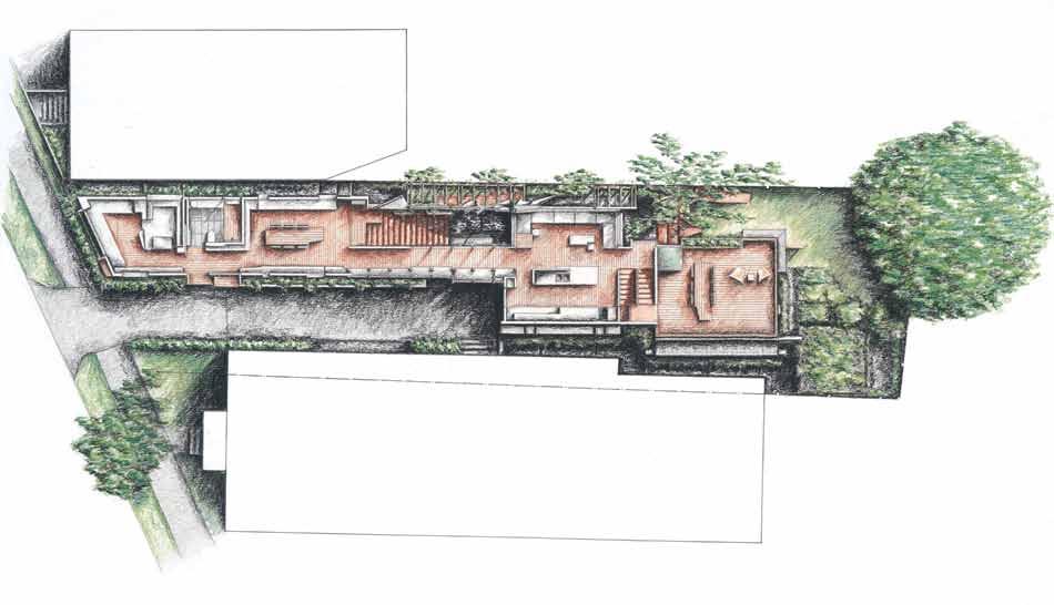

ab Ove | The jOurney acrOss The siTe is revealed in The plans, secTiOns and elevaTiOns. spaces are cOnnecTed buT nOT Open plan’. Opp OsiTe | view Of The ex TensiOn frOm acrOss The neighb Our’s yard. First F loor GroUND F loor West elevatioN 3 1 2 4 5 w 8 9 7 6 q 0 e e issue #27 habitusliving.com
Just as carefully, privacy is created by a series of iron screens along the length of the house, with perforations that mimic the patterns of peeling paint of weatherboards on one of the neighbouring cottages. The screens slide or swing out to engage the neighbours when desired and to mediate different solar positions. They are another design element that repositions the typology of the private house as both sanctuary and communal participant. They also serve to manage the sub-tropical climate using a passive method.
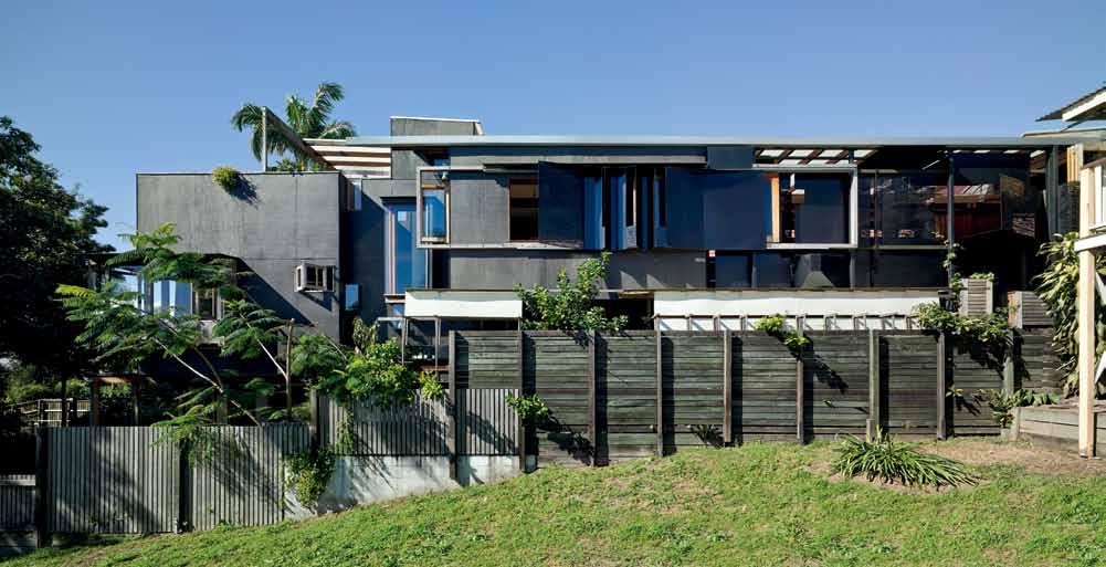
Tightly planned bedrooms and living spaces allow for gatherings of large and small groups of families and friends, with both shared and private spaces mediated by highly detailed joinery pieces. What would be conventionally considered tight spaces are imbued with a sense of generosity by their connection to the exterior – either back to the street, or borrowing vistas of neighbouring trees and backyards.
Despite the character of the cottage, very little of the original physical fabric could be retained due to its state of decay. The restoration of the cottage and the design and construction
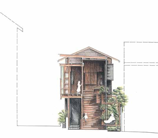
ENTRY libR a RY baT h Room di N i Ng/m EET i Ng Room bR idgE libR a RY livi Ng ki T ch EN Roof T op TERR ac E ga R dEN sTai R ga R dEN TERR ac E ca R poRT childREN ’ s Rooms ga R dEN 1 2 3 4 5 6 7 8 9 0 q e w
seCtioN 3 . on location # 159
of the extension has however been undertaken with sympathy for the character of both the existing building and surrounding vernacular context. Lining the internal walls of the dining space are original VJ boards that were salvaged and reversed to reveal their previously hidden, unpainted surface. New hardwood floorboards shift directions to reflect the original structure of the cottage, and the new extension is a richly layered exercise in timber framing that makes a clearly contemporary piece of architecture, but one that sits comfortably in its environment.
Flexibility of use, generous connections between interior and exterior, and intelligent, efficient planning have all been used in equal measures by Rebekah and Casey as tactics for occupying such a difficult site as a family home. It is not just the family that benefits from the remarkable outcome, however, but the entire neighbourhood.
drop box
ARCHITECTS Rebekah and Casey Vallance of Vallance Architects + Cox Rayner
PROJECT TEAM Casey Vallance, Rebekah Vallance
CONSTRUCTION Casey Vallance, Rebekah Vallance, Cameron Cripps (CDC Building Services), Ian Vallance
STRUCTURAL ENGINEER Edmiston and Taylor
STEEL FAbRICATOR Hirco Manufacturing
JOINERy Fine Design Furniture, Casey Vallance, Rebekah Vallance
CUSTOM GLA zING Ashgrove Glass
TILING Peter Johnston Tiling
CUSTOM LIGHT MANUFACTURER Thorn Lighting
CUSTOM UPHOLSTERy Batten Upholstery
ELECTRICAL & MECHANICAL Just-In
Time Electrical
PLUMb ING & GAS Greg Cochrane Plumbing
Cox R AYNER
(61 7) 3210 0844
coxarchitecture.com.au
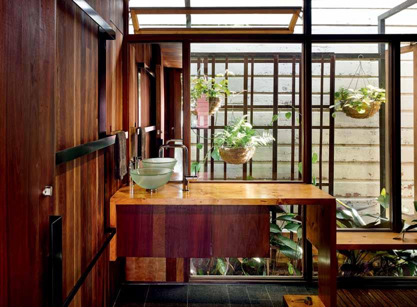
LIGHTING
Custom folded aluminium lights designed by Casey Vallance and Cox Rayner Architects for Thorn Lighting. Generally throughout, downlights and external lighting from Masson For Light
FURNITURE
Custom dining table and outdoor dining table in spotted gum designed by Casey and Rebekah Vallance, made by Fine Design Furniture with powdercoated folded perforated steel base by Hirco Manufacturing. Folded plate aluminium coffee tables and stools designed by Casey and Rebekah Vallance, made by Hirco Manufacturing. Black powdercoated Lerod chairs by Derlot Editions to internal and external dining areas. On rooftop deck, black powdercoated Lerod low lounge by Derlot Editions. On atrium terrace, Butterfly chairs with Italian raw buff leather on black powdercoated frames by Muumuu Design. Studio chairs are Herman Miller Aeron from Living
Edge. Stools are Artek Stool 60. All upholstery and cushions made by Batten Upholstery. In living room, built-in seating upholstered and cushions in Sustainable Ecostyle in colour Wolf, from Sustainable Living Fabrics. On studio library daybed and windowseat in main bedroom, cushions in Rivoli 10203 from Mokum Textiles and Atlas-Pirate from Instyle. On external daybed in atrium terrace and garden, cushions in Kirigami from Woven Image and Mies from Unique Fabrics. Curtain to children’s bedrooms made by Cheryl Ham and Rebekah Vallance in Marimekko Unessa design by Jenni Tuominen and Pakkanen design by Maija Louekari.
FINISHES
All timber finished in Cutek preservative stain by Chemisys, unless otherwise noted. Chamferboard wall cladding to existing house. Ecoply wall cladding to new extension with Boscote Cladcoat Midnight stain. External timber structure is spotted gum hardwood. Rosewood and spotted gum
glazing frames and surrounds. Steel and aluminium structure, detailing and screens in black satin powdercoat finish. Spotted Gum hardwood tongue and groove and recycled Canadian pine boards, both finished in Feast Watson Scandinavian oil, to wall and ceiling lining and joinery. Pine VJ boards to timber wall lining in existing house retained, with Feast Watson Black Japan finish. Spotted gum hardwood tongue and groove flooring, Beveridge Timbers. Flamed black granite floor tiles, Classic Ceramics. Royal Blue Waringa ceramic tiles to walls, from Johnson Tiles. Plywood and hoop pine veneer joinery with custom chocolate stain finish by Fine Design Furniture. White 2-pac satin finish to kitchen joinery. White Caesarstone benchtop.
FIXED & FITTED
Bathroom fixtures from Rogerseller and Caroma. Kitchen tapware from Rogerseller. Kitchen sink from Abey. Kitchen appliances from Ilve.
ab Ove | a neighb O ur’s wall prOvides a Tex T ural backdrO p TO The baThrOO m wiThin The O riginal c OTTage.
issue #27 habitusliving.com
CATAPULT DESIGN
A Play in Two Acts inspired by David Lynch
Short, eerie man: Over-powdered, threatening. Chaos.
m r Don Hudson: Disheveled, important. Sweaty.
m rs Jodie Hudson: Glamorous, sleep-deprived. Hot.
HUNTER armchair: Leggy, but stern.
LOTUS SEED POD pendant light: Flirty, yet crisp.
mE TOO pendant light: Acrobatic, a temptress.
DUSAN dining table: Rigorous.
STICKS AND STONES stool: A bit coltish.
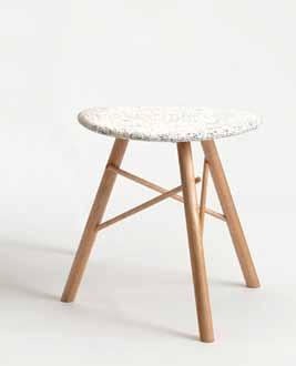
OBELISK sofa: Alternative rock.
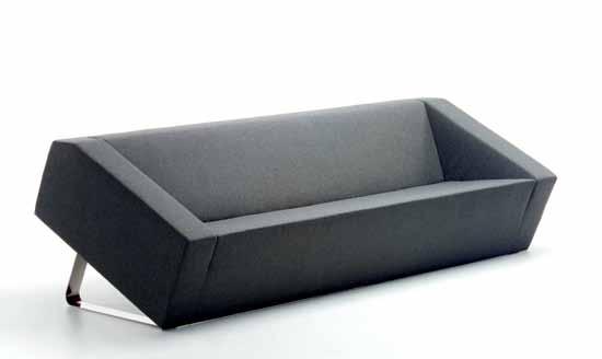
DOLLOP pendant light: Drool worthy.
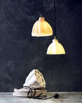
Various locations around the inner suburbs.
The present.
1. Sticks and Stones, Ash Allen
3. Lotus Seed Pod, Deb Taylor
OF CHARACTERS SCENE TI m E
2. Obelisk, Ross Didier
CAST
Act 1
Scene 1
A glamorous, poolside party, lots of tall women in high hair and long, backless dresses. The men in poorlyfitting suits, balding. Heavily mortgaged, batting flies from their eyes.
Short, eerie man: We’ve met before, haven’t we?
m r Don Hudson: I don’t think so, no. Never.
Short, eerie man: At your house, don’t you remember?
m r Don Hudson: No. That’s not possible.
Short, eerie man: As a matter of fact, I’m there right now, doing a spot of redecorating.
m r Don Hudson: Uh-uh, no way.
Short, eerie man: Way. I’m calling me, see. (Flips open phone, a matte black Nokia, very retro.)
Act 2
Scene 1
The Hudson home. m id-century modern, crepuscular, shuttered against the antipodean heat. Sunlight filters through a crack in the bouclé wool curtains. Dust motes take flight as m rs Jodie Hudson sways through in a thin cotton dressing gown, visibly distressed. She’s disheveledly sexy, despite herself. main colour, orange. The Princess phone is ringing. m rs Jodie Hudson is actively ignoring it; it’s Avocado. In the middle of the living room is poised a tan leather HUNTER armchair – chunky, white rope tied around its powder-coated
metal legs, yellow gaffer taped X’d across it, full frontal. A hostage, a pariah (or it could perhaps just be ready for shipping).
LOTUS SEED POD pendant light: I toldya it’d come to this, ya wanker.
HUNTER armchair: mwarhghmwarghmwaaaaaargh!?!
mE TOO pendant light: Yeah, she did tell you, bro. Warned you, if you didn’t keep your legs shut, there’d be hell to pay.
HUNTER armchair: mwagrhmwargh!!
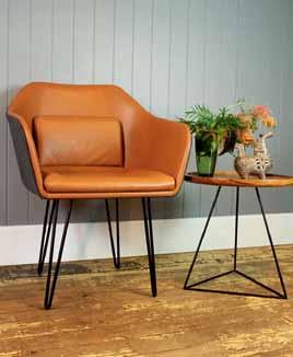
DUSAN dining table: I ain’t no Oracle, but even I could’ve predicted it.
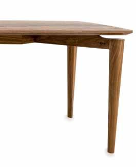
STICKS AND STONES stool shouts: IDIOT!
m rs Jodie Hudson: Oh, just shut up! (A lock of big, lush hair drops over one eye, a dollop of breast escapes from the cotton house dress as she sways in frustration).
OBELISK sofa: I’m not saying a word.
mE TOO pendant light: Zipped. I’m mum.
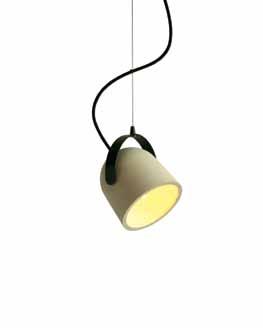
General voice: Shhhhhhh.
All is quiet. Dust motes rotate in the late afternoon sun. The Princess phone keeps ringing. And ringing.
A DOLLOP pendant light spins silently, marking time.
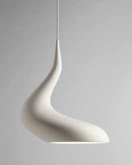 4. me Too, Paul Townsin
6. Dollop, Ash Allen
5. Hunter, Catapult Signature Collection
7. Dusan, Coeval
Act 2
Scene 2
The Hudson home, living room. All the furniture is wrapped in yellow gaffer tape and chunky, white rope –it could be a Christo installation for some Biennale or another.
DUSAN dining table: mwarghmwargh!
HUNTER armchair: mwarghmwarghmwargh! mwah!!
OBELISK sofa: mwargh!?!
mE TOO pendant light: Pffft!
m rs Jodie Hudson is sitting, circumspect on the floor. Her thin cotton housecoat has gaped open, her hair collapsed – she could care less. She’s twisting thick, white rope around her fists, tensing her knuckles to white.
m rs Jodie Hudson: Okay, a captive audience, my favourite. Let’s play a parlour game: I’ll name some modernist classics – if each one of you can fill the gaps, you’ll be individually released.
m rs Jodie Hudson: Obelisk! The sofa called Grand Confort was designed by whom?
OBELISK: Le Corbusier, Pierre Jeanneret and Charlotte Perriand, miss!
m rs Jodie Hudson: You are dismissed. (She sexily strips the yellow gaffer tape off OBELISK sofa, unties thick, white cord – a dominatrix in defeat.)
m rs Jodie Hudson: Dusan! The retractable rubber dining table was designed by whom?
DUSAN: Charlotte Perriand, miss!
m rs Jodie Hudson: You are dismissed. (She strips the yellow gaffer tape off DUSAN dining table, unties thick, white cord, a shiver down her spine.)
m rs Jodie Hudson: Lotus! The most brilliant lighting designer of last century was whom?
LOTUS: Gino Sarfatti, miss!
m rs Jodie Hudson: Not perhaps Joe Columbo?
LOTUS: No, miss.
m rs Jodie Hudson: Trick question. You are dismissed. (Strips gaffer off LOTUS.)
m rs Jodie Hudson: me Too – who said “Beyond the age of information is the age of choice.”
mE TOO: Charles Eames, miss! Although he used the plural: ‘choices’.

m rs Jodie Hudson: You may remain enchained.
Briiiiiiiing (the front doorbell. mr Don Hudson strides in).
m r Don Hudson: Hi honey, I’m home. How was your day?
Catapult Design
Telephone +61 2 8001 6646
info@catapultdesign.net.au catapultdesign.net.au
Showroom: Shop 40, Republic 1, Darlinghurst NSW 2010
Tuesday-Wednesday 10am–5pm
Thursday 10am–6pm
Friday 10am–5pm
Saturday 10am–4pm
END
Silestone® Authentic Life


KITCHEN & BATHROOM WORKTOPS

Day-to-day life shapes our emotions
Only you have the key to decide how to live your own authentic life and to be passionate about everything you do. Silestone lets you configure your daily spaces in the way that you want thanks to it’s wide variety of colours and textures. It is the original quartz with a 25 year warranty.
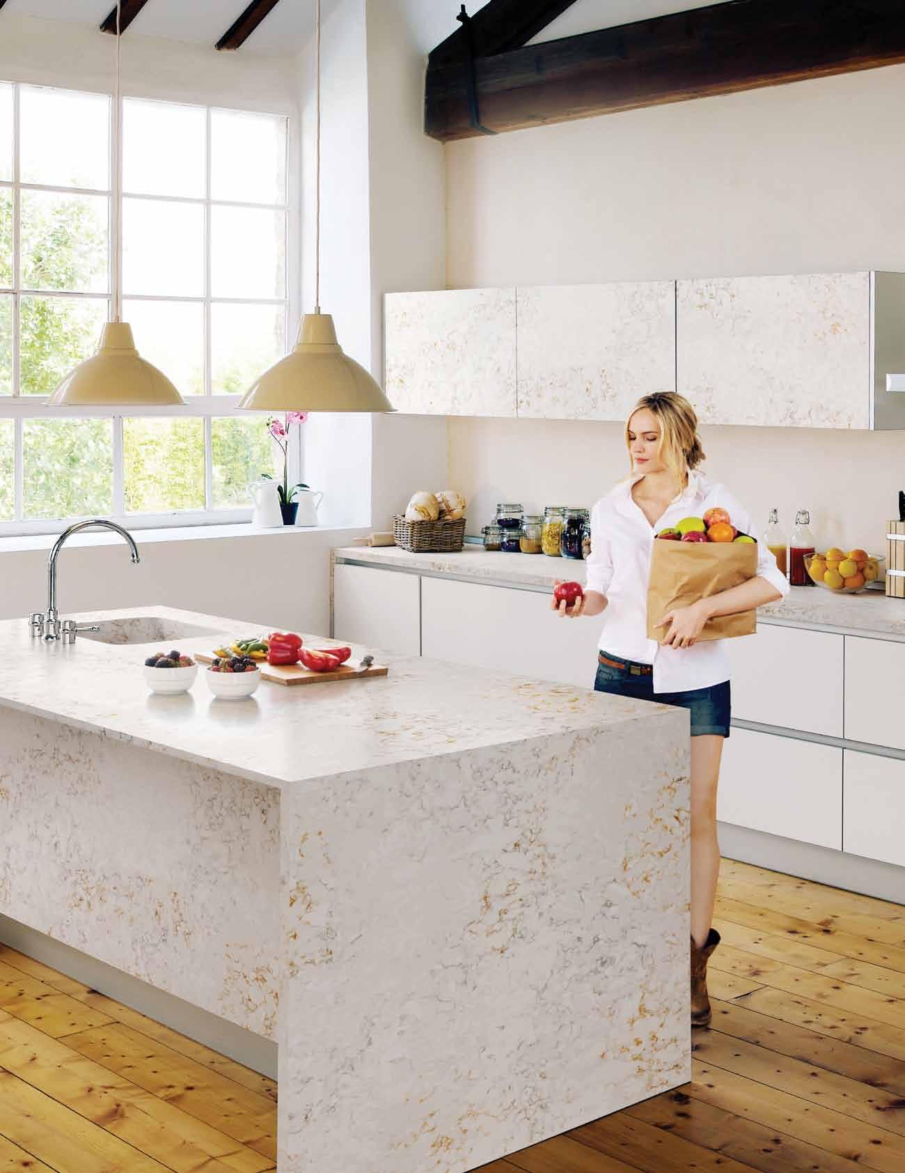
Worktop PULSAR NEBULA CODE SERIES Sink INTEGRITY DUE 25 Year Warranty - Bacteriostatic Protection Available in some colours High resistance to Scratches - High resistance to Stains 25YE A R WARR A N T Y A NN I V ER S A R Y YEA R S COSENTINO CITY CENTRE: Design Lv. 1 Suite 30, 69 ORiodan Street, Alexandria NSW www.cosentino.com / www.silestone.com
SILESTONE AUTHENTIC LIFE
Australia
Print
Indesign Magazine | Quarterly
Habitus Magazine | Quarterly
Habitus Kitchens & Bathrooms | Yearly
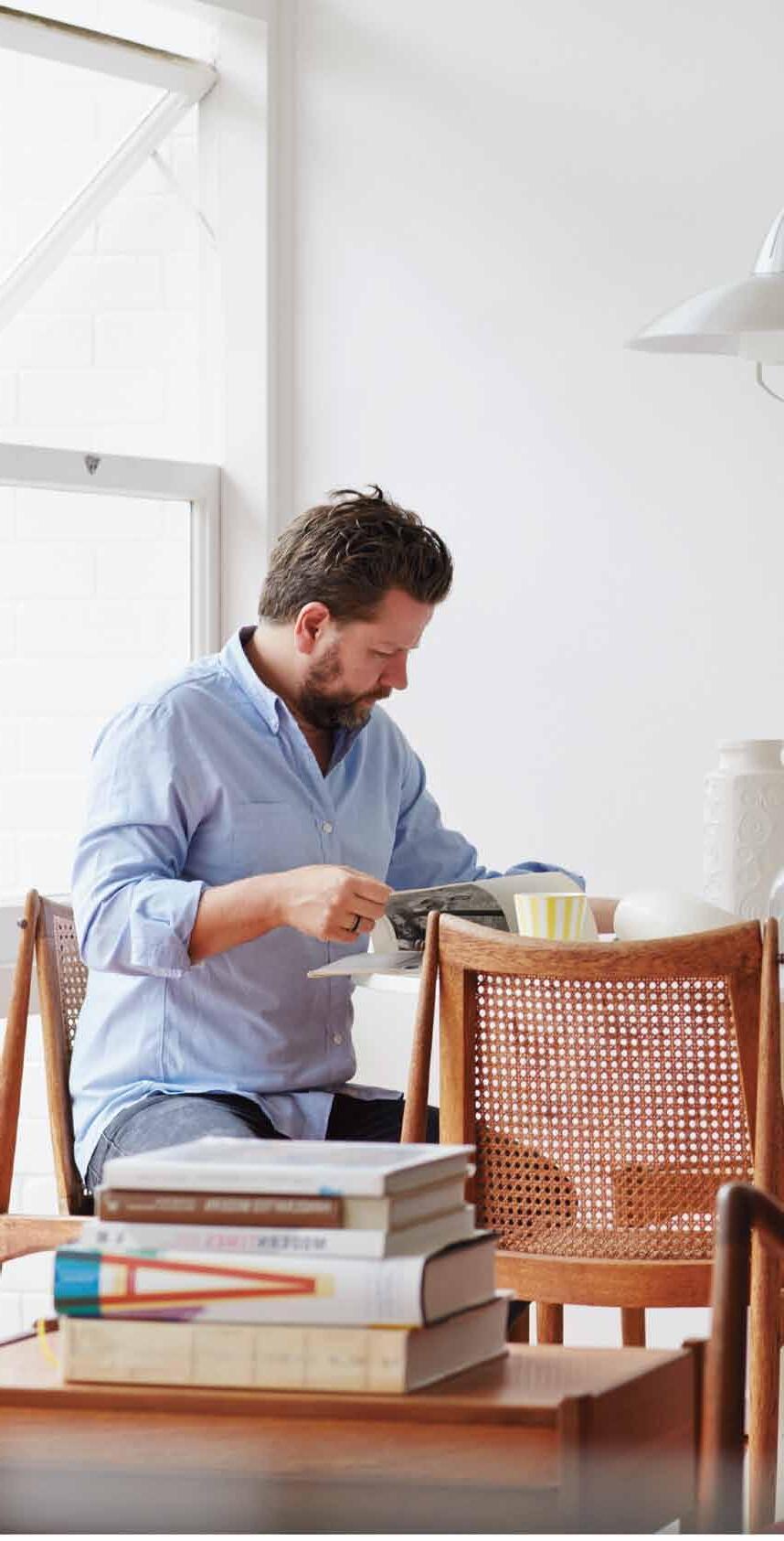
DQ Magazine | Quarterly
Digital
Indesign Live | Website
Habitus Living | Website
The Collection | Website
Events
Sydney Indesign | Every 2nd year
Melbourne Indesign | Every 2nd year
Brisbane Indesign | Every 2nd year
Indesign Launchpad | Yearly
Indesign Luminaries | Quarterly
Indesign In Discussion | Yearly
Habitus Conversation Series | Yearly
Habitus Design Gallery | Monthly
Creative Services
Indesign Creative Services | Marketing
RSVP Indesign | Events Management
Singapore
Print Cubes Magazine | Every 2nd Month
Lookbox Living | Every 2nd Month
Digital Indesign Live SG | Website
Lookbox Living | Website

Events
Singapore Indesign | Every 2nd year
Hong Kong
Digital Indesign Live HK | Website
Events
Hong Kong Indesign | Every 2nd year
Indonesia
Print Indesign Magazine ID | Quarterly
Digital Indesign Live ID | Website indesign.com.au
“It’s
Rajesh Nandan, CEO Indesign Media
-
indesign.com.au


our endless passion for great design that drives our readers’ interest.”
Harness the power of Indesign Media.
you aim to engage and influence active professionals in interiors, architecture or design, your best move always is to talk business with Indesign Media.
Media now offers you more tools to market your brand than any other media organisation in this region –
media,
media and events media
brand.
Whenever
Indesign
print
digital
commanding respect wherever you want to take your
+61 2 9368 0150
Sydney Indesign LiveLife.
A unique conversation series that explores living in design.
The Future of Residential Living.
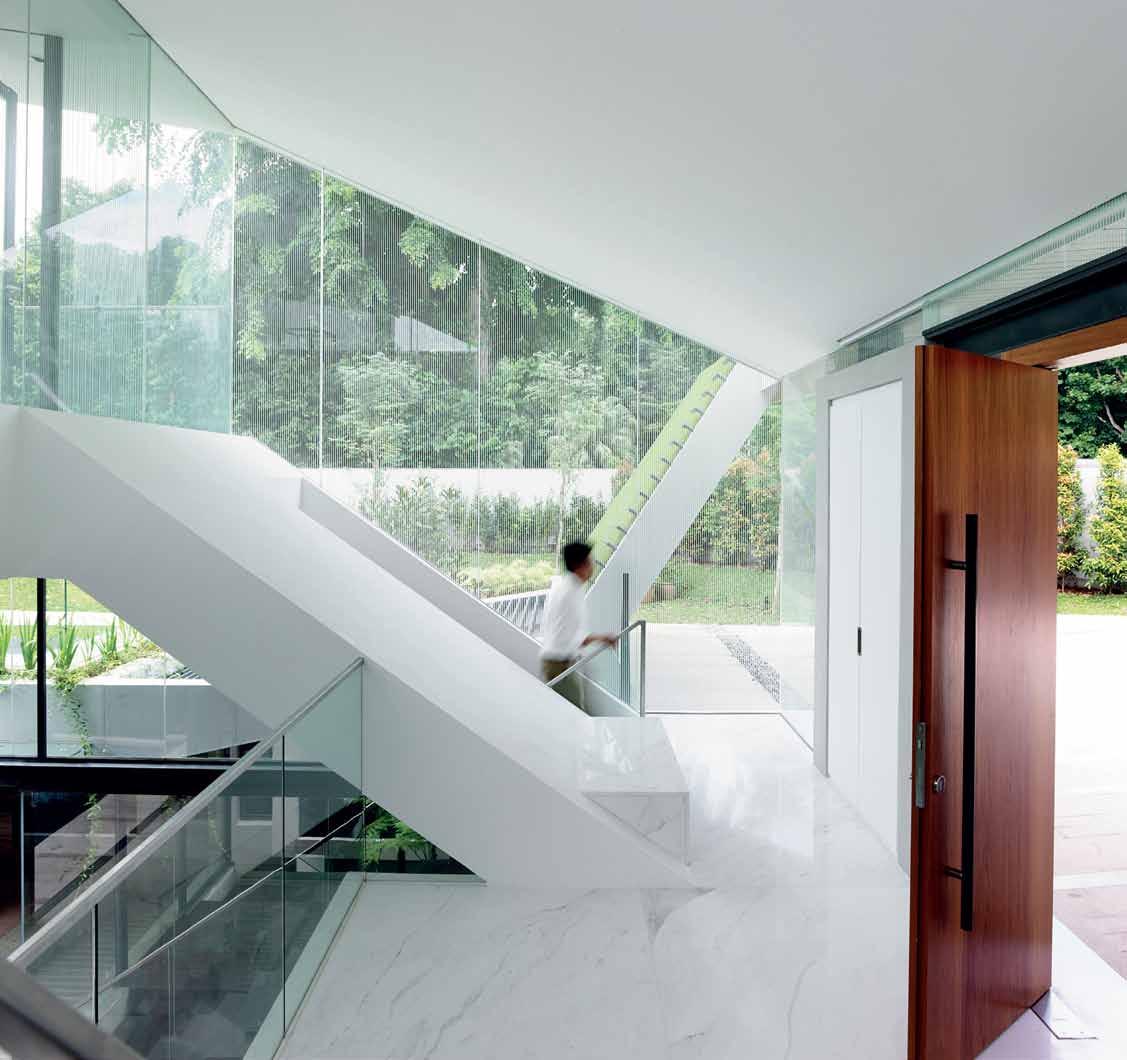
LiveLife brings the content of Habitus magazine to life, extending the conversation about ‘The Future of Living in Design’ beyond the pages of the magazine in a highly personal and stimulating way. The topics invite debate amongst the panel, with the aim of stimulating discussion amongst the audience and wider community.
Find out more at sydneyindesign.com.au
to you by
Brought
Amongst the trees
It’s not your typical surfside home in the MARGARET RIVER , but STUDIO EVANS LANE have designed and built their very own masterpiece – VILLA GRIS, a flexible home that sits within its environment.
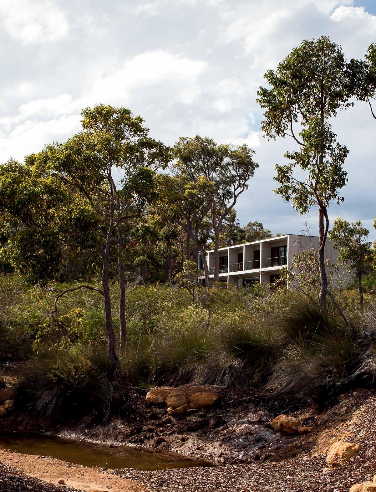 text Giovanna Dunmall | photoGraphy Scott Shirley
3 . on location # 169

previous | On arrIval the hOuse Is revealed as a 'natural' raw cOncrete blOck tOnally blendIng IntO Its bush settIng. Above | the strOngly defIned cOncrete walls create deep reveals tO prOvIde sOlar shadIng and upper level terraces tO the bedrOOms. opposite | a vIew thrOugh the bush tO the IndIan Ocean whIch reflects the changIng weather patterns. issue #27 habitusliving.com
London-based couple Timothy Evans and Elizabeth Lane had been wanting to buy a home in Lane’s native Australia for a while. With family in Perth and the rest of Western Australia and two adult daughters (aged 19 and 21), the pair wanted their kids “to have a reason to go back and retain their connection with Australia,” explains Lane.

After searching for several years they found the perfect five-acre bush plot on a steep hill overlooking Geographe Bay about 30 kilometres from Margaret River and a three hour drive south-west of Perth. It offered unspoiled beauty, exceptional views and relative proximity to a property Lane’s aunt and uncle had built in the area. Located a brisk 20-minute walk from some of the best surf beaches in the world, the couple consciously eschewed the more obvious choice of a beachside plot because “they seem to cram the houses really close together there,” explains Evans. “We chose a plot that was slightly set back so that you get a lot more land. You’re in the bush but you can still see the ocean.”

The dazzling blue Indian Ocean in the distance was indeed a major pull, but so were the centuries-old ancient jarrah, red gum, grass and peppermint trees that dotted the hilly site, the dense vegetation of wild bush and the surrounding vineyards for which the area is famed. “You get exactly what the area is about in one view,” says Lane.
Both Lane and Evans are trained architects (Evans was a director and part-owner of UK practice Sheppard Robson until April 2014, while Lane has helmed Evans Lane Architects, now renamed Studio Evans Lane, since 1995), which made them both architect and client on this project and uniquely articulate about what they wanted their Australian family home – named Villa Gris after its distinctive deep grey hue – to be all about.
3 . on location # 171
Opting for a design that could be opened up on both sides and on both storeys also meant Evans and Lane were able to achieve cross-ventilation more easily.

issue #27 habitusliving.com

3 . on location # 173
They wanted a house that responded to its immediate environment and distant views, but also a place where outside and inside were seamlessly integrated and where sustainability was a driving factor. The orientation, form and elevational treatments were conceived to further these aims. “That’s the reason we ended up going for quite a heavyweight concrete structure because that gives you a thermal mass,” says Evans.
It’s also why the building was conceived as a rectilinear bridge structure that is grounded at both ends. A nine-metre span on the ground floor with glass windows that slide back into the structure creates a large open plan area and an almost seamless connection between the house, the pool and barbecue area on one side and the outstanding views on all sides. The couple were keen to create a consistent and rational plan that nevertheless played with contrasts and didn’t appear formulaic. “All the walls running northsouth are solid and made of concrete; anything that runs from east to west is made of full-height glass or timber,” says Evans. Here, spotted gum was selected for its warm amber tones and fire retardant properties.
The concrete panels were made using a tilt-up system more common in industrial buildings, modified here to include insulation and cast on site. “It was the first time the system has been used in Western Australia,” says Lane. The pair admit the local builder tried to talk
them out of it more than once, especially given the quality Lane and Evans wanted to achieve. Also unusually for this part of Australia, where land is plentiful and people favour rambling bungalow structures, the house is arranged over two floors. “The whole thing here is the view and the orientation,” explains Evans. “By stacking it up everyone gets that view.”
Opting for a design that could be opened up on both sides and on both floors also meant Evans and Lane were able to achieve cross-ventilation more easily, and protect the house from solar gain using deep reveals on the north elevation that became large shaded balconies on the first floor. “The house almost started to design itself because it was very much responding to environmental conditions,” says Evans.
Other environmental features that enabled the property to achieve a 6.5 Green Star rating include double-glazing throughout the house, a solar array on the roof for electricity, a 150,000 litre rainwater storage tank (common in Western Australia) with UV filter, and an air source heat pump for hot water. “There’s also a double-sided wood-burning fire that can heat the whole of the downstairs and we’ve fitted ducts and vents for the hot air to be pumped through to the upstairs bedrooms as well,” says Lane. Any extra heating required in the bedrooms comes from reverse-cycle airconditioning units that the couple fitted with some reticence. “With houses of a certain

issue #27 habitusliving.com

3 . on location # 175
previous | the glass walls fully retract tO create a seamless cOnnectIOn between InsIde and Out. opposite | l arge pendant lIghts reclaImed frOm the cOncOrde hangar at heathrOw, lOndOn, cOmplement the black lacquer and caesarstOne kItchen cabInetry. Above | the Opaque glass dOOr Opens tO prOvIde a dramatIc OutdOOr shOwer experIence In the master bedrOOm.
floor
floor site plan Entry Living Dining Kitch E n Bathroom BEDroom Laun Dry 1 2 3 4 5 6 7 3 1 2 4 5 5 5 5 7 6 6 6 6 issue #27 habitusliving.com
first
ground
level of quality, there is an expectation for airconditioning,” says Evans. “But we haven’t had to use it so far,” adds Lane.

Internally the architects have made the most of the large central space by furnishing it sparsely and flexibly with a simple but sophisticated low-slung modular sofa system and dining table with high-end handwoven weatherproof dining chairs that work as well inside as out. Two suspended Eero Aarnio Bubble chairs in perspex take pride of place near the fireplace reinforcing the bridge-like nature of the structure, and the suspended steel staircase at the eastern end of the house plays with similar themes as well. “When you look at the staircase obliquely it looks quite solid,” says Evans, then “as you move around it becomes more transparent.” One of many construction challenges admirably pulled off by a local contractor more used to structural steelwork, the stairs had to be craned into place before the roof came down. “The only thing that touches the ground is the handrail, just to give it stability,” says Lane.
Materials inside – local and heavily grained marri timber on the bedroom floors and polished concrete of the ground floor spaces – mirror those used outside and the furniture inside is a cosmopolitan blend of classic and found pieces. These include original 1950s Robin Day sofas and a Le Corbusier LC7 swivel chair (finished in the same antique leather as the former) in the games area, or vintage bar stools and pendant lights reclaimed from the Concorde hangar at Heathrow airport that bring an industrial edge to the sleekness and sheen of the kitchen. “Part of what we were trying to do was to bring a certain English quirkiness to the space,” explains Evans. Something that is reflected in the mesmerising patterns of the monochromatic wallpapers used in the bedrooms and sourced from quintessentially English supplier Cole & Son “Funnily enough it almost looks like Aboriginal art,” enthuses Lane.

opposite | flOOr plans and sIte plan. Above | the strIct adherence tO a mOnOchrOmatIc theme Is Offset by the warmth Of the marrI tImber flOOr as seen here In the guest suIte. beLow | the dOuble sIded fIre place defInes the functIOnal separatIOn between the games area and the prImary lIvIng space. 3 . on location # 177
The furniture inside is a cosmopolitan blend of classic and found pieces.
drop box
archItect Studio Evans Lane prOject archItects Timothy Evans, Elizabeth Lane
structural engIneers Cotan Consulting Engineers
electrIcal cOnsultant ECA Systems mechanIcal/hydraulIcs cOnsultant
W Lupton and Partners
Studio EvanS Lan E info@studioevanslane.com studioevanslane.com
lI ght I ng
Feature lights in kitchen reclaimed from Concorde hangar, Heathrow airport, from Trainspotters (UK). General ceiling lights are trimless LED downlights by Delta Light. Bespoke stair lighting designed by Studio Evans Lane, fabricated from components sourced from Trainspotters (UK).
furn I ture
Dining and outdoor chairs are Gipsy and Roy by Vincent Sheppard Outdoor, from Cotswald Outdoor. Bespoke dining table by Studio Evans Lane, fabricated by Busselton Steel. Balsa indoor/outdoor lounge and Burleigh sun loungers, both by Eco Outdoor. Bubble chairs by
A lot of the built-in furniture – such as the beds, which rest on a podium and appear to be floating, and the kitchen joinery – were designed by the couple. For the kitchen and beds the instructions to the joiners was to paint them in a deep black lacquer creating an effect akin to a grand piano – “or Darth Vader’s helmet,” jokes Evans.
The four bedrooms each have an ensuite bathroom, but it’s the two end bathrooms that are the most seductive. One has an elegant free-standing bath (“which is never to be used because it requires too much water,” laughs Lane), and each has a shower with a view. Perhaps the only feature the couple couldn’t entirely agree on, the showers now have blinds and external louvres for privacy at Lane’s behest. The master bedroom shower – located in the balcony area of the space – still has a frosted door that can be pulled back for an almost alfresco experience. Evans says this is one of his favourite spaces. Lane’s preferred spot is also outdoors, the lap pool; but she is fairly certain it will be the yoga deck set amidst the citrus grove, as soon as it is built. The view from there to the sea is second to none.
Eero Aarnio and Robin Day leather sofa made under licence, both from Iconic Interiors (UK). Riley UK
1950s bar billiards table supplied by Ivor Champion (UK). 606 shelving system designed by Dieter Rams for Vitsoe. Rockett kitchen stools from St George (UK).
Bespoke beds designed by Studio Evans Lane, fabricated by Dunsborough Woodworks. LC7 desk chairs by Le Corbusier, from Iconic Interiors (UK). Butterfly stools designed by Sori Yanagi for Vitra.
fI n I shes
Polished concrete to ground floor by WA Terazzo. Marri timber floorboards to first floor by Westwood Timber

Floors. Bluestone to bathroom floors by Eco Outdoor. White Metro tiles to bathroom walls from Abbey Tiling. Feather Fan, Malachite, Labyrinth and Malabar wallpaper to bedrooms manufactured and supplied by Cole & Sons UK.
fI xed & fI tted
Chazelles CDF800
double-sided fireplace from The Heat Shop. Modric 2505 door hardware from Allgoods (UK). Siemens and Smeg kitchen appliances. Westinghouse refrigerator. Kado Lux WCs and white stone Hox basins from Reece. Sussex Pol tapware and Sussex Monsoon outdoor shower, also from Reece.
Above | the allurIng black lap pOOl set In a bluestOne surrOund reflects the lInear geOmetry Of the hOuse and ImmedIate surrOundIngs. issue #27 habitusliving.com

Entries now open for Launch Pad 2015 Find out how to enter at launch-pad.com.au
are very few platforms that nurture wonderful young Australian designers in such a practical, career-defining way.”
“There
Brought to you by Production Partner Founding Partner Major Sponsor Education Partner
Adam Goodrum, former Launch Pad Judge
tongue n groove timber constructed of FSC European Oak treated with natural oils in 15 beautiful colours allowing for easy maintenance
Showrooms
Shop 2 188 Chalmers Street, Surry Hills NSW 2010
P 02 9699 1131 F 02 9690 0929
575 Church Street, Richmond VIC 3121
P 03 9427 7000 F 03 9427 0100
tonguengrooveflooring.com.au

Boathouse bijoux
Amongst the large houses and expensive yachts of Sydney’ S Middle Harbour, an ageing boatshed has been brought back to life by a dedicated team of architects, designers and builders.

text david harrison | photography michael wee
# 181 3 . on location
When the owners purchased a contemporary house on a very steep block in Sydney’s north shore, they were acutely aware that it needed an intelligent makeover, despite its relative youth. Turning to Sydney-based interior designer Sarah Davison for her ability to add a quiet elegance to any interior, it wasn’t long before the subject of what should be done with the ramshackle boatshed arose. The old boatshed was a small, slightly leaning affair with a sagging tiled roof that dated from the 1950s. Located some 200 steps down from street level, it had been neglected for many years but its simple appeal remained. Davison approached architect John Bohane Architect to oversee the project and he, in turn brought in dynamic systems specialist, Jonathan Temple Architect and builder, Jeffrey Broadfield
Deciding that the new version should be contained within the original building envelope, the owners were drawn to the idea of something bijoux but basic. Avid campers for many years of their lives when they travelled around outback Australia, the owners were keen to have a more direct connection to the harbour. “The appeal of the boathouse is its separation from the main house. It’s like an escape from modern living,” say the owners. “We have purposefully kept the boathouse extremely simple and a little bit oldfashioned. It is a bit of a throwback to the way we once lived.”
With the outer form being retained, it was decided that the quality of work and integrity of materials should be the building’s defining element. It was to be a highly refined version of a humble shed – something Broadfield, who built Casey Brown Architecture’s awardwinning Permanent Camping building in a remote part of NSW – was perfectly in tune with. “The access to the site was dreadful –either we had to take on the huge number of steps or bring things in or out by barge. It certainly encourages a minimal approach and teaches you to never to go up or down the steps empty-handed,” says Broadfield.

| THe
A
issue #27 habitusliving.com
previous
| THe ex Terior of THe boATHouse wiTH THe wind-up door fully open. THe coMbinATion of copper And cHArcoAl brings A ToucH of ModerniT y To THe Tr AdiTionAl boATsHed forM Above | A siMple folding cAnvAs cHAir is All THAT is required. THe sliding doors Are MAde froM new guineA rosewood, THe decking boArds Are bl AckbuTT opposite
MosT dr AMATic feATure of THe boAT sHed is THe Huge door THAT opens up THe wesTern side of THe building. MeAsuring 3.6 x 2.4 MeTres, THe door is Moved using
wincH-sT yle HAndle THAT creATes personAl engAgeMenT wiTH THe cHAnging weATHer.

# 183 3 . on location


issue #27 habitusliving.com
Starting by stripping the old shed back to its skeleton, Broadfield and his team were able to re-use almost all of the framing timbers and a large amount of the external cladding. Where this wasn’t possible they recreated the original ‘double log’ profile and painted it a sophisticated shade of grey. The owners had a particular affinity for copper and, as the material is perfectly suited for use near water, the roof was redone in a corrugated form with Broadfield creating custom copper guttering in the shape of rowing sculls. Internally the original vertical studs were left exposed and simply filled with insulation and short lengths of cypress boards in a shiplap profile. Raw timber, particularly the cypress pine used, has a wonderfully comforting scent and the ultimate goal was to leave all the internal woodwork in its natural state. Bohane designed an outdoor barbecue to complement a simple compact kitchen with a concealed dishwasher and fridge drawer, and a copper sink and small cooktop set into with the cabinetry executed in formply, an inexpensive material normally used for forming concrete. He incorporated a small bathroom – also built in formply – and an outdoor shower installed facing the garden.
floor plan
opposite clock W ise from top left | offcu Ts fro M TH e kiTc H en benc H were T urned inTo delicATe book s H elves beside TH e bed. TH e MATeriA l, MArblo, is Tr A nslucenT A nd gives off A genTle AM ber glow; TH e kiTc H en is MA de fro M forM ply wiTH de TA ils A nd HAndles in Murr Ay river red gu M ; bATH roo M wA lls in forM ply. s H elf A nd floor in AM ber-coloured M A rblo; rAw, unfinis H ed Ti M ber, A long wiTH bronze A nd copper de TA ils A re A fe AT ure – inside A s well A s ou T A bove | floor pl A n.
6 5 2 4 3 deck built-in lounge 1 2 firebox/wood heater kitchen 3 4 bathroom bed 5 6 1 3 . on location # 185

RESIDENT issue #27 habitusliving.com
It is like having a rainforest on one side and the water on the other – it’s quite magical.

# 187 3 . on location
“When you’re in the boathouse it is like having a rainforest on one side and the water on the other – it’s quite magical,” say the owners.

One major change came in the form of a giant wind-up door made in lightweight balsa with a hardwood outer casing. Opening up much of the western wall via a series of cables and a manualwinding mechanism located inside, the door was conceived by Bohane and designed by Temple. Chiefly incorporated to provide better airflow and open the space to late afternoon sun in winter, it also allows large gatherings to spill out onto the adjacent lawn when required.
Once the renovation of the structure was complete it was up to Sarah Davison to bring some softer elements into play to temper the highly functional interior. Two vintage Spanish armchairs by Børge Mogensen were sourced, and built-in banquettes and daybeds designed to provide a compact yet casual environment. Upholstered in pale linen, this seating provides comfortable vantage points for viewing the garden and harbour through large timberframed windows. The addition of roll up blinds in heavy linen, long haired Icelandic sheepskins and a collection of cushions and throws in indigo, changed the atmosphere from woody austerity to a much more inviting living space. A cast-iron wood-burning stove was installed to extend the use of the boathouse right through winter. While undeniably spartan the interior relies, as does the rest of the building, on quality materials.
Looking back at the boatshed from the water, it appears perfectly timeless. What is patently obvious is that the archetypal house shape brings with it instant character and a certain degree of nostalgia. The relentless redevelopment of the city’s shoreline appears briefly halted and life feels a little less complicated because of it. All this from a structure just under 30 square metres in size. The old adage ‘you can’t make a silk purse out of a sow’s ear’ might be true but you can certainly turn a dilapidated old shed into something approaching perfection if you choose sympathetic materials and the right people to do it.
drop Box
ArcHiTecT John Bohane and Jonathan Temple inTerior designer Sarah Davison builder Jeffrey Broadfield pluMbing Naz Okdi (Neo Plumbing Services)
elecTricAl Mark Alisio
JOHN BOHANE
johnbohane@yahoo.com.au john-bohane.squarespace.com
SARAH DAVISON (61 2) 9331 7810 sarahdavison.com.au
ligHTing Aged copper Mini-Orb above stove.
furniTure Vintage Børge Mogensen Spanish chairs. Brass tea set by Tom Dixon from dedece. Rosewood candlesticks by Them (no longer in business). Built-in sofa and roller blinds. Cushion and shibori-dyed linen throw by Slab & Slub, Small Spaces. Main cushions and bolsters by Sarah Davison Design.
finisHes Marblo to kitchen bench, bedside bookshelves, bathroom shelf and bathroom floor. Formply bathroom walls and kitchen joinery with edge
details and handles in ancient Murray River red gum. Raw cypress pine to walls, overlapped formply to ceiling. Bronze and copper guttering and exposed plumbing by builder. Sliding doors in New Guinea rosewood. Decking boards in blackbutt. Door has balsa wood core with hardwood timber veneer. Stainless steel cables to winder mechanism.
fixed & fiTTed
Generally throughout, hardware from Häfele, windows from Skyrange Engineering and tapware from Vola. Roller blinds from Interior Solutions.
previous | TH e gener A lly spA rTA n look is TeM pered by TH e sof T lusTre of TH e n AT ur A l MATeriA ls. TH e kiTc H en joinery is MA de fro M forM ply bu T incorpor ATes HA nd s HA ped AncienT Murr Ay river red gu M HA ndles. A bove | looking pA sT A pA ir of vinTAge s pA nis H c HA irs by b ørge Mogensen To TH e je TT y A nd bAy beyond. TH e ceiling is lined in overl A pped forM ply, TH e wA lls in cypress pine – c H osen for iTs A nTi-w H iTe A nT properTies A nd ric H scenT
issue #27 habitusliving.com
See another bijoux project – Casey Brown’s Permanent Camping project featured in Habitus 02 at habitusliving.com/issue27/bijoux
and design


Across Australia, New Zealand, South and South-East Asia

The magazine for Design Hunters habitusliving.com/magazine Discover beautiful products.
Meet inspiring people. Indulge in architecture


issue #27 habitusliving.com Iconic Interiors UK 178 iconicinteriors.com Ilve 160 ilve.com.au Interior Solutions 188 interiorsolutions.com.au Ingrid Hulskamp 32 ingridhulskamp.com Instyle 160 instylemag.com.au Isabel Ahm 88 isabelahm.dk Ivor Champion 178 ivorchampion.co.uk Jardan 31 jardan.com.au Jerome Cateaux 100 jmcateaux@gmail.com John Bohane 188 johnbohane@yahoo.com.au Johnson Tiles 160 johnsontiles.com.au Kaldewei 94 kaldewei.co.uk Kimidori 88 kimidori.de Kyu Hyung Cho 32 kyuhyungcho.com Laufen 95 au.laufen.com Limedrop 32 limedrop.com.au Lincoln Sentry 92 lincolnsentry.com.au Living Edge 92, 160 livingedge.com.au Lysaght 124 lysaght.com Marblo 188 marblo.com.au Marimekko 160 marimekko.com Masson For Light 160 massonforlight.com.au Max Loew 31 maxloew.com Miele 124, 146 miele.com.au Misho + Associates 124 misho.com.au misschu 64 misschu.com.au Mokum Textiles 160 jamesdunloptextiles.com Murdoch Books 37 murdochbooks.com.au Muumuu Design 160 muumuu.net.au Muuto 29 muuto.com Nendo 27 nendo.jp Nomi 28 nomi.com.au Normann Copenhagen 26 normann-copenhagen.com Classic Ceramics 160 classicceramics.com.au Cole & Sons 178 cole-and-son.com Cox Raynor 160 coxarchitecture.com.au Criteria Collection 30 criteriacollection.com.au Crown Group 72 crowngroup.com.au Daikin 146 daikin.com.au de-jonge 88 de-jonge.com.au Dedece 32, 188 dedece.com Dekton 90 dekton.com.au Delta Light 178 deltalight.com Denver and Liely 31 denverandliely.com Derlot Editions 160 derloteditions.com Douglas and Bec 28, 93 douglasandbec.com Dunsborough Woodworks 178 (61 8) 9756 8428 Eco Outdoor 178 ecooutdoor.com.au Envirocycle 124 envirocycle.com.au esdesign 134 esdesign.co.nz Exit Eighty Six 29 exiteightysix.com Feast Watson 160 feastwatson.com.au Febrik 88 febrik.com Fibonacci Stone 95 fibonaccistone.com.au Fifti-Fifti 93 fifti-fifti.net Fine Design Furniture 160 finedesignfurniture.com.au Glass Supplies Tasmania 124 glasssupplies.com.au Grace Mills 108 cargocollective.com/gracemillsisarchitecting Grohe 134 grohe.com Hafele 188 hafele.com.au Hansa 146 hansaaust.com.au Hansgrohe 95, 146 hansgrohe.com.au Heritage Bathware 134 heritagebathware.com.au Hirco Manufacturing 160 hirco.com.au Homewerkz 146 homewerkz.com.sg HydroSol 124 solarwaterwise.com.au Abbey Tiling 178 (61) 417 055 380 Abey 160 abey.com.au About Space 28 aboutspace.net.au Addition Design 88 additiondesign.com.au Alberto Quizon 100 albertoquizon.info Allgoods UK 178 allgood.co.uk Alzoe 146 alzoe.com Andrew Maynard Architects 107 maynardarchitects.com Apato 28, 89 apato.com.au ARNDT 50 arndtberlin.com Artemide 89 artemide.com.au Bathe 94 bathe.net.au Batten Upholstery 160 battenupholstery.com.au Baxter 30 baxtershop.com.au Beaumont Tiles 26 beaumont-tiles.com.au Beveridge Timbers 160 (61 7) 3279 6799 Big Ass Fans 89 bigassfans.com Bluescope Steel 124 bluescopesteel.com Bludot 29 bludot.com.au Blum 92 blum.com Bosch 124 bosch.com.au Boscote 160 bostik.com.au Bretz 146 bretzco.com Brightgreen 124 brightgreen.com Busisoft 29 busisoft.com.au Busselton Steel 178 (61 8) 9754 2822 Caesarstone 124, 160 caesarstone.com.au Caroma 30, 124, 160 caroma.com.au Catapult Design 27 catapultdesign.net.au Chang Architects 146 changarch.com Chemisys 160 cutek.com.au ChristelH 27 christelh.com City Timber 134 citytimber.co.nz directory
The T eam aT Habitus magazine T hank our adverTisers for T heir supporT use T he direcTory To see whaT page a specific adverTisemen T is on, and visiT T heir websiT e To learn abou T The producTs and services They provide.
Habitus magazine is available at newsagents and bookstores across Australasia, South-East Asia, the USA, Canada, Europe, South America and the Middle East. Habitus is published quarterly in March, June, September and December. To subscribe securely online visit habitusliving.com/magazine or email subscriptions@indesign.com.au to subscribe or request a full list of locations where Habitus magazine is available.
Studio 01 104 blog.studiozeroichi.com Studio Aisslinger 99 aisslinger.de Studio Evans Lane 178 studioevanslane.com Stylecraft 92 stylecraft.com.au Sustainable Living Fabrics 160 sustainablelivingfabrics.com.au Tamco 146 tamcoaustralia.com.au Temperature Design 30 temperaturedesign.com.au The Heat Shop 178 heatshop.com.au Third Drawer Down 134 thirddrawerdown.com Thorn Lighting 160 thornlighting.com.au Tile Depot 134 tiledepot.co.nz Tile Trends 134 tiletrends.co.nz Tisira 134 tisira.com Trainspotters 178 trainspotters.co.uk Tribe Studio Architects 98 tribestudio.com.au Unemori Architects 86 unemori-archi.com Unique Fabrics 160 uniquefabrics.com V-ZUG 91 vzug.com Velux Australia 124 velux.com.au/ Vincent Sheppard 178 vincentsheppard.com Vitra 99, 178 vitra.com Vitsoe 178 vitsoe.com Vola 188 vola.com W. Atelier 146 watelier.com WA Terrazzo 178 (61 8) 9249 8686 Westinghouse 178 westinghouse.com.au Westwood Timber Floors 178 westwoodtimberflooring.com Xtra 146 xtra.com.sg Zia Concept 146 (65) 6346 6006 Own World 91 ownworld.com.au Palace Electric 134 palaceelectric.com Paul Morgan Architects 103 paulmorganarchitects.com Penguin 37 penguin.com.au Perrin & Rowe 134 perrinandrowe.co.uk Phaidon 37 phaidon.com Phil Cuttance 32 philcuttance.com Philips 90 philips.com.au Phoenix Tapware 94 phoenixtapware.com.au Plyroom 92, 95 plyroom.com.au Poliform 93 poliform.com.au Proffer 134 proffer.nz Reece 95, 124, 178 reece.com.au Reginox 146 reginox.com Renzo Piano Building Workshop 86 rpbw.com Resene 134 resene.co.nz Reuilf Ramstad Architects 86 reiulframstadarchitects.com Roca 94 au.roca.com Rockett St George 178 rockettstgeorge.co.uk Rogerseller 91, 160 rogerseller.com.au Rossetto Tiles 124 rossettotiles.com.au Royal Oak Floors 89 royaloakfloors.com.au Ryue Nishizawa 86 ryuenishizawa.com SANAA 86 sanaa.co.jp Sarah Davison 188 sarahdavison.com.au Schemata Architects 86 schemata.jp Siemens 178 siemens.com.au Simon James Design 134 simonjamesdesign.com Skyrange Engineering 188 skyrange.com.au Small Spaces 188 small-spaces.com.au Smeg 178 smeg.com.au Smow 90 smow.com.au Space Furniture 26, 31, 93 spacefurniture.com.au
# 191
a bey australia 66 abey.com.au ajar 112 ajar.com.au ak47 space australia 70 ak47space.com.au a nibou p ty ltd 2,3 anibou.com.au a paiser p ty ltd 19 apaiser.com a pato 20 apato.com.au a rmadillo & c o 73 armadillo-co.com binder 148 binderapp.com.au blu dot 16 bludot.com.au caesarstone 33 caesarstone.com.au careers i ndesign 126 careersindesign.com.au caroma dorf ifc–1 specify.caroma.com.au catapult design 161–164 catapultdesign.net.au cdk stone 106, 147 cdkstone.com.au culT 9 cultdesign.com.au dekton 14–15 dekton.com design hotels 84 designhotels.com domayne 10–11 domayne.com.au english Tapware 24 englishtapware.com.au fanuli f urniture 12–13 fanuli.com g eberit 125 geberit.com.au habitusliving.com 189 habitusliving.com hansgrohe australia p ty ltd 51 hansgrohe.com.au i ndesign media a sia pacific 166–167 indesign.com.au kezu 4–5, 193 kezu.com.au k itchen and bathroom special 96 habitusliving.com l aunch pad 179 launch-pad.com.au l ive l ife 168 sydneyindesign.com.au marimekko 63 marimekko.com parisi i ndustries 21 parisi.com.au poliform 6 poliform.com.au royal oak f loors 76 royaloakfloors.com.au rsvp i ndesign 82 tegan@indesign.com.au silestone 165 silstone.com.au singapore i ndesign 136 singaporeindesign.com.sg smeg 38–39 smeg.com.au space f urniture 40 spacefurniture.com.au spence & lyda 64 spenceandlyda.com.au stormtech 101 stormtech.com.au stylecraft obc stylecraft.com.au subscriptions 74–75 habitusliving.com/subscriptions sydney i ndesign 52 sydneyindesign.com.au Tongue n groove 87, 180 tonguengroove.com.au v isdanfo p ty l imited 111 visdanfo.com.au weylandts 22–23 weylandts.com.au winspear 65 winspear.com.au
Your map to where the stories in this issue come from where is available
The measure of intelligence
is
the ability to change
issue #27 habitusliving.com
#53 Sydney
#42 Singapore
world
ALBERT EINSTEIN
#103 Huon Valley
#169 Margaret River
#150 Brisbane
#67 Kalimantan
#127 Wellington

‘Nido’ designed by Rafa García Available at www.kezu.com.au | 1300 724 174 “We remove the superfluous to get to the core”

| Chest
Australia 1300 306 960 Singapore +65 6511 9328 www.stylecraft.com.au Supporting Australian Design & Manufacturing
Featured
Collection by Greg Natale


 above | frontal View of the main facade of gable-ended structures of the micro cluster homes by reiulf r amstad architects, with the characteristic hill and the surroundings as seen from the south-west. photography by l ars petter pettersen.


 text Catriona MCLeod | photography peter Whyte


 4. me Too, Paul Townsin
6. Dollop, Ash Allen
5. Hunter, Catapult Signature Collection
7. Dusan, Coeval


 text Giovanna Dunmall | photoGraphy Scott Shirley
