Ken
living in design #
OctOber – DeceMber | 2015 AUD$16.95 | NZ$16.95 | USD$17.95 CDN$18.95 | GBP£9.90 | SGD$11.95
29
Done’s
love
40-year home
affair.
Design R&R. colour, contrast and cedar in the New Zealand forest.
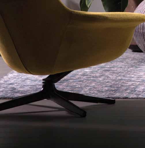
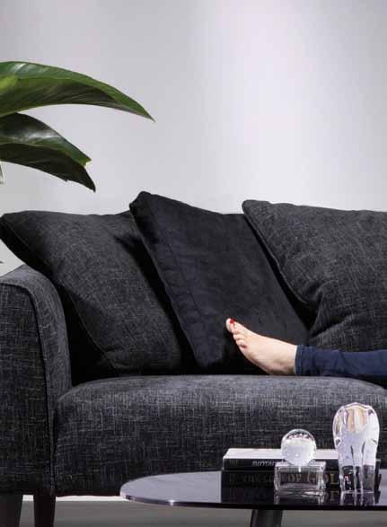
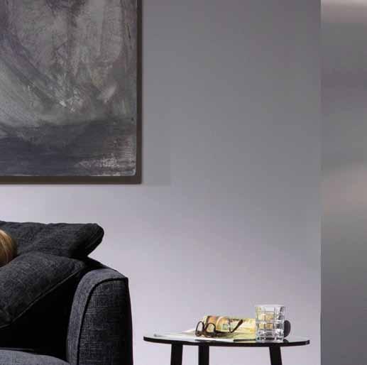
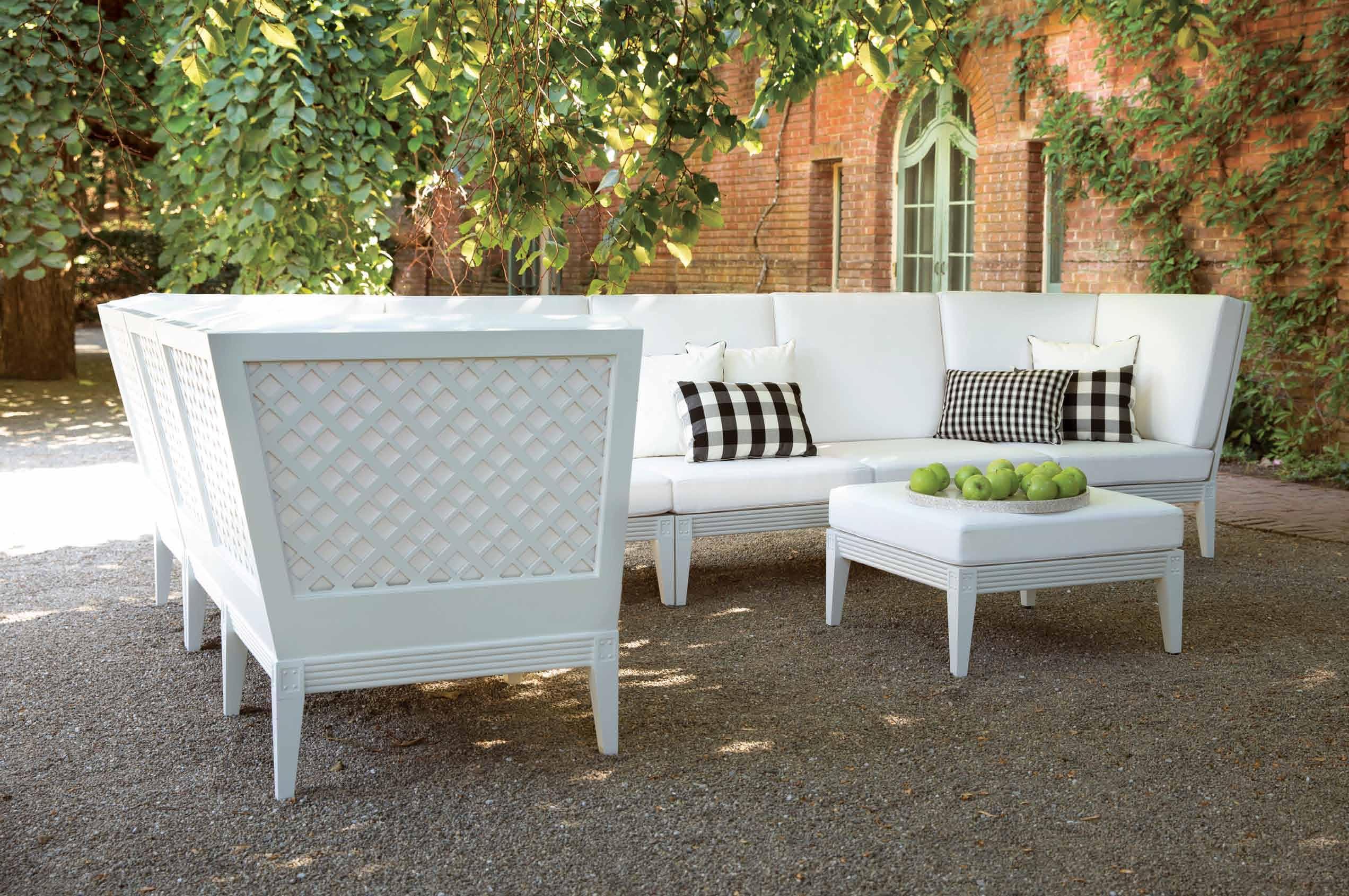
You’ll love the thought that’s gone into stylish William. Designed in collaboration with renowned Australian designer, Charles Wilson, William features deep seat cushions uniquely incorporated into a stylish, single base. Built on King Living’s superior steel frame, that’s guaranteed for 25-years, this sofa is all about the details and available as a sumptuous armchair, 2 or 3 seater, in a choice of luxurious back or scatter cushions. Casual or formal, classic or contemporary; William looks and feels at home in any space.



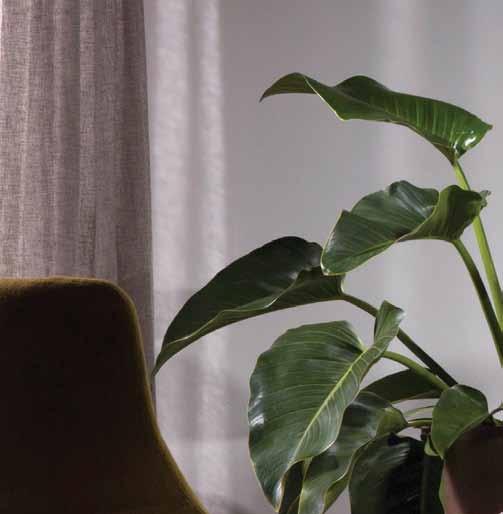

Love the thought of a contemporary take on a classic.
| SHOP ONLINE AT
NSW: Annandale | Castle Hill | Chatswood | Moore Park | Northmead : Fortitude Valley | Southport : Nunawading | Richmond | Southbank | South Wharf : Keswick






QUADRATL COLLECTION ATLANTA • SINGAPORE • SYDNEY • TORONTO • WASHINGTON D.C. • +61 410 546 999 • Opening Late Spring 2015 SYDNEY SHOWROOM
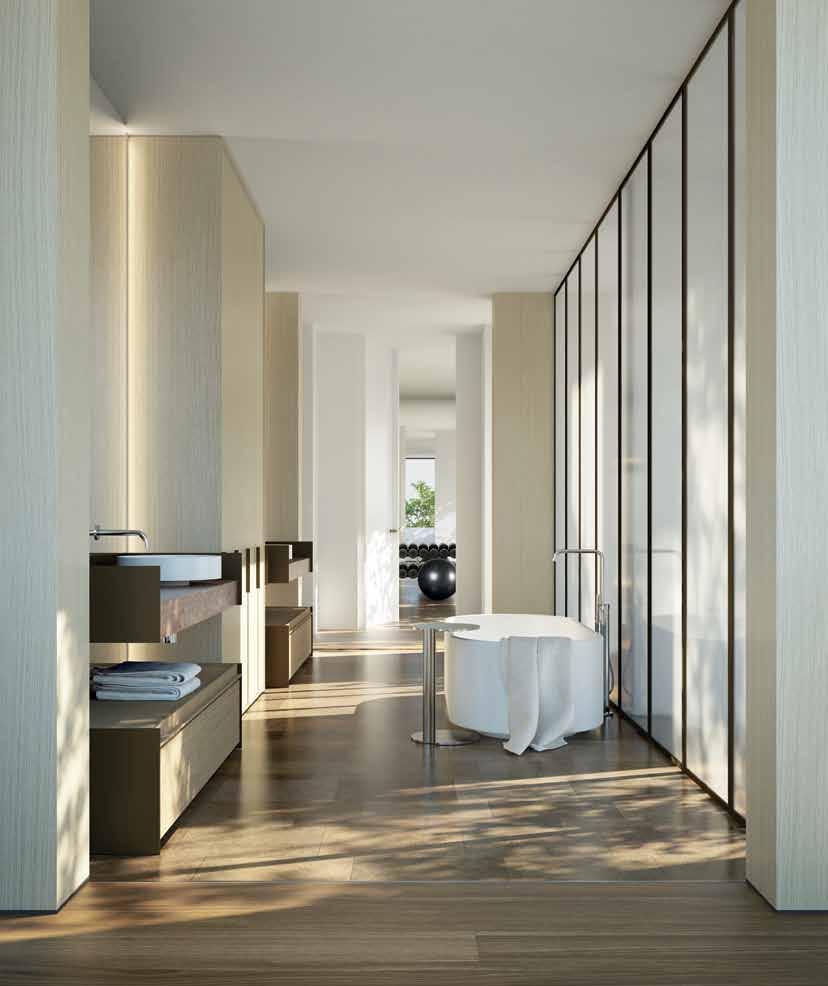
Piper has curated an international team of designers and artisans
an orchard piper property orchardpiper.com
Orchard
for Washington Street: New York lighting designer Lindsey Adelman, Venetian glass house Venini, architect and interior designer Jolson and landscape designer Rick Eckersley.
27––31 washington street toorak, australia completion end 2016
Local enquiries: Marcus Chiminello 0411 411 271
Interstate/International: Daniel Cashen 0438 346 313
washingtonstreet.com.au
EXPERIENCE THE ZIP EFFECT.

MODERN DESIGN. MORE WOOHOO.
The New Celsius TM Design Range
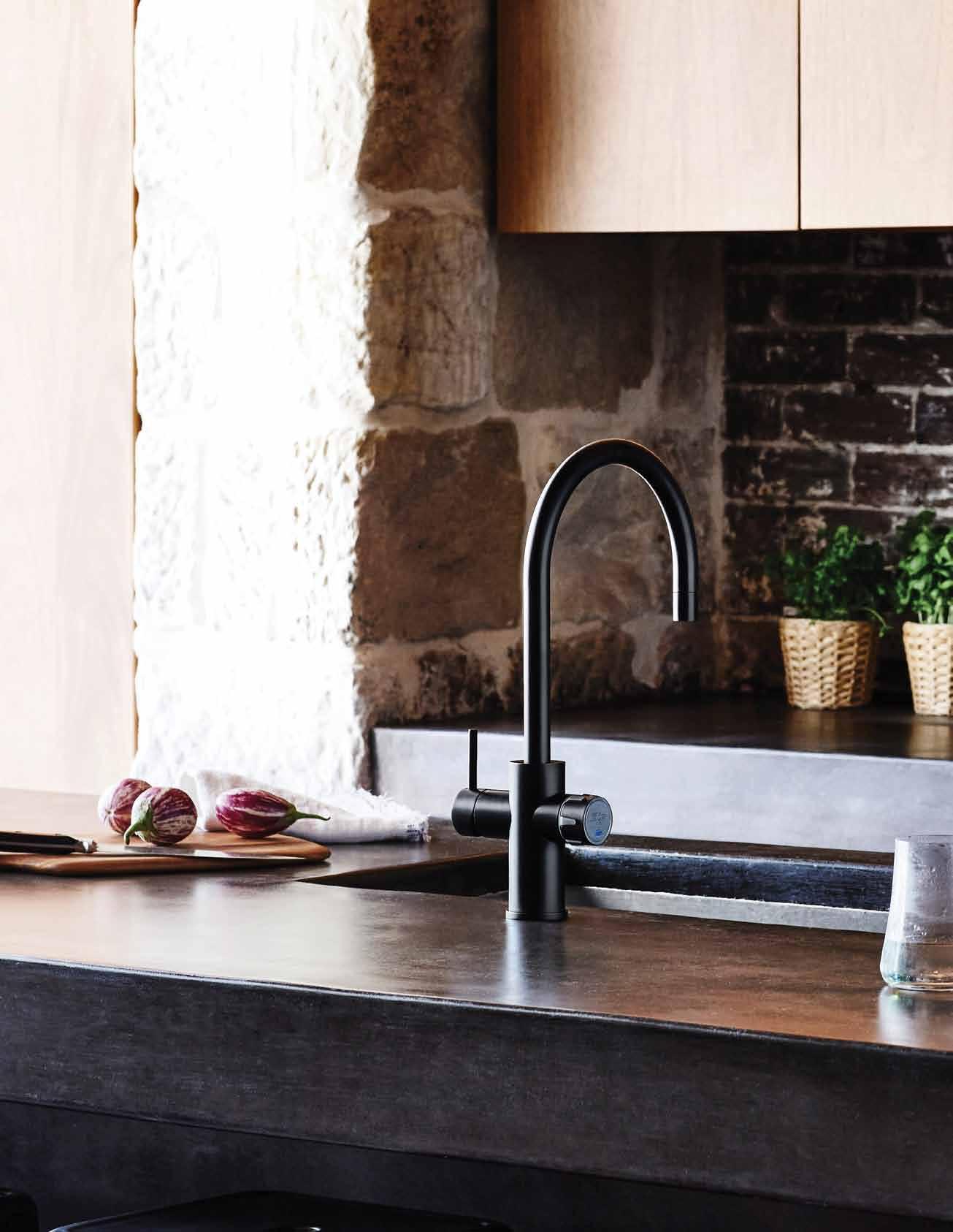
The beautiful new Zip Celsius Design range boasts contemporary designs to suit even the most modern décor: available in Arc and Cube styles and a variety of finishes. Healthy living has never looked so good.
BOILING | CHILLED | SPARKLING zipwater.com
Where to look for inspiration? It can be found all around us – in the things we have, the conversations we engage in and new ideas that spark a revolution.

24. DESIGN NEWS
Discover the products we are inspired by: elemental in texture or form, interlocking constructions, and those that embody tranquillity or drama.

32. BOOKS
Architecture in place considers the environmental, geographic and cultural context of the built environment. Philip Drew compares three recent titles that focus on Sri Lankan, Brazilian and Japanese residential designs, plus another that looks exclusively at houses in the city.
#24
Creative vision is not enough to ensure success in art, design or architecture. Dedication, persistence and flexibility play the all-important supporting roles.
38. KEN DONE
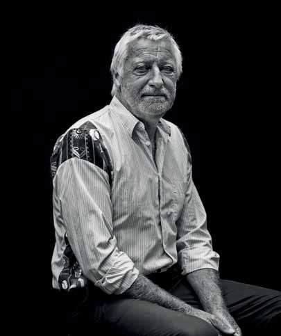
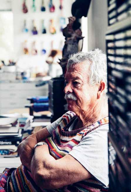
We drop in on Ken Done’s idyllic home on Sydney’s north shore to meet the man behind some of Australia’s most iconic artworks, and discover his love of travel and ritual that finds expression in his everyday life.
49. KATHERINE MAVRIDIS
This young knitwear designer ’s drive to create concept fashion pieces exploring the possibilities of wool remains at the core of her being –whether in her hometown of Sydney, or her current base in New York.
57. CHRISTOPHER GRAF
He owned a high-end fashion shop in Melbourne in the 1990s; now Christopher Graf expresses his creative flair in his Hamptonsinspired home, a canvas for his unusual collections, which use a series of fireplaces as unlikely displays.
#38
67. STUDIO BIKIN
We visit an architecture studio in Malaysia headed up by two women, who are taking the authenticity debate into their own hands, developing locally designed furniture for a retail arm to the business, and their own retail store, called Kedai Bikin.
# 29
the art of lounging
74. DESIGN R&R
How can lounging improve our physical and psychological health and wellness, and how can we create environments to maximise this?
83. DESIGN NEWS
Bring a lounging attitude to your life, whether entertaining, relaxing, working or playing.
91. PLEASE BE SEATED
Exhale and take a moment to appreciate some fine furniture, and lighting in sculptural and contemporary combinations.
102. INDUSTRY INSIGHTS
From New Zealand, to Melbourne, Sydney, Western Australia and Chiang Mai, we traipse the Region to discover diverse ways to live.
114. CAMBRIDGE HOUSE
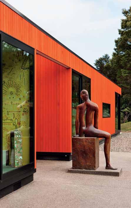
An orange cedar box designed by Patterson Associates sits boldly in the New Zealand bush; at night this family home glows like a jewel.
129. PACIFIC ROAD HOUSE
The idea of traditional Japanese charred cedar used in the early 17th Century becomes integrated into this beach house designed by Casey Brown on Palm Beach in Sydney.
141. AMP HOUSE
A house in Chiang Mai for an electrical engineer and his wife designed by architect Sarin Nilsonthi, met all the residents ’ criteria whilst surprising the locals with its modern approach to living.
159. CARLTON WAREHOUSE
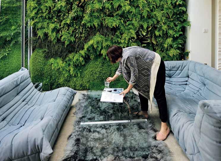
A shell of a building in Carlton became the project of a lifetime for an empty nester, who worked with Kennedy Nolan to create a her own refuge high above the city – complete with several outdoor living spaces.
175. JULIMAR HOUSE
Members of the retail design community offer some valuable insight into lounging – their favourites and future predictions. #114
A simple floor plan and humble materials were on the design menu for this retired couple from a farming background. And Nicholas Burns Architect added his own flavour –taking inspiration from the sunburnt Western Australian landscape.
# 29
#74

DEKTON. UNLIMITED.


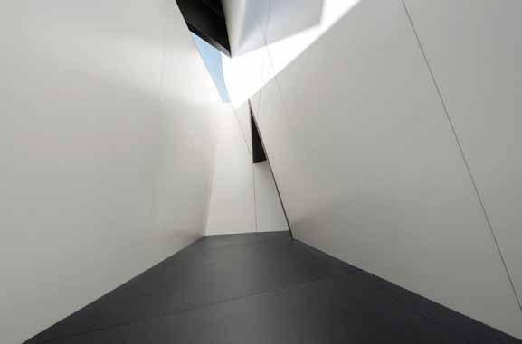
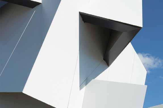
BEYOND THE WALL by DANIEL LIBESKIND


“My first thought about Dekton was that it was full of character, an intrinsic character that is as deep as natural stone but with a totally innovative shape and with improved properties in compacting, resistance and also of course, extra big size.”
COSENTINO CITY CENTRE Design LV.1. Suite 30 / 69 O’riordan st / Alexandria NSW 2015 PH: 02 8707 2500 option 2 / infoaustralia@cosentino.com WAR
15 YEAR
Daniel Libeskind
R ANTY
LARGE FORMAT INFINITE POSSIBILITIES
Thanks to the size (up to 3200 x 1440 mm) and the lightness of Dekton (from 8 mm thick), the design possibilities for your kitchen, bathroom, façade, walls or high transit floors are growing exponentially.

tsDEKTON ADVANTAGES



9 8 5
7 1 2
www.dekton.com
HIGHLY UV RESISTANT HIGHLY SCRATCHRESISTANT RESISTANT TO ABRASION
RESISTANCE TO FREEZING AND THAWING COLOUR STABILITY DIMENSIONAL STABILITY
RESISTANT TO STAINS MAXIMUM RESISTANCE TO FIRE AND HEAT SUPERIOR MECHANICAL RESISTANCE
LOW WATER ABSORPTION FIREPROOF MATERIAL HIGH RESISTANCE TO HYDROLYSIS
RESISTENCIA A LAS MANCHAS RESISTANT ALTAMENTE RESISTENTE AL RAYADO HIGHLY SCRATCH RESISTANT ESTABILIDAD AL COLOR ESTABILIDAD DIMENSIONAL DIMENSIONAL STABILITY RESISTENCIA AL HIELO Y DESHIELO RESISTANT TO ICE & THAWING ALTA RESISTENCIA A LOS RAYOS ULTRAVIOLETAS HIGH UV RESISTANCE ALTA RESISTENCIA MECÁNICA HIGH MECHANICAL RESISTANT ALTA RESISTENCIA A LA HIDROLISIS HIGH RESISTANT TO HYDROLYSIS MÁXIMA RESISTENCIA AL FUEGO Y AL CALOR HIGH RESISTANCE TO FIRE AND HEAT MATERIAL INCOMBUSTIBLE FIREPROOF MATERIAL RESISTENCIA A LAS MANCHAS RESISTANT TO STAINS ALTAMENTE RESISTENTE AL RAYADO HIGHLY SCRATCH RESISTANT ESTABILIDAD AL COLOR COLOR STABILITY ESTABILIDAD DIMENSIONAL DIMENSIONAL STABILITY RESISTENCIA AL HIELO Y DESHIELO RESISTANT TO ICE & THAWING ALTA RESISTENCIA A LOS RAYOS ULTRAVIOLETAS HIGH UV RESISTANCE ALTA RESISTENCIA MECÁNICA HIGH MECHANICAL RESISTANT ALTA RESISTENCIA A LA HIDROLISIS HIGH RESISTANT TO HYDROLYSIS MÁXIMA RESISTENCIA AL FUEGO Y AL CALOR HIGH RESISTANCE TO FIRE AND HEAT MATERIAL INCOMBUSTIBLE FIREPROOF MATERIAL
6 4 3
0
RESISTENCIA A LA ABRASIÓN RESISTANT TO ABRASION TO STAINS REDUCIDA ABSORCIÓN DE AGUA REDUCED WATER ABSORPTION COLOR STABILITY RESISTENCIA A LA ABRASIÓN RESISTANT TO ABRASION REDUCIDA ABSORCIÓN DE AGUA REDUCED WATER ABSORPTION
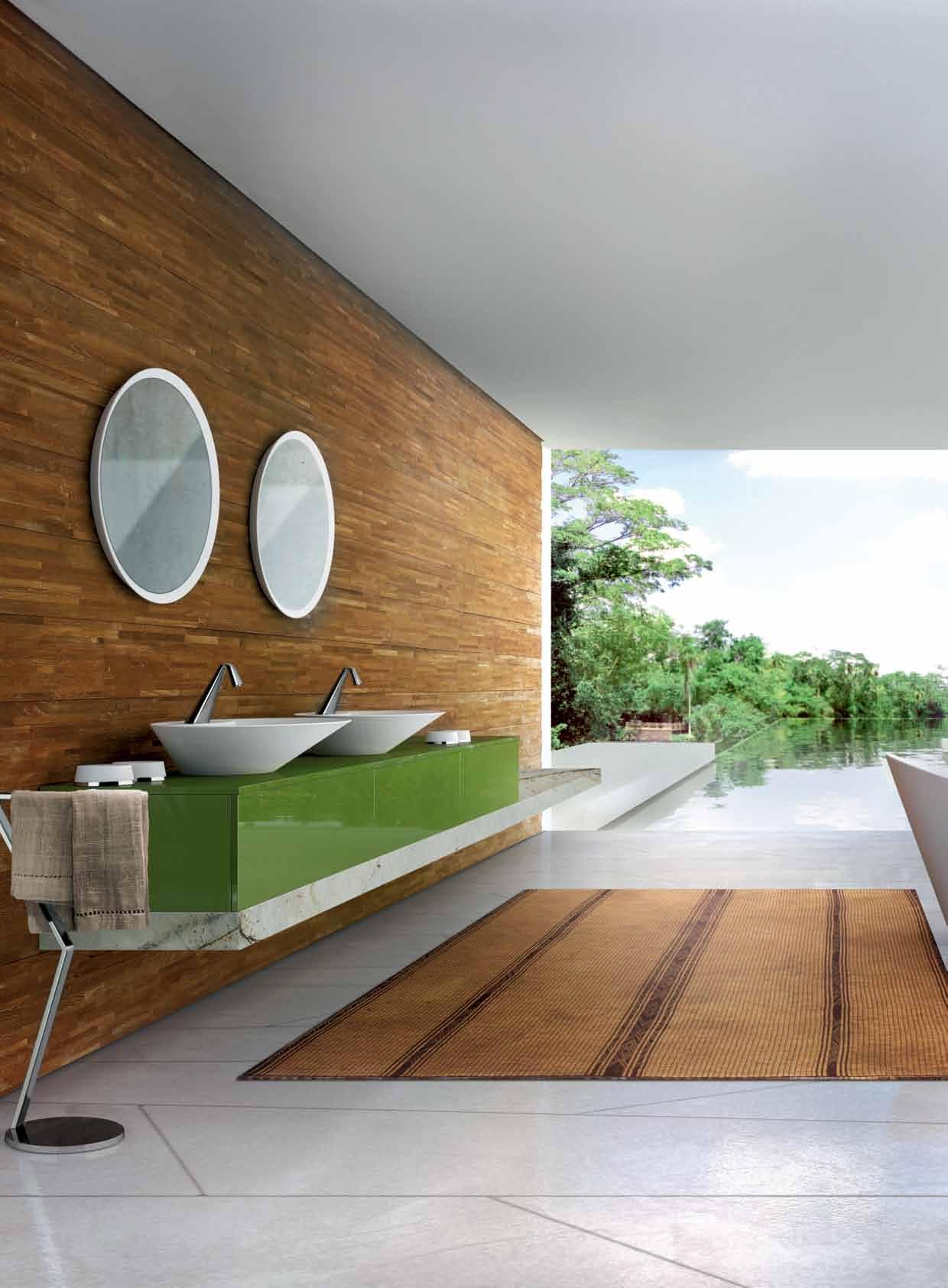
Th e‘ Co no ’c ol le ct io nb yG ess ii sa ni ns pi re dw or ko fa rt ,d es ig ne db yP ro sp er o Ra su lo .T hi st as te fu lr an ge is ag ra ce fu lf us io no fo rg an ic sh ap es an dg eo m et ri c li ne s. Wi th as tr ong fo cu so nf un ct io na li ty an dw elc om in ga es th et ic s, th is ele ga nt co ll ec ti on is id ea lf or bo th co nt em po ra ry an dc la ss ic ba th ro om s.
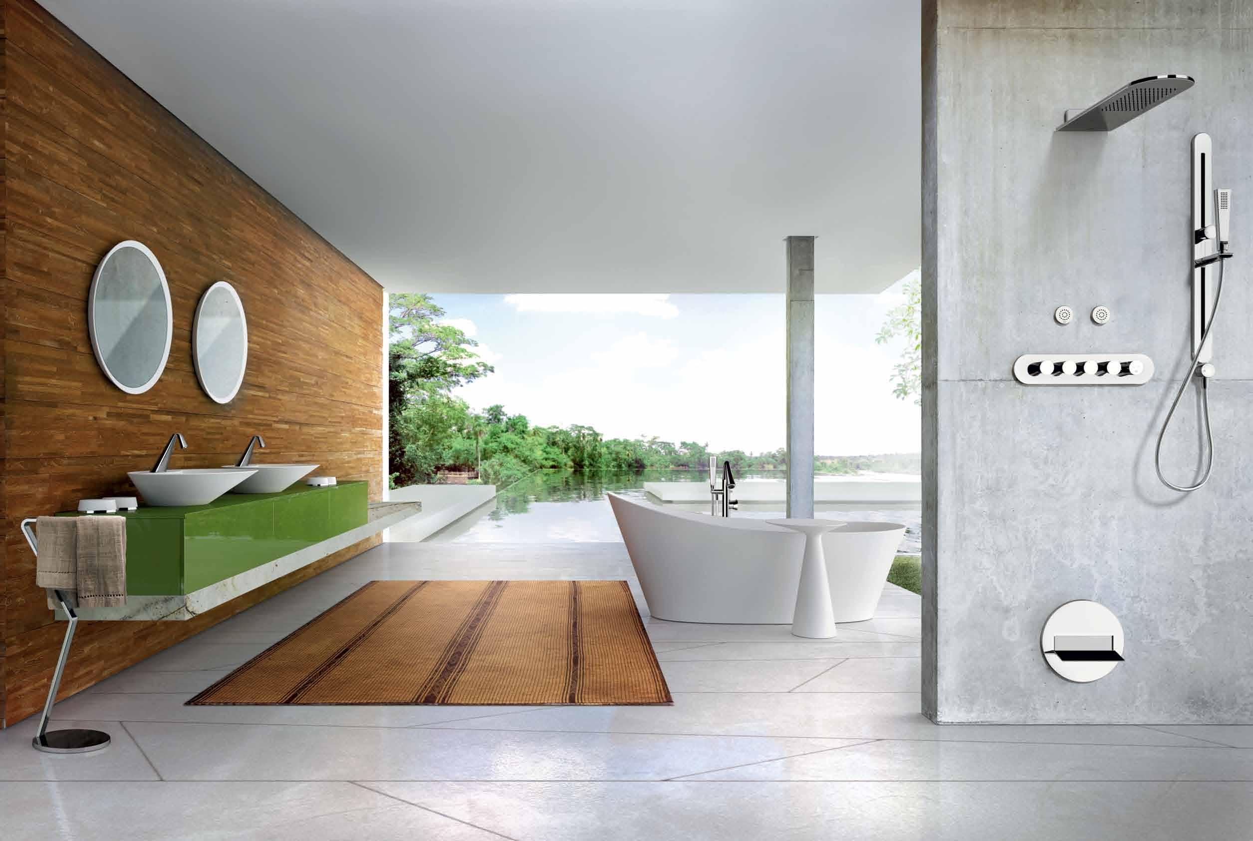
28 9784 _N AU BA THROOM
•A LE XA ND RI A-8 4O ’R IO RD AN ST.0 28 33 97 10 3 •A UB UR N-1 03 -1 23 PA RR AMATTAR D. 02 87 48 43 67 VI SI TO UR WE BS IT E-W WW .D OM AY NE .C OM .A U Do ma yn e ®
DESIGN CENTRE







smeg.com.au
SMA15753
THE SMEG CLASSIC COLLECTION • SETTING THE STANDARD IN VISUAL AND CULINARY TASTE FOR 30 YEARS
ALWAYS THE BEST POSSIBLE TASTE


the first word
‘Achieving more’ can refer to a straight exchange of skills, information or clients – a mutual back scratching of sorts. But another aspect of ‘achieving more’ arises from tension. It’s not all holding hands and singing Kumbaya – it’s the differing opinions, rigorous discussion and mutual respect towards each other that can produce the most fruitful and authentic end results. This kind of partnership – which is real collaboration – takes place only when the shared values or mission is greater than the need to stroke each other’s egos.
On a daily basis, we are fortunate enough to collaborate with architects, designers, artists, contributors, clients, suppliers, and internally within our team (where we enjoy plenty of ‘rigorous discussion’, let me assure you). But over the last few months we’ve also been working with some wonderful content partners such as Sydney Living Museums, Sydney Contemporary art fair and The Australian Ballet, which provides us with new opportunities, challenges and growth. You’ll be seeing these partnerships take place across the pages of our magazine, online, on social media and at events we’ll be hosting together.
Collaboration is a key feature of Habitus stories as well. We tend to foreground designers and architects, but in reality they are spokespeople for a collective of diverse individuals –including but not limited to clients, craftspeople, tradespeople and council members – who come together, quite intimately, for a particular purpose. The Carlton Warehouse story on page #159, for example, tells the story of a woman whose collaboration with architects Kennedy Nolan sets the tone for an inventive living environment that not only surpassed the brief, but also prompts us to re-imagine the definitions of what a home could and should be. To my mind, this is the best kind of collaboration – one that asks us to explore, interrogate and perhaps redefine our own views and values.

Why do we collaborate? Put simply: to achieve more. As Hellen Keller said, “Alone we can do so little; together we can do so much”.
Nicky Lobo | Editor
takes the conversation to our contributors, discovering their inspirations and design hunter® journeys
Peter Bennetts

JULIMAR HOUSE #175
“When I think of home, the Danish word ‘hygge ’ springs to mind – roughly translated it means cosiness but its origins are from a Norwegian word for ‘wellbeing’, ” reflects Peter Bennetts. The acclaimed photographer’s thoughts on home tie in to his sentiments about architecture and design more broadly. “I’m firstly interested in architecture and design as a response to the natural and cultural environment,” he explains, “Good design should always embody a particular transcendent purposefulness!”
Matt Canning

BOOK REVIEW #32
Matt Canning’s richly detailed hand-drawn elements and heavily textured vintage aesthetic is both melancholic and playful. “I actually wanted to be an architect long before becoming an illustrator,” explains Matt. An aversion for mathematics steered him towards illustration, but his affection for the practice lingers. “I’m influenced by old things in my work, and I would include buildings in that. I love the texture of a 200-year-old slate roof, or a lime plaster wall.”
soPhie Davies

DESIGN R&R #74
Born in London and raised between Turkey, Iran and Indonesia, journalist Sophie Davies has now settled in Sydney. “Having lived in three cities in the last decade I’m an urban nomad, so home really is where the heart is,” she muses. That said, she has some favourite spots: “I tend to fall for neighbourhoods –Portobello and Shoreditch in London, Fitzroy in Melbourne and Newtown in Sydney – finding my own urban village.”
siMon Devitt
CAMBRIDGE HOUSE #114
New Zealand photographer Simon Devitt’s passion for architecture and design stems from how it “reveals something interesting about how it’s used and the context it has appropriated.” When asked about what home means to him, he defers to the words of Henry Thoreaux, who says of homes, “It is the life of the inhabitants whose shells they are.”

Jason Lang


AMP HOUSE #141
“The most interesting thing to me about architecture and design,” says Jason Lang, “ is how essential it is to our lives, and how much of it is taken for granted.” Jason has spent the past decade traversing the globe from his Bangkok base to capture some of the world’s most interesting people and exotic destinations, and for him, home means, “being with the people I love and care about.”
a roon Puritat
AMP HOUSE #141
Aroon Puritat studied architecture at Silpakorn University in Bangkok and has since realised several projects as well as reviewing a number for local and international media. His work reflects Thai culture’s blurring of public and private space in daily life, and he views the idea of home through a Buddhist lens; “In Buddhism, the cycle of rebirth is determined by Karma. If you have Karma, you still need a home in the next life,” he says.
a n Drea stevens
CAMBRIDGE HOUSE #114
Auckland-based Andrea Stevens is intrigued by the “practical and aesthetic journeys” she finds in architecture and design, “where multiple factors are combined to create function and beauty.” Rhyming with New Zealand’s varied seasons, her conception of what a home is oscillates from “a place for socialising and connecting with the outdoors” in summer, to “a place of retreat and comfort,” during the wet winter months.

DanieLLe seLig
PHOTO SHOOT #91
Born, raised and currently based in Sydney, Danielle Selig studied Arts/Law at university and practised for a short time as a lawyer before making the decision to pursue her true passion, styling. On the subject of home, she says, “Home to me is not just a physical space, but the place I feel most at ease. I am my most imaginative self at home… Dorothy was right, there really is no place like it.”

habitus
Derek Swalwell
CARLTON WAREHOUSE #159
Known for his use of natural light in his interior spaces, portraiture and architectural work, leading Australian photographer Derek Swalwell creates a lived-in element to his work, adding a layer of lifestyle to the environment. His portfolio spans an array of design, advertising and magazine clients.


Jame S Tolich
PHOTO SHOOT #91
After launching his career in the New Zealand fashion industry, contributing design and creative direction to a variety of boutique brands, James Tolich relocated to Sydney, where he began focusing his visual talents on photography. His work has become known for its crisp lighting arrangements and clever compositions, garnering attention in taste-making circles. Each shoot is executed with deliberate care, his camera serving as a vessel that enables him to effortlessly bring both commercial and conceptual projects to life.
claire waTkinS
JULIMAR HOUSE #175
“I think that good design focuses on the benefits for the end user. By finding out what makes a person tick and tailoring a solution to their unique lifestyle, it steers us away from generic structures and leads us towards a far more interesting landscape,” says Claire Watkins. For her, this responsiveness of design to human needs is reciprocated by engaging with her own surroundings; “Whether it’s knocking down a wall or something as simple as shifting the furniture around throughout the seasons, I think it’s important to keep it fresh.”

chriSTopher w iSe

KATHERINE MAVRIDIS #49
For Christopher Wise, “Home is on the road connecting to the new, wherever I happen to be, on assignment or exploring the world with my wife and friends.” He is particularly attracted to the fusion of history and modernity in architecture and design, and loves “the combination or intervention of heritage or time-worn structures with new design ideas and materials that are part of the 21 st Century.”
CorreCtionS:
In Habitus #28 A Winning Warehouse (p.125), the custom leather drapes and Union Jack drapes were made by Alexis Wolloff not Alexis Walhoff. Our apologies to Alexis. Also, the leather organic floor in the man cave was made by Warren Briggs & Royale Upholstery.
by Mikiya Kobayashi
.com.au

YAMANAMI
Hab #26 - Vert half_02.indd 1 15/10/2014 11:51 am
Editor Nicky Lobo nicky@indesign.com.au
original dE sign tEmplatE one8one7.com
Cr E ati VE dir ECtor
Christopher Holt christopher@holtdesign.com.au
sEnior dE sign Er
Michelle Byrnes
dE sign Ers
Sophie Taylor s.taylor@indesign.com.au
James McLaughlin james@indesign.com.au
m Edia & prodUCtion Coordinator
Tina Fluerty tina@indesign.com.au
digital Editor
Ashley Tucker ashley@indesign.com.au
ContribUting WritErs
Alice Blackwood, Stephen, Crafti, Philip Drew, Sophie Davies, Alex Lalak, Lorenzo Logi, Andrew McDonald, Aroon Puritat, Andrea Stevens, Claire Watkins, Sophia Watson, Narelle Yabuka
ContribUting photograph Ers
Peter Bennetts, Simon Devitt, James Geer, Rhys Holland, Jason Lang, Carly Martin, Rob Palmer, James Tolich, Derek Swalwell, Simon Whitbread, Christopher Wise
ContribUting stylist
Danielle Selig
ContribUting illUstrator
Matt Canning
The enveloping arms enclose your body, soothing the nervous system in a comforting and therapeutic fashion.
For more information visit www.activemobility.com.au
CEo / pU blish Er
Raj Nandan raj@indesign.com.au
pa to pU blish Er
Elizabeth Davy-Hou liz@indesign.com.au
prodUCtion m anagEr
Sophie Mead sophie@indesign.com.au
FinanCial dir ECtor
Kavita Lala kavita@indesign.com.au
aCCoU nts
Gabrielle Regan gabrielle@indesign.com.au
Vivia Felice vivia@indesign.com.au
onlin E Comm U niCations
Radu Enache radu@indesign.com.au
Ryan Sumners ryan@indesign.com.au
E VEnts & mark Eting
Tegan Schwarz tegan@indesign.com.au
Angela Boustred angie@indesign.com.au
Bonnie Eskdale bonnie@indesign.com.au
bUsin E ss dEVElopm Ent managEr Colleen Black colleen@indesign.com.au (61) 422 169 218
m Edia Coordinator Marigold Banta marigold@indesign.com.au
CoVEr imagE
Ken Done (p.38)
Photography by Rob Palmer
Head Office
Level 1, 50 Marshall Street, Surry Hills NSW 2010 (61 2) 9368 0150 | (61 2) 9368 0289 (fax)
MelbOurne
Suite 11, Level 1, 95 Victoria Street, Fitzroy VIC 3065 | (61) 402 955 538
SingapOre
4 Leng Kee Road, #06–08 SIS Building, Singapore 159088 (65) 6475 5228 | (65) 6475 5238 (fax)
HOng KOng
Unit 12, 21st Floor, Wayson Commercial Building, 28 Connaught Road West, Sheung Wan, Hong Kong
indesign.com.au
publisher or the publication. Contributions
submitted
the sender’s risk, and Indesign Media Asia Pacific cannot accept any loss or damage. Please retain duplicates of text and images. Habitus magazine is a wholly owned Australian publication, which is designed and published in Australia. Habitus is published quarterly and is available through subscription, at major newsagencies and bookshops throughout Australia, New Zealand, South-East Asia and the United States of America. This issue of Habitus magazine may contain offers or surveys which may require you to provide information about yourself. If you provide such information to us we may use the information to provide you with products or services we have. We may also provide this information to parties who provide the products or services on our behalf (such as fulfilment organisations). We do not sell your information to third parties under any circumstances, however, these parties may retain the information we provide for future activities of their own, including direct marketing. We may retain your information and use it to inform you of other promotions and publications from time to time. If you would like to know what information Indesign Media Asia Pacific holds about you please contact Nilesh Nandan (61 2) 9368 0150, (61 2) 9368 0289 (fax), info@indesign.com.au. Habitus magazine is published under licence by Indesign Media Asia Pacific. ISSN 1836-0556
am
issue #29 habitusliving.com Printed in Singapore. All rights reserved. No part of this publication may be reproduced, stored in a retrieval system, transmitted in any form or by any other means, electronic, mechanical, photocopying, recording or otherwise. While every effort has been made to ensure the accuracy of the information in this publication, the publishers assume no responsibility for errors or omissions or any consequences of reliance on this publication. The opinions expressed in this publication do not necessarily represent
of
the views
the editor, the
are
at
The SenSit is a sensory-stimulating chair that provides security, calm and increased levels of concentration among users.
Untitled-1 1 11/08/2015 10:47
A magic menagerie of design






Interlock
German design house aust & amelung ’s a floor lamp is based on the simple mechanism of a beam balance: a long beam cranes across the room and balances a lampshade on one side against a sand bag on the other. A steel pin fixes the sand bag in four different positions, and in each one the lamp finds equilibrium by itself.

aust-amelung.com
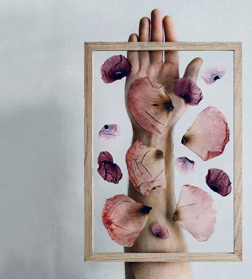
Original and elegant, fram E is simply composed of four pieces of oak and two pieces of plexiglass held together by a rubber band. Perfect as a wall decoration or framing photographs and prints, and stunning with pressed flowers. This simple item is designed by Copenhagen-based studio moebe and is available in three sizes: A3, A4 and A5.
luumodesign.com / moebe.dk
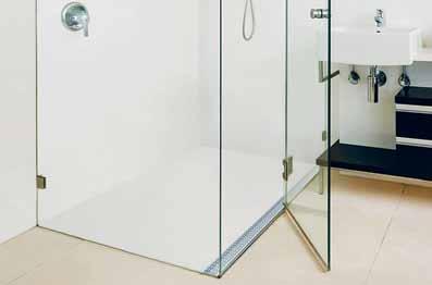
Stormtech announces a new collaboration featuring their fully integrated linear drainage from the m arc Newson series. The award-winning grate is integrated into a shower floor made of a single piece of Corian ® with no grout lines for easier cleaning and a modern streamlined look. Available in seven sizes and offered in Glacier White, the non-porous surface is non-slip as well as being warm and sensual to the touch. A winning combination all round.
stormtech.com.au / casf.com.au
issue #29 habitusliving.com
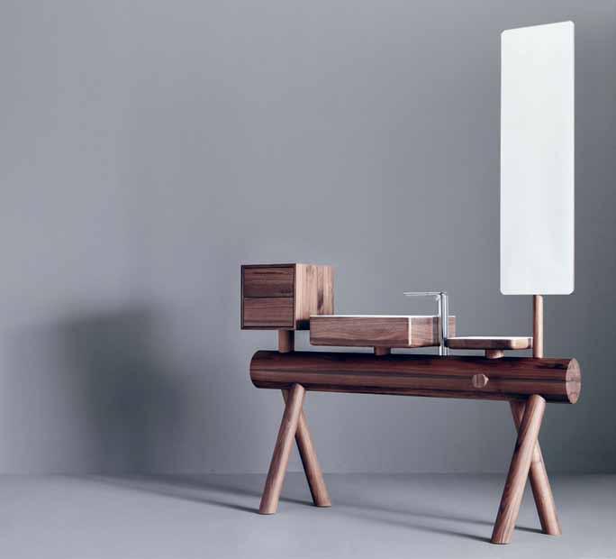
From the creative hand of designers Nespoli and Novara , American brand Graff ’ s DRESSAGE COLLECTION marries handicraft and traditional manufacturing with the functionality of innovative materials. Water supply and discharge elements are all internal and invisible from the exterior, and it can be equipped with a sink in solid wood or DuPont™ Corian® and accompanied by a shelf, a towel hook, a set of drawers and a rotating mirror.
fesal.com.au / graff-faucets.com
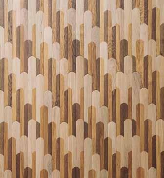
Presented at the 2015 Salone de Mobile, Listone Giordano ’s BISCUIT flooring was designed by Patricia Urquiola and is characterised by a composition of lines and shapes in freedom. The pattern comes from an in-depth analysis of the systems of posatura parquet and becomes an ideal connection between the historical techniques of wooden flooring and contemporary style.
winspear.com.au


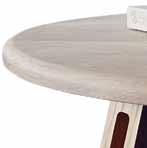
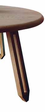
Crafted from solid hardwood, the GISELLE COFFEE TABLE with sculpted legs and rounded edge top works excellently in apartment living or smaller spaces. Designed and manufactured in Melbourne by The Curious Craftsmen , it is available in blackbutt or American oak.


thecuriouscraftsmen.com
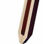
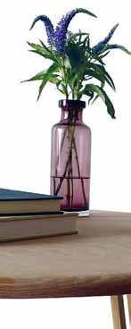
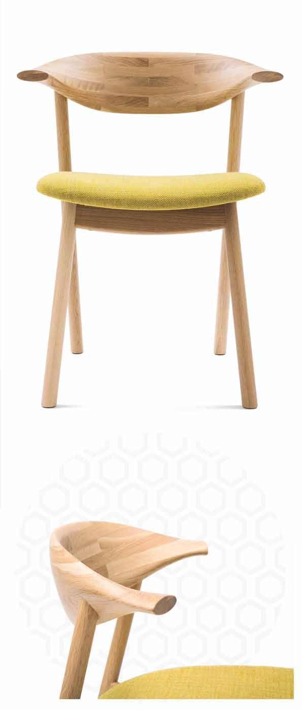
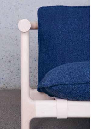
Launched at Sydney Indesign 2015, Skeehan Studio ’s the HOSHI CHAIR is calm, inviting and honest. It fuses the classic elements of a campaign chair and lounge design with a pure materiality and a sober, functional design narrative. Enveloping a minimal timber frame, its character lies in the subtle articulations and negative space between each compositional element.
catapultdesign.net.au
1 . lightbox # 25
issue #29 habitusliving.com
Elemental
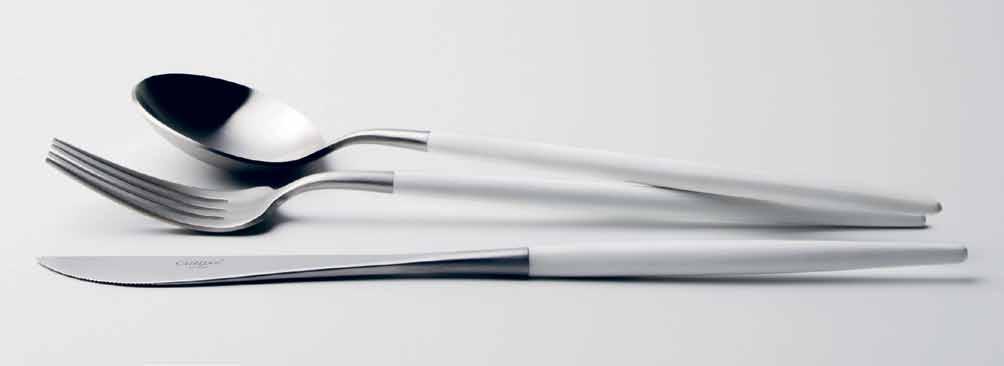
Combining the classical techniques of traditional craftsmanship with contemporary aesthetics, Cutipol ’s latest additions to the existing Goa range add a sense of occasion to mealtimes, with sleek white resin handles and stainless steel. Elegant and minimal, the collection is available in chic matte and luxurious gold finishes.
francalia.com.au / cutipol.pt
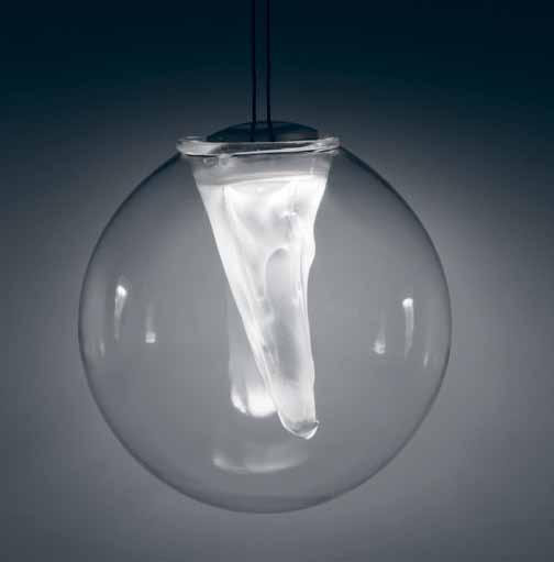
The T oRCHoN PENDa NT by Cheshire a rchitects for Resident is a bespoke glass-blown sphere encasing a suspended crystalline feature. The pure geometry and material transparency in the glass contrast with the organic form and texture of the internal feature, creating a layered, soft aesthetic overall.
district.com.au / resident.co.nz
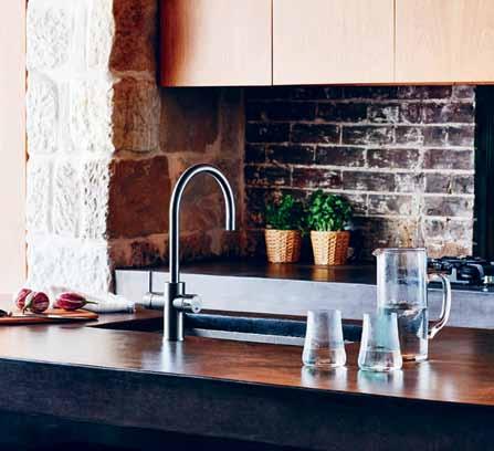
The Zip C E lsius aRC tap marries Zip’s legendary technical expertise with an elegant, sophisticated design. The pure, clean lines of the Celsius Arc speak of timeless aesthetics, while the chromed, matte and black finish options align it with contemporary kitchen trends.
zipwater.com
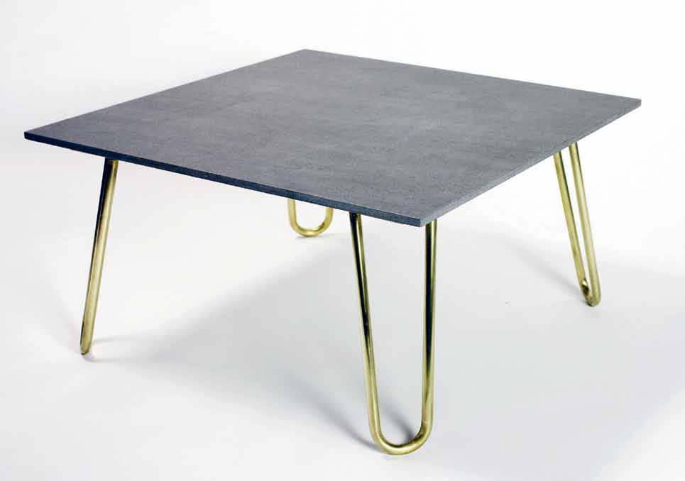
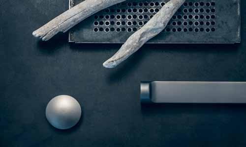
With its slimline stone top held gracefully by a brass structure, is rich in tactile appeal. The four rolled brass tube legs, with their paperclip-like form, rise up to a frame hidden under the overhang of the thin, basalt-grey top made from Neolith, a sintered stone created from 100% natural products, which is UV resistant and non-porous, so it can handle any spill and won’t need resealing during its service.
savagedesign.com.au
Rogerseller ’s GRAPHITE finish is part of its new Natural Elements collection, which seeks to capture the textures and hues of raw, organic materials. Evoking the cool composure of a steely sky, Graphite – and the entire Natural Elements collection – is available across a comprehensive portfolio of Rogerseller ’s timeless, high quality products, including tapware, showers and accessories.
rogerseller.com.au
Canopy Designs ’ WILLOW CHANDELIER combines the natural cascade of a willow tree with beading and luminescence. Designed with meticulous detail and manufactured in a boutique factory in New York, Willow Chandelier takes inspiration from the natural world, fine jewels and art deco furnishings.
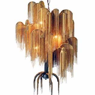
domo.com.au
FENIX NTM ® is an innovative material created for interior design applications. It offers both an elegant aesthetic solution and stateof-the-art technological performance. The finish is produced using next-generation resin developed with the help of nanotechnologies to provide it with novel properties, opening up new avenues in the field of interior design.
edleuro.com/fenixntm
1 . lightbox # 27
2015 SPRING OUTDOOR PIANO COLLECTION
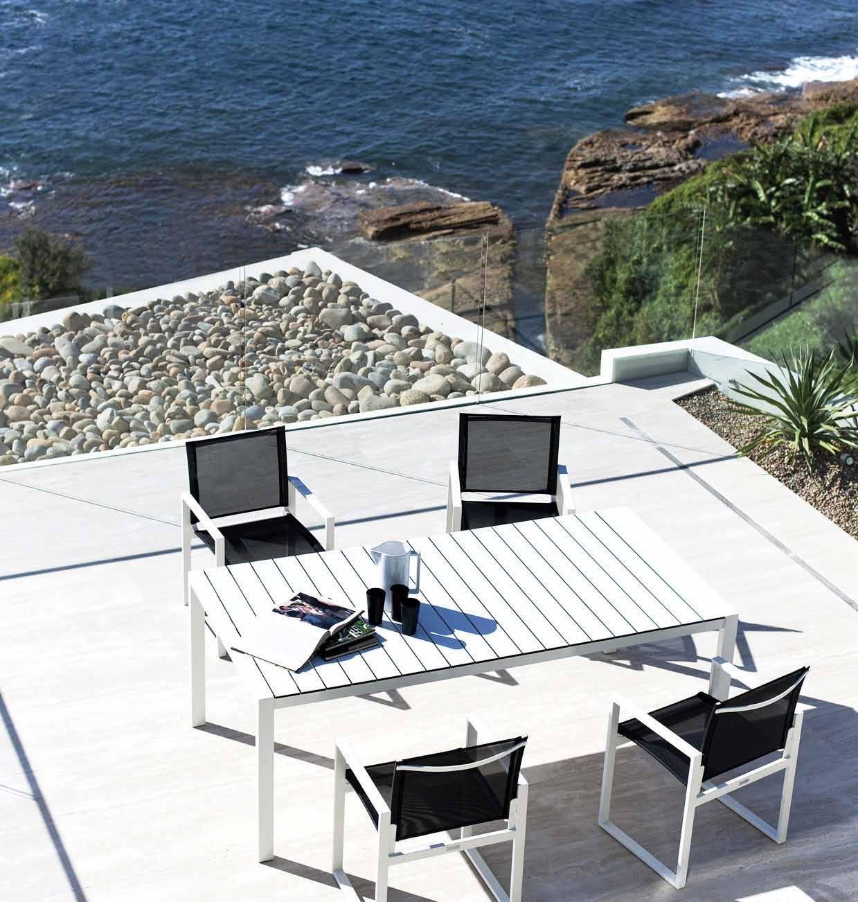
FEATURED:
Dining table in white aluminium Powder coat and white hpcl, Dining chair in white aluminium Powder coat and black batyline
® harbouroutdoor.com 18 BYRNES ST, BOTANY, NSW, 2019 PH: 9666 5972
Drama
Phoenix Tapware creates products that go beyond simply fulfilling practical needs, by crafting tapware that adds style and interest to the design of a space. The CERCHIO SINK MIXER achieves these things with ease and a natural design, whilst also boasting a 15-year cartridge warranty.
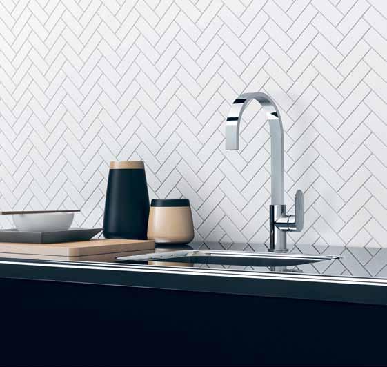
phoenixtapware.com.au
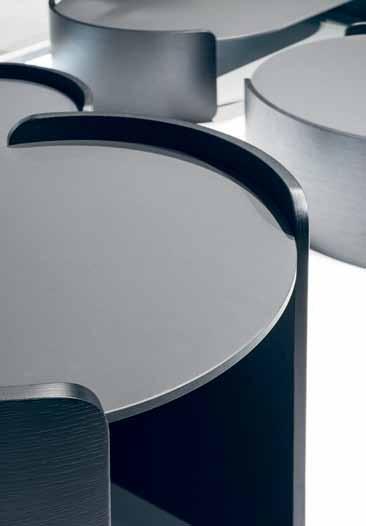
Light, immaterial, functional, and simple in its clean lines, the LEAF COFFEE TA bLE is the archetype of the round table. Inspired by a leaf floating in the air, the table’s substance appears nullified by its thinness. Contrasting the visual simplicity, its design, by Neutra , reveals a sophisticated search for equilibrium and proportion.

neutradesign.it / pureinteriors.com.au
MOOOI has launched MOOOI CARPETS ; a new company that aims to reinvent the carpet and open up new options through technology. Extremely high definition printing is available with Moooi Carpets, which offers a collection of outstanding quality and beauty, with a wide range of carpet designs and countless customising possibilities.
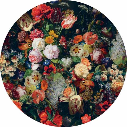
spacefurniture.com.au / moooi.com
Sleek and full featured, The M SERIES oven from MultyFlex is available in a variety of styles and sizes to integrate into any kitchen. Complete with 10 cooking modes and new heating and airflow technology, the oven makes for more efficient and consistent cooking than ever before, and saves time through cutting down on the preheating process.
subzero-wolf.com / multyflex.com.au

1 . lightbox # 29
Tranquility
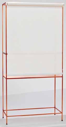
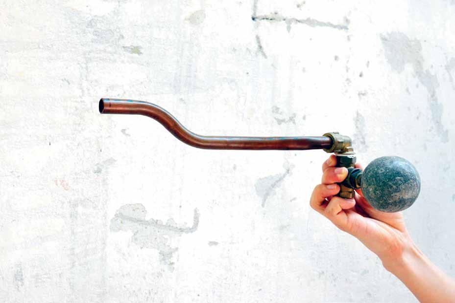
OSÉ is a copper display unit finished with an ultra white glass shelf and roller blind. The unique object inhabits both the past and the future. Like many of Atelier Biagetti ’s projects, it explores the complexities of the home as a domestic theatre and achieves a perfect balance between aesthetic experience and functionality.
atelierbiagetti.com
Innermost has collaborated with the illusion masters at YOY Design Studio to create the YOYLIGHT. The object is a playful experiment on the classic design of a lamp, projecting a semblance of a lampshade onto the wall; a perfect marriage of illusion and technology.

innermost.net
TAILOR is a contemporary and classic textile inspired by fine suiting and traditional craftsmanship. Woven from mélange yarn, the sophisticated textile features a subtle and beautiful heathered texture. Instyle employs a colour palette that works with timber and other modern finishes, and includes classic neutrals as well as deep rich navy and plum hues.
instyle.com.au
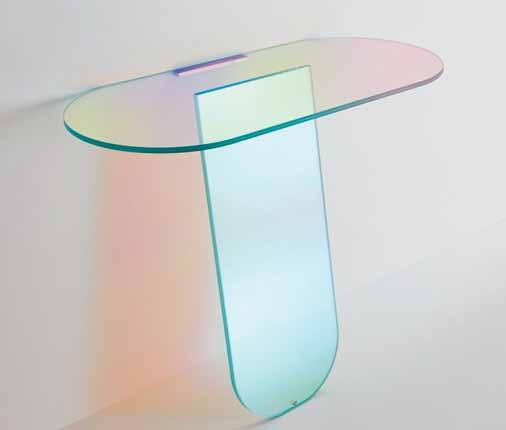
The SHIMMER shelves by Glas Italia are comprised of laminated and glued glass and characterised by a special iridescent multi-chromatic finish. The charming shelves vary according to the angle of the light source and the vantage point, and are available in opaque or transparent glass, or transparent glass with a special microdot decoration.
www.glasitalia.com / spacefurniture.com.au
issue #29 habitusliving.com

Around the world in 45 houses
issue #29 habitusliving.com
There appears to be a global consensus on what constitutes the best in house design, whether it is in Brazil, Sri Lanka or Japan. Ignoring the obvious regional di erences, Late Modernism, not Postmodernism, is the dominant trend: rationalism trumps historicism, minimalism trumps pastiche decoration, and reinvention beats imitation. The term ‘International Style’ was coined by Henry-Russell Hitchcock and Philip Johnson in 1932 for their exhibition on Modern architecture at MOMA. Globalisation, as the leading economic force, has prompted a return to the international values of Modernism, much as the brutal experiences of World War I in the 1920s caused a rejection of nationalism. The majority of projects selected in City Houses demonstrate a renewed commitment to a more rational Modern approach with distinct regional inflexions.
A house is the place where we are most nakedly ourselves, most vulnerable, most safe. They are our third skin and a source of profound memories, they are where we were children, where everything started; more often, they are where we spend our last days. No other building is so personal, such an agent in shaping our individuality. When Sir Winston Churchill observed that we shape architecture and, in turn, it shapes us, he was likely referring to his beloved home, ‘Chartwell’.
City Houses takes the reader around the world in 45 houses – seven from Australia. Japan, Brazil and Sri Lanka o er di erent contemporary regional versions of the house. Brazil is famous for its Latin exuberance,
energy and colour, Sri Lanka for its colonial past, and Japan for its distinctive traditions and interpretation of Le Corbusian Brutalism that supplied the fi rst inkling where regionalism was taking Modern architecture.

City Houses is a glorious picture book with short perfunctory texts introducing each project. Locations range from London to Auckland, the Hague to Rimini, and Landskrona in Sweden to Kawa in Japan. Australia fares well in a limited collection including such examples as the Annandale House by CO-AP, Brise Soleil House, Balmain, by Shaun Carter, and Armadale Residence by Cohen and Robson Rak. They more than justify their inclusion in such impressive international company.
Cities pose exceptional challenges not encountered in suburbia or the country where there is considerably greater freedom. Sites can be irregular, be overshadowed, or with limited access. Such constraints provoke new ideas and thinking that might otherwise never arise. It is the more di cult circumstances that have produced the most interesting houses: typical is the Slim House at Clapham, UK, at just 2.3 metres that led to a series of original practical solutions, or similarly, the Annandale House that occupied an exceptionally long and narrow plot behind a two-storey Victorian house. Here the solution was to enlarge it at the back. A West Village Residence and Artist Studio at Greenwich Village, New York that previously was a garage and blacksmiths, were transformed for the artist Roy Litchtenstenstein into his home and workshop. City Houses will inspire with its many striking clever angles on urban living alternatives.
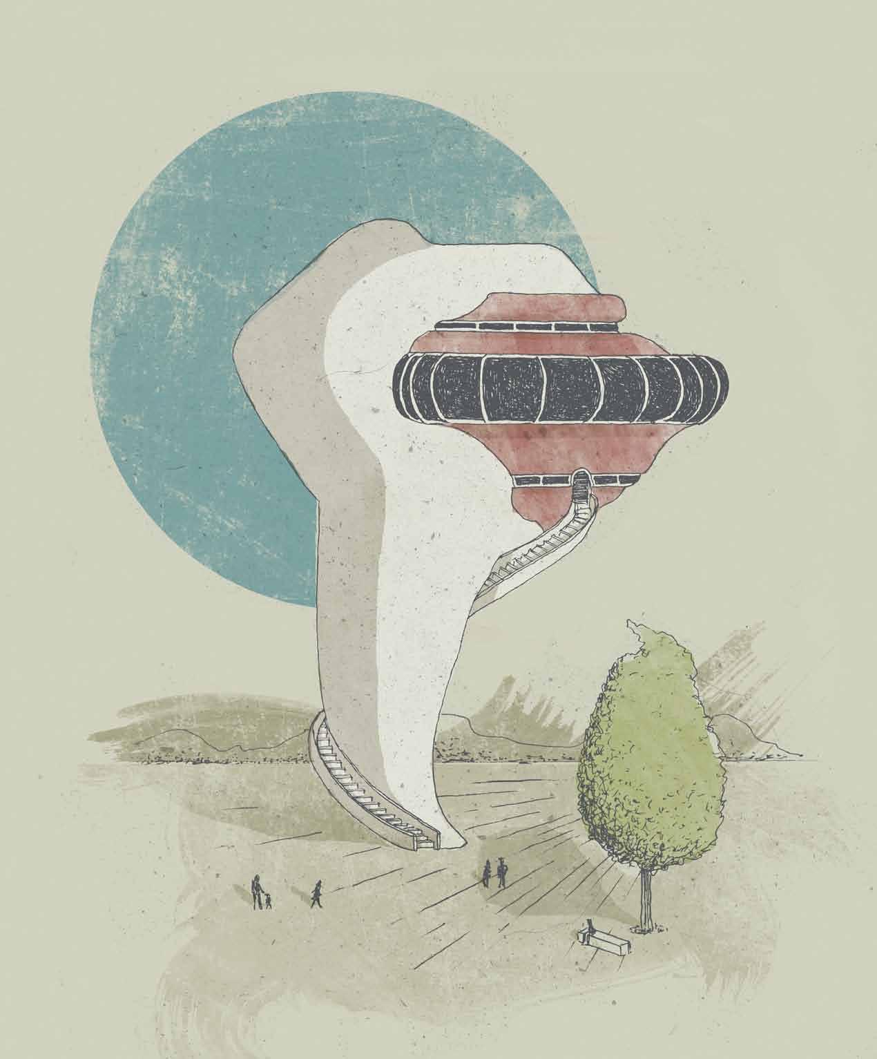
The architecture of a place becomes symbolic of a particular way of life. PHILIP DREW reviews four recent titles, each focusing on a specific country that has a characteristic architecture – plus one documenting house design in the city.
TEXT
PHILIP
DREW | ILLUSTRATION MATT CANNING
1 . lightbox 33
For The New Sri Lankan House, Robert Powell, a UK-based architect, accompanied David Robson, an expert on the architecture of Geo rey Bawa, on a journey charting the development of private houses in Sri Lanka in the early 21st Century since the cessation of the civil war, with a focus on the ‘next generation’. During the war there was no money; the ongoing peace has witnessed a rise in confidence in the urban middle class with a consequent large increase in the production of private houses. Twenty-six houses represent the output of 21 architects. Except for Pringiers House perched on a dramatic cli top for a Belgian industrialist by Tadao Ando (featured in Habitus #13), all are by local architects.
Bawa was very clear about what the tropics implied; life in Ceylon, he insisted in 1995, was about living out-of-doors in close proximity to nature, without or with a minimum of glass. It sounds like a prescription for Sydney. To further assist in this, Bawa favoured terraces, shaded verandahs and balconies, to promote an outdoor lifestyle. Trees are natural umbrellas that cool their surroundings. This is a rewarding, well-written book, with an excellent text that o ers a seductive picture of Sri Lanka’s new domestic architecture.
Brazil enjoys a deserved reputation for wildly exciting architecture so a new title such as New Brazilian House is something to look forward to. It is divided into four sections: iconic, town, country and coast houses, each preceded by colourful arresting graphics. A short introduction notes that, “the country has a powerful legacy of design history that acts as a sure and solid foundation for future innovators”. This, everyone knows! Author, Dominic Bradbury fails to ask what has happened since; Brazilian architects seem to be marking time, waiting for a new impetus to arrive. It is the furniture that stands out. It is quirky, interestingly crafted and highly original, in contrast to the more predictable interiors that rely on their exterior landscape to lift the mood.
New Brazilian House is something of a disappointment: the architectural world thrilled to the sensuous audacity of Oscar Niemeyer, whose buildings became a symbol of Brazil itself, and along with Lúcio Costa and the great landscape designer Roberto Burle Marx, placed Brazil at the forefront of the world’s avant garde. There has been a falling o since then, or perhaps, the world has simply caught up. Either way, the houses that are presented are very much what one expects in terms of sustainability, open interiors, removal of barriers and strong connections with the outside and out-of-
doors living. Meanwhile, the excitement and momentum has been lost. By comparison, The New Sri Lankan House, will surprise. Not only does it benefit from genuine scholarship and research, its thoughtful text invites the reader to engage more deeply with Sri Lanka’s exotic, if tragic, history and culture. The houses are brilliant and mysterious. Perhaps it is the strong regional craft-based legacy of Bawa that has given confidence to the third post-independence generation, born between 1962 and 1972, and lifted the quality of Sri Lankan architecture to a level competing with the very best international work. We see a loosening and flowering built on earlier craft skills and materials, but with a new awareness of possibilities in combination with a modern progressive sensibility that results in distinctive yet subtle solutions.
Philip Jodidio’s The Japanese House Reinvented could not be more di erent. His text introduces an economic demographic dimension to our understanding of the pressures architects in Japan confront. Jodidio studied art history and economics at Harvard before becoming Editor-in-Chief of the French art monthly, Connaissance des Arts, in 1980 and has written more than 100 books on contemporary architecture. Surprisingly, 60 percent of Japanese live in single-family homes. There are just over 127 million people crammed into a country slightly smaller than California. In the central wards of Tokyo, 36,268 people cram into
each square mile. Possibly nowhere else on the planet are the architects so challenged. This is evidenced by the projects that are so ingenious, imaginative – one is tempted to say exhilarating – such is their creativity. Kazuyo Sejima, who won the international design competition for the Art Gallery of NSW’s expansion is represented by House M, Tokyo. This is indicative of the quality of Japanese domestic design today, which has not lost any of its verve, much less its pre-eminent position as a design powerhouse. Two vital pieces of information introduce each project – the floor (690 – 13,475 square feet) and site areas (690 – 12,445 square feet) – and illustrate the extremes, how small and tight some are, and hence, the level of di culty in achieving a livable dwelling. What passes for nature is di erent under such stressed conditions. In a Japanese city, nature can signify a ray of sunlight, a breeze, or merely being able to see the sky. Under such conditions, each is a manifestation of nature. The man-made outside of Jun’ya Ishigami’s tiny 745 square foot House with Plants is fi lled inside with plants in a garden to break down the barrier between architecture and nature. Ishigami designed the Japanese Pavilion at the 2008 Venice Biennale with interior vegetal landscapes around an existing building. This is a beautifully produced book full of house wonders that is a worthy companion to Heinrich Engel’s majesterial, The Japanese House
The projects are so ingenious, imaginative – one is tempted to say exhilarating – such is their creativity.
issue #29 habitusliving.com
CITY HOUSES
Irene Vidal Oliveras

492pp hardcover AUD$59.95
Ilus Books, Madrid, Spain, 2014
THE NEW SRI LANKAN HOUSE
Robert Powell, photography by Sebastian Posingis
223pp, AUD$60
Lawrence King Publishing Ltd, 2015
NEW BRAZILIAN HOUSE
Dominic Bradbury
256pp, AUD$49.95
Thames & Hudson, London, 2014
THE JAPANESE HOUSE REINVENTED
Philip Jodidio
288pp, AUD$70
Thames & Hudson, London, 2015
1 . lightbox 35
Ponder the creative mentality









a rtist in place
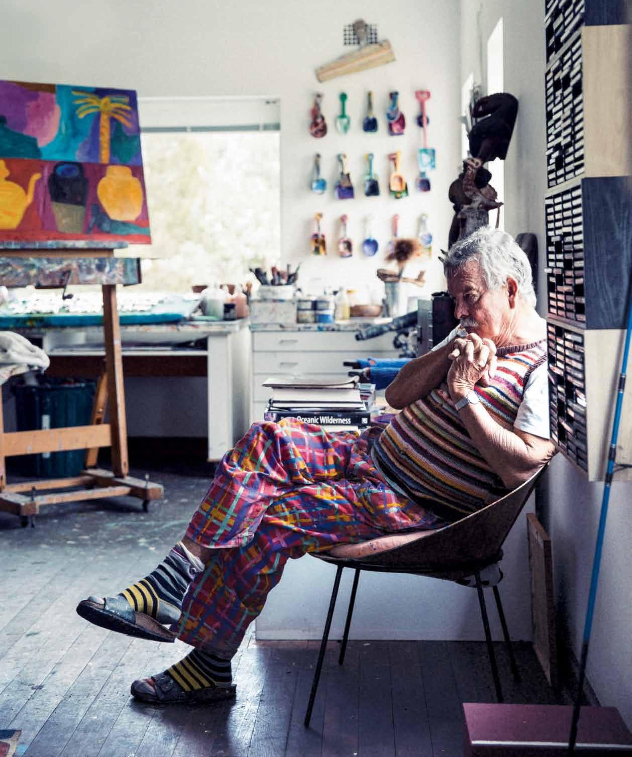
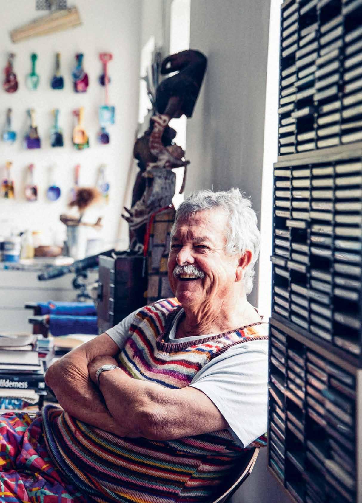
He’s known for his iconic painting scenes, his moustached smile and his gallery in Sydney’s historic The Rocks. But rather than an elite 'Artist', Ken done sees himself simply as a painter – a very lucky one.
 Tex T nicky lobo | PhoTogra Phy rob Palmer
issue #29 habitusliving.com


# 39 2 . portrait
Nothing says Sydney, Australia, like a piece of Ken Done merchandise. Though the ‘serious’ art community may look down on the commercial approach he has always taken, he remains practical.
“I see [being an artist] as no different from a chef owning a restaurant, even though some people might say, ‘Oh no, artists should have nothing to do with money’. That’s just silly,” he dismisses. “You still have to do it well, whether it’s an installation, a structure, a piece of swimwear, film, or video clip.”
Ken was accepted into the National Art School in Darlinghurst at age 14. After he graduated he worked for many years – very successfully – as an Art Director in New York, London and Sydney for companies like J. Walter Thompson. So when he returned to full-time painting in his early forties, he had the benefit of a strong commercial awareness. At his first exhibition he had artworks printed onto T-shirts that were available for sale, numbered like a limited edition print, and also gave some to the press to promote the exhibition. Suddenly, ‘art’ became something affordable, something that anyone could buy, and even wear. Art was accessible.
For someone who is so iconically Australian (more about the word ‘icon’ later), Ken has spent a lot of time out of the country. In the early 1960s, when most Australians were heading to London for their coming-of-age trip, Ken headed to Japan, because “I liked the culture and architecture”.
Thus began his lifelong romance with travelling, most often seeking out new experiences and destinations. Ken has been to some unusual holiday spots including Kazakhstan and East Timor, and if he had a world map on his wall, the pins would cover much of the habitable land space across all seven continents (he is soon to visit Antarctica for the first time).
Ken paints with the same insatiable sense of adventure – and with discipline – putting paint to canvas almost every day. “You could sit around waiting for divine inspiration to hit you on the head, which some people do, but I think that [creating art] comes through the act of working,” he says. “Not everything you’re going to do is good, but when you’re hot, and it’s rolling well, and it’s exciting, you just immerse yourself in the work.”
For him, painting is an exploration, a bodily experience that is intimately connected
issue #29 habitusliving.com


2 . portrait # 41
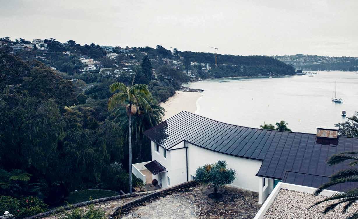
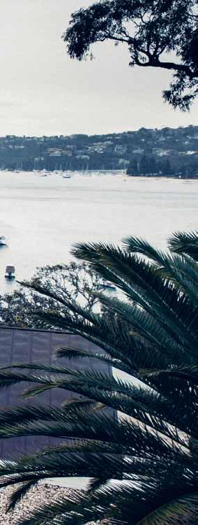
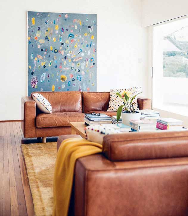
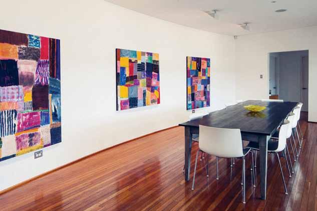
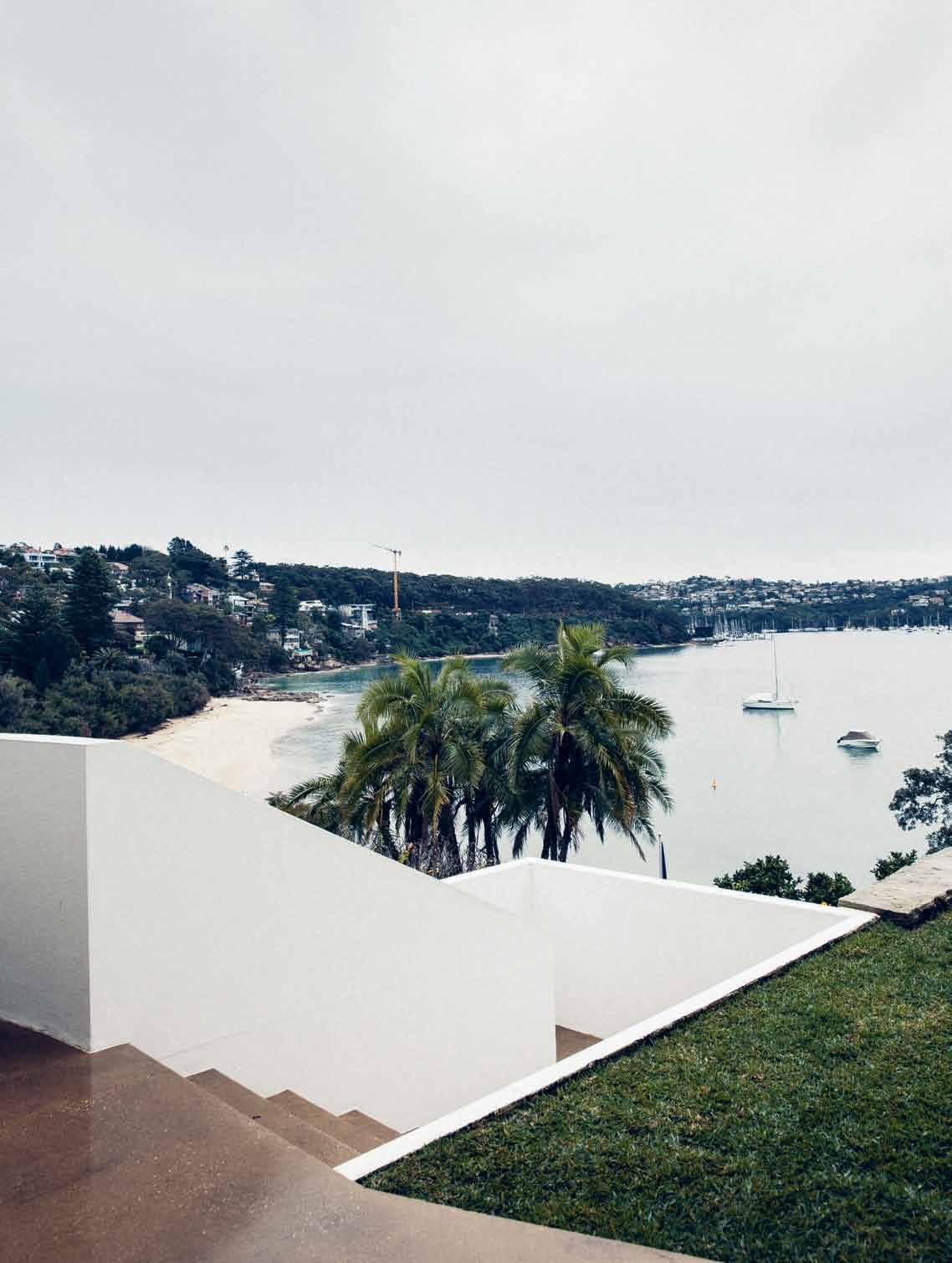
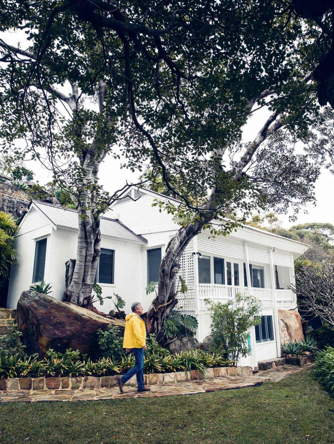
PREVIOUS | the familiar smiling face of artist ken done, pictured in his home studio. OPPOSItE | the main house, overlooking chinamans beach in sydney's picturesque middle harbour. ab OVE | the simple lounge area where ken hangs works-in-progress before deciding if they are ready for the gallery. b ElOw | a formal dining room featuring three of ken's works, and leading to the bathroom and bedroom.
issue #29 habitusliving.com
We ’re very lucky. We never take it for granted. ken | artist & resident
to the daily ritual that Ken enjoys when at home on Sydney’s lower north shore. Ken produces works seemingly effortlessly, and his spectacular home and waterside lifestyle are enviable. But although the commercial art success came relatively quickly, the dream home required more patience. “I only waited for it for 40 years,” he jokes, qualifying this more seriously with, “We’re very lucky. We never take it for granted”.
The home is on a piece of land that Ken has coveted since he was 14, when his family first moved to Mosman from the Blue Mountains. After graduating art school, travelling and working in the US and the UK, he returned to Mosman with his wife Judy (also a Mosman native whom he married overseas). They had their first child, Camilla, not long after they moved back to Australia, followed by a son, Oscar, five years later. All the while, Ken kept a close eye on the property. “I used to will the people that lived here to move out,” Ken says, lightheartedly (but not really joking).
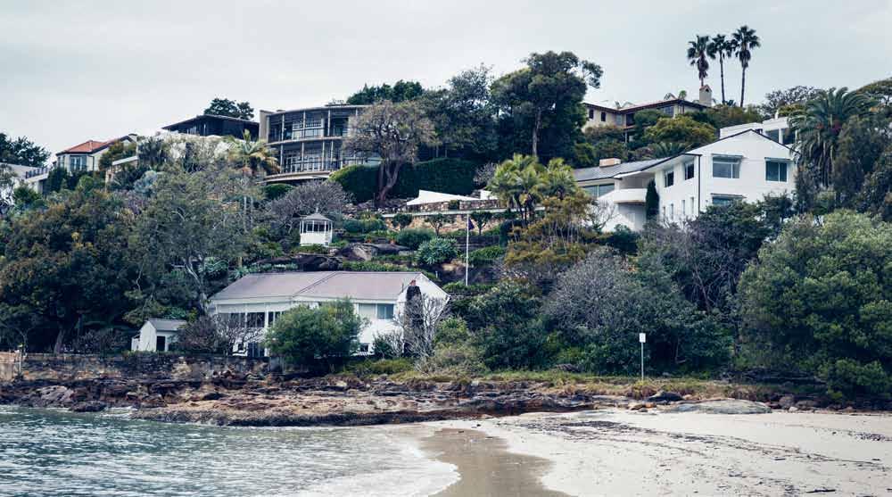
On the steep site are three separate structures. There is the main house closest to the road. Then there is a small studio –
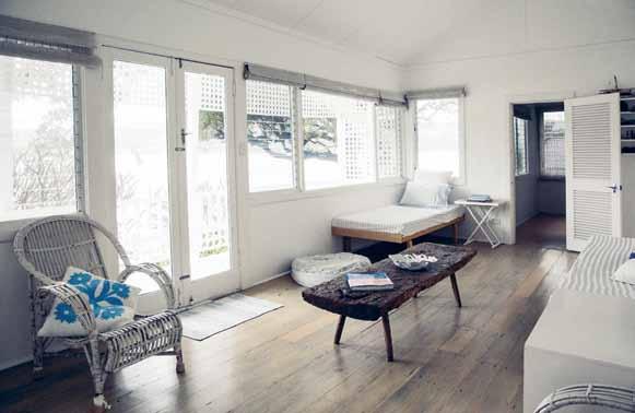
previously a garage. Closest to the water is a beach cottage, called The Cabin. It was this tiny place that gave Ken an opportunity to first experience the property, when he rented it from the then-owner for his young family to enjoy during the school holidays.
Eventually, Ken and Judy bought the property behind the coveted one and commissioned Glenn Murcutt to design a house for them on it. They had just come back from Mexico and the couple gave Glenn a brief for an adobe-style home. “It would have been quite a challenge for Glenn,” Judy reminisces, laughing. “He was into touching the earth lightly and we wanted this Spanish house in yellow and blue.” They lived in this house for some years before the waterfront property finally became available. Ken didn’t waste any time buying it and they rented the Murcutt house out (which they still own).
Where the site and outlook could be described as privileged, the house itself is quite modest. As you enter, a formal dining room is immediately to the left, with the only bedroom and bathroom beyond. A small lounge room features a couple of sofas, a rug, an Eames
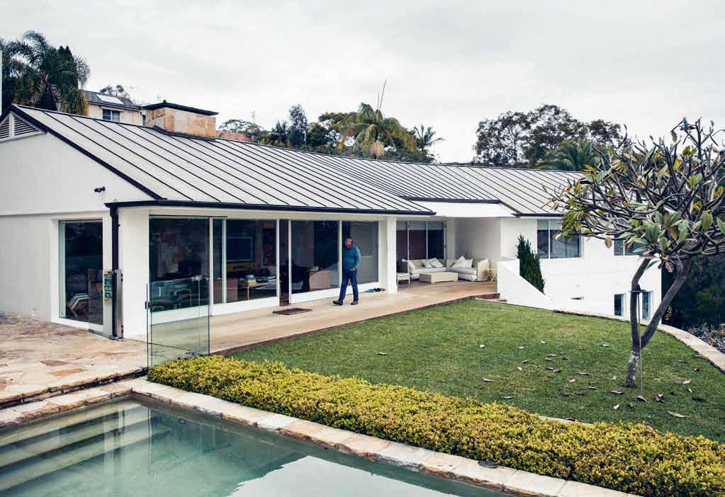 opposite | stairs alongside the lawn at the main house level lead to the studio slightly further down the steep site. above | the green lawn beautifully offsets the simple white structure of the house, and a single frangipani tree punctuates the view.
2 . portrait # 43
chaise and a coffee table laden with books. A compact breakfast table and kitchen complete the living area.
The focus, of course, is the view. Pristine landscaping and a single frangipani tree are in the foreground. Beyond, a kaleidoscope of green-blue water beckons and the rolling canvas of sky swirls with moody clouds. A small lap pool gestures towards the water. Clever detailing – a deep hedge on the lawn side – acts legally as a fence and so preserves the view.
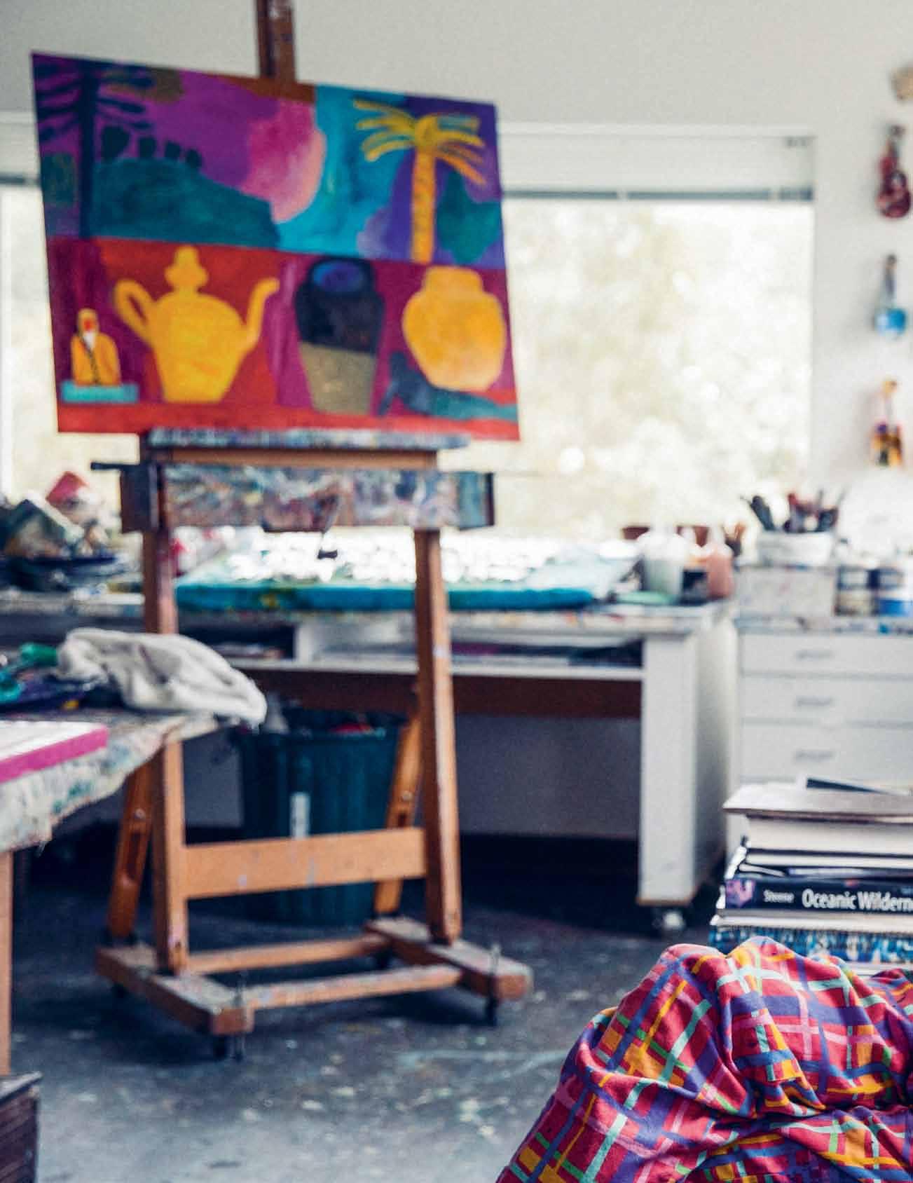
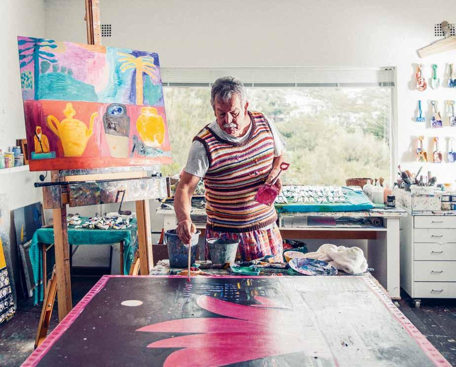
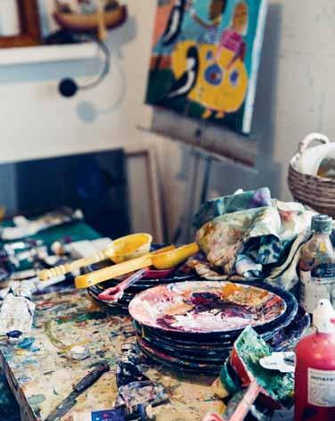
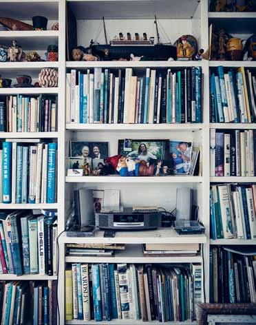
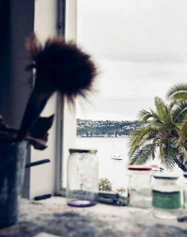
An external staircase leads us down to the studio. It contains an overflowing bookshelf, holding not just books but also a mish-mash of travel trinkets. Ken is currently painting a selection of these on a canvas propped up on an easel. On the large studio table is a painting of the Sydney Opera House with pink sails to raise awareness for breast cancer; this is to be auctioned off for the McGrath Foundation’s 10 th anniversary. The typical array of artist accoutrement – canvases, brushes, oil tubes –adorn the studio. Plastic plates and children’s spades found on the beach are the palettes of choice, a group of these last hanging on the wall as a series in itself. Natural light streams through the north- and west-facing windows.
Stepping outside again, the meandering path takes you through the beautifully
landscaped site, past lemon, orange and mandarin trees, and down to the water’s edge and a huge Moreton Bay fig. Here is The Cabin, where the family spent their summers in all those years ago. A photo of young Camilla and Oscar playing in the shallows hangs on the wall, and now it is their families that sometimes stay here for holidays. The view through the framed window out over Chinamans Beach is remarkably familiar; we’ve seen this vista on postcards, tea towels and swimming costumes featuring some of Ken’s best-known paintings, Sunday and Chinamans in Summer
Like his house, the theme of Ken’s paintings is usually simple. “My general creative philosophy would be one of optimism,” Ken says. “If you are fortunate enough to be able to spend your life as an artist – or let’s say painter, which is a much more correct word – I like ninety percent of the time to be showing works that are uplifting and beautiful, even pretty.”
“That’s a very nice – and hardly used –word,” he continues. “But I want art to give people pleasure.” Ken sees painting, along with poetry and other artistic forms, as a kind of antidote to the world we live in. “Since television has shown us suicide bombers in
issue #29 habitusliving.com
2 . portrait # 45
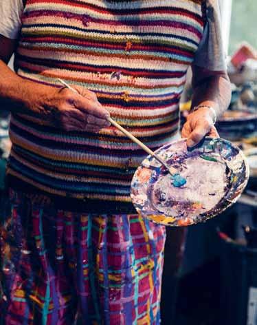
opposite | ken at work on a painting to be auctioned off for charity. above left | paints, half-finished canvases and makeshift palettes cover every horizontal surface. above right | the studio enjoys natural light and views through windows on the northern and western sides. below left | bookshelf featuring books, photos and travel souvenirs. below right | ken's signature painting outfit – checked pants and a woollen vest that his mother knitted.
issue #29 habitusliving.com
our living room while we are having dinner, we are in a sense, unshockable,” he says. So instead, art should be pleasurable.
He tests the impact of his own works at home. “After I finish them in the studio, I bring them up into the house and live with them for sometimes a week, sometimes a year. I look at them when I’m watching television, I glance at them out of the corner of my eye when I’m going to the bedroom.” Through this experience, he decides what is good enough for the gallery and what needs more work. It’s a simple approach for someone who is often described as an icon.
“I don’t think anybody that’s called an icon actually takes themselves seriously,” he muses when I question him. “It’s always very flattering when people say that of course, but more than anything, art teaches you about failure. It teaches you about how you’ve got so much further to go. It teaches you that there’s never enough time to paint all the paintings that you want to paint.
“The nicest thing,” he continues, “is when people come up to me and talk about art, and see that an artist is not outside of society and not up themselves.
“I’m just a person, colouring in”.
More
 Ken
opposite | ken strolling to 'the cabin', which holds many memories for the done family. above | inside the cabin, the window facing the bay was the frame for many of ken's early paintings. below | the idyllic location shows the series of structures nestled in amongst the landscaping.
photos of Ken’s home and studio at habitusliving.com/issue29/kendone
2 . portrait # 47
Done | kendone.com.au
World hardware A world of fresh ideas to meet the challenges of creative architecture Shop 104 PYD Building 197 Young Street Waterloo Sydney 361 Bridge Road Richmond Melbourne www.motherofpearl.com
Wool sculpting
Knitwear designer katherine mavridis won the Australian Wool Innovation Award in 2013. Since then, she has moved her studio, home and life from sydney to new york where her structural pieces are as big and bold as the city in which she now lives.
Tex T Alex lA l A k | PhoTogr APhy ChrisToPher Wise
# 49 2 . portrait
For a designer who takes inspiration from the natural world, moving to the biggest concrete jungle of them all was always going to be a challenge.
So when up-and-coming knitwear designer Katherine Mavridis gathered up her life and tools two years ago and transferred to New York City from her home on Sydney’s Northern Beaches, the transition was inevitably difficult. “It’s definitely been hard to adjust to the New York life,” she admits.
But as a creative who is steadily making her name through her ability to think outside the box, she hasn’t let her surroundings hold her back. After initially settling on the edgy Lower East Side, Katherine soon realised living in the midst of the built-up landscape of Manhattan wasn’t for her. So she moved out to the emerging Brooklyn neighbourhood of Bushwick with her photographer boyfriend.
“We live in a refurbished studio space with an amazing open rooftop and a view of the city skyline,” she says. “We often sit and watch the sunset over the city in summer, and we can actually breathe out here. Being Australian, having a large open outdoor space to get away from everything is really important to me.”
Bushwick is evolving as a hub for artists, designers and creative types, making it the perfect setting for Katherine, who is completing a Masters Degree in Fashion Design at the famed Parsons School of Design. When she’s not attending classes at the Manhattan campus, she prefers to work from her apartment, which doubles as a working studio. “I use this as a place to escape the craziness of New York,” she explains. “I like my home to be a relaxing, comfortable and homely environment.”
Katherine creates what she describes as “fully fashioned knitwear”, which translates to sculptural garments constructed from wool and coiled rope. She discovered knitwear at the end of her third year studying the Bachelor of Design in Fashion and Textiles degree at the University of Technology, Sydney and immediately took to the technique, which allows her to explore the bold, almost architectural designs bubbling around in her head.
She arrived in New York with a stint working for Sydney fashion designer Dion Lee and numerous awards (including the prestigious Australian Wool Innovation Award) under her belt. The move has forced her to step outside her comfort zone, but the change of scene has also been a catalyst for her evolving aesthetic. “I find I’m more creative when I change up the location of my workspace,” she says. “I get stuck on things if I’m in the same space constantly.”
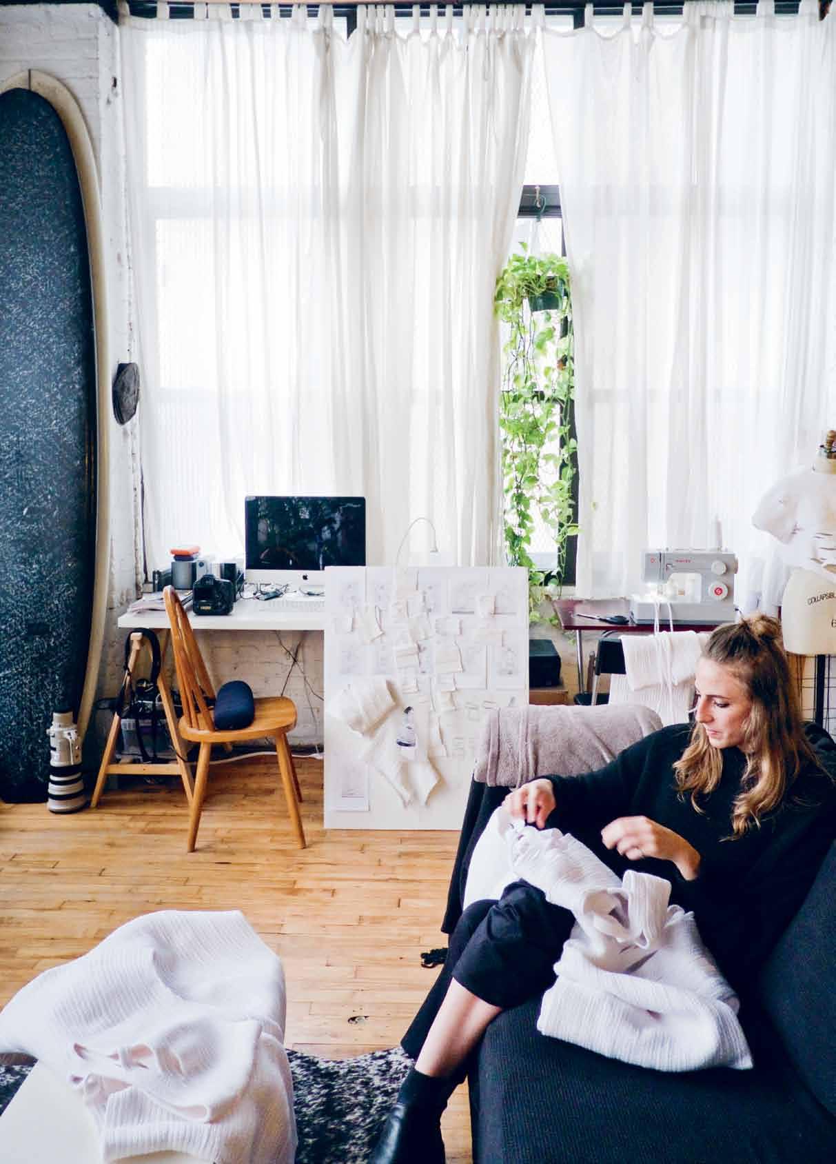
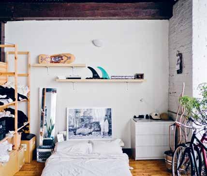
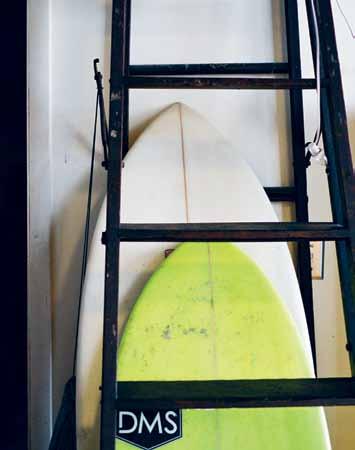
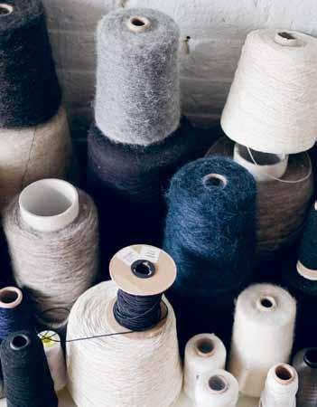
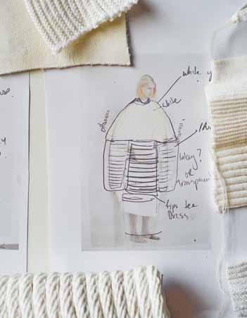
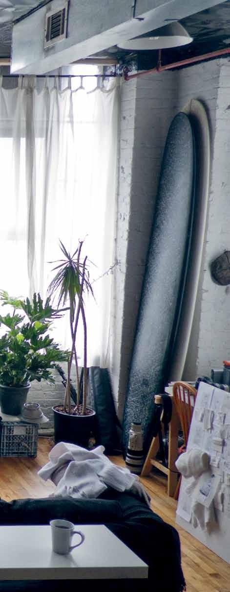
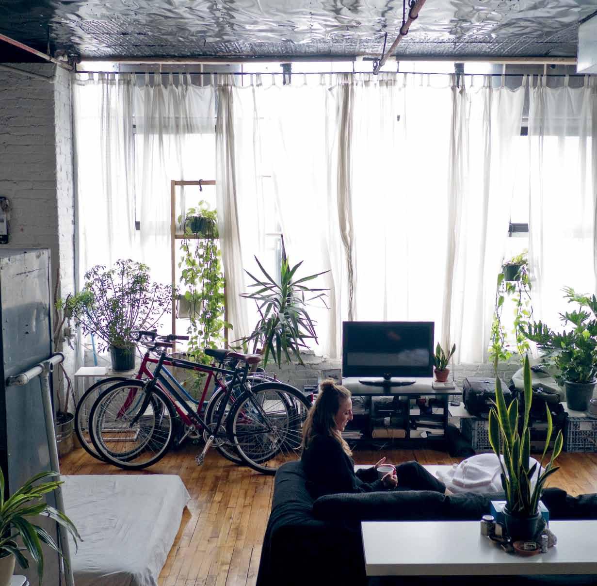
Katherine loves to work in the bright and spacious, yet artfully cluttered, studio apartment that is dotted with evidence of both her work and her passion for the great outdoors. Lush green plants sit alongside neat piles of monochromatic spools of wool and rope. A trio of push bikes and a couple of much-loved surfboards rub shoulders with a mood board covered with sketches and swatches.
“I’m obviously very connected to natural things,” she says. “I surf, I love being outdoors and I love the natural environment. I think that’s what I’m missing most living in New York. You can travel for half an hour and be out of the city in the beautiful Catskills [mountains], but it’s hard to get away when you’re so busy, so you can get stuck in the city.”
issue #29 habitusliving.com

2 . portrait # 51
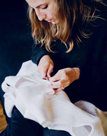
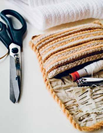
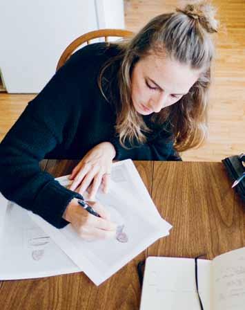
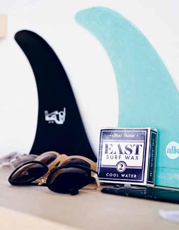
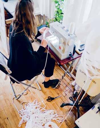
PREVIOUS | katherine mavridis finishing off pieces by hand. OPPOSItE | the bedroom nook of the studio home. ab OVE | katherine hand stitching; his and hers surfboards; a designer's necessities – handsewing equipment; yarn collection, donated from various sources; sketching ideas; a collage sketch; surfboard fins, surfboard wax and sunnies; rope t-short from a recent collection; using a domestic sewing machine (a very slow process).
Lush green plants sit alongside neat piles of monochromatic spools of wool and rope.
issue #29 habitusliving.com


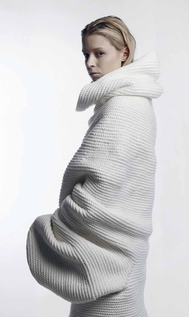
left | a wide view of the studio apartment. right | pieces from katherine m avridis' mokuba collection (fully fashioned rope garments). 2 . portrait # 53
Not that she’s complaining. Being busy is the inevitable result of being frequently described as a “designer to watch”. And while the possibility of working for a big name fashion house is an option that Katherine is considering post-graduation, for now she is focused on fuelling and refining her creative process.
“I’m not really sure what drives my passion for creating,” she says. “I guess I am just generally creative, and my creativity seems to manifest naturally in creating sculptural, textural garments.”
Although certainly wearable, Katherine’s designs are also undoubtedly statement pieces, created for those with a taste for the bold and dramatic. The bespoke piece she created for the Australian Wool Innovation Wool Week Exhibition in 2013 is the perfect case in point.
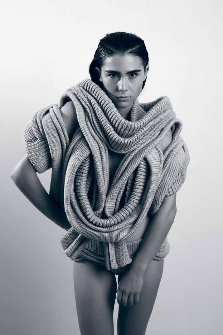
While it could technically be described as a knitted sweater, in reality the garment is far more exciting: a vibrant, deconstructed tangle of interlocking knitted tubes that calls to mind a variety of references in the natural world ranging from an orchid to the human heart. It is a stunning fusion of practical and fanciful, and a tantalising hint of the great things still to come from Katherine’s workshop.
“I am basically trying to realise the objects and garments that I dream and see up in my mind,” she says. “By creating these I hope that I am able to inspire, excite and translate these dreams to others – and to create a more beautiful, imaginative world.”
More of Katherine ’s incredible works at habitusliving.com/issue29/katherinemavridis
Katherine
Mavridis | katherinemavridis.com
above | knitted wool outfit Created for the australian wool i nnovation wool w eek e xhibition 2013.
issue #29 habitusliving.com
FOR LOVERS OF FINE OAK
Raba Eterno floorboards feature a bold, hand-finished linear effect which offer texture to the solid black colouring with a hint of brown.
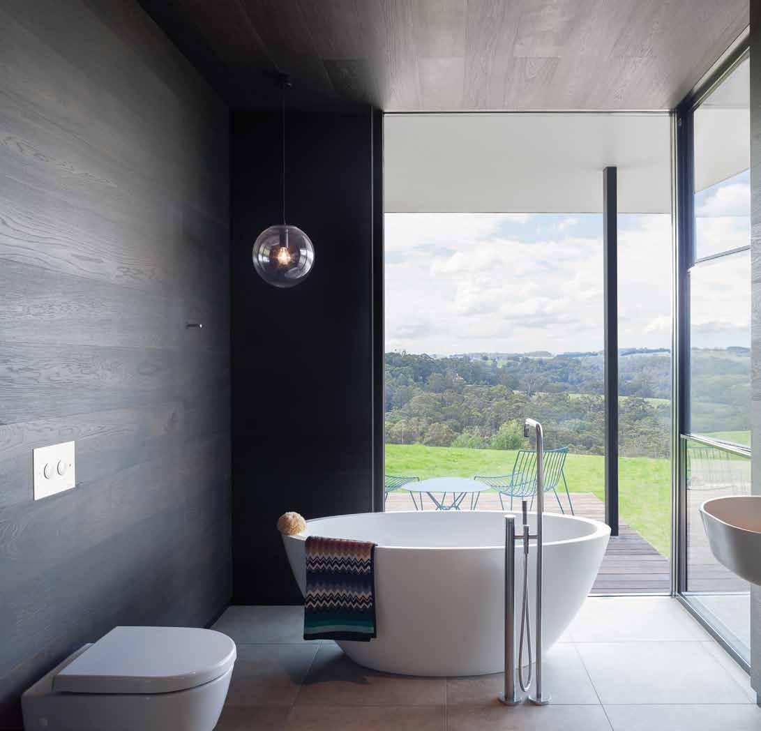
Tongue n Groove™ floorboards are designed with three solid layers of fine European Oak for a premium level of finish, longevity and structural integrity.
tonguengrooveflooring.com.au


THE ENGLISH TAPWARE COMPANY ARMADALE, VIC: 03 9818 1403 • WOOLLAHRA, NSW: 02 9362 4736 • www.englishtapware.com.au FREECALL AUSTRALIA WIDE: 1300 01 61 81 • AUCKLAND, NZ: In Residence • 09 309 3023 • www.inres.co.nz
Home fantasy


Christopher Graf ’s fashion boutique in Melbourne’s Chapel Street in the 1990s was a drawcard for adventurous fashionistas. Not surprisingly, there’s the same element of magic and sparkle found in his home at the gateway to the Yarra Valley on the city’s fringe.

Tex T STephen CrafTi | phoTography Jame S geer
# 57 2 . portrait
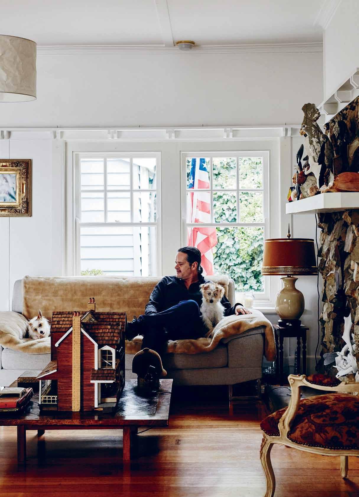
located 210 metres above sea level (one of Melbourne’s highest points), the surrounding views of the Yarra valley are as impressive as the home itself. “I’ve been a city boy since the age of 15 and it could have continued that way had we not discovered this house,” says Christopher Graf, who shares the home with his partner Glenn Francis and their two Jack Russells, Rusty and Pixelle. “Glenn saw the house advertised on the internet on a Monday. By Friday it was ours,” he says. He recalls the pleasure of driving through the gates and escaping from city life – namely the noise of their previous townhouse, which had paper-thin walls and a family with four young children living next door. Here, it’s much more peaceful, a place to enjoy the seasons. “It’s wonderful in autumn looking through the trees and seeing all the lights in the valley,” Christopher says.
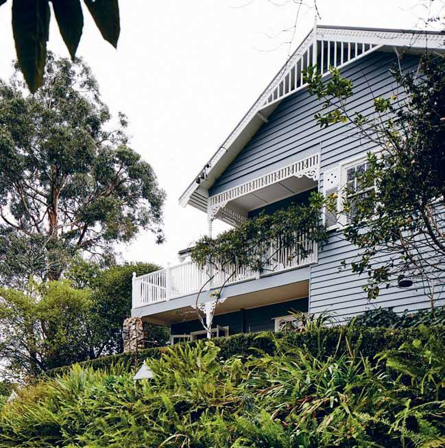
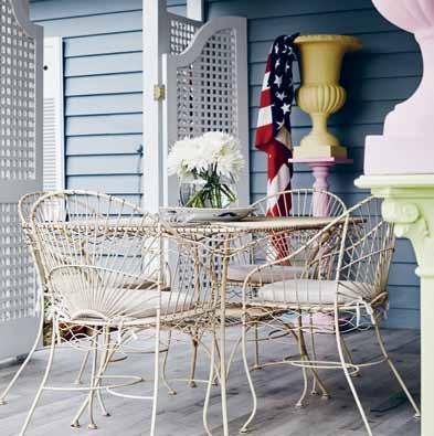
The Federation-style timber house immediately captivated the couple. They’ve named the home ‘The Hamptons’, complete with an American flag waving its stripes upon arrival. “I’ve always loved watching American films and reading books like Evelyn Waugh’s The Loved One,” says Christopher
The exterior of The Hamptons resembles a quaint timber home found in the United States. It appears as a single storey from the driveway but – being built on a significant slope – actually contains a lower level, which is primarily Christopher’s studio. Directly above are the living areas, a separate dining area that leads directly to the studio via stairs, as well as the kitchen. Also on this level are the main bedroom and bathroom, together with two smaller bedrooms, one of which is used for storage.
The home is simple spatially but within the interior is another world, created expressly by Christopher for himself and his partner. The environment is bold and unapologetic, similar
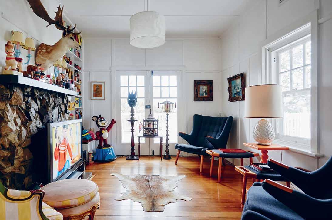
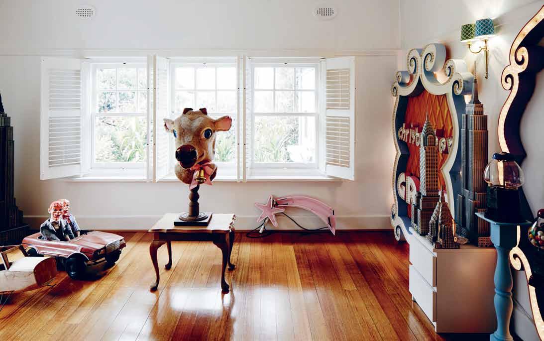
PREVIOUS | christopher graf relaxing with dogs rusty and pixelle. ab OVE | the terrace with pastel urns draped with an american flag. b ElOw | the timber home has been recently painted to highlight the fine detail OPPOSItE ab OVE | the television room features built-in shelves brimming with vintage toys. two hans wegner armchairs take pride of place. OPPOSItE b ElOw | the main bedroom includes artefacts and large signage from christopher's store window.
issue #29 habitusliving.com
2 . portrait # 59
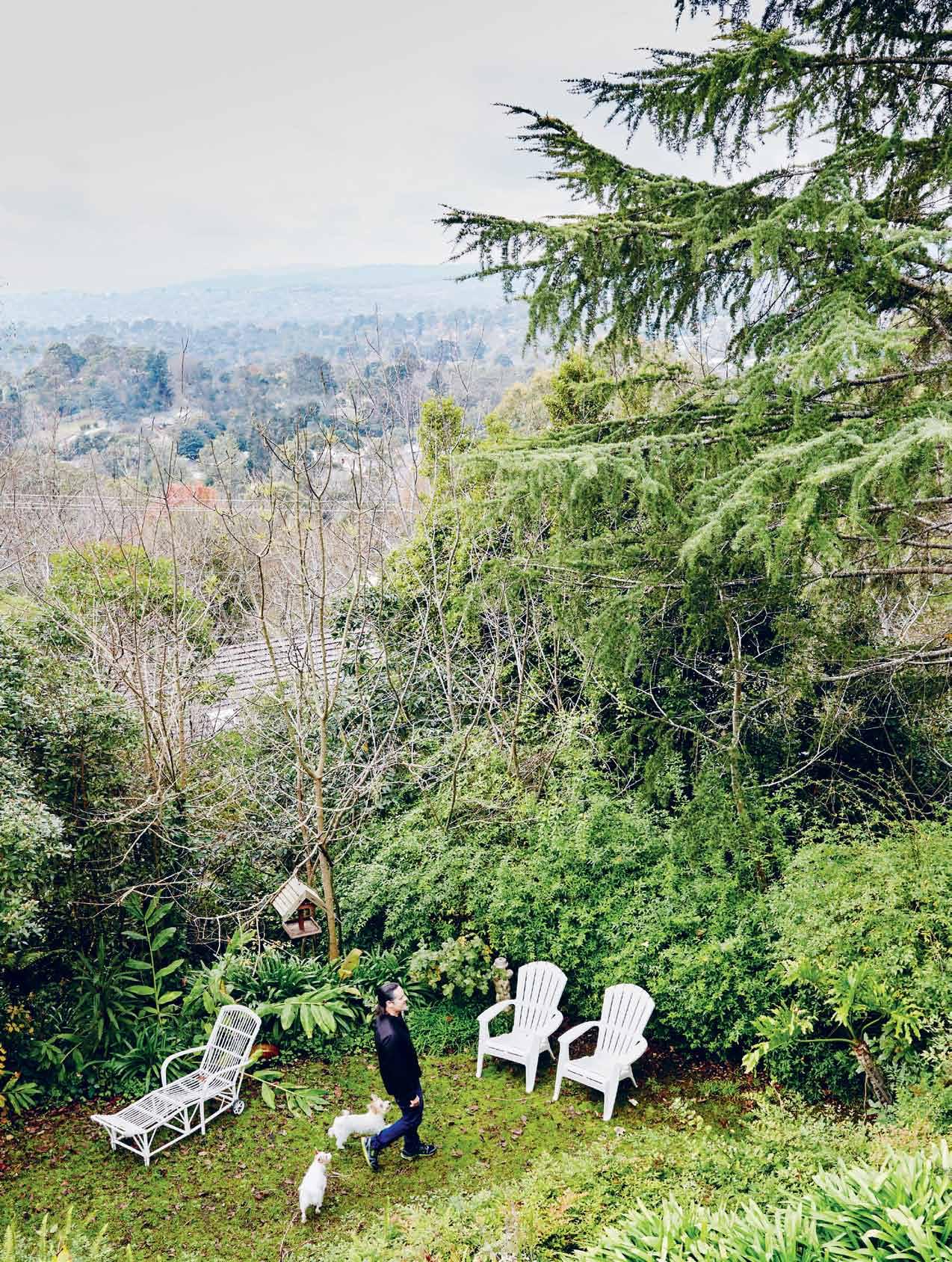
It’s wonderful in autumn looking through the trees and seeing all the lights in the valley.
issue #29 habitusliving.com
christopher | designer & resident
to Christopher ’s previous vibrant cartooninspired shop, which closed in 2000. “I’ve been designing for 30 years,” says Christopher “Whether it was my shop, my clothing or the product development work over the last 10 years, there’s always that element of fantasy.”
The living spaces are used as a backdrop for Christopher’s quirky collections, starting from the point of entry. Where you might normally see a hat rack, coat hooks or umbrella stand, at The Hamptons guests are greeted by a collection of vintage map globes and a row of timber candlesticks.
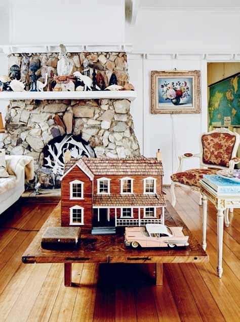
The furniture, decorative objects and artwork are set against the simple finishes and original features of the home. The Hamptons contains five stone fireplaces in all, a feature that perhaps sealed the decision to move to this picturesque enclave. “You see similar fireplaces in American log cabins. They’re extremely rustic,” says Christopher. He has taken the opportunity to style each one in a different manner to give them a unique character.
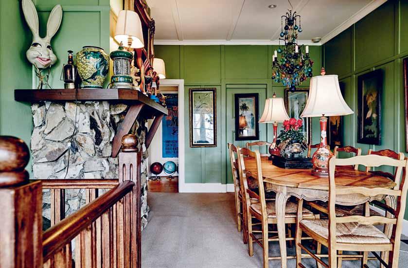
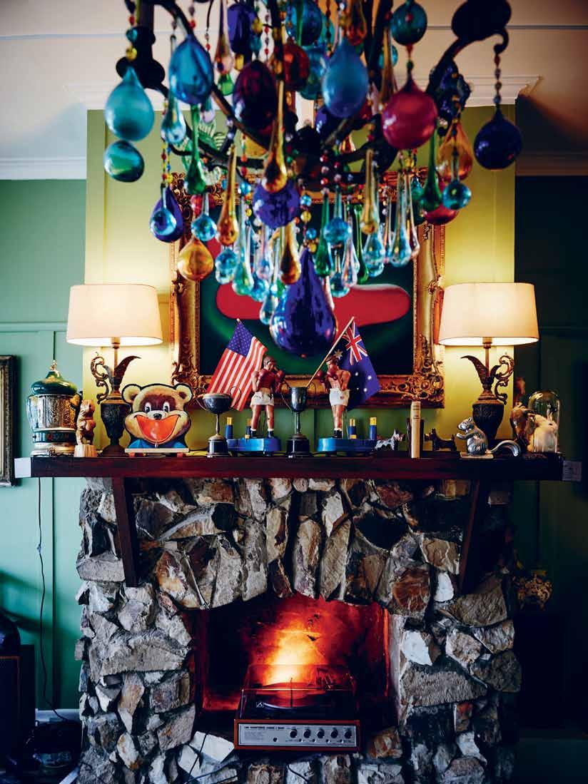
The mantle of the fireplace in the dining room is brimming with unusual objects and artefacts. A couple of toy boxes, complete with boxing gloves, stand next to a taxidermy bunny, protected by a glass dome. “I love the juxtaposition of things. These two pairings
couldn’t be more dissimilar,” says Christopher, who used the hearth of the fireplace to display a 1970s record player. Another fireplace, located in the formal living room, is treated in a different manner, with antlers creating a flame-like form perched on orange spotlights to resemble an open fire. And in the adjacent television room, with French doors leading to the northeast terrace, the fireplace is flanked with vintage tin toys.
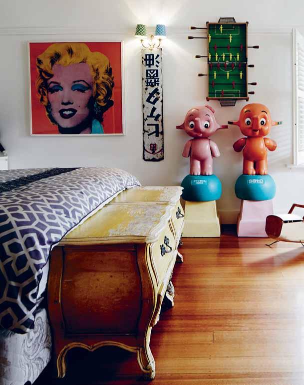
One of Christopher’s favourite rooms in the house is the main bedroom, with one wall featuring a continuous band of shuttered windows. “It’s designed on a grand scale,” says Christopher, referring to the dimensions of the room, but also the scale of the objects on display. His Sato and Sato San cartoon-like figures, traditionally seen outside chemists in Japan, are as imposing, as the large paper mâché, fibreglass and cloth mask thought to be made in the 1960s. “You can almost see how this would have entertained children attending country fairs,” says Christopher, who also gets pleasure from seeing the Mortimer Snerd twins (Gerry Gee puppets) take control of the beatenup tin Mercedes at the foot of the bed.
One of the most tranquil, yet unexpected, places in the home is Christopher’s studio, accessed from the dining room. Originally
opposite | christopher in his picturesque garden with his dogs. above | the dining room features a chandelier from c hristopher's store.
2 . portrait # 61
I love the juxtaposition of things. These pairings couldn’t be more dissimilar.
christopher | designer & resident
issue #29 habitusliving.com
2 . portrait # 63
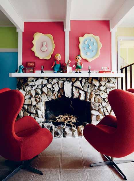
opposite left | the stone fireplace in the formal living room features antlers placed on top of orange spotlights to resemble an open fire. opposite right | artificial gold sequinned snakes slither in the studio's fireplace. above | the mantle of the dining room fireplace is brimming with unusual objects and artefacts. there is a 1970 s record player placed in the hearth.
wall-to-wall cream painted timber panelling, the studio walls are now colour-blocked in pastel shades: pink, blue, yellow, orange and green. The series of paper mache masks, with their cheesy grins, would have originally come from an amusement park. “They were a present to myself when I turned 50,” says Christopher.
Christopher’s whimsical approach to each room is as irreverent as his designs for his limited edition silk scarves. Designed for the Museum of Old and New Art in Hobart, as well as for Christine boutique in Melbourne, the theme on the printed silk is one of ‘good versus evil’. “I’m interested in subverting the notion of beauty,” says Christopher, pointing out a razor blade at the centre of a series of stripes. Blood, syringes and phallic images are literally sprinkled with confetti and other sugary symbols.
Christopher admits to having a slightly addictive personality when it comes to shopping. He recently came across a large metal medallion, once gracing the headquarters of a beer company. “I thought it would be perfect for the dining room. But I think it will need to be placed in storage just for now.”
However, whether it’s signage, like the overscaled signs that once graced Christopher’s shop windows, and now in the main bedroom, or artificial gold sequinned snakes in the fi replace in his studio, the unexpected is truly the norm in this home, one approached with complete bravo and sense of style.




 Christopher Graf | christophergraf.com.au
ABOVE | MAIN BEDROOM WITH TREASURES FROM MARKETS AND SECOND HAND STORES.
issue #29 habitusliving.com


Shower Pleasure. www.hansgrohe.com.au
SYDNEY
Official Wrap Party Partner
Sydney InDesign 2015
MASTER YOUR DESIGN CAREER
2015 Graduate Exhibition & Parade
Sydney - 23 & 24 November
Melbourne - 25 & 26 November
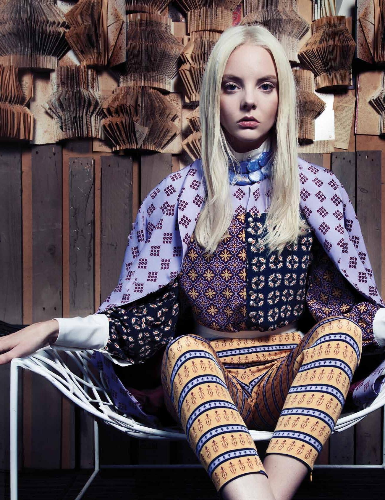
Bachelor of Design. Master of Design. FEE HELP available for eligible students.
ENROL NOW FOR 2016 1300 551 433 www.whitehouse-design.edu.au
CREATIVE DIRECTION & STYLING FASHION DESIGN
INTERIOR DESIGN
l MELBOURNE
TEQSA Provider Number 12065 | CRICOS Provider Code 02863C Fashion Design by Bachelor of Design student Amanda Busco
Local flavour
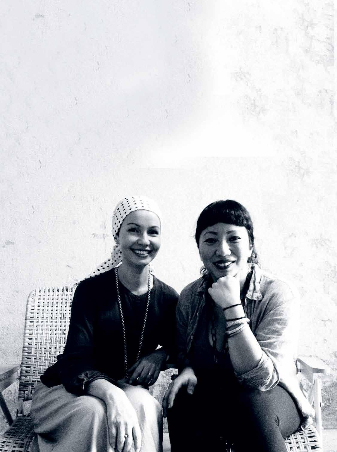
The authenticity debate has the tendency to become mired in complexity, but two Malaysian architect-designers are taking a practical approach. studio Bikin ’s retail arm, Kedai Bikin asks: Why fake it when we can make it?
Y
Y
N
Tex T
Narelle Yabuka (origi Nal), Nick Y lobo (adapTioN )
| phoTograph
courTes
of sT udio biki
# 67 2 . portrait
issue #29 habitusliving.com
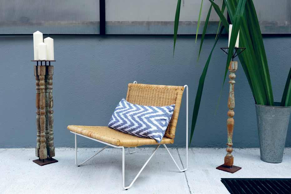
previous | Studio Bikin’ S directorS Farah a zizan and adela aSkandar on Site above | kedai Bikin’ S concrete and copper handmade tap S below | mr Gould rattan armchair, Flanked By tianGlilin, candle StandS made out oF reclaimed timBer BaluStradeS and Steel. opposite | XX-marBle (VolakaS) Side taBle with the Shell chair, with white ruBBer and pe StrinG Support.
With the exception of sole practitioners, it is uncommon to come across architectural design studios that are directed solely by women. Kuala Lumpur-based Studio Bikin is one of those rare cases. It is helmed by Farah Azizan and Adela Askandar, both of whom studied architecture and worked in the UK before returning to Malaysia in the 2000s.
The studio takes its name from a Malay word that means ‘make’. “We believe architecture and design has a lot to do with the craft and skill of putting materials together,” says Farah. In fact, the pair established Studio Bikin as a means to push their interest in craft and detail.
They have a strong belief in the inherent quality of the individual and handcrafted, whether in an architectural or furniture content. “There is a cooking term in Malay, air tangan, which literally translates as ‘water of the hand’,” they explain. “This describes the character of the dish [as opposed to the ingredients or the method]. For instance, you and I are given the same set of ingredients and instructions to make a cake, and we make it
accordingly. Yet somehow our cakes will taste different because of that little flick of the wrist I employ when swirling the cake batter, or that dash of confidence you bring through many years of baking that makes your cake taste that little bit different from mine. The analogy can be applied to design and construction, or making, as well. The difference is the transfer of character and essence of that person into the final product that we find interesting. Essentially it is what differentiates the work between each of us in this global design cauldron and gives us all identity.”
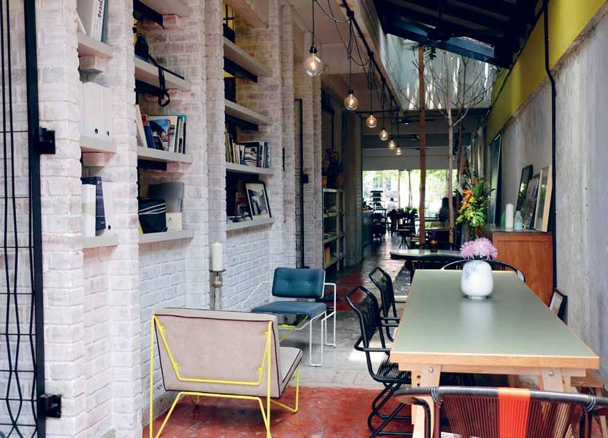
The design and sale of furniture has been a consuming direction for the primarily architectural studio, encapsulating an extension of built form at the human scale. The store Kedai Bikin was opened in Bangsar, Kuala Lumpur, with the intention of cultivating an appreciation of local crafts and locally made and designed products – “[including those by] the pasar malam [night market] chair makers, rattan uncles and kayu ukir pakciks [wood carving uncles] out there,” quips Farah. “We felt that in Malaysia there was not a properly curated platform to showcase the local design talent that is growing in the scene here. And we
# 69 2 . portrait
They have a strong belief in the inherent quality of the individual and handcrafted.
were tired of seeing Chinese-manufactured copies of Scandinavian modernist chairs flooding the Asian interior market,” she says. The tagline for Kedai Bikin is: ‘Why fake it when we can make it’.
“Malaysians have generally not warmed up to the idea of paying for a local designer chair yet,” comments Adela, “although they are willing to fork out double the price of our bespoke chairs for an imported chair or brand. However, we are sticking to our prices as firstly, we need to make it sustainable for us (as designers and makers); and secondly, we feel that you are really not paying that much for the amount of effort that goes into each product.”
That said, the pair are optimistic about growing the local design culture. “There is a decent pool of resources that are still untapped here in terms of traditional crafts, trades and design,” suggests Farah. They believe these elements of culture can be re-appropriated to the current mode of living through to the next generation in years to come.
Studio Bikin | studiobikin.com
ABOVE | Kedai
a
BiKin’s studio and showroom, in
1950
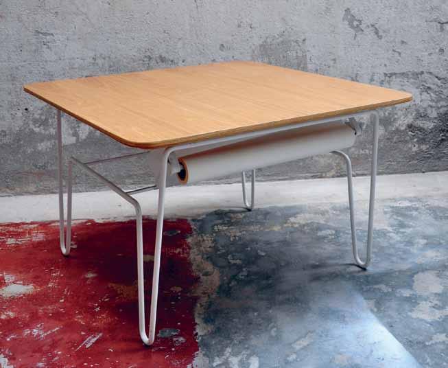
s shophouse in Kuala lumpur, designed By studio BiKin. BElOw | Kedai BiKin’s l ayla taBle, equipped with a drawing roll tucKed Below. child-friendly and great for creative discussions.
This article was adapted from one published in Cubes Indesign #73 issue #29 habitusliving.com
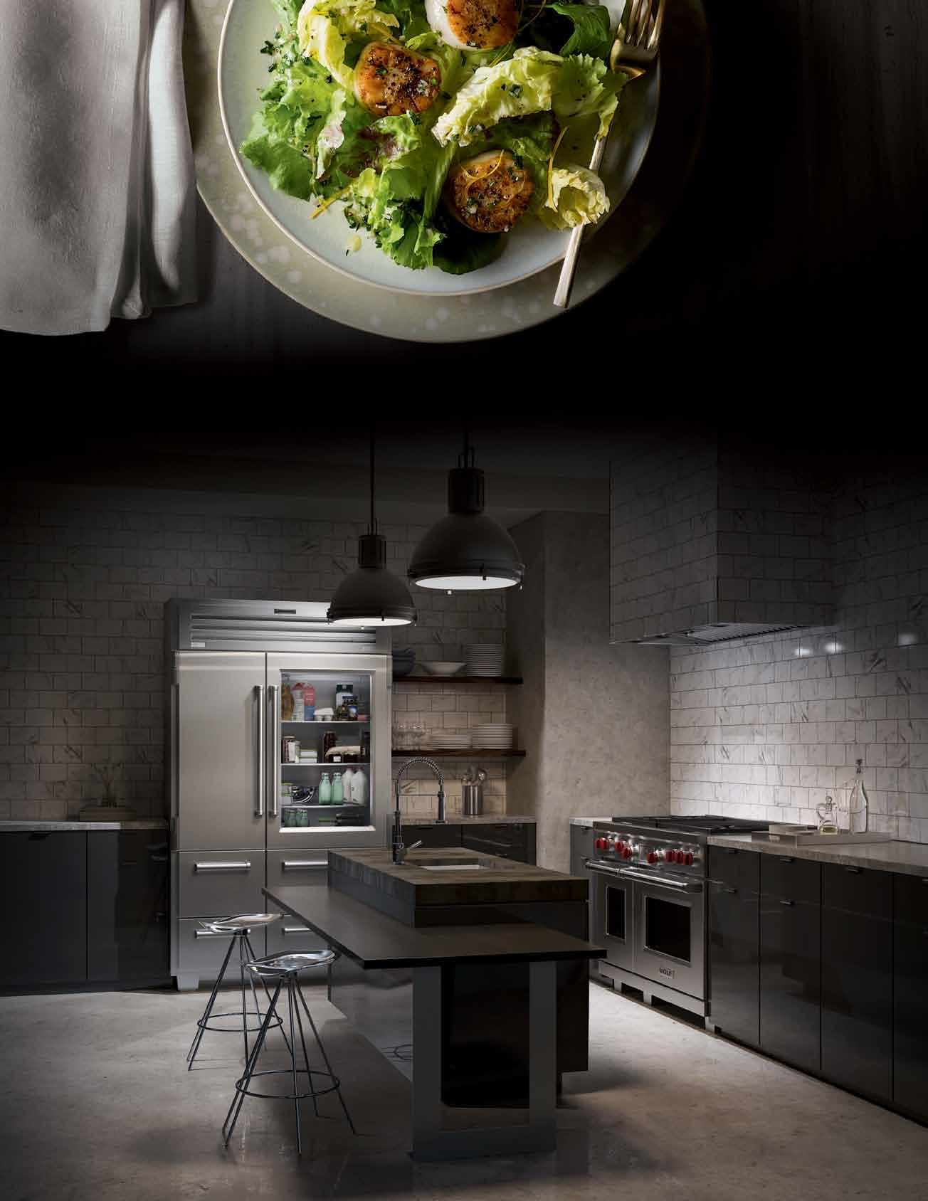
FOOD IS ART.RESPECT IT.
Superior food preservation. Professional cooking performance.


Craftsmanship and technology without equal.
su b zer o wo lf.co m .au
There’s no place like home
A new international group exhibition investigates the cultural identity of one’s homeland.
At one point or another in our lives, we contemplate the world in which we live and wonder why we feel we belong to a certain place. We assess why it becomes our home. Making up our own identity, the connection between both place and home is acquired through one’s own symbolic transition. The transition makes for a culturally aware existence where the knowledge of history is just as important as the present.
There’s No Place Like Home is a group exhibition that explores notions of cultural identity as informed by a geographical belonging. It is a collaborative project between .M Contemporary in Woollahra and galleries in London, Seoul and Cape Town.
The exhibition will seek to celebrate the artistic practices of Australia’s emerging and established contemporary artists alongside international contemporaries in order to highlight the universal theme of connection or disconnection to place.
The main focus of the exhibition will deal with the cultural and historical relationships forged within the aesthetic experiences of these artists.
For this Sydney edition, South African artist Lyndi Sales will return to the gallery for the exhibition following her critically acclaimed show with .M Contemporary at the inaugural Sydney Contemporary in 2013.
The exhibition will run until 11 October 2015.
.M Contemporary
37 Ocean Street, Woollahra
Mon By appointment
Tues-Sat 10am to 5pm
Sun 10am to 4pm
issue #29 habitusliving.com
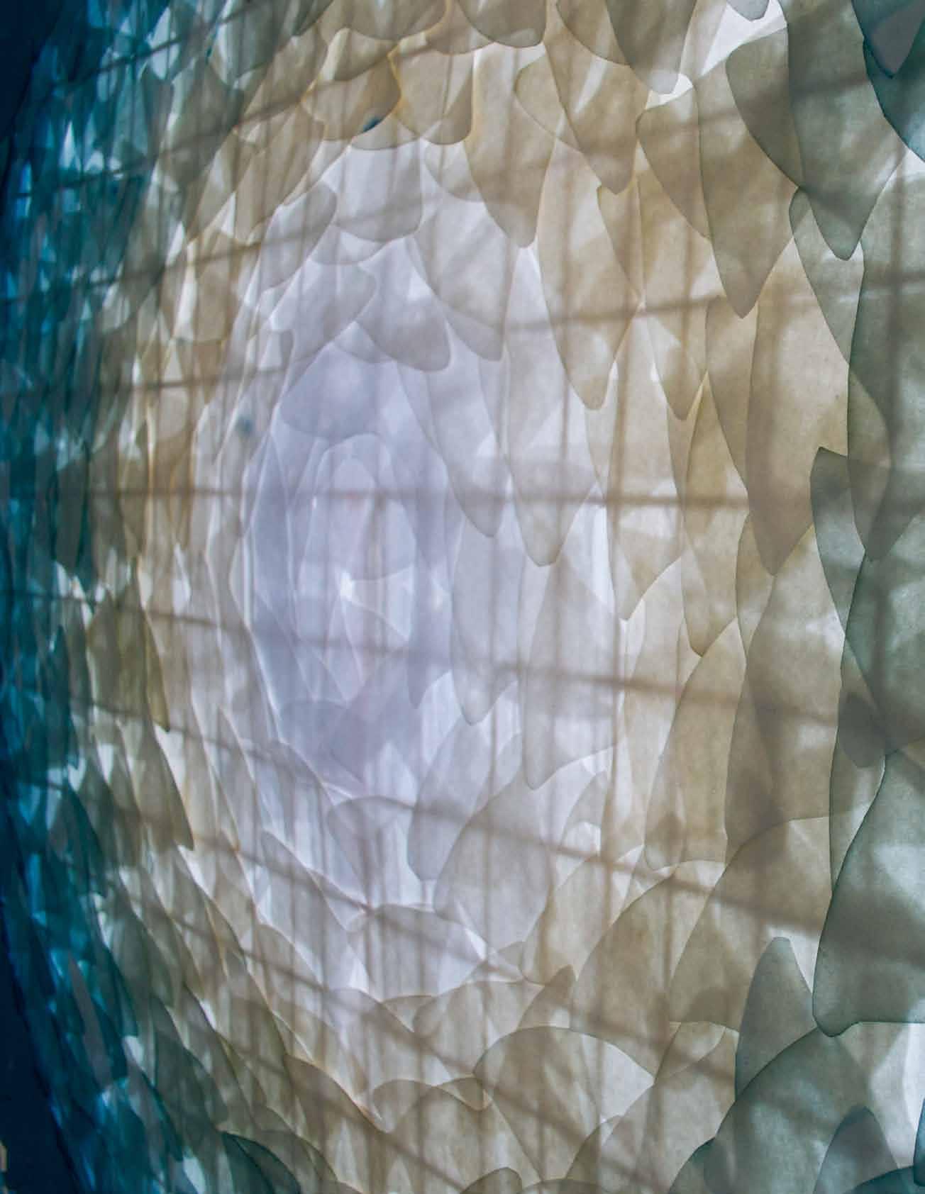
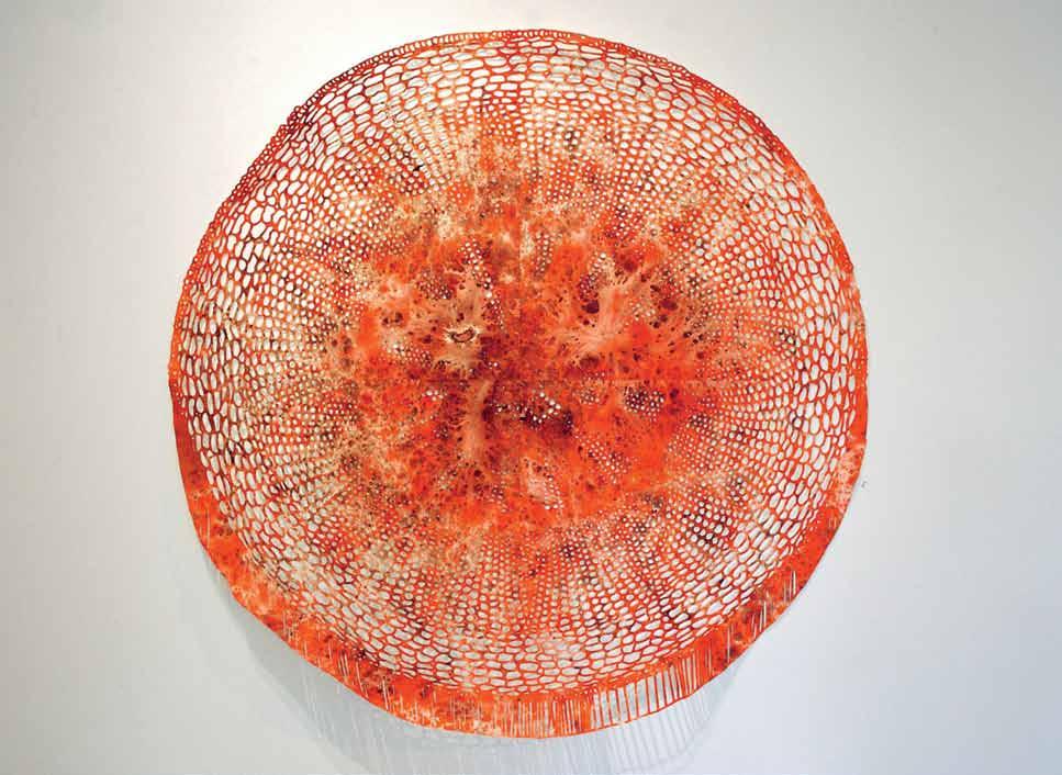
above | Sever, 2015. 170 x 170 cm. mecurochrome and paint on archeS paper. background | moth to a flame, 2015. 175 x 175 cm. medium hand dyed vilene, bamboo and String. .M Contemporary | mcontemp.com
the art of lounging
Place lounging/sitting/relaxing into the context of our lifestyles – rising stress levels, concerns about working too hard/too long, eternally plugged in to our social networks – and this activity becomes more than just a pleasant pastime, but also a necessary respite.
Entwined in these concerns for our health are the risks of a sedentary lifestyle. We’ve all heard it by now – ‘Sitting is the New Smoking ’. So our design choices need to consider the potential impact of our living environments on our own bodies and minds, as well as that of our families.
Rather than confining the ‘ lounge ’ to an isolated product, or even a single room, let ’s encourage a lounging attitude to benefit us whether we are completely relaxing, playing or working. We all deserve to live within spaces that will calm, nourish and nurture our senses.
Join us in cultivating the Art of Lounging.
For more content, download the Art of Lounging e-book for free at habitusliving.com/issue29/artoflounging
There are more reasons than ever for us to take time out for ourselves.
# 73
Design R&R
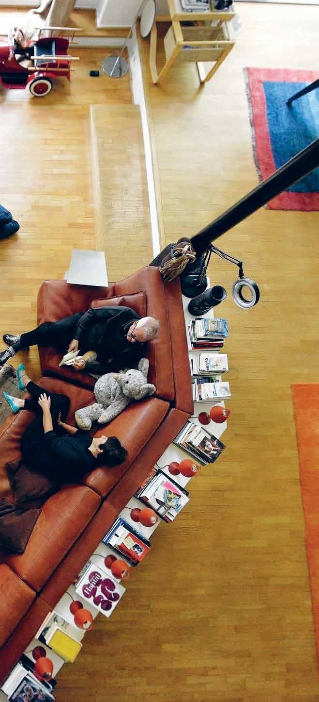
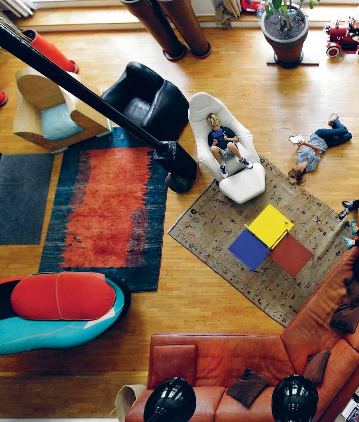
REST AND RELAXATION is something we are all seeking in today’s fast-paced world. Our lounge areas should offer the ultimate retreat, a place to unwind in style, socialise and entertain, eat, work and play. SOphIE DAv IES looks at ways to create a multi-tasking space to suit your needs. Whether in a compact flat or a larger home, design can improve your wellbeing and enhance the art of lounging.
—
Tex T Sophie Davie S | phoTographY variouS habitus #29
Every now and then a lounge collection comes along that makes you see the living room with fresh eyes. UK designer Ilse Crawford’s Sinnerlig range for IKEA – a title combining the Swedish words for ‘sensuous’ and ‘heartfelt’ – is that fresh touchstone. Encompassing more than 30 pieces, from seating to tables, lights and accessories, it not only offers a feel-good natural palette of cork, ceramic, seagrass, bamboo and glass, but also shies away from in-your-face hero pieces. In a break from glossy, glamorous designs, it creates a low-key, less-ismore look that works flexibly in any lounge room. With its utilitarian style and serene feel, it would be equally at home in Australia or Asia. What’s more, rather than you having to fit in around your lounge, you can make your lounge fit around you.
Back in the day, the living room was for gathering and relaxing – dining and work usually happened elsewhere. Fast-forward to 2015 and the lines are blurring. Now we’re asking more of our multi-tasking lounge rooms, as we shoehorn competing activities into what is often a compact space. The lounge has become the entertainment zone, dining area (often with an open-plan kitchen), playroom and even a study and guest bedroom (thanks sofa-bed!). So how do we ensure our retreat still delivers a restful escape? And what are the aesthetics and arrangements that will encourage us to slow down and chill out?

Sinnerlig, in global stores from August 2015, speaks to soothing textures, neutral but warm colours, simple forms and versatile layouts, as well as affordability (a stress-buster in itself). Materials support relaxation, especially cork, which is durable, an acoustic softener, waterproof and easy to clean. Adding value to everyday living, Studioilse’s pieces “explore the beauty and tactility of their raw properties and celebrate their imperfections. They are designed to engage the senses and connect us to our homes”. As Ilse Crawford says, “The more virtual our lives become, the more we crave the physical”.
Designs are divided into three groups: lounging, dining and working. Each has a core piece – the day-bed, dining table and trestle table – but you can “decide how you wish to live with these things and how they fit into your life.” You can read or snooze on the day-bed, and work or eat at the dining table, perched on comfy benches (which also make great plant holders).

# 75 the art of lounging
Get personal

We all have different ideas of what constitutes relaxation in our living area. For some it could be a brilliant music system, for others a quiet reading chair. Some might crave sociable kitchen/dining integration and a state-of-theart TV that makes entertaining a breeze. Those seeking solitude might want to create a spot for yoga, meditation or an indoor garden. The lounge is the room that most reflects this variety, so should be personalised to suit your needs.
As Australian stylist Amanda Talbot discovered in her 2014 book Happy, the key to creating a joyous space is confidently making it your own. There’s no one recipe for the perfect relaxing lounge, so it’s not as simple as just incorporating calming colours, adding a massive sofa system or banning clutter. You may find vibrant hues more soothing, prefer reclining on floor cushions and love curated displays of kooky ornaments. Instead, Talbot suggests we can all tap into our inner child with creative play ideas such as a hybrid dining/ping-pong table or even a swing seat in the living room. Embracing sensuality, from coloured mood lights to scented candles, can also help you unwind. “It is up to you to design your home to support a way of life that appeals to you.”
Flexible friends
Creating a flexible environment to suit different moods at diverse times is key to fulfilling lounge living. Add a few great chairs for ergonomic sitting, a sofa big enough for two to stretch out and watch a movie, and a low-lying lounging area for kicking back. French designer Matali Crasset’s new Self-made Seat for Italian brand Campeggi is the poster child for portable lounging, incorporating seating modules that can be carried around like suitcases to form sofas, be stacked into a chair or used separately as poufs. Its design cue was “a refusal to see sofas monopolise the living space in our homes,” says Crasset. “It really encourages you to rearrange your space and be comfortable within.” The idea can easily be replicated using beanbags, large floor cushions or lounge mats.
Another flexible option is Japanese design brand Nendo’s 2015 Tokyo Tribal furniture range for Singaporean company Interiors+. Quirky but compact, its chairs, stools and tables integrate patterned bamboo baskets, woven by artisans in the Philippines, playfully creating ornament from functional storage elements. Table and stool legs poke through baskets, which are even used as backrests for wooden armchairs (the bamboo’s elastic properties make it ideal for back support). This tribe of designs shows how you can cheekily incorporate storage into a lounge layout.
Space saving is another vital form of flexibility: Japanese furniture label Karimoku New Standard recently presented its compact yet comfy Scout chairs by German designer Christian Haas which stack like supermarket trolleys, ideal for guest chairs in small lounge/dining zones.
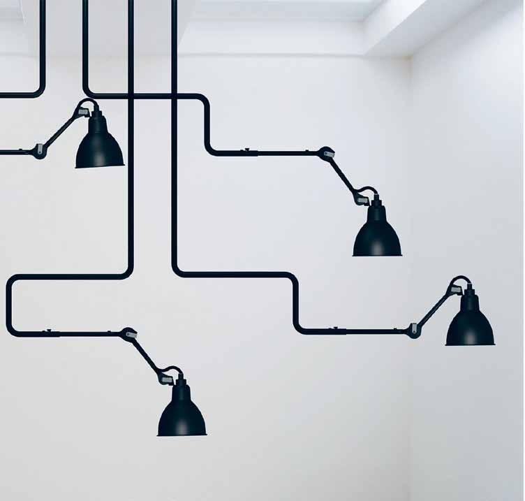
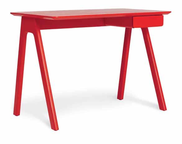
Serene studies
Successfully integrating a study nook into a lounge is a huge modern challenge. We’re all working 24/7, so how do you detach at home? And how can freelancers based in their living room separate work from play? If you have no space for a seductive screen to disguise your work area, then at least get a great looking desk. American brand Blu Dot’s Stash desk in jaunty red promises to ‘take some of the work out of homework.’
Desk sorted, but what about a seat? Chair expert Alan Boyd, partner at design retailer SMOW Australia, was formerly director of Herman Miller in Australia. The US furniture company poured funds into researching the ideal chair ergonomics, with Boyd teaching customers how to sit properly. “Working chairs should be worked,” he says, yet many users just keep their study chairs locked in one position, despite the options to reset them flexibly to support different postures. He also rates Humanscale’s chairs, which use your natural body weight to balance and hold posture. It’s vital to create a comfortable, relaxing space for working at home, recommends Boyd. “A desk is a microcosm of your life, and the same health mantras apply. You should be refreshing your muscles, moving more, exercising every day, incorporating indoor-outdoor greenery around you and orientating towards views.”
habitus #29
The key to creating a joyous space is confidently making it your own.

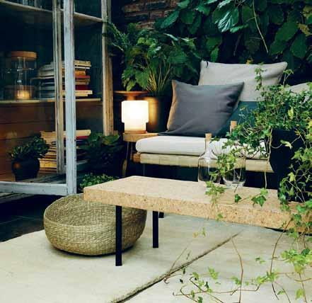
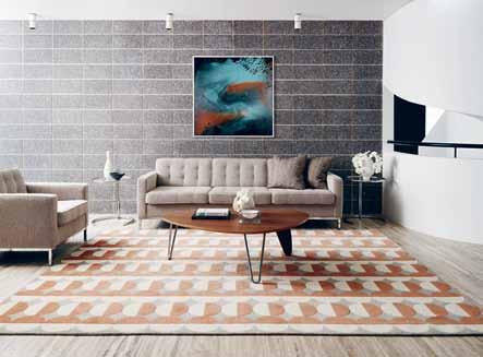

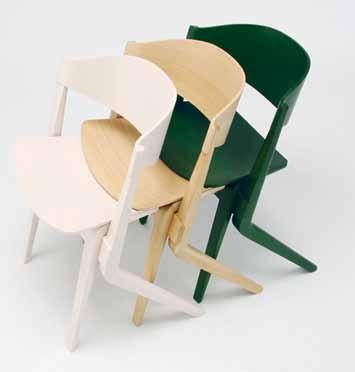
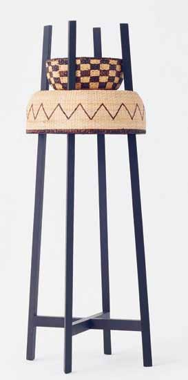
previous | the open-plan living room i n m arc Sadler’ S m ilan home. i mage from Happy by amanda talbot (m urdoch b ookS). opposite | compact red Sta S h deS k by b lu d ot i S ideal for a living room Study. above | (clockwi S e from top) n °312 ceiling lightS from l ampe g ra S deS igned in 1921 by b ernard-a lbin g ra S , available at Spence & lyda; g reg n atale’ S graphic london rug for hi S 2014 n ew m odern collection for d eS igner rug S ; m atali c ra SS et' S modular Self-made Seat for campeggi; nendo' S tokyo tribal range for interior S+; Scout chair S by c hri Stian h aa S for k arimoku n ew Standard, available from Stylecraft. ikea’ S 2015 Sinnerlig collection by i lS e c rawford. # 77 the art of lounging
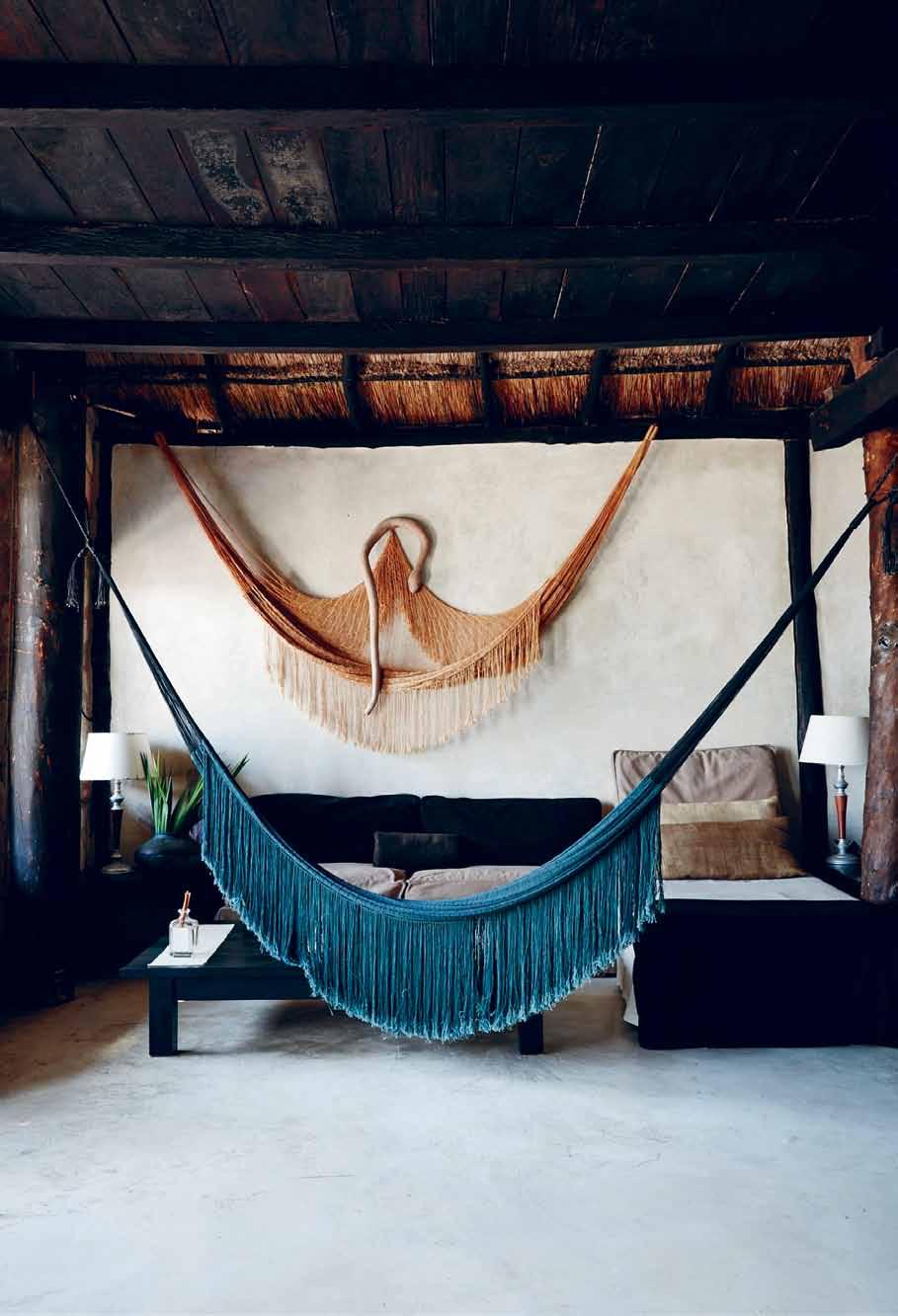
above | Hammocks in suite lounges at c oqui c oqui t ulum Residence H otel (coquicoqui.com) in t ulum, m exico, entice you to Rest and swing. o PP o SITe above | Playful, witty design: m a Rcel wandeR s’ limited-edition aRion unico Rn Rocking c H ai R fo R d utc H b R and m oooi. o PP o SITe below | sPanis H talent Jaime Hayon's quiRky m onkey side table fo R bd ba Rcelona d esign.
habitus #29
Best practice is not movement, sitting, lying, standing; it’s doing a mix of all of them, all the time.
Sitting pretty
It seems the days of lounging might actually be over. Sitting down for brief periods allows us to recover from stress or recuperate, but increasingly medical research shows that sitting is a health risk, especially when we’re sedentary for too long, whether at work on lolling on the sofa. Regular exercise helps, but doesn’t compensate for sitting for prolonged stretches, which can increase the risk of weight gain, diabetes, heart attack and early death (sitting is the new smoking!). UK public health body the NHS advises breaking up sitting every half hour with even just a few minutes of activity.
“Your best posture is your next posture,” says Alan Boyd. “Movement is the key – best practice is not moving, it’s not sitting, it’s not lying, it’s not standing; it’s everything, doing a mix of all of them all the time.” When it comes to sofas look for supportive ones. “We were always decrying sofas that were too soft,” he says, “where you need 25 cushions to get the right posture.”
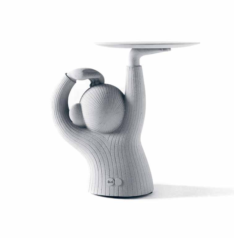
The living room of the future will need to get more active, with a fluid mix of options – from sitting to standing, cooking, perching at bar stools, lying on the floor or kneeling – enticing us to shift positions and zones regularly, rather than slumping for hours. With Google embracing treadmills at workstations and cycling so hot right now, could we see the rise of stylish exercise bikes in front of the TV? Or, at least, more balcony gardens off lounge rooms to encourage us to get up and moving in the ad breaks.
Playful retreat
For families with young children, providing lounge space for both active play and rest is equally important to kids’ wellbeing. Children need privacy too and spots to call their own, for naps and games. Consider an indoor teepee (try Joyjoie; joyjoie.com.au) or ‘play furniture’ such as a hanging seat (IKEA’s PS Lömsk swivel chair includes a pull-down hood to create a hiding place). Adult play should be embraced too. Dutch brand Moooi released its limited edition Arion unicorn rocking chair for grown-ups this year, but if that’s too wacky how about a relaxing hammock in the living room? Witty accessories can also make a lounge more fun, such as Spanish designer Jaime Hayon’s simian-shaped Monkey side table for BD Barcelona Design.
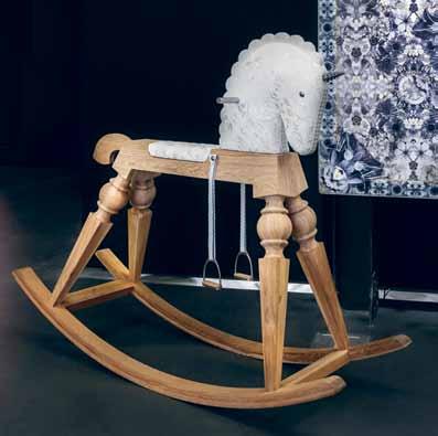
# 79 the art of lounging
Artek | artek.fi available at Anibou, anibou.com.au
BD Barcelona Design | bdbarcelona.com/en available at Living Edge, livingedge.com.au
Blu Dot | bludot.com
Campeggi | campeggisrl.it
Designer Rugs | designerrugs.com.au
Gervasoni | gervasoni1882.it/en available at Anibou, anibou.com.au
Glas Italia | glasitalia.com available at Space, spacefurniture.com.au
Herman Miller | hermanmiller.com available at Living Edge, livingedge.com.au
Hub Furniture | hubfurniture.com.au
Humanscale | global.humanscale.com available at Schiavello, schiavello.com
IKEA | ikea.com
Industry+ | industryplus.com.sg
Jardan | jardan.com.au
Karimoku New Standard | karimoku-newstandard.jp/en/ available at Stylecraft, stylecraft.com.au
King Furniture | kingliving.com.au
Moooi | moooi.com
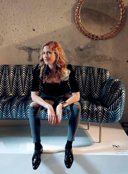
Moooi Carpets | moooicarpets.com available at Space, spacefurniture.com.au
Moroso | moroso.it available at Hub Furniture, hubfurniture.com.au
Sé | se-london.com
Spence & Lyda | spenceandlyda.com.au
Rug up
When it comes to demarcating different lounge areas –sitting, study, dining, play – rugs are a living room’s best friend, zoning spaces whether they’re tiny or huge. Sydney interiors store Spence & Lyda’s inspiring showroom also demonstrates how painterly, abstract modern rugs can become fantastic wall art when hung over sofa settings, making big spaces instantly feel inviting. Sydney firm Designer Rugs is another great source of statement pieces, including decorator Greg Natale’s geometric range for unisex glamour. Rugs were big news at 2015’s Milan Furniture Fair, where new company Moooi Carpets showcased dazzling photo-realist designs that can be printed to bespoke dimensions.
Time out
Detoxing from our devices is a radical way of making the lounge truly relaxing, and can minimise visual clutter. Australia’s King Furniture has launched King Cloud II smart couches that charge up mobiles or other devices wirelessly without the need for ugly cables. Alternatively, ban TV, phones and internet from your lounge, even if just for one night a week, to encourage family interaction.
As Canadian journalist Carl Honoré (carlhonore. com), advocate of the Slow Movement and ‘slow coach’ on Australian ABC documentary Frantic Family Rescue explains, “Slow Living means taking the time to savour every moment and make meaningful connections with other people. It’s also more relaxing because you’re not rushing around. In our busy, always-on world, impatience and hurry are anathema to pleasure and experience, and time is the greatest luxury.”
Here’s to making time to lounge…
habitus #29
Top five lounge trends
1. Glass lounge furniture creating the illusion of space for an instant mood boost. See Patricia Urquiola’s delicate, iridescent Shimmer coffee tables and shelving for Glas Italia, and Nendo’s frosted-glass Soft tables with rainbow edges and black Slide storage and side tables, for the same label.
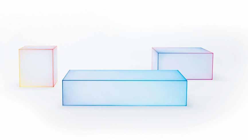
2. Slimline furniture with bold outlines, as seen in Ronan and Erwan Bouroullec’s bent-steel Kaari collection of tables, a desk, console and shelving for Finnish brand Artek.
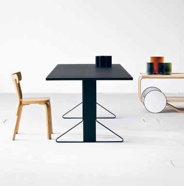
3. Pretty, feminine Art Deco designs, ideal for compact spaces. Check out architect David Adjaye’s Double Zero chairs, stools and twoseater sofas for Moroso and Nika Zupanc’s Collection III for Sé, including her Stardust sofa and Stay dining chairs, sofa and armchair.
4. Sculptural pendant lights, both skinny like jewellery (Michael Anastassiades available at Hub Furniture) and chunkily industrial (Lampe Gras at Spence & Lyda)
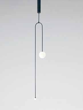
5. Pastel and bright colours for sofas and armchairs, from soft pink and green to bold red and blue. See Scholten & Baijings’ pink sofa for Herman Miller (part of the Lines, Grid & Blocks installation using Miller designs with Maharam textiles) or Gervasoni’s dreamy lounge furniture by Paola Navone. Jardan’s Coast modular sofa comes in startling pink, and more compact Ned looks a treat in sky blue.
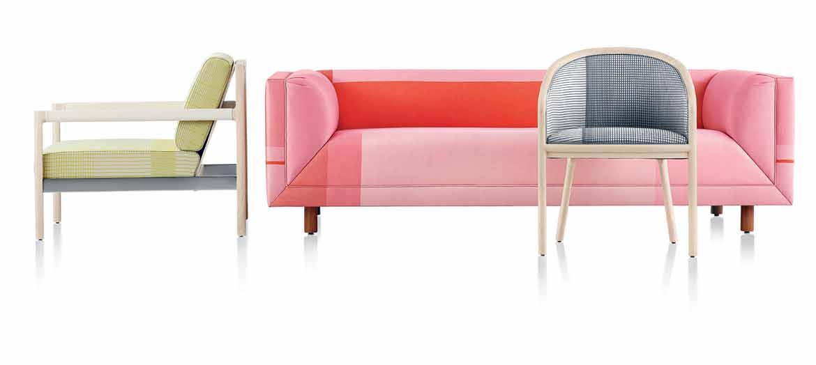
opposite |
N c o N
St S
from her c ollectio N iii for Sé. above | (clock W i S e from top) Wall-mou Nted S helvi N g from the k aari collectio N by ro N a N a N d erWa N b ouroullec for fi NN i S h bra N d a rtek; NeN do’ S 2015 fro Sted gla SS Soft coffee
for g la S
d
&
N g S li N eS g rid & b
exi Sti N g h erma N m iller S ofa S a N d chair S ; uk deS ig N er m ichael aNa Sta SS iadeS S culptural m obile c ha N delier 7 (2015), i N black pati N ated bra SS W ith mouth-bloWN opali N e S phereS available from h ub furN iture. # 81 the art of lounging
Nika Zupa
the Stardu
ofa,
tableS
italia;
utch duo ScholteN
baiji
lockS upholStery textileS for m aharam, applied to
hermanmiller.com.au/collection
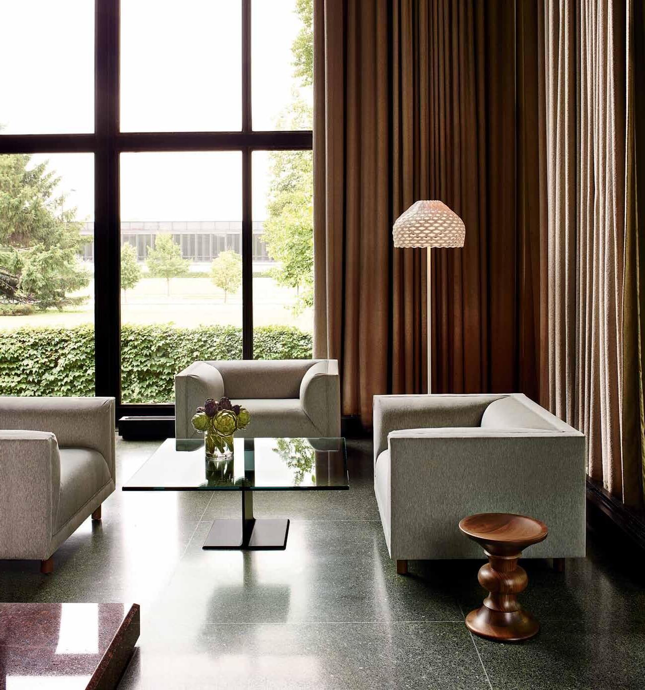 Rolled Arm Sofa Group by Ward Bennett for Geiger, I-Beam Coffee Table by Ward Bennett, Eames® Walnut Stool by Charles and Ray Eames.
Entertain
Not unlike a snowflake, no outdoor or indoor space is the same – so finding the perfect system for your setting can be challenging. The Waterscape Collection by a lexander Lotersztain of Derlot e ditions, is modular roto-moulded seating for indoor and outdoor use, complemented by a range of accessories including side tables, storage, planter boxes, cushions and more. Waterscape can be formed and moulded into just about any configuration, and because of its minimal aesthetic, will surely be at home among any décor style.
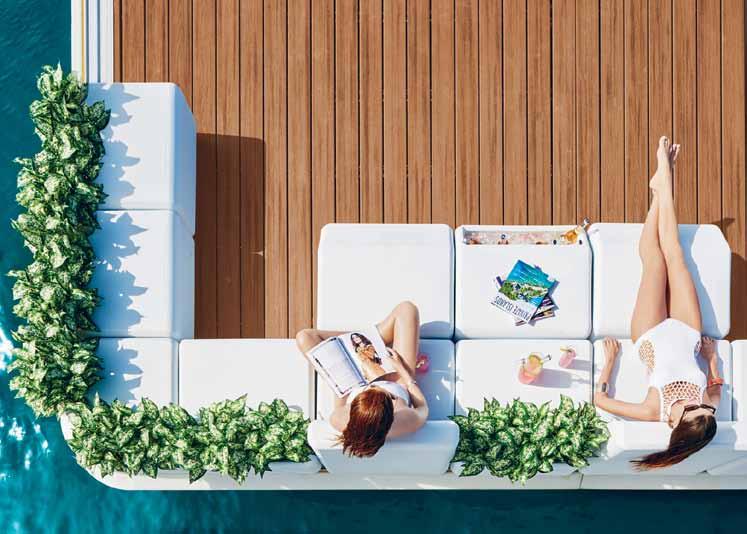

derloteditions.com
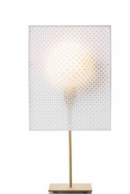
Designed by Cozi Studio and launched at this year’s recent Salone Del Mobile Milano, the debut ColleCtion is characterised by its highly unique morphology, achieved by manipulating traditional materials in extreme and technologically-innovative ways. Objects include the Wrinkles and Early blossom centerpiece bowls and lighting pieces include the Ghost, Bloom and beautifully tactile Focus (pictured).
cozistudio.com
The characteristic feature of Ak47 outdoor fire pits is a contemporary aesthetic and adaptability to different contexts and layouts. In short, they provide great outdoor and garden furnishing in perfect harmony with the landscape. The collection is empathetic to the environment and, like the flickering flames of a fire, the fire pits adapt, defying the logic of the pre-existing scheme.
ak47space.com.au
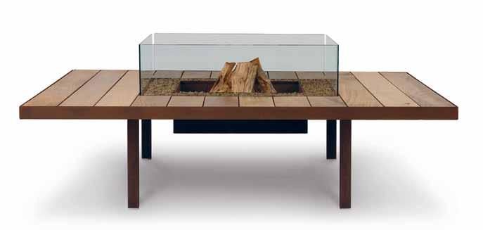
the art of lounging # 83
Breathe
Characterised by a special intertwined wide leather weave, the Filicudi sofa by Flexform is a piece that refines and completes any living area. Made of a timber frame with polyurethane padding to create pure comfort underneath the woven leather upholstery, Filicudi perfectly complements your lounging environment.
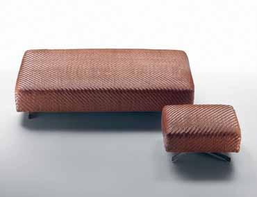
fanuli.com.au / flexform.it
Designed by Atelier Biagetti – comprising artist Laura Baldassari and her life/work partner, designer Alberto Biagetti – the Body Building collection is a playful take on familiar gym shapes; part aesthetic entertainment, part formal exercise. Biagetti and Baldassari ’s collaboration is an ongoing dialogue: the pair throw challenges at each other throughout the creative process, resulting in an eclectic mix of colours and materials.
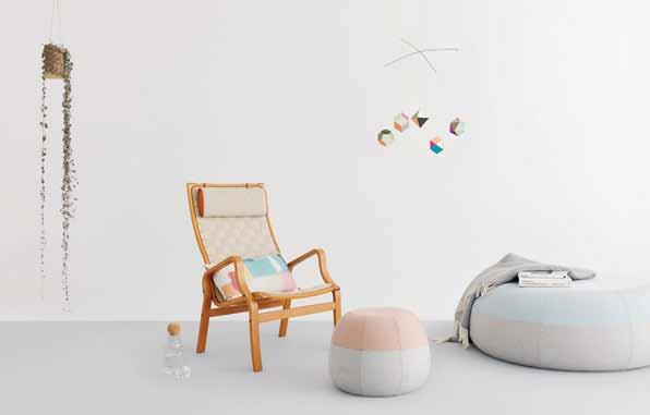
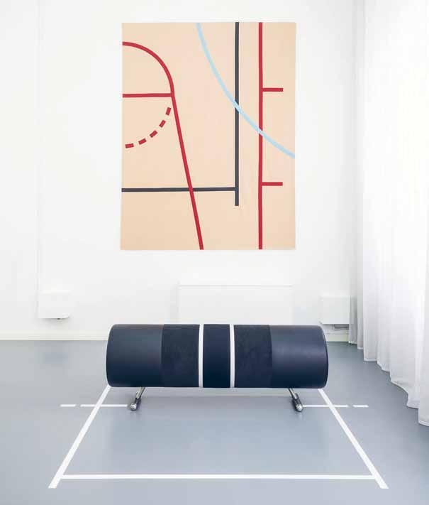
atelierbiagetti.com
Cute and full of personality, Puku is like a little cartoon character you can sit on. Puku Nui is the big brother of Puku designed by Melbourne-based designers Kate Stokes and Haslet Grounds of Coco Flip. Although inspired by time spent in Japan, Puku Nui takes its name from traditional Maori word meaning ‘big chubby belly’. Puku & Puku Nui are made in Melbourne by skilled upholsterers using Denmark’s finest Kvadrat pure wool fabrics. Puku is literally stuffed into his outer lining, like a chubby person pulling on a tight pair of pants or pair of stockings. Popular for living rooms, breakout areas, galleries and nurseries, Puku will happily rest on your floor like a sleepy animal in hibernation.
cocoflip.com.au
habitus #29
Sydney-based designer Henry Wilson recently welcomed the BOOKENDS to his product family. Fins are generally used in castings to strengthen shapes and help brace corners, here with a gentle taper to the face and base. These sturdy bookends, available in two sizes, can support the heftiest of editions and the sand-casted bronze finish will patina beautifully and uniquely over time.
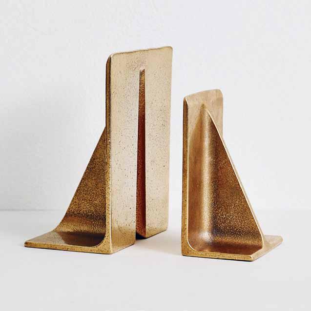
henrywilson.com.au
The Gu ESt modular sofa system, designed by Antonio Rodriguez for La Cividina, responds to the needs of the commercial contract and residential markets with its substantial dimensions and enormous scope for flexible combinations to suit any exacting environment. There are soft, simple lines in this sitting landscape, which presents outstanding aesthetic value and quality to meet the design demands of the contemporary world.
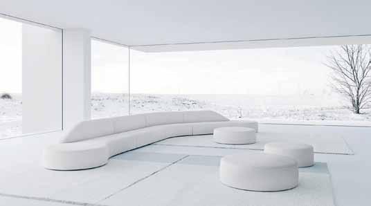
ownworld.com.au / lacividina.com
Dam , giving a zen-like feel to the room, with the soft and misty pictures of plants. The CAC tuS II photo is taken behind a screen to give it the hazy, ethereal feel. Kristina Dam Studio is established with a mission of visualising the dialectical relation between graphic design, interior and art.
luumodesign.com / kristinadam.dk
Designed by Danish designer Susan Gønlund , SENSIt is a chair which stimulates the senses by surrounding and calming the body. Sensit is produced in various compartments with plastic balls in the sitting, back and side cushions, and polystyrene balls at the bottom part of the chair and the neck component. The cushions at each side (also filled with plastic balls) have been designed as long wings which can be gently laid over the body.
activemobility.com.au
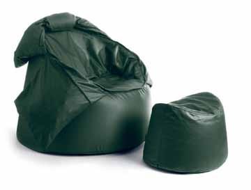
the art of lounging # 85
Work
“Architects always draw circles very fast to indicate where to position chairs on their floor plans,” says Dutch designer Richard Hutten “ I thought that was a nice gesture so I drew a circle and said that should be the top view of the chair. To me the circle is the most elegant form, there are no bulky sides and it can go in all directions, which means it’s never out of place.” SATELLITE is the result, sitting on three legs with a table attached, which can orbit 180 degrees around the seating, making it equally comfortable for both right and left-handers.
cultdesign.com.au / offecct.se
Designed by Anderssen & Voll , crafted in Norway and upholstered in Denmark, the OSLO sofa series represents the best in European design. Both sleek and comfortable, this 2-seater or 3-seater lounge is a sophisticated option for your home office, a way to create a professional, yet relaxed and casual atmosphere for your collaborators and visitors.
muuto.com

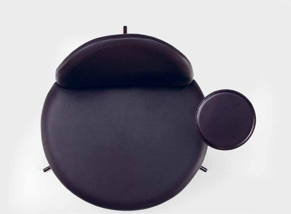
A sporty addition to your workplace or home, the xL O ck ER 2 inspires memories of your high school gym – hopefully encouraging a return to, or maintenance of, a healthy lifestyle. It is the latest addition to the Planex family, providing end-of-journey storage for commuters and a handy storage space for active workers. This agile personal locker can aid in collaboration, bringing people together, and maximising space with a great degree of flexibility.
planex.com.au
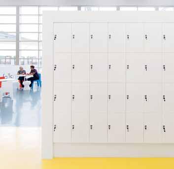
habitus #29
With its spacious and classy architectural shape, Portus –designed by Johannes Foersom and Peter Hiort-Lorenzen for Swedish-based Lammhults – is a design piece with visual strength. The back in the higher version seat will create a room within the room, and adds architecture to larger spaces. The curvaceous form creates an enclosed feeling, and provides an extra acoustic and architectural element for the working space.
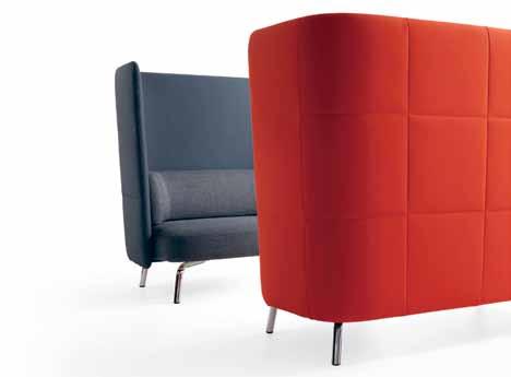
lammhults.se / yazz.com.au
Today, office work requires more time in front of a computer and a lower amount of physical activity. With evolving technology and a trend towards a healthier working paradigm, s chiavello introduces Krossi , the first Australiandesigned sit-stand workstation. Originally developed in 2008, Krossi has expanded into a heightadjustable and workstation system that considers people’s health and wellbeing in the workplace. Krossi is part of Schiavello’s Knowledge Collection of furniture that demonstrates the company’s ongoing understanding of diverse needs for working in comfort.

schiavello.com
Innovative design furniture brand ProoFF has launched the Bet ween designed by studio Makkink & Bey. Their ongoing study concerning the changing office landscape and movement of people resulted in this clever product. It is a landscape within your environment, be it your working space at home, at the office or a public space. A tree-like shape incites the imagination of its users. Individually the elements can become a desk, chair, side table or pouf. It is an invaluable asset in environments where healthy working positions are required, such as hotel lobbies, transition areas, brainstorm rooms, health care centres, universities and libraries.
livingedge.com.au / prooff.com / studiomakkinkbey.nl

the art of lounging # 87
Play
Inspired by the architecture of the city and the rhythms of contemporary life, the 2015 range for Marimekko homewares is called M ind SCAPe S . The graphics explore how elements of nature can encourage those who are natives of the urban jungle to find moments of empowerment and peace in a busy life.
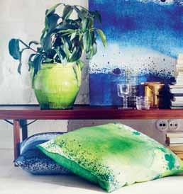
marimekko.com
Take to the outdoors to lounge around when the weather permits – the fresh air is an extra tonic that will enhance the relaxing nature of the activity. The RAMS sunbed designed by Victor Carrasco, and shown here in the double size, is just the thing. With an adjustable backrest and completed by a seat pad finished in Paola Lenti ’s signature exterior fabrics, you’ll make a statement in both design and health.
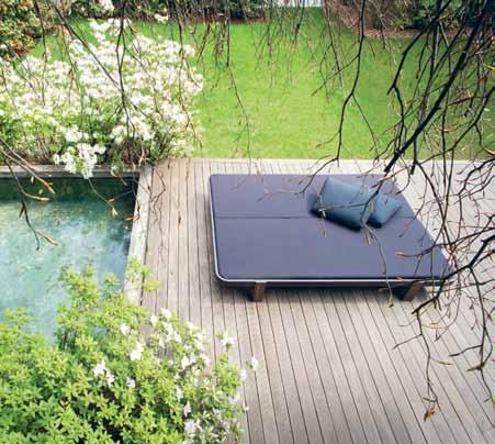
dedece.com / paolalenti.it
Originally created as a private commission for ANZ Private Banking, the BALL eR inA L AMPSh A de , designed by Simone LeAmon for Rakumba , is a truly contemporary upgrade to the original iconic inspiration. The frills and twists are borrowed from the original late 19 th Century creation. The legs of this lamp are artfully positioned and conjure up the delicate limbs of a dancer – on pirouette. It is available in two styles: Prima Ballerina and Petit Ballerina.

rakumba.com / simoneleamon.com
The MARS OTTOMA n, designed by Perth-based Adam Cruickshank, is a soft and playful timber seat, and looks not unlike a NASA space station! Its creamy, grained texture adds a simple touch of warmth to any space, and provides minimal, space-economical seating for the urban dweller.
adamcruickshank.com.au
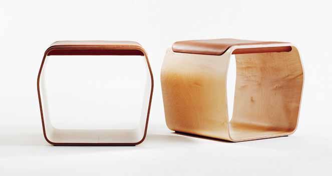
habitus #29
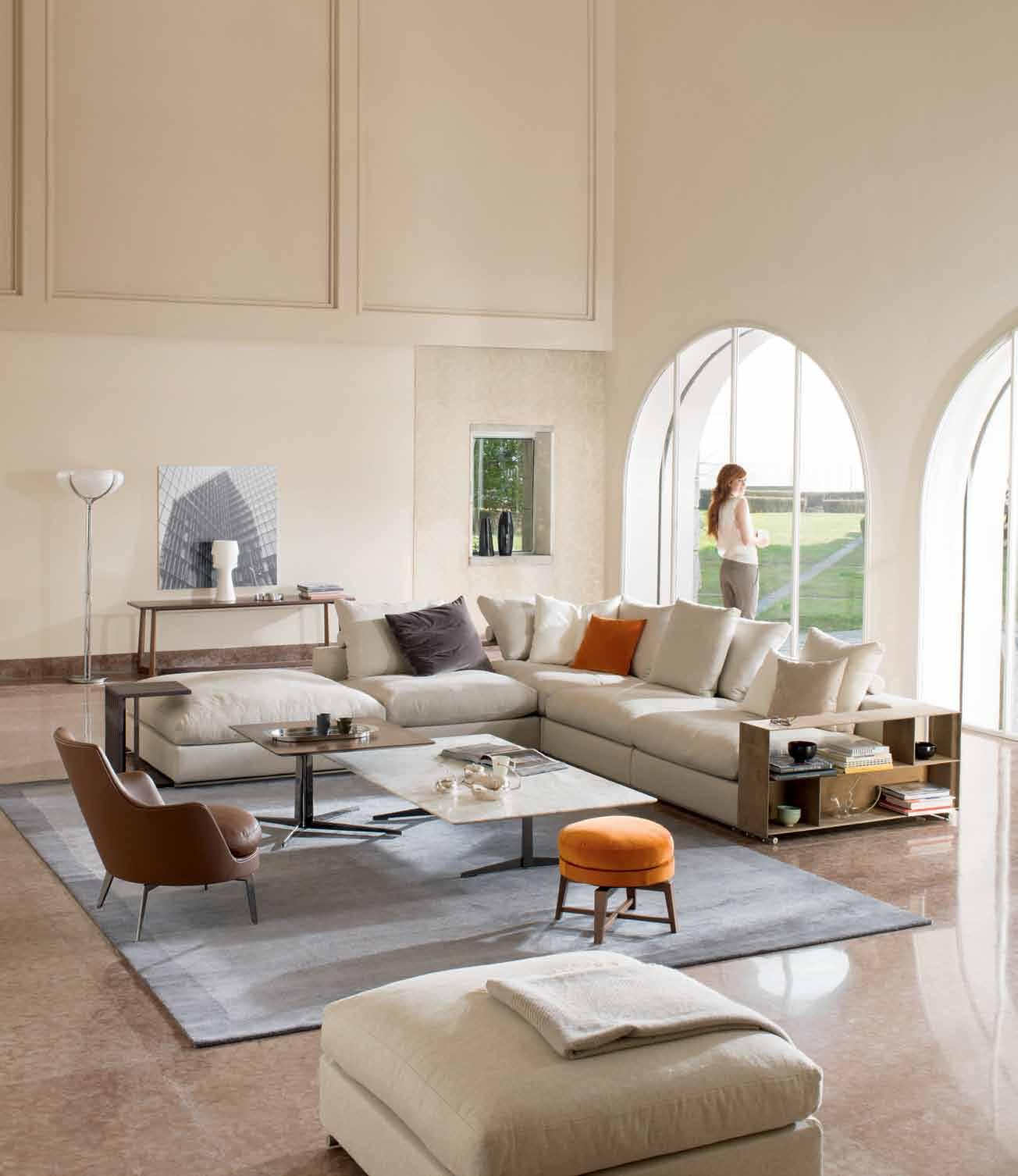

Home at last. GROUNDPIECE SECTIONAL SOFA design by Antonio Citterio FLEXFORM www.flexform.it SYDNEY 269 Military Road Cremorne 2090 Tel . 02 9908 2660 MELBOURNE 681 C hapel S treet S outh Yarra 3141 Tel . 03 9826 8777 info@fanuli.com.au
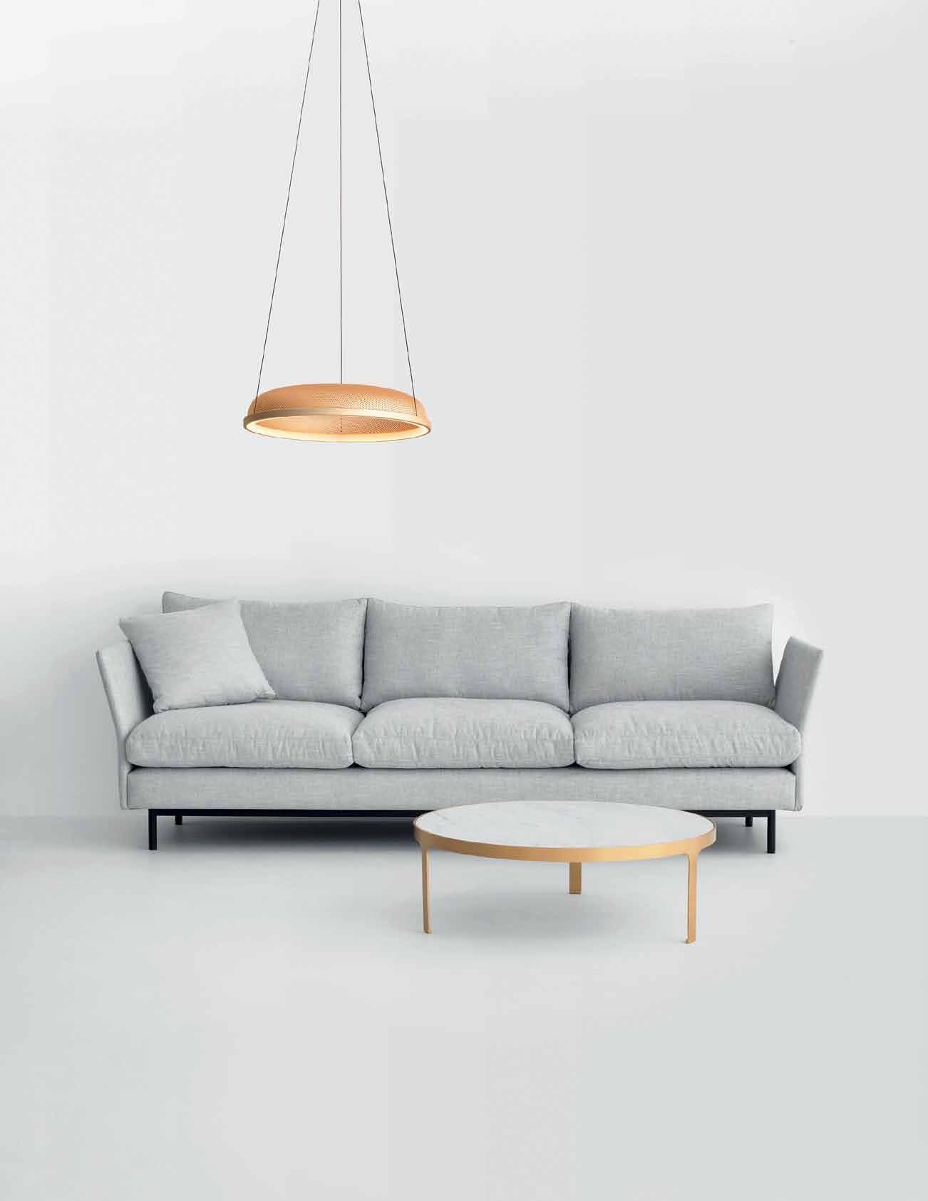
1300 788 984
Mesh Pendant by Resident
Journal by Nonn
Layabout Sofa by Simon James
district.com.au
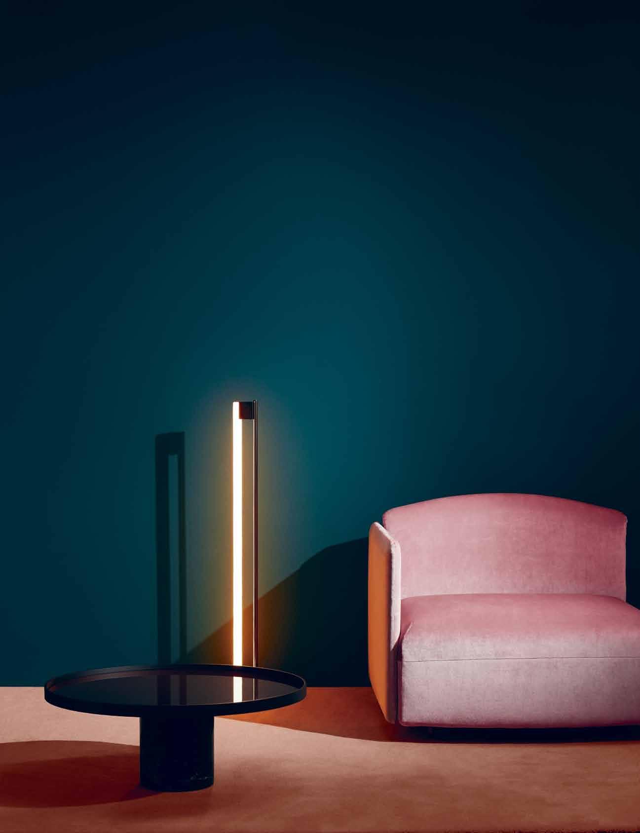
photography
styling Danielle selig. r etoucher Z ach V itale our LifeSTy LeS A re freneTiC. Time h AS Shrunk A nd The Wor Ld SpinS ever-fASTer. W iThin ThiS ConTexT, To SiT, To Lounge A nd WATCh The Wor Ld go By, BeComeS A SooThing BALm, A mediTATion for The pSyChe A nd for The SouL. please be seated # 91 the art of lounging
Wall paint in Conifer Green, Haymes Paint; Cassina 9 Low table by Piero Lissoni, base in black Marquina marble with Brick Red glass top, $3,470, Cult Design; Classicon Tube light by Eileen Gray, $1,470, Anibou; Arflex Soft Beat sofa , $8,340, Poliform.
James tolich.
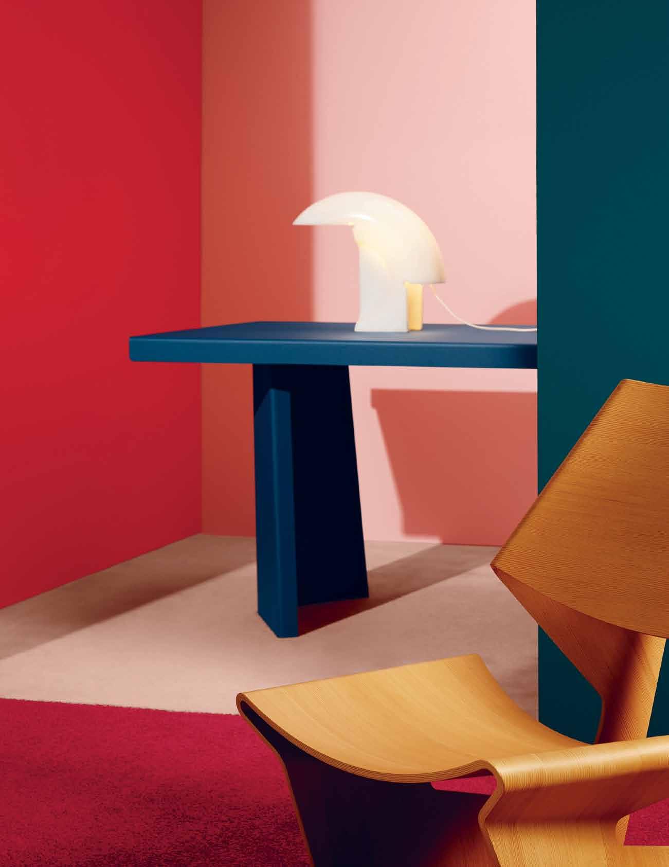
habitus #29


Sydn E y J. H ARR i S
Wall paint in Rileys Run, Veronese Peach & Conifer Green, Haymes Paint; Flos Biagio table lamp by Tobias Scarpa, white marble, $8,240, Euroluce; Classicon Pallas table by Konstantin Grcic, $6,520, Anibou; Lange Production GJ chair by Grete Jalk, $4,364, Living Edge.
# 93 the art of lounging
The time to relax is when you don’t have time for it.
habitus #29
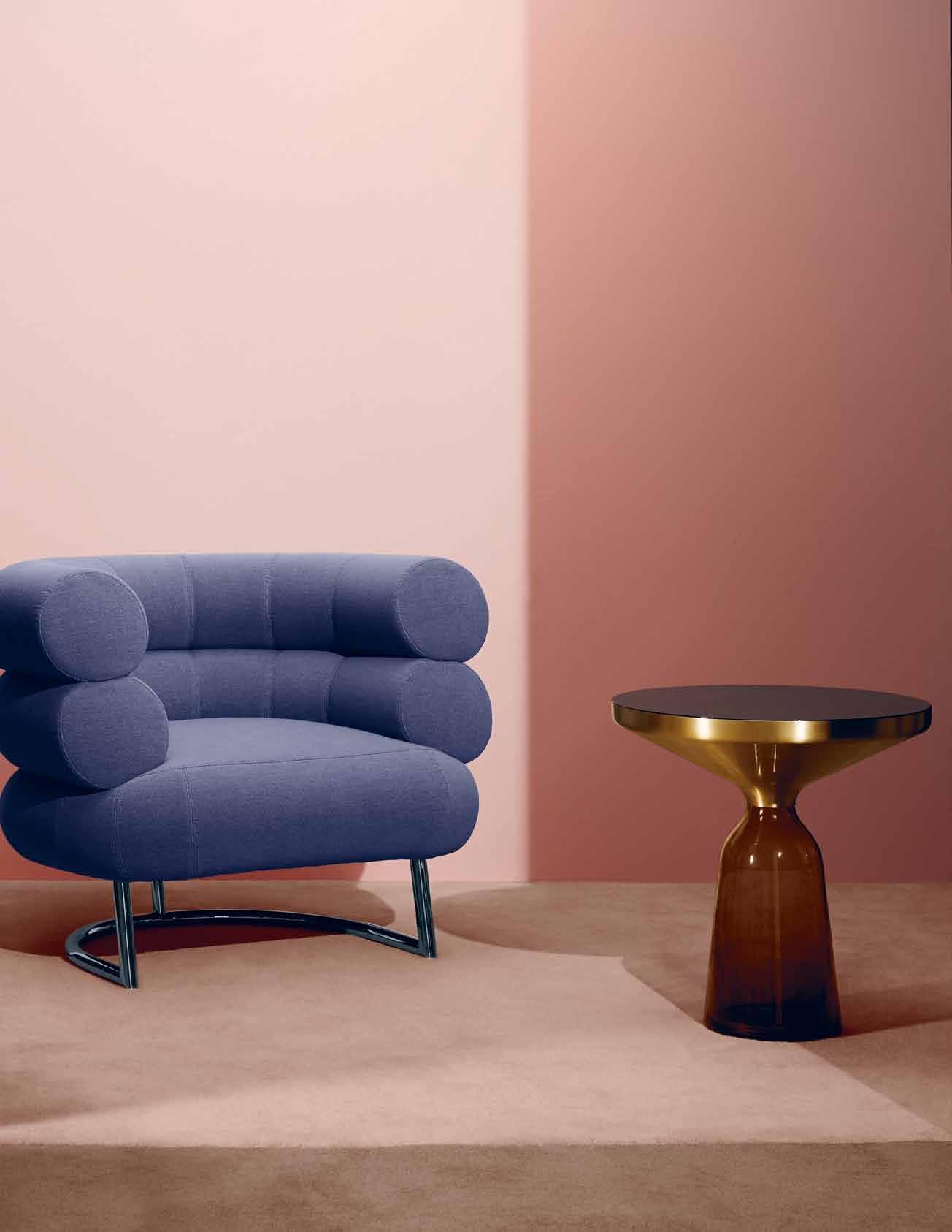
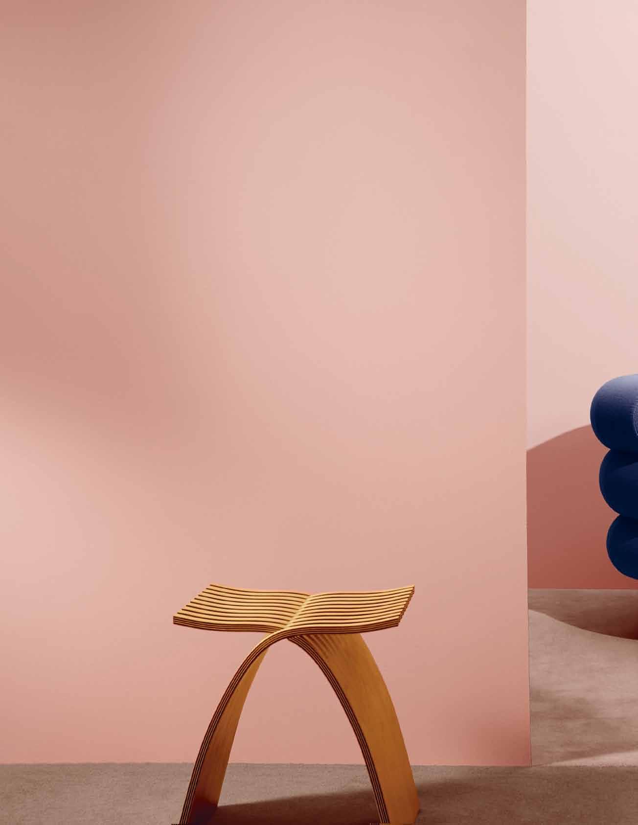
z E nrin kuSH ú
Wall paint in Veronese peach, Haymes Paint; Herman Miller Capelli stool by Carole Catalano, $800, Living Edge; Classicon Bell side table by Sebastian Herkner, $3,875, Anibou; Classicon Bibendum armchair by Eileen Gray, $8,435, Anibou.
Sitting quietly, doing nothing, Spring comes, and the grass grows by itself.


# 95 the art of lounging
Reading and sauntering and lounging and dozing, which I call thinking, is my supreme Happiness.
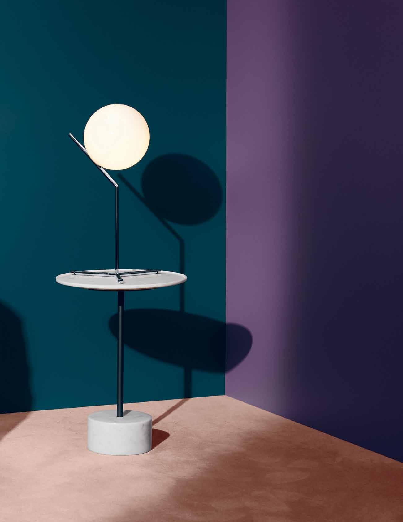
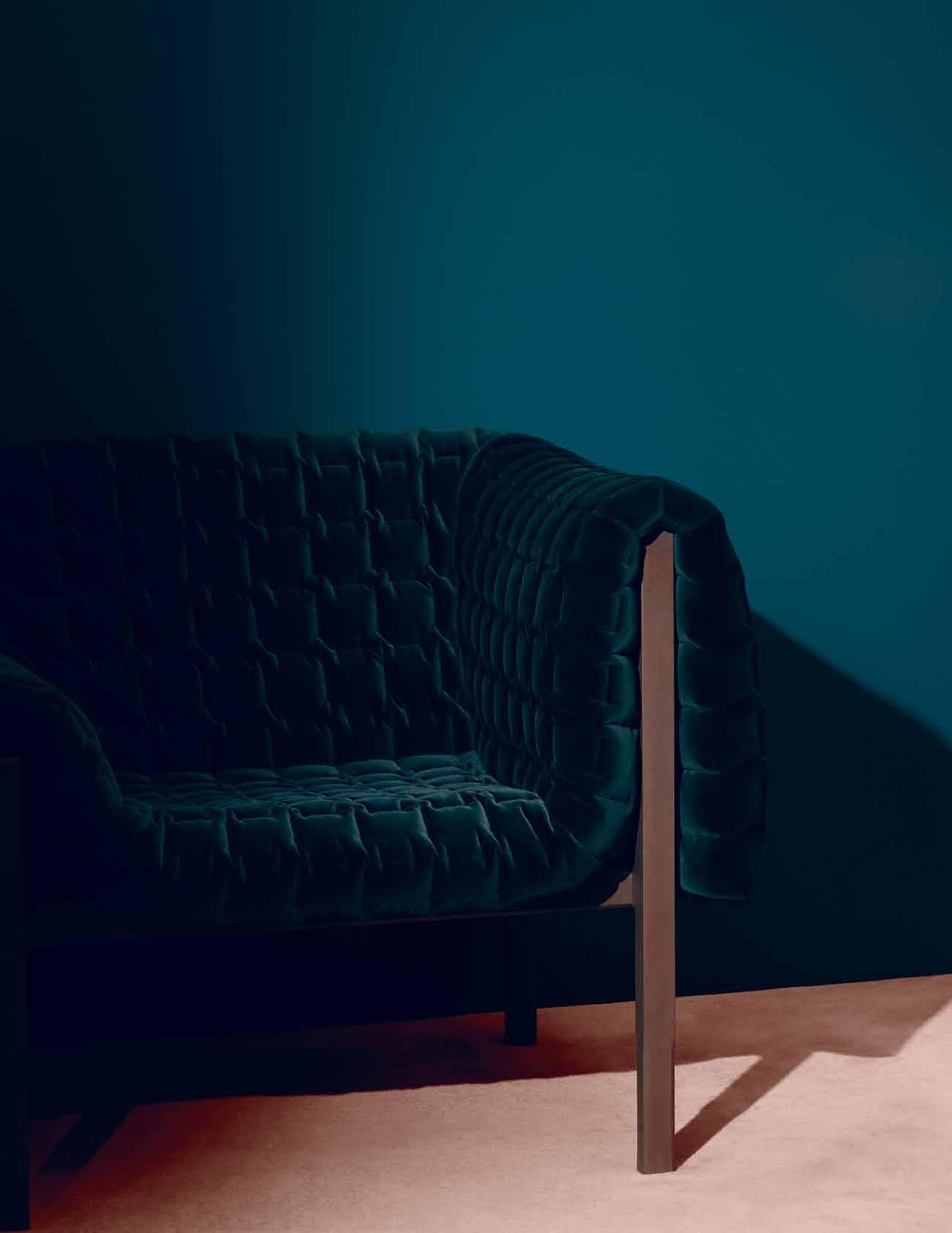
habitus #29
david hume

 Wall paint in Conifer Green & Grape Juice, Haymes Paint; Ligne Roset Ruché armchair in Emerald by Inga Sempé, $6,975, Domo; Cassina 9
the art of lounging # 97
Low table by Piero Lissoni, base and top in white Carrara marble, $2,085, Cult Design; Flos IC T1 high light by Michael Anastassiades, in chrome, $760, Euroluce.
habitus #29
Wall paint in Veronese Peach, Haymes Paint; Arflex Spider table by Ellen Bernhardt, $3,360, Poliform; Flos IC T2 low light by Michael Anastassiades, brass finish, $992, Euroluce; Ligne Roset Grillage chair by François Azambourg, $1,695, Domo.
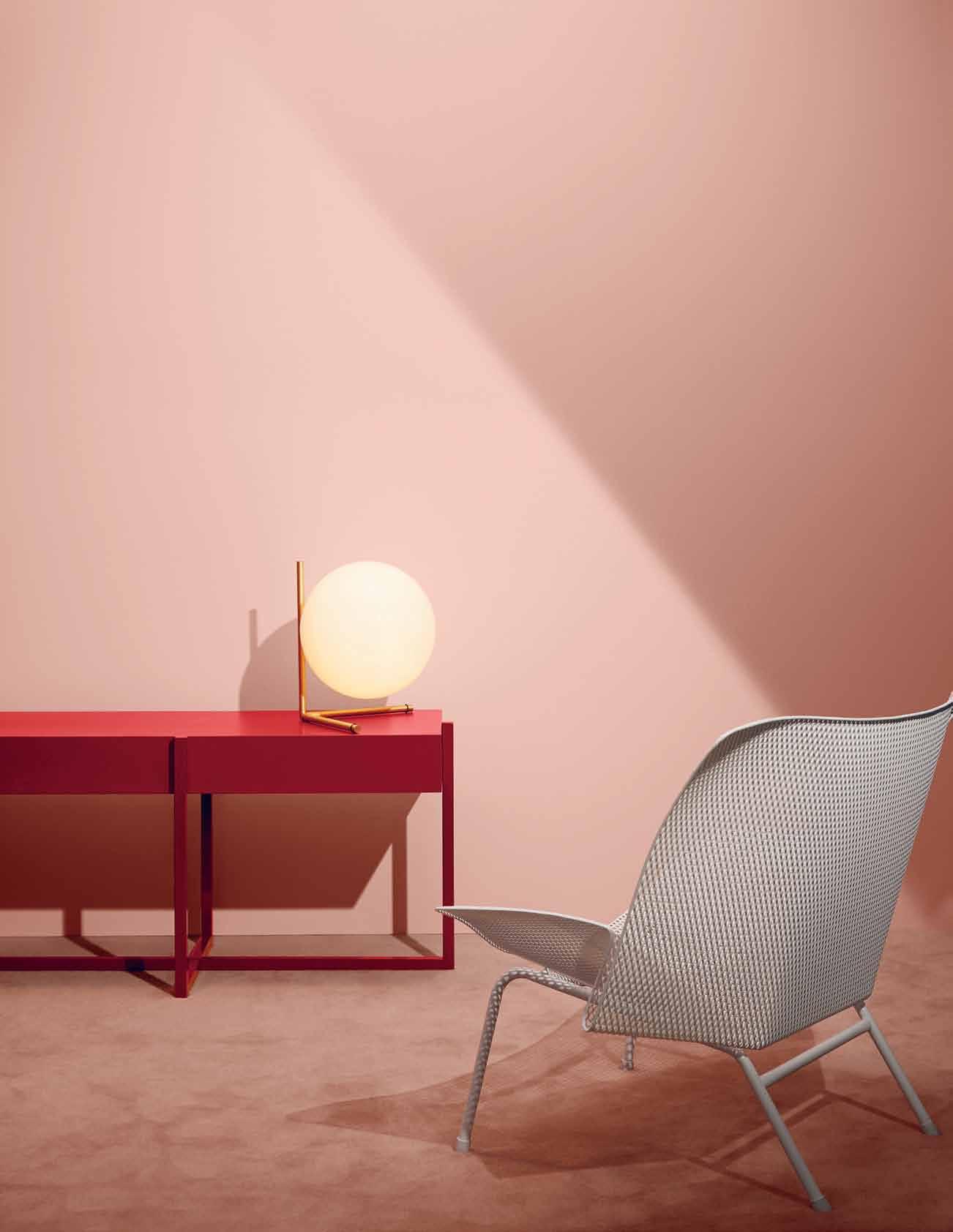
StockiStS
Anibou | anibou.com.au
Cult | cultdesign.com.au
Domo | domo.com.au
Euroluce | euroluce.com.au
Haymes Paint | haymespaint.com.au
Living Edge | livingedge.com.au
Poliform | poliform.com.au
To acquire the habit of reading is to construct for yourself a refuge from almost all the miseries of life.
w. S oME r SEt MAugHAM
Addicted to innovation
After 20 years in business, the key to Axolotl’s success has emerged – a knack for innovation and diversity in design.
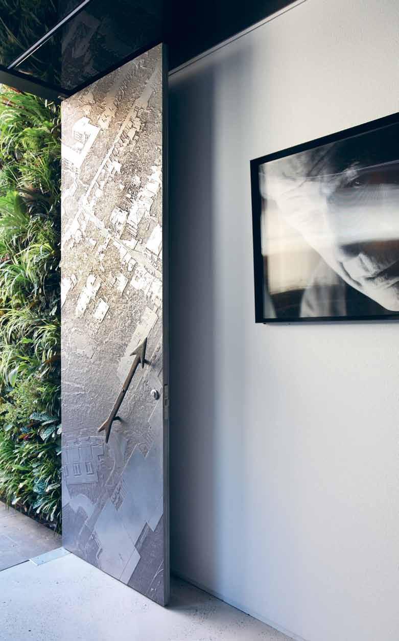
habitus promotion › Axolotl #99
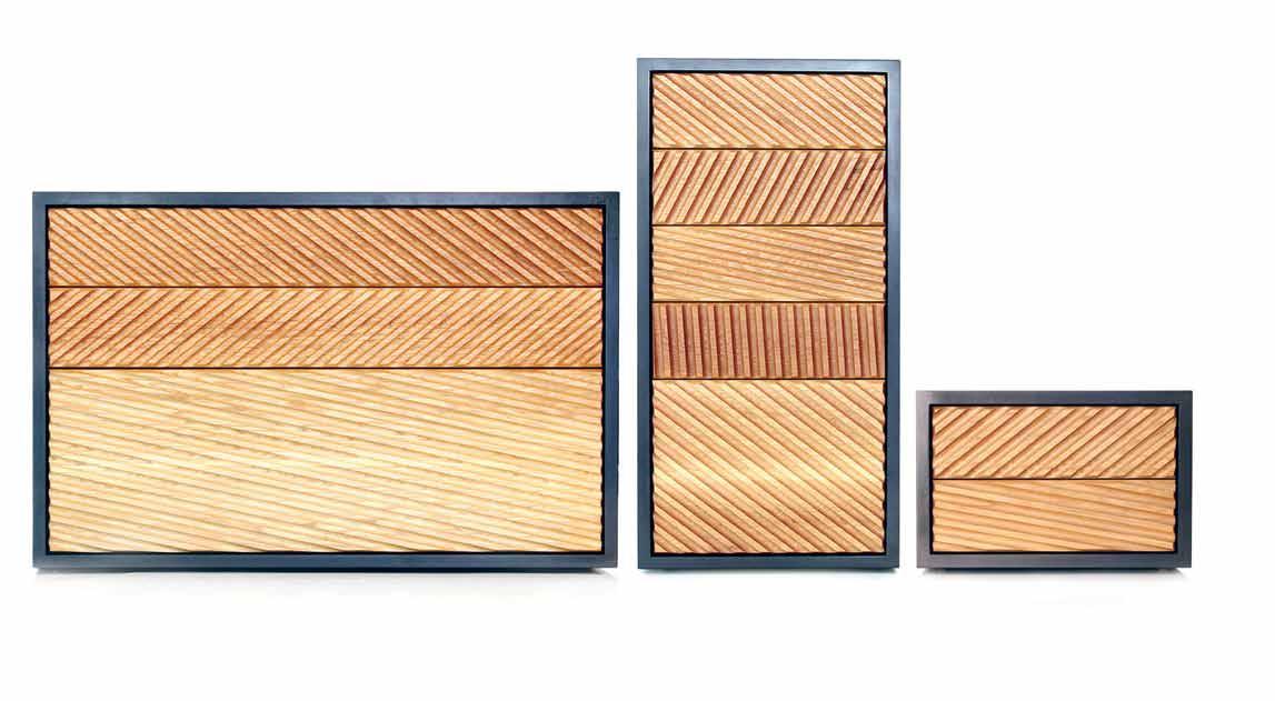
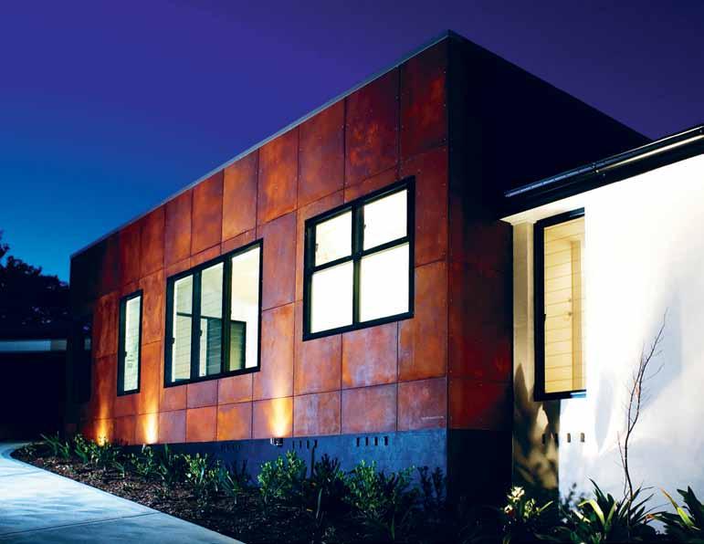
issue #29 habitusliving.com previous | Laser engraved door in aLuminium for designer Constru Ctions. above | Zig Cabinet range designed by ben WahrLiCh for anomaLy. below | rust façade designed by Liquid arChiteCture. opposite | Kintsugi vesseLs designed by matthe W sheargoLd for anomaLy. ust s m
when brothers Kris and Kim Torma launched a metal finishes business from a one-car garage space in Redfern in 1995, they probably didn’t envision an art project, a bed & breakfast, and a furniture brand – in addition to their core product – 20 years down the track.
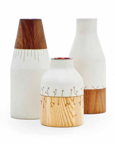
Starting out with just four metal samples, Axolotl now offers hundreds of finishes, including glass, concrete, sheet metals, timber and terracotta, as well as metal inlays into glass.

The brothers have always been open to exploration in their business. “If we see a brief that isn’t yet met, we’ll invent a solution,” says Kris. “Our main interest is in evolving the condition and preconceptions of common materials, reengineering them to have new features such as being lighter in weight, or even combining two diverse materials together.”
The willingness to adventure into unchartered design waters is not just a business strategy, but also a personal interest, making their ‘job’ more of a lifelong education. “Learning and exploring new materials and processes is what interests us. We have fun experimenting and developing our products – each piece and project is unique, and the sum of this is presented in our vast product range today,” he says.
The product lends itself to an array of applications – from facades and doors to furniture finishes, flooring, cabinetry and sculpture. The initial design process involved cold applying metal to other elements; now this is just one of the many processes the company has developed – and won coveted product innovation awards with.
And if the product development was not enough, Kris and Kim also expanded laterally, introducing the Axolotl House, a mud brick adobe residence in the Hunter Valley, which operates as a B&B. Handmade by Kim, “The environmental design, and the beautiful spaces built reflect both our personal and professional interests and values,” says Kris. “It was opened to the public to invite people of like minds to appreciate the spaces and scenery.” As well as this venture, the brothers have also launched Anomaly, named because each piece in the range is hand-crafted which by its very nature means there are anomalies. “We see this as a positive thing that shows the product is unique and isn’t mass produced.” Kris explains, whilst also being a fully Australian furniture brand designed and manufactured locally.
The diverse branches of the business reflect an adventurous spirit, and if, as Stephen Hawking said, “Intelligence is the ability to adapt to change,” Axolotl’s IQ is off the charts.
habitus promotion › Axolotl #101 Axolotl | axolotl.com.au
Win a Fibonacci Alba Lounge Chair
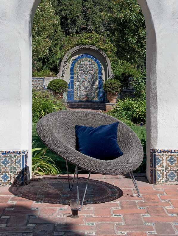

The award-winning Fibonacci Collection is a synthesis of design, craft and technology typifying a unique approach to natural forms that evoke fluid movement, while also paying homage to the Fibonacci series – a progressional geometric structure found in nature. Woven by hand as a single piece, the Alba Lounge Chair’s circular form is supported by an exposed structure that branches to three legs, creating a striking silhouette.
living in design # 27 Misschu: tuckshop matron, fine art patron Efficiency & flexibility –creative solutions for left over spaces. PAYMENT METHOD Cheque / money order AUD$ Charge my credit card AUD$ Name on Card Card Type Card Number Expiry Date Signature IT’S EASY TO ORDER Fill in your response below, overleaf or subscribe securely online at habitusliving.com/subscribe. FOR A GIFT – RECIPIENT DETAILS: FOR MYSELF
Mrs/Ms/Miss/Mr First Name Surname Address State Postcode Country Email Phone Mrs/Ms/Miss/Mr First Name Surname Address State Postcode Country Email Phone ONLINE: habitusliving.com/subscribe PHONE: (61 2) 9368 0150 MAIL TO: EMAIL: subscriptions@indesign.com.au FAX: (61 2) 9368 0289 Indesign Media Asia Pacific Level 1, 50 Marshall Street, Surry Hills NSW 2010 HOW WOuLD YOu WEAvE THIS CHAIR INTO YOuR HOME ? AuSTRALIA INTERNATIONAL (AuD$) 12 ISSuES SAvE 8 ISSuES SAvE 4 ISSuES SAvE 12 ISSuES SAvE 8 ISSuES SAvE 4 ISSuES INDESIGN $155 $43 $105 $27 $55 $11 $240 $39 $200 $21 $110 DQ $70 $44 $50 $26 $25 $13 $140 $10 $100 $5 $50 HABITuS $132 $47.40 $93 $26.60 $49 $10.80 $240 $30 $180 $10 $90 THE COLLECTION vol. 2 Australia $29.90 (1 ISSUE) International $49.95 (1 ISSUE)
PLEASE SELECT BELOW:
Valued
$4,170 Subscribe to Habitus magazine
at
What lounge do you have at home and what is the story behind it?
We have an L-shaped modular Maxalto Apta sofa by Antonio Citterio positioned to take in our North Bondi beach views, the television and to interact with occasional seating. The design has depth, is neutral, classic and designed for the serious lounger. Because KE-ZU doesn’t carry Maxalto, it also means our home doesn’t look like our showroom, so the lounge actually helps address the problem of ‘taking work home'.
Which two lounging/seating products from your range are most important and why?
Sancal’s Tip Toe has the depth of a chaise in a sofa, with enough seat for two to fall asleep comfortably. Andreu World’s Raglan sofa has a more rigid, classic formality. However, it somehow is also extremely comfortable making it just as suitable in an office as a home environment.
Which lounging product from another brand/company do you admire and why?
I've always loved Michel Ducaroy’s Togo from Ligne Roset, where the comfort is derived from the superb ergonomics. If and when we replace our beloved Sancal Happen sofa in our 1970s beach house, Togo will be a dream replacement.
Where is lounging/seating going in the future? What directions in technology, manufacture, material and form have you identified?
As we supply sofas for homes, the corporate world, universities, aged care and health facilities, we look for designs that are suitable across a broad range of applications, or where modified designs can be integrated with the original product design. This could be bariatric seating or something as simple as extended arms to facilitate sitting for the elderly. Our customers are all different, that’s why our designs have to be different –although you may not always notice the different.
What lounge do you have at home and what is the story behind it?
At home I have a Gervasoni Brick 3-seat sofa – I have always loved Gervasoni furniture. My wife Julia and I have just finished a new house in Bondi and the proportion and aesthetic suits the space and our taste perfectly.
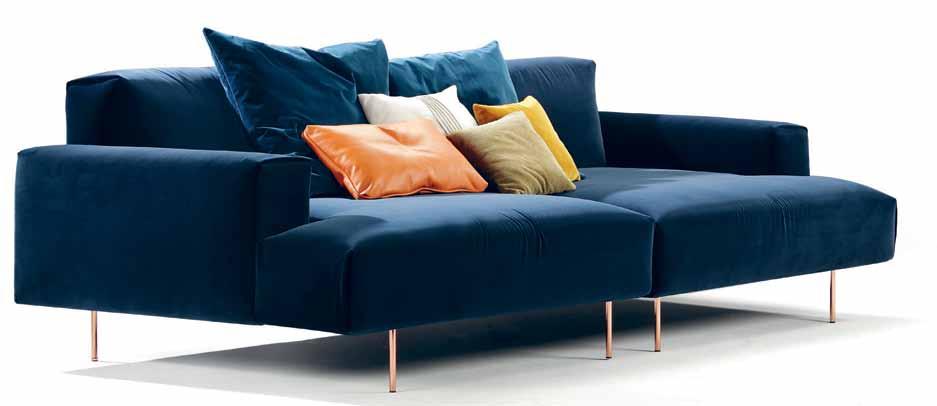
Which two lounging/seating products from your range are most important and why?
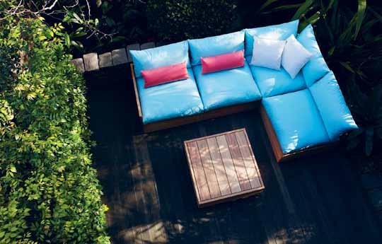
I like the proportion of the Maxi with the wide arms for sitting on and placing drinks on – it has a lower than standard seat height as well. The Fatso is modular and can be configured in many ways and custom fabric options allow great flexibility for personalisation.
Which lounging product from another brand/company do you admire and why?
The Tait metal furniture ranges are fine in section and also designed and made in Australia. My other favourite furniture is the Schultz outdoor products.
Where is lounging/seating going in the future? What directions in technology, manufacture, material and form have you identified?
I am convinced that timber will always be popular despite trends as it weathers so beautifully. I am a firm believer in the ‘keep it simple’ process and that there is an everincreasing demand for custom pieces.
Name m ark S Wa N toN | title Fou N der | Compa N y ke-Z u | y ear e StabliShed 1992
# 103 the art of lounging
Name W illiam da NGar | title Fou N der | Compa N y robert plumb | y ear e StabliShed 1992
What lounge do you have at home and what is the story behind it?
I’ve got the Superoblong from the Italian brand Cappellini at home, designed by Jasper Morrison. I love this piece because it is a versatile, modular lounge and the comfort from the foam is perfect.
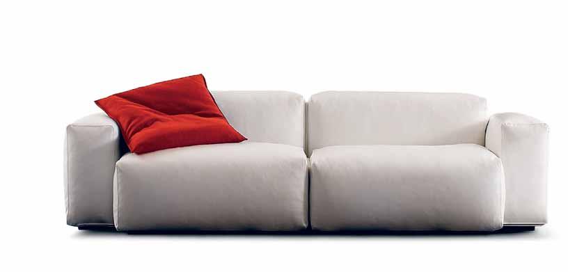
Which two lounging/seating products from your range are most important and why?
The Fat Tulip armchair and sofa are important pieces from our own AGxCult range that we launched last year to promote local talent and Australian design and manufacture. We have many international brands that are particularly strong in seating category, including Fritz Hansen, Cassina and Poltrona Frau, so it’s really hard to choose just one other product from all these world-class brands. But this year we have focused a lot of our attention on the Series 7 chair and LC collection, including the incredible LC2 armchair, which are both celebrating important anniversaries this year.
Where is lounging/seating going in the future? What directions in technology, manufacture, material and form have you identified?
We have experienced increasing demand for custom and made-to-order lounging/seating, which is why our AGxCult collection has been received well in Australia. We work with local upholsterers for this range and can customise fabric choices accordingly. Another important trend in lounging furniture is that people are looking more and more to invest in a high-quality statement lounge or armchair that can last them a lifetime.
What lounge do you have at home and what is the story behind it?
Nook Sofa – this has a really soft, deep, relaxed seat on a light frame. Fine arms and a front plinth float on a turned leg – timeless design whilst also being super comfy.
Which two lounging/seating products from your range are most important and why?
Archie chair, one of our first ranges with the clean lines that have embodied the Jardan aesthetic for the last few years. The Sweeney armchair is one of the latest designs that is our modern interpretation of a classic Australian look and incorporated the latest technology with CNC design, a sustainable recycled shell and relaxed upholstery detailing.
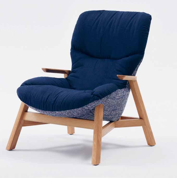
Which lounging product from another brand/company do you admire and why?
The whole range from Moroso is always inspiring in that they continually push the boundaries with design and materiality and aren’t afraid to be playful and irreverent with colour and shape
Where is lounging/seating going in the future? What directions in technology, manufacture, material and form have you identified?
The way we live is definitely moving toward smaller spaces so lounging is having to become more flexible and able to fit in a smaller footprint with multi-functionality. Upholstery coverings are becoming more fashion-driven and eclectic. An emphasis on hand-crafted, as well as using the latest technology where applicable, seems to be the way forward.
ABOVE lEft | superoblong by cappellini ABOVE right | sweeney armchair O pp O sitE | conrad from arthur g.
compa N y culT DesiGN | y ear esTablisheD 1997
habitus #29
People are looking to invest in a high-quality statement lounge or armchair that can last them a lifetime.
What lounge do you have at home and what is the story behind it?
At home, I have our Aria Modular. It’s upholstered in Contemporary Verona Adriatic Leather and has been designed and configured specifically for our living space.
Which two lounging/seating products from your range are most important and why?
Designed in 2015, the Conrad sofa epitomises comfort, clean lines and good aesthetics. Whereas the Jeremy chair’s slim, sleek profile with supportive comfort ticks all the boxes.
Which lounging product from another brand/company do you admire and why?

I’ve always had an enormous amount of respect for the likes of Minotti and B&B Italia. They have always been leaders in most facets of contemporary lounging.
Where is lounging/seating going in the future? What directions in technology, manufacture, material and form have you identified?
It is up to us as designers to develop products which address the changing needs of consumers and their environments. Our Ofset range with Alexander Lotersztain addresses one of the dilemmas faced with contemporary lounging: flexibility. The modular range is entirely versatile, offering the owner unlimited possibilities and freedom of choice. As for advancements, we’re witnessing developments in technology, particularly with
foam products, which is changing the level of comfort as well as longevity that can now be achieved.
What are the benefits/purpose of lounging?
We all deserve some time out and lounging gives rise to just that. We do spend a substantial amount of time lounging as an important part of relaxation when we’re home, and enjoying the comfort of a good well-made lounge can be very satisfying.
how have you seen lounging design change during your time in the industry?
We’ve been designing and manufacturing in Melbourne for 35 years and while the industry is typically dictated by present trends, it’s our belief that maintaining classic and timeless lines is where it’s at. We believe a lounge is a long-term investment and, where possible, should be tailored not only to the space it occupies, but the lifestyle of the owner.
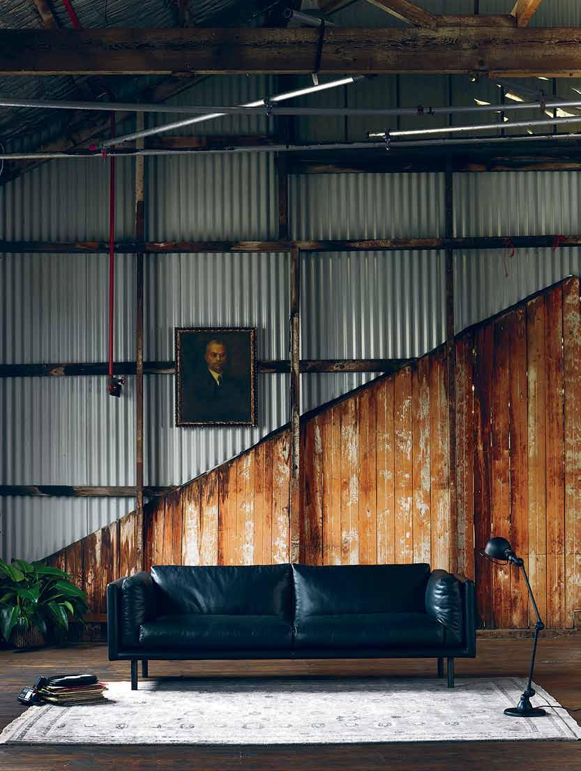
What is your favourite all-time lounge and why?
Arguably our most timeless design, after more than 15 years the Bobcat sofa is still in high demand, and is testament to our mantra of classic forms.
What is your favourite thing to do on your lounge? Relax and unwind.
how much time do you spend lounging?
Not enough! I would say 3 to 4 hours per week if I’m lucky.
Name LeoNard GeorG opou Los | TiTLe m a NaGiNG direcTor | compa N y a rThur G | y ear esTabLished 1979
# 105 the art of lounging
What lounge do you have at home and what is the story behind it?
The Asymmetric large sofa from BassamFellows is incredibly comfortable and just like its creators Craig Bassam and Scott Fellows – stylish and sophisticated. I love and trust their designs.
Which two lounging/seating products from your range are most important and why?
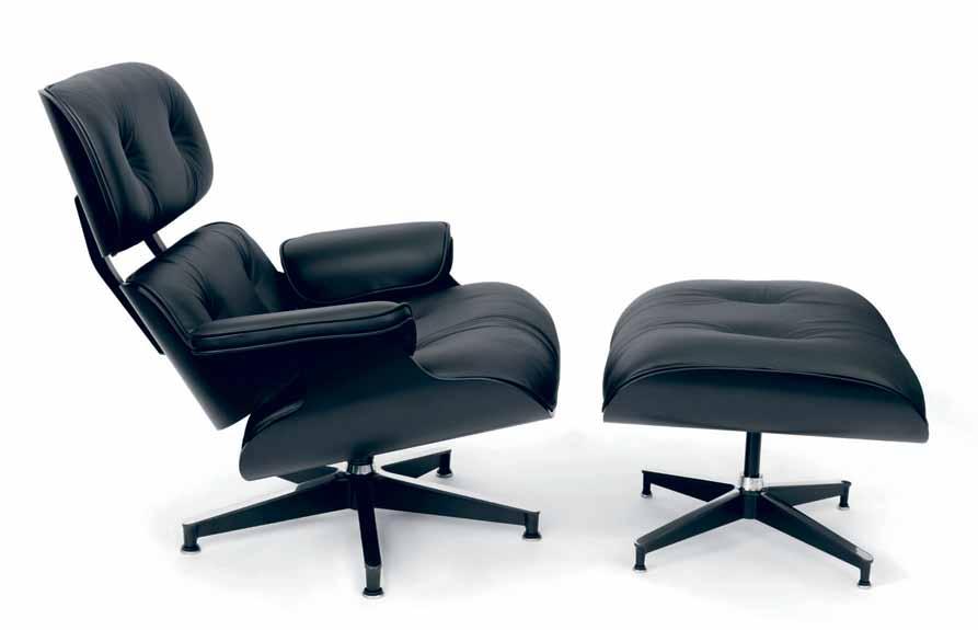
The Herman Miller Eames® Classic Lounge & Ottoman by Charles and Ray Eames still stands out as one of the most important designs of the 20 th Century and one of the most popular. A true classic, having one is like having a piece of great art that you love and appreciate every day. The Walter Knoll Prime Time Sofa is also hard to beat. Generous and flexible, it makes an exceptional piece for a family home.
Which lounging product from another brand/company do you admire and why?
I am a major fan of Hella Jongerius so it was love at first sight when I first saw her XL Polder Sofa for Vitra in a magazine in 2005. Its name and shape reference the ‘polder’ landscape of the Netherlands, where land is reclaimed from the sea using long horizontal dykes and intersecting drainage canals. Hella Jongerius not only designed the sofa but also curated the textiles for the upholstery.
Where is lounging/seating going in the future? What directions in technology, manufacture, material and form have you identified?
BassamFellows has developed a system that uses progressively softer density cushions the closer the cushion comes to the body, in a combination of duck down and fibre. It makes the lounging experience supple and sumptuous, even though the lines of the sofa can be refined and austere. The fashion industry is leading the way in smart textiles and wearable technology and it will inevitably filter through to furniture design with fabrics that light up and
change colour. Perhaps one day you will be able have your favourite scent infused into the lounge upholstery. It is an interesting area of development and will create some new and creative designs in future.
What are the benefits/purpose of lounging?
It’s really about taking some time out – like meditation after a long day. Even a stolen moment flicking through a magazine can give you the break you need to recharge your batteries. There is something about lounging that is intensely private. It’s an activity you only ever do alone or in the company of those closest to you, so in a way it’s quite intimate.
how have you seen lounging design change during your time in the industry?
There has been a move away from big bulky lounges towards minimal shapes. Modular sofas and smaller sofa units have become the norm as we live in smaller spaces and require flexible lounge options. We have also seen a move away from the traditional 3-piece suite towards the arrangements of sofas with feature chairs.
What is your favourite all-time lounge and why?
My all-time favourite has been a classic tan leather Chesterfield. You can call me daggy, but I love the look of them – they are so classic and timeless.
What is your favourite thing to do on your lounge? Reading my book with a pot of tea beside me and then succumbing to the comfort and taking a cat nap. Heaven!
how much time do you spend lounging?
Not nearly enough! As there is quite a bit of travel involved in my work, time on my own sofa is a little too infrequent. I have learnt to take rest in small doses. At the moment we’re renovating an old country house and my plan is to make sure my husband and I get at least two weekends a month there to chill out on our sofa.
Name Jo m aW hiNN ey | TiTle h ead of ReTail a N d Buyi Ng | Compa N y liviNg edge | y ea R esTa Blished 2000
above | herman miller eames lounge chair and ottoman, limited edition. habitus #29
Editor ’s pick:
Living Edge Top 5
Eames Moulded Plywood Folding Screen
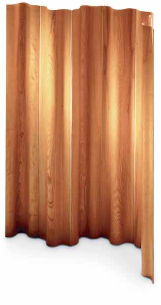
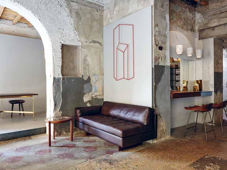
The lesser-known member of the moulded plywood family can subtly separate a space, making simultaneous activities in the lounge room possible.
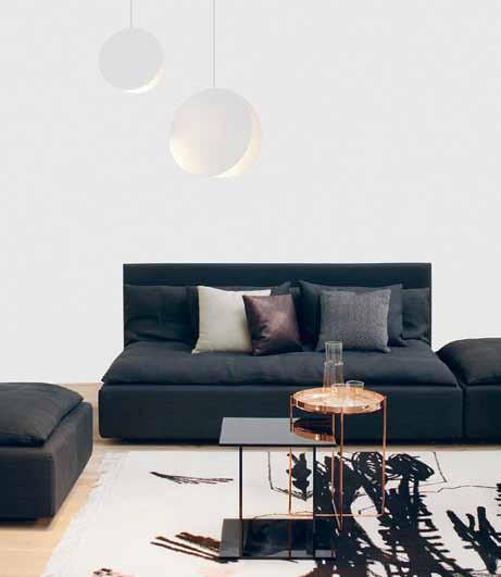
e15 Shiraz
The casual formation of traditional Persian seating inspired this range, which encourages loose arrangement of the different elements, and has the benefit of enhancing communication.
Walter Knoll Legends of Carpet
Lounging on the floor offers a whole other level of comfort. Handcrafted in Nepal, the range, designed by textile designer Helmut Scheufele, is inspired by the luminous colours of Africa.
Akari 10A for Vitra
A beautiful lounge room needs beautiful, soft lighting, such as this exemplary piece by the master, Isamu Noguchi. Designed in 1951, it is as contemporary as ever, with the sensitive materiality of handmade washi paper and bamboo.
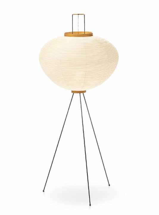
Asymmetric Sofa by Bassamfellows
Low on the horizon, informal but beautifully detailed. This range is as classy in the office as in the home, with a series of open and closed elements to create a unique lounging landscape.
# 107 the art of lounging

FARAGE.COM.AU
Superhouse
An exhibition featuring architecture and interiors beyond the everyday.
What is a ‘Superhouse’? One that demonstrates “how architectural experimentation and daring can challenge notions of how we should live,” says curator, writer and editor Karen McCartney. “A superhouse delivers a 360-degree completeness of form, its exterior and interior have a seamless execution and, above all else, it is aweinspiring,” she continues.
McCartney has toured the world’s most extraordinary homes and interesting living spaces, from an intimate prefab space designed overnight to a revitalised 16th Century castle.
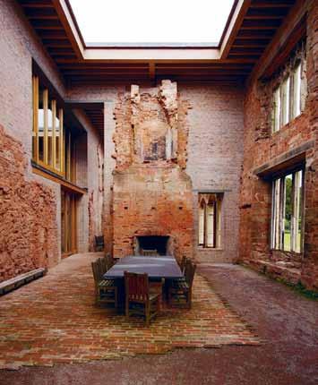
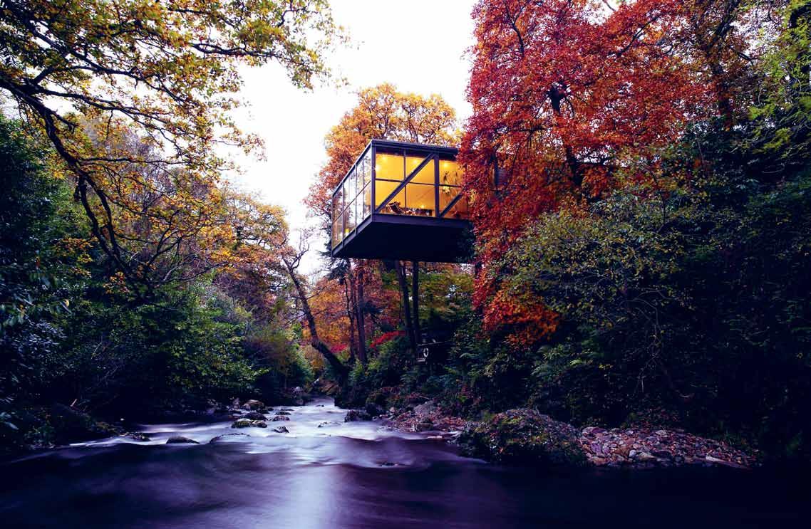
According to McCartney, some of the features of a Superhouse include, “the perfection of natural setting, a remarkable use of materials, an exceptional level of craft, ground-breaking innovation or a use of space that lifts the spirit” – a challenging combination of criteria to meet.
Her results are tabled in a book released earlier this year, and an exhibition at the Museum of Sydney brings a selection of these projects – as well as unique local examples – to life. Through vivid photography, feature furniture and decoration and insightful filmed interviews, visitors can begin to explore the notion of what makes a house ‘super’.
The exhibition reveals 15 houses across five themes: Re-make, Finding Form, Small Spaces, Roof Tops & Skylines and The Land. Supporting the exhibition will be a series of talks curated by McCartney, featuring a range of guest speakers including William Smart and Hannah Tribe.
Superhouse is on at the Museum of Sydney until 29 November 2015
habitus X SLM
# 109 above |
A
RiveR view of The Gouldin G SummeRhou S e, iRel And, ScoTT TAllon wAlkeR ARchiTecTS 1971-73. PhoTo © RichARd PoweRS below | A STley cASTle (dinin G Room), en
G l
nd, w iTheRfo Rd wATS on mAnn ARchiTecTS , 2013. PhoTo © Rich ARd PoweRS
For more information on the exhibition or talks series visit slm.is/superhouse
Sydney Living Museums | sydneylivingmuseums.com.au
Sydney Open
get a design hunter® backstage pass on a tour of some of sydney’s most historic and architecturally inspired buildings.
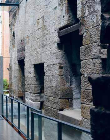
It’s a fact that most iconic buildings in major cities are generally experienced only by the people that work in or look after them. Unfortunately, the public often doesn’t get the opportunity to experience them.
Sydney Open, presented by Sydney Living Museums, unlocks the doors of some of these projects, offering behind-the-scenes access to award-winning contemporary buildings and places of historic and modern architectural importance.

To whet the appetite, we’ve chosen a selection of our favourite locations on the map for Sydney Open 2015, taking place in November.
The Mint
What does 45,000 gallons of black rum get you?
Well, this fine colonial building for a start. Constructed from 1811 to 1816, The Mint is one of Sydney’s oldest surviving buildings. It was originally the southern wing of Governor Macquarie’s ‘Rum Hospital’, but in 1855 it was reinvented as the administrative offices of the Sydney Royal Mint. The coining factory – where, following the gold rush, currency was produced for every Australian colony – was built behind.
From 2001 to 2004, the Mint was redeveloped as the head office of the Historic Houses Trust of NSW, incorporating Sydney Living Museums. New buildings designed by FJMT Architects complemented the historic structures.
Facilities include an historic display, flexible theatrette/ function space, the Bistro Mint cafe and the Caroline Simpson Library & Research Collection. The library is a fantastic resource for anyone with an interest in the history of house and garden design and interior furnishing in NSW.
The State Library Of New South Wales
The State Library of NSW is one of the great libraries of the world, with a history dating back to 1826. Its renowned historical and contemporary collections, comprising more than five million items — books, manuscripts, maps, photographs, paintings, architectural plans and online content — hold a growing memory of NSW and Australia.
Experience the grand elegance of the historic Mitchell building which boasts a magnificent vestibule, glassed ceiling reading room, the Friends room, Sir William Dixson Research Library and the Shakespeare Room.
habitus X SLM above |
of contemporary art.
museum
photography by brett boardman. below | entrance corridor, coining factory, the mint. photography by n icholas Watt.
Museum Of Contemporary Art Australia (MCA)
The front lawn of the MCA has hosted everything from a 12.4-metre floral puppy by Jeff Koons to an enormous ‘sky mirror’ by Anish Kapoor. And during every Vivid Sydney Festival the sandstone facade becomes a dynamic screen before which Sydneysiders congregate en masse.
In 2012 a $53 million refurbishment included a new wing by Sydney architect Sam Marshall in partnership with the NSW Government Architect. The new Mordant Wing takes the form of a series of white boxes, asymmetrically arranged and clad in thin, strong glass and reinforced concrete in a range of earthy, contrasting. The space includes a rooftop café, gallery spaces, a sculpture terrace and the National Centre for Creative Learning.
The Old Clare Hotel
The first Unlisted Collection: property in Australia, The Old Clare Hotel in Chippendale, Sydney authentically re-imagines heritage buildings.

The hotel is an adaptive conversion of the iconic Clare Hotel and former Carlton & United Breweries administration building into 62 accommodation rooms across a colourful palette of room types. The Clare bar at the reception of the hotel playfully reinterprets its own history as the ‘pub’ area of the Clare hotel creating a warm welcome to all guests.
The Old Clare Hotel is in the heart of Chippendale, an emerging and vibrant neighbourhood and a new focal point for Sydney’s artistically minded and creative workspaces. The Old Clare Hotel forms the cornerstone of the Kensington Street precinct, a laneway that offers a selection of high quality eateries, fashion boutiques and bars within revived heritage cottages and modern build additions.
Sydney Open takes place Sunday 1 November 2015
For tickets and information visit slm.is/open
Habitus has 6 double passes to Sydney Open to give away, subscribe to our newsletter at habitusliving.com for details on how to enter

# 111 above |
the
old clare hotel, kensington street entrance. below | mitchell reading room, state library of new south wales.
Sydney Living Museums | sydneylivingmuseums.com.au
Pure
Factory
Falmec. The innovative E.ion® System technology applied to the new collection of rangehoods from Falmec, not only reduces odours, but also restores the ionic balance for an optimal healthy living environment. Specialised laboratories certify the efficiency of the E.ion® System technology, declaring an odour reduction of over 70%.
– Falmec E.ion® System.
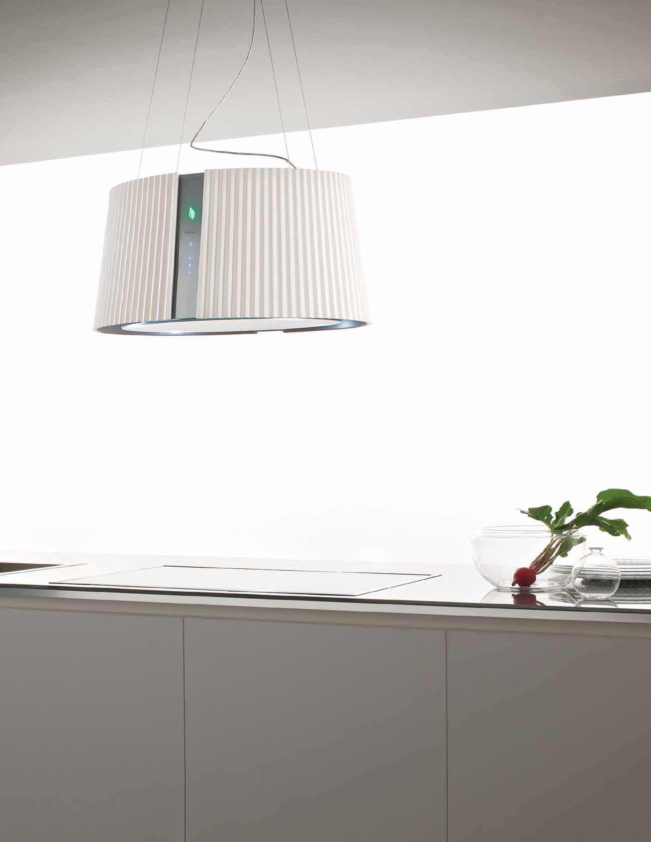
The only rangehoods that sanitise the air. *NEWLY OPENED* VICTORIA Selection Gallery 335 Ferrars St South Melbourne Ph: 03 8696 4000 NEW SOUTH WALES Selection Gallery 1E Danks St Waterloo Ph: 02 8572 8500 QUEENSLAND Selection Gallery 94 Petrie Tce Brisbane Ph: 07 3369 4777 *OPENING SOON* WESTERN AUSTRALIA Selection Gallery 12 Sundercombe St Osborne Park Ph: 08 9446 8255
Air
A view to a di erent way of life







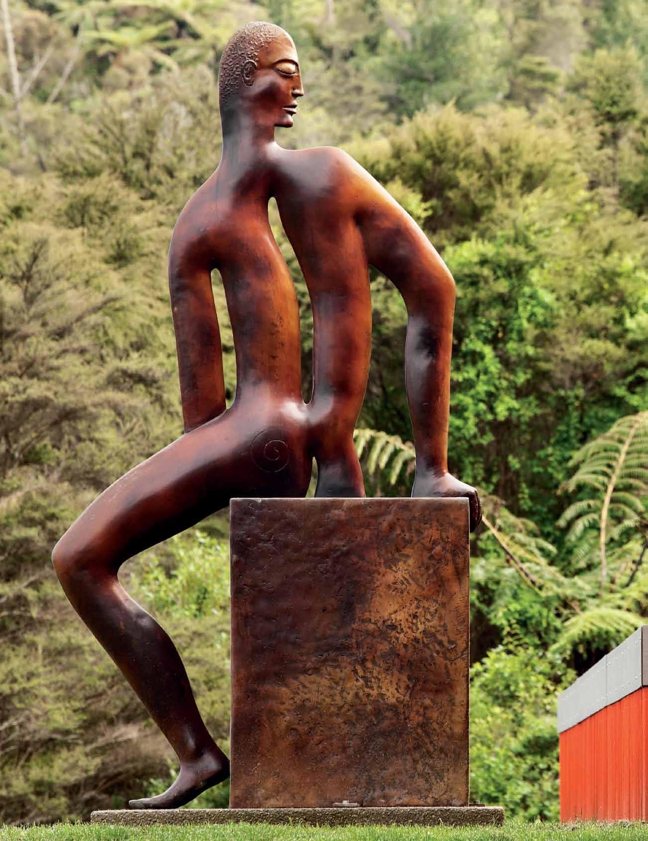
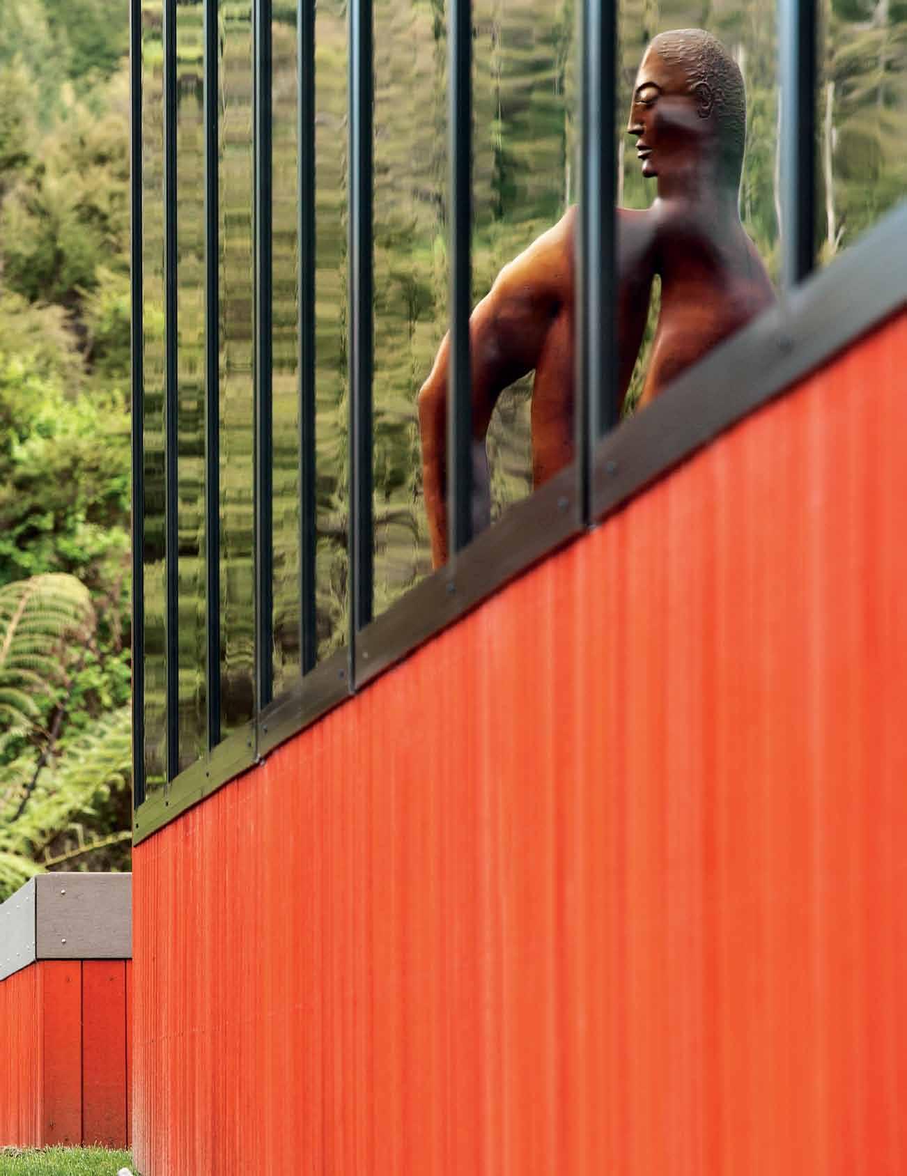
issue #29 habitusliving.com
Art House

New ZealaNd bush and a panoramic view play backdrop to this striking house by PattersoN associates, setting the stage for an artful and elegant family life.

Tex T Andre A STevenS | PhoTogr APhy Simon deviTT
3 . on location # 115
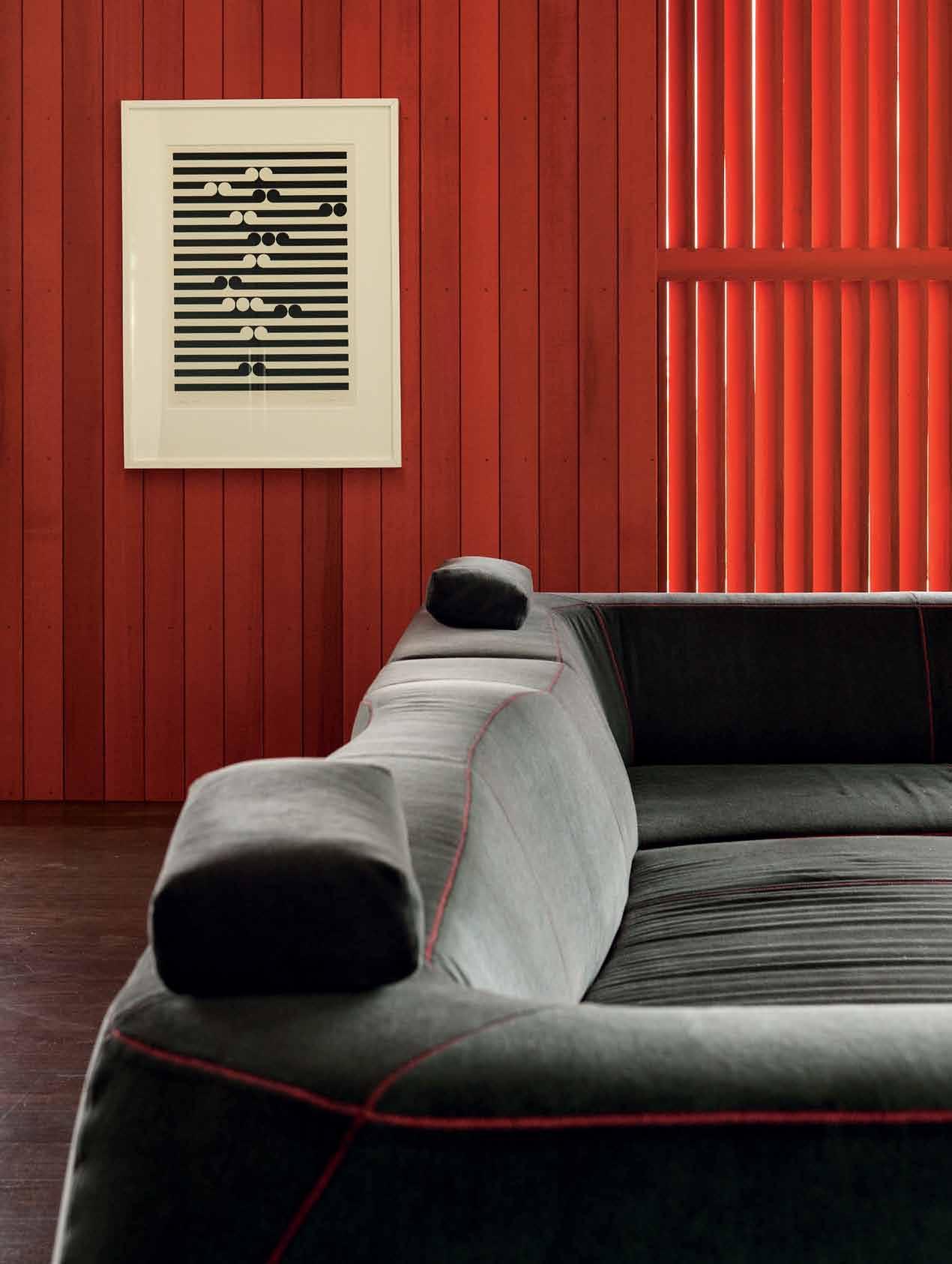
issue #29 habitusliving.com
Carved by an ancient river, the Waikato Basin in the Central North Island is a rolling patchwork of green farmland. The alluvial plains are rich and lush and support a strong dairy industry. This house site is in a bush clearing on the spur of an eroded volcano and looks west across the Basin. With views of lowland winter mists and golden evening sunsets, the site affords a forever-changing canvas of light and colour.
A young creative family call it home, a place where they can lead a busy but balanced life, with a half-hour commute to work. The house is a hideout/hideaway from which they enjoy the local environment and wildlife, a sanctuary from the frosty winters and a breezy platform in the temperate summers. With all but one room facing the view, the rural setting pervades the house. Its bush backdrop provides shelter and privacy, and the daily pathway of the sun is captured in its deep porches and through its floor-to-ceiling windows.
Stained a vivid orange, the cedar cladding literally pops against the verdant greens of its surroundings. This is the first sign of the abstracted nature of the house – a pristine and precise box, cut and carved for functional use, but also aware of its own aesthetics and geometric rule book. It reminds me of a Donald Judd chair or shelf: subtle in its assembly and form, but rich in concept.
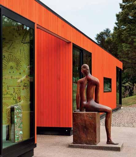
As well as accommodating the family, the house presents a small art collection. “The client’s brief called for the design to use a

previous | The sof T human form of The
Dibble
conTrasT wiTh The
The Tex Ture
opposite | The g orD on walTers Tama 1977 screen PrinT was The concePT ual sTarTing P oinT for The archiTecT ure. above | The oTher half of The
Dibble sculPTure sTanD s guarD aT The fronT enTrance
Paul
sculPTures
sTraighT lines of The builD ing anD
anD colour of The bush.
Paul
3 . on location # 117
A pristine and precise box, cut and carved for functional use, but also aware of its own aesthetics…
Gordon Walters painting as a conceptual starting point,” says the architect. The resulting plan outline is radially symmetrical to create order and serenity and provide for the practicalities of a cohesive family space.
The Walters ‘koru’ painting has alternating bands of black and white where lines and circles slide past one another and interlock. This play on ‘figure and ground’ is reflected in the floor plan through overlapping and interlocking public and private zones: ‘white’ being represented by the open public rooms, and ‘black’ by the enclosed and richly coloured private rooms. There are no circles, but a strong sense of order is experienced inside and out.
Renowned for their strongly geometric design, the architects have set the stage for art, not with mute surfaces but with texture, colour and proportioning. The Walters painting sits against the orange cedar, where its strong vertical shadow lines interact with the horizontal lines in the painting. Two Paul Dibble sculptures in mirror signal the east and west entrances into the building, and vibrant yellow and blue are used in the smaller rooms. It is a building that is concerned with aesthetics and abstraction rather than a strong domestic character. Not that it ignores its domestic purpose; on the contrary, it caters beautifully to family life.
The arrangement allows the family to live closely together – parents and children’s bedrooms are side-by-side accessed off a long
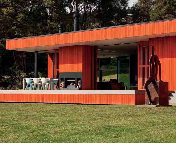
above | Off the living rOO m, a large O pen terrace prOvides a platf O rm f O r O utd OO r living. opposite above | With the timber shutters pulled O pen, the living rOO m feels m O re like a pavili O n. When they are clO sed, the space is far m O re cave-like. opposite below | d espite its extensive glazing, the h O use in fact has a lOt O f s O lidity and sheltered recessed spaces.
issue #29 habitusliving.com
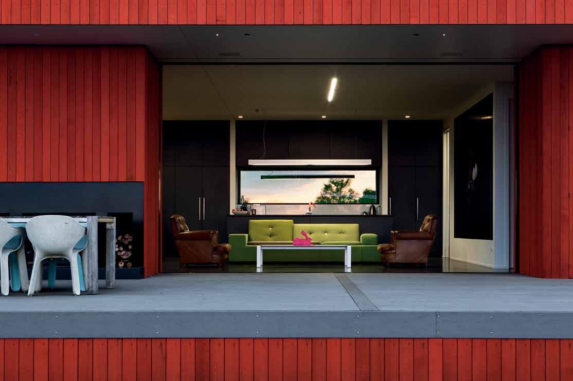
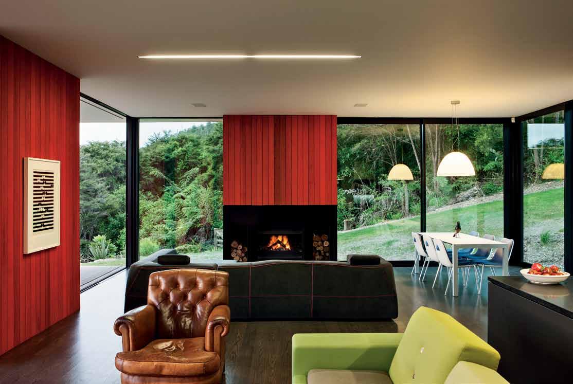
# 119 3 . on location

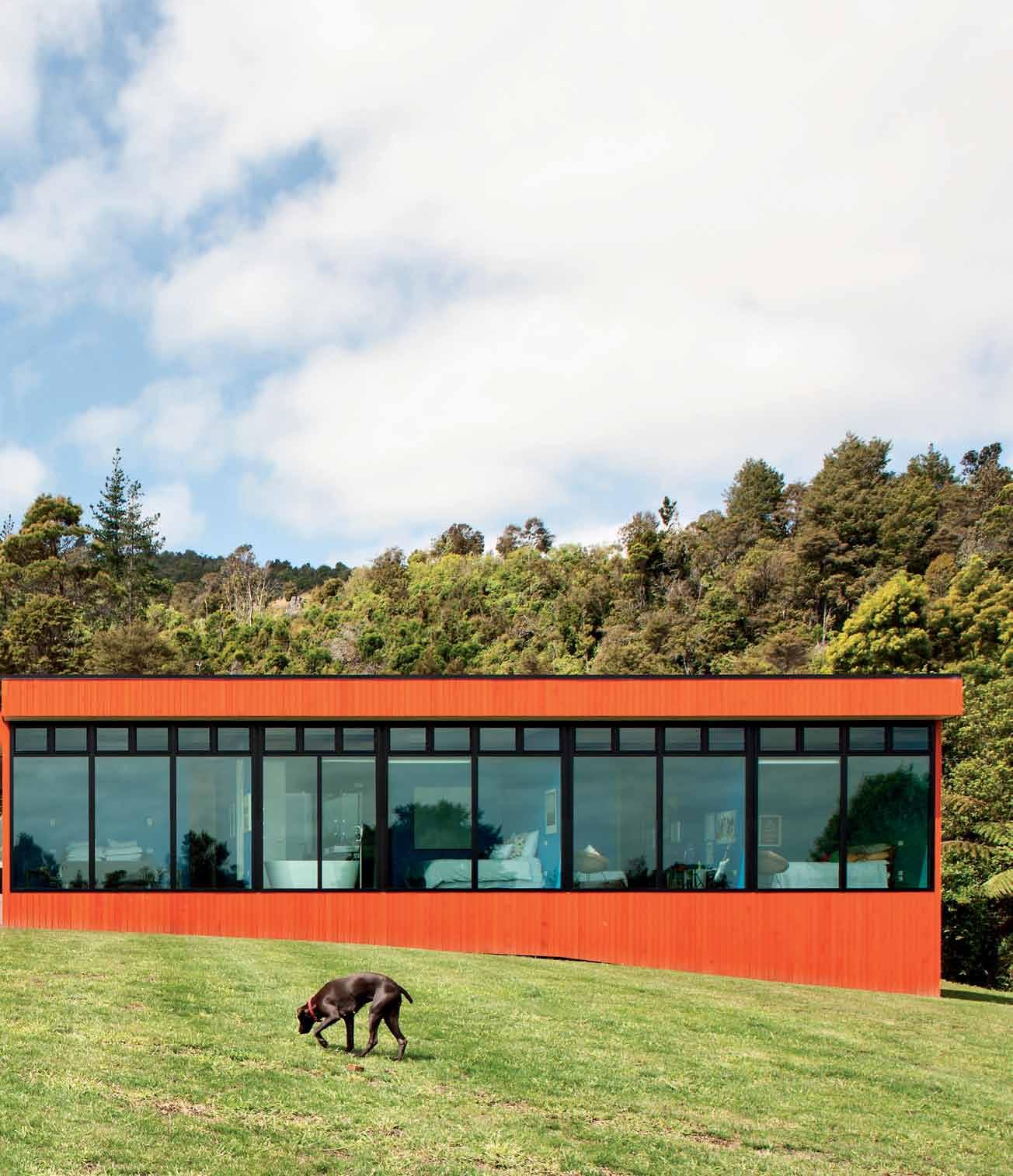
issue #29 habitusliving.com
Stained a vivid orange, the cedar cladding literally pops against the verdant greens of its surroundings.


3 . on location # 121
ABOVE | FLOOR PLAN. DECK ENTRY KIDS ROOM GARAGE WARDROBE BEDROOM BATHROOM ENSUITE POWDER ROOM LIBRARY LAUNDRY PANTRY KITCHEN DINING LIVING WATER TANKS 1 2 3 4 5 6 7 8 9 0 q e w r t y issue #29 habitusliving.com 1 1 6 6 6 6 7 5 2 4 8 9 3 e q 0 y w r t 5 5 5
corridor. Two ‘retreat’ spaces (a library and media room) are centrally located either side of the main entrance, also off the main corridor, all in close proximity.
These two retreat rooms and the entrance face east: they look back towards the hill where the concrete driveway emerges from the bush. Visitors are greeted by a very long low orange elevation, concealing a garage door but revealing the deep entrance porch. The porch leads into the centre of the house with bedrooms to the left and living to the right. Bedrooms are cave-like, painted out in deep blues and greens, with small lobbies created by a strip of bathrooms and wardrobes. The west wall of each bedroom has floor-to-ceiling, wallto-wall double-glazing. They provide snug dens on frosty winter afternoons and, with highlevel ventilation panels, breezy and private spaces in summer.
The living space, which contains the kitchen, dining and two seating areas, is one large open-plan room with windows on three sides. Black kitchen cabinetry, a dark-stained floor, shutters, orange-stained cedar and corner glazing make it a rich and lively room. The owners have a wonderful collection of furniture to delineate the space, including a slate grey Patricia Urquiola sofa. They maintain a refined aesthetic, letting materials and design elements create character.
One of my favourite places in the house is the library. Tucked between the front entrance and the living room (with a laundry and
The resulting plan outline is radially symmetrical to create order and serenity.
3 . on location # 123
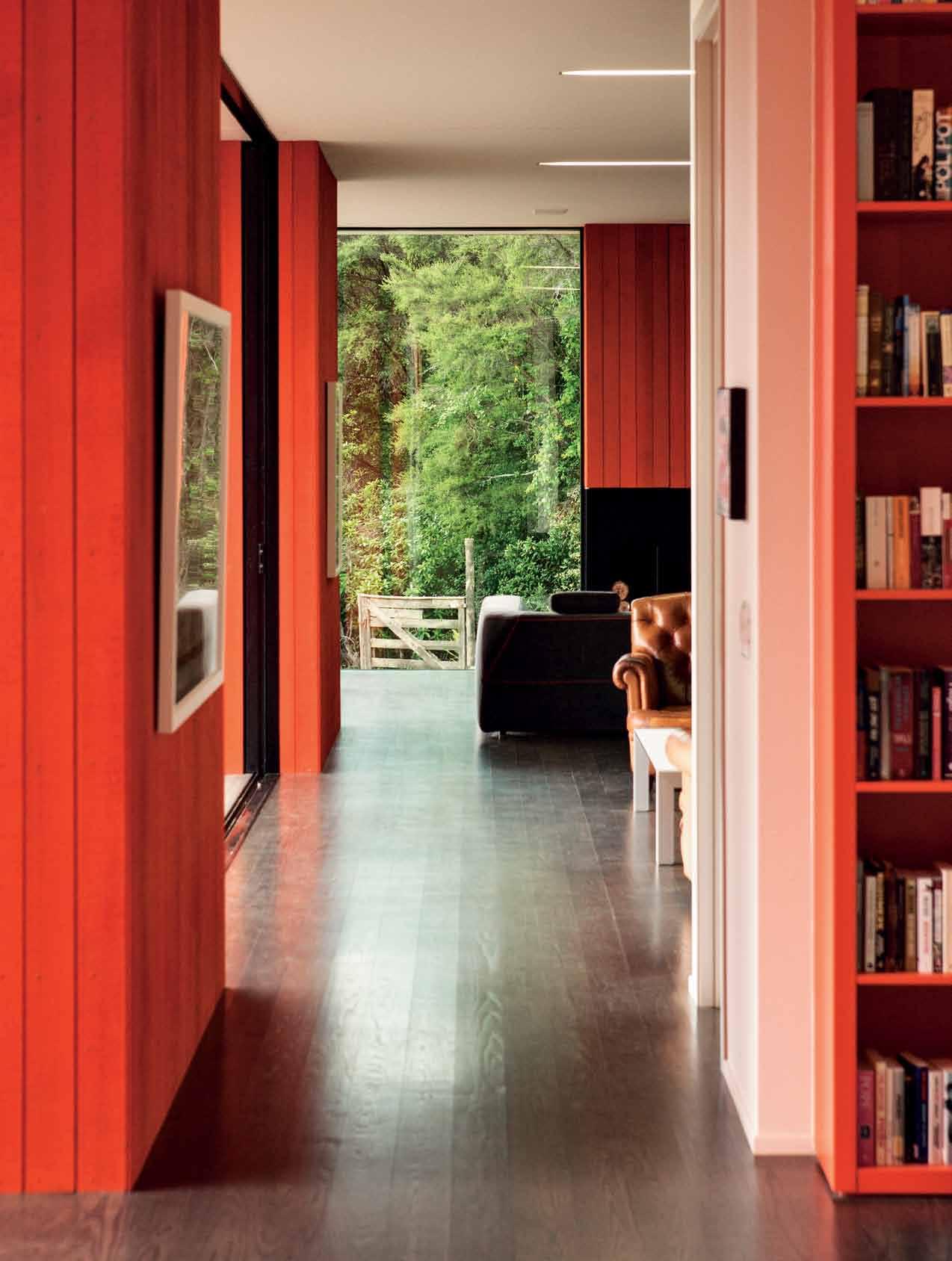
issue #29 habitusliving.com
pantry concealed between) it has views in two directions – east to the driveway and bush, and west across the terrace and towards the view. An orange cubed bookshelf covers one entire wall, and is filled with all manner of design books and literature, and there is a large shared table in the centre. It makes a wonderfully practical family social space where adults can work and children can attend to homework; where projects can be started and returned to the next day. Placed between the living room and the bedrooms, it is a tempting space to drop into.
A house must be a place for solace, rest, recharging, socialising, nurturing, and artistic, spiritual and intellectual pursuits. The spaces within and without of this house provide the opportunity to pursue all of these. Its abstract aesthetic takes it well beyond providing simply the fundamentals of shelter and comfort –which it does so convincingly through its visual weight and deep plan – to creating rooms to contemplate art and nature. There are references to the Modernist pavilion, but it is far more weighty and grounded than this model. Timber connects it with more traditional values and its location, but the bold colour and strict geometry return us to abstraction and art, as signalled by the two languid bronze sentries at the entrances.
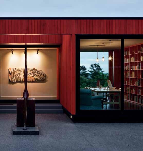
opposite | Standing outS ide the library, thi S axi S guideS our eye to the far end of the living room and into the bu S h beyond. above | the library i S an inviting S pace with a S hared-u S e table. 3 . on location # 125
drop box
archiTecT Patterson Associates design direcTor Andrew Patterson lead designer Davor Popadich
Team Phil Bond
builder Construct
Patterson a ssociates (64) 9303 4004 pattersons.com
arT
Outdoor bronze sculptures by Paul Dibble. Large tui (bird) image near kitchen by Rob Suisted. House Bird by Charles and Ray Eames on dining room table. Black and white ‘koru’ print against orange cedar wall is Tama 1977 by Gordon Walters. Round artworks by Reihana Bettle in bedroom on blue wall. Wall mural in the media room by the Underwater Collective, Dick Frizzell prints near the sofa.
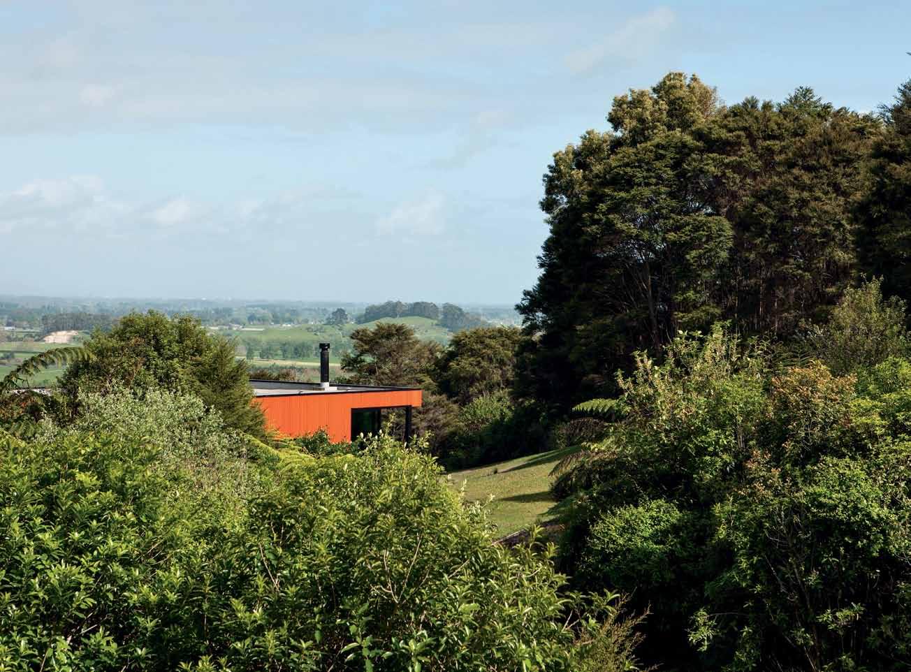
furniTure
Polder Sofa by Hella Jongerius for Vitra. Kristalia Sushi dining table by Bartoli Design.
Boum chairs by Monica Graffeo for Kristalia. Bend sofa by Patricia Urquiola for B&B Italia in lounge. Hawke table by Simon James in study. Camo Sofa from BoConcept in media room. Outdoor table by Royal Botania. Outdoor chairs are Easy Chair by Jerszy Seymour for Magis.
finishes
Cedar exterior stained in custom Maungakawa Orange by Resene.
fixed & fiTTed
Architectural series windows, APL.
above | The rural se TTing makes The house all The more remarkable for iTs arT and absTracT characTer.
issue #29 habitusliving.com
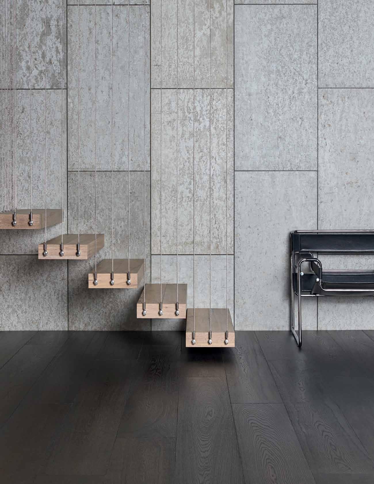


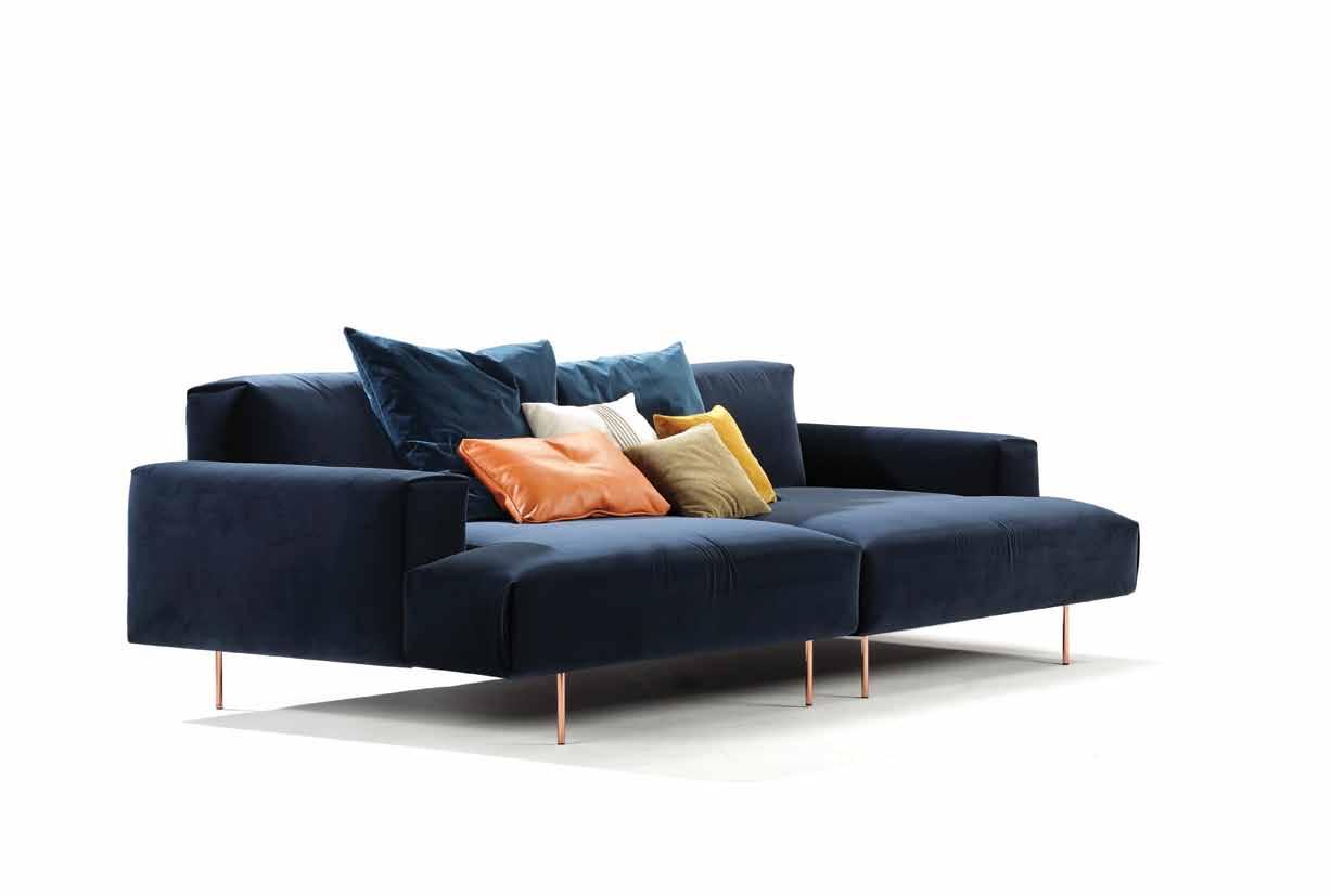

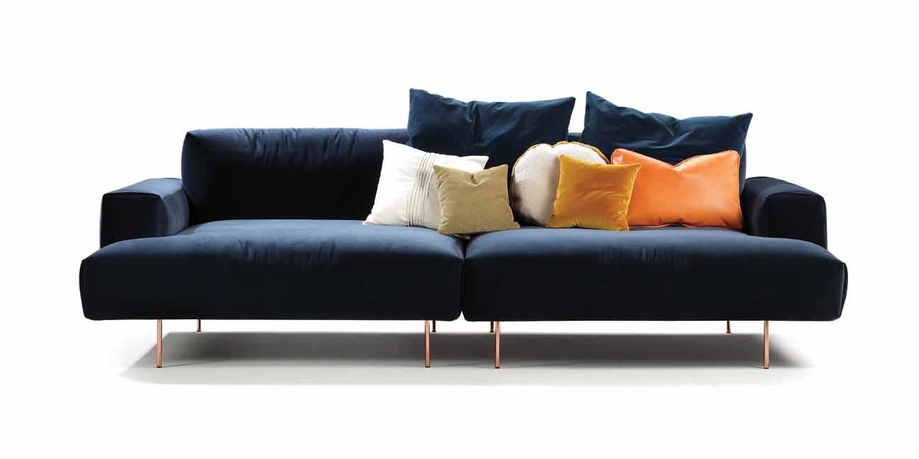 Designed by Rafa Garcia for Sancal, you can see the TipToe collection at kezu.com.au
A charred pine and rusted steel exterior on a floating house in Sydney 's Palm Beach creates a weathered finish that is functional, whilst also making a unique artwork of each panel.
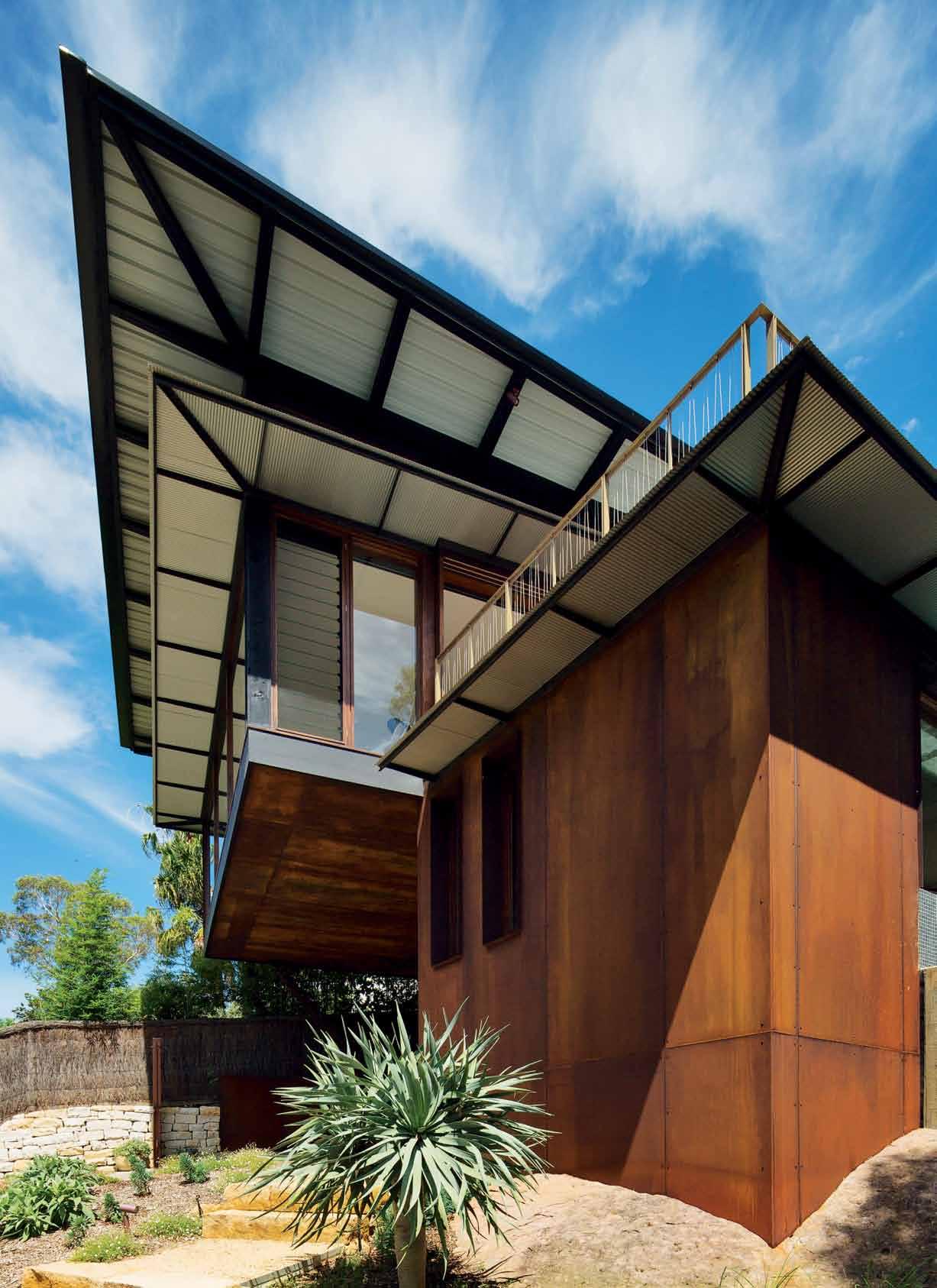


Tex T PhiliP Drew | PhoTogra Phy Simon w hiTbrea D
# 129 3 . on location
House of delights
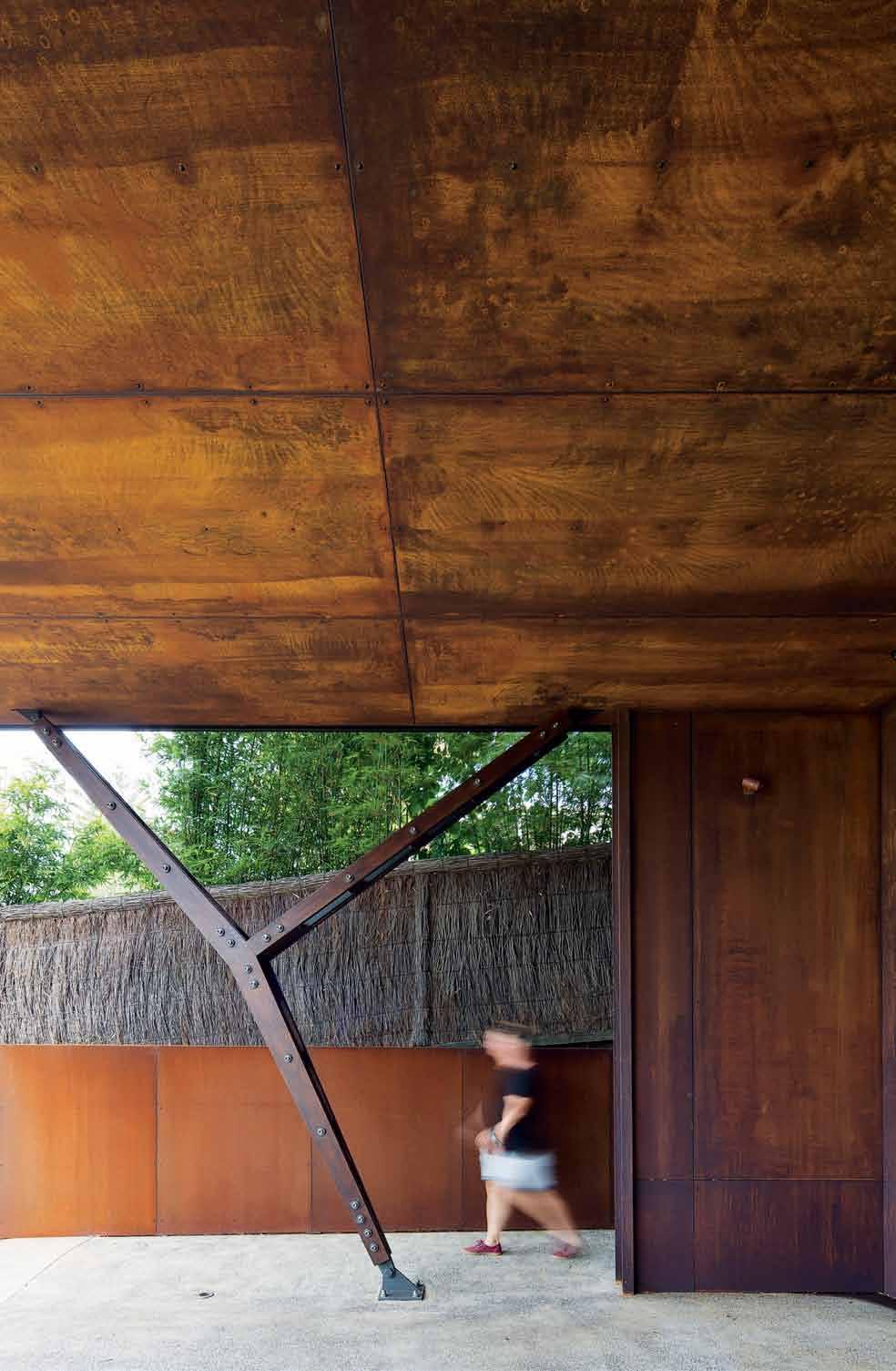

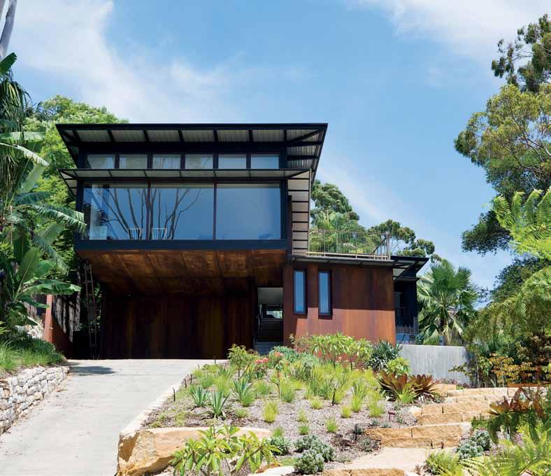
issue #29 habitusliving.com
‘He knew exactly what he was looking for. It must be the genuine article. It had to put the city at a respectable distance but be close enough for comfortable weekend commuting. However the locale was only part of it. Anyone of his generation would know what he wanted. No transplanted bourgeois suburban brick-andveneer tile villa would do.’
Robert Drewe, The Bodysurfers, 1983, p. 110-111
The Outback has long been regarded as a key source of Australian identity. The majority of Australians live within 10 kilometres of the coast and are environed by the sea. Few, at most three percent, live inland and are distant from beaches. We are coast dwellers; you could say that from its earliest days, Australia was a verandah country with a littoral verandah culture closely connected to and shaped by the oceans that surround it.

A great many people grow up, live near and are shaped by their sea experience whether it is swimming, surfi ng, fi shing, or regular holidays by the ocean. Almost by coincidence, Harry Seidler’s new elevated house of the 1950s with the garage underneath, spawned a new beach house typology that replaced the earlier ramshackle fibro beach shack beloved by Robert Drewe.
Palm Beach is a huge bony index fi nger wreathed in Sydney’s bush pointing north. On one side is the ocean beach, alternately suspended from cli s or fronting a long-necked peninsula, with Pittwater on its opposite side, at its tip, Barrenjoey, with its lighthouse and cottages, at cross-purposes. Pacific Road, with its spectacular ocean views, runs the length of this fi nger and commands the heights.
The client’s permanent address is an old Federation house in Randwick with an expansive verandah. She grew up opposite Bondi Beach, overlooking the Sydney Harbour – consequently the Palm Beach house represents the fulfi lment of their great Australian dream.

3 . on location # 131
PREVIOUS | THE PAVILIONS GAIN HEIGHT AND VIEWS SITTING BACK FROM PACIFIC ROAD. OPPOSITE | THE 6-METRE CANTILEVER CARPORT IS STEADIED BY A PRAYING MANTIS-LIKE 'Y' TIMBERAND-STEEL SUPPORT. ABOVE | EARLY CONCEPT SKETCH EXPRESSES THE IDEA OF TWO FLOATING PAVILIONS. BELOW | THE OPEN BASEMENT CARPORT SEEN FROM THE ROADWAY.
The brief was straightforward: “a beach house to be used as a weekender, not as a permanent home” that would work for the couple by themselves without feeling big or empty, but also work for gatherings of friends and the whole family – and for whatever else the next 50 years might bring.
The site is above Pacific Road on a steeply sloping block. The existing weatherboard cottage was well located but badly oriented and full of white ants. Design architect, Rob Brown’s task was to design a new casual beach house with the aim, quoting the client, of being “seriously cool”, meaning it would be different and unconventional to a degree, whilst simultaneously offering a different experience and a feeling of being up in the air, much like a childhood tree-house.
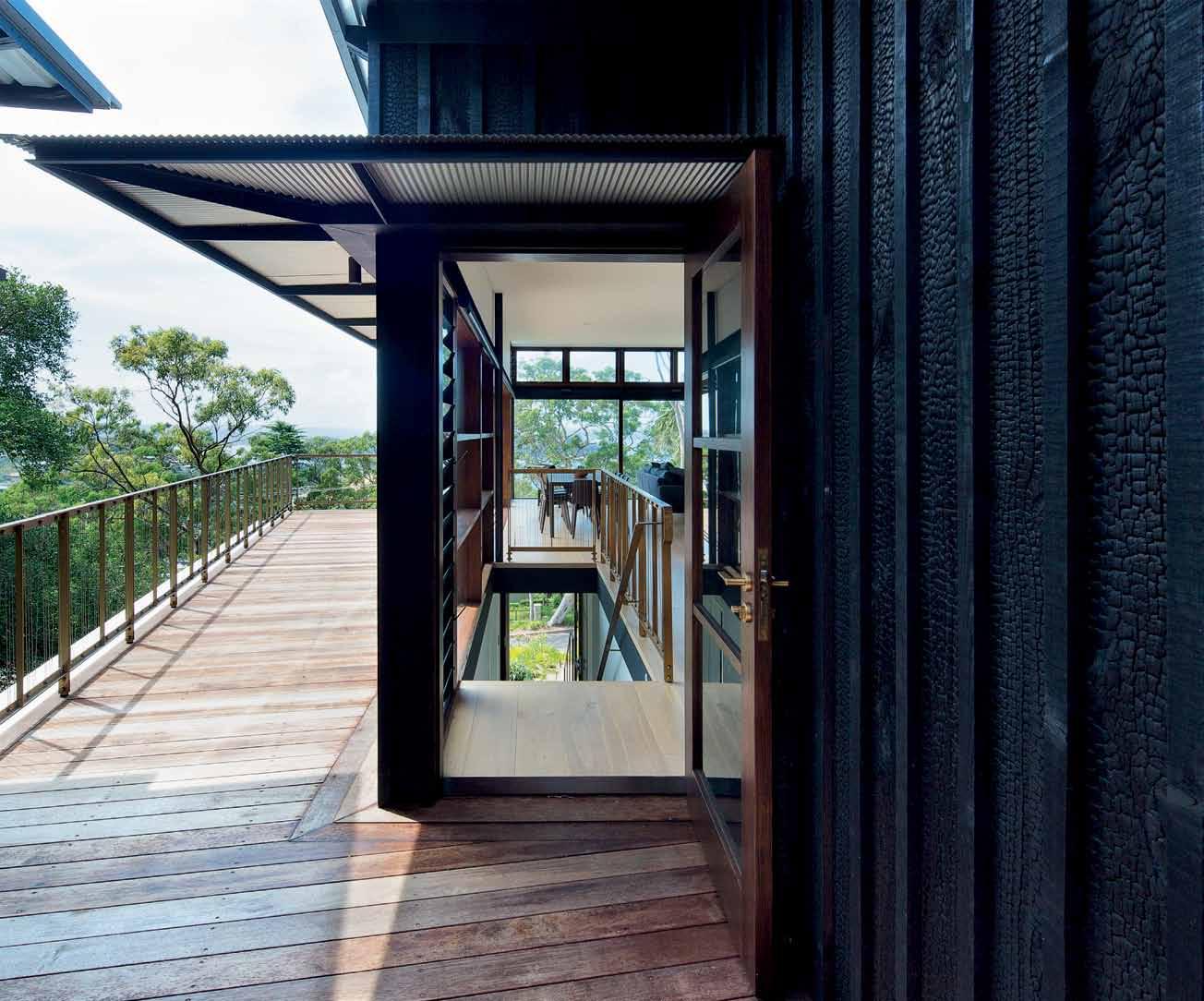
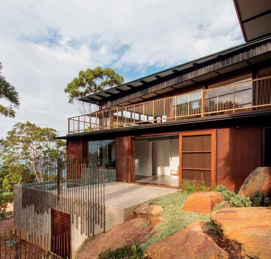
This resulted in floating the house above an open carport garage and entry at the end of the drive, on which was the upper main living/sleeping level that “floated out to the view”. To reduce its bulk, the house form was broken down into two pavilions to ensure each room a view. The living room continued out as an extended deck overlooking a borrowed garden next door, with the parents’ bedroom in its separate pavilion angled so it faced Barrenjoey. The exterior pine cladding was burned to create a layer of char on the outside. Based on traditional Japanese charred cedar shou-sugi-ban used to fireproof castle donjons at the beginning of the 17th Century, it can last 80 to 100 years and much longer if it is refinished with oil every 10 to 15 years. The visual appearance of the treated timber varies depending on the thickness of the char. A light char treatment retains the wood pattern; the deep char used on this occasion results in a

issue #29 habitusliving.com
A different experience and a feeling of being up in the air much like a childhood tree-house

 opposite above | 4.9-metre wide merbau timber balcony extends the living/dining space west to views of barrenjoey. photography by carly martin. above | west-facing balcony from stair landing is framed on either side by the two floating pavilions. a brass handrail with stainless steel lacing minimises any visual obstruction of the views. the black scale char timber adds texture.
3 . on location # 133
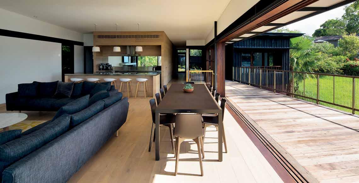

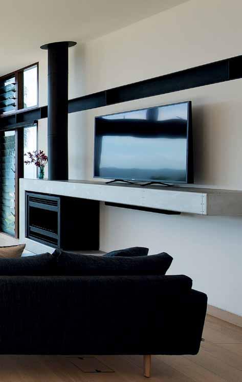
issue #29 habitusliving.com
black segmented crocodile pattern. Burning does much more than preserve the wood, it makes it significantly fire-resistant; termites and bugs hate it. But it has a further advantage –black is a recessive colour that makes the Pacific Road pavilions visually retreat into the bush.
The rust layer on the thin Corten steel, like the char treatment of the upper wood cladding, in essence is similar. Like shou-sugi-ban, not only does it enhance the weathering property of the metal, it also creates a beautiful ochre patina that is strikingly painterly, each panel becoming a unique visual work.
Both the Corten steel and shou-sugi-ban point to a fascination with special materials to create a house, which, for all its seeming simplicity, is playful and surprising and rich in assorted tactile delights; whether it is the unconventional use of steel reinforcing rods to create fences to isolate the plunge pool, the brass handrails on the upper deck that are almost invisible, or the timber walls in the interior with their undifferentiated doors to reinforce the continuity of the wall plane.
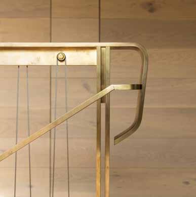
One of the surprises is the mirror behind the island kitchen bench that, depending on where you happen to stand and face in the living room, catches and echoes the treetop vista outside, bringing it inside by stealth. Working behind the bench, one has the bush back and front. It is enchanting.
The outcome is a house full of delights, a house moreover that floats above the rising ground out front, as if suspended in the air. Its two pavilions swivel to capture the views: the larger living pavilion towards the ocean, and the main bedroom pavilion, towards Barrenjoey.

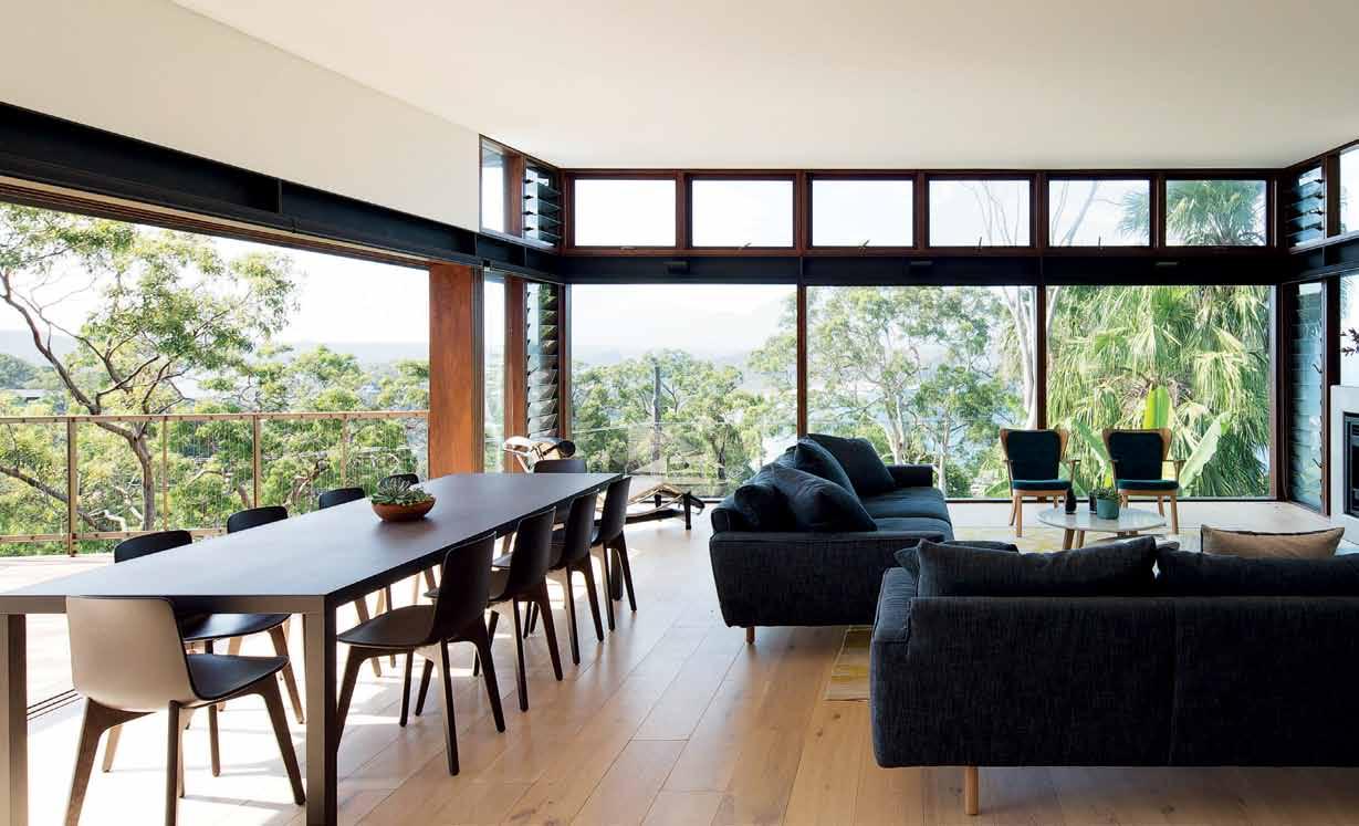 opposite above | open dining/living space on upper ground level offers screened views through trees to the ocean and Barrenjoey. opposite below | food preparation area B ehind lounge seating. the mirror aB ove the wall B ench supplies a landscape douB le entendre to the B ushland outside. this page | detail, B rass handrail with stainless steel laced weBB ing for infill. photography By rhys holland.
3 . on location # 135
Brown’s design is similar to an earlier house on Mackerel Beach that also employed a similar arrangement of two diverging pavilions aimed at separate viewpoints.
Robert Drewe’s idea of a beach house was of a primitive shack that confronted you with elemental primal experiences and with the bush around it. The Pacific Road house is nothing like his primitive shack; on the upper storey the material is cheap burnt pine, and the under-storey is thin 1.5mm sheet Corten steel. The client’s Randwick house in Sydney’s east “lived within its boundaries”, in its stead the client requested a house that would release its interior and extend itself well beyond the property line, and be an expansive extension of house to free and liberate the human spirit. We live captive lives in the city, hemmed in and constrained by buildings. At the beach, people release themselves in nature and rediscover a sensual side of their being and become more fully alive.
This is a house that does exactly that by its unusual choice of materials, by freeing its space, by suppressing walls and boundaries and fences, acts that in their combined effect take us out of ourselves and offer a succession of unexpected delights and surprises. Doors are hidden, steel reinforcing rods become fences, bathroom floors are raw concrete, hoods at door-head height release the uptilted roof to the sky outside, black charred burnt wood timber
2 3 4 5 6 7 8 9 0 q e w r t
entry pool room bathroom pool rainwater tanks & storage carport living dining kitchen pantry powder room bedroom master bedroom ensuite deck
1
opposite | plans and section. issue #29 habitusliving.com
SECTION GROUND PLAN LOWER LEVEL PLAN 3 . on location # 137 1 6 7 5 2 4 8 9 3 3 e e q 0 w r t
drop box
architect Casey Brown Architecture
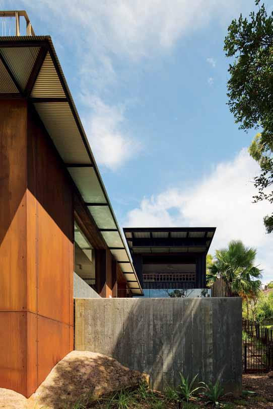
design architect Rob Brown
project architect Carly Martin
builder John Newton Building
engineer Ken Murtagh
l andscape architect Hugh Burnett
Casey Brown a rChiteCture (61 2) 9360 7977 caseybrown.com.au
furniture
Living room fireplace and television unit by Casey Brown Architecture, made by Grant Scammell (Scammell Furniture) and Ray Cooper (Creative Metal Fabrication). Wardrobes and vanity units by Casey Brown Architecture, made by Grant Scammell. Bedside tables by Casey Brown Architecture, made by CDR Furniture. Iko Coffee Table by Jardan. Errol Lounge by Jardan. A Stool by Hay in Kitchen.
lighting
Externally – Noosa, Kingston by Tovo Lighting. In-floor uplights Port Douglas by Tovo Lighting. Garden lights Noosa by Tovo
has the same rugged toughness of crocodile skin, the ochre patina of the Corten is a work of abstraction worthy of hanging in an art gallery, that springs directly out of the sandstone. Below the outdoor deck extension of the living room, in the plunge pool, tile mosaic enlivens the water with colour.
The novelty of the new house has yet to wear off, but it has already released fresh new ways of enjoying nature and bringing it close. The resident says: “When we are there we like to walk the dogs around the top of the hill; there is a lovely secret park at the end of the cul-de-sac which overlooks the beach which is a favourite spot to stop. We swim in the surf, walk along the beach, coffee at the boathouse and Pat has got his beach fishing rods at the ready again… we are happy to be in it, to spend time there. It’s a really calming, beautiful place to be.”
Architecture can express a wide range of things, qualities that are often hidden or disguised in our natures are externalised— made permanent. The house at Palm Beach is all about how people live in their leisure time, with finding ways to enlarge, deepen and enrich life and everyday with some new, unexpected experiences that, in some way, connect us as lone beings with others and with nature.
Bringing it together required considerable skill and dedicated effort by architect and builder, with support from an understanding and appreciative client.
Lighting. Internally – Kingston and Albany downlights by Tovo Lighting. Panorama Coogee step lights by Tovo Lighting. Kitchen pendants Potter Light by Anchor Ceramics. Uplighting Wedgie by Tovo Lighting. Bedside lights Parete Mini by Tolomeo. Loft Fan by Emerson. Hall strip lighting Skyline Mirage by Tovo Lighting.
finishes
Roofing from Colorbond. Burnt pine cladding by John Newton Building. Merbau decking. Western Red Cedar with Exterior Woodwash in Black by Murobond. Flooring is engineered timber boards by Tongue and Groove Flooring in Bistre. Corten cladding. Pool tiles by Ezarri
Australia. Doors and windows by Woodhill Timber Windows and Joinery. Kitchen bench in stainless steel by Stain Ash. Paint finishes Dulux Vivid White and Dulux Wash & Wear Kitchen & Bathroom Ceiling Flat.
fiXed & fitted
Fireplace by Heatmaster. Turntable by Australian Turntable Company. Blinds by Verosol. Lever door handles by Designer Doorware. Miele dishwasher, cooktop and oven. Qasair rangehood. Oxygene kitchen mixer by Gessi. Basins by Omvivo. Shower and basin taps by Accent. Overhead shower by Nikles. Toilet by Calais. Towel racks by Scala. Freestanding bath Arc by Kado.
above | in the west yard, the board-formed concrete swimming pool matches the upper level shou-sugi-ban timber. the c orten has been cut into its sandstone surrounds to better integrate it with the site.
issue #29 habitusliving.com
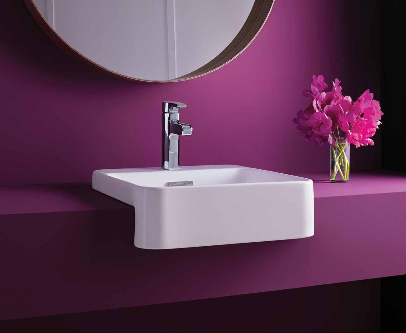

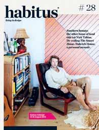
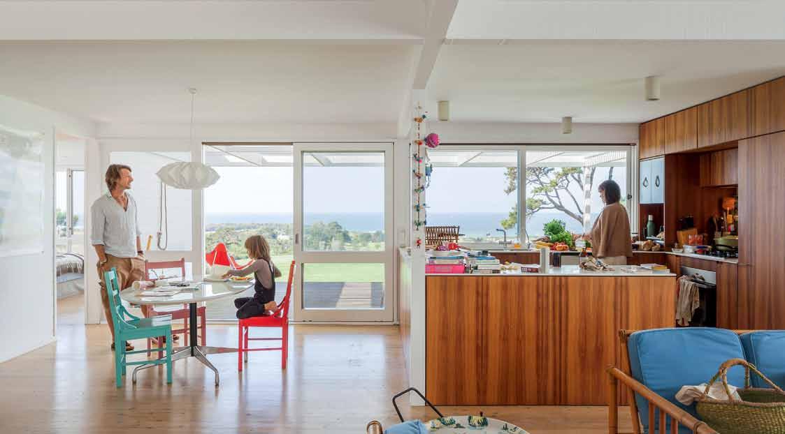
living in design # 27 Misschu: tuckshop matron, fine art patron Efficiency & flexibility –creative solutions for left over spaces. PAYMENT METHOD Cheque / money order AUD$ Charge my credit card AUD$ Name on Card Card Type Card Number Expiry Date Signature IT’S EASY TO ORDER
FOR A GIFT – RECIPIENT DETAILS: FOR MYSELF PLEASE SELECT BELOW: Mrs/Ms/Miss/Mr First Name Surname Address State Postcode Country Email Phone Mrs/Ms/Miss/Mr First Name Surname Address State Postcode Country Email Phone ONLINE: habitusliving.com/subscribe PHONE: (61 2) 9368 0150 MAIL TO: EMAIL: subscriptions@indesign.com.au FAX: (61 2) 9368 0289 Indesign Media Asia Pacific Level 1, 50 Marshall Street, Surry Hills NSW 2010 AUSTRALIA INTERNATIONAL (AUD$) 12 ISSUES SAVE 8 ISSUES SAVE 4 ISSUES SAVE 12 ISSUES SAVE 8 ISSUES SAVE 4 ISSUES INDESIGN $155 $43 $105 $27 $55 $11 $240 $39 $200 $21 $110 DQ $70 $44 $50 $26 $25 $13 $140 $10 $100 $5 $50 HABITUS $132 $47.40 $93 $26.60 $49 $10.80 $240 $30 $180 $10 $90 THE COLLECTION Vol. 2 Australia $29.90 (1 ISSUE) International $49.95 (1 ISSUE) Subscribe to Habitus magazine
Photography by Katherine Lu
Home revolution
A home designed by Sarin nilSonthi in Chiang Mai attracted some uncertainty from the locals, representing a very contemporary way of life. But it’s exactly what the residents were after.
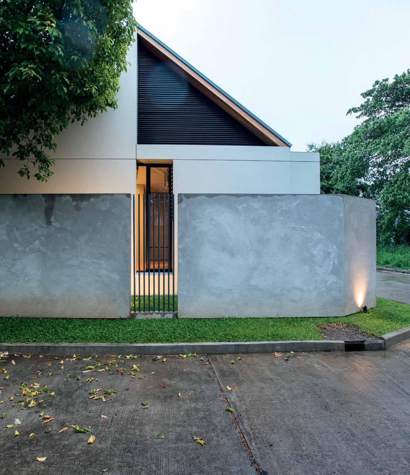
Tex T Aroon PuriTAT | PhoTogr APhy jA son l A ng
3 . on location # 141
Rattanarak Village is a small housing development project situated nine kilometres to the south of Chiang Mai, constructed during the late 1990s. Within this village is the home of Pongsatorn Siripet and Nisakorn Tajamai.
Pongsatorn first visited the village when laying out the electrical system for the house of his architect friend, Sarin Nilsonthi. “It was this really quiet area,” he recalls. “I liked the environment and the friendliness of the residents here since that very first visit.”
Pongsatorn and Sarin met each other through work in 2007 when Pongsatorn, an electrical engineer, worked on the electrical layout for a building that Sarin was project architect of. They have worked together multiple times since then. When Pongsatorn decided to build a house of his own, he didn’t hesitate to ask Sarin to take care of the design. It was an easy decision as the intended piece of land was located adjacent to Sarin’s own house.
Pongsatorn’s property is situated on the furthest west end of the village, which means his trapezoidal piece of land is the corner plot of the intersection. Two sides of the property are bordered with the roadway while the western, and longest side, shares a fence with Sarin’s house. The south wall is co-owned with another neighbour.
In the early stage of the project, ideas were discussed between Pongsatorn and Nisakorn before the details and requirements were given to the architect. The brief was for a singlestorey house with a spacious interior and abundant green element. “We didn’t want it to look too modern. We needed a simple Japanese garden and a small workshop, which I use for work,” explains Pongsatorn.
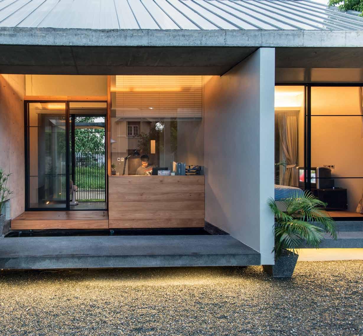
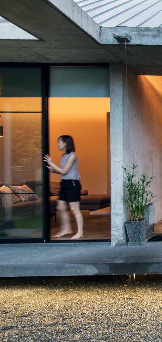
issue #29 habitusliving.com
The brief was for a single-storey house with a spacious interior and abundant green element.


previous | Openings at the fence lO cating tO the n O rth wing O f the h O use allOw light and air tO flOw thrO ugh. above | the massive sliding glass d OO rs O f the bedrOO m, living area and wO rking space at the east wing O f the h O use welc O me the succulent view O f the garden intO the interi O r space.
3 . on location # 143
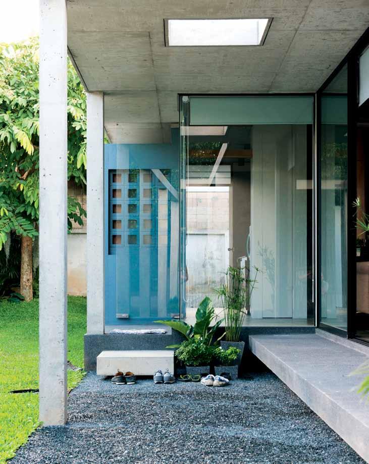
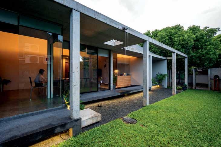
above | an opening in the concrete roof highlights the main entrance area. below | a small
to the
to the house. issue #29 habitusliving.com
garden located
east rests parallel
Sarin explains the house’s orientation: “The sun from the west is the big issue because it brings the heat into the house. I designed for this by pushing the house towards the fence, and adding the backyard garden to the program,” which helps cool the property. The small but rather long garden is the house’s main green element that visually and physically connects with the bedroom and living room. Trees growing across the fence at Sarin’s house become the view from the bedroom, a kind of ‘borrowed’ landscape.
The house began construction in late 2013, taking eight months to complete. Pongsatorn took charge as the contractor of the project and learnt how to use the SketchUp program himself to document the house’s structure and plan the entire construction process himself –with Sarin advising and following the progress.
The architect planned the home according to the need for privacy from the most public area such as the living area to the most private space – the bedroom. The space allocation is rather unorthodox for vernacular northern Thai houses in this area. Open plan is a familiar type of planning, where everyone sits together, but here a series of massive concrete walls separate the office at the front of the house and entrance to the master bedroom. And where simple overhangs are regularly used to mediate
sun penetration, in Pongsatorn and Nisakorn’s home, exposed concrete beams and columns provide a framework for the installation of sun protection blinds.
In the beginning of September last year, the house-warming ceremony was held according to Thai tradition with monks invited to give the house a blessing, as well as relatives and families of the owners. The older relatives found some of the home’s features – with its contemporary aspects – bizarre. Even the monks suggested that the intentionally disconnected structure should be more properly joined. “We listened to all the opinions. But in the end, they understand that this is the house we built for ourselves,” Pongsatorn explains. “It’s the generation gap, I think. But everyone really likes the polished stone terrace that runs along the garden. It’s the semi-outdoor space that they’re familiar with; the kind of space they are used to. My father sat at the golden teakwood patio near the fish pond almost the entire day because it’s his favourite spot,” he says, with a proud smile.
The house reflects a modern way of thinking: the use of moveable furniture that suits each type and functionality of space; the use of walls to separate one area from another and provide privacy; and the rather modern materials such as steel, glass and exposed concrete. In the meantime, the spatial program
3 . on location # 145
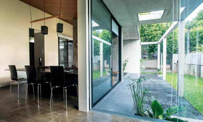
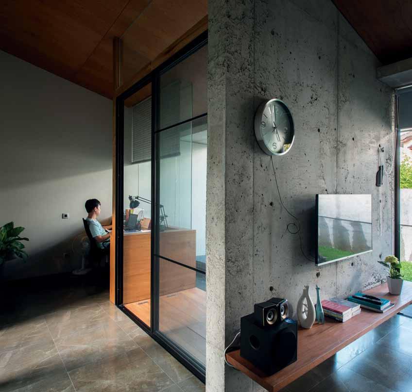 above | an exposed concrete wall separates the living area from the working space. below | the interior space is filled with abundant natural light, through large transparent glass walls at the house's main entrance. opposite above | floor plan. opposite below | the living and dining areas are divided by the mass of the table.
issue #29 habitusliving.com
The house is physically harmonious with the surrounding architectural environment.
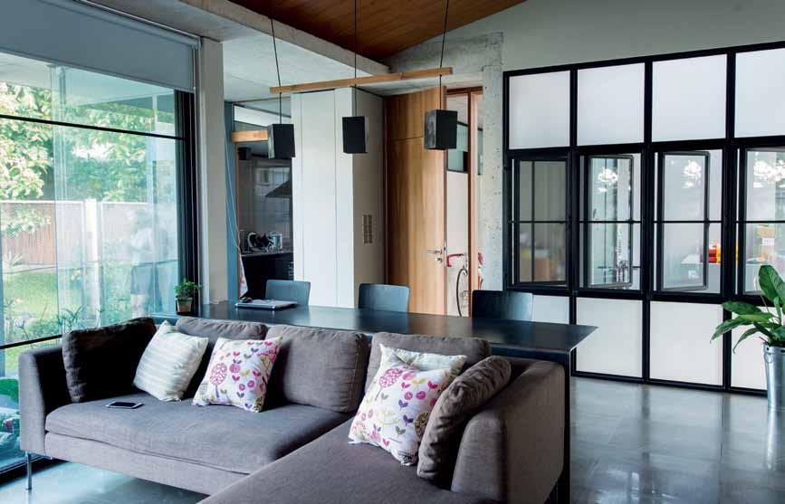
WORKSHOP CAR PORT SHOE STORAGE STORAGE TERRACE LIVING / DINING FISH POOL STUDIO 1 2 3 4 9 0 q e GUEST ROOM FOYER WATER TANK GARDEN WASHING AREA KITCHEN 5 6 7 8 COURTYARD MASTER BEDROOM BATHROOM CLOSET w r t y u 3 . on location # 147 r q y 2 0 9 9 9 9 e 3 8 4 u 6 6 6 w 5 t t 7 1
is reconciled to accommodate the Thai way of life, such as the kitchen being located on the far side of the house (mainly because the cooking of Thai food can create quite a strong smell and a bit of smoke). The material chosen for the house’s flooring is comfortable for dwellers to walk around barefoot. The shape of the gable roof is suitable for the humid and rainy climate. The house is physically harmonious with the surrounding architectural environment – “The trees around the house increase the shade and reduce the reflection of the sun from the west,” Pongsatorn explains.
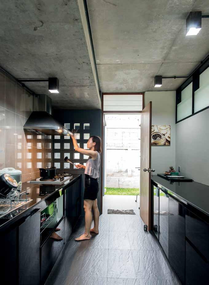
He talks about his plans for the garden to make the entire atmosphere of the house more lush. As we are talking on that polished stone terrace of his, with Sarin sitting next to us, Nisakorn brings some juice and donuts over. Pongsatorn stands up from time to time to stroll around the pebble ground while we talk. Not everyone understands his home but he’s got his reasons for the way things are and he’s happy with the result. “If I joined the beam structure to the roof, I wouldn’t be able to lay down out here and watch the spectacular meteor shower,” he says, with a bright smile on his face.
drop box
archiTecT D_Kwa Architectural Design Studio principal archiTecT Sarin Nilsonthi
sTrucTural engineer
Jasdar Yodmongkon
sysTem engineer
Pongsaton Siripet area 180 square metres
D_Kwa Stu Dio deekwado@gmail.com
furniTure
In steel, wood and ply.
above | The Thai kiTchen is locaTed separaTely from The house To proTecT The living area from cooking smells.
issue #29 habitusliving.com
With dozens of colour and finish options available, Astra Walker tapware seamlessly integrates into a wide range of interior schemes. The only limit is your imagination. Be inspired. Visit astrawalker.com.au/finishes
astrawalker.com.au
TAPWARE
SANITARYWARE ACCESSORIES

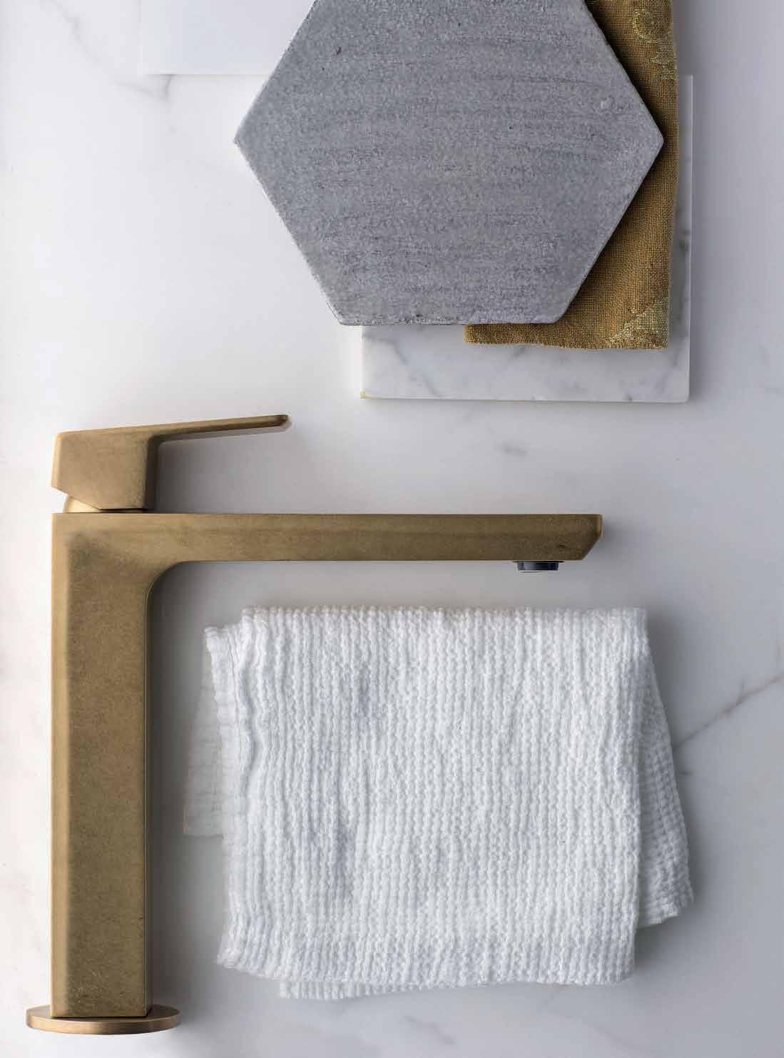
ASTRA WALKER ARCHITECTURAL BATHWARE

AST103
ECO BRASS



Binder is an exclusive digital library of leading design magazines, custom publications and design catalogues. Download the free architecture and design newsstand app on iTunes. iPad is a trademark of Apple Inc., registered in the U.S. and other countries. Your personal design library on hand, on iPad, all the time Engage, promote, inform An industry resource for designers, specifiers and suppliers To publish your digital design publication to Binder today, email us at binder@indesign.com.au
A new living solution
Celebrating 120 years since founding, Rogerseller talks to us about the benefits of customised design and why they moved into the realm of living furniture.
#151 habitus X Rogerseller
habitus X Rogerseller
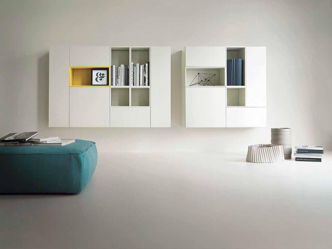
Above | T030 Modular Wall STorage SySTeM : a SuSpended coMpoSiTion coMbining open & cloSed eleMenTS in TWo lacquer finiSheS beLoW | T030 Modular enTerTainMenT uniT VerSaTile STorage coMparTMenTS including puSh / pull flap doorS opposite pAge | T030 Modular freeSTanding enTerTainMenT uniT eleganT roVere cabone finiSh, conTainS MulTiMedia conTainerS puSh/pull draWerS and oVer lapping grid eleMenTS accoMModaTe bookS and objecTS
Rogers, Seller and Myhill was a retailer, manufacturer and importer of mantelpieces, grates, sanitaryware, tiles and door furniture, established in Melbourne over a century ago, in 1895.
Three generations on, the family-owned business continues to provide beautifully designed fittings for the home. Previously focusing on bathware and kitchen cabinetry, Rogerseller (as the company is now known) has recently expanded their offering into furniture for living environments.
Rogerseller design and manufacture their own premium collections, and also work with a core line-up of exclusively imported brands including Catalano, Fantini, Falper and Valcucine. These select partners are closely aligned with Rogerseller’s values – design, style, enduring quality and creativity – as well as the all-important trademarks of innovation and integrity.
So when Rogerseller decided to expand their offering into furniture for living spaces, Italian brand Lema was selected as the partner. There were many reasons for this. Firstly, Lema has a long history of working with the best designers in the world (many of the products have been developed under the art direction of Piero Lissoni). Secondly, their commitment to
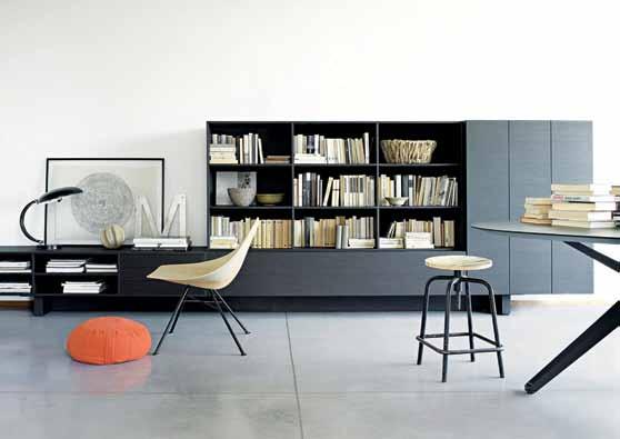
beautiful hand crafted design incorporates the finest details – intricate stitching, sculptured handle, quality of fabrics – that makes the brand stands out from other furniture manufacturers. Thirdly, like Rogerseller, Lema also had a long history in manufacturing as a family brand, beginning their business in the 1950s making bookshelves, then expanding into wardrobes and cabinetry and eventually freestanding furniture.
Simply put, the two brands have a shared devotion to producing highly functional, highly beautiful pieces, as well as a dedication to exceeding environmental standards through the strict management of processes and materials.
One of the real motivations with Lema was the focus on customisation – a quality that is becoming more and more important as interiors become more bespoke. Essentially, customised furniture is a unique solution designed and built to suit individual spaces. Lema offers an extensive range of components including shelves, doors, cupboards, drawers in various sizes, material and finishes, providing the freedom to bring design ideas to life.
The furniture market may appear crowded, but Rogerseller has made a considered decision with Lema. Managing Director James Edmonds describes their recent addition:
#153
habitus X Rogerseller
“With the introduction of the ‘living’ branch of the business Rogerseller can now offer design-led, superior quality solutions for the entire home.”
Having been in the game for so long, Rogerseller has had the benefit of witnessing the twists and turns of interior design trends over decades, and being able to forecast the direction in which design will go, and how their business might grow to meet these demands.
“With open plan living, design has extended from one room to the next, more and more over the last few years,” James explains. “One ‘living’ space can include your kitchen, lounge, dining, study nook and hidden laundry.” Similarly, “Bathrooms are integrated with the bedroom, home gym, sauna/steam room and wardrobes. It is this natural progression that has led Rogerseller to extend their original bathroom offer to include ‘Wellness’, ‘Kitchens’ and now ‘Living’ which encapsulates customised wardrobes, cabinetry and shelving systems as well as freestanding furniture for all living areas of the home.”
With a contemporary European aesthetic, Lema embodies the combination of understated elegance and functionality through customisation, “Which will resonate enormously with the design-savvy Australian market,” predicts Senior Marketing Executive Tanya Sharpe. “In our chaotic lives we need a
living space that creates calm and order,” she continues. “Everything needs its place in both daily household living as well as relaxed family time. Order is achieved by functionality and calm is achieved by remaining aesthetically beautiful.” With their range of storage and wardrobe units in particular, Lema succeeds in delivering this balance.
The Hangar Walk-In Wardrobe System, designed by Piero Lissoni, is a case in point. Transforming the bedroom into an intimate and customised experience, Hangar is precision engineered to be self-supporting, completely customisable in size, finish, colour and even lighting and with a range of luxury interior accessories to make organisation simple and appealing.
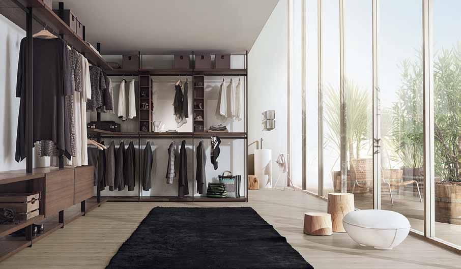
Another Lissoni piece to consider, this time for the living space, is the T030 Storage System/Entertainment Unit. This modular unit is classical or contemporary, linear or asymmetric – the only constant is its complete flexibility. Again, various components, sizes, finishes and fixing options are the feature, so that beauty as well as function is perfectly modulated for your home space.
The Lema range will find a unique expression in each setting it occupies – think of it as just another element of your personality.
Rogerseller | rogerseller.com.au
Above | Hangar Walk-In Wardrobe: FlexIble rack mounted Wall panels In customIsable HeIgHts and WIdtHs, moka melamIne sHelvIng, alumInum uprIgHts and IllumInated back panel.
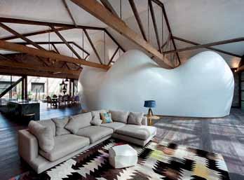
Being a world leader in concealed toilet cistern technology means some of our best ideas are hidden away forever. No ugly plumbing or cistern to be seen anywhere! Enjoy more space, more style, with Geberit concealed cisterns. Download 3D BIM files from → geberit.com.au/bim-library Geberit concealed toilet cisterns Hidden secrets of beautiful bathrooms Discover beautiful products Meet inspiring people Indulge in architecture and design Across Australia, New Zealand, South and South-East Asia The online community for the Design Hunter® Website | habitusliving.com Facebook | habitusliving Pinterest | habitusliving Instagram | @habitusliving Twitter | @habitusliving Kimu Design P in OCCH O VA ses P HO t O gr APH y K A t H erine Lu PHO t O gr APH y C A st L e + Be A tty
Australia
Print
Indesign Magazine | Quarterly
Habitus Magazine | Quarterly
Habitus Kitchen & Bathroom | Yearly
DQ Magazine | Quarterly
Digital
Indesign Live | Website
Habitus Living | Website
The Collection | Website
Binder | App

Events
Sydney Indesign | Every 2nd year
Melbourne Indesign | Every 2nd year
Brisbane Indesign | Every 2nd year
Launch Pad | Yearly
Indesign Luminaries | Quarterly
Indesign In Discussion | Yearly
Habitus Conversation Series | Yearly
Habitus Launches | Quarterly
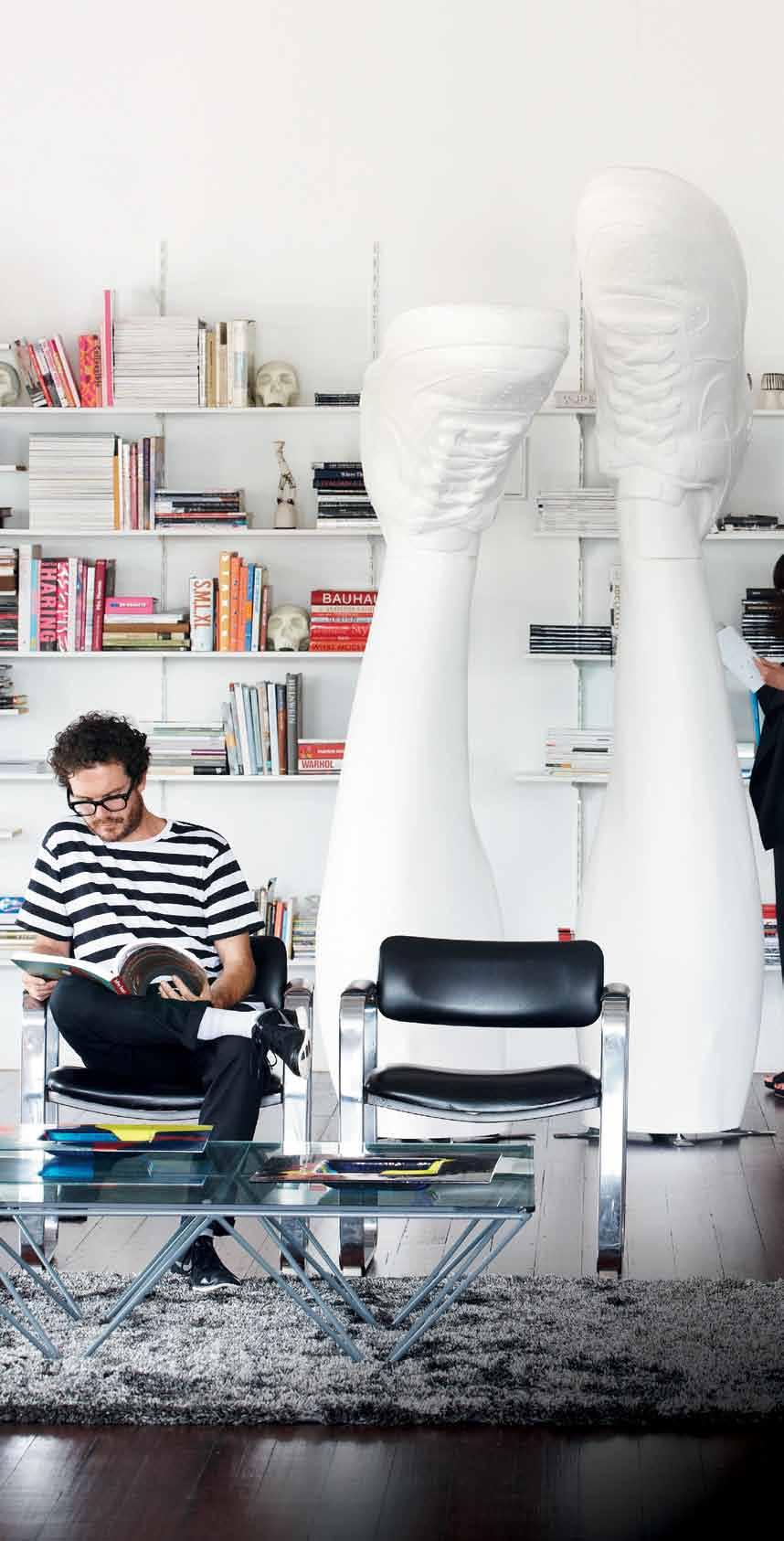
Creative Services
Indesign Creative Services | Marketing
RSVP Indesign | Events Management
Singapore
Print
Cubes Magazine | Every 2nd Month
Lookbox Living | Every 2nd Month
Digital Indesign Live SG | Website
Lookbox Living | Website
Events
Singapore Indesign | Every 2nd year
Singapore Indesign Inimate | Every 2nd year
Hong Kong
Digital Indesign Live HK | Website
Events
Hong Kong Indesign | Every 2nd year
Indonesia
Print
Indesign Magazine ID | Quarterly
Digital Indesign Live ID | Website
Photography by James Geer


our endless passion for great design that drives our readers’ interest.”
“It’s
Cubes 62,000+ engaged indesignlive.sg /indesignliveasia @indesignlivesg @indesignlive Lookbox 88,000+ engaged lookboxliving.com /lookboxliving @lookboxliving @lookbox_living/ Indesign The Event 170,000+ engaged indesigntheevent.com /indesigntheevent @indesign_event @indesigntheevent Habitus 150,000+ engaged habitusliving.com /habitusliving @habitusliving @habitusliving DQ 100,000+ engaged indesignlive.com /designquarterly @tweetdq @designquarterly Indesign 100,000+ engaged indesignlive.com /indesignlive @indesignlive @indesignliveIndesign Media now offers you more tools to market your brand than any other media organisation in this region. Talk to us now about how you can directly connect with an influential audience of over 670,000 engaged individuals across our print, digital and events media.indesign.com.au (61 2) 9368 0150
Rajesh Nandan, CEO Indesign Media
Fun in the study
A rustic farmhouse receives a contemporary facelift with USM.
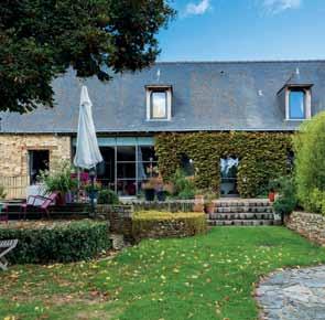
The residents, Chantal and Dominique had been living in this farmhouse for 30 years when they decided to update. Their children had moved out and it was time for something new.
They abandoned the country farmhouse interior for something more contemporary and although the exterior retains its old-world charm, the interior has had a radical intervention. The second floor office-library is the site of one such makeover.
This new and expansive space was created to consolidate the impressive collection of books, once scattered throughout the home. To create the library, USM storage units and bookshelves were selected to house and display the collection. The main deciding factor was the modularity. As the space is so unique, with angled structural timber framework and trusses, the need for flexibility was paramount.
The library was developed as an ensemble of functional parts: a reading table, cabinets of various sizes, the integration of doors to create storage space – and for colour, a warm, bright yellow to create a “playful experience,” as Chantal says. In addition, various base units fill the room, creating a pleasant space to relax or work. Alongside the majestic old beams, USM shelves enhance the old architectural details while still seeming natural. The contemporary
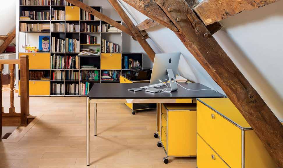
makeover brings a new freshness that enhances the original character of the farmhouse that the residents call home.
Incorporating open shelving, mobile and fixed under-desk units, the USM range flexibly sits within this interior, as it does in many others, from living room to dining, bedroom and even children’s rooms. USM are distributed in Australia by ECC Lighting + Furniture.
habitus promotion › ECC Lighting + Furniture #158 issue #29 habitusliving.com
Above | USM Haller SHelving, credenza and pedeStal, USM Haller deSk in black lacq Uered glaSS below | exterior of tHe farMHoUSe.
ECC Lighting + Furniture (61 2) 9380 7922 | ecc.com.au
Perfect suburban block
A shared passion for Victorian architecture is brought to fruition in this beautiful Carlton warehouse by Kennedy nolan, which also explores the making of place and peace at the very heart of inner-city suburbia.
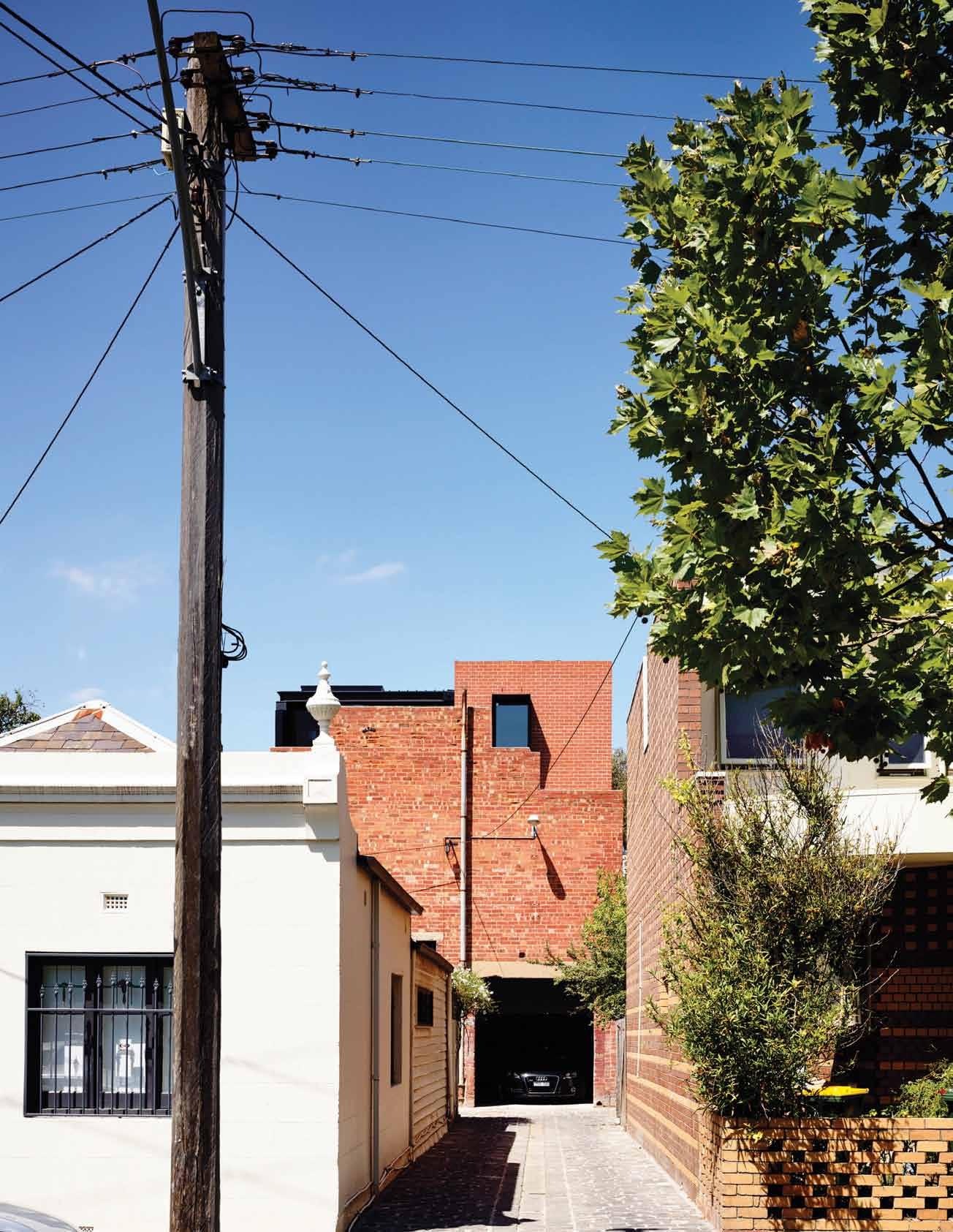 Tex T Alice Bl Ackwood | PhoTogr APhy derek swA lwell
# 159 3 . on location
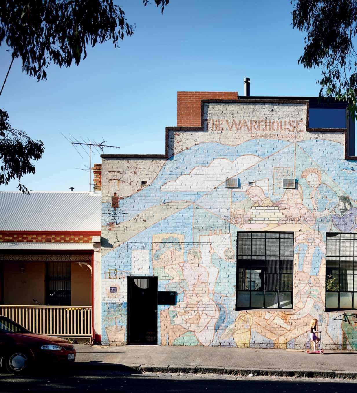
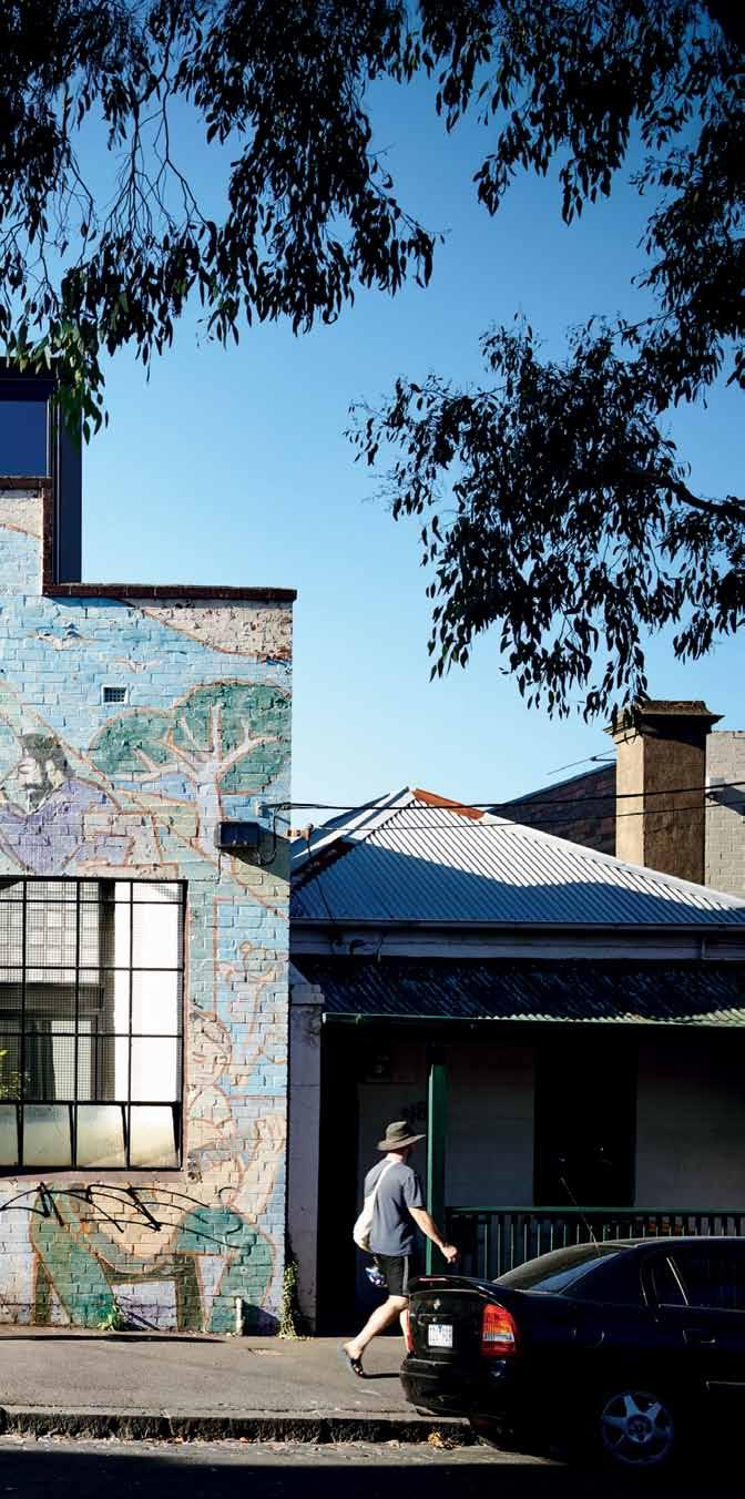
previous | The garage, locaTed aT The back of The house, opens onTo a beauTiful blue sTone laneaway. above | e yes are The windows To The soul, as They say, and k ennedy n olan have drawn ou T This idea in a playful composiTion of m e TabolisT forms. issue #29 habitusliving.com
When Kate embarked on the purchase of what would be her ultimate home, it was with three key criteria in mind: size, location and orientation. She’d come to appreciate the advantages of size and location during years spent living with her growing family of four boys, in a lovely double-fronted Victorian out in Hawthorn, Melbourne. Here dwelled some of Melbourne’s most quintessential Victorian architecture, not to mention beautiful examples of skilled labour. “That Hawthorn house was one of the first houses built on the Yarra, when George Coppin subdivided the estate in 1871,” Kate recalls.
Her passion for architecture began here, among a close community of skilled gardeners, architects and appreciators of real Victoriana. With her sons fully grown and flying the coop, Kate embarked on what she describes as “a more independent life”, moving to the inner city and making home in Richmond. However the tight suburban quarters proved a roadblock for her enthusiastic green thumb and she yearned for more space.
When an old warehouse (“really a shell of a building,” as Kate describes it), came up for sale in Carlton, she looked beyond its rough exterior to see the potential hidden within. Structurally it was “a long distance from a house”, says Kate, but it was “the perfect


3 . on location # 161
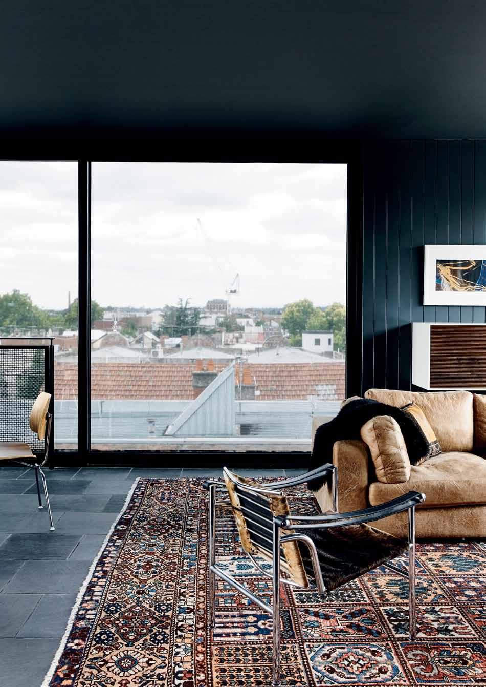
This is a snug, comforting place. In the long cold Melbourne months you seek out a place in the direct sun, to curl up like a cat.
issue #29 habitusliving.com
Rachel | a Rchitect
suburban block”. At 10x22 metres it ticked all the boxes for size, location and, importantly, orientation. “I wanted sky and the orientation so I could get a garden and, as soon as I saw it, I knew. The visual freedom was so attractive, the orientation perfect, and the size of the block –also perfect.”
A long-standing connection with Rachel Nolan of Kennedy Nolan brought the two parties together, and the pairing between client and architect seemed a neat dovetail of architectural values and domestic ideals. Kate’s maturity of vision, her quiet certainty for what she wanted from a house and her home life, resonated with Kennedy Nolan’s own residential design philosophy and their passion for narrative.
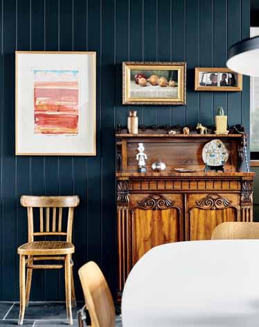
From the street at least, the building still speaks to its past; the colourful illustrations covering the external, street-facing wall reminiscent of a community centre now 40 years gone. You’d be forgiven for thinking the entire building is simply refurbished; the likeness of the materiality and brickwork is so close. But it is only the four outer
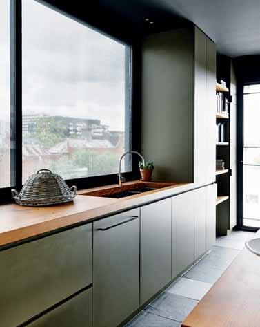
this spread | Kennedy n
sensitive
classic and
pieces
a few new,
olan's
architectural response, particularly on the third level, allowed Kate to comfortably combine her collection of modern
antique furniture
with
contemporary pieces.
3 . on location # 163
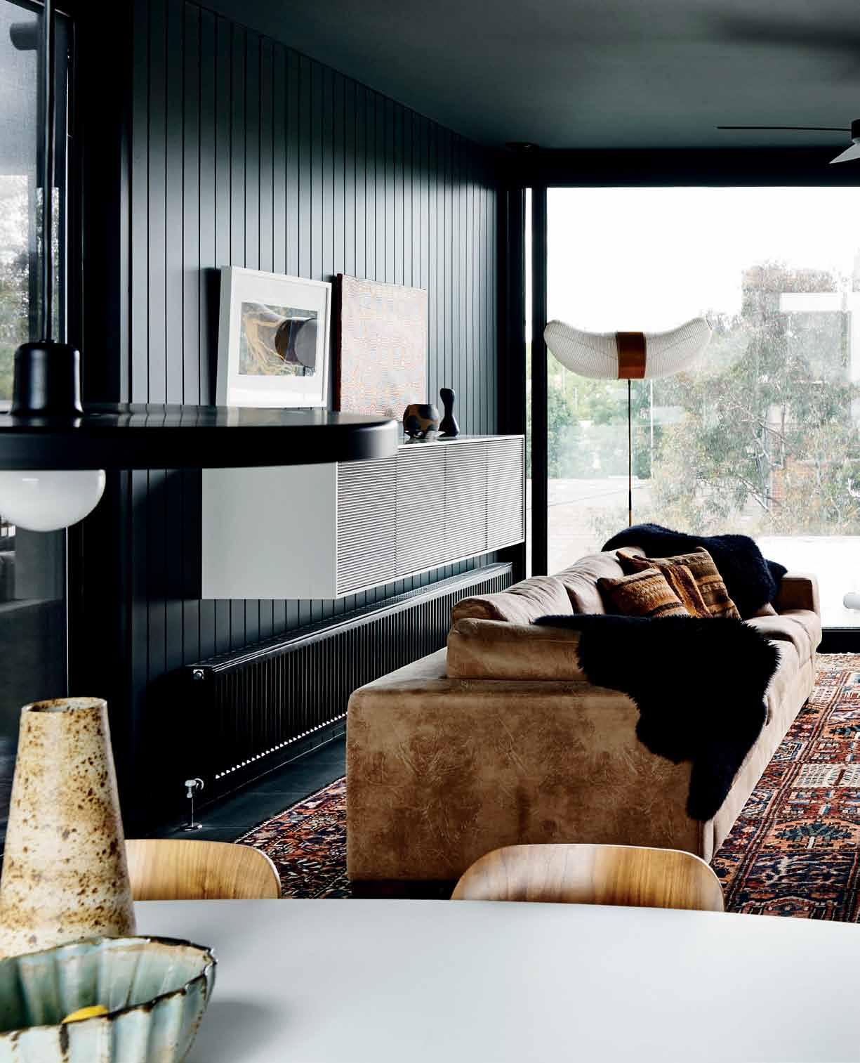
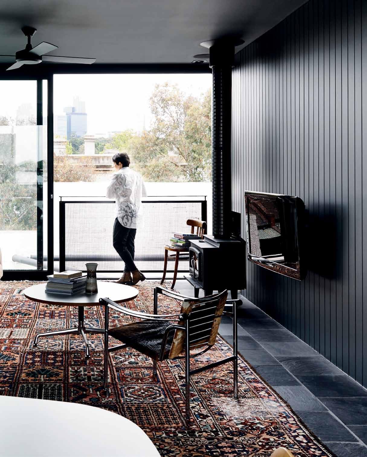
issue #29 habitusliving.com


# 165 3 . on location
walls and a single truss that remain from the original structure, Kennedy Nolan’s strong architectural language setting the boundaries for what Rachel describes as referencing the ‘1970s Carlton’ response – “a robust, honest approach that speaks of a handmade modernism”.
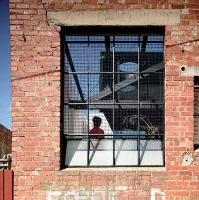
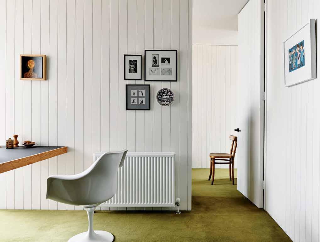
Kate had a firm vision for the site, which included elevated views perched high above the suburb and a ‘grounded’ aspiration for a garden out front and back. This came to fruition in a very “Lady of Shallot” manner, as Patrick Kennedy describes it. The three-level house, rebuilt from the ground up, is both tower and private oasis. A clever layering of levels ensures that the very top – and we’ll come to this soon – remains connected to the ground where the foundations run deep to accommodate a leafy garden.
From the backyard the house’s dramatic three-storey elevation is revealed in all its layers. From the garden, external decking climbs around and upwards in a staged manner, offering multiple platforms for sitting and sunning, before rising to join with a private sitting room on the house’s second level.
issue #29 habitusliving.com
PREVIOUS
|
TO
GLIMPSES OF THE BACK DECK PERCHED UP ON THE THIRD LEVEL. ABOVE | FLOOR PLANS. ENTRY FRONT COURTYARD LIFT BEDROOM BATHROOM LAUNDRY CENTRAL COURTYARD GARAGE STORAGE LOWER TERRACE ENSUITE SITTING ROOM STUDY LIVING DINING DECK KITCHEN POWDER ROOM 1
6
8 9 0 q e w r t y u 3 . on location # 167 SECOND FLOOR u y r t 3 GROUND FLOOR FIRST FLOOR 8 6 9 w 9 9 1 2 7 4 7 5 4 4 q e 0 3 3
|
"THIS IS MY REFUGE," SAYS KATE. "I'M STILL [CONNECTED TO MY WORK LIFE] WHEN I’M HOME, BUT I’M NOT STRESSED BY ANYTHING HERE." OPPOSITE
ABOVE
A CLEVER DOOR SLIDES
BACK TO DRAW LIGHT INTO THE MASTER BEDROOM AND ADJOINING STUDY. OPPOSITE BELOW
|
FROM THE BACK LANEWAY YOU CAN
PEEK THROUGH
CAPTURE
2 3 4 5
7
Unassuming in size and feature, the sitting room is significant for its quietness and sunlit intimacy. “This is a snug, comforting place,” says Rachel. “In the long cold Melbourne months you seek out a place in the direct sun, to curl up like a cat.
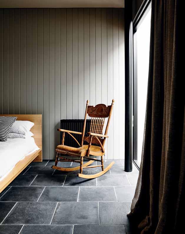
“We think about how our houses can be inhabited seasonally; about how you may migrate between winter and summer spaces for comfort,” she continues, referencing the adjoining master bedroom and bathroom which sits sandwiched between the upper and lower levels. “It makes sense to us that when you sleep you are protected, that the walls make you feel safe. Conversely when you are awake you can enjoy the views that full glazing allows.”
The glass box to which she refers is perched third level, like an observation deck atop the tower. Combining sitting, dining, deck and kitchen, this level represents both retreat and liberation for Kate. “It’s where peace comes from; it’s having that long view.”
Elevated above the original warehouse, Kate was determined to have this level raised, and pushed for it as a must-have. “She understood how buildings can make you feel,” says Rachel. “She wanted a fire and a view that, while not practical necessities, are elements that make home and place. She was really impressive in her balance of practicality versus things she needed to make her happy.”
above | Two bedrooms on The ground floor are finished in beau Tiful, sof T
TTe. opposite |
The naTural lighT and is one of k aTe's favouriTe feaTures.
grey pale
facing souTh, The main baThroom's glass brick wall capTures
issue #29 habitusliving.com
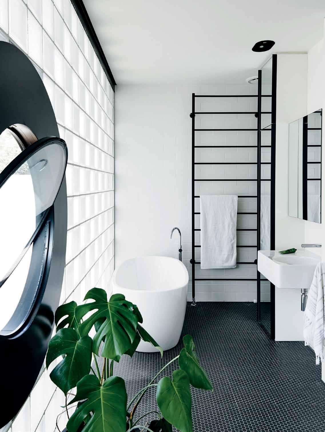
3 . on location # 169
As you clear the stairway and enter into this third level, the walls and ceilings instantly fall away – the views are that expansive. In a stroke of architectural genius, Kennedy Nolan have painted the walls and ceilings black, re-crafting the space as a frame to Carlton’s picturesque rooftops. Internal balustrades allow you to peel away floor-to-ceiling sliding doors and sit within the landscape itself: a plein-air portrait.

In her role as client, Kate proved to be intelligent and inspired. She took great pride in the process, taking ownership of every stage, from commission through to design – and even build where she bravely scaled the scaffolding (an Escher-esque drawing of ladders and levels, she recalls), as the internal structure of the house came to life.
With a family fully grown and just herself to please, the house represents a later-life coming of age – the proverbial building of the boat. “I always had ideas about what constituted a real house, relative to how you want to live,” says Kate, and, in the case of her Carlton warehouse, she’s been able to test the strength of her ideas in real life.
above | The dining area opens onTo The
T
T
|
To
inTo
covered deck which in
urn looks ou
over The back garden below. opposite
The perime Ter walls remained whiTe,
reflecT lighT back
The house and garden area. The lighTs draped along The Truss were a magical Touch from kennedy n olan.
issue #29 habitusliving.com
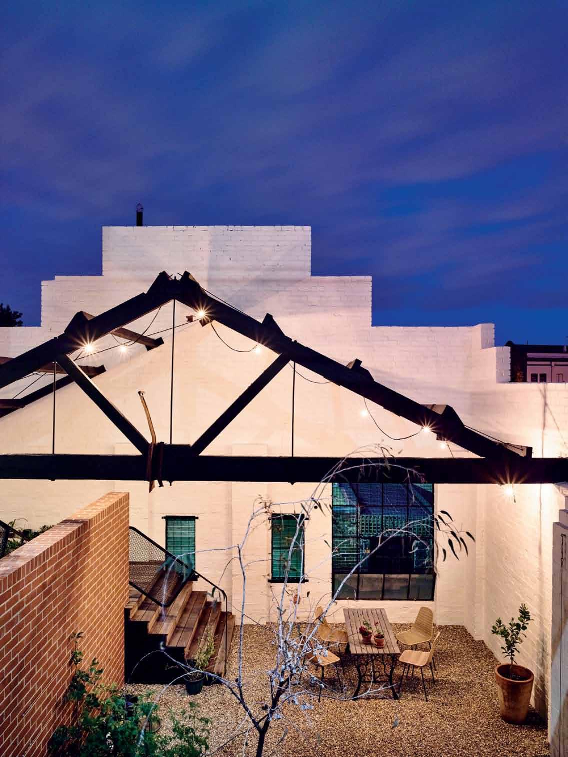
I wanted sky and the orientation so I could get a garden and, as soon as I saw it, I knew.
3 . on location # 171
Kate | resident
drop box
archItects Kennedy Nolan
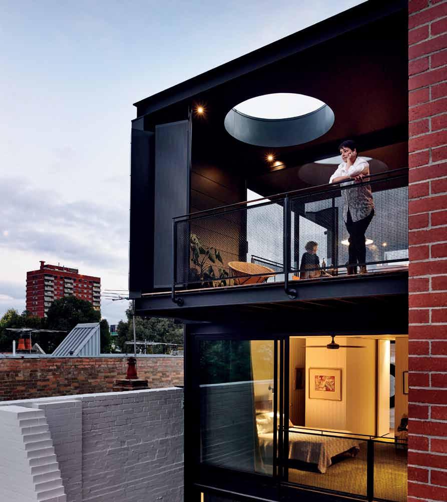
Project archItects Patrick Kennedy, Rachel Nolan, Victoria Reeves, Frank Vedelago
engIneer TD &C structural engineers
BuIldIng surveyor BSGM
BuIlder Clearview Constructions
Kennedy nolan (61 3) 9415 8971 kennedynolan.com.au
furnIture In Living room, Cassina LC1 chair, leather couch (unknown), Isamu Noguchi Akari Floor Lamp, sideboard (unknown), Herman Miller Eames coffee table with universal base, Knoll Studio Saarinen side table. In Dining room Herman Miller Eames Moulded Plywood Dining chairs (DCM) and Herman Miller Eames Table with segmented base. In Sitting room, Tacchini Kelly chair from Stylecraft with white paper lantern. In Study, Dedece Knoll Studio Saarinen Tulip chairs. Outdoor courtyard dining by Feelgood designs, Basket chairs and vintage dining table. On lower outdoor terrace, Feelgood designs, CL170 Relax Chair by Yuzuru Yamakawa. On upper deck Feelgood designs C317 Chair by Yuzuru Yamakaw.
fInIshes
Concrete floors throughout. Escape Velour carpet in colour Vamoose from Supertuft on Level 1. Floor tiles are Chinese black from Bellstone and hexagonal tiles in Bathroom from Classic Ceramics. Santosa wall tiles to splashbacks from Classic Ceramics. Desktop furniture linoleum to study benchtops from Forbo. Laminates to laundry and kitchen joinery from Laminex. Paint to brickwork by Dulux. Steel grating to external stair from Webforge. Steel mesh to balustrades from Steel Solutions. La Rochere glass blocks to wall from The Glass Block Shop. Trimdek roof from Lysaght.
lIghtIng
TossB wall lights from Hub. Stealth series strip lights to joinery from Aglo. Wall
love the way you can move from level to layer to level throughout the house," says Kate.
light to bedroom from Light Project. Flood lights from Masson.
fIxed & fItted
From Reece unless otherwise noted. Kitchen sink from Reece. Oven and cooktop by Smeg. Rangehood by Qasair. Dishwasher by Asko. Phoenix Vivid sink mixer. Lincoln Sentry bin system. Posh Solus laundry mixer. Duravit Bathroom Foster basin from Mary Noall. Roca Meridian toilet. Mizu showerhead and Phoenix Mia mixer. Toilet roll holder from Rogerseller. Kado Lure freestanding bath. Icon floor mounted spout and mixer from Astra Walker. Aiphone intercom from Clever Home Store.
above | "I
issue #29 habitusliving.com
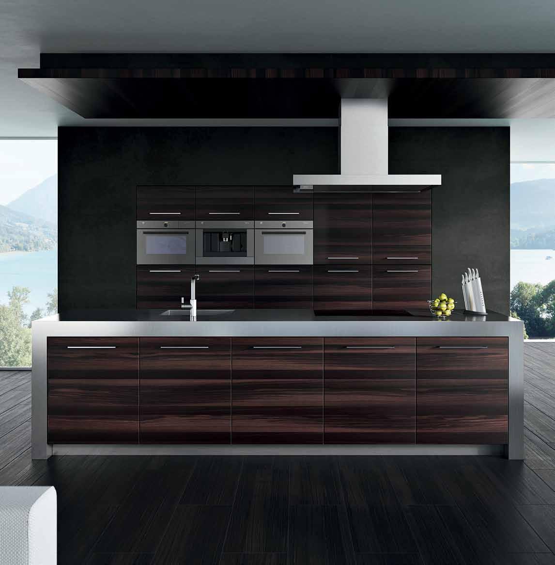
Model: MSLQ V-ZUG Australia Pty Ltd 2/796 High Street East Kew Vic 3102 03 9832 7500 | vzug.com
Bespoke workplace
Light-filled offices, handsome modernist furniture, faultless styling and a personal touch set this shared office experience apart.
For anyone who’s dreamt of a beautifully conceived, creative office space, complete with a switched-on concierge service to handle business support services, ‘Paramount by The Office Space’, Surry Hills, is an address to get acquainted with.
The landmark Paramount building on the edge of the Sydney CBD has been treated to a high-detail refurbishment at the hands of The Office Space Group, transforming it into a highly covetable 22-suite workplace for design-savvy business people.
Paramount by The Office Space was conceived and designed by partners Boris and Naomi Tosic, who led the charge for quality shared office spaces over a decade ago, with a multi-floor office building in Reservoir Street, Surry Hills. The modern suites at ‘Reservoir by The Office Space’ have since hosted and supported over 400 other businesses.
The Tosics engaged Domenic Alvaro, head architect at Woods Bagot, who worked with Boris, Director of bespoke office fit-out specialists Elan Construct, on this highly unique project. With the exception of the integrated desk phones and Walter Knoll Lead chairs, everything in the suites has been custom-made. Original Art Deco elements have been highlighted during the interior’s reimagining, with materials
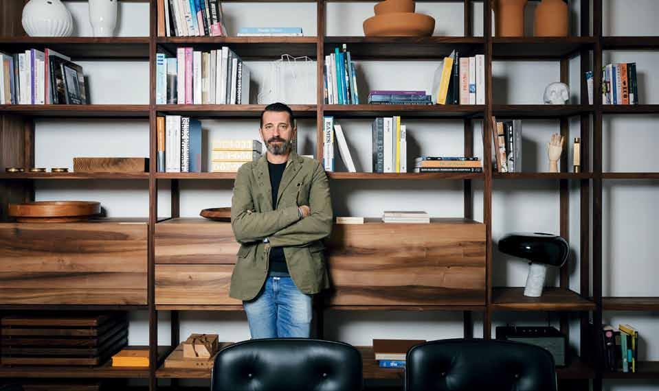
like American cherry and oak, limestone, marble and goatshair carpet creating a cohesive narrative of discreet luxury that is in harmony with the building’s defining architecture and modernist ideals.
Beyond the exemplary architecture and interior of the Paramount suites, details like Marc Newson for Noritake glassware and floral arrangements by Hermetica provide stylish touches. A considered selection of Australian and international artworks from the Tosics’ personal collection is exhibited throughout the common spaces and offices.
Paramount has 22 individual suites and offices of varying scale and configuration that are available for day use, monthby-month leasing, or more permanent tenure. ull services including business concierge and valet parking ensure that the client experience befits the caliber of environment.
In an era of colourful and at times gimmicky office fit-outs, the luxury and elegance of ‘Paramount by The Office Space’ deftly channels a particular period of masculine and high-end corporate office design reminiscent of New York in the 1960s. This is an office environment like no other in Sydney, boasting a level of attention to detail that other venues will find difficult to eclipse.
habitus promotion › The Office Space #174 issue #29 habitusliving.com
Above | Boris Tosic in The Boardroom aT ParamounT By The office sPace. The Office Space | theofficespace.com.au
Heart of stone
This West Austr AliAn home demonstrates nature’s ownership over all that is there. With a deep understanding of both the client and topography, nicholAs Burns AssociAtes created a modern masterpiece amongst the dramatic scenery of rolling hills.
 Tex T Claire WaTkins | PhoTogra Phy PeTer BenneTTs
# 175 3 . on location
An hour’s drive north-east of the capital of Perth is the picturesque gateway to Western Australia’s wheat belt region. A tranquil backdrop of untouched bush land, vineyards and wildflowers treats the senses and encourages the exploration of the area’s many trails and its increasing reputation as a gourmet haven. For local residents it is still considered one of the state’s best-kept secrets.
This project is a balance between landscape, a client’s vision and the creative soul of an architectural designer. For these reasons alone, it is no wonder that it became the ideal setting for a retired couple longing to create a meeting place for family to visit, stay and create lasting memories. Architectural designer Nicholas Burns set to work on making this a reality once the owners found a location. Little did they know that just as the design process was close to finalisation, it was announced that a mine had been approved not far from the site. Not ideal. “The result is Julimar house, a four-bedroom home that has absolutely no resemblance to the original design,” explains Nicholas. “However, this is perfect because the most important aspect of design is that it fits the mould of the landscape it sits within.”
Hailing from a farming background, the owners set their sights on incorporating a shed, a galvanised roof, and other humble materials such as rammed earth, natural stone and timber. Ultimately, the landscape of the 150acre site is what binds these raw yet refined elements together.
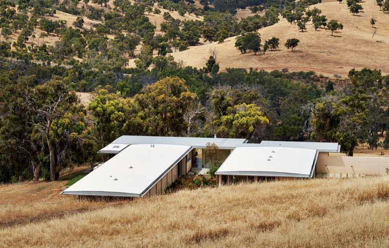
issue #29 habitusliving.com
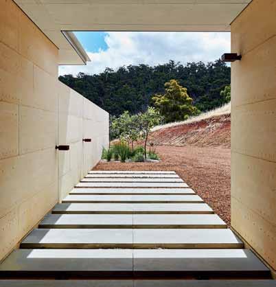
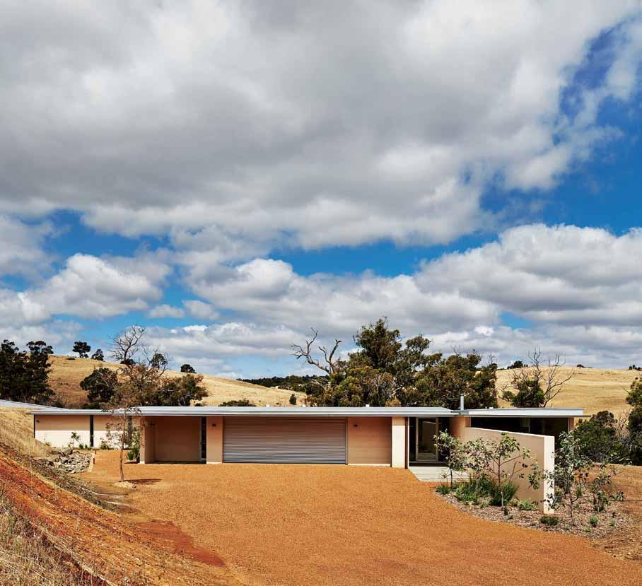
previous | The aerial view of The home from The norTheasT highlighTs iTs vasT and isolaTed se TTing. opposite | immersed inTo The landscape, The home capTures The besT ThaT naTure has To offer. above | The approach To The house is one of concealmenT and expecTaTion. below | i nspired by KyoTo’s s hisendo Temple, The enTrance has The effecT of slowing one down in preparaTion.
3 . on location # 177
A
balance between landscape, a client’s vision and the creative soul of an architectural designer
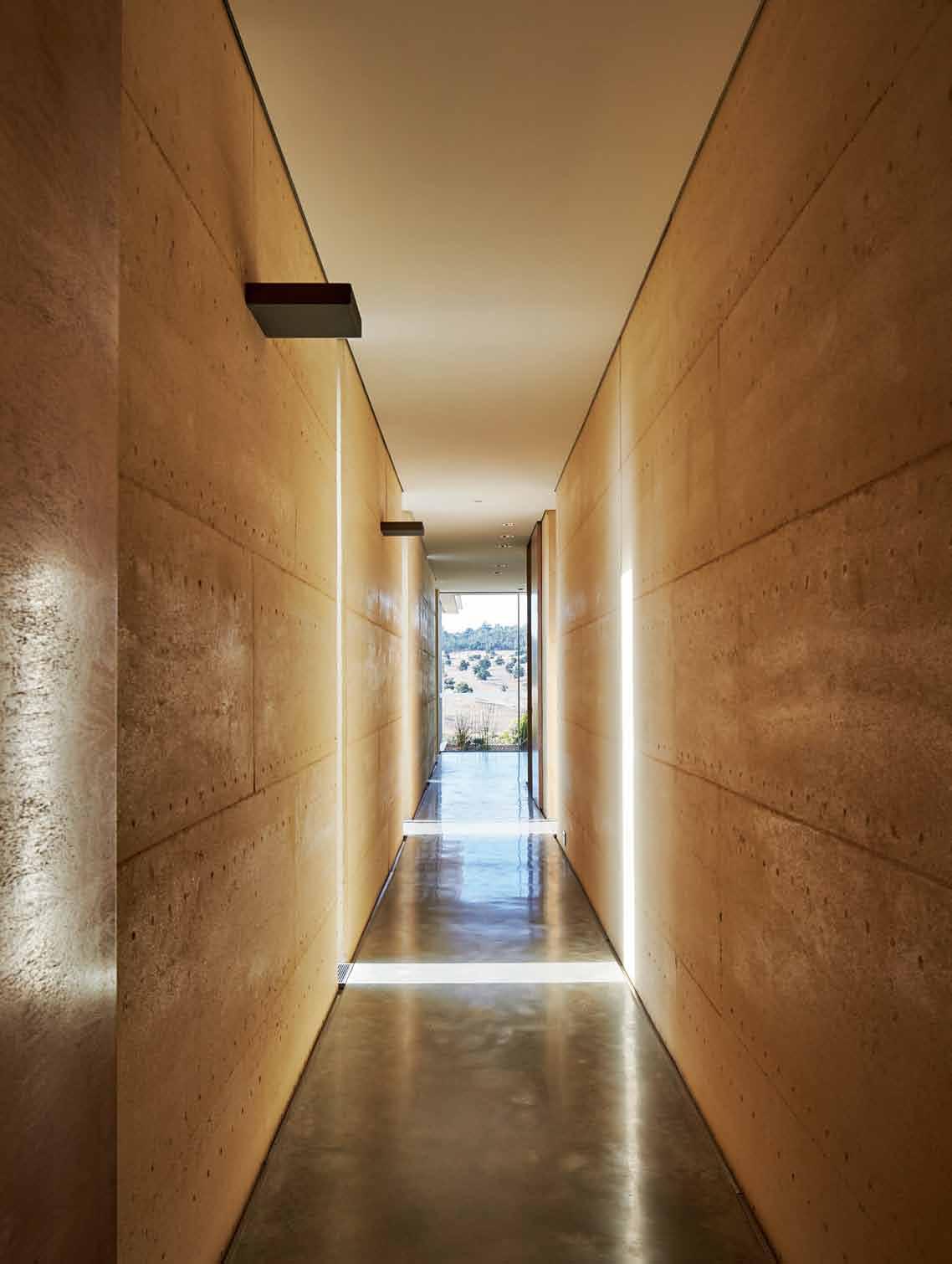
issue #29 habitusliving.com
The delicate balance of structure and nature – of harmony and disharmony –takes your breath away.
Built on clay soils with significant granite rock outcrops, the site had a substantial slope that needed to be cut into to provide a level base for the house. Such a unique site requires a serious level of detail when it comes to groundworks. The man for the job was Geoff Britton of Econstruct. “Getting the site level and establishing the retaining works due to the undulating land required a one-metre sand pad build up,” says Geoff.
Finding interesting people that he can work with and learn from over time is important to Nicholas. “My aim is to develop deeper relationships and ideas in order to create something unique.” One such relationship is with Michael Volpato of Volpato Stone. Having been in the stone industry for over 35 years, Michael’s projects include the likes of the Australian Parliament House, Singapore’s Marina Bay Sands Casino, as well as major hotels around the globe such as JWM, St. Regis, Four Seasons Hotels, and Chanel stores throughout Europe. His role in the creation of this home was paramount.
Michael reveals that the untamed beauty of this place, the setting, and the delicate balance of structure and nature – of harmony and disharmony – takes your breath away. “It’s not obvious,” he explains. “It’s hidden – an awareness – that takes its time to immerse you into the world of the architectural designer, his vision and sense of place.”
While the entry is not obvious, the eye is drawn towards a point of transition between the indoor and outdoor elements. Leading up to the front door are 60mm-thick Italian limestone paving slabs that appear to have been placed there to prepare visitors for what comes next.
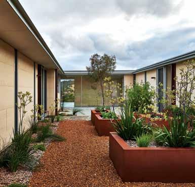
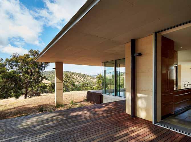
opposite |
The inTerplay of lighT and shadow down The long passage describes The beau Tiful change of lighT Throughou T The day and The seasons. above | a sun Trap shelTered from The wind, The inTernal courT yard offers a producTive garden. below | e x Tending from The kiTchen and living areas, a broad plaTform provides a frame for ouTdoor living
3 . on location # 179
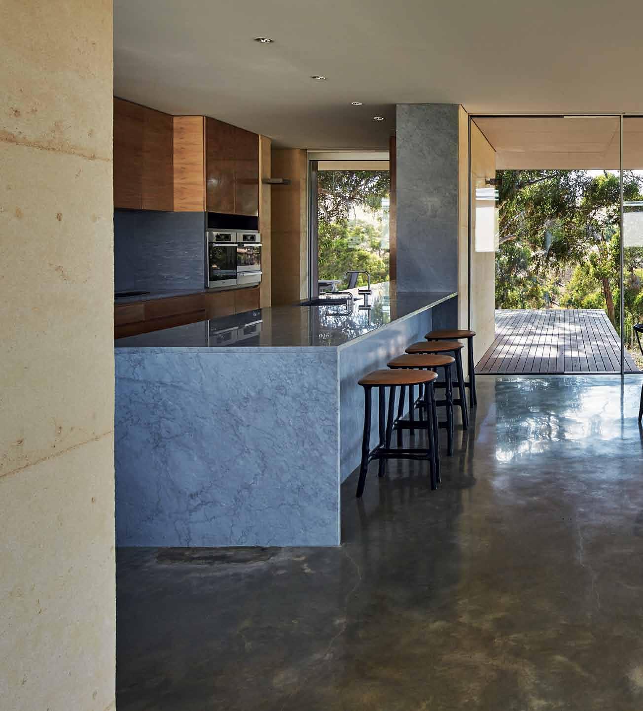
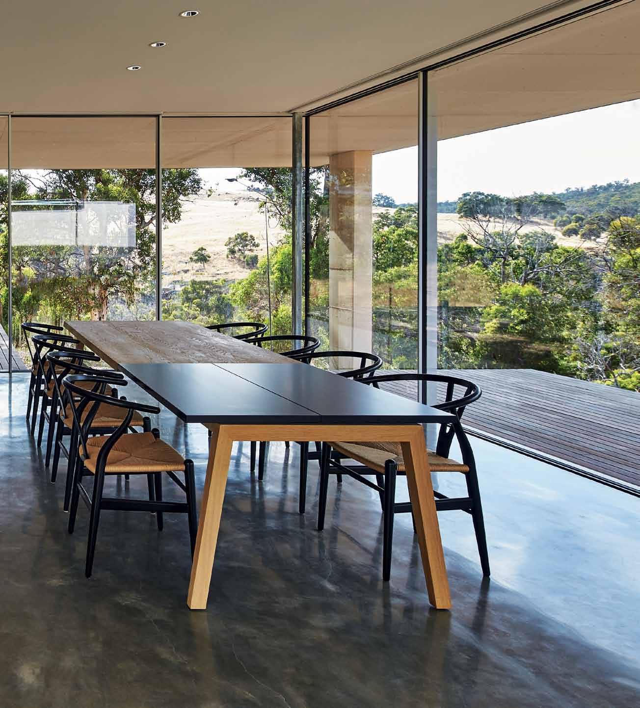
issue #29 habitusliving.com


3 . on location # 181
Once inside, rammed earth walls blend effortlessly into polished concrete floors, while floor-to-ceiling windows and doors throughout reinforce the connection to the landscape beyond. “There are many areas of the home where your eye captures a moment – where you become aware of Nicholas’ sensitivity to the space – and it is obvious as you turn the corner and see how nature imposes itself,” says Michael. “A moment is frozen.” Open spaces directly connect to the vastness of the landscape with views to the valleys, hills and sky beyond, while other areas such as the dining room and kitchen focus on framed views of a waterfall and surrounding treetops through recessed doors and windows.
Honed Bardiglio Imperiale 3cm-thick slabs that have been quarried from the mountains of Carrara in Italy dominate the kitchen in all the right ways. Utilised in the benchtops and splashbacks, the material is at once dramatic in its solidity yet unimposing in the open-plan setting. A rare feat.
As if thrust through its surrounding glass screen walls, a fireplace sits on a 450kg solid stone Bardiglio Imperiale base. Covered with the imprints of the stonemason’s hands, it instantly transforms into a work of art in the space in which it rests.
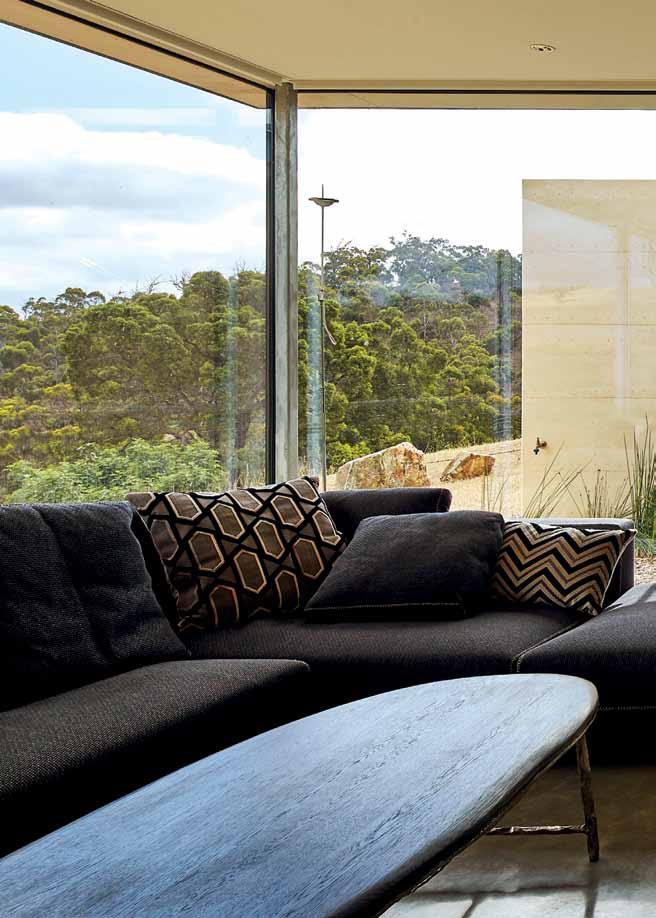
The bathrooms were approached with a true understanding of their function as a place to disconnect and unwind. “Nicholas has ensured a delicate balance between the art of minimalist functionality and the sensuality of nature by utilising a thin veil of glass,” says Michael. Protruding from the wall just as nature pushes a block out of stone, solid, carved, Italian Basaltina vanity units act as an anchor in these spaces.
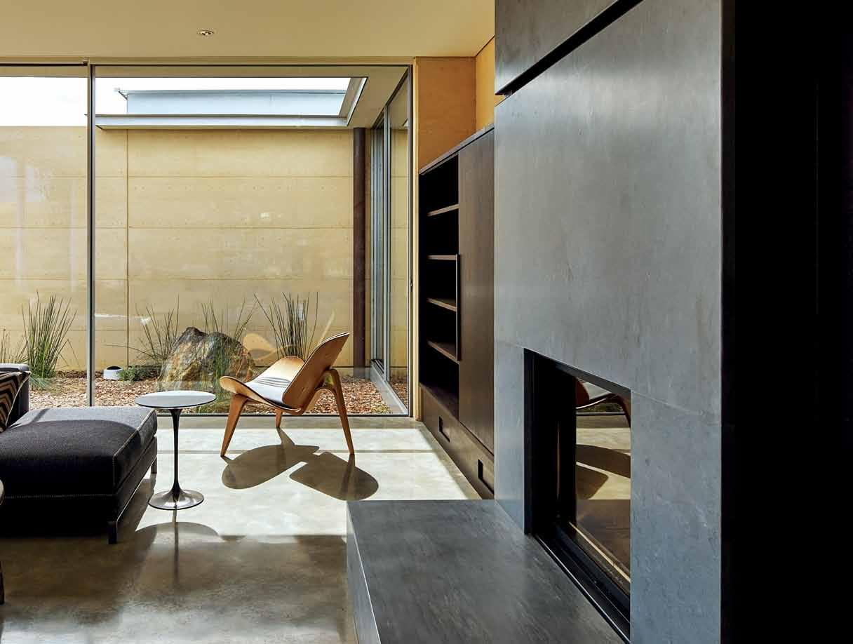
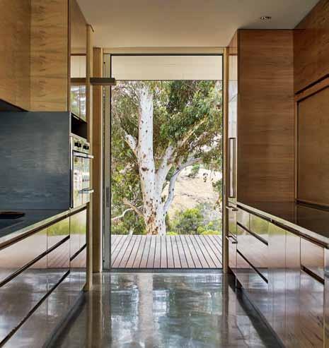
issue #29 habitusliving.com


previous | Natural light emphasises the i Nteractio N betweeN raw materials a N d the la N dscape. above | the property was sited for key views such as this framed sceN e from the kitcheN below | floor-to-ceiliN g wiNdows aNd doors see the wrap-arou Nd effect of the laNdscape eNhaN ce the beauty of the workmaN ship iN side.
spaces connect to the vastness of the landscape with views to the valleys, hills and sky beyond. 3 . on location # 183
Open

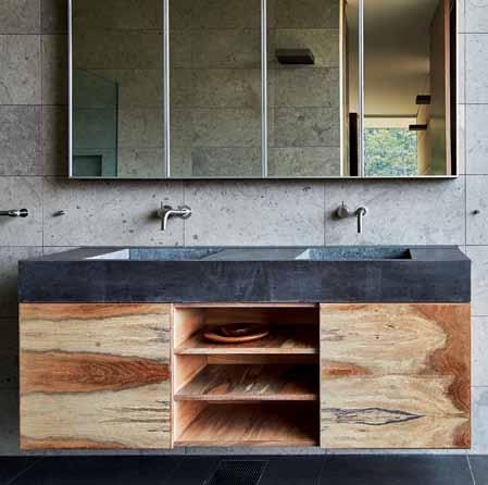
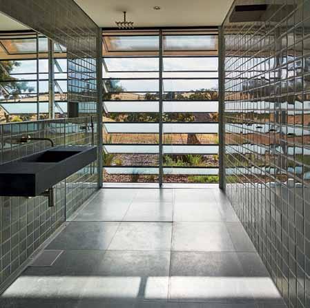
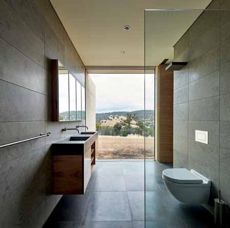
issue #29 habitusliving.com
above left | Water falls in solid carved stone. above right | the bathroom transforms an everyday space into a sanctuary. below left | reflections of the landscape bounce off tiled Walls, further enhancing the connection bet Ween indoor and outdoor living. below right | carved from italian stone, the vanity makes its mark in the bathroom. opposite | plan and section.
LIVING DINING KITCHEN PANTRY 1 2 3 4 COURTYARD GAMES ROOM LAUNDRY BEDROOM BATHROOM STORAGE GARAGE POWDER ROOM MASTER BEDROOM MASTER BATHROOM 5 6 7 8 9 0 q e w r SECTION FLOOR PLAN 3 . on location # 185 6 5 7 1 2 4 8 8 8 9 9 3 e 0 q w r
In terms of sustainability, all the boxes have been ticked. From the materials used to the level of insulation and advanced mechanical systems, every aspect of the home has been considered to ensure an undemanding environmental footprint. Requiring a great deal of coordination between trades was the installation of an in-floor geothermal ground source ventilation system, explains Geoff. “Working with a burnished concrete floor that could not be patched later, there was no room for error,” he says. Geoff adds that double glazing to European standards, design and specification throughout, along with a hydronic underfloor heating system and heat pump hot water systems are just a few examples of how the home was built with the future in mind. Carefully considered vents underneath fixed panels on the south side also allow fresh air into the house without pulling rain inside, while highly efficient glass sliding doors from Switzerland and louvres from Germany further establish a strong connection to the stunning landscape outside.
While minimalist in nature, the home exudes a warmth that is instantly welcoming and comforting – a trait that reflects Nicholas’ focus on enjoying the beauty of “everyday-ness”. Nicholas explains his approach to making certain areas of the home beautiful, such as the kitchen and bathrooms. “When you’re experiencing amazing air quality and light views, it’s not a secondary function,” he says. With the implementation of authentic materials comes a delicate approach to design. Combined with the raw beauty of the landscape beyond, this home encourages the mind to wander and explore patterns freely.
drop box
archiTecTural designer Nicholas Burns Associates
projecT Team Nicholas Burns, Miguel Silveira, Yonas Dian Surya Putra conTracTor Econstruct engineer Margaret River Engineering geoThermal consulTanT JCL (NSW)
NICHOLAS BURNS ASSOCIATES nb@nicholas-burns.com nicholas-burns.com
furniTure
Carl Hansen dining table and chairs; B&B Italia sofa; Knoll side tables; coffee table, side table and kitchen stools by Valentin Loellmann; Knoll outdoor setting.
lighTing
ERCO and Viabizzuno. Lutron lighting control system by Advanced Residential Technologies.
finishes
Volpato Stone; Rammed earth walls by West Coast Rammed Earth; doors and windows by Sky Frame (Switzerland), Lacker Louvres (Germany), and AWS (Australia); as well as insulated concrete screed flooring, Zincalume roof cladding, Corten steel, Jarrah decking, Vola tapware, and tiles handmade in Chiang Mai.
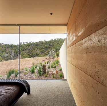
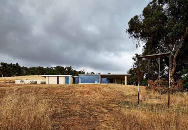
left | The warmTh of rammed earTh inside blends seamlessly wiTh The golden-brown Tones of The environmenT beyond. right | maTerials and form blend inTo The landscape, jux Taposed wiTh a remnanT of previous inhabiTanTs.
issue #29 habitusliving.com
Timber chameleon
A timber product that sits effortlessly in any application, on any continent.
The warm and sophisticated aesthetic of Mexican interior designer Rafael Rivera has graced the pages of international magazines and websites. One half of architecture studio Habitacion 116, Rivera and his partner Javier Claverie, are known for creating environments that are calm and beautifully detailed, redefining everyday life through interior design and furniture.
For his own home, Rivera demonstrates a deft touch and innate understanding of proportion and materiality. With a unique history – the house dates back to the 19th Century – it has been sensitively updated with a complete internal refurbishment within the original façade.
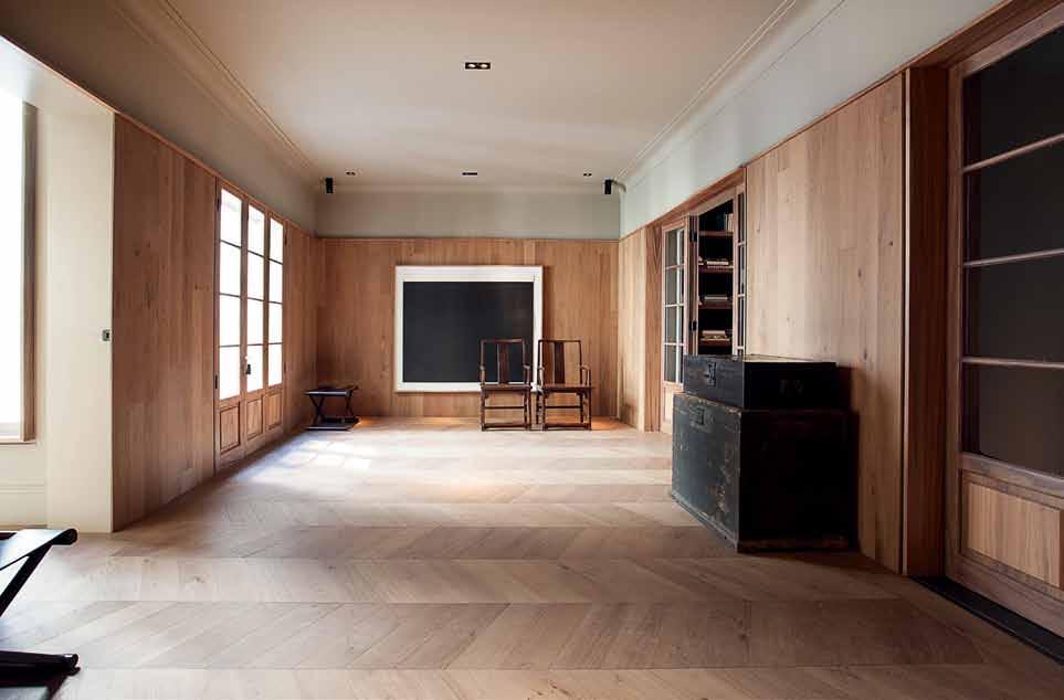

Rivera chose to craft a seamless and warm interior using the technique of layering the same finish across the floor and walls.
Here the Listone Giordano Chevron is employed with a refined Hungarian herringbone pattern on the floor, along with random straight planks on the walls, ceilings, and other vertical applications.
Crafted in French Oak and based on the Austrian-Hungarian style of hardwood flooring of the Hapsburg palaces, but in a modern interpretation, Listone Giordano Chevron has a fine pedigree. With European roots, the product seamlessly slides into a Mexican landscape in Rivera’s home, as a fitting backdrop to his statement furniture and art pieces.
When it came to the outdoor areas, Rivera chose from Listone Giordano Outdoor range, this time selecting a thermotreated Ash decking in 145mm width. Steam heattreated and chemical-free, the Ash – sourced from Listone Giordano’s own plantation in Burgundy, France – has improved durability and dimensional stability required for outdoor applications. The natural elegance of the material is realised with a brushed and unfinished finish, while an invisible fixing system makes installation efficient and easy to maintain over time.
Listone Giordano is available through Winspear.
habitus promotion › Winspear #187 issue #29 habitusliving.com
Above | listone giordano chevron in civita. Winspear | winspear.com.au
A Habitus partnership: behind the scenes of the Telstra Ballet Dancer Award
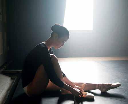

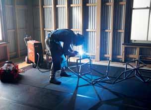
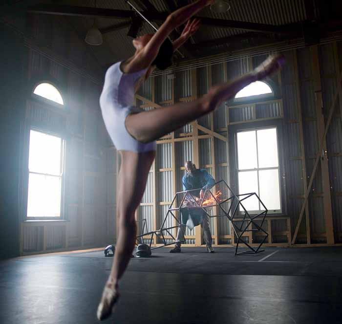
Behind the scenes

We were proud to be one of six media partners invited to launch the Telstra Ballet Dancer Award 2015, which gave us the chance to watch an intriguing collaboration unfold. New Zealand-born artist Dion Horstmans and Japanese-born ballerina Ako Kondo collaborated on a video piece to promote the award, for which Ako is a nominee. Although Ako and Dion seem so different at first glance, the process revealed their shared qualities – linear expression, strength and determination.
The full video and details on voting at habitusliving.com/issue29/theaustralianballet
=
issue #29 habitusliving.com
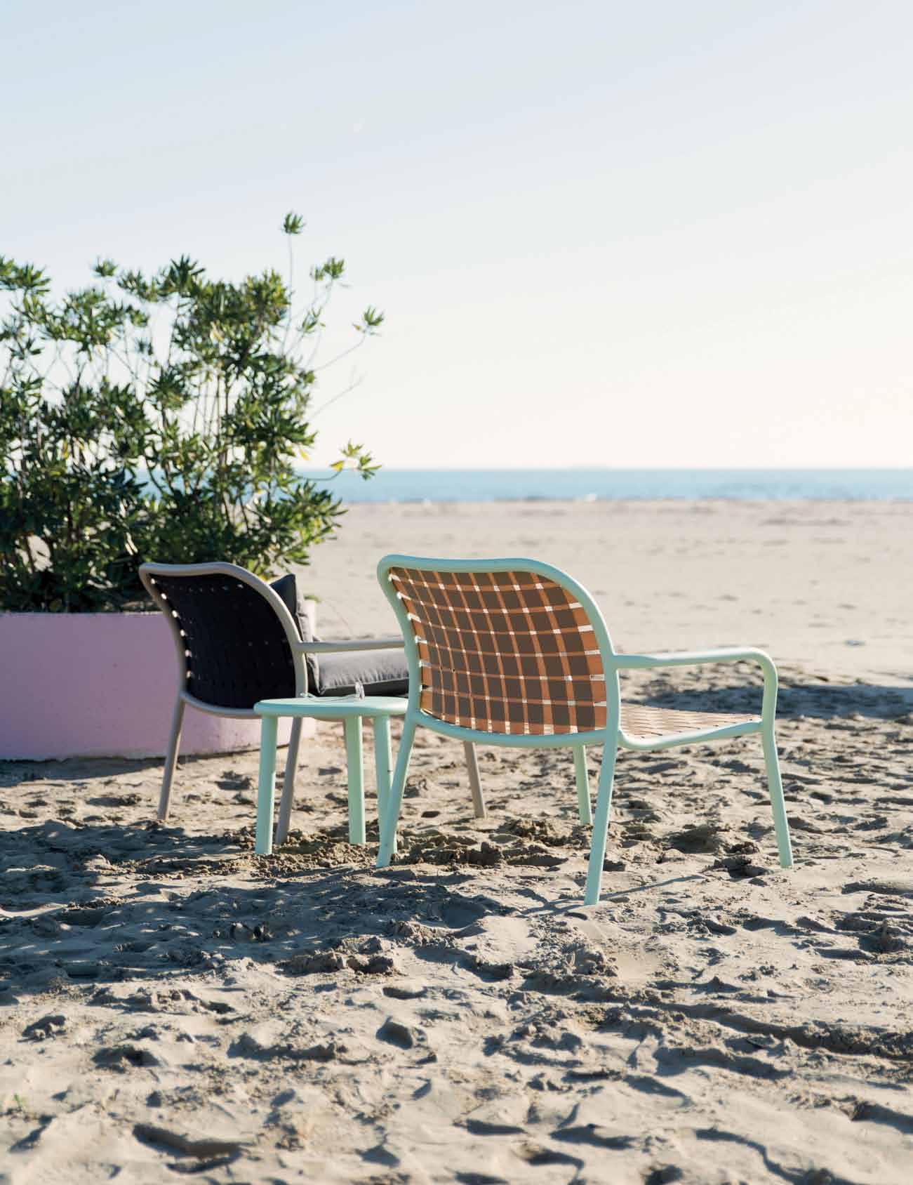
Designed Stefan Diez for Emu, you can see the Yard collection at kezu.com.au
Merriment and mingling at our official issue launch
habitus issue #28
We officially launched the issue in Melbourne at the beautiful Stylecraft showroom. Featured artist Aly Aitken was there, along with readers, contributors and Habitus team. All enjoyed delicious treats, beverages and mingling with likeminded Design Hunters®.
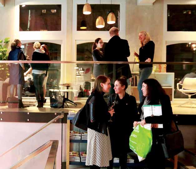

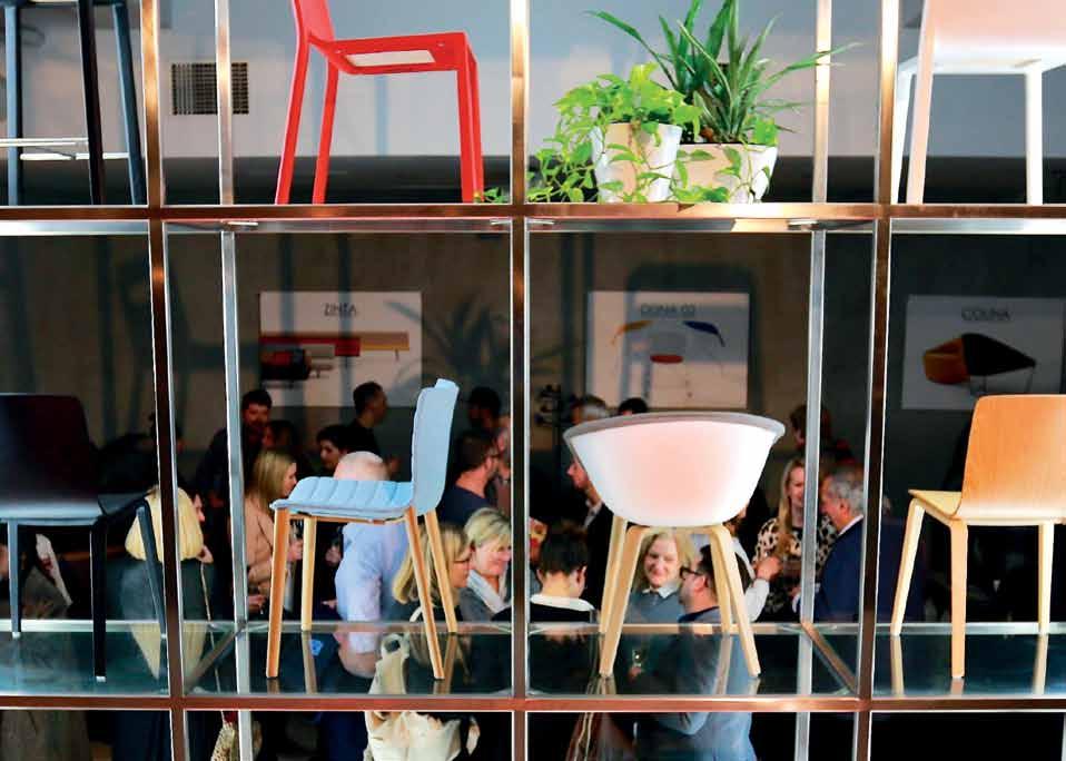
See images from the event at habitusliving.com/issue29/hab28
 photography by fiona susanto
issue #29 habitusliving.com
The T eam aT Habitus magazine T hank our adverT isers for T heir supporT use T he direcTory To see whaT page a specific adverT isemen T is on, and visiT T heir websiT e To learn abou T The producTs and services They provide.
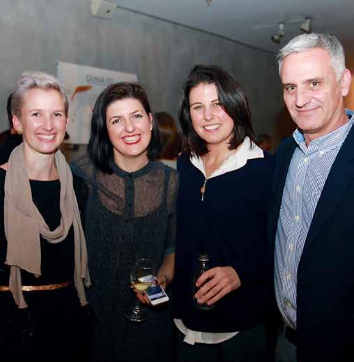


Habitus magazine is available at newsagents and bookstores across Australasia, South-East Asia, the USA, Canada, Europe, South America and the Middle East. Habitus is published quarterly in March, June, September and December. To subscribe securely online visit habitusliving.com/magazine or email subscriptions@indesign.com.au to subscribe or request a full list of locations where Habitus magazine is available.

# 191 a bey australia 112 abey.com.au active mobility 020 activemobility.com.au a pato 019 apato.com.au a stra walker 149 astrawalker.com.au a xolotl 099 - 101 axolotl.com.au binder 150 binderapp.com.au caesarstone 021 caesarstone.com.au culT 009 cultdesign.com.au d ekton 010 - 011 dekton.com d istrict 090 district.com.au d omayne 012 - 013 domayne.com.au ecc l ighting and f urniture 158 ecc.com.au english Tapware c ompany 056 englishtapware.com.au fanuli f urniture 089 fanuli.com.au farage 108 farage.com.au g eberit 155 geberit.com.au habitusliving 155 habitusliving.com hansgrohe australia p ty ltd 065 hansgrohe.com.au harbour o utdoor 028 harbouroutdoor.com herman m iller 082 hermanmiller.com.au/collection i ndesign media a sia pacific 156 - 157 indesign.com.au Janus et cie 002 - 003 janusetcie.com k e-zu 128, 189 kezu.com.au k ing l iving ifc - 001 kingliving.com kohler australasia 139 au.kohler.com mother of pearl & s ons 048 motherofpearl.com o rchard p iper 004 - 005 washingtonstreet.com.au parisi 016 parisi.com.au poliform 036 poliform.com.au rogerseller 151 -154, ibc rogerseller.com.au royal oak f loors 127 royaloakfloors.com.au smeg 014 - 015 smeg.com.au space f urniture 022 spacefurniture.com.au spence & lyda 064 spenceandlyda.com.au stylecraft obc stylecraft.com.au subscriptions 140 habitusliving.com/subscriptions subzero wolf 071 Subzeroworlf.com.au The o ffice space 174 theofficespace.com.au Tongue n groove 055 tonguengroove.com.au v-z ug 173 vzug.com w hitehouse 066 whitehouse-design.edu.au w inspear 031, 187 winspear.com.au z ip 006 zipindustries.com
Your map to where the stories in this issue come from where is available
world
issue #29 habitusliving.com
Perth #175
Waikato #114
Kuala Lumpur #67
#99 New York #38 Sydney
“A house can have integrity, just like a person, ” said Roark, “and just as seldom.” ANN RAND, THE FOUNTAINHEAD
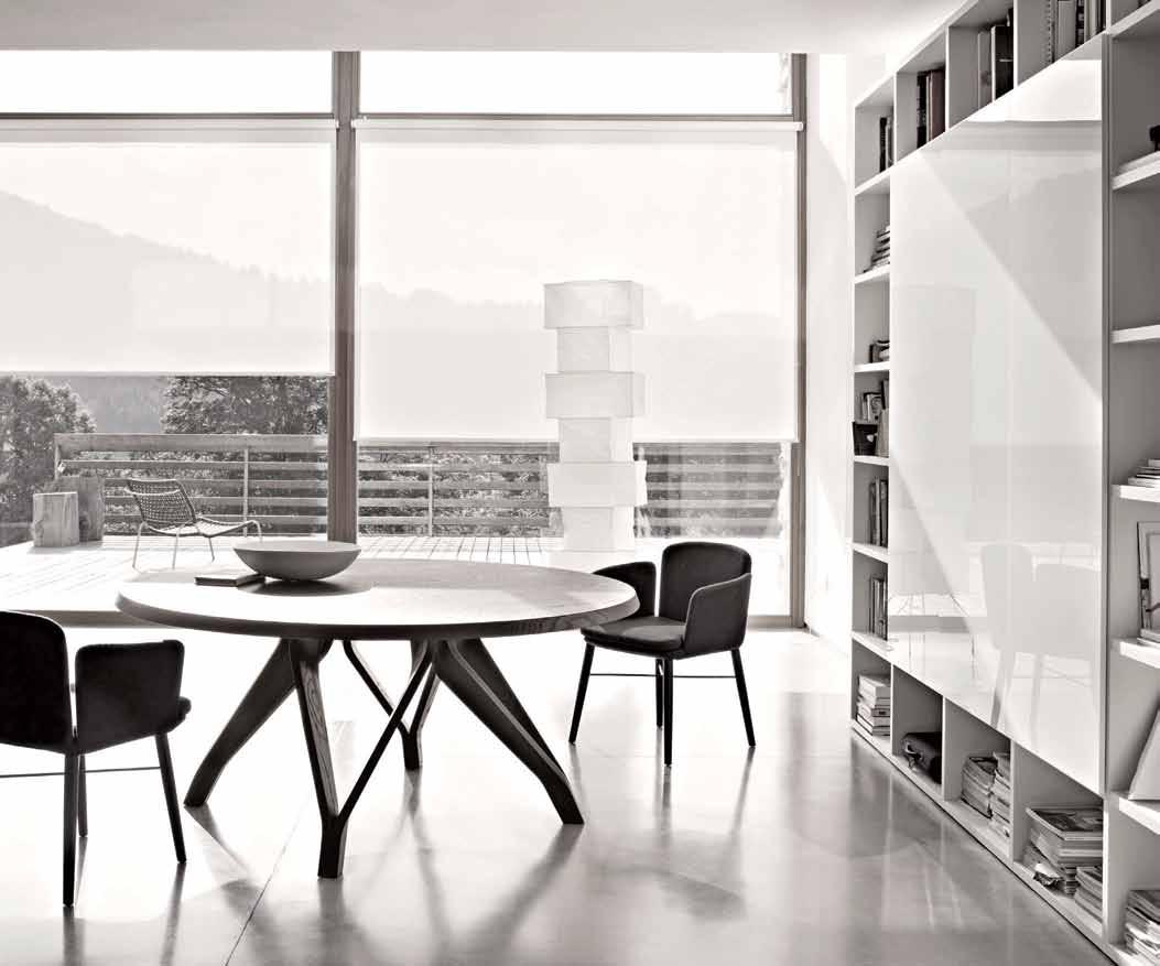
Meet Lema. Customised living solutions. Time to look again. rogerseller.com.au
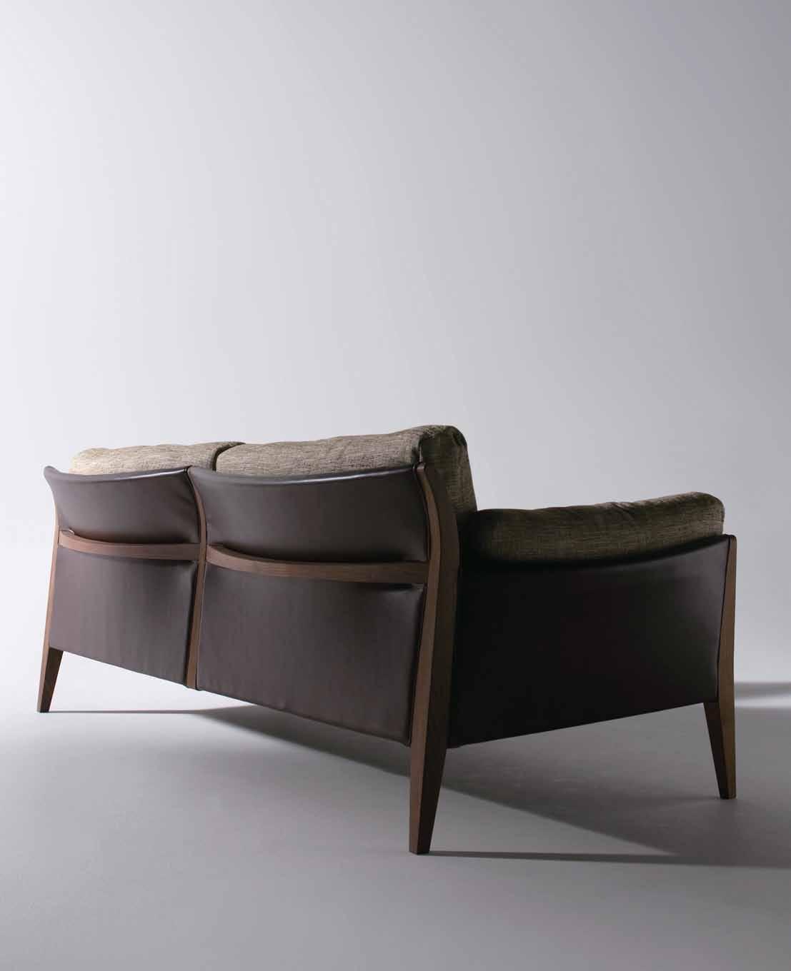 Diana Lounge
Australia 1300 306 960 stylecraft.com.au Singapore +65 6511 9328
Design by Shinsaku Miyamoto


 Tex T nicky lobo | PhoTogra Phy rob Palmer


 opposite | stairs alongside the lawn at the main house level lead to the studio slightly further down the steep site. above | the green lawn beautifully offsets the simple white structure of the house, and a single frangipani tree punctuates the view.


 Ken
opposite | ken strolling to 'the cabin', which holds many memories for the done family. above | inside the cabin, the window facing the bay was the frame for many of ken's early paintings. below | the idyllic location shows the series of structures nestled in amongst the landscaping.
photos of Ken’s home and studio at habitusliving.com/issue29/kendone


 Christopher Graf | christophergraf.com.au
ABOVE | MAIN BEDROOM WITH TREASURES FROM MARKETS AND SECOND HAND STORES.


 Rolled Arm Sofa Group by Ward Bennett for Geiger, I-Beam Coffee Table by Ward Bennett, Eames® Walnut Stool by Charles and Ray Eames.


 Designed by Rafa Garcia for Sancal, you can see the TipToe collection at kezu.com.au


 opposite above | open dining/living space on upper ground level offers screened views through trees to the ocean and Barrenjoey. opposite below | food preparation area B ehind lounge seating. the mirror aB ove the wall B ench supplies a landscape douB le entendre to the B ushland outside. this page | detail, B rass handrail with stainless steel laced weBB ing for infill. photography By rhys holland.


 above | an exposed concrete wall separates the living area from the working space. below | the interior space is filled with abundant natural light, through large transparent glass walls at the house's main entrance. opposite above | floor plan. opposite below | the living and dining areas are divided by the mass of the table.


 Tex T Alice Bl Ackwood | PhoTogr APhy derek swA lwell


 Tex T Claire WaTkins | PhoTogra Phy PeTer BenneTTs


 photography by fiona susanto


 Diana Lounge