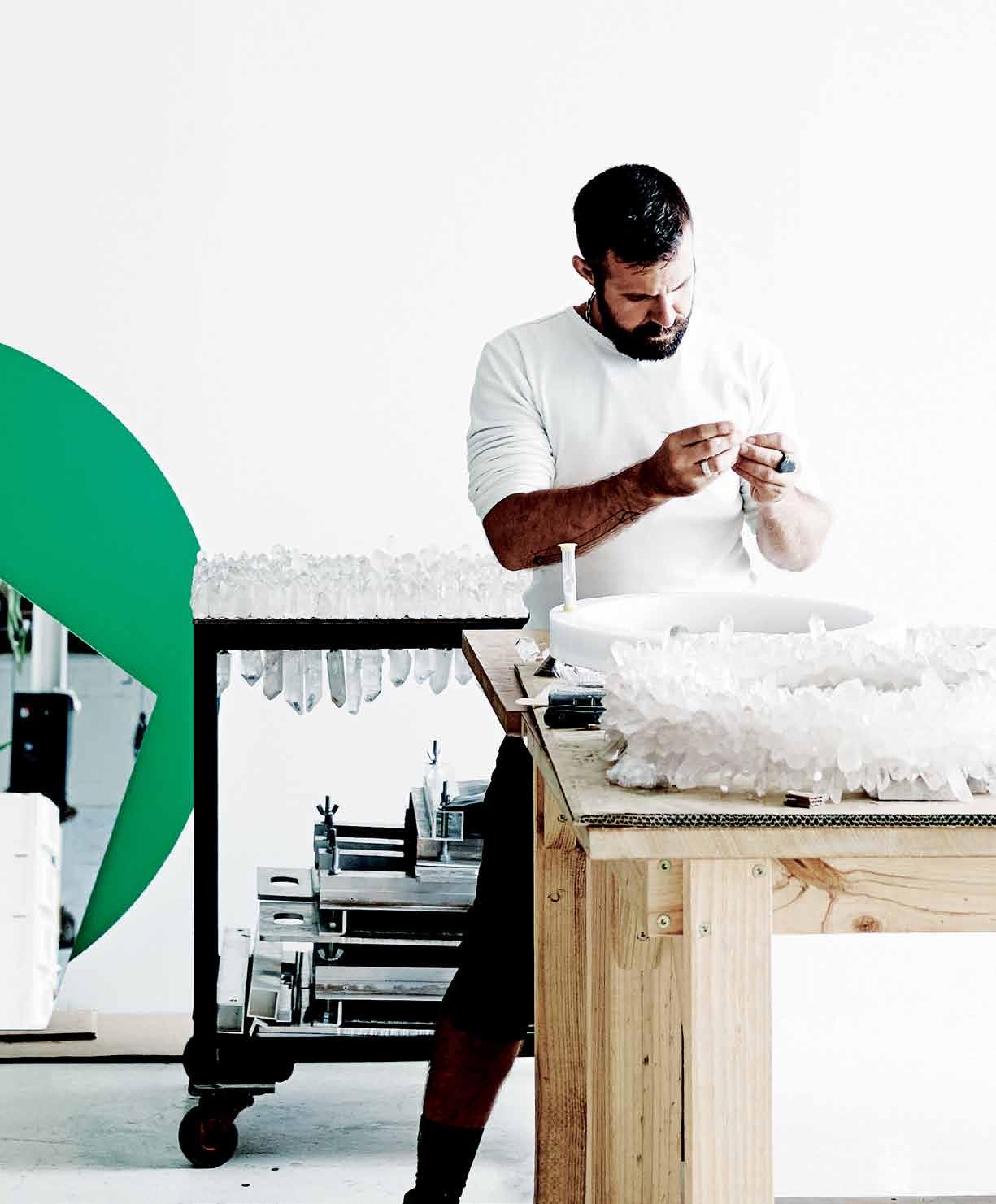
living in design # 31 APRIL – JUNE | 2016 AUD$16.95 | NZ$16.95 | USD$17.95 CDN$18.95 | GBP£9.90 | SGD$11.95 31 9771836 055007 Christopher Boots: design crystallised. The New Minimal – less is more. Everyday design with Alessi. Modular living.






smeg.com.au
SMA16804
THE SMEG CLASSIC COLLECTION • SETTING THE STANDARD IN VISUAL AND CULINARY TASTE FOR 30 YEARS
ALWAYS THE BEST POSSIBLE TASTE








@D OMA YNE DESIGN COMPETITION •A LE XA ND RI A-8 4O ’R IO RD AN ST.0 28 33 97 10 3 •A UB UR N-1 03 -1 23 PA RR AMA TT AR D. 02 87 48 43 67 VI SI TO UR WE BS IT E-W WW .D OM AY NE. CO M. AU BA THROOM DESIGN CENTRE
fi ni sh ed au .d om Pr iz ew to th ew Wi nn er

nt er th ep ro mot io n, en tr ant sm us tp ur cha se an di ns ta ll aV ic to ri a&A lb er tb at hf ro map ar ti ci pa ti ng Do ma yne Fra nc hi se an de ma il ap hot og ra ph of th e in st al la ti on al ong wit ht he ir na me ,a dd re ss ,d ay ti me te le ph one nu mb er an di nv oi ce nu mb er to th ef ol lo wi ng em ai la dd re ss :D MB at hr oo m. Pr omo ti on s@ ay ne .c om Th eP ro mo ti on is va li db et we en 12 /12/ 15 an d3 0/ 11 /16. Th ep ri ze is re fun do ft he pu rcha se pr ic eo ft he ba th up to th em ax im um va lu eo f$ 5, 000 .T he ize wi ll be re fun de du si ng th es am ep ay me nt met ho dt ha tt he pu rcha se wa sm ad e. If th ep ur cha se wa sm ad ew it ha ni nt er es tf re el oa n, th eP ri ze wi ll be cre di te d in ner ’s in te re st fr ee ac co un t. Ju dg in gf or th eP ri ze wi


F *1.Toe
PU RC HAS EA ND IN ST AL LAV IC TO RI AA ND AL BE RT BA TH FR OM 12 TH DE CE MB ER 20 15 -3 0 TH NO VE MB ER 20 16 FO RY OU RC HAN CE TO BA CK TH EF UL LP UR CH AS EP RI CE OF TH EB AT HU PT OT HE AM OU NT OF $5 000 . *1
316 76 0_ NAU
WI N
ll ta ke pl ac ea tD om ay ne Ba th ro om sA le xa nd ri a, 84 O’ Rio rd an St re et Al ex an dr ia NS W2 015o n0 7/ 12 /16. sw ill be not if ie db yp ho ne wit hin 5w or ki ng da ys of th eD ra w. Wi nn er sw ill be not if ie di nw ri ti ng wit hin 5w or ki ng da ys of th eD ra w. Th eP ro mot er is Ge ner ic Publ ic at io ns Pt yL td A. B. N. 35 10 4215 241. Fu rt he rt er ms an dc ond it io ns ap ply.S ee in st or ef or det ai ls Dom ay ne ®s to re sa re op er at ed by in dep en den tf ra nc hi see s. tb to le


24. DESIGN NEWS
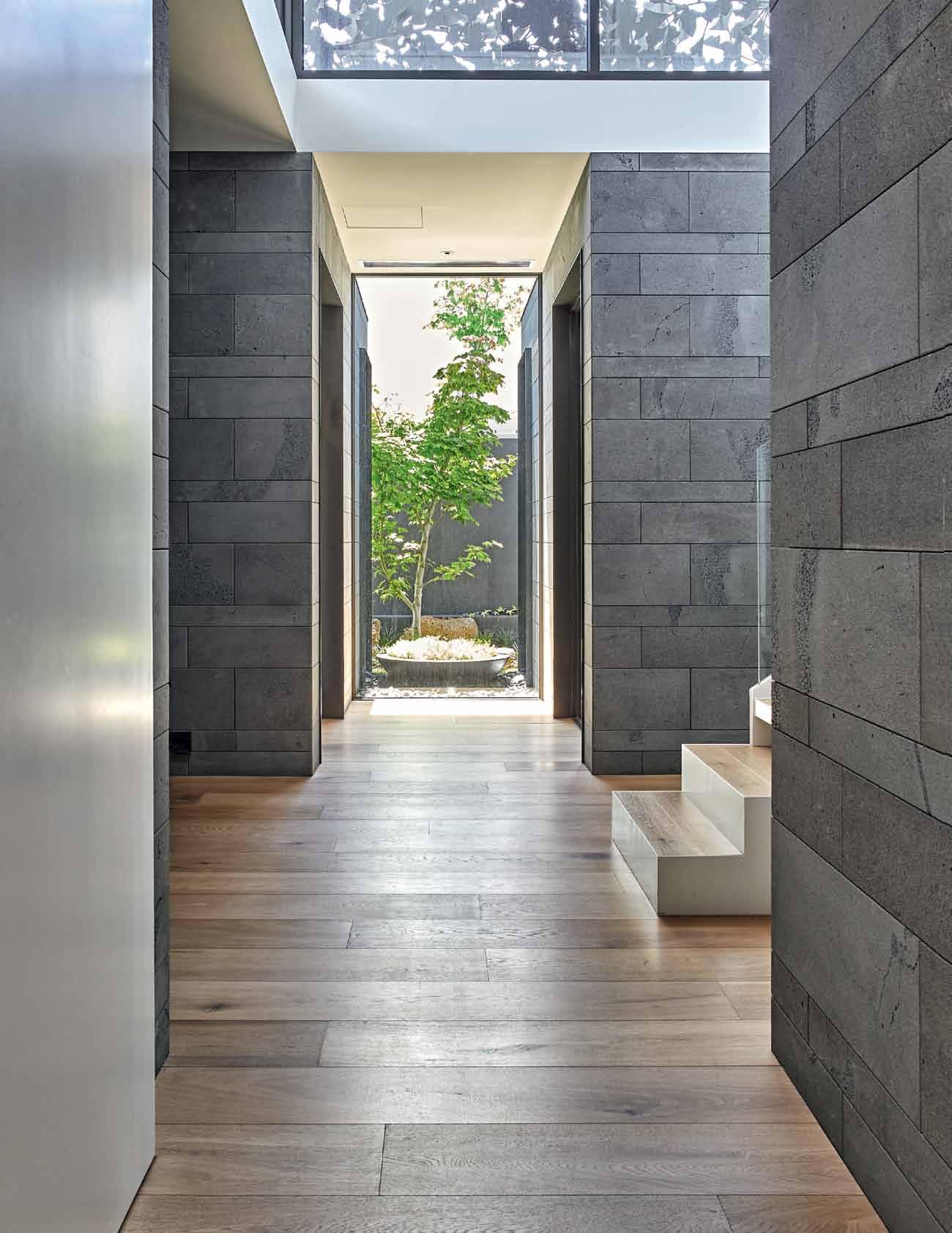
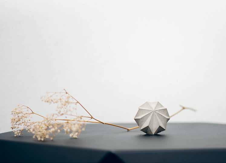
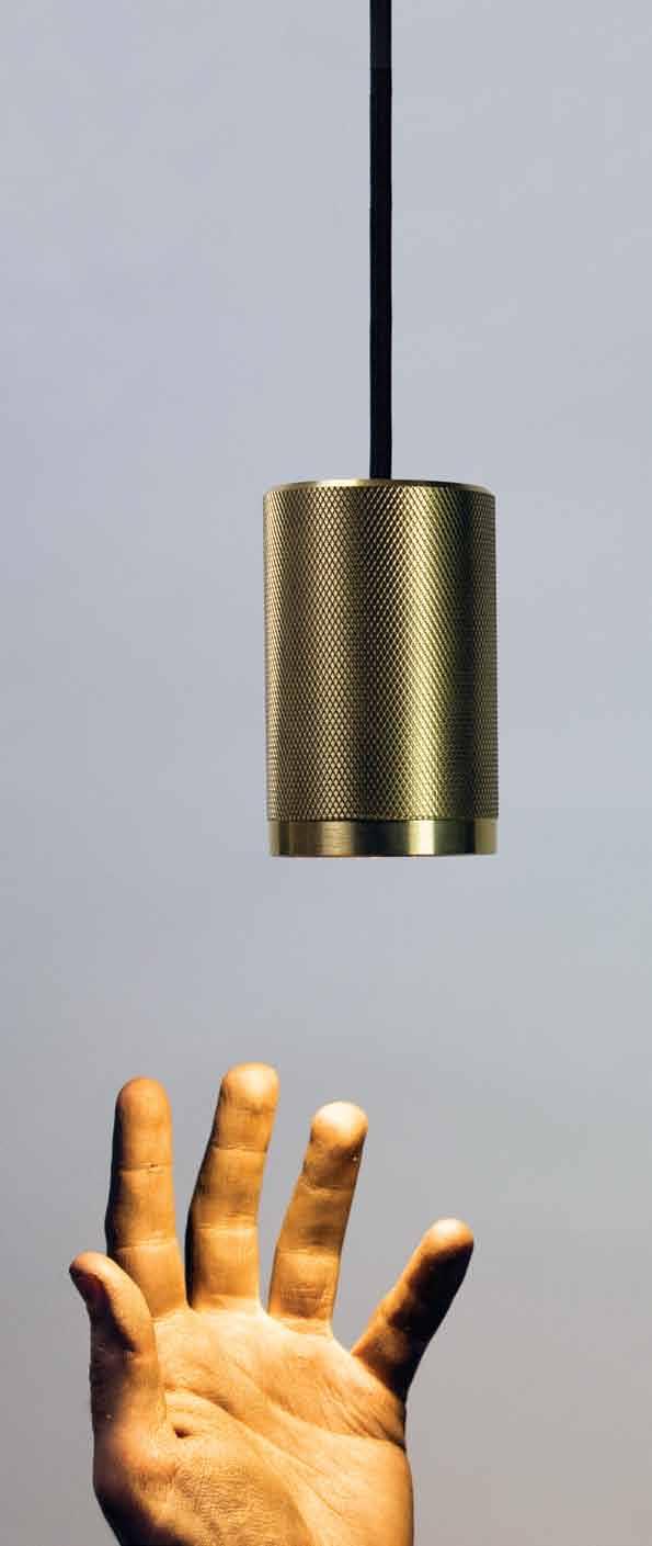
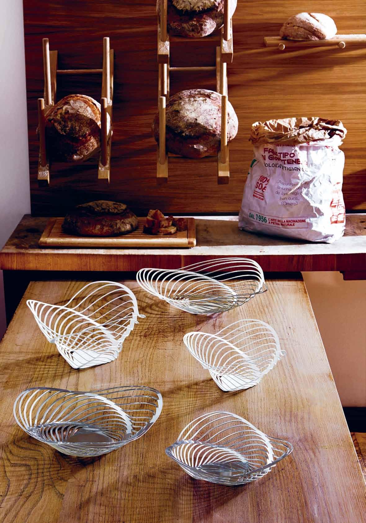
Discover the products we are inspired by: objects, lighting and furniture designed with minimalism in mind, clean lines and striking finishes on unobtrusive designs to enhance any contemporary home.
34. BOOKS
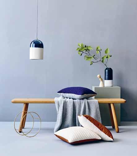
As urban populations continue to increase, so does the need for appropriate housing solutions. To counteract the urban sprawl, a proliferation of high towers is the vision that is often presented. With the help of three recent books, Philip Drew discusses the future of densification.
A lightmaker, a landscapologist and the leader of a design brand with longevity. Meet our creative personalities that look at the world in a different way.
40.
BOOTS
A childhood spent on the move in Melbourne’s outer east with constant access to nature paved the way for lighting designer Christopher Boots to feel at home in all sorts of places – sometimes simultaneously. Kath Dolan visits the light, airy, social Fitzroy showroom and workshop and the dark, calm, enclosed studio apartment he currently calls home to hear his story.
55. AMALIE WRIGHT
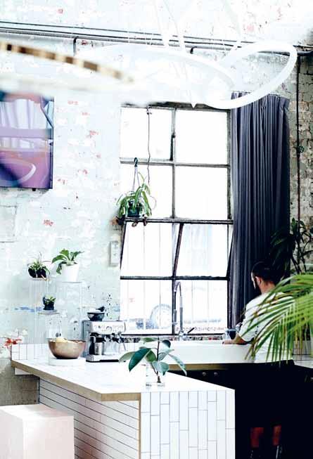
Breathing new life into a tired-looking former lawyer’s office hidden away out of sight in Spring Hill, Brisbane, partners and architects Amalie Wright and Richard Buchanan transformed it into a shared design studio that is now home to Amalie’s practice: Landscapology.
Alessi – the kitchen utensil and accessories brand that can be found in almost every home. Managing Director Alberto Alessi chats to Stephen Todd about the extended ‘family’ of global designers… and that dysfunctional lemon squeezer. #40
# 31
Where to look for inspiration? It can be found all around us – in the things we have, the conversations we engage in and new ideas that spark a revolution.
CHRISTOPHER
65. ALBERTO ALESSI
#24
114. INTERMODE
It took Gillian Simon and Darren Kindrachuk the best part of a decade to find the perfect piece of land, but once they did, the design and build was relatively easy – thanks to the modular design they chose.
126. KURAU HOUSE
Part architecture, part artwork, this redesigned terrace house in Kuala Lumpur is an eloquent ode to one studio’s philosophy. Studio Bikin shares their love of raw forms and unfinished surfaces.
137. EDWARDS & CO
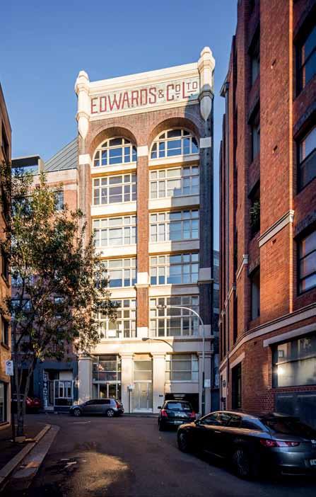
Behind the public façade of Sydney ’ s Edwards & Co. building is a private haven by Josephine Hurley that offers a relaxed and considered backdrop to life.
152. WELLINGTON HOUSE
Wellington designer Andrew Simpson creates a 50-square-metre house on a marginal site in Island Bay. Discover the genesis of the idea and its success as a small house model for living in New Zealand.
76. NEW MINIMAL Minimal doesn’t necessarily mean less – or denigrating the idea of more. It is simply asking us to live a life with more quality.
87. POCKET GEM
A 27-square-metre apartment by Brad Swarz is as astonishing and impressive as it sounds.

97. EXPRESSIVE MINIMAL Size doesn’t limit us, Koichi Takada suggests, but instead encourages us to enliven the space.


104. HANDMADE HOUSE
A highly crafted interior called for a bespoke touch by Gary Galego. The result is like a timber jewellery box of times gone past.
165. RIENZI PLACE
The duo behind Singapore-based architecture studio A D Lab developed a sense of limitless, lush green space in their own narrow terraced home in Singapore’s east.
178. SAWMILL HOUSE
This pared-back dwelling by Archier, bridging mid-century modernist architecture with industrial rural language, is a response to the owner’s mentality and intriguing lifestyle.
# 31
People across the Region live in very different ways, but we all have something to learn from each other in an architectural and design sense.
#137 #76 minimal




PURE TASTING INSTANT BOILING CHILLED SPARKLING The new Zip HydroTap® design range is available in various contemporary designs. Healthy living has never looked so good. MODERN DESIGN. MORE WOOHOO. EXPERIENCE THE ZIP EFFECT. zipwater.com
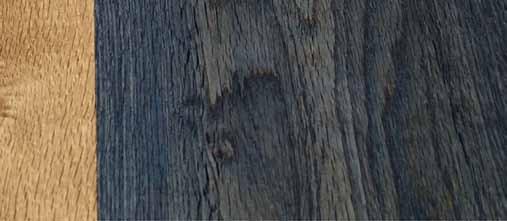
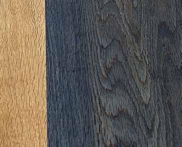
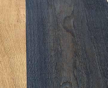
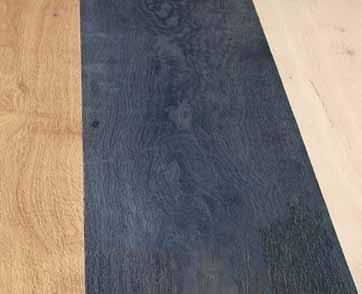
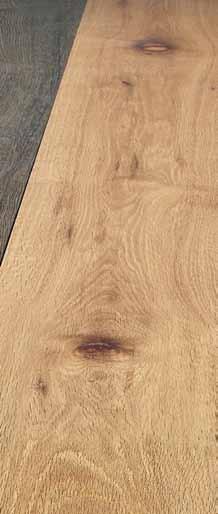
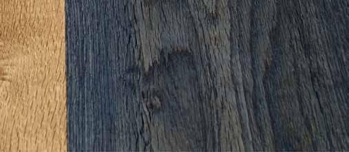
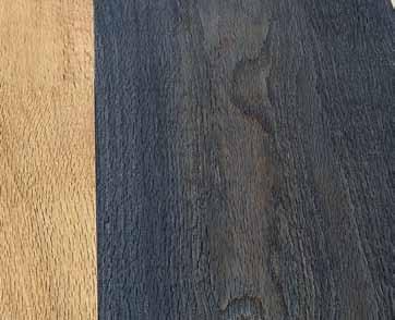
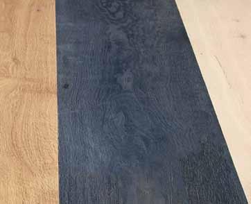
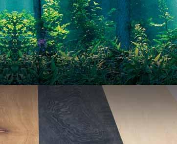
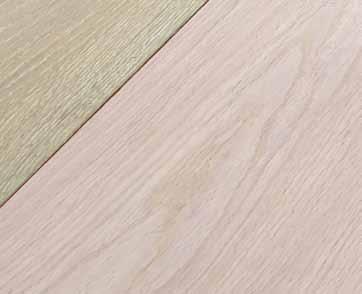
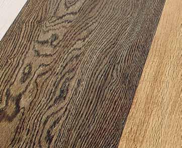
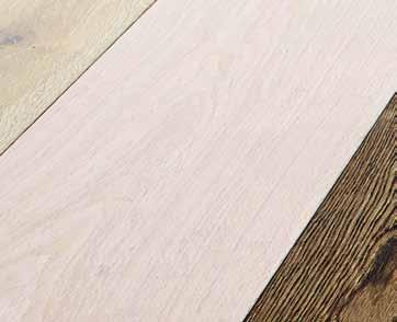
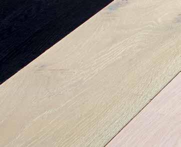
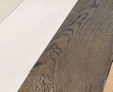
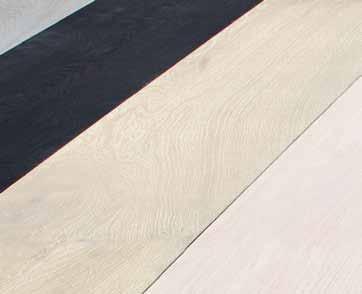
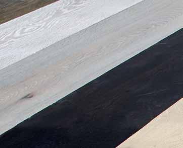
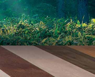
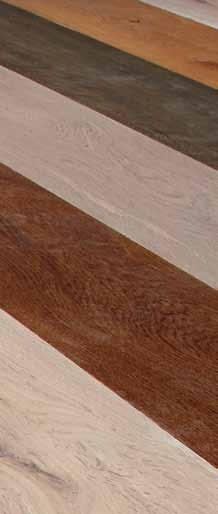
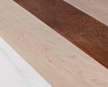
tongue n groove timber constructed of FSC European Oak treated with natural oils in 15 beautiful colours allowing for easy maintenance





Showrooms
Shop 2 188 Chalmers Street, Surry Hills NSW 2010
P 02 9699 1131 F 02 9690 0929



575 Church Street, Richmond VIC 3121
P 03 9427 7000 F 03 9427 0100
tonguengrooveflooring.com.au



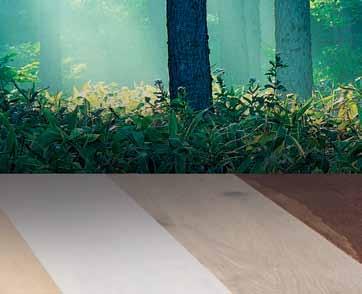



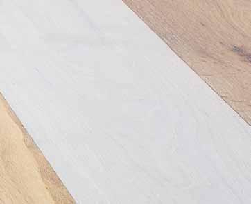


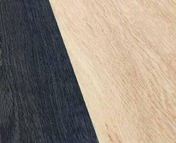
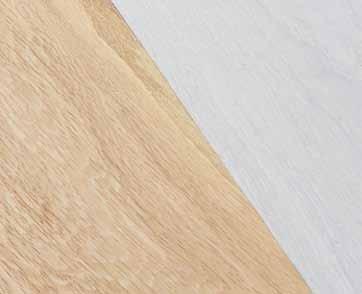

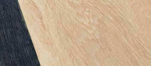

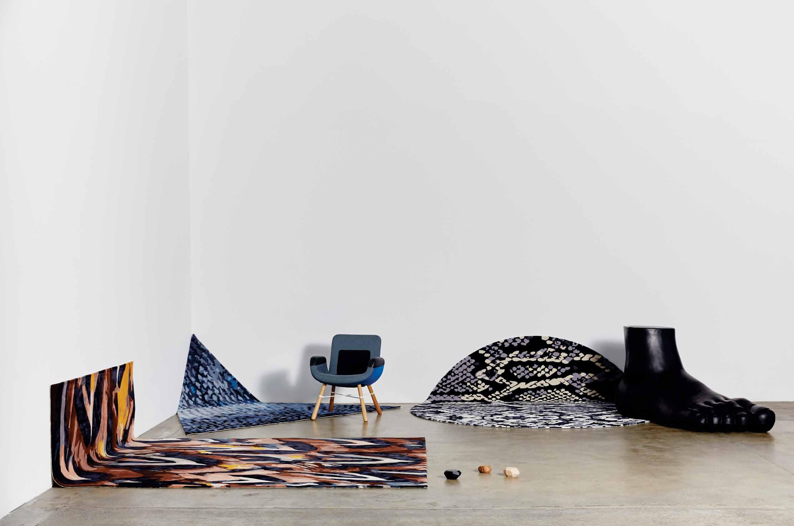


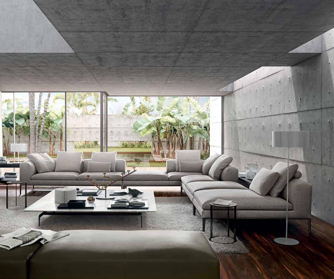
Walter Knoll is trusted by architects, designers and discerning clientele around the world for furniture of uncompromising quality; developed with a true understanding of the modern lifestyle.
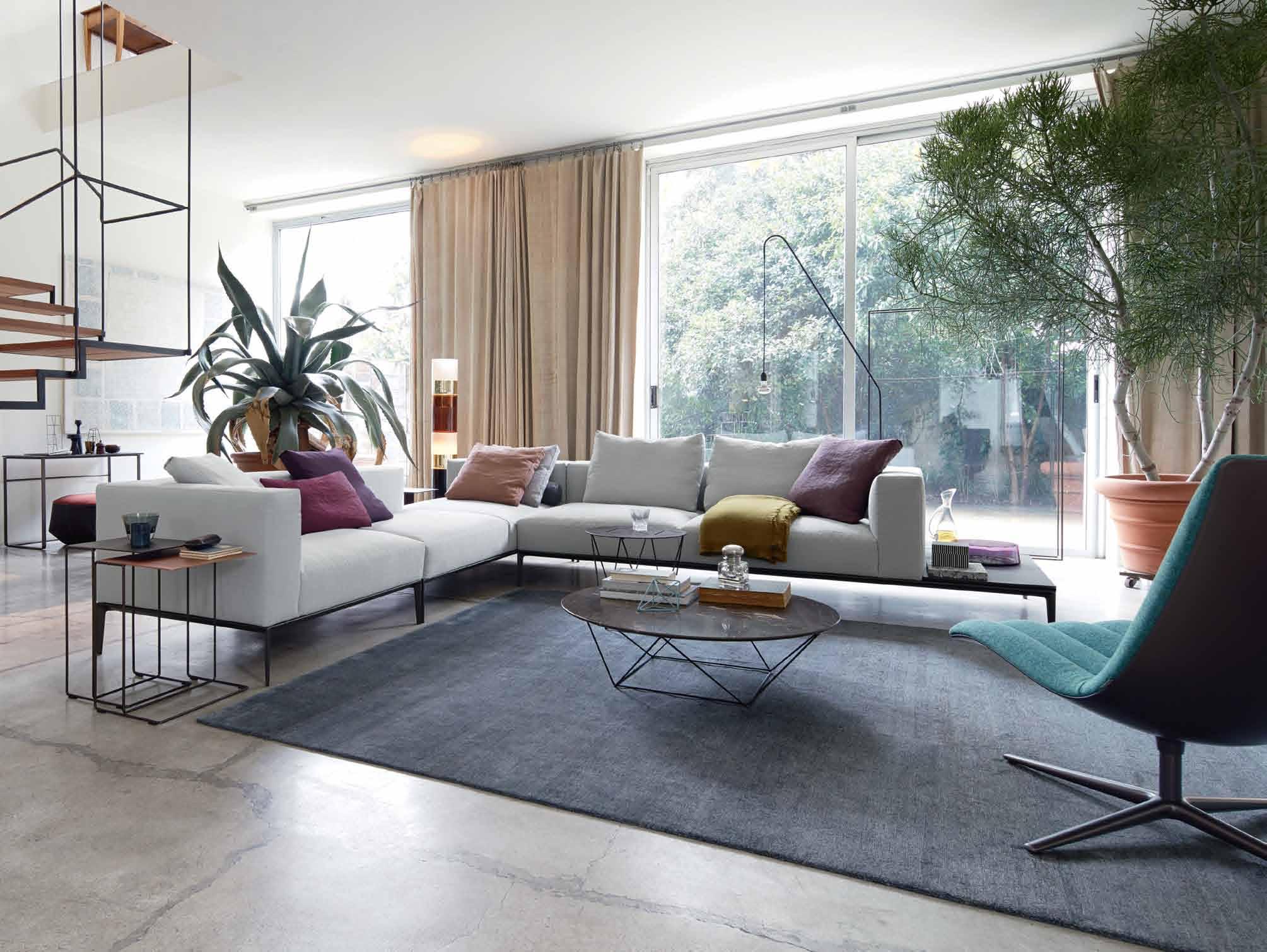

Jaan Living Sofa, Oki and Joco Stone
Occasional Tables by EOOS; Healey Lounge by Pearson Lloyd. Available at Living Edge. walterknoll.com.au livingedge.com.au


AD
the first word
That’s why, in this issue, we’ve chosen to explore living in a more minimal way. It is definitely a challenge, when we are surrounded by so much excess. But it can be achieved with a little editing.
I’m not being biased here. Editing is not just for editors – it’s something everyone does, all the time. We try on different outfits, change up our interiors, decide which friends to invite, and choose our words carefully.
Part of the value of editing lies in its ability to cleanse. Reviewing an existing situation, whether it’s your wardrobe, your home, or your to-do list, is an exercise in mindfulness, conscious reflection. And the final act – discarding the superfluous (responsibly of course) is wonderfully liberating. Once the detox is complete, the sweet sense of space is an addictive tonic.
The experience aside, the purpose of editing – as is our aim with each issue of Habitus – is to better curate an experience. Ergo, the experience of living is better when curated.
Less is more.
With fewer things, each becomes more special, and the subtleties of life start to become more apparent. For example, in his reflections beginning on page 97, architect Koichi Takada (whose work is pictured above) talks about how the senses, quality of light and relationship with the seasons are heightened in a traditionally minimalist Japanese washitsu room.

With less space, each square centimetre becomes more significant. The bespoke apartment crafted by Gary Galego on page 104 is a wonderful example of how something small can be filled with value and meaning.
This idea of living with less, more consciously, is a precious thing. We often need reminding of it, because as soon as space is created, there are possibilities for filling it. On that note, this is a rather long editorial so I’ll take my own advice and ...
Nicky Lobo | Editor
Less is more,” said Mies van der Rohe. I wholeheartedly agree – having or doing less can provide us with more quality, time and meaning.
“
habitus takes the conversation to discovering their inspiration and design hunter® journeys
Justin Alex A nder INTERMODE #114
A self-confessed “restless soul, by nature,” photographer Justin Alexander has lived in over a dozen cities across three continents. Currently based in Sydney, Justin believes that, “minimalism means living with just enough to keep you happy, but not too much, to keep you busy.” With work focusing primarily on architecture and design, Justin’s portfolio sees him contributing regularly to a number of interior and architectural publications alongside industry leaders.
Adele Chong

KURAU HOUSE #126
For Adele Chong minimalism is, “about living simply and honestly while maintaining clarity of vision. Good design supports all these objectives.” Adele is a freelance journalist currently based in Kuala Lumpur, rediscovering her Malaysian roots. Adele spends her time discovering new cultures, having called cities such as Montreal, London and Berlin home in the last decade. She is, as always, in between homes.
simon devitt

WELLINGTON HOUSE #152
Auckland-based photographer Simon Devitt focuses primarily on architecture, with his work published in numerous national and international magazines. His images are featured in many books also, and saw him collaborating with Andrea Stevens on Summer Houses, published by Penguin. “I think about it, then I do the opposite. Not to consider myself a hoarder, but I am passionately obsessive about surrounding myself with objects of fascination and books that I love,” Devitt says of minimal living. Simon lives with his Irish Terrier, Kingi in Titirangi, Auckland.

K Ath dol A n CHRISTOPHER
BOOTS #40
Kath Dolan, a freelance writer, editor and illustrator regards minimalism, “as a powerful weapon best wielded with restraint, idiosyncrasy and humour.” Kath uses her words as a vehicle for exploring her fascination with design and collaboration. Her features, profiles and columns have appeared in Habitus, Indesign, The Age and The Sydney Morning Herald, as well as their digital counterparts. Kath is currently based in Melbourne with her partner Graeme, their two children Max and Zoe and their dog Diva.

tom Ferguson


EDWARDS &
CO #137
Practicing for 15 years as a residential architect, Tom Ferguson is making a steady transition into architectural and interior photography. Based in Sydney, Tom lives with his partner and their beautiful Burmese cat. Tom applies the concept of minimalism to his life through, “Clean surfaces, thoughtful decoration and great storage to allow the clutter of life to be hidden from sight! Also, good editing.”
r ebeCCA gross


EDWARDS & CO #137
“Minimalism means simplicity and being free of clutter, excess and anything unnecessary,” says Rebecca Gross. “I live with only what I need. Everything in my home and my life is well-considered.” Rebecca is a Sydney-based design historian and freelance writer. With a Masters from Parsons School of Design, she produces work about cultural history through the lens of architecture, design and visual culture.
mA rg he A rn SAWMILL HOUSE #178
For 20 years now, Marg Hearn has been writing about design, architecture, people, places and things. Founder of A Word or Two, her work has featured in auspicious national and international publications such as Indesign, DQ, Grand Designs Australia and The Age. Living in Melbourne’s City of Port Phillip, Marg believes that living minimally supports, “authentic, well designed and made products and helps to enhance the quality of everyday life.”
mA sA no K AwA nA
RIENZI PLACE #165
Currently based in Singapore, Masano Kawana specialises in resort hotel, architecture, interior, food and commercial photography. Originally from Japan, Masano lived in New Zealand for 12 years before relocating to Singapore in 1998 with his wife and young daughter. “Living in the material world of Singapore is very difficult for me,” Masano says, “My default Japanese nature helps me to maintain a minimal life, though!”
Mark roper

CHRISTOPHER BOOTS #40
Originally from the UK, Melbourne-based photographer Mark Roper focuses his work primarily on interiors, food and lifestyle. Mark’s portfolio spans across a number of magazines and advertising agencies both here and overseas. “I love the minimal aesthetic,” the father of two says, “but it’s hard to implement with two young children who love some mess and clutter!”
ToBY SCoTT

AMALIE WRIGHT #55
Australian interiors, architecture and lifestyle photographer Toby Scott has a simple style of shooting that is honest, clean and crisp. With an appreciation for architecture and design, his work can be seen in a number of Australian publications. Based in Brisbane and currently renovating his apartment, Toby sees minimal living as “a curated way of living with simple and beautiful objects to enhance life.” However currently, “its very minimal living as everything is in boxes!”
a ndrea STevenS
WELLINGTON HOUSE #152
A trained architect-turned-writer, Andrea Stevens specialises in architecture and design, culture and heritage. Andrea is a published author and editor with her book Beyond the State: New Zealand State Houses from Modest to Modern for Penguin being shortlisted in the New Zealand Post Book Awards in 2014. For her, “minimalism is an attitude and a way of life. It means buying less, consuming less and spending more time and energy on people rather than things.” Andrea lives in Auckland with her partner, their two daughters and their fluffy dog.

Tian Xing
KURAU HOUSE #126
Based in Kuala Lumpur, photographer Tian Xing trained at the Parisian Photography Institute SPEOS. With a talent for capturing compelling emotion, his portfolio has grown to include works for major fashion glossies in Asia including Harper’s Bazaar, Esquire, Elle and Tatler, to name a few. Living with his wife and two daughters, Tian Xing believes that the key to minimalism is to, “Keep life simple. We should learn to strive for quality instead of quantity.” Co-founder of boutique photography studio, Show Up Pictures, Tian Xing is poised to put his mark on every defining moment captured through his lens, be it in fashion or other playing fields.

Y OUR VOICE. OUR SUPPORT.
CHAIRMAN / PUBLISHER
Raj Nandan raj@indesign.com.au
EDITORIAL DIRECTOR / CHIEF CONTENT OFFICER
Guy Allenby guy@indesign.com.au
EDITOR
Nicky Lobo nicky@indesign.com.au
ORIGINAL DESIGN TEMPLATE one8one7.com
CREATIVE DIRECTOR
Christopher Holt christopher@indesign.com.au
DESIGNERS
Michelle Byrnes michelle@indesign.com.au
Sophie Taylor s.taylor@indesign.com.au
James McLaughlin james@indesign.com.au
DIGITAL EDITOR
SPREAD YOUR STORY
ENGAGE OUR READERS
SEE YOUR RESULTS
Ashley Tucker ashley@indesign.com.au
EDITORIAL ASSISTANT
Leah Cwikel leah@indesign.com.au
PA TO PUBLISHER
Elizabeth Davy-Hou liz@indesign.com.au
CONTRIBUTORS
Submit your latest design industry news about your new products, new projects, new resellers or new showrooms to secure your space on IndesignLive, HabitusLiving, their weekly newsletters and social channels.
Visit www.pressstop.com.au to see how easy it is to create your account and submit your design news now.
WRITERS / Adele Chong, Kath Dolan, Philip Drew, Rebecca Gross, David Harrison, Marg Hearn, Andrea Stevens, Koichi Takada, Stephen Todd, Ashley Tucker, Narelle Yabuka PHOTOGRAPHERS / Justin Alexander, Simon Devitt, Tom Ferguson, Benjamin Hosking, Christopher Frederick Jones, Masano Kawana, Mark Roper, Toby Scott, Craig Wall, Tian Xing ILLUSTRATOR / Matt Canning
MANAGING DIRECTOR
Kavita Lala kavita@indesign.com.au
PRODUCTION MANAGER
Victoria Kovacs victoria@indesign.com.au
ASSISTANT PRODUCTION MANAGER
Tina Fluerty tina@indesign.com.au
BUSINESS MANAGER
Vivia Felice vivia@indesign.com.au
ACCOUNTS
Gabrielle Regan gabrielle@indesign.com.au
ONLINE
Radu Enache radu@indesign.com.au
Ryan Sumners ryan@indesign.com.au
EVENTS
Tegan Schwarz tegan@indesign.com.au
Caitlin Clarke caitlin@indesign.com.au
BUSINESS DEVELOPMENT MANAGERS
Colleen Black colleen@indesign.com.au
(61) 422 169 218
Dana Ciaccia dana@indesign.com.au
(61) 401 334 133
MEDIA COORDINATOR
Alex Kwak alex@indesign.com.au
COVER IMAGE
Christopher Boots (p.40) Photography by Mark Roper
HEAD OFFICE
Level 1, 50 Marshall Street, Surry Hills NSW 2010 (61 2) 9368 0150 | (61 2) 9368 0289 (fax)
MELBOURNE
Suite 11, Level 1, 95 Victoria Street, Fitzroy VIC 3065 | (61) 402 955 538
SINGAPORE
4 Leng Kee Road, #06–08 SIS Building, Singapore 159088 (65) 6475 5228 | (65) 6475 5238 (fax)
HONG KONG
Unit 12, 21st Floor, Wayson Commercial Building, 28 Connaught Road West, Sheung Wan, Hong Kong
indesign.com.au
Indesign Media Asia Pacific cannot accept any loss or damage. Please retain duplicates


text and images. Habitus magazine
a wholly owned Australian
which is designed
published
Australia. Habitus is published quarterly and is available through subscription, at major newsagencies and bookshops throughout Australia, New Zealand, South-East Asia and the United States of America. This issue of Habitus magazine may contain o ers or surveys which may require you to provide information about yourself. If you provide such information to us we may use the information to provide you with products or services we have. We may also provide this information to parties who provide the products or services on our behalf (such as fulfi lment organisations). We do not sell your information to third parties under any circumstances, however, these parties may retain the information we provide for future activities of their own, including direct marketing. We may retain your information and use it to inform you of other promotions and publications from time to time. If you would like to know what information Indesign Media Asia Pacific holds about you please contact Nilesh Nandan (61 2) 9368 0150, (61 2) 9368 0289 (fax), info@indesign.com.au. Habitus magazine is published under licence by Indesign Media Asia Pacific. ISSN 1836-0556
issue #31 habitusliving.com Printed in Singapore. All rights reserved. No part of this publication may be reproduced, stored in a retrieval system, transmitted in any form or by any other means, electronic, mechanical, photocopying, recording or otherwise. While every e ort has been made to ensure the accuracy of the information in this publication, the publishers assume no responsibility for errors or omissions or any consequences of reliance on this publication. The opinions expressed in this publication do not necessarily represent the
of the editor, the
are
at the
and
views
publisher or the publication. Contributions
submitted
sender’s risk,
of
is
publication,
and
in
–
–
–
HERE’S A NEW WAY TO JUMP THE QUEUE
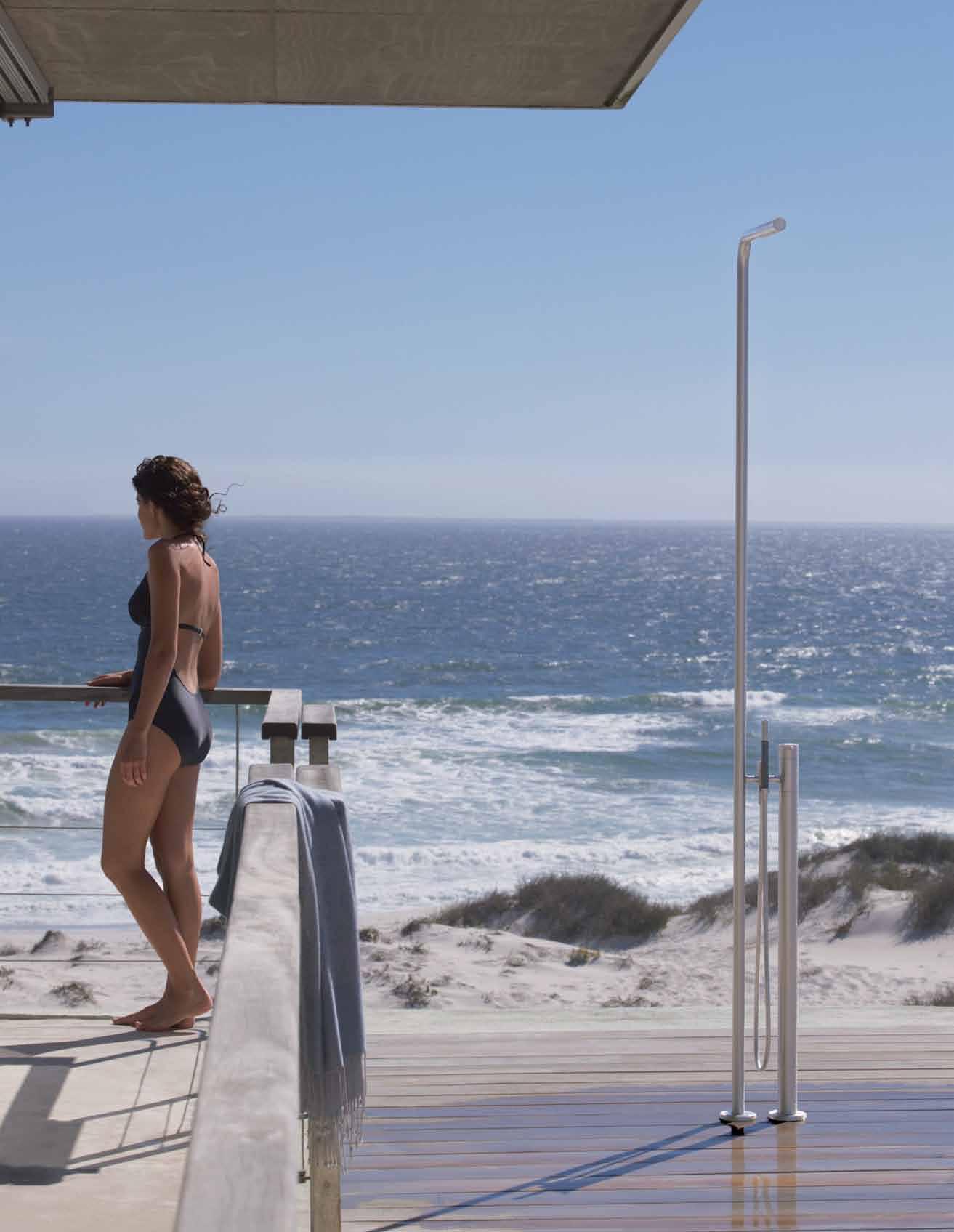
VOLA Design Pty. Ltd., Tel.: +61 402 372 480, lna@vola.com, www.vola.com
Ignite a sense of creativity






Heavy elements
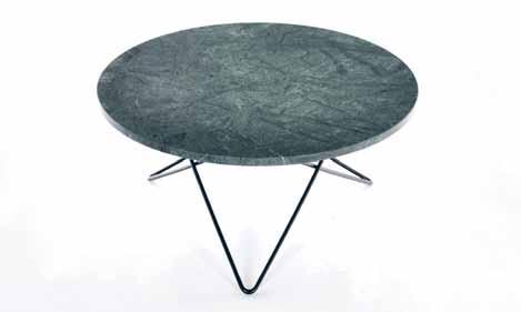
From Great Dane elegant, minimalist geography comes to life with the O-TABLE by Ox Denmarq . Combining simple design principles with natural materials of the highest quality, such as white carrera, brass and black marquino, the O-Table offers gorgeous Scandinavian aesthetics. The piece is available in a range of table top and leg combinations.
greatdanefurniture.com
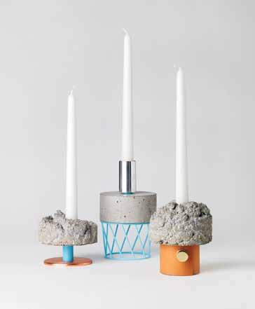
The CROWD series of candle holders from David Taylor look as if they are experimental pieces, a clash between art and design. Each piece is designed uniquely, however share the same elemental traits as the next. Made with smooth and textured concrete, wood and copper, these candle holders offer a beautiful industrial aesthetic.
superdave.se / newworks.dk
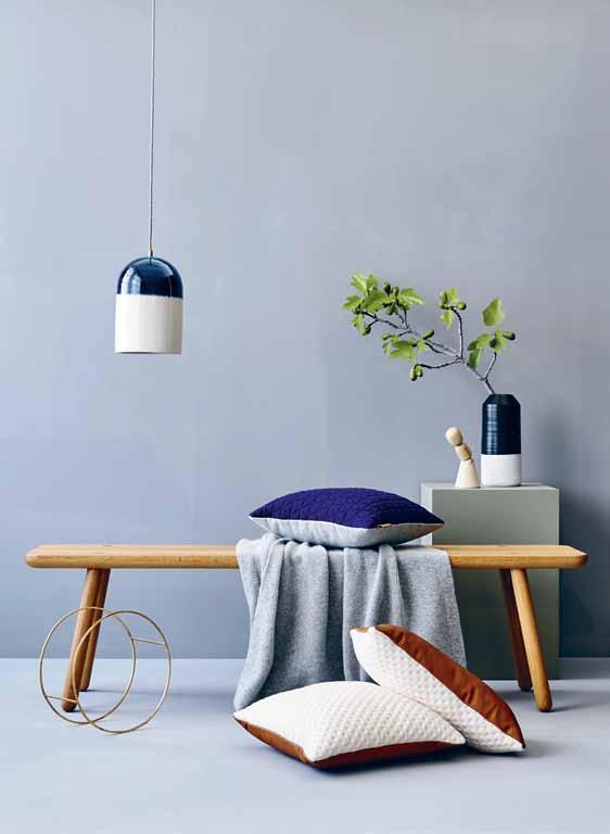
Nina Provan and Nick Rennie are the minds behind Melbourne-based ni.ni. creative , a small, collaborative business whose focus is on design, quality and simplicity. As a part of its first collection, the company has launched the KumO CushiOns available in a range of leathers and fabrics. The range has been designed so that either side of the cushion can be the front or the back, allowing for individual and interchangeable styling. Designed and made in Australia, the pair take inspiration from minimalistic Japanese design from the selection and use of materials, right through to the finite detail evident in Japanese aesthetic. The Kumo Cushions are the perfect addition to any lounging landscape.
ninicreative.com
issue #31 habitusliving.com
Specialising in handmade, designer homewares, MonoHome bring us the MARBLE CONCRETE SIDE TABLE . Crafted in rural Queensland from handmarbled concrete and timber dowel legs, these side tables are one of a kind and offer a unique luxury to any room of the modern home. Available in square and round top options, the exclusive range brings with it a distinctive industrial edge.
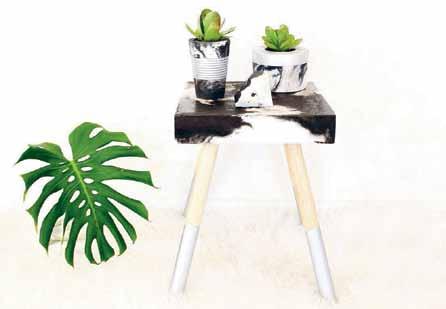
thelifecreativeshop.com
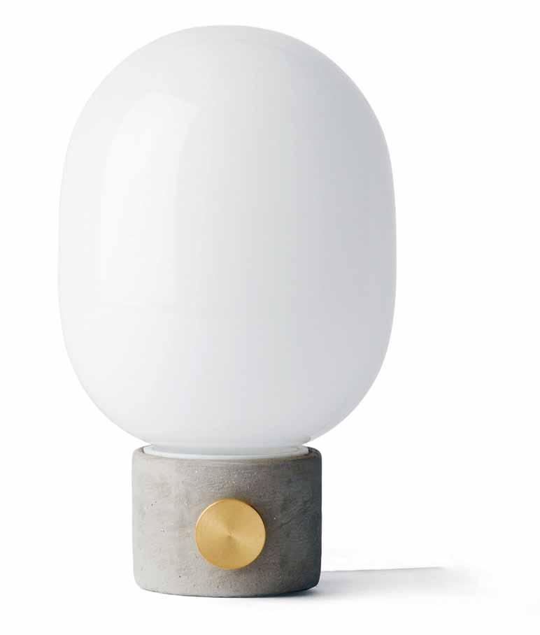
Producing a soft, ambient glow the JWDA CONCRETE TABLE is from Danish company Menu . The lamp comes with a G9 frosted bulb that sits atop a tactile concrete base with a brass button. Whether sitting on your coffee table or your bedside table, it is a beautifully artistic object that successfully combines the delicate
Born from industrial shelving systems, comes the MATCH CONSOLE TABLE from Arfl ex . As part of a larger range, the console table can be configured and joined to small tables and bookshelves to create a truly unique shelving system. The junctions that join the structures become precious and decorative elements, making it a truly elegant piece.
arflex.it / poliform.com.au truly

1 . lightbox # 25
Lifesavers
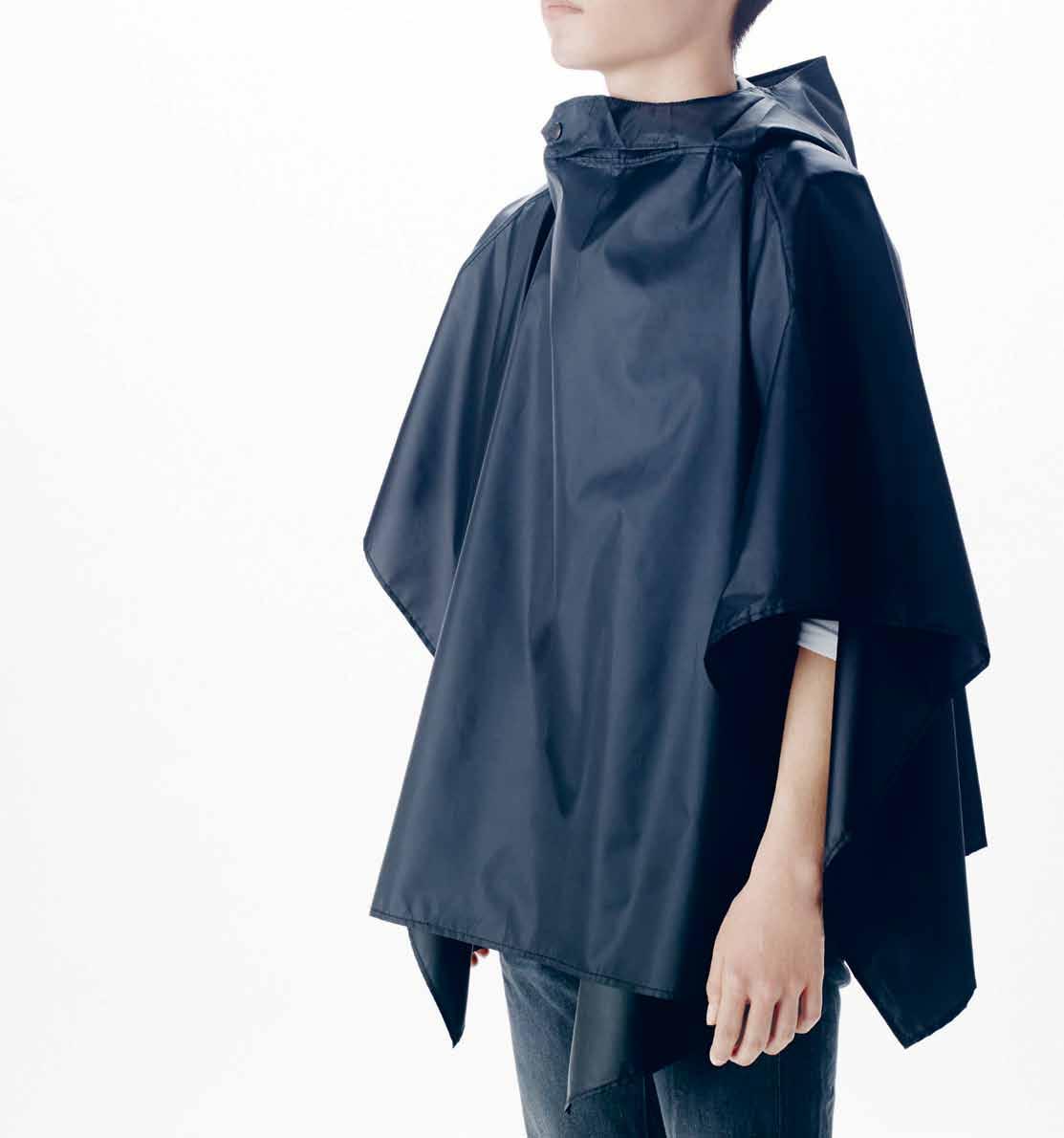
Designed by nendo for Sugita Ace , the MINIM+AID is an unconventional emergency preparedness kit that is unique and versatile. Packaged inside a single 5cm plastic tube that floats, the kit inclues a whistle, a radio, raincoat, lantern, drinking water and a plastic case. Ready to go at any time, the kit offers a rich set of features in a compact, easy to carry design.
nendo.jp
issue #31 habitusliving.com
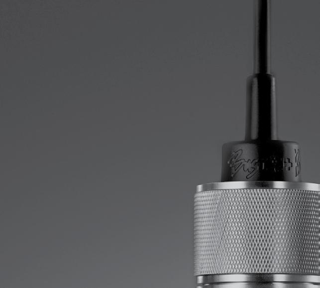
From Buster + Punch comes the world’s first Edison-style LED bulb, T he BUsT e R BULB . The intricate resin light pipe at the centre of the bulb is the focal point and creates a stunning luminous effect. Celebrating traditional British blacksmith craftsmanship, the Buster Bulb is available in gold, smoked, or crystal ensuring its suitability in any environment.
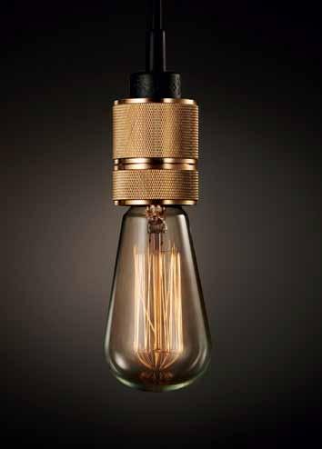
busterandpunch.com / livingedge.com.au
From enivornmentally conscious designers Nils Chudy and Jasmina Grase, the MIITO is the sustainable alternative to the electric kettle. Eliminating the long wait times and wasted energy of heating excess liquid, the MIITO heats liquids directly in the user’s receptacle. Innovative and sleek in its design, the latest induction technology as well as temperature control make for the perfect brew every time!

miito.com
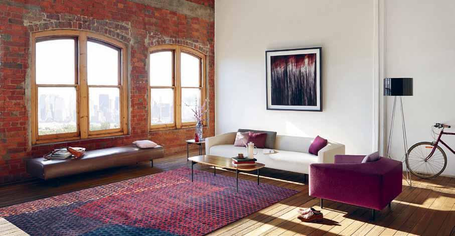
The Mesh (Copper) by Rugs Carpets and Design is a hand-knotted rug crafted with 100% semi-worsted wool that has been overlaid to create a lattice pattern. Ideal for lounge areas, the Mesh lends a gorgeous warmth to any room. Available as a custom piece, you can select your desired size and colours for a truly personal and unique product.
rc-d.com.au
1 . lightbox # 27
Practical magic
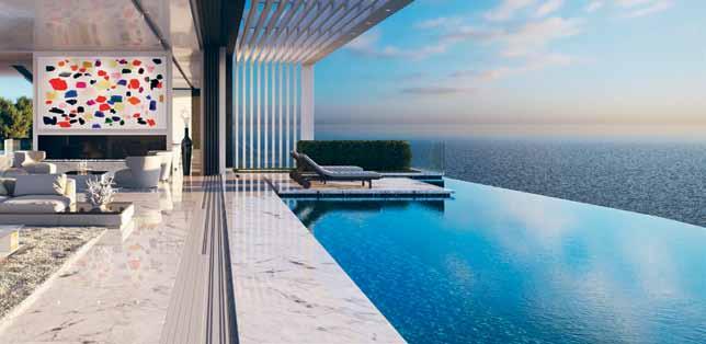
a quabocci’s r-47 t H re SHOLD is their most advanced drainage system to date. Featuring double entry drainage, water is drained from floor level as well as carrying water from the door track into a drainage channel. Allowing for seamless transition between indoors and outdoors, the Threshold provides a streamlined drainage solution that sits flush in the floor.
aquabocci.co.uk
Designed by Michael Young, the WearIt bluetooth speaker for Brionvega is a modern take on one of the company’s earliest products – the iconic TS207 portable radio. Retaining the integrity and history of the brand, the speaker connects to a number of wireless devices. Thanks to the comfortable strap attached, you can quite literally ‘WearIt’ anywhere you want!

brionvega.it
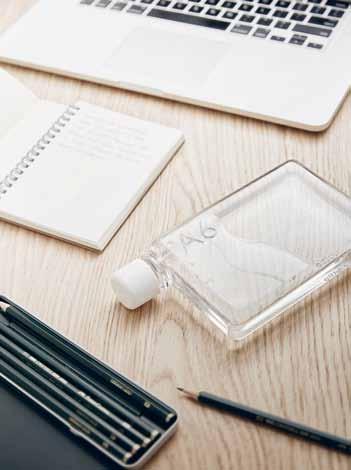
Compact, discrete and quirky, the M e MOBO tt L e is new way of travelling with water. Designed in Melbourne, the bottles are available in A5 and A6 sizes, playfully referencing the paper sizes they resemble. Fitting perfectly into handbags, folders and laptop bags they are as beautiful as they are functional.
memobottle.com
issue #31 habitusliving.com
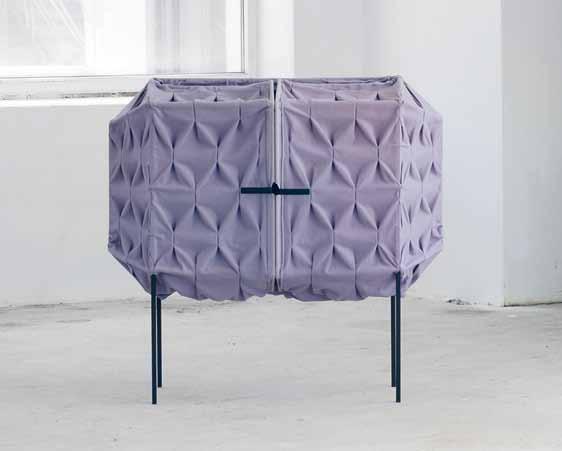
Making use of beautiful textile materials, the LONDON cabinet by Meike Harde is a storage facility of a different kind. The framework, made of metal, makes the unit extremely lightweight and mobile while the oustandingly tactile aesthetics flaunt personality and style. Add a touch of violet to your bedroom landscape with this eye-catching piece!

meikeharde.com
Born from a father-daughter collaboration, A DIARY FOR DAY DREAMERS is a paper based diary that celebrates seasonal changes and is inspired by nature. The stunning diary is a work of art in itself and encourages owners to observe and record the things we see and feel throughout the year. Looking for a way to participate more with the world around you? This is the diary for you.

foliobooks.com.au / qagoma.qld.gov.au / museumofbrisbane.com.au
The V6 Ab SOLut E VAcuu M from Dyson is the first ever cordless vaccuum to be able to tackle both large debris and microscopic particles. The lightweight, hand-held unit is easy to manoeurve and houses the most powerful digital motor of any cordless vacuum. Absolutely the best way to clean up!
dyson.com.au

1 . lightbox # 29
Tilt
Launched as a part of the GlobeWest Collections 2016 comes the Industr I a r g lobeWest . Taking its design influence from the support beams of a suspension bridge, the Raggio is an engaging and geometrically stunning piece.

globewest.com.au
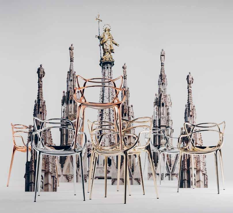
Paying tribute to three symbolic chairs, Kartell’s metallic Masters Collection is a fusion of original and captivating styles. The Masters chair hints at the silhouettes of the “Series 7” by Arne Jacobsen, the “Tulip Armchair” by Eero Saarinen and the “Eiffel Chair” by Charles and Ray Eames, however it is in the metallic finishes that the collection gains its exclusive, sophisticated look.
kartellstorela.com / spacefurniture.com.au
issue #31 habitusliving.com
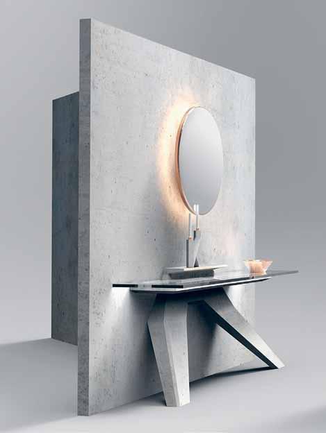
The LEANING CONSOLE TABLE is a part of the Concrete range by Delatour Design Lab. Constructed in light concrete, glass and copper the table features both minimalist and modern design. The use of concrete is symbolic in its strength and durablity, while its clean lines pays tribute to modernist architecture movements.
delatourdesignlab.com
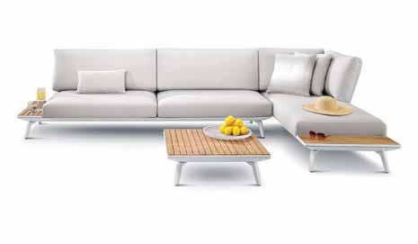
Clean lines and minimalist design see the contemporary K ING C Ov E C OLLECTION by King Living suiting any outdoor area. The modular outdoor sofa is configurable, with removable back frames and the complementary Iroko timber shelves and tables. Waterproof and comfortable, you won’t want to move from its ultradown filled back cushions.
kingliving.com.au
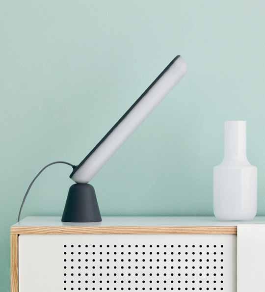
Playful, friendly and futuristic – the AC rOBAT TABLE L A mp from Normann Copenhagen is an innovative lamp that can be placed in a vast number of positions. The matt finish of the light produces a soft light that creates a calm and cosy atmosphere. Held together by magnets, the cone-shaped base and oblong LED light source challenge and excite, pushing the ideas of traditional lamps.
normann-copenhagen.com
1 . lightbox # 31
Organics
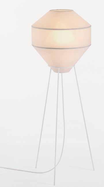
Part of the Mayu Collection from Coco Flip is the MAYU FLOOR
Designed for the Object Future III exhibition, the form was inspired by the beauty of Iceland’s landscapes. Delicate and evocative, the handmade lamp is crafted using traditional shade-making techniques with a warm, glowing core.

cocoflip.com.au / o-f.com.au
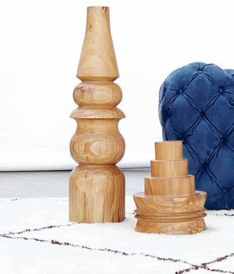
The JO WILSON COLLECTION from Criteria is a collection of sculptures by acclaimed Australian artist, Jo Wilson. Made from reclaimed telegaph poles, the pieces celebrate the natural characteristics and intricate beauty of hardwood. The collection brings a gorgeous sense of balance and warmth to any home.
criteriacollection.com.au
The LARGE RESIN ROCK
JUG in Moody Blue Swirl from Dinosaur Designs are hand made in Australia. Each piece is unique and completely captivating, with the colours and swirls differing from one piece to the next. Whether ornamental or functional in its use, this will be a conversation starter.
dinosaurdesigns.com.au
nanimarquina ’s QUILL rug is as delicate in its form as it is in its design. Inspired by the handiwork of its creators, the Quill takes its cue from the natural world, where no two shapes are alike. The modest rug has been carefully handcrafted with the utmost attention to detail.
nanimarquina.com / naotamura.com

issue #31 habitusliving.com








issue #31 habitusliving.com
Sky living
As urban populations continue to increase, so does the need for appropriate housing solutions. Counteracting the urban sprawl, a proliferation of high towers is the vision that is often presented. With the help of three recent books, Phili P Drew discusses the future of densification.

Tex T Phili P Drew | illusTraTion MaTT Canning 1 . lightbox # 35
Australia is a bizarre urban conundrum where 40 per cent (9.3 million people), inhabit just two cities, Sydney and Melbourne. When the remaining state capitals – Brisbane, Perth, Adelaide and Hobart, along with the national capital, Canberra – are included, the fraction rises to an astonishing figure of nearly two-thirds. Far from being the country of the Outback, settlement is quite the opposite with the vast majority of Australians living in large sprawling cities on the coast. 1 The key to understanding why this should be so is simple – water – and the concentration of people in a few favourable locations inherited from colonial times. Coupled with this our reliance on high levels of immigration of around 200,000 new arrivals per year, to drive economic growth in the absence of intelligent economic policy, further distorts the existing concentrated urban maldistribution of population. In effect, it is the equivalent of building a new Newcastle annually, something,
if it were to be faced up to responsibly by the Commonwealth, that would require an ongoing annual investment in the region of $200 billion.
Not surprisingly, Australian cities, especially Sydney and Melbourne, are stretched to the limit and lack essential infrastructure required to service such rapid population growth. The political answer, as it was for housing the poor in the 1950s, is ‘densification’, building higher on existing plots, a solution of sorts vigorously supported by entrepreneurs, banks and financial institutions which stand to profit, not to mention developers eager to increase their fortunes.
The question is: will it work; followed by: is it desirable? There is a simple truth about cities: the layout of streets rarely, if ever, changes –Ancient Rome is a good example. The width of the streets remains fixed irrespective of how high buildings on them become, with each additional storey, the congestion on the ground increases in proportion to the densification factor achieved.
Densification is a zero sum game benefiting only the very wealthy landowner. In the 1950s, the poor were shovelled into inner-city towers until overwhelming evidence, measured in rates of depression, suicide, crime and neglect, forced a stop to high-rise public housing. These days, it is the wealthy who clamber to live in high-rise and admire the ever-changing cloudscapes above.
On Manhattan, a new type of slender attenuated residential tower (with base-toheight ratio as much as 1:23) rises to mind blowing heights of 541 metres (1,775 feet). 2 Apartments in them do not come cheap and cost anywhere between $US30 to $US100 million. Consequently, it is the very rich who choose to safeguard their millions in what are, in effect, habitable aerial safe-deposit boxes. Such towers, are, by their nature, unlikely to solve the growing need for affordable housing close to city centres, offering rents within the reach of the majority.

You won’t find ‘densification’ in the Macquarie Dictionary: it is one of those ugly sounding terms that spring up and catch on, which, in this instance, curiously suggests happiness is synonymous with living in bare anonymous apartments with wall-to-ceiling glass – for the view of course – amid a veritable forest of such identical towers. Jane Jacobs accurately described densification as: “streets piled high in the sky without the public view ground level streets enjoyed, and so lacking the checks and inhibitions exerted by eyepoliced streets.”
Out of curiosity, since densification is the buzzword on every architect’s lips, as the preferred solution to our urban dilemmas, let’s explore the more promising options in a few recent publications.
A good start is SOM Thinkers: The Future of the Skyscraper, prefaced by an Introduction from Philip Nobel, consisting of eight essays on such things as skyscraper symbolism, the rise of cities and their ecological impact, movement, the skewing of social extremes and human response to sky living, the limits of lifts, competition with low-rise campus parks, and the consequences of limiting building height to 12 to 10 storeys in Washington D.C. The intention is to inspire and enthuse us with the prospect of ever higher towers. Nowhere is there analysis of the costs of extreme height, how much more expensive super-towers are to
issue #31 habitusliving.com
build and maintain, or the possible justification driving the race for ever taller towers in any meaningful sense attempted. Based on their geographical location, one would have to conclude the skyscraper obsession is fuelled by oil money looking for a safe hiding place, which goes to prove that where skyscrapers are concerned, Form follows Finance.
Edith P. Nash’s Manhattan Skyscrapers, offers a chronological survey of New York’s most spectacular towers starting with the 23-storey, American tract Society Building in 1896, and taking the story up to the Freedom Tower, 1 World Trade Centre, in 2013. Recent examples after 2010 are absent but the coverage is conscientious and illustrates, for any architect confronted with designing a skyscraper of his own, a wide range of approaches and styles over 115 years, from the Hearst Building by Norman Foster, Michael Graves’ timid 425 Fifth Avenue, Bloomberg Tower by Caesar Pelli, and David Childs’ ghostly glass Time Warner Building, which melts into the surrounding sky. In her introduction, Carol Willis concludes that New York will keep building towers in defiance of the tragedy of 9/11. What is missing is any discussion of the skyscraper’s extreme vulnerability to fire and terrorist acts, not to mention the threat of low-flying wayward jet aircraft. After all, 9/11 was not the first incident – an Army Corps B-25 bomber crashed into the 79th floor of the Empire State Building in 1943. Towers are upended vertical cantilevers, the higher they rise, the longer it takes to evacuate them. From this viewpoint, they are inherently dangerous. Architect-designed towers, for all their structural ingenuity and use of highperformance glass and steel, can be seen as rather dumb, compared with animal architecture. Evolution, it turns out, is much superior to architects when it comes to designing remarkably cheap and efficient towers. Ingo Arndt’s Animal Architecture has wonderful photographs of compass termite towers. Almost 3 metres (10 feet) tall, the ingenious compass termite flat-sided skyscrapers are arranged in precise northsouth orientation that ensures a constant internal temperature inside, unlike Sir Richard Rogers’ three monster Barangaroo towers. The flat shape and orientation means the sun hits only the narrow upper edges during the day and thus does not force internal temperatures to rise. The termite towers in
the Northern Territory of Australia are also evenly spaced in their separate territories, unlike city skyscrapers that crowd out views and overshadow the streets below.
The skyscraper, especially the supertower, is a human extreme and harbinger of necropolis, the dead city. There may be a troubling biological parallel: is there a danger that humans living in such aerial nests will become more like ants? Fahrenheit 451 opens with a fascist book burning that was filmed at the Roehampton Estate, adjacent to Richmond Park, London. According to G.E. Kidder Smith, Roehampton was probably the finest low-cost development to accommodate some 9,500 people. Sliver, much later, explored the threat of covert surveillance. Some people like dense living; others prefer being close to nature. Densification, if it is imposed, risks provoking a violent counter-reaction.
1 Matt Wade, ‘The problem with our successful cities’, SunHerald, Nov. 8, 2015, p. 31 EXTRA. The statistics are from a recent International Monetary Fund report on Australian residential prices. Dr Judith Yates, a Sydney University expert on the economics of Housing says there is possibly no other country in the world that has 60 per cent of its households in six capital cities and about 40 per cent in just two of those.
2 Martin Filler, ‘The Sky’s The Limit’, The Australian Financial Review, Friday, May 1, 2015, p. R1, R6-R7. Filler concludes his survey with the observation: ‘..the smokestack-like protuberances that disrupt the skyline of mid-town Manhattan now signify the steadily widening worldwide gap between the unimaginably rich and the unconscionably poor’
THE FUTURE OF THE SKYSCRAPER: SOM THINKERS
Philip Nobel, essays by Tom Vanderbilt et. Al.
Published by Metropolis Books 127pp softcover $AUD29.98 artbook.com
MANHATTAN SKYSCRAPERS
Eric P. Nash, 3rd ed., updated by Carol Willis
Published by Princeton Architectural Press 223pp hardcover $AUD87.87 papress.com
ANIMAL ARCHITECTURE
Ingo Arndt, text by Prof. Dr. Jürgen Tautz
Published by Abrams, New York 160pp hardcover $AUD39.95 abramsbooks.com
Evolution, it turns out, is much superior to architects when it comes to designing remarkably cheap and efficient towers.
1 . lightbox # 37
Crystallise your creative philosophy





issue #31 habitusliving.com
Metamorphoses
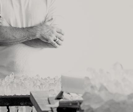
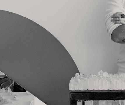
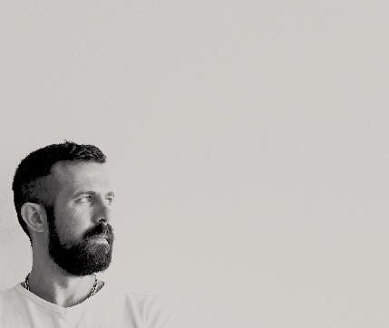
A childhood spent on the move in Melbourne ’s outer east with constant access to nature paved the way for lighting designer Christopher b oots to feel at home in all sorts of places –sometimes simultaneously. Kath Dolan visits the light, airy, social Fitzroy showroom and workshop and the dark, calm, enclosed studio apartment he currently calls home to hear his story.
Work and home are inextricably linked for Christopher Boots. Well before he decided to move into the tiny loft overlooking his voluminous, light-filled Gore Street showroom to work crazy hours creating an installation for the 2014 Christmas windows of Hermès’ New York flagship store on Madison Avenue, Boots had transformed the asbestosriddled interior into an inviting ‘anti-showroom’ to put his customers at ease. “We wanted to make the space feel domestic regardless, as a business proposition, so when people walk in they’re immediately comfortable and it doesn’t come across as some disjointed showroom which is selling you something,” he says. “It’s more like ‘Ah, I feel kind of at home, and at peace, and that light peace feels right’.”
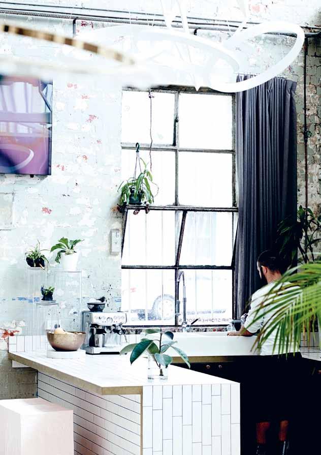
Indeed it does. Despite its location just off buzzing Johnston Street, Boots’ showroom feels remarkably serene, thanks in large part to its bright white floor, corner kitchen, masses of healthy green plants (including a creeper that’s gradually annexing the exposed brick walls), four-to-six metre-tall ceilings, and a saw-toothed roof with south-facing clerestory windows that bathe the entire space in glorious, ever-changing light. “The quality of light coming in is amazing,” Boots enthuses. “In summertime you get the western light as it sets
Tex T KaTh Dolan | PhoTogra Phy Mar K roPer
opposite |
inspire so mAny designs At the Be Ach And on BushwAlks. AB oVe |
is left over from A commission - the designer Admits he never hAs enough lighting At home. # 41 2 . portrait
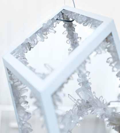
Boots B egAn collecting fossils, rocks And the crystAls thAt
Boots’ crystAl triptyx
and the whole space just glows.” By day, “you don’t get direct sun but you get bright light, and it really lifts the space.”
It’s the perfect backdrop for Boots’ own dramatic, monumental lighting: minimalist in form but high-impact in its scale and robust, earthy materials, including copper, zinc, carbon and smoky quartz. The designer discovered the site in October 2012 and within six weeks had stripped and renovated it and set up shop. The later addition of a contemporary kitchen and bathroom proved invaluable when he moved in – first to the showroom’s loft then last year to a cosy corner of a sprawling space above his Napier Street workshop a couple of blocks away.
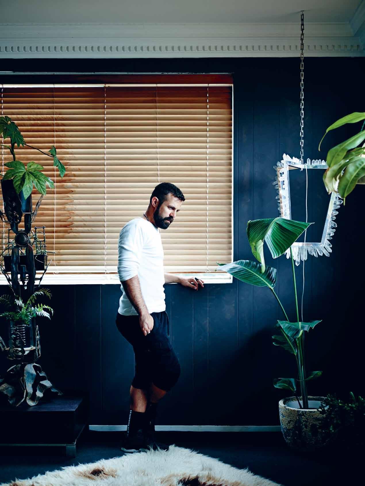
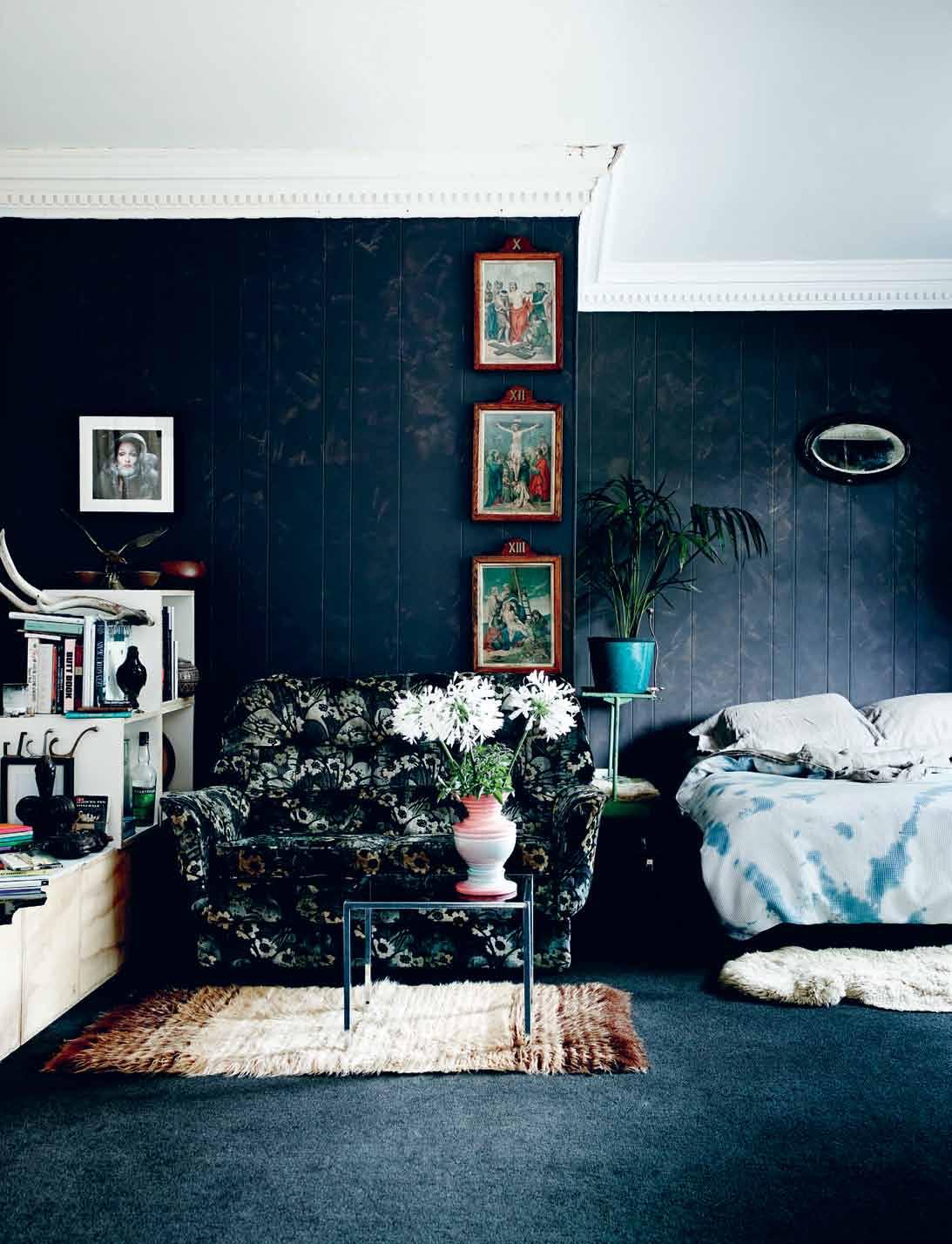
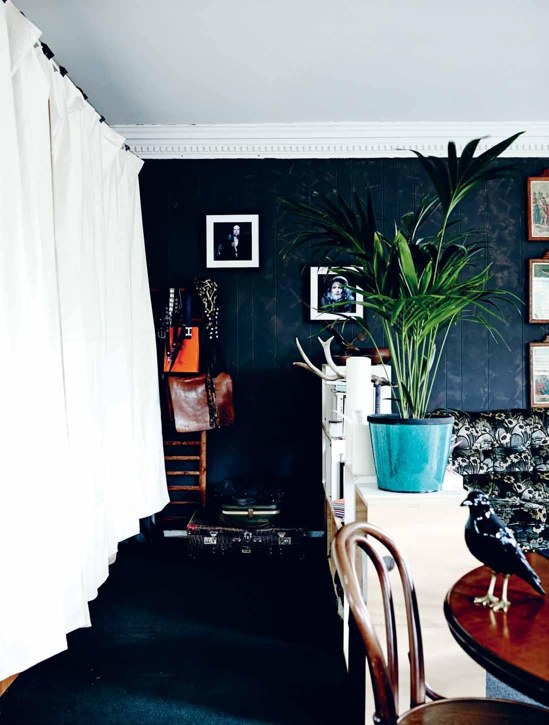
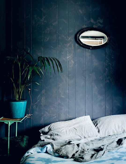
Much of the Napier Street site is sublet as studios to a handful of fellow designers and artists. There’s also a communal dining room for meetings and the like. Boots’ abode is a single room in a light-filled corner: a stylish man-cave with darkly glamourous charcoal walls and floors, vintage furniture including some eccentric hand-me-downs from his Greek aunt, plenty more of his beloved plants and some intriguing collections and artworks. It’s here he can literally lock himself away for a dose of solitary calm and quiet.
Given Boots’ frequent international travel for work and the long hours he spends alongside his team of up to 15 people, this cool,

above | A communAl dining tAble outside b oots’ privAte spAce is used for meetings And quiet time AwAy from his busy studio. opposite | texture is key to b oots’ op shop And heirloom furnishings, including his originAl 70s flok Ati rug And $60 sAlvo’s couch.
issue #31 habitusliving.com
In summertime you get the Western light as it sets and the whole space just glows. Christopher boots
# 43 2 . portrait
issue #31 habitusliving.com
enclosed, solitary little world provides crucial counterbalance. “I’m looking for peace and, I guess, quiet at some point, but Fitzroy’s bloody loud in the evenings,” he says with a laugh. “This room used to be all white, but due to the fact that there’s so much sunlight coming in I thought I’d paint it a dark, cool, calming kind of colour. And it’s anti-everything that was the other space, which was white and crisp and light. I just needed that opposition of something really dark, almost cave-like, to just really calm the senses.”
Growing up with a single mum who needed to move regularly for work, Boots learned early how to personalise a wide variety of spaces quickly and inexpensively. As a child he collected found natural objects including rocks, some remarkable fossils and the glittering crystals he regularly incorporates into his opulent, classically inspired architectural lighting. Edited versions of the latter two collections have found their way to Napier Street. In his teens Boots discovered sculpture and furniture making, and created his first light at the age of 16 – a heavy, highly industrial design made from a desk lamp, an x-ray and poured concrete. Since uni, where he studied film and media before industrial design, Boots
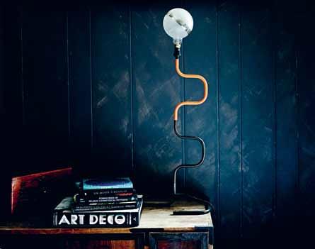
currently stores masses of volumes across fIve
# 45 2 . portrait
previous | Images from mathu andersen’s bearded lady serIes are amongst the artworks he had framed specIfIcally for thIs space. AB ove | porter’s paInts helped match carpet and wall colour, InvertIng boots’ usual approach of whIte surfaces throughout. B elow | a keen and eclectIc book collector for many years, b oots
locatIons.
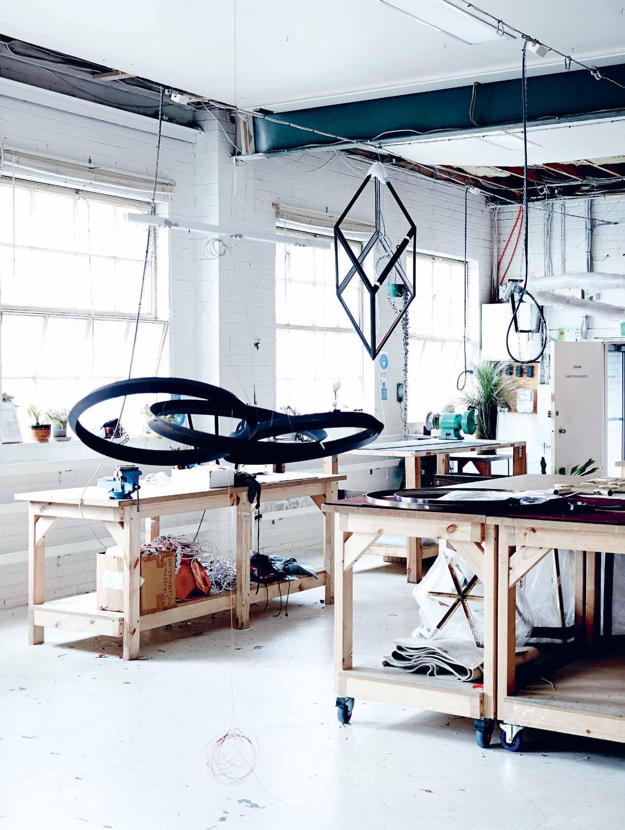
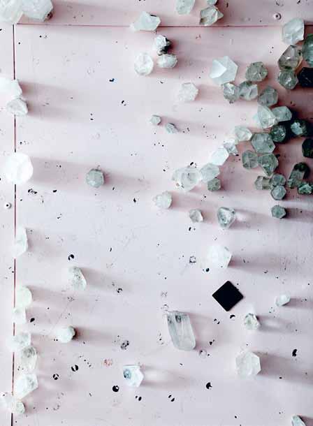


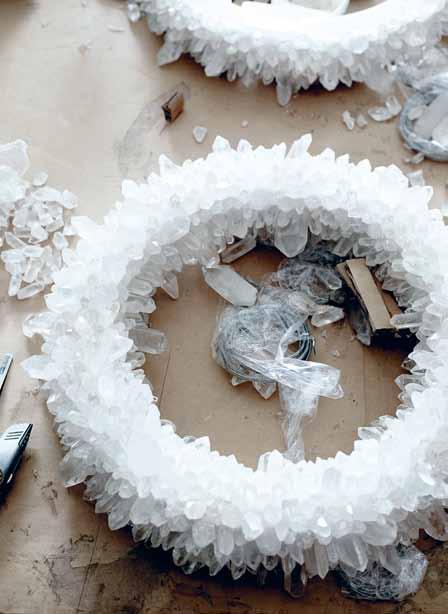
previous | Signature deSignS in BootS ’ workShop include the intertwined ring S of the oracle and the geometric orp (oBlique rhomB ic priSm). CLo CKWise FroM Top LeFT | q uartz cryStalS including dark Smokey quartz are integral to BootS ’ home and work. cryStalS ’ aB ility to capture light iS central to their appeal. So too iS their grounding energy, which BootS SeeS aS eSpecially important for city life. cryStal inSpireS the deSigner and SoftenS hiS roBuSt, induStrial materialS palette. # 47 2 . portrait
has amassed a book collection spanning everything from design theory to geology, psychology and vibrational medicine. It’s so vast only a fraction fits in any given home.
Boots still likes to move every year or two to keep his living environments fun and fresh. He also redecorates regularly “to recurate yourself, in a way”, he says. Though his home is packed with appealing textures and quirky, colourful objects laden with personal significance, his strategy with home interiors is minimalist to a tee. “Clean space, clean mind,” he says when pressed for a personal definition of minimalism. “Consolidation, refinement, clarity. And space, being the ultimate luxury.”
He sets the mood and energy in each abode using first colour, then plants, then lighting, and finally a tightly edited selection of possessions that suit the space and atmosphere. “Energetically it’s really important to paint a new space if you’re going to move in,” Boots says. “For me a white space is usually the healthiest and most open to interpretation, because once you fill it with items they take on the colour and the life that the white … operates as a canvas for.”
Plants literally bring each interior to life. “Plants have always been my thing,” he says. “I think they’re so integral to softening the hard edges of architecture. The closer we get cooped up in cities the more we get divorced from nature, so I think it’s really important to integrate it as much as possible.” Boots’ love for and knowledge of the natural world began during childhood with regular walks in and around the Dandenong Ranges and hours spent with his Greek grandmother, who he describes as “my biggest inspiration”, helping tend her veggie patch and propagate seeds. These days he seeks out unusual plants at the annual Melbourne International Flower and Garden Show and bargains from the DIY gardeners at Bundoora Market on Sundays. He refers to an exotic Nepenthes suspended from the ceiling (a meat-eating tropical plant so thirsty it requires a house-sitter when he’s away) as ‘she’, and concedes plants are also pet substitutes of a sort.

ABOVE | Not surprisiNgly Boots is acutely aware of the mood set By the Natural light floodiNg his warmly domestic showroom iNterior.
issue #31 habitusliving.com


# 49 2 . portrait

# 51 2 . portrait
“I really miss having a pet but I just don’t have a lifestyle of consistency enough to maintain two Bengal cats or something,” he says. “So the plants are, I guess, low maintenance pets.”
Boots is an avid op shopper, and his tightly curated selection of furniture currently includes personality packed bargains from the 1950s, 60s and 70s, plus a handful of Japanese antiques. Amongst his highly textural favourites are a kitsch velvet couch from The Salvos, his aunty’s slightly mangy looking flokati rug and an outrageous metal plantstand of his grandmother’s he describes as “suburban Brutalist”. The collected artworks he had framed for this abode include religious iconography, photographic prints including Kyoto’s Philosopher’s Path and some of Instagram sensation Mathu Andersen’s bearded lady series, as well as a world map to remind him how big the world is and where he’s headed next.
Like a chef who never cooks at home, Boots admits his homes are always light-on for his own lighting. However, lighting is the first thing he plays with in any new interior he visits. The day before our interview he rigged up a “hack” pendant lightshade for his mum using seashells and parts from old lamps he found in her garage. “It’s really important to mix things up,” he says. “The moment you move a light or a source of light or diffuse it in a different kind of manner the space changes, and I think we kind of miss that, often.”
Previous | The whole Team helps care for The planTs and creepers ThaT sof Ten The sTill raw indusTrial space. Above | BooTs spliTs his ‘home Time’ BeT ween The showroom’s renovaTed kiTchen and BaThroom and his one-room privaTe quarTers a Block away.
issue #31 habitusliving.com
Christopher Boots | christopherboots.com
STRADA COLLECTION THE DEFINITIVE SOURCE FOR ENDURING SITE, GARDEN AND CASUAL FURNISHINGS ® 50 MCLACHLAN AVENUE, RUSHCUTTERS BAY, NSW 2011 +61 2 9380 6605 ATLANTA • BOSTON • CANCÚN • CHICAGO • DALLAS • DANIA BEACH • DUBAI • HIGH POINT • HONG KONG HOUSTON • LONDON • LOS ANGELES • MEXICO CITY • MIAMI • MONTERREY • NEW YORK • SAN FRANCISCO SHANGHAI • SINGAPORE • SYDNEY • TORONTO • WASHINGTON D.C. • WWW.JANUSETCIE.COM
Inside out solutions
Meet the Threshold: Stormtech’s sleek and sophisticated drainage for today’s open-plan home designs – a seamless marriage of function and aesthetics.
One of the more notable trends in today’s home architecture movement is the push towards open-air living, dissolving the traditional barriers between the indoor and outdoor spaces.
Yet exposing one’s home to the whims of Mother Nature seems less like prudent design and more like practical burden. Rain and waterlogging are a particular bane of open-air designs, exposing indoor spaces to water transgressions, and outdoor surfaces to the erosive effects of ‘ponding’ (undrained water pools).
Enter Threshold drainage: a specially customised drainage system that marries exquisite low-impact design with excellent drainage for today’s open-air home designs.
Developed over 20 years ago as a requirement for special needs access, Threshold was originally designed to eliminate the ‘trip-and-slip’ hazards of stepdown partitions, delivering uninterrupted access between indoor and outdoor living areas.
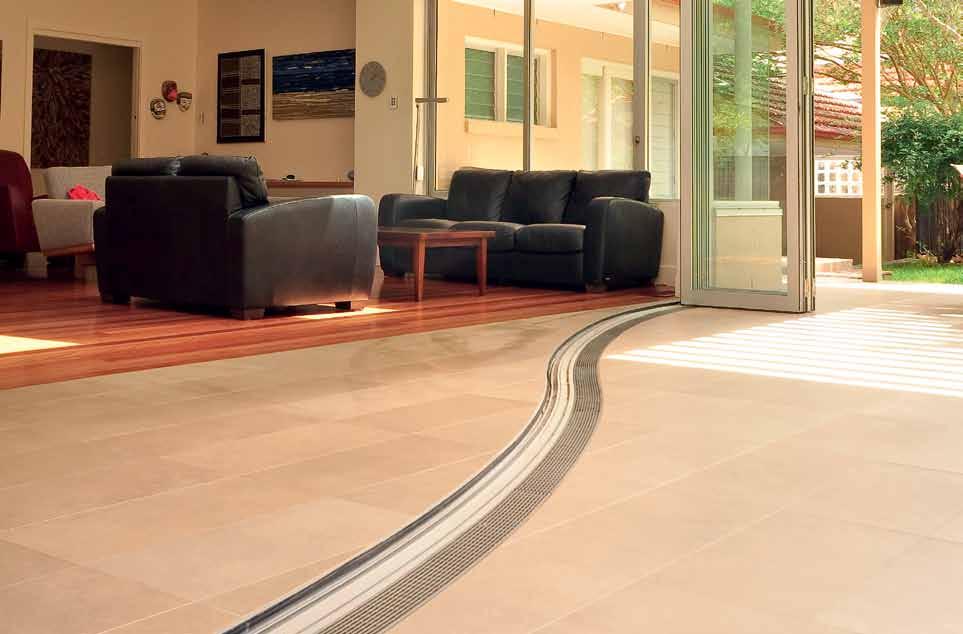
Complementing a range of open-plan doorway constructions, Threshold has emerged today as a hallmark of chic, sleek and practical drainage, and a cornerstone of today’s trendsetting ‘bring the outdoors in’ design movement.
Threshold is a defining example of elegance in simplicity. The low-profile design consists of an external lineal grate which sits flush beside the door track, in precise alignment with the ground surface. An integrated, concealed, subsill collects water flows and condensation around the doorway, conveying it to the external drainage system.
Threshold’s streamlined, low-impact, structure acts as both water barrier and active water conduit, ensuring excellent drainage possibilities between the indoor/outdoor divide.
As one of Australia’s most respected drainage manufacturers and suppliers, Stormtech is committed to delivering the highest quality drainage solutions for today’s unique building projects.
Stormtech’s skilled specialists work closely with specifiers, architects and builders to offer tailored drainage solutions, including bespoke drawings and plans for customised drainage designs for all Australian environments.
Stormtech works proactively with plumbing advisory services to ensure drainage is not only fit for purpose, but meets stringent Building Code of Australia (BCA) compliance measures.
habitus promotion › Stormtech #54 issue #31 habitusliving.com
Above | Threshold drain, producT code 100arTdi cusTomised for a curved design.
Stormtech | stormtech.com.au
studio living
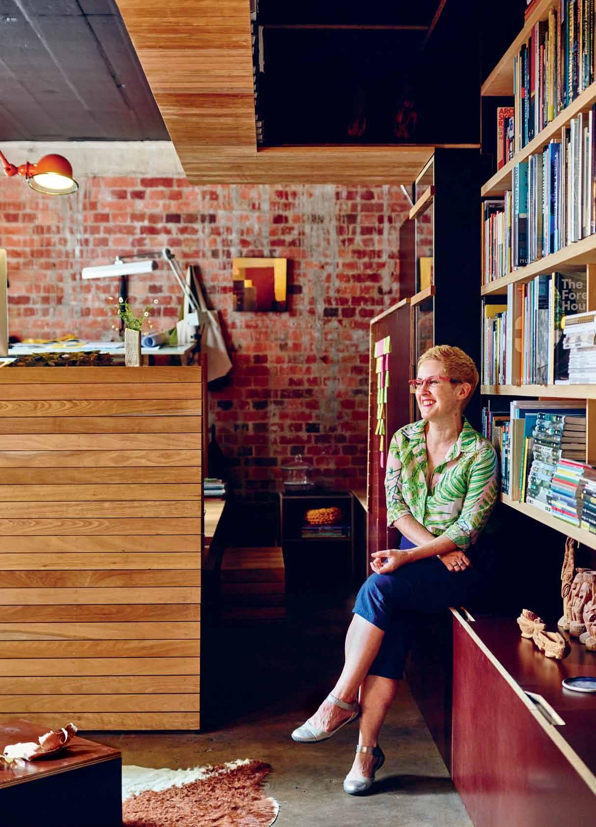
Breathing new life into a tired-looking former lawyer’s office hidden away out of sight in Spring Hill, Brisbane, partners and architects AmAlie Wright and richArd BuchAnAn transformed it into a shared design studio that is now home to Amalie’s practice, Landscapology.
 Tex T Ashley Tucker | PhoTogr APhy chrisToPher Frederick Jones
# 55 2 . portrait
issue #31 habitusliving.com
After working for many years as an architect in big international design practices, Amalie longed to fulfil her desire to work on smallerscale projects at a local level and create something of her own. In 2012 she swapped big for small and established her design studio Landscapology, specialising in bespoke landscape and garden design.
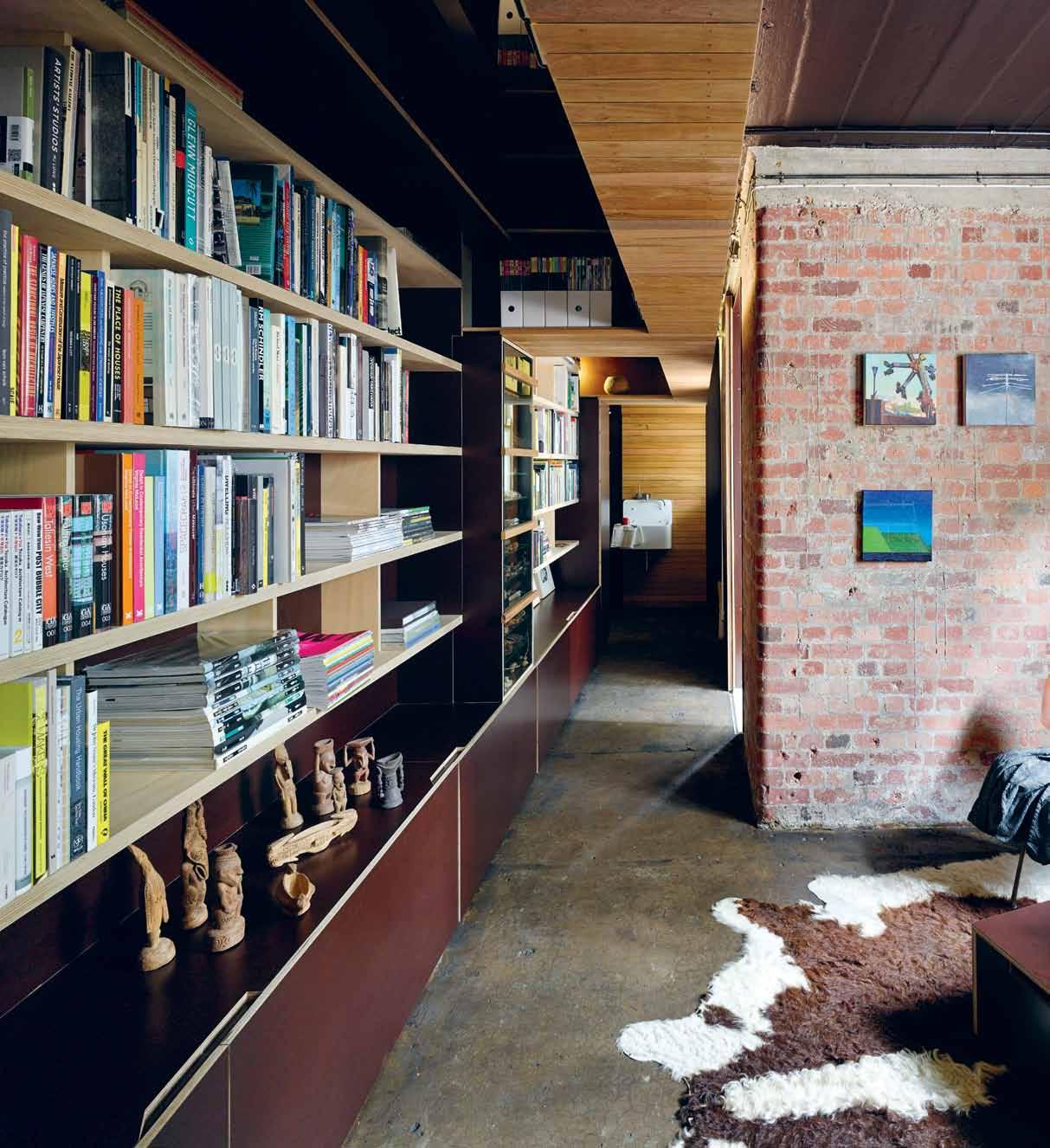
Known as Studio 217, the exquisitely crafted 32-square-metre studio is tucked underneath heritage-listed Craigston on Wickham Street. Built in 1927, the building was the first residential ‘high-rise’ build in Brisbane. While its history plays a significant part in the studio’s beauty, its uniqueness comes both from its size – the space is no bigger than a double garage –and also its inventive detailing. It is because of this, Amalie Wright and Richard Buchanan’s Studio 217 won the Hayes & Scott Award for Small Project Architecture at the Queensland Architecture Awards in 2014.
The studio project was first instigated when Amalie and Richard’s impedimenta and accoutrements started to crowd their house. “Our studio was taking over our whole one-bedroom flat. We didn’t have any room for our library of books, we had a piano from Richard’s mum we needed to fit somewhere, we didn’t have any guest accommodation – we had a lot of stuff that we needed to accommodate,” recalls Amalie, “we wanted
to move all of that out of our house and into a dedicated studio space.”
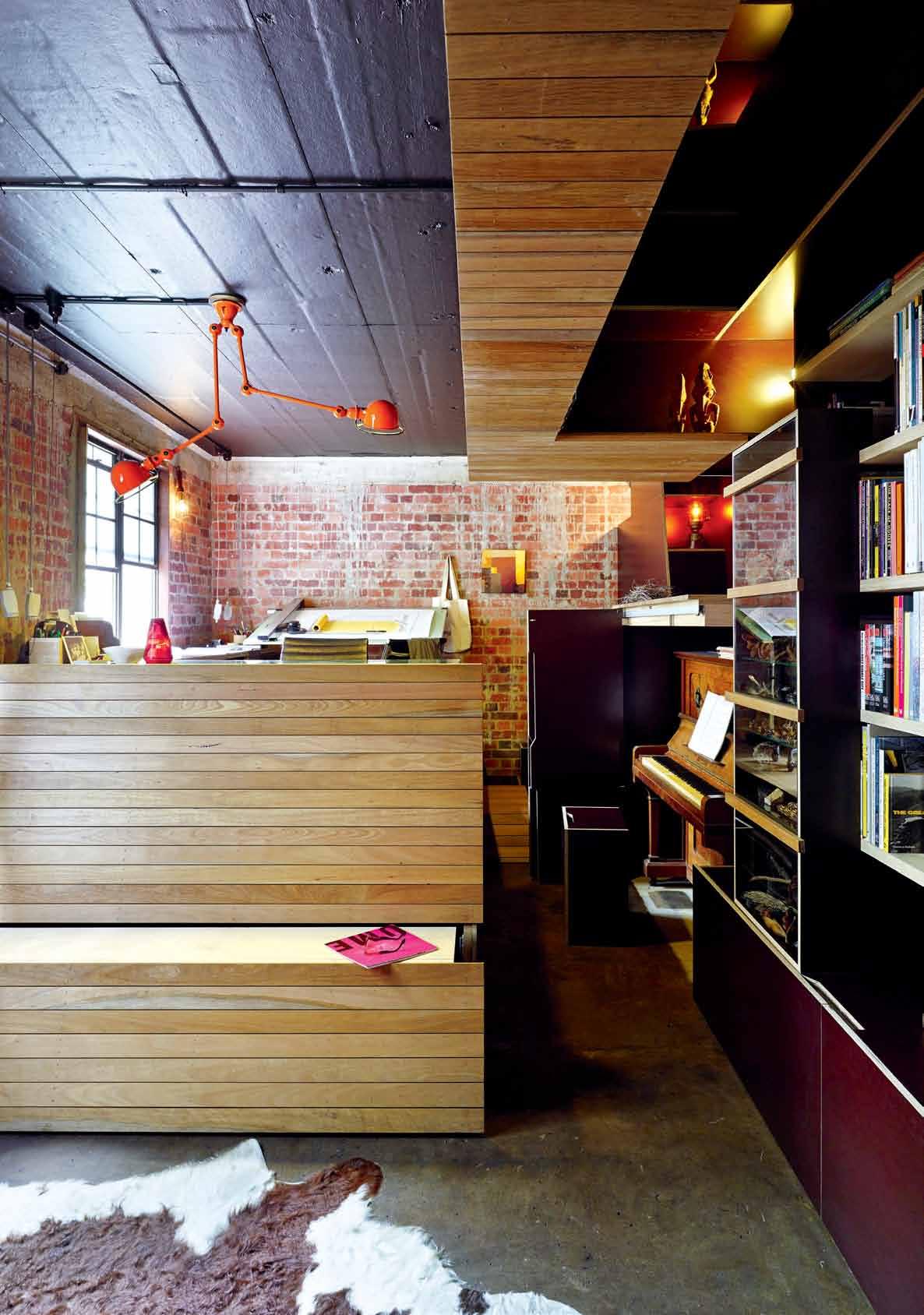
Studio 217’s design effectively marries materiality and historical significance, and every minute detail is carefully considered. Like a jigsaw puzzle, the petite studio has been cleverly designed to maximise all available space and fully customised according to its intended use, which falls into three categories: sleep, design and play. Sleep mode features a double-size bed for guest accommodation that slides out from beneath a wooden-clad desk, and also includes hidden built-in storage for linen and pillows. Design mode allows Amalie to sit comfortably at her desk and work away at her projects, and when she has clients visiting the wooden façade can also be unfolded, locked and transformed into a nifty bench seat. Play mode sees a purpose-built desk at windowsill height transform into a tranquil lightfilled printmaking space, and if Amalie feels so inclined she can play a little music, because when the unassuming joinery folds away it reveals a beautiful old piano, a gift passed on from Richard’s mother. Another excellent detail is a purpose-built wine shelf.
While the space floods with natural light during the morning, the studio is partly subterranean, providing the cavernous space with a well balanced mix of light and dark. This however, presented a lot of design challenges. Due to its unique basement location it often


2 . portrait # 57
PREVIOUS | Landscape architect, ama Lie Wright in her s pring h i LL studio. A b OVE | oLd pL asterboard Was removed from the brick Wa LLs and c Leaned using a gentLe soda b L asting method, resu Lting in minima L damage to the originaL brick Work.
suffers from the wet, including building runoff and occasional flooding during heavy rains. This drove many of Amalie and Richard’s choice of materials and colour.
“Because one end is underground there’s a bit of damp in the brickwork. To minimise the impact of potential water ingress we decided to use pre-finished formply because it’s quite durable and used to being applied against concrete,” says Amalie, “Because it’s partly subterranean we wanted it to feel like you were in a cave underground, so we chose to use dark materials and colours. The low lighting is also designed to leak out from cracks and crevices to keep with the underground feel.”
Amalie and Richard removed the plasterboard from the wall linings to reveal the concrete slabs and columns, and then had the bricks cleaned by soda blasting – a less abrasive method chosen instead of sandblasting because of its minimal impact to the surface of the brick. These original building elements were part of Craigston’s pioneering construction and reportedly one of the first uses of reinforced concrete in Brisbane. The columns that hold up the building have been carefully integrated into the design, which remain hidden within the joinery.
“The columns were one of the reasons why the building was heritage listed. Craigston was one of the first buildings to have concrete frames. It was quite innovative at the time,” she says, “Atkinson and Conrad (now Conrad Gargett Riddel) were the building’s architects,
...we wanted it to feel like you were in a cave underground...
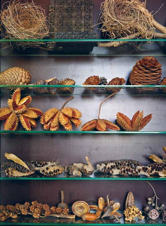
above | AmA lie’s collection of seed pods, birds’ nests And precious finds. opposite | the white m A hogA ny fAçA de of Am A lie’s desk hides two purposeful objects: A se At for visitors A nd A bed for overnighters. issue #31 habitusliving.com
Am A lie | Architect & r esident
2 . portrait # 59




*NEWLY OPENED* VICTORIA Selection Gallery 335 Ferrars St Albert Park Ph: 03 8696 4000 NEW SOUTH WALES Selection Gallery 1E Danks St Waterloo Ph: 02 8572 8500 QUEENSLAND Selection Gallery 94 Petrie Tce Brisbane Ph: 07 3369 4777 *OPENING SOON* WESTERN AUSTRALIA Selection Gallery 12 Sundercombe St Osborne Park Ph: 08 9446 8255 FEEL AD
and it was created during the same period as the nurse’s quarters at the Royal Brisbane and Women’s Hospital when Walter Taylor was the engineer. We have his lovely signature on the tender drawings, which is really nice.”


The underlying geology of Spring Hill also influenced some of the studio’s design elements, in particular the layered, tilted rock strata.


“You can see at Roma Street Parklands and at the bottom of Turbot Street a cut in the earth revealing the layers of stone that are tilted,” she says, “We wanted to reflect that in the design, so that’s what’s driven the horizontal banding and the sloping tilts incorporated throughout.”

Amalie’s workspace was a critical aspect of the design, and needed to capture as much light as possible to accommodate her antique desk, drawing board and printmaking. The fi nal design sees an elevated platform built to the height of the window sills, enabling Amalie to take full advantage of the natural light for detailed work and also provide space for the slide-out bench seat and bed stored beneath. This platform is made completely of recycled white mahogany boards that are also used a feature on the underside of the partly-lowered ceiling, highlighting the weight of the eight storeys above.

“We researched the types of timber that were endemic to this region and particularly Spring Hill through the Queensland Herbarium, and found that white mahogany was one on the list. It’s pretty strong and it doesn’t dint,” explains Amalie, “We had it milled down into two widths. There’s a wide one, and a narrow one. While there are two di erent sizes they match the floorboards up in the flats. We don’t have any treatments on the timber, it’s all natural, including the plywood.”


While it is primarily a space for Amalie’s work, the studio also contains a magnificent library, which is fi lled with Amalie and Richard’s extensive collection of architecture and design literature. Between the shelves of neatly organised books are two glass cabinets fi lled with precious objects. Drawn to pattern, detail and natural beauty, Amalie is an avid


ABOVE | AMALIE WORKING AT HER DRAFTING DESK. BELOW | THE ELEVATED DESK CAPTURES MUCH-NEEDED NATURAL LIGHT FROM THE WINDOWS.
2 . portrait # 61
collector of all manner of nature’s curiosities, from seed pods and shells to bird nests and pieces of bark. Her most prized possession at the moment is a recent find, a round-ended blue glass bottle.
“After all of the storms during summer, the soil in the car park across the road had been gouged out and I found the round tip sticking out. So one evening on my walk home curiosity got the better of me and I dug it out and cleaned it up,” Amalie recalls, “it’s called a torpedo bottle because the round end was designed to prevent it from being stood up. The bottles held gaseous liquids like soda water, so the idea was that you had to lay it down so that the soda kept in contact with the cork and kept its pressure.”
Her confidence to chase her dreams is what propels Amalie forward, and she revels in her ability to achieve positive change through great design and help passionate and curious people create beautiful and resilient landscapes.
“The interesting thing is that going out on your own actually opens you up to a whole group of people that you wouldn’t usually get to collaborate with. You meet this whole other network of people who are doing smaller and interesting things, and you can get to team up with different people on different projects rather than sticking with the party line. I’m really enjoying it.” Landscapology
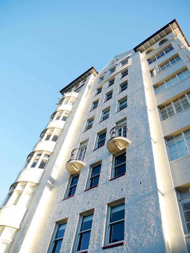
| landscapology.com.au This story was originally published on Designonline.org.au © State Library Queensland (2015) licensed under Creative Commons Attribution 3.0 Australia A bove | The façade of heriTage-lisTed CraigsTon, The firsT residenTial high rise build in b risbane, ereCTed in 1927. issue #31 habitusliving.com

KEN DONE 1-5 Hickson Road, The Rocks, Sydney, tel 02 8274 4599, www.kendone.com Christmas tree reef II, 2014, oil on linen, 183 x 152cm


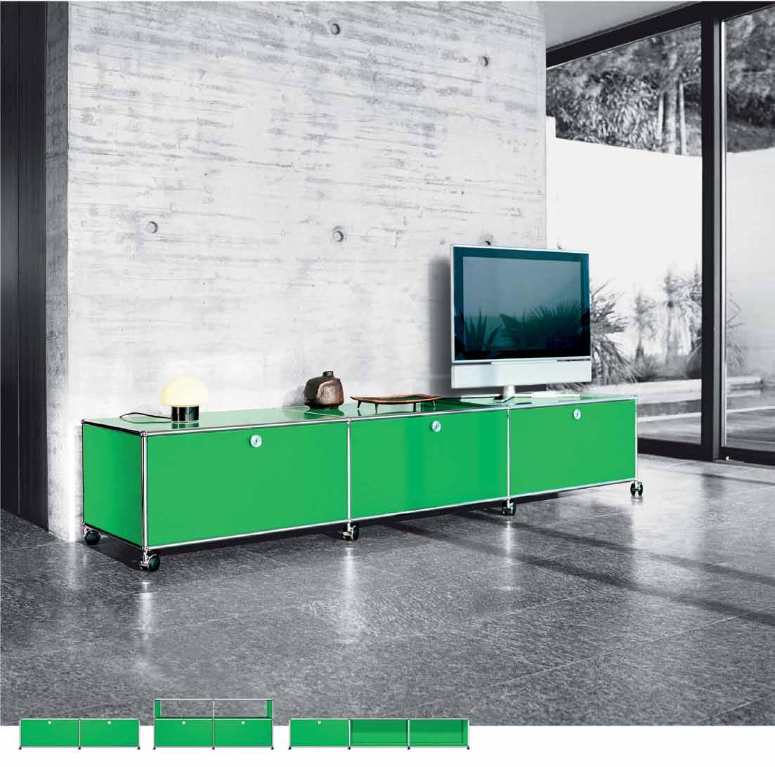
Elegant, flexible and timeless USM is architecturally designed to suit your every need
detailed information or visit our showrooms Select USM Haller pieces available for Quick Ship delivery
02 9380 7922, 17 Thurlow Street, Redfern
03 9821 5300, 99 Commercial Road, South Yarra
07 3100 8842, 15 James Street, Fortitude Valley
03 9821 5300 Hobart: 03 9821 5300 USM U. Schärer Söhne AG, Switzerland, info.au@usm.com - www.usm.com www.ecc.com.au
Request
Sydney:
Melbourne:
Brisbane:
Adelaide:
Everyday design
Alessi – the kitchen utsensil and accessories brand that can be found in almost every home. Managing Director Alberto Alessi chats to stephen todd about the extended ‘family’ of global designers… and that dysfunctional lemon squeezer.
Tex T STephen Todd | phoTography variouS
# 65 2 . portrait
Some years ago, one of Sydney’s most acclaimed food establishments instituted a bag check protocol almost as strident as airport security. A temple of postmodern chic, along with its purpose built fittings and furniture by Melbourne’s D4 Design, the restaurant in question had made a lavish investment in Michael Graves’ Blue series of pepper mills, milk jugs and sugar bowls.
Problem was, no small number of these were finding their way into the handbags of the well-heeled clientele. Such was the allure of the Alessi table accessories, that the restaurant’s patrons were quite literally bewitched.
We’ve all fallen irresistibly in love with an Alessi product at one time or another. Sometimes, several at once. Me, I’ve cracked a bottle or two with Alessandro Mendini’s Anna G, her flirty fluted skirt and mechanical breasts impossible to resist. I’ve also dallied in bed with Joe Colombo’s Optic 02, and often fondled Guido Venturini’s Firebird. But, at the end of the day, my heart belongs to Richard Sapper’s Bollitore; the bulbous volume of the vessel itself, the frilled metal of the handle, the turgid mechanics of the trigger mechanism. It’s an endless love.
The genius of Alessi is that it brings some of the world’s most globally influential designers within easy reach of mere mortals. Not just industrially available, through its own brand stores and franchisees around the world, but available in the sense of approachable, demystified, even witty. With an expansive catalogue of objects and an elite squad of more than 300 designers, Alessi is like a big, quirky extended family of distant relatives whose ferocious independence of spirit is tempered by shared character traits.

PREVIOUS | Alberto A lessi At his fA rm in pr Atolungo. photogr A
s
CA
ab OVE |
CC
A
r
A
n
lisA vin C itorio,
of only six Austr A liA n designers in the A lessi
b
| A
C
C
A
A
C
phy by
imone
settA
zu
h gl
ss sugA
sprinkler by Austr
liA
designer
one
fA mily.
ElOw
nnA g
orks
rew by AlessA ndro mendini. OPPOSItE | trinity bowl by Austr
liA n designer
dA m
ornish.
issue #31 habitusliving.com
2 . portrait # 67
751 HIGH ST, ARMADALE, VIC: 03 9818 1403 • 170 QUEEN ST, WOOLLAHRA, NSW: 02 9362 4736 • www.englishtapware.com.au FREECALL AUSTRALIA WIDE: 1300 01 61 81 • AUCKLAND, NZ: In Residence • 09 309 3023 • www.inres.co.nz Fittings of Distinction Made in e ngland
The Alessi dynasty was founded in 1921 when Giovanni Alessi, a skilled lathe turner, set up an engineering factory to make tableware, in Omegna on the Italian border with Switzerland. Finely-crafted, the early Alessi products were inspired by Arts & Crafts precepts, objets of pronounced personality and great beauty in the face of anomic, anonymous industrialisation. The technique Alessi privileged was spun metal, fine workings of copper, brass, nickel and silver. By the time Giovanni’s eldest son, Carlo joined the company in 1932, Alessi was already a force to be reckoned with.
Like many first sons who take over the paternal business, Carlo had a vision. That vision was to make of Alessi not just a fine manufacturer of beautifully crafted objects for the home, but to evolve Alessi into a small modern army, a crack corp of the finest industrial designers alive. For the first years of his reign, Carlo followed in his father’s tracks, designing some very lovely work in-house. But then, in the late 1940s he made a decision that would change Alessi – and design –forever: he opened the Alessi factory to outside designers. In the process, he also updated the technology: Alessi would no longer be about spun metal, it would be a showcase for the latest technology: cold metal pressing, particularly aluminium. As Carlo Mazzeri, one of the early

above | OCTAVE CENTREPIECE BY ABI ALICE.
2 . portrait # 69
I’m not at all against the functional sides of products, but there is always a fight between function and emotion.
issue #31 habitusliving.com
Alessi designers, put it: “Alessi gave us the freedom to create what we wanted, without worrying about the constraints of industrial production. The factory would take care of the technology later.”
Carlo’s son, Alberto took his father’s vision and ran with it, championing Alessi as a driving force in Italian culture, and the factory in Omega as the laboratory for a new way of thinking about design. When asked if he had always planned to join the family business, Alberto responds, “‘Plan is not the correct word,” an oblique smile on his face. “I am the first son of the first generation of the family, so my destiny was clear since the beginning.” What was his grandfather, Giovanni like? “Very critical. He was frequently telling me, ‘You should have been a notary, someone who doesn’t really work, just takes notes of events.’ My grandfather was a practical man, he was a producer.”
Alberto Alessi strikes as me more of a dreamer, perhaps a poet. It’s something to do with that enigmatic smile he deploys, a manner which indicate he’s seeing a grander vision. Describing the process whereby he (and, if pushed, he’ll admit, “some help” from the marketing team) evaluates the potential of a prototype, he describes four attributes that are systematically taken into consideration: The first, he calls ‘SMI’ for Sensory, Memory, Imaginary, the “Oh what a beautiful
object” effect, he explains. The second, Communications and Language, “measures the characteristic of an object to be used as a tool to communicate something to other people. Fashion is very much in this parameter.” Third, Function. Fourth, Price. By the abbreviated commentary on the last two, I assume their role to be minor the selection process? “Very much so. I’m not at all against functional sides of products, but there is always a fight between function and emotion. And usually the best designers operate in the realm of emotion, not of function. You cannot imagine how big our efforts to try to convince a good designer of the importance of function. They just don’t care.” Ah, I did spot a poet – and a romantic one at that. “But, it is like that,” Alberto shrugs. If you want to work with a great designer you have to expect a big poet. I won’t say it’s not important but the less important side for them is the function.”
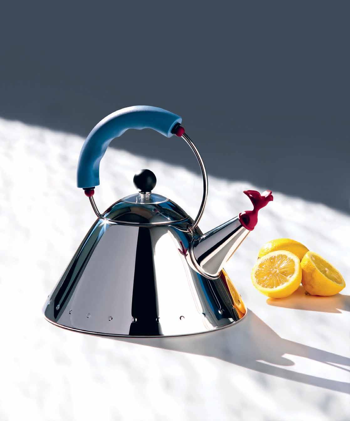
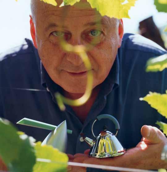
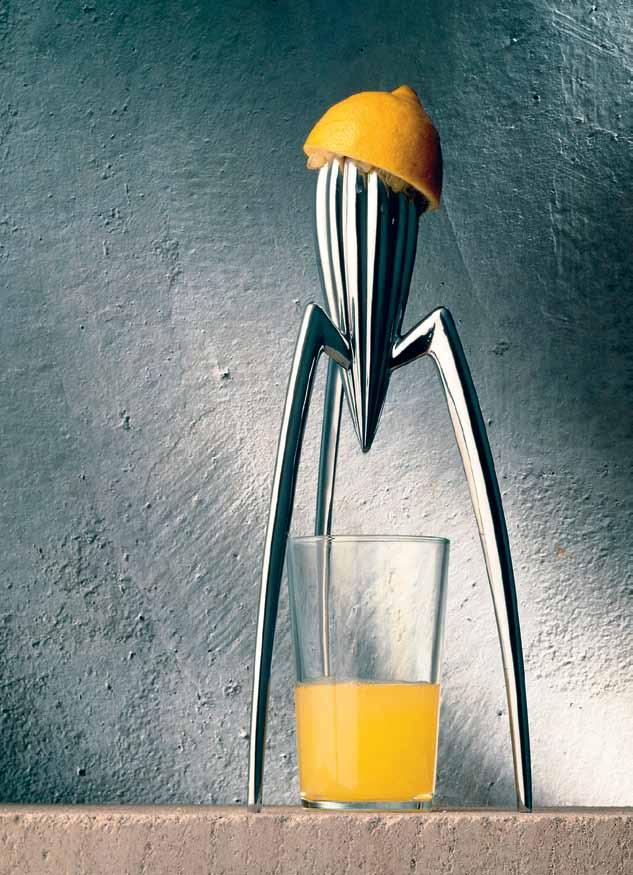
Poor functionality is a charge often levelled at Alessi. Philip Starck’s notorious citrus press that scatters pips across the kitchen bench. Michael Graves’ kettle with the bird
LeFT | bird whistle kettle
aBOV e | a lbertO alessi
by Michael graves.
2 . portrait # 71
whistle that breathes steam over your fingers. Richard Sapper’s espresso maker with the heat conductive metal handle. Frank Gehry’s kettle with the whale-shaped wooden handle – which incinerates over the flame of a gas hob. Mine is doing time as watering can as we speak. “But we can change it!” Alberto laughs. But he has no intention of changing anything. Objects, for Alberto Alessi, are not about anything as banal as boiling water, or making coffee or serving up food. The infamous Philippe Starck juicer, Alberto tells me, was the result of a commission by him – “for a tray! Thank god we got a juicer!” True, the Salif citrus presser sold 100,000 units per year for the first few years, decreasing only slightly as it also became known that one of the tripod legs breaks. Michael Graves’ Kettle Blue also sold around 100,000/year and remains Alessi’s hands-down best seller to date.
“I know very well my customer,” he says, that oblique smile again. “I consider myself the right example of the Alessi customer. It’s the only way I have to understand my market. As for the selection process, I do something because it feels right to me.” If he knows his market – and himself – so well, has Alberto ever designed an object for Alessi? “Ah,” enigmatic smile. “That would take daring, wouldn’t it? I have working for me some of the most visionary designers in the world. No. I’ve designed nothing.” Nothing? “Oh, one thing. I designed the bottle for the wine I produce from the vineyards at Omegna. But even this I stole from a detail in a sketch by Leonardo da Vinci.” Smiles.

ABOVE TOp
|
scoop egg cup by helen kontouris. ABOVE | juicy salif citrus squeezer by philippe starck.
issue #31 habitusliving.com
Alessi | alessi.com




SUNBRELLA ® IS A REGISTERED TRADEMARK OF GLEN RAVEN, INC.
Open for design
Reissi Mall believe in authentic, high-quality, beautiful Italian design. They believe we should express ourselves through our surroundings, and surrounding ourselves with products that make us happy. Most importantly, Reissi Mall believe that everyone has the right to do so, and that beautifully designed products should also be affordable.
Over six years, Reissi Mall have built a network of designers and manufacturers in Italy, curated a selection of over 10,000 products, and developed a logistics and supply network that brings every order from Italy to your home, quality controlled, and fully customised to your exact specifications. Amazingly, the Reissi Mall business model allows them to offer this to you at ultra-affordable prices.
The proprietary Reissi Home brand has been carefully developed with Reissi Mall’s network of expert Italian
craftsmen, offering an extensive range of high-quality products that exude a sense of elegance and luxury. The brand showcases items that fuse together elements of creativity, innovation and function, at an affordable price point for the discerning Australian consumer. Alongside this, Reissi Mall is the exclusive distributor of numerous iconic Italian brands, including DFN, Chelini, Samuele Mazza and Borzalino.
CEO Mark Reissi says, “Italy has always been a country of design flair and originality. It has high quality manufacturers, and following the financial crisis relatively low cost.”
Powered by a highly sophisticated logistics and quality control system, all Reissi Mall orders are conveniently delivered to customers’ doorstep for them to start enjoying the Reissi Mall experience immediately, with two-year warranty and 14-day returns policy.
habitus promotion › Reissi Mall #74 issue #31 habitusliving.com
Above | A living concept by chelini, from reissi empire. Reissi Mall | (612) 9598 8100 reissimall.com
Reissi Mall’s exclusive range of Italian designed and manufactured furniture and lifestyle products offers a world of new possibilities to designers and consumers alike.
Less is more
The environment, our bank balances and our emotions are just a few of the things that suffer when we surround ourselves with piles of meaningless belongings. This leaves us feeling – somewhat ironically – empty. It ’s not about rejecting life and going to live in a cave. Instead, by deeply considering our living environments and the items we choose to put inside them, we can create a richer sense of engagement. By editing our lives, and our home spaces, we make them better. It ’s a simple suggestion: to subtract instead of adding and see what the extra time and space provides.
Come on a journey with us as we examine how living with less can give us more – more quality, more meaning and more engagement. A small space, luxuriously finished and cleverly detailed, the expressive power of a single piece of furniture, the simplicity of an artful life. Move into a subtler experience with a minimal approach to living.
For more on Minimal living, visit habitusliving.com/issue31/minimal
# 75
We are starting to realise the myriad problems with having too much ‘stuff ’ .
New Minimalism
MiniM al doesn’t necessarily mean less – or denigrating the idea of more. Here, as DaviD Harrison suggests, it is simply asking us to live a life with more quality.

Tex T DaviD Harrison | pHoTograpH Y various
habitus #31
The word ‘Minimalism’ conjures up glass and chrome architecture and uncomfortable but chic furniture from the 1990s. While it is fair to say that much of what was once called ‘minimalist’ was an example of ‘less is less’, there were protagonists of this genre who understood that you could provide less while delivering a quality of existence that offered a whole lot more. I’m speaking of course of architects such as John Pawson and designers like Jasper Morrison. They managed to walk that tightrope between minimal and unliveable because they appreciated the importance of materials and proportion in raising the human spirit. If you are going to offer less it better be nigh-on perfect – and in their hands, it was.

Fast forward 25 years and there looks like a resurgence of interest in minimalism, spurred by a desire for well-being rather than the stock market and ego-driven aesthetic depicted in films of the 90s, where success always seemed to be defined by a glass office with black and leather furniture. In the same way that the trend for Nouvelle Cuisine which, in the hands of chefs such as Michel Guerard was an art-form, became a convenient excuse for tiny, unsatisfying servings in the hands of others, the 90s version of minimalism in design and architecture was an ideal that only delivered when executed and maintained to perfection.

# 77 minimal
habitus #31
Blogs such as The Minimalists and The Tiny Life have raised awareness of the benefits of downsizing and simplicity – not only in relation to housing but in life in general – including the relief of debt related stress and the reduction in consumerism. Joshua Fields Millburn and Ryan Nicodemus, the founders of The Minimalists blog, are soon to release a film called Minimalism: A Documentary About the Important Things, in response to the overwhelming support of their four million followers, achieved after just five years. The Tiny House movement have their own unofficial documentary in the form of Small Is Beautiful by Australian photographer turned film-maker Jeremy Beasley. This new found interest in the ability to limit your ecological footprint by living in smaller houses and buying less stuff may be too extreme for many, however it does raise the question of whether it isn’t about time we all stopped following the establishment model and started thinking about the final outcome – quality of life. A growing number of people are rejecting mass production, low engagement interiors in preference for the bespoke, the handmade and the tactile. They want simplicity combined with warmth and individuality. They want more affordable housing but without sacrificing all vestiges of quality to get it.
While it is drawing a long bow to compare the quasigypsy abodes of the Tiny House movement to the exquisite proportions of Pawson and Morrison, if you were to put them in a room together they would have a number of attitudes in common. The need for better designed smaller spaces would be high on the list, as would simplicity and the use of honest, environmentally sustainable materials. In fact, Morrison was recently commissioned along with Naoto Fukasawa and Konstantin Grcic, to design small weekender-style houses for the Japanese homewares and fashion company Muji. The results are suitably Spartan
with the smallest ‘hut’ (by Grcic) having a footprint of just 10 square metres. With their natural material palette and simple refined details however, the structures are delightful examples of just how welcoming and practical a small dwelling can be if the user is prepared to do without some of the luxuries we all now seem to expect. Morrison’s own preference has always been for quiet and simple design whether in architecture, lighting, furniture or objects. Like Fields Millburn and Nicodemus, Morrison sees simplicity not as a style but as a way of looking at things from a different angle. “Simplicity is a state of mind, a philosophy of life and of things. I am not interested in looking for new forms, or forms at all. In fact, if you don’t think that form is important, you can develop a different sensibility which lets you appreciate other qualities of objects. I like ideas like normal, soft, comfortable, easy to use,” he says. This concept of looking beyond the purely visual and embracing character and how well designed objects and spaces improve liveability is at the core of the new approach to Minimalism. Traditional Japanese and Scandinavian aesthetics with their emphasis on careful placement, simplicity of line and honouring of natural materials are very evident in this new form of minimalism, but it goes beyond just a slavish adoption of these cultural styles and adds a sympathetic contemporary ingredient to the mix.
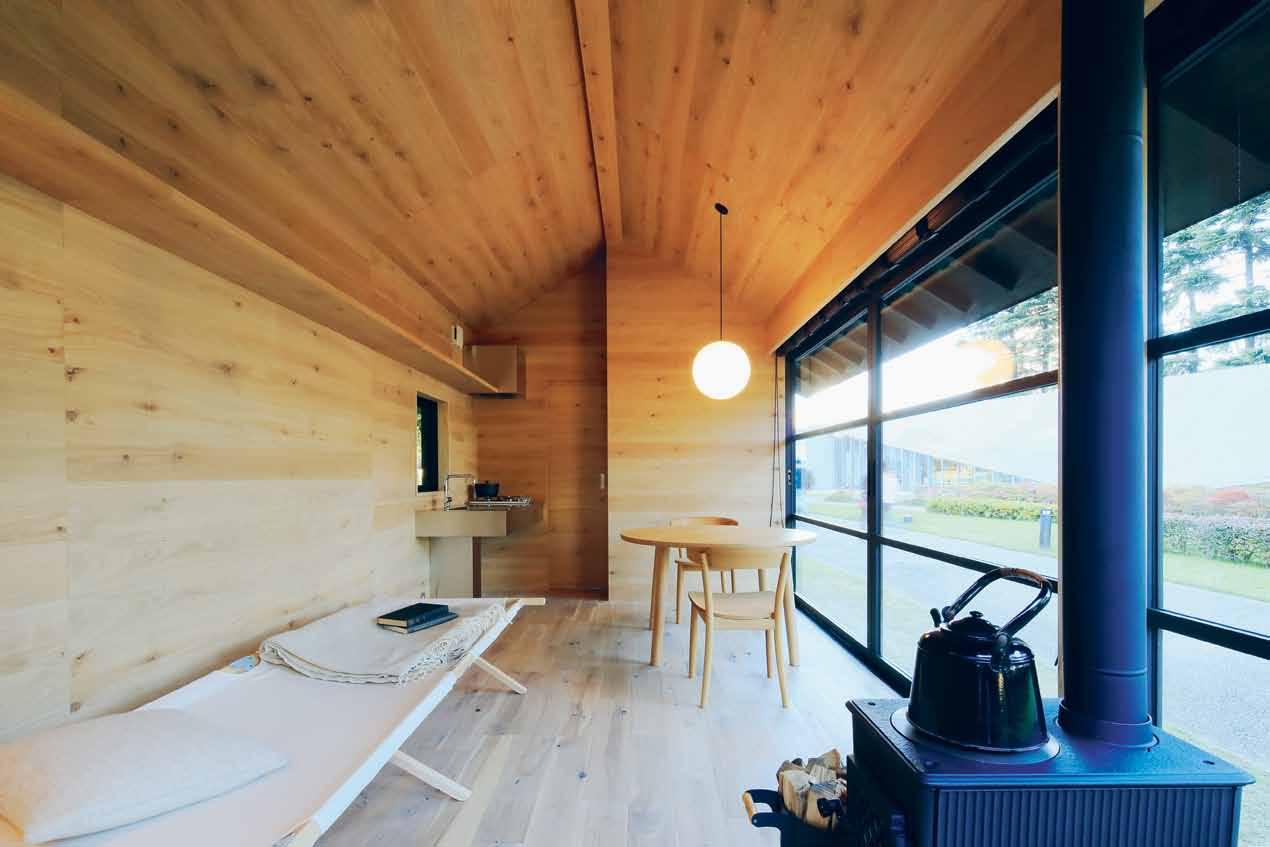
While houses with a reduced footprint may seem unnecessary in Australia given its enormous land size, the lack of affordable housing has become the driving force in the recent surge in interest in smaller houses. On average, Australians are spending 30 per cent of their income on mortgage repayments and this is rapidly eroding the conventional attitude to home ownership.
Smaller is invariably cheaper but these savings can also allow us to ‘splurge’ on materials and workmanship that might have otherwise been considered too expensive
previous
M
|
Singaporean deS igner, Melvin o ng’ S ‘ rok’ paperweight in ca St concrete. n ature add S context to conteM porary deS ign and provideS the perfect partner for new
M
ini M ali SM opposiTe AB ove | naoto fuka Sawa’ S wooden h ut for Muji offer S a
S
oft organic look deS pite itS rigid geo
M
etric
S
hape with wallS , floor and ceiling lined with natural ti M ber plankS opposiTe B eLoW | the archetypal hou S e S hape i S evident in n aoto fuka Sawa’
S
wooden h ut – a pitched corrugated iron roof, ti
ber cladding and a S i M ple rectangular S hape.

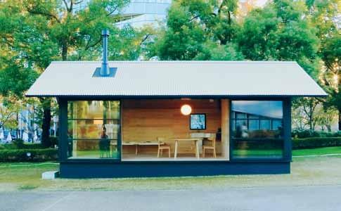
“Simplicity is a state of mind, a philosophy of life and of things.”
# 79 minimal
Ja Sper MorriSon
above | Goulder’s asymmetric ‘ s ettler’s’ loun G e chair uses water-formed leather and a tasmanian blackwood frame to create a warm expression of comfort with minimal bulk. opposite | a plan in section of the a21 h ouse by Vietnamese architect toan nG hiem - the V ertical house sits at the end of a lane in the densely populated b inh thanh district of h o c hi m inh city, featurin G internal G reenery at e V ery le V el.
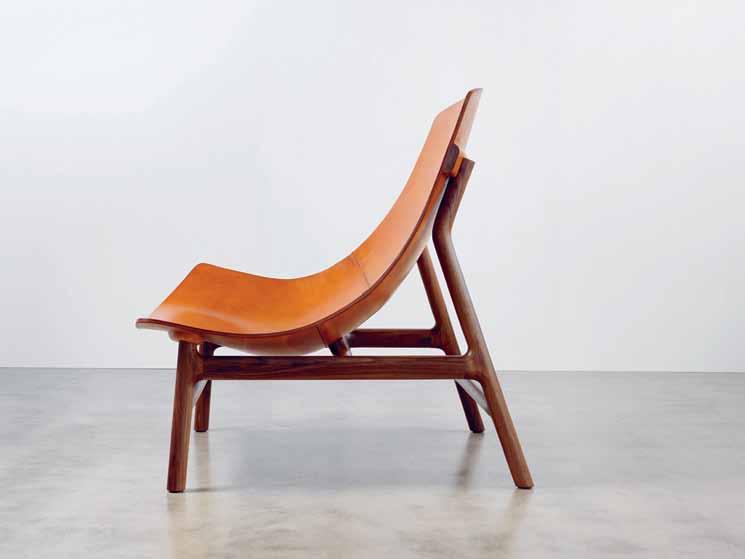
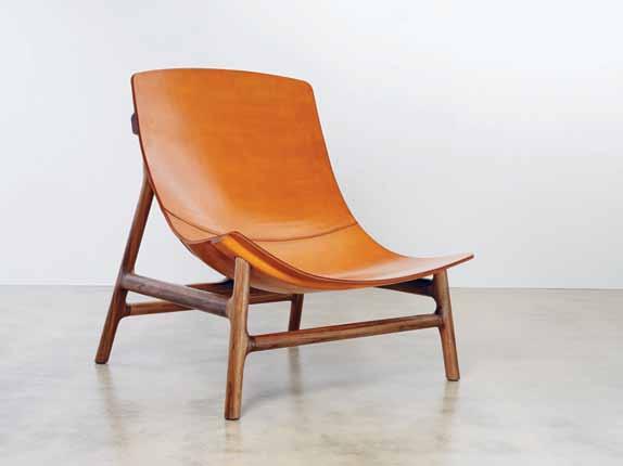
habitus #31
in a larger space. According to Australian designer and maker Jon Goulder, Creative Director of Furniture at Adelaide’s JamFactory, there are signs of a new appreciation of what crafted means. “People are becoming more discerning with their possessions and surroundings. On a private level people are becoming collectors and on a commercial level outsourcing the design and manufacture of specialised parts of larger projects gives them a point of difference.” In August 2015, Goulder was part of a group exhibition of limited edition works by 17 local designers curated by Melbourne designer Dale Hardiman. The importance of 1-OK Club as an event and as an ongoing limited edition platform cannot be underestimated. It is rare in Australia that design moves beyond the confines of small scale and mass production and into the design as art arena that is the remit of international events like Design Miami and Design Days Dubai. Goulder’s reputation for delivering beautiful work by commission has had a flow on effect for his younger associates at the JamFactory as they have in turn been commissioned to create unique pieces under his supervision. This allows designers and makers to experiment with new ideas and advance their practice without having to take on the full financial burden of paying for all of the prototyping. Global design practice Woods Bagot has recently commissioned work by JamFactory associates Stephen Roy, Nicholas Fuller and Rhys Copper on a large project for the Brookfield Multiplex Head Office in Perth, for example. Asked about the project and the state of Australian design in general, Goulder was full of optimism. “Australian design is finally coming of age,” he says, “we have a new-found confidence in what we do and what we can deliver; we are world class.”
Creating more with less is a constant theme across many artistic disciplines, but none perhaps more so than in architecture. The cost of building is now so high that the budget is often blown before interiors are given much attention, let alone furniture and artworks.
The problems of land size and cost of building have long been a major problem for many of Asia’s densely populated cities such as Hong Kong and Tokyo, but it is also an acute problem in smaller cities like Singapore and Bangkok. A21 architects based in Ho Chi Minh city are well versed in providing their clients with well designed homes within very small building envelopes, but they also like to go further, incorporating internal courtyards and gardens – even within projects on very small urban sites. The studio designed their own offices and home for founder Toan Nghiem and his family on just 40 square metres at the end of a lane way in Ho Chi Mihn’s Binh Thahn district. Divided over three floors and a rooftop terrace,
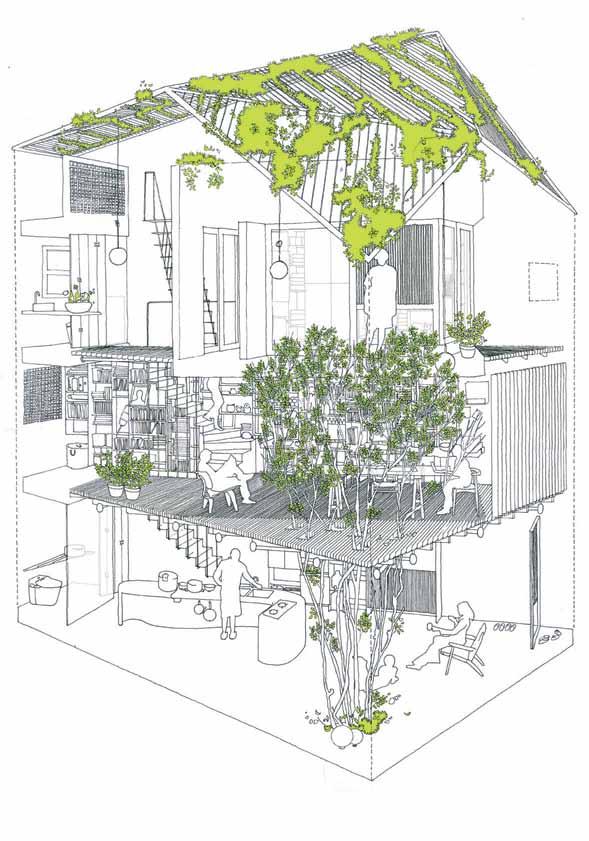
“People are becoming more discerning with their possessions and surroundings.”
# 81 minimal
Jon Goulder
the house was designed around a star fruit tree that brings nature and greenery into the three levels through a triangular void. “Instead of thinking of environmentally sustainable or eco-architecture, I imagined a wild cage capturing nature in which sunlight, wind, rainwater and trees define human activities and become the inspiration for the house”, explains Toan Nghiem. The house combines simple local bricks painted white with a series of slatted timber floors and screens to allow a greater amount of airflow and light to permeate the structure. The resulting layered effect provides the minimal vertical structure with an earthiness that is a far cry from the shiny tiled surfaces that dominate modern Vietnamese architecture.
Back in Australia where the use of timber has been a defining element in much of our domestic architecture for decades, timber is being used both externally and internally for a similar sense of connection to place and past. The variable tonal and textural qualities and ageing ability of wood adds warmth and richness to spaces that have their roots in a form of organic minimalism. Sydney firm Chenchow Little have designed numerous buildings that reinvent the tight, uninviting spaces commonly found in many terrace and apartment environments. Their recent Darling Point project, while larger in scope than the average apartment, was a massive reduction in space for the client who was downsizing from a large house. The brief centered on creating a feeling of expansiveness through the clever use of the available space and with the incorporation of plenty of storage. A refined scheme for housing and displaying the owner’s extensive art collection was also required. The result is akin to a beautifully restrained timber-lined jewel box. “Clients are becoming more interested in the quality of detailing, materials and tailor-made responses to their particular requirements. Clients are recognising that it is the quality of the space that is important to their everyday life and sense of wellbeing, rather than the number of spare bedrooms”, says Stephanie Little, principal and cofounder of Chenchow Little Architects.
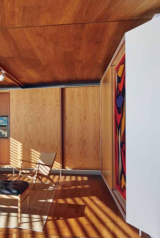
Certain fashion labels are also channelling the minimal but heartfelt aspect and producing simple garments in beautiful, environmentally sustainable fabrics that emphasise shape and texture rather than following the disposable fashion cycle. Australian designer Lee Mathews has always had her finger on this particular pulse and she is ever refining her aesthetic toward this combination of simplicity, shape and quality. “My approach to design has changed over time – where once I wanted everything added to one piece, I now want less. Less layers, less volume, a simpler view of things. It forces you to use better materials, and refine shapes because they need to stand alone,” says Mathews. The label, started in 2000, has always looked to handmade elements to provide a special connection between the garment and the user. Despite having grown from a single store in Paddington to a thriving business with six stores across Sydney, Melbourne, and Brisbane, the handmade component and the embracing of purposeful irregularity remain a key part of the label’s overall aesthetic.
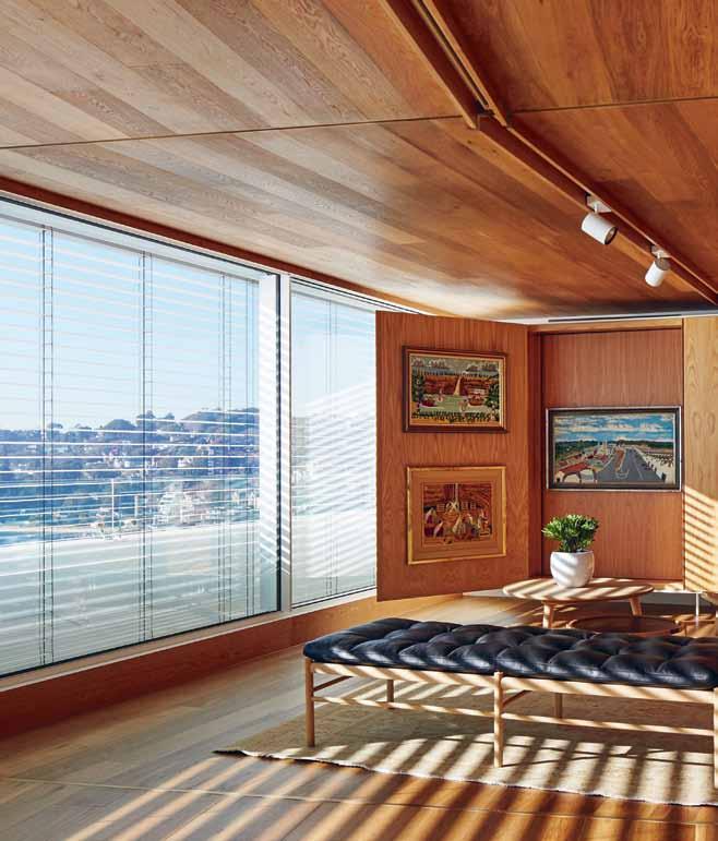
habitus #31


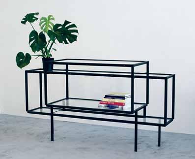
C
C
em
on si Lhouette.
| the ‘ tang LeD ’ Cabinet
DutC h D
w i LC ke
a PL ay on s Patia L D ePth, voi D s an D Lines in steeL an D
L ass.
above left | Chen C how LittLe’s DarLing Point aPartment features a C om PLete reworking of a 70s high rise aPartment bui LD ing to C reate a warm s PaC e with fo LD ing waLLs to D is PL ay the owner’s L arge art C o LLeCtion. above right | Lee m athews’ sPring / s ummer 2016
o LLeCtion - s im PLe tai Loring, quaLity fabri
with an
Phasis
below
by
esigner Caro Lina
is
g
“...sunlight, wind, rainwater and trees define human activities and become the inspiration for the house.”
# 83 minimal
Toan nghiem
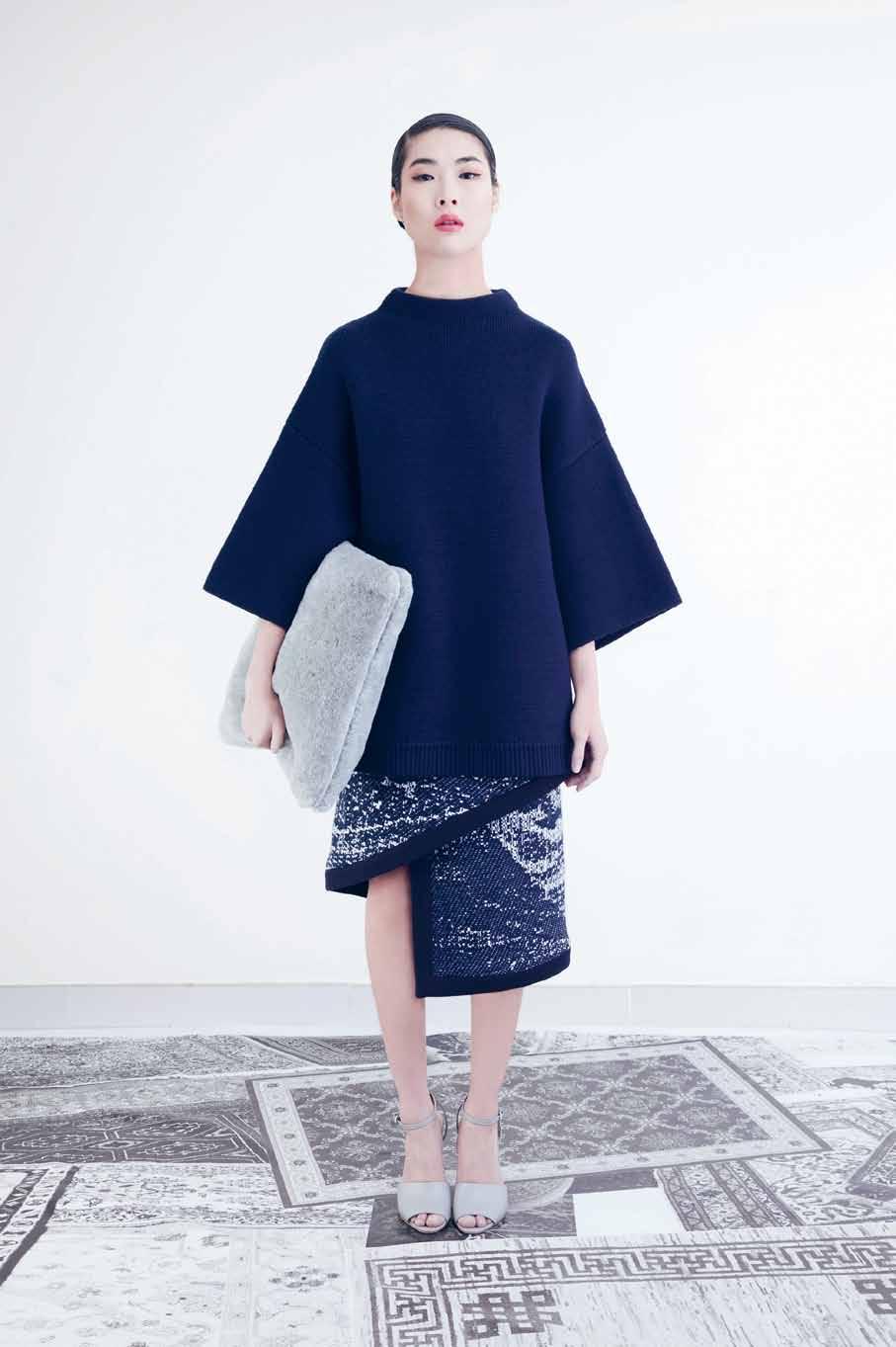
“The point is to make clothing and objects that adapt, respond to, and inspire the changing conditions of contemporary living.”
above | From the FW14 collection by Shenzhen ba S ed Fa S hion label FFiXXed Studio S i S the ‘ dW elling S SW eater, ‘ rug’ S kirt and ‘ m erino Fur’ cu S hion. opposite | the ‘ yard’ daybed by FranceS co rota F or lema reFerenceS architectural Structure combined W ith upholStery that evokeS S o F tneSS , longevity and craF t. habitus #31
Lee MaThews
China-based Australian designers Kain Picken and Fiona Lau of fashion label ffixxed have lived and worked in Berlin, New York and Melbourne but currently work out of their studio in the city of Shenzhen. Their label, founded in 2008, delivers what they term as “transfunctionality for everyday basics”. Put in more straightforward language, this means simple garments that can be worn in a multitude of ways. According to Picken, “The point is to make clothing and objects that adapt, respond to, and inspire the changing conditions of contemporary living. Our aesthetic could be characterised by a re-imagining of our different contexts, somewhere between a small village in China where our studio is based and more cosmopolitan centres such as Paris and New York, and also through the use of reduction and contemporary cutting.”
It is this flexible approach to design with no mantra or agenda that seems to be at the heart of a new approach to minimalist principles. Unlike some examples in the past, when groups of designers or artists came together to establish a doctrine to which they would all conform (at least for a while), modern minimalism is more of a loose state of being. Reduction, to create a simpler, richer life is ever present, but real user engagement with what we own and the spaces we live in takes on equal importance. Far from being the futuristic ideal of shard-like glass towers and virtual reality wallpaper, people are embracing a tactile, natural connection where accomplished craft, good design and beautiful materials are very much in evidence.
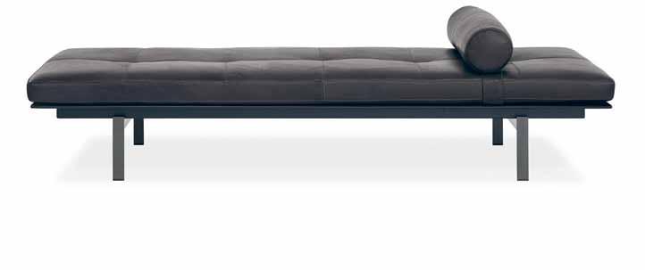
A21 a21studio.com.vn

Chenchow Little chenchowlittle.com
ffiXXed Studios ffixxedstudios.com
Lee Mathews leemathews.com.au
The Minimalists theminimalists.com
Tiny House thetinylife.com facebook.com/TinyHousesAustralia
# 85 minimal
Facebook /indesigntheevent

Instagram @indesigntheevent
Twitter @indesign_event
melbourneindesign.com.au

Strategic Partners
Uncover #MID16
A city-wide Aladdin’s cave for Design Hunters. Take your pick of the design jewels to be found, meet the makers & hear from the design professionals that are shaping the way we live.
Pocket gem
Sometimes, an architect needs to be as precise as a surgeon. brad Swartz demonstrates how, in this beautifully resolved 27-square-metre apartment.
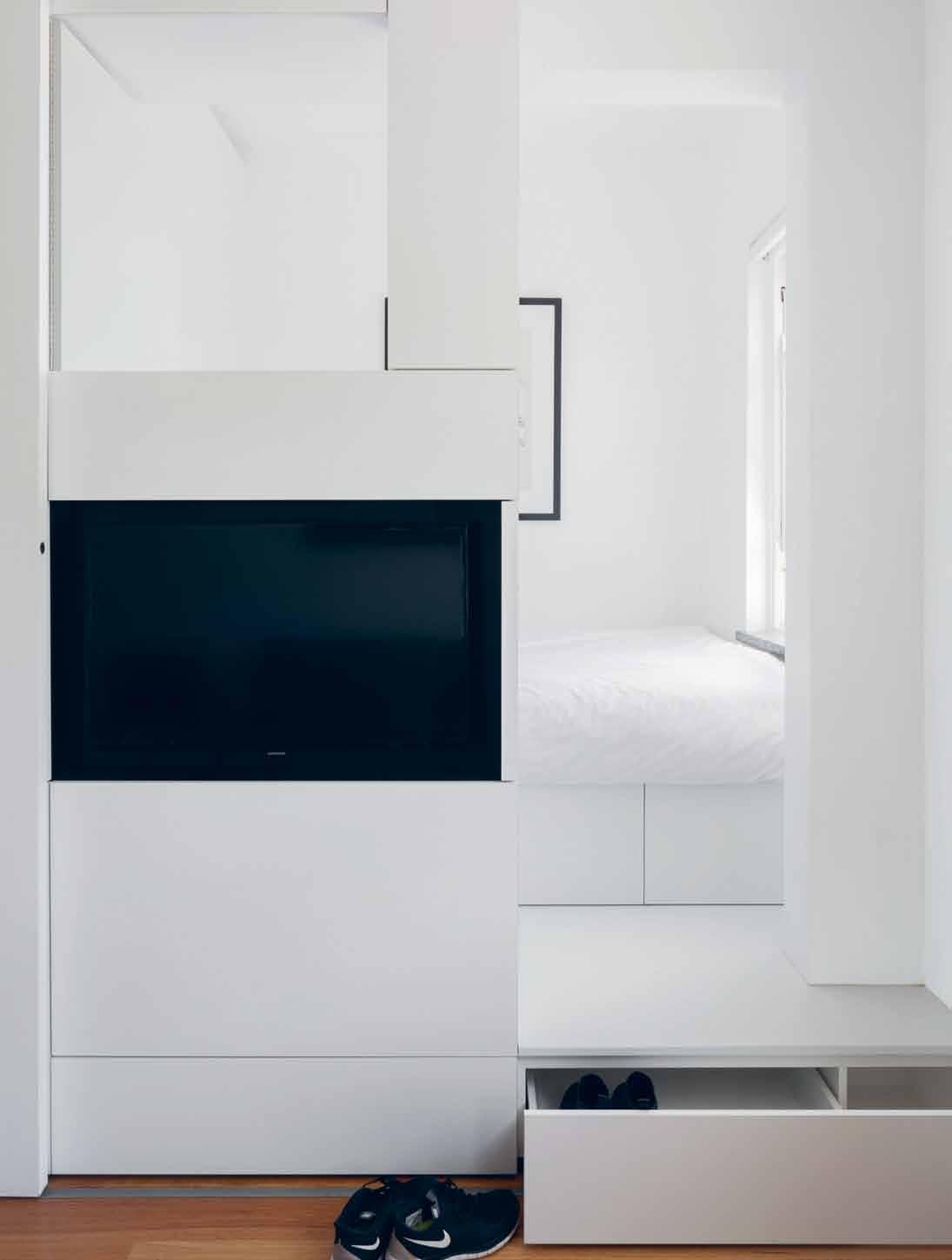
photographY katherine lu
# 87 minimal
—

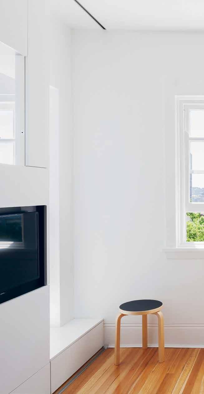

previous | A step into the bedroom distinguishes the spAce from the living Are A conce A ling A shoe dr Awer A nd becoming A se At when necessA ry. left | i n the corridor of the ApA rtment block, the existing A rchitr Aves Are reminiscent of the pre-renovAtion ApA rtment. right | the A pA rtment wA s designed to m A ximize nAtur A l light. o n the left of the imAge you cA n see the joinery unit opening up to A llow light from the bedroom A re A to flood into the living room.
#31
habitus


# 89 minimal
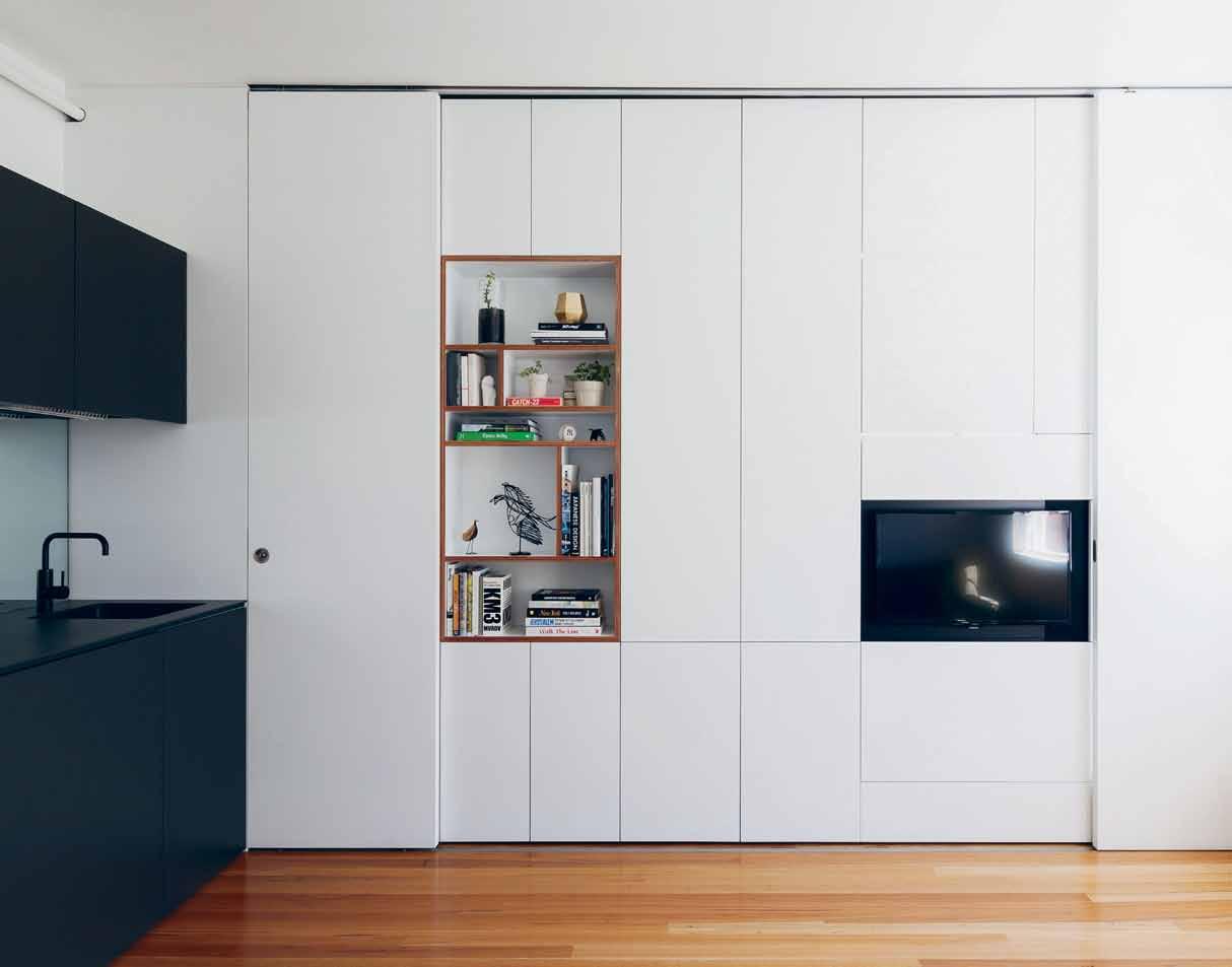
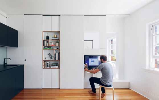
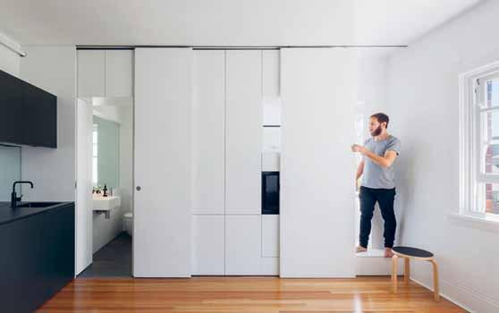
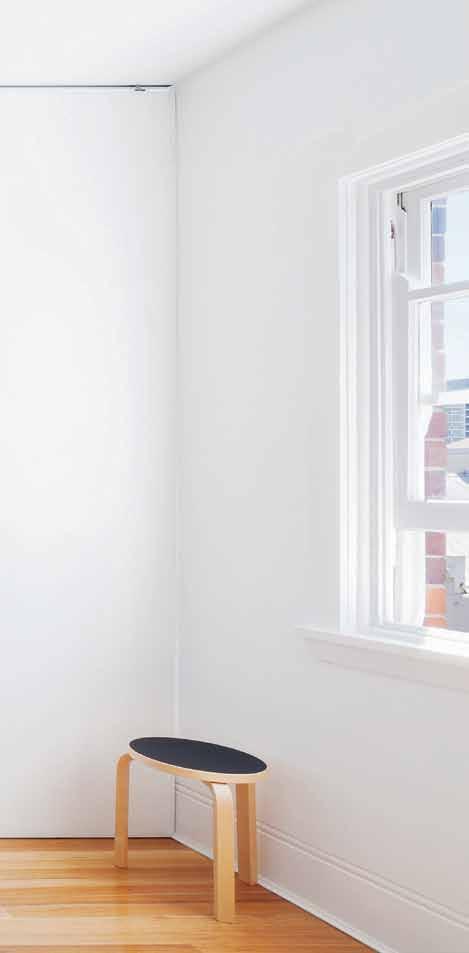
habitus #31


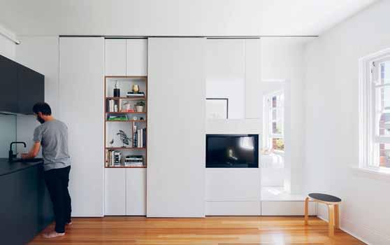
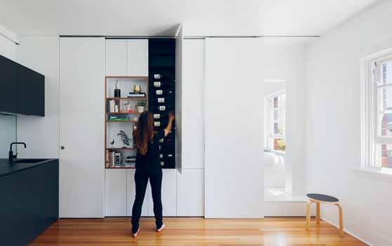
above | A white joinery unit wA s inserted to cre Ate A public A nd privAte divide. the unit conce A ls the privAte uses of the ApA rtment including A bedroom, b Athroom, A nd plenty of stor Age. below left to right | b oth the bAthroom A nd the bedroom A re conce A led behind full height sliding doors; A cupboA rd in front of the tv cA n flip up to cre Ate A desk, A nd the tv cA n become A computer monitor; the bedroom door A nd A pocket door cA n be opened to enh A nce the sense of spAce; A 24-bottle wine cupboA rd wA s incorpor Ated into the design to A fford the spAce A sense of luxury.
“Have nothing in your house that you do not know to be useful, or believe to be beautiful.”
# 91 minimal
william morris

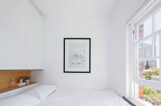
above | The divide beT ween The public areas (kiTchen/dining/living room) and privaTe space (bedroom) is disTinguished Through maTerialiT y. below | The bedroom is kepT minimal, and simply designed To accommodaTe bed. sTorage is incorporaTed above and underneaTh The bed for cloThing. alThough The room is small, The large arT deco window increases The feeling of space and provides a preTT y view ouT To The ciT y. opposite | a segmenTed display shelf jusT ouTside The baThroom conTains personal objecTs and books, which sof Tens The design of The minimalisTic sTorage wall. iT also allows The owner To display a number of Their favoriTe Things. habitus #31

“Small rooms or dwellings discipline the mind, large ones weaken it.”
# 93 minimal
Leonardo da Vinci
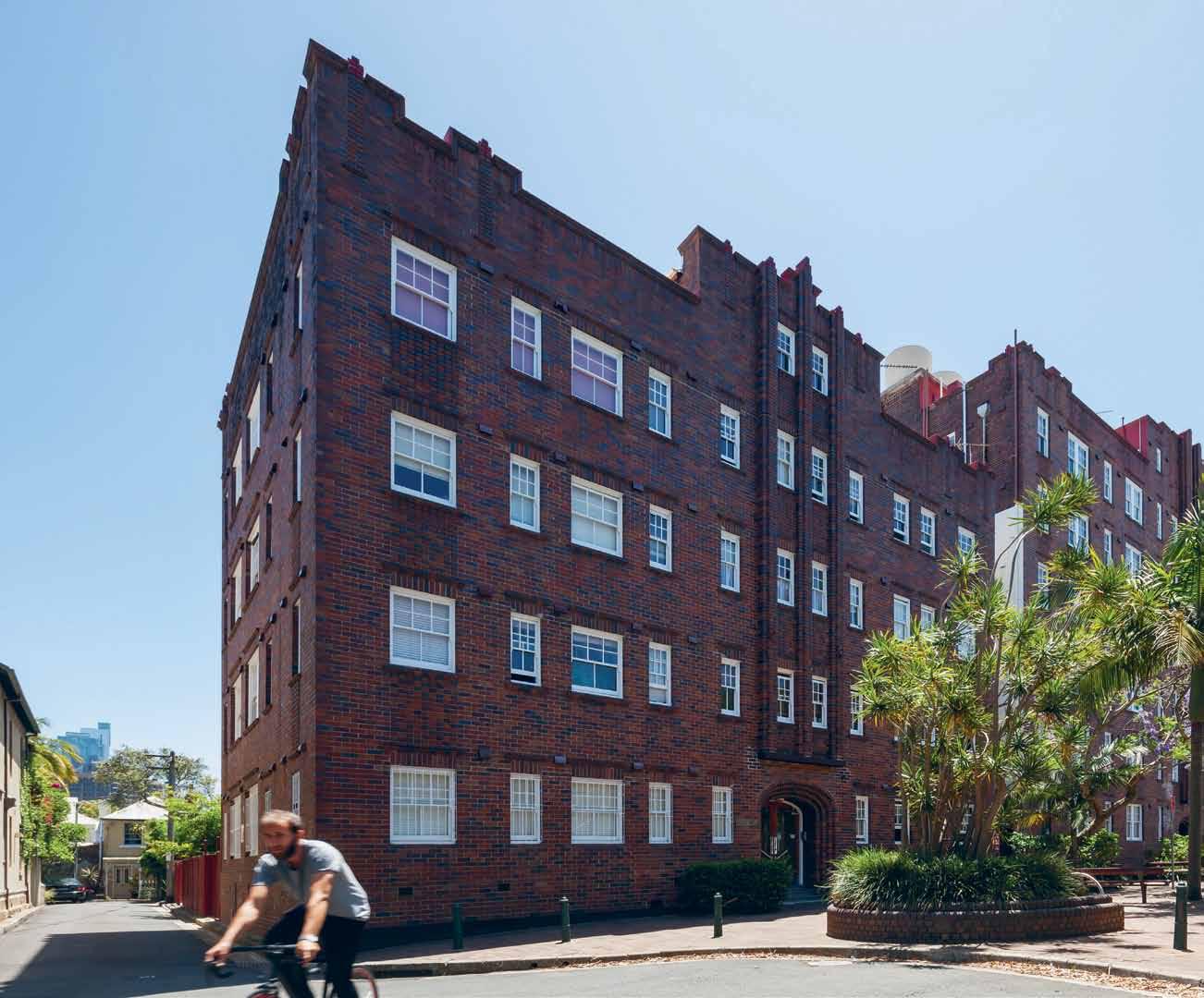
“Any intelligent fool can make things bigger, more complex, and more violent. It takes a touch of genius – and a lot of courage – to move in the opposite direction.”
above | The aparTmenT is locaTed on The Top floor of a charming arT deco building in darlinghursT sydney. opposite | exploded axonomeTric and floor plans of The aparTmenT habitus #31
E.F. Schum Ack Er


# 95 minimal
Fersa from Mother of Pearl & Sons.
A legacy of excellence meets innovation and contemporary design in Fersa’s cabinet and architectural door hardware.
Mother of Pearl & Sons introduced Argentinian-brand Fersa to Australia when it became apparent that there was strong demand for quality architectural hardware previously only available in Paris, New York and other cities where value is measured in excellence.
This demand indicates an understanding that hardware ultimately is the jewellery of a home. Fersa’s products are bespoke hardware, an investment created for our clients, even customised on demand.
Fersa was established in Buenos Aires, Argentina in 1941 by Mr. Jules Samuel who was born in Belgium in 1901. Samuel continued a long tradition of handcrafted decorative hardware

made in France by establishing a factory in Buenos Aires when imports from Europe were disrupted by World War II.
From the very beginning the company was devoted to developing new and innovative products, following the finest European designs and traditions realised by Italian and Spanish metal artisans who migrated to Argentina from the beginning of the 20 th Century. This legacy of excellence in both reproducing period hardware using ancient methods such as sand cast foundry, metal chiseling and mercury gold plating, and developing new designs of superb quality, has allowed Fersa to hold the leading position within the Latin American market of decorative hardware for over 60 years.
habitus promotion › Mother of Pearl #96 issue #31 habitusliving.com
Above | cabinet and architectural door hardware by Fersa
Mother of Pearl | motherofpearl.com
Expressive minimal
Sydney’s most prestigious residential developments are well under construction, their architect Koichi Ta K ada has experienced both living and designing with a minimalist approach. Size doesn’t limit us, he suggests, but instead encourages us to enliven the space.
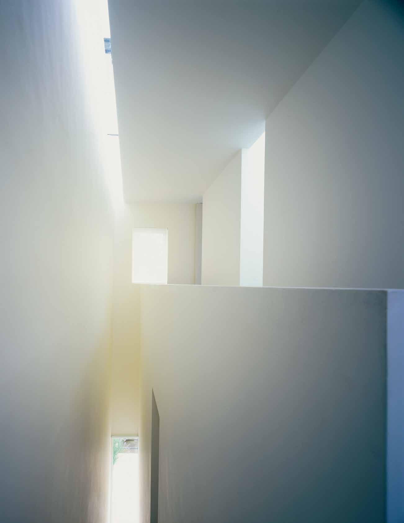
Tex T KOICHI TAKADA | pHOTO gr A pH Y VA r IOus minimal # 97
It’s a minimal life
We are surrounded with an overwhelming amount of things today, which reflect our busy lifestyles. Many of these things are also the products of ‘fast’ living. More emphasis is given to the efficiency of mass production and consumerism, looking towards quantity as opposed to the uniqueness and quality of craftsmanship. The richness of experience is often negated or eventually lost in the process of mass production. We are always reminded to improve or update in every aspect of living, whether it is at work or at home.
Supposedly these things should make our lives ‘richer’ or ‘happier’ but instead, it can be quite confusing in dealing with more and more things at the same time. Living ‘fast’, the hardest thing is to get clarity of thought. While we live our demanding lives, we conveniently avoid asking a fundamental question:
“What is the true value in life?”
Minimalism is not all as negative as it may sound, but can inspire a way of life. Our imagination can be at the centre our lifestyle, and more emphasis can be on ‘invisible’ experience rather than ‘visible’ materialistic outcomes. This type of minimalist lifestyle is very much inherent in the essence of Japanese culture, widely practiced today; you can experience such strong influences on minimalist living in Japanese architecture, for example in traditional Japanese Ryokan, hotels, or even when visiting the Katsura Imperial Palace in Kyoto.
Multi-purpose, multi-expression
The idea of ‘minimal’ is also an appropriate topic for today’s context of city living. As land values sky rocket, the size of our new future home is being redefined by what we can afford. In Japan, where the majority of land is mountainous, the every piece of land or space is valuable. The design of traditional Japanese houses has evolved and adapted to the demands of modern living. For instance, washitsu , the traditional Japanese room with tatami mattress and sliding shoji , ‘breathable’ Japanese paper screens, is a typical family room where you can relax, entertain guests, watch TV, eat, study,
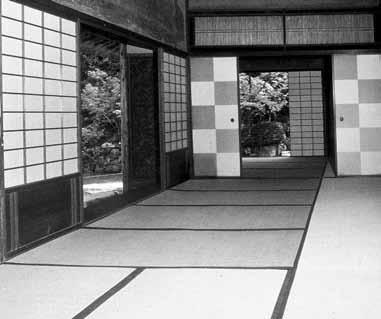
sleep, etc. It is essentially a multi-purpose room where every ‘thing’ is designed to be mobile and nothing is fixed. There is no decoration, it is just a pure space with neutral colours and natural materials. All you experience within the room is fresh air and light through the shoji screens.
In our washitsu, we had a Japanese traditional mud-rendered wall that was quite coarse and roughtextured. When the light hit the wall, it cast thousands and thousands of very subtle shadows of the texture on the wall. Over seasons, the room reacted to nature and expressed itself differently every day. It was quite an enriching experience because you were constantly connected with nature.
Then, of course, the family activities add the life, and for me as a child, this experience formed many fond memories. My mother, for example, used to practice Ikebana, the art of flower arrangement, in our washitsu I remembered that while Ikebana was being practiced in silence, all of a sudden everything came to life in the room with combinations of vivid colours of flowers, filled with seasonal scents; otherwise the room was of modest and minimal expression, ready to live.
Once you start cluttering your room with furniture, TV, speakers, paintings, trophies or vases and objects that you accumulate over years, you start to lose the enriching process. When you decorate, the room adopts a very specific purpose.
Zen – connection to nature
If you are living in a limited space, such as an apartment or tiny house, you want to connect to the outdoors. Whether it is a park in front of you, a tree, a hill, or the sky, you seek a sense of connection.
Once you establish the connection, then you no longer feel the limitation of your space. That’s similar to the idea of Zen that relates to the infinite. Within the confinement of a small space, you can almost enlighten yourself to the infinite association with the outside. I think that this is such a beautiful ability, but you have to constantly practice to achieve the connection to nature.
#31
previous
| stairwell void in john pawson's house, london. photography by richard glover/view. above | katsura imperial villa, kyoto. opposite above & below | sliding timber screen over the kitchen at one central park east, chippendale, inspired by traditional japanese sliding screens. photography by sharrin rees.
habitus
“Once you start cluttering your room with furniture, TV, speakers, paintings, trophies or vases and objects that you accumulate over the years, you start to lose the enriching process.”
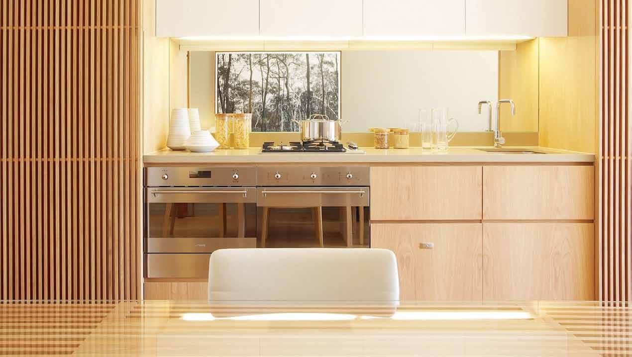

# 99 minimal


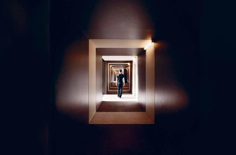
habitus #31
“In architecture, you put an emphasis on the void space as breathing space, too. The ‘in between’ spaces are where you can look to find infinite opportunities.”
Space to breathe
The main element in the concept of ‘less is more’ is the breathing space, whether it is literature, music, art or architecture.
In between text, you need breathing space to put your thoughts. Art is the same. In Minimal art, there is so much opportunity for pause. In music, it is important to have this same pause between sounds. In architecture, you put an emphasis on the void space as breathing space, too. The ‘in between’ spaces are where you can look to find infinite opportunities.
Breathing space is a very important part of our busy lifestyles, and everyone needs it to escape.
Minimal art in architecture
There is always a temptation to turn minimal art into architecture. The works of Donald Judd, Sol LeWitt, and Carl Andre are easily imaginable in architectural forms. Although the intent of art is completely different to the function of architecture, minimal art and architecture seek richer experiences with modest and humble expression, as minimalist artist Robert Morris says “Simplicity of form is not necessarily simplicity of experience.” 1
During the installation of John Kaldor’s Family Collection at the Art Gallery of NSW in Sydney, John Kaldor first introduced me to his minimal art collection of Sol LeWitt and Frank Stella. Looking at the ‘Incomplete Open Cubes’ by Sol LeWitt, it was fun to imagine the missing elements in order to ‘complete’ the cubes. There was also a painting by Frank Stella, which has a series of stripes and looked like a deep 3D object in perspective. This work eventually ended up inspiring one of our works. At One Central Park East in Sydney, we had a challenge to turn a banal 35m long residential corridor into a pleasant journey, with a gallery like experience. The idea was to break the length of corridor into pieces by alternating light and dark stripes so that in perspective, it looked like a twodimensional version of Stella’s painting. It was ironic that my client asked, during my design proposal, if any artwork was needed in the corridor, and I answered with much confidence, “less is more.” 2
How to live in minimalist design
Minimalist architect John Pawson was perplexed when people looked at his house and said “It is very beautiful but how can you live like that?” with everything hidden. Pawson, however replied, “To me the thinking is all the wrong way around. The whole point is that this is how we live, so this is what our house needs to be like.” 3 Ultimately, the absence of ‘things’ gives you a much richer appreciation of anything that happens in the space. It is quite a powerful statement, and I also learned to listen to my clients: accommodating their way of living is first and not the other way around.
One of my clients approached me and gave me his brief to design his minimalist home in Bondi Beach. His home was to be of very modest expression, except he was obsessed with the famous view. The minimal design often requires complex thought and commitment through hard construction process. We demolished most of the cluttered and excessive existing walls that blocked the view. We proposed an eleven-metre-long steel beam, which was craned in from street, to support the levels of the existing building above. The end result is very simple with an open plan space. Every main room, even the bathroom has a direct view toward Bondi Beach. My client, having just arrived back from Sweden, rang me immediately as he walked into his new home. I was a little bit anxious to hear his feedback but soon his high praise relieved me, except he added, “you should have put mirrors in my kitchen cupboards, so when I am looking away from the beach and cooking I still see the view and not the design.” I had to laugh.
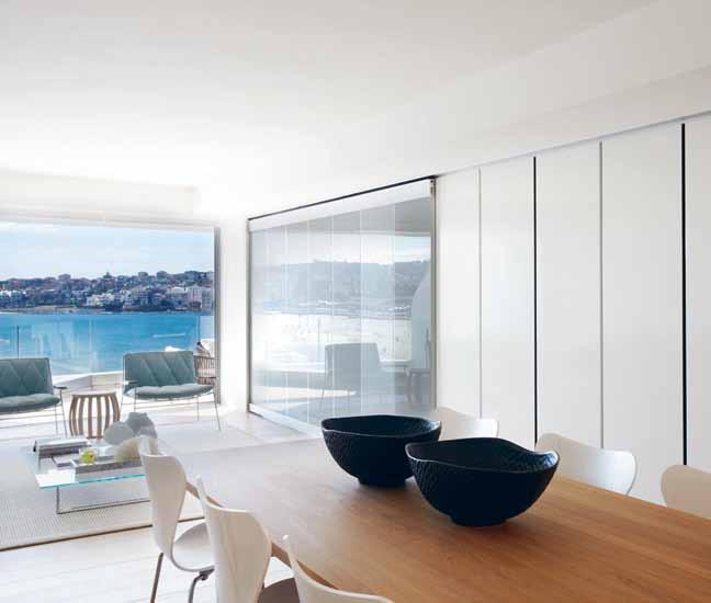
White space
I was shocked when I saw John Pawson's first book, Minimum (Phaidon Press, 1996). How could any architectural book exist without much text? There was a lot of ‘white space’, and each piece of photography told a silent story. Holding the fine textured fabric cover and indulging with the book, I felt a sense of comfort, maybe serenity and even an escape from my busy life. Everyone cherishes such a feeling or moment of being in a comfort zone. Pawson explains, “Real comfort is not about a large
all photography on this spread by sharrin rees. opposite above left | frank stella untitled at the kaldor family collection at the art gallery of nsw. opposite above right | sol le witt incomplete open cubes at the kaldor family collection at the art gallery of nsw. opposite below | one central park east tower corridor, koichi takada architects. above | beach residence, bondi beach, by koichi takada architects.
# 101 minimal
sofa – in my view, many things which look as though they should be comfortable aren’t at all. For me comfort is synonymous with a state of total clarity where the eye, the mind and the physical body are at ease, where nothing jars or distracts.”4
Once I was invited to David Chipperfield’s Berlin office. While many beautiful objects and light timber models comforted my eyes, one that really caught my attention was seeing so many variations of white samples on their centre table. Every white had a subtly different character and it was impossible to see which white was the white. White prevails in Chipperfield’s minimalist architecture worldwide and his selection of matt or gloss white may be based on light in Milan or other light in New York, and even matching artificial white to natural white materials; all so carefully considered.
My main source of inspiration is light. The quality of light in Sydney is magical. When I finally decided to open my own office in Sydney, I wanted it to be white, or to be more precise, warm white, to reflect the subtle shades of light.
Timeless quality
Minimalist architecture and design appeal to those who look for its timeless quality and calmness in design. One example that influenced minimalist architecture today can be found in Le Thoronet Abbey, a former Cistercian Abbey built in the late 12 th Century. The experience of the Abbey is highlighted by the absence of any decoration or ornament. Le Corbusier visited in 1953 and was profoundly engaged by its simplicity, “the light and the
shadow are the loudspeakers of this architecture of truth.”5 When I personally discovered the Abbey during my first architectural pilgrim to south of France, I never felt so much more the presence of ‘life’ within the silence of the architecture; changing colours and intensity of light, shades of shadow, sound of air, moving leaves and flying wings of birds. Through such refined minimalist architecture, time seemed to slow down and completely disappear from one’s mind. As Father Marie-Alain Couturier wrote to Le Corbusier, it is “a place where men lived by a vow of silence, devoted themselves to reflection and meditation and a communal life which has not changed very much over time.”6 The timeless quality of the minimalist’s lifestyle was perhaps born.
1 Daniel Marzona, Minimal art (Koln: Taschen, 2004), 78.
2 “ what did Mies van der Rohe Mean by less is More?”, Phaidon, accessed January 6, 2016, http://au.phaidon.com/agenda/ architecture/articles/2014/april/02/what-didmies-van-der-rohe-mean-by-less-is-more/
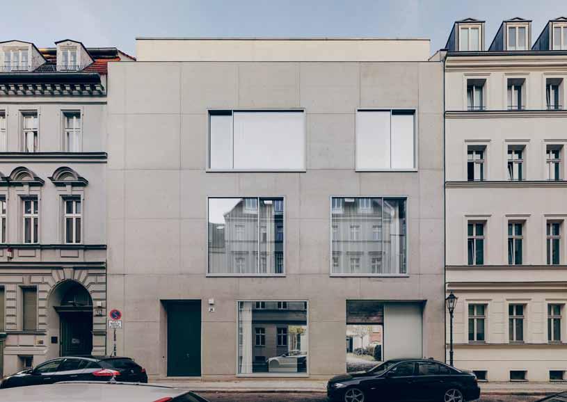
3 John Pawson, “The Simple e xpression of Complex Thought” in el Croquis, John Pawson: Pause for Thought, ed. Fernando Márquez Cecilia and Richard levene (Madrid: el Croquis editorial, 2005), 7. 4 Ibid.
5 lucien Hervé, architecture of Truth: The Cistercian abbey of le Thoronet (london: Phaidon, 2001), 7.
6 “ le Thoronet abbey,”Project Gutenberg Self-Publishing Press, accessed January 6, 2016, http://www.gutenberg.us/articles/ le_Thoronet_ abbey
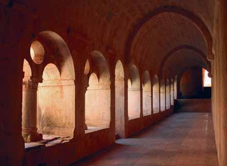 above | ambience of light at le thoronet abbey, provence. photography by asako kenjo. below | exterior of david chipperfield office on j oachimstra ss e in b erlin. photography © simon menges.
habitus #31

Petersham 02 9569 5555 600 Parramatta Rd Waverley 02 9389 5000 82 Carrington Rd Get the right advice. Contact a bathroomware specialist. www.cassbrothers.com.au volcanic limestone baths Beautiful bathrooms start here.

habitus #31
Handmade house
MiniM al doesn’t necessarily mean less – or denigrating the idea of more. Here, as DaviD Harrison suggests, it is simply asking us to live a life with more quality.

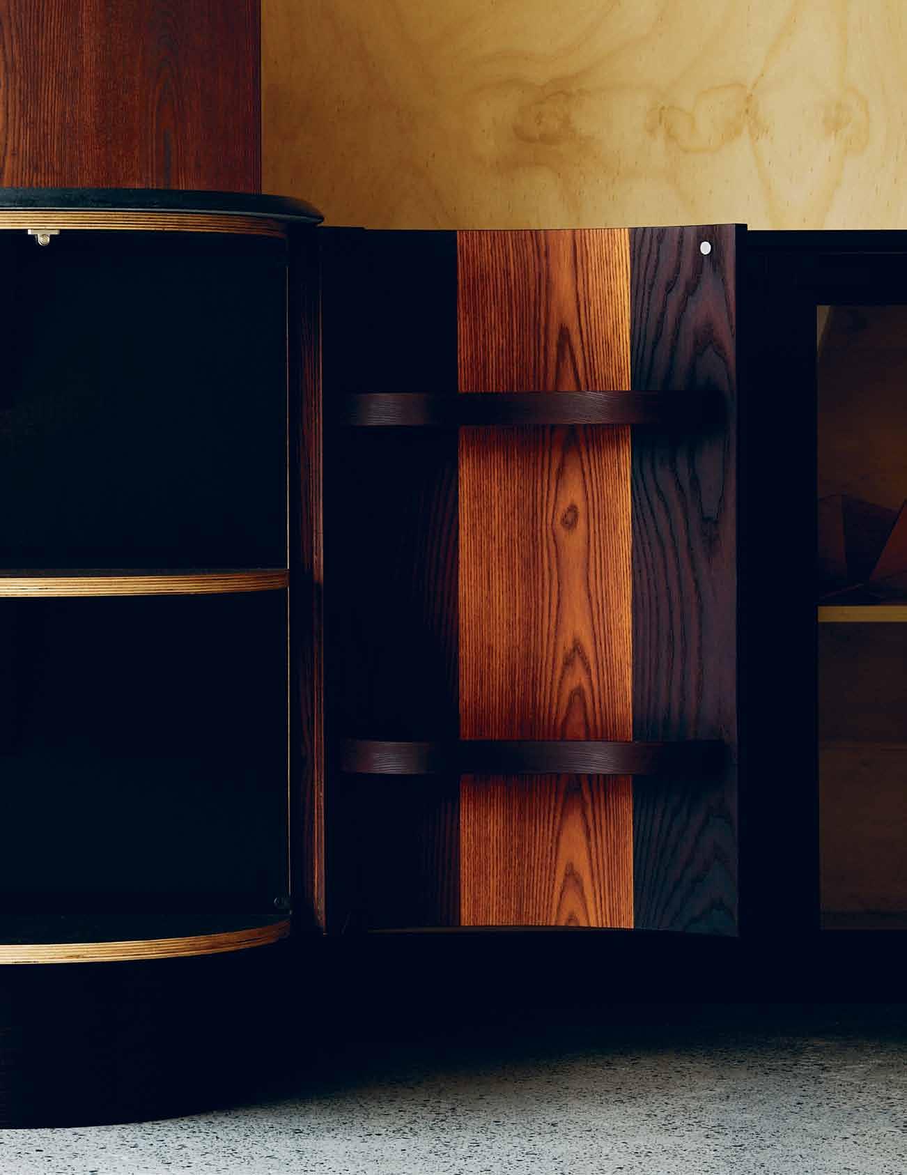
Tex T & sT yling DaviD Harrison | pHoTograpHy Craig Wall # 105 minimal
habitus #31
The home of architect Alex VanderFroëchk of Studio Ventana, is an example of the magic that can happen when two highly talented and uncompromising people collaborate on a project that resonates strongly. While the expression ‘a labour of love’ is horribly overused, it is in this case an absolutely accurate description. VanderFroëchk returned to Sydney in 2000 after nearly 22 years working in New York on projects as varied as film scenography, museums and residential housing. The apartment, situated on the top floor of a bijoux three storey development near Royal Prince Alfred Hospital in Sydney’s inner west suburb of Camperdown, had once been a research laboratory connected to Sydney University. VanderFroëchk remembers it being full of strange piping and medical research machinery. Three years ago this was all removed and with the help of Sydney-based furniture designer and master joiner, Gary Galego and master builders Telgrit, the transformation from lab to luxury home took place. Over a twelve-month period a highly individual apartment with all the majestic beauty of post-war passenger aircraft was created.
Alex VanderFroëchk designed the apartment over an intense six-months but the refinement of the details, fabrication and installation of the extensive joinery and wall linings took an additional year to complete.
“I brought a lot of ideas to this project that I had been thinking about for a very long time. It was a distillation of many years of experience and I was determined to come away with a space that was totally true to its materials. I didn’t want things coated or tricked up in any way. Everything had to be presented honestly and it had to be exceptionally well built” says VanderFroëchk. Luckily VanderFroëchk had met Galego, a graduate of Canberra
School of Art (ANU) and the two went about refining the concept with Galego’s eye for detail and intimate understanding of materials. The finished project revels in the minimal material palette of hoop pine plywood, Cambia Ash (a chocolate coloured thermally modified form of European ash) aluminium and two types of stone – marble and finely granulated black granite. The constant use of contrasting dark and light tones and the reduction of everything to extremely simple forms, gives the apartment a feeling of serenity, while in close up it exhibits a fanatical level of detail. The linished 3mm aluminium sheet ceiling was installed in such a way as to resemble the pop riveted fuselages of post-war airliners and were purposefully installed to give a slightly imperfect surface to catch the light. Wardrobes were made from shot blasted 10mm plate aluminium to provide massive but visually soft storage that is lined with camphor laurel timber to prevent moths and create a beautiful fragrance – just as was routinely done centuries ago. Standard building staples such as plasterboard and MDF were banished from the build, replaced by plywood and solid timbers. Obsolete hinges from decades ago were found and imported, door handles were custom made – nothing was ordinary or second rate. This type of custom work does not come cheap but such was VanderFroëchk’s passion to deliver an apartment that would last a hundred years, no expense was spared in the construction and finishing.
“I wanted the materials to reflect the person who made it. I wanted it to be evident that everything was lovingly put together,” says VanderFroëchk.
previous | architect a Le X Va ND erFrO Ëch K'S h OM e Feat U reS JO i N erY US i NG the Pri N ci PLeS OF c OOPeri NG, c OMMONLY a SSO ciateD W ith the M a K i NG OF BarreLS. Top row lef T To righT | ca MPh O r WOOD FO r the i NterN a L D raW er S OF the WarD rOB eS FO r itS rich FraG ra N ce aND aNti- MOth PrOPertieS ; ti MB er a ND aLUM i N i UM c OM i NG tOG ether i N the M ezza N i N e GU eSt B eD rOOM that DOUBLeS a S a ca SUa L t V Watchi NG area; the Preci S e G eOM etrY OF the aPartM eNt M irrO reD i N KONSta Nti N Grcic’ S chair ON e FrOM MaG i S middle row lef T To righT | Wa LL MOUNteD tOLOM eO Li G htS BY MicheL D e LU cchi FO r a rteM i D e W ere ch OS eN FO r B eDS i D e Li G htS the i NDUStria L S izeD c UStOM hi NG eS OF the M a Ster WarD rOB e i N S h Ot BL a SteD 10 MM PL ate a LUM i N i UM KitcheN D raW er S a LSO c OMB i N e h OOP Pi N e a ND ca MB ia aS h, a ND the B eN chtOP i S BL ac K G ra N ite W hi Le Wa LLS are carrara M arBLe ti LeS boTTom row lef T To righT | Where rOUG h i NDUStria L eLeM eNtS e X i SteD theS e W ere LeF t e XPOS eD a ND OF teN hi G h Li G hteD the Stair S tO the M ezza N i N e GU eSt B eD rOOM M a D e FrOM 10 MM a LUM i N i UM PL ate W ith L a S er-c U t h OLeS c ONStrU cteD BY BrO eNS eNG i N eeri NG ; ti MB er a ND aLUM i N i UM c OM i NG tOG ether i N the M ezza N i N e GU eSt B eD rOOM that DOUBLeS a S a ca SUa L t V Watchi NG area.
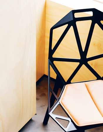
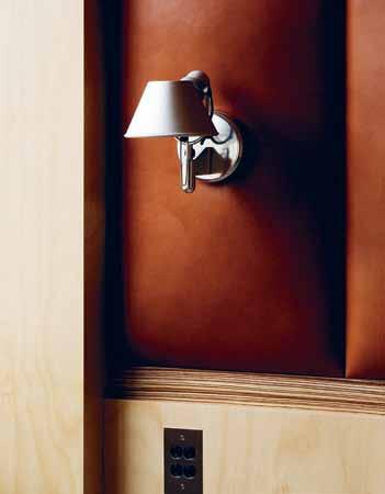

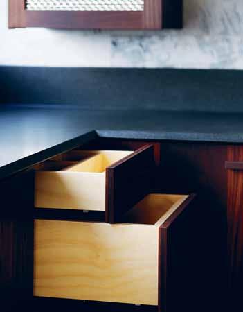

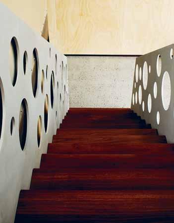

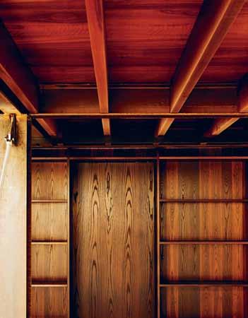
# 107 minimal
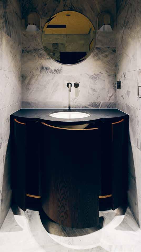

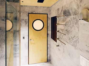
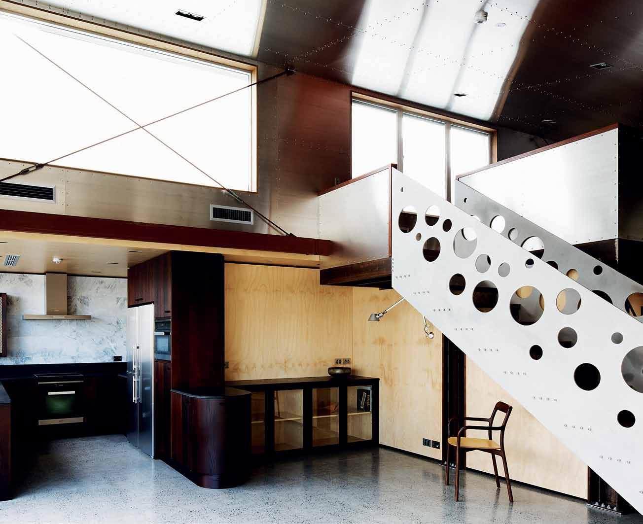
habitus #31
“[Camperdown house] was a distillation of many years of experience and I was determined to come away with a space that was totally true to its materials.”


# 109 minimal
previous top | The guesT baThroom conTinues The maTerial Theme wiTh carrara marble hoop pine plywood and cambia ash. round windows and mirrors echo The circular cu T-ou Ts used in The sTaircase. previous bottom | a small room was dedicaTed To This amazing washbasin by gary galego wiTh iTs Triple curved fronT in cambia ash and The Top in black graniTe. above | looking from The open plan dining room inTo The kiTchen area, a Tiled Terrace opens up To The lef T while The sTairs lead To a mezzanine guesT bedroom ThaT doubles aT oTher Times as a casual lounge for waTching T v
habitus #31
above | The library has The dark sombre feel so appropriaTe for a proper library and is heavily laden wiTh large archiTecT ure, arT and design books. opposite | galego creaTed a heavily padded leaTher wall using a waxed leaTher called marrakesh, from nsw leaThers in combinaTion wiTh horizonTal sTrips of solid zebrano wood as per The owner and archiTecT 's brief To add a biT of luxury.
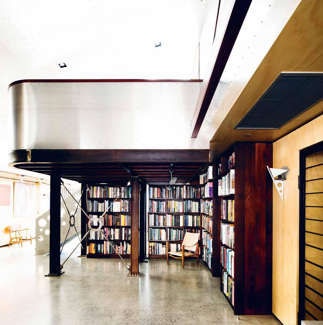
drop box
Architect Alex VanderFroëchk, Studio Ventana
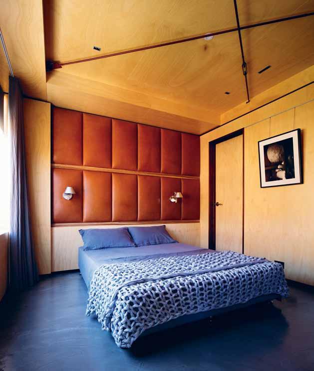
Joinery A nd detA iling Gary Galego Builders Telgrit
Aluminium s peciA lists Broens
Engineering
photogr A phy Craig Wall
styling David Harrison
Studio Ventana (61) 412 170 700 studioventana.com.au
“The constant use of contrasting dark and light tones and the reduction of everything to extremely simple forms, gives the apartment a feeling of serenity, while in close up it exhibits a fanatical level of detail.”
# 111 minimal
Win a pair of brass Adamas Pendant Lights


Subscribe for your chance to win one of two pairs of Adamas Pendant Lights from Savage Design, machined from solid brass. The warm precious metal is suspended by a 2m black textile cord, whose tubular form houses an Australian designed LED module. The knurled outer leaves a pattern from which the pendant gets its name Adamas, ancient Greek for diamond.
PAYMENT METHOD Cheque / money order AUD$ Charge my credit card AUD$ Name on Card Card Type Card Number Expiry Date Signature IT’S EASY TO ORDER Fill in your response below, overleaf or subscribe securely online at habitusliving.com/subscribe. FOR A GIFT – RECIPIENT DETAILS: FOR MYSELF
SELECT BELOW : Mrs/Ms/Miss/Mr First Name Surname Address State Postcode Country Email Phone Mrs/Ms/Miss/Mr First Name Surname Address State Postcode Country Email Phone ONLINE: habitusliving.com/subscribe PHONE: (61 2) 9368 0150 MAIL TO: EMAIL: subscriptions@indesign.com.au FAX: (61 2) 9368 0289 Indesign Media Asia Pacific Level 1, 50 Marshall Street, Surry Hills NSW 2010 WHAT HAS BEEN YOu R BIGGEST LIGHTB u LB MOMENT ? AuSTRALIA INTERNATIONAL (AuD$) 12 ISSuES SAVE 8 ISSuES SAVE 4 ISSuES SAVE 12 ISSuES SAVE 8 ISSuES SAVE 4 ISSuES INDESIGN $155 $43 $105 $27 $55 $11 $240 $39 $200 $21 $110 DQ $70 $44 $50 $26 $25 $13 $140 $10 $100 $5 $50 HABITuS $132 $47.40 $93 $26.60 $49 $10.80 $240 $30 $180 $10 $90 THE COLLECTION Vol. 2 Australia $29.90 (1 ISSUE) International $49.95 (1 ISSUE)
PLEASE
at $760 Subscribe to Habitus magazine
Valued
Angle towards a new way of living







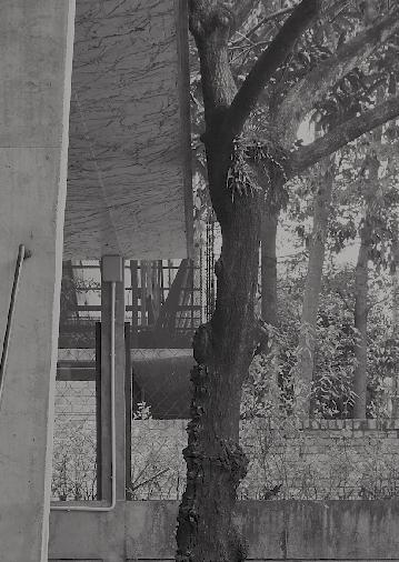
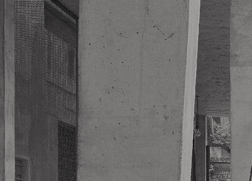

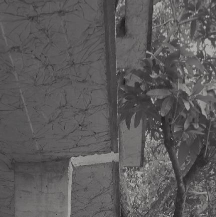

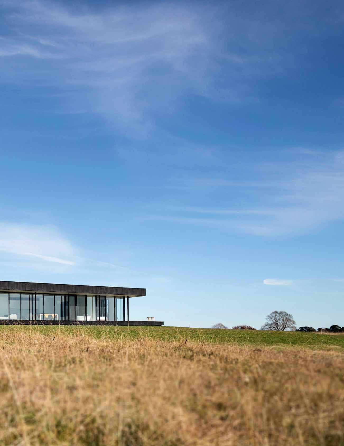
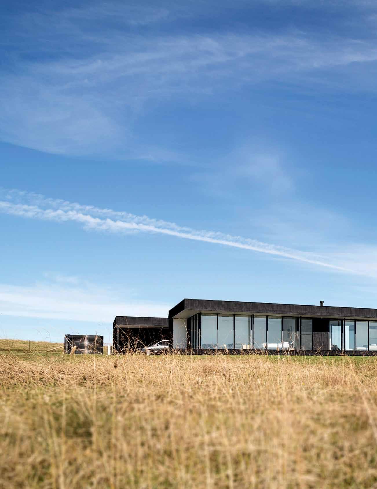
issue #31 habitusliving.com
Mod Con: modular conscious
It took Gillian Simon and Darren KinDrachuK the best part of a decade to find the perfect piece of land in the Southern hiGhlanDS of NSW, but once they did, the design and build was relatively easy – thanks to the intermoDe modular design they chose.

 Tex T Nicky Lobo | PhoTogra Phy JusTiN aLexa N der
3 . on location # 115

previous | the
| a
issue #31 habitusliving.com
northern façade is fronted with glass to capture the views and natural light. the 1.2-metre-wide modules are clearly defined by the frames. above
painting entitled Moonlight Shi MM er by simon taylor and a b ronze sculpture, terpi S chore by clement meadmore add points of visual interest in the simple dining space. opposite | the kitchen is a minimalist's dream, with storage and appliances fully integrated, leaving clean white joinery lines undisturbed.
It’s a well-worn complaint (and a point of contention for many first-time home builders or renovators) that architectural and design projects often ‘blow the budget’. Director and founder of Intermode, Nick Carr, says it’s to be expected. “Clients are asking for something entirely unique,” he says. “Most of their requirements are quite specific, and that drives a need to ‘recreate the wheel’. This requires a lot of time and in-depth understanding. Also, you’re doing something you’ve never done before, so there are costs that you just can’t foresee”.
When hidden or unexpected costs can reach into the thousands, or even tens-of-thousands of dollars, it makes designing and building a home pretty inaccessible. Which means that the majority of Australians are living in homes designed and built by large-scale construction companies who are driven primarily by budget.
This is where Intermode comes in. “The three elements in the construction process are time, quality, and cost, and there used to be the saying that you can’t have all three,” Nick says. “What the challenge has been, and what drove us with Intermode, was to deal with all three.”
The model is modular design with a conventional build. Essentially, what modular design offers is some certainty that the budget and timeframe will be maintained – as the components have been used before and so can be costed correctly and constructed efficiently –along with flexibility and a level of quality.
“It was filling that gap, where people were still demanding the quality of [parent company] Carr Design, but they were also looking for a level of control that perhaps a bespoke design process or construction process can’t give them,” Nick explains.
While modular in design, the Intermode projects are not pre-fabricated, although some components like walls, trusses, window systems, joinery and decks may be. Each build and site is approached as unique, with the ability to modify and adapt according to needs and wants.
This example, set in the picturesque Southern Highlands of New South Wales, stands as a showcase of the company’s capabilities –purposely so, as the resident is Gillian Simon, NSW regional manager at Intermode. She and her husband Darren Kindrachuk, principal architect for Lend Lease, are extremely knowledgeable clients, with over 20 years experience in the international design industry.
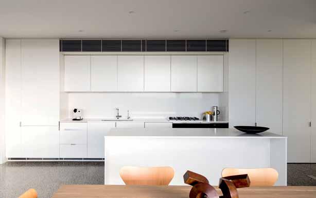
“So many architectural, bespoke houses turn into a very expensive exercise for the client,” laments Gillian. So they decided to put the Intermode model through its paces in their own home. Their satisfaction with the process, design and adherence to budget and timeframe shows just how successful the model is.
The process is very much like a unique design and build, in that it starts from maximising existing opportunities to make the design more efficient. “We developed the planning with
3 . on location # 117
The three elements in the construction process are time, quality and cost, and there used to be a saying that you couldn't have all three.

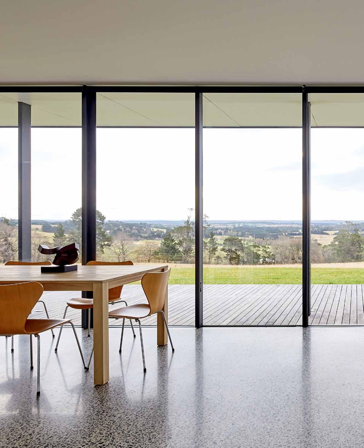
issue #31 habitusliving.com


3 . on location # 119
Intermode and positioned the house, the carport and garage in such a way that it was sensitive to the site,” Darren explains.
The house at Exeter is north-facing, positioned at the top of the property to enjoy the views, neatly missing the natural gullies that flood in heavy rain. Other site and environmental considerations include the use of fire-appropriate timbers, high wind capabilities and placement of two large water tanks.
The basic Intermode design principle is to build around a ‘spine’, which in the Exeter home, is in Ecoply Shadowclad on the exterior. As you make your way up the driveway, you are greeted by this spine, which creates a strong black façade along the southern side of the home. A series of 1.2-metre x 1.2-metre ‘modules’ are placed along this spine facing north, becoming the living, bathing, cooking, eating and resting spaces. Some of these – like the bathroom – comprise two 1.2-metre x 6-metre design modules, while others – like the kitchen, living and dining room – are made up of nine 1.2-metre x 6-metre modules.
This home is split into three main areas – a living area with lounge, kitchen and dining in the middle, bookended by a guest bedroom and bathroom at one end, and the main bedroom, bathroom and sitting room at the other. Floor-toceiling glass doors/windows along the northern façade are a transparent counterpoint to the dark and solid southern spine and they, along with the deck, expand the space into the landscape.

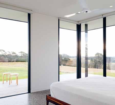
previous | the sublime view over the valley is the focus of this home. above |
the living area features a fireplace, a visual addition to the passive heating
strategies.
below
| the guest bedroom
is enveloped in glass, with roller blinds mediating light and privacy. opposite | a soak in the guest bathroom tub affords its own private view. floor to ceiling tiles and an inset shower frame means this bathroom can be easily cleaned, and meets accessible design requirements.
issue #31 habitusliving.com
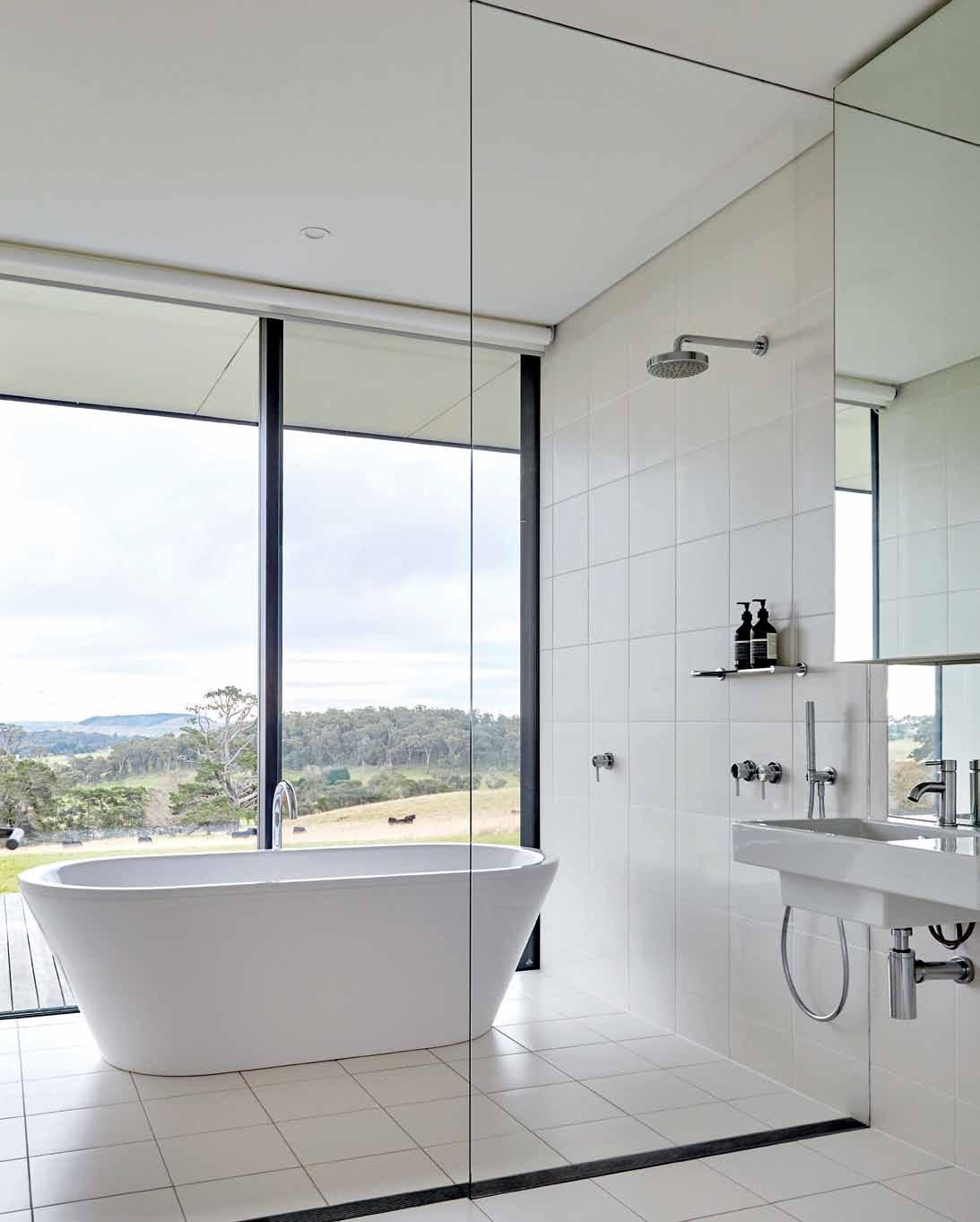
3 . on location # 121
GUEST BED
GUEST BATH
LOUNGE
MASTER BATH
MASTER BED SITTING ROOM
6 2 0 w 1 9 3 7 4 5 8 q e e FLOOR PLAN
ENTRY
LAUNDRY KITCHEN DINING
DECK
1 2 3 4 5 6 7 8 9 0 q e w issue #31 habitusliving.com
STUDY
GARAGE
Internally, the spine grounds the modules and houses abundant storage, the services (gas, underfloor heating) and also study and laundry alcoves, which can be neatly hidden behind doors.
An Intermode project is particularly suited to anyone who has a penchant for clean, modern lines, a minimal aesthetic and acute attention to detail. It’s the perfect backdrop for designer furniture, objects and art, like the Clement Meadmore sculpture and the Richard Serra etching, both in the bedroom here.
But it’s more than just a canvas for decoration. There’s a real sense of spaciousness here, despite the relative compactness of the module sizes. The views certainly help with extending the space outwards, but it’s also the finishes and the way it’s detailed to take up maximum capacity. Nothing is wasted here – this is efficient design at its finest.
“That’s the thing about the detailing with an Intermode project,” Darren agrees. “There’s nowhere to hide. It’s all very, very clean and sophisticated. It’s all about the minimalist approach, so many of the issues that come up – you cannot hide with molding or adding
something to the design. The detailing has to account for this”.
It looks wonderful in this quasi-rural setting, the black and glass box receding into the landscape and looking out over valleys – but how does the design work in more urban areas, I wonder? There are urban Intermode projects in concept and under construction in both NSW and Victoria, Gillian tells me, and more on the way – thanks to the open days at Exeter that she and Nick host on a regular basis.
And it’s actually in the different expressions that the beauty of the Intermode model becomes apparent – it can be adapted to work anywhere. For example, in an urban setting, privacy needs to be more considered, so subtle fencing is introduced. Landscaping becomes an important element in the modulation of private to public space. The flexibility of the modules allows for significant variation – in ceiling height, with the option for features like a butler’s pantry, external undercover eating area, mudroom for a country property... the list goes on. Although it’s modular, no design is even remotely the same.
One of the other benefits of the modular design is that the circulation space is also part
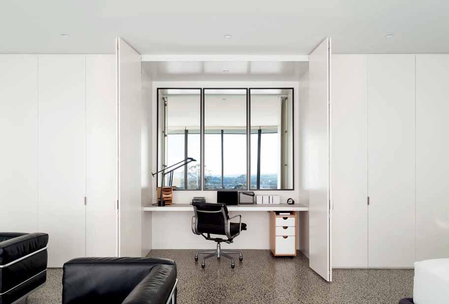
opposite | floor plan. above | clever use of mirror in the study alcove gives this nook a share of the view as well.
3 . on location # 123
of the bedroom or living area, “So you get a very high efficiency of space because it’s all usable”, Darren says. This also means that the home can easily become accessible. With wide hallways and doorways, sliding doors and recessed detailing around frames, Intermode projects can see clients into retirement and beyond.
When asked why modular housing hasn’t been very popular, Nick Carr suggests there is a negative connotation, due to bad examples from the past. But there may be something else to it – the underlying idea that we need a home as unique as we are; that to have a modular house means a bland house that reflects a bland personality. But in reality, within the discipline of modular design, there is unlimited potential for expression and customisation that subtly encourages a different way of living and experiencing a home, perfectly suited to context and resident.
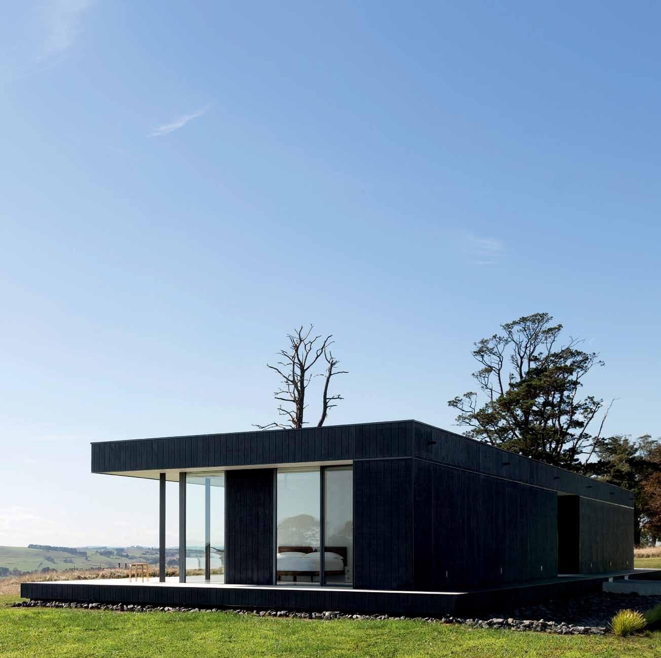
The unique expression may not be as obvious as a Gaudi building, but (also unlike Gaudi) it will be built in time and on budget. For most of us, that’s a win.
drop box
architect Intermode
landscape desi G n Aerea
strU ct U ral en G ineer Don Moore & Associates
Intermode
(61 3) 9665 2333 intermode.com.au
fU rnit U re
LC3 Lounge and chair by Le Corbusier. Barcelona lounge chairs by Mies van der Rohe. PK Series coffee tables by Poul Kjærholm. 606 Table by Aino Aalto.
Series 7 dining chairs by Arne Jacobsen. Toledo chairs by Jorge Pensi. Componibili bedside storage by Anna Castelli. R & C
Eames Softpad desk chair in study.
li G htin G
Architectural lighting by Artemide, Louis

Poulsen and Havit. De Lucchi & Fassina
Tolomeo standing and bedside table lamps.
Tizio desk lamp by Richard Sapper.
finishes
Polished concrete Husqvarna
Hiperguard Green finish floor. DeFazio
Porcelain tiles in Bathroom. Dulux low VOC paint. Joinery doors in 2 Pac paint finish. External decks in Spotted Gum. Shadowclad Ecoply by Carter Holt Harvey external cladding. Exterior paint by Dulux. Roof and metalwork in Lysaght Kliplock Colorbond finish.
fiXed & fitted
Kitchen appliances by Miele. Franke kitchen sinks and tapware from Abey. Bathroom fixtures from Rogerseller, Reece and Stormtech. Bath by Kaldewei. Haiku ceiling fans by Big Ass Fans. Verosol roller blinds by Southern Blinds & Awnings. Landscape Fireplace by Real Flame. Steel Fire Pit by Robert Plumb. Caesarstone benchtop and splashback. Interpron powder coated, aluminium framed double glazed sliding glass doors. Aneeta double glazed window.
above | encased in
ecoply, the black form of the intermode home recedes into the landscape.
issue #31 habitusliving.com

3 . on location # 125
There’s a real sense of spaciousness, despite the relative compactness of the module sizes.
Living art
Part architecture, part artwork, this redesigned terrace house in Kuala lumpur is an eloquent ode to one architect’s personal creative journey. Farah azizan of Studio BiKin shares her love of raw forms and unfinished surfaces with adele ChonG.

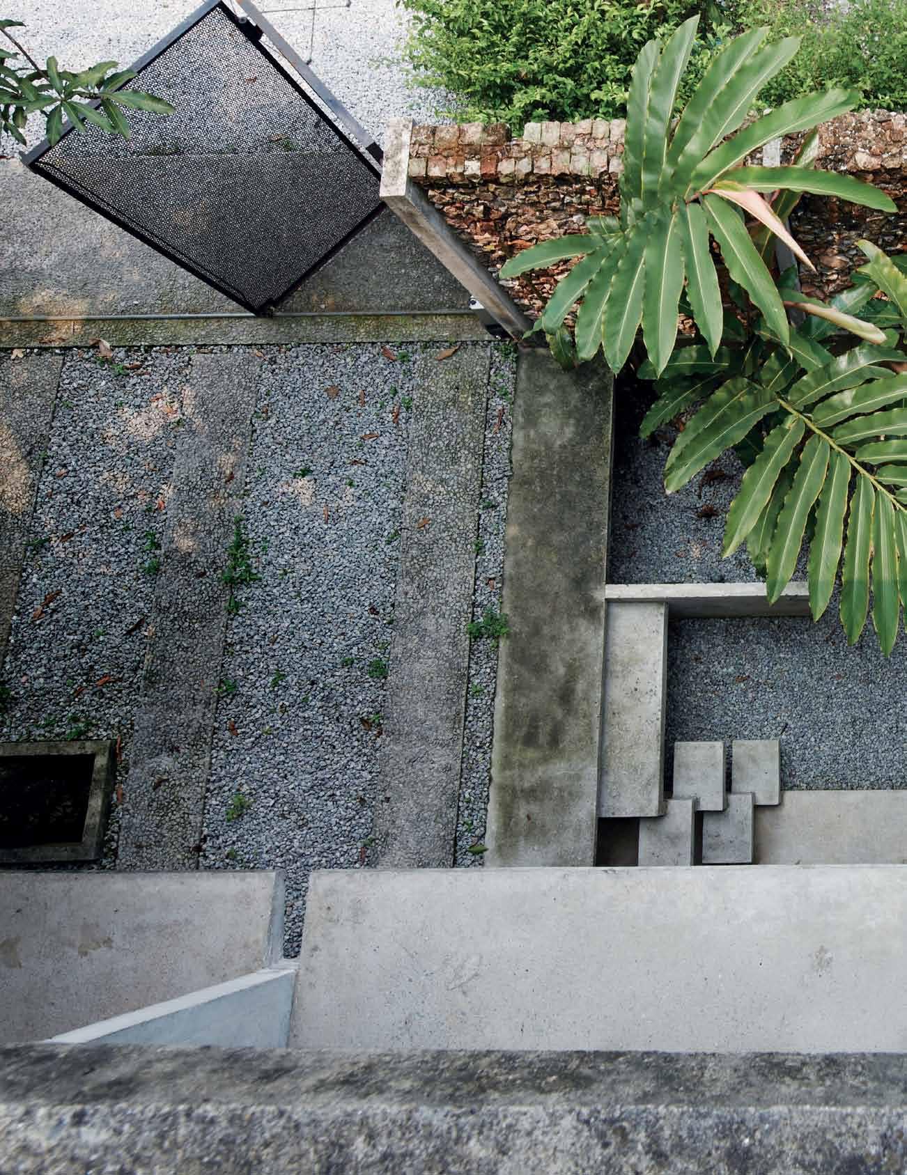 Tex T Adele Chong | PhoTogr APhy Ti An xing
issue #31 habitusliving.com


# 127 3 . on location
Well away from the din of a SouthEast Asian city in full swing, there are small pockets of peace to be found within Kuala Lumpur proper. The Lorong Kurau area in Bangsar, the city’s oldest suburb, happens to be one of these rare respites. Centred on a triangular patch of park and a row of unintimidating shophouses, this tree-lined stretch of tranquility was something of a closely guarded local secret until the bohemian set, drawn by the then modestly priced housing and the proximity to Bangsar’s main thoroughfare, began converging here a few years earlier. When the cat was let out of the bag, a handful of hip cafés and restaurants cropped up in response, adding a pop of excitement to this otherwise sleepy residential destination.
In spite of the enriched nightlife, however, Lorong Kurau’s subdued disposition remains largely unchanged. Long-time residents carry on unperturbed, performing daily rituals in the same languid manner as they have done for decades. Like an introvert baffled by his own unforeseen popularity, the neighbourhood’s self-effacing air belies the flamboyant real estate prices that its aged terrace houses have grown to command. There’s nothing to this place, and it makes no apologies for it. And yet, it is precisely this immutable, down-toearth feel that lends Lorong Kurau an enduring appeal amongst disenchanted city dwellers seeking a return to a slower pace of life.
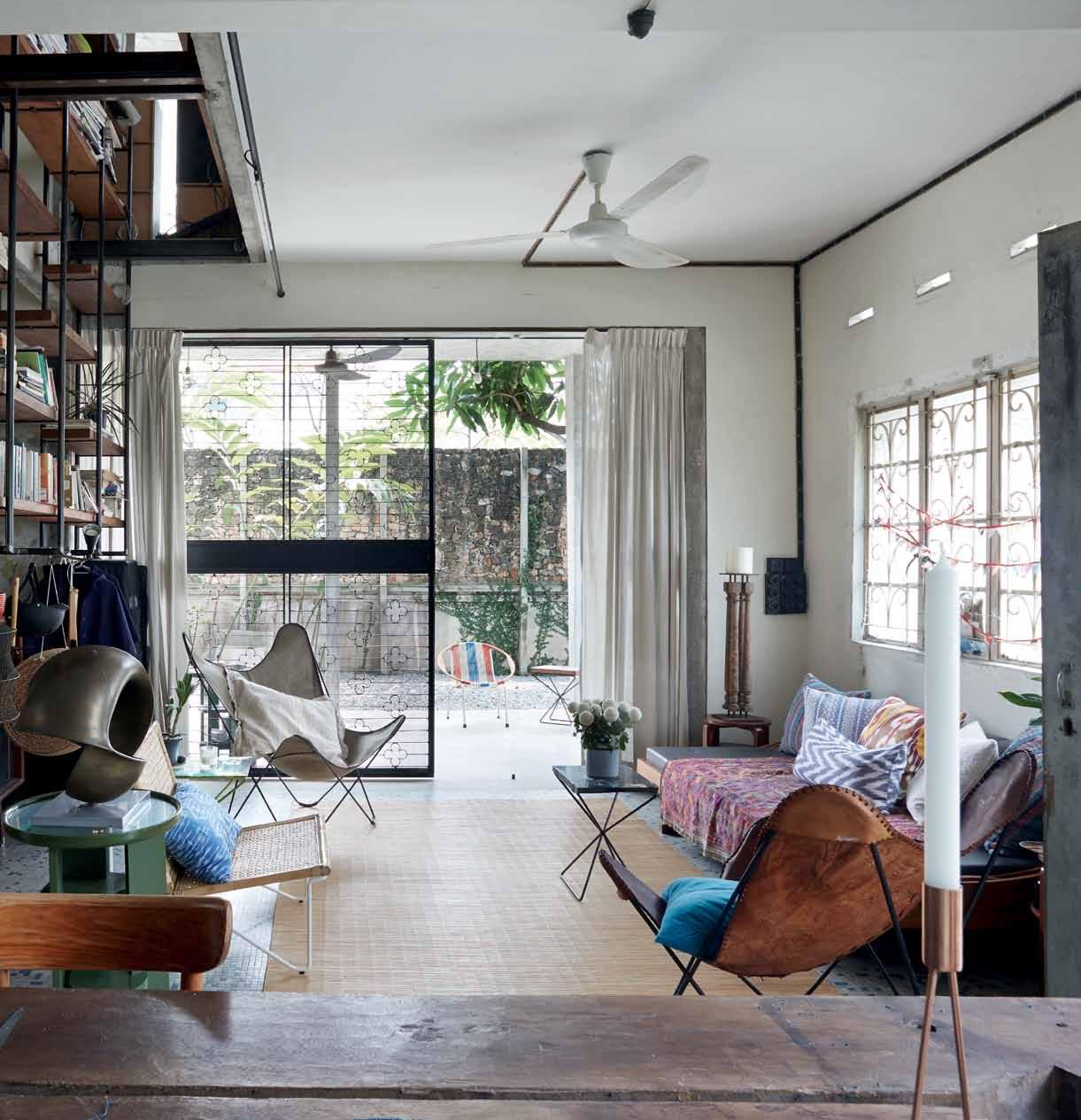
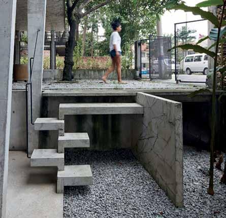
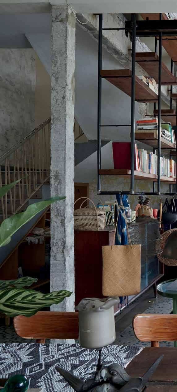
issue #31 habitusliving.com
previous | Greenery and rocky paths imbue the space with a sense of nature, juxtaposin G its clean, functional desi G n. leFT | composed of concrete slabs, a set of stairs near the front Gate offers a sculptural touch. AB ove | the spacious livin G area features ample ventilation and natural li G ht as well as a vintaG e G rille salvaG ed from the ori G inal house.


3 . on location # 129
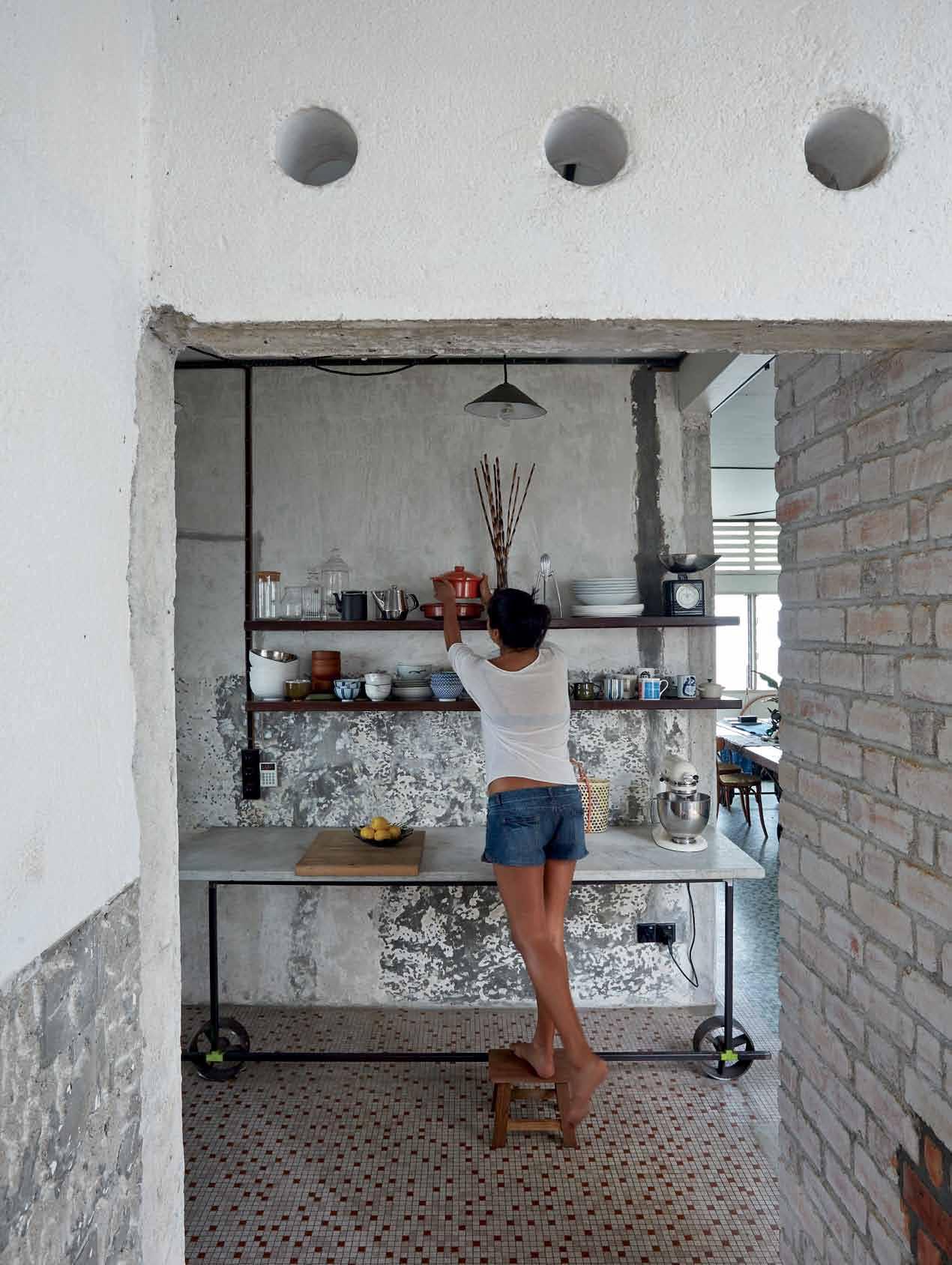
issue #31 habitusliving.com
Architect Farah Azizan bought her current place on the corner of Jalan Kurau and Jalan Sepat when it came on the market almost four years ago. Upon finding the 1950s era house, she knew that she’d stumbled on a gem in the rough. “I liked the neighbourhood, but I was very attracted to the calm, sombre feel the place had, and still has,” she says of the original two-storey terrace house. “It hadn’t been renovated and because of that, it had a rawness that gave me a lot to work with.”
‘Rawness’ is a word that also happens to gel with Farah’s own approach to architecture. While studying at the Architectural Association in London, she developed a lasting fascination with industrial wastelands and abandoned factories. “I learnt to look for beauty in marginalised settings,” reflects Farah. “As a student, I was experimenting with materials and creating large-scale interventions in different spaces.”
An increased dexterity with concrete, ceramics and metals would lead her to favour a hands-on approach when it came to design. So fervent was her allegiance to tactile processes that, as a job-seeking graduate, Farah set herself apart from candidates wielding digital dossiers by arriving for interviews with a thick hand-drawn portfolio under her arm. Well after she found work at a firm, she carried on avidly drawing, moulding and feeling her way through design. All these aspirations find their place in the Kurau House. Decidedly experimental, the house was essentially conceived as a bricks-and-mortar document of its resident’s creative life. Created with work and daily life in mind, it was also aptly
the one-time headquarters of Studio Bikin, the practice Farah founded with fellow architect Adela Askandar.
Distributed over three levels, the house is presented as a network of unexpected transitions, gaps, voids and layers. In answer to the site’s context, its construction adheres tightly to the basic principles of Tropical Modernism, in spite of its unorthodox arrangement of spaces. Though neutrality is implied through the bare-bones simplicity of its materials, it is anything but detached as a space. If anything, extremities are enthusiastically expressed, rough edges celebrated. On the ground floor, the house’s original features take centre stage, preserved with near-archeological care. Upon entry, one’s gaze tends towards a series of details such as window and door grilles fashioned from a repurposed metal gate, and a patchwork of mosaic tiles still bearing the markings of internal walls demolished to make way for the generous open-plan layout. The fragility of these remnants is brought to the fore when viewed alongside the prominently concrete framework.
Material and textural contrasts are central to the house’s allure. Unembellished surfaces coupled with Farah’s collection of inventively revived objects inform the house’s unique cobbled-together quality – a fishmonger’s marked marble slab used as a countertop and a dining room table crafted from a discarded 30 foot timber beam are among the miscellanea. This hodge-podge sensibility is further emphasised by reclaimed elements accrued from the site of a nearby house renovation. Serendipitously, Farah was the commissioned
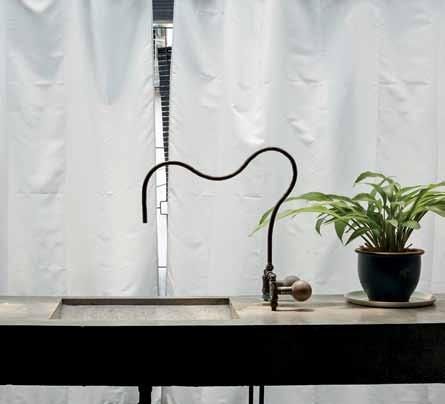
previous | Cutaway walls, su C h
C ore the house’s deliberately unfinished quality. above | a n unusually
C et in the
a quirky
as this makeshift doorway next to the kitC hen area, unders
shaped fau
master bathroom emerges as
detail.
3 . on location # 131
architect on that project at the time that she was working on her own house, sparking a palpable correspondence between the two neighbouring buildings. Rubble from the other site soon found resourceful use in the exterior walls surrounding the house while wooden planks salvaged from the other house wound up as shelving in Farah’s living room.
At the Kurau House, spaces don’t merely connect; they overlap one another in intriguing ways, evolving new narratives. To venture from one place to the next is to engage in a choreographed dance whereby one’s every movement is infused with an air of heightened cognisance. Every subsequent step paves the way for a visual experience exceedingly different from the last. It’s a journey that begins upon one’s arrival: the front gate shifts, accordion-like, revealing a graveled path shielded by a mango tree whose branches protrude unencumbered through special openings in the top overhang. Composed of concrete slabs, staggered steps lead the way to a terrace area and the front door, which, as part of the original house, once faced the busy main road. In adherence to Farah’s redesign, it now looks onto Jalan Sepat, the smaller side street. But while this arrangement affords slightly more privacy, it hardly makes the Kurau House an oasis of quietude.
Giving way to light and ventilation, an array of interior and exterior openings facilitates an ongoing connection between inside and outside; this close proximity to the elements comes at a price, however, for the same useful features also render the house more or less porous. Passing cars, chatty passersby, chirping birds and the spurts of a distant garden hose are all part of the daily soundtrack, making solitude a precious luxury at times. Undaunted by such intrusions, Farah feels that they are part and parcel of the ambience fostered by the house. “I was guided by pure intuition and that resulted in a house that, in many ways, isn’t very practical,” she

above | A steel A nd wood stA ircA se on the first floor Affords direct Access to the newly A dded Attic. opposite | s ituAted right A bove the m A ster bedroom, the Attic’s tr A nspA rent openings contr A dict the spAce’s intim Ate position within the house.
issue #31 habitusliving.com
Spaces don’t merely connect; they overlap one another in intriguing ways, evolving new narratives.
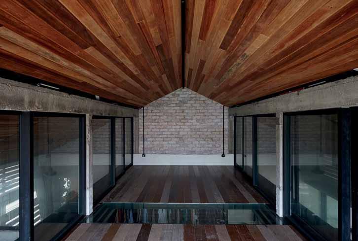
CARPORT PATIO LIVING DINING BATHROOM VOID BALCONY 1 2 3 4 9 0 q KITCHEN POWDER ROOM OFFICE BEDROOM 5 6 7 8 GROUND FLOOR FIRST FLOOR 3 . on location # 133 6 0 0 1 2 3 9 9 7 4 5 8 q
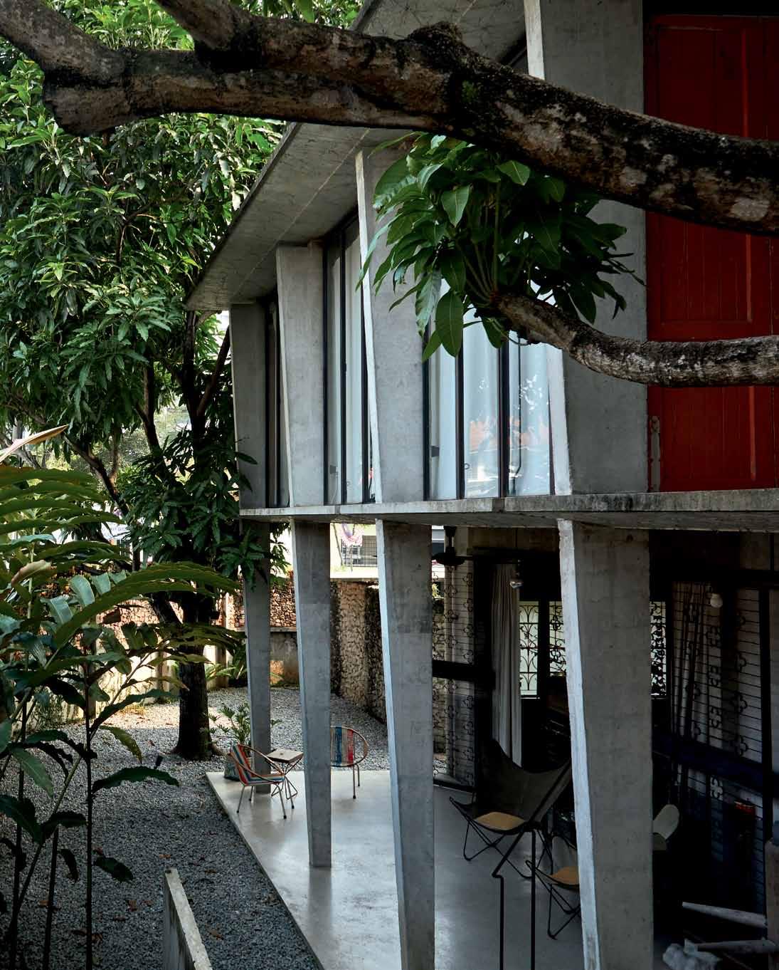
above | From the outside, the industrial aesthetic provides a sense o F eye catching strength while also serving as a Fucntioning balcony F or the outdoor area . opposite | Facing on to a quiet side street, the house’s imposing concrete structure is so F tened by the presence o F several mango trees on the property. issue #31 habitusliving.com
maintains. Since the space was intended for her own personal use, Farah says she seized on the opportunity to “break every rule.”
This yen for subversion comes through in an assemblage of interventions that appear to challenge the building’s utility. Safety rails are daringly absent on the first-floor terrace (“that way, it doubles as a loading bay when contractors come by with something big.”) and a steel-frame bookshelf bisecting the first two levels, extending from the ground floor all the way through to the underside of the attic on the top floor, is rigged with a timber platform that slides back to offer a precarious glimpse of the floor below.
This hovering effect is amplified to an even greater degree in the newly constructed attic; essentially a triangular box suspended over the original structure, the space, initially designed as an extra bedroom, feels less like an overnight crash pad than a master control room. In place of CCTV monitors, floor-toceiling glass panels provide unrestrained views of the house’s innermost corners while conveying the feeling of being carried aloft. Deepening the space’s association with surveillance, a cut made into the attic floor and encased in glass proffers a voyeuristic slice of the main bedroom below. To while away a short duration here is to know the
house more intimately than any given length of time spent in any of its other rooms. Though, architecturally speaking, the most conventional room in the house, the attic, in taking on the role of the building's main nerve centre, became its most revelatory space.
On the restructuring of the Kurau House, Farah readily likens the process to painting. It’s easy to see why. Like the latter, there’s a good deal of layering involved. Hinged on a complexity of partitions and openings that both envelops and animates the spaces within it, the house is the epitome of organised chaos. The effect produced is, indeed, not unlike that of brushstrokes that at first appear as disparate gestures up close only to come together as a cohesive whole when the artwork is viewed in its entirety. In painting, there is also the conundrum of when anything feels “finished” and for Farah, therein lies the true essence of the house. “It’s an ongoing work in process,” she says. At the time of writing, she was coincidentally moving out and preparing for the house’s next phase. Asked apropos of her intentions, she delivers an answer that perfectly summarises where things stand: “Who knows? I’m just going to let it happen.”
drop box
Architect Studio Bikin
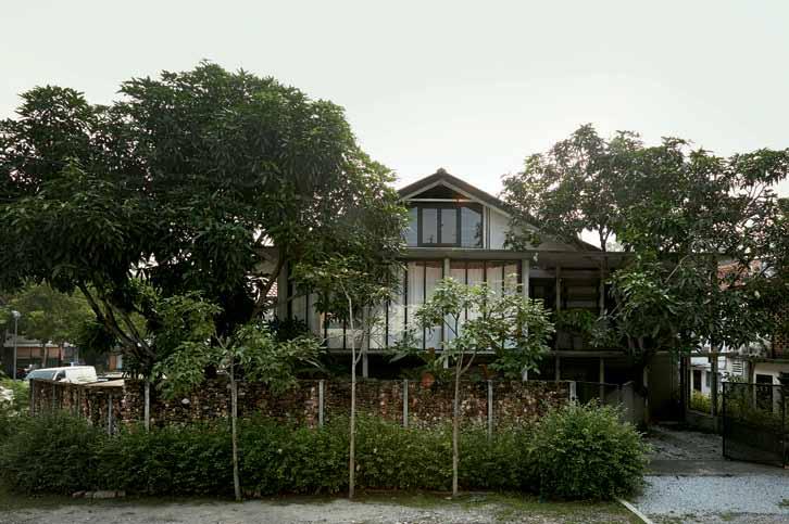
Project Architect Farah Azizan Structur Al engineer Projurutek Consultant Sdn Bhd
MAin contr Actor CHB Construction Sdn Bhd
PluMbing And electricAl contr Actor Loke Electrical Services SteelworkS FE design
Studio Bikin (60) 3 2201 8803 studiobikin.com
ProductS
All custom designed from recycled materials. Tap valves etc. available from Kedai Bikin.
3 . on location # 135
FOOD IS ART. ELEVATE IT.


craftsmanship and
In
technology, Wolf stands alone. Its professional performance helps you make the most of every meal. subzerowolf.com.au
A transformative space

Behind the public façade of SYDNEY ’s Edwards & Co. building is a private haven by JOSEPHINE HURLEY that offers a relaxed and considered backdrop to life. REBECCA GROSS visits.

Tex T Rebecca GRoss | PhoToGR a Phy Tom FeRGuson
3 . on location # 137
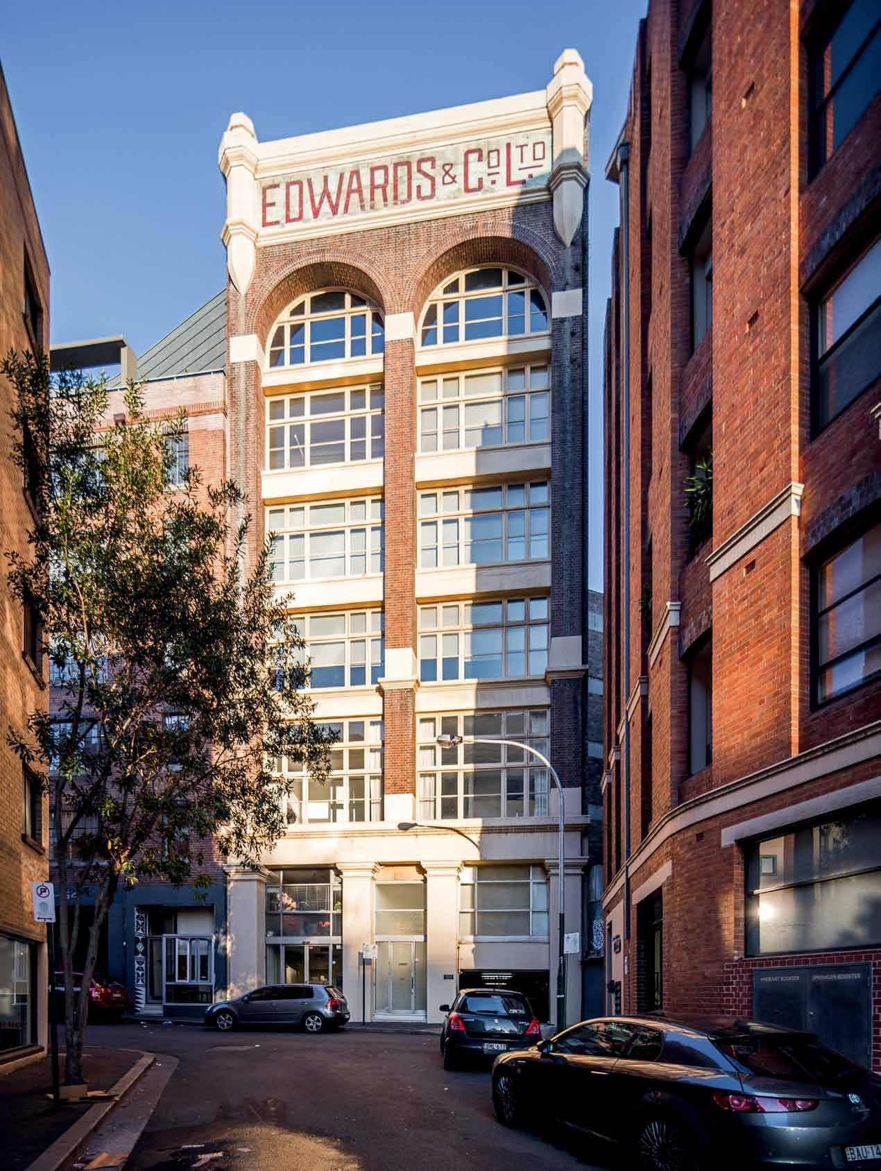
issue #31 habitusliving.com
The distinctive Edwards & Co. Ltd. building, wedged into a corner of one of Surry Hills’ narrow streets, was a warehouse for Edwards Tea in the 1920s. Recognisable by its capped and emblazoned pediment and recessed arched windows, the brick Federation building is one of Sydney’s most iconic and a familiar element of the cityscape. But, like so many inner-city heritage buildings, it has been converted to offices and apartments and now behind that pediment and arched windows is a two-storey home with an apartment on one floor and a retreat and rooftop deck on the other.
Designed by architect Josephine Hurley with the utmost consideration to comfort, practicality and respect for the building, the interior is much like the building and even the city itself; it serves as a background to life. It is there to be interacted with where and when needed, and it can be transformed and adapted to simplify and ease those interactions.
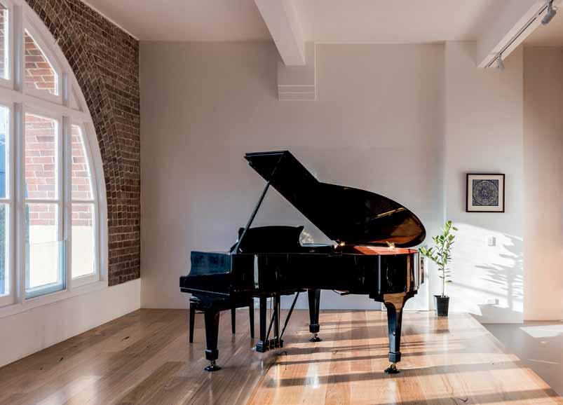
“Architecture and design needs to facilitate our everyday lives,” says Hurley, “it shouldn’t control our lives.” And that is indeed what she and her client, a talented musician and trained architect who lives with her sports enthusiast partner and young daughter, have created in the Edwards & Co building. “Everything is in
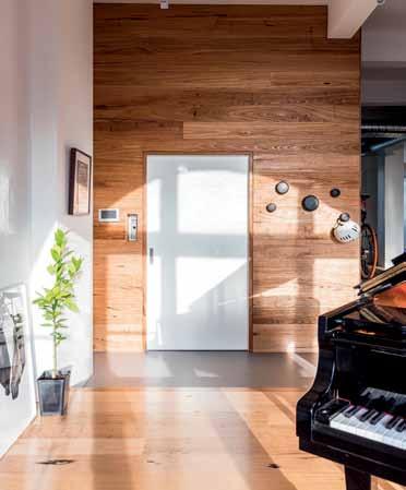
3 . on location # 139
previous | Sliding panelS conceal the two-deSk nook and laundry adjacent to the dining and living area. above | a raiSed floor contributeS to an elaborate acouStic SyStem, enhancing the Sound of the piano and adding a layer of protection for neighbourS beLoW | opening directly into the apartment, the elevator i S encaSed in a lift well lined with auStralian cheStnut. opposiTe | the apartment and retreat Sit behind the arched windowS and pediment of the edwardS & co. ltd building.
the background,” says the owner, “so the space can live and breathe and transform depending on who’s here.”
Tasked with the unusual situation of stepping into a project after concept plan and DA – prepared by German-based architect and friend of the clients’ Jörg Karwath – Hurley departed somewhat from the submission. However, due to the owner’s familiarity with architecture, Hurley says, “the design evolved quite fluently because we already had that common language.” With a newfound friendship that has surpassed the clientarchitect relationship, both Hurley and the homeowner describe each other as practical people with a good sense of design. “There is compromise for practical reasons,” explains the client, “but it is good, well thought out compromise. We are both open to discovery and each other’s suggestions.”
The renovated space, formerly an advertising agency, reflects this practicality and compromise and is calm, liveable and welcoming. “The priority for us is comfort: comfort to the eyes, comfort to the ears, comfort to moving around. You’ve got to feel comfortable and be emotionally comfortable. You can’t be precious,” says the owner.
As a musician, with a grand piano and ensemble of instruments, ‘comfort to the ear’ applies not only within the home but also with
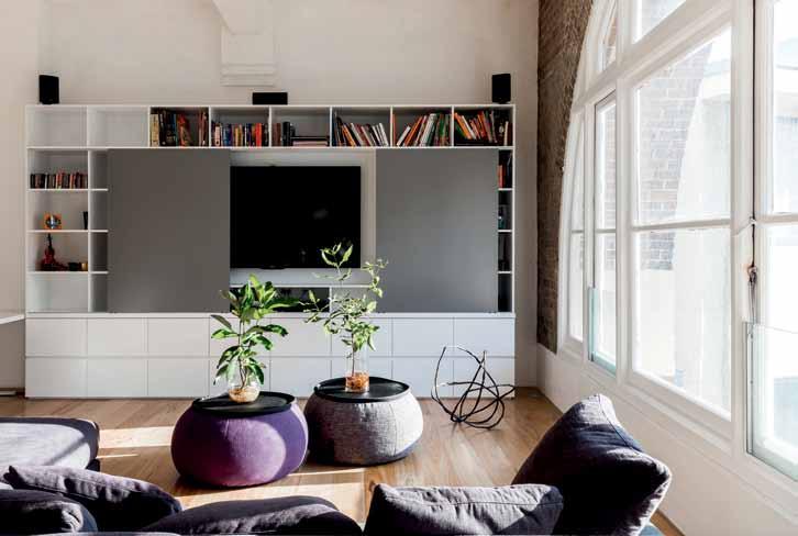
opposite | Smooth integrated joinery i S S et again St au Stralian CheStnut floor S and heritage bri C k wallS in the open kitC hen and living S paC e. above | g rey and white joinery C ontinueS throughout the living S paC e and S liding panelS C on C eal the televi S ion when not in u S e.
issue #31 habitusliving.com
You’ve got to feel comfortable and be emotionally comfortable. You can’t be precious. resident
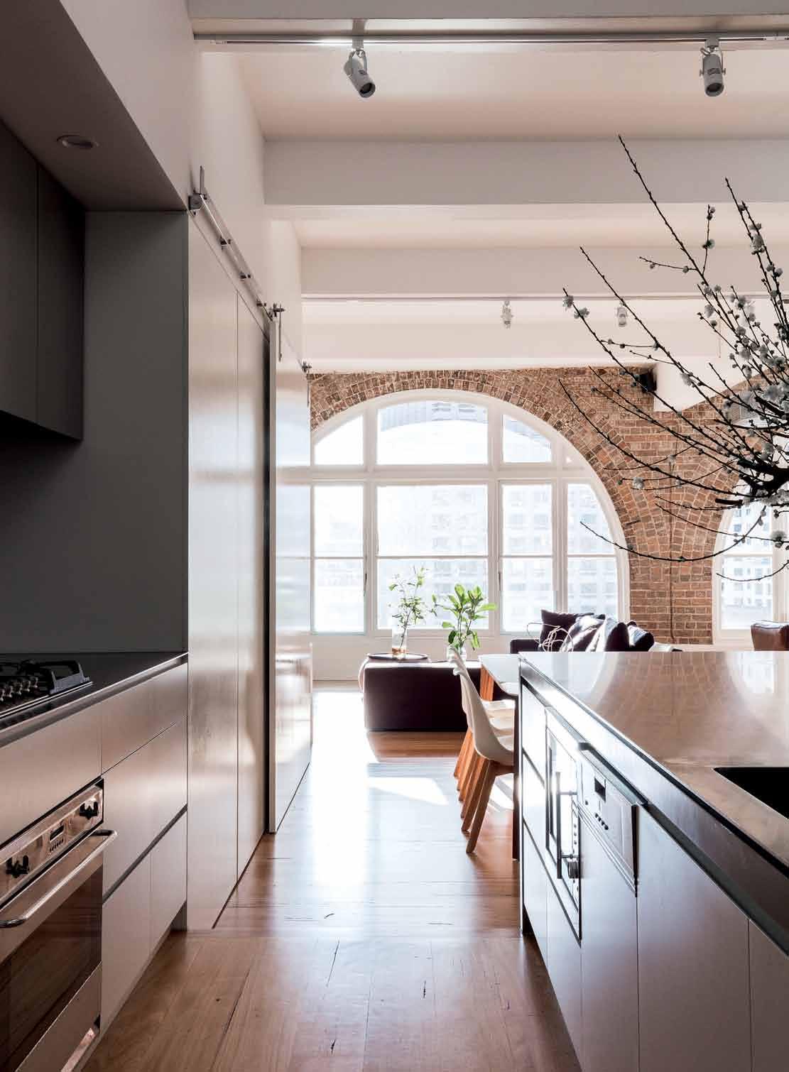
3 . on location # 141

issue #31 habitusliving.com
respect to the neighbours. Hurley installed a raised timber floor throughout the living areas that performs as an elaborate acoustic system both enhancing sound in the home and adding a layer of protection between storeys. It also solves drainage problems—providing falls to service risers—as well as innovatively reducing the height differential between the client and her partner in the kitchen.
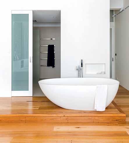
Made from Australian chestnut distressed in the bush fires, the floor has “traces of history,” says the owner, and is fitting for this historic building that is also marked with the scars that come from time and use. Hurley has showcased the texture, colour and warmth of the original brick fabric of the building by using a minimal colour palette and smooth integrated surfaces. “The building gives you this beautiful shell to work with,” she says, “but we’re not trying to compete with it or be the same. It’s a fresh take.” Layers of bricks frame the arched windows—and the cityscape—in the living area and evidence of chasing is etched into the exposed wall in the master bedroom. Upstairs, the former caretaker’s office was demolished and the retreat built anew, but still wanting to pay respect to the


opposite |
| d
in The
3 . on location # 143
The raised floor in The masTer bedroom provides service risers for The freesTanding baTh. above
ecades-old chasing is revealed
exposed brick walls of The masTer bedroom.
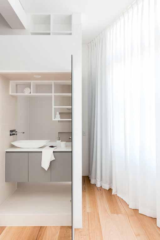
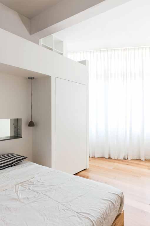
A
A
O site | the
issue #31 habitusliving.com
left |
loft Above the bed provides
re Ading nook for the dAughter. right | Clever pl Anning sees
A
bAthroom fully integr Ated into the dAughter’s bedroom. Opp
three-bedroom home extends ACross two levels, with the rooftop deCk And self- ContAined retre At on the upper level.
ENTRY MUSIC LIVING DINING 1 2 3 4 ENSUITE WC BATHROOM SAUNA 9 0 q e KITCHEN STUDY LAUNDRY BED 5 6 7 8 COURTYARD ROOF DECK w r 1 3 3 LEVEL 2 9 9 7 4 4 5 5 8 8 8 q 0 e LEVEL 1 6 w r 3 . on location # 145 2
heritage of the building and its location Hurley custom-designed a lighting fixture-slash-wall feature made of copper pipes that references the view of the Sydney skyline beyond.
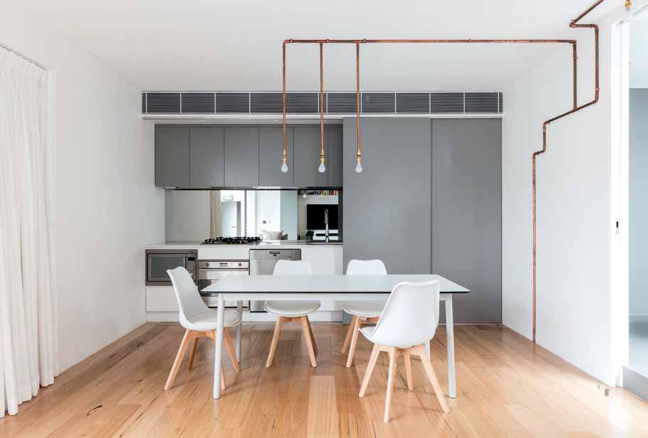
Lighting also serves as a decorative feature in the main apartment, as well as being essential to illuminating the middle of the deep-plan apartment. With only east-west windows, Hurley incorporated glazed panels on internal doors to borrow light from the rear bedrooms, as well as eclectic colour-changing LED lights—at the client’s request—that can alter the ambience of the spaces.
The well-considered layout uses space wisely to double up on functions. The elevator opens into the apartment and the timber-lined lift-well is surrounded by a channel of Forbo linoleum that provides access to all ground floor living spaces defined by the raised timber floor. The channel doubles as an art studio space while the lift-well wall supports a collection of bikes. The sense of flow that is established by the Forbo channel extends to the open living space, which accommodates the kitchen, dining table, two-desk nook, living room and music space. “There are no residual spaces, everything is used without feeling over designed,” Hurley explains, “A key interest of mine was not to overcomplicate what is a beautiful building.”
There are no residual spaces, everything is used without feeling over designed.
issue #31 habitusliving.com
HURLEY | A RcH it E ct
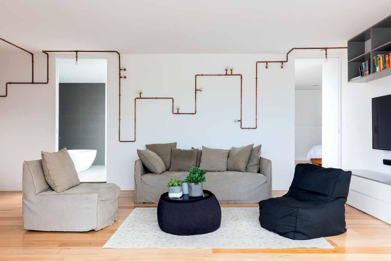
opposite | Like the apartment downstairs, grey and white s Liding joinery is used to concea L functionaL spaces in the retreat. above | h urLey designed the copperpipe Lighting feature that references the view of the sydney sky Line. 3 . on location # 147
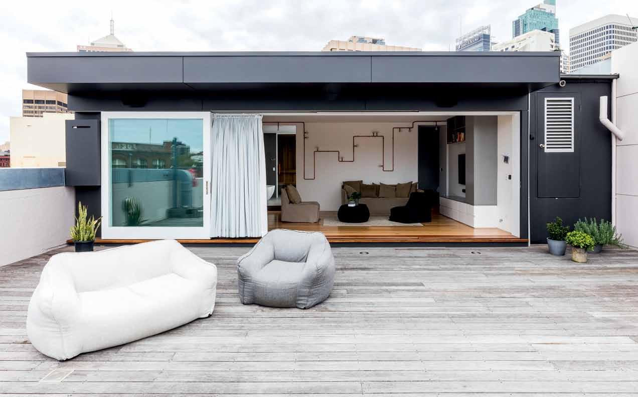
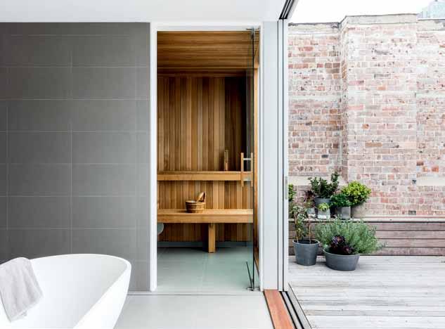
issue #31 habitusliving.com
above | In place of the demolI shed caretaker’s res Idence, the newly bu Ilt retreat opens onto a spacI ous rooftop deck. below | the materIal palette of the sauna, bathroom and Internal courtyard showcases the warmth of brI ck and tImber. o pposite | lIke a prIvate oas I s In the mIdst of the cIty, the guest bedroom opens to the Internal courtyard.
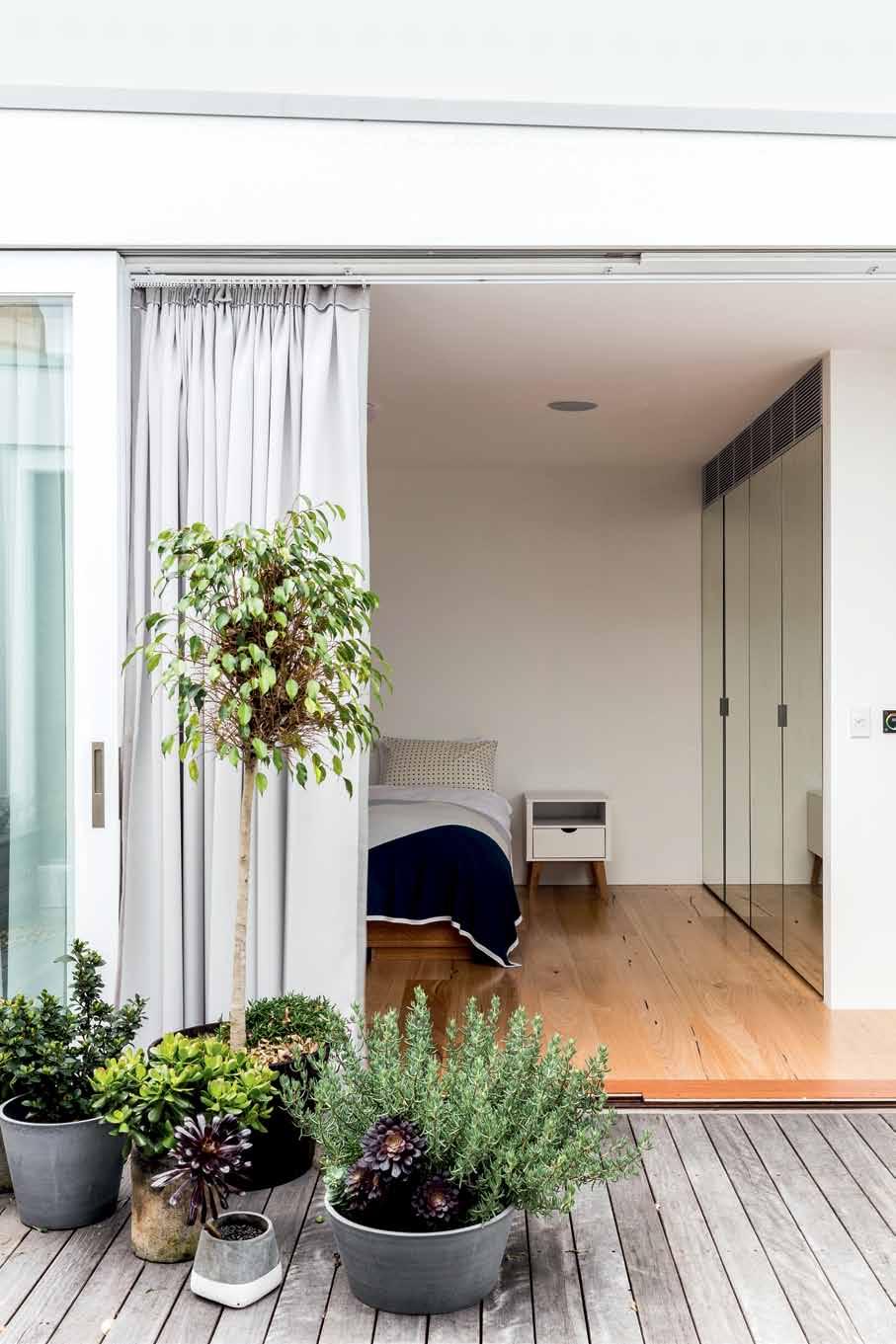
3 . on location # 149
drop box
archiTecT Josephine Hurley Architecture
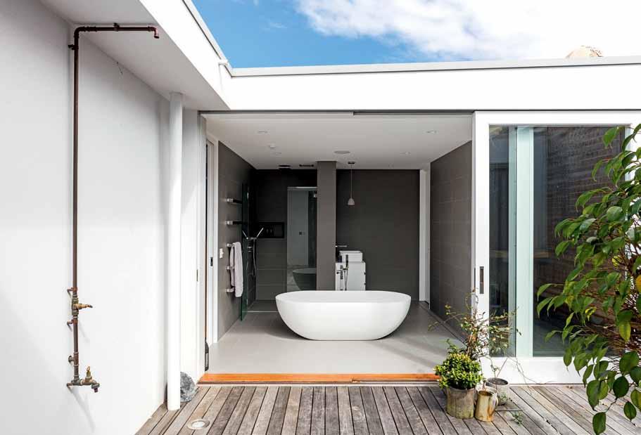
Builder 2M Projects
sTrucTural engineer iSTRUCT
Consulting Engineers
acousTic engineer Wood & Grieve Engineers
JOSEPHINE HURLEY ARCHITECTURE
(61) 423 177 290
josephinehurley.com
furniTure
Custom joinery throughout by Josephine Hurley Architecture, made by Mirror Built in Wardrobe. Boxster Modular sofa and Joe sofa by MCM House in Living. Match extension table by Mauro Lipparini from Homeware Gallery in Dining. Time dining table by NOMI in Guest Dining. Brandon dining chairs from Freedom. Gumball Light Plust Chair from Homeware Gallery in Bed 1.
lighTing
Internally – custom designed copper wall lights and pendant by Josephine Hurley Architecture in Guest Living and Dining. Viore Design Concrete Pendant by Paul Mulheam in Ensuite 1, Bed 2 and Guest Bathroom. Generally throughout, LED track lights, floor lights and strip lights from TEC-LED Lighting.
finishes
Flooring throughout is Chestnut Tongue & Groove by E&D Danias. Entry flooring is Forbo Marmoleum in cement. Paint finishes throughout are Dulux Vivid White. Kitchen benchtop in 5mm satin finish stainless steel. Joinery throughout in low-sheen polyurethane
fiXed & fiTTed
From
Certainly, the joinery throughout the home illustrates Hurley’s intention with integrated walls of joinery, in a subdued palette of grey and white, concealing the otherwise-cluttered spaces and objects needed for what Hurley refers to as “everyday life.” Sliding panels mask the television, laundry and upstairs kitchen, while cabinets, drawers and shelving stretch the length of the kitchen, master bedroom and lift-well.
With a great appreciation for liveable spaces, the relaxed and peaceful apartment is an expression of both the way the residents live and how Hurley designs. “My approach is honesty of materials and simple palettes,” she says, “but every client brings so much into the design that every project is completely different. It relates to who lives there. I’m not trying to imprint my way of living onto someone else.” Describing this project she says, “here, the music brings another layer, as does the lighting, and the sense of how you experience it.” And for the homeowner who says the apartment has exceeded all expectations? “It’s almost a blank canvas with a bit of a suggestion. And then things happen…” she says.
above | The copper-pipe ou Tdoor shower recalls The ciT yscape lighTing feaT ure in The living area.
finish in custom colour and Vivid White from Dulux. Porcelain floor and wall tiles in Bathroom from Academy Tiles.
Winning Appliances unless otherwise noted. Oven and Dishwasher by Miele. Highland Cooktop. Rangehood by Qasair. Microwave by Smeg. Westinghouse fridge. Bathroom fixtures and fittings from ACS Designer Bathrooms. Door hardware from Hailliday and Baillie.
issue #31 habitusliving.com
Indesign Media now offers you more tools to market your brand than any other media organisation in this region. Talk to us now about how you can directly connect with an influential audience of over 670,000 engaged individuals across our print, digital and events media.
Indesign 100,000+ engaged indesignlive.com /indesignlive @indesignlive @indesignlive
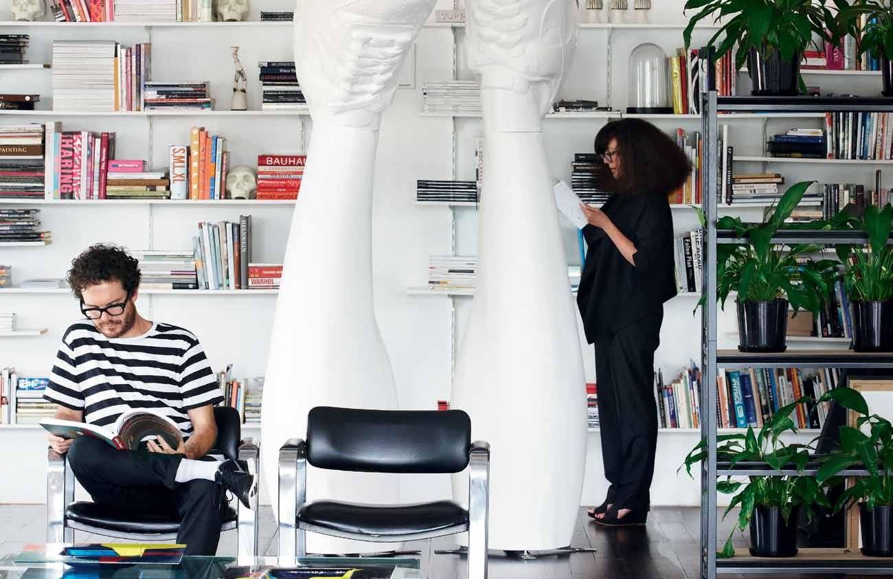
/habitusliving
Cubes 62,000+ engaged indesignlive.sg /indesignliveasia @indesignlivesg @indesignlive Lookbox 88,000+ engaged lookboxliving.com /lookboxliving @lookboxliving @lookbox_living/ Indesign The Event 170,000+ engaged indesigntheevent.com /indesigntheevent @indesign_event @indesigntheevent Habitus 150,000+ engaged habitusliving.com
@habitusliving @habitusliving DQ 100,000+ engaged indesignlive.com /designquarterly @tweetdq @designquarterly
-
indesign.com.au (61 2) 9368 0150
Photography by James Geer
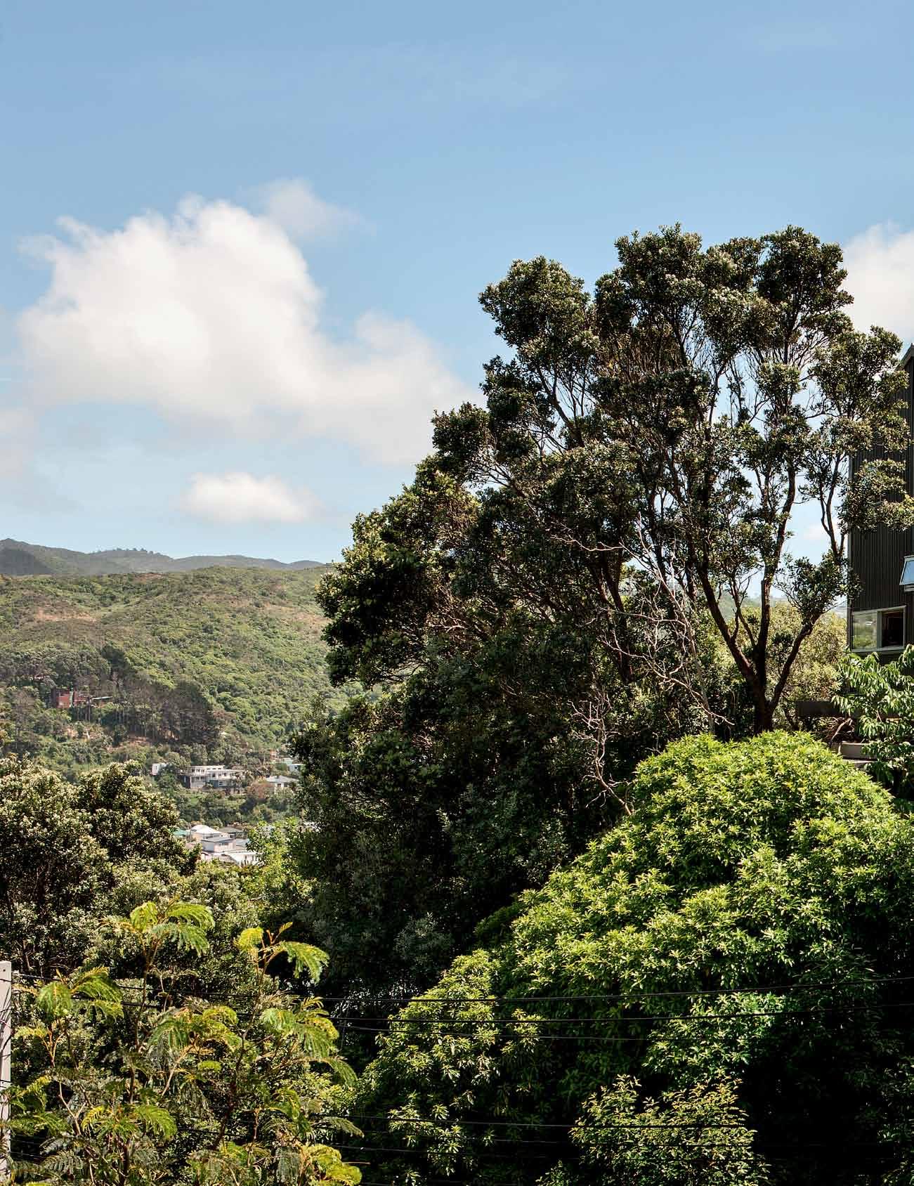
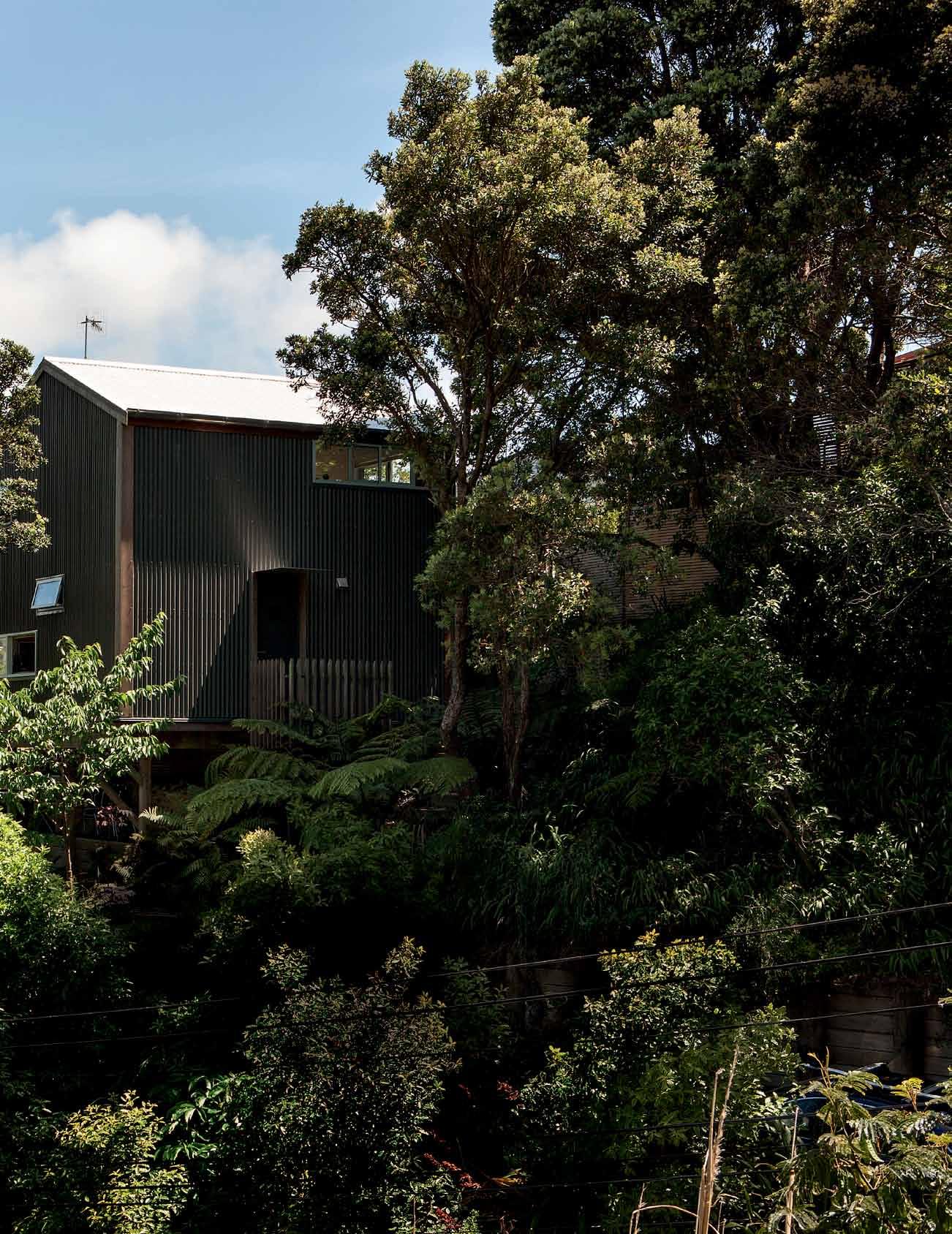
issue #31 habitusliving.com
Japanese origins
Wellington
creates a 50-squaremetre house on a marginal site in Island Bay.

discusses the genesis of the idea and its success as a small house model for New Zealand.

Tex T
A
Andre
STevenS | PhoTogr APhy Simon deviTT
designer AndreW SimpSon
AndreA StevenS
3 . on location # 153
Most architects and designers I speak to prefer to make small and intricate buildings over large ones for the same cost. Space trade-offs are often more than compensated for by the greater character and personality offered by a carefully detailed building. I’ve visited many such houses that prioritise quality over size, but none quite as compact as Andrew Simpson’s 50-squaremetre house in Wellington. This little jewel box is an exercise in invention and craft producing spaces that are small but not tight, succinct but not mean.
The decision on size was brought about by the need to live near the city at an affordable price, but also by the designer’s strong desire to experiment. After living in a variety of small and eclectic inner city apartments – including a self-made corrugated cardboard structure inside a warehouse – Andrew had adapted to living in a compact dwelling. The project would need to meet his and partner Krysty Peebles’ needs, but also provoke thought and debate in New Zealand about how to live well in less space.

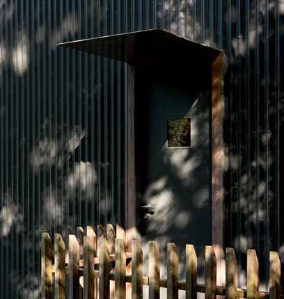
Part of the affordability equation was the land price, and so they started searching for a ‘difficult’ site, a site with hidden potential.
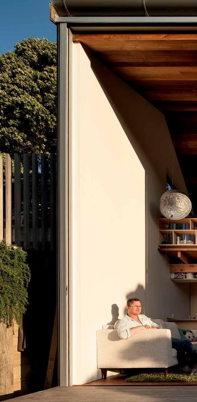
issue #31 habitusliving.com


3 . on location # 155
previous | Perched on its steeP bush site, the aPParent 'hut on P oles' reveals a richly crafted interior. opposite | With little embellishment, the front door is accessed from a small deck. the right hand Painting is by d elia Woodham. above | the double-height living room o Pens dramatically to the outdoors With a fullheight sliding glass door.
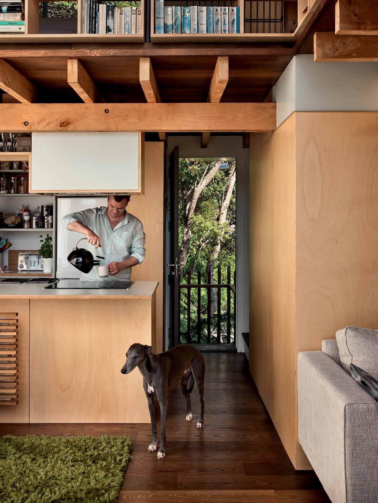
issue #31 habitusliving.com
After a year of looking, 600 square metres came up for sale in the coastal suburb of Island Bay. At fifteen minutes drive from the city it had the proximity they needed for work, and it was certainly difficult to develop. Accessed from the south, with a steep slope covered in bush, Andrew pushed his way up to the ridgeline and pictured a pole house perched amongst the trees to capture the western sun and valley views.
When defining a house type, he didn’t see the tiny house as a model – these houses are often not much larger than a caravan. Instead, he looked to small house types, which are typically sized down for affordability, land size and environmental reasons – while still sharing some counter culture values with the tiny house movement, but offering a more practical model. For Andrew, it became an exercise in designing the right amount of space for a couple, rather than the maximum space affordable: a very different view of housing in a culture dominated by the concept of ‘resale value’, which seems to drive so many briefs and designs.

Makoto Masuzawa’s 1952 Minimum House became a model together with the nine-square grid house concept, a common design exercise

opposite
At
| A
|
Andrew stAnds in the kitchen with the front door open
And the bAthroom conce Aled
the right. above
view from the kitchen towArd the stAircAse And into the only bAthroom.
It became an exercise in designing the right amount of space for a couple, rather than the maximum space affordable.
3 . on location # 157
at architecture schools. Andrew had seen Masuzawa’s designs at an exhibition in Kyoto a decade earlier, and it had resonances with both his living experiences in Japan, and the current economic climate – Masuzawa’s post-war project was also an exercise in economy. The prototype, also known as the ‘9-Tsubo House’, established the basic footprint and a challenging but absorbing set of design constraints.
“There was a huge temptation to make it larger,” Andrew confesses, “and there was the option to design a two-bedroom version. But we were used to living in 50-square-metre apartments, and the design exercise in itself appealed.”

The house is designed for four – Andrew and Krysty, and their two (large) Whippets. They have no children, so some of the pressures for room numbers and sizes were not a factor. What is apparent from the house layout and detail, are spaces that support personal pursuits like reading, music and film. It is a house that is very connected with its natural environment, and it has a warm homely feel, supportive of a relaxed and quiet way of life.
With its cubic dimensions, the house exterior is about as simple as it can be. A pitched gable roof and corrugated iron cladding form essentially a shed perched on poles. Three small decks extend to form an entry landing, and outdoor spaces off the
issue #31 habitusliving.com


3 . on location # 159

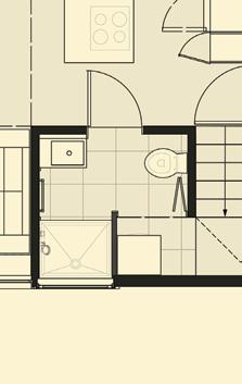


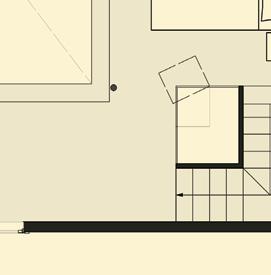




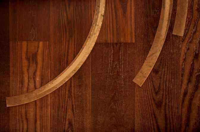
DECK 4 LAUNDRY STUDY 7 8 BATHROOM 6 BEDROOM VOID 9 0 KITCHEN 2 1 3 LEVEL 1 6 9 7 4 5 8 0 GROUND LEVEL issue #31 habitusliving.com
bedroom and living room on the western side. The simple flush front door leads straight into the kitchen with a staircase and ‘hidden’ bathroom to the left, but your attention is immediately grabbed by the two-storey high glass doors and double height living space.
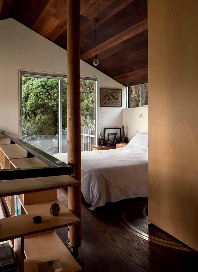
Flooded with light and with a strong connected to the view and bush outside, the small house feels expansive. It points towards the setting winter sun, with small compositional windows to bring in details of surrounding trees at the other compass points. A dining space lies immediately in front of the kitchen bench, and a small TV snug is tucked under the mezzanine opposite. Upstairs is the bedroom and study, both overlooking the void and out through the huge glass doors.
The great success of the house is how generous it feels despite its five-and-a-halfmetre-square plan. Each room borrows space from the others so they all feel generous. The bedroom is the best example of this – at a standard size as measured by floor area, it is open to the full building width and length, looking out through the doors to the valley beyond. Storage is expertly handled upstairs and downstairs by metres of built-in shelving, which adds to the house both functionally and aesthetically with its lattice e ect.


 PREVIOUS | WITH SUCH A SMALL FOOTPRINT, THE EXPERIENCE OF THE OUTDOORS IS FAR MORE PALPABLE THAN IN A LARGER HOUSE. FEATURING A WARM LIVING SPACE WITH A TIMBER ATRIUM THAT HUGS THE ROOM. ABOVE | UPSTAIRS, THE BEDROOM LOOKS ONTO AN EASTERN DECK AND ACROSS THE DOUBLE HEIGHT SPACE. ABOVE | INLAID BRASS CHANNELS TAKE THE
3 . on location # 161
WHEELS OF THE UNFOLDING, 'HIDDEN' WARDROBE.
drop box
architect WireDog Architecture
builder John Kaveney
WIREDOG ARCHITECTURE
(64) 4387 4433
wiredogarchitecture.co.nz
furniture
FIXED & FITTED
The original Japanese model impacted the house size more than its planning. But I can’t help seeing similarities with Japanese timberwork in its softness and the designer’s obvious enjoyment in combining natural timbers with exposed construction detail. Andrew and his father actually built all the joinery themselves with a skill saw, leaving a few rough edges but a great sense of satisfaction and participation in its making.
One of the misunderstood ideas about the project from its initial public reaction was that it was a cheap house to build. It was ‘cheap’ because of its small size, but its square metre rate is in fact similar to a medium-spec architectural house. “I could have made it cheaper by using plywood instead of solid timber for example,” says Andrew, “but the cost savings we made by building small still far outweighed the extra square metre cost to build.”
By adapting and updating a 1950s Japanese model to suit local New Zealand construction, materials and space planning, Andrew creates a new type and achieves a great depth of character in a small area.
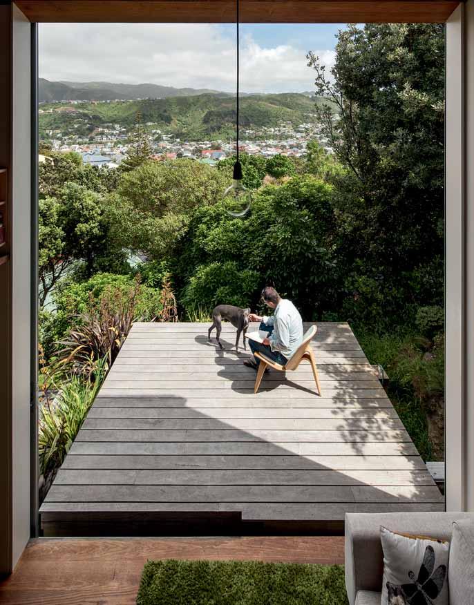
above | Pro P ortionality is key, and the living deck aPPears to have folded down from the
height o Pening.
double
Custom bedhead and vintage bedside tables made by Andrew Simpson and Chris Simpson (WireDog Architecture). In Living Room, Santa Barbara couches from Stacks Furniture. In Living Room, Panasonic 42” LED TV and in-wall speakers from Polk Audio.
lighting Living room pendant light by Castellani & Smith.
finishes Interior paint finishes Karen Walker Butter White. Kitchen bench in Hoop pine with Formica Sage surface made by WireDog Architecture. Exposed floor joists and Flitch beams by Lawsen Cypress Farmers Shelter Belt. Floor and ceiling paint throughout in White Ash by Herman Pacific. Internal Cladding throughout, Blonded Italian Poplar from Plytech.
Blonded Italian Poplar shelving made by Andrew Simpson and Chris Simpson (WireDog Architecture). Kitchen: Foraze Panni sink by Heritage Hardware. Tapware throughout Innox Quatro Octavo by Marine and More. Smeg Pyrolitic Oven. Bosch Induction Hob. Mitsubishi Fridge Freezer. Bath, ceramic shower and toilet by Catalano. PueVida shower by Hans Grohe.
issue #31 habitusliving.com
Ebony and silver.


Sydney Shop 104 PYD Building 197 Young Street Waterloo Melbourne 361 Bridge Road Richmond Victoria
motherofpearl.com
DIRECTING DESIGN INDUSTRY PROFESSIONALS TO THE RIGHT JOBS IN AUSTRALIA AND ACROSS ASIA
DIRECTING DESIGN INDUSTRY PROFESSIONALS TO THE RIGHT JOBS IN AUSTRALIA AND ACROSS ASIA
careersindesign.com.au
careersindesign.com.au
3D VISUALISER
3D VISUALISER
ACCOUNT MANAGER
ACCOUNT MANAGER
ADMINISTRATION
ADMINISTRATION
AGENT/DISTRIBUTOR
AGENT/DISTRIBUTOR
FIND
FIND
BLOGGER
BLOGGER
BUSINESS DEVELOPMENT
BUSINESS DEVELOPMENT
CAD DESIGNER
CAD DESIGNER
CAMPAIGN MANAGEMENT
CAMPAIGN MANAGEMENT
CUSTOMER SERVICE
CUSTOMER SERVICE
DESIGN MANAGER
DESIGN MANAGER
DESIGNERS
DESIGNERS EDITOR
EDITOR
EVENTS CO-ORDINATOR
EVENTS CO-ORDINATOR
GRAPHIC DESIGNER
GRAPHIC DESIGNER
INDUSTRIAL DESIGNER
INDUSTRIAL DESIGNER
INTERIOR DESIGNER
INTERIOR DESIGNER
LECTURER
LECTURER
LIGHTING SALES
LIGHTING SALES
PERFECT
PERFECT
MEDIA ExECUTIVE
MEDIA ExECUTIVE
NATIONAL SALES MANAGER
NATIONAL SALES MANAGER
OPERATIONS MANAGER
OPERATIONS MANAGER
PA / SALES SUPPORT
PA / SALES SUPPORT
PHP DEVELOPER
PHP DEVELOPER
PR ACCOUNT MANAGER
PR ACCOUNT MANAGER
PRODUCTION MANAGER
PRODUCTION MANAGER
PROJECT MANAGER
PROJECT MANAGER
SPECIFICATION
SPECIFICATION
RETAIL INTERIOR DESIGNER
RETAIL INTERIOR DESIGNER SALES
SALES
SHOwROOM MANAGER
SHOwROOM MANAGER
SHOwROOM SALES CONSULTANT
SHOwROOM SALES CONSULTANT
STATE MANAGER
STATE MANAGER
STUDIO LEADER
STUDIO LEADER
TECHNICAL OFFICER
TECHNICAL OFFICER
wAYFINDING DESIGNER
wAYFINDING DESIGNER
wEB DESIGNER / DEVELOPER
wEB DESIGNER / DEVELOPER
ARCHITECTURE
ARCHITECTURE
DESIGN
DESIGN
INTERIORS
INTERIORS
MEDIA
MEDIA
AGENCY
AGENCY
ADVERTISING
ADVERTISING
RETAIL COMMERCIAL FURNITURE
RETAIL COMMERCIAL FURNITURE
LIGHTING
LIGHTING
TEx TILES
TEx TILES
YOUR RESIDENTIAL ARCHITECTURE
YOUR RESIDENTIAL ARCHITECTURE
DESIGN
DESIGN
INTERIORS
INTERIORS
MEDIA
MEDIA
AGENCY
AGENCY
PUBLISHING
PUBLISHING
RETAIL
COMMERCIAL
RETAIL COMMERCIAL FURNITURE
FURNITURE
LIGHTING
LIGHTING
TEx TILES
TEx TILES
PRODUCT RESIDENTIAL JOB
PRODUCT RESIDENTIAL JOB
EDUCATION
EDUCATION
DESIGN INTERIORS
DESIGN INTERIORS
MEDIA ADVERTISING
MEDIA ADVERTISING
RETAIL COMMERCIAL FURNITURE
RETAIL COMMERCIAL FURNITURE
LIGHTING
LIGHTING
TEx TILES
TEx TILES
PRODUCT
PRODUCT
Second nature
The duo behind Singapore-based architecture studio
A D LAb developed a sense of limitless, lush green space in their own narrow terraced home in SingApore’ S eASt.
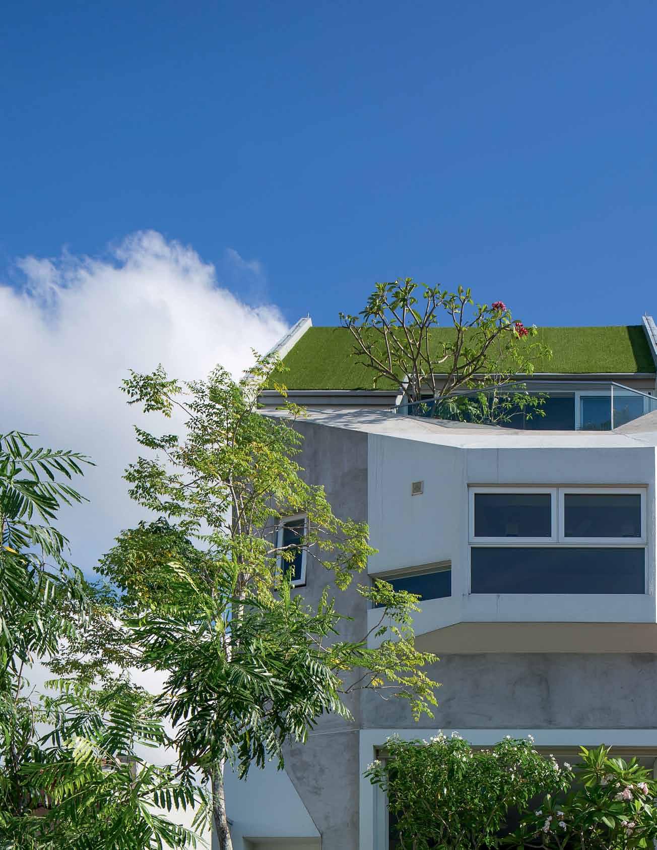
Tex T Narelle Yabuka | PhoTogra Ph Y Masa No k awa Na
3 . on location # 165

previous | The fronT elevaTion of The house, like The inTerior, is
wiTh green emanaTing from
asTroTurf.
| The
The
of TradiTional indoor-ouTdoor boundaries, wiTh The cenTral courT yard delivering
The
Th of
| u nlike
s ingaporean homes, a sTand-alone dining room is absenT meals are shared inside The kiTchen aT a large
issue #31 habitusliving.com
woven
planTers and
above
house blurs
edge
lighT for
grow
Trees and vines. opposite
many
bench.
Twenty years, it’s fair to say, is an adequate span of time in which to study and develop a design response to a new place – even one that has conditions inverse to those where you grew up. Designer Darlene Smyth landed in dense, tropical Singapore from spacious, temperate Canada (via Indonesia) in 1995. At that time, Singapore’s Esplanade Theatres on the Bay were undergoing design development, with the original proposal by DP Architects and Michael Wilford & Partners having been unveiled the year before. Darlene, as a fresh architecture graduate with an interest in music and theatre design, jumped at the chance to work on the project at DP’s office. And there, as fate would have it, she met her partner-to-be in life and work, architect Warren Liu Yaw Lin.
Before long, they were designing their first home together – a Housing and Development Board (HDB) flat in Singapore’s west – and testing design strategies and approaches that would prove instrumental to the later residential work undertaken through their studio A D Lab. “Eighty per cent of our society lives in this repetitive typology,” says Darlene of the HDB
context. “Everyone knows the organisation of a typical three-, four- or five-room HDB flat. It dictates how you live, how you relate to your family, and how you relate to your neighbours. So we challenged that. We thought, ‘what can we do with this flat to really make it flexible and grow with our family over time?’”
The interior was gutted and redesigned in a manner that could expand and contract, with an emphasis on screens and shared spaces. “Usually, when we do a presentation of our work, we begin with that project,” says Darlene with audible passion as we stand beside a ficus tree within the family’s open and breezy new home in Singapore’s east. She adds, “Even though it was one of our smallest projects ever, it began our thinking process about the preciousness of space.”
As she walks me through the new narrow inter-terrace house where she and Warren are now raising their two children, two things are immediately evident: not only has a perspective on the optimisation of space influenced the architecture of the house, but so too has a strong philosophy of how to live in the tropics. Despite (or perhaps because of) its small footprint and
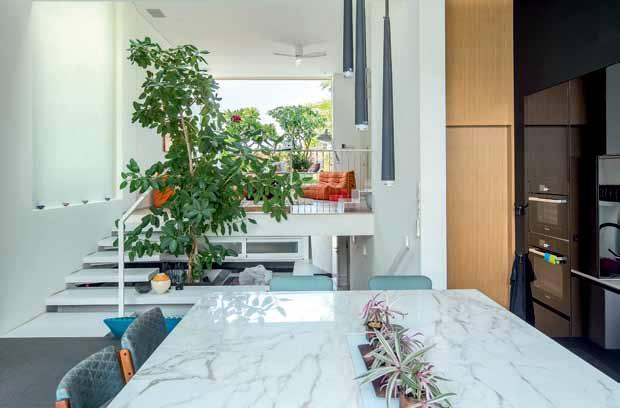
3 . on location # 167
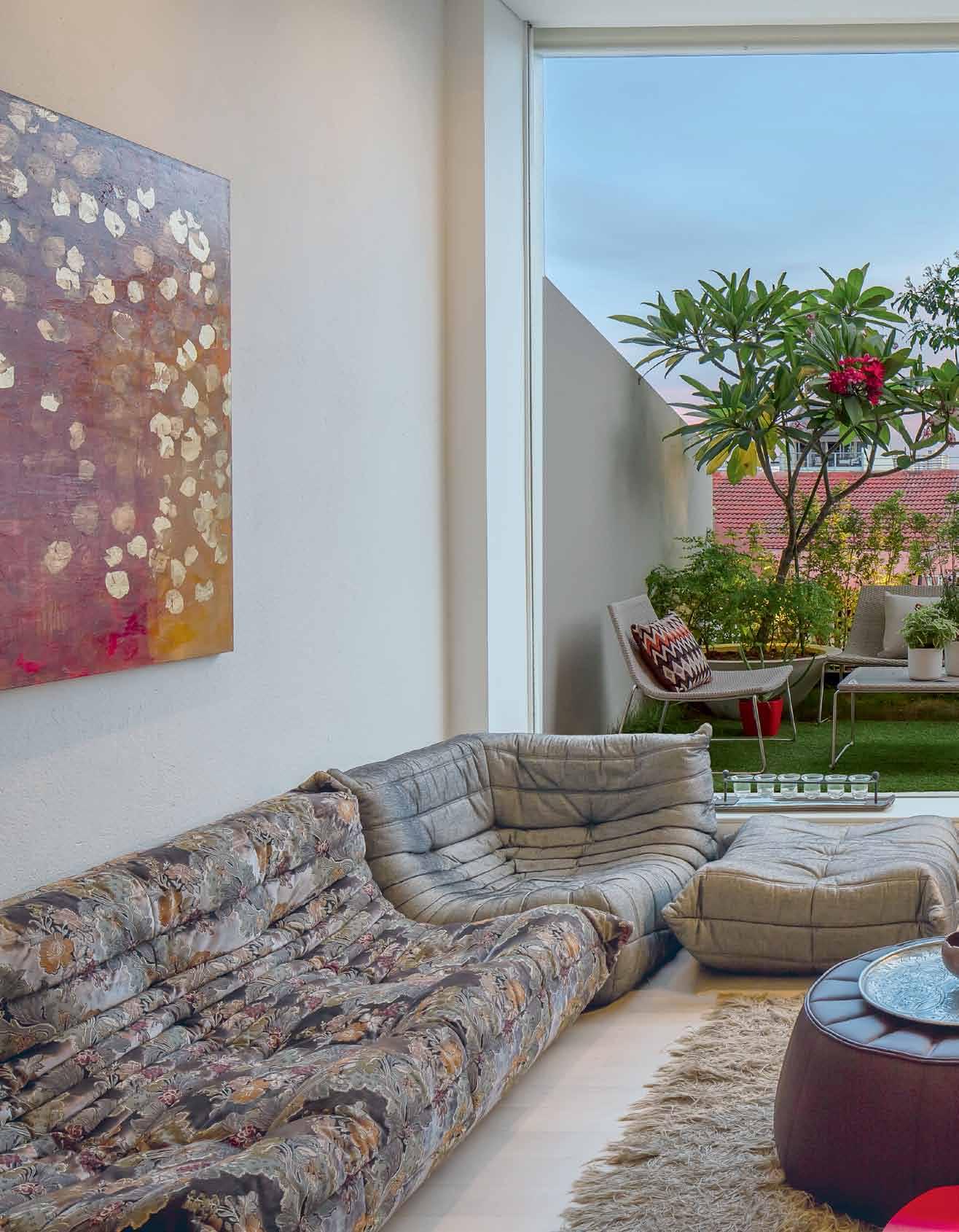
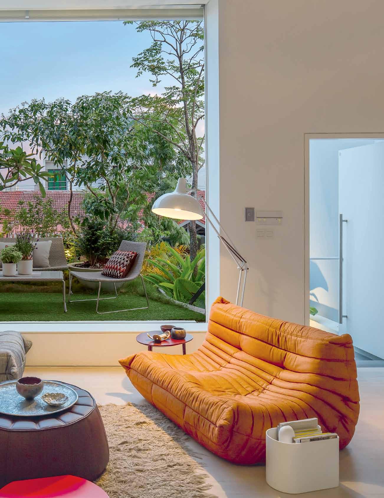
issue #31 habitusliving.com


3 . on location # 169
long, narrow proportions, the house is a network of intermediary zones that straddle the indoors and outdoors. “It’s not just about the feeling of blurring the edge,” says Darlene. “It’s actually about creating spaces that are between the two conditions. Many of our projects deal with that in different ways.”
Rather than feeling inwardly focused and dim, as is the danger with the dense interterrace typology, the house is surprisingly open, bright, well-ventilated and infused with plants. The main service areas of the home have been tucked away into a part basement, leaving the first storey as a vast open space with a central triple-volume courtyard (where the ficus is thriving) lit by a skylight above. This is where the main communal spaces of living room and combined kitchen-dining are located.
At this level, the front and the back facades have been prised open to the maximum with transparent roller shutters that can be hidden in the ceiling. This allows for the thorough connection of the living room to a front garden atop the car porch roof, and of the kitchen to a small pool and garden at the rear. The constant touch of the breeze can be felt, even in the centre of the plan, with the volume of the north-south-oriented house acting as a funnel for monsoonal winds.
The central courtyard atrium aids in the transfer of breeze, with louvred walls to bedrooms above facilitating the flow of air as well as the spread of natural light and aural connections within the home. Says Darlene, “It helps with the feeling of openness, and knowing where your kids are – that they’re not just locked in their rooms and hiding away. There’s always a sense of connection. We can call them to come down for dinner. So the courtyard is a space of communication as well.”
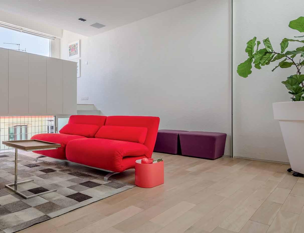

PREVIOUS | A roller shutter Allows the living room to fully connect with A gA rden Atop the cA r
togo lounges
ligne roset cre Ate A loungey living spAce. ab OVE | A roller shutter Allows A fA mily room (equipped with sofA beds) to be tr A nsformed into A guest bedroom. stor Age conce A ls A r A ised study desk.
porch.
from
issue #31 habitusliving.com
We thought, ‘ What can we do with this flat to really make it flexible and grow with our family over time? ’

3 . on location # 171
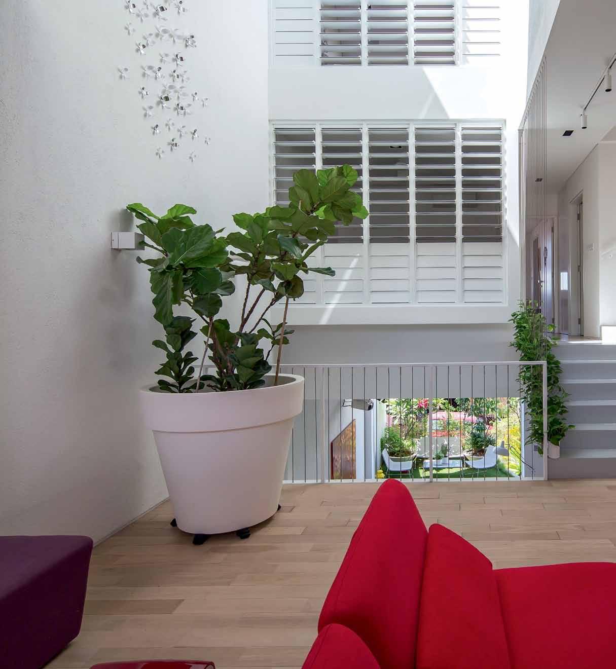

issue #31 habitusliving.com
The many houses designed by Darlene and Warren over the years have provided the opportunity to carry through and develop the early lessons in spatial proportion and optimisation gleaned from their former HDB home. “We’ve really thought a lot about proportions and space. What size of space is comfortable for how many people? And how do you physically use space?” questions Darlene. “We never start a design by looking at form. We always go back and forth between space and form. So the sectional drawings of our buildings are usually quite interesting.”

“We immediately start thinking about furniture layout at concept design stage,” she adds, a point evidenced by the decision to forgo a traditional (and rarely used) formal living room and instead opt for a low and loungey setting – a casual seat-scape for projected movie screenings. Similarly, a traditional dining room was bypassed in favour of a large island setting within the kitchen. “Very few people actually use their dining rooms,” reflects Darlene. “Most people hang around kitchens.” On the second storey, a shutter allows an otherwise open family room to double as a guest suite, with carefully chosen seating readily converted to bedding of various formats.

ABOVE | Louvred windows and a diagonaL arrangement of space aLLow for a sense of connection between fami Ly members and Long views within the house. 3 . on location # 173
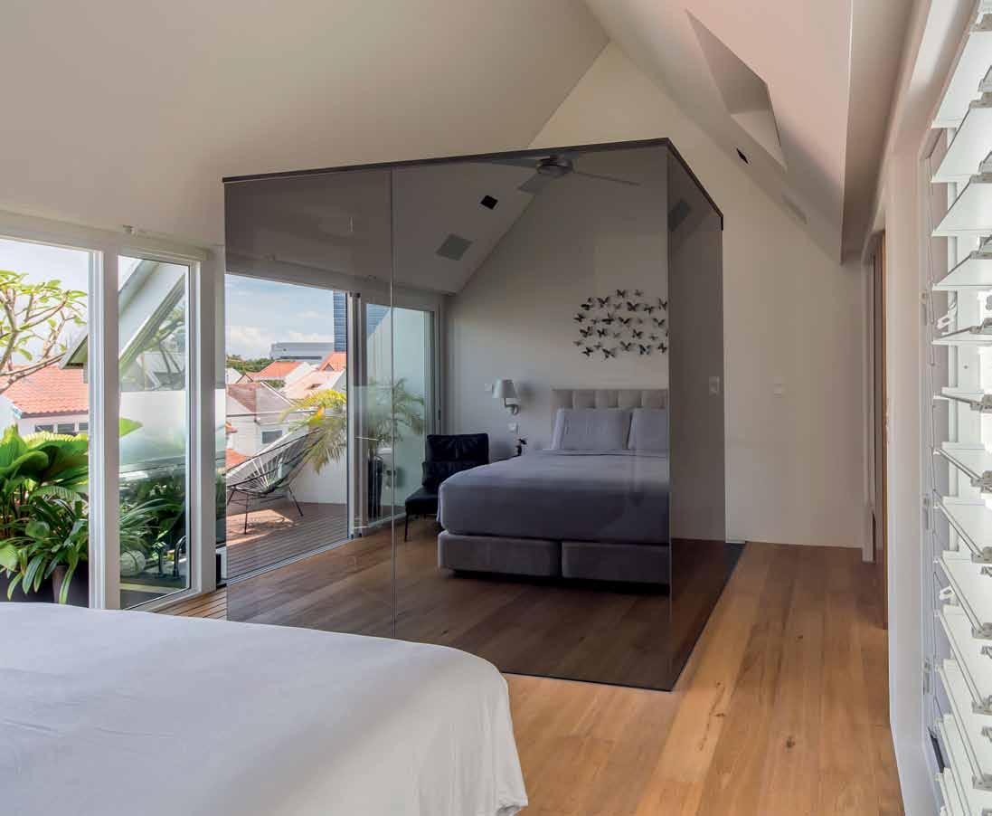
above | in the master bedroom, reflective glass surrounds the ensuite bathroom. the choice of material prevents feelings of claustrophobia within the bathroom. issue #31 habitusliving.com
BASEMENT LEVEL 1 LEVEL 2 ATTIC 1 3 2 6 9 7 4 5 q e 8 0 y u i o w w r t CAR PORCH UTILITY ROOM STORE GARDEN KITCHEN POWDER ROOM DECK POOL 1 2 3 4 9 0 q e CAR PORCH ROOF LIVING ROOM WATER FEATURE DINING ROOM 5 6 7 8 BEDROOM FAMILY ROOM STUDY BALCONY w r t y MASTER BEDROOM MASTER BATH MASTER STUDY u o 3 . on location # 175
The openness of the house, and the spatial connections forged across multiple levels around the central courtyard, allow for a sense of spaciousness that’s often absent from Singaporean homes, restricted as they typically are by the size of their floor areas. The potential for looking upward and diagonally through the house was certainly not the result of chance; the potentially claustrophobic effect of Singapore’s density – particularly in comparison to the long views she enjoyed in Canada – prompted Darlene to develop long vistas within the house and to the sky beyond to relax the eye.
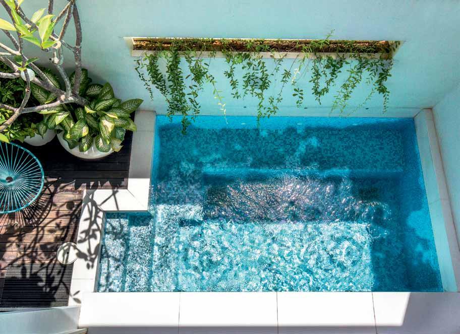
She says, “A lot of people think maximisation of space is actually providing the greatest possible floor area, which to us is not the main point; it’s making the space the best it can be and as comfortable as it can be. If that means adding a garden and air well in the middle and giving up space, it’s worth it because it’s better to have comfortable room sizes that everyone loves being in than having a little bit more area that’s dark, dingy and not useful.”
drop box
A rchitect A D Lab structur Al engineer EPM Consultants
A D LAB (65) 6346 0488 a-dlab.com
Furniture Ligne Roset sofa sets by Togo in Living Room. Futura sofa in Family Room.
lighting
Internally – Artemide lighting.
FiX ed & Fitted Bath fixtures by Vitra.
above | At the re A r, A plunge
the
A
in
pool beside
kitchen
ssists
cooling the interior spAce.
issue #31 habitusliving.com
*NEWLY OPENED* VICTORIA Selection Gallery 335 Ferrars St Albert Park Ph: 03 8696 4000 NEW SOUTH WALES Selection Gallery 1E Danks St Waterloo Ph: 02 8572 8500 QUEENSLAND Selection Gallery 94 Petrie Tce Brisbane Ph: 07 3369 4777 *OPENING SOON* WESTERN AUSTRALIA Selection Gallery 12 Sundercombe St Osborne Park Ph: 08 9446 8255 New total look Bathroom Collection. Design: Prospero Rasulo for Gessi
Void for reflection
This pared-back dwelling by Archier , bridging mid-century modernist architecture with industrial rural language, is first and foremost a response to the owner’s mentality and intriguing lifestyle.
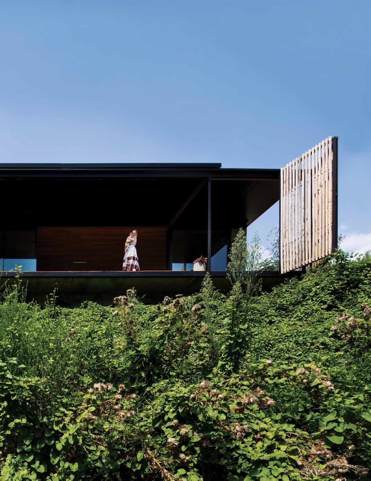
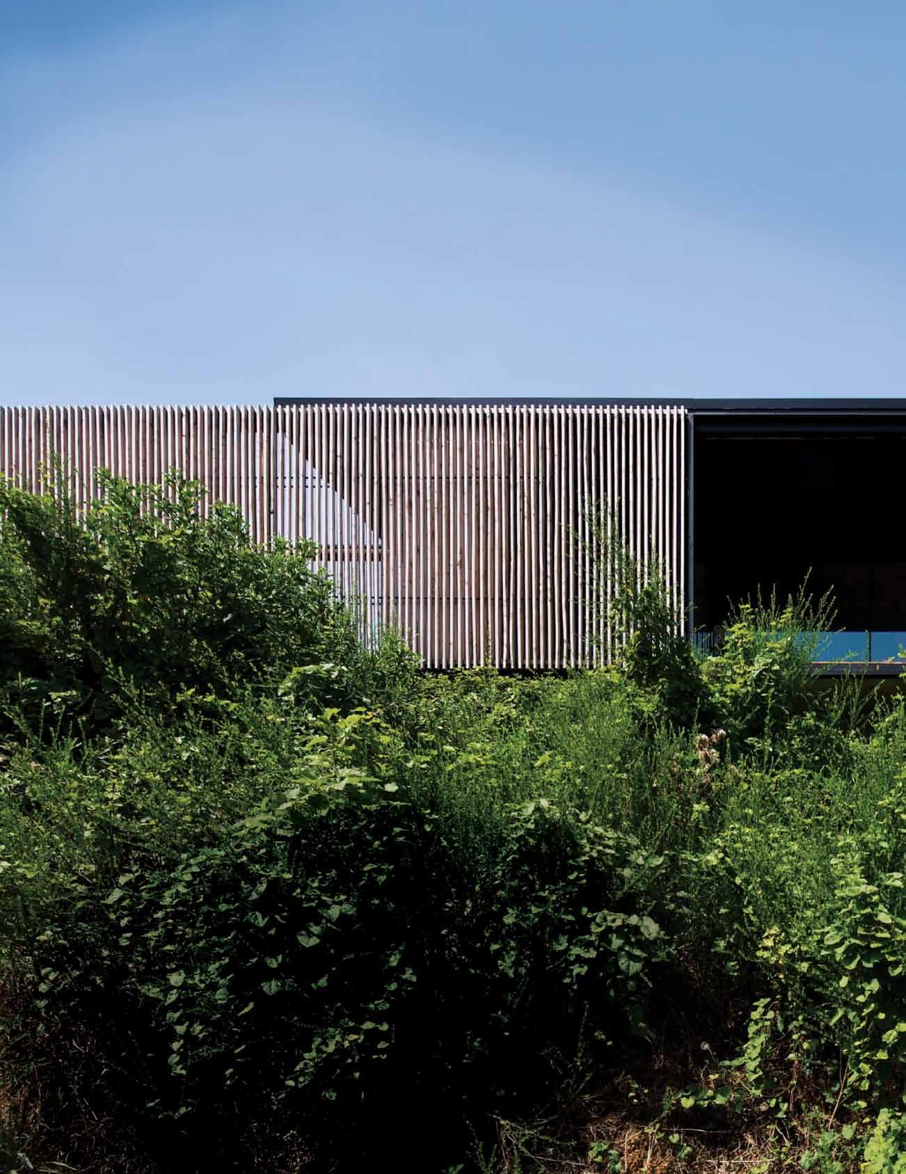 Tex T Marg Hearn | PHoTogra PH y Benja Min Hosking
issue #31 habitusliving.com


3 . on location # 179
Sawmill House, located in the Victorian village of Yackandandah, was designed by architect Chris Gilbert and crafted in collaboration with his elder sibling and client, sculptor Ben Gilbert. It’s very much a natural extension of their childhood days, immersed in ‘making’, and a sense of mutual respect and support.
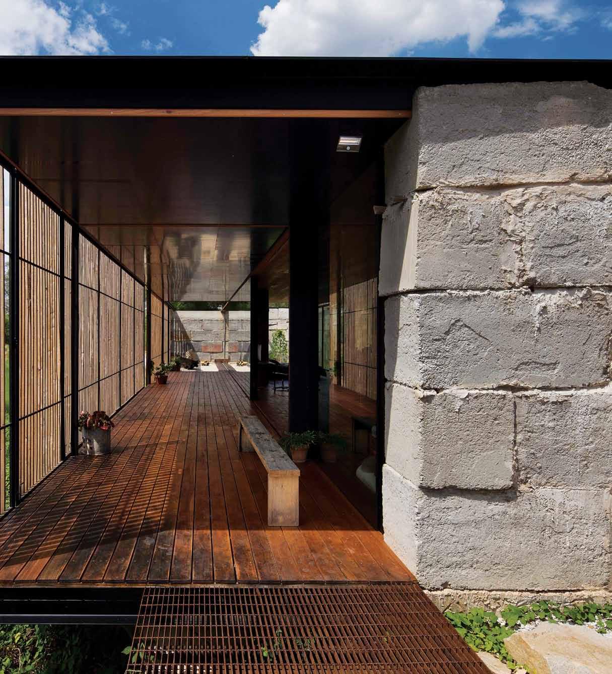
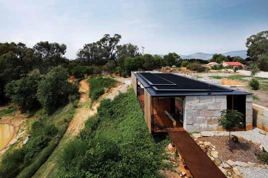
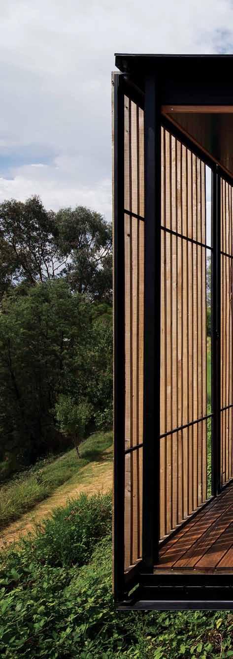
“Chris suggested that my life could benefit from having a calm space,” says Ben. Likewise Ben thought it would be good for Chris’ embryonic practice, Archier, “to do a project with as little limitation as possible.” It was also a chance to have some fun together and explore Archier’s interest in material research and reconnecting drawing and making.
Growing up in ‘Yack’, there was “This innocent arrogance that you can do anything you want – there was no inherited codification of how things are. It was free-rein,” reminisces Ben. Whenever they wanted a cubby house or billycart, they took to the tools in their dad’s well-equipped shed. Another memory was regular visits to Yack’s iconic sawmill, accompanying their father, a volunteer with the Country Fire Brigade, to collect woodchips.
Ben went on to study furniture design at the University of Tasmania (UTAS) and hadn’t contemplated settling back in Yack until he stumbled across the town’s disused sawmill in 2005. In limbo after a five-year European hiatus – split between major sculpture projects and a ‘bohemian’ lifestyle – the mill’s potential as a refuge and the challenge of fixing it up beckoned. Securing its lease and, following some hoop-jumping, its purchase,
issue #31 habitusliving.com


previous | Simplicity waS the central tenet in conceiving thi S S helter for a client who waS n’t a fan of living in conventional hou S eS above left | Stretching the program out along the northern aS pect, captureS unimpeded view S over the old gold-mining quarry. above | the hou S e i S deS igned to open up and effectively become “one giant deck.' 3 . on location # 181
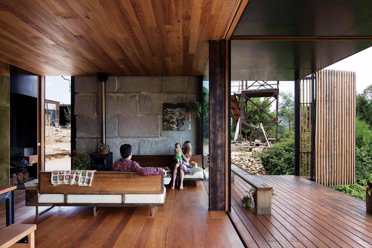
above | Ben’s home grants physical and mental separation
B
the living room. opposite | a ll furniture elements were custom designed and B uilt By
in
from
issue #31 habitusliving.com
from his sculpture studio, which is located in the converted sawmill on the same site, just visi
le from
Ben
his studio
predominately local materials.
he contentedly resided in the property’s nofrills tool sharpening shed. From there he established and grew his company, Agency of Sculpture, and its Australia-wide portfolio, while tossing around numerous lodging concepts with Chris.

“I started to think about Ben’s psychology, because his mind is so active and creative – and the need to give him a separate void, a space to reflect,” says Chris. The eventual house sketch was deliberately pared-back and designed to focus on the basic rituals of the client’s lifestyle.
The house is sited on the edge of what was historically a gold mine quarry, and then later used by the sawmill for woodchip storage. “So it’s almost as if the end of two eras resulted in the house’s location,” Ben suggests. The house’s compact size (about 90 square metres internally) balances the amount of space Ben needed and could afford with the terrain.
Archier’s curiosity in the mix of the Australian vernacular and the Japanese experience of space looms, “in the sense that things don’t need to be completely isolated from each other,” Chris says. Utilities are contained in a central core running along the southern wall of a floor plan comprising lounge, dining/kitchen and a master bedroom. The whole thing can be opened up into a continuous volume.
It’s a simple linear layout that efficiently caters to all of Ben’s needs, beautifully
Ben | resident
3 . on location # 183
We’d sit down and nut out where the other one was coming from and why and resolve the entirety of thought.
detailed. “Everything lines up,” Ben says, marvelling at “that clarity of space, that mental framework when things are consistent.” As well as the house – all the furniture, lighting and joinery was custom made on-site from a reduced palette of natural materials. Living in this uncluttered, pavilion-style space is in direct contrast to Ben’s workshop, located just a few steps away in the former sawmill bulding, “Where there are things in various states of finality, distract the waking mind.”
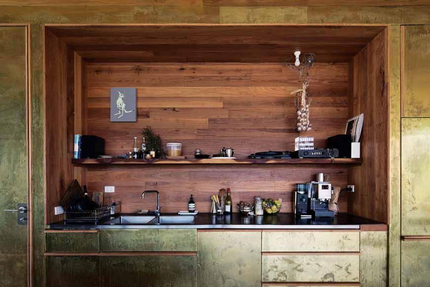
Due to the unique opportunities of the sibling relationship, the project differentiated from traditional building procurement, with design detail allowed to develop from active feedback, rather than an imposed interpretation of site. “I was offering a testing ground for Archier’s ideas – plus as ownerbuilder I knew how to make things,” which, Ben admits, made for rigorous discussions. “We’d sit down and nut out where the other one was coming from and why and resolve the entirety of thought.”
An adaptive façade maximises connections to the valley and dam views to the north. The living space’s nine-metre operable glass wall and the verandah’s retractable roof and bi-fold screens adjust to bring in more
or less ventilation and solar access. “It’s a bit like trimming the sails of a yacht for the environment,” says Chris.
Along with this feature, another element that addresses Ben’s partiality for life outdoors is the massive 3-metre by 4-metre glazed pivot door – supported by a 1-tonne gate hinge – that opens his bedroom’s entire eastern wall onto a courtyard. And given his tendency to attract family and friends from around globe, Sawmill House is designed to “peel back all of its layers” and convert from an intimate space for one to a more civic amenity. Being able to lock down or open up the dwelling in part or its entirety became especially pertinent during the course of the build when Ben became a father. Consequently, what was envisaged as a bachelor pad needed to be considered from the perspective of now accommodating a young family.
“The project borrows from the way modern Chinese architects have embraced tactility,” explains Chris, “in the use of locally sourced materials that are articulated into a modern context.” Locally grown red stringy timber floors, walls and ceiling and untreated rough sawn macrocarpa timber screens, were milled literally up the road. Repurposed concrete
above | The use of a reduced pale TTe of maTerials - and in Their raw sTaTe - conTribu Tes To The sense of calm. opposite | Thin paTinaTed brass shee T selecTed for The expansive joinery wall adds Tex T ure and a “beau Tiful glow” To The space.
issue #31 habitusliving.com
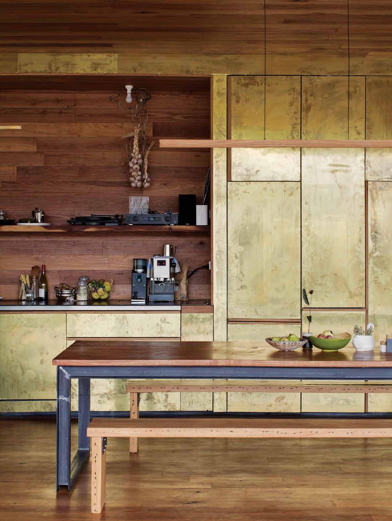
3 . on location # 185
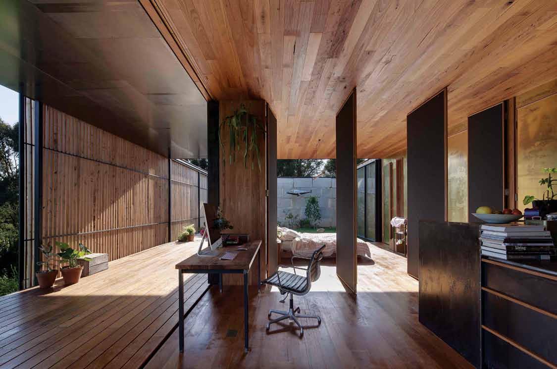

issue #31 habitusliving.com
blocks they’d spotted in a paddock – made from leftover concrete on various jobs in the region – add a layer of texture and a narrative to the building envelope.
For someone who habitually starts the day making coffee, and only entertains while cooking or eating food, the kitchen is designed as a focal point. While mild steel for a benchtop is an unconventional choice, “It was right for the job” stresses Ben who favours “natural materials that improve with age.” Similarly, Archier unearthed thin brass sheeting for joinery with the idea that as it’s touched, it marks and evolves. It also references the shims in the original sawmill. “The patina of life has always spoken to me – it’s championing the qualities of industry and materiality with Chris’ sense of presenting that in a refined way,” Ben continues.
Access to Ben’s body of knowledge from making and installing large-scale public art pieces and playgrounds, and the skillsets of his artisan connections, enabled almost everything to be built ‘on the fly’, and on-site. Sketching concepts together, then figuring out how they could make it work involved a “joint willingness to fail”, through building and testing multiple options, concedes Chris.
For Archier, the process of working closely with their client on Sawmill House has altered the studio’s ideas about how a building is delivered and constructed. The firm has now implemented the SIPs (Structural Insulated Panels) system, which is widely used throughout Europe and America, as an
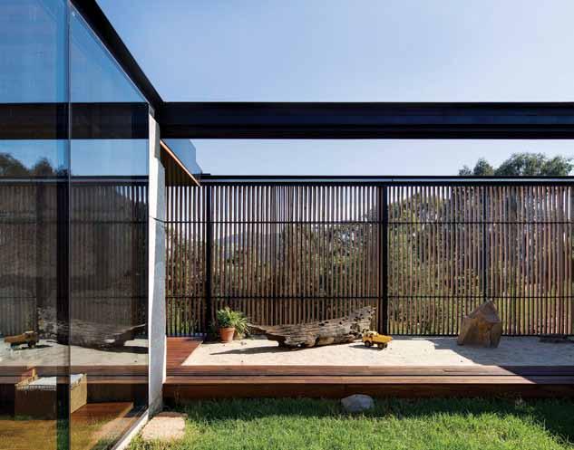 Ben | resident
previous top | Operable Internal pIvOt d OO rs O pen up - allOw I ng the master bedrOO m and lIv I ng area tO seamlessly bec O me O ne. previous bottom | cO ncrete blO cks add tO the sense O f place I n a way that’s h O nest and apprO prIate. above | the deck’s retractable rOO f can be m Oved Over the sandpIt tO prOv I de shade I n the ch I ldfrI endly, fully enclO sable c O urtyard space. 3 . on location # 187
Architecture is more than the built thing, the idea of it impacts your reality.
optional part of the service that Archier offer for their projects. “It’s more cost-effective in our experience, for the quality of building that is delivered,” asserts Chris. Using this model, Archier still design the complete building from structural documentation through to specification, but clients then have the choice of engaging a builder all the way to finish, or just up to lock up, leaving them to work on the fit-out themselves. This latter occurred at Yack, the clients opting to “roll up their sleeves and gain a sense of ownership and connection to the property”.
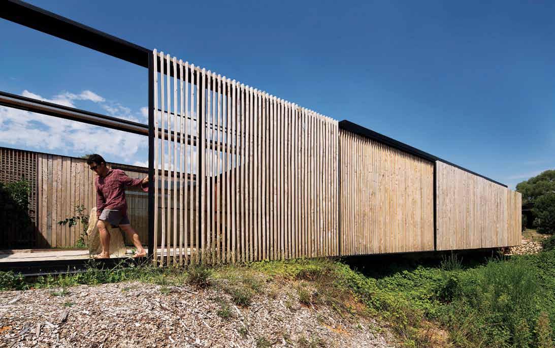
Now that the dust has settled, I ask Ben if Sawmill House has made him feel more chilled? “It’s been the single greatest improvement of my life; I’m actually happier,” he emphasises. The credit for this is shared equally. “Okay I can build a house. But it comes back to the plan and Chris’ knowledge and ability to put himself in my shoes. He understood how I want to live.
“What you need as a home is a foundation of thought, not just a structure. Architecture is more than the built thing, the idea of it impacts your reality.”
above | LocaL materia Ls Like the use of untreated
history.
| n ot one to settLe for a conventionaL vanity, b en fabricated his own from a sheet of
that
from a turtLe scu Lpture.
rough sawn macrocarpa screens, strengthen the home’s bond to the site and township’s
opposite
copper
he had Left-over
issue #31 habitusliving.com
DROP BOX
ARCHITECT Archier Studio
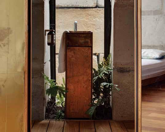
BUILDER Benjamin Gilbert
ARCHIER STUDIO
(61) 424 956 318 archier.com.au
FURNITURE Custom made furniture throughout by Agency of Sculpture (Ben Gilbert).
LIGHTING
3 . on location # 189
6
q 2
e r w 1 3 9 7 4
ENTRY LOUNGE DINING KITCHEN ROBE COURTYARD SAND PIT WATER TANK
STORAGE DECK MASTER BATH
WOOD STORE
1 2 3 4 9 0 q e
5 6 7 8 SERVICES
w r
FLOOR PLAN 0
5 8
Custom lighting throughout by Archier Studio.
issue #31 habitusliving.com


Discover beautiful products
Meet inspiring people
Indulge in architecture and design
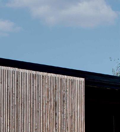
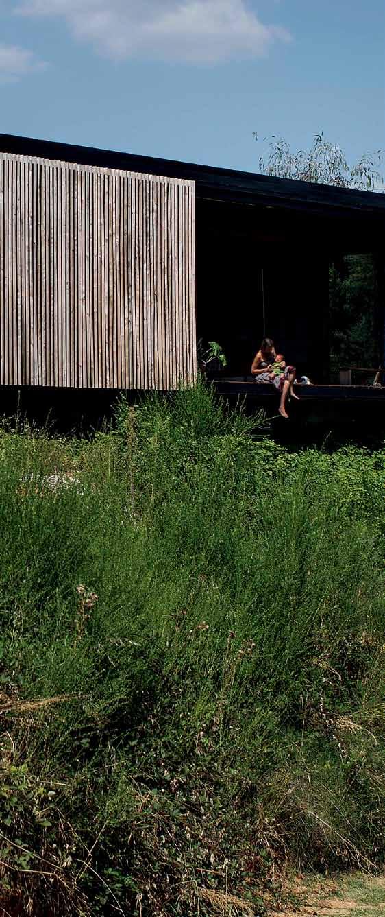
Across Australia, New Zealand, South and South-East Asia
The online community for the Design Hunter®

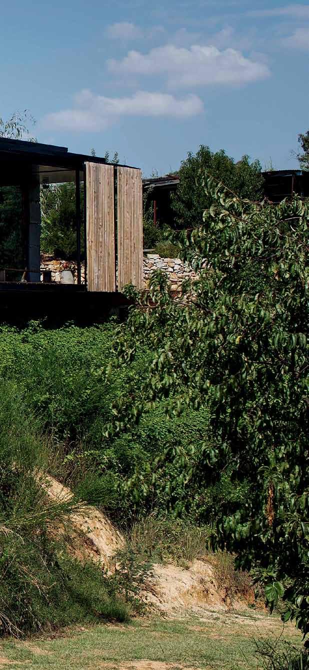




Website | habitusliving.com
Facebook | habitusliving

Pinterest | habitusliving
Instagram | @habitusliving
Twitter | @habitusliving


 Photography: Benjamin Hosking
THE TEAM AT HABITUS MAGAZINE THANK OUR ADVERTISERS FOR THEIR SUPPORT. USE THE DIRECTORY TO SEE WHAT PAGE A SPECIFIC ADVERTISEMENT IS ON, AND VISIT THEIR WEBSITE TO LEARN ABOUT THE PRODUCTS AND SERVICES THEY PROVIDE.


Habitus magazine is available at newsagents and bookstores across Australasia, South-East Asia, the USA, Canada, Europe, South America and the Middle East. Habitus is published quarterly in March, June, September and December. To subscribe securely online visit habitusliving.com/magazine or email subscriptions@indesign.com.au to subscribe or request a full list of locations where Habitus magazine is available.

# 191 Abey Australia 060, 177 abey.com.au Apaiser 033 apaiser.com.au Bolon IBC bolon.com.au Herman Miller 002-003 hermanmiller.com.au Careers Indesign 164 careersindesign.com.au Cass Brothers 103 cassbrothers.com.au Designer Rugs 012-013 designerrugs.com.au Domayne 010-011 domayne.com.au ECC 064 ecc.com.au English Tapware 068 englishtapware.com.au Habitusliving 190 habitusliving.com Indesign Media Asia Pacific 151 indesign.com.au Janus et Cie 053 janusetcie.com Melbourne Indesign 086 melbourneindesign.com.au Mother of Pearl and Sons 096, 163 motherofpearl.com Parisi 016 parisi.com.au Phoenix Tapware 050 phoenixtapware.com.au Poliform 038 poliform.com.au Press Stop 020 pressstop.com.au Reissi Mall 074 reissiempire.com.au Royal Oak Floors 006 royaloakfloors.com.au Savage Design 019 savagedesign.com.au Smeg IFC-001 smeg.com.au Space Furniture 021 spacefurniture.com.au Stormtech 054 stormtech.com.au Stylecraft OBC stylecraft.com.au Subscriptions 112 habitusliving.com/subscriptions Subzero Wolf 136 Subzeroworlf.com.au Sunbrella 073 sunbrella.com The Done Group 063 thedonegroup.com Tongue N Groove 004-005 tonguengroove.com.au Vola 022 vola.com Walter Knoll 014-015 walterknoll.com.au Zip Industries 009 zipindustries.com
Your map to where the stories in this issue come from where is available
world
issue #31 habitusliving.com
Kuala Lumpur #126
Brisbane #55
Melbourne #40
Wellington #152
FREDERIC
“Simplicity is the final achievement .”
CHOPIN

Catifa Sensit & Dizzie Side Table

Australia 1300 306 960 stylecraft.com.au Singapore +65 6511 9328
Design by Lievore Altherr Molina for Arper


 Tex T Ashley Tucker | PhoTogr APhy chrisToPher Frederick Jones


 above | ambience of light at le thoronet abbey, provence. photography by asako kenjo. below | exterior of david chipperfield office on j oachimstra ss e in b erlin. photography © simon menges.


 Tex T Adele Chong | PhoTogr APhy Ti An xing


 Tex T Marg Hearn | PHoTogra PH y Benja Min Hosking


 Ben | resident


 Photography: Benjamin Hosking
