living in design #32 July – September | 2016 AUD$16.95 | NZ$16.95 | USD$17.95 CDN$18.95 | GBP£9.90 | SGD$11.95 32 9 771836 055007 Escape & explore. Doshi levien: crosscultural connections. Song for the mute. Luis Barragan-inspired concrete masterpiece.


BA THROOM
CENTRE •A LE XA ND RI A-8 4O ’R IO RD AN ST.0 28 33 97 10 3 •A UB UR N-1 03 -1 23 PA RR AMATTAR D. 02 87 48 43 67 VI SI TO UR WE BS IT E-W WW .D OM AY NE .C OM .A U Do ma yn e ® st or es ar eo pe ra te db yi nd ep end en tf ra nc his ee s.
DESIGN


WING & VINO


How do you spark everyday inspiration? It can be found in possessions, in conversations ... we discover how adventure can begin at home.
24. DESIGN NEWS
Discover the products we are inspired by: objects, lighting and furniture that remind us of exploration and pushing boundaries. Who says you can’t inject a little adventure into your home?
34. BOOKS
The Asia-Pacific is a vast and diverse region where a myriad of histories and cultures coalesce and collide. Charles Zuber explores the region and examines the ways in which traditional and modern architecture cohabit under the influence of Colonialism.
This issue we feature a clutch of creative personalities drawing inspiration from across the globe and infusing their work with cross-cultural innovation.
40. DOSHI LEVIEN
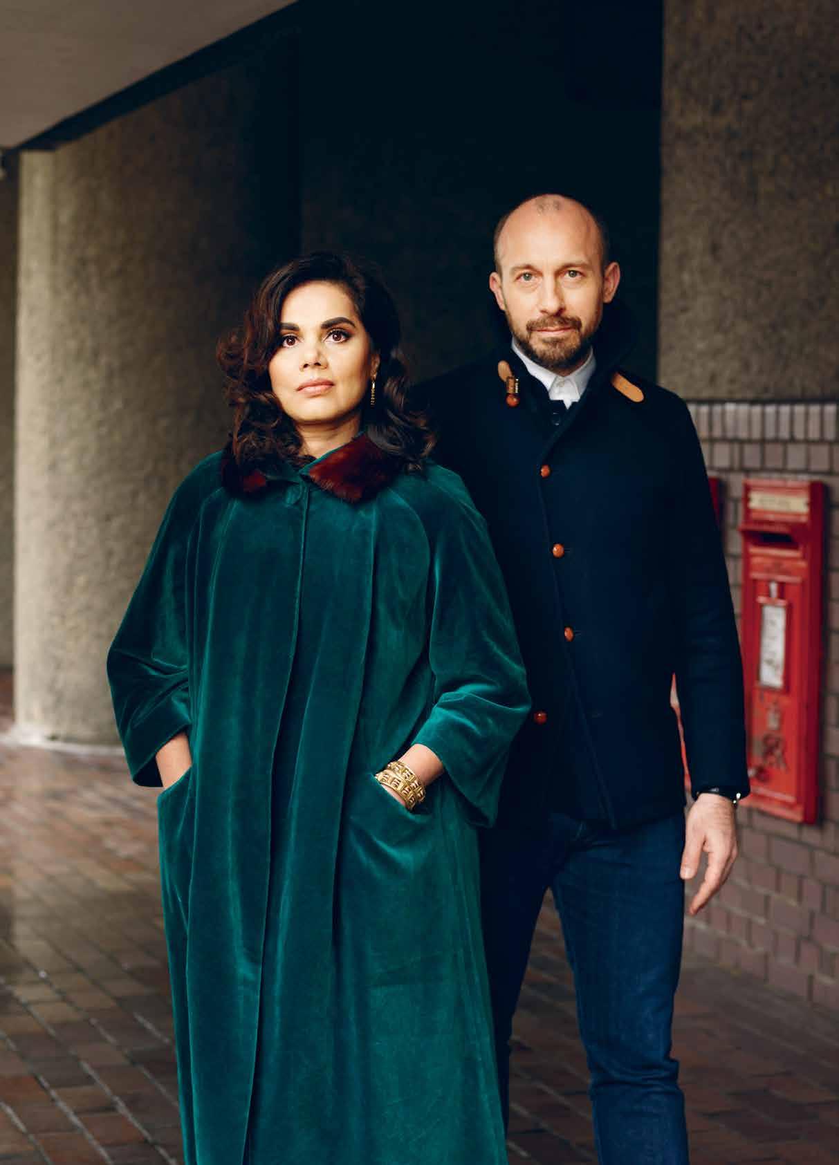
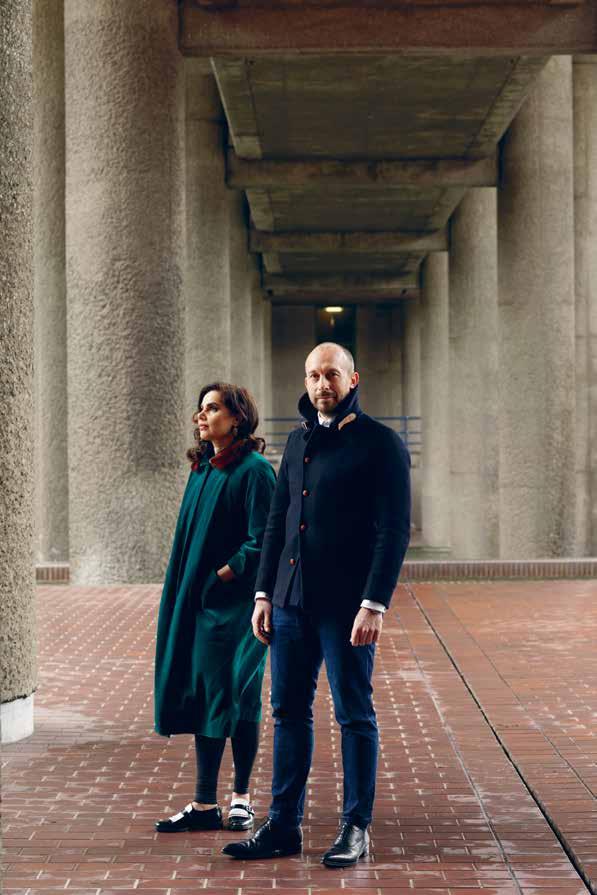
The power couple behind Doshi Levien call the brutalist Barbican Estate in London their home, but find themselves continually drawn to travel and exploration to fuel their inner muse. Hailing from Bombay and Scotland, Nipa Doshi and Jonathan Levien are constantly blending a spirited cocktail of cultural influences in their work.
53. SONG FOR THE MUTE

With the endorsement of hip-hop artist Lupe Fiasco and menswear aficionado Nick Wooster championing their wares, the Australian duo behind Song for the Mute weave the idea of breaking boundaries into each and every garment they craft. The pair are endlessly inspired by a passion for Japan and Paris, as well as the textiles that they carefully create themselves.
65. RIVERSIDE ECO
Belgium-born Peter Arts and Hedwig Pira decided to create their “ ultimate home away from home ” in Vietnam’s bustling Ho Chi Minh City. The founders of the Saigon River Factory, have created a tranquil haven in their home that embodies the idea of ‘ East meets West ’
# 32
#53 #24
81. ESCAPIST SPACES
It ’s always disheartening returning home fresh from an exciting adventure. The familiar spaces seem a tiny bit less glossy than they used to. But here we find ways to bring the holiday experience back home.
95. EXPLORE & ESCAPE
We look at ways to incorporate the spirit of escapism into the home environment, through beautiful products for travel and rest.
100. REVERSE GARBAGE
Porosity Kabari asked three designer-artists to stretch the limits of their crafts in a completely unfamiliar environment, utilising materials found only in and around Mumbai ’ s ‘ Thieves Market ’
People across the region may live quite differently but – in architecture and design –innovation and wit is an international language.
114. CONCRETE HOUSE
Inspired by the Mexican architecture of Luis Barragan and designed by Andres Casillas de Alba, the concrete-heavy house is a decisive break from the polite Melbourne streetscape.
129. SCRUBBY BAY
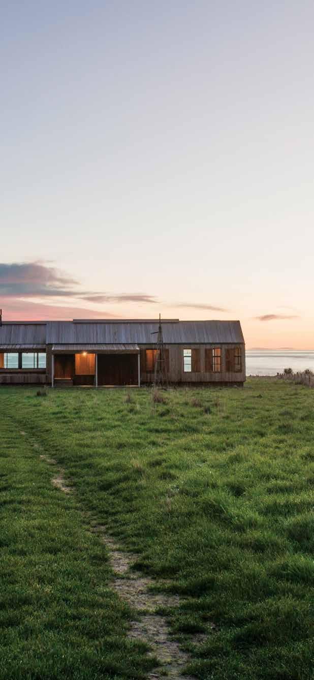
Nestled in the formed remnants of two volcanoes, New Zealand ’ s Banks Peninsula by Patterson Associates is the host to an extraordinary holiday home that is far away from most, and closer still to the surf and sea.
142. BONDI BARN
Standing out amongst its neighbours, Bondi Barn by clayton orszaczky draws inspiration from a suprisingly exotic source –Greenland ’s icecap dwellings.
156. REBRUTE
Brutalism has both its fans and detractors. Bangkok-based architects ThingsMatter took inspiration from the philosophy to create a small house for a pair of siblings.
166. GLEBE HOUSE
A sun-drenched 19 th Century cottage in Sydney ’s Glebe, with additions by architect Virginia Kerridge, marries the virtues of the original home with contemporary pared-back aesthetics.
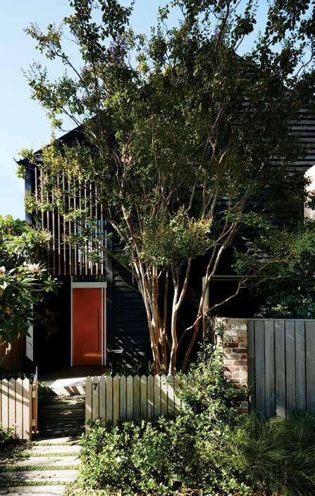
179. TIONG BAHRU
Australians Mimi Daraphet and Dan Foreman navigated the Singaporean real estate landscape before coming across a 1980s apartment ripe for refurbishment.
# 32
#142
#81 Explore
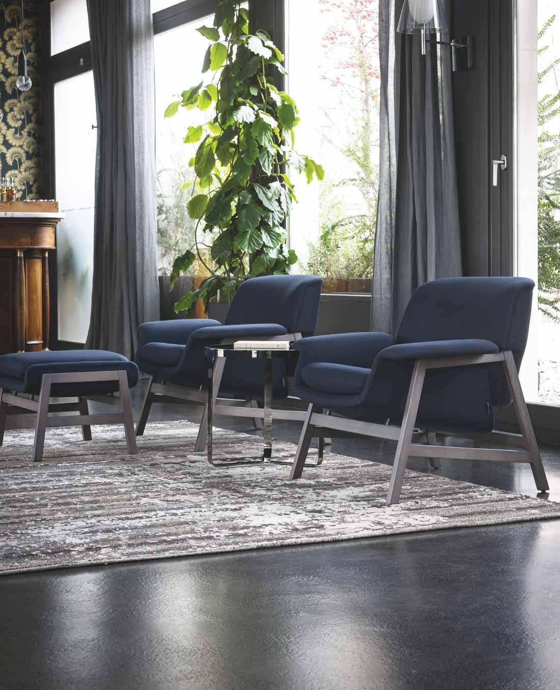
Australia 1300 306 960 stylecraft.com.au Singapore +65 6511 9328
Agnese Armchair
Design by Gianfranco Frattini
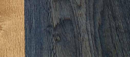
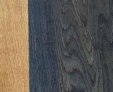
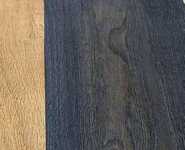
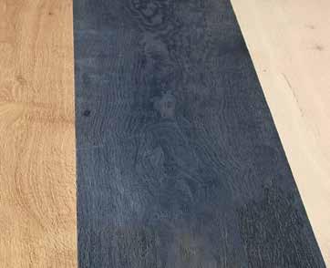
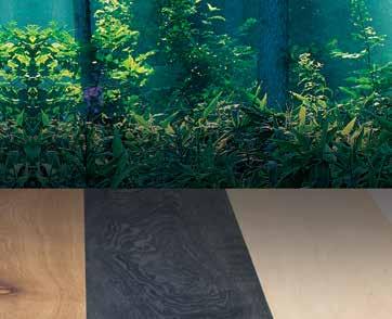
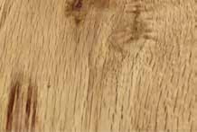
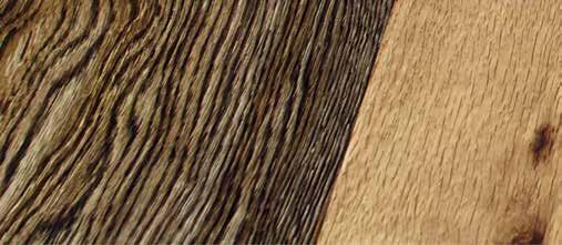
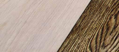
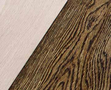
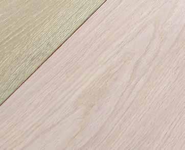
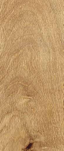
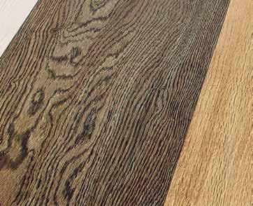
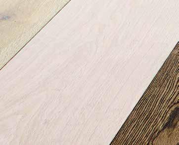
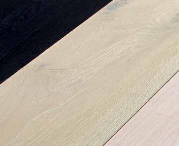
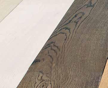
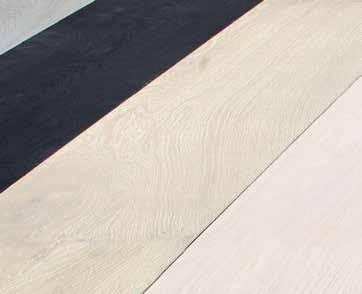
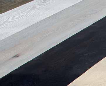
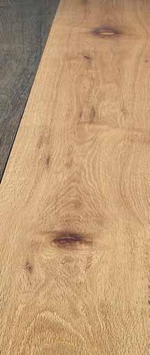
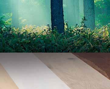
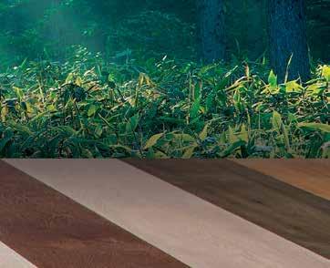
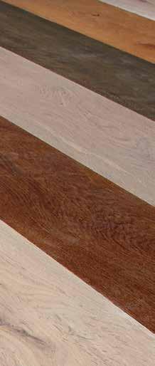
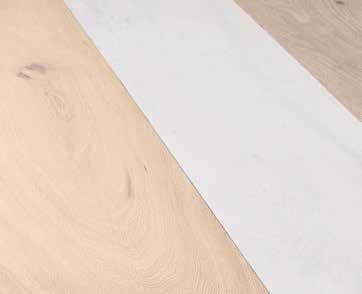
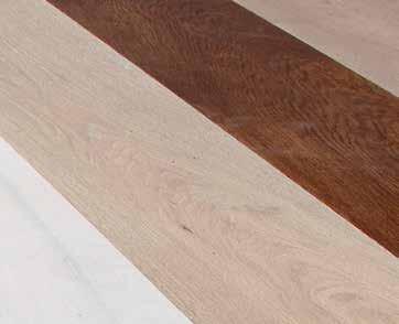
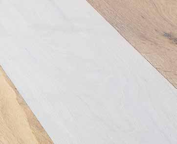
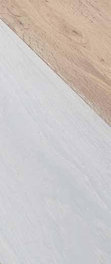
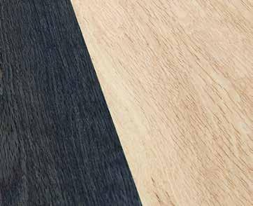
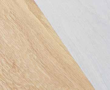
tongue n groove timber constructed of FSC European Oak treated with natural oils in 15 beautiful colours allowing for easy maintenance


Showrooms

Shop 2 188 Chalmers Street, Surry Hills NSW 2010
P 02 9699 1131 F 02 9690 0929


575 Church Street, Richmond VIC 3121
P 03 9427 7000 F 03 9427 0100
tonguengrooveflooring.com.au









INSPIRED BY STONE
OUR LOVE AFFAIR WITH RAW MATERIALS
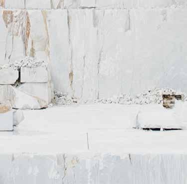

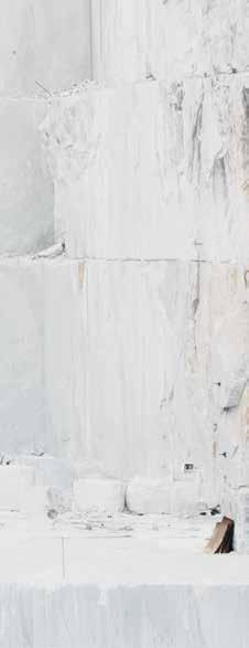
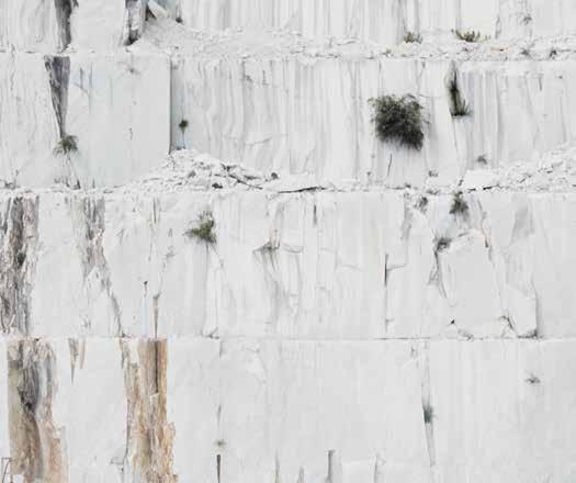
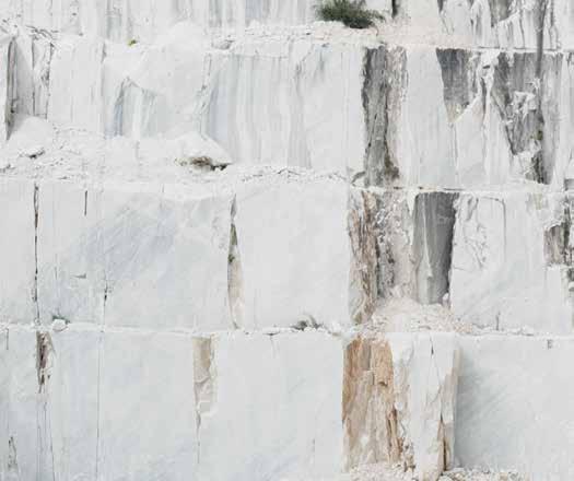
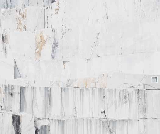
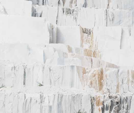


CDK Stone’s natural stone is sourced from the fi nest quarries around the world. Each piece is unique, allowing you to select a stone artwork for your projects. Whether on the exterior of a building, or internally as a feature island bench in the kitchen, natural stone makes a clear statement of classic, enduring beauty and strength.

With branches in Sydney, Melbourne, Gold Coast, Perth and Auckland, it is possible to integrate the elegance of natural stone into virtually any project within Australia and New Zealand.


A true collaboration takes place with CDK Stone. Working with the expert team, the creative process extends to the specification of the perfect stone. From analysis of the requirements, to researching the possible options and careful selection of the slab, to stringent quality control in the production and supply, CDK Stone supports your design the whole way through. Since 1982 they have been supplying and processing natural stone to the market, building experience, an impressive track record and with that, the utmost trust within the industry.
 Elba
Savoir
Titanium Travertine
Turco Argento
Portsea
Antique Brown
Carrara Elegant Grey Nero Tempesta
Calacatta
Superwhite
Titanium Gold
Quarry image
of iStock.
cdkstone.com.au
courtesy
Kitchen and Bench design by Belinda Selway – Art by Design. Stone Fabrication by DD Stone. Creative Direction Christopher Holt. Words Nicky Lobo.
Facebook /indesigntheevent








Instagram @indesigntheevent
Twitter @indesign_event

indesigntheevent.com




Strategic Partners












citywide design takeover is coming
the ultimate Design Hunters’ playground on the streets of Australia’s Capital of Culture. Learn from the industry’s legends, play with the world’s best and delve into what the design industry really cares about.
A
Discover
Also available from Cafe Culture + Insitu, cafecultureinsitu.com.au
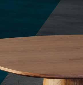
Liqueur Table by Didier, didier.com.au
the first word
We know about the stress-relieving benefits of getting out of town, taking the watch off and putting the laptop away but, in fact, relaxed cognition is also a key component of problem solving. An experiment by psychologist Lile Jia at Indiana University demonstrated that you don’t even need to actually travel to inspire creativity – when we just imagine a place far away, it increases our ability to think laterally. So distance, even when it’s only perceived, liberates us. This is great news, no?
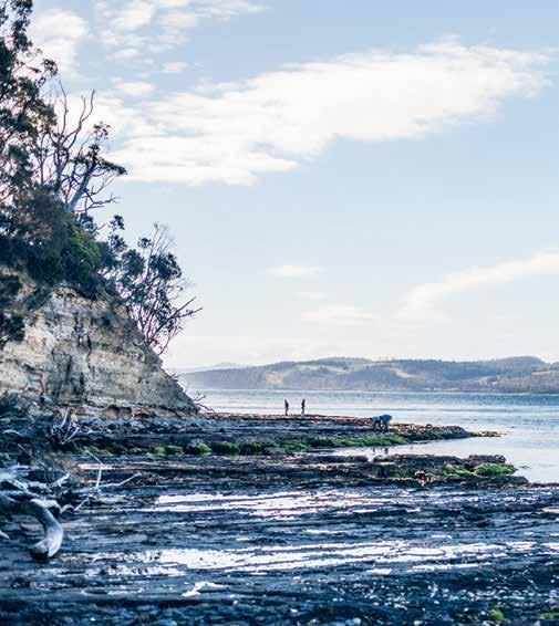
Which is why, when we invite the feeling of Escape into our homes through design, we can positively influence our lives.
The Regional focus of Habitus means we are always exploring, but the beauty of this approach is clearer than ever this issue. Take for example Doshi Levien (page 40), who drop a delightful dash of Indian culture into their distinctly global home in London’s Barbican Estate. Or fashion designers Song for the Mute (page 53), who return time after time to Japan, mesmerised by the dedication to quality they see across the islands, from textile weavers to sushi chefs.
Architecture also helps us to explore. An intriguing cultural dialogue takes place when ideas are transported across seas –like in the house on page 114, designed by Andres Casillas de Alba, one of Luis Barragan’s contemporaries. He translates the late Mexican architect’s majestic concrete forms quite seamlessly to the suburbs of Melbourne. Similarly, the Bondi barn (page 142) by Clayton Orszaczky expresses the essence of simple dwellings everywhere – from isolated structures on Greenland’s icecaps, to sheds on farms across the world.
The integration of foreign ideas into a local context is the really interesting part of exploring. It’s like when we integrate travel experiences into our individual identities. We become more creative, more open-minded, more aware of plurality –and conversely, of sameness. And that’s a wonderful place to be.
Nicky Lobo | Editor
Exploring has always been thought of as a basic human desire, but now psychologists are saying that it is essential for creative thinking.
habitus takes the conversation to discovering their inspiration and design hunter® journeys
BRETT BOARDMAN
RENOVATOR ’ S DELIGHT #179
A photographer with a degree in architecture, Brett Boardman likes people and architecture and spends most of his time photographing them both. Brett brings the feeling of exploration into his home and life “by planting trees and plants from other parts of the world and cooking food from places I’ve travelled to.”

CHARLES ZUBER

EXPLORING: THE ASIA PACIFIC WAY #34

Originally from the UK, Dr Charles Zuber worked for Sussex University and the University of the South Pacific before relocating to Australia to work for the Queensland College of Art. He holds an Adjunct Senior Lecturer position with Griffith University and continues to write about visual cultures. Charles likes to escape to “the little beach side town of New Brighton, and I spend time at the beach or in the river, on my paddle board.”
CHRIS TUBBS
WHEN CULTURES COLLIDE #40
Chris Tubbs is a North London-based photographer and lives with his wife Rachel and two boys, Bruno and George. While Chris spends most of his time in the UK he also has a house in a rural village in the South of France. “We have been doing it up slowly,” says Tubbs. “The pace of life is slow compared to the UK. We do some work then go and sit in the cafe then do some more work and so on.”
CHRISTINE FRANCIS SOUTH OF THE BORDER #114
Christine Francis is a Melbourne-based photographer who has been specialising in interiors, architecture and design for a number of years. Christine believes the best way to escape is to get away from screens. “I always have my nose in new cookbooks. I love to explore new flavours and combinations,” she says. “Camping and spending more time in nature has been a big priority since returning from an American road trip.”
CLAIRE MILLETT
WHEN CULTURES COLLIDE #40
Claire Millett is the editor of online magazine



Contemporary. Claire’s backyard is her escape, which she has been working on since she moved into her home. “Stepping outside into that space brings a sense of escape from the everyday monotony,” she says. “Our home is littered with photos and keepsakes from our travels that not only bring us happy memories, but also invites our guests to explore, and prompts questions about where each piece came from.”
FILIPPO BAMBERGHI

WHEN CULTURES COLLIDE #40
A photographer and journalist, Filippo Bamberghi lives in Milan with his two cats, Natalino and Virginia. After studying natural sciences his passion for photography, architecture and design prevailed and he started working with magazines including Casa Vogue Brasil, AD Germany and American Vogue. Filippo draws his inspiration from nature and believes that “when a house is really ‘ beautiful ’ [it] has the same level of complexity and balance of a natural environment.”
JENNA REED BURNS
OF EUROPEAN DESCENT #166
Sydney-based writer, author and journalist Jenna Reed Burns specialises in design and architecture. Jenna brings the feeling of exploration in the home by filling it with treasures like artwork, ceramics, textiles and glassware bought on overseas holidays, saying, “They remind me of where we’ve been and the wonderful experiences we had.” She lives in Glebe in a converted old corner shop built in 1881 with her husband and two Jack Russell terriers.
LIEM TRAN
TROPICAL RETREAT #65
Liem Tran is a photographer who was born and bred in the former imperial city of Hue, Vietnam. Living with his mother, younger brother and sister, Liem brings the feeling of exploration into his life by spending time café hopping. As a self-confessed ‘coffee junkie ’ , Liem says that, “Visiting independent coffee shops is a great source of inspiration for reinventing my home”.
NEVILLE SUKHIA
REVERSE GARBAGE #100
Living in Mumbai, India with his wife, son and two basset hounds, Bella and Tony, Neville Sukhia is a photographer who works across the fields of adventure, portraiture, documentary and travel. Of manifesting the feeling of exploration in his life Neville says, “Every day is an adventure with the abovementioned crew. But usually we try and go to a new country every year.”
NGA HOANG
TROPICAL RETREAT #65
Bitten by the storytelling bug at an early age, Hanoi-born freelance writer, Nga Hoang has evolved from an avid listener of her grandfather’s exotic tales into a passionate writer. She has written for a number of international publications including Cuisine Magazine, Wallpaper*, Thai Magazine, Voyeur and Simply Her. For Nga, “Handpicking local memorabilia wherever I travel is one way to bring adventure into my home ” .
PAUL MCGILLICK
RENOVATOR ’ S DELIGHT #179
Paul McGillick, the former editor of Habitus, lives in dry rainforest 40 kilometres north of Sydney with his wife and a host of birds and wild animals. Paul says, “I never feel a need to escape. I explore. And I do this by reading and listening to music, especially early liturgical music, which I find highly meditative.”
PRUE RUSCOE


BONDI BARN #142
Prue’s photography work takes her to many unique destinations, but she has a few favourite spots that she returns to regularly. “[The] south coast of NSW and Byron Bay are places I go back to constantly. My main form of escape, though, is to just head down to North Bondi for a swim. I am constantly amazed at the beauty of that beach, and how lucky I am have to have it at my doorstep.”
DIRECTING DESIGN INDUSTRY PROFESSIONALS TO THE RIGHT JOBS IN AUSTRALIA AND ACROSS ASIA
3D VISUALISER
ACCOUNT MANAGER
ADMINISTRATION
AGENT/DISTRIBUTOR
FIND
BLOGGER
BUSINESS DEVELOPMENT
CAD DESIGNER
CAMPAIGN MANAGEMENT
CUSTOMER SERVICE
DESIGN MANAGER
DESIGNERS
EDITOR
EVENTS CO-ORDINATOR
GRAPHIC DESIGNER
INDUSTRIAL DESIGNER
INTERIOR DESIGNER
LECTURER
LIGHTING SALES
PERFECT
MEDIA ExECUTIVE
NATIONAL SALES MANAGER
OPERATIONS MANAGER
PA / SALES SUPPORT
PHP DEVELOPER
PR ACCOUNT MANAGER
PRODUCTION MANAGER
PROJECT MANAGER
SPECIFICATION
RETAIL INTERIOR DESIGNER
SALES
SHOwROOM MANAGER
SHOwROOM SALES CONSULTANT
CorreCTionS
In Habitus #31 on the contributor’s page we printed the wrong portrait next to Toby Scott’s name and bio. Our deep apologies to Toby – we will include his actual portrait at the soonest available opportunity so you can see what a lovely person he is.

We also provided incorrect contact details for the Intermode story – sincere apologies to Intermode. For information on these incredible modular designs visit intermode.com.au or call (61 3) 9665 2333.
STATE MANAGER
STUDIO LEADER
TECHNICAL OFFICER
wAYFINDING DESIGNER
wEB DESIGNER / DEVELOPER
careersindesign.com.au careersindesign.asia
ARCHITECTURE
DESIGN
INTERIORS
MEDIA
AGENCY
ADVERTISING
RETAIL COMMERCIAL
FURNITURE
LIGHTING
TEx TILES
YOUR RESIDENTIAL
ARCHITECTURE
DESIGN
INTERIORS
MEDIA AGENCY
PUBLISHING
RETAIL
COMMERCIAL
FURNITURE
LIGHTING
TEx TILES
PRODUCT RESIDENTIAL
JOB
EDUCATION
DESIGN
INTERIORS
MEDIA
ADVERTISING
RETAIL COMMERCIAL FURNITURE
LIGHTING
TEx TILES
PRODUCT
2 25/07/2014 4:51 pm
HAB25_CRID_HP.indd
Y
SPREAD YOUR
SEE YOUR RESULTS
CHAIRMAN / PUBLISHER
Raj Nandan raj@indesign.com.au
EDITORIAL DIRECTOR / CHIEF CONTENT OFFICER
Guy Allenby guy@indesign.com.au
EDITOR
Nicky Lobo nicky@indesign.com.au
ORIGINAL DESIGN TEMPLATE one8one7.com
SENIOR DESIGNERS
Michelle Byrnes michelle@indesign.com.au
Sophie Taylor s.taylor@indesign.com.au
DESIGNER
James McLaughlin james@indesign.com.au
DESIGN INTERN
Camille Malloch
CONTENT PRODUCERS
Sam Preston sam@indesign.com.au
Christina Rae christina@indesign.com.au
PA TO PUBLISHER
Elizabeth Davy-Hou liz@indesign.com.au
CONTRIBUTORS
WRITERS | Jenna Reed Burns, Sophie Davies, David Harrison, Nga Hoang, Andrew McDonald, Claire Millett, Paul McGillick, Andrea O ’ Driscoll, Christina Rae, Joe Rollo, Andrea Stevens, Stephen Todd, Charles Zuber
PHOTOGRAPHERS | Pirak
Submit
Visit www.pressstop.com.au to see how easy it is to create your account and submit your design news now.
Anurakyawachon, Filippo Bamberghi, Brett Boardman, Jason Busch, Lisa Cohen, Simon Devitt, Christine Francis, Murray Fredericks, Adam Gibson, John Gollings, Stephen Goodenough, Richard Goodwin, Greg Mckenzie, Martin Morrell, Michael Nicholson, Rob Palmer, Prue Ruscoe, Neville Sukhia, Eugene Tan, Liem Tran, Chris Tubbs
ILLUSTRATOR | Matt Canning
MANAGING DIRECTOR
Kavita Lala kavita@indesign.com.au
PRODUCTION MANAGER
Victoria Kovacs victoria@indesign.com.au
ASSISTANT PRODUCTION MANAGER
Tina Fluerty tina@indesign.com.au
BUSINESS MANAGER
Vivia Felice vivia@indesign.com.au
ACCOUNTS
Gabrielle Regan gabrielle@indesign.com.au
ONLINE
Radu Enache radu@indesign.com.au
Ryan Sumners ryan@indesign.com.au
EVENTS & MARKETING
Lauren Black lauren@indesign.com.au
Caitlin Clarke caitlin@indesign.com.au
BUSINESS DEVELOPMENT MANAGERS
Colleen Black colleen@indesign.com.au
(61) 422 169 218
Dana Ciaccia dana@indesign.com.au
(61) 401 334 133
MEDIA COORDINATOR
Alex Kwak alex@indesign.com.au
INDESIGN PERTH


Kay Cohen kay@indesign.com.au
Claire Watkins claire@indesign.com.au
COVER IMAGE
Doshi Levien (p.40)
Photography by Chris Tubbs
HEAD OFFICE
Level 1, 50 Marshall Street, Surry Hills NSW 2010 (61 2) 9368 0150 | (61 2) 9368 0289 (fax)
MELBOURNE
Suite 11, Level 1, 95 Victoria Street, Fitzroy VIC 3065 | (61) 402 955 538
SINGAPORE
4 Leng Kee Road, #06–08 SIS Building, Singapore 159088 (65) 6475 5228 | (65) 6475 5238 (fax)
HONG KONG
Unit 12, 21st Floor, Wayson Commercial Building, 28 Connaught Road West, Sheung Wan, Hong Kong
indesign.com.au
Asia Pacific cannot accept any loss or damage. Please retain duplicates
which
designed
published
Indesign
a wholly owned Australian
text and images. Habitus magazine
Australia. Habitus is published quarterly and is available through subscription, at major newsagencies and bookshops throughout Australia, New Zealand, South-East Asia and the United States of America. This issue of Habitus magazine may contain o ers or surveys which may require you to provide information about yourself. If you provide such information to us we may use the information to provide you with products or services we have. We may also provide this information to parties who provide the products or services on our behalf (such as fulfi lment organisations). We do not sell your information to third parties under any circumstances, however, these parties may retain the information we provide for future activities of their own, including direct marketing. We may retain your information and use it to inform you of other promotions and publications from time to time. If you would like to know what information Indesign Media Asia Pacific holds about you please contact Nilesh Nandan (61 2) 9368 0150, (61 2) 9368 0289 (fax), info@indesign.com.au. Habitus magazine is published under licence by Indesign Media Asia Pacific. ISSN 1836-0556
issue #32 habitusliving.com Printed in Singapore. All rights reserved. No part of this publication may be reproduced, stored in a retrieval system, transmitted in any form or by any other means, electronic, mechanical, photocopying, recording or otherwise. While every e ort has been made to ensure the accuracy of the information in this publication, the publishers assume no responsibility for errors or omissions or any consequences of reliance on this publication. The opinions expressed in this publication do not necessarily represent the
of the editor, the
Contributions are
at the
and
views
publisher or the publication.
submitted
sender’s risk,
Media
of
is
publication,
is
and
in
–
–
–
STORY
ENGAGE OUR READERS
OUR VOICE. OUR SUPPORT.
your latest design industry news about your new products, new projects, new resellers or new showrooms to secure your space on IndesignLive, HabitusLiving, their weekly newsletters and social channels.
HERE’S A NEW WAY TO JUMP THE QUEUE
PURE TASTING INSTANT BOILING CHILLED SPARKLING













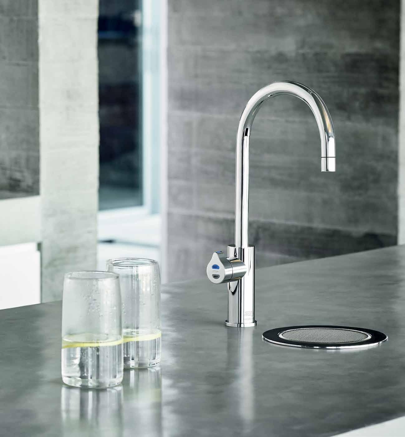
Introducing the new Zip HydroTap® design range. HEALTHY LIVING HAS NEVER LOOKED SO GOOD. To experience the Zip Effect go to zipwater.com
A container for creative thoughts






Curve-a-licious
Designed with the goal of modernising the traditional shoe rack, the sleek and contemporary vintage style of the NEW YORK 20 STAND from Sagitine is a modern and artistic way to store any footwear. Following on from the 14-box Shanghai Stand, the new 20 shoe storing boxes blur the boundaries between artistic statement and functional design object.

sagitine.com




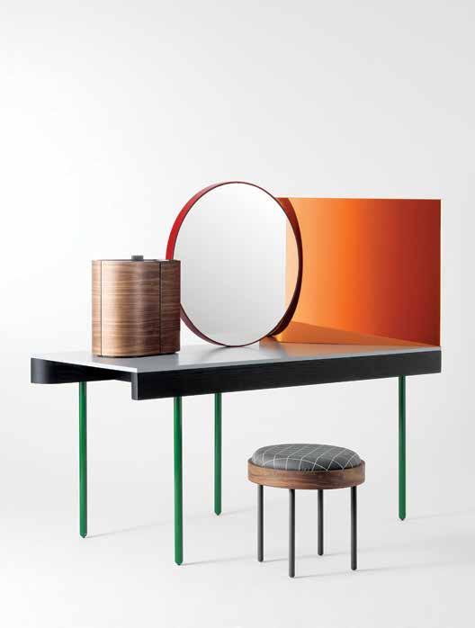
Living Edge is adding more international flair to its range with the CHANDLO DRESSING TABLE . Designed by Doshi Levien and inspired by the creative duo’s trips to India, the table has been designed as a part of their vision for a perfect modern house. The seemingly abstract nature of the piece’s composition reflects the gestures and daily rituals of dressing and grooming. The table is made from solid ash with tubular steel legs painted in a brilliant green. Designed for BD Barcelona Design , Living Edge exclusively brings this charming table set to Australian design lovers.
doshilevien.com / bdbarcelona.com / livingedge.com.au

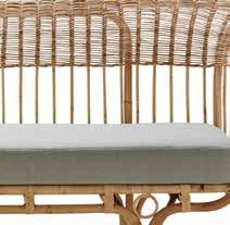
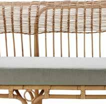
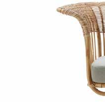
Combing the highest quality traditional rattan weaving techniques with modernist and clean Scandinavian aesthetic, the BELLADONNA SOFA Sika Design is now available in Australia through Domo. The sofa combines the texture of rattan with a luxurious goose down seat cushion, and is the perfect statement piece at home.
Scandinavian from
sika-design.com / domo.com.au issue #32 habitusliving.com
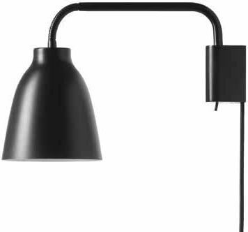
Named after the famed Italian painter, Cecilie Manz’s Caravaggio Light from 2005 is a modern classic that has now been reworked as CARAVAGGIO READ in table, floor, and wall options. The signature design and option for adjustable focus makes the new edition perfect for a cosy reading nook or to shine light on your work.
ceciliemanz.com / lightyears.dk / cultdesign.com.au
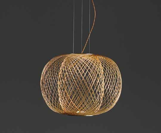
The ANWAR SUSPENSION LIGHT, designed by Stephen Burks for Parachilna , features intricately woven wire in black, golden or copper electroplated steel. Available in three sizes, the lamps arrive in Australia through Criteria Collection , and reflect a design aesthetic that exudes exceptional artistry, which the brand has become known for.
parachilna.eu / criteriacollection.com.au
Drawing on its 75-year history of innovation, Caroma has set a new standard for toilets with its new CLEANFLUSH system. Incorporating a rimless bowl design and patent-pending flushing system, this breakthrough product ensures ultimate hygiene and ease of cleaning.

caroma.com.au
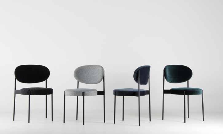
The rediscovery of a previously overlooked design, the SERIES 430 chair from Verpan was originally designed by Verner Panton in 1967 and is now being re-issued with modern design touches. While the original design is strikingly modern enough not to warrant major change, the chair has been built in accordance to modern design regulations and comfort standards, making it a great addition to any modern or vintage chic home.
verpan.com / spacefurniture.com.au
1 . lightbox # 25
Lunar landing
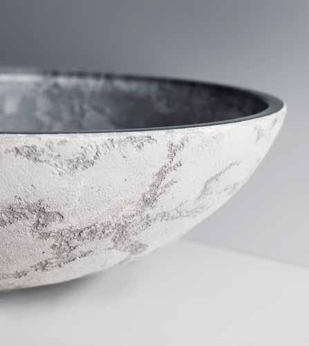
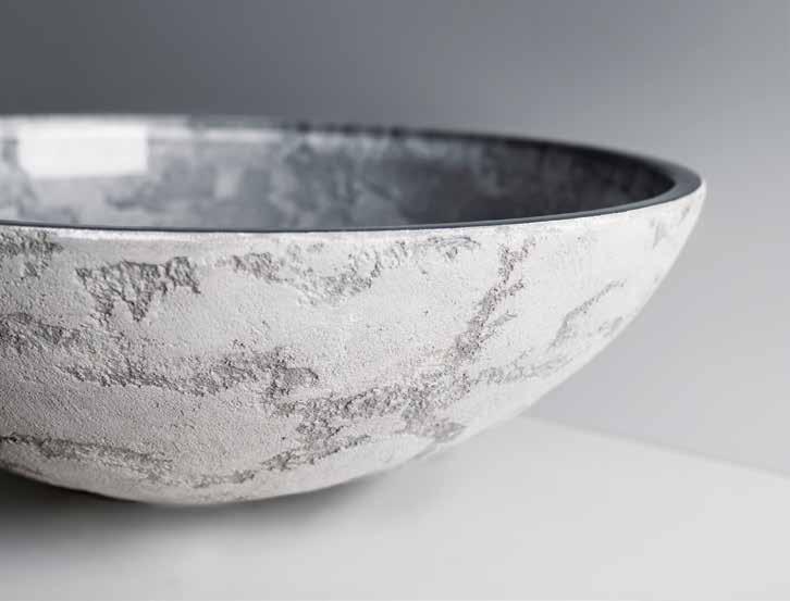
The LUNA ROUND COUNTERTOP WASHBASIN from Pittella is inspired by both the texture of natural stone, and the aesthetic qualities of earth’s moon, the Latin name from which the basin draws its name. The washbasin combines artistic crystal glass and concrete for its materials, the elegant round shape is defined by a glass interior structure and its bas-relief exterior finish is created through an application of real concrete in various colours, such as moonlit silver-grey, sand and white.
pittella.com.au
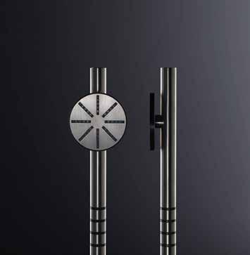
Continuing the design trend set by its sister products, the VOLA ROUND SERIES hand shower range perfectly melds modern design aesthetics with the best in showering technology. The elegant simplicity of the round shower design is matched by the function of the device, to ease the stress of daily life and make the bathroom a place of refuge.
vola.com
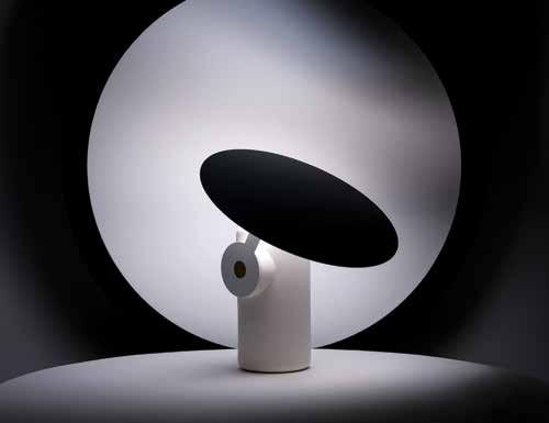
From Australian designer Ross Gardam comes the unique POLAR TABLE LAMP. Defined by a circular motif, the ultra modern lamp employs a strikingly minimalist design and operative form. The product utilises a unique magnetically attached arm, allowing the light-shielding disc to rotate around the body in order to direct or shade illumination.
rossgardam.com.au
issue #32 habitusliving.com
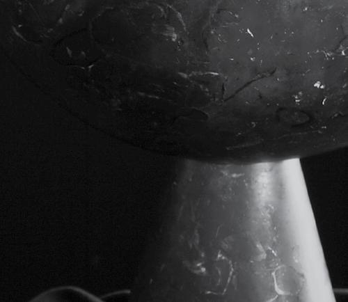
The Ne O Ve SS el from a pparatus Studio is the outcome of experiments between contrast and form. Designed as part of the Neo Marble range, the arms of the solid brass bowl are made to slot perfectly into the solid marble urn-like base. While the footed brass bowl can be removed to stand alone, the objects really shine when paired together. Available in white (Bianco Arabescato), or black (Nero Kinitra), the Neo Vessel captures a sense of primitive utility that recalls ancient rites and rituals.
apparatusstudio.com / criteriacollection.com.au
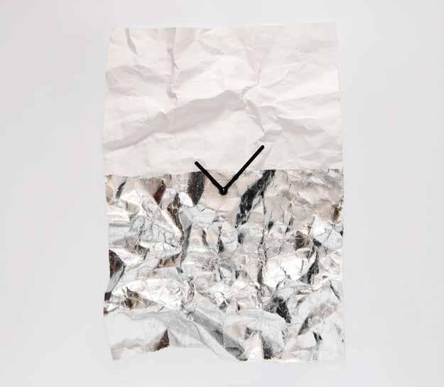
Pressed Pets is an experimental design workshop in Budapest, Hungary, bringing us the unique and utterly charming N e W T i M e wall clock. The clock takes the form of a durable, foldable and smashable wall clock. Unique to the clock, the design allows the user to create the desired look and surface by how it is shaped. Housing a German quartz clockwork mechanism is the unique clock face, made of a paper-like textile, which is malleable, resistant and arrives in a crinkled form, making the clock a stand out gift for the design lover in your life, even if that person is you.
pressedpets.com
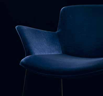
Sometimes archives conceal great treasures. The Burgaz Chair from Sadi & Neptun Ozis for Walter Knoll is such a treasure. With its playful melding of line and space via a lightweight tubular steel frame, the 1953 original featured woven fishnet and rope, while today’s version is made more comfortable through luxurious upholstery. Resolutely modern, elegant and spacious, the chair is a design of lasting topicality.
walterknoll.com.au

1 . lightbox # 27
Strait-laced
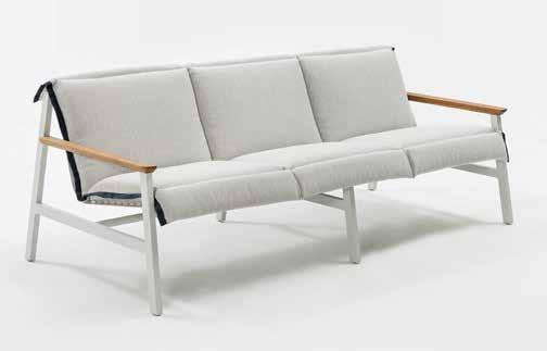
Designed for both indoor and outdoor use, the MAC SOFA from Jardan features a light frame with perforated detailing, channeling a relaxed character. Available in a range of powdercoat finishes with spotted gum arms and reticulated foam removable seat cushions, Mac is a great addition to the modern living room or patio garden spaces. jardan.com.au
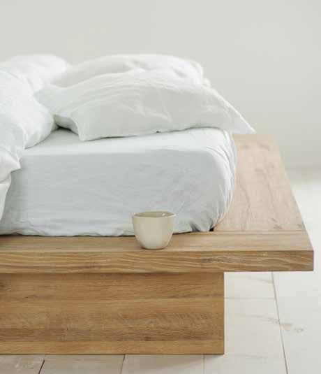
Designed in Australia and made in Vietnam, Totem Road ’s YORK BED is a 100% sustainably made German and American oak sleep magnet. Featuring a minimal design aesthetic, the bed’s entire range is purpose-built to last through the waves of fashion and serve its users a lifetime, both physically and aesthetically. totemroad.com
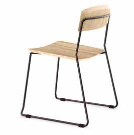
Designed by Glid Studio for Huset , the WINNIE offers a contemporary design touch without sacrificing practicality. With a simple, minimalist design, the chair is made to withstand the rigours of everyday life and still serve as a lasting modern dining chair.

glidsyudio.com / huset.com.au
Garden, forest, sky, water, earth and stone. These are the inspirations for the textures and colours of the TERRAIN FABRICS outdoor fabric range from Kettal . The range is designed to complement the natural tones and textures of the outdoor world, and is available in 34 soothing colours.
kettal.com / domo.com.au / mobilia.com.au
issue #32 habitusliving.com
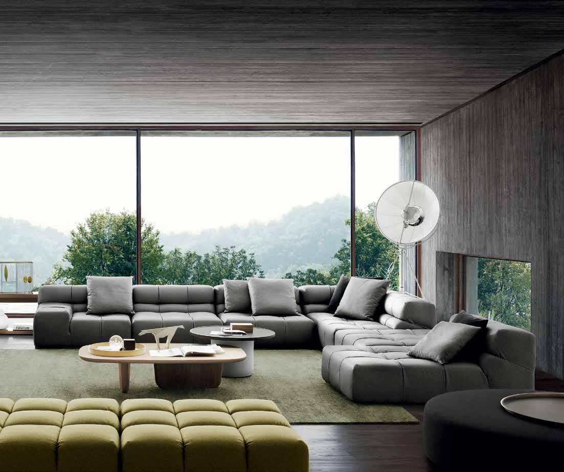
The high life
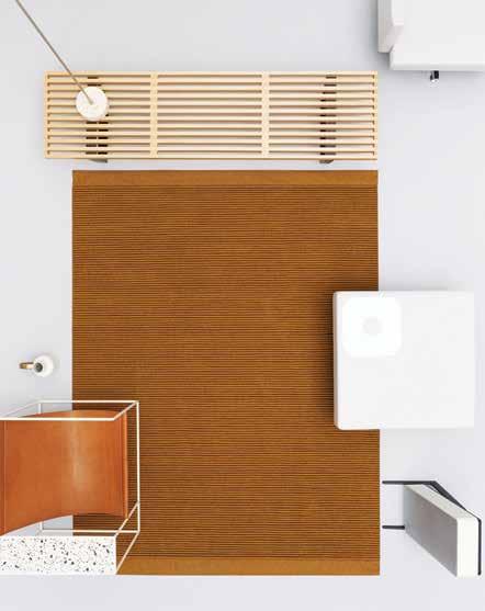
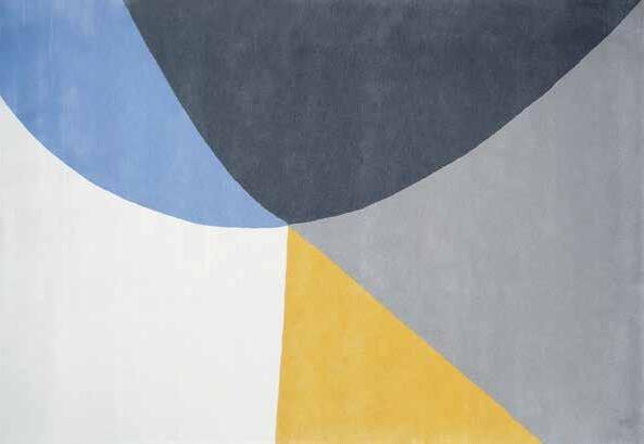
The finest in rug design touches down on Australian shores thanks to Kvadrat Maharam and Hub Furniture. The pair of design brands are bringing DANSKINA rugs to Australian interiors. Danskina rugs are world renowned for their fine detailing and striking designs, the result of skilled makers in the Netherlands, Scotland, Germany, Nepal, New Zealand and India. Every Danskina rug is based on a distinctive and clear tonal concept, with the perception of colour created in different ways through different dyeing techniques and methods.
danskina.com / hubfurniture.com.au / kvadratmaharam.com
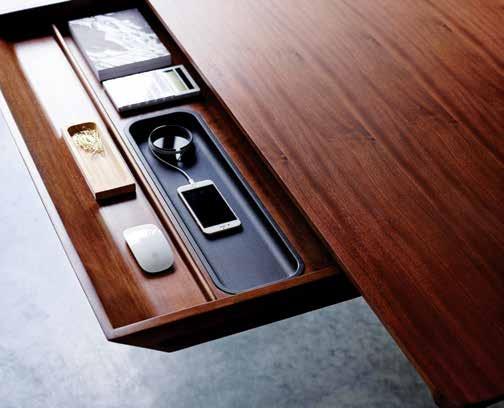
The trend towards compact urban living means adaptable furniture has never been more valuable. The CARAFE TABLE designed by Charles Wilson for Herman Miller is the ideal solution. The elegant design effortlessly transforms from a work desk to a dining table with ease, beautiful in either form.

charleswilsondesign.com / hermanmiller.com / livingedge.com.au
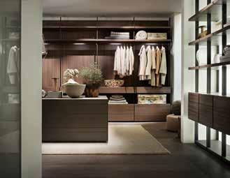
The LEMA wardrobe range offers extreme versatility in design options, with made-tomeasure wardrobes and modular bookcases being their speciality. Available in Australia through Rogerseller, the highly customisable solutions represent a unique system for storing everything in a perfect order, while still delivering extraordinary comfort and elegance.
lemamobili.com / rogerseller.com.au
issue #32 habitusliving.com

VOLA Design Pty. Ltd., Tel.: +61 402 372 480, lna@vola.com, www.vola.com
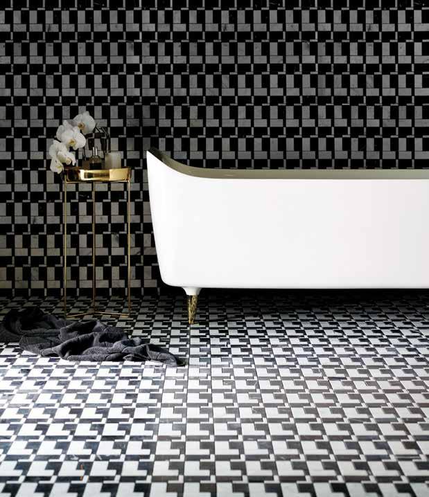
Designer Greg Natale has teamed up with teranova to deliver the MA r Mo designer tile range. The range is a series of intricate patterns shaped in tribute to great designers, such as Ettore Sottsas, whose namesake is pictured. Their legacy has served as an ongoing inspiration for Natale’s own built works and product lines, and this collection is an extension of that passion. The Marmo range includes repeating patterns that consist of stones hewn from the earth, including Thassos, Nero Marquina, Carrara Gioia and Italian grey marbles.
gregnatale.com / teranova.com.au
UK designer Benjamin hubert has modernised the traditional wine vessel with the WW breather-carafe. The device not only aerates the wine for optimal taste, but creates a visually dramatic and arresting display while doing so. The WW – named after ‘water’ and ‘wine’ – is designed with a rubber seal and stainless steel breathing device so as to prevent ice and garnishes, such as fruits and herbs, from splashing into the glasses when pouring.

benjaminhubert.co.uk / layerdesign.com
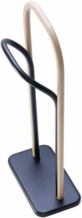
The Arch c lothes VA let from Swedish design trio Front embodies the brand’s signature style in its linear simplicity. Serving as a modern towel or clothes rack, the fun and ironic clothes valet adapts discreetly into the personal area of any home, such as the bedroom or bathroom – just like a real valet.
frontdesign.com / spacefurniture.com
issue #32 habitusliving.com
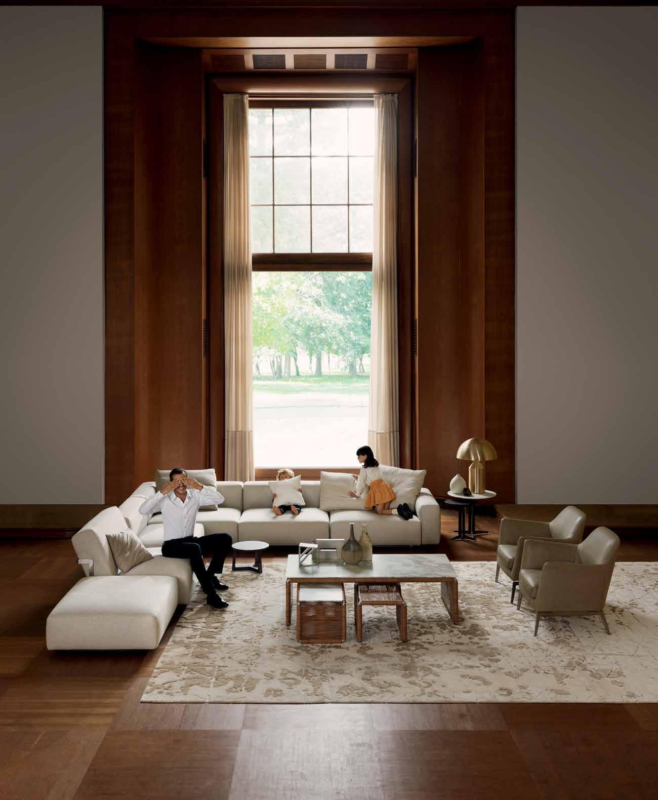
FLEXFORM www.flexform.it LARIO SECTIONAL SOFA
Home at last. SYDNEY 269 Military Road Cremorne 2090 Tel . 02 9908 2660 MELBOURNE 681 C hapel S treet S outh Yarra 3141 Tel . 03 9826 8777 PERTH I nnerspace Tel . 08 9322 6664 info@fanuli.com.au
design by Antonio Citterio
issue #32 habitusliving.com
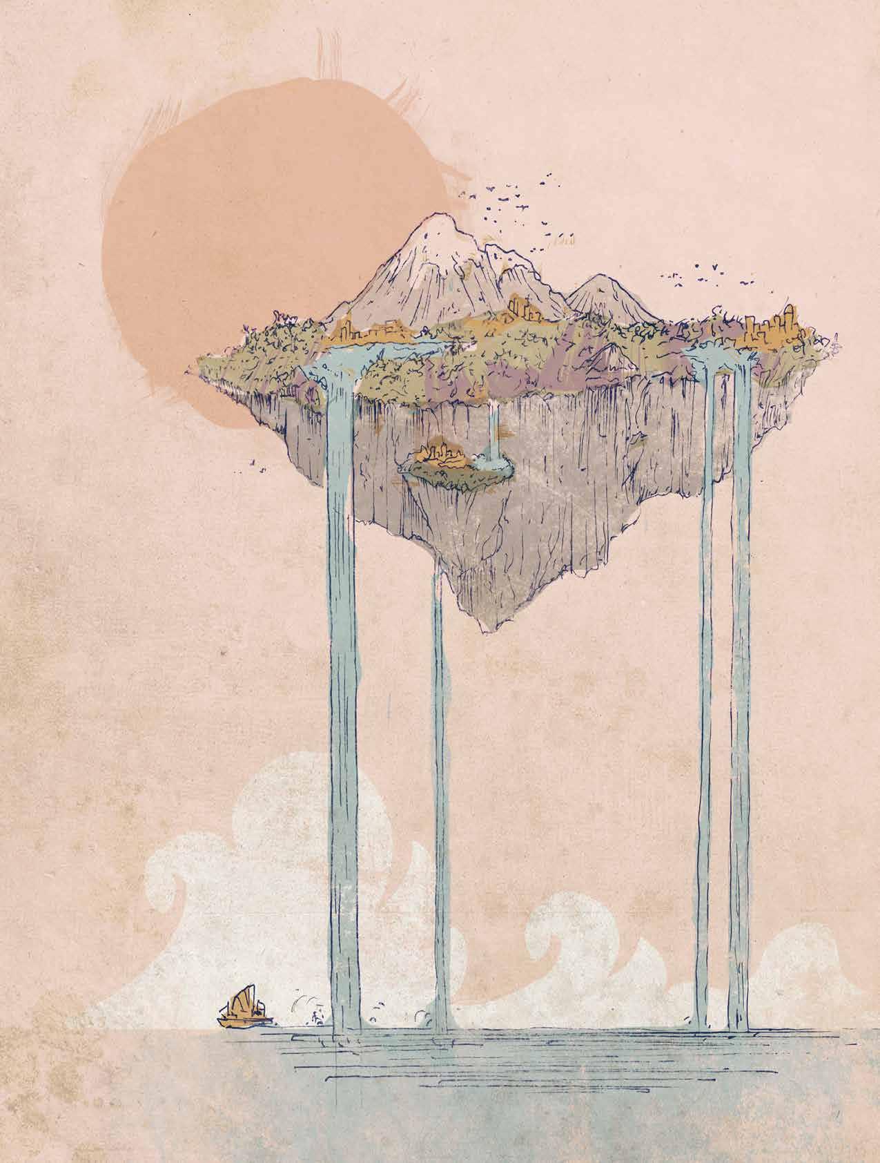
Exploring: the Asia Pacific way
Hopping his way through the South Pacific, Thailand and three Japanese Islands, Charles Zuber explores some of these related histories through the mix of colonial and local architecture.
1 . lightbox # 35
Tex T Charles Zuber | illusTraTion MaTT Canning
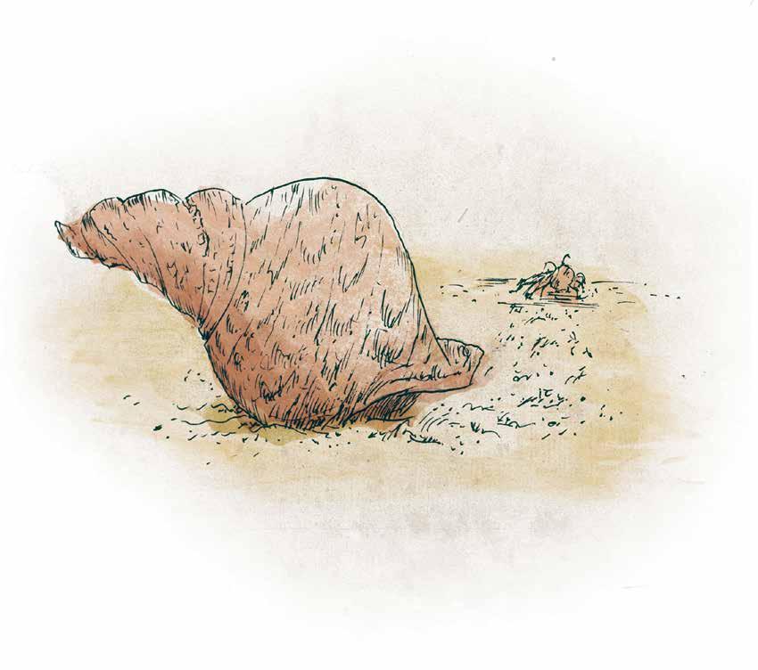
One of the great explorations of all time was the first circumnavigation of the globe by Ferdinand Magellan’s fleet in the early 16th Century. Although Magellan was killed in the Philippines, the remains of his fleet eventually made it back to Spain with valuable spices in their holds, which of course was the main objective. More significantly for us now though, they had discovered the Pacific Ocean.
Later voyages across the vast ocean brought back stories about the people who lived there. Some of these were tall tales, but true or false, they created a real desire in European societies to know more about these exotic, mythical islands. Many dreamed of escaping to the Islands in Paradise, and some did; Paul Gauguin was one of them. He visited the French Polynesian capital of Tahiti in 1891 and spent time there before moving to the Marquesas in 1901 where he painted some of his finest works. He was the iconic romantic artist in many ways, but he also represented what was good and what was flawed about searching for paradise amongst ‘Les Sauvages’.
The last years of his life were spent worrying about why he wasn’t selling more paintings back in Europe, and fretting over when he might find some more drugs to ease the pain of living. He died in the Marquesas in 1903 and it was over 50 years before there was a dedication to his life’s work in his own museum.
According to the authors of Architecture in the South Pacific - The Ocean of Islands, by Jennifer Taylor and James Conner, the Paul Gauguin Museum in Tahiti was one of the
first designs that incorporated vernacular architecture into a public building, “This was a landmark complex, for while it celebrated a French artist, the buildings and Gauguin’s art and artifacts exhibited within, were steeped in Polynesian history,” it reads. Importantly, the Museum provided a much needed venue for the increasing numbers of tourists that were coming to Tahiti (and other parts of the Pacific) during the 1960s.
Completed in 1965, the building marked a shift away from the dominance of colonial architecture, a trend that was also to be found in other parts of the Pacific at the time. The Governor in French Polynesia realised that architecture needed to reflect more accurately the fact that the French controlled islands were 80% native Polynesian. With this in mind, the collection of buildings was designed to reflect the scale and shape of Polynesian dwellings. The buildings were joined by a covered walkway with a high-roofed conservatory entrance in the vernacular style, while the construction also used local materials and labour.
In Taylor and Conner’s book, wellresearched information, good graphic design, clear architectural plans, selected archival material and contemporary photographs are all used to trace the history of architecture in the Pacific. Themed chapters trace the evolution of the islands and their significant changes under the influence of religion, colonisation, war, post colonialism, tourism and revived nationalism.
The Paul Gauguin Museum is just one example of the ways in which tourism and revived nationalism affected architecture.
Elsewhere in the book we can see how traditional grass-roofed dwellings were made in response to the climatic conditions and local resources of the South Pacific islands, and then how these native building techniques were adapted for use in tourist accommodation. In Bora Bora and Fiji for example, the thatched roofs and clear blue waters became strong signifiers of the romantic escape.
The South Pacific experience is now well commodified however, and exploring Asia is becoming more prevalent. Countries such as Thailand now receive travellers who seek something more adventurous culturally, and there is a demand for more information on design and lifestyles. Robert Powell has published several books on the architecture of Asia, all of which have proved popular. The Modern Thai House is a recent title that contains examples of the ways in which modernity interacts with the vernacular. Accordingly, the weather plays a role in the design of the dwellings, as it does in the Pacific, but all through the book, there appears to be minimal visible influences from Thai culture.
All of the 25 selected houses seem emptied of habitation, fecund vegetation is ever-present around the homes, but people are absent. I did notice a little dog in one photograph, but nothing else to spice up the uniformly clean, uncluttered photographs, all with great depth of field and nice lighting. It looks like the homes could be part of an exclusive gated community. However, the introduction makes it clear that there is another reason for this emptiness: nearly all the homes featured are second homes for affluent owners seeking an escape from the city of Bangkok.
Robert Powell makes this observation: “Factored into the design there must be provision for maid space. Few of the houses in this book would be able to function without domestic staff. They must be accommodated in a manner that does not intrude into the privacy of the family, but simultaneously to be on-hand to perform often intimate tasks. Domestic employees are paradoxically required to be present but invisible.”
So whilst the cleaners, cooks and gardeners have a life in the homes, they are represented in the book by just a few lines. Colonialism created structures of belonging that still persist in the Pacific, and according to this book, in Thailand also.
Investing in modern art, design and architecture really has assisted in the re-imagining of these neglected islands.
issue #32 habitusliving.com
In the third book, Insular Insight: Where Art and Architecture Conspire with Nature edited by Lars Müller and Akiko Miki, there is no shortage of people in the photographs. The images are from three Japanese Islands – Naoshima, Teshima and Inujima – in the Seto Inland Sea and the introduction says the book documents the vision of one “regional businessman” as Fukutake describes himself.
According to Fukutake, Insular Insight is in essence, “a record of the ways in which art and architecture might create new spaces and places in harmony with the natural environment.” There are also two quirky preliminary essays that explore what makes islands so special in our imaginings. One of these is called ‘Which Way is Paradise?’ By Nayan Chanda. Coincidentally – for this review anyway – Paul Gauguin is resurrected in Chanda’s essay, not as any kind of romantic role model, but as a sign of the misguided and outmoded search for Paradise. The book recognizes that there are no islands left to discover and colonise, and that paradise should not be a place, but rather a process of constructing a path to a better life from what we have already. As Fukutake says: “we must use what exists to create what could be.”
What did exist in these islands were signs of a polluted environment largely created by post WWII industrialisation. Over time, the Fukutake Foundation has made significant positive changes to the islands through many and varied activities. One such activity that started in 2006 was the revival of the neglected rice paddies.
Now working rice paddies surround a museum on Teshima, and in the Art Museum’s café, rice balls made from the neighbouring rice paddies can be bought.
The islands have a number of museums that are diverse in the way they are designed and built. Some are adventurous modern, elegant architectural structures that are nestled within the landscape, and others are converted traditional wooden structures housing art installations by artists and architects from around the world.
How all these projects are funded is only obliquely explained in the texts, but Fukutake says his mission is to develop Public Capitalism as a positive contribution to society. However he has managed his vision, it appears that investing in modern art, design and architecture really has assisted in the reimagining of these neglected islands and their inhabitants over three decades of his influence.
In summary, Insular Insight. takes a while to figure out, but it’s worth taking the time to read, especially if your interest is in Japanese culture. The Modern Thai House is limited in its research compared with the other two books, but would comfortably grace a coffee table for casual readers. Architecture in the South Pacific would be a real contribution to anyone’s library. At over 350 pages it’s a grand publication in many ways, and it would be a book that I could imagine returning to often in the years to come.
ARCHITECTURE IN THE SOUTH PACIFICTHE OCEAN OF ISLANDS
Jennifer Taylor and James Conner
Editions Didier Millet 356pp hard cover AU$75 edmbooks.com
THE MODERN THAI HOUSE: INNOVATIVE DESIGNS IN TROPICAL ASIA
Robert Powell Tuttle 175pp hard cover AU$39.95 tuttlepublishing.com
INSULAR INSIGHT: WHERE ART AND ARCHITECTURE CONSPIRE WITH NATURE
Edited by Lars Muller and Akiko Miki Lars Muller Publishers 440pp hard cover AU$70 lars-mueller-publishers.com
1 . lightbox # 37
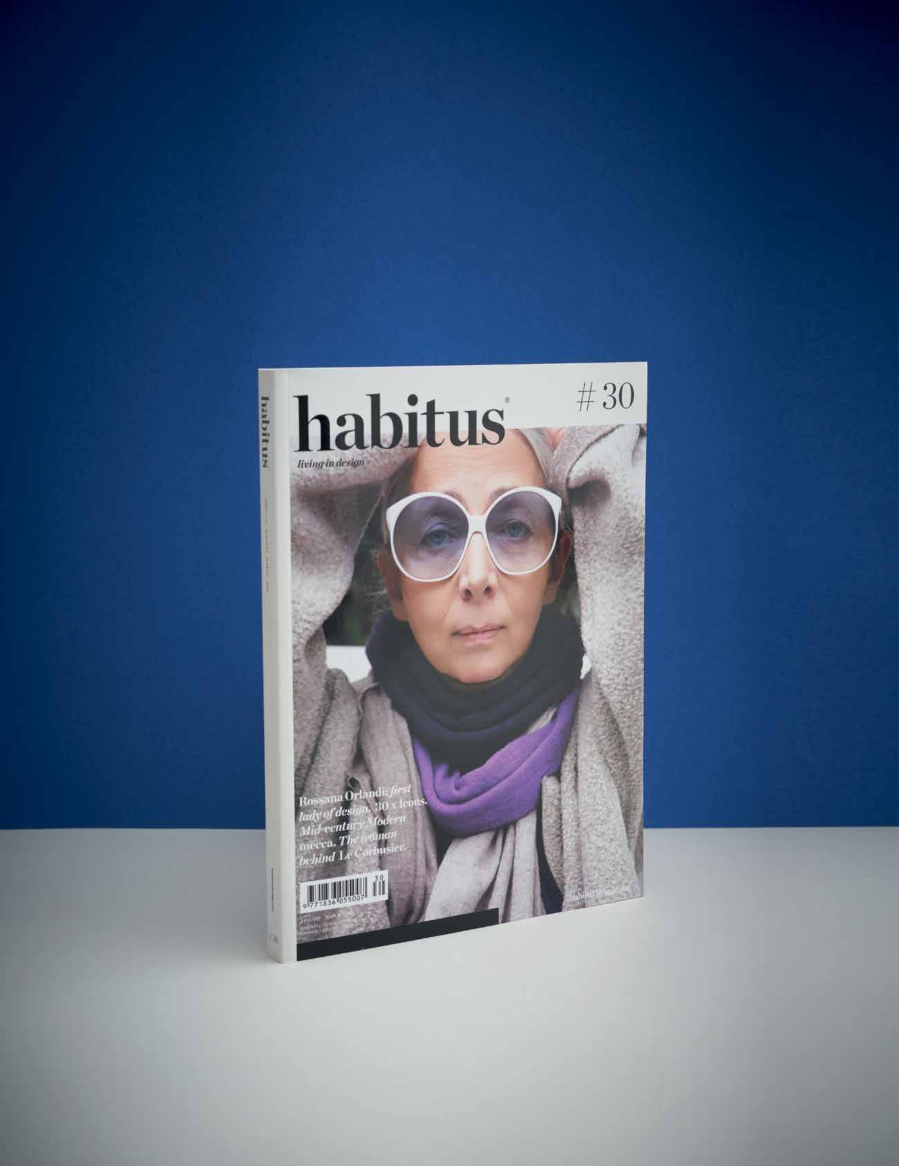
Love Habitus
Each quarter, indulge in a unique tour of Australia, New Zealand and South-East Asia, exploring residential architecture and design, meeting creative personalities at home and in the studio, and discovering products to enhance your way of life.
Subscribe | habitusliving.com/subscribe
Website | habitusliving.com
Facebook | habitusliving
Pinterest | habitusliving
Instagram | @habitusliving
Twitter | @habitusliving
Draw upon some inspiration






When cultures collide
Bombay-born Nipa Doshi and Scotland-born Jo N atha N Levie N , the couple behind internationally acclaimed Doshi Levie N , live in one of Lo ND o N ’s most exceptional examples of Brutalist architecture, Barbican Estate, which represents the utopian vision for inner-city living post World War II. But it’s travelling and exploring that often inspires their designs.
issue #32 habitusliving.com
Tex T CLAIR e MILLeTT | PhoTogRAPhy FILIPPo BAMBeRghI (hoM e) Ch RIs Tu BB s (PoRTRAIT) h AIR LARA zee | MA keu P n Ikk I woLF
# 41 2 . portrait
it’s 7pm on a Tuesday evening in Perth and the atmosphere at the State Theatre Centre, designed by Kerry Hill Architects, is palpable. In a city that is just now drawing people out of their homes on a ‘school night’ and into a number of new restaurants and bars lining the streets and laneways, a midweek sold-out show as part of Mobilia’s Design Circus is no mean feat. Yet it is here, as Nipa Doshi and Jonathan Levien take their positions on stage in two Paper Plane chairs that they created for Moroso, where an audience of design professionals, enthusiasts and students hang on every single word.
In what was a truly candid discussion about their experiences since boldly quitting their jobs and establishing Doshi Levien in 2000 (and going on to win the EDIDA Designer of the Year 2015), it was clear from the outset that this was a couple that was more than happy to share the lessons learned along the way.
“I think design is more than a profession; it is a way of life and I always say that inspiration is everywhere as long as your eyes are open,” said Nipa the previous day, as we sit on the rooftop of the nearby Alex Hotel. “It could be just sitting here, while I’m looking at the roof tiles, the steeple, and the colour of light.”
“I think that’s because you’re very interested in the visual culture,” Jonathan counters. “In my case I would say I’m really looking at how things are made and the technical resolution of elements, as I’m looking around the whole time to figure out how things are put together in terms of materials and structure.”
With such an authentic approach to their everyday surroundings, it’s only natural for interest to pique further as details of how this intriguing couple live at home are revealed.
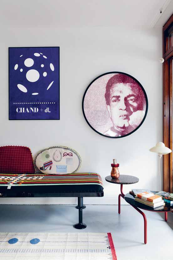

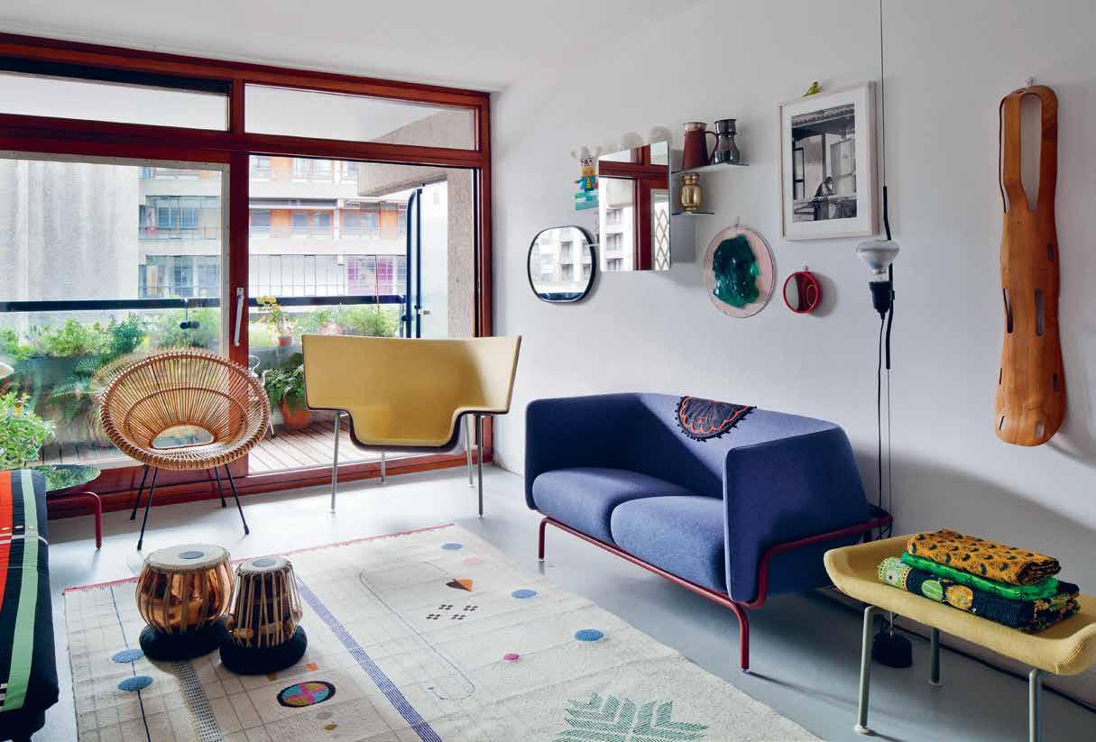
Above | A hAndmAde ‘Ice moon’ poster depIctIng the specIAl edItIon Icecre Am cAke cre Ated by d oshI levIen for hä Agen-dA zs hAngs on the wAll. opposite | the couple’s fAmIly room Is AwAsh In nAtur Al lIght thAt fIlters through floor-to-ceIlIng doors And wIndows, hIghlIghtIng dIstInctIve pIeces such As the cApo chAIr for cAppellInI
issue #32 habitusliving.com
Design is more than a profession; it is a way of life and inspiration is everywhere as long as your eyes are open.
# 43 2 . portrait
nipa | designer & resident
Above | The
as well as The
underfooT issue #32 habitusliving.com
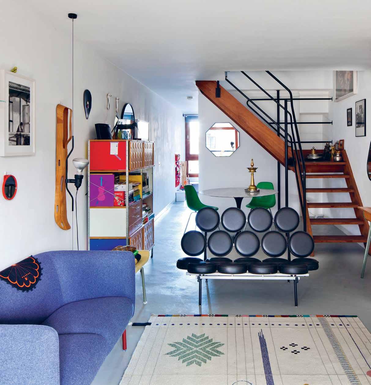
herman miller marshmallow sofa by GeorGe nelson is accompanied by d oshi levien’s own creaTions, includinG The chandiGarh sofa and charpoy daybed for moroso,
r abari ruG for nanimarquina
Home is a duplex in Barbican Estate, an iconic 1960s-era Brutalist housing estate in London. With barely a trace of what occupied the space before WWII bombings devastated the city, architects Peter Chamberlin, Geoffry Powell and Christoph Bon created a complex that accommodates approximately 4,000 residents and has since been labelled a site of special architectural interest for its scale, cohesion and the sheer ambition of the project.
Barbican is built entirely above street level, with an art gallery that hosts sellout exhibitions of art, photography and design. The complex also includes a conservatory hot house with exotic plants and two private gardens situated around a lake, giving the impression of an oasis in the heart of the city.
Being the type of people who relish the opportunity to immerse themselves entirely in their surroundings and who genuinely enjoy interacting with the people around them, Nipa and Jonathan appreciate the utopian feel of the communal-type living at Barbican Estate.
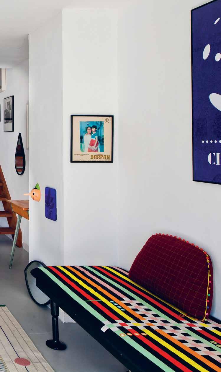
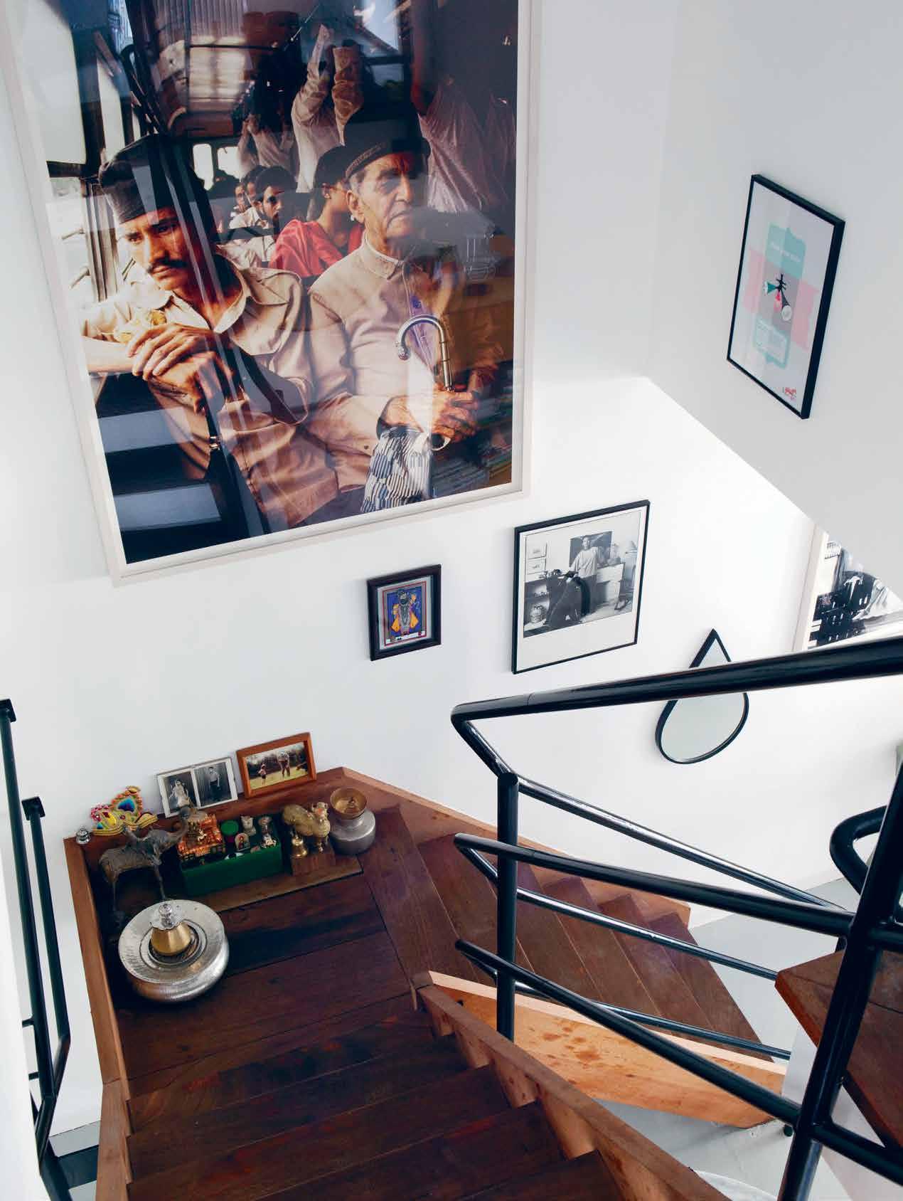
Inside the home, collections of artifacts, metal bowls, mirrors and photographs by Indian screenwriter and photographer Sooni Taraporevala decorate the walls as well as the floors. It is a home that appears instantly comfortable (in complete contradiction to any preconception of what a designer’s home might look like), and begs for further exploration of each and every piece.
# 45 2 . portrait
issue #32 habitusliving.com
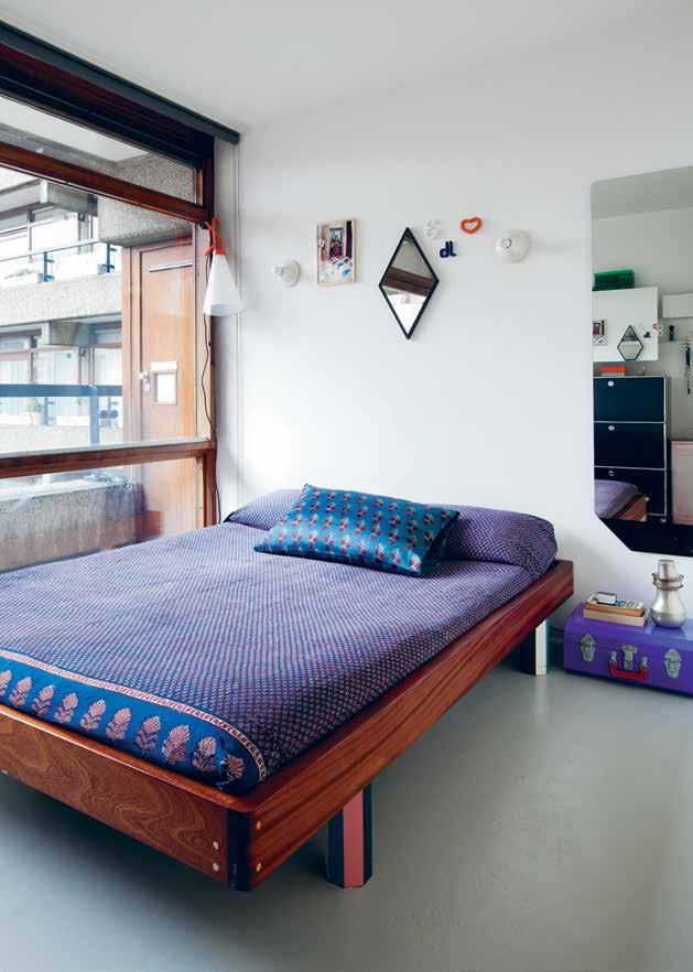
“I think as a designer you’re always working within the context, including where you live,” says Nipa. “Design for me is very much about caring about our everyday environment and how I do things, whether it’s how I lay the table, how I make the bed, or even enjoying the simple gesture of cooking. Design seems to permeate everything we do.”
In an eclectic assembly of pieces accumulated over the years, of their home Jonathan expresses that just as in the way that you care about how you dress, the same attitude is applied to the home and how things go together.
As for their favourite spaces within the home both Nipa and Jonathan agree on the living room, yet for completely different reasons. “I tend to use the floor a lot, particularly when practicing singing with our son, so using the Rabari rug that we designed for Nanimarquina in this space is really special,” says Nipa.
For Jonathan, it is the Charpoy daybed that creates a platform for living. A collection of four daybeds designed for Moroso in 2007, the Charpoy combines Indian craftsmanship and Italian precision in industrial production. Ultimately, it set a blueprint in terms of how they like to bring together cultures and different ways of making. “This daybed is a place to sleep for our guests as well as a place where we hang out to sit and read,” Jonathan explains. “It gets a lot of use because it’s quite an open object.”
Opp Osite | a large
The
oF The
|
To Find a
Their own
The
iS embedded wiThin a low-lying Solid wooden Frame wiTh painTed ocTagonal wood FeeT
Sooni Taraporevala image, Family phoTographS The maya mirror and meTal and copper iTemS collecTed on TravelS line
wallS and FloorS
STaircaSe and landing. AbOve
Unable
bed They liked, nipa and JonaThan deSigned
where
cUSTom-Size maTTreSS
# 47 2 . portrait
Design for me is very much about caring about our everyday environment and how I do things, whether it’s how I lay the table, how I make the bed, or even enjoying the simple gesture of cooking.
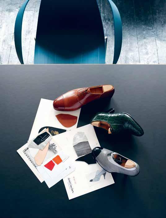

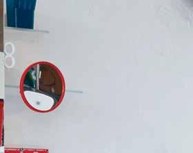
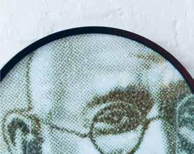
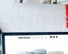
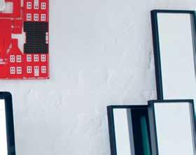
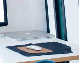
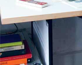
nipa | designer & resident above left | Nipa aNd JoNathaN collaborated with classic b ritish shoemaker JohN lobb to discover the traditioN of haNd makiNg shoes. the pro Ject was Named ‘appreNtice’ which alludes to the respect that d oshi levieN felt towards the makers. above right | the versatility of the k ali wall-mouNted uNit sees it beiNg used both here aNd iN the couple’s bathroom. opposite | the impossible wood chair desigNed for moroso is J ust oNe colourful elemeNt iN JoNathaN ’s workspace. miNiature prototypes of d oshi levieN ’s chaNdigarh armchairs sit oN a glass shelf that protrudes from the k ali wall-mouNted uNit. issue #32 habitusliving.com
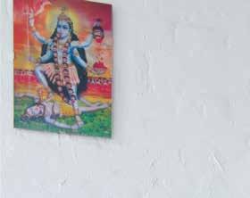
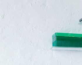





# 49 2 . portrait
When not at home the couple and their son can be found at the theatre or opera in London, at a lesson learning classical Indian music, cycling along the canal, or enjoying a dim sum lunch with family at Yauatcha. A typical trip to India can include a visit to a spa in the Himalaya Mountains, or swimming in Udaivilas overlooking Lake Pichola.
“When we travel to parts of the world we see things that are made by hand, we get to experience a different pace of life, and everything from the colours to the smells and the food is about the joy of exploration,” says Nipa.
Always in absorb mode, it’s not uncommon for Nipa and Jonathan to return to the studio and only realise a few months later that there is a distinct influence from their recent travels that is woven throughout their latest creation, and that the percolation of these ideas was brought to life well before they were even aware of it themselves.
“For us it’s really important that when we go away we are actually more alert in some ways and that we don’t shut down, so that we can invite inspiration to come to us from all angles,” explains Nipa. “Even when I’m in a really polluted city and I see a beautiful colour on a bus, I feel that inspiration is always everywhere; particularly when we are in the midst of escaping through travel.”
Doshi Levien | doshilevien.com
Above | Nipa aNd
JoNathaN iN the grouNds of BarB icaN estate, which was officially opeNed By QueeN elizaBeth ii iN 1982 who descriBed it as “oNe of the moderN woNders of the world.”
issue #32 habitusliving.com




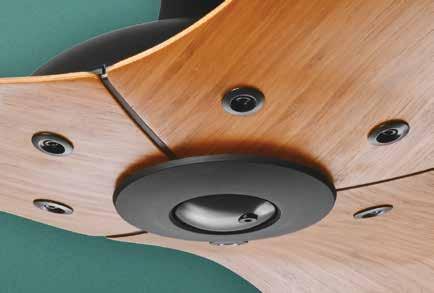

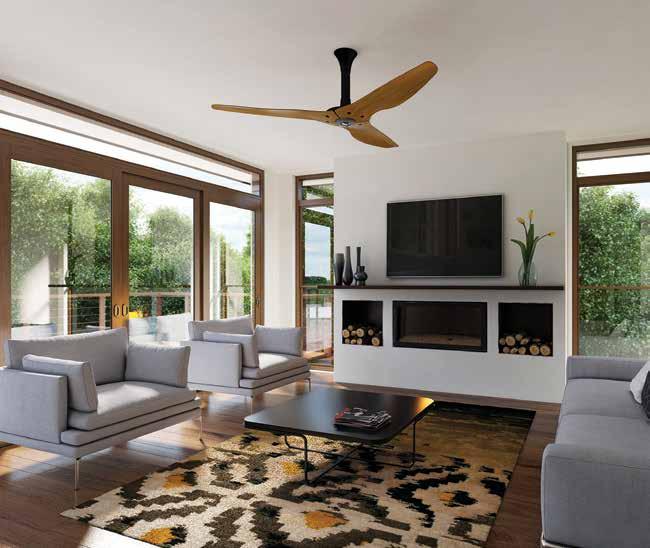


Haiku fans respond automatically to changes in temperature, humidity and occupancy to keep you comfortable and save energy year-round. Premium materials. Handcrafted fans. Each Haiku fan is hand-balanced and built from the best materials to ensure a lifetime of comfort. Visit haikuhome.com.au/habitus16 to bring your Haiku products home. haikuhome.com.au/habitus16 | 1300 244 277 THE WORLD’S MOST ADVANCED CEILING FAN, NO MATTER HOW YOU SPIN IT.
Wheelers Hill, Destination Living
H Series 1.5m caramel bamboo with SenseME technology ($1,295 as shown)
Nadura
With the hardness of stone and the warmth of wood
paveezzi.com.au

Fashion politics
A Parisian-born, Italian-trained fashion designer and her Indonesian-born business partner walk into a Japanese textile mill with Italian fabrics. It’s not the beginning of a long-winded joke, but the story of young Australian fashion brand Song for the Mute, which has a powerfully political philosophy behind their beautiful garments.
Tex T
ChrisTina r ae | PhoTogra Phy rob Palmer
# 53 2 . portrait
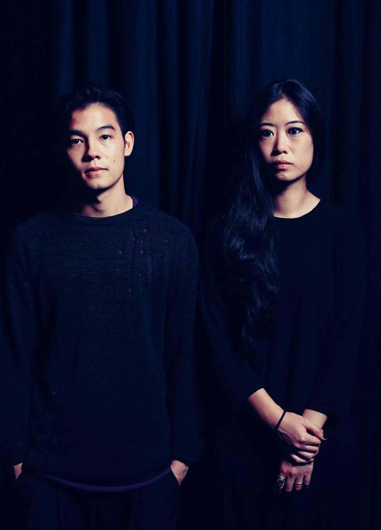
Step into Song for the Mute’s Glebe studio and flagship store and you will most likely be greeted personally by the brand’s founders, Lyna Ty and Melvin Tanaya, who regularly interact with customers in the combined space. “We never really intended for it to be that way, but we love it,” Melvin says. Surrounded by the finished garments, “The customers come in to hang with us and they get to see Lyna designing and [meet] the team,” he continues. Demonstrating the design process from beginning to end, it’s a compelling on-site marketing campaign.
When they’re not jet-setting around the world launching collections, sourcing fabrics, or rubbing shoulders with the likes of hip hop music artist Lupe Fiasco and menswear aficionado Nick Wooster, the pair can be found working hard here, tucked away from the hustle and bustle of the global fashion industry.
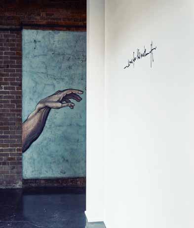
Inside the glass shopfront, a white partition blocks the view into the interior, creating a sense of intrigue. The only thing visible is the logo – scrawled calligraphy rising from a line like a heartbeat, punctuated by two vertical dashes to make ‘t’s that stand for Ty and Tanaya. It is not uncommon to find customers, fans and celebrities striking an Instagram pose against this arresting backdrop, purchases slung over arms.
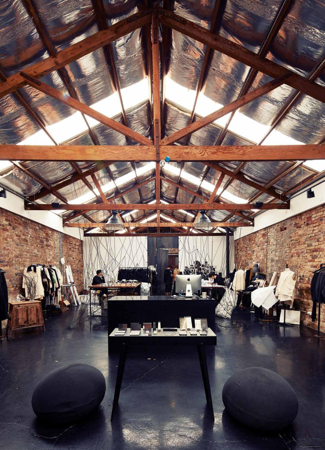
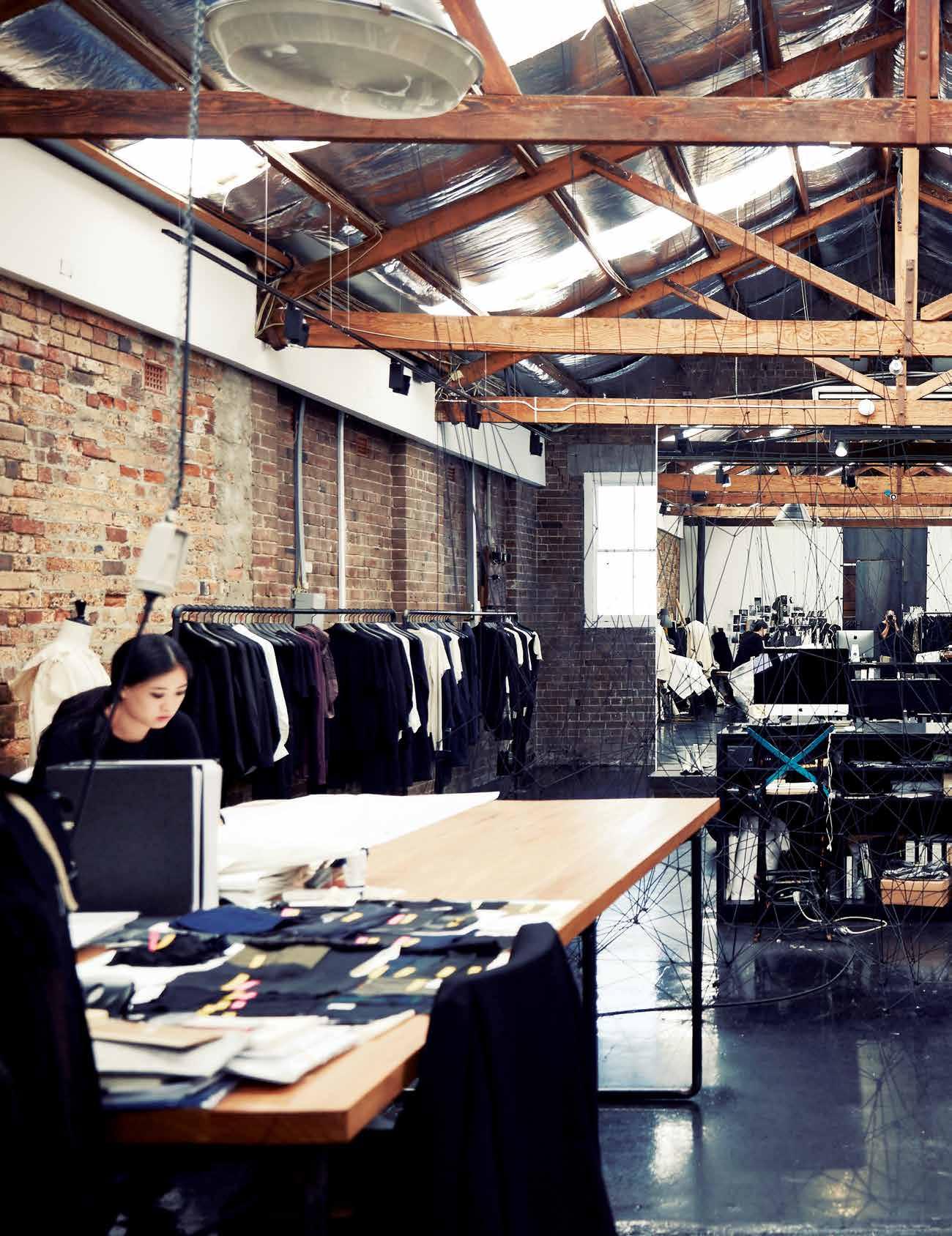
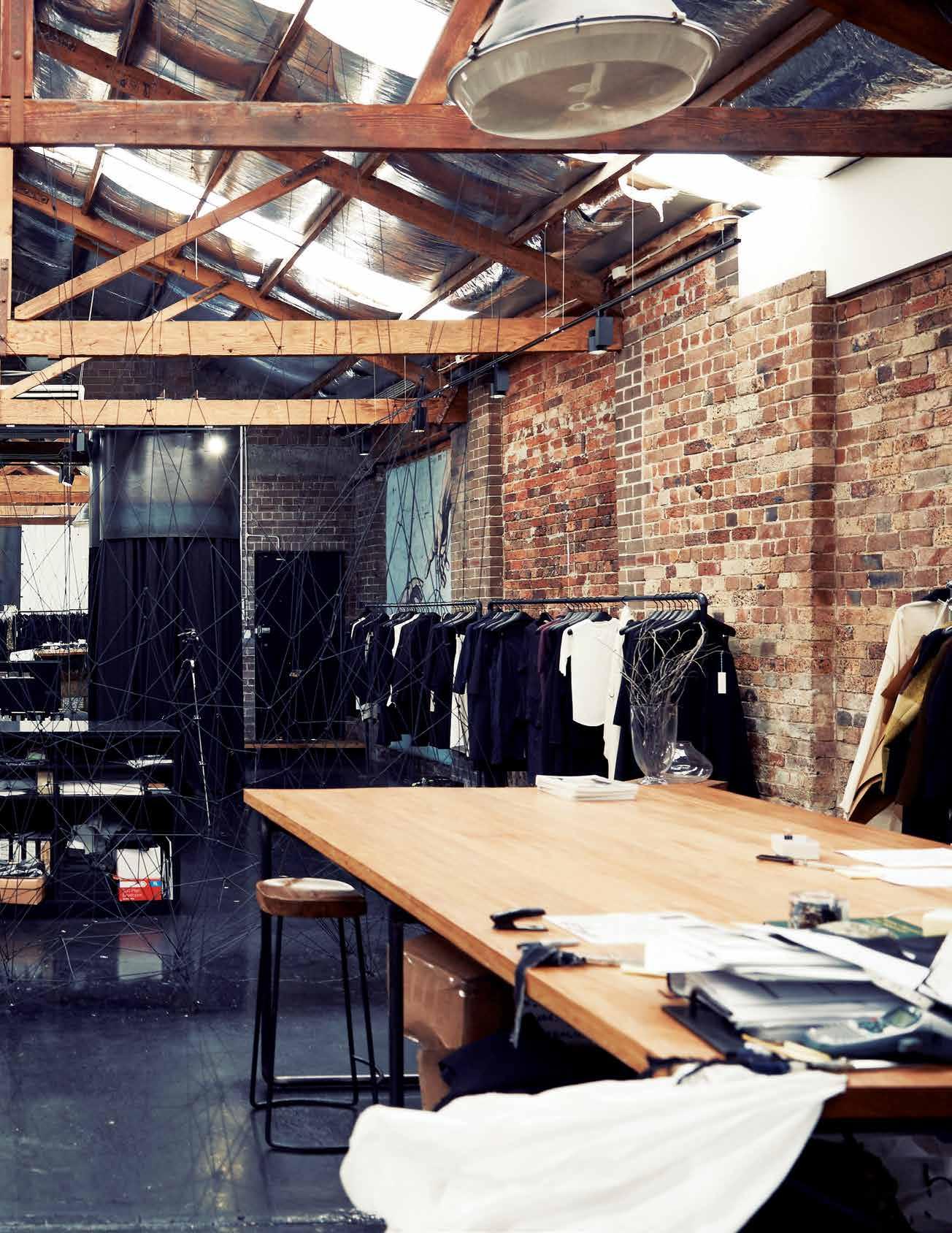
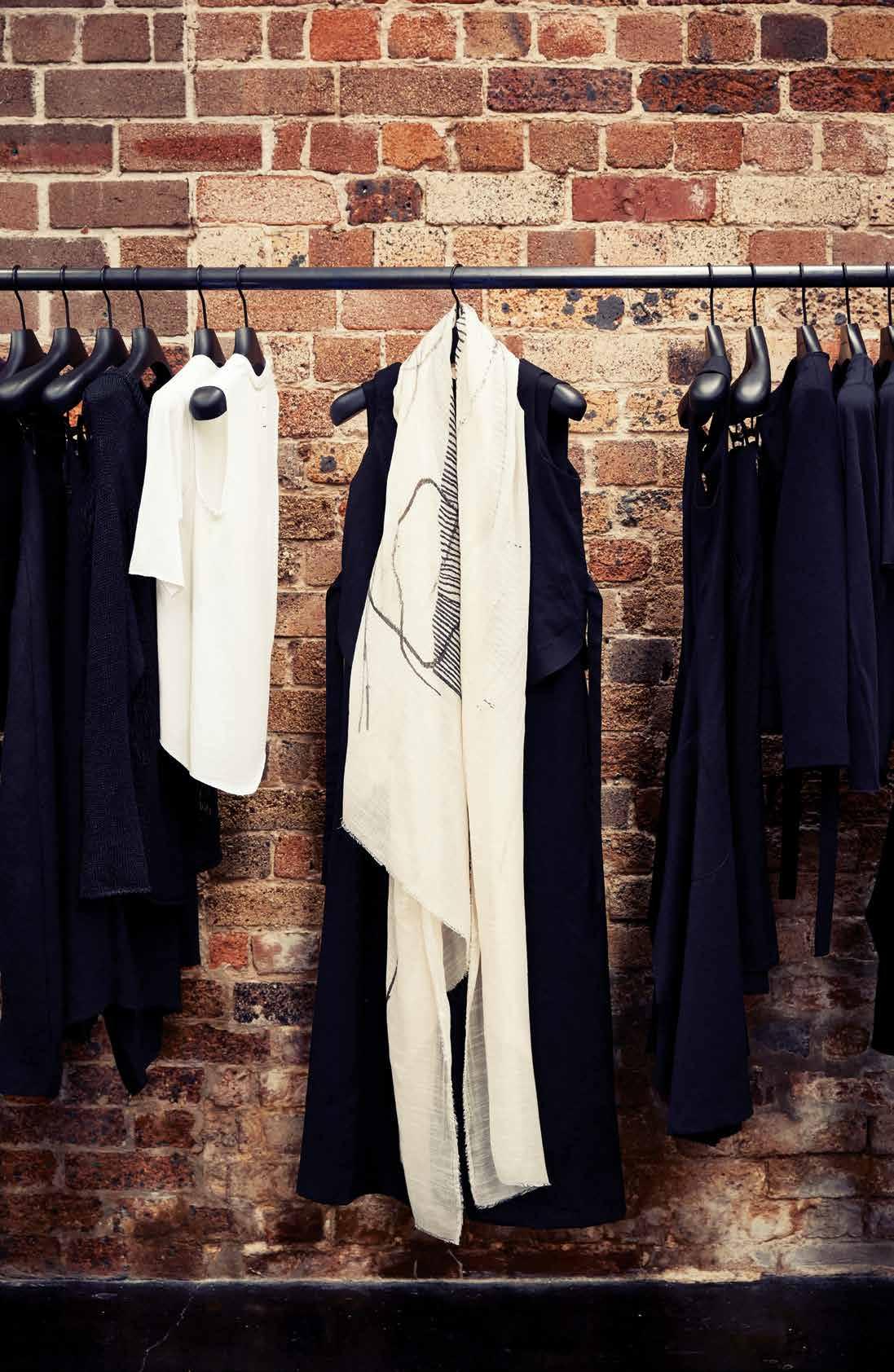
To one side of the entryway is an oversized mural of two hands almost touching – Michelangelo’s Sistine Chapel artwork re-imagined, a remnant from the building’s previous history as an art school. Exposed brick walls, timber beams and trusses are the industrial backdrop, contrasting beautifully with the delicate, intricate textiles making up the latest season’s garments, which are hung on sleek metal rails.
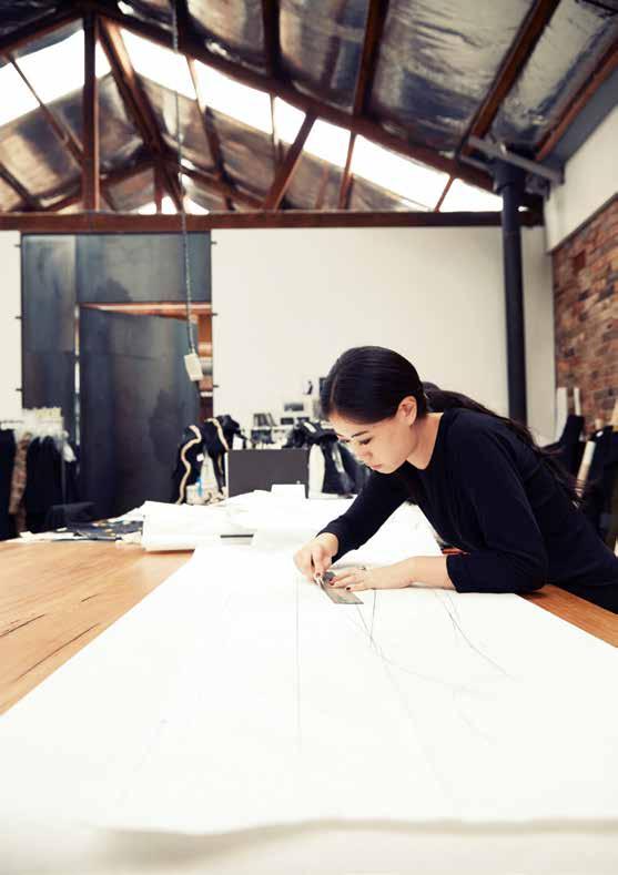
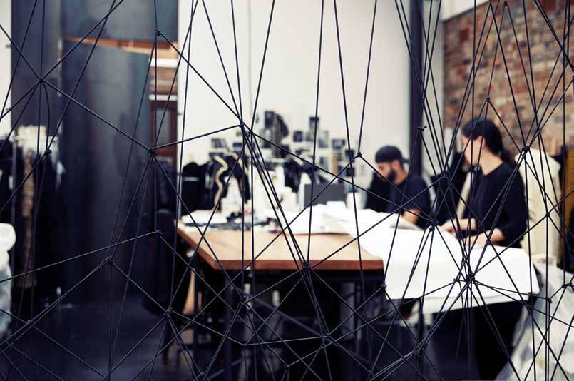
The space is split into a generous retail area at the front, an open studio behind and a stockroom, hidden from view by a wall and steel door. Melvin and Lyna did most of the renovations themselves over 10 long days with an architect friend. “We came in and stripped everything back. [The architect] wanted to paint the floor [uniform] black, but we were like, ‘No, no, no. We like this kind of imperfection’,” says Melvin, pointing to the mottled black concrete. He then gestures at the intriguing webbing that divides the retail area from the studio, which took Lyna a painstaking four days to make by hand, explaining, “We wanted a separation between the two [spaces], but not too much.” The netting, a semi-permeable membrane, allows customers to peer in and participate in the creative process, while simultaneously allowing Lyna and Melvin to get to know their customers and see who wears their garments.
issue #32 habitusliving.com
PREVIOUS
| Melvin tanaYa and lY na t Y of song for the M ute. ab OVE | the graffiti-like interpretation of M ichaelangelo’s sistine chapel artwork beckons visitors inside the store. OPPOSItE | exposed ti M ber bea M s, silver insulation panels, brick walls and the faded polished black concrete Make for a striking interior.
2 . portrait # 55
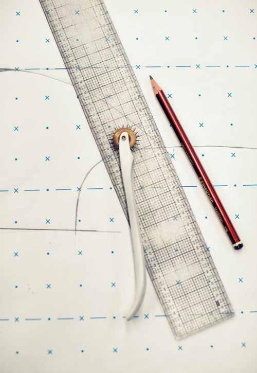
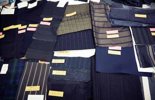
above | inspirational images of faces, patterns and textures, as well as rolls of fabric, lean on the wall behind lyna, an easy reference point for her creative process. opposite above | tools of the trade: lead pencil, ruler and pattern-making paper on which the brand’s garments are first conceived. opposite below | the most important element of the clothing for lyna and melvin – the textiles, many of them created by artisan mills in japan.

issue #32 habitusliving.com
“When we moved to this space, we fell in love with it,” Melvin remembers. “It’s still a work in progress,” he continues, “It’s nowhere near finished or how we want it to be, but that’s part of the journey – to build upon what we’ve got now.” Growth and constant evolution seem to be core principals at the heart of Song for the Mute, whose meteoric rise in the Australian and international fashion landscapes has seen Melvin and Lyna present their collections multiple times a year in Paris, and placed their wares in the most exclusive boutiques across the world.
It’s quite a way from where they started in 2009 making t-shirts as a hobby while they both had full-time jobs. “I’d just finished my course in Italy, and came back and was working in bridalwear, actually,” Lyna laughs. A few t-shirt designs later, they added some trousers and jackets, making the decision to focus on menswear exclusively. “We didn’t even know how the industry worked,” says Melvin. “We had no prior experience in terms of selling the collection to a buyer; we didn’t know when the selling season was. We had to read a book, like a textbook, on how to run your own fashion brand and we took some tips from there.” Incredibly, they went through the Yellow Pages to find their first makers. “It took us a while,” Lyna remembers. “We kind of learned as we went... and it’s still the same,” admits Melvin.
2 . portrait # 57
issue #32 habitusliving.com
2 . portrait # 59
While Melvin looks after the business and marketing decisions (he trained in both graphic design and business), Lyna focuses solely on the design, having honed her skills at the Whitehouse Institute of Design and then via a scholarship at Accademia Italiana di Moda in Florence, Italy, where she completed her Masters. They make the final creative decisions together. “As long as it makes sense to Lyna and I, we think it would make sense for our followers,” Melvin asserts, “Because it comes from us.”
The design process begins with the fabrics, on which the pair places the utmost significance. “It evokes an emotion when we touch and feel a fabric. It either stems from a concept of the collection or a feel of that collection,” Melvin explains. “Everything happens organically. We don’t force, we just let the fabric speak for itself. We’re discovering the collection as we go.”
The pair takes multiple trips to Japan each year to source unique textiles and develop relationships with mills that have been creating quality fabrics for generations. They are heavily influenced by the dedication to craftsmanship that is omnipresent across Japan. “It’s more than just the fabric mills,” the pair says. “It’s the people and the way that they approach things. We are fascinated about how devoted they are to their work, even if it’s the simplest things –making rice for sushi – they train for like 10 years. So much pride,” they marvel.
Everything happens organically. We don’t force, we just let the fabric speak for itself. We’re discovering the collection as we go.
melvin | managing director
issue #32 habitusliving.com
PREVIOUS | view from the back of the studio. the entry is obscured by the partition; while the front is a pure painted white, on this side a mirrored finish reflects the action in the shop. ab OVE | lyna at work on the large studio table. OPPOSItE | f olded Jumpsuit by s ong for the m ute x faliero sarti with artist- painted s carf.
# 61 2 . portrait
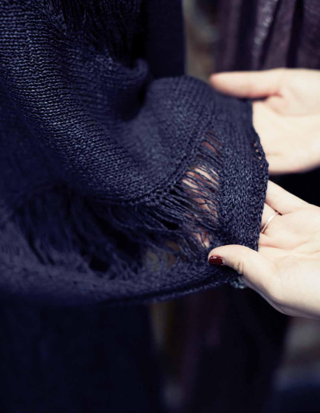
above | one of the intricate textiles that song for the mute are increasingly becoming known for, the DistresseD k nit Pullover in 31% PaPer 42% c otton 27% r ayon. opposite | the netteD Partition that took lyna four Days to knot by han D issue #32 habitusliving.com
Over the years, Lyna and Melvin have found that their designs have matured in reflection of their own experiences and inspiration. In upcoming collections they will begin to include colours to their traditionally monochromatic palettes. “Now that we travel four or five times a year to meet all the suppliers and the buyers, our life has [become] more diverse and dynamic,” they say –much like their designs.
More recently, they’ve found themselves drawing on experiences from outside Australia, Japan and Paris. “The Winter 2016 collection is actually the most mature collection, kind of grandpa meets kid,” muses Lyna. For this unlikely combination, the design cues are traditional British, embodied in checks, pinstripe prints and splashes of mustard and forest green.
“Because we’ve now travelled so much, practicality is something that we’ve learnt as well,” says Melvin. “We used to create all these pieces that looked beautiful on a hanger, but are very impractical when you travel with it, [so now] there are a lot of pieces that you can crush
and put in a bag and it doesn’t really crease or anything like that”. Similarly, the range now features fabrics that, while intricate and beautiful, are machine-washable.
When asked the question about their unusual brand name, Lyna and Melvin reveal how their duo was originally a trio. Their friend was a graphic artist, going against his parents’ wishes by studying design instead of business. When his parents found out, he was sent back to Indonesia to work with them. So the name is an ode to his, and others’, artistic struggle. “Believe in your product, believe in your dream,” Melvin urges. “This is our way to speak our story, through the form of garments, in the hope of inspiring people out there that are just doing things because they are expected to”. Their intention to create as an act of selfdetermination and autonomy is more than a brand philosophy; it’s a political act, and one that is well worth singing for.
Song for the Mute | songforthemute.com
2 . portrait # 63
Ebony and silver.

Sydney Shop 104 PYD Building 197 Young Street Waterloo Melbourne 361 Bridge Road Richmond Victoria
motherofpearl.com
Tropical retreat
Nestled deep within Ho CHi MinH City’s happening expatriate neighbourhood of Thao Dien sits an idyllic tropical retreat which blends Vietnamease tradition with the uncompromisingly modern, says nga Hoang.
Tex T Nga Hoa Ng | PHoTogra PH y Liem Tra
N
# 65 2 . portrait
issue #32 habitusliving.com
Passing through the newly gentrified outer suburb of Thao Dien, it is easy to walk past the inconspicuous entrance of this architectural masterpiece and dismiss it as yet another fancy villa for well-heeled expats and affluent local families, looking as though it would not be out of place in London’s Kensington or Chelsea.
However, step through its metal gate and in contrast with the unremarkable exterior, you will find yourself in an oasis of calm worlds away from the forest of luxury apartments and mansions that vie for space on Ho Chi Minh City’s skyline.
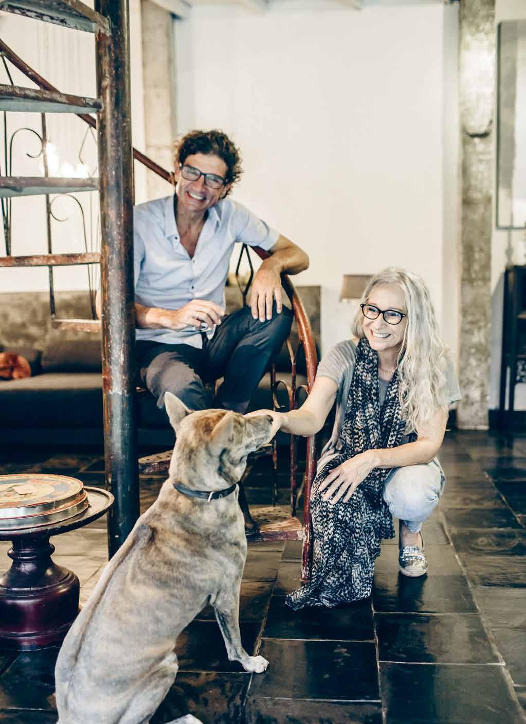
At the helm are Belgian-born Peter Arts and Hedwig Pira, the brains behind Saigon River Factory. Their business started in 2004 as a modestly sized, Vietnam-based, Belgianrun workshop specialising in candle holders and other home décor accessories, all featuring Western designs crafted locally. It has since blossomed into a worldwide distributor. Before they settled in Vietnam, Peter and Hedwig’s job took them around the world. The early days of their careers in design and manufacturing saw them launching a small workshop specialising in floral arrangements for wedding parties and working with disadvantaged youngsters in Antwerp, Belgium.
Their designs, which they sold from their flower shop, proved popular and soon enough they were inundated with orders from retailers in Europe. Demand grew so strong that they packed up their lives and headed to Poland,
PREVIOUS | The couple, pe Ter ArTs A nd h edwig per A enjoy A dAy off work AT home wiTh louis X iV, A phu Quoc ridgebAck. ab OVE | s epA r ATed by Thin gl A ss, The liV ing room is designed To proV ide A V iew TowA rds The gA rden wiThou T compromising priVAcy. 2 . portrait # 67
where they started a new factory geared toward glass and forged iron. In 1998, the couple swapped their peaceful and steady European life for a more exotic one in a place they call their “ultimate home away from home” in Vietnam’s largest metropolis, Ho Chi Minh City.
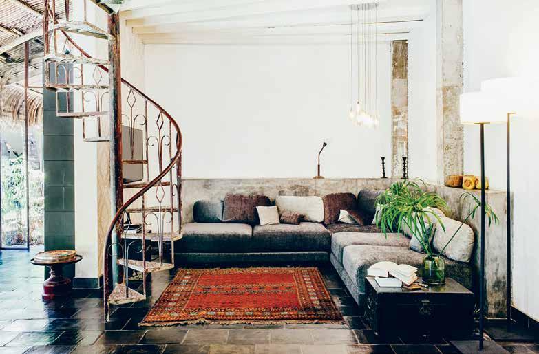
Their existing house was built as a result of the end of their previous lease. The couple immediately set out on a quest to find the perfect place to call home. “Back then we spent every weekend cruising on our motorbike through every street and alleyway. Just when we thought we were going to have to give up, we saw an opportunity to take over a land lease and immediately jumped at the chance,” recalls Hedwig.
As it was no longer compulsory for expats to live in a compound, the husband-and-wife team envisioned themselves living in somewhat less artificial accommodation where they could stay in touch with nature.
Consecutive weekends of construction work saw their vision turned into reality. “We remember living in a constant state of building and moving. It was on a very tight schedule. The house was not quite finished when we moved in. It was also at the start of the rainy season, so our house was not so romantic looking,” Hedwig confesses.
Although many people say our house has a Balinese atmosphere, I think it is totally Vietnamese.
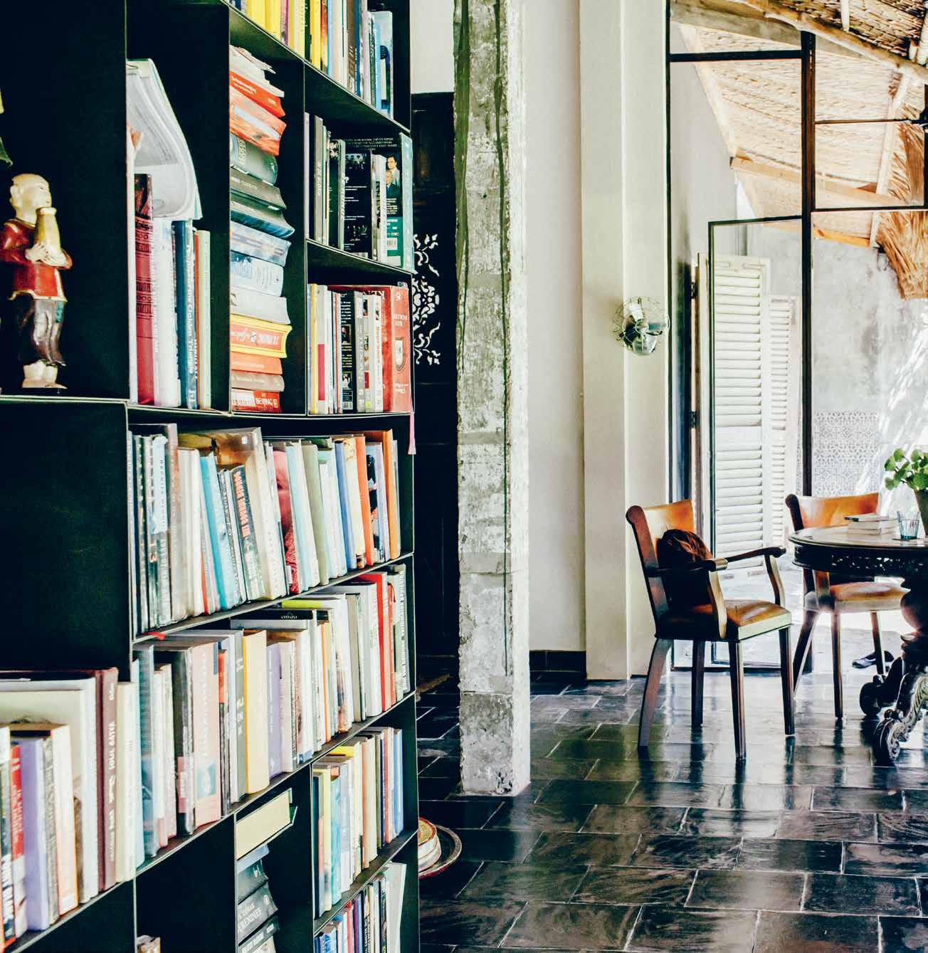
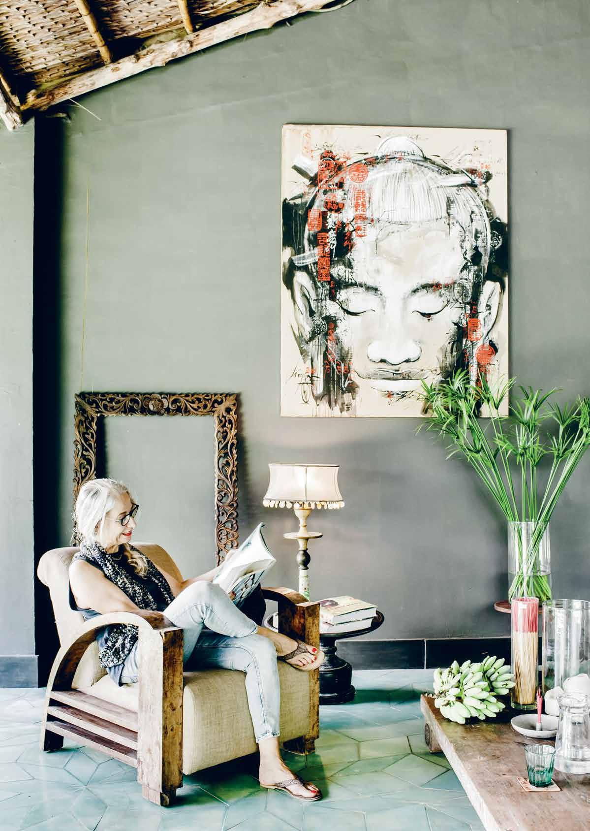
ABOVE | The living room’s mosT sTriking feaT ure is a disused spiral sTaircase, which is given a new lease of life Through The couple’s def T hands. OPPOSITE | The living room is furnished wiTh subTle i ndochinese furniT ure and a painTing by vie Tnamese arTisT phuong Quoc Tri. issue #32 habitusliving.com
Hedwig | Ow N e R

2 . portrait # 69
issue #32 habitusliving.com
2 . portrait # 71
issue #32 habitusliving.com
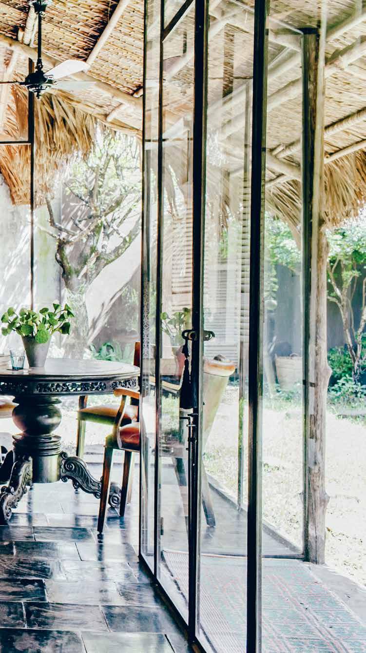
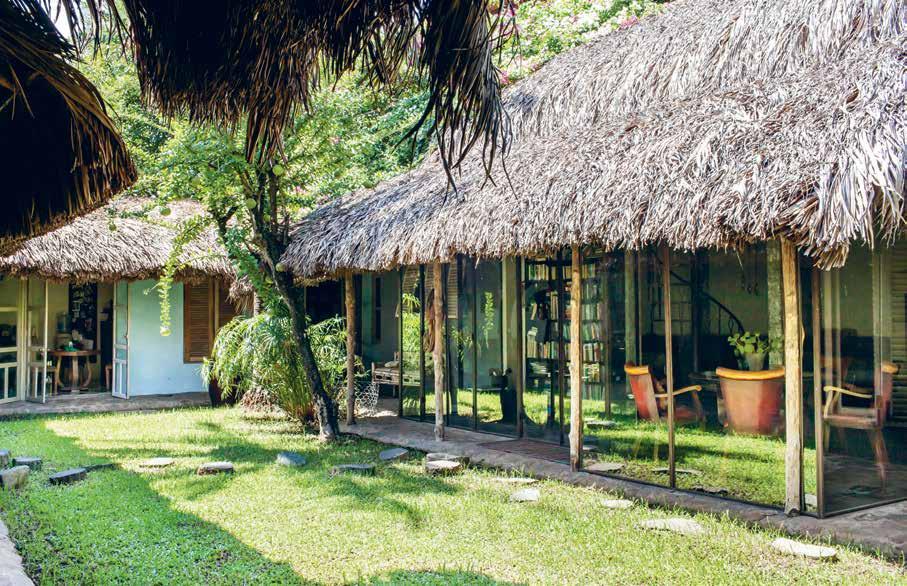
The 3,200-square-foot premises have since been transformed into a desirable cottagey, homespun settlement, one that is ideally suited to their lifestyles, which involve intensive hours at their factory. Their home encircles a leafy open air courtyard. From the palm thatched roof to the coconut tree which stands triumphantly against the tropical sky, the house is as rustic as you’d expect from a typical Vietnamese country home. In a country like Vietnam with its sometimes unbearable humidity, the palm thatched roof and the coconut tree keep the house cool without the use of air conditioning.
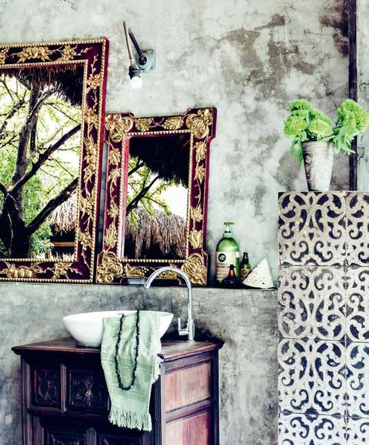
Facing out onto the courtyard are floorto-ceiling glass and iron doors, designed to be as thin and transparent as possible to stay connected to the garden and allow as much natural light as possible. The garden view is visible from every corner of the house. The semi-enclosed bathroom, in particular, enjoys an optimum view of soaring palms in front of the city’s skyline.
The design of their house fuses Vietnamese countryside, a hint of Indochine style and their Antwerp roots. It’s what Hedwig calls “a
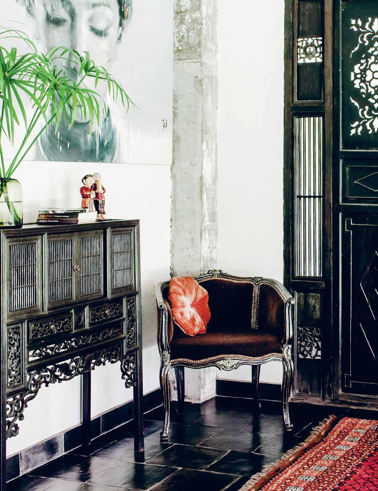
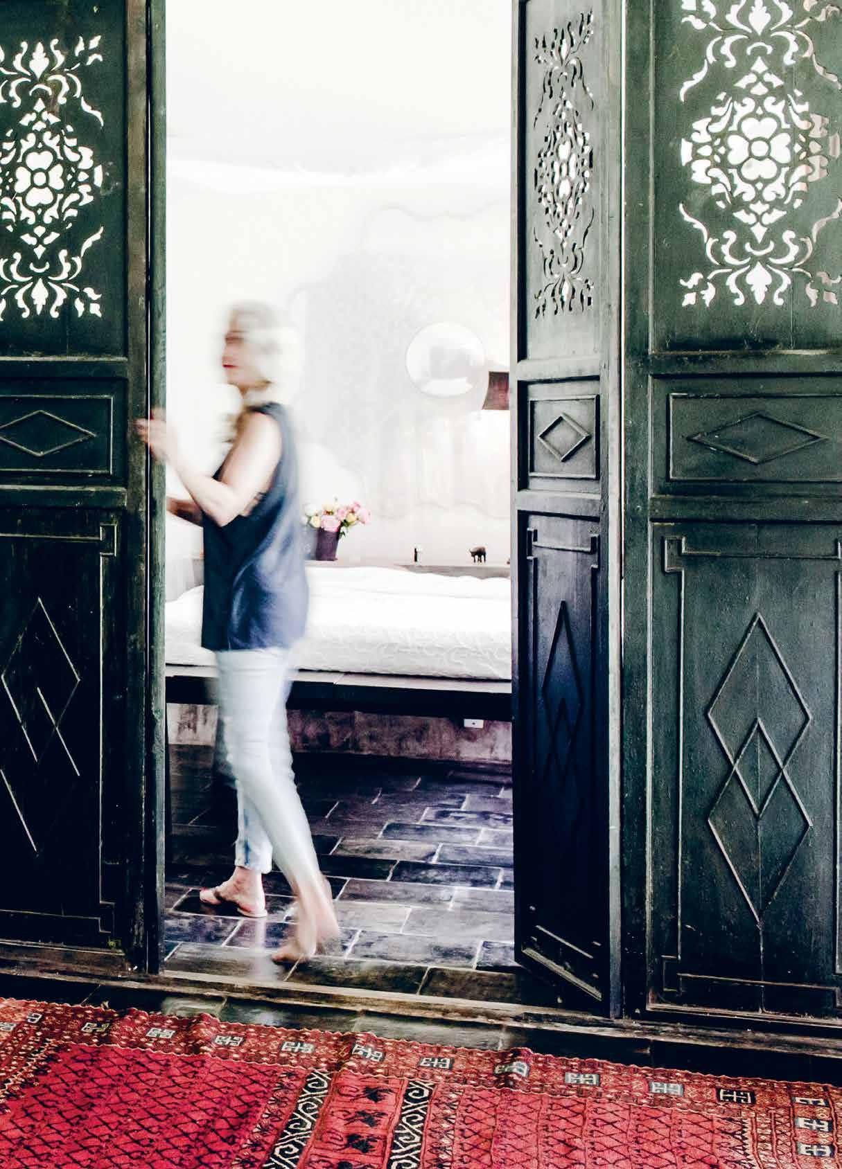
fusion between different cultures and times”. French colonial wooden armchairs and louvred shutters sit beautifully alongside a Vietnamese wooden daybed draped with a mosquito net, an elegantly positioned bird cage and an antique Vietnamese dark wooden door complete with floral cutouts, used to separate living room from bedroom.
“In general Belgian designers are known for their ability to be unconventional, avant garde and subtle at the same time. I would take it as a compliment if this could be said of our house,” enthuses Hedwig. “Although many people say our house has a Balinese atmosphere, I think it is totally Vietnamese. Think of the palm leafed roof and the open spaces like the big terrace. There is only a small boundary between living inside and outside,” she continues.
Equally as impressive as their impeccable taste for design is their penchant for recycled local materials. The louvred window shutters in hardwood – a relic of the country’s bygone era – were picked up when they were travelling towards the beach town of Mui Ne. Dominating their living room is a decaying spiral staircase which was left unused outside their factory and
pREVIOUS | the master bedroom is enclosed behind a set of beautifully patinated doors Opp OSItE | the coffee table in the terrace living room is a repurposed traditional hardwood bed. Ab OVE | o rnate mirrors in the bathroom reflect the landscape and bring a sense of nature indoors. 2 . portrait # 73
has since been reborn as a staircase that leads up to a duplex with a daybed where the couple rest. “I was designing that part of the living room and thinking about how to get upstairs. One day Peter came home and said he’d seen exactly what I needed. And the size was indeed perfect,” Hedwig agrees.
As for their favourite spots in the house: “There are many,” says Hedwig. “We always make our spaces full of favourite spots. Depending on our mood, the time of the day and also in which season, we will choose where we prefer to sit.”
Having now lived there for 10 years, they have been building some strong memories in the house. “Aside from a few memorable garden parties, we remember the moment when we found Donna Mercedes on our roof, then a tiny abandoned kitten and now undoubtedly the mistress of the house,” Hedwig and Peter fondly recall.
With their triumphant business and a tranquil haven to call home, Hedwig and Peter are living the dream.
We always make our spaces full of favourite spots. Depending on our mood, the time of the day and also in which season, we will choose where we prefer to sit.
above | The 3,200-square-fooT residence encircles an open-air courT yard as a way To sTay in Touch wiTh naT ure. issue #32 habitusliving.com
Hedwig | Ow N e R
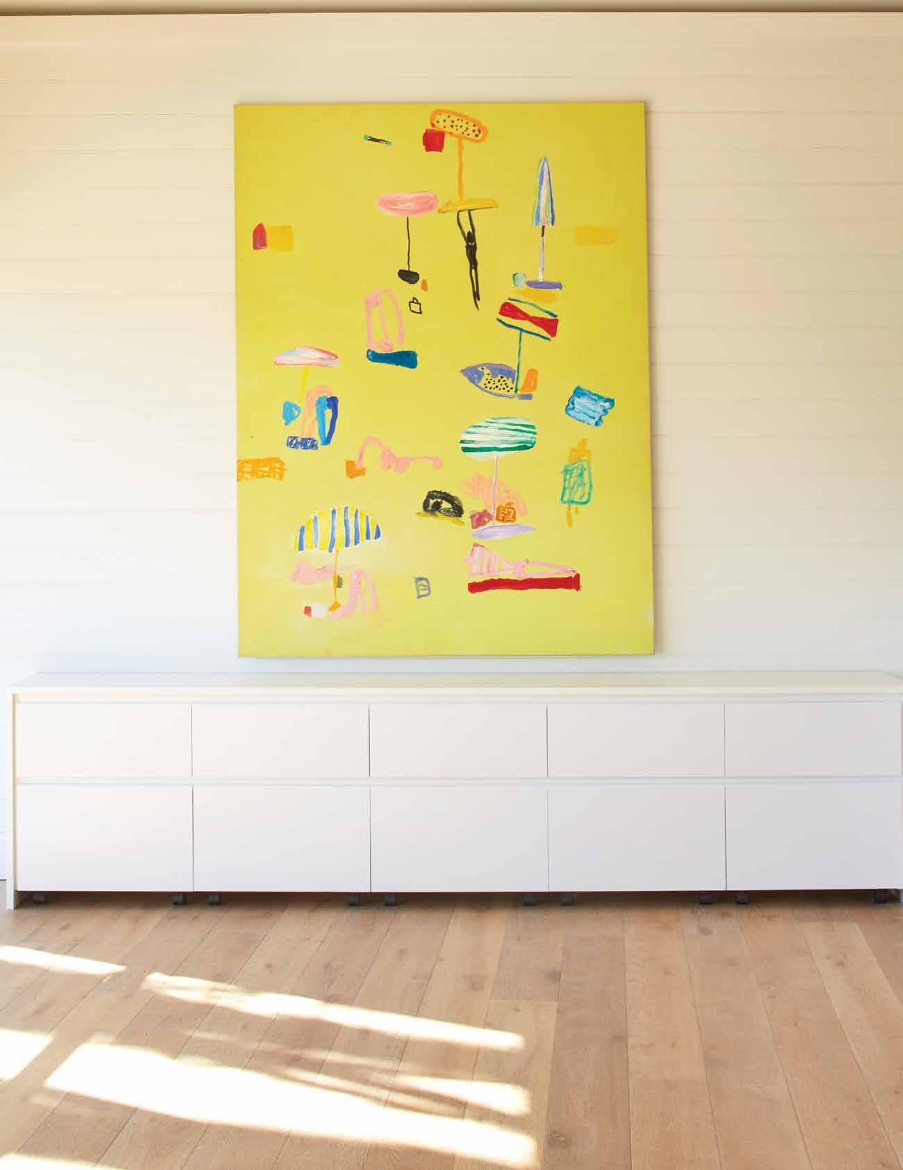
KEN DONE 1-5 Hickson Road, The Rocks, Sydney, tel 02 8274 4599, www.kendone.com Beach January I, 1998, oil and acrylic on canvas, 200 x 150cm
Three decades of design
Celebrating 30 years in business, Designer Rugs reflect on their humble beginnings as custom rug manufacturers –still the core of their offering today – as well as the designer collaborations which have become their hallmark.
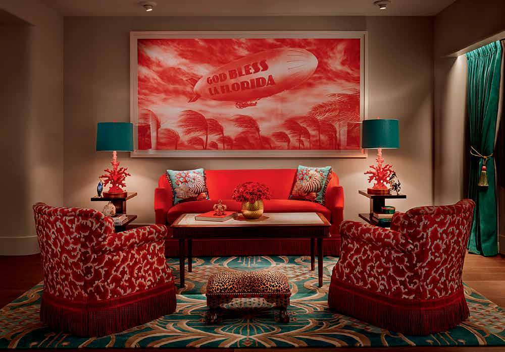
issue #32 habitusliving.com above | Faena Hotel MiaMi BeacH opposite above | woMen’s gatHering By Minni pwerle. opposite below | custo M project For a private residence.
Carpets, rugs and tapestries are an integral part of the Modernist canon. While we readily – and correctly –refer to streamlined, clean lines and robust materials such as concrete and glass, woven textiles have always played an intrinsic role in softening and warming interiors as well as the tempering of acoustics. Think of Le Corbusier’s majestic wall hanging tapestry, Les dés sont jétés (The Dice are Cast) originally commissioned for Jørn Utzon for – and finally acquired this year by – the Opera House. Think also of the many woven works by Magritte. Or, then again, think of the output of Designer Rugs, Australia’s modern handmade rug workshop.
The company was established by the Tal family in the Sydney suburb of Marrickville in 1986, the same year they was commissioned to create a custom made rug for the Australian visit of Pope John Paul II. Their place in the public imagination as rug makers with gravitas was secured by their commission by the House of Federal Parliament in Canberra to create commemorative rugs to celebrate the visit of Queen Elizabeth II in 1988 to mark the Australian Bicentennial.
After some years growing as a custom rug manufacturer, Designer Rugs started developing their own designs, while still working on high-profile projects such as the Australian Embassy in Tokyo and Paris, and the Australian High Commission in Hong Kong. In the 1990s, a creative collaboration with celebrated architect Harry Seidler began, as well as launching creative collections featuring prominent Australian artists such as Annie Georgeson, Alun Leach-Jones and Linda Jackson.
This approach continued in the early 2000s, with Designer Rugs engaging highprofile Australian designers in other fields to collaborate with. These partnerships, which still continue today, bring the breadth of Australian creativity into the sphere of rug design, and into the private sphere of the home, with designs that range from the seamless and subtle, to striking centrepieces.

habitus promotion ›
Designer Rugs
#77
Fashion designer Akira Isogawa, interior designer Greg Natale, and homewares and jewellery designers Louise Olsen and Stephen Ormandy of Dinosaur Design, reflect on their experience of collaborating with Designer Rugs:
Akira Isogawa
“As a fashion designer I am used to working in 3D, being able to walk around a dress model, view an outfit from different angles, decide that for a particular collection we would focus on the back, for instance. Working in 2D, on a rug, was in may ways like going back to class, starting afresh. I enjoyed the collaborative process with the people at Designer Rugs very much. Over several sessions, they introduced me to the available techniques, the different qualities of various fibres, knotting, tufting, that sort of thing. It was an exciting and extremely rewarding process, not only interesting but enjoyable.”
Greg Natale
“A tailored aesthetic, as well as print, are part of the DNA of Greg Natale Interiors. So working with Designer Rugs is a perfect collaboration for us. Before I met Yosi and Eli at Designer Rugs, I’d been wanting to do rugs for some time, but I was lacking the
technology. But in collaboration I gained confidence, and realised we had the capacity to create beautiful floor treatments.”
Louise Olsen of Dinosaur Design
“Stephen and I come from an art school background, we were used to painting, sculpting. Working with rugs is in many ways a logical progression of our skills. Like working with resin, working with wool means you need to listen to the material, get to understand it. Our creations for Designer Rugs are an expression of the material and of the wonderful techniques the Designer Rugs team taught us to master. My advice for anyone designing a rug: You’ve got to hear the wool, listen to the voice of the material.”
Louise Olsen’s words are wise ones for anybody choosing to design their own rugs with Designer Rugs: Listen to the voice of the material. Designer Rugs know how to interpret the voice of their material of choice, and in fact the majority of the Designer Rugs business is helping interior designers, decorators and even everyday people with a bit of creative flair to come up with expressions of greatness for their floors.
One of the latest custom design projects is the incredible Faena Miami Beach, the creative team of Catherine Martin and Baz Luhrmann as Bazmark bringing in the Designer Rugs expertise to create underfoot artworks throughout the hotel, in all the rooms and the public areas – in fact many hundreds of rugs, which makes it one of the largest projects undertaken by Designer Rugs to date.
Pattern, colour, size and even shape – the possibilities are endless for luscious, individualised floor treatments. Designer Rugs brings imagination into each interior they feature in.
issue #32 habitusliving.com
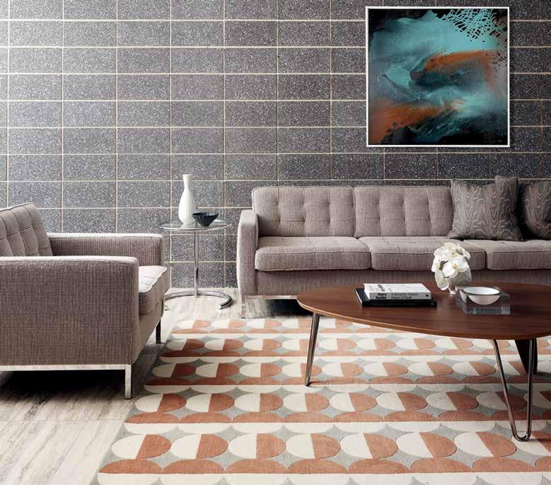
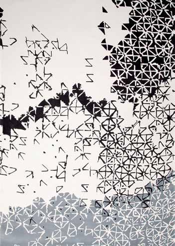
above | orbit by dinosaur designs. opposite above | batik ubud by akira. opposite below | london by greg natale.
“
These partnerships bring the breadth of the Australian creativity into the home, with designs that range from the seamless and subtle, to striking centrepieces.”
 Designer Rugs | designerrugs.com.au
habitus promotion › Designer Rugs #79

751 HIGH ST, ARMADALE, VIC: 03 9818 1403 • 170 QUEEN ST, WOOLLAHRA, NSW: 02 9362 4736 • www.englishtapware.com.au FREECALL AUSTRALIA WIDE: 1300 01 61 81 • AUCKLAND, NZ: In Residence • 09 309 3023 • www.inres.co.nz Custom towel warmers MADE IN ENGLAND Project : Hobson Bay House by Julian Guthrie Architecture, New Zealand Photography: Patrick Reynolds NEWWEBSITE withCAD FILES WWW.ENGLISHTAPWARE.COM.AU
A new way to think
A new environment can really shift the way we look at things – it ’s just one of the reasons that getting away from everyday life is so beneficial. We are equally relaxed and exploratory, the perfect mindset to encourage creativity to flow and mindful living to take place.
It ’s not always possible to go jet-setting to our favourite destinations, however. And when the tent is packed away, and the frequent flyer miles have run out, how can we bring a sense of escapism into our lives?
Opportunities to rejuvenate don’t have to be a rarity. They can be enjoyed everyday, if we care to create them.
Follow us as we explore ideas to bring that holiday feeling into our homes. With a little consideration, we can encourage those precious, restorative moments everyday, through nooks and crannies that allow us to indulge in our hobbies, and products that invite a touch of luxury, or equally, of simplicity.
Ponder your favourite design destination and dive in.
For more ideas and products visit habitusliving.com/issue32/escapism
# 81
Change is as good as a holiday, but why not have the benefit of both in our living spaces?
Escapist spaces
How do you capture the spirit of travel at home? And what globe-trotting ideas from the road make feel-good style steals? SopHie DAvieS explores ways to create an emotional eScA pe once you’re back in the ‘real’ world.
Tex T Sophie Davie S | phoTographY variouS
habitus #32
# 83 escape
habitus #32
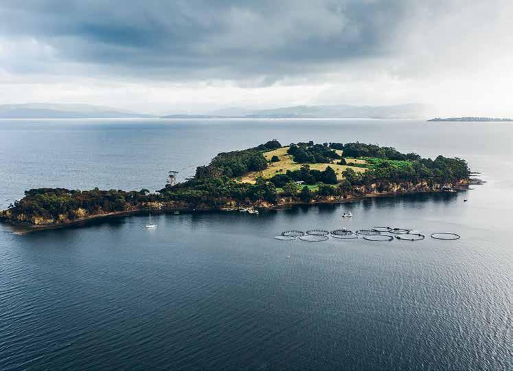
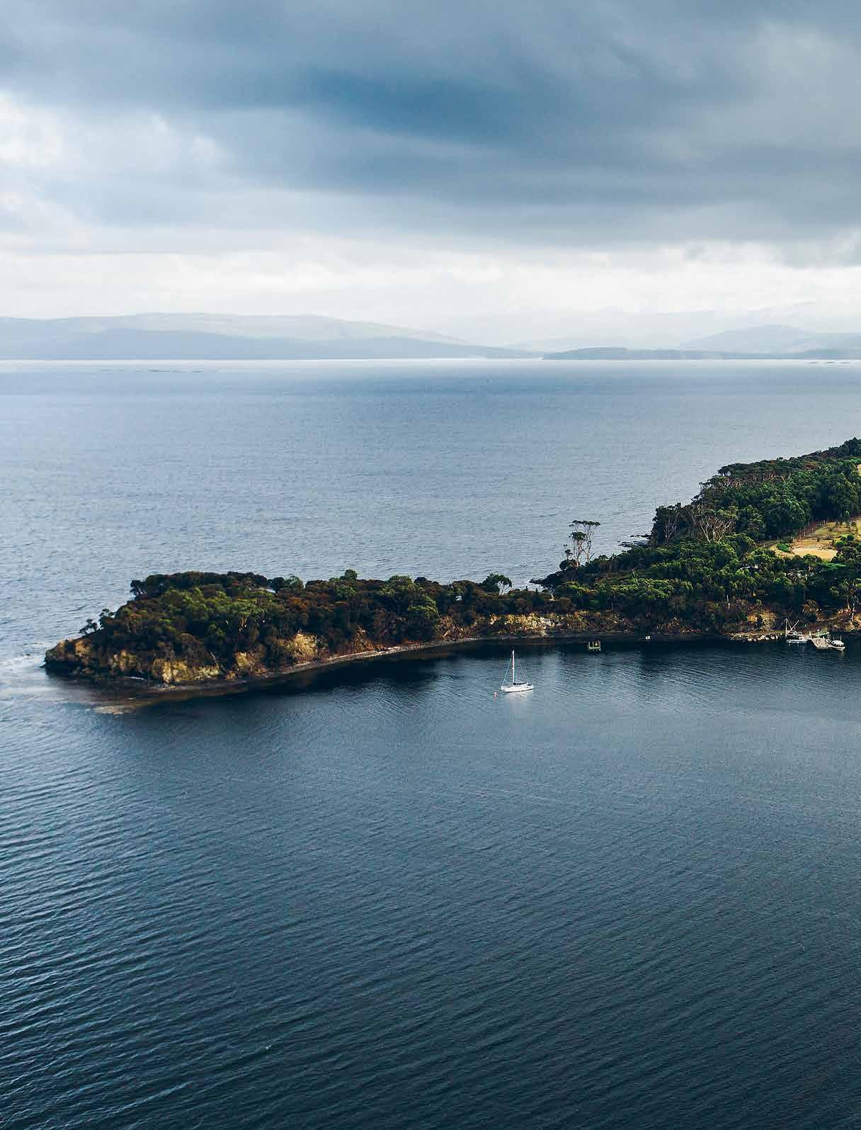
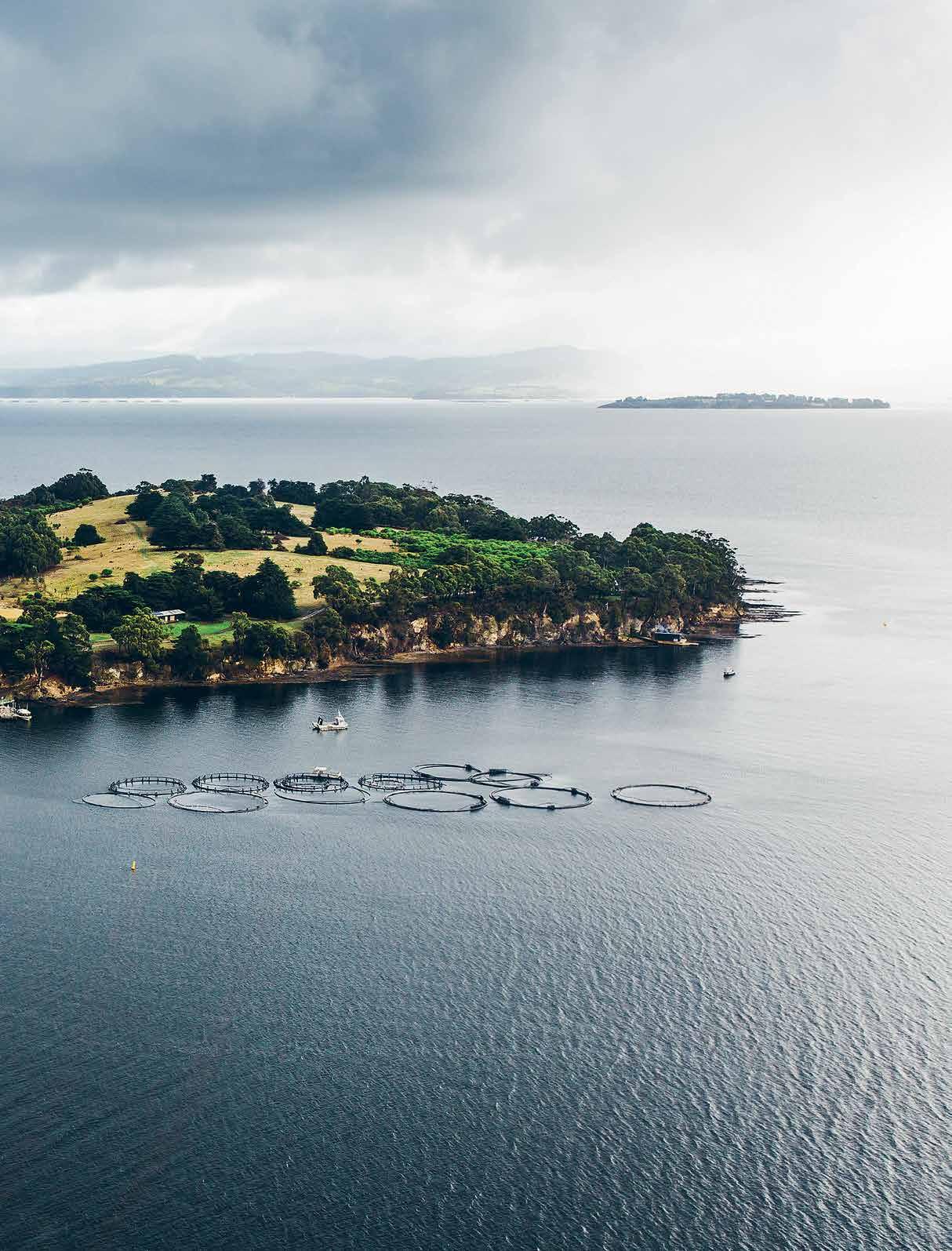
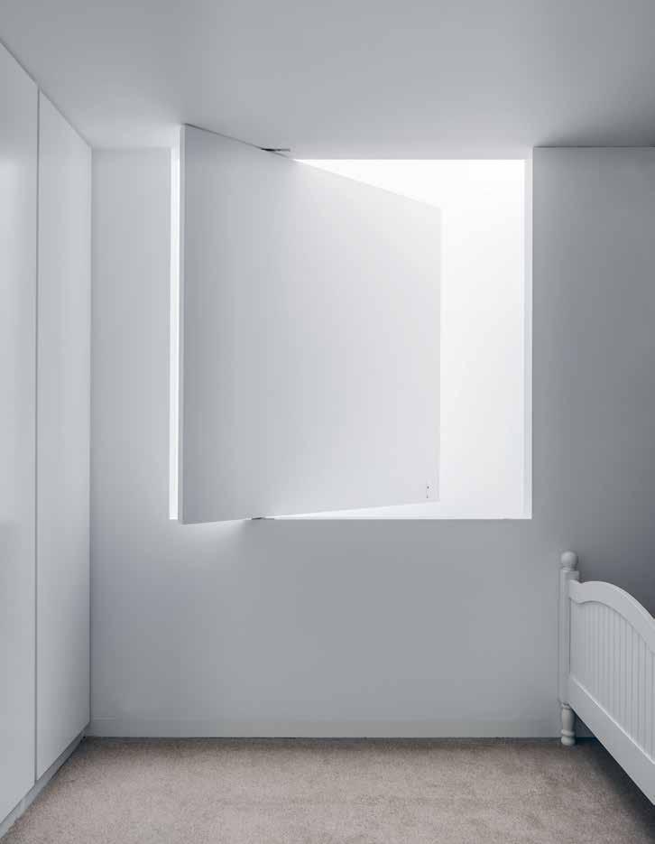
PREVIOUS | AUSTRALIA’S SATELLITE ISLAND, AN EXCLUSIVE-USE WILDERNESS GETAWAY OFF TASMANIA’S SOUTH COAST, IS A GREAT ESCAPE, WITH SEA VIEWS FROM BEDROOMS AND SHELLS AND DRIFTWOOD FOR DREAMY DECORATION. PHOTOGRAPHY BY ADAM GIBSON ABOVE | THE BONDI BEACH HOUSE OF AQUABUMPS SURF PHOTOGRAPHER EUGENE TAN WAS DESIGNED TO FEEL LIKE A HOLIDAY AT HOME, EMBRACING THE TROPICAL GARDEN OUTSIDE. AKIN CREATIVE’S INSPIRING INTERIORS INCLUDE THIS LIGHT-ENHANCING BEDROOM WINDOW. PHOTOGRAPHY BY MURRAY FREDERICKS OPPOSITE | B REAK- OUT AREAS AT PERTH ’S BUDGET- BOUTIQUE A LEX H OTEL INCLUDE LOBBY BALCONY AND ROOFTOP SPACES FOR READING AND RELAXING SUCH AS
THIS LOFTY
ROOFTOP PERCH COMPLETE WITH VIBRANT LOUNGER AND WIRE CHAIRS
How often have you wanted to bottle a travel emotion and bring it home? Or transport a gorgeous getaway back to your own apartment? That feeling of freedom when you walk into a jaw-dropping hotel, the seduction of a boutique bedroom or the luxury of sinking into a sybaritic bath…
It’s intoxicating to escape our everyday lives, change routines and experience the exotic elsewhere. Sometimes we’re seeking a buzzy break; other times we want to wind down on a tropical terrace or cocoon ourselves in a seaside shack. The real art of travel, though, is to know how to keep the voyage going once you get home. Escapism – whether mental or physical – is a necessary salve to our hectic lifestyles.
The secret is to look for opportunities for renewal through redesigned living spaces. Want things to feel constantly fresh? Why not rotate your art and accessories to keep your home in a state of creative flux? You can even store away capsule sets of furniture, bedding or ornaments to refresh your interiors each season. Love the holiday from your possessions that travelling brings? Declutter your own home to import that sense of serenity.
Think on what you love about a great hotel or holiday house, then recreate the ‘feel’ rather than just ‘the look’; it could be as easy as treating yourself to a fragrant candle, relaxing bath salts or tea served in a delicate pot. Take time out to slow down and smell the frangipani (when did you last buy flowers?) We’ve taken inspiration from three travel-infused homes that offer moments of escape and shared simple hotel style ideas to steal.
HOLIDAY AT HOME
Bondi meets Bali
Eugene Tan is the passionate photographer/surfer behind Bondi’s popular Aquabumps blog and gallery. He, wife Debbie and young sons Jet and Spike live in a
renovated semi in Bondi Beach, where two sliding glass walls connect the kitchen/lounge with a covered tropical plant-fringed deck. The couple worked with Kelvin Ho from Sydney’s Akin Creative “to open our house to the elements so we could feel the breeze, smell the garden and hear the sea.”
“We are beach people, salty gypsies, so we try to bring a little piece of the ocean and love of the beach into our home,” says Debbie Tan. “Whether it be from Byron Bay, Hawaii (our second home) or quiet mornings in Bondi, we wanted to recreate the feeling that we were still there.” Airy and modern, their Bondi pad is like a relaxing Balinese pool villa. “Our brief was to create a light, private haven away from Bondi’s bustle that gave us that calm feeling which you get when you are close to the sea,” explains Tan. “We call it the holiday feeling. We wanted the illusion of a big open space and to be close to nature, to live inside-and-out seamlessly. It’s our escape and as soon as you walk in you visually dive into one of Uge’s images from Broome or the Mentawais, see the sky and it feels like the holiday has just begun.”
Hong Kong sanctuary
Choosing a laid-back location helps you vacation at home. Simon Westcott, CEO of Hong Kong-based LUXE City Guides, rents a modernist-inspired house in seaside village Big Wave Bay on Hong Kong Island’s south-east shore, surrounded by lush, green vegetation. “When you’re at the beach, or deep in the country, every weekend feels like a mini-break. In Big Wave Bay, I’ve found the perfect blend of both. I have the surf beach at my doorstep, and, a thousand steps up, the high ridge of the Dragon’s Back for hiking. And all the delights of central Hong Kong are a 20-minute drive away.”
Westcott has filled the terrace with plants and an inviting communal table. “The yin and yang of forging out
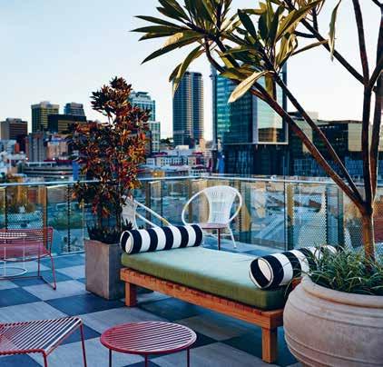
# 85 escape
in the world and nesting in the warm embrace of home is at the heart of my approach to life. So I’ve tended to create personal spaces which favour turning inwards, with room to relax, entertain and connect to the natural world.”
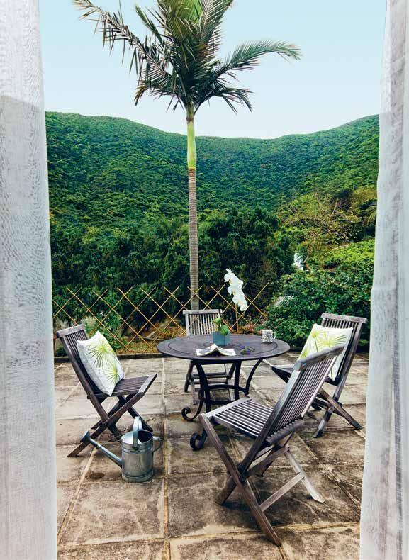
Northern Beaches retro
“I am all about creating products that encourage lazy lingering,” says Dee Tang, co-founder of Kawaiian Lion, an Australian homewares brand inspired by the surf, sunsets, her Hong Kong lion muse and the Hawaiian island of Kauai. “We use well-worn textures of linen, stonewashed denims and super-soft cottons which entice you to sit, slow down and chill out.”
Set on Sydney’s Northern Beaches, Tang’s rental apartment in Newport is shared with partner Desmond Sweeney (artist behind wallpaper label 8footwalls) and toddler Kawa. “We aim to evoke a feeling in our home of that calm and languor one has when embarking on a tropical sojourn, far removed from our hectic connected lifestyles,” says Tang. “We have our wallpaper up, which serves like a life-size dream sequence, tapping you into the sight and sense of being outside among the sea, swell and sway of the palms. We use grainy vintage film-like images reminiscent of the late 1960s and 70s – an era that I am preoccupied with and also when our home was built.”
TRAVEL STYLE STEALS
Wonder walls
Imagine waking up every day with waves lapping beside you... Intimate new Sydney stay Hotel Palisade in Millers Point features seascape murals by artist Neil Mallard behind bedheads. Styled by Sibella Court, Palisade perpetuates the dreamy, oceanic palette with dip-dyed pillows, shibori cushions and blue-and-white throws. Commission or create your own mural, or hang outside coastal photos from Aquabumps gallery.
ABOVE | LUXE CITY GUIDES CEO SIMON WESTCOTT’S RENTED VILLA IN HONG KONG’S BIG WAVE BAY, AVAILABLE AS AN AIRBNB, INCLUDES A TERRACE FOR SOAKING UP PEAK AND BUSH VIEWS. OPPOSITE ABOVE | PLANTS, SOFT TEXTILES AND BLINDS WITH BEACHY MOTIFS CREATE A LANGUOROUS MOOD AT THE NORTHERN BEACHES HOME OF DEE TANG, CO-FOUNDER OF KAWAIIAN LION HOMEWARES. OPPOSITE | DRAMATIC SEASCAPE MURALS BY ARTIST NEIL MALLARD GIVE BEDROOMS IN SYDNEY’S HOTEL PALISADE A COASTAL FEEL, WITH MOODY BLUE NAUTICAL STYLING BY SIBELLA COURT.
habitus #32
“It’s intoxicating to escape our everyday lives, change routines and experience the exotic elsewhere.”
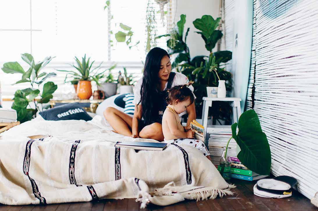
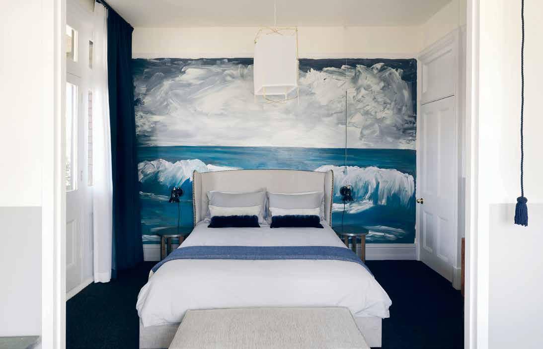
# 87 escape
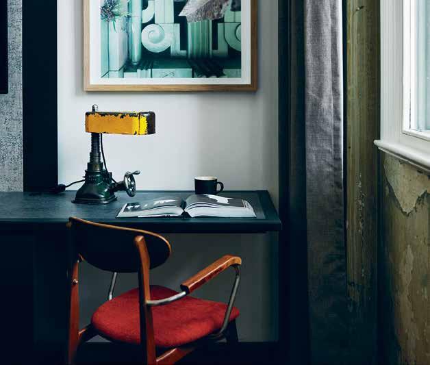
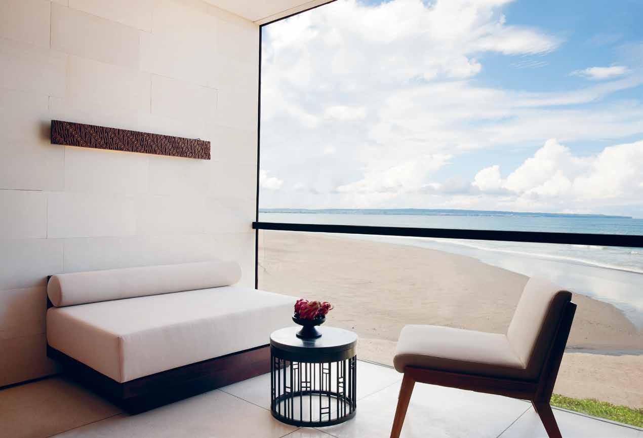
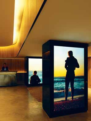
habitus #32
New Sydney hotel QT Bondi uses curvy room dividers and light boxes to display vibrant photos and videos of local beach life in the lobby, care of artist Shaun Gladwell. Interiors are by Nic Graham (of g+a), with white and limed wood bedrooms sporting furniture and accessories in gelato blues, yellows and pinks. Mint-and-white striped bathroom tiles also smack of the sea. Make walls your canvas for escaping the mundane.
Calming colour
Colour is a quick way to craft a calming space. A former surf motel on Cabarita Beach, 2015-launched Halcyon House in northern New South Wales is a symphony of soothing blues. Brisbane-based interior designer Anna Spiro has layered different shades and patterns of blue across upholstered bedheads, painted walls, cushions, chairs, art and floor tiles. Even the bookcases contain blue-stemmed books.
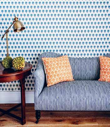
Interior designer Lynda Gardener’s gorgeous threebedroom getaway The Estate Trentham, in the countryside near Melbourne, shows how Scandi-minimal greys, whites and brown tones can also create a relaxing environment, harmonising sofas, cushions, bedding and art.
Pure palettes
Less is more when designing a serene space, as new Bali boutique hotel Alila Seminyak, by Gaurang Khemka of Singaporean architects URBNarc, shows. Contemporary bedrooms embrace a pure palette of neutral tones and
minimal materials, with tactile dark wood against white walls. Concealed storage keeps things tranquil. Perth’s latest luxury hotel COMO The Treasury, designed by Kerry Hill, also features pale, pared-back bedrooms for soothing sleep, with elegant details and smart-control blinds.
Relaxing retreat
We cultivate relaxation on holiday but it’s vital to seek environments for delight and escape in our own lives too. Carve out little spots where you can grab precious restorative moments, or enjoy painting, meditation or yoga. Why not string up a heavenly hammock at home so you can swing and snooze?
A dedicated reading nook, with an appealing chair and task light, will entice you to read more. Perth’s recently launched Alex Hotel includes inviting indoor-outdoor communal areas where guests can chill with a book or paper (we love the stylish magazine racks). Sydney’s The Old Clare Hotel demarcates part of bedroom desks as reading zones, with vintage-industrial lights by The Rag and Bone Man salvaged from car jacks. At Mollymook on Sydney’s South Coast, Pavilion Suites at Bannisters Pavilion feature sun-kissed armchairs and come-hither side tables beside floor-to-ceiling balcony windows.
A cosy fireside area in your home will add alpine allure, like the Scandi-simple fireside lounges at Pumphouse Point hotel in Tasmania’s Lake St Clair. Tasmanian wilderness escape Satellite Island offers atmospheric outdoor fire bowls on bedroom terraces.
# 89 escape
OPPOSITE ABOVE | CREATE AREAS OF CALM, FOR LOUNGING OR ADMIRING THE VIEW: BALI HOTEL ALILA SEMINYAK HARNESSES A PALE, NEUTRAL PALETTE AND MINIMAL SURFACES. OPPOSITE BElOw lEFT | QT BONDI HOTEL IN SYDNEY FEATURES OCEANIC VIDEO INSTALLATIONS BY ARTIST SHAUN GLADWELL IN THE LOBBY. OPPOSITE BElOw RIGHT | AN INDUSTRIALCHIC READING NOOK AT THE OLD CLARE HOTEL IN CHIPPENDALE, SYDNEY, TEAMS A DESK WITH A VINTAGE CHAIR AND SALVAGED CAR JACK LAMP. ABOVE | SOOTHING BLUES, PICKED UP VIA WALLPAPER AND FURNITURE, MAKE FOR AN UPLIFTING SPACE AT AUSTRALIA’S HALYCON HOTEL ON CABARITA BEACH.
Dreamy displays
Relive your journeys by displaying travel photos in clusters on walls, salon style. Singaporean newcomer Hotel Vagabond’s boudoirs, by designer Jacques Garcia, feature nostalgic vintage and modern travel photos above beds in contrasting frames.
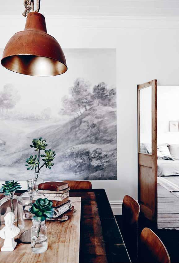
Mood boards on walls at Melbourne’s The Larwill Studio celebrate style ideas from the space, including Australian painter David Larwill’s vibrant palette. It’s an easy tip for nourishing your soul at home; include post cards, magazine tear sheets and travel photos.
Found natural objects – feathers, twigs and stones – bring the outside in at Tasmania’s Satellite Island. Curate your curios on coffee tables, open shelves or within vitrines.
Indulgent details
Holidays are hedonistic, so splash out on a few indulgent design details at home. A freestanding bath is a romance-revver; just ask The Old Clare Hotel in Sydney’s Chippendale, where Abercrombie Rooms sport contemporary ones in boudoirs. The hotel also sells a signature Maison Balzac scented candle for recreating relaxation chez-vous. Home bars (vintage and modern) are back in vogue, inspired by quirky hotel minibars. Add a Nespresso machine for instant luxe.
Small is beautiful too. New York’s Hôtel Americano wows guests with bento-box breakfasts, a stylish touch for lingering lie-ins. Covetable crockery makes daily drinks and snacks into an elegant ritual: Hong Kong’s Tribute Hotels, which opened in April/May 2016,
 above | Pared-back style with tactile materials star in luxe Perth hotel como the treasury’s s Pacious bathrooms, designed by k erry h ill. Photogra Phy by martin morrell. below | s oothing browns, greys and whites make contem P orary stay the estate trentham, by m elbourne interior designer lynda gardener in country Victoria, an ins Piration for e V eryday homes. Photogra Phy by lisa cohen. o PP o SITe | floor-to - ceiling glass and lofty s Paces o Pen ing onto the lake bring the outdoors in at sri lankan stay kalundewa retreat s bakmee chalet which cham Pions natural materials with Views oV er trees and P ools
habitus #32
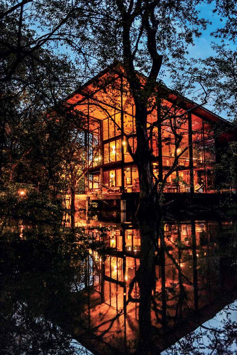
# 91 escape
“Airy living spaces open out to the bush with modernist-style floor-to-ceiling glass walls. And breathe…”
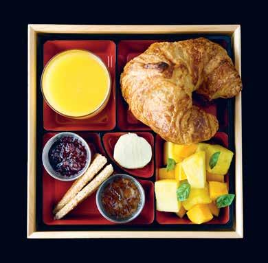
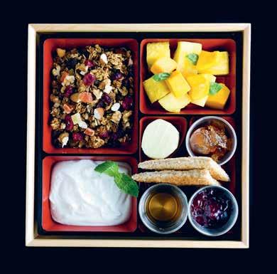
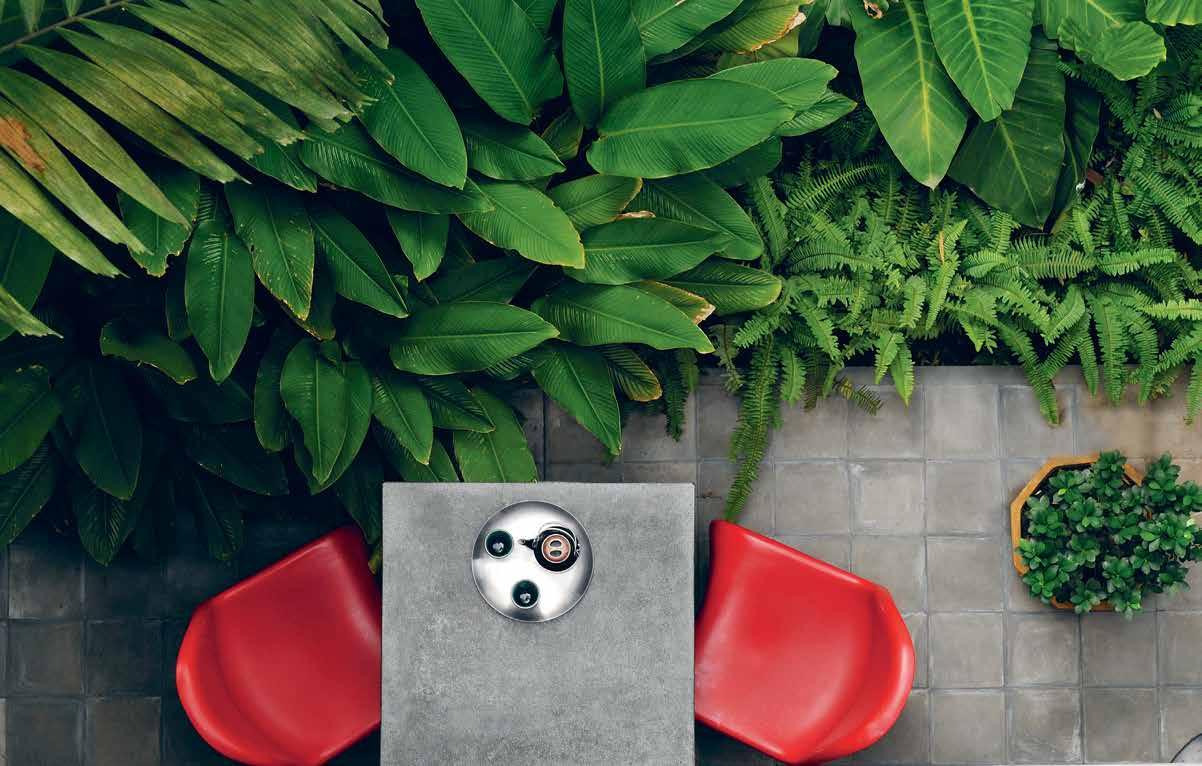
ABOVE | NEW YORK’S HÔTEL AMERICANO SERVES BREAKFAST BENTO BOXES – A SIMPLE IDEA TO STEAL. BElOw | A BIJOU PATIO MAKES A CHILLED PERCH AT BOUTIQUE HOTEL VIROTH’S VILLA IN SIEM REAP, CAMBODIA, ACCESSORISED WITH RED PANTON CHAIRS, A COMPACT TABLE AND TROPICAL PLANTS. habitus #32
includes porcelain plates, bowls and cups by Latitude 22N featuring abstract patterns drawn from local architecture (shop the collection online).
Indoor/outdoor escape
Letting the outdoors in helps us unwind. Tropical-modern Viroth’s Villa in Cambodia’s Siem Reap beckons guests outside for coffee with compact tables for two and vibrant Panton chairs on foliage-filled bedroom terraces. Why not relocate breakfast to the balcony for a breezy kickstart? Alternatively, add an escapist touch indoors with palms, ferns and succulents (Melbourne florist Loose Leaf specialises in verdant hanging and potted plants, with terrarium classes ideal for space-challenged homeowners).
For architectural inspiration, take a leaf out of Kalundewa Retreat’s book. A stylish farm stay in Dambulla, Sri Lanka, its airy living spaces open out to the bush with modernist-style floor-to-ceiling glass walls. And breathe…
Local explorer
‘Local on arrival’ is a major trend, with savvy stays plugging visitors into their neighbourhoods. Hong Kong’s budget-boutique Tribute Hotels in Kowloon provides guests with an illustrated map of surrounding quarter Yau Ma Tei, encouraging them to explore old theatres, produce markets, cafés and incense-shrouded shrines. Discovering local art, architecture, crafts and community is something we should all do more at home. Walk down a different road. Chat to a neighbour. Look up. Never stop travelling…
Akin Creative akincreative.com
Alex Hotel alexhotel.com.au
Alila Seminyak alilahotels.com/seminyak
Aquabumps aquabumps.com
Bannisters Pavilion bannisters.com.au/pavilion-suites
Black and Spiro (Anna Spiro) blackandspiro.com.au
COMO, The Treasury, Perth comohotels.com/thetreasury
g+a (Nic Graham) nicgraham.com
Gardener & Marks (Lynn Gardener) gardenerandmarks.com.au
Halcyon House halcyonhouse.com.au
Hôtel Americano hotel-americano.com
Hotel Palisade hotelpalisade.com
Hotel Vagabond hotelvagabondsingapore.com
Kalundewa Retreat kalundewaretreat.com
Kawaiian Lion kawaiianlion.bigcartel.com
Kerry Hill Architects kerryhillarchitects.com
Loose Leaf looseleafstore.com.au
LUXE City Guides luxecityguides.com
Pumphouse Point pumphousepoint.com.au
QT Bondi qtbondi.com.au
Satellite Island satelliteisland.com.au
The Estate Trentham theestatetrentham.com.au
The Larwill Studio artserieshotels.com.au/larwill
The Old Clare Hotel theoldclarehotel.com.au
The Society Inc (Sibella Court) thesocietyinc.com.au
Tribute Hotels tributehotels.com
URBNarc urbnarc.com
Viroth’s Villa viroth-villa.com
# 93 escape
Rejuvenate at Halcyon House
Located at peaceful Cabarita Beach, Halcyon House boutique hotel is a haven of sophistication, idiosyncratic style and dollops of delicious nostalgia.
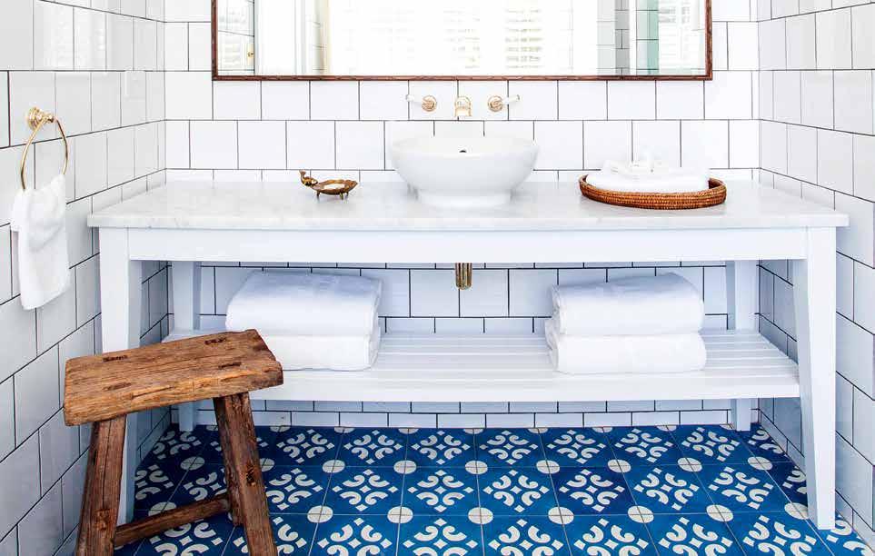
When sisters Elisha and Siobhan Bickle bought a faded 1960s motel at quiet Cabarita Beach on the far north coast of New South Wales they engaged Sydney architect Virginia Kerridge and Brisbane interior designer Anna Spiro to create a boutique hotel with the vibe of an old-fashioned family beach house, full of idiosyncrasies and memory-making potential.
Halcyon House, however, is like no known actual beach house on the planet. Spiro’s spirited interiors defy definition, with influences from the Mediterranean to Palm Springs and the Hamptons. No two of the 21 individually styled guest rooms and suites are the same. Throughout the hotel, walls are upholstered in exquisite imported fabrics, floors are limewashed timber and guest rooms and public areas feature quirky collections of antiques and art sourced from around the world.
Bathrooms are designed for long, escapist soaks in curvaceous Amiata freestanding baths with Perrin & Rowe
brass tapware in gold finish, selected for their quality and perfect fit for the nostalgic vibe, both available from the English Tapware Company. Teamed with thick, white, glossy tiles on the walls and colourful handpainted tiles underfoot, these idyllic bathrooms have the potential to whisk guests from Cabarita to Capri in a nanosecond.
Elsewhere in Halcyon House lies the Paper Daisy restaurant, a destination in itself with 2014’s Queensland Chef of the Year Ben Devlin at the helm in the kitchen.
Earlier this year, Halcyon House received a 2016 Tatler Travel Award in the category ‘Super Surf Sensation’. With touches like lovingly restored vintage bicycles parked out the front for guests to use, croquet games on the lawn and a vintage gelato cart serving creamy homemade ice-cream in tropical flavours of passionfruit and finger lime by the pool, this is indeed a place to spend halcyon days by the seaside.
habitus promotion › English Tapware Company #94 issue #32 habitusliving.com
Above | Perrin & rowe brass taPware in gold finish in the bathrooms at halcyon house.
englishtapware.com.au
English Tapware Company |
Escape
You don’t always have to leave somewhere to have a feeling of escape. Taking a well deserved break from the pressures of life can feel like an escape too, and the STOKE DAYBED from Sydney’s JD.Lee Furniture is a perfect setting to find such an experience. Built using sustainable design, the bed channels the brand’s ethos of design imbued with a ‘forest to floor’ philosophy.
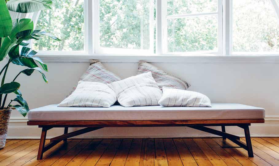
jdleefurniture.com
Leave behind the dull and mundane of typical school design with the FOR SCHOOL collection, available through Mr Kitly. Comprising a carefully crafted, handmade collection, each object has been designed with unique flair and minimal environmental impact in mind.
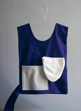
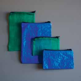
forschool.com.au / mrkitly.com.au
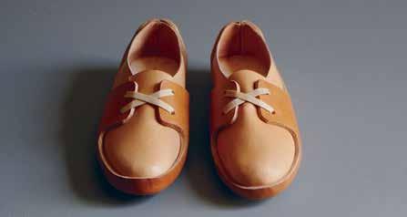
escape # 95
habitus #32
Explore
Designed to cater for the extremities of Australia’s climate, RAFT, designed by Justin Hutchinson , is perfectly suited to the modern outdoor space. Built using Australian spotted gum timber slats, the range succeeds in bringing the exploratory sense of the greater outdoors back home to the personal level.
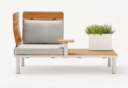
justinhutchinson.com / stylecraft.com.au
Melbourne’s Louise Jones specialises in pattern and illustration that explores colour and space. Her original pattern and artwork is characterised by bursts of colour, botanical motifs and clean lines. A SIDE PROJECT, a collaboration with Shelley Steer, features original pattern artwork based on varying monthly themes. Concepts like tropical environments or loose foliage have the duo designing charming prints that bring the outdoors inside.
louisejones.com.au
Moleskine ’s design credentials are well proven. Recalling the classic notebooks of legendary writers such as Oscar Wilde and Ernest Hemingway, the notebooks are known the world over. This international design acclaim is channeled into the brand’s more recent ventures into the LINEAGE BAGS collection. Available in five shapes, designed to suit all needs and functions, the bags include inner pockets to protect laptops and tablets, and smaller pockets provide fast access to notebooks, planners, cell phones and keys.
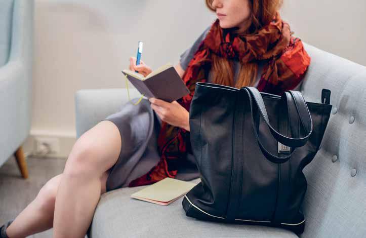
moleskine.com
The BARBER KNOT, designed as a part of The Latitude Collection, channels Armadillo&Co ’s love of traditional ethnic designs. The rug design explores these motifs and realise them in a contemporary way. Moroccan design and the owner’s African heritage meld to create a sense of international exploration married with modern design sensibility, perfect for adding a multinational flair to the living room, or a sense of warmth and romance to the bedroom.
armadillo-co.com
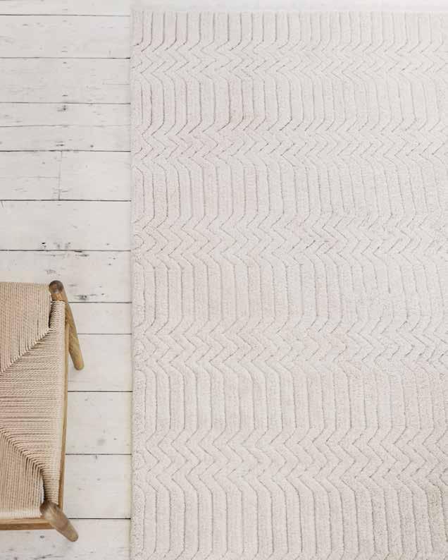
escape # 97
habitus #32
Sunny side up
Suki ’s down-to-earth sophistication is the product of a passionate commitment to quality and easygoing chic. Natural materials and a focus on detail makes each design completely unique.
suki.co.id
Se N er Be SIM channels his Turkish heritage and Australian upbringing in his sunglasses. His designs merge two cultures, where youth, freedom and design meet tradition, form and technical excellence.

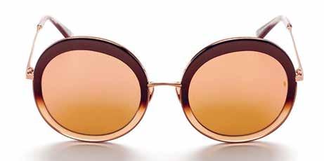

senerbesim.com
Brisbane-born and New York-raised, Carla Robertson charms us with her Carla COlOur designer sunglasses collection. Equally retro and modernist, the range is summer-style perfect.

Rooted in vintage fashion yet with modern design in mind, the MOON DISCO sunglasses from Karen Walker are original and effortlessly striking.
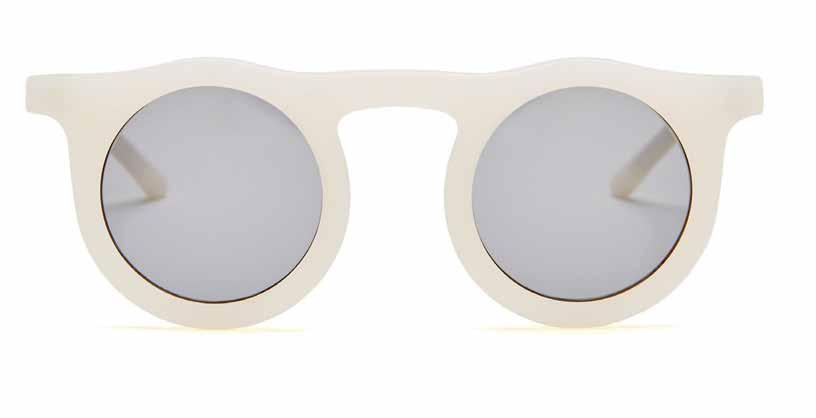
karenwalker.com
Sunday, Somewhere designs its sunglasses with a sense of adventure and love of travel. The aBella range will keep you looking good everywhere under the sun.
sundaysomewhere.com.au
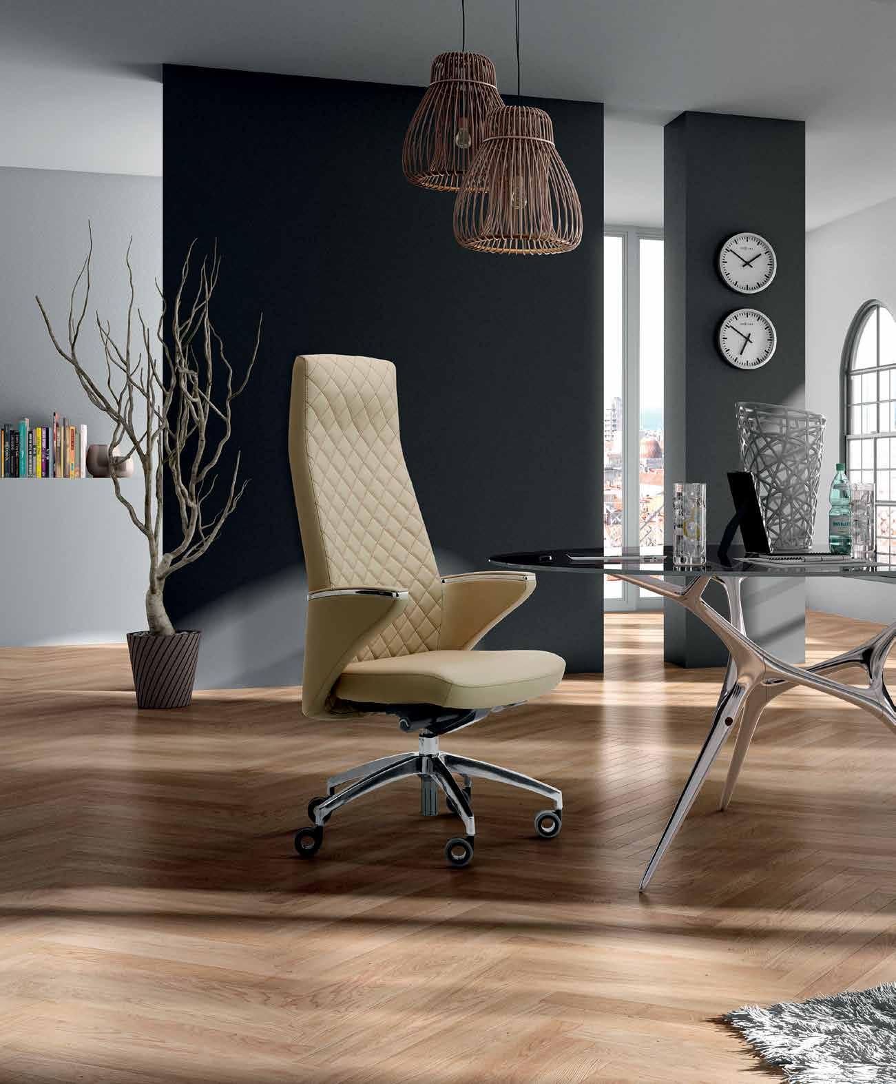
reissimall.com.au +61295988100 info@reissiempire.com.au The new des T inaT ion for affordable luxury. Reissi Mall, over 10,000 products for home and office, designed and manufactured in Italy.
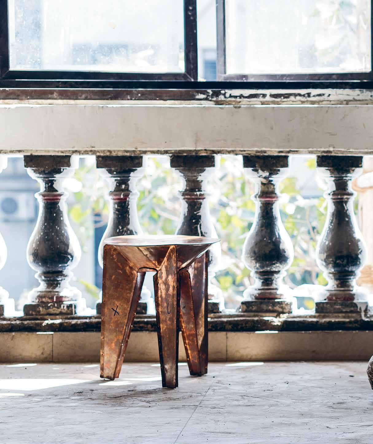
habitus #32
Reverse garbage
Porosity Kabari challenges the idea of what can constitute a designed object. Participants navigate chaos, using junk trawled from Mumbai’s sprawling Chor Bazaar to create new, thoughtful design.
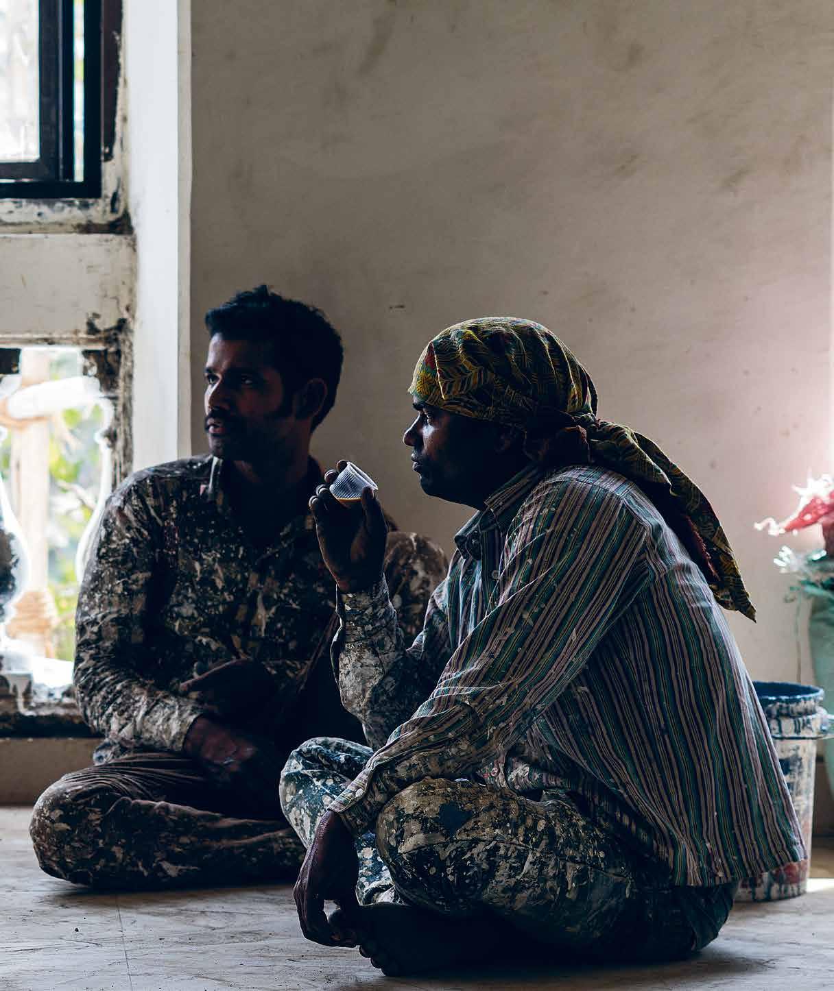
Tex T DaviD Harrison | pHoTograpHY n eville suk Hia # 101 escape

habitus #32
Most designers routinely obsess over the fine details of their projects for months, if not years, so a project that involves sourcing materials from a junk market in Mumbai, producing a number of products and exhibiting them to the public in a three-week time frame would bring many to the brink of a nervous breakdown.

But this is what designer Trent Jansen, artists/ architects Richard Goodwin and Bijoy Jain, and designthinker Ishan Khosla signed up to when they agreed to participate in Porosity Kabari. Executed in February 2016, the project culminated in an exhibition at Studio X in Mumbai and a photo shoot within a beautiful colonial building with the delightfully Orwellian name, The Ministry of New.
The project’s intent is contained in its very name –Porosity, meaning the quality of things being able to pass through: water, air, and even people and ideas. Kabari is the Hindi word for junk. The project set out not only to source its raw material from the Chor Bazaar (Thieves Market), a vast junk market in Mumbai, but also to use the fabricators that work within the vicinity of the bazaar to create the finished objects.
Porosity Kabari challenges many preconceived conventions and encourages new ways of looking at process and manufacturing, and ultimately questions what constitutes a designed object. By immersing the designers in a foreign culture and encouraging observation, adaption and a fluid, open-minded approach, the project unlocked ways to a more human design process.
Along the way the designers also discovered the true nature of India’s caste system and how it relates
to the making of objects to feed the needs of a country with a population of 1.3 billion people. The project was engineered to show that it is possible to design within such parameters with materials that come to hand – even if it at first they closely resemble junk.
Within the apparent chaos of Indian street life, there is an ecological force at work driven by the necessity to survive through being resourceful and inventive, rather than for the scientific awareness that drives environmental endeavours in the west.
In India, recycling is carried out in a strange and adhoc manner but on an enormous scale. For Porosity Kabari every possible material was considered, with several days spent simply walking the bazaar searching for inspiration. Several more days were spent finding and convincing artisans and tradespeople to set their normal work aside in order to make objects to the designers’ specifications.
According to Jansen, “While the rest of the world struggles with the environmental implications of designed obsolescence and disposable consumption, India is a place where resourcefulness is part of everyday life.”
For Jansen a key factor was the notion of Jugaad –a colloquial Hindi and Punjabi term roughly meaning to make do with limited resources but doing just enough for a solution to work. “The idea of doing just enough is against my fundamental makeup. I am the guy who does way too much to make sure that the outcome of any project is completely under control and is as perfect as I can possibly manage,” says Trent. Despite his exacting College of Fine Arts background, within a few days Jansen was relinquishing control and understanding that rather than obsessing over accuracy to the original design there was a
previous | Painters take a break from renovating the m inistry of n ew to take a look at the co PPer version of trent Jansen’s Jugaad with Car Parts stool. opposite | m etal recycling occurs right down to tiny Parts from electrical com P onents. c o PPer, brass and Plastic are seParated and then either melted down or recycled. above | salvaged motorcycle, car and truck horns for sale in the c hor bazaar. Photo © richard g oodwin.
# 103 escape
For Goodwin and Jansen it was a chance to work outside the normal boundaries of ‘good practice’, and discover new methods, and to think freely, albeit under the pressure of a self-imposed time frame.
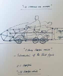

habitus #32
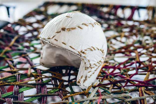
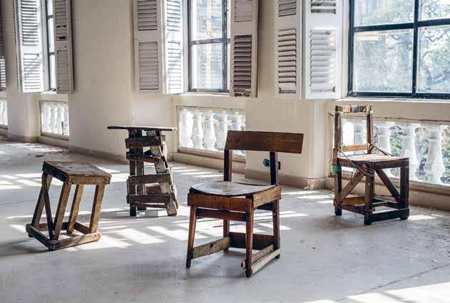
|
C
1: √2
C
u P
C
1: √2
# 105 escape
opposite above
Car wreC kers disassemble whole Car bodies and engines on the streets of the Chor bazaar. opposite below
| a sketC h for ri
hard g oodwin’s
Charpai vehi C le. Photo © ri C hard g oodwin. above | i n Constru Ct/DeC onstru Ct/Constru Ct
made from wood and Ply found on the street, i shan k hosla ex Plores the way many
in i ndia make their own furniture from broken bits and junk
with
a “do first, think later” mentality. below | a
lose
of the ri
hard g oodwin ProjeCt
Charpai, showing the hand-stitC hed helmet and woven bed Platform.
beauty in the handmade process of the metal workers and potters he employed and this deserved to be embraced.
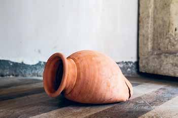
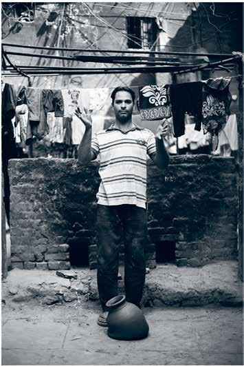
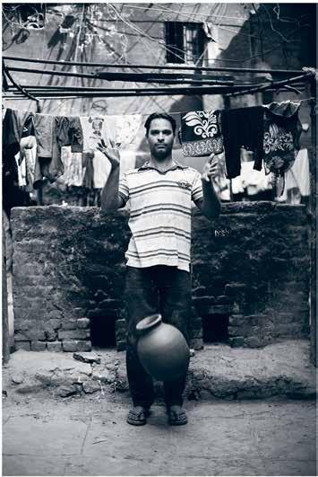
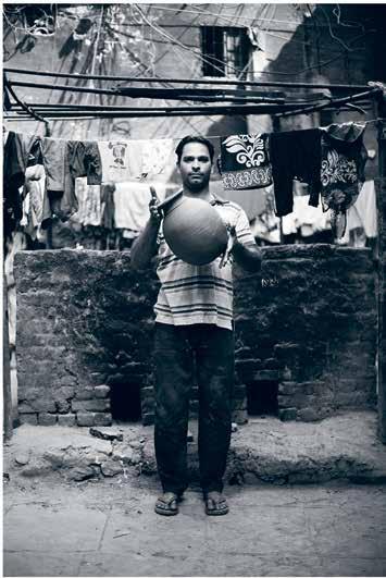
Once Jugaad was accepted the whole project started to move ahead more freely. What had seemed like a sea of insurmountable obstacles quickly turned to positive relationships with the makers. Things may not have happened to a fixed schedule and designs may not have been adhered to perfectly, but for those willing to adapt this presented a certain newfound freedom and allowed the hand of the maker to become an important part of the finished work.
Any project that is prepared to bend to external forces rather than force its structure upon the outcome is by its very nature likely to be at the mercy of unforseen events, and so it was with Porosity Kabari. Just days after Australian-based participants, Jansen and Goodwin landed in Mumbai it was revealed that Bijoy Jain, the founder of world-renown architecture practice Studio Mumbai, was unable to be involved due to a mix up with dates and a mountain of pending deadlines. Rather than being upset by the loss, Jansen, Goodwin and Khosla took it in their stride and dived straight into the project.
For Goodwin and Jansen it was a chance to work outside the normal boundaries of ‘good practice’, discover new methods and to think freely, albeit under the pressure of a self-imposed time frame. For Khosla, whose company Ishan Khosla Design is based in New Delhi, there was no language barrier but as an Indian who has spent much of his adult life in America, the Chor Bazaar remained a daunting experience. With no formal product design
habitus #32
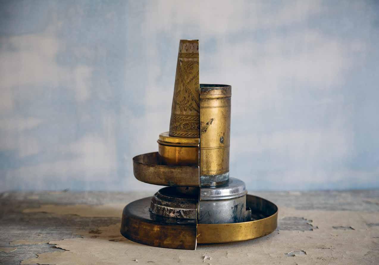
OPPOSITE ab Ov E | A close up of A fA llen M Atk A fro M trent JA nsen’s ho MAge to Ai Wei Wei’s 1995 Work Dropping a Han Dynasty Urn OPPOSITE b ElOw | trent JA nsen’s Work Dropping a K U mb H ar Wala m atK a fe Atures potter Abb A s gA lWAni. ab Ov E | i sh A n k hosl A’s tH e partition of tH e m in D h A s tA ken tr A dition A l everydAy ob J ects A ssociAted W ith do M esticity A nd cut theM in h A lf A s A M etA phor of the rift occurring in i ndiA todAy bet W een tr A dition And M odernity.
“I rarely work in such an impulsive manner, and what surprised me the most was that despite the hectic period of quick ideation and not much time to prototype before making something, [the process] actually led to some interesting ideas that I could use in the future.”
# 107 escape
IsH an k Hosla
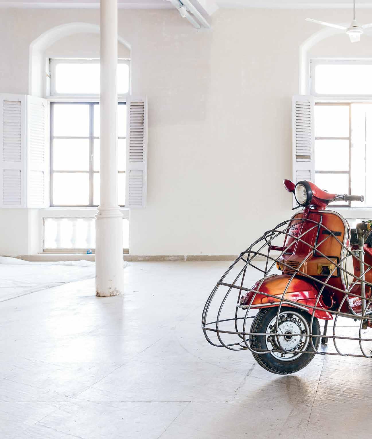
habitus #32
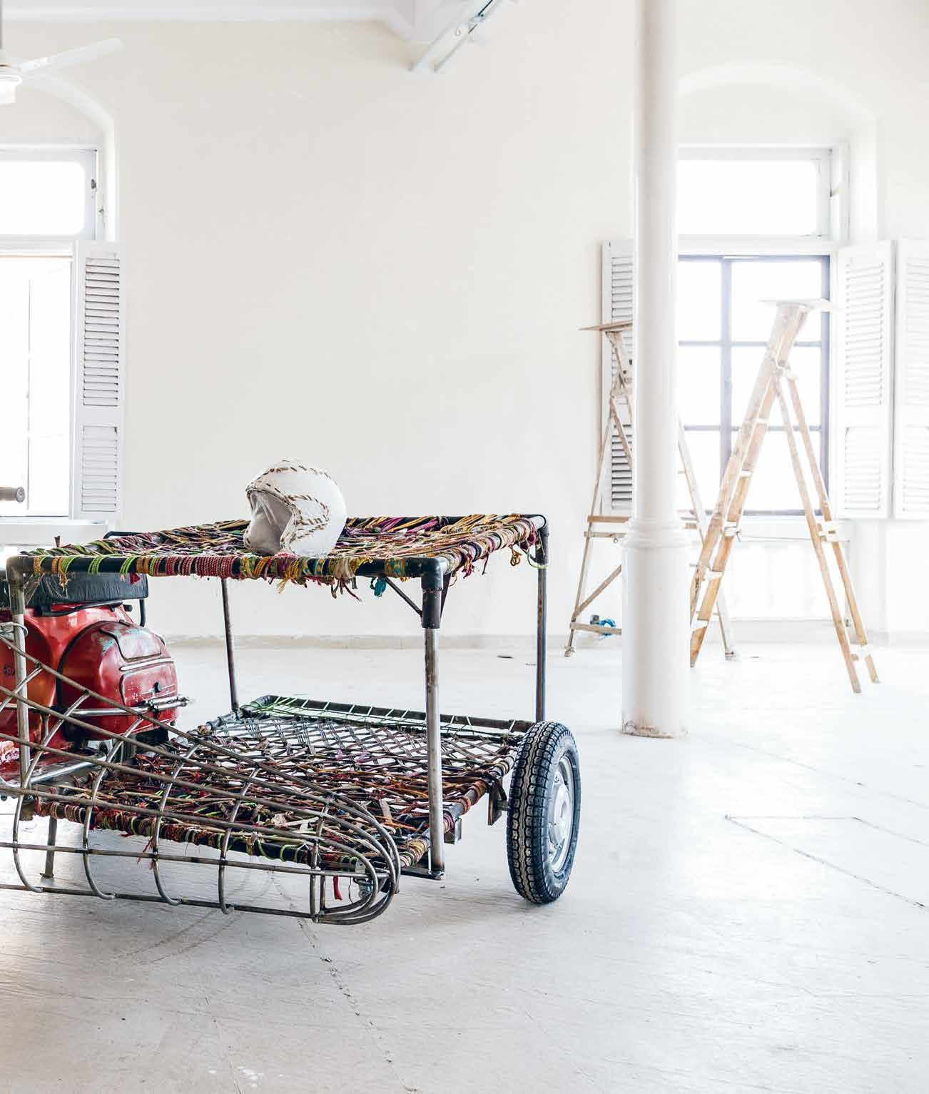
“While the rest of the world struggles with the environmental implications of designed obsolescence and disposable consumption, India is a place where resourcefulness is part of everyday life.”
above | 1: √2
Rin G
G etheR a
Red
Rm of i ndian tR
– the
R
– and the ubiquitous c ha Rpai’ o R c ha Rpoy’ daybed. # 109 escape
TRENT JANSEN
Charpai by RichaRd Goodwin b
s to
favou
fo
anspo Rt
moto
scooteR
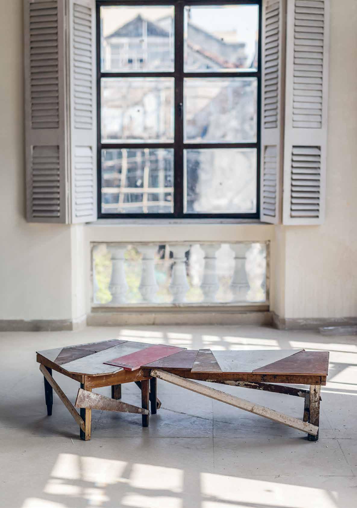
habitus #32
training Khosla had less to ‘unlearn’ but he also lacked some of the skills to help him produce meaningful objects to a tight deadline.
“My initial nervousness abated fairly quickly and transformed to frantic excitement as I fed off the energy of the others. Ideas were flowing and work had to be commissioned so this called for risk-taking and being in full ‘make mode’ almost immediately,” says Khosla.
After a few early visits, when the scale and complexity of the huge and densely populated market was almost too much to comprehend, Jansen, Goodwin and Khosla learnt that there was a distinct order to the location of stalls. Far from being random and chaotic, it had its own routines and systems developed over generations. This concept of order within chaos directly led to one of Khosla’s most powerful finished works.
One of the fears on initiating the project was that the chaotic nature of India and the Chor Bazaar in particular, would take over and swamp the design process. But the outcome was quite different. The curiosity, problem solving and aesthetic judgements innate in the designers immediately came to the fore and they were able to channel the energy and unusual material palette in a more deeply considered direction.
“I rarely work in such an impulsive manner,” says Khosla, “and what surprised me the most was that despite this hectic period of quick ideation and not much time to prototype before making something, [the process] actually led to some interesting ideas that I could use in the future.”
In late February the results of the Porosity Kabari project were exhibited to audiences at Mumbai's Studio X, a space for experimental design and research run by Columbia University’s Graduate School of Architecture, Planning and Preservation. Objects from the project will be on show in Australia later this year, at a venue yet to be confirmed.
The project was supported by Indian School of Design & Innovation (ISDI), The University of Wollongong, The University of NSW and Studio X. Porosity

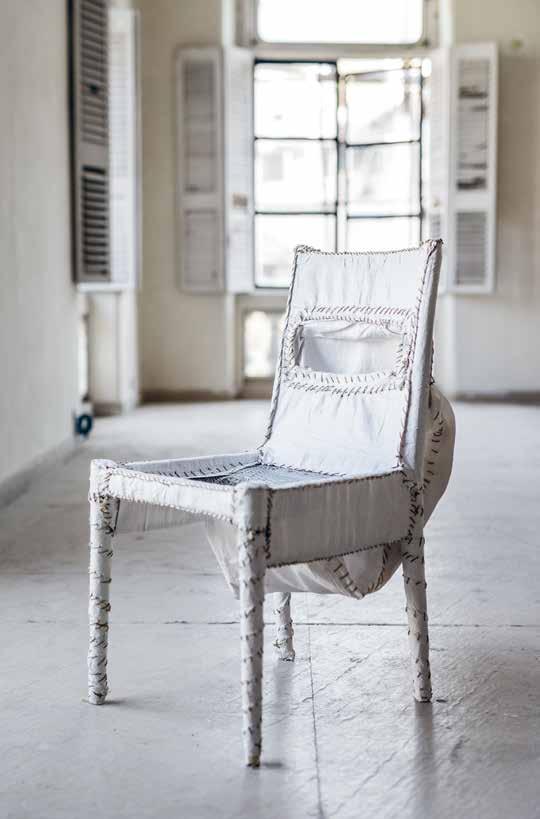 OPPOSITE | Work in Progress for Better tomorroW by Ishan Khosla I s a rough bench made from bamboo, jute thread and o I l-based pa I nt. ABOVE | Ishan Khosla’s m u/taB le celebrates the I dea of change and chaos w Ith I n a g Iven structure BELOW | based on the theoretI cal KleI n bottle, a form that I s poss I ble to model on computer but I mposs I ble to ma K e, rI chard g oodw I n developed a k lein chair that feeds fabrI c from the bro K en cane seat bacK I nto the cha I r.
Kabari | trentjansen.com/porosity-kabari/ # 111 escape
Singapore Indesign 8 October 2016
An all-new design adventure awaits Asia Pacific’s leading design event for architects, interior designers, specifiers and design lovers to discover, share and connect.
indesigntheevent.com
Facebook /indesigntheevent
Instagram @indesigntheevent
Twitter @indesign_event
A fresh outlook of living in design






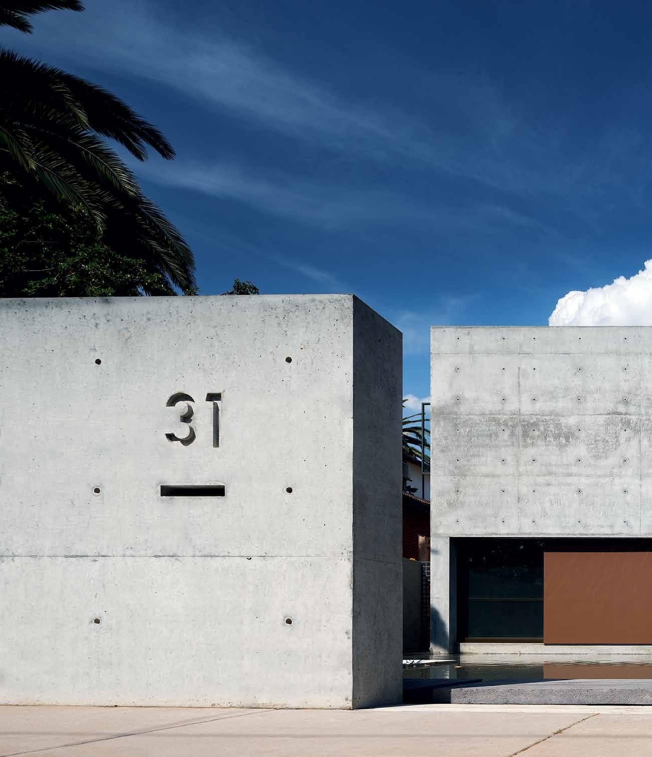
issue #32 habitusliving.com
South of the border
This concrete home in Melbourne took inspiration from the style of Mexican architect Luis Barragan, with one of his contemporaries, Andres CAsillAs de AlbA, commissioned for its design, along with local firm evolvA ArChiteCts.
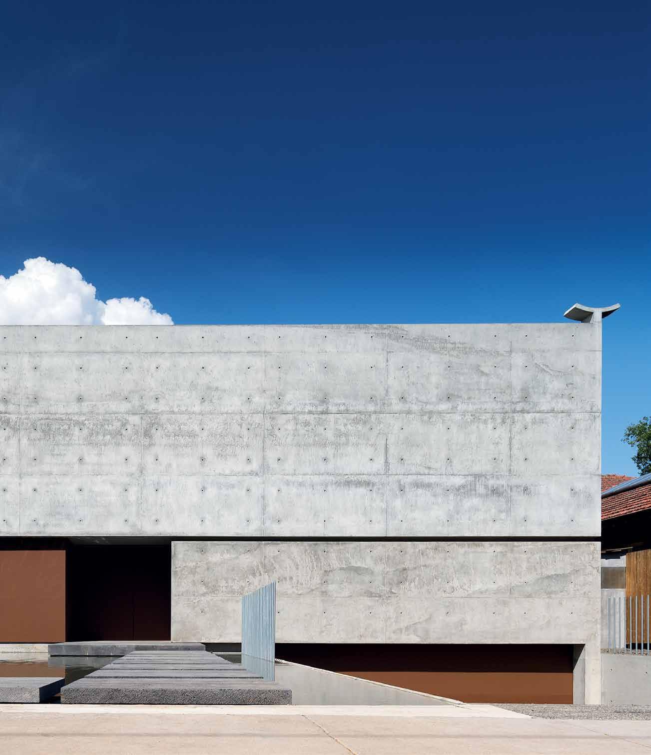
Tex T Joe Rollo | PhoTogR a Phy John g ollings (ex TeR ioR) & Ch R isTine FR anCis (in TeR ioR)
3 . on location # 115
There are two stories to this house in the leafy Melbourne suburb of Camberwell. One is its owner, a prominent plastic surgeon specialising in craniofacial conditions affecting children. He was a member of the highly specialised team of surgeons who, in November 2009, separated the Bangladeshi conjoined twins Krishna and Trishna in a 27-hour operation at Melbourne’s Royal Children's Hospital. The other story is his and his wife’s obsession with the work of the great Mexican architect Luis Barragan.
Their interest dates back to around 1991 when, while working and training in Mexico City, they became familiar with the Barragan House in Tacubaya and experienced firsthand some of the houses of Andres Casillas de Alba, who worked with Barragan from 1964 to 1968, before forging a successful career of his own. Casillas, now aged 82, collaborated on Barragan’s signature work, the Cuadra San Cristobal house and stables from 1966. Since 1994 he has overseen restoration works on the Barragan House now listed as a UNESCO World Heritage Site. Earlier in his career he attended the Ulm School of Design (a successor to the Bauhaus) in Germany; as well, in the late 1950s he worked in the Milan studio of Italian architects Mangiarotti and Marassutti.
Determined to have a Barragan-inspired house in Melbourne, in 2003 the couple commissioned Casillas to design a house for them on a site in a tree-lined street remarkable only for a streetscape of unremarkable late Edwardian houses. Originally conceived of as a modernist structure in white-painted, roughcast render, in the manner of Barragan, there soon came a shift to constructing the house
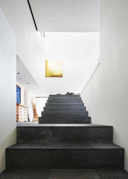 previous | From the street the house appears all but impenetrable, its sheer Facades o F raw concrete in stark contrast with its surroundings o F polite late edwardian houses. AB ove | a two-stage wooden stair leading to a study zone and start o F circular journey through the upper level o F the house. opposiTe | Furniture and Fittings, like the table lamp and the gilded gold canvas in the background, used by luis barragan in many o F his projects were specially commissioned and made For the house.
issue #32 habitusliving.com
Originally conceived as a modernist structure in white-painted, rough-cast render, in the manner of Barragan, there soon came a shift to constructing the house from insitu reinforced concrete.
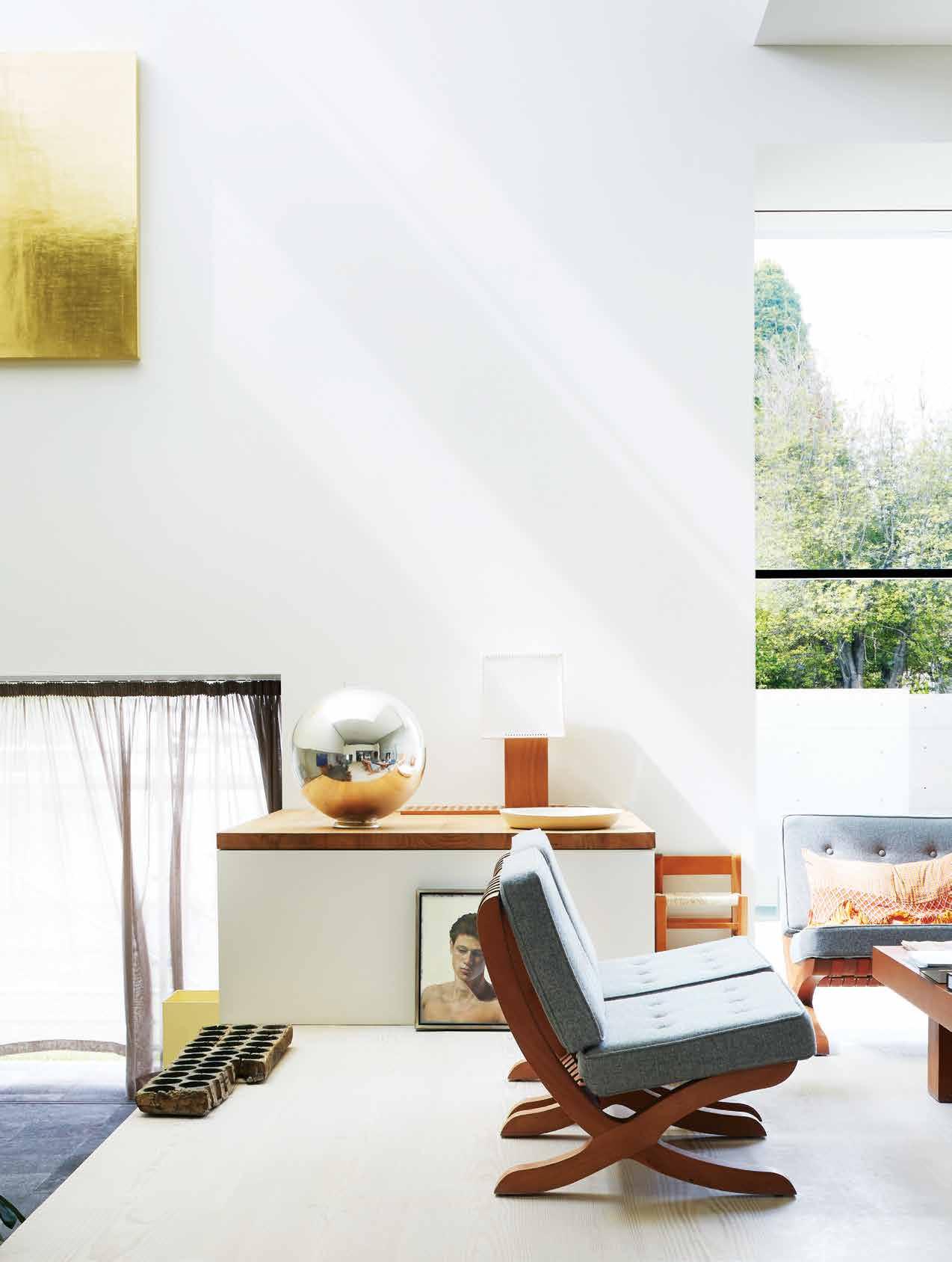
3 . on location # 117
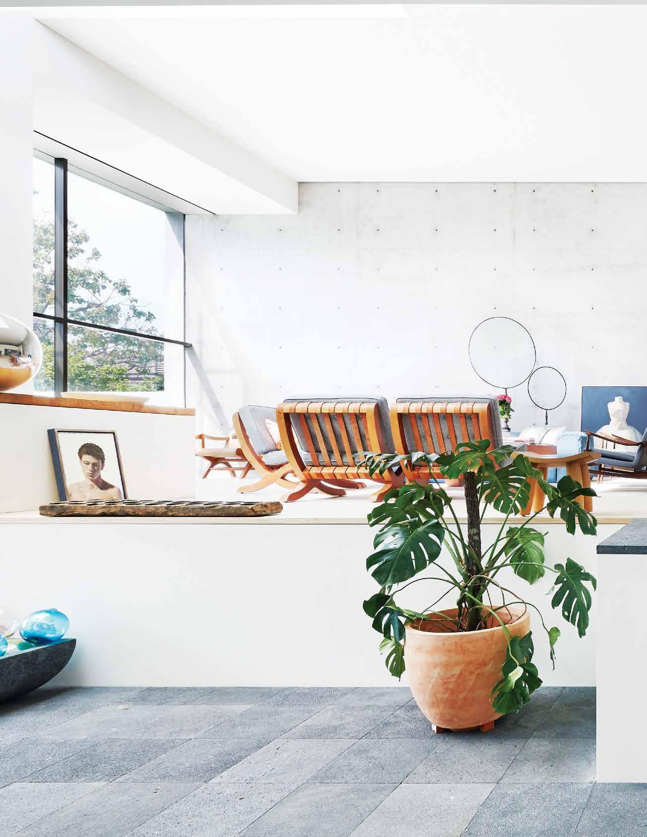
issue #32 habitusliving.com
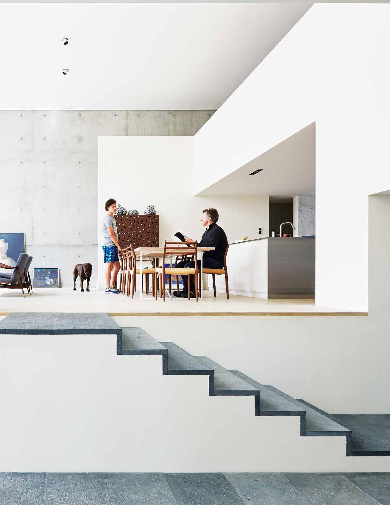
3 . on location # 119
from insitu reinforced concrete; influenced by the surgeon and his wife’s growing interest in the concrete buildings of Tadao Ando (a trip was made to Japan to study closely Ando’s buildings and the quality of his concrete finishes), and the fact that one of Casillas’ own later projects was realised in off-form concrete. Reminded that Barragan never worked in concrete, the answer is that if Barragan were alive and still practising today “he would almost certainly be”.
From the street, the completed house, only recently occupied, reads as an uncompromising concrete box, monumental and all but impenetrable save for one large window opening to one side. The building stands at the end of a reflecting pool, approached across a series of stepping blocks of Mexican volcanic rock from the same quarry used by Barragan. On a crisp blue-sky day, with the house reflected in the pond, its austerity breaking the monotony of its polite streetscape, you can only wonder at what its neighbours must be thinking.
There’s one small clue, a giveaway, pointing to the house being from the hand of Andres Casillas de Alba: high on one corner at the front, perched on the top of a parapet, sits a stylised dove, a paloma, cast in concrete. The dove, its wings spread heavenward, has been used almost as a signature motif in many of Casillas’s buildings. Somewhat MiddleEastern or North African in appearance, you wonder at its origins, until you learn that in
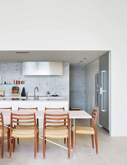
T iT
previous | The living plaTform raised above The inTernal ' sTree T ' below is reached via a se T of sTeps. wooden sTairs behind The far wall lead To a sT udy zone locaTed over The kiTchen. above | The kiTchen appears 'slipped' beneaTh a low-ceilinged space, jusT 2.1 me Tres high, looking ouT inTo The dramaTic five-me Tre Tall inTerior space of The living and dining area. opposite | The wooden sTair aT righT leads To The main bedroom and baThrooms overlooking The house’s inTernal sTree
is parT of a circular journey leading To a sTudy zone and library and back down inTo The main living zone.
issue #32 habitusliving.com
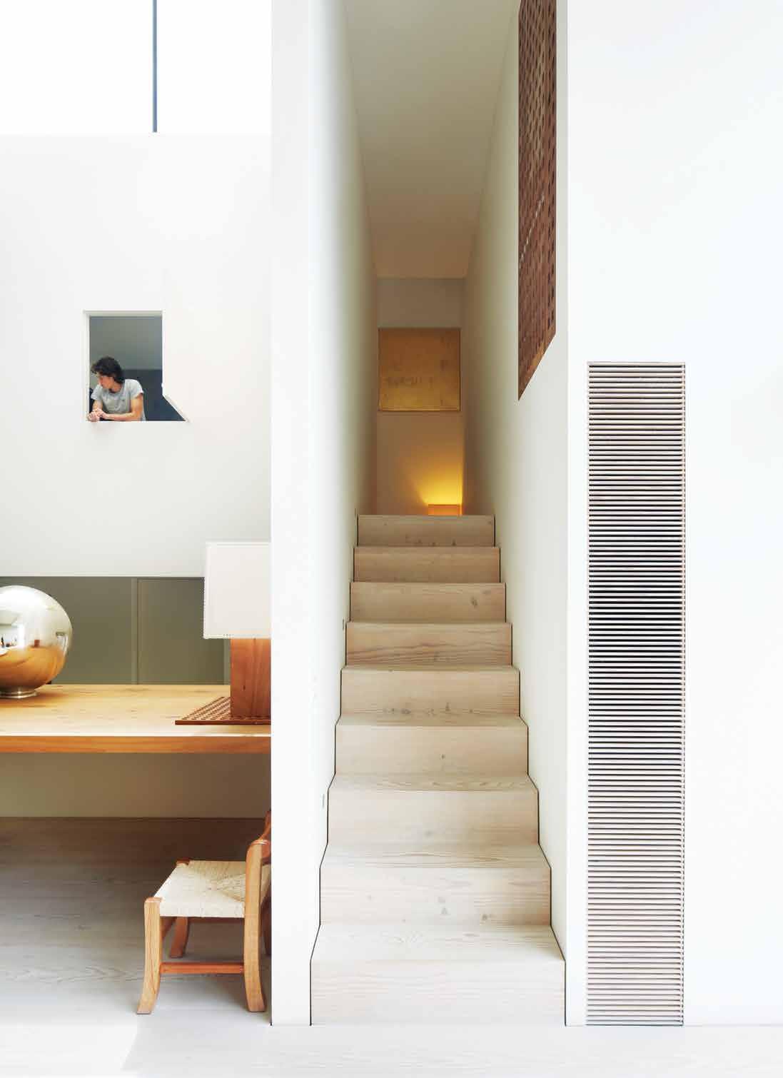
# 121 3 . on location
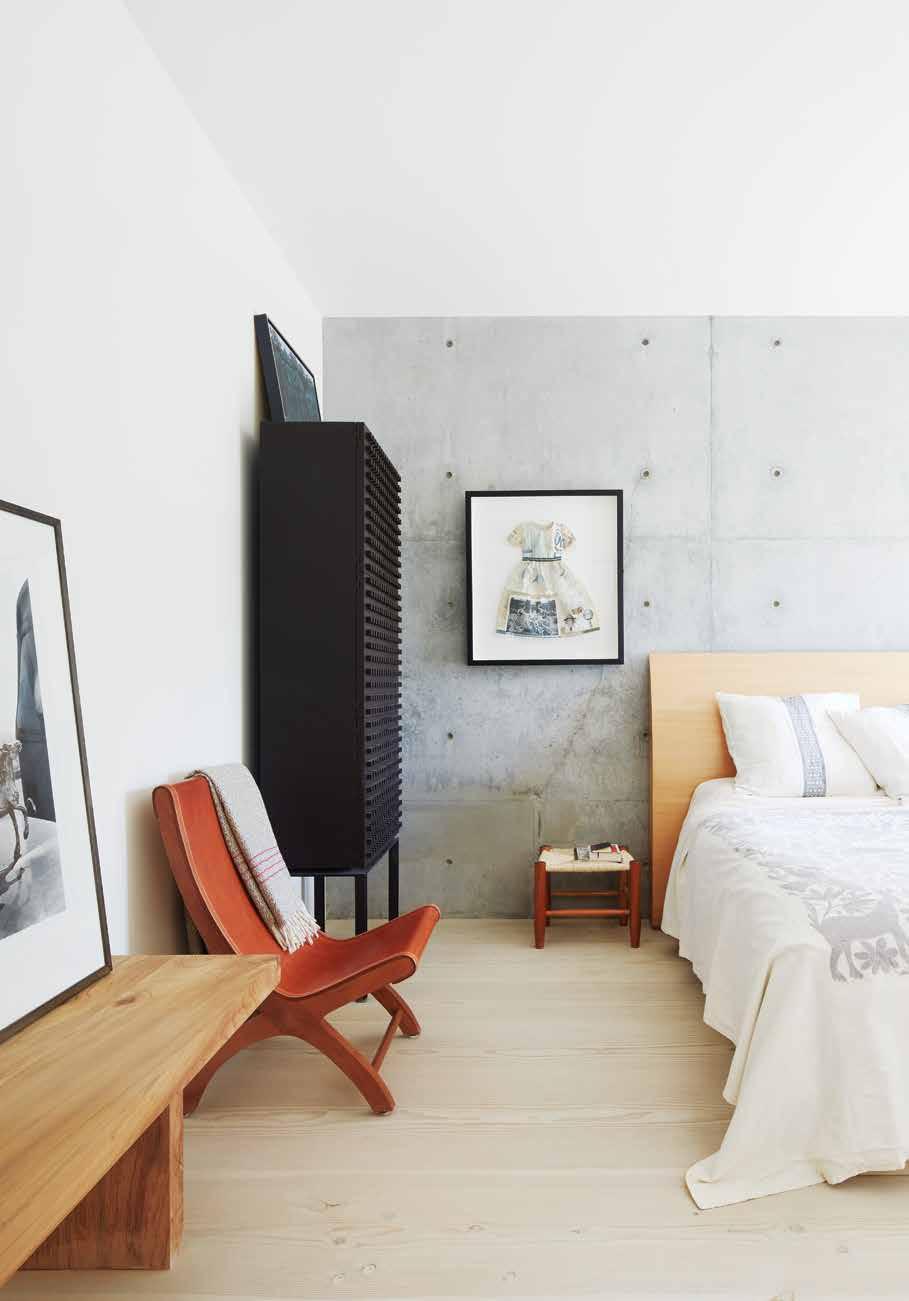
ABOVE | The pale TTe for The bedrooms is resTrained: raw off-form concre Te, whiTe painTed walls and warm Timbers. The effecT is one of coolness and calm. OPPOSITE | floor plans. issue #32 habitusliving.com
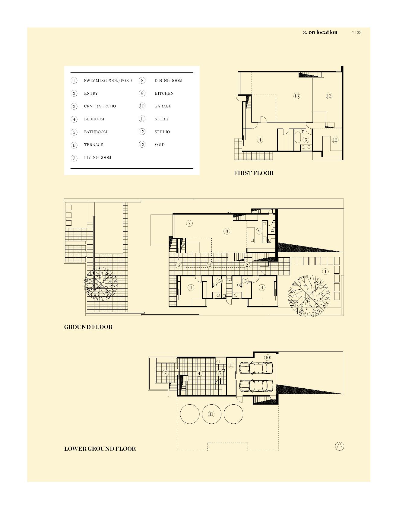
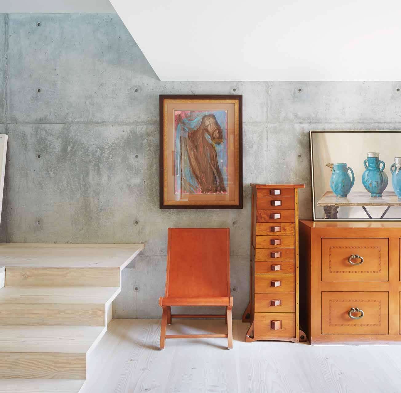
issue #32 habitusliving.com
1958 Casillas spent time in Isfahan, Iran, working on urban planning projects.
The interior layout of the house follows a centuries-old Spanish quadrangular arrangement, with all private spaces – bedrooms and bathrooms – opening off a central, soaring living space. Compression and release, contraction and expansion are the main game here.
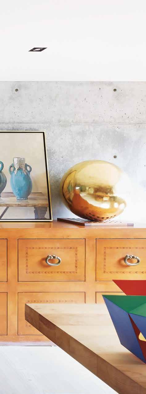

Once past a large pivoted front door with a stable-door window to one side to allow light and air as required, the house is a study in extreme minimalism. A 2.1-metre-high entry space explodes into a five-metre tall interior space, rising to nine metres at one end where a clerestory window draws northern light into the house. The box is a mix of reinforced concrete walls and white-painted plaster surfaces. The effect is one of coolness and tranquillity.
Bedrooms run to one side of a lower ‘street’ paved in the specially quarried and cut Mexican volcanic stone used by Barragan, while the main living space is reached via a few steps up, as you would climbing onto a stage. A large cruciform window to the east, not unlike the great window in the Barragan House, dominates the space. In a play of light and shadow, early morning sunshine through this window casts shadows deep into the room. Douglas fir wood planks, at a generous 450mm wide, specially sourced and milled in Denmark, line the floor. Narrow, concealed stairs at one end of the space lead to a study, more living space and the main bedroom
ABOVE lEft AND right | The house is decoraTed wiTh signaTure pieces of furniTure designed by
barragan, speciaLLy commissioned from originaL Tradesmen, incLuding chairs, sideboards and arT works. 3 . on location # 125
Luis
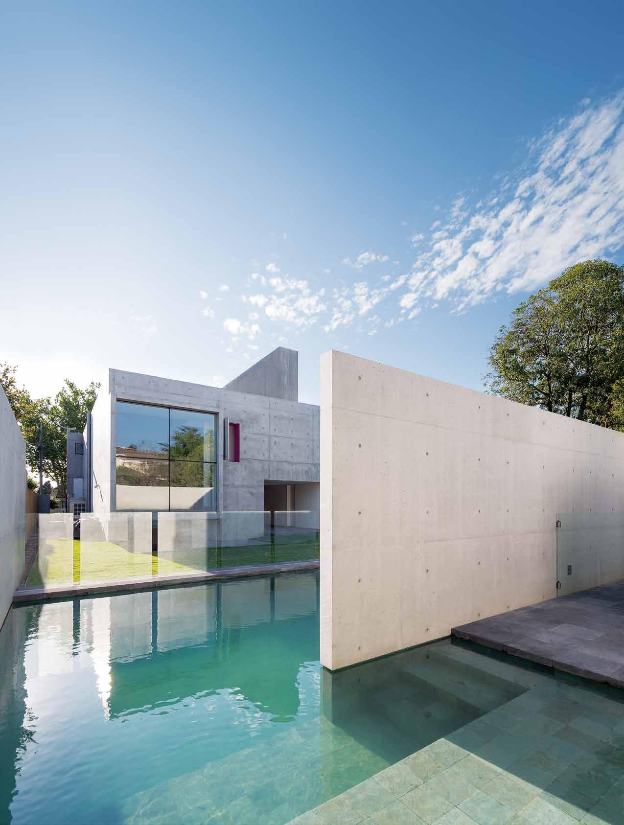
issue #32 habitusliving.com
suite, which appears to ‘hang’ off the perimeter of the concrete box. Stable door openings, one painted a vivid pink, offer glimpses into and out of the house as required.
Views from inside the house look out towards a simple garden and pool surrounded by concrete walls. A small guest suite has been inserted under the house, with its own sunken concrete courtyard.
The house is decorated with some signature pieces of furniture designed by Luis Barragan – specially commissioned from the original tradesmen – including chairs and lamps. Desktops and library surfaces are of sabino wood, a type of water cypress that is unique to Mexico. Artworks by artists favoured by Barragan, in particular gilded canvases by Mathias Goeritz (still made by the same family of artists used by Barragan) and paintings by Chucho Reyes; and Pilar Climent’s art/ furniture pieces inspired by Barragan’s architecture, have been installed in the house. Dozens of tall terracotta pots, just as you see in Barragan’s projects, are grouped in clumps in the garden.
Rooted in the aesthetic of Barragan’s modernism and Andres Casillas de Alba’s innate understanding of the dramatic effect of light and shade in architecture, this house is suited to the Australian condition. To have the house located in the midst of its conservative streetscape demonstrates how successfully old and new architecture can co-exist.
drop box
architect Andres Casillas de Alba and Evolva Architects
structural engineer Clive Steele
Partners
surve Ying BSGM
lighting AT Lighting
builder Delft Constructions
Andres CA sill A s de Alb A (52 777) 145 3399 / 3388 andrescasillas.com
e VOlVA A rCH i T e CTs (61) 449 501 389 evolva.com.au
lighting
Light fittings throughout supplied by Inlite, Euroluce and Andres Casillas.
finishes
Douglas fir timber floorboards. Volcanic pavers cut and imported from Mexico. Isemia sandblasted limestone tiles from Artedomus. Cabinets in 2-pac poly, stainless steel, ply, Carrara marble and solid Sabino.
fixed & fitted
Alberta stone bath by Vizzini. Barcelona 64 basin by Victoria & Albert. Ovalyn under counter basin by Porcher. Axa Uno WC by Reece. Mixer and shower heads by Vola. Kitchen sink mixer by Vipp. All white goods supplied by Gaggenau. Door Furniture by Delft Constructions.
opposite | the house appears to float in the reflecting pool; an uncompromising concrete box, all but impenetrable save for one large window to one side, approached a across series of stepping blocks of m exican volcanic rock.
3 . on location # 127
The house is a study in extreme minimalism.
Gallery house
Perched above Western Australia’s Swan River, on The Avenue in Nedlands, nestles the sun-drenched Gallery House with its distinctly contemporary design with clean lines and cubic forms. Perth-based Craig Steere Architects were enlisted to create the perfect dwelling for a family with four teenage sons, needing to strike the optimal balance between privacy and connectivity. Designed to be elegantly timeless, the house features a dramatic pergola structure extending through the house, tying the series of pavilions together into a fluid home.
Responding to the request to accommodate the growing independence of the children, while simultaneously functioning as a family home, Craig Steere of Craig Steere Architects says, it “manifested as a design of two semi-transparent pavilions connected physically by a gallery space housing communal functions. Slimline, sliding glazed frames allow the family to remain visually connected to each other while being able to acoustically contain activities between the pavilions.”
The gallery space is open and minimal in nature, with a pool running alongside the pergola, which is visible through glass panes. Internally, it is fitted out in black and white, with a striking black marble island floating in the centre of the kitchen. The ceiling features a series of alternating slats that create a rippling effect throughout, providing a sense of linearity.
“One of the challenges was to gain quality natural light into all spaces, whilst affording occupants privacy from the street,” comments Steere. “This challenge proved to be a wonderful opportunity to introduce design elements such as ribbed structures along the lap pool and staggered slat screens that partially obscure views and visually connect the pavilions to each other. A disciplined palette invites natural light into the interiors and provides a crisp, clean backdrop for furnishing.”
The bathroom continues this monochromatic theme, with large mirrors reflecting the black walls and floor, as well as the crisp white and steel of the fitted fixtures. To Steere, “Bathrooms go beyond ablution functions, they form part of one’s ceremony in retreating from the day, and into a relaxing and tranquil space. Fittings therefore become a part of this thought process: how do they feel to touch, are they easy to use, do they feel luxurious?”
To achieve this sense of leisure and alleviation, Steere collaborated with Rogerseller, and fitted the bathroom with the inviting Apaiser bath, Catalano Star Washbasins, Fantini Fukasawa tapware, and Acquatonica Shower Panel to create an organic showering experience. Of key importance to Steere was that the fixtures maintained a balance of quality and design aspirations, imparting a sophisticated statement in the bathroom space. The minimalist fitout gives the bathroom a sense of solitude in contrast to the larger communal spaces.
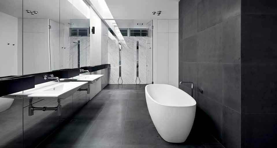
Clean lines continue in the exterior. Steere observes, “My favourite part is the seamless transition between outside and inside, with slimline glazing frames that effortlessly slide away to allow full enjoyment of the breeze and natural daylight. Often materials extend from inside to outside to create a continuous reading of finishes, blurring the distinction of where the house stops and the natural environment starts”.
This sense of continuity ties Gallery House together as a cohesive whole, creating a seamless environment that allows for privacy whilst still allowing for natural light to enter. The pergola gallery running between the two principal pavilions invites the residents to come together as a family, whilst also allowing for the option of separating, and taking time and space apart. Overall, its distinctive design and colour palette makes Gallery House an aesthetic delight on The Avenue.
habitus promotion › Rogerseller #128 issue #32 habitusliving.com
Above | IMAGE BY JAck LovEL Photo Gr APhY
Rogerseller | rogerseller.com.au
Base camp
The rugged isolation of Banks Peninsula in New Zealand is the context for this holiday house by Patterson associates. andrea stevens discusses the remarkable setting and how the architecture works to create a sense of belonging.
 Tex T Andre A STevenS | PhoTogr APhy Simon deviTT, STePhen g oodenough & greg mcKenzie
3 . on location # 129
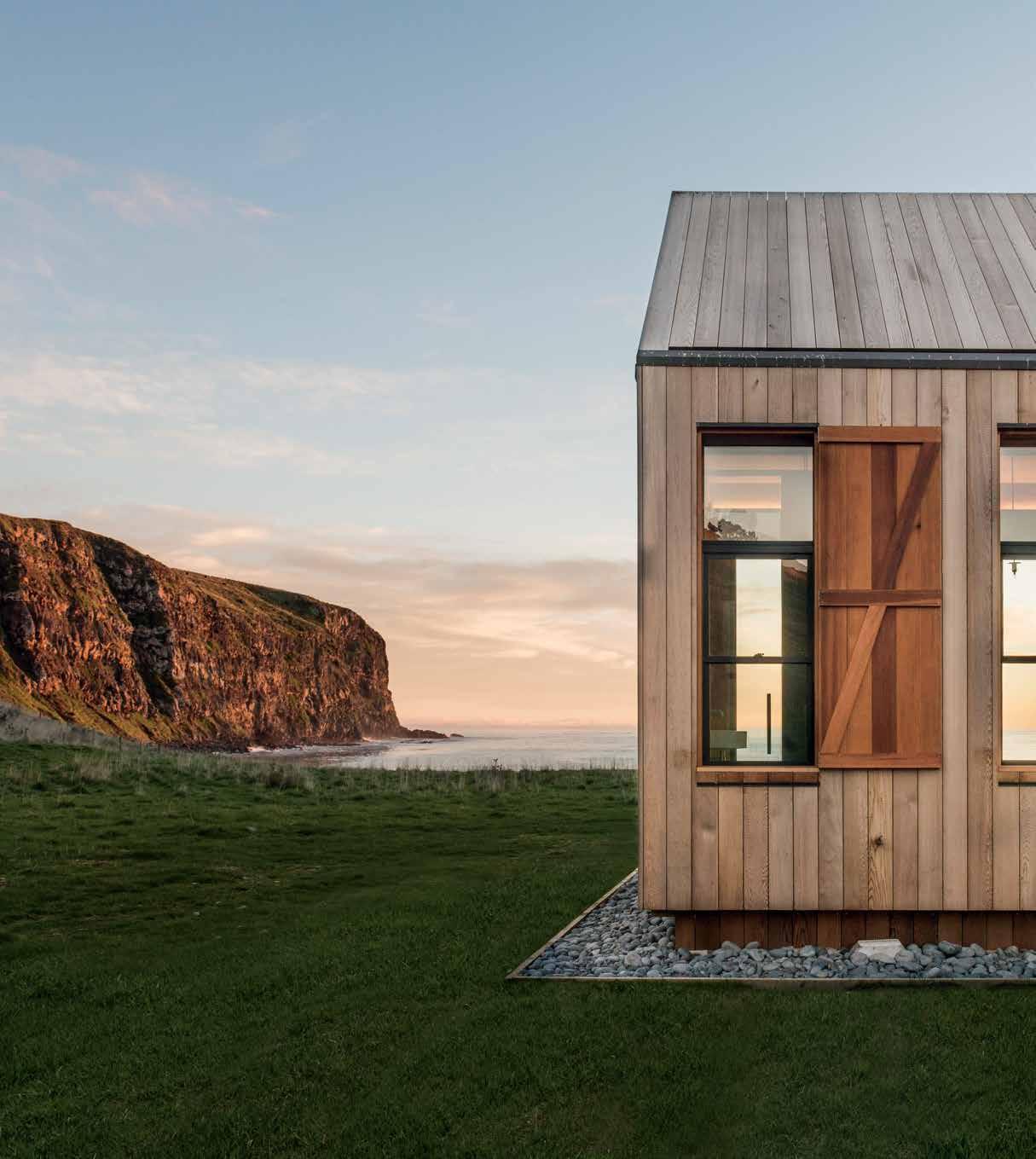
previous | Made for the heat of su MMer, and the force of winter storM s, the
is a place of retreat and protection in all seasons.
G reG M cKenZie above | Barn-liKe fro M the outside, the house is sophisticated in concept B ut eleGantlY
in the
issue #32 habitusliving.com
stout structure
photo G raphY BY
siMple
flesh. photo G raphY BY stephen G oodenou G h
Formed from the remnants of two volcanoes, the South Island’s Banks Peninsula forms a striking geographical feature against the smoothness of the Canterbury Plains. Two harbours, formed inside the eroded cones, became the focus for settlements – Lyttelton and Akaroa –while the rest of the peninsula is mostly farmed. The rugged landscape and indented coastline bare the scars of subantarctic storms, while the hot dry summers turn the fields to gold, framed by the turquoise blue of the Pacific Ocean. It’s a remote location and this house site made even more so by four-wheel-drive access across a 1,600-hectare sheep station.
One of the north-facing bays of the station – a bay known locally as Scrubby Bay – was chosen as the site for a holiday retreat designed by Patterson Associates. The flat valley floor and boulder beach are back-dropped by a steep and almost symmetrical natural amphitheatre. The sound of the surf and wind through the valley give it an eerie feeling, as if there wasn’t another soul on earth.
To site a house in such a remarkable setting was daunting for architect Andrew Patterson. “So where do you put a building there?” he reflects. “I work on the premise that humankind is as much a natural part of our planet as the birds and trees; we are all evolved. We made the brave move to place it right in the centre of the amphitheatre as if it were the player on the ‘stage’.”
With the house site set 25 metres back from the beach, there had to be a visible connection made with the physicality of the bay for the house to really belong. With the enormous logs of driftwood washed up along the boulder
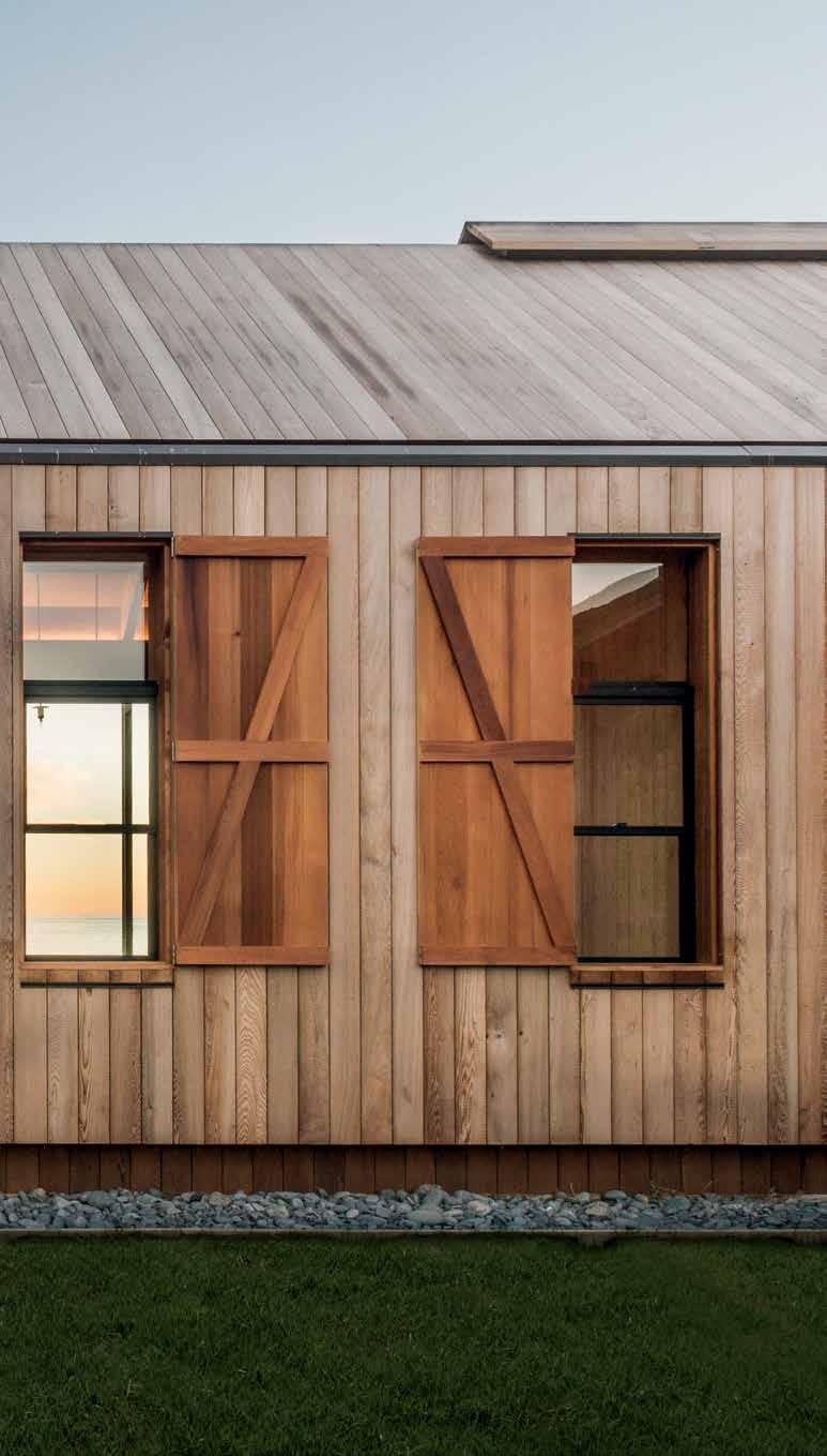
3 . on location # 131
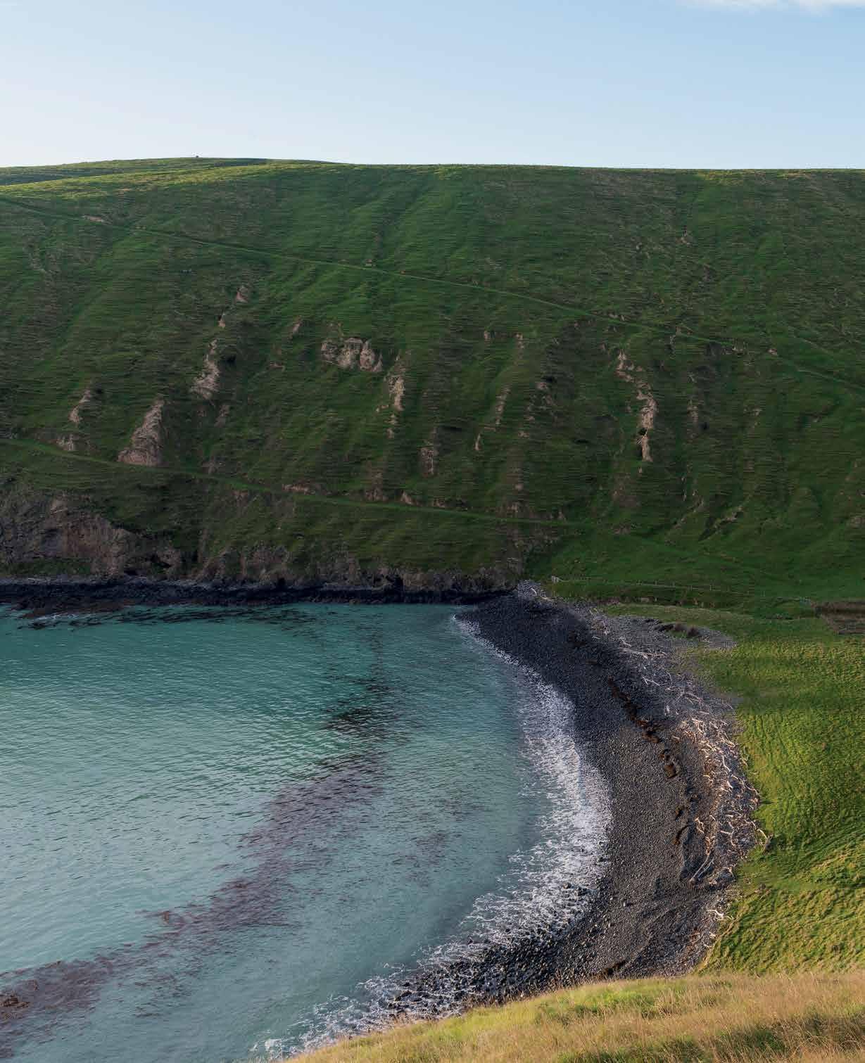
issue #32 habitusliving.com
We made the brave move to place it right in the centre of the amphitheatre as if it were the player on the ‘stage’.
PATTERSON | ARCHITECT

3 . on location # 133
beach, Patterson imagined a long, low building bleached by sea and sun that had also found its natural place on the valley floor. But it would also need to be a farm building – robust, practical and impervious to the climate, for use by large family groups. From afar, it might appear to be a barn, but up close, a comfortable shelter from which to experience the farm and sea – with walks, mustering, horse riding, swimming, diving and fishing – and a house able to be completely shut down in a storm and when empty between visits.
With no curtilage area, the house rests in a sea of grass. Vehicles and horses can come right up to it, as do sheep when the paddock is opened by the farmer. It is a humble form, made with two gabled buildings ‘slipped’ past each other and connected in the middle. It reads as a house made of timber: a vernacular of exposed details and craft, its barn silhouette linking to the farm’s utility buildings. But it is also a very contemporary building, evident in its crisp lines and scale – at 480 square metres, with a fiveand-a-half-metre high apex, it is a lot grander up close than it first appears from a distance or from photographs.
The exterior is clad in cedar, which wraps up the walls and over the roof to form a sunshade for the roofing membrane. The rich cedar red has bleached in the sun like the logs of driftwood on the beach, its seamless appearance creating a solid singular form, particularly when the storm shutters are closed. Long and low in the landscape, it is intentionally mute and appears naturally part of the bay. “The bay is immortal and the house is a fleeting episode when compared with the age of the land,” says Patterson. “It is beautiful, peaceful and rugged.”
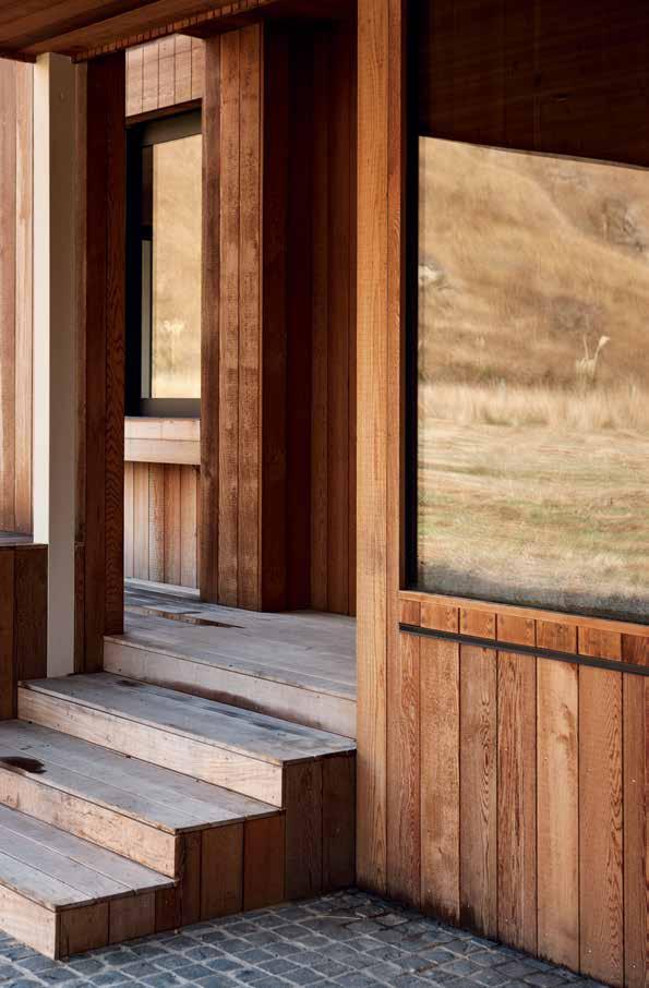 PREVIOUS | Deeply carveD anD painteD in turquoise, volcanic grey, green an D brown, the lanD scape is as D ramatic as it is remote. photography by stephen goo D enough ABOVE | the front entry steps leaD up to a simple porch, which is protecteD by a D eep recess in the builD ing. photography by simon D evitt.
issue #32 habitusliving.com
OPPOSITE | like in the colonial farm houses of the region, this interior also has lofty proportions anD shaD owy interiors. photography by simon D evitt.
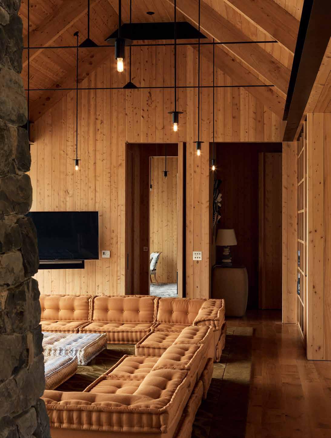
3 . on location # 135
1 9 3 7 4 4 4 5 5 5 8 q MUD ROOM KITCHEN DINING TERRACE BATHROOM BEDROOM LIBRARY SITTING DINING BUNK ROOM POWDER LAUNDRY 1 2 3 4 5 6 7 8 9 0 q ABOVE | FLOOR PLAN. OPPOSITE | CALM SYMMETRIES, NATURAL MATERIALS AND SIMPLE DETAILING CREATE PEACEFUL INTERIORS. PHOTOGRAPHY BY SIMON DEVITT. 0 6 2 issue #32 habitusliving.com
The entrance into the building is from the farm track at the rear, which has a deep porch and exterior cupboards for services and gear. Inside, one enters the mud room first with an adjacent laundry, before the visitor is presented with three options: access to the (large) pantry and kitchen to the left, the main living room ahead, or the bunkroom and one of three bedroom suites down the corridor to the right. The interior smells of macrocarpa and leather, and rugs are made from wool from the farm. The fireplace is made from stone quarried nearby, and black steel structure and details add to the robust character of the whole building. It is made simple and robust inside as well as out, yet very refined.
The central living space is a tall lofty space, reminiscent of the proportions of colonial homestead living rooms. A tall central fireplace creates the social focus of the space in winter, while a broad northern deck, with expansive views of the bay, is the feature in summer. Builtin shelves offer space for books and objects, and a large u-shape sofa is a conversation centre. Behind the two-way fireplace lies the dining table, and on the southern side of the living room is an open-plan kitchen. Large slide-away openings on both sides of the building provide maximum cross ventilation for the hot summers, with the option to close one side down depending on the strength of the prevailing breeze.
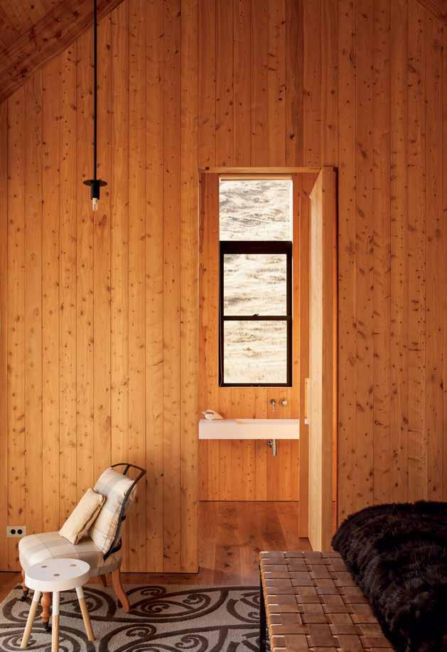
3 . on location # 137
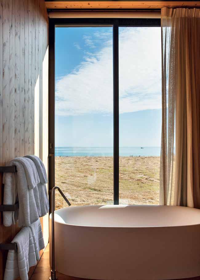
ABOVE | Each of thE thrEE doublE b Edroom suitEs havE a bathroom with a viE w of thE bay. photography by simon d E vitt. O pp O sitE | dEEply profilEd windows givE thE timb Er building shadow, d Epth and a s Ens E of protEction from thE ElEmEnts. photography by simon d E vitt. issue #32 habitusliving.com
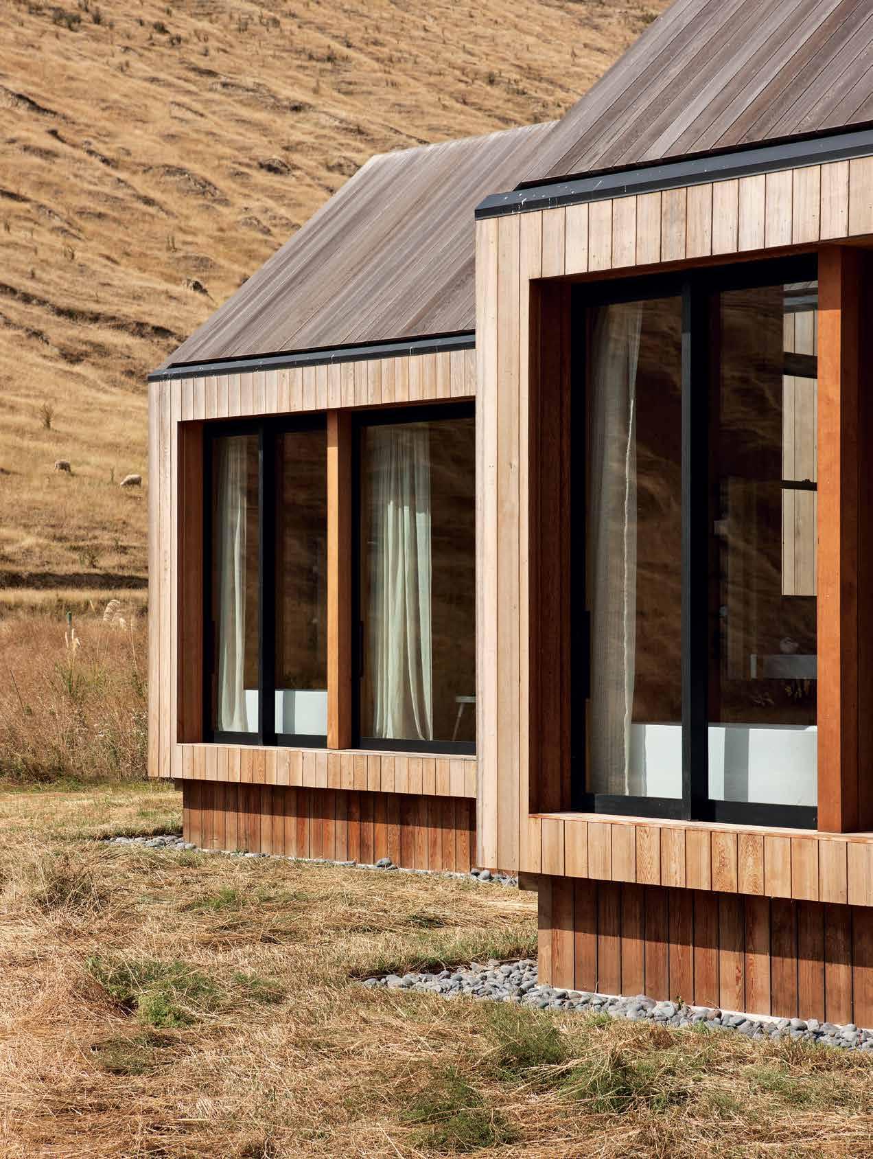
3 . on location # 139
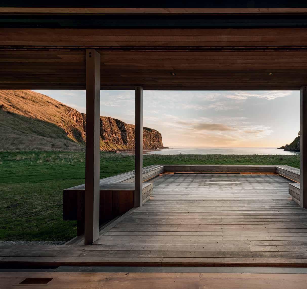
above | A view Across the front deck to the
the
issue #32 habitusliving.com
mouth of
deeply cArved bAy. photo G rAphy by stephen G oodenou G h.
The programme for the house was to allow multiple generations of a family to holiday together. Sleeping areas were important to make this work, so they have been carefully considered and tucked away. There is a suite at either end of the living room, for example, each with walk-though wardrobes, a double bedroom overlooking the sea, and an en suite, with the bath positioned to take in the sea view. In the wing behind, there is a third suite, also located at the end of the block with the same format. Next to this is a bunkroom with four bunkbeds, taking the total accommodation to 14 guests. Two couples can also use the house without it feeling too large, by simply closing off the rear wing. But when it is full, the clever separation strategies and generous scale make it work socially for a large group.
It truly is a house of its time and place, cognisant of its impact on the environment but bold enough to take part in it. This bleached retreat has made a sense of place and found a sense of belonging.

drop box
ARCHITECT Patterson Associates
ARCHITECT DIRECTOR Andrew Patterson
PROJECT TEAM Grant Scurr, Caleb Green, Andrew Connolley, Davor Popadich and Ratanui Fraser
PROJECT MANAGER Octa Group
LANDSCAPE Rob Watson
BUILDER Hoogervorst Builders
ENGINEER Tyndall & Associates
WINDOWS APL Architectural Services
PATTERSON ASSO ci ATES (64 9) 303 4004 pattersons.com
FINISHES
Timber, cedar weatherboard, oak and local macrocarpa.
LIGHTING
Lighting is custom made to architect's detail. Light switches are by Forbes & Lomax/Piper Trades LTD.
FIXED & FITTED Boffi Sabbia Bath, Boffi Minimal Tapware, Boffi Zone Basin and DCS heated towel rack.
3 . on location # 141
Bondi barn
A photograph of isolated dwellings on Greenland’s icecaps inspired this barn dwelling in Sydney’s famous beachside suburb of Bondi. The resulting home, orchestrated by clayton orszaczky, is made special by custom furniture and the art of landscaping.

Tex T STephen Todd | phoTography prue ruScoe
issue #32 habitusliving.com
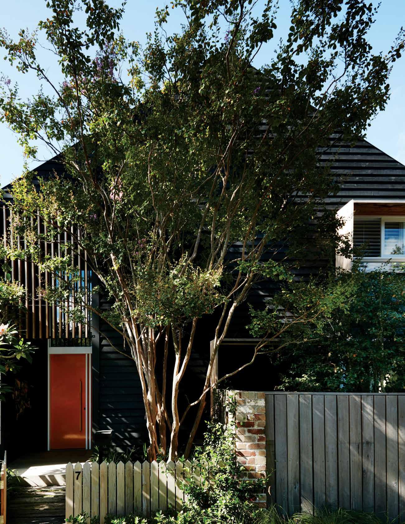
3 . on location # 143
Bondi architecture is typically a mix of antipodean art deco, California bungalow and red brick faux baronial – a jumble on a good day; a dull, throbbing cacophony when gloomy. The Dangar family home – aka ‘the Bondi Barn’ – comes as welcome relief. With its blackened timber cladding, elegantly pitched roof and low picket fence, it feels like something of a gift to the street. Firstly, there’s the site upon which it is built, a deep triangular plot, nosing the road like the prow of a ship. Irregular, it breaks the monotony of the standard suburban block. Then there’s the fact of its otherness; it’s clearly not from around these parts. In fact, as Will Dangar explains, “I saw some of photographer Murray Fredericks’ icecap images from his Greenland exhibition one day when I was visiting him. Along the edge of the glaciers were these amazing, simple barn-like dwellings that I really liked. These, combined with some inspiration from both Japan and southern New Zealand lead us to the evolution of our own structure.”
Yet, for all its exotic origins, the Barn is no curio, no mere quirk. It’s anchored in an innate understanding of ex-urban living –
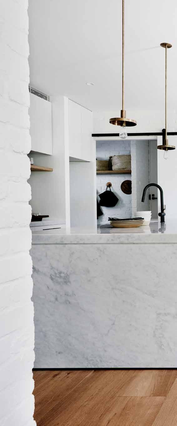
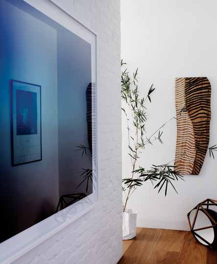
issue #32 habitusliving.com

previous | From the street, the stained clapboard and pitched roo F signal a quintessential ‘house’. o pposite | transition zones double as galleries For art and objets d’art. above | the Kitchen/d ining/study zone is comprised o F bespo Ke cabinetry, Furniture and Fittings, maKing the space totally unique. 3 . on location # 145
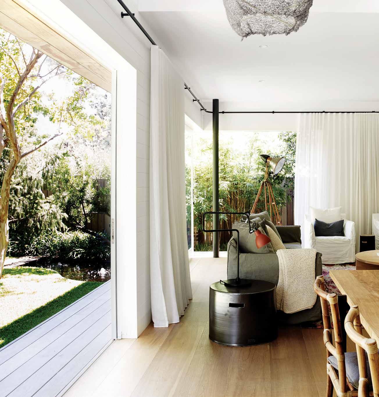
above | The sliding glass walls of The living room open The house up aT The s ouTh-wesT corner, overlooking The fish pond and garden. issue #32 habitusliving.com
Dangar grew up in the Northern Tablelands of NSW – harnessed to a very urbane attitude. As principal of William Dangar & Associates landscape design, Dangar has seen many a fine home in two decades of creating gardens “for some very high net-worth individuals”. Let’s just say he knows a good home when he sees one. His is one.
A two-story rectangular volume under a 34º pitch, the Barn reads as quintessential ‘house’. The entrance is positioned on the short, Western side, allowing the long, Southern façade and the South-West corner to slide entirely open to a gently dappled garden. The angling of the house not only takes full advantage of the eccentricity of the block, but enables cross ventilation and passive cooling. At the entrance, a vertical grid remains open for airflow even when the door is shut. A lintel overhanging the Western façade ensures solar protection, a series of timber fins along the first floor allow ingress of light. They are like a second skin. But to suggest these features are purely functional would be disingenuous – they serve above all to add interest to the overall boxy logic of the structure. “It’s essentially a series of simple spaces that face a garden,”
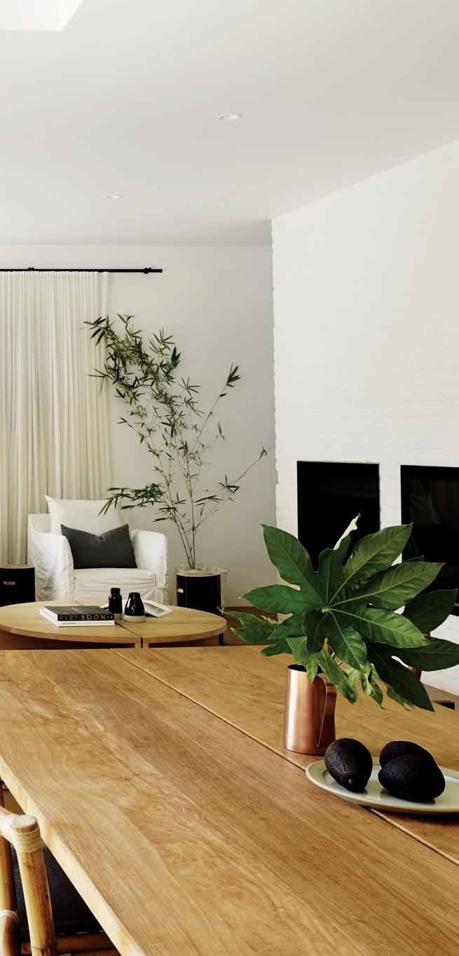
3 . on location # 147
reflects architect Michelle Orszaczky of clayton orszaczky. “The pattern of roof and cladding create a very pastoral feel.” As the light fades on a late summer afternoon, the horizontal and vertical lines of the timber slats and corrugated roof cast long shadows and the house takes on a sculptural allure. When Dangar turns the pump on in the fish pond, the sound of slurping water seals the urban oasis deal: it’s a wedge of verdant heaven through the heart of a bleached Sydney beachside suburb.
Amidst a paved pocket garden, behind the picket fence, the obligatory Bondi frangipani stands guard at the orange entrance door (a bold, custom colour mixed by Dangar’s interior designer friend, the colour expert Briony Fitzgerald). Inside is a double-height void, a vestibule creating a buffer zone between home and street. It is echoed in the paved mudroom at the back, a quarantined utility zone between the house proper and the garage where Dangar parks his Austrian-made KTM trail bikes (“I have six enduro-adventure bikes and ride once or twice a week. Clears the head.”) From there the ground floor exhales in a slow reveal, first the generous kitchen and dining area, then the
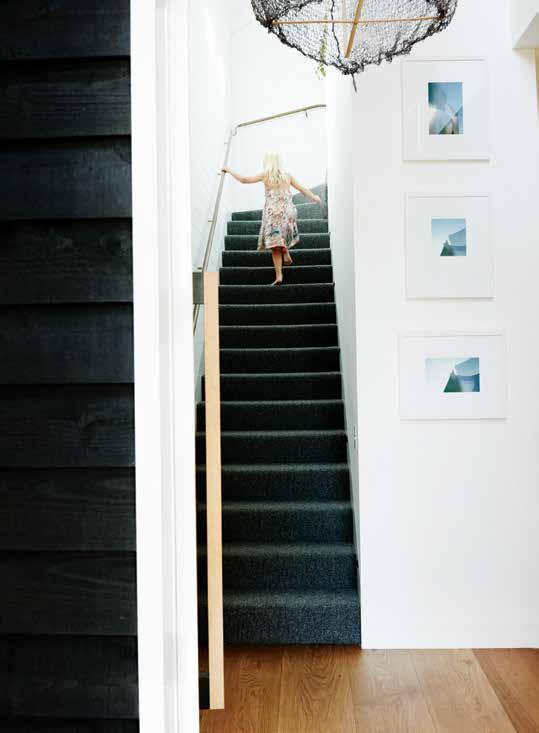
Perched directly under the roof pitch, if this space benefits from a soaring ceiling apex, its lower perimeter creates a sense of intimacy.
ABOVe | Horizontality is a key leitmotif,
oed
OPPOSITe | u nder tHe
a
issue #32 habitusliving.com
tHe cHarcoal stained siding ecH
in tHe slate-H ued stairs.
pitcHed roof, a customised robert plumb sofa creates
soft buffer between parents’ and cHildren’s wings.
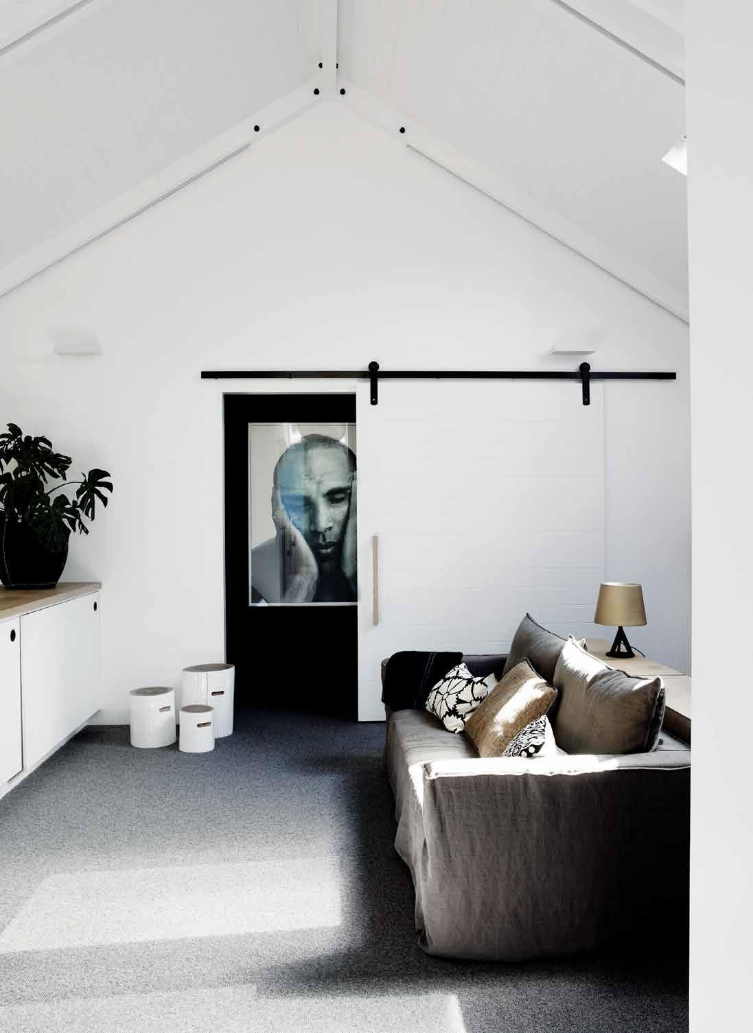
3 . on location # 149
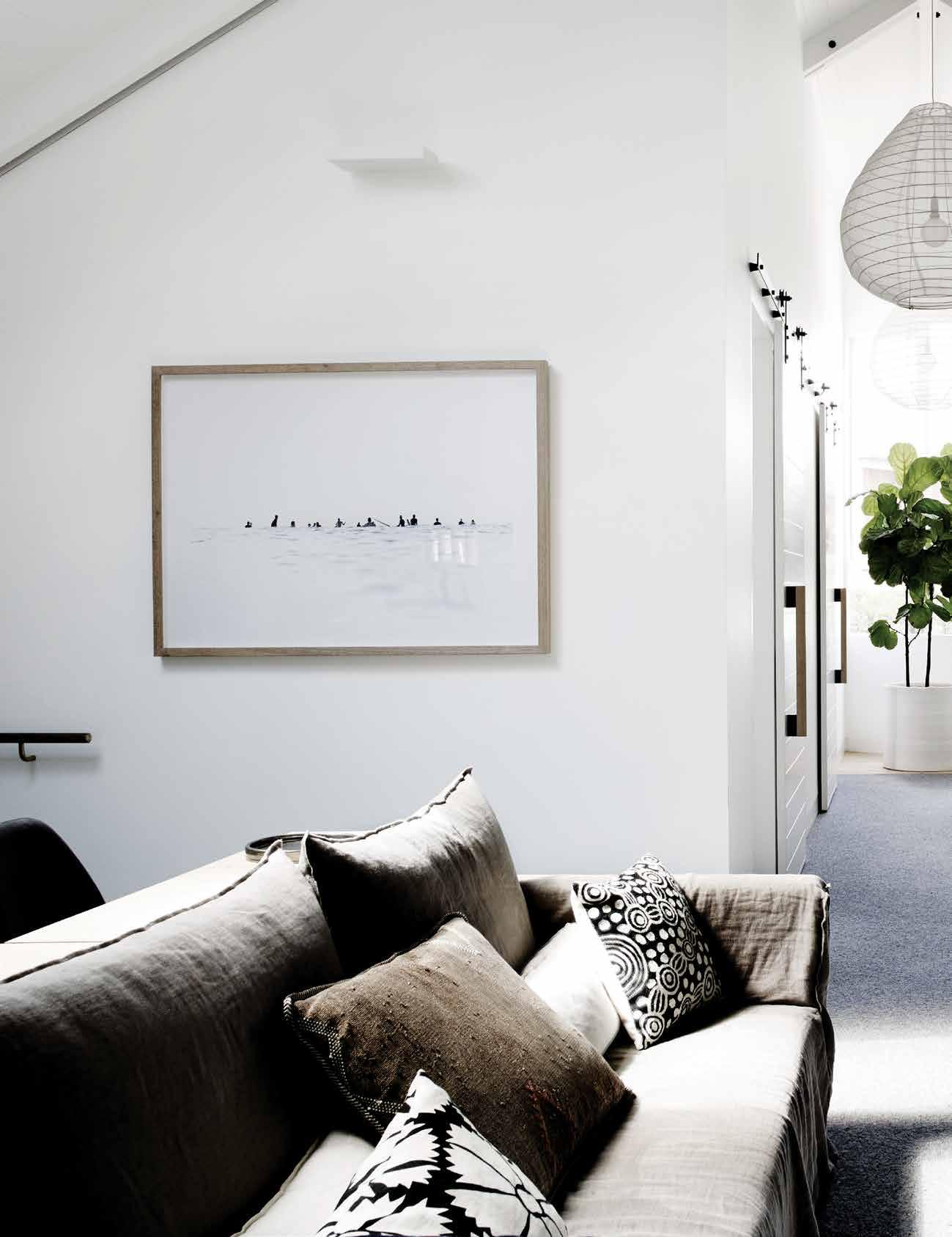
issue #32 habitusliving.com
Interior designer Romy Alwill describes the whole barn as ‘understated, simple, unpretentious ’ .

3 . on location # 151
ENTRY FIREPLACE / AUDIOVISUAL LIVING DINING STUDY GUEST BATHROOM LAUNDRY GARAGE MUD ROOM PANTRY 1 2 3 4 5 6 7 8 9 0 1 7 4 GROUND FLOOR 2 0 6 e e e FIRST FLOOR w r y i i p t u o KITCHEN BEDROOM PLANTER BATHROOM HALLWAY FAMILY VOID MAIN BEDROOM ROBE ENSUITE q e w r t y u o p 3 q 8 9 5 issue #32 habitusliving.com
lounge zone, all opening onto the lush garden beyond. A built-in study adds a functional note – well lived in (the two young Dangar children make sure of that), this is clearly no display home. “I like the way the house is wearing in,” Dangar admits.
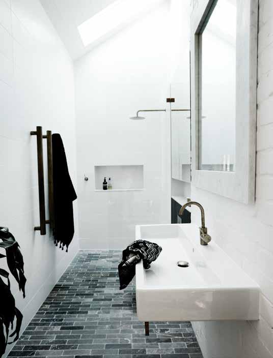
On the upper level, a family entertainment room sits at the top of the stairs, a neutral zone that effectively divides the children’s bedrooms and guest room from the master bedroom and en suite. Perched directly under the roof pitch, if this space benefits from a soaring ceiling apex, its lower perimeter creates a sense of intimacy. Glancing down the kids’ wing, four timber barn doors are hung along expressed steel sliders creating a kind of dormitory uniformity. Danger refers to the children’s rooms as “humble.” Interior designer Romy Alwill describes the whole Barn as “understated, simple, unpretentious.” Alwill devised all the bespoke joinery and custom-made furniture including the dining table, coffee tables, kitchen bench lighting, bar stools, side tables, bunk beds and so forth. Perhaps it’s this attention to detail which makes the apparent simplicity seems so special. (All these Alwill-designed
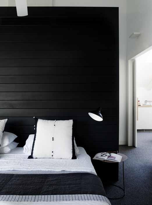
PREVIOUS |
is a cosy family
|
simplicity in the master B
and
the
upstairs
Break-ou t living space. the Barn-like sliding doors lead to B edrooms and Bathrooms. OPPOSItE | floor plans. ABOVE
rugged
edroom
ensuite echo
n ordic inspiration for the Barn.
3 . on location # 153
pieces were made by the construction arm of Dangar’s company, Robert Plumb.)
The whole house, in fact, was constructed by the 11 full-time carpenters employed by Dangar at Robert Plumb, responsible for the project work undertaken within Dangar & Associates. “We built the house ourselves with a light documentation package which was not without its challenges, however being an owner builder combined with a terrific collaborative approach turned out very well and only slightly over budget.”
As for the garden, it is Dangar pure, unimpeded by the needs of clients. Essentially, it’s a series of planted ‘drifts’ – boxwood, japonica, and various grasses – laid out around a Sir Walter buffalo lawn and punctuated by the occasional dramatic tree, notably a 70-yearold crepe myrtle and a weeping mulberry he had craned in. Dangar’s even gone so far as planting the curbside verge with natives, including banksia, lomandra, casuarina and dichondra. “If I can change the streetscape of Waverley council one bit a time,” he smiles, “all the better.”
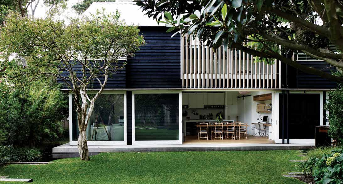
drop box
ARCHITECT Michelle Orszaczky
LANDSCAPE William Dangar
INTERIORS Alwill Interiors
CLAYTON ORSZACZKY
(61) 415 231 937 coarchitecture.co
FINISHES
Interior paint is Dulux Natural White. Joinery handles from Architectural Door Hardware.
LIGHTING


Lighting from Spence & Lyda, and Inlite. Hallway pendants by Hub, brass Barn
Lights in kitchen from the Specified Store, and all fans from Hunter Pacific. Stone vanity top from By Builder. Internal Carcass and Laminate from Laminex. Floorboards from Precision Flooring. Tiles from Onsite Supply + Design.
INTERIOR HARDWARE
All interior hardware from Architectural Hardware.
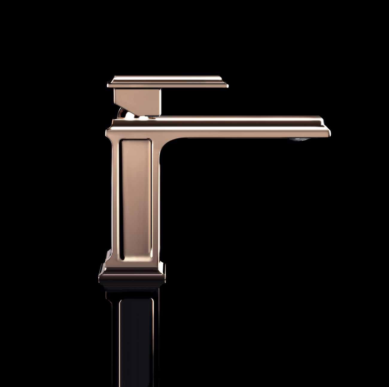
FURNITURE
Slot Coffee Table, Ceramic Glaze Side Table, Strapped Bar Stools, Slot Sofa Table, and Support Table from the Specified Store.
above | CO mPOSED AS A SERIES OF SImPLE , STACkED b OxES THE HOUSE IS A PLAy OF HORIzONTAL AND vERTICAL PLANES GIvING ONTO AN UNDERSTATEDLy LUSH PRIvATE GARDEN DESIGNED by WILL DANGAR issue #32 habitusliving.com




*NEWLY OPENED* VICTORIA Selection Gallery 335 Ferrars St Albert Park Ph: 03 8696 4000 NEW SOUTH WALES Selection Gallery 1E Danks St Waterloo Ph: 02 8572 8500 QUEENSLAND Selection Gallery 94 Petrie Tce Brisbane Ph: 07 3369 4777 *OPENING SOON* WESTERN AUSTRALIA Selection Gallery 12 Sundercombe St Osborne Park Ph: 08 9446 8255
embraces the essential need for beauty and style in everyday living with its refined design and cleverly conceived functions, contributing to enhanced wellness. Eleganza in the bathroom becomes Wellness.
Eleganza
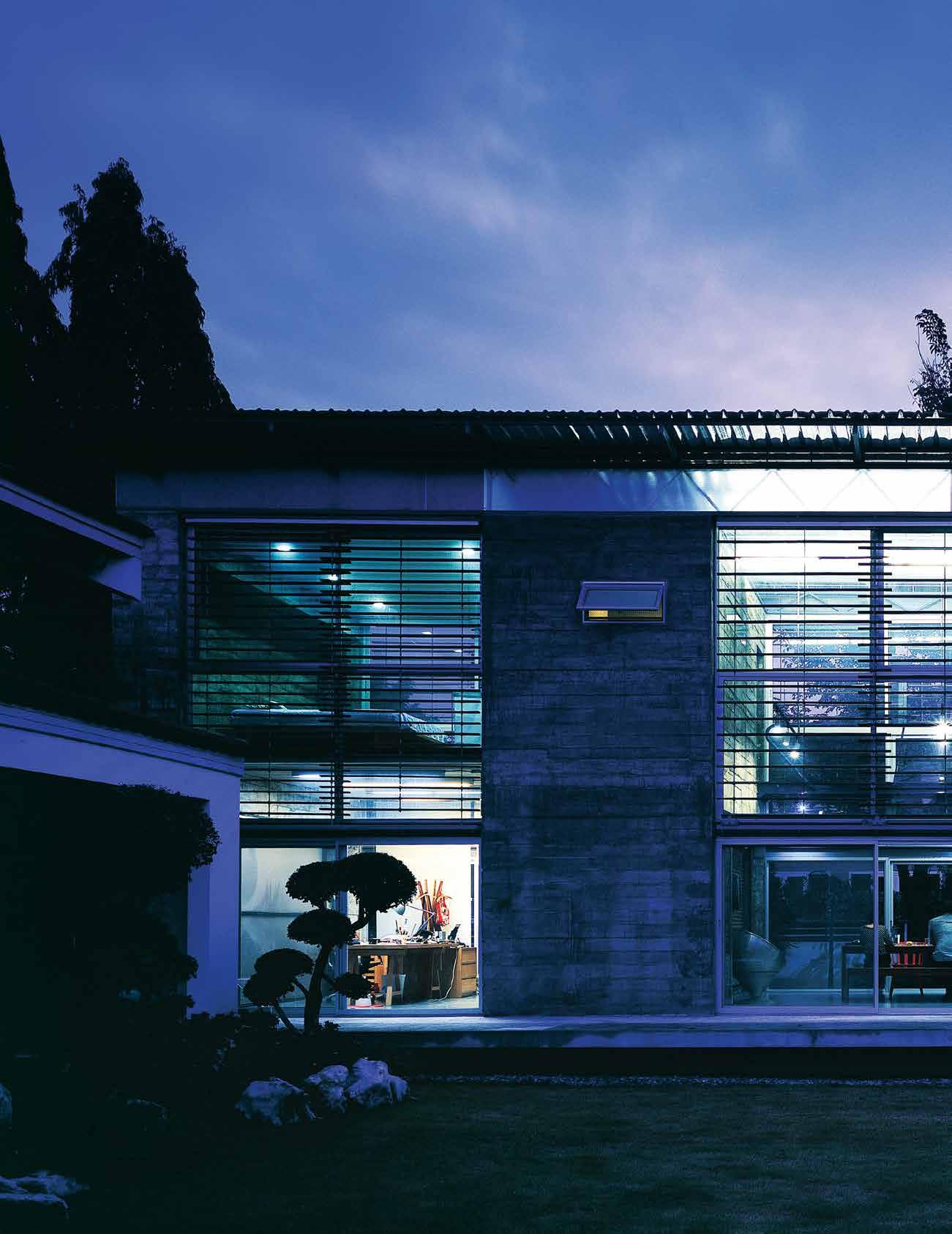
issue #32 habitusliving.com
Backyard brutalism
Faced with a brief for a small house for two siblings to be built on a plot behind their existing family home, Bangkok-based architects ThingsMaTTer turned to an unlikely source for inspiration.
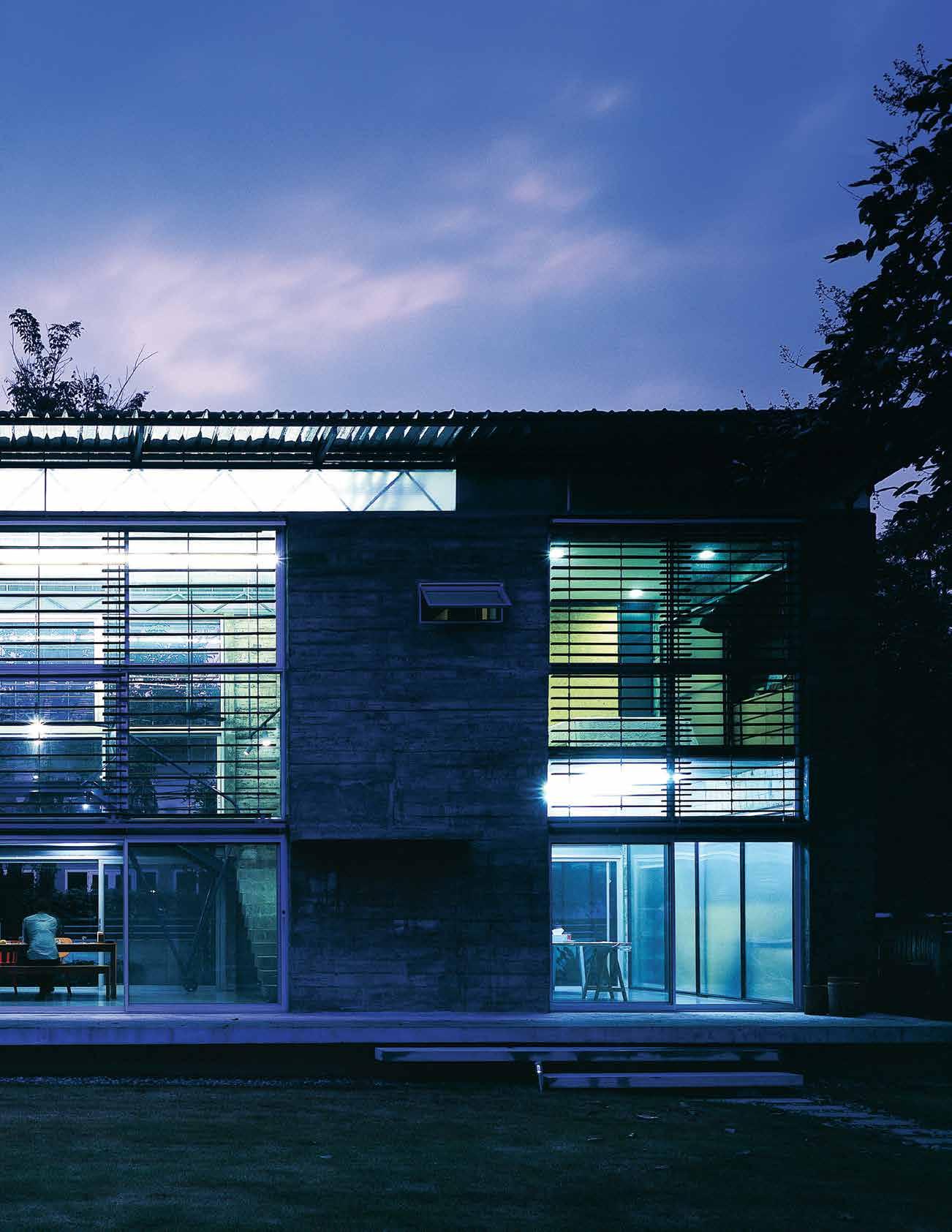

Tex T Andre A O’driscOll | PhOTO gr APhy Pir A k Anur A kyAwAchOn
3 . on location # 157
Raw, exposed concrete might not be the first building material that springs to mind when you think of small, flexible living spaces in suburban settings. But for Bangkok architects ThingsMatter it was the first and only choice for the house they came to call ReBrute.
Used to great effect in the Brutalist architecture of the fifties, sixties and seventies to suggest power and permanence for largescale government and institutional clients, concrete is by nature strong, stable and commanding. What’s most surprising about ReBrute (named in acknowledgement of the raw, unfinished béton brut concrete walls that define the space) is how well it works within its suburban environment and how warm and airy the finished house feels.
Commissioned by Muay Parivudhiphongs, a photographer, designer and founder of the design brand Taxidermy (and a friend of one of the architects), the house needed to accommodate living space for her and her younger brother as well as a studio and bedroom for each of them.
Architect Tom Dannecker explains that this design is the second they produced for Muay. “My business partner Savinee Buranasilapin and Muay have been friends since the early 2000s when both of them returned to Bangkok after years abroad. We actually designed a different house for her early on, but starting
her own business intervened, and it was never built. Half a decade later, she was ready to build, but her needs had changed; her business had grown and she’d be sharing this house with her brother. We started over, and the result is a much better house than that first one would have been.”
The plot is just 5.2 metres by 19.6 metres and stretches along one side of the garden of the family house. Finding ways to incorporate the existing house proved to be one of the biggest design challenges. “It was difficult to find the right way to approach the older house,” Tom says. “It doesn’t have historical or architectural value, or even much sentiment attached to it. It will be replaced long before the new house we designed, so it would have been silly to match it or treat it too preciously. At the same time, it’s a perfectly useful house with people living in it.”
The resulting design incorporates three distinct spaces enclosed by four thick, raw concrete walls. The middle section is the biggest and double height. It’s intended as a flexible living space that can function as a living room, dining room and entrance hall. On either side of it are the siblings’ studios, accessed via specially designed steel doors, with their own private bedrooms above them.
The thick, concrete walls allowed for the kitchen, bathrooms and storage closets to be recessed within them and are capped by a steel roof structure supporting a thin corrugated
pRevious | EvEning viE w from across thE lawn sharEd with an old Er hous E opposiTe | thrEE tiErs of windows Enclos E a two-storE y living room, giving E ach shEE t of glass a comfortablE human scalE
issue #32 habitusliving.com

3 . on location # 159
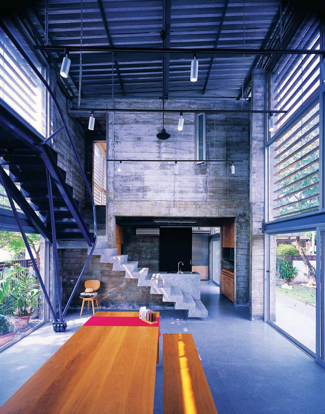
above | StairS
a
| a
SS
i S
aS a
issue #32 habitusliving.com
within
concrete maSS are caSt with wallS and countertop; StairS acro SS the void are bent from Steel. opposite
Stair-bridge acro
the living room
detailed
piece of lightweight furniture.
metal roof that seems to float above the building. Strips of striated polycarbonate panels (employed in part because they are lighter and cheaper than glass) help bring in light and contrast nicely with the dense, solid walls.
The central living space opens up on either side via sliding aluminium windows, which add a welcome sense of dynamism to the design. This flexibility also allows ReBrute to work within its environment and meet the needs of the client and her family. “As a designed object, ReBrute is freestanding, with an assertively distinct appearance, but as a social space, it’s an extension,” explains Tom. “It lets the younger generation have its own space and identity, while not entirely rejecting the local tradition of extended families living together.”
There’s a similar principle behind the bespoke panels of wooden slats, which help manage the natural light and, together with the interior blinds and external foliage, enable the brother and sister to create a sense of privacy as desired without compromising the airiness of the central space, and to open it up when they prefer.
The natural wood also helps to balance the concrete walls, but the space is further softened by a few elements that suggest the natural world in surprising ways. The steel bridge which connects the two bedrooms is painted blue to echo the sky, while the form of the staircase which links it to the central living space was derived from the structure of a tree outside in the garden.
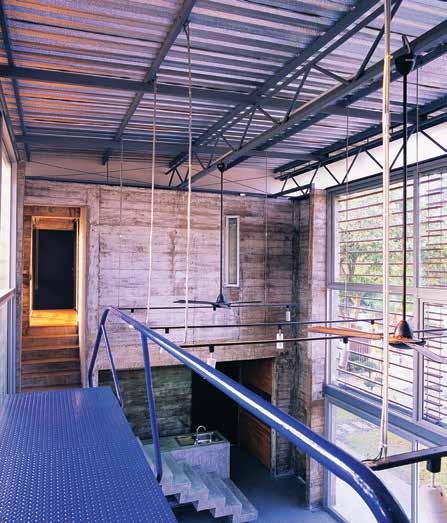
The central living space opens up on either side via sliding aluminium windows, which add a welcome sense of dynamism to the design.
3 . on location # 161
Not that the house was designed to blend seamlessly into the natural world. It was always intended to be more of an expression of human industry than a reflection of the environment.
The bridge and staircase might contain elements of their natural surroundings but they remain inherently industrial objects, sharply cast in metal. Similarly, the rawness of the concrete walls is an honest representation of their construction process, right down to the air bubbles, exposed aggregate, drips and mis-pours that give them their unique texture and character.
Creating their distinct, rough-hewn look did cause a few headaches, however. “Honestly, the concrete texture was an ongoing source of anxiety,” Tom says. “While béton brut has a rich tradition in Western modernism, its transparent logic is contrary to the aesthetic sensibilities of Thai culture, which prizes smooth, finished surfaces above all else. Our client understood, and remarkably, she found a contractor who understood it too. But would the neighbours, or the extended family?”
They also had to rely on individual contractors to translate their vision, and while not all of them interpreted it as the architects might have liked, the variations and differences ended up adding to the whole effect. “We all grew to love the wall textures in all their disarray.

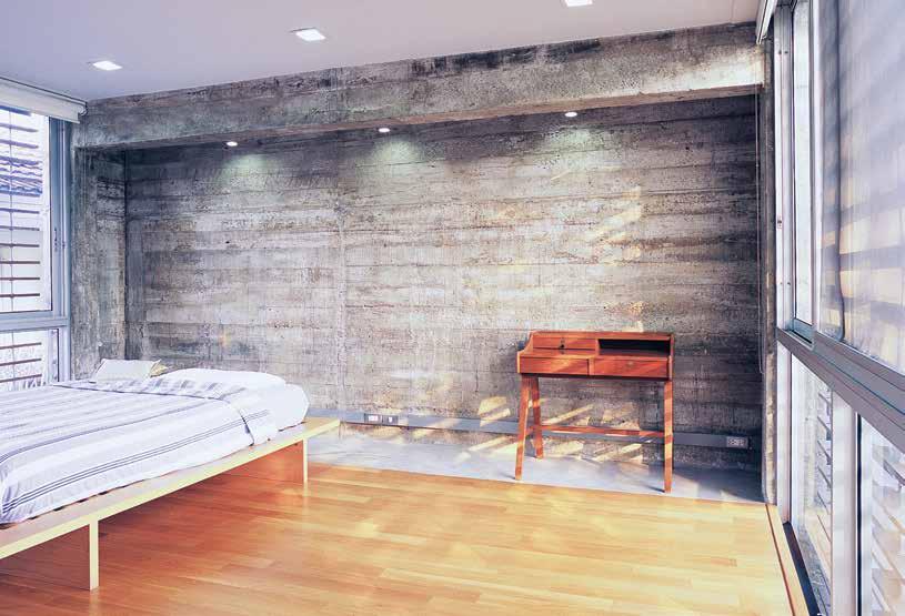
above | In bedrooms, wood floor planks echo formwork vI s Ible In wall textures. b elow | neat whIte tIles and smooth corners wrap bathrooms, In contrast to rough concrete ceIlIngs. opposite | floor plan. issue #32 habitusliving.com
2 3
LIVING ROOM KITCHEN WORKROOM 1
BATHROOM BEDROOM EXISTING HOUSE 4
1. living room 2. kitchen 3. workroom 4. bedroom 5. existing house 6 2 1 3 3 4 4 5 5 UPPER FLOOR GROUND FLOOR 4 3 . on location # 163
5 6
The surfaces are a registration of much more than the properties of the banal building materials that went into them. They say something about the people who made it, and the relationships between all of us. The texture ends up being a lot more poetic, and more inseparable from the design of the house, than we had consciously intended.”
The houses and apartment buildings that surround ReBrute are predominantly modern concrete buildings that have been plastered and painted to disguise their raw material. In showing its concrete construction in the rough, without embellishment or adornment, the house feels grounded and true. You get the sense it will age beautifully, embracing the passage of time without the need to maintain any pretence of smooth, superficial perfection.
The heavily textured walls also stand in sharp contrast to the glossy finishes that typify Bangkok’s commercial environments where the siblings spend a large portion of their working lives. Both the architects and the inhabitants describe the effect as cosy, rather than cold, and after a long day spent in malls and shiny office blocks, the soothing solidity of unfinished concrete offers a calming respite.
drop box
ARCHITECT ThingsMatter
ARCHITECT TEAM Savinee Buranasilapin and Tom Dannecker
STRUCTURAL ENGINEER Anantana Wuttisomboon
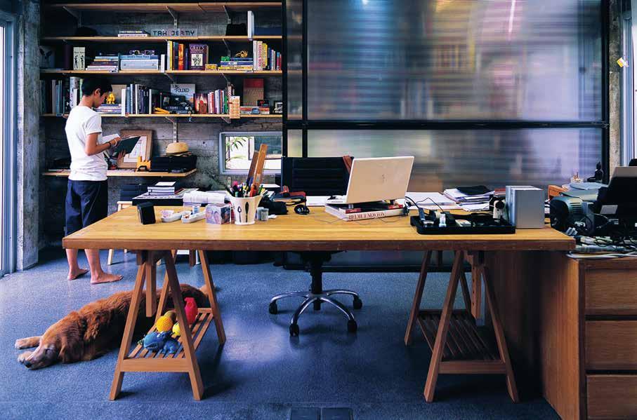
CONTRACTOR Choochai Pawsomboon
THINGSMATTER (66) 89 925 2516 thingsmatter.com
FINISHES
Reinforced concrete, bricks, terrazzo, steel, engineered wood, polycarbonate and glass.
above | S LId ING p OLyCARb ONATE pANELS IN STEEL FRAMES d E- CLUTTER OFFICE SHELvES by b LURRING THEM RATHER THAN CONCEALING THEM issue #32 habitusliving.com
Want the latest design and architecture news on the go? Binder is an exclusive digital library of leading design magazines, custom publications and design catalogues. binderapp.com.au iPad is a trademark of Apple Inc., registered in the U.S. and other countries. Download the Binder app for access to Habitus digital editions on your iPad. Delve into our archive to discover our back issues or collect our annual kitchen and bathroom specials.
Of European descent
The global lifestyle of the resident led to a mixed architectural and interior aesthetic in this home in Glebe, with clever, light-filled additions designed by VirGinia KerridGe architects
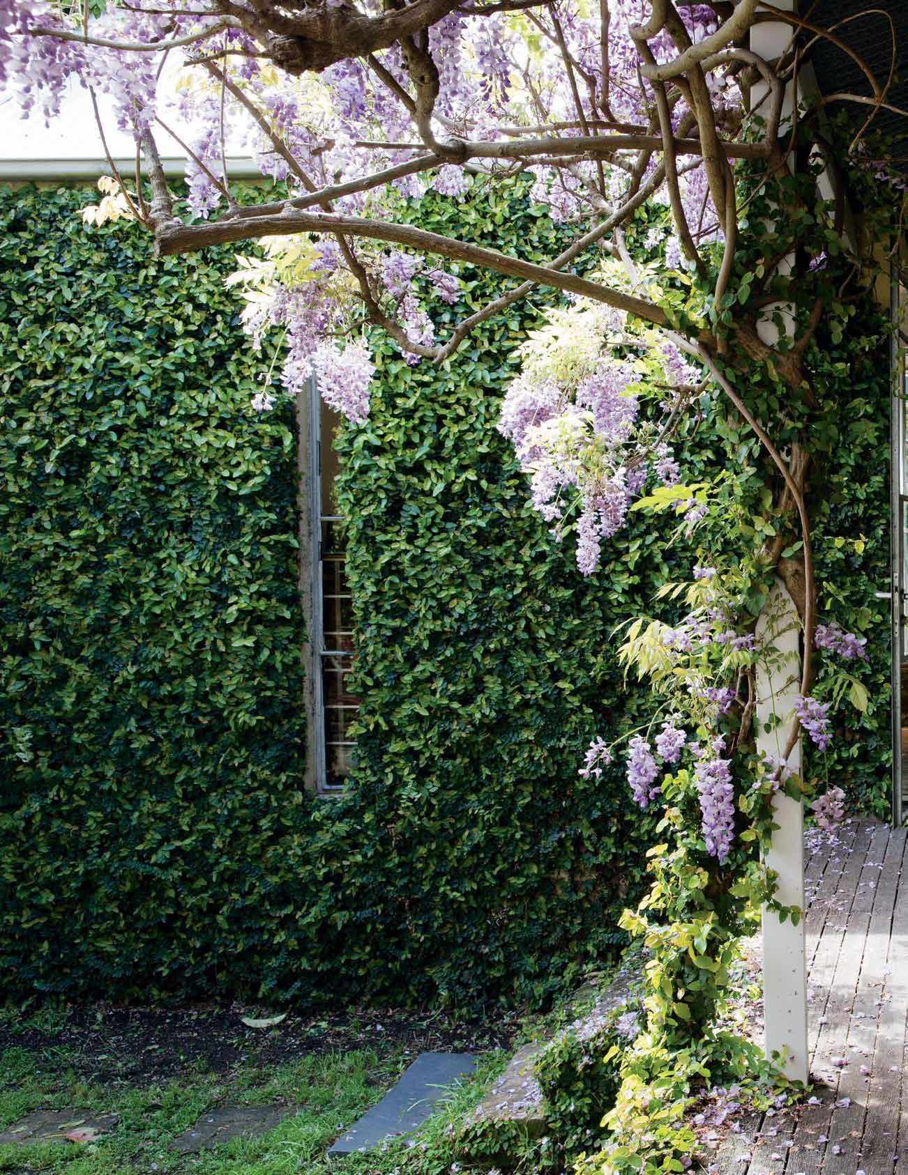 Tex T Jenna Reed Bu R ns | PhoTogR a Phy Michael n icholson & Jason Busch
issue #32 habitusliving.com

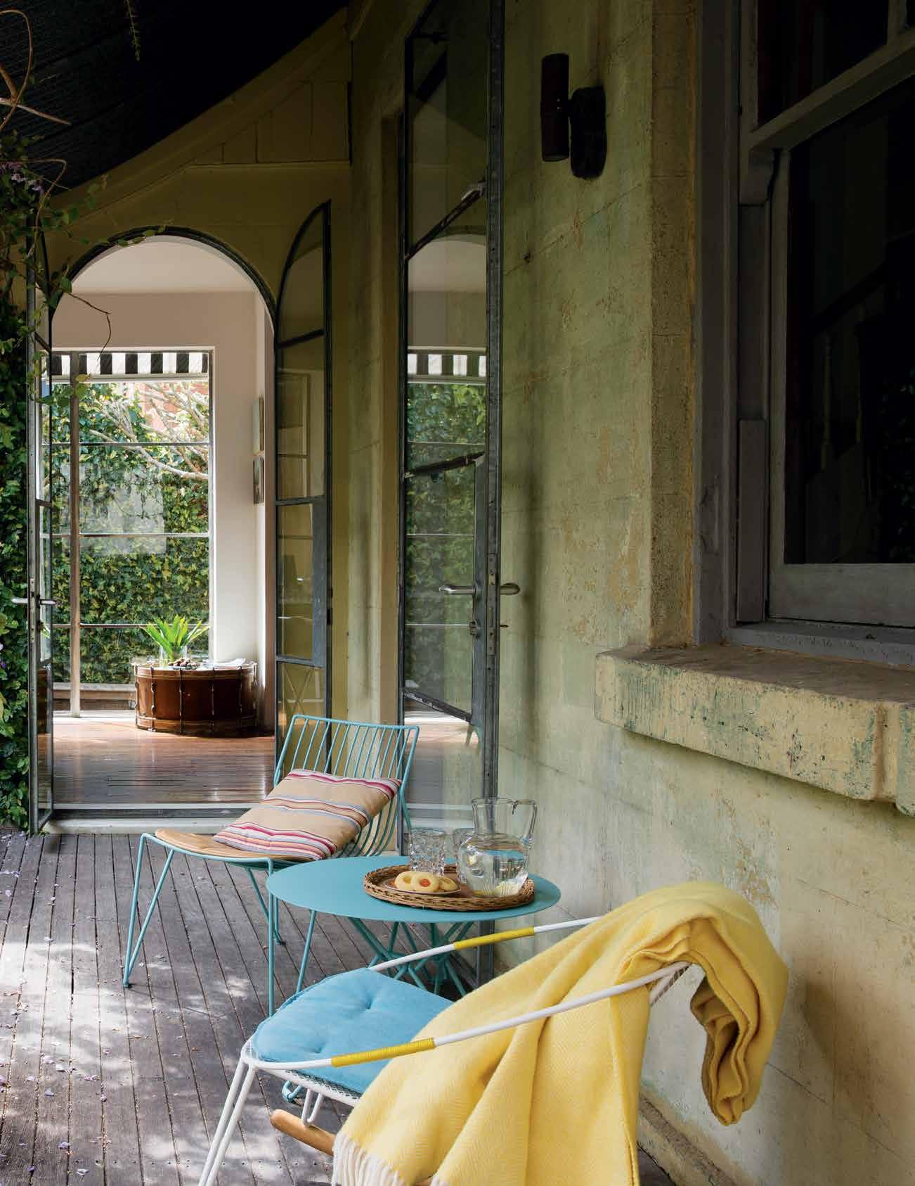
# 167 3 . on location
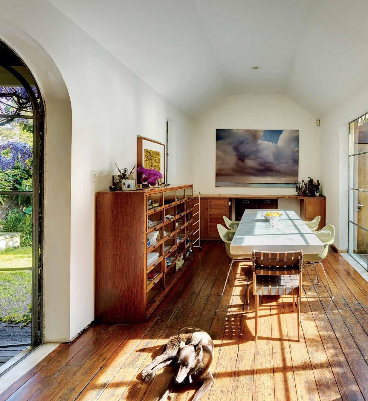
G ne.
| a
issue #32 habitusliving.com
previous | Glazed steel-framed doors were inserted into the rear rooms of the 1870’s house in a response to the owner’s request to capture more li G ht. above | the kitchen win G is now a sun-filled dinin G room that doubles as a jewellery studio. Glazed doors on the northern side of the room open onto a timber deck that leads to the new bath house. the paintin G on the end wall is by sydney artist chris l an G lois; above the cabinet is a work by rosalie Gascoi
opposite
new
upstairs bathroom pops out of the roofline to read as a contemporary dormer window
Over the last decade, jewellery designer and communications advisor Rosemary Luker has spent many months overseas. For her, Paris is now like a second home. There she has a group of close friends, her own bicycle to navigate the cobbled streets, and a studio workspace she can use. But it’s not just Paris where she spends time. One of her close friends lives in Palermo, Sicily, and she visits often, enjoying its ‘decaying baroque madness’. Another resides in Stockholm — a place of land and water, abundant wild nature, a beautiful old city centre and cutting-edge contemporary design.
While each city has something different to offer, perhaps it is Stockholm that most closely mirrors what Rosemary loves about life in Sydney and the character of her renovated Colonial Regency house in inner-city Glebe, which she shares with her adored kelpie Tilly and a constant stream of house guests. “The choice was between here and the eastern suburbs,” recalls Rosemary. “I chose Glebe because of its trees, its culturally rich and diverse population, and this house’s connection to the ground and the cycles of nature.”
The house, originally called ‘Terra Bella’, was one of two identical brick cottages built side-by-side by prominent colonial surveyor Ferdinand Reuss in the 1870s. (Sadly its twin
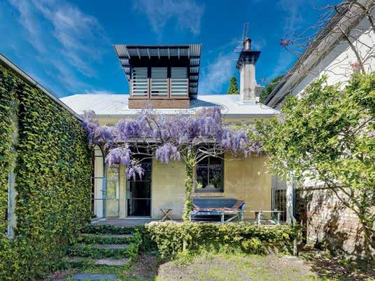
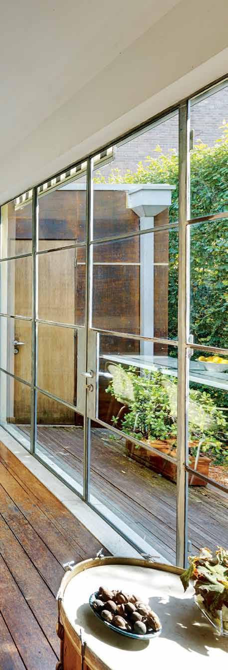
3 . on location # 169
was demolished in the 1960s when heritage mattered little.) When Rosemary bought the house more than 15 years ago, it was in a derelict state, with birds roosting in the two upstairs bedrooms tucked under the slate mansard roof. Downstairs were four rooms and the bathroom was in an outhouse in the back garden. Only the kitchen at the rear had been recently ‘refurbished’; its new knotty pine interior resembling, in Rosemary’s words, ‘a Swedish sauna’.
She called in architect Virginia Kerridge with the brief to capture northern light, improve the internal flow of the house, and create two workspaces: one for her jewellery, and a separate office for her work as a communications advisor to architects.
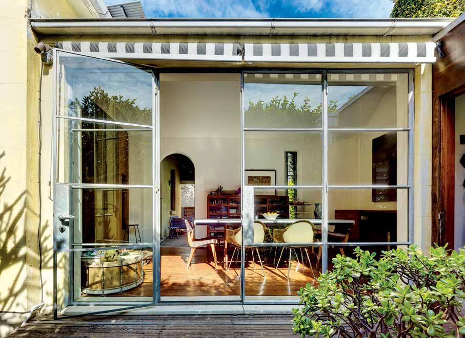
“Virginia did all that, but kept the sense of age and layering to the house,” says Rosemary. “In Europe you see very old buildings with contemporary elements. At its best, they know how to make it work.”
The wall separating the drawing room and dining room was removed to create a larger living space and the main rooms in the house were carefully stripped back to reveal their original detailing and finishes. Other internal walls were retained to showcase Rosemary’s
In Europe you see very old buildings with contemporary elements. At its best, they know how to make it work. ROSEMARY | RESidE nt
above | Surrounding the zinc-topped table in the dining room are vintage e ameS dining chair S and two original d ougla S Snelling chair S a black and white Striped awning can be lowered to S hade the north-facing window S opposite | the bath hou S e form S a S ingle-Storey link between the original kitchen wing and the new two-Storey office built at the bottom of the garden. c lad in panelS of cement S heet and ply, the building’ S materialS reference the old fibro and timber S hed that once Stood there.
issue #32 habitusliving.com
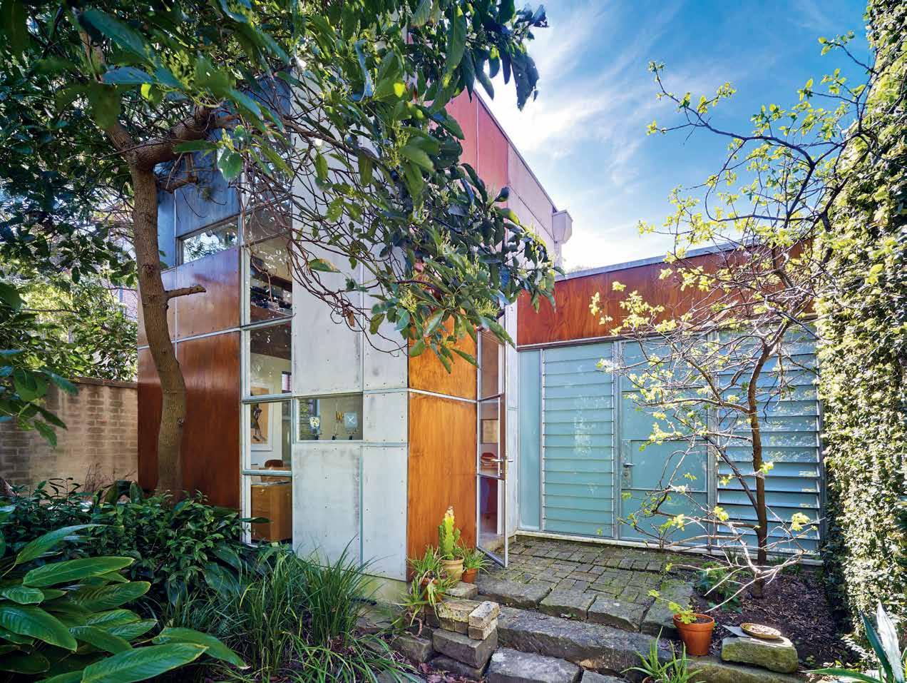
3 . on location # 171
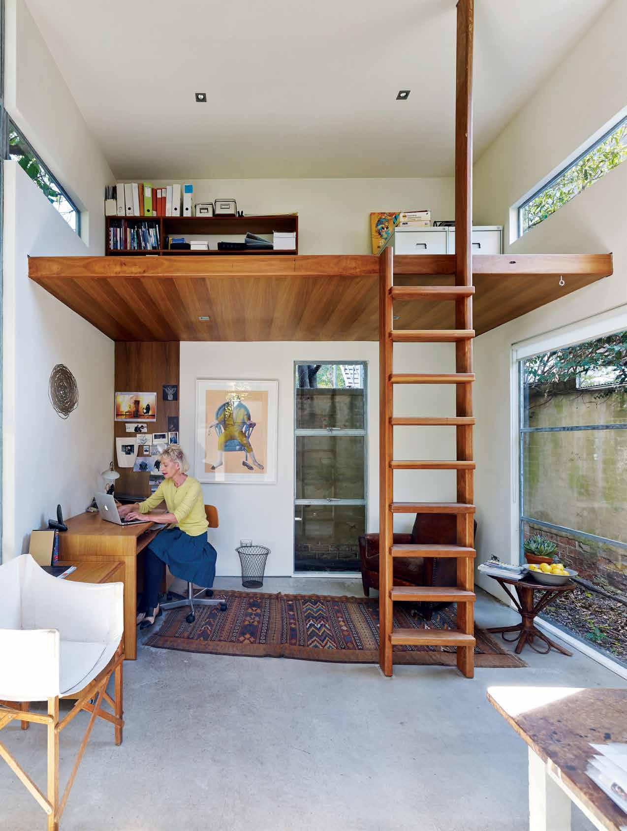
issue #32 habitusliving.com
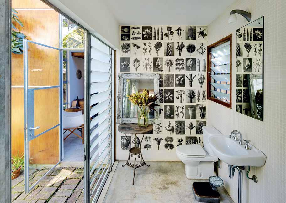
The
opposite | A mezz A nine pl Atform in the office re Ached by A hA rdwood l A dder provides A dditionA l stor Age spAce, but cA n A lso be used A s extr A sleeping AccommodAtion if needed. An A rtwork by m icA h lexier h A ngs Above the desk. above | o pAque gl A ss louvres in the bAth house Allow Airflow And glimpses of the gA rden while m A intA ining privAcy. the end wA ll h A s been pA pered with bl Ack And white kArl b lossfeldt prints. 3 . on location # 173
house has been allowed to retain its age-worn patina – the grain and layers tell its story.
considered art collection. The house has been allowed to retain its age-worn patina — the grain and layers that tell its story. “Rosemary’s house is a lovely juxtaposition of old and new,” says Virginia. “I hate it when old places show no semblance of what they have been.”
The contemporary interventions, where they occur, have been kept simple and elegant, in keeping with the house’s quiet sense of self. A tiny but perfectly formed bathroom servicing the upstairs bedrooms leads off the landing, popping out of the roof plane like a dormer window. Downstairs, the kitchen was moved back one room into the principal part of the house and now leads into a new, airy workspace-cum-dining room where Rosemary designs her jewellery. “I really like spaces being used for multiple things, and the idea of friends coming to dinner and sitting in my studio. I don’t see any reason to compartmentalise my work, plus the light here is really good.”
On the northern side of this room a wall of steel-framed glazing opens onto a deck leading to the new bath house. A glazed door on the room’s southern side leads onto the original rear verandah, draped with a wisteria vine.
Beyond the bath house, and accessible from the garden, is a double-height studio office, with a lofty ceiling and mezzanine storage platform. Included in the original plans, the studio was only added a few years ago.
“Virginia has an extraordinary sense of volumes and looks at things in quite unexpected ways,” says Rosemary. “I originally asked her to put another level on the top of the dining room but she came back with the idea of the bathhouse and the studio. Neither was what I had imagined and they are completely perfect. She’s extended one side of the house the full length of the site and made two more volumes that directly reconnect the house to the garden, rather than having the house sitting as an isolated object in a space.”
This solution of stretching the house along the northern boundary also saved the original kitchen chimney, no longer attached to a flue inside the house but still an important, original, vertical roof element. “Every house is a reflection of the people who are living in it,” says Rosemary. “There’s a part of me that’s utterly Australian. Growing up in the country I need wind and vast skies and a connectedness to wild nature – all of those things.
issue #32 habitusliving.com
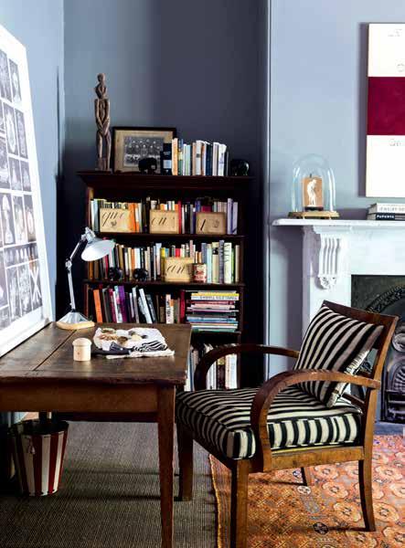
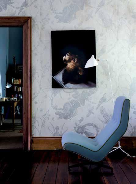
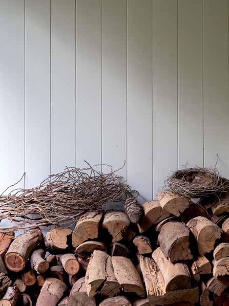
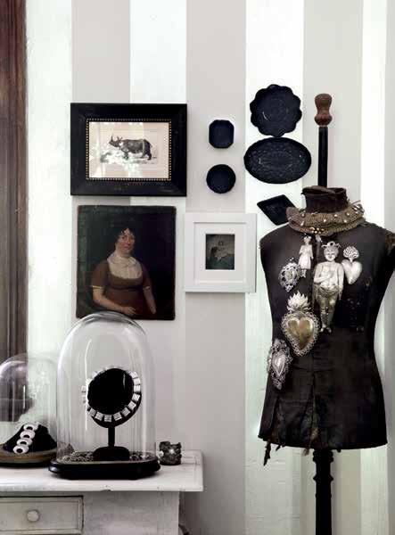
A
A s A
h A
A nd
A
A
A r A
rAy A nd c h A rles eA
A
l A
lly m A de
3 . on location # 175
clockwise from top left | A stAck of firewood by the front door; the study At the front of the house is
lso
used
guest room; the
ndpA inted grey
white striped wA lls of the originA
l
form
l dining room form A crisp bAckdrop to A collection of sm
ll Artworks And objects;
re
mes ch
ir recovered in pA le blue boiled wool sits below A work of A lion’s he A d from j ustine
c
ooper’s sAved by s cience’ series. the floor
mp by s erge m ouille wA
s
originA
in the 1950’s.
GROUND FLOOR PLAN FIRST FLOOR PLAN VERANDAH ENTRY KITCHEN JEWELLERY STUDIO / DINING 1 2 5 6 LIVING ROOM LIBRARY / GUEST BEDROOM 3 4 LAUNDRY BATH OFFICE / STUDIO BEDROOM 7 8 9 0 6 0 0 1 1 1 3 9 9 7 4 5 8 8 2 issue #32 habitusliving.com
“And then there’s another part of me that’s quite considered and very focused on interiors and art, which is much more European. This house reflects both those aspects, as does my jewellery. I spend a lot of time in Europe and I admire many things about the way Europeans approach architecture and allow buildings to evolve with the scars and the signs of what they have been.”
After a recent two-month stay in Paris Rosemary was ready to come home. She missed the Australian light and the harbour, and the aspects and views of the horizon that a hilly suburb like Glebe brings. And she missed her house. “Architecture and living spaces are as much about the experience as they are about the object,” she says. “I’m not really interested in architecture as a status symbol or a symbol of luxury. For me it’s more important how the spaces make you feel, and how you respond to them emotionally. Good architecture can delight and endlessly surprise you, as can a beautiful garden. This house is certainly a large part of my life, and for the moment it suits me perfectly.”
drop box
ArchiTecT Virginia Kerridge
Architects
ArchiTecTure TeAm Virginia Kerridge, Cath Williams and Mark Tendys ProJecT TeAm Lynda Roberts and Fiona McLean builder Dale Van Haren Virginia Kerridge a rchitects (61 2) 9699 3487 vk.com.au
finishes Hardwood ply from Big River Timbers, lead panels, tessellated tiles, compressed FC sheeting.
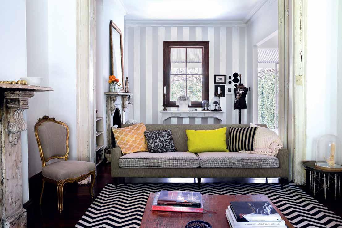
3 . on location # 177 above | The living room inTeriors were designed by Amber roA d A nd fe AT ure A vinTAge sofA A nd A 1950’s me TA l Ar A bic side TA ble found in A fle A m A rke T
Bisschop arrives in Australia
Leading German architectural hardware company, P. Bisschop has arrived in Australia. Steeped in rich history and tradition, and established in 1889, the timeless luxury fixtures outfit has chosen Australia as an important point of its expansion outside of Europe.
For P. Bisschop, Australia was a logical choice for its welleducated design community, and its taste for Bauhaus, Art Deco, Art Nouveau and modern architecture – styles at the very heart of the company. “Having grown a successful brand based in Velbert, north-west Germany for almost 130 years with a solid distribution to European markets, we felt it was time to expand our business in to new, challenging markets that value excellent, timeless design,” says Bisschop director, Dr. Kersten von Oldenburg.
P. Bisschop’s fittings are featured in high-end residential projects throughout Europe, such as the Federal Chancellery and Hotel Adlon in Berlin. Centred primarily on ageless, classic design, P. Bisschop products are an ideal, seamless addition to historical buildings as well as modern timeless residences.
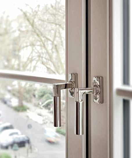
“Our success lies into staying true to original hardware designs combined with state of the art manufacturing facilities,” adds Dr. Oldenburg. “We add the finishing touch to timeless interior designs and offer our customers high-end products that give the Australian houses a contemporary and sustainable finishing.”
P. Bisschop products now have a 2-4 week lead-time in Australia, and are on display at Mother of Pearl and Sons showrooms in Sydney and Melbourne. Specifiers in Australia will also be supported by P. Bisschop’s Australian brand management team MonoPool, who will offer consulting services to architects, designers, builders and project developers.
For P. Bisschop brand enquiries, please contact MonoPool.
habitus promotion › P. Bisschop #178 issue #32 habitusliving.com
Above LeFT | BAUHAUS WEIMAR 1920/R. Above RIGHT | BAUHAUS WEIMAR 1920/8004
P. Bisschop | monopool.asia info@monopool.asia | +61 498 880 069
Renovator’s delight
Attracted by the breezy urbanity of Singapore’s Tiong Bahru, an expatriate couple have refurbished a 1980s apartment with style and sensitivity to what works in a tropical climate.
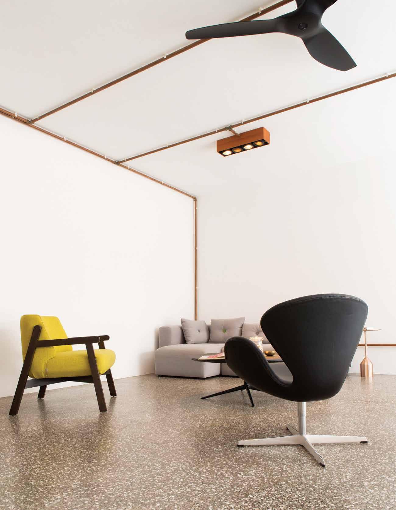
Tex
T Paul McGillick | PhoToGra Phy BreTT BoardM an
3 . on location # 179
In 2008, Mimi Daraphet, an Australian architect, and her partner, Dan Foreman, a New Zealand product and interior designer, moved to Singapore to gain experience in the Asian market. That was their first journey.
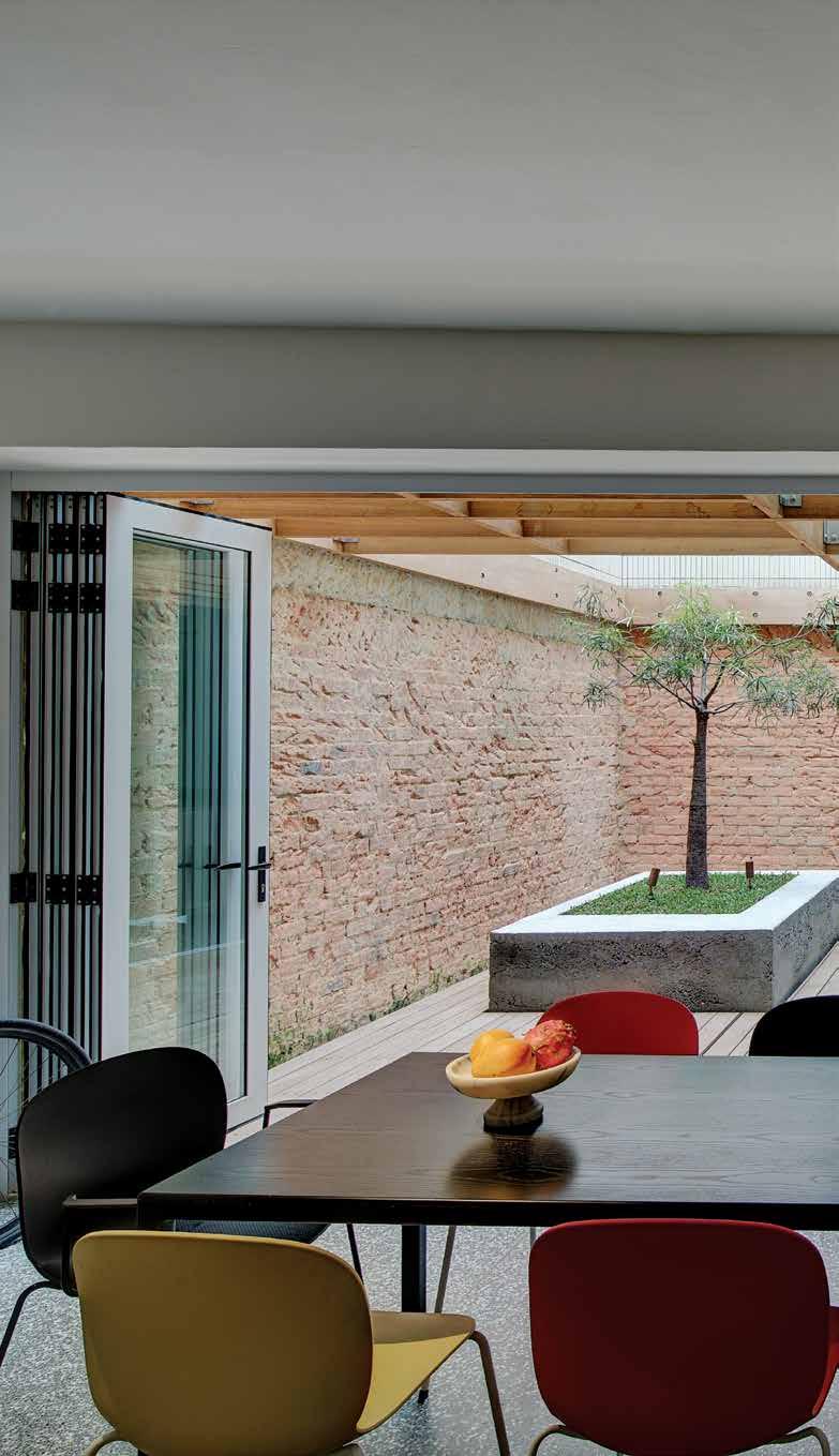
Their second was the acquisition of an apartment in Tiong Bahru in 2011 along with the four years they have since devoted to refurbishing it. Both now work for Arup Singapore – Mimi as an architect specialising in sustainability and facades, and Dan as their Lighting Leader. So, they were the perfect team for this renovation.
But, as we all know, designing a place is the easy bit. Then comes the build itself. In Mimi and Dan’s case, as expatriates, just getting to purchase the apartment was a challenge. Noncitizens are restricted in what they can buy in Singapore. But Mimi and Dan had lived in Tiong Bahru since arriving in Singapore and were determined to stay there.
So, there’s a back story and that back story begins in Tiong Bahru, one of Singapore’s most charming and historically rich quarters. Formerly, home to many cemeteries (tiong bahru means ‘new cemetery’ in Bahasa Malaysia), it became home to what is now Singapore’s oldest housing estate, begun before WWII. Its mix of art moderne housing blocks (with their rounded balconies, spiral staircases, flat
prevI ous | The aparTmenT ’s aesThe Tic derives from a conversaTion be T ween 1980's re Tro and conTemporary cool wiTh a dash of indusTrial. above | The living/dining/ kiTchen space opens up around The Terrace aT The boTTom of The lighT well. issue #32 habitusliving.com

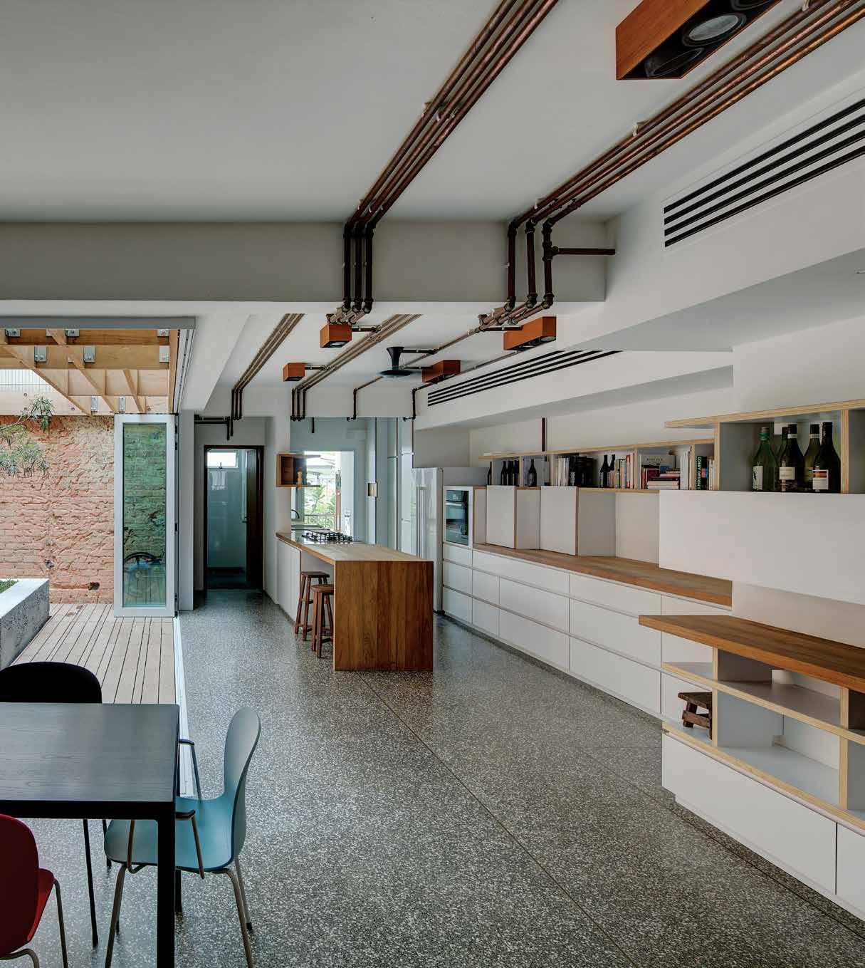
3 . on location # 181
The copper pipes – for both wiring and water – become a kind of abstract artwork, emphasising the linearity of the space.
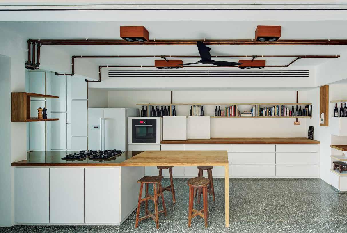
Above | Seen aS a cro SS-S ection, the central S pace i S a dynamic de Stijl en S emble of horizontalS , verticalS and tonal contraStS o pposite | d etail of the copper pipeS which deliver water, electricity and a Striking ab Stract deS ign giving the apartment a graphic coherence.
issue #32 habitusliving.com
rooves, light wells and connecting green space) and Straits Chinese shophouses now make it much sought after – an appeal enhanced by the imaginative adaptive re-use of many of its heritage shopfronts.
After a year of “stalking potential homeowners or renters around the neighbourhood”, Mimi and Dan were able to buy a walk-up apartment in a building dating from the 1980s, opposite some typical conservation art moderne buildings in Yong Siak, a lively precinct of bookshops, boutiques, a French patisserie, coffee shops and restaurants.
The apartment was one of nine in the building, sitting above three commercial spaces, including a yoga studio. At 160 square metres it was unusually large in a conservation context (they are normally 112-140 square metres). It is a through-apartment with a light well to one side. Together these features facilitate enough cross-ventilation to minimise the need for air-conditioning. Originally, the apartment contained three bedrooms, before the living room was converted into two more bedrooms. Given there were just the two of them with the occasional family member or friend staying, Mimi and Dan decided to make it into something “they would prefer to live in”, so they knocked down the walls, made it open plan and integrated the courtyard with the restored living/dining/ kitchen space.
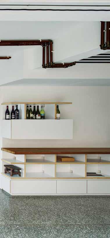
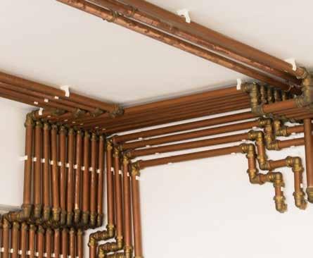
3 . on location # 183
“As Aussies living in Asia,” says Mimi, “our brief was simple: to create an indoor-outdoor space that utilised natural ventilation.” The other aim was to use materials suitable for a tropical climate. “We chose Burmese teak, seasoned but left raw,” says Mimi, “for its high oil content and its extreme stability against wear, damp, decay, termites, acid and alkali.” Other materials included white laminated plywood, polished concrete flooring, copper and brass.
The ceiling is just the concrete slab with exposed beams and they have made a feature of the copper pipes – for both wiring and water – which become a kind of abstract artwork, emphasising the linearity of the space and so creating a sense of depth and space. It also sets up an intriguing dialogue between an industrial character, the highly finished joinery and the mix of materials.
The kitchen, a ‘dry’ western one, has been moved away from its traditional Asian place at the back to become part of an integrated living/ dining/ courtyard space. A guest bedroom and ensuite is beyond the kitchen on the Yong Siak side, while two other bedrooms are positioned at the other – quieter – side of the apartment.
However, these two rooms function as two home offices, effectively two wings with the ‘master bedroom’ in the middle and the ensuite behind the bedhead.
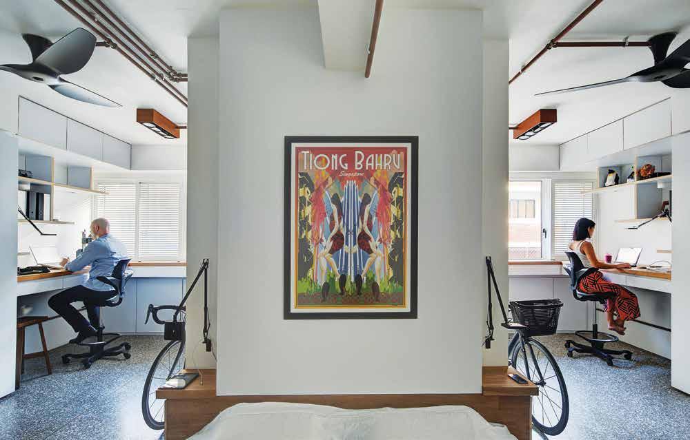
Unsurprisingly, as design professionals, Mimi and Dan had clear views from the start as to what they wanted. This became central to their ‘second journey’ – the drawn-out process of getting the job done.
Mimi explains that, in Singapore, contractors prefer to work for a design firm rather than directly with the client. Clients have a habit of being ‘emotionally involved’ in their projects and can be ‘demanding’, when contractors (let’s face it – anywhere in the world) prefer to stay in their comfort zone doing what they always do and with the materials they know.
So, the contractors Mimi and Dan approached initially were alarmed to find they were both client and designer. “The challenge,” says Mimi, “was finding contractors and the materials we wanted to use which was different to what was considered normal renovation in Singapore. We went through four electricians before finding an ex-plumber who found joy in running electrical cabling through copper pipes.”
above | The cenTral volume conTains an ensuiTe and acTs as a bedhead separaTing The T wo home office spaces. o pposite | The de Tailing is a beauTifully rhy Thmic balance of forms and maTerials, including a re-imagining of The TradiTional window shuTTer.
issue #32 habitusliving.com
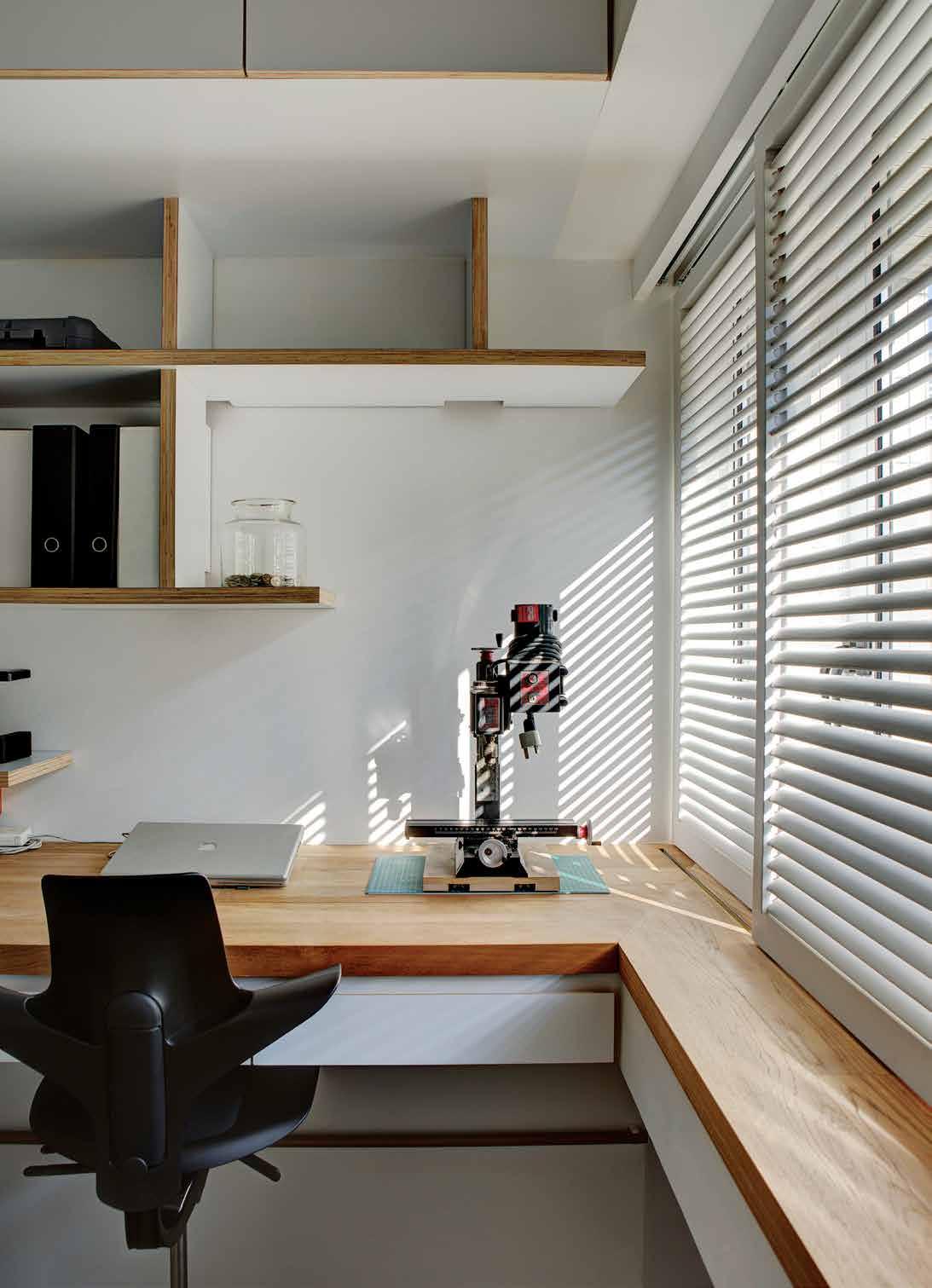
3 . on location # 185
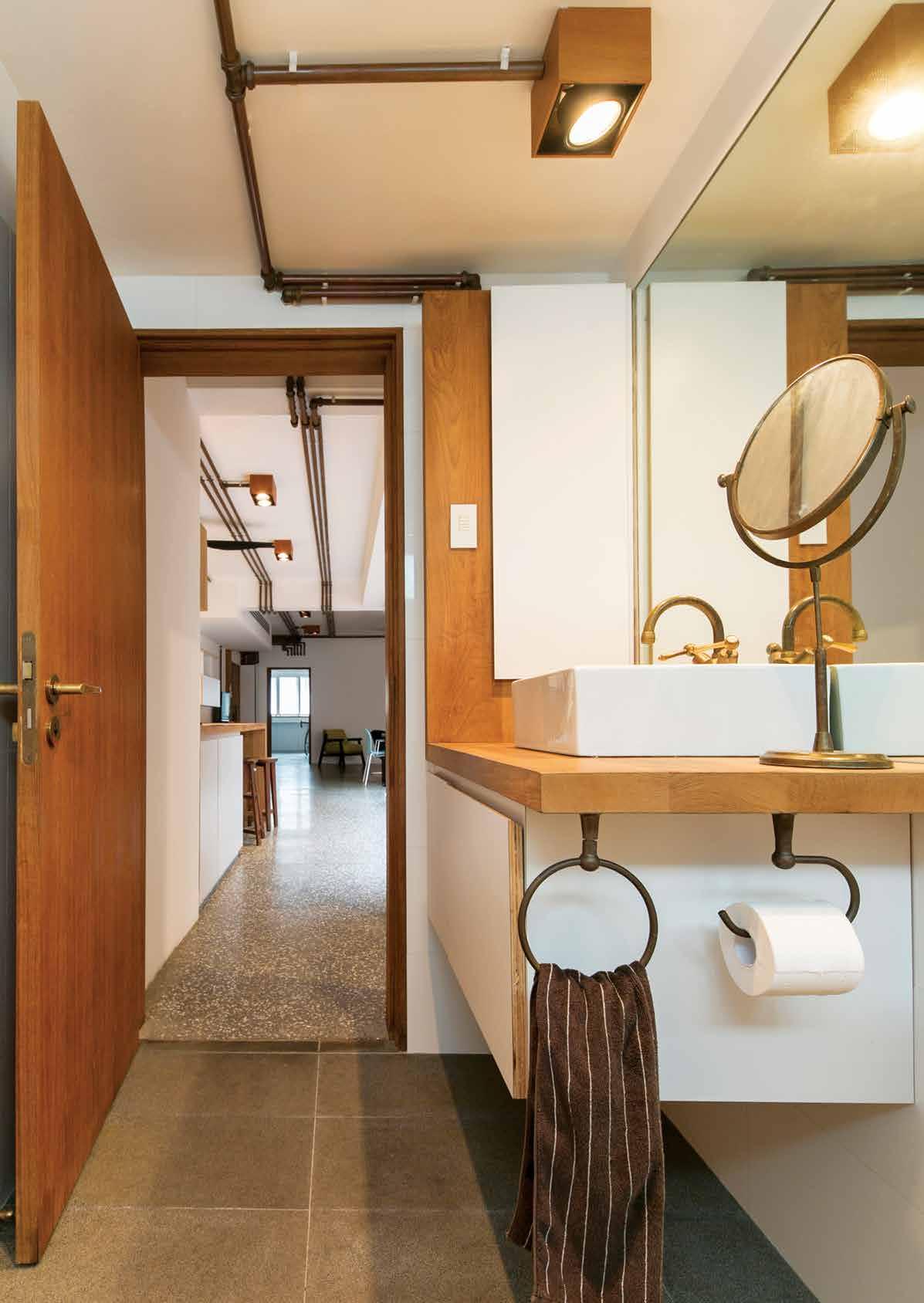
issue #32 habitusliving.com
1 9 3 7 4 5 8 q ENTRY
OPPOSITE | THE GUEST BATHROOM OVERLOOKS YONG SIAK AND PLAYS WITH INDUSTRIAL ELEMENTS, COMPLEMENTING THE ELEGANT MINIMALISM. ABOVE | FLOOR PLAN. 6 2 2 0 3 . on location # 187
BEDROOM/STUDY ENSUITE LIVING DINING COURTYARD GUEST BEDROOM BATHROOM LAUNDRY PANTRY KITCHEN 1 2 3 4 5 6 7 8 9 0 q
“With one working bathroom, half a kitchen and a laundry,” Mimi continues, “we moved into the spare bedroom at the back end of the apartment. We then observed its light and the subtle effect of the seasons in Singapore. Completing and refining the design took another two years before we embarked on an extensive tender exercise.” This was Phase 1 – demolition and getting the infrastructure right.
Phase 2 involved getting the joinery right, which required a contractor prepared to pay attention to the detailing. Mimi recalls that they spoke to ten contractors, but “many were put off by the fact we were a couple and that it was too detailed and too different for them to handle”. Having found one – and two project managers and one month over time – they completed Phase 2.
At the end of their journey, Mimi and Dan have what they regard as a unique apartment in the Singapore context, especially given its location. However, it has to be said that, in the quest for liveable and affordable homes, architects in Singapore are re-thinking old stock – often in the resurgent older preserved precincts like Joo Chiat, Gelyland and Katong –in brilliantly imaginative ways.
But this apartment is a hidden gem amongst all the other gems of Tiong Bahru.
drop box
designer Mimi and Dan Foreman
B uilders Interior Crafts, Delco Art Interior Singapore
engineers Alan Yap Engineers & Associates (demolition works)
MIMI Daraphet an D Dan Fore M an mimindans@gmail.com
F urniture
Mags sofa and Ray coffee table by Hay, Harper armchair by Jardan, Burin side table by Viccarbe, Swan chair by Fritz Hansen, T12 dining table by Hay and Noor dining chairs by RBM all supplied by BW Furniture.
lighting Lighting control system by Lutron. Ceiling lighting is Compass by Flos in teak. Bedside and desk lighting is Kelvin LED by Flos. Under shelf concealed lighting is Vario LED flex Venus from LED Linear. Courtyard up lighting is FINO LED luminaire from acdc lighting. Courtyard planter lighting is copper spike light by Lumascape.
F inishes
Custom polished concrete floor with black and white aggregate and home-made natural finish comprising of tung oil, carnauba and beeswax. Copper pipe conduits with bronze connectors sourced locally. Joinery in Formica laminate and plywood with edges finished in natural beeswax. Timber benchtop, shelves, deck, and pergola in
seasoned Burmese teak from Calvary Carpentry unfinished and sanded to a smooth texture.
F ixed & F itted
Kitchen appliances throughout by Bosch. Soft-close joinery hinges by Blum. Kitchen sink from IKEA. Roulette consolidated brass tapware throughout from CB Ideal. Toilet by Toto. Door hardware is FSB 1106 levers and roses in raw brass from Halliday+ Baillie. Pressomatic Keyless Lock front door hardware. Front door handles are raw brass sourced locally. Bifold door+windows by GH Engineering. Haiku ceiling fan from Big Ass Fans. Luxbar u-shaped closet rod with LED from Ardee lighting. Custom plantation shutters by Delco Art Interior.
OPPOSITE | MiMi and dan ride past a typical tiong Bahru apartMent B lock with its characteristic external spiral staircase.
issue #32 habitusliving.com
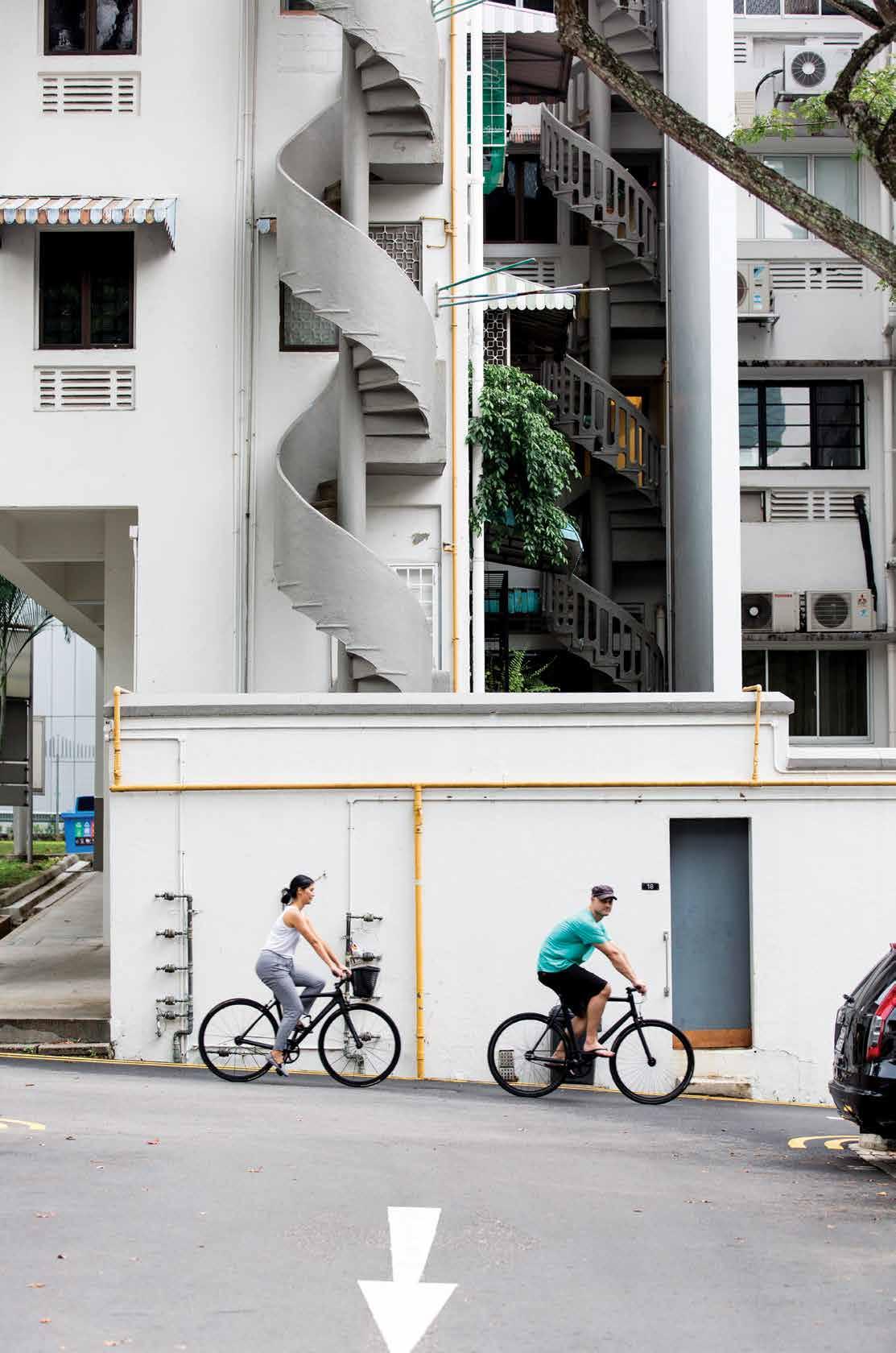
3 . on location # 189
issue #32 habitusliving.com
Discover beautiful products
Meet inspiring people
Indulge in architecture and design
Across Australia, New Zealand, South and South-East Asia
The online community for the Design Hunter®




Website | habitusliving.com


Facebook | habitusliving
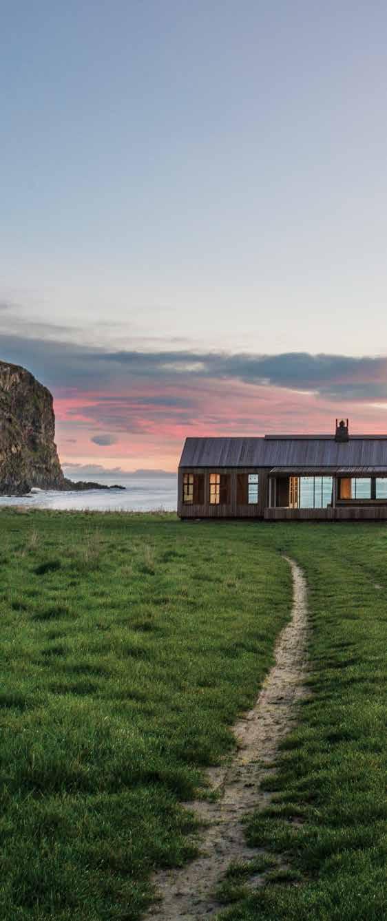
Pinterest | habitusliving
Instagram | @habitusliving
Twitter | @habitusliving


 Photography: Stephen Goodenough
THE TEAM AT HABITUS MAGAZINE THANK OUR ADVERTISERS FOR THEIR SUPPORT. USE THE DIRECTORY TO SEE WHAT PAGE A SPECIFIC ADVERTISEMENT IS ON, AND VISIT THEIR WEBSITE TO LEARN ABOUT THE PRODUCTS AND SERVICES THEY PROVIDE.


Habitus magazine is available at newsagents and bookstores across Australasia, South-East Asia, the USA, Canada, Europe, South America and the Middle East. Habitus is published quarterly in March, June, September and December. To subscribe securely online visit habitusliving.com/magazine or email subscriptions@indesign.com.au to subscribe or request a full list of locations where
magazine is available.

Habitus
# 191 Abey Australia 080 abey.com.au Big Ass Fans 051 haikuhome.com.au Binder 165 binderapp.com.au Bisschop 178 monopool.asia Careers Indesign 019 careersindesign.com.au CDK Stone 012 - 013 cdkstone.com.au CULT 021 cultdesign.com.au Designer Rugs 076 - 079 designerrugs.com.au Domayne 002 - 003 domayne.com.au English Tapware 094, 155 englishtapware.com.au Fanuli 033 fanuli.com.au Habitusliving 190 habitusliving.com Herman Miller IFC - 001 hermanmiller.com.au Janus et Cie 004 - 005 janusetcie.com Ken Done 075 kendone.com Melbourne Indesign 014 - 015 indesigntheevent.com Mother of Pearl and Sons 064 motherofpearl.com Parisi 016 parisi.com.au Paveezzi 052 paveezzi.com.au Press Stop 020 pressstop.com.au Reissi Empire 099 reissiempire.com.au Rogerseller 128 rogerseller.com.au Royal Oak Floors 006 royaloakfloors.com.au Singapore Indesign 112 indesigntheevent.com Space Furniture 029 spacefurniture.com Stylecraft 009 stylecraft.com.au Subscriptions 038 habitusliving.com/subscriptions Sunbrella IBC sunbrella.com The Hour Glass OBC thehourglass.com Tongue N Groove 010 - 011 tonguengrooveflooring.com.au Vola 031 vola.com Zip Industries 022 zipwater.com
Your map to where the stories in this issue come from where is available
world
issue #32 habitusliving.com
London #40
Mumbai #100
Ho Chi Minh City #65
Scrubby Bay #129
TADAO ANDO
“ You have to absorb what you see around you, what exists on the land.”


SUNBRELLA ® IS A REGISTERED TRADEMARK OF GLEN RAVEN, INC.


 Elba
Savoir
Titanium Travertine
Turco Argento
Portsea
Antique Brown
Carrara Elegant Grey Nero Tempesta
Calacatta
Superwhite
Titanium Gold


 Designer Rugs | designerrugs.com.au


 above | Pared-back style with tactile materials star in luxe Perth hotel como the treasury’s s Pacious bathrooms, designed by k erry h ill. Photogra Phy by martin morrell. below | s oothing browns, greys and whites make contem P orary stay the estate trentham, by m elbourne interior designer lynda gardener in country Victoria, an ins Piration for e V eryday homes. Photogra Phy by lisa cohen. o PP o SITe | floor-to - ceiling glass and lofty s Paces o Pen ing onto the lake bring the outdoors in at sri lankan stay kalundewa retreat s bakmee chalet which cham Pions natural materials with Views oV er trees and P ools


 OPPOSITE | Work in Progress for Better tomorroW by Ishan Khosla I s a rough bench made from bamboo, jute thread and o I l-based pa I nt. ABOVE | Ishan Khosla’s m u/taB le celebrates the I dea of change and chaos w Ith I n a g Iven structure BELOW | based on the theoretI cal KleI n bottle, a form that I s poss I ble to model on computer but I mposs I ble to ma K e, rI chard g oodw I n developed a k lein chair that feeds fabrI c from the bro K en cane seat bacK I nto the cha I r.


 previous | From the street the house appears all but impenetrable, its sheer Facades o F raw concrete in stark contrast with its surroundings o F polite late edwardian houses. AB ove | a two-stage wooden stair leading to a study zone and start o F circular journey through the upper level o F the house. opposiTe | Furniture and Fittings, like the table lamp and the gilded gold canvas in the background, used by luis barragan in many o F his projects were specially commissioned and made For the house.


 Tex T Andre A STevenS | PhoTogr APhy Simon deviTT, STePhen g oodenough & greg mcKenzie


 PREVIOUS | Deeply carveD anD painteD in turquoise, volcanic grey, green an D brown, the lanD scape is as D ramatic as it is remote. photography by stephen goo D enough ABOVE | the front entry steps leaD up to a simple porch, which is protecteD by a D eep recess in the builD ing. photography by simon D evitt.


 Tex T Jenna Reed Bu R ns | PhoTogR a Phy Michael n icholson & Jason Busch


 Photography: Stephen Goodenough
