living in design #33 OctOber – december | 2016 AUD$16.95 | NZ$16.95 | USD$17.95 CDN$18.95 | GBP£9.90 | SGD$11.95 33 9 771836 055007
Power trinity: Nature, Architecture & design. Joost Bakker, the zero waste man. Vo trong Nghia’s green steel revolution. Archibald finalist Joshua Yeldham.
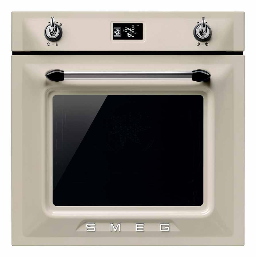
AVAILABLE IN PANNA (CREAM), BLACK OR WHITE ENAMEL AND STAINLESS STEEL, WITH MATCHING COOKTOPS AND RANGEHOODS
SMA16851
YES TODAY
smeg.com.au
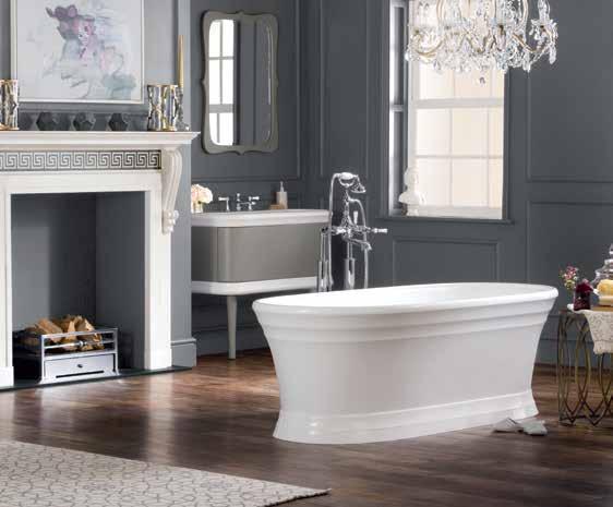
VICTORIA
SMEG
COLLECTION. THE SOPHISTICATION AND STYLE OF YESTERDAY, TODAY.
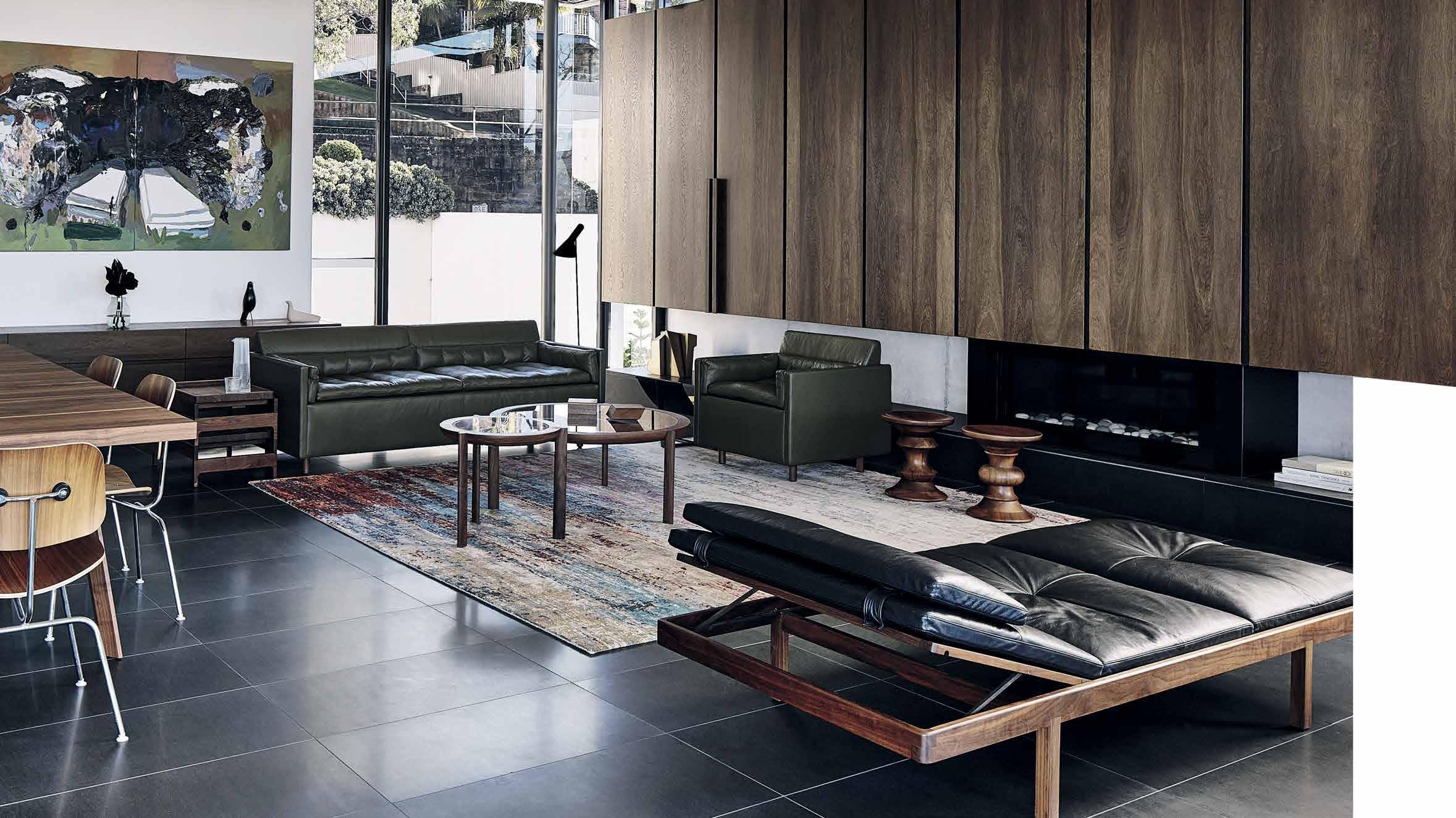
Gallery House is Domenic’s vision of idyllic urban living. His finishing touches were our authentic designs. Even the most transcendent spaces are brought to life by what’s within.
livingedge.com.au
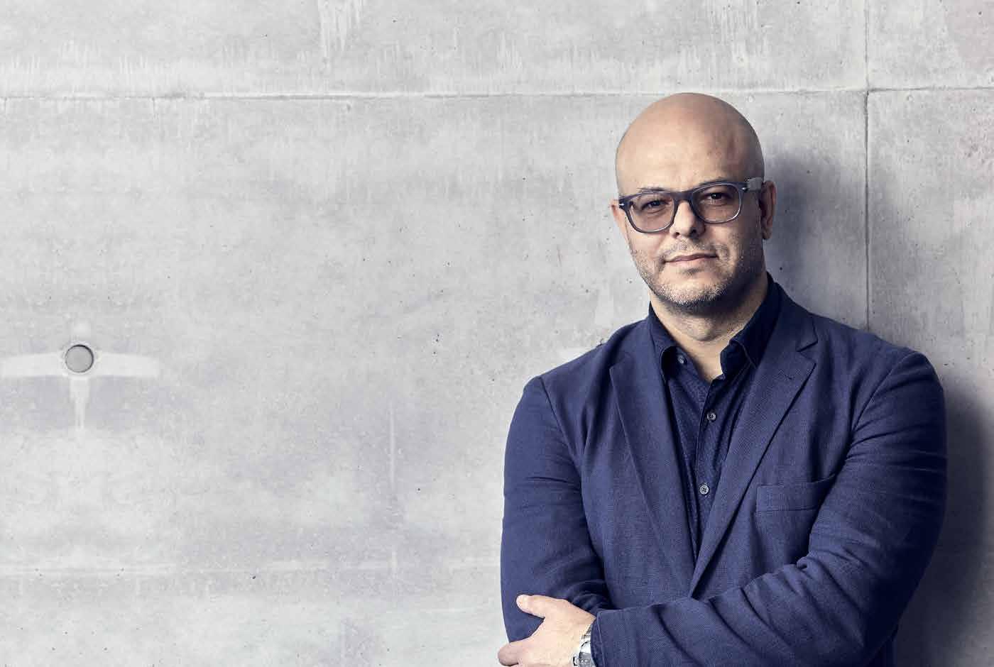 Domenic Alvaro – Principal Architect & Designer, Woods Bagot
Domenic Alvaro
Gallery House


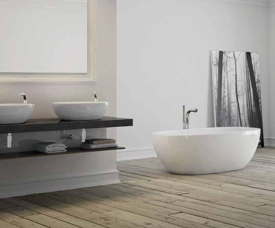
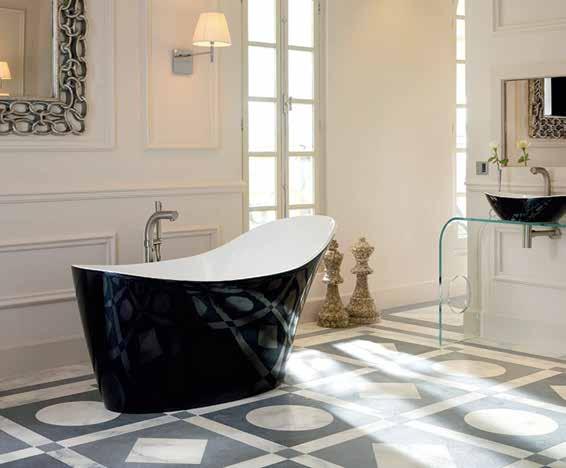
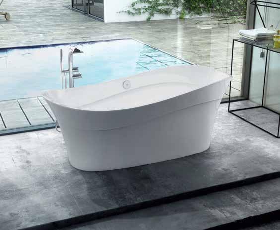



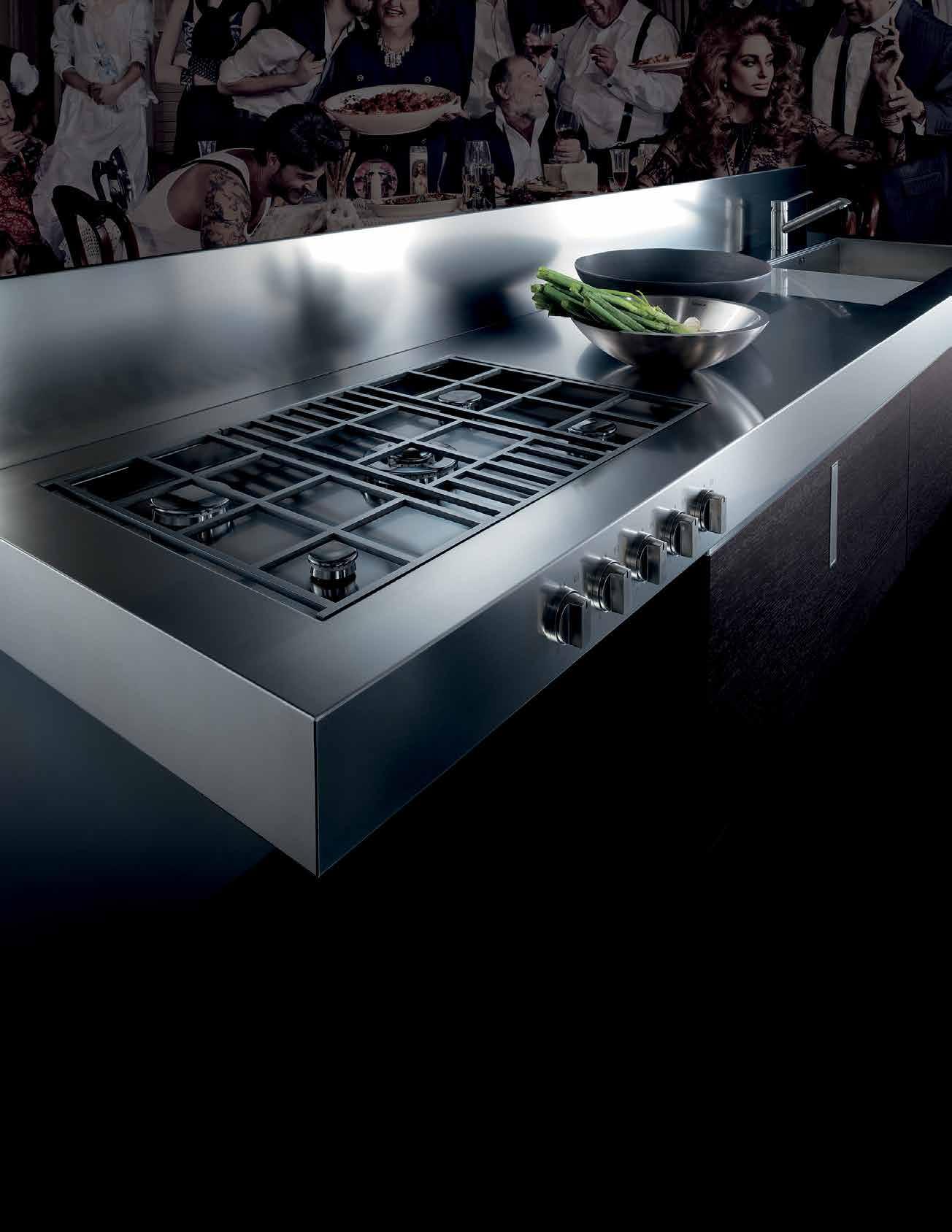
BARAZZA MADE TO MEASURE.
Barazza is award-winning design and functionality. Made in Italy for over 40 years. Barazza’s Made to Measure offers a unique ability to seamlessly incorporate cooktops, sinks and accessories into a stainless steel benchtop. It gives the designer the ultimate freedom to create a functional piece for the kitchen, which boasts an unrivalled minimalist elegance.
– Barazza Made to Measure
*NEWLY OPENED* VICTORIA Selection Gallery 335 Ferrars St South Melbourne Ph: 03 8696 4000 NEW SOUTH WALES Selection Gallery 1E Danks St Waterloo Ph: 02 8572 8500 QUEENSLAND Selection Gallery 94 Petrie Tce Brisbane Ph: 07 3369 4777 *OPENING SOON* WESTERN AUSTRALIA Selection Gallery 12 Sundercombe St Osborne Park Ph: 08 9446 8255
How do you spark everyday inspiration? It can be found in possessions, in conversations, or through our experiences with the great outdoors.
24. DESIGN NEWS
Discover the products we are inspired by: objects, lighting and furniture that remind us of nature, take us outside, and encourage us to live holistically and in harmony with and around the natural environment.

34. BOOKS
As the world moves closer to mass urbanisation, and climate change’s effect on the natural world becomes dangerously clear, its vital that we learn to live intertwined with nature. Christina Rae explores the way recent architectural and residential trends work to accommodate this.
This issue we look at a series of creatives who are passionate about nature and sustainability, infusing all of their work with this ethos.
40. NOURISH & FLOURISH
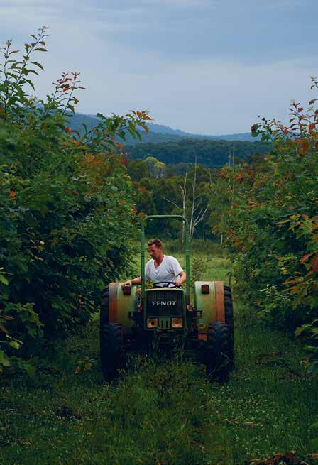
Designer, artist, florist and builder are some of the many skill sets possessed by Joost Bakker, but an ardent dream of sustainable living is the common thread that binds them all together. Envisioning a future of green living, the ex-Dutch national has made it his goal to ensure that all of his work facilitates green growth, contributing to a brighter and greener future.
55. BAMBOO BENEFACTOR
Vo Trong Nghia has spearheaded the use of ‘green steel’, or rather, the environmentally sustainable natural resource of bamboo, in architecture. Weaving a passion for the environment with a playful architectural style, Nghia aims to improve the way we live by filling our cities with greenery, one bamboo culm at a time.
68. WILDERNESS BOY
The fruits of creativity are ones that artist Joshua Yeldham cultivates with a strong love of family, and the ability to navigate the push and pull of inspiration. Citing fatherhood as a source of never-ending wonder, his work is delightfully intimate, drawing on Indigenous Australian and traditional Chinese art motifs.
# 33
#40 #24
Nature
84. NATURAL HABITAT
Nature inside the home is not merely restricted to pot plants and herb gardens, as Sophie Davies explores. In fact, with creative design and architecture, we can now live in extremely inventive ways with nature, both inside and out.
103. CALL FROM NATURE
#84
People across the region may live quite differently but – in architecture and design – innovation and wit is an international language.
114. THE PATH LESS TRAVELLED
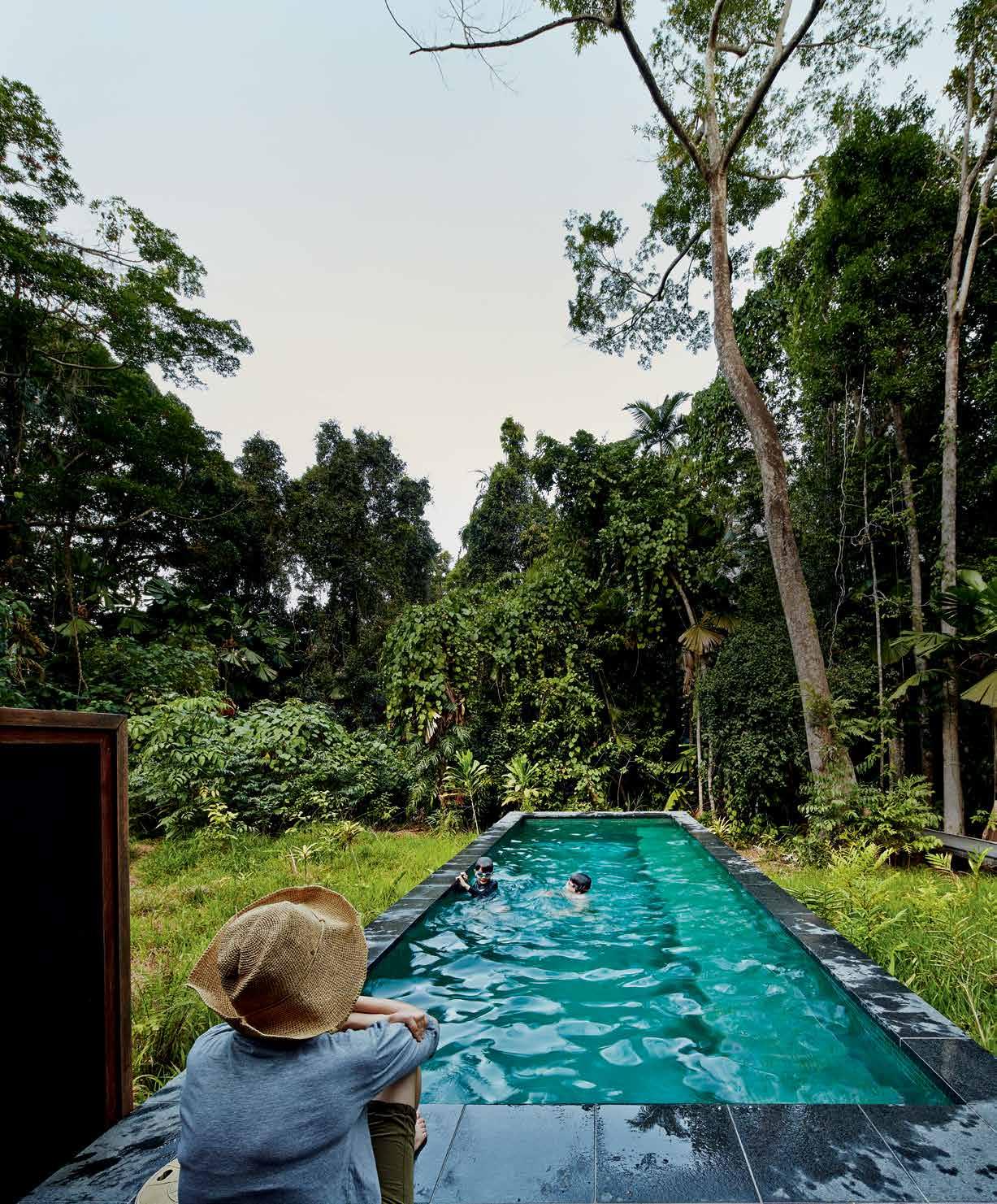
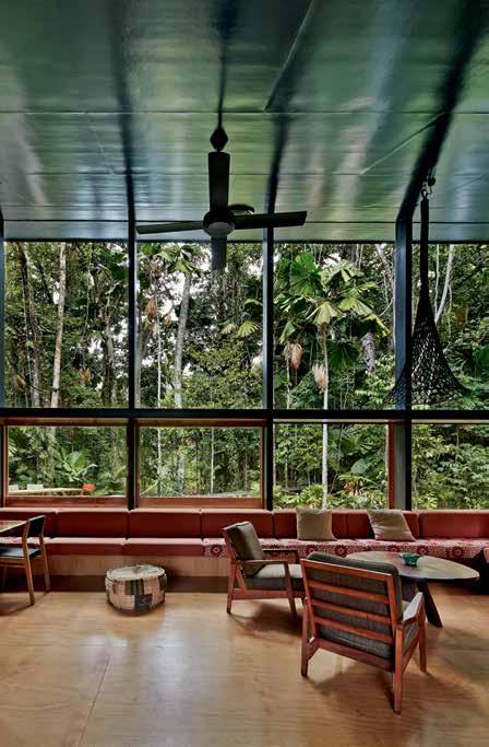
Building on a heritage site within Melbourne’s Daintree Forest, M3Architecture has created a home that blends seamlessly with its lush forest surroundings.
128. FINDING PERMANENCE
New Zealand’s Bay of Islands is a popular holiday destination due to its safe harbour and beaches. Studio Pacific Architecture redesigned a home to ensure that it will be a retreat for generations to come.
143. BLURRING THE LINES
As the directors of their very own design firm, Rob McBride and Debbie Ryan have created a home that enables easy transition between the two different modes of work and play within shared spaces.
155. TREASURE IN SAIGON
With globalisation comes a dialogue between architectural styles of past and present. The Saigon House is designed as an ode to traditional living approaches to living in Vietnam.
167. BETWEEN THE TREES
Within Kuala Lumpur’s Damansara Heights is the Chempanai House which artfully integrates its concrete body with the great outdoors.
178. THE GRAND REVEAL
Navigating the Australian terrain is a world apart from designing houses more suitable to the tropical climate of Malaysia, but architects MARRA + YEH were up to the challenge in the Stiletto House in Ipoh. #114
Architect Robin Williams has designed a sleek and sexy minimalist home for himself and his partner that makes the most its location in Victoria’s St Andrew’s Beach, and is filled with a playful and personality-filled charm.
# 33



THE DEFINITIVE SOURCE FOR ENDURING SITE, GARDEN AND CASUAL FURNISHINGS ® 50 MCLACHLAN AVENUE, RUSHCUTTERS BAY, NSW 2011 +61 2 9380 6605 ATLANTA • BOSTON • CANCÚN • CHICAGO • DALLAS • DANIA BEACH • DUBAI • HIGH POINT • HONG KONG HOUSTON • LONDON • LOS ANGELES • MEXICO CITY • MIAMI • MONTERREY • NEW YORK • SAN FRANCISCO SHANGHAI • SINGAPORE • SYDNEY • TORONTO • WASHINGTON D.C. • WWW.JANUSETCIE.COM SLANT COLLECTION


the essence of living.

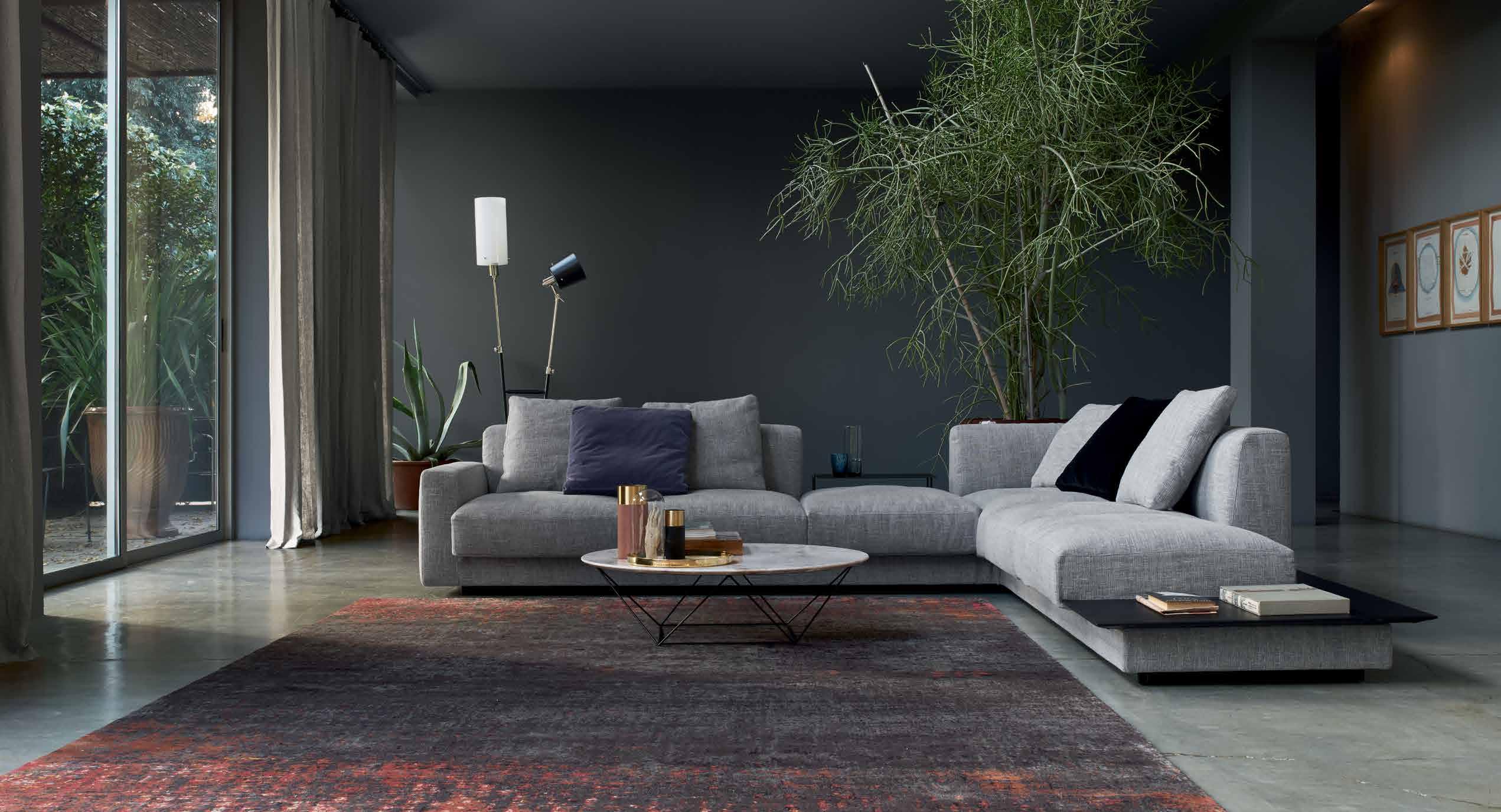
8652015 150 YEARS OF WALTER KNOLL Yuuto. A landscape of cushions. Designed with masterly craftsmanship, select materials and timeless appearance. Comfort par excellence. For that personal style refuge. Design: EOOS. Walter Knoll Australia · info@walterknoll.com.au · T +61 8 8182 3925 · www.walterknoll.com.au
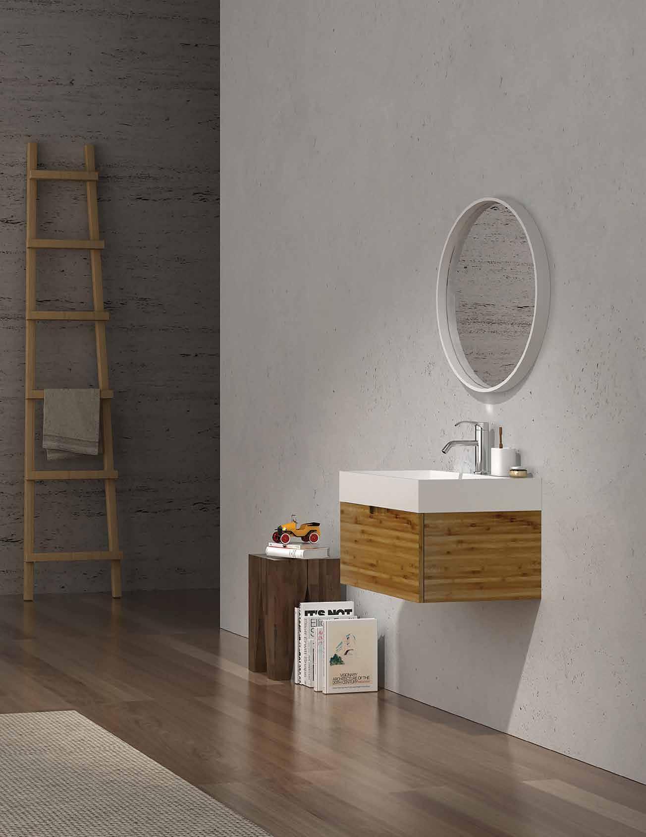
BAM COLLECTION
The BAM Collection represents craftsmanship at its finest. These pieces are designed to suit any modern or traditional bathroom setting. All BAM Vanities are crafted with premium Moisture Resistant Multi-wood, and are coupled with contemporary Mirror Storage pieces.
the first word
For this inspiring individual, whose work you can discover on page 55, this disconnection is the root cause of all conflict – personal, interpersonal, societal and political. Coming to this belief, as he does, from a war-torn background and via a rigorous meditation practice, makes his statement all the more humble, yet compelling.
Nghia has chosen to respond to this problem of disconnection through his architecture, with a mission to ‘green the cities’ of his homeland. Project by project, bamboo pole by bamboo pole, he is encouraging clients, developers, committees and government organisations to make the environment an equal beneficiary of the architecture they commission him for.
Nghia is part of a growing body of architects, designers, artists and other creatives who have distilled their practice into a very simple environmental philosophy. Joost Bakker is another. Passionately advocating a ’zero-waste’ policy for houses, restaurants and entire cities, his own home (page 40) is an experiment, from which he is eagerly and generously sharing the findings through an open-source concept he calls Future Cave. Joshua Yeldham, is another. Whether fine art, film or book (page 68), his creations are all intricately bound within the experience of natural landscapes.
It’s clear that the environment needs all of us on its team –not just the creative professionals we feature in this issue– to rediscover a way of being that is more harmonious. We can take inspiration from these heavy hitters, but there is no need to be intimidated, because the journey towards reconnection can begin in minute and subtle ways. From the simple act of bringing plants, or natural materials, into your own home, or even just living more in step with the natural rhythms of day and night, we can start to patch the disconnect in small, but meaningful ways. See our feature on page 83 for more ideas.
There are some changes afoot at Habitus. Taking our cue from nature, we too are moving into a new phase. We look forward to continued growth, while remaining secure in our foundation of sharing high quality, meaningful architecture and design stories across the Region.
Thanks, as always, for your support.
Lobo | Editor
Nicky
“Our biggest problem is that human beings are so disconnected from nature,” believes Vietnamese architect Vo Trong Nghia.
habitus takes the conversation to discovering their inspiration and design hunter® journeys
Adele Chong

BETWEEN THE TREES #167
Living in downtown Kuala Lumpur with her partner, Adele Chong is a freelance journalist and global nomad at heart, having previously called cities like Montreal, London and Berlin home. Relying on her frequent travels to keep her in touch with nature, Adele’s “quick fix is a run in KLCC Park – a go-to green refuge in the heart of Kuala Lumpur.”
Andre A StevenS
FINDING PERMANENCE #128
Originally trained as an architect, Andrea Stevens is a New Zealand-based design writer with two books published by Penguin Random House NZ to her name. As a frequent contributor to local and international design publications, Andrea lives in Auckland’s Point Chevalier with her husband and two energetic daughters surrounded by a wild garden planted over 15 years ago that “almost blocks out the sun”.
Ben hoSking
BETWEEN THE TREES #167
Ben Hosking is a Melbourne-based architectural photographer living in Carlton North who has previously studied photography at RMIT. With his work published both locally and internationally with Thames and Hudson, Taschen, and Gestalten, Ben finds his escape into nature with frequent “visits down the coast, or the occasional surf on the weekend.”

de A n Br A dley
THE GRAND REVEAL #178
For Dean Bradley, it’s important to “get away once a month to the beach or country to de-citify ourselves.” Living in Melbourne, he works as a commercial photographer with ample experience in architectural photography. “Being inner-city dwellers, our touch with nature can be very limited at times, so I have tried to bring nature into the home by including a lot of indoor plants. Outside, all the plants are edible, so the kids can plant veggies and herbs and watch things grow.”
louiS PetruCCelli
BLURRING THE LINES #143
Louis Petruccelli “virtually lives” in his Prahran studio, so for him, a break from the city is with his wife Lyn in a beautiful home created by MCR, which brings nature into the home by way of courtyards, “and our dog Mischa who takes us to the great outdoors.” Louis has a strong love of art and theatre, as well as the process of discovery, describing his photography as “interpretation of light within a rectangular cropped world”.
M Att CA nning
IT’S EASY BEING GREEN #34
Matt Canning is an illustrator who lives in a small bungalow on the south coast of England with his wife, two children, a dog named Pippin, and five cats. With the bungalow in New Forest, Matt and his family are “never far from woodland, beaches and heathland. We have a big garden, which is great, but it turns into a bog in winter, so the kids and animals tend to bring nature in to the house on the soles of their feet!”
MiChelle BA iley BAMBOO BENEFACTOR #55


As an architectural writer who has previously practiced as an architect in Brisbane, Rome, and London, Michelle Bailey is a regular contributor to national architecture and design publications. Living in the foothills of Mt Coot-tha with her husband and young daughter, the family “loves to escape to the nearby Mt Nebo and Mt Glorious for Sunday drives, and picnics in the native forest.”
Peter BennettS


THE PATH LESS TRAVELLED #114
The natural environment is a passion of architectural photographer Peter Bennetts, who calls Melbourne’s St. Kilda his home. Peter lives with his architect wife, two sons, and a dog named Augie Doggie. The family spends their winters in Falls Creek, frequently taking trips to the snow, saying, “Our house in town is littered with skis, bikes, trail maps and art inspired by the outdoors!”
Quang Tran


TREASURE IN SAIGON #155
Born in Vietnam’s Quang Nam, architectural photographer Quang Tran now calls Ho Chi Minh City his home and aims to capture not only the beauty of architecture, but also the sentiment of meaningful places in his work. Quang says, “Travelling and socialising are my hobbies, and nature and wildlife give me more inspiration. Getting in touch with nature is an amazing experience, and socialising with people in all spaces makes my life more meaningful.”
SIMOn DEVITT

FINDING PERMANENCE #128
Temporarily living in Auckland’s College Hill with an architect friend while his West Auckland house undergoes renovation, Simon Devitt gets in touch with nature “right at his doorstep.” West Auckland is “home to the Waitakere Ranges, and some of New Zealand’s best beaches,” and when he isn’t working as an architectural photographer, Simon is discovering things with his “furry ginger friend,” Kingi, the Irish terrier.
SOphIE DaVIES
NATURAL HABITAT #84
As the co-editor of online zine DesignFizz, Sophie Davies is a London-born, Sydneybased journalist who writes on design, travel, and lifestyle for Habitus, Travel + Leisure, and Louis Vuitton. Sophie lives in a Bondi apartment where “you can watch the sunset over Rose Bay from a plant-packed little balcony.” Her favourite local spot is “The Crabbe Hole cafe above Icebergs’ glittering blue ocean pool at Bondi; it’s hard to beat coffee and croissants with a view of surfers riding the waves.”

TOby ScOTT
BAMBOO BENEFACTOR #58
Photographer Toby Scott lives in an art deco apartment in Brisbane with his girlfriend Fiona, where he works as an architectural, interiors, and lifestyle photographer. For Toby, “spending time in nature is important and we love hiking, camping and spending time on the family farm – we are out in nature as much as possible and try and fill our home with native flora.”
CorreCtionS
In Habitus #32 we provided the incorrect website for Glid Studio on page 28. Our apologies. The correct website is: glidstudio.com
DIRECTING DESIGN INDUSTRY PROFESSIONALS TO THE RIGHT
IN AUSTRALIA AND ACROSS ASIA
3D VISUALISER ACCOUNT MANAGER
ADMINISTRATION
AGENT/DISTRIBUTOR
FIND
BLOGGER
BUSINESS DEVELOPMENT
CAD DESIGNER
CAMPAIGN MANAGEMENT
CUSTOMER SERVICE
DESIGN MANAGER
DESIGNERS
EDITOR
EVENTS CO-ORDINATOR
GRAPHIC DESIGNER
INDUSTRIAL DESIGNER
INTERIOR DESIGNER
LECTURER
LIGHTING SALES PERFECT
MEDIA ExECUTIVE
NATIONAL SALES MANAGER
OPERATIONS MANAGER
PA / SALES SUPPORT
PHP DEVELOPER
PR ACCOUNT MANAGER
PRODUCTION MANAGER
PROJECT MANAGER
SPECIFICATION
RETAIL INTERIOR DESIGNER
SALES
SHOwROOM MANAGER
SHOwROOM SALES CONSULTANT
STATE MANAGER
STUDIO LEADER
TECHNICAL OFFICER
wAYFINDING DESIGNER
wEB DESIGNER / DEVELOPER
careersindesign.com.au
careersindesign.asia
ARCHITECTURE
DESIGN
INTERIORS
MEDIA
AGENCY
ADVERTISING
RETAIL COMMERCIAL
FURNITURE
LIGHTING
TEx TILES
YOUR RESIDENTIAL ARCHITECTURE
DESIGN
INTERIORS
MEDIA
AGENCY
PUBLISHING
RETAIL COMMERCIAL FURNITURE
LIGHTING
TEx TILES
PRODUCT
RESIDENTIAL
JOB
EDUCATION
DESIGN
INTERIORS
MEDIA
ADVERTISING
RETAIL COMMERCIAL FURNITURE
LIGHTING
TEx TILES
PRODUCT
Chairman / Publisher
Raj Nandan raj@indesign.com.au
editor
Nicky Lobo nicky@indesign.com.au
habitusliving
Christina Rae christina@indesign.com.au
original design tem Plate one8one7.com
senior designers
Michelle Byrnes michelle@indesign.com.au
Sophie Taylor s.taylor@indesign.com.au
designer
Joseph Panto joseph@indesign.com.au
Contributing designer
James McLaughlin
Contributing Writers
Michelle Bailey, Alice Blackwood, Adele Chong, Stephen Crafti, Sophie Davies, Kath Dolan, Andrea O’Driscoll, Sammy Preston, Andrea Stevens
Contributing Photogra Phers
Iwan Baan, Filippo Bamberghi, Peter Bennetts, Patrick Bingham-Hall, Brett Boardman, Dean Bradley, Earl Carter, Simon Devitt, Nicole England, Dwight Eschliman, Ben Hosking, Hiroyuki Oki, Louis Petruccelli, Phan Quang, Domenic Sansoni, Toby Scott, Dianna Snape, Quang Tran, Jo Yeldham, Joshua Yeldham
Contributing illustrator
Matt Canning (Herds of Birds)
Cover image
Cape Tribulation house (p.114)
M3 Architecture
Photography by Peter Bennetts
m anaging direCtor
Kavita Lala kavita@indesign.com.au
ProduCtion m anager
Tina Fluerty tina@indesign.com.au
ProduCtion a ssistant
Natasha Jara natasha@indesign.com.au
business manager
Vivia Felice vivia@indesign.com.au
aCCounts
Gabrielle Regan gabrielle@indesign.com.au
online
Radu Enache radu@indesign.com.au
Ryan Sumners ryan@indesign.com.au
mar K eting
Lauren Black lauren@indesign.com.au
events
Caitlin Clarke caitlin@indesign.com.au
business develoPment manager s
Colleen Black colleen@indesign.com.au
(61) 422 169 218
Dana Ciaccia dana@indesign.com.au
(61) 401 334 133
media Coordinator
Alex Kwak alex@indesign.com.au
Contem PorarY Perth
Kay Cohen kay@indesign.com.au
Head Office
Level 1, 50 Marshall Street, Surry Hills NSW 2010 (61 2) 9368 0150 | (61 2) 9368 0289 (fax)
MelbOurne
1/200 Smith St, Collingwood, VIC, 3066
SingapOre
4 Leng Kee Road, #06–08 SIS Building, Singapore 159088 (65) 6475 5228 | (65) 6475 5238 (fax)
HOng KOng
Unit 12, 21st Floor, Wayson Commercial Building, 28 Connaught Road West, Sheung Wan, Hong Kong
indesign.com.au
sender’s risk,
Indesign Media Asia Pacific cannot accept any loss or damage. Please retain duplicates
a wholly owned Australian
text and
Habitus magazine
designed
published
Australia. Habitus is published quarterly and is available through subscription, at major newsagencies and bookshops throughout Australia, New Zealand, South-East Asia and the United States of America. This issue of Habitus magazine may contain offers or surveys which may require you to provide information about yourself. If you provide such information to us we may use the information to provide you with products or services we have. We may also provide this information to parties who provide the products or services on our behalf (such as fulfilment organisations). We do not sell your information to third parties under any circumstances, however, these parties may retain the information we provide for future activities of their own, including direct marketing. We may retain your information and use it to inform you of other promotions and publications from time to time. If you would like to know what information Indesign Media Asia Pacific holds about you please contact Nilesh Nandan (61 2) 9368 0150, (61 2) 9368 0289 (fax), info@indesign.com.au. Habitus magazine is published under licence by Indesign Media Asia Pacific. ISSN 1836-0556
issue #33 habitusliving.com Printed in Singapore. All rights reserved. No part of this publication may be reproduced, stored in a retrieval system, transmitted in any form or by any other means, electronic, mechanical, photocopying, recording or otherwise. While every effort has been made to ensure the accuracy of the information in this publication, the publishers assume no responsibility for errors or omissions or any consequences of reliance on this publication. The opinions expressed in this publication do not necessarily represent the
of the editor, the
are
at
views
publisher or the publication. Contributions
submitted
the
and
of
images.
is
publication, which is
and
in
JOBS
HAB25_CRID_HP.indd 2 25/07/2014 4:51 pm
Icons of Scandinavian Design
Alvar Aalto Collection
Alvar Aalto 1936
iittala.com.au
facebook.com/iittala

Product Specifications: 290x90x50mm
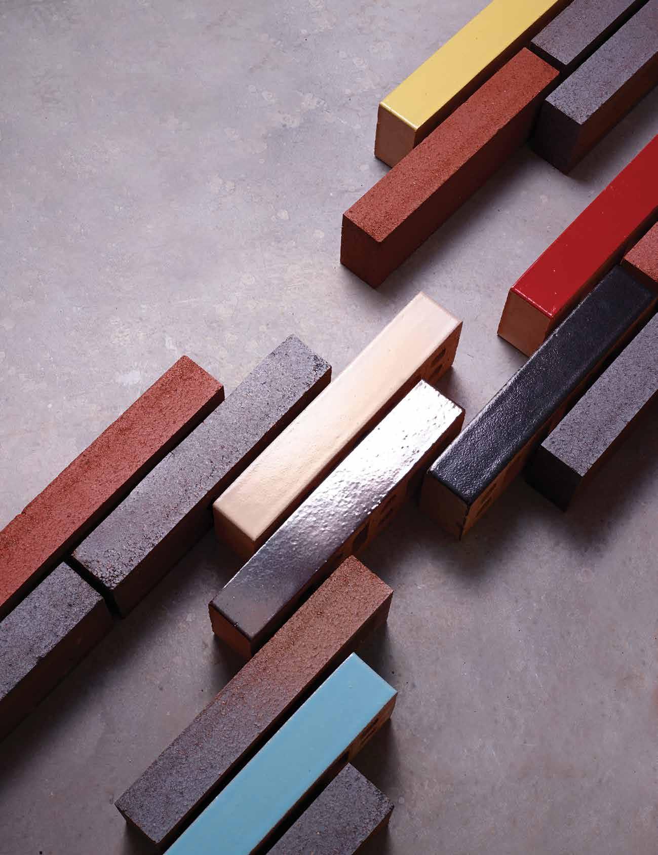
Available in Dry Pressed & Glazed Collections. For more information visit pghbricks.com.au or call 13 15 79.
& LEAN THE NEW LINEAR BRICK
LONG
Turn towards a creative life








Natural instinct


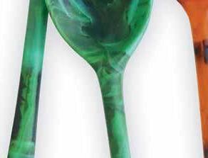
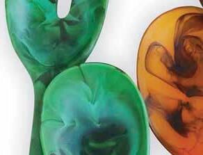
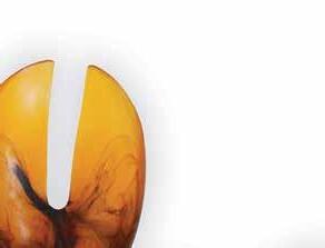
The resin forms from are completely handmade in their Australian studio, giving each piece a lovely, warm, and personalised touch. The MOSS collection uses earthy tones drawn from its namesake, and the resin spoons feature unique marbling to give them a fresh touch to any table setting, both indoors and out.
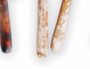
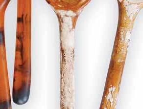
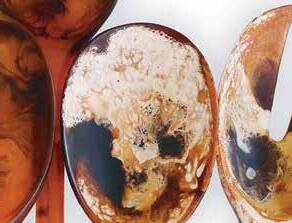
dinosaurdesigns.com.au


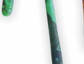




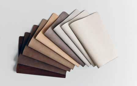
Instyle ’s latest leather offering comes in nine neutral colourways, sourced from the finest European raw hides, and possessing a luxurious velvet feel to the touch. The nubuck leather is aptly named BUCK and is lightly buffed to allow for a natural patina to develop over time.
instyle.com.au

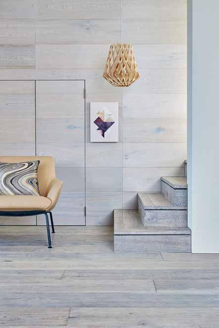
There’s nothing quite as warm and inviting as a beautiful timber floor that shows off the natural texture and detail of wood. Royal Oak Floors ensures that their timber flooring is sustainably sourced and available in an array of tones to fit any interior.
royaloakfloors.com.au


issue #33 habitusliving.com
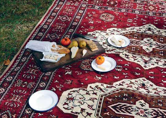
Nothing says ‘the great outdoors’ quite like a beautiful picnic in the sun with excellent company. Intrepid Home reinterprets the traditional carpets used across the deserts of Arabia into modern and functional rugs that are the perfect companion for exploring nature.
intrepidhome.co.nz

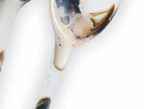
Prospero Rasulo ’s SEED washbasin collection for Parisi plays with the natural curves of a seed, gently echoing the elliptical shape, and cradling water at the centre. Bench-mounted, Seed is available in two sizes, 55 centimetre and 70 centimetre diameter, and in white, matte white, or matte black.



parisi.com.au


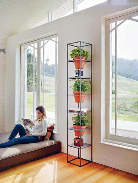
A little bit of greenery indoors never goes astray, and Joost Bakker has designed the VERTICAL GARDEN to allow for the perfect integration of pot plants with indoor décor. As a modular system, the Vertical Garden allows us to bring nature just that little bit closer.
schiavello.com








1 . lightbox # 25
A/symmetry
Pianca has a legacy of creating high-quality furniture in Galarine, Italy, for over 65 years. Designed with sophistication in mind, their wardrobe solutions can be seamlessly integrated into the home, turning the functional item into a design statement.
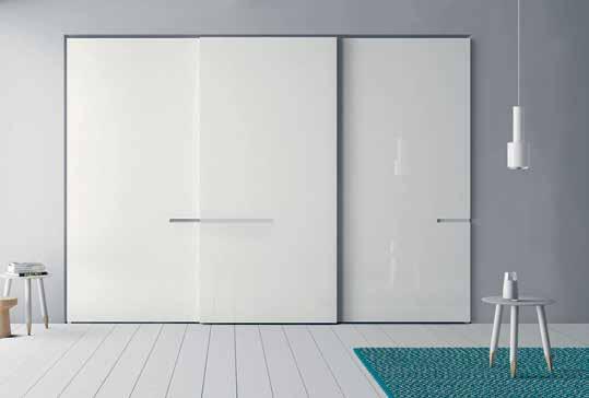
pianca.com / meizai.com.au
pitella.com.au
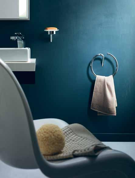
Designed by Belgian-born, Tuscan-based architect and product designer Michel Boucquillon , Pitella ’s ECCO BATHROOM ACCESSORIE S brings tender love and care into the often-overlooked sanctuary of the home.
#33 habitusliving.com
issue
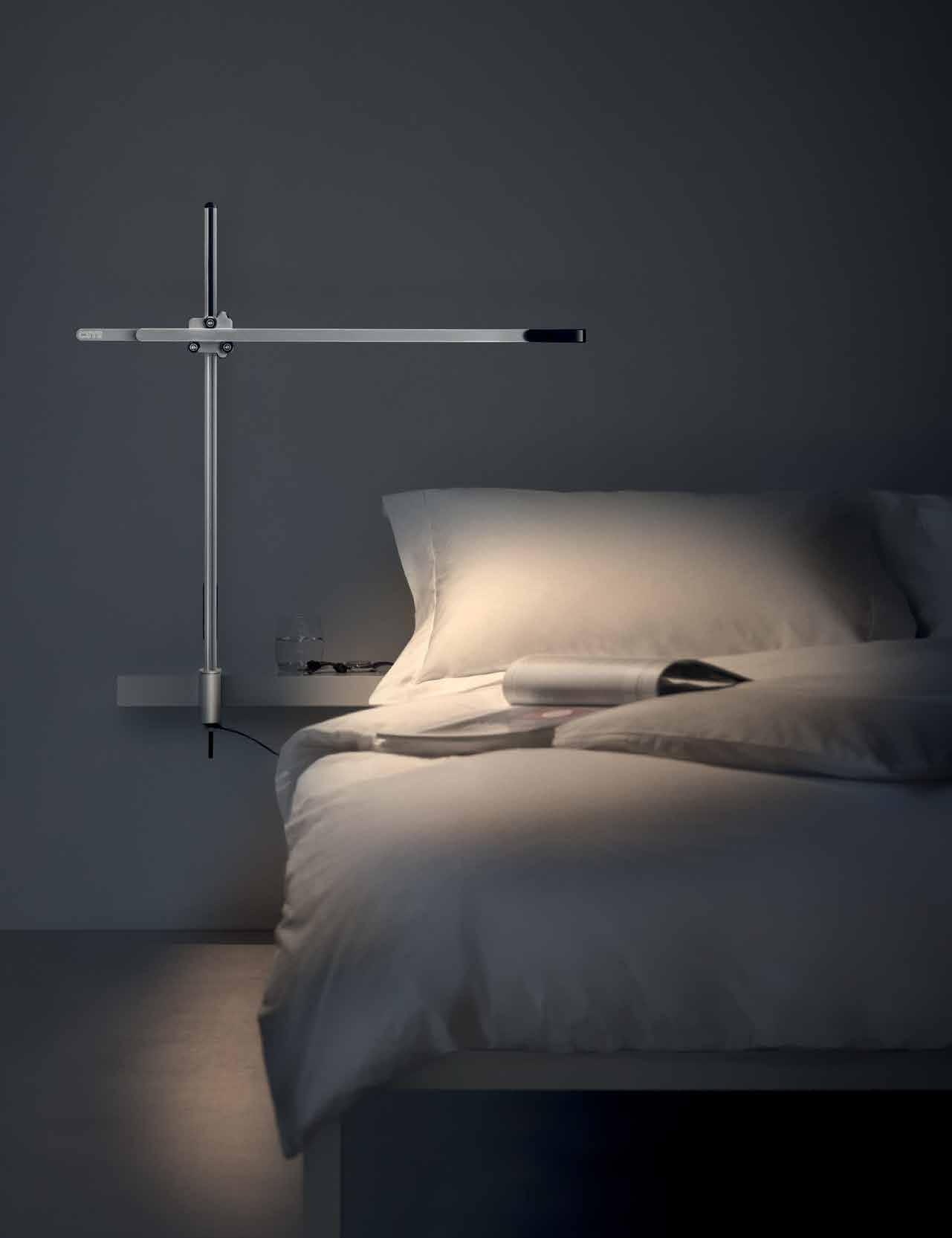
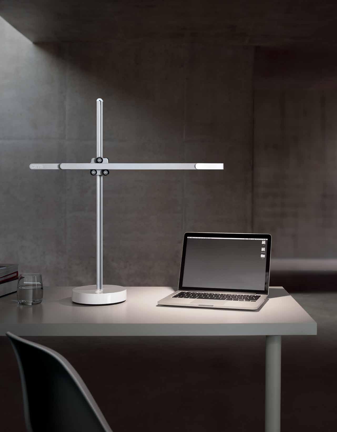
Task lighting with Heat pipe technology to cool LEDs. For powerful light, precisely where you need it.
Engineered by Jake Dyson
Find out more at dyson.co.uk/lighting
Ice cream palette
Eco Outdoor introduces a new linen range to their extensive offering, providing a textile finish that is just as stylish and durable outdoors as it is indoors. Available in a charming array of neutral and earthy colours, the range is designed to show off the natural beauty of linen.
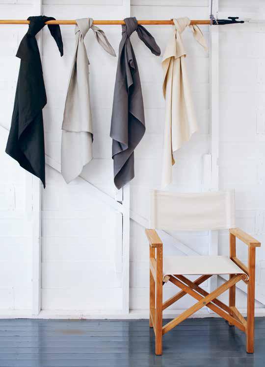
ecooutdoor.com.au
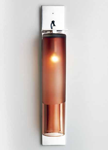
Crafting mouth-blown glass requires a dedicated skill set that results in objects with a human touch. Articolo ’s ECLIPSE lighting series is created by Australian artisans, and features acid etch detailing that provides a satin finish to complement the glass body of the light.
articoloarchitecturallighting.com.au
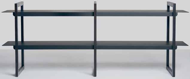
Daniel Tucker moved to Adelaide in 2015 to undertake JamFactory ’s intensive two-year associate training program which has since resulted in the sleek LOOP shelf. The slim, pared-back design makes the Loop shelf a versatile piece for any space in the home.
jamfactory.com.au
issue #33 habitusliving.com
Task lighting with Heat pipe technology to cool LEDs. For powerful light, precisely where you need it.
Engineered by Jake Dyson
Find out more at dyson.co.uk/lighting
Hang out
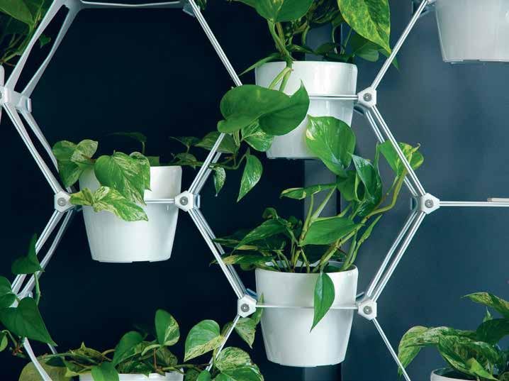
Behind Capra Designs is Melbourne-based couple Bianca Lambert and Thomas Wilson who fuse their backgrounds in carpentry and making into wire plant stands and hangers that suit a range of indoor and outdoor spaces. The wire displays are designed with attention to form, balance and function, with each pot individually, and immaculately, hand-crafted.
capradesigns.com
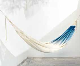
The story behind MAKA HAMMOCKS stems from Yaiza Dronkers Londoño ’s journey to reconnect with her Colombian roots, and an ensuing fascination with the indigenous Colombian cultural heritage of handcrafting hammocks. Working in harmony with local communities, Yaiza’s hammocks aim to give the ‘hamaca’ tradition a modern twist.
makahammocks.com
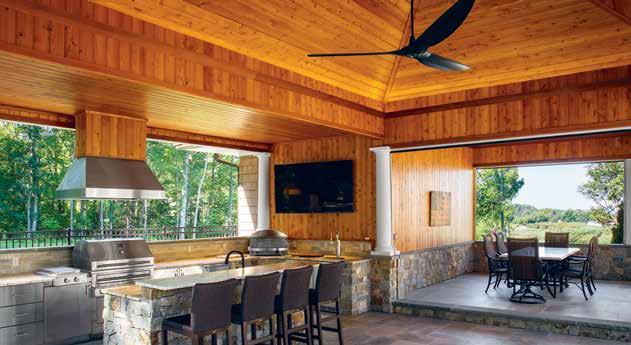
The new SENSEME technology from Big Ass Fans infuses their Haiku fans with the ability to turn each area of the home into a comfort zone. The technology is built into the fans, lights and wall controls, adjusting the products’ operation to personal preference, using temperature and humidity sensors.
bigassfans.com.au
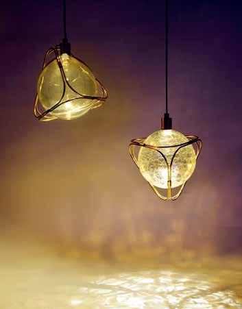
The EON Pendant Light is an alchemical glass orb pendant that hangs suspended in a bent brass rod geometrical frame. Its spherical body is comprised of hand-blown glass in a crackle, clear, or bubbled finish, giving the orb a spun sugar texture that is reflected in the soft light and shadows the light throws against surfaces.
adesignstudio.com.au
issue #33 habitusliving.com
Task lighting with Heat pipe technology to cool LEDs. For powerful light, precisely where you need it.
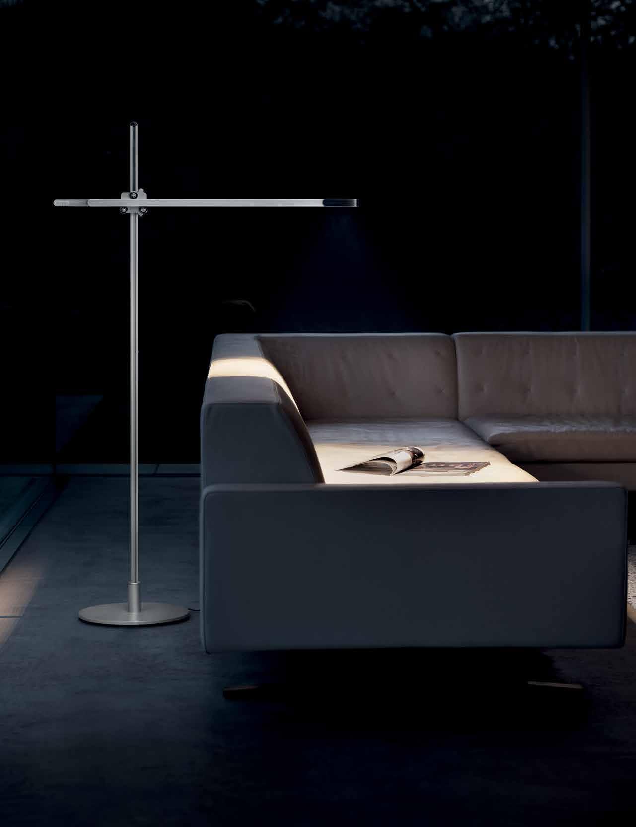
Engineered by Jake Dyson
Find out more at dyson.co.uk/lighting
Refinery
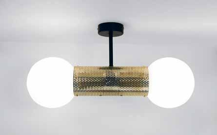
A global nomad at heart, Ben Tovim was born in Zimbabwe, raised in Australia, and received his masters degree in The Netherlands. The latest addition to his lighting collection is the PERF series, which fuses perforated metal with incandescent opal glass into a modern design.
b-td.com
Solid brass for a solid task, paired with gorgeous design. Armac Martin ’s BROMWICH collection of cabinet hardware embodies straight-line simplicity to give a charming modernist touch to any kitchen, bathroom or furniture item.
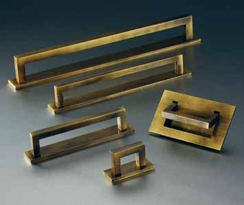
englishtapware.com.au
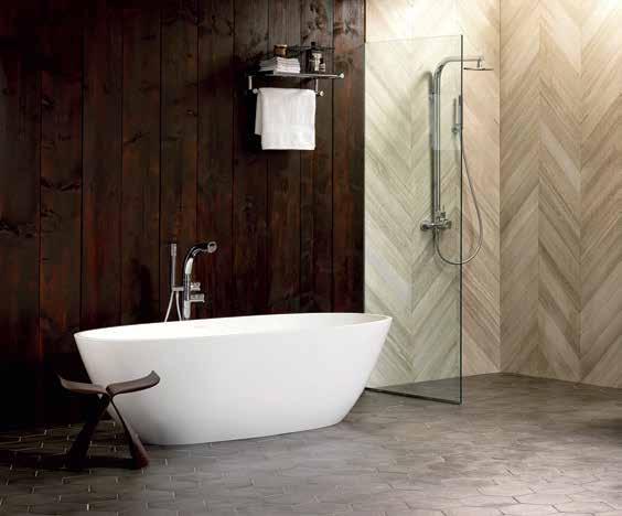
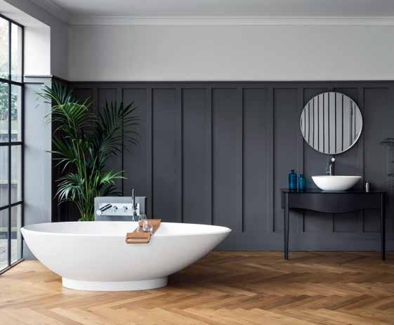
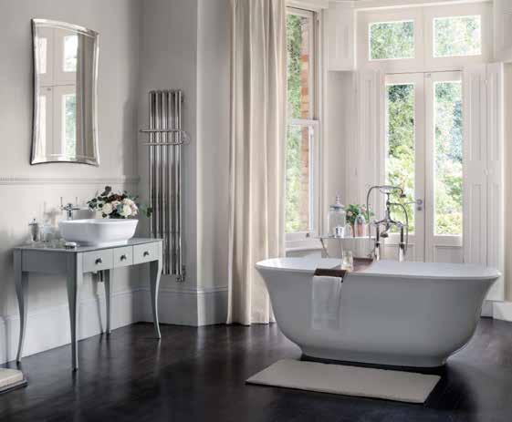
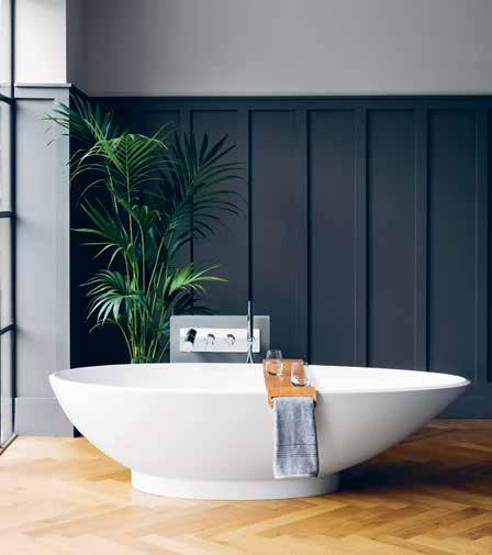
The Victoria + Albert bathtubs are comprised of a volcanic limestone material mixed with resin, crafted in a single cast. The unique composition ensures that the bath tub never tarnishes, and holds the temperature of the water for a longer period of time. The NAPOLI features an almond shape that is ideal for sinking into at the end of a long day.
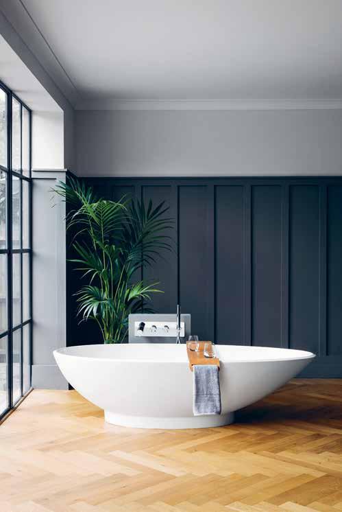
cassbrothers.com.au
Iittala has been a Finish design icon since 1881, infusing their elegant designs with the Scandinavian design principles of minimalism and timelessness. By ensuring that their designs stand the test of time, both aesthetically and in durability, Iittala’s products are intended to be handed down from generation to generation, and the beautiful VITRIINI boxes are no exception.
iittala.com.au
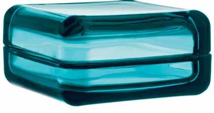
issue #33 habitusliving.com
The MIA side tables from Something Beginning With are sophisticated additions to any setting, with a slim silhouette lending the tables a visual lightness. The stunning asymmetrical angles and intersections made by the welded metal rods that form the table’s base give the piece a sense of strength and personality.
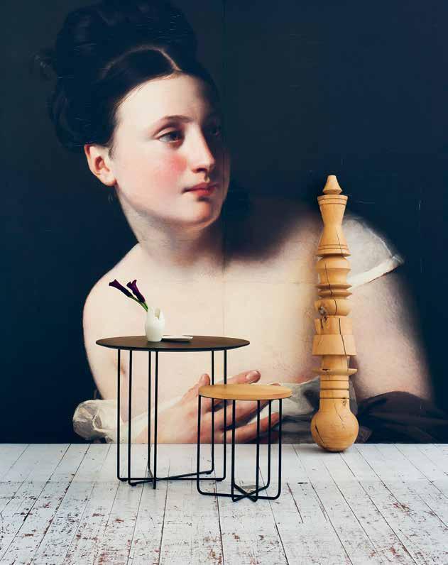
somethingbeginningwith.com.au

Norweigian design duo Anderssen & Voll have reinterpreted the classic Scandinavian design aesthetic of Erik Jørgensen in the HECTOR sofa. Maintaining the pared-back style that is consistent throughout the Jørgensen range, the sofa pairs a high textile back with comfortable leather cushions, armrests and seat backs.
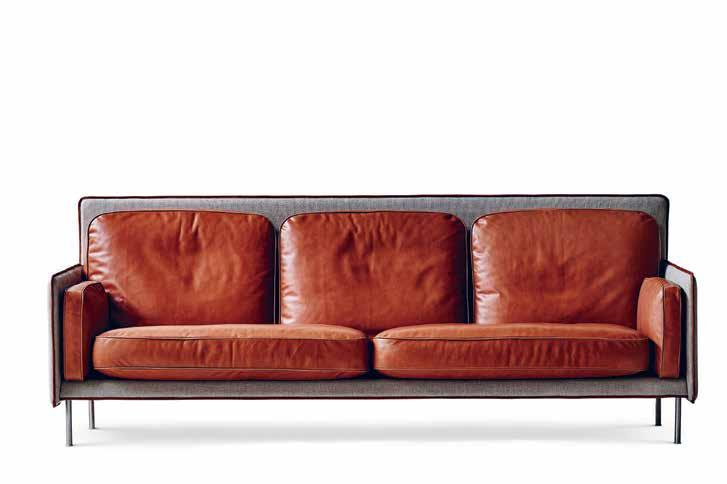
cultdesign.com.au
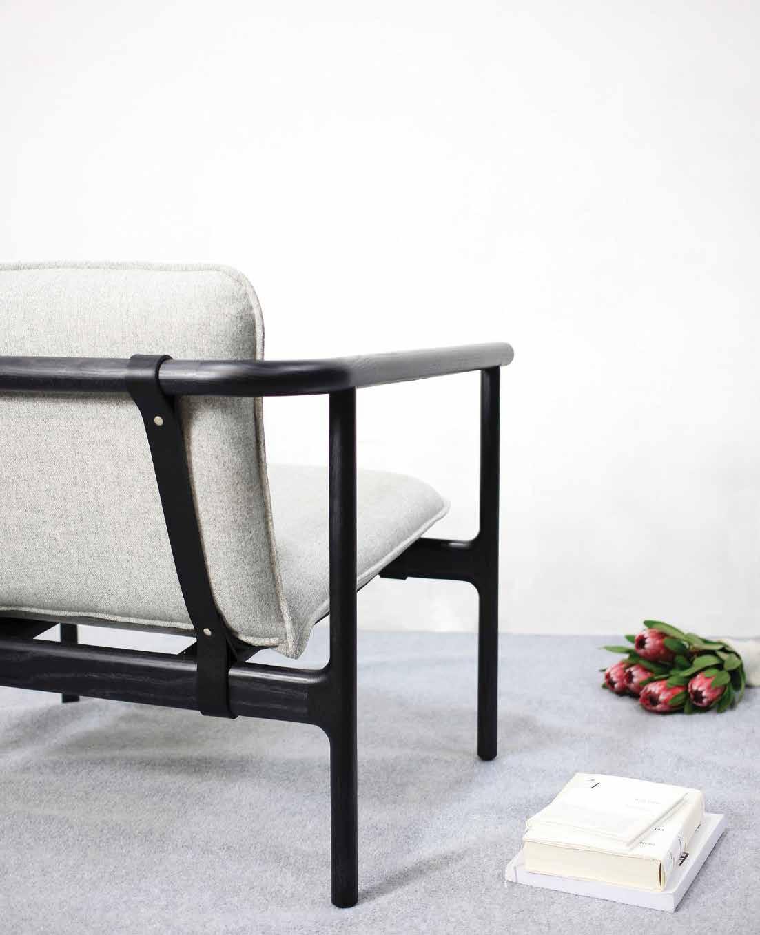
Hot on the heels of his first solo exhibition, ‘Thought–Process’ in Canberra, Tom Skeehan ’s HOSHI collection embodies the Japanese-inspired and minimal design aesthetic of the Canberra-based designer. Influenced by a love of clean lines and tactility, Hoshi shows off the natural grains of timber, paired with rich leathers. skeehan.com.au

1 . lightbox # 33
issue #33 habitusliving.com
It’s easy being green
potted plants to green roofs and the use
Forbes magazine projects that by 2030, 60% of the world’s population will live in cities, paving the way for a future of megacities and mass urbanisation with Tokyo, Mumbai and Mexico City bearing the brunt. It’s daunting to think what these will look like; giant urban sprawls glimmering with lights, and surely, with little greenery in sight. While the image of towering concrete jungles billowing industrial smoke into the horizon can be seen as a dystopian one, a recent push towards living intertwined with nature could result, instead, in an entirely different picture of the megacity. As Hans Christian Anderson said, “Just living is not enough. One must have sunshine, freedom, and a little flower.”
When we think about it, elements of nature have long been a staple in the home, with the innocuous pot plant, to the kitchen herb garden, fruit trees in the backyard, and lush gardens of flowers and vegetables alike being a recurring feature. The virtues of living closer to nature hardly need extolling; from filtering the quality of air to providing food and sustenance, and offering a stark contrast to the sometimes stifling indoors, a little bit of green goes a long way in improving the way we live.
“On face value we live in rather a manic consumerist society,” says Bree Claffey, “one where the production of desires via marketing can sometimes leave little space for quiet contemplation, silence and imperfection.”
Claffey is the author of Indoor Green: Living with Plants and the woman behind Melbourne’s Mr Kitly – a Brunswick-based space that is part shop, part gallery, and part architecture studio. As a lifelong horticulture lover, Claffey’s book is an exploration on how plant enthusiasts across the globe weave nature into their homes.
“The world of houseplants is one of exchange of knowledge and tips, a refreshingly currencyfree trading system,” continues Claffey. For her, houseplants are a vehicle for encouraging community and holistic living, explaining that in the process of writing the book a recurring theme that arose was “a strong sense of a connection to nature and the connection to the cycle of life which having potted plants inside brings.”
Interspersed with Claffey’s interviews are beautiful photographs by Lauren Bamford giving an insight into how plant-lovers live, and a collection of essays from botanist Phillip Cribb, and Dr B.V. Wolverton, a retired NASA scientist who was principal researcher
From
of natural materials, we have been increasingly living with and within nature. Reviewing three recent books, Christina rae finds the need for this integration is ever more important.
Tex T ChrisTina r ae | illusTraTion MaTT Canning ( h erds of Birds)
1 . lightbox # 35
for the NASA ‘Clean Air Study’, amongst others. Cribb’s article traces the remarkable journey of the Chinese ‘money plant’, pilea peperomidioides, a popular houseplant across Scandinavia, from the farthest mountains of China’s Yunnan province. Arriving in Norway in 1946, the plant has mystified botanists for decades, and Cribb marvels that a plant that was “hardly known to western science was being cultivated in thousands of private homes… as a result of off-shoots being passed on from one person to another.”
This communal aspect of cultivating plants is echoed in Nigel Bertram’s piece, where he notes that, “The idea of plants integrated with architecture has a lot of currency, and for good reasons … [but] unfortunately they also often fail, or plans are abandoned before even starting.” Bertram cites the Beverly Hills apartment complex in Melbourne’s South Yarra as one successful example of living architecture. Here, neighbours have frequently trade off-shoots and cuttings since its 1936 inception, showing that we need to “think of high-density living more as a process than a product – as we do of the city itself.”
For Veera Sekaran, editor of Exterior Green Wall Design, living architecture, or rather, exterior green walls that fuse architecture with plant life are an important way to “enhance the biodiversity in the urban environment by encouraging flora and fauna to survive together with people, up close.” Sekaran agrees with Claffey and Bertram that a “green revolution has taken place,” and believes that continued “research and development in all these areas is taking vertical greenery to reach new heights, literally and metaphorically.”
“Living architecture is multidisciplinary, blending the talents of architects, landscape architects, engineers, and horticulturalists,” asserts Sekaran, “Its practitioners are committed to the greening of cities and buildings, and recognise that plants are an underutilised resource in the larger green building movement.”
The book Exterior Green Wall Design examines case studies across the globe where living architecture has been seamlessly integrated into both residential and commercial projects, from Singapore’s The Hereen shopping centre to Istanbul’s Aydon Country House. Sekaran also delves into the practicalities of implementing living architecture, which is, “a marriage between form and function, pragmatism and imagination, nature and technology, biology and chemistry, precision and free-growth, to produce a multitude of beautiful oxygenproducing walls clad in foliage.”
Braving the verdant landscape of the Philippines and the ever-present threat of typhoons and natural disasters are a set of architects who are parsing out an idea of a Filipino architectural identity. Robert Powell explores the evolution of the architectural terrain, and the current rivalry between two schools of thought in Filipino architecture
throughout his book Contemporary Houses in the Philippines
Traditional Filipino architecture has made liberal use of natural materials such as bamboo, coconut, cogon grass, and nipa, particularly in the ubiquitous bahay kubo, or Nipa Hut in rural areas. The hut is raised on hardwood stilts to create a buffer between the home and rising waters during monsoon season, often designed with bamboo slat floors and bamboo rod walls, accompanied by a tall and steeply pitched roof.
Prominent Filipino architect Francisco ‘Bobby’ Mañosa is largely credited with being at the forefront of maintaining these traditional elements in contemporary architecture, and is the architect of the Coconut Palace – a Filipino icon and residence for the Vice President of the Philippines.
On the other end of the spectrum is Lorenzo ‘Lor’ Calma, who made it a priority to instead use composite materials in his work, and is widely considered to have brought modernism into Filipino architecture, with his signature strong lines and cantilevers. While both architects were prominent throughout the 1980s, the tug-of-war between traditional architectural vernacular, and the modern style that eschews it, is continued in the work of younger generations.
Living architecture ... a way to “enhance the biodiversity in the urban environment by encouraging flora and fauna to survive together with people, up close.”
issue #33 habitusliving.com
As Powell discusses, the architect Rosario ‘Ning’ Encarnacion Tan “extols the virtue of bamboo, stressing the fact that it has a 2,000-year-old tradition and that the material is renewable and can be sourced locally.”
Tan contends that the natural materials are “part of the collective memory of the Filipino people,” and therefore should be at the heart of a Filipino architectural identity. In contrast to this, however, the architect Royal Pineda believes that, “modern Filipino architecture needs to respond to the lifestyle of today and the future… [and] should not be restricted by images of the bahay kubo.”
Throughout Contemporary Houses in the Philippines, Powell explores modern Filipino houses which draw from both schools of thought. Beginning with the highly angular and concrete-heavy Stratfield PLC House designed by Juan Carlo Calma, the nephew of Lorenzo Calma, and ending with Rosario ‘Ning’
Encarnacion Tan’s Bamboo House, Powell examines the way contemporary architecture in the Philippines has both embraced and renounced either style with vivid photography that highlights the key notes of each.
As the spectre of the megacity looms, it’s vital to continue to integrate elements of nature into architecture, both on the inside, and out. The way we build our homes to adapt to the ever-present effects of global warming and urbanisation is of crucial importance, as by constantly striving to live harmoniously with nature, we can endeavour to live more holistic lives, with both the environment, and each other.
CONTEMPORARY HOUSES IN THE PHILIPPINES
Robert Powell Images Publishing 224pp hardcover AU$69.54 imagespublishing.com
EXTERIOR GREEN
WALL DESIGN
Veera Sekaran Images Publishing Shanghai 264pp hardcover AU$76.50 imagespublishing.com
INDOOR GREEN: LIVING WITH PLANTS
Bree Claffey Thames and Hudson 208pp hardcover AU$49.99 thameshudson.com.au
1 . lightbox # 37
FOR LOVERS OF FINE OAK
Raba Eterno floorboards feature a bold, hand-finished linear effect which offer texture to the solid black colouring with a hint of brown.
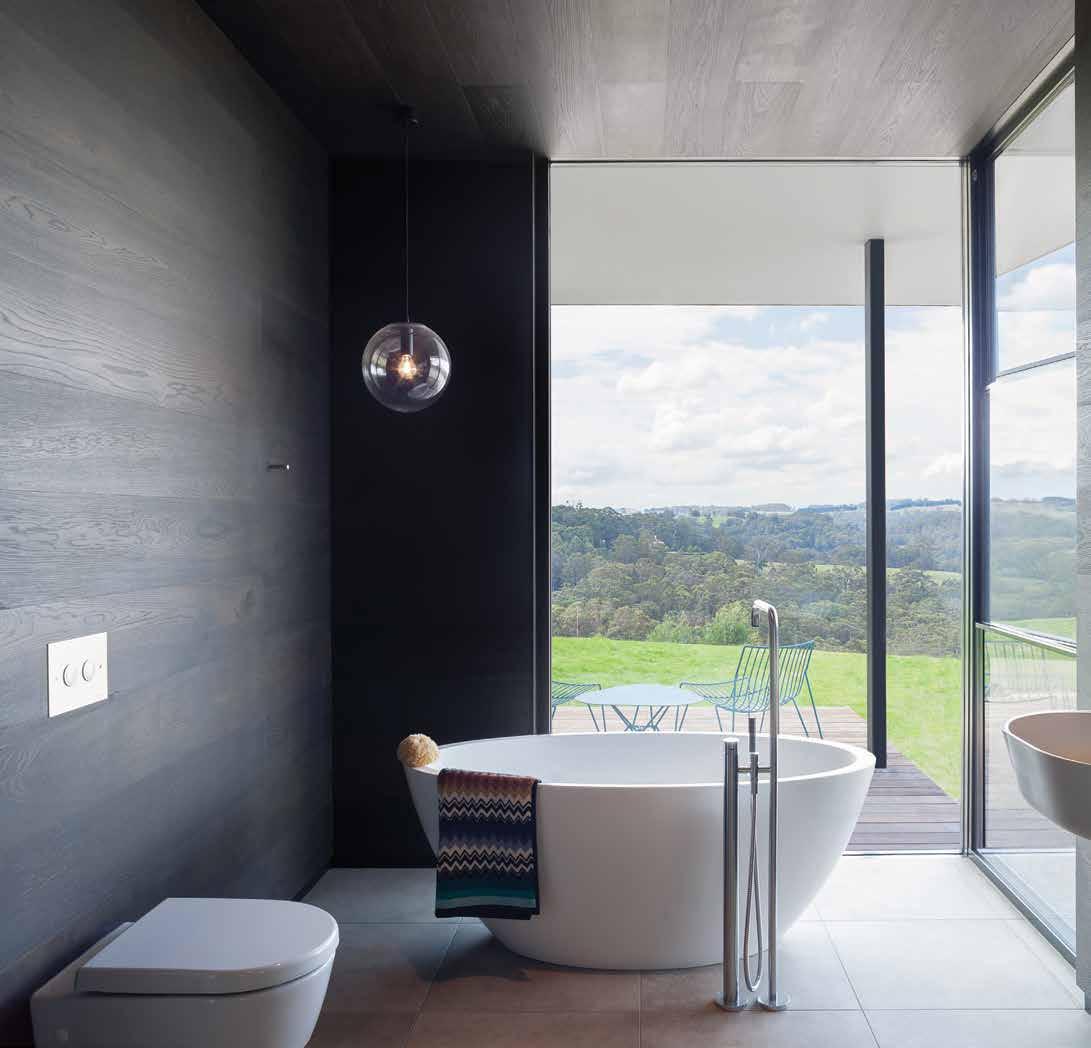
Tongue n Groove™ floorboards are designed with three solid layers of fine European Oak for a premium level of finish, longevity and structural integrity.
tonguengrooveflooring.com.au
Drive into a conscious way of living





Nourish & flourish
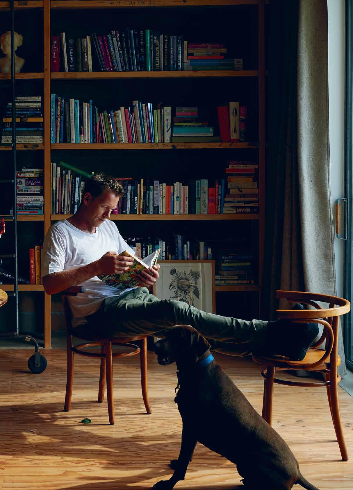
Designer, builder, florist, artist and a passionate advocate of self-sufficient suburban living, Joost Bakker has a dream. It may sound like a long shot, but he’s been testing his theories out at home, and already has a plan to take over our city skylines with nourishing, flourishing greenery. alice Blackwood treads the line between dreams and reality.
Tex T Alice Bl Ackwood | PhoTogr APhy eA rl cA rTer
issue #33 habitusliving.com
# 41 2 . portrait
Joost Bakker is a man with a vision. “My dream,” he says, “is that in 20 years’ time our food will be grown in the very suburbs in which we live. And all building rooftops will allow for that to happen.
“I have no doubt,” he continues, “that by the time I’m 60 [17 years from now] suburbs will have more biodiversity than the densest rainforests. And it will be our buildings that grow the vegetation we eat.” As unlikely as it seems, Joost’s dream is no pie in the sky.
The Melbourne City Council recently mapped out the city’s rooftops to determine available space for sustainable greening projects. That exercise found about 328 hectares of free rooftop space suitable for extensive green roofs (that is, light vegetation and smaller plants which need minimal watering). Of the 880 hectares of roof space within council boundaries, green projects cover just 7.8 hectares. 1
The green roofs are there for the taking, and the possibility not so far out of reach.
Joost, in the meantime, has already conceived his own easy-to-fabricate, selfsustaining house design for city dwellers who have an appetite for sustainable, self-sufficient living. This open-source design is constructed using a common Vierendeel Truss frame system, combined with the thermal mass of concrete floors and ceilings. The roof, of course, is insulated with soil. The intention is that it’s “economical to build, efficient to run and has the capacity to grow food and create habitat and bio-diversity”, says Joost.
Many of the ideas within this Future Cave model have grown out of Joost’s own home-
issue #33 habitusliving.com
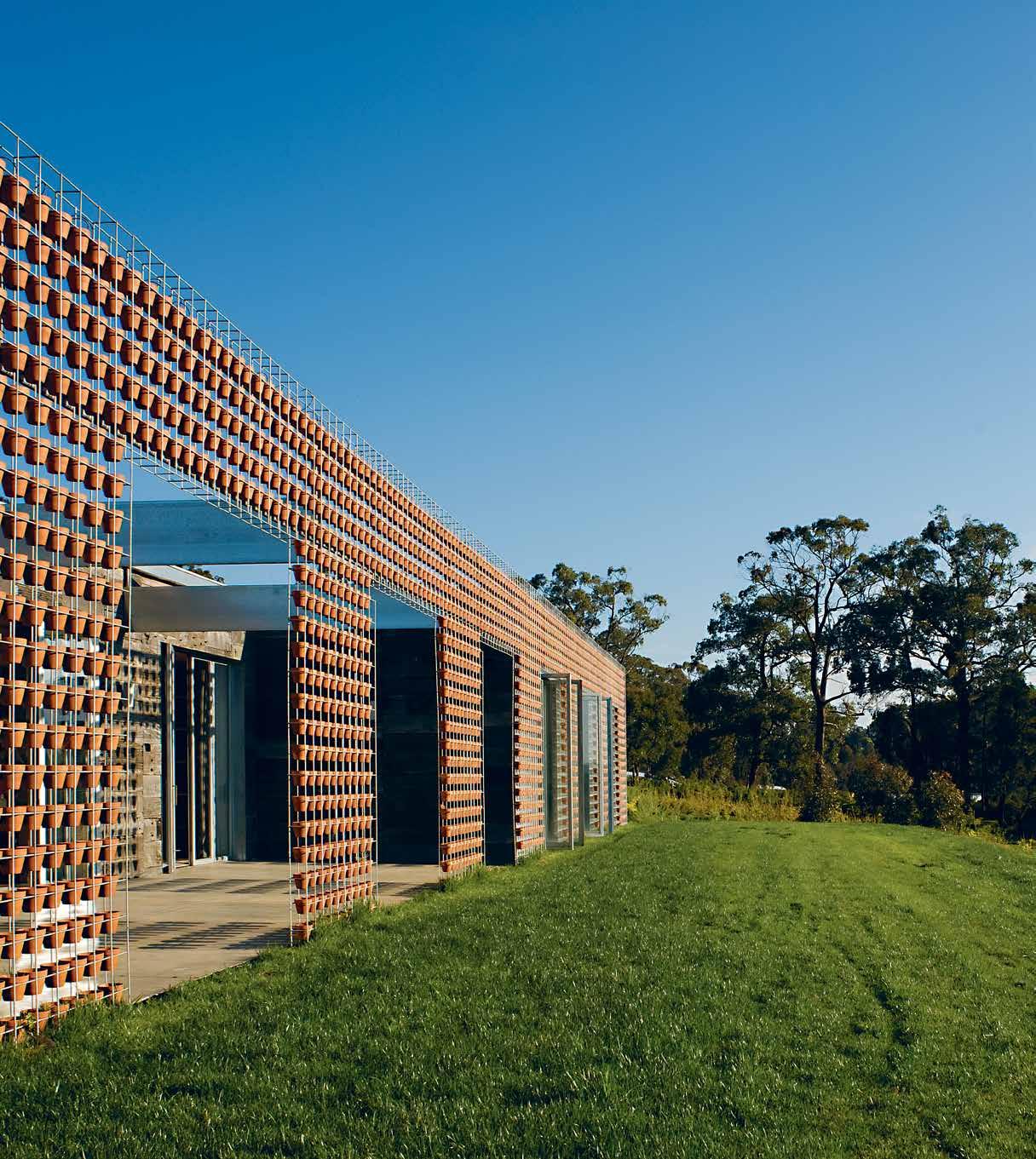
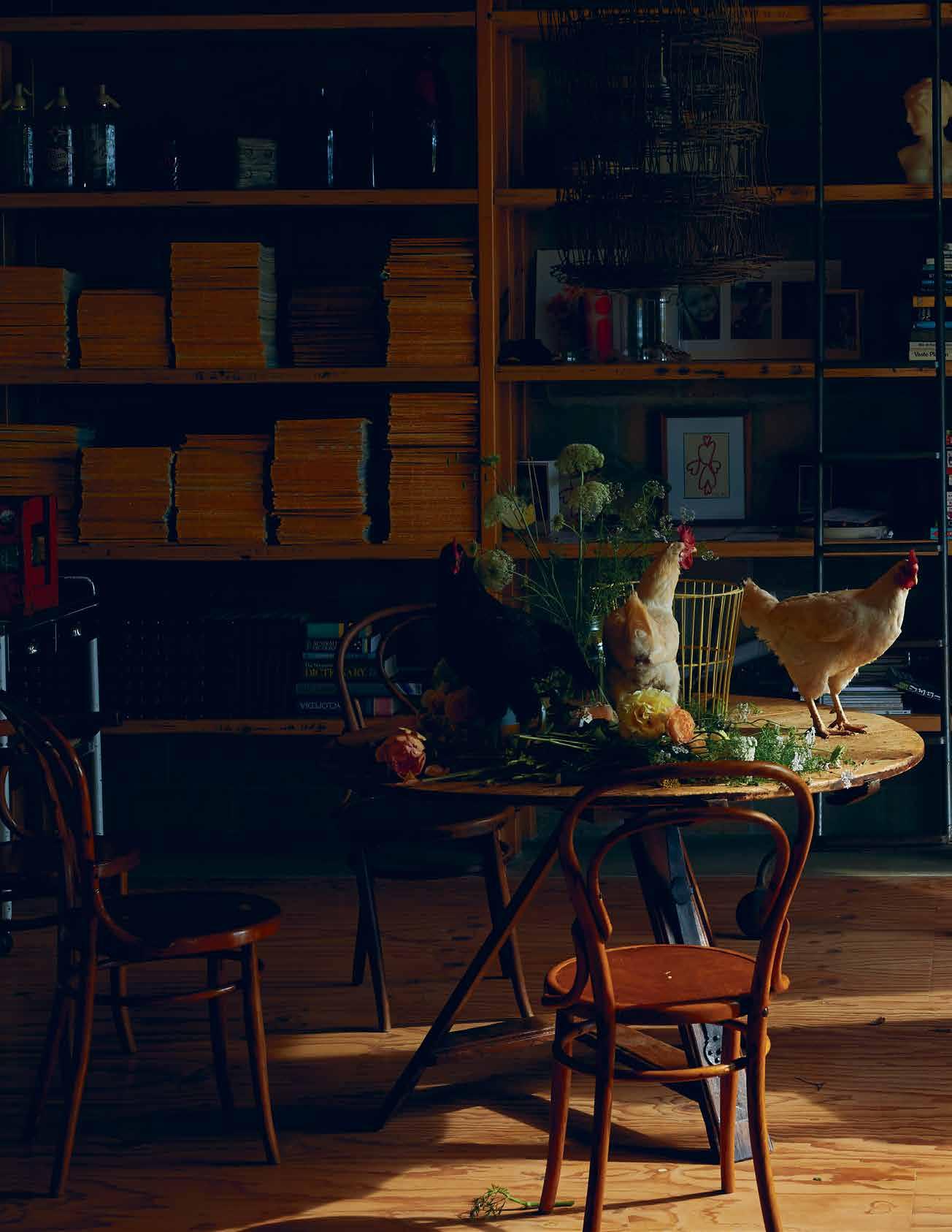
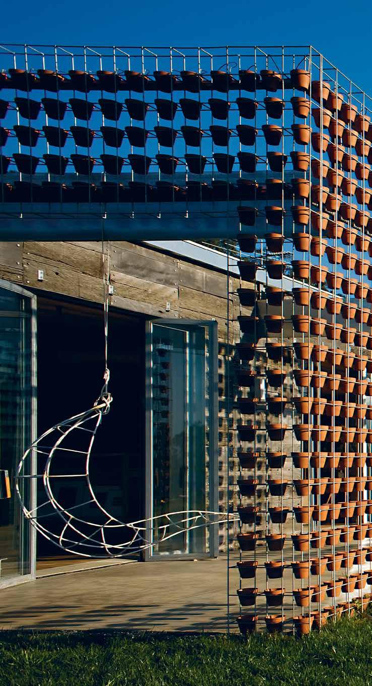
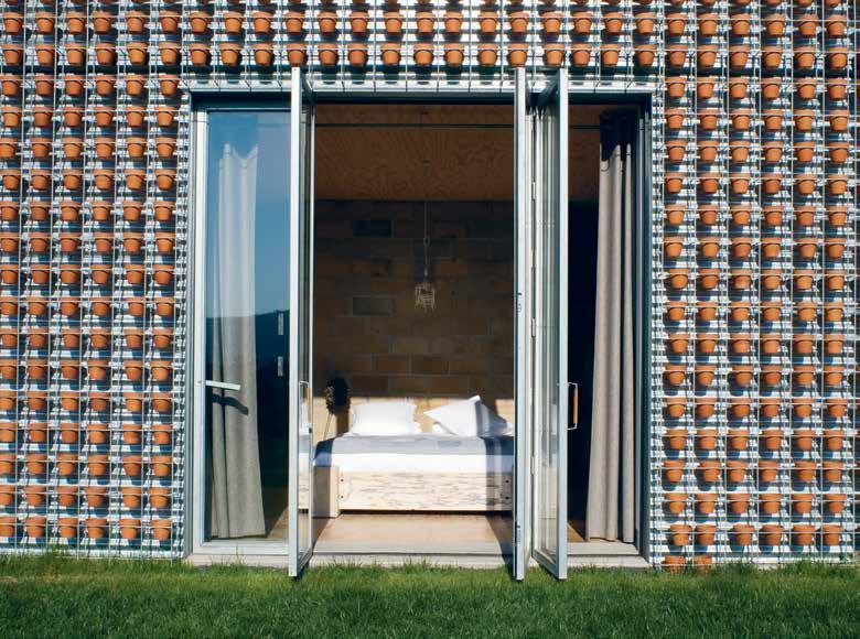
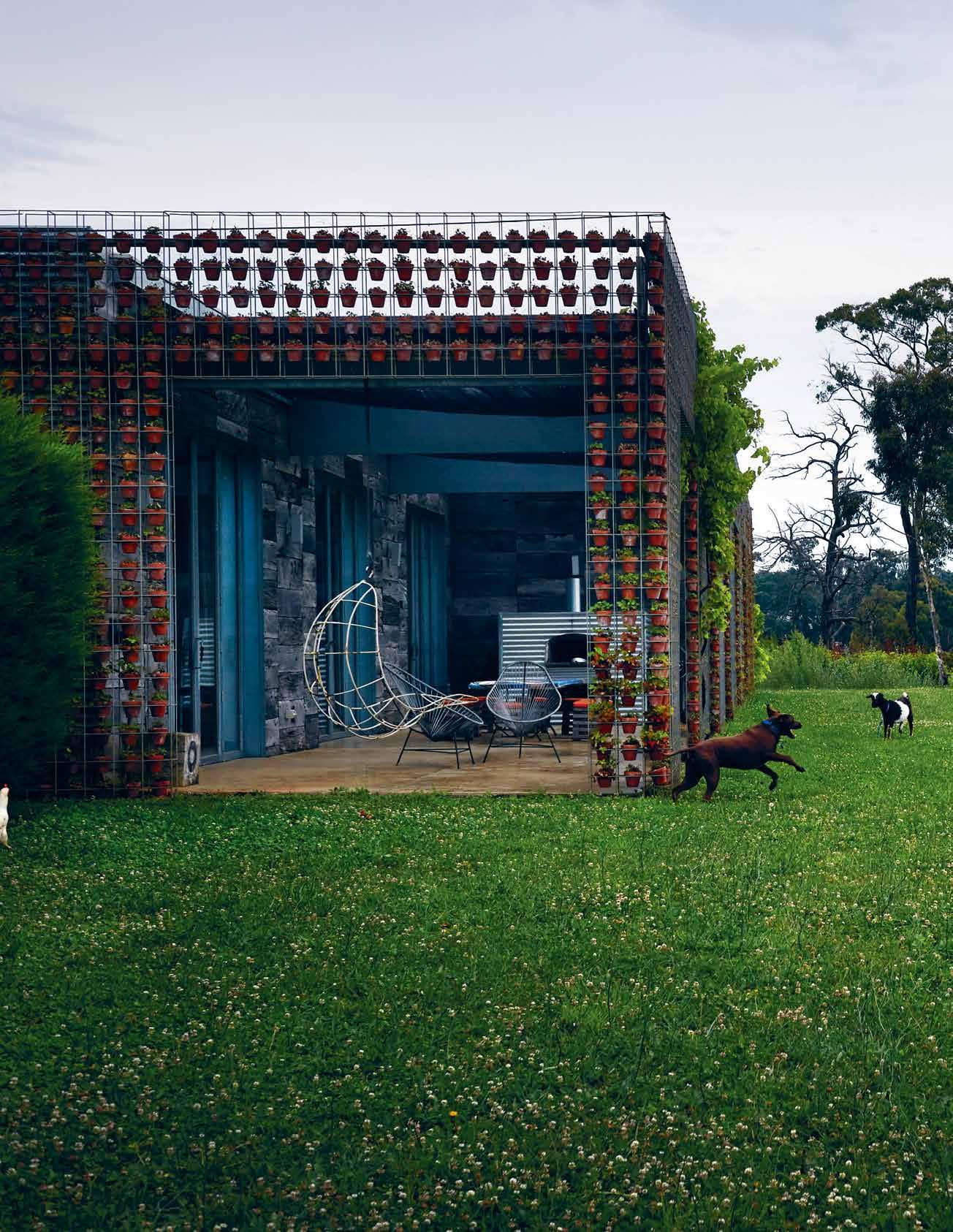
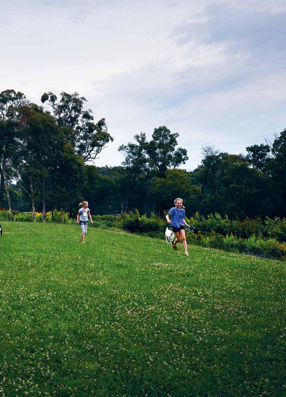
PREVIOUS | The permeabiliT y of JoosT ’s house design allows an easy TransiTion from indoors To ou T, alThough for his brood of chooks The TransiTion Tends To be The oTher way a round! ab OVE | JoosT ’s VerTical garden concep T has been used To greaT aesThe Tic and sTrucT ural adVanTage as an ex Ternal garden wall. h e’s also Taken The VerTical garden producT inTo producTion, aVailable exclusiV ely from s chiaV ello. 2 . portrait # 43
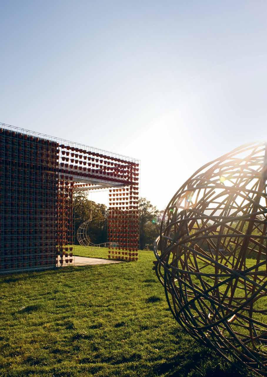
above | A l A rge,
A
|
le A
Awns – A n
nt consider
issue #33 habitusliving.com
sphericA l sculpture by Joost sits, like
silent sentinel, wAtching over the house. opposite
All rooms
d outside to the surrounding l
importA
Ation when Joost wA s designing his house.
building endeavours. The journey began with his family home some 10 years ago. Ever the maker, Joost was committed to designing and constructing the house himself. But it was the first house he’d ever built and, like all first-time projects, is laden with the wisdoms of hindsight.
“I really love my house,” says Joost. “But my biggest regret is that I didn’t put a green roof on it. Of course, once I’d finished the house, I had all this confidence and I realised in hindsight that I should have done it. From that moment on I vowed I wouldn’t do another building without a green roof.” A promise that he has made good on since then.
It was always Joost’s intention to build his family home on leafy, green acreage, surrounded by gardens and bush. It took 10 years of hunting for himself and wife, Jennie, to find their perfect block of land – 2.4 hectares in the Dandenong Ranges of Victoria. “I wanted a place with good soil for gardening and somewhere I would be able to sit, have dinner and watch the sunset,” says Joost.
They didn’t build immediately. In fact, they levelled an acre where the house would sit, and set up a septic system that would feed nutrients into their newly planted orchard.
2 . portrait # 45
He points to his own permeable home layout, which allows the family to walk straight out and into the surrounding gardens from every room.
issue #33 habitusliving.com
2 . portrait # 47
Joost spent every day after school helping out on the family farm. It awakened in him an appreciation for nature’s ability to nurture, protect, grow and flourish.
Joost, an ex-Dutch national, has vivid memories of his young life in Holland where a south-facing garden was essential to every home. “I’ve found in Australia that home gardens aren’t as prevalent (or used as much for entertaining, dinners, etcetera), because we so often build on steep blocks. You might walk out onto your verandah, but unless you make a physical effort to create a garden…” ‘Well, it’s worth it, bugs and all’, is Joost’s unspoken sentiment, as he points to his own permeable home layout, which allows the family to walk straight out and into the surrounding gardens from every room.
When it came to orientation, Joost spent weeks inspecting how the sun hit his acre. “I had plastic crates stacked up throughout July, to see where the sun would go. For me it was all about north and west, about the sun and sunset, and the view.”
Insulation was equally important for Joost, who well remembers his family immigrating to Australia in the 1980s and the chilly reception upon arrival. “Coming from Holland the first thing we noticed was that houses in Australia are not insulated.” They couldn’t fathom that Victorians could comfortably live in such cold abodes throughout winter.
In those early years in Australia, Joost spent every day after school helping out on the family farm. It awakened in him an appreciation for nature’s ability to nurture, protect, grow and flourish. And gave him a few ‘bush mechanic’ skills that he’s been able to apply to his own housing concepts.
He knew that hay had wonderful insulating properties: “In Holland we used straw to insulate the tulips from the frost, and in Australia we could insulate them from the heat,” comments Joost. Soil, meanwhile, gave life and also turned out to be an excellent ceiling insulator. As a result, the house is built along a steel frame with straw bales lining the walls and ceilings. “We also used straw as a waffle slab with 80 per cent recycled concrete,” says Joost, who built the internal walls using the solid thermal mass of old Besser Blocks. The roof is insulated with soil and grass.
“You don’t need a massively insulated ceiling,” Joost explains. “From a biology and biodiversity perspective, soil creates a massive reduction in energy use.” The other advantages are that soil can creatively capture nutrients like compost and urine. And, once fertilised and irrigated, that same soil can then facilitate plant propagation.
PREVIOUS | “I’m really close w Ith my uncle and auntI e, who lIve I n theI r
you
r
I
r
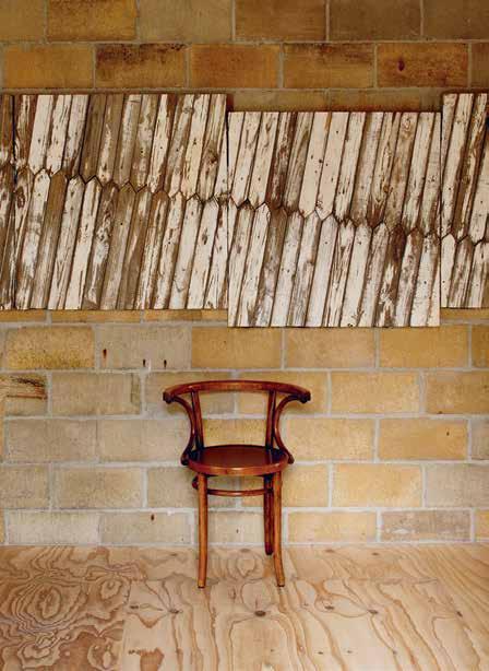
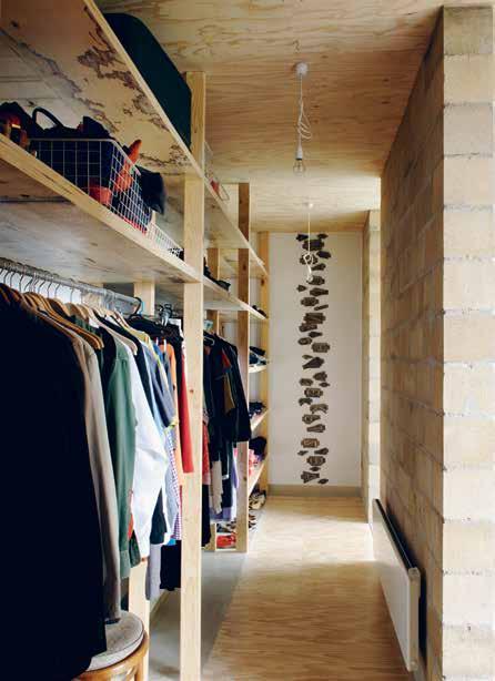
s ometh I ng he brought to lI fe I n h I s own home. OPPOSItE | the ma J orIty of Joost’s furn I sh I ngs and fI n I shes are recla I med, repurposed or recycled. It makes for a warm, textural I nterI or lI fe. issue #33 habitusliving.com
garden.
could always walk out of theI
house
nto theI
garden,” says Joost.
2 . portrait # 49
issue #33 habitusliving.com
While Joost didn’t direct a septic or composting system to his own Dandenongs rooftop, in his home of the future: “It would be a system where urine gets diverted and used as fertiliser on the roof. The faeces ends up going into a composting system. In the future I’d love that system to feed into a charcoal vending machine.”
These are not idealistic meanderings. Joost has already tested the charcoal theory using chicken manure. “It’s incredibly beneficial to soil and stays there for a long time.”
When it came to his home interiors, Joost was sensitive to the fact that his three young daughters would be growing up in these new spaces; their lives and experiences shaped by the spaces built around them. “I wanted a place for my kids to grow that was non-toxic,” he says quite seriously. He opted for soap to seal the timber structural elements and joinery, chose natural and reclaimed materials every time, and worked with fully recyclable galvanised steel, which also cut out the need to use toxic paints and glues.
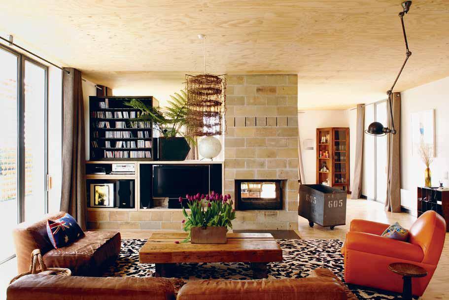
At the heart of the kitchen, living and dining area he built a double-sided fireplace.
opposite | Ev Erything has m E aning in
hous E th E light pEndant h E mad E
E
with tablE lEgs from an E x- m unich o lympics p omm El h ors E ; original thon E t
E 40 y E
ago. above | th E c Entral firEplac E conn Ects living and dining – th E h E artland and h E arth of th Eir c Entral living arE a. 2 . portrait # 51
He opted for soap to seal the timber structural elements and joinery, chose natural and reclaimed materials every time, and worked with fully recyclable galvanised steel.
Joost¹s
from old fEncing wirE th
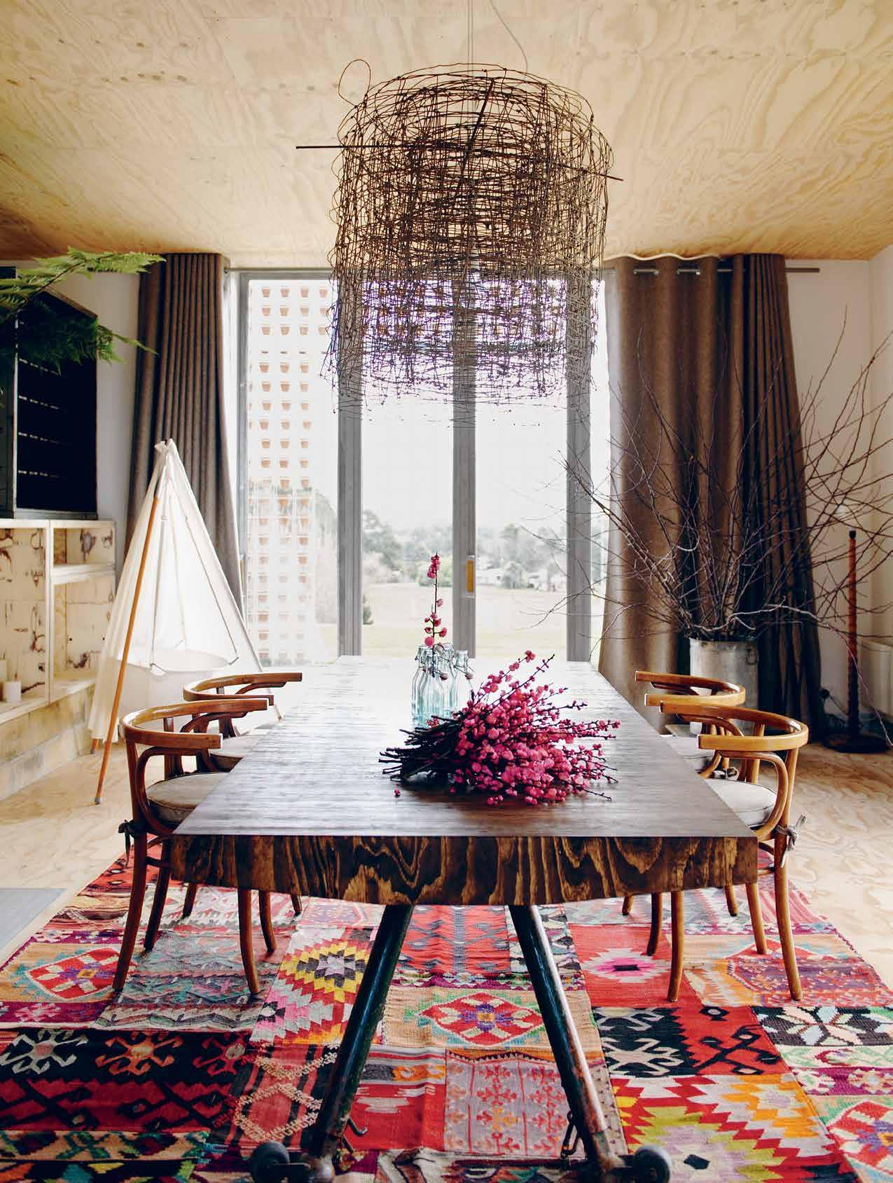
dining tablE from rEpurpos Ed packing cratEs
chairs, sourc Ed from Joost’s fath Er’s pub in h olland som
ars
The fireplace is set to the south of the threemetre dining table. Breakfast, lunch and dinner are eaten at the north end of the table. To the west is the sunset. Sun, warmth and views from every angle.
His furnishings pay tribute to the repurposed and self-designed. “There was a Poltrona Frau sofa we’d bought,” muses Joost. “But that now looks like I found it on the back of a truck!” he laughs.
Not one to hold his cards close, Joost has shared his unique approach to sustainable self-sufficient living through his open source Future Cave building design. Future Cave is set to have its first outing at the Lexus Design Pavilion at Melbourne’s 2016 Spring Racing Carnival. It will also be available to anyone building a new house.
Twenty years from now, Joost says, “you won’t even know you are in a suburb, because the buildings will be covered in vegetation, growing the food we eat.” The line between dream and reality begins to blur.
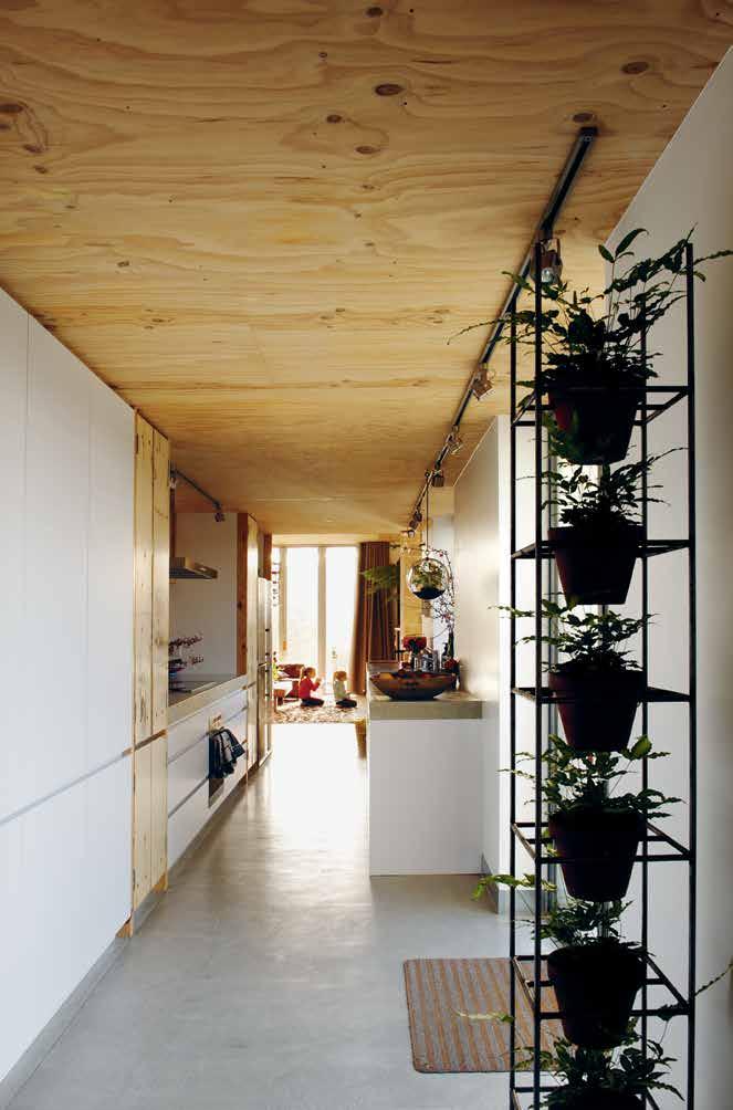
1 New maps show Melbourne’s unused rooftops are ripe for greening” by Tom Arup, published 9 November 2015, theage.com.au
Joost Bakker | byjoost.com
A bove | A centr A lly locAted kitchen fronts onto the north-fAcing courtyA rd. issue #33 habitusliving.com
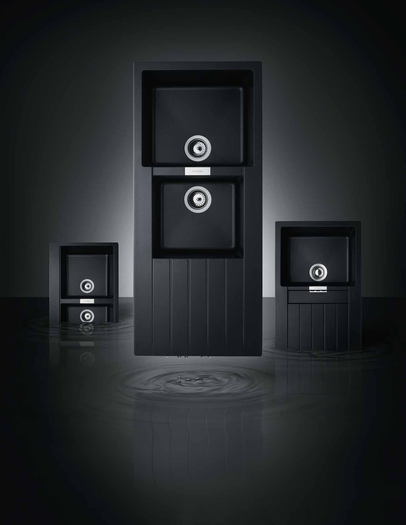
www.abey.com.au Abey Australia’s diverse range of sinks provides you with a selection from around the world. Visit an Abey Selection Gallery to browse the range. Schock Double Bowl in Metallic – Schock 1 & 3/4 Bowl in Metallic – Schock Single Bowl in Metallic SINK DIFFERENTLY. *NEWLY OPENED* VICTORIA Selection Gallery 335 Ferrars St Albert Park Ph: 03 8696 4000 NEW SOUTH WALES Selection Gallery 1E Danks St Waterloo Ph: 02 8572 8500 QUEENSLAND Selection Gallery 94 Petrie Tce Brisbane Ph: 07 3369 4777 *OPENING SOON* WESTERN AUSTRALIA Selection Gallery 12 Sundercombe St Osborne Park Ph: 08 9446 8255
Bamboo benefactor

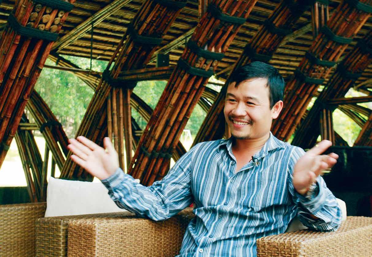
From single homes to large-scale residential towers, hotels, restaurants and more, Vietnamese architect Vo Trong nghia is becoming known as one of the world’s most sustainable and socially conscious architects, with heavy emphasis on the use of bamboo, which he calls ‘green steel’.
Tex T
michelle bailey | PhoTogra Phy hiroyuki oki
2 . portrait # 55
issue #33 habitusliving.com
Behind the warm and friendly face of Vietnamese architect, Vo Trong Nghia, is a quiet and determined force in the world of architecture. Awards, accolades and a swell of interest have pursued this man since 2006 when he established Vo Trong Nghia Architects (VTNA) in Ho Chi Minh City. But despite the attention, Nghia remains the antithesis of a ‘starchitect’, pursuing architecture for humanitarian and environmental reasons with great sensitivity and finesse. His innovative practice has redefined ‘green’ architecture, demonstrating the structural and poetic prowess of bamboo and proving that affordable architecture is not only attainable but also desirable.
The path forged by Nghia is shaped, like any, by circumstance and opportunity. As the youngest of seven brothers growing up in rural Vietnam without electricity or running water in the aftermath of war, his childhood was scarcely advantageous. Such conditions make his architectural qualifications from the prestigious University of Tokyo quite remarkable. “I didn’t have anything else to do but study,” he says of his natural propensity for scholarship.
Returning to Vietnam in 2006, Nghia established VTNA in Ho Chi Minh City. His 10-year absence, which coincided with rapid development and destruction of the natural environment, fuelled his determination to find ways of introducing fragments of landscape to heavily polluted and populated areas. “The first step was to make the city more green; that was the easiest thing to do,” Nghia says. These intentions translated to a range of experimental projects which integrated green facades, applied passive ventilation and lighting strategies, and utilised bamboo as a cheap, sustainable and culturally appropriate construction material. Bamboo quickly became synonymous with his early practice and continues to define a lot of his work.
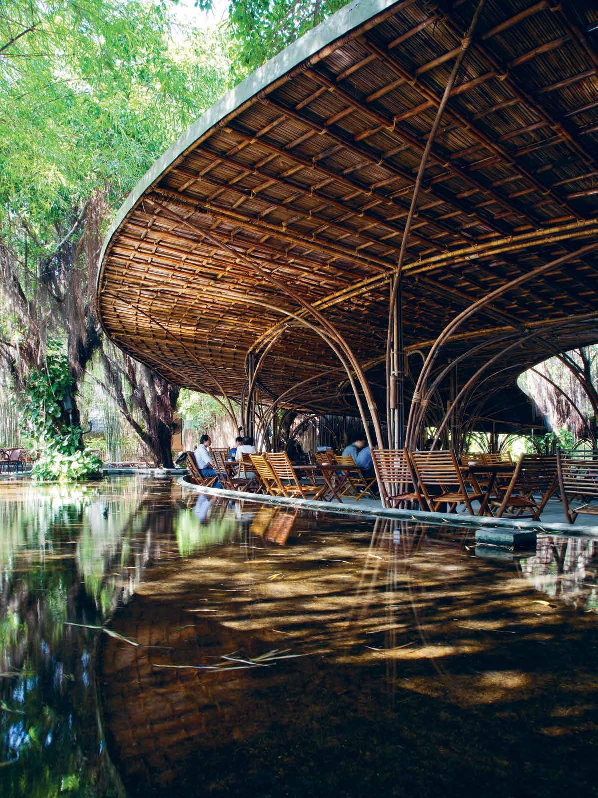
Wind and Water Cafe (2006) was the beginning of VTNA’s experimentation with ‘green steel’, the natural material with a tensile strength similar to steel, but harvested locally at a fraction of the cost. Exploiting the inherent qualities of bamboo to curve, flex, and appear like timber with a natural grain and character, the pavilion employed bamboo culms by the thousand in a series of arches to support a flat, bamboo-framed canopy.
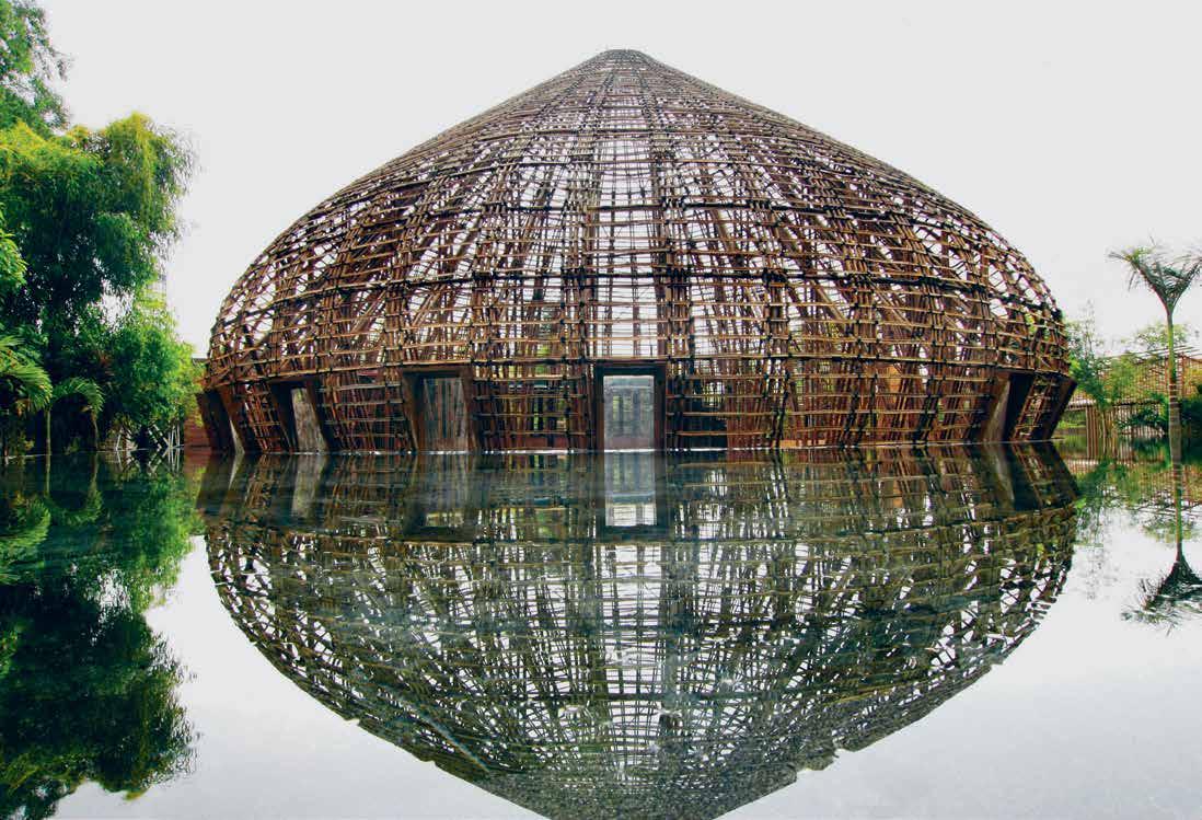
PREVIOUS | Architect Vo trong n ghiA OPPOSItE | B A m B oo culms cre Ate A rches to support A BA m B oo cA nopy At Wind A nd WAter cA fe. a BOVE | Wind A nd WAter B A r, shoW n here unfinished, W ithout its th Atched roof, A ppe A rs to rise out of the WAter of A surrounding pond. photogr A hy By ph A n quA ng. 2 . portrait # 57
VTNA’s Wind and Water Bar (2008) soon followed and firmly established a command of this natural and ‘random’ material through the awe-inspiring dome structure made entirely of bamboo. Forty-eight prefabricated bamboo ribs were employed to make the dome which spans 10 metres high and 15 metres across and appears like a contemporary version of the ancient Pantheon. The open top expels hot air that is drawn inside through openings at ground level to ventilate and cool the building in a passive way. Like the Cafe, the construction process of Wind and Water Bar was as experimental as the architectural and structural design and required education and training of local workers to complete the build.
VTNA’s bamboo technologies have continued to develop and evolve over the last decade. In 2015 VTNA designed the Vietnam Pavilion for the Milan Expo and it too utilised bamboo in the form of giant fluted tree planters, conceived as natural shade structures. The consistent thread with such projects is a commitment to natural and sustainable construction, which generates socially conscious architecture at low cost. Exploiting a cheap, locally sourced and natural material that continues the lineage of local craftsmanship and custom transcends the superficial production of building. Aside from the obvious and multifarious benefits of ‘green steel’, the elegance and beauty of the resolved bamboo objects and structures and their harmonious relationship with the natural landscape resonates on an aesthetic, intellectual and emotional level.
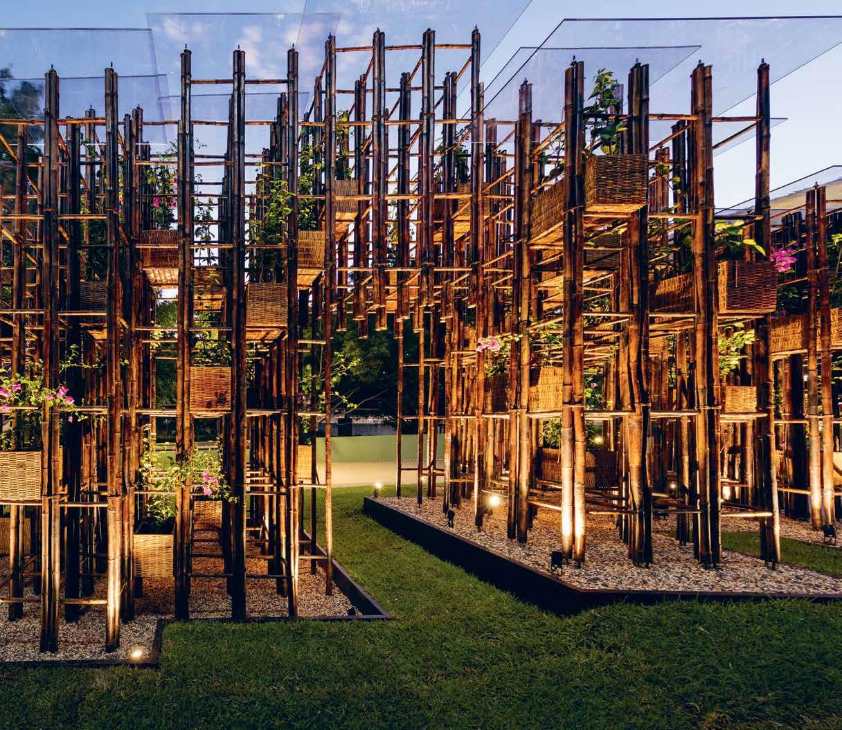
The recent Green Ladder Pavilion, VTNA’s commission for the Sherman Contemporary Art Foundation (the fourth and final instalment of their Fugitive Structures Program) brings a sample of this work to Australia. Here, bamboo (which has undergone rigorous treatment in Vietnam
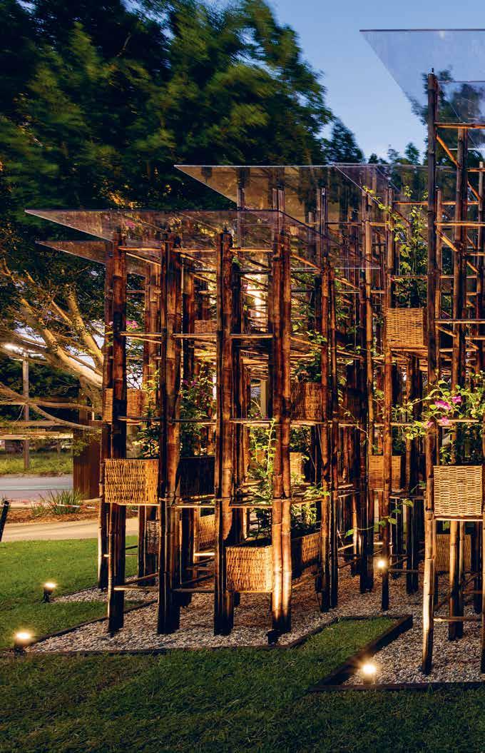
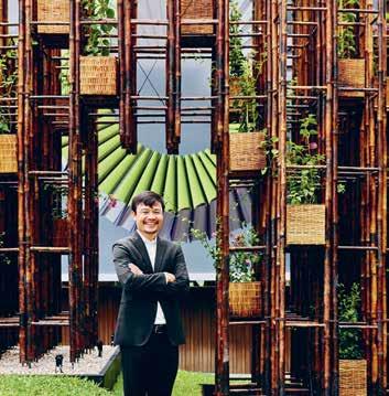
Left AND RIGHt | The Green Ladder pavi Lion inviTes The AusTr A liA n public To ponder The poTenTiA l of b A mboo consTrucTion. phoTogr A phy by diA nn A sn A pe, p orTr A iT phoTogr A phy by Toby
issue #33 habitusliving.com
scoTT
The bamboo structures and their harmonious relationship with the natural landscape resonates on an aesthetic, intellectual and emotional level.
2 . portrait # 59
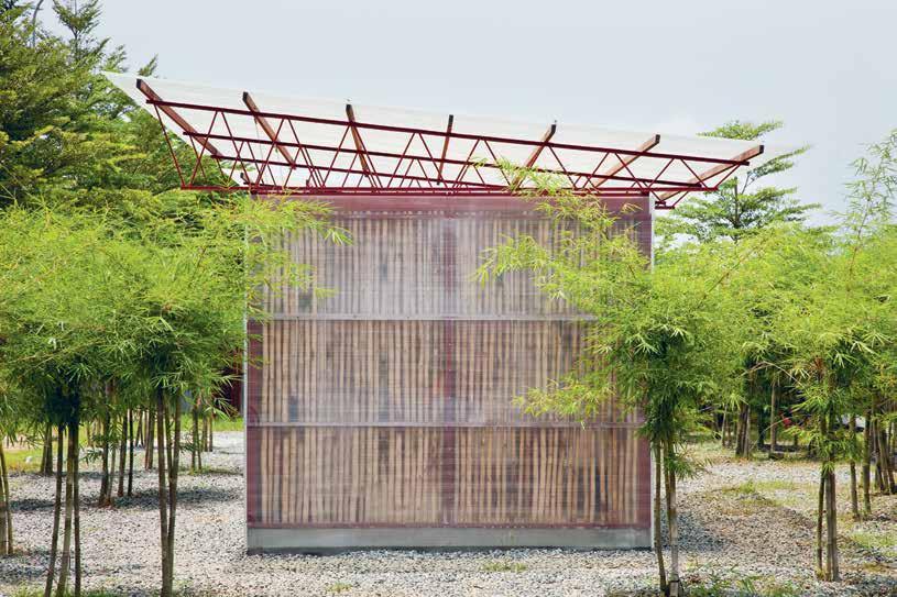
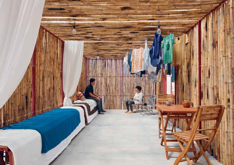
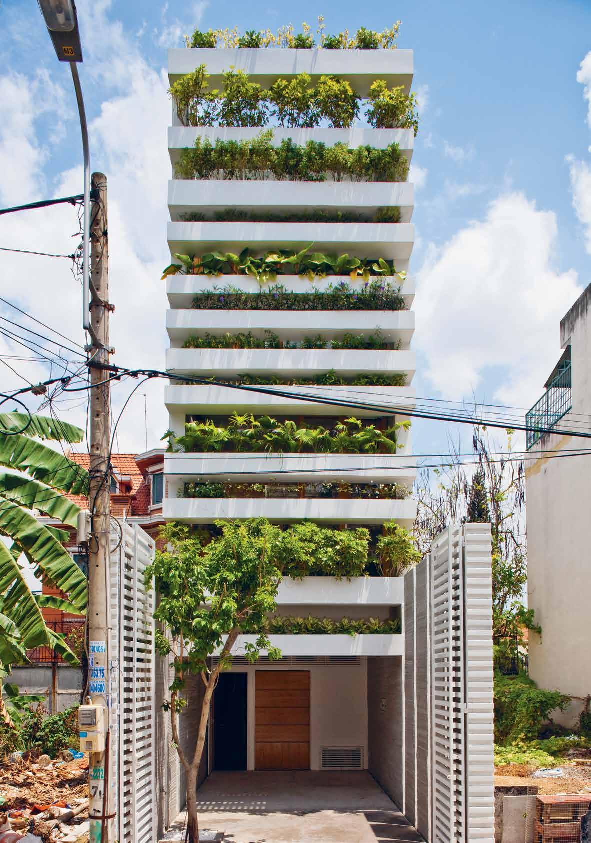
above | s-house, a low-cost home model originally designed for low-income agricultural workers in Vietnam’s mekong delta. below | the enVelope of s-house is composed of a polycarbonate panel wall with bamboo louVres set inside. the translucent enVelope filters harsh direct sunshine in the tropical climate and a gap between the roof and the wall e Vacuates hot air. opposite | stacking green is an inVentiVe prototype for green liVing in densely populated cities like ho chi minh city.
issue #33 habitusliving.com
2 . portrait # 61
Your design. The right grate selection, with Stormtech. Match the perfect drain to your requirements with Stormtech’s superb range of linear, designer drainage systems.
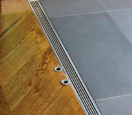
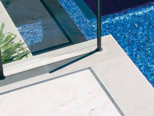
Manufactured in Australia from marine grade stainless steel, Stormtech systems bring the perfect balance of style, durability and sustainability to both indoor and outdoor environments.
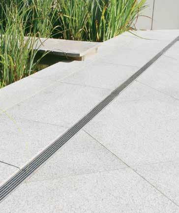
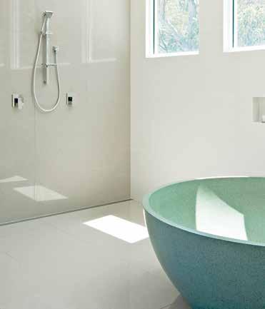
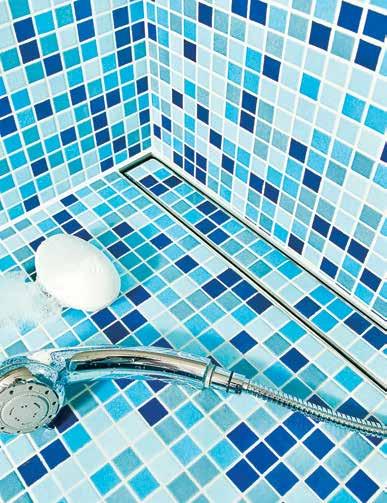
View our complete selection of drainage systems and product applications on the Stormtech website, or call for more details.
Phone 1300 653 403

Website stormtech.com.au
ARCHITECTURAL GRATES + DRAINS
Bathrooms + Showers
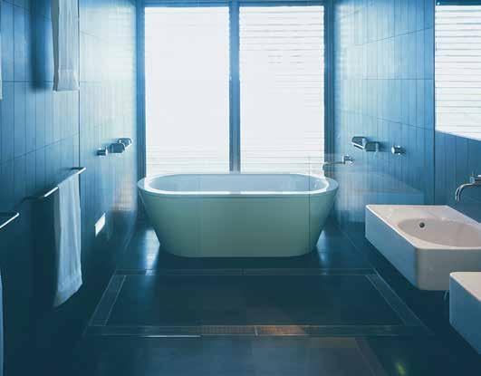
Pools + Surrounds
Thresholds + Doortracks


Special Needs Access

A grate selection for a grate match.
through mud soaking and smoking) is utilised to create a grid-like structure and framework for climbing bougainvillea. It is an intriguing planted wall designed for the public to ponder, touch and explore. In contemporary pavilions terms, the structure is unconventional. It cannot shelter large groups in a formal way, rather it represents an ideology that proposes an alternative building method and a new way to merge architecture, landscape and art.
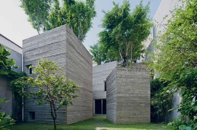
Like their experimentations with bamboo, VTNA’s prototypical housing projects explore affordable ways to integrate nature through architecture. Stacking Green (2011) and House for Trees, (2014), as well as S House are all revolutionary in some way. The latter has evolved through several variations as a viable low-cost home option, originally designed for low-income agricultural workers of Vietnam’s Mekong Delta. The house can be assembled in a few hours at a cost of less than USD$1,000, making it hugely relevant on a mass, global scale.
Stacking Green is a private residential commission that plays on the local custom of gathering patio pot plants for visual amenity. VTNA’s iteration proposes green facades in the form of stacked concrete planters to the short ends of a typical 4-metre-wide, 20-metre-long plot. The effect of suspended gardens on the spatial and thermal quality of the home is breathtaking. Interior rooms are cast in soft dappled light, glare is tempered and noise and pollution is filtered through the lush foliage of the planted facade. Passive ventilation is a valuable by-product of the architecture, which establishes refuge on days of insufferable humidity and heat.
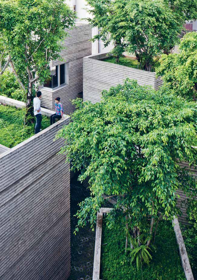
above | Rooftop ficus tRees c Reate a Residential sanctua Ry and pocket pa Rk fo R the city. below | Bam B oo is used to c Reated the fo Rmwo Rk of the giant conc Rete planteR B oxes at h ouse fo R tRees. 2 . portrait # 63
House for Trees is a playful collection of large cubic concrete planters, five in total, which enclose detached rooms and support the growth of rooftop ficus trees. The role of the planters is multi-faceted, supporting growth, providing shade, capturing rainwater (and diverting it away from storm water retention) and instilling the presence of nature in every room. On a city scale, the proposal contributes valuable green space and alleviates, in a small way, the pressing environmental issues of a congested city. “We think of this house as a mini park in the city,” Nghia says.
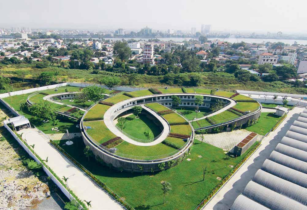
Not limited to residential typologies VTNA’s Farming Kindergarten (2013) takes the idea of ‘greening the city’ a step beyond. The extraordinary educational facility makes a traversable, spiralling rooftop garden designed for play and productive use. It is a veritable oasis and an inspiring place to teach children how to grow vegetables to feed their families. So many wonderful benefits have emerged through such charming and intelligent architecture.
Through projects like these, Nghia has established himself amongst local policy makers as a leader and expert in green architecture. Currently he is in the early stages
of advising local government in Vietnam on issues of regulatory planning with regard to the mandatory inclusion of green space in new developments. “[For] every 100 square metres of the earth we take, we should replace [it] with 200 or 300 square metres of more green [space],” Nghia says. “If we are planning new areas, our policy is to green by 300 per cent”.
Nghia’s dedication to social and environmental issues permeates all aspects of his work and family life. With an almost naive innocence he speaks of his future vision for cities as complete ecological systems, “Where very little energy is used, where city farms feed the people, where there are systems in place to re-use and recycle and where people live in harmony with nature.” And if you think commercial success would change him in any way, you’d be wrong. “In my home there is no television or internet and no air conditioning,” Nghia says. “We try to live with less not live with more. Simplicity makes us happy.”
Green Ladder Pavilion exhibition at SCAF, Sydney, runs until 10 December 2016.
Vo Trong Nghia Architects | votrongnghia.com
above | Farming Kindergarten promotes a love o F productive gardening and awareness o F the natural environment. issue #33 habitusliving.com
Modular by design
VOLA commitment to sculptural modularity is epitomised by the T39 Towel Rail. The system features minimalist cantilevered bars which can be configured in any quantity and spaced to suit any bathroom design. T39 is the perfect accompaniment to VOLA award-winning range.
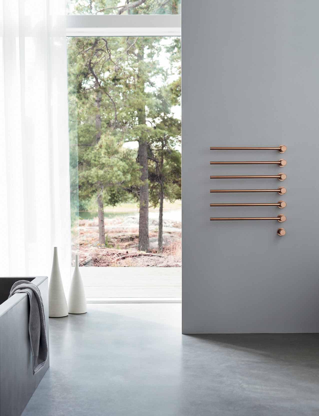
VOLA Design Pty. Ltd. Tel.: +61 402 372 480 sales@vola.com.au www.vola.com

2016 New Collection White Attica™ www.caesarstone.com.au


wilderness boy
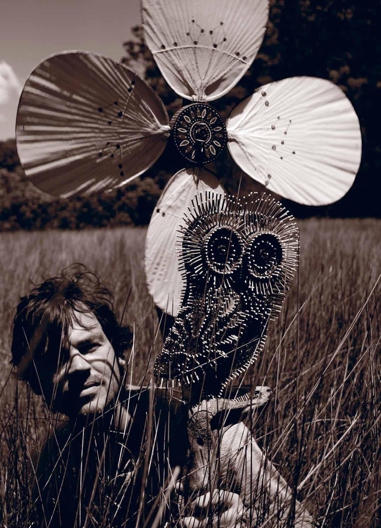
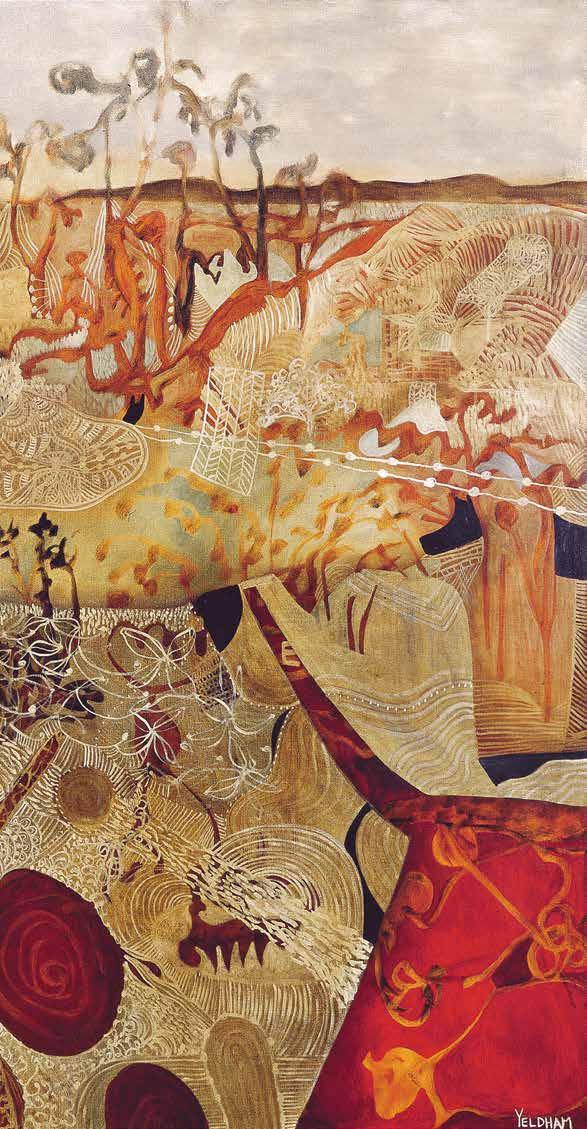
Nature informs and inhabits every aspect of visual artist Joshua Yeldham’s work. It’s in his use of animal totems and in the echoes of the Aboriginal art and traditional Chinese landscapes that illuminate his paintings. It’s in his use of wood and cane and his tireless exploration of the world around him, so that every field, tree limb, creek and river can be seen afresh.
Tex T Andre A O’driscOll | PhOTOgr APhy jO y eldh A m | A rT wOrk jO shuA y eldh A m
issue #33 habitusliving.com
2 . portrait # 69
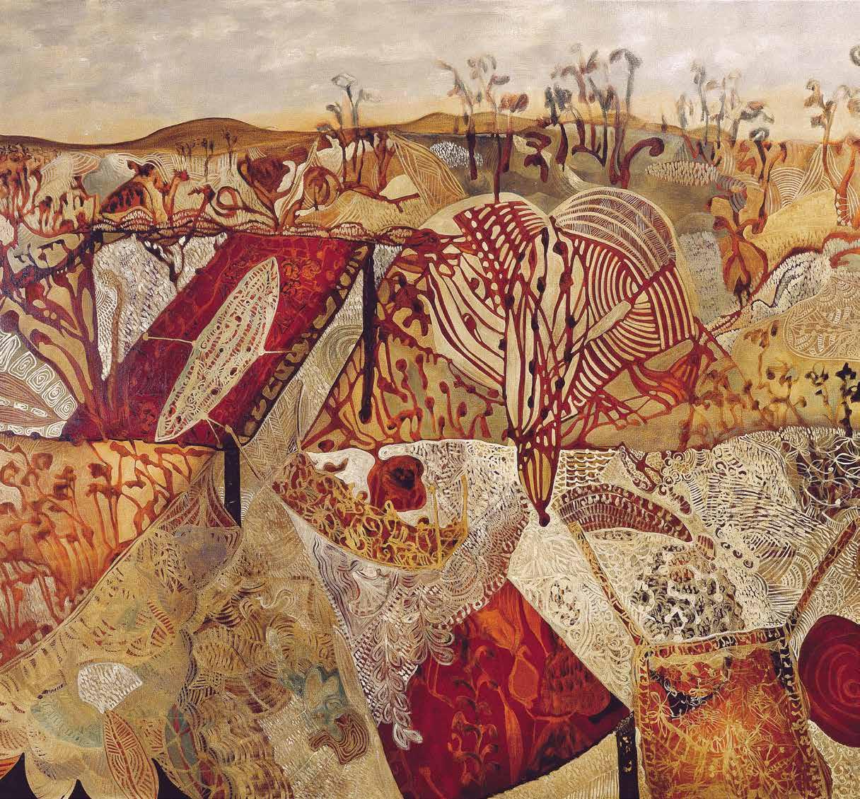
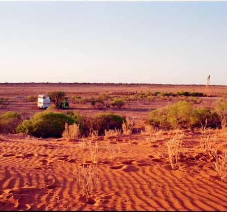
PREVIOUS | WOOD OWL N/1 (2008), CARVED RESIN WITH CANE 170 X 39 X 39. ab OVE | BULLA OVERFLOW (2002), OIL ON LINEN 182 X 292. OPPOSItE | WILD DOG FLAT IN CENTRAL Au STRALIA LIV E PHOTOGRAPHY BY JOSH uA AND JO YELDHAM. issue #33 habitusliving.com
Nature doesn’t just characterise Joshua Yeldham’s subject matter. Its influence can also be seen in the creative processes that underpin his art.
“Nature works by repelling, attracting, repelling, attracting, all the way down to an atomic structure,” Joshua says. “As artists we think we should just keep on being attracted, attracted, attracted to our work, our creativity. My pictures destroy themselves if I start hoarding creativity to a point where I won’t let it collapse. It’s such an important part of any creative path, to learn to push through the complete collapse of your project, or your idea.”
It’s a process most people try to resist, fearful that collapse signifies an ending rather than an important step in the process of renewal or the act of becoming. “I have had to develop the endurance necessary to work through many, many sequences of collapse until I arrive at a point where the picture is no longer telling me to come to it. For me, a picture is finished when it longer asks me to move away and towards it. It just no longer needs me.”
However, it is not only in his art that Joshua feels the influence of this push and pull. It has also been an essential quality of
2 . portrait # 71


above | IMAGE BY JASON KIMBERLY. opposite | LIv E PHOTOGRAPHY BY JOSHUA AND JO YELDHAM. issue #33 habitusliving.com

It’s such an important part of any creative path, to learn to push through the complete collapse of your project, or your idea.
2 . portrait # 73
JOSHUA | ARTIST

Eigentum der V-ZUG AG. Ohne unGenehmigung ist jede Vervielfältigung, Mitteilung an Drittpersonen verboten. This drawing the property of V-ZUG AG. The reproduction, distribution and use this document as well as the communication its contents to others without explicit authorization prohibited. Offenders will be held liable for the payment of damages. All rights reserved the event the grant patent, utility model or design.
his experiences as a father. “Our children are the same. One minute we’re snuggling up, enjoying this incredible intimacy and then the next minute it’s Armageddon!”
Having children also means more distractions but, rather than resist his new reality, Joshua has come to weave it into the way he works. “It’s very easy as an artist to feel that if you’re distracted you’ll lose your creative thought or you’ll lose your inspiration or you’ll lose your talent just because someone keeps interrupting you. Once I worked through that I realised that I’ve got to find a way to lose thought creatively and trust that it will come back again and again. In my opinion if you feed your family and your loved ones the art will just happen anyway.”
Joshua’s latest work, a book of integrated text and pictures that chronicles his life and work, from his early schooling and travels through the Venezuelan Andes and the Australian outback to his move to the Hawkesbury and efforts to start a family, is
in essence an extended conversation with his eldest child, Indigo. Surrender: A journal for my daughter (published by Pan Macmillan Australia this year) started out as an attempt to record some of the thoughts that had emerged while he was painting, but only really came to life once he had settled his focus on his daughter.
“It wasn’t until I decided to write something for Indigo that it started to flow naturally. The love poured out of me for her and her life and suddenly I found it so natural to go through my past and present and create a picture for her using words, [my wife] Jo’s photography and my paintings.”
The result is a work of intense intimacy, infused with Joshua’s love for his family and his reverence for nature and the laws of the wild. But, like so much of his work, it collapsed and was reborn in its current form. “The first draft was very emotional and moody and I got nervous and put it in the drawer. I thought, okay one day I’ll give it to Indy, but that’s as far as it goes. Then I was approached by Manly
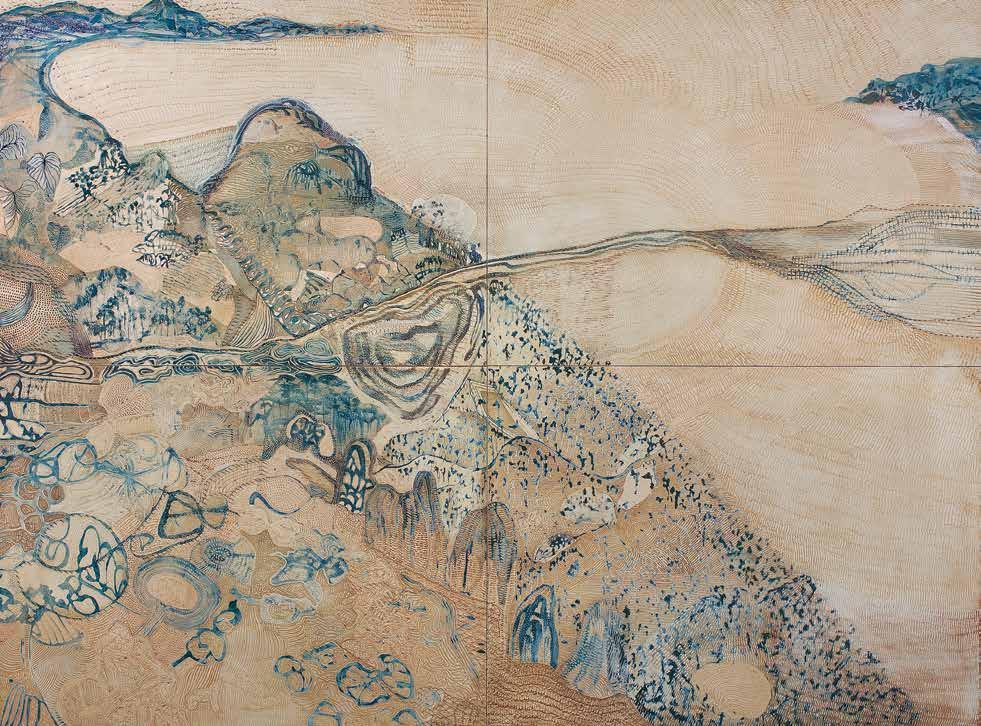
above | MANGROVE COUNTRY (2010), OIL ON CARVED BOARD 182 X 244. 2 . portrait # 75
Art Gallery and Museum to put on a 20-year survey and Catherine, the curator, asked if I had any ideas for a catalogue. I just naturally turned to my drawer and pulled out this huge volume. I rewrote it after having a year off from it and the clarity was really profound. The point is that sometimes projects aren’t ready to be born in a timeframe that we can completely understand. Like seeds, sometimes you need the rain.”
True to form, Joshua immediately grounds his metaphor in nature: “It’s like the Barrenjoey headlands that burned down two years ago. It’s only now that you can see new, subtle signs of life starting to appear. People still think it was all wiped out, but if you look you can see that in five or 10 years it will be an abundant landscape.”
For Joshua this process of renewal is an evolution, one that we can only experience if we break out of our daily routines and venture towards the limits of our world.
“Wherever we are, whenever our wallet or our schedule allows us to, I believe in going to the boundaries of your landscape. If you’re spiritually or creatively minded, the boundaries are where all the heightened action is happening. For example, I climbed the headland two nights ago. Being under the full moon in a situation that I’m not normally in activated me and it made me vital.”
For Joshua, this is the true power of nature – its ability to fill both life and art with a sense of the eternal.
Joshua Yeldham | joshuayeldham.com.au

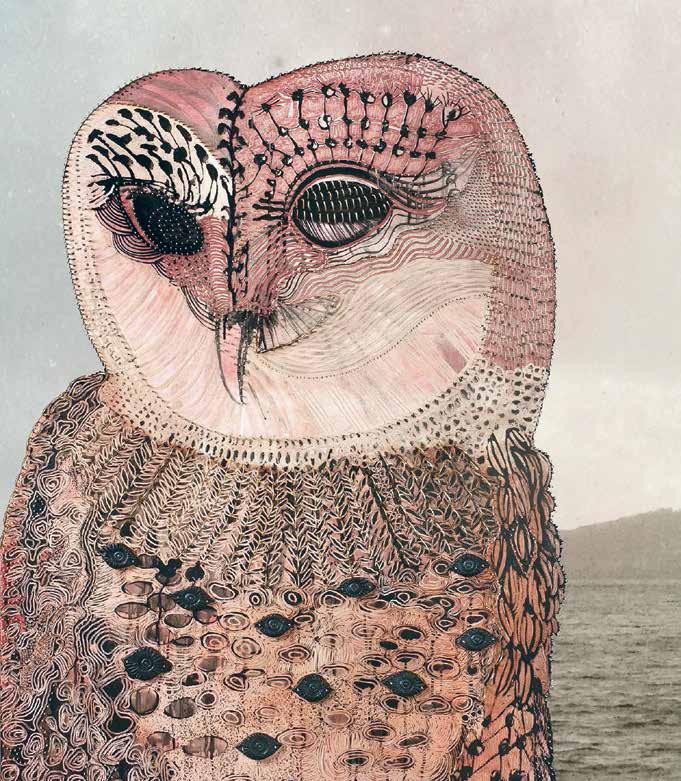
above | LIve PHOTOGRAPHY
|
FOR PROTECTION
152
120. issue #33 habitusliving.com
BY JOSHUA AND JO Y eLDHAM. below
PRAYER
- HAWKESBURY RIVER (2010), OIL AND MIXeD M eDIA ON CARveD BOARD
X
We combine the sensual touch of marble with exclusive Australian minerals, elegant design and artistic craftsmanship, creating a wonderfully transcendental bathing experience. So discover the true art of escape. Ease in, drift away and free your mind, for it can go where the body cannot always follow.
handcrafted stone bathware. apaiser.com
Location Photography: Western Coastline, Victoria, Australia
The Nature of Art
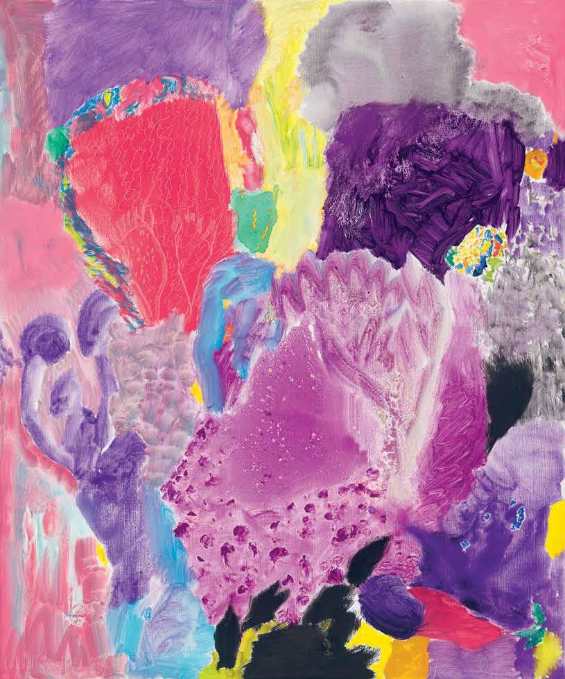
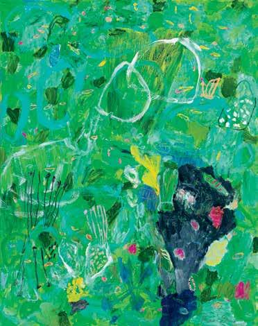
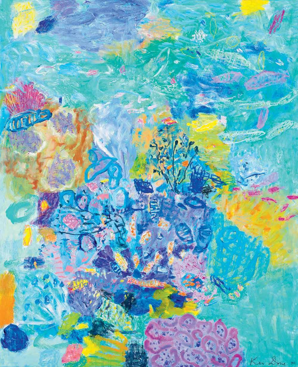
Ken Done’s art is fondly and firmly imprinted on the collective imagination of Australia. Depicting iconic buildings is one of his many fortes, but even this is overshadowed by a lifelong love affair with the flora and fauna of the local landscape. Here we celebrate just some of the artworks that so wonderfully showcase the vibrancy of Australia’s land and sea.
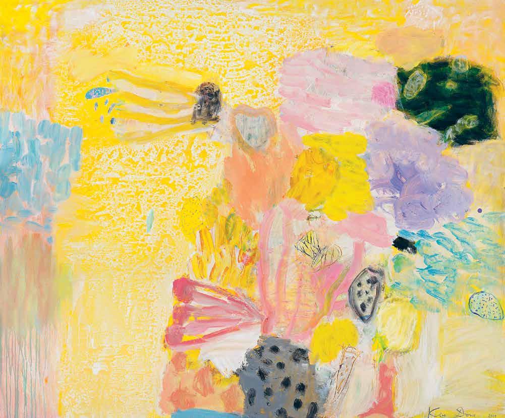
issue #33 habitusliving.com above | Cadmium Coral head Vii , 2010, oil and aCryliC on CanVas, 152.5 x 182.5 Cm, aVailable as a limited edition print $595 (original not aVailable) oPPoSITe | Cobalt Violet Coral head, 2014, oil on linen, 183 x 152 Cm $36,000
habitus promotion › Ken Done Gallery #79

issue #33 habitusliving.com
above | Hot pink reef, 2003, oil and acrylic on canvas, 122 x 183cm $24,000. beLoW | viridian sea garden, 2011, oil, oil crayon and acrylic on linen, 183 x 152cm $32,000 also available as a limited edition print $595 opposite | turquoise coral Head i 2011, oil, oil crayon and acrylic on belgian linen, 152.2 x 122cm, available as a limited edition print $595 (original not available)
“ My general creative philosophy would be one of optimism.”
habitus promotion › Ken Done Gallery #81
Ken Done Gallery | kendone.com.au


NEW CONTEMPORARY FINISHES
An urge to reconnect
The negative impacts are felt more and more each day. So how can design and architecture encourage a closer connection to the natural environment in which we live?
Architecture and design plays a crucial role in reestablishing a mutually beneficial dialogue between man and nature. And there are many creative and inspired practitioners who are showing us how to negotiate space to create health, wonderment and tranquility.
There is no doubt that the challenge is complex and requires many heads, hands and hearts, as well as diverse approaches. Reduce, reuse and recycle is still a relevant principle. Technology is a conduit for solutions via new materials and new manufacturing processes. Extraordinarily simple strategies – introducing natural materials, plant life, environmental forms, views of the landscape and natural light into the home – can have an instant and profound impact.
Come with us as we step into nature, and into the light of awareness, where our journey inevitably begins.
# 83
We’re plugged in, turned up and switched on, but there’s a growing disconnect – between humankind and nature.
Natural habitat
Can design and architecture draw us closer to nature, creating a sense of outdoor living? In our increasingly techheavy world, reconnecting with a more intimate, organic lifestyle is essential. From enlightened spaces to products and plants, SophIe Dav IeS finds the future is green…
Tex T Sophie Davie S | phoTographY variouS
habitus #33
# 85 nature
In an empty theatre people look up in wonder at towering trees. The twilight landscape feels infinite, misty and magical. But Japanese architect Sou Fujimoto’s ‘Forest of Light’ installation for April’s Milan Furniture Fair was entirely artificial, a trick of lights, sounds, fog and mirrors. Spotlights in the pitch-black building created a shifting canopy of treetops responding to viewers’ movements. Nature had come to the city…
Milan goes green
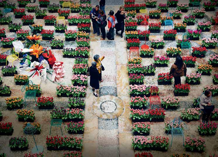
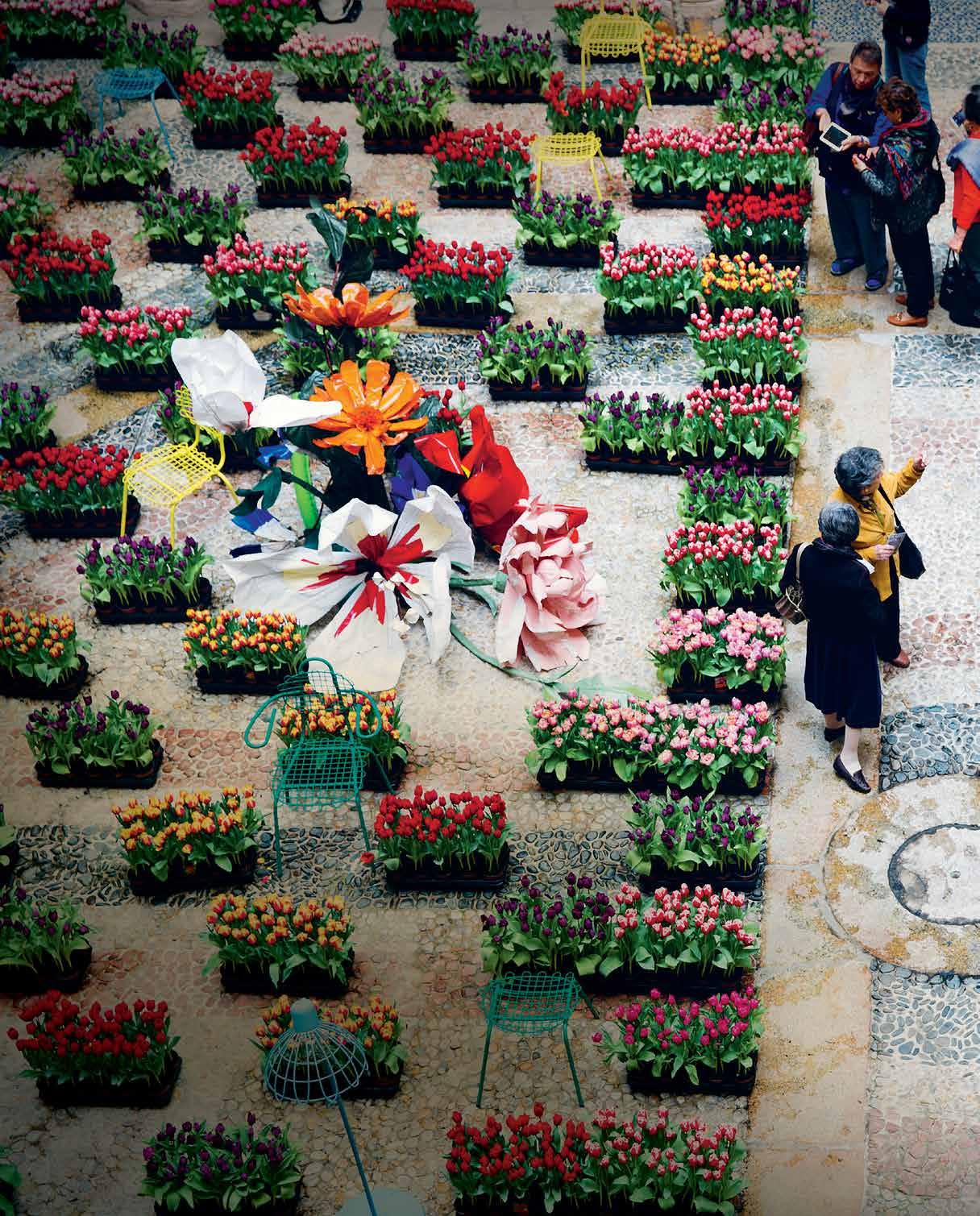
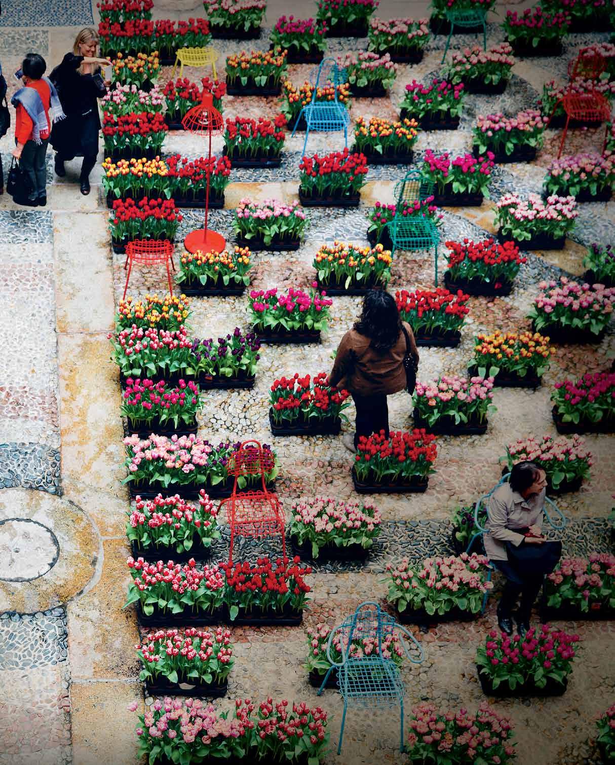
You could be forgiven for thinking you were in a jungle on Italian furniture brand Zanotta’s stand at 2016’s Salone del Mobile, with furniture peeping from greenery. Moroso, Vitra and Diesel Living with Seletti also went potty for plants, tapping into our craving for nature. And flower-obsessed Dutch designers led the way, with their vibrant ‘Masterly’ installation filling a courtyard with 15,000 tulips.
Tropical modern
In our fast-paced, screen-saturated world, we all need to discover new ways to de-stress and reconnect with nature. Forward-thinking architecture can help us recalibrate our hardwired lifestyles to something more organic, relaxing and peaceful.
We can still learn from one of our favourites, Sri Lankan architect Geoffrey Bawa (1919-2003), a pioneer of the Tropical Modern movement. His influential buildings showed fresh ways to harness natural ventilation, incorporating existing nature into spaces, and creating tranquil interior gardens.
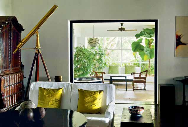
Stewart Russell, founder of Melbourne print studio and homewares store Spacecraft, is a Bawa fan. “Moving from the UK to tropical Sri Lanka in the 1980s opened my eyes to architects that worked with nature to enable mature trees, plants and even boulders to define and energise living spaces,” he says. “The British-style bungalow set in the centre of a large garden was a model from the past. Local architects were envisaging strategies to accommodate nature on increasingly small footprints.”
While setting up a print studio for textile designer Barbara Sansoni, Russell lived and worked in some of Bawa’s spaces. With trees positioned in internal courtyards designed to function as rooms for dining and even sleeping, “Bawa’s architecture has rightly garnered acclaim,” says Russell, “but many others contributed new ideas at that time in Colombo; Anjalendran and Laki Senanayake are well worth discovering.” Negotiating ways to live with nature in ever-denser inner cities is vital, reckons Russell.
Eco architecture
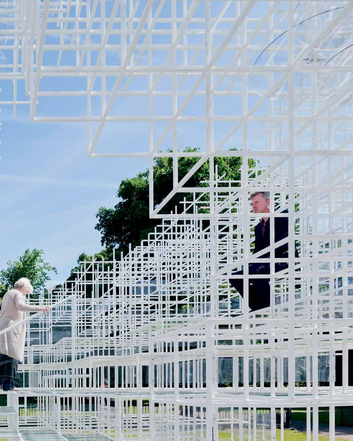
Picking up the baton, Japan’s Sou Fujimoto is a radical champion of contemporary interiors that embrace the outdoors – from his cloud-like 2013 Serpentine Gallery Pavilion in London to his open-air House N in Oita, Japan, and tree-dotted, balcony-blessed proposal for the Université Paris-Saclay. “I grew up in Hokkaido in northern Japan, surrounded by nature, and I enjoyed just playing in the forest,” says Fujimoto.
Eco-minded Singaporean practice WOHA’s inspiring indoor-outdoor spaces include clifftop Bali hotel Alila
habitus #33
# 87 nature
PREVIOUS | NATURE WAS TRENDING AT APRIL’S MILAN FURNITURE FAIR, WITH GROUP SHOW ‘MASTERLY – THE DUTCH IN MILANO’ TAKING OVER PALAZZO FRANCESCO TURATI WITH THIS INSTALLATION OF 15,000 TULIPS. PHOTOGRAPHY bY FILIPPO bAMbERGHI OPPOSITE | INFLUENTIAL SRI LANKAN ARCHITECT GEOFFREY bAWA’S TROPICAL MODERN b UILDINGS EMb RACE THE LANDSCAPE; HIS FORMER COUNTRY ESTATE LUNUGANGA IN b ENTOTA IS NOW A HOTEL WITH GARDENS OPEN TO THE PUbLIC. PHOTOGRAPHY bY, DOMINIC SANSONI. ab OVE | LONDON’S ETHEREAL SERPENTINE PAVILION 2013 bY JAPANESE ARCHITECT SOU FUJIMOTO ENCOURAGED VISITORS TO ENJOY VERDANT VIEWS. PHOTOGRAPHY © IWAN bAAN
habitus #33
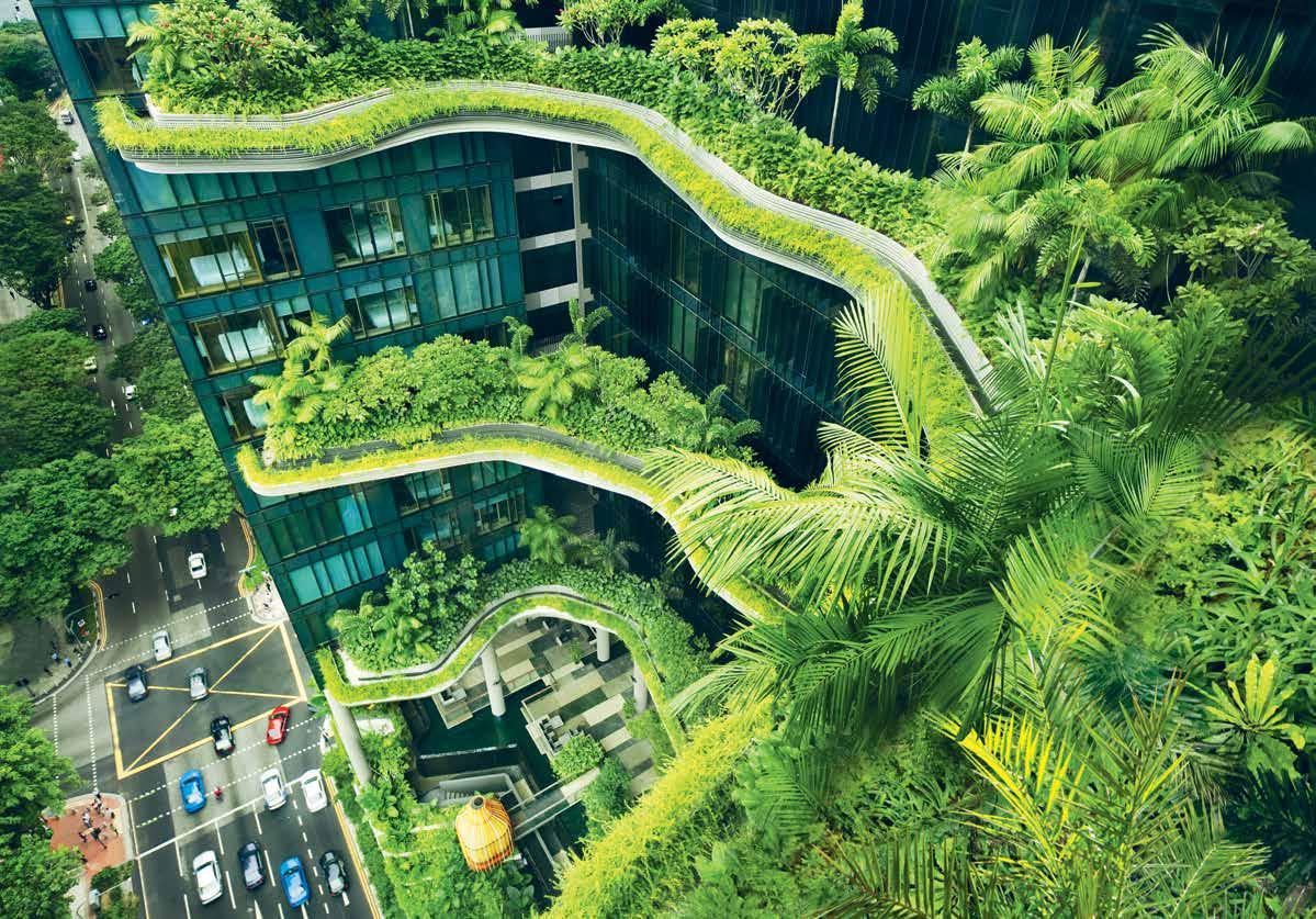
Villas Uluwatu. Open-plan layouts, flat lava rock roofs and bamboo ceilings allow sea breezes to circulate. From a slatted-timber cabana-bar cantilevering over the ocean to pool villas that flow into private gardens, it combines natural stone, wood, rattan and water with native planting. Exploring urban sustainability, their Singapore hotel PARKROYAL on Pickering incorporates sky gardens and alfresco pools on upper storeys amid dynamic vertical planting. “We’ve been developing the idea of a building as an inhabited landscape,” says WOHA Associate Schirin Taraz-Breinholt. “PARKROYAL on Pickering draws inspiration from landscape formations – rocky headlands and green planted terraces. In the tropical environment, we are lucky to be able to physically blur the boundaries between indoors and outdoors.” Rather than designing fully-glazed, air-con-sucking silos, WOHA aims to “open up and perforate buildings to enable natural ventilation, bringing air, plants and light indoors.” Using landscaping as an architectural surface treatment has also made their buildings biodiverse havens for birds, insects and flowers.
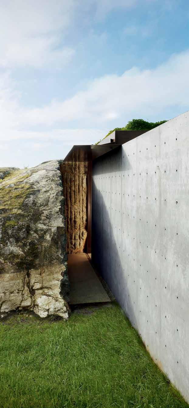
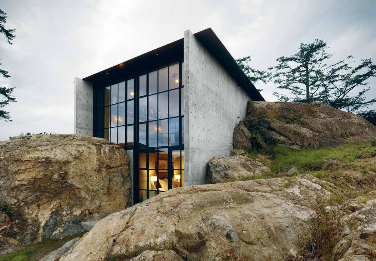
Seattle architects Olson Kundig also design houses in tune with specific landscapes and climates. Contemporary concrete residence The Pierre in Washington State’s San Juan Islands nestles between monumental boulders. Encompassing stone and a green roof, the home almost disappears into nature. “For me, the site is sacred,” says co-owner Tom Kundig. “The goal for the architecture is to help reveal and unfold the site, to frame its aspect. Material choices become a direct response to that particular place.” The practice’s hillside Hong Kong Villa in Shek-O embraces stunning coastal views via floor-to-ceiling

windows. Its seamless transitions from inside to out merge house and horizon, aided by reflective pools. “We should be part of nature,” says Jim Olson. “We shouldn’t try to dominate it, but rather defer to it.”
Living with plants
Even a room with a view or compact urban balcony can be a game changer, allowing us to watch passing birds, enjoy neighbouring trees and breathe fresh air. Call it ‘plantmania’, but the current trend for verdant balconies, houseplants, indoor trees, garden rooms and terrariums means the future can be green for everyone, helping to personalise rented flats and even boosting happiness.

“Designing living spaces that encourage people to have more plants indoors is important – from interiors with good light to natural ventilation,” says Bree Claffey, author of Indoor Green: Living with Plants (Thames & Hudson). “We need to push the limits of what buildings can do to house nature.” Owner of Melbourne plant and homewares emporium Mr Kitly, Claffey feels that errant “plants quite literally bring life to an interior space.” She suggests grouping plants together, having fun matching containers to plants, and teaming them with ceramics. “Every plant is idiosyncratic and every handcrafted ceramic piece is unique. They’re both excellent examples of slow living.”
Bondi-based stylist and blogger Mr Jason Grant recently launched an online homewares collection called MJG, tapping into relaxed Australian coastal and country living for city spaces. Think compact planters and side tables, plates sporting lobsters and marlin, timber trays and rope baskets.
opposite above
PIERRE.
opposite below | SINGAPOREAN ARCHITECTURAL PRACTICE WOHA HAS PIONEERED ECO-FRIENDLy INDOOR/OUTDOOR BUILDINGS, INCLUDING THE CIT y ’S HIGH-RISE HOTEL PARKROyAL ON PICKERING, WHICH SPORTS LOFT y TROPICAL SK y GARDENS AND ALFRESCO POOLS, CREATING A SANCTUARy FOR GUESTS AND WILDLIFE. PHOTOGRAPH y By PATRICK BINGHAM - HALL
|
SEATTLE ARCHITECTS OLSON KUNDIG INVOLVE NATURE IN THEIR RESIDENTIAL PROJECTS, AS SEEN IN ELEMENTAL CONCRETE
HOME THE
IT
INCORPORATES BOULDERS INTO ITS EXTERIOR, WITH ROCKS PROTRUDING INSIDE, FORMING NATURAL SINK POOLS IN THE BATHROOM. PHOTOGRAPH y By DWIGHT ESCHLIMAN
“We should be part of nature. We shouldn’t try to dominate it, but rather defer to it.”
# 89 nature
“The retro mesh planters and tables are perfect for a balcony or lounge room,” says Grant. “I love indoor plants and bringing the outdoors in. Nature, particularly the ocean, always provides calm and good energy, so decorating with these elements is inspiring.”
Melbourne store Pop & Scott’s gorgeous own-line modern plant pots come in graphic geometrics and zingy metallic or coloured stripes. For inspiration, we love their Northcote showroom, featuring clusters of verdant pots, timber-lined walls and a custom-designed sandstone counter by traditionally-trained Scottish stonemason den_holm, made with invisible mortar to replicate a drystone wall.
Sydney homewares store Design Twins, in St Peters, also crafts hand-painted contemporary plant pots, from concrete designs to large, lightweight alternatives. “Plants are vital for mental clarity,” says co-founder Crystal Bailey. “The best way for me to relax is to surround myself with greenery.” Design Twins sells foliage-friendly planters, stands, hangers and shelves, best combined in different sizes. “They immediately add drama and height so not all the greenery is on one visual plane.” Houseplants are an easy way to “create beautiful focal points in rooms without dominating the overall aesthetic, lifting any space,” she says.
IKEA has even launched a home hydroponic kit, Krydda/Växer, enabling you to grow herbs and salad in water, without soil or sunlight, ideal for indoor gardening.
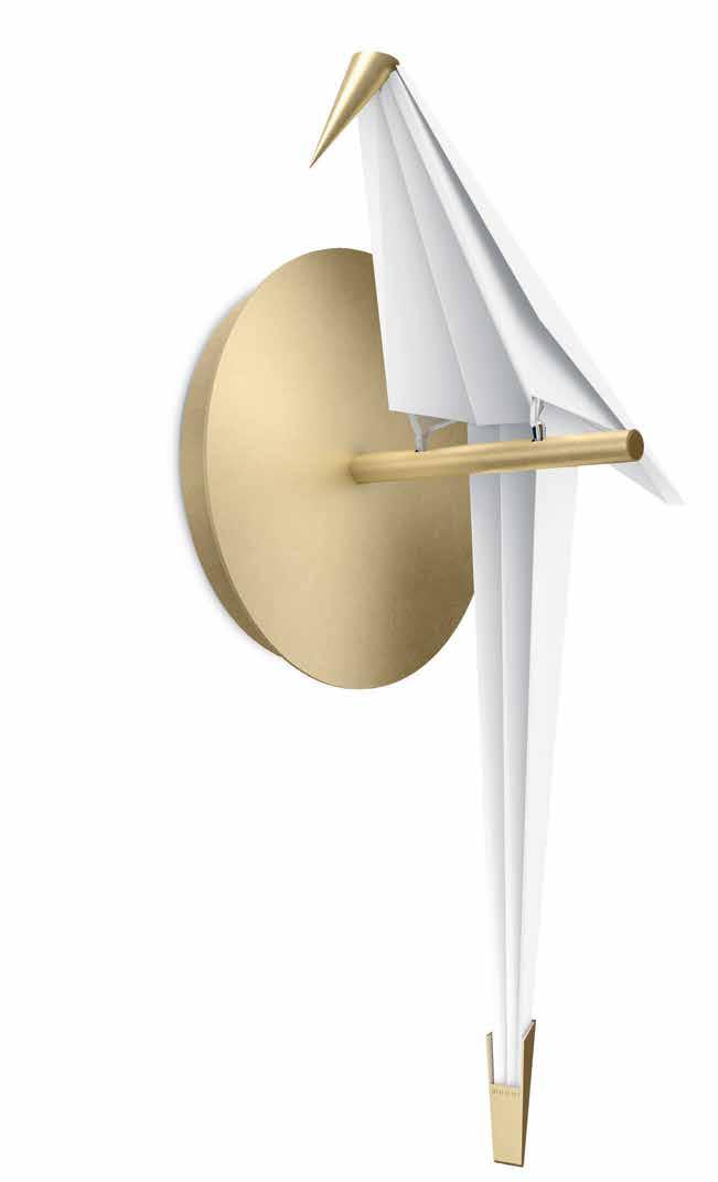 ABOVE | ADDING AN APPEALING AVIAN TOUCH TO INTERIORS, DUTCH BRAND MOOOI’S NEW PERCH LIGHT BY LONDON DESIGNER UMUT YAMAC COMES IN WALL, TABLE, FLOOR AND SUSPENDED BRANCH FORMS OPPOSITE ABOVE | DEVELOPED WITH SWEDISH AGRICULTURAL SCIENTISTS, IKEA’S DEBUT HOME HYDROPONIC KIT KRYDDA/VÄXER MAKES IT EASY TO GROW YOUR OWN HERBS AND SALAD IN WATER YEAR-ROUND, EVEN IN A LOW-LIT, COMPACT APARTMENT. OPPOSITE BElOw | INSPIRING AUSTRALIAN HOMEWARES RANGE MJG BY MR JASON GRANT INCLUDES GRAPHIC RETRO MESH PLANTERS IN BLUE, YELLOW OR WHITE POWDERCOATED METAL, IDEAL FOR CONTEMPORARY TERRACES OR INDOOR GARDENS.
habitus #33
“I love indoor plants and bringing the outdoors in. Nature, particularly the ocean, always provides calm and good energy, so decorating with these elements is inspiring.”
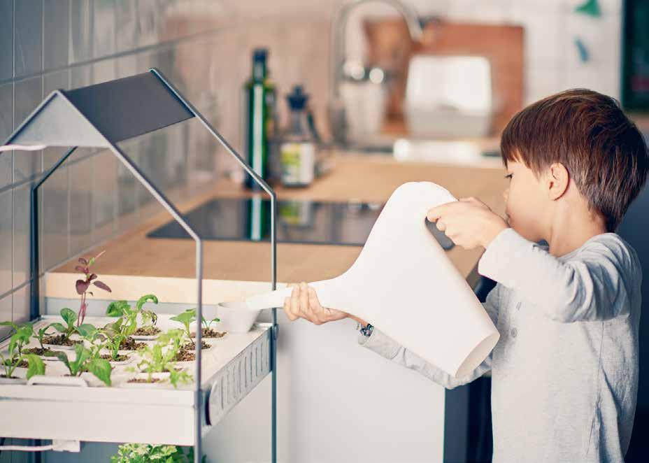
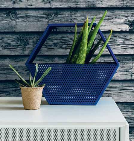
# 91 nature

habitus #33
Natural light
Lighting can also create a natural feel at home. Channelling the animal world, Dutch brand Moooi’s new abstract bird-shaped Perch light, by Umut Yamac, is crafted from paper and gently swings on its branch when touched.
Candela is an inventive indoor/outdoor table light designed recently by Francisco Gomez Paz for Italian brand Astep. Casting the soft, natural light of a tea candle through its curvy opalescent-glass shade, it actually uses eco-friendly bioethanol gas to produce fire to create its own electricity, which powers the cosy LED illumination, all while charging your mobile devices via USB. Think a 21 st Century lantern.
Simulating the changing light of dawn, Dutch brand Philips’ therapeutic bedside Wake-up Light helps people to get up in the dark. Its light gradually increases from soft dawn reds through warm orange to bright yellow light 30 minutes before your set alarm time, signalling your body to wake naturally. Research suggests it also boosts your mood, energy and wellbeing afterwards.
Artificial allure
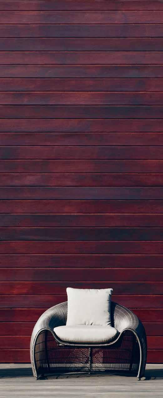
Fake trees and flowers can also pep you up. Architects Hassell used illuminated artificial Ava trees to create an indoor/outdoor vibe in the cavernous lobby of recently revamped Sydney hotel Ovolo Woolloomooloo. “Rather than closing off the lobby, we treated it like a laneway or boulevard of trees,” says interior designer Sally de Marchi. “We wanted real trees, but the natural light in the space did not allow for this. The fake trees also bring magic to the guest experience.”
Dutch brand Moooi Carpets’ latest rugs also create the illusion of nature or riff on its themes, from Ross Lovegrove’s photo-realist Clay Sediment to Maison Christian Lacroix’s graphic florals-meets-floorboards Malmaison and Klaus Haapaniemi’s Polar Byzantine series, populated by fantastical walruses, reindeer and owls.
left | PHILIPPINES DESIGNER KENNETH COBONPUE IS FAMOUS FOR HIS SINUOUS USE OF NATURAL MATERIALS IN HIS MODERN FURNITURE, INCLUDING THESE CRESCENT-SHAPED CROISSANT EASY CHAIRS MADE FROM ABACA, NYLON AND STEEL FOR INDOORS, OR COMBINED WITH POLYURETHANE FOR OUTDOORS. right | CHANNEL NATURE INSIDE WITH HELP FROM STRIKING ART, SUCH AS LEILA JEFFREYS’ SIGNATURE BIRDS. HER ‘PEPE NO.1’ SPLENDID FAIRYWREN 2015 (52 X 61CM, EDITION OF 25), PICTURED, A FINE ART INKJET PRINT ON COTTON RAG ARCHIVAL PAPER, IS AVAILABLE FROM SYDNEY’S OLSEN IRWIN GALLERY.
# 93 nature
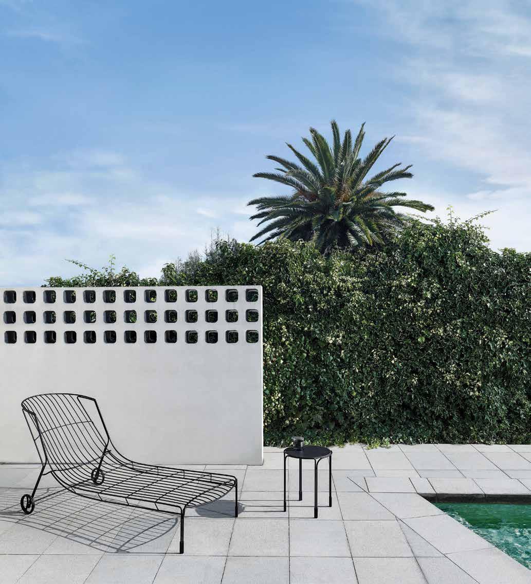 MELBOURNE SYDNEY CANBERRA PERTH ADELAIDE SINGAPORE
Indoor/outdoor designs
Outdoor furniture can extend your home, encouraging lounging and dining in alfresco ‘rooms’. Acclaimed Philippines’ designer Kenneth Cobonpue’s contemporary outdoor seating and tables harness “sustainable natural materials, like rattan and bamboo, because they provide texture, warmth and strength.” Cobonpue’s design epiphany happened when he observed how branches, leaves and foliage contained space and filtered light. “That was the birth of these woven semi-transparent skins, which became my hallmark.” He believes design and architecture can bring us closer to nature, “by awakening our senses to the comfort, beauty, calmness and joy the outdoors brings. Our homes and offices should be an oasis of relaxation amidst the concrete and steel jungle of our cities. Tall ceilings, skylights, indoor and vertical gardens, organic furniture and open spaces can bring nature inside. We are programmed to love nature and it’s only logical that we return to our roots to help us live the future.”
Rather than designing outdoor furniture, Australian brand Tait aims to create furniture for ‘A Life Outside’.
“The Australian lifestyle is centered around relaxing, entertaining or socialising in our outdoor spaces,” says coowner Susan Tait, “so it’s important for design to respond accordingly, inviting users to spend more time outside.”
Tait’s versatile furniture harnesses natural, neutral materials like timber to blend in with the environment.
“Australian architects Glenn Murcutt, Robert Mills and Peter Stutchbury are great examples of that outstanding synergy with nature,” says Tait. If you don’t have a garden, she says, “positioning furniture by glass will immediately connect any outdoor space to a room, making you feel like
you’re actually outside. Indoor gardens are another great way to bring the outside in.” Luckily, Tait’s contemporary pieces, such as Adam Goodrum’s Volley Loungers, work equally well indoors.
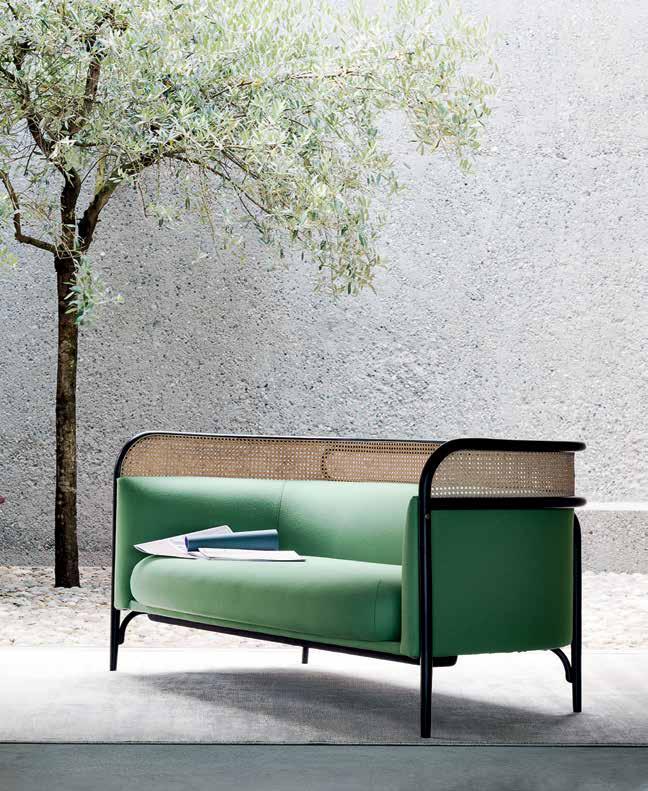
LA-brand Bend Goods’ mid-century-inspired wire chairs and side tables may be intended for outdoor use, but would also grace any living room, importing playful Palm Springs pizzazz. Look out for their sassy frame-like Plant Stands too, which fit over existing pots.
Choosing indoor furniture with materials associated with outdoor living also injects alfresco attitude into your home. The backrests of Wiener GTV Design’s new bentwood Targa sofa and lounge chair, by GamFratesi, incorporate a subtle woven cane trim border.
Natural materials evoke a serene atmosphere, illustrated by Swedish designer Ingegerd Raman’s limited-edition Viktigt range for IKEA, launched in May. Celebrating handmade, woven craft pieces, from a compact sofa and chairs to rugs, lights, baskets and tableware, the understated collection drew on rattan, bamboo, seagrass and water hyacinth to create a warm, personal feel.
ABOVE | WITH JUST A SUBTLE HINT OF WOVEN CANE IN ITS
ELEGANT OUTDOOR STYLE INDOORS. THE RANGE INCLUDES THIS TWO-SEATER
# 95 nature
BACKREST,
THE BENT-BEECH TARGA SOFA BY DANISH/ITALIAN DUO GAMFRATESI FOR AUSTRIA’S WEINER GTV DESIGN BRINGS
SOFA, AN OTTOMAN AND ARMCHAIR.
Astep | astep.design

Avatree | avatree.com.au
Bend Goods | bendgoods.com available at Own World | ownworld.com.au
Cire Trudon | trudon.com
Culti | culti.com
Design Twins | designtwins.com
Hassell | hassellstudio.com
Geo rey Bawa Foundation | geo reybawa.com
IKEA | ikea.com
Kenneth Cobonpue | kennethcobonpue.com avaailable at Kezu | kezu.com.au
Maarten Baas | maartenbaas.com
MJG by Mr Jason Grant | mjgstore.com
Moooi & Moooi Carpets | moooi.com / moooicarpets.com available at Space Furniture | spacefurniture.com.au
Mr Kitly | mrkitly.com.au
Olsen Irwin | olsenirwin.com
Olson Kundig | olsonkundig.com
Philips | philips.com
Pop & Scott | popandscott.com
Sou Fujimoto | sou-fujimoto.net
Spacecraft | spacecraftaustralia.com
Tait | madebytait.com.au
Wiener GTV Design | gebruederthonetvienna.com available at Space Furniture | spacefurniture.com.au
WOHA | woha.net
Zanotta | zanotta.it available at Space Furniture | spacefurniture.com.au
habitus #33
Scents and sensuality
Never forget home scents for a quick nature fi x. French brand Cire Trudon’s scented candle Abd el Kader smells of fresh Moroccan mint, while Balmoral is all misty rain and Scottish meadows. Italian specialist Culti’s rattan-stick di users waft from Mountain to Mediterranea.
For sensual nature in the home, Karen McCartney’s recent book Perfect Imperfect (Murdoch Books) champions the worn, weathered and handcrafted, tapping into our love a air with natural materials, distressed details and aged patina. With glossy virtual environments on the rise, we’re yearning for real-life imperfection.
Art of nature
Art can also introduce nature to your interior, bridging the gap to the outdoors. Sydney’s Olsen Irwin gallery represents Leila Je reys, known for bold inkjet prints of birds, and Jonathan Delafield Cook, whose giant linen whale works bring the ocean in. Spacecraft’s intricate screenprinted backing cloth and canvas art works also use botanical and ornithological themes to tell stories.
Turning nature into art, Dutch designer Maarten Baas has initiated ‘The NEW Forest’ project in the Netherlands. Planted in a pattern to reflect changing seasonal leaf colours, the mature trees will spell out the word ‘NEW!’ by 2216, visible via Google Earth or drone. For The Tree Trunk Chair, a mould inset in a tree for two centuries will ultimately produce a harvestable timber chair, after the trunk grows over the form. Nature and design, hand in hand.
ABOVE | TAKING A RARE LONG-TERM VIEW, CONCEPTUAL DUTCH DESIGNER MAARTEN BAAS HAS PROPOSED PRESSING A SEAT-SHAPED MOULD INTO A TREE, WHICH WILL THEN GROW OVER THE FORM OVER 200 YEARS TO PRODUCE THE TREE TRUNK CHAIR. NATURALLY FORMED FROM TIMBER, IT CAN THEN BE HARVESTED TO PRODUCE A CHUNKY ARMCHAIR. HOLLAND’S GRONINGER MUSEUM WILL CARETAKE THE PROJECT, DEVELOPED WITH DESIGNER GAVIN MUNRO (KNOWN FOR HIS GROWN FURNITURE SERIES).
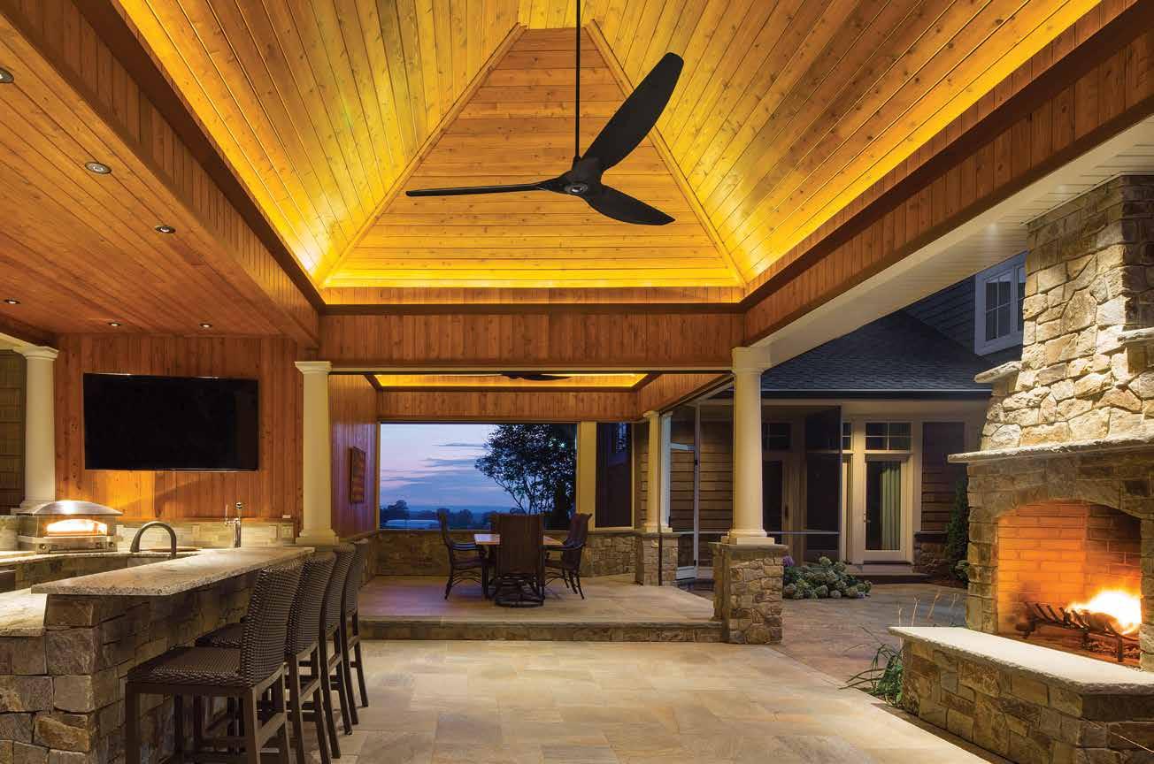
haikuhome.com.au/habitus Create an outdoor space made for lingering with Haiku® fans. Haiku is damp-rated and finished with three coats of automotive paint for always-vibrant finishes and performance that endures. Faded, drooping fans belong in the past – not your porch. Call 1300 244 277 to receive a free Haiku Home info kit. HAIKU FANS: THE BEST BREEZE YOU CAN BUY 84” H SERIES IN BLACK
PRIVATE


 by Håkan Widjedal

FLOORING FACADES WORKTOPS










The large-format surface Dekton opens a new world of possibilities for design and architecture projects.
Dekton offers multiple possibilities of colours and finishes in thicknesses of 8, 12 and 20 mm. Indoor or outdoor, Dekton shows an outstanding resistance and durability to make your projects unlimited.
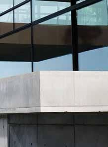
DEKTON IS UNLIMITED.


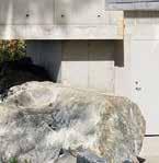


WWW.DEKTON COM.AU CosentinoAustralia F cosentino_aust ô COSENTINO AUSTRALIA Level 1, Suite 30 / 69 O’Riordan St Alexandria NSW 2015 Tel: 28707 2500 infoaustralia@cosentino.com
PERFORMANCE
SIZES
UNLIMITED COLOURS UNLIMITED
UNLIMITED
VILLA SWEDEN
DEKTON. UNLIMITED.
Unlocking Sydney
Australia’s premier open building event Sydney Open unlocks the doors to some of the city’s most historic and architecturally inspiring buildings.
As a city, Sydney is home to a number of intriguing iconic buildings, from those that have stood since colonial times, to more modern works reflecting contemporary life. While it’s one thing to walk past these buildings, the experience of entering and exploring them is another entirely.
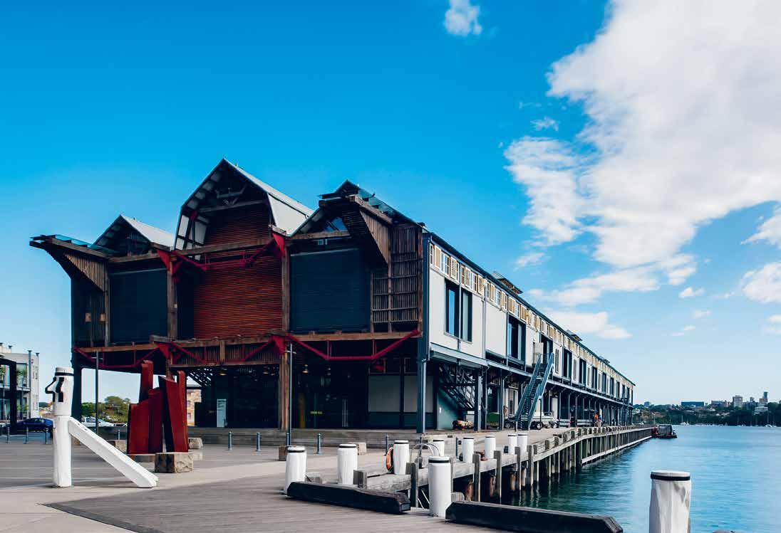
Sydney Living Museums presents Sydney Open, a magical unlocking of doors where the public gets the unique opportunity to take a sneak-peek inside some of the city’s most exciting buildings.
Since 1997 Sydney Living Museums has welcomed over 62,000 Sydneysiders and visitors alike to more than 400 buildings to explore, discover and learn about the city’s architectural gems. Mark Goggin, Executive Director of Sydney Living Museums describes Sydney Open as “a celebration of the city’s architectural heritage, showcasing contemporary architecture and innovative urban design and how it influences the way we live.” Following are just a few of the wonderful locations you can explore at Sydney Open.
Hassell Studio Sydney
HASSELL is one of Australia’s foremost and largest design practices, having received the Australian Institute of Architects national awards for the Sydney Olympic Park Railway Station (1998) and devising a number of high
profile projects across Australia and the Asia Pacific region. The opening of their Sydney Studio as part of Sydney Open is the perfect opportunity to gain an insight into the workspace of those at the forefront of design.
Breathing new life into unused inner-urban industrial sites is a passion at HASSELL, and their Sydney studio at Millers Point is no exception. The heritage-listed, former wool store on pier 8/9 was once the heart of a vibrant trading port, and now hosts HASSELL’s multidisciplinary team across three floors and 2,000 square meters.
The space is open and collaborative, showcasing and enhancing the creativity of the integrated design team it houses. The interior fitout works with the character of the original building, with a careful material selection that complements rather than competes with the robust, industrial nature of the site.
Jackson-Sutton Residence
Convicts originally built the Harbour Master’s house in Sydney’s Dawes Point in 1832 when Sydney was still a small colonial outpost. Recently, Smart Design Studio worked with heritage consultants Tropman & Tropman Architects to redesign the house. The designers and consultants wrangled with the residence’s low ceilings and lack of
habitus X SLM
# 99 above | The heriTAge-lisTed former wool sTore on pier 8/9 AT millers p oinT is now The home of hAssell’s sydney sTudio. phoTogr Aphy by nicole engl And.
windows to create a bright and colourful home that melds the home’s heritage with a modern touch.
For the Jackson-Sutton residence’s living room, Smart Design Studio custom designed a striking ceiling light ‘artwork’, inspired by French artist Guy de Cointet. Breathing light and life into this otherwise traditional room, a full-gloss white, floating panel was mounted with state-ofthe-art LED lighting. Contrasting with rich turquoise walls and ceiling, the lighting creates an exciting tension between old and new, giving the room a distinctive character.
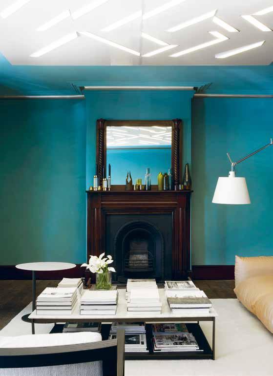
During the renovation and decoration process, wallpaper that had been obscured for years was discovered in a small room. Specialist restorers worked to clean and restore it and the breaks, cracks and gaps were filled with fine render that was painted over with a simple beige tone, refreshing the wallpaper and ensuring it continues to feature in the home.
Dexus Place
DEXUS Place at One Margaret Street was a researchdriven design project designed by architects Girvan Waugh with TOKO Creative. This custom-built environment was designed to be an extension of the workspace, blending the corporate function of the office with the comfort of a hotel, and an open, welcoming spirit.
Condensing DEXUS Place’s diverse functions and plethora of executive boardrooms, conference and seminar spaces, business lounges, and breakout areas into a single cohesive environment required a holistic design approach.
Each element of the design of DEXUS Place was implemented through a highly thought-out design process, with particular regard given to space amongst the Sydney streetscape. The space is trendy, corporate chic, with polished concrete floors, industrial bricks, and abundant natural lighting facing out to Barangaroo.
Some of the key features of this design include the reception’s timber herringbone raked ceiling, custom reception desks, a recycled copper pipe screen and bocci lighting with air plants, plus crosshatch-painted walls that are whiteboards, to encourage brainstorming and the sharing of ideas.
Sydney Open
Saturday 5 & Sunday 6 November 2016
For tickets and information visit slm.is/open
Sydney Living Museums | sydneylivingmuseums.com.au
habitus X SLM above | The living room of The Jackson-s u TTon residence. PhoTogra
Phy by s harrin rees.
# 100
Smart Design Studio custom designed a striking ceiling light ‘artwork’... Breathing light and life into this otherwise traditional room
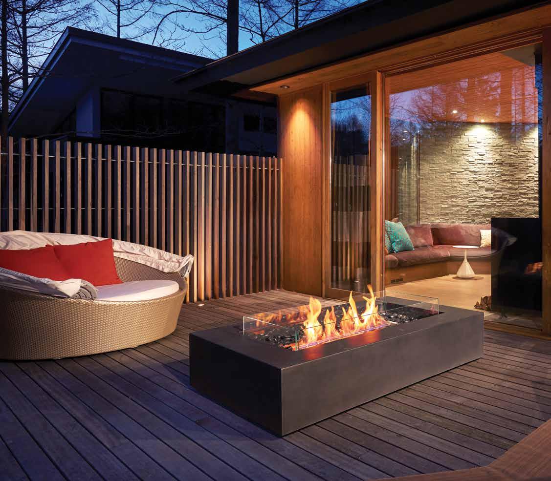
EcoSmart Fire Wharf fire design solutions Experience absolute design flexibility and freedom with an environmentally friendly open fireplace. 40-42 O’Riordan Street, Alexandria NSW 2015 Tel 02 9997 3050 Email info@thefirecompany.com.au Showroom Open 7 Days. Ships Worldwide. brownjordanfires.com.au e-nrg.com.au ecosmartfire.com.au




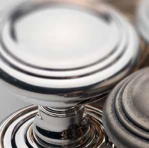


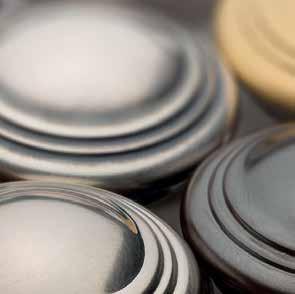








751 HIGH ST, ARMADALE, VIC: 03 9818 1403 • 170 QUEEN ST, WOOLLAHRA, NSW: 02 9362 4736 FREECALL AUSTRALIA WIDE: 1300 01 61 81 • NEW WEBSITE: WWW.ENGLISHTAPWARE.COM.AU Door, Window & Cabinet Hardware MADE IN ENGLAND 32 FINISHES OVER BRASS OR BRONZE BASE
Call from nature
Architects M A rr A + Yeh are familiar with designing homes for the tropical climate of Malaysia, working across projects both there and in Australia. In the StIletto houSe, they apply particular focus on integrating architectural responses to the natural conditions – be they site, local materials or culture – that bring the best out of the design.
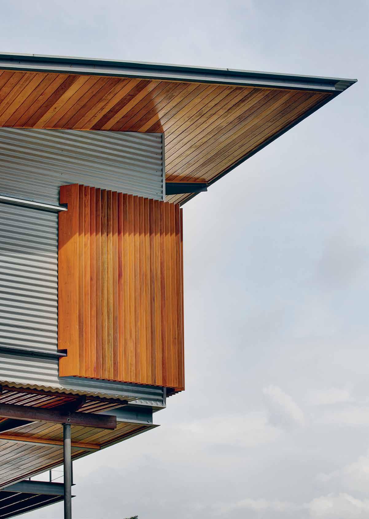
Tex T Marra + yeh | phoTograph y BreTT BoardM an
# 103 nature
1. The Edge
Pushing buildings to edges of the site and creating landscape within
There is a word in Malay, desa, which connotes a feeling of rural-ness, of buildings among lush tropical landscapes, of meandering through the countryside. To experience desa within the confines of this single plot of land, the buildings are pushed to the boundaries, each a private realm enclosing a communal garden. Pushing the buildings to the edges, close to nature and embracing an internalised garden is a reversal of the typical building pattern, where the house stands front and centre surrounded by mostly leftover bits of land. This reversal of typology creates a situation where the buildings act as a threshold, mediating between the intimate enclosed garden and the expansive landscape beyond.
The connection between buildings is through the landscape, highlighting that paramount to human experience is the interplay between culture and nature, buildings and landscape – not only visually but also of course physically.
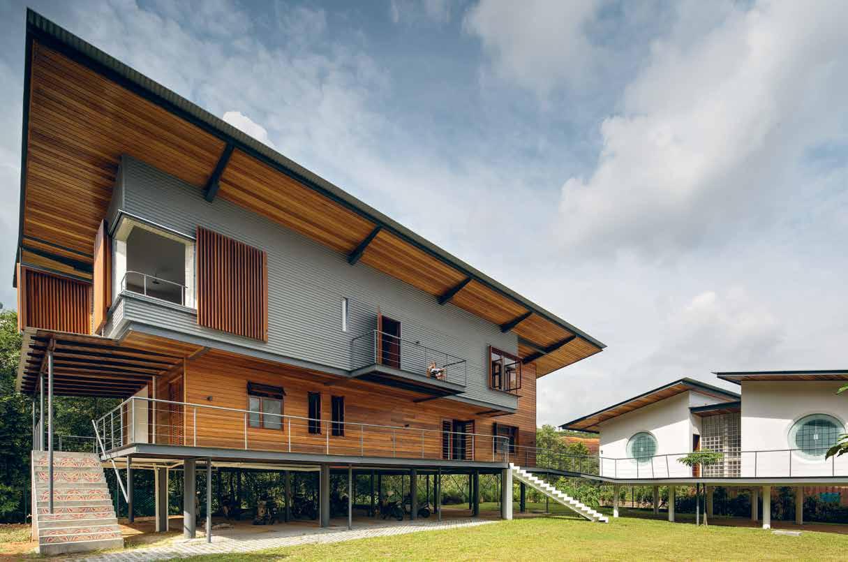
habitus #33
“Paramount to human experience is the interplay between culture and nature, buildings and landscape.”
2. Looking Out
Appropriating landscape through views and vistas via window placement
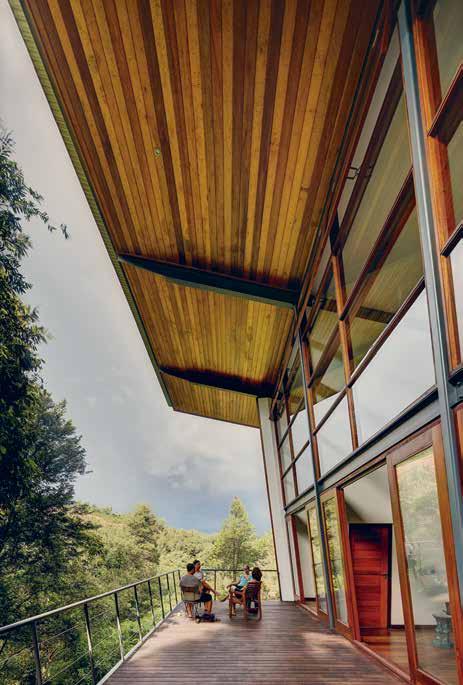
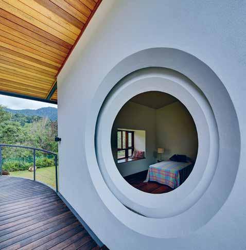

The landscape, both near and far, has been integrated with the experience of the house. In a traditional Malay village, a kampung, buildings are nestled along the landscape as punctuation so that the landscape is the dominant feature. This is in direct contrast with the colonial bungalow, which usually sits at the apex of a hill so that the building dominates the landscape. From every vantage point in the Stiletto House one is connected to the landscape and sky; it is wholly outward-looking even from the most private and secluded rooms. Window size, configuration and placement have all been carefully calibrated to either capture edited views or expansive vistas depending on orientation. In this way, the experience of meandering in a kampung has been compressed into the scale of a single residence.
3. Deck
The orientation of building deck along tree line
The client’s background as a ship captain served as point of departure for the deck. We wanted to capture the experience of standing on an ocean liner as it moves through the water, the feel of the wind on the skin. Locating the deck near the edge of the hill captures the wind as it moves uphill, where one can sit with a gin & tonic on a hot tropical afternoon and recreate that ocean liner feeling. This strategy also entails making a building that deliberately pushes people to a closer connection with nature, tuning into the whereabouts and impact of the sun, the breeze, the shade and creating rituals and patterns of habitation that follow this knowledge. This is a house for two retired persons and they will be spending a significant amount of time at home so it was paramount to facilitate the connection with nature.
# 105 nature
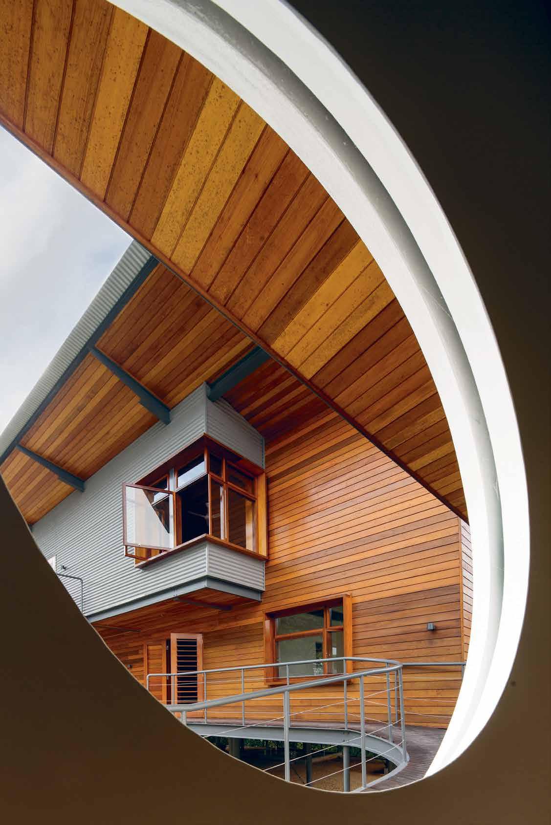
4. Stiletto Height
The creation of thin spaces for cross-ventilation and daylight
Architecture in South-East Asia has been particularly marked by the introduction of air conditioning; creating a distinct before and after. This project is part of an ongoing search for an alternative way, neither a return to the past nor an acceptance of the ‘building as machine’ paradigm, but rather building in and with nature.
Tropical inland locations such as the site of this project pose particular challenges to much needed ventilation. Reliable breezes are almost always nonexistent because of the near constant air temperature and the distance from the coast. Ventilation cannot be relied upon but must be created by the combination of building orientation, placement and size of openings. The large deck along the north side is bounded by a grove of trees on one side and the building wall angled outwards on the other. This arrangement creates a low pressure zone which draws ventilation through the building even when the outdoor air is practically still. Ventilation is further aided by pushing the building up on stilts (stilettos), catching higher velocity winds and improving the outward views from within. Openings are carefully placed in conjunction with customised exterior doors with operable slats to continuously cross ventilate the interior spaces.
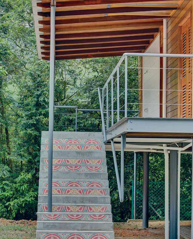
# 107 nature
“Ventilation is further aided by pushing the building up on stilts (stilettos), catching higher velocity winds and improving the outward views from within.”
Award-winning VOLA
VOLA belongs to the Golden Age of Danish design.
Based on their philosophy “celebrating continuity, celebrating change,” VOLA continues to introduce new and innovative designs. At Saloni di Mobile 2016 in Milan, VOLA showcased new award-winning designs including their latest spa range with the range’s Waterfall Shower 080W receiving the German Design Award 2016, and the Kneipp Hose 070W awarded the Iconic Award 2016.
The core philosophy at VOLA is merging aesthetics with innovation, and functionality. These ideas are reflected in two new products within the award-winning VOLA Round Series: the electronic hands-free soap dispenser and cistern flush. Now the smartest corporate offices, restaurants, hotel foyers, museums, galleries and concert halls can offer their washroom visitors the complete versatility of VOLA.
VOLA founder, Verner Overgaard, introduced the idea of revealing only the elegant parts of a product to the user, ensuring that his designs carefully hide the mechanical parts within the wall. This results in solutions that are both functionally efficient and aesthetically pleasing. The newest products take the Round Series one step further where public space purity and hygiene are central concerns, so the electronic soap dispenser and cistern flush are built-in, beautifully aligned to the wall, and completely contact-free.
The Round Series for the luxury washroom features the built-in waste bin VOLA RS1 and the built-in tissue dispenser
VOLA RS2, with the waste bin having received three international design awards. The Round Hand Shower T60 mirrors the design of the Round Shower 060 and has recently been launched to high accolade, receiving the Iconic Design Award 2015, GOOD DESIGN Award 2015, and a German Design Award 2016 – Special Mention.
The award-winning VOLA towel warmer is also available for electric connection. In place of the more common radiatorstyle towel warmer, VOLA’s built-in modular heated towel rail is a system of bars that can be positioned according to customer requirements. In line with VOLA’s trademark style, the new towel warmer is a built-in unit where all the technical aspects are hidden behind the wall. It is designed as a flexible system of bars which can be combined in number and location as to fit any given interior design or tiles arrangement. This concept allows maximum freedom and provides a perfect design solution for any modern bathroom.
Each built-in unit is produced according the wishes of each single customer and shipped from the VOLA factory in Denmark within few days. Once again VOLA takes the lead when it comes to integrating design and function with production and logistics.
All new VOLA products are designed by Aarhus Arkitekterne, and the VOLA taps are produced in Denmark according the green certification ISO 14001.
habitus promotion › Vola #108 issue #33 habitusliving.com
Above | image by VOL a a /S.
Vola | Vola.com
5. Butterfly Wings
Spreading beyond traditional roof structures
The structural system for the house was a crucial architectural consideration because it is here that technology is used to update tradition. The roof is turned upwards in a butterfly shape to capture daylight, views, vistas and aid ventilation. Oversized eaves to protect from sun and rain could only be created through the capacity of steel for slender large spans. The butterfly shape creates a single water collection point to the rainwater tanks and maximises exposure for the solar panels whilst also hiding them from view. Very large overhangs shade the long sides of the building as the sun moves from north to south during the year. The roof shape has another purpose that relates to the idea of prospect – the shape pushes the eye outwards towards the sky and the hills, and also creates views from the first floor mezzanine. Because steel is an unusual material locally for a house, its expression remains legible in the finished building.
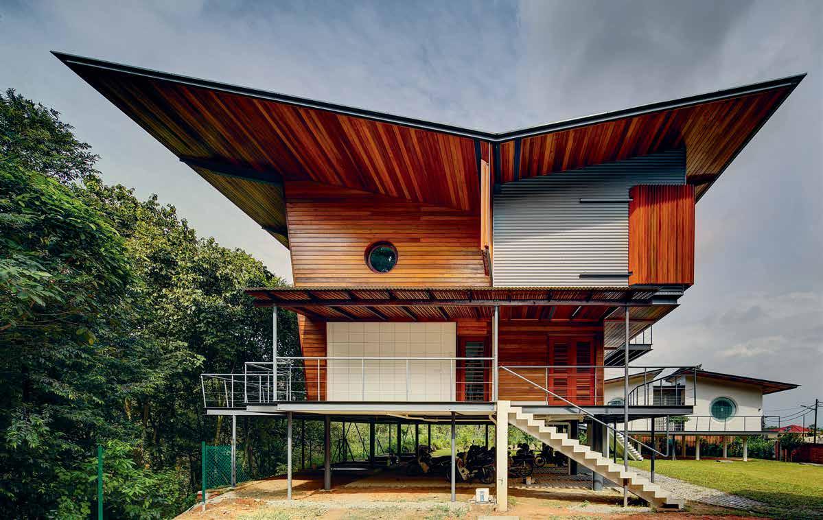
# 109 nature
Traditional lightweight materials and construction processes assist the design
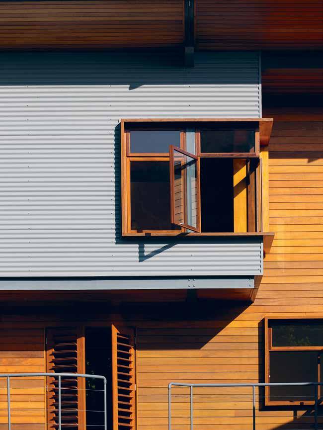
Climatic considerations drove many of the decisions regarding materials. Lightweight materials are used externally to prevent the build up of heat during the day. Timber was chosen because it is lightweight, durable and references the vernacular construction. A number of different tropical hardwoods have been used, each selected with regard to function, location and exposure. Very early in the design stage we visited our local sawmiller together with the owners to research and select the specific timbers for the project which were then air-dried over a period of two years prior to construction.
Traditional local materials such as brick and concrete are used in unusual ways, using form to eliminate additional structure as in the serpentine wall, or highlighting the plasticity of concrete in the round openings to the guest house which also allude to traditional Chinese moongates. Construction methods and details bring together cultural, tectonic and technical aspects to create an architecture reflective of Malaysia’s social and historical diversity.
“Traditional local materials such as brick and concrete are used in unusual ways.”
6. Tradition
habitus #33
marrah + yeh | marrayeh.com
Design Speed Date Patrizia Moroso.

Head to hubfurniture.com.au
to find out more about this rare and exciting opportunity to sit with one of the design world’s most influential and respected figures.
Hub Furniture
hubfurniture.com.au
hello@hubfurniture.com.au
@hub_furniture
Win a Sofia Picnic Rug from Intrepid Home


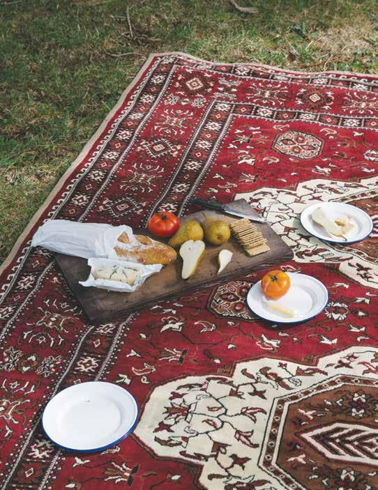
living in design #33 Power trinity: Nature, Architecture & Design. Joost Bakker, the zero waste man. Vo Trong Nghia’s green steel revolution Archibald finalist Joshua Yeldham PAYMENT METHOD Cheque / money order AUD$ Charge my credit card AUD$ Name on Card Card Type Card Number Expiry Date Signature IT’S EASY TO ORDER Fill in your response below, overleaf or subscribe securely online at habitusliving.com/subscribe. FOR A GIFT – RECIPIENT DETAILS: FOR MYSELF
SELECT BELOW: Mrs/Ms/Miss/Mr First Name Surname Address State Postcode Country Email Phone Mrs/Ms/Miss/Mr First Name Surname Address State Postcode Country Email Phone ONLINE: habitusliving.com/subscribe PHONE: (61 2) 9368 0150 MAIL TO: EMAIL: subscriptions@indesign.com.au FAX: (61 2) 9368 0289 Indesign Media Asia Pacific Level 1, 50 Marshall Street, Surry Hills NSW 2010 WHERE’S YOUR FAVOURITE PLACE TO ESCAPE/EXPLORE AND WHY? AUSTRALIA INTERNATIONAL (AUD$) 12 ISSUES SAVE 8 ISSUES SAVE 4 ISSUES SAVE 12 ISSUES SAVE 8 ISSUES SAVE 4 ISSUES INDESIGN $155 $43 $105 $27 $55 $11 $240 $39 $200 $21 $110 HABITUS $132 $47.40 $93 $26.60 $49 $10.80 $240 $30 $180 $10 $90 THE COLLECTION Vol. 2 Australia $29.90 (1 ISSUE) International $49.95 (1 ISSUE) Subscribe to Habitus magazine for your chance to win one of four of Intrepid Home’s large Sofia Rugs. The stunning rugs are a modern and functional interpretation of the traditional carpets that nomadic communities have used in the deserts of Arabia for centuries. Sourced from the Middle East, the water-resistant rugs are the perfect companion to take whilst escaping and exploring. Intrepid Picnic Rugs are available in a small (3x2m) and large (4x2m) size. includes shipping intrepidhome.co.nz
at $470 Subscribe to Habitus magazine
PLEASE
Valued
A house is more than a structure... it is a home
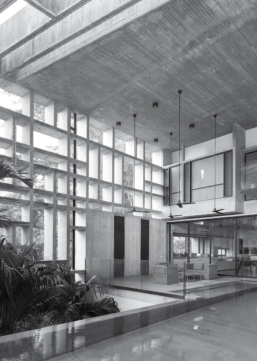
The path less travelled
A heritage site in the Daintree rainforest was a once-in-a-lifetime opportunity for m3 architecture and their Melbourne-based clients. Off-grid, constructed in timber and nestled into its tropical surrounds, this home embodies the essence of living within nature.
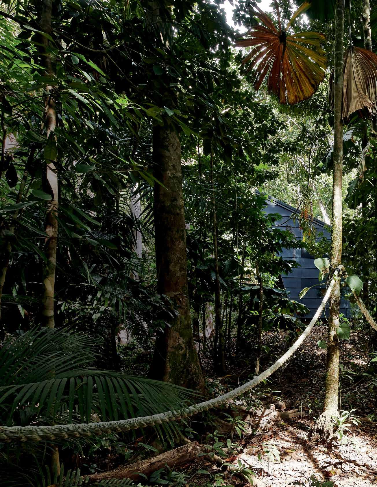
Tex T Andre A O'driscOll | PhOTO gr APhy PeTer benneTTs
issue #33 habitusliving.com

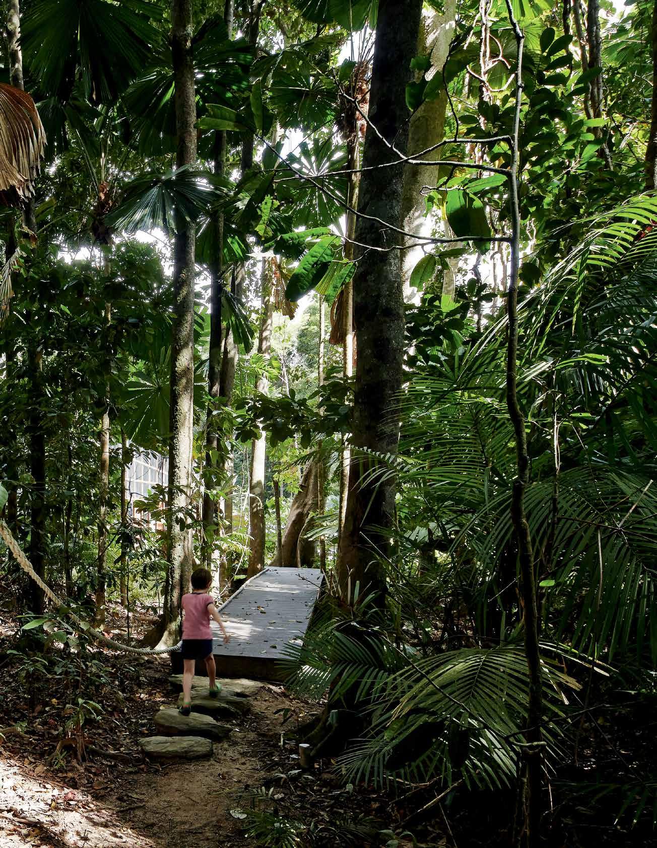
3 . on location # 115
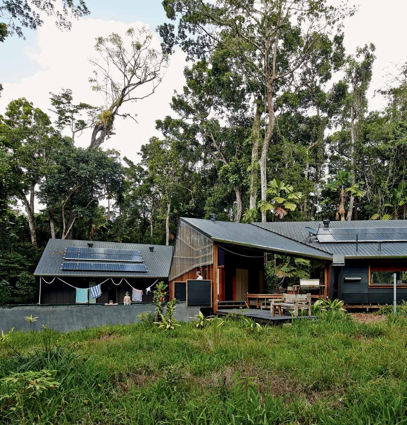
previous | A continuous white rope orients And pl Ayfully le Ads the wAy through the r Ainforest And house. AB ove | the house is locAted in A n existing cle A ring within the dense dAintree rAinforest. opposiTe | AeriAl view of the position in the cle Aring, with sol Ar pAnels efficiently pl Aced to cApture energy. issue #33 habitusliving.com
Building anything in a previously untouched natural landscape requires a greater degree of sensitivity than usual. When that landscape is a 135 million-year-old rainforest in a UNESCO World Heritage site, the level of deference owing to the site itself trumps all other considerations.
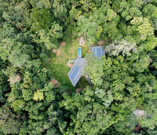
For Ben Vielle, one of the partners at M3 Architecture in Brisbane, who was asked by an existing client to build a holiday home on the fringes of the Daintree Rainforest, the idea proved irresistible. “The family came across this piece of land which was just an incredible find. The site runs from the start of the controversial Bloomfield track to the beach at Cape Tribulation. It’s just beautiful. They sent us an aerial photo of the area with an ‘x’ marking where they thought their site was. We don’t do too much residential work these days, but I knew this was an opportunity that was just too good to miss,” says Vielle.
While he was clearly very excited about working on the project, Vielle also admits to some nervousness surrounding the ecological, cultural and political significance of the site.
“The Daintree Rainforest is such a precious resource that we were nervous about building anything on the site to begin with. We decided fairly early on not to clear any mature trees.
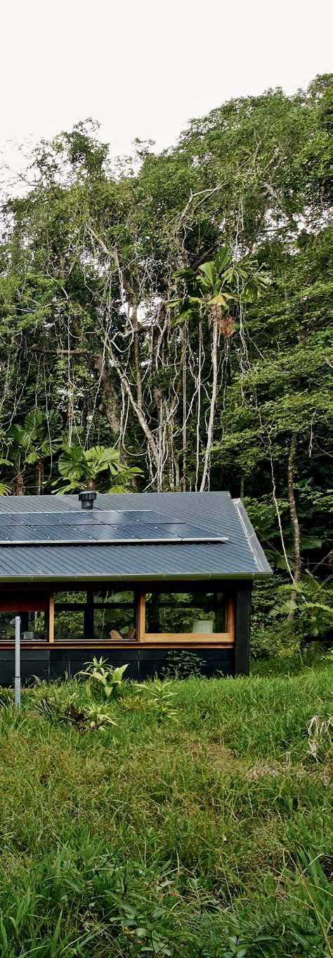
3 . on location # 117
The site was quite dense but there were two clearings left by previously felled trees and we decided that they would be the best positions for building on.”
Because it’s freehold land, the owners were actually entitled to clear as much of the forest as necessary to build a property, but both Vielle and his client were keen to tread as lightly as possible. “In the original brief, the client was looking to create a boutique camping kind of a feel,” explains Vielle. “Obviously the finished product is nothing like camping, it’s a three-bedroom house, but they were definitely looking to have that connection with nature, and to avoid dominating the site in any way,” he continues.
He can still recall the sense of bewilderment that accompanied his first visit to the site and how that disorientating sense came to inform so much of his design. “You could hear lapping water and the odd car heading up the Bloomfield track, but it was really hard to orientate yourself. The canopy was so dense it was even hard to find light. Because of that, we came up with the idea of marking a path through the site from the track all the way
down to the beach. It ended up being about 250 metres long and it sort of guides you through the forest,” says Vielle.
Alongside the path runs a white rope bannister that became one of the more playful elements of the design, serving as both a towel rail and a light fitting on its journey through the site. “The focus of the project became this idea of a house along a path and that’s what the rope helped us achieve. It sort of marked out an area of domesticity in this otherwise bewildering space,” says Vielle.
The exterior of the building itself is designed to blend into its surroundings as much as possible. The exterior is painted black to camouflage it, while large glass panels reflect the rainforest back at itself. Inside the home, things are much warmer, with timber floors and plywood walls working with the owners’ pre-loved furniture and crockery to create a more homely feel. “When you’re on holiday, I think you tend to let things hang out a little more, so they wanted it to be quite an informal space,” explains Vielle. “There are fishing rods and surfboards and shells that they’ve brought in from the beach.”
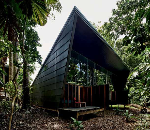
They were definitely looking to have that connection with nature, and to avoid dominating the site in any way.
issue #33 habitusliving.com
Vielle | architect
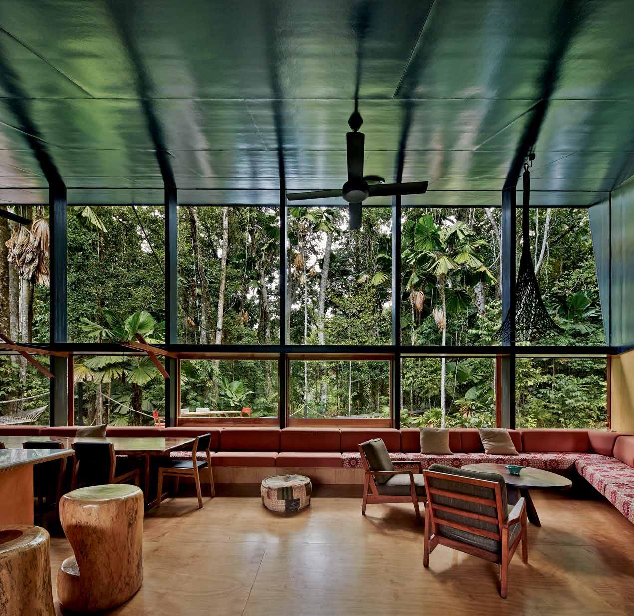
opposite | The
above | Tall souTh-facing windows engage The
iT
# 119 3 . on location
ex Terior is camouflaged wiTh black plasTic cladding and mirrored glass, allowing iT To recede inTo The shadow of The rainforesT canopy.
rainforesT canopy, drawing
inTo The living space.
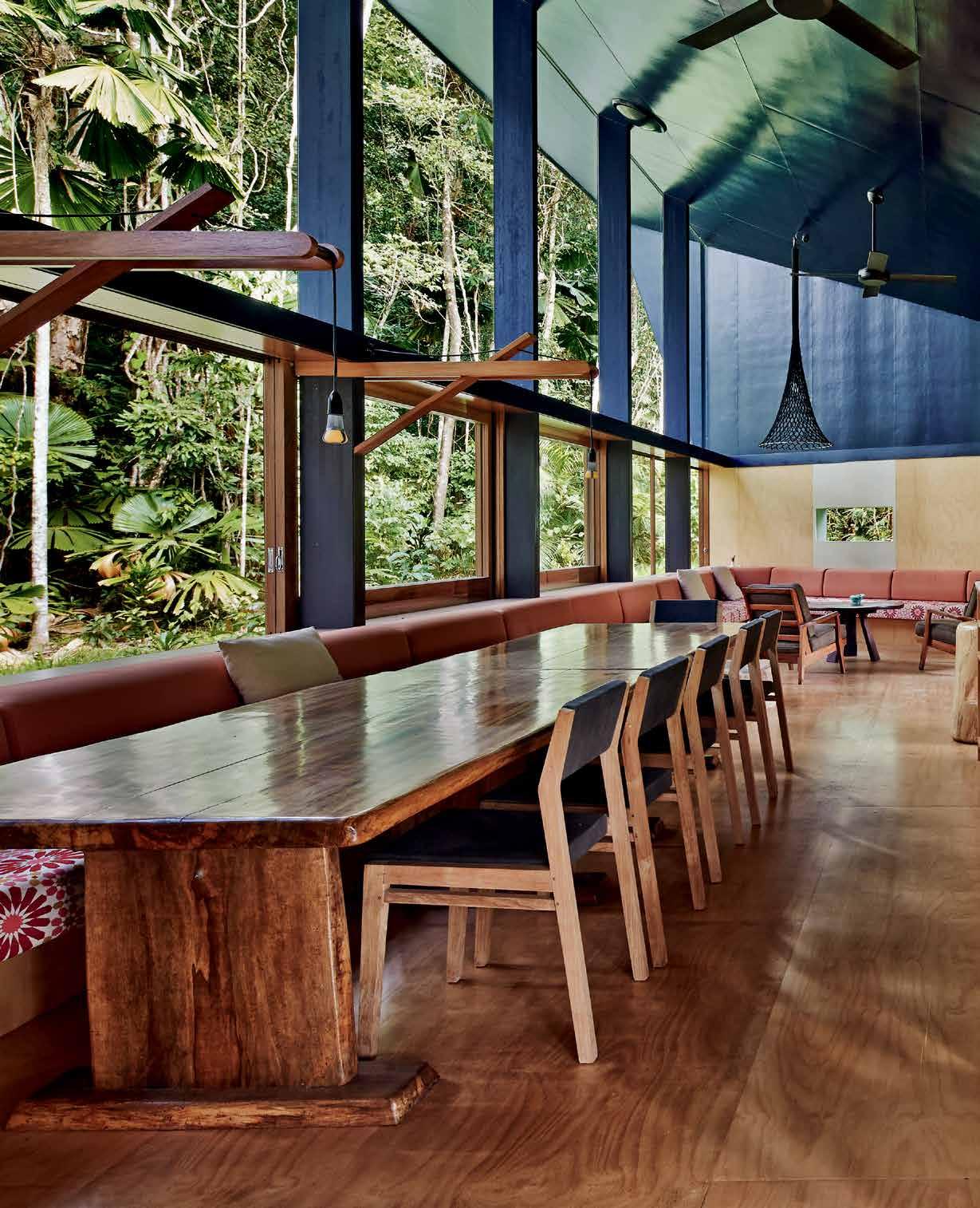
issue #33 habitusliving.com
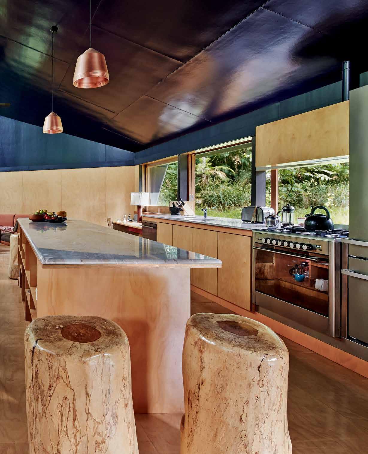
# 121 3 . on location

issue #33 habitusliving.com
The house also needed to be able to cater for large groups from time to time, as the client’s children were keen to visit with groups of friends. Each of the three bedrooms sleeps up to four people, with space in the living room for more if necessary. The bedrooms and living areas are in separate buildings, joined by a partially-covered deck that acts as the heart of the house. One side of the deck stretches out under the tree canopy, while the other extends beyond it, enabling the sun to shine down (an important feature for Vielle’s Melbourne-based clients).
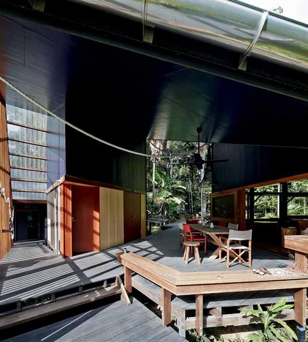
As well as being the source of much of its charm, the remote nature of the plot threw up some fairly substantial challenges – not least of which involved getting all the building materials all the site. Fortunately, Vielle was able to secure the services of a local Mossmanbased builder who had recently worked on a neighbouring property. He camped across the road for the duration of the build and oversaw the delivery of materials from Cairns via a ferry across the Daintree River.
The builder was a carpenter by trade, which cemented Vielle’s decision to use timber as the main construction material.
previous |
A light interior spAce cl A d with plywood opens out to the r A inforest surrounds, A nd engAges the cA nopy through tA ll south-fAcing windows. opposite | full-height windows connect the r A inforest cA nopy to the bedroom spAces. above | o utdoor living spAces couple the quA lities of the r A inforest with holidAy life At the be Ach.
3 . on location # 123
One side of the deck stretches out under the tree canopy, while the other extends beyond it, enabling the sun to shine down.
Section A - Bedroom
ground F
Boardwalk to rykers Boardwalk to Beach canopy deck Breezeway deck sun deck living utility pool Bedroom water tank 1 2 3 4 5 6 7 8 9 0 7 8 9 9 9 4 5 2 3 1 6 0 issue #33 habitusliving.com
Section B - Living
Loor
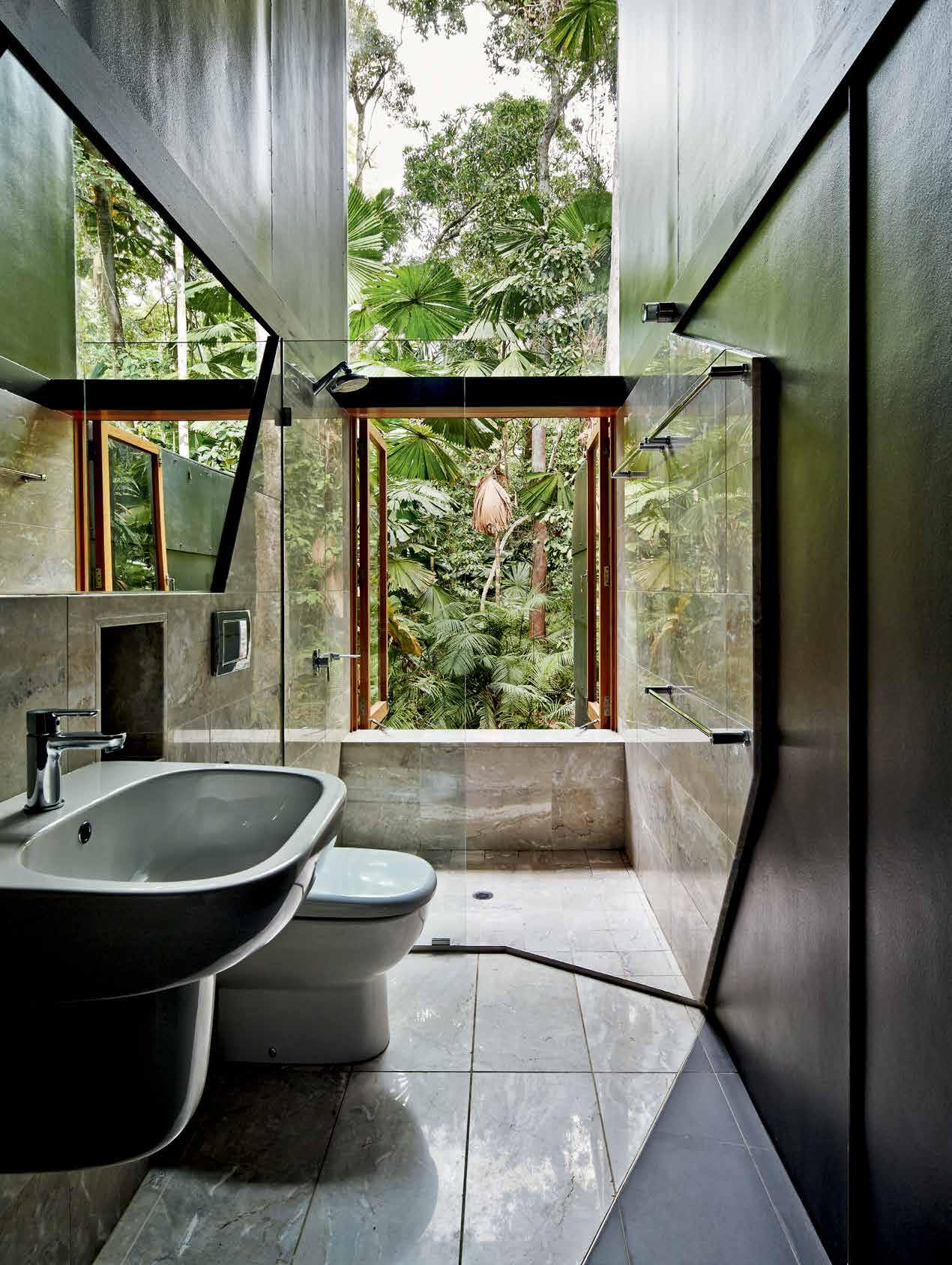
3 . on location # 125
Keen to use ethically-sourced varieties, he settled on spotted gum for the exteriors and New Guinea rosewood for the interiors. “The other big advantage of timber, of course, is that it’s carbon-capturing. The site is completely off-grid and we were very conscious of the ecology, so a lot of the design centred around this idea of energy in and energy out. We did a lot of research into the levels of greenhouse gas emissions that were generated in the manufacture of the building materials we might use, as well as those that would be generated by the house itself, and we employed a sustainability consultant early on to help us,” explains Vielle.
It’s another example of how Vielle and his team worked to create a building that works with its surroundings, deferring to the ancient ecosystem it inhabits. Where some people might have cleared a swathe of forest and poured a house out of concrete in defiance of its surroundings, Vielle has built a house in a clearing, invisible to anyone who doesn’t care to see it. The path with its white-rope balustrade says it all – this house is less a final destination than a stop along the way of a much bigger journey.
drop box
ARCHITECT M3Architecture
PROJECT TEAM Michael Banney, Amy L’Estrange and Vielle Vielle
STRUCTURAL ENGINEER Mills Engineers and Bligh Tanner
BUILDER Keith Tesch Homes
CERTIFIER GMA Certification Group
LIFE CYCLE ASSESSMENT Integreco
WATER AND ENERGY ANALYSIS Integreco
M3ARCHITECTURE
(61 7) 3831 4644 m3architecture.com
FURNITURE
Windows and doors are GreenPeace eco-certified New Guinea rosewood.
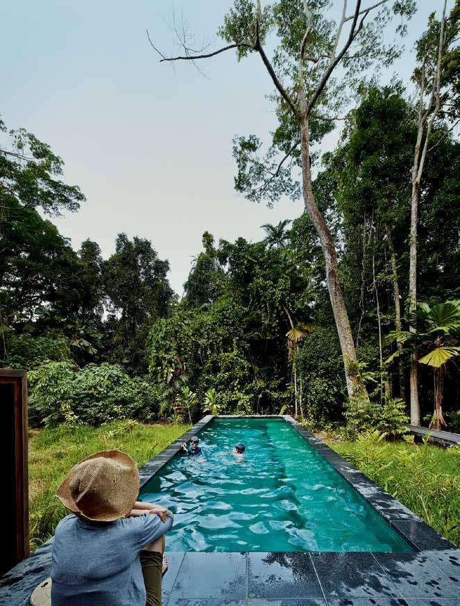
Kitchen Viellech top is Pilbara Dreamtime from Cairns Marble & Granite.
LIGHTING
Lighting is custom throughout the home.
FINISHES
Fibre cement painted ceilings finished in Dulux Aquanamel
in Sea Going. Hoop pine ply with Intergrain UltraClear finish to walls. External cladding is Plaspanel in Black. External decking is Cossett Evertuff Extruded Decking. Living Room Viellech upholstery from Mokum Canvas in Mazola, Mimosa and Arabesque.
FIXED & FITTED
Bathroom and tapware fittings from Reece. Kitchen sink from Franke.
previous left | PLANS AND SECTION previous right | THE BATHROOM OCCUPIES THE TALL CRE vASSE BETWEEN THE BEDROOMS AND OPENS TO THE RAINFOREST above | O UTDOOR LIvING SPACES COUPLE THE q UALITIES OF THE RAINFOREST WITH HOLIDAY LIFE AT THE BEACH
issue #33 habitusliving.com
Available exclusively at
Introducing the unique Aio halo-shaped design. 20% more spray force. Twice the amount of skin contact.* Experience Aurajet™ for yourself at methven.com/aurajet
* Compared to a Methven conventional shower at 9L per minute

You’re looking at the next generation of showering. Now imagine how it feels.
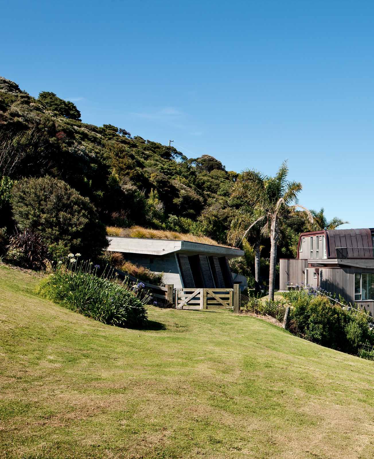
issue #33 habitusliving.com
Finding permanence
In a remote part of the Bay of Islands, Studio Pacific architecture have designed a holiday house that connects the past and the present. andrea StevenS discovers a sensitively designed house and sleep-out, and an heirloom for the next generation.
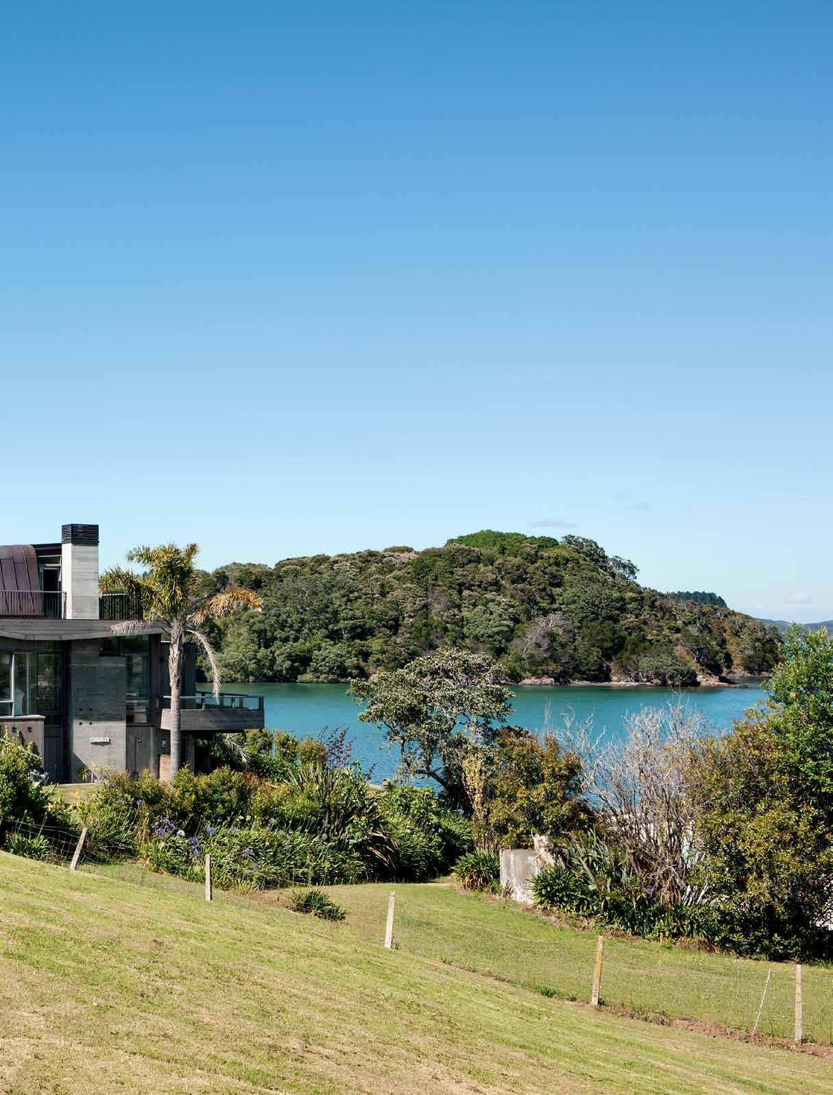 Tex T Andre A STevenS | PhoTogr APhy Simon deviTT
3 . on location # 129
The Bay of Islands in Northland is one of New Zealand’s favourite holiday destinations. The safe harbour, beaches and abundance of sea life – classed as an ‘outstanding landscape’ in the district plan – have drawn communities for hundreds of years. So the owners of this holiday home wanted to be culturally and environmentally sensitive with their building project. Having owned the land for 40 years, now with four children and many more grandchildren, their plan was to build a new sleep-out and simply extend their old bach – a third time. But while the sleep-out got underway, they cleared some of the planting around the old bach to reveal it was more dilapidated than first envisaged. The family decided it was time to replace it, but to retain as much of the essence of the original as possible.
It was an unusual gestation for a project – designing a main dwelling after the minor dwelling was built. But the back-to-front process has led to a very charming assemblage of parts, akin to how the original baches were made: elements added over time, often in ad hoc ways, as and when needs arose. The general arrangement of the new bach would closely match the old – the boat and fishing gear stored under the house, with a living floor and sleeping loft recreated above in virtually the
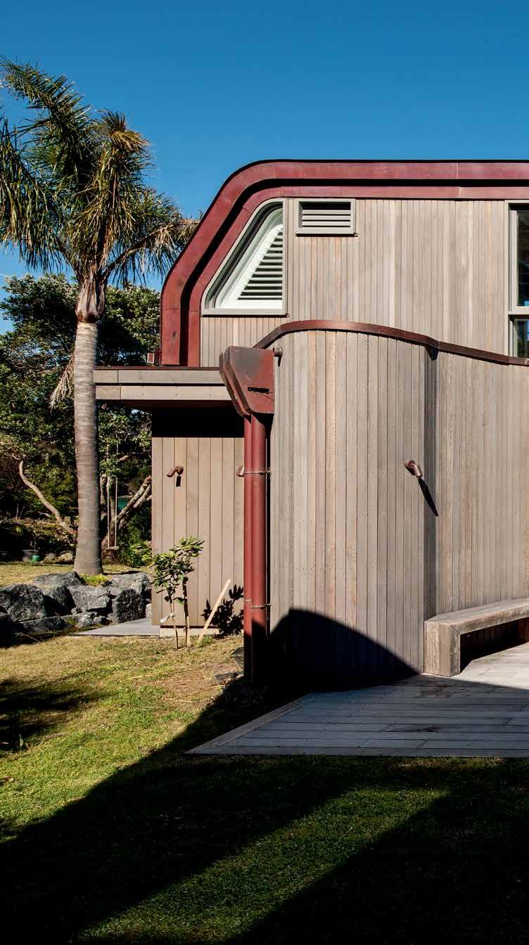
issue #33 habitusliving.com
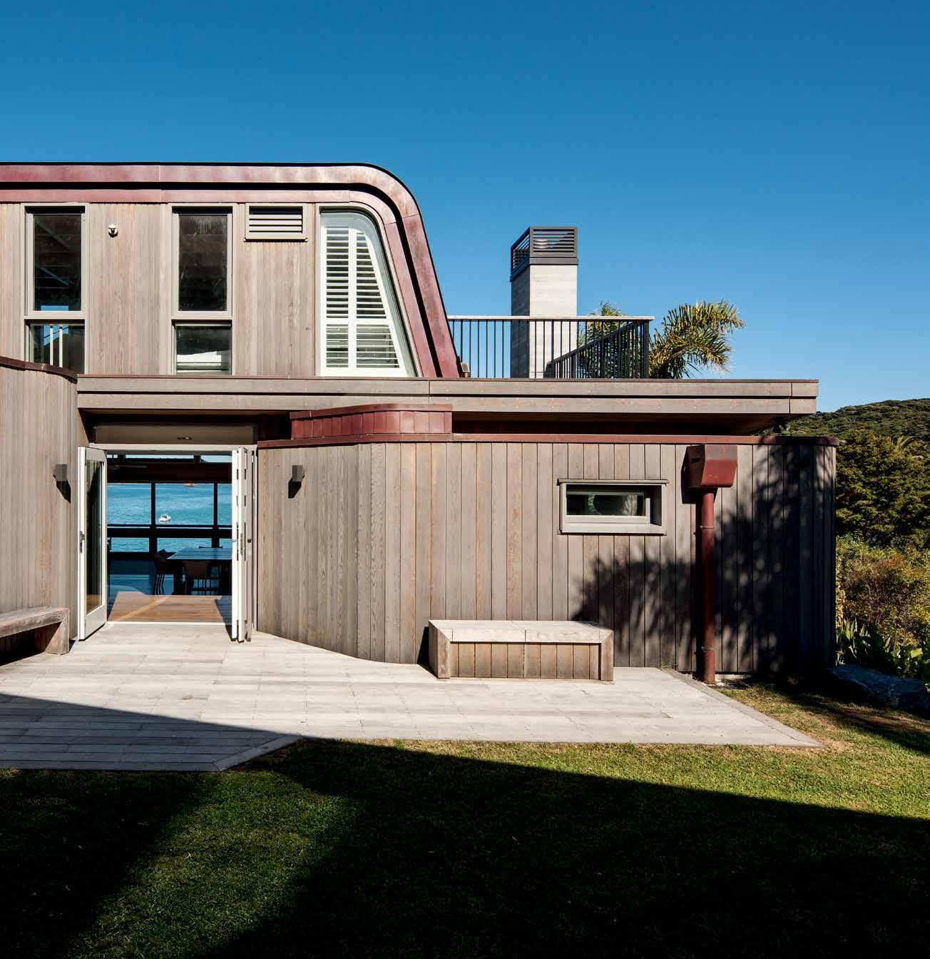
previous | A big progr Amme is minimised by distributing rooms Across two buildings And nesting them into the site. AB ove | c edA r cl A dding A nd copper roofing were selected to withstA nd the coA stA l environment A nd elegA ntly fold A round the curving, orgA nic forms. 3 . on location # 131
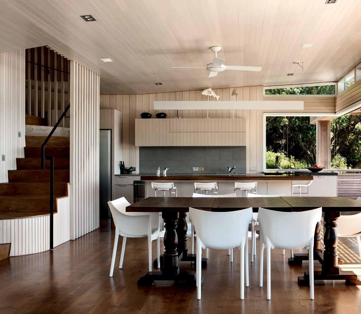
ABOVE | The owners chose blonde Timber for greaTer lighT reflecTiviT y Than a naT ural finish could provide. OPPOSITE | a generous window seaT projecTs pasT The building line To frame The view. issue #33 habitusliving.com
same position. “Like the old bach, the new bach climbs up out of the ground, projecting out to the near and distant views,” explains project architect Peter Mitchell. “The project’s staging and preference to ‘re-use’ the old footprint led to an authentic composition and assemblage of parts, with intended misalignments, slippages and quirks to create character and reference culture and context.”
The two programmes – one complete house plus a sleep-out for eight to ten people – suited two structures for many reasons. Firstly, it meant the main house could be used by a couple without it feeling too large; the two smaller structures were less dominant in the ‘outstanding landscape’ than a single, large building; and the width and slope of the site certainly worked better for a two-part scheme.
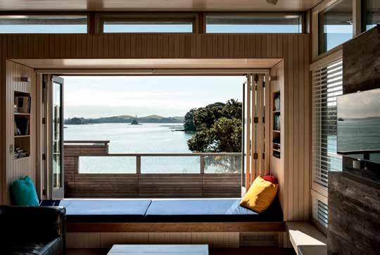
Taking its lead from the site’s geography, the sleep-out is dug into the hillside to minimise its visual impact and to create a low-energy building. Its green roof and massive concrete walls express permanence, enclosure and shelter. It is a quiet, cave-like retreat that works for the almost sub-tropical summers of Northland and its mild winters.
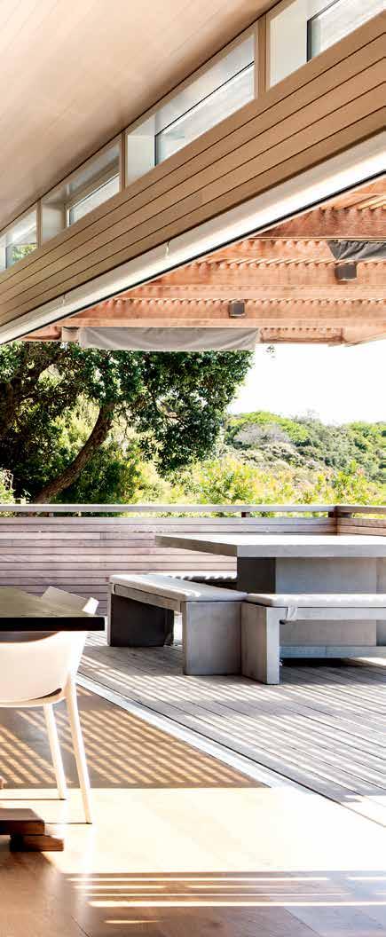
# 133 3 . on location
As well as the dense thermal mass, it has a thorough cross ventilation scheme for maximum control and comfort. Large sliding shutters, external to the window line, allow the occupants to manage privacy, views and sun shading, and act as a security screen when it is vacant. Inside, a combination of hopper windows, light wells and high-level louvres provide essential control of cross ventilation, making it a high-performance retreat in summer and winter.
“Aesthetically, natural textures, colour and grain were carefully manipulated in the concrete surface to resonate with the natural environment,” says Mitchell. “To achieve the level of craft the project required, we interviewed several local builders and chose Brian Mather for his confidence and skill with this type of expressive concrete. His craftsmanship achieved a real sense of luxury, warmth and intimacy to the interiors. Concrete reinforced the client’s brief to create a sense of permanence, being grounded in the site, engaged with the earth and landscape. It really amplifies its sense of place and creates a rich spatial experience.”
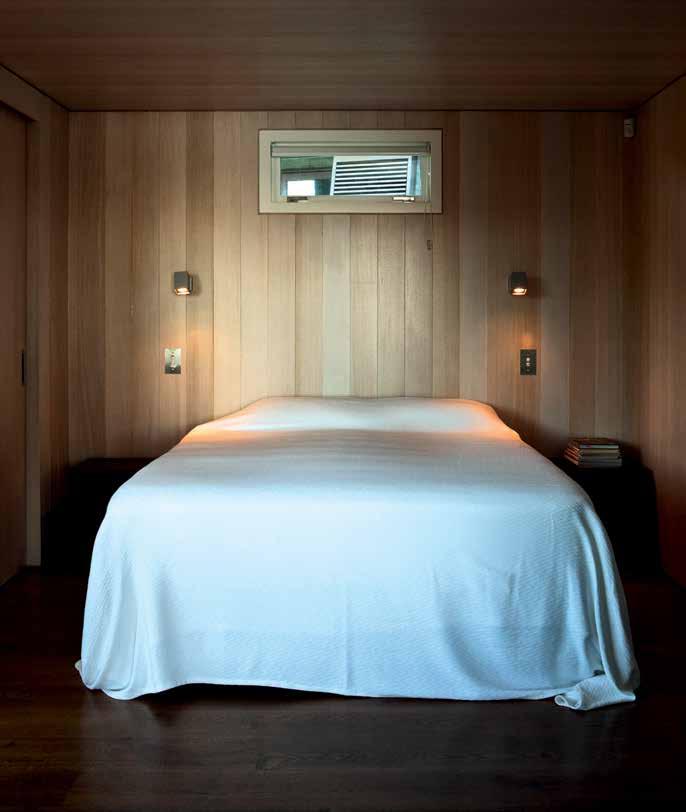
above | Warm
the
W
timber envelopes
master bedroom contrasting
ith the open, bright living room adjacent. opposite | a sculptural staircase ascends to the roof loft, one of the much-loved features of the old house reinterpreted in the ne W
Aesthetically, natural textures, colour and grain were carefully manipulated in the concrete surface to resonate with the natural environment.
issue #33 habitusliving.com
MITCHELL | ARCHITECT
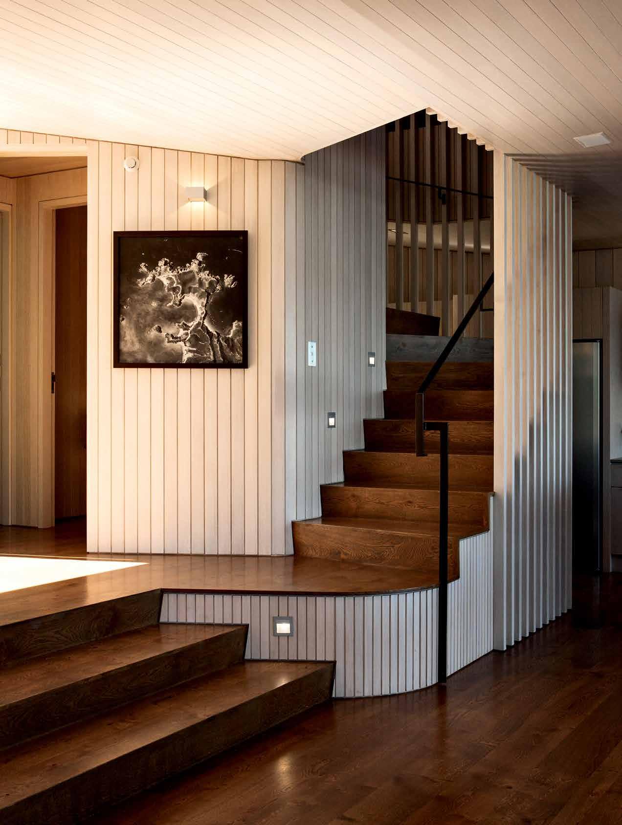
3 . on location # 135
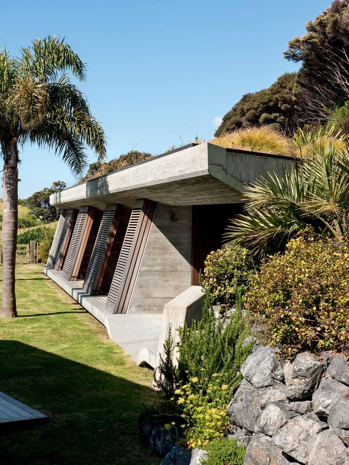
issue #33 habitusliving.com
When it came to designing the new bach, the sleep-out created a strong precedent – its sense of place, character, craft and permanence.
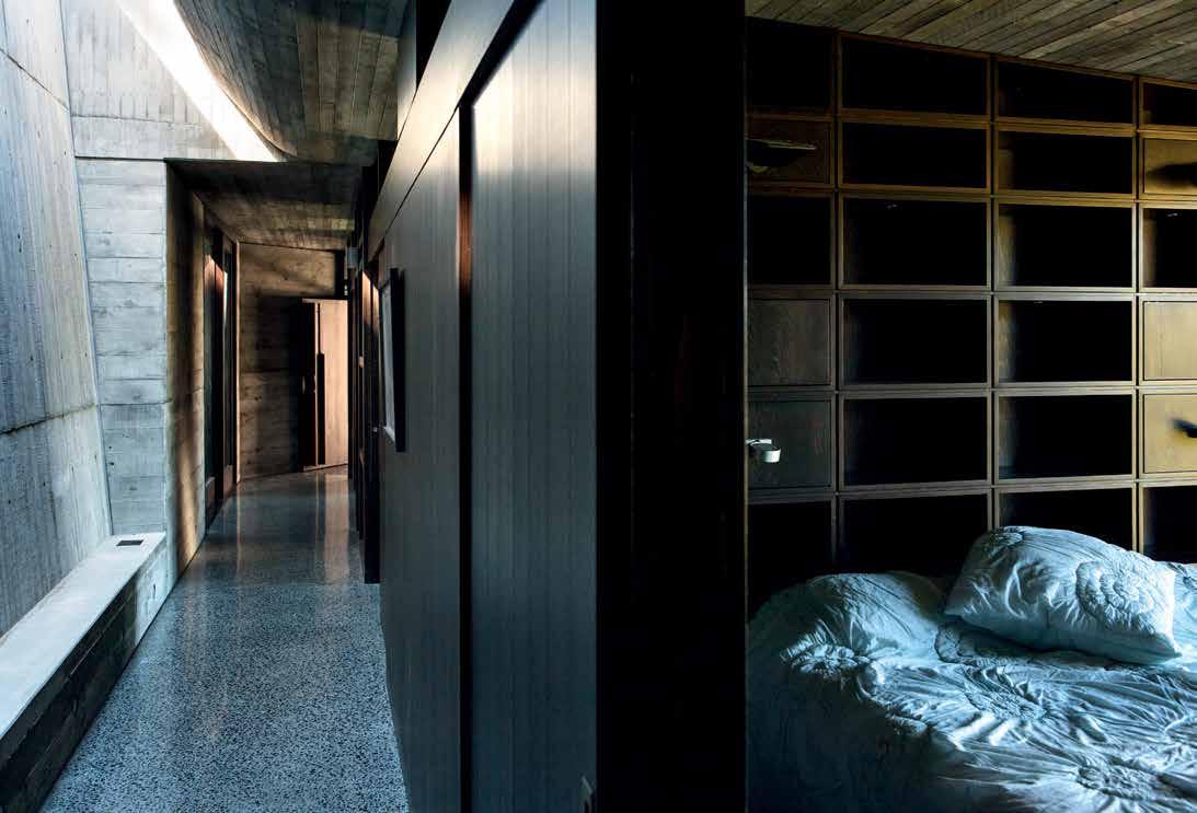
opposite | NickNamed 'the bu Nker', the
g is
N
above | iN side the
Nker,
become cave-like retreats where light aNd sou Nd are dampeNed as if u Ndergrou Nd.
guest wiN
protected from the elemeNts by heavy co
crete aNd storm shutters.
bu
guest rooms
3 . on location # 137
ENTRY LIVING DINING KITCHEN DECK BEDROOM BATHROOM WC ENSUITE PANTRY STORAGE 1 2 3 4 5 6 7 8 9 0 q w e r t y u i o p BEDROOM/LIVING BUNKROOM LIGHTWELL BOAT STORE LAUNDRY PLANTROOM FISH CLEANING OUTDOOR SHOWER LOFT PERGOLA SKYLIGHT LOFT r r p 5 y t o q u GROUND FLOOR 9 9 w r r 0 4 1 1 2 7 7 6 6 5 5 5 5 8 8 9 3 q e BOAT STORE issue #33 habitusliving.com
The sleep-out is tucking into the hillside behind the site of the main dwelling, making minimal visual impact on the landscape due to its silvered raw materials and with only one elevation visible. It slopes gently back in concert with the angle of the hill, and has been fondly nicknamed the ‘bunker’. A flat grassed area in front connects with the entrance into the rear of the bach, forming a loose social space and connector between the buildings.
When it came to designing the new bach, the sleep-out created a strong precedent – its sense of place, character, craft, and permanence – ideas developed in the timberframed bach in a more lightweight manner. Muscular concrete was brought through in the basement and sculptural fireplace, and boatforms are echoed in the roof. Timber detailing, shutters and louvres create a common detail and scale in each, along with recurring organic shapes in plan. But even so, they remain very different visually. They each have to respond to a different contour, orientation and function. So while there are material and formal links between the two, they largely follow their own conditions and do things differently in the spirit of the New Zealand bach tradition.
In designing the three-dimensional form of the bach, the architects were informed by the strong desire the clients held to recreate the cultural and environmental experiences they
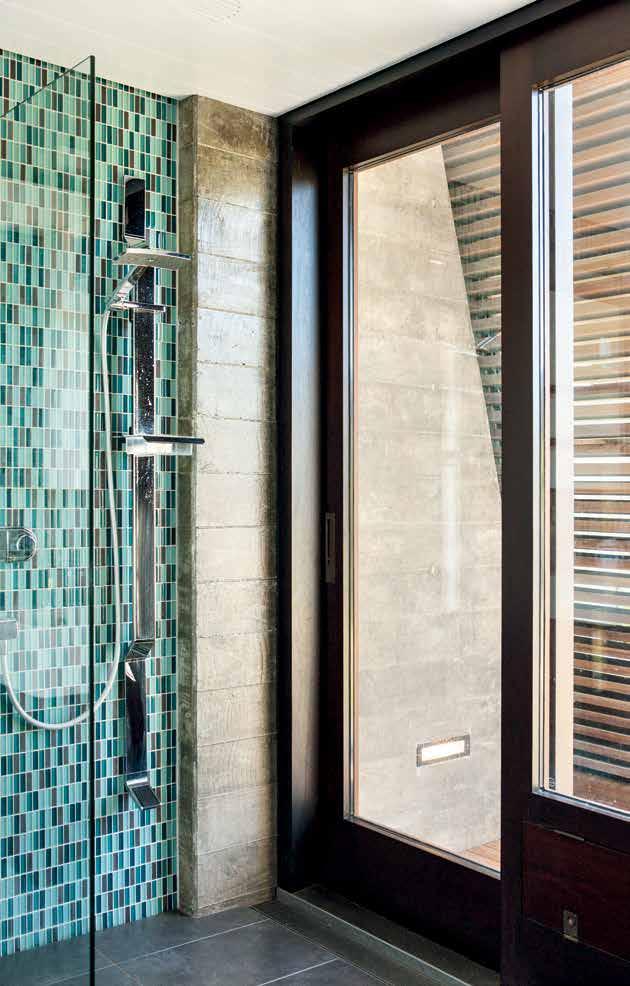
opposite | floor plans. above |
Guest bathrooms are screened by concrete win G walls and storm shutters, which also form a small sheltered deck.
3 . on location # 139
drop box
ARCHITECT Studio Pacific Architecture
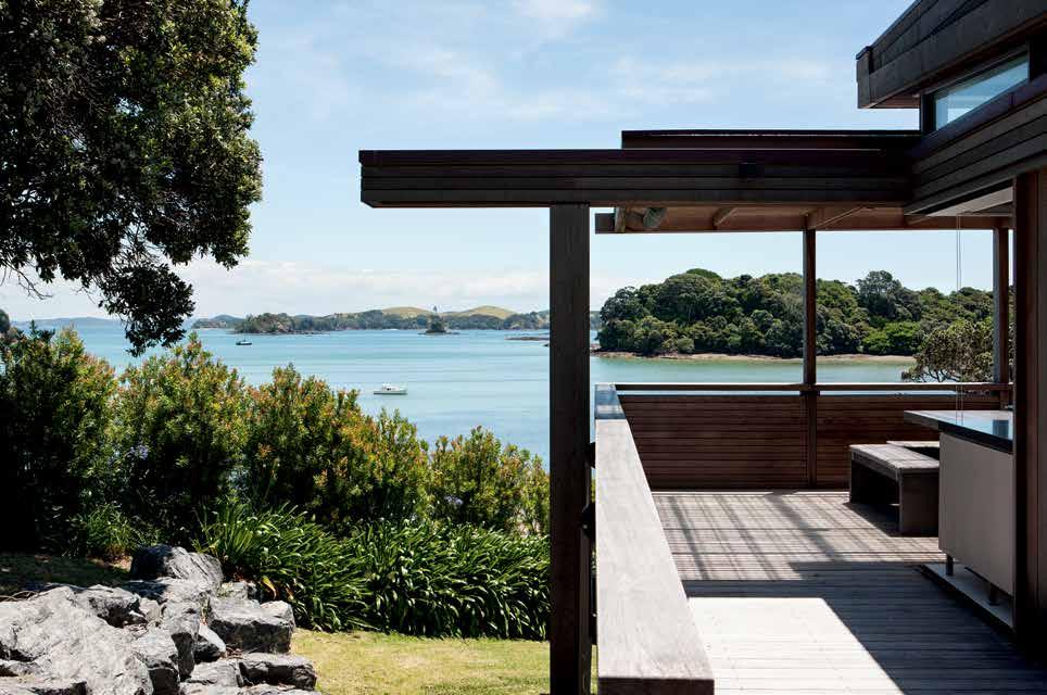
DIRECTOR IN CHARGE Nick Barratt-Boyes
PROJECT ARCHITECT Peter Mitchell
BACH Beth Chaney
SLEEPOUT Arindam Sen
STRUCTURAL ENGINEERS Dunning Thornton Consultants
CONTRACTOR Brian Mather and Mather Builders
BACH KITCHEN JOINERY Sarah
Quinlan Design
Studio Pacific a rchitecture (64) 802 5444 studiopacific.co.nz
LIGHTING
In
FINISHES
had grown to love in the old building. A very personal, characterful and crafted building ensued. Solid timbers, concrete and copper formed the basis of the material palette, and a collaborative design process in the studio led to a building rich in form and detail. “It needed to be an aggregation of parts like the old bach,” says Mitchell. “We worked with the essence of the existing and added new layers so it would look like a house that has evolved over time. The new plan and form is more rational, but the layers of the past are relived in the new design – it was an authentic reconstruction but also a new building on its own account made up by these combined effects.”
FIXED & FITTED
Considerations of longevity, visual sensitivity, and environmental responsiveness are apparent in the two buildings. They link the past and present by re-creating the site’s existing traditions and culture, while proposing enhancements. This layering of history has led to a project that achieves the owner’s desire to continue using the site in the same way, but to also create an heirloom for the next generations to cherish, well into the future.
sleepout, lighting supplied by Aesthetics Lighting.
In bach, timber, door joinery, and White and Bokara Grey paints supplied by Resene. Joinery, timber, and loft finishes supplied by Wattyl. Aquellux concrete walls and floor supplied by Allco. In sleepout, external decking, sliding screens, joinery walls, and door joinery supplied by Wattyl. External timber joinery, timber thresholds supplied by Resene.
In bach, Mirror Dempster Pad supplied by De Bruin Judge Furniture. Shower set, mixer, basin mixer and plug from Methven. Ceiling extract from Vortice. Wall heater from Skope. Toilet from Caroma. Hob oven from Fisher & Paykel. In sleepout Mirror Dempster Pad supplied by Metropolitan Glass. Floor waste outlet supplied by Allproof Industries.
above | A POST-AND - BEA m PERGOLA AND SOLID BALUSTRADE OFFER A SHELTERED OUTDOOR ROO m THAT w RAPS AROUND THE KITCHEN issue #33 habitusliving.com
Parisian living: concept boutique
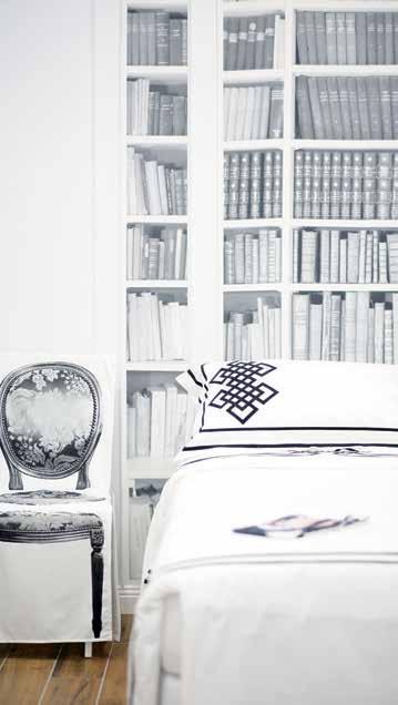
From Paris with love for Interior Design. French Designer, Nadia Aber-Griffith launches a new concept designer boutique, Jade+Amber in Melbourne.
Jade+Amber is a leading exclusive supplier of luxury interior brands made in France. Renowned for their elegance and high quality craftsmanship, Jade+Amber offers an unparalleled service to retailers, architects, designers, and corporate companies, as well as an excellent selection of accessories, luxury homeware and tableware, linens, wallpapers, and furniture for residential and commercial projects.
Jade + Amber stocks a curated collection of unique French and European interior products, guaranteed to be unlike anything else found in Australia. From hyperrealist trompe l’oeil creations featuring screen-printed chair covers, to
kitchen and bathroom accessories for a touch of humour and modernity; as well as limited edition, statement wallpapers featuring illustrated Parisian landscapes, monochrome Library and French Doors, authentic hand-woven French Bistro chairs, and the Australian made, award winning Signature Chairs. Jade+Amber’s offerings are a delightful collection of French and European design. Customers also have the opportunity to select from a range of upholstery or provide their own and customise the colour and finish of the wood stain to perfectly complement their home, office or business space.
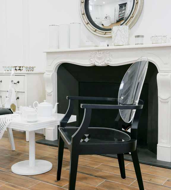
habitus promotion › Jade + Amber #141 issue #33 habitusliving.com
Above | images by Roam and WandeR PhotogR aPhy.
Jade + Amber | jadeplusamber.com.au | (61 3) 9827 1901
Singapore Indesign 8 October 2016
An all-new design adventure awaits Asia Pacific’s leading design event for architects, interior designers, specifiers and design lovers to discover, share and connect.
indesigntheevent.com
Facebook /indesigntheevent
Instagram @indesigntheevent
Twitter @indesign_event
Blurring the lines
A ‘welcoming fortress’ is how architect Rob McbRide and his life and business partner, designer deb Ryan describe their home in Prahran, MelbouRne. As directors of award-winning practice McBride Charles Ryan, they have finessed this very special project.
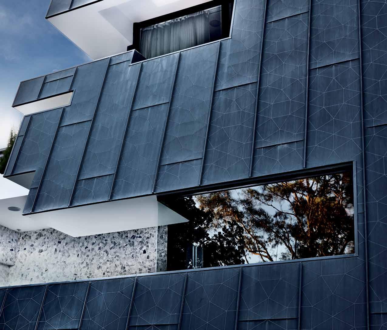
Tex T STephen CrafTi | phoTography LouiS peTruCCeLLi
3 . on location # 143
This busy couple was operating from two neighbouring townhouses they designed in 2000 in Prahran, with one used for work and the other a living space for themselves and their three children, Alex, Manning and Paris. As more space was required on both fronts, Rob McBride and Debbie Ryan took the next step of acquiring an adjoining site occupied by run-down 1940s -era apartments. Too large a site for one house (approximately 1,400 square metres) the couple was approached by a neighbour to develop the site as two large townhouses.
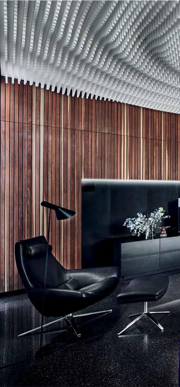
While the three-level building, including basement car parking, appears as one monolithic form, the site has been more adventurously subdivided than simply a straight line down the middle. “We wanted to respond to both briefs – our neighbours’ as well as our own requirements,” says Rob, who included a variety of north-facing courtyards and living areas in both to achieve this.
Rob and Debbie’s house, for example, includes basement car parking for four cars – needed given that their two sons both drive and live at home, along with their 15-year-old daughter Paris. The ground floor, elevated above the street, includes two living areas, one
issue #33 habitusliving.com
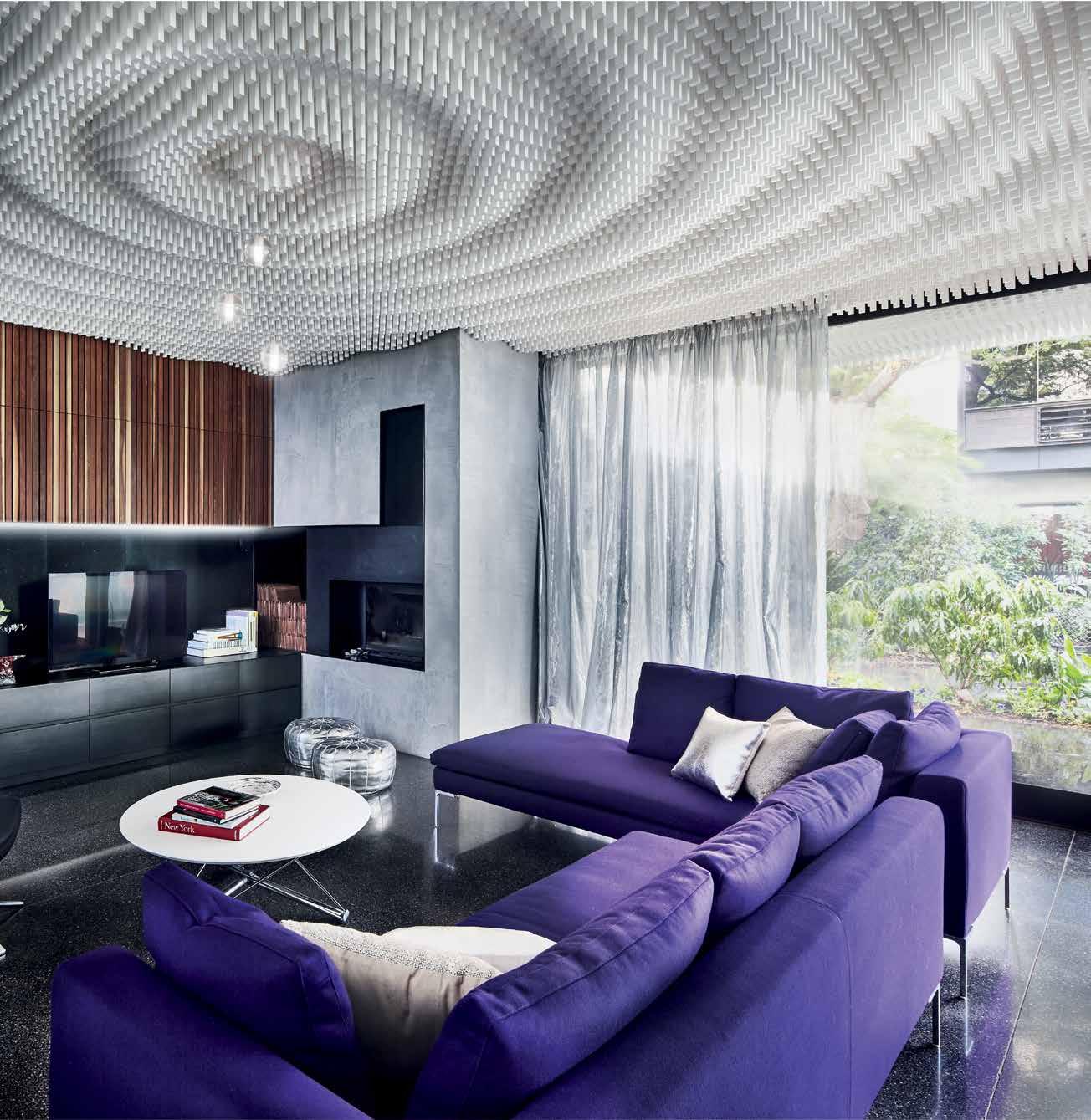
previous | The black zinc façade of The M cR house appeaRs fo RTRess-like fRo M The sTRee T AB ove | The open plan kiTchen and living a Reas a Re en Riched by The ex TR ao Rdina Ry TReaTM enT of The ceiling – likened To Ripples M ade by Th Rowing a pebble inTo a pool of waTeR 3 . on location # 145
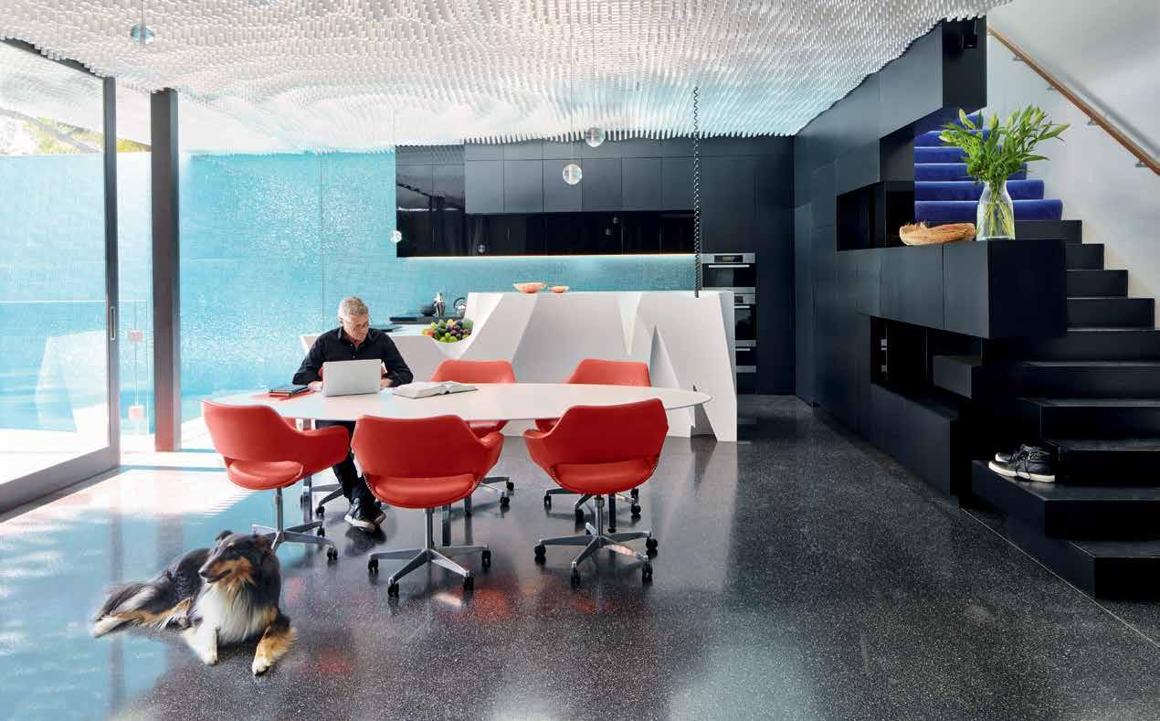
above | The island bench in The kiTchen is compared To an iceberg, in a conTinuaTion of The ‘waTery’ Theme. below | The kiTchen looks direcTly onTo The norThfacing lap pool in The rear courT yard-sT yle garden. issue #33 habitusliving.com
of which forms part of a guest wing at the front of the house (bedroom, walk-in dressing area and bathroom), delineated by timber walls. “It was designed for guests, but we also saw it as a potential bedroom for ourselves in older age if we got tired of using the stairs,” says Debbie.
The dramatic gallery space leads to the open plan kitchen, dining and living areas – the social hub of the house. “We had my mother’s 75th birthday here, as well as children’s birthdays and work functions,” says Debbie. Throughout this space, the ceiling is made from thousands of undulating timber blocks, Debbie describing the effect as ‘baroque’. Backlit, with drop-like glass pendants, there’s a sense of experiencing the architectural equivalent of ripples in a pond after a pebble is thrown. “There’s a strong watery theme going through the place,” says Rob, pointing out the iceberg-like Corian island bench in the kitchen and the effervescent glass mosaic tiles that extend outwards from the splashback in the kitchen to a feature wall framing the 20-metre-long swimming pool. “The effect of the light during the day is quite magical, both on the tiles as well as across the ceiling,” adds Ryan.
The kitchen not only functions as the social hub for the family, but also as a place where client presentations often take place, even though the MCR office is easily accessed through the north-facing courtyard. “The way people live now has changed significantly. Work and home life tend to blur,” says Debbie, not only for them, but also for their son Alex, who uses the dining table for his own work meetings for his watch and accessory company, The Fifth. “The degree of fluidity between work and home is becoming even more increased with our children,” she points out.
As the kitchen operates beyond traditional function, it was important for MCR to create a centrepiece. So rather than just a few slabs of ubiquitous marble, they waited until they found the right tradesperson who could ‘stitch’ their complicated island bench together. The white Corian bench includes a built-in fruit bowl together with a deep cavity to hold a vase.
Upstairs, while as beautifully finished as the lower level, is fairly traditional in its configuration. A main bedroom, walk-in dressing area and large ensuite form one wing, while the children’s three bedrooms
# 147 3 . on location
There’s a sense of experiencing the architectural equivalent of ripples in a pond after a pebble is thrown.
and bathroom form the other, the latter all orientated to the north-facing courtyard with an impressive jacaranda tree (the gardens were designed by Pauline Amon). “It’s lovely being able to have children cross the courtyard after coming home from school. We didn’t want to feel like we were absent parents,” says Rob, who also has staff and clients regularly coming into the home.
While the work/home arrangement is fairly unconventional, so is the use of materials throughout the house. French steel netting, for example, forms a balustrade linking the basement to the gallery space. The gallery itself also features green plywood joinery as a backdrop for the family’s artifacts and souvenirs collected on holidays. But work also sneaks into this space, where various models of houses the pair have designed are showcased throughout. The ceiling, which ‘threads’ the living areas together, and extends to the rear soffit, is also a one-off design that is unlikely to be repeated. “The ceiling was in our minds from the outset. We wanted something special that would give us pleasure, as well as those who visit,” says Debbie.
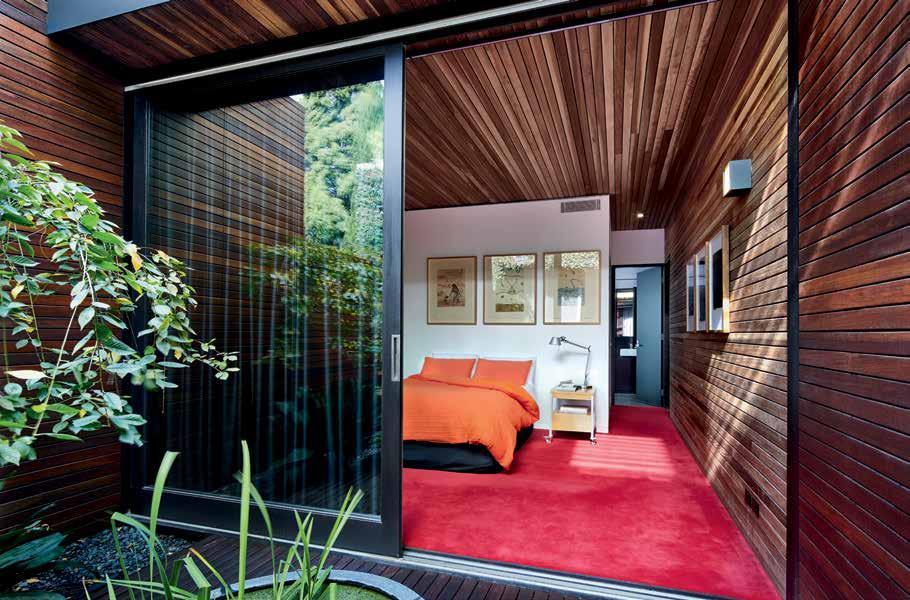
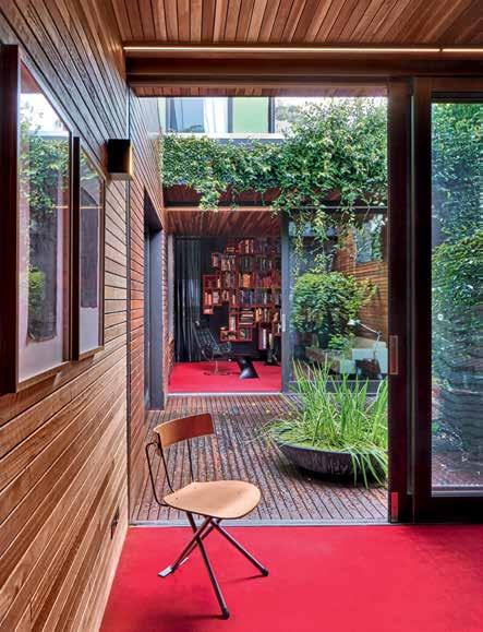
issue #33 habitusliving.com
above | the guest bedroom is lined in timber and is connected to its own private courtyard garden. below | from the bedroom, the view to the front study through the courtyard garden, which creates a level of separation and privacy between the two. opposite | the angular forms in the entrance are accentuated by the jewel-like colour palette.
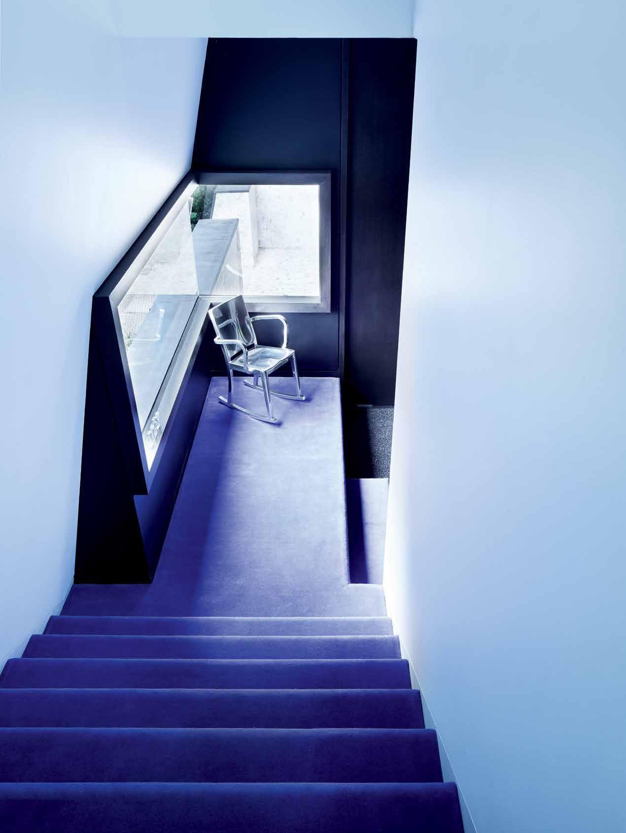
3 . on location # 149
The house operates on several levels, with lines blurred between work and home.
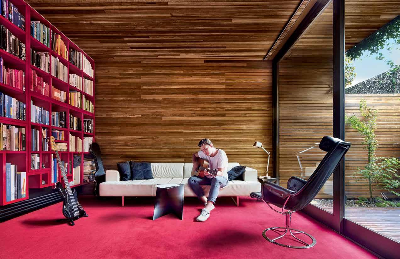
above | The sTudy locaTed aT The fronT of The house doubles as a Television room. opposiTe | floor plans.
issue #33 habitusliving.com
main entry circulation living bedroom bathroom 1 2 3 4 5 6 7 8 9 0 q e w laundry kitchen/dining courtyard garden garage pool wardrobe storage 0 0 GROUND FLOOR Fi R st F LOOR 7 8 7 9 9 4 4 4 4 4 4 4 5 5 5 2 3 w w w e e 5 4 4 5 2 1 1 2 3 . on location # 151
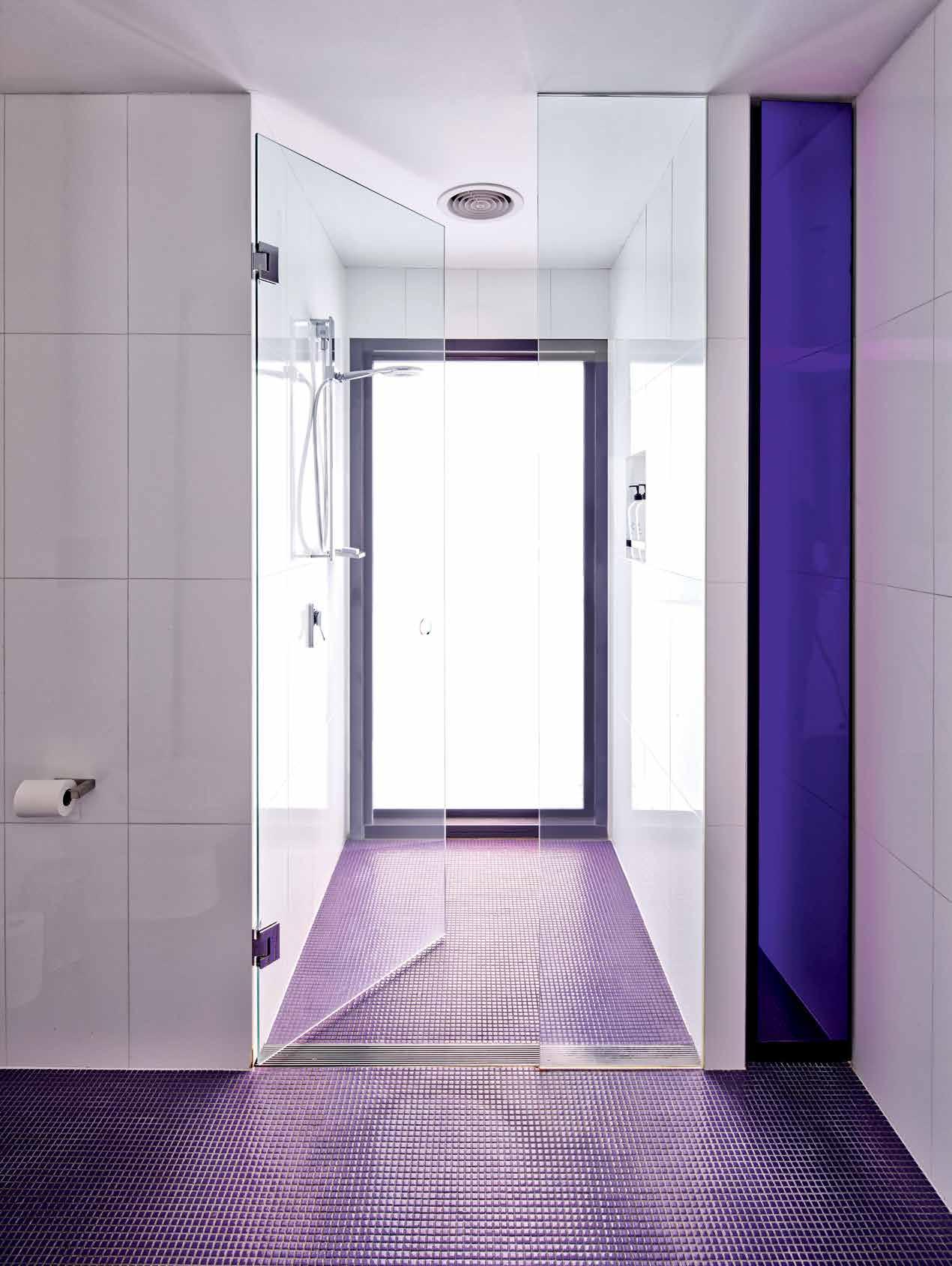
issue #33 habitusliving.com
Given the living areas double for both work and home, furniture could afford to be more adventurous, such as the silver-foiled armchairs (gallery) by Patricia Urquiola. The metallic silver curtains across the large sliding doors leading to the courtyard are also considerably braver than those normally used for domestic interiors. And given Debbie’s reputation for colour, it’s not surprising to see Chinese red lacquer used for joinery in the second living area.
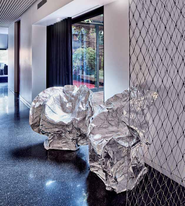
Although the Prahran house was designed as their family home, MCR saw it as a project from the outset. “Our neighbour set a brief which started the design process,” says McBride. “It wasn’t a case of us simply wanting to create the ‘dream home’, without the usual constraints,” he adds. And for a family, with a teenage daughter and two sons in their twenties, the house operates on several levels, with lines blurred between work and home. Social gatherings, for both family and staff further dissolve the boundaries. “It’s why we pulled out all the stops when it came to designing the ceiling,” says Ryan. “It had to be more than just plasterboard.”
drop box
ARCHITECT McBride Charles Ryan
BUILDING WORKS Tobias Constructions
LIGHTING CONSULTANT Light Project
FEATURE CEILING Enmore Joinery
MCBRIDE CHARLES RYAN (61 3) 9510 1006 mcbridecharlesryan.com.au
FURNITURE
B&B Italia Charles Lounge, B&B Italia Metropolitan Chair and Ottoman, and beige leather lounge from Space Furniture. Moroso Silver Lake C hairs designed by Patricia Urquiola from Hub Furniture.
FINISHES
Spotted gum, black heart sassafras, and stained pine ply. Corian island bench and bench tops. Signorino black glass mosaics and white large rectified tiles. Cerdomus pool tiles. Glass mosaics in bathroom from Bisazza. Terrazzo floor from Mentone Premix. Silver curtains from Zepel. Black and white curtains from Warwick. Red flooring from Comcork. French wire from Ronstadt. Black French Zinc from Hermann.
FIXED & FITTED
Miele
appliances. Fisher & Paykel fridge. Zuchetti tapware and sanitaryware by Caroma.
opposite | the guest powder room. above | patricia urquiola metallic
in the entrance make a statement. 3 . on location # 153
armchairs
Launching September 2016
2017 – The year of the INDE. Awards
INDE. is the new annual awards program by Indesign Media Asia Pacific, bringing together the best of our region for the first time.
INDE. celebrates the practices of design and architecture as well as the outcomes, and is uniquely positioned to offer international exposure and recognition.
indeawards.com
Treasure in Saigon
Deep within the sprawl of Ho Chi Minh City is Saigon House, a new home devoted to a more sincere sense of connection – with architecture, history, culture and family. SAMMY PRESTON goes behind the jade-painted door to meet A21STUDIO's Toan Nghiem.
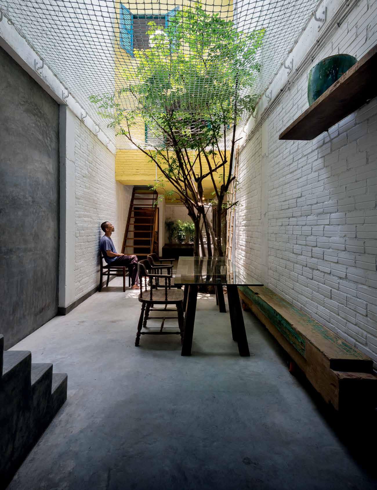
Tex T SAMMY PR e STON | PhOTO gRAPh Y quANg TRAN 3 . on location # 155
Vietnam-based architect Toan Nghiem refers to Ho Chi Minh City by its more historic, and perhaps culturally precise title –Saigon. Toan is deeply inspired by the culture and tradition of South Vietnam; something he believes should be preserved, celebrated and treasured, an appreciation that is rich in all of his work to date. His practice, a21studio, has earned a steady collection of architectural accolades in recent years, including back-to-back World Building of the Year Awards at the World Architecture Festival in 2014 and 2015.
The Chapel, a community centre in Ho Chi Minh City constructed using recycled materials and coloured fabric and modelled on a traditional Vietnamese neighbourhood building, won the prestigious prize in 2014. Saigon House – a multi-storey residence conceived as a lasting and treasured gathering place for family, took out the title in 2015.
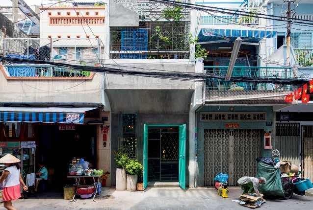
Toan’s Saigon House is yet another structure within the a21studio portfolio designed in earnest to connect with the rich tradition and culture of Vietnam. “Near our office in Saigon there is an old house called Van Duong Phu, it’s a very beautiful house and a masterpiece of architecture,” explains Toan.
issue #33 habitusliving.com
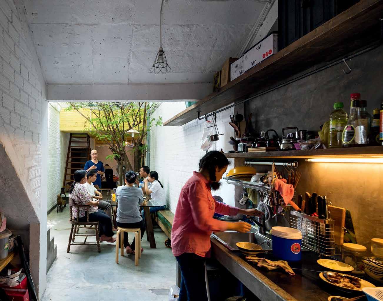
previous | A CENTRAL COURTYARD DRAWS THE OUTSIDE IN CONNECTING INHABITANTS WITH THE ELEMENTS. opposiTe | A JADE-PAINTED DOORWAY MARkS THE ENTRY TO SAIGON HOUSE AB ove | LI k E A TRUE SAIGON ALLEYWAY, THE COURTYARD IS ALSO A SPACE TO CONNECT WITH FAMILY. 3 . on location # 157
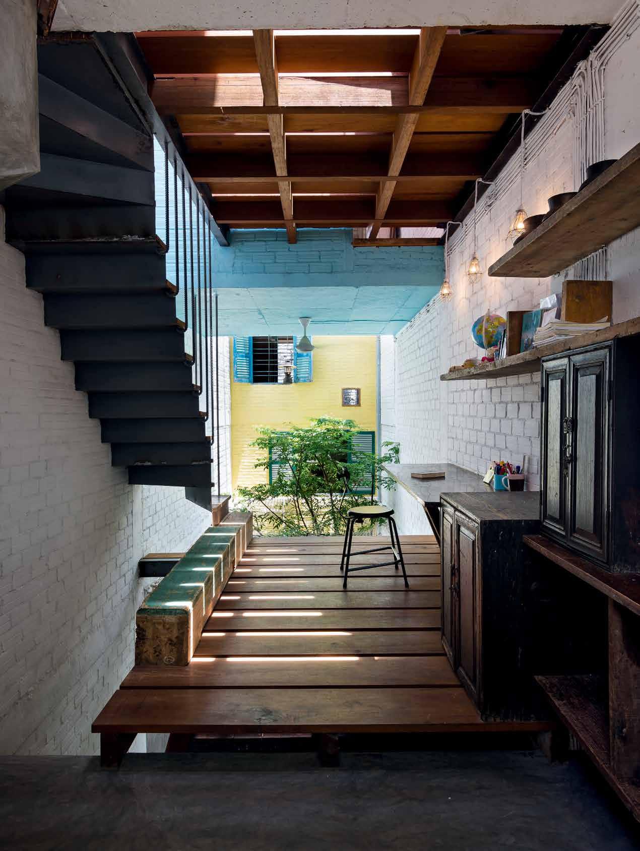
issue #33 habitusliving.com
“It was built by Mr. Vuong Hong Sen, a culturist, an academic, and a famous collector of antiques. He also had a deep knowledge of southern Vietnam, and wrote many books about Saigon.” The house was regarded as something of a historic treasure, filled with Vietnamese antiques and artifacts that whispered ancient stories of the city. “[Vuong Hong Sen] wanted to dedicate the house as a museum, because it painted a picture of the culture of South Vietnam and the people,” Toan says. “However, after his death, the house was abandoned, the artifacts sold off by his children, and the spirit totally lost.”
Toan explains that it was Vuong Hong Sen’s home and his lost life’s work that inspired a21studio’s new Saigon House. “The owner of Saigon House loves Saigon and hates living in a Western-like houses, which have become popular in our city,” he says. “She wanted the house to be a gathering place for her brothers and sisters who used to live under the same roof, and a meeting place for grandparents and their kids.” Indeed, the residents of the home wanted to create a place to comfortably share and preserve memories, and to treat collected
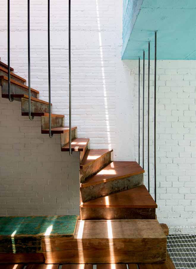
OPPOSITE | RECYCLED AND FOUND MATERIALS HAVE BEEN RE-IMAGINED AS STRUCTURAL FEATURES, FURNITURE AND ANTIQUE ORNAMENTS. ABOVE | ROOMS ARE S pREAD ACROSS THE FOUR DIFFERENT LEVELS CONNECTED BY VARIOUS STAIRwELLS # 159 3 . on location
furniture and objects as familial treasures in the hope that their children would cherish each artifact long in to the future.
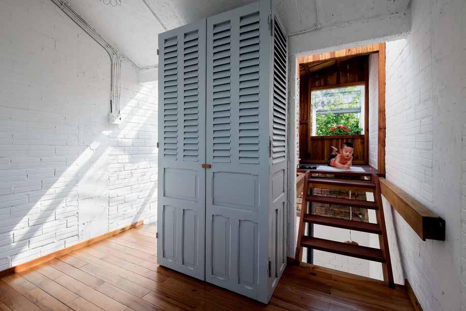
The idea of permanence and richer meaning in architecture is close to the heart of Toan’s practice. “When I was young, and I would invite my friends over to my family house, I would say go to that alley, it has a big tree at the beginning, and then go and find the green gate, that is my house,” Toan recalls. “All of the houses were different. There were sloped roofs, courtyards and flowering balconies. [Alleyways] were filled with colours in rich materials. Chaotic, but steeped in culture.” Now, Ho Chi Minh’s city streets are peppered with new, minimaliststyle houses, and sprawling, almost clinical suburban developments. “Currently, I don’t think that people have a strong connection with the house they are living in, especially in new urban areas,” Toan says.
Saigon House calls for a greater connection, enveloped in history, family and culture. The four-storey home is a vertical village of sorts, made up of a series of floating, house-shaped rooms set above a central, open courtyard. Each of the upper rooms have been modelled on neat, small dwellings. “These spaces are small enough for [members of the family] to go about their personal or solitary activities, but
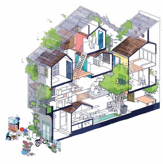
ABOVE
|
upper level 'dwellings' have been kept small for personal and solitary activities, which encourages congregation in communal areas. BElOw | a 21 studio ' s design welcomes rich elements of living greenery OPPOSITE | internal vistas are open and communal, instead of closed off or private.
issue #33 habitusliving.com
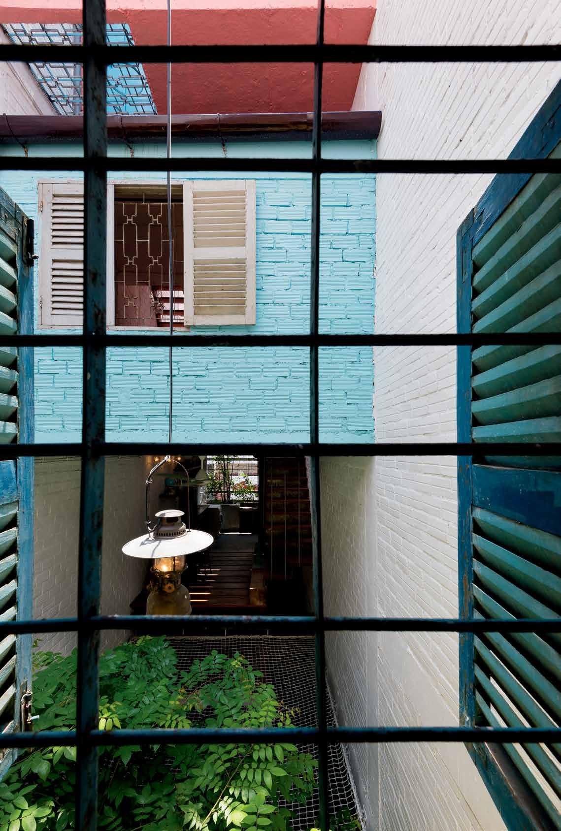
3 . on location # 161
otherwise they are able to be easily drawn to the sounds and images of outside, encouraging them to get out, and connect with others.”
The open-air common area functions as a true Saigon alleyway, where family members are encouraged to interact, as well as experience the elements – the weather, and the changing of the seasons. “This is very rare in modern society,” adds Toan. “There is a lack of love, a lack of communication, and nature.”
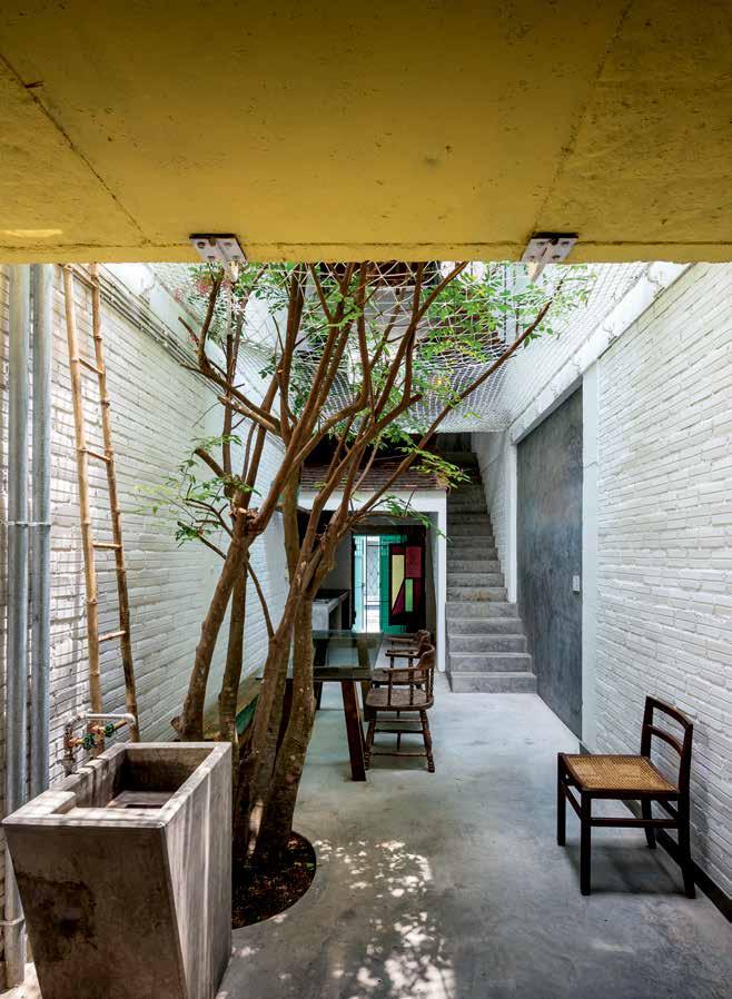
And similarly to Vuong Hong Sen’s home of treasures, Saigon House has been filled with furniture and antiquities collected by the a21studio and the home’s residents. “We went to old historic houses, collected things, and brought them back to Saigon House,” says Toan. This was an important exercise, not simply because of the beauty of these old, found objects, but also because of their rich history, and ability to connect the family more profoundly with their new home both now, and into the future. “We found the spirit of the secondhand things could be ‘reborn’, and these stories could be carried to the children, who would then cherish the house so much more.”
drop box
ARCHITECT a21studio

CONSULTANT 68 Construction
CONTRACTOR 68 Construction
A21 STUDIO (84) 8 3841 1603
a21studio.com.vn
FINISHES
Concrete, bricks, steel are used for the main frame. Others for finishing as, roof tiles, floor tiles, doors, windows are collected from old Saigon house demolished.
ABOVE | A LARg E TREE ON THE g ROUNd FLOOR EmpHASISES THE Id EA OF AN OUTd OOR S pACE BELOW | LI g HT FILTERS THROU g HOUT THE HO m E THROU g H A COLLECTION OF w IN d Ow S AN d d OU b LE- HEI g HT S pACES issue #33 habitusliving.com
FARAGE.COM.AU
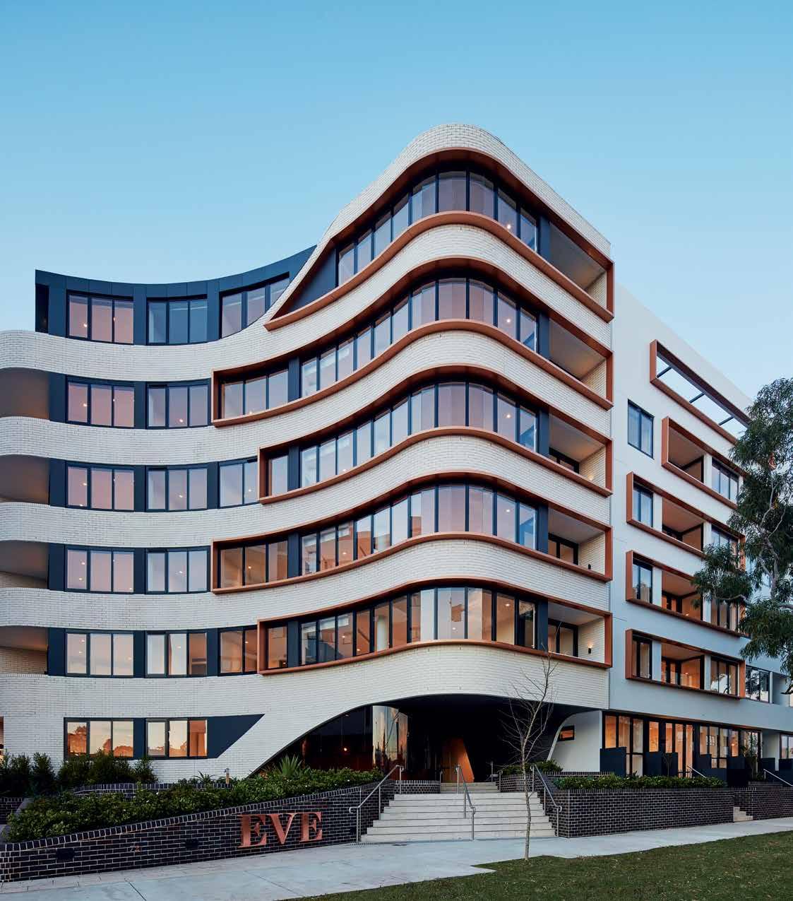
issue #33 habitusliving.com above | At once sculptur Al And robust, e ve’s brick exterior And curved ArchwAy reference erskineville’s Architectur Al heritAge while the development serves As A stylish new l AndmArk for the neighbourhood. nd A y ge A
Urban luxury
The newest kid on the block in Sydney’s inner-city suburb of Erskineville is Eve, a multi-residential project by Fridcorp. Designed by DKO, Eve is defined by quality design and relationships – both architectural and social.

The relationship between site and surrounding suburb is intrinsic to the project’s design language,” says David Randerson, director at DKO and the project’s lead architect. “It is conceived, designed and shaped as a response to a range of local elements, such as the distinctive curved corner treatment of local buildings, along with an honest and robust materiality.” He continues, “We wanted to create a local landmark but with a sophisticated approach,” Randerson says. “So the project has a grand entry that is set back from the street.”
In addition to rethinking the corner with the curved archway, DKO reconsidered the standard approach to apartment design and made a section of the ground-level apartments outward rather than inward facing, inserting a European-style stoop that presents a pleasing interface between the building and the public, as well as creating seven lobbies throughout the site.
Eve’s secluded, landscaped courtyard designed by 360 Degrees includes built-in timber seating that provides an opportunity for neighbourly engagement, a detail that is especially important in growing communities such as Erskineville. Mature trees and plants fill the large, concrete raised planters and line the gently winding pathways that lead to Eve’s respective buildings.
The 1,000m 2 resort-style rooftop garden offers another vibrant communal space for residents and their guests to relax or entertain. Located on the site’s northern-most building, the rooftop garden provides a lush view of the beautiful rooftop deck. From the rooftop, guests are treated to expansive views of Sydney’s skyline.
The apartments’ sophisticated and restrained interiors were designed by Hecker Guthrie. The intelligent and efficient floorplans have wide frontages giving the apartments a spacious feeling. Full-length windows allow natural light into the space, enhancing the amenity. Hecker Guthrie appointed the interiors with blonde American oak floors and white walls, with home owners choosing from either a dark grey or all-white colour palette. Rose gold-coloured accents, found in tapware, light fixtures and door handles, punctuate the apartments.
“We’re very proud of Eve – from its exceptional design to its high-quality interiors and the communal spaces. We think the project demonstrates that Sydney’s apartment planning guidelines allow for the realisation of excellent design outcomes,” says Paul Fridman, founder and director of Fridcorp.
habitus promotion › Fridcorp
#165
Fridcorp | fridcorp.com.au “ “
Inspired by Perth’s growing design industry, Wine In Design is an immersive and curated exploration of the best the local community has to offer.
Wine In Design invites you to enjoy WA’s fine wines, perfectly paired with the best design showrooms in Perth.
October 2016
wineindesign.com

 Arthur
G. CWID 2016 Exhibitor
Between the trees
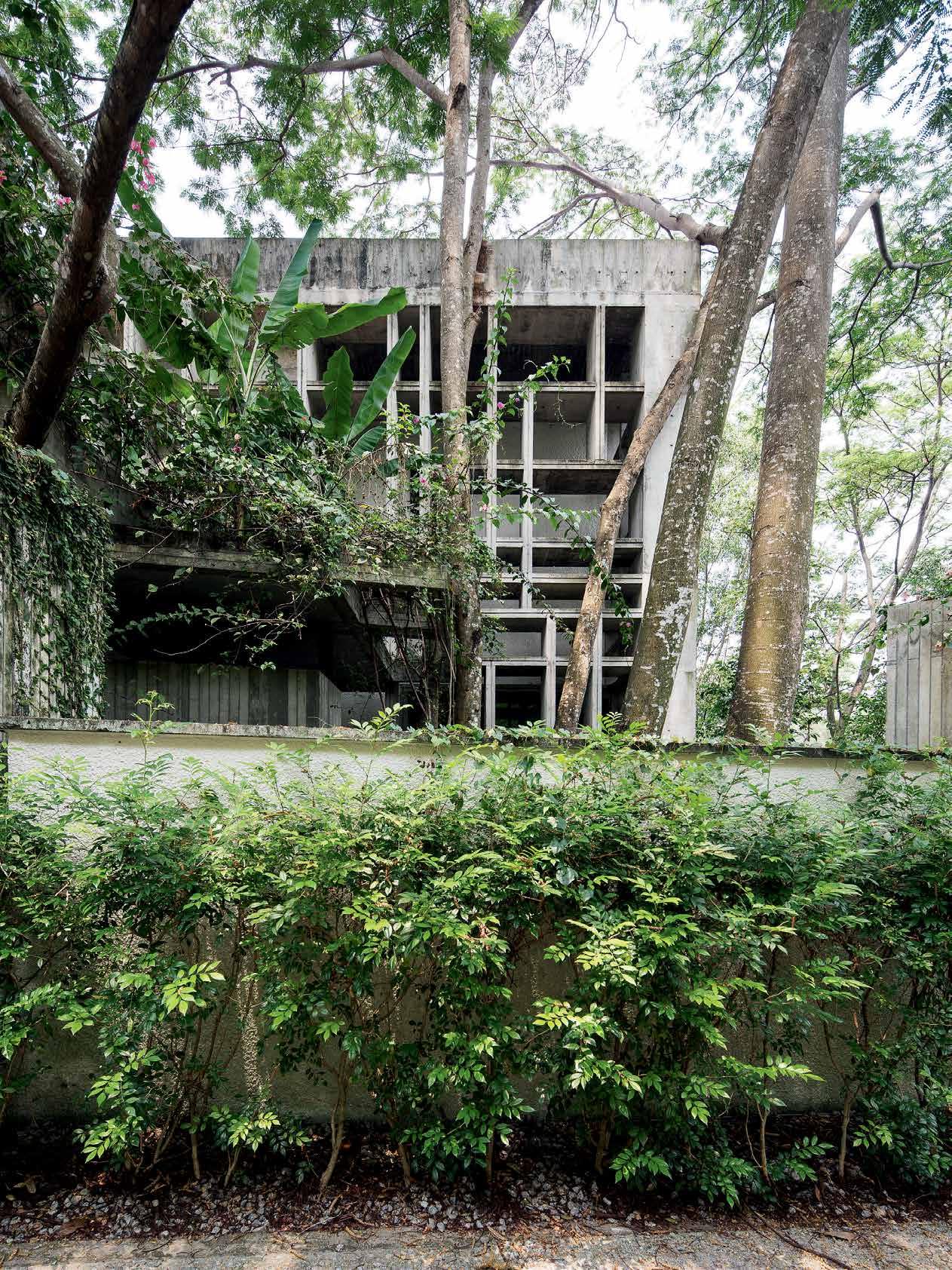
by WHBC ArCHiteCts, the Chempenai House is a four-bedroom family home with modular tendencies, sitting lightly on the land. Adele CHong visits the concrete dwelling in KuAlA lumpur’s Damansara Heights and discovers a resourcefully crafted abode that toes the line between inside and outside.
Designed
3 . on location # 167
Tex T Adele Chong | PhoTogr APhy Ben hosking
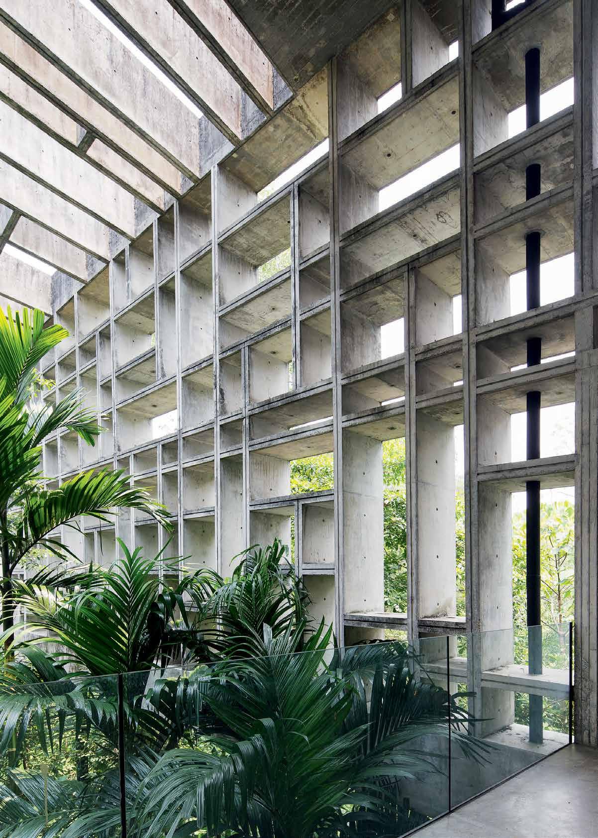
issue #33 habitusliving.com
At a glance, Kuala Lumpur projects a very specific attitude to architecture: the bigger, the better. Over the years, this excess-is-best approach has given way to extravagantly realised buildings whose impetus hinge on spectacle rather than human-scale concerns or respect for context. Happily, the proliferation of these super-sized structures seems to have an upside, prompting renewed interest in intimate, pareddown dwellings that display an adherence to modernist principles as well as an affinity with their immediate surroundings.
Situated on a slope in the affluent suburb of Damansara Heights, the Chempenai House is one such example. For a number of reasons, the house, designed by local firm WHBC Architects, is something of a diamond in the rough of a neighbourhood dominated by nouveau riche mansions and luxury condominiums. In contrast to the architecture of its more flamboyant counterparts, its stripped down concrete surfaces don’t vie for attention, and if its steep, off-the-beaten-track location is any indication, it doesn’t want to be found either. Indeed, it’s difficult not to entertain Batcave comparisons, walking up Jalan Chempenai to
catch a glimpse of the half-hidden rhomboid box peeking clandestinely through a romantic blur of tropical trees and vegetation.
Despite the stark presence of the concrete, the building blends effortlessly into its leafy surrounds. The effect is further accentuated by the house’s most prolific design feature: an unusual, egg-crate shaped façade that was cleverly envisioned by the architects as a sun-filtering device. Given the intense tropical climate, WHBC co-founder BC Ang focused his energies on safeguarding the house from extreme heat and sunlight. “The structure naturally allows daylight to filter through but resists radiation,” he offers. The perforated facade, he says, also allows for the existing undergrowth to unfurl over surfaces in a consistent manner as the house is slowly reclaimed by nature over time. The notion of a hidden sanctuary is thus brought to the fore as visual harmony is achieved through this gradual marriage of building and jungle.
Using the site’s constraints as a framework for the house, Ang worked closely with houseowner Chan Chee Leong. He heeded the latter’s determination to preserve the area’s existing Albizia trees by designing around these, creating thoughtful interventions – such as an
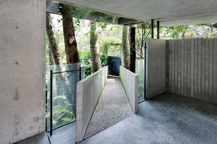
previous | Viewed from the street,
simultaneously keeps the heat out while letting ample daylight in. AB ove |
the
house blends
right
in with
the
tropical oVergrowth. opposiTe | m odelled after egg crates, the unusual concrete façade
the angled bridge leading directly to the main entrance.
# 169 3 . on location
angled bridge leading up to the front door – that play up their luxuriant qualities. A long-time Damansara Heights resident and architecture enthusiast, Chee Leong had his heart set on building a family home that would encapsulate the feel of an impressive Balinese resort he visited some years back. Offering utmost privacy and riveting green horizons, it too had been set against a picturesque slope.
Inspiration aside, the choice of a suitable site ultimately came down to cost. Chee Leong discovered that opting for a slope proved more economical in an upmarket area like Damansara Heights, even at a sprawling 10,500 square feet. “A flat site of this size would have come at a premium price and I had a limited budget,” he says. Shifting his sights away from level ground, Chee Leong splurged on highquality materials and sound design instead. The decision paid off, culminating in a well-crafted house that wonderfully befits its location. “I saved money on earthworks because of the way the house is set up,” he reveals, referencing the strategically devised layout.
In order to keep the damp out, sizable areas of the house had to be elevated, resulting in an unconventional spatial arrangement that lends movement to the spartan yet exquisitely fashioned interiors. Designed to comfortably accommodate a family of four, the three-story abode also paves the way for modular living spaces within the dwelling itself, including
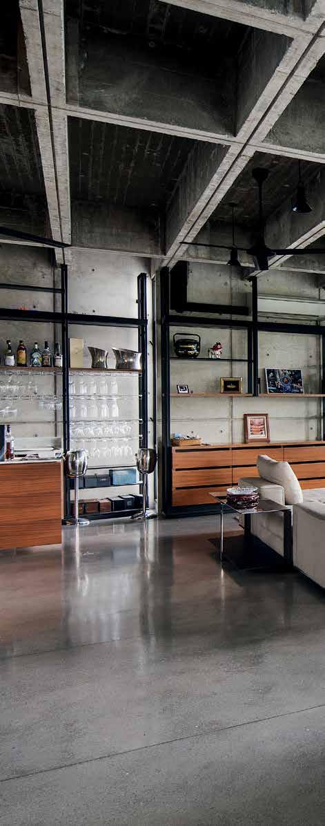
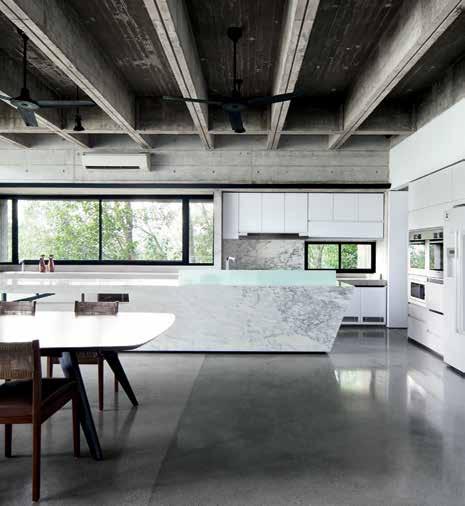
ABOVE |
a
The solid marble kiTchen-Top lends a luxurious Touch To The pared-down premises. OPPOSITE | cooled wiTh overhead fans, The living room-cum-dining area is sparsely furnished, conveying
feeling of spaciousness.
issue #33 habitusliving.com
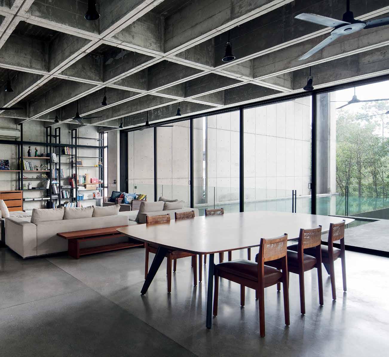
3 . on location # 171
LOWER GROUND FLOOR FIRST FLOOR 4 y 1 2 t 7 6 u 5 8 9 3 w r 0 o e p q y y y u u u GROUND FLOOR issue #33 habitusliving.com
a one-bedroom apartment for Chee Leong’s visiting mother and living quarters for house staff at the basement level. Though Chee Leong lives by himself at the moment, the interchangeable layout is a boon; he relishes the ongoing possibility of hosting large gatherings or putting loved ones up for the night at a moment’s notice. “And if my son ever needs his own bachelor pad, he doesn’t have far to look,” he quips.
The crown jewel of the house is undeniably the ground floor. Regardless of where one stands, perfectly framed views celebrate the lush natural landscape while shielding the onlooker from plain sight. Adjacent to a stairway flanked by black-coated steel grilles, a long walkway meanders past an internal courtyard before stretching into a open plan living and dining space; gloriously illuminated, these comely areas are bathed in just the right amount of natural light owing to generously sized sliding glass doors that look directly onto a double volume deck, the infinity pool and the adjoining garden beyond. Sheltered by the building’s characteristic eggcrate envelope, an outdoor lounge next to the pool is where Chee Leong usually unwinds, lulled by the calm and the sound of chirping
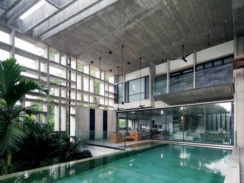
GaraGe lower entrance pool M& e outdoor store M aid lounGe M aid bath M aid rooM G arden store stair courtyard internal store driver lower foyer entrance foyer car porch bedrooM bath stair courtyard lounGe lap pool deck dininG k itchen back kitchen daily store Guest lounGe Guest bath av rooM study bedrooM balcony wardrobe
t y u i o p
1 2 3 4 5 6 7 8 9 0 q e w r
opposite | floor plans. above | Enclos Ed by th E charactEristic Egg-cratE structurE , th E stunning outdoor loung E is ov Erlook Ed by th E living room arE a and th E mastEr b Edroom balcony. 3 . on location # 173
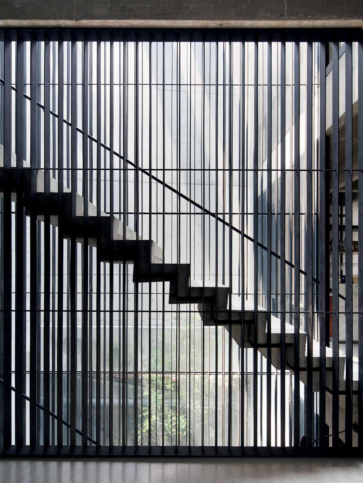
issue #33 habitusliving.com
birds seeking refuge amid the neighbouring trees. Nightfall finds the pool area at its most atmospheric; ripple patterns emanating from the water and shadows cast by the façade play dramatically on the walls come evening, giving the space a highly cinematic quality. For Chee Leong, it’s these subtle details that give the house life. His fascination with tactility and transitory spaces also bore an influence on Ang’s layout, bringing about material-specific floors – marble and concrete for indoor spaces and a craggy, rock-embedded surface for the external grounds – that clearly indicate one’s present position in and around the house. “You notice a real difference as you move from inside to outside,” he says, referring to the shifting textures underfoot.
Customised for the house, the furnishings reflect a tendency towards precise forms and painstakingly rendered details. An inconceivably heavy wedge of terrazzo marble occupying a substantial part of the ground floor is exemplary of this. Doubling as sculpture and a functioning kitchen top, the hand-carved block apparently took months to locate and hew into shape. For this writer, it is this elegant, laboriously forged structure that best expresses the Chempenai House’s aspirations as an altar to form, craftsmanship and utility.
drop box
archiTecT WHBC Architects
Builder CHB Construction and Ming
Seng Construction
WHBC ArCH iteCts mail@whbca.com whbca.com
furniTure Client supplied.
lighTing Bespoke – Slow from Exin Lighting.
finishes Façade, structure, sunshades, internal walls and ceiling are
unfinished off-form concrete. Polished concrete and walnut timber flooring. Stair treads are concrete thread lined with arabescato marble edging. Steel frame glass wall beside staircase.
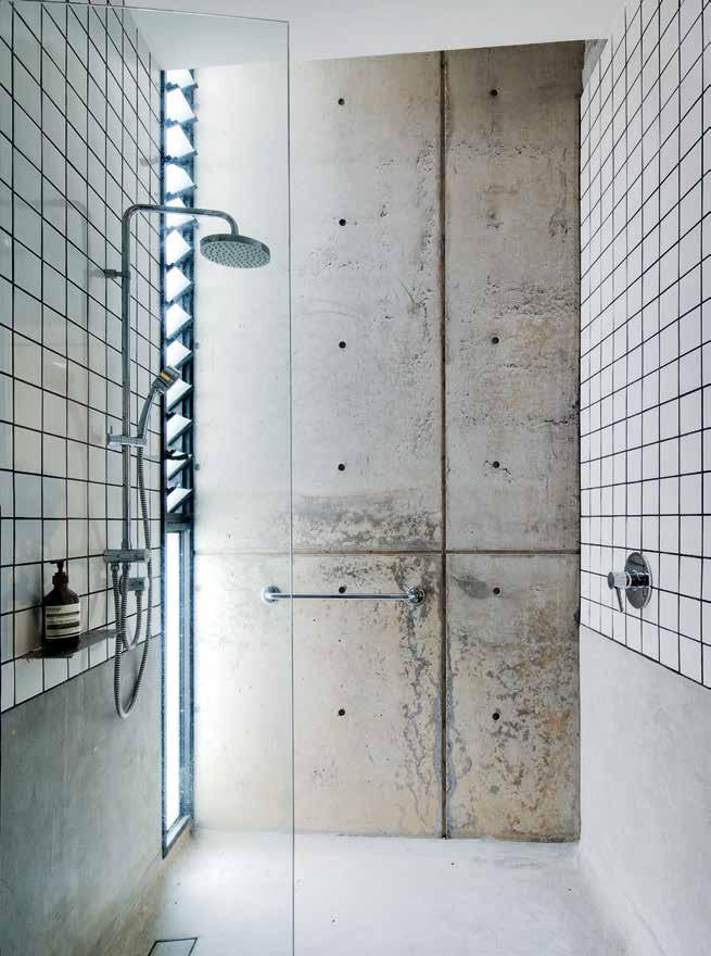
fiXed & fiTTed
Kitchen bench, shelving and joinery by Teng Design and built by Ah Siang Ria Design & Renovation. Bathroom basins are custom-designed by CHB Construction. Kitchen tapware from Grohe and supplied by Flow Line. Sanitaryware from Toto supplied by Eurotan Enterprise. Ceiling fans from Elmark and supplied by Wong Lighting.
opposite | The sTairs leading To The second level feaTure a view of The inTernal courT yard. above | an upsTairs shower flooded wiTh naTural lighT
Chee Leong splurged on high-quality materials and sound design instead. The decision paid off...
3 . on location # 175
INSPIRED BY STONE
OUR LOVE AFFAIR WITH RAW MATERIALS

CDK Stone’s natural stone is sourced from the fi nest quarries around the world. Each piece is unique, allowing you to select a stone artwork for your projects. Whether on the exterior of a building, or internally as a feature island bench in the kitchen, natural stone makes a clear statement of classic, enduring beauty and strength.

With branches in Sydney, Melbourne, Gold Coast, Perth and Auckland, it is possible to integrate the elegance of natural stone into virtually any project within Australia and New Zealand.
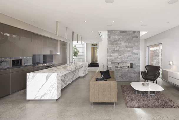


A true collaboration takes place with CDK Stone. Working with the expert team, the creative process extends to the specification of the perfect stone. From analysis of the requirements, to researching the possible options and careful selection of the slab, to stringent quality control in the production and supply, CDK Stone supports your design the whole way through. Since 1982 they have been supplying and processing natural stone to the market, building experience, an impressive track record and with that, the utmost trust within the industry.
 Elba
Savoir
Titanium Travertine
Turco Argento
Portsea
Antique Brown
Carrara Elegant Grey Nero Tempesta
Calacatta
Superwhite
Titanium Gold
Quarry image
of iStock.
cdkstone.com.au
courtesy
Kitchen and Bench design by Belinda Selway – Art by Design. Stone Fabrication by DD Stone. Creative Direction Christopher Holt. Words Nicky Lobo.
The grand reveal
Decades of travel through 110 countries and 20 years in a mission brown holiday shack held together by silicone convinced architect Robin Williams to be truly adventurous when designing a permanent home with partner DonalD Cant at St Andrew’s Beach on Victoria’s moRnington Peninsula. The extraordinarily glamorous result took nine years to realise, and is an ingenious, unexpectedly playful homage to the forces of nature it celebrates.
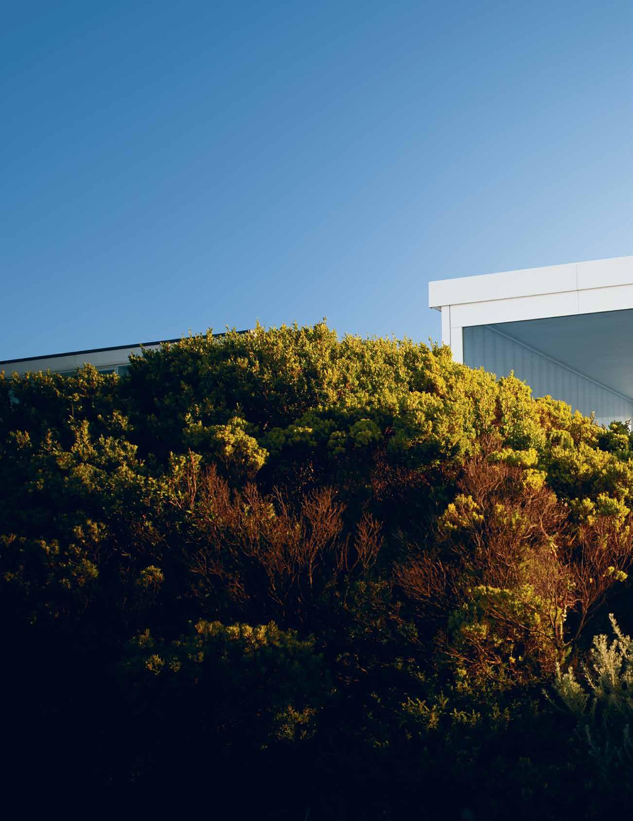 Tex T KaTh Dolan | PhoTogra Phy Dean Bra Dley
issue #33 habitusliving.com
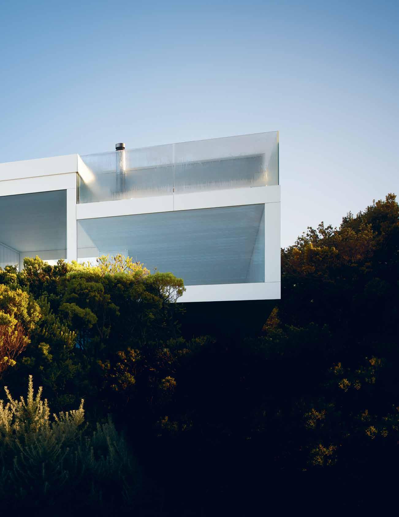
3 . on location # 179
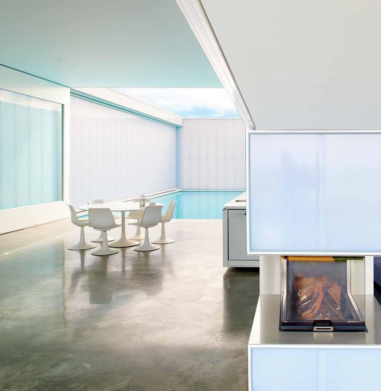
previous | Sand duneS thick with gnarled She-oakS conceal both hou S e and beach from the road approaching Villa marittima. AB ove | m ulti-celled polycarbonate wallS glow with e V er-changing light like the JapaneS e lantern S that in S pired them. issue #33 habitusliving.com
This is why we’re here,” says architect Robin Williams of the glorious coastal panorama stretching from Cape Schanck to Cape Otway that gradually reveals itself as we scale a sand-dune inspired entrance ramp-cumliving-or-sleeping-space at his St Andrews Beach house, Villa Marittima. “It changes all the time,” he says. “The sky changes. The colour of the sky. The colour of the ocean. The calmness of it. The ferocity of the winds. The storms coming over the ocean – you actually see the big grey rain clouds come in as a band. In the city when it rains, you feel like it’s raining everywhere. Whereas here it doesn’t. You see exactly what’s happening with all the elements.”
Focusing attention on the sensual delights of the natural world and encouraging inhabitants and guests alike to align their rituals to them is the central joy and raison d'être of Villa Marittima. Robin shares the multi-awardwinning home with his Canadian-born partner, singer Donald Cant (a former Phantom of the Opera) and, on most weekends, a steady stream of visitors, pets and house guests of all ages.
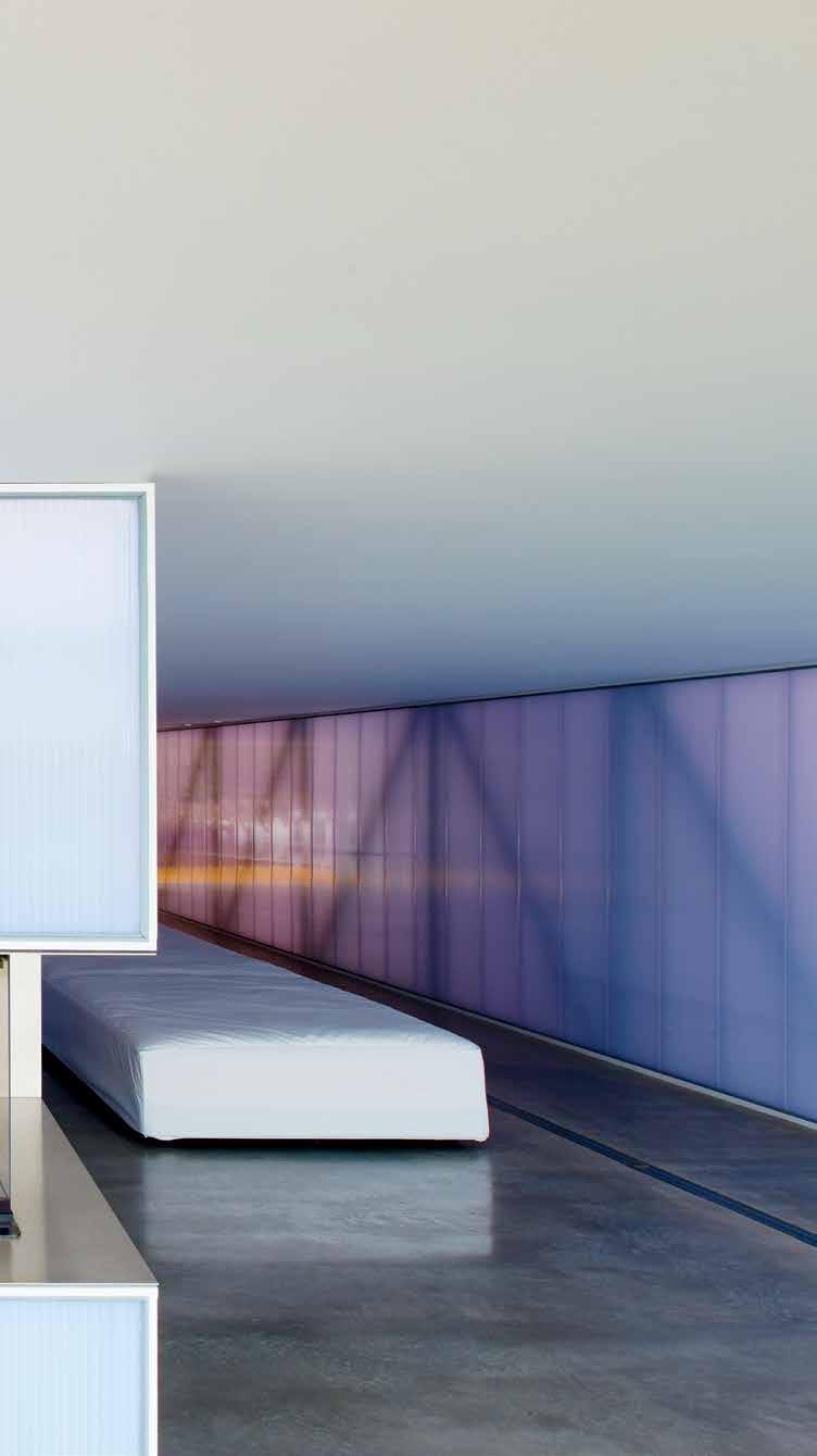
“ 3 . on location # 181
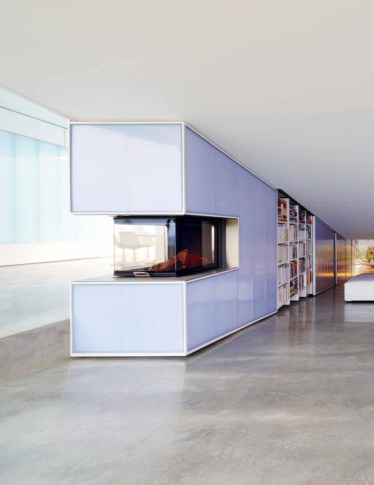
issue #33 habitusliving.com
Its extreme, sexy minimalism: monumental polycarbonate walls, inscrutable from outside but translucent from within...
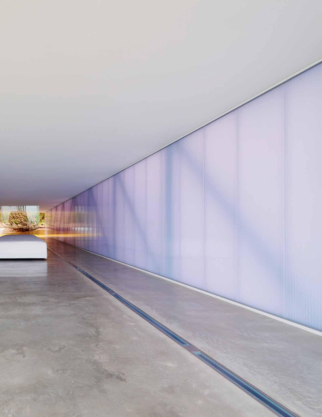
3 . on location # 183
Watching the sun set over the ocean, for example, is not just about enjoying the miraculous natural floorshow but taking it as a cue to shift gears and savour the relaxed amble into evening. “The sun sets over the ocean throughout the year … and I just love it, and think it’s important,” Robin says. “It’s the end of the day and the start of the evening, so it means you can stop work, presumably, and get into drinks and nibbles and then dinner.” This is a house designed to celebrate everyday human rituals alongside nature’s own.
Photographs of Villa Marittima tend to highlight its extreme, sexy minimalism: monumental polycarbonate walls, inscrutable from outside but translucent from within and richly expressive by day and night of ever-changing light and reflections. Vast, hard-to-read spaces with moveable glazing of monumental proportions and raked floors more commonly associated with art galleries or concert halls. An internal swimming pool moodily lit to create an otherworldly atmosphere throughout. Dramatic cutaway glazing allowing intimate, unexpected glimpses into pool, sky and sea. Concealed necessities
(even the kitchen stows away completely when not in use), and an interior of white and pale grey, with barely a stick of furniture and a complete absence of the artworks, furnishings and personal items that usually lend texture and personality to a home. It’s gobsmackingly sleek, and stylishly packaged, but it looks uncompromising and therefore like hard work to live in.
The delightful surprise in experiencing Villa Marittima is the warmth and humour of its owners and the playful eccentricities at its core. This is a home and a style of hospitality that takes fun – and parties – very seriously indeed.
With the beach hidden by dunes on approach to the house, “The poetic discovery of the ocean is a really important part of the design,” Robin says. Hence a zig-zagging floor plan that reveals concealed external terraces and internal features with theatrical flourish. Off the entrance ramp, for example, are a series of small but perfectly formed galley-style rooms (including library, home office, bathroom and dedicated champagne cupboard) tucked behind sliding translucent walls inspired by the
previous | Japanese influences are evident throughout, particularly in multipurpose rooms made possible by stowing away belongings after use. AB ove | m inimalist, reflective materials capture the constant motion of clouds and waves and play of light on the pool’s surface. opposiTe | access to the secret garden playfully requires wading through a submerged path in the pool, keeping humans and water connected.
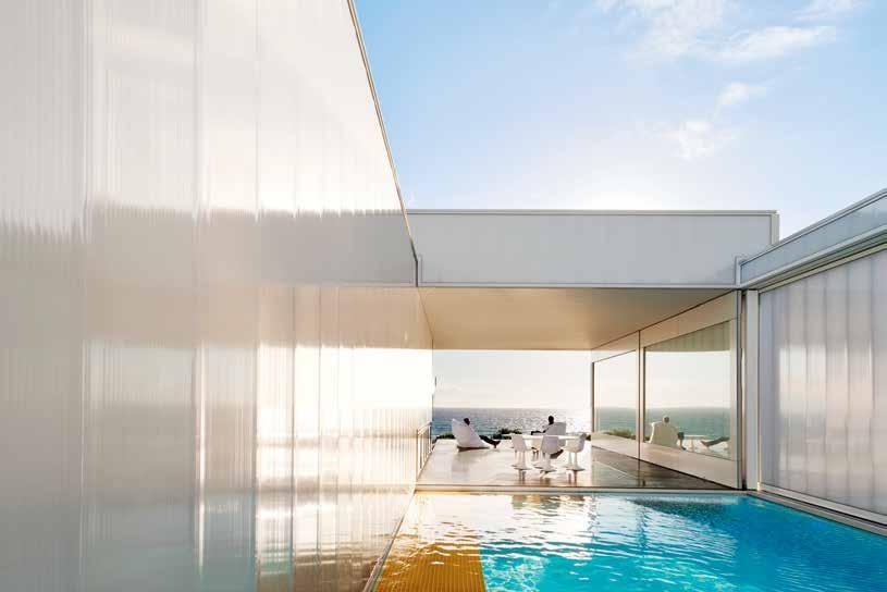
issue #33 habitusliving.com
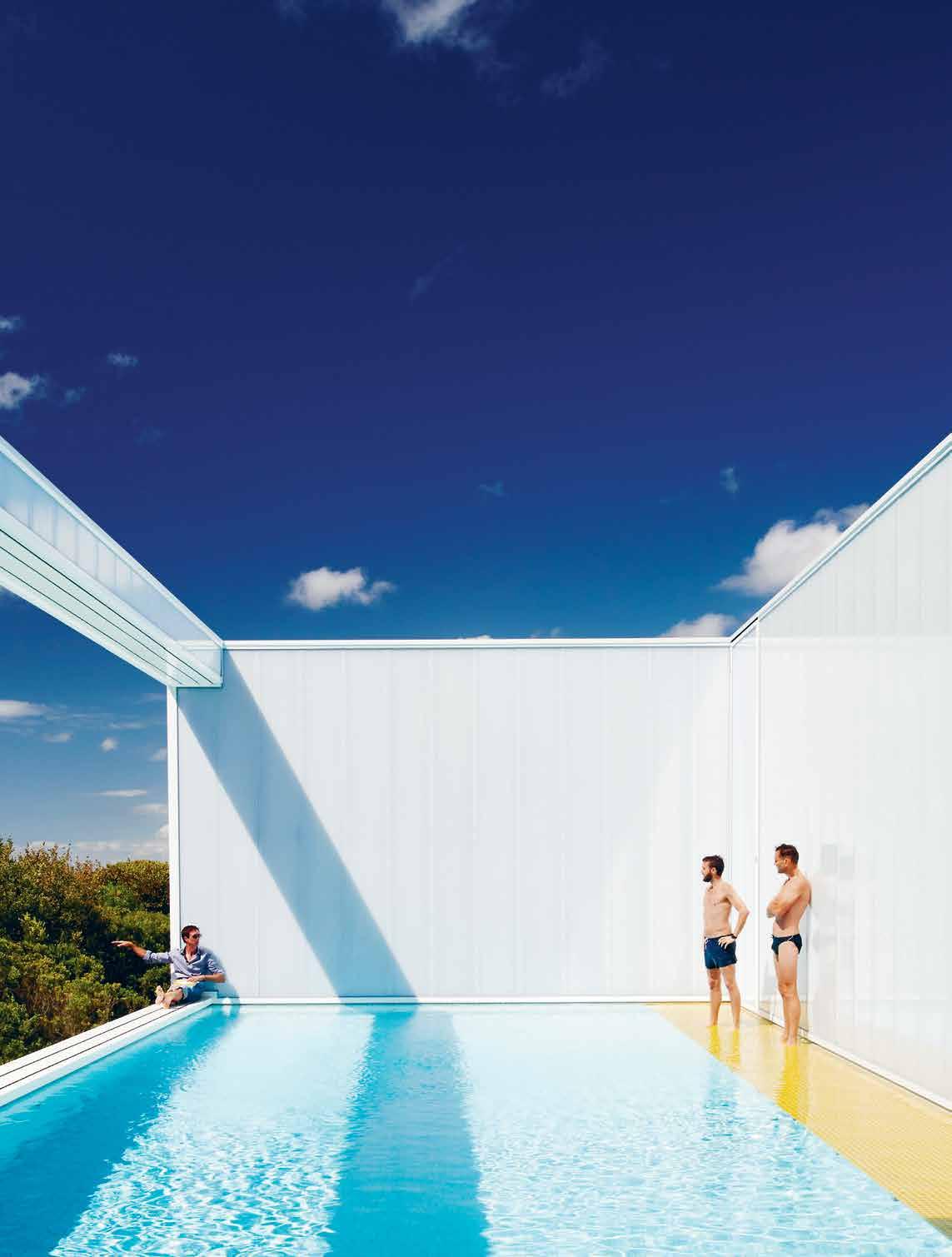
# 185 3 . on location
couple’s travels in Japan and years of living on luxury cruise ships.
At the top of the ramp, the central, six-by12-metre dining and entertaining space opens up to the right with those aforementioned panoramic views, an ingenious kitchen that slides out from the wall in three task-oriented pieces (complete with breakfast bar, detachable splashback, pantry and appliances), and the glamorous six-by-12-metre swimming pool, which can be enclosed behind glass in winter.
“All the dimensions are based on the golden mean,” Robin says, “the traditional ideal proportions. The golden mean is a ratio of 1:1.612 – the vertical is one, the horizontal is 1.612. Here, all the key dimensions are on that ratio, so you start off with six metres, which is the largest dimension, and then each one goes down by that same proportion.” Hence ceiling heights at 3.7 and 2.2 metres, outside balustrades at 1.5 metres, bench heights at 950 millimetres, and so on. “I just wanted these very simple spaces to feel as comfortable as possible,” Robin says. “When friends come to visit they say, ‘It’s like I’m getting away for a week on holiday’. They always leave relaxed. And I think part of that is the ocean, staring into space and dribbling,” he says with a laugh. “But it is also to do with natural light and the size of the spaces and the proportions. It just feels comfortable.”
To the right of the pool is a submerged walkway you must wade through, shoe-free and ankle deep, to activate a glazed ‘bus door’ with detachable handle out to the secret garden. This is a grassy ramp protected from the wind that visiting kids love rolling down, swimmers
lie on to dry off, and picnickers scale for the next grand reveal – heavenly views across sea and sky. “The focus on the sky means you really appreciate the colours of the sky, the clouds, and at night … the Milky Way is just so strong and bright,” Robin says.
For the many friends and family who stay overnight at Villa Marittima, the surprises continue. A secluded ‘honeymoon suite’ accessed via an external path is tucked beneath the living room, complete with grand piano, concealed kitchenette and ensuite, cutaway views into the beautifully illuminated swimming pool (whose diverse lighting settings include ‘disco’), and a glazed wall overlooking a reflective pool outside that at night captures moonlight. Like the entrance ramp above, this salon contains what appears to be a massive white sofa, on which kids love
Terrace living dining ki Tchen pool secreT garden sleeping/living fireplace library sT udy cloT hes sTorage 1 2 3 4 5 6 7 8 9 0 q issue #33 habitusliving.com
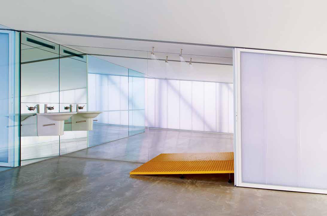
ABOVE | INDUSTRIAL, NON-SLIP FLOORING IN ‘SAFETY’ YELLOW USED IN WET AREAS, ENTRANCES AND PATHWAYS MEANS SANDY FOOTPRINTS ARE EASILY HOSED AWAY. 7 8 9 4 5 2 3 1 6 0 q 3 . on location # 187
to bundle with 3-D glasses to watch movies on a retractable TV. Underneath the cover, however, are three queen-sized beds, which separate to accommodate giant sleepovers and give Robin and Donald an enviable choice of ‘holiday’ bedrooms.
For Robin the house is the culmination of nine years of design, planning and construction and a lifetime of idea -and informationgathering through extensive international travel, architectural projects for himself and others, and endless ‘what if?’ conversations with Donald on the porch of their old mission brown holiday shack nearby. “The sense of accomplishment is pretty amazing,” he says.
For Donald the house is akin to a habitable –and super fun – piece of art. His favourite sound is not the ocean but the surprised laughter of visitors as they journey through a home that, through design and the elements, transforms itself constantly, day and night. “The best thing for me is hearing people laugh when that bottom door gets opened,” he says. “You have a laugh because it’s like nothing you’ve seen before.”
drop box
ARCHITECT Robin Williams Architect
BUILDER A Romanin and Sons
ENGINEER Perrett Simpson Stantin
PLANNING Hansen Partnership
BUILDING SURVEYOR Nicholson Wright
POOL CONSTRUCTION Out From the Blue
Robin Williams aRchitect
(61) 418 532 248 robinwilliamsarchitect.com
FINISHES
Polycarbonate from Architectural Building Elements.
LIGHTING
Supplied by Euroluce.
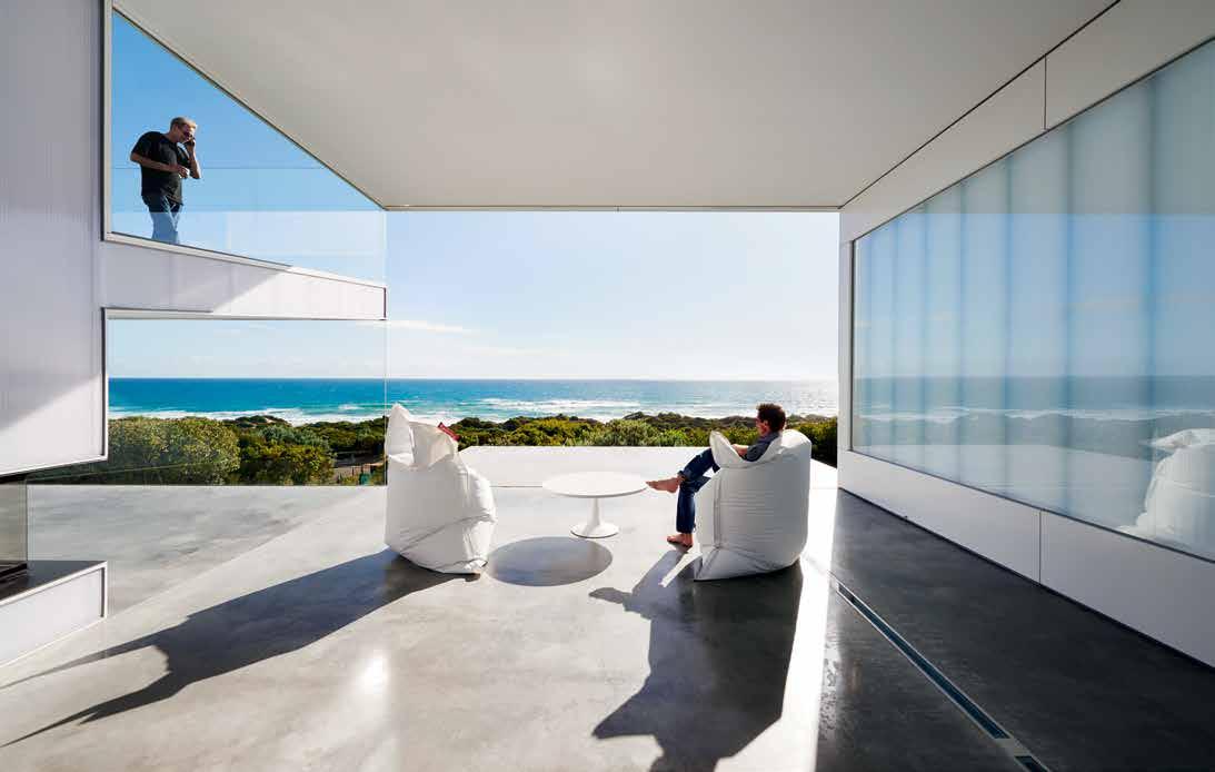
FIXED & FITTED
Appliances from Miele.
above | A FTER 20 YEARS IN A NEARBY FIBRO SHAC k THE Ow NERS SAY SPACE – w ITHIN THE HOUSE AND OVER THE OCEAN – IS V ILLA M ARITTIMA S GREATEST LUXURY issue #33 habitusliving.com
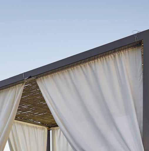

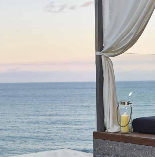
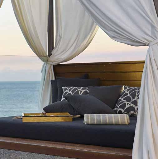

SUNBRELLA ® IS A REGISTERED TRADEMARK OF GLEN RAVEN, INC.
issue #33 habitusliving.com
Discover beautiful products

Meet inspiring people
Indulge in architecture and design
Across Australia, New Zealand, South and South-East Asia
The online community for the Design Hunter®




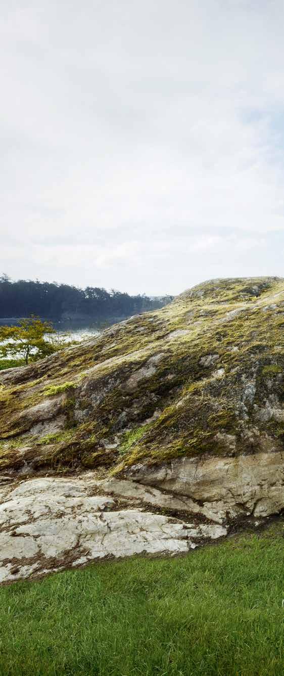
Website | habitusliving.com
Facebook | habitusliving
Pinterest | habitusliving
Instagram | @habitusliving
Twitter | @habitusliving


 The Pierre by Olsen Kundig
Photography by Dwight Eschliman
THE TEAM AT HABITUS MAGAZINE THANKS OUR ADVERTISERS FOR THEIR SUPPORT. USE THE DIRECTORY TO SEE WHAT PAGE A SPECIFIC BRAND IS FEATURED ON, AND VISIT THEIR WEBSITE TO LEARN ABOUT THE PRODUCTS AND SERVICES THEY PROVIDE.
Habitus magazine is available at newsagents and bookstores across Australasia, South-East Asia, the USA, Canada, Europe, South America and the Middle East. Habitus is published quarterly in March, June, September and December. To subscribe securely online visit habitusliving.com/magazine or email subscriptions@indesign.com.au to subscribe or request a full list of locations where Habitus magazine is available.

# 191
Big
Caesarstone
Contemporary Wine In
wineindesign.com CULT 053 cultdesign.com.au Dekton 098 dekton.com.au Designer
designerrugs.com.au Domayne
domayne.com.au Done Group 078-081 kendone.com.au Dyson 027, 029, 031 dyson.co.uk/lighting Ecosmart Fire 101 ecosmartfire.com.au English Tapware 102 englishtapware.com.au Farage 163 farage.com.au Fridcorp 164-165 fridcorp.com.au HabitusLiving 190 habitusliving.com Hub Furniture 111 hubfurniture.com.au Iittala 021 iittala.com.au INDE. Awards 154 indeawards.com Jade & Amber 141 jadeplusamber.com.au Janus et Cie 010-011 janusetcie.com Living Edge 002-003 livingedge.com.au Methven 127 methven.com/au/aurajet Paper Empire 019 paperempire.com.au Parisi 016 parisi.com.au PGH Bricks & Pavers 022 pghbricks.com.au Phoenix Tapware 082 phoenixtapware.com.au Royal Oak Floors 009 royaloakfloors.com.au Singapore Indesign 142 indesigntheevent.com/singapore Smeg IFC-001 smeg.com.au Space Furniture IBC spacefurniture.com/alifeindividual Stormtech 062 stormtech.com.au Stylecraft 098, OBC stylecraft.com.au Subcriptions 112 habitusliving.com/subscriptions Sunbrella 189 sunbrella.com Tait 094 madebytait.com.au Tongue n Groove 038 tonguengrooveflooring.com.au Vola 065, 108 vola.com Vzug 074 vzug.com Walter Knoll 014-015 walterknoll.com.au
Abey Australia 006, 054 abey.com.au Apaiser 077 apaiser.com
Ass Fans 097 haikuhome.com.au/habitus
066-067 caesarstone.com.au Careers Indesign 020 careersindesign.com.au CDK 176-177 cdkstone.com.au
Design 166
Rugs 012-013
004-005
Your map to where the stories in this issue come from where is available
Cape Tribulation #114
Melbourne #40 Bay of Islands #128
world
issue #33 habitusliving.com
Ipoh #65
alexander
“There is no better designer than nature.”
mcqueen


Australia 1300 306 960 stylecraft.com.au Singapore +65 6511 9328
Hoshi Armchair
Supporting Australian Design & Manufacturing
Design by Tom Skeehan


 Domenic Alvaro – Principal Architect & Designer, Woods Bagot
Domenic Alvaro
Gallery House


 ABOVE | ADDING AN APPEALING AVIAN TOUCH TO INTERIORS, DUTCH BRAND MOOOI’S NEW PERCH LIGHT BY LONDON DESIGNER UMUT YAMAC COMES IN WALL, TABLE, FLOOR AND SUSPENDED BRANCH FORMS OPPOSITE ABOVE | DEVELOPED WITH SWEDISH AGRICULTURAL SCIENTISTS, IKEA’S DEBUT HOME HYDROPONIC KIT KRYDDA/VÄXER MAKES IT EASY TO GROW YOUR OWN HERBS AND SALAD IN WATER YEAR-ROUND, EVEN IN A LOW-LIT, COMPACT APARTMENT. OPPOSITE BElOw | INSPIRING AUSTRALIAN HOMEWARES RANGE MJG BY MR JASON GRANT INCLUDES GRAPHIC RETRO MESH PLANTERS IN BLUE, YELLOW OR WHITE POWDERCOATED METAL, IDEAL FOR CONTEMPORARY TERRACES OR INDOOR GARDENS.


 MELBOURNE SYDNEY CANBERRA PERTH ADELAIDE SINGAPORE


 by Håkan Widjedal


 Tex T Andre A STevenS | PhoTogr APhy Simon deviTT


 Arthur


 Elba
Savoir
Titanium Travertine
Turco Argento
Portsea
Antique Brown
Carrara Elegant Grey Nero Tempesta
Calacatta
Superwhite
Titanium Gold
 Tex T KaTh Dolan | PhoTogra Phy Dean Bra Dley


 The Pierre by Olsen Kundig
Photography by Dwight Eschliman
