SMEG THERMOSEAL ATMOSPHERIC CONTROL & DYNAMIC AIRFLOW FOR PERFECT RESULTS


smeg.com.au


SMEG THERMOSEAL ATMOSPHERIC CONTROL & DYNAMIC AIRFLOW FOR PERFECT RESULTS


smeg.com.au


Mezzanine level
171 Robertson Street
Fortitude Valley, QLD 4006
P | +617 3216 1551
1f Danks St Waterloo, NSW 2017
P | +612 9699 1131
575 Church Street Richmond, VIC 3121
P | +613 9427 7000
Chamoisee Prime The gentle warmth of a honey-brown hue enhances the natural oak finish of our Chamoisee timber.
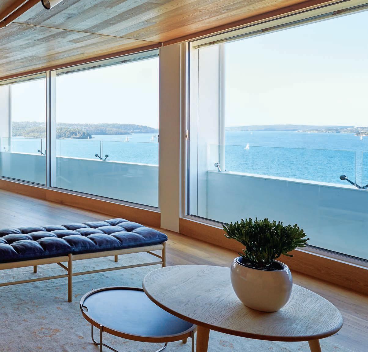
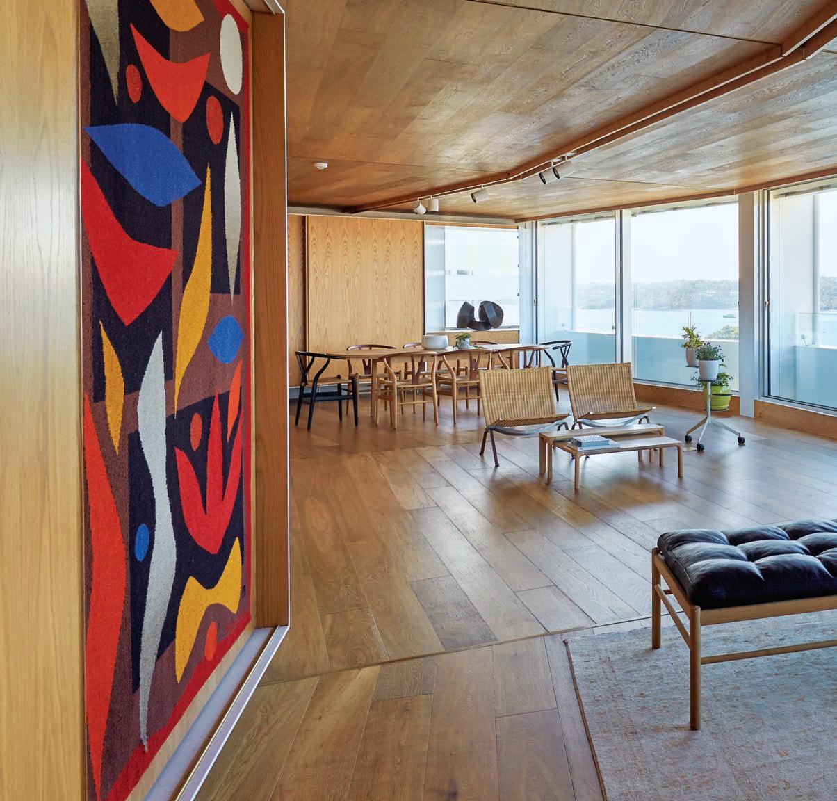
Tongue n Groove™ floorboards are designed with three solid layers of fine European Oak for a premium level of finish, longevity and structural integrity.
tonguengrooveflooring.com.au



New concepts, creations, movements and forms of expression in the world of design.
26 DESIGN NEWS
Design can be practical, and design can be elaborate. Often it tends to be one or the other but there’s no reason it can’t be both. In our customary Design News pages, we’ve collated a selection of pieces that prove it.
36
Using three recent books as case studies, Sandra Tan explores concepts of nostalgia in architecture and design, our relationship with the past, and why we choose to dwell.
A warm invitation into the private homes of our contemporaries, join us as we learn how others lead their lives.
42
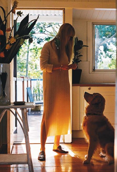
At home in Kew, Melbourne, architect John Wardle invites us into the house he has shared with his wife, Susan, for more than 25 years. Originally designed in 1951 by Horace Tribe, it has undergone two renovations since the Wardles took up residence.
57 PENG LOH
An unlikely insight into Singaporean raised and based – yet widely traveled – hotelier Peng Loh, and the nostalgic memories that inform his work and design decisions.
67
A relatively recent move, jewellery designer and maker Holly Ryan’s new home along the banks of Brisbane is a dedicated mix of old and new. Much of her furniture pieces are orginal Mid-Century designs complimented by smaller ceramics and scultpural pieces she’s accquired over the years.
82 HABITUS FAMILY ALBUM
In the first edition of the Habitus Family Album, Stephen Todd has collected photographic evidence of pivotal moments in the lives of some of our favourite creatives from the region.
91 PASSE COMPOSÉ E
Drawing inspiration from Patricia Urquiola, Felix Burrichter and their work for Cassina, we explore the concept of the past informing the future of design.
96 MARC NEWSON
As one of the world’s most celebrated designers, it’s fitting that Marc Newson sees design as a global industry. In an exceedingly rare glimpse into his private life, Stephen Todd is invited into the home he shares with wife Charlotte Stockdale and their two daughters.
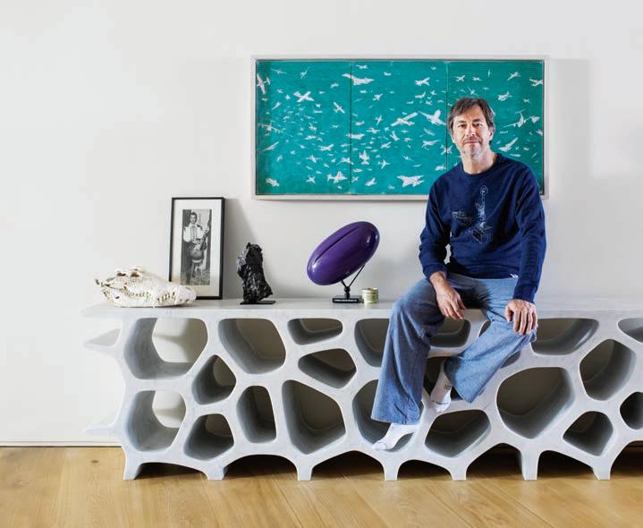
A place in which families are born, memories are made, and the future is found; explore with us these homes from accross the region.
114 COOGEE CASTLE
Perched atop the dramatic cli s of Australia’s Eastern Seaboard, a young family of five relax into a fresh interior scheme designed to aid them in the next phase of family life.
138 MT MARTHA HOUSE
This beach front home in coastal Victoria spills down to the shore, both physically and visually. Yet it’s exactly the opposite of what you’d expect to see.
148 LIVING SCREEN HOUSE
Memories were designed to be made in this North Bondi abode. The longtime residents of the area wanted a new home in which their young-adult o spring could live comfortably now and always return to.
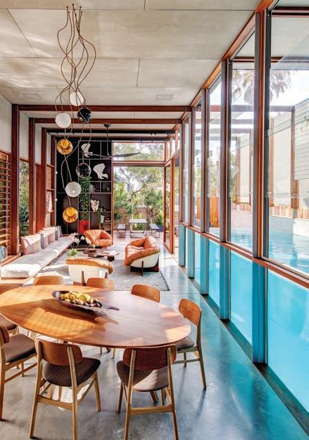
162 MANILA HOUSE
In a city where space is a rare and coveted commodity, this modern take on a traditional Filipino home feels spacious and open.
178 GRACE HOUSE
A home in Kew, Melbourne, initially designed in the 1980s by a well known and celebrated architect – to much industry acclaim – is sensitivley re-worked for its new owners.


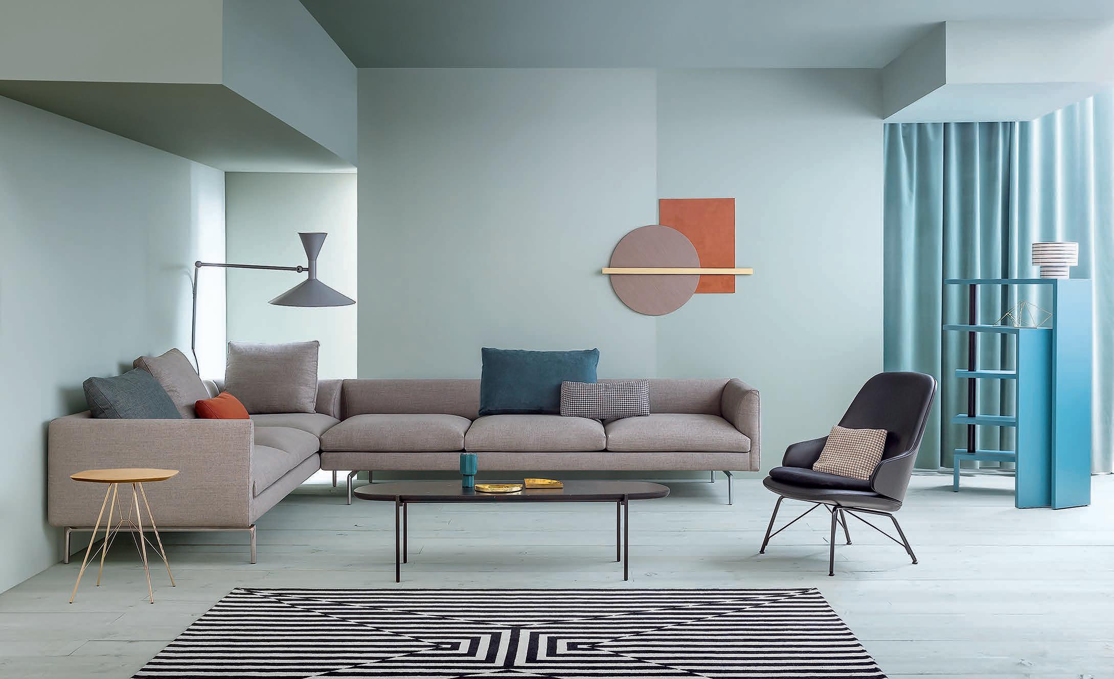
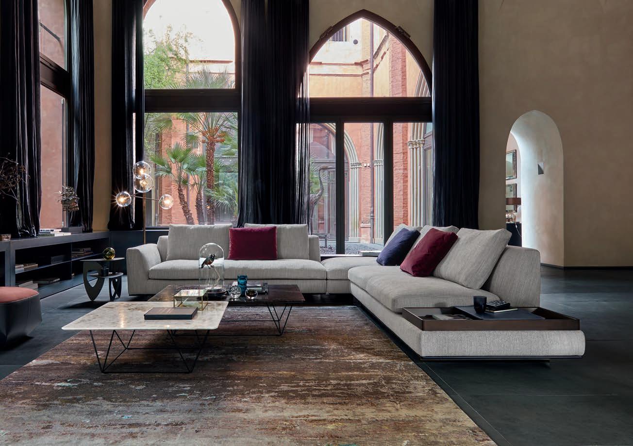
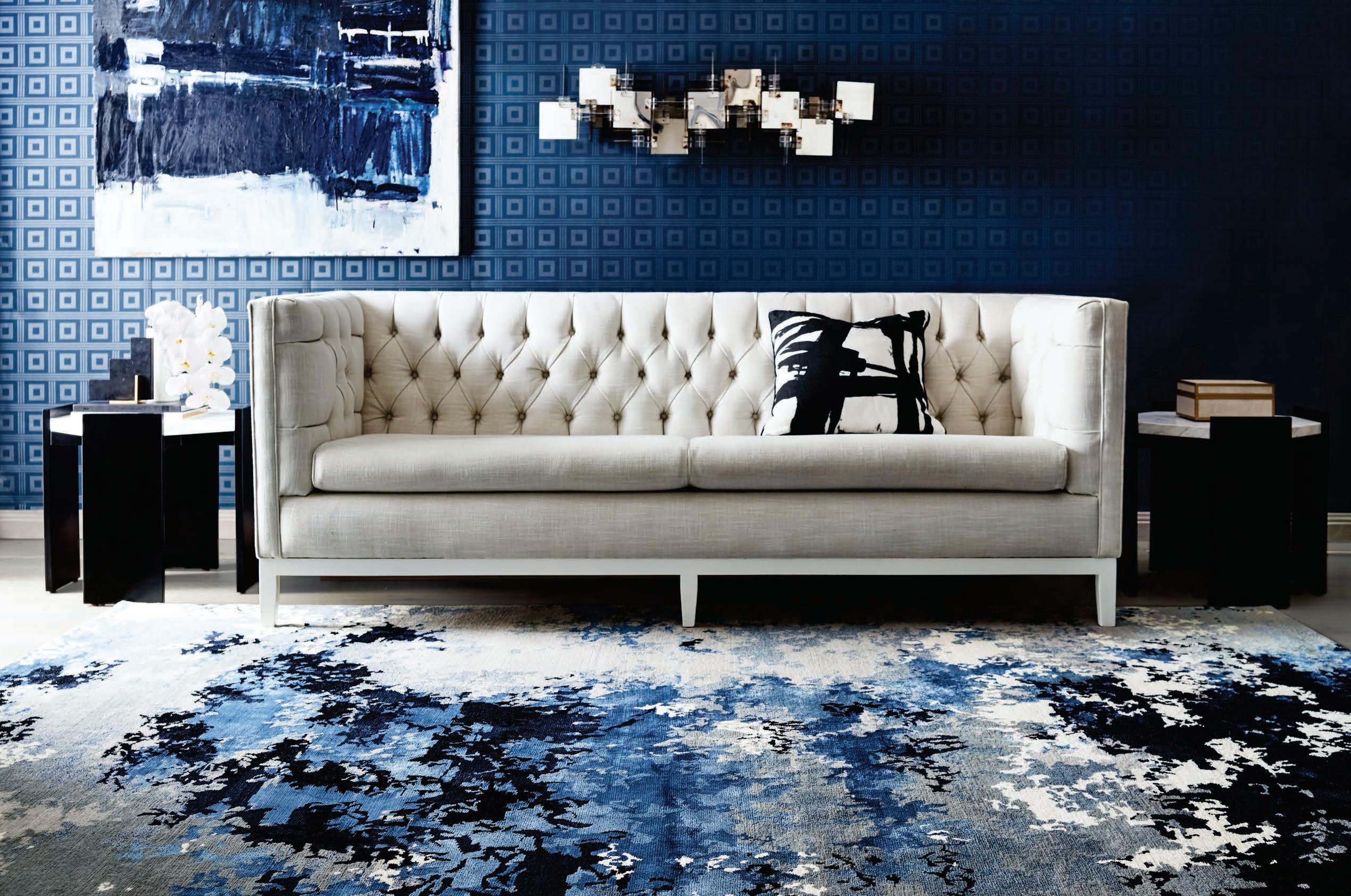
Tama Living is the ideal setting for that special moment, a soothing and pleasant experience. Its lavish, elegant cushions set the rhythm for the sofa to unravel like a piece of classical music. With side tables and trays crafted from exquisite materials, it embodies the spirit of refined living. Design: EOOS.
What began with a spark...
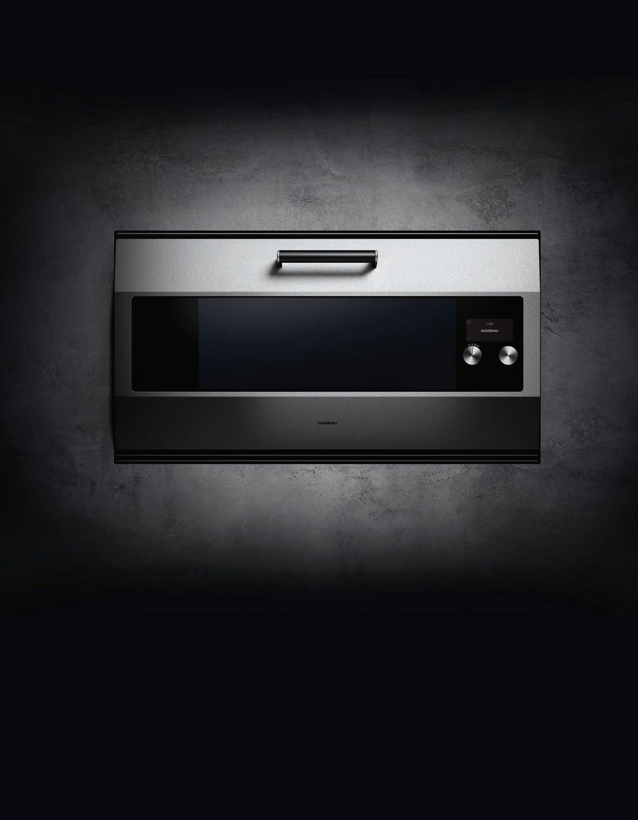

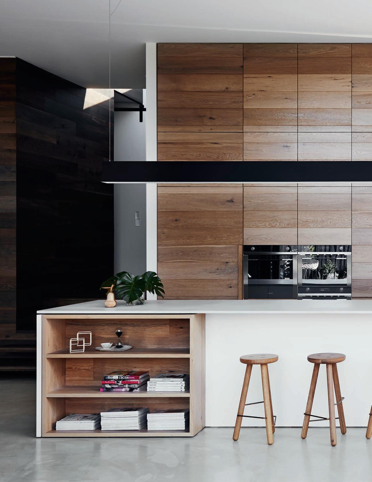
We have been perfecting one oven for 30 years. Our latest rendition accentuates its distinctive design: the door is now created from one imposing 90 cm wide sheet of 3 mm high-grade stainless steel. It represents one vast entrance to culinary potential.
This remodelled, hand-crafted work of art is the culmination of our finest principles, skills and ethos. We’ve christened it the EB 333 in recognition of our 333 years of working in metal. This has always been more than an oven; it is a promise to create masterpieces.

For more information, please visit www.gaggenau.com/au

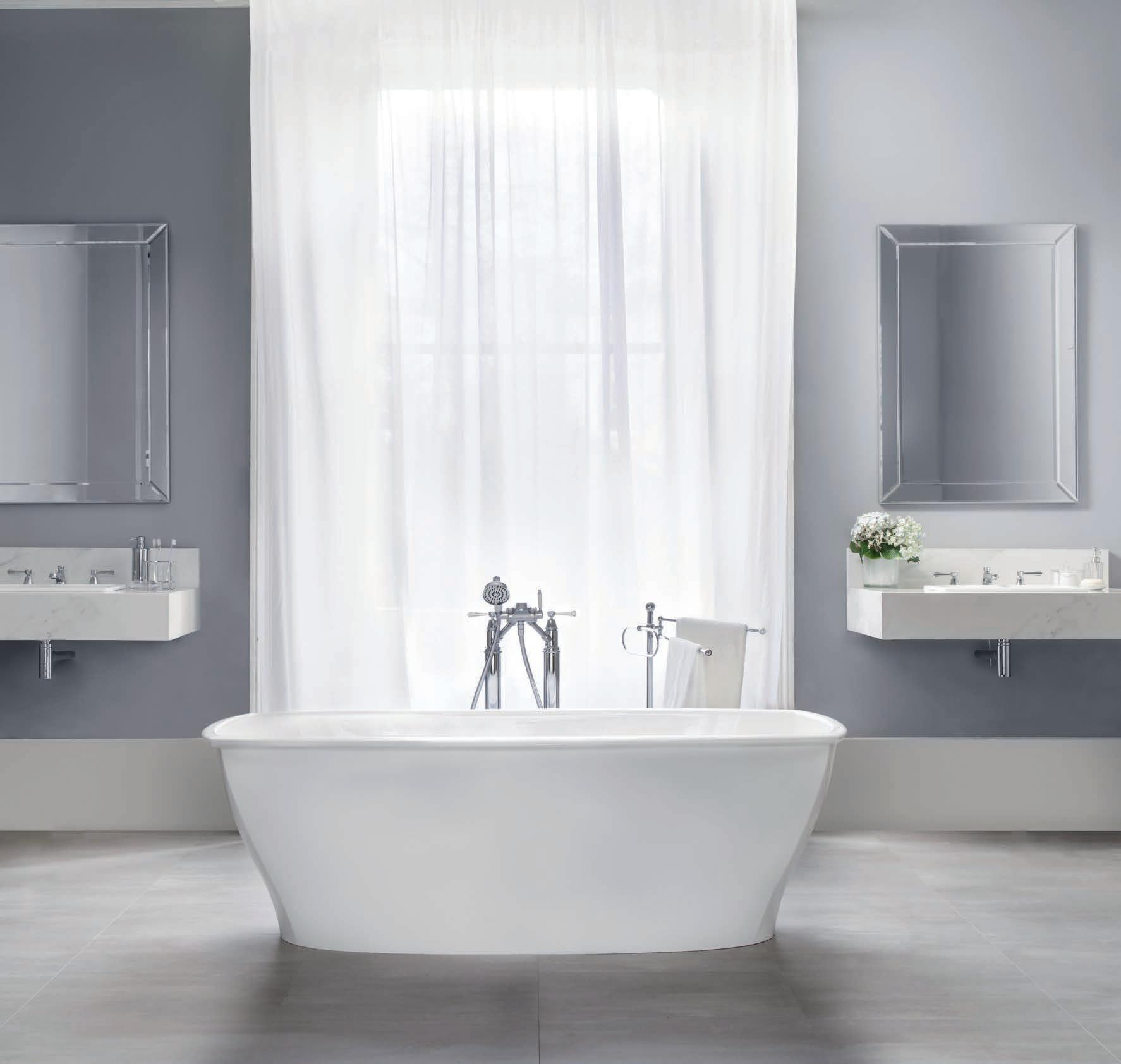
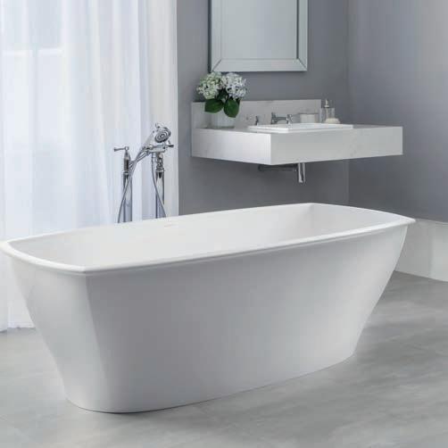
Th e Vi ct or ia + Al be rt Pemb ro ke ba th is aptl y nam ed af te r th e bi rt hp la ce of Eng la nd ’s fi rs t tu do r ki ng as it ev ok es a re ga l el eg anc e. Th is tr ad it io na l dou ble -e nd ed ba th is ac ce nt ed by cr is p co rn er s an d a de co ra ti ve ri m. De sign ed by Me ne gh el lo Pa olel li As so ci at i.







Why do we have such a far reaching fondness for the past? Where did it come from and why does it compel us so strongly – everything looks better in hindsight, right? As time passes and memories sweeten, a soft spot for bygone eras draws dangerously close to putting them on the proverbial, unattainable, pedestal. Which begs the question: Is it impossible to move forward if we keep looking back?
In this issue we wanted to explore the idea of retrospection further, as the design industry is one with a particular penchant for all things ‘nostalgic’.
The celebrated names and faces of architect John Wardle and designer Marc Newson grace this issue and we count ourselves lucky to have borrowed their time. Both men have reputations that precede them and we ask how has this impacted their approach to future projects. Does it help or hinder?
In his essay Passé Composée, Stephen Todd relays Patricia Urquiola’s suggestion that it is impossible to ignore the past, that we must use it to inform the future.
Later on, Andrea Stevens writes about childhood memories revisited – and reworked. New Zealand’s Opahi Bay was once the small town frequently visited by a young couple and their three daughters. Now, a generation on, it’s the slightly larger small town in which the same three daughters have subdivided the land on which their holiday home once stood. One lives there permanently with her young family in a new home that evokes the past yet allows space for the future. Without holding on too tightly, I think it’s possible honour the past, perhaps even draw inspiration from it, and use it to better the future. I hope that’s what we’ve shown you. I hope that’s what you get from these pages.
HOLLY CUNNEEN | DEPUTY EDI TORMARNIE HAWSON
THE LUXURY OF TIME #42
For photographer Marnie Hawson, it is the rich history and context of her 130+ year old former post o ce turned home and work studio that gives her a daily sense of nostalgia. “There is perfection in the imperfect, and history everywhere – wobbly floors, gaps in the weatherboards and a once missing front path.”
R ACH AEL BERNSTONE
THE LUXURY OF TIME #42
Nostalgia is in the history of the object and maker, we can access this through the choices we make in organising our spaces. For Rachael Bernstone, her emerald green velvet Featherston Contour chair from Gordon Mather o ers her a piece of – and part in – Australia’s design history. “I love that it was designed in my home town and it’s a beautiful, sculptural object as well as a delight to sit in.”
R EBECCA GROSS


MAKING MEMORIES #148
Rebecca Gross learns history and understands culture through the lens of architecture and design. As one who as always loved the challenge of change, she finds nostalgia in the buildings and objects that remind her of her childhood and that have a strong sense of place. “Mostly its vernacular architecture: the corner dairy in New Zealand and the seaside towns in Maine.”
CALEB MING

THE GRAND HOTEL(IER) #57
For design to be engaging, for it to mean something, it has to connect to fragments of your own memory. For photographer Caleb Ming, colours o er a link back to another time and place; “A certain aged colour, even a vibrant colour, makes me think of the times from before.” A house can mean many things to many people, and through the inclusion of colours, one can open a space up to endless connections that even the designer cannot control.
JODY D’A RCY
A CASTLE ON CROWN LAND #114
Good design is timeless, that’s why trends move on rotation and what’s old will inevitably turn new again. “Architecture and design are embedded in Nostalgia,” says Jody D’Arcy. For her, good design is something that just feels and forms organically, and intertwines in our emotions; “whether it’s a comfortable chair or an interesting object, having an appreciation for its creation and function literally evokes joy and happiness.”
THE ODYSSEY #96
Living in a space gives one access to a history that they might have not even been a part of. For Richard Boll, living in a 1935 building on the seafront in Brighton, England, once home to actor Rex Harrison and writer Graham Greene, o ers him a sense of being a part of a larger narrative; “there’s a certain pride that goes with living in an architectural museum piece, albeit one that’s not always been universally appreciated.”
SIMON DEVITT


BUILDING A HAPPY HOME #126
Houses and artefacts that reveal a sense of their age and history are particularly interesting to Simon Devitt, where scars of experience are transformed into reminders of good times and patterns of beauty. “I really love visiting architecture that’s proven itself over time, a 40-year-old home still lived in by its original owners, for example. The evidence to suggest life has been lived, time has played out. Children have grown up in those homes and visit with their children.”
habitus takes the conversation to our contributors discovering their inspiration and design hunter®
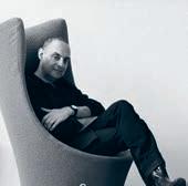

Each home of Stephen Crafti is filtered in a distinct experience that is deeply tied to place and context. And it is from a wealth of experience with past home spaces that we can better curate our ideal means of living. “I prefer to grow roots in one place. Hopefully my latest home will be my last. The renovation includes a bedroom and a bathroom on the ground floor so that even in old age, I can stay.”
For Stephen Todd, it is the iconic imagery of di erent landscapes that render in him the memories of his own past. It is the symbolic connotations of places rather than the places themselves that hold the most value. “I have no particular attachment to place. I am as capable of picking up stick and moving to Paris for 20 years as I am likely to decide to move to a farm in Central West NSW – which is where I live now.”

Nostalgia is a pivotal starting place from which we build ideas and designs, inspired by the new and foreign. For German-born Sylvia, Sydney has become her new home but also an international hub of design, not neglecting her a ections for European and Asian architects and creatives. “It is great to have two homes, two languages and two cultures for reference and ideas, both inspiring… And I always appreciate that we are lucky enough to be so closely tied to Asia and all its influences.”
WWW.WOUD.DK
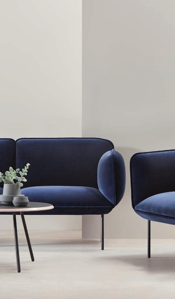
Retailers Victoria FLOC, Collingwood Luke, Prahran Simple Form, Seddon The Plant Society, Collingwood
New South Wales
Luumo, Waverley
Western Australia
Arrival Hall, East Perth designFARM, Hay Street
Tasmania LUC, Hobart New Zealand
Capricho, Takapuna Concrete Blush, Christchurch
CHAIRMAN / PUBLISHER
Raj Nandan raj@indesign.com.au
DEPUTY EDITOR
Holly Cunneen holly@indesign.com.au
GUEST FEATURE EDITOR
Stephen Todd stephen@indesign.com.au
SE ASIA EDITOR
Janice Seow janice@indesign.com.sg
EDITORIAL A SSISTANT
Andrew McDonald andrew@indesign.com.au
EDITORIAL INTERN
Ella McDougall
CREATIVE DIRECTOR
Sylvia Weimer spacelabdesign.com
JUNIOR DESIGNER
Camille Malloch camille@indesign.com.au
CONTRIBUTING WRITERS
Rachael Bernstone, David Congram, Stephen Crafti, Rebecca Gross, Mark Scruby, Andrea Stevens, Sandra Tan
CONTRIBUTING PHOTOGRA PHERS
Kurt Arnold, Richard Boll, Emma Cross, Jody D’Arcy, Simon Devitt, Murray Fredericks, Marnie Hawson, Benjamin Hosking, Haidee Lorenz, Caleb Ming
COLLAGE A RTISTS
Dina Broadhurst, Fausto Fantinuoli
ILLUSTRATOR
Sandra Tan
M ANAGING DIRECTOR
Kavita Lala kavita@indesign.com.au
GROU P OPERATIONS M ANAGER
Sheree Bryant sheree@indesign.com.au
A SSISTANT PRODUCTION MANAGER
Natasha Jara natasha@indesign.com.au
ACCOUNTS
Ting Zhang ting@indesign.com.au
Cassie Zeng cassie@indesign.com.au
ONLINE MANAGER
Radu Enache radu@indesign.com.au
W EB DEVELOPER
Ryan Sumners ryan@indesign.com.au
BRAND DIRECTORS
Colleen Black colleen@indesign.com.au (61) 422 169 218
Dana Ciaccia dana@indesign.com.au (61) 401 334 133
SALES SU PPORT & R EPORTING
M ANAGER Genevieve Muratore genevieve@indesign.com.au
COVER IMAGE
John Wardle (p.42)
Photography by Marnie Hawson
The new Silent Gliss 5600 system provides benchmarking technology based on outstanding Swiss innovation which meets the complex demands of modern architecture.
The world’s most silent curtain track system. silentgliss.com.au
HEAD OFFICE
Level 1, 50 Marshall Street, Surry Hills NSW 2010 (61 2) 9368 0150 | (61 2) 9368 0289 (fax)
MELBOURNE 1/200 Smith St, Collingwood, VIC, 3066
SINGAPORE
4 Leng Kee Road, #06–08 SIS Building, Singapore 159088 (65) 6475 5228 | (65) 6475 5238 (fax)
HONG KONG
Unit 12, 21st Floor, Wayson Commercial Building, 28 Connaught Road West, Sheung Wan, Hong Kong indesign.com.au
States of America. This issue of Habitus magazine may contain o ers or surveys which may require you to provide information about yourself. If you provide such information to us we may use the information to provide you with products or services we have. We may also provide this information to parties who provide the products or services on our behalf (such as fulfilment organisations). We do not sell your information to third parties under any circumstances, however, these parties may retain the information we provide for future activities of their own, including direct marketing. We may retain your information and use it to inform you of other promotions and publications from time to time. If you would like to know what information Indesign Media Asia Pacific holds about you please contact Nilesh Nandan (61 2) 9368 0150, (61 2) 9368 0289 (fax), info@indesign.com.au. Habitus magazine is published under licence by Indesign Media Asia Pacific. ISSN 1836-0556
Dr TerryWu, Plastic Surgeon and BoardMember of ACMI and Heide Museum of Modern Art
My lifeisamelting potofinspirations. Artinall itsforms influences my lifeand the life of my family.The work Idoasaplastic surgeon and forthe arts hold equal importance and provide balance. Ifeeladeepresponsibility to nurtureand supportcultural endeavours, both forthe community and forour children’s future. spacefurniture.com
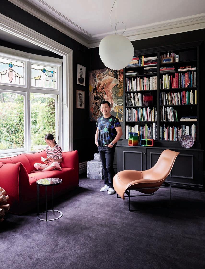
Habitus and our republic of loyal Design Hunters celebrate authentic design as a way of life.
From our base in Australia we seek out the uniqueness of the Asia Pacific – be it interiors, architecture or products –and curate the stories behind the stories.
Join us on our hunt.













When Antoni Palleja was designing the WALLACE sofa for Carmenes, the brief was to create a sofa that was first and foremost extremely comfortable, without losing any innate elegance. Somewhat reminiscent of 80s design, the solid form is loud and proud with exaggerated arms that can be toned up or down for di erent settings. Available from Ajar ajar.com.au
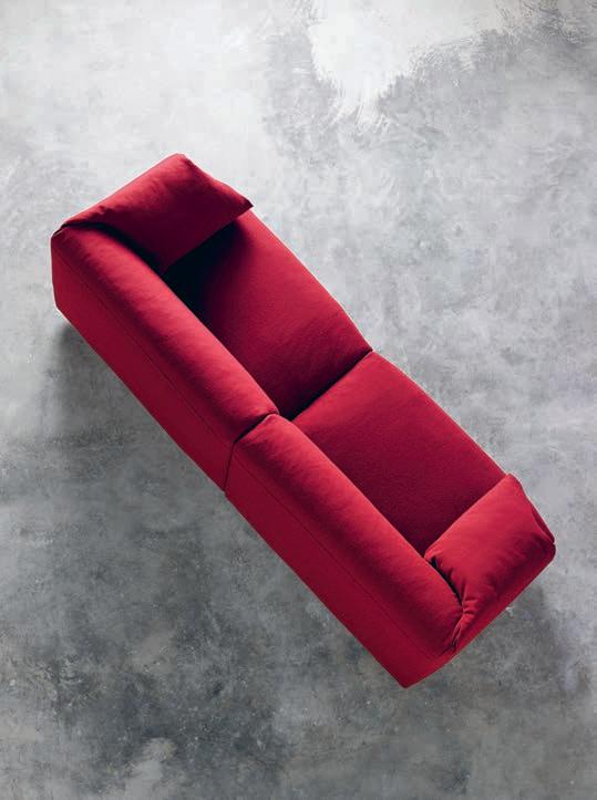
Looking for a moment of pause? The VENA chair from Curious Grace could be the perfect solution. With a high backrest and sides, the design translates an intimate podlike shape into an elegant piece of furniture. Formed on a solid timber frame and available in a range of custom fabrics and colours.
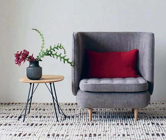
curiousgrace.com.au
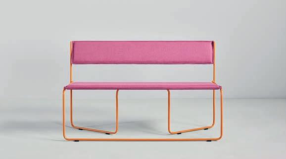
The playful TRAMPOLÍN bench brings a little vibrancy to any waiting space. Designed by studio Cuatro Cuatros for Spanish retailer Missana , this three-seater exudes a jovial spirit in its twisted, Bauhaus-inspired form. The lightweight frame and removable seat and backrest help to create a seating alternative that can easily slip into any narrow hallway.
missana.es
Inspired by the majesty of Egypt and named after the Egyptian city Thebes, the THEBAN daybed from German brand E15, illustrates a perfect melding of strength and subtlety. Building on the founder’s strong understanding of architecture, this piece is a noble accompaniment to any poolside setting.
livingedge.com.au
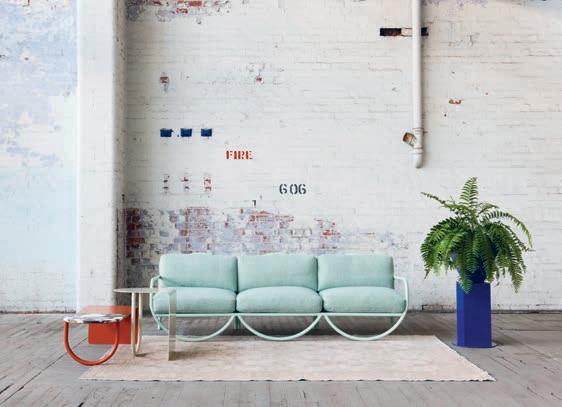
Finely crafted with a focal point on the arc form, the HALO range was designed by Laelie Berzon and Lisa Vincitorio of Something Beginning With . The designs carry a visual lightness complemented by their solid American oak and circular steel tube structures.
somethingbeginningwith.com
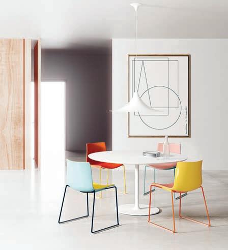
Building on the wonderfully spirited collection of chairs CATIFA , designed by Lievore Altherr for Arper, Stylecraft is exhibiting six new colours to mix and match into their range. Now available in rose, petrol, yellow, ivory, dove grey and green, the new colours have been perfectly matched to compliment the existing collection with an expanding palette for the artistically minded.
stylecraft.com.au


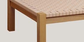
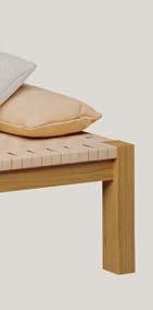
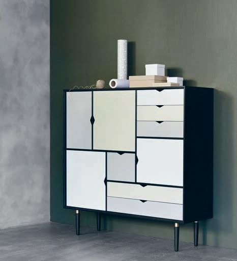
Fusing elements of a writing bureau, sideboard and cupboard, the S3 storage unit from Danish brand Andersen is the ideal amalgamation of beauty and utility. Designed by byKATO and available from Danish Red , the directional geometric handles transform this unit into a salient expression of sleek European design.
danishred.com.au
Revolutionising the art of music, while literally merging the two, the BEOSOUND SHAPE wireless speakers from Bang & Olufsen reinterprets a speaker system into a sculptural element of beauty. bang-olufsen.com

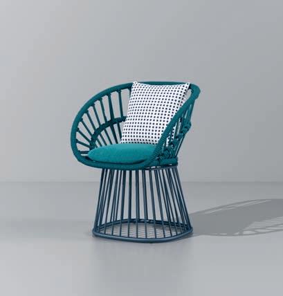
The CALA chair from designers Doshi Levien for Kettal , carves a graceful curve that perfectly compliments the organic form of the outdoor world. Latticed rope establishes a light airiness and spatial presence – helping the piece simultaneously stand out from and merge into its environment.
ketall.com
Australia’s design aesthetic, born somewhat from a place of isolation, is inspired from an extreme landscape and a resourceful approach to creation. To celebrate this unique spirit, CULT has launched a locally focused brand NAU. Featuring a cast of Australia’s most brilliant designers from Adam Goodrum, Jack Flanagan, Adam Cornish and Gavin Harris, the collection pieces together a beautiful assembly of furniture, lighting and accessories. cult.com.au
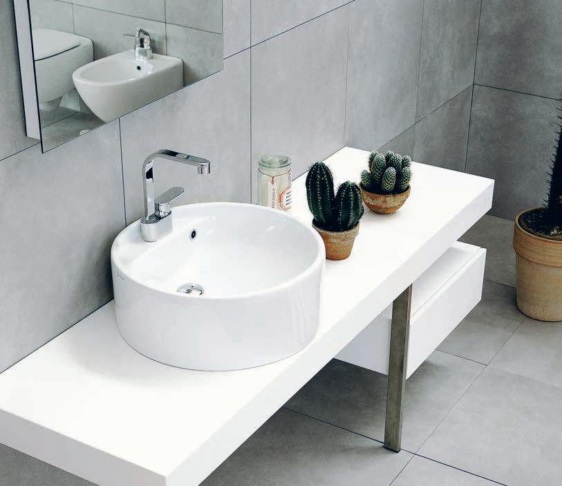
The TWIN RANGE from Italian brand Flaminia , available from Parisi , cements the exceeding reputation of Italian craftsmanship. With fluid curves that compliment the movement of water, the selection of basins o er a welcome softening to the strict lines of the bathroom.
parisi.com.au
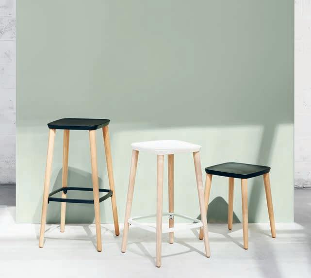
As a people who seek change and evolution, we are often moving from dwelling to dwelling. And in this, experience a hugely varying setting of indoor and outdoor spaces. The BRIXX collection designed by Lorenza Bozzoli for Dedon is a mix of modular seating pieces that can be accessed from all sides to create islands and bring people together in seemingly limitless combinations.
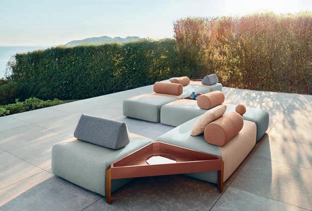
dedon.de
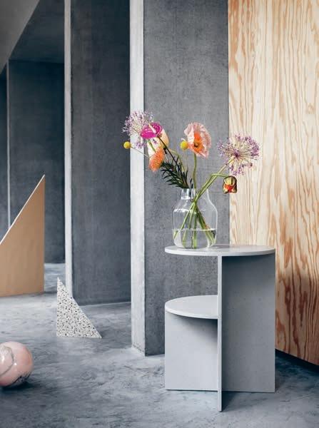
The HALVES side table is the collaborative e ort between Danish Muuto and Canadian MSDS design studios. A youthful design of asymmetrical shelving allows for the piece to o er varying storage capabilities depending on its angle.
muuto.com
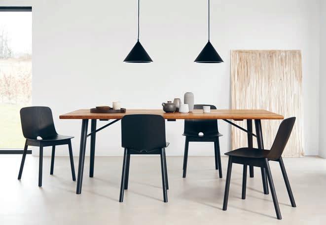
Th e MONO dining chair for Danish brand WOUD, warps both timber and expectations to create an altogether pioneering piece of furniture. The elegantly overlapping seat, created entirely from a single piece of timber, is created through the use of UPM Grada form-pressing technology. Available from FLOC flocstore.com.au
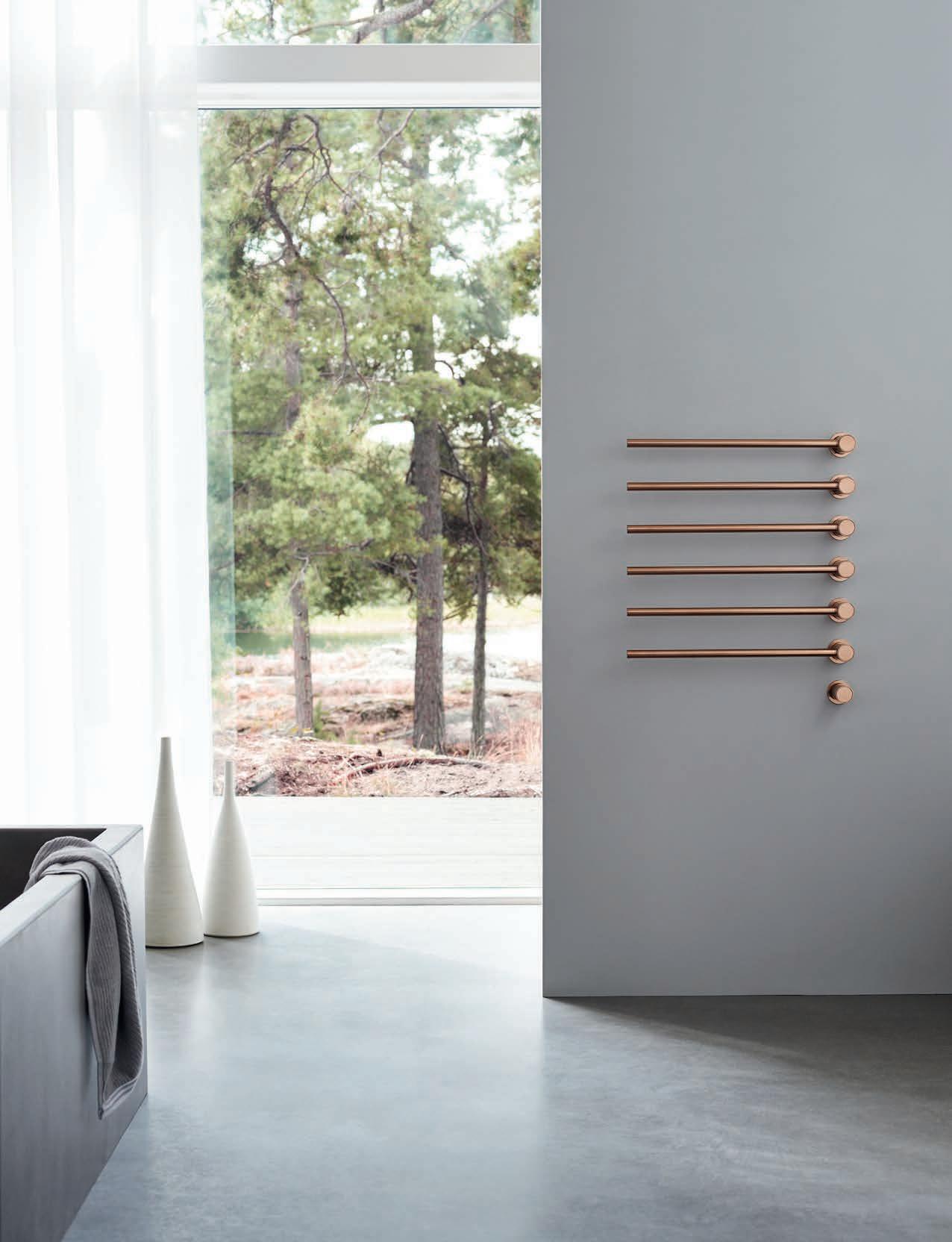
VOLA commitment to sculptural modularity is epitomised by the T39 Towel Rail. The system features minimalist cantilevered bars which can be configured in any quantity and spaced to suit any bathroom design. T39 is the perfect accompaniment to VOLA award-winning range.
Melbourne-based jeweller Abby Seymour has released her first homewares series o ering pieces to embellish the home alike the body. Featuring four wall hangings and a line of faceted jewellery dishes, the collection exhibits her masterful hand working with brass and ceramics, while translating her signature geometric styling into the home.
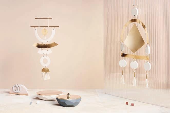
abbyseymour.com
The SOCKET occasional lamp from Menu is a multifaceted object of beauty to counter a desk of clutter. Inspired by the designers from Danish studio Norm Architects’ exploration into geometric jewelry, this lamp acts as both practical lighting solution and sculptural artifact. Cast in glistening brass with an easily removed socket, it can also double as a stylish paperweight.
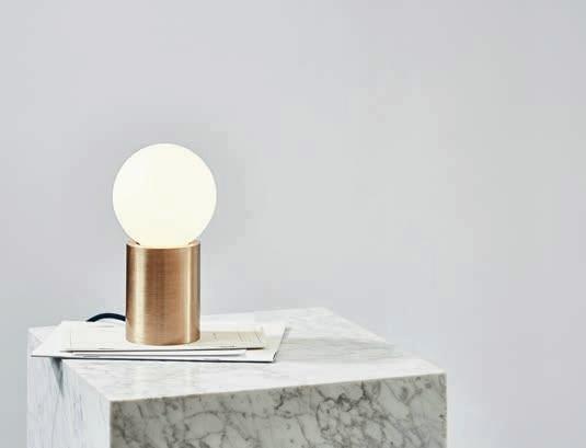
menudesignshop.com
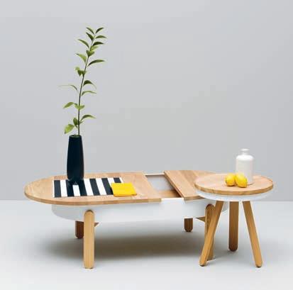
Available in three sizes (small, medium and large) each one of the BATEA co ee tables designed by Daniel Garcia for Woodendot , feature expanding potential – read sleek hideaways for the chaos and clutter of everyday life.
woodendot.com
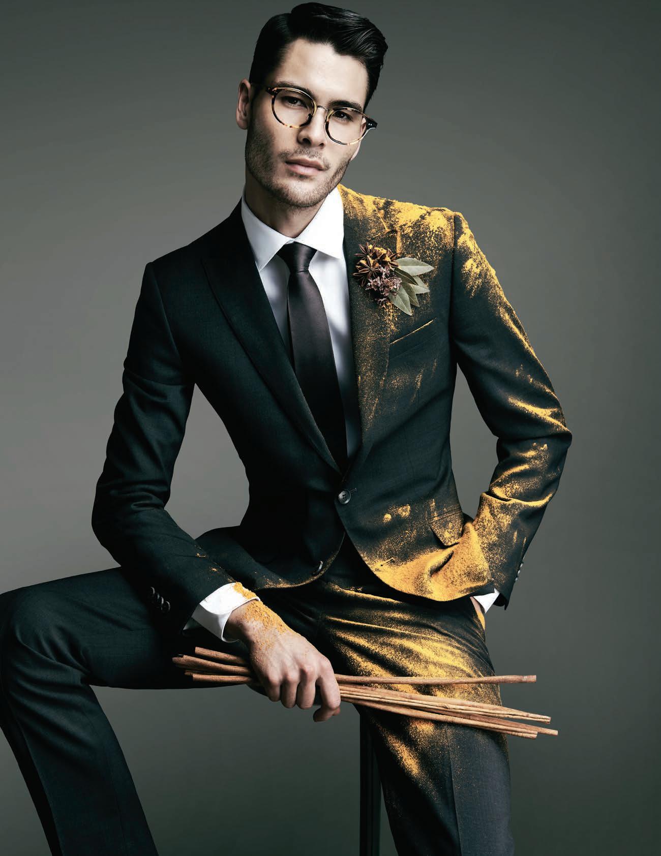


Gorgeous folds of fabric physically articulate the comfort of the ELYSIA lounge chair, designed by Luca Nichetto for De L a E spada . This chair proudly exposes the inner skeleton of the frame – traditionally hidden within the upholstery – to expose the craftsmanship and character of timber.
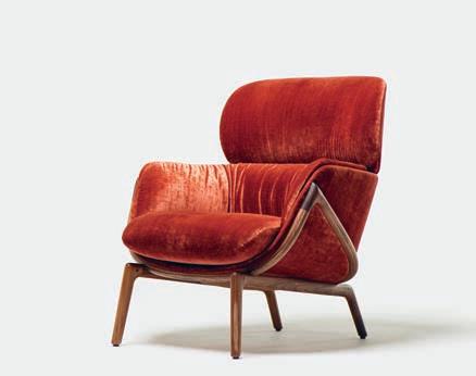
thefutureperfect.com
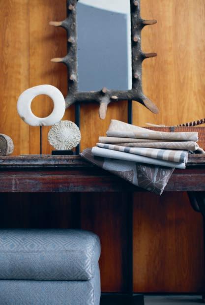
Nothing ever goes out of style, it just gets reinvented. That’s the age-old philosophy underpinning Sunbrella ’s new SHI FT collection of textiles. A fresh take on much loved patterns, each injects the sophistication of tried and tested favourites in refreshed colourways. The collection also plays with a gorgeous novelty yarn to give an elevated sheen, used in their Radiant print – a twist on the traditional palm leaf pattern.
sunbrella.com
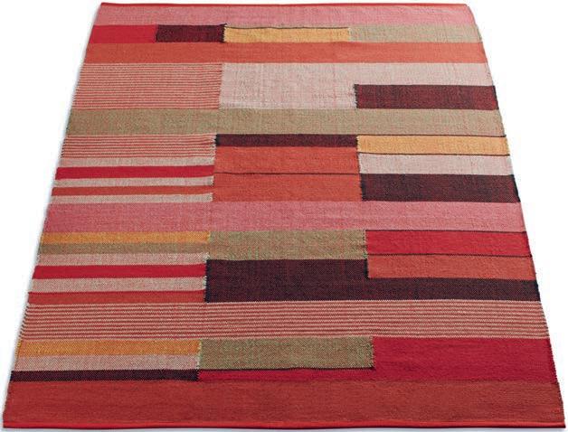
Stretching out a glorious melange of ochre reds and yellows, the CHARLIE RUG from BluDot imitates the rich colouration of the desert floor to create a natural and textured indoor scape. Ideal as both a floor and wall feature, the elongated geometric patterning extends the visual length of the room while igniting a warm interior palette.
bludot.com.au
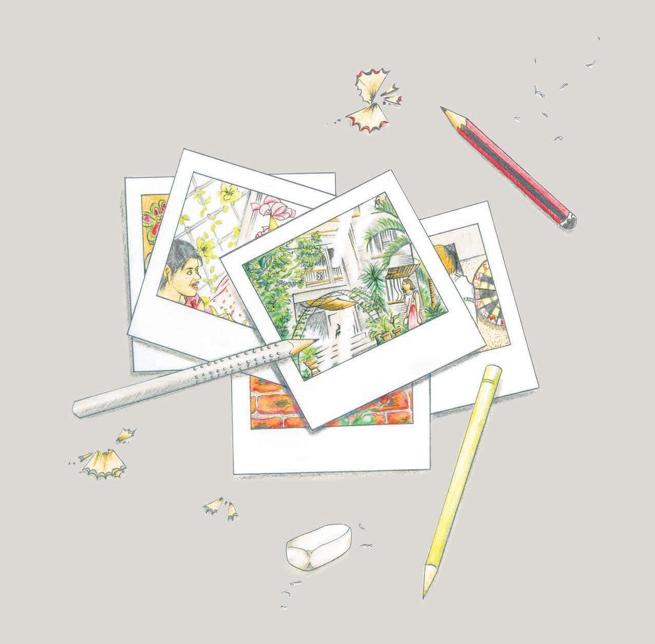


We wear vintage, adore Mid-Century design, and share daggy photos on #ThrowbackThursday – but why do we dwell in nostalgia? Sandra Tan reviews three new books that celebrate our relationship with the past; through the places we build and the memories we share.
TEXT AND ILLUSTRATIONS SANDRA TANWh at do you remember of your childhood home?
Though mine burnt down more than a decade ago, I still recall its kitsch fl oral wallpaper, mismatched tiles and dramatic drapes in vivid detail. With focus, I can almost feel the texture of these long-lost things, like a phantom limb. Such is the immersive sensory power of nostalgia.
Particularly during our formative years, the places we inhabit leave a lasting impact, informing the way we think about and interact with space throughout our lives. They also mark a moment in time – our homes, social centres and watering holes preserve an uno cial concrete record of our everyday existence. It is these observations of domestic life that form the basis of The Rumpus Room and Other Stories from the Suburbs, through the unique lens of Australian presenter and architecture enthusiast, Tim Ross.
In the vein of his ABC television series Streets of Your Town, which charts the modern history and progress of Australian civic architecture, Tim’s new book is a more intimate ode to suburbia in the 1970s and 80s. When, like a teenager liberated by self-discovery and reinvention, Australian families embraced the
art of DIY. As Tim tells, it was “the era of being able to do anything yourself, as long as you had a spirit level, a string line and the ability to call out to your next door neighbour when you were trapped under a toppled tank stand”.
Tim’s characterful personal anecdotes of his own youth and family life are interspersed with photography from the period, imbued with the grain of analogue fi lm stock and largely collected by the author himself. The book’s gloriously retro aesthetic is accompanied by vivid storytelling, and some of its most enjoyable moments are where Tim’s design nous meets his comedic turn of phrase.
“In his book The Australian Ugliness, Australian architect Robin Boyd rallied against Featurism in houses. In 1986, my mate Graham’s family built a new house that not only embraced Featurism but grew it a new set of tits.”
Faithfully capturing the nuances of colloquial Aussie humour and how the spaces we live in refl ect our changing needs, The Rumpus Room is an insightful, culturally valuable time capsule.
More abstract, but equally evocative of a sense of place is Among Buildings, a collaborative work by architect and poet Michael Roper,
photographer Tom Ross, and graphic designer Stuart Geddes. Presented as a sequence of posters pleated into unbound rectangles within a hardcover sleeve, the inventive publishing format invites a more participatory interaction than a conventional book might. There is something almost ceremonial about opening these self-contained segments, which each unfold to reveal photographic and poetic responses to one of 26 iconic Melbourne buildings.
Though the subjects may be familiar –recognisable places include the Queen Victoria Market and Federation Square – Tom’s large-scale photography looks closer than we are used to, magnifying the fine details of each building. We are shown the textures of cladding, the light on window panes, the subtle blurry motion of surrounding foliage, and this peripheral perspective of such well-known landmarks allows a more intimate experience of the structure.
Void of colour, but for one surprise section that seems to glow by contrast, the black and white images throughout Among Buildings give Melbourne a timeless look – these pictures could almost be taken from a bygone era. The effect also brings the strength of composition to the fore. With contemporary buildings cast in the same light as classics, you can begin to see a visual association between, for instance, the angular geometry of RMIT’s Storey Hall (Ashton Raggatt McDougall, 1995), and the striking cathedral ceiling of Capitol Theatre (Walter Burley Griffin and Marion Mahony Griffin, 1924).
The poetry creates a powerful impression of the built environment, and imbues the publication with a contemplative, dramatic quality. In the excerpt for Chadwick House (by Harold Desbrowe-Annear, 1903), Michael writes:
Our homes are distortions
Of our bodies, our affections
Ballooned and kinaesthetic
The stent and the wound
Of visceral love
Wholly mortar nor memory
No more certain than hands
That build and repair
Shaped and reshaping us (epigenetic)
Impermanent as skin
With a few carefully chosen words, Michael crafts sharp expressions of a building’s presence and our sentimental connection to space. Together, these fragmentary revelations portray Melbourne’s urban identity.
Our literary trip down memory lane has thus far taken us from the suburbs to the city, but what of the global experiences we share? Sometimes these are big world events: devastating wars or jubilant sporting contests. But often, the things that unite us are small and ubiquitous.
Written by self-described pencil connoisseur Caroline Weaver, owner of CW Pencil Enterprise Shop in New York, The Pencil Perfect traces the history of an unassuming tool that has enabled creativity worldwide for generations.
The book tells a comprehensive story, beginning in the 16th Century with the discovery of graphite in England, to the first rudimentary wood-cased pencils, eventually refined by German pioneers like Staedtler and Faber-Castell, names that we recognise today. From Europe to the US, and the exemplary standard of Japanese pencils, what is striking is how a simple implement has maintained global relevance over such a lengthy timeline. But as Caroline suggests, “The pencil is one of those non-essential objects that will always exist because of its permanence in so many cultural landscapes and for its ability to be there when your phone is dead or your pen runs out of ink.”
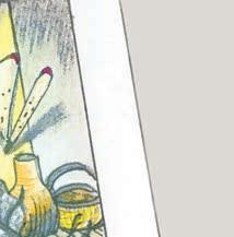
In place of photographs, there are fantastically detailed pencil illustrations throughout, drawn with superb realism by Oriana Fenwick, a Zimbabwe-based artist. A particularly enlightening one cleverly depicts the staged process of how singular pencils are formed from a block of wood. Others portray important figures who have championed the use of pencils, including a delightfully apt drawing of cartoon mogul, Walt Disney.
Though we use them to write our first words, pass hand-written notes to our loved ones and sketch our grand plans, society has been remarkably uncurious about the origins of the humble pencil. Caroline cites only one other book, The Pencil: A History of Design and Circumstance by Henry Petroski, as the sole other resource for all of pencil history. But as the author writes, “Nostalgia is the most powerful sensation with an object like this. I dare you to find a single person on this planet who doesn’t associate a memory with the smell of a wood-cased pencil.” With The Pencil Perfect, Caroline ably fills a gap in our collective knowledge of a medium that has remained crucial to communication, even in these touchscreen times.
Our past recollections are the context from which we shape our own personal narratives. But not only do our memories provide us a sense of self, they connect us to others – a concept we draw on frequently in the era of sharing, as we habitually publish our own experiences through social media. Similarly, the publications here offer a window into the places, stories and objects that unite us: communities of otherwise incongruous people with shared milestones.
AMONG BUILDINGS
Tom Ross, Michael Roper, Stuart Geddes
Uro Publications




232pp loose-leaf in slipcase AU$49 uropublications.com
THE PENCIL PERFECT


Caroline Weaver
Gestalten 160pp hardcover AU$69 gestalten.com
THE RUMPUS ROOM
Tim Ross
Self-published 98pp softcover AU$36 themanaboutthehouse.net




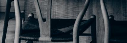
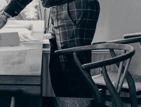
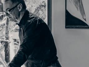




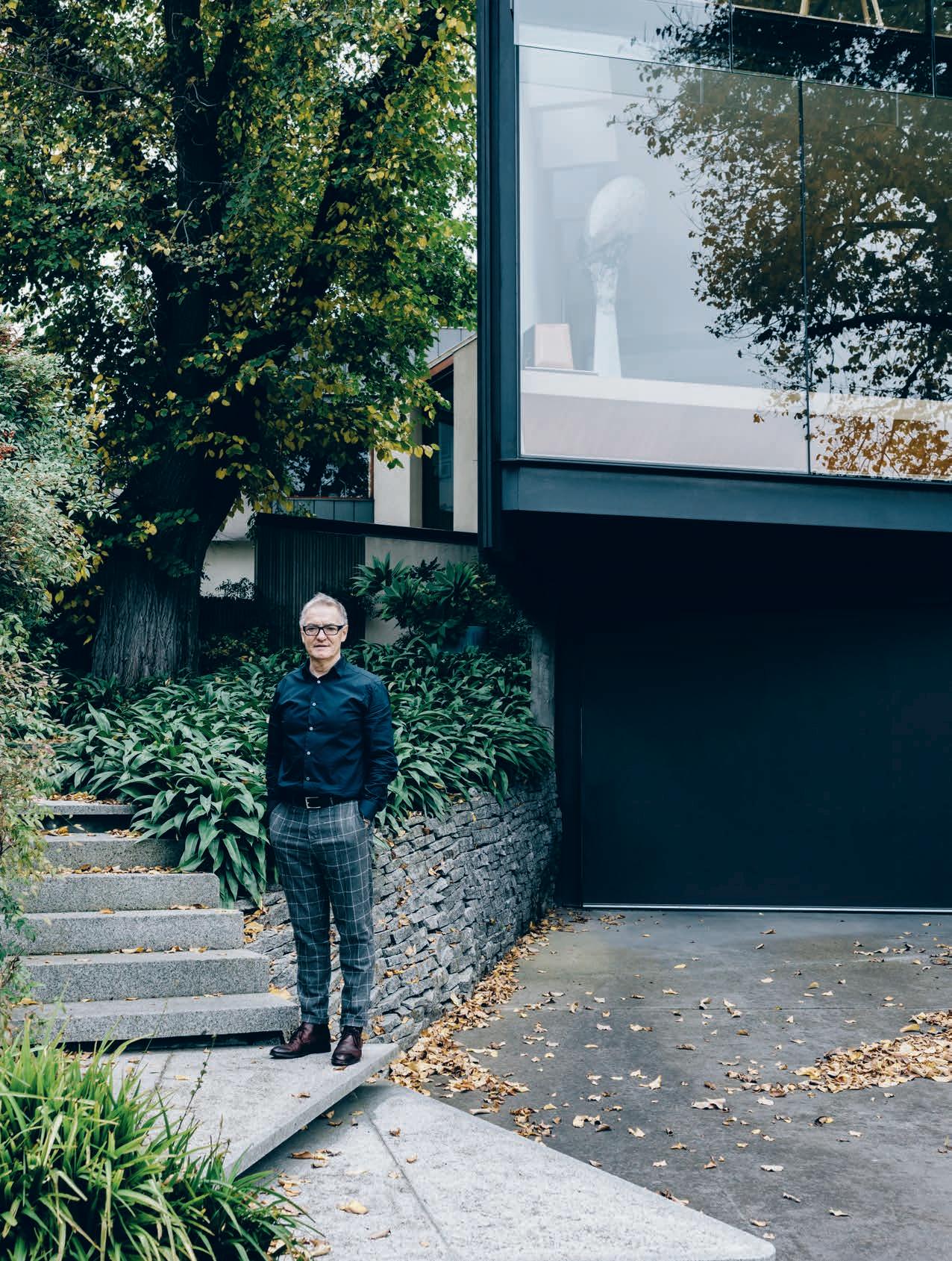
or the most part, architect John Wardle is a forward thinker, a designer whose practices’ buildings – including the under-construction Melbourne Conservatorium of Music and the Melbourne School of Design – are shaped and crafted using the latest computeraided design technologies and innovative construction techniques.
In some ways though, John looks backwards and forwards, subconsciously, to advance and compress time. As founder and principal of John Wardle Architects (JWA), John maintains that good architecture needs su cient time to percolate and evolve.
At JWA, there is a constant endeavor to expand time: ideas are given space to emerge; the client’s needs might change or become more readily understood; spatial outcomes and minute details are refined. “The design development stage can only benefit from an extended period of deliberation and consideration,” he notes. His own house in Kew, in Melbourne’s inner east, is an extreme example of the transmutations that can occur in the architect’s mind and a building over a prolonged timeframe.
Home to John and his wife Susan for more than 25 years, the house was originally
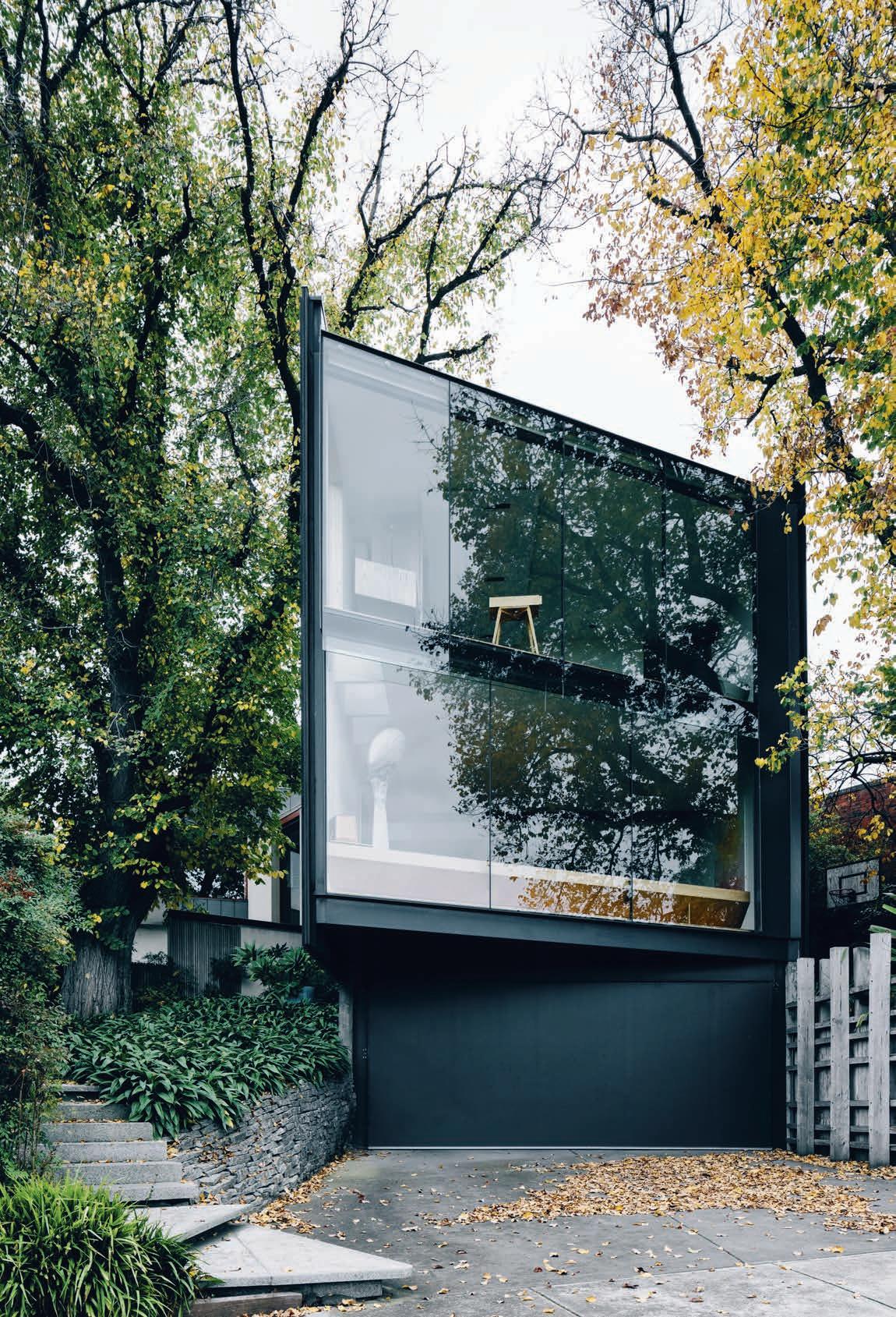
designed by Horace Tribe in 1951. Today, it’s almost unrecognisable as the building the Wardles purchased, having undergone two major renovations, most recently in 2000. At that time John was exploring “a fascination with a sense of enclosure”; a new wing was added to project the primary elevation outwards towards the street, partly to capture city views.
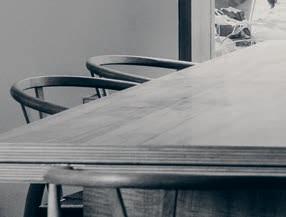
The resulting living room presents as a cross-section of the house. “All of the structure, internal finishes and furniture elements are capped by a single sheet of glass, which invites an understanding of the inner program,” says John.
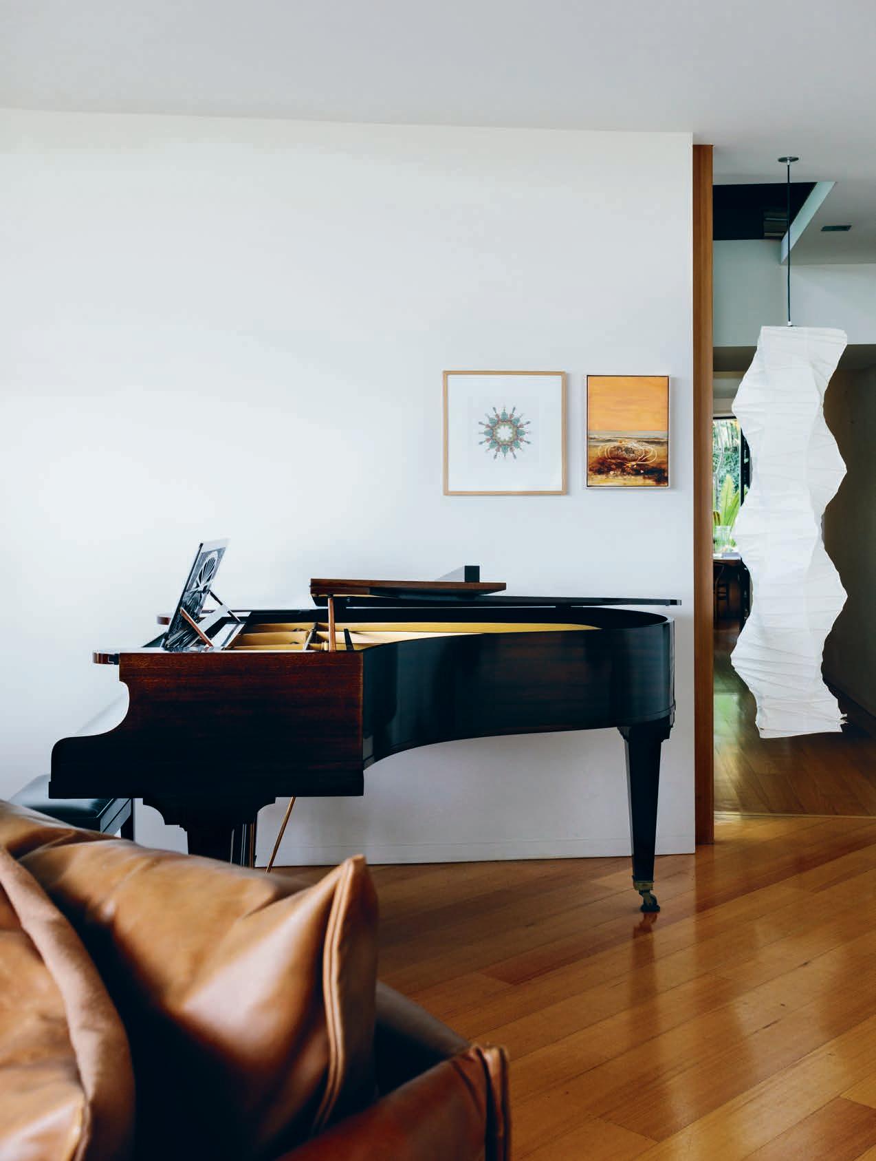
Inside, the perimeter of this space is emphasised by articulated shelves and benches used for formal display, while a collection of contemporary furniture pieces – including a large sofa and iconic chairs such as the Fjord chair by Patricia Urquiola for Moroso and the Take a Line For a Walk armchair by Alfredo Häberli for Moroso –are arranged and rearranged to facilitate entertaining or relaxation modes. A grand piano takes centre stage: a house concert is being planned with an old friend, singersongwriter Rebecca Barnard, who will be joined by Monique diMattina.
Rachael Bernstone shares a rare glimpse into the private world of John Wardle, the celebrated Melbourne-based architect whose constant curiosity underpins a relentlessly inventive practice.TEX T RACHAEL BER NSTONE | PHOTOGRA PHY MA R NIE H AWSON
John explored the same preoccupation –with di erent results – on later JWA projects, including the City Hill House and Vineyard House. “To use your own projects as a test bed for the sorts of ideas that we often encourage our clients to consider gives validity to those concepts,” he says. “When you test your ideas with genuine enthusiasm and a degree of strategy on a project for your own family, it can draw those moments of individual endeavor into something that becomes part of a larger o ce discussion, such as a joinery element or ways of lighting a room.
“I enjoy that aspect of practice,” he adds, “where personal experience rolls into larger discussions with colleagues.”
Now that the couple’s children have grown up and recently moved out, the architect is developing plans for a third major reworking of their home. “The intention this time is to make it bigger by turning the kids’ playroom and elevated terrace into a place for drawing and study,” he says. “The original floor plan is still there, but it’s been slowly consumed as I’ve worked and reworked it over many years. The house is basically a constantly shifting experiment, and I think we will continue to stay there for many years.”
Despite this long-term preoccupation with one building, John and his family also enjoy visiting their farm on Bruny Island in Tasmania. The same location in which the JWA-designed Shearers Quarters won Australia’s highest award for residential architecture: the Robin Boyd Award in 2012.
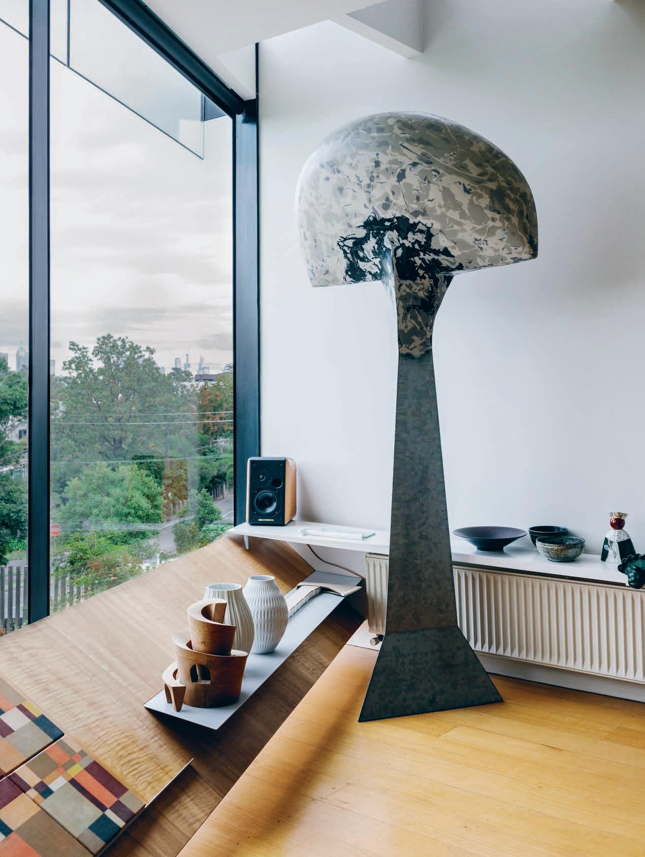
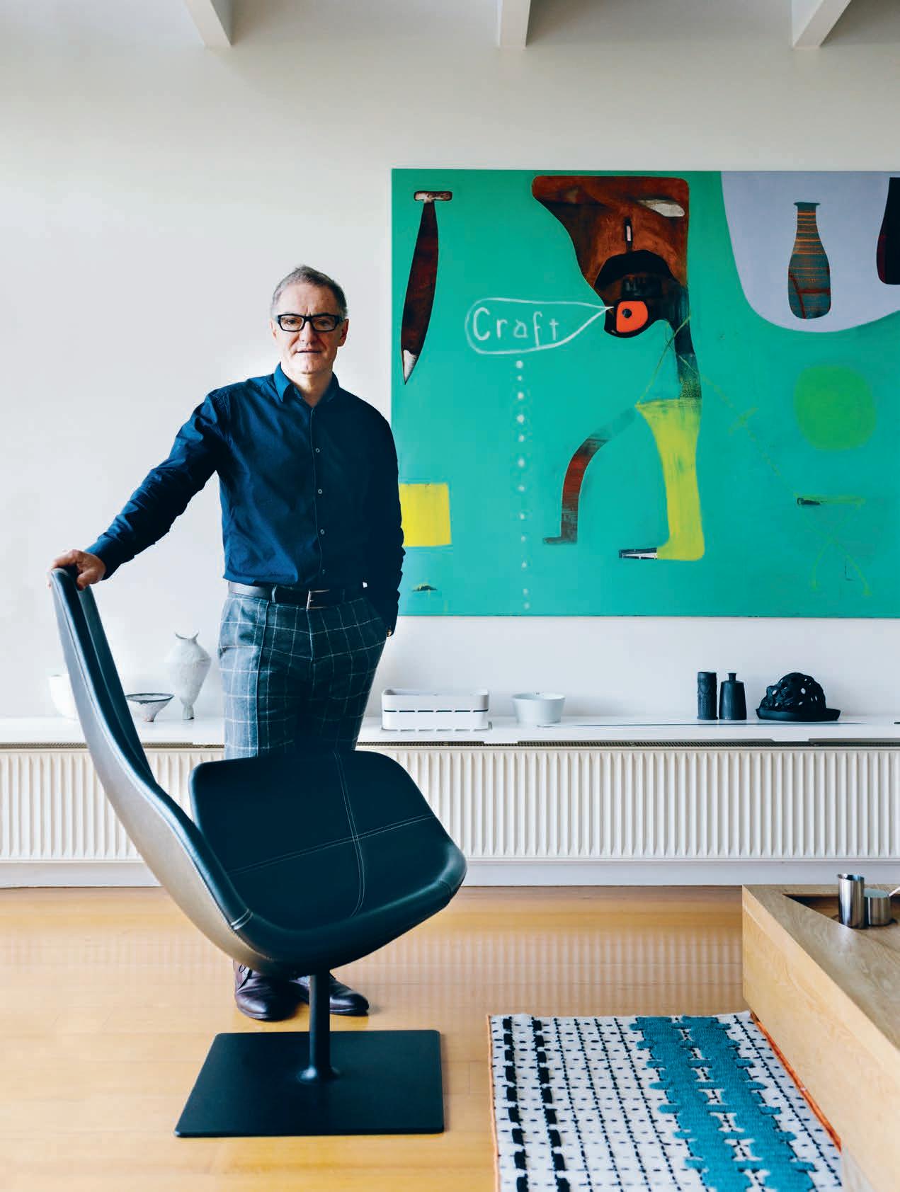
John has spent the past 18 months overseeing the renovation of the property’s historic Waterview cottage, originally constructed in the 1840’s by the ship’s carpenters, on the edge of a cli overlooking Storm Bay. “I need to visit Waterview as an antidote to city life,” he says.
John grew up on the outskirts of Geelong, on the banks of the Barwon River; his father was an agricultural scientist turned science teacher and his mother was a school librarian. His childhood home was a place where accepted knowledge and conventional wisdom were endlessly challenged by constant questioning and new evidence. It was an environment that stimulated his ingrained sense of curiosity, one that was instrumental in setting the tone for JWA’s inclusive practice model, where the studio structure enables John to “lead from the middle”.
“Rather than just an understanding of architectural history, I bring a broad range of interests into the practice discussions,” he says. “I’m a very curious person and many of the methods of our practice are informed by that curiosity, as well as that of fellow Principal Stefan Mee, and by drawing craftspeople, artists and makers into our circle. I’m not an architect who works in isolation and we very much require many levels of input from a broad group of others within the practice.” John’s home and o ce are testament to his broad interests, with their substantial arrangements of unusual objects collected over time.
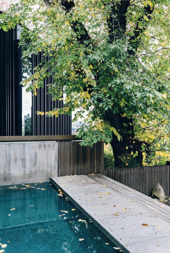
Home to John and his wife Susan for more than 25 years, the house was originally designed by Horace Tribe in 1951.
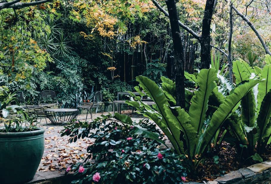
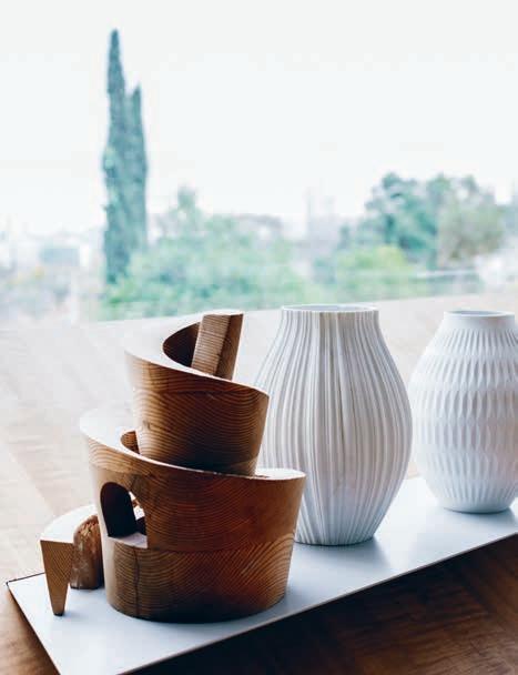
“I enjoy that aspect of practice, where personal experience rolls into larger discussions with colleagues.”
Over several weekends each year, members of the JWA team visit John’s Bruny Island property en masse, to undertake building projects. “Those trips are beneficial in so many ways: they remove us from the conventions of the space and the orthodoxies of an architecture o ce to somewhere that is completely other,” he says. “When we are there I try to not dictate, but rather to suggest and encourage, so those weekends are very playful. They are less about pure design and much more about the process of making, and sparking connections with the skilled tradespeople who craft our buildings.”
John also seeks respite from the pace of city life and his own restless energy by taking long walks through far-flung landscapes, including a recent overseas holiday where he and Susan walked along age-old tracks in three European countries. “It is such a pleasure to walk within ancient places,” he says.
Walking for pleasure is a simple way to return to a less demanding era. On foot, it’s possible to reconnect with nature and relish the present moment. Short of time travelling, it’s one of the best ways to return to the foreign country of the past, and to luxuriate in the pleasure of having enough time.
JWA | johnwardlearchitects.com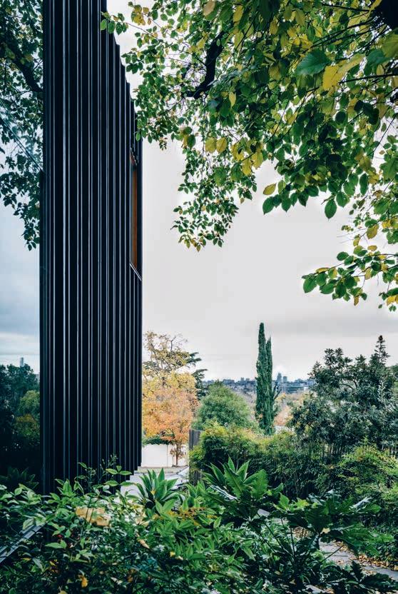
“The house is basically a constantly shifting experiment, and I think we will continue to stay there for many years.”
we are the air chitects
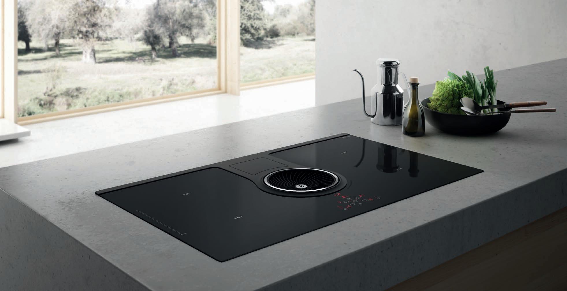
Showcasing the advantages of induction cooking, the NikolaTesla innovatively combines a centralised extraction system that features high extraction perfomance, low noise levels and class A+ energy efficiency. The key to this system is synergy: the cooktop communicates directly with the rangehood, automatically calibrating to the ideal extraction level. As a result, you can focus your energy on cooking and leave the rest to us.



Sitting down with Loh Lik Peng, one of the world’s leading hoteliers, David Congram discovers the art of the architectural striptease. Nostalgia, it seems, is an act of seduction.
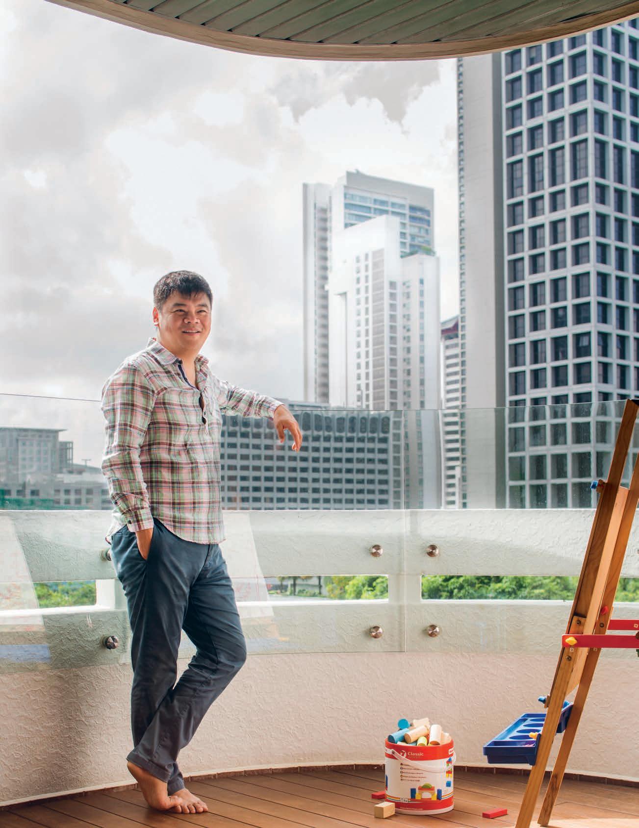
Icould never have expected such a litany of details. When I enquired o -hand about Loh Lik Peng’s earliest memories of hotels, I received a story so furnished with particulars and wry observations of human oddities that, at times, it felt like I was interviewing E.M. Forster (sultry, colonial heatwaves inclusive).
You see, apparently, they wore white gloves. And in those white gloves, they – a small army of twelve year olds – diligently flitted about a (now extinct) Sri Lankan villa, barefoot and in long, Nehru-collared tunics crispened from litres of starch. In white gloves they carried telephones with rotary dials and heavy receivers between viewing decks and breakfast rooms; they silently turned-down beds; re-arranged mosquito nets; shuttled silver buckets of hand-cut ice up and down stairs. And in white gloves, greeted people with broad grins under the sub-tropical sun.
“It was all very colonial – this big, beautiful old place. It probably wasn’t very luxurious but in my mind it was a whole other world. This is one of my earliest memories”, Peng tells me. “It’s a strange fate, I suppose, that it’s one of a hotel my family visited when I couldn’t have been more than seven years of age.”
Fate indeed. That seven year-old sitting poolside an upper-shelf Sri Lankan hotel has, 38 years later, become one of the world’s most critically acclaimed hoteliers and restauranteurs. With a string of more than seven boutique hotels and 20 fine-dining restaurants in the major cosmopolitan cities of Singapore, London, Shanghai and Sydney (known collectively as Unlisted Collection), Peng has become renowned for reinterpreting tired, heritage sites into modern lifestyle
concepts – always with a high degree of finesse and stylish whimsy.
“In a way,” he tells me one morning, “I suppose I’m always turning back to that childhood memory of the Sri Lankan hotel –to that feeling of visiting a whole other world.
“Today I am drawn to refining an idea of hospitality into a deep experience of multiplicity – mainly because I enjoy that immersion so much. Travelling, seeing new places, sampling local neighbourhoods are all distinct but absolutely interconnected experiences. Each of my hotels or restaurants aims to provide that feeling of immersion and wonder.”
And wonderment, it would seem, is something that Peng has found in no short supply. Last year, a Forbes journalist categorically declared “Anything-Goes Loh with a Midas touch.” But I find that denomination a little wanting. Peng may very well be a little bit of a blithe oddball, but ‘anything’ will not necessarily always ‘go’.
Approaching even the most miniscule of details with laborious deliberation, Peng is a master of precision and intent. Not a single element – such as the length of fork tines in his Waterhouse Hotel in South Bund of Shanghai, or the embroidery on the laundry bags of his latest establishment in Sydney, The Old Clare Hotel – escapes Peng’s ruminative methods.
And the man himself is no exception. For almost two hours, Peng responds to each and every one of my questions with a fillet knifesharp clarity and measured syncopation, never erring from his perfect metier of insightfulness and levity. It’s obviously a linguistic method he’s curated over many years and even more flyer miles.
The son of two Singaporean doctors, Peng is Dublin-born, Singapore-raised, and London-trained. Earning a law degree from the University of She eld before continuing in post-graduate business studies at the London School of Economics, Peng eventually left the world of practicing at a bar he found “rather boring”, to practicing at a bar of quite a di erent kind.
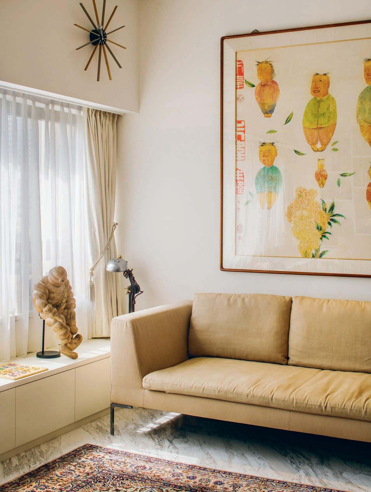
From jurisprudence to hospitality, he speaks to me today in his Singaporean apartment, enveloped in a decorative scheme I – ironically – haven’t the words to define. To his left is a family of industrial electric fans of similar sizes, each with that gloss enamelled tulip base and graphic wirework cage (the pewter has lost its lustre but the sheen of their lacquering has not drained one iota since manufacture almost a century ago). By a wall, antique advertisements for all manner of goods (or, indeed, morals) provide the backdrop for a system of atomic age furniture with sweeping vital lines.
“They were my avenue through to loving design and design history. I don’t know why, but I find them endlessly fascinating,”, he says. Whether it’s this rather chic apartment he shares with violinist wife Min Lee and their two small children, or his Bethnal Green Town Hall in London he shares with guests in more than ninety-eight rooms, there is no mistaking Peng’s characteristic orientation to design.
Mid-Century revival, eclectic minimalism, disruptive post-modernity … all buzzy terms fail to capture the dynamism, grace and joy of the Loh Lik Peng aesthetic. And potentially, this is because they are experiences more than mere sites.
“When scouting for a new location, I’m on the hunt for stories – for buildings that are a little unloved but that also have character and breathe the story of their neighbourhood. Each one of the Unlisted Collection’s hotels or restaurants is a reflection of its city, and I think that what makes them unique is that each location is alive, in a way, […] with the people who live there, or work there, or even just are passing through as visitors.
“The history is always the most important thing because it provides the narrative and the romance.”
This became all-too apparent to me a week earlier as I sat on a barstool drinking wine in The Old Clare Hotel – Peng’s recent hotel project in one of Sydney’s abandoned breweries. As I glance around the room, I can’t shirk the sensation that the structure itself is performing an act of seduction … a striptease, if you will. It has a coquette’s charm and a stripper’s bravado, teasing me nonstop by dressing and undressing.
Here, a spirited, modern interpretation of a barbershop chair sits beside a raw sandstone wall (divots and scratches from the original nineteenth-century masonry are exposed from
Mid-Century revival, eclectic minimalism, disruptive post-modernity … all buzzy terms fail to capture the dynamism, grace and joy of the Loh Lik Peng aesthetic.
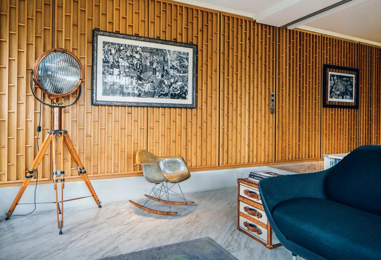
having removed the pea green cladding slapped up in the 1960s). There, some ancient safes in the lobby are mounted in pride, illuminated by the aureated glow of ultra-contemporary lighting. “That was a total surprise!” Peng exclaims mid laugh. “We uncovered these filthy old safes in the basement of The Old Clare where they must have been walled-in and sealed-up for almost a hundred years. We broke into them, as gently as possible, and discovered reams of old documents: a budget, receipts, contracts, all sorts. I thought that these relics of local history were incredible (even if the contents were a bit … what’s the word? Mundane?) so I couldn’t bring myself to throw them away. And there they are, in the lobby in pride of place, to celebrate the stories and the people who once brought this building alive.
“But those safe doors! They must’ve weighed three- or four-hundred kilograms each!”
With a curator’s sense of preservation and an enthusiast’s desire for discovery, the odd tale of the safes is but one of the jolly stories of learning to love the past hand-in-hand with the present which gives Peng’s creations an aura not of timelessness, but otherworldliness.
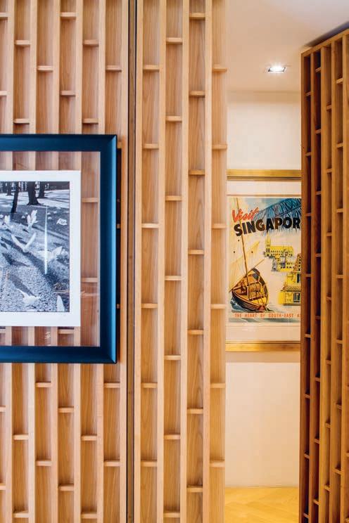
When visiting the High-Victorian council chambers in London’s East End (Peng’s Town Hall hotel), I discover that the walls are adorned with artefacts of bravery and pluck. Everywhere, sooty and tattered evacuation posters tell me that this is the correct way to wear my gasmask and I should hot-foot it to the nearest Tube station until the third siren.
“Now that I think about it, perhaps that experience of being seven in the Sri Lankan hotel has shaped my approach more than I thought. They might be mine or someone else’s, but the muse is always memory.”
“I suppose I’m always turning back to that childhood memory of the Sri Lankan hotel – to that feeling of visiting a whole other world.”


The future belongs to the curious.
luxxbox.com


And after 10 years in the game we are still pokin' around.
Jewellery designer, maker and owner of an eponymous label, Holly Ryan invites Holly Cunneen into her recently acquired and most personally styled living abode on the banks of Brisbane.
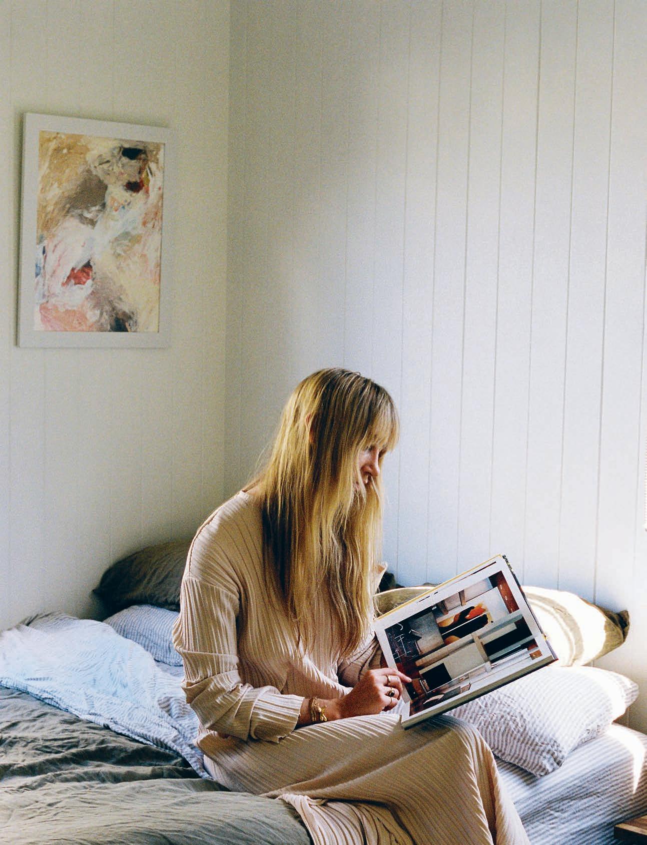
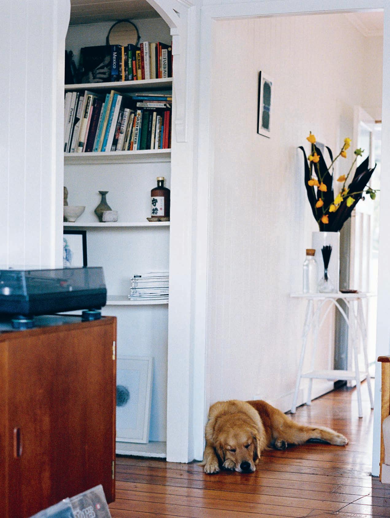
When you put pen to paper and list pivotal moments in Brisbanebased jewellery designer and maker Holly Ryan’s life, you’d be forgiven for an esoteric declaration that her path was decided and that she was destined to become a jewellery designer. But in the face of being told what to do, she did in fact side-step it for some time – perhaps in subconscious rebellion against life predetermined.
Both of Holly’s parents were jewellery makers and back in 1988, just before she was born, they were in Mexico studying silver smithing. Returning to Australian shores Holly grew up in her mum’s jewellery studio in Coolum Beach, Queensland. Fast track a decade or so and she was studying a bachelor of fine arts and majoring in Fashion at the Queensland University of Technology, Brisbane. In her final year she collaborated with her mum on a line of jewellery to accompany her graduating clothing collection. “When the buyers came to the graduate runway show, they were interested in the jewellery and not the clothing. So it was kind of decided for me,” remembers Holly.
“I resisted it at first. I moved to Sydney and worked for a clothing designer called Sara Phillips.” But the call of destiny was unavoidable and soon Holly was working on her eponymous brand. “It was an opportunity to put my name to my own designs rather than create designs for another label.” Holly Ryan the jewellery label was o cially born in 2011.
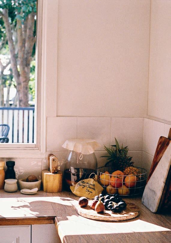
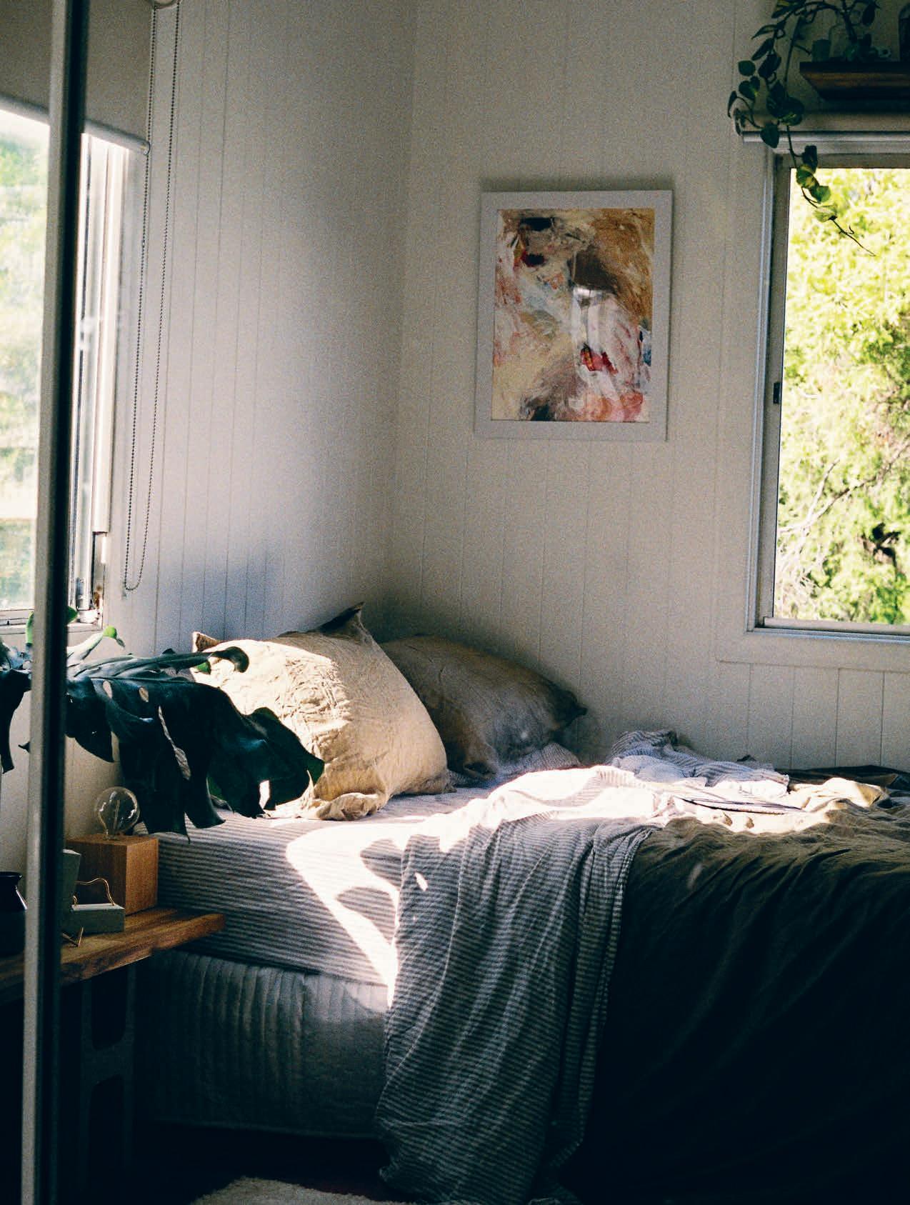
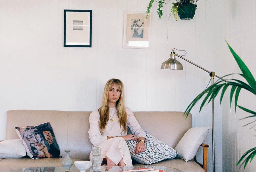
“Most of the furniture are pieces that I’ve particularly wanted in my head – like the cream couch, a 1970s Don Rex original.”
Although she flew the proverbial coop some years ago when she was just 17, it was only recently that she moved into her current abode in Windsor, Brisbane. The move was born out of practicality; with most of her sta based in Queensland’s capital, it began to feel “selfish” to ask them to commute daily to the Sunshine Coast, where she was previously based. Instead, she found a new home and studio and moved closer to them.
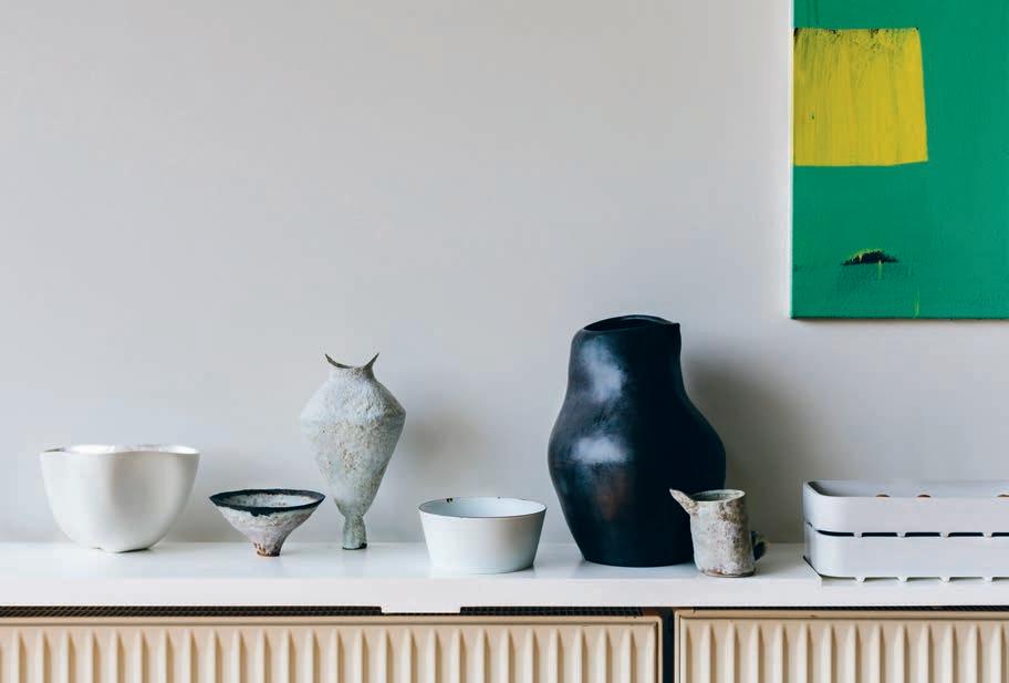
Self described as Mid-Century Modernism meets 70s minimalism and “a little bit quirky”, her home is dotted with vintage pieces she’s painstakingly searched for until found in a reasonable condition. “Most of the furniture are pieces that I’ve particularly wanted in my head – like the cream couch, a 1970s on Rex original,” says Holly. Or the Corbusier chairs, or the Eileen Gray table. “Every piece has a purpose.”
These instantly recognisable designs hero her interiors and speak to an elevated appreciation for design. Yet her obsession with collecting ceramics and penchant for creative exchange between artists – often in the form of trading with friends, jewellery for artworks – makes the space her own.
Despite her knowledge and deep-seated appreciation for design, it’s a nameless wicker chair that carries the most sentimentality. “A wicker cane rocking chair with a Mongolian sheepskin thrown over it, that’s my great grandmother’s chair and I’ve had it in every house that I’ve lived in since I was 17. It’s really special to me.”
Without being over styled or overwhelming, Holly’s home is a constant source of inspiration for her work. As is her studio.
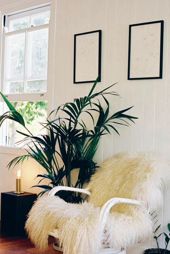
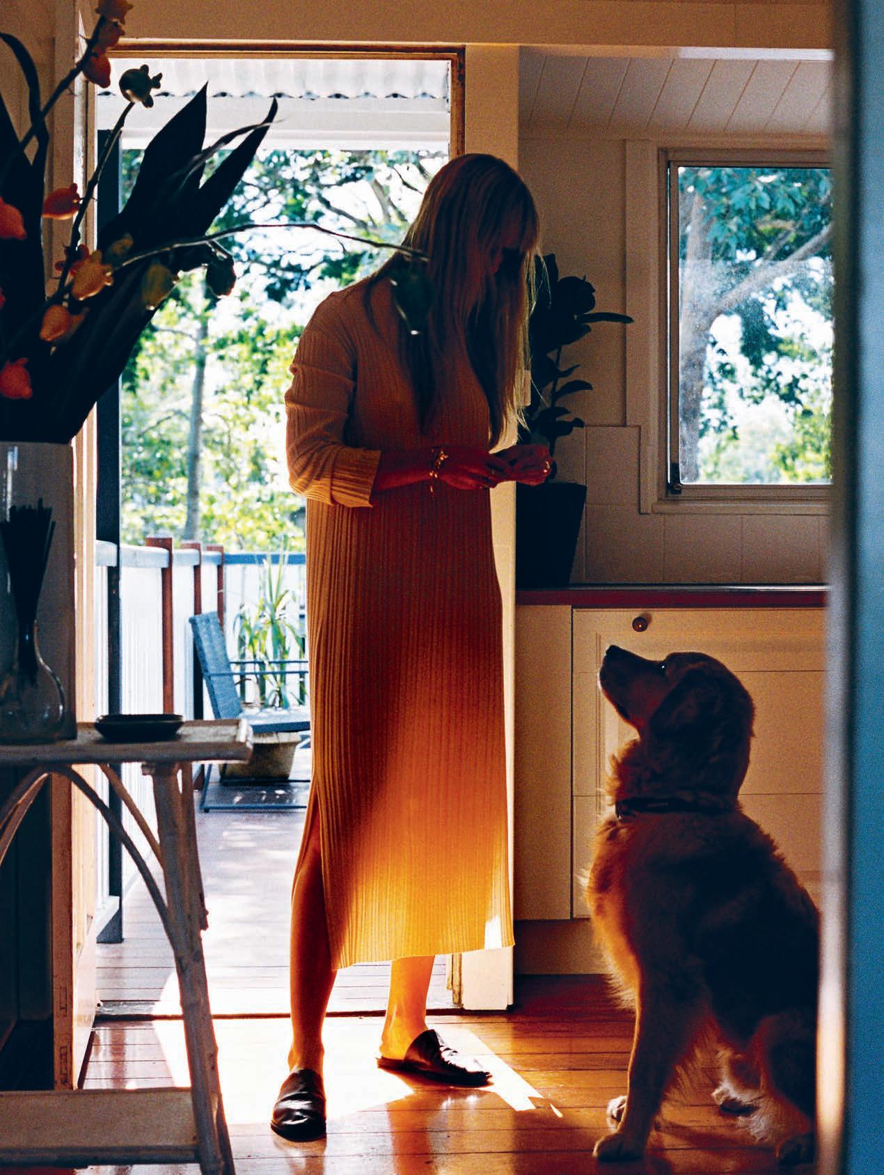
“Everything that I do with my jewellery is inspired by sculpture, architecture, conceptual art and interiors,” says Holly. “I love ceramics so whenever I’m looking at sculpture and ceramics I generally find inspiration for my jewellery. So it’s just nice to have that around the house.”
A marker of her generation – or perhaps one of life as a designer – work and home life tend not to be separate entities. “Both [home and work studio] are creative spaces for me and I’m the sort of person that doesn’t really stop working,” says Holly. “It’s not like I go home and switch o , I go home and in a di erent area work on di erent things.” That’s why it’s so important for both spaces to foster a sense of creativity and feed her need for inspiration.
Reminders of the first time she dabbled in 3D printing are sprinkled around her home, too. Following a trip to Japan and heavily inspired by the work of Tadao Ando, a series of geometric bangles ended up being too small and slightly too impractical to continue into production. “I cast them to brass from the original plastic and they look really nice now that the metal is tarnished. I use them as paperweights around the house and they’re just sitting on the table in front of the sculpture now.” Likewise one of her first designs is on display in a saucer on the main bookshelf. Made from 28 di erent pieces and featuring cold connections and solder joins, it serves as a constant reminder of where she came from and how hard she pushed herself to keep going.
It’s a full on – and seemingly never-ending – approach to life. But with elements of her jewellery design finding their way into her home and vice versa, these are just some of the moments that make one lean back and smile with satisfaction.
 Holly Ryan Jewellery | hollyryan.com.au
A marker of her generation – or perhaps one of life as a designer – work and home life tend not to be separate entities.
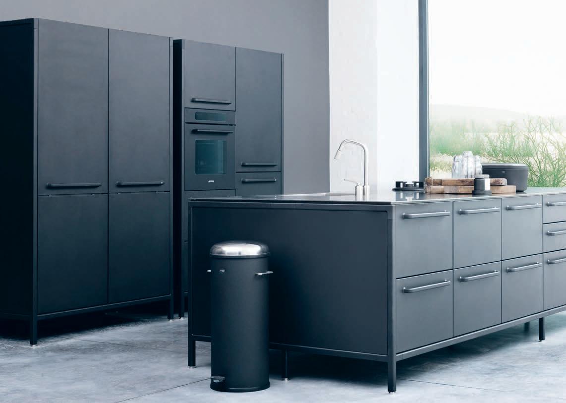
Danish brand Vipp finds a new home at CULT. With them, they bring a varied – yet considered – collection ranging from bins, lighting, home accessories to complete kitchen and bathroom modules.
It is no short stretch to say that we are inundated with options when designing and decorating interior spaces. And despite the perceived benefits that come with an excess of choice, it can more often than not choke the design process.
Vipp is one of the few brands today that understands this pervading anxiety. Entirely comfortable in their own skin, Vipp’s industrial-based range cites a single product for each item category.
It makes perfect sense, then, that to celebrate CULT’s 20th birthday, they have welcomed in the Danish brand. An expansion with an expanding brand, who’s adherence to quality and function has seen its long line of products linger on – unchanged – in the contemporary home.
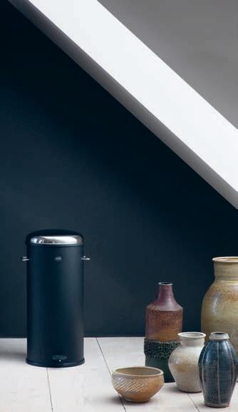
Vipp came to standing in the 1930s after designing their – now iconic – steel-cylinder pedal bin for a private hair salon. Customers and neighbouring hair salons alike took notice of its exceptional strength and considered design, creating a best seller that continues to decorate the front pages of Vipp’s website and stores.
The pedal bin was an important lesson for designer Holger Nielsen; that objects should be first and foremost functional, and if an object has truly been designed well –from every angle and perspective – then it shouldn’t need to be reinvented. The job of the designer should then be complete; do it once and do it well.

The DNA of this progenitive pedal bin lives on and has been extended throughout the entire home through Vipp’s collection of decisively timeless, sleek and impeccably resolved products. They have more recently released module sections within the bathroom including a sink, tap and shelving solution. While in the kitchen, their concept bundles enable you to lift their own perfectly curated, interconnecting spaces and drop them right into your home directly from theirs.
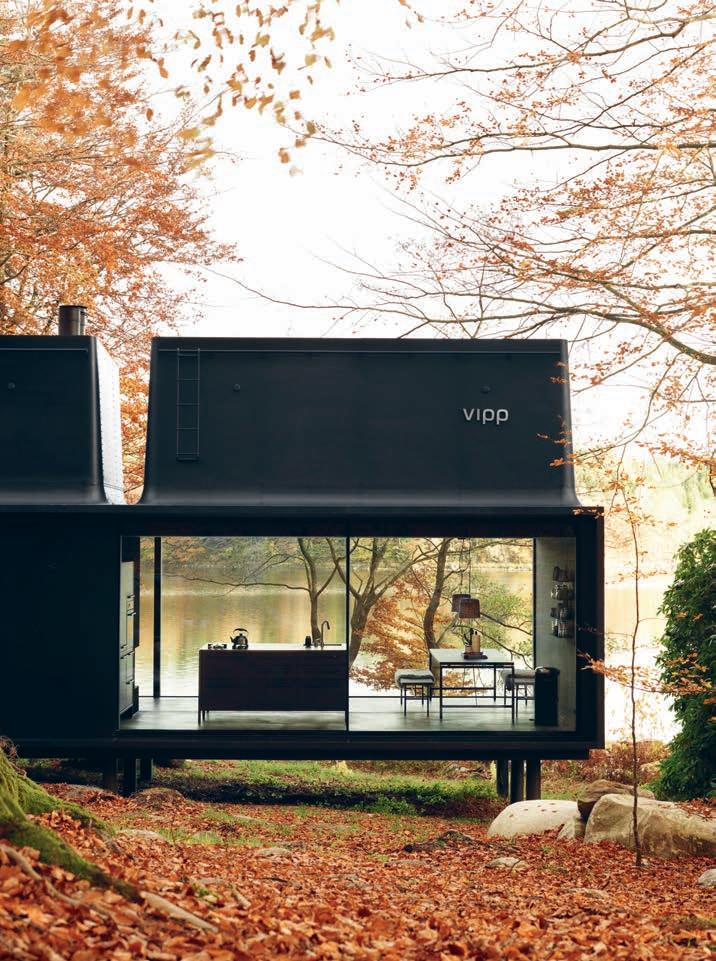
And this same concept of making prefabricated and completed designs accessible is truly realised in their latest and most daring project to date; the Vipp shelter. Amalgamating their breadth of products within the one site, shelter transforms individual items into a holistic object itself; a two storey, steel structure getaway.
The Vipp collection is simultaneously as expansive as it is slim; taps, soap dishes, towel rails, lighting, linen, floor lamps, toothbrush holders and breadboxes – each considered to be the best that they can be. Evidence of how an edited down collection – under a conscious and critical eye – can o er you choice, function and high design.
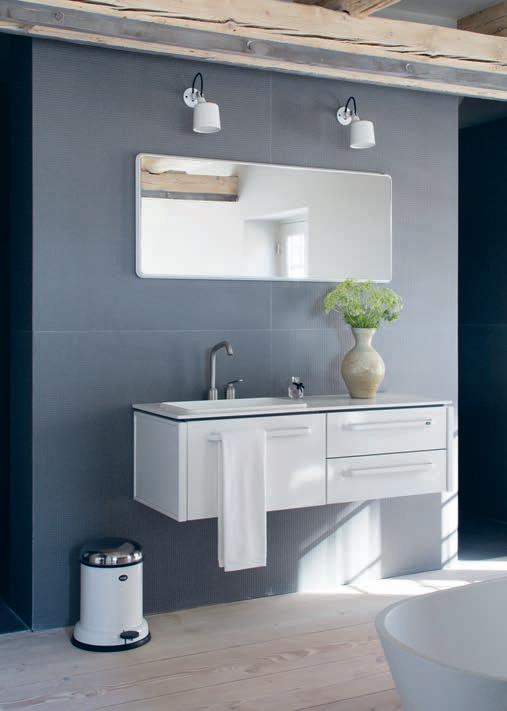
If an object has truly been designed well – from every angle and perspective – then it shouldn’t need to be reinvented.

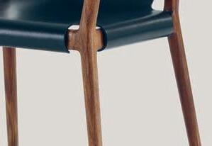
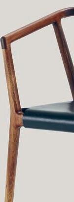
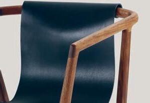

Dessein Furniture holds pride of place firmly at the forefront of local design. Having collaborated with the likes of Adam Goodrum, Tom Fereday, Simon Archer, Nathan Day and Jon Goulder, their furniture is the epitome of contemporary, thoughtful design. The Pieman Collection is Dessein’s premier range, and features stunning tables, chairs, armchairs, shelving and home accessories. Dessein is proud to be associated with Habitus as part of our commitment to the promotion of high quality Australian design and production in the furniture industry. desseinfurniture.com
only


As a child of the aspiring middle class, I was often portrayed by my parents with the symbols of nascent status arrayed around me. Is this where my fascination with material culture comes from?



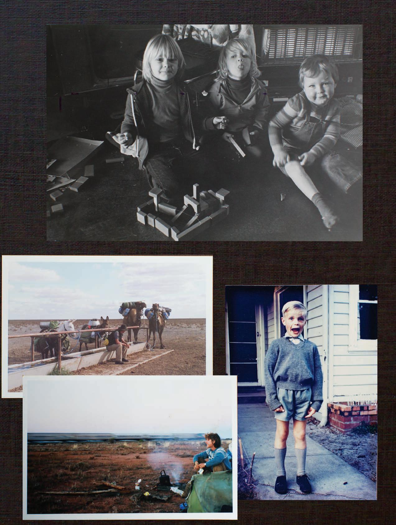
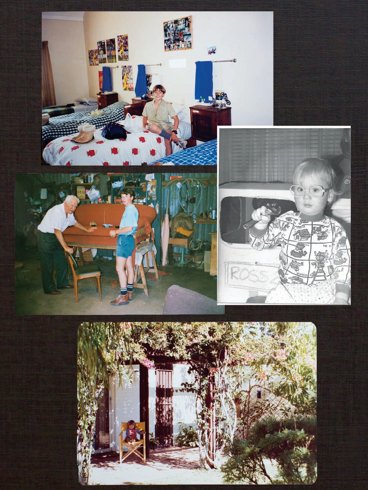
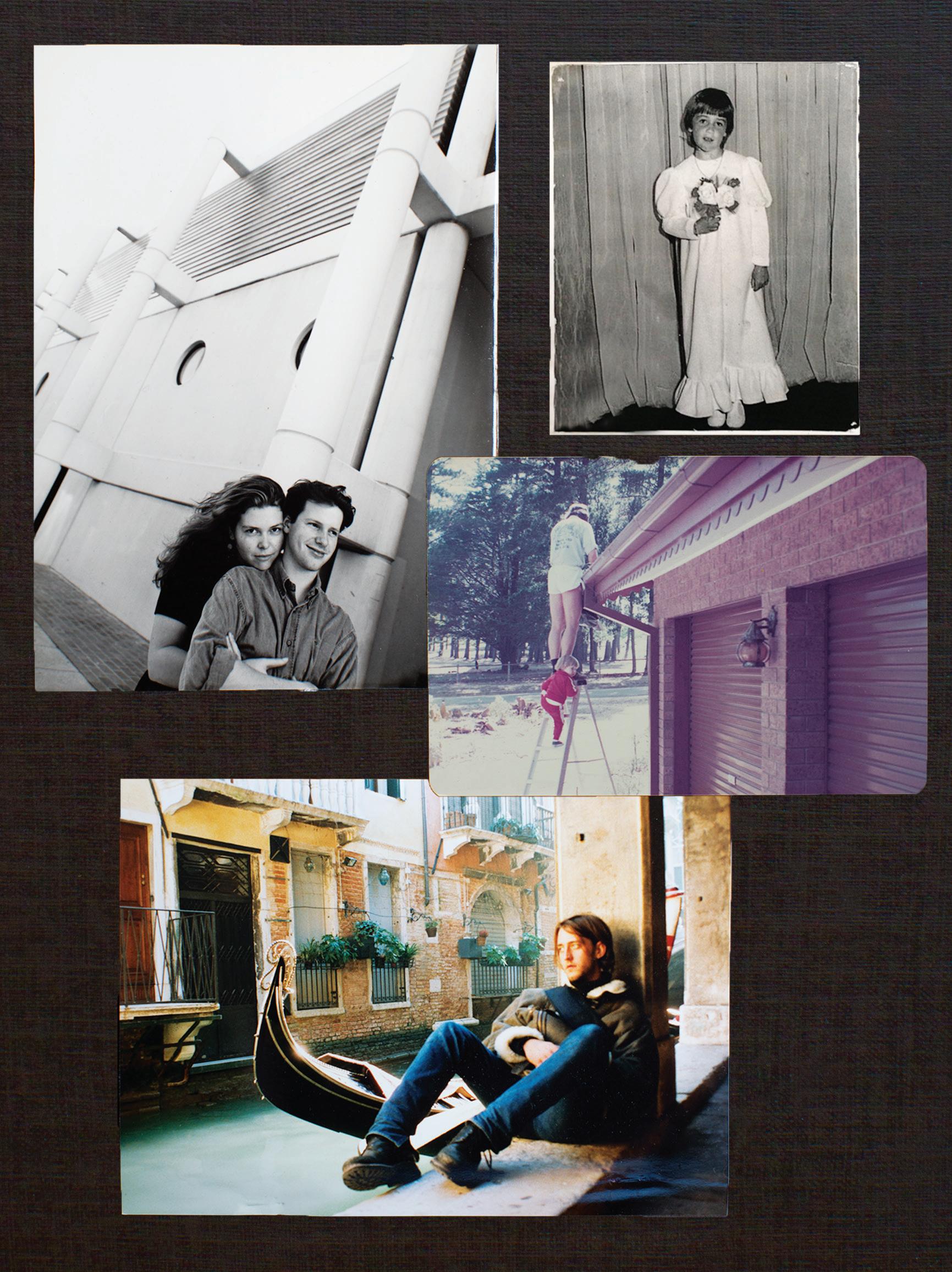
We all have defi ning moments, many lurking in the depths of the family photo album. In this inaugural Habitus Family Album we share a rare glimpse of seminal moments in the lives of some of our favourite creatives.
Further on, Australia’s most notorious expat designer, Marc Newson gives insight into his global existence, and Patricia Urquiola reveals how she is mining Cassina’s back catalogue to create visions for our future.
Welcome to the third installation of In Habitus Veritas.
— Stephen Todd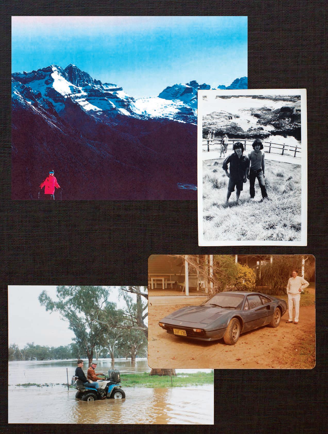

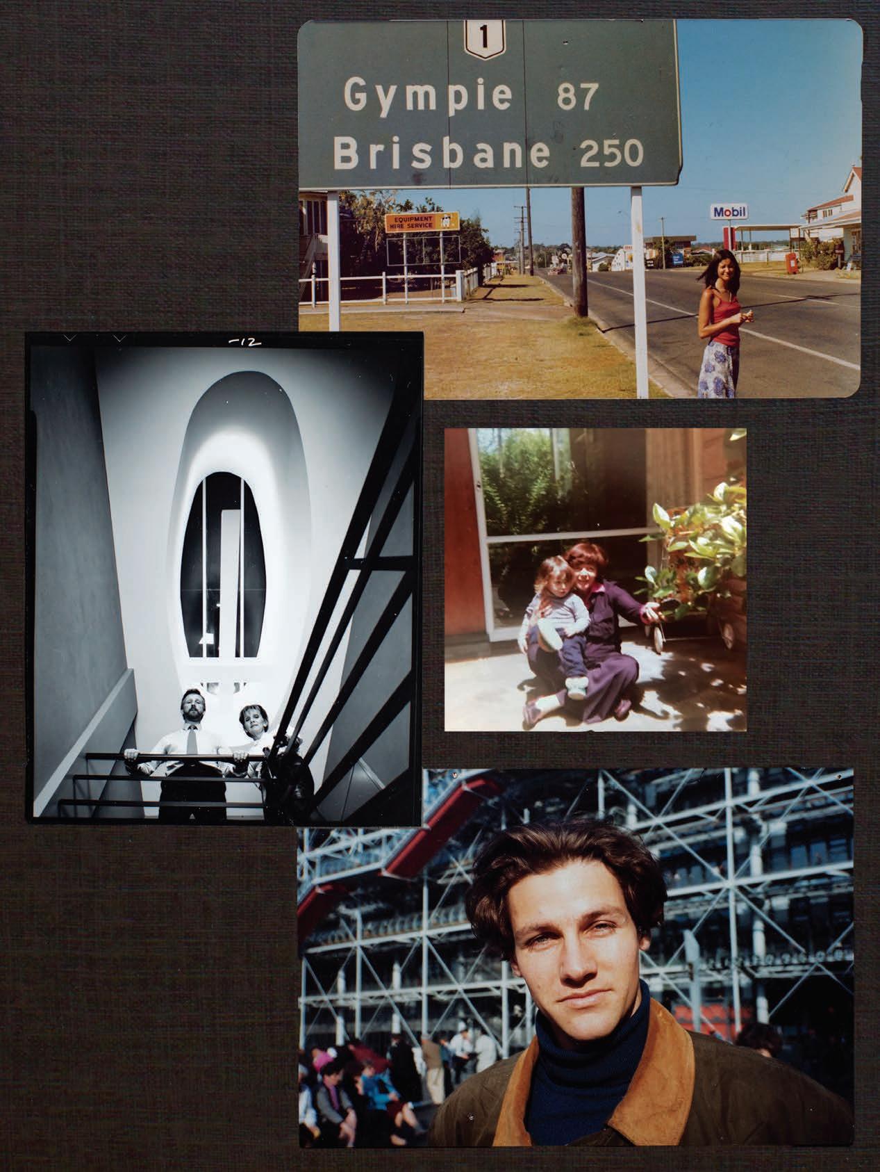




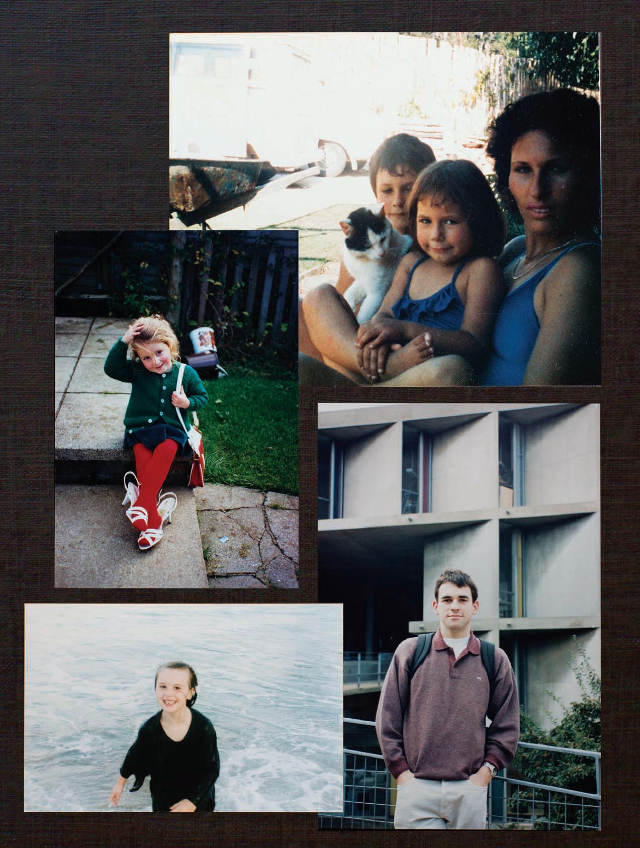




I must have been 19 or so and for some reason we thought it an adventure to hitch hike through Queensland having caught a bus and a train down from Darwin. Being in that place at that time made me question my notion of place. How di erent my highly charged life in Melbourne was compared to middle Queensland and the Northern Territory seen by train. It dawned on me how vast Australia is, how many countries there are within our single entity. I suddenly felt very small, and knew instinctively I had a long way to go, and that wasn’t just about the distance to get back to Melbourne. The memory of place has a fantastic imprint on imagination, and the silence and colour, the scent of the desert through which we travelled was truly incredible. I’m still wondering what on earth we were thinking hitch hiking through Queensland. What does that say about the designer I am today? Perhaps it’s something to do with an adventurous spirit, an enquiring mind.
In 1992, with a degree, a one-way ticket and apparently a thick lump of hair I set o to travel and work in Europe. I wanted to work for someone amazing, learn a foreign language and explore all things foreign. This photo was taken during a month in Paris involving intensive French classes every morning followed by afternoons exploring the city with students from all over the world. The Pompidou Centre blew my mind on so many levels: the big audacious idea, the extraordinary resolution of details, the city’s investment in culture and how this edifice transformed a whole quartier. At that time, skinny pale kids in Levi’s would hangout, drink and smoke in the big plaza that leans towards this monument of new-modernity. When I look back I recognise that my five years abroad was a time of immense freedom and fun, and when I worked out what it was that I really, really loved to do.
I love being in nature, I draw a lot of inspiration from outdoors. Since I decided to be an architect, I have been traveling around the world to discover new sources of inspiration. Nature often appears grand yet it is so fragile. While I looked at such an iconic setting as the Dolomites in awe, I realised how the gracious mountains were a ected by global warming. It is such a moment that poses the question of our responsibility in the face of imminent disaster, as well as the duty of architecture to respect nature.
19.
This image is of my older brother, the great chef Cheong Liew (in front) and myself. It was taken on a very beautiful summer’s day, a year after I arrived in Australia. I had just finished my year of boarding school in Glenelg, South Australia, and I was reveling in a newfound sense of freedom of expression, the prospect of unbridled opportunity, and the sheer sense on wonderment and joy of being in Australia. There was so much to discover and enjoy. This feeling about the country has never left me, and as each year passes I love it more. I have found much inspiration in its historical material culture, its social and physical landscape. This sense of wonder about the country and its people continues to inspire me. I have been very fortunate and feel so grateful.
I took this shot with my Kodak Instamatic sometime in the late 70s, 1979 I think. A family friend drove from Sydney to our farm near Forbes in his Ferrari 308. Mid-engine Italian sport-cars were such futuristic, alien objects back then and this car was the most exciting, beautiful thing I’d ever seen. A vision of the future had landed in the front drive. People sometimes ask if growing up in rural Australia influenced my designs but in truth it sometimes feels the opposite. Design for me has always been more like a fantasy of another time and place.
I remember so clearly the time this photo was taken. I remember feeling not only was it the launch of a new studio but also the launch of an exciting new chapter in my life; I clearly recollect a feeling of confidence, conviction and excitement for the future. It was knowing that I could do it, that I could achieve a successful balance between commercial reality and creative excellence. I felt that finally clients were becoming more aware of the value of good design and the role it played – the importance of design in the creation of home as sanctuary, in the productivity of a workplace, in the hotel guest experience and the education of our students.
I’m sitting in front of the gas fire, on the cork floor at my family home. The house was built by my Dad, the blocks we’re assembling were made by Mum and the photo shows my cousins – Sarah, Libby and me – building a church. I guess my little brother Matt and cousin Angela were already in bed – the older kids were allowed to stay up late! I love this image, it is full of warmth and great memories of holidays with people I love. My childhood was generally split between Ararat and Shepparton and spent in houses in various states of construction. Both families built and made their lives – homes, curtains, furniture, stain glass windows, jumpers etc. – so holidays were invariably dotted with construction projects.
Taken during the great flood that a ected much of New South Wales and Queensland, I would have been returning to Sydney College of the Arts after the Easter break. Here, Dad is taking me to the front gate via ATV where a rescue vehicle was waiting. My expression pretty much says, Get me the hell out of here!
My paternal grandparents were Polish Jewish holocaust survivors. This beautiful, modernist house was a place of great warmth and love. It featured walls made from Jerusalem stone, a not uncommon gesture amongst Diaspora Jews wanting to illustrate their connection to the homeland. If I were to ask an architect to select a material that represented my social allegiances (my belief in pluralism, in urgently addressing climate change), what would they choose? For me every building is social, is political.
The longest stretch. The railway access road took us from Menindee to Broken Hill. We didn’t meet another person for five days, we did have the rhythmic coming and going of the Ghan on its way from Adelaide to Darwin and back, so silent until it was basically upon us. This did a good job of scaring the bejesus out of the animals who would flap around wildly on their tether ropes like balloons in the wind. Our trusty billy (which to this day continues to make us our everyday cups of tea) sits on the fire, a pack bag front right. Bought one, made the other. Both objects stood the test of time on the road, practical without the need for anything else, simple enough they can hold our memories. The camel and donkey trip was defining experience - and a good indication that our relationship was a goer!
01 Koichi Takada , ARCHITECT SKIING AT MADONNA DI CAMPIGLIO, ITALY, 2009. 02 Khai Liew MASTER CRAFTSMAN PHILLIP ISLAND, VICTORIA, 1971. AGED 03 Charles Wilson , DESIGNER AT HOME IN CENTRAL WEST NSW, DREAM VEHICLE, 1979. 04 Charles Wilson , DESIGNER AT HOME IN CENTRAL WEST NSW, REALIT Y VEHICLE, 1990. 05 Kerry Phelan , INTERIOR DESIGNER HITCH HIKING TO BRISBANE, 1979. AGED 19. 06 Sue Carr, INTERIOR ARCHITECT WITH KEN LLOYD, PARTNER IN INARC AT THE INARC STUDIO, FLINDERS LANE, MELBOURNE, 1984. 07 Lou Weis, CREATIVE DIRECTOR, BROACHED COMMISSIONS WITH SISTER, SARA AT GRANDPARENTS ’ HOUSE, HOWITT ROAD, CAULFIELD, MELBOURNE, 1978. 08 William Smart, ARCHITECT CENTRE GEORGES POMPIDOU, PARIS 1992. AGED 24. 09 Adam Haddow, PRINCIPAL, SJB AT THE FAMILY HOME, ARARAT, VICTORIA, EASTER 1978. AGED 5. 10&11 Elliat Rich & James Young , SOMEWHERE BET WEEN MENINDEE AND BROKEN HILL, WINTER 2001. EDITED BY STEPHEN TODD | COLLAGE DINA BROA DHUR ST16
I was the youngest of five kids. Every day I would watch my sisters and brother go off to school, I was envious of them being out in the big, wide world. At last it was my turn, and here I am heading off to my first day in bubs at Carrum Primary School. Even today, nothing excites me more than being somewhere I haven’t been, seeing something I haven’t seen or making something I haven’t made before. My uniform is still a rainbow of greys.
I’m three in this picture, seated outside our house right on City Beach with views out to the Indian Ocean and Rottnest Island. I was born in Sydney, but my parents drove us across the Nullarbor Plain when I was nine months old, to settle in Perth. I can still feel all the potholes in the unsealed road, rattling my young bones. The house was this modern masterpiece, single storey white brick, the double columns of the pergola make think of Carlo Scarpa’s comments that columns should act as vertical accents, always be paired so that one doesn’t get lonely on its own. I reckon my parents paid about $30,000 for the house back then, unthinkable today.
I was sent to boarding school in the Southern Highlands when I was eight. This was taken in my dorm room in my second year. It was a boys’ school run by an old hippy headmaster and his wife. We were encouraged to build cubby houses, work in the wood shop, the pottery studio and generally get up to mischief. I feel like the foundation of my practical knowledge came from these years. I remember we were allowed a pocket knife with a blade length no longer than eight centimetres and were encouraged to go camping and make fires alone on weekends in the outlying paddocks. Just writing that now I’m almost in disbelief at how things have changed in the liberties of kids these days.
I grew up in two houses which were both designed and built by my family while we lived on site, hence the wheelbarrow and the half built path in the background. My parents where always inventive you can see the paperbark branches for fencing, and we always had a garden we could eat straight from, an old water tank for swimming and a chook pen for turning our scraps into eggs! This connection to the wider world around me and the idea of working together was very important. The inspiration for becoming a creative was definitely my parents.
19 Tom Ferguson, architect and photographer at harvard univerSity in front of le corbuSier’ S carpenter center for the viSual artS building. 1988.
After finishing third year at UNSW I took a year away from campus, working six months at Cracknell Lonergan to fulfill my practical experience requirement and then going on exchange to McGill University in Montreal. I joined a second year studio run by Ricardo L Castro, a “Colombian-born, Canadian architectural photographer, critic, and educator” to quote his Wikipedia page. I had a great time and while the design projects (being second year) weren’t particularly complex it allowed me to focus on other elective subjects which didn’t have a year bias. Ricardo took us on a road trip to Boston to see all the classic works of architecture there including the Carpenter Centre shown in the photo. Apart from all the buildings in Boston we also visited the Davis Museum at Wellesley College by Rafael Moneo and the Exeter Library by Louis Kahn so it was a pretty amazing trip.
20 Holly Cunneen, deputy editor, habituS Seven mile beach, nSW, 1996. aged 5.
I’m awaiting my date, Stephen Azaparti to take me to the Catholic debutante ball. I love voluminous dressing, even then, and clearly knew how to reveal/conceal – and the power of the neck! Just add a statement earring or chandelier but I wasn’t allowed to have my ears pierced! I also love a single focused posie and still don’t like to mix floral messages with various blooms. The real context is that everyone else had miniskirts on, pre-teen shoulder action and updo’s but I didn’t flinch and was totally happy with my look. First to arrive and the last to leave, I love an occasion with a colour-specific theme! It also proves that stylists are born not made, I found my getup from one of my cousins throw outs!
23 Nick Tobias, architect medloW bath, blue mountainS , circa 1979. aged 3.
This image is very precious to me, it shows my Pop teaching me my trade. My Pop was blind but he could still teach me the old ways of traditional upholstery. It was very important to him that I learn and that he teach me. This style of work is all about touch and feel. He was very proud I was becoming the fourth generation furniture maker in my family, he told me I have a reputation to live up to. I bear that in mind every day.
Apparently I went through a period of wearing these blue plastic glasses without lenses, religiously. I believe the cardboard box is doubling as an Alfa Romeo GTA 2000. The image relates to growing up in an environment of making, not specifically design. My father and grandfather both had timber and metal workshops so there was always any number of projects going on and my father specifically involved the children to varying degrees. Some of the time I enjoyed the projects and others not so much, however these are times that I now hold close.
Like most children I loved dressing up, mimicking type cast personalities. I was always such a little tomboy, climbing trees, playing soccer, that sort of thing. We moved around a lot when I was little, from Sydney, to California, then to Wales in the U.K. This photo always makes me giggle. I was just playing a character and would have no doubt thrown the shoes and bag away immediately after the photo and climbed back up my tree. Creating characters, whether through a person or a room or a space, has always been something that has stayed with me as a stylist.
This was taken on one of the many trips my parents took me, my younger brother and two older sisters on. My parents have such a quietly adventurous spirit and – what I now recognise to be – a deep-seated desire to explore their country. Our holidays, long weekends and birthdays were spent neatly (if not tightly) packed into a long white Holden Commodore road tripping up, down and across Greater Australia. Although we, as kids, loved to complain about the long hours on the road and nights spent in a tent or caravan park, I don’t think I have any fonder memories. And I don’t think I’ve ever properly thanked them.
This was taken at the Blue Mountains house that my grandmother maintained as a secret home away from home. She would steal me away from my parents and we’d hang out together at this house and be creative. This is where she handed me a sledge hammer and said, ‘Demolish the bathroom!’ It’s also where we’d make mosaics, play jazz, paint, do all sorts of fun stuff. My grandmother really nurtured my creative side and I owe her a big debt for it. That’s not her up the ladder though. That would be her cleaner-turnedfriend Connie Ellero, who I would have been helping clear the gutters. Nothing’s changed really, I still spend my life assuring clear passage for waste.
24 Alexander Lotersztain , deSigner venice, italy, circa 2002.
This photo was part of the test shoot prior to my wedding, and shows a 23 year old with her future in front of her. Three months after the photo was taken I had completed my architectural studies, another month later I was married. Clearly I was in a hurry to get somewhere! Piers and I celebrate our 20th wedding anniversary this year. Without him, my practice would be nothing. When I look at this photo, I think about Ed the photographer. He said, “Mel, you’re gonna be one of these cool brides. You don’t want the sandstone arches that every other Newie bride wants. How about that shiny building Newmed 1?” And that was it. Yes, even on my wedding day, I found myself promoting great design and good architecture.
I was living in Milan at the time, and my twin sister was in London so she decided to come to visit and we went to Venice for a few days. I’d lived two years in Tokyo before arriving in Milan, it was the start of my kind of ‘real’ design journey, finding my way in the global design hub. Venice was extremely inspirational, from the architecture and history the city to the way people lived and went about their daily lives. Like a journey back in time. I remember vividly walking through the backstreets and peeping into the window of a violin workshop, and the craftsman sanding his masterpieces. That trip made me consider ways of slowing down or re-booting, and of maybe finding the essence of the many reasons I became a designer.
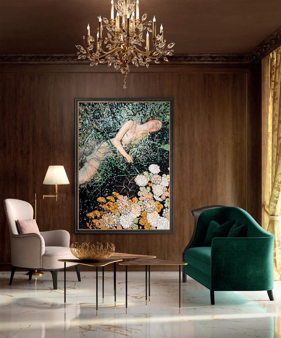
12 Tony Amos, photographer at home in Seaford, melbourne. aged 5. 13 Henry Wilson, deSigner at tudor houSe boarding School, 9 yearS old. 14 Jon Goulder, maSter craftSman at e W goulder & SonS furniture upholSterS and furniture makerS 1986. 15 Ross Gardam, deSigner at home in barham, nSW, 1979 aged 2. 21 Melonie Bayl-Smith, architect at the david maddiSon clinical ScienceS building, univerSity of neWcaStle, September 1997. aged 23. Adam Goodrum, deSigner at home, city beach, perth, 1975. aged 3. 17 Nicole Monks, deSigner in the backyard of the family home at tarbuck bay, nSW. aged 3. 18 Emma Elizabeth , creative director of local deSign SWanSea, WaleS backyard dreSS upS , 1989. 22 Megan Morton, interior StyliSt my grandmotherS houSe, kenSington Sydney, 1980SThe mosaic is an ancient art form with roots going back to third millennium BC Mesopotamia. A unique combination of art, fine craftsmanship and industrial design, mosaics are timeless examples of the beauty that arises from crossing over the worlds of art and design. Artistic mosaics find a place of their own in the Mosaico+ universe, o ering the highest level of personalisation and prestige. Mosaico+ explores all the expressive potential of the mosaic form, with the aid of an all-Italian production system that combines innovative techniques with an traditional culture and craftsmanship.
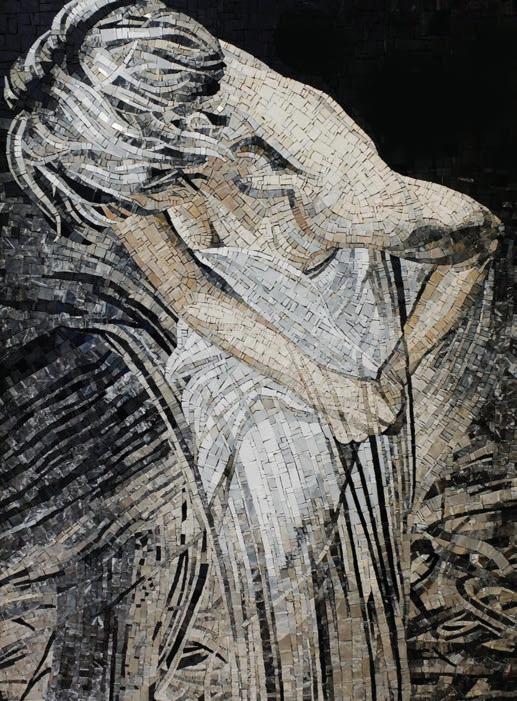
Juxtaposing chips, assembling fragments, selecting materials, expertly adapting shapes to specific spaces: these are the actions that make each Mosaico+ project unique and unrepeatable. An artistic mosaic can only be done by hand, but Mosaico+ has succeeded in integrating traditional craftsmanship with modern technology; adapting IT tools and advanced procedures typically used in industrial design to elaborate or develop requests made by clients during the planning phase.
A recent launch from Mosaico+, the Dialoghi collection, comes from a design search focused on the experience of the material. Experience as a tool for exploring the worlds of design, and material as a means of enhancing the essential elements of the mosaics. The texture layout and original chip designs of the Dialoghi range lets architects and designers create their own mosaics, expressing the legacy of the form while channeling contemporary luxury.
Mosaico+ makes all its design and manufacturing experiences available to customers to best assist them in the development of their projects, with a before and after-sales service comprising design and technical advice for the choice of the most suitable materials and sizes as well as technical assistance and supervision during installation.
Mosaico+ | mosaicopiu.it/enThe worlds of art and design always work alongside one another, but for Mosaico+ there’s no need to separate.
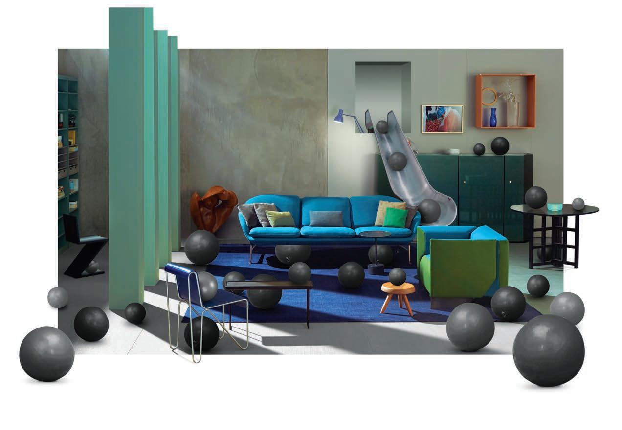
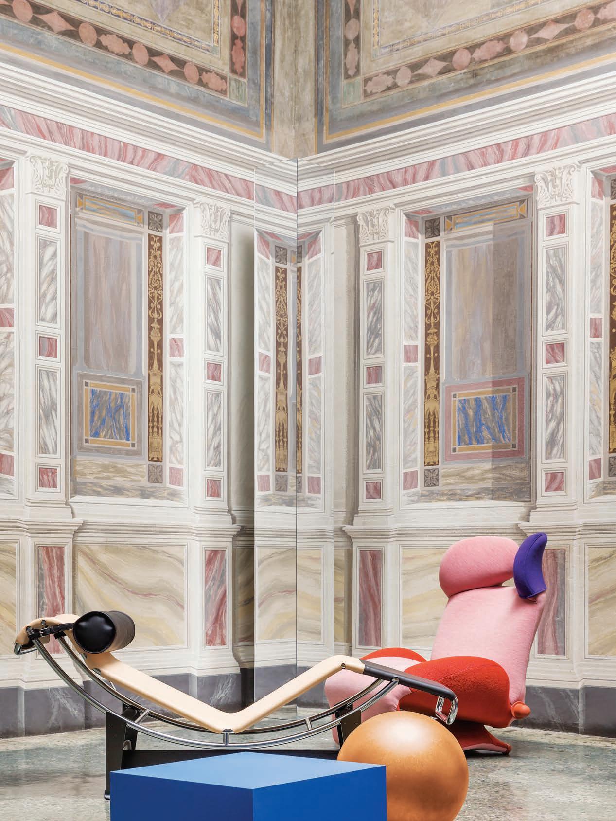
Futurolists are doing a roaring trade these days, so anxious are we to know what tomorrow will bring. Oracular trend predictors habitually ri o our fears of technology, climate change, immigration and economic precarity in order to provide panacæ for an as yet unknown era. F uture perfect, the Milan Furniture Fair is by its very raison d’être a time machine churning out new product at a rapid rate of knots. But one of the most compelling shows at the Salone this year was not a stand delivering glittering consumer durables, it was an exhibition proposing new ways of inhabiting our homes.
This Will Be The Place was the title of the exhibition orchestrated by Patricia Urquiola in her capacity as art director of Cassina, based on a sibling publication edited by Felix Burrichter, editor and creative director of PIN-UP magazine. What was interesting about this double-edged manifesto was that at no point in formulating a future did Urquiola or Burrichter obliterate the past. Their future entails no tabula rasa, more a recalibration.
“The past is not made out of marble, to use an architectural metaphor,” Urquiola tells me. “The past is a mix of possibility and memory. Design should respond to the present, and there can be no future without a knowledge of the past. The intersection between heritage and innovation is very important to me.”
“The past used to be the future,” Felix Burrichter adds, by phone from his o ce in New York. “And most of the things that we think are going to happen to us in the future already in part exist. We already live according to a future vision. For instance, ‘collective living’ might sound more radical than Airbnb but ultimately that’s what it is. It’s a matter of nomenclature.”
In Part I of the publication which serves as a de facto catalogue to Urquiola’s show, Burrichter interviews architectural historian Beatriz Colomina who believes the 21st Century to be that of the bed. Berlin-based architect Arno Brandlhuber predicts the house of the future will
be a fluid structure composed of few divisions. Chinese architect Zhao Yang foresees a return to nature and tradition – perhaps not too surprising given he was born in the most violently industrialized economy of the past 30 years. Konstantin Grcic suggests that to think about the future e ectively, one needs to know the past and be rooted in the present.
“The problem is that when we think of the future,” says the Munich-based industrial designer, “we picture a certain cliché of it and that is often connected to technology, electronics, the digital and so on. In contrast to that, I work in an industry that’s much more analog – namely, furniture. Mine is a slow world, a world in which one scrutinises and revises the things that have existed for hundreds of years.”
Grcic’s a ection for the analog has its roots in his classical training as a cabinetmaker at the John Makepeace School in Dorset, England. Yet, as we witnessed in his Panorama show at the Vitra Museum in 2015, he is not immune to a fascination with the future. In that show he staged a series of dioramas around the ideas of Life Space, Work Space, and Public Space. “It was an opportunity for me to take stock,” admits Grcic. “But also to look ahead.” Domus described Panorama as “a retrospective that looks to the future, but with an individual suggestion that narrates the present.”
In a similar fashion, This Will Be The Place takes stock of Cassina’s past, projecting it towards the future with a solid grounding in the now. “As the art director of Cassina,” says Urquiola, “I wanted to respect the company’s past and strong stylistic background, yet also take into account their willingness to embrace the future of design, and incorporate my aesthetic into this progression. I like to think of the brand’s history as an active, systematic part of my mind when representing the company’s identity in a contemporary way.”
Urquiola points to Mario Bellini’s 932 armchair of 1965 that has been updated with new four-cushion configurations and rechristened the MB1 Quartet “in honour of his
“Mine is aslow world, a world in which one scrutinises and revises the things that have existed for hundreds of years.”
Konstantin Grcic
important collaboration with the company.” She has also revisited Patrick Jouin’s 2003 Lebeau table in wood with a light base made of alternating full and hollow spaces with curved solid wood slats. “This table is the perfect expression of the company’s high level production skills,” she says. Charlotte Perriand’s slinky 520 Accordo table is now proposed in bright lacquers untenable at the time it was designed in 1985.
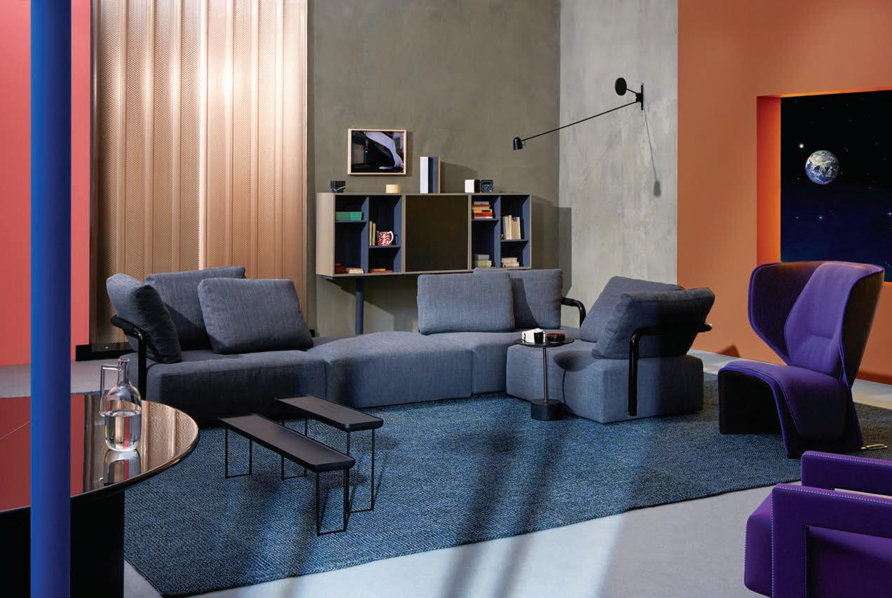
This Will Be The Place ri s o the landmark exhibition
Italy: The New Italian Domestic Landscape at New York’s Museum of Modern Art in 1972. It is also an extension of Burrichter’s 2015 show at the Swiss Institute NYC titled Le Pavillon de l’Esprit Nouveau, itself an echo of Le Corbusier’s radical installation of the same name at the Paris Exposition des Arts Décoratifs of 1925. Looking back in order to look forward.
As Finnish architect and theorist, Martti Kalliala puts it in the collection of potential scenarios in Part II of the book, with titles like When Pinterest Becomes Form, Disruption Begins At Home, and Ageless (But Not Young)... “Time – and with it culture – is a spiral: everything that once was will return, but in di erent form. We will live tomorrow as we lived in the past –only di erently.”
This Will Be The Place, edited by Felix Burrichter is published by Rizzoli. Available from September at better bookshops.
“Time – and with it culture – is a spiral: everything that once was will return, but in different form. We will live tomorrow as we lived in the past – only differently.” Martti Kalliala



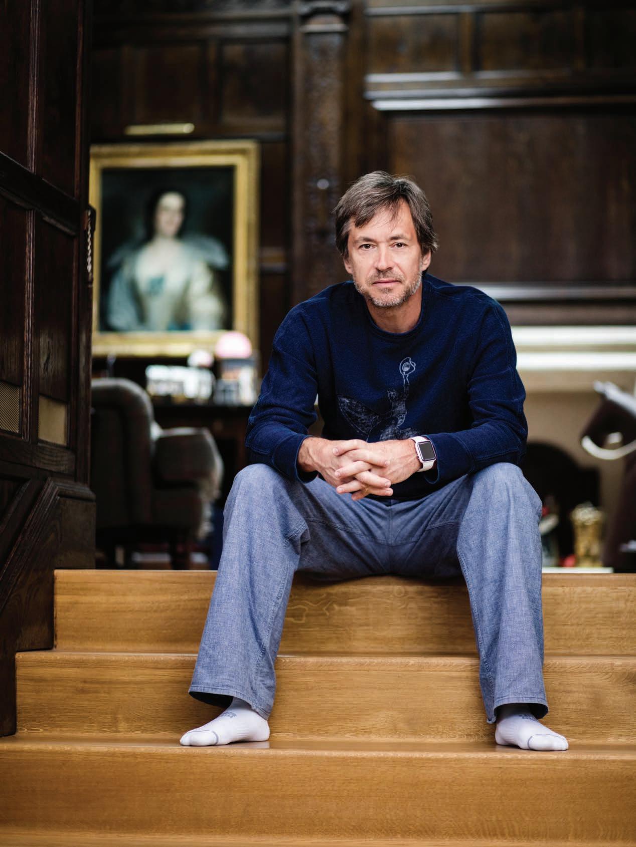
What can I tell you about Marc Newson that you don’t already know? I can tell you he was once expelled from high school for dying his hair blue, red and silver. Maybe twice. I can tell you about that time in the late 80s when he drove me to a nightclub in his clunky Citroën DS 19. Backwards, through the darkened streets of Darlinghurst. I can tell you that when I proposed a Newson profile to my editor at The Australian in the early 1990s, she wanted my assurance that he wasn’t just a flash in the pan, another wide-eyed expat who would eventually fizzle into oblivion. He wasn’t and he didn’t, but you knew that already.
For anybody who’s spent the past three decades in a panic room, a recap. Marc Newson is one of the most prolific designers on the planet. He has devised luggage for Vuitton, cookware for Tefal, an aeroplane for the Cartier Foundation in Paris. He’s delivered a recording studio in Tokyo. A restaurant in London, two in New York, all three now defunct. Dish racks for Magis, ovens (Smeg), eyewear (Lanvin), sneakers (Nike), a shotgun for Beretta. An updated Riva speedboat in very limited edition. His 2007 exhibition at New York’s Gagosian Gallery – which made Marc Newson the only industrial designer to figure in the same stable as Marcel Duchamp, Francis Bacon, Andy Warhol and Je Koons – was described by The New York Times as “a new high” in the already frenzied design-art market. If you’re clever you can still spot a one-
o Newson door handle on what was once a fashion store on Oxford Street, Paddington, Sydney. Don’t say I sent you.
Marc’s latest creation is his third iteration of the cultish Atmos clock for Swiss timekeeper, Jaeger-LeCoultre. The ultimate in geek chic, an Atmos is a torsion pendulum timepiece which derives its energy from changes in temperature and atmospheric pressure and can run for years without human intervention. It was invented in the early 17th century by a Dutchman by the name of Cornelis Drebbel who also, incidentally, built the world’s first navigable submarine – one of the few forms of motor transportation Marc hasn’t tackled. Watches and clocks he has a’plenty.
“Time,” he sighs. “It’s paradoxical really since I’ve designed so many timepieces, but the thing I would simply love to have more of is time. Not more time to do what I really love doing because in fact I’m already doing that. But today I’m having to do ten times more things in ten times less, um, time!”
In the weeks preceding our conversation, the 53-yearold designer Time magazine once listed among its 100 Most Influential People had been around the world – Milan, Tokyo, San Francisco, New York, Paris, Venice, Madrid and Geneva to be precise. When I finally get ahold of him, he’s just stepped back into his London studio which is housed in a red brick Edwardian building, a repurposed mail-sorting o ce ten minutes’ walk from Westminster Abby. “I’m back for a few days, which is about as much as I get to stay anywhere these days. It’s kind of non-stop.”
Marc Newson is Australia’s most well-known designer. Yet his peripatetic nature has led him far from these Fatal Shores.
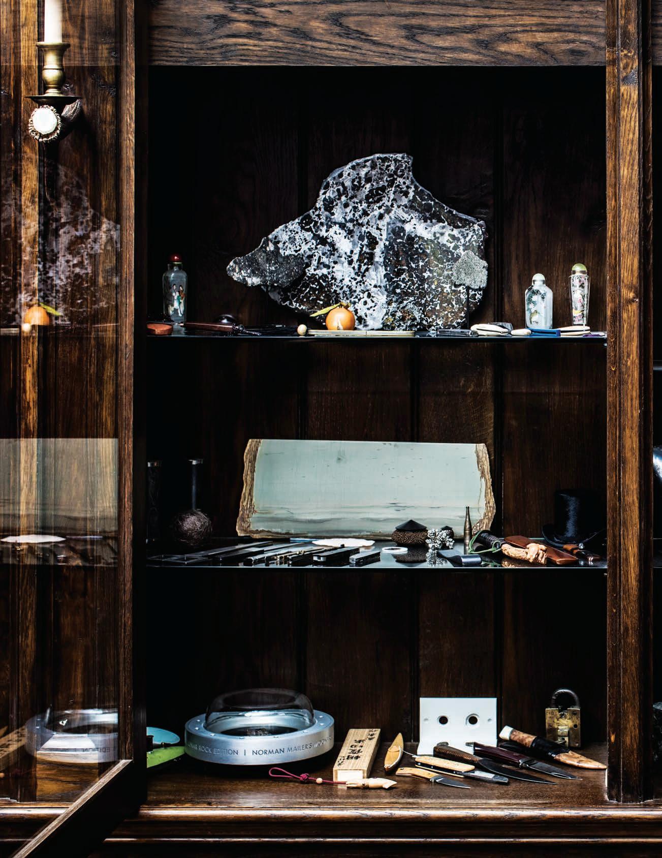
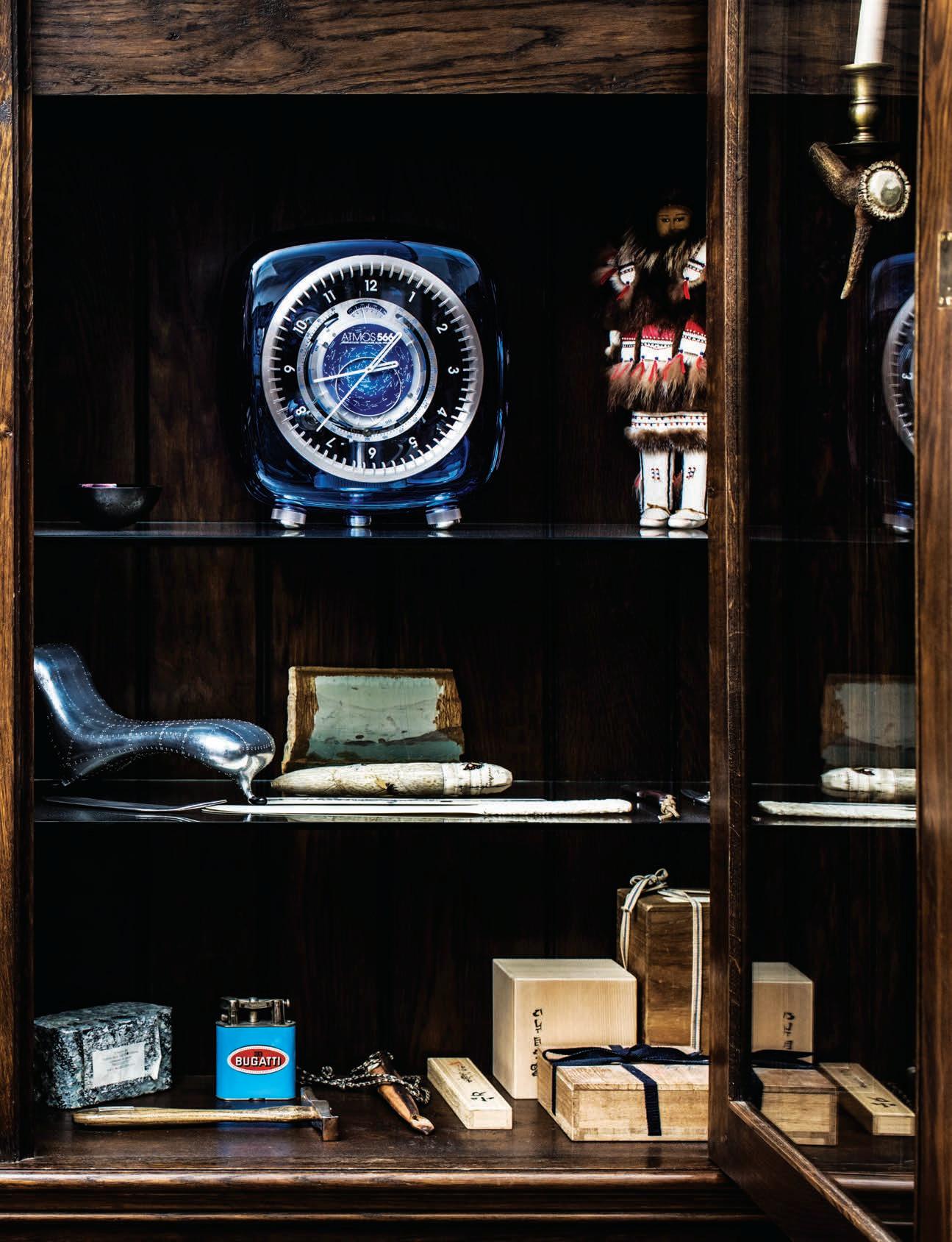

“The design industry is completely and utterly global. There are no boundaries. You don’t see that in the music or film industries, even art is not so geographically non-specific. So you’ve really got to travel.”
Marc Newson
Except, perhaps, when he heads to his home on Ithaca. Home, in the sense that the tiny Ionian Island is where his mother’s family hails from. The cottage in which his grandfather was born is still standing, although said progenitor emigrated to Australia in 1923. His daughter Carol married electrician Paul Newson when she was 19 and pregnant with Marc. Newson père left by the time the infant was two, and Marc’s mother remarried to become Carol Conomos – an old Greek name – when he was twelve.
It was to granddad’s garage in the Sydney suburbs that young Marc Newson would retreat to tinker. By his own admission “a diabolical student”, he was interested in art, “though hardly a virtuoso draftsman”. He was apparently a deft hand with billy carts, anything with wheels. Still is.
His grandfather’s Ithaca cottage is still in the Newson family, though not on Marc’s estate. Not yet anyway. “We’ve had a house on the island since 2010 or so, and I’ve been buying up parcels of land adjacent to my property as they come up. Our house is a little bolt hole really, a teeny thing. We started construction on the big house two years ago.”
Marc’s grandfather, like many of his compatriots, emigrated to Australia after the First World War seeking a new life among folk his fellow Greek émigré, Nino Culotta (aka John O’Grady) would call “A Weird Mob”. Others left for Canada, South Africa or the United States, depleting Ithaca’s population to the point where today it peaks at a little over 3000. “I’ve no family left on the island,” says Marc.
“But I do have a strong connection to the place. In summer it’s overrun with people from all the countries their ancestors emigrated to, heading back to their roots. You hear so many Australian accents you could think yourself in Sydney. In some ways it’s quite nice, in other ways it’s kind of weird.”
There’s something compellingly apropos about Marc’s roots being in Ithaca, legendary home of Homer’s Odysseus, the restless warrior we know as Ulysses. In the design world, Marc’s personal odyssey is the stu of living legend.
Marc Newson was born in Sydney on October 20, 1963. He was raised by his mother, with his maternal grandfather and an uncle, Stephen, as male influences. Partial to working with his hands, in 1981 he enrolled in the jewelry design course at Sydney College of the Arts. Not because he had any intention of forging a career in bijoux but because, as he puts it, “it was the one thing in art school you could do that had a deeply practical nature. Everything else seemed to me so esoteric. If I hadn’t have gone to Sydney College of the Arts I would have been a perfect candidate for an apprenticeship or something.”
Inspired by the work of Ettore Sottsass and the Memphis movement, Marc became intrigued by the expressive essence of furniture. He seduced his tutors into conceding that furniture and jewelry were interchangeable, both existing in relation to the human body. And so his three Graduate Pieces were prototypes for chairs which combined the playful geometries of Memphis with the rugged materiality of High Tech. In doing so, he reconciled the parallel trajectories of, respectively, Post Modernism and Late Modernism. Though I’m not sure that’s what he had in mind.
“It’s important to bear in mind that all my work should not be taken too seriously, but enjoyed (I hope) for its beauty + witt (sic).” This is from a fax hand-written by Newson to Ute Rose, the recently retired general manager of Anibou, dated July 14th, 1989. It concerned his sensuous Wood chair, designed as a commissioned piece for the Crafts Council of New South Wales in 1988.
ST: Do you still think that your work shouldn’t be taken too seriously?
MN: I think so, yes. I think the comment about seriousness still holds for me today. I’ve always felt, philosophically, that one shouldn’t over-intellectualise. At the end of the day what I’m doing is o ering a choice. Not in the case of a big luxury yacht, but certainly in the case of a piece of luggage or an appliance, a watch or you name it. It’s not about o ering a solution, it’s about o ering my opinion, my take on it. That’s one of the things I love about design, you’re not obliged to live with it if you don’t want to.
Marc made his mark as a savvy stylist early on. His graduate pieces were A-framed tubular metal struts supporting rolled aluminum volumes, easy on the eye but hard on the butt. His tripodal Insect chair – the precursor to his iconic Embryo chair – had a tendency to topple. That early Orgone shape, the rounded figure-8, became a de facto trademark, informing the Embryo chair of 1988, the Sine chair (1988), Wicker chair (1990), Felt chair (1993), Gemini pepper grinder (1997), door stopper (2002) as well as a string of things actually called Orgone (Chair, Lounge, Table, Stretch Lounge etc...).
It was also, of course, the foundation of the now infamous Lockheed Lounge of ’88 and the less celebrated Pod of Drawers of the year before. He borrowed the Lockheed shape from the lounge upon which Madame Juliette Récamier reclines in her portrait painted by Jacques-Louis David at the turn of the 19th Century. (So iconic is David’s image that elongated sled seats are today referred to as ‘recamiers’.)
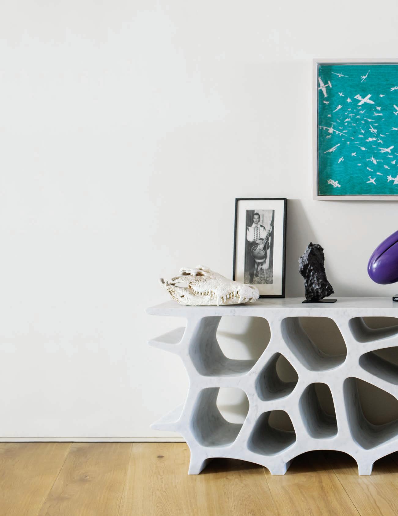
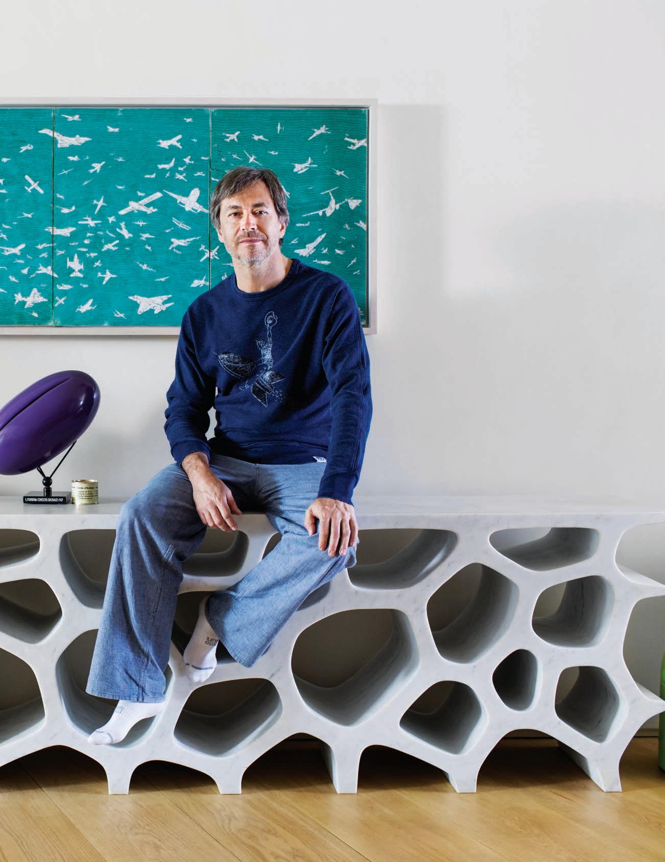
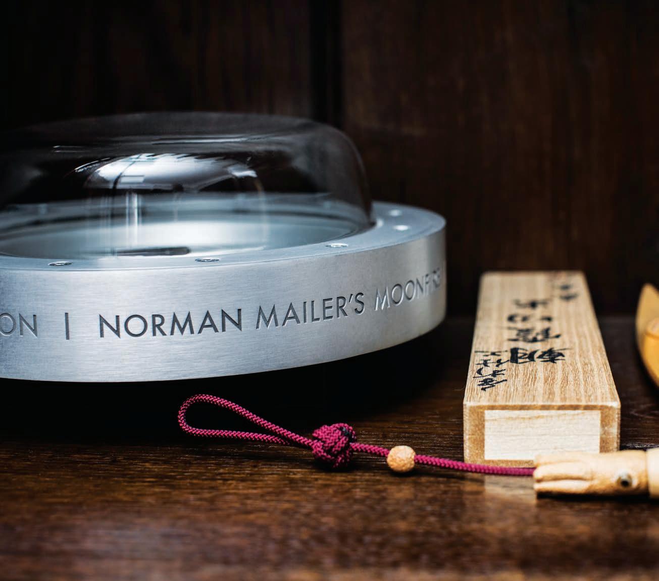
The Pod shape he appropriated from André Groult’s Chi onier Anthropomorphique (anthropomorphic cupboard) of 1925. It’s interesting to think that a designer most often dubbed a retro-futurist for the Atomic era, sci-fi feel of his work actually drew inspiration from the history of French decorative arts. (Both the David and Groult works are on permanent display at the Louvre, Paris.)
“There was a time Marc was trying to shoehorn that Orgone shape into every single project,” says one design commentator, who wishes to remain nameless. True, it did become a bit predictable for a while there. Marc parries: “That Orgone shape was like a tool that I used at a certain moment in time. A lot of the time it was unconscious, it would just kind of materialise in a design without me really thinking about it. I’ve never characterised my work as ‘organic’, it’s too general a term. But if it ever was, it’s not as organic now as it used to be. These days I’ve moved on to a more rational design.”
ST: Is that a result of the clients and projects you’re working on now, or is it coming from an interior drive?
MN: I think it’s both really. It’s coming from me, and it’s also a response to having to solve problems in a more rational way. In a more pragmatic way. It would be like the tail wagging the dog, to let a single motif like the Orgone shape drive the whole shebang.
Marc’s private clients these days tend to be the stealth wealthy, the nameless oligarchs and other captains of industries unknowable, people who sail and fly and otherwise rotate o the radar of we mere mortals.
ST: So, the yacht your working on for a private client, are they Greek?
MN: Yes. No. They’re Eastern European. No, that’s not correct. What can I say? I’m sworn to secrecy. It’s for a very wealthy private client, that’s about all I can say.
Newson most recently completed a BBJ (as in Boeing Business Jet, which seats between 25 and 50 passengers in a luxury configuration), and is currently working on 14 passenger and six passenger private crafts.
“What a lot of people don’t get about Marc is that he’s actually very hands on,” says Newson’s friend and colleague, Richard Allan. “He’s very much into the way things are made, as much as the way they look. He’s really curious about materials and how they can be used in new ways. He’s probably the most driven person I’ve met in my life, never sits still (except after a number of drinks).” (laughs)
Like Marc, Richard studied jewellery design though ended up becoming one of his generation’s most notable graphic designers. He collaborated on iconoclastic t-shirt label, Mambo, before joining forces with pro skaters Peter and Steven Hill in the formation of streetwear brand, Mooks. Marc became a de facto Mooks brand ambassador, sporting their signature overalls around the world, to even the most swanky events. Nowadays, Marc designs a line for Dutch denim brand, G-Star, with significant input from Richard.
“Philippe Starck made an interesting comment in the early 1990s,” recalls Richard. “He was a big fan of Marc, put the Lockheed lounge in one of his New York hotels, and he said something like ‘Marc is the first one to explore the interior of an object.’ And if you look at the Orgone, the Embryo, the Event Horizon and so forth, that’s true.”
ST: I was always a bit worried that the hollow legs of the Black Hole table would end up full of crumbs.
RA: I’ve got one of the Black Hole tables actually.
ST: Have you ever tried vacuuming the legs out?
RA: Well, in the original version the legs are totally hollow but in the later versions they’re more shallow.
ST: Problem solved then.
Marc Newson left Sydney for Tokyo in 1987 before moving to Paris in 1991. I would occasionally run into him in the street around République, unmissable in a bright orange leather biker jacket by Yohji Yamamoto. (A gift from the designer in return for Marc modeling in one of his Tokyo shows.) Lank ponytail hanging down to his waist, a seemingly eternal tan, he was like a samurai surfer boy let loose in the City of Light.
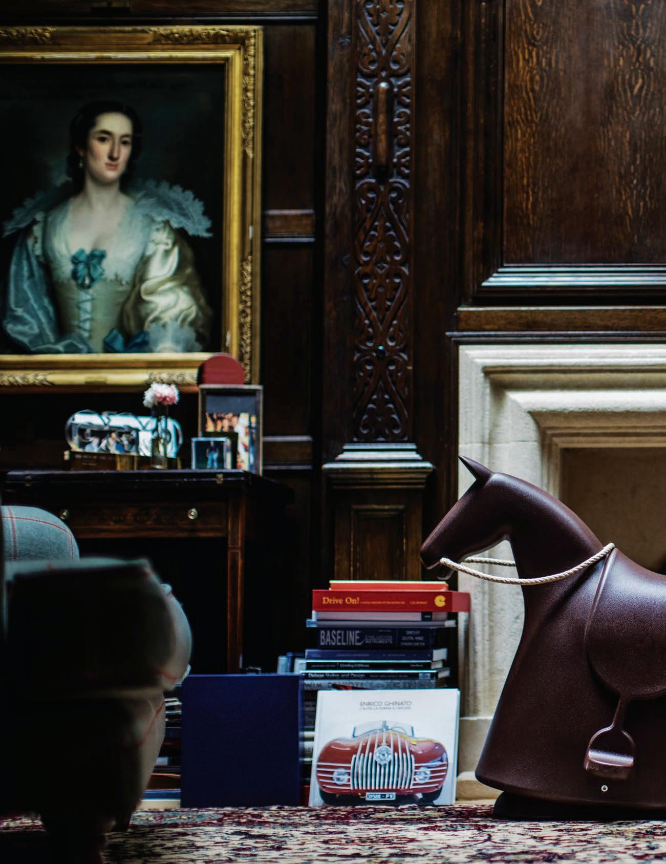
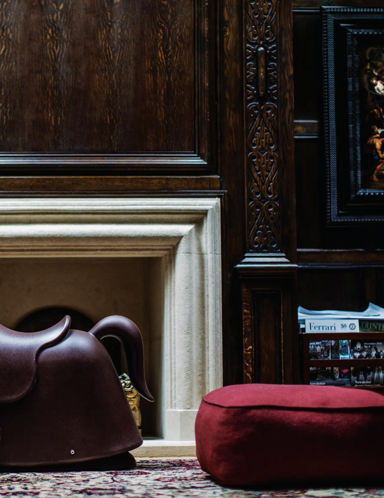
For the past two decades, he’s been based in London, where he lives with his fashion stylist wife, Charlotte Stockdale and their two daughters. Marc designed the interior of their 1340 square-metre apartment which sits in the same building as his 15-person-strong studio. It’s a cross between a streamlined Swiss chalet and a baronial hunting lodge, part Marc’s aesthetic, part Charlotte’s. (Her father is Sir Thomas Stockdale, 2nd Baronet of Hoddington, and her Colefax & Fowler covered sofas and zebra-print rugs, she’s referred to as “a little bit of Hoddington in London.”)
Marc Newson has spent 30 of his 53 years living beyond Australia’s fatal shores. He has a family in London, an estate on a Greek island, and is a Commander of the Most Excellent Order of the British Empire (CBE). He retains his Australian accent, but has a penchant for the third-person singular pronoun. All those long weekends at Hoddington, one assumes. How apt is the moniker, ‘Australian designer’?
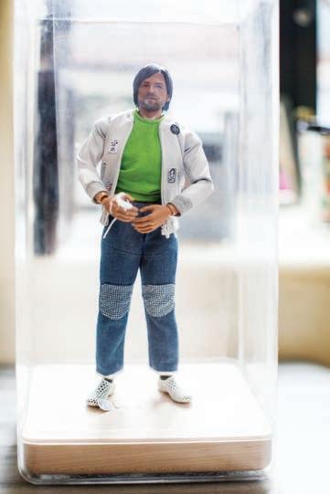
Even when I first interviewed Marc in Paris all those years ago, he was adamant that he was a designer who just happened to come from Australia, not the designated ‘Australian designer’. He retains that stance today.
“The design industry is completely and utterly global. There are no boundaries. You don’t see that in the music or film industries, even art is not so geographically non-specific. So you’ve really got to travel. That said, I think Australia was a very di erent place in the late 1980s early 90s than it is today. If I was doing the same thing there now I’m not sure I would have left, to be honest. Maybe there would have been enough stu to sustain me. My desire to leave was not so much just to leave it was about exploring di erent ways of doing things.”
“I think Australia was a very different place in the late 1980s early 90s than it is today. If I was doing the same thing there now I’m not sure I would have left, to be honest.” Marc Newson
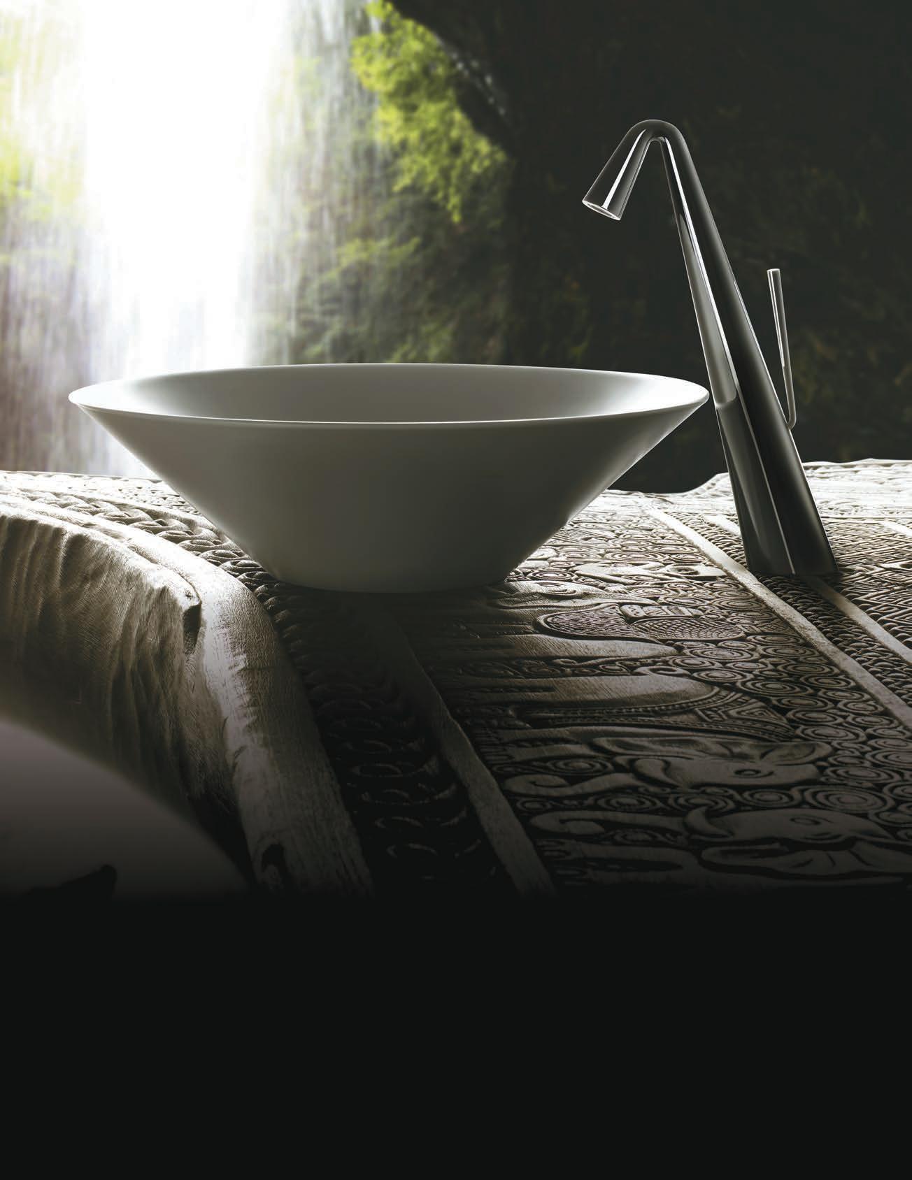

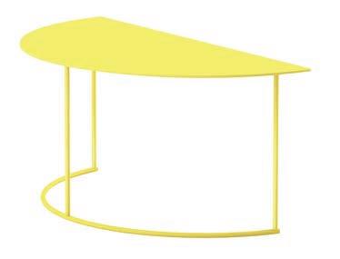
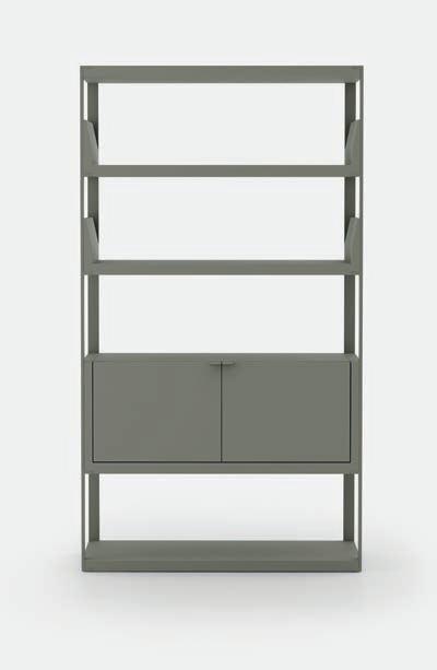
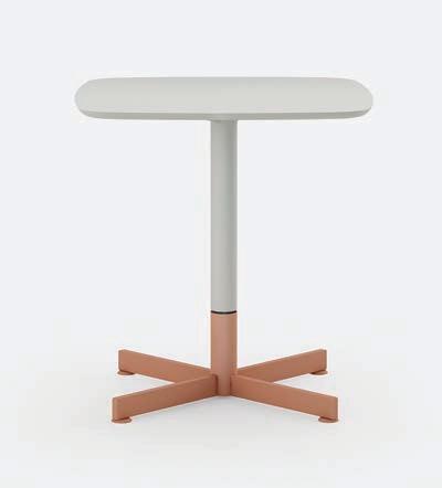
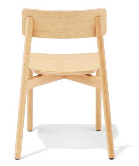
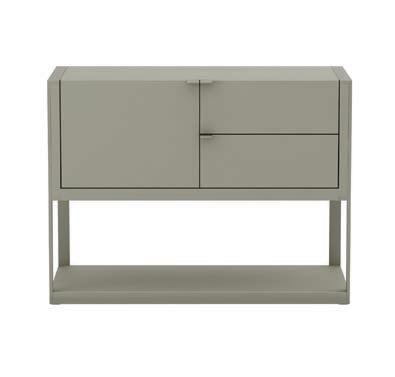
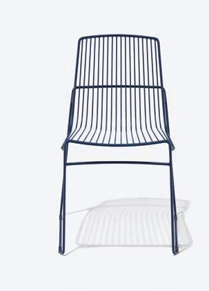
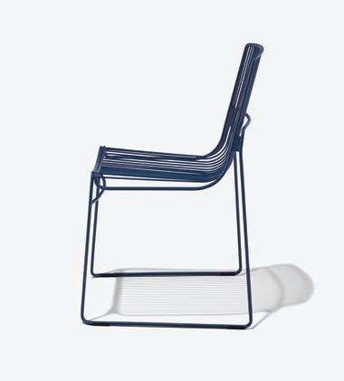
Scandinavian design is a term that has grown to supersede its northern geography, now shared around the global creative dining table – we’ve had a taste and you bet we’re stealing the recipe. Scandinavian design is undoubtedly the most gorgeous antidote to the ruckus of our modern lives, disguising our clutter in the poetic interplay of simple lines and honest materials.
Although Australia is at the farthest end of the map from the progenitive Nordic nations, the desire –need even – for soothing design is equally true. Local retailer FLOC is responding with a healthy prescription of Scandinavian-inspired pieces from Danish brand WOUD. The timber-focused collection visually articulates our longing for space and order, responding to the fundamental principals of Scandinavian design from an international pool of designers.
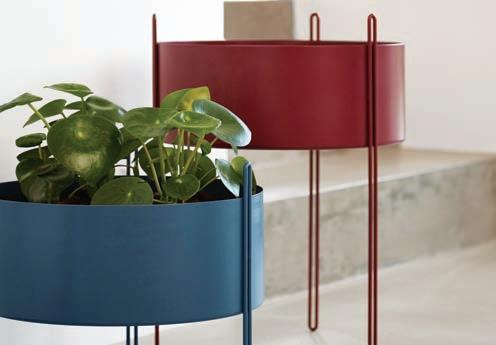
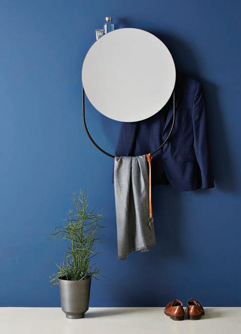
WOUD’s adherence to a raw aesthetic aligns wholly to FLOC, a coastal-infused concept store o ering furniture that draws on the inherent brilliance of natural materials. Nestling in with FLOC’s existing range, each piece honours its construction through clean designs that aim to ease rather than engulf our everyday activities.
Extending through lounges and chairs, wardrobes, mirrored shelving and lighting, the WOUD Universe – as it is perfectly described – unveils a holistic range to relieve any and all interior spaces. The collection balances visually light and elegant designs with comfort. The Nakki series from Finnish designer Mika Tolvanen, for instance, fuses a discreet, angular metal base with curvaceous and embracing cushioning. This piece plays o of its disparate forms to o er reductive design without shaving o an iota of character.
It is this careful tiptoeing between the stripped back and the amiable that carries the collection, allowing for the personality of each piece to adapt and meld into its desired context. And it is no wonder that Scandinavian design has peppered the global market, its slim silhouette casting it as the ideal solution to our nomadic lifestyles. Following an ethos of lightweight assembly and manoeuvring, each piece is as relevant to a roaming 18 year-old as it is to a settled family.
Nordic design has swept over the globe, o ering a solution to the modern nomadic lifestyle.


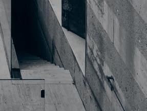
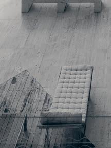
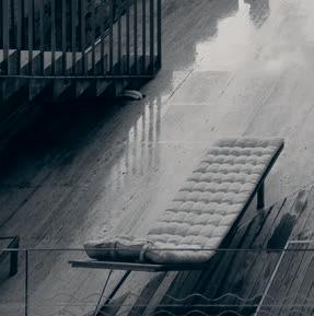

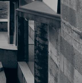

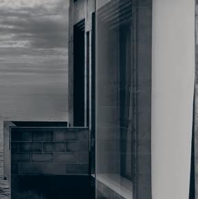
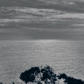
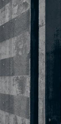
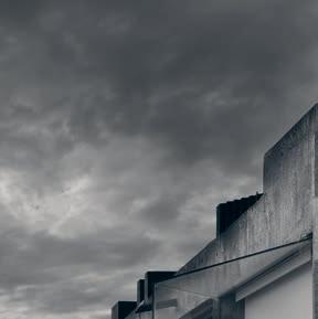


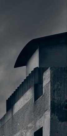


Parts of this fortress perched atop Sydney’s Coogee cli s would be thousands of years old, other parts simply look it, as Holly Cunneen finds.
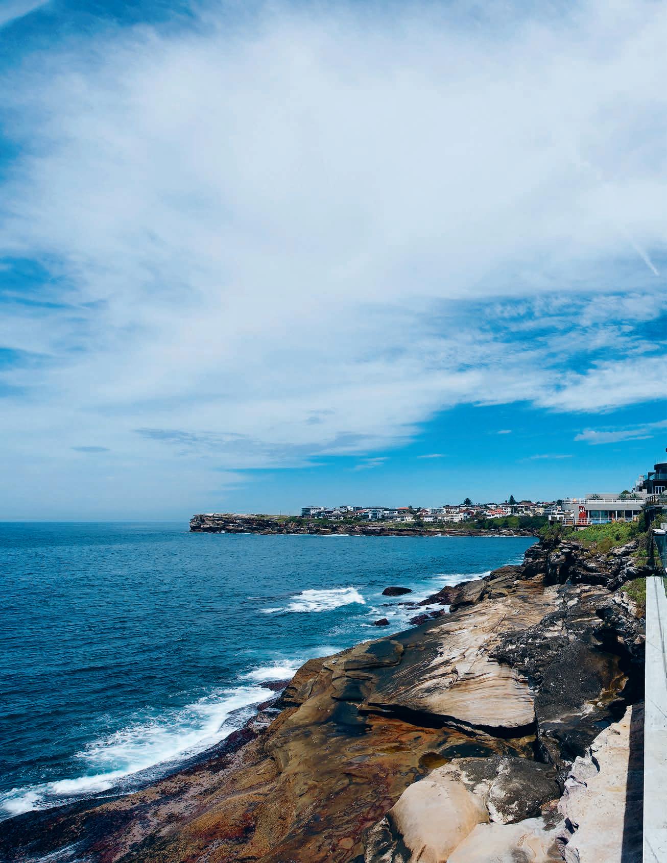
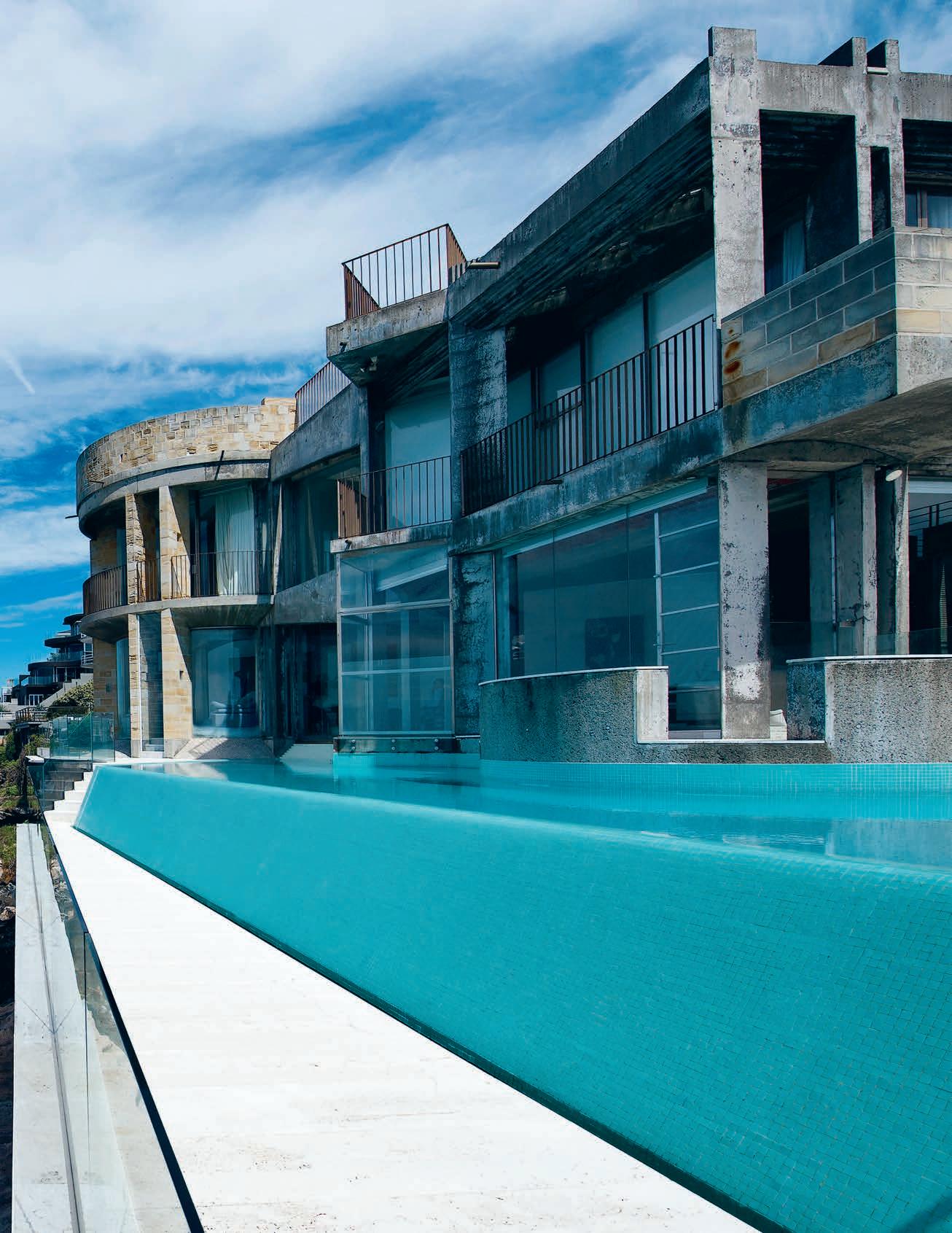
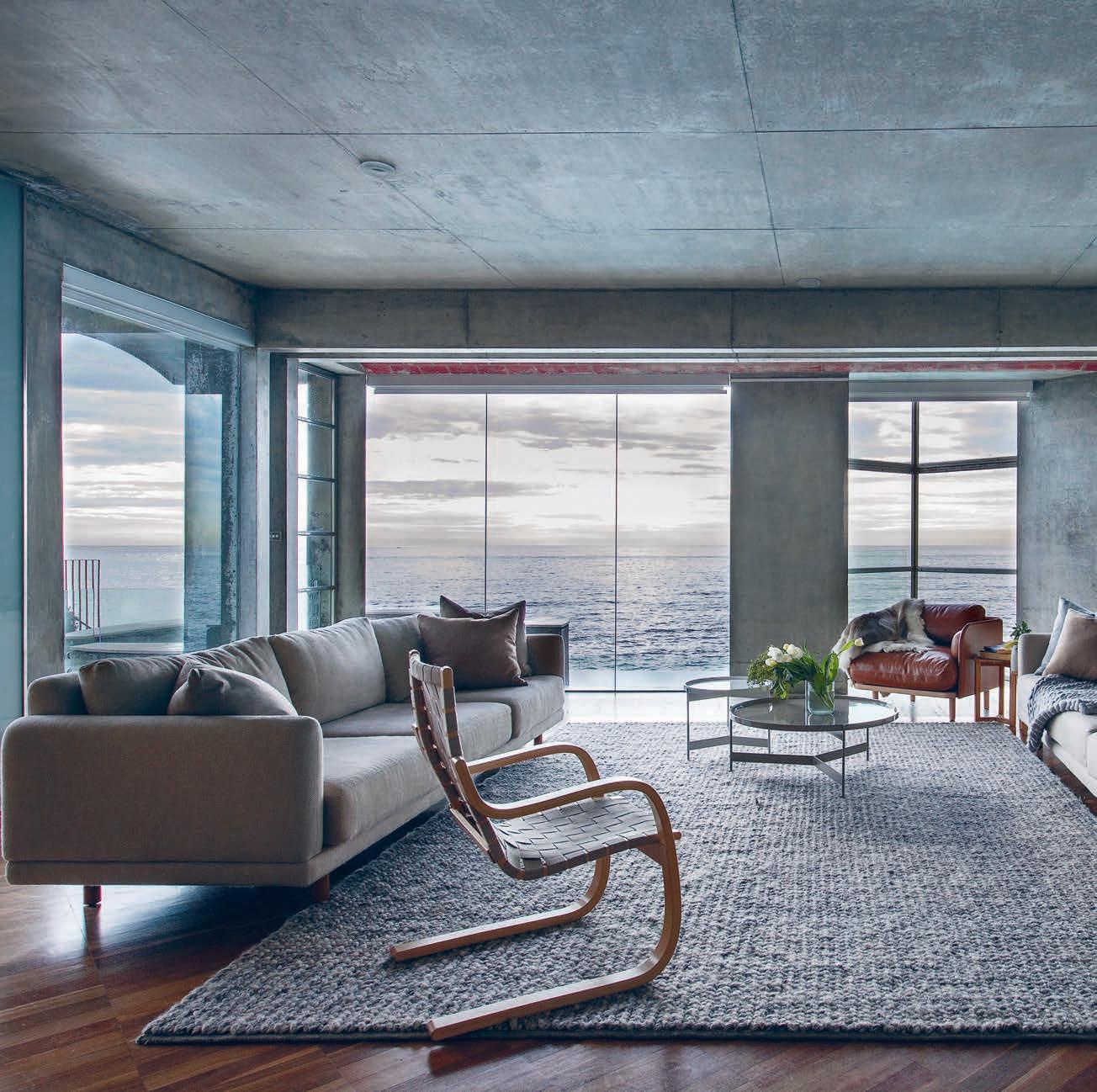
Where were you living ten years ago? Was it the same place in which you live now? Chances are it wasn’t. As a whole, the western world seems to be cementing ties to this concept of permanent impermanence, which can a beautiful notion. Life is in a constant state of flux; we could relocate anywhere at any moment and that’s an exciting and privileged thought. But take it a step further and because nothing lasts forever, we don’t plan for forever. We’re weary of commitment, not in love but in life.
Maybe we should take a leaf out The Romantics’ book. What happens when you commit to committing? Plan for the future and roll with the punches – sometimes they come, sometimes you get lucky.
Christine and Laurie moved into this fortress-like abode in South Coogee, Sydney, just over ten years ago. With a six-month-old boy in tow the recent parents were working closely with Italian-born, Sydney-trained architect Renato D’Ettorre to create the ideal home on a separate site for their new family. However things took an unexpected turn – as they’re often wont to do – and suddenly this house, which felt immediately like a perfect fit, became their home.
A decade on and two children richer (a boy and a girl) the time came to refresh the interiors. The goal wasn’t to start anew it was to prepare Christine, Laurie and their kids
(seven, nine and 11) for the next ten years. “We’ve brought up our kids from babies to now and we’re entering the second phase of how we use the house,” says Christine. There are no rooms in which the kids and their friends aren’t allowed to play, there never have been.
“It has never been precious or showcased it’s always been extremely lived in.” From day one it’s been a home in which all inhabitants feel at ease. Memories stand and have been created, just as there are many more to come.
Durability, practicality and longevity were high on the agenda in the brief that Christine and Laurie didn’t technically give to Perthbased interior stylist and close family friend Malvina Stone. “She’s the sort of stylist that knows us so well that [the brief] wouldn’t have been more complicated than durable, strong, comfortable, suitable for a growing family and not precious,” remembers Christine. “Everything needed to be fairly resilient, robust and fun for the children to be in. It just needed to be a family home,” adds Malvina.
The concrete, fort-like façade of the Coogee Castle is architecturally in harmony with the dramatic cli s and coastline native to the eastern seaboard, yet hints at Renato’s heritage: “You can see the influence of Italian architecture and materials,” says Christine. Teamed with interiors boasting marble, travertine and wooden parquetry, and Malvina could have ended up producing a cold and distant interior.
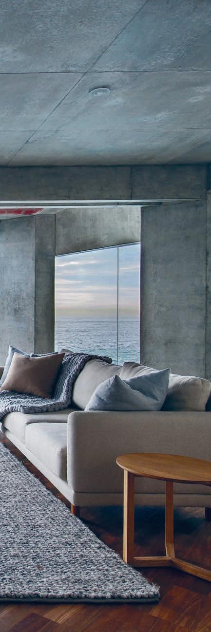
An exercise in restraint, Malvina’s styling compliments the architecture and view.
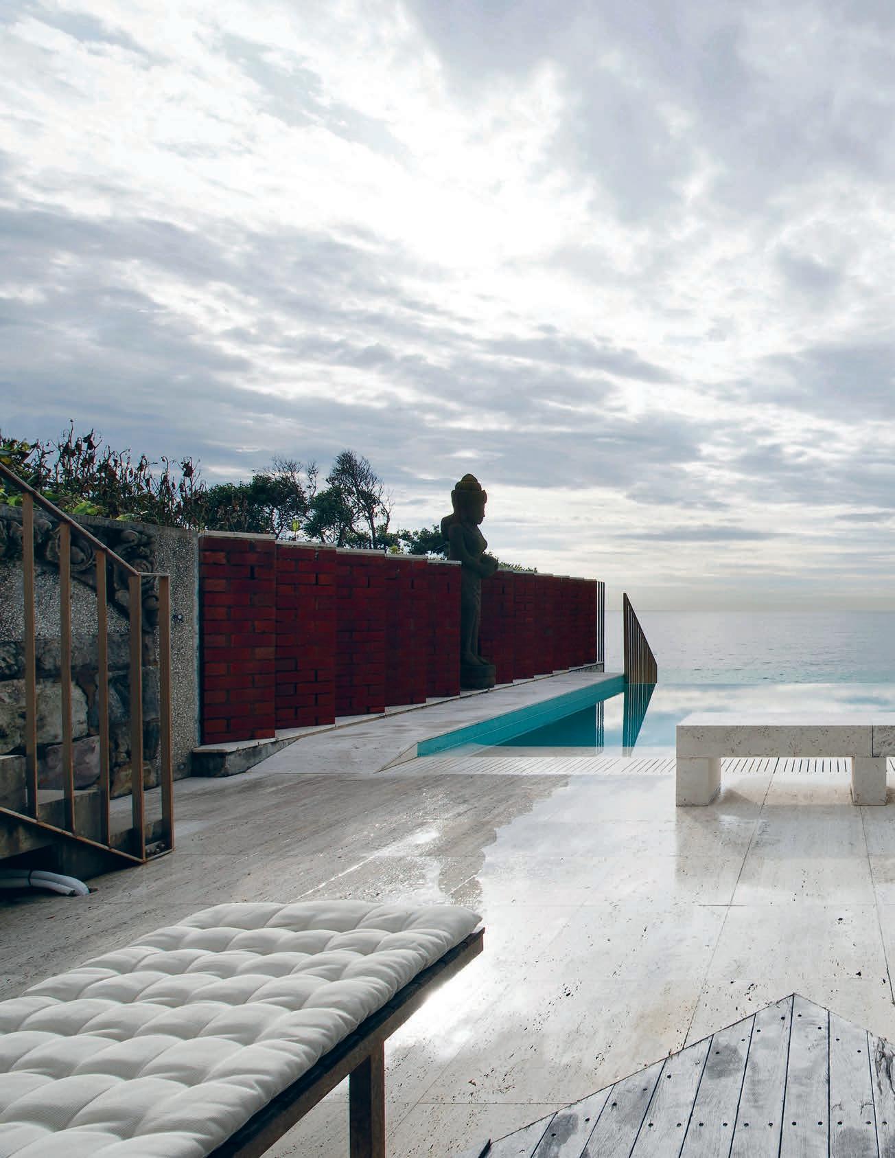
The concrete, fortress-like façade of the Coogee Castle is architecturally in harmony with the dramatic cli s and coastline native to the eastern seaboard.
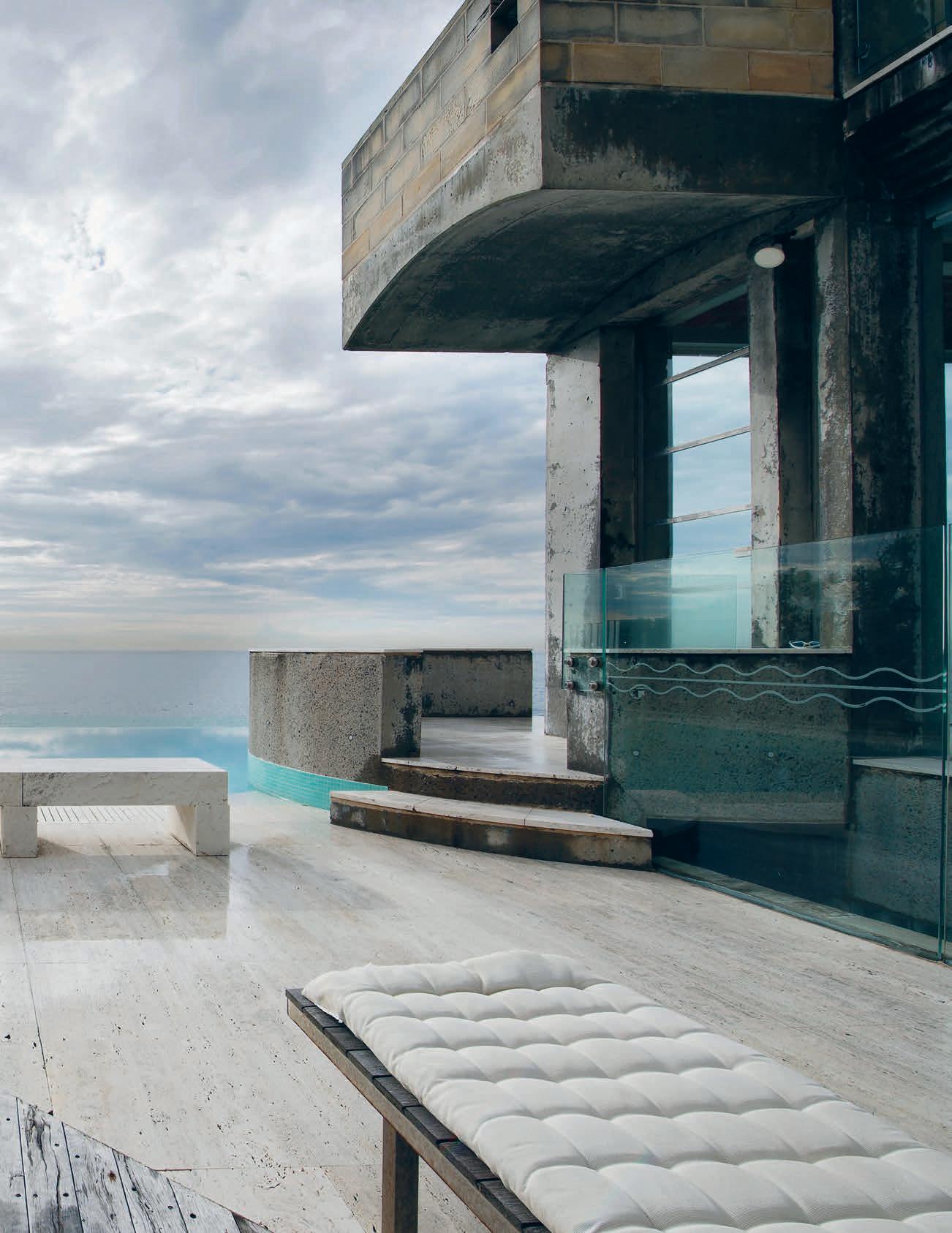
Instead, she’s used a Nordic colour palette of cool greys, navy blues, light woods (bar a few exceptions recycled from the previous interior scheme), buttery soft leathers and tangible textiles. “The textures have really softened it,” says Christine. The same rugs were used throughout the home to add warmth as well as ensure consistency.
The furniture is a combination of bespoke timber pieces commissioned by Malvina from Perth-based manufacturers – “to me, that can be easier than sourcing ready-made furniture” – and locally found from places like Cult, Space and Anibou. Once of Malvina’s favourite pieces is the Aran armchair designed by Adam Goodrum for Cult, made from reindeer leather in a light tan. Christine, on the other hand, has a fondness for the Living Tower, originally designed by Verner Panton in 1969, a piece she spotted and sourced herself with a nod of approval from Malvina. For Christine, its appeal lies in the fact that something designed so long ago has remained so relevant. Not to mention the endless hours of fun her kids and their friends get from scaling and lounging in it.
An exercise in restraint, Malvina’s interiors compliment the site, rather than compete with it. “I tried to make it more about the architecture and view and less about the furniture,” she says. “I don’t need to do that because the house speaks for itself. The view speaks for itself.”
This large and lengthy block somehow feels small and intimate. Instead of dividing the space up into Tetris-like rooms, the walls are positioned on angles. These angles create interest as well as closeness and connection. A site that would have the potential to feel overly expansive, empty and disconnected is exactly the opposite.
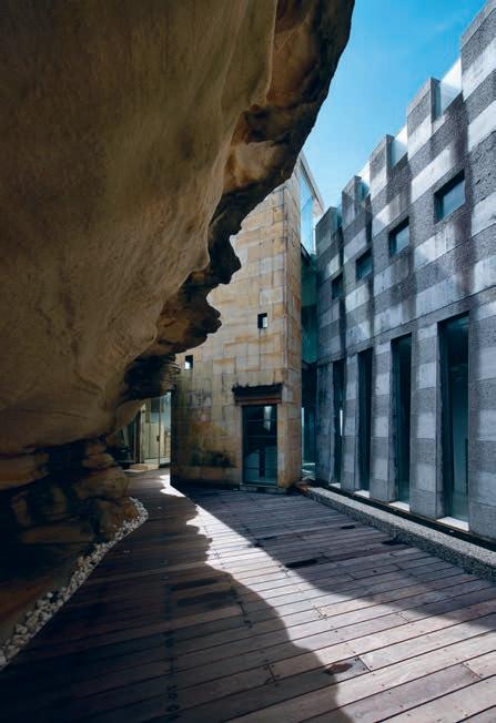
This isn’t one of those homes that looks beautiful but functions poorly, the interior design speaks specifically to their lifestyle. As such the family are able to capitalise on every inch of the space they’re lucky enough to have.
The public and private living spaces are segregated by storeys. Downstairs you can find multiple living spaces, the kids’ play area, the kitchen and dining rooms. Whereas upstairs is dedicated to the bedrooms, each of which has an enviable view. “With the parallel block we’re able to have five bedrooms along the top. Everyone has a view, it was impossible to really find that anywhere else – it’s fairly unique,” says Christine.
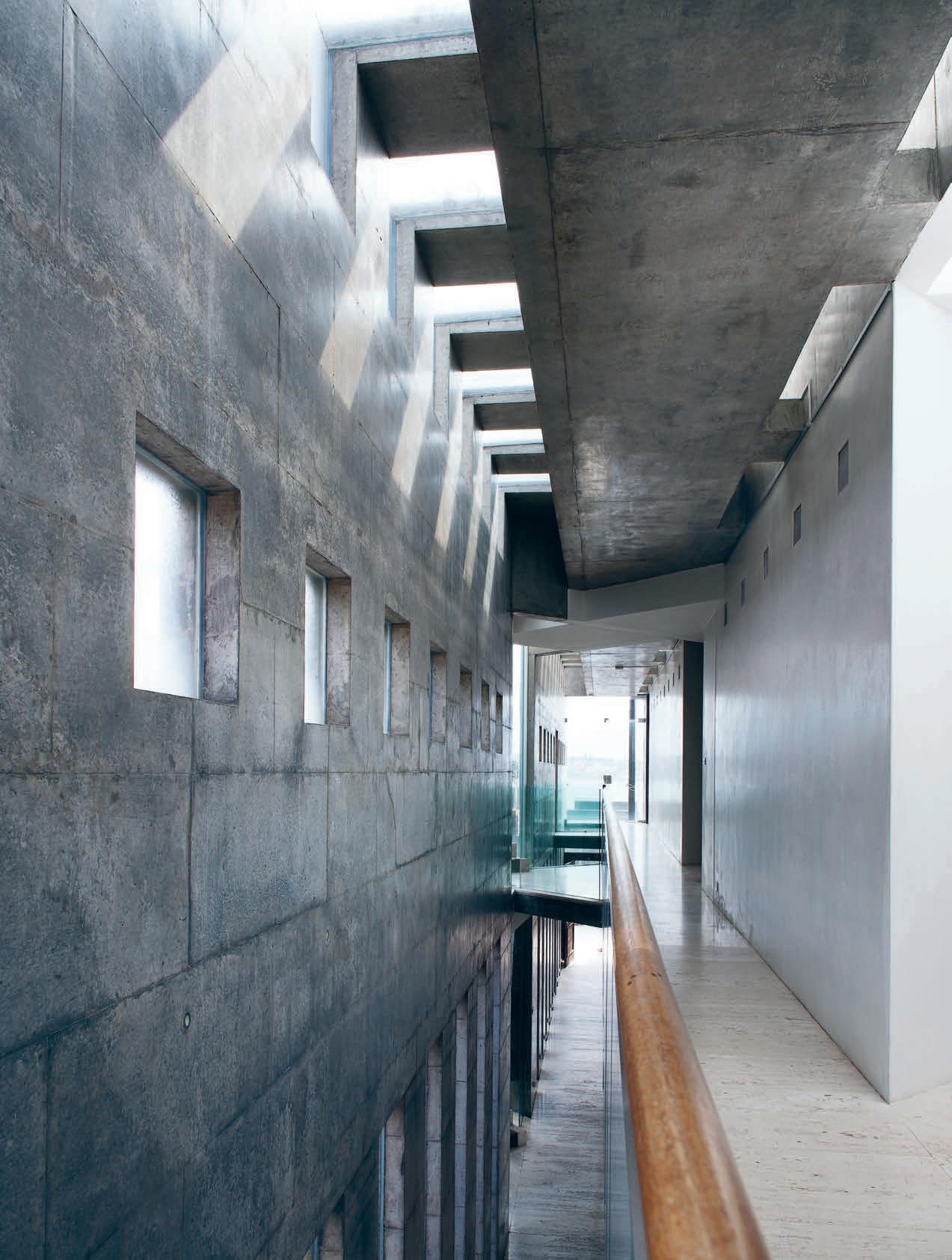
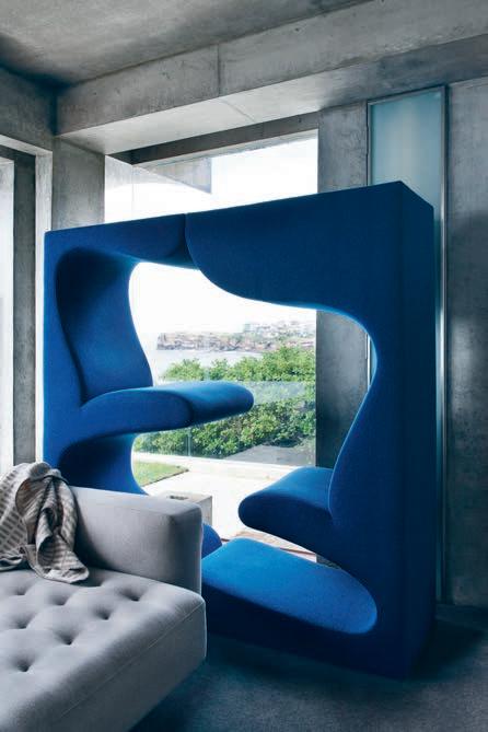
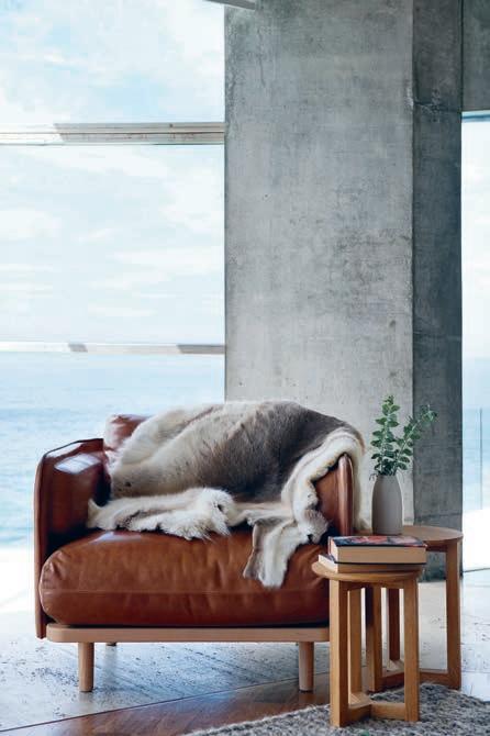
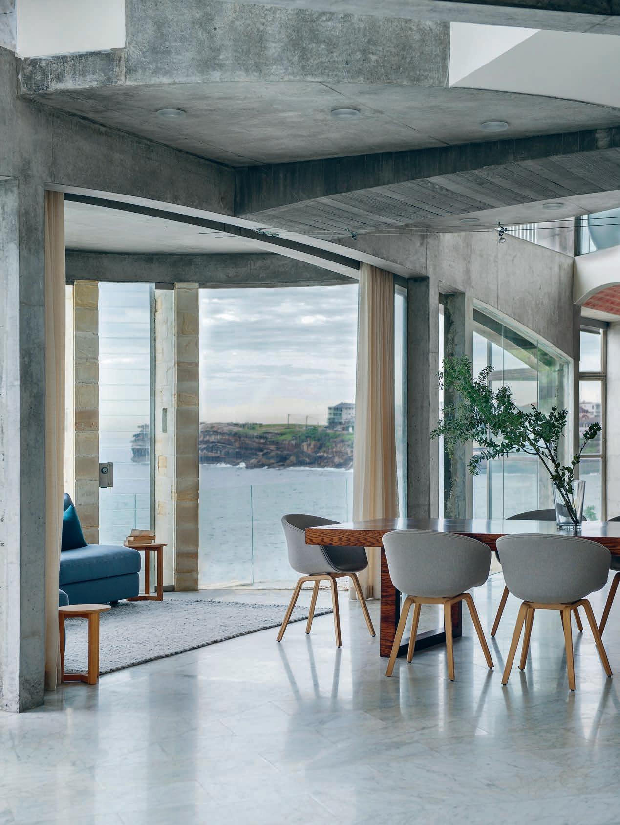
Pool parties are wildly popular with the kids and their friends. Likewise with Christine and Laurie who, behind a glass wall, can keep a supervisory eye on proceedings allthewhile leaving the kids to enjoy a sense of independence.

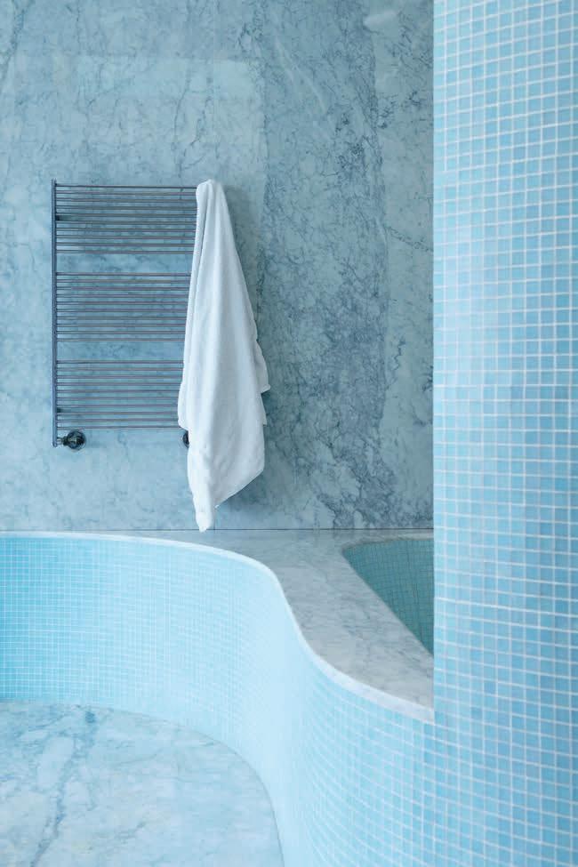
On the other side of the house, beneath a pre-existing, cave-like sandstone wall and floor – “thousands of years old I imagine” –the ground has now been overlaid with timber decking so that the kids can play basketball, kick a soccer ball or scoot around amongst each other. “You could come out before but it was uneven,” says Christine. “As the kids have grown up [they have] craved somewhere they can bounce a ball and have a flat surface.”
Near enough to everything yet far enough away, with it’s dramatic views, rugged exterior and contrastingly warm, welcoming interior, this family really have found their happily ever after home.
When we look back at design icons from the past, more oft than not we are admiring a product that demonstrates exceptional craftsmanship - the work of a genuine artisan. Today though, in the era of mass production, this is considerably harder to come by, which is why BassamFellows’ nostalgic designs are such a welcome presence in our industry.
Established in 2003 by Australian-born architect Craig Bassam and creative director Scott Fellows, their work is grounded in the principles of impeccable craftsmanship, architectural rigor and sensual minimalism. They define their aesthetic as Craftsman Modern and it’s a fitting description for their work, which encompasses everything from architectural projects and interiors to furniture, lifestyle objects and personal accessories.
Over the years, the brand has forged strong partnerships with some of the world’s leading craftspeople and its latest collaborations were once again on show at Salone del Mobile, in their showroom and lifestyle gallery in Milan’s Brera
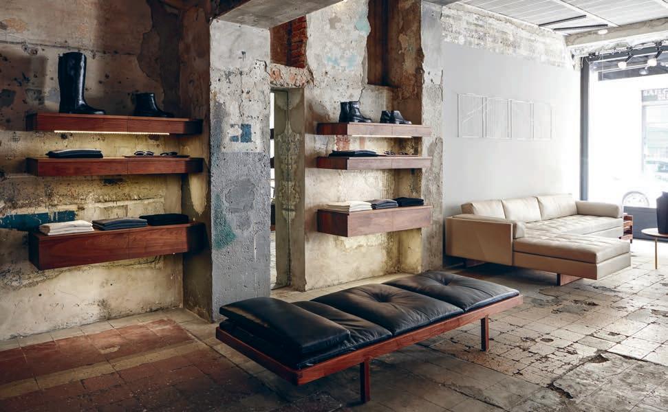
district. Amongst them were the CB-450 Geometric Side Chair, which seamlessly fuses a mix of materials into one elegant design. Its ergonomically shaped seat is carved from solid walnut and a lightweight layer of Vienna caning, whilst the nickel or bronze plated tubular steel is wrapped with fine-grain leather to conceal any joinery or seams. To create this chair, Bassam Fellows collaborated with a small Veronabased workshop specialising in the restoration of antique collectible cane furniture. And of course, they also had a few of their signature Tractor Stools on display – their first-ever product, which they debuted at Milan 14 years ago. Just like the rest of their designs, this stool artfully marries two disparate aesthetics – the rigorous authority of architecture and the honest humanistic character of the handmade.
To this day, these beautiful stools are still as relevant and popular as ever, and beautifully encapsulate the main design philosophies of the brand. All the markings of a future icon perhaps?
Architect Pat De Pont has designed a home for his brother and sister-in-law on family land full of memories.
Andrea Stevens discovers a house that embodies a 60-year site history and goes beyond the normal requirements of a three-bedroom home.
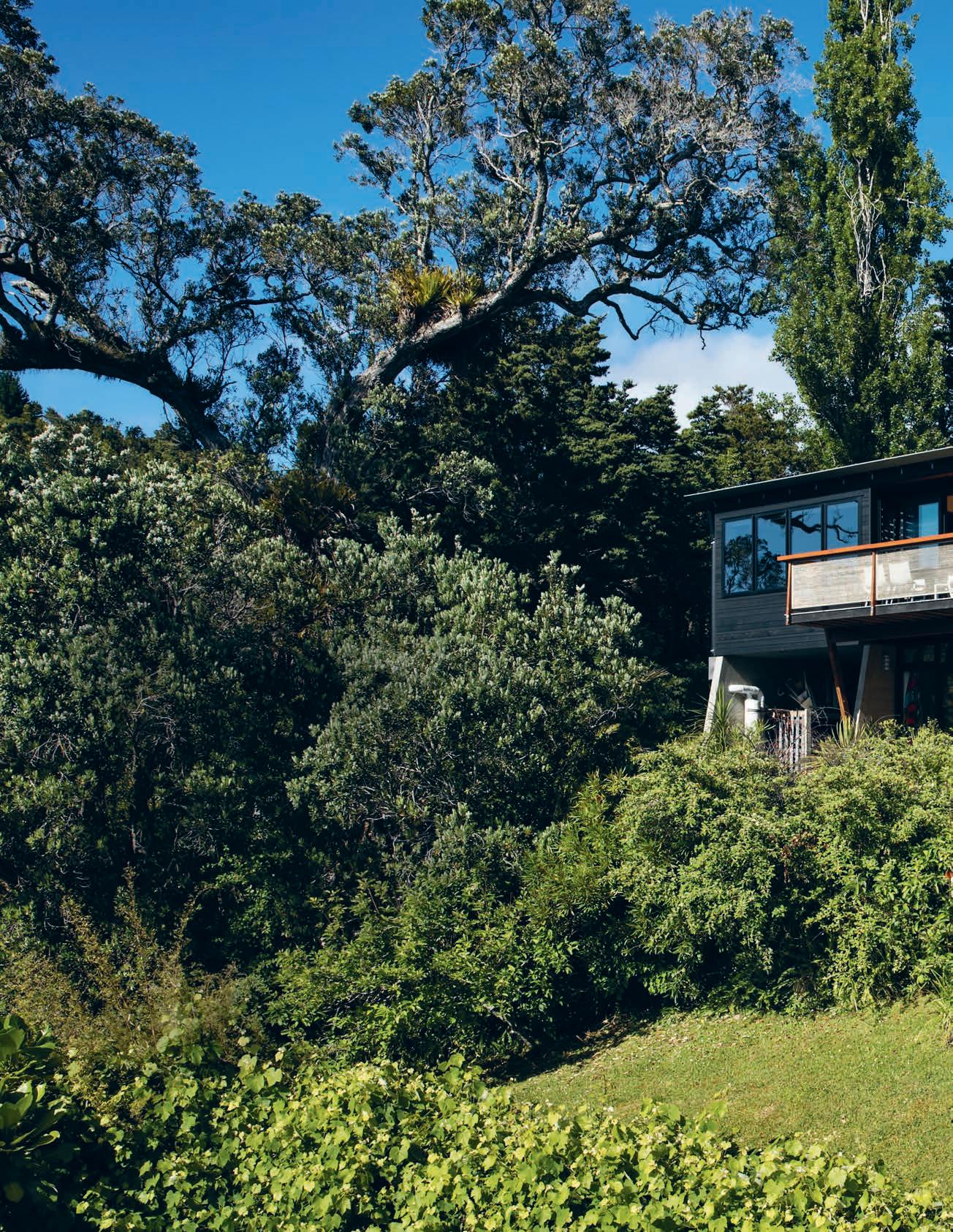

Ray McGreal was a resourceful, do it yourself type. In 1953, the panel beater hauled building materials down the dirt road at Opahi Bay, New Zealand, to build his family a fibrolite holiday cabin. The bay only had a handful of intrepid families at that time and the McGreal family started going there every year for their summer holidays. Ray and his wife Winifred had six children and numbers could swell to 30 when friends and extended family stayed for New Years. Theirs was the mythologised Kiwi summer holiday before sealed roads and cell phones made places like Opahi Bay feel a whole lot more accessible.
Family ties with the area have grown since the 1950s and 1960s, with three of Ray’s daughters now permanent residents. The youngest, Karena, has built her retirement home with husband Mike de Pont. They’re still a bit young to retire, but have engineered to live the dream early by selling their city home and moving to the bay.
A land subdivision provided three of the daughters with a parcel each, and a share of the family tennis court through an easement.
Karena and Mike own the site of the original holiday bach, which is connected to the tennis court and the sisters’ houses via pathways and bush tracks. The tennis court has always been a social centre for the family. Today, four generations continue to play tennis, cricket and basketball on the court. Toddlers ride around on scooters and the dogs run freely up and down.
“It’s like a big play pen!” says Karena.
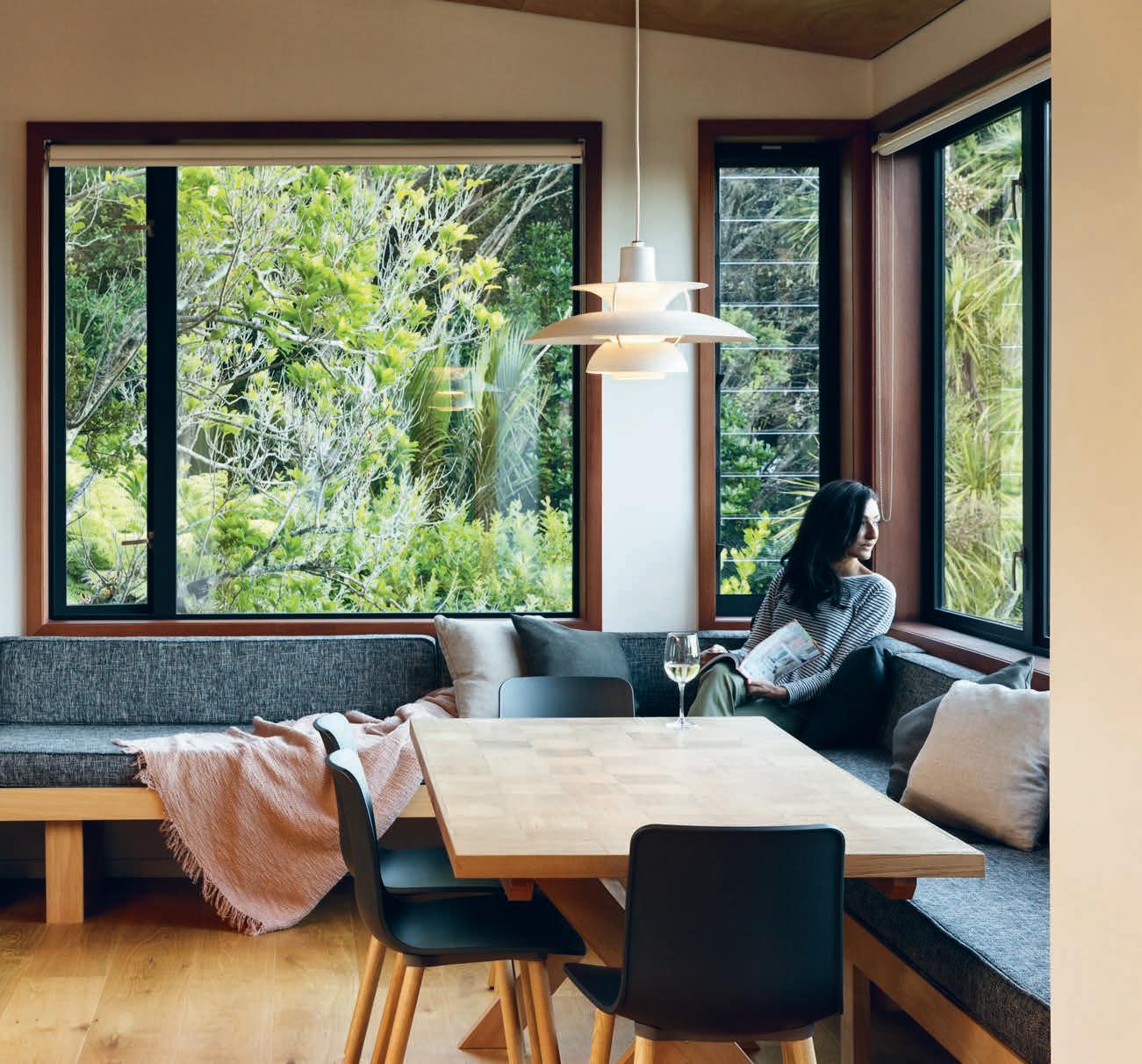
The old bach became quite dilapidated and was pulled down about ten years ago. The couple engaged Mike’s brother, Pat de Pont, a director of Strachan Group Architects, to design a new home. “It had to accommodate a very active and gregarious live–work lifestyle,” says Pat. “Having been involved with the community for more than 50 years, the new house was to be part home, part workshop and part community facility. Karena paints and Mike is a jack of all trades, so the brief became a bit of a joke,” says Pat. “They asked for a three car-garage and art studio, and to fit the house around it. And so that’s pretty much what we did.”
In honour of the old bach, the main living space is located over its original footprint, set a metre higher to accommodate a new floor below. “When people come and visit, they say ‘oh, it’s still the same,’” says Karena. “That space has the same view and scale so it evokes old memories, which was really important for us.” The lower floor has two east-facing bedrooms for the couple’s adult sons, Karena’s new painting studio, and a dry store for the
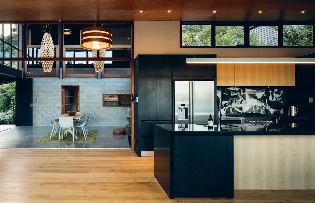
In honour of the old bach, the main living space is located over its original footprint.
tractor and firewood. This two-storey block is perpendicular to the three-bay garage, and creates a T-shaped plan stepping east–west up the slope.
At the centre of the house is a multi-purpose atrium that formed part of the wider brief for a space to host large social events. At the same level as the garage, it also functions as the main entrance, sheltered outdoor living, internal courtyard, second dining room and a climatemodifying room for adjacent spaces. Designed with passive solar design principles, the atrium features concrete floors, large north- and eastfacing windows for solar gain in winter, cross ventilation and high window vents. Exterior materials are used throughout the atrium and, combined with wide openings, create a strong connection to the outside.
Mike’s craft is evident in the fireplace surrounds and built-in window seats in the adjacent kitchen. He had to fell several trees to clear space for the new house which were then milled for counter tops, furniture, landscape steps, retaining walls and firewood. This was another important way for the family to capture details and memories of the site’s former occupation, to record them and give them new life in the modern building.
Overlooking the atrium is a private main bedroom on the third level. Set behind a balustrade wall, it can be opened or closed o with three large timber windows on counterweights. Despite being above to the main entrance, the bedroom feels like a hidden retreat with views of the bay through high-level atrium windows.
Behind the main bedroom, and providing access to it, is a second, smaller atrium. This weather-sealed room opens onto a small garden adjacent the tennis court. It contains a bay window, day bed and table tennis table, providing an indoor extension to tennis court activities for evenings and wet days. The requirement to dig in the garage had the added benefit of lifting the house up closer to the court and network of pathways to Karena’s sisters’ houses, strengthening the social spaces with the extended family.
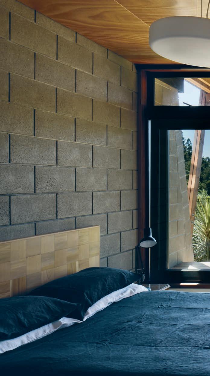
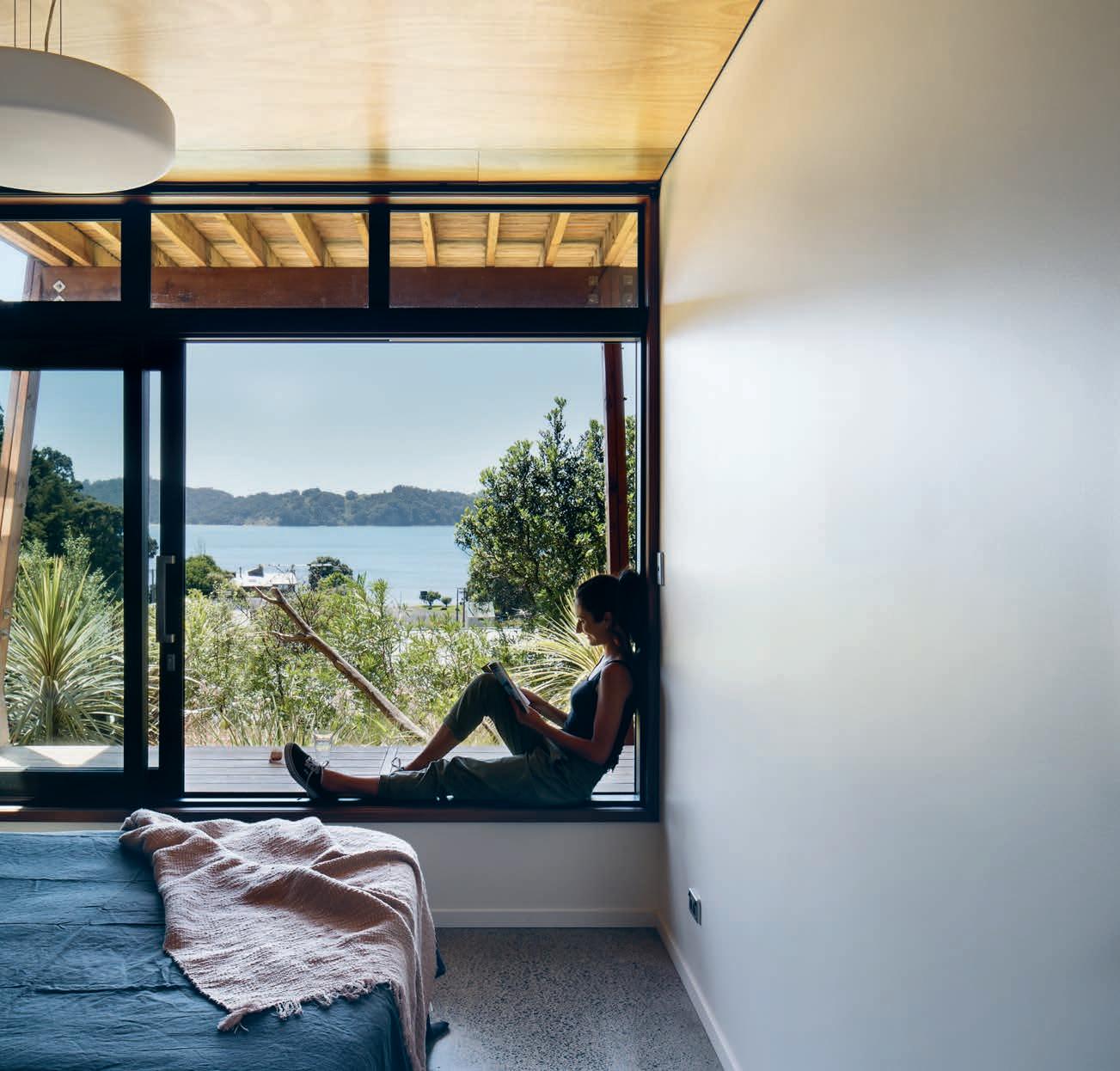
The scheme e ectively creates two pavilions on either side of a main atrium. With little space (and little privacy) for a northern court, the architect has connected the floors with a glazed stair along the northern face of the house. “There was this steep, straight pathway through the bush from the old bach up to the tennis court,” says Pat, “and it inspired some sort of recreation of it within the house. We’ve called it the gallery and glazed it to let in northern light and heat up the concrete floors.” With coloured glass used at intervals along its length, the gallery creates a delightful journey through the house.
Karena and Mike have named the house Whare Koa – translated from Māori as ‘happy home’ – after the name of Ray’s parents’ farmstead in South Auckland. Ray passed away 20 years ago, but Karena’s Mum Winifred – a fit 97-year-old – still travels up from Auckland every Friday night for a family dinner. “Proximity to extended family can work out depending on the dynamic of the family,” says Karena. “My sisters and I have always either worked together or holidayed together, which has made intergenerational living work really well.”
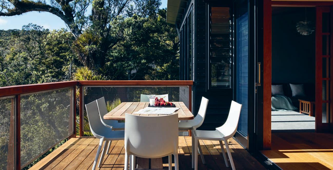
Exterior materials are used throughout the atrium and, combined with wide openings, create a strong connection to the outside.
What is the best way to understand what a client wants? Ask them, of course.
This is not news to Fisher & Paykel, who are going straight to the source, conducting workshops across the region with leading architects and designers to delve into the details of our commonly used – and often overlooked –home appliances.
“A big part of our business is to understand,” says head of design, Mark Elmore. “So it’s important to open up a dialogue; to understand where they’re coming from and we can share where we’re coming from to get our designs in the right place for that audience.”
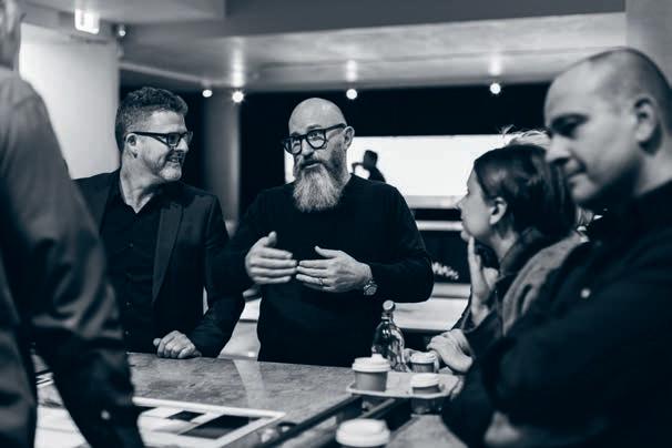
The workshops trace the brand’s evolution into the higher bracket of appliances, targeting premium commercial and residential spaces. Through uniquely inclusive and collaborative e orts between Fisher & Paykel and their clients, they are able to cater to their needs as well as that of the Australian and New Zealand public with an unprecedented intimacy.
It’s a win-win, really. The involved architects are given the space to provide feedback on the gaps and opportunities for innovation in the existing market.
The inaugural workshop was held in November 2016, with impressive results. “We did one last year and it was really successful,” says Mark. “We felt like we really needed to keep catering to that, so we’re continually planning ahead to keep the momentum going.”
The proof is in the pudding, or at least the fridge that holds the pudding. Designers previewed the ActiveSmart™ 912mm refrigerator, the latest custom panel ready model in Fisher & Paykel’s integrated range, that has been developed in direct response to feedback collected from the previous workshop and customers.
To some, details of everyday cooking accessories might seem mundane, but to the team at Fisher & Paykel the task of smoothing out our time in the kitchen is crucial. As Mark describes, “It’s a premium moment to have that time as a family or with friends, to actually slow down and enjoy that process.”
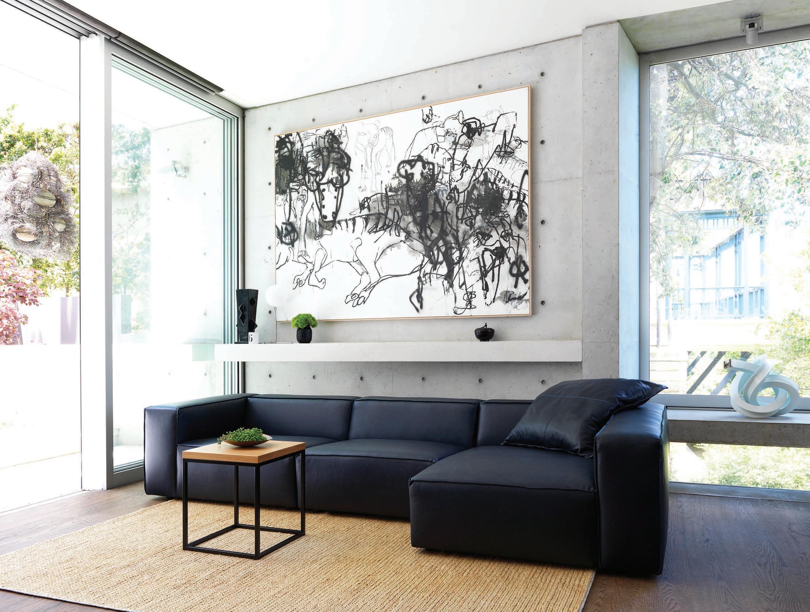

On a sloping site south-east of Melbourne, Edition O ice has designed a wonderful beach house that looks out to sea and artfully (breeze) blocks the neighbours. As Mark Scruby investigates.
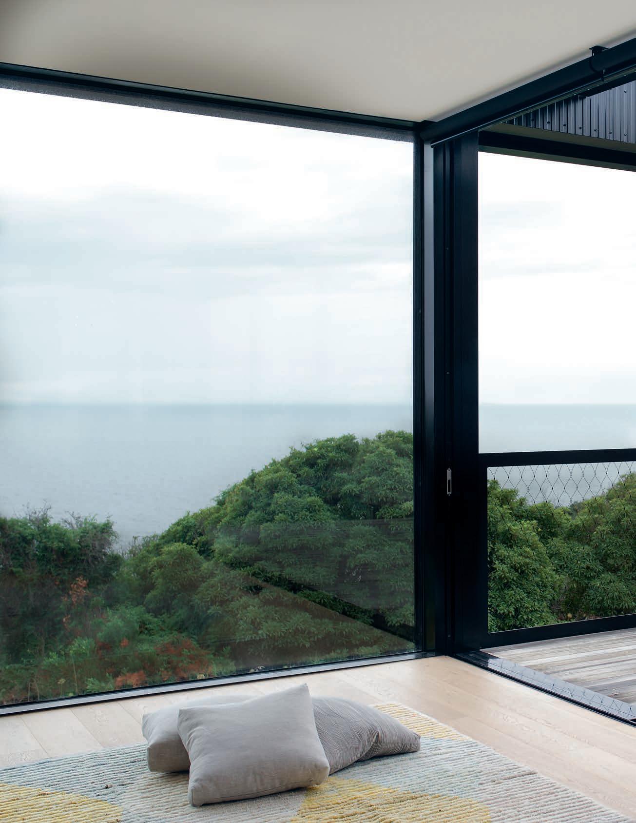
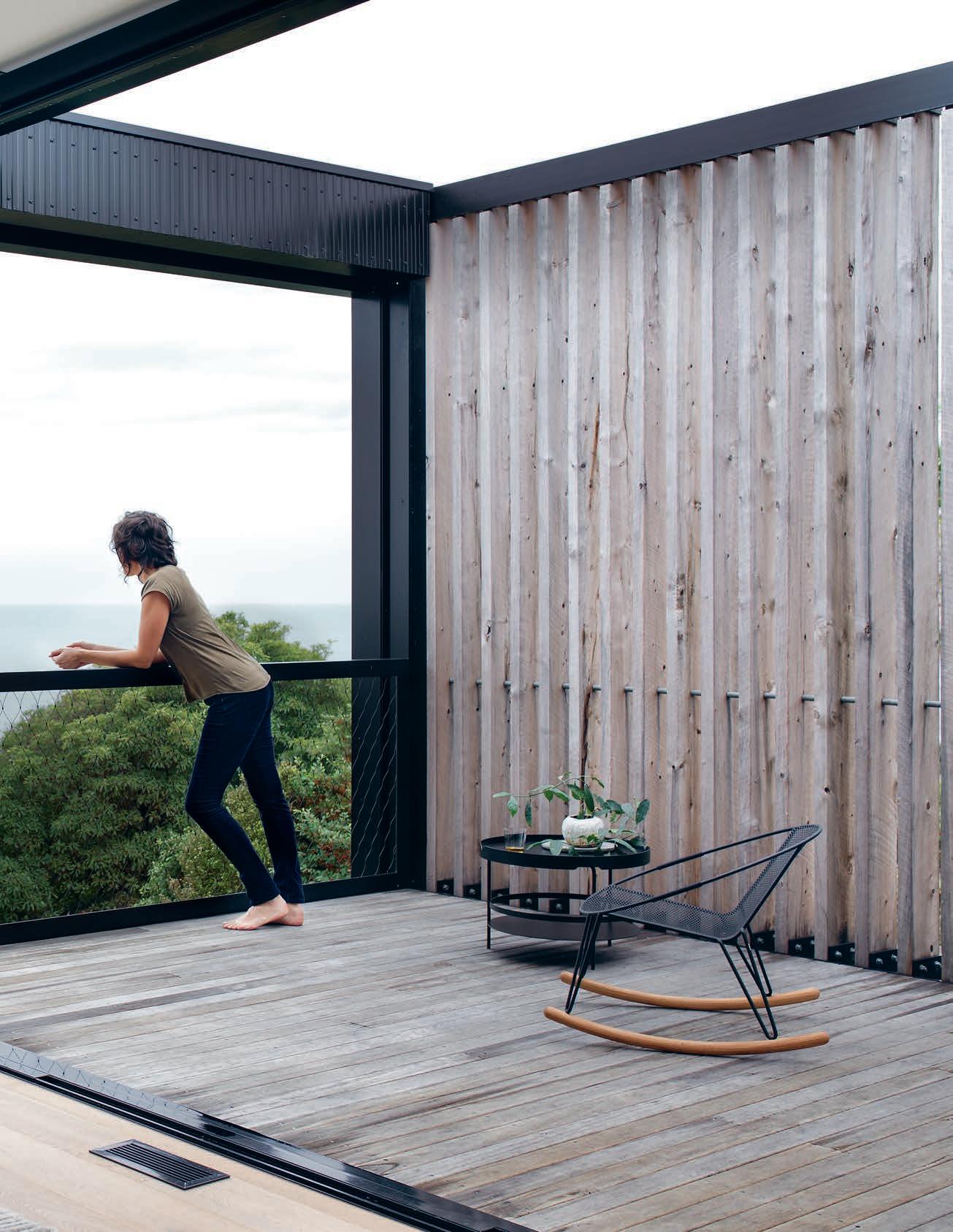
The coast road south of Mt Martha might not threaten the rankings of California’s State Route 1 or even Victoria’s own Great Ocean Road in a World’s Greatest Drives listicle. Yet its twists and turns, hidden corners and momentary glimpses of sea and horizon certainly aren’t short on charm. And when the chance comes to pull over by the side of the road or, even better, into a holiday house driveway, boy does the view out to Port Phillip Bay make it feel further than 60-odd kilometres from Melbourne.
The land rises up steeply from the water and keeps rising far enough to provide bay views even for houses a street or two back from the esplanade. Thankfully, they’re interspersed by pockets of bush reserve and trees, not only because it reinforces the sense of distance from conurbation, but because a lot of the houses are less than exciting, in that predictably beachhousey way – double-storey almost by default, anonymous, fronted by windswept balconies and outdoor furniture. Potential plus, a real estate ad might say. Enter Edition O ce, the architecture firm engaged by city-based clients to deliver on that potential.
The architects’ original brief was to design two new houses side-by-side; one a holiday house for their clients; the other to be sold. But after both buildings were designed and approved, the clients liked the house that was to be sold so much, they decided to keep it and sell the adjacent block. Hopefully the second house gets built by the new owners, but for now having empty land next to the completed
house provides an uninterrupted view of its southern elevation – an artfully geometrical composition of rough-swan timber battens and raw concrete blockwork.
This perspective from the south is visually interesting because of the house’s beautiful, rectilinear proportions, the soft grey of the concrete and aging timber, and the gridded semi-transparency created by a wall of hollow breezeblocks. But also because of the way its straight, lean profile emphasises the topography of the site. The datum set by the flat roof, and the grid of concrete breezeblocks, give a measure of the land as it slopes up to the rear of the site, like graph paper in a maths book. Edition O ce could have designed a house to be subsumed by nature, or mimic it. Instead, they have created a building that is emphatically human-made: from concrete, timber and steel framing, inserted into the environment, but in a way that celebrates the organic beauty of the surrounding landscape.
This dialogue between building and landscape continues inside the house. Most explicitly, we see it in a square a few metres wide that has been excised from the northern edge of the living space; the floor gives way to earth below, a garden void where a stand of young eucalypts have been planted. Right now, their presence is as small trees rising through the building; as they grow taller and bushier, the relationship between house and flora won’t be so clear and visitors might wonder, ‘has the house encroached on the bush, or the bush on the house?’
This dialogue between building and landscape continues inside the house.
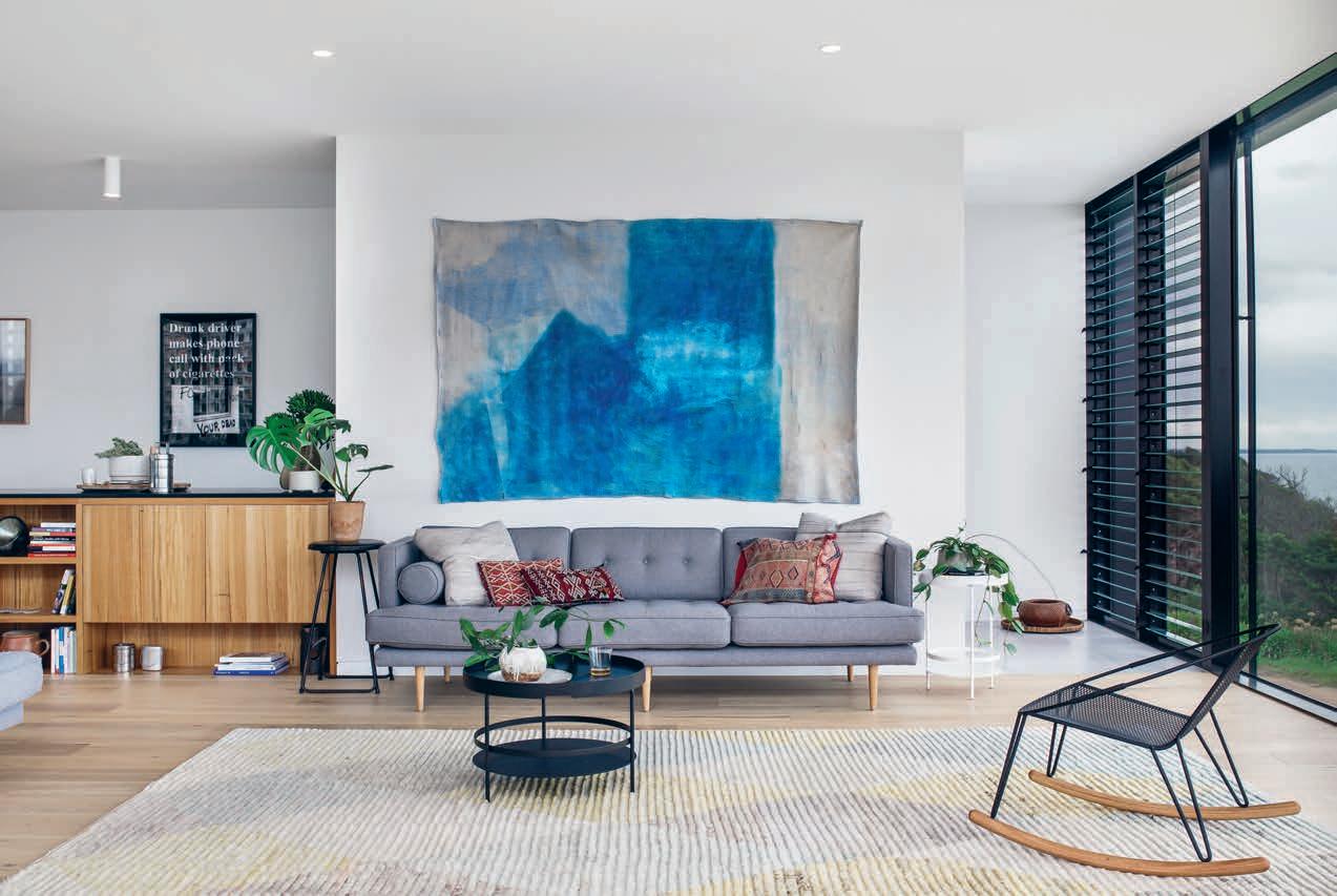
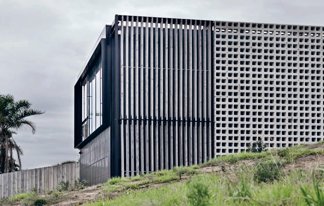
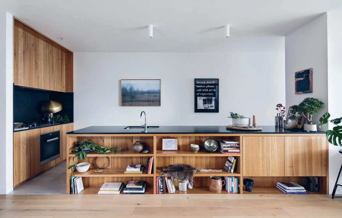
A relationship between house and environment is also expressed through the careful curation of outward views. Edition
O ce’s Kim Bridgland describes the master bedroom, which pops up from the main roof in a single volume, as a turret or gunsight, trained on the waters of the bay, but the lower level, blinkered by parallel breezeblock walls to the north and south, o ers a similarly telescopic experience; the neighbours are e ectively screened out of existence.
For all this talk of walls curating views, one of the most striking things about this house is how open it feels, in a wonderfully unfussy, mid-century modernist kind of way. The main living area, comprising kitchen, dining and lounge zones, is separated from the northern breezeblock wall by two small open-air terraces, the eucalypt garden and a lap pool, with enough of a bu er between roof and wall to bring in a healthy splash of sun.
Interior and exterior spaces are delineated by full-height glass panels and when these are slid open, the di erent zones fl ow into each other and perceptions of inside and out, well, go out the window! Some of the space has a roof, some doesn’t; you’re next to an open fi re, but amongst trees; you’re looking past a dining table to the soft-grey backdrop of concrete blockwork, or up to a strip of blue northern sky; and from almost anywhere, you can see the bay, sometimes a panorama, sometimes a thin slice.
The view is best, of course, from the floor-toceiling windows at the front edge of the living space. Unlike those nearby houses, there’s no overexposed and under-used balcony to get in the way. When the weather suits, the terrace in the north-western corner of the house provides a protected outdoor space with views of its own. The closest sealed road is blocked by a pleasingly unkempt strip of trees and shrubbery, so the only tra c that troubles the eye from here is the occasional yacht or dinghy. The lower-level bedrooms and bathroom have more discrete outlooks into newly planted gardens to the side and rear of the house. And the backyard – for want of a better word – sits high on the block, giving another perspective not only of the house, but its surrounds. We can see several houses from here, and there’s no small irony in the idea of those buildings being so completely shown up by a new one made from such a supposedly utilitarian material as breezeblocks. But this view also makes us realise how secluded this building isn’t and how e ectively Edition O ce has created a sanctuary in a relatively suburban context. In time, that context will include whatever is built on the empty site to the south, but that won’t matter to anyone inside the house. All they will see is trees, sky, water and whatever they choose to surround themselves with on their weekends by the sea.
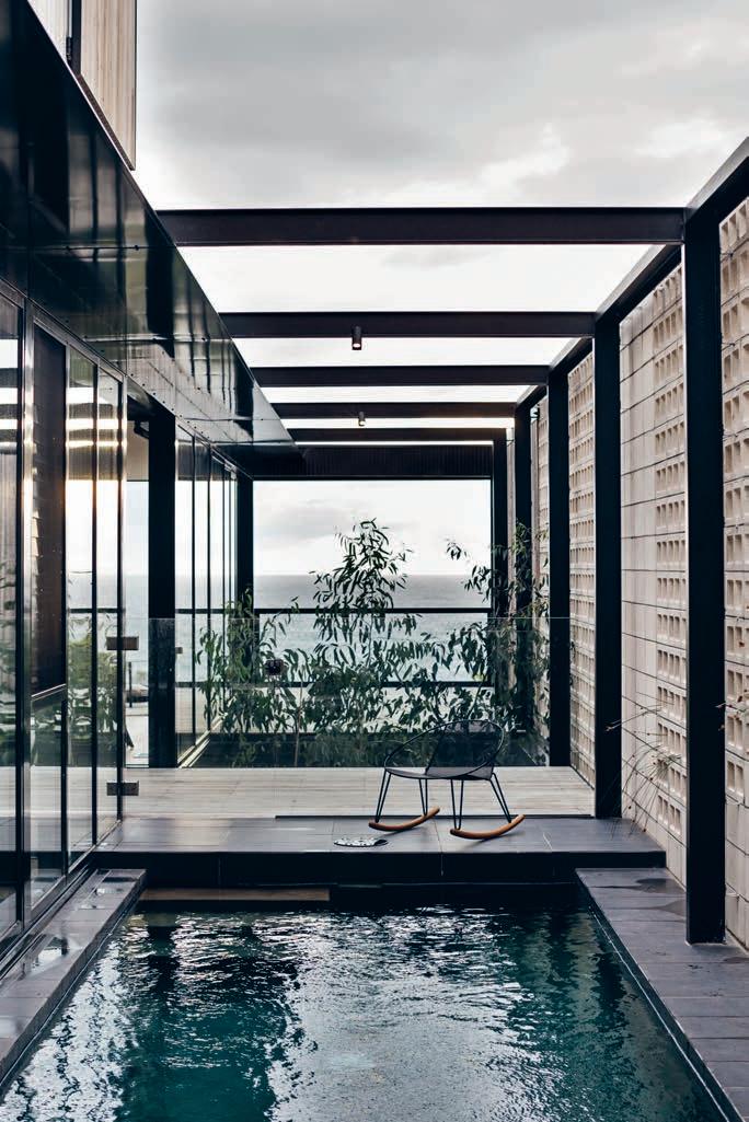
When it comes to cooking design, function is never enough. Sure, for industrial ovens, a plain box gets the job done, but for the modern design hunter there needs to be more. How can you be expected to create a beautiful meal if the tools you use don’t inspire beauty? And why is it that so often the source of that inspiration is Italian?
Still the gold standard in craftsmanship and delicate forms, the Italian design world is renowned for producing objects that seem to have a certain... pennacchio. The music of the streets, the rolling hillsides, the beautiful canals... maybe Italy’s own rhythm and beauty inspires her designers.
The designers at ILVE are proof of the lifegiving potential for design to inspire new connections. As a perfect synthesis of form and function, ILVE’s products appear to attract a diehard group of devotees: those who elevate design beyond
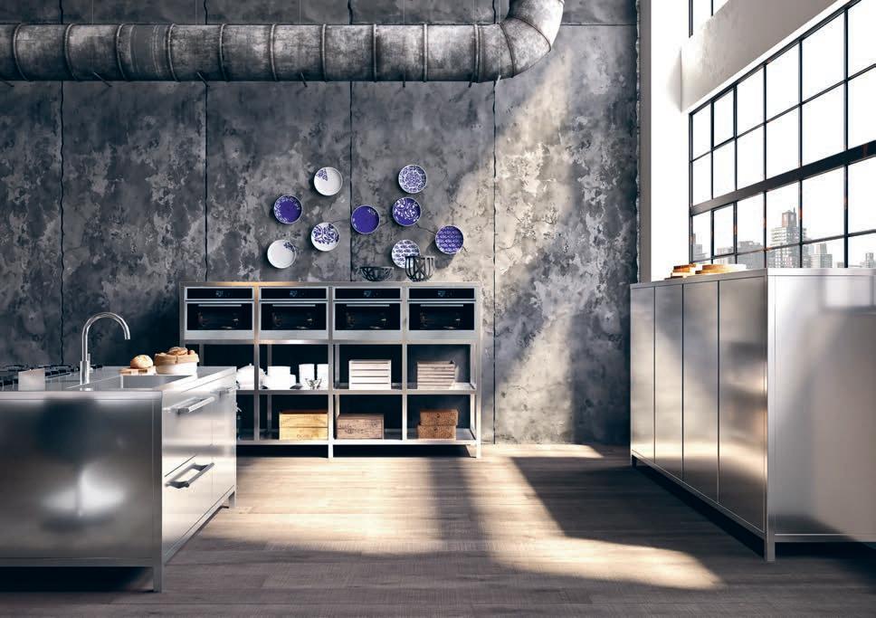
the mere appreciation of material objects to a veritable way of living. Such an almost evangelical devotion seems to emanate from the origin of the product itself, alongside the very life and soul of a country, its people and their unmatched bravado and joy. Handmade near Venice, ILVE’s master craftsmen make cookers with commercial grade heritage, designed for the very best kitchens.
Situated equally in the heart, the home and, thus also our private lives, ILVE is uniquely positioned at the apex of where people come together to connect and commune. Whether it’s the cool, smooth touch of their oven hardware or the drama of teppanyaki, both the ILVENISTA and the master craftsmen behind every piece of ILVE’s range understand the legacy of Italian design, infused in every nut, bolt, handle, slick of enamel and inch of iron plating in every ILVE kitchen.
There’s little point in owning something that works perfectly, if it doesn’t look good too. Capiche?
A Grand Slam tournament is won a er thousands of shots, it puts strength and character to the ultimate test.
Similarly, it is also our style to put Dekton to the test. We subject it to an unlimited demand, we challenge its performance, its technology and its unlimited design potential. Create anything you could ever want with Dekton.
DEKTON IS UNLIMITED.
COSENTINO AUSTRALIA
e-mail: infoaustralia@cosentino.com
www.dekton.com
F CosentinoAustralia T Cosentino_AU


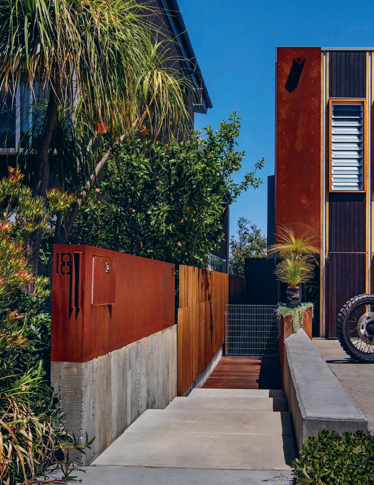
This North Bondi home by CplusC Architectural Workshop is a place for family and friends to make memories that will be reminisced about in years to come. Rebecca Gross visits.
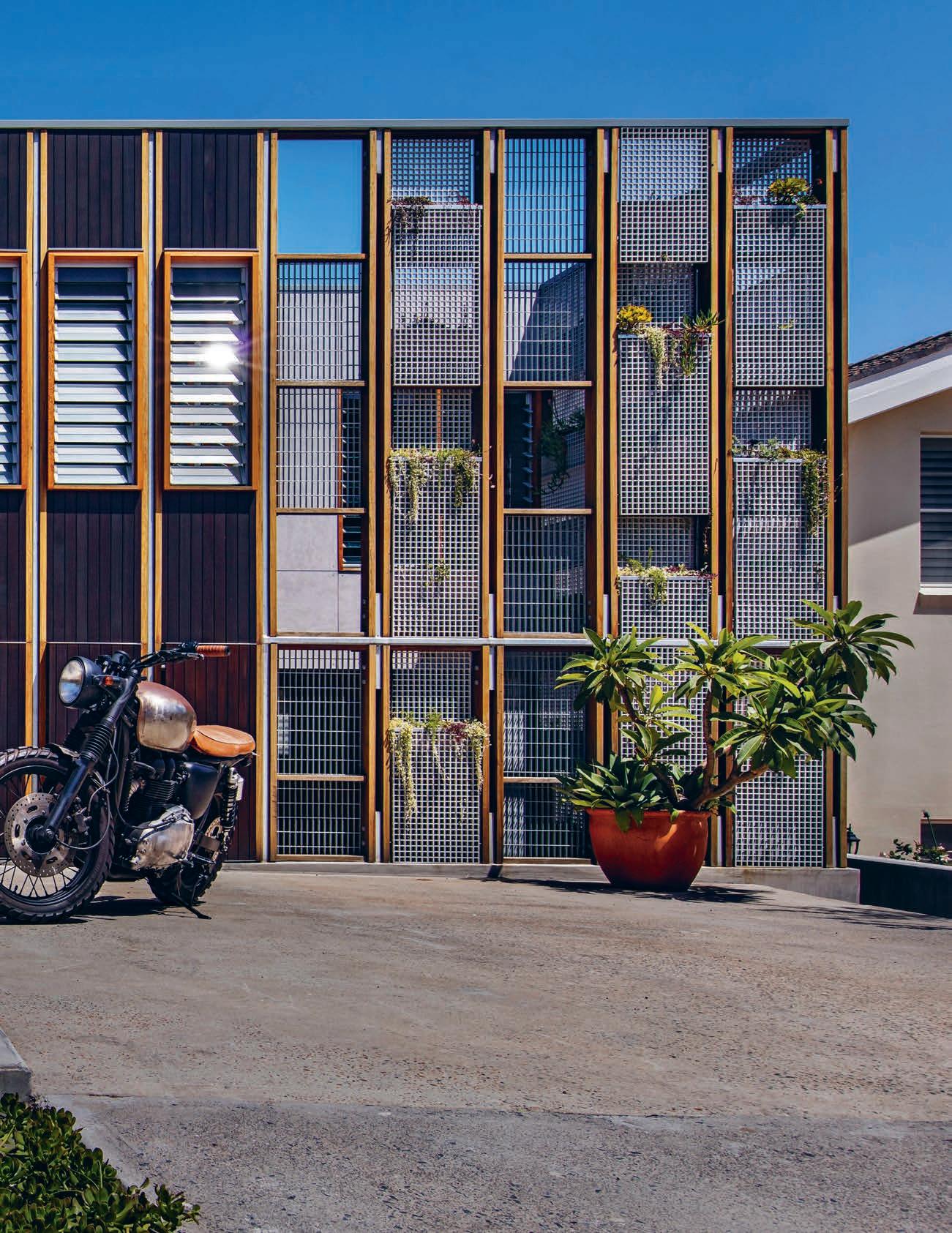
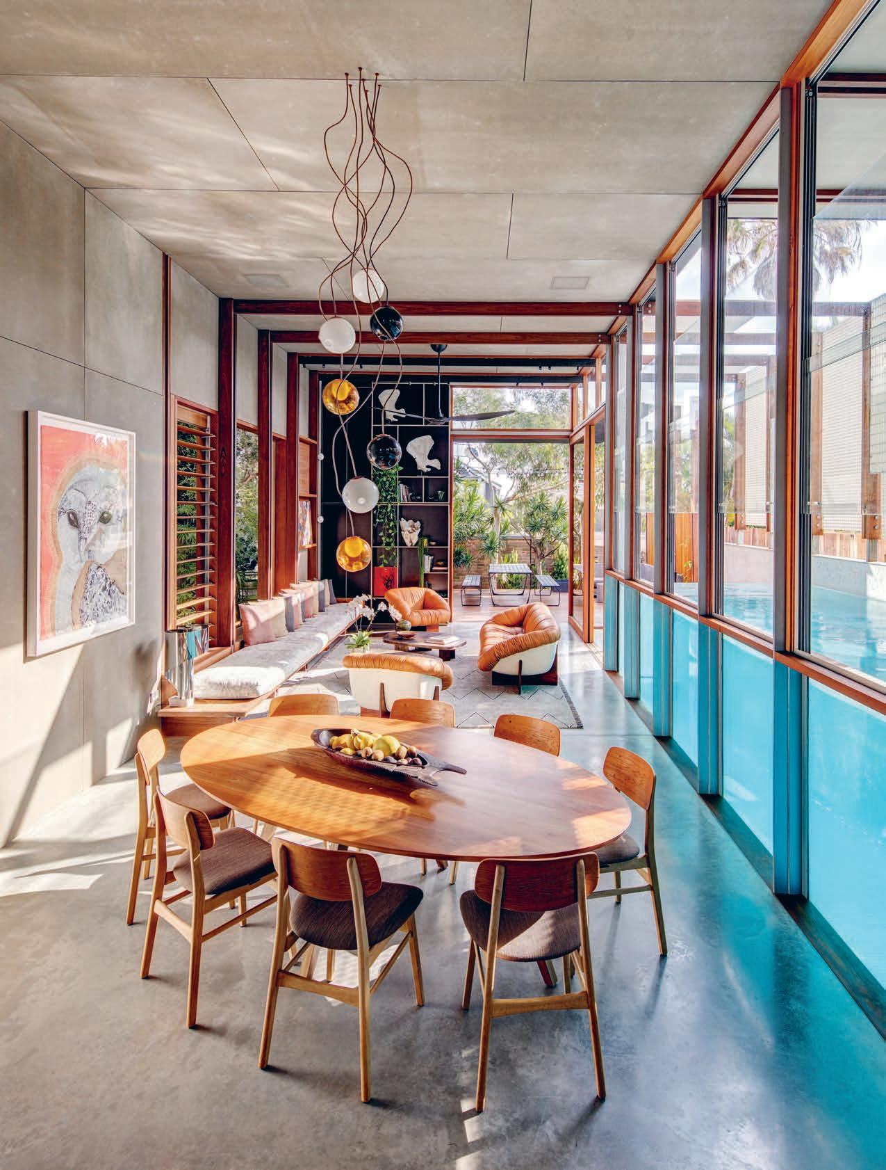
Nostalgia is the sentimental longing for the happiness of a former time or place, the fond recollections of days gone by. For those lucky enough to design and build their dream home it is often with the aspiration of creating a place where future memories will be made. Are these homes, therefore, designed with consideration of anticipated memories and with the forethought of how we hope to remember the past?
Long-time North Bondi residents Walter and Laura wanted a home in which they could entertain family and friends and their three young-adult children could live now and always return to in the future. They engaged architect and builder Clinton Cole along with Ryan Ng of CplusC Architectural Workshop to design and construct a new home on their existing site; a home to suit their social and family-oriented lifestyle, and a place to make future memories.
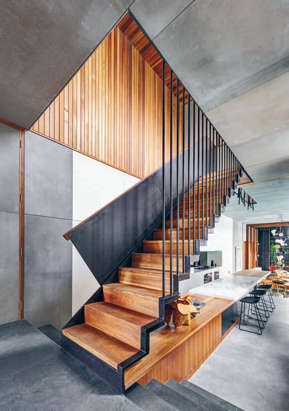
Walter and Laura’s brief entailed an open-plan house facilitating all the things they love; spending time with family, cooking and entertaining guests both indoors and outdoors. The house also needed to maximise natural light and privacy and incorporate a swimming pool and greenery. “All of which provided challenges on a narrow and overlooked site,” says Clinton. “But as there was little opportunity for outlook it was all about making the house the view.”
From the street the house appears deceptively modest yet intriguing with a timber and steel façade that conceals its form and depth. Behind that exterior, the house is a pressed rectilinear volume that extends almost the full length and width of the southwest-facing site. Punctuated with openings influenced by the impact of sunlight at di erent times of the year, the home takes advantage of the dramatic and atmospheric e ects of light. Large sliding timber and glass doors and windows, internal and external gardens and the adjoining lap pool obscure the distinctions between indoor and outdoor space, as does the metal grate screen that envelops two sides of the house. “Like Malaysian architecture, it was about turning inside into out and outside into in,” says Clinton. “It’s a brutally honest building and the expressed structure and exposed materials increased the complexity of the build.”
“If there’s an easy solution, make it harder. You’re guaranteed to reach something unique.”
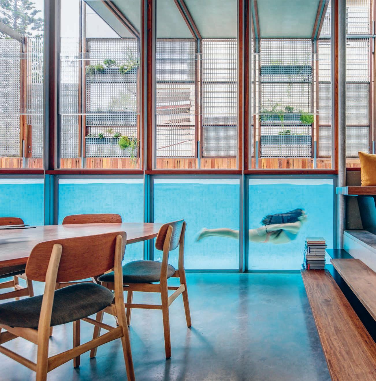
The façade is inspired by the ancient and mysterious Hanging Gardens of Babylon with LED-lit planter beds that transform the screen into a living green wall, hindering views from neighbours and passers-by. Made with fibreglass reinforced plastic grating, the screen required on-site experimentation and speaks to Clinton’s design ethos: “If there’s an easy solution, make it harder. You’re guaranteed to reach something unique and to find something that people notice and feel something about,” he says.
The same can certainly be said for the above-ground lap pool that shares a vibrant blue acrylic wall with the open-plan kitchen, dining and living area. With open sky and the master bedroom above the pool, sunlight strikes the water in di erent ways. Surrounded by greenery it evokes the feeling of a secluded grotto. Inside the house, refracted light illuminates the burnished concrete floors, soft grey walls and high ceiling and is suggestive of the sea and sand at nearby Bondi Beach.
This open living area is an interconnected and interactive space for family and friends to gather, while also serving as a sanctuary for those who live there. The galley kitchen has a protracted spotted gum and Calacatta marble island benchtop that extends from the base of the stairs. It’s a place to cook, eat, chat and work on a daily basis, and on social occasions it’s a place to gather and serve drinks and food.
Stepping down from the kitchen, the dining and living area stretch alongside the pool and open to a deck at the rear of the house. Walter and Laura engaged interior designer Jason Sullivan, a long-time friend, to furnish and decorate the house. With a focus on creating comfort and interest, Jason chose rare twentieth-century pieces that by the very nature of being vintage come with their own history.
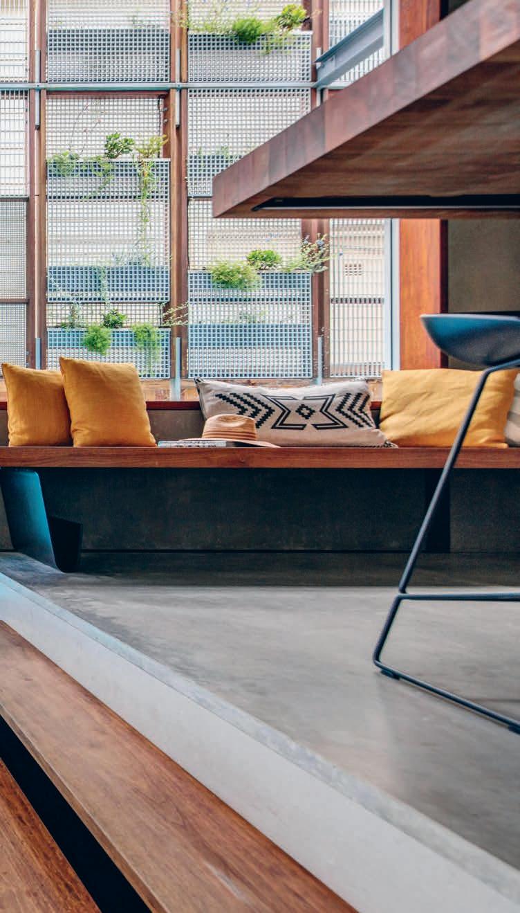
A 1970s three-piece sofa set by Brazilian designer Percival Lafer sits across from a built-in banquette and stainless steel Stilnovo Spinnaker lamp of the same era. Custom brass co ee tables by Don Cameron complement the raw material palette of the architecture, and vintage whalebones and a Gregarious Works coral sculpture reflect the seaside suburb. A custom elliptical dining table – conducive for conversation – is surrounded by Børge Mogensen dining chairs and unexpectedly positioned at an angle with sculptural copper and glass pendants suspended above.
The soft, rounded forms and natural textures of the furniture and objects create a strong juxtaposition with the rectilinear volumes and articulated structure of the house, as does the more circuitous layout. But this contradiction imbues personality and warmth and a more organic flow.
At the front of the house, the media room is positioned between the pool and front courtyard. Here, the rich rosewood and leather of Jean Gillon’s Captain’s Chair complements the tones and textures of the cedar-lined wall, while two retro pool chairs are from Walter and Laura’s first Bondi home and the lush plants are saved from the site pre-build.
Punctuated with openings influenced by the impact of sunlight at di erent times of the year, the home takes advantage of the dramatic and atmospheric e ects of light.
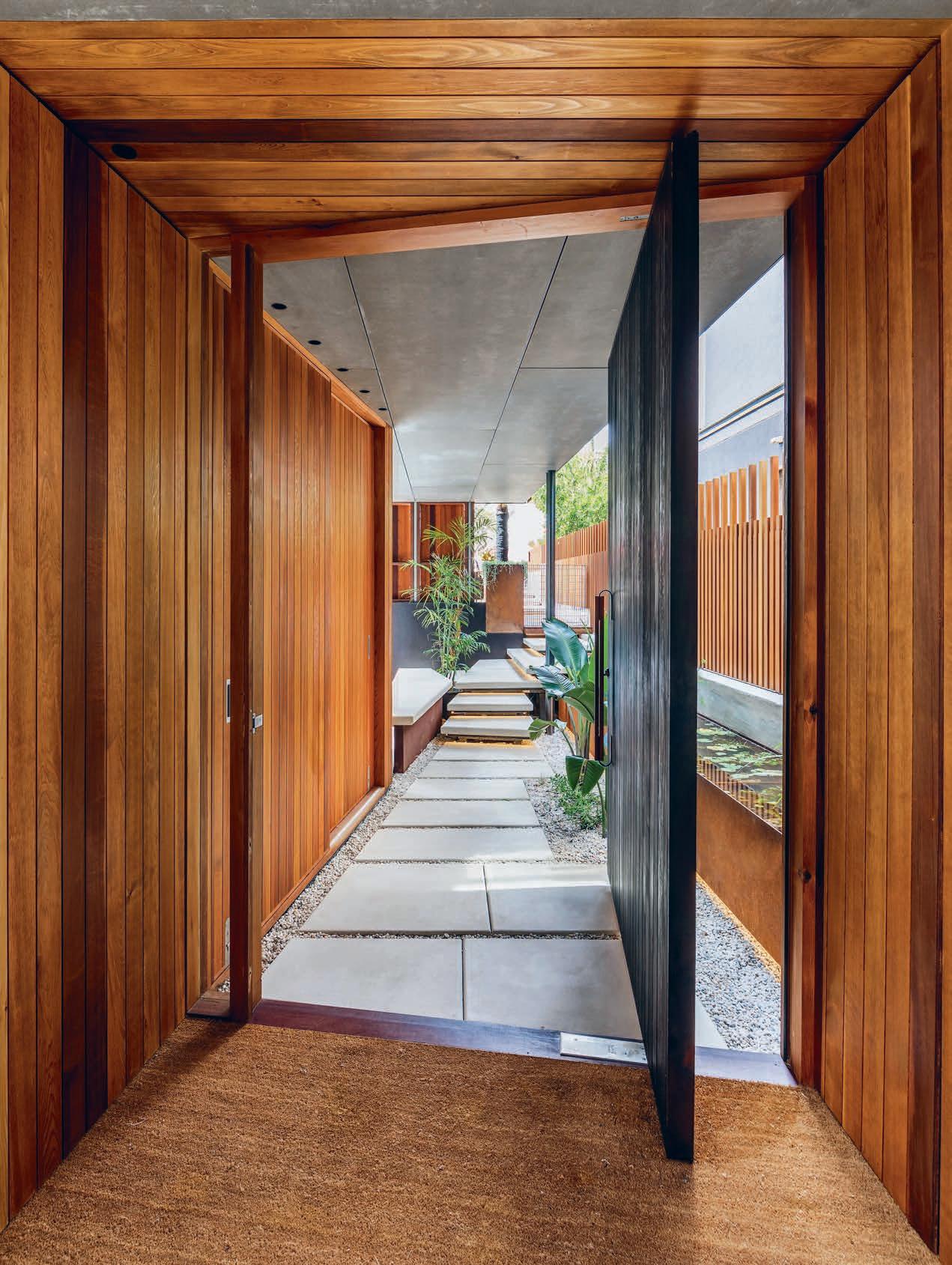
The room has a Japanese sensibility with a low platform bed custom designed and built using timber rafters salvaged from the original home.
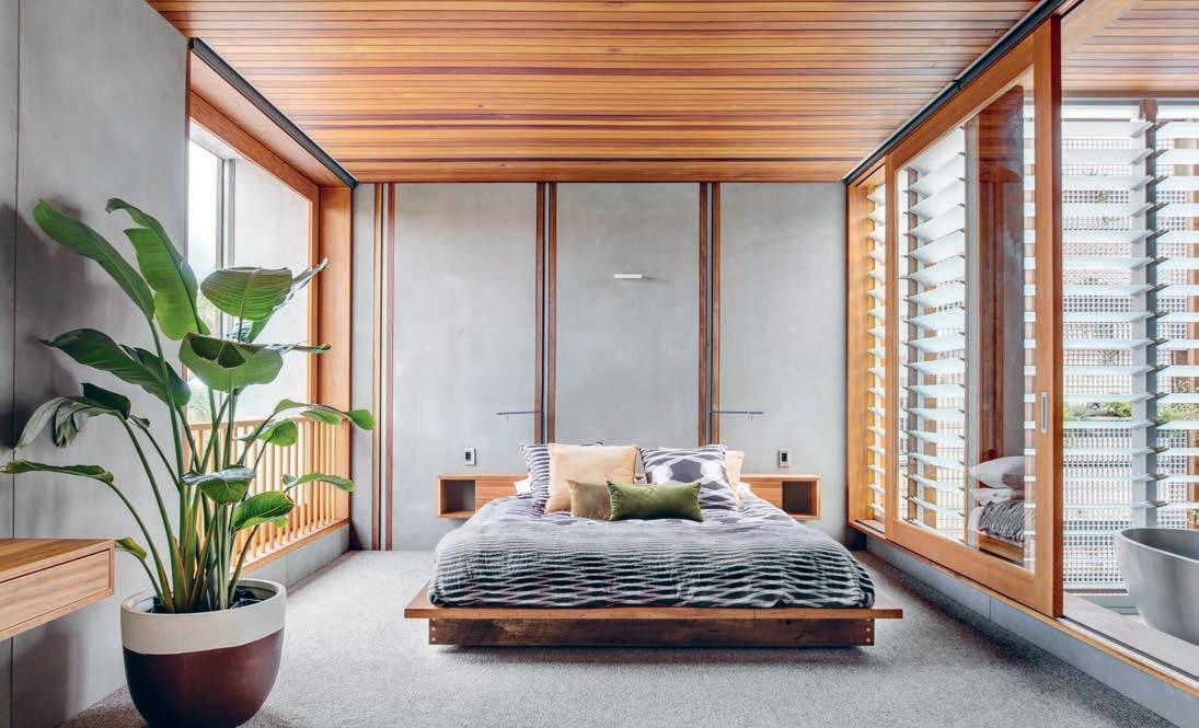
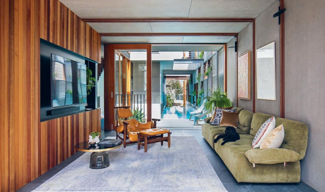
Bedrooms and bathrooms are zoned on the first floor with the master bedroom at the rear. The room has a Japanese sensibility with a low platform bed custom designed and built using timber rafters salvaged from the original home. “It brings traces of the old house into the comforts of the new one,” Clinton explains. And like downstairs, the distinctions of space are blurred upstairs as large sliding glass doors open the bedroom to the bathroom.
This house is a place for Walter and Laura and their three children to spend time with the people they love, and for making memories that will be looked back on fondly in years to come.
“I can’t see us moving out for a long period of time,” says Laura. “The kids will, but they’ll always come back and eventually they’ll bring their children too. We look forward to it being like that.”
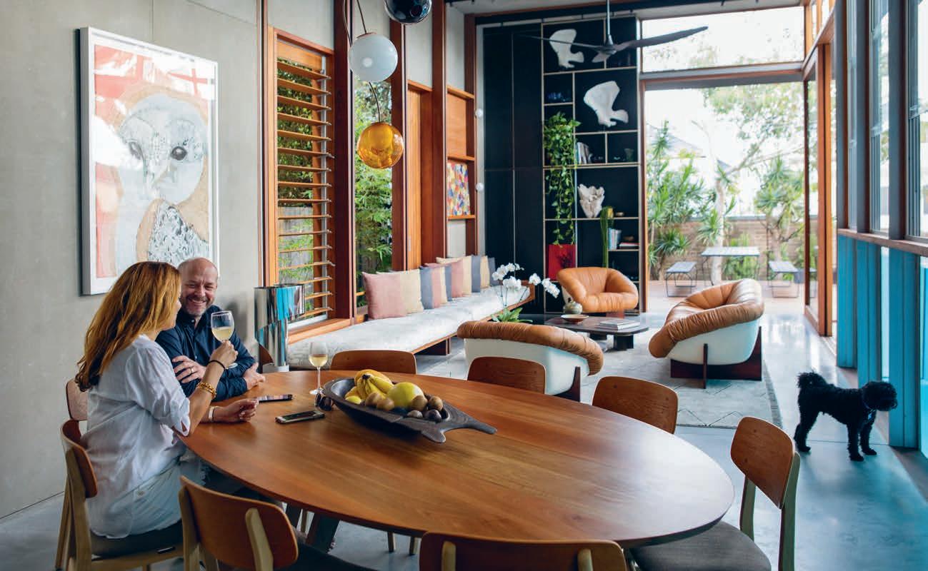
Wilkhahn is a name that, since the beginning of last century, has connoted thoughtful design, impeccable craftsmanship, and the refinement of understated style. It is also a name that, until quite recently, usually signified nearly any environment other than our homes. Since 1907, this German brand has dominated the furnishing game in the commercial sector with unflagging commitment to an intelligent, research-driven approach to design.
Today, however, the brand is making significant forays into residential environments across the globe. After being rightfully recognised earlier this year by the iF Design Award’s expert international jury for Occo – their latest, multi-purpose chair design – and its embrace of a new frontier for essential and multi-purpose furniture design, our greatest residential designers are increasingly excited by Wilkhahn’s unique visual vocabulary.
Whether put to work in dining spaces, casual entertaining settings or more formal gatherings, Occo carries more than a century of design innovation that has revolutionised the history of o ces.
With a high degree of versatility and an equally high degree of comfort, its simplified and oh-so-contemporary sensibility defines a new role for furniture in the home: design that becomes a central pillar in daily life; crossing
or blending boundaries of either custom or culture; and providing the support for moments of focus, reflection, congregation and enjoyment.
Occo’s quiet humour exudes throughout its sculptural form. Available in four di erent frame variations to suit a myriad of residential spaces and applications, and additional three di erent types of upholstered cushioning and six shell colour options, lend the design an advanced level of functionality dovetailed, always, with form.
With a cutout plastic shell to allow the chairs to be neatly stacked for spatial economy, Occo’s streamlined silhouette graphically plays with the lettering of its own name. Viewed from the front or from the back, the chair’s shapeliness echoes the ‘O’ at the front and back of its name. But, if viewed from its sides, a ‘C’ is wittily delineated.
While experimenting with the cutout during the chair’s development stage, designers Markus Jehs and Jürgen Laub found that the plastic shell fortuitously lent an advanced level of flexibility to the backrest and, consequently, the ergonomy of the seating position. Ticking all the boxes for visual appeal, stability and advanced versatility, “we found that we had two functions”, says Jehs, “the flex and the stackability which made the sculptural shape of the shell. It was pure functionalism.”
Taking home their ninety-seventh iF Design Award, Wilkhahn’s Occo feels right at ‘home’ ... anywhere.
The mass relocation of Europeans associated with WWII ignited a modernist gaze set to warp the local design community.
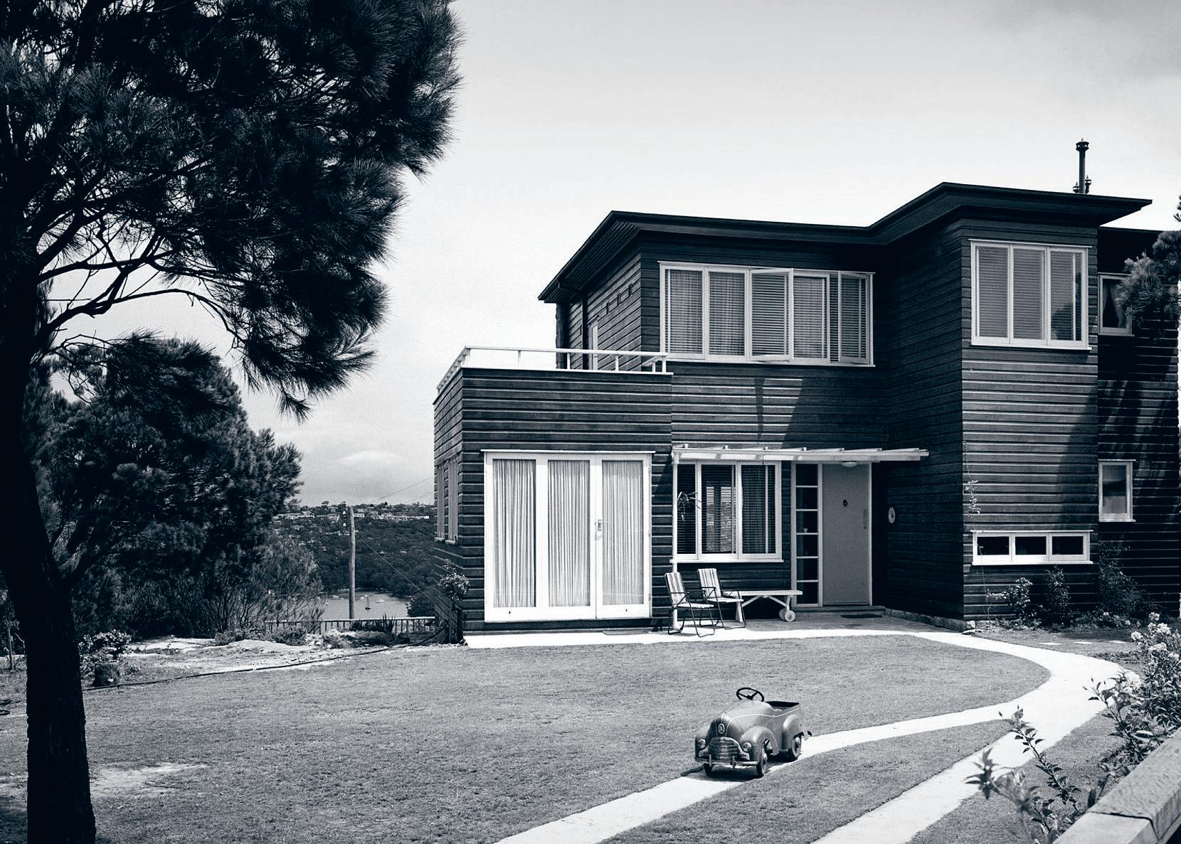
Australians, as is reliable to their self-deprecating nature, will be the first to footnote a contemporary piece of furniture with an international designer or site as inspiration. The infusion of global design thinking is ever-present in a country with a historically stirred demographic.
Our understanding of Modernism is more often than not accompanied with a list of global designers and sites. Australia, it seems, is not thought of as the likely setting to historically significant buildings and objects. As Sydney Living Museum’s exhibition The Moderns: European Designers in Sydney points out, the mass relocation of people associated with the Second World War introduced emerging global design concepts to create pivotal examples of local modernist design, not likely found in any textbook.
The exhibition follows the personal stories of immigrated architects and designers who disseminated a modernist gaze onto mid-century Australia. And despite often having honoured pedigrees overseas, many worked virtually unknown to create inconspicuous masterpieces for an unsuspecting market.Even as many of the emigrated European nationals struggled to return to working in their chosen profession, their adapted appreciation of modernist concepts continued to create a profound e ect on architecture, interior design and furniture.
Ignited by the moody photographs from the Max Dupain archive, original furniture and design objects, the exhibition gives worthy praise to the dark horses driving historical Australian design.

The exhibition commemorates the significance of the Modernist epoch both overseas and within Australia. Tracing the societal shift towards a faster, more considered means of living and to the appreciation of a more rebellious notion beauty, The Moderns dives into a local history that prefaces the contemporary Australian design identity.
The Moderns: European Designers in Sydney is currently showing at Museum of Sydney.
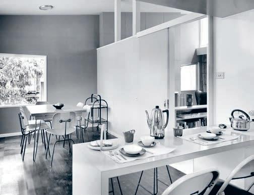
In an old neighbourhood of Makati, Manila, a crisp contemporary home for a young couple reimagines the traditional Filipino dwelling. Sandra Tan speaks to Brooklyn-based, Filipino-Australian architect Aya Maceda of actLAB about a residential project that exemplifies light, locality and cultural legacy.
 TEXT SANDRA TAN | PHOTOGRAPHY KURT A RNOLD
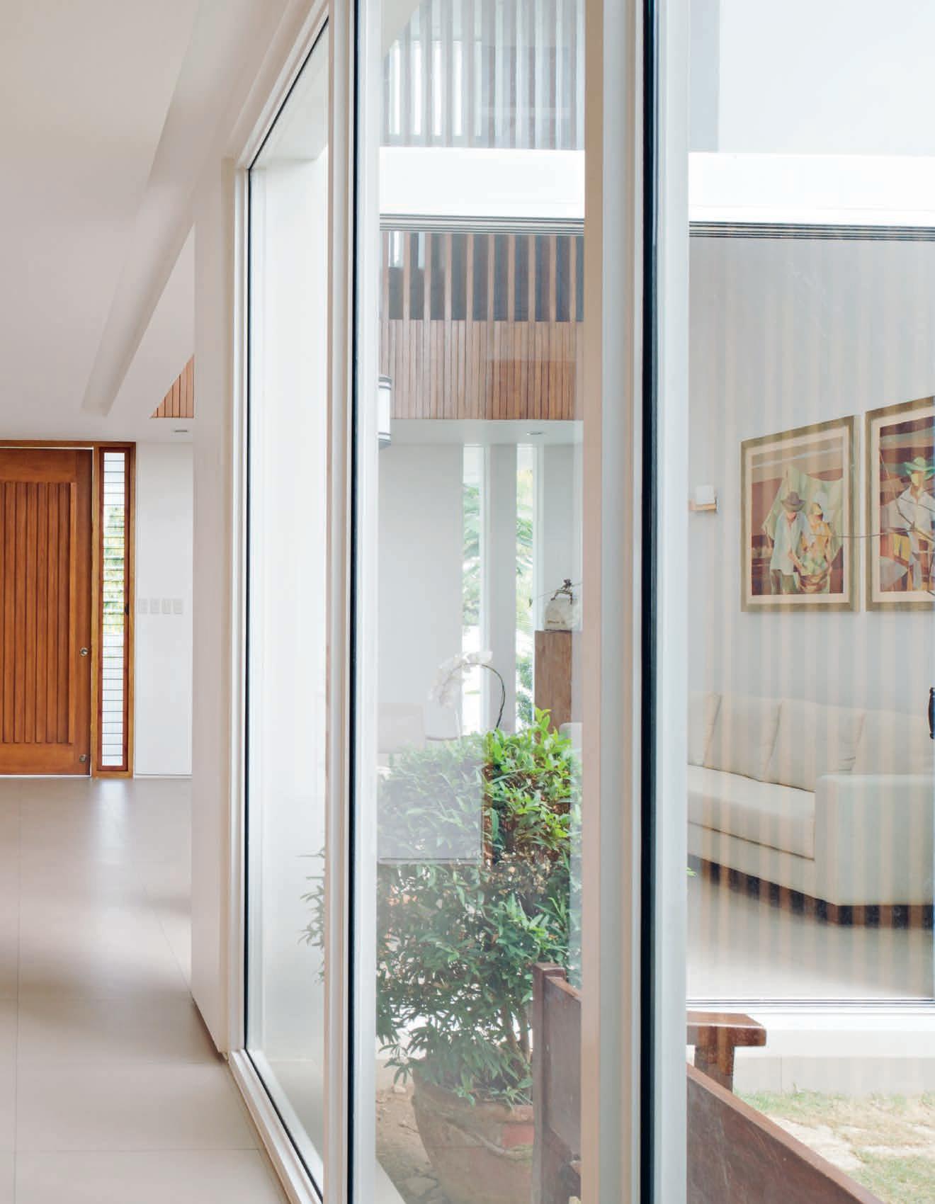
In a rapidly developing metropolis, spaces that exist simply to provide a sense of space are exceedingly rare.
Metropolitan Manila, like so many other South East Asian cities is strewn with towering condominiums perpetually under construction. Life here can be claustrophobically congested.
The Manila House by actLAB sits at the other end of the spectrum – a notable example of considered spatial design against a backdrop of stifling density. Situated within an old pocket of Makati City and built for a young professional couple, the project was briefed as a nuanced interpretation of the traditional Filipino home.
“It was important to us to not be just one of those new houses following the same ‘modern’ trend,” say the residents.
“They are a contemporary Filipino couple, and wanted a modest, clean-lined house that will sit well in its context,” says Aya Maceda, founder of actLAB. “They knew of my modern interpretations on vernacular architecture and that I was starting my own practice, and they wanted to work with me.”
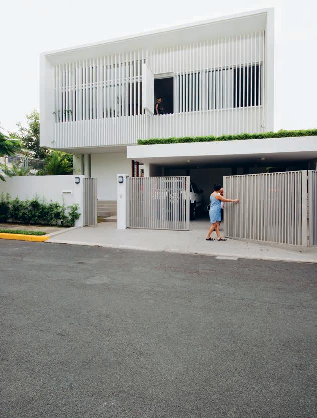
The inherited existing house had sustained water damage from the last typhoon in the area. For their forever home, the clients wanted to maximise what they could build on the property to include three bedrooms, three bathrooms and a home o ce, as well as an open plan arrangement to cater to the extended family gatherings customary in Filipino culture.
“There is a Sunday lunch legacy in this family where three generations get together weekly to share a meal. Siblings and parents catch up, children are running around in the background… you know, it’s big!” says Aya. “So I designed for that, with the idea that the many segments of the house would be visually connected.”
The expansion of the structural footprint towards the bounds of the site gave rise to the pivotal courtyard feature at the core of Manila House, which lends the home its uniquely inward-facing quality.
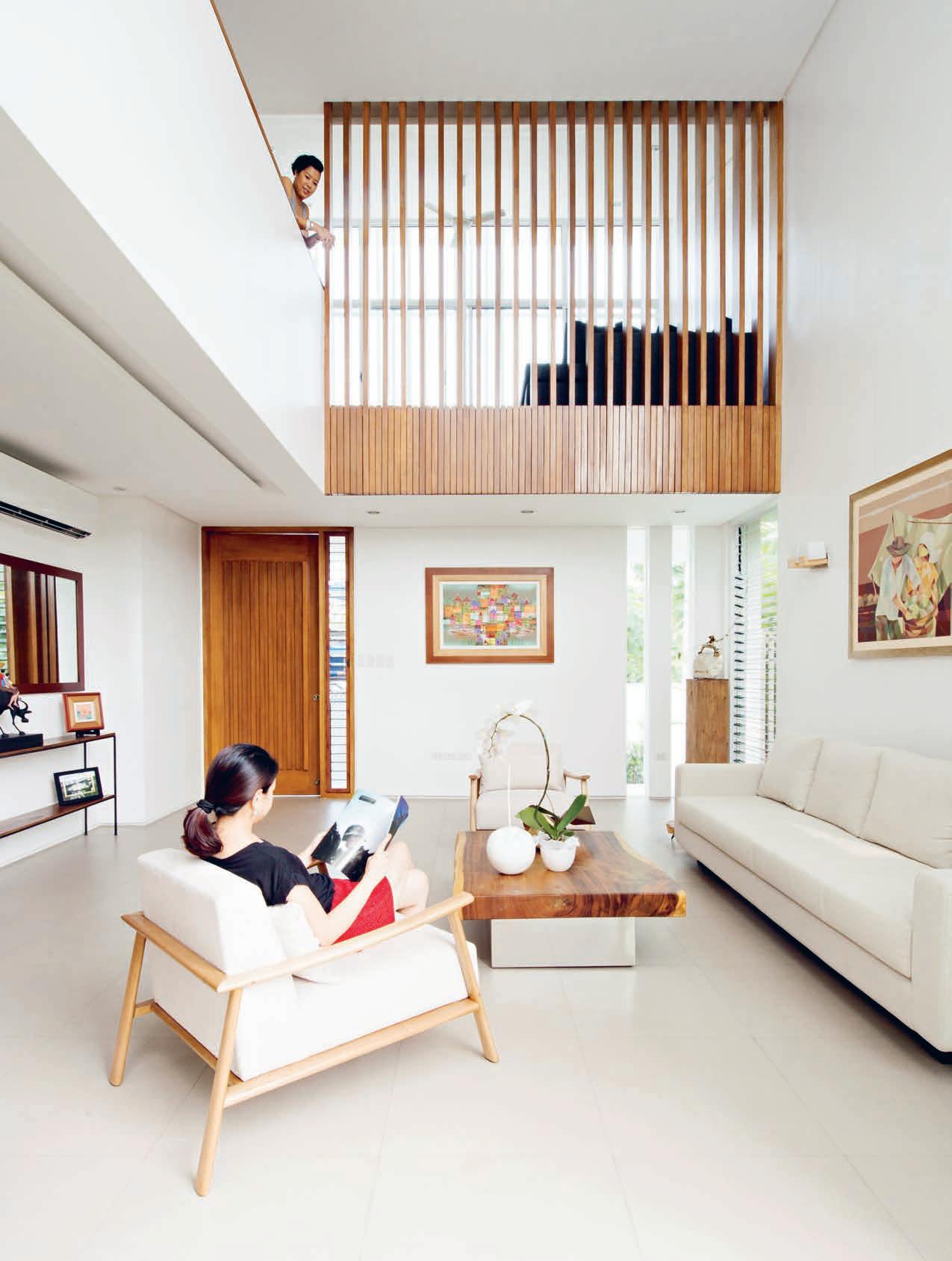
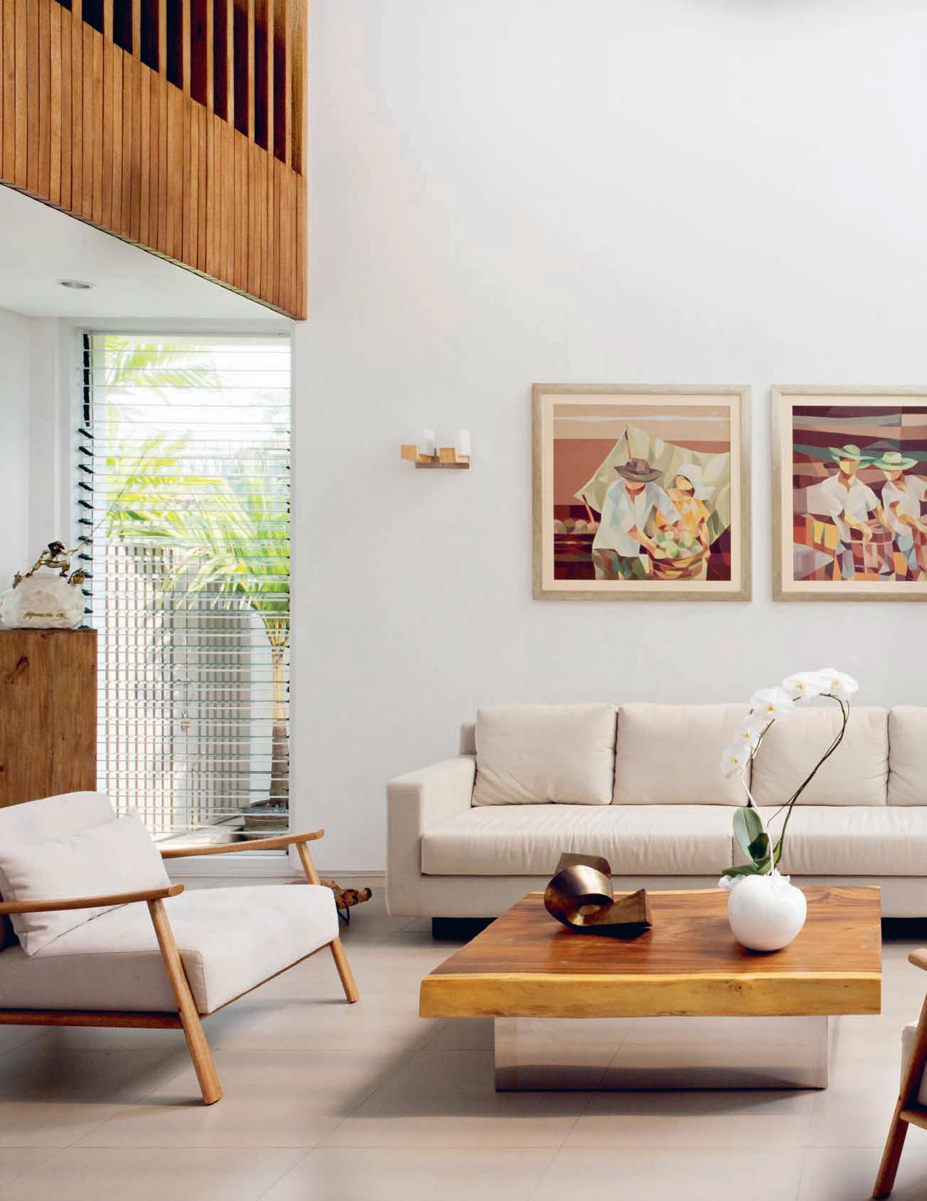
“I designed for the idea that the many segments of the house would be visually connected.”
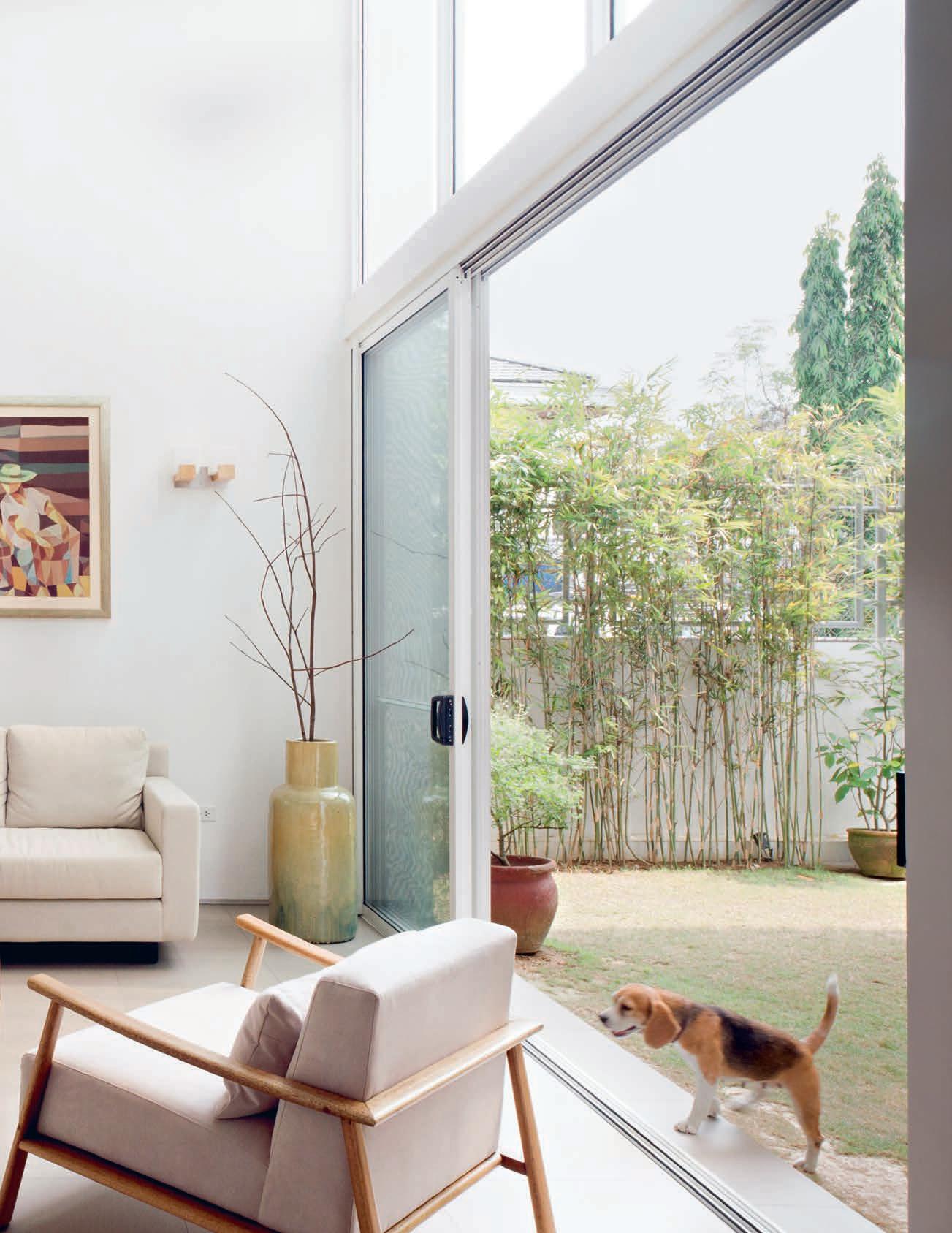
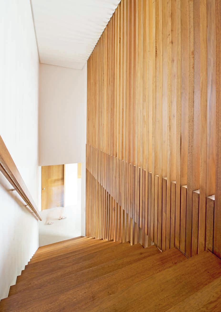
“If you strip the house of its ornamentation, the design should be able to carry itself.”
“It always rains in the Philippines, so we wanted a covered outdoor space – a lanai, which is an important space in the Filipino vernacular – our equivalent of a veranda. Traditionally, it is an open air living room that is covered, and facing a garden,” says Aya.
This green space at the heart of the home separates the dining room and double height living area, skilfully compartmentalising the ground floor while enhancing its spacious, sociable feel.
“The house is zoned in clusters. Visually, you feel you are all in one space, but at the same time, the spatial arrangement allows for di erent pockets of conversations to happen,” continues Aya.
In a culture so rich in celebration and family feasting, it follows that many Filipino households, even modest ones, are commonly served by two kitchens. The dry kitchen inside the house is kept for entertaining and the preparation of simple meals, while the serious culinary grunt work – frying whole fi sh over a dramatic industrial wok burner, for example – is reserved for the utilitarian wet, or ‘dirty’, kitchen outside. To this end, Aya included an adjoining outdoor service space. “Inside, they have somewhere nice to serve guests and eat breakfast, but it’s so important for them to have a place where they can cook traditional food.”
Natural air flow became another driver of the spatial plan. Bucking the nation-wide trend for maintaining artificial fridge-like temperatures indoors, the client preferred to reduce the need for air-conditioning. The actLAB team ensured lots of opportunity for cross-ventilation, with louvers specified on even the smallest openings.
“Air flow can be released upstairs, and they can purge air into the courtyard,” says Aya. “You can be inside the house and feel a breeze, even on very hot days.”
The furniture in Manila House is entirely produced by local craftsmen. The living room set was designed and created by local maker Milo Naval, a long-time collaborator of Aya’s with a background in architecture. “Besides supporting the local industry and having pieces that fit perfectly, we found the quality and craftsmanship of local artisans to be excellent and reasonably priced,” says the resident.
Milo’s wooden pieces sit well against the Manila House’s restrained material palette of porcelain tiles, compressed stone, masonry and local hardwood timbers. A native timber called Tanguile was used – a largely overlooked, inexpensive hardwood not frequently used in a fi ne house. The decision was made to use timber only in the places that you would touch, creating a sense of warmth and tactility as you move through the sequence of spaces.
While the Manila House provides a joyful respite for its human inhabitants, it is also a safe haven for its furry occupants. Though stray street dogs are endemic to the Philippines, many prized purebred pets are lamentably kept in cages to protect against escape, or theft. By contrast, the couple’s beagles sleep indoors and are free to roam the perimeter garden, which is screened with live bamboo for privacy.
“Much of the planning on the site was arranged to give the animals easy access to the outdoors, whilst keeping them away from the open front gate,” says Aya.
The house greets the street with an unassuming façade. Its exterior is clad in rendered masonry, with a first floor screened in white aluminium battens echoing the rhythmic timber slats within. This linear patterning is part of an overall strategy to lighten the visual mass of the project at street level, in reference to its context within a gated community.
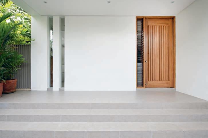
Likewise, the gate blends in as part of the overall design. Greenery was designed into the façade to soften the frontage over time, with native foliage along the fence line, as well as over the garage canopy and behind the slatted screen.
“I worked for architect Alex Popov for seven years, and I always remember him telling me, ‘if you strip the house of its ornamentation, the design should be able to carry itself.’” Aya says. “This has been a guiding voice in my own practice, and I feel like that’s what this house achieves.” Or more simply put, and in the client’s words, the Manila House is a “happy house”.
The project was briefed as a nuanced interpretation of the traditional Filipino home.
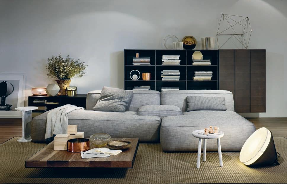
Our relationship with a space is – we know – utterly important. A reflection of who we are and who we aspire to be, a space must therefore be entirely a product of our own making. The issue is that the contemporary lifestyle and fluctuating housing market doesn’t always enable us to build that slow, entrenched relationship with our living spaces. We are renting, moving, wandering and exploring. And all too often, we can’t – and don’t want – a house or apartment to hold us back.
But just because we are constantly moving and changing doesn’t mean that we have to endure a life of disposable and unloved possessions. Luckily, Italian brand Lema has ignored
the lure of fast trends and cheap manufacture, continuing the quality of heritage manufacture and materials that have become synonymous with Italian design. Lema o ers a range of customisable wardrobes, shelving and furniture that is entirely centred on providing an – almost – limitless selection of finishes and materials to suit all tastes and spaces.
Local retailer Rogerseller has included Lema in their collection of premium international brands in an act of defiance against fleeting trends and passing fads. A portal to a di erent time, another city, a life lived in the company of great design; furniture should be timeless and brought on the journey alongside us.
Rogerseller | rogerseller.com.auAvailable exclusively at
Introducing the unique Aio halo-shaped design. 20% more spray force. Twice the amount of skin contact.* Experience Aurajet™ for yourself at methven.com/aurajet
* Compared to a Methven conventional shower at 9L per minute
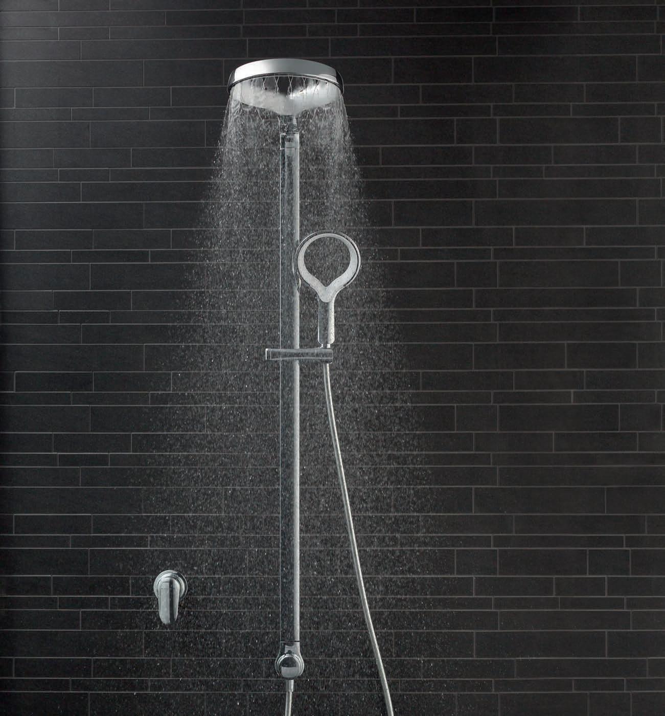
You’re looking at the next generation of showering. Now imagine how it feels.
Habitus recently partnered with I-Manifest and MINI to create a Micro-School of Design in which high school-aged students would consider how architecture and design can bring awareness to future living habits.
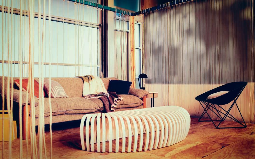
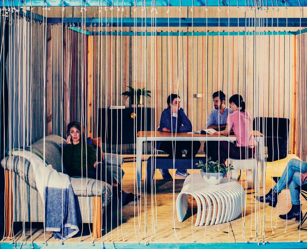
The students were asked to respond to the challenges of a growing urban sprawl while still creating inspiring co-habitable spaces.
There’s a massive push towards sustainable living, sustainable design and sustainable architecture, and Habitus, since its inception nearly 10 years ago, has been firmly at the forefront of this movement. Back in the 1990s, society was living beyond its means financially and got a rude shock when – care of a slight economic dip – we were forced to rein it back in.
Is history repeating itself? The advancements we’ve made in architecture and design in recent times are enough to elicit a global level of excitement, both in and outside of the industry. Architects are able to make the highly conceptual into reality and clients are egging them on from the sidelines.
But again, we find ourselves living beyond our means. Only this time we’re paying with the environment, not just our matt black titanium AMEX.
So what can we do to counter this? Educate fledgling architects to prioritise the environment? Definitely. Encourage practicing architects to lead by example and incorporate sustainability as common practice. For sure, many architects already do. Sway the market towards one-o investments in design and away from the fast fashion movement that has infiltrated furniture and homewares from clothing design? Absolutely.
But before we go too far forward, let’s go back a little. Let’s think about the high school students with an interest in architecture, interior design, furniture design, styling or academia and research in the field. Then there are those with an interest in the area but not a great understanding of the opportunities that await them.
Jo Pretyman has thought about them. At length. Her NGO, I-Manifest, hosts Micro-Schools of design for high schoolaged students to explore the full scope of their interests; understanding and learning practical applications; connecting with – and learning from – industry professionals.
Habitus partnered with I-Manifest and MINI to start a conversation around resource-conscious, shared city living in a rapidly growing Australasian environment.
The students – ranging from 14 to 18 years of age from Greater Western Sydney and representing 67 cultural backgrounds, many first or second generation refugees – were asked to respond to the challenges of a growing urban sprawl while still creating inspiring co-habitable spaces.
“We were excited to introduce the MINI LIVING philosophy in Australia through a localised and collaborative project with I-Manifest,” said Tony Sesto, general manager of MINI Australia. “MINI LIVING is all about creating innovative communal spaces of the future. It’s a concept that the students at the micro-school grasped and interpreted through their own lens – the end result was an inspiring concept that I’m sure we will all experience in the near future.”
The Micro-School aimed to teach students to consider how architecture and design brings awareness to future living habits. Who better to start thinking about these concepts than those who will be living in them? What better time than the present?
The brief was given to the students to create a modern living space – adaptable, considered, modern and highly designed. Furthermore the space was to encapsulate the tropes of our region with a focus on Asia Pacific designers and products, and showcase designer living with a minimal impact on the environment.
“Boundaries were defined by the kids who created a permeable skin from lengths of rope, linking the smaller internal spaces with their surrounds and allowing for transparency and permeability. The living space we created had to accomodate a family of four, and the students immediately understood the imperative to employ minimal intervention – leaving the modest spaces uncluttered and making the most with the least.” Miriam Green, Tribe Studio Architects.
Forward thinking and conscious planning is everyone’s responsibility; thought leaders, teachers and students alike. Is it unbearably trite to say the future is now?


Neolith’s large format slabs transform imagination to functionality. Available in a wide range of colours and patterns, Neolith is scratch, stain and heat resistant; making it suitable for the most demanding domestic and commercial applications both indoors and out.

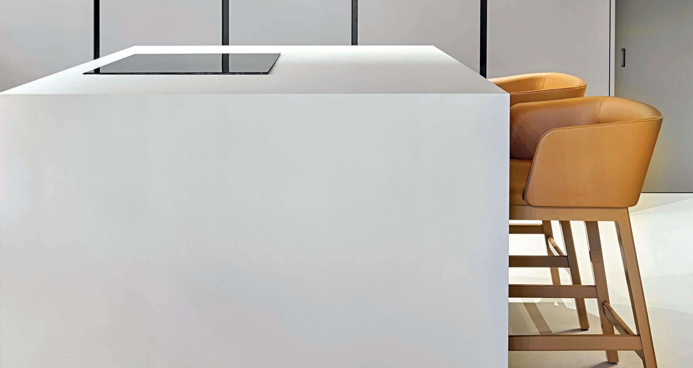
For more surfaces and information visit www.neolith.com.au

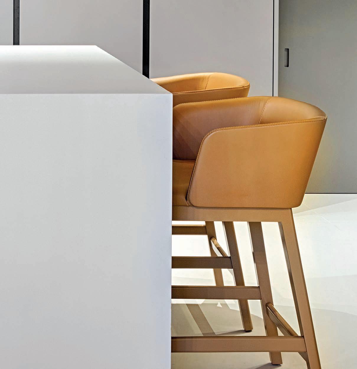





 Beton
Basalt Grey
Basalt Black
Iron Grey
Iron Moss Iron Copper
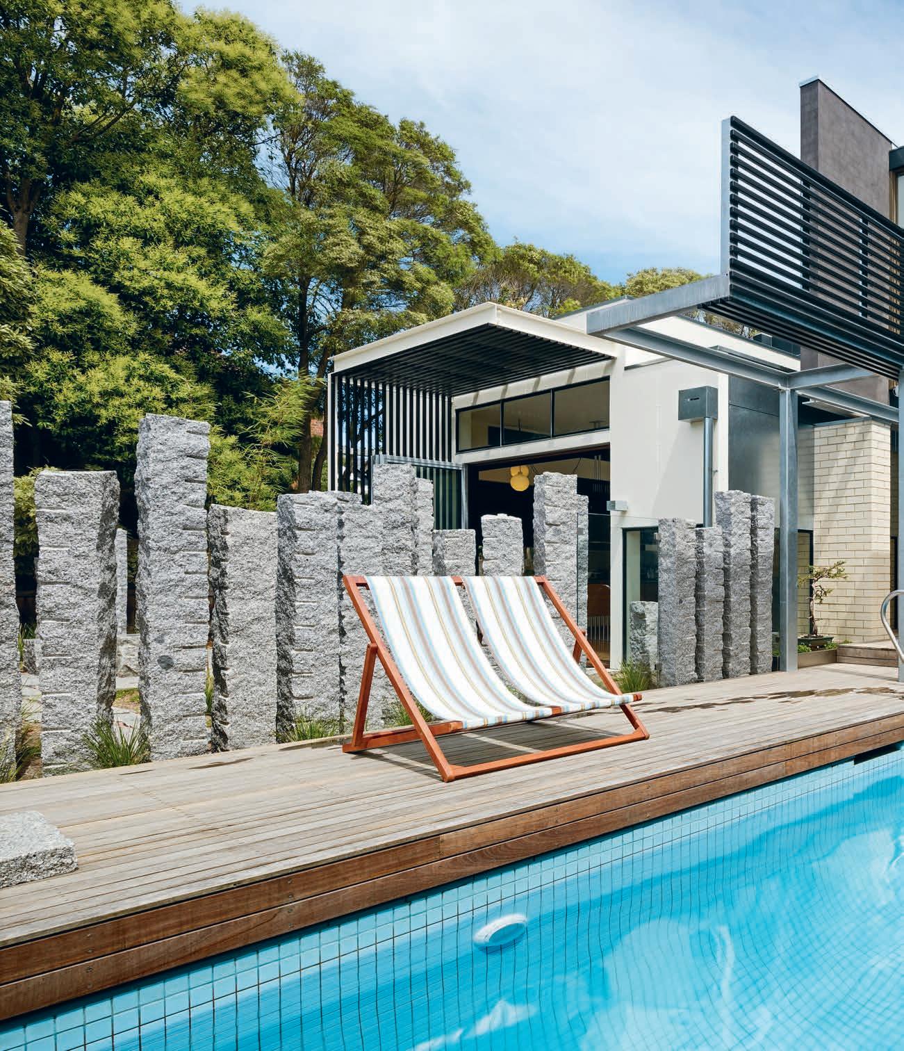
Designed in the late 1980s by architect Robert Grace, this house has been sensitively reworked by Multiplicity. For Grace, it was his first major architectural commission in Melbourne. For Multiplicity, nearly 30 years after it was built, the renovation became a heritage project.
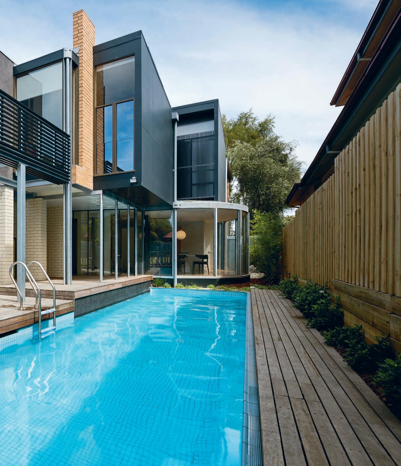
In 1985, Robert Grace, a young Melbourne architect, was commissioned to design his first house. Completed in 1988, the home’s cream brick and steel façade made a strong architectural statement in its leafy eastern suburban street. Robert, now a leading European architect, has been based in Paris since the mid-1990s with his partner, artist Sarah de Teliga and their family. He received numerous awards for this house, including a merit award for Outstanding Architecture from what was then the Royal Australian Institute of Architects, as well as Belle House of the Year, featuring on its glossy cover. “It was by far the largest residential project that came into my o ce.

“The owners were a young family and looking back, I had relative carte blanche to provide them with a three-bedroom house on a large block (over 1000 square metres) with a tennis court and swimming pool,” says Robert, who is now working on a number of new homes in France, one being on the southern coast and a renovation to another home on the Italian coast.
For Robert, who has also received the prestigious Royal British Institute of Architects Award for a London home, revisiting this Melbourne house must feel like revisiting the birth of his first child. “The Melbourne house was a bit like childbirth,” says Robert, who ‘delivered’ the home between a timber bungalow and a block of 1960s units. “We were at the height of postmodernism at the time. There were references made to Adolf
Loos’ work, as well as to Tadao Ando,” he says, pointing out the series of skylights that traverse the stairwell located in the centre of the house. While the Memphis colour scheme of mauve, citrus and black stood for many years, by the time the present owners purchased the house, some of the vibrant colours, including the burnt orange carpets (selected by Sarah de Teliga), had been removed. Multiplicity, the Melbourne-based architectural practice which was commissioned to rework the house, first saw it in its original condition in the early 1990s, on one of this writer’s very first architectural tours in Melbourne. “The original colours were very provocative. To be honest, I’ve never been a huge fan of the Memphis period. But I could certainly admire Robert’s strong architectural lines,” says interior designer Sioux Clark, who worked closely on the renovation with her life and business partner, architect Tim O’Sullivan, their team at Multiplicity and landscape artist Mel Ogden.
The new owners of the home, a couple with two teenage children, knew nothing of architect Robert Grace and the numerous awards he and the home had received at the time. “They were simply living nearby and were keen to move to a larger house, on a larger site that was towards the top of the hill,” says Tim, who thought the property’s swimming pool and tennis court might have been one of the reasons for the move. “They could see the house had great bones and after the renovation can appreciate its history and impact it made
“The owners were a young family and looking back, I had relative carte blanche to provide them with a threebedroom house on a large block.”
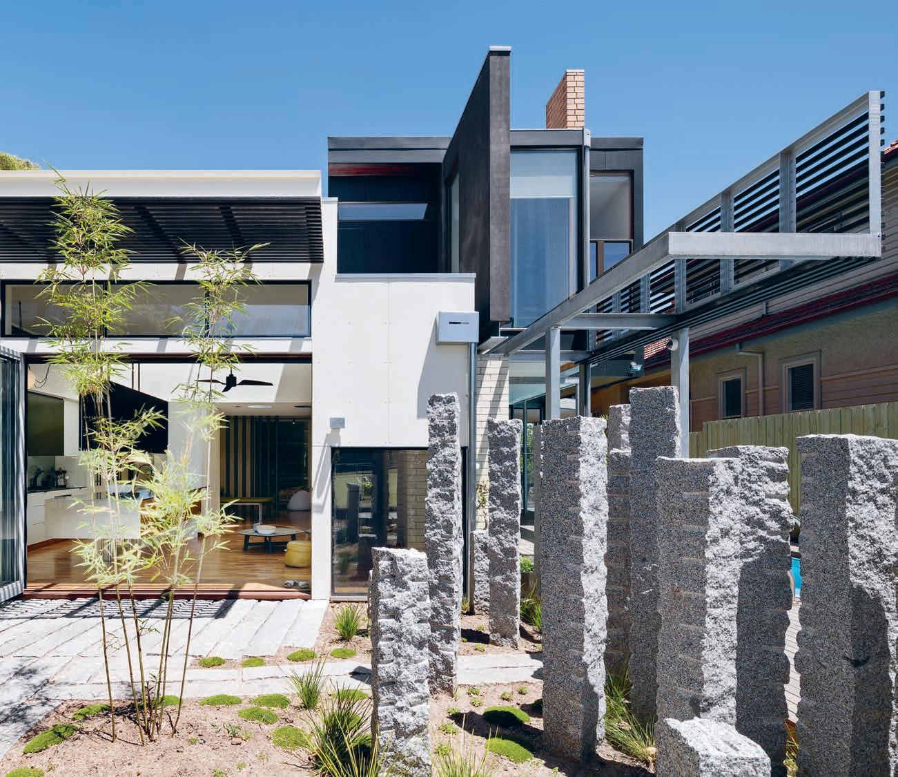
at that time. They also saw a few flaws in the house that needed repairing: the heating, airconditioning and the leaks from the upstairs terrace,” he adds.
Multiplicity focused on the broader logistics, including the lack of connection to the back garden and swimming pool. “There was really only one single door to the deck. When we revisited the house this time around, there was a bicycle and several pairs of shoes on its threshold,” says Tim.
After 25 years, it’s not unusual to rework bathrooms and kitchens. For this house, Multiplicity relocated the kitchen to the rear and northern elevation. Instead of granite benches, stainless steel was used for the kitchen. And concealing two fridges is zebra veneer and two-pack painted joinery in a vibrant apple green and cream checkerboard. “With two children, we wanted to make the house feel joyous. The colour also takes the home into the present,” says Sioux, who used the same apple green in the form of colour-backed glass in the parents’ ensuite and children’s bathroom. New pillar-like cream brick walls also feature in the new addition, allowing unimpeded sight lines to the swimming pool, slightly modified in shape, with its spa removed.
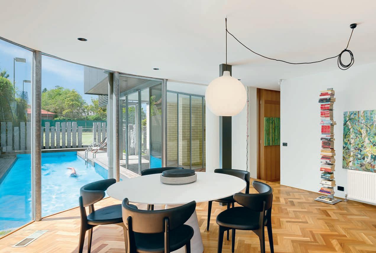
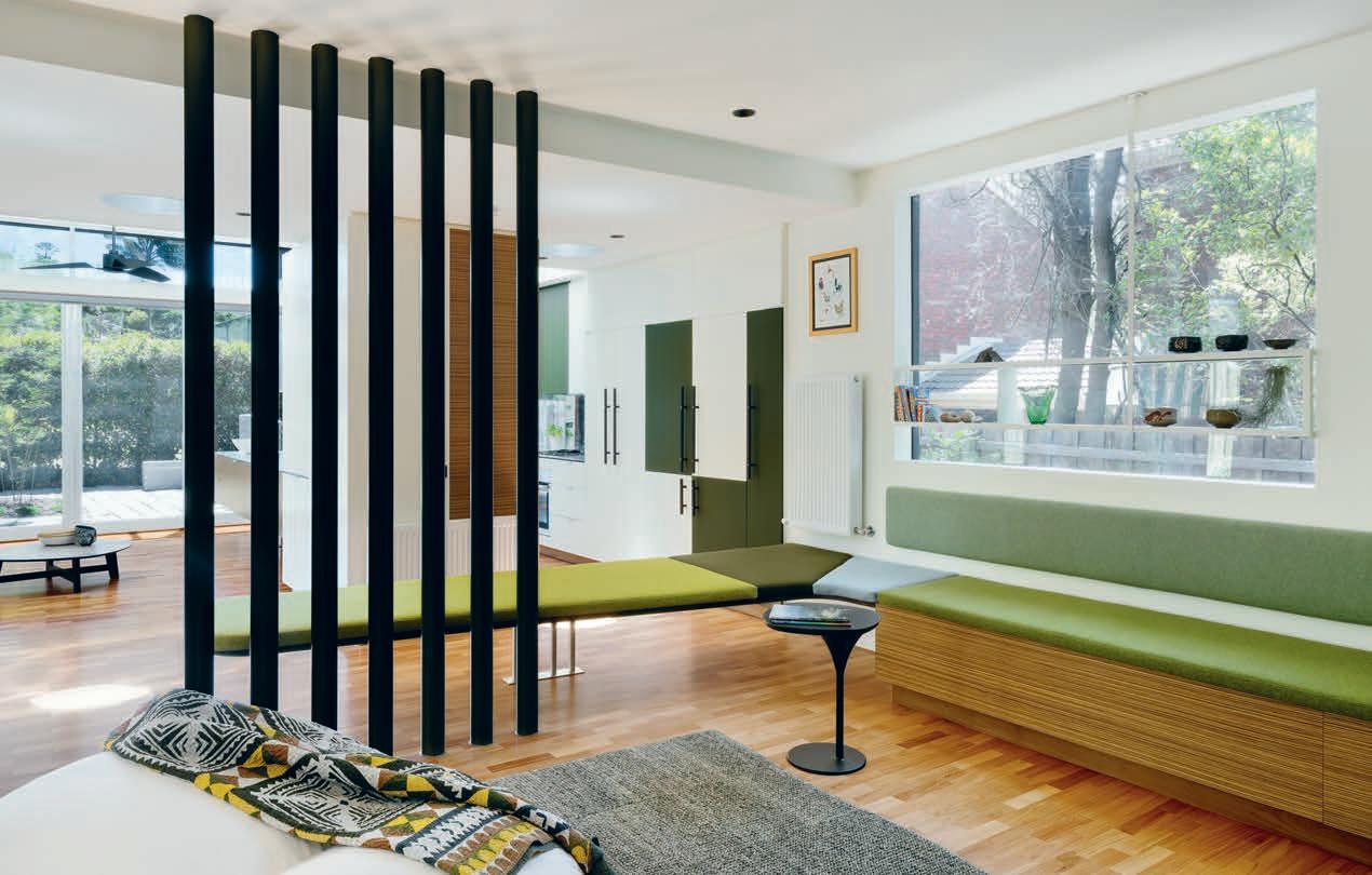
Other rooms have been lightly touched. The front room, for example, originally a formal living room (integral to the way people lived in the 1980s), has been transformed into a home o ce. While some of the original joinery was removed in the renovation, the same highlevel of craftsmanship has been replaced by a bespoke timber and steel desk, designed by Multiplicity. However, elements from the past, including the triangular-shaped stone overmantle, remain.
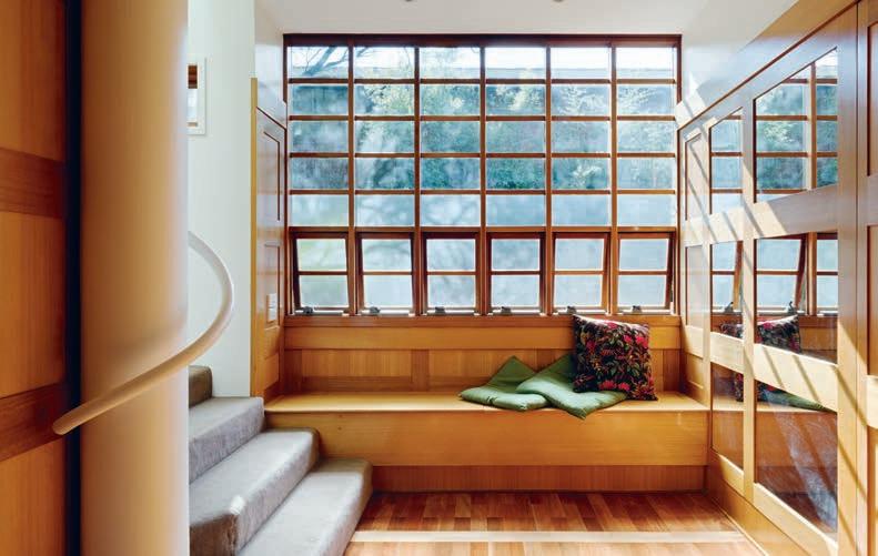
One of the main requirements by the present owners was for a new carport at the front of the house. Adding a carport to this strong architectural form could have been the team’s undoing. However, to their credit, they beautifully integrate the steel and fibrocement carport into the original façade, using similar materials, as well as colour used from that time. “We took Robert Grace’s yellow and deepened it into a more acidic yellow to capture the landscape, but still giving the place the same tone,” says Sioux, who was equally adventurous by using powder blues in hallways to separate the use of stronger colours. New contemporary furniture from Hub Furniture and lighting gave the home a new edge, as did paintings by Piers Dudley-Bateman.
The Grace House still bears its pedigree. The exquisite timber-lined entry, with its square portal windows, picks up on the language of Adolf Loos. The sinuous handrails in the stairwell/lightwell are original, as is the beautiful parquetry floor. Yes, there are a few elements missing, such as the mauve-coloured built-in seating that formed a sculptural element (removed in past years). “Sioux and I have peeled away certain aspects of the home that weren’t functioning to the expectations of our clients. But we saw this place from the outset as not only are to older period homes. This one is now coming into its own for a new audience of architectural enthusiasts,” says Tim.
PREVIOUS LEFT | PLANS. PREVIOUS RIGHT, ABOVE | THE DINING AREA, ORIENTATED TO THE NORTH, OCCUPIES A PROMINENT POSITION AT THE HEAD OF THE LAP POOL. PREVIOUS RIGHT, BELOW | THE KITCHEN AND INFORMAL SITTING AREA IS LOOSELY DIVIDED BY STRUCTURAL COLUMNS. ABOVE | THE ENTRY WAS RESTORED BY MULTIPLICITY AND IS REMINISCENT OF THE WORK OF AUSTRIAN ARCHITECT ADOLF LOOS.“We were at the height of postmodernism at the time. There were references made to Adolph Loos’ work, as well as to Tadao Ando.”
Neither large-scale system nor mere object, Unit by Cesar stands as a highly functional midpoint between the two. Bridging the functionality of practical design and the intimacy and warmth of homey kitchen style, Unit o ers a new perspective on space in the kitchen – reinvented with a view to total freedom of composition.
In the era of global interconnection, design is exploring new paths oriented toward flexible but timeless solutions of exceptional quality. This is what drives Cesar to create totally original products, designed to supplement and enhance its previous collections, and o er a highly personalised alternative result.
Hence Unit, a design solution inspired by the professional kitchen, reinterpreted in the light of the particular aesthetic and functional demands of the domestic environment.
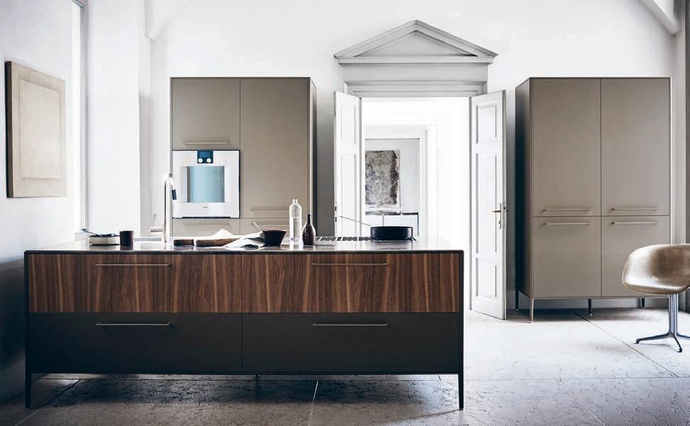
“We conceived Unit as a ‘bridge’ project,” explain designers Cinzia Cumini and Vicente Garcia “Capable of linking the crude aesthetic of professional elements, given by their essentially practical purpose, with more harmonic and
elegant forms, better suited to the home interior.” Available in Australia through thinkdzine, the launch of Unit is also the unveiling of a range of new finishes. With Unit, thinkdzine is launching the first scratch resistant painted door finish, going by structural Lacquer – a finish that is characterised by a textured surface and metallic pigments, making the six colour options reflecting with alternate exposure to the light.
Alongside the Unit display, thinkdzine is also releasing the first solid, stainless bench top in 6mm, available in two finishes and with optional integration of sinks.
The design of Unit itself is entirely free of sharp edges, bringing to mind classic archetypal lines, and aims to redefine the kitchen space in an incomparably creative way. Its ease of relocation and adaptability to di erent spaces, and the way it fits with di erent styles make Unit a truly versatile piece of furniture, capable of meeting the demands of a society increasingly oriented toward mobility, as well as rising to personal tastes and forms of conviviality.
Unit by Cesar | thinkdzine.com.auUnit, by Italy’s Cesar, is a dynamic, airy kitchen system bringing together professionalism and domestic warmth.
ARCHITECT Renato D’Ettorre Architects
ARCHITECT Strachan Group Architects
INTERIOR STYLIST Malvina Stone
MALVINA STONE
(61) 4 05 339 088
RENATO D’ETTORR E ARCHITECTS (61) 2 9332 1061 dettorrearchitects.com.au
FURNITURE
Living room sofas custom upholstered in La Vita fabric from Fabric Pavilion. Custom made cushions in La Vita fabric from Fabric Pavilion and rug from Tribe Home used throughout. Aran chair by Adam Goodrum from Cult. Reindeer hide from Great Dane . Artek webbed chair from Anibou. Disc co ee tables from Temperature Design. Hand knitted throw from Nickel.N.Co. Custom made dining table in stained American white oak from Revival Furniture. HAY About a Chair dining chairs from Cult. Jasper sofa modules from King Living. Felix sofa from King furniture. Living tower sofa by Divani from Space. custom made bed in master bedroom from Revival Furniture. Bedcovers from Country Road Home. Cashmere and mohair throw from Bemboka. Deborah chair by Maxalto from Space. Custom cabinetry in kitchen and HAY About a Stool chairs from Cult.
ARCHITECT Edition O ce
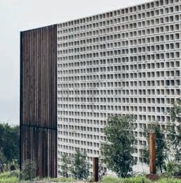
PROJECT ARCHITECT Pat de Pont
ST R ACHAN GROUP ARCHITECTS (64) 9638 6302 sgaltd.co.nz
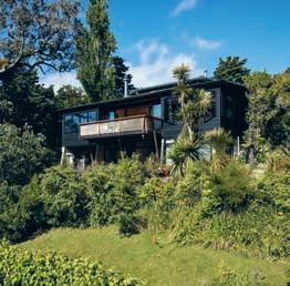
FURNITURE
Built-in furniture and window seating designed and made by owner. Cedar dining and atrium tables designed and made by owner from waste materials. HAL dining chairs by Jasper Morrison from Cite. Bo chair by Philippe Starck from Skinner Design. Nouveau wicker setting from Mitre
10. Anglepoise Type 75 desk lamp from Cult. Arnold Circus stool from Simon James Concept. Linen and cushions from Father Rabbit and Citta Design.
LIGHTING
Hinaki Pendants from David Trubridge.
FINISHES
Natural texture plywood lining from CHH Shadowclad. Wood oil from Drydens. Block work with clear sealer and coating system. Glazed timber doors and shutters custom made by owner. Ground and polished concrete flooring. Clear finish with Uroxsys coating system. Quick Step Oak engineered timber Tongue and Groove overlay flooring from Floorscape. Gaboon veneered plywood ceiling. Melamine veneered cabinetry and American white oak panels MDF from Kitchen Works.
FIXED & FITTED
Aluminium joinery from APL.
PROJECT TEAM Aaron Roberts, Kim Bridgland, Georgia Nowak
BUILDERS One Construction
STRUCTURAL ENGINEERS BDD Engineering
LANDSCAPE ARCHITECT GINKGO Paradise
EDITION OFFICE (61) 3 9419 5575 edition-o ce.com
FURNITURE
2100mm Fold Table from Sipa. Floor rug from Loom Rugs. Lily tray tables in small and medium by Nancy Ji for Tait. Black Volley Rocker chair from Tait. White Tidal Chairs by Trent Jansen for Tait. Forbes & Ike Pepper mill and salt basin from Hank. Towels by Loom Towels. Cushions and bedding from Spacecraft.
LIGHTING
Polar Desk lamp in white and Ora Desk lamp by Ross Gardam. Up and Down T-Mini wall lights in white and surface mounted T-Mini downlight in white from Artefact Industries. LED downlights, Up/Down exterior wall lights, adjustable surface mounted external wall lights, and adjustable external garden lights all from Havit.
FINISHES
Standard hollow concrete blocks in Alabaster from National Masonry. Rough sawn White Cypress timber batten screen, unfinished. Lysaght Panelrib wall cladding in Night Sky. Silvertop Ash Shiplapped wall cladding, unfinished. European Oak Graupa Timber floorboards from Tongue N Groove. Silvertop Ash timber decking, unfinished. Zimbabwe Black Granite Bench-tops. Figured Blackbutt Veneer from Ventech. Carl Stahl X-Tend mesh in black from Ronstan.
FIXED & FITTED
Turn Fireplace from Skantherm. 90cm Black Glass cooktop from Electrolux. 90cm undermount rangehood from Fisher & Paykel. 60cm Oven from Miele. Steel Queen double undermount sink from Franke. Icon sink and basin mixers from Astra Walker.
ARTWORK
Paintings by Jahnne Pasco-White & Kate Tucker, and illustration by Peter Davidson courtesy of Daine Singer Gallery. Prints by Benjamin Lichtenstein and Kate Tucker courtesy of Version Editions. Chernobyl photograph by Peter Tarasiuk. Untitled photograph from the series Glas by Bridget Mac.
Dress it up or play it down, here are the pieces that turned these houses into homes.
It’s all in the Details
ARCHITECT CplusC Architectural Workshop
ARCHITECTURAL PROJECT MANAGER
Ryan Ng
STRUCTURAL ENGINEER SDA Structures
AUDIO CONSULTANT Alder Technology
Consulting
LIGHTING CONSULTANT Electrolight
INTERIOR STYLIST Jason Sullivan
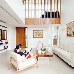
LANDSCAPE SPECIALIST Junglefy
CPLUSC A RCHITECTURA L
WORKSHOP
(61) 2 9690 2211 cplusc.com.au
FURNITURE
Vintage Brazilian sofa set by Percival Lafer, Brazilian captains chair and ottoman by Jean Gillon, Børge Mogensen dining chairs upholstered in Unique Fabrics all from Vampt Vintage Design. Gravel rug from Robyn Cosgrove Rugs. Banquette upholstered by Stitches Upholstery Creations in Isaka fabric from Unique Fabrics. Cushions upholstered in Michael S Smith Fabric from Elliott Clarke. Vintage Spinnaker lamp by Stilnovo, 19th Century cup coral sculpture, custom brass co ee tables from Don Cameron Studio. Ceramic vase, cushions and planter by Pop and Scott from Smithmade. Gregarious Works sculpture, bronze bowl and Splay Leg Elliptical dining table from Planet Furniture. Aboriginal artwork clients own. Plants, planter, ceramic pottery from The Plant Room. Outdoor Flint table and benches from Tait. Owl of Yeoman’s Rock artwork by Joshua Yeldham from Arthouse Gallery. AAS38 stools from Hay. Bell brass co ee table from Anibou. Sofa from King Furniture. Vintage loom rug from Koskela. Vintage pool chairs clients own. Missoni bed linen from Spence and Lyda.
LIGHTING
Bocci 28.7c Random Seven Pendant lighting from Hub Furniture. Juncos rod lighting from Flos.
FRP light grey grating panels from Scavenger Supplies. Mild steel wall grating from Webforge. Cement bonded wood composite from Kōbe Board. Tongue and Groove cladding from Timbeck. Cemintel Barestone fibre cement panel from Cemintel. Matrix fibre cement panel from Scyon. Board formed concrete wall from Concreative. KLIPLOK 406 metal roof from Lysaght. Luxor Natural 600 x 600 slate floor tiles from RMS Marble. Burnished topping floor slab from Concreative. Spotted gum timber flooring from Precision Flooring. Melamine joinery from Polytec. Joinery by Formply. Steel joinery in folded mild steel in Dulux Luck PG1G9 from OX Engineering Group. Stair steel in mild steel in Dulux Luck from Steel Fabrication services. Columns and beams in spotted gum timber and galvanised steel. Marble benchtop in Calacatta from Harmony Marble & Granite. Timber benchtop in thick spotted gum from Bondi Kitchens.
FIXED & FITTED
Basin from Duravit , Cibo and Astra Walker. Bathtub from Apaiser .Toilet from Caroma. Mixer from Astra Walker. Shower head and arms from Methven and Astra Walker. Bathroom accessories from Avenir and Astra Walker.
DESIGN ARCHITECT actLAB
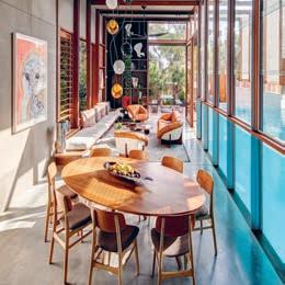
DESIGN TEAM Aya Maceda, Jonathan Fernandes, Emily Oppenheim
LOCAL ARCHITECT UO2 Architects
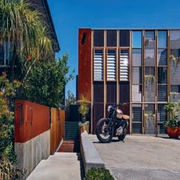
BUILDER Solid Core Pabalan Construction Corp
Revisiting a 1980s classic
ARCHITECT multiplicity
PROJECT TEAM Tim O’Sullivan, Sioux Clark, Ellen Kwek, Cimone McIntosh
BUILDER Caedman Construction
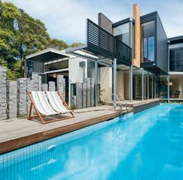
ENGINEER MTO Engineering BUILDING SURVEYOR ASA Building
KITCHEN JOINERY CNEX Modufurni Systems
ACTL A B actlabnyc.com
FURNITURE
Living room furniture OMO by Milo Naval. Other pieces custom made.
FINISHES
Plaster and paint on concrete blocks for the interior and exterior wall. Concrete and porcelain tiles on floor. Glass louvre windows and powder coated aluminium windows. Custom made interior and exterior doors, interior louvres, stairs and handrails using local Tanguile timber. Custom made exterior louvres in powder-coated aluminum. Living in Style floor tiles by Cebu Oversea Hardware Company. Tanguile floorboards elsewhere.
FIXED & FITTED
Custom made kitchen joinery, lacquered and timber veneer cabinetry. Countertops from Caesar stone. Refrigerator, cooktop and laundry from Whirlpool. Built-in oven from Franke. Sink from Creston. Kitchen taps from Franke. Bathroom fixtures from Grohe, Hansgrohe, Kholer and American Standard.
ARTWORK
In living room: Paintings above sofa wall by Oscar Salita. Painting above piano by Manuel Baldemor. Abstract brass sculpture by Eduardo Castrillo. Brass sculptures on rock and wood base by Michael Cacnio. In dining area: paintings by Ivan Acuña, Abdulmari Imao and Romulo Olazo. Paintings at second floor landing by Arturo R. Luz and Raul Lebajo.
Consultants
JOINERY Colonial Cabinets
MU LTIPL ICITY
(61) 3 9388 0790 multiplicity.com.au
FURNITURE
MDF italia rock dining table, Moroso diesel shortwave dining chairs, Viccarbe ace wood armchairs in living room, Moroso phoenix co ee table, Moroso bloomy small tables, Redaeli Fritz relax armchair, Ruckstuhl Maglia rug, and Hale Mer linen bedding all from Hub Furniture.
LIGHTING
Bright Green range of track and downlight used internally from Richmond Lighting. Balance Pendant in study from Copper ID.
FINISHES
Blackbutt parquetry flooring laid in new addition. External paint finishes in Asparagus, Dark Moss, Papyrus and Yellow Wax from Haymes Paints and Brown Bronze from Wattyl Paints. Internal paint finishes in Asparagus, Dark Moss, Golden Olive, Green Valley, Lime Bright, Papyrus, Twining Vine and Yellow Wax from Haymes Paints. Lea Ceramiche Silmtech tiles in Black Co ee in laundry, ensuite and main bathroom from Signorino. Inax Yohen Border tiles in main bathroom from Artedomus.
Zuchhetti Pan tapware from Mary Noall used throughout. Kaldewei Cayono bath, vanity basin in powder room, Duravit ME by Starck toilets. Gerberit Duofix cisterns from Mary Noall. Oven and dishwasher from Bosch. Gas cooktop from Miele. Rangehood from Sirius. Granite (recycled from the original dwelling) bathroom vanity top and splashback. Door fittings purpose designed by Multiplicity.
To celebrate the launch of Habitus #36, the Nourish issue, we thought it fitting to partner with Sub Zero Wolf and host the night ’s proceedings at their showroom in Melbourne’s historic Bank Place.
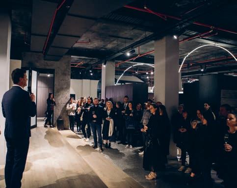
A theme that saw us explore the kitchen and bathroom within the context of the entire home, we hope to insight a fresh approach to the design of these spaces.
Joined by the industry ’s best and brightest, it was an evening spent in good conversation amongst friends and colleagues.
Habitus Living habitusliving.com
Zub Zero Wolf livingedge.com.au
SENSITIVE CHOICE IS AN OFFICIAL MARK OF APPROVAL IDENTIFYING BUILDING AND OTHER PRODUCTS THAT MAY BE A BETTER CHOICE FOR PEOPLE WITH ASTHMA AND ALLERGIES.


We’re the 7,000,000 Australians whose future wellbeing depends in large on the product decisions you make today.

Sensitive Choice is a community service created by National Asthma Council Australia for people with asthma and allergies. From building products to bedding, to insulation to carpets and appliances, to the very paint you choose for the walls, hundreds of products that care for our air wear our symbol.


Find out more at sensitivechoice.com
IT’S ABOUT BREATHING
Discover beautiful products

Meet inspiring people
Indulge in architecture and design

Across Australia, New Zealand, South and South-East Asia
The online community for the Design Hunter®


Website | habitusliving.com
Facebook | habitusliving
Pinterest | habitusliving
Instagram | @habitusliving
Twitter | @habitusliving


a Happy Home
 Building
Photography by Simon Devitt
THE TEAM AT HABITUS MAGAZINE THANKS OUR ADVERTISERS FOR THEIR SUPPORT. USE THE DIRECTORY TO SEE WHAT PAGE A SPECIFIC BRAND IS FEATURED ON, AND VISIT THEIR WEBSITE TO LEARN ABOUT THE PRODUCTS AND SERVICES THEY PROVIDE.
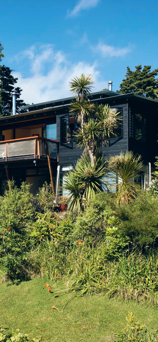
- 137
063 boconcept.com.au Cult 004 - 005, 076 - 079 cultdesign.com.au
146 - 147
Designer Rugs 014 - 015 designerrugs.com.au
012 - 013
Habitus magazine is available at newsagents and bookstores across Australasia, South-East Asia, the USA, Canada, Europe, South America and the Middle East. Habitus is published quarterly in March, June, September and December. To subscribe securely online visit habitusliving.com/magazine or email subscriptions@indesign.com.au to subscribe or request a full list of locations where Habitus magazine is available.
Your map to where the stories in this issue come from where is available
“Advice is a form of nostalgia.”
