corners at the Playful House.
Henson
the
the everyday
a mix of jewellery, art and architecture
in
#38 DeceMBer – feBruAry | 2018 AUD$16.95 | NZ$16.95 | USD$17.95 CDN$18.95 | GBP£9.90 | SGD$11.95 38 9 771836055007
Supple curves complement harsh
Bill
locates
exotic in
. And Melanie Katsalidis lives
. living
design
Culinary art starts with the first course.
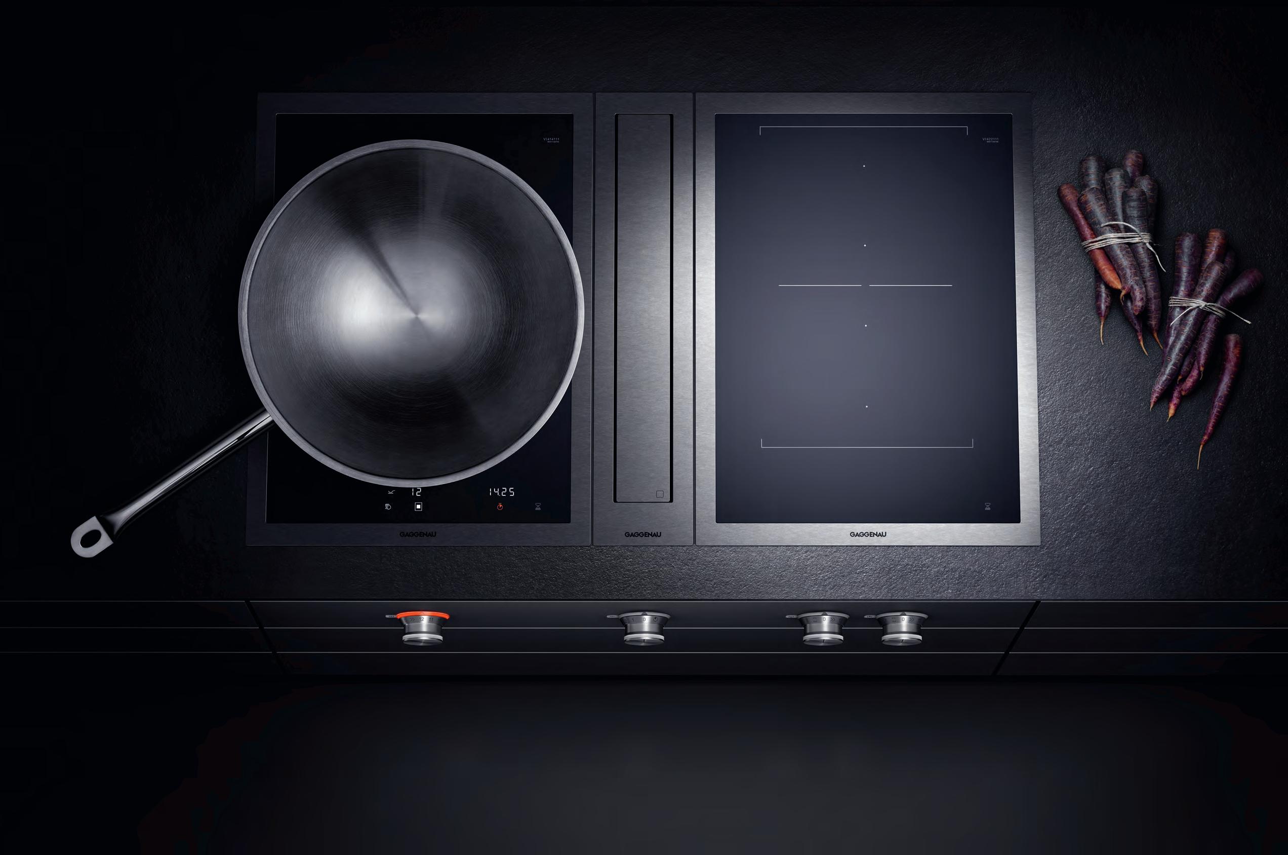
The difference is Gaggenau.
The ambitious kitchen is a place of exacting demands for equipment, ingredients and techniques. The Vario cooktops 400 series have been meeting these demands from the beginning, with appliances developed to meet any challenge. Energy efficient, our steel-framed induction cooktops direct heat quickly to the pan with the power to sear as well as the control for long, gentle simmering. These cooktops free the imagination; a tribute to boundless cuisine. Whatever combination you choose, you can look forward to exceptional freedom for decades to come.
For more information, please visit www.gaggenau.com/au
 Culinary culture starts sooner than that.
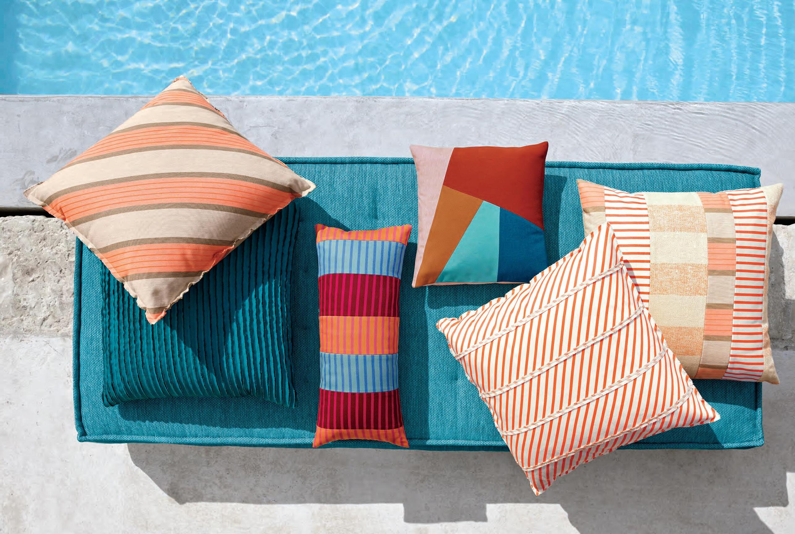
Design + Performance ™ and Legendary Performance Fabrics ™ are trademarks and Sunbrella ® is a registered trademark of Glen Raven, Inc. SUNBRELLA.COM


PERFORMANCE FABRICS ™
PROOF / EASY
/ BLEACH
LEGENDARY
FADE
CARE
CLEANABLE


Great design can enrich your life, broaden your horizons and challenge preconceptions of what’s possible and what isn’t.
26 desiGN N e Ws e xotic design can be thought of in many ways. s p ecific materials, shapes, functions, and forms each have the ability to be foreign to some, banal to others. Challenge your notions of what’s normal and feed your hunger for good design.
Uncover how some of the region’s best and brightest creatives have fashioned a nest for themselves – to simultaneously fuel their fire and offer respite.
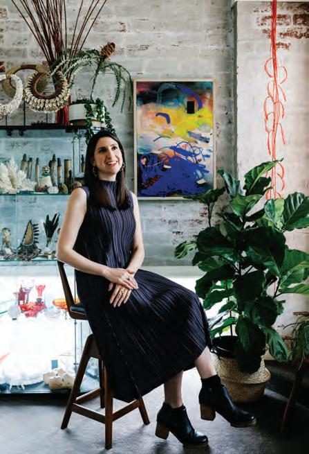
Famous parents may present itself as a problem for some, but not for Melanie Katsalidis. t he daughter of Nonda Katsalidis, celebrated architect and founding member of Fender Katsalidis, Melanie has made a name for herself in her own right.

56 l i N dsay Joh NstoN l i ndsay Johnston has made a career – both architecturally and academically – out of challenging conventions and, in his own words, stirring the pot. h i s legacy and political approach to architecture lives on through next-generation architects care of the annual Glenn Murcutt i nt ernational a rchitecture Master Class he founded in 2001.
Just over five years ago Pip Vassett decided that after eight years as the Fashion d i rector of Yen, it was high time to do her own thing and play by her own rules. Moving into the residential sphere, i N Be d is an online retail space encompasing her own designs as well as those of local and regional creatives.
#38
42 M el Katsalidis
66 Pi P Vassett
42 26
Exotic
81 OTHERNESS
Stephen Todd explores the exoticism of design across borders and the inaugural NGv Triennial.
86 BILL HENSON
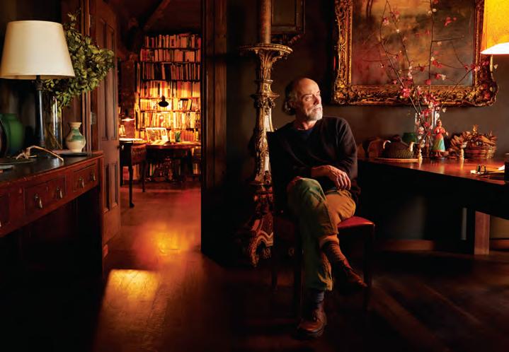
A r are and exclusive invitation into the private home of the esteemed Bill Henson anchors this issue’s In Habitus Veritas.
100 THE EXOTIc OF THE ORDINARY
A portfolio of imagery by art photographers and artists such as Tony Amos, Samuel Hodge, Elisenda Russell and Martyn Thompson to explore the notion of the exotic in the everyday.
Residential architecture is a universal need yet examples vary from culture to culture. We explore different models and how they’ve evolved across the region.
114 PL AYFUL HOUSE
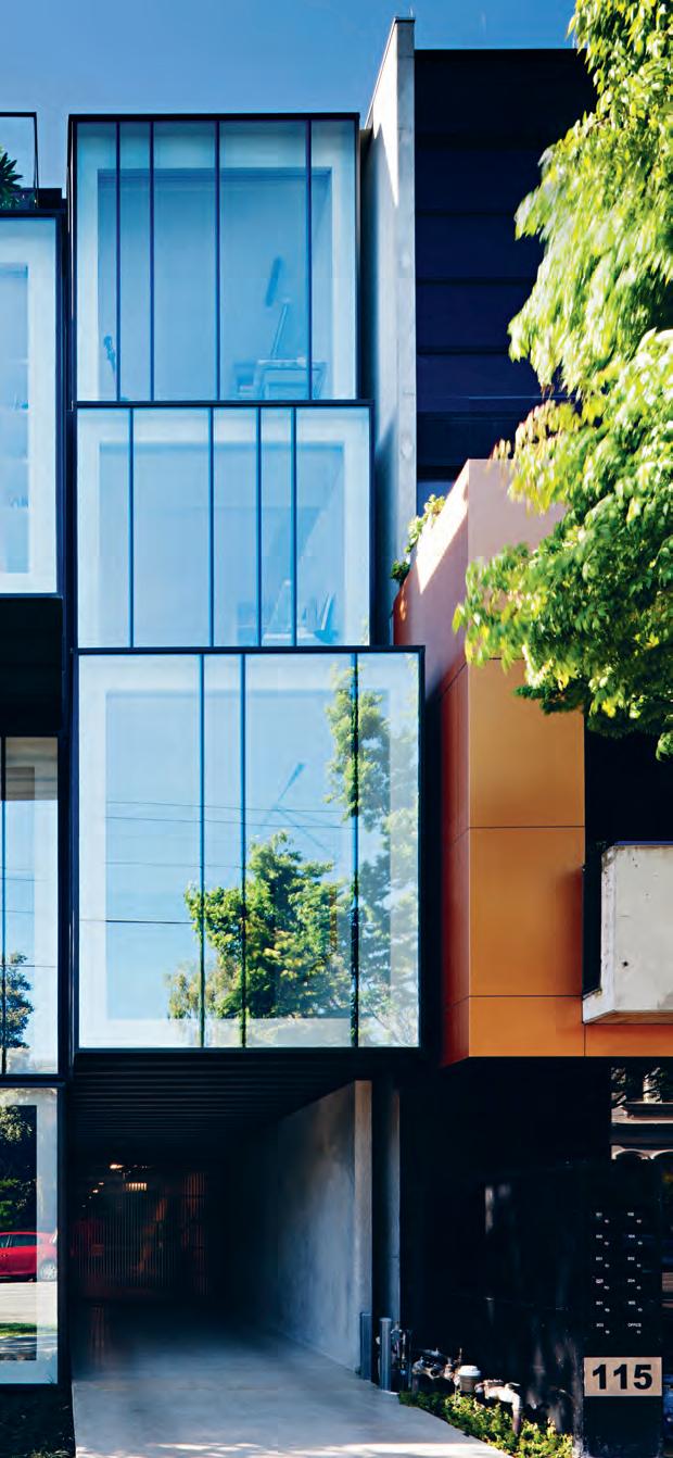
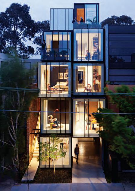
An impressive faç ade leaves a lasting impression with passersby at the Playful House by Martin Friedrich Architects.
126 H IDDEN STUDIO
In the tropical context of Northern NSW a secluded studio draws architectural inspiration from the main building designed by the late Ian McKay.
136 M IXED USE HOUSE
An urban infill site in Melbourne is reimagined by Matt Gibson Architecture + Design as a residential model more often championed in Asia and Europe.
152 GRESHAM ST HOUSE
In inner-city Brisbane a renovation and addition by Jackson Teece transports the young family to the remote and tropical location of the patriach’s roots.
164 HOUSE WITH SHADOWS
RT+Q designs a multigenerational house in Singapore in which the surrounding gardens are used to organise the buildings’ forms.
172 E v E RYONE ’ S HOUSE
Striking a careful balance between open and closed, this house in Japan benefits from impressive, unimpeded mountain views while still resonating with the neighbouring architecture.
182 v U E DE MONDE
H iromi Tango adorns the walls and ceiling of the new private dining suite at Melbourne’s vue de Monde.
#38
138 86
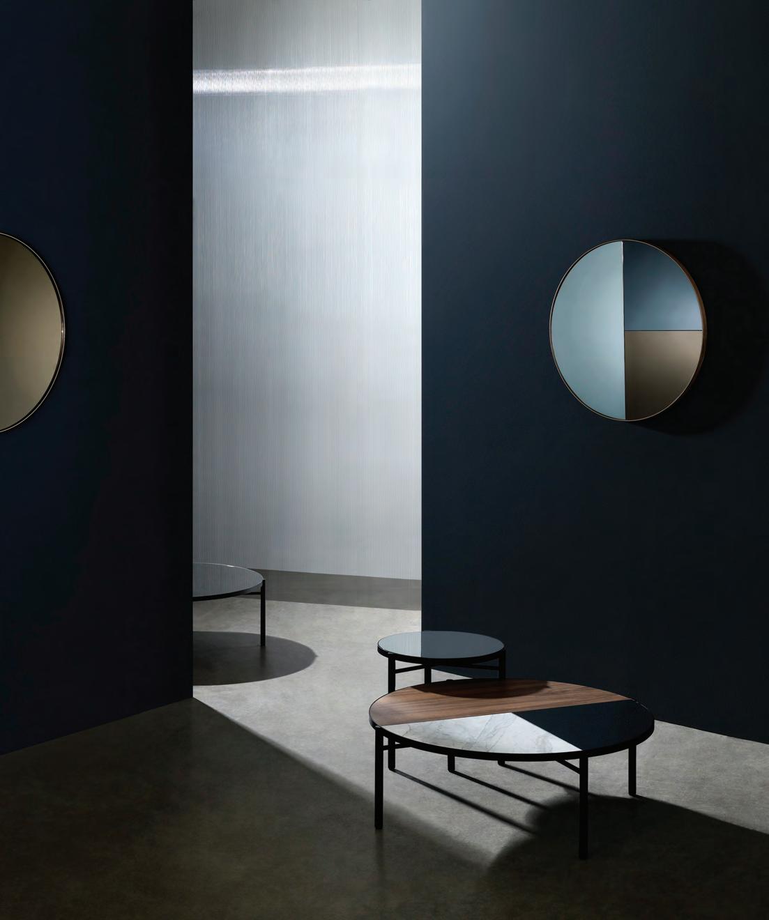
Australia 1300 306 960 stylecraft.com.au Supporting Australian Design & Manufacturing Singapore +65 6511 9328 Noon Mirror & Table Collection

Mezzanine level 171 Robertson Street Fortitude Valley, QLD 4006 P | +617 3216 1551
1f Danks St Waterloo, NSW 2017
P | +612 9699 1131
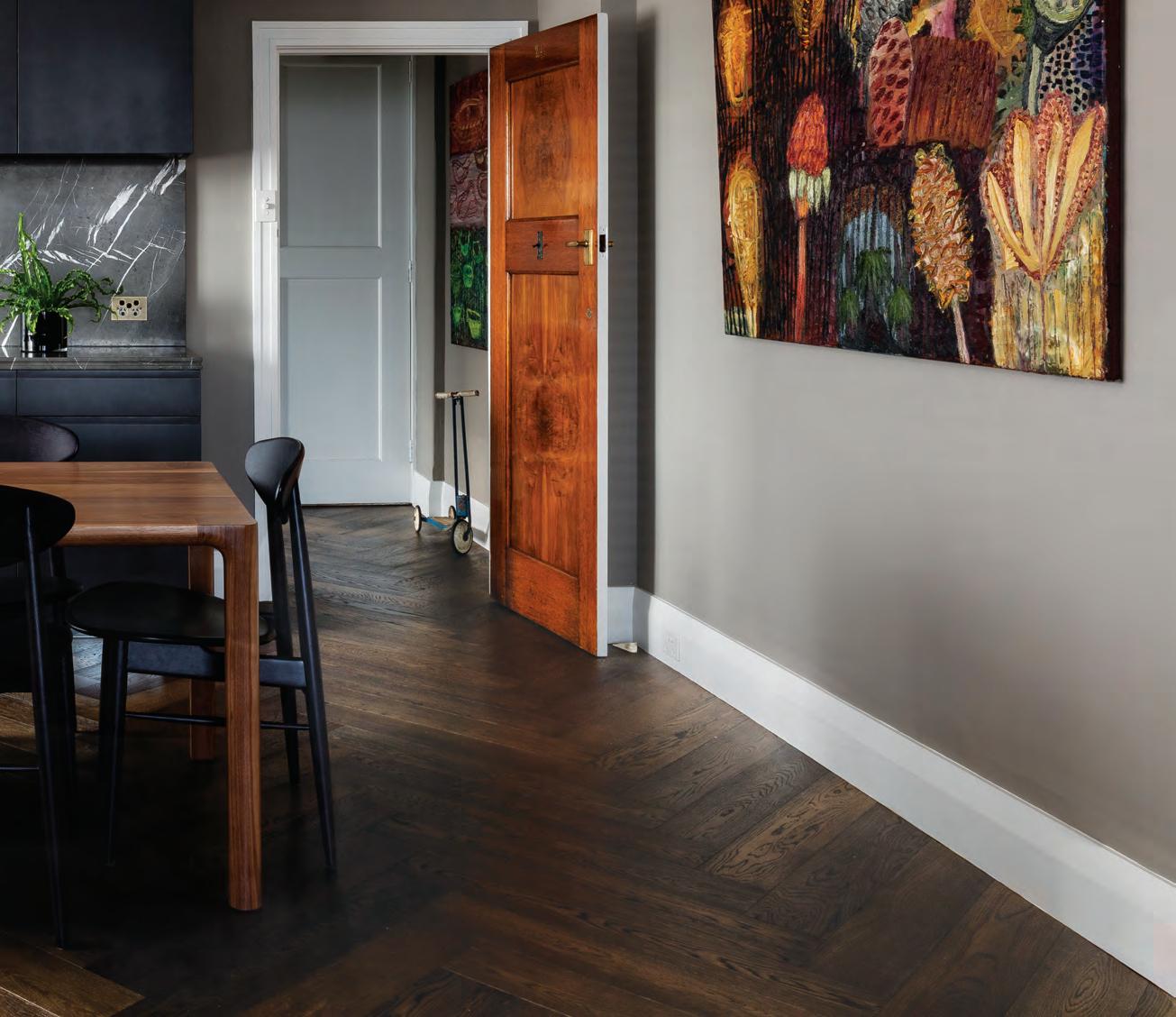
575 Church Street Richmond, VIC 3121 P | +613 9427 7000 FOR LOVERS OF FINE OAK
Penza
The most natural of all the finishes, a natural aged oak coloured grain compliments the warm mid brown tones of the penza range.
Tongue n Groove™ floorboards are designed with three solid layers of fine European Oak for a premium level of finish, longevity and structural integrity.
tngflooring.com.au
 Architect TFAD Photographer: Tom Ferguson
The future of bathrooms
Welcome to a new world of bathrooms, one loaded with exciting technologies that change the way we use and interact with products from toilets through to baths and showers. Embrace the future and enhance the way you live.
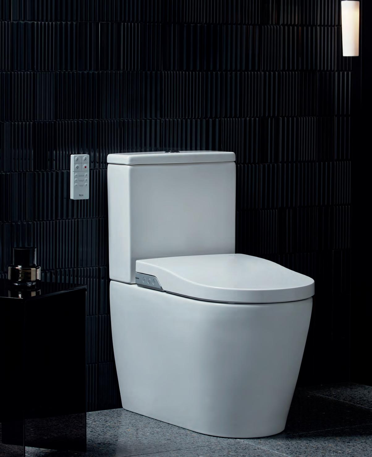
A smarter suite
Discover the latest in personal hygiene with a slimline remote control that enables customisation of every washing function, from cleaning to drying, and even adjusting water temperature.
 Roca In-Wash Inspira Smart Toilet
Bespoke experience
Connect directly with your wellbeing by controlling temperature, pressure and volume at your fingertips.
Challenge the norm
A triumph of the imagination, the hollow showerhead defies convention while providing an even fan-like spray.



Rimless technology


A sleek inner profile and rimless technology enables water to reach every inch of the bowl, preventing bacteria and germ build up and achieving maximum hygiene.
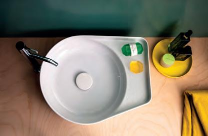
Inner beauty
Where function meets form and fuses with effortless elegance, discover a basin designed for practicality.
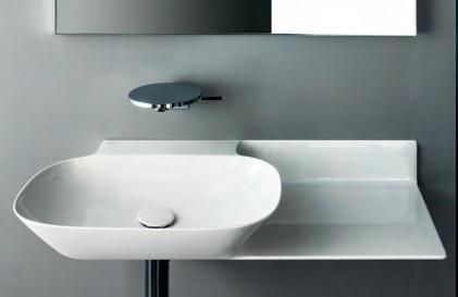

Redefining basin design


The revolutionary SaphirKeramik achieves shape and form not previously seen before in the bathroom space. Integrated shelving adds purposeful functionality to this ground-breaking design.
 Methven Aio Aurajet Rail Shower
LAUFEN Val Round Counter Basin
Grohe Smart Control Shower
AXA Wild Rimless Back To Wall Toilet Pan
Find more bathroom inspiration at reece.com.au/bathrooms
LAUFEN Ino Wall Basin with Shelf
extraordinary surface


a new way of thinking about shapes & spaces
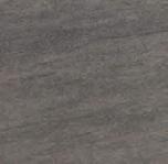
Neolith’s large format slabs transform imagination to functionality. Available in a wide range of colours and patterns, Neolith is scratch, stain and heat resistant; making it suitable for the most demanding domestic and commercial applications both indoors and out.

For more surfaces and information visit www.neolith.com.au

Estatuario Calacatta
Waterproof Resistant to UV Rays Scratch Resistant 100% Recyclable 100% Natural Light Hygienic Heat Resistant Heavy Traffic Easy to Clean neolith.com.au
Phedra Strata Argentum Barro
Pulpis



 Beton
Basalt Grey
Basalt Black
Iron Grey
Iron Moss Iron Copper
VIC 03 8552 6000 VIC Showroom 03 8552 6090 NSW 02 9822 5155 NSW Showroom 02 9822 5910 QLD 07 5537 3222 SA 08 8340 2877 WA 08 6240 2200 W www.cdkstone.com.au E info@cdkstone.com.au cdkstone cdkstone
ARCTIC WHITE BENCHTOP
+ CABINETS


the first word
Notions of the Exotic...
It’s not as straightforward as you might think, the notion of the exotic. Putting pen to paper, or pages to an issue, there are countless different ways in which we could choose to explore the concept through architecture and design. So what do we do? Which path do we go down?
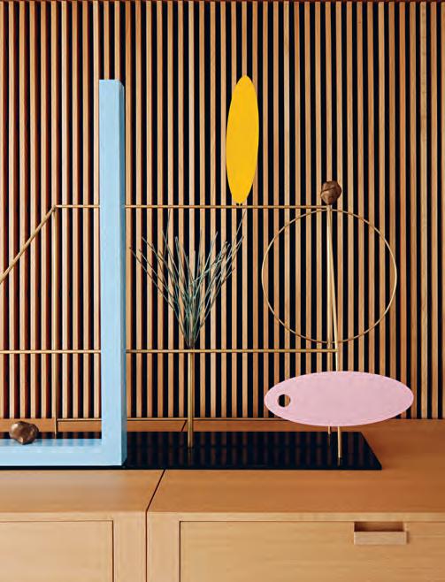
Why not explore them all? The opportunity to do just that is one of my favourite things about putting Habitus together each quarter, where we’re able to explore a concept in all its various forms, bringing them together and presenting them in a neat little package for you – our loyal republic of Design Hunters – to take in, digest, re-evaluate and action.
To some, exotic could mean moving away from one industry – mid-career – and into another, like it did for Pip Vassett (page 66). I spoke to the casual entrepreneur who left the comforts and freedom of her long-standing position as a freelance Fashion Director to start her own business in the residential sphere.
Or it could mean approaching site constraints and strict council regulations with creativity and originality. As Mark Scruby found it did for Matt Gibson Architecture + Design on their recently completed Mixed Use House (page 136). Working closely and in collaboration with their clients they took a block of land in a busy area of Melbourne and turned it into an escape in plain sight.
Or, it could simply be the appeal of regional locations and foreign landscapes, like Everyone’s House (page 172) with views that extend out to mountain ridges and beyond. Or House With Shadows (page 164) with an lush architectural form inspired by the verdant gardens by which it is surrounded.
We’re not trying to overthink the concept nor overwork it, we’re just trying to offer options; to push the boundaries of what you might expect us to give you. I hope that’s what we’ve done. And, as always, I hope you enjoy the issue.
Holly Cunneen | Deputy eDi tor
habitus takes the conversation to our contributors discovering their inspiration and design hunter® journeys
eliseNdA russell
THE EXOTIC OF THE ORDINARY #100
A window into a world where daydreaming can be embraced drives the photographic work of Elisenda Russell, who herself daydreams of an escape to nature, sleeping under the stars. These passions channel themselves into her visual work. “I’m passionate about creating photos that hold layers of diverse texture and colour tone,” she says, “beautiful surroundings with an essence of nostalgia and entwining them into a narrative.”
m A r k hughes
THE EXOTIC OF THE ORDINARY #100
“We are different beings each day of our lives.”

A belief in the beauty of the everyday sees Mark Hughes well into his life as an art advisor with an eye for exciting contemporary art, and a passion for new ideas – “Design should always be innovative and embrace the new, surprising us with twists on the familiar.” Portrait by Tony Amos


m A r k scruby

EXOTIC INFILL #137
The exotic is about more than just a new location or a new approach to design. For Mark Scruby, the exotic is about the opposite of complacency and questioning yourself. “Walking a different way to work, looking at the detail, actively thinking about the things you see and questioning your responses to them.”
Amy Ng


A FOCUS ON FLEXIBILITY #172
To best appreciate and explore the exoticism of everyday life, one needs to make a conscious commitment to awareness. “I’m guilty of allowing familiarity to take over in my daily life,” says Amy Ng, “so reminders telling me to stop, look up and to just be can be very useful in reframing everyday experiences. Anything and everything can be exotic if we change our ways of seeing.”
A NthoN y geer NA ert
THE GLOAMING #86
“Design is always an exercise to enjoy presence of mind,” says photographer Anthony Geernaert. “Whether you enjoy designing the way you spend your day or an appreciation of a space that tells you about the designer’s own story.” In capturing Bill Henson’s story, Ant saturated himself in the artist’s work before an afternoon of conversation, philosophical pondering and ultimately joke swapping with the man himself.
michele Aboud
AN EXCUSE TO STAY IN BED #66
Everyday items can be so much more than simply functional – a well-placed object can transport you from the home to an exotic locale abroad. For photographer Michele Aboud, this philosophy extends to all facets of life. “Aspects of society that were maybe immune to design are now fully engaged, and open to the discussion of how it affects the individual’s life.”
sANdr A tAN
PLAYFUL HOUSE #114, NEW WAVE #126
“Truly innovative, considered design examines ways that we can improve conditions for those who need it most, and keep us all on our toes.” For Sandra Tan, this passion for the exotic in design is more than skin deep. “To me, this sums up my daily experiences as a first-generation Australian, since both my Filipino heritage and Aussie identity inform everything about my personality. I think being a child of a migrant family gives you that broader global perspective since you are both exotic and a native.”
Shannon McGrath EXOTIC INFILL #137
For architecture and design photographer Shannon McGrath, the exotic can be found in switching between the tranquility of nature and the hustle and bustle of the city. “It’s the little pleasures in life that you can get joy from,” she says on finding exotic design in everyday life. “Sometimes the smallest object can give you great pleasure in its relation to life, energy, aesthetic and memory.”
Stephen cr afti
AN ARCHITECTURAL GEM #42
The author of more than 40 books, design and architecture expert Stephen Crafti is well versed in the language of design, and the power of a refreshed look on an everyday space. “Exotic to me is reevaluating some of the simple things that surround us and when placed in the right context have greater impact.”

Sylvia WeiMer


When we think of exotic design, we often overlook the concrete jungle of the modern cityscape. Yet with fresh eyes, the city can be as exotic as anywhere on earth. “I like to walk different ways in Sydney, explore new buildings and unknown laneways, new places, new food, new art,” says Habitus creative director Sylvia Weimer. “There is a ferocious appetite to find new ways and new ideas in every city I visit, all goes into an overall aesthetic expression.”
SG 5600 CURTAIN TRACK SYSTEM SILENT,
FAST AND POWERFUL
The new Silent Gliss 5600 system provides benchmarking technology based on outstanding Swiss innovation which meets the complex demands of modern architecture.
The world’s most silent curtain track system.
silentgliss.com.au
DIRECTING DESIGN INDUSTRY PROFESSIONALS TO THE RIGHT JOBS IN AUSTRALIA AND ACROSS ASIA
3D VISUALISER ACCOUNT MANAGER ADMINISTRATION
AGENT/DISTRIBUTOR
FIND
BLOGGER
BUSINESS DEVELOPMENT
CAD DESIGNER
CAMPAIGN MANAGEMENT
CUSTOMER SERVICE
DESIGN MANAGER
DESIGNERS EDITOR
EVENTS CO-ORDINATOR
GRAPHIC DESIGNER
INDUSTRIAL DESIGNER
INTERIOR DESIGNER LECTURER
LIGHTING SALES
PERFECT
MEDIA ExECUTIVE
NATIONAL SALES MANAGER
OPERATIONS MANAGER
PA / SALES SUPPORT
PHP DEVELOPER
PR ACCOUNT MANAGER
PRODUCTION MANAGER
PROJECT MANAGER
SPECIFICATION
RETAIL INTERIOR DESIGNER SALES
SHOwROOM MANAGER
SHOwROOM SALES CONSULTANT
STATE MANAGER
STUDIO LEADER
TECHNICAL OFFICER
wAYFINDING DESIGNER
ARCHITECTURE
DESIGN
INTERIORS
MEDIA
AGENCY
ADVERTISING
RETAIL COMMERCIAL
FURNITURE
LIGHTING
TEx TILES
YOUR RESIDENTIAL
ARCHITECTURE
DESIGN
INTERIORS
MEDIA
AGENCY
PUBLISHING
RETAIL COMMERCIAL
FURNITURE
LIGHTING
TEx TILES
PRODUCT
RESIDENTIAL
JOB
EDUCATION
DESIGN
INTERIORS
MEDIA
ADVERTISING
RETAIL COMMERCIAL FURNITURE
LIGHTING
TEx TILES
Chairman / Publisher
Raj Nandan raj@indesign.com.au
dePuty editor
Holly Cunneen holly@indesign.com.au
Gue st Fe ature editor
Stephen Todd stephen@indesign.com.au
se a sia editor
Janice Seow janice@indesign.com.sg
editorial a s sistant Andrew McDonald andrew@indesign.com.au
Cre ative direCtor
Sylvia Weimer spacelabdesign.com
Junior desiGner
Camille Malloch camille@indesign.com.au
ContributinG W riters
Stephen Crafti, Mark Hughes, Ella McDougall, Amy Ng, Mark Scruby, Darlene Smyth, Sandra Tan, Sophia Watson
ContributinG PhotoGr a Phers
Michele Aboud, Tony Amos, Lauren Bamford, Charles Dennington, Anthony Geernaert, Tim Grey, Marnie Hawson, Christopher Frederick Jones, Masano Kawana, Andy MacPherson, Shannon McGrath, Yoram Reshef, Elisenda Russell, Yohei Sasakura, Derek Swalwell
m a naGinG direCtor
Kavita Lala kavita@indesign.com.au
Grou P oPerations m a naGer
Sheree Bryant sheree@indesign.com.au
a s sistant ProduCtion manaGer
Natasha Jara natasha@indesign.com.au
aCCounts
Ting Zhang ting@indesign.com.au
Cassie Zeng cassie@indesign.com.au
on line manaGer
Radu Enache radu@indesign.com.au
W eb develoPer Ryan Sumners ryan@indesign.com.au
brand direCtors
Colleen Black colleen@indesign.com.au (61) 422 169 218
Dana Ciaccia dana@indesign.com.au
(61) 401 334 133
sa les su PPort & r ePortinG m a naGer Genevieve Muratore genevieve@indesign.com.au
Cover imaGe Playful House (p.114)
Photography by Derek Swalwell
Head Office
Level 1, 50 Marshall Street, Surry Hills NSW 2010 (61 2) 9368 0150 | (61 2) 9368 0289 (fax)
MelbOu rne 1/200 Smith St, Collingwood, VIC, 3066 SingapOr e 4 Leng Kee Road, #06–08 SIS Building, Singapore 159088 (65) 6475 5228 | (65) 6475 5238 (fax) HOng KOng
Unit 12, 21st Floor, Wayson Commercial Building, 28 Connaught Road West, Sheung Wan, Hong Kong
indesign.com.au
PRODUCT careersindesign.com.au careersindesign.asia
wEB DESIGNER / DEVELOPER
risk,
magazine
wholly
any
damage. Please retain
text
images.
Media Asia Pacific
subscription,
major newsagencies
bookshops throughout Australia, New Zealand, South-East Asia
United States
America. This issue of Habitus magazine may contain offers or surveys which may require you to provide information about yourself. If you provide such information to us we may use the information to provide you with products or services we have. We may also provide this information to parties who provide the products or services on our behalf (such as fulfilment organisations). We do not sell your information to third parties under any circumstances, however, these parties may retain the information we provide for future activities of their own, including direct marketing. We may retain your information and use it to inform you of other promotions and publications from time to time. If you would like to know what information Indesign Media Asia Pacific holds about you please contact Nilesh Nandan (61 2) 9368 0150, (61 2) 9368 0289 (fax), info@indesign.com.au. Habitus magazine is published under licence by Indesign Media Asia Pacific. ISSN 1836-0556
issue #38 habitusliving.com
HAB25_CRID_HP.indd 2 25/07/2014 4:51 pm
Printed in Singapore. All rights reserved. No part of this publication may be reproduced, stored in a retrieval system, transmitted in any form or by any other means, electronic, mechanical, photocopying, recording or otherwise. While every effort has been made to ensure the accuracy of the information in this publication, the publishers assume no responsibility for errors or omissions or any consequences of reliance
publication.
publication
the
of the
on this
The opinions expressed in this
do not necessarily represent
views
editor, the publisher or the publication. Contributions are submitted at the sender’s
and Indesign
cannot accept
loss or
duplicates of
and
Habitus
is a
owned Australian publication, which is designed and published in Australia. Habitus is published quarterly and is available through
at
and
and the
of
parisi.com.au TAO Collection
Habitus and our republic of loyal Design Hunters celebrate authentic design as a way of life.
From our base in Australia we seek out the uniqueness of the Asia Pacific – be it interiors, architecture or products –and curate the stories behind the stories.
Join us on our hunt.
Founder, Indesign Media
Raj Nandan
issue #38 habitusliving.com
SYDNEY 5/50 Stanley Street Darlinghurst +61 2 9358 1155 MELBOURNE 11 Stanley Street Collingwood +61 3 9416 4822
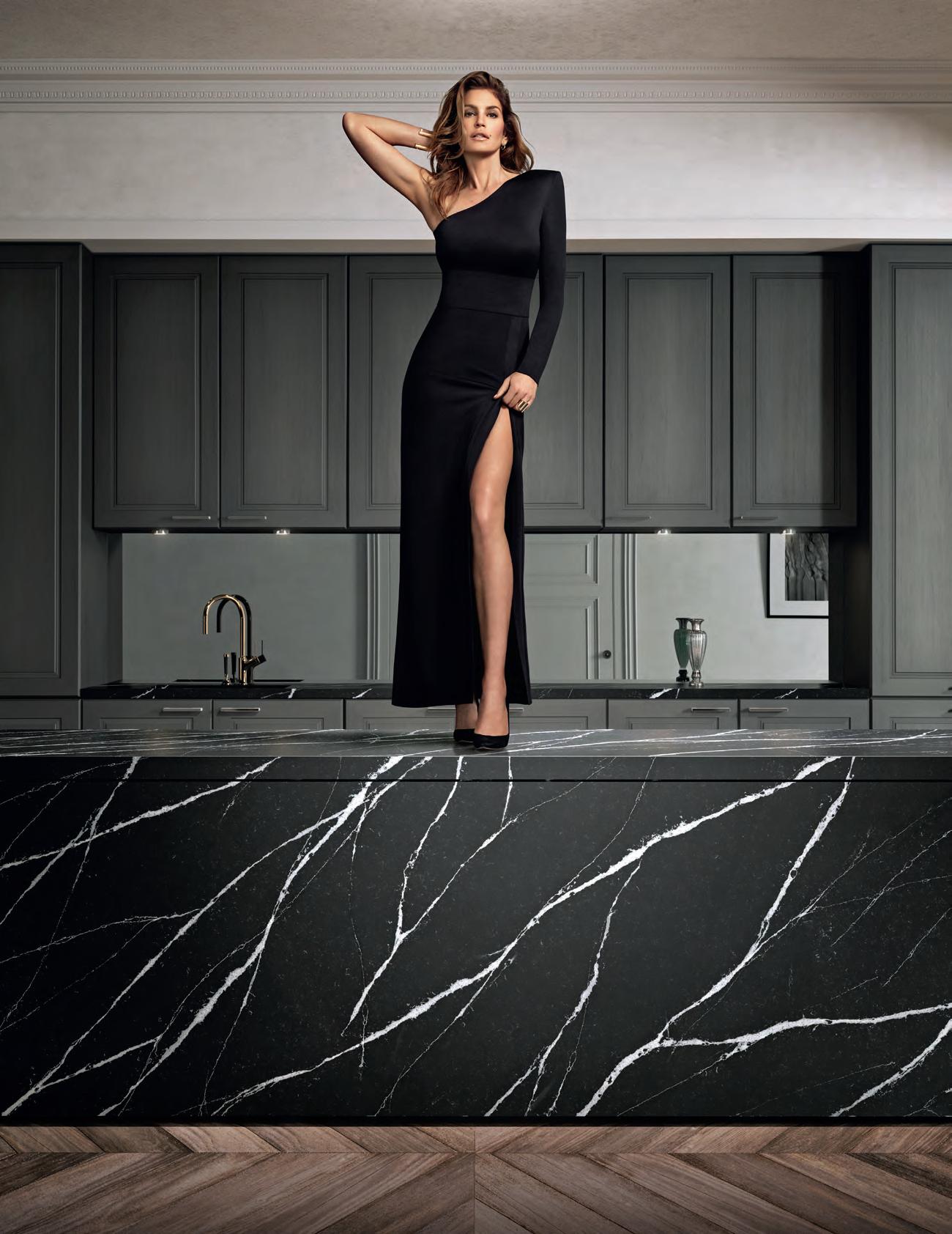


Discover more at silestone.com | Follow Us F T A product designed by Cosentino ® Colour Eternal Marquina Cindy Crawford on Silestone Countertop TOPS ON TOP COSENTINO AUSTRALIA e-mail: infoaustralia@cosentino.com On Top Feel the new velvety texture
Push the boundaries






Surface Value
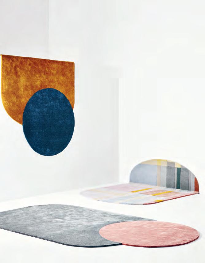
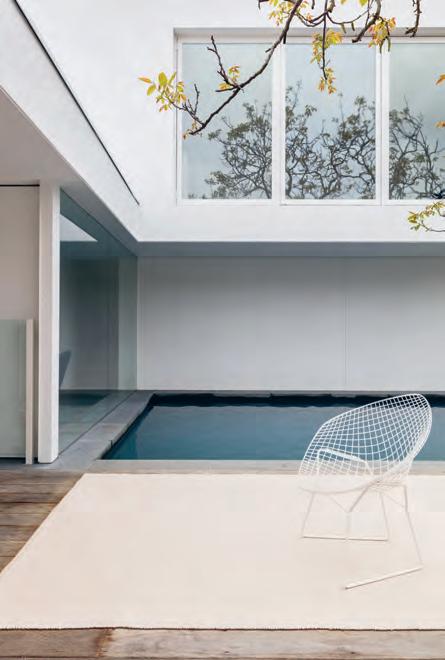
New Zealand rug company Nodi has released the graphic PARLOUR collection designed by Baldwin & Bagnall . The Duo and Plaid rugs clash colours to introduce big, bold shapes into your interior spaces.
nodirugs.com
Alternative Surfaces provide seamless surfaces for floors, walls and joinery geared towards satisfying versatility.
alternativesurfaces.com.au
issue #38 habitusliving.com
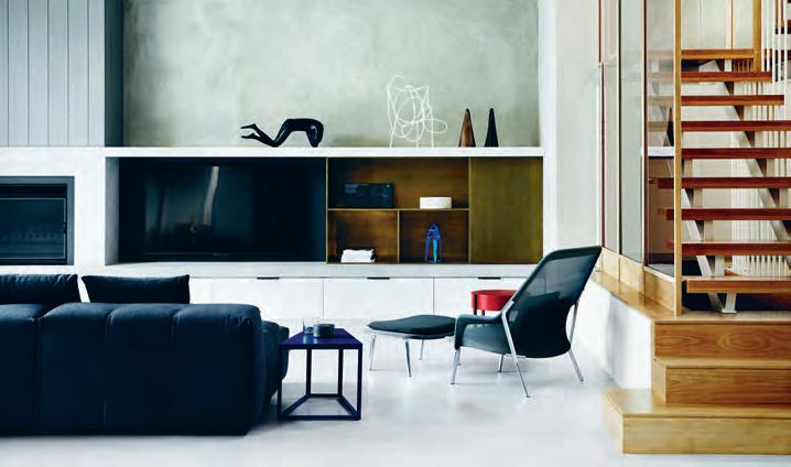
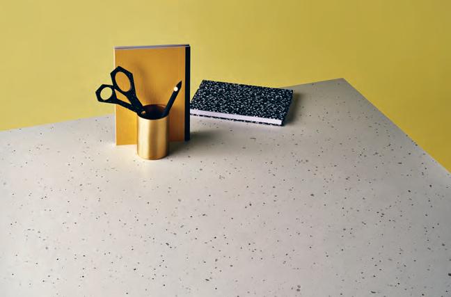
Caesarstone continues to adapt to the diversity of the modern home with five new surfaces. Cloudburst Concrete emulates the look of poured concrete. FROZEN TERRA (pictured) features natural toned aggregate flecks in an off-white base. Canon Terra is their darkest concrete design to date. Granite-inspired Turbine Grey has rippling dark grey veins. And Intense White offers a bright, clean white.
caesarstone.com.au
Recasting classic shapes in a decadent palette of thick velour, cotton tassels and a diamond motif, Arro Home ’s lastest collection, NEW DAY NEW DAWN, infuses ’70s glamour and modern construction.
arrohome.com
Armadillo&Co ’s new INDOOR/OUTDOOR rug collection allows you to move the party outdoors with ease. Three weave styles; the knit-look Horizon, vertical stitch Tide and horizontal stitch Quill are all hand-woven in India from recycled fibres.
armadillo-co.com

1 . lightbox # 27
The Centre of Attention
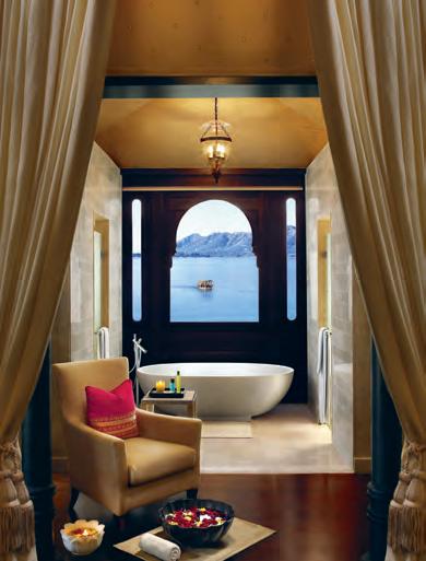
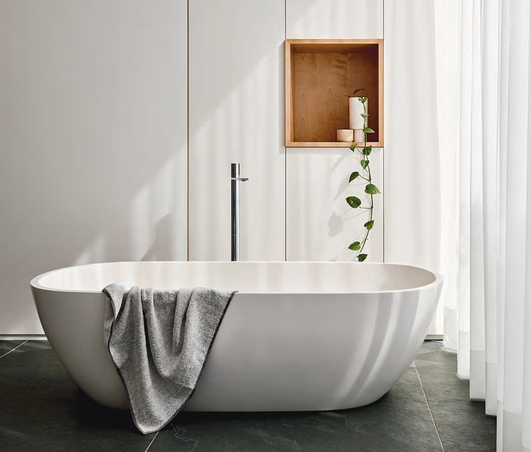
Gracing the world’s most luxurious resorts, Apaiser ’s baths emit a sense of sanctuary and respite. The freestanding HAVEN bath’s signature, minimal shape draws inspiration from the liquid curves of water to offer an otherworldly space to escape to.
apaiser.com
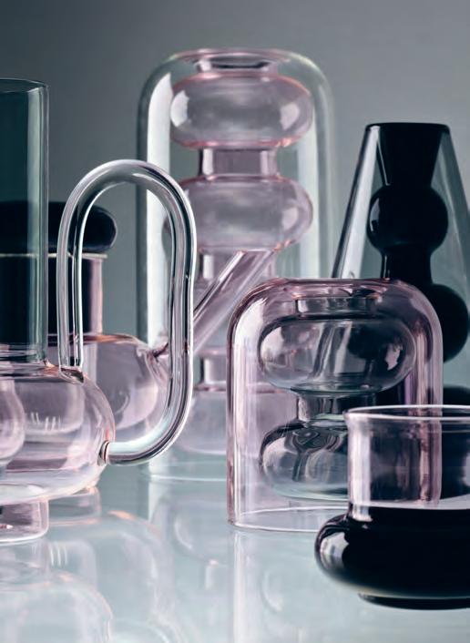
A collection of delicate and intriguing instruments, Tom Dixon’s BUMP collection honours the rituals in the everyday home. The series includes a handmade, double walled glass jug, teapot, glasses and cups in an artistic play on transparency.
tomdixon.net
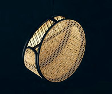
Uniting traditional craftsmanship with contemporary technological finesse, the JACARANDA lamp by local design studio, Abalos, is a circular hanging light that riffs on the romance of antique rattan and cane furniture of yore.
abalos.com.au
issue #38 habitusliving.com
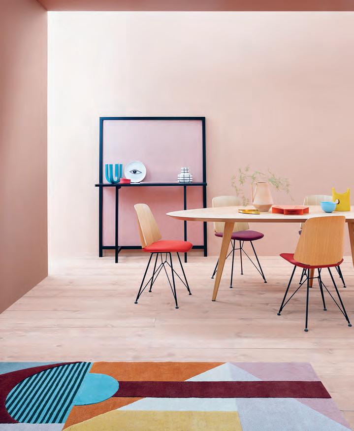
Italian brand Zanotta has gained a name for itself pushing boundaries in inventive manufacturing details. Cult has welcomed in the iconic brand, showcasing their highly engineered, industrialinspired pieces, including the TWEED TABLE –a 2017 novelty – and the JUNE CHAIR launched in 2016. Both designs are across all Cult showrooms. cultdesign.com.au
Fantini ’s MILANO SLIM OUTDOOR SHOWER is uniquely engineered to withstand the harsh Australian climate. With salt-resistant, marine-grade brushed stainless steel, Burmese Teak, and a graphically architectural form, it delivers a unique showering experience.
rogerseller.com.au

1 . lightbox # 29
Lasting Impressions
Referencing the geometric carvings of Cuzco and Machu Picchu, Cristian Zuzunaga’s INCA series etches a tessellating pattern, fusing historic Peru into a contemporary landscape. Available from Melbourne design retailer, AJAR ajar.com.au

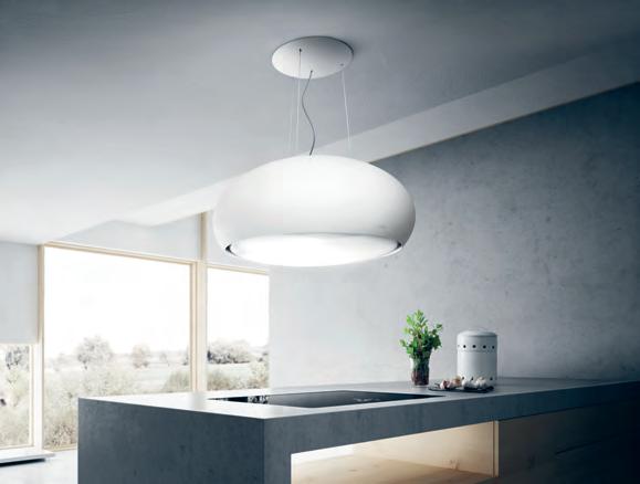
SEASHELL from Italian brand Elica is both a light and rangehood, reimagining the beauty and functionality of both. Designed by Fabrizio Crisà and available through Residentia , Seashell uses a carbon filter to clean and recycle interior air.
residentia.group
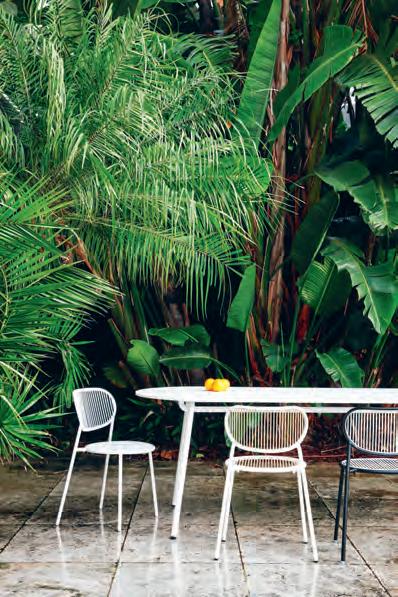
Injecting charm into the alfresco dining setting, the PIPER range from DesignByThem is light and durable, translating indoor style with outdoor materials.
designbythem.com
issue #38 habitusliving.com
Alvar Aalto Collection
Looking like nothing else, the Aalto Collection laid the foundation for timeless design. Ever since it has become an icon of Finnish design and one of the world’s most famous glass objects. Simple yet rebellious, it’s the shape that moves. iittala.com.au

Dark and Stormy
Iittala ’s TAIKA tableware series offers more than mere decoration. With artwork by Klaus Haapaniemi, the collection translates a mystical Nordic aesthetic – with beauteous forests and mythical creatures – into simplified forms and timeless shapes.
iittala.com.au

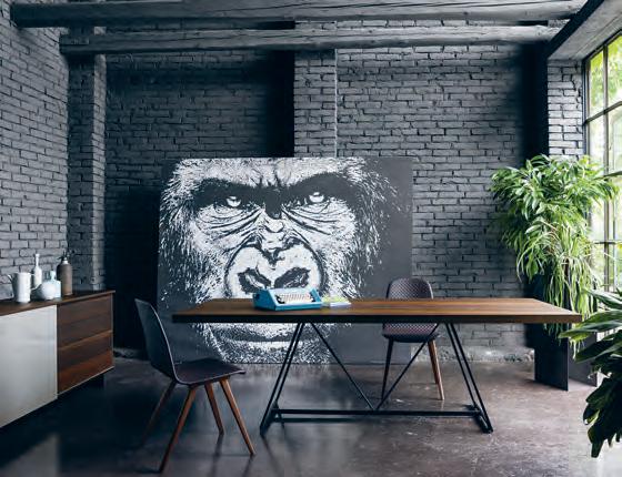
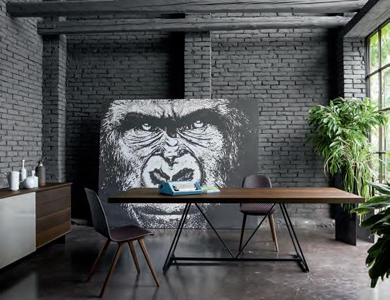
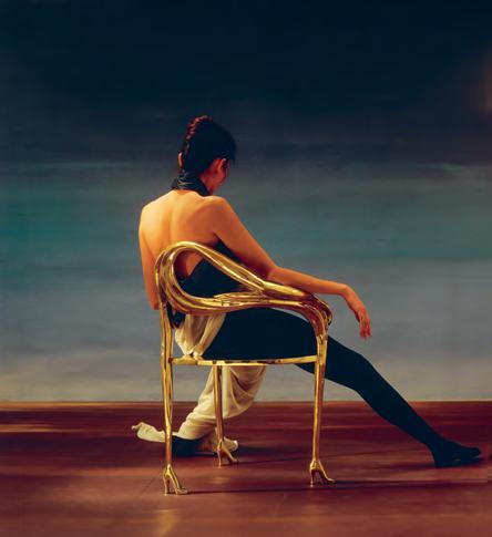
Living Edge have launched EDITION, a range of limited edition and bespoke pieces for art lovers and design enthusiasts. Featuring a wild collection of artistic artefacts from the world’s best that is sure to turn heads.
livingedge.com.au
thinkdzine has brought back to Australian shores Italian furniture brand Dall’Agnese. Within the Dall’Agnese range is the DAY collection comprising sofas, armchairs, poufs, bookcases, wall units, sideboards, dining and coffee tables.
thinkdzine.com.au; dallagnese.it
issue #38 habitusliving.com
THE ESSENCE OF LIVING.


Tama Living is the ideal setting for that special moment, a soothing and pleasant experience. Its lavish, elegant cushions set the rhythm for the sofa to unravel like a piece of classical music. With side tables and trays crafted from exquisite materials, it embodies the spirit of refined living. Design: EOOS.
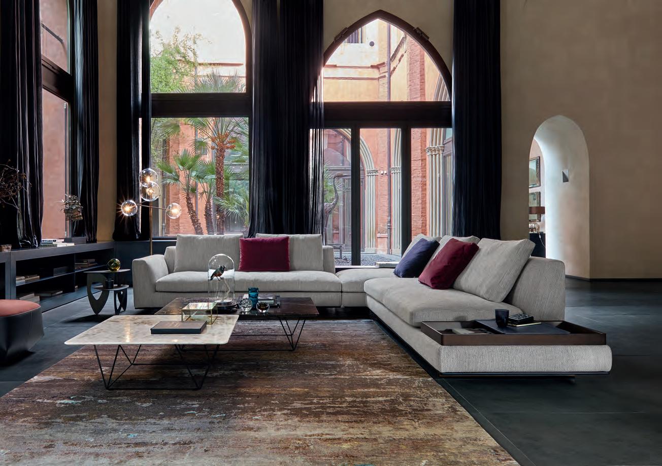
Walter Knoll Australia · www.walterknoll.com.au · T +61 8 8182 3925
Key Ingredients
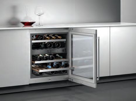
To preserve the quality and distinct bouquet of wine, it’s important to store wine at the perfect temperature yearround. With electronic regulation to guarantee constant temperatures between 5 and 20 degrees Celsius, Gaggenau ’s WINE CLIMATE CABINET allows you to store wine like a pro sommelier even in the smallest of under-bench spaces. Offering space for up to 34 bottles, two independently controlled climate zones makes sure that every drop tastes every bit as good as the next for years to come.
gaggenau.com/au
As part of the recent Sydney Indesign, thinkdzine launched their new showroom fit out which includes stunning examples of the newly acquired Dall’Agnese furniture collection.
thinkdzine.com.au; dallagnese.it
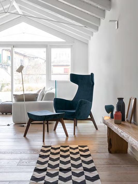
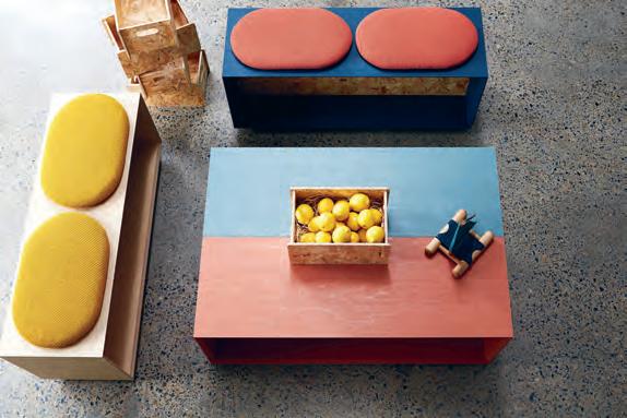
Multi-disciplinary studio So Watt ’s LOFT collection offers vibrant furniture pieces that encapsulate their playful material applications, adding fun and function to any space.
sowatt.com.au
issue #38 habitusliving.com
ONLY


ZIP


TECHNOLOGY


TRANSFORMS WATER INTO A FORM YOU’LL INSTANTLY LOVE.


As world leaders in instant drinking water appliances, Zip invented the innovative HydroTap, the smart and essential addition for every kitchen. Our integrated Australian-made appliance combines patented PowerPulse™ boiling and Direct DryChilling with MicroPurity fi ltration technologies to create pure-tasting boiling, chilled and sparkling water you will love in an instant.


When water is this convenient and irresistible you’ll love drinking more of it. We call this the Zip Effect. To improve your hydration and your family’s well-being, discover more at zipwater.com

Piecemeal
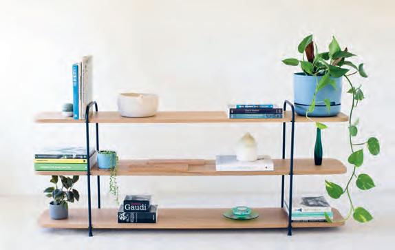
The STAPLE Collection is the collaboration between Melbourne design studios Lucious Handmade and Hamilton Taylor Made The range is honest and minimal in its construction to honour the character and quality of the materials.
lucioushandmade.com
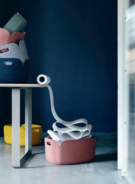
These colourful, loosely stackable, storage baskets from Muuto are made in part from PET fibres sourced partially from recycled bottles. Hence the name, RESTORE. Authentic Scandinavian design lovers can find Muuto at Living Edge Australia-wide.
livingedge.com.au
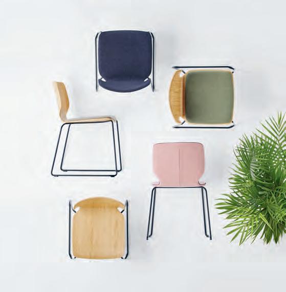
Comfort reigns in the KÖLN chair for Yonoh
With a unique pyramid shape, the shell-shaped seat – available in ash wood or metal – invites you in with thick upholstery merging physical wellbeing and beauty.
yonoh.es
issue #38 habitusliving.com




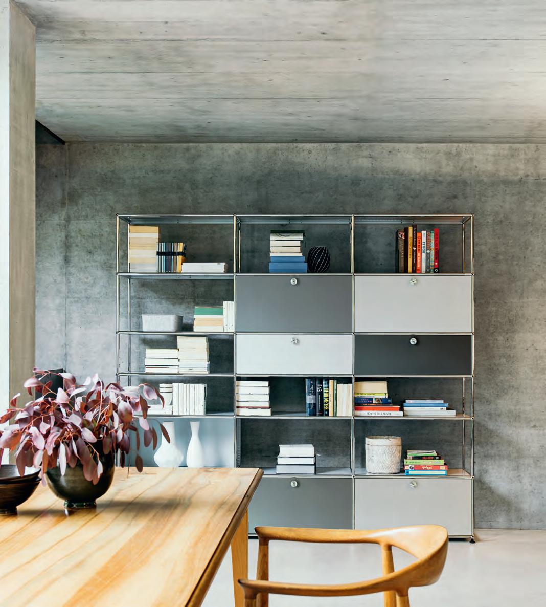
Available at www.ecc.com.au Get Inspired! Create and custom design your USM Modular Furniture to fi t your lifestyle using our online confi gurator. www.usm.com DESIGN YOUR OWN!
MY LIFE DESIGN STORIES
 Twelve Kitchen, design Carlo Colombo & CR&S Varenna.

SYDNEY MELBOURNE POLIFORMAUSTRALIA.COM.AU

Find inspiration in others











issue #38 habitusliving.com
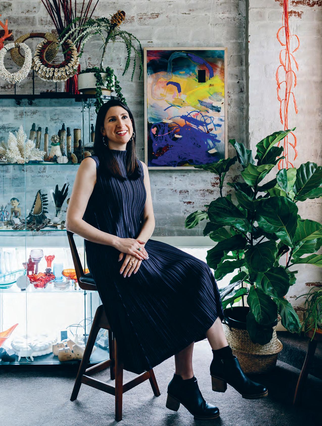
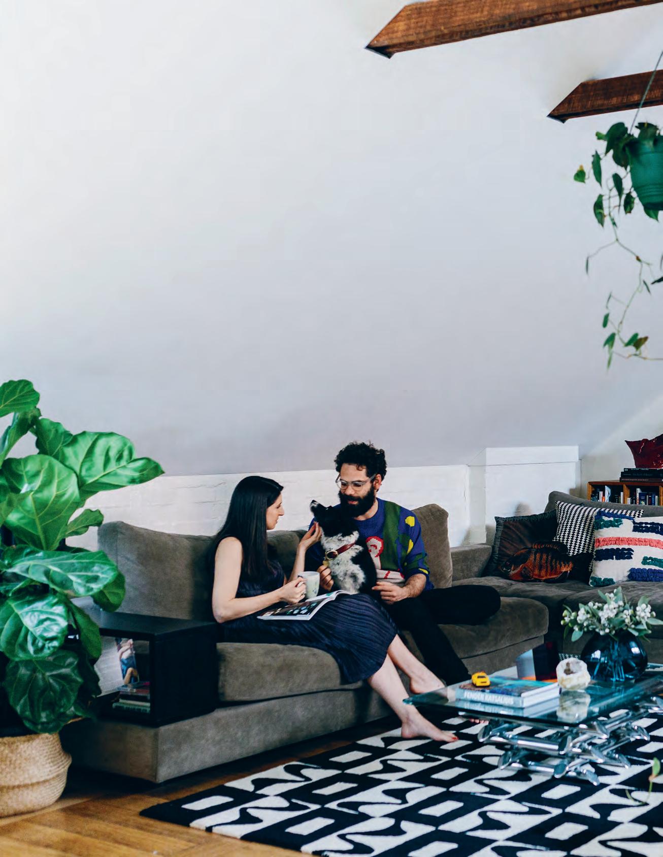
Contemporary jeweller and director of Pieces of Eight Gallery in Melbourne, Melanie Katsalidis, has established quite a name for herself amongst the local design crowd. Her own home in Fitzroy acts as a haven after a busy day.
g em a rchitectural a n S
ome of Melbourne’s treasures are tucked away down lanes, cul de sacs and arcades. This is certainly the case with jeweller Melanie Katsalidis, director of contemporary jewellery gallery Pieces of Eight. Just off Bourke Street, in Russell Place, it’s almost as difficult to find as her apartment in Fitzroy. Part of a 1930s modernist brick building, once used by electrical contractors, it’s now home to Right Angle Studio at ground level, with Melanie’s apartment accessed from the rear.
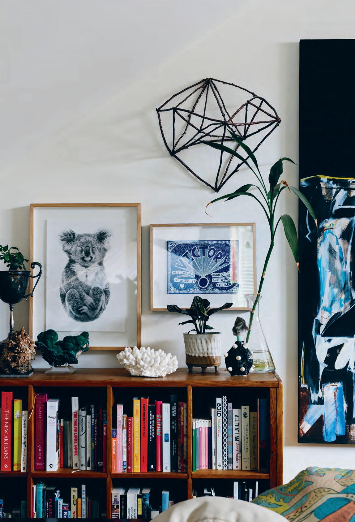
Although the 100-square-metre warehousestyle home is relatively modest in scale, it’s richly endowed with paintings, objects and artifacts collected over many years. Her own work, unlike her eclectic interior, is geometric and highly refined.
“I draw influences from all over the place. You could say my jewellery is quite sitespecific as I often travel to the places where my stones are mined. But there is also a certain
link to architecture,” says Melanie, who with a father such as Nonda Katsalidis (leading Australian architect and a director of Fender Katsalidis Architects), is never far removed from architecture. Melanie, who studied gold and silversmithing at RMIT University, worked closely with her father in reworking the roof space, which once formed a loft in the electrical workshop that was there for 40 years.
The red brick warehouse, which she shares with her partner Rob Souter and their dog Jess, was virtually gutted when Melanie purchased the building, initially creating a ground-floor studio for her jewellery business. But as things progressed, now ten staff strong, it was time to move on. The apartment remains a nest to leave and come home to. “I generally walk to work, even though I could easily hop on the tram,” says Melanie, whose bedroom window is tucked behind the building’s brick parapet. “You rarely hear them,” she adds.
As the apartment was formerly the attic of an
Tex T Stephen Crafti | PhoTo gra Phy Marnie h awSon
2 . portrait # 43
engineering workshop, the ceiling heights are less than predictable. In some rooms, such as the study/second bedroom, the ceiling height reaches a peak of four metres. In other areas, such as the open-plan kitchen, dining and living area, the rendered brick walls are just over one metre in height, creating a cosy nook for the dining table. “When I sit down on the lounge, the ceiling heights feel considerably more generous,” says Melanie, who also points out the relatively low ceiling heights in the bathroom and the laundry, the latter directly to one side of the kitchen.

Although the loft-style home feels intimate, it’s the art and objects that initially draw one’s attention. The front door (at ground level) opens to a small lobby with a series of resin vessels by Kate Rohde displayed under a mirror by Tim Fleming. A deconstructed 1960s chandelier illuminates flying china ducks on the wall. “I’ve always preferred eclecticism,” says Melanie, even through she was raised living in some of Melbourne’s iconic minimalist high-rises, including the Republic Tower and Melbourne Terrace (both designed by her father). “But I seem to be a collector, particularly when it comes to minerals, art, sculpture and ceramics,” she adds.
Some works displayed in the apartment are by well-established artists and creatives. There’s an Augustine Dall’Ava sculpture displayed on the kitchen bench, given to Melanie for her 20th birthday.
opener | Melanie
in her ho M e o ffice surrounded by artifacts. above | th e red bric K warehouse exhibits a few conteM p orary insertions such as a translucent glass-walled entrance. opposite | th e dining area doubles as another worK space. issue #38 habitusliving.com
Katsalidis

2 . portrait # 45
issue #38 habitusliving.com

2 . portrait # 47
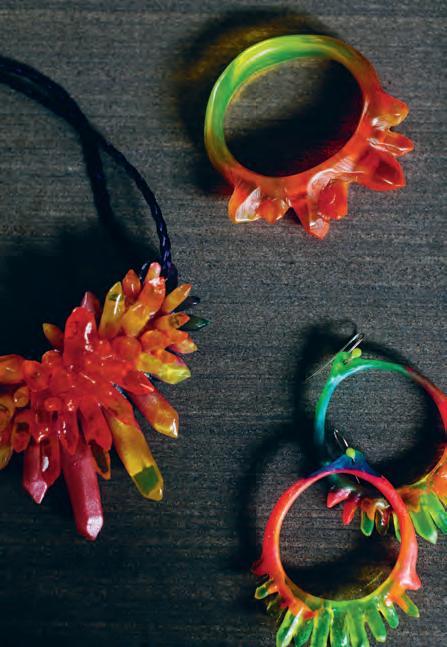
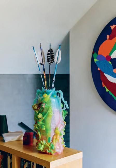

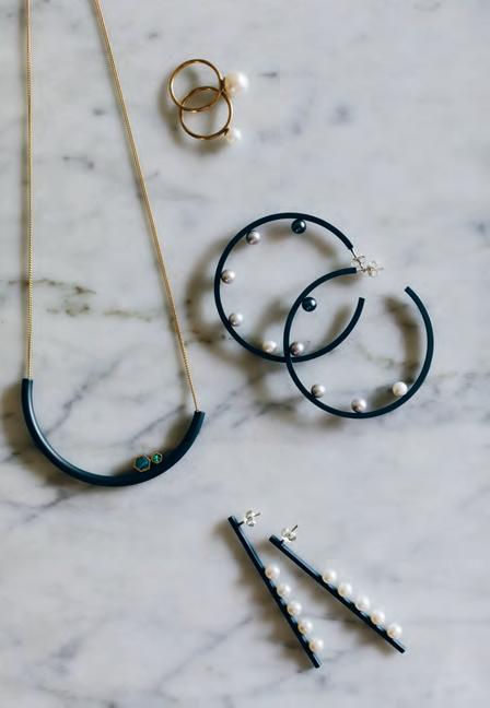
previous | The lounge suiTe i s nesTled below Th e raked ceiling To c reaTe a c osy alcove. above | collecTi ons of wooden Toys and resin jewellery and objecTs are beau Ti fully arranged in Th e home. opposiTe | a rT and arTi facTs fill every corner of Th e warehouse. issue #38 habitusliving.com
2 . portrait # 49
issue #38 habitusliving.com
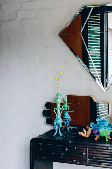
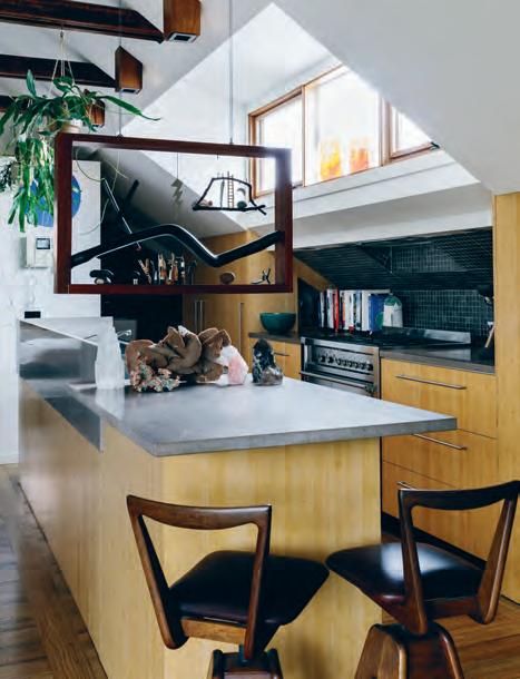
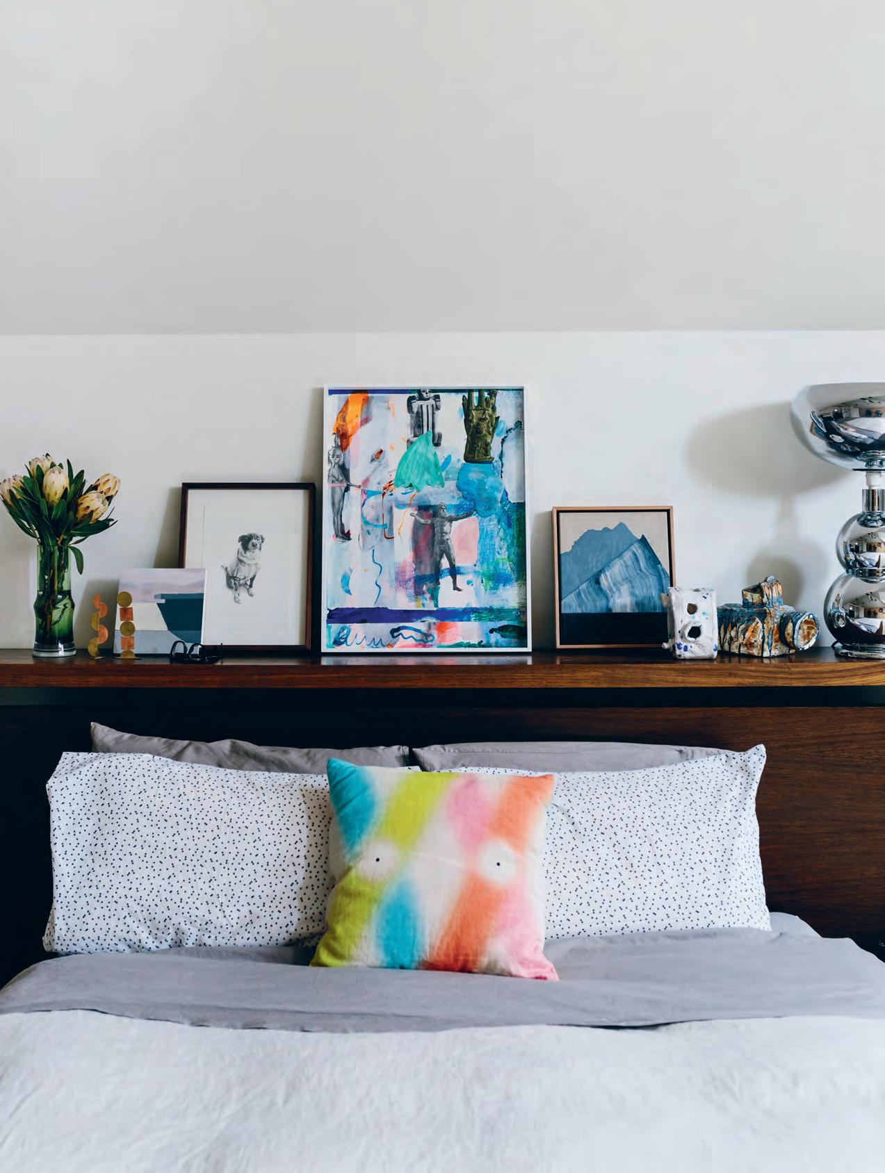
opposite | th e main bedroom in the warehouse. above | the open-plan kitchen features an au gustine da ll’ava sculpture. below | resin objects by kate r h ode. 2 . portrait # 51
On the bedhead of the low Japanese-style bed are ceramics of cameras created by Alan Constable.
Other works have come through simply from having a fine eye. In the study, for example, there’s an Italian 1980s glass cabinet filled with everything from a piece of coral to neck pieces found in Timor and Papua New Guinea. Against one wall is a wooden ladder, the same one used by the former electricians to access what was once a mezzanine.
The main bedroom, located at the rear of the home, is beautifully curated. On the bedhead of the low Japanese-style bed are ceramics of cameras created by Alan Constable. A miniature toy collection, including one of Gilbert & George, shares shelf space with animals. And an old specimen drawer, tucked into an alcove, is brimming with jewellery, many creators of which are represented in her gallery. While the objects and artifacts will remain, the low bed almost on the ground is likely to be exchanged for something more traditional, given Melanie is expecting her first child in February. “But the art and objects will remain. Some of these things have just become too well ingrained,” she adds.
“The art and objects will remain. Some of these things have just become too well ingrained.”
above | The norTh -wesT facing Terrace in Th e warehouse. issue #38 habitusliving.com
Pieces of Eight Gallery | piecesofeight.com.au
By Rogerseller
Let us help bring your ideas to life www.rogerseller.com.au/appointment Meet the experts. From concept to conclusion, we’ll guide the way.
Catalano Effegibi Falper Fantini Lema Valcucine Follow @rogerseller
Lighting
the Way
For their 40th anniversary Euroluce is taking a look back through history, but its focus remains on the future – including a new outdoor range from Flos.

From humble beginnings as a metal spinner specialising in custom light fittings, the Euroluce brand has grown into one of Australia’s leading providers of architectural and designer lighting products to some of Australia’s most prestigious projects. Offering local designers, architects, clients and design purists the largest range of original European designer lighting objects in the country, the brand operates from three offices and showrooms in design-centric suburbs within Sydney, Melbourne, and Brisbane.
Four decades of experience has given Euroluce an uninterrupted history of leading lighting solutions to a wealth of high-end projects across the region, as well as offering up commercial grade lighting to clients as big as BMW, Christian Dior, Armani and more.
While offering a suite of boutique and acclaimed lighting brands such as France’s Jieldé, Sweden’s Wästberg, Japan’s Frank Lloyd Wright licensed Yamagiwa and more, it is the Italian lighting giants of Reggiani, Oluce, and Flos the Euroluce brand is perhaps most known for. And it’s the third of those brands, Flos, that is marking a new chapter for the brand.
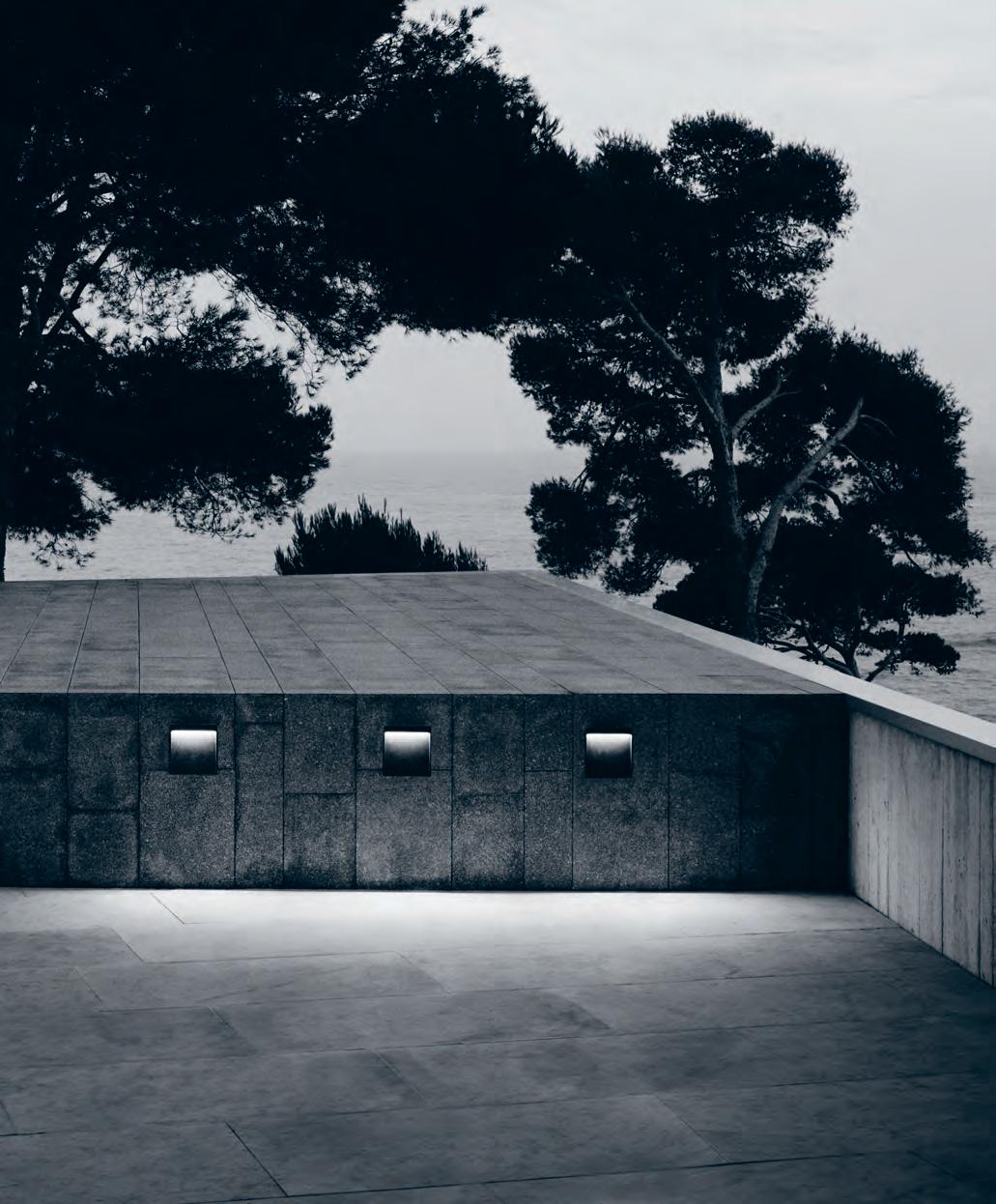
Not traditionally known for supplying outdoor lighting, Euroluce is thrilled to be launching Flos Outdoor, a beautiful range of Italian designed and made lighting for exterior applications. This range brings the design excellence and quality of Flos to the garden and landscape design sectors for the first time, opening up a multitude of new design and aesthetic choices for interior and exterior designers, and green-thumbed design lovers alike.
Outdoor living is a way of life in Australia, and now discerning clients have the option to light the exterior of their homes and their gardens with the same flare for beauty and functionality as they do the interiors.
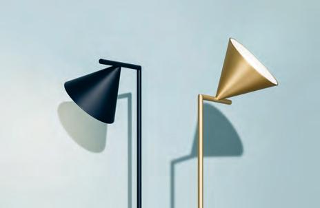
issue #38 habitusliving.com above | aim pendant designed by Ronan and eRwan b o uRo ullec FoR Flos. below | captain Flint lamp designed by michael anastassiades FoR Flos opposite | my way wall and ceiling outdooR lights designed by pieRo li ssoni FoR Flos.
habitus promotion › Euroluce #55 Euroluce | euroluce.com.au
you crazy Diamond Shine on,
Sophia Watson lifts the veil on luminary architect and academic Lindsay Johnston, a brilliantly performative designer using architecture as a medium to express his personal, nomadic experiences and his cheeky, rebellious character.
Ihave always been a bit of a sh*t-stirrer,” says Lindsay. “I got myself into trouble all the time at school, but somehow ended up as a prefect on the Student Representative Council. I’m abrasive, which is a product of my ultra-Scottish protestant upbringing, combined with a southern-Irish Catholic sense of humour that – thankfully – mitigates some of that abrasiveness.”
Having grown-up in Belfast Northern Ireland, studied architecture in Scotland, and worked for over a decade with the government in the U.K. during the unforgiving Thatcher years, Lindsay’s design output has always been about far more than basic form and function. His work, both architecturally and academically, is wonderfully disobedient, provocative and purposeful, and not only tells the story of where he’s been – but what he’s learned there, too.
“The early influences in my architectural life were based on the vernacular of brilliant east-coast villages in Scotland and the cottages of Ireland, particularly the materials, climate and context. But on the other hand, there was also an interest in technology and modernity. In the ’60s, my first job was working in London at the time of Carnaby Street, The Beatles, Mary Quant. Things like mod plastic furniture, primary colours and the capabilities of manufacturing in both furniture design and in building – particularly in
cladding – really fascinated me. The heritage of my childhood and the cultural movements of my later youth were two complete opposites. Yet each can be seen in my architecture working together, particularly in the work that I did in Ireland, the competition I did for Battersea Park, and the design of a series of acrylic chairs for the Irish government offices at the Hanover Trade Fair in Germany, 1977.”
Lindsay’s eclectic approach to design may have something to do with his equally eclectic life, which has seen him move between careers the world over as an architect, a property developer, a technical advisor for low-cost government housing, a consultant to the World Bank in Saudi Arabia, an academic here in Australia and even having moonlighted as a sheep exporter from Ireland to Malaysia.
“I would have been 42 when I came to Australia,” says Lindsay. “So I’ve had another 50 per cent of my professional life in this country – a completely different cultural situation on the other side of the world. And that’s been hugely invigorating. I came to Australia in ’86 as an academic at the University of Newcastle – and I was very fortunate to get a job there, as I was quite different to what you’d call a ‘normal’ academic. I suppose because of my business experience and I guess my sh*t-stirring personality, I ended up being the head of department and eventually Dean.”
Tex T Sophia WatSon | PhoTo gra Phy Charle S Dennington
issue #38 habitusliving.com
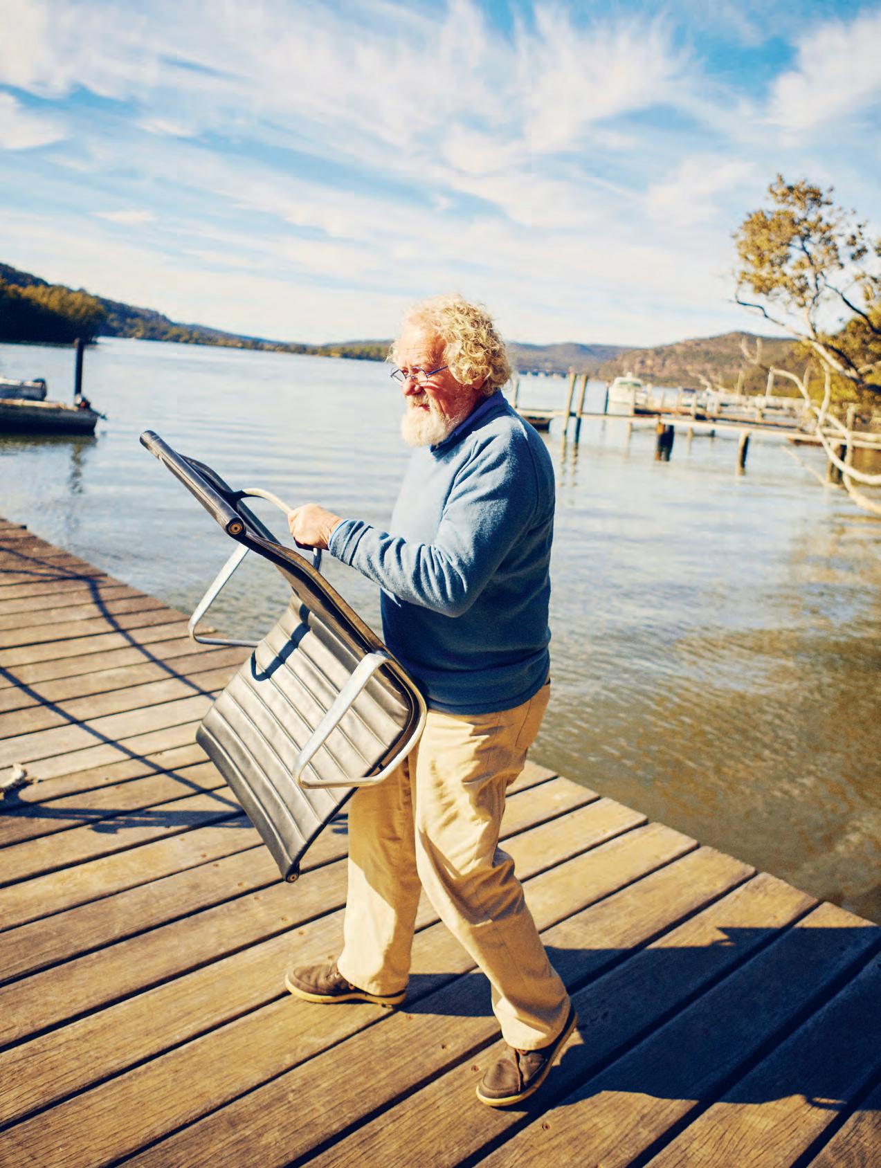
2 . portrait # 57
opener
Li a from
Ly 4 0s
&
L
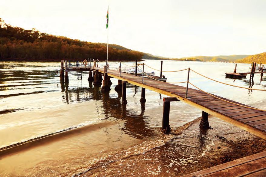
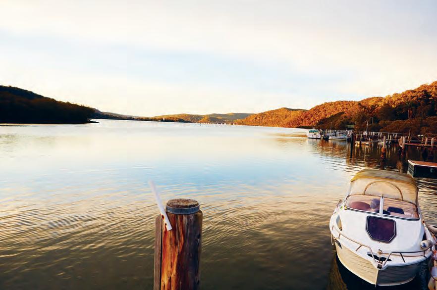
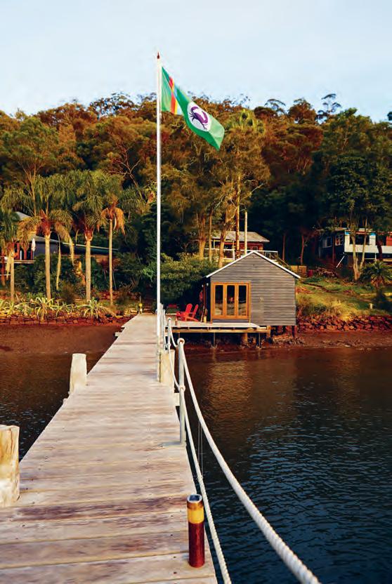
of m i Ls ons pa ssage, a s Leepy i s L a nd, commanded by indigenous
Lt ure
Le o n Ly
issue #38 habitusliving.com
| Lindsay Johnston describes his Li fe and work as being guided by two confLi cting ideas and themes, having grown up in various parts of the u k and then
Li ving and working in au stra
his ear
onward. above
opposite | Lindsay and his wife s u n ow take up residence on the n e w s o uth wa Les c entra
c oast town
agricu
and accessib
by boat.

2 . portrait # 59
issue #38 habitusliving.com
It was at the University of Newcastle where Lindsay used his academic position (first as an Associate Professor, then Head of Department, and eventually Faculty Dean) to instinctively challenge the established traditions of the field and, in his words, “open the world up to the possibilities of architecture and design thinking as being relevant in a much wider context”.
“When I was on the Council of the Institute [of Architects], I also became the Chair of the National Education Committee. We had an education policy then that was largely not understood, that envisaged what architects could do other than the mainstream idea that architects design iconic buildings or one-off houses for rich clients.”
This led Lindsay to become a key pioneer of a more democratic socialist design movement in Australia – investigating and championing initiatives where design education, particularly its’ more holistic multi-disciplinary values, might solve strategic problems in the commercial world for corporate professionals or much larger global concerns such as pollution, global warming, public housing and so on.
“If you look at the number of architecture students per head of the population against the limited view that architects can only operate as residential or commercial property designers for the wealthy, it just doesn’t add up. There are companies like Idea International in the U.S. who are using design theory to solve management problems. Consultancy companies like KPMG are investing in design thinkers to solve strategic problems and map out opportunities that others might not see.”
One of the more serious issues that has guided Lindsay’s career since the mid-90s is environmental sustainability. Having continued his architectural practice in parallel with his
academic career, he used his research and teaching material as the basis of his practice. He developed a specialisation in low energy and environmentally sustainable building design, for which he received the 1997 Royal Australian Institute of Architects’ NSW Chapter Environment Award for his highly experimental off-the-grid ‘autonomous’ house in the Watagans Forest.
Having experienced first-hand the shortcomings of the architectural education system and the proven effects that applied design-thinking could have on the non-academic general population, Lindsay became principally responsible for founding and developing the Architecture Foundation Australia (OZ.E.TECTURE) in 2001. The annual masterclass program attracted the participation of fellow architectural luminaries Glenn Murcutt, Peter Stutchbury, Richard Leplastrier and Brit Andresen.
“The purpose was really for an alternative to mainstream architectural education,” says Lindsay. “I call it a ‘commando’ group that commits occasional education insolence as distinct from the universities, which are like the Roman legions, burdened by administration. We were all seeing too much architectural energy being put into what Murcutt calls ‘silly buildings’ – like the Monty Python Ministry of Silly Walks, we were worried by the Ministry of Silly Buildings –all style, no substance.”
Now more than ever, architects have a critical responsibility to contribute to the parts of society that really matter. Having personally lived and worked through some of the world’s most significant economic, political and cultural shifts, Lindsay sees this responsibility more clearly than anyone.
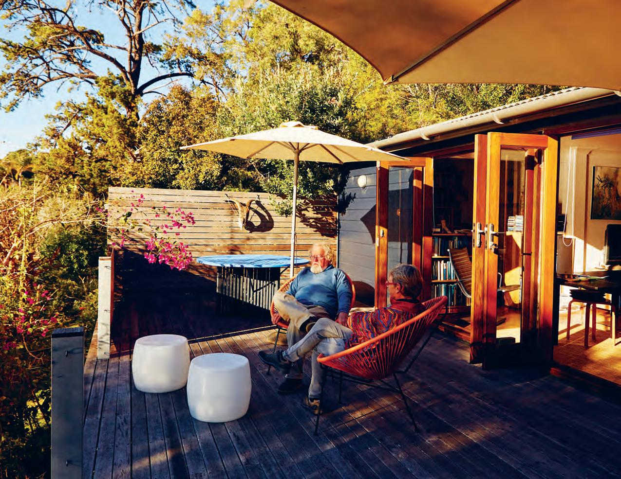
Opp Osite | Lindsay and wife s u enj Oy the m O r ning sun O n their east-facing deck, designed tO sit fLu sh within the Lu sh surrO u nding fLO r a. 2 . portrait # 61
“The political situation internationally right now is appalling. I grew up (and I didn’t realise this much at the time) and got paid to go to university. I got a grant – everybody got a grant. I lived in social housing when I was a kid after the war because there was no housing. Then I got a job in the ’60s at a time when all government departments and local councils actually had a chief architects department. It was a more socialist society, in the best possible sense of the word. The National Health System (N.H.S. U.K.) and the fact that most of the public infrastructure was funded by government meant that people had less, but lived much better. We didn’t have any of this privatisation. Now, everything is privatised, and not for the better.”
While this may seem a little ‘doomsday-er’ for some, Lindsay’s legacy should serve the next guild of radical thinkers as a beacon of inspiration. As Karl Marx once famously said: “To be radical is to grasp things by the root”, and that is the legacy of Lindsay Johnston. Some people are thinkers, some are doers. Lindsay is both. And that’s what the world sorely needs right now. Because if a scrappy “sh*t-stirring” kid from Belfast can defiantly shake-up and influence the establishment for the better, then the coming generation of change-makers can, too.
OZ.E.TECTURE
| ozetecture.org
above | Much of
career and persona L Li fe
been inspired
M
L
Lt
LLy
M ed,
off-the-grid
in the
o
Led
issue #38 habitusliving.com
Some people are thinkers, some are doers. Lindsay is both.
Lindsay’s
has
by environ
enta
sustainabi Lity, having bui
the internationa
fa
award-winning
house
watagan f
rest, which
into his reL ationships with pe ter stutchbury and gLenn Murcutt.
we are the AIR chitects
Introducing Bio Rangehood
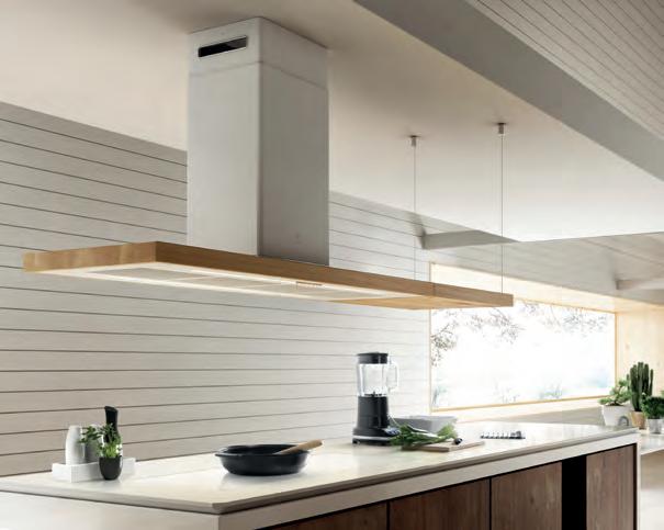
Satin white paired with natural wood, Bio is a one of a kind element of design. Crafted to suit both wall-mounted and island installation, Bio is the perfect blend of aesthetic and top home technology, featuring whisper quiet noise levels and outstanding filtering efficiency.
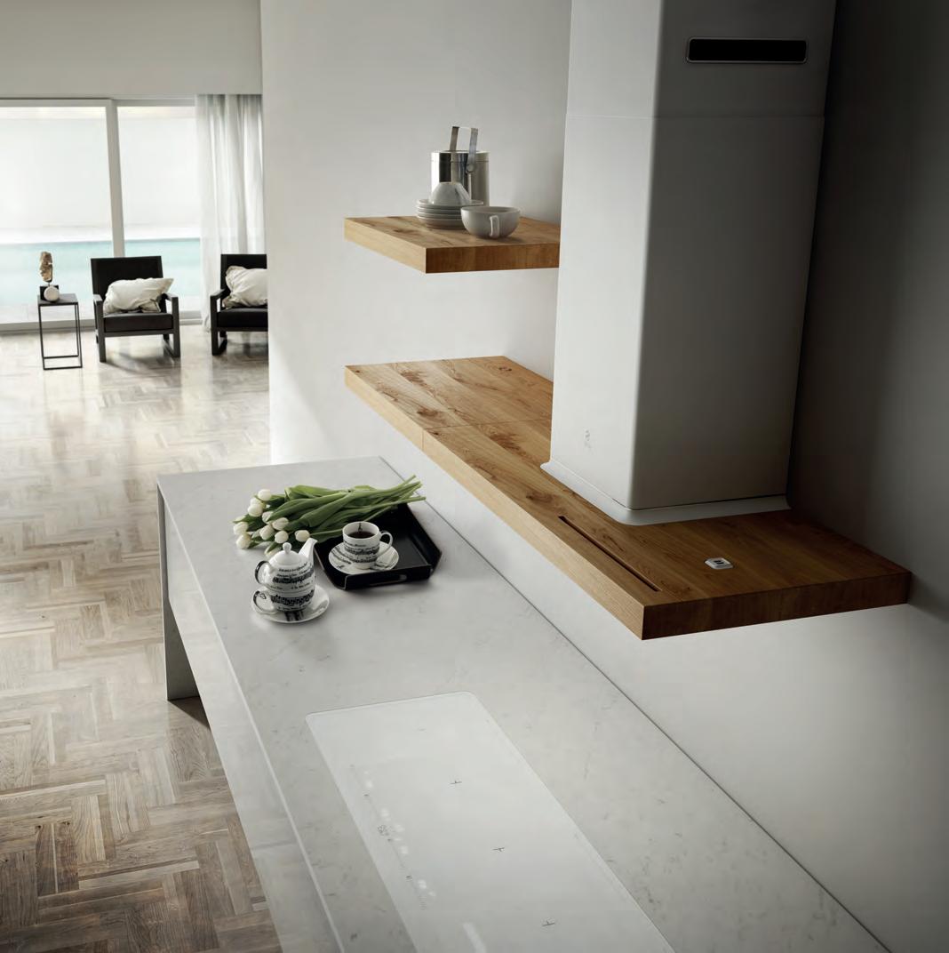
Bio is modular and thanks to its shelves can easily be adapted, truly making the rangehood a part of the kitchen design.
a vailable at s elected kitchen stockists, specialists or online shop.elica.com.au
Made in italy d istributed in a ustralia by r esidentia group
Designed by Fabrizio Crisà for Elica, the Bio rangehood maintains traditional lines while being truly innovative.

The voice of our region. Founded by Indesign Media, the INDE.Awards celebrates Asia Pacific’s most progressive feats in design and architecture. The INDE.Awards recognise the region’s best and most creative design on its own terms. Enter Now indeawards.com
a n e xcuse to stay in Bed U
tterly effortless. How else could one describe IN BED, the online retail space created and curated by Pip Vassett? What once started out as a small selection of linen and homewares has now grown tenfold. Inspirational, aspirational, but ultimately achievable. The IN BED aesthetic is an infuriatingly fabulous mélange of laissez-faire and perfectly poised. Yet you can lift it from the site to in-situ in your own home to the same effect. The product styling is simple and unfussy, as is the product offering, and thus easily reimagined in the homes of Design Hunters like you and me.
In 2013 when IN BED was first launched, it was speaking to a gap in the market for high-quality, reasonably priced, linen bedding. But equally so it spoke to Pip’s personal sensibilities and professional goals. Off the back of eight years as the Fashion Director at Yen, it was time to do her own thing and play by her own rules.
A gut instinct and a growing interest in interiors and textile design saw the world open up for Pip – albeit from a seat at the computer.
Nine months of research and production and another five years in business later, Pip has built solid relationships with suppliers and manufacturers the world over. The linen is sourced from Shenzhen, China; cotton from Portugal in a town called Guimarães; the baths towels are made in Izu Shizuoka, Japan; cashmere from Shanghai; and more locally they’ve had blankets made in Tasmania. “We’ll usually go over to Shenzhen once or twice a year, and Shanghai as well. We just came back from Lisbon and Japan,” says Pip. The ‘we’ is in reference to her partner and IN BED General Manager Eddie. “It comes down to choosing or sourcing products from a location you know has a strong reputation in that particular area,” he adds. “In [Imabari, Japan] we looked at a number of examples of the Japanese cotton towels and they were known to be beautifully soft and high quality, so we wanted to produce our products there.”
Likening the appeal of IN BED to that of APC, Bassike and ACNE, “brands that I really love and trust”, IN BED is conversely dedicated to the residential sphere.
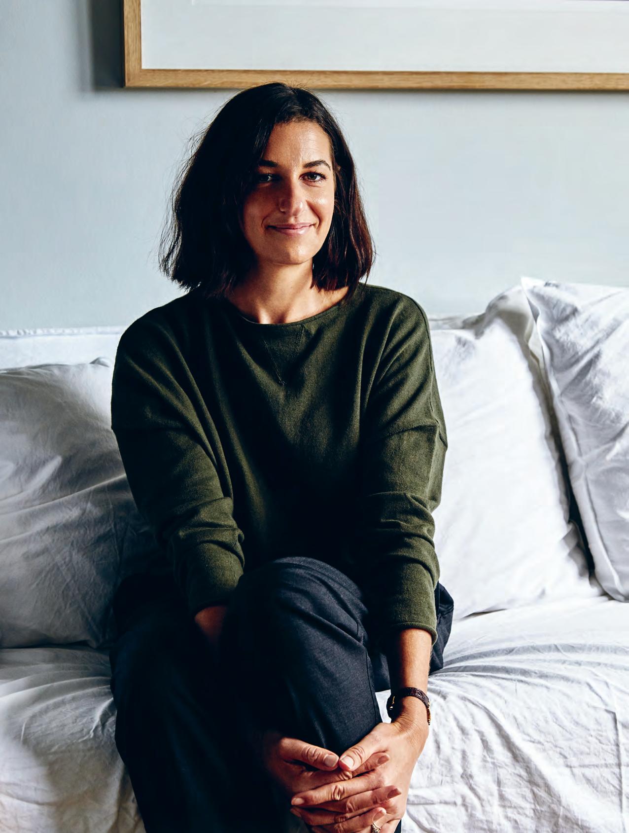
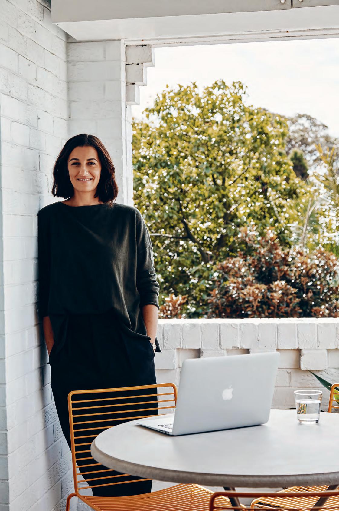
Pip Vassett founded IN BED five years ago and in that time she’s created a multi-faceted experience and cult following. Holly Cunneen visits the casual entrepreneur’s effortlessly cool home in Sydney’s Rose Bay.
Tex T Holly Cunneen | PhoTo gra Phy MiCH ele Aboud
issue #38 habitusliving.com
2 . portrait # 67
issue #38 habitusliving.com
In addition to the sourcing of linen, building relationships with suppliers and manufacturers, designing and sampling the initial product range, it was always intended that a carefully curated selection of work from local and regional designers would sit beside her linen to complement and round out the collection.
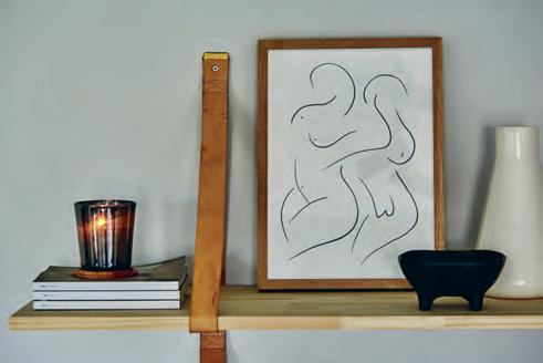
Henry Wilson, Wignut & Co., Gidon Bing, Rina Ono and slightly more established –as opposed to emerging – brands such as Anglepoise, Iris Hantverk and HAY have each gradually made their way onto the website. Like any new business venture that’s to extend beyond a successful first reception, continued success comes from building on what works and ensuring the ability to be responsive to the market. Staying close to her clients and their growing interests – anticipating them even –is of utmost importance to Pip.
In such a way the IN BED Journal extends the brand beyond its initial offering, while her investment in original photography translates skills of a past life into the present.
Fresh campaigns are usually shot every two to three months. They might be shared online (the website), through social media (Instagram) or printed media (a lookbook). As Eddie notes, most – if not all – photography used is original content and the supplier visits often double as global shoots.

opener |
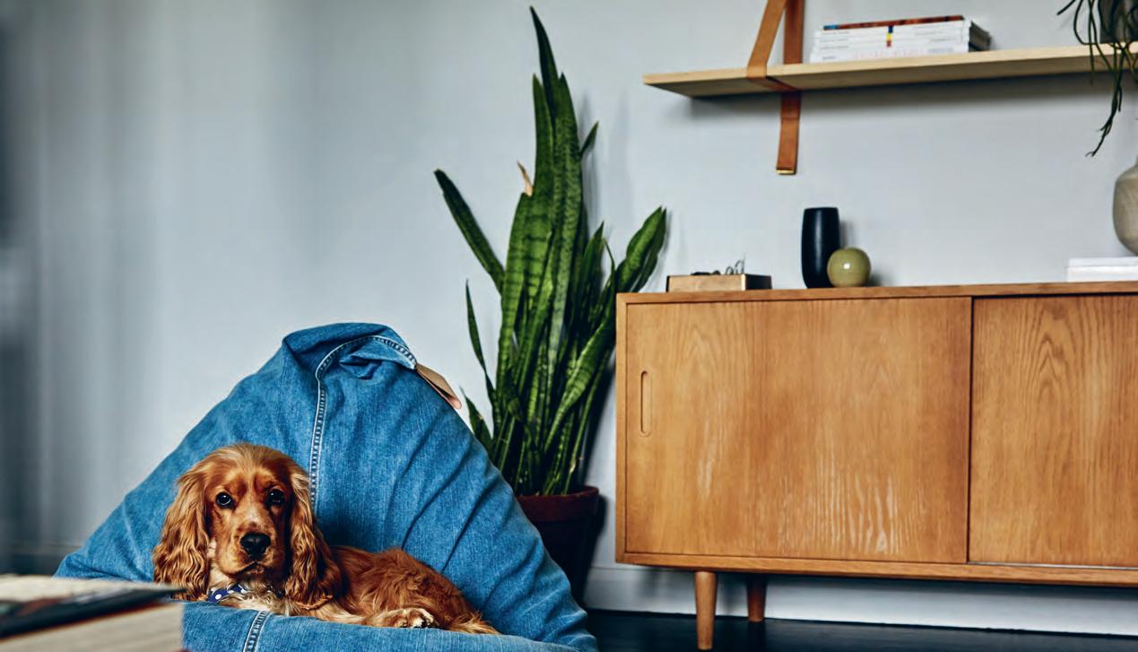
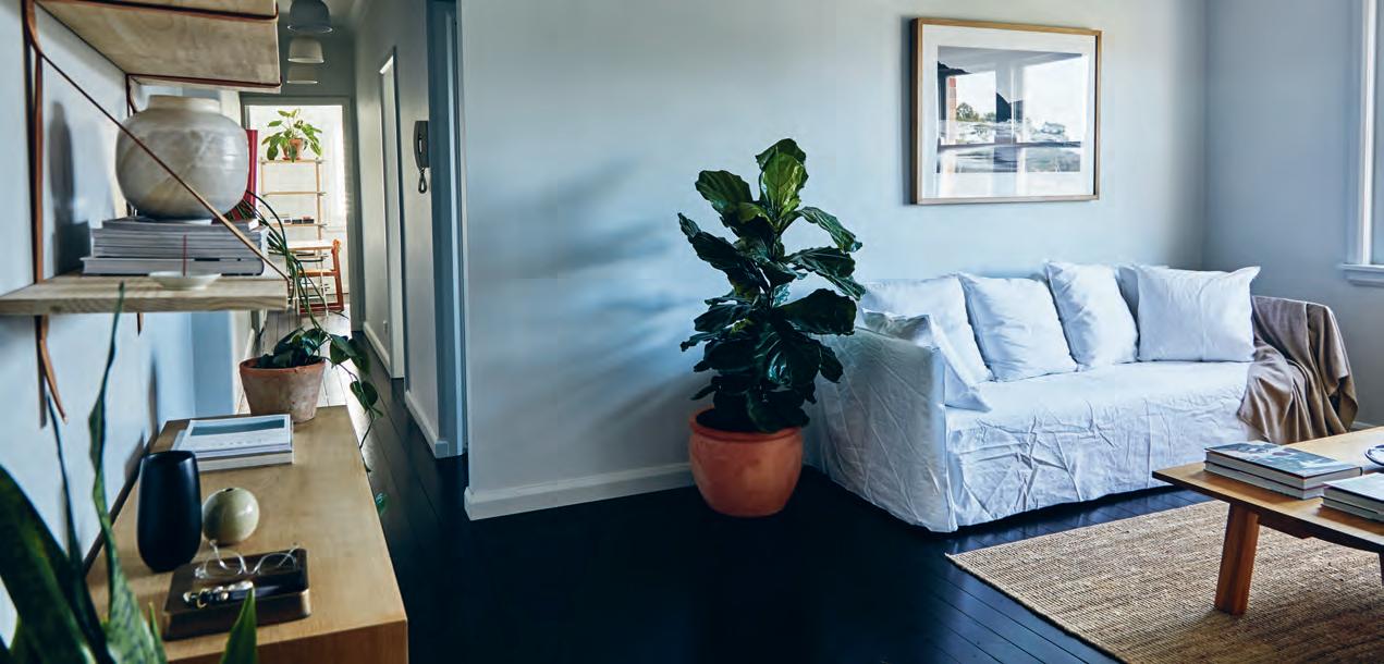
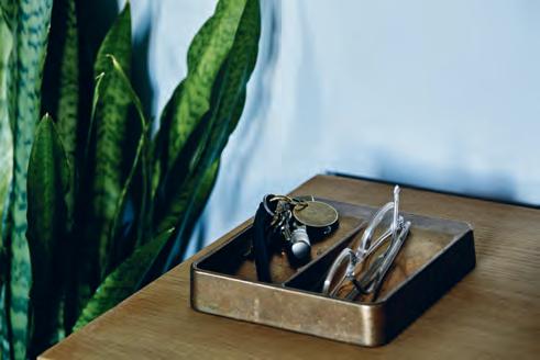
pi p Vasset t opposite aboVe | b u ddy, a caVa lier x cocker spaniel, comes to work with pip and ed die e V ery day. opposite below | light seeps in from the li V i ng room window, resting on the g erVa soni g h ost s o fa from a n ibou. aboVe | tokens from i n bedstore.com.au haV e m ade their way into pi p and eddie’s home, such as the iris hant
V erk dish brushes (middle) and henry wilson thoronet dish in gunmetal bronZe (below). the print (aboV e ) is by ca roline wa lls.
2 . portrait # 69
issue #38 habitusliving.com
“We’ve been here for a year now and we’re slowly building on pieces.”
2 . portrait # 71
issue #38 habitusliving.com
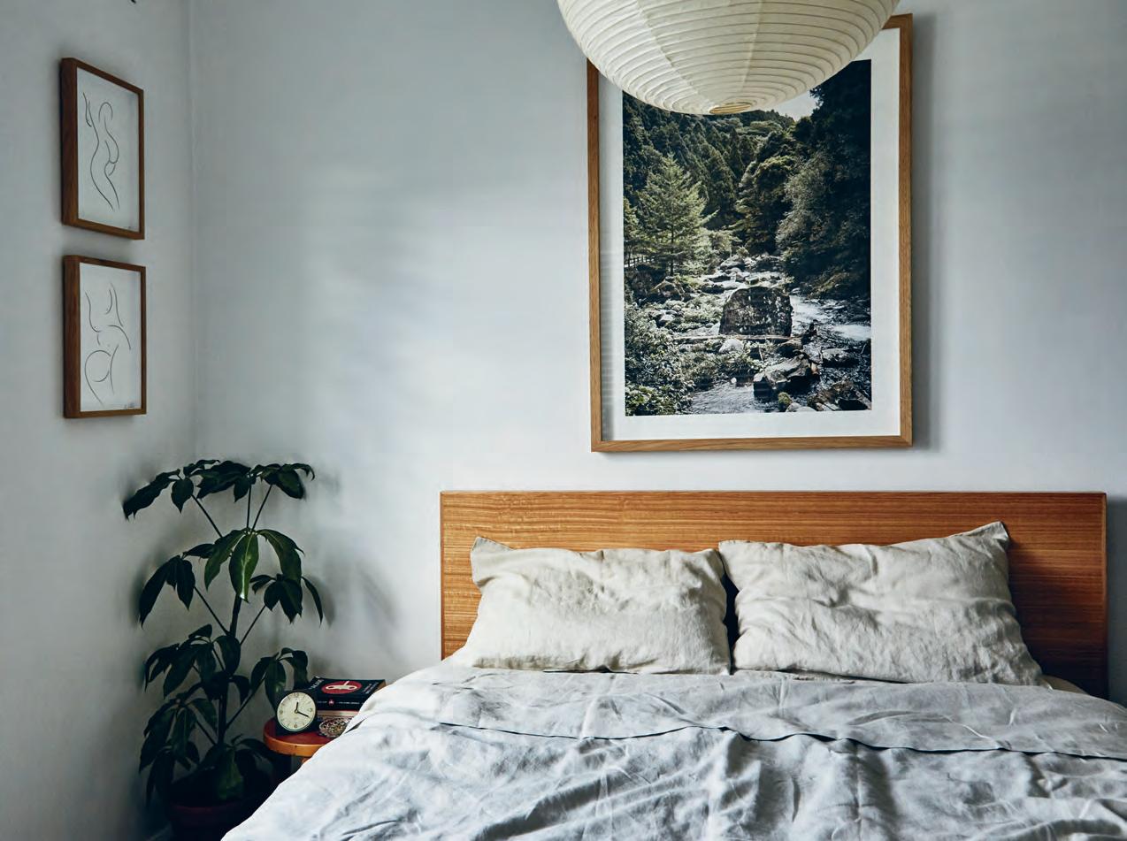
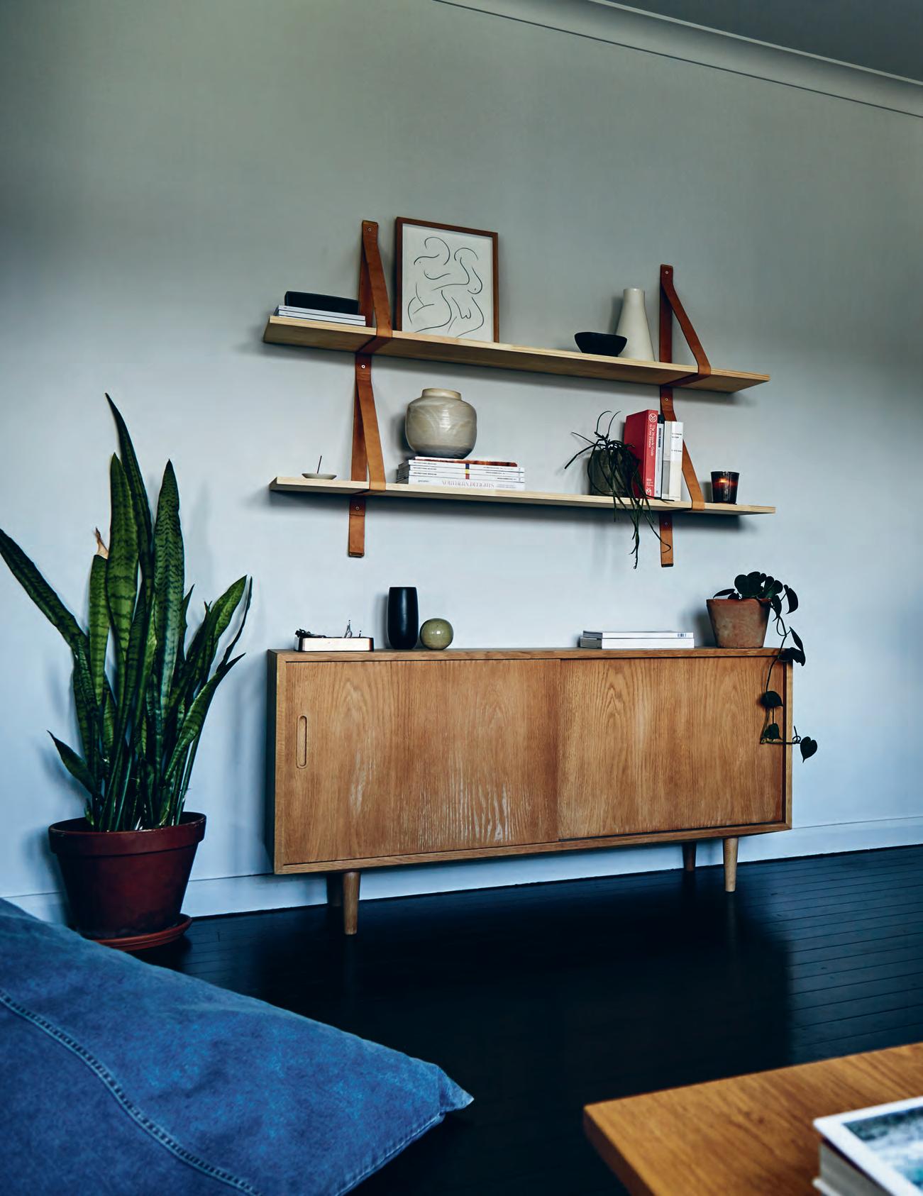
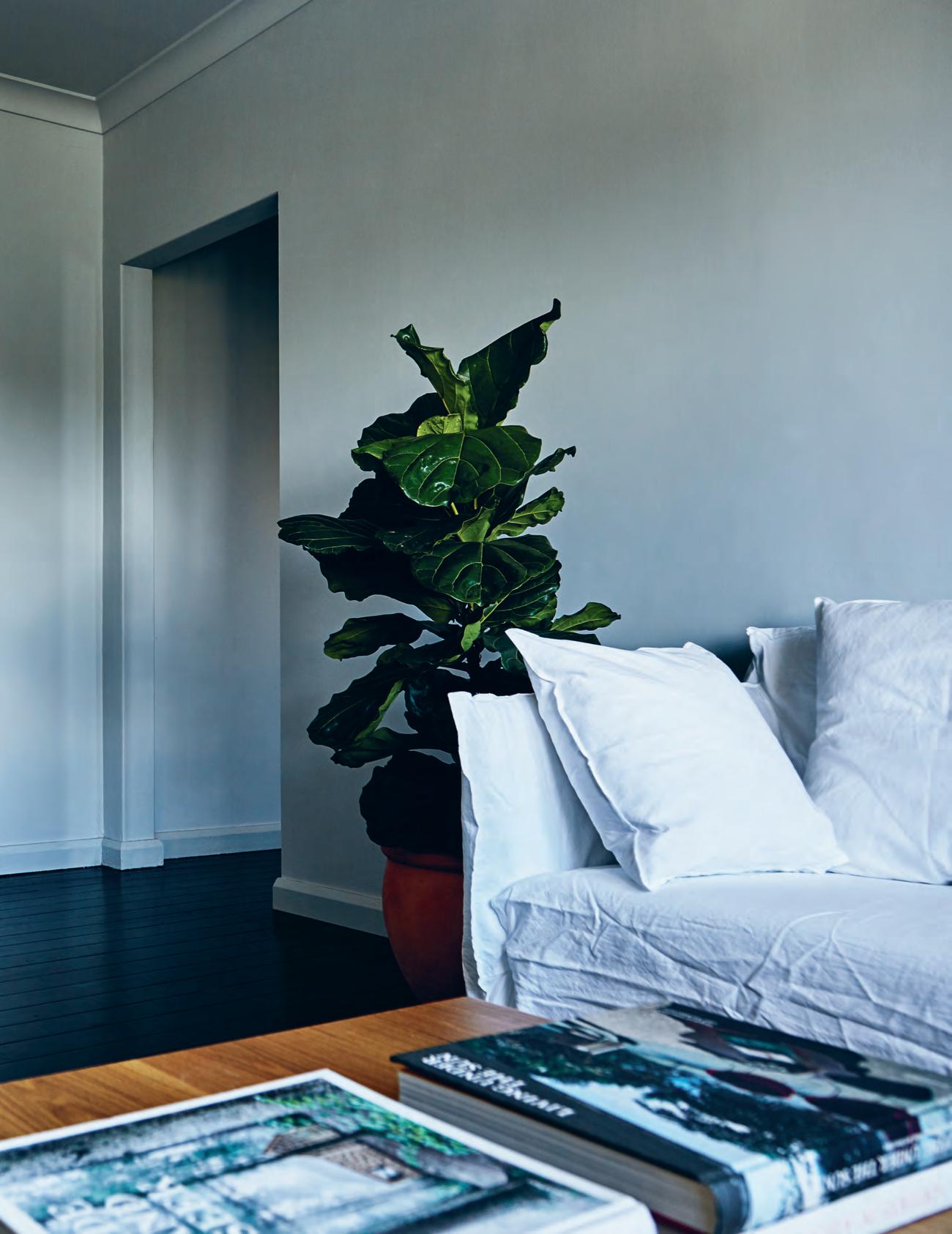
previous | pi p va sset t and husband eddie arnott acquired their apartment in sydney’s rose bay just over a year ago. the living room looks like it could have come directly out of an in bed shoot. opposite | both bedrooms lead onto the cosy, sun-soaked balcony. the second bedroom however is used as a study/home office. above | the king bed was an upgrade from when they first moved in, because, as eddie notes, a double bed (as they previously had) in the bedding business is a crime.
2 . portrait # 73
“Everyone has a beautiful little spot in their home – even if it’s tiny.”
“We took a photographer to Japan, shot a whole campaign, produced a broadsheet-slashlookbook, and we had an exhibition in our studio space,” says Eddie. “It’s a nice way to create a bit of an activation around the launch, another level of engagement.”
Fuelled by more than her own selfconceded curiosity, the IN BED Journal is a look into the homes and private spaces of the different creatives that have inspired the brand, and how they, in turn, have been inspired by the brand. “[The journal] didn’t launch at the same time that the site did but it was something that I wanted to do,” says Pip. “That’s the whole inspiration behind IN BED: real people and how they live at home.
“Some are incredible, and some are just sweet little homes, but there’s always a point of interest… Everyone has a beautiful little spot in their home – even if it’s tiny.”
Now the tables have turned and Pip and Eddie are sharing their home space, their private sanctuary to the rest of the world. “We’ve been here for a year now and we’re slowly building on pieces,” says Pip. These pieces in question might be gifts, family heirlooms, or vintage finds, but the overall objective is to find furniture that comes with a backstory or personal connection.
“Anything in our home we want to love now as much as in 10 or 20 years. That’s what good design is; something that’s going to be good in a decade or two,” says Pip. So it seems the pursuit of timeless design for IN BED extends to the design of her home – or is it the other way around?

above | ed die, Pi P and b u ddy have a small boat docked in rose bay when it’s not in use. issue #38 habitusliving.com
IN BED | inbedstore.com
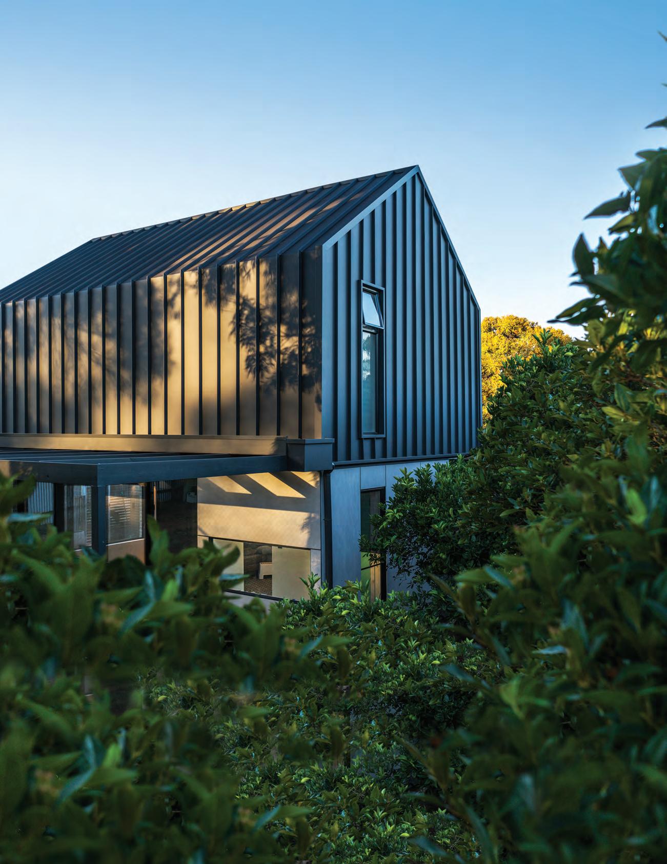


COLORBOND and the BlueScope brand mark are registered trade marks of BlueScope Steel Limited. 2017 BlueScope Steel Limited ABN 16 000 011 058. All rights reserved. Introducing new COLORBOND steel Matt. Understated yet contemporary, this roof and wall material is unequalled in its ability to draw attention. In fact, the only thing that does match its looks is its durability in our harsh Australian environment. Visit COLORBOND.COM/MATT or call 1800 702 764 Discover the subtle art of standing out.
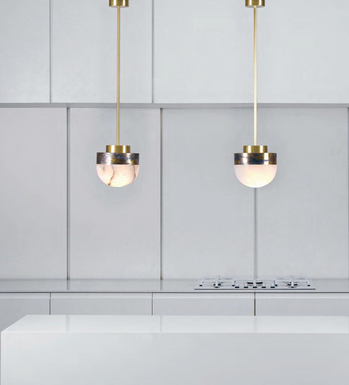
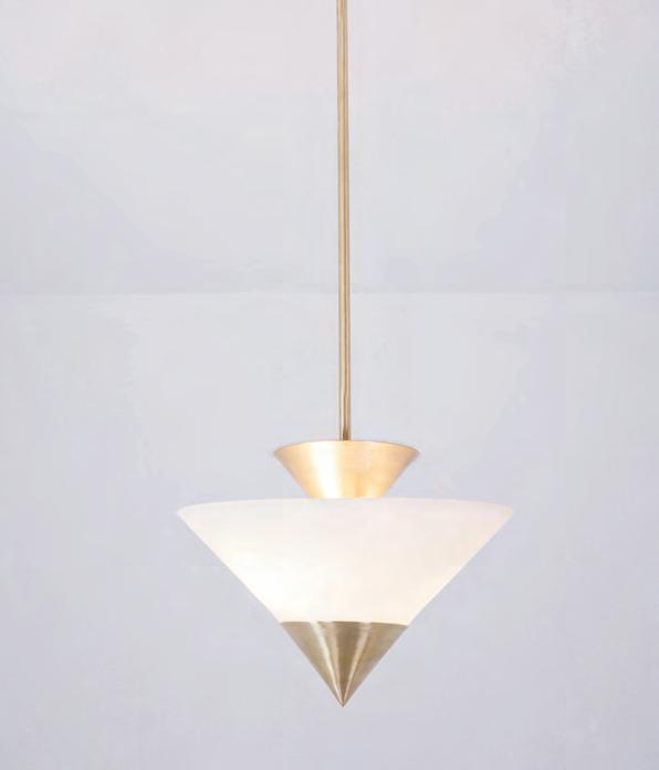
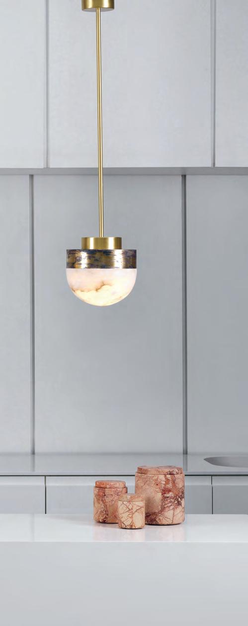
issue #38 habitusliving.com above | Lucid 200 Pendant, designed by MichaëL verheyden for cto. oPP osite | Zé Pendant by ateLier de trouPe
Tripping the light Fantastic
Lighting is currently experiencing a massive moment in the design world as interiors refocus on this functional element.
#77
Spence & Lyda | spenceandlyda.com.au habitus promotion › Spence & Lyda
While it was once the norm for lighting to be thought of as purely functional, oft relegated to almost invisible downlights, more and more lighting is being designed to be a central – and statement – feature with interiors.
This is no doubt the result of an understanding that decoration is no longer a dirty word in interiors and that minimalism, while it has a place, is not the sole direction in contemporary interiors. Accordingly we are seeing lighting embrace more luxurious materials and varied inspirations.
The drivers in this directional shift tend to be smaller companies, willing to step out on a limb to foster change. Interestingly some have turned to architects, others to ‘bright young things’ in associated design fields to drive this stepping away from the norm.
DCW Editions, a company that first began re-issuing and developing icons like the Gras Lamp (from 1921) by BernardAlbin Gras, have recently turned to the famous architect Dominique Perrault and the designer Gaëlle Lauriot-Prévost for one of their new releases In The Tube.
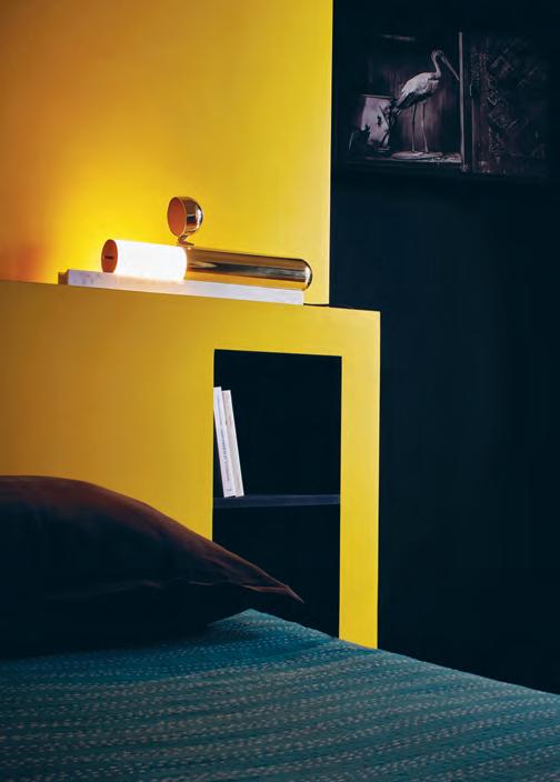
T heir latest design ISP, released at Salone Del Mobile earlier this year, is a breakthrough lighting design that is the brainchild of Ilia Sergeevich, an Italian-Russian airline pilot. The light has no bulbs or switches and took an engineer 18 months to resolve the technical aspects of this extraordinary design.
O ther companies like the U.K. based CTO have employed designers like Turkish design duo Autoban, and most recently the LUCID light by Michael Verheyden.
W hile the entire lighting industry might not be using architects to design their products, other companies like Atelier de Troupe have taken design queues from them. Austrian-American architect Rudolf Schindler is a massive i nspiration in the resurging Californian design movement. Often thought of as the unsung hero of the modernist m ovement, we are seeing his geometric attitude to modernism in the work of this young Californian company. Gabriel Abrahams was working as a set designer/art director in the LA film industry when he was commissioned by Commune Design to create the lighting for the ACE Hotel Downtown LA. After further collaborations he established Atelier de Troupe.
Other young companies like Bomma, instrumental in the resurgence of Czech glass industry, have taken on young rising stars of industrial designers Jakub Pollág and Václav Mlynář - Studio deFORM who began life in Czechoslovakia but moved into the broader market in London. This year they have returned as Art Directors of Bomma to steer their company away from tradition and into a brave new world for the industry.
Lighting has emerged as a key driver in interiors the world over and the results speak for themselves.
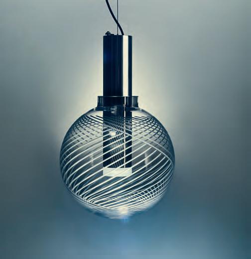
issue #38 habitusliving.com above | phenomena pendant designed by dechem studio for bomma. below | isp table light designed by ilia p otemine for dcw editions opposite | in the tube hanging lights designed by gaëlle l auriot-prévost for dcw editions

habitus promotion › Spence & Lyda #79
spenceandlyda.com.au
Spence & Lyda |
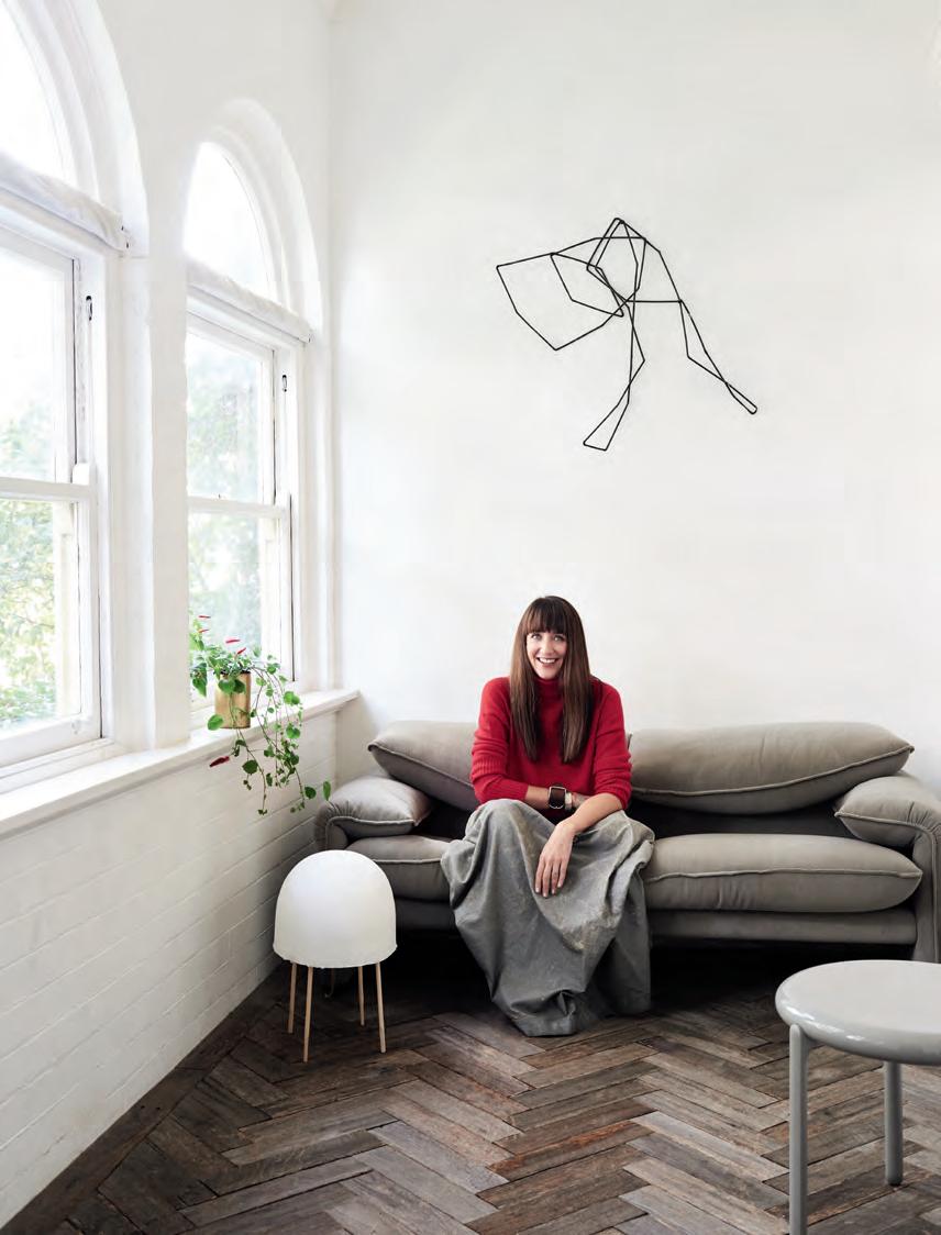
MeganMorton,Authorand Stylist Forme,making amagicalhouseis abitlikecooking.It isneverjustoneingredientthatmakesitgreat, and alot of ithastodowiththelove,withthecare, attentionandtime -youjustcan’tdoit fast,it’spartofanongoing storythat islargelyautobiographical.Plusgreathomeshaveneverbeenjustaboutthearchitectureorthefurniture,it’s about whoisinitandhowyoulive -the people at yourdinner table,thefriendson yoursofa. Greatthingsarejustnot enough,it’s howyouactivatethemandbringthemtolifethatisthemostimportantthing. spacefurniture.com
EXOTICA!
Beauty’s Where You Find It.
As our quotidian becomes increasingly incredible, where does real creativity live? In this fourth instalment of In Habitus Veritas, we lift the lid on the extra ordinary.
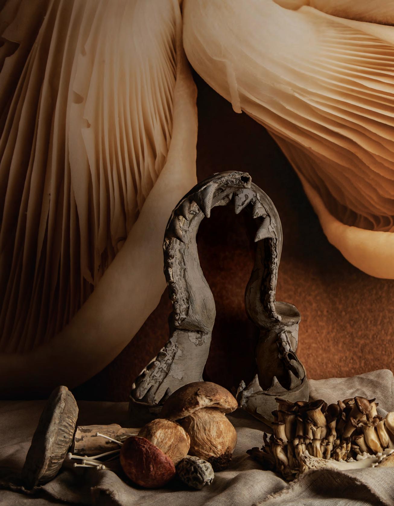
STILL LIFE IN THE STUDIO OF LOST PROFILE BY
ELISENDA RUSSELL
— Stephen Todd
exotic # 81


Sydney Light Studio: GF/2 Hill Street, Surry Hills, NSW 2010 T: 02 9356 9900 Melbourne Light Studio: 49 Exhibition Street, Melbourne, VIC 3000 T: 03 9657 9657 euroluce.com.au Photography by Germano Borrelli for FLOS L1, 181 Robertson St, Fortitude Valley Brisbane, QLD 4006 Tel: 07 3831 0999 Fax: 07 3831 0099 by appointment only Transforma 21 Kensington Road Norwood SA 5067 Design moves out The new Flos Outdoor collection Available from Euroluce
Otherness
Creative fields coalesce, a new critical mass is formed. In this space, no one need ever hear you scream.
 Tex T Stephen tOdd
exotic # 83
issue #38 habitusliving.com
“Je est un autre” (‘I am an other’) w rote 17 year-old Arthur Rimbaud in a letter to his teacher George Izambard, inadvertently echoing Hegel’s assertion that the subjective self, the ‘I’ is constructed. Rimbaud rings truer than ever today, as technology enables us agency all over the globe, identity is fragmented, and I is an Instagram feed.
In a post-colonial, post-industrial, post-modern and even post-human era, what’s left of the exotic, the other? Long considered a synonym of ‘primitive’, exotica was the dusky bed pal of capital in the era of imperial expansion. Today, the exotic has entered the lexicon of astrophysics, referring to matter that deviates from the norm – dark matter, negative mass. Quantum otherworldliness.
The inaugural National Gallery of Victoria Triennial has no theme, but it has certain preoccupations. Curator Ewan McEoin puts them like this: “New industrial models, postcapitalism, post-industrial production, the tension between the human population and the environment, globalisation, our changing relationship with nature, the role of the individual in shaping those things. Technology, the self.”
Assembling the work of 78 designers and artists from 32 countries, the Triennial adroitly sidesteps taxonomy (a very Victorian urge) refusing to categorise work as art or design, this or that. “We’ll let the viewer decide,” shrugs McEoin. If nothing is defined, there is no other – ergo everything is its own exotic.
How to categorise, for instance, a four-metre-high, eight-metre-round, steel-framed, upholstered and embroidered thing devised by three industrial designers, one master craftsman and a collective of indigenous artists? It’s what Sao Paolo’s Humberto and Fernando Campana have created in collaboration with Alice Springs’ Elliat Rich – aided and abetted by her husband, artisan shoemaker James Young on the staple gun –in cahoots with the Yarrenyty Arltere aboriginal town camp collective. “The Campanas have that stream to their practice where they hone in on local artisanal skills and design from that,” explains Rich. “Humberto came to Alice Springs and we visited a number of different art centres. He was particularly taken with the work of Yarrenyty Arltere. They specialise in soft sculpture embroidery work. They’ve been living in town camp for generations, their work draws on traditional motifs but also has an edge to it. It’s very vibrant, has a lot of energy.”
Initial discussions focused on furniture, but after a dinner at Emily Gap, a site sacred to the caterpillar Dreaming, “Humberto came up to me in the carpark and said, We’re going to create a giant soft sculpture.”
Visitors to the NGV will walk through the monumental structure, christened by the Campanas ‘Victoria Amazonica’, after the Nymphaeaceae of the Victoria genus – aka the giant Amazonian waterlily. In desiccated Central Australia, an exotic bloom indeed. At the NGV it will hold office as the entrance to the Triennial, forming a triumphal arch through which visitors will access the rest of the installation spread out over four floors.
“The NGV Triennial is a snapshot of what’s going on around the world,” says McEoin. “It’s a diverse body of works but there is definitely common ground between people creating in very different contexts and places. It encompasses geographical, gender and diversity spreads, from high quality, hard core industrial output to low tech craft.”
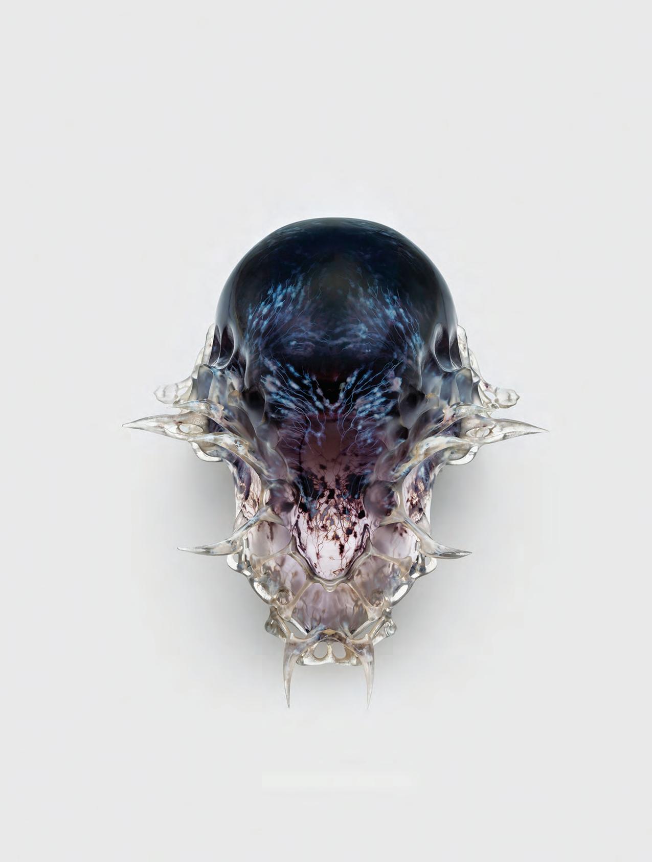
There’s Neri Oxman’s series of spooky Vespers, 3D printed death masks modelled from data mined from the facial features of the wearer and physical flow of the final breath. Tokyo’s teamLab has been commissioned to create an iteration of its famous Vortex, an immersive interactive environment that transports the viewer to a spacey Elsewhere.
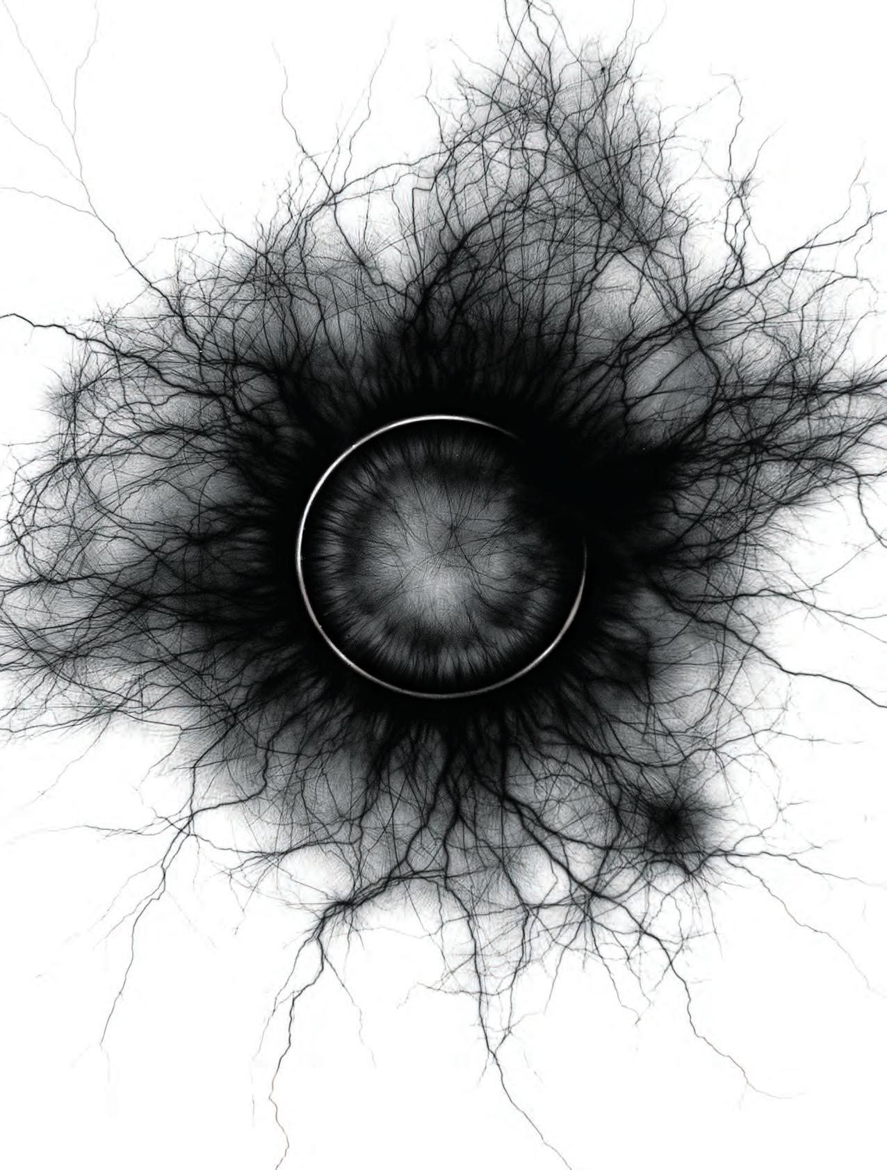
Sydney jewellery designer Sean O’Connell has devised a series of Spark Rings from precious metals, hair, wax, bone, and meteorite fragments. The flashes these fetishes emit when subjected to high voltage electrical charge creates eerie auras that offer insight, the designer suggests, into the very character of matter. Modern totems, high tech magic.
3D printed furniture by Joris Laarman, nendo’s entire suite of 50 Manga Chairs, rapid prototype couture by Iris van Herpen, Formafantasma’s mining of precious metals from mobile phone technology, Brodie Neil’s Gyro table made from recycled flotsam. “I can definitely, emphatically state that this is the biggest design exhibition ever to happen in Australia, by far,” says McEoin.
It is also a carefully calibrated acquisition program. All works on show as part of the NGV Triennial (many of them special commissions) will enter the permanent collection of the new Department of Contemporary Architecture & Design, under the direction of McEoin and co-curator, Simone LeAmone. “We’re not just borrowing works from around the world, importing them and exporting then once we’ve finished,” says McEoin. “The Triennial is about encouraging a dialogue between local and international thinkers and doers. It’s about forming links and breaking down the barriers between us and them.”
The NGV Triennial, December 15 2017 – April 15 2018.
The
opener | Sean o Connell, TanTalum Spark 2015 from maTerial STudieS Spark ringS 2015, inkjeT prinTS naTional gallery of ViCToria, melbourne, purChaSed, ViCTorian foundaTion for liVing auSTr alian arTiSTS 2017. oppoSiTe | left Vespers, 2016, SerieS 2 maSk 3 deSigned by neri oxman and memberS of The mediaTed maT Ter group for
new anCienT ColleCTion CuraTed and 3d prinTed by STr aTaSyS 2016. phoTo by yoram reShef
exotic # 85
I can definitely, emphatically state that this is the biggest design exhibition ever to happen in Australia, by far – Ewan McEoin

issue #38 habitusliving.com
The Gloaming
The glimmer, the glisten, the glamour*… Life imitates art in the home of Australia’s most corporeal artist, Bill Henson.
TexT Stephen todd | phoTographY Anthony GeernA ert
Vienna, the summer of 1977, a young man is seated on a dark charcoal velvet couch in an upper room of the Kunsthistorisches Museum staring at Titian’s Nymph and Shepherd painted some 400 years before. He’s been there every day for a week now, mesmerised. Sunlight gently dripping from skylights overhead, he’s absorbed in the oscillations of luminosity as clouds pass over the sun. Outside, across the topiary of the Maria-Theresien Platz, atop the Natural History Museum is a statue of Captain James Cook, erected in 1771 as a symbol of a new age of discovery. Our young man is in Vienna on a very different kind of quest.
“The room was breathing, all the information would slide away into the gloom, a dim obscurity. Then the sun would come out and all of a sudden you’d see this opalescent flesh start to sparkle.” The young man was Bill Henson, the Titian his obsession.
Forty years later we’re seated upstairs in Henson’s grotto of a loft in the inner Melbourne suburb of Northcote. Over his shoulder an English pastoral painting in the style of Turner emanates from a wall painted a velvety brown-black, the shade Bill suggests galleries employ to best offset his work. He’s wearing what appears to be the same pale green corduroy trousers and grey sweater he was wearing when I visited him a week before to begin talking about this story.
“I think the hole’s bigger in this one,” he muses, tugging at the left sleeve and confessing he always buys the same thing. A knitted tea cosy, a snatch of spindly japonica, disparate trinkets; the setting is at once humble and sumptuous, a compelling paradox I’ve come to recognise as very Henson.
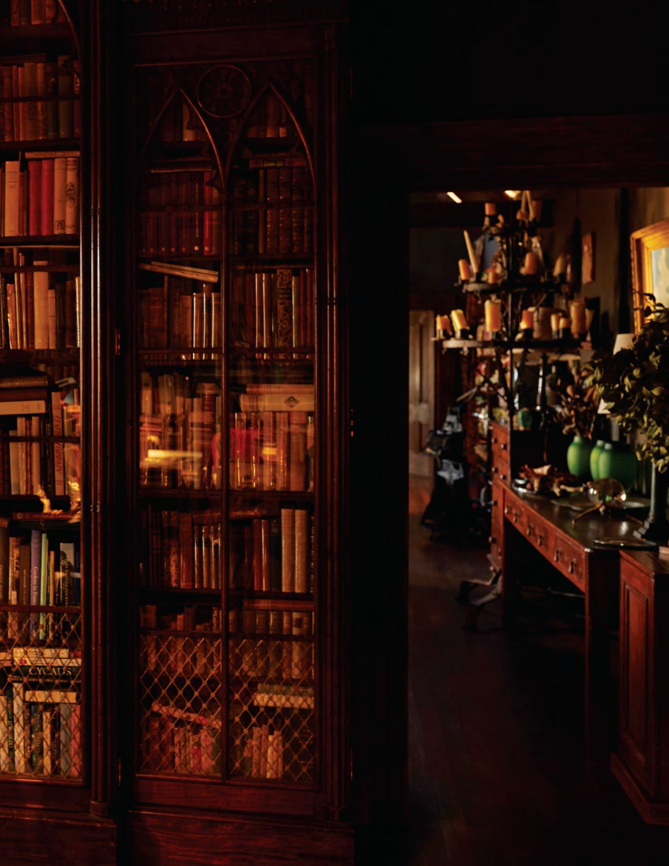
Next door, his library is not so much lined with books as it is brimful of them. A gaggle of Anglepoise lamps crane over volumes stacked in the centre of the room. The mix of natural and incandescent light creates an amber glow, a heady honey hue in which everyone and thing looks pleasing. The lamps have not been moved since my previous visit, but the books laid open at various points around the room have changed. It’s easy to imagine Bill Henson wiling his days away, swooning from one first edition to the next. The vision would be fey if the reality weren’t so intense.
“In that corner over there,” he says, indicating a black swivel chair beneath a west-facing window where the vigour of afternoon daylight creates greatest tension, “that’s where I sit with my feet on the desk and look at my contact proof sheets. I have music going sometimes, and I have a white Chinagraph pencil and I have my magnifying glass and I go back and forth over them and I might do that for a day, a week, six months or maybe a year. I will have a wonderful time trying to sift out the shots I think are going to work when I blow them up.”
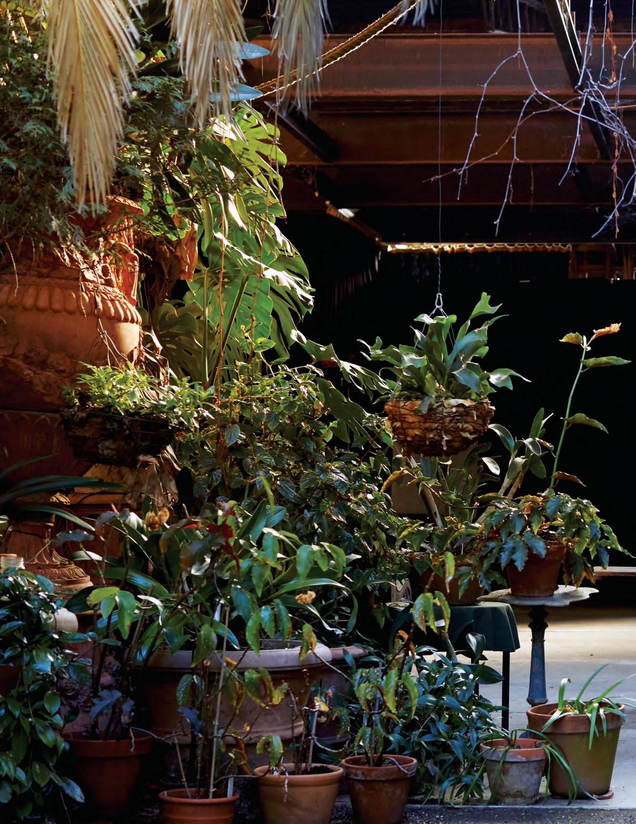
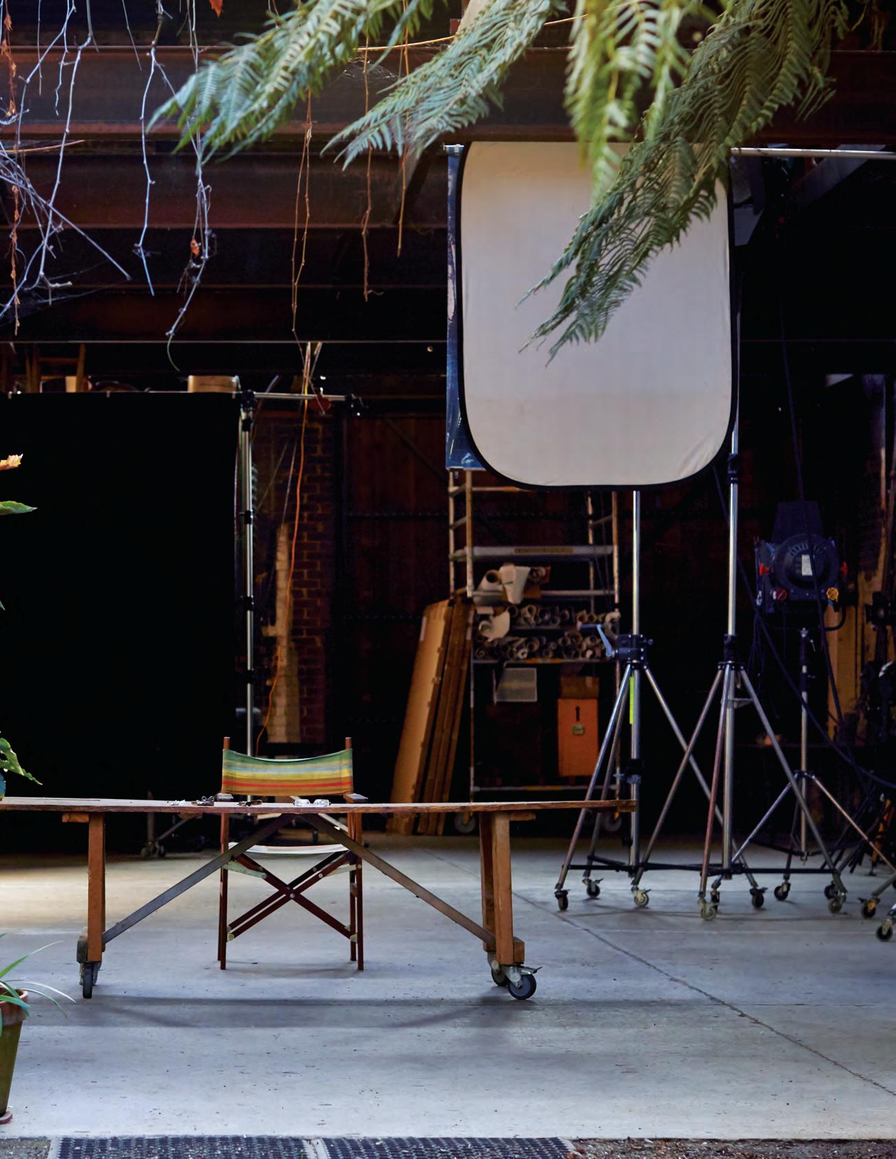
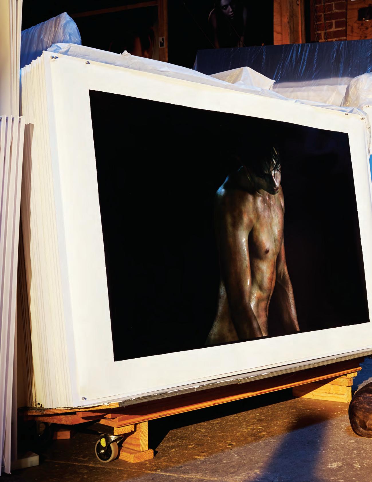
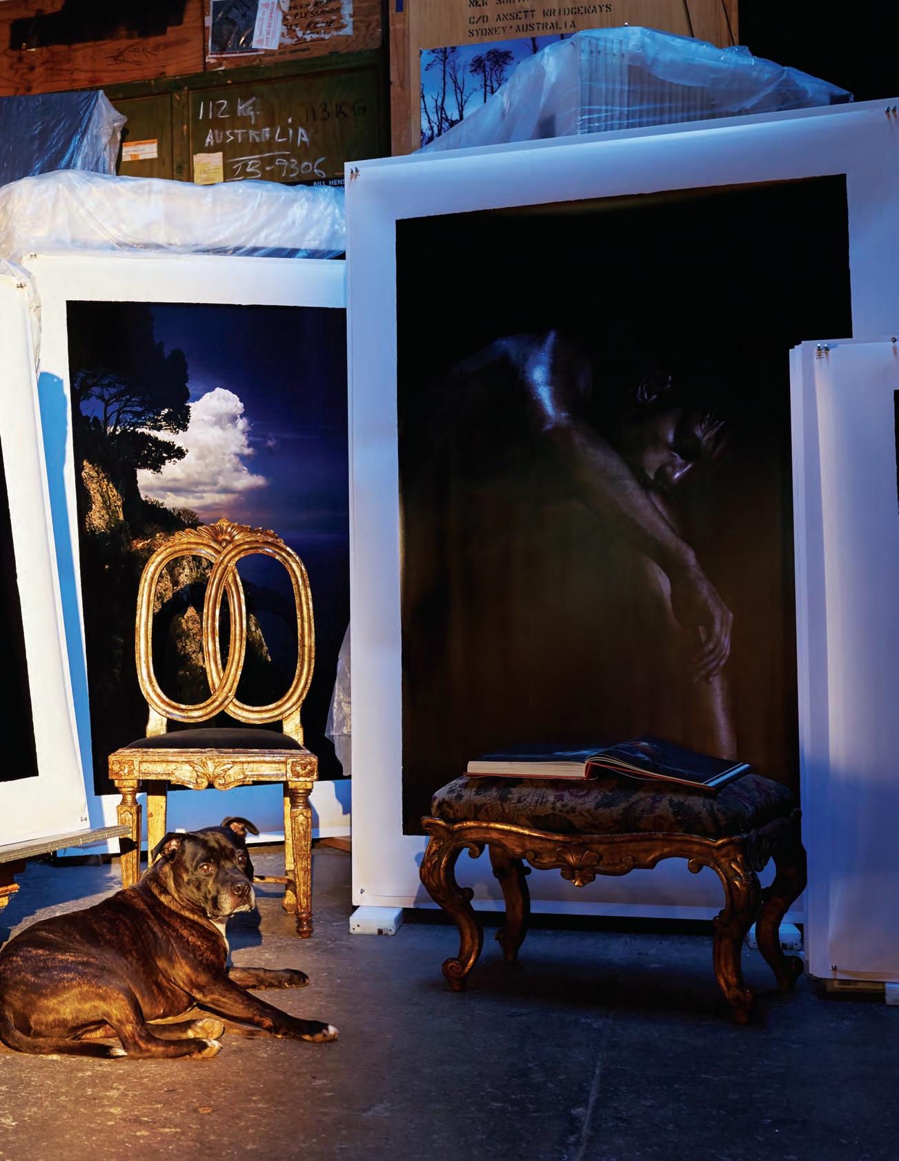
The blowing up (not “enlarging”, Henson’s is a frank lexicon) happens downstairs in what would best be described as his atelier – if an atelier can be kitted out with rare books, museum-grade antiquities, and dozens if not hundreds of large format photographs sitting one behind the other on robust timber easels. Hanging from an iron I-beam, two wooden gymnast rings hover on leather straps above a satiny, poured concrete floor. Bill Henson is one of Australia’s greatest living artists, certainly our most cerebral – and perhaps, somewhat surprisingly, our most corporeal.
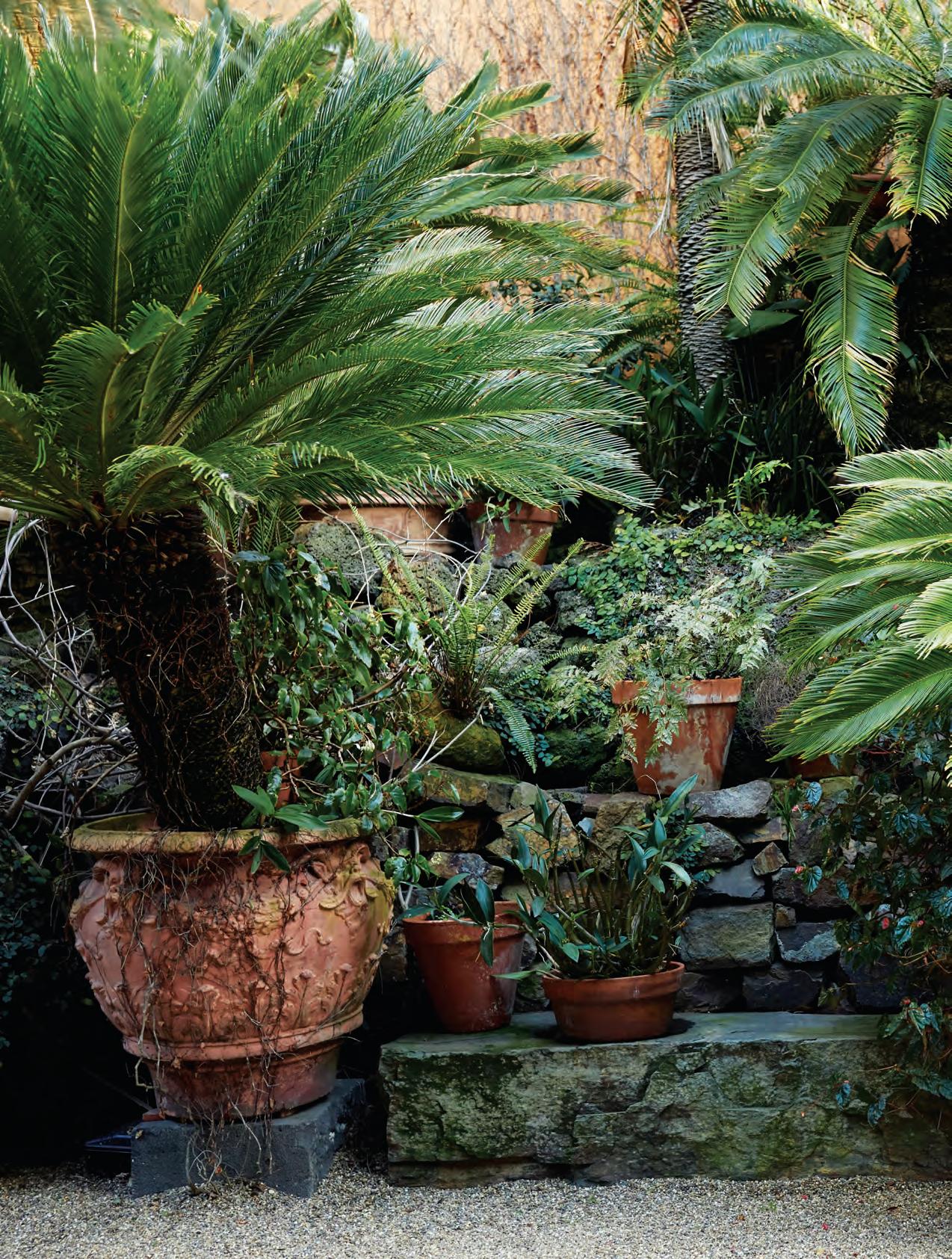
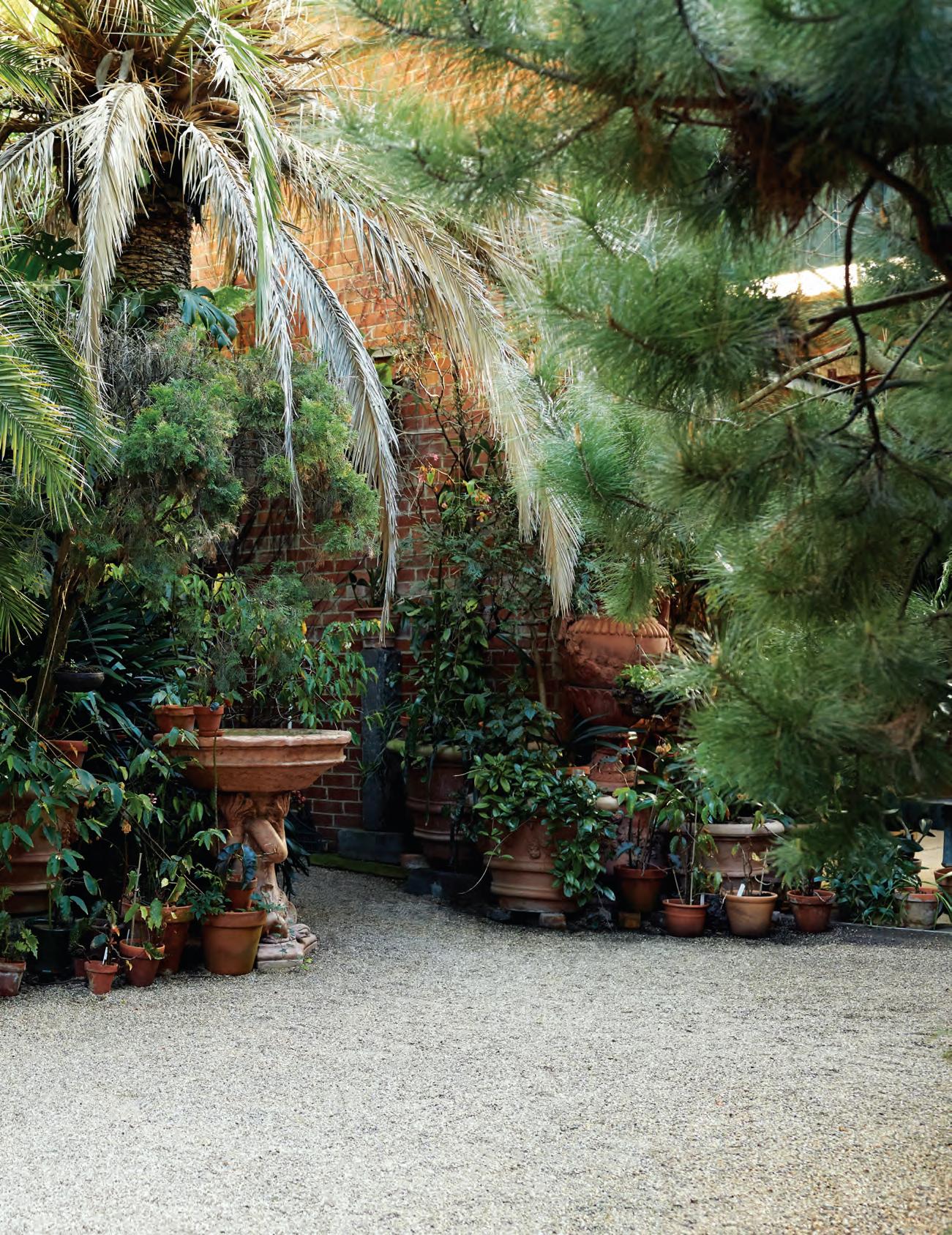
OppOsite | Bill HensOn seated at His dining rOOm taBle in frOnt Of an italian rOcOcO candelaBr a and an Oil painting in tHe st yle Of J m W turner. fOllOWing | HensOn ’s studiO is lOcated in a repurpOsed Open-air garage accessed frOm His WareHOuse HOme tHrOugH a verdant garden. pages 90-91 | HensOn in His liBr ary, tHe gOtHic BOOkcase prOtects His preciOus first editiOns. *WitH tHanks tO JOan didiOn Blue Nights exotic # 87
issue #38 habitusliving.com
exotic # 89

issue #38 habitusliving.com
exotic # 91
issue #38 habitusliving.com
For most of his adult life, Bill’s been a runner, clocking up at least ten kilometres a day “as a form of relaxed meditation”. For the past decade he’s worked with a personal trainer by the name of Ozgur three days a week, two hours a day. Plus the high-speed, twenty-kilometre bike ride from Northcote to the gym in South Melbourne and back. “The brain is in the body, and when working out it’s as if what Nietzsche referred to as the great intelligence of the body takes over. You switch off some intellectualised aspect of life for a time.”
ST: So you have a body of steel?
BH: I don’t know, it’s got all this old skin on it.
ST: When you’re photographing, do you reach the same sort of intensity as you attain in your physical training?
BH: It’s very intense in that it’s a big deal which means that I’m quite anxious. There’s a high level of anxiety mixed with anticipation for which the Germans have a perfect word, erwartung. I’m not necessarily outwardly stressed, it’s just that it’s almost impossible for me to pick up a camera. I pick up a camera when I have absolutely no choice. It’s not a pastime where I play around.
That pilgrimage to Vienna in his early twenties happened shortly after Henson first exhibited his work, part of a group show. He’d been enrolled in the Photography department of the Prahran College of Advanced Education under the tutelage of noted portrait photographer, Athol Shmith. While Shmith and fellow Prahran College director John Cato recognised Henson’s very evident talent, his repeated absenteeism and failure to complete assignments led them to recommend he ditch academia. “I’d rock up after not being there for three of four months and they’d just shake their heads and say, We love the pictures you’re making but there’s no need for you to be here.” He didn’t need to be told twice.
Released into the wild, the artist as a young man began taking portraits. Of schoolgirls, of passersby, of budding ballerinas. That first exhibition incorporated images shot at a dance class held in a suburban church hall. “The light was astonishing. The people in the photographs could have been doing something else, gymnastics, painting, it didn’t matter to me what they were up to. I made selections, zeroed in on
a couple of particular people who had a presence, a bearing that intrigued me.”
In a letter dated 14th October, 1974, one perspicacious collector, St Kilda gallerist Bruce Pollard, contacted Henson via the office of Athol Shmith offering to pay him $25 for the picture titled Carlton Afternoon, including delivery (“it would be great if you could take it to him,” wrote Shmith’s assistant).
Today, of course, Bill Henson is one of the most celebrated artists in the land. And while his work has evolved from those hazy, grainy early days (“Sarah Moon copied me!” he quips, though I suggest they’re more Deborah Turbeville), the intensity of his gaze has never waivered. “In the end it comes down to beauty. I love beautiful things. No, that sounds weird, I’ll rephrase that. It’s all about what attracts the eye, and that varies tremendously from one person to the next.”
ST: Are all your senses engaged, or is it uniquely the visual that concerns you?
BH: We first covet with our eyes, it’s a longing for things. You can be looking at a sunset, or a beautiful piece of fabric, or a beautiful object or you can be looking at a beautiful person. To you, they have a certain grace, the way they move, the way they turn a corner of a street. It could be anything, but it’s rich. For better or worse I’ve always been drunk on the look of things. Drunk on the weather and the light. At school, I was always picked last for the football team because I couldn’t keep my eye on the ball. I was too absorbed in what was happening in nature, too busy looking at what the light was doing in the trees, or watching the occasional kid who just happened to move in a way that was distracting, disconcerting.
For Bill Henson, distraction and disconcertion are positive forces which, if harnessed with a deft hand and adroit eye can result in an extraordinary frisson. It’s the shiver of early onset Stendhal syndrome I sense whenever I encounter his images.
Yet distracting and disconcerting are also charges levelled at Henson’s work, oft times arising from an irrational puritanical reaction, a self-imposed verboten. Spending time in his studio, immersed in the viscous beauty of his imagery I had to confess to having no language to describe the effect. “Good,” he says, looking pleased.
opposite
a
Having
tHere,
lusH
is in fact only a few years old. tHe red brick wall is tHe flank of His wareHouse Home.
It’s easy to imagine Bill Henson wiling his days away, swooning from one first edition to the next. The vision would be fey if the reality weren’t so intense.
| Henson planted His urban garden witH mature trees to create an instant oasis of calm. following
| mr pigs recumbent in front of working prints featuring
long-term Henson model, twenty-sometHing skater boy, lacHlan. pages 96-97
| despite its air of always
been
Henson’s
garden
exotic # 93
issue #38 habitusliving.com
exotic # 95

issue #38 habitusliving.com
exotic # 97
“Whether it’s his landscapes or his still lives or his nudes, they all speaks to me about the beauty of living and the pain of living,” says art collector Morna Seres, a long time admirer of Henson’s work. “There’s something in the cusp of pubescence, the state between childhood and adulthood that really exercises that. Whether he has one or two or five figures in a picture, they’re very alone. They’re in their own space, there is connection but then there isn’t. It reminds me of my own aloneness, it speaks to the drama of the human condition.”
Henson’s home is where he plays out the drama of being human with his partner, painter Louise Hearman and their Staffordshire Terrier, Mr Pigs. It was Hearman who found the abandoned, double-height, red brick former stables dating from the 1880s. “It was essentially sections of rusting corrugated iron roof tacked onto some very old, diesel- and dust-encrusted beams,” Henson remembers, “and on a windy day the roof breathed in and out like a lung.”
But the light was magnificent and the surrounding paddocks made it seem a bucolic idyll. Since then the meadow has been occupied by townhouses and the once desolate High Street strip mall has given rise to a new hipster enclave. A little over a decade ago, they bought the neighbouring property, converting the hangar-like garage into a semialfresco photo studio and trucking in a luscious garden of fully grown palms. Perfectly isolated from the outside world, it’s a little bit of Palermo on the 86 tramline.
Henson and Hearman met when she was a student at the Victorian College of the Arts and he had been invited by the dean to talk to the Photography undergraduates. “I thought, Well, I’m not going to talk to them about photography. I’m going to play music to them. So I just played classical music to them in the darkroom. Louise was upstairs in the painting studio, heard the music and it drew her down the stairs. I smelt her before I saw her. She was going through a grunge phase, hadn’t washed for about six months, was full-on the filthy art student. And as she came along the passageway I smelt this gin-wine-one-hundredpercent New York subway dero…”
ST: Was it love at first sight?
BH: Not quite. She said she was interested in music, so I gave her a list of things. I think I was playing Second Vienna School, so Berg and Webern and Schoenberg, and
she went on her way. I came back to the VCA from time to time to do a bit of teaching, and we just became friends. That was 1981 or ’82.
ST: Gosh, you’re an old couple now.
BH: (Assumes cod British accent) Oh yes, terribly old, terribly old-fashioned.
Hearman’s portrait of Henson garnered her the lucrative Moran Prize in 2014. Like most of her work, it is typically described as ‘dreamlike’ and ‘cinematic’ – words that are often also attached to Henson’s photographs. In many ways, the pair seem to inhabit parallel worlds, he with his cavernous atelier ground-floor left, she with her airy studio ground-floor right; a steep, narrow, black-walled staircase bisecting the building between these two creational zones.
To be clear, Henson and Hearman have nothing of the old couple about them. In fact, they’re quite childlike – perhaps more Enfants du Paradis than Enfants Terribles but either way happily wrapped up in a world of their own devising. In both the physical and metaphysical senses. Their shared home is a zone of its own, a high-walled retreat, an oasis, a bastion. A place that, should the high, metal gate slide aside and Mr Pigs waddle his welcome to let you in, you enter as if into a state of grace.
Asked to describe his own work, Henson quickly slips into faux art critic shtick, and mugs: “…‘Something about what goes missing in the shadows animating the speculative capacity in a way that highlights… something about just the fragment suggesting more than the whole….’ They’re all clichés but in fact they’re no less true for being so.”
Despite himself, Henson has evoked the very genius loci – the elusive spirit – of this magical place in a gritty side street off a busy thoroughfare that leads to a suburban nowhere. It’s the invisible presence in so many of his images, a place/non-place that exists in the gloaming, entre chien et loup – between dog and wolf, as the French call the shadowy twilight zone of endless possibilities.
opposite | i n H enson’s library a gaggle of a n glepoise lamps crane over rare and limited edition publications, a constant source of inspiration for tH e a rtist.
For better or worse I’ve always been drunk on the look of things. Bill Henson
issue #38 habitusliving.com
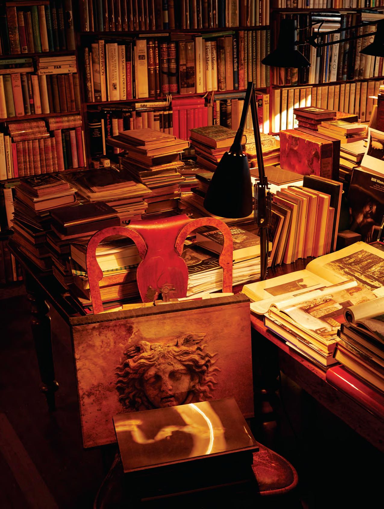
exotic # 99
of the Ordinary The Exotic
Th E br ass M E nagE r i E
Ollie Wilcox
As I write this, Melbourne designer Oliver Wilcox is walking around Damien Hirst’s extravaganza titled Treasures from the Wreck of the Unbelievable at the Tadao Ando-designed Punta della Dogana art space in Venice. The first Hirst exhibition in 13 years, the gargantuan installation is a fantasy treasure haul from an imaginary shipwreck that has been variously described as “audacious” (The Guardian) and “tawdry and low-rent, tinny and fake” (The Telegraph).
I imagine Wilcox, gob-smacked at the sheer wondrousness of the amassed marble, bronze, crystal, jade, malachite and gnarly, cankered coral assembled into mock mythological statuary, part of the lost fortune of former slave Cif Amotan, an anagram for ‘I am fiction’.
Magpie eyed, Oliver Wilcox’s Melbourne studio is a cabinet of immense curiosity.
Established earlier this year under the banner of Lost Profile, it’s a contemporary lighting practice-slash-whacky knick-knackery. A quick inventory of objects placed around the first-floor warehouse space in Collingwood includes: a Hollywood death mask mould; chunks of petrified Japanese tree fungus; papier mâché bobcat heads; an anatomical model of an earthworm mounted on polished brass legs; hand-painted plaster dentistry; a rather fine taxidermied starfish. Doubletakes are de rigueur
Which is fitting, really, since in art history parlance profil perdu is used to describe the attitude of a subject turned away from the onlooker. Wilcox’s objects artfully solicit the sly aside.
An acolyte of Christopher Boots, Wilcox’s own lighting designs bear the same glam metal stamp. But he is conversant in what he terms “a particularly bleak dialect of antiques” and it’s this offbeat obsession that gives his own designs an extra edge.
Inspired by surveillance, military and surgical equipment, his brushed and waxed brass fittings are robust, tough. Eminently present, they’d be intimidating if they weren’t so damn alluring. Wilcox says his influences are Brutalism, heavy industry and Art Deco.
He began collecting curios some five years ago, initially as a hobby – now as a job. “The lighting design and the sourcing of collectibles are two sectors of my one business,” he explains.
“They are distinct but not separate since each influences the other. When I’m collecting and sourcing objects, I’m often inspired for designs I’m developing for my own pieces. And this in turn focuses my mind when I go out sourcing again.”
It’s an intense symbiosis based on an instinctive aesthetic that makes Oliver Wilcox one to watch. Closely. – ST
EdiTEd by Stephen todd
Opp O s ite | Oliver Wilc Ox s eated in his cO llingWOO d Wa reh O u se studi O Ov erseen by a pair O f b rass surgeO n lamps by lO st prO file. ph OtO g raphy by elisenda russell f O llOW i ng page | cO llected curi O s a nd brass c O lO s sal lamps by lO st prO file. ph OtO g raphy by elisenda russell
issue #38 habitusliving.com
designers, collectors, gardeners, artists... it’s not what you do it’s the way that you do it.
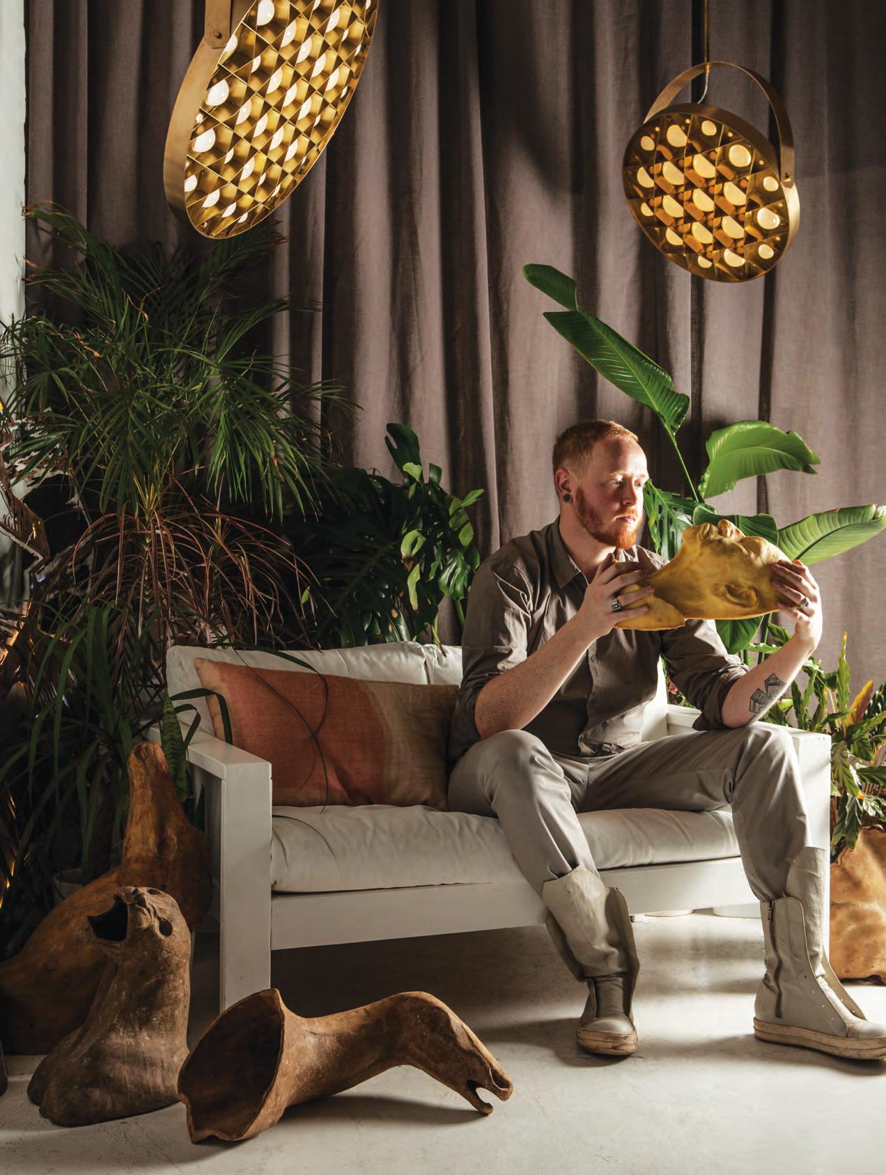
exotic # 101
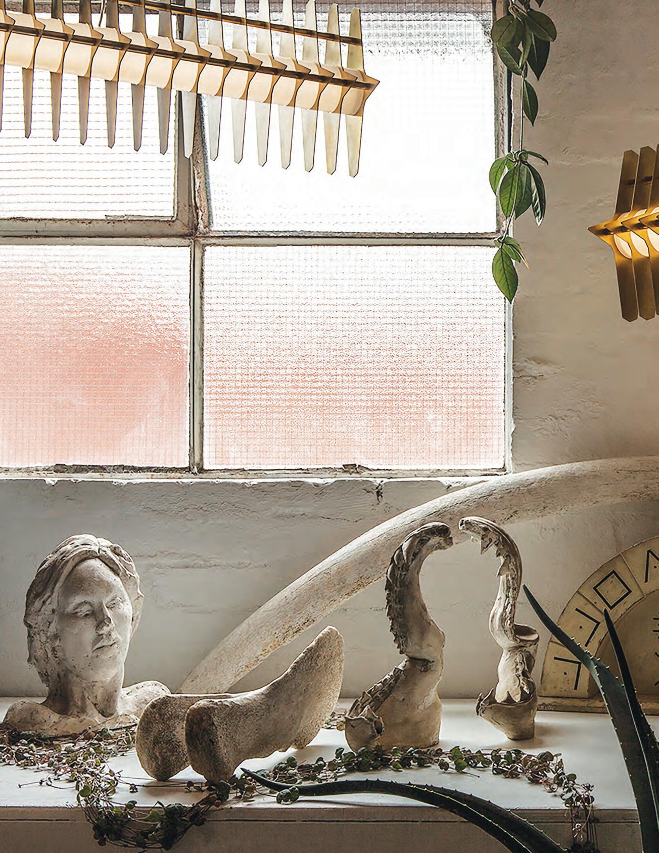
issue #38 habitusliving.com
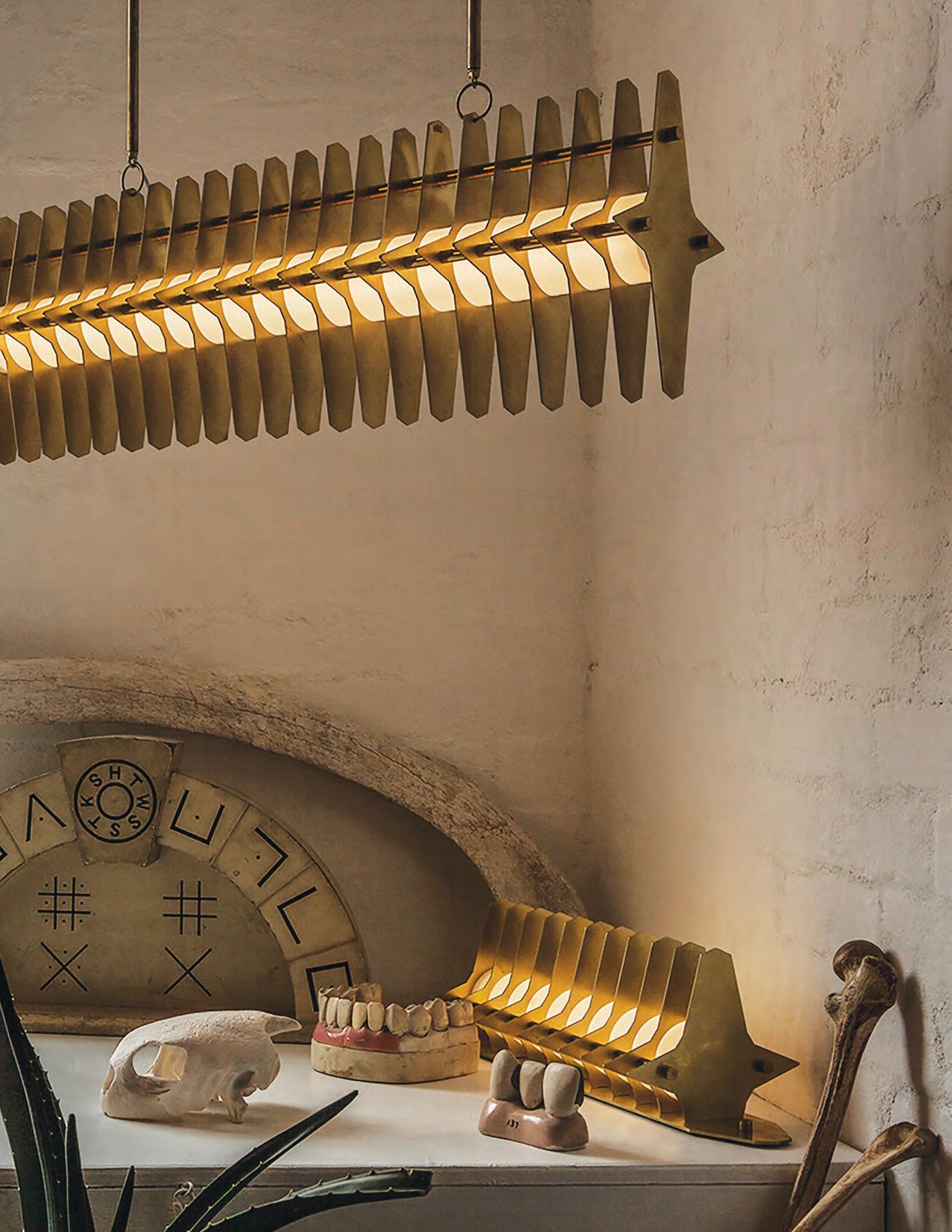
exotic # 103
INTERIOR LIFE
Samuel Hodge
Samuel Hodge is the eternal ingénu, an esteemed art photographer who denies his own craft. “I’ve never identified as a photographer because I know photographers and they know what they’re doing,” he laughs. “Me, I have no idea.” But it’s in this apparent artlessness that the authority of his images resides.
For almost two decades, Hodge has been producing a body of work that is beguiling in its nonchalance, enchanting in its intimacy. One part autobiography to two parts fantasy, narrative is less important than ambiance. His images are intended to provoke a response, not capture some rogue moment.
Two years ago, he enrolled in the Bachelor of Photography and Situated Media course the University of Technology Sydney. Which is curious, since he’d never finished secondary education. “I’d been invited to lecture UTS students about my work, and then the university asked if I’d like to tutor more regularly and do a post-graduate degree. I had to tell them I’d not
finished high school. So I watched that movie Educating Rita and decided I’d go back to school.”
At 39, school is “like having a manager. It’s made me focus and organise my time in a way I’d never been able to do before.” It’s also broadened and deepened his perspective, leading him to enter a new phase of cutups and collages that effectively question the immutability of the photographic image. Inspired by the American Abstract Expressionists – in particular the paintings of Helen Frankenthaler and Morris Louis – Hodge is at the forefront of what we might like to think of as post-photographic abstraction.
“The collages combine fictional aspect of my life, slices of previous works, old archival imagery, architectural elements. They’re about breaking down my own ideas of the rules.” – ST
opposite | The Golden Promise (2016), sa muel Hodge.
issue #38 habitusliving.com
Samuel Hodge shows with Alaska Projects, Kings Cross, Sydney.
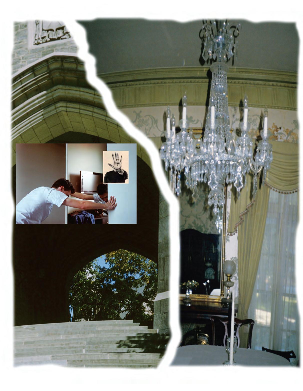
exotic # 105

issue #38 habitusliving.com
ENCYCLOPEDIA BOTANICA Tony Amos
One of the first edicts of Captain Arthur Phillip upon setting foot on Gadigal Country in 1788 was to co-opt the shallow inlet known to the natives as Woccanmagully and rechristen it Farm Cove. If the nascent colony was to survive it would need victualling, and despite the sandy soil and proximity to salt water our fearless leader decided to plant his British crops between what is now the Opera House and Mrs Macquarie’s Chair. Not surprisingly, the crops failed. Time and again.
Governor Lachlan Macquarie, with his cultivated airs and penchant for post-prandial ambulations in his antipodean idyll created the Royal Sydney Botanic Gardens in 1818. It was, after all, the extended plantation of his Domain, on which still sits the baronial folly that is Government House.
And yet, despite its very chequered history, the 30 hectares of native and exotic flora and their attendant fauna is one of the loveliest places on earth. A glimpse of glistening harbour through a towering Banyan tree, its roots dangling in mid-air like prehistoric tendrils, is a moment of sheer magic.
But not everything in the Gardens is there to delight the eye. In fact, even the real stunners are charged with some kind of duty. “On any given day there is always a threatened species under observation, or a near-extinct genus being slowly propagated back to life, or plants undergoing DNA testing to help us better understand them,” explains Jimmy Turner, Director of Horticulture at the Sydney Royal Botanical Gardens. “The days of simply cultivating botanical gardens as pleasant pass times is over.
“It’s an incredibly beautiful place, and a delight to stroll through. But in almost every bed there is work going on. Although we tend to keep those up the back. Not because they look ugly, more because they’re the plants most likely to be stolen.”
The flora we grow up with in suburban Australia has nothing to do with the reality of this place, and in a sense it’s a horticultural metaphor for the colonial condition. As photographer Tony Amos puts it, “We’re all weeds, planted on a foreign shore. The thing that I love most about the Royal Botanic Gardens is that each bed is an elaborate tableau encapsulating a world unto itself.” And in doing so presents us mere onlookers with the idea of a world beyond our own.

Opp O s ite | Succulent Garden, sy dney ROyal B Otanic Ga R d ens, tO n y a m O s ( 2017)
exotic # 107
EVERYDAY DREAMING
Kitty Chou
There are artists for all times and ages, and Kitty Chou certainly represents the global world we inhabit. Based in Hong Kong, Chou travels widely and regularly, and the world as she experiences it is both her subject and studio. She carries her camera with her wherever she is and uses it to ‘point and shoot’ the environment and details of life as she happens upon them.
Her works are often described as painterly – from a distance, one is easily fooled into thinking they are lush oils on canvas. They’ve an ethereal quality, existing somewhere between reality and abstraction.
Chou relies on chance as the director of the image. What she sees (and shoots) is what she gets, and thanks to a combination of discipline, experience and intuition, she achieves some astounding results. Her handling of the image in the post-production process is minimal and sensitive. Very little is changed, and yet it can be difficult to tie the images back to the real world.
The work illustrated, Red & Pink #1 (2016), is like a blurry abstraction, reminiscent of soft silk fabrics, thickly laid oil paint, or frosting on a cake. What is captured is a moment in time: an instant when colour, form, light and natural elements converge to

create a sumptuous visual experience – one you want to dive into and consume all at once.
We are often intrigued by transformation: think of that moment seeing your reflection in a funhouse mirror, when you experience yourself as someone – or something – else, in real time. Transformation through water is just as fascinating. How an object changes size in a swimming pool or the stems of flowers enlarge in a glass vase. In the images of Kitty Chou, the transformation is extreme and other-worldly. A pile of refuse becomes an abstract painting, neon lights become holes in the ground, water becomes solid.
The brilliance of Chou’s work is in revealing the poetry present within seemingly unremarkable urban environments. By honing in on details of colour, reflection and refraction, Chou shows us that the world is more exciting and strange than we realise. Through her eyes, details of walls, buildings, pavements and light on water take on striking geometry, rich contrasting colour and sparkling luminosity. –Mark
Hughes
issue #38 habitusliving.com
Kitty Chou is represented by Ben Brown Gallery, Hong Kong
YOUR DISCO NEEDS YOU Chen Wei
Fact and fiction collide in the captivating images of Chen Wei, a Chinese photographer known for his depictions of worlds that are not what they seem.
In The Wave #4 (2013) represents both a shared and singular experience. The setting is a nightclub; a smoke machine thickens the air and a soft purple light captures bodies and faces lost in the trance of music. Bodies channel heavy beats and high-pitched frequencies, expressed through hand movements reaching into the air and backlit by stage lights. The experience is shared – the same sound is heard by all on the dancefloor – but Chen Wei suggests a disconnect across the room. There is too much space between dancers, and they all gaze in different directions. The dancefloor can confer anonymity, providing an opportunity to let go, and to enter an internal world that is not usually accessible. This image gives a sense of those introspective journeys.

As a young Chinese artist living and working in his home country, Wei’s work raises a number of questions. How does a young Chinese artist depict the complexities of their society? What medium can they work through
to develop a unique language that is universally understood? How obvious can the “message” be? These questions often confront us when trying to decipher the layers of meaning in Chinese contemporary art.
When you settle in to enjoy a photograph by Wei, it is easy to assume he has opened the door to a recognisable world and an accessible language. However, all is not what it seems. All of Chen Wei’s photographs – even those that seem to depict real urban decay, authentic youth culture or happened-upon scenarios – are in fact elaborately staged, down to the last detail. Though this fabrication of worlds and an apparent lack of “truth” may impact upon our emotional connection to the work, the artist – like a good filmmaker – keeps us engaged through the carefully-considered architecture of his sets and the relatable experiences he reproduces. Chen Wei tends to raise more questions than he provides answers for, but the layers of symbols and complex narratives he embeds in his images allow us to forge our own conclusions. – Mark Hughes
Chen Wei is represented by Leo Xu Projects, Shanghai.
Opp O s ite | Red & Pink #1 (2016), Kitty Ch O u ab Ove | i n The Wave #4 (2013), Chen Wei.
exotic # 109
THE FALLING Martyn Thompson
Martyn Thompson’s photographs are the epitome of what we like to think of as ‘painterly’. Never mind that generations of painters have determined to subvert the genre by denying the brushstroke, affecting hyper-reality or mimicking the frigidity of the mechanical print. Martyn Thompson’s photographs are painterly in the romantic way we like to think of painting. Deliciously viscous, his pictures drip with nostalgia for a more genteel era, gentler times.
These images of the Church Point home of fashion designer Lee Matthews and her then-husband, Guy, have remained in my mind since I first saw them in the late-1990s. At once modernist and primal, they capture the picaresque paradox of an early 20th Century structure set in the scrubby otherworld of the Australian bush.
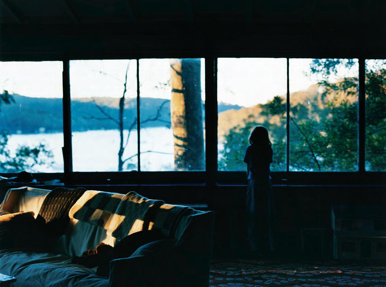
“It was one of the most magical houses I’ve ever been to,” says Thompson. “It was totally falling down, a crumbling beauty. I decided to do nothing but shoot what I found.”
In many ways, the Church Point series was seminal in the development of what is now recognised as Thompson’s trademark style. Limpid, luminous, decadent in the true sense of the word, nothing is posed there yet all seems poised. Trapped in the amber of the photographer’s lens.
Around the time he took these pictures, Thompson’s career as a lifestyle photographer began to take off. Today he is one of the most sought-after interior photographers on the planet, bringing his gimlet eye to bear on stories for the likes of Architectural Digest, W, The New York Times and tony brands such as Tiffany’s. –ST
above | Chur C h P oint h o use, Martyn th o M p son.
issue #38 habitusliving.com
Martyn Thompson textiles are available through Spence & Lyda, Sydney.
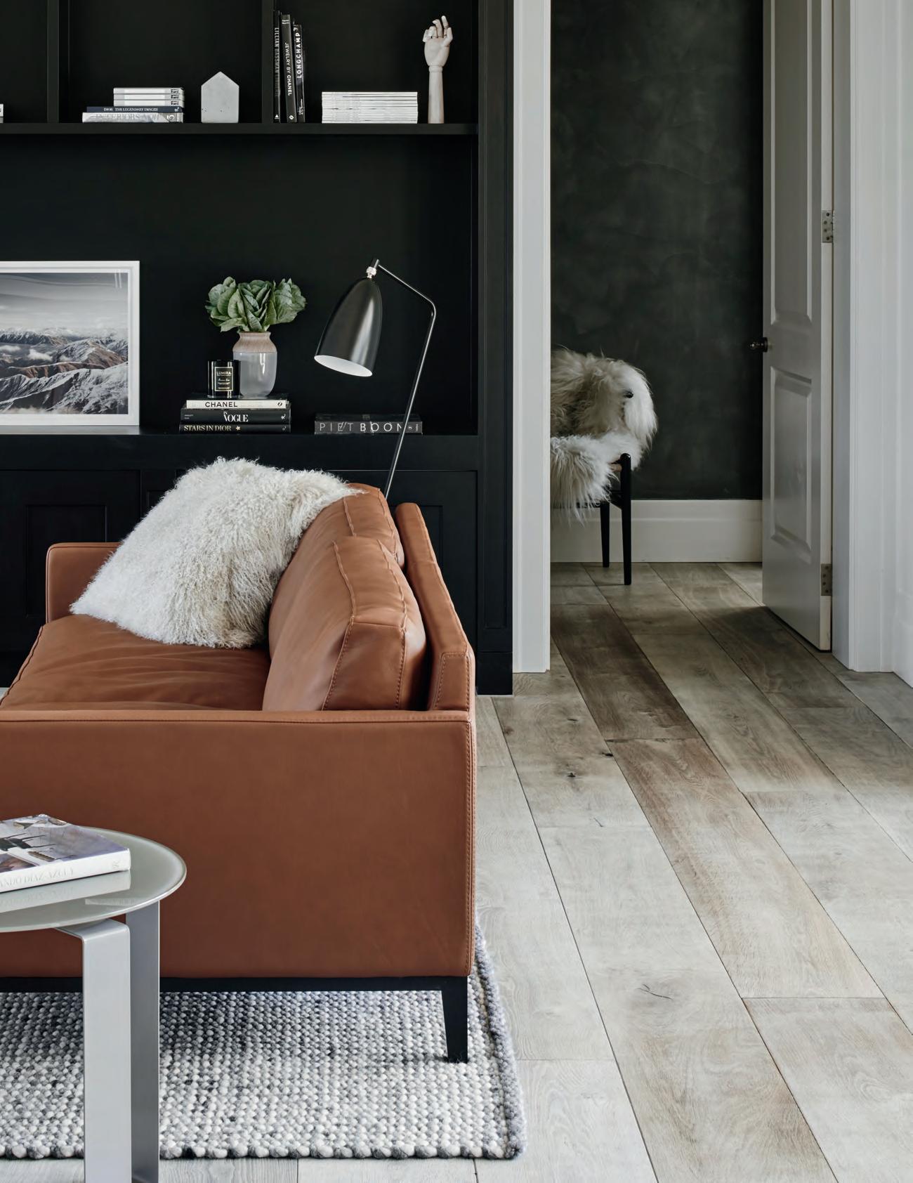


Italian for style.
The new STILE tapware collection from Gareth Ashton encapsulates the definition of style across five high-end metallic finishes for the bathroom. Made in Italy, STILE is now available in Australia. Visit an Abey Australia Selection Gallery to immerse yourself in the collection.

Gareth Ashton, STILE
VICTORIA Selection Gallery 335 Ferrars St Albert Park Ph: 03 8696 4000
WESTERN AUSTRALIA Selection Gallery 12 Sundercombe St Osborne Park Ph: 08 9208 4500 NEW SOUTH WALES Selection Gallery 1E Danks St Waterloo Ph: 02 8572 8500 QUEENSLAND Selection Gallery 94 Petrie Tce Brisbane Ph: 07 3369 4777
Basin Mixer in Rose Gold
*NEWLY OPENED*
Residential architecture is ever-evolving



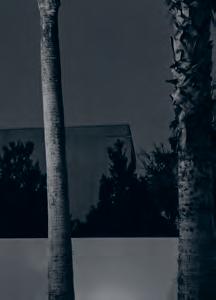
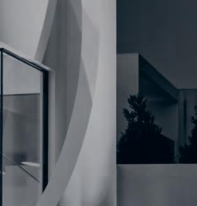

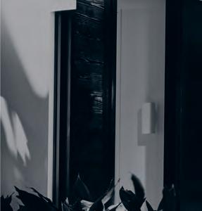
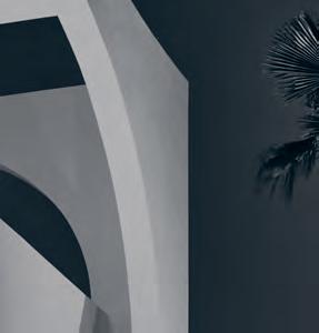




Playful
House
Cutting a fine, sinuous figure in Melbourne’s leafy Brighton, Martin Friedrich Architects creates a home full of fun and impact, with ample space for an active family of five.
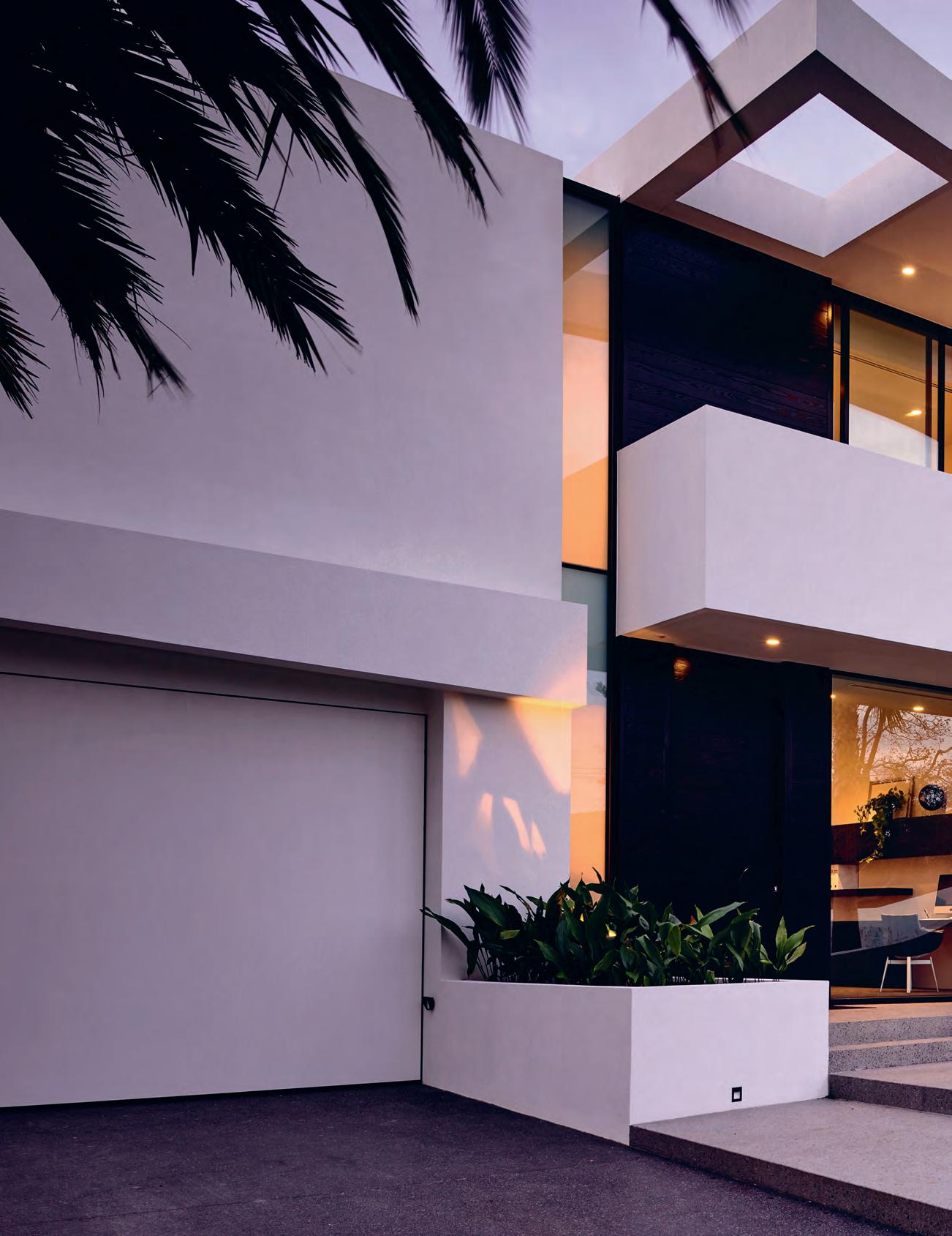 text Sandra Tan | photography der ek Swalwell
issue #38 habitusliving.com
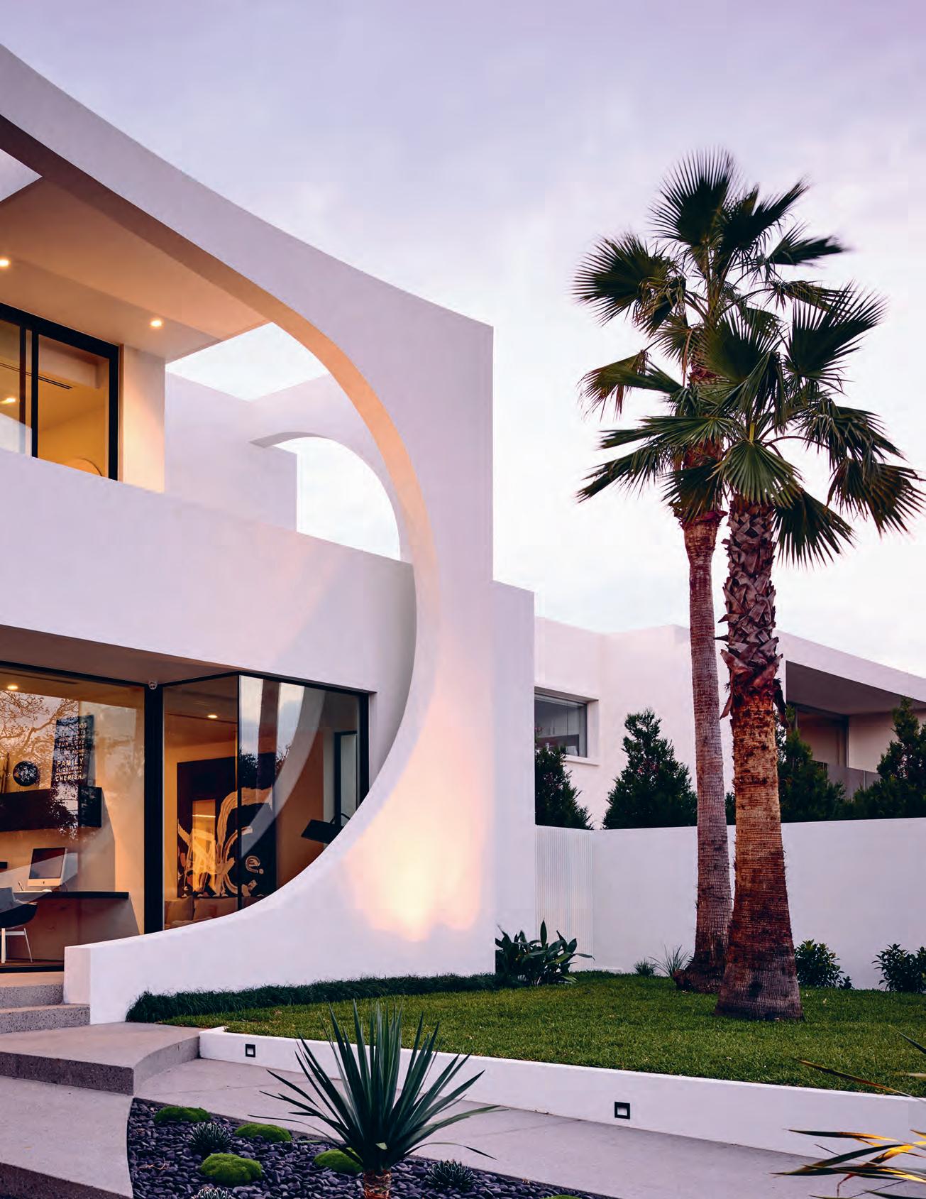
3 . on location # 115
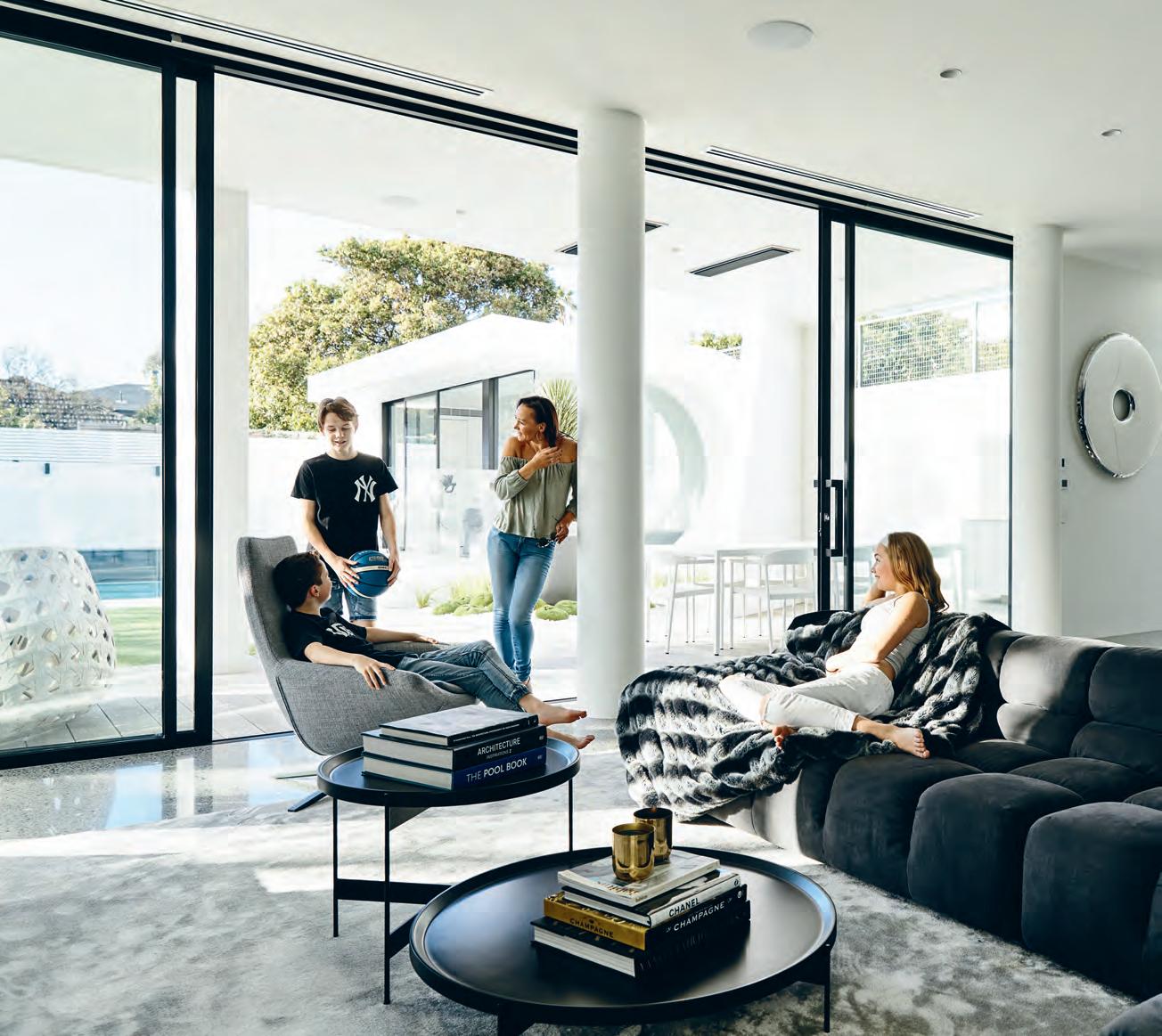
opener | The main curve of The fronT façade conTinues Through The line of The enTr ance paving. above | an open, lighT-filled living room forms one half of The indoor/ouTdoor enTerTainmenT area. issue #38 habitusliving.com
Residences run the full gamut of architectural styles in the tree-lined avenues of well-to-do Brighton. Grand old heritage mansions on one hand; stark, box-like contemporary builds on the other.
With soaring white curves and a striking façade, Playful House certainly distinguishes itself from its neighbours. And beyond the grand gestures at the exterior, its finer details make for a thoughtful design specifically tailored to its inhabitants.
When the clients purchased the property 11 years ago it was a classic fixer-upper, built in the 1930s and reworked, badly, in the ’80s. “The place was definitely worse for wear,” says one of the residents, Jessica. “We knew we needed to renovate as soon as possible.”
Impressed by Martin Friedrich Architects’ previous residential work in the local area, Jessica and her husband Chris approached the practice for what was initially planned as a fairly conservative renovation. But with the original structure in poor condition, it became clear that a complete overhaul was necessary – serendipitously providing the architects with something of a dream brief.
“It’s what I’ve always wanted to do – a really creative house made of beautiful flowing lines,” says Martin Friedrich. “And we were fortunate enough to be able to do that here.”
Set back from the street, Playful House’s exterior is comprised of layers of intersecting, sweeping surfaces and planes. Its sculptural shell is carved out to strategically reveal and obscure spaces within. Behind the front door, two internal masses converge – an open foyer
separates the wonderfully articulated curling staircase to the left, and a plush sitting room to the right. Diffused through sheer fabric curtains, the light in this area streams in through flight windows which continue all the way up to the parapet – a signature detail for Martin Friedrich Architects.
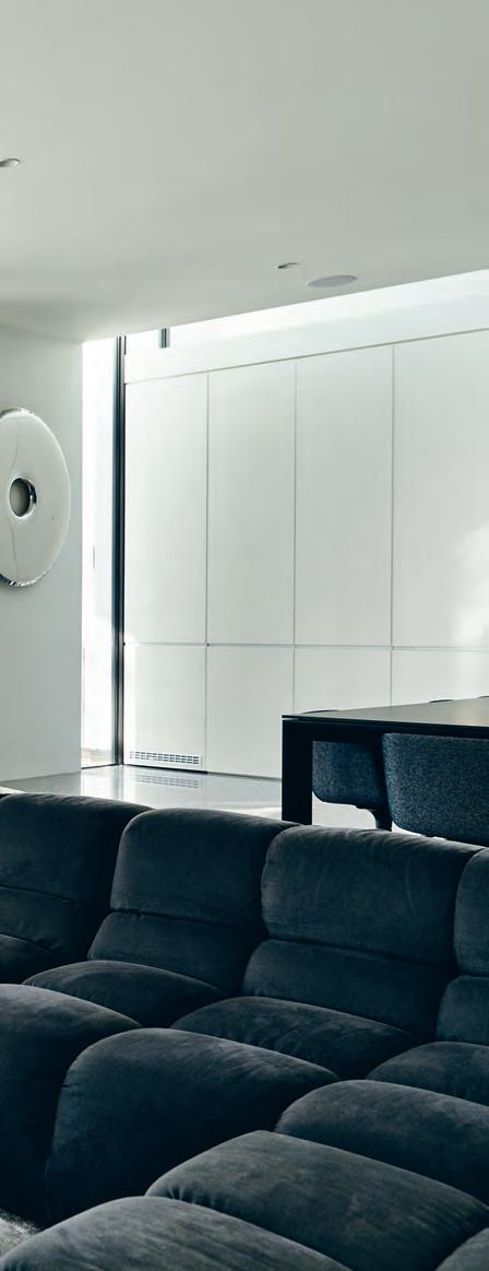
The foyer space vaults upwards, its doubleheight volume accentuated by a towering bronze mirror installation along the wall greeting the front door. This indisputably glamorous feature is so long, it had to be installed flat on site and craned into place, its delicate pieces held together by a robust steel frame. At its base sits the treasured family grand piano, previously owned by Jessica’s father and shipped to Melbourne from her mother in the U.K.
In keeping with the soft shapes and curves in the undulating walls at Playful House, circles and spheres are a key motif reflected in the family’s art, purchased for the new home, as well as in the form of glass bubble pendant lighting used throughout.
Through to the kitchen, the bronze mirror from the foyer is picked up again in a luxe splashback. A strip window to the outdoor BBQ cooking area continues the height of the room and runs overhead, creating an unobstructed view to the sky. This technique is also employed upstairs in bathrooms, mirrored to make limited spaces seem larger. White door panels which provide the option of privacy from the entrance are discreetly tucked away when open, recessed into the wall to enable maximum flow throughout the sociable ground floor.
3 . on location # 117
“I’m English, and we don’t have a lot of open plan in the U.K.” says Jessica, “so I really wanted to have that feeling of spaciousness here, to be able to stand in the kitchen and see everything in our yard outside.” A covered outdoor dining area adjacent joins the internal living space and promotes interaction back and forth.
“We conceived Playful House as being a fun place for everyone, so the backyard has distinctly different spaces for people to go to while maintaining sightlines and connection to each other,” explains Martin.
One quality that defines the house is the builders’ seamless workmanship visible at every turn. A sliding door track that transitions from indoors into the backyard is perfectly level underfoot, the Corian benchtop outdoors extends flush to the house. Martin is particularly proud of the sharp angles and curves expertly rendered by Matt Trihey and the team at 1186 Builders.
“Martin just gets so excited about the detailing, which is great for us as his clients. He’s very particular and he wanted this home to be perfect,” says Jessica. “Both he and the builder have done an amazing job. They went above and beyond.”
Unlike other new homes in the area, designed for adults and their tastes, Playful House is purpose-built for the enjoyment of its younger inhabitants. Parents to three sportsmad children – two boys aged 14 and 10, and a 12-year-old girl – the clients were keen to incorporate their interests into the design.
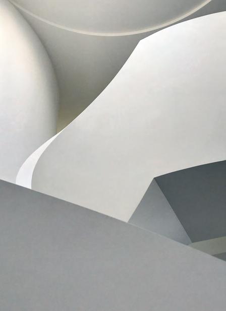
“My kids come first, and I wanted to make this a house where they would still want to be when they’re teenagers,” says Jessica.
Enviable in-house facilities include a sizeable pool and spa, besides which sits the uniquely formed pool house. Complete with a hidden television which descends from the ceiling overhead, the pool house has become the ideal teen hang out. The boys are particularly fond of the basketball court and cricket strip, while the couple’s daughter made a special request for the in-built trampoline on the front lawn, as a space to relax with her girlfriends.
issue #38 habitusliving.com
above | a grand staircase was one of the first features of the house envisioned by the clients. opposite | the bespoke bronze mirror and lighting features set a glamorous scene for Jessica’s impromptu piano concerts.
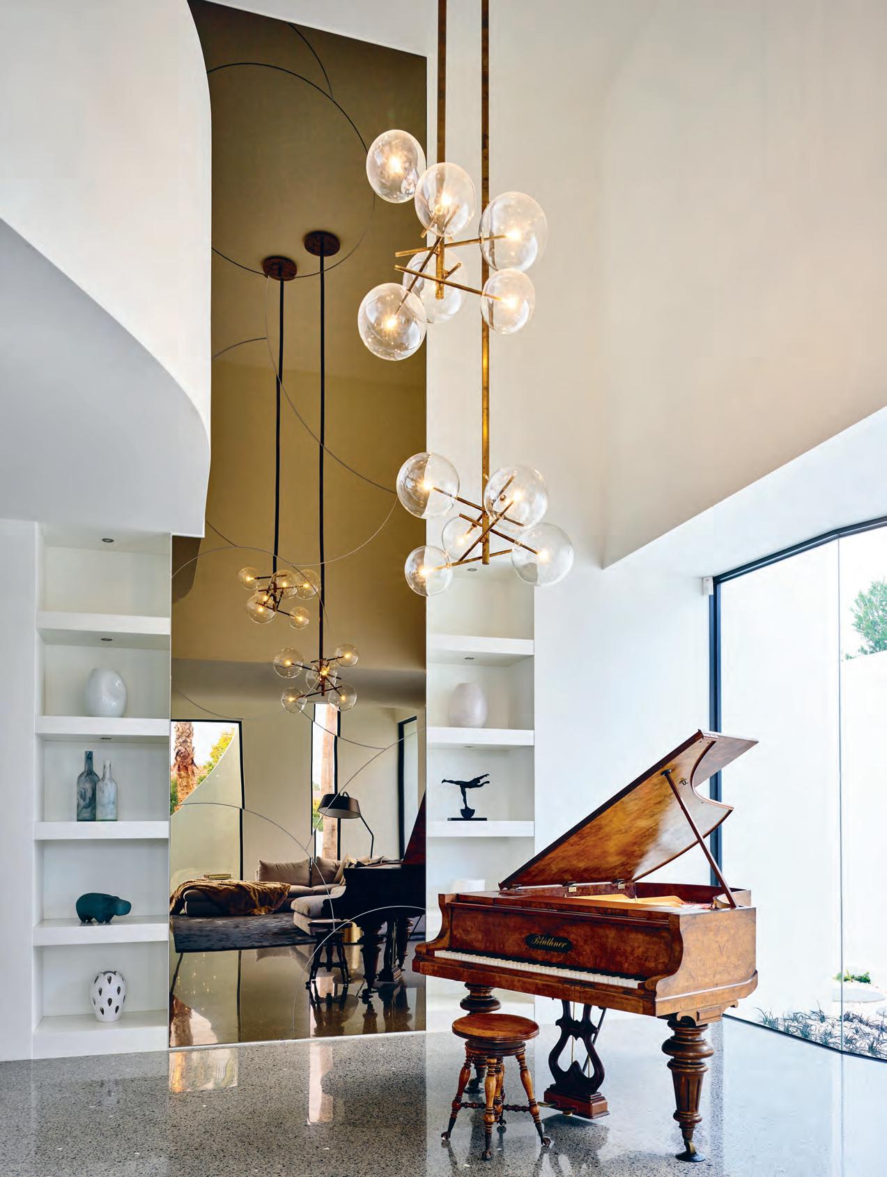
3 . on location # 119
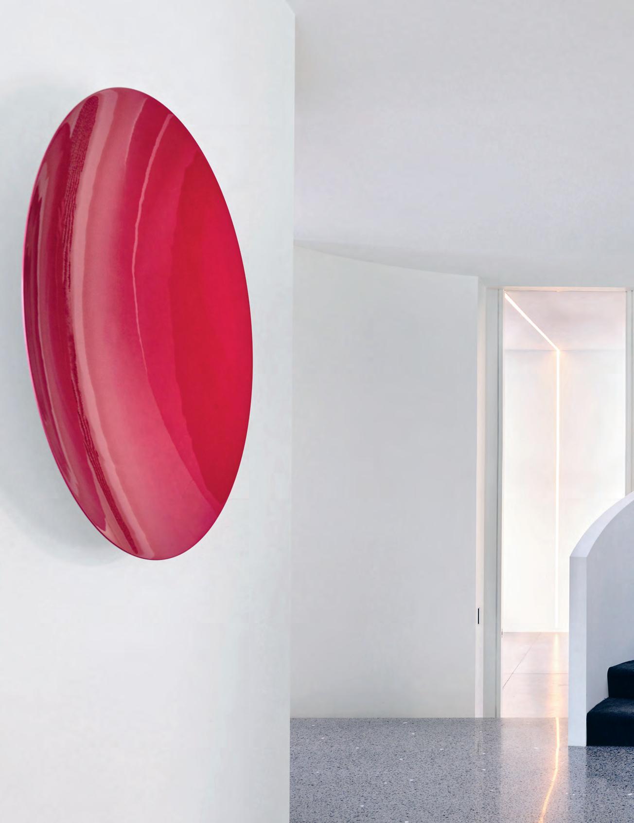
issue #38 habitusliving.com
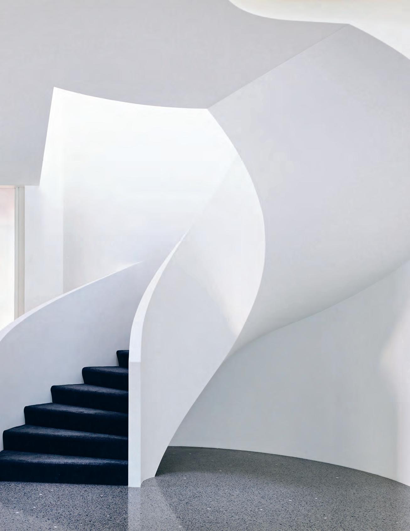
# 121 3 . on location
“It’s what I’ve always wanted to do – a really creative house made of beautiful flowing lines.”
FIRST FLOOR ENTRY GARAGE STUDY LIVING KITCHEN 1 2 3 4 5 DINING WC LAUNDRY OUTDOOR LIVING POOL HOUSE 6 7 8 9 0 q w e r t POOL SPA BEDROOM ENSUITE WALK IN ROBE RUMPUS BATHROOM GUEST ROOM MASTER BEDROOM VOID y u i o p GROUND FLOOR 1 2 9 w 0 4 6 7 7 5 8 3 q r r r t t y u e e o i p issue #38 habitusliving.com
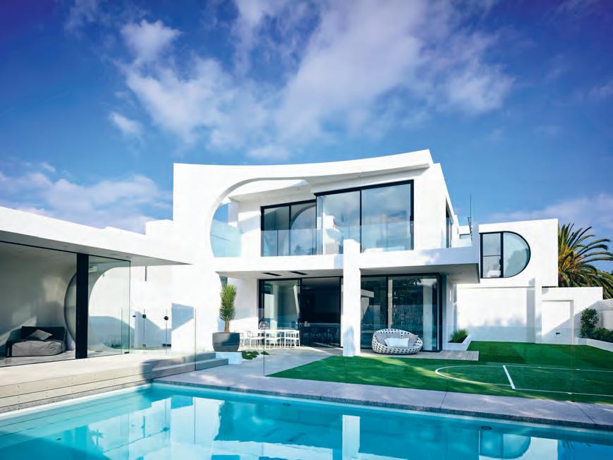
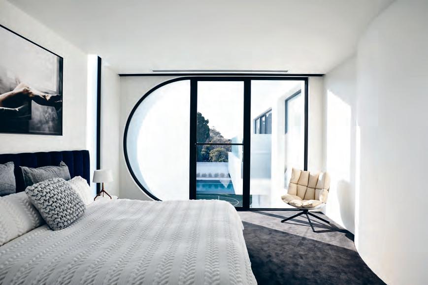
previous | artwork on the left is Sphereonic by MelMa haM ersfeld. opposite | plans. above | taken fro M rear of the property, this view deM o nstrates the continuation of pl ayful h o use’s curved forM below | co M plete with an ensuite, the guest bedroo M enables Jessica’s M other to visit fro M the u k . in co M f ort and style. 3 . on location # 123
“You wouldn’t think so, but the trampoline actually gets used every day. The kids hop around on it before we get in the car for school!” Jessica says.
Though Playful House is indeed a showstopper, it is far from being just a showpiece. Its gentle curves, considered spaces, and social atmosphere combine to achieve the genuine warmth of a family home. Impeccably composed, yet ever ready for hands-on play.
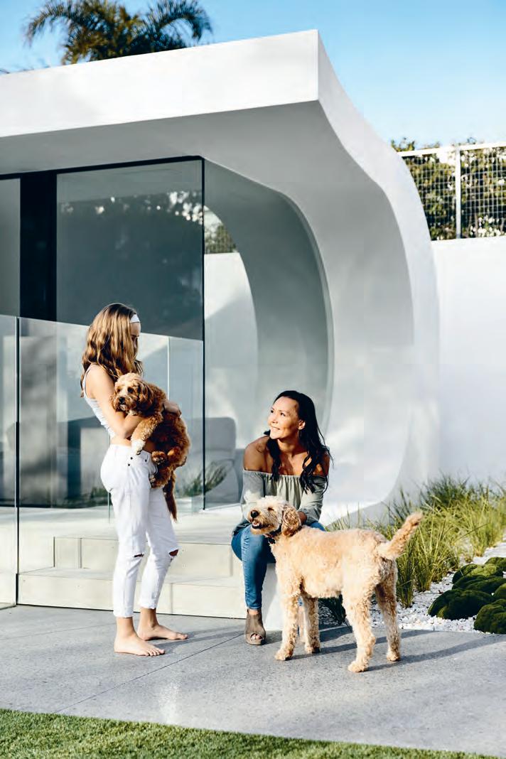
In one of the two vertiginous mature palm trees at the front of the property, a stuffed toy monkey nestled amongst its leaves, thrown there by one of the children. “That’s what this family is all about!” Martin says, in response to the stray creature. “They’re just a funloving bunch.”
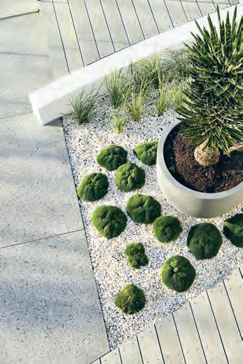
left | Hidden drainage allows for seamlessly rendered roof lines in botH tHe pool House and main Home. rigHt | tHe garden tends towards forms as sculptural as tHe building it complements. issue #38 habitusliving.com
-
Indesign Media now offers you more tools to market your brand than any other media organisation in this region. Talk to us now about how you can directly connect with an influential audience of over 1,327,136 engaged individuals across our print, digital and events media.
Habitus 250,000+ engaged habitusliving.com
/habitusliving @habitusliving @habitusliving
Indesign 200,000+ engaged indesignlive.com
/indesignlive @indesignlive @indesignlive
Lookbox 170,000+ engaged lookboxliving.com
/lookboxliving @lookboxliving @lookbox_living/
Cubes 120,000+ engaged indesignlive.sg
/indesignliveasia @indesignlivesg @indesignlive
Indesign The Event 300,000+ engaged Architecture & Design 280,000+ engaged indesigntheevent.com
/indesigntheevent @indesign_event @indesigntheevent
architectureanddesign.com.au
/archanddesign @archanddesign @architectureanddesignaustralia
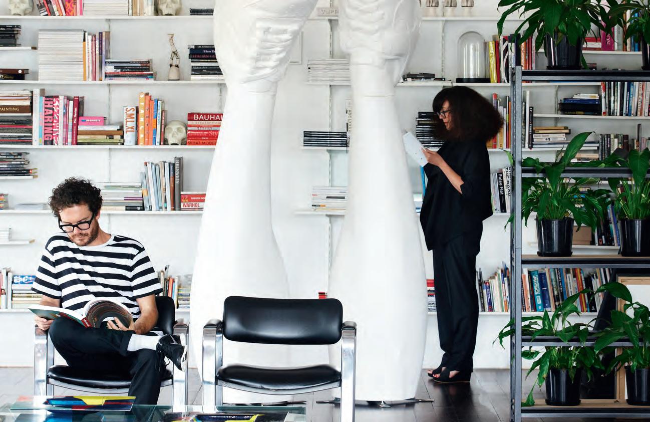
indesign.com.au (61 2) 9368 0150
Photography by James Geer
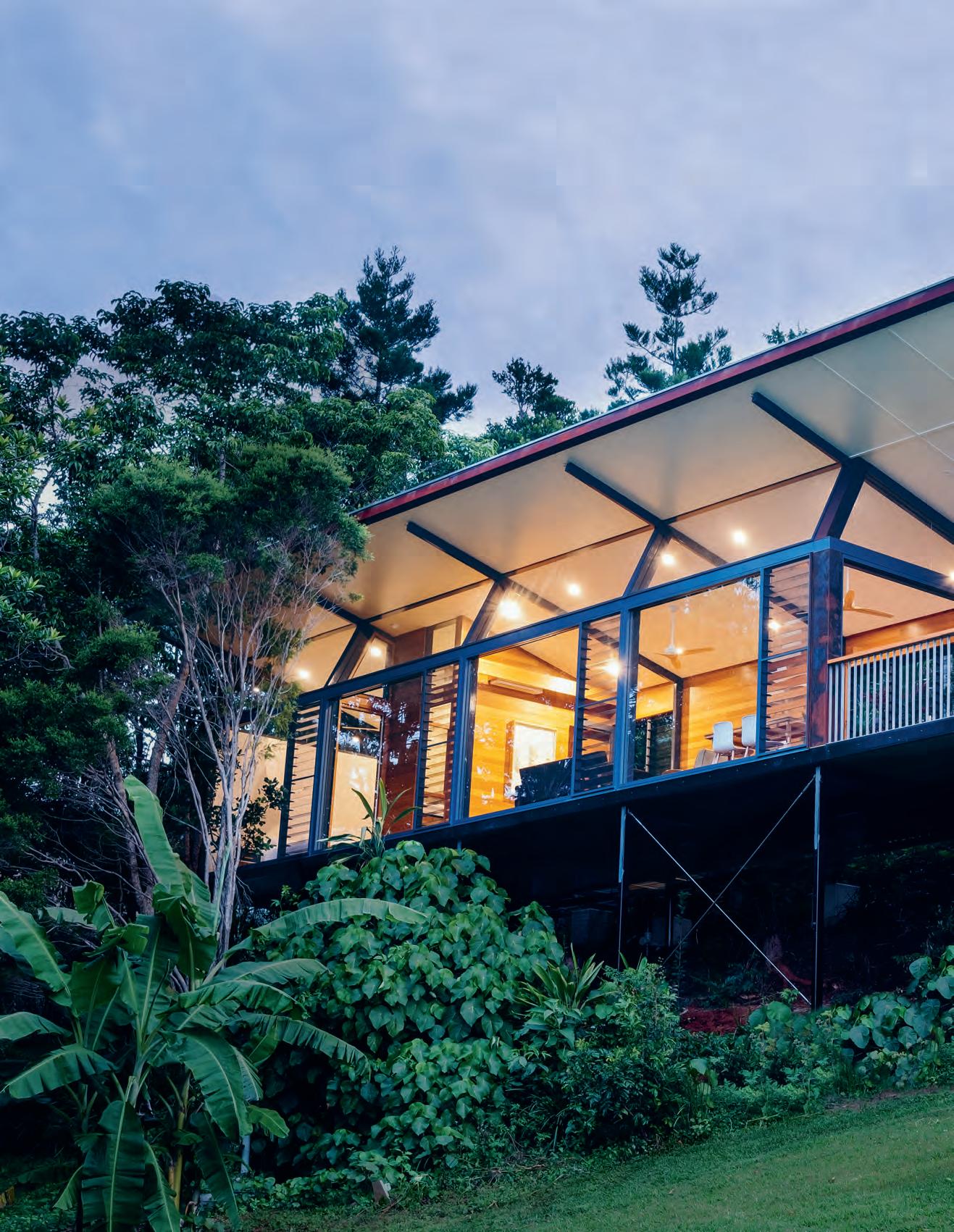
issue #38 habitusliving.com
Wave
An honest approach to materials and form pays respect to the legacy of a celebrated local architect and the rugged splendour of New South Wales’ Northern Rivers, in this secluded tropical haven by Harley Graham Architects.
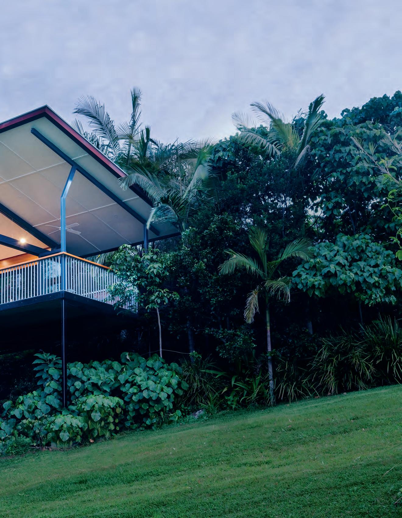 text Sandra Tan | photography a n dy Macpher Son
3 . on location # 127
New
Lush rainforests, deeply fragrant with new growth; rolling hills and craggy mountain ridges give way to the Pacific Ocean below; a coastline romanticised by sun-seekers the world over.
Imagine waking up above it all, among the trees. Coopers Shoot, just south of Byron Bay, New South Wales, is a rural community comfortably detached from the tourist-heavy hoopla of the town centre.
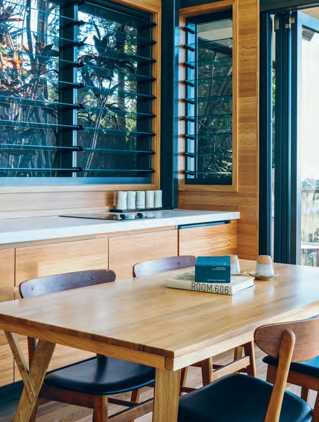
While owners Stephen and Colleen have lived here on their sprawling 20-acre property for 22 years, successful careers in financial journalism have led to temporary homes abroad in Washington DC, Papua New Guinea, London and Shanghai. Upon retiring, they sought a way to bring their global lifestyle home, and a way to better accommodate visiting family, friends and other travellers. The pair approached local practice Harley Graham Architects to create Hidden Studio, a self-sufficient guest pavilion on site which, when needed, would afford privacy from their own residence.
The two existing buildings on the property, the couple’s home and writers’ cabin, were originally designed by the late Ian Mckay. Having had a personal association with the influential Sydney School architect before his passing in 2015, Harley Graham naturally looked to the built language of McKay’s previous projects to inform the new design.
“We learnt from Ian’s work, it gave us a clear starting point,” says Harley.
In homage to McKay’s architectural approach – one which exposed and celebrated a building’s structural components – the repetition of expressed portal frames at Hidden Studio visibly demonstrates how the design works. No obfuscating façade, or clever sleight of hand – the project is pared back to an honest depiction of form.
opener | Fitting neatly within the landscape,
established
|
Form a key part oF the
passive cooling strategy. opposite |
ample
on one side
in
issue #38 habitusliving.com
hidden studio assimilates with the property’s
treeline. above
louvres
studio’s
with
glazing
letting in expansive views, the small project appears generous
scale.
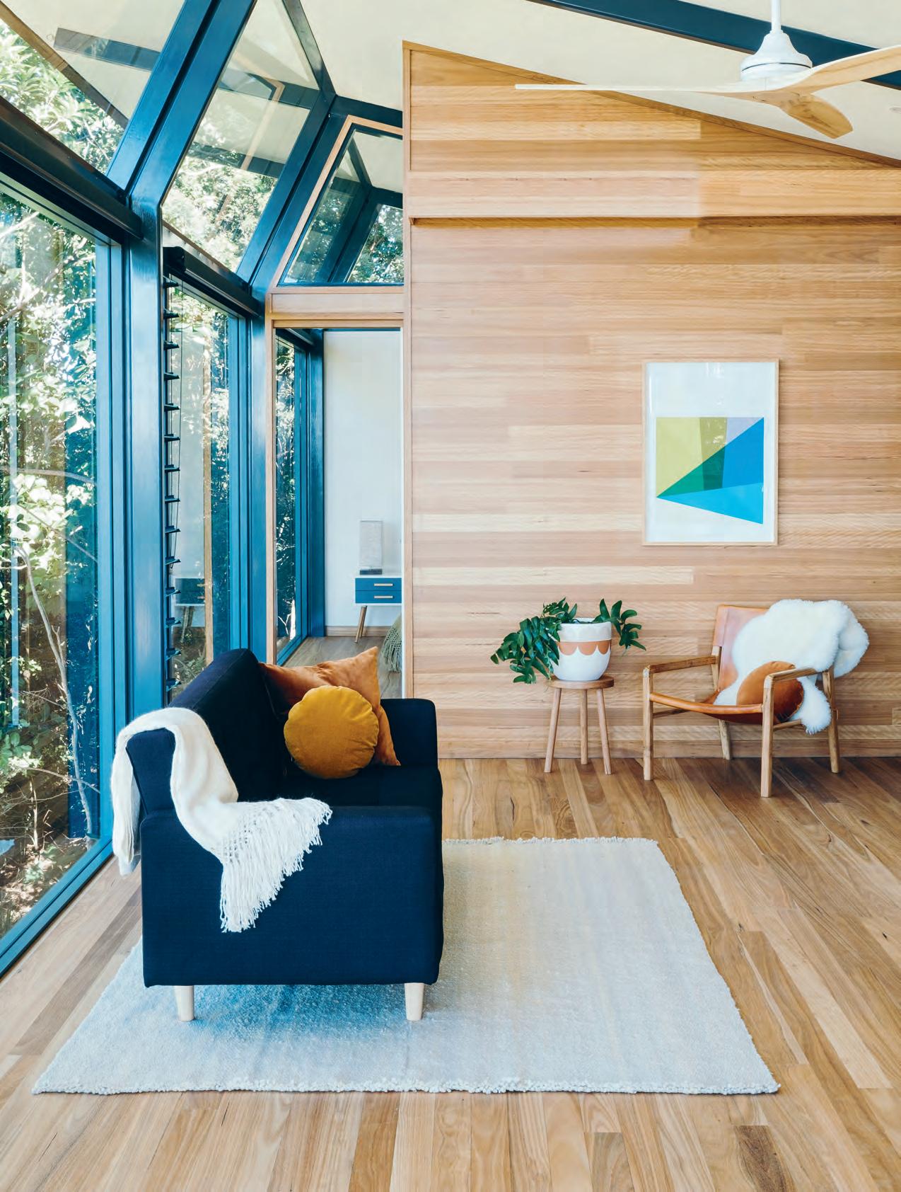
3 . on location # 129
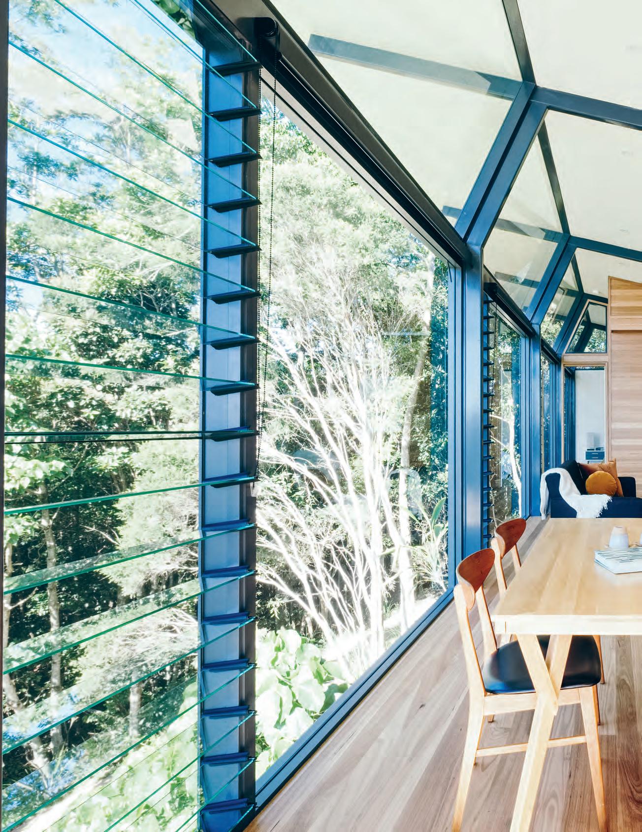
issue #38 habitusliving.com
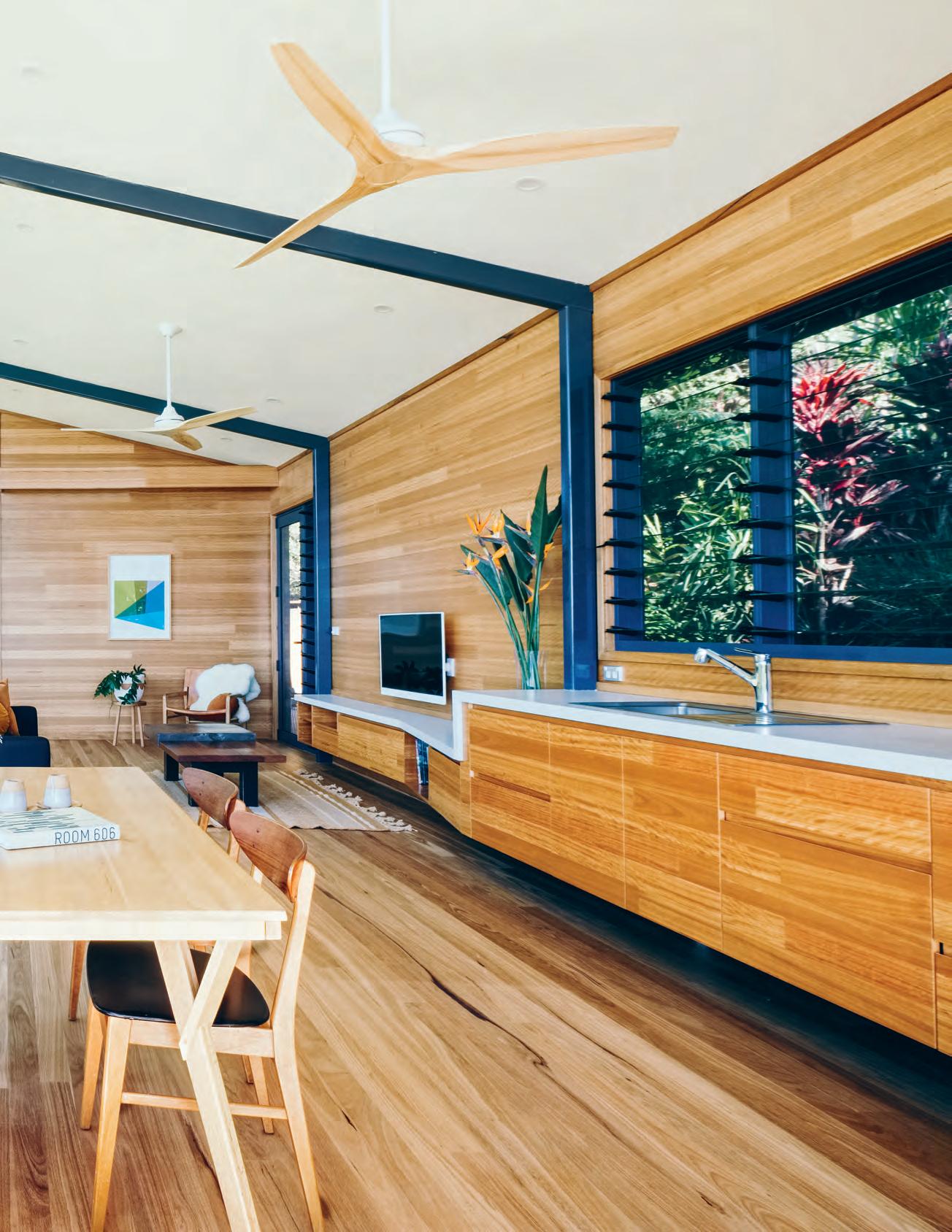
3 . on location # 131
“I think there’s an ongoing battle in architecture between the structure and skin of a building,” says Harley. “It’s a question of balancing what parts we should conceal, versus what we will see and experience.”
Working within such unique geography, Harley Graham Architects has developed a folio of homes which are both sensitive and robust, in tune with their setting.
“As beautiful as it is here, it can be quite a hostile environment,” says Harley. “We can get lots of sea salt-laden winds and tropical storms, so we’re very concerned about how our buildings weather. They need to become part of the landscape.”
Hidden Studio sits lightly on its site, softened by the surrounding foliage. Its material palette is restrained, in line with the concept’s intentional simplicity. Clad in rust-hued corten steel, there is a utilitarian strength to its exterior, heightened by the platform of stainless steel mesh that serves as the entryway approach. Beyond the front door, an exceptionally warm interior is wrapped in Blackbutt timber. The boards, running the length of the space, appear to exaggerate the linear quality of the design.
“The floor-to-wall timber gives it that sandstone, cave-like feel, almost like a rock shelf that’s been washed out by a wave,” says Harley.
Previous residences by Harley Graham Architects have a 360-degree quality, with views and access on all sides. By comparison, the Hidden Studio project is something of a departure – an experiment in linear planning, only fully open on one end.
Along its front north-eastern façade, large areas of plate glass frame the hills of Coopers Shoot and the ocean beyond, to dramatic e ect. Or in Harley’s words: “The view really smacks you in the face!”
The building was positioned to e ectively capture the north sun, while louvres allow cooling northerly winds to ventilate the space in summer. With its full solar access, the living area comes into its own during Byron’s brief winters.
“To be able to open up all the doors and windows in a little pavilion overlooking the ocean is an amazing feeling in the colder months,” says Harley. “Even on a chilly day, sunlight floods in and gives o great natural heat – it’s an absolutely dreamy space.”
SECTION PLAN ENTRY LIVING KITCHEN DINING OUTDOOR LIVING BATHROOM BEDROOM 1 2 3 4 5 6 7 PREVIOUS | HIDDEN STUDIO MAKES TACTILE TIMBER THE UNDISPUTABLE HERO OF THE SPACE. ABOVE | PLANS AND SECTION. OPPOSITE | GREENERY AND GEMETRIC ARTWORK BALANCE THE COLOUR WOODY SCHEME OF THE INTERIORS. 1 3 2 4 5 6 7 issue #38 habitusliving.com
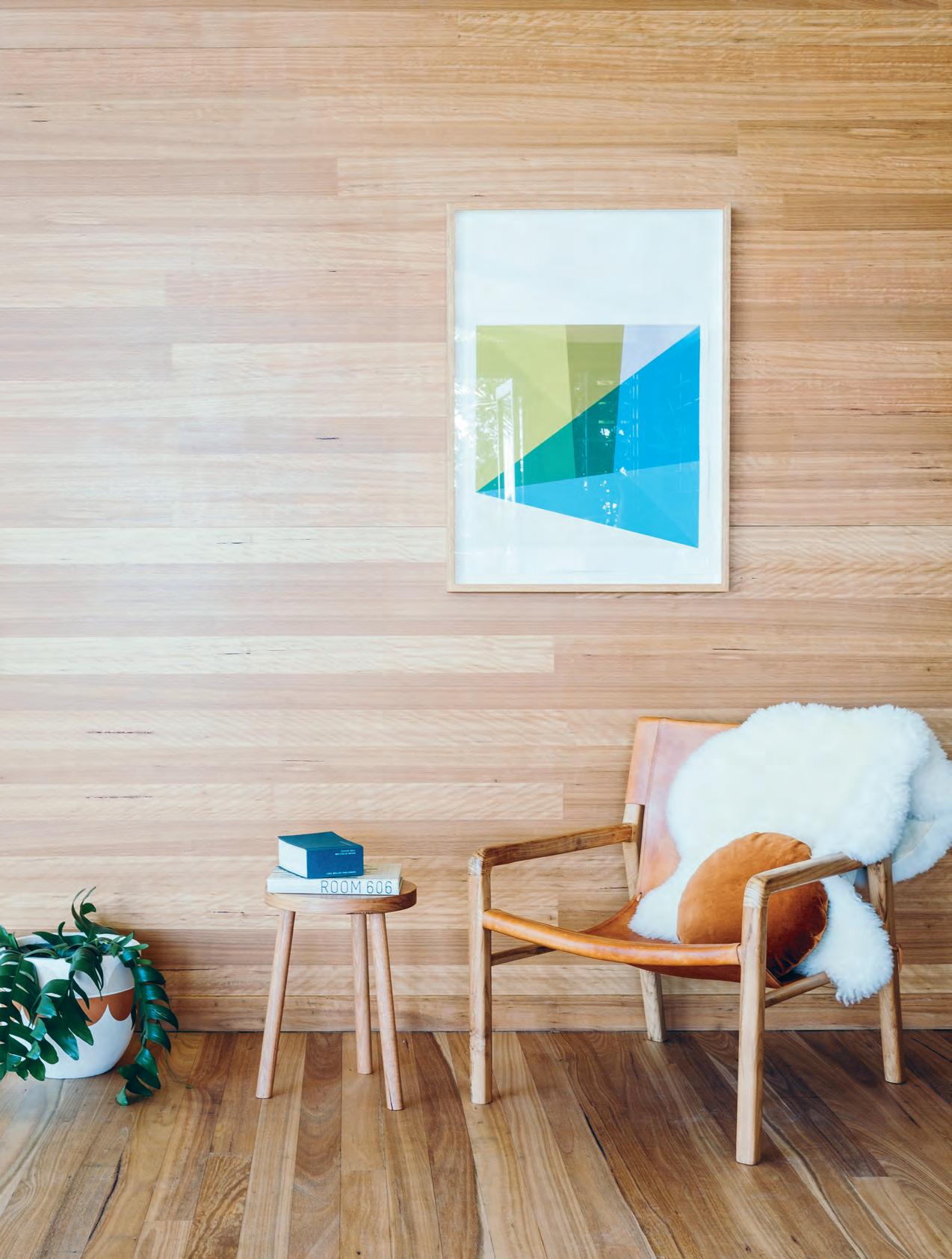
3 . on location # 133
“There’s a great group of architects here producing some really sophisticated work.”
For a small project comprising just three rooms, a bathroom, bedroom and main living space, Hidden Studio has an impressively long list of green credentials. Given its careful orientation, which enables passive heating and cooling, it requires no air-conditioning. Constructed with low embodied energy materials, the dwelling is also completely off-grid, with a water tank set underneath as well as its own sewer system.
“We find we don’t have to battle with clients, or explain the value of building serious sustainability measures into our projects,” says Harley. “Up here people get it, and actually expect it.
“Byron has always had such a sense of being a creative place, but it’s a lot more than mandalas and tie-dye. There’s a great group of architects here producing some really sophisticated work.”
A landscape populated by worldly design advocates, living between sun-drenched isles and verdant jungles – how idyllic.
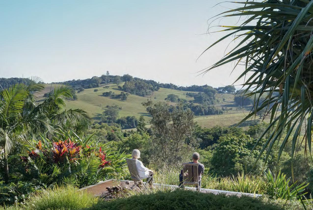
above | Stephen and Colleen enjoying their tranquil property.
issue #38 habitusliving.com
“We find we don’t have to battle with clients, or explain the value of building serious sustainability measures into our projects.”


issue #38 habitusliving.com
Exotic Infill
When harangued drivers take the Wellington Street rat-run between Dandenong and St Kilda roads in Melbourne, there are a few choice words on the tips of their tongues, but ‘exotic’ probably isn’t one of them. Yet, if they slowed down for a second, they might notice a house that’s just that. In between the low-rise office buildings, nondescript blocks of flats, and freestanding houses converted to consulting rooms, an extraordinary new house has appeared, six metres wide, five storeys high, the likes of which we’d expect to see in Tokyo or Amsterdam, but not in Melbourne and certainly not on this street.
The house was designed by Matt Gibson Architecture + Design in collaboration with their clients, a builder and an interior designer. Having bought and renovated several suburban homes, the clients were interested in a new challenge and a different kind of lifestyle.
The Wellington Street site, then occupied by an old house being used as an office, had been on the market for months, and the clients
would drive past it every day on the way to their youngest daughter’s school. Eventually, perhaps inevitably, the idea for a new way of life and the opportunity represented by a house that wouldn’t sell coalesced.
To the architects, the block of land they had to work with must’ve appeared, well, small. Particularly when they were handed a brief for a home to accommodate the clients and their daughter as well as two adult children, each with a partner. But for the bold, constraints generate opportunities, and Matt Gibson and his team saw this project as a chance to explore a new model for Australian living.
From the street, the house appears as a series of zinc-and-glass boxes, stacked in two columns, some set back and others brought forward. The boxes break down the visual bulk of the building, and create a modular rhythm that resonates with the more human-scaled grain of terrace houses on the other side of the street. The ground floor is given over to car parking and an office, the latter a compromise with council to allow a residence to be built on land previously zoned as commercial (hence the project being called the Mixed Use House).
TexT M ark
|
Scruby
PhoTograPhy Shannon McGrath
This new house by Matt Gibson Architecture + Design takes a residential model more familiar in Asia and Europe and adapts it for an urban infill site in Melbourne.
3 . on location # 137
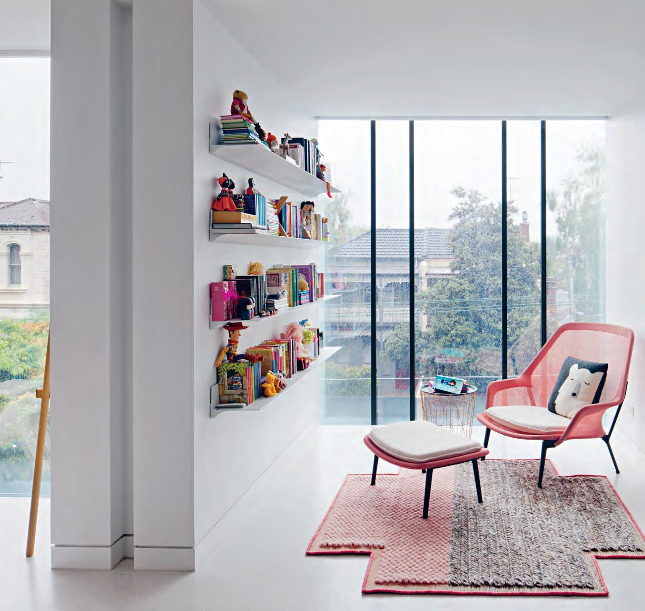
issue #38 habitusliving.com
As a result, the entry to the house is on the first floor, at the top of a narrow external stairway at the western edge of the site.
After the original brick house was demolished, its own western boundary wall was rebuilt. This silhouette of the old house screens the neighbouring apartments, and the warmth and texture of the brickwork help the entry to read more clearly as residential. Climbing the stairway – the space constricted between the brick wall and the house, open sky above – visitors’ eyes are drawn inexorably upward. It’s a fitting precursor for the experience inside the home.
At the top of the stairs, a pivot door delivers visitors into an open-plan kitchen anchored by an incredibly long marble island bench. The kitchen flows through to a dining zone and into a living area, with fantastic views down into the neighbouring park and out over the traffic of Dandenong Road. But again the eyes are drawn upward. The kitchen sits at the base of a large atrium, designed to bring natural light deep into the heart of the home. The prevailing colour palette of whites and pale greys maximizes every ray of sun, and the entire volume is awash with light. Except for the few hours on summer days when panels slide across the glass roof to block the hot sun, the light here is soft and seemingly all-pervasive. For new arrivals subconsciously anticipating a skinny house split into four discrete floors, wringing every last square metre out of the building’s small footprint, the effect of the light and the sense of spatial generosity are surprising and delightful.
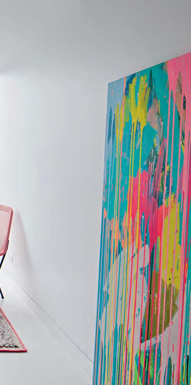
opener | The house presenTs a n inTr iguing idenTiT y To Th e sTr ee T – To o kind for an office block, To o subTle for re Ta il, bu T noT whaT many m elburnians expecT from a single residence eiTh er. above | The ou Tlook over w ellingTo n sTr ee T changes subTly as you rise Th rough Th e building, wiTh Th e individual glass boxes framing views of Terrace houses, Tr ees and, furTh er up, roof To ps and disTa nT aparTm enT Towers. 3 . on location # 139
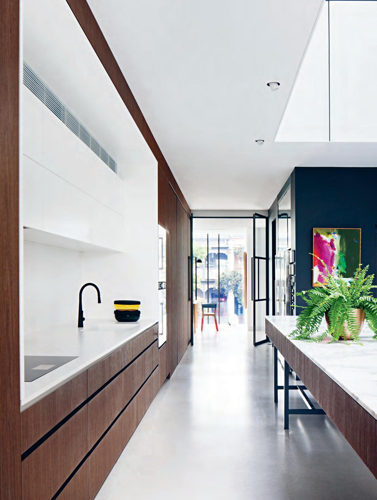
issue #38 habitusliving.com
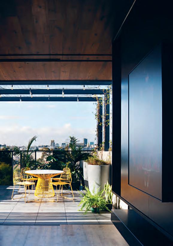
opposite | th e kitchen provides a clean, geometrical backdrop to the first-floor atrium. c o oking appliances and other messy items are concealed behind floor-toceiling joinery. above | th e house fills the site, leaving the rooftop terrace as the only outdoor space in the house. a private park next door, however, functions as a surrogate backyard. An extraordinary new house has appeared, six metres wide, five storeys high, the likes of which we’d expect to see in Tokyo or Amsterdam, but not in Melbourne. # 141 3 . on location
A core element of the brief, at the instigation of the two adult children, was that the house must bring family members together. For them, the idea of multigenerational living was about having independence and flexibility but also sharing their lives with their broader family. To this end, each level in the house looks out into the void over balustrades and through windows, across to other spaces and down to the kitchen. And each is zoned according to different modes of occupation: the first floor is the communal zone; the second and third floors comprise bedrooms and discrete living zones for the smaller “family units”; and the fourth floor is described as a “retreat” (although surely it’s also the “party zone” – there’s a lounge/media room, a roof terrace with panoramic views of the city and surrounding skyline, and a well-stocked galley bar and kitchenette).
The extreme verticality of the house demanded an elevator, but there are also two stairways. One ascends from the first floor to the second, a sculptural insertion into the atrium and angular counterpoint to the rectilinear geometry of the kitchen bench. The second connects the upper three floors via a single, long flight of timber treads. Sandwiched between high walls, with a sliver of glazed roofing overhead, it offers a sensory reprise of the narrow entry stair and its tension between horizontal constraint and vertical expansion.
The experience of climbing these stairs is emblematic of the house as a whole: it offers myriad moments like this, different spaces, different feelings; volumes expand and contract; circulation paths turn corners and open into different rooms; spaces are arranged around each other and flow together, to create
Opp O s ite | th e master bedrO O m lO O ks O u t thrO u gh full-height d O u ble-glazed wind Ow s Ov er da nden O n g rOa d. th e traffic can hardly be heard and, at night, streaks past in a c O lO u rful blur O f h eadlamps and tail lights.
We need more landowners and more councils to be bold and look for opportunities when they see constraints.
issue #38 habitusliving.com
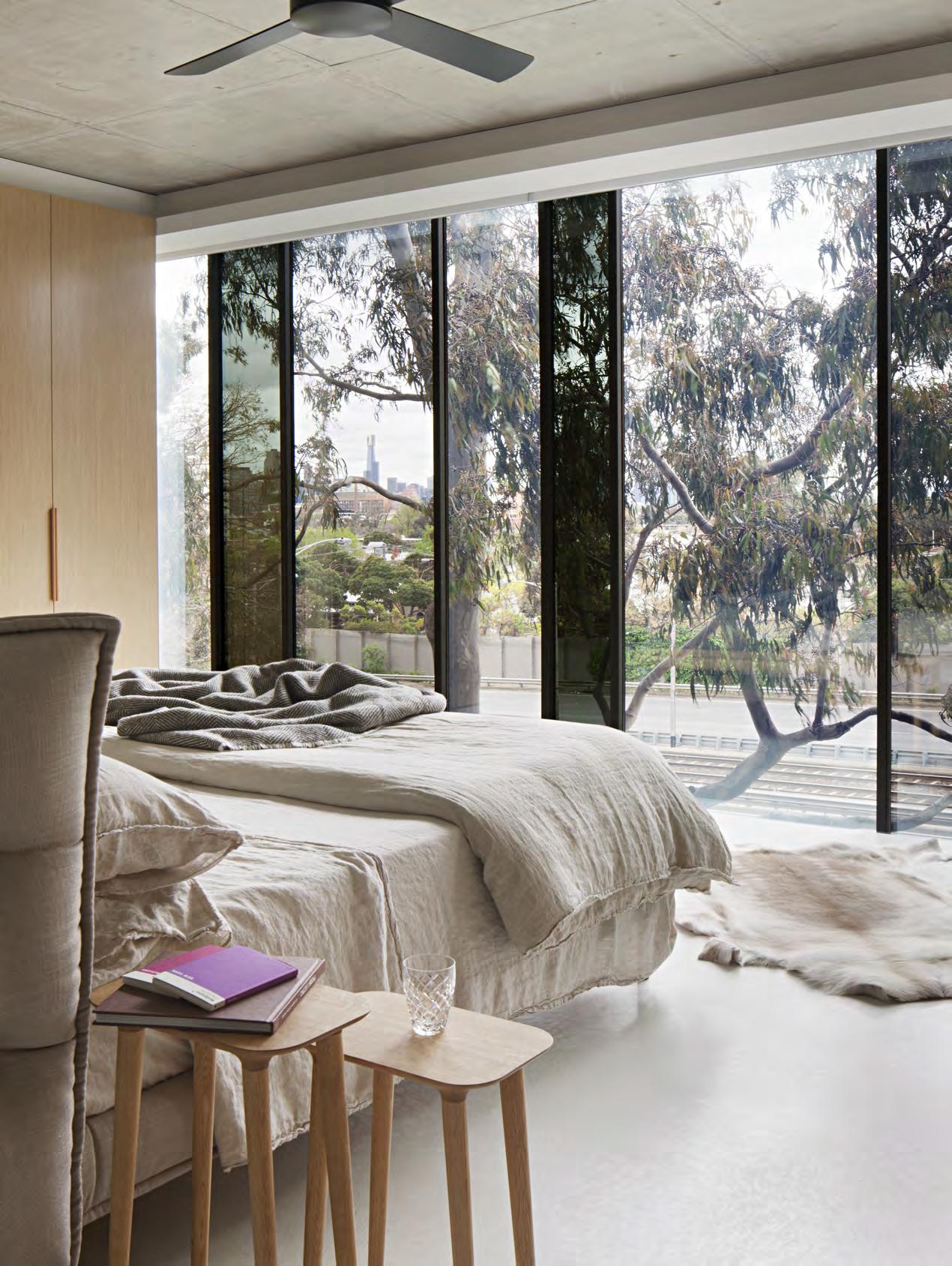
3 . on location # 143
GROUND FLOOR FIRST FLOOR SECOND FLOOR 9 9 r t 0 6 7 8 q e 1 1 2 2 3 4 5 w 1 issue #38 habitusliving.com
ENTRY TENANCY WC GARAGE LIVING DINING KITCHEN SCULLERY BATHROOM STUDY
BEDROOM
IN
VOID
TERRACE
/ KITCHENETTE 1 2 3 4 5 6 7 8 9 0 q w e r t y u
MASTER
ENSUITE WALK
ROBE
BEDROOM
BAR
w w r t t u 5 5 y 3 . on location # 145
THIRD FLOOR FOURTH FLOOR
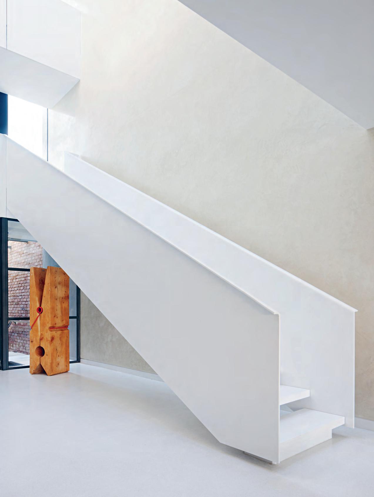
issue #38 habitusliving.com
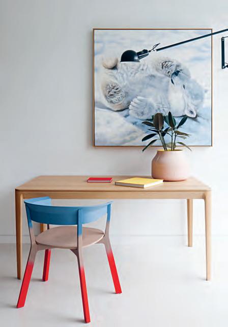
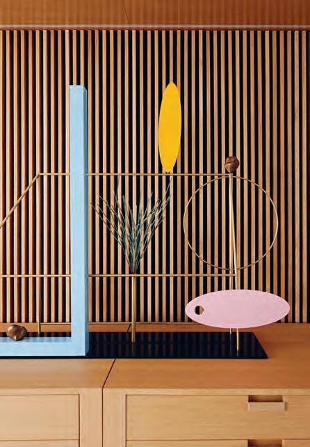
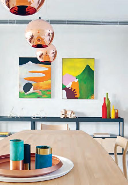
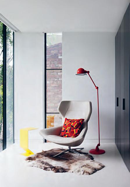
previous | plans. opposite | th e staircase bridging the first and second floors is an artistic interpretation of functional architecture. a bove | each room offers a lively vignette of colour. 3 . on location # 147
connections and separation, but not segregation. In the context of Melbourne’s welldocumented challenges around population growth and housing affordability, the Mixed Use House offers a model for greater residential density and multigenerational living that is anathema to the glut of lowquality, small apartments currently being served up as a solution. It’s a bespoke architectural project, so it can’t exactly be rolled out across the city, but the thinking at its core can be applied wherever there’s a fissure in the urban fabric, even in places not currently thought of as appropriate for housing. We just need more landowners and more councils to be bold and look for opportunities when they see constraints. And then perhaps a house like this one won’t seem quite so exotic.
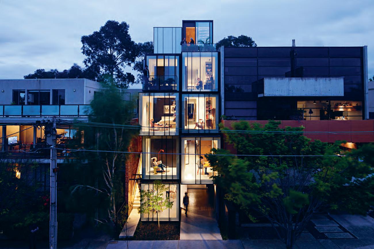
above | The house gives back To Th e sTr ee Ts cape especially aT nighT w hen iT glows like a modern archiTecT u ral lanTern.
issue #38 habitusliving.com
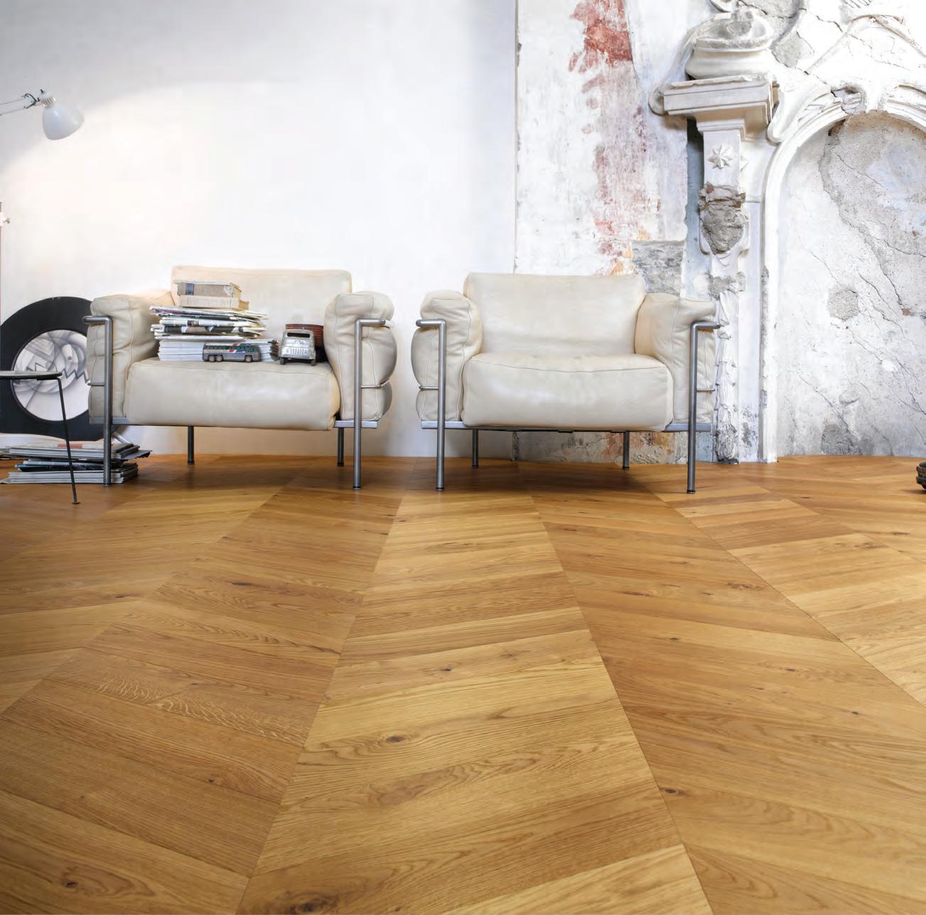

1/1 Chard Road Brookvale, NSW 2100 (02) 9909 6700 53 Cromwell Street Collingwood, VIC 3066 (03) 9417 2455 winspear.com.au Made in Italy.
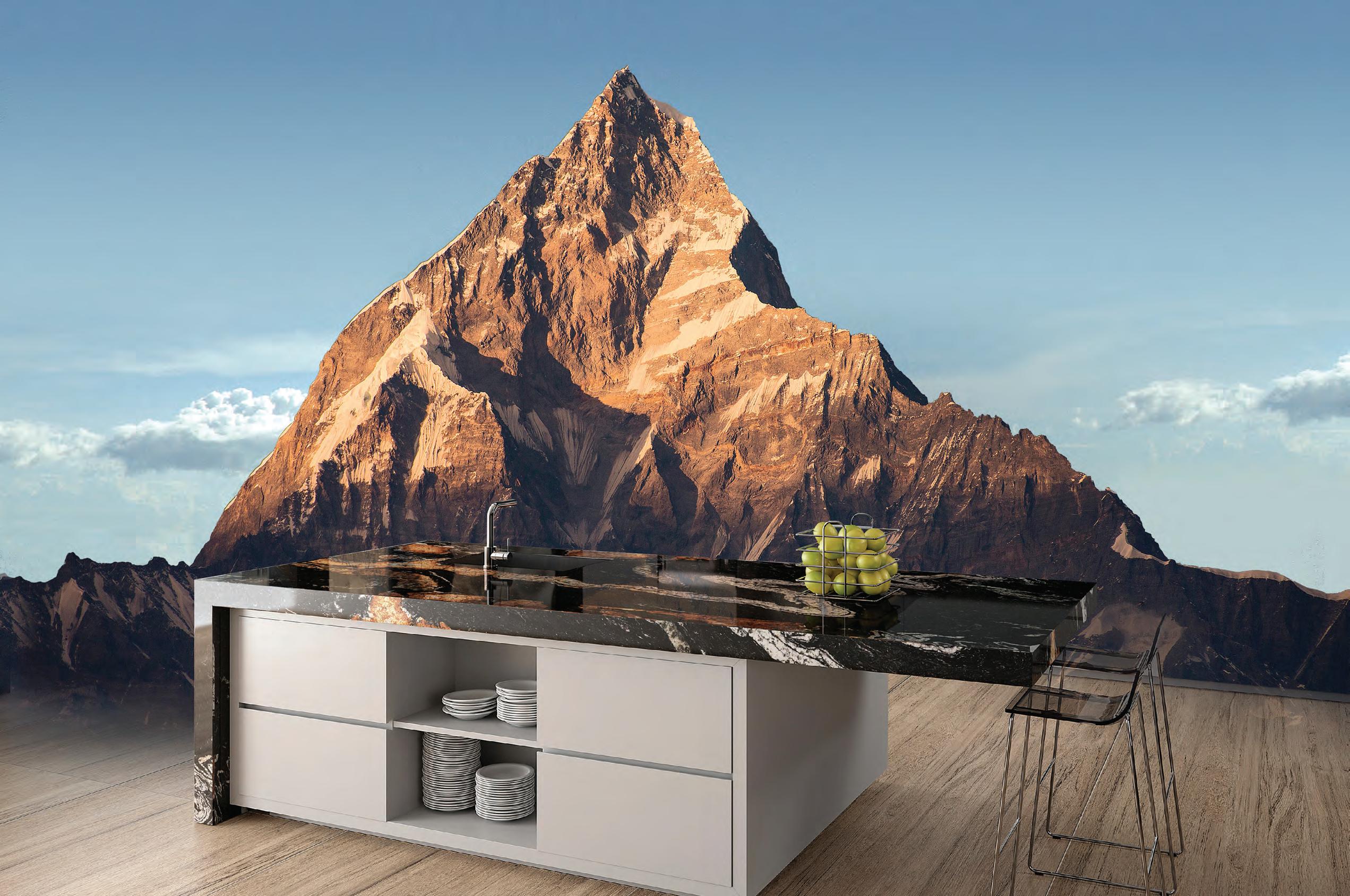
PROTECTED GRANITE ORINOCO PREMIUM COLLECTION

NATURAL SURFACES. ARE UNIQUE. Excellent Stain Resistance Unique Designs Created by Nature No Special Maintenance Required Certified for Direct Contact with Food www.sensabycosentino.com YEARS WARRANTY Cosentino AustrAliA Mobile : 0424 470 034 Design Lv.1 , Suite 30 | 69 O’riordan st Alexandria NSW 2015
Acclimatising to Context
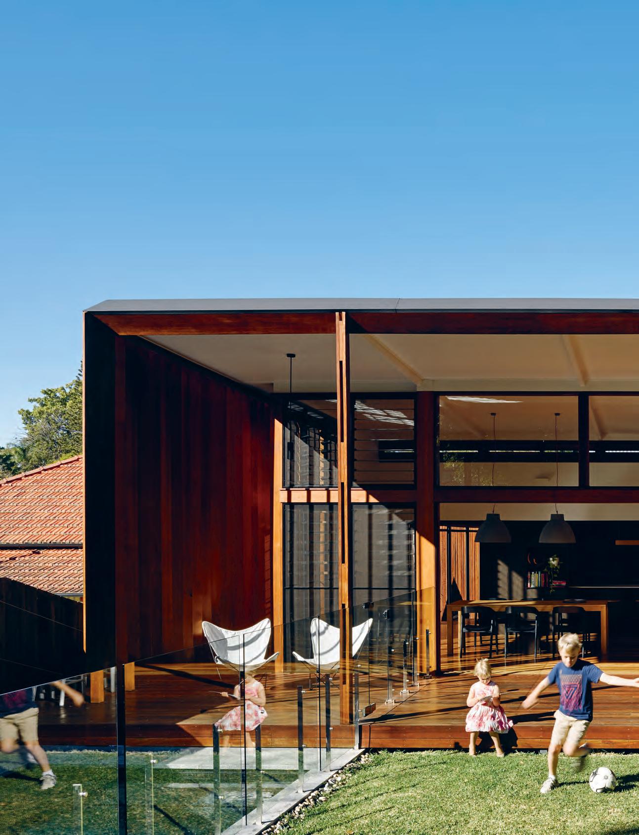
text
| photography ch ristoph Er Fr EDEr ick Jon E s
Ella McDougall
Daniel Hudson of Jackson Teece renovates his family home in a wooden-wrapped urban enclosure in inner-city Brisbane.
issue #38 habitusliving.com
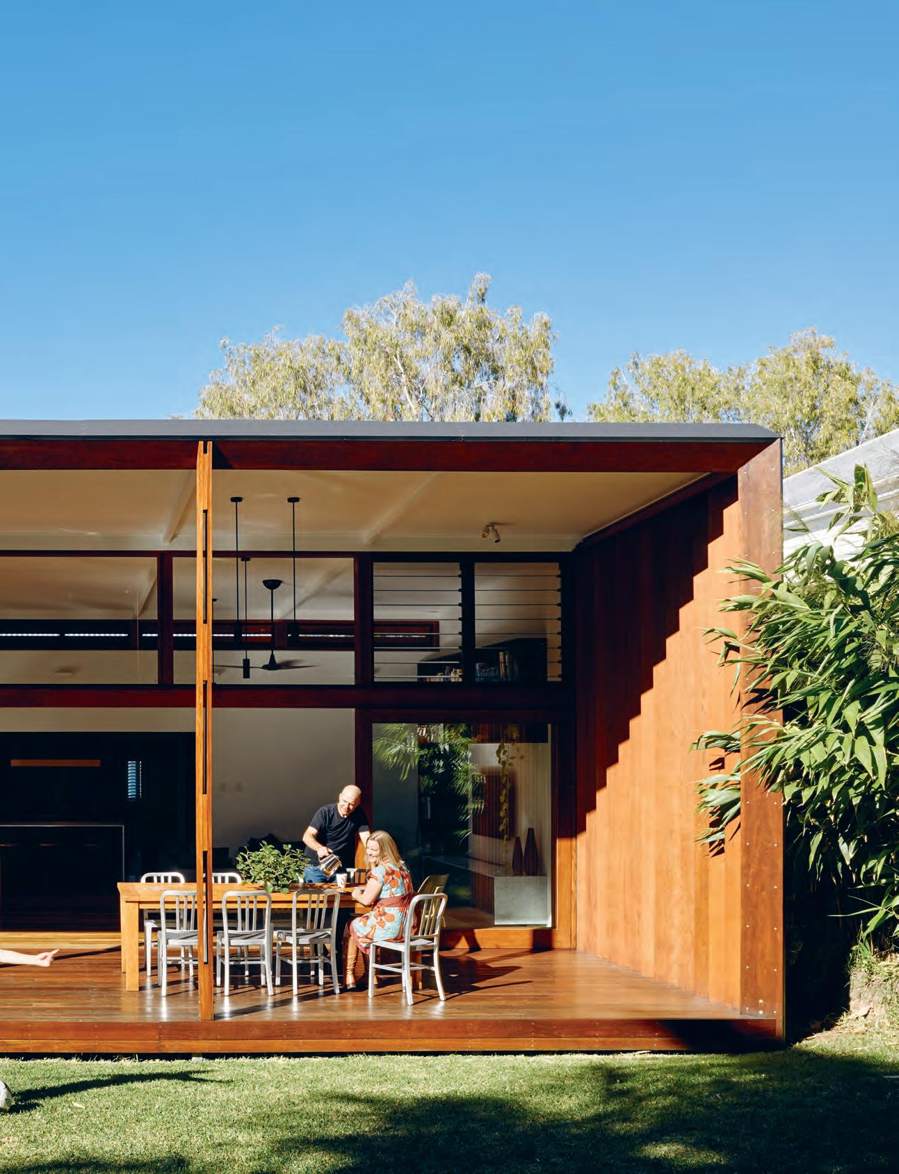
3 . on location # 153
Kempsey, a coastal town in midnorthern New South Wales, has a long history embedded in Australia’s timber industry, founded on its thick wood of red cedar. And it was this town in which architect Daniel Hudson spent his childhood kicking pieces of lumber around in his family shed as his grandfather whittled down his own chunks of timber. As a boy raised in a family of tradesmen and builders, Daniel learnt to respect the unique character of this material, something that offers both a connection to the surrounding native landscape, as well as protection from it.
The influence of growing up in a town that thrives on its relationship with the natural world is honoured in Daniel’s practice as an architect with Jackson Teece and director of their Queensland office. Living and working in Brisbane’s sun-soaked CBD, his own home, Gresham St House, elegantly parades his understanding of site orientation and architectural know-how in a structure that evokes the protective woods of his younger years.
Daniel and his wife purchased the property seven years ago. The house was a 1930s masonry ‘Queenslander’: muscular and elevated, in keeping with the canon of the northern state’s signature architectural style. The house had a great original aspect with the backyard facing directly north to embrace Brisbane’s syrupy weather. And so, when first walking through the property at the inspection, Daniel and his wife mentally configured their plans for the soon-to-be family home. The aim was to amplify a connection to the surrounding environment and expand the amount of liveable space with a timber-wrapped pavilion that honoured Daniel’s upbringing in quiet, coastal Australia.
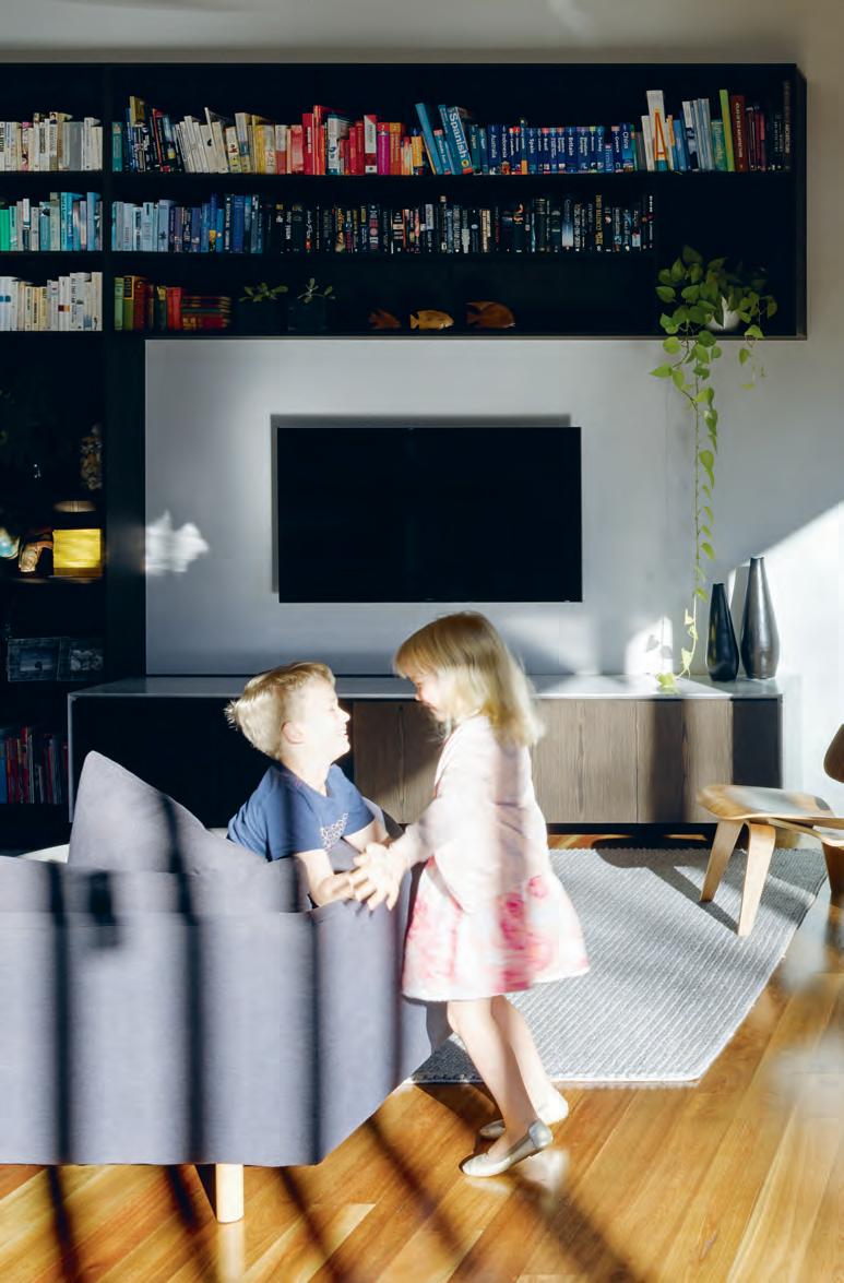
issue #38 habitusliving.com
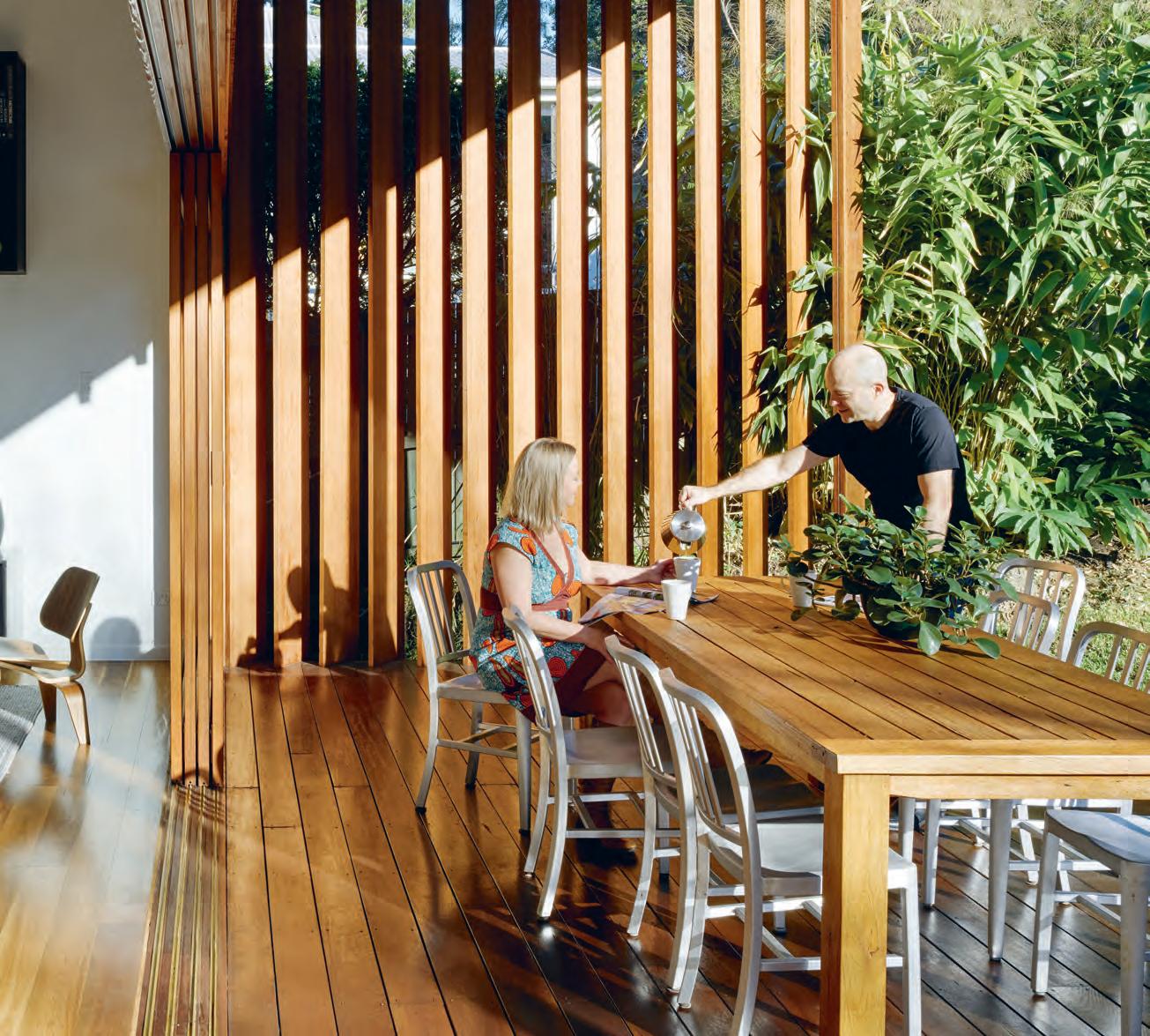
opener | The house ex Tends ouT inTo The backyard, allowing for easy communicaTion beT ween The kiTchen/living room and ouTside areas. above | The conTinued use of Timber, from The polished indoor floorboards To The ouTdoor decking, creaTes a seamless Tr ansiTion beT ween The inTerior and ex Terior of The house. 3 . on location # 155
Yet despite the natural assets of the block, the layout of the house was a mess. “Internally it was almost the opposite of what it should be,” said Daniel. “It was around the wrong way. So the main objective was to reconfigure the layout, the program of the house, without changing any of the wall locations.”
The old house was roasting in summer, biting in winter and longed for sunlight throughout most of the year. None of the old rooms responded to the context of the site and Daniel had to rearrange much of the floor plan. The lounge room became the master bedroom, the entryway a generous ensuite and wardrobe, the dining room a second family room and the old kitchen now the main family bathroom and toilet. “It was a complete reshuffle,” he concedes.
The pre-existing building was reimagined as the sleeping quarters and the new living pavilion contrasted as an open, well-lit space, syphoning in the family’s social activity. The bones of the original structure had to be maintained to keep the renovation within budget and to adhere to the low environmental footprint that was central to Daniel’s design.
The original house lies within a demolition control precinct to protect the character of the original façade. And so the extending new structure – swathed in rich timber and carrying a distinctly modern appeal –creates a striking juxtaposition between the more historical and contemporary architectural aesthetics.
The separation between old and new segments of Gresham St House establish two different destinations to suit one’s mood: one to bathe in the sun and native landscape, and the other to hide away in a more secluded and private space. A concealed full-length sliding door pulls out from the wall to open up or cut between these spaces. This not only visually breaks up the house, but also allows for the family to have greater control over the internal temperature and ventilation. Daniel installed a three-station temperature thermometer in the kitchen, sleeping area and outside of the house, which allows the family to monitor the different temperatures and open up or close down the space accordingly.
above | a mixed palette of timber visually segments the house, while continuing an overall sense of uniformity and soft earthiness. below | white walls accent the bedroom. opposite | vertical louvres respond to the seasons and help shield the house from Queensland’s harsh summers, all the while casting delicate shadow play across the interior.
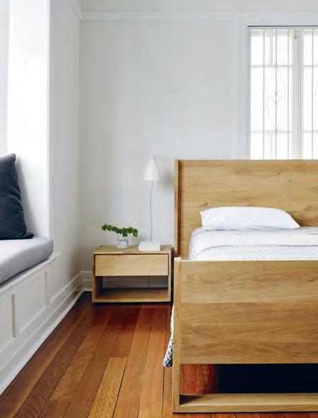
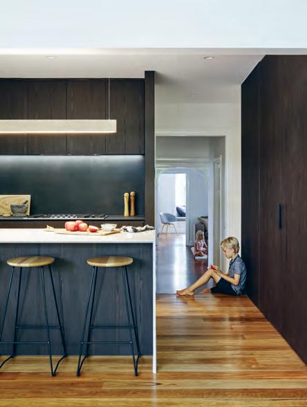
issue #38 habitusliving.com
“The main objective was to reconfigure the layout of the house without changing any of the wall locations.”
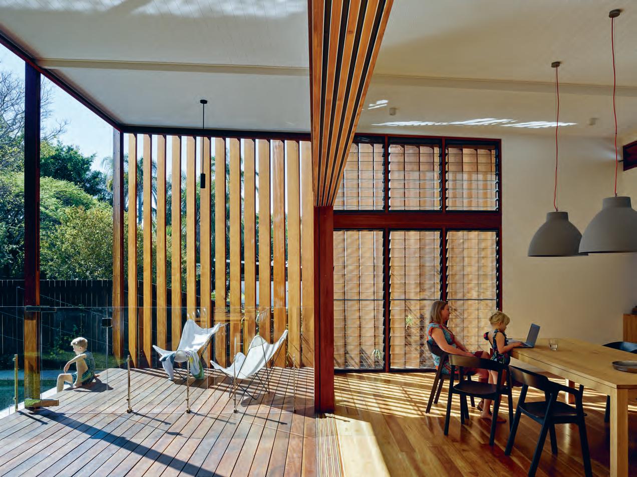
3 . on location # 157
LOWER FLOOR UPPER FLOOR ENTRY CAR PORT STORAGE STUDY 1 2 3 4 BEDROOM BATHROOM KITCHEN LIVING 5 6 7 8 LAUNDRY DINING OUTDOOR LIVING POOL 9 0 q w 5 5 5 6 6 6 7 8 8 9 0 q w 2 3 1 4 5 6 issue #38 habitusliving.com
“We get the opportunity, in winter, to shut down the sleeping area from the rest of the house so it keeps warm. And in summer, we shut the space down equally so it keeps cool when you’re sleeping at night,” says Daniel.
Working to the house’s orientation was paramount to promote the passive heating and cooling systems within the design, and ultimately create a house that responded to its climate. A gallery of louvres help to welcome in the bay breeze from the east while expelling the heat that is already inside. Over the central living space, large vertical timber blades run from the east and west façades, and are carefully angled to respond to the shifting temperatures throughout the year.
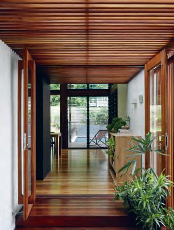
“During summer there literally isn’t any sun that comes [to heat] the deck or house. Whereas in winter you stand in the kitchen and the sun’s on you,” says Daniel. “They’re the attributes that give me joy every day.”
In addition to the rear pavilion, a new entry annex was built, clad in warm enveloping timber batten. The annex soothes the robust frontage while visually introducing the entwining of the old and new parts of the house that is continued into the rear. The annex is an ingenious feature in the design, and while the
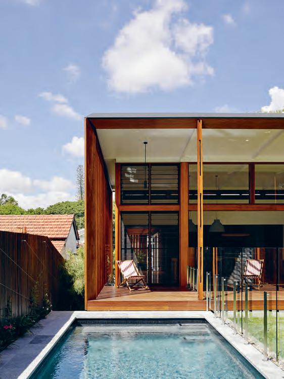
opposite
| plans. above | the back deck opens directly onto the swimming pool, allowing for a quick and easy morning dip. below | the timber batten-clad annex filters external sunlight to visually break from the streetscape and introduce a sense of calm and ambience.
3 . on location # 159
outer gate is closed, allows for the other doors to remain wide and encourage free-flowing ventilation across the length of the house. The annex also constructs a physical and psychological transition from the urban frenzy of the outside streetscape into the airy and restful pavilion.
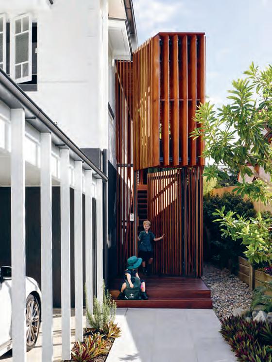
“Walking through the house, the idea was to create a serene experience,” says Daniel. Moving from “the timber batten and filtered light [at the entrance] to that more secluded – and I’d like to say protected – living space; when you walk into that space, the acoustics are very quiet. The amount of timber contributes to that definitely.”
The pavilion addition exists as both a living room and an extension of the outside deck, stirring the boundary between the internal and external parts of the house. And this is perfectly suited to the family’s lifestyle.
“My son plays a lot of sport, so for him to be able to stand in the backyard kicking a soccer ball while he’s eating a piece of toast, it’s a nice thing to be able to do.”
Gresham St House visually plays out the narrative of years gone by. The house draws on components of Daniel’s background and applies them within Brisbane’s urban setting. Illustrated as a result is a harmony between divergent design styles, reinforcing how our past influences continue to evolve and inform the paths of our future.
Above | The new ex Tension is suggesTed Through The peeking Timber Annex, which gr Acefully conTr AsTs wiTh The mAsonry of The originAl house.
issue #38 habitusliving.com
The bones of the original structure had to be maintained to adhere to the low environmental footprint central to Daniel’s design.
Modular by design
VOLA commitment to sculptural modularity is epitomised by the T39 Towel Rail. The system features minimalist cantilevered bars which can be configured in any quantity and spaced to suit any bathroom design. T39 is the perfect accompaniment to VOLA award-winning range.
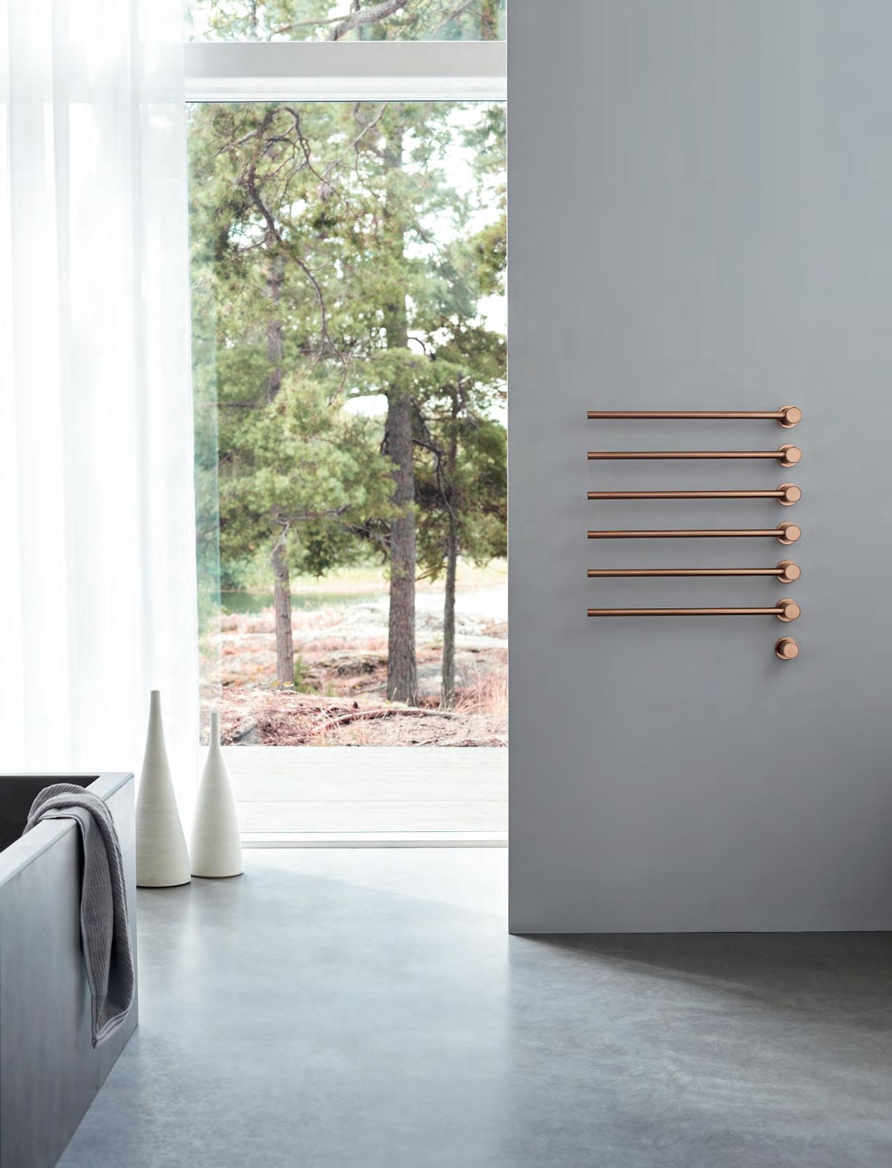
VOLA Design Pty. Ltd. Tel.: +61 402 372 480 sales@vola.com.au www.vola.com
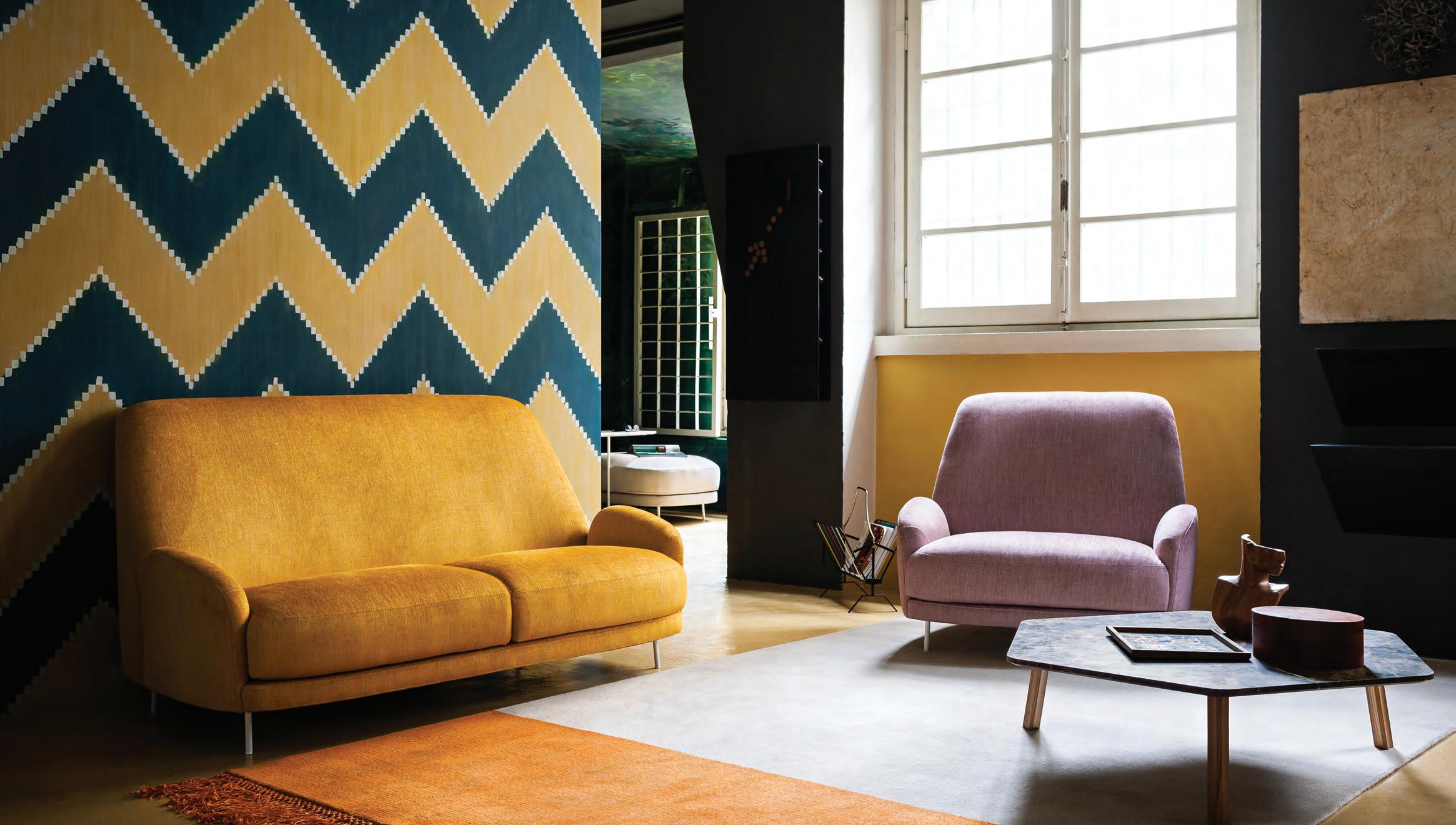 Featured | Santiago Lounge, Armchair & Campo Rug designed by Claesson Koivisto Rune, Ruler Coffee Table designed by Gordon Guillaumier

Australia 1300 306 960 stylecraft.com.au Singapore +65 6511 9328
When Nature informs Design
In this multi-generational house by architects RT+Q in Singapore, thematic gardens help to organise the building forms and spaces as well as reflect the architectural concepts and design details within the home.
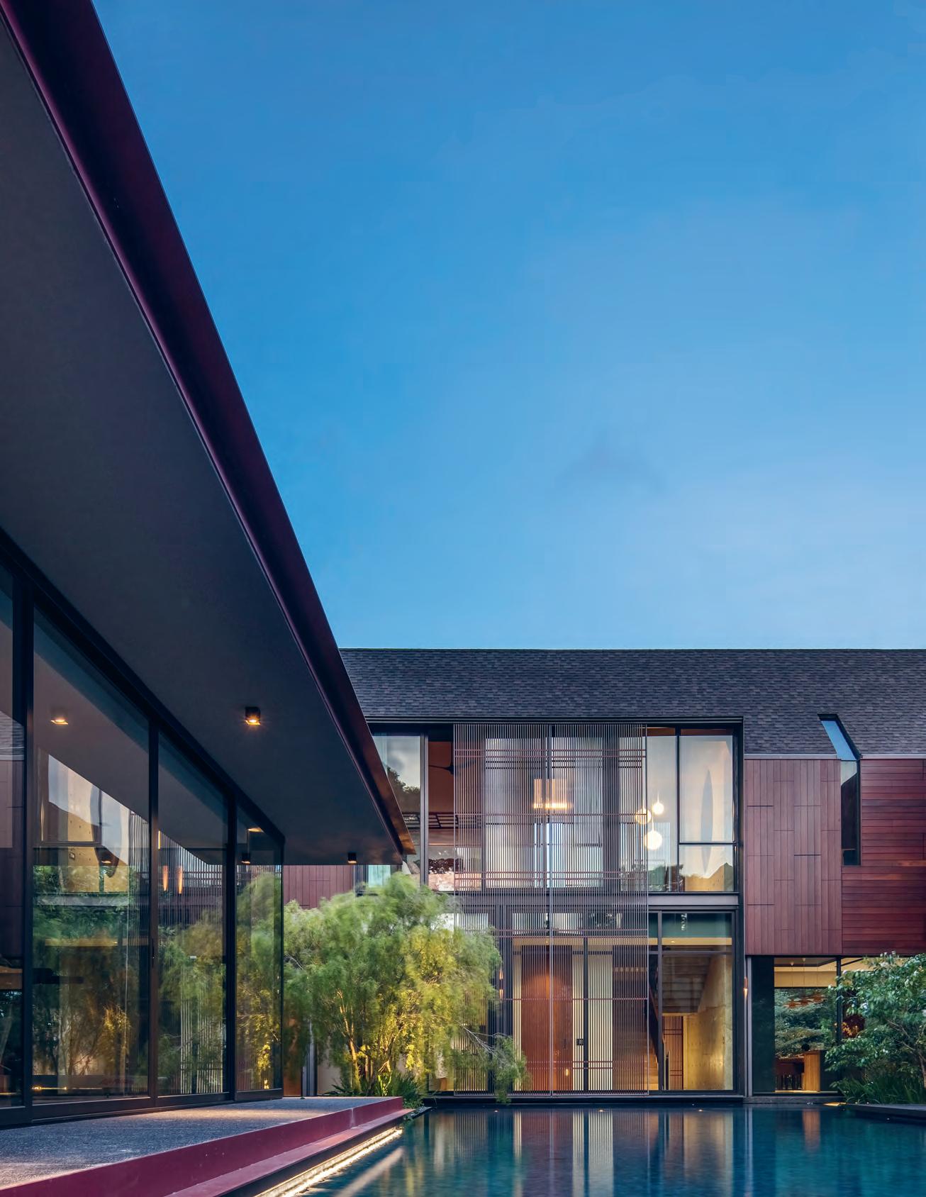 TexT Darlene Smyth | PhoTograPhy m a S a no Kawana
issue #38 habitusliving.com
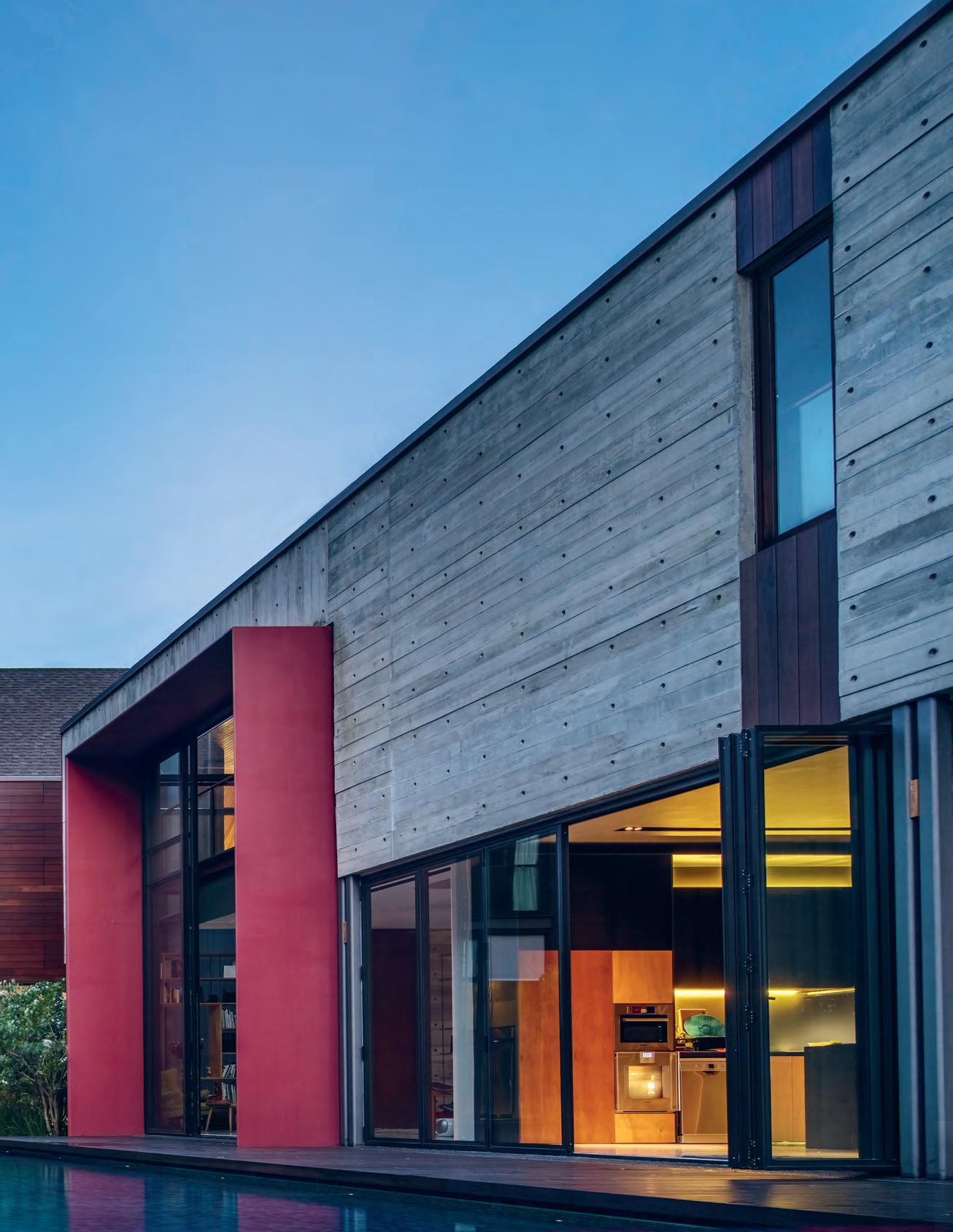
3 . on location # 165
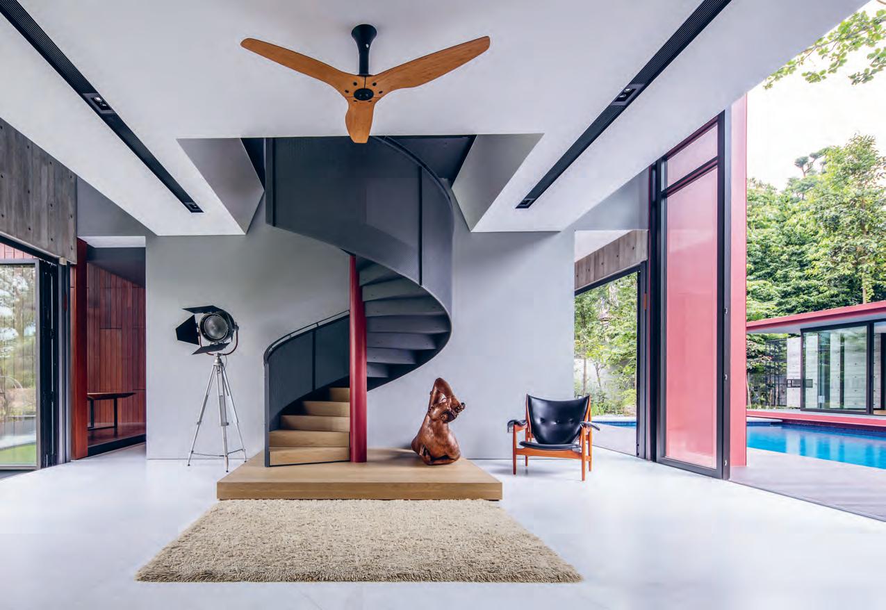
issue #38 habitusliving.com
This barn-like building opens up and responds to the interplay of light, wind and views.
Primitive Hut is an architectural concept wherein which the relationship between humans and their environment is seen as the driving force behind the design and build. And it’s a concept that the team at RT+Q Architects in Singapore drew on heavily when working on House With Shadows. Directors Rene Tan and TK Quek, and project architect Melvin Keng, at explored the dynamics between an assemblage of primary residential building forms and their surrounding garden spaces.
Housing multiple generations of the one family, this barn-like building opens up and responds to the interplay of light, wind and views of the surrounding landscape of the site and the distant views beyond. The house reacts to the surrounding series of gardens in a way that intrinsically links the built forms and the landscape elements. These ideas of symbiosis are expressed in the delicate patterns of shadows cast by light filtering through the various forms of screening along the building’s edges and in the careful framing of landscape elements through projected portals and strip windows cut into the house’s façade. The act of lifting the main body of the house to the second story so that the ground floor is highly permeable to the landscape, creates an environment in which the building and its gardens seem to exist in a symbiotic relationship with each other on the site.
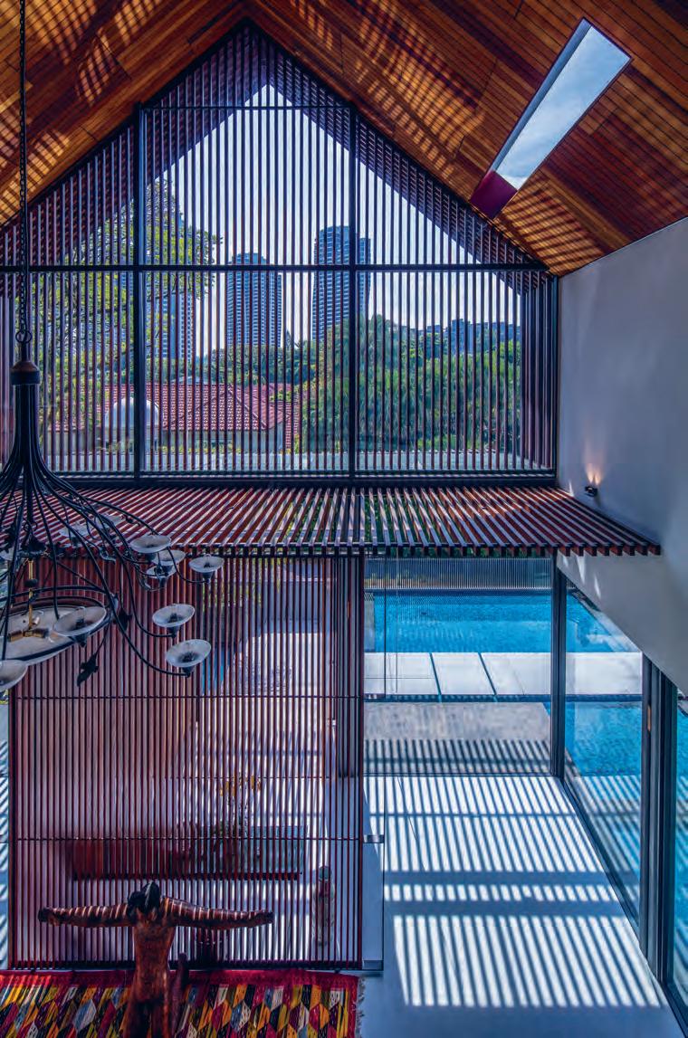
opener | The main pavilion of Th e home appears To lighTly floaT over a cenTr al waTer garden. opposiTe | a n impressive spiral sTai rcase anchors Th e minimalisT a pproach To Th e library. a b ove | va rious forms of screening around Th e building’s edges filTer Th e harsh Tropical sunlighT
# 167 3 . on location
ENTRY
FOYER
FORMAL LIVING
FORMAL DINING
KITCHEN
LIBRARY
BEDROOM
ENSUITE
DINING
PATIO
LIFT
PANTRY
WET KITCHEN
LAUNDRY
WC
GRANDPARENTS'
MASTER BEDROOM
WALK IN ROBE
GYM
SWIMMING POOL
SECRET GARDEN
DRIVEWAY
JAPANESE GARDEN
VOID
FAMILY ROOM
LIVING
STUDY
MASTER BEDROOM
GUEST
GROUND FLOOR
FIRST FLOOR
ROOM
2 3 4 5 6 7 8 9 0 q w e r t y u i o p a s d f g h j k l 9 w 5 w t t r e 0 p o 4 1 6 7 7 8 8 8 q 8 u y s a i 2 3 3 8 8 8 d j h k k l d f g q 5 u issue #38 habitusliving.com
ROOF TERRACE 1
The owners of this 20,000-square-foot plot in a prestigious neighbourhood in the West Central area of Singapore are a multi-generational family comprising grandparents, their daughter and their grandchildren.
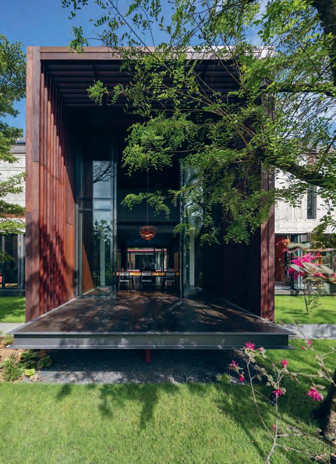
The son-in-law, who happens to be a landscape designer, conceived the design of the external spaces from the onset of the project. Melvin Keng from RT+Q explains, “In this project, we worked with the concept that the landscape be the driver of how the architecture sits on the site… the garden spaces are thematic according to the uses.” A front garden, which Melvin refers to as “the secret garden”, is a romantic space which feels like a private clearing in a forest. Much of its character comes from the umbrella of a few 30-year-old roadside shade trees that were to be felled during the project and were transplanted here to screen the house from the road and enclose this serene and reflective space.
The centre of the home is cooled down with a water garden which extends beyond the notion of a swimming pool into a large body of water with bridges crossing over it; above which the surrounding buildings appear to float. Thirdly, a side garden brings in exotic influences in the design with a distinctly Japanese theme. This asymmetrical garden with a central koi pond uses a selection of extremely soft and flowing plants and trees that blow lightly in the wind to give the garden its sense of tranquillity.
The house is likewise broken up into three main zones which are expressed as pavilions with barn-like forms and relate to these three gardens. The pavilions are differentiated from each other through their material use and orientation, forming an asymmetrical T-shape. A main public pavilion greets visitors from the front of the house sharing common areas to the extended family; a living room, dining and kitchen, and a large family room on the second storey which overlooks the double-volume living area below. While this pavilion is cladded mostly in Chengal Timber, the lower level is completely glassed in so that it simultaneously enjoys views into all three gardens. The daughter’s pavilion is clad in cast-in-form concrete which is expressed as an impossibly light material, almost resembling the lightness of wood itself in its application.
opposite | plans. above | Chengal timber s C r eens frame a semi-indoor extension of the dining room.
3 . on location # 169
A third zone to the side of the main pavilion houses the master suite and relates directly to the Japanese themed garden. To amplify the experience of the garden, the designers have introduced a large enclosed porch, surrounded by sliding vertical timber screens, reminiscent of a traditional Japanese veranda or engawa from which to enjoy the views of nature.
Throughout the house, the hand of the designer can be felt through the highly crafted details. “All the details are our idea of expressing joints,” explains Melvin, “we like to show how things go together.”
The architects customised and detailed all elements of the house, controlling even the detailing of integrated light fittings, railings, and electrical switches, which became elements of design in themselves.
Toeing the line between rustic, unpolished materials and intricate joinery, these details reflect the overall design intent in the house: to be inspired by – and in harmony with – nature.
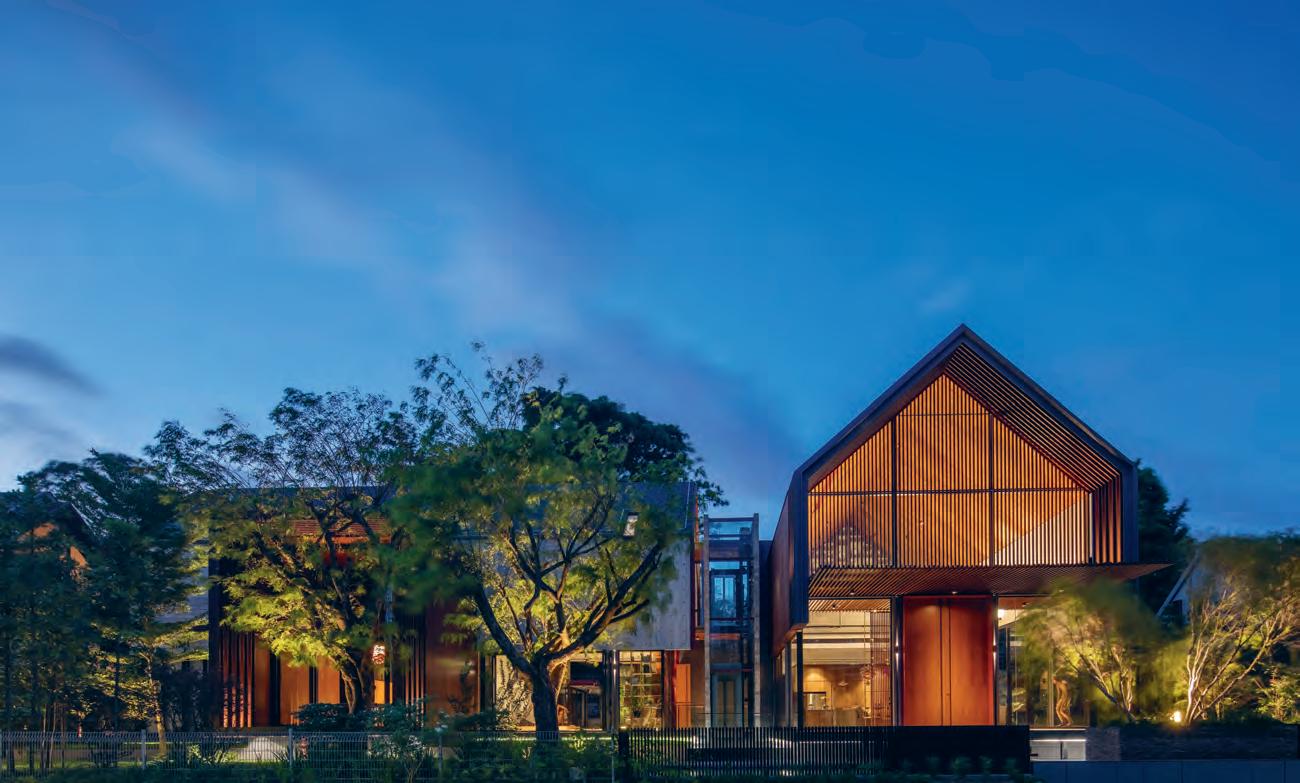
above | at n ight, the house creates a seemingly incandescent glow and certainly magnificant sight for neighbours and passers-by.
The pavilions are differentiated from each other through their material use and orientation, forming an asymmetrical T-shape.
issue #38 habitusliving.com
20% more spray force. Twice the amount of skin contact.* The distinctive new shape of Rua, takes geometric styling and softens the appearance with slightly rounded edges for a truly unique and contemporary look.


Experience Aurajet® for yourself at methven.com/aurajet
*Compared to a Methven conventional shower at 7.5L per minute

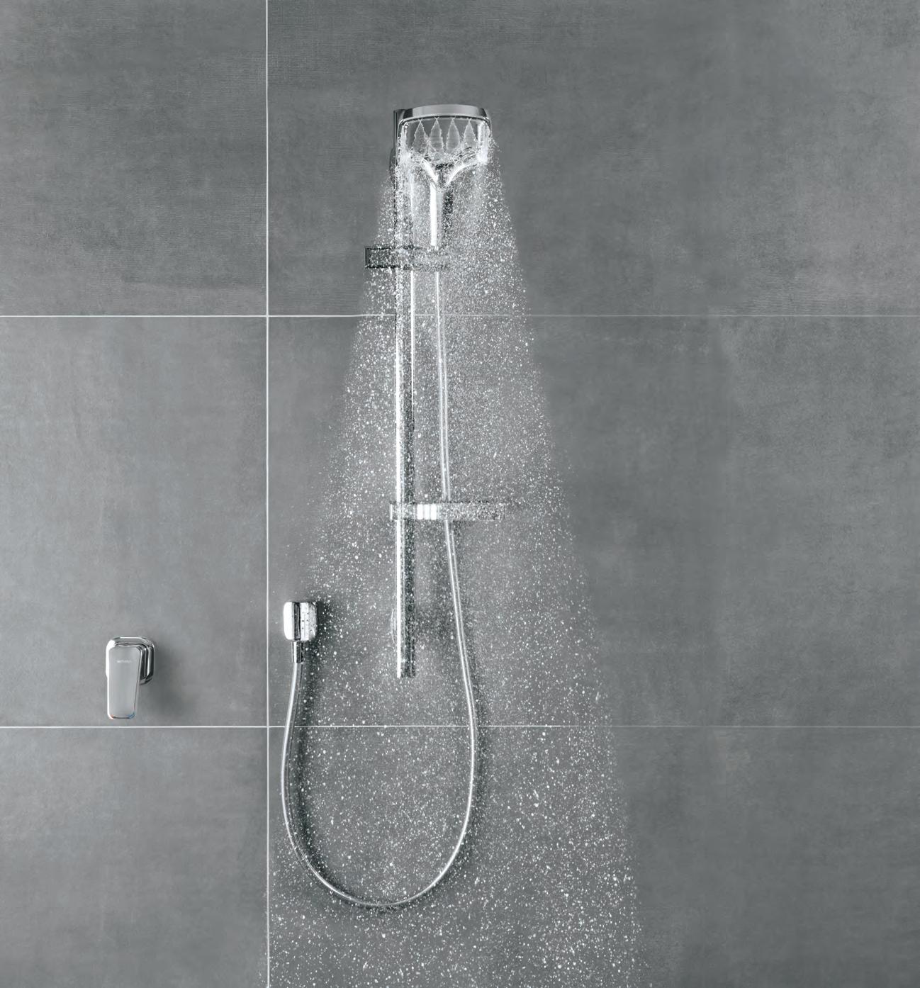
You’re looking at the next generation of showering. Now imagine how it feels.
Flexibility A Focus on
Architects Kohei Yukawa and Hiroto Kawaguchi design a contemporary home that celebrates the relationship between family and nature in Kyoto, Japan.
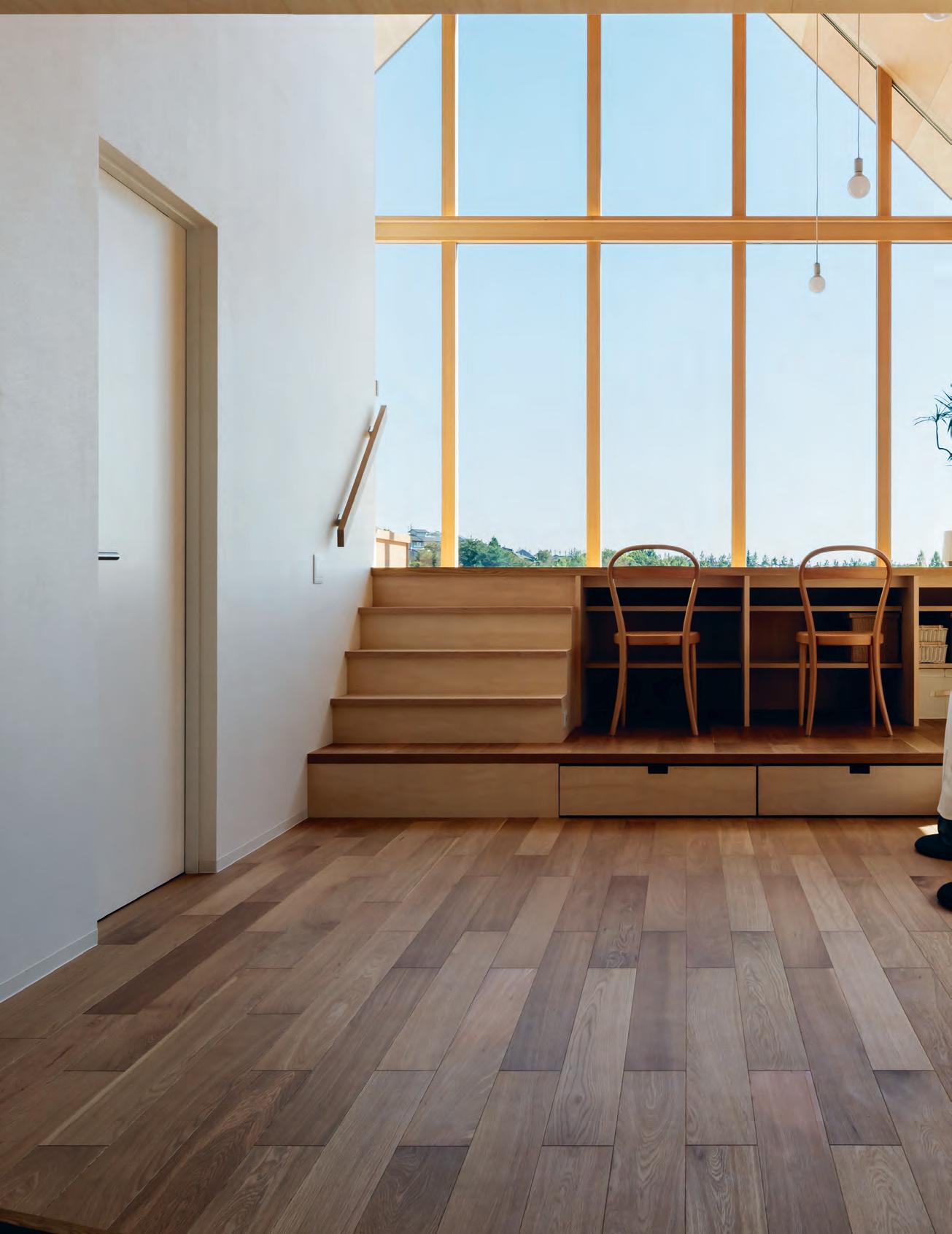
text
Ng | photography yohei S ASA k ur A
Amy
issue #38 habitusliving.com
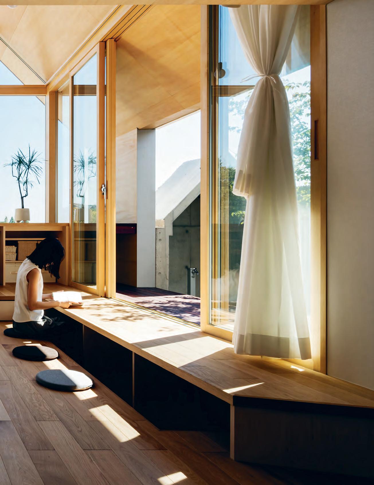
# 173 3 . on location
Japanese architecture has always had a focus on flexibility when it comes to residential building. With their keen sense for and appreciation of nature, neighbourhood and community, dwellings are often tailor-made to residents. Houses are built to suit each client’s needs. When a homebuyer purchases an existing residential lot, many choose to demolish and rebuild instead of remodel, preferring a clean slate from which future dreams can be built. While the prospect of designing and building one’s own home is an exciting one, it is even more so when the land is new and fresh with possibilities.
Thus when a fairly new, large-scale residential area opened up in Southern Kyoto, a young couple deemed it the perfect location to settle down as they looked forward to enjoying life’s new opportunities. The area rests on the south-eastern slope of a hill, while the site itself offers unfettered views of rolling hills on the horizon. They were expecting a new addition to their family and the home would allow them to enjoy excellent views of the borrowed landscape while tending to their growing family.
They reached out to architects Kohei Yukawa and Hiroto Kawaguchi, who collaborated on the design of the house by taking into account the couple’s needs for privacy, as well as creating open spaces that would be able to foster interaction between family members as they commune with nature.
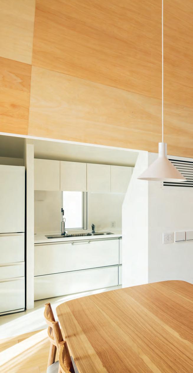
issue #38 habitusliving.com
opener | Flexibility was a key point in the design oF the house, with oak Floors, steps and platForms serving multiple roles – well suited to a growing Family and their ever-changing needs. above | the neighbouring landscape played a role in the shaping oF the interior – the architects mimicked nearby mountain ridges through sloped rooFs ceilings and windows to highlight the scale oF man versus nature.
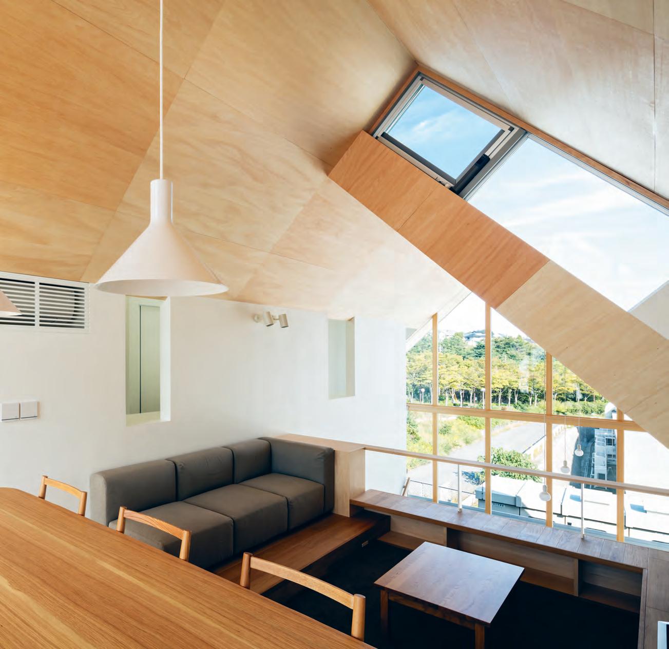
3 . on location # 175
The house itself is a metaphor for the distant mountain range, with its basic roofline comprising three singular mountains, bound together as one, paying homage to the view. Divided into three and encased within its large wooden windows lies the heart of the house, which the architects call “everyone’s house”. Within it is a hall that allows for a continuous flow of activities. Much like a welcoming courtyard, the space feels open and light as one steps through its entrance. Inclined wooden ceilings and various elevations throughout create an airy space in which light reflects and bounces off unexpected nooks and corners. The warmth of this double-volume hall is enriched by wooden decking and panels that flow seamlessly from floor to roof. Elegant and flexible, the space can be transformed according to the function and needs of the family. Fluid elevational elements are peppered throughout spaces contained within Everyone’s House. Apart from separating spaces, these clever details are also used as chairs, tables and storage areas. It’s these daily interactions interspersed with light, wind and a sense of distance that create rich experiences for the homeowners.
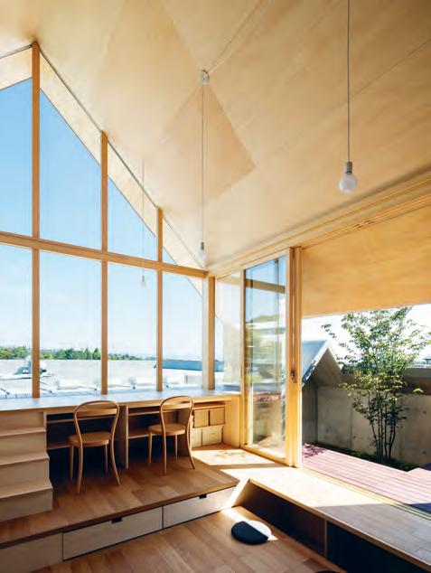
above | Light fiLters generousLy into the haLL of everyone’s house, which acts as a communaL space in which the famiLy gathers. opposite | the combination of wooden paneLs and white waLLs highLight a caLm , expansive atmosphere in the doubLe-voLume haLL
issue #38 habitusliving.com
Elegant and flexible, the space can be transformed according to the function and needs of the family.

3 . on location # 177
UPPER FLOOR LOWER FLOOR 9 0 1 6 8 q ENTRY BEDROOM BATHROOM COURTYARD HALL JAPANESE ROOM DINING LIVING VOID FRONT CHAMBER KITCHEN BALCONY 1 2 3 4 5 6 7 8 9 0 q w 2 2 3 3 3 4 5 w 7 issue #38 habitusliving.com
The open nature of Everyone's House is in stark contrast to other houses in the vicinity that are more private and modest – guarded, almost – with a streetscape surrounded by walls and the occasional peppering of small, tight windows throughout. The house looks almost exotic – out of place and yet not so –with large framed wooden windows that lets a generous amount of light in. It offers the family an unhindered view of verdant mountain ridges towards the back of the house while maintaining a relaxed, open façade that faces the street. With its outstanding features, the house still resonates with the neighbourhood –privacy is maintained through asymmetrical solid structures flanking the giant wooden windows in a show of community solidarity.
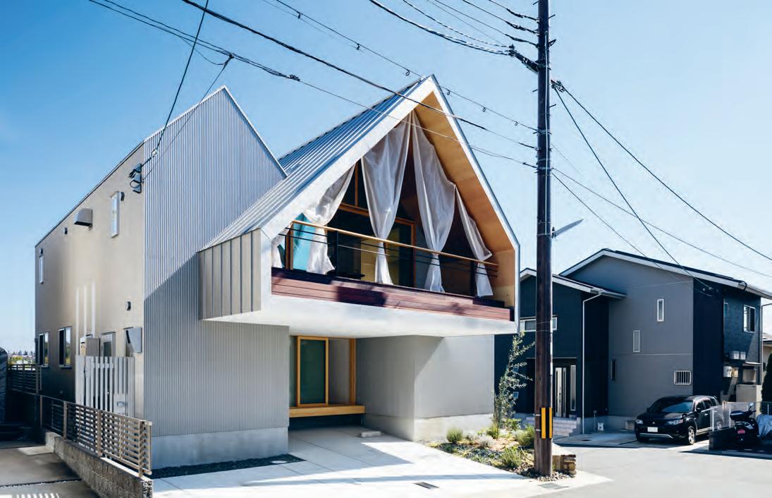
opposite | plans. above | the open façade of the house is in stark contrast to its neighbours. While open enough to alloW light to permeate its interior, it retains a private, reserved stature that fits in With the community.
3 . on location # 179
The warmth of this double-volume hall is enriched by wooden decking and panels that flow seamlessly from floor to roof.
Private and working areas are arranged to the fringe of the house, as such they frame and support the hall, which is considered a public area. The master bedroom and children’s bedroom are located opposite each other, separated by the hall which also acts as a bridge between them. The second floor is reserved for the kitchen, living and dining area that open s up to a balcony. This mezzanine-like space takes full advantage of the open plan of the house, offering views that extend as far as the eye can see.
The house is an allegory. It cocoons the family in its warmth while basking in the presence of surrounding hills. With these various overlapping themes, the architects reinterpret a house, its people, the town and landscape through reconstruction of space to create a relationship which would bring meaning to a family. Through the house, they are one and home.
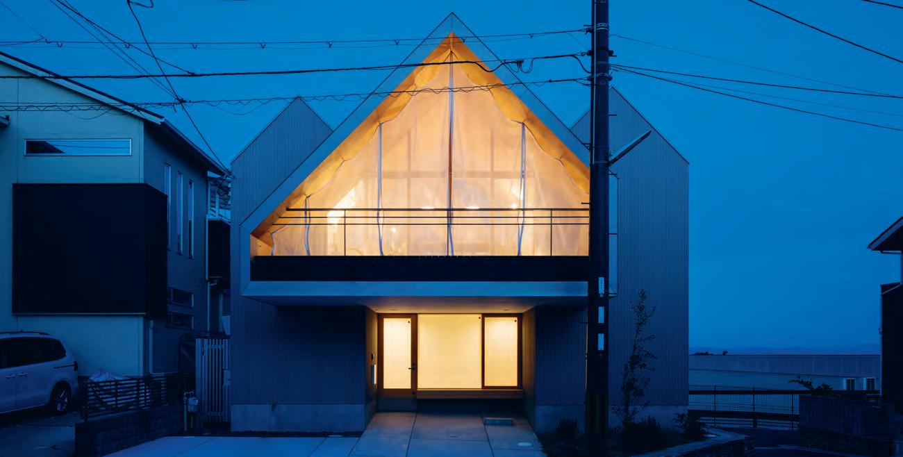
Above | the wArm glow of the house feels Almost like A beAcon, highlighting And pAying homAge to the surrounding mountAins. issue #38 habitusliving.com
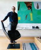
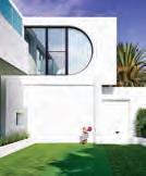
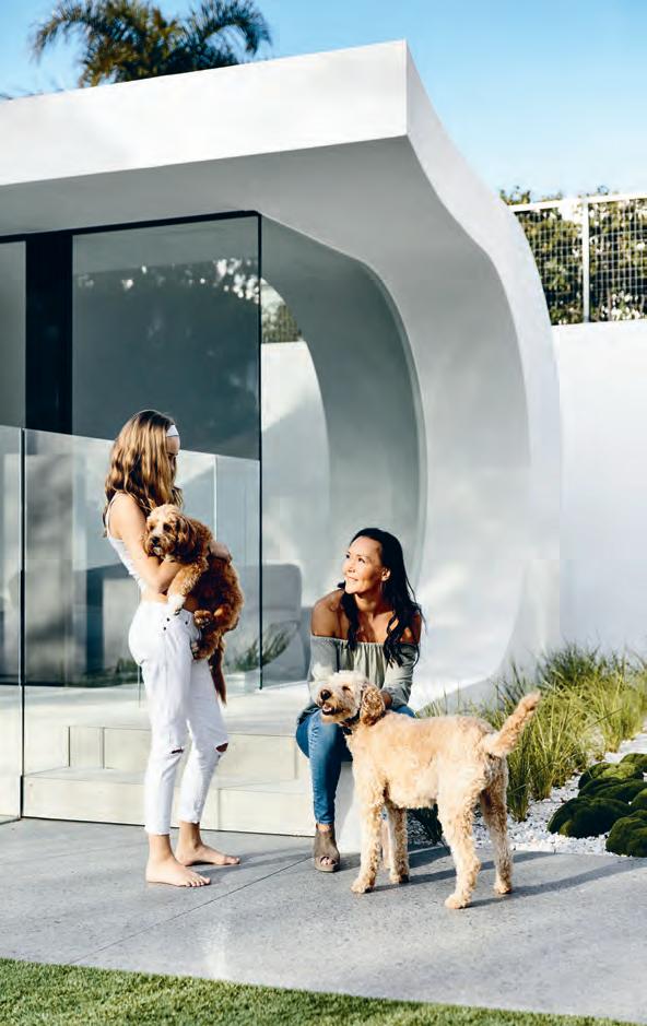
living in design #37 771836055007 At home with architect and art collector John Wardle. Marc Newson on global design Looking backwards, moving forward the Nostalgia issue. Supple curves complement harsh corners at the Playful House. Bill Henson locates the exotic in the everyday And Melanie jewellery, art and architecture living in design #38 PAYMENT METHOD Cheque / money order AUD$ Charge my credit card AUD$ Name on Card Card Type Card Number E xpiry Date Signature IT’S EASY TO ORDER Fill in your response below, overleaf or subscribe securely online at habitusliving.com/subscribe. FOR A GIFT – RECIPIENT DETAILS: FOR MYSELF PLEASE SELECT BELOW Mrs/Ms/Miss/Mr First Name Surname Address State Postcode Country Email Phone Mrs/Ms/Miss/Mr First Name Surname Address State Postcode Country Email Phone ONLINE: habitusliving.com/subscribe PHONE: (61 2) 9368 0150 MAIL TO: EMAIL: subscriptions@indesign.com.au FAX: (61 2) 9368 0289 Indesign Media Asia Pacific Level 1, 50 Marshall Street, Surry Hills NSW 2010 WHERE’S YOUR FAVOURITE PLACE TO ESCAPE/EXPLORE AND WHY? Enjoy your quarterly dose of Habitus delivered straight to your door. This issue, extend or renew you subscription to the next four issues and you’ll get a complimentary fifth! Offer ends the 28th of February, 2018. includes shipping within Australia only Subscribe to Habitus magazine Subscribe to Habitus 5 issues for $49! AUSTRALIA INTERNATIONAL (AUD$) 12 ISSUES SAVE 8 ISSUES SAVE 4 ISSUES SAVE 12 ISSUES SAVE 8 ISSUES SAVE 4 ISSUES INDESIGN $155 $43 $105 $ 27 $55 $11 $240 $ 39 $200 $21 $110 HABITUS $132 $47.40 $93 $26.60 $49 $10.80 $240 $30 $180 $10 $90 THE COLLECTION Vol. 2 Australia $29.90 (1 ISSUE) International $49.95 (1 ISSUE)
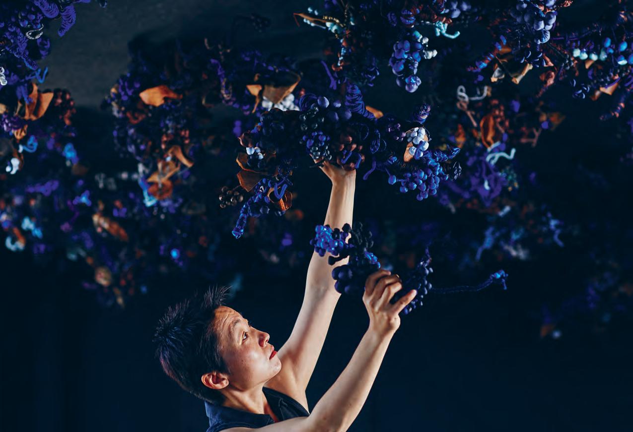
text Stephen todd | photography tim Grey and Lauren Bamford
in Melbourne
Tango issue #38 habitusliving.com
Anguish and ebullience coalesce in Dom Pérignon’s daring new private dining suite.
Last
Hiromi Tango creates psychosocial dreamscapes, lush abstract structures that allude to the sometimes rocky terrain of our brains – from the stress of exacerbated panic attacks to the ebullience of heightened pleasure. Science, psychology and biology are her subjects, cloth and string and azuki beans her material palette, blood red her colour of choice. Variously described as “obsessive”, “fetishistic” or simply “unexpected”, Tango’s work is an entirely idiomatic form of rock 'n' roll rococo None of which would make her a predictable partner of French luxury bubble brand, Dom Pérignon. And yet, it’s Hiromi Tango that Dom called upon to decorate their new private dining suite at Melbourne’s multi-gonged restaurant, Vue de Monde. A collaboration between Vue’s Australian chef, Shannon Bennett, Dom Pérignon’s French chef de cave, Richard Geoffroy, and the Tweed Heads-based Japanese–Australian artist, the dining room is a bruised-hued incarnation of the fermentation process perched 55 floors above Collins Street in downtown Melbourne.
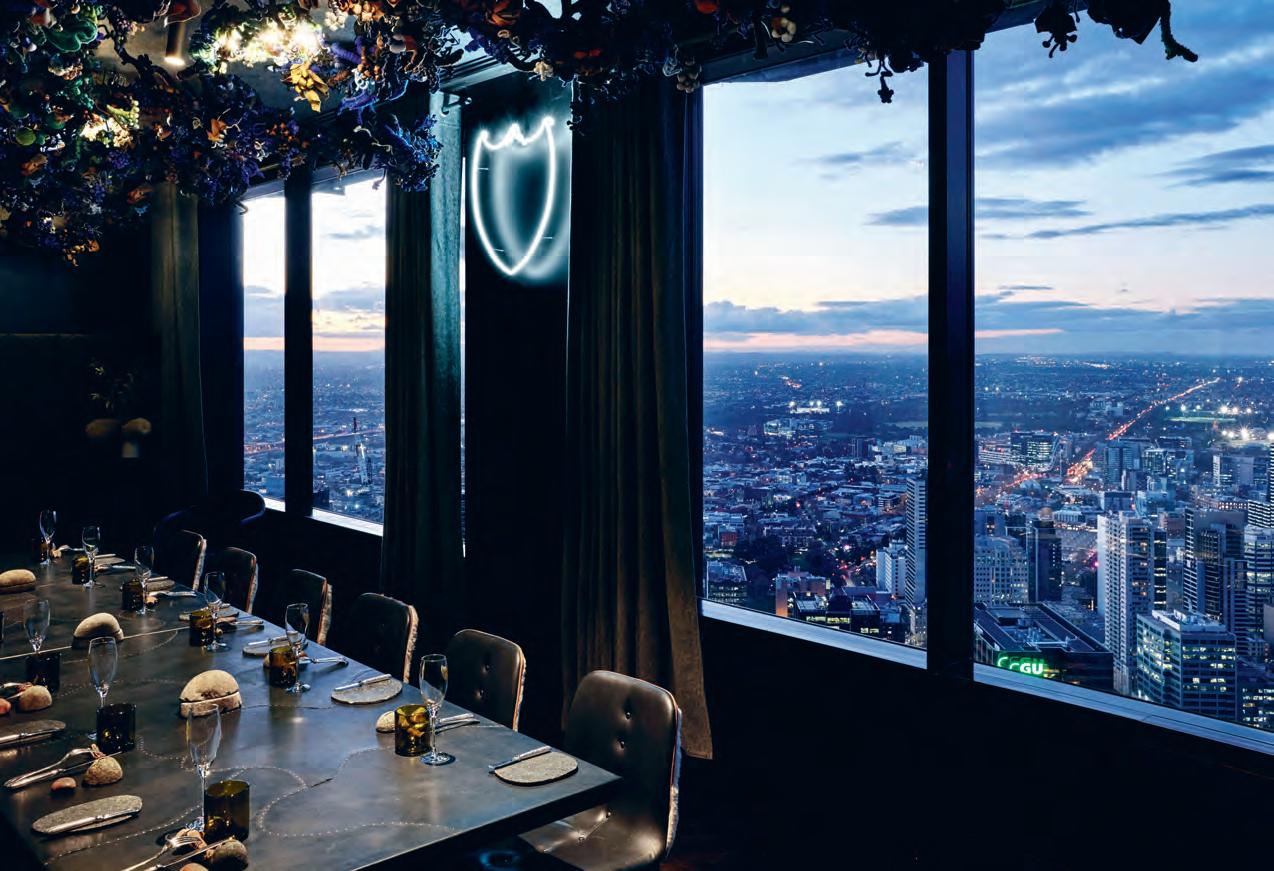
opposite | Hiromi tango adding tHe finisHing toucHes to Her ceiling installation at Vue de monde. aboVe & following | tHe exclusiVe priVate dining room is 55 fligHts aboVe downtown melbourne. 3 . on location # 183
Composed of hand-sewn otedama – the beanfilled bags Japanese children use to play a game akin to what we know as Jacks – lush grapeshaped baubles, chunks of kangaroo skin and sinews of hewn wire, Tango’s installation is a viscous, vinous celebration of the sparkling wine-making process codified by the Benedictine monk, Dom Pierre Pérignon in the late 17th Century.
It’s a suitably rarefied environment for an incredibly precious tipple, the champagne Dom Pérignon has christened Plénitudes, aka P2. Asked about the acquisition price tag of her oneoff installation, Tango demurred then quipped, “I’m not a budget cook!” Which is just as well really, since Vue de Monde is far from cheap eats. As for the Dom, it is available in a new drinks dispenser in the lobby level of the Rialto Tower which houses the restaurant. Price of the chunky brass booze token available on request. But if you have to ask, you can’t afford it.
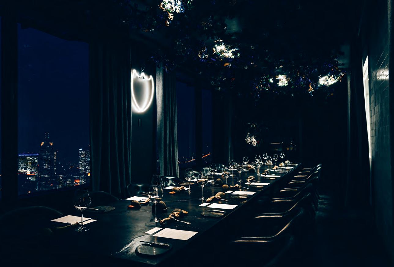 Hiromi Tango is represented by Sullivan+Strumpf, Sydney.
issue #38 habitusliving.com
Tango’s installation is a viscous, vinous celebration of the sparkling wine-making process codified by the Benedictine monk, Dom Pierre Pérignon in the late 17th Century.
Let’s Talk About ‘IT’
Picture-perfect Precision
We all want ‘it’ – that magical moment when we’re able to make perfection look absolutely effortless. After all, we seek to design our homes with a degree of confident self-assuredness so they appear as though they were always meant to be just so, that they couldn’t ever appear otherwise.
To achieve ‘it’, however, we need to use materials that are imbued with as much character and personality as ourselves. And, within this space, the enduring beauty and characterful allure of timber proves particularly useful. We need look no further than Handelsmann + Khaw’s recent Hunters Hill House – a quietly glamorous residential project that is brimming with so much ‘it’ that it’s taken home three of Australia’s most prestigious residential design awards. Recalling a mix of Northern European primitivism and contemporary minimalism, the home is an elegy
to the inherent luxury of materials: lovingly aged metals, marble rich in veining and detail, and an inspired palette of timbers from seemingly every corner of the globe. To bring otherwise disparate material elements into one holistic scheme, the designers used Precision Flooring’s engineered Massivo oak, finished in smokey Ardesia to forge a narrative that runs throughout the home to connect its various communal and private enclaves.
Reflecting a particularly modern orientation to thoughtful living, the home emerges as a retreat into the consciousness of a total sensory profusion, perfectly in keeping with the sensibility of its residents. Precision Flooring understand that our homes are reflections of ourselves and, as such, each of their engineered timber boards across their entire portfolio carry a unique and indisputable personality.
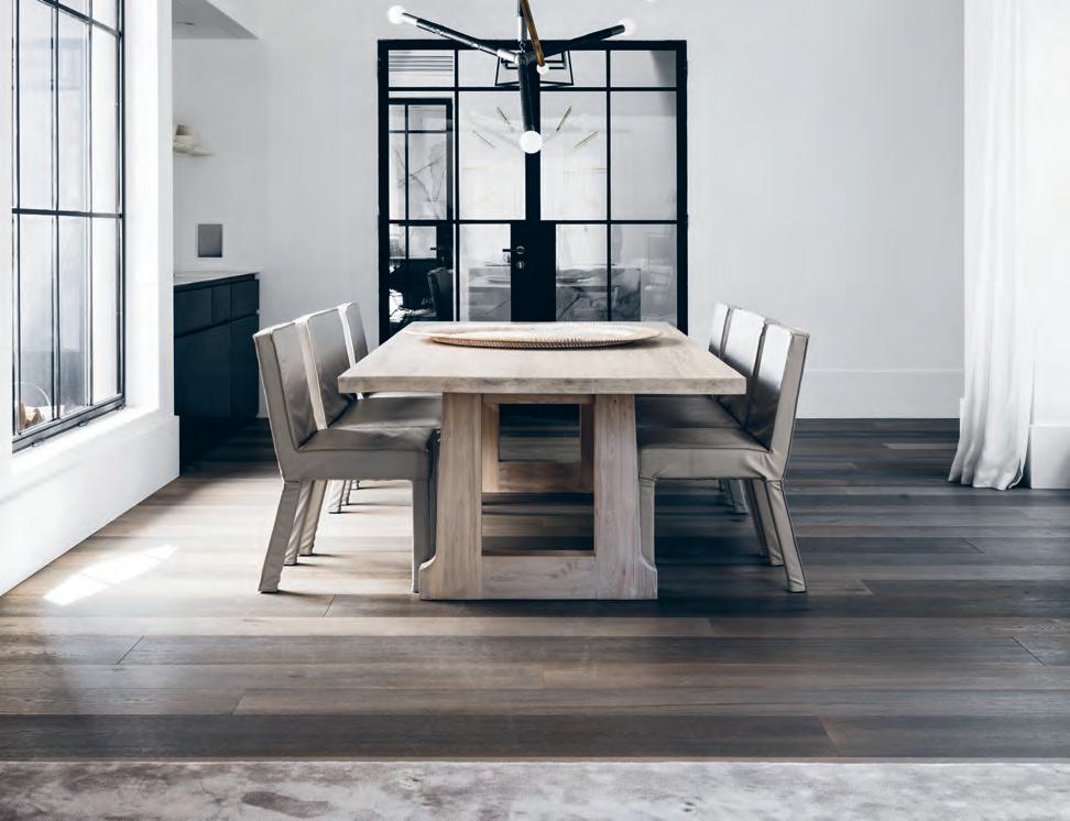
habitus promotion › Precision Flooring #185 issue #38 habitusliving.com above | Precision Flooring’s engineered Massivo oak, Finished in ardesia.
Precision Flooring | precisionflooring.com.au
Playful House
ARCHITECT Martin Friedrich Architects
BUILDER 1186 Construction and Development
LAnDsCApIng Gill’s Landscapes
sTAIRCA s E C o nsTRUCTI o n Slattery; Acquroff Stairs
Martin Friedrich a rchitects (61 3) 9380 7709 mf-arch.com.au
FURnITURE
Custom designed joinery throughout designed by Martin Friedrich Architects and built by Touchwood joinery. Tufty-Time Sofa by Patricia Urquiola for B&B Italia from Space Furniture, Metropolitan Armchair by Jeffrey Bernett for B&B Italia from Space Furniture, Abaco coffee tables from Meizai, custom rug from RC&D, artwork by Melma Hamersfeld in living room. Sofa by Jardan, Bul floor lamp by Domo, artwork by Kerry Armstrong in second living room. Glove chair from Interstudio, custom designed modular sofa from Surround Interiors, photographic artwork by Derek Swalwell in Rumpus Room. Cut dining chairs and Apta dining table from Cosh Living, artwork by Kerry Armstrong in kitchen. Dream bed and bedside tables by Poliform, Metropolitan Armchair by Jeffrey Bernett for B&B Italia fromSpace Furniture, Boule lamp from Hub furniture in master bedroom. Apta table, Illum armchair and Coast Isla beanbags from Cosh Living, B&B Italia Canasta Armchair by Patricia Urquiola for B&B Italia from Space Furniture outside.
LIgHTIng
Pendant light fittings from Gallotti&Radice. Downlights from Lights & Tracks. Entry wall lights by ISM.
FInIsHEs
Staircase designed by Martin Friedrich
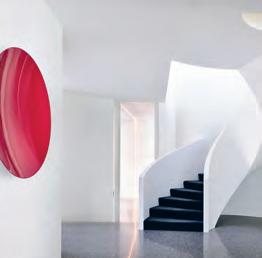
Architects and built by Slattery & Acquroff. Custom mirror (at mezzanine) designed by Martin Friedrich architects and constructed by 1186 Construction and Development Carpet from RC&D. Timber veneer from George Fethers. Calacatta benchtop from SMG Stone. Mosaic tiles from Artedomus. Imperite in Dulux, Whisper White half strength semi-gloss finish. Polished concrete from Outback Concrete; finished by Highend Polished Concrete. Walls and ceiling in Dulux Whisper White half strength. Decking by FutureWood.
FIXED & FITTED
Tapware from Elite Door & Tap Hardware. Miele & Qasair appliances from Michael’s Appliance Centre. Apaiser basins and bathtub. Windows by Alfa Glass & Aluminum. Gas fireplace from Real flame. Gates provided by HIBA Design & Construction.
Hidden Studio
ARCHITECT Harley Graham Architects
DEsIgn/pRoJECT ARCHITECT Maxime Beaur
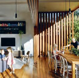
BUILDER Garry Harvey
EngInEER Philip Wallace
JoInERy Stevens joinery
h a rley Graha M a rchitects (61 2) 6680 9690 harleygraham.com
FURnITURE
Timber and leather armchair by Worn Store.
FInIsHEs
C orten external cladding from Neil Mathie. Roofing from Colorbond. Aluminum windows and doors from AWS, Vantage system. Harwood blackbutt cladding supplied by Sly Bros. Ceasarstone stone bench top. Tiling from Essence Tile & Stone.
FIXED & FITTED
Pitfire fans from Haymans. Bathroom fixtures and fittings from Reece.
Gresham Street House
ARCHITECT Jackson Teece
BUILDER Allen Brothers Construction sTRUCTURAL EngInEER Inertia Engineering pooL Performance Pools
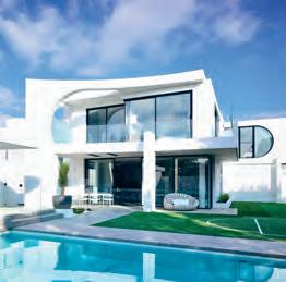
InTERnAL JoInERy Darra Joinery
Jackson t eece (61 7) 3236 2771 jacksonteece.com
FURnITURE
Valby dining chairs by Feelgood Designs from Janie Collins Interiors. Stools by Hunt Furniture. About A Chair by HAY from Cult. Eames LCW chair from Living Edge. Vittoria lounge chairs, Como marble coffee table, Ethnicraft Nordic bed, bedside tables, dining table and credenza from Globe West. Rug from Bayliss Rugs. Navy outdoor chairs from Emeco.
LIgHTIng
L ighting from Caribou, Wever & Ducré and Masson for Light.
FInIsHEs
NAVLAM Sandblasted New Age Veneers cabinetry and paneling, Moon Maximum Porcelain rear benchtop and splashback from Artedomus, Carrara feature benchtop from CDK Stone in kitchen. Atrriga tiles from Ace Stone + Tiles, Moon Maximum Porcelain benchtop from Artedomus, Carrara tiled splashback in bathroom. Internal paint finish in White on White and external paint finishes in White on White and Whisper White from Dulux. Solid flooring, decking, batten screens and structural timber in Spotted Gum. Feature blades in Western Red Cedar. Pool fence from Thump Balustrades. Pool and entry paving from Urbanstone. Louvres from Breezeway. Pool tiles from Pool Tile Company.
FIXED & FITTED
Oven and cooktop from Gaggenau. Dishwasher from ASKO. Rangehood from Neff. Fridge from Fisher & Paykel. Anthracite sink from Blanco Appliances. Tapware and shower heads from Phoenix Tapware. Hardware from Blum. Aura freestanding bath, Cube and Sunstone sinks, and Urbane rimless toilets from Caroma.
Dress it up or play it down, here are the pieces that turned these houses into homes.
It’s all in the Details
issue #38 habitusliving.com
Everyone’s House House with Shadows Mixed Use House
ARCHITECT Matt Gibson
Architecture + Design
Matt Gibson a rchitecture & DesiGn (61 3) 9419 6677 mattgibson.com.au
FURNITURE
Moller #26 table and Moller #77 chairs from Great Dane Furniture. Kamuy dining arm chairs by Naoto Fukasawa for Conde House from Apato. Rock Paper Scissors exhibition armchair and footstool by Jaime Hayon for Fritz Hansen from Cult. Metropolitan 14 chair by Jeffrey Bernett for B&B Italia from Space Furniture. Slow armchair and ottoman by Ronan and Erwan Bouroullec for Vitra from Space Furniture. Lady chair by Marco Zanuso for Cassina from Cult. Jil table and Jak chairs by Justin Hutchinson from Tait. Challenge desk by Peter Maly for Conde House from Apato. Wing Lux Design desk by Kiyoshi Sadogawa for Conde House from Apato. Wood Bikini desk chair by Werner Aisslinger for Moroso from Hub. J104 desk chair by Joergen Baekmark for HAY from Cult. Bend-Sofa and Husk bed by Patricia Urquiola for B&B Italia from Space Furniture. New Order sideboards by HAY from Cult. DLM (Don’t Leave Me) bedside table by Thomas Bentzen for HAY from Cult. Titanes sideboard by Antonio Citterio for Maxalto and B&B Italia from Space Furniture. Phoenix coffee tables by Patricia Urquiola for Moroso from Hub. Adam stool by Toke Lauridsen for Frama Copenhagen from Great Dane Furniture. Slit Table by HAY from Cult. Button Oval Side Table by Edward Barber and Jay Osgerby for B&B Italia from Space Furniture. Mark Table by Mark Thorpe for Moroso from Hub. Bon stools by Chiba Tadashi for Miyazaki Isu from Apato. Bolle side table/stool by Nathan Yong for Living Divani from Space Furniture. Large Afghan Modern Kelim (Stripes) and small Turkish Vintage Damali rugs from Cadrys. Reindeer hide from Great Dane Furniture. Mangas Spaces Rhombus rugs by Patricia Urquiola for GAN from Hub. Jar With Inside Glass Jar by Dan Yeffet for When Objects Work from Hub. Brick clock by Arno Ruijzenaars, Dennis Ruijzenaars and Erwin Termaat for Leff Amsterdam from Hub. White tray from Space Furniture. Copper tray from Meizai.
Spine clipboard folders and Kaleido tray by Clara Von Zweigbergk for HAY from Cult. True Colours vases by Lex Pott for &tradition from Great Dane Furniture. Mokulock blocks from Hub. Copper round and Fan stool by Tom Dixon from Dedece. Rock Paper Scissors exhibition bowl by Ruth Levine from Fanuli. Timber bowl from Coupe-cone collection by Michael Verheyden for When Objects Work from Hub. Tela collection glassware by Silo Studio for Wrong for HAY from Cult. Pot plant from Meizai. Plant from MGA+D. Ecru Twill Check throw by Cheryl and Barry Eldridge for Stansborough from Hub. Green cushion from Cult. Yellow cushion from MGA+D. Printed cushion by Nathalie Du Pasquier and Richard Woods for Wrong for HAY from Cult. Splinter mirrors by Nendo for Conde House from Apato. Bedlinen by Hale Mercantile.
LIGHTING
Aim pendant by Ronan and Erwan Bouroullec for Flos from Euroluce. Twiggy yellow floor lamp by Marc Sadler for Foscarini from Space Furniture. Captain Flint, Copycat and IC Brass floor lamps by Michael Anastassiades for Flos from Euroluce. Flos wall light from Euroluce. Loft floor lamp by Jieldé from Euroluce. Studioilse floor lamp by Ilse Crawford for Wästberg from Euroluce. Caravaggio wall lights by Cecilie Manz for Lightyears from Cult. Atollo table lamp by Vico Magistretti for Oluce from Euroluce.
FINIsHEs
Monument paint from Dulux. Her Majesty and Soie Végétale wallpapers by Elitis from Seneca Textiles.
ARTWoRK
Molletta Bench sculpture by Baldessari e Baldessari for Riva 1920 from Fanuli. Sculpture by Anna Varendorff from Hub. River Bend, 2015, sculpture by Peter Coles from The Australian Galleries. Pretty in Pink by Laelie Berzon. Dreamer, 2016, and Peak (White Cross), 2016, by Brent Harris. Fictions #2, 2013, and Apparition #2, 2009, by Andrew Browne. French Canadian Naturalist by F Renders from Aspen Gallery. Battlefield Nostos, 2013-2016, by Barbara Kitallides. Amphitheatre: Crystal Caves, 2016, by Katie McKinnon. Untitled by Rowena Martinich from Mark Tuckey.
ARCHITECT RT+Q
C I v I L AND sTRUCTURAL ENGINEER P TS
Consultants
M ECHANICAL AND ELECTRICAL EN GINEER
A E&T Consultants Pte.
Q UANTIT y sURv E yo R WS Surveyorship Pte. Ltd.
B UI LDER B uilders Trends Pte Ltd
rt+Q (65) 6221 1366 rtnq.com
FURNITURE
Lounge and dining chairs from Flexiform.
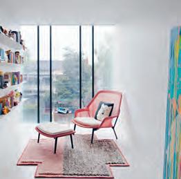
LIGHTING
Architectural lights from Light Basic. Pendant and feature lights from Louis Poulsen.
FINIsHEs
F looring in solid American Walnut and White Oak. External timber cladding in solid Chengal. External stone finishes in natural granite.
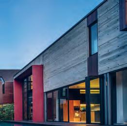
FIXED & FITTED
Bathroom fittings from Wan Tai & Co and Gessi. Kitchen appliances from Duravit, Brandt and Bosch.
ARCHITECTs Kohei Yukawa + Hiroto Kawaguchi BUILDERs V ICO
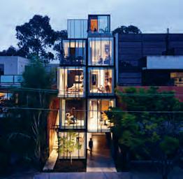
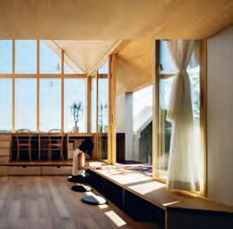
sTRUCTURAL ENGINEERs tmsd
Kohei Yu K awa yukawa-design-lab.com
hiroto KawaGuchi 1110.design
FURNITURE
Furniture from MUJI.
LIGHTING
Lighting from Flame.
FINIsHEs
Wall clothes from TOLI. Flooring from IOC.
FIXED & FITTED
Bathroom appliances from LIXIL.
3 . on location # 187
habitus on the ground...
Habitus LiveLife Design Hunter® Seminar Series
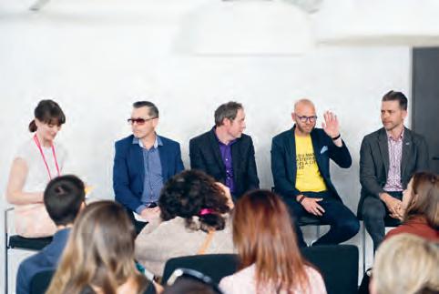

At Sydney Indesign 2017, Habitus sought to explore and elaborate on key concerns plaguing the design and architecture sphere.
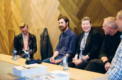

Senior members of our editorial staff were joined by industry heavyweights and designers in the know to discus the following, Size and the City: Our Developers Have Some Explaining to do; Design Identities of Australia: Communities in Design; and Talking About Your Generation: Intergenerational Co-Habiting and Residential Design.
Habitus Living habitusliving.com
Indesign: The Event indesigntheevent.com
photography by tim da rin
issue #38 habitusliving.com
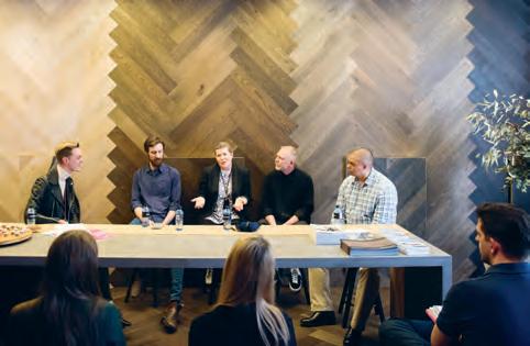

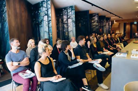


# 189
Discover beautiful products

Meet inspiring people
Indulge in architecture and design
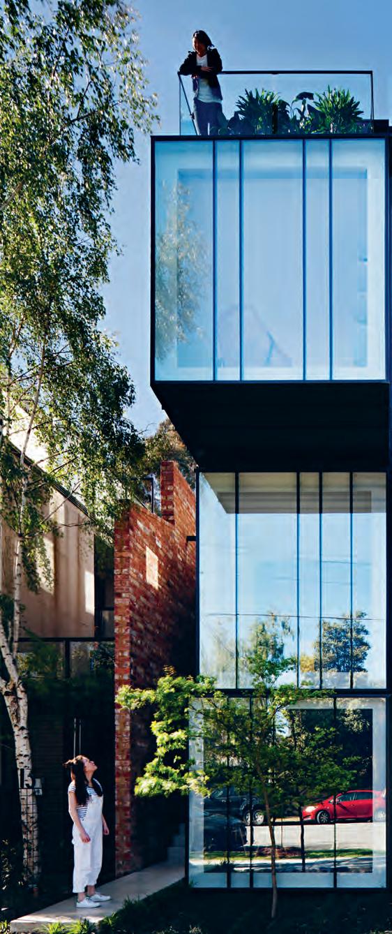
Across Australia, New Zealand, South and South-East Asia
The online community for the Design Hunter®


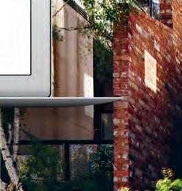

Website | habitusliving.com

Facebook | habitusliving

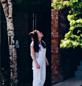
Pinterest | habitusliving
Instagram | @habitusliving
Twitter | @habitusliving
 Mixed Use House
Photography by Shannon McGrath
issue #38 habitusliving.com
THE TEAM AT HABITUS MAGAZINE THANKS OUR ADVERTISERS FOR THEIR SUPPORT. USE THE DIRECTORY TO SEE WHAT PAGE A SPECIFIC BRAND IS FEATURED ON, AND VISIT THEIR WEBSITE TO LEARN ABOUT THE PRODUCTS AND SERVICES THEY PROVIDE.

Habitus magazine is available at newsagents and bookstores across Australasia, South-East Asia, the USA, Canada, Europe, South America and the Middle East. Habitus is published quarterly in March, June, September and December. To subscribe securely online visit habitusliving.com/magazine or email subscriptions@indesign.com.au to subscribe or request a full list of locations where
magazine is available.
Habitus
# 191 Abey 112 abey.com.au Apaiser 016 apaiser.com Careers Indesign 020 careersindesign.com.au Colorbond 075 colorbond.com/matt Cult 006 cultdesign.com.au Domayne 004 - 005 domayne.com.au Elica 063 shop.elica.com.au Euroluce 054 - 055, 082 euroluce.com.au Gaggenau IFC - 001 gaggenau.com/au iittala 031 iittala.com.au INDE 064 - 065 indeawards.com Indesign Media Asia Pacific 125 indesign.com.au Methven 171 methven.com/au/aurajet Minosa IBC minosadesign.com Neolith 014 - 015 neolith.com.au Own World 023 ownworld.com.au Parisi 021 parisi.com.au Poliform 038 - 039 poliformaustralia.com.au Precision Flooring 185 precisionflooring.com.au Reece 012 - 013 reece.com.au/bathrooms Rogerseller 053 rogerseller.com.au/appointment Royal Oak Floors 111 royaloakfloors.com.au Sensa by Cosentino 150 - 151 sensabycosentino.com Silent Gliss 019 silentgliss.com.au Silestone by Cosentino 024 silestone.com Space Furniture 080 spacefurniture.com Spence & Lyda 076 - 079 spenceandlyda.com.au Stylecraft 009, 162 - 163 stylecraft.com.au Subscriptions 181 habitusliving.com/subscriptions Sunbrella 002 - 003 sunbrella.com The Hour Glass OBC thehourglass.com tongue n groove 010 - 011 tngflooring.com.au USM 037 usm.com Vola 161 vola.com Walter Knoll 033 walterknoll.com.au Winning Commercial 135 winningcommercial.com.au Winspear 149 winspear.com.au Wyalla Studio 040 wyallastudio.com.au Zip 035 zipwater.com
Your map to where the stories in this issue come from where is available
world
issue #38 habitusliving.com
Coopers Shoot #126
Melbourne #114
Milsons Passage #56
Singapore #164
“Architecture is the thoughtful making of space.”
LOUIS KAHN


 Culinary culture starts sooner than that.


 Architect TFAD Photographer: Tom Ferguson

 Roca In-Wash Inspira Smart Toilet


 Methven Aio Aurajet Rail Shower
LAUFEN Val Round Counter Basin
Grohe Smart Control Shower
AXA Wild Rimless Back To Wall Toilet Pan


 Beton
Basalt Grey
Basalt Black
Iron Grey
Iron Moss Iron Copper


 Twelve Kitchen, design Carlo Colombo & CR&S Varenna.


 Tex T Stephen tOdd


 text Sandra Tan | photography der ek Swalwell


 text Sandra Tan | photography a n dy Macpher Son


 Featured | Santiago Lounge, Armchair & Campo Rug designed by Claesson Koivisto Rune, Ruler Coffee Table designed by Gordon Guillaumier
 TexT Darlene Smyth | PhoTograPhy m a S a no Kawana


 Hiromi Tango is represented by Sullivan+Strumpf, Sydney.


 Mixed Use House
Photography by Shannon McGrath
