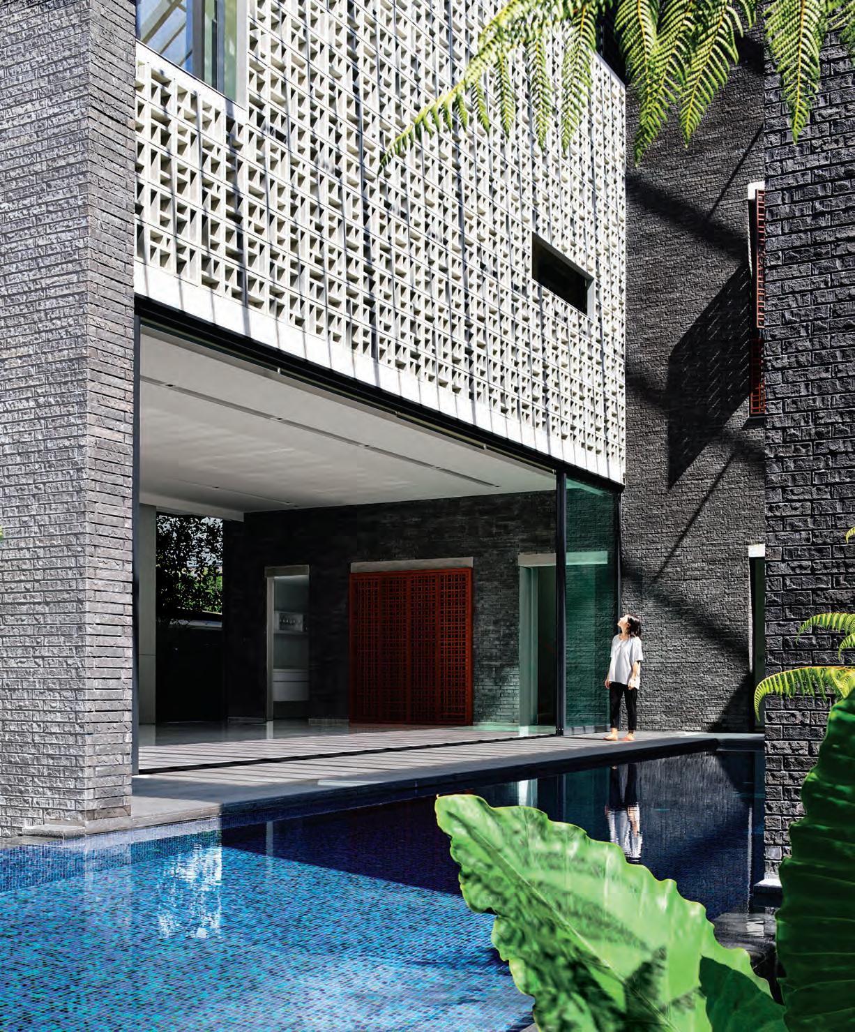
Tadao Ando and Penelope Seidler headline the icons issue. At the hands of HYLA Architects, Siglap Plain casts a monolithic shadow in Singapore. living in design #39 APriL – mAY | 2018 AUD$16.95 | NZ$16.95 | USD$17.95 CDN$18.95 | GBP£9.90 | SGD$11.95 39 9 771836055007
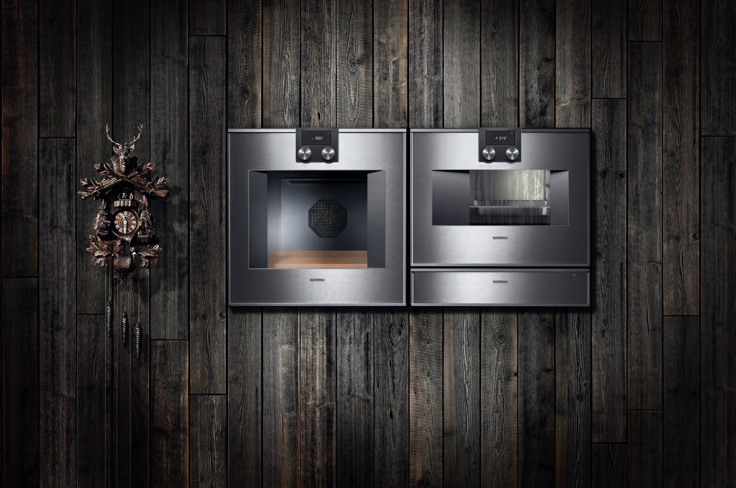 One of the most successful innovations to come out of the Black Forest. And a cuckoo clock.
The difference is Gaggenau.
In the Black Forest, some things never change – others have been evolving since 1683. Innovation has become a tradition for us ever since our company was founded as a hammer and nail works, along with unique design that is highly regarded the world over. Take the ovens 400 series, shown here with oven, combi-steam oven and warming drawer – a combination that unites cutting-edge technology and premium materials with superior design. Our appliances have been constantly evolving since 1683. The only thing that stays the same is that they just keep looking better and better.
For more information, please visit www.gaggenau.com/au.



August 9 – 10 2018
Carriageworks, Sydney
Design. Products. Knowledge.


WWW.FRONT.DESIGN
Powered by Strategic Partners
The future of the commercial and hospitality sectors is here.


When design is exceptional, there’s always a story. Let’s get educated on the industry in which we have positioned ourselves.
26 DESIGN NEWS
In the recent past there has been some world-class design coming out of the Asia Pacific – and the work just keeps getting better. In case you’ve missed it we’ve pulled together pieces of which you can’t afford not to take note.
At various stages of their respective careers, we speak to creatives across the region. What are their motivations and where are their inspirations found?
40 G OSIA PATEK
Making waves amongst the international fashion community, Wellington-based label Kowtow is spreading the message that fairtrade fashion doesn’t equate to a compromised product. Leading by example, founder Gosia Piatek began her journey over decade ago – before sustainability was ‘in’.
52 TADAO ANDO
He’s undoubtedly one of the region’s most notable, internationally recognised architects – and yet Tadao Ando has also got to be one of our most humble. We speak to the man himself to learn about his influences, his convictions and the legacy he hopes to leave behind.
66 L IM + LU
They say you shouldn’t mix business with pleasure; you shouldn’t test relationships by working together; and work–life balance is key. Vincent Lim and Elaine Lu, partners in life and work, threw caution to the wind proving themselves exceptions to the rules. And although we can’t condone ignoring a work–life balance, we can certainly understand loving what you do so much it’s hard to switch off.
#39
40 26
Icons
82 penelope seidler
adamant never to be just “the wife of an architect” we go on a journey with penelope s eidler from past to present.

99 iConiC H e ritage arCH i te Ct ure a s s ydney’s city continues to sprawl, there is one urban developer who instead chooses to adapt and restore iconic Heritage buildings of yesteryear
107 m id- CenturY modernism in asia m id-Century design and architecture may have been taken at face value in a u stralia and ne w z e aland, but the movement’s reception in s/s e a s ia had a slightly different path forward .
Iconic and traditional architecture of the recent and not-so-recent past continue to influence the buildings of today. Here, we explore how.
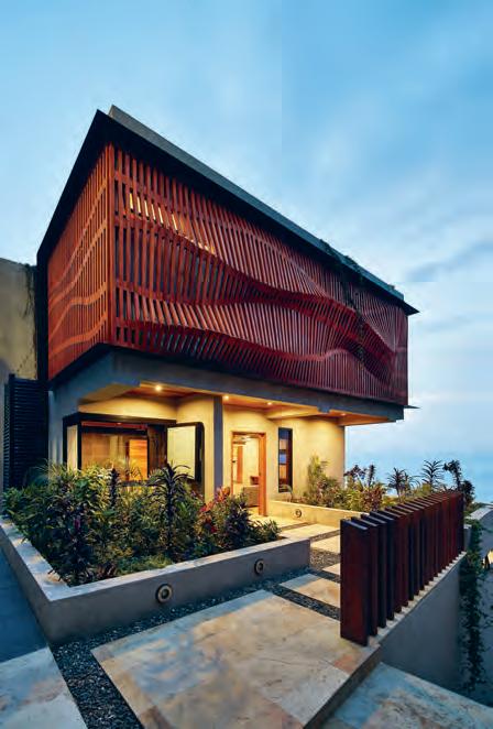
114 siglap plain HY l a a rchitects ensures the needs for connection and privacy are met in this monolithic residence in singapore.
126 d oorzien House a nomadic lifestyle has characterised the relationship between s h aron and Bob, residents of d o orzien House. Working closely with Bijl a r chitecture they have established their roots in s ydney’s lower north shore.
138 sm all House
Q ueensland-based studio Workshop has designed and built a residence in port moresby, pa pua ne w g u inea, to challenge the local architectural vernacular.
148 t W i n toW n House
i n melbourne, creative couple Jesse ( dKo) a nd s eada (sla B) join forces to create a lasting impression, and inimitable light play, along Collingwood’s streetscape.
164 r e d H ill House matt Kennedy of Brisbane-based studio a rcke, saw red Hill House as an opportunity to play with the tropes of a typical Queenslander.
174 t H e K atsuri
pa rt luxury resort, part conservation effort, t he Kasturi resort in ma laysia comes at the hands of iconic Kuala l umpur-based, si ngapore-born architect Hijjas Kasturi and his daughter, a ngela.
#39
138 82



level
Street
QLD 4006
Mezzanine
171 Robertson
Fortitude Valley,
P | +617 3216 1551
St
1f Danks
Waterloo, NSW 2017 P | +612 9699 1131
Street
575 Church
Richmond, VIC 3121 P | +613 9427 7000 FOR LOVERS OF FINE OAK
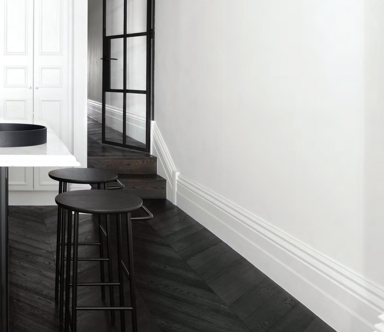
Designer: Biasol Design Photographer: James Morgan
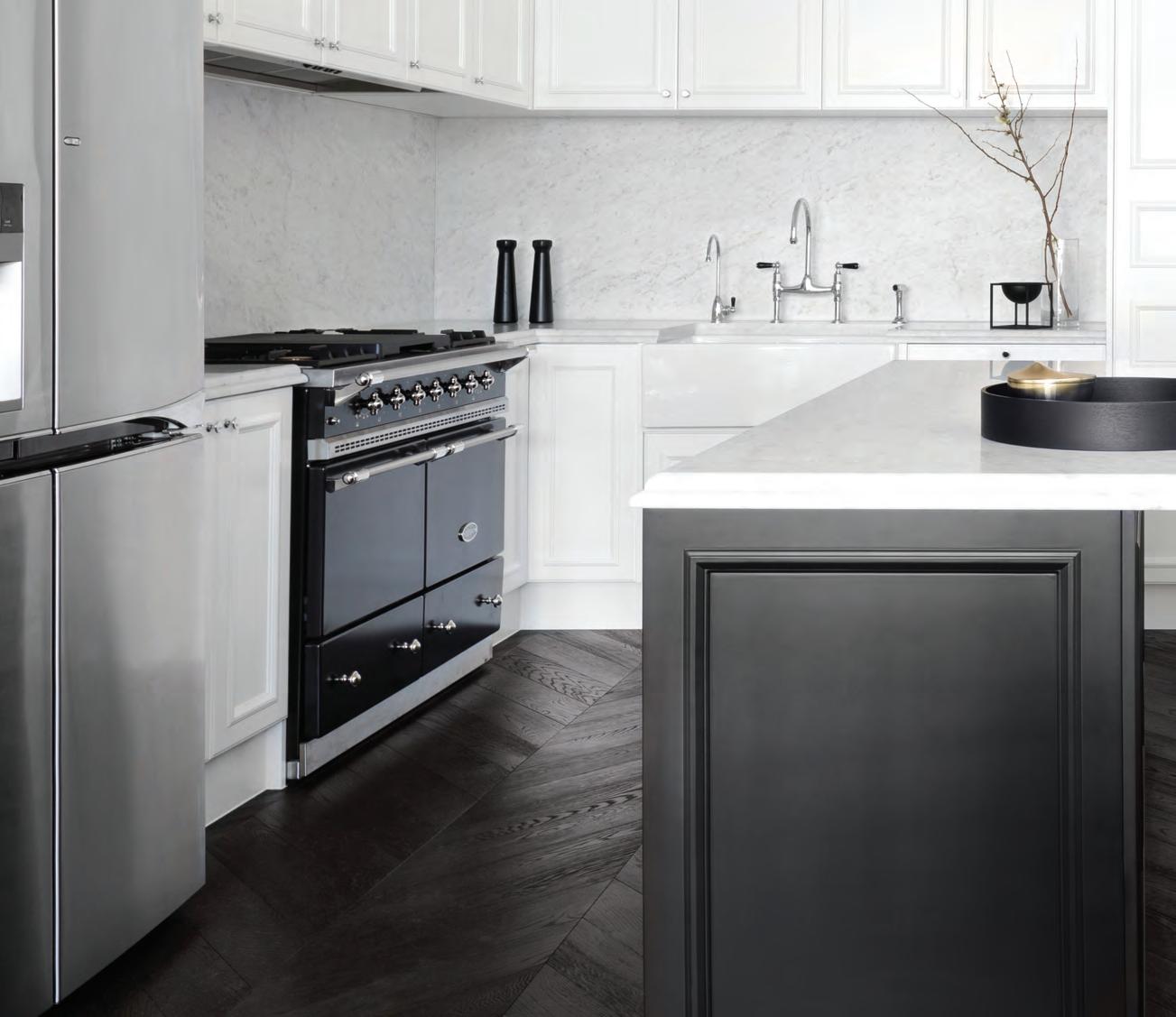
Chevron Parquetry
A sophisticated design gesture, our chevron parquetry is a perennial favourite that offers spaces a harmonious fusion of old luxury and contemporary graphic charm.
Tongue n GrooveTM floorboards are designed with three solid layers of fine European Oak for optimal finish, longevity and structural integrity.
tngflooring.com.au


parisi.com.au SHARP Collection
the first word
Where does our fascination with fame come from? And why, in this century and the latter half of last, has it become such a dirty word? In the past, historic figures – celebrities of their day – received their status for their contribution to society. They were pioneers, leaders, explorers, philosophers, mathematicians and scientists.
Welcome to the 21st century. The social media phenomenon has given us access to the rest of the world and suddenly it’s easier than ever to build your profile and spread your message – whatever that message may be. Social media ‘influencers’, ill-advised yet strongly opinionated business leaders, misguided actors and actresses, and others of their ilk have cheapened what it means to be recognised.
In this issue, we want to celebrate the icons of our industry, to give them the elevated level of recognition they deserve for their contributions to the region. Tadao Ando (page 52) is one of our region’s most humble architects, in his work as much as in his ‘celebrity’. The words that struck me the most this issue came from the man himself, reminiscing on his iconic Row House, a house that features neither heating nor air conditioning. He says: “When the client came to me and asked me what he would do when it became too cold in the house, I told him to wear a sweater. When he asked me what would happen if it got even colder, I told him to wear many sweaters.”
Penelope Seidler (page 82) has made it her life’s mission to live and breathe architecture, and with the recognition she’s received been an adamant patron of the arts.
To the emerging architects, designers and creatives among us we want to inspire confidence and foster their future journey; to help them achieve all that appeals.
 Holly Cunneen | Deputy eDi tor
To idolise, or not to idolise…
habitus takes the conversation to our contributors discovering their inspiration and design hunter® journeys
KatheR ine lu UNENCUMBERED KIRRIBILLI #126
With a passion for presenting and honouring smaller living spaces, Katherine Lu’s photography documents how the built environment can shape and influence our lives. As apartment living, especially amongst millenials, becomes the norm, Katherine is hopeful that future movements in furniture and interior design reflect the needs and capacity of compact spaces.

Paul McGillicK NOT JUST A RESORT #175


“Having dreamed of being an architect as a kid, I eventually arrived there via the South Pole,” says Paul McGillick. Becoming an architectural writer after his left handedness halted his high school tech drawing interests, Paul specialises in the fields of architecture, art and design. He has authored a number of architecture and design books and innumerable essays and articles on design.
StePhen cR a fti THINKING OUTSIDE THE BOX #148
Being the author of over 40 books, architecture and design expert Stephen Crafti is more than well versed in the language of design and its evolution. Going forward, Stephen sees a possible resurgence of “art nouveau getting stronger”. He continues: “Relatively short-lived, this period brought together talented designers and artisans from a diverse range of disciplines.”

Belinda aucott

THE QUIET ICON #52
“Increasingly I feel Australia is known for pioneering cross collaborations in art and design,” says Belinda Aucott, a design journalist and media consultant whose career has seen her active across France, Italy, the UK, and of course her native Australia. Suitably, it’s international collaboration that helps drive her work, such as with the Danish Agency for Culture on the 40 year celebration for the design of the Sydney Opera House.

ia n teh
NOT JUST A RESORT #175
Photographer Ian Teh has earned international acclaim for his photography work documenting evolving cityscapes and changing lives. The publisher of three monographs, Ian’s work is part of the permanent collection at the Los Angeles County Museum of Art, The Museum of Fine Arts, Houston, and the Hood Museum in the USA.
ta MSin BR a dSh aw A FINE ROMANCE #66
Tamsin Bradshaw considers herself an international citizen. The half-Australian, halfKiwi design journalist has lived in Hong Kong, Sydney and Tokyo, as well as having worked and studied in Shanghai and Antwerp. Now back in Hong Kong, Tamsin sees the future of design as green, with “products that are recycled, recyclable and that are made with minimal carbon footprint – that’s got to be the next step”.
LADY PENELOPE #82
Tony Amos began his career in New York City assisting some of the best photographers in the world. For over a decade now he has been based in Austinmer, just south of Sydney, shooting lifestyle, interiors, portraits and still life. Tony has been published all over the world, with the common thread in his work being a subtle, naturalistic dedication to ambiance and character.
CHANGING THE CONVERSATION #40
Born in rural France – but based in Wellington, New Zealand, since 2008 –photographer and graphic designer Yoan Jolly has been influenced equally by the 20th century masters of modernist design as much as he has been the changing face of contemporary design. The future of design for Yoan is one of respectful sustainability. “This means sourcing sustainably, ensuring traceability of materials, respect of human rights in the production chain, seeking information about every step of the process and not cutting corners.”
PITCH PERFECT #114
Yvonne Xu is an art, architecture and design writer and editor based in Singapore. Her design reviews and art criticism have been published across multiple books, and is driven by a sense of optimism in design, with a focus on “the growing interest in wellness, and addressing the health of our land,” Yvonne says. “If carefully attended to, I believe this would be a key movement to take us to the next golden age.”

SG 5600 CURTAIN TRACK SYSTEM
SILENT, FAST AND POWERFUL
The new Silent Gliss 5600 system provides benchmarking technology based on outstanding Swiss innovation which meets the complex demands of modern architecture.
The world’s most silent curtain track system.
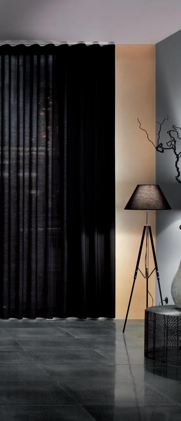
silentgliss.com.au

 Tony Amos
yoA n Jolly
y vonne Xu
DIRECTING DESIGN INDUSTRY PROFESSIONALS TO THE RIGHT JOBS IN AUSTRALIA AND ACROSS ASIA
3D VISUALISER ACCOUNT MANAGER ADMINISTRATION
AGENT/DISTRIBUTOR
FIND
BLOGGER
BUSINESS DEVELOPMENT
CAD DESIGNER
CAMPAIGN MANAGEMENT
CUSTOMER SERVICE
DESIGN MANAGER
DESIGNERS EDITOR
EVENTS CO-ORDINATOR
GRAPHIC DESIGNER
INDUSTRIAL DESIGNER
INTERIOR DESIGNER LECTURER
LIGHTING SALES
PERFECT
MEDIA ExECUTIVE
NATIONAL SALES MANAGER
OPERATIONS MANAGER
PA / SALES SUPPORT
PHP DEVELOPER
PR ACCOUNT MANAGER
PRODUCTION MANAGER
PROJECT MANAGER
SPECIFICATION
RETAIL INTERIOR DESIGNER SALES
SHOwROOM MANAGER
SHOwROOM SALES CONSULTANT
STATE MANAGER
STUDIO LEADER
TECHNICAL OFFICER
wAYFINDING DESIGNER
ARCHITECTURE
DESIGN
INTERIORS
MEDIA
AGENCY
ADVERTISING
RETAIL COMMERCIAL
FURNITURE
LIGHTING
TEx TILES
YOUR RESIDENTIAL
ARCHITECTURE
DESIGN
INTERIORS
MEDIA
AGENCY
PUBLISHING
RETAIL COMMERCIAL
FURNITURE
LIGHTING
TEx TILES
PRODUCT
RESIDENTIAL
JOB
EDUCATION
DESIGN
INTERIORS
MEDIA
ADVERTISING
RETAIL COMMERCIAL FURNITURE
LIGHTING
TEx TILES
Chairman / Publisher
Raj Nandan raj@indesign.com.au
dePuty editor
Holly Cunneen holly@indesign.com.au
Gue st Fe ature editor
Stephen Todd stephen@indesign.com.au
se a sia editor
Janice Seow janice@indesign.com.sg
editorial a s sistant
Andrew McDonald andrew@indesign.com.au
Cre ative direCtor
Sylvia Weimer spacelabdesign.com
desiGners
Julia Gee julia@indesign.com.au
Tracey Hein tracey@indesign.com.au
Camille Malloch camille@indesign.com.au
ContributinG W riters
Belinda Aucott, Tamsin Bradshaw, Aleesha Callahan, Stephen Crafti, Rebecca Gross, Paul McGillick, Tamara Simoneau, Yvonne Xu
ContributinG PhotoGr a Phers
Tony Amos, Nirut Benjabanpot, Peter Bennetts, Tom Blachford, Brett Boardman, Scott Burrows, Katherine Lu, Yoan Jolly, Yanni Kronenberg, Michael Nicholson, Michelle Proctor, Fiona Susanto, Derek Swalwell, Ian Teh
m a naGinG direCtor
Kavita Lala kavita@indesign.com.au
a s sistant ProduCtion manaGer
Natasha Jara natasha@indesign.com.au
aCCounts
Ting Zhang ting@indesign.com.au
Cassie Zeng cassie@indesign.com.au on line manaGer Radu Enache radu@indesign.com.au
W eb develoPer Ryan Sumners ryan@indesign.com.au
brand direCtors
Colleen Black colleen@indesign.com.au (61) 422 169 218
Dana Ciaccia dana@indesign.com.au (61) 401 334 133
Cover imaGe Siglap Plain (p.114)
Photography by Derek Swalwell
Head Office
Level 1, 50 Marshall Street, Surry Hills NSW 2010 (61 2) 9368 0150 | (61 2) 9368 0289 (fax)
MelbOu rne 1/200 Smith St, Collingwood, VIC, 3066 SingapOr e 4 Leng Kee Road, #06–08 SIS Building, Singapore 159088 (65) 6475 5228 | (65) 6475 5238 (fax)
HOng KOng
Unit 12, 21st Floor, Wayson Commercial Building, 28 Connaught Road West, Sheung Wan, Hong Kong
indesign.com.au
PRODUCT careersindesign.com.au careersindesign.asia
wEB DESIGNER / DEVELOPER
Media Asia Pacific cannot accept any loss or damage. Please retain duplicates of text and images. Habitus magazine is a wholly owned Australian publication, which is designed and published in Australia. Habitus is published quarterly and is available through subscription, at major newsagencies and bookshops throughout Australia, New Zealand, South-East Asia and the United States of America. This issue of Habitus magazine may contain offers or surveys which may require you to provide information about yourself. If you provide such information to us we may use the information to provide you with products or services we have. We may also provide this information to parties who provide the products or services on our behalf (such as fulfilment organisations). We do not sell your information to third parties under any circumstances, however, these parties may retain the information we provide for future activities of their own, including direct marketing. We may retain your information and use it to inform you of other promotions and publications from time to time. If you would like to know what information Indesign Media Asia Pacific holds about you please contact Nilesh Nandan (61 2) 9368 0150, (61 2) 9368 0289 (fax), info@indesign.com.au. Habitus magazine is published under licence by Indesign Media Asia Pacific. ISSN 1836-0556
issue #39 habitusliving.com
HAB25_CRID_HP.indd 2 25/07/2014 4:51 pm
Printed in Singapore. All rights reserved. No part of this publication may be reproduced, stored in a retrieval system, transmitted in any form or by any other means, electronic, mechanical, photocopying, recording or otherwise. While every effort has been made to ensure the accuracy of the information in this publication, the publishers assume no responsibility for errors or omissions or any consequences of reliance on this publication. The opinions expressed in this publication do not necessarily represent the views of the editor, the publisher or the publication. Contributions are submitted at the sender’s risk, and Indesign
80% OF ZIP HYDROTAP OWNERS DRINK MORE WATER*


We are all aware of the benefits associated with drinking enough water, but despite this, many of us go about our daily lives dehydrated to some degree.

As world leaders in instant drinking water appliances, Zip invented the innovative HydroTap, the smart and essential addition for every kitchen. Our integrated Australian-made appliance combines patented PowerPulse™ boiling and Direct DryChilling with MicroPurity filtration technologies to create pure-tasting boiling, chilled and sparkling water you will love in an instant.


When water is this convenient and irresistible you’ll love drinking more of it. To improve your hydration and your family’s well-being, discover more at zipwater.com Zip HydroTap. Now available in 8 new premium finishes.

*Statistic based on a survey of 354 owners of residential-installed Zip HydroTaps.


THE WORLD’S MOST ADVANCED DRINKING WATER APPLIANCE ZIP HYDROTAP | PURE TASTING | INSTANT | BOILING | CHILLED | SPARKLING
Habitus and our republic of loyal Design Hunters celebrate authentic design as a way of life.
From our base in Australia we seek out the uniqueness of the Asia Pacific – be it interiors, architecture or products –and curate the stories behind the stories.
Join us on our hunt.
Founder, Indesign Media
Raj Nandan
issue #39 habitusliving.com
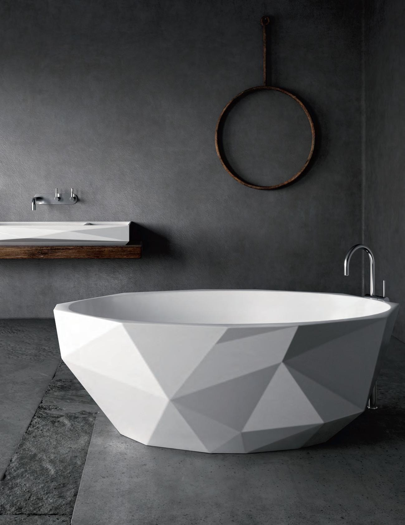


Let us show you what we’ve got










Cool Curves
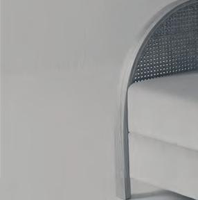
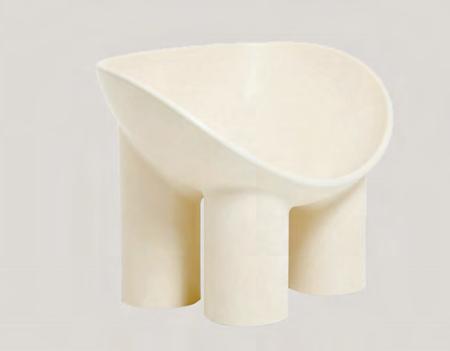
The ROLY POLY dining chair is a fun item made from materials suggesting a certian rawness while still embracing a world of soft lines.
hubfurniture.com.au
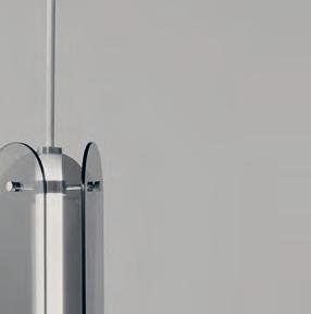
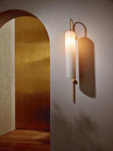
A capsule launch of refi ned lighting, FLOAT recalls the elegance of a bygone era. The elongated proportions of the light, striking coloured glass, and sweeping brass stem marry efortlessly with its contemporary simplicity.
articololighting.com
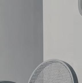
The new BREEZE collection, designed in collaboration between Abalos and Australis Leisure, reimagines the traditional notion of teak outdoor furniture - now repurposed in confi dent, rectilinear form.
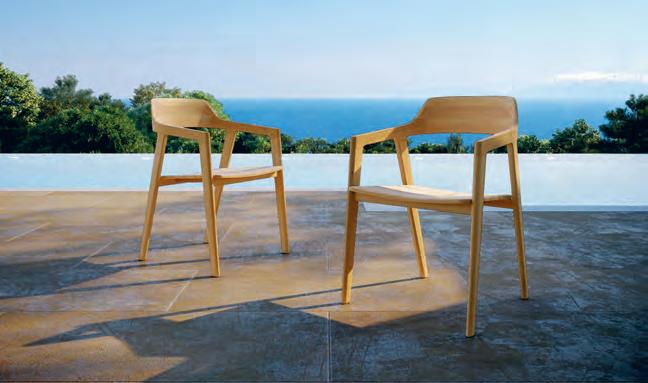
abalos.com.au
australisleisure.com.au
issue #39 habitusliving.com
Made from a solid piece of American Oak, BLOCCHI is a desk friend for the design lover. There to organise while still providing a small amount of visual fl air to a desk, whether singular or grouped together, Blocchi is the desk mate you never knew you always needed.
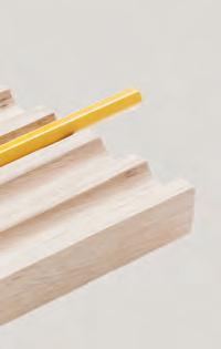
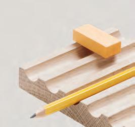
doweljones.com
The PEARLA oyster shucker from South African born, Australian-based Industrial Designer René Linssen, is a stylish and unique knife for opening oysters inspired by a love for the Australian ocean.
 Photography Anisa Sabet
renelinssen.com


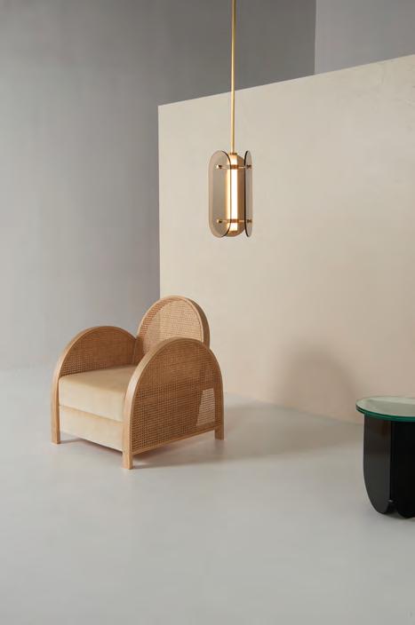
The newly available ARCH Collection is a charming suite that combines traditional and cutting edge techniques with a sentimental heart. The new range includes lighting – a floor lamp, three pendants, a table lamp and a wall light – as well as a unique and comfortable occasional chair, side table and vanity chair, mirror and table.
douglasandbec.com
1 . lightbox # 27
The hard Line is the bottom Line
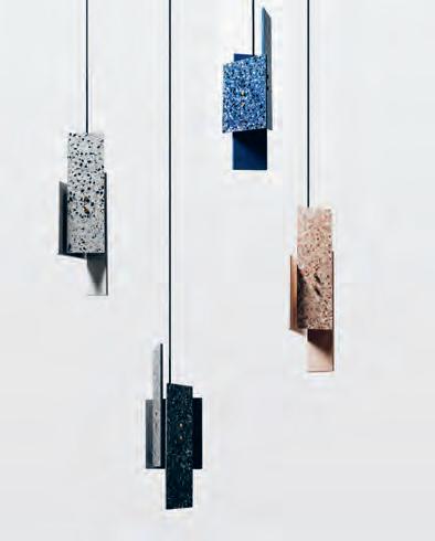
CERAMICS MADE , from China’s progressive design studio Bentu , is a collection of tables, shelving, pendant and wall lights made with pieces of ceramic tiles mixed with concrete to create a speckled terrazzo effect.
remodern.com.au
The ARIAKE Collection is a new Japanese furniture brand from Saga, Japan, and brings together designers from different countries with a common respect for Japanese culture and woodworking. Available exclusively in Australia through Apato apato.com.au


LINEA is a design collaboration between Made By Pen and designer Jim Hannon-Tan. Inspired by Oscar Niemeyer’s National Congress building, this piece of desktop architecture is completely customisable, with the tray acting as a spine to cantilever the separate components, it’s always fit for purpose in the spaces we live, work and play.
madebypen.com
issue #39 habitusliving.com
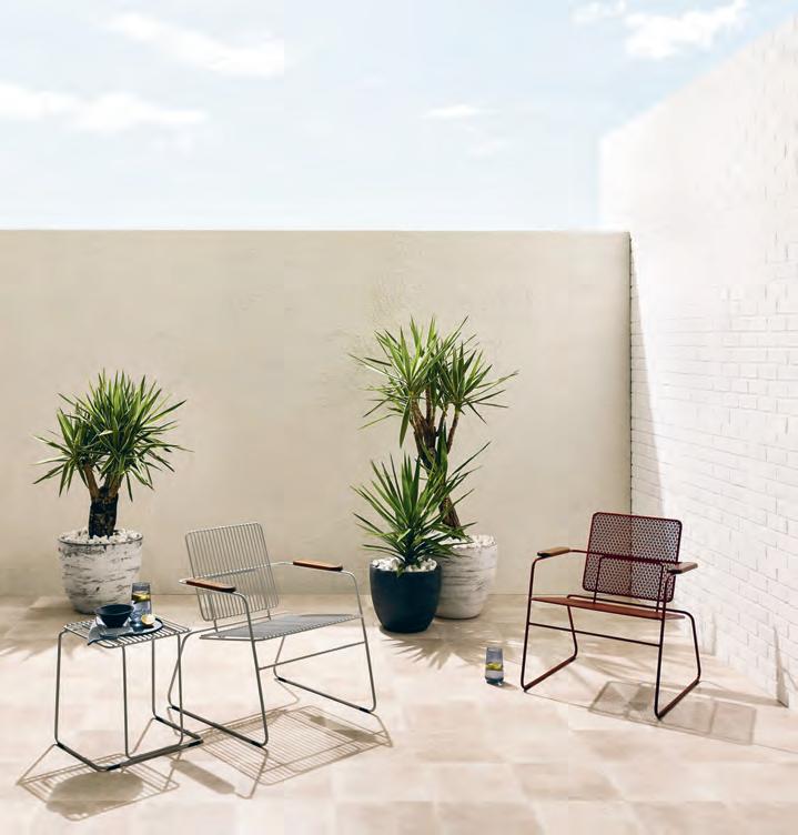
Drawing inspiration from the discrete simplicity of the humble paperclip, Seaton McKeon’s winning entry to the 2015 Australian Furniture Design Awards led to an opportunity to design a new outdoor furniture range: PAPERCLIP. Made from mild steel, perforated metal and locally-sourced Merbau, Paperclip’s essential form makes it a fitting addition to any home setting. stylecraft.com.au
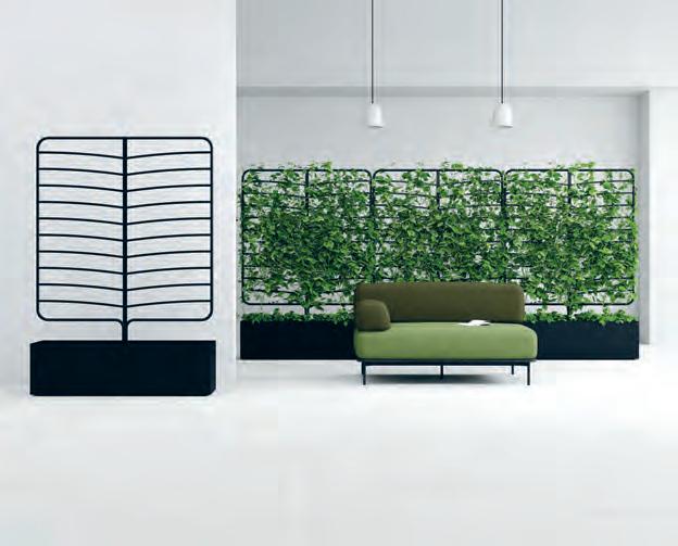
Both beautiful and practical, these versatile moveable BOTANICAL PLANTER SCREENS , designed by Helen Kontouris and availanle through Stylecraft, can be used to readily bring the rejuvenating benefits of nature to any urban environment, indoors or out.
helenkontouris.com
1 . lightbox # 29
Urban Supplies
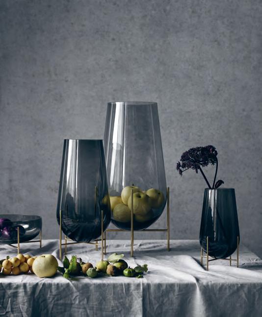
The charming ÉCh A ssE BOw L , n amed after the French word for stilts, combines the elegance of a traditional glass bowl with a playful and light expression, created by its four slender, stilit-like brass legs that elevate it into the air.

menu.as
The Adam Goodrum designed VOLLEY ROCKER is the ultimate outdoor rocking chair. With its modern, clean lines and ‘netted’ steel mesh backing, the chair inspires visions of backyard tennis and long relaxing summer afternoons. The rocker is customisable with coloured rope handles and your choice of powder coat finish.
madebytait.com.au
The FLORAL light from David Trubridge is derrived from geometric polyhedra that have interested the New Zealand-based designer since his youth. Using one shape with a repeating pattern, the light is designed as a part of David’s journey with design to provide cultural nourishment, tell stories, and reach people emotionally and spiritually.
davidtrubridge.com

issue #39 habitusliving.com
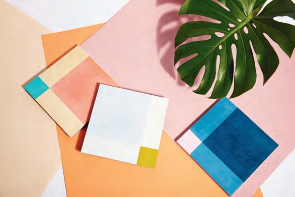
Inspired by the coastal Mexican town the tiles take their name from, the TULUM Collection is a series of encaustic tiles comprising two sets of patterns. Each graphic illustration can be mixed and matched together to create numerous patterns
studioanansi.net


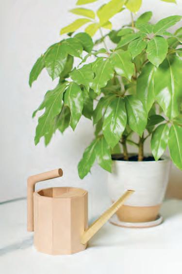
The COOPER WATERING CAN, designed by Adelaide-based Stephen Roy, is made from a Rock Maple and brass composition lined with bees wax. Designed with functionality and charming geometric aesthetics in mind, Cooper is a great choice for the greenthumbed design lover.
stephenroy.com.au
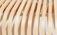
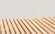
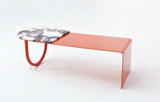
RIBS BENCH , made of steam-bent hardwood, is composed of a series of arching forms over a movable aluminium spine. Depending on how the bench is positioned, it can have a linear edge and rest against a wall or sofa, or can curve on two sides.


designbythem.com





1 . lightbox # 31
Table Manners
The TW SOLID TABLE LAMP collection designed by award winning UK designer Terence Woodgate sees a solid marble base supporting a hand blown glass shade with a dimmable LED bulb. The two sizes are available in Carrara or Nero Marquina marble, and the smaller of the two in Serpentine Green marble.

temperaturedesign.com.au
The HALO collection from Something
Beginning With is a finely crafted suite of products, with a focus on the form of an arc. Composed of a combination of solid American oak and circular steel tube, the collection includes a timber chair and high stool, outdoor metal chair, lounge chair and sofa, complemented by a side table and coffee table.
somethingbeginningwith.com
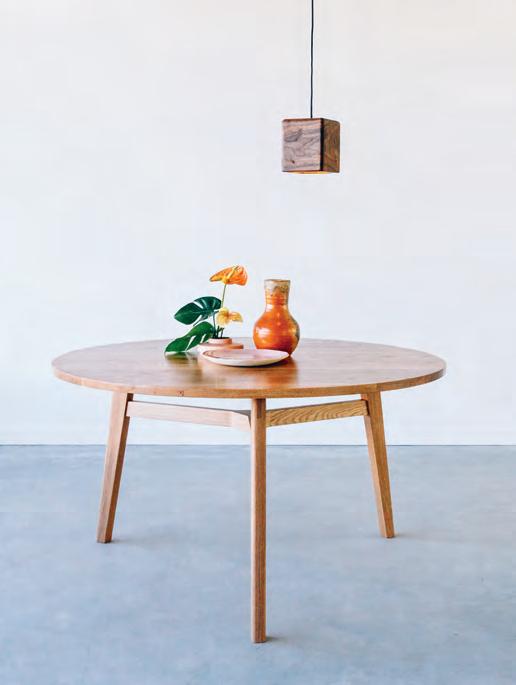
The ARI TABLE is a design concept based upon the philosophy of simple living, coupled with today’s reality of space-poor modern living. The table helps celebrate the meeting place that is the dining room, with its simple design boasting intricate, delicate craftsmanship.
jdleefurniture.com
issue #39 habitusliving.com
THE ESSENCE OF LIVING.


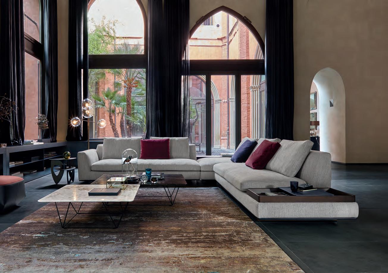
Tama Living is the ideal setting for that special moment, a soothing and pleasant experience. Its lavish, elegant cushions set the rhythm for the sofa to unravel like a piece of classical music. With side tables and trays crafted from exquisite materials, it embodies the spirit of refined living. Design: EOOS.
Walter Knoll Australia · www.walterknoll.com.au · T +61 8 8182 3925
Don’t be afraid to get attached
Methven has recently launched their second Aurajet shower collection, rUA . M aori for the word ‘two’, this collection looks and feels amazing with a powerful spray delivered through a unique soft square halo design. Not just aesthetically pleasing, the showers running on Aurajet technology means a full-bodied spray with maximum body contact and all-over warmth.

methven.com
DAKOTA is a finely tuned machine of design. Versatile in application, this minimalist piece of architectural hardware shows off the material it has been crafted from in a genuine, sincere fashion. It can be used as a coat hook or as cabinetry door pulls.
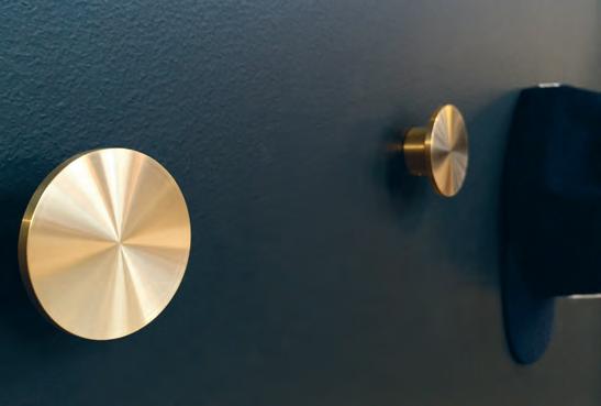

savagedesign.com.au
The LibreriA PensiLe / Wire bOOKcAse is a classic for a reason. Originally designed in 1957 by Achille castiglioni for Karakter copenhagen , the design is a journey to pare down the structure of a traditional bookcase to the absolute minimum. The shelves hang on knots in two cords fixed to a single point on the wall.
cultdesign.com.au
issue #39 habitusliving.com
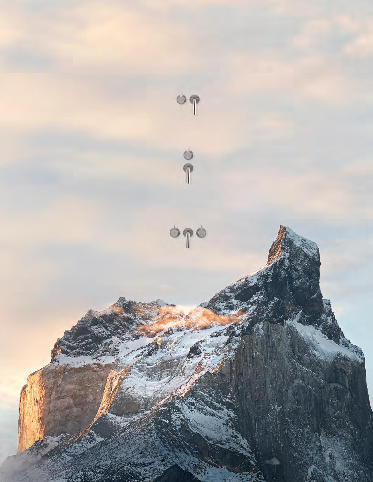
Original design Infinite possibilities
VOLA Design Pty. Ltd. - Tel.: +61 402 372 480 - sales@vola.com.au - www.vola.com Celebrating 50 years and beyond Watch our original stories at 50years.vola.com
111 Wall mounted mixer. The modular system
Finish what you’ve started
ESSASTONE Unique Calacatta gives you the stunning look of natural marble, with the durability of engineered stone. Featuring a near genuine touch to rival the most exquisite natural marble, this finish has the brilliance and resilience needed for the modern, stylish kitchen. laminexdesignhub.com.au

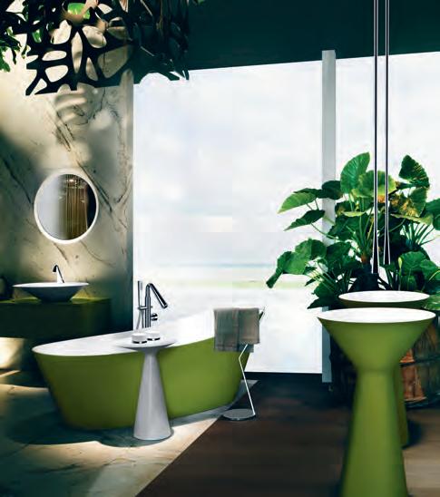
It was during a journey to South East Asia that designer Prospero Rasulo saw the sun filtered though light cones across native vegetation; thus the idea for CONO was born. The designed version of this cone shape adds contemporary elegance but timeless charm for the modern bathroom. abey.com.au
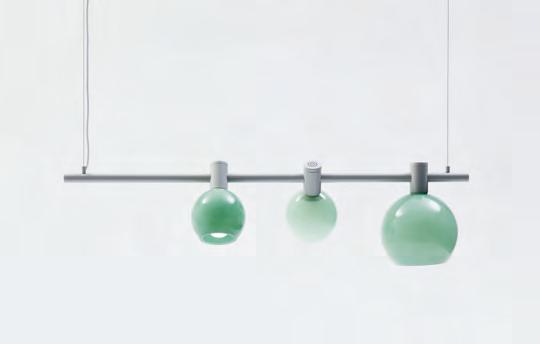
Inspired by the Australian gumnut, MAE is a new light with delicate, hand blown shades in opaque glass. jardan.com.au
issue #39 habitusliving.com
Icons of Scandinavian design
Ultima
Thule
Inspired by the melting ice of Lapland, Ultima Thule glasses are as contemporary today as when they were first created in 1968.
iittala.com.au

siemens-home.bsh-group.com/au

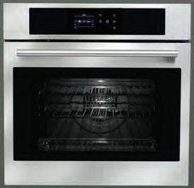
The Siemens iQ700 range of ovens, warming drawers, coffee machines and dishwashers features a meticulously implemented and continuous design, so that every element marries perfectly with each other. Thanks to the coherent front panels, it doesn’t matter what configuration of ovens and companion appliances you choose: the result is always pleasing to the eye. Discover the suite of Siemens home appliances today.

Siemens. The future moving in.
We never forget our lines. Perfect built-in design for the ideal kitchen ensemble.
A fresh perspective


What would you consider to be the biggest trend in fashion right now? I’d argue it to be a sustainable and ethical practice – and what a great trend. But in 2007, when Wellington-based Gosia Piatek begun her sustainable, ethically minded fashion label Kowtow, it wasn’t as ‘on-trend’ as it is today to pursue the conscious angle. So although that was a big part of Kowtow’s core DNA, it wasn’t necessarily the way in which Gosia communicated the label. Fast-forward a decade, and how the tables have turned. Suddenly it’s all anyone wants to hear about and new players in the market have positioned themselves accordingly.
There’s an audience who connect with Kowtow through a shared philosophy, and an audience who connect with the brand on a visual level; sometimes there is crossover,
Changing the Conversation
sometimes there isn’t. Which begs the question: should sustainable brands be led by its design merits, or its sustainability merits?
Does allowing Kowtow to build its reputation on its designs alone – you meet the brand, you fall in love, and then you uncover its motivations (or you don’t) – more powerfully prove that sustainable and ethical practises don’t have to mean compromise, and can be invisible to the end result. Or, is there a moral obligation to be vocal on the topics of sustainability and fair fashion in an effort to spread the message as far and wide as possible? There’s no right or wrong, both approaches have weight and even Gosia doesn’t have a hard and fast answer.
“I struggle with knowing if [the] language is too much for fashion,” says Gosia. “We’re always trying to get a balance with it, and trying to use words that are still contemporary.”
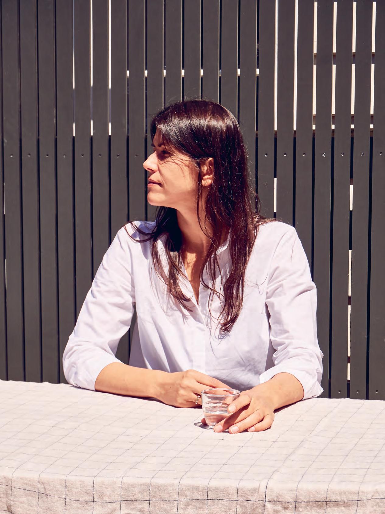
When Gosia Piatek first founded the ethically focused label Kowtow from her base in Wellington, sustainability in fashion was nowhere near as widespread as it is today, so she adjusted her lines of communications. Oh my how the tables have turned.
Tex T Holly Cunneen | PhoTo gra Phy yoan Jolly
issue #39 habitusliving.com
2 . portrait # 41
And while the label has certainly tapped into the niche market gaining the hard-earned, even-harder-to-come-by trust of conscious consumers, it’s also earnt the respect of the international fashion industry.

The Kowtow silhouette is a unique one, the Kowtow woman even more so. Patterns and colours (sometimes bold and bright, other times markedly more understated) adorn generous cuts and shapes from season to season. Like magic, an inimitable marriage between edgy and feminine results. All this, and a decade of mounting success, despite no formal qualifications in design. Just a deepseated interest. Take for example, Gosia’s recent visit to London’s Design Museum and Hella Jongerius’ Breathing Colour exhibition. The acclaimed Berlin-based, Dutch designer, also the Art Director for colours and materials at Vitra, inspired Gosia so profoundly with her manual processes and detail to which she works with colour, until Gosia realised she wasn’t just inspired by the way Hella works, she resonated with it, employing comparative practises in the Kowtow workroom.
Not only are Gosia’s design processes manual, but they’re slow, too. They have to be, the fabric is made to order – “none of this is off the roll fabric” – so while fashion labels are known to work one season ahead, Kowtow works two. “We just trust our intuition that we make what we like rather than being trenddriven,” says Gosia.
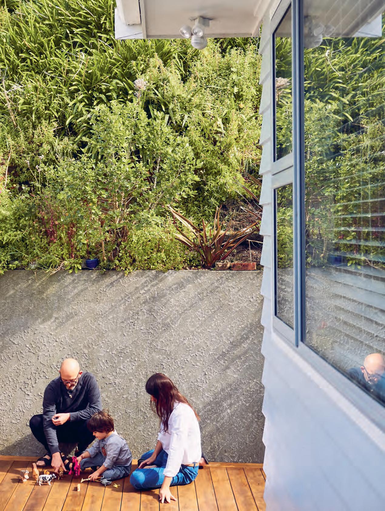
opener | Founded by Gosia pi atek in 2007, kowtow is a conscious minded, contemporary desi G n led Female Fa shion label based out o F w ellin Gton, n e w Zealand. ab ove & b elow | th e w ellin Gton house is the epitome o F peaceF u l: located on a one-way street in a marine reserve with dolphin si G htin G s a r eG u lar occurrence. opposite | Gosia met her partner thomas F o ur years aG o i n a hotel room in i n dia, she was there samplin G the ran G e
issue #39 habitusliving.com
2 . portrait # 43

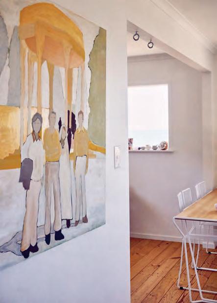
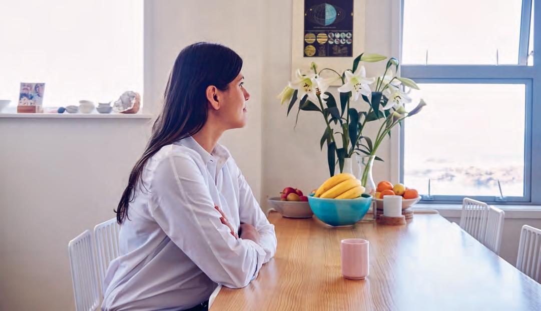
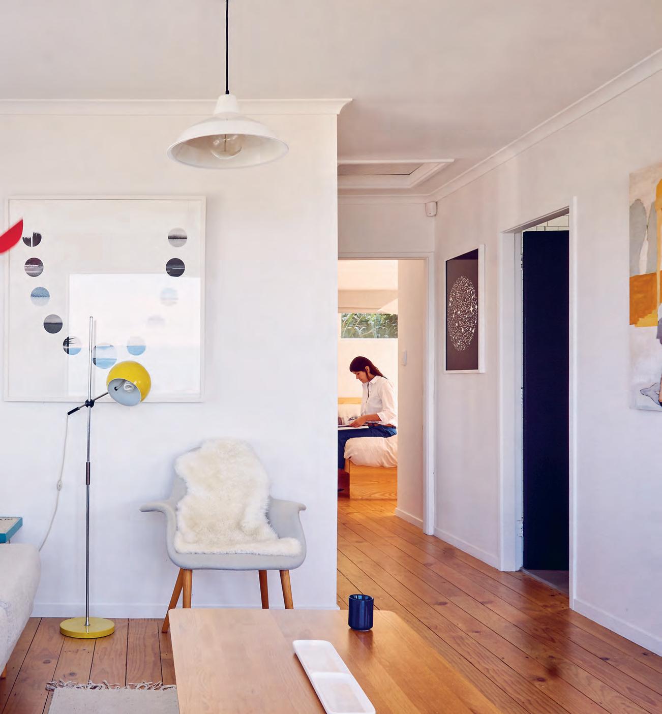
above | Gidon b in G ’ s work features in Gosia’s home as well as in kowtow’s wellin Gton showroom. below | the artwork complements the colour palette of the residence: muted neutrals with the occasional splash of primary colours. opposite above | the kitchen, althou Gh G osia Gr ants it sliGhtly dated, leads out to the dinin G area in a relatively modern, open-plan format. opposite below | views of the sea, as well as a close proximity to it, are important to Gosia.
issue #39 habitusliving.com
“I’ve always loved living by the sea, seeing the horizon –the south coast of Wellington is just so beautiful.”

2 . portrait # 45

issue #39 habitusliving.com
“We just trust our intuition that we make what we like rather than being trend-driven.”
2 . portrait # 47
Kowtow recently opened the doors to its first ever flagship store in Wellington. With such strongly formed – and communicated – opinions about design’s ethical and environment responsibility, it was important that the store reflect Kowtow’s values – not just its aesthetic. Makers of Architecture and Rufus Knight worked on the architecture and interior design respectively. You’d be forgiven for wondering if such a strict brief limited them – not in the slightest. For Gosia and Rufus, however, it simplified the process: “It’s [seen as] a challenge because you have less to choose from. But when you have less to choose from it’s great,” says Gosia. Local design is featured heavily throughout, Gidon Bing handmade ceramic tiles line the shop counter and shelving around the store, Auckland-based furniture and lighting designer Simon James is likewise present by way of a couple of custom designed sofas and tables. The carpet from Cavalier Bremworth “feels like wool”, though it is made from recycled bottles.
Gosia, her partner Thomas (a film director), and her three year old son Laker split their time between Wellington and London. When they’re in New Zealand they live on a marine reserve in a house Gosia bought five years ago. Gosia’s first home is a cosy 65-metressquare, with natural light flooding in from morning until evening, oceans views and dolphins as neighbours. It’s stiff competition for their London terrace. “I’ve always loved living by the sea, seeing the horizon – the south coast of Wellington is just so beautiful,” says Gosia. The interiors, which have been slowly but purposely built upon year-by-year, show equal influences of Japanese minimalism and Scandinavian design.
Gosia, in life and work, truly lives through design in all its incarnations: fashion and product design, interior design and a splash of architecture.
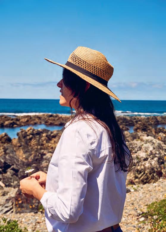
previous | The house’s fooTprinT siTs aT a cosy 65-square-me Tr es. above | a decade ago susTa inabiliT y i n fashion wasn’ T as prevalenT as iT is To day. “ iT s so funny, eleven years laTer and everybody wanTs To k now where i ge T Th e yarn from and how we develop Th e warp and wef T and colour for every Th ing,” muses g o sia. issue #39 habitusliving.com
Kowtow | kowtowclothing.com
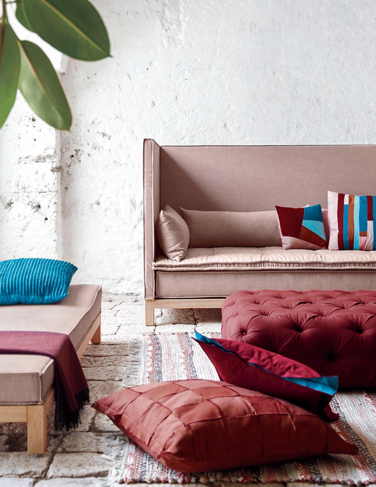


Design + Performance ™ and Legendary Performance Fabrics ™ are trademarks and Sunbrella ® is a registered trademark of Glen Raven, Inc. SUNBRELLA.COM LEGENDARY PERFORMANCE FABRICS FADE PROOF / EASY CARE / BLEACH CLEANABLE
IN TR OD UC IN G TH E NE W
PE MB RO KE
BA TH RO OM CO LLE CT ION
Th e Vi ct or ia + Al be rt Pemb ro ke ba th is aptl y nam ed afte r th e bi rt hp la ceof Eng la nd ’s fi rs t tu do r ki ng as it ev ok es a re ga l el eg anc e. Th is tr ad it io na l double -e nd ed ba th is ac cent edby cris p co rn er s an da de co ra ti ve ri m. De sign edby Me ne gh el lo Pa olel li As so ci at i.


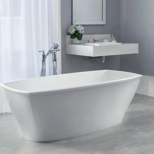
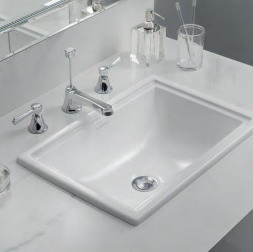
BATHROO M DESIGN CE NTRE • AL EX AN DR IA - 84 O’ RI OR DA N ST 02 83 39 71 03 • AU BU RN - 10 3- 12 3 PA RR AMA TT A RD 02 87 48 4367 VI SI T OU R WE BS IT E- WWW .D OM AY NE. CO M. AU Do ma yne ® st or es ar e oper at ed by in de pe nden t fr an ch is ee s. Acce ss or ie s sh ow n ar e not in clu de d. 34 422 7_ NA U Vi ct or ia + Al be rt Pem brok e Ba th $5 65 0 Vi ct or ia + Al be rt Pem brok e Ba si n $6 50

issue #39 habitusliving.com
Icon t he quiet
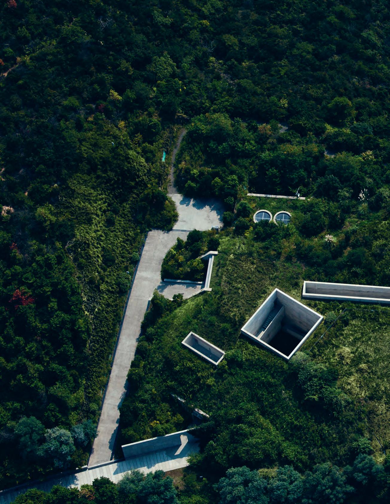
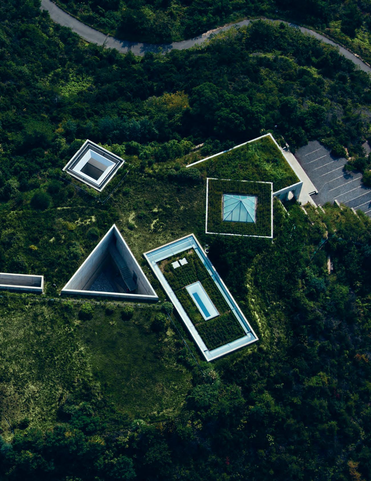
Buried within a soft, undulating hill on Naoshima, a small art island in the Seto Inland Sea, sits the Chichu Art Museum by architect Tadao Ando. But quite unlike the Guggenheim museums by Frank Lloyd Wright in New York City and Frank Gehry in Bilbao, Spain, Tadao’s geometric design of Chichu is submerged. The subterranean museum made from cast concrete is positioned to channel light from voids and apertures in the hillside above.
This immersive space, which elevates the visitor’s experience to a ritualistic or spiritual rite of passage, is a hallmark of Tadao’s conceptual approach. Chichu transforms the concept of an art museum to that of a meditative crypt – inverting the iconic value of a museum into a solemn and dignified shrine.
Inspired by nature and sunlight, Tadao Ando has become known globally for mutating everyday spaces into sacred experiences.
Elements of light, water, wind and rain are central to shaping his dramatic yet delicate structures.
“I was born and raised in a traditional residential neighbourhood of downtown Osaka. My home was a dark place with little light and high windows,” Tadao Ando says.
“In the dim interior, I appreciated what little light we received. I would often fill my cupped hands with light coming into my room. Since then, this is the type of architecture I’ve wanted to build; an architecture which values light and reminds me of the same feelings I experienced as a child.”
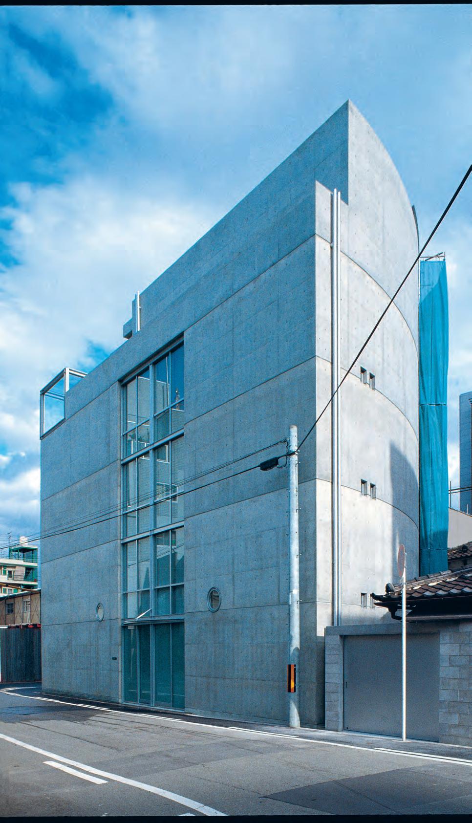
His own home, Atelier, was built as a personal residence near his office in 1995: the whole home shaped around a camphor tree.
“The initial concept of the project was to construct an expansive residence around a camphor tree by spatially layering the interior and the semi-outdoor spaces,” Tadao explains.
Tex T
aucott | PhoTo gra Phy courtesy ta
a n
Japanese architect Tadao Ando creates built forms that blend the sacred and the profane, the ordinary and the extraordinary. Following almost five decades of iconic design, Belinda Aucott speaks to Tadao Ando from his Studio Oyodo in Osaka, about how he continues to impart his vision.
Belinda
dao
do a rchitect & a s sociates
Opp OSTiTe | A rguA B ly JA pA n ’ S m O ST FA m O u S A rchiTecT u r A l e xp O rT TA dAO And O i S ph OTO g r A phed AT hi S c h urch OF li ghT in O SA k A 2 . portrait # 53
issue #39 habitusliving.com
“Relationships between architects and clients play a considerable role in forging architectural culture, but in modern times, these relationships have begun to vanish.”
2 . portrait # 55
“In the twenty years since the completion of this project, the tree in the inner garden has grown taller than the building itself. In 2015, the guest room on the top floor was converted into a meeting space. The glazing was moved and expanded into a new, cantilevered lounge space to accommodate this change.
“The original structure supports this lounge space with two diagonal rods, as if it were a floating tearoom surrounded by greenery,” he explains. While Tadao no longer lives at Atelier, preferring instead to reside in an “ordinary” apartment, he uses it for business meetings and for building scale models.
Over the years Tadao has become not only a design icon but a great advocate of social and environmental causes. A look through his portfolio reveals examples of how he’s sought to intertwine his buildings with nature.
He has also been intimately involved with planting trees in disaster zones and urban areas since the 1990s. He is currently overseeing the erection of the Sea Forest in Tokyo Bay and the planting of cherry tree orchards on Naoshima.
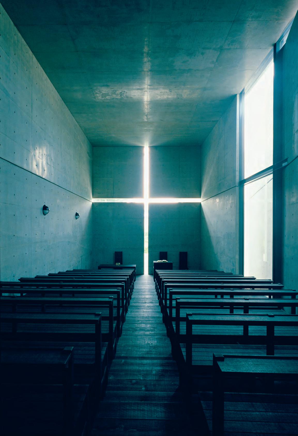
“I attribute the fact that nature is incorporated into my designs to the proximity of water and greenery to my childhood neighbourhood. My house was adjacent to the Yodogawa, the largest river in the Osaka region. These two elements, light and nature, resided near me and led me to create buildings like Church of the Light [and] Church on the Water,” Tadao says.
The motif of the shrine also reoccurs in Tadao’s work, taking from Shinto a devotional attitude toward place-experience.
“Much was discarded in the postwar Japanese houses in the name of Rationalism: contact with nature, the tangible aspects of life, the rays of the sun, the flow of the wind, and the sound of the rain. But I did not wish to discard the elements that directly speak to the body and spirit.
“I continually want to create living spaces that are integrated with nature so people can really feel that they are living.
“At times, the intrusion of nature into a building can be cold or uncomfortable, [however] it ultimately leads to robust and pure experiences of space,” Tadao says.
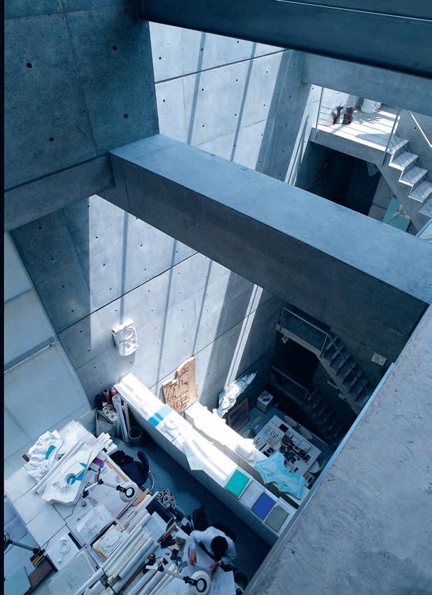
previous | Aeri A l v iew of Chi C h u Art Museu M , N Ao shi M A , JA pA N . C hi C h u is C o N figured A s A series of i N d oor AN d o utdoor gA lleries. eAC h g eo M e tri C roo M is li N k ed by pA s s Ag ewAys AN d h A llwAys C u t i Nto the hillside. Chi C h u, M e A N i N g u N d ergrou N d i N JA pA N ese, des C r ibes the M u seu M s subterr A N e A N stru Ct ure C h oseN i N order to le Av e the softly u N d ul Ati N g s h A pe of site i N tACt Ab ove ANd oppostite | studio oyodo i N o sA k A is the ho M e o f tA dAo A N d o & Asso C i Ates. r e-built i N 1995 o N the site of to M i shi M A h o use – A pro J eCt A lso k N ow N A s the g u errill A iii – A ll levels A r e brokeN up with A void At the C eNtre C o N N eCti N g A ll three worki N g s pAC es. tA dAo ’s desk is situAted At the botto M of the three levels. issue #39 habitusliving.com
“I was born and raised in a traditional residential neighbourhood of downtown Osaka. My home was a dark place with little light and high windows.”
2 . portrait # 57


above, below & opposite | Cut into C o n C r ete, a C ru C i fix of light floods the main room of a n do’s ChurC h o f li ght built in 1989. d esigned on just 113 square metres of land for the u n ited ChurC h o f Christ, tadao said this spartan design C o mes to life when filled with the spoken prayer and song whi C h i s C o mmon to the lo Ca l C o ngregation. issue #39 habitusliving.com
2 . portrait # 59
issue #39 habitusliving.com
One of the best examples, he says, is an early progressive residence he started in 1975.
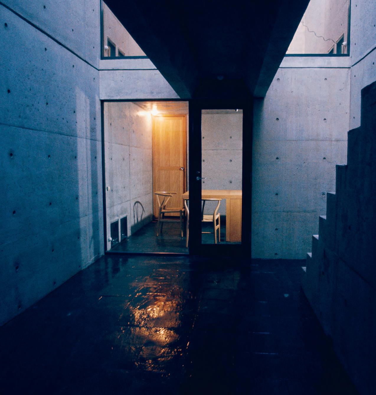
“At Row House in Sumiyoshi [also called Azuma House], a small residence in Osaka, an umbrella is necessary to access the bathroom when it is raining. The house does not contain heating or air conditioning.
“When the client came to me and asked me what he would do when it became too cold in the house, I told him to wear a sweater. When he asked me what would happen if it got even colder, I told him to wear many sweaters.
“Initially, when the house was first constructed, it was criticised for its difficulty of use, but recently it has been commended as a net-zero [carbon footprint] house. It’s funny how things change,” Tadao says softly.
Right now, he is busy undertaking an ambitious plan to transform the Bourse de commerce — the historic stock exchange in Paris — into a museum for businessman and art collector François Pinault.
“When I look back at my past work, the boldest buildings were typically realised in the presence of a brave and understanding client.
“Yukio Futagawa, a dear friend, mentor, and photographer who passed away in 2013, used to say that ‘Fifty percent of what makes great architecture is the power of the client’.


opposite | th e insertion of an abstract space dedicated to the play of wind and light is the distinctive feature of s u miyoshi h o use built in o saka in 1976. w ith this tiny row house tadao said his objective was to challenge ‘the inertia that has invaded our everyday lives’. above & below | a pertures and open air hallways cut in cast concrete at c h ichu a rt m u seum filter the light entering this museum housing artworks by c l aude m o net, ja mes t u rrell and wa lter d e m a ria. lo cated in a series of subterranean chambers on n aoshima – c h ichu was situated underground by tadao so as not to interfere with the beauty of the natural landscape.
“I continually want to create living spaces that are integrated with nature so people can really feel that they are living.”
2 . portrait # 61
“I think that only human power can create a human architecture,” Tadao says emphatically.
Indeed in all he says and writes he emphasises the critical importance of integrating nature into architecture and warns against an over-reliance on computers.
“Over the years I have worked with a range of clients with distinct personalities, including Issey Miyake, Soichiro Fukutake of the Benesse Corporation, Mr. and Ms. Pulitzer of the Pulitzer Arts Foundation, Giorgio Armani, Luciano Benetton, Tom Ford, Karl Lagerfeld, François Pinault etc, many of these clients have become my close friends.
“Relationships between architects and clients play a considerable role in forging architectural culture, but in modern times, these relationships have begun to vanish,” Tadao says.

Since setting up shop in 1969, Tadao Ando has designed more than 200 buildings. His iconic status now rivals that of Le Corbusier, the man who sparked his initial interest in architecture when he was in his early 20s. Tadao now splits his time between teaching, volunteering and special projects.
“It is essential to incorporate nature into architecture, whether by materiality or element. The feeling of warmth is important in a residence, but even moreso is the integration of the structure in nature.”
When working at his own Studio Oyodo, Tadao explains that he structured the office “to be one connected space”.
“It is crucial to me that sound and information spread throughout the building,” he says. When it comes to hiring architects, he takes a similarly direct approach.
“When I make decisions to hire new young staff, I tend to look at their faces. I have always thought of a person’s face as a doorway to their feelings and thoughts. Specifically, if their eyes are bright and gleaming, I will know that they will have a firm resolve and be passionate about their work.”
“When I look back at my past work, the boldest buildings were typically realised in the presence of a brave and understanding client.”
above | a portrait of ta dao a n do at the beginning of this
“ i n m
w h en i first L a id my eyes on this book, i immediateLy feLt a
a month L ater. th en i read the book, page by page, every night,
L
issue #39 habitusliving.com
Tadao Ando Architect & Associates | tadao-ando.com
career.
y twenties, i came across a monograph of Le c o rbusier’s architecture in a used bookstore.
c onnection to it. it was too expensive to buy right away, so i saved my money and bought the book about
unti
i grew tired of it.”
Honourable design, sensibly produced
www.VELA.life
Brought to you by Founding Partner Strategic Partner Trophy Partner Principal Partner Celebrating Asia Pacific’s best emerging talent –from prototype to production indeawards.com/launchpad
“Mentorship is crucial to the development of a young designer’s full potential, via practical wisdom and by pointing out the myriad paths of opportunity that can bring real value to our world.”

 Hunn Wai


 Co-founder and Creative Director, Lanzavecchia + Wai


Launch Pad Asia Judge, 2014 and 2018
 Photography: Davide Farabegoli
a fi ne romance
Husband-and-wife team Vince Lim and Elaine Lu have gone from strength to strength since they founded design studio Lim + Lu two years ago. Tamsin Bradshaw finds out how they combine love and work on a visit to their fresh, flexible home in Hong Kong’s Happy Valley.
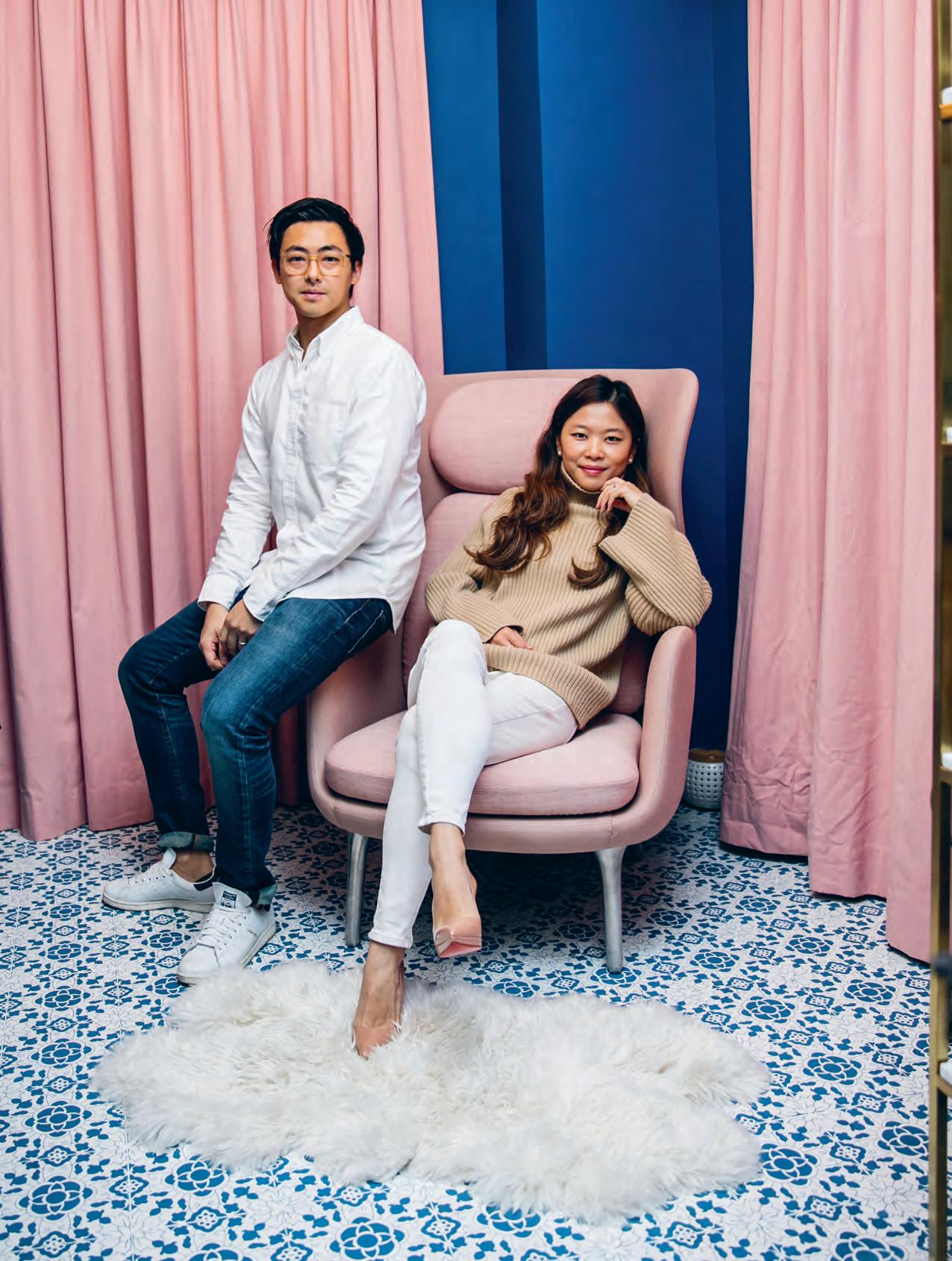
Romance was where it all began for Vince Lim and Elaine Lu. They met while studying architecture at Cornell University, New York, and they’re now partners in work as well as in life, having established multidisciplinary design studio Lim + Lu in Hong Kong in 2015.
“We didn’t know each other’s design aesthetic prior to working together,” says Vince. “We started dating and then down the road, we said. We should do something together. Which could have been risky, but it worked out nicely.”
So nicely, in fact, that in 2017 Maison & Objet named their studio one of five winners of the trade fair’s Rising Asian Talents award. Their star has risen rapidly, especially so considering they only arrived back in Hong Kong and set up Lim + Lu two years prior. The duo readily admits that one project is responsible for their success: their own home. This 112-square-metre space has attracted plenty of attention from media and prospective
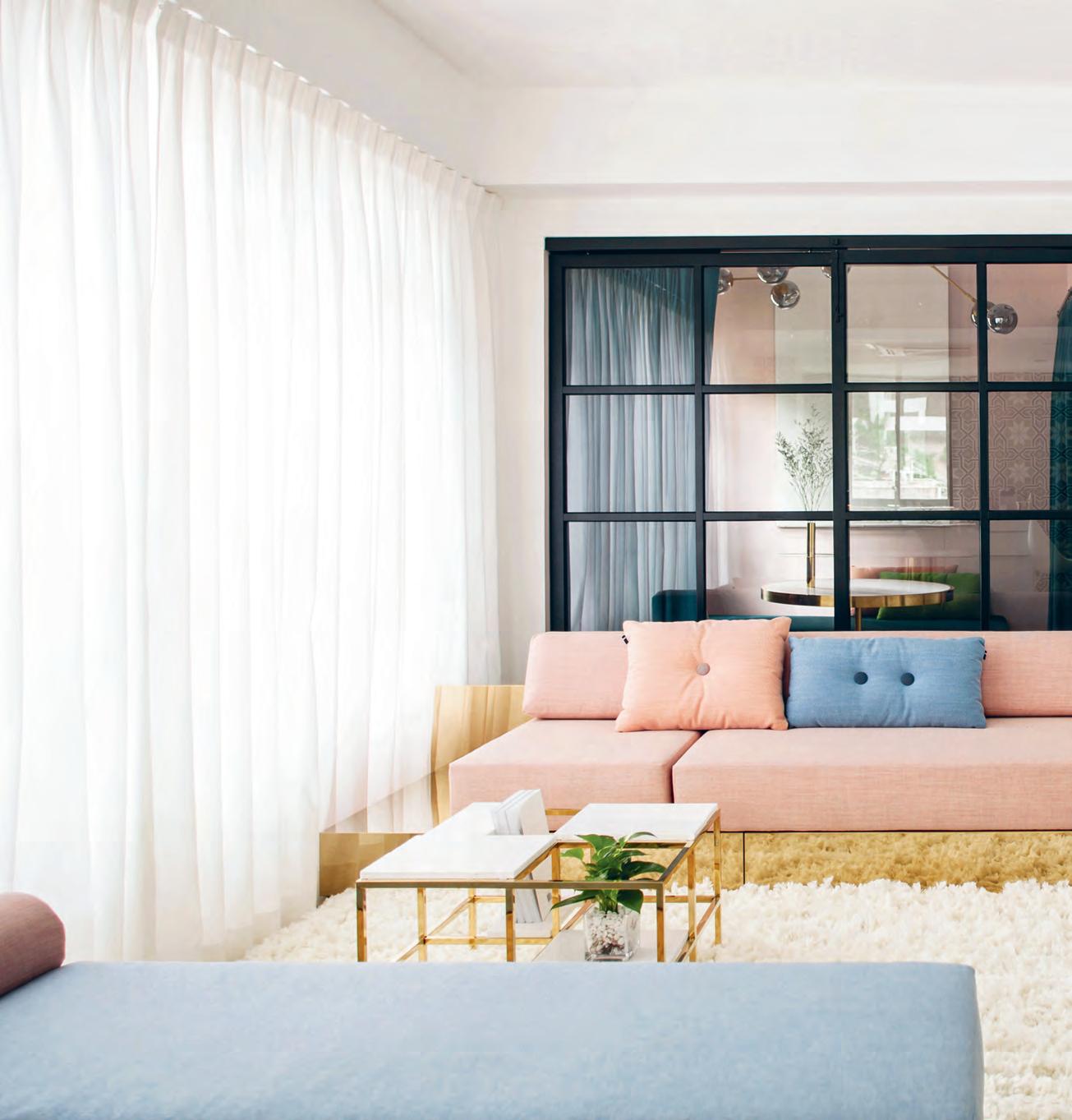
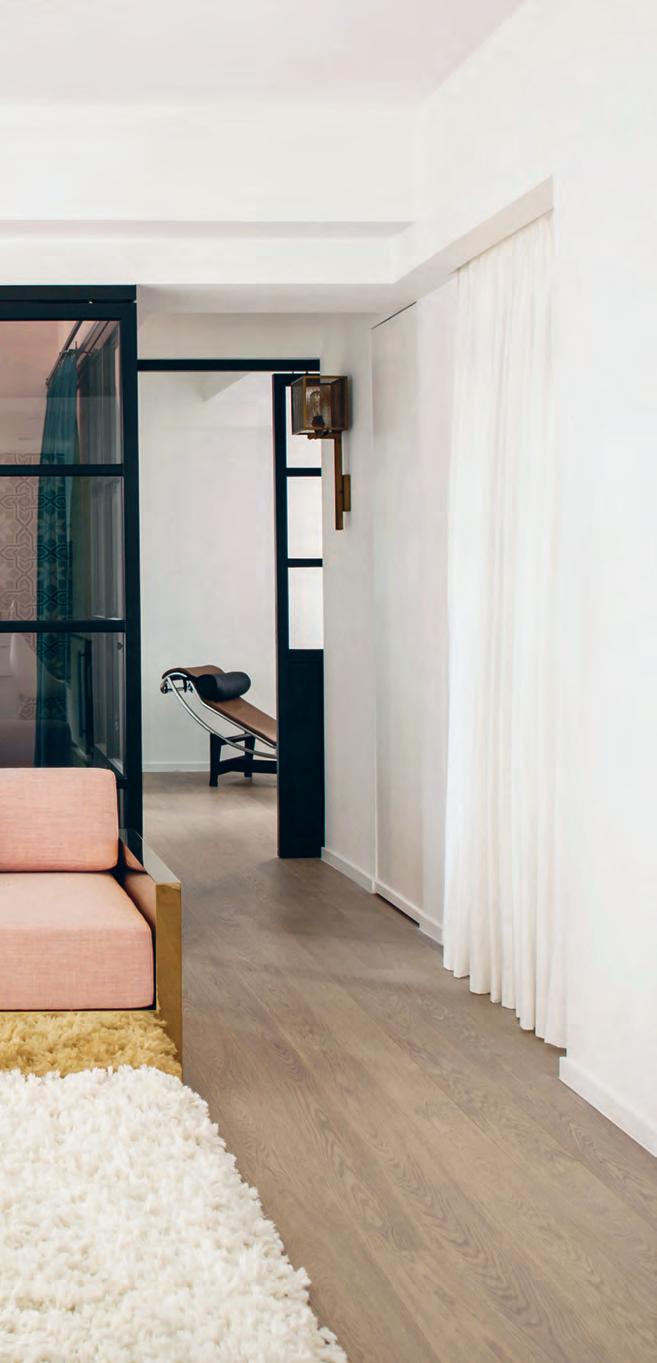
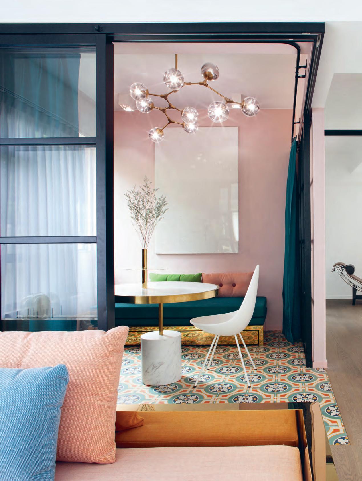
clients. And no wonder: it’s fresh and alive with colour – soft, Scandinavian pinks, rich, cobalt blues and cosy emerald greens – and a poster child for the kind of multi-purpose spaces compact home owners need.
The pair used partitions in their flat to create flexible spaces that can be used in a number of ways. Take, for example, the studyslash-dining-room-slash-guest-room. Coming off the living room, this space features a table, chairs and a pullout daybed that’s part of Lim + Lu’s Mass series. Here, sliding doors allow the pair to open up or close off this room, depending on their needs.
“It’s all about versatile and flexible spaces and objects,” says Vince. “An overarching theme for us is designing objects and spaces that encourage interaction and curiosity. Nothing should be static.”
“That’s how our thought process begins,” explains Elaine. Indeed, it’s how they worked when Tai Ping commissioned them to create a carpet for the residential market. “Our first
Tex T Tamsin Bradshaw | PhoTo gra Phy michelle procTor and n iruT Benja Ba npoT
issue #39 habitusliving.com
2 . portrait # 67
opener | Vince Lim and eL a ine Lu, pictured in their dressing room. aboVe | V ince and eL a ine popu L ated the Li V i ng area with their own designs. th ere’s the m a ss sofa and daybed, which is being produced by n e w wo rks, and the fr ame tab Le issue #39 habitusliving.com
In 2017 Maison & Objet named Lim + Lu one of five winners of the trade fair’s Rising Asian Talents award.
2 . portrait # 69
issue #39 habitusliving.com
thought was how do we break with the typical, static carpet that never moves?” She continues: “We designed the carpet in geometric shapes, creating three different modules that users can reconfigure for different spaces.”
The result is Reform, a curvaceous carpet made up of overlapping circles in different textures and in shades of pastel pink and blue, and, like many of their other pieces, it has a place in their home – on the floor of their bedroom.
“A lot of the prototypes end up living in our home. We keep refining them and changing them,” says Vince.
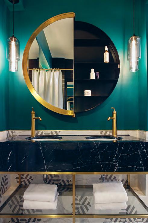
There’s the paneled coffee table, the modular sofa and the bathroom mirror – all of these are original Lim + Lu creations, and all of them are designed with flexibility in mind. The Lunar mirror is “a vanity mirror for two”, says Vince; divided into two halves, it’s designed so that Vince can use the mirror on his side while Elaine uses the cabinet on her side.
Then there’s the Mass sofa: it can be configured in multiple ways, with cushions that can be positioned on different parts of the brass base, giving the user a range of options when it comes to table surfaces and seating arrangements.
This piece is now in production, snapped up by Danish brand New Works after they saw it in a story about Vince and Elaine’s home. “They reached out and said they wanted to develop a range of seating based on this concept,” says Elaine.
Opp Osite | s liding d O O r s O pen up tO c O n nect the study area with the living rO O m ab Ove | pa inted a warm, c O sy emerald green, the bathrO O m features the lu nar mirrO r which v i nce and el aine designed with dual use in mind.
2 . portrait # 71
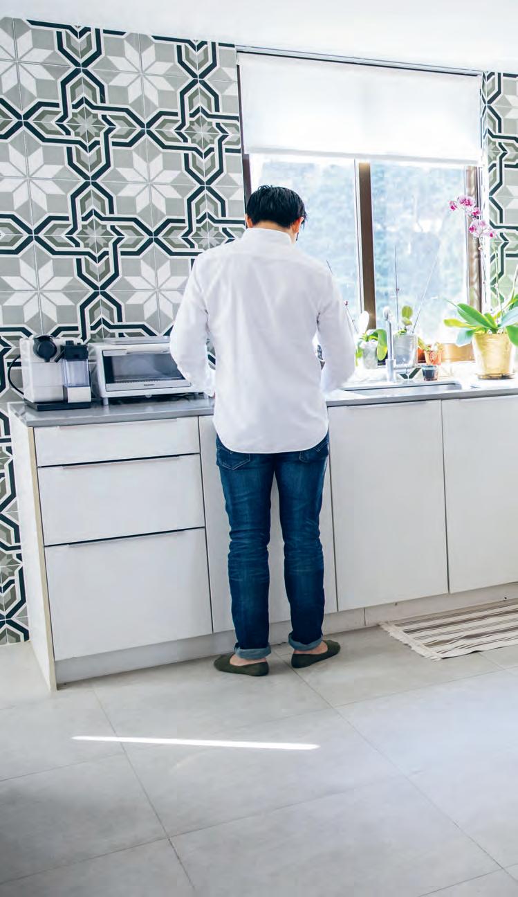
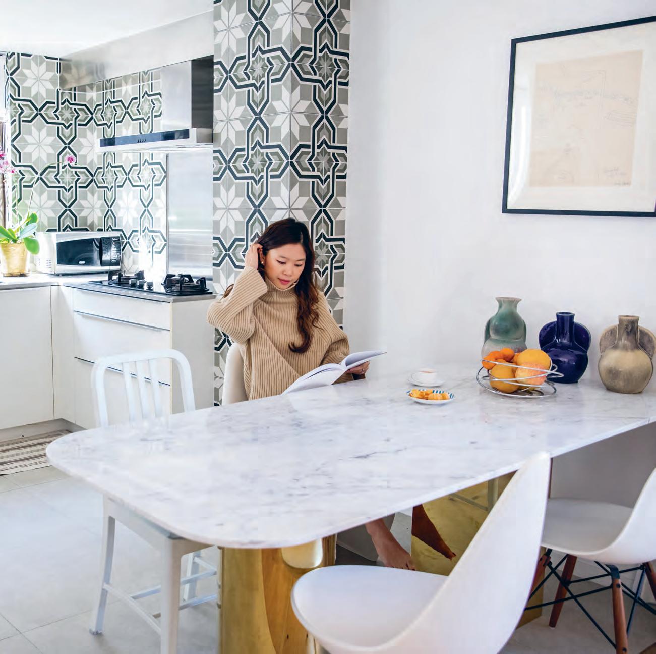
above | The pair opened up Th e kiTc hen, connecTi ng iT wiTh Th e resT of Th e home and bringing Th e lighT in. The Ti les on Th e walls also connecT Th e space visually To Th e resT of Th e aparTm enT
issue #39 habitusliving.com
“Design doesn’t just enrich our lives… it is our lives.”
2 . portrait # 73
Furniture was where Elaine and Vince’s working relationship began back in New York. Elaine was working at Robert A.M. Stern Architects, and Vince was at Kohn Pedersen Fox. “At large corporate offices, the work can be really interesting, but what you’re handling can be really mundane. So we wanted a creative outlet,” says Vince.
“We started designing pieces of furniture on the side. In 2014 we decided to exhibit at ICFF (International Contemporary Furniture Fair) in New York. We had positive feedback, but we knew we could go much further with them.”
Their desire to take their furniture to the next level is what led them to Hong Kong. “We were fabricating in China – it’s too expensive in New York – and we realised we needed to be on the ground,” says Vince.

“We also wanted to be part of the first wave,” he continues. “With M+ [the muchtalked about visual culture museum, which is being designed by Herzog and de Meuron] opening up here and Art Basel happening over the last couple of years, I think there’s a growing awareness in Hong Kong of art, design and creative industries.”
“China’s design awareness is also growing so fast,” says Elaine. Perhaps that’s why Lim + Lu is getting so much work in China. “Right now we’re working on a food and beverage project in China and a series of stores there too,” she adds.
With so much work on the table, do Elaine and Vince ever take a break?
Apparently not. “We don’t have an off switch,” says Vince. “It’s hard to differentiate when you’re working on the clock and when you’re not working. Even when we go out on a regular date, we’re looking around us and we’re saying, Oh that’s really nice, we should use that in our next project.”
“People always ask us, How are you married and working together? Do you talk about anything other than design? – Not really!” says Elaine. “Design doesn’t just enrich our lives… it is our lives.” Lim
above | a n other version of Lim + Lu’s versati Le fr ame tab Le this time with a b L ack frame and m o ndrian-esque square surfaces. issue #39 habitusliving.com
+ Lu | limandlu.com
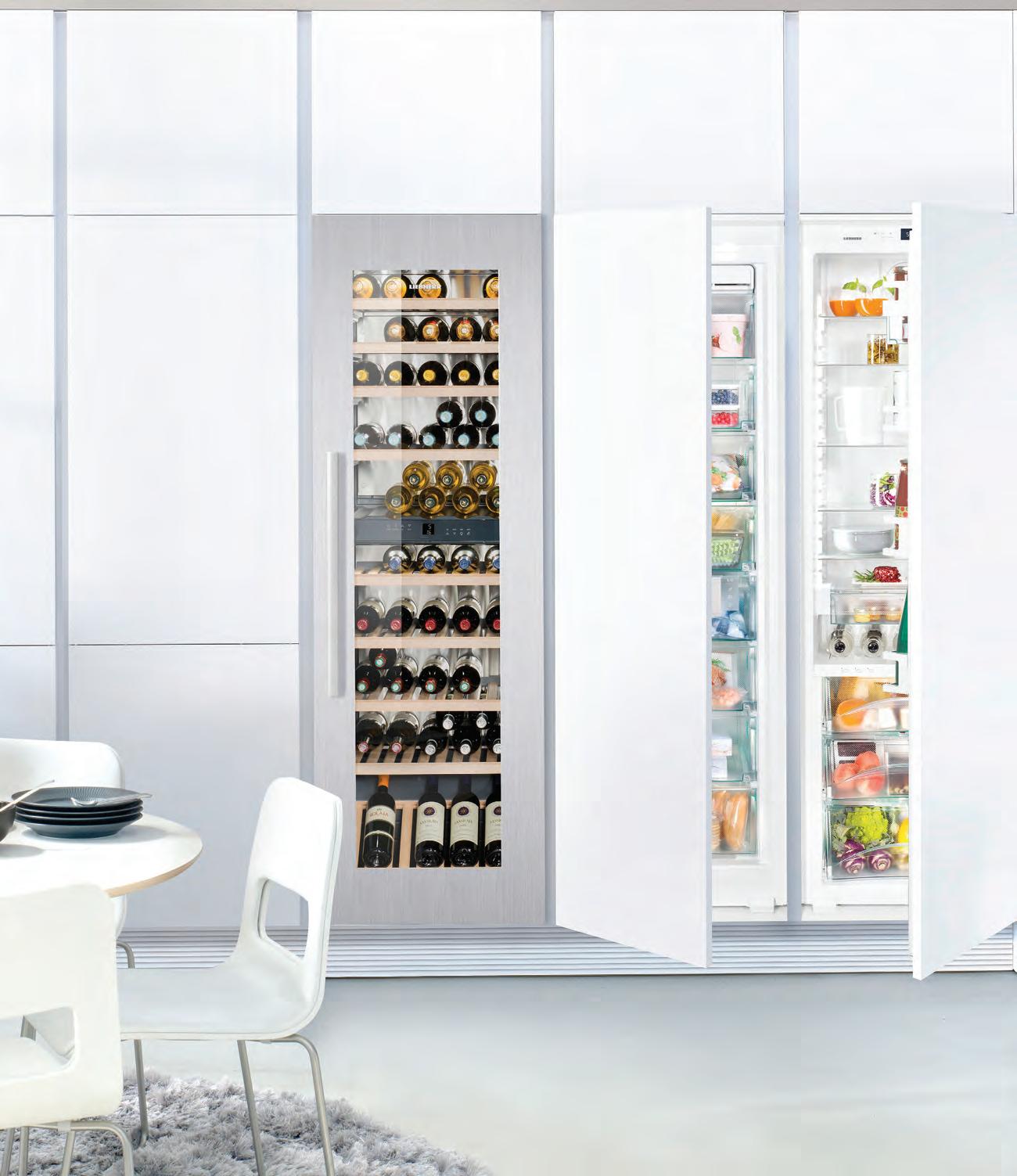

Life Tastes Better With a Liebherr Your Elegant Solution for Preserving Wine & Food home.liebherr.com.au
EWTdf 3553
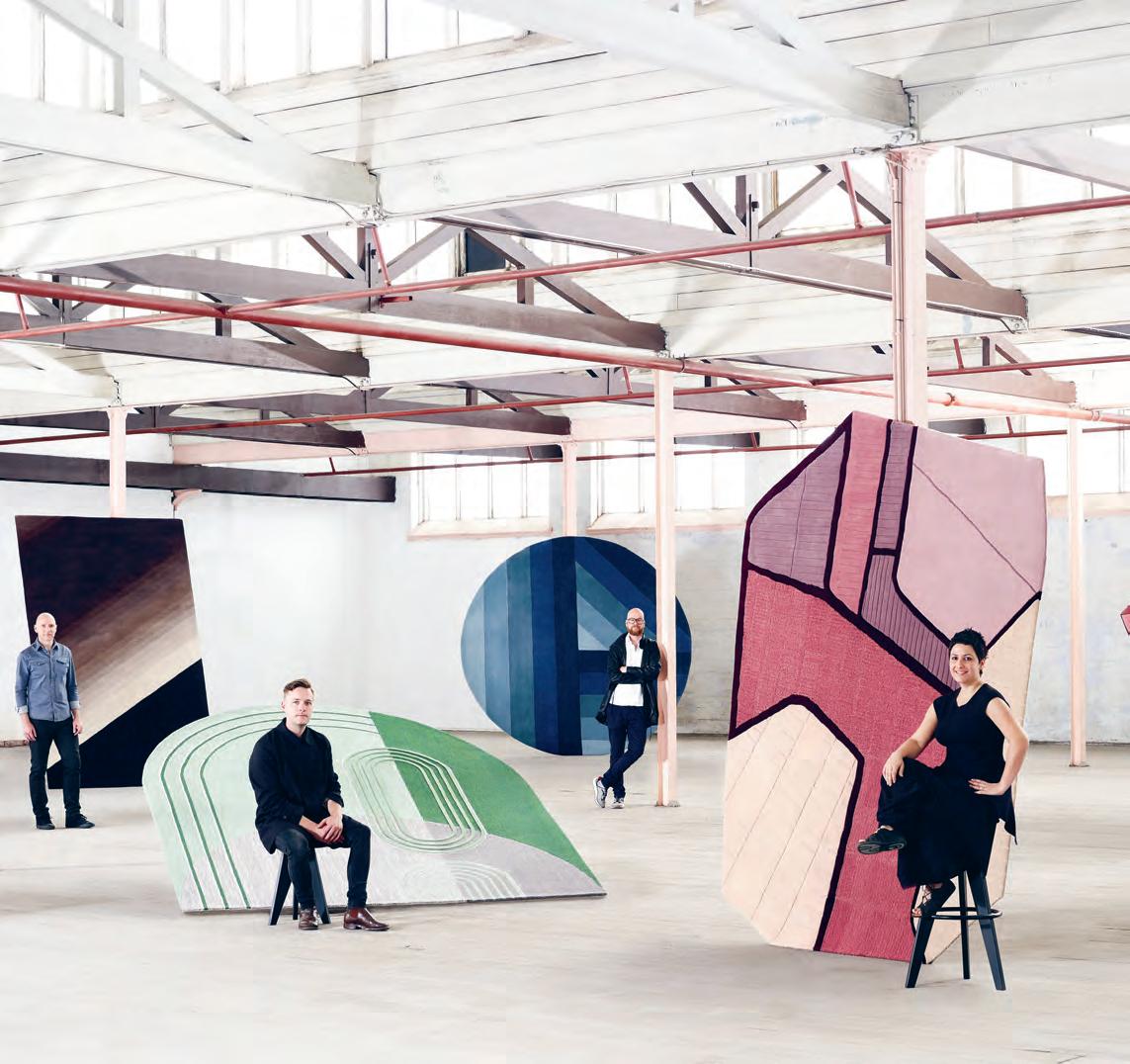
issue #39 habitusliving.com above | Keith Melbourne, toM SKeehan, roS S GardaM , helen Kontouri S and alexander loterSz tain collaborate with Stylecraft to launch itS inau G ural ru G collection.
Pulling the Rug out
Having just launched their inaugural rug collection, Stylecraft reminds us that Australians continue to reimagine the design rulebook.
Since even before the Classical Period, the humble rug has remained a perennial subject of poetry and mythmaking. Capturing the imagination of designers across the millennia, rug design continues to evolve alongside the shifting landscapes of many sectors – from the smaller scale residential approach, right through to mammoth statement pieces currently enjoying a renaissance in commercial and hospitality environments. Equaling the prestige and quality of fibres one expects to see on haute couture runways, contemporary rug design has embraced the most luxuriant materials while also remaining abreast of landmark technological developments in textile design and manufacture. And, within this space, Australia is beginning to leave an indelible mark on design history.
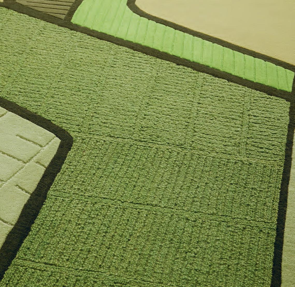
Thanks to one of Australia’s most-active brands, Stylecraft, many of our A+D community’s biggest names have turned their hands to the art of rug design. Kickstarting 2018 with Stylecraft’s inaugural range of rugs by Australian design heavyweights – including Ross Gardam, Alexander Lotersztain, Keith Melbourne, Tom Skeehan and Helen Kontouris – the brand welcomes this new product typology to an already comprehensive design portfolio. Designed in Australia, and handcrafted in India through TAPPETI Rugs, this handmade collection uses natural fibres including New Zealand’s coveted wool. Across all processes – from dying of yarn, tufting, binding and finishing – each piece carries an individual flair that can only be achieved through a constant commitment to the expertise of rug artisans.
As exciting and varied as the Australian landscape itself, the new range of rugs explores composition, texture, shape, and colour. Alexander Lotersztain and Helen Kontouris celebrate topography from above with their respective rugs, ‘Salt Plains’ and ‘Terraces’. Lotersztain drew inspiration from the transition from “the iconic red centre with endless sand dunes and stunning salt lake colours to open skies that meet the aqua waters”, tinting his rugs in vibrant, saturated hues. Meanwhile, Kontouris emphasizes organic patterns and the dazzling organic and geometric sophistications we find within Asia’s stepped rice terraces.
#77
stylecraft.com.au habitus promotion › Stylecraft
Stylecraft |
Taking a subtle, linear approach are Ross Gardam and Keith Melbourne, whose rugs deftly abstract line and tone. Gardam’s ‘Noon’ is the collection’s only circular rug, and reflects through gradual tonal changes the passage of light during a 24-hour period. ‘Noon’ coordinates with Gardam’s recent furniture collection of the same name, which is also available in Australia through Stylecraft. In a similar vein, Melbourne’s ‘Wash’ focuses on the “beautiful grading of light within sculptural architecture.” An elegant gradient of seven tonal colours reflects Melbourne’s idiosyncratically sleek and precise design aesthetic, embodying the nuanced minimalism of contemporary residential design.
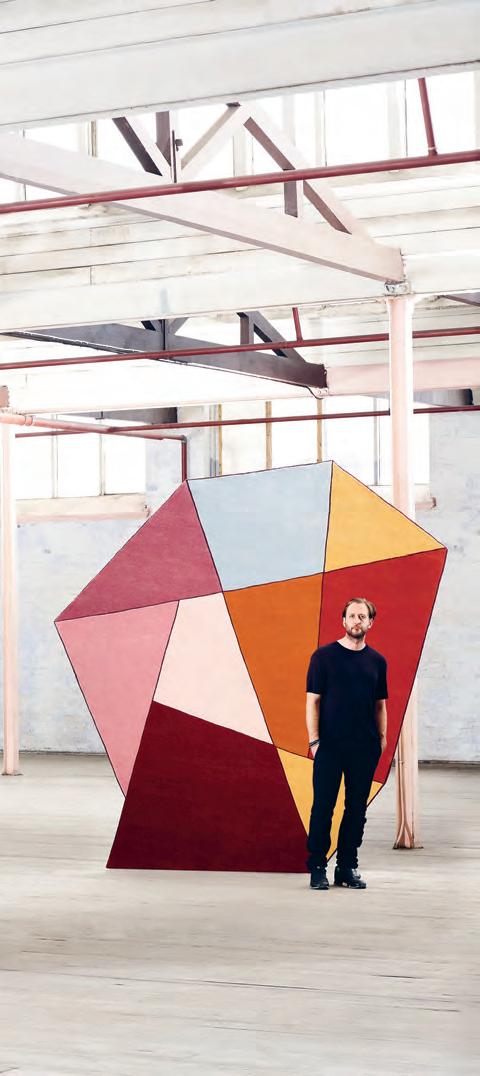
Tom Skeehan’s ‘Hoshi’ rug also picks up on this thread of minimalist dreaming, drawing inspiration from a restrained, sophisticated Japanese design legacy. A unique arched shape and bold geometric emphasis combine to create an inimitable feature piece that is as timeless as it is striking.

The release of the rugs is a reminder of Stylecraft’s commitment to nurturing Australian talent and bringing it to as diverse an audience as possible. Since its establishment in Melbourne over sixty years ago, Stylecraft has consistently shone the limelight on upcoming Australian designers, celebrating their unique style and innovative thinking. Stylecraft is an advocate of encouraging the multiplicity of voices a nd viewpoints that so colours Australia’s approach to design, and to this end is recognising the importance of supporting our local communities.
In conjunction with the launch of the new rug collection, Stylecraft is proud to announce their partnership with Australian organisation, Tjanpi Desert Weavers (TDW). Based in Alice Springs, TDW enable over 400 female artists in remote central Australian deserts to earn their own income from fibre art. Committed to enabling indigenous artists to continue to be able to use their skills to create contemporary Australian design pieces, Stylecraft is donating ten per cent of each rug sale to TDW, ultimately supporting the facilitation of material supply, weaving workshops and exhibitions.
issue #39 habitusliving.com above | Helen Kontouris’ ‘terraces’ rug is inspired by our region’s stepped rice fields.
habitus promotion › Stylecraft #79
Stylecraft | stylecraft.com.au
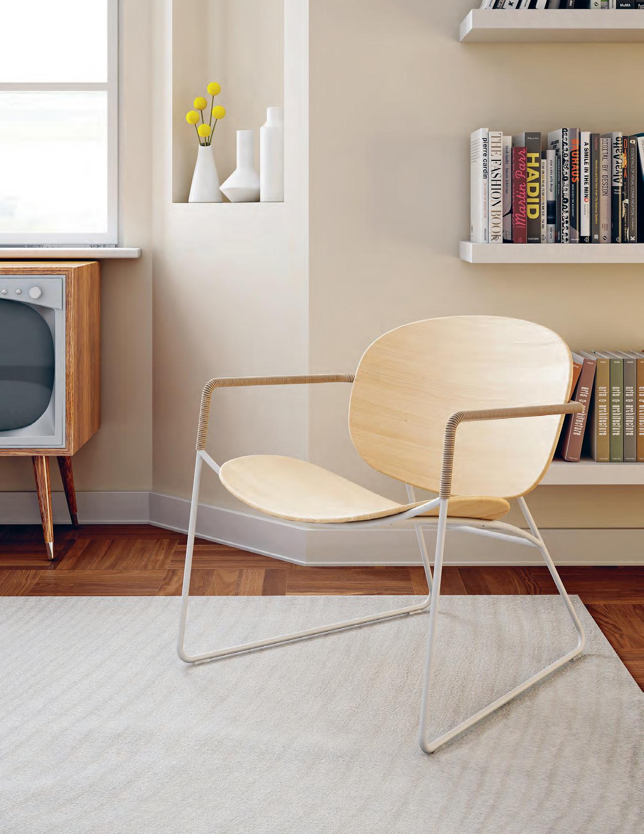
Tondina Lounge designed by FavareTTo & ParTners For inFiniTi design. www.inFiniTidesign.iT inFo@inFiniTi-design.com.au
Icons!
Great bones know no age.
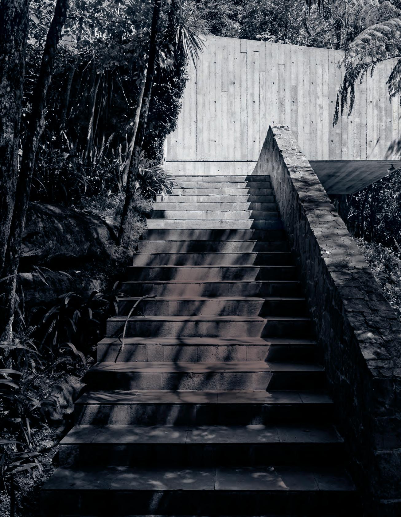
A visit to Penelope Seidler at home; a look at some of Sydney’s emblematic industrial structures repurposed for now; the apparently timeless appeal of modernism in South East Asia
 — Stephen Todd
icons # 81
issue #39 habitusliving.com
Lady Penelope
A child of the left wing intelligentsia, Penelope Seidler was never just the wife of one of Australia’s most notable architects. We visit her at the home she and Harry designed.
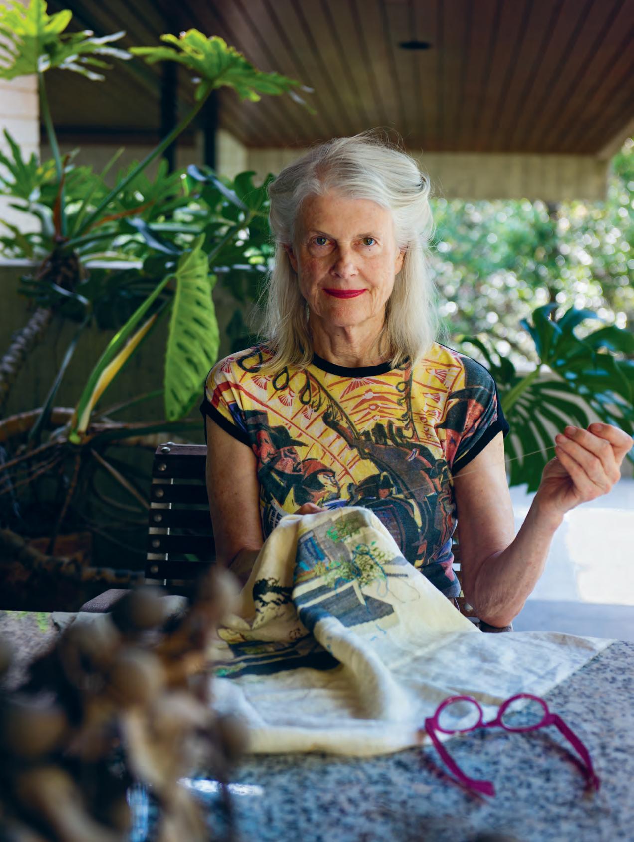
TexT Stephen todd | phoTographY ton Y Amo S OppOsite | penelOpe seidler dOes petit pOint in her spare time, nOtably Of icOnic seidler structures. here she cOnjures up her Own hOme in cOt tOn icons # 83
issue #39 habitusliving.com
icons # 85
issue #39 habitusliving.com
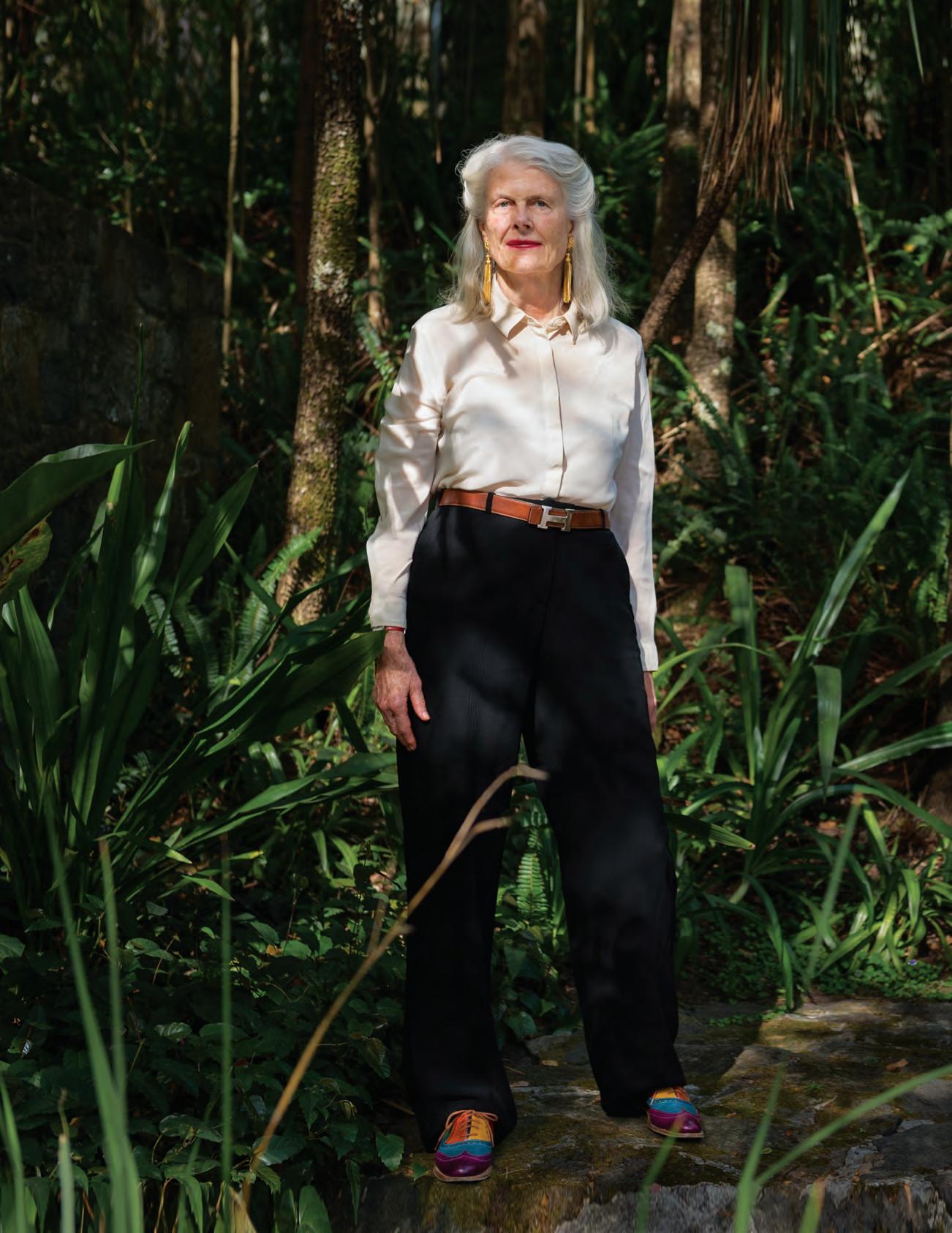
Penelope Seidler is not the kind of great woman to have ever stood behind a great man. Throughout their almost five decades of married life, the architect and noted patron of the arts stood firmly beside her husband – the feisty Austrian-born modernist, Harry Seidler.
Penelope was 19 and studying at the University of Sydney when she met the celebrated young architect in 1959. A year later, on her twentieth birthday and at the end of her second year at college, they married. Seidler was thirty-five. “I had no idea what I wanted to do with my life but when I married Harry I knew I didn’t want to just be an architect’s wife,” she says today, at home in the cool concrete interior of the house the couple designed at Killara, on Sydney’s north shore. “All he and his friends talked about was architecture. So I switched to architecture in order to enter Harry’s world on an equal footing. I graduated five years later.”
By that time the young couple were living in the penthouse of the 10-storey Elizabeth Bay apartment building Seidler had delivered in 1960. The Ithaca Gardens block is a stoic, sandy brick oblong dissected by an expressed concrete grid. Perfectly oriented north for solar exposure and impeccable harbour views, it is washed by the breezes sweeping up the hill from Beare Park. But the pair wanted to expand their horizons –professionally as well as personally – to design a house together that could become their forever home.
The birth of their two children in quick succession was what confirmed their decision to scout around for a block of land on which to build their family residence.
“I said I’d go as far as Killara,” Penelope remembers. “Having grown up in Wahroonga I wasn’t keen to settle too far away from the city again.” Fourteen kilometres north of Sydney on the edges of the Ku-ring-gai Chase National Park, Killara was established when the railway opened there in 1899. It was planned as “a gentleman’s suburb” of expansive mansions and sparse commerce. At Wahroonga, a 25-minute drive further north along the A3, is still to be found the heritage-listed childhood home of Penelope Seidler née Evatt, a palatial, red brick and colonnaded Georgian Revival manor designed by architect Stuart Traill and built in 1940.
Wahroonga is also, curiously enough, the site of Harry Seidler’s first Australian project, the commission that brought him from Oscar Niemeyer’s São Paolo office to our shores: the private house for his family, today known as Rose Seidler House, completed a decade before the couple met.
Penelope Evatt was born into a well-to-do political family of liberal convictions. Her father, the Hon. Clive Evatt QC was a Labor minister during World War II when Penelope was a young child. His elder brother Dr H.V. Evatt was Attorney General then Minister for External Affairs throughout the 1940s. (He was also widely rumoured to be the first Australian to own a Modigliani.)
By coincidence, ‘killara’ is an Aboriginal word meaning ‘permanent’ or ‘always there’.
including
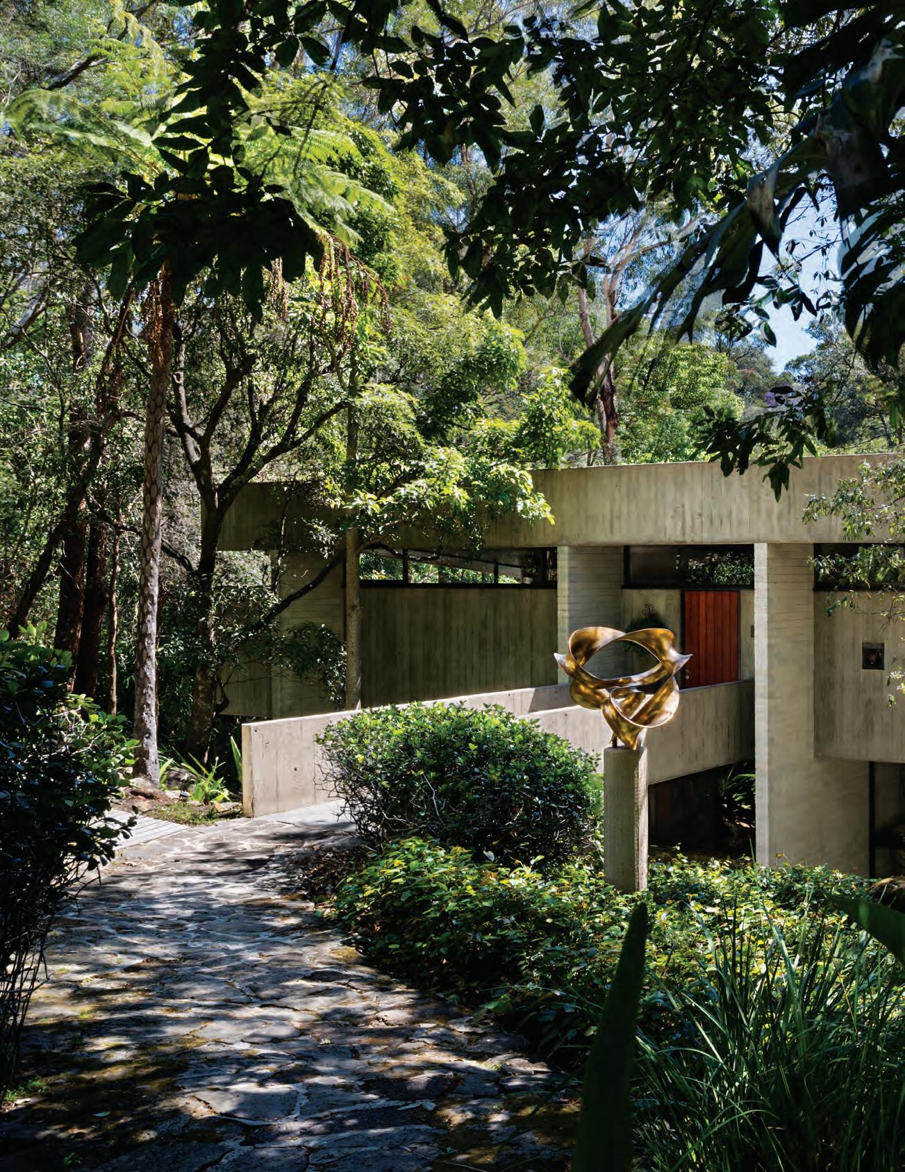
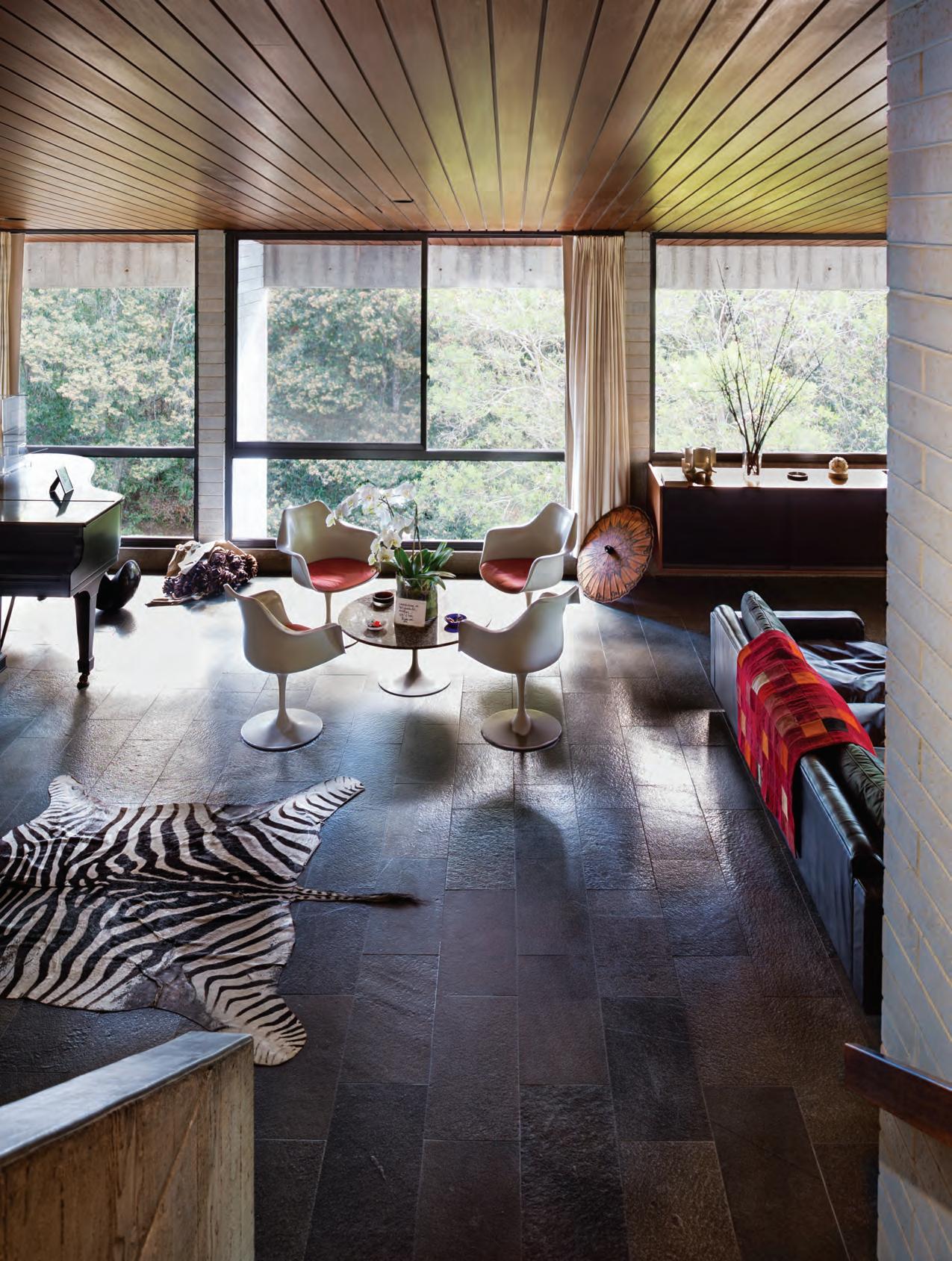
previous | Harry & penelope seidler House sits on a steep block leading down to a brook. it is accessed by a planked concrete bridge giving it wHat seidler reckons is “a medieval feel”. opposite | tHe living room appears suspended above tHe surrounding busHland. tHe ceiling is tasmanian oak, tHe floor composed of quartzite slabs. all furnisHings
are original,
animal skin
rugs
and
tHe tulip cHairs and table by eero sa arinen for knoll.
icons # 87
issue #39 habitusliving.com

icons # 89

issue #39 habitusliving.com
icons # 91
“It was a very tumultuous time and my father and uncle were often in the news which didn’t go down so well at Pymble Ladies’ College,” remembers Penelope. “I was probably the only girl there from a left-leaning family. I felt very under siege.”
While her two siblings followed their father into law, and he would have had her do the same, Penelope had a penchant for culture and yearned to become involved in the visual arts. Except that visual art was not yet a certified subject for study at the time, ineligible as a matriculation merit.
“It was a drop-out subject.”
At the University of Sydney she enrolled to study philosophy, history, anthropology – the liberal arts – but as luck would have it other students of her age included Robert Hughes and Clive James who would become fast friends. “We were all just one big happy family and I was having a wonderful time!” Not long after graduating, James moved to London to establish himself as one of the greatest TV presenters of his generation and Hughes soon followed to launch his career as an international art critic and cultural historian.
But by then, Penelope had met Harry. “He was older, and so sure of what he wanted to do, unlike all these other layabouts I’d been used to,” she laughs. “He’d still not decided to stay in Australia and he did threaten to leave from time to time. But after he did his first house for his family he’d become quite famous and was getting other commissions and that’s why he stayed.”
The Killara House, essentially four volumes – or half-floors – suspended around a void, is composed of
reinforced concrete, basalt, timber, white concrete blocks and quartzite. A more definite commitment to the long term is difficult to imagine. By coincidence, ‘killara’ is an Aboriginal word meaning ‘permanent’ or ‘always there’.
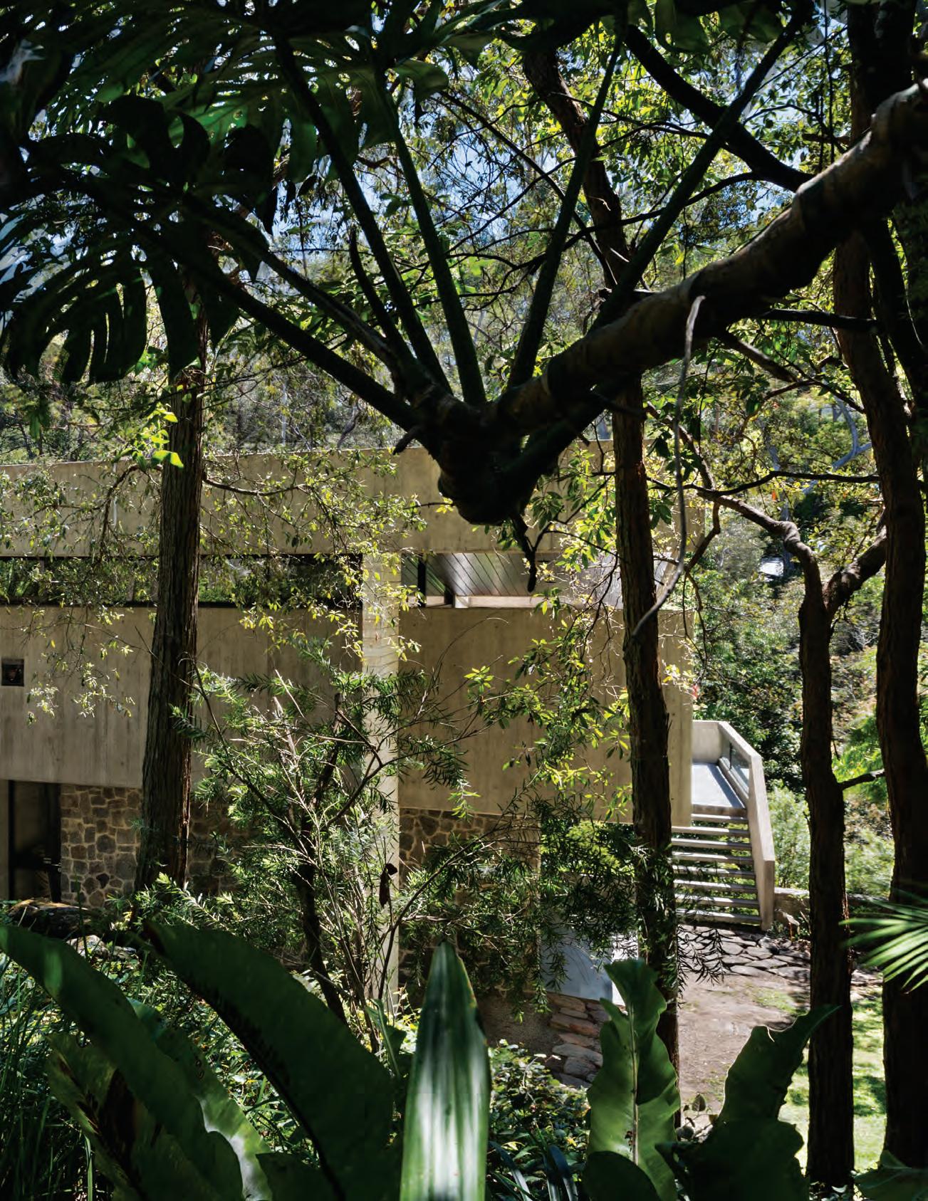
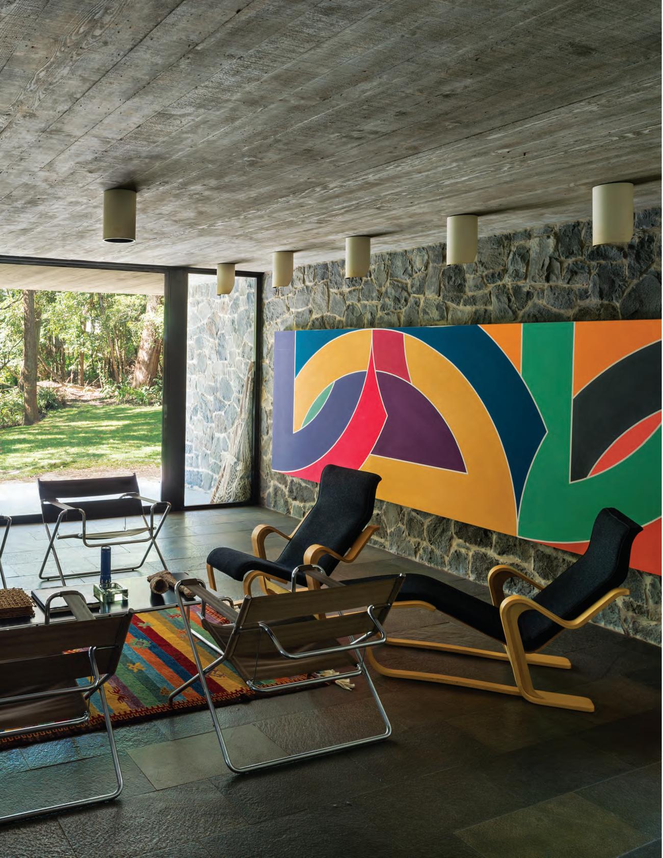
Approached by a concrete entry bridge, the kitchen, dining area and library are on the top level; the living space and main bedroom beneath. The third level was originally a dedicated children’s wing – what was formerly known as the playroom is the only volume with direct access to the lush native garden. Today it is an ancillary sitting room, overseen by a monumental Frank Stella painting. The lowest floor contains a studio, guest suite and service room. “I live mostly on the upper two levels these days,” notes Penelope. “It may seem silly for a single person to occupy such an immense house on their own, but this was and always will be my home.”
Bauhaus-inspired but resolutely Australian, it is embedded in the middle of its steep, sloping site above a creek, as if part of the tectonic plate itself. “In fact, I sometimes think it would look quite silly anywhere else,” says its coauthor.
Harry & Penelope Seidler House was awarded the Australian Institute of Architects’ Wilkinson Award the year it was completed, in 1967. A brass plaque sits at the front door to this day.
As director of Harry Seidler & Associates, Penelope spends most weekdays at the Milsons Point Offices & Apartment building of 1973. Her city residence is in the Cove Apartments in The Rocks, the last residential building Seidler completed – two years before his death from septicemia following a stroke, in 2006.
“As an architect she’s shown a way of being outside the practice and that in turn nourishes those around her.”
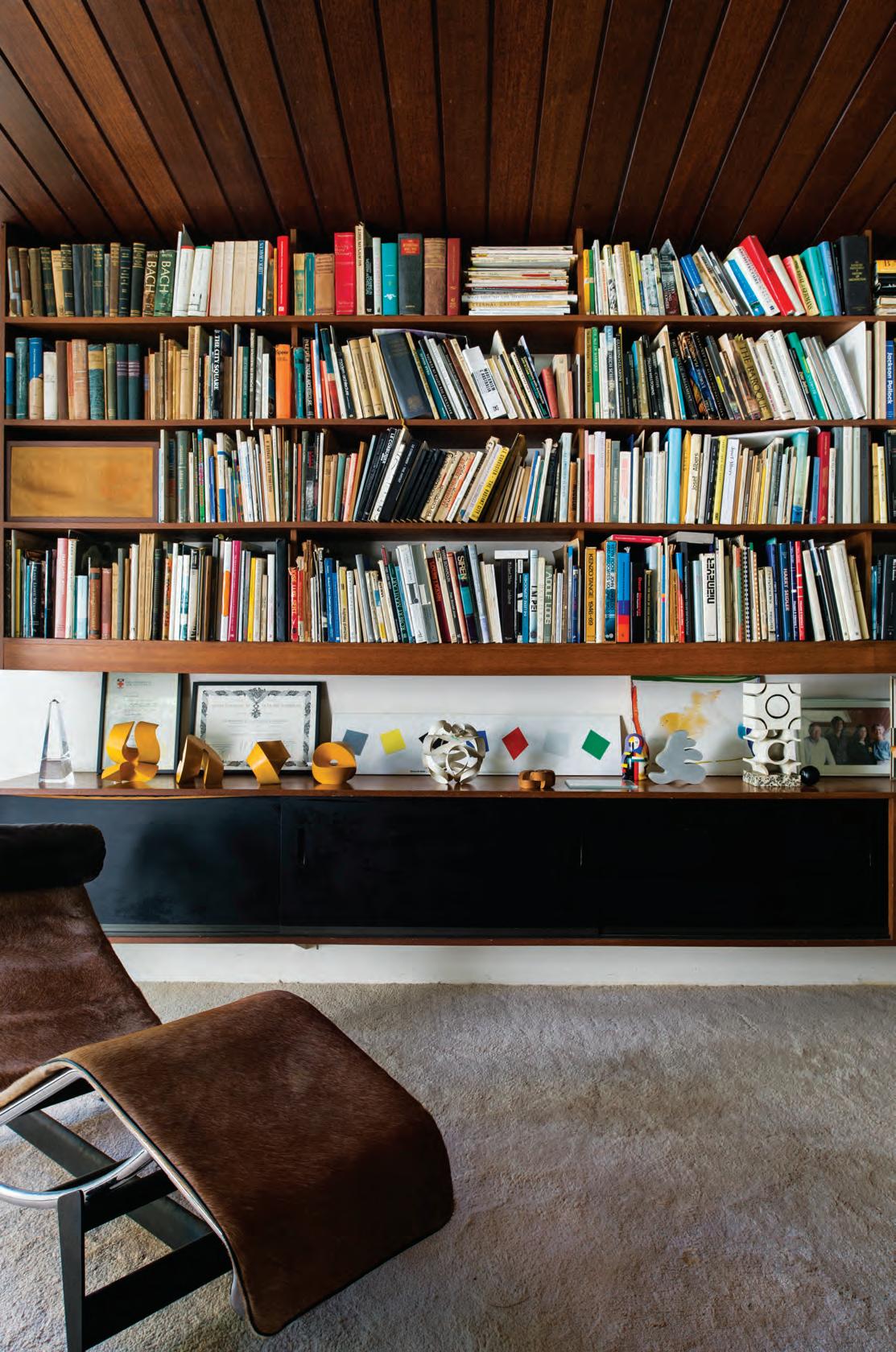
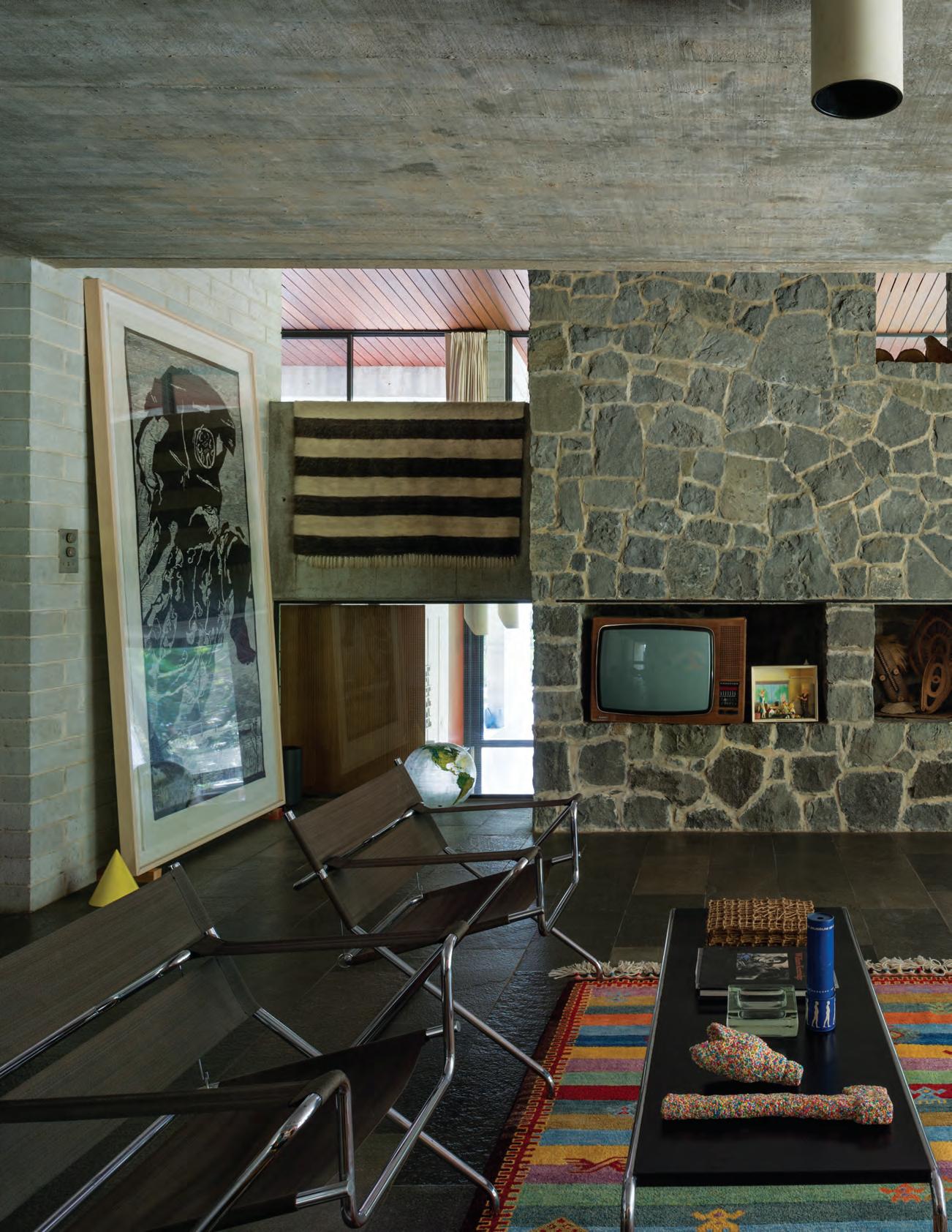
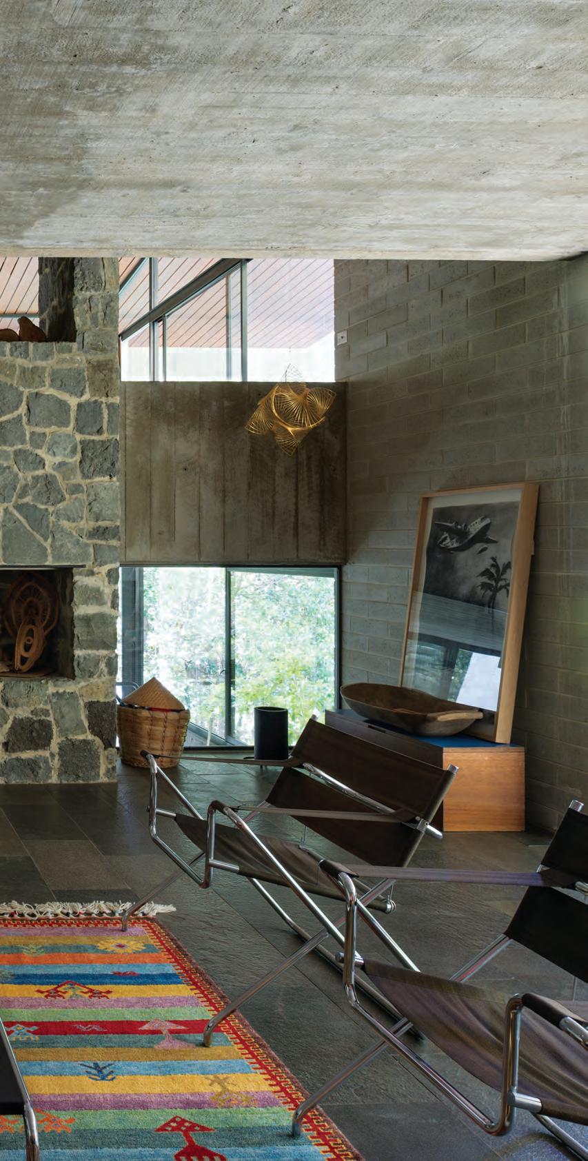
pages 88-89 | seidler in the front garden. previous | originally the children’s playroom, this space is the only one to open directly onto the garden. today it is presided over by fr ank stella’s majestic ‘York FactorY ’ (1971). opposite & following | “apart from maintenance work nothing has been changed since we moved in.” – penelope seidler.
— Melonie Bayl-Smith
issue #39 habitusliving.com
icons # 93
issue #39 habitusliving.com
icons # 95
It’s from here Madame Seidler sets out almost every evening to some cultural event or society dinner, seemingly indefatigable. She sits on the boards of the Biennale of Sydney, the National Gallery of Australia Foundation and the Institute of Architects Foundation. Since 1973 she has been a member of the International Council of the Museum of Modern Art in New York, and in 2011 was made a Chevalier of the Légion d’Honneur of France.
“Penelope Seidler is inspiring for the fact that she has always taken the initiative to educate herself,” says architect and academic Melonie Bayl-Smith. “She has never sat back and waited for the world to reveal itself to her. As an architect she’s shown a way of being outside the practice and that in turn nourishes those around her.”
Penelope Seidler is a great woman - une grande dame - indeed. To see her enter a room is to watch her cut a fine swathe; people make way for her not because she demands deference but because she inspires respect. She’s part of what I like to think of as the Strapping Generation, that breed of unabashed cultural actors like her classmates Clive James and Robert Hughes, like Gough Whitlam, Germaine Greer, Patrick White; big characters with bold ideas unafraid to air them. Iconoclasts more than icons, a very Australian rabble, butterflies of the mind.
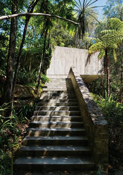
above | The enTr ance To h a rry & Penelo Pe S eidler h o u S e r i S eS from STr ee T level To Th e garage, Th en deS c end S inTo Th e bu S h issue #39 habitusliving.com
She’s part of what I like to think of as the Strapping Generation, that breed of unabashed cultural actors .
SYDNEY 5/50 Stanley Street Darlinghurst +61 2 9358 1155 MELBOURNE 11 Stanley Street Collingwood +61 3 9416 4822
SYDNEY 5/50 Stanley Street Darlinghurst +61 2 9358 1155 MELBOURNE 11 Stanley Street Collingwood +61 3 9416 4822
Tales of the City
A spate of savvy warehouse developments is rejuvenating Sydney’s inner city.
icons # 99
TexT Stephen todd
issue #39 habitusliving.com
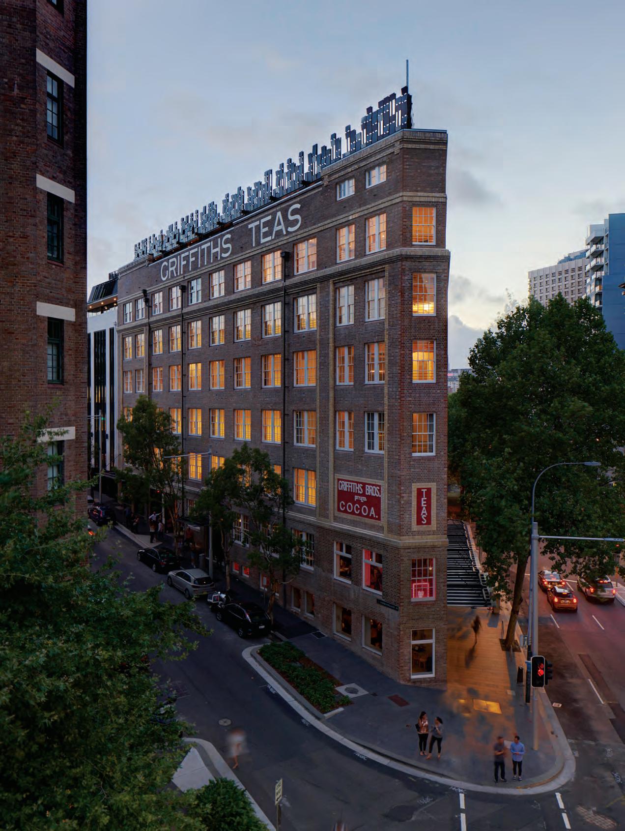
As the last of the new residents moved into their PopovBass designed apartments in the repurposed Griffiths Teas building last December, they joined the swelling ranks of a new breed of urban dweller. People who value quality housing but eschew even near-flung suburbia, who relish the clamour of city dwelling, thrive on the buzz of funky bars (and perhaps the occasional drunk) on their doorsteps. Well-travelled folk with unencumbered budgets; nomadic romantics keen to create a little bit of New York or Paris back home.
They are also, perhaps without realising it, members of what might be thought of as the Cornerstone Club. Helmed by former electrical contractor Michael Grant from its seaside offices on the northern beaches, Cornerstone Property Group has nurtured some of Sydney’s most distinguished urban renewal projects into being.
The award-winning Casba apartments and public courtyard development on Danks Street in the former industrial precinct of Waterloo; Cleveland & Co, an amalgamation of two stoic heritage structures on a major arterial in Redfern; Nº1 Lacey, a landmark Edwardian building in Surry Hills; and of course the iconic, much sought-after Griffiths Teas project. (Such was the excitement over this landmark building hitting the market as luxury apartments that 5,000 registrations were received for the 38 properties, three or four buyers finally battling it out for each allotment.)
All were envisioned and developed by Grant in collaboration with architects of significant stature including Alex Popov and Brian Bass, Adam Haddow of SJB and Iain Halliday of Burley Katon Halliday.
Not bad for a man was started out as a sparky.
“I left school after Year 10 with a bit of trade knowledge,” says Grant. “I began working for my father and by the age of nineteen I thought I was ready to take over his business, but my mother said no, I wasn’t ready. So I went overseas, saw a bit of the world, got experience bartending, that sort of thing. When I came back my mother said I still couldn’t take over my father’s business. Then I went to India and
swam in the Ganges and came back and said I’m ready to take over the business and my mother still said, no.” A painter and sculptor, Mrs Grant felt her son should carve out a niche of his own.
“So when I came back from another trip to South America, I bought my own truck, put my one piece of conduit on the top and away I went. In three years I went from having no staff to about twenty people working for me. I worked literally sixteen hours a day, seven days a week for probably fifteen years. The advantage a trade gives you is that you’re first on site and often the last on site, you’re putting conduit behind walls, getting inside the whole structure. It gives you an incredible understanding of the intricacies of construction. That said, I was always more interested in art and architecture than I was crawling about under floors.”
As his rapport with builders evolved Grant eventually partnered on a small northern beaches development of two apartments. Then one of four, six, twenty-four until by the time he met Alex Popov in the mid-1990s he was ready to step into the big ring.
“By then I had some land in Mona Vale and I asked Alex to work on it. He accepted, but more than that he became an incredible mentor, sending me off on a voyage of discovery to Saint Petersburg, Stockholm, Copenhagen, Paris, Barcelona, Rome – places where I could see work by the likes of Le Corbusier, van der Rohe, Antoni Gaudí, Henning Larsen and Jørn Utzon.” (These last two Popov had worked with after he graduated from the Royal Danish Academy of Art in 1971.)
“I took my mother on the five and a half week trip and when I got back I had to tell Alex what I saw in these buildings.”
The result of this voyage of discovery – and the fruit of the first collaboration with Popov – is the Rockpool multi-residential development on the beach at Mona Vale, north of Sydney, finished in 1999. A noble composition of asymmetric arches that appear to hunker down in the dunes, it echoes Le Corbusier’s famous vaulted houses, the Weekend house in the suburbs of Paris of 1935 and the Maison Jaoul of 1952.
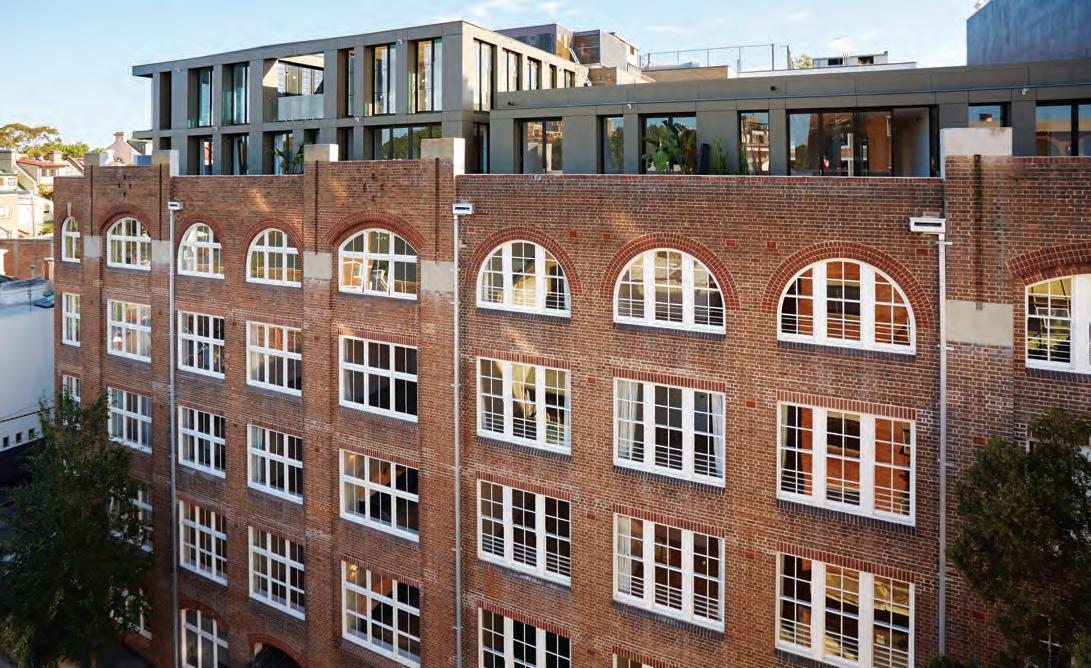
opener | The GriffiThs Teas buildinG was desiGned by KenT budden & Greenwell and compleTed in 1915. The new penThouse level feaTures meTal screens desiGned To echo The dramaTic corbels and recessinG of The oriGinal façade. phoToGr aphy by michael nicholson opposiTe above | popovbass’s reconfiGurinG of The inTerior volumes of The GriffiThs Teas warehouse conTr asTs heriTaGe Tex Tures wiTh new, lacquered volumes. phoToGr aphy by michael nicholson opposiTe below | n º 1 l acey was builT in 1912. phoToGr aphy by yanni KronenberG
icons # 101
But perhaps even more remarkable than the building itself was the savvy urban programme. By using the double rows of apartments to create a new pedestrian neighbourhood, Grant and Popov demonstrated the capacity of private development to affect public good.
For his next key project, inspired by the communal architecture of Northern Africa, Grant commissioned SJB’s Adam Haddow to devise a residential complex that would also enhance public amenity. The result was the Casba complex, which won a World Architecture Award for mixed-use development in 2015.
“Michael’s way of explaining a brief is by images and recounting experience,” says Haddow. “He needs to evoke an emotional response, to talk about how people will live not just in but around his buildings.”
Haddow began with what became known as the cloister, the open-ended public garden around which small business, bars and restaurants would thrive, creating a new urban enclave. The 65 apartments above have been built from recycled industrial brick in homage to the site’s heritage; the interiors, orchestrated by BKH, effectively articulate inside and out, expansive terraces enhancing a Mediterranean feel.
“Michael really gets inner precincts like Waterloo, Surry Hills, Redfern,” says Haddow. “He understands that the ground plane should be an extension of the living rooms, that vibrancy at street level is adding amenity, real value beyond the actual property price.”
“Casba was about developing a location that needed a new sophistication,” Grant says in sum. “Cleveland & Co is in Redfern so needed to be more bohemian. Not grungy, but groovy. Nº1 Lacey at the corner of Kippax is the heart of the old rag-trader enclave and I wanted the new building to reflect that more romantic kind of vibe, which Iain Halliday does so well. Griffiths Teas is a bit more hardedged industrial, a bit gritty, which Alex Popov is really good at conveying.”
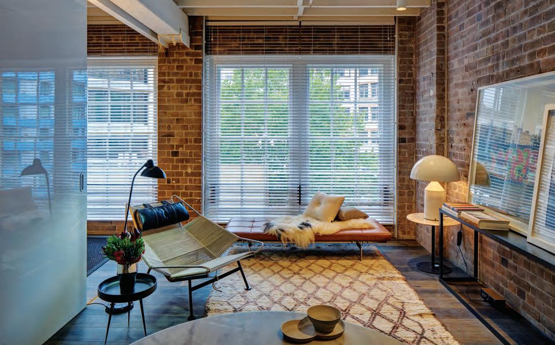
At Griffiths Teas, PopovBass stripped back the 1915 structure to its elemental components of brick and timber beams to reveal a series of eccentric internal volumes following the sharp apex of the tight corner site. The new architectural program involved the elaboration of a central, lacquered pod in each separate unit which conceals all utilities while also creating a sculptural core that separates dining and entertaining from sleeping and
“Griffiths Teas is a bit more hard-edged industrial, a bit gritty, which Alex Popov is really good at conveying.”
— Michael Grant
issue #39 habitusliving.com
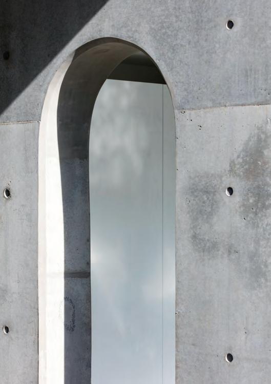
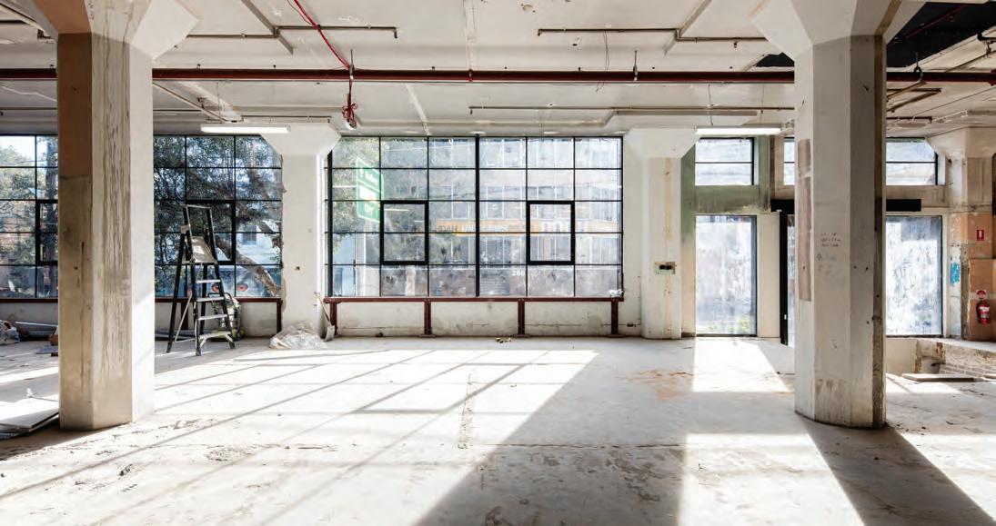
opposite above | inside the demco munitions factory, now part of the cleveland & co development. opposite below left | views from the communal rooftop garden at cleveland & co opposite below right | an expressed concrete archway at cleveland & co photography this page by brett boardman

icons # 103
ablution zones. More poetically, the pods reference the tea boxes in which the Griffiths brothers shipped their valuable merchandise until the company shuttered the premises in 1965.
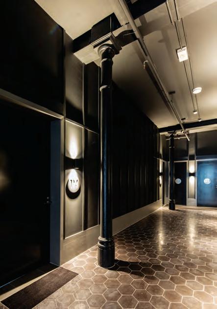

At Nº1 Lacey, Iain Halliday has converted a handsome 1912 factory into 38 warehouse apartments which celebrate a bygone era. Raw brick work, vast arched timber windows and wooden columns have been restored and transformed, re-oriented to the 21st century. A five-storey central atrium references International Modernism and opens up into the seven penthouses, their large, private rooftop terraces look over the Sydney skyline.
Cleveland & Co is a rearticulation of two adjacent industrial buildings: the 1889 New York and Brooklyn Tobacco Factory, designed by Sydney architect R. Kunstman, and the 1938 Demco Machinery Company, by J. Aubrey Kerr, to form a unified complex of 38 residential apartments designed by SJB and interior designers, BKH. Adam Haddow and his husband own the penthouse –christened Cleveland Rooftop – which last November was awarded the INSIDE World Festival of Interiors prize for Residential design.
“The ambition for Cleveland Rooftop was to realise a garden that you happened to live in, rather than an apartment surrounded by greenery,” says Haddow. “This sky landscape is a retrieval from the bustling city lifestyle, and contributes to the network of inner-city green spaces.”
It’s been a busy couple of years for Michael Grant and his tiny team of five in their beachside offices along the Mona Vale strip mall. Grant estimates he has “delivered about $350 million worth of property” in the past year. “For a small developer that’s a lot,” he admits. “It’s intense, but I am focused and committed to doing cool, extraordinary things. I think I’ve got another ten or fifteen great projects in me, and I can only do that if I recalibrate and refocus.”
above & below | In the entrance and land I n gs of c leveland & c o o r I g I n al I ron and concrete columns are reta I n ed, offset by contemporary fIt tI n gs. photography thIs page by brett boardman issue #39 habitusliving.com


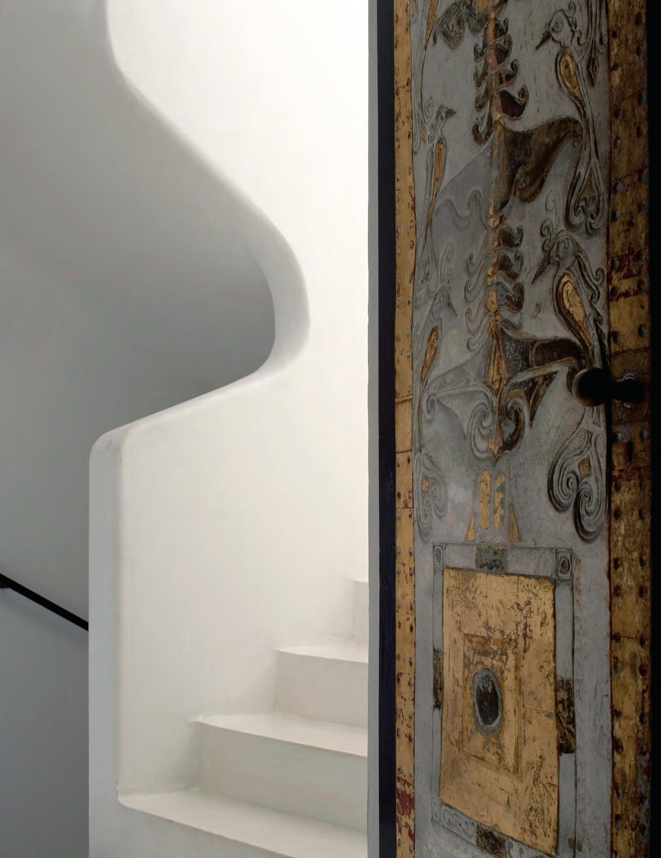
issue #39 habitusliving.com
When East met West
The turn of the twentieth century was a time of rapid change in the western world and architecture in particular felt the effects. New materials and construction techniques were inciting an entirely new type of architecture in Europe and North America. Long, straight lines of glass and steel, coupled with previously unfathomable shapes of formed concrete. This pared back approach was quickly coined as Modernist. A new age had dawned and every architect of the day was clambering to make a statement – Gropius, Mies van der Rohe, Breuer, Lloyd Wright… the list goes on.
The International Style has been a point of reference for many architects – from Bauhaus through to late Modernism, many have strived to reach the same level
of purpose and functionality. That stripping back of ornament for a design outcome which offers nothing but raw simplicity and necessity.
It has been a movement that is highly recorded, revered and held up, even still, as a point of inspiration. But nothing is ever static, which is ever more apparent in how these strong ideals have trickled into other cultures, creating subsequent movements of their own.
It’s this fusion of western Modernist ideals with a local vernacular slant that offers another facet to the story and evolution of modernism. And one of the leading proponents of this was, of course, Geoffrey Bawa.
Geoffrey was a Sri Lankan architect and has been often dubbed the guiding architect of Tropical
opposite | Number 11 was Geoffrey bawa’s owN apartmeNt iN Colombo. photoGr aphy Courtesy luNuGaNGa trust
TexT Aleesh A CA ll A h A n icons # 107
When International Style began making waves in Europe in the early 20th century, it didn’t take long to make its way down the globe into South East Asia. But the real magic happened at the crossing point between east and west.
Modernism. He trained at the Architectural Association School of Architecture in London, bringing his strongly held views on the profession back to his native Colombo. Interestingly, Geoffrey received his registration at the age of 38 after previously being a barrister. In spite of a long and prolific career, his buildings rest predominantly in Sri Lanka, with a sprinkling in India and Indonesia. In this sense it could be argued that he was a truly South East Asian Modernist architect.
The driving philosophy of Geoffrey’s work was always to seamlessly blend inside and out. To a contemporary frame of reference this doesn’t necessarily sound ground breaking. But it’s important to remember that this approach broke away from the typical British Colonial influences of the time and introduced an aesthetic that brought people closer to the lush tropical surrounds. The late 50s and early 60s heralded a new type of architecture, with forms such as horizontal rooflines directly referencing the likes of Le Corbusier (a major influence for Geoffrey). Unfortunately, he soon realised that function trumped aesthetics as pitched roofs with a heavy overhang offered more protection against the Sri Lankan climatic conditions.
As Geoffrey’s regional take on Modernism began to progress, elements of local vernacular began to flourish alongside. This included the use of white formwork
concrete, criss-crossing trusses and porous ground levels with pyramid hipped roof pavilion structures. This is especially apparent on Geoffrey’s own homes, including his house in Colombo, Number 11, and his holiday home, Lunuganga, which are both now open to the public. Throughout his career Geoffrey worked across all typologies – homes, hotels and resorts, schools, and government buildings.
In the Philippines, Leandro Valencia Locsin was commencing his architectural career in uncanny resemblance to Geoffrey’s path – having first studied law before changing to architecture.
Leandro was driven by the philosophy of combining the Oriental and Occidental – to create a harmony between east and west. Leandro’s most recognisable projects, although drastically different in form and materiality to Geoffrey, are the perfect exemplar of regional Modernism. They incorporate the key principles and materiality of the movement, but also take into account their local context and culture.
Concrete is the dominant material throughout Leandro’s work, so much so that it is what his work is remembered for most. But the architect’s use of concrete wasn’t just to follow in the footsteps of International Style, although he did much admire the work of Paul Rudolph and
opposite above & below | Number 11 is Now opeN as a museum. geoffrey experimeNted with moderNist approaches for his owN home. photography courtesy luNugaNga trust
issue #39 habitusliving.com
It’s this fusion of western Modernist ideals with a local vernacular slant that offers another facet to the story and evolution of modernism.

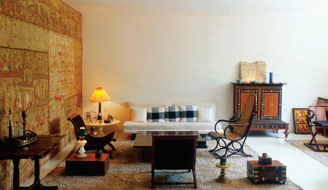
icons # 109
Eero Saarinen. Leandro incorporated concrete due to the fact that it was a relatively cheap material and also readily available in the Philippines at the time.
The most recognisable of Leandro’s buildings is Tanghalang Pambansa, located within the Cultural Center of the Philippines. Featuring a hulking marble façade that appears to float above the ground, at first glance the Cultural Center could be a building from anywhere in the world. A closer look however reveals certain details that locate it in its place and time.
The flat roofline is distinctly Modernist but the poolsized water feature at the front of the building is shaped in a more suitably Asian-inspired hectagon. In addition, the tightly curved concrete fins at the base of the building feel strangely space age, while managing to recall a sense of the Orient. Similarly to Geoffrey, Leandro worked across many typologies throughout his career – from homes and hotels, to civic structures and interiors – but in each of them he sought a balance between east and west.
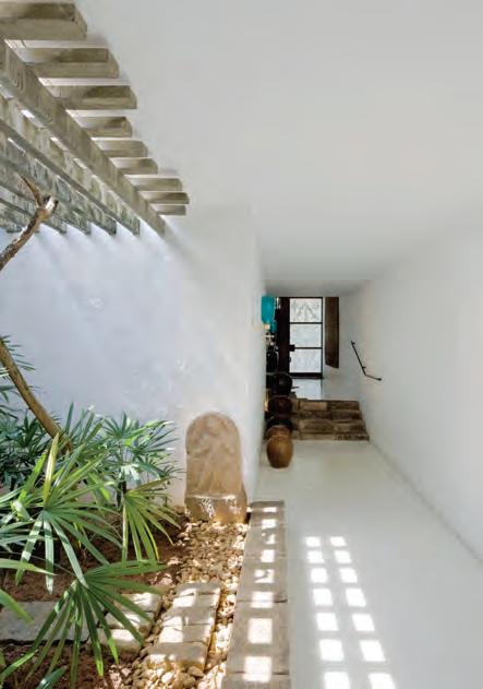
Even though the European Modernist masters have gone down in the history books, there is still plenty of inspiration to be found in the localised iterations of the movement.
What’s even more exciting is the next generation of Asian designers who are inspired by this significant moment in time. How will they take the philosophies of Modernism and reinterpret them in a 21st century context?
above | Geoffrey championed indoor/outdoor livin G , b rin G i n G li G ht into the interior in clever ways. photoGr aphy courtesy lunuGanGa trust
issue #39 habitusliving.com
The driving philosophy of Geoffrey’s work was always to seamlessly blend inside and outside.
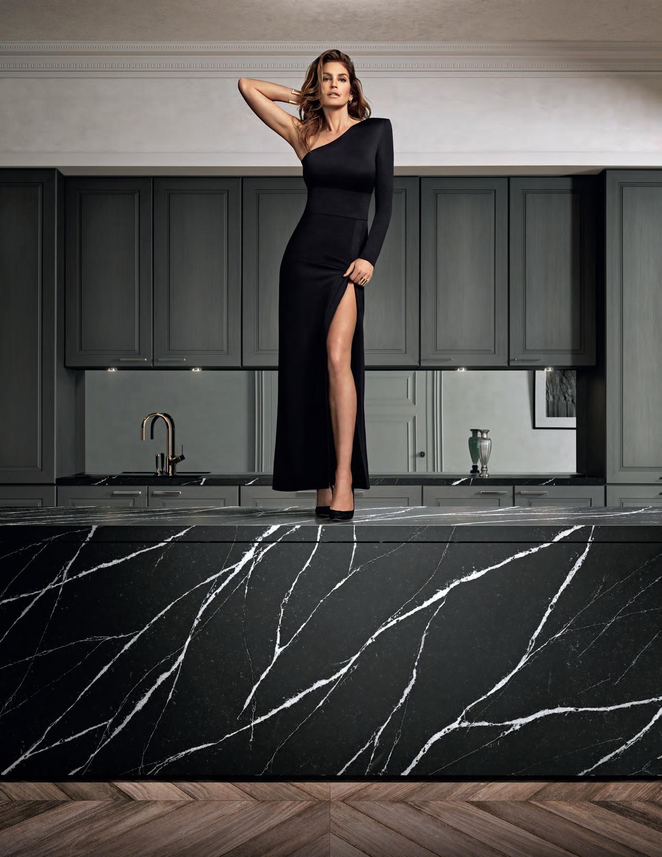


Discover more at silestone.com | Follow Us F T A product designed by Cosentino ® Colour Eternal Marquina Cindy Crawford on Silestone Countertop TOPS ON TOP COSENTINO AUSTRALIA e-mail: infoaustralia@cosentino.com On Top Feel the new velvety texture
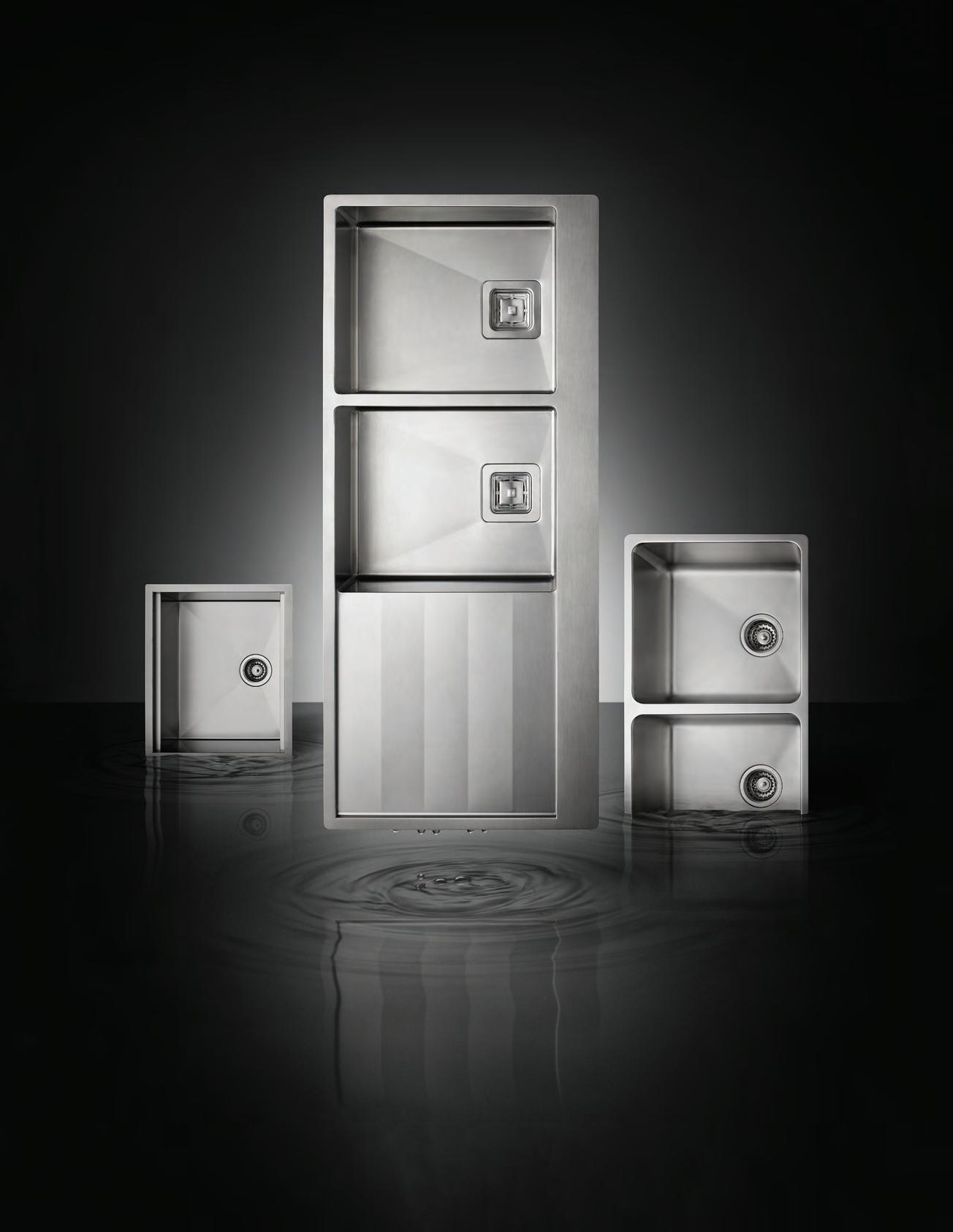
www.abey.com.au Abey Australia’s diverse range of sinks provides you with a selection from around the world. Visit an Abey Selection Gallery to browse the range. Piazza Plus Single Bowl – Lugano Double Bowl and Drainer – Lago Double Bowl SINK DIFFERENTLY. VICTORIA Selection Gallery 335 Ferrars St Albert Park Ph: 03 8696 4000 NEW SOUTH WALES Selection Gallery 1E Danks St Waterloo Ph: 02 8572 8500 QUEENSLAND Selection Gallery 94 Petrie Tce Brisbane Ph: 07 3369 4777 *NEWLY OPENED* WESTERN AUSTRALIA Selection Gallery 12 Sundercombe St Osborne Park Ph: 08 9208 4500
Design through the lives of others
















Pitch
Perfect
At the hands of HYLA Architects and in the words of Yvonne Xu, Siglap Plain in Singapore’s east stands out as a beautiful construct that balances the need for connection and privacy.
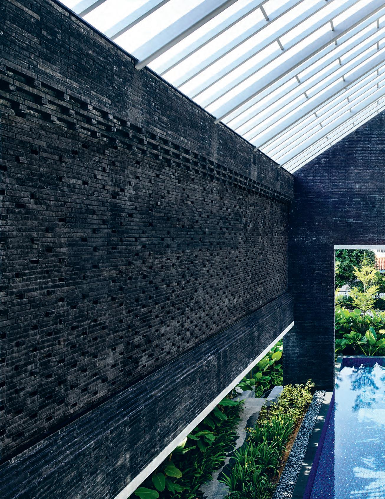 text Yvonne Xu | photography Derek Swalwell
issue #39 habitusliving.com

3 . on location # 115
When I arrive at Siglap Plain, architect Han Loke Kwang invites me first to view the house from across the road. We cross the quiet street and look upon the grey, gable front form. “It is as a child would draw a house,” Han comments.
The building’s monolithic silhouette would have registered as a solemn semantic statement of the house as an icon, except the punctures it bears indicate a more contemporary and innovative spirit.
Han has played with offsets in the size and positioning of the house’s front portals. “The form is symmetric but the openings are asymmetric,” he says. “These openings reveal the concept of the house – but not totally.”
The house falls in line with what Han calls his “courtyard houses” – buildings designed to enjoy exterior spaces while simultaneously finding privacy. Outside Siglap Plain, one gets a suggestion of its spaces, but not of its activities. We see the car porch on one side, and an intriguing atrium-like space on the other.
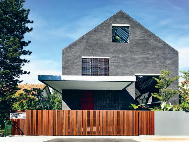
Han explains, “I’ve been [working on] houses with external spaces that are a key part of the overall design. The external spaces are usually enclosed in some way – some enclosed on the top, some are open, but there is usually a wall or enclosure that I incorporate in the overall form.”
The motivation for such courtyards is multi-fold. “We have nothing to look at in most of the sites in Singapore. The plot sizes are usually quite small, so they don’t have a big garden,” says Han. “We thought, if we can’t find anything to look at, maybe we can find a way to look within.” Apart from views, Han’s design and placement of such courtyards also afford the greater house free-flowing air and plenty of natural light, as well as a level of privacy in the exterior spaces.
“By enclosing the outdoor areas, we reclaim a bigger share of the outdoor area into the house. For most houses the external spaces are all around, but they are outside, so here I blur the distinction between inside and outside,” says Han.
opener | Grey bricks from AustriAn producer WienerberGer Are As sembled in A modified stretcher bond, stAGGered by brick Width to AlloW smAll WAll openinGs Above | the house hAs A restr Ained yet strikinG form. opposite | openinGs deployed in All mAnners, AlloW for A series of inside-outside overl Aps.
issue #39 habitusliving.com

3 . on location # 117
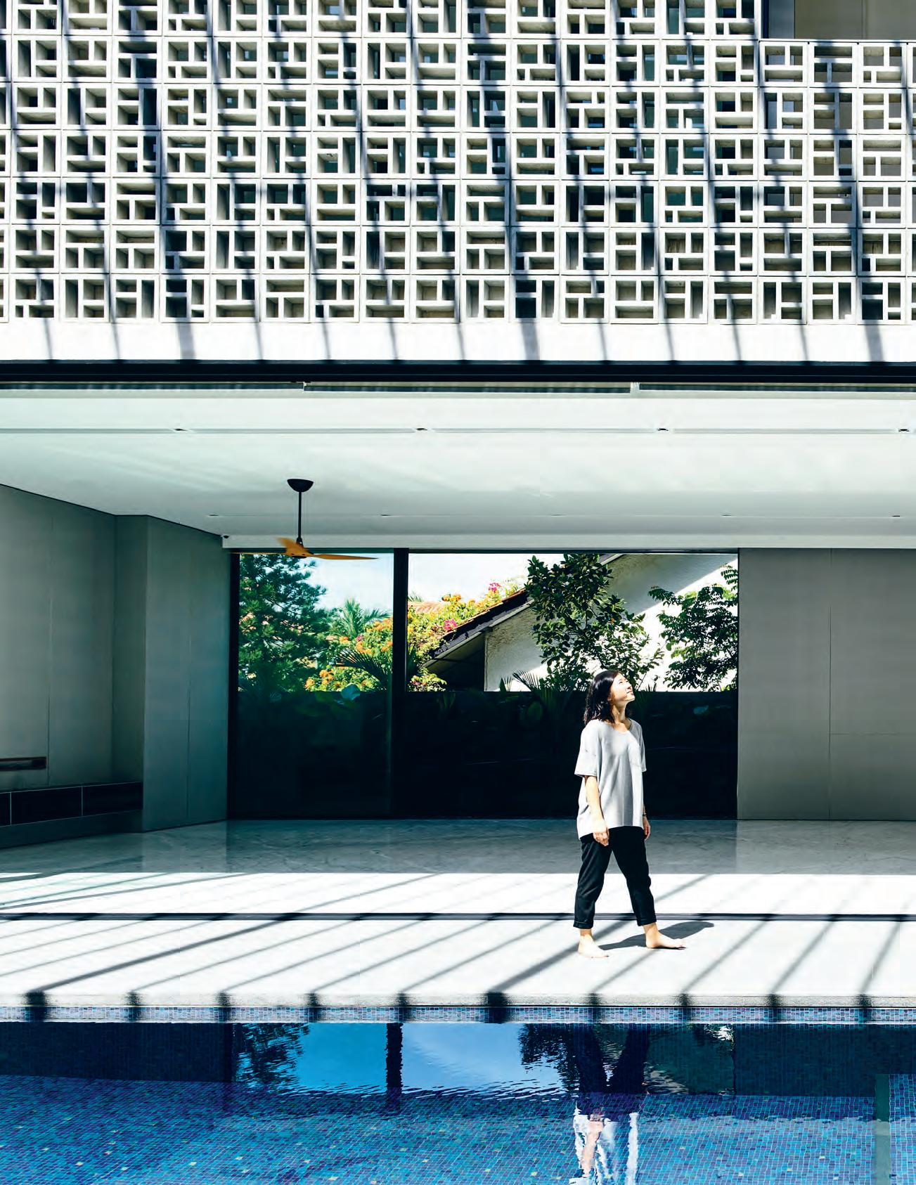
issue #39 habitusliving.com
“If we can’t find anything to look at, maybe we can find a way to look within.”
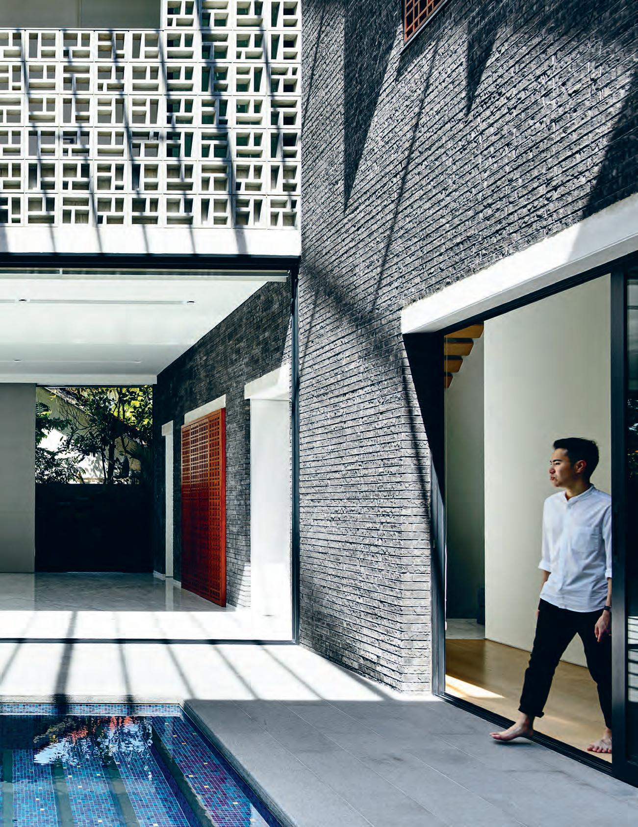
3 . on location # 119
FIRST STORY BASEMENT ATTIC SECOND STORY CAR PORCH ENTRY LIVING DINING LIFT BATHROOM 1 2 3 4 5 6 GUEST ROOM GUEST BATHROOM PANTRY KITCHEN LAUNDRY SPARE ROOM 7 8 9 0 q w e r t y u i YARD POOL DECK POOL GARDEN WINE CELLAR GYM ENTERTAINMENT ROOM SPARE ROOM SHELTER SERVICES STUDY MASTER BEDROOM MASTER BATHEROOM WALK-IN-ROBE BEDROOM BALCONY COVERED TERRACE o p a s d f g h j k l 1 4 5 y u i o o p a s f g g j k l e r t y h 6 d 6 h j j h 6 8 w 6 6 7 q 0 9 3 2 y f 6 issue #39 habitusliving.com
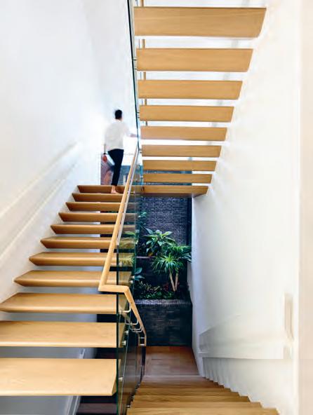
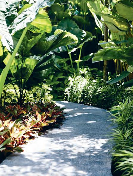
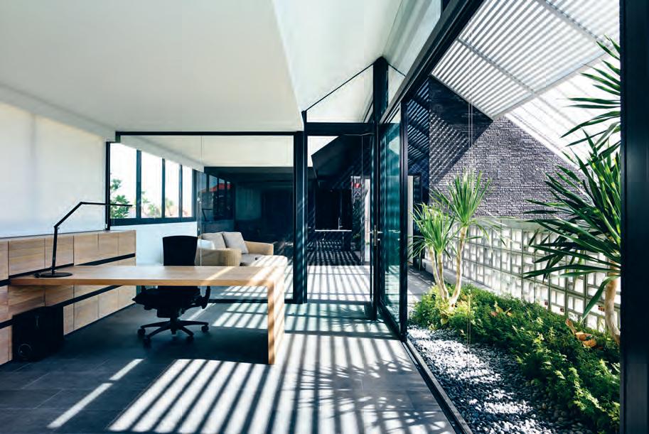
3 . on location # 121
previous | By way of a courtyard atrium, ‘outside’ is ‘inside’, contained within the overall Built form. opposite | plans. aBove left | a green promenade along one side of the house replaces the traditional lawn and garden. aBove right | stair treads, featuring a triangular profile, are cantilevered so the underside slopes in one smooth plane. Below | the junior master suite is private on the top floor But remains open to the atrial courtyard.

above | The movemenT of lighT and shadow layers upon The Tex Tures and dimensions of The concreTe and brick masonry. issue #39 habitusliving.com
In the case of Siglap Plain, a pool has been placed in the courtyard. The pool abuts the guest room on one end, continuing down the length of dining and living areas before extending out towards the landscaping. The enclosing brick wall and peripheral garden provide privacy, while the atrium remains open overhead, giving the residents a nice connection to the tropical weather – rain or shine. Still more important to the family is the relationship of the pool atrium to the rest of the house; the adjoining living spaces and the upper levels that look into it. Lee, the patriarch, says: “The living room is a common area for our family to gather when we are unwinding at the end of the day. Having a view of a pool, instead of a TV, is calming and also encourages conversations. My grandchildren like to play in the pool – although I am unable to swim, watching them and seeing them happy brings me great joy.”

The design of the house also involved considerations for the needs of a multigenerational household. “At that time, I was retired and had more time to spend at home with my family. Essentially, the new house had to be future-proof as we are largely an ageing household; I needed a lift and the interior to be elderly friendly,” says Lee.
“I also like my son and his family to live with us, as I did with my mother before her death, thus it needed to have enough space for their needs. My daughters, together with their families, also visit regularly. As such we need a big living room and dining area. I also wanted the house to be adequately self-contained with a pool, gym [and] home theatre so that the entire family can do their leisure activities within the house. The design was largely left to Han and his team after we told him about our needs and lifestyle.”
My visit to the house yields more surprises as we explore its interior. Entrance to the living areas is a gentle incline of steps, as the house is raised almost a metre (following building guidelines for this low-lying area). The living and dining areas share a span of space, which, having no columns and adjoined by the voluminous courtyard atrium, feels remarkably spacious – quite the perfect setting for big family gatherings. On more placid days, one enjoys the house in quieter ways. The breeze, welcomed through those large front openings, passes over the pool and into the living area. The Bianco Venatino marble underfoot feels cool on this incredibly hot morning. Stepping out to the courtyard, one is presented with even greater enjoyment of the
The enclosing brick wall and a peripheral garden provide privacy, but the atrium remains open overhead, giving it a nice connection to the tropical weather, rain or shine.
3 . on location # 123
architecture, particularly of the latticework and the brick construction, both of which partake in the daily play of light and shadow.
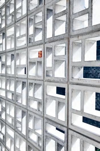
Privacy and personal spaces for individual family members is another key consideration of the architecture. Mini-courtyards are enjoyed from the privacy of bedrooms. A junior master suite occupies the entire attic level, planned for Lee’s son who has just started his own family. Even if relatively private, the attic and other such spaces (including Lee’s own study) look down to the pool atrium – where, of course, the family retires.
Siglap Plain is a wonderful design of relationships – in both spatial and familial terms. While beautifully built and detailed, the success of the house is in large part due to how it serves the family, particularly in the ways it addresses the needs for connection and privacy. On this, Lee says, “Han has completed a beautiful house for our family. We are living here comfortably.” A testimonial as simple and as solid as a brick house.
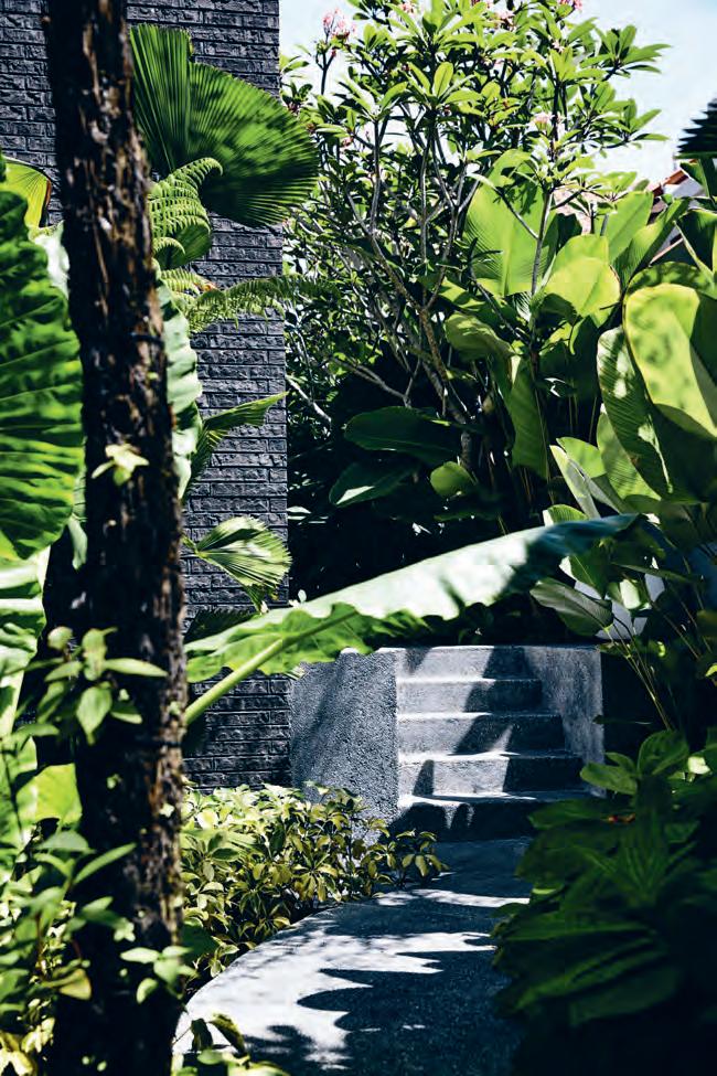
above left | Singapore’ S year-round SunShine makeS for luSh , evergreen landScaping that completeS the architecture. below right | the concrete airblock iS precaSt; itS patterning iS reiterated throughout the reSidence’ S window ScreenS and even in Some of itS Shelving. issue #39 habitusliving.com
By Rogerseller Catalano Effegibi
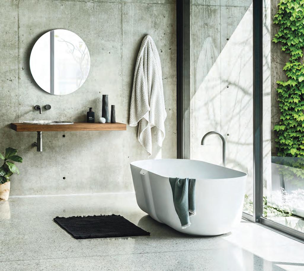
Let us help bring your ideas to life www.rogerseller.com.au/appointment Meet the experts. From concept to conclusion, we’ll guide the way.
Falper Fantini
Follow @rogerseller
Lema Valcucine
Unencumbered Kirribilli
Elements of Sharon and Bob’s cross-continental lifestyle are pieced together like a living mosaic in the design of their new residence, Doorzien House by Bijl Architecture. As finds Holly Cunneen.
text Holly Cunneen | photography KatH erine lu
issue #39 habitusliving.com
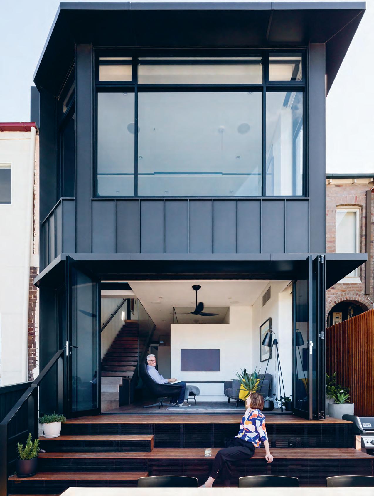
# 127 3 . on location
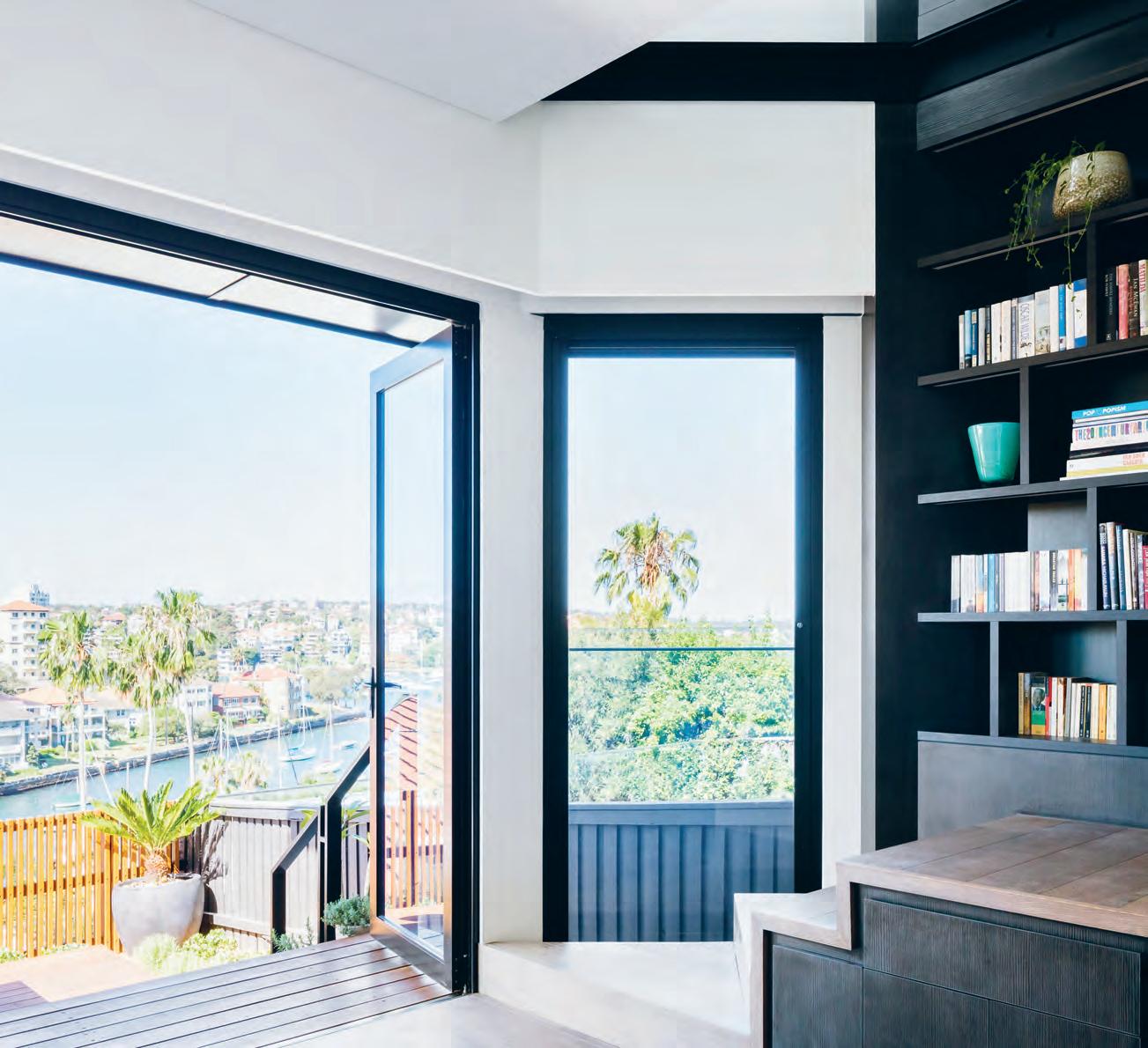
opener | The rear façade of doorzien house casTs a compleTely differenT silhoueT Te To ThaT of The Tr adiTional coT Tage fronT above | The bookshelf on The lower ground floor ex Tends up To The ground floor as one conTinuous sTrucTure. issue #39 habitusliving.com
How many homes have you lived in? Can you count them on one hand, or do you need two? Sharon and Bob need three. In 30 years of marriage, the couple have called 15 different residences their home across four different countries – Australia, Scotland, England, and the Netherlands. A nomadic lifestyle is truly the signifier of the 21st Century – there’s something to be said for not being tied to one spot: it’s liberating.
Interestingly, it’s exactly the opposite that brings joy and excitement to Sharon and Bob when you mention their current residence, Doorzien House in Sydney’s Kirribilli. “This is their forever house now,” says Melonie BaylSmith, Director of Bijl Architecture. Firsttime clients, now friends of Bijl Architecture, Sharon and Bob were attracted to Melonie’s confidence and strong convictions. Her Dutch heritage didn’t hurt either. As the couple had just returned from living in Den Haag in the Netherlands, it brought the two teams together on a personal level.
While it may seem like an added extra, it’s important to have a personal connection and mutual respect when working on residential projects. It’s a delicate and intimate process for all involved. Melonie allows for that.

“We understand that clients go on a journey and we are very flexible in that respect,” she says. “That’s characteristic of our process: allowing space for clients to grow and experience the design process.
We don’t superimpose a set design and say this is the only way it will work. It’s about having robustness to the concepts [we present] and how we can move forward with them.”
Following the time spent working on the initial design concept, an 18-month build saw Sharon and Bob temporarily relocate to Melbourne where Bob, still today, works five days a week. Moving back into their now forever home, and sorting clothes into her completely customised walk-in-robe, Sharon remembers a warm sense of relief – this would be the last time she unpacked her belongings into a new space.
Habits of a nomadic lifestyle have nonetheless carried through to their new home. On request Melonie and the project team at Bijl, including Associate Andrew Lee, have designed in seamless storage opportunities, visible and hidden, consistent with the lightness of space that rules the entire house. And yet Sharon and Bob are hesitant to fill it, living lightly by default and carrying an aversion to the accumulation of “stuff”. What was once a fairly typical, long and narrow semi is now the polar opposite: open, spacious and filled with natural light –whatever the time of day.
The design itself is heroed by opening up as many lines of view as possible, ergo Doorzien House, doorzien being the Dutch word for see-through. Perched on the gentle slopes of Sydney’s lower north shore, there are plenty of enviable views that extend out
3 . on location # 129
Every time you turn a corner or look behind you, you’re granted a different visual perspective of the house.
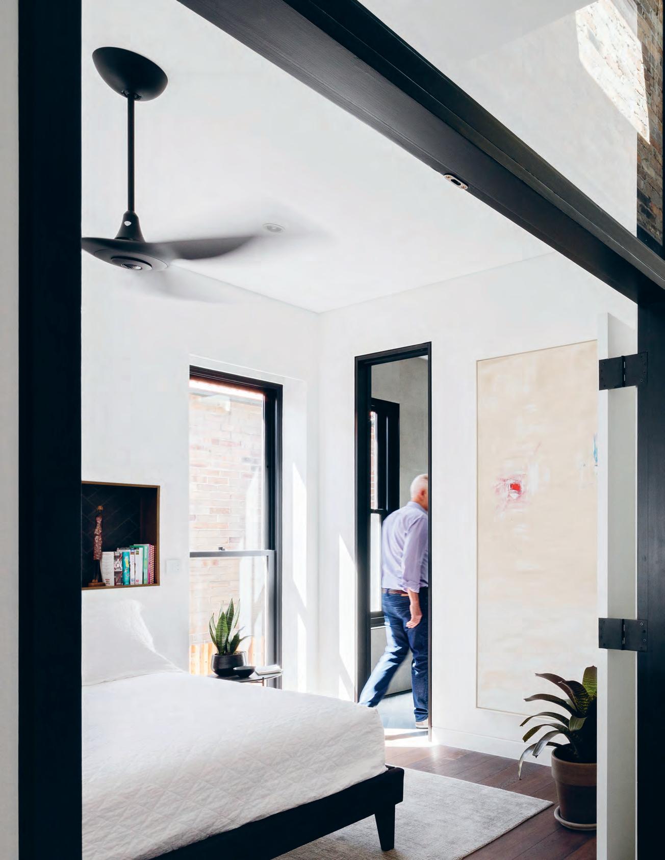
issue #39 habitusliving.com

# 131 3 . on location
to Kurraba and Cremorne Points. However the house doesn’t peak at the exterior views, instead offering different perspectives on the interior, too. Every time you turn a corner or look behind you, you’re granted a different visual perspective of the house.
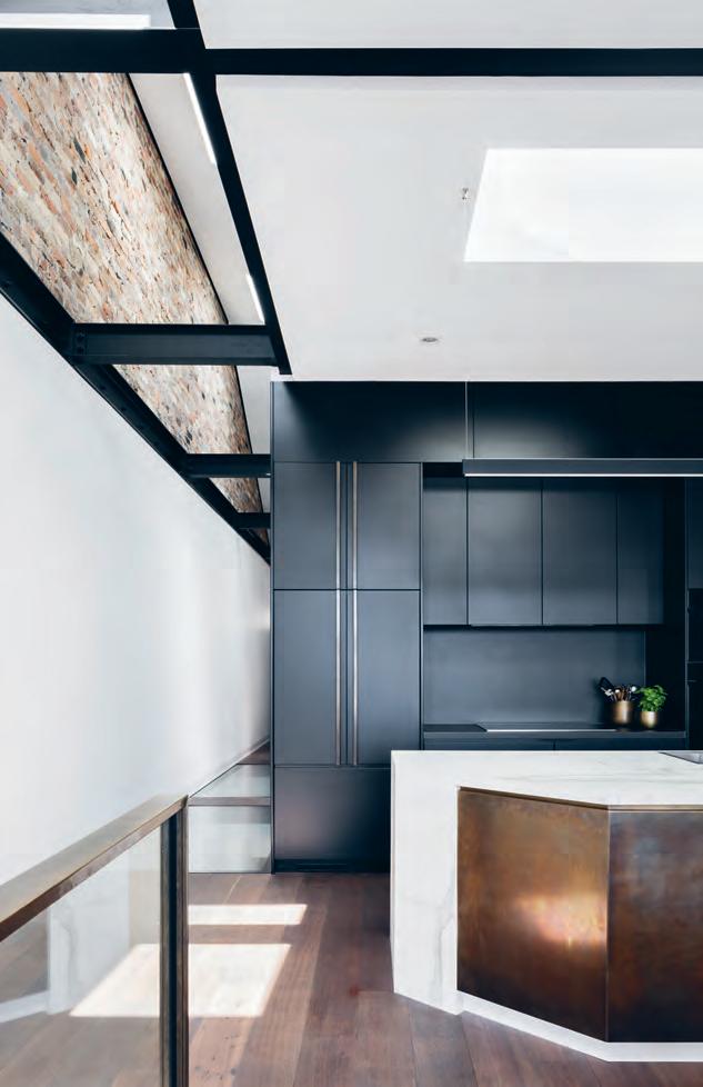
“It’s all about trying to get those cross views. That’s why it’s called Doorzien House,” says Melonie. “But it’s also about the interplay of view and viewing – new physical lines of sight are created through the floor and through the walls with glass toplights...When you walk through you aren’t measuring your view by the corner – you are seeing through the corners.
“The project is also about seeing old things in new ways: old brickwork, old typology, a heritage ‘skin’ leveraged to manipulate light, movement and new materials to create strong vertical and horizontal flows.”
The lower ground floor did exist prior to Bijl’s intervention, but in a completely different format. There was a small cellar space dug out at the back, a laundry, bedroom, sitting room and “the stairs were in a completely different location”. Excavating three metres of “notoriously solid” purple sandstone afforded the layout Sharon and Bob are able to enjoy today.
A fully finished and furnished – not to mention stocked – cellar up the back celebrates the arduous excavation with a long, backlit subterranean window that showcases a section of the rock they had dug through.
There are now two bedrooms on the lower ground floor to the master bedroom on the ground floor. In each of the two bedrooms are large artworks to denote which room belongs to James, their son, or Olivia, their daughter. Just as you or I might have a strong sense of nostalgia attached to the house that we grew up in, Sharon and Bob’s children, who enjoyed their parents’ nomadic footsteps, grew attached to pieces from Sharon’s art collection.
|
the
Wall
vieW across the
issue #39 habitusliving.com
previous
| While the skylights and glass floored corridor undoubtedly give the project design cred, it’s
not for nothing,
serving to open
up
the long and narroW semi to the light-filled spaces they are today. above | the copper fronted kitchen island
is referenced in the hardWare throughout the house. opposite
generous WindoWs lining
rear
capitalise on the site’s elevation to provide uninterrupted
Water.
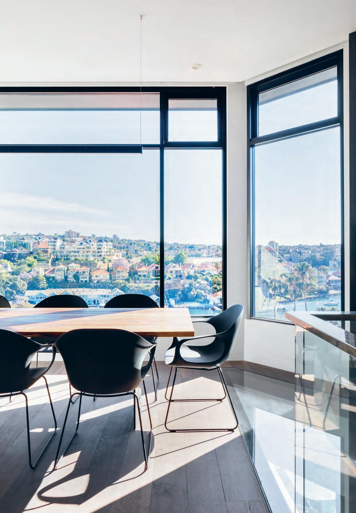
3 . on location # 133
“It’s all about trying to get those cross views. That’s why it’s called Doorzien House.”
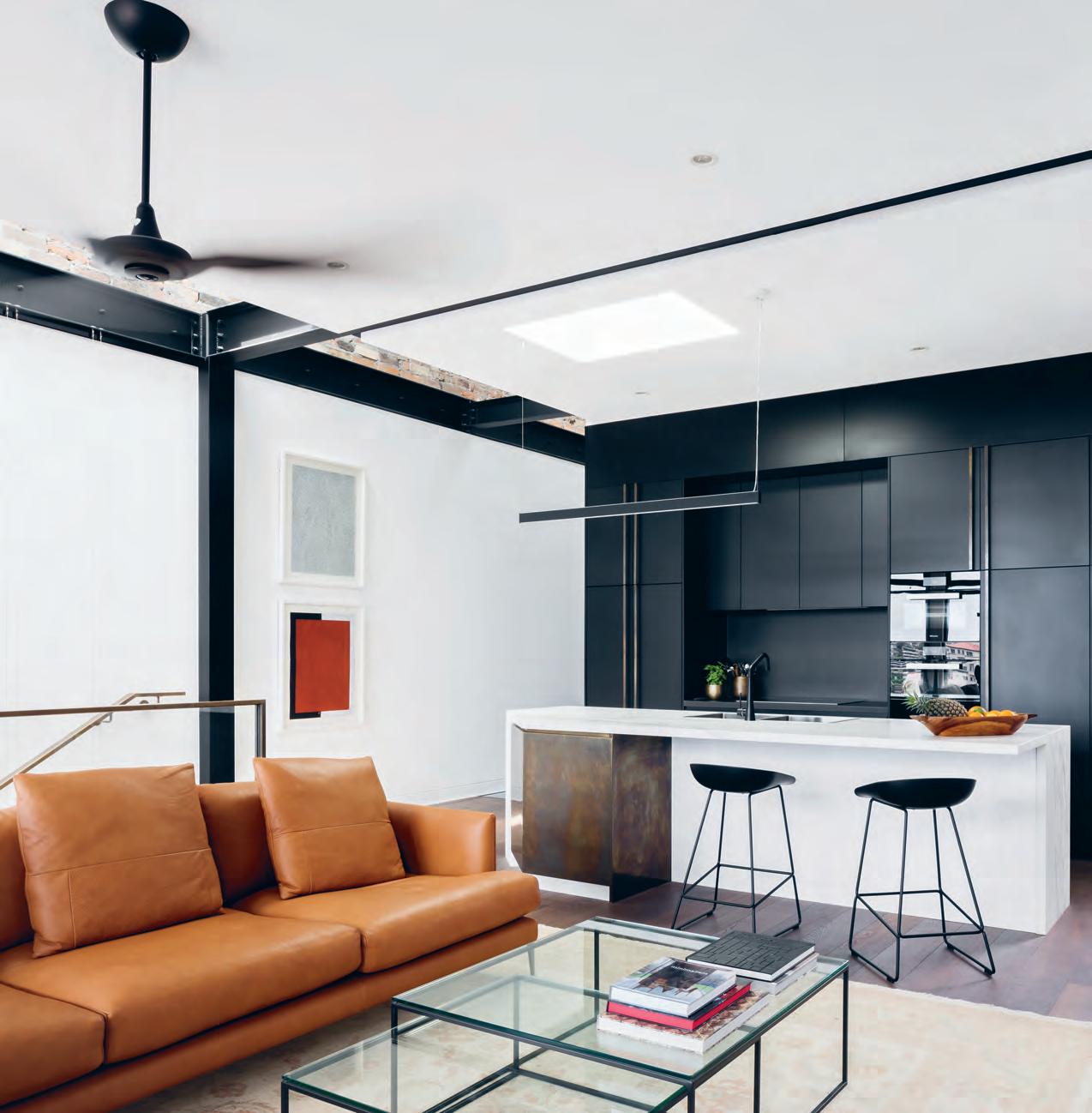
above | the kitchen, main living area and dining area are undivided, especially beneficial when sharon and bob entertain. opposite | plans. issue #39 habitusliving.com
CAR SPACE PORCH ENTRY MASTER BEDROOM WALK-IN-ROBE ENSUITE 1 2 3 4 5 6 STUDY BATHROOM KITCHEN LIVING DINING TV ROOM 7 8 9 0 q w DECK LAUNDRY BEDROOM CELLAR/STORAGE SIDE PASSAGE e r t y u GROUND FLOOR 1 2 3 8 LOWER GROUND FLOOR 8 w e t y u t q 0 9 7 6 4 5 r 7 3 . on location # 135
A growing collection of, and ever-evolving love for, art has followed Sharon back and forth across the globe. It’s no coincidence, then, that the high ceilings and white walls within Doorzien House, reminiscent of an art gallery, are favoured features. Sharon likens them to the walls of the Museum of Contemporary Art and the Art Gallery of New South Wales.
A beautiful feat of architecture that appeases the residents’ visual predilections as much as it does their operative needs, and it’s easy to overlook the location – and it isn’t easy to overlook Kirribilli. For Sharon, the area translates many of her favourite European customs. She doesn’t own a coffee machine anymore; instead she’ll take a stroll up to the local barista. Likewise, when the desire arises for a post-dinner treat, Bob and Sharon will happily walk up the hill to the ice cream parlour on the main strip.
Living abroad has afforded the couple a window into diverse cultures, customs and lifestyles. While they have by no means adopted every habit to which they’ve been exposed, it has allowed them to assess their own patterns, resulting in a life more purposefully lived.
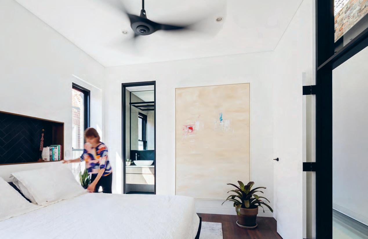
above | the master bedroom on street level features an ensuite and generous walk-in-robe. issue #39 habitusliving.com
Design to inspire better living
The key to a good life lies in figuring out what really matters and focusing on the essential. By removing the unnecessary, we can achieve clarity and simplicity, which enhances our wellbeing. This is as true in life as it is in design.
Designing with this sense of better living in mind, Finnish design brand Iittala is driven by connection – with people, with harmony, with a sense of balance and wellbeing.
In 2018, Iittala is highlighting the versatility of their glass factory’s extensive colour library; a returning earthy moss green, and a delicate yet bold aqua, all inspired by Nordic nature and design without extraneous distraction.
Diving into the treasures of the unique glass colour library, the two colours Iittala has chosen highlight for 2018 create a balanced, yet edgy combination. The Moss Green is a traditional Iittala colour inspired by the Nordic forest, bringing to mind rich shades of green emerging through the melting snow before the spring takes its place.
With the emerging spring comes light, and Aqua Blue creates the perfect energized, vibrant mood. Inspired by the varying depths of water and its shades, Aqua’s rich, liquid colour creates interesting reflections and perfect opacity. Iittala |

habitus promotion › Iittala #137 issue #39 habitusliving.com above | Ruutu vases designed by the b o uRo ullec bRotheRs
iittala.com.au
Under modern life’s demands, the decisions we make to better ourselves are more important than ever – this extends to design and Iittala knows it.
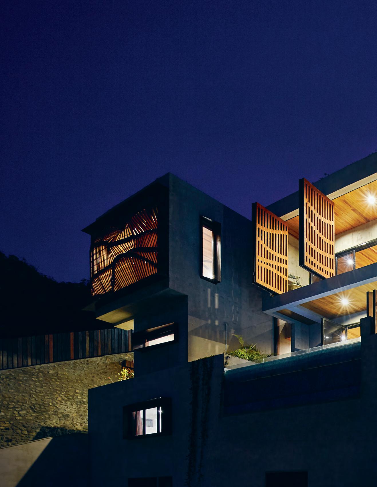
issue #39 habitusliving.com

text Rebecca GRo ss | photography PeteR bennetts of its Place
on a hillside in Port Moresby, Small House by Gold Coast practice Studio Workshop challenges the vernacular and traditional architecture of the region.
Product 3 . on location # 139
Located
A
When a new house is so drastically different to its neighbours, it’s sure to attract attention, invite intrigue, become a landmark –an icon even. Small House, located on a steep hillside in Port Moresby, Papua New Guinea, is one such house. Designed and built by Gold Coast practice Studio Workshop, the spacious 1.5-bedroom house is formed with concrete and clad with a dynamic timber screen that balances beauty and practicality, malleability and solidity. “It was a response to the climate, site, quality and capability of local labour, and the longevity of materials,” says Rory Spence, director of Studio Workshop.

Small House is home to an Australian expatriate who has lived in the region for 30 years, and it is the first of three structures to be built on the site (which was excavated by hand using jackhammers and picks). The west-facing two-storey house is accessed via a paved garden entrance on the ground floor. Designed for entertaining, it has a games room that opens to the swimming pool, and a flexible bedroom and bathroom. The open-plan kitchen, living and dining area are upstairs, with the master bedroom, ensuite and home office adjacent.
Materials, massing and the desire to maximise the views – the latter of which attracted the client to the site in the first place – influenced the dominantly geometric form of the house. Much of the local architecture is constructed using timber that is not properly seasoned and therefore deteriorates due to the climate and weather. Studio Workshop instead utilised concrete for longevity and an off-form aesthetic, pairing it with timber to balance the robustness.
This, however, had its challenges. It was difficult to find local labour capable of providing a refined and precise concrete finish and sourcing exact materials was not reliable. “We had someone from Australia go over and do the actual formwork, but even the formply wasn’t straight there,” Rory says. The cantilevered stairs demonstrate the skill of the formworker – as well as the opportunities in the more relaxed building codes. “It allows you to have some grand moments without being overly constrained,” he says.

issue #39 habitusliving.com
opener | The sTrong concre Te forms and dynamic Timber screens balance beauT y and pracTicaliT y, giving small h o use a disTincTive characTer amidsT The T ypical p orT m oresby vernacular. Top | enveloping The masTer bedroom, The arTiculaTed form of The Timber screen creaTes sTriking visual effecTs while blocking The sun and allowing venTilaTion. b oTTom | The open sTaircase wiTh canTilevered sTeps demonsTr aTes The skill of The formworker. opposiTe | ribbon windows and a small projecTing balcony break The blockiness of The souThern side of house.

3 . on location # 141
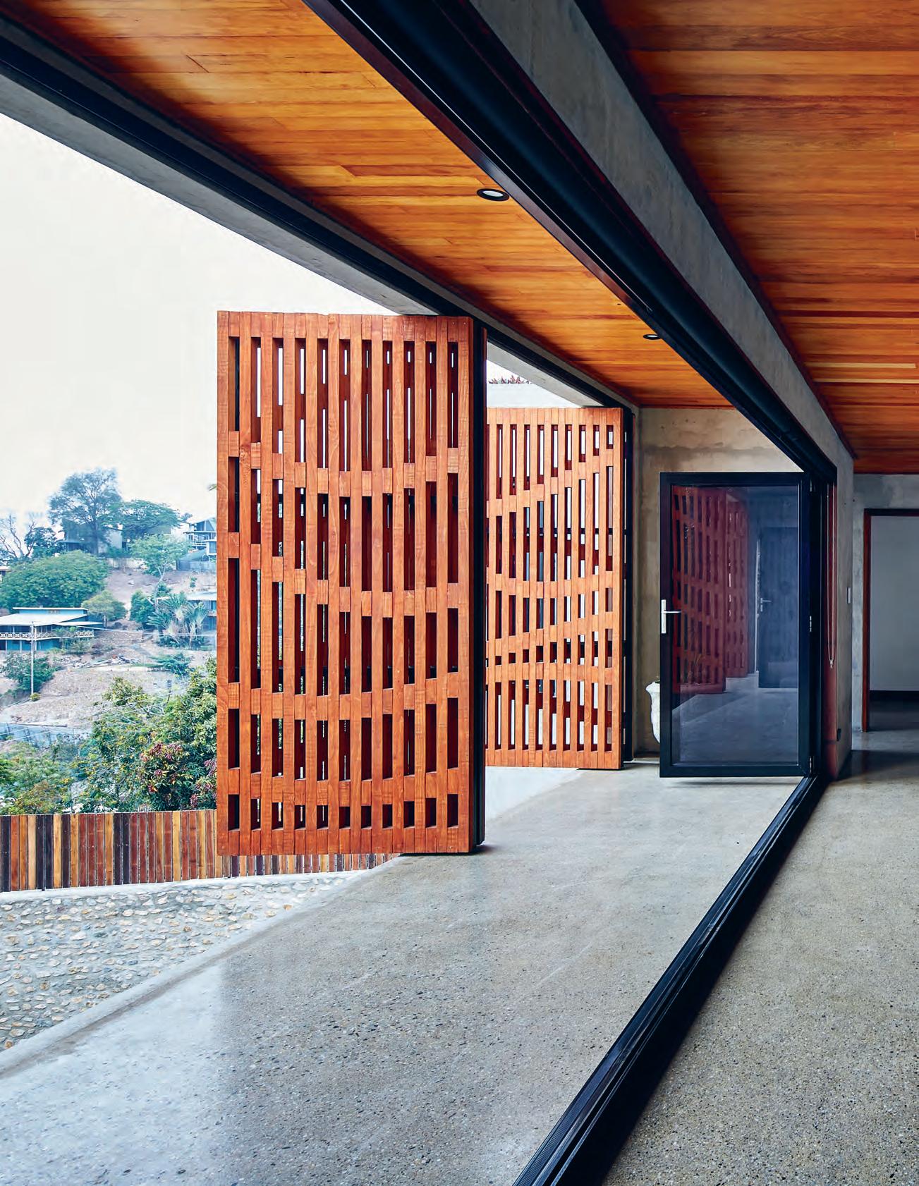
issue #39 habitusliving.com
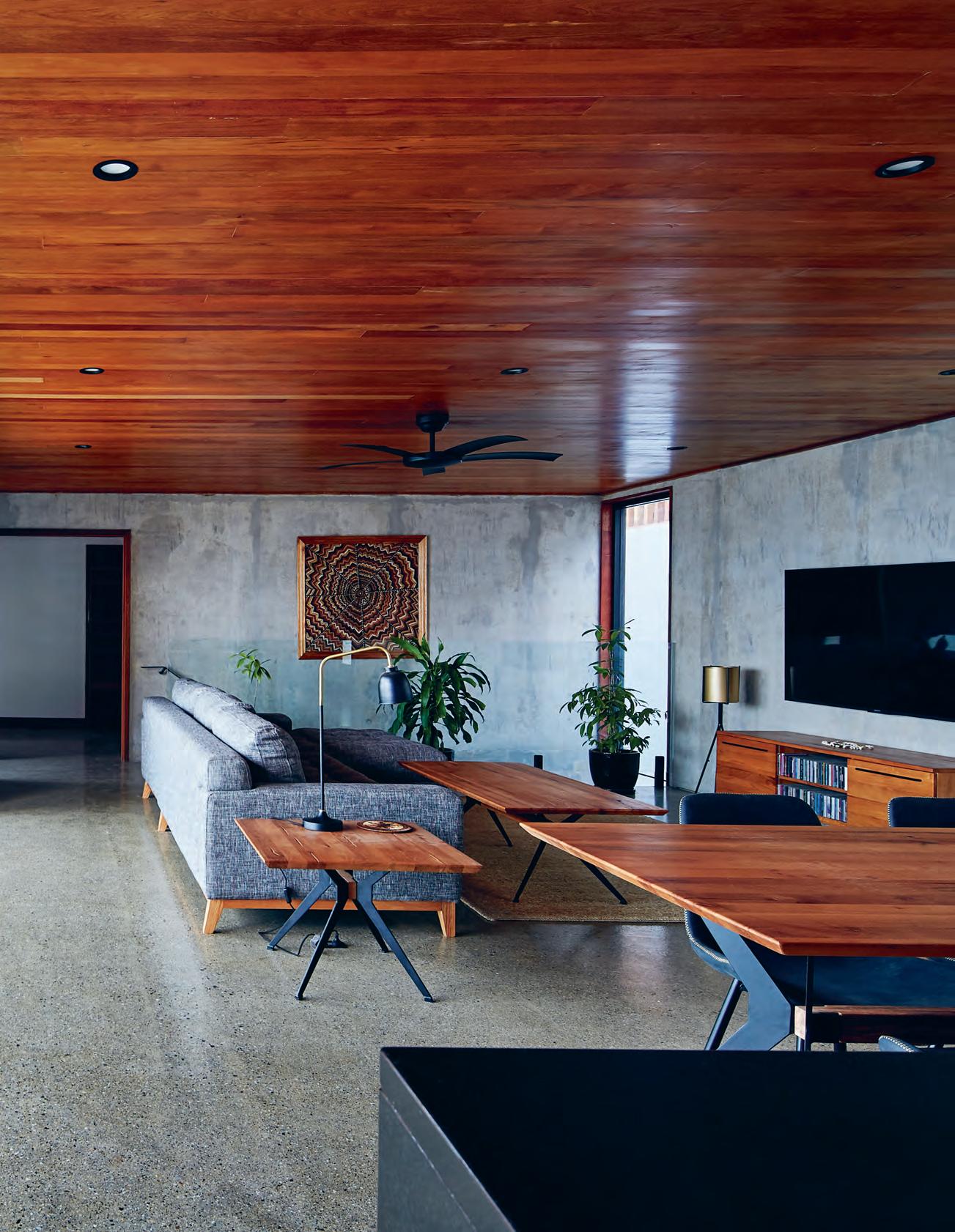
3 . on location # 143
“We’ve landed this pretty radical thing on the hillside in Port Moresby and we don’t know if people going to love it or hate it.”
The mixed-hardwood ceilings include Kwila (also known as Merbau) and blonde timbers, although the intention was to have all the same species of timber. “You never know what you’re going to get, and packs of timber might include three di erent species of hardwood so you just make do,” says Rory. Lining the ceiling keeps the timber out of the sun’s harsh rays, while the polished concrete fl oors endure the wear and tear.
The timber screen is an aesthetic and practical response demonstrative of Studio Workshop’s approach to architecture from design through construction. “We try to push the boundaries creatively in terms of experimenting with materiality and construction methods to reduce fabrication, costs and on-site labour,” Rory explains. The screen began as a digital-craft research experiment in how timber and a CNC router could be used to create complex custom forms. Studio Workshop fabricated its fi rst timber screen as a backdrop for a construction company’s reception area and has since developed it for residential application –Small House being the fi rst.
The undulating form of the screen explores malleability and is based on achieving e ciency in materials. It is made with Accoya – a type of pine treated to extract and block moisture for greater longevity – and stained to match the Kwila throughout the house. Made in the practice’s Gold Coast workshop, the screen around the master bedroom and bathroom combines shorter and longer timber members that form the height of the screen and provide the three-dimensional manipulation. The full lengths were made into panels, flat packed and shipped to Port Moresby for installation. Studio Workshop also fabricated the swivelling shutter doors, which have the same form but without the wave-like e ect, as well as the built-in seating, internal joinery and other timber components.
Architecturally, the timber screens serve multiple purposes: providing privacy, blocking the sun and reducing afternoon heat. They let light in to striking visual e ect, allow ventilation, let heat escape, and provide a distinctive characteristic amongst the vernacular housing and typical apartment blocks of Port Moresby. “It is certainly idiosyncratic and gives a radically di erent feel,” says Chris Knapp, a director of Studio Workshop. “It’s an exuberant response to the traditional brise-soleil.”
ENTRY FOYER STUDY BATHROOM GARDEN POOL KITCHEN DINING LIVING BEDROOM WALK-IN-ROBE 1 2 3 4 5 6 7 8 9 0 q PREVIOUS
FABRICATED
GROUND FLOOR UPPER FLOOR 1 2 4 55 7 9 4 3 6 0 q 8 issue #39 habitusliving.com
| THE OPEN-PLAN KITCHEN, LIVING AND DINING AREA HAS BI-FOLD GLASS DOORS AND TIMBER SHUTTERS WHICH CAN BE OPENED OR CLOSED IN DIFFERENT COMBINATIONS FOR VENTILATION AND NATURAL LIGHT. ABOVE | PLANS. OPPOSITE | NATURAL LIGHT FILTERS THROUGH THE OPEN STAIRCASE TO CAST SHADOWS ON THE RENDERED WALL. STUDIO WORKSHOP
THE BUILT-IN TIMBER SEATING IN THEIR GOLD COAST WORKSHOP.
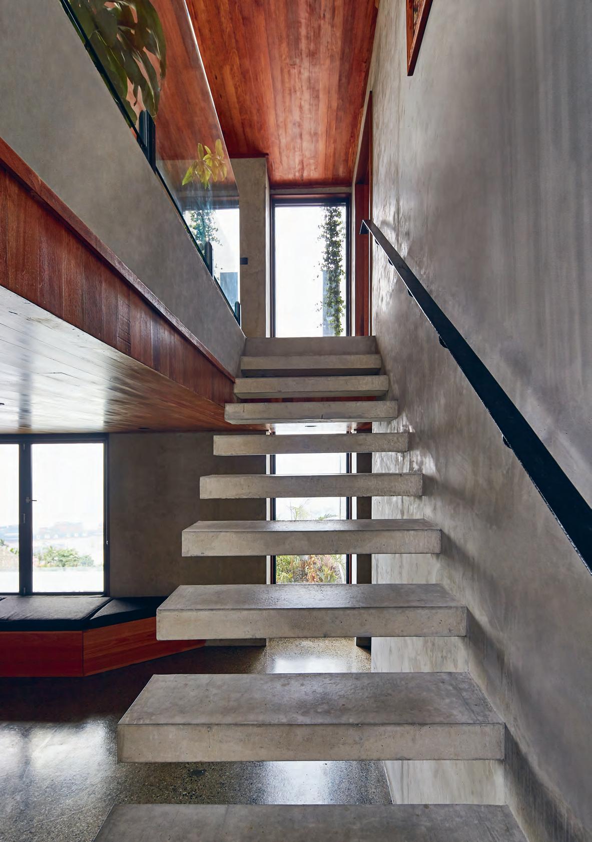
3 . on location # 145
The original concept had openings cut into the screen for windows, but the design team decided against it once on site. “Having that degree of control and ability to evaluate the screen once in situ was valuable to the ultimate outcome,” Chris explains. This is also true of the balcony that projects from the southern end of the house as well as the window frames. The balcony (or “gang plank,” as Rory refers to it) breaks the hard geometrics of the house and offers a faster means of ventilation when the shutters and screens are closed. The angled window fins break the planarity of the walls and help to obstruct views into the house.
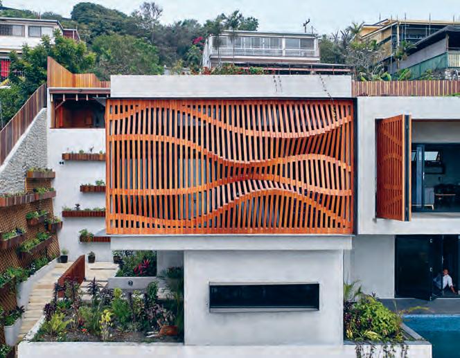
Balance Enviro Solutions did the landscaping, which includes a green roof with highly resilient plants. Studio Workshop shipped the soil, drainage cell and lowbitumen paint from Australia, and sourced the plants from local roadside sellers.
As a response to climate, site, materials and labour, Small House is very much a product of its place, despite being so disparate to its neighbours and the vernacular architecture. Progressive design has the potential to provoke and to challenge – what the architectural impact of Small House will be is unknown. “We’ve landed this pretty radical thing on the hillside in Port Moresby and we don’t know if people going to love it or hate it,” says Chris. “Hopefully it’s something that stimulates and elevates its local surrounds, where architecture is quite devoid, and creates resonance and brings joy or wonder.”
From the inside it certainly brings joy and wonder to the occupants, as Rory describes: “You’re in a tropical environment with the luxury of higher end finishes. The view is amazing, the sunset is incredible and the house feels so grand. You sit in there and everything just feels so epic.”
above | The
and
undulaTing Timber screen encasing The masTer bedroom seTs small house aparT from iTs neighbours, while providing a pracTical soluTion To privacy, sun, heaT
venTilaTion.
issue #39 habitusliving.com
“You’re in a tropical environment with the luxury of higher end finishes. The view is amazing, the sunset is incredible and the house feels so grand. You sit in there and everything just feels so epic.”
Gliding into View
Swiss design manufacturer has changed the blind game with their new Wave Panel Glide System. Suitable for windows, or simply as decorative room dividers, the panels feature a simple yet elegant design and unique wave-like shape. It’s this wave that sets the system apart from the pack – more than just a unique design; the wave pattern plays with light and shadows to create a charming and relaxing effect as the sun passes.
Named after the minimalist, stylish wave shape it creates, the Wave Panel Glide System brings a sense of movement to the interior of a home, offering various decorative possibilities thanks to their contours.
Silent Gliss offers a broad range of fabrics for the new Wave Panel Glide system, which is available in transparent, semi-transparent or opaque styles, which means whether the system is installed as a room divider, feature wall highlight or traditional window blind, finding the right design is a breeze. Silent
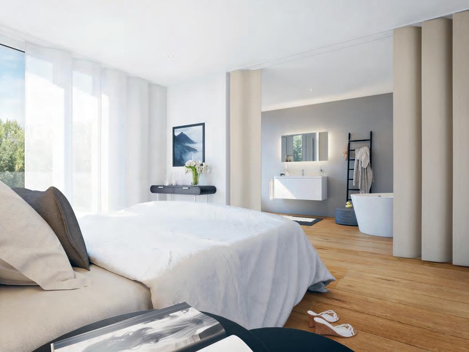
habitus promotion › Silent Gliss #147 issue #39 habitusliving.com above | The Wave Panel Glide SySTem Won The Red d oT aWaRd foR PRod U CT deSiGn in 2017.
Gliss | silentgliss.com.au
The new, award winning Wave Panel Glide System from Silent Gliss is a smooth and stylish solution to excessive sunlight and prying eyes…
Thinking
outside the Box
The Linardi Townhouse in Collingwood, Melbourne, shows what can be achieved on the smallest of sites. Built vertically over six levels, these twin townhouses are beautifully crafted by architects and owners Jesse and Seada Linardi.
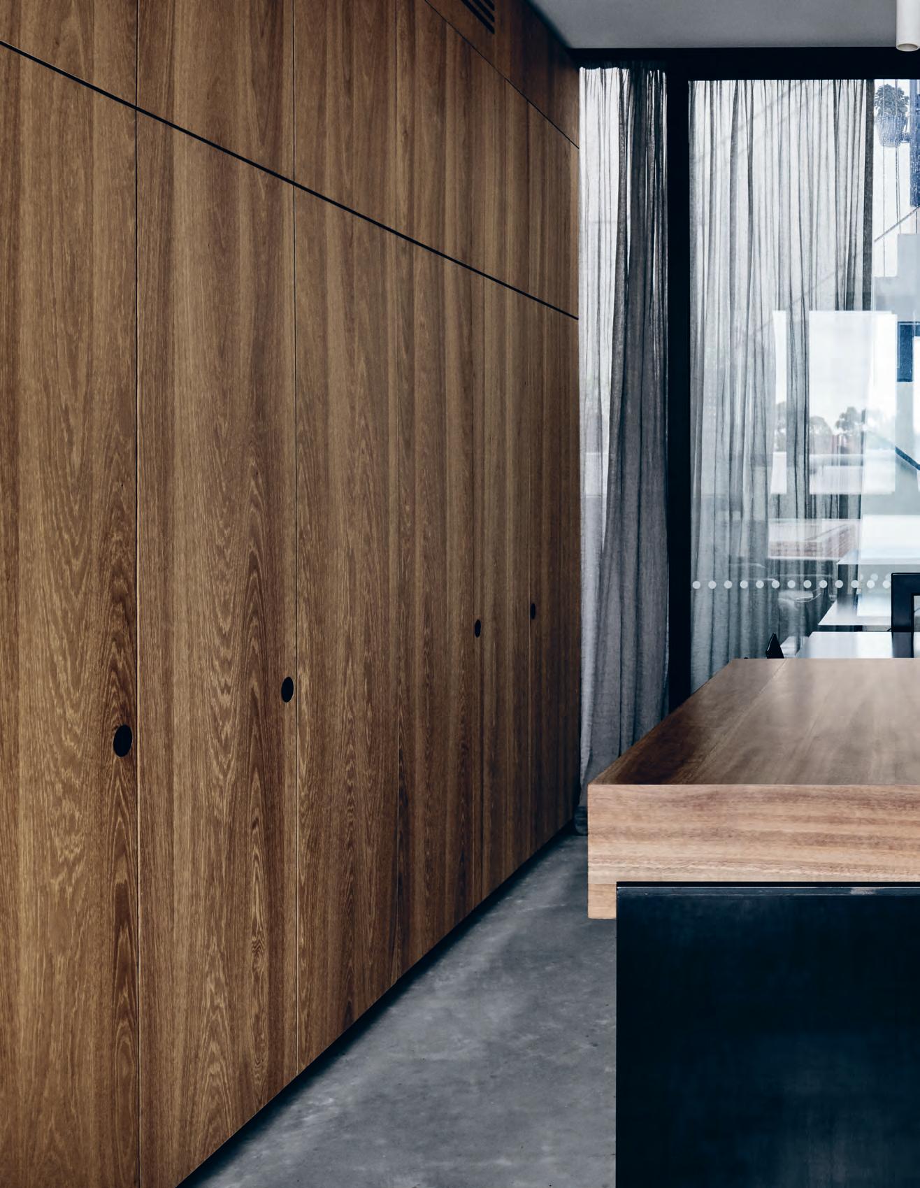 text Stephen Crafti | photography tom BlaCh ford
issue #39 habitusliving.com
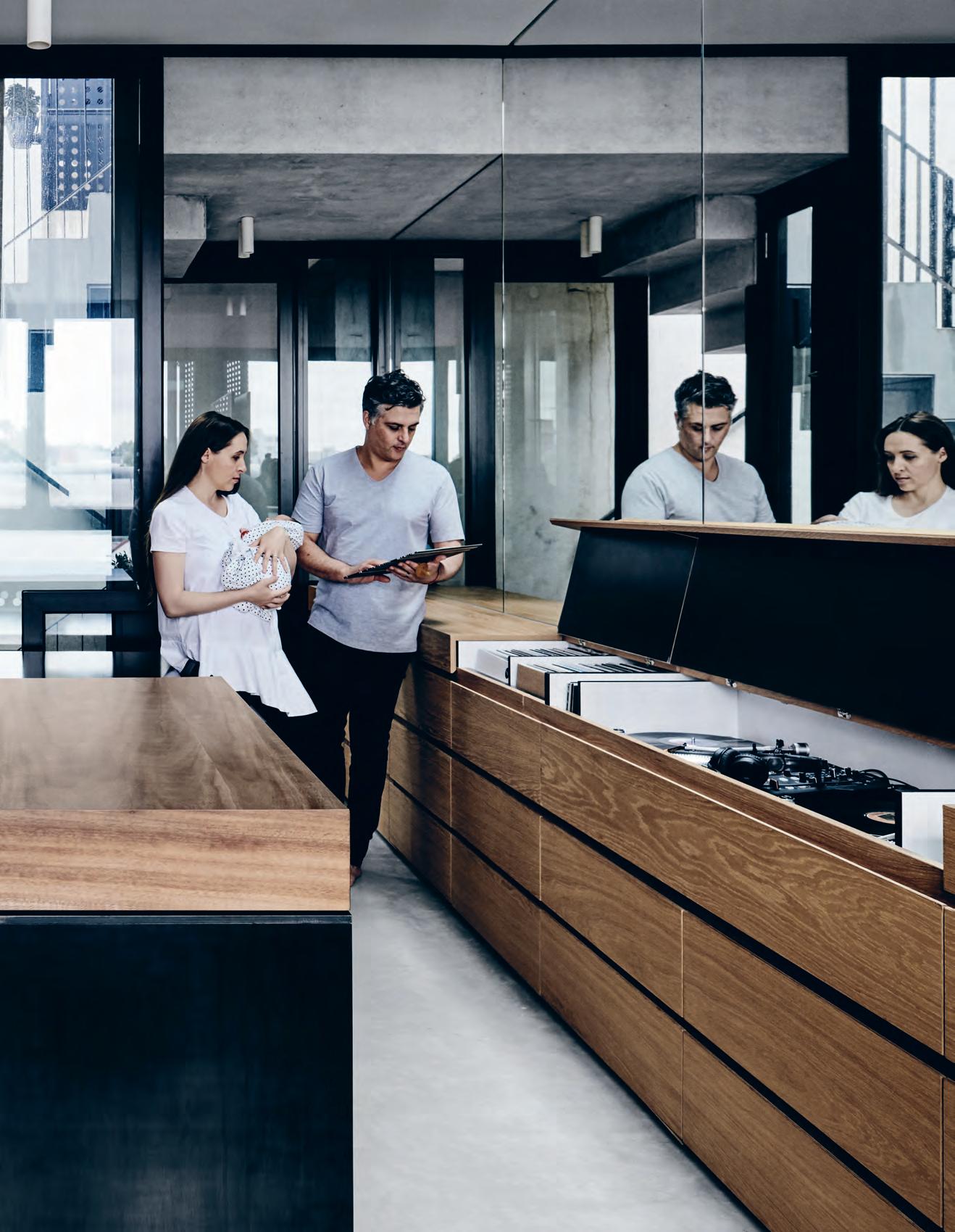
3 . on location # 149
Finding a patch of dirt to build on is becoming extremely difficult in Melbourne, particularly in the inner city. However, husband and wife architects – and recent parents – Jesse and Seada Linardi found an unlikely sliver of land in Collingwood. Jesse, a director of DKO Architecture and Seada, director of SLAB, worked with their friend and developer Michael McCormack, director of Milieu Property. “We wanted to build a family home, testing ideas that would be more challenging for clients,” says Jesse. “We didn’t set limits from the start. It was simply putting our ideas out there and seeing what could be achieved,” adds Seada.
Once a double garage for an adjacent Victorian building, the entire site is a meager 75 square metres. Building one townhouse on such a site would be commendable, but two? The other constraint within this site was that only one elevation, orientated to the west, would receive full sunlight (other elevations are impeded with neighbouring properties). Fortunately the site just “squeezes in” to a commercial zone, with the neighbouring properties zoned residential. “We couldn’t have reached this height if the site was just a few metres to the north,” says Jesse. However, given the proximity of neighbouring residential properties, the couple was mindful of creating visual bulk.
The couple lives in one townhouse, with Michael originally intending to live in the other. However plans changed – as they’re often wont to do – and the Linardis’ new neighbour is architect Michael Drescher, a fellow director of DKO Architecture. “The two are slightly different, but you could say they ‘read’ as one building,” Jesse notes.
Perhaps the only marker that there are two homes rather than one is the strip of LED lights framing each doorbell. Each one is programmed to display different colours so there’s no confusion for guests finding the front door. However, behind the black powder-coated perforated steel façade (enveloping all four elevations) are six levels, each one identical in footprint. “This is far from the open-plan living arrangement you find in most homes. This place is more of a ‘hamburger plan’, with each level providing a different filling,” says Jesse.
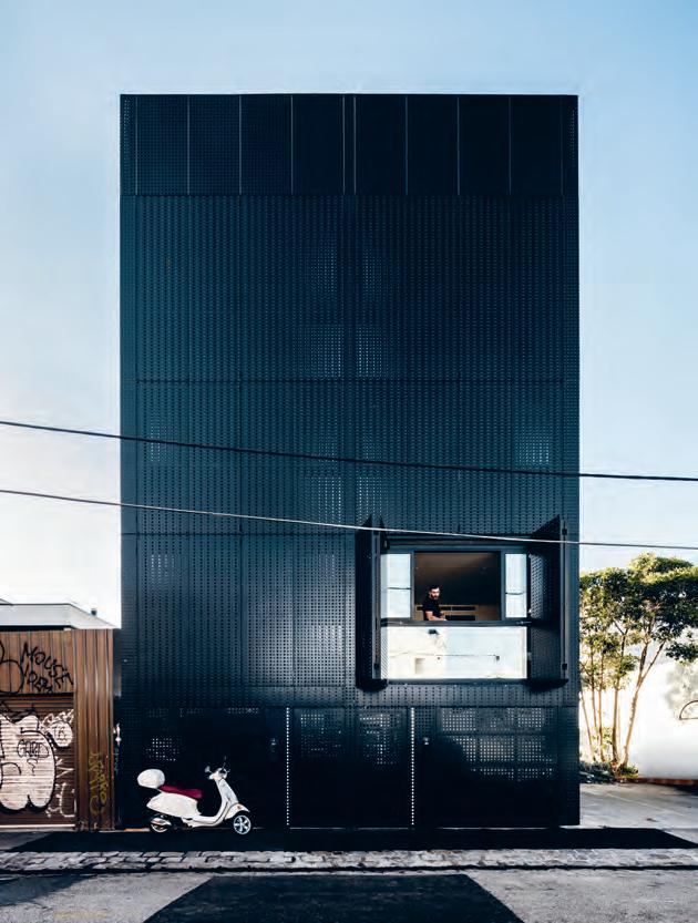
issue #39 habitusliving.com
opener | Architects Jesse And seAdA LinArdi with their newborn bAby girL sAvAnAh , in the kitchen. Above | the six-LeveL townhouse, incLuding the rooftop gArden, becomes ‘AnimAted’ when the perfor Ated steeL screens Are opened. opposite | the open-pL An kitchen And Living room cAn be cLosed with three LAyers: shutters, windows And Linen curtAins.
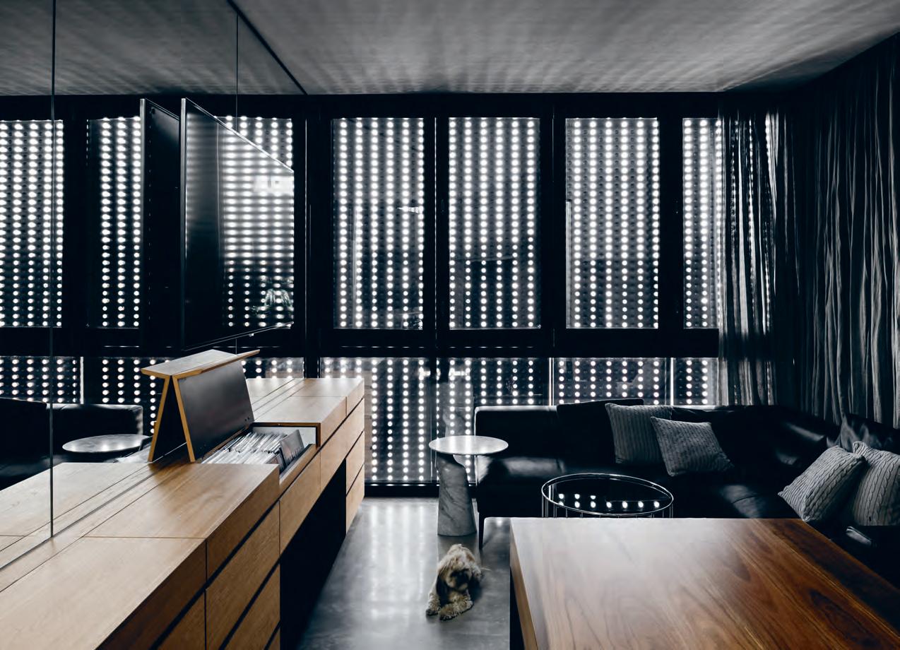
3 . on location # 151
“Even when you leave the shutters closed, there’s still the dappled light coming through.”
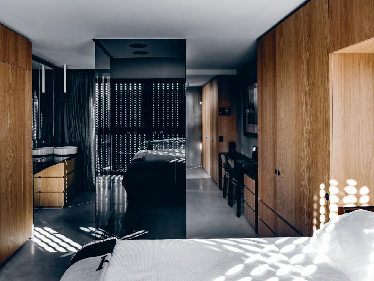
above | The main bedroom includes a smoked glass-framed ensuiTe To b oTh r eflecT lighT and To i ncrease a sense of space. Top lef T | The main bedroom feaT u res generous builT- in oak joinery. Top & b oT Tom righT | savanah oscillaTes be T w een Th e couple’s bed and her bassine T boTTom lef T | a sTa ircase pierces each level. issue #39 habitusliving.com
“This is far from the open-plan living arrangement you find in most homes. This place is more of a ‘hamburger plan’, with each level providing a different filling.”

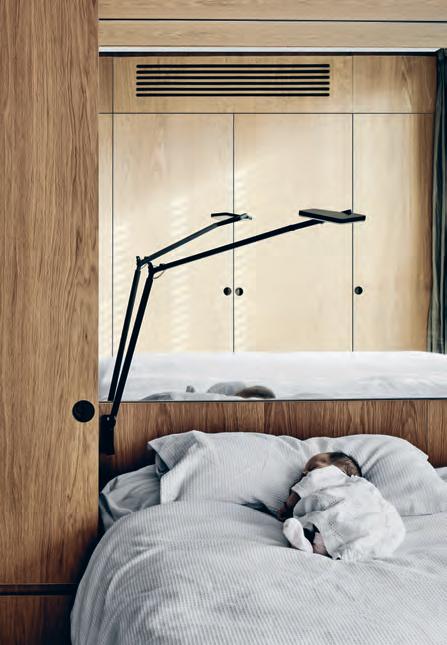
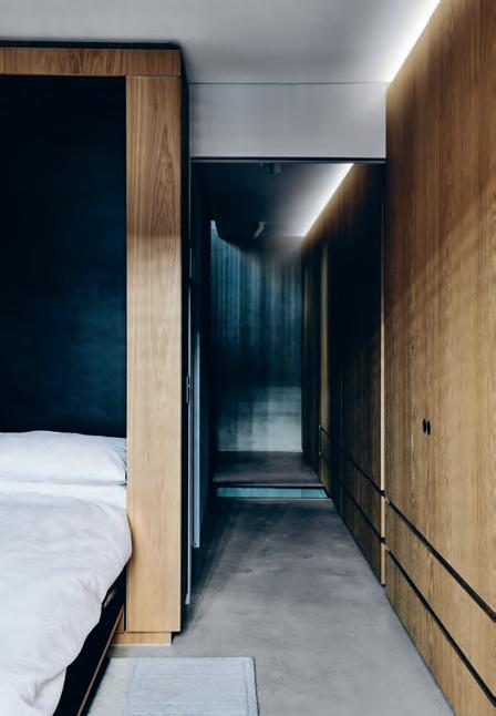
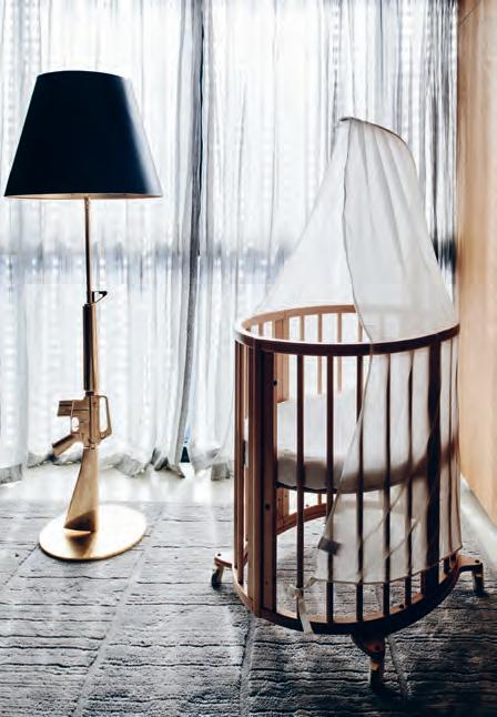
3 . on location # 153
With the gritty urban streetscape featuring a mélange of building types, from warehouses and apartments to Victorian cottages, the Linardis decided on pursuing a more abstract form of architecture; something that didn’t resemble a conventional house. Each level comprises a four-by-nine-metre floor plan, with a stairwell and adjoining lightwell/ breezeway offering light and ventilation throughout each level. “We could have gained a few extra centimetres by not having the lightwell, but we wanted to have air continually circulate,” says Seada.
Given the dimensions, there wasn’t sufficient room for a lift. “Having a lift would have lost us about one tenth of each floor plate. And climbing stairs every day is a great way to keep fit,” she adds. While many might be puffed out by the time they reached the rooftop garden with its plunge pool, the Linardis tend to spend most of their time oscillating between the upper levels, particularly the kitchen and living area on the fifth level.
At basement level there is the media room/ guest bedroom with an ensuite and fold-out bed concealed behind one of the cupboards. At ground level is the garage and entrance. A second bedroom and bathroom can be found on level one, with the main bedroom and ensuite located on the floor above. “We spend most of our time around the kitchen bench, particularly on the weekend. We both love cooking,” says Seada. “It’s truly an event, not just serving up a meal. Jesse will generally put on his records [there’s a built-in record player in the style of the 70s that allows the vinyl to be flipped over] while we’re chopping up vegetables.” One of the many nifty design features is the treatment of the kitchen, with its steel dining table piercing what the couple refers to as a chopping block. The timber block — often used to chop food — can be wheeled away to allow the dining table to be fully expressed and accommodate up to eight people.
While the house can be closed down during the colder months of the year, with three-metrewide perforated steel shutters featuring on three levels to the western elevation, during the warmer months it can be opened completely with both the shutters and generous western glazed windows pulled back. “Even when you leave the shutters closed, there’s still the dappled light coming through,” says Seada, who included additional layers of block-out blinds and sheer curtains for each level.
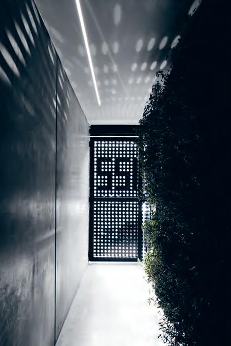
above | The ground floor of Th e Townhouse has a green wall separaTi ng Th e enTr ance from Th e garage. opposiTe | Jesse and s e ada en J oy Ti me wiTh savanah in Th e main living area.
issue #39 habitusliving.com
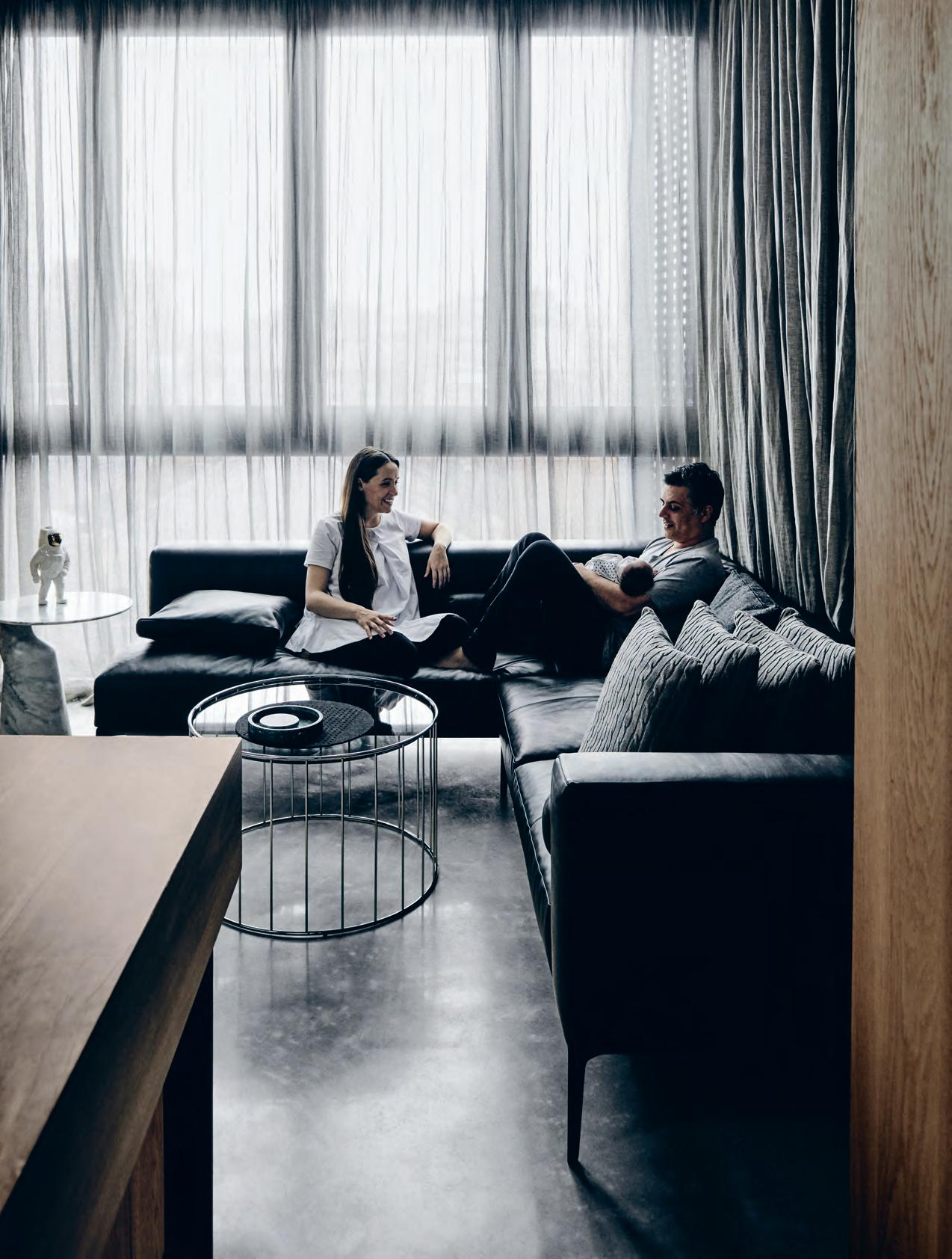
3 . on location # 155
THIRD FLOOR ROOF TOP
FIRST FLOOR
SECOND FLOOR
GARAGE
ABOVE | PLANS. OPPOSITE | THE COLLINGWOOD TOWNHOUSE AT NIGHT.
BASEMENT
HOME THEATRE BATHROOM GARAGE ENTRY 1 2 3 4 LIVING MASTER BEDROOM ENSUITE W.C. 5 6 7 8 KITCHEN DINING ROOFTOP DECK ROOFTOP POOL 9 0 q w 1 4 25 6 59 w 0 2 3 q y 7 issue #39 habitusliving.com
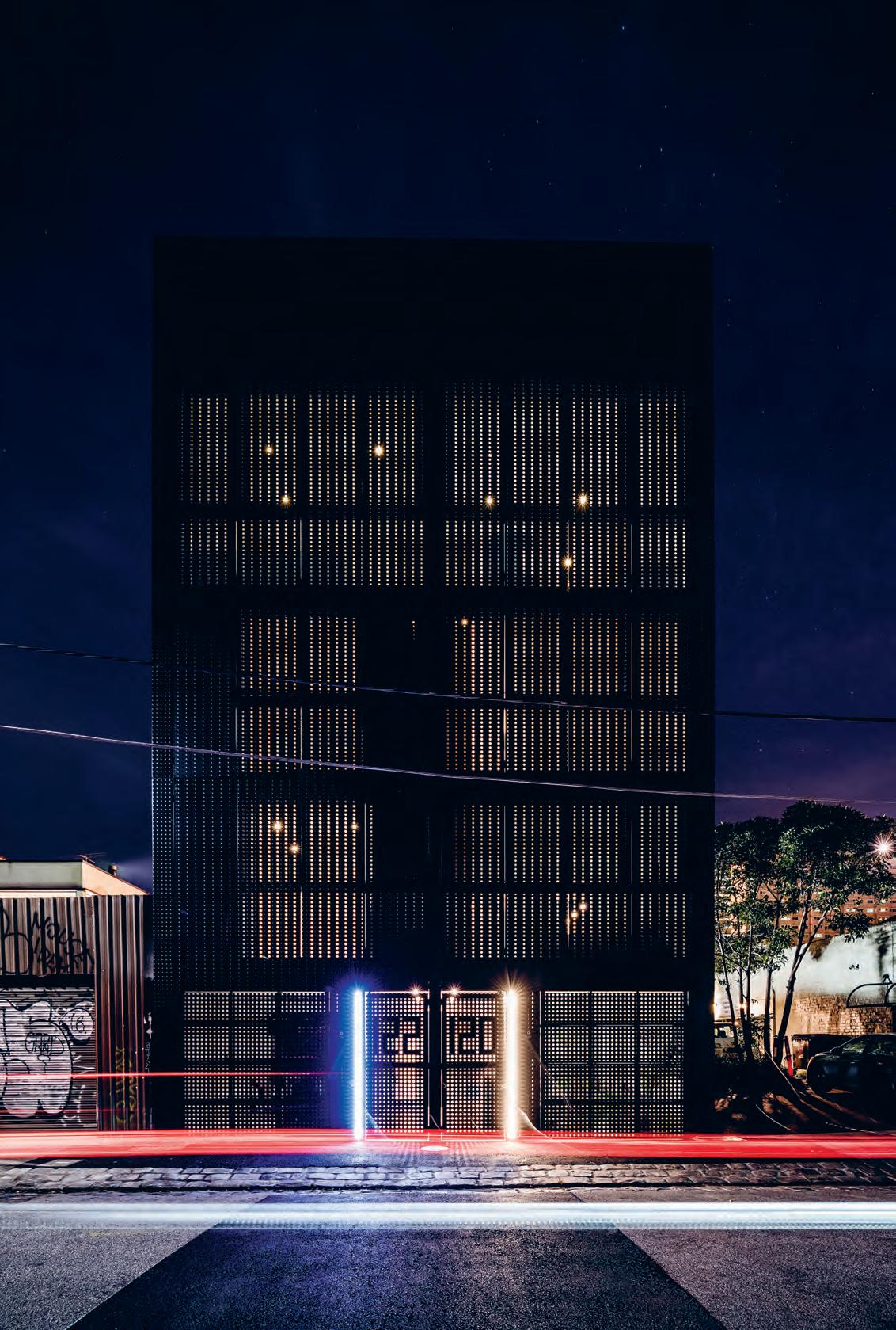
3 . on location # 157
Although there’s no back garden or balcony, there was sufficient room to include a rooftop garden. Offering views of the city as well as the Dandenong Ranges – on a clear day at least –this impressive backdrop makes the effort of climbing every step worth it! And rather than just a few pot plants dotted around the terrace, there is also a plunge pool. “We use this space as though it’s another room, particularly as it’s only one staircase away from the kitchen,” says Seada. Jesse and Seada aren’t thinking about life in their old age. They have a more conventional beach house at St Andrews Beach on Victoria’s Mornington Peninsula and Jesse’s mother lives in a four-storey house without a lift. “She never complains. You just use the spaces differently,” says Jesse.
The Linardis’ townhouse isn’t just a gimmicky idea to slow down traffic, although many strolling past take the time to reflect on what they’re looking at. But the residence also shows what can be achieved when architects think outside the box and take risks to deliver truly great architecture.
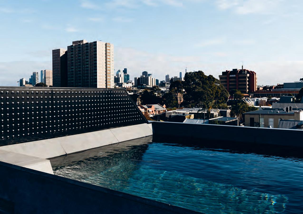
above | a cross-section of the townhouse includes a rooftop plunge pool with city views and a basement theatre at the other end of the spine.
issue #39 habitusliving.com
Rather than just a few pot plants dotted around the terrace, there is a plunge pool.
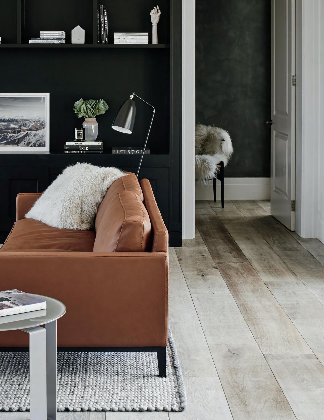


From Danish Cabinets to Mercedes Benz
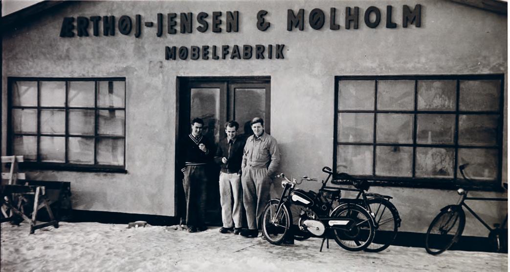
In 1952, it started with two cabinetmakers, and this partnership marked the start of a design journey now more than 65 years in the marking. The BoConcept name is credited with a number of design firsts – from 1979’s flexible furniture system to 1984’s creation of the first piece of knock-down Danish furniture.
Some six decades after the first partnership lead to the creation of BoConcept, a later collaboration would lead to new heights yet again. In 2013 BoConcept teamed up with Mercedes Benz to collaborate on the design of the luxury car team’s latest signature vehicle to great success.
The BoConcept range continues to grow and with more than 600 interior designers working under the name across 64 countries, choosing favourites isn’t easy, but here are a handful of designer pieces worth shining a spotlight on…
Launched in 2012, the Ottawa collection of dining furniture has impressed design lovers globally, including the Red Dot design competition jury, who awarded it with an ‘Honourable Mention’.
issue #39 habitusliving.com above | boconcept was established in denmark in 1952. o pposite | the copenhagen wall unit and chiva coffee table.
From humble beginnings to worldwide design excellence, the BoConcept story is one of Scandinavian design.
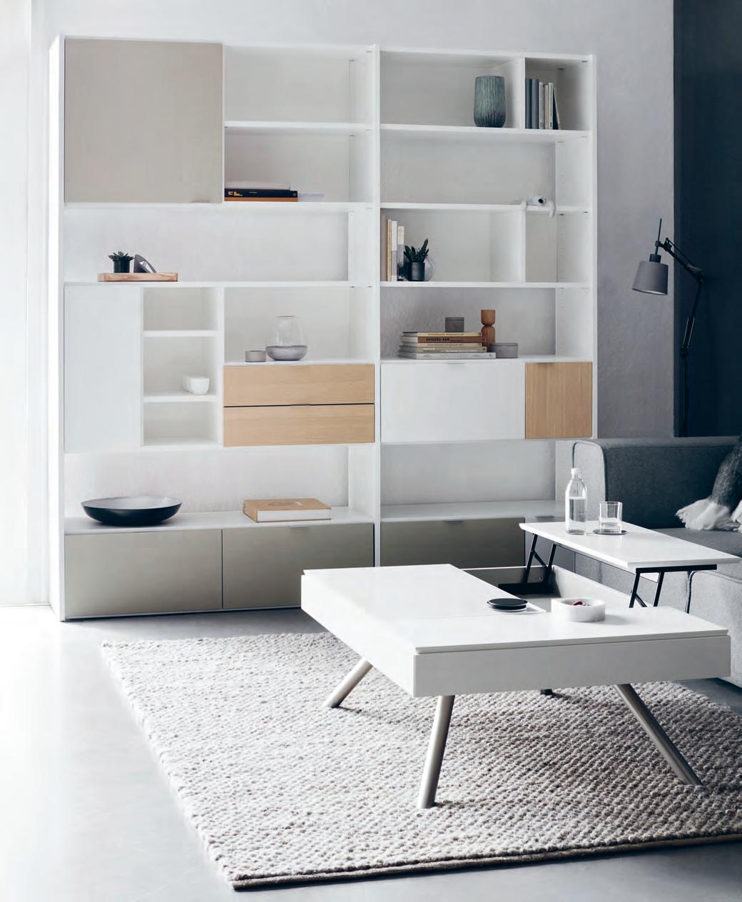
#161 BoConcept | boconcept.com/en-au habitus promotion › BoConcept
The collection features an extendable dining table, a sideboard, and dining chair. Available in a range of high quality tabletops and leg designs, the Ottawa dining table has been designed to impress. The matching dining chairs have become a bit of a classic design icon at BoConcept – with its distinct pointed leaf shape back and fully customisable nature, these chairs are suitable for every home style.

The beautiful fluid decoration that comes from the organic curves on the Ottawa sideboard are exemplary of the care BoConcept put into all their design. With ample storage space to keep your home tidy, nothing will get in the way of appreciating the organic and unique design elegance this sideboard can bring to your home.
Multifunctional and modular to suit any home, the Ottawa sofa can be mixed and matched to create any number of totally unique sofas. For everyday use, the sofa can be broken up and spread around the home, and for occasions where a larger sofa is needed the modules can be combined to create a notably spacious couch. Comfortable, stylish and adaptable, the Ottawa sofa is available in numerous varying combinations.
The Imola armchair is a classic of Danish design. With iconic Scandinavian curves inspired by the shape of a tennis ball, the Imola is available with swivel function or on classic slanted sleek metal legs. Perfect in the corner of any room, day or night, the Imola is a head turner that comes in a vairtey of colours and fabrics, offering extreme comfort to the point where you won’t ever want to leave it.
The new Copenhagen wall unit is a beautiful designer piece that is so much more than a simple bookshelf. Fully customisable to suit individual needs and style, the Copenhagen is a sleek and elegant solution to storage. More than just a shelving unit for books, the Copenhagen has specifically been designed to meet the needs of modern urban living.
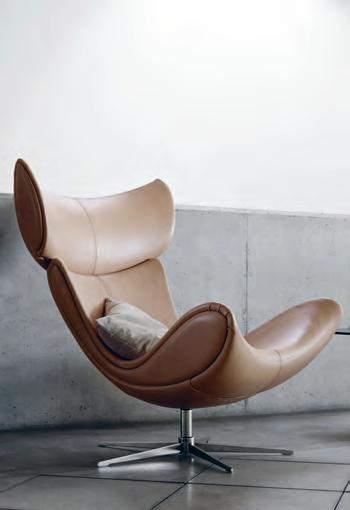
issue #39 habitusliving.com above | the ottowa collection. below | the imola armchair. opposite | the copenhagen wall unit.
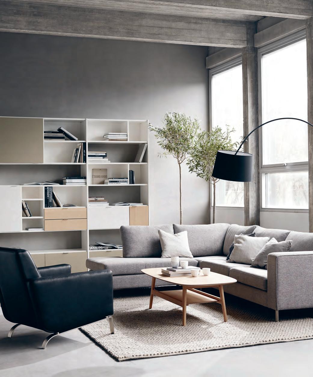
habitus promotion › BoConcept #163
BoConcept | boconcept.com/en-au
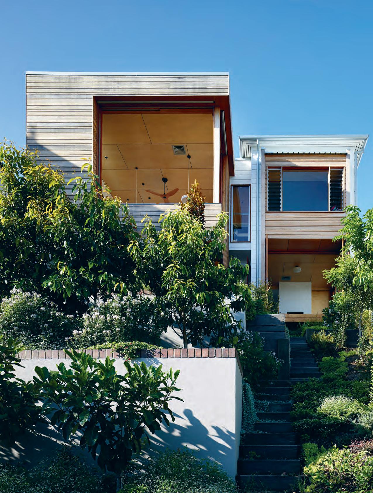
issue #39 habitusliving.com
Design in Descent
A Brisbane architect rewrites the narrative of an old Queenslander on a small, steep block with a design that relishes every gradient. Tamara Simoneau explores.
Credit must go to the early designers and builders of Queensland’s quintessential offering to the architectural archives, particularly in its capital, Brisbane, where old city suburbs rise and dip haphazardly on topographically tricky terrain. The archetypal ‘Queenslander’ is essentially a timber and tin box on stumps. It’s an enduring design and dream build on flat ground – but a lesson in ingenuity on a block like this one, where only the entry meets the earth. Securing one of these original inner city centenarians could be considered equal parts privilege and curse. And those tasked with adapting them for modern life without destroying their charms might feel the same way.
Owners Matthew and Caroline, a pair of physicians who work in nearby city hospitals, were drawn to its lofty position and expansive views of the Brisbane skyline to the south. Less appealing was the state of the dilapidated relic when they bought it five years ago. “It had what appeared to be a homemade downstairs area that obviously needed to have something done to it,” says Matthew. “And it was clear that the backyard was not being used at all.”
TexT Tamara Simoneau | PhoTograPhy ScoTT BurrowS
# 165 3 . on location
A year in, they began a working relationship with architect Matt Kennedy, principal of Arcke, a boutique firm familiar with the quirks and restrictions of old Queenslanders, to transform the former share house into a family home that made the most of its lot. “The original Queenslander perched precariously on a ridge and lacked any real connection to the steep ground at the rear of the site,” says Matt. “All of our renovation designs start with an in-depth understanding of the existing site and terrain together with a thorough comprehension of the structure and history of the original home. From there we are able to determine core elements to be retained and restored. There is an honesty and integrity to the way Queenslanders are built and we always try to work with and complement this in our architectural response,” he says.
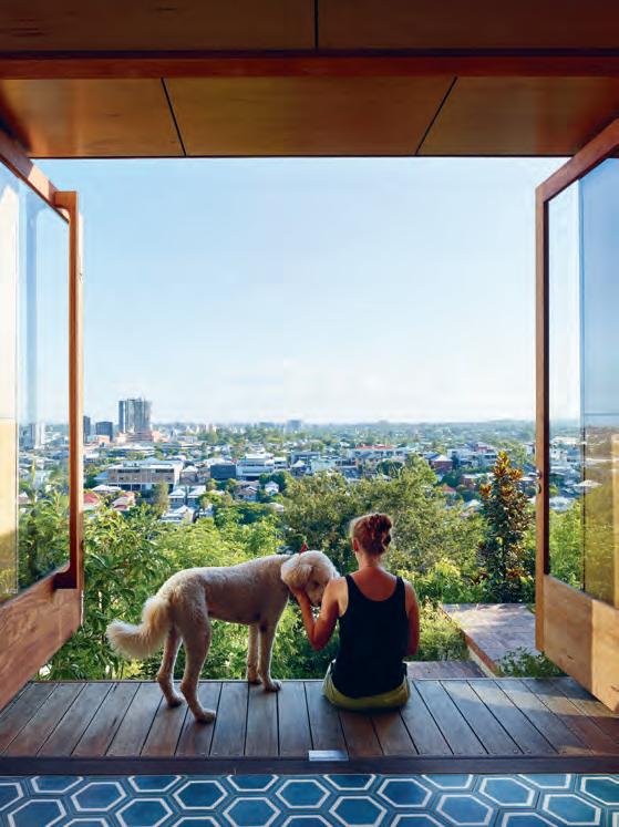
His clients had made it clear they didn’t want a conventional upstairs/downstairs floorplan. “Essentially all the living gets done on one level and the other level becomes just a dormitory,” says Matthew. “I was cognitive of the fact that if the kitchen was on the top level no one would go downstairs and into the backyard. And it might seem contrived putting it on a lower level, away from the obvious entrance of the house.”
Matt came up with a plan to satisfy the brief in an innovative way – and the kitchen was at its core. “Matthew and Caroline had very fond recollections of family meals, conversations and moments at the dining table and we discussed at length the importance of its position in the house,” he explains. “It was determined by all [involved] that we foster this space for gathering and celebrate its importance. Because of the divide between upstairs and downstairs, we settled on the idea of locating the kitchen and dining at the half level. The benefit of doing this was to create a space that is equally accessible from upper and lower levels and very much the heart of the house.”
“The distinction between the lounge and the library is determined by how many books you have on the shelves.”
opener | An unwAnted And unused ver AndAh on the bAck of the tr AditionAl design mAde wAy for extr A living spAce thAt celebr Ates the outdoors with retr ActAble windows And oversized doors At every level. Above | spectAcul Ar city views Are enjoyed from the lower level sitting room in which AsymmetricAl rosewood doors Are thrown open to invite the outdoors in. opposite | the libr Ary, finished with birch plywood floor-to-ceiling shelving, is A popul Ar spot with every member of the fAmily. issue #39 habitusliving.com
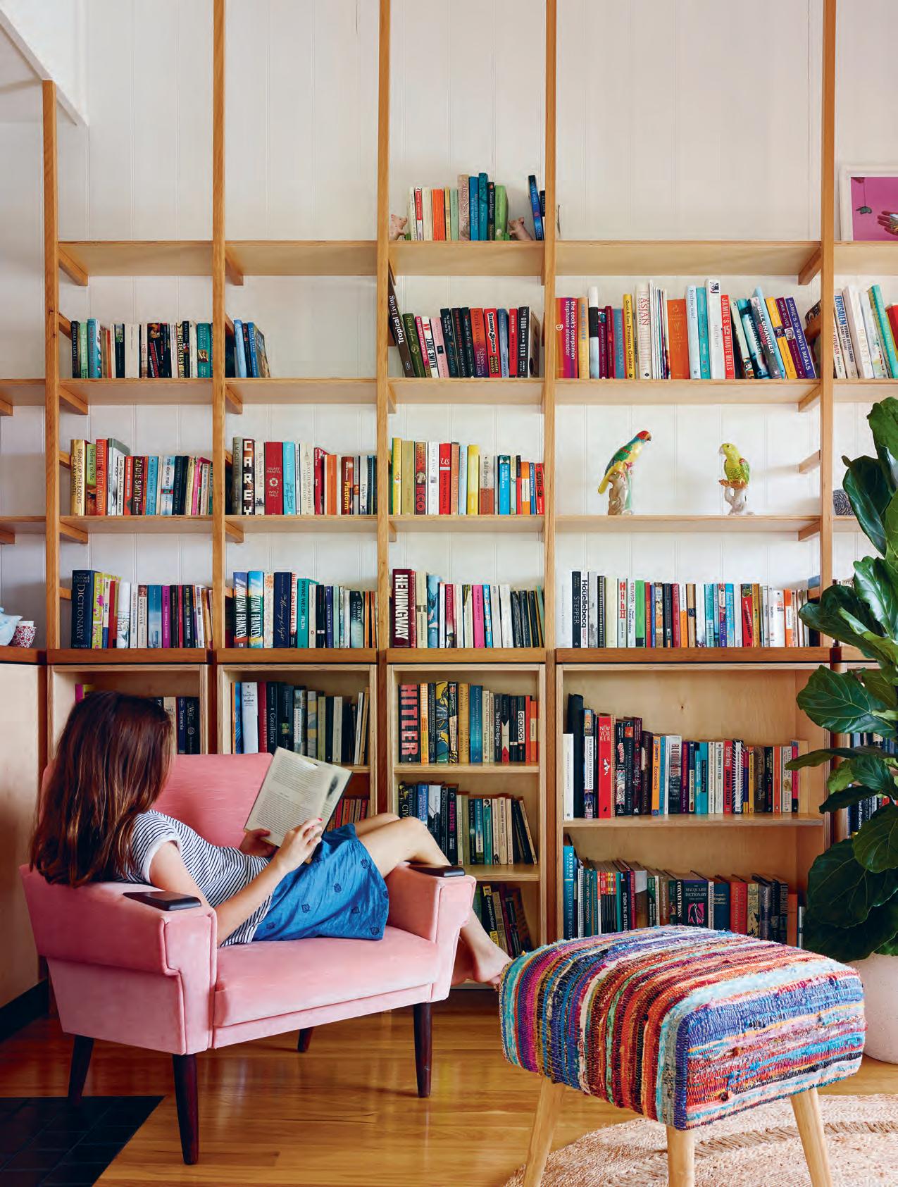
3 . on location # 167
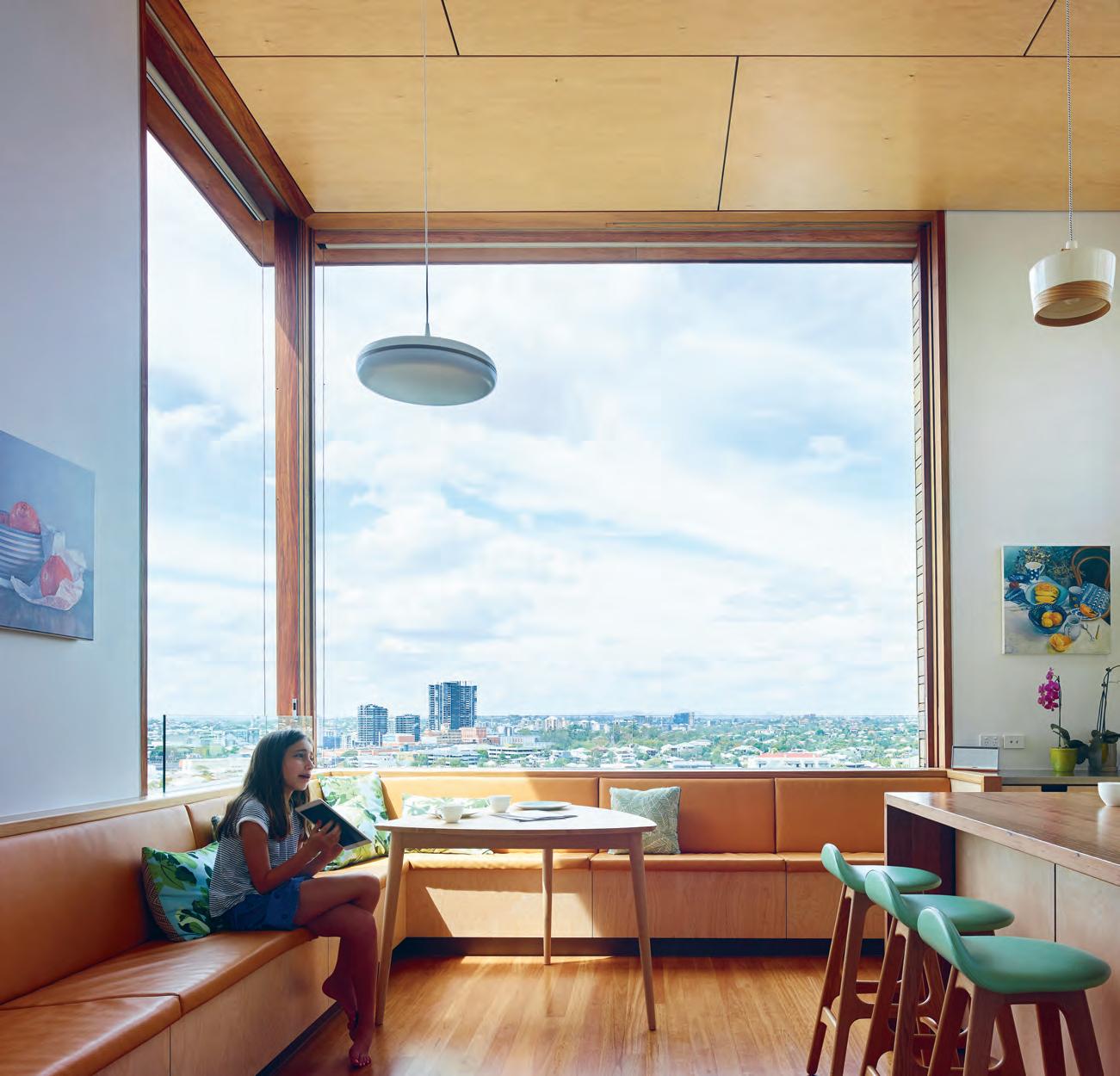
above | The kiTc hen is Th e hearT of Th is home, and Th e cenTr e of iTs r e-imagined design. " i was noT going To b urn up any space on a deck so Th e kiTc hen is also a living area and as good a deck as you're going To g e T " says m aT Th ew. w iTh n o formal dining room, ex Tr a space was allocaTed for builT- in bench seaTi ng To accommodaTe family mealTi me and larger gaTh erings overlooking Th e ciT y s kyline. issue #39 habitusliving.com
Dropping the kitchen down by a half staircase under the existing roofline also resulted in a soaring ceiling – creating a light-drenched space with the help of oversized sliding cavity windows that capitalise on the view. “Matt’s solution works [well] in practice,” says Matthew. “You can easily get to the kitchen from the entry and when you’re in the kitchen you can see and access the downstairs with ease too.” The design ticked another all-important box for the clients who weren’t interested in wasting any real estate on a deck that would be exposed to the elements and sporadically used. “You have to think carefully about how you’re going to use space when you’re renovating an existing house on a small block,” says Matthew. “I wanted the kitchen to be capable of turning into a semi-outdoor area. That’s what led to the arrangement with the very large sliding windows. When they’re open you just have one post in your sightline and can be almost as exposed as if you were on a veranda.”
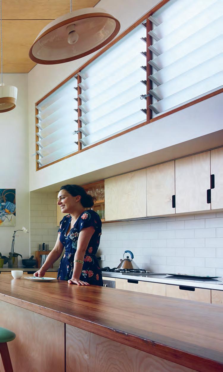
Down another half staircase is the main living zone. Winding down further a music room and the laundry tuck neatly under the kitchen. The cascade continues to the lower floor with access to the backyard: brick stairs and a series of terraces descend to a fire pit area for abundant balmy evenings.
“A large part of the design response was about attempting to ground the lower rear of the house and establish an improved connection between inside and out,” says Matt, who was on site up to three times a week during the ten-month build, fastidiously monitoring its progress.
3 . on location # 169
ENTRY LIVING FIREPLACE SITTING ROOM HALL KITCHEN DINING BEDROOM BATHROOM DECK LAWN STORE W.C. STUDY WALK-IN-ROOM LAUNDRY MUSIC ROOM WATER TANK OUTDOOR SITTING 1 2 3 4 5 6 7 8 9 0 q w e r t y u i o FIRST LEVEL SECOND LEVEL 1 2 4 6 78 9 0q q e5 r i i u8 o 4 3 w 8 8 3 0 t 9 y 6 3 issue #39 habitusliving.com

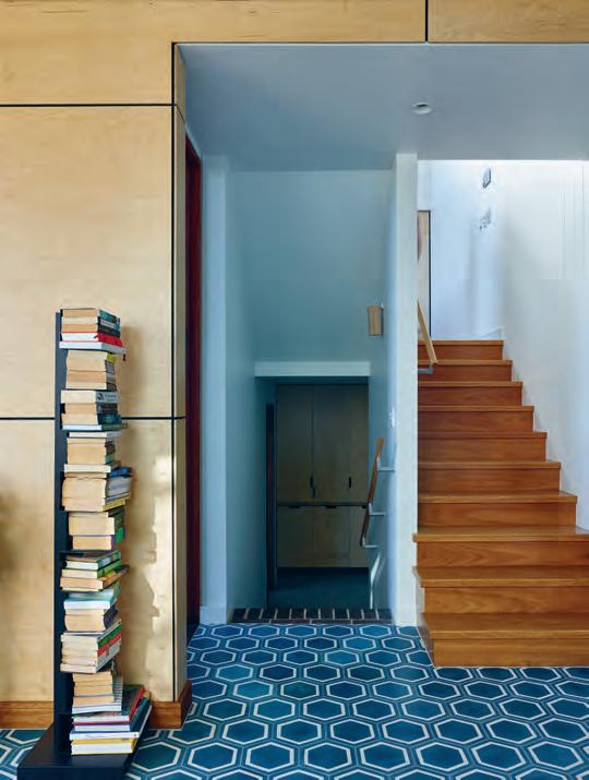
opposite | plans. top left | the original fireplace has been kept intact as a nod to the house's heritage. " it was important to retain such an element because of the ingrained texture and materiality, but also as a physical and metaphorical connection between the old and new," says architect matt kennedy. top right | " we decided [on a] concrete floor covered in hexagonal shaped encaustic concrete tiles," continues matt. 3 . on location # 171
“You have to think carefully about how you’re going to use space when you’re renovating an existing house on a small block.”
There’s no denying the overall visual impact of the end result, but Matt hasn’t neglected the details. Timber floors link old with new, and modern finishes are softened with complementary birch ply features throughout. “We have used it on ceiling linings and cabinetry. We like using it because it offers warmth and texture,” says Matt. The custom ply and recycled timber shelves flanking the top floor library which open out to those glorious views, also double as a privacy screen. “The distinction between the lounge and the library is determined by how many books you have on the shelves,” says Matthew. More minimalist styling means the lounge can also catch the view.
But the test of any design is its livability factor after the clients settle in, and this is where Matt’s attention to detail has futureproofed the re-imagined Queenslander. “Every room is used, no room is arbitrary and they’re all the right size,” says Matthew. “I think that’s a real achievement.”
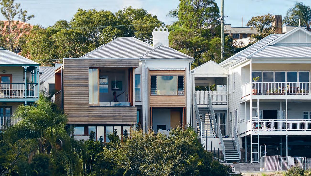
ABOVE | Th E h O m E cu Ts A sTr iking figur E in A su B u r B fillEd w iTh c h A r AcTEr h O u s Es mATT kEn n Edy's TA k E Em B r Ac Es Th E quinTEs s EnTi A l q u EEn sl A n d Er w hilE A d ding A fr Es h pEr spEcTi V E O n m O d Er n li V i ng. " i ' V E c O m E TO A pprEc i ATE Th Es E sTrucT u r Es A n d Th Ei r wO n d Er ful quA liTi Es TO g E Th Er w iTh Th Ei r idi O syncr A s i Es ," h E sAys.
issue #39 habitusliving.com

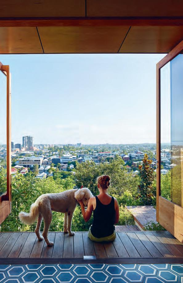
Tadao Ando and Penelope Seidler hands of HYLA Architects, Siglap Plain casts a monolithic shadow in Singapore. living in design #39 9 771836055007 Supple curves complement harsh corners at the Playful House. Bill Henson locates the exotic in the everyday And Melanie Katsalidis lives a mix of jewellery, art and architecture living in design #38 771836055007 PAYMENT METHOD Cheque / money order AUD$ Charge my credit card AUD$ Name on Card Card Type Card Number E xpiry Date Signature IT’S EASY TO ORDER Fill in your response below, overleaf or subscribe securely online at habitusliving.com/subscribe. FOR A GIFT – RECIPIENT DETAILS: FOR MYSELF PLEASE SELECT BELOW Mrs/Ms/Miss/Mr First Name Surname Address State Postcode Country Email Phone Mrs/Ms/Miss/Mr First Name Surname Address State Postcode Country Email Phone ONLINE: habitusliving.com/subscribe PHONE: (61 2) 9368 0150 MAIL TO: EMAIL: subscriptions@indesign.com.au FAX: (61 2) 9368 0289 Indesign Media Asia Pacific Level 1, 50 Marshall Street, Surry Hills NSW 2010 WHERE’S YOUR FAVOURITE PLACE TO ESCAPE/EXPLORE AND WHY? Enjoy your quarterly dose of Habitus delivered straight to your door. This issue, extend or renew you subscription to the next four issues and you’ll get a complimentary fifth! Offer ends the 28th of February, 2018. includes shipping within Australia only Subscribe to Habitus magazine Subscribe to Habitus 5 issues for $49! AUSTRALIA INTERNATIONAL (AUD$) 12 ISSUES SAVE 8 ISSUES SAVE 4 ISSUES SAVE 12 ISSUES SAVE 8 ISSUES SAVE 4 ISSUES INDESIGN $155 $43 $105 $ 27 $55 $11 $240 $ 39 $200 $21 $110 HABITUS $132 $47.40 $93 $26.60 $49 $10.80 $240 $30 $180 $10 $90 THE COLLECTION Vol. 2 Australia $29.90 (1 ISSUE) International $49.95 (1 ISSUE)
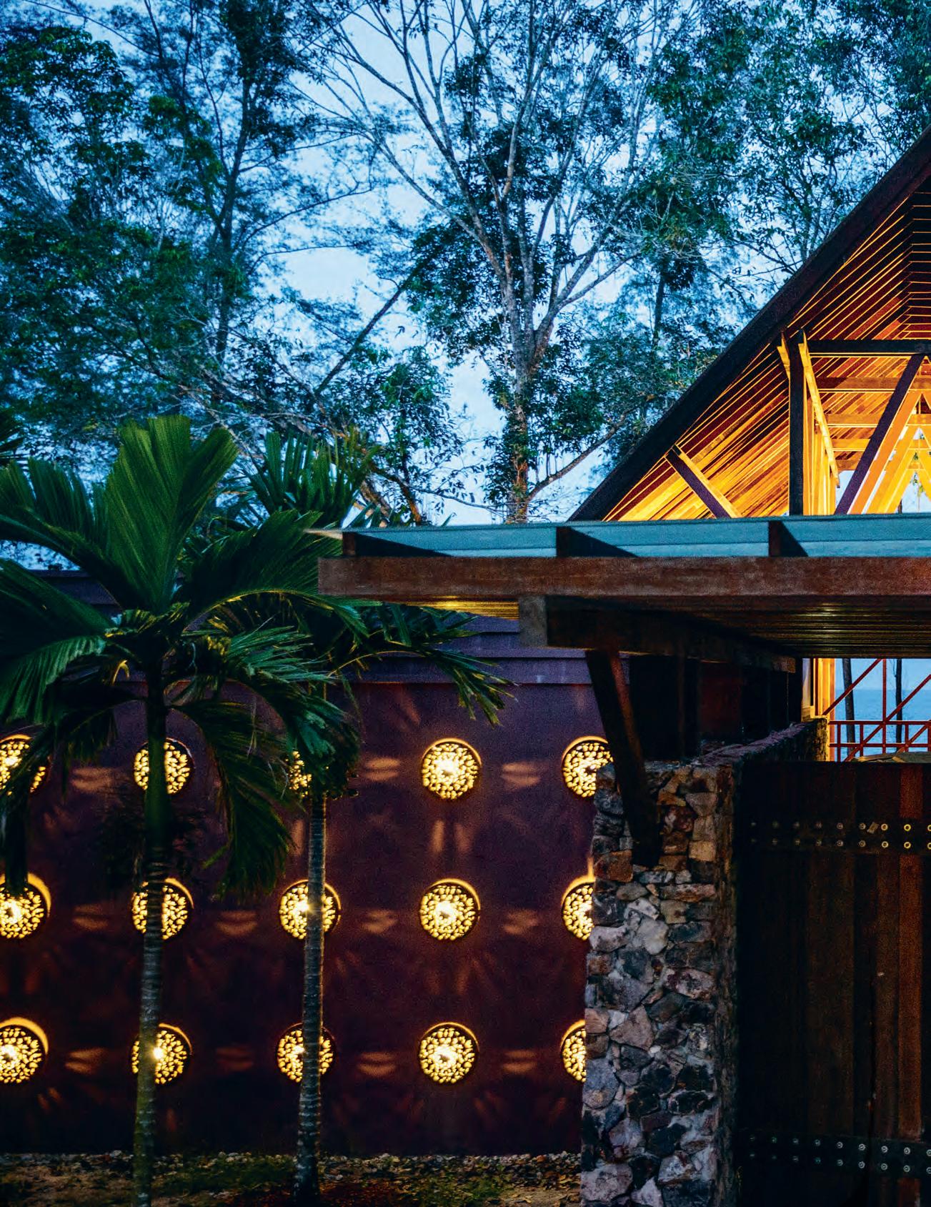
issue #39 habitusliving.com
a Resort Not just
For Hijjas and Angela Kasturi, bringing architecture, culture and conservation together is their passion. With The Kasturi, a 5-Star beach resort on the east coast of Malaysia, they have achieved the seemingly impossible – combining luxury and authenticity.
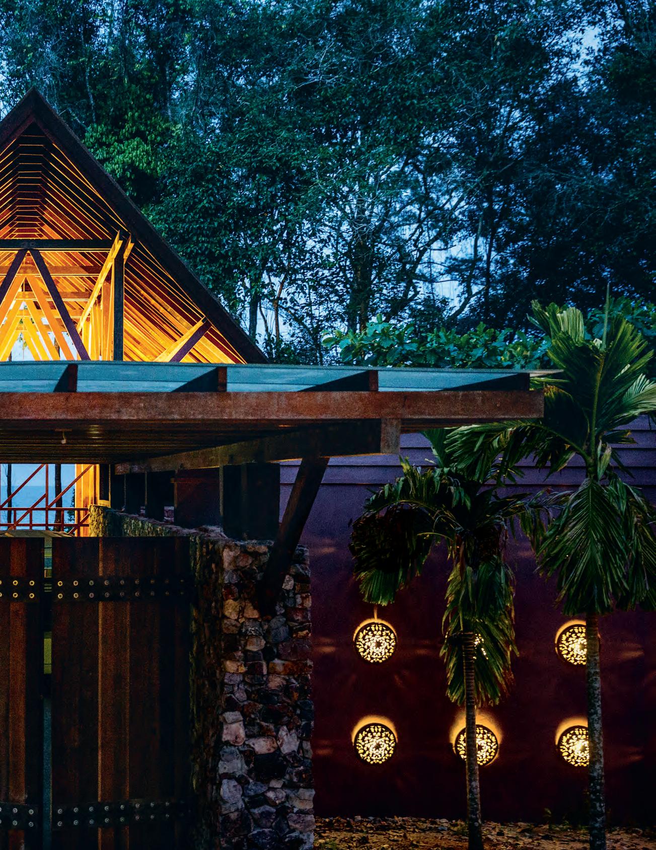 text Paul McGillick | photography i a n Teh
3 . on location # 175
Most resorts promise a dubious scenario: the combination of a home-away-from-home and a safely exotic experience. In practice, they usually provide neither. But The Kasturi, on Chendor Beach on Malaysia’s east coast, is a remarkable exception to this rule.
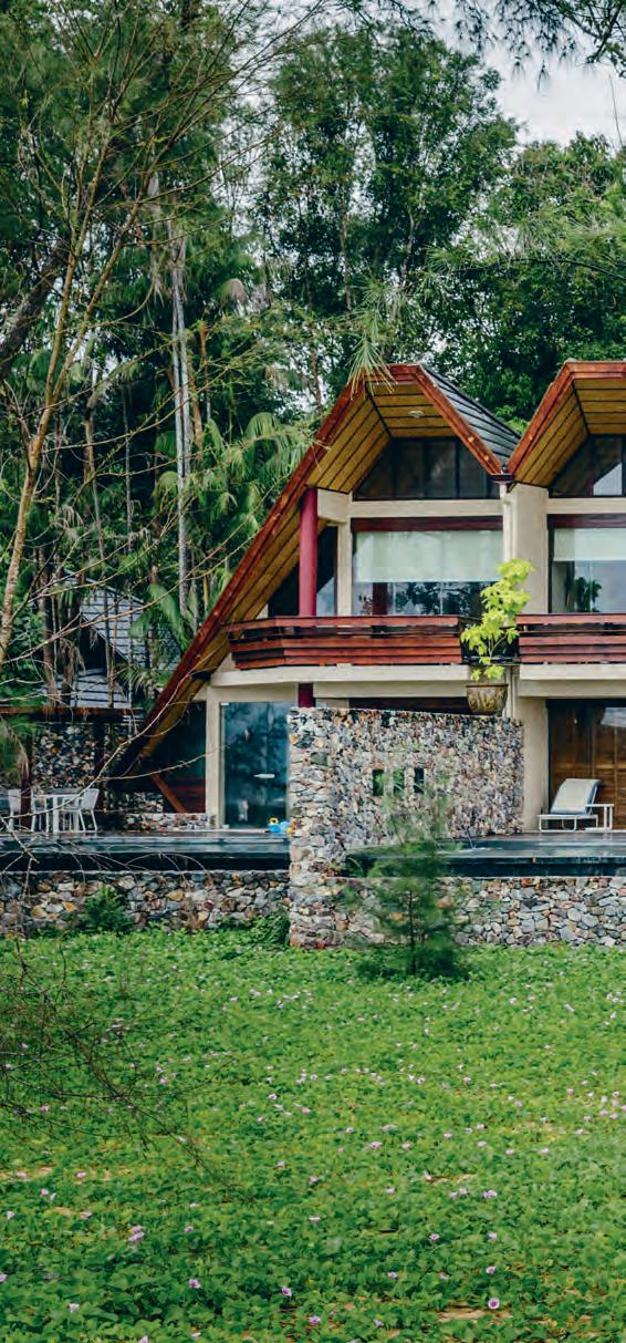
Architecturally, its 24 villas are a reimagining of the traditional Malay house. But not as an exercise in pastiche. Rather, it arises from a deep commitment to sustainability and conservation. Hence the vernacular domestic typology is given new life, serving the needs of contemporary holiday-makers while also respecting the environment and celebrating local culture.
“This was an opportunity for me to do something different because the concept is, in many ways, an extension of our indigenous culture – but making it contemporary so that it can live in this world,” says architect and developer, Hijjas Kasturi.
So, like the traditional kampung house, the villas are on stilts so as not to disturb the natural ground plane. In fact, the carriageways around the resort are also elevated. This avoids disturbing the forest and wildlife, generates breezes and separates people from mosquitoes. The bedrooms in the villas are higher than the living rooms, so guests can see the sea from their beds, lying underneath traditional high-pitched ceilings which catch the sea breeze. Outside there is an origamiinspired flat-tiled roof forming an A-frame and reaching down to ground level so that you don’t see the wall, only the roof.
There is a lot more to the resort’s conservation/sustainability credentials and its ‘tropical modern’ approach – not to mention the turtle hatchery.
Hijjas Kasturi is Malaysia’s most outstanding commercial architect. Now in his 80s, he has retired, leaving the practice to be run by his daughter, Serina. He was ahead of his time, designing commercial buildings which were of their place without resorting to vernacular revival pastiche – modernist buildings which embodied the spirit of local culture, which engaged with their context (especially at ground level) and which explored sustainability (for example, the extraordinary Telekom Tower with its dynamic twisting form and garden terraces, lifted up from the ground plane to create cool, sheltered public space).
issue #39 habitusliving.com
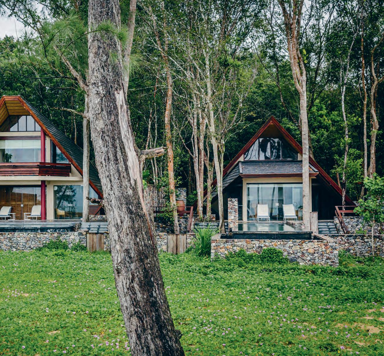
opener | The check-in pavilion is a TasTe of Things To come wiTh iTs naTural maTerials, view of The sea and fresh-on-arrival complimenTary lime juice cock Tail. above | The o ceanside villas wiTh Their proTecTive canopies and sTone-framed elegance have direcT access To The beach. 3 . on location # 177
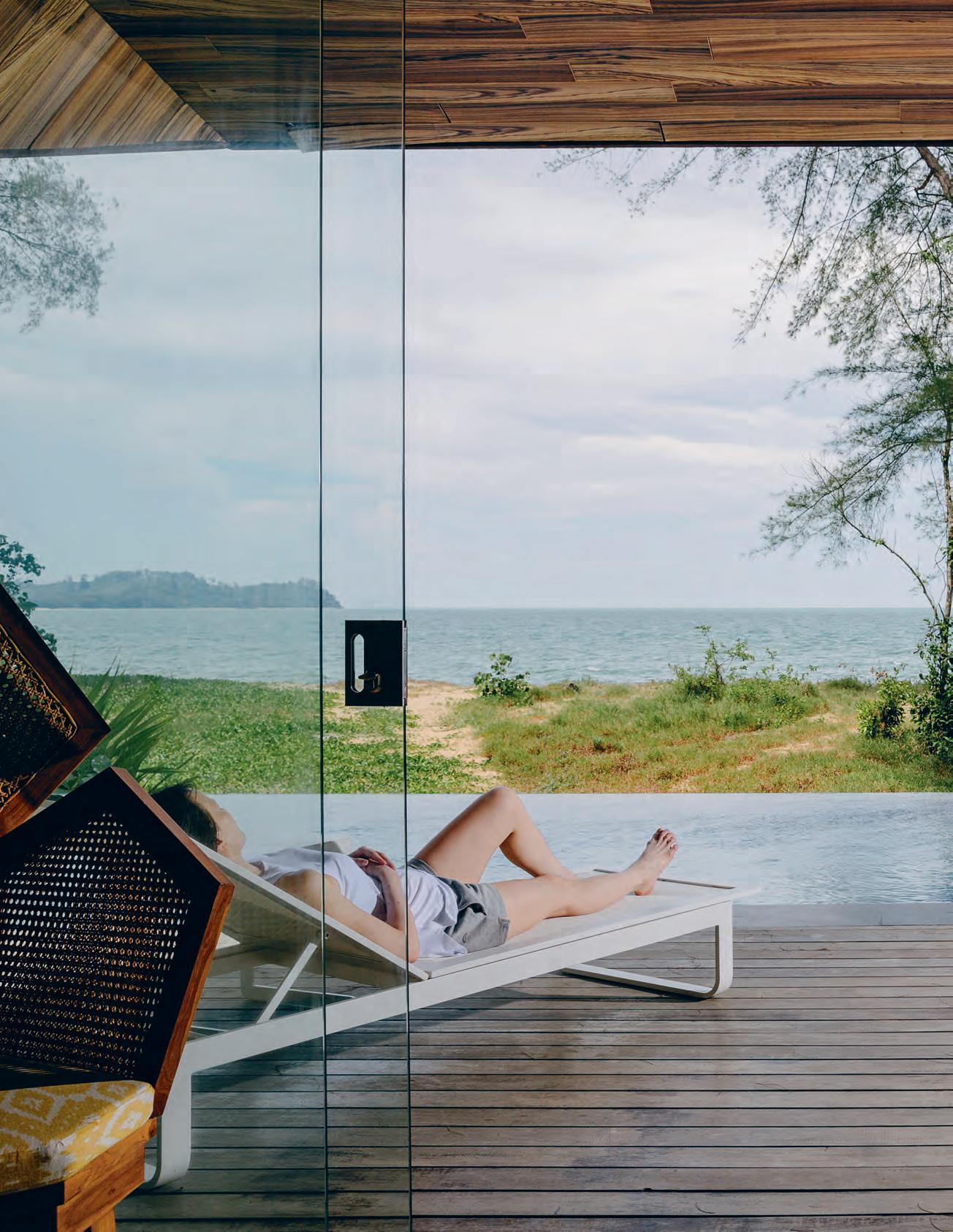
issue #39 habitusliving.com
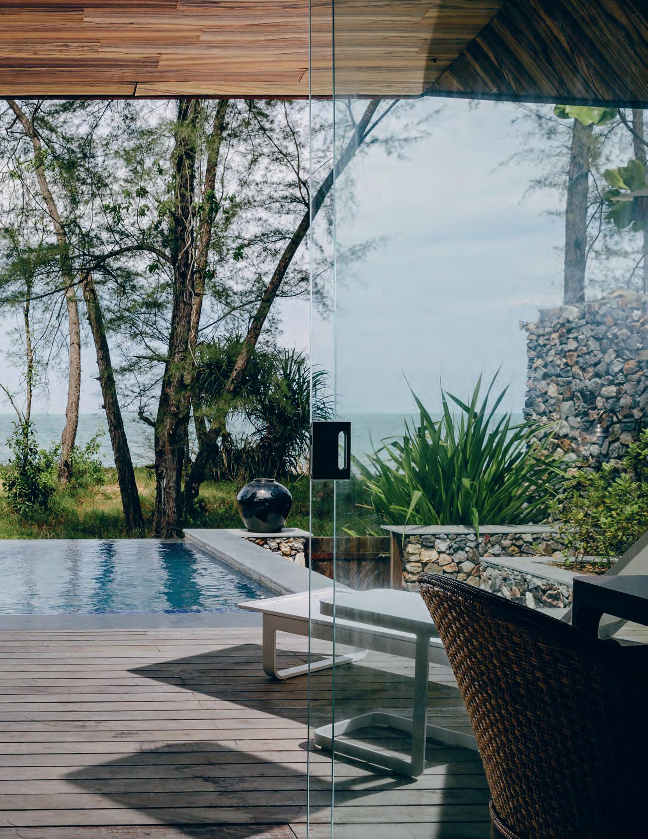
# 179 3 . on location
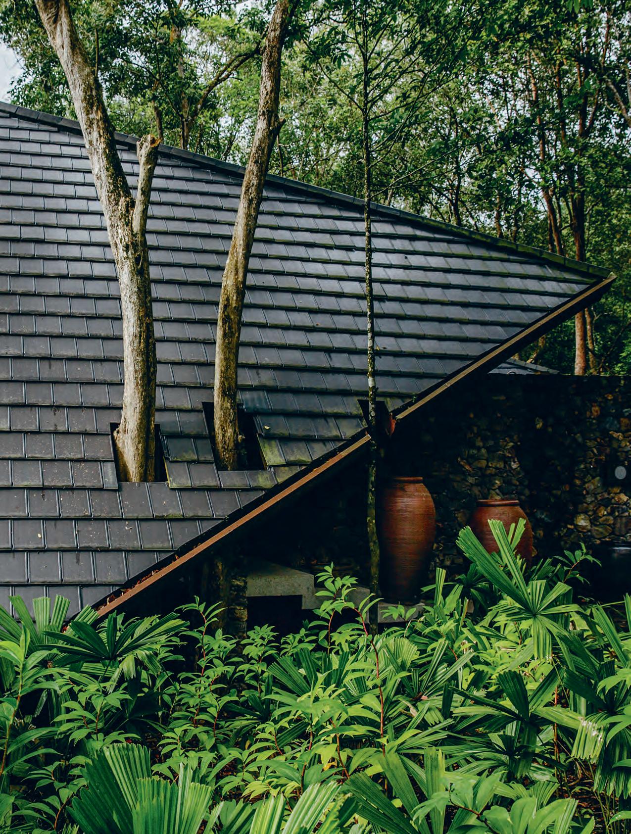
issue #39 habitusliving.com
Angela Hijjas was involved for many years with WWF and the Malaysian Nature Society. On their delightful property, Rimbun Dahan, on the outskirts of Kuala Lumpur, Angela has developed a medicinal forest that is used for educational tours. She and Hijjas have ‘rescued’ three historic Malay houses, brought them to Rimbun Dahan and restored and modernised them for use by artists in their artist-in-residence programme. (See Habitus #2 for a full description of the project)
“He has always been very interested in doing things that have a sense of place, some connection with traditional forms and ideas,” says Angela of Hijjas. He could do this only to a limited extent with commercial buildings, so post-retirement it was their first conservation hospitality project in Penang that provided the blank cheque. This involved restoring and adapting a cluster of shophouses and terrace houses on the edge of what was soon to become the UNESCO World Heritage precinct in George Town.
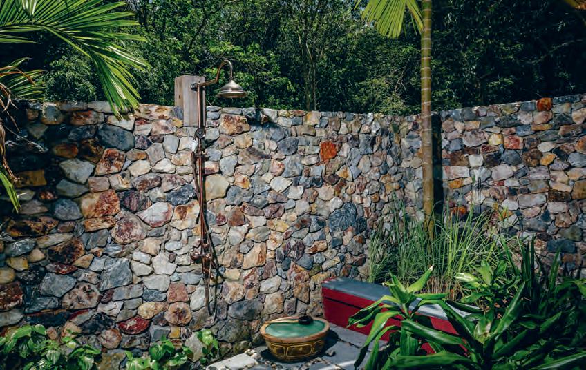
previous | The downsTairs living area opens on To a Timber deck and a privaTe infiniT y p ool overlooking The so uTh china se a. opposiTe | The villas are builT around exisTing Trees which provide addiTional cooling shade. above | guesTs are TreaTed To eiTher a luxurious indoor designer baThroom or an auThenTic, sensuous ouTd oor shower.
3 . on location # 181
Most resorts offer anodyne sensuality. The Kasturi does this, but also provides an architecturally and culturally enriching experience.
The heritage façades were retained with an extra storey added to the shophouses. Hotel Penaga is a celebration of Straits-born Chinese culture and uses traditionally inspired fittings and furnishings (some made in Adelaide and Melbourne) along with genuine antiques picked up as a job lot in Jogjakarta, local encaustic tiles, and carved timber doors and screens made by Chinese craftsmen. Hijjas linked the buildings by converting the grubby rear lanes into a lush garden landscape, a delightful oasis showcasing a wide range of plant species chosen by Angela.
Their team approach was applied to The Kasturi, this time including Australian landscape designer, Greg Dall of Pentago, a long-term resident in Malaysia.
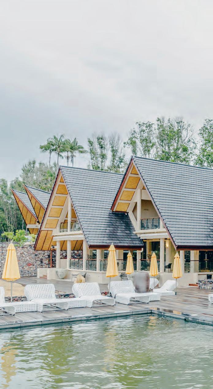
The resort has an 800-metre beach frontage, informally extending north and south with sweeping views out across the South China Sea. On approach there is forest, then a lake, then the beach and the sea. So, the immediate issue was where to place the main building. Here the priority was protecting the forest and Angela made the decision to place the building over the lake.
“The aim,” she says, “was not to touch the ground.” Hence, as well as the elevated carriageways, villas are built around the trees, plants were removed from construction sites, preserved and later re-planted since they are already adapted to the environment. Each villa has its own septic tank (thus avoiding trenching for a central sewage system) and they convinced Council to allow natural drainage into the sand rather than peripheral drainage.
Otherwise, they have used local materials and contractors (Indonesian masons made the distinctive rubble walls which delineate public and private space using local stone, inspired by the clocktower in nearby Kuantan), recycled timber was milled on site, rainwater is used for toilets and gardens, lighting is all LED, the air-con is solar-assisted, ceilings are handmade bamboo, sawdust from the mill is used as mulch and Angela is helping a local farmer establish an off-site herb garden.
above | The communal pool runs The lengTh of The main pavilion whose form echoes The Tr adiTional malay house. issue #39 habitusliving.com
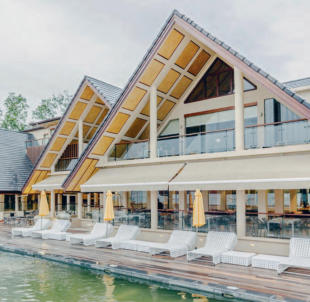
3 . on location # 183
However, the most astonishing – and most popular – part of the conservation programme is the on-site turtle hatchery. The green sea turtle is under threat with its eggs eagerly collected for sale in the markets. So, working with a partner, Pak Su, the Kasturis have bought more than 40,000 eggs over the last four seasons. “That means that forty turtles will survive over the next thirty years. I provide the money, Hijjas provides the site and Pak Su the expertise,” says Angela.
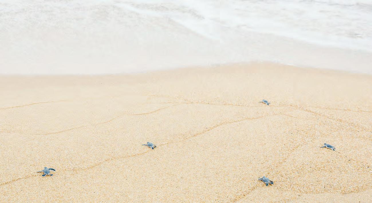
The eggs are kept safely buried in beach hatcheries and when they are ready to hatch large numbers of people turn up – locals, Kasturi guests and visitors from other resorts along the coast – to watch the inspiring spectacle as the hatchlings dig their way out of the sand eager to make for the sea. People are encouraged to ‘adopt’ a hatchling, shown how to handle it safely and then participate in a joyously moving ritual of releasing the hatchlings who then make a charge for the water.
Most resorts offer anodyne sensuality. The Kasturi does this, but also provides an architecturally and culturally enriching experience along with the chance to experience first-hand how we can sustain our habitat, the natural world.
Above | TurTle hATchlings mAking Their chArge To The se A
issue #39 habitusliving.com
The most astonishing – and most popular – part of the conservation programme is the on-site turtle hatchery.







Your Digital Design Destination Scroll. Swipe. Save habitusliving.com/collection
Siglap Plain
ARCHITECT Hyla Architects
Hyla a rcH i tects (65) 6324 2488 hyla.com.sg
FINISHES
Bianco Venatino marble in living and dining room. American Red Oak flooring in bedrooms. Facebrick bricks from Wienerberger. Custom made concrete block.
FIXED & FITTED
Oven, microwave, dishwasher, cooktop and laundry from Bosch. Refrigerator from Samsung. Integrated Fridge from Fisher & Paykel. Bathroom fixtures from JEE-O, Duravit and Hansgrohe. H-Series ceiling fans from Haiku. Custom made joinery and wardrobes.
Doorzien House
ARCHITECT Bijl Architecture
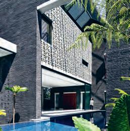
PROJECT ARCHITECTS Melonie Bayl-Smith, Andrew Lee, Giles Gibbins BUILDER Skope Constructions

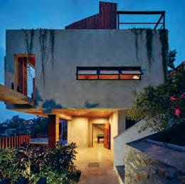
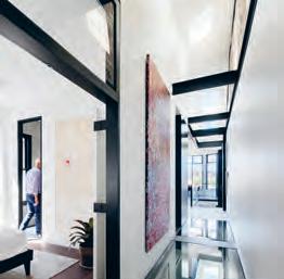
STRUCTURAL ENGINEER Cantilever Engineers
JOINERY JP Finsbury
Bijl a rcH itecture (61 2) 9958 7950 bijlarchitecture.com.au
FURNITURE
Sky Natura dining table and Elephant Slide dining chairs from Fanuli in dining area. Boss Ottoman, Boss armchair and Frankie sofa from Fanuli in living area. HAY About a Stool from CULT. Sofa in TV Room from Natuzzi. Lounge chair from King Living. King Furniture Embrace Emotion master bed, Ando side table and outdoor concrete table from Studio Fiveo3. Rug from Hali.
LIGHTING
Lighting throughout from Darkon.
FINISHES
Anthra Zinc roofing from Sterland Roofing. Slate roofing tiles and solar inserts from Nulock Roofing. Sandstone cladding and blocks from Mick Doolan. Oak Vulcano timber floorboards from Mafi. Mutina Mews and Geoform basket weave tiles from Academy Tiles. Neolith stone benchtop and splashback from CDK Stone.
FIXED & FITTED
Glass floors by Magic Glass. Custom bronze handles, handrail and surfaces by Bijl Architecture. Custom joinery by Bijl Architecture, made and installed by JP Finsbury.
ARTWORK
Large painting by Emily Pwerle in upstairs hallway. Barbara Weir painting in living room. Two pieces next to staircase by Robert Ambrose Cole and Christopher Hodges. Paintings by Marianne Benkö in downstairs hallway. Both paintings in cellar by Adrian Jemma. Prints by Tony Ogle in downstairs TV room.
Small House
ARCHITECT Studio Workshop
BUILDER Cyril Duffy
ENGINEER Stocks and Partners
JOINERY LNA Joinery
st udio WorksHop (61 4) 07 655 238 studioworkshop.com.au
FURNITURE
Portland couch, Kai dining table, console table and end tables, and Gainsville dining chair from Domayne. Bleached hemp rug from Domayne.
FINISHES
Basalt Blue Moon honed tiles. Granite Ebony flames tiles.
FIXED & FITTED
Sink and mixer from Blanco. Gas cooktop, oven, microwave and dishwasher from Miele. Bar fridge from Vintec. Toilet suite from Fienza. Tapware and shower rails from Astra Walker. Concrete basins from Wood Melbourne. French door fridge from Samsung.
Dress it up or play it down, here are the pieces that turned these houses into homes.
It’s all in the Details
issue #39 habitusliving.com
Twin Townhouse
ARCHITECT DKO Architecture
dEsIgnER SLAB
DKO Architecture (61 3) 8601 6000 dko.com.au

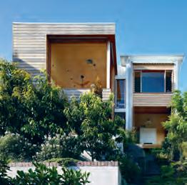
SLAB
info@slabarchitecture.com slabarchitecture.com
FURnITURE
Custom solid hardwood removable kitchen bench/chopping board from Eco Timber. King size master bed from Cobram Kitchens & Cabinets. Curtains by Lovelight. Walter Knoll
Jaan Living Sofa from Living Edge. Minotti Caulfield Coffee Table from dedece. Poltrona
Frau Ilary Monolithic Coffee Table and Cassina Cab Chairs from CULT. Tom Fereday Parisi
Outdoor Table and Chee Outdoor Chairs from Space Furniture.Timber veneer kitchen & study pedestals by owner.
LIgHTIng
Lighting throughout generally by Sphera
Lighting. Rooftop lighting by Davide Groppi
FInI sHEs
B&B Italia Cratis Rug from Space Furniture. Concrete floor from Concrete Colour Systems. Precast concrete wall finish from Cement Concrete & Aggregates Australia. Blackened custom steel bench joinery from Life Space Journey. Italian Royale Marble stone wall and bench and splashback from CDK Stone. Timber Veneer joinery throughout from George Feathers & Co. Custom made stair steel stringer with blackbutt hardwood from
Pondeljak Engineering. Mild steel flat bar balustrade from Milieu Built. Joinery from Cobram Kitchens & Cabinets. Melamine joinery from Laminex. Marble mosaic floor tiles from Signorino and Artedomus. Mirrored walls from Viridian. Timber floor from Royal Oak Floors. Ceiling & wall paint from Dulux. External powder coated aluminium façade, bi-fold screens and aluminium sliding screen from Euting Pty Ltd.
FIXEd & FITTEd
Rooftop pool by Laguna Pool. Home theatre system from Carlton Audio Visual. Light well & external steel planter box from LVDI. Blackened steel joinery and door handles from Life Space Journey. Induction cooktop, range hood & oven from Gaggenau. Integrated dishwasher from Fisher& Paykel. Refrigerator from Liebherr. Kitchen accessories throughout, pivot Sliding kitchen door, and foldaway side mounted single bed and queen size bed lift from Hafele. Tapware from Gessi, Rogerseller & Brodware. Basin from Alape & Parisi. Sink from Franke. Rooftop outdoor pool shower from Brodware. Turntable joinery and whiskey bar from client
ARTWORK
Artwork from Mark Ryden
Red Hill House
ARCHITECT Arcke
LEAd ARCHITECT Matt Kennedy
BUILdER P & R Lee Builders
JOInERY Jurodesign
ArcK e (61 7) 3180 0287 arcke.com.au
FURnITURE
Buch stools from Great Dane Furniture in kitchen. Recovered pink occasional chair and ottoman in library.
LIgHTIn g
K av Pendants over kitchen island from Dezion Studio. Droplet Pendant over banquette by Viktor Legin.
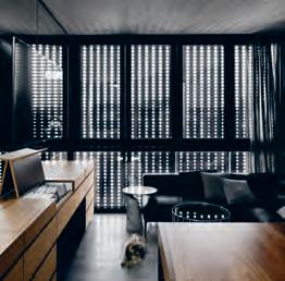
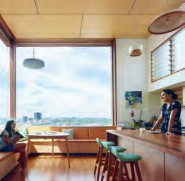
FInI sHEs
Birch ply feature ceilings throughout. Hexagonal encaustic concrete tiles from Popham Design. Exterior timber finish Dulux Intergrain. Blue Mottle Bricks from Lincoln Brickworks. Joinery finishes and kitchen island finish Dulux Integrain.
FIXEd & FITTEd
Vogue Ceramica backsplash and bathroom tiles from Classic Ceramics. Louvres from Breezeway Louvre Windows. Duravit bathroom sinks from Bathe.
ARTWORK
Canvas above banquette seating by Lisa Christensen. Canvas in kitchen by Jennifer Lang. Artwork adjacent to staircase by Ross Manning.
3 . on location # 187
habitus on the ground...
Temperature Design
When Temperature Design informed us that Henry Tadros, great grandson of ercol’s founder, Lucian Ercolani, was coming out to Australian shores to speak about the iconic British furniture company’s design origins and future, we couldn’t wait to get on board.
Deputy Editor Holly Cunneen hosted a casual Q&A seminar at the gallery space .M Contemporary in Woollahra, Sydney, amongst an audience of architects, designers, and design enthusiasts.
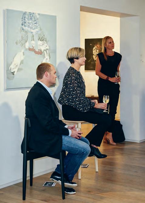

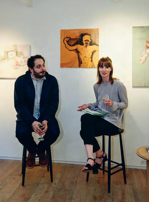
Habitus Living habitusliving.com
Temperature Design temperaturedesign.com.au
photography by Fiona SuSanto
issue #39 habitusliving.com
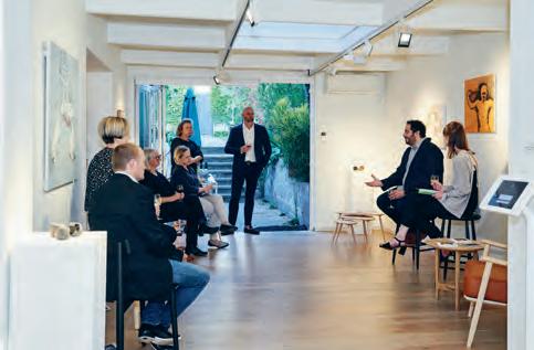

# 189
issue #39 habitusliving.com
Discover beautiful products
Meet inspiring people
Indulge in architecture and design
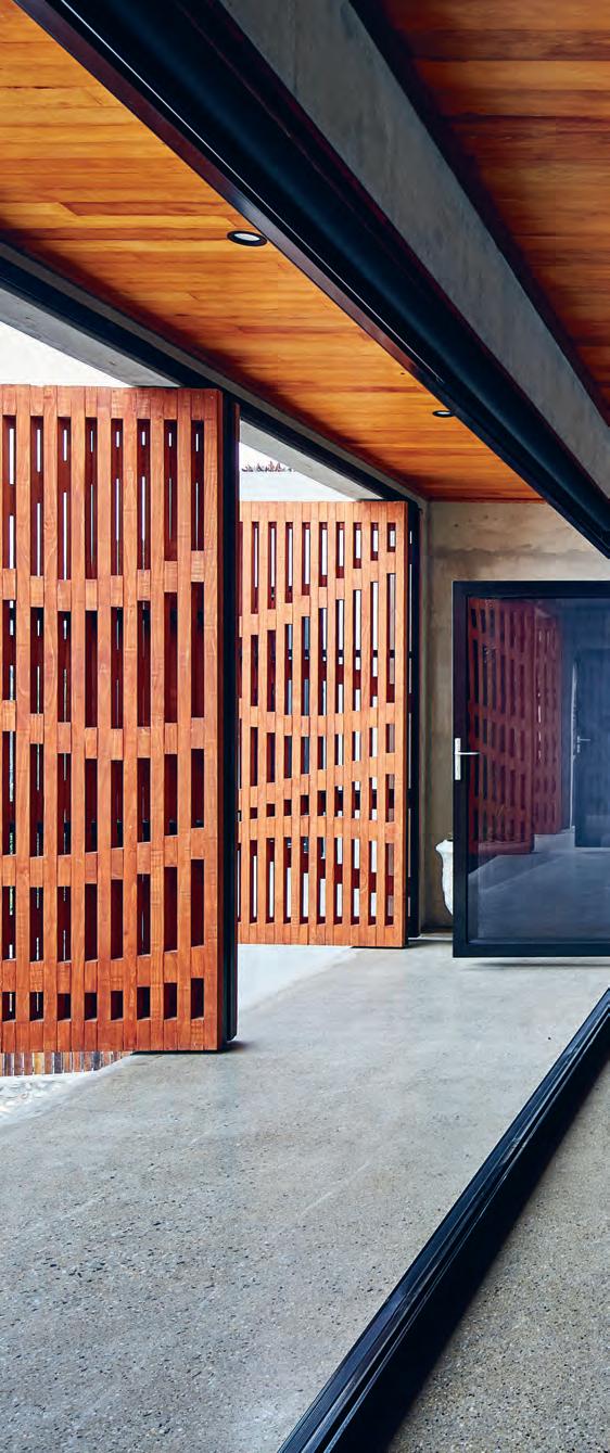
Across Australia, New Zealand, South and South-East Asia
The online community for the Design Hunter®


Website | habitusliving.com

Facebook | habitusliving
Pinterest | habitusliving
Instagram | @habitusliving
Twitter | @habitusliving
Small House Photography by Peter Bennetts
THE TEAM AT HABITUS MAGAZINE THANKS OUR ADVERTISERS FOR THEIR SUPPORT. USE THE DIRECTORY TO SEE WHAT PAGE A SPECIFIC BRAND IS FEATURED ON, AND VISIT THEIR WEBSITE TO LEARN ABOUT THE PRODUCTS AND SERVICES THEY PROVIDE.
Habitus magazine is available at newsagents and bookstores across Australasia, South-East Asia, the USA, Canada, Europe, South America and the Middle East. Habitus is published quarterly in March, June, September and December. To subscribe securely online visit habitusliving.com/magazine or email subscriptions@indesign.com.au to subscribe or request a full list of locations where
magazine is available.
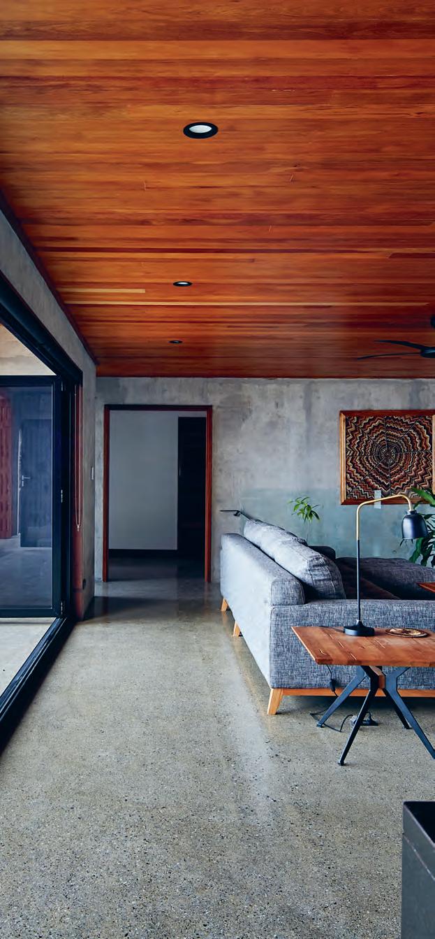
Habitus
# 191 Abey 112 abey.com.au Apaiser 023 apaiser.com Bo Concept 160 - 163 boconcept.com/en-aut Careers Indesign 020 careersindesign.com.au CDK Stone 193 cdkstone.com.au Cult 009 cultdesign.com.au Domayne 002
domayne.com.au FRONT 004 - 005 front.design Gaggenau IFC - 001 gaggenau.com/au Habitus Collection 185 habitusliving.com/collection iittala 037, 137 iittala.com.au Ilve 014 - 015 ilve.com.au Infiniti 080 infinitidesign.it King Living 010 - 011 kingliving.com Launch Pad 064 - 065 indeawards.com/launchpad Liebherr 075 home.liebherr.au Neolith IBC neolith.com.au Own World 097 - 098 ownworld.com.au Parisi 016 parisi.com.au Pheonix Tapware 105 pheonixtapware.com.au Rogerseller 125 rogerseller.com.au/appointment Royal Oak Floors 006, 159 royaloakfloors.com.au Siemens 038 siemens-home.bsh-group.com/au Silent Gliss 019, 147 silentgliss.com.au Silestone by Cosentino 111 silestone.com Space Furniture 024 spacefurniture.com Stylecraft 076 - 079 stylecraft.com.au Stylecraft HOME OBC stylecrafthome.com.au Subscriptions 173 habitusliving.com/subscribe Sunbrella 049 sunbrella.com tongue n groove 012 - 013 tngflooring.com.au Vela 063 vela.life Vola 035 vola.com Walter Knoll 033 walterknoll.com.au Zip 021 zipwater.com
- 003, 050 - 051
Your map to where the stories in this issue come from where is available
world
issue #39 habitusliving.com
“My buildings are more famous than me.”
JEAN NOUVEL
Hong Kong #67
Wellington #40
Port Moresby #138
Singapore #115
Killara #138
a new way of thinking about shapes & spaces
Neolith is now available in a wide range of textures and finishes, it’s lightweight and easy to install, making it suitable for the most demanding domestic and commercial applications both indoors and out.




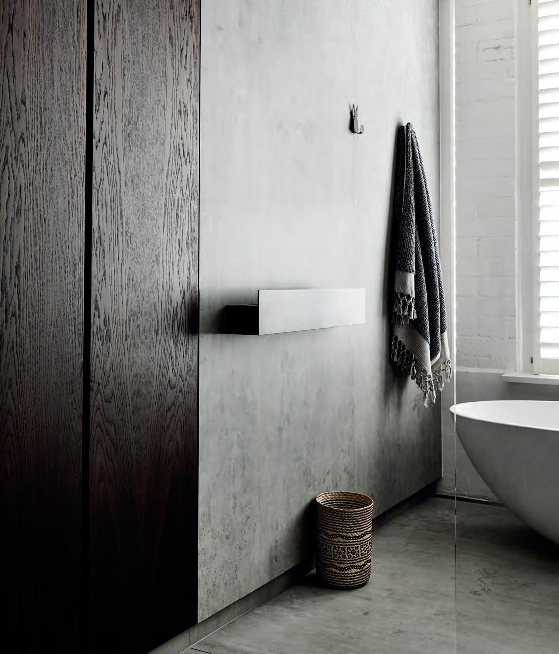
for more surfaces and information visit www.neolith.com.au


 Pierre Bleue Iron Corten
Strata Argentum Estatuario Basalt Grey
Calacatta
VIC 03 8552 6000 VIC Showroom 03 8552 6090 NSW 02 9822 5155 NSW Showroom 02 9822 5910 QLD 07 5537 3222 SA 08 8340 2877 WA 08 6240 2200 W www.cdkstone.com.au E info@cdkstone.com.au cdkstone
extraordinary surfaces
Zaha Stone
NEOLITH BETON | FEATURE WALL + FLOOR ARCHITECTURE BY WORKROOM

Lounge
stylecraftHOME.com.au Sydney Ground Floor, 100 William Street, Woolloomooloo NSW 2011 info@stylecraftHOME.com.au Mon - Fri: 8:30am - 5:00pm, Sat: 10:00am - 4:00pm Melbourne Opening April 2018
Divanitas
& Armchair by Lievore Altherr Molina for Verzelloni

 One of the most successful innovations to come out of the Black Forest. And a cuckoo clock.


 Holly Cunneen | Deputy eDi tor


 Tony Amos
yoA n Jolly
y vonne Xu


 Photography Anisa Sabet


 Hunn Wai


 Co-founder and Creative Director, Lanzavecchia + Wai


 Photography: Davide Farabegoli


 — Stephen Todd


 text Yvonne Xu | photography Derek Swalwell


 text Stephen Crafti | photography tom BlaCh ford


 text Paul McGillick | photography i a n Teh


 Pierre Bleue Iron Corten
Strata Argentum Estatuario Basalt Grey
Calacatta
