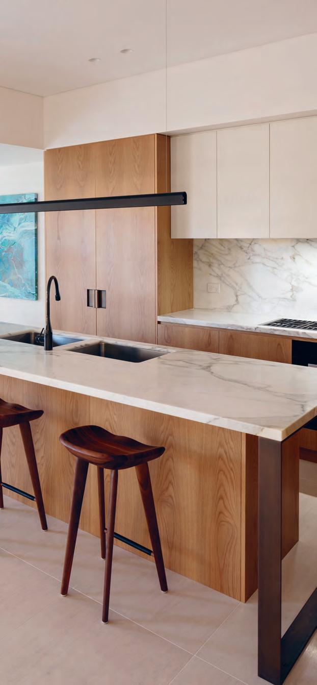
Hidden technologies in the kitchen and bathroom, Bill Granger on creating environments, and local design shines in the annual Nourish issue.

June – august | 2018 AUD$16.95 | NZ$16.95 | USD$17.95 CDN$18.95 | GBP£9.90 | SGD$11.95
#40
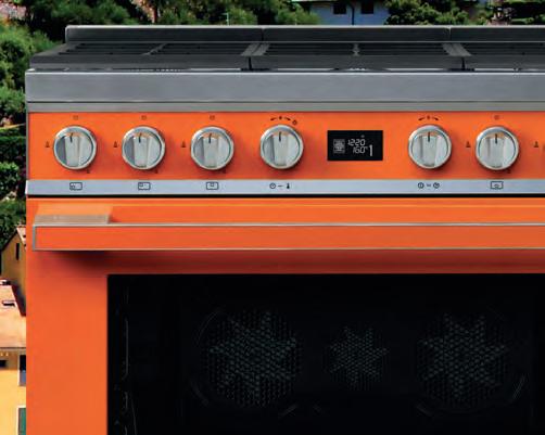
UNRIVALLED TRIPLE-FAN FREESTANDING COOKER IN CHOICE OF 8 COLOURS


SMA18849
BRINGING THE RICH FLAVOURS OF THE ITALIAN COAST INTO YOUR HOME




smeg.com.au
William Smart – Founder & Creative Director, Smart Design Studio
William Smart – Founder & Creative Director, Smart Design Studio
William Smart wins awards blending brilliant architecture and interior design. He has transformed this space with the ultimate in comfort and function from the iconic Living Edge range.
William Smart wins awards blending brilliant architecture and interior design. He has transformed this space with the ultimate in comfort and function from the iconic Living Edge range.

livingedge.com.au
livingedge.com.au
 William Smart
The Oak Residence
William Smart
The Oak Residence
William Smart
The Oak Residence



W illiam S mart Furniture for Retreat life. 7 W illiam S mart Furniture for Retreat life. 7
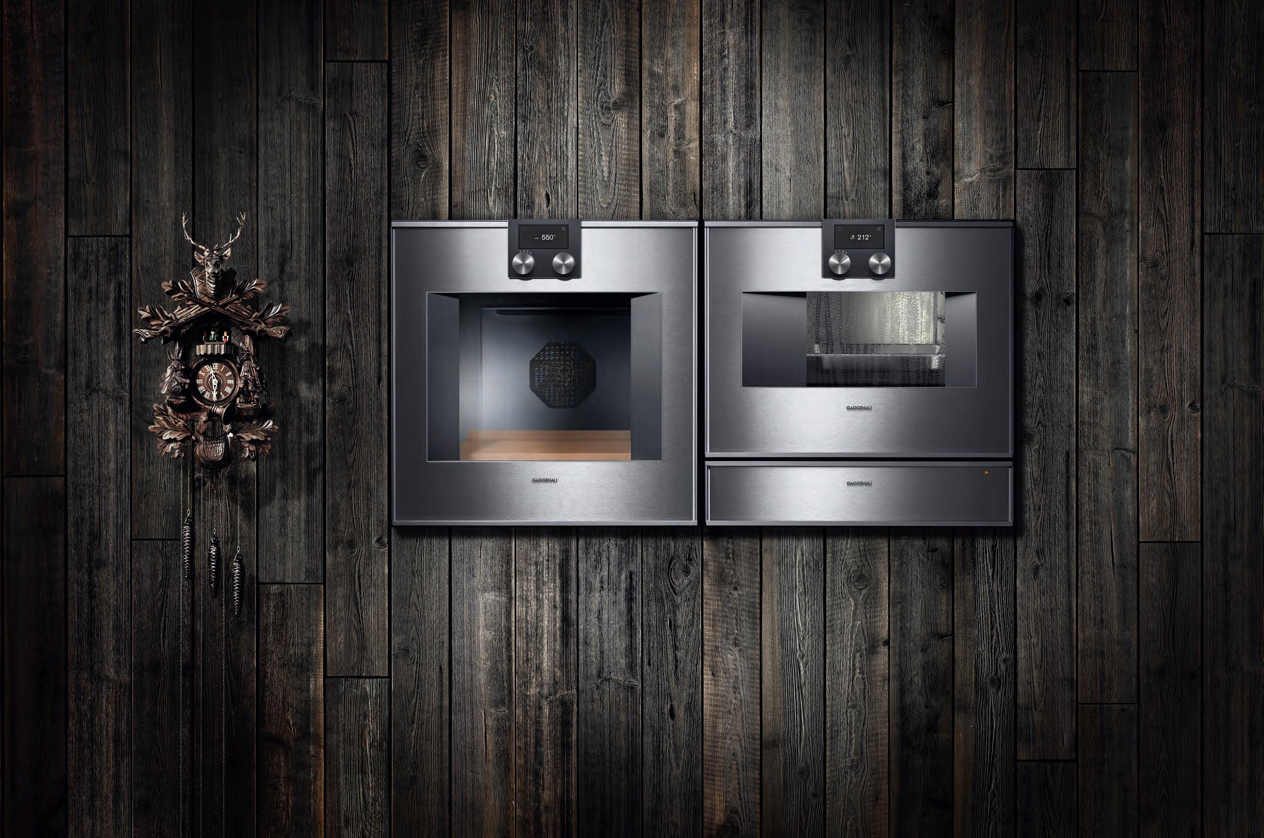

One of the most successful innovations to come out of the Black Forest. And a cuckoo clock.
The difference is Gaggenau.
In the Black Forest, some things never change – others have been evolving since 1683. Innovation has become a tradition for us ever since our company was founded as a hammer and nail works, along with unique design that is highly regarded the world over. Take the ovens 400 series, shown here with oven, combi-steam oven and warming drawer – a combination that unites cutting-edge technology and premium materials with superior design. Our appliances have been constantly evolving since 1683. The only thing that stays the same is that they just keep looking better and better.
For more information, please visit www.gaggenau.com/au.

stylecraftHOME.com.au Sydney Ground Floor, 100 William Street, Woolloomooloo Melbourne 145-149 Flinders Lane info@stylecraftHOME.com.au Mon - Fri: 8:30am - 5:00pm, Sat: 10:00am - 4:00pm
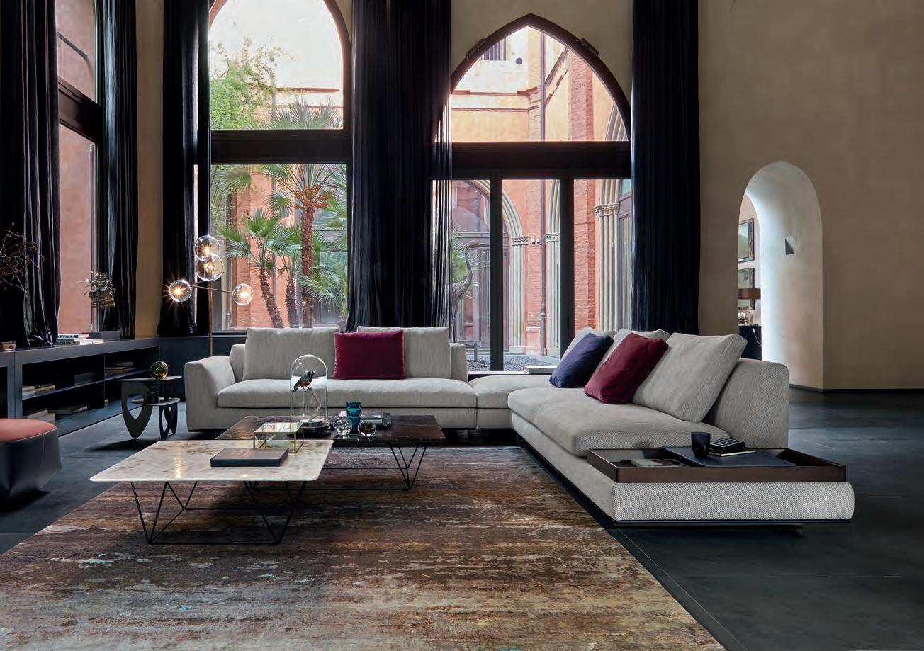
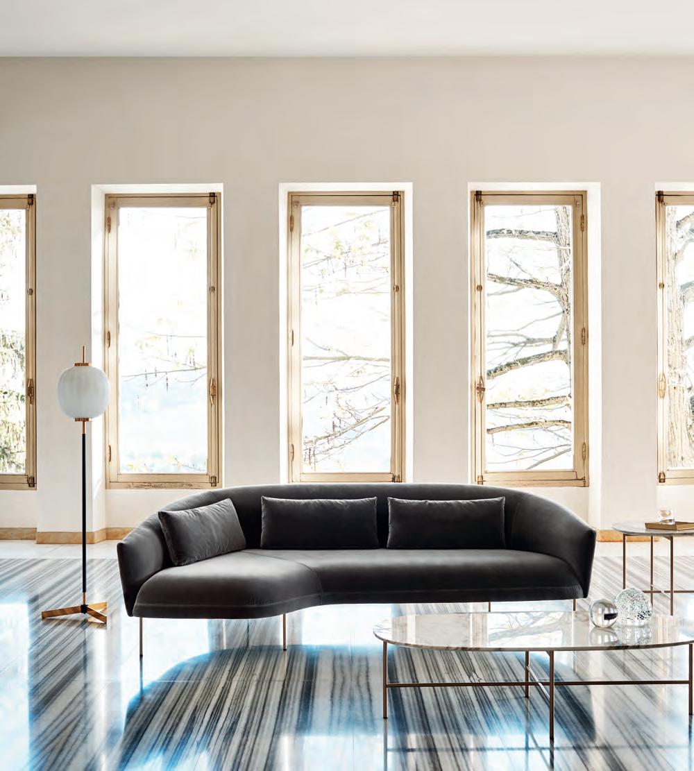
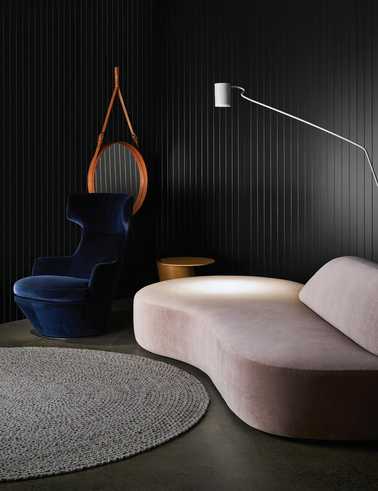
Roma Lounge designed by Jonas Wagell, Soap Coffee & Side Table designed by Gordon Guillaumier for Tacchini
Good design marries form with function, great design is indispensable.
23 DESigN NEWS
Each issue of Habitus we pull together a carefully curated selection of outstanding, innovative and highlycrafted objects of design.
At home with local creatives from whom we seek inspiration daily and in conversation with well known chefs around the region, we uncover their personal design briefs – and how they’ve been filled.
38 STEVEN JOHN CLARK
With a background in stonemasonry and fashion textiles, Steven John Clark brings a unique flavour to the local creative scene. Working under the pseudonym Den Holm, Steven creates planters, vases and bespoke commissions out of stone.
44 J u L i A buSu T T i L N iSH i mu R A
47 JOSH LEW iS & ASTR i D mCCOR m ACK
A match made in heaven, both professionally and privately, chef Josh Lewis and restaurateur Astrid mc Cormack live and work in northern NSW, running their 14-seater sustainable restuarant much like they would a dinner party.
54 pETER gi L mORE
57 JONATHAN R iCHARDS
D irector of i nt erior Design at SJ b , Jonathan Richards invites us to his recently renovated home in Sydney. He shares his professional and personal design preferences, and how the former has influenced the latter.
82 DARREN pu RCHESE
9 0 m A R iON gR ASby
126 JA SON TAN
#40
38 24
Nourish
66 bi L L GranGer
t he bill’s empire is 18 restaurants strong across the globe, and while the interiors and menus for each are pertinent to their location, they’re also instantly recognisable.
76 k itchen insPir e D L iGh tinG
Flexibility, colour temperature and visual appeal should be high on the list when lighting your kitchen.
84 h iDDen technoL oGies technology in the kitchen and bathroom spaces is evolving rapid fire, we look at how and why.
93 DesiGn inG the Per Fect bathroom
t he perfect bathroom is tailored to the specific needs of its occupants, yet there are some conventions that carry though.
We look to these residences across the Asia Pacific as examples of architecture that nourishes the way we live.
98 k itchens
We look at architecturally designed kitchens that create a desire to be in these spaces, in addition to facilitating easy use.
114 b athrooms a space in the home that once spoke solely to functionality, these bathrooms give their occupants a place to rest and restore, too.
132 mosman resi De nce , a n existing relationship and mutual trust and respect formed the basis of the relationship between architect Daniel b o ddam and client/resident.
144 moDernist Won Der L a n D a ptly named, this residence by WoWoWa a rchitecture in melbourne celebrates mo dernist design in a contemporary context.

155 sL oPe hoUse , Formwerkz a rchitects create a space perfectly in tune with the climate of Johor b a hru, m a laysia.
165 soU t h coo Ge e madeleine blachfield a rchitects take a brief heavily influenced by the clients’ appreciation of br azilian architect ma rcio kogan.
178 hoUse a a rchitects Walter&Walter design a box-like, timber-wrapped residence leading directly out to the rolling hills of c oate Park, melbourne .
#40
132 66











level
Robertson Street
Valley, QLD 4006
| +617 3216 1551
Danks St Waterloo, NSW 2017
| +61 2 9699 1131
Church Street Richmond, VIC 3121
| +61 3 9427 7000
LOVERS
OAK
Mezzanine
171
Fortitude
P
1f
P
575
P
FOR
OF FINE
Chamoisee The gentle warmth of a honey-brown hue enhances the natural oak finish of our Chamoisee timber.
Tongue n Groove™ floorboards are designed with three solid layers of fine European Oak for a premium level of finish, longevity and structural integrity.
tngflooring.com.au


discover the A rchitecture of the A ir W WW .elic A .com
Minimalism is not about having less, it’s about having more with less
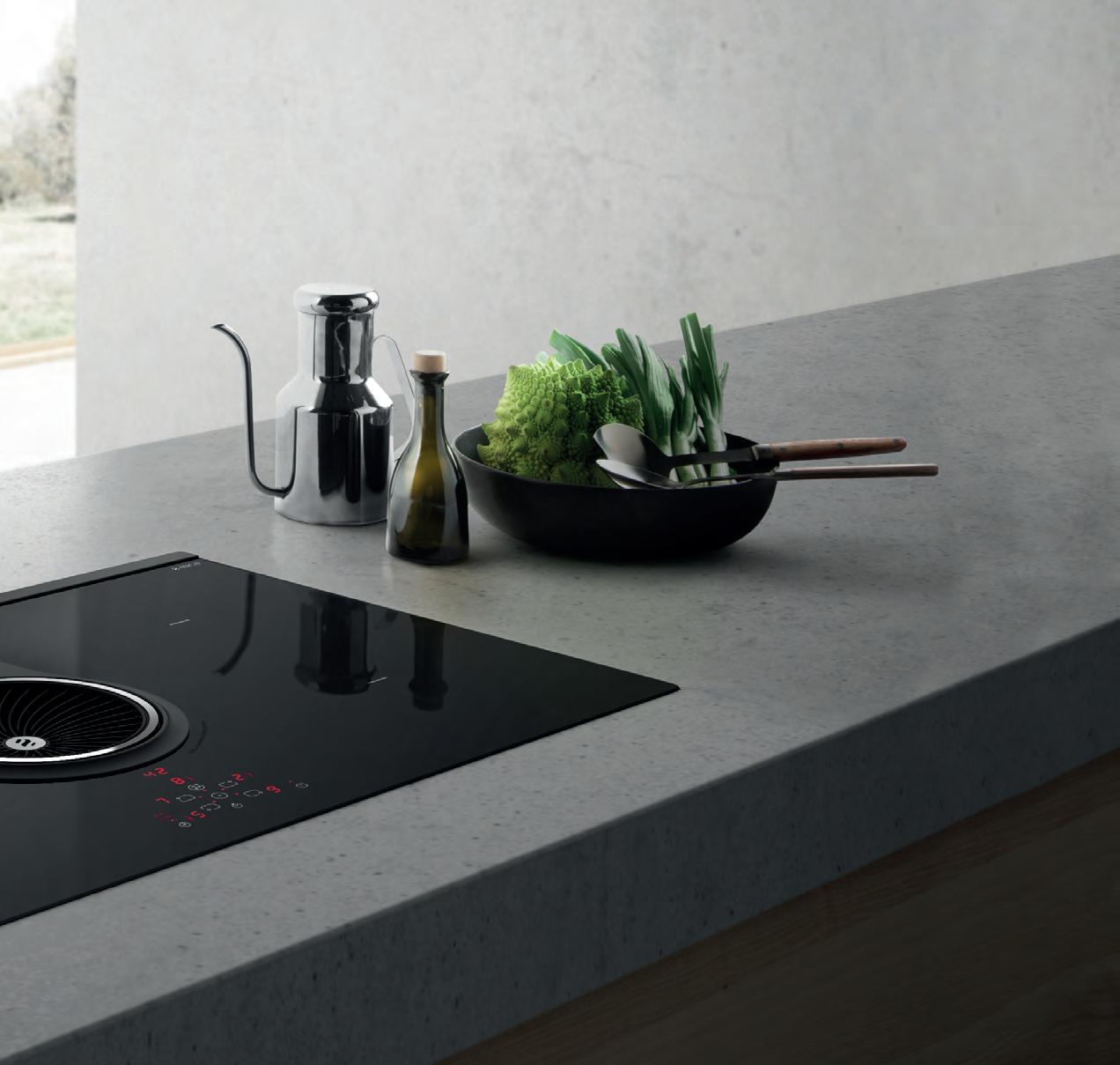
Introducing the NikolaTesla
Designed by Fabrizio Crisà, NikolaTesla is Elica’s first induction cooktop with an integrated rangehood, combining the functions of two appliances into one single product.
Showcasing the advantages of induction cooking, the NikolaTesla combines a centralised extraction system that features high extraction perfomance, low noise levels and class A+ energy efficiency. The key to this system is synergy—the cooktop communicates directly with the rangehood, automatically calibrating to the ideal extraction level. As a result, you can focus your energy on cooking and leave the rest to us.
Av A il A ble At Winning Appli A nces & s elected kitchen stockists mAde in itA ly & d istributed in Austr A li A by r esidenti A group WWW .residenti A .group | shop.elic A .com. Au
ONLY ZIP TECHNOLOGY


TRANSFORMS WATER INTO A FORM YOU’LL INSTANTLY LOVE.


As world leaders in instant drinking water systems, Zip invented the innovative HydroTap, the smart and essential addition for every kitchen. Our integrated Australian-made appliance combines patented PowerPulse™ boiling and Direct DryChilling with MicroPurity filtration technologies to create pure-tasting boiling, chilled and sparkling water you will love in an instant.


When water is this convenient and irresistible you’ll love drinking more of it. To improve your hydration and your family’s well-being, discover more at zipwater.com


THE WORLD’S MOST ADVANCED DRINKING WATER SYSTEM ZIP HYDROTAP | PURE TASTING | INSTANT | BOILING | CHILLED | SPARKLING
the first word
What is the most important room of the house – the kitchen or bathroom? It’s a question over which I mused in preparation for this issue of Habitus. It’s a question that I took to our contributors, too.
But the correct answer is that there is no correct answer; both are equally important. Together they nourish us in their respective –and complementary – ways. That’s why we’ve chosen to call the Habitus Kitchen & Bathroom Special the Nourish issue.
Within the kitchen we store, prepare and cook the food that will nourish our bodies. But the kitchen has evolved past a space simply built to function. A modern kitchen is also a space in which we eat, relax, gather and entertain. The architect, interior and industrial designer each play their part in facilitating these societal and behavioural shifts.
Similarly, the bathroom has morphed into a space, bigger than ever before, that provides relaxation, restoration and a daily dose of extravagance. We’re able to indulge in self-care rituals and enjoy the rarity of time spent alone: a luxurious bathroom provides a much-needed antidote to the fast-pace of modern life.
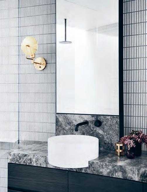
So, enjoy this special issue of Habitus and I trust you feel fully nourished at the end of it.
Holly Cunneen | e ditor
nourish v.t. supply with what is necessary for maintaining life
At its core, Habitus is dedicated to the support and advocacy of regional architecture and design, and those who express themselves through it.
Founder, Indesign Media
Raj Nandan
Our interest and curiosity in beautifully designed homes remains as strong as ever, which is why this years Kitchens & Bathrooms issue features a delicious mix of outstanding projects, topical themes and inspiring ideas. I’m happy to contribute a series of articles offering insight into the way designers and architects approach the heart and soul of residential design to ensure comfort and functionality are always prioritised.

The Light Idea looks at the importance of flexibility in kitchen lighting and the current trend for well-designed fittings that make a statement without being obtrusive. While Hidden Technologies investigates the need for finishes and surfaces that are just as hard working as they are good looking. Finally, Towards Relaxation and Retreat reveals the essential elements for creating the perfect bathroom.
I’m also honoured to interview Bill Granger, one of Australia’s finest restaurateurs and food writers. The very first cookbook I ever bought was Bill’s Sydney Food and to be able to speak to its author about the social significance of food and the role design plays in his brand and business was a real treat. I was struck by the emphasis he places on sharing and collaboration and his desire to keep on innovating; all significant topics that just so happen to underscore the themes of this issue’s content.
leanne amodeo | guest feature editor
“ The heart and soul of residential design”
habitus takes the conversation to our contributors discovering their inspiration and design hunter® journeys
Benjamin Hosking


LIGHTNESS OF BEING #38
Like Habitus, architectural and interiors photographer Benjamin Hosking’s work comes predominantly out of Australia and South East Asia. A lover of design in his personal life as well as professional, Benjamin is a believer that even small additions of objects of design to a “pintsized apartment”, such as hand-forged Santoku knives and Hasami porcelain, enhance a life lived through design.
m a rtina ge mmola IN LIVING COLOUR #144
Having travelled the world shooting interiors, architecture and lifestyle photography, Martina Gemmola has settled back into life in Melbourne with her family, cat Omar, and great local coffee. Her profession has afforded her access to outstanding feats design, but it’s the rise of women in the industry that she finds most inspiring: “There are some phenomenally talented women with incredibly strong ideas and a unique vision that will make their mark on this historically male dominated profession.”
a l eesH a Calla H a n EVERYTHING AND ITS PLACE #82
Aleesha Callahan is the editor of Indesignlive, where her passion for design and digital comes together. Following studies in interior design, she discovered architectural history and writing. While she certainly appreciates the entertaining capabilities of the kitchen –“I recently acquired a vintage drinks trolley, to extend the kitchen and display an array of beautiful glassware” – it’s the restorative and self-pampering nature of the bathroom that holds her heart.
a n nie r eid
UNLOCKING THE LAYERS #178
Annie Reid is a freelance writer with a special interest in architecture and design. Residing in Bayside, Melbourne, and currently undergoing a renovation, her approach to residential design is one championed by purpose and simplicity.



“I think about using every space in my house with purpose, creating more with less, and curating better options to relax or entertain.”
roBe rt WalsH
A BREATH OF FRESH AIR #165
Sydney based photographer Robert Walsh specialises in architectural, interior and portrait photography. “Great design makes me feel good,” he says. “I love to be around it and working as a photographer gives me the opportunity to immerse myself in it.” Residing in a small terrace in Redfern the design of the open plan kitchen flows onto adjoining living areas, affording residents and guests to congregate. Robert takes a lot of inspiration from Marc Newson, as he is just a local Sydney sider can take on the world at the level he has.
Chairman / Publisher
Raj Nandan raj@indesign.com.au
editor
Holly Cunneen holly@indesign.com.au
Gue st Fe ature editor
L eanne Amodeo
se a sia editor
Janice Seow janice@indesign.com.sg
editorial a s sistant
Andrew McDonald andrew@indesign.com.au
Content editor & Client manaGer
David Congram david@indesign.com.au
Cre ative direCtor
Sylvia Weimer spacelabdesign.com
desiGners
Julia Gee julia@indesign.com.au
Tracey Hein tracey@indesign.com.au
ContributinG W riters
Belinda Aucott, Tamsin Bradshaw, Aleesha Callahan, Elana Castle, Rebecca Gross, Annie Reid, Chu Lik Ren, Olha Romaniuk, Kirsty Sier, Sandra Tan, Sophia Watson
ContributinG PhotoGr a Phers
Adela Askandar, Tom Blachford, Brett Boardman, Richard Boll, Sharyn Cairns, Alana Dimou, Felix Forest, Martina Gemmola, Marnie Hawson, Brooke Holm, Benjamin Hosking, Jambu Studios, Christopher Frederick Jones, Jack Lovel, Andy MacPherson, Shannon McGrath, Sam Noonan, Phisut Nuthong, Fabian Ong, Prue Ruscoe, Derek Swalwell, Robert Walsh
m a naGinG direCtor
Kavita Lala kavita@indesign.com.au
ProduCtion
Ian Sudjatmiko ian@indesign.com.au
aCCounts
Ting Zhang ting@indesign.com.au
Cassie Zeng cassie@indesign.com.au
on line manaGer
Radu Enache radu@indesign.com.au
W eb develoPer
Ryan Sumners ryan@indesign.com.au
brand direCtor
Colleen Black colleen@indesign.com.au
(61) 422 169 218 business develoPm ent manaGers Kim Hider kim@indesign.com.au
Danielle Nicholls danielle@indesign.com.au
Client liason Dana Ciaccia dana@indesign.com.au
Cam Pa iGn suCCe ss exeCutive Brydie Shephard brydie@indesign.com.au
Cover imaGe Designing the Perfect Bathroom (p.93)
Photography by Jack Lovel
Head Office Level 1, 50 Marshall Street, Surry Hills NSW 2010 (61 2) 9368 0150 | (61 2) 9368 0289 (fax)
MelbOu rne 1/200 Smith St, Collingwood, VIC, 3066
SingapOr e
4 Leng Kee Road, #06–08 SIS Building, Singapore 159088 (65) 6475 5228 | (65) 6475 5238 (fax)
HOng KOng
Unit 12, 21st Floor, Wayson Commercial Building, 28 Connaught Road West, Sheung Wan, Hong Kong indesign.com.au
Printed in Singapore. All rights reserved. No part of this publication may be reproduced, stored in a retrieval system, transmitted in any form or by any other means, electronic, mechanical, photocopying, recording or otherwise. While every effort has been made to ensure the accuracy of the information in this publication, the publishers assume no responsibility for errors or omissions or any consequences of reliance on this publication. The opinions expressed in this publication do not necessarily represent the views of the editor, the publisher or the publication. Contributions are submitted at the sender’s risk, and Indesign Media Asia Pacific cannot accept any loss or damage. Please retain duplicates of text and images. Habitus magazine is a wholly owned Australian publication, which is designed and published in Australia. Habitus is published quarterly and is available through subscription, at major newsagencies and bookshops throughout Australia, New Zealand, South-East Asia and the United States of America. This issue of Habitus magazine may contain offers or surveys which may require you to provide information about yourself. If you provide such information to us we may use the information to provide you with products or services we have. We may also provide this information to parties who provide the products or services on our behalf (such as fulfilment organisations). We do not sell your information to third parties under any circumstances, however, these parties may retain the information we provide for future activities of their own, including direct marketing. We may retain your information and use it to inform you of other promotions and publications from time to time. If you would like to know what information Indesign Media Asia Pacific holds about you please contact Nilesh Nandan (61 2) 9368 0150, (61 2) 9368 0289 (fax), info@indesign.com.au. Habitus magazine is published under licence by Indesign Media Asia Pacific. ISSN 1836-0556
Put your best foot forward












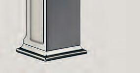
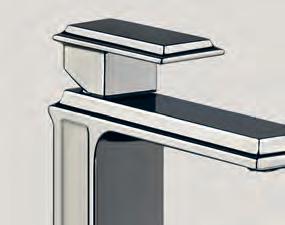
Refined Luxury
The GESSI ELEGANZA tapware range has been designed to answer the essential need for style that we express throughout our daily lives.
abey.com.au

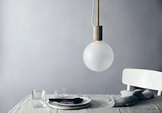
Inspired by the beauty of Ancient Greek aerchitectural forms, the ATTALOS pendant light plays with perceptions of proportion and balance. The solid brass support base holds the oversized frosted bulb in a playful balancing act.
marzdesigns.com
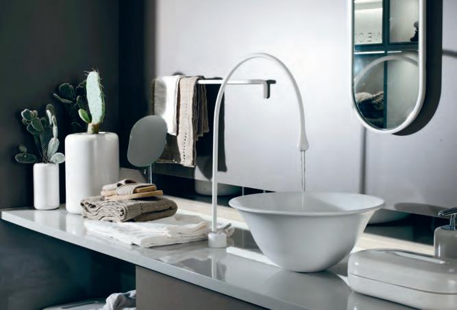
Designed for the modern bathroom, GOCCIA BY GESSI is a bathware collection that demands attention and creates conversation. With a striking form inspired by the natural flow and shape of water, the collection of basins, baths, showers and accessories can give a progessive bathroom a new level of visual depth and style.
candana.com.au
issue #40 habitusliving.com
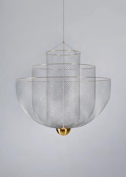
The new Moooi MeshM atics chandelier designed by Rick tegelaar features playful transparencies that cascade through the lamp’s ingenious frame, creating shimmering reflections and casting an elaborate net of shadows onto the ceiling.
spacefurniture.com.au
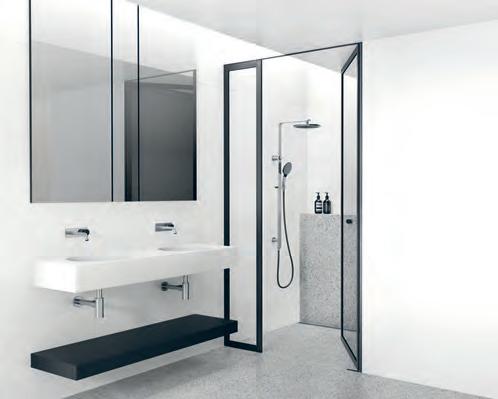
With the three designs in the new PhoeNiX NX shoW eRs r ange, there is truly something to suit all tatses. Designed by the award winning in house Phoenix design team, the new shower range is driven by a focus on functionality and quality.
phoenixtapware.com.au
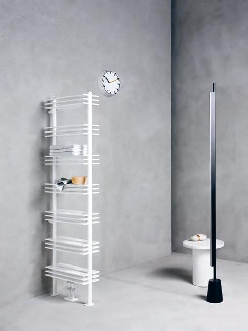
The Italian made sheLF by caleido is a multifunction towel-holder and heater that eschews usual trappings of radiator design. Appreciated for its practicality and versatility, the tall unit is a modern interpretation of traditional towel warmers and selves, interacting well with traditional and contemporary bathroom elements alike, thanks to its minimalist and modernist design.
caleido.it
1 . lightbox # 25
When the Past informs the Future
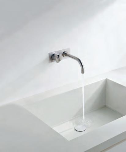
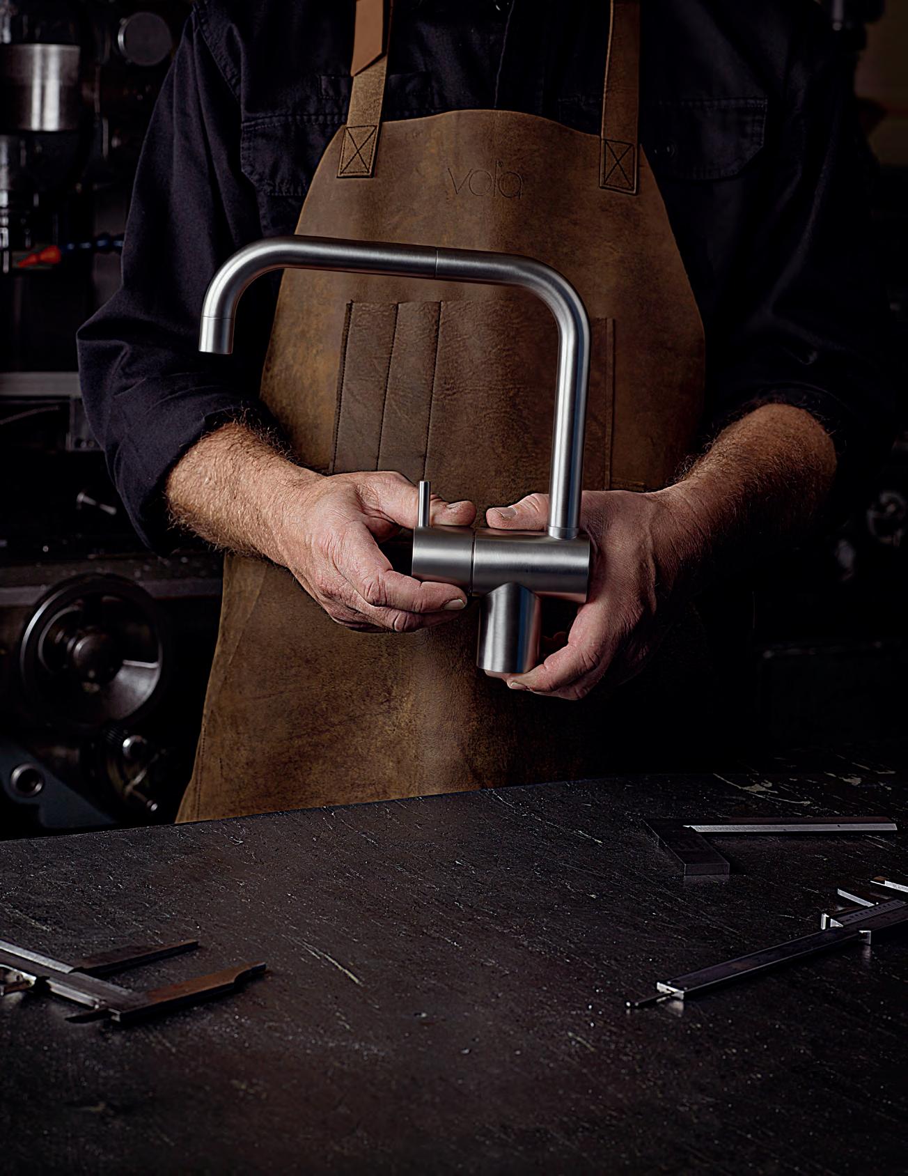
Celebrating 50 years of design excellence, VOLA continues to inspire. Design runs deep in Danish blood, with a rich heritage of that ranges from product to architecture to fashion. Combine this with an understanding of geometry and the Vola approach starts to emerge. Modernist and timeless after five decades, the anniversary is an opportunity to examine just why the brand is so renowned with a series of short films examining the legacy on their website.
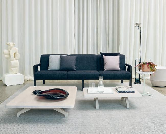
en.vola.com
Schi AV eLLO h as just launched its new retail furniture line with the opening of a new retail showroom in Melbourne’s Southbank. The new showroom represents the brand’s focus on the blurring between work and residential furniture, establishing a new visual language for residential living locally and beyond.
schiavello.com
issue #40 habitusliving.com
Bathroom design continues to evolve, with new designs changing the way we experience this area of relaxation, Laufen’s INO is a prime example. Delivered in Laufen’s revolutionary SaphirKeramik material, the cutting-edge basin design is perfectly suited to the modern bathroom.
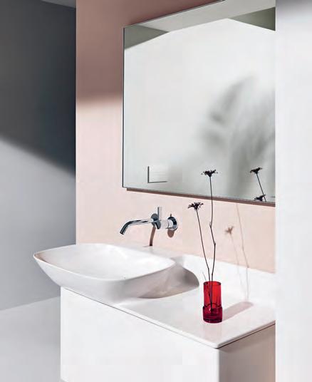
laufen.com.au/en
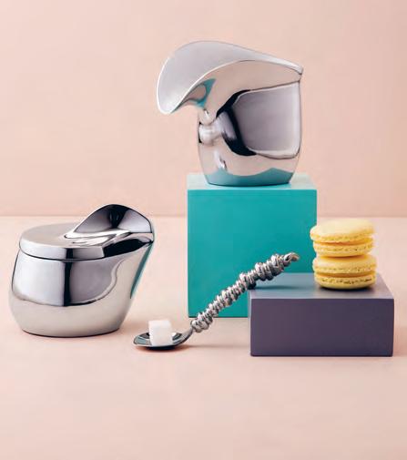
The LILY sugar bowl and milk jub are the perfect modern interpretations of iconic English teaware accessories. The curves of a flower are mimicked in the fluid forms of these thoroughly modern designs.
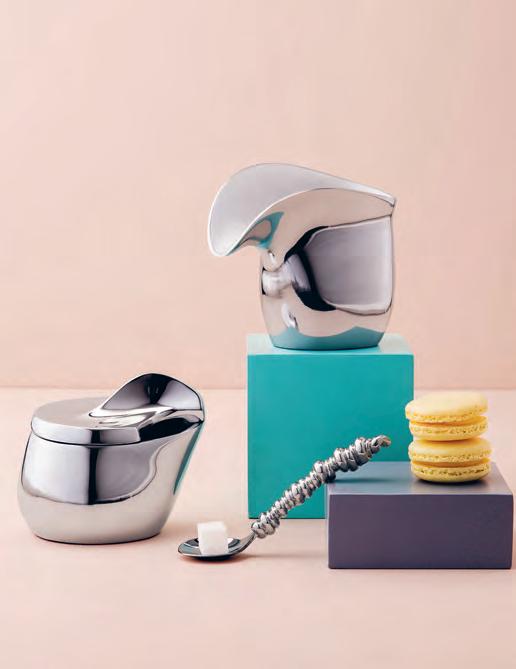
carrolboyes.com
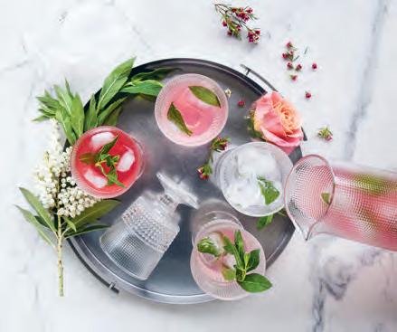
The handmade SPEEDY COLLECTION is a range of glass tumblers and goblets designed with the entertaining season in mind. Multi-faceted and colourful, these Italian made glasses add an immediate sense of summer and joy to a freshly served up a fruity cocktail or fresh fruit punch.
noritake.com.au
1 . lightbox # 27
Room by Room
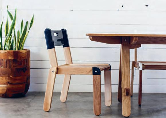
The Flatstack chair is a solid wood, flatpacked, stackable chair for modern living. Made from lightweight, durable mahogany, the whole chair can be assembled in only a few minutes using four simple custom stainless bolts. The compact packaging of this design makes shipping and transport as easy as assembly.
roryunite.com
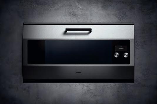
Revised in honour of gaggenau’s 333rd anniversary, the brand’s iconic eB 333 oven continues to inspire generations of home chefs across the world. With soft-closing door componentry and streamlined visual appeal, EB 333’s TFT touch display ensures that food preparation can be a luxurious, intuitive affair.
gaggenau.com/au
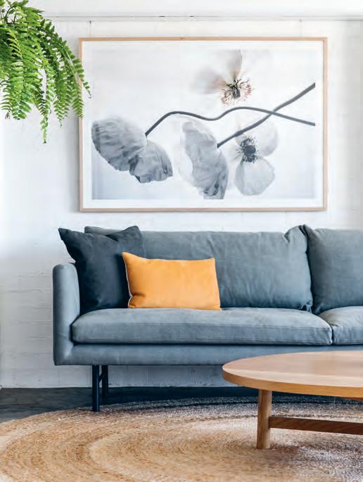
The first Design kiosk arrivals for 2018 combine style, quality and functionality, all with an affordable price tag. Beautifully proportioned and well-made, these pieces offer a fresh take on modern classics and have been designed to complement any style of space.
project82.com.au
issue #40 habitusliving.com
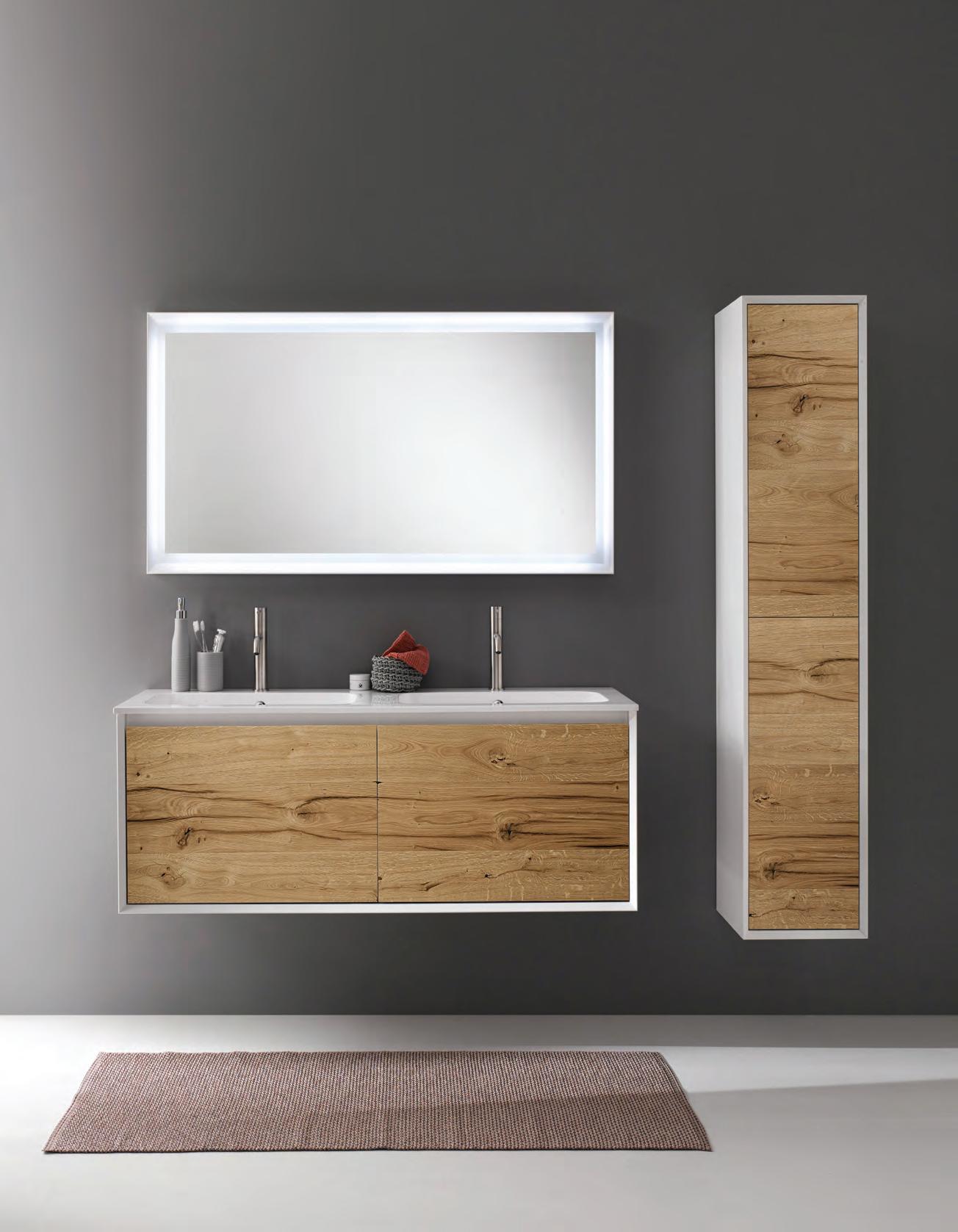
parisi.com.au IKS Collection
Carefully curated
MoDER nA , t he new collection of range cookers by J.Corradi is characterised by contemporary design –a simple, linear silhouette and chrome-plated aluminium frame – and traditional, wood-fired cooking options.
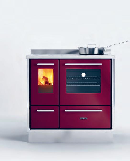
jcorradi.com/en
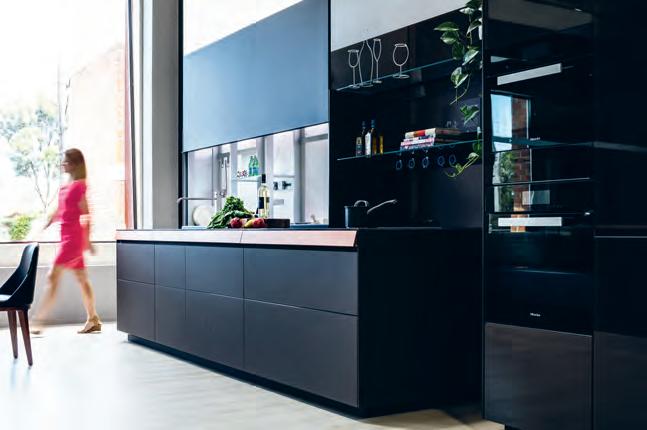
The revolutionary V-Motion sensor technology from Italian kitchen artisans Valcucine enhances the kitchen experience. Be the conductor of your kitchen; the graceful movement of a hand opens the door, turns on the tap and the lights of the back panel, creating a truly unique experience.
rogerseller.com.au
The new iLVE VERSA combines both induction and gas cooking and is sure to excite the design loving homecook in your life. The cooktop cleverly combines a brass infinity wok burner with a four zone induction cooktop, so cooks can have the best of both worlds. Together or alone, the induction surface is ideal for low simmers while the powerful gas burner a go-to for stir fries.
ilve.com.au
issue #40 habitusliving.com
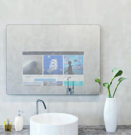
The smart home gets smarter with the EMBRACE mirror. Functioning as a tablet device and doubling as an elegant wall mirror, the mirror syncs to devices, apps and services to act as a personal assistant with events, reminders and schedules – all visible during your morning routine.
embracesmartmirror.com

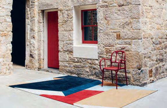
The collaboration between MR FRÄG and Designer Rugs explores the former’s fascination with timber joining techniques in illustrative yet abstract ways. The collection features constrasting yet complimentary pile heights, materials and colour choices.
designerrugs.com.au


The O’RAMA collection by reinterpretation of simplicity as a means of expression: simple to choose and use. O’Rama is composed of a solid structure reaching upward, with a design that highlights the product’s balanced, geometric lines.
parisi.com.au
Newform is a


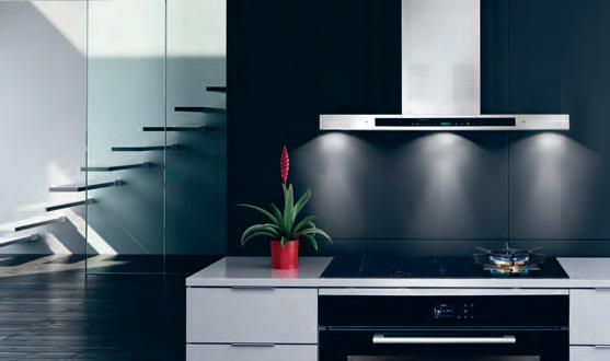
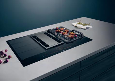
Siemens has always been synonymous with consistency, support and making your everyday easier. The VENTED COOKTOP, developed with the brand’s flexInduction technology, features integrated downdraft ventilation, control sensors to monitor steam and odours, and automatically altering power levels.
siemens-home.bsh-group.com/au
1 . lightbox # 31
Unsung heros
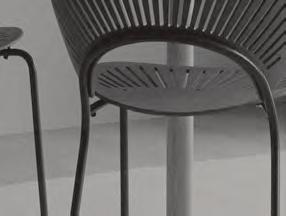
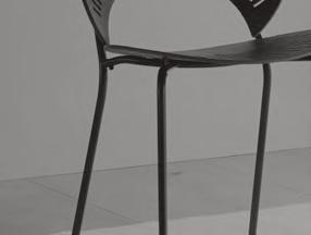
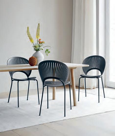
Celebrating the 25th anniversary of the Tr InIDa D cH a Ir, Frederica has unveiled a new selection of colourways – smoked, grey and light grey – to enhance the natural beauty of the materials in a contemporary manner. fredericia.com
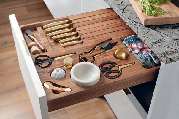
Lanserring has launched the TraDeScanT range of kitchen design. Unveiled as a movement towards a broader and more personal approach to kitchen design, the Signature Drawer from the range is carved from a single block of timber. The drawer can be created to the shape of any object a client wishes to organise with precision cut apertures ensuring a snug fit as well as a unique and stylish aesthetic.
lanserring.com
The simplest and most minimal shapes often give the most unique values, such as adaptability, resistance, durability and elegance. The Source collection by Quadro Design exemplifies this. Minimal and made in stainless steel, the durable form is ideal for any kitchen.

quadrodesign.it
issue #40 habitusliving.com
SYDNEY 5/50 Stanley Street Darlinghurst +61 2 9358 1155 MELBOURNE 11 Stanley Street Collingwood +61 3 9416 4822
Rest and restore
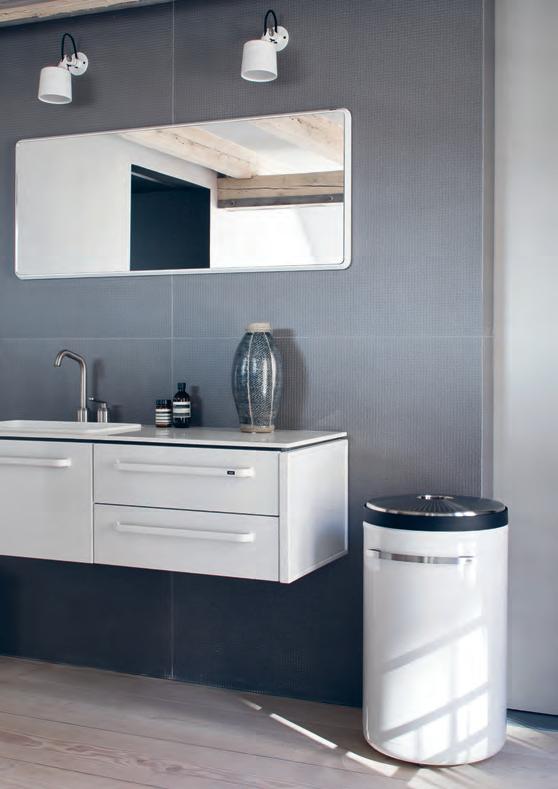
Honouring a legacy of craftsmanship dating back to 1939, the VIPP BATHROOM CONCEPT unfolds in clean lines and functionality. Three sizes of bath modules and three sizes of mirrors are available, suitable for most bathrooms. White wall spots add a final touch to the concept.
cultdesign.com.au
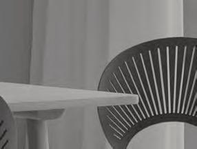
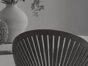
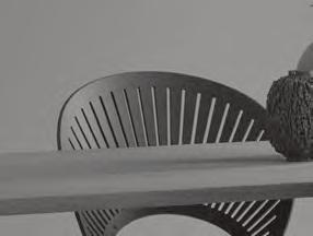
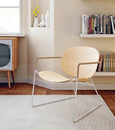
With versatile design and a sleek silhouette, the TONDINA chair is a natural fit in all spaces. Inspired by the rigour of Nordic design, Tondina is a product characterised by simple and clean shapes, in plywood oak, matched to a frame available in various finishes.
eccosit.com.au
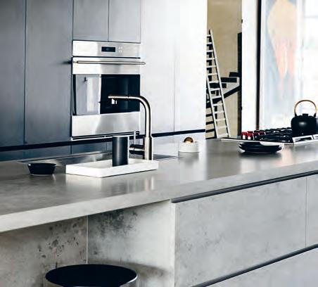
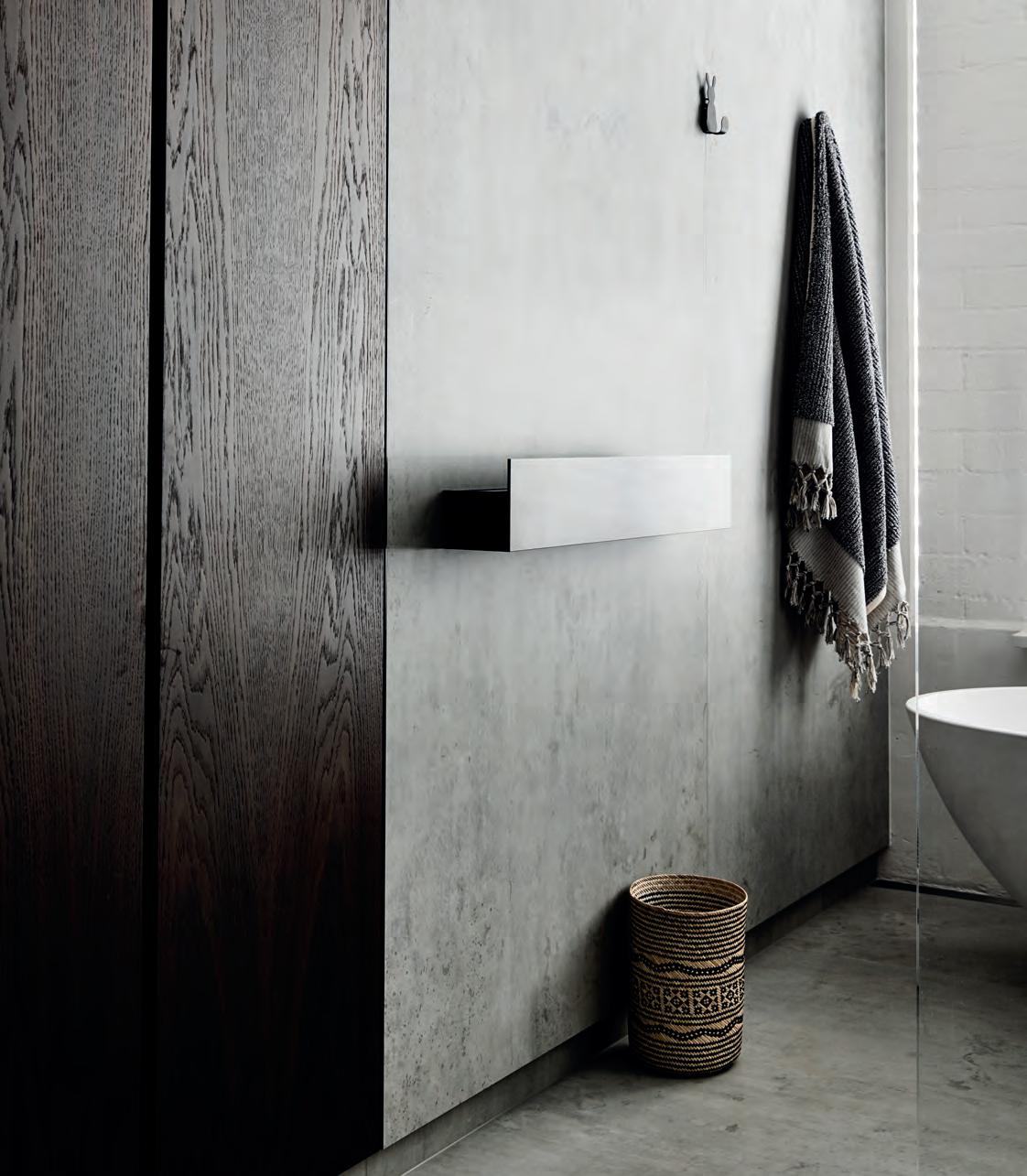
The focal point of this studio apartment by Workroom is NEOLITH BETON, available from CDK Stone, which synergises the design elements. Creating a timeless beauty, Beton produces a raw, unprocessed and unparalleled elegance. Photography by Derek Swalwell.
cdkstone.com.au
issue #40 habitusliving.com


FOOD IS ART. PRESERVE IT. su b zer o -wolf.com.au Superior food preservation. Professional cooking performance. Craftsmanship and technology without equal.
A private Oasis



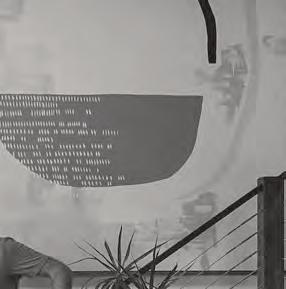
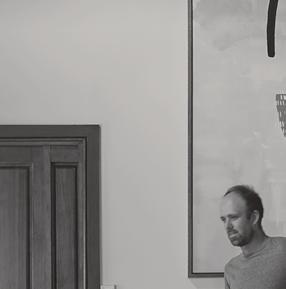
of Being Lightness
Denholm is a small village located between Jedburgh and Hawick in the Scottish Borders region of Scotland. Den Holm is the pseudonym of Steven John Clark, a Scottishborn, Melbourne-based stonemason and sculptor who, in recent times, has taken the local architecture and design community by storm. If you hadn’t guessed, Steven hails from Denholm.
That’s about as close to straightforward as his story gets. At 16, Steven left school to embark on a bricklaying apprenticeship. By 19, the goal posts had shifted once more. With an idea to study fashion design at Central Saint Martins in London, run his own label, and show at London Fashion Week, Steven first needed to gain qualifications in fashion technology which led to studying textile embroidery in Manchester. It was here that he met his wife, artist and photographer Bobby Clark.
Somewhere en route to London, the couple found themselves on Australian shores.
Originally, Australia was only meant to be a brief pit stop, admittedly quite the detour. Although they were planning to stay only a year, six months in they realised they might like to stay a little longer. Reasoning that the only way to stay in the country was for Steven to re-enter the construction business, the next five years saw Steven put his creative endeavours on hold. And so it goes, from bricklaying to fashion textiles and back again.
The spark that led to Den Holm came when a friend asked him to make a plinth out of stone to showcase her work. “I’d worked with stone since the age of sixteen [but] I’d never seen it as something creative,” says Steven. That was two years ago.
While the first six months were met with understandable trepidation, a few key commissions set the wheels swiftly in motion.
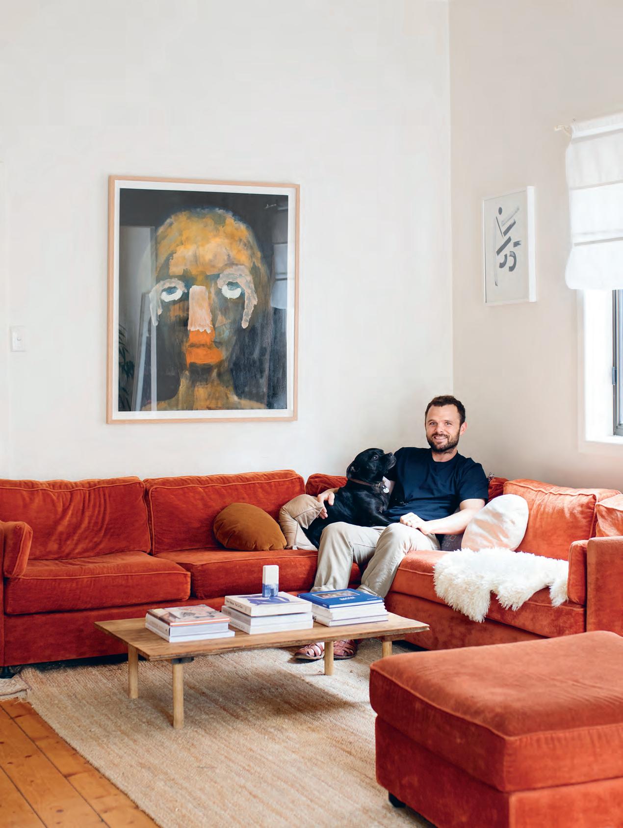
Time spent on construction sites familiarised Scottish-born Steven John Clark, A.K.A. Den Holm, with Aussie idioms just as much as it did with the homes Australians are building, how we’re filling them and what we’re missing.
issue #40 habitusliving.com
Tex T HoLLy Cunneen | PhoTo gra Phy Benjamin Hosking
2 . portrait # 39

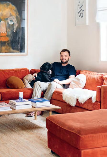
opener | Steven John Clark on the generou S S o fa with S C o ut, a 4 1/2 year old engli S h Staffie. above | h e liveS in Melbourne with hi S wife b o bby Clark, arti St and photographer. oppo Site | Steven’ S work, S een here, and b o bby’ S art feature heavily throughout the hou S e issue #40 habitusliving.com
PLAYA by Lucy Folk in Bondi and Rae’s on Wategos in Byron Bay are two such examples both commissioned by Sydney-based interior designer and Habitus alumni Tamsin Johnson. The subsequent 18 months have seen Den Holm build a cult following. “Before that I would still say I was a stonemason, I didn’t have the [confidence] to say I was a sculptor.”
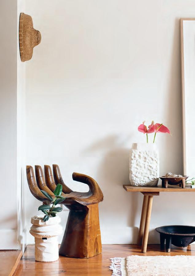
Steven’s artistic process, as for many creatives, isn’t easily defined. Not least because he doesn’t necessarily document his process (even mentally), but also because it will change from piece to piece, project to project. Usually, it begins with Steven drawing directly onto the stone… or walls. “For some reason I don’t like drawing on paper. I’ve got my own space now, I’m allowed to draw on the walls – so I’m going to draw on walls,” he says. Compared to the seemingly endless scale of walls, a piece of paper certainly does seem restrictive.
As for the physical process, Steven prefers not to be bound by rules, habits or conventions. He was once told that sculptors have one of two ways of working: either from the bottom up, adding pieces to make a final sculpture; or top down chipping away at a block for the final result.
“I thought that’s pretty boring, you can only be one of them? I want to do everything. I know a lot of the time you tell yourself if you do everything you’re never going to get good at one thing, but what excites me is trying everything,” he says. Even limestone, the material for which he’s currently renowned, is simply what he’s working with at the moment, but by no means will it hold an exclusive place in his repertoire.
2 . portrait # 41
Steven’s artistic process, as for many creatives, isn’t easily defined.
issue #40 habitusliving.com

issue #40 habitusliving.com
So while most of the planters and vases are top down, many of Steven’s sculptures are built from the bottom up. The two processes complement each other perfectly, given that the former produces waste and the latter offers an avenue through which to use it.
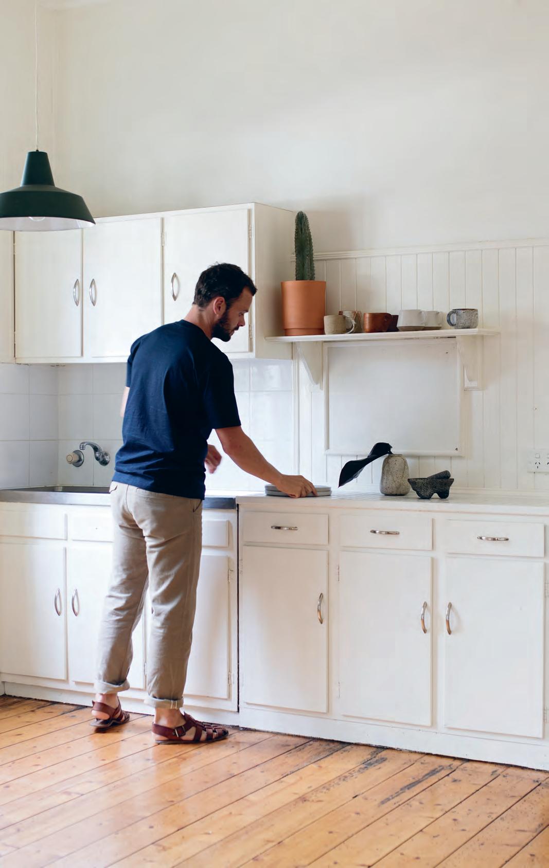
Steven’s planters – bob, helen, laura and so on – are the names of family friends. His vases – balboa, duke – borrow their names from characters in the film Rocky. “I don’t really think about names too much,” says Steven. Not because he holds no meaning in a name, but more by way of avoiding getting caught in the rabbit hole that can be naming your work. “It’s a way of connecting something without getting too caught up in what it should be called. I don’t think about names beforehand. I like the way the letters are in ‘Den Holm’ and I like the way it can be pronounced.” It’s quite a poetic way of thinking, really.
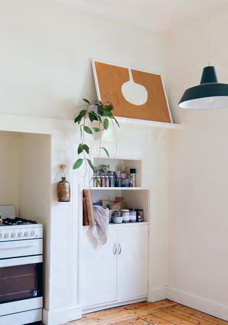
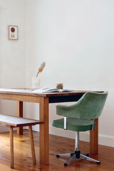
Steven and Bobby are renting at the moment, but when the time comes and opportunity allows it, the plan is for Steven to build their own home – “there’s no doubt about that”. Where? Maybe Melbourne, but definitely Australia. Byron Bay is also a strong contender. “I would approach the home in the same way as I approach all my sculptures… It doesn’t need to all be functional, but have it highly functional in some areas – like the kitchen,” says Steven.
With a thick Scottish accent, a gregarious personality and the occasional borrowing of Aussie slang, Steven John Clark, A.K.A. Den Holm, reminds us that a free spirit is the perfect yin to the yang of hard work and dedication.
opposite | th e ultimate plan is for steven to
a
for
to northern ns W above | th eir current home,
e ver,
from bright W
| th e furniture
chosen is minimal and sparse, yet arranged in a Way that fills the space atmospherically.
build
house
he and b o bby. While they love m elbourne, recent jobs in by ron b ay have draW n their attention
hoW
benefits
h ite Wa lls and Wo oden floors. beloW
they’ve
Den Holm | den-holm.com
2 . portrait # 43
“I like the way the letters are in ‘Den Holm’ and I like the way it can be pronounced.”
o f Food and Family
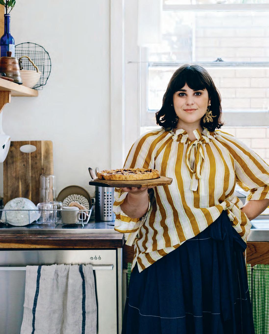
Julia Busuttil Nishimura has inspired a dedicated legion of home cooks through her blog, Ostro. The Melbourne-based cuisine queen welcomes us into her characterful kitchen.
If you ever find yourself in Brunswick East caught by the heady scent of just-baked goods, you might well be within sniffing distance of Julia Busuttil Nishimura’s home.
“For me, food and cooking are so intertwined into my daily life, the lines of personal and professional are always blurred, and it’s how I like to think of it all,” says Julia. “It’s who I am, not what I do.”
This life-affirming love for creating simple, flavoursome meals led to the launch of her blog in 2014. Named for the southern Mediterranean wind in Italy, with a knowing wink to the Latin root for ‘Australia’, Ostro enabled the enthusiastic gourmand to share her carefully gathered recipes under a unified banner.
“Above all, the food I was making was my home food – I’ve never looked to fit into a box or certain trend, so the name had to match that,” she explains. “With my family coming from Malta, my love of Italy and me living in Australia, Ostro tied it all together.”
The fascination for food began as early as pre-school, when Julia’s mother would encourage her by reading recipes out to try. Hers was a childhood of formative culinary memories: collecting saltwater at the beach for making ricotta with her parents, and spring afternoons podding broad beans with her grandmother.
“My family kitchen was really wonderful,” says Julia. “My uncle is a cabinet maker and my mum designed the space for hers and our needs in mind. Wide bench tops, double ovens, lots of drawers and natural light. It’s where I learned to cook and has always felt very special.”
Upon moving to Melbourne and cooking her way through a series of sharehouse kitchens, Julia developed a necessarily self-reliant approach to food. Forget fad superfoods and gadgets – to cook the Ostro way is to cultivate one’s own intuition: watching for a perfectly golden crust, trusting your tastebuds to discern what may be lacking, and learning correct consistencies by feel.
Today, Julia creates from a charmingly modest yet functional kitchen in the home she shares with her husband Nori and young son Haruki. And, just as Julia’s family influenced her own food-filled path, her child has a similarly hands-on approach.
“Haruki loves being in the kitchen – eating and helping, usually at the same time,” says Julia. “He adores anything that’s a noodle, whether it be spaghetti, udon or soba!” Ostro
Tex T S
| julia-ostro.com
andra tan | PhoTo gra Phy
Marnie HawSon
issue #40 habitusliving.com
2 . chef series # 45
The Original Handmade in Denmark KV1 One handle mixer with double swivel spout VOLA Design Pty. Ltd. - Tel.: +61 402 372 480 - sales@vola.com.au - www.vola.com Celebrating 50 years and beyond Watch our original stories at 50years.vola.com
Force allied
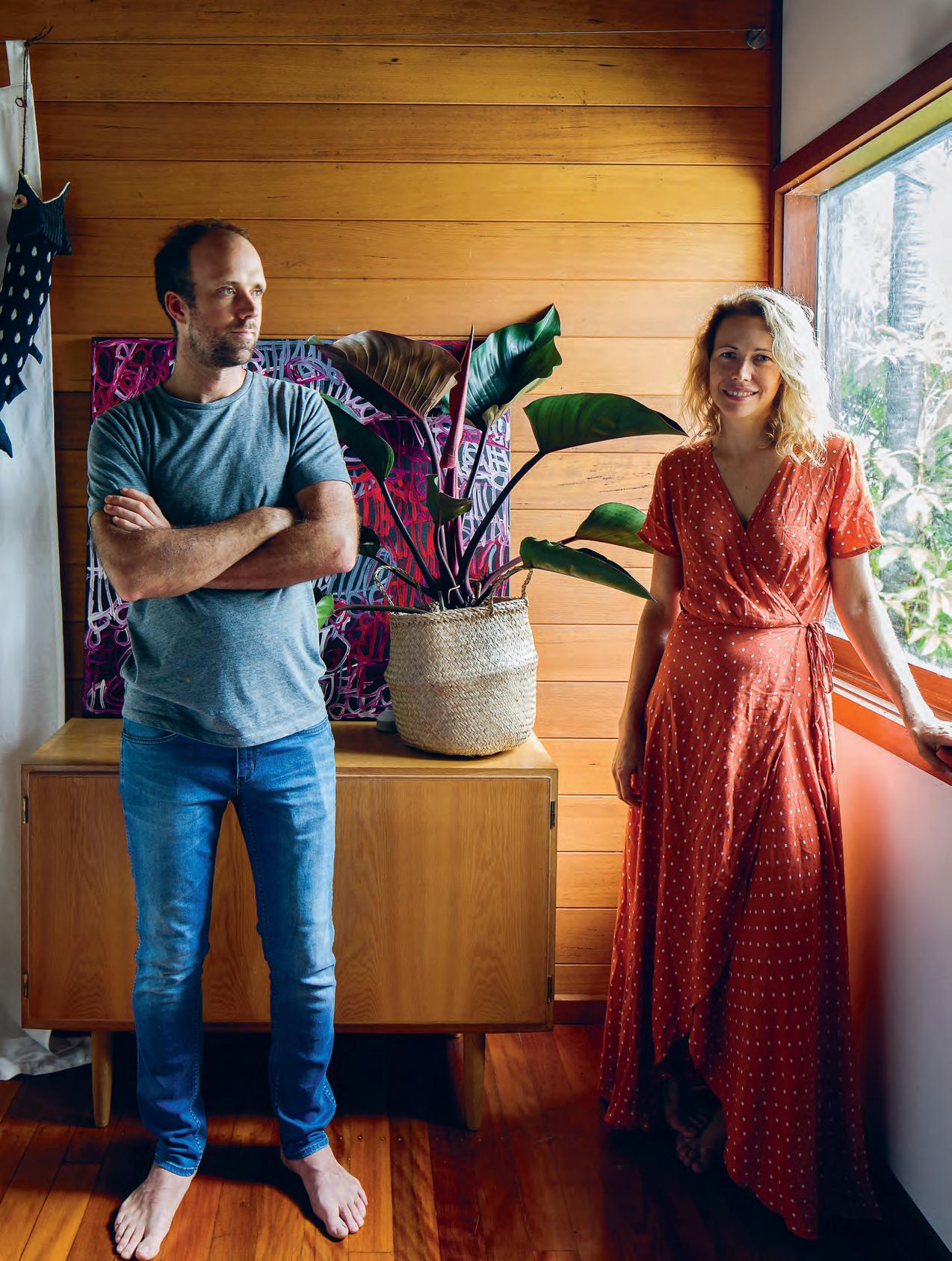
For Josh Lewis and Astrid McCormack, the creative couple behind the small, 14-seater sustainable restaurant, Fleet, this is home.
T
Tex T Belinda aucott | Pho
o gra Phy a n dy MacPherson
2 . portrait # 47
issue #40 habitusliving.com
At the bottom of a cul-de-sac, past clusters of ferns and bromeliads, sits a timber hideaway. Hidden by a four wheel drive and a fishing boat, it’s a place of respite for chef Josh Lewis and restaurateur Astrid McCormack, who run the innovative restaurant Fleet in Brunswick Heads. It seems appropriate for two people who spend their work life in the public eye that their private lives are spent in relative seclusion.
Josh, originally from Geelong, and Astrid, from Melbourne, have gone from strength to strength since opening their own place in 2015. Both come from a considerable gastronomic pedigree.
Josh worked with Shannon Bennett for seven years and travelled through Oman, Denmark and Spain with a notable stint at Mugaritz in Spain. Meanwhile, Astrid ran the trailblazing, two-hatted restaurant, Loam, alongside chef Aaron Turner on the Bellarine Peninsula, in Victoria.
Their new venture – one which feels like a dinner party for 14 guests, Josh cooking and Astrid hosting – has become a cult foodie destination in Australia.
“Fleet has been far more successful than I ever imagined,” says Josh. “It has been a big learning curve too. The last three years have really allowed me to develop my style.”
“To hear that the restaurant feels like someone’s home is a good thing for us,” Astrid says. “That’s really the feeling we wanted.”
As for their own home, the pair bought their house in December 2015 from a female artist who’d let it fall into slight disrepair. The week they moved in, during the winter of July 2016, is marked for Astrid not only by the momentous occasion, but by being the same week she ran through a plate glass window.
“The doctor told me I would need to take six weeks off work, and I said, how about six days?”
It’s the harsh reality for this hard-working duo that moved up to Byron Bay on a whim five years ago.
“Home has really improved in the last few years, but there is always something to do around here. It’s a bit of a work in progress as you can see,” adds Josh.
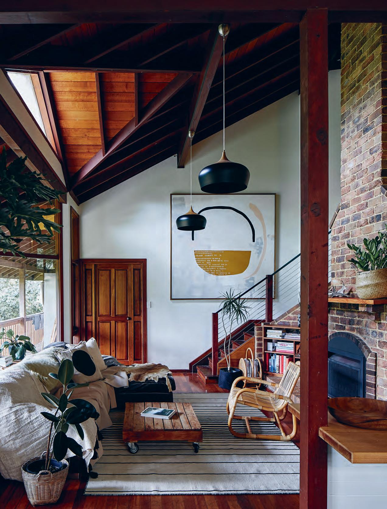
The house feels like an A-frame residence with little nooks and pockets that make it cosy.
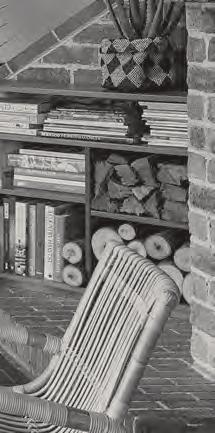
At the centre is a large timber fire with a red brick chimney that links the bedrooms and bathrooms on the mezzanine to the lower living level.
“I love wooden houses,” says Astrid, remembering her first visit when she fell in love with the smell of the wood and the surrounding views. The place is simple and practical, like them; the kitchen displays a utilitarian sparsity.
opener | chef josh lewis and restaurateur astrid mccormack. opposite | th e open lounge is the hub of the home. it links the two floors for living to the
outside. th e high ceiling and top windows flood a beautiful natural light into the home.
deck
2 . portrait # 49
“To hear that the restaurant feels like someone’s home is a good thing for us,” Astrid says. “That’s really the feeling we wanted.”
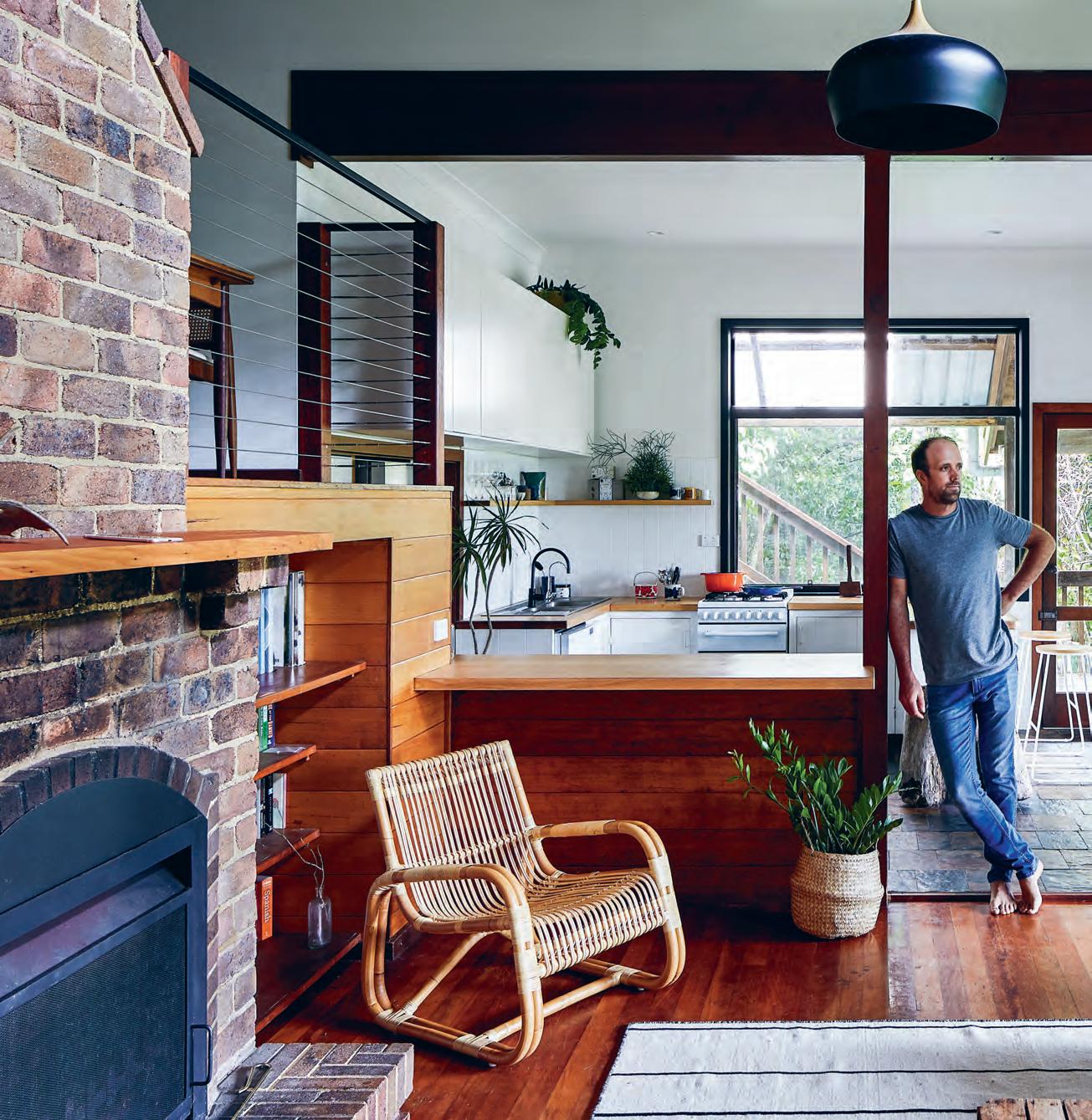
above | Looking out toward the deck, Josh says the Lo unge is their favourite pL ace to reL a x on days off. issue #40 habitusliving.com

2 . portrait # 51
On their days off, both love to cook at home or visit the New Brighton Farmers Market. “We spend most of our time at home in the lounge room. That is one of our all-time faves,” says Josh.
“We also spend a lot of time out on the back deck, surrounded by trees – and a fair bit of time in our garden too.”
In contrast to the white space of their Nordic-style restaurant, their home is part austere and part sensual. With four cats leaping around and rain on the roof, it’s also exotic.
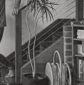
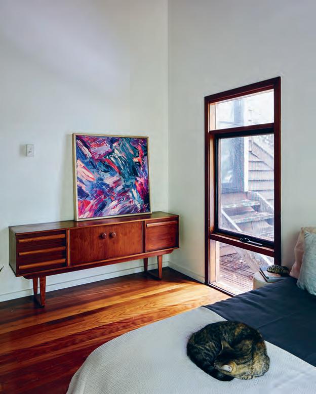
Magnolia and poinsettia trees unfurl beneath all the windows, shading frangipanis and idle mango trees below. Inside their lounge room is a mixture of mohair, deer skins and chunky ceramics to warm up the brick and glass interior. The painting by local artist Jordan Henry seems tailor-made for the high wall by the stairs.
In the kitchen at home the stove looks out onto the deck stocked with a chest freezer, fishing rods, smoker and fermenting vegetables.
On their kitchen shelf among cookbooks from around the world, there’s a thick Phaidon tome On Eating Insects alongside The Free & Salt Water Fishes Of The World. It’s not surprising literature for an avid angler like Josh, who still holds the Australian record for catching an 8.8-kilo snapper on a 4 kilo line at the age of six.
“I like to go off shore and catch things like Spanish Mackerel, Snapper and Mulloway. The bigger the better really. If they try to pull your arms off it’s a good fish,” says Josh.
Of the philosophy that guides the food they cook here at home and at Fleet, Josh and Astrid keep it very simple with a focus on seafood and seasonal organic produce.
“The food is deceptively simple,” Josh says. “On the plate there are only a few ingredients, but there is a process behind it.” At home or on the plate, everything has a purpose and a place.
Fleet | fleet-restaurant.com.au
In contrast to the white space of their Nordic-style restaurant, their home is part austere and part sensual.
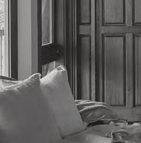
above | The second bedroom aT The fronT of The house offers cosy respiTe. The Timber floor is seT off by The mid-cenTury commode and painTing by asTrid m ccormack. issue #40 habitusliving.com
a new way of thinking about shapes & spaces


Transforming imagination into functionality, Neolith’s sintered stone is available in a wide range of styles and textures. Neolith is scratch, stain and heat resistant, making it suitable for the most demanding domestic and commercial applications both indoors and out.



for more surfaces and information visit www.neolith.com.au




VIC 03 8552 6000 VIC Showroom 03 8552 6090 NSW 02 9822 5155 NSW Showroom 02 9822 5910 QLD 07 5537 3222 SA 08 8340 2877 WA 08 6240 2200 W www.cdkstone.com.au E info@cdkstone.com.au cdkstone
NEOLITH BETON | FEATURE WALL + FLOOR | ARCHITECTURE BY WORKROOM
extraordinary surfaces
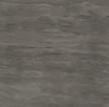
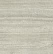
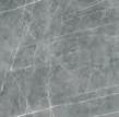
Zaha Stone Strata Argentum Estatuario Beton Calacatta Aspen Grey Blanco Carrara Concrete Taupe

issue #40 habitusliving.com
“If you’ve got a great space to work in and it looks beautiful it’s going to inspire you.”
Think smart, act smart
Australian chef Peter Gilmore on perfecting a kitchen’s ergonomics and design that creates desire.
Ascertaining what chef Peter Gilmore is best known for isn’t immediately obvious. The infamously challenging – and now historic – recipe for the Snow Egg dessert; his long-standing position as Executive Chef at Quay, a renowned Sydney institution; or his appointment as Executive Chef at Bennelong Restaurant within the iconic Sydney Opera House following The Fink Group securing the restaurant’s coveted 10-year tender in 2014.
He’s certainly not known to be a connoisseur of kitchen design and yet, following decades in the industry, he absolutely knows what he needs out of the layout, finishes, appliances and atmosphere.
Professional chefs usually inherit a kitchen and therefore must retro fit it to suit their individual needs and way of working. At Bennelong, however, Peter was lucky enough to be given a blank canvas. “It was stripped down so I was able to sit down with my kitchen designer and plan out how I wanted things to work and how I wanted them to flow,” he says, noting that many of the principles can be applied to a private kitchen.
Interestingly, to Peter’s mind the finishes hold equal value to layout and appliances. “That really helps with the intent: wanting to get into your kitchen and make something beautiful. If you’ve got a great space to work in and it looks beautiful it’s going to inspire you.” Bench space comes next – Peter advises plenty of it, along with a smart floor plan that groups spaces together where they need to be and allows easy flow between the different zones.
He’s also a big fan of open plan kitchens that flow on to dining and living spaces. Where home kitchens were once “pokey little things off to one side of the house” in their architecture and design we’ve now embraced them as very much the central part of the house. Spaces that lend themselves not solely to cooking but socialising, entertaining, experimenting, reading, relaxing, and even studying.
He does, however, also note the subtle importance of a demarcation zone such as a bench, kitchen island or half wall to facilitate socialisation around the kitchen without effecting flow or removing it entirely.
But there are smaller elements to the design of a kitchen he points out that are often overlooked, “like where the bin will go”. The bench height needs to be comfortable for the person or people doing the majority of the cooking and directly next to your cooking service, whether it’s gas, induction or electric, a surface that can withstand the heat of a pot straight off the stove is essential, even in a residential kitchen. “That’s really important,” says Peter. “You need an area to hold the cooking process or put something to the side close to the stove while you’re working on the next thing – then it can all come together.”
All said and done, he tips a “positive environment” as the key to a successful kitchen.
Peter Gilmore | bennelong.com.au
Tex T
|
Holly Cunneen
PhoTo gra Phy Al A nA Dimou
2 . chef series # 55
By Rogerseller
Let us help bring your ideas to life www.rogerseller.com.au/appointment Meet the experts. From concept to conclusion, we’ll guide the way.
Catalano Falper Fantini Lema Valcucine Follow @rogerseller
Trend
Heralded in the industry as one of the finest designers in his field, and having recently completed the renovation of his own home, Jonathan Richards shares his personal thoughts on his work and how it has influenced his own style.
 text Elana CastlE | photography FElix For E st
2 . portrait # 57
Beyond
issue #40 habitusliving.com
The name Jonathan Richards has become synonymous with the exceptional level of interior design manifest in the Australian residential, retail and hospitality landscape. The interior designer and director at SJB, along with his business partner Kirsten Stanisich, can lay claim to having designed some of the most celebrated of these environs, winning major awards and adulation from peers along the way.
12-Micron, The Buena and a re-work of the retail experience at the iconic Chifley, are some of Jonathan and his team’s most recent success stories – to name but a few.
It comes as no surprise that the designer spent his early professional years in exhibition and museum design, his eye for creating drama and refinement, evident in his work. Each project is the result of a meticulously selected palette of finishes, their tones and planes, expertly manipulated to sculpt interior space. It’s an architectural approach rather than an amalgamation of interior finishes, an approach for which SJB has become well known.
As expected, Jonathan is big on process. “I design a project as an evolution from the last one,” he explains, “by assessing what worked, what didn’t, and taking the most successful principles and adapting them in the next project. I like to think that at the end of a career, when you review a designer’s body of work, you can see a single thread of an idea from start to finish.”
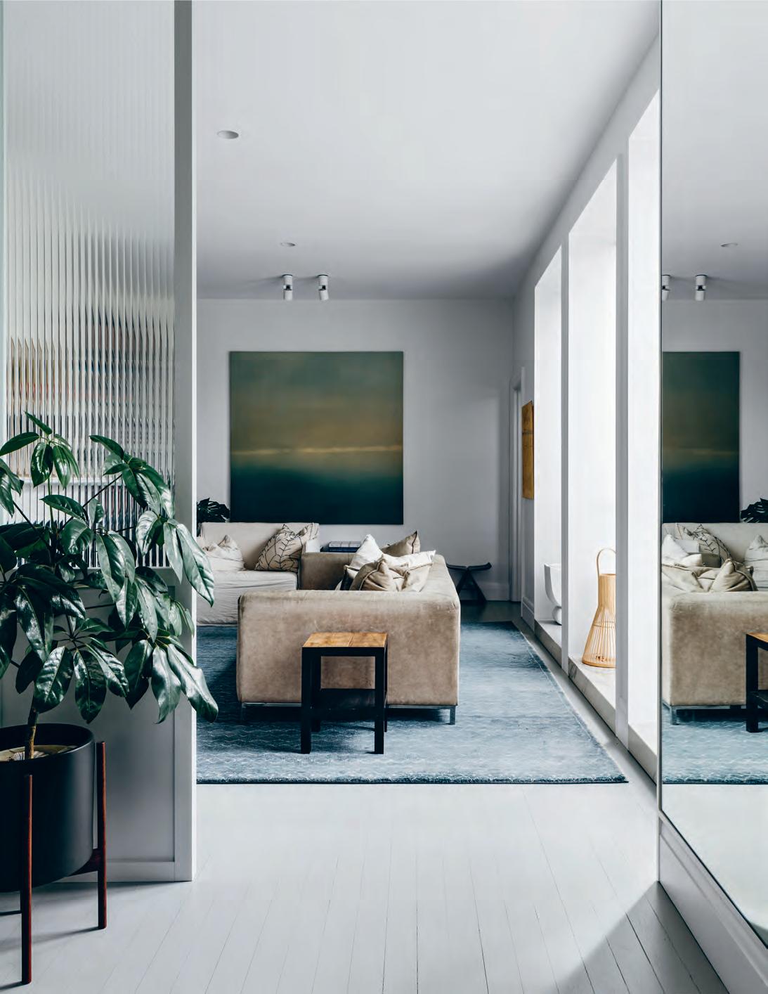
opener | Jonathan richards at home in sydney. oppostite & above | a reeded glass screen creates filtered light and a level of privacy between the entrance and living room. 2 . portrait # 59
Whilst many of Jonathan’s projects fall into the luxury category, the designer is optimistic about design’s place in the broader community. “In Australia, interior design has been for a long time seen as exclusive, something for the wealthy,” he says. “The opportunity is to make good design mainstream: to embrace and broaden the scope of the local industry, using local materials and encouraging great manufacturing and design from within Australia. Good design can become more accessible and affordable and an essential part of our living.”
It’s an attitude that has been drawn into the designer’s own personal environment, where his work and philosophy has had a distinct influence on his personal style.
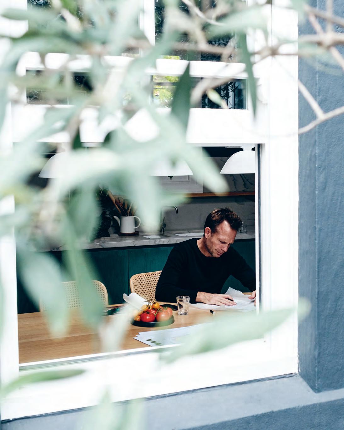
“To me, successful design has an easiness to it,” he explains. “I like it when a design doesn’t feel over-educated, over-thought or pretentious – it just feels confident and right. That attitude is a part of my personal style and attitude to life, and they both probably influence one another.” Jonathan’s process has succeeded in nourishing his creative spirit whilst simultaneously providing much needed respite from the day to day. “Those two things aren’t contradictory, they are essential to one another,” he says. “A place that provides respite gives you the freedom to think.”
Jonathan designed his house with his wife Olivia, having lived in the space for some years before embarking on the renovation. “We were intimately aware of how sunlight behaved in the house and what areas felt right for what
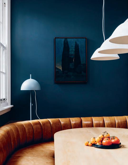
above | a b
|
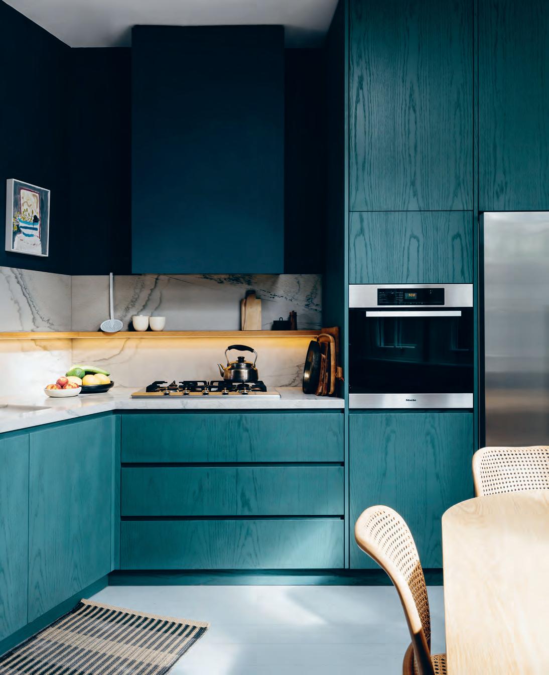
espoke american oak dining table is paired with a leather banquette, h offman dining chairs and wastberg light fittings. painting by rick am or. oppostite
emerald painted timber joinery champions the kitchen, offset by an oak shelf and a cortona quartz splashback.
issue #40 habitusliving.com
“A place that provides respite gives you the f reedom to think.”
2 . portrait # 61
issue #40 habitusliving.com
function,” he says. “We created two levels with the kids’ zone/living areas on the lower one and our outdoor terrace and main bedroom on the upper level. The house is an 1890’s triangular building, a hybrid terrace house and warehouse. It has a lot of inherent charm and we added our new layer to it.”
Despite creating his own personal sanctuary, Jonathan finds it challenging to completely switch off from work. “I haven’t quite worked that out yet,” he admits. “Switching my devices off at the end of the day only stresses me out further! In some ways work and life are too interlinked to be separate. I find that the more time you have out of office, enjoying life, the better your design gets.”
Jonathan Richards | sjb.com
opposite |
g lo-ball wall light and an agape n
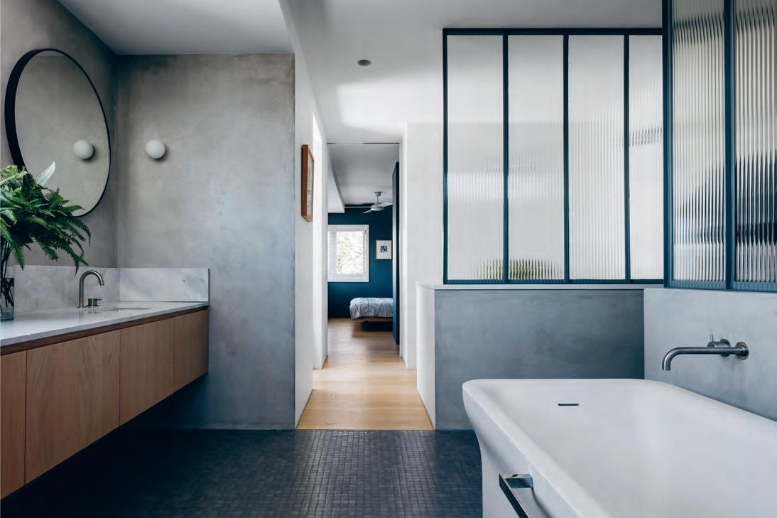
b athtub set against
Jonathan at work in the kitchen. above | the master ensuite with steel framed reeded glass screen, an elba marble vanity top, timber J o inery, flos m i
ni
ovecento
polished rendered walls.
2 . portrait # 63
“I like it when a design doesn’t feel over-educated, overthought or pretentious – it just feels confident and right.”
Nourish
Kitchens and bathrooms are the heart and soul of the home and designers are responding accordingly.
So, if comfort, relaxation and retreat is your thing, don’t stop here. These popular narratives flow freely, strengthened by insights into new technologies, aesthetic considerations and the all-important pursuit of functionality.
— Leanne Amodeo
nourish # 65
Bill’s Signature
Bill Granger’s particular brand of relaxed, casual dining is even more popular today than when he opened his first restaurant 25 years ago.
TexT Leanne a modeo | phoTographY Richa R d BoLL issue #40 habitusliving.com
nourish # 67
issue #40 habitusliving.com
An yone who’s ever craved Bill Granger’s signature creamy scrambled eggs can well appreciate t he impact he’s had on Australia’s dining culture. This much-loved restaurateur and food writer proves cooking wasn’t meant to be laboured and that eating is all about the joy of sharing simple, fresh meals with family and friends. Whether you’ve eaten his dishes in one of his restaurants, cooked a recipe from any number of his cookbooks or watched him on TV, you’ll know it’s hard to resist his particular brand of warmth and relaxed ease.
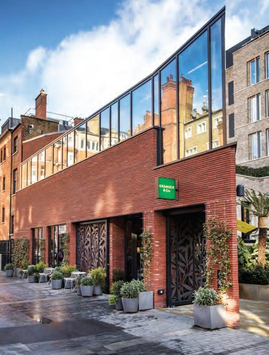
When I speak to Bill by phone, it’s a bitterly cold morning in London and while he’s indoors, he lets me know it’s blowing a gale outside. I feel like I’m talking to an old friend. He’s affable and generous, with an energy that’s contagious. He’s also humble and very, very savvy. Not for nothing the bill’s empire, including Granger & Co (as his restaurants are called in the UK, where he’s been based since 2009 with wife Natalie Elliott and their three daughters) is currently 18-strong worldwide, with plans to expand.
“I would never have imagined this success,” he says candidly. “I just do what I like and make sure I care about what I do.”
One of the things Bill cares about most is food, or more specifically, the way it brings people together. He realised a long time ago after moving to Sydney from Melbourne to study at the College of Fine Arts, now
UNSW Art & Design, that he doesn’t like practising solo. So when he got a part-time job in a restaurant to support his studies, he instantly fell in love with the hospitality industry and its ability to foster community amongst all involved. Needless to say, Bill didn’t complete that art course and soon after, opened his first restaurant in Sydney’s Darlinghurst. It was 1993 and he was just 23 years of age.
The bill’s brand was born with the launch of this restaurant and remains an instantly recognisable slice of Sydney, another of his passions. “What I noticed when I first moved there was people going out in the early morning to get their cup of coffee and sitting on a milk crate out front of the café to drink it. It was all about this idea of being outdoors and I wanted to create something with bill’s that reflected that,” he says. Translating the casualness of Bill’s own beachside lifestyle to the interior of the Darlinghurst restaurant was an organic process, establishing the blueprint for each restaurant that has followed.
Indeed, creating environments is one of Bill’s favourite parts of the job and while he’s worked with a small number of interior designers over the years, his most frequent collaborator is Meacham Nockles (formerly Meacham Nockles McQualter). He liked the fact the Sydney-based practice had never done a hospitality fit-out before they began working together –he knew they’d bring a fresh point of view to bill’s.
opener
|
|
“What I love most about food is enjoying it with other people, sitting down and sharing time with family and friends.” — Bill Granger
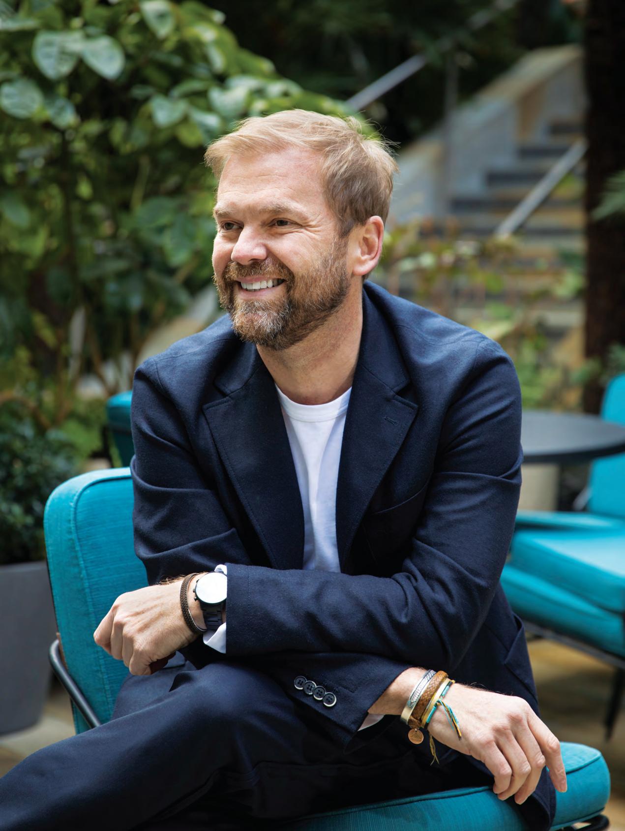
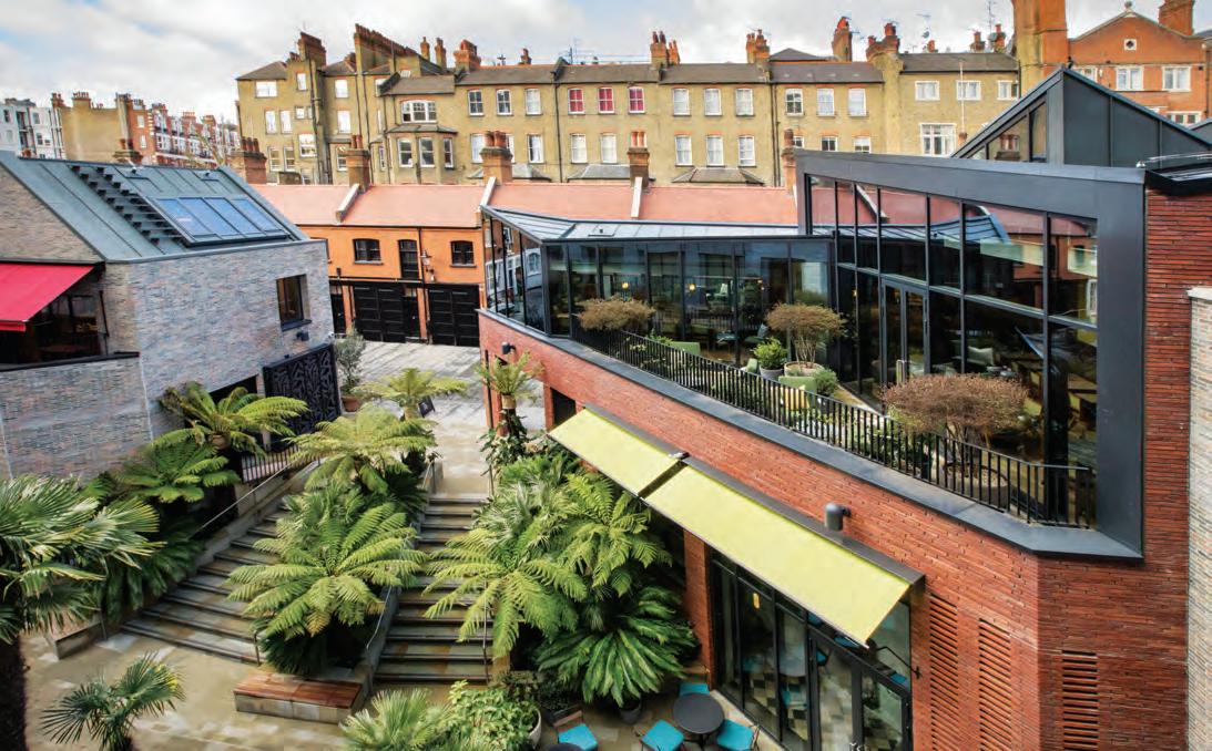
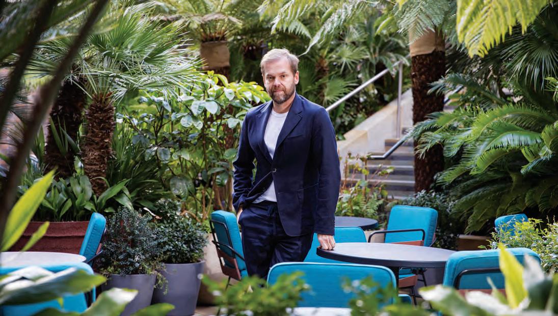
| Bill granger pictured in the courtyard of his restaurant gr anger & co in london’s chelsea. opposite aBove
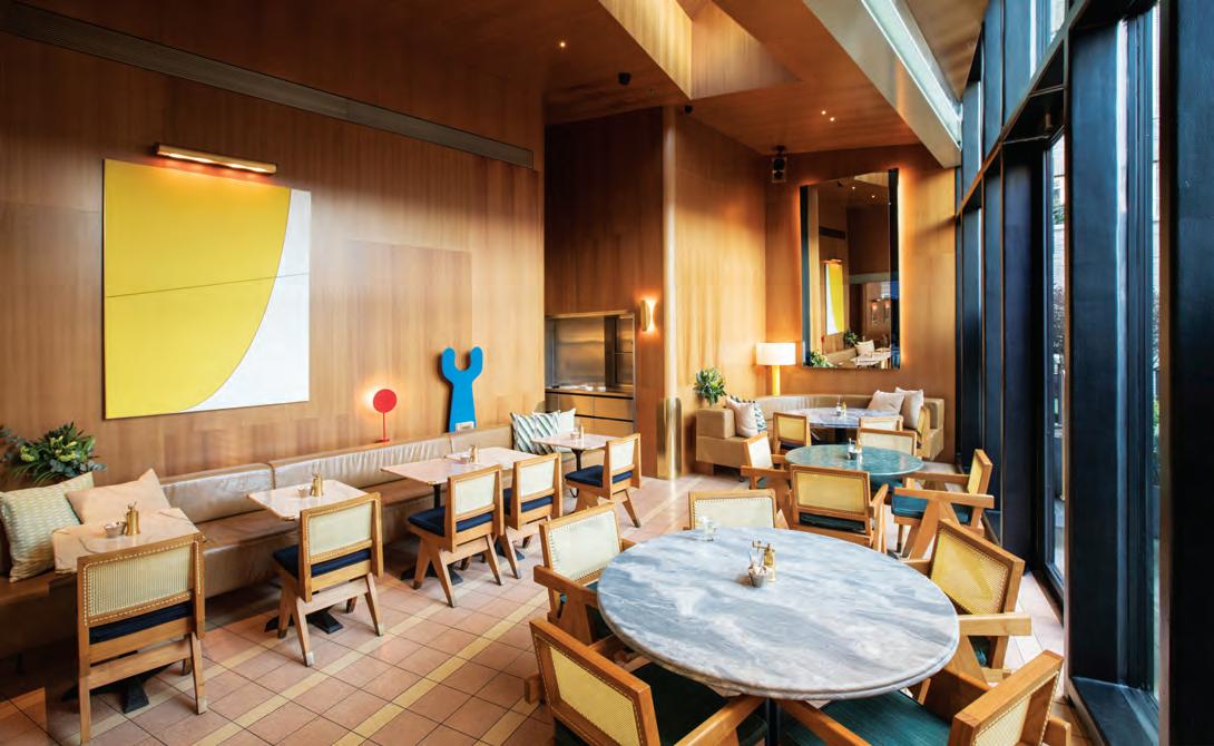
the space, in the south west of london and not far from the river thames, occupies two storeys. opposite Below
meacham nockles’ design of the chelsea restaurant is effortlessly relaxed.
nourish # 69
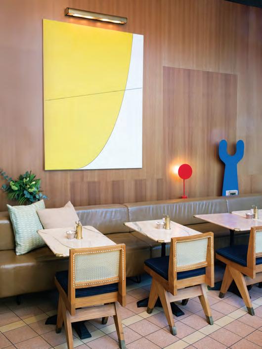
They’re responsible for the design of the Bondi, Japan, London and Hawaii restaurants, successfully capturing a lightness that makes each fit-out feel welcoming and appealingly laidback. There’s an element of whimsical domesticity to these interiors in that they’re not overdesigned, and for Bill that’s important. “I’m not about creating restaurants that just look hot right now,” he explains. “We don’t want them to feel too ‘of the moment’, instead we want them to still feel relevant in 15 years’ time.” It’s essentially his brief for every new fit-out and this timelessness is achieved through logical planning, generous spatiality and an honest material palette that’s restrained yet quietly sophisticated.
As an export, the branding works a treat. Each restaurant’s design may be customised to the neighbourhood in which it’s located – Bondi’s fit out is much more casual than say, Chelsea’s in the UK – though the distinctness of bill’s iconic ‘quintessentially Sydney’ DNA is strong. It continues to have great appeal in a country like Japan, which has a formal tradition of dining
unlike many other places. Bill opened his first restaurant outside of Australia there, after Tyler Brûlé (who, incidentally gave Bill his first writing gig at Wallpaper*) put him in contact with a group of potential Japanese investors long interested in what he did.
The expansion into Japan was a natural progression for someone who lived there during a gap year and Bill cites the country, it’s people, the food and customs as a source of creative inspiration. His interest in design resonates with the value Japanese culture places on aesthetics and unsurprisingly, he admires not only the delicate flavours of Japanese cuisine, but also the way it’s carefully presented on the plate, much like a work of art. Ingredients synonymous with Japanese cooking – sesame seeds, miso, raw tuna – have found their way into the bill’s menu, a perfect complement to the lightness of its existing dishes.
I can’t resist asking Bill if he has a favourite chef and he names Neil Perry, “because he changed Australian dining”. Certainly, when bill’s Darlinghurst first opened there were no other ‘designed’ restaurants, except
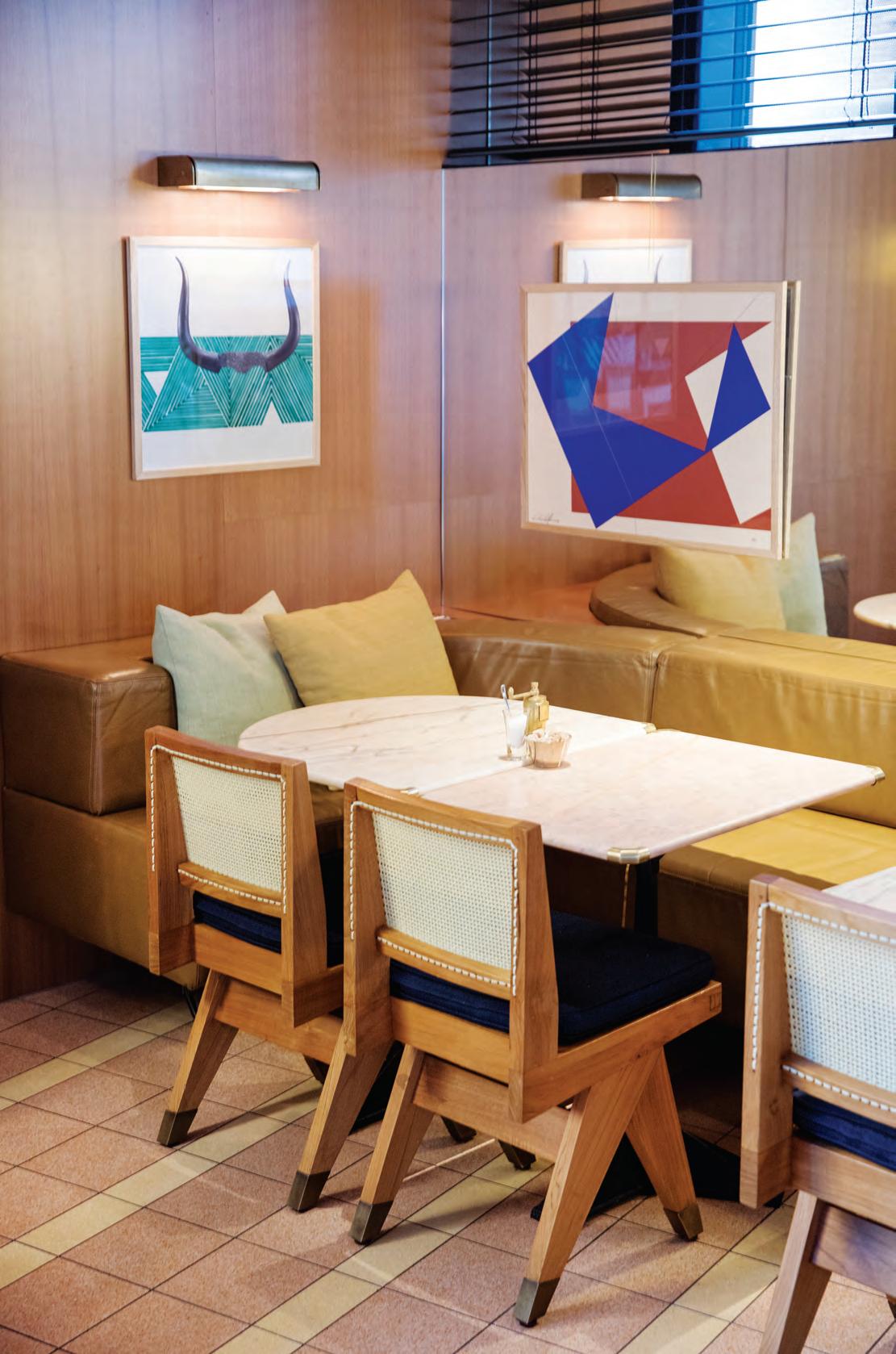
opposite above | bill’s warmth and ease is synonymous with his brand. opposite below right | abstract artworks pepper the interior, adding pops of colour against timber finishes. opposite below left | the entrance to chelsea’s gr anger & co
Each restaurant’s design may be customised to the neighbourhood in which it’s located though the distinctness of bill’s iconic ‘quintessentially Sydney’ DNA is strong.
issue #40 habitusliving.com
nourish # 71
issue #40 habitusliving.com
perhaps for Neil Perry’s Rockpool. Bill believes the dining experience should be a memorable one and a fit-out’s experiential qualities are just as important as what’s coming out of the kitchen. “So, it’s essential to have a beautiful interior because it shows that someone cares. Customers want to know the owner gives a damn and it’s important they walk away feeling they’ve had all their senses fed,” he explains.
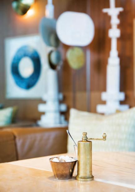
Another of Bill’s favourite chefs is The River Café co-founder Ruth Rogers for her absolutely delicious food and skill as a restaurateur. And as much as Bill appreciates restraint in design, he simply can’t get enough of her London restaurant’s interior, with its futuristic-cool 1980s vibe, designed by architect Richard Rogers, who also happens to be her husband.
Bill is looking at potentially expanding into Taiwan, is launching another restaurant in South Korea and will soon be moving bill’s Surry Hills literally next door to its current location. Ultimately, he wants to keep on doing what he does as well as possible, maintaining consistency across the brand and advocating for casual dining. “What I love most about food is enjoying it with other people, sitting down and sharing time with family and friends,” he says. “And that’s what I love most about restaurants too.”
opposite | Like a LL of Bi LL s restaurants, CheLs ea’s Gran G er & Co is domesti C in s Ca Le a nd very weLC o min G as a resu Lt aB ove | d e tai Ls m atter to Bi LL and whi Le h is restaurants’ interiors are Ca refu LLy C o nsidered, they’re never over-desi G n ed. nourish # 73
Bill believes the dining experience should be a memorable one and a fit-out’s experiential qualities are just as important as what’s coming out of the kitchen.
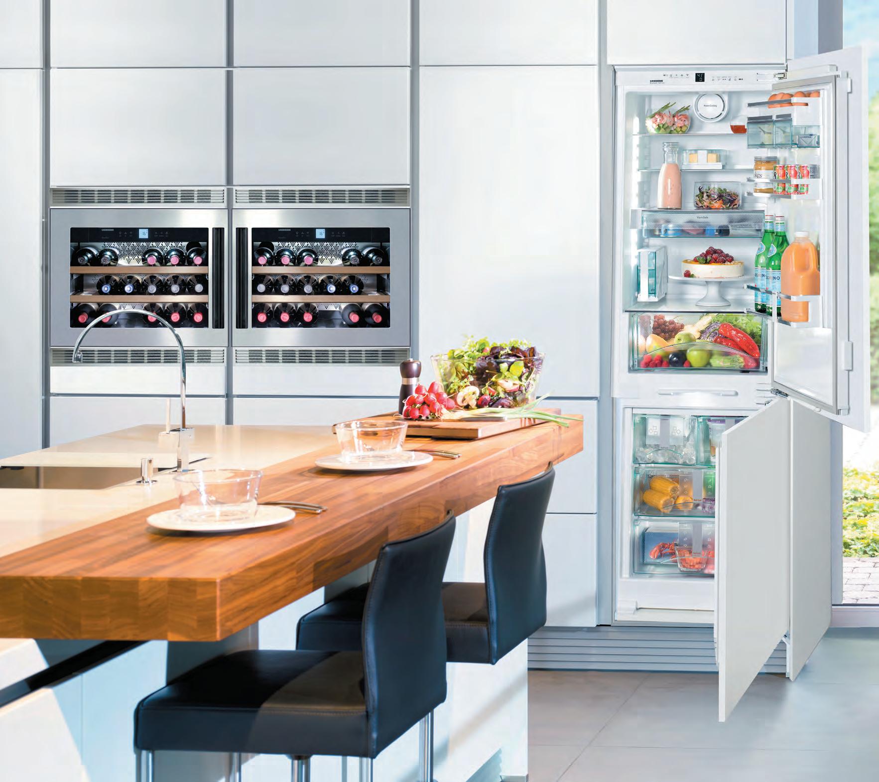
integrated


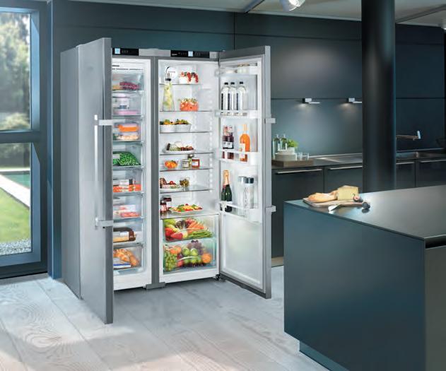
underbench freestanding
size
andico.com.au/liebherr
Liebherr has a size to fit
does matter
issue #40 habitusliving.com
The Light Idea
Flexibility, colour temperature and well-designed fittings are all important considerations in kitchen lighting, where getting it right comes down to establishing a balance of all three.
—
TexT Leanne a modeo nourish # 77
When it comes to light in the kitchen there’s a fine line between getting it right and getting it very wrong. Too little and eating dinner in the dark quickly turns from romantic to frustrating; too much and the heart of the home ends up having all the ambience of a floodlit football stadium. Balance between a muted glow and intense illumination needs to be achieved, and any contemporary lighting scheme has to be able to shift between these two settings, depending on the time of day and type of activity taking place.
This need for greater lighting flexibility within the kitchen is due in no small part to the integration of the space into the home’s other living areas. Indeed, today’s popular open-plan has influenced the way designers and architects think about these spaces in terms of lighting because successful outcomes require both rigour and nuance. Semiopen-plan living areas also deserve consideration so that neither comfort nor functionality are compromised.
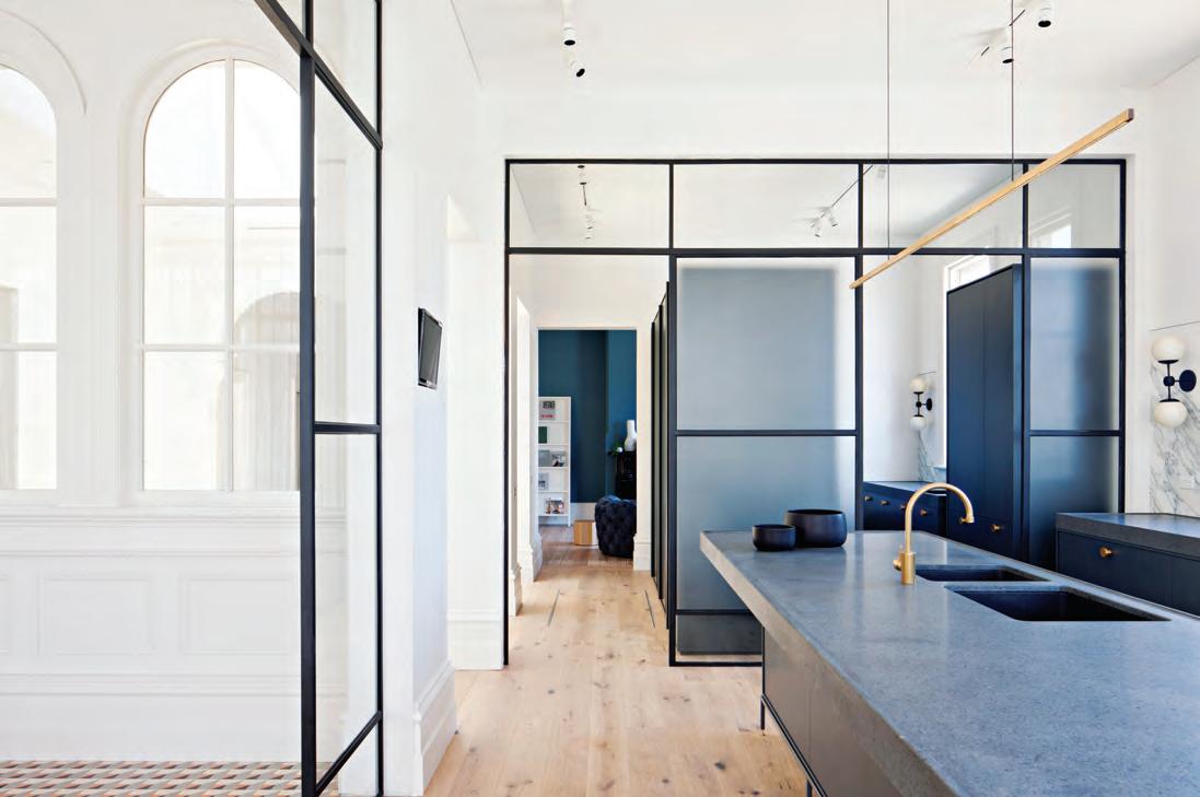
It’s an issue particularly well-resolved in Hecker Guthrie’s renovated Prahran Residence, where a series of framed glass insertions divide the living areas, still maintaining transparency. This bright, breezy interior takes full advantage of the heritage building’s numerous windows. In the kitchen, co-directors Paul Hecker and Hamish Guthrie have included three very different types of light fittings: a slim strip pendant above the island bench, wall pendants against the splashback and track
lighting on the ceiling that can be used in isolation or at the same time. The multi-lamp pendant in the dining area contributes another source of light to the kitchen area, ensuring plenty of scope for flexibility.
Paul and Hamish’s selection of simple yet sophisticated fittings reinforce the current trend for residential lighting that’s high end without creating distraction. It’s a concept that Melbourne-based lighting designer Volker Haug has effectively integrated into his studio’s recently launched Big Kick pendant. “The linear nature of this product’s design means it works well above kitchen island benches, where it integrates with the interior without blocking out the space,” he says. “A pendant light that makes a statement without being obtrusive is something we’ve found clients increasingly requesting.”
Volker’s Big Kick finds itself in fine company alongside other similarly pared back, expertly crafted lighting products well suited to a kitchen environment, including Neri & Hu’s Bai Di Di and Jamie Hayon’s Aballs (both for Parachilna) and Lambert and Fils’ Beaubien Wall Double Shade. Hiroshi Kawano’s Bloom for Ligne Roset interprets the less is more trend with a form that’s lightweight despite its apparent complexity. While the newly released Terrazzo Collection of lighting by Chinese studio Bentu Design punctuates any kitchen with colour and pattern without detracting from the surrounding finishes and detailing.
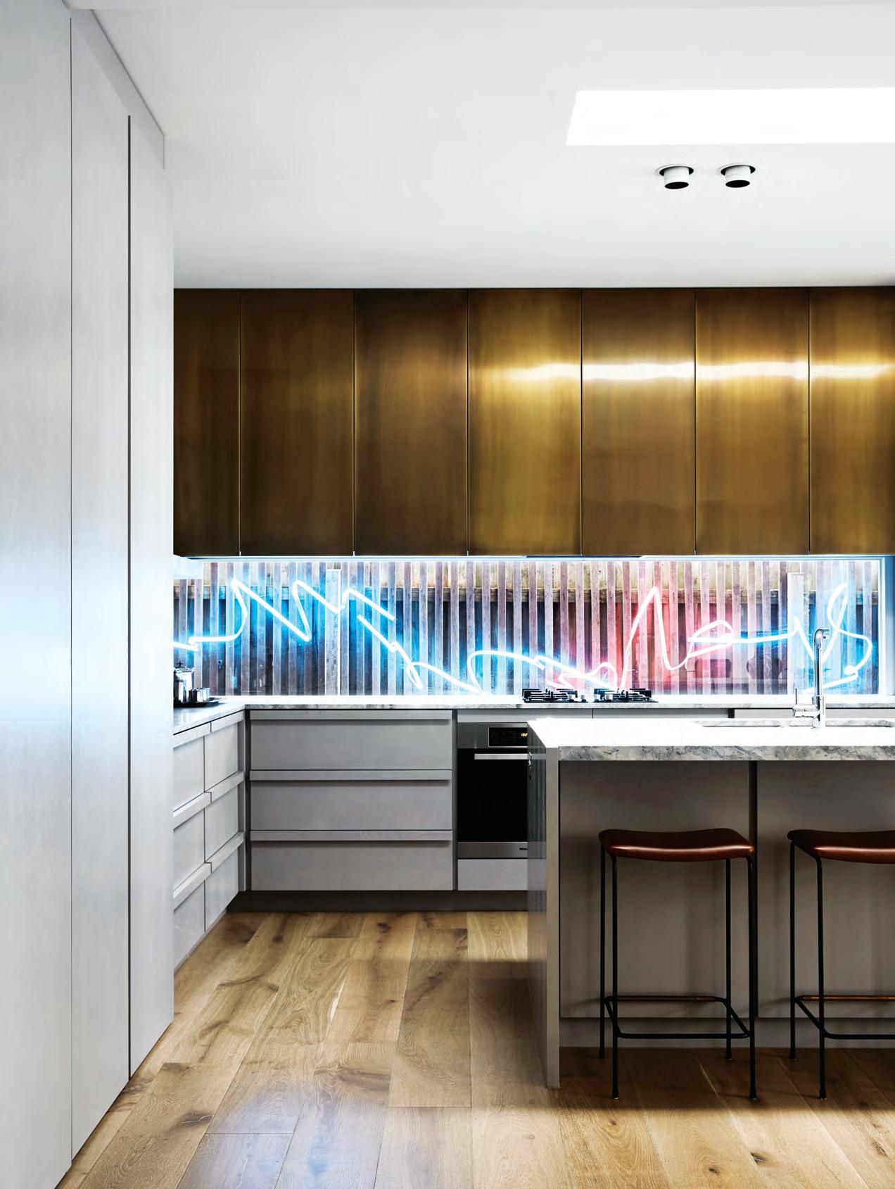
opener | An origin A l lighting instA ll Ation by A rtist Aly i n dermühle A ltern Ates between blue A n d pink A n d sits behind A gl A s s spl A s hb Ac k in this kitchen by Fl Ac k studio. photogr A phy by s h A ryn cA i rns opposite A b ove | vo lker hAu g studio’s b i g k i ck pendA nt in bl Ac k powdercoAted steel works pA rticul A r ly well over kitchen isl A n d benches becAu se o F its line A r F o rm. opposite below | h ecker g u thrie’s pr A h r A n r esidence Fe At ures three di FFerent types o F light Fittings in the kitchen th At, A long with plenty o F n At ur A l light, give the spAc e A m ple illumin Ation. photogr A phy by s h A n non m c g r Ath
issue #40 habitusliving.com
Today’s popular open-plan has influenced the way designers and architects think about these spaces in terms of lighting because successful outcomes require both rigour and nuance.

nourish # 79
Lighting’s colour temperature is also integral to a kitchen’s scheme. The difference between a warm white (yellow), daylight white (natural) and cool white (blue) lamp may appear subtle, but it’s enough to change the look and feel of any space. Flack Studio takes this principle one step further by incorporating a light installation in their renovation of St Kilda House’s kitchen. The original artwork by artist Aly Indermühle sits behind a glass splashback and flicks between bright blue and warmer pink tones. It’s a clever way of incorporating ambient light into the space, which is already lit by a skylight and spotlights. And although the installation is both unexpected and dynamic, its recessed positioning still makes it appear relatively understated alongside a palette of brass, white marble and timber.
Neon in the kitchen may not be everyone’s cup of tea but it does lend creativity to a space that can often be overlooked in this regard. It also highlights the importance of planning and the need to consider lighting from the very beginning of the design process. Like any detail that needs to be highly functional, it should never ever be treated as an afterthought.
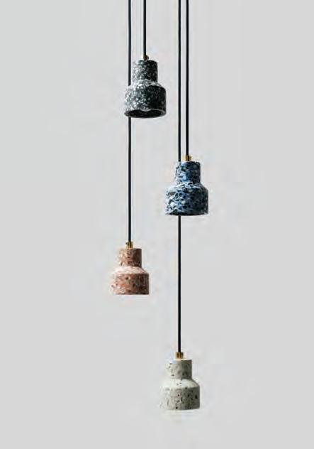
above | b entu Design’s terrazzo ColleCtion, in C lu D i ng the t u pen Da nt, is ma D e entirely from reCyC leD C erami C waste materials.
issue #40 habitusliving.com
The difference between a warm white (yellow), daylight white (natural) and cool white (blue) lamp may appear subtle, but it’s enough to change the look and feel of any space.
Cantilever is a design-focused kitchen manufacturing company committed to building for longevity.
Servicing single and multi-residential projects Australia wide, our quality Kitchen Systems are designed and manufactured in our Brunswick East factory.

Showroom 128 Barkly Street Brunswick East 3057 Victoria, Australia Contact + 61 3 9387 5421 www.cantileverinteriors.com @cantileverinteriors
issue #40 habitusliving.com
“Technology in the kitchen is really important.”
e verything and its Place
What are the lessons a professional chef has translated into his own home? We find out with sweet extraordinaire Darren Purchese.
With the ensuing wellness revolution taking over the lifestyle and food industries, one would be forgiven for thinking that a chef whose work is centred on sugary treats would be having a hard time of it. This is definitely not the case for Burch & Purchese, founded by Darren Purchese and Cath Claringbold, partners in life and business.
The British chef set up shop in Melbourne seven years ago and has been building his reputation for vibrant and unique desserts ever since. Colourful concoctions with adventurous flavour combinations have become a signature.
“We do have some Asian influences in some of the desserts. But then we also have some Australian native influence, as well as more traditional flavour combinations,” says Darren.
But the vibrant signature of the products doesn’t necessarily translate into the design of the kitchen. “We try to keep the interior aesthetic or palette clean, so that the food can speak for itself. My style of food is very colourful, so we don’t want the space to take away from that,” says Darren.
With years of experience working in commercial kitchens, he’s picked up a few tricks of the trade, some that have even found their way back to his kitchen at home. The key takeaway being ‘functionality comes first’.
“You don’t just plonk a burner there and an oven over there. You’ve got to think about the
functionality and the flow of production. Once you first work out the functionality, then work out how to make it look good,” he says.
When you spend all day in the kitchen, efficiency is another key consideration. And technology is a surefire way to keep everything running smoothly. “Whenever there’s new technology that can help me do my job quicker, more efficiently, and more consistently, then I’ll look at that piece of equipment. And I guess, because I’m a bit of a kitchen nerd, that transfers to home as well,” says Darren, before adding that, “technology in the kitchen is really important”.
Another golden piece of advice for keen home chefs is to “keep it clean and have lots of storage solutions”.
Darren follows an almost minimalist approach when it comes to bringing new things into the kitchen space – both at home and particularly at work. “Obviously, the kitchen needs to be clean and tidy all the time, so making sure stuff has a home is really important. There’s no point in just buying a new machine without knowing where it goes.
“We always make sure that if we introduce something into the kitchen, it has a home.”
Darren Purchese | burchandpurchese.com
Tex T Aleesh A CA ll A h A n | PhoTo gra Phy M A r nie hAwson
2 . chef series # 83
Hidden Technologies
When researchers at the Massachusetts Institute of Technology proposed a prototype for future living in the 1950s, they came up with the House of the Future. Sponsor Monsanto Chemical Company had naming rights and the exhibit became part of Disneyland’s Tomorrowland, on show for ten years from 1957. The full-size model emphasised plastics as the material of the future and was set in 1986, although the styling undoubtedly channelled a sixties vibe. Visitors flocked to the attraction curious to see the high-tech gadgetry, including a microwave oven and dishwasher, and weren’t disappointed. The prototype was eventually demolished and choker chains had to be used to crush the reinforced polyester structure into smaller parts because wrecking balls and jackhammers were no match.
Times have most certainly changed, but our curiosity for new technologies and how they progress and improve the way we live hasn’t waned. Indeed, research and development is big business amongst manufacturers whose job it is to stay one step ahead of the game. For architects and designers working within the residential sector, incorporating finishes and materials with engineered performance qualities is simply part and parcel of delivering a successful design outcome. And today, more than before, there’s increasing value being placed not only on the product’s performance integrity, but on the way it looks.
The aesthetic of any engineered product is just as important, especially in busy areas of the house such as the kitchen and bathroom. A company like Laminex,
—
TexT Leanne a modeo issue #40 habitusliving.com
Today’s engineered surfaces and finishes are as hard-working as they are good looking, which is why they’re found in the best contemporary kitchens and bathrooms.
nourish # 85
issue #40 habitusliving.com
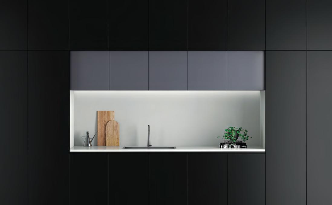
for example, manufactures products that are regularly specified in the kitchen and this is reason to keep on innovating. Their new release Absolute Series of surface finishes appeals as much for its colour palette as it does for the advanced new technology it brings to market. While the AbsoluteGrain is impressive for a realistic woodgrain surface appearance, the AbsoluteMatte is of particular interest for its patent-pending technology. The product boasts natural ion antibacterial protection and the ability to thermally heal burnishes, as well as being scratch resistant, all of which points to a longer lasting kitchen.
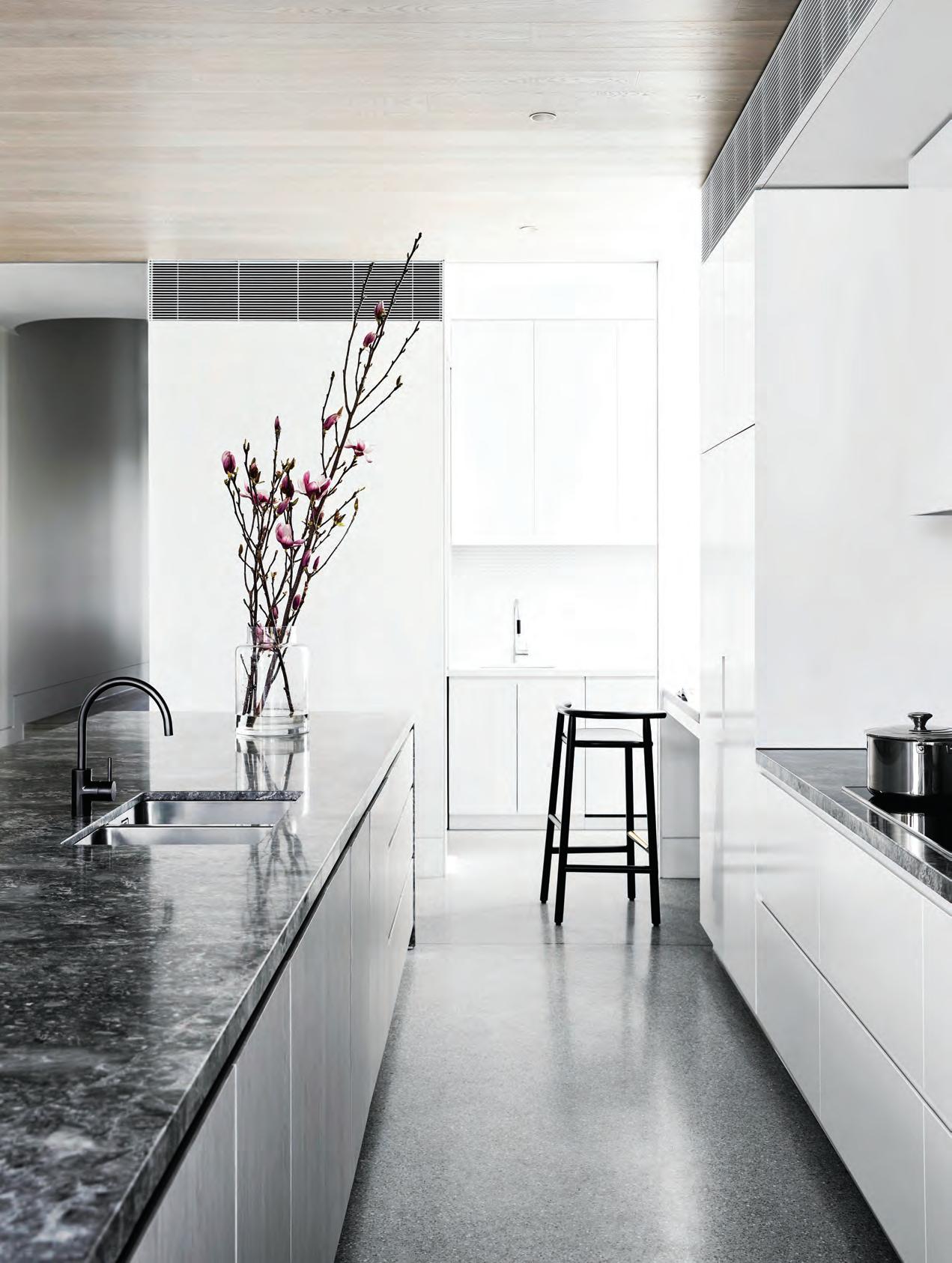
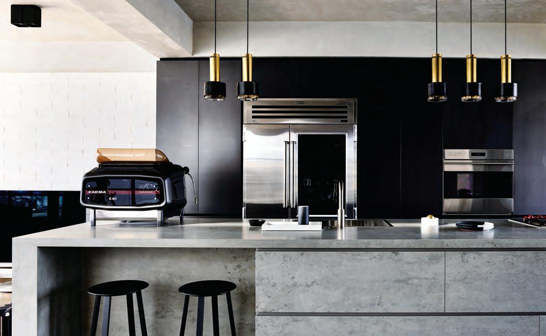
Issues of durability, longevity and sustainability are well addressed by engineered products and this makes them attractive to clients. It’s why Workroom Design’s Melbourne-based Director John Bornas selected CDK Stone’s Neolith surface finish for the kitchen benchtop and island in his practice’s recently completed South Yarra Apartment. The near-zero porosity product is an all-natural compact sintered surface composed of raw materials pressed together and baked at 1200˚C, making it incredibly durable and virtually stainproof.
While it was imperative to feature a high performing engineered surface in the kitchen, it was also important this finish complements the interior’s rich, moody colour scheme and robust yet sophisticated materiality. “We needed a product that looks natural because the overall palette is a combination of natural materials,” explains
John. “And we were also looking for a finish that resembles concrete, which we didn’t want to use in that particular kitchen application because of its material limitations.”
When using natural materials in the kitchen, coatings and sealants can be relied upon to boost their performance. In MIM Design’s MLB Residence, the kitchen is a light, elegant arrangement of timber, marble and concrete. “However, surfaces needed to be as low maintenance as possible and the way we ensured this was by finishing them with hardy, protective coatings,” says practice Director Miriam Fanning. A non-corrosive, penetrative sealant was applied to the natural stone, making it almost indestructible. A clear sealant with 30 per cent satin for ease of cleaning was used on the 2-Pac and timber veneer vertical panels. Neither finish compromises the look of the material and that’s the idea; these specific types of finishes need not only be hard-working, they need to be invisible too.
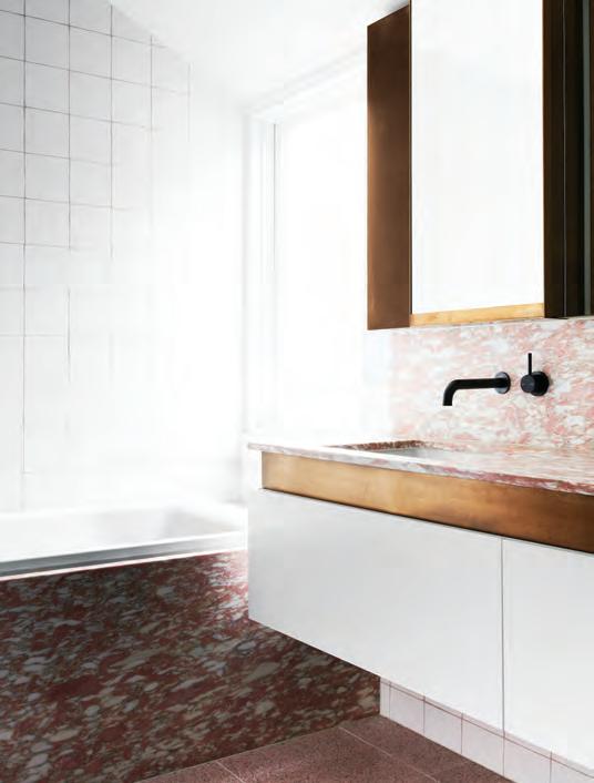
In the bathroom, Terrazzo is making a comeback. As the oldest engineered composite stone, it is both hardwearing and hard-working and while it’s appearance tends to divide opinion depending on personal taste, there’s no denying its artistry. Flack Studio uses Pink Terrazzo in the bathroom of their North Fitzroy Terrace for practical and aesthetic reasons. It’s cool underfoot, will last seemingly forever and alongside pink marble and brass accents, it gives this small bathroom space the enviably bright, modern makeover it so needed.
opener | In thIs kItchen by MIM DesIgn, sealants protect the natural stone, 2-pac anD tIMber veneer surfaces wIthout coMproMIsIng theIr look. photography by sharyn caIrns opposIte above | laMInex’s absoluteMatte surface fInIsh works well In the kItchen, beIng scratch resIstant anD havIng the abIlIt y to therMally heal burnIshes. opposIte below | workrooM DesIgn’s use of cDk stone’s neolIth surface fInIsh for the kItchen benchtop anD IslanD Is well suIteD to south yarra apartMent’s kItchen robust MaterIal palette. photography by Derek swalwell
nourish # 87
Companies are beginning to discreetly incorporate smart technology into surface finishes.
Interestingly, British designer Max Lamb devised a large aggregate pre-cast marble Terrazzo for Dzek in 2014. This engineered product known as Marmoreal is composed of 95 per cent marble and 5 per cent polyester resin binders and comes in either a black or white background. Its patterning is bold and chunky and it can be used for interior applications as well as exterior, making quite the statement against mono-coloured and neutral surfaces.
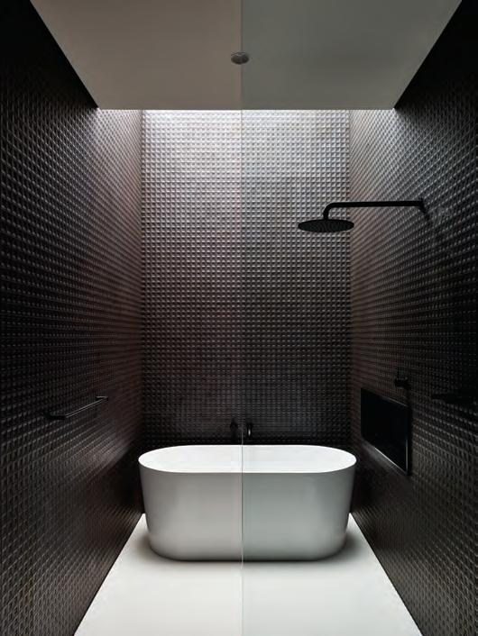
One of the most commonly specified engineered stones is Corian because of its impressive performance qualities and high-end appearance. It’s used to striking effect in the bathroom of Adelaide-based Architects Ink’s GA House. As the practice’s interior designer Laura Tisato explains, “We selected Corian in Glacier White for its durability and smooth finish, which contrasts nicely with the textured wall tiles. And by eliminating grout joints, it appears seamless and is both hygienic and easy to maintain, which is an ideal solution for a bathroom floor.”
The geometric patterning of the dark mosaic wall tiles against this futuristic-looking flooring highlights the strikingly minimalist scheme’s meticulous attention to detail, making this space appear incredibly relaxing, despite its unexpected finishes.
Hidden technologies are certainly just as exciting and necessary as performance engineered appliances, gadgets and fixtures with high visibility. Companies are beginning to discreetly incorporate smart technology into surface finishes and Corian’s Wireless Charging Surface is one such example. It features wireless charging transmitters hidden beneath the product’s surface, so devices can be charged without a whole lot of messy cables getting in the way. As these latest technologies become smarter, it makes good sense to be even more curious about what tomorrow holds.
Hidden technologies are certainly just as exciting and necessary as performance engineered appliances, gadgets and fixtures with high visibility.
issue #40 habitusliving.com
opposite above | absoluteGrain is a new realistic woodGr ain surface finish from laminex. opposite below riGht | architects ink’s use of corian for this bathroom’s floorinG eliminates Grout joints, makinG it look super slick and easy to maintain. photoGr aphy by sam noonan opposite below left | terrazzo floorinG complements the pink marble and brass accents in flack studio’s north fitzroy terrace bathroom. photoGr aphy by brooke holm
nourish # 89
marion’s Empire
Professional chef, entrepreneur, owner of food line Marion’s Kitchen, TV presenter, food journalist and mum: these are all roles Marion Grasby juggles – with a smile. At just 35, the ThaiAustralian chef is well on her way to building a food empire from her base in Bangkok.
Her love affair with food started when she was just a little girl. “The kitchen was my playground,” says Marion. “I loved being there with my mum,” who was also a professional chef.
But it was her mother’s home-cooked meals, rather than her professional repertoire, that forged the inspiration behind Marion’s Kitchen. “I wanted to create it from the recipes we cooked together as a family,” says Marion, who competed in MasterChef Australia’s second season the same year she launched her food range.
The natural, GMO collection includes meal kits, wrap kits, sauces, noodles and more, with dishes ranging from Thai red curry and Pad Thai to Singaporean Laksa and a Sri Lankan curry. “I wanted to take really special ingredients and create some products I could be proud of – and my mum too,” she says.
Marion’s mum, Noi Grasby, is heavily involved with the business. “She’s in there bossing everyone around and making sure everything tastes like it’s supposed to,” says Marion. “It still feels like a small family business, which is how I’d like to keep it.” This is despite the fact that Marion has built a company
with serious reach: her food range is in 10,000 stores across Australia, the U.S.A. and (as of May this years) New Zealand.
With world domination well underway, Marion’s Kitchen needed new digs. “I recently built my studio kitchen, it’s really my favourite space at the moment. When I’m testing products and recipes, people will wander over and taste things. It’s become the soul of our working space,” says Marion.
“I wanted an open space where I could have everything out on the table. For me, my kitchen space really needs to be somewhere that’s inspiring. I spend a lot of time not only cooking, but also writing recipes and testing ingredients. I’m a very visual person. I need to see the spices out on the bench; I need to see the different types of soy sauces.”
What else is in Marion’s kitchen? “A heavy granite mortar and pestle. You need it for making curry paste, and for bashing up garlic.”
For Marion, garlic is a vital part of what makes cooking such a joyful experience and she encourages others to identify exactly what it is they enjoy the most about cooking and being in the kitchen. “I’m happy when garlic is sizzling in the pan,” she says. “If you think of things like that as joyful and beautiful, you enjoy the process, rather than being so focused on the result.”
Marion’s Kitchen | marionskitchen.com
Tex T
|
To
Tamsin Bradshaw
Pho
gra Phy PhisuT n uThong
The professional chef, food entrepreneur and MasterChef alum on family, fresh ingredients and her kitchen must-haves.
issue #40 habitusliving.com
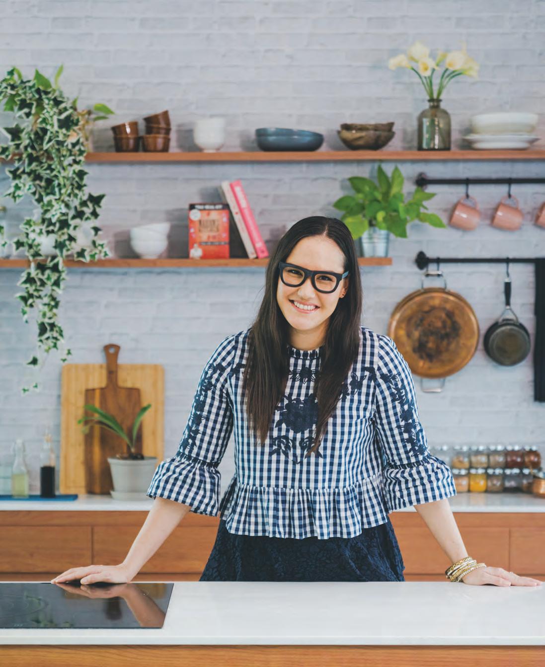
2 . chef series # 91
“My kitchen space really needs to be somewhere that’s inspiring.”
Italian for style.
The new STILE tapware collection from Gareth Ashton encapsulates the definition of style across five high-end metallic finishes for the bathroom. Made in Italy, STILE is now available in Australia. Visit an Abey

VICTORIA Selection Gallery 335 Ferrars St Albert Park Ph: 03 8696 4000 *NEWLY OPENED* WESTERN AUSTRALIA Selection Gallery 12 Sundercombe St Osborne Park Ph: 08 9208 4500 NEW SOUTH WALES Selection Gallery 1E Danks St Waterloo Ph: 02 8572 8500 QUEENSLAND Selection Gallery 94 Petrie Tce Brisbane Ph: 07 3369 4777
Australia Selection Gallery to immerse yourself in the collection.
Towards Relaxation and Retreat
There’s no such thing as a one-sizefits-all bathroom solution, but the very best designs incorporate certain elements that can make the outcome nothing less than perfect.
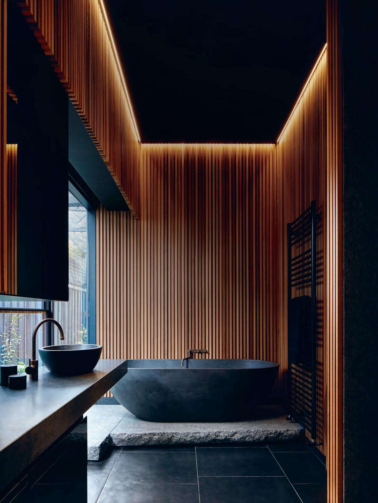
TexT Leanne a modeo nourish # 93
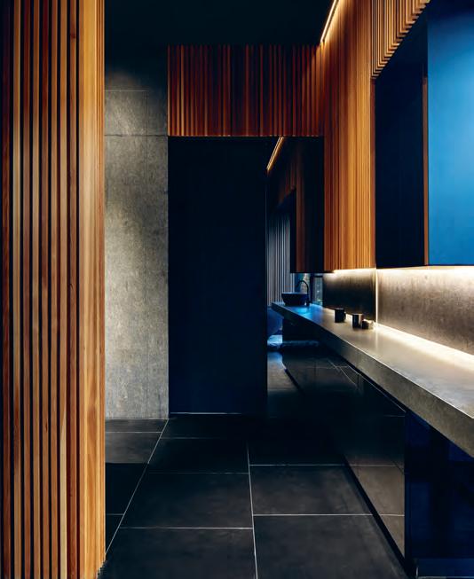
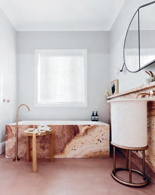
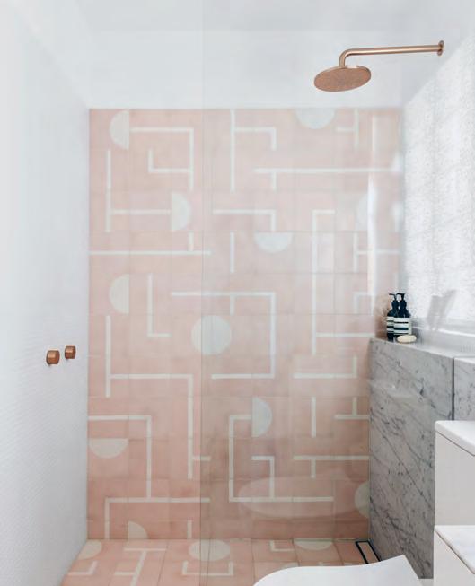
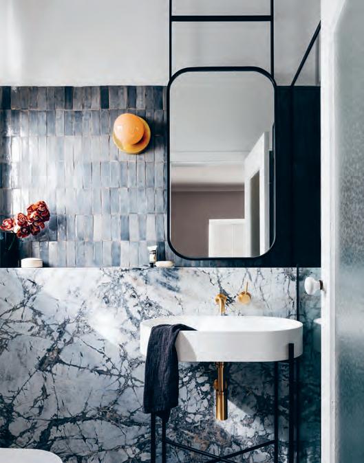
issue #40 habitusliving.com
These days, clients want the day spa experience in their own home and they’re looking to the Japanese onsen and boutique design hotels for inspiration. But creating the quintessential bathroom isn’t as straightforward as replicating a widely held ideal. There’s no one-size-fits-all design solution because spaces need to be customised to clients’ needs, though architects and designers don’t necessarily have to reinvent the wheel each time. Contemporary bathroom design often relies on the same elements for a successful outcome, no matter the size, budget or scope.
Technology is one such element determining the functionality of today’s bathroom, with advancements in research and development producing even smarter features. A quick look through the Kohler catalogue reiterates this; the manufacturer’s Moxie showerhead, for example, incorporates a wireless speaker that syncs with Bluetooth enabled devices, while the Veil toilet integrates a bidet controlled by a one-touch remote control.
Bathroom products are now also being engineered with water-saving technologies. From selecting environmentally conscious features to conceptualising entire developments based around environmental, economic and social sustainability principles, issues of how to live better with less impact are coming to the forefront. Certainly, Breathe Architecture’s recently completed Nightingale 1 multiresidential building in Brunswick is a fine example of how to do sustainability well. With a NatHERS rating of 8.2 stars (out of a possible ten), the bathrooms are simply part of a bigger picture that boasts rainwater harvesting which is used in irrigation and common-area toilets, and 100 per cent fossil fuel free emissions.
In addressing questions of hygiene, there’s no more important topic to discuss than the toilet. So many new ranges, including the Veil with its rimless bowl, are elevating standards of cleanliness. Crisp lines and smooth surfaces have long been a desirable aesthetic in bathrooms and for the smallest room in the house, efficiency is still crucial.
While not everyone may need a toilet that doubles as a bidet, an efficient plan is a pre-requisite for good bathroom design, which is what makes Splinter Society’s
Elwood House bathroom so compelling. This project is exemplary for its minimalist scheme and simple layout, creating an interior that’s hard working and purposeful.
Director Chris Stanley has taken advantage of the room’s deep, narrow plan and positioned the bathtub at the very rear. Elsewhere in the bathroom, LED strip lights gently illuminate the space and a single in-built joinery unit neatly contains the washbasin and plenty of room for storage.
The artistry in the design is inherent in the exquisite material palette, which features granite, porcelain, stone and cedar battens that immediately draw the eye through the space, making it appear larger than it is. As Chris explains, “Rich materiality is what sharpens the contrast between the clean forms and natural tones and gives this bathroom a modern yet calming feel.” There’s also artistry in the detailing and while there are no overly decorative features in this bathroom, many other projects use texture, pattern and colour as a means of individual expression and creativity.
Decus Interiors’ Woollahra Residence is a case in point, where each of the home’s four bathrooms have their own distinct design personality. “We don’t stick to any one hard and fast rule with our approach,” says practice founder Alexandra Donohoe Church. “Rather, we work instinctively and our decisions are informed by the clients’ sense of style, as well as any existing pieces of furniture or objects they own.” The result in this instance is a tapestry of sensual surfaces and finishes; coloured tiles, patterned marbles and rich colour.
If the goal is to create a design that ultimately enables relaxation and retreat in the bathroom, then technology, sustainability, hygiene, efficiency and artistry must find an expression in one way or another. Achieving a greater sense of comfort is possible when all five elements are combined, making for a very happy yet highly functional outcome.
opener
&
|
a
pHotograpHy by felix foreSt oppoSite below left | anotHer view of Splinter Society’ S elwood
SHowS off itS fine detailing. pHotograpHy by Jack lovel
| Splinter Society’ S elwood HouSe batHroom iS an elegant Study in efficient planning and SopHiSticated materiality. pHotograpHy by Jack lovel oppoSite above left
rigHt, oppoSite below rigHt
tHeSe tHree batHroomS in decuS interiorS ’ woollaHr a reSidence make for
deligHtful mix of pattern, texture and colour.
HouSe batHroom
nourish # 95
If the goal is to create a design that ultimately enables relaxation and retreat in the bathroom, then technology, sustainability, hygiene, efficiency and artistry must find an expression in one way or another.
SHOWERS
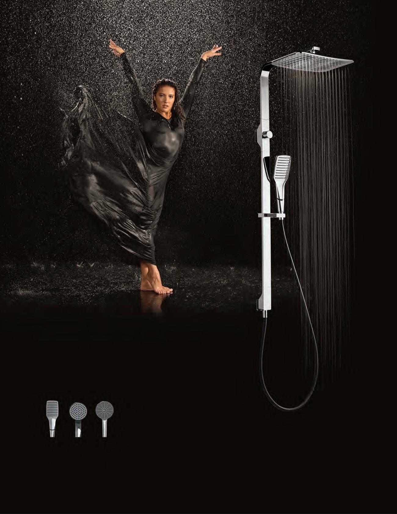
Kitchens



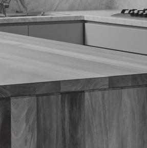
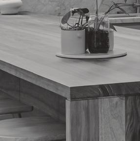




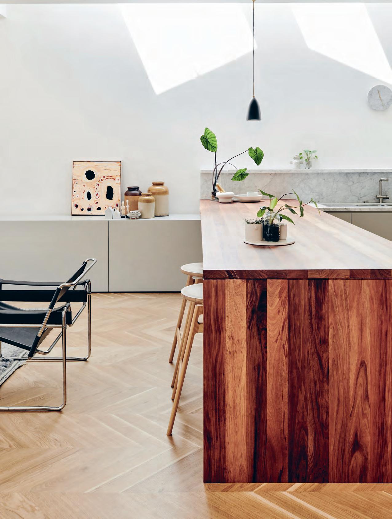
issue #40 habitusliving.com
Textural att raction
Some of the most beguiling characters are those that are a bit conflicted. In the case of Prahran Kitchen, this is made manifest in an intriguing clash of textures.
Charisma is a hard thing to pin down, and requires great nuance on the part of its owner. It’s not just about being bold and beguiling; it’s also about knowing when and how to blend into the background without losing that magnetic quality.
In Prahran Kitchen by Melbourne-based interiors studio Pipkorn & Kilpatrick, charisma comes from contrast. But it didn’t come naturally. The challenge the designers faced was to inject character and modernism into the existing kitchen, which was “quite dated”, according to Anna Skermer, one of three practice directors.
To amend that, the designers leaned into a new, more tangible material palette, heavy with natural materials and texture. Light-wood chevron pattern flooring was contrasted with a dark, grainy wood for the island bench, which
was fitted with brass “to feel more like a piece of furniture rather than an extension of the kitchen joinery”. These characterful features were tied together with grey, white and other neutral panelling. To complete the effect, the tapware was powder-coated to blend in.
A big part of the client’s request was to bring in light, whether natural or artificial. “Because they lived in the space prior, they knew what was missing and what was lacking,” says Anna. “The use of lighting was important, and we tried to get some feature lighting in there to zone the island bench area as the main social hub.” The final coup was the addition of a skylight, which runs the length of the kitchen and fills the space with sun and a sense of greater space.
Tex T K irsty sier | PhoTo gra Phy tom Blachford
3 . kitchens # 99
Prahran Kitchen
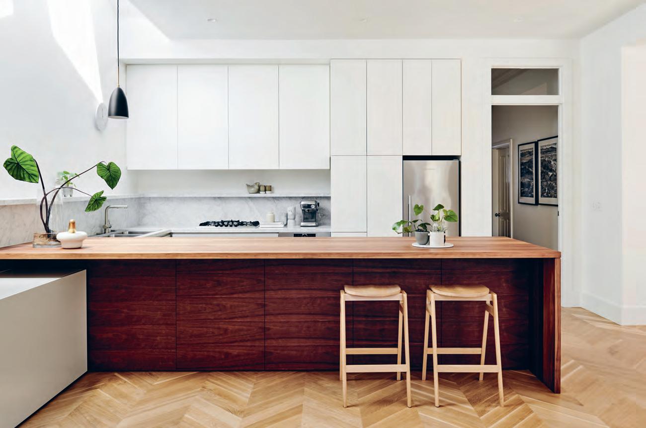
architect Popkorn & Kilpatrick
PoPkorn & k i l Pat rick (61 4) 37 422 202 pipkornkilpatrick.com.au
finishes
European Oak Chevron parquetry flooring. Combination of solid and veneer Australian Blackwood for island bench. Half strength White Duck 2pac for under bench joinery and Natural White 2pac for tall perimeter joinery from Dulux. Honed Carrara marble on benchtop/shelf return. raw brass custom joinery pulls on island bench.
furniture
E rcol Svelto barstools from Temperature Design. Wassily Chair design by Marcel Breuer from Knoll.
lighting
Rubn Arkipelag pendant from Fred International. Deep Star downlights and Boxy ceiling mount canister lights from Inlite.
fiXed & fitted
Neptune double sink with drainer from Franke. Icon kitchen mixer from Astra Walker. Cooktop, oven and dishwasher from Bosch.
artworK
K atarra Butler Napaltjarri through Papunya Tula Artists
previous | pr ahran Kitchen is about contrast and cohesion: lightwood flooring, a dar K- grain island bench, and neutral panelling tie it together. above | n atural and artificial lighting were used in tandem to frame the island bench as a social hub.
Light-wood chevron pattern flooring was contrasted with a dark, grainy wood for the island bench.
issue #40 habitusliving.com
20% more spray force. Twice the amount of skin contact.* The distinctive new shape of Rua, takes geometric styling and softens the appearance with slightly rounded edges for a truly unique and contemporary look.


Experience Aurajet® for yourself at methven.com/aurajet
*Compared to a Methven conventional shower at 7.5L per minute

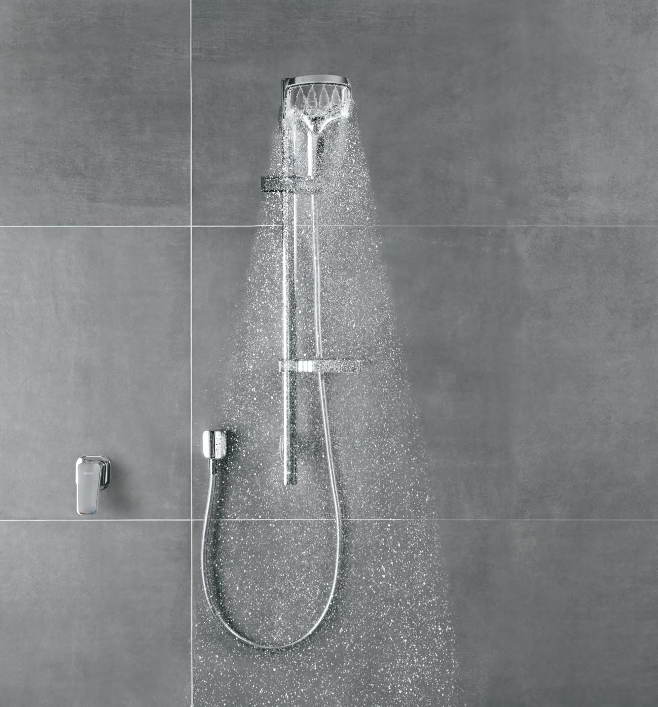
You’re looking at the next generation of showering. Now imagine how it feels.
Beauty laid bare
Taman Desa Kitchen
ARCHITECT Studio Bikin
STUDIO BIKIN (60 3) 2201 8803 studiobikin.com
Belonging to a pâtissier and an interior designer, the brief for this Kuala Lumpur property necessitated something special for the kitchen. The existing property was located in a hilly, 1980s terrace housing development and in desperate need of a total facelift. The result for Taman Desa was a total gutting of the interior, leaving only essential columns and beams as a sketchbook guide to the new build.
The design strategy that worked for the tricky space was an elevation of the public domain of the house – kitchen included – to the first floor with roof rafters intentionally left bare and exposed, and leafy green surroundings from the outdoors visible from the interior.
This rawness in aesthetic is carried over in the use of surfaces and materials in the cooking space, with the bare brick, stone and natural concrete finishes not only offering a cooling effect in face of the Kuala Lumpur heat, but acting as a gentle reminder of the passing of time. Natural growth of the foliage and welcome patina will imbue the space with more charm each year onwards. The design will grow, evolve and nourish its owners, as they do one another.
FINISHES
Polished concrete floor. Polished concrete strips staircase designed by Studio Bikin. Exposed roof trusses and concrete beams. Custom steel doors, windows and handrails designed by Studio Bikin, manufactured by Ming Seng Construction.
FURNITURE
Dining table, chairs and bar stools from Ethnicraft.
LIGHTING
Floor lamps in dining and living area from Artemide. Wireflow hanging lamp by Arik Levy from Vibia.
FIXED & FITTED
Silgranit sink from Blanco. Axor Starck kitchen mixers from Hansgrohe. Built-in microwave & oven, hood and hob from Smeg. Refrigerator from Bosch.
Tex T A ndrew McdonA ld | PhoTo gra Phy Adel A A sk A n dA r
Imprints, patina and a build up of natural growth will imbue this kitchen space by Studio Bikin with increasing character through each passing year.
issue #40 habitusliving.com
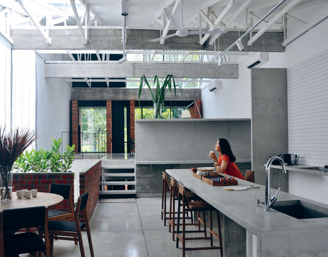
ABOVE | th E p O lish Ed c O n crE tE flO O r A n d BEn ch finish cr E AtE A minim A list y E t E x prEs si V E spAc E f O r th E fA m ily tO thri V E . u nintrusi V E En O u gh tO A llOw f O r fr EE s piritEd c r E Ati O n tO O c cur in th E kitch En , y E t s pEc ificA lly pl Ac Ed tO O ffs E t A n d juxtA p O s E AgA i nst th E n At ur A l g r EEn Ery A n d f O li Ag E O f th E spAc E 3 . kitchens # 103
The design strategy that worked for the tricky space was an elevation of the public domain of the house – kitchen included.
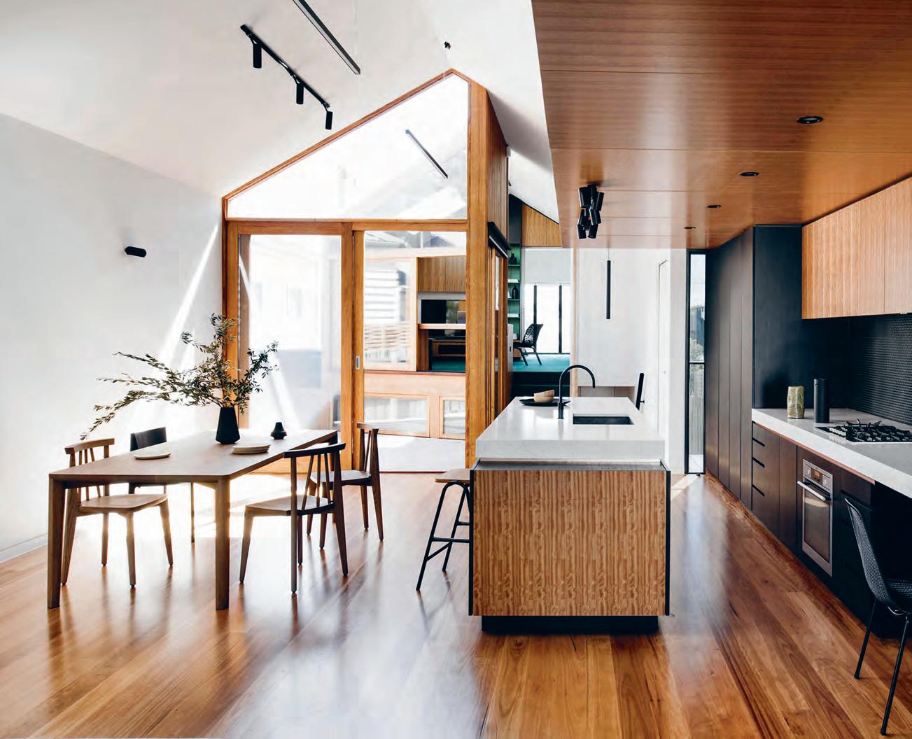
above | eschewing the idea of an isolated kitchen, figR opened up the sightlines of datum h o use kitchen to the b RoadeR inteRioR scheme and beyond to the backyaRd following | pRo gR ammatic nooks aRo und the island bench and wall aRe a take the kitchen thRo ugh a seRies of tR ansitions, inlcuding social hub and study nook. issue #40 habitusliving.com
Transformer The Kitchen
The Datum House kitchen by FIGR is a place for cooking, studying and... sleeping?

It’s 2018 and phones are not just phones; watches are not just watches; and –certainly in the case of Datum House by FIGR – kitchens are no longer just kitchens. In the case of the latter, the clients wanted an ambidextrous space of connection and transition. The result is a kitchen that is primed for cooking, for socialising, for studying and even for sleeping.
Predominantly, FIGR achieved this in inserting a series of programmatic nooks around the island and rear wall-mounted benches. “The client didn’t want just to have a standalone, isolated kitchen. In its long elevation, it doubles as a study nook, daybed, and transforms itself at the end into a TV space,” says FIGR director, Michael Artemenko. On the opposite length, the space wraps around into the “study nook”, a favourite of the kids, who “sit there and draw because they want to be part of the kitchen activity”.
Just as the kitchen design unites its own range of functions, the layout eschews the isolated plans of most homes. Instead of cutting it off from broader activity, FIGR made sure to open up the kitchen’s sightlines to both the interior scheme and the back garden. “When you’re in the kitchen, you look left and you see the house, you look right and you see the house,” says Michael. “There’s also that connection with the outside. The kitchen is celebrated within the house, which is one of the big things we wanted to achieve.”
Tex T K irsty sier | PhoTo gra Phy tom Blachford | sT y ling ruth WelsBy
3 . kitchens # 105
Datum House Kitchen
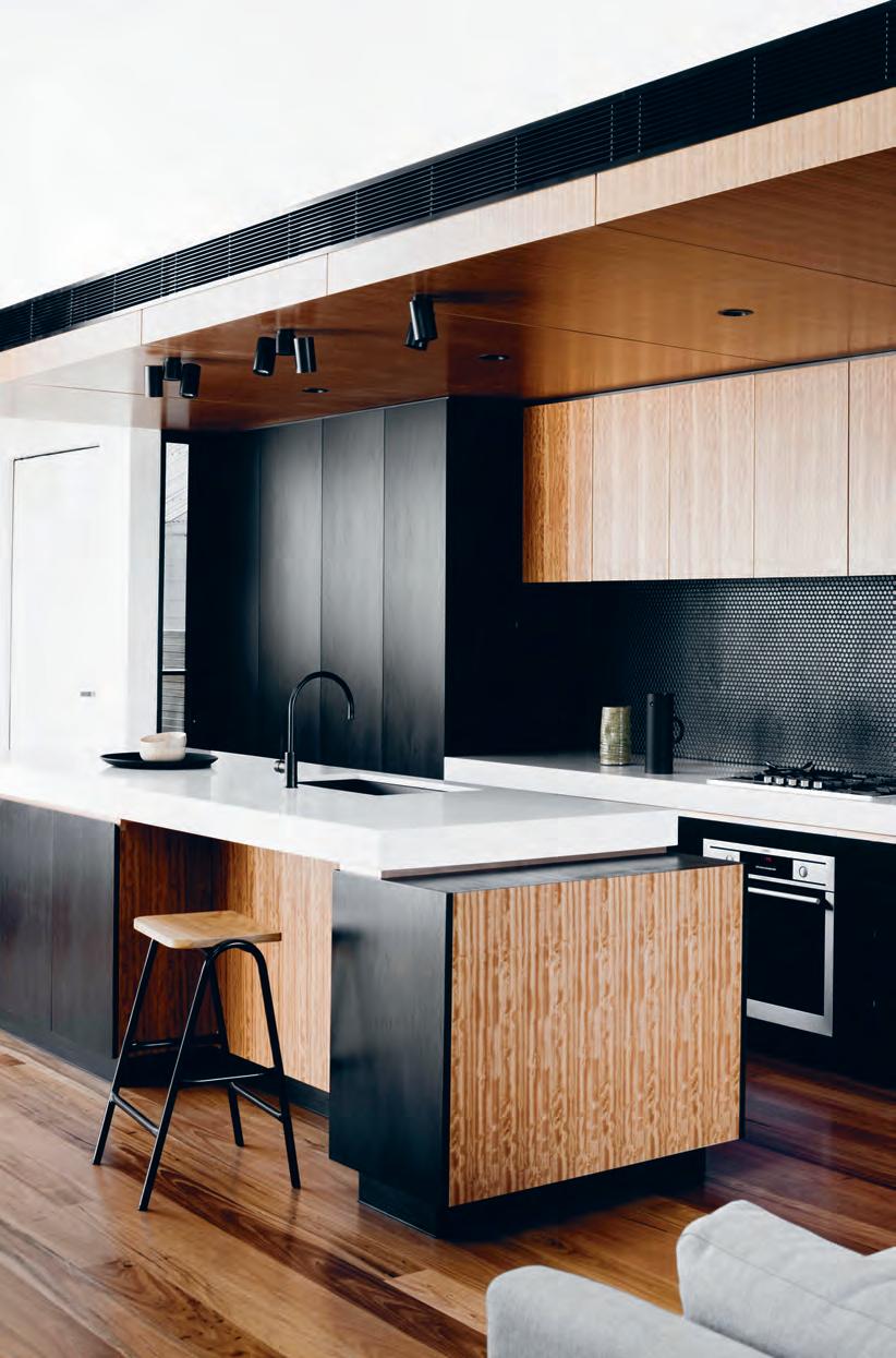
ARCHITECT FIGR
Figr (61 3) 9913 9396 figr.com.au
FURNITURE
Blackbutt flooring with matte polyurethane finish. Blackbutt veneer in matte Osmo finish. Black gloss penny round tiles on splash back from Academy Tiles. Copper strip shadow line reveals. Blum Runners to all drawers. Nougat benches from Caesarstone.
FURNITURE
Island chairs from Dowel Jones.
LIGHTING
Supplied by Tom Dixon, Richmond Lighting, and About Space.
FIXED & FITTED
Appliances from AEG. Plumbing by Reece. Fixtures and fittings from Brodware and Blanco.
issue #40 habitusliving.com
“The client didn’t want just to have a standalone, isolated kitchen.”

Life changing Curves
Sometimes it’s not what’s added to life that makes it richer, but what’s cut out of it. As Brisbane-based architects Vokes and Peters realise.
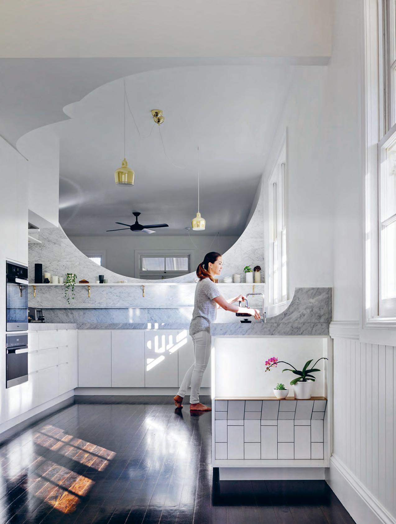
Tex T K irsty
sier | PhoTo gra Phy Christopher FrederiCK Jones
issue #40 habitusliving.com
When Vokes and Peters were brought on board to design the kitchen within Hawthorne House, the scope was very limited. And yet, the resulting kitchen changes the way the whole house is experienced.
Prior to the intervention, the home was dissected by an ill-placed wall: “The wall divided all the living spaces down the middle, so you’re either up front or you’re out back, and there was no visual connection between,” says director Aaron Peters. Instead of an elaborate reconfiguration, the architects decided to cut a crescent-shaped hole through the problem – a subtle decision that ended up driving the aesthetic success of the project.
“It’s a classic arch motif,” says Aaron. “There’s a particular way that an arch seems to frame a view between two spaces that you can’t do with a square; there’s a softness and elegance to it.”
This motif was continued through the material palette, such as with the drooping brass pendant lights, which offset the otherwise neutral colour scheme. “The marble [walls and shelves were] another way we tweaked it to give it a bit of richness,” says Aaron. “Mel and Mark [the residents] have really beautiful taste, so we were aware it would be lovely to have some places where the more treasured and beautiful possessions can live in the kitchen.

“Really, the project was about how a small insertion can help change how [people] live. It’s pretty simple, but I think they’re the sort of things we love to see come out of our projects; humble ideas and a sensitive crafting of spaces to enrich the way people live.”
Hawthorne Kitchen
architect Vokes and Peters
b uilder Robson Constructions
Vokes and Peter s (61 7) 3846 2044 vokesandpeters.com
finishes
P rooftint Traditional Stain in Black Japan on floor from Feast Watson. Wash & Wear
Low Sheen in Whisper White from Dulux. Santosa glazed ceramic tiles. Honed Carrara Marble benchtop from SNB Stone. White melamine board with painted pine edgings, gables and kickboards on door and drawer fronts.
furniture
Pearl solid American oak dining table from Zuster. Tolix Tabouret 45 galvanised steel stools from Thonet.
lighting
Tolomeo Mega Floor Lamp and Tolomeo Table Lamp from Artemide. Artek A330S Golden Bell pendant lamps. Modular Nude PAR30 wall lamp.
fixed & fitted
EC02 ceiling fans from Hunter Pacific. City Stik Kitchen Sink Mixer from Brodware. Centinox Planar 15 stainless-steel kitchen sink from Franke. KM 2334 G Gas Cooktop, H 2661 BP Oven, DG 6200 Built-in
Steam Oven, and G 6100 Semi-integrated dishwasher from Miele. Active Smart Fridge from Fisher and Paykel. Lismore Rangehood LIS 800L-2 from Qasair. Brass shelf brackets from Traditional Hardware Co.
opposite | the
design. above | an
to
storage,
“Humble ideas and a sensitive crafting of spaces enrich the way people live.”
crescent-shaped hole through the existing wall connects the kitchen to the rest of the house and provides a geometric motif that binds the
antidote
concealed
open marble shelving climbs up the walls to provide a home for the occupants’ treasured possessions.
3 . kitchens # 109
Nothing is everything
When a growing Queensland family of five approached local designer Michael Hogg of Hogg&Lamb, their primary goal was to reimagine their existing home as a more “peaceful house”. The resulting brief? To develop a no-fuss, minimalist setting indoors and out – both in aesthetics and functionality.
“The owners are committed minimalists,” says Michael, “and this drove the aesthetic of an elegantly bleached palette and strippedback surfaces.” Nowhere in the house is this more pivotal than in the kitchen, which has been designed specifically to remove any visual distractions from the natural surrounds.
Hogg&Lamb has developed a functional and calm kitchen concept that acts as the heart of the house, giving direct access to a landscaped courtyard and outdoor room.
A continuous 8.5-metre Corian benchtop runs along the back of the room, with a painted brick splashback toplit with natural light
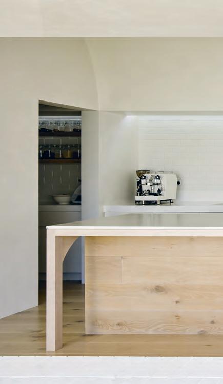
and ventilated by concealed louvre windows. Cupboard handles are removed and all drawers align horizontally. Appliances are contained within a butler’s pantry, leaving the main kitchen space free from clutter and mess.
The removal of superfluous materials led to a focus on “volume as room maker”, says Michael. “A pure barrel vault ceiling, for example, defines the kitchen and dining space as the most significant room in the new house.”
The effect of removing and hiding physical elements or even leaning on non-physical design devices such as natural light is a rather intelligent design approach that ultimately allows a focus on the more profound – when the space is less, it can be more.
Tex T
S
ophia WatSon | PhoTo gra Phy ChriStopher FrederiCk Jone S
Hogg&Lamb master the subtle and precise art of under-designing in Brisbane.
issue #40 habitusliving.com
B&B Residence Kitchen
architect Hogg&Lamb
Hogg&Lamb (61 4) 17 791 825 hoggandlamb.com
finishes
French Oak Travertine flooring. Painted brick and Stucco lime render on wall and ceiling. Glacier White benchtop from Corian. Fresh Concrete island benchtop from Caesarstone. French Oak island bench frame.
furniture
Custom dining table designed by Hogg and Lamb in whitewashed American Oak. Cover Chairs by Muuto, Happy Susto Vases by Jaime Hayon for BD Barcelona, and AC09 Turn Fruit Bowl by e15 from Living Edge.
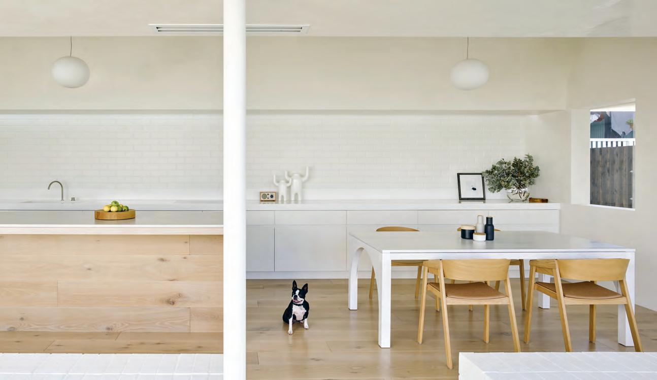
lighting
Glo-Ball pendants by Flos. Laser Blade recessed lighting from iGuzzini.
fixeD & fitteD
Stainless steel mixer from Vola. Custom Corian glacier white sink. Flush induction cooktop in white from Miele.
above | DesigneD to
D
a create a blank
open up to the outD o or areas of the home, the kitchen leans on a minimalist material palette of timber an
white surfaces to
canvas, allowing the interior to transition seamlessly with the exterior an D become more by being less.
When the space is less, it can be more.
3 . kitchens # 111
A Bundle of Joy
Soft, gentle, inviting. The Bundle
The anchor of the living room, it’s hard to overstate the importance of a good sofa. It’s the object that defines the room’s aesthetic and which all others are placed around. Walter Knoll’s new Bundle Sofa – named after the traditional British children’s game bundle where piled up clothes and blankets are leapt into with the shout “buuuuuun-dle!” – is a sofa for modern, comfortable design lovers. The promise of similar childhood happiness is inherent in the new sofa designed by EOOS. Driven by the simple, ingenious idea of soft upholstery resembling a large folded blanket, Bundle is a sofa that unites all the sensorial qualities of a well-designed piece of upholstered furniture. A soft, gentle, comfortable place to not only relax, but admire in the centre of the room.
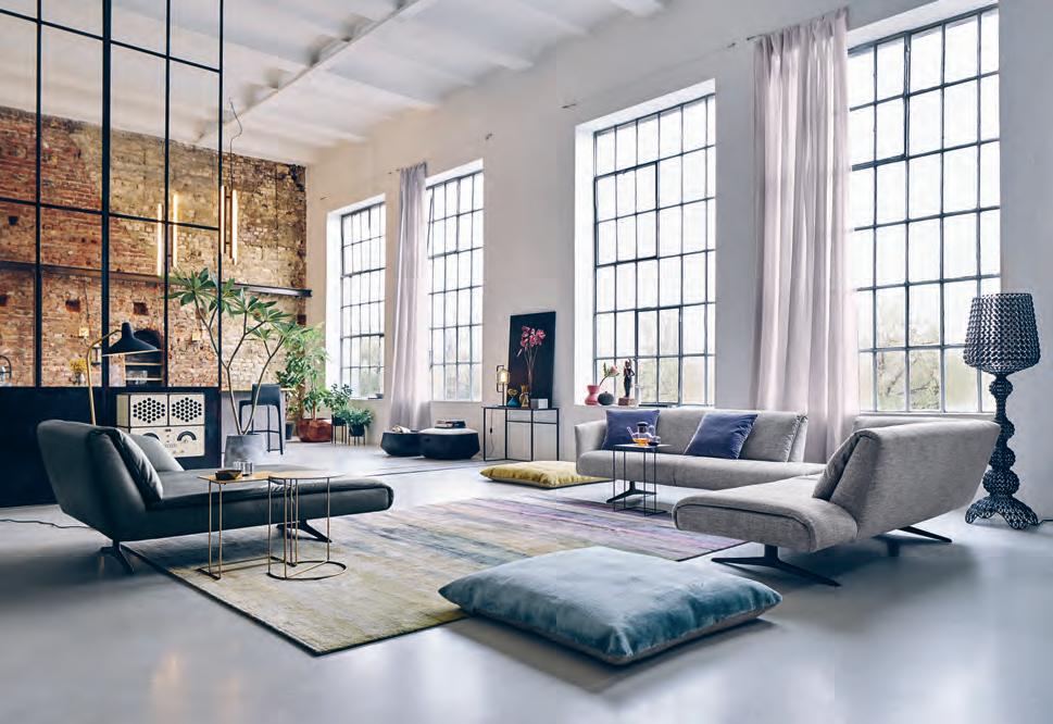
habitus promotion › walter knoll #112 issue #40 habitusliving.com above | b undle sofa designed by eoos for Walter Knoll 2018.
Walter Knoll | walterknoll.de/en
Sofa makes a compelling argument for why the sofa is the most important piece in your living room.
Bathrooms





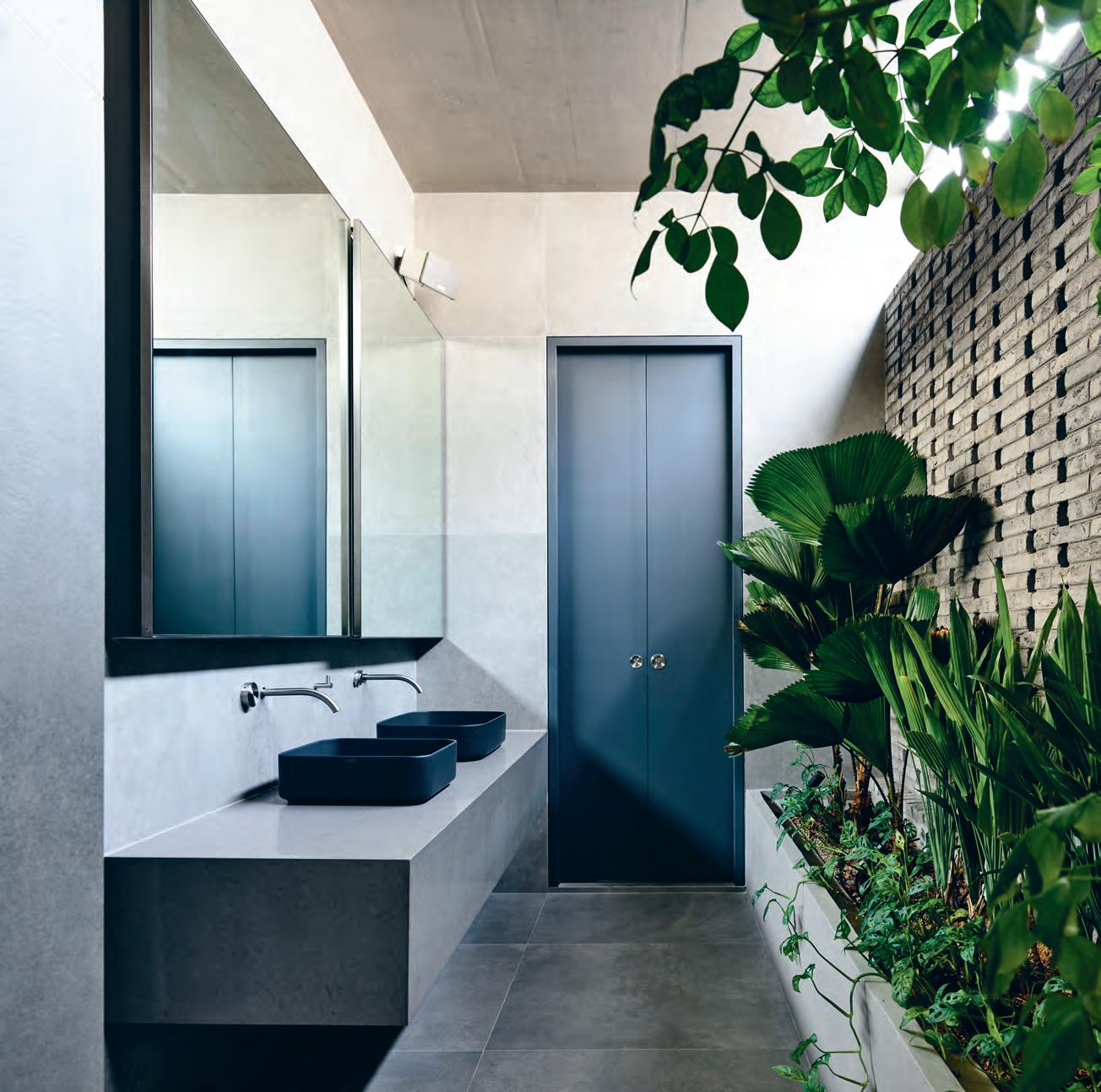
above | The porous, inTerlocking brick wall guards The occupanTs privacy, allowing air To flow in and ouT while reTaining The inward-looking vernacular. lush planTing furTher brings The ouTdoors in. following | a deep baThTub and an crucifix-esque shower column provide luxurious wash opTions wiThin a generous open seT Ting. issue #40 habitusliving.com
residential rainforest
tropics
Living with a major road behind you and a neighbour on one side, it can be hard to find moments of peace and privacy – particularly if you want any kind of outdoor space. So Singaporean architecture firm HYLA Architects created a bathroom where light, space and greenery can all be found within four walls.
Although architect Han Loke Kwang describes the space as “inward-looking and hermetic”, the bathroom is simultaneously porous and sunlit. “Normal windows would have made it quite exposed, so we created openings in the brick that allow air to go in and out but that keep it completely private through the interlocking pattern of three layers of brick,” he says. A dense crop of tropical plants along one side offsets the raw materials with a sense of lushness.

The client’s brief was for a highly functional space – two basins, a bathtub and a shower –but its execution was artful. In a long, narrow space, HYLA has achieved a sense of space through high ceilings, clever storage, and creative coups – such as forgoing an enclosed shower for a column.
“Originally the shower was just to be a regular column, then the client came back and said, There’s no way I’m going to be able to put my shampoo and body wash there, so it became a crucifix shape instead,” says Han. “We joke that showering is like a religious experience.”
Tex T K irsty sier | PhoTo gra
Phy DereK s walwell
Within the lush
of Binchang Rise, Singapore, lies a sea of fine detail at the hands of HYLA Architects.
3 . bathrooms # 115
Surprising Seclusion
ARCHITECT HYLA Architects
HYLA ArcH i tects (65) 6324 2488 hyla.com.sg
FINISHES
Portland RT homogeneous floor and wall tiles. Compressed quartz vanity counter in Oyster from Caesarstone. Wall-side bathtub, soffit above basin, and custom planter box off-form concrete with SKK Cerami Crete sealant. Agora Agaatgrijs, Facebrick perforated side walls from Wienerberger AG.
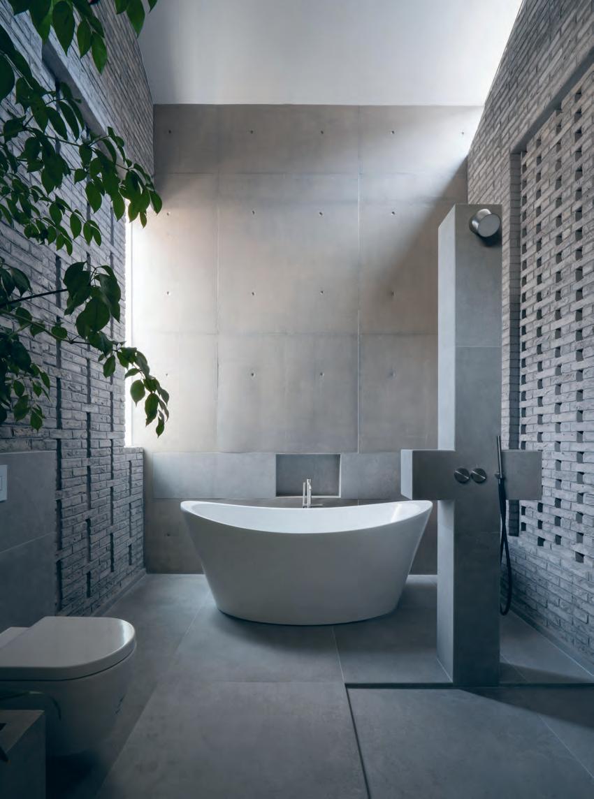
FIXED & FITTED
Shui Comfort basins designed by Paolo d’Arrigo for Cielo. ZIQQ hydroprogressive mixer, ZIQQ head shower and handshower set with hydroprogressive mixer, ZIQQ free standing bath mixer with handshower, Giotto hydroprogressive mixer, and Gitto head shower and handshower set with hydroprogressive mixer all from CEA Design. ME by Starck WC from Duravit. Viega Visign Style12 flush plate in Matt Chrome.
issue #40 habitusliving.com
“We joke that showering is like a religious experience.”

Flamingo rose
This rose coloured bathroom forms part of the extensive renovation by Decus Interiors of a Federation-style home in Lindfield, Sydney, for a family of five.
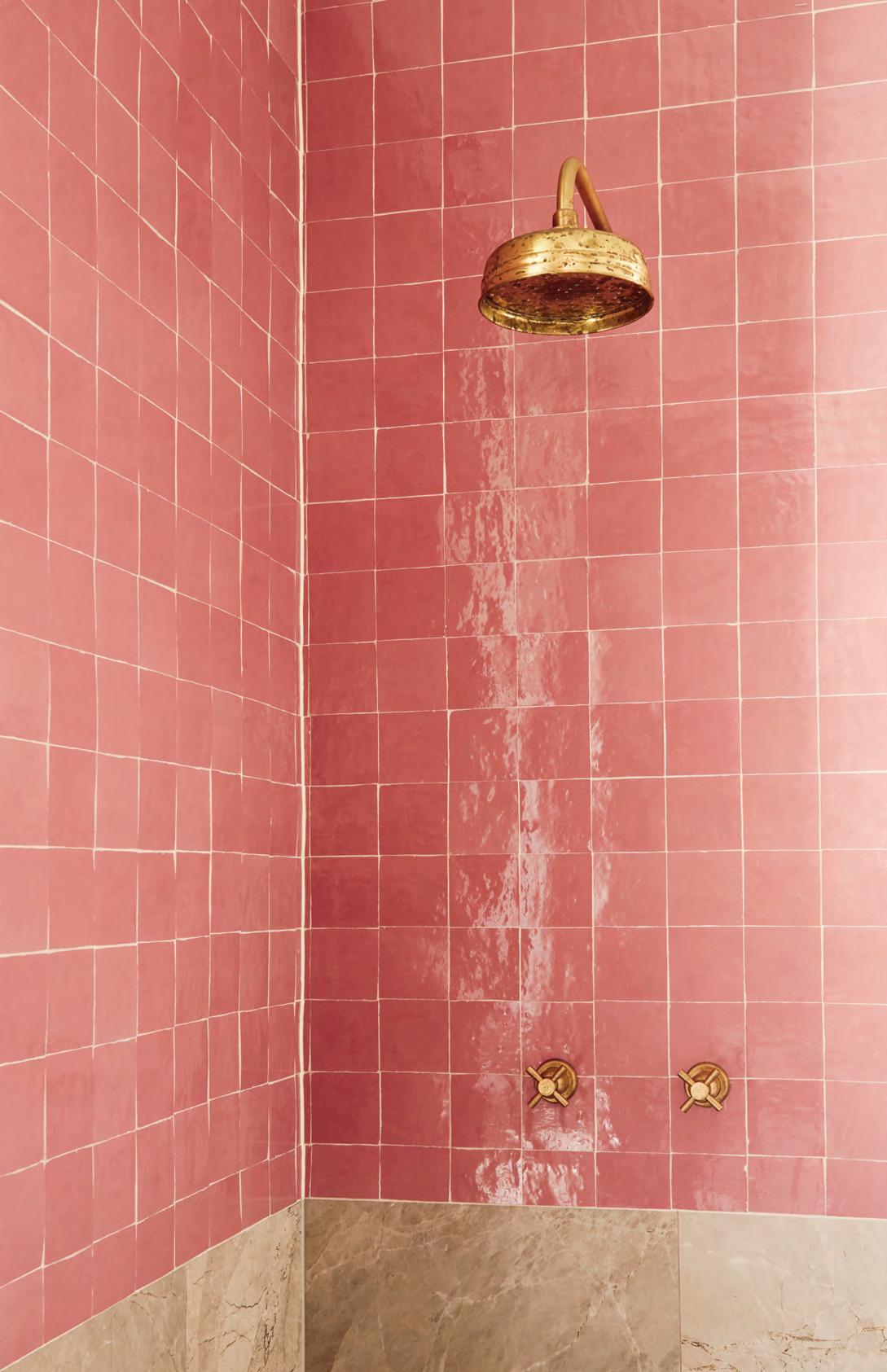
Tex T Elana CastlE | PhoTo gra Phy Pru E rusCoE
issue #40 habitusliving.com
Located within the original portion of a refurbished home for a family of five, interior designers Decus Interiors elected to draw on the property’s architectural history.
“The brief was for the space to have some traditional qualities, however we used contemporary materials,” explains Alexandra Donohoe Church, founder and managing director of Decus Interiors, refering to the use of original timber flooring and traditional brass tapware. “We introduced a pink handmade tile as an element of folly, and designed freestanding joinery with a Calacatta stone top.” The pink textured tile was selected to tie in with the original fireplace mantel in the adjacent bedroom.
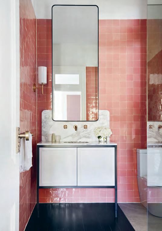
Spatially, the designers were able to create two zones within a tight footprint by dividing the floor into two distinct materials –limestone forming the wet zone.
Texturally, the space is rich and inviting, accentuating the home’s architectural heritage as well as defying the space’s narrow dimensions.
Lindfield Bathroom
ARCHITECT Decus Interiors
Decus Inter Ior s (61 2) 9363 4004 decus.com.au
FINISHES
Ait Manos pink gloss tiles and honed Messina Limestone grey tiles from Onsite. Wall paint in Vivid White from Dulux. Honed Calacatta Borghini stone splashback and vanity top from CDK Stone.
FURNITURE
Custom mirror by Intermain.
LIGHTING
Drunmore single wall sconce by Aerin from Tigger Hall.
FIXED & FITTED
Contemporary three hole basin set with tube spout and crossheads from The English Tapware Company. Classic shower head wall valves by Perrin & Rowe from The English Tapware Company. Custom joinery by Intermain for vanity.
oppoSITE | GLo S Sy pI N k TILES ARE o FFSET by TRADITI o N AL TA p wA RE AND H o N ED LI m ESTo N E IN THE SH ow ER AbovE | A LAy ERED C o mb I NATI o N o F SLEEk CUSTo m jo I NERy by I NTER m A IN H o N ED CA LACATTA AND pERRIN AND Row E TA p wA RE CREATE A SENSE o F DRA m A IN THIS b ATHRo om. 3 . bathrooms # 119
Texturally, the space is rich and inviting, accentuating the home’s architectural heritage.
old home, new tr icks
Living for the future while celebrating the past. MIM Design bridges the divide via this Melbourne residence.
 Tex T Sophia WatSon | PhoTo gra Phy Sharyn CairnS
issue #40 habitusliving.com
There was a strong emphasis on natural curves and fluid forms,” says Miriam Fanning of MIM Design on the brief for the recently completed MLB Bathroom.
This design language is sewn into each moment of the bathroom, which embraces the dynamic form of the architecture through clever design details including an oversized spherical bath, custom-designed semiintegrated basins, sculptural joinery and handmade mosaic wall tiles. The overall colour palette exudes luxury, with soft shades of grey complementing tactile elements throughout.
A calm and cool palette that uses only authentic materials of polished plaster, natural stones and timbers all melt together with the larger interior shapes to express the ultimate nexus between heritage and modernism.
Though ultimately resolved, the design process of blending the varying styles of the exterior architecture with the contemporary interior wasn’t without its challenges. Miriam notes: “The main challenges throughout the design revolved around spatial planning, as we needed to fit a lot into some tricky footprints, specifically the bathrooms which are encompassed by beautiful curved walls as a reference to the old-meets-new exterior and the post-modern interior. The final outcome, however, was the result of a dedicated team of designers and builders with whom we had regular onsite meetings, often over coffees and breakfast, to tactically explore the best and most inventive solutions to guarantee that we met the brief beautifully as well as the needs of the family.”
opposite | th e bathroom was designed to reference the home’s contemporary exterior language on every scale, from narrow floor-to-ceiling mosaic tiling to the soft and edgeless fittings such as the featured a paiser bathtub, basins and tapware. following | n aturally round and fluid shapes blend with a warm brass, cool marble and concrete material palette.
3 . bathrooms # 121
“The main challenges throughout the design revolved around spatial planning.”
MLB Bathroom
ARCHITECT MIM Design
Mi M Design (61 3) 9826 1266 mimdesign.com.au
FINISHES
Portsea grey stone tiles from CDK Stone. Inax mosaic tiles from Artedomus.
LIGHTING
Workstead Orbit wall sconce from Luke Furniture.
FIXED & FITTED
Custom semi-recessed Pool stone basin from Apaiser. Icon wall mixer, Icon shower mixer and Shower Rose from Astra Walker. Lunar stone freestanding bath from Apaiser.
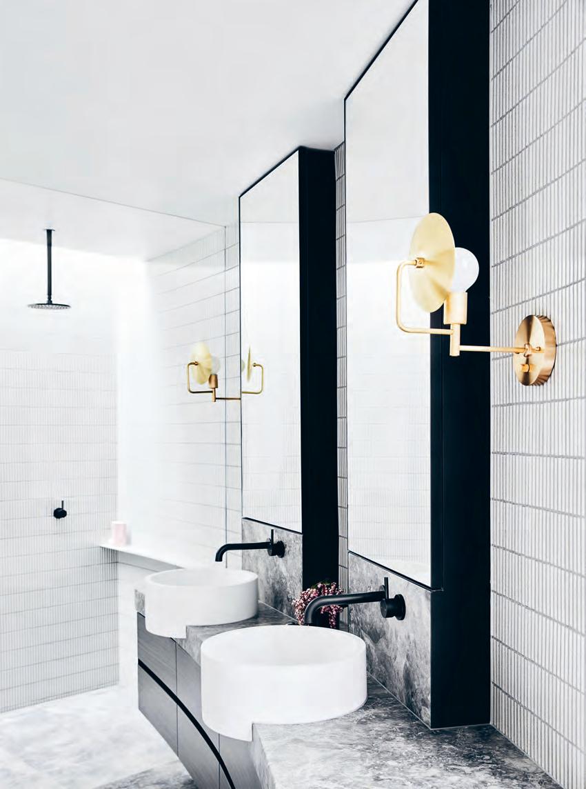
issue #40 habitusliving.com
The overall colour palette exudes luxury, with soft shades of grey complementing tactile elements throughout.
Elevated Luxury
From the very early days, Sub-Zero in particular, had a clear focus on built-in design aesthetics. It was all about a ‘total kitchen concept’ – seamless benches blending into cabinetry — a complete kitchen-look. Although that may not sound out of ordinary by today’s standards, it is when considering that Sub-Zero Wolf was pioneering this back in 50s.
Further to its integration possibilities, both Sub-Zero and Wolf products can be configured in an incredibly wide array of options. From widths and depths to custom panels and even hardware, each piece can be as unique as its owners.
Sub-Zero Wolf is a brand that is synonymous with quality craftsmanship and advanced performance.
Choosing a Sub-Zero Wolf product is more than just selecting an appliance, it’s about long-term performance, durability, craftsmanship and technology – all wrapped up in a well-designed package.
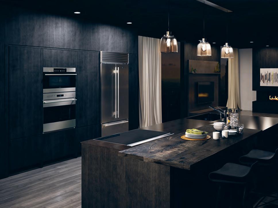
habitus promotion › Sub-Zero Wolf #123 issue #40 habitusliving.com above | Sub-Zero Wolf’ S rangeS blend elegantly to create a holi Stic kitchen experience.
Sub-Zero Wolf | au.subzero-wolf.com
As tools for everyday living, Sub-Zero Wolf brings an elevated luxury to the kitchen. With elegance, quality craftsmanship and bespoke detailing, Sub Zero Wolf’s range of refrigeration and cooking appliances are all made to the exacting standards built into its long-running legacy.
Introducing Stylecraft Rugs
The latest Australian design collaboration for Stylecraft sees the launch of a new range of luxurious, hand-crafted rugs. A statement in design and quality, the five rugs that form the inaugural range have been designed by leading Australian designers (pictured left-right) Keith Melbourne, Tom Skeehan, Ross Gardam, Helen Kontouris and Alexander Lotersztain. The range is diverse in colour, texture and size with each designer drawing on their uniquely individual aesthetic and inspiration.
Designed in Australia, handcrafted in India through TAPPETI Rugs, the handmade collection utilises natural fibres including New Zealand Wool. Handmade processes are used by local artisans for dying the yarn, tufting, binding and finishing.
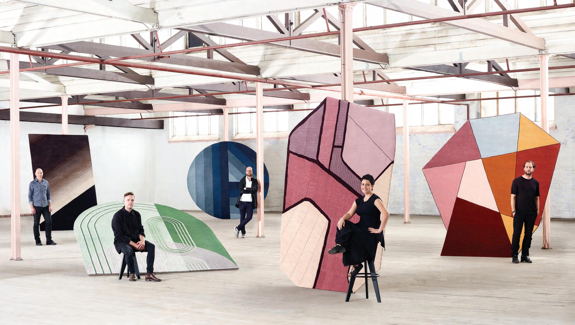

Australia 1300 306 960 stylecraft.com.au Singapore +65 6511 9328
a culinary Canvas
Inside Jason Tan’s east-meets-west Singaporean kitchen, local and international culinary influences sustain the creative streak in the chef’s inventive cuisine.
When it comes to fine dining in Singapore, Corner House – ranked as one of Asia’s 50 Best Restaurants in 2018 – is still somewhat of a novelty, paving the way as one of the few restaurants that infuses traditional Singaporean culinary influences into fine dining. Here, chef and owner Jason Tan transforms familiar ingredients into unexpected fine dining staples using French cooking techniques. Through his menus, one can trace Jason’s local upbringing and work experiences to his travels and arrival at the fully-fledged master chef status that secured Corner House its Michelin star ranking.
It is 3 o’clock on a Saturday afternoon when I enter Corner House, a quiet time between lunch and dinner, and yet the kitchen is abuzz with preparation work. Jason relies on his staff and the compact configuration of his kitchen to maintain the efficiency of the workflow. Having worked in larger kitchens in the past, the chef prefers a tighter kitchen layout to his previous, more spacious work settings, noting that taskoriented adjacencies are everything.
In a similar vein, he ensures that the aspect of reliability comes across in the kitchen design. The chef personally designed and equipped the kitchen to uphold its foolproof façade. “Corner House is set in the midst of Singapore Botanic Gardens so it’s not easy to receive maintenance assistance if anything malfunctions,” he says. “This is the reason
we use both gas and induction hobs by Miele and De Dietrich. They serve as each other’s backups if anything happens.”
As we move around the kitchen, Jason’s multicultural influences expose themselves in the overall layout and setup. A large wok used to prepare some of the dishes on the menu – a distinctly Chinese influence – sits almost side by side with a Giorik salamander, a must have in any French kitchen.
With many of Jason’s dishes revealing his multicultural influences – from flavours to cooking techniques – the chef’s kitchen is his personalised sanctuary where the majority of research and development for new dishes takes place. This is where culinary gems like his signature iteration of the traditional Singapore breakfast, kaya toast, and his tribute to the Cevennes onion (which grew out of a confrontation with his previously strong aversion to the vegetable) materialise and take shape.
“I do most of the experimentation here at the restaurant, after I return from my travels and bring back inspiration from different cultures and local markets,” says Jason. “The kitchen is my playground and I always joke that the frequency with which I change menus at Corner House largely depends on my mood.” Corner
House | cornerhouse.com.sg
Tex T Olha ROmaniuk | PhoTo gra Phy Jambu StudiO S
issue #40 habitusliving.com
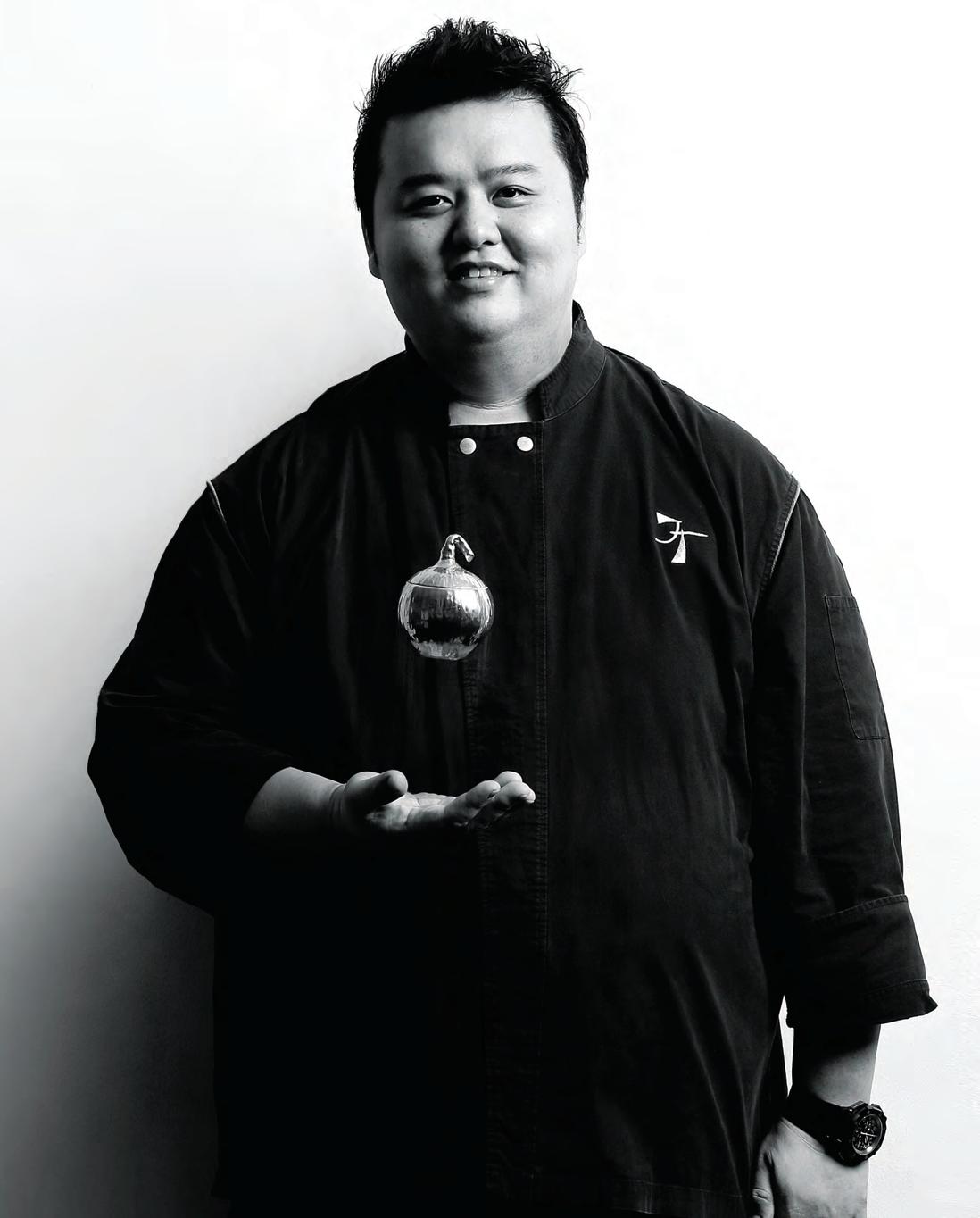
2 . chef series # 127
“The kitchen is my playground.”


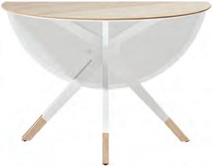
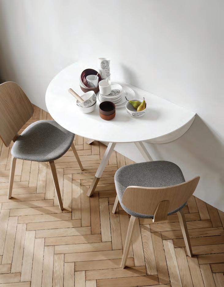

Crows Nest - 575 Pacific Hwy Tel. (02) 9437 0066 Moore Park - Tel. (02) 9697 2886 www.boconcept.com.au
Crows Nest - 575 Pacific Hwy Tel. (02) 9437 0066 Moore Park - Tel. (02) 9697 2886 www.boconcept.com.au
Billund Folding Dining Table + Aarhus Dining Chair - Choose your colour
Billund Folding Dining Table + Aarhus Dining Chair - Choose your colour
The Strength of Age
There’s something undeniably special about the ageing process of stone and metal – the way the materials transform to reveal new colours and textures. In designing though, the time required for this to happen is more of a hindrance t han a blessing. Enter the Industrial collection from Dekton® by Cosentino.
Dekton® is an innovative ultra-compact surface material that offers maximum durability for interior and exterior applications, this flexible material possesses a low water absorptionrate and a high resistance to potentially damaging environmental and physical factors including UV light, fire, heat, thermal shock, stains and abrasion.
The Industrial collection has been designed in collaboration with designer and architect Daniel Germani. Industrial comprises four groundbreaking, urban and ecological colours – the first three colours: Nilium, Radium and Trilium, are based on the look of aged, rusted metals with irregular, organic patterns, giving a hybrid appearance taken from weather-worn and exotic natural stone. While the Orix finish represents the degradation of cement and the biological transformation of stone.
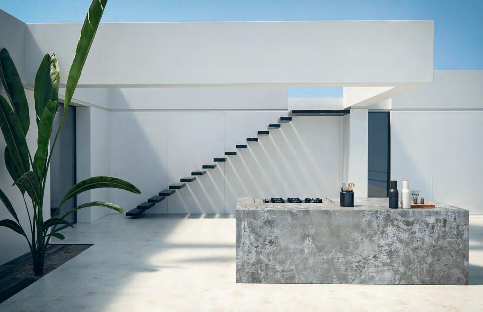
habitus promotion › cosentino #130 issue #40 habitusliving.com
above | Dekton’s InD u strIal ColleCtIon may look ageD, b ut D ue to the sophI stICateD materIal fInI sh, wIll never be olD
Dekton | dekton.com.au
Channeling the natural charm of age worn stone, Dekton unveils the groundbreaking new Industrial collection.
Enter another way of living










Tell her she’s dreaming
Sydney architect Daniel Boddam, care of the very modern Mosman Residence designed and built for a young family of four, showcases the extent to which architecture and design can enhance the way we live.
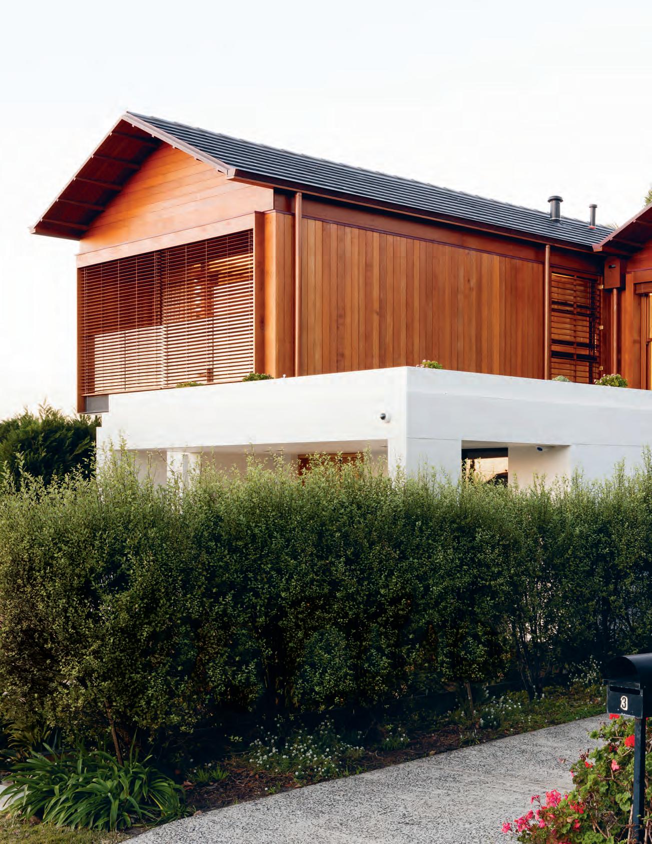
TexT Hol
ly Cunneen | PhoTograPhy Brett Boardman
issue #40 habitusliving.com
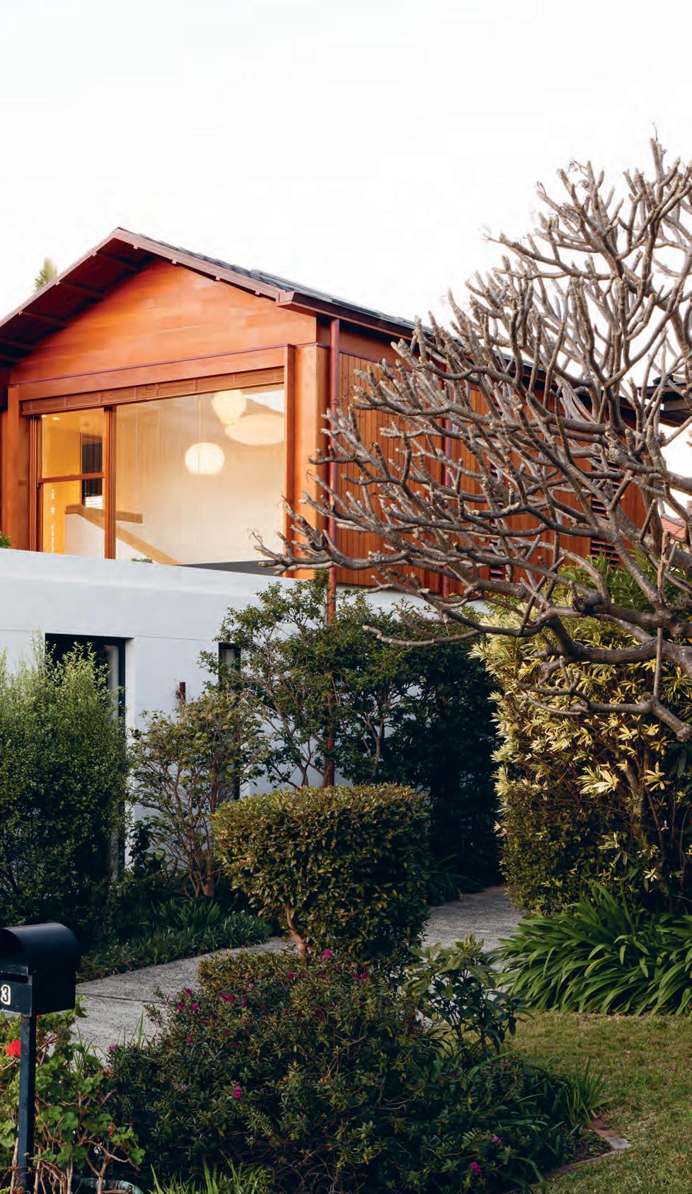
3 . on location # 133
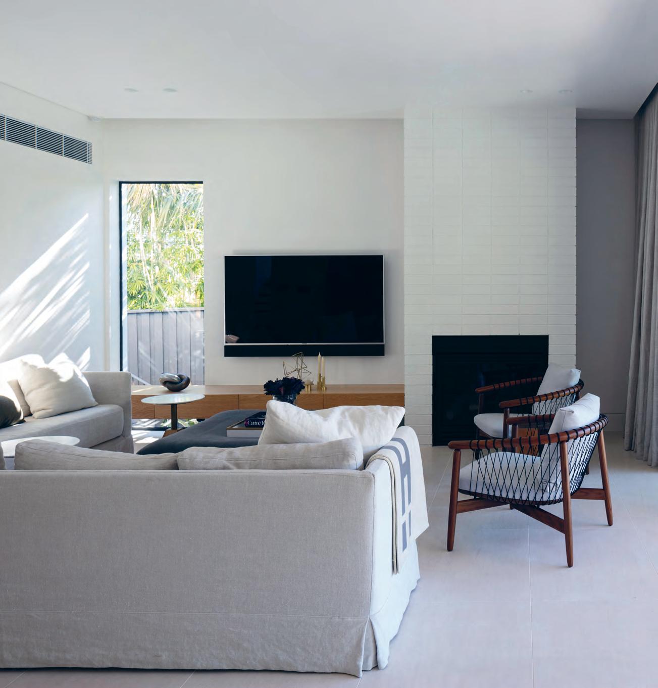
opener | During the renovation an D since completion of m o sman r esi D ence, the entire neighbourhoo D has been supportive an D welcoming of the changing faça D e above | Daniel b o D Da m custom D esigneD the sofas in the living room which sit alongsi D e t wo c rosshatch c h airs by eoos for h erman m i ller. issue #40 habitusliving.com
What’s hard to find but easy to lose? I’m not setting you up for a dad joke, but I might be giving airtime to a tired cliché. The answer is trust. And for Peta, a wife and mother of two young children, that’s exactly what she had with Daniel Boddam: architect, director of his eponymous practice, and someone she’s known since childhood.
Peta, her husband and their two children once lived in an old Californian-style bungalow in Mosman; the same address they’d held for five years prior to the recent renovation. But it was small and didn’t feel suited to the Australian climate – an absence that’s only exaggerated when living in such close proximity to the ocean. After deciding that action needed to be taken, Peta and Tyson considered their options: to renovate, knock down, or buy anew. “We spent six months looking around and nothing fit what we had in had in our minds,” says Peta in consideration of the latter. “That was when we approached Daniel. I knew his work, his design capabilities [and] I wanted someone I could 100 per cent trust.”
As tends to be the case with the majority of briefs given to architects, Peta’s was two-fold. There were elements that were architecturally and function-based: a home marked by plenty of natural light, seamless indoor-outdoor transitions, generous open spaces, passive yet effective heating and cooling options, and high-tech automation. The latter of which in fact was championed by Tyson, who works in the field of IT Security.
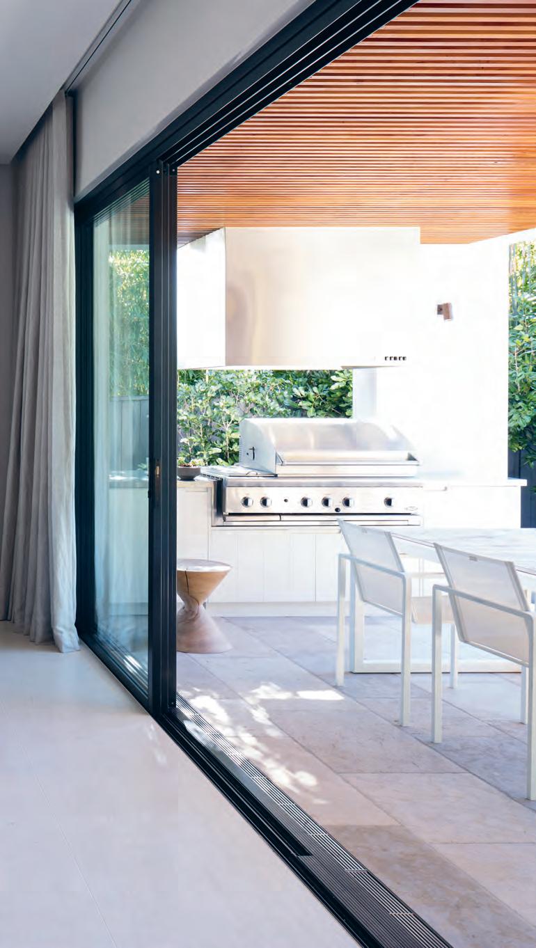
# 135 3 . on location
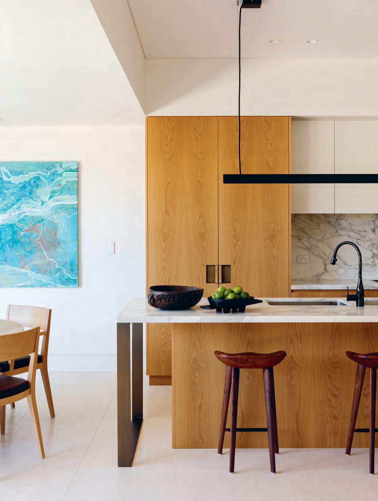
issue #40 habitusliving.com
But there were also elements of the brief that were harder to define, elements which played a subjective role in shaping the family’s experience of the residence. The desire for a house heralded by modern design without appearing sterile or unliveable, for one. A home that’s warm, comfortable and easy to live in for a young couple with two young children. And, less tangibly, one that brings what Daniel calls “a slight tropical flavour” to Sydney’s lower-north shore. “We wanted it to feel like we were on holidays at home. We wanted to be in Honolulu in Mosman,” says Peta.
Year-round, Mosman Residence is a great example of how you can use architecture to enhance the natural climate, playing to its strengths rather than against them. With solar panels and Tesla batteries, on a really hot summer’s day the house has the capacity to run completely off-grid. And in a location predisposed to a constant breeze and architecture that encourages it to run throughout the house, this means that even during the height of summer the air conditioner is rarely used.
Once dreaded by Peta, the cooler months are now a non-event. Hydronic underfloor heating works with a naturally insulated floor plan to create almost all of what’s needed to keep the house warm during winter.
opposite | th e entire house is an exercise in consistency. ca lcutta stone has been used for the kitchen benchtop and again for the splashback while the metal work, which features predominantly in the kitchen, is consistent in tone and style throughout the house.
3 . on location # 137
On a really hot summer’s day the house has the capacity to run completely on solar.
For all the rooms Daniel has fit into this single site – four bedrooms; four bathrooms; a spacious open-plan kitchen, dining and living area; outdoor dining area; media room; study; laundry and den across three levels – Mosman Residence is an exercise in consistency. The colour palette, metalwork, furniture (much of which is from Daniel’s own Monument collection) and custom joinery all communicate. “It’s about the consistency of an idea and [how to] roll that out. It’s streamlined, elegant and simple,” he says.
Despite the stunning interior spaces, it’s the exterior detailing that holds the heart of architect and children alike – the two toughest critics. The beach might be a five-minute walk down the hill, but Peta and Tyson’s children love the pool. They’ve not had one before and love having their friends over to play. The glass walls that form the rear boundaries of the residence slide seamlessly back while the sandstone ledge doubles as additional seating to oversee the kids or when entertaining a garden full of guests.
opposite | th e dining
and
living zones extend to the outdoor spaces. When the sun is strong sheer curtains can be pulled across to diffuse the light – leaving the glass doors opened or closed.
“The crafted timber pavilions re-interpret the existing California Bungalow which everyone really loves. I wanted to draw on that spirit, but in a modern way.”
issue #40 habitusliving.com
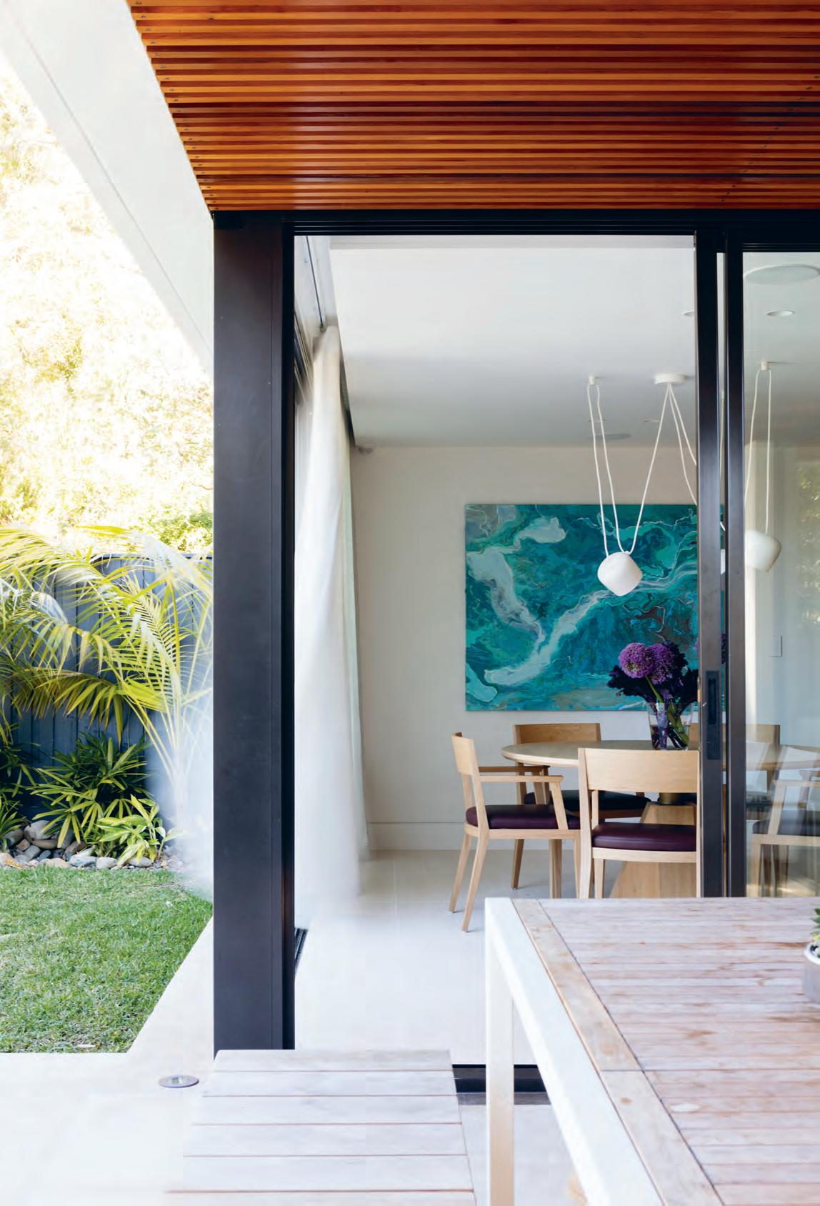
3 . on location # 139
ABOVE | PLANS. OPPOSITE ABOVE LEFT | MADE OF LIMESTONE, THIS IS ONE OF DANIEL’S FAVOURITE STAIRCASES. OPPOSITE ABOVE RIGHT & OPPOSITE BELOW LEFT | EVERY MORNING PETA ENJOYS THE VIEW DOWN TO BALMORAL BEACH FROM THE MASTER BEDROOM. OPPOSITE BELOW RIGHT | THE RESIDENTS TOOK THE OPPORTUNITY TO GIVE EACH BEDROOM A PRIVATE ENSUITE. FIRST FLOOR BASEMENT GROUND FLOOR ENTRY STUDY BATHROOM KITCHEN DINING GARDEN POOL OUTDOOR DINING 1 2 3 4 5 6 7 8 e e r t t y u u i i o p d s a q w 0 9 8 7 2 3 4 5 6 1 LIVING ROOM LAUNDRY GUEST ROOM MEDIA ROOM GREEN ROOF MASTER BEDROOM BALCONY WALK-IN-ROBE 9 0 q w e r t y u i o p a s d ENSUITE BEDROOM GARAGE LOBBY / CELLAR COMMS ROOM WATER TANK PLANT u issue #40 habitusliving.com
Mosman Residence is a great example of how you can use architecture to enhance the natural climate, playing to its strengths rather than against them.
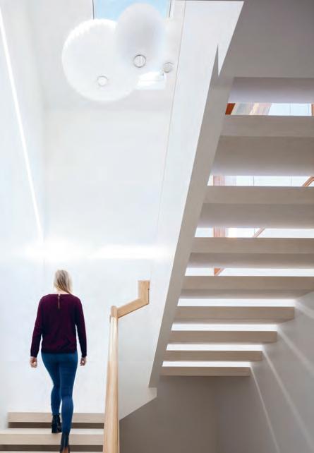
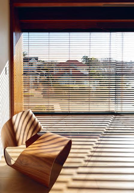
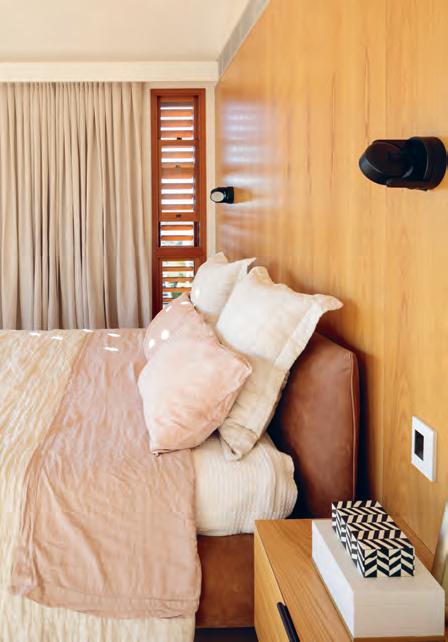
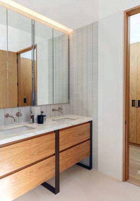
3 . on location # 141
As for Daniel, the timber battens and glass skylights on the roof above the rear outdoor dining area are his favourite details. He likens the effect to standing beneath a tree canopy. These features continue upwards and around the residence to form the basis of the greater exterior façade.
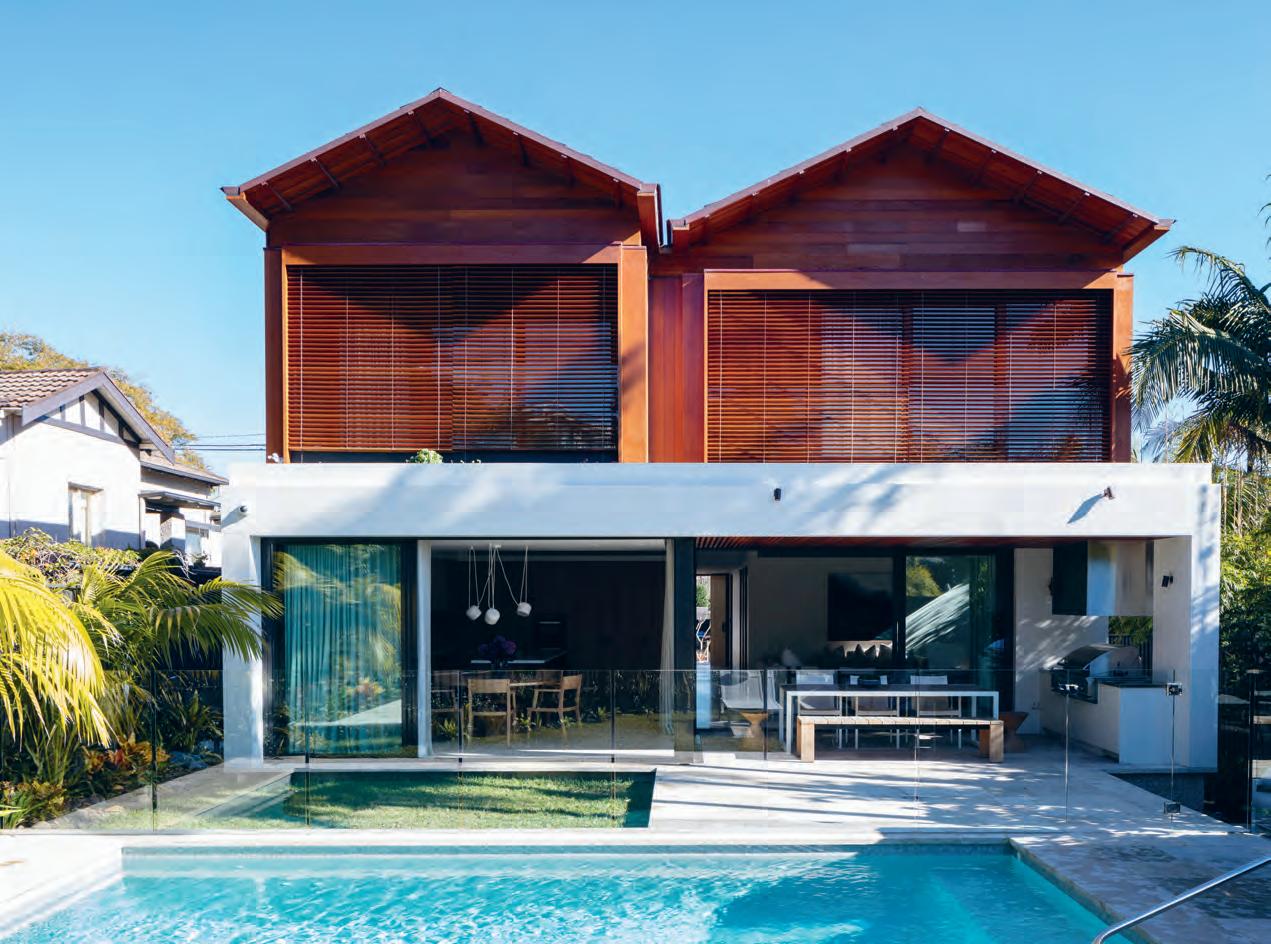
“The crafted timber pavilions re-interpret the existing Californian Bungalow style which everyone really loves,” he says. “I wanted to draw on that spirit, but in a modern way. It was a real play of timber craftsmanship and horizontality [against] the white solid podium.”
After such a long process – three years start to finish – there are times, of course, when it seems a little too good to be true. During the build the family occupied a few different rental houses, so, despite the fact they moved back home towards the end of 2016, sometimes they forget that this is home now. “You sort of have to pinch yourself,” says Peta. “This beautiful home is yours.”
previous | The T wo children love Th e pool, having never lived wiTh o ne before. Th ey of Ten inviTe Th eir friends over To play.
issue #40 habitusliving.com
Progress in the ser vice of ma nkind
For years, homemakers around the world have turned to Siemens for constant, reliable support in the living space.
For most of us, what we want from our appliances is simple: reliable, fuss-free performance that delivers every time. Few understand this as well as Siemens, who have supported generations of homemakers around the world in their day-today cooking and living. As Roberto Finamore, Senior Brand & Communications Manager of Siemens and NEFF explains, “With Siemens products there are no unnecessary flourishes or design elements for their own sake. Excellent design works toward achieving outstanding functionality, not alongside it.”
True to its German roots, Siemens maintains a practical, pragmatic approach that draws heavily from the Bauhaus ethos of ‘form follows function’. “There is something delightfully functional about German design…” said Roberto, “If we talk about aesthetics from an objective point of view – the understated elements, the linear perfection, the preference for overall harmony over standout forms – these are all trademarks of German design you’ll clearly find in Siemens products.” This strong brand identity has won Siemens admirers around the world: look around any well-designed living space and a Siemens appliance is sure to be close at hand.
A large part of Siemens’ enduring universal appeal lies in its democratic spirit. At the core of Siemens’ mission is a desire to improve people’s lives in as many homes as possible by making cutting edge technology accessible to everyone. Siemens appliances never fail to serve their user in whatever task they are undertaking – whether this is cooking, cleaning, or entertaining – seamlessly bridging the gap between functionality and design while giving the user complete control. “The smart home is a development area that Siemens is making great strides in, and this will accelerate over the next several years,” said Roberto, “But the pursuit of automation and intelligent machinery has always been in the Siemens DNA.”
In keeping with this, Siemens harnesses intelligent, contemporary technology to simplify complex and time consuming tasks. Whether this might mean cooking the perfect roast in half the time, or even the possibility to remove odours from delicate items at home without washing, Siemens helps you fit more into your day by making the everyday easier.
habitus promotion › siemens #143 issue #40 habitusliving.com
above | Siemen S h ome applianceS in Spire with architectural deSign, engineering excellence, trendSetting innovation S and unmatched flexibility.
SiemenS | siemens-home.bsh-group.com

issue #40 habitusliving.com
In Living Colour
Step inside a one-of-a-kind kaleidoscope home in Melbourne’s east: an exceptional Modernist house for a creative family of five reimagined in vivid detail by WOWOWA Architecture.
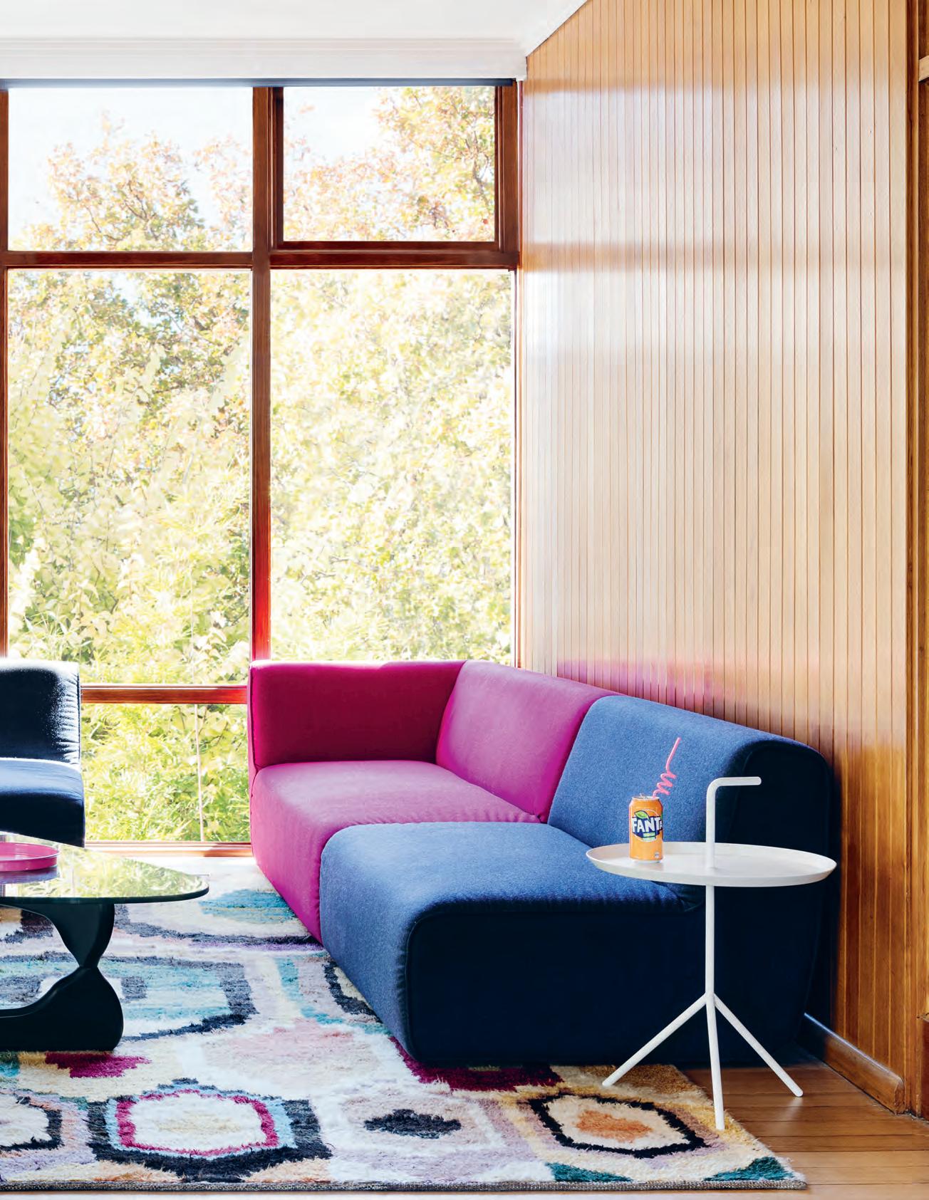
TexT S andra Tan | PhoTograPhy MarTina GeM Mola | sTyling ruTh W e Sby
3 . on location # 145
On a sprawling, leafy property in Balwyn North, Melbourne, stands a delightfully unconventional house. From the street, its 1960s brick exterior and distinctive windows give only a subtle clue to its modish inner life. The driveway slopes down to a discreet glazed door: the entrance to Paulina and Chris’ polychrome home.
Having lived in the house for some time, the pair decided a renovation was necessary to better accommodate their three young children and reflect their love of entertaining. Paulina first came across WOWOWA Architecture, a Melbourne-based studio, years ago in an article on emerging architects, while Chris had spotted the practice independently online. The decision to approach them felt natural.
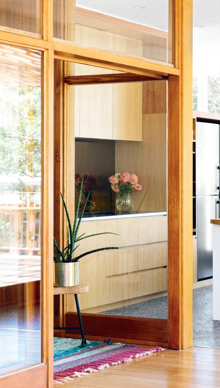
“We had a bit of a vision – I wanted colour everywhere, and we both knew how we’d like it to function. But we left the rest to Mon and Scott,” says Paulina, referring to Monique and Scott Woodward, partners and practice directors at WOWOWA.
A plan was developed to redistribute internal spaces to better suit modern family life, with a design that would remain sensitive to the home’s original aesthetic. The bones of the existing building were left largely intact.
“For us it was about working with the quirks of the original house, finding ways to celebrate what was here,” says Monique.
The unique positioning of the two-storey structure on the inclined site, as well as the removal of outdated heating and cooling units, made it possible to extract incidental pockets of space throughout the home. This strategy shows in the shelving unit built into the cavity of the small entertainment room at the ground floor.
issue #40 habitusliving.com

opener |
3 . on location # 147
Brick and timBer panelled walls form a warm, rich neutral Backdrop to the home's lively palette. aBove | the kitchen and dining area forms the airy, open huB of the home, with access to the outdoor terrace.
“In the summer that room is naturally cool, being under the main house, so you automatically want to spend time there,” says Paulina. “And in the winter, it’s just so cosy.” Ahead of the second television’s arrival in the main living area, this comfortingly insular space, initially meant as a kid’s retreat, is where the family converge most evenings.
“It’s always nice to find that clients occupy the space in ways we wouldn’t have expected,” quips Monique.
Further along the ground floor is the master bedroom, an exceedingly sumptuous space lined in original timber panelling. Here, every detail – from the brass closet handles sourced by Paulina from the U.S. to the vintage robe doubling as a bedhead and storage unit – oozes plush indulgence. Particularly so the deeply saturated, salaciously pink wool carpet.
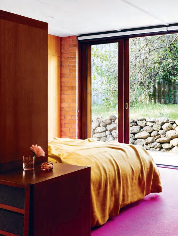
The unapologetic hue is one of five specific colours Paulina had in mind for her new home; alongside yellow, blue, green and orange. These appear on brightly painted doors, in the ambient glow of feature lighting, and on the floor of every carpeted room, bar one: the household’s eldest daughter opted for grey. Both the master ensuite and the upper floor bathrooms, where most all these colours converge, are a kaleidoscopic treat.
Heading upstairs, the transition between floors is a gradual ascension into a more open, extroverted space. In the light-filled meals area, a prime corner position once taken up by the laundry, the brass-clad island bench echoes the gleam of the tinted mirror splashback.
Under a row of Kartell FL/Y pendant lights, a wide timber island benchtop emits a warm tactility, with space enough for table settings either side of a whole spit roast – an important detail for the party-ready GreekAustralian family. The curved motif on the bench’s side profile was inspired by the shape of lamb chops, and, in a finely-executed flourish, this curve also defines the cavity carved out underneath the bench.
above | a plush,
|
details
light-filled master bedroom inhabits the old leftover space used for parties. opposite
colourful
punctuate the entire home with vibrant personality.
“We had a bit of a vision — I wanted colour everywhere, and we both knew how we’d like [the house] to function.”
issue #40 habitusliving.com
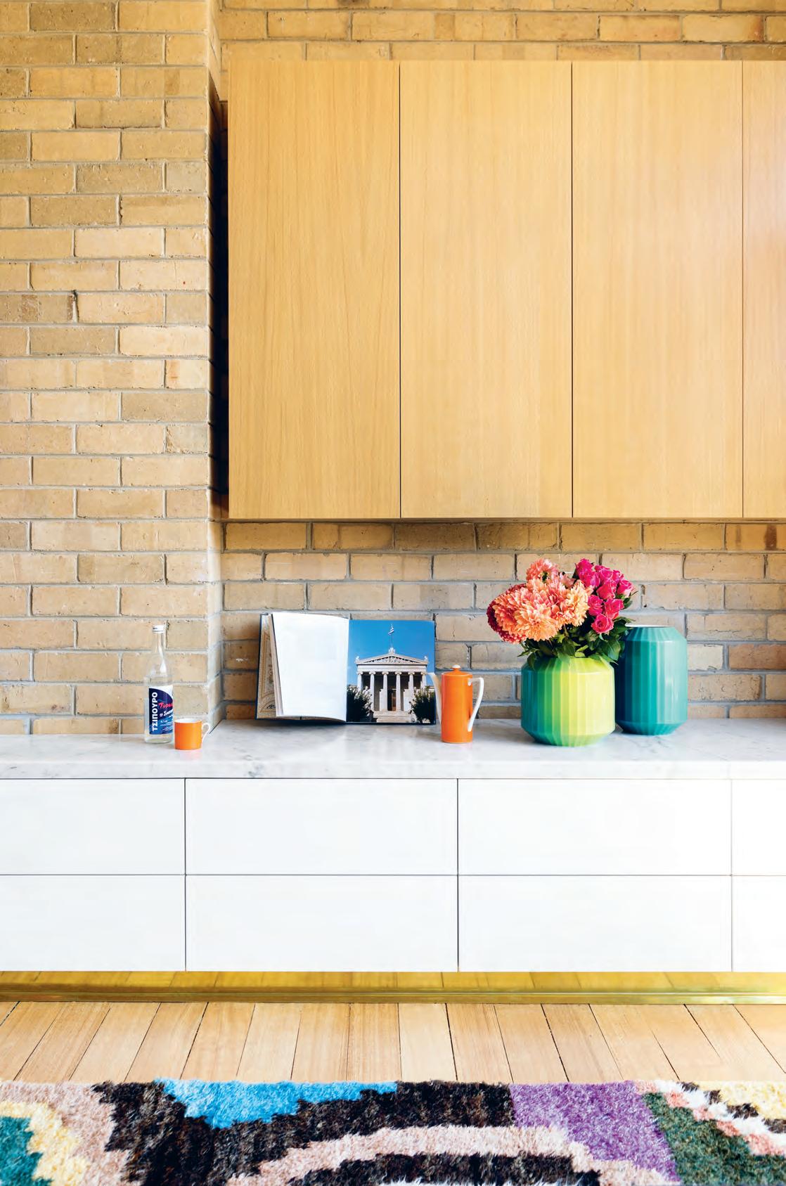
3 . on location # 149
issue #40 habitusliving.com
FIRST FLOOR
ENTRY
LAUNDRY
w w 0
w e r t y u i
q
RUMPUS
STORE ROOM
STUDIO
MASTER BEDROOM
ENSUITE
CAR PORT
UNDER CROFT
LOWER DECK
BATHTOOM
BEDROOM
LIVING ROOM
DINING
SITTING ROOM
5 6
4 4
2 3 1
1 2 3 4 5 6 7 8 9 0 q w e r t y u i 7 8 9 0
KITCHEN
PANTRY
UPPER DECK GROUND FLOOR
The kitchen joinery cleverly conceals a butler’s pantry, featuring a wide sink and long bench, ending in a compact desktop workstation. Large glazed windows span the length of this secret space, looking out onto the street below. The beauty of having the kitchen cabinetry built low is that the kitchen beyond has unobstructed access to this peripheral natural light. “And the family has privacy from the street as well, so it was really a two-pronged solution,” says Monique.
In the living area, simplicity was key. To make way for the repositioned dining table, it became necessary to compress the original lounge area slightly, though its generous new couches suggest the proportions of a much larger space.
Outdoors on the deck, stepped platforms lead down to a huge backyard, shaded over by gorgeous gums. Ample space to continue the interior colour scheme? “I’m trying to convince Chris to paint the old lemon tree hot pink, but he won’t let me!” laughs Paulina.

opposite | plans. above | Riotous block colouR in both the
and uppeR flooR
the
of pastel teRR a zzo tiles,
by the mateRial language of gReece.
ensuite
bathRooms aRe tempeRed by
soft subtlety
inspiRed
3 . on location # 151
“The steps were designed to provide different tiered spaces for people to hang out,” Monique explains. An additional brick wall ties the renovation to the original cladding and enforces WOWOWA’s overall strategy of creating opportunistic spaces in and around the old structure. The resulting cavity provides storage and an undercover area where outdoor parties might gravitate in inclement weather.
At this vantage point below the house, the flowing nature of the building becomes fully apparent. From its central staircase to the sprawling deck and terrace, the design encourages circulation around, underneath and through the property.
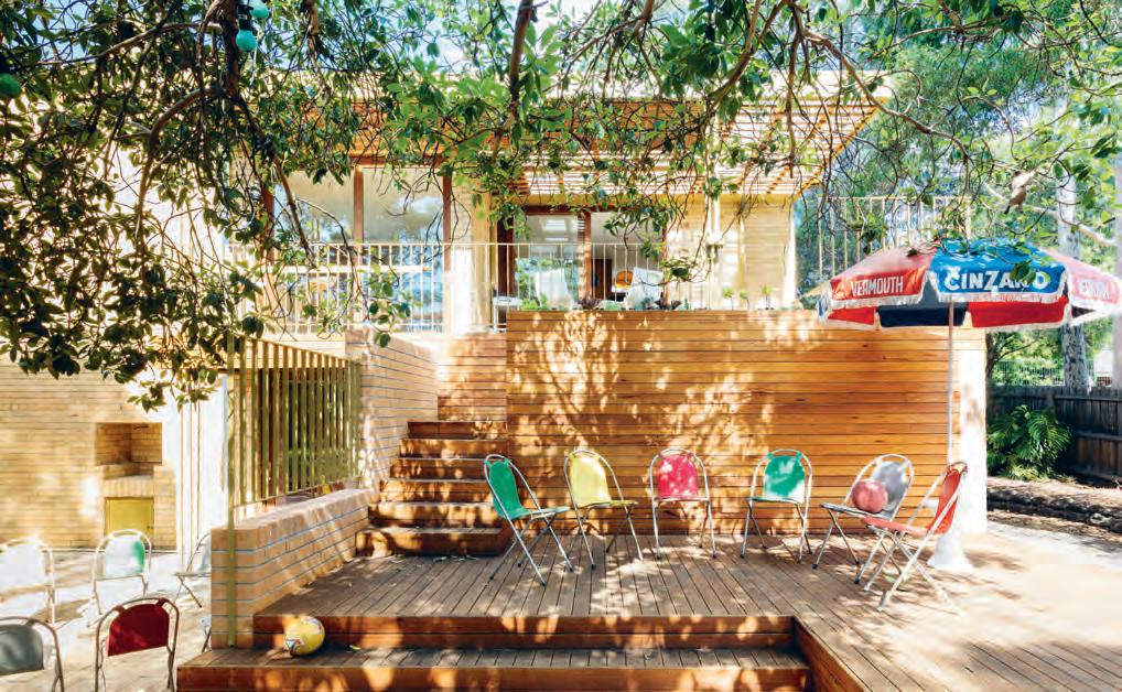
“In referencing the era, we were conscious of designing a home that was very much its own space,” says Monique. “We didn’t want it to be kitsch, or feel nostalgic in a way that was pastiche. Just optimistic.”
“It was important for us to stay true to that style, and we worked together to get the best result,” says Paulina. “It’s just a joy to live in, and so comfortable. We love it.”
Above | The new design provides A vArieT y of zones for The fAmily To spill ouT To during regul Ar gATherings in Their spr Awling bAckyArd.
issue #40 habitusliving.com
“In referencing the era, we were conscious of designing a home that was very much its own space.”
Let Inspiration find you
Putting pen to paper and articulating your ideas is much easier said than done. This is especially so in the case of architecture and interior design. In discussion with Rogerseller design consultant Daniel, architect Feras Raffoul of FGR Architects, and Northcote Home resident Damien, we’ve been able to identify a few key considerations as part their recent collaboration.
Make your individual way of life the focus
Consider the memorable places you have visited on holiday, or a favourite restaurant, hotel or room in an old house – how can you bring a little of that story into the context of your home?
The clothes maketh the space
We all have one outfit that makes us feel we could conquer the world. So, ask yourself – what it is about it that makes it so enjoyable? Transferring these design cues onto interior spaces will offer insight into one’s visual preferences.
Refine your social media skills
Seek out relevant hashtags such as #bathroomdesign or #interiors to find inspiration specific to your needs. Likewise use social media strategically, connect with architects, designers and brands that align with your design values through their social media channels.
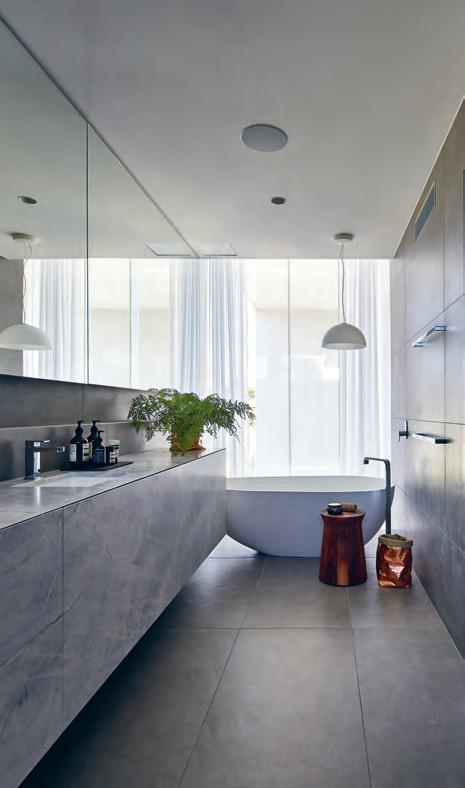
Talk to someone about it
With an in-house design and consultation team on board, Rogerseller has helped navigate many a project from concept to completion.
T he team at Rogerseller pride themselves on an unwavering availability to give insight into their latest product launches. Channel that newfound inspiration with a conversation.
habitus promotion › Rogerseller #153 issue #40 habitusliving.com above | Northcote h ome, victoria. architecture aNd desigN by Fgr architects, bathware by ro gerseller, PhotograPhy by Peter b eNNetts
Rogerseller | rogerseller.com.au/portfolio
Creating a moodboard certainly helps in getting the creative juices to flow, but understanding your own personal taste should be the first step in the design process.

IGH PERFORMANCE
FARAGE.COM.AU
H
SUITS
The Porous
Room
Away from the commercial pressure of high-yield architecture, Formwerkz Architects revisits the laid-back charms of living and socialising out of a box in the tropics of Johor Bahru, Malaysia.
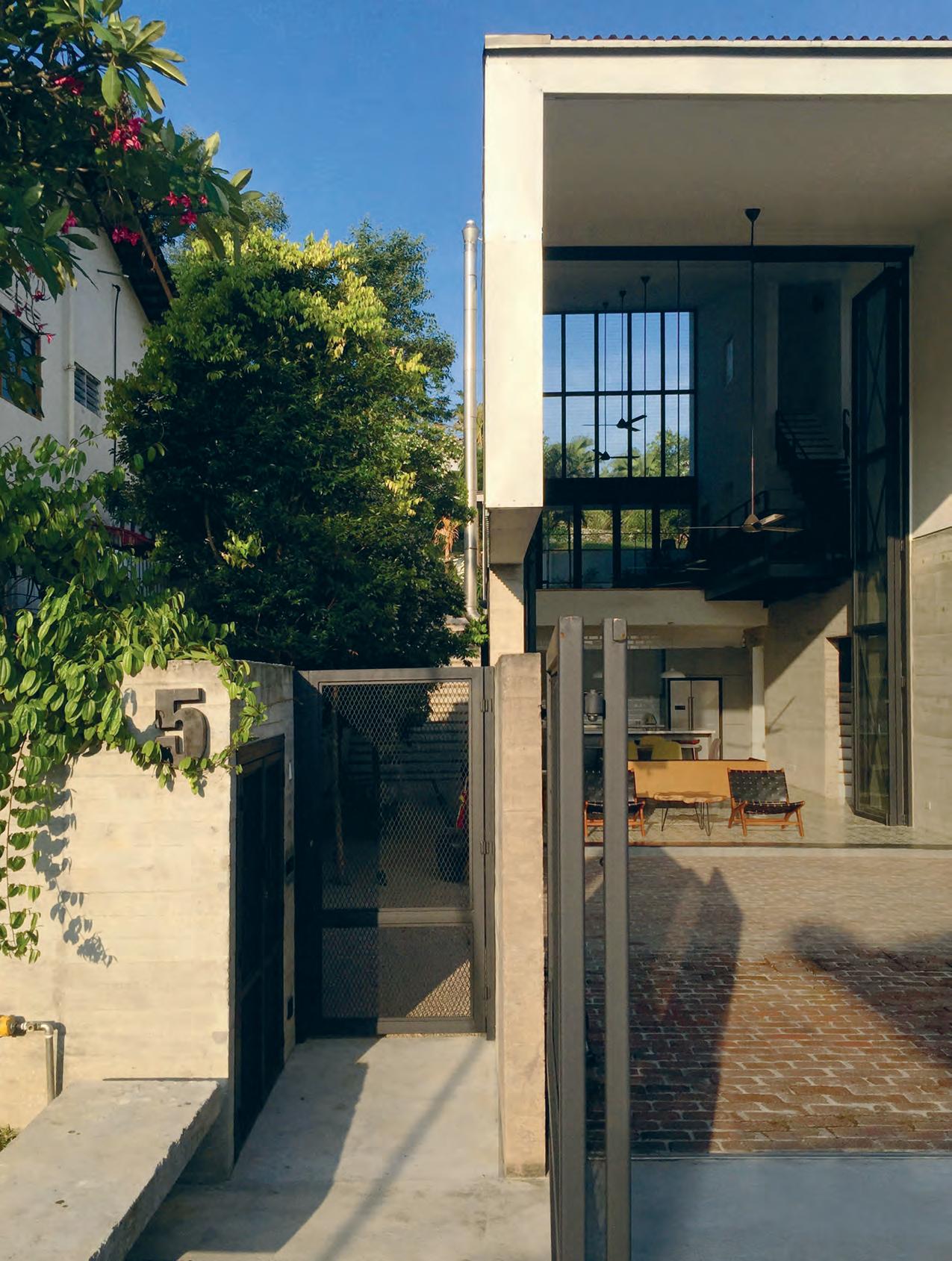
text Chu Lik Ren | photography Fabian ong
3 . on location # 155
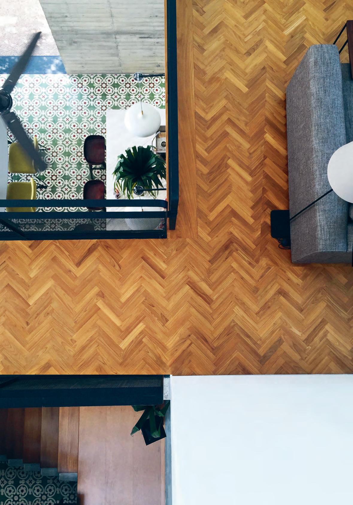
issue #40 habitusliving.com
Slope House, in the Malaysian city of Johor Bahru, combines the sensibilities of its owners: the aesthetic preferences of wife with the practical mindset of husband. While he works within the property development industry, she has a keen interest in interior decoration and varied art works and styles: a connoisseur of the au naturel style of architecture trending the Malaysian residential scene in the past decade.
The couple had previously commissioned Formwerkz Architects to renovate another residence, and when the chance of a choice plot in an established part of town presented itself, this collaboration was renewed. The experiment became one of designing gathering spaces that are perfectly in-tune with the climate and natural environment in the most economical means possible.
For Alan Tay, the Singapore-based partner of Formwerkz Architects, the opportunity to work in Malaysia was a liberating experience. “In Singapore, the client would feel compelled to pack as many rooms into the house as possible and to have a lift, with a view to the resale market. There would be a certain way of designing with a wet kitchen and the back-ofhouse. It doesn’t matter that you don’t use a wet kitchen, you build one because you think the next buyer would need one. And then there are issues of maintenance and security. Perhaps it has to do with the pressure of land prices.” But for Slope House, the owners were more receptive to unconventional ideas.
The cue for the design of Slope House was taken from its site’s profile. Unusually for a corner terrace piece of land, there is a 2.4-metre difference in height between the front and rear plots. Designing for a house with two floors of bedrooms that could enjoy both the front and back views meant that the simplest roof covering both ends will pitch like a ski slope cantilevering down to the street front. The roof became a design unifier, sheltering a strip of private rooms next to a broader zone or family atrium, mediating the transition from indoor to outdoor spaces.
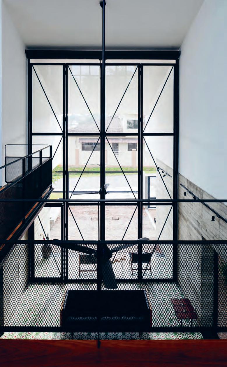
3 . on location # 157
opener | slope house embodies open tropical living in a well lit, well ventilated box–frame over staggered terrain. opposite | the glimpse of warm floor materials from the atrium void complements the cool tones of bare concrete and black railings. above | a classical sense of proportion frames the western view with 6-metre-high slide-and-fold glass doors.
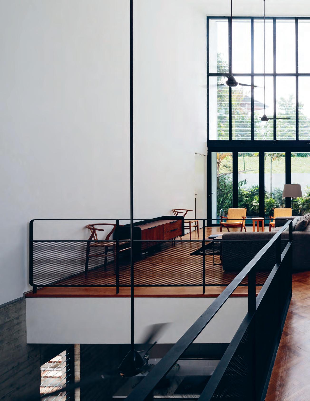
issue #40 habitusliving.com
The visual transparency behind the social spaces is immediately apparent on approach to the house.
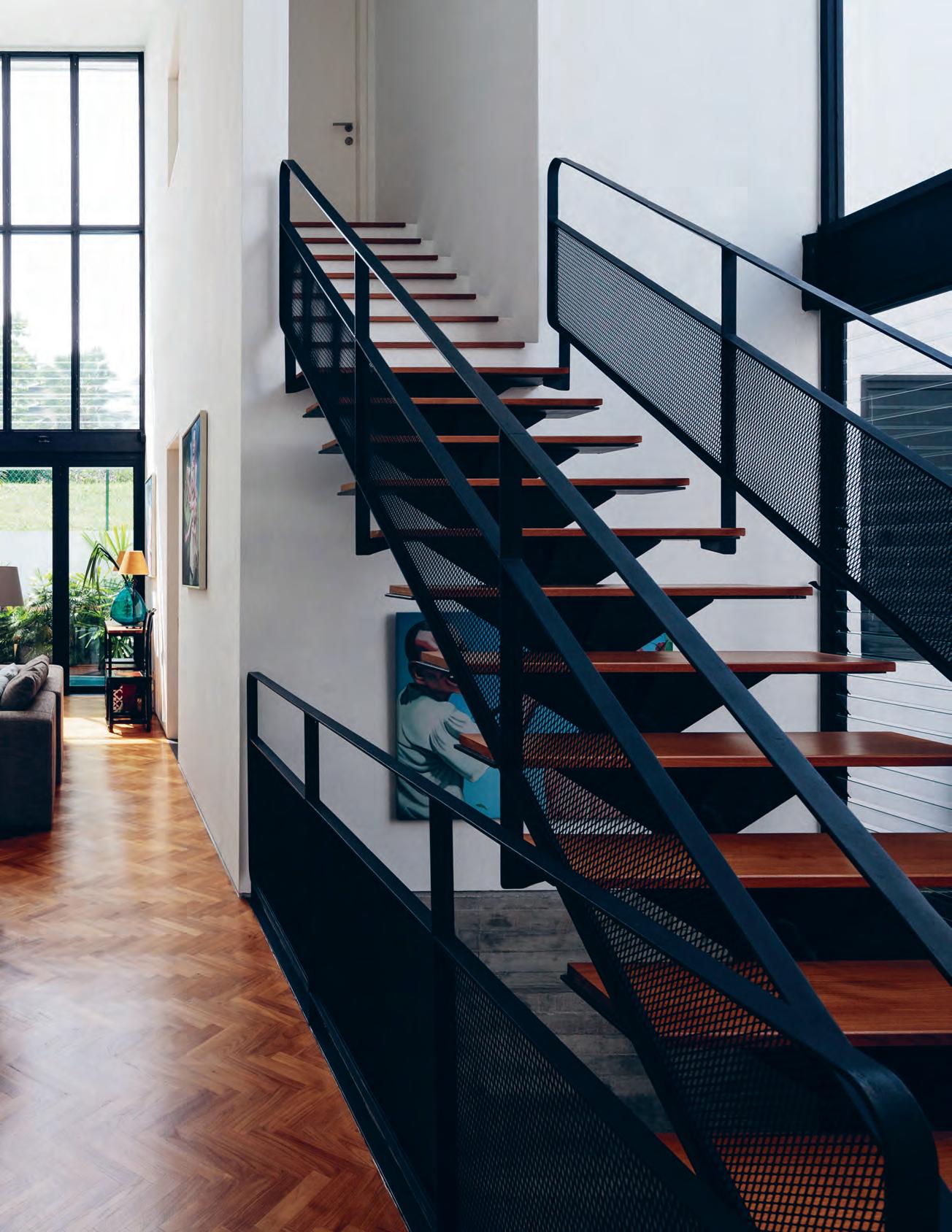
3 . on location # 159
The visual transparency behind the social spaces is immediately apparent on approach to the house. Alan clarified that the idea behind the full-height front slide-fold doors was to maximise natural ventilation. “To begin with, the entire space is non-air-conditioned. The owners took the stance that the volume of space was so large, it was impractical to air-condition it,” Alan explains. “Our solution was to capture the uphill draught and funnel it through the house.” The resulting high volume – and correspondingly high walls – are perfectly suited to the display of larger pieces of art.
One result of being breeze-swept is winddriven rain. “Our problem was more on how to deal with the rain. The overhang in front helps and so did the bank of high windows at the back which are fi xed glass louvres.” But the continuity of space framed by the elongated roof allowed the interiors to colonise the car porch, incorporating it as an extension of the more formal dining area. “We used brick, a warm material, for the driveway and gravel for the garden, so that the car porch can double up as an outdoor dining space.” Likewise, the entire front gate and fencing can be swivelled open to connect the house with the street. The extended space can host BBQ and spill-over crowds such that from the neighbours’ point of view, the house seems more like an inviting tent than a private enclave when the owners are entertaining.
PREVIOUS | THE FAMILY LOUNGE CONNECTS TO THE POOL OUTDOORS AND FEATURES HIGH WALLS TO SHOWCASE DIVERSE ART WORKS. FIXED LOUVRED WINDOWS ALLOWS IN THE BREEZE. ABOVE | PLANS. OPPOSITE | THE STAINLESS STEEL CHIMNEY AND INDUSTRIAL AESTHETIC OF THE EXTERIOR IS SOFTENED WITH THE TOUCH OF GRAVEL AND FOLIAGE OVER THE POOL EDGE. FIRST FLOOR DRIVEWAY ENTRY DINING KITCHEN 1 2 3 4 5 6 7 8 GUEST BEDROOM WC COURTYARD BEDROOM ENSUITE LIVING ROOM MASTER BEDROOM 9 0 q THIRD FLOOR 9 8 SECOND FLOOR 8 9 9 q 0 7 5 8 1 2 3 4 6 issue #40 habitusliving.com
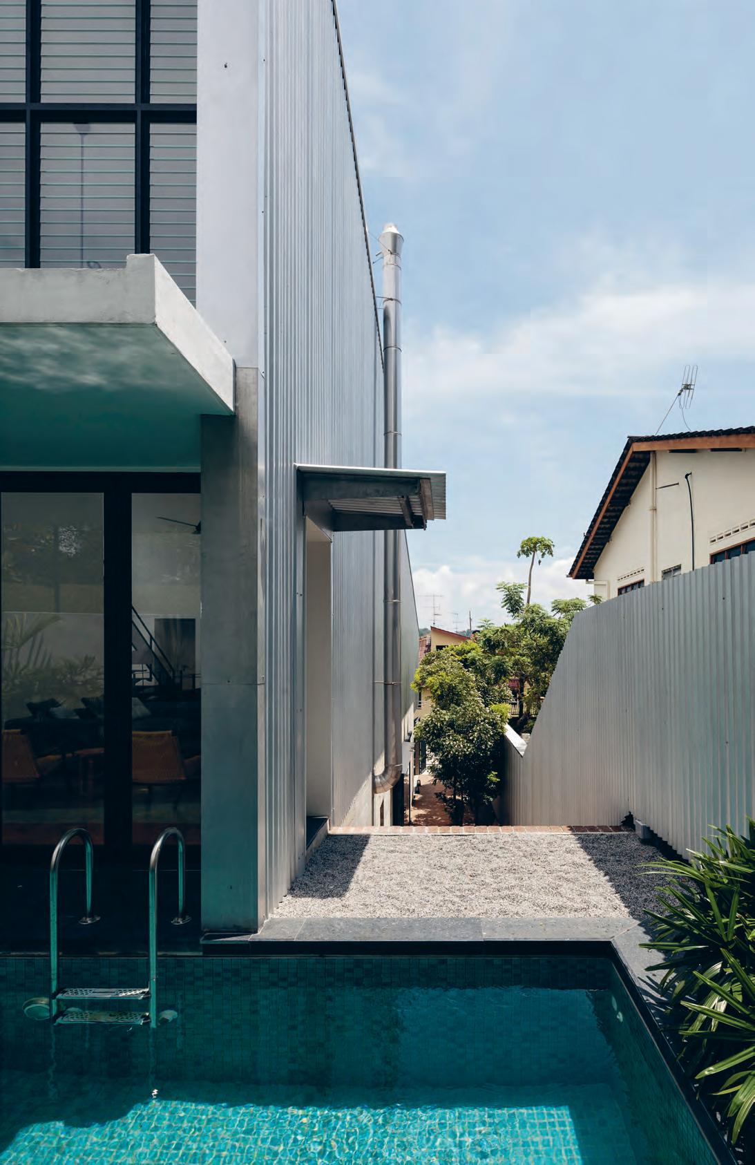
3 . on location # 161
The hub of the atrium is the open dry kitchen. “This is the way the owners live. No wet kitchen. We have designed a nice chimney to exhaust the cooking fumes out the external wall up to the roof,” says Alan. As with the pared-down aesthetic of the house, there is a juxtaposition of industrial materials such as stainless steel, corrugated metal, bare concrete and expanded mesh railings with the decorative earthiness of Peranakan floor tiles and herringbone arrangements of parquet flooring. “The tiles were suggested to give the house a dash of personality, a sense of imperfection,” notes Alan. To the side of the formal dining, a large glass door connects this space to the landscaped patio outside, so that diners can easily adjourn to the latter for wine and cigars.
Since its foundation in 1998, Formwerkz Architects has garnered a reputation for being able to intellectually translate a client’s agenda into forms with a clear storyline, as evidenced in how their houses are named. In many instances, there is an additive quality to their architecture, of blocks coming together with Lego-like precision to integrate disparate parts into a streamlined whole. Slope House reaffirms this approach on a foreign shore, using simple geometry and materials to organise inclusive spaces for living and socialising.
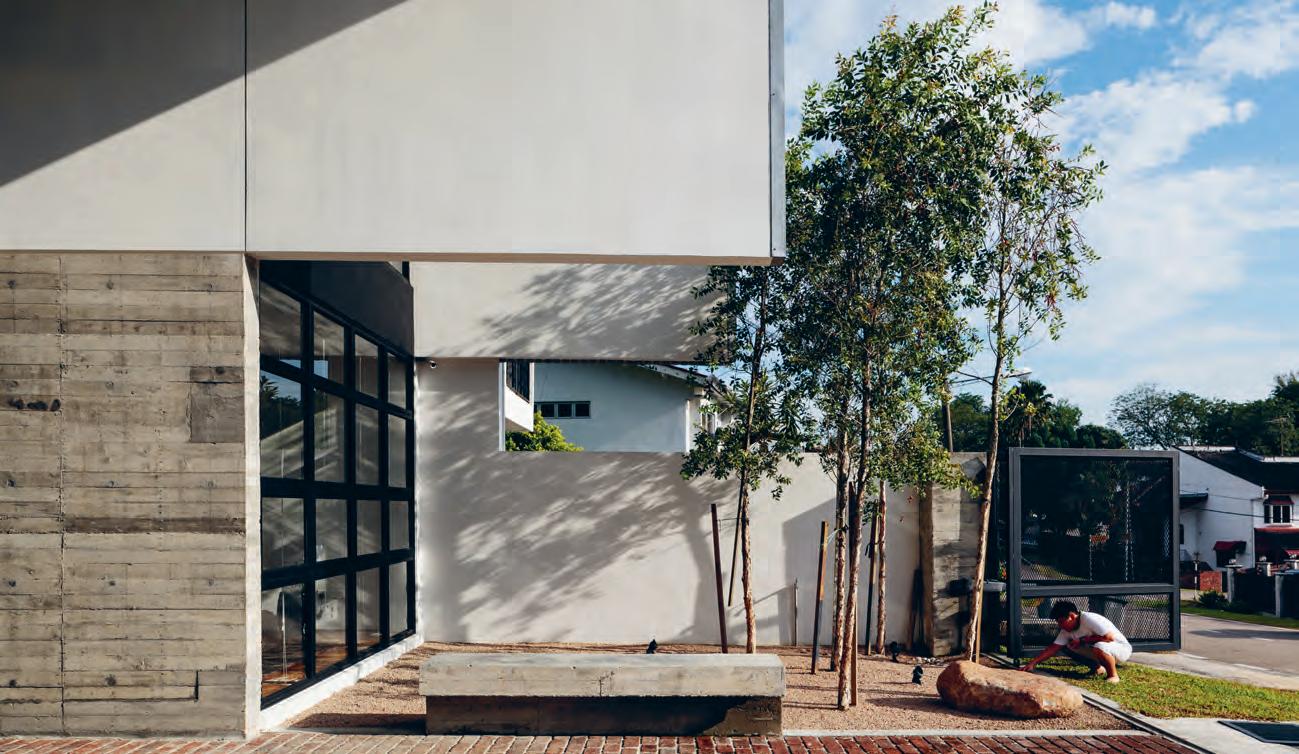
above | The enTire fronT porch can be opened ouT To The sTreeT To offer up all scenarios of enTerTaining and socialising.
issue #40 habitusliving.com
Slope House uses simple geometry and materials to organise inclusive spaces for living and socialising.
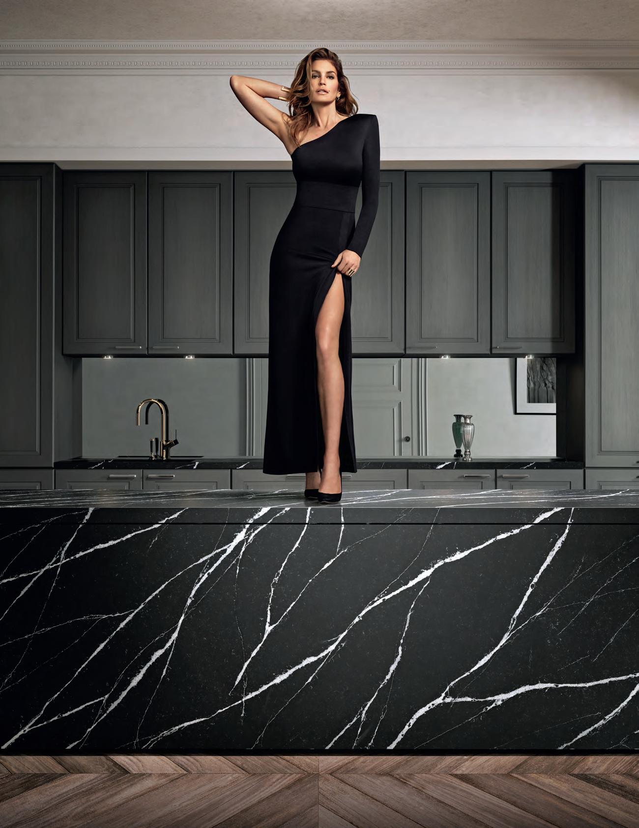


Discover more at silestone.com | Follow Us F T A product designed by Cosentino ® Colour Eternal Marquina Cindy Crawford on Silestone Countertop TOPS ON TOP COSENTINO AUSTRALIA e-mail: infoaustralia@cosentino.com On Top Feel the new velvety texture
The World of Bath Couture
Bath couture – the marriage of modern bathware with the style of haute-couture fashion – is part of the apaiser DNA. Home of bath couture, and the new Bijoux range designed in collaboration between interior designer Kelly Hoppen and the apaiser design team, exemplifies this bold new approach to bathroom design.
Kelly Hoppen’s award-winning signature style of clean lines and sleek simplicity is at the heart of the Bijoux range’s architectural design. Presenting a unique juxtaposition of external angles and smooth interiors, the faceted exteriors play with light and shadow to create an altogether dynamic surface – the resulting effect a visual masterpiece, and a celebration of the pursuit of elegant bathing.
The Bijoux basin, designed with apaiser’s signature apaiserMARBLE, evokes a bejewelled crown, setting a reflective and mesmerizing tone that also subtly suggests luxury amid the cleansing ritual of bathing. apaiser | apaiser.com
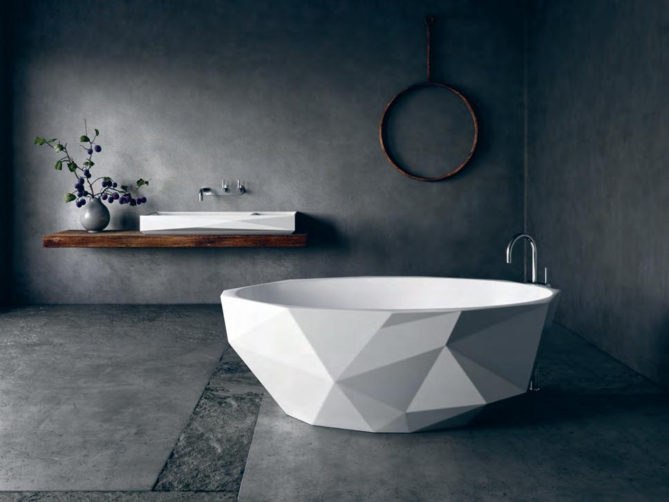
habitus promotion › apaiser #164 issue #40 habitusliving.com above | apaiser’s b ijoux range transforms bathware into objects of desire
The Bijoux range, new from apaiser, incorporates a bath that is the perfect manifestation of s trength and beauty.
A Breath
of fresh Air
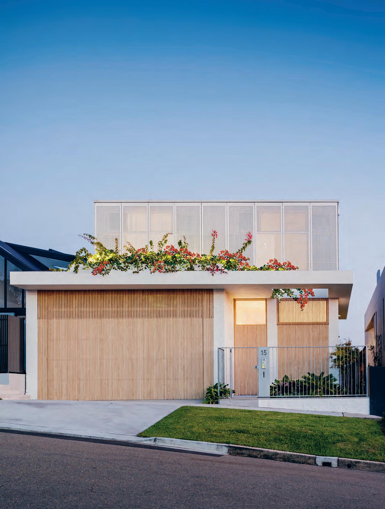 text Rebecca GRo ss | photography RobeRt Walsh
Blanchfield Architects, this bright and breezy family home is filled with sunshine, fresh air and open spaces.
# 165 3 . on location
Designed by Madeleine
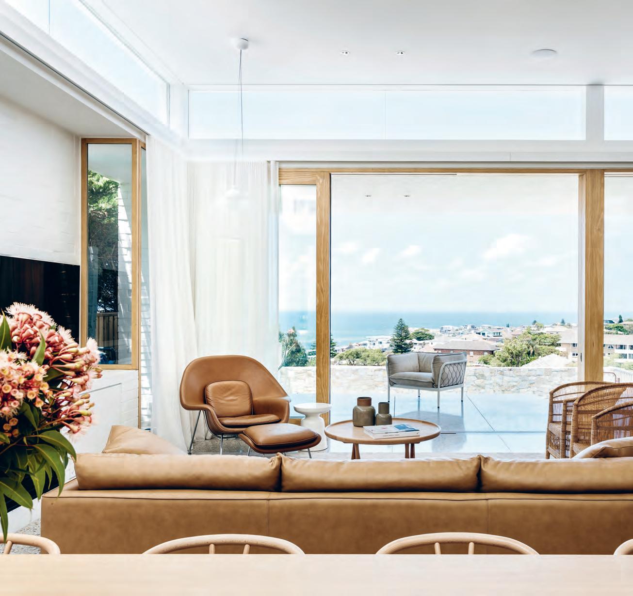
opener | InspIred by the archItecture of MarcIo Kogan, the upstaIrs exterIor Is clad wIth perforated screens whIle tIMber battens better Integrate the garage door wIth the house. above | the open lIvIng, dInIng and KItchen area has vIews across the bay and the custoM-Made terrazzo tIle floorIng extends InsIde to out. issue #40 habitusliving.com
Architecture should not look good, but it should make us feel good, too, as it can undoubtedly impact our wellbeing and quality of life. Sunshine and fresh air, beyond affecting light levels and temperature, are energising and uplifting with the potential to influence our energy levels and mood. Open-plan living can encourage and support interactions and foster positive relationships, while flexible and zoned spaces cater for the changing dynamics of growing families.
This house in Coogee, Sydney, is light, open and spacious – just what the clients ordered. Designed by Madeleine Blanchfield Architects and home to a family with two young boys, it reflects both Madeleine and the client’s desire for bright, breezy spaces, knowing how they positively contribute to wellbeing. “I’m very much interested in how spaces feel and how you experience them as you move through a house as opposed to architecture as an object,” Madeleine explains. “Houses influence how you behave and interact and it takes a balance of openness and performance.”
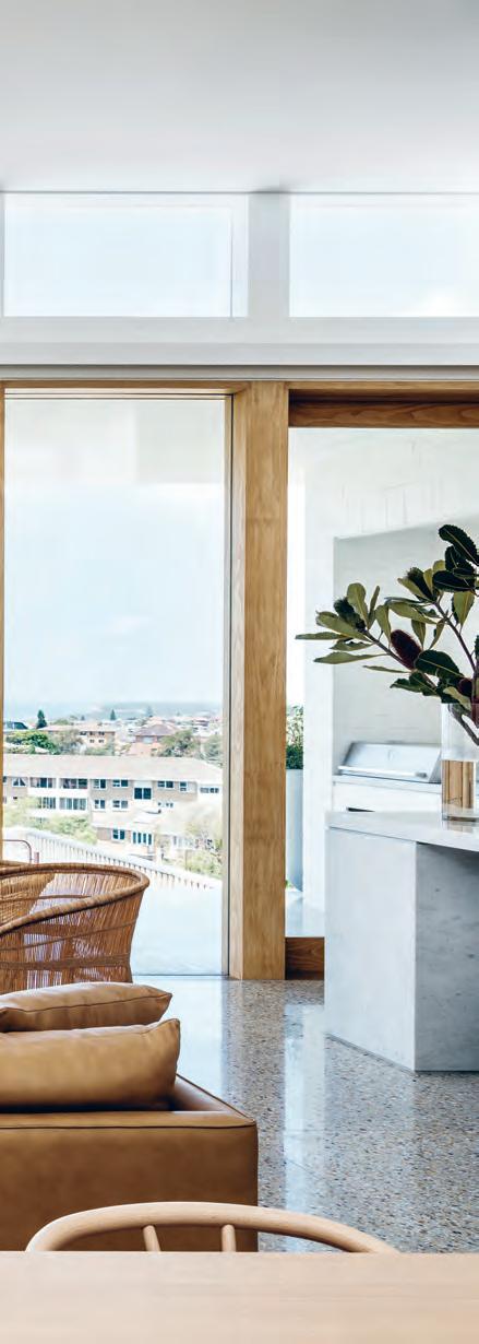
Having visited Brazil, the clients had a great appreciation for Marcio Kogan’s architecture, particularly his rectilinear volumes wrapped with timber screens, and they took examples of his work to Madeleine. “Kogan’s houses are usually out in the open or surrounded by jungle, rather than neighbours,
so our design was about creating that expansive feeling without large cantilevered concrete forms,” says Madeleine.
The house sits on a long and narrow northsouth site with neighbouring houses backing on to the eastern side. It’s arranged with living areas downstairs and bedrooms upstairs. Two walkways are stacked on top of each other through the centre of the house and courtyards carved out either side. This allows eastern and northern sunlight to filter through the sheltered courtyard into the living spaces and keeps windows to the north and south.
The downstairs walkway extends from the front door to back garden and offers a portal view of the ocean. The corridor is lined with timber joinery providing storage and concealing access to the guest bedroom and children’s rumpus room. Both are designed to capture sunlight: the guest bedroom with a raked ceiling and the rumpus room with a void above.
Passing the courtyard, the walkway steps down into the kitchen, living and dining area while the ceiling level remains the same, creating a room with more than 3.5 metres in height. “As the rooms become larger they also gain more volume,” says Madeleine. High-level windows wrap around the room, enhancing the sense of loftiness. Views of the sky contribute to its calming atmosphere. The living area extends outside, and a stone wall protects the back garden and swimming pool from the strong southerly winds.
3 . on location # 167
“The house feels calm and effortless. It’s not doing gymnastics or trying desperately hard.”
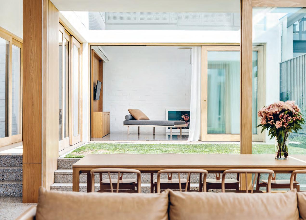
above | The courT yard separaTes The children’s and adulTs living areas while sTill allowing a Free connecTion and unobsTrucTed sighTlines. opposiTe above | The upsTairs walkway overlooks The children’s rumpus room. opposiTe below | high-level windows wrap around The living area providing a view oF The sky and enhancing The airiness and loF Tiness oF The space. issue #40 habitusliving.com
Filled with sunshine, fresh air and open spaces, there is no doubt this house feels good. But more than that it helps the family live better.
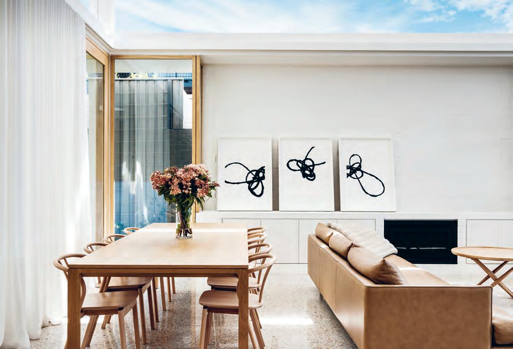
# 169 3 . on location
Large sliding glass doors open the living area, rumpus room and walkway to the outdoor spaces, maintaining a visual, acoustic and physical connection between spaces while still providing a sense of separation.
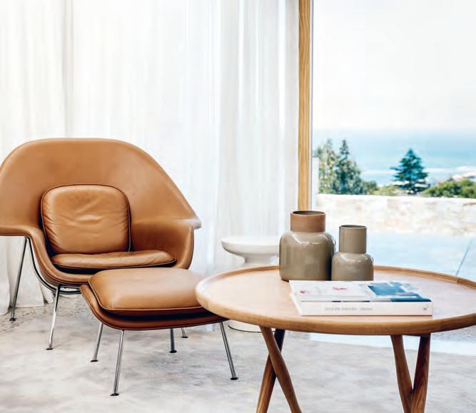
The stairs, laid with Mafi timber flooring, open to a study area and passageway overlooking the rumpus room, the void providing a link between the two floors. The master bedroom and ensuite at the end of the corridor offer panoramic views. “Bathrooms are one place you are sure to spend time every morning and night. They should be an uplifting experience, not shoved in the back corner,” says Madeleine.
To maintain privacy, the upstairs exterior is wrapped with perforated white Equitone screens, reminiscent of Kogan’s architecture. Concealing bedrooms when closed and opening for views and ventilation, they provide a soft ambience and cast patterns of light across the engineered timber floors.
Like much of the material palette, the screens required experimentation and determination to achieve the desired outcome. Only so much could be removed without losing stability. Likewise, the garage door took trialling to create a lightweight structure using timber battens and an aluminium frame. The effect integrates the garage with the house –the front door also being timber – similarly evoking Kogan’s timber screens, though in a different manner to the perforated panels.
Madeleine and the clients worked closely with stone company Skheme for the flooring, kitchen and bathrooms to push the boundaries of what is typically feasible. The kitchen is clad with Carrara marble with mitred edges, while a streel frame required to support the back wall and the downstairs floor, both inside and out, is laid with 1.5-square-metre Terrazzo tiles custom made in Italy. The tiles incorporate Carrara marble to complement the kitchen, and gold-coloured chips bring in
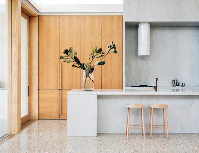
above |
Furnishings in neutral colours and natural materials complement the architecture and don’t distract From the space, light and views. below | clad in carrara marble, the kitchen has an understated monumentality that is warmed and soF tened with timber joinery. opposite | spaces become increasingly larger, open and transparent as the downstairs walkway progresses From the entrance to the living area at the rear oF the house.
issue #40 habitusliving.com
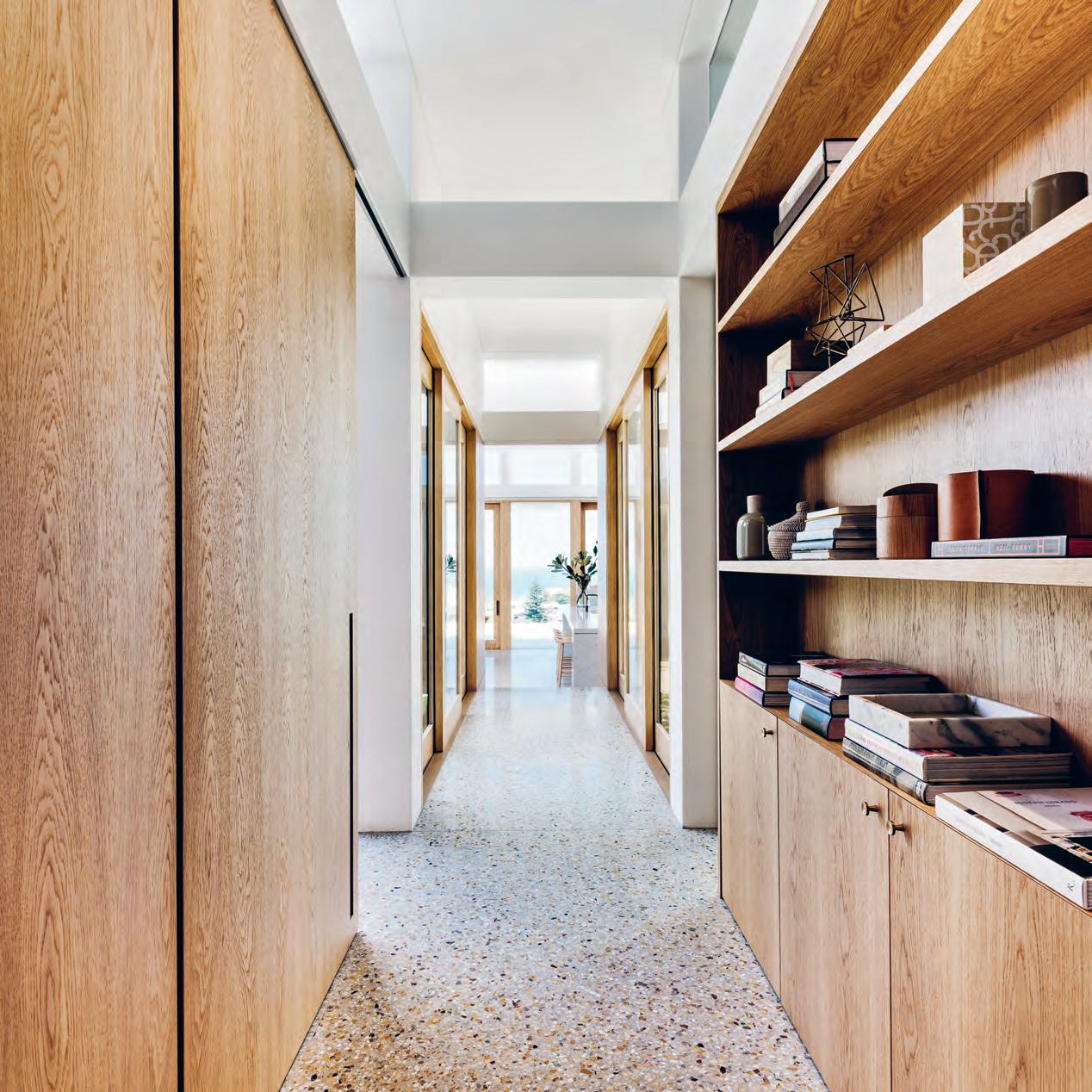
3 . on location # 171
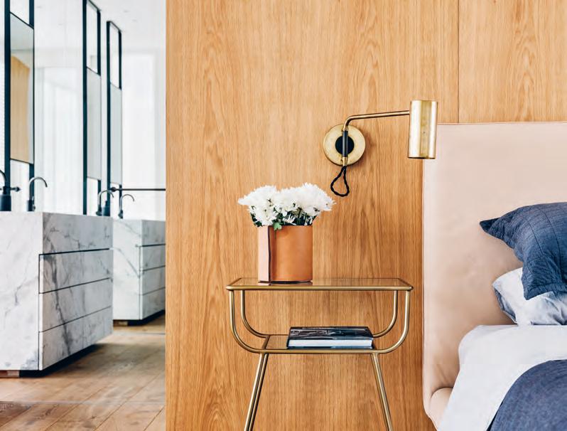
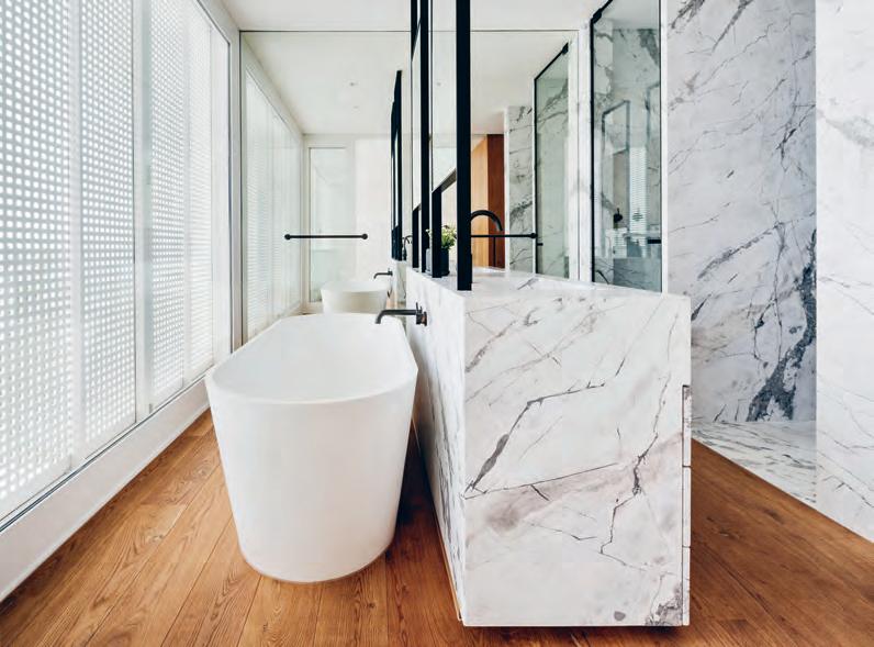
issue #40 habitusliving.com
above | Timber joinery divides The masTer bedroom from ensuiTe, wiTh wardrobes housed on The oTher side of The wall. below | The clienTs selecTed ar ashi marble for The ensuiTe as a more dramaTic choice. The vaniT y siTs in The middle of The room, wiTh The wc and shower Tucked behind. opposiTe | l arge sliding glass doors open and close inTerior spaces To The courT yard, mainTaining a sense of openness, visual connecTion and views ThroughouT
To maintain privacy, the upstairs exterior is wrapped with perforated white Equitone screens, reminiscent of Marcio Kogan’s architecture.
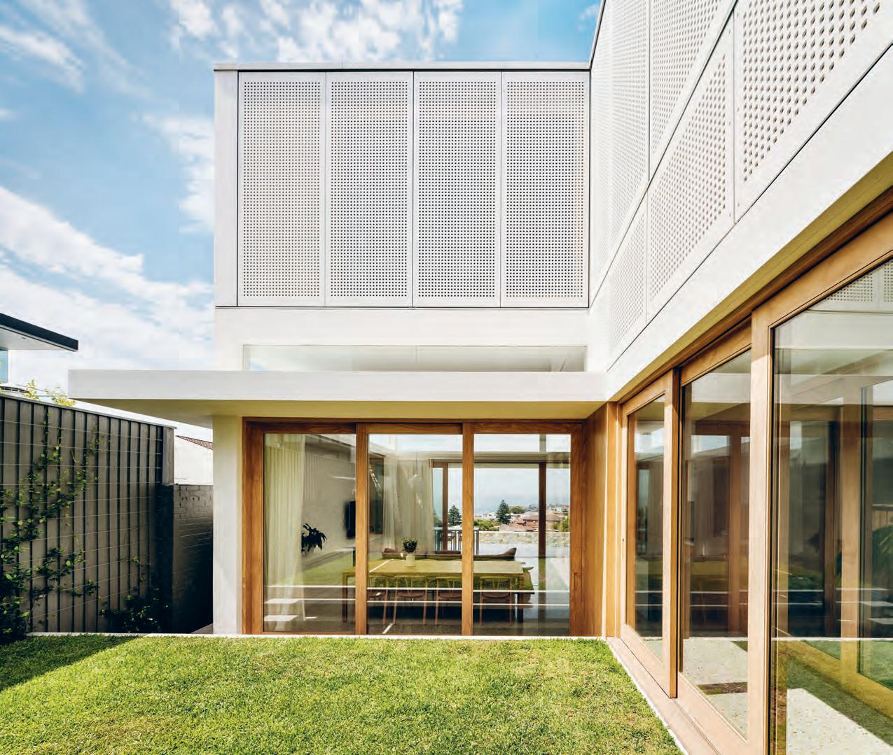
3 . on location # 173

GROUND FLOOR 0 q 4 4 1 2 7 6 8 5 9 3 w FIRST FLOOR e e t y u i 3 r ENTRY LAUNDRY BATHROOM COURTYARD KITCHEN POOL 1 2 3 4 5 6 TERRACE LIVING DINING RUMPUS GUEST BEDROOM GARAGE FLEXIROOM BEDROOM BALCONY ENSUITE WALK-IN-ROBE STUDY 7 8 9 0 q w e r t y u i issue #40 habitusliving.com
the colour and warmth of the timber joinery and stained Accoya wood door frames. Arashi marble is a graphic and dramatic choice in the master bathroom, and marginally offset whitepainted bricks create texture on interior and exterior walls.
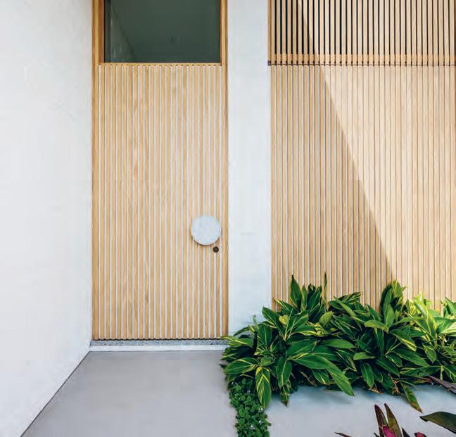
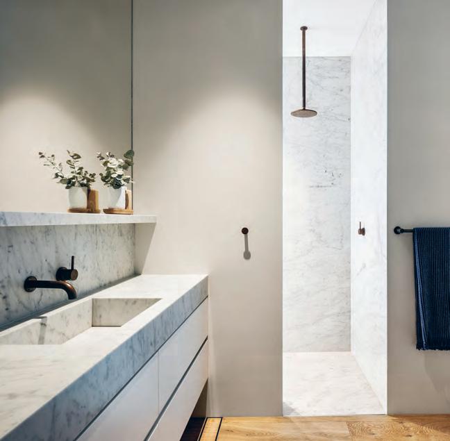
The natural colour of the furnishings is also in harmony with the materials, contributing to the relaxing environment and ensuring attention is on the space, light and views.
Filled with sunshine, fresh air and open spaces, there is no doubt this house feels good. But more than that it helps the family live better. “The house feels calm and effortless. It’s not doing gymnastics or trying desperately hard,” says Madeleine.
3 . on location # 175
OppOsite | plans. abOve | the children’s bathrOOm is in carrara marble, as is the case in the kitchen. belOw | timber battens and brick walls prOvide warmth and texture at the entrance tO the hOuse.
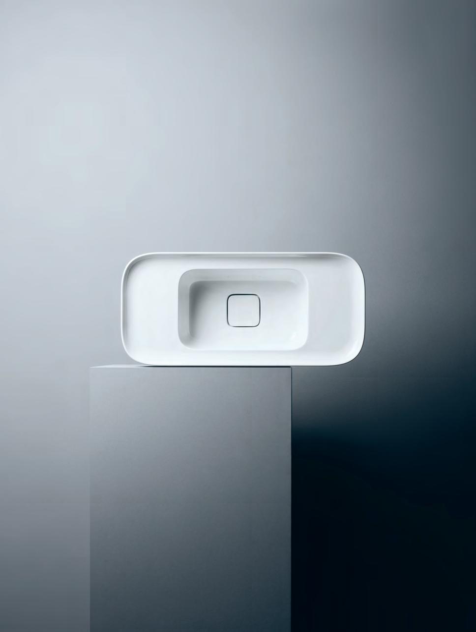
issue #40 habitusliving.com above | The Cameo b en Ch basin (60x50, Code va 280) exudes minimalisT sT yle while sTill being an inviTin g, welComing design
Theatrical minimalism in the Bathroom
The Cameo collection makes a statement without being intrusive; embodying design that is theatrical while also being unquestionably welcoming.
Striking yet refined, bold and yet comforting, the Cameo collection exemplifies modern and elegant bathrooms. Designed by Prospero Rasulo for Valdama, the basins are distinguished by the perimeter of their tops – a visual element that will frame associated items such as tapware and toiletries.
The name Cameo relates to the ancient art of delicately extracting shape from material, characterised by clear contours and reliefs. The sense of a dramatic statement combined with revealed beauty is clearly present in the form of the basins that make up this extensive collection.
Designed to be wall or bench mounted, the contours of Cameo will help create contemporary as well as classic design aesthetics; complementing the likes of restored villas and ultra modern apartments. Their smooth and fine details including the coordinating plug and waste with ceramic top, will bring to those rooms where they are featured both style and refinement.
Available in Australia through PARISI and in a range of sizes, colours and finishes, Cameo is a washbasin collection for lovers of design who seek a bathroom that will be inspiring and relaxing.
#177 Parisi | parisi.com.au habitus promotion › Parisi
the Layers Unlocking
An unliveable, deceased estate in Melbourne’s Alphington has been transformed into a timber box-like family home, revealing a journey of layers upon layers by architect Walter&Walter.
 text Annie Reid | photography BenjA min Hosking
issue #40 habitusliving.com
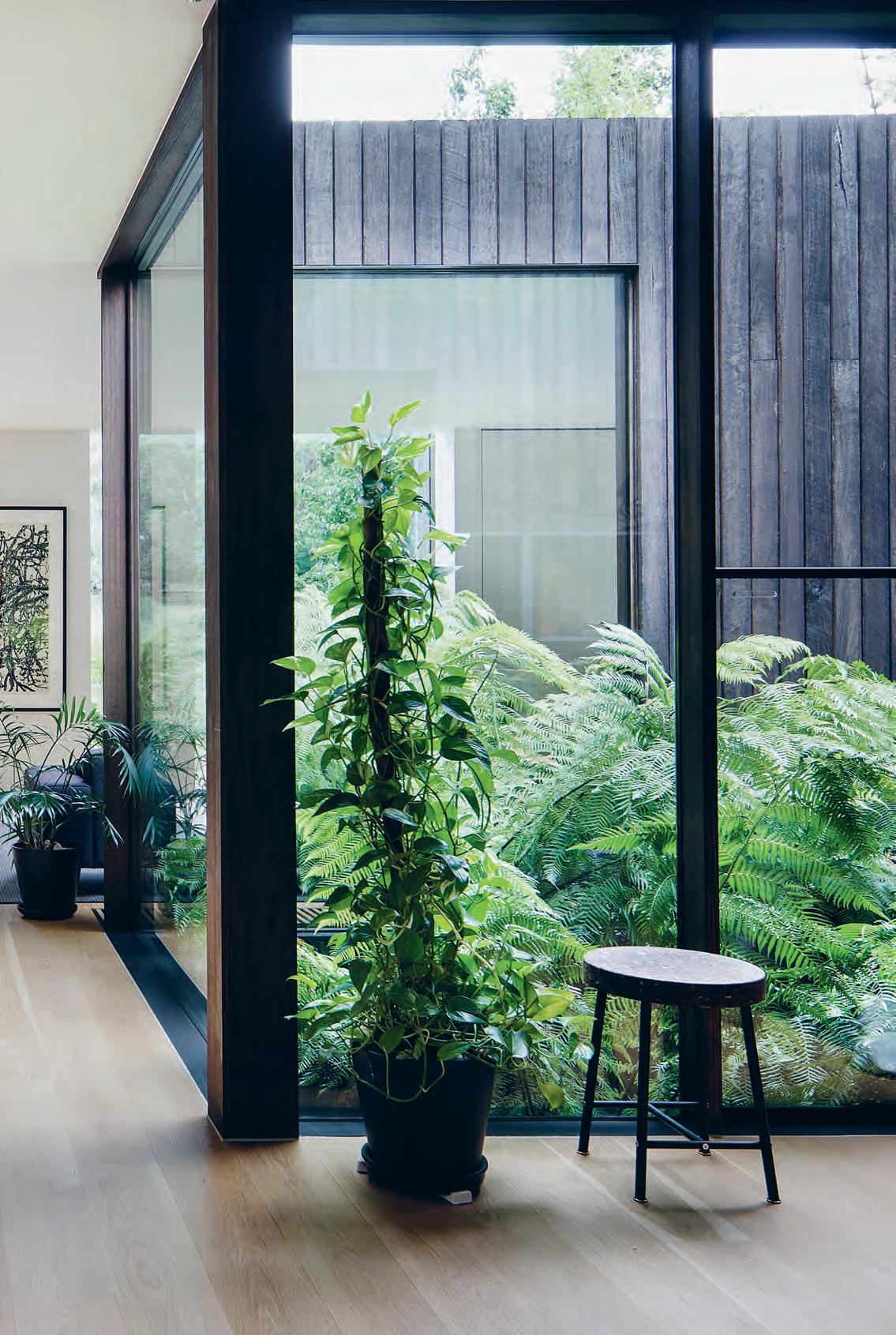
3 . on location # 179
At first glance, this project presents a compelling street interface with a timber-wrapped façade. A closer look reveals a little tree popping up from the second storey. “People thought it was weeds in the gutter at first,” says architect Andrew Walter of Walter&Walter.
Rising resiliently, the little tree is gently softening what the neighbours first coined ‘the house with no windows’, adding intrigue about what lies beyond the anonymous façade of this project in Alphington, Melbourne.
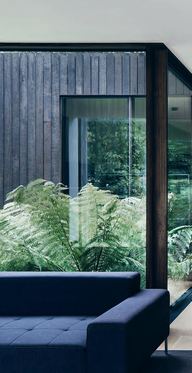
This is a house that surprises on many levels. As well as its stunning location at the gateway of parks, reserves, nature trails and the Yarra River, it directly backs onto the rolling hills of Coate Park. It has been designed to open and reveal itself with a restrained simplicity that works hard behind the scenes.
Robert and Michaela bought the house in 2009, mesmerised by those rear park views. They had always wished to settle down in the inner suburbs, however with this one they had a lot of work to do: the existing 1940s double brick deceased estate was unliveable and contained nothing architecturally salvageable.
“It was on a block that sloped from front to back and side to side,” says Robert. “But then we looked back at the house from the hill, and decided it was a beautiful location for us to raise a family.”
For architect, the project offered an opportunity to explore issues that impact the environments and contexts we inhabit every day. For example, Robert and Michaela were passionate about connecting the house to the ground where possible. This led to meticulous thinking around every detail and finish to allow the landscape to feature without distraction.
issue #40 habitusliving.com
opener | Indoor and outdoor greenery unfold to create a tranquIl settIn g from every angle. above | e very detaIl wIthIn the house was debated and d I scussed. for example, those elements that would be concealed and flush versus those that would be open and exposed. a lot of attentIon went Into resolvIn g fInI shes and materIals – even down to lIght swItches – to ensure that desIgn was always the key drIver.
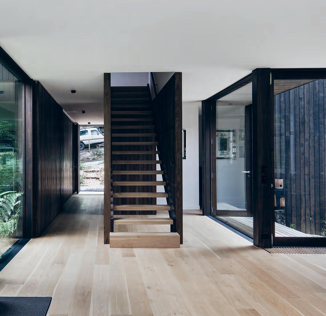
3 . on location # 181
“This is when you realise that design makes all the difference; thinking something through and resolving it well,” says Robert.
Although the house has quite a strong façade, it begins to unravel immediately upon entry, where the silver top ash timber façade offers light-filled glimpses into little courtyards off a central hallway.
A courtyard on the left services a guest bedroom wing and Eva’s room (their eight-yearold daughter), while a massive door the length of the hallway slides along to reveal a laundry and study at one end, and a garage at the other.
Then, the entire house spreads open seamlessly at the rear. A kitchen, dining and living room each focus on the park view through big deep windows, and there are a further two courtyards on each side of the house at various floor levels and with different landscape treatments.
“When all the doors are fully open, it really does feel like you’re outside with only a roof for shelter above, and that’s one of my favourite qualities,” Andrew says.
Outside, the sloping block and flood plain are mitigated by a seating deck and cascading steps down to a vegetable garden surrounded by native landscaping. “The steps, decks and landscaping all work together to help the house feel connected to the ground,” he continues.
There’s also a semi-permeable back fence and side fencing which neatly precludes dogs playing in the park from running into their garden, without closing off the space entirely.
“The house doesn’t turn its back on anyone or anything, which is uncommon for houses in the suburbs,” says Andrew. “There is that openness and generosity towards the neighbours.”
Resolving these spaces to expand and contract effortlessly involved a huge amount of detail.
As an ex-chef, Robert influenced every area within the kitchen so that the layout would be perfected for their individualised needs and experience of the space. Walter and Michaela guided the tactile experience so the materiality was just right. Cupboards were conceived as objects and furniture, sans handles on drawers.
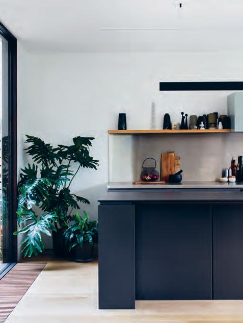 above | the design of the kitchen was overseen heavily by robert, an ex-chef. opposite | the connection to the landscape is heightened in the rear living space through large windows, with a focus of calm and reflection.
issue #40 habitusliving.com
“It was on a block that sloped from front to back and side to side.”
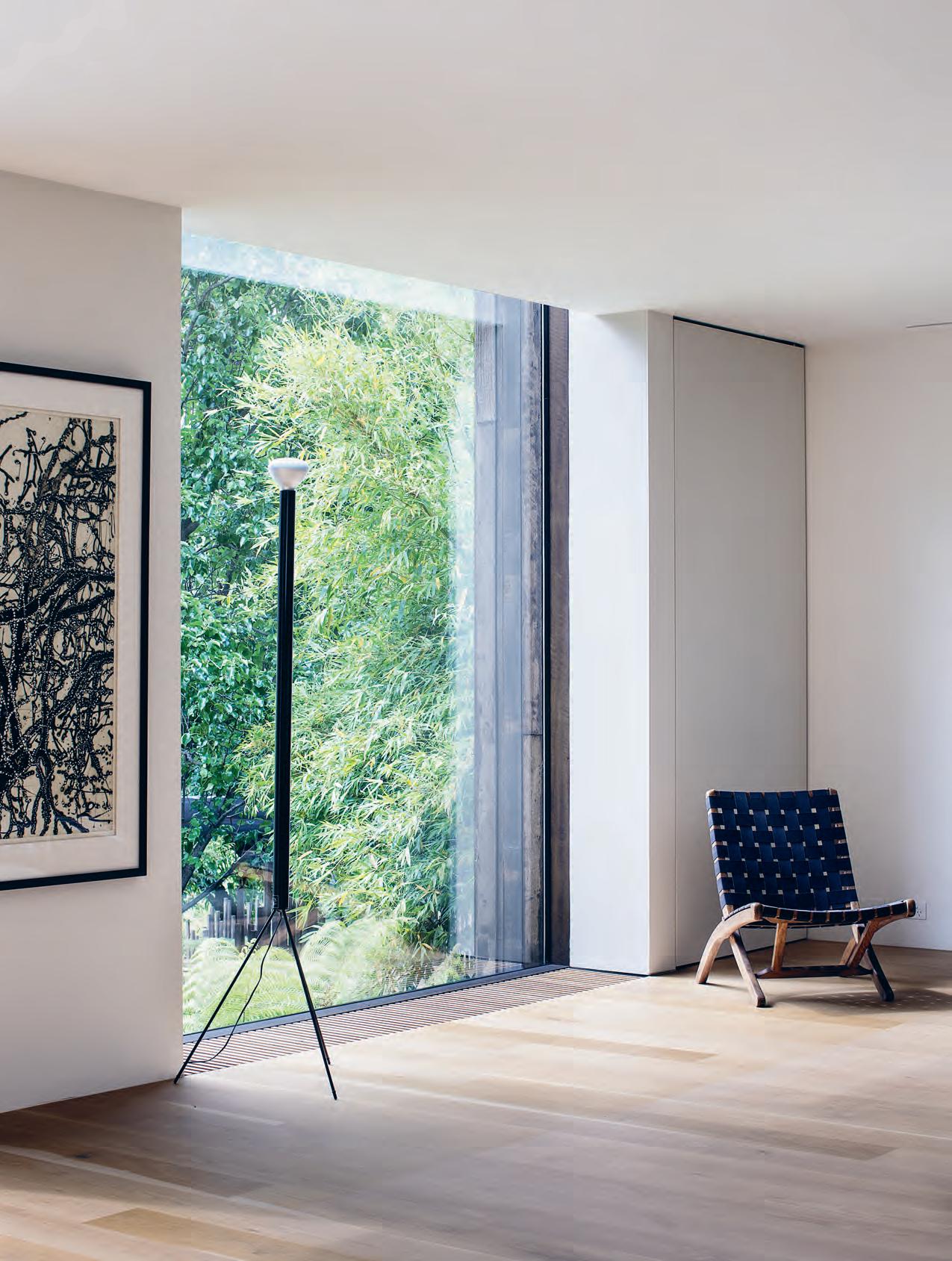
3 . on location # 183
The minimal rear windows were also carefully considered and built by hand. The windows are separated by deep reveals which frame specific views to the parklands beyond. Cleverly, they are not just structural walls, but rather functional spaces. One becomes a space for kitchen storage and one has a pivoting door that conceals the living room entertainment system. The ceiling has the same treatment, bare and uncluttered, with minimal concealed lighting allowing for pendants to feature in the space instead.
“It was all about removing a lot of the distractions,” says Andrew. “You’re really trying to control how the landscape integrates with the inside spaces.”
But there’s playfulness too. For example, much discussion ensued about the stair remaining open or closed, and at the last minute it was left open, which revealed a nook beneath that Eva now plays in. Upstairs, the master bedroom and bathroom are designed as a parents’ retreat with heroic views over the park. Downstairs, the living area is able to be reconfigured, with various indoor plants that can move around.
GROUND FLOOR FIRST FLOOR e r ENTRY GARAGE LAUNDRY STUDY GLASS COURTYARD LIVING ROOM TERRACE 1 2 3 4 5 6 7 DINING KITCHEN WC BATHROOM BEDROOM MASTER BEDROOM ENSUITE 8 9 0 q w e r 9 q w w 6 8 1 2 5 5 7 3 4 0
issue #40 habitusliving.com
For architect, the project offered an opportunity to explore issues that impact the environments and contexts we inhabit every day.
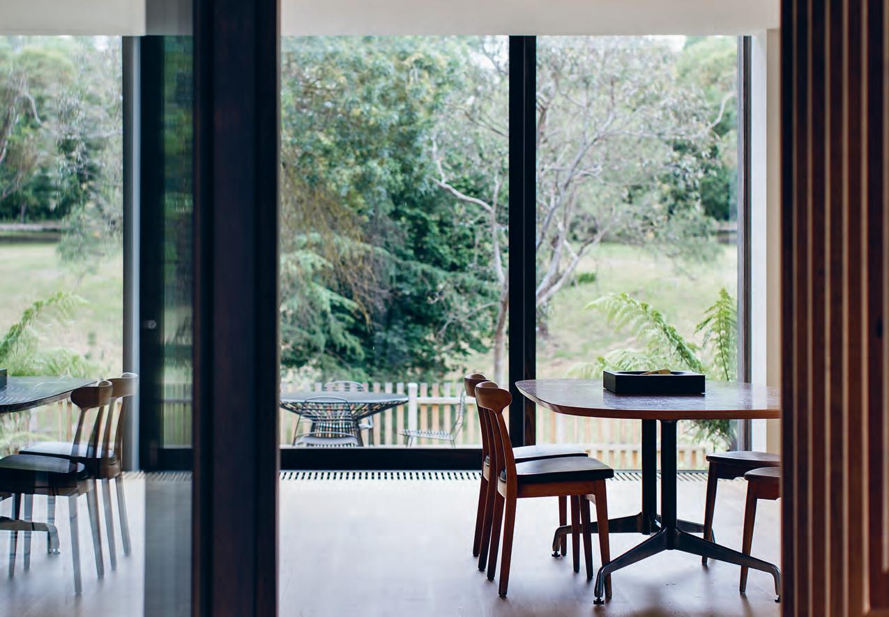
opposite | plans. above | the dining area is designed as a fluid and open space, with a second eating zone on the deck for the family to use when entertaining. both boast views facing coate park.
3 . on location # 185
“Things are allowed to evolve; openness and blurred edges allow things to move and change over the course of the years,” says Andrew.
That’s the joy of this project; it takes you on a journey. Coming in off the main road, the sense of surrounding natural beauty is ever-changing, and that flows through to every nook and niche of the house, enabling the family to live with a connection to the seasons and enhancing the way they cook, work and relax.
“That idea flowed through a lot of the architecture as well so there’s moments where you transition from work to home – from every day to your little calm retreat,” says Andrew. “You just feel like you’re going somewhere else.”
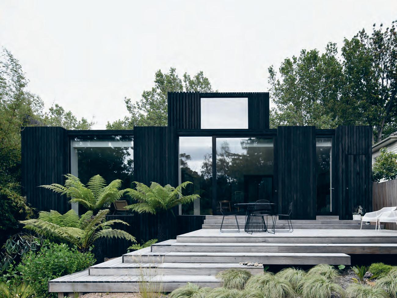
Above | From the reAr , the silver top Ash exterior will grey over time, disAppeAring Further into the l AndscApe As wAs the originAl intention.
issue #40 habitusliving.com
“Things are allowed to evolve; openness and blurred edges allow things to move and change over the course of the years.”
The Shower. Evolved.
The showering ritual should be one of relaxation and escape — and good design inside and out is a part of that. Methven’s latest release in their acclaimed Satinjet range, the Escape shower collection, is designed to facilitate this sense of calm.
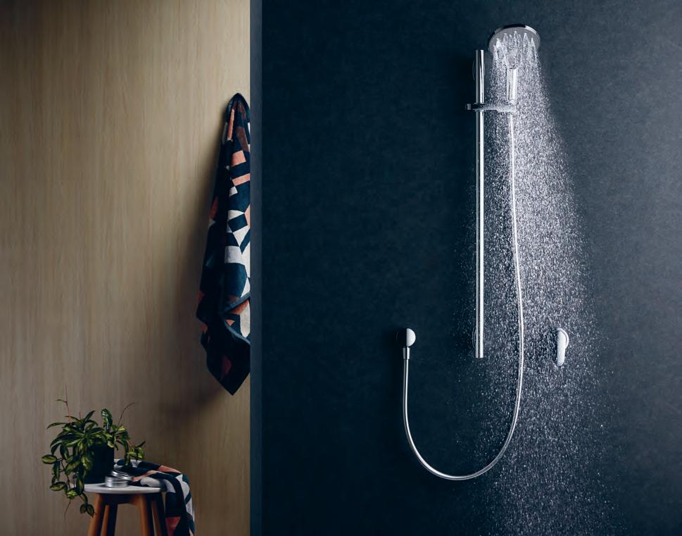
This new shower collection is all about design and aesthetic precision while the inner workings of the awardwinning Satinjet remain unchanged. The spray design transforms the everyday showering ritual into a luxurious, full body immersion experience – and now the aesthetic matches the feeling.
The refreshed Escape range boasts a more focused design on organic appeal, with soft curves accentuating a sense of natural simplicity, and left with pure chrome finish, the contemporary sense of style and class is undeniable. Another design advancement to the Escape collection sees a seamless integration of the shower slider, with a smooth transition between Satinjet spray an in invigorating massage function.
habitus promotion › Methven #187 issue #40 habitusliving.com above | a tool for ultimate relaxtion, the escape mKiii satinjet r ail sh ower
Methven | methven.com/au
The latest Satinjet shower from Methven marries the brand’s exceptional engineering with organic, progressive design.
Modernist Wonderland Mosman Residence
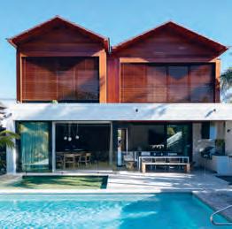

ARCHITECT Daniel Boddam
LEAD ARCHITECT Daniel Boddam
INTERIOR DESIGN AND DECORATION
Daniel Boddam
BUILDER M&G Construction
JOINERY Nu Space
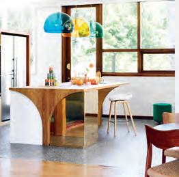
DA n iel B ODDA m (61 2) 9660 1144
Danielboddam.com
FURNITURE
Sofas and Ottoman in living room custom designed by Daniel Boddam in linen from Westbury Textiles. Monument collection side tables in natural oak, aged brass and Statuario marble by Daniel Boddam. ST04 Backenzahn Stool in Walnut by e15 from Living Edge.
Crosshatch Chair with Walnut frame by EOOS for Herman Miller from Living Edge. Monument collection dining table natural oak top and base with aged brass metalwork, Monument collection dining chairs, armchair in American Oak and chocolate leather all by Daniel Boddam in dining room. CB-22 Tractor Counter stool in Walnut by Bassam Fellows from Living Edge in kitchen. Chaise lounge in media room custom designed by Daniel Boddam in linen from Westbury Textiles. Monument collection side table in limed oak, brass, and Statuario marble, and coffee table in limed oak by Daniel Boddam. Husk Armchair by Patricia Urquiola for B&B Italia from Space Furniture. Eames lounge chair and ottoman in Walnut and tanned leather from Living Edge, study desk custom designed by Daniel Boddam in American Oak and tanned leather, and Embody Chair by Herman Miller from Living Edge in study. Cowrie Chair by Made In Ratio in Walnut from Living Edge and Dream Bed in tanned leather by Marcel Wanders from Poliform in master bedroom. Teak turned stools by Rory Unite, Outdoor sun loungers, couch and dining chairs from Parterre, and dining table and bench from Eco Outdoor outside.
LIGHTING
FLOS AIM pendants in white over dining table from Euroluce. U-light Pendant By Toss B in kitchen from Hub Furniture. Fog pendant small by FLOS in bathroom from Great Dane
FINISHES
Internal limestone floor tiles, Rocha Bianco from Gitani Stone. European Oak Eterno engineered timber floorboards in Graupa with a Waka oil finish from Precision Flooring. European Greta Sisal flooring from the The Natural Floorcovering Centres. External sandstone floor tiles in Beauford from Eco Outdoor. Bathroom wall tiles Carrara hexagonal tiles from Onsite, Yohen Border tiles from Artedomus in the main bathroom and master ensuite. Matt white porcelain tiles to the bathrooms from Bisanna tiles. External sandstone cladding in Berrimah from Eco Outdoor. Cedar timber cladding boards and battens. Cedar retractable louvres from JWI Louvres. Custom designed joinery in American Oak. Custom designed joinery and door handles in aged brass and American Oak. Metalwork to the kitchen island and vanity units custom designed in aged brass. Internal doors in American Oak veneer with solid frames. Kitchen benchtop and splash back in Calcutta marble from Gitani Stone. Timber veneer in American Oak with white polyurethane cabinetry. Bathroom benchtops in Carrara marble from Gitani Stone. Custom designed door handles in aged brass and American oak. Caesarstone benchtops in Osprey to the kids’ bathrooms and laundry. In study joinery in American Oak and stained Walnut custom bookshelves. Copper gutters and downpipes.
FIXED & FITTED
Integrated Miele fridge and dishwasher, Franke undermount basin, and KWC tap from Winning Appliances in kitchen. City Stik brushed stainless steel tapware from Brodware, Catalano Zero 50 toilet from Rogersellar, and TR3 heated towel rails from Hydrotherm in bathroom.
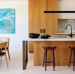
ARCHITECT WOWOWA Architecture
PROJECT ARCHITECTS Monique Woodward, Scott Woodward, Zoe Diacolabrianos
WOWOWA (61 3) 9078 2787 wowowa.com.au
FINISHES
Studio series carpets in Fuchsia, Artichoke, Blossom and Peacock from EC Carpets. Stone Terrazzo tiles from Signorino in bathroom and laundry. Circular glazed mosaic tiles from Classic Ceramics on bathroom wall. Internal paint finishes in Natural White, Acropolis, Tingle, Scarlet Ribbons, Green Paw Paw, Aqua Frost and Dandelion Yellow from Dulux. Brass flat sheet box to underside of kitchen bench. Bronze mirror splashback in kitchen. Blackbutt hardwood timber kitchen bench. energiLite Skylight above bathroom from Atlite Skylights. Silvertop Ash on upper and lower deck from Radial Timber Sales with Euroa Clay Products in Cream Brick to match existing. Existing windows and balustrades finished with Dulux Gold Pearl.
FURNITURE
Modular Milo Couches from Jardan. DLM Side Table and AAS 32 stool from HAY. Rugs from Loom Rugs. Angelucci 20th Century Guillerme Et Chambron Oak wardrobe in Master Bedroom. Bed linen from Kip&Co.
LIGHTING
FL/Y pendant lights in Petrol Blue, Transparent Orange and Transparent Emerald by Ferruccio Laviani for Kartell in kitchen from Space Furniture. Lucci LEDlux downlights from Beacon Lighting. Recessed strip light in kitchen joinery from About Space.
FIXED & FITTED
Monte Carlo 90 Super Deep rangehood from Whispair. Side-by-Side Premium BioFresh fridge from Liebherr. Combi-Steam XSK and induction cooktop from V-ZUG. In laundry: Phoenix Gen Y taps from Reece and single bowl under mount sink by Mossini. In bathroom: S20 Undercounter Basin and Lissoni extended basin mixer from Rogerseller. In ensuite: Lissoni high basin mixer Water Jewels rectangle basin in copper from Rogerseller. In bathroom and ensuite: Flow 200mm round overhead shower & 300 arm from Rogerseller and Roca toilet from Reece.
It’s all in the Details
Dress it up or play it down, here are the pieces that turned these houses into homes.
Furniture. George Nelson Bubble Lamps over stairwell from Spence and Lyda. Master bed wall sconces – Monocle Wall Sconces in master bedroom from Living Edge. General architectural lighting from Tovo lighting.
issue #40 habitusliving.com
Slope House
ARCHITECT Formwerkz Architects
PROJECT ARCHITECTS Alan Tay, Livina Cali, Fabion Ong
LANDSCAPE ARCHITECTS Salad Dressing
Landscape Design
B UILDER C TS Construction
f oR MWER k z A Rch i T E cTs (65) 6440 0551 formwerkz.com
FINISHES
Supplied by LYSAGHT Roofing & Walling
FURNITURE
Supplied by The Commune Life and Boo Furniture
FIXED & FITTED
Hwa Ann Lighting
South Coogee House
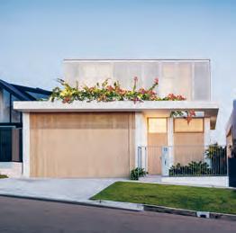
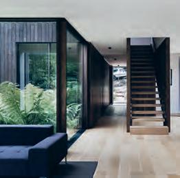
ARCHITECT Madeleine Blanchfield Architects
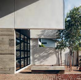
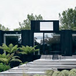
BUILDER Buildability Constructions
M A dE LE i n E BL A nchfi E L d
A Rch i T E cTs (61 2) 9212 3343 madeleineblanchfield.com
FINISHES
Engineered oak flooring from Mafi. Honed Carrara marble, honed Concordia marble, custom terrazo stone, stone cladding, and marble pavers from Skheme. Antique White paint on walls, Vivid White paint on ceiling from Dulux. Exterior wall cladding screens from Equitone. Window glazing from Viridian Glass. Windows and doors from Woodhill Joinery. Window furnishings from Simple Studio.
FURNITURE
Saarinen Womb Chair and Ottoman from dedece. PP35 timber coffee table by PP Møbler and Cappellini Peg armchair from Cult. Bamileke stools from Orient House. Sigh daybed by MRD Home from Julie Lewis Agency. TA22 Holborn dining table by e15 from Living Edge. Flow dining chairs by Ercol from Temperature Design. Frankie Deep sofa from Fanuli. Original bar stools by Ercol from Temperature Design. Sierra Weave Pumice rug from Armadillo&Co. Chez Fabrica rug from Whitecliffe Imports. Paulistano Armchair by Objekto from Hub furniture. Nook bed from Jardan. Mirthe outdoor table and Illum outdoor chairs by Tribù from Cosh Living.
LIGHTING
Ici wall sconce from Articolo. Envoy Swing Sconce from Schoolhouse Electric & Supply Co. Lampe de Marseille by Le Corbusier from Cult.
FIXED & FITTED
In-Out Agape basin from Artedomus. Tapware and sanitaryware from the Icon range from Astra Walker. Custom marble basin by Madeleine Blanchfield Architects supplied by Skheme in ensuite and first floor bathroom. Rosa freestanding stone bath from ACS Designer Bathrooms in ensuite and first floor bathroom.
ARTWORK
Camie Lyons charcoal drawings from Olsen Gallery.
House A
ARCHITECT WALTER&WALTER
PROJECT ARCHITECT Andrew Walter
BUILDER Fido Projects
STRUCTURE Irwinconsult Engineering
Consultants
LANDSCAPING Lygon St Nursery
WALTER&WALTER (61 3) 9988 6160 walterwalter.com.au
FINISHES
Solid American Oak floors in a natural oil finish. Limestone cut to measure with Lithofin sealer from CDK Stone. Barrique bathroom tiles by Cerdomus Tile Studio. Custom Timber floor grilles and custom timber windows manufactured and finished by Fido Projects. Double glazed units by Viridian Glass. Custom joinery in kitchen by Orana Designer Kitchens. Custom stainless steel benchtops. Dekton kitchen island benchtop in Sirius. Custom shelving in reclaimed Blackbutt. Sustainably sourced rough sawn Silvertop Ash decking.
FURNITURE
Client’s own collection of vintage furniture including CH 25 Easy chair and CH30 dining chairs by Hans Wegner, Charles and Ray Eames Oval dining Table for Herman Miller, and vintage sofa by B&B Italia. Freestanding shelving units from USM. Outdoor furniture from Tait.
LIGHTING
Flos Luminator floor lamp, Parentesi suspension light, and String Light in Round from Euroluce. TAL, Lumino, Xlux and Multo Luce downlights and recessed LED fittings from Light Project.
FIXED & FITTED
Tonic wall mixer, Fantini Milano shower head, Fantini Mare basin mixer, and Matrix pan from Rogerseller. Combair SL Black Glass oven, Combi-Steam XSL Stainless Steel steam oven, warming drawer, and 5 Zone Gas Hob cooktop from V-ZUG. Concealed rangehood from Qasair. Fully intergrated G 6660 SCVi dishwasher from Miele. Double dish bowl sink by Barazza. Waste management system from Franke.
ARTWORK
Mother, 2007, Kim Westcott. Female Pirate Series, Sally Smart.
3 . on location # 189
issue #40 habitusliving.com
Discover beautiful products
Meet inspiring people
Indulge in architecture and design


Across Australia, New Zealand, South and South-East Asia
The online community for the Design Hunter®


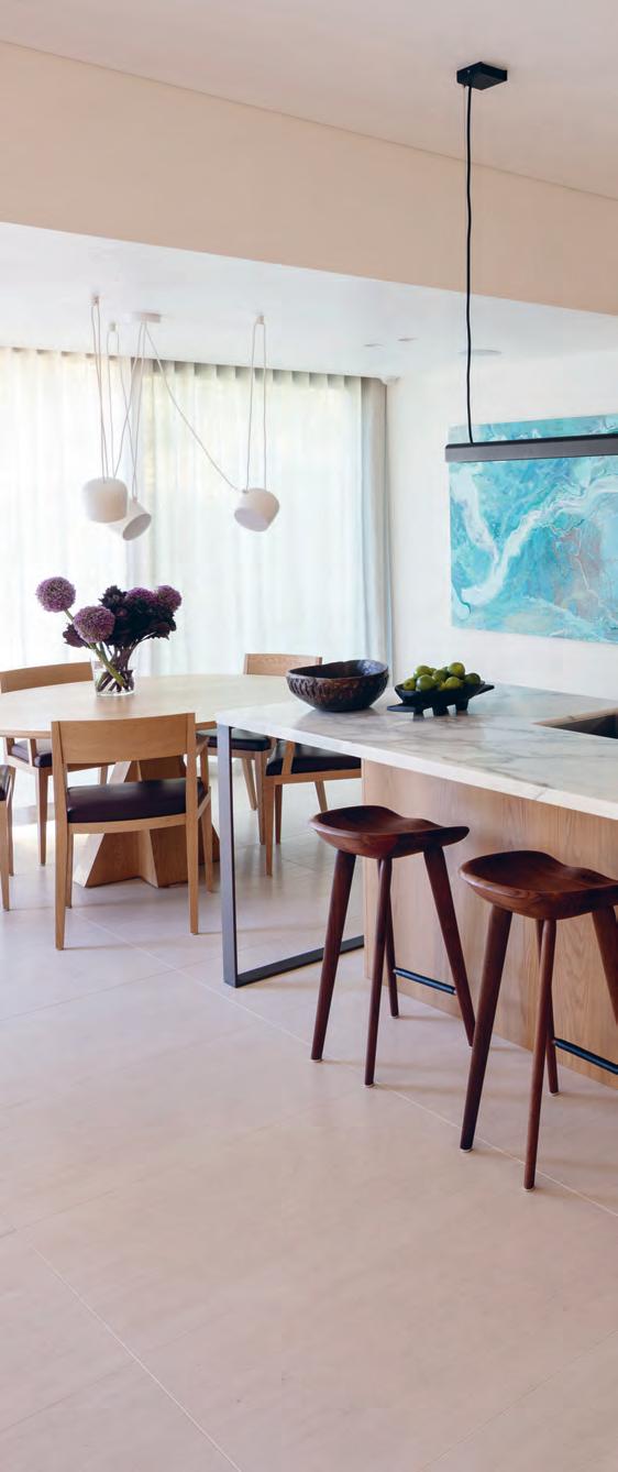
Website | habitusliving.com

Facebook | habitusliving

Pinterest | habitusliving

Instagram | @habitusliving
Twitter | @habitusliving
 Mosman Residence
Photography by Brett Boardman
THE TEAM AT HABITUS MAGAZINE THANKS OUR ADVERTISERS FOR THEIR SUPPORT. USE THE DIRECTORY TO SEE WHAT PAGE A SPECIFIC BRAND IS FEATURED ON, AND VISIT THEIR WEBSITE TO LEARN ABOUT THE PRODUCTS AND SERVICES THEY PROVIDE.
Abey 092 abey.com.au
Apaiser 035, 164 apaiser.com
Bo Concept 128 - 129 boconcept.com.au
Cantilever 081 cantileverinteriors.com

Cosentino 130, 163 cosentino.com Cult 009 cultdesign.com.au Di Lorenzo 193 dilorzeno.com.au Farage 154 farage.com.au Gaggenau 004 - 005 gaggenau.com/au
107 geberit.com.au Ilve 010-011 ilve.com.au
Liebherr 074 - 075 andico.com.au/liebherr
Living Edge 002 - 003 livingedge.com.au Methven 101, 187 methven.com/au
Habitus magazine is available at newsagents and bookstores across Australasia, South-East Asia, the USA, Canada, Europe, South America and the Middle East. Habitus is published quarterly in March, June, September and December. To subscribe securely online visit habitusliving.com/magazine or email subscriptions@indesign.com.au to subscribe or request a full list of locations where Habitus magazine is available.
# 191
Geberit
Neolith 53 cdkstone.com.au Own World 033 ownworld.com.au Parisi 029, 176 - 177 parisi.com.au Pheonix Tapware 096 pheonixtapware.com.au Residentia 014 - 015 residentia.group Rogerseller 056, 153 rogerseller.com.au/appointment Siemens 143 siemens-home.bsh-group.com Smeg IFC - 001 smeg.com.au Space Furniture 022 spacefurniture.com Staron 064 staron.com.au Stylecraft 124 - 125 stylecraft.com.au StylecraftHOME 006 stylecraftHOME.com.au Sussex Taps 117 sussextaps.com.au Subzero Wolf 036, 123 subzero-wolf.com.au tongue n groove 012 - 013 tngflooring.com.au Vola 046 vola.com Walter Knoll 112, OBC walterknoll.com.au Wyalla Studio 129 wyallastudio.com.au Zip 021 zipwater.com
Your map to where the stories in this issue come from where is available
world
issue #40 habitusliving.com
“We shape our buildings; thereafter they shape us.”
WINSTON CHURCHILL
Brunswick Heads #47
Johor Bahru #155 Singapore #114 Mosman #132

PIANO — A porcelain tile collection, designed by Ronan & Erwan Bouroullec for Mutina DI LORENZO TILES Pty Ltd Tile Merchants | www.dilorenzo.com.au Castle Hill 02 8818 2999 | Waterloo 02 8818 2950 | Newcastle 02 8860 0720 | Caringbah 02 8818 2970 | Willoughby 02 8602 1470 Inkredible 1855-57
THE ESSENCE OF LIVING.


Tama Living is the ideal setting for that special moment, a soothing and pleasant experience. Its lavish, elegant cushions set the rhythm for the sofa to unravel like a piece of classical music. With side tables and trays crafted from exquisite materials, it embodies the spirit of refined living. Design: EOOS.

Walter Knoll Australia · www.walterknoll.com.au · T +61 8 8182 3925


 William Smart
The Oak Residence
William Smart
The Oak Residence
William Smart
The Oak Residence


 text Elana CastlE | photography FElix For E st


 Tex T Sophia WatSon | PhoTo gra Phy Sharyn CairnS


 text Rebecca GRo ss | photography RobeRt Walsh


 text Annie Reid | photography BenjA min Hosking


 above | the design of the kitchen was overseen heavily by robert, an ex-chef. opposite | the connection to the landscape is heightened in the rear living space through large windows, with a focus of calm and reflection.


 Mosman Residence
Photography by Brett Boardman
